Semaloop website design

Every section we captured from the Semaloop website, in page order, from the hero section down to the CTA section. Open any thumbnail to see it full size.

Sections 4

In page order, top to bottom

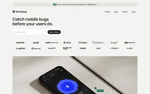
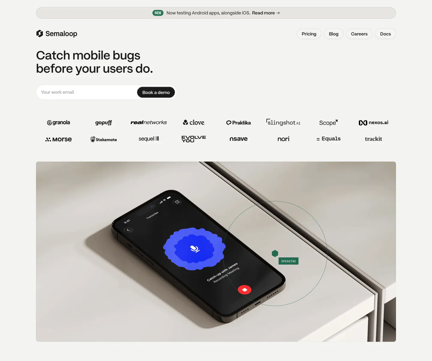
  1. Semaloop hero section: left-aligned headline and email field with demo button above two rows of logos and a photo of a phone on a shelf
    01 Hero

    Catch mobile bugs before your users do.

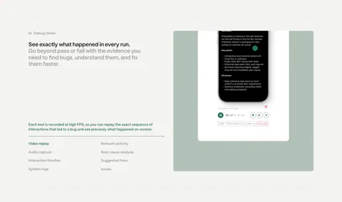
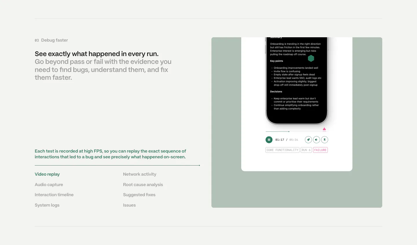
  2. Semaloop features section: numbered headline and feature list on the left beside a sage green panel with a phone test replay player

    See exactly what happened in every run.

  3. Semaloop testimonials section: centered single quote under a company icon with an agent badge, name and title below on light gray

    “Testing should increase velocity, but teams spend more time fixing tests than shipping. Semaloop is the first tool I’ve found that genuinely changes this, making mobile end-to-end testing finally possible.”

  4. Semaloop call to action section: sage green card with headline, short copy and an email field with demo button, thin circle outline at right

    Start testing your app the way it’s actually used.
Similar companies

All companies
    ↑↓ Navigate ↵ Open

    Section preview

    Website section