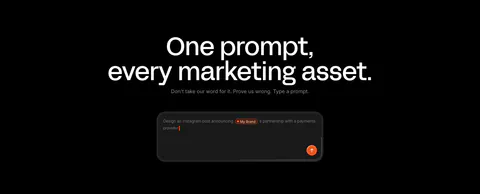
Features Section Examples

A feature section shows what the product actually does, so the hard part is choosing what to leave out. Buyers care about a few capabilities, and those deserve the most space, a clear visual, and a heading a skimmer can absorb. Giving every feature the same card and a vague icon hides what matters. This collection of feature section examples covers grids, bento layouts, alternating rows, and product walkthroughs.
426 sections

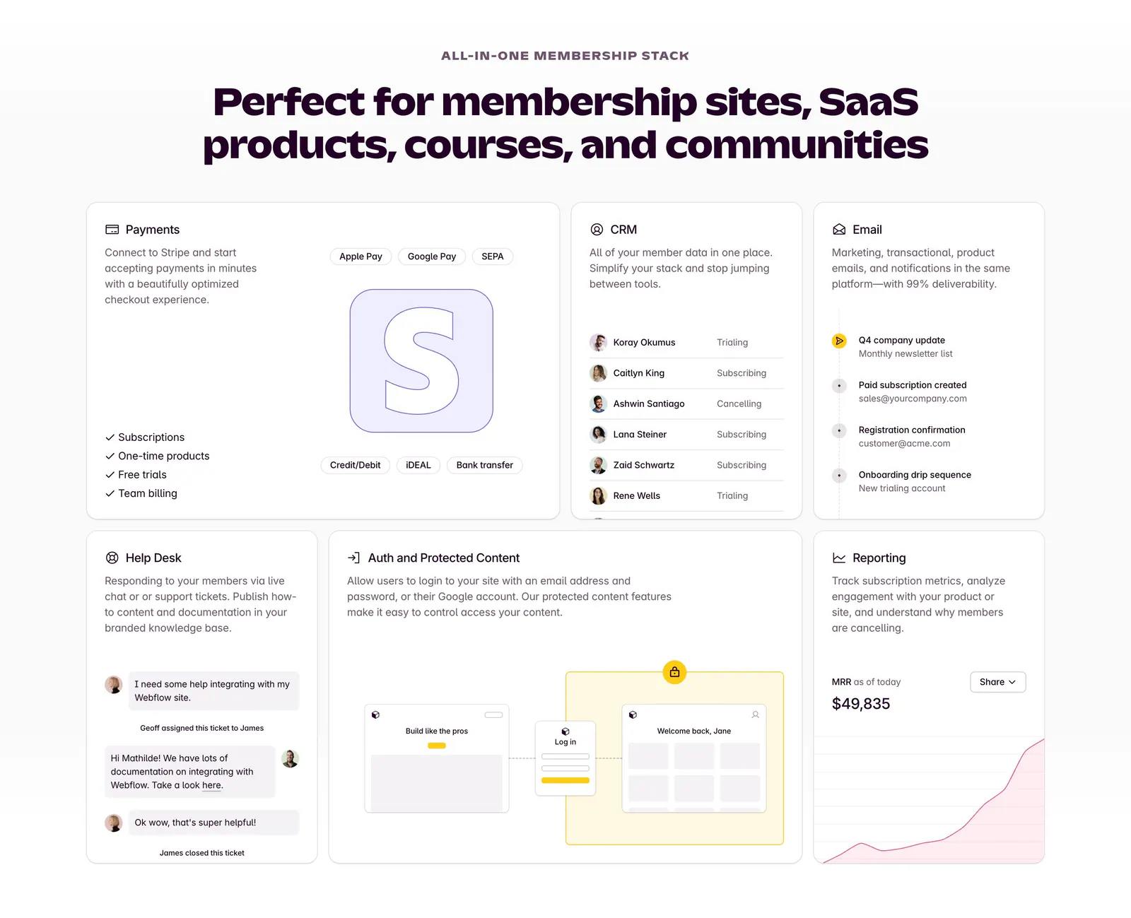
  1. Outseta features section: centered headline above a bento grid of cards for payments, CRM, email, help desk, auth and reporting
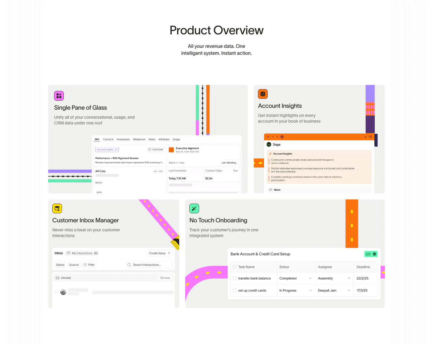
  2. Wavelength features section: centered Product Overview headline above a four-tile bento of UI snippets with colorful transit-line accents
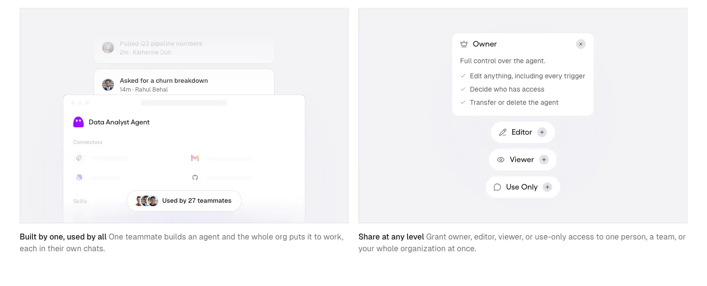
  3. Gumloop features section: two gray cards with agent sharing and permission UI mockups above short captions
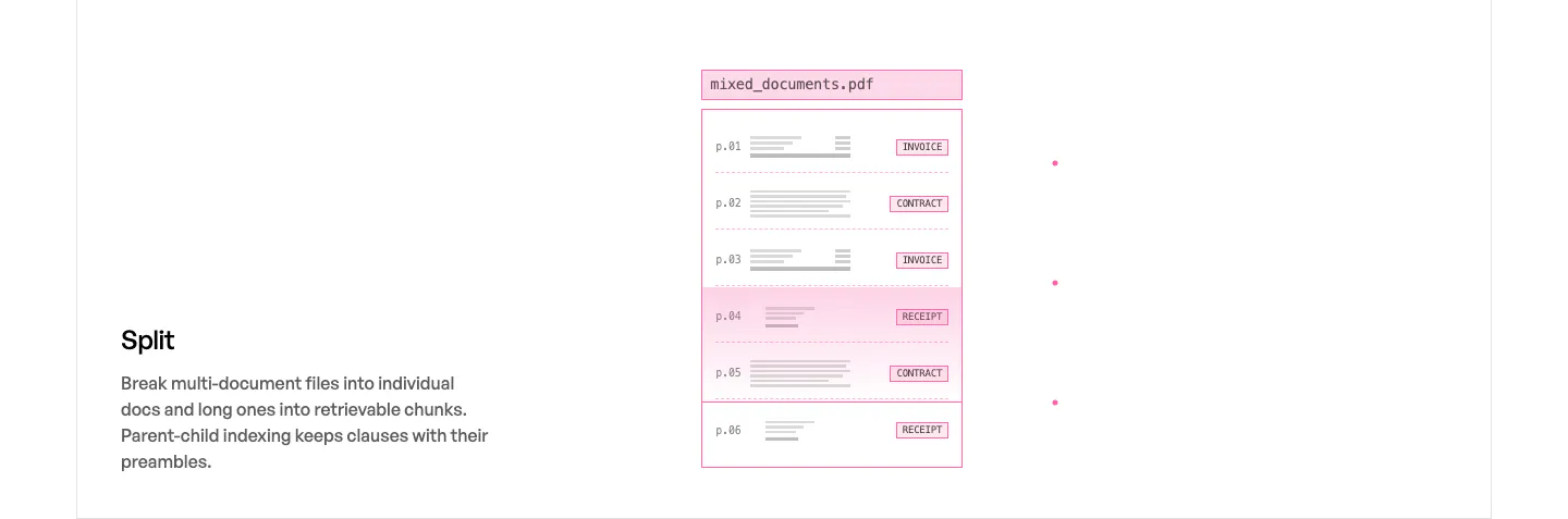
  4. Unsiloed features section: Split title and description at left beside a pink-outlined mockup of a multi-page PDF sorted by document type
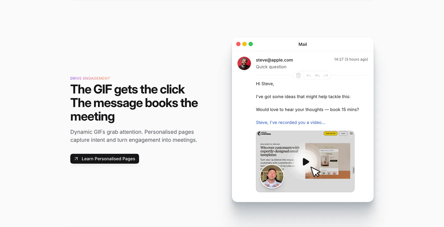
  5. Sendr features section: Drive Engagement copy and button left, Mail app mockup with a personalised video GIF preview right
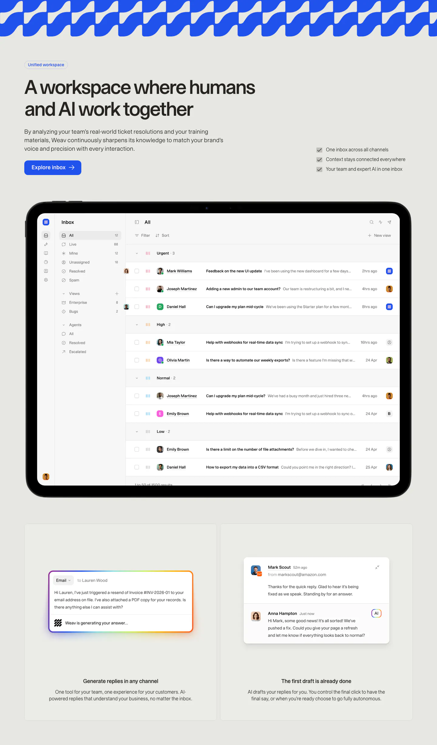
  6. Weav features section: headline, button and checklist above a tablet showing a support inbox, with two cards for AI drafted replies below
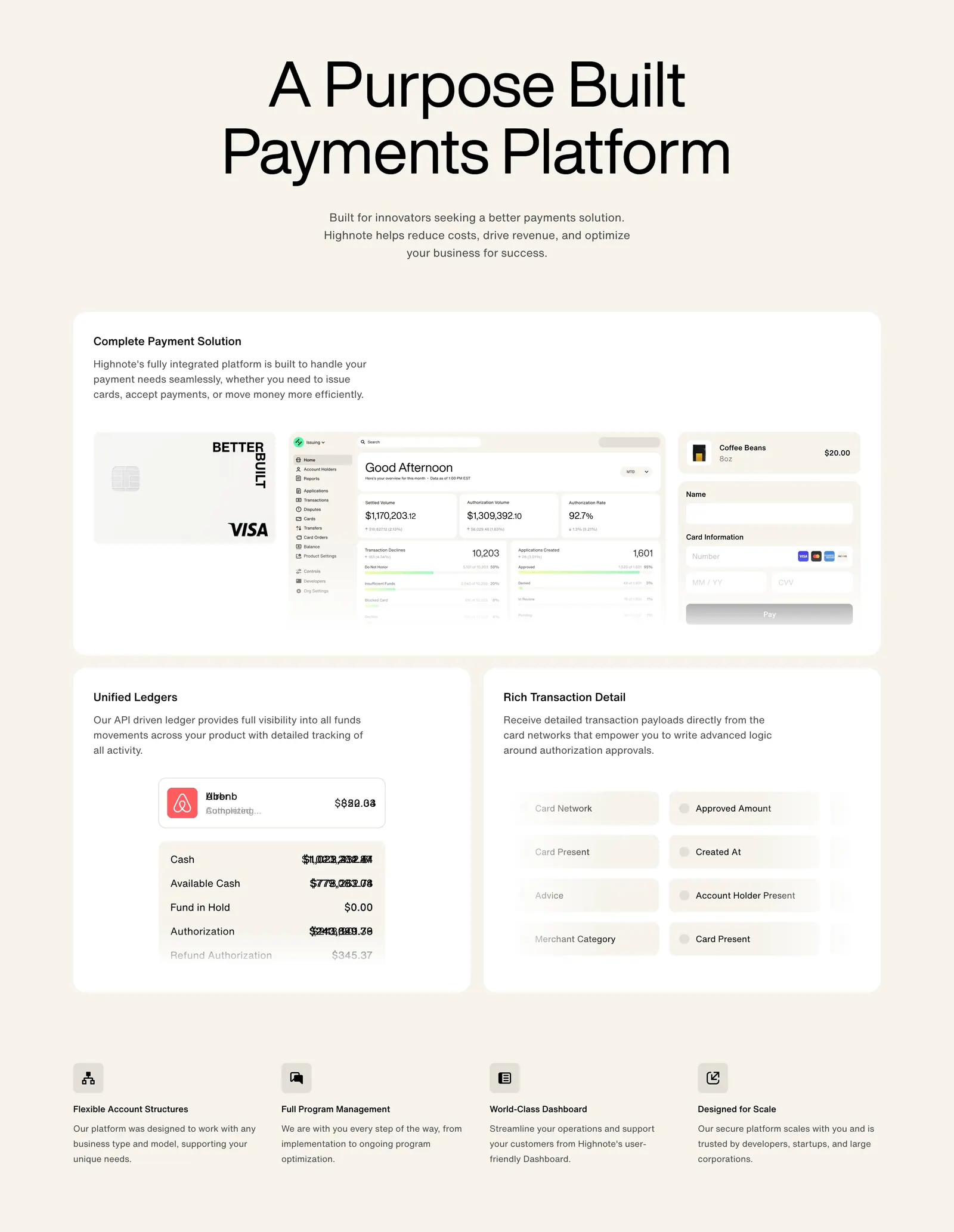
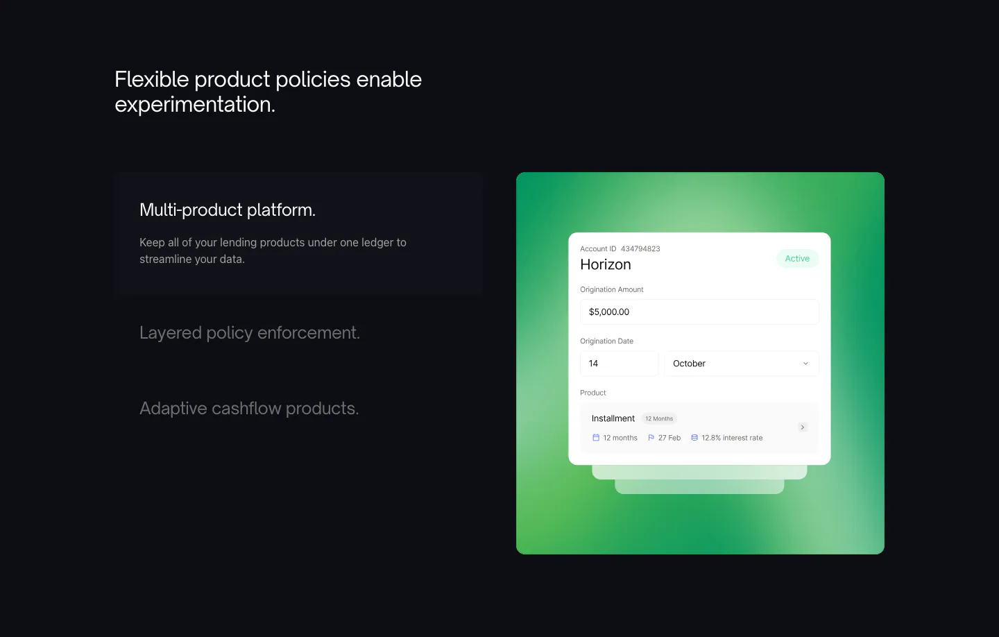
  7. Highnote features section: centered headline above large cards with card, dashboard and ledger UI, then a four-column feature list
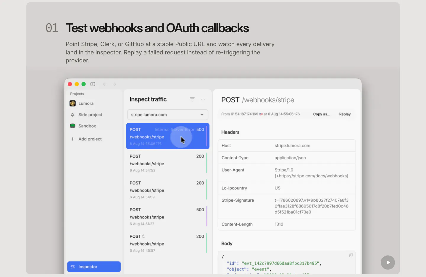
  8. LocalCan features section: numbered headline and description above a large macOS-style traffic inspector screenshot of webhook requests
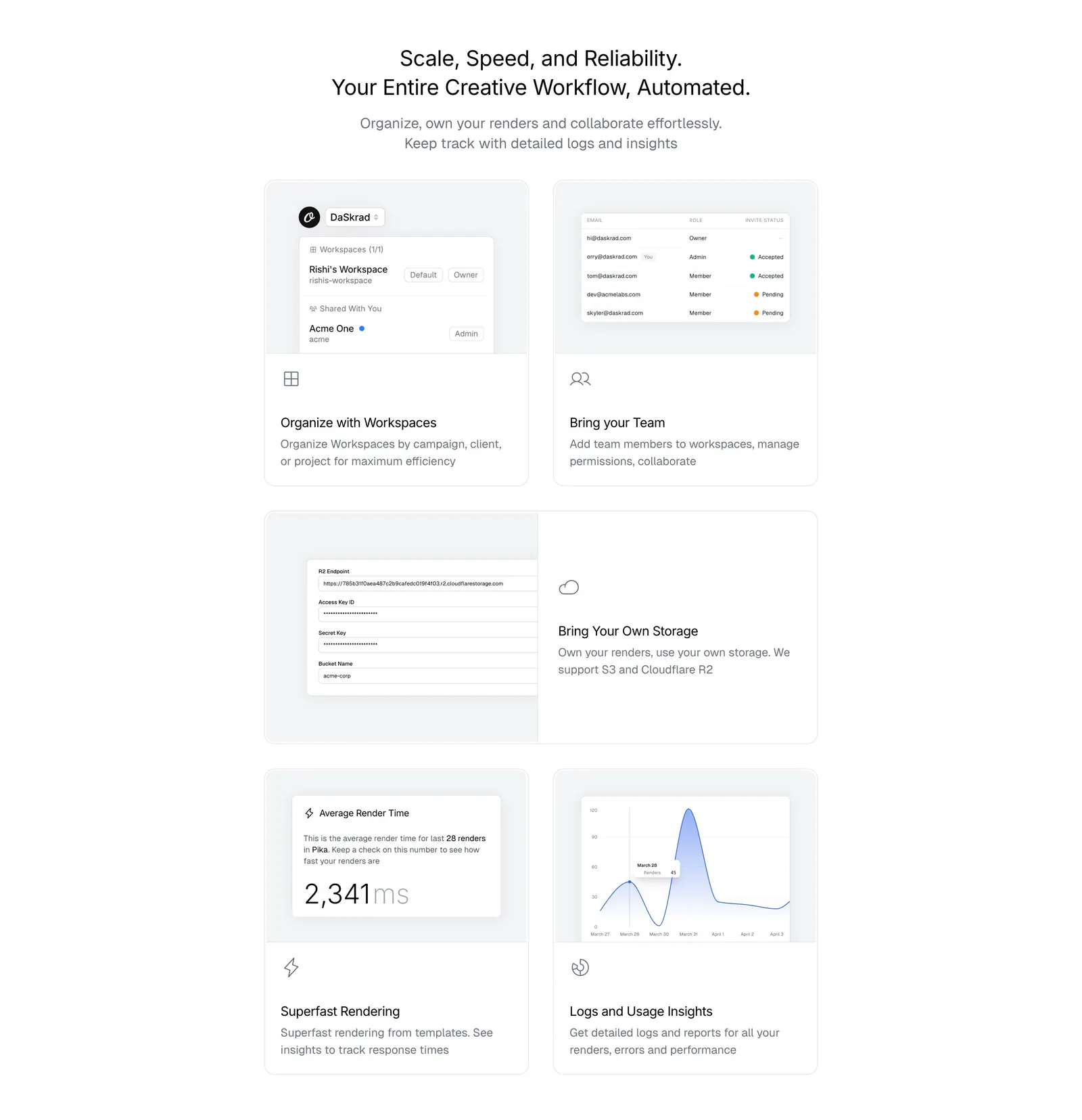
  9. Orshot features section: centered headline above a bento grid of light gray cards with workspace, team, storage and analytics UI
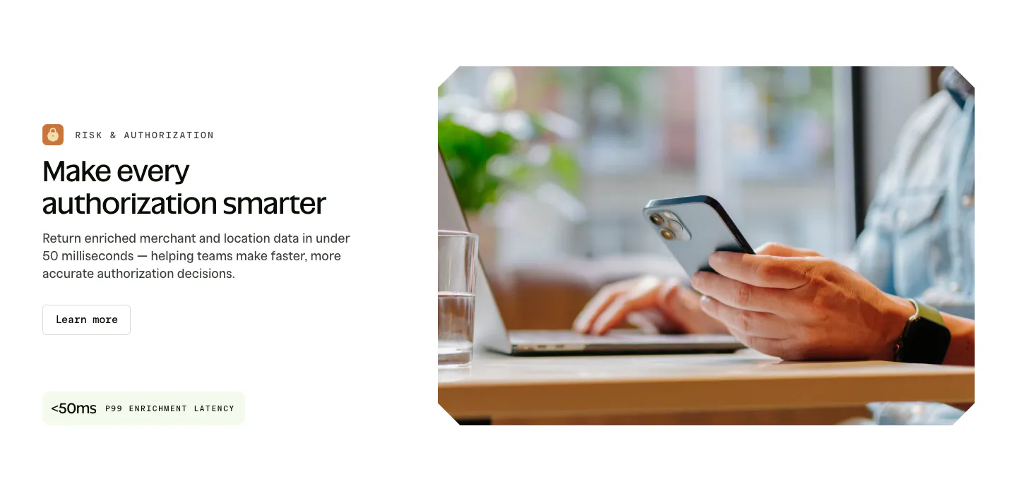
  10. Spade features section: labeled headline, copy, button and latency stat chip on the left beside a photo of hands holding a phone at a laptop
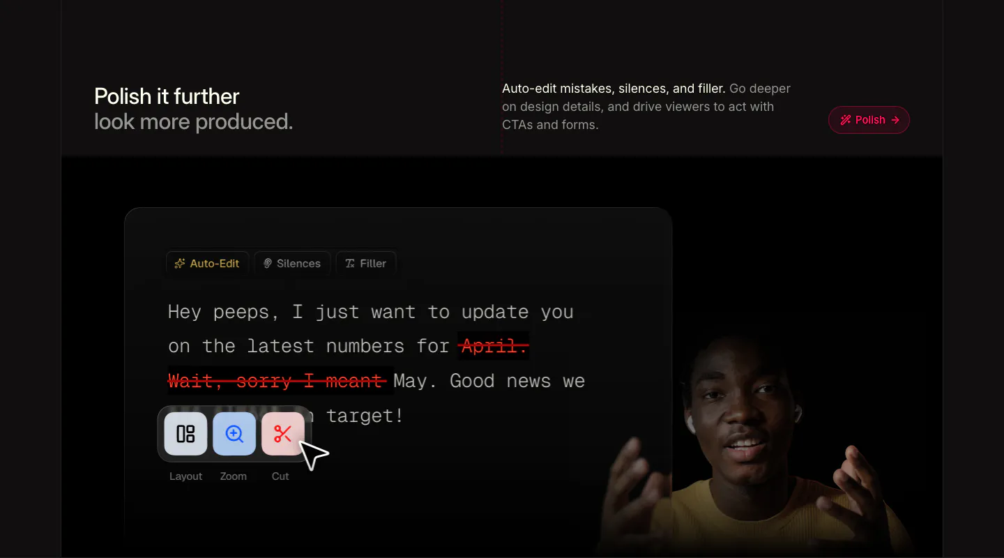
  11. Supercut features section: headline row above a transcript editor with struck-out filler words, Layout, Zoom, Cut tools and a presenter
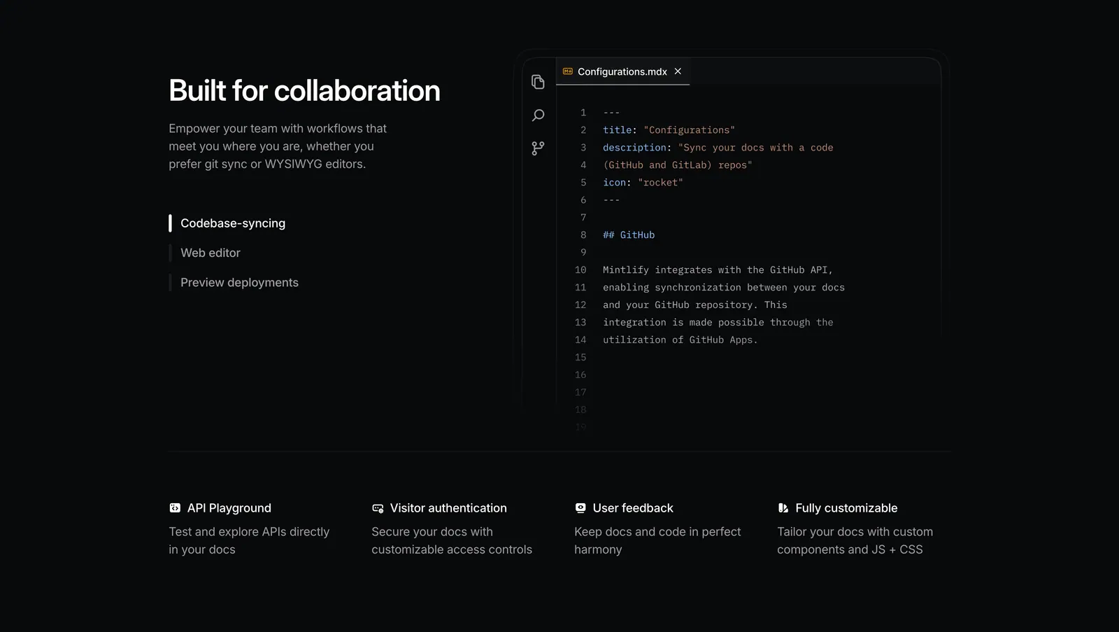
  12. Mintlify features section: dark split layout with tab list beside an MDX code editor, above a four-column feature row
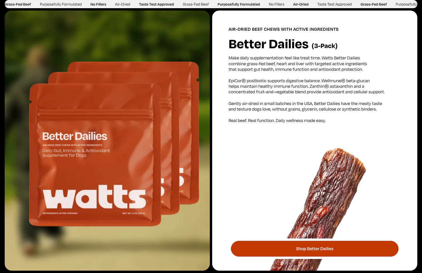
  13. Watts features section: product bag photo on the left, Better Dailies details, jerky photo and shop button on a white card on the right
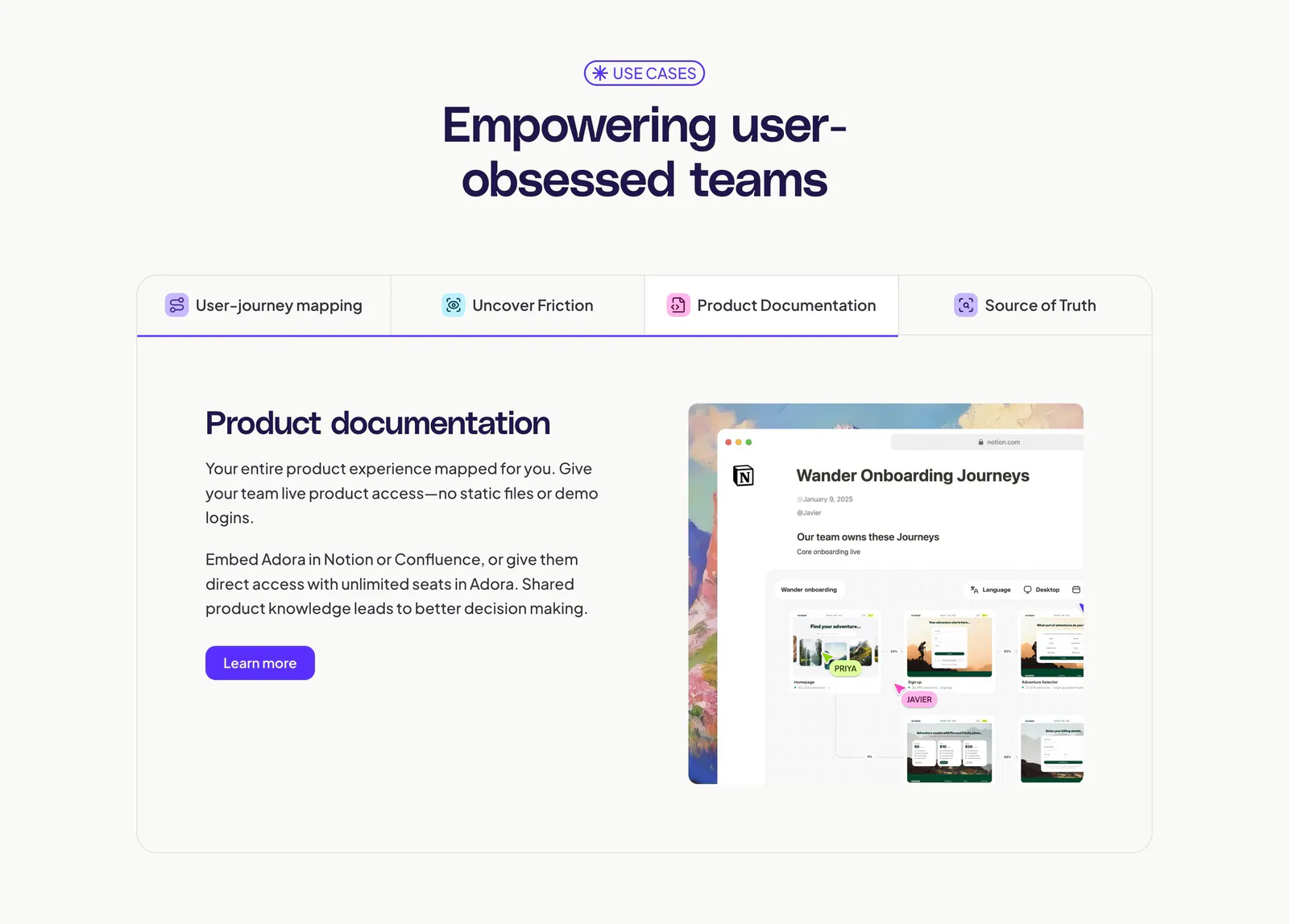
  14. Adora features section: centered headline above a four-tab panel with text on the left and a Notion-style product screenshot on the right
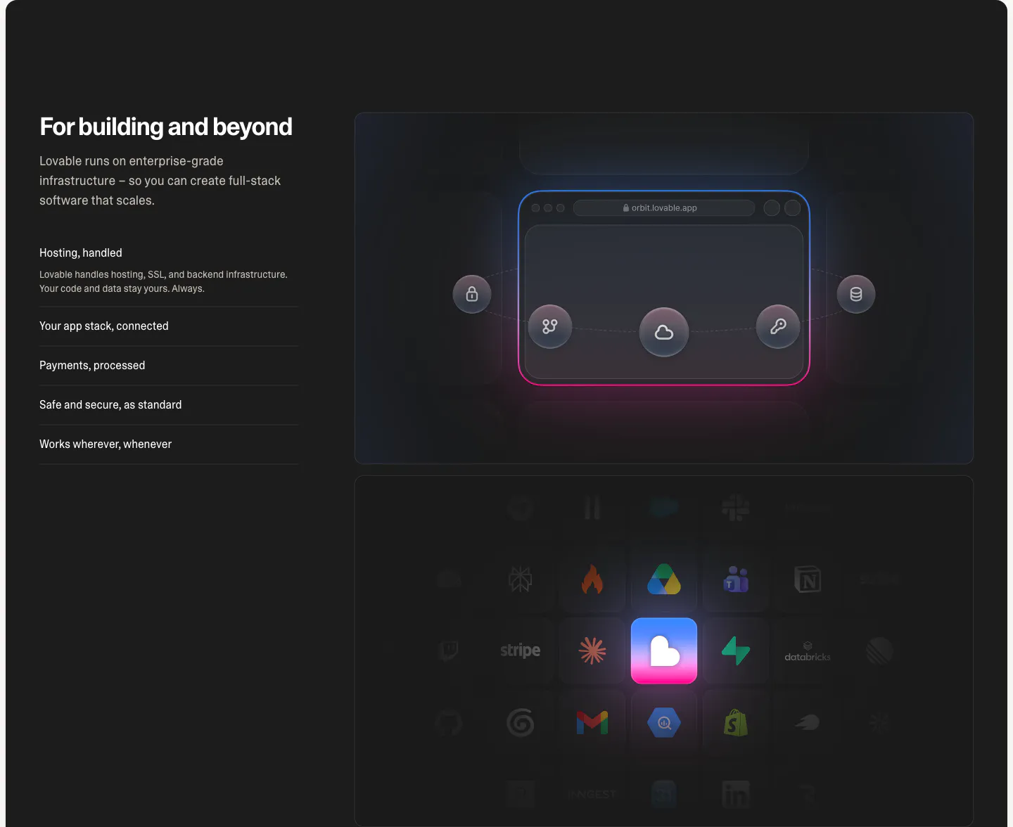
  15. Lovable features section: dark split layout with headline and capability list beside a glowing browser diagram and integration icon grid
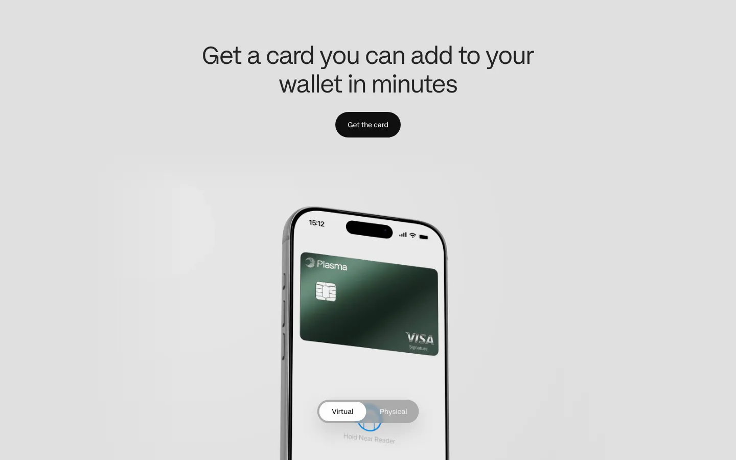
  16. Plasma features section: centered heading and button above a phone showing a green Visa card with a virtual/physical toggle
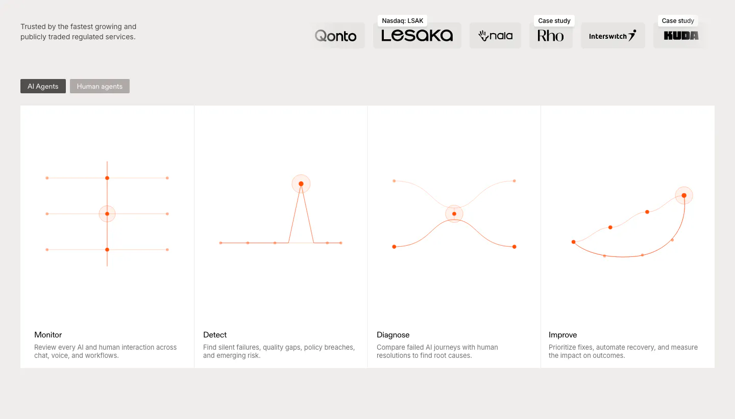
  17. Rulebase features section: customer logo row above an AI/human agents toggle and four equal cards with orange line diagrams
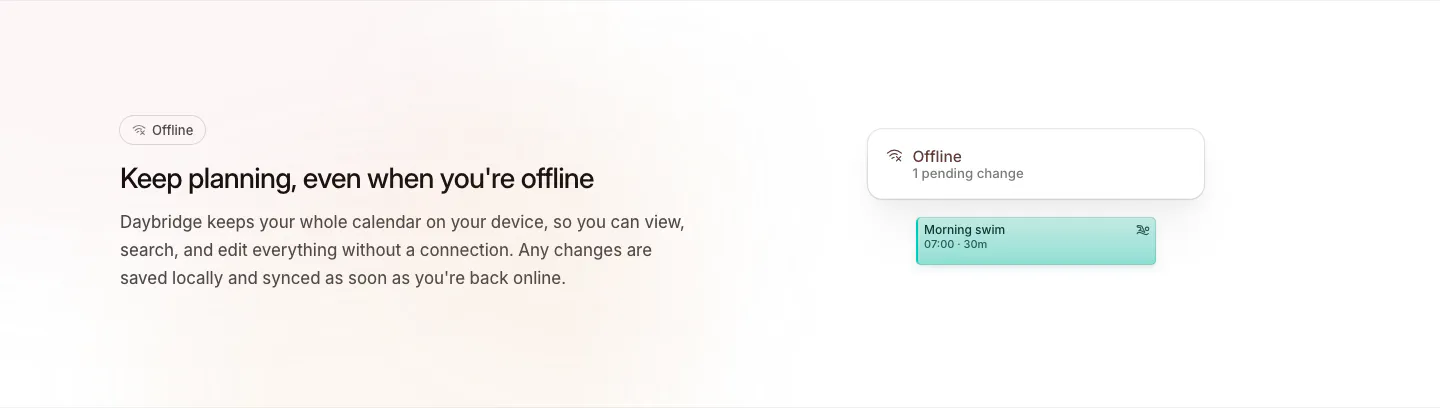
  18. Daybridge features section: offline headline and copy on the left with a small offline status card and event chip on the right
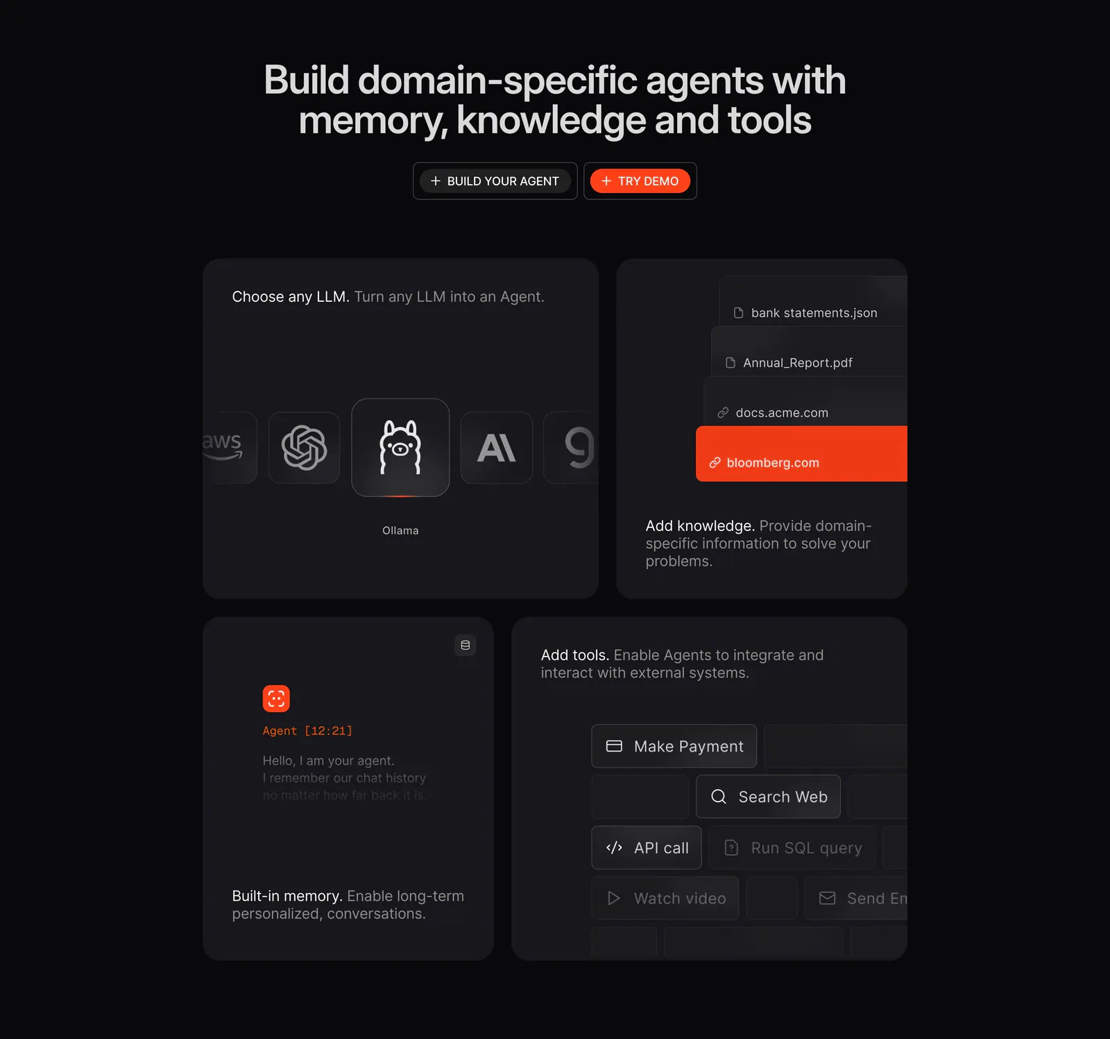
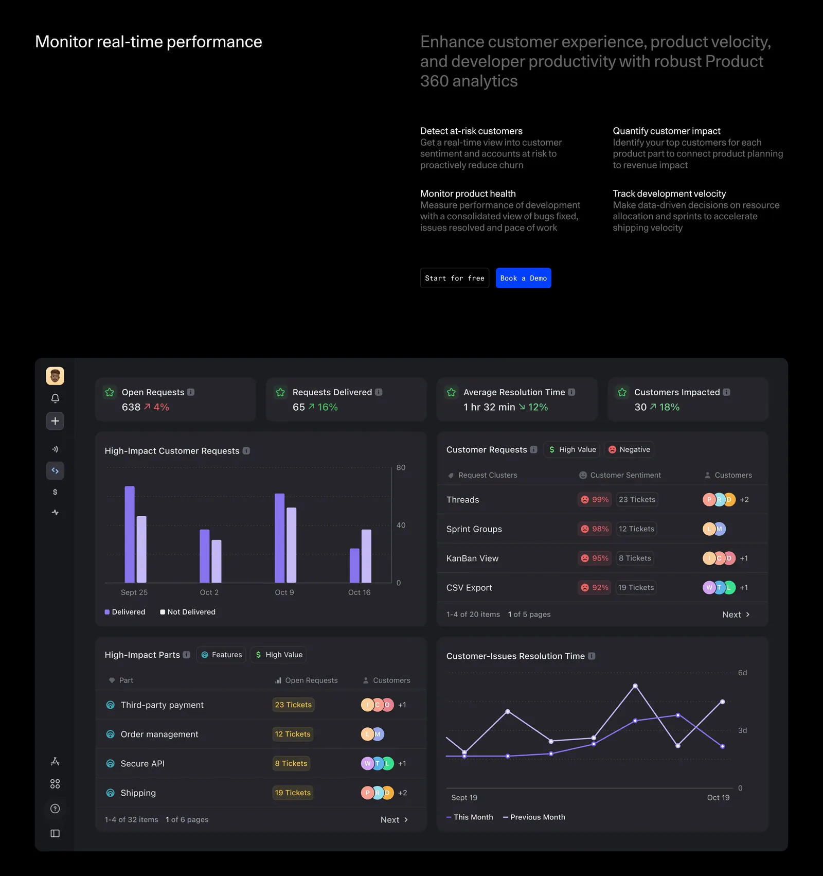
  19. Phidata features section: dark centered headline with two buttons above a four-tile bento of LLM picker, knowledge, memory and tools UI
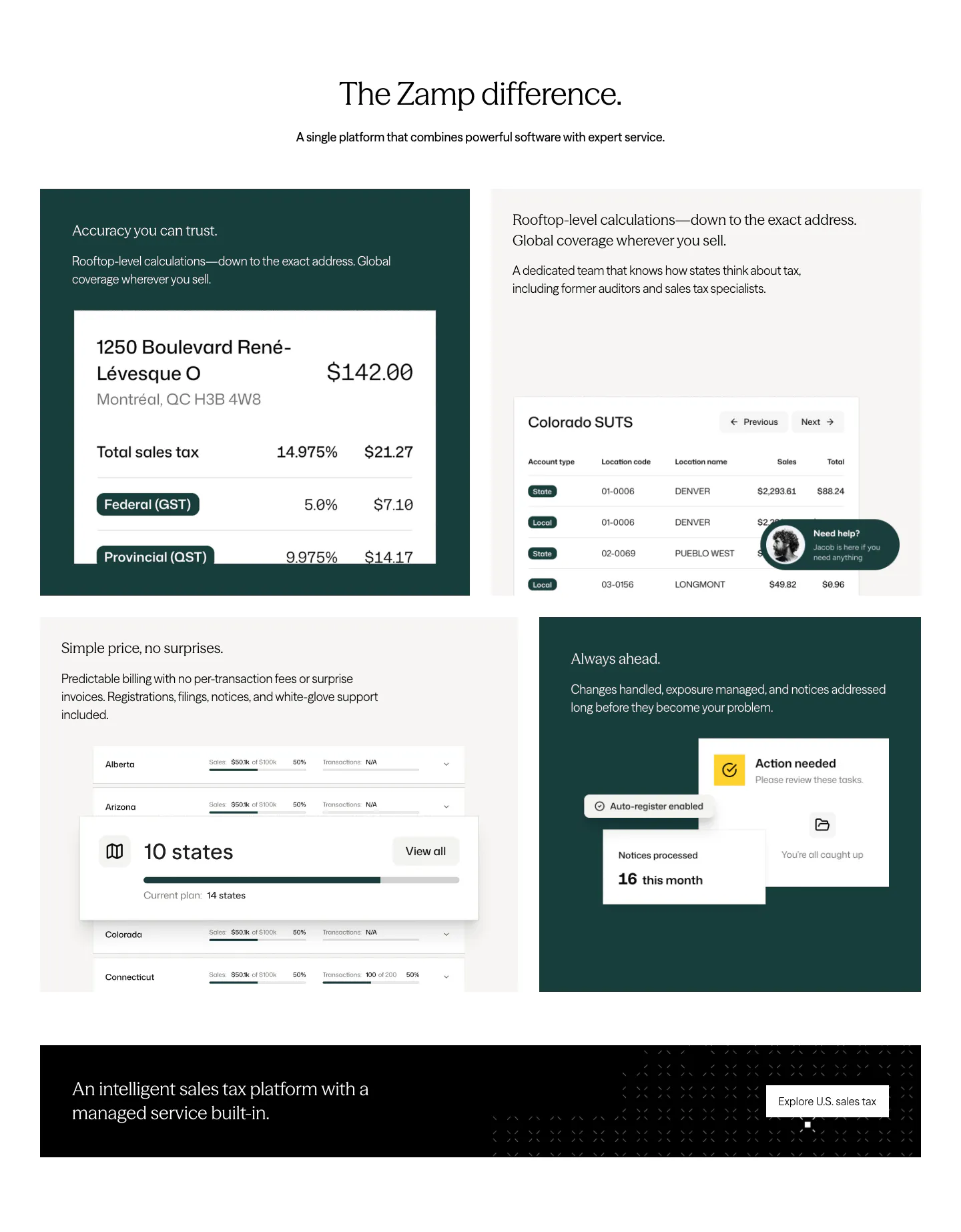
  20. Zamp features section: centered headline above a grid of dark green and light tiles with tax UI snippets and a black banner
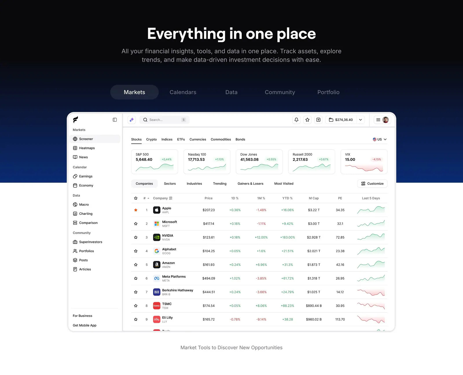
  21. Finsepa features section: centered headline and tab bar on a black-to-navy band above a stock screener dashboard screenshot
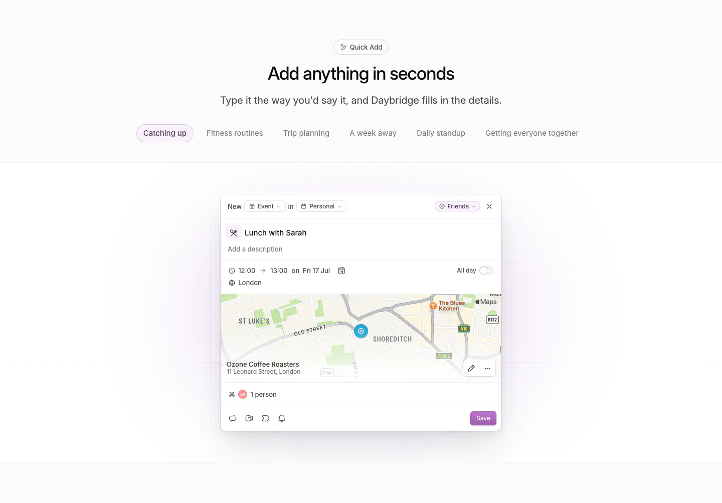
  22. Daybridge features section: centered headline and example tab pills above a quick-add event dialog with a map preview
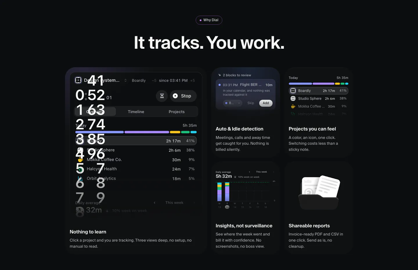
  23. Dial features section: dark bento grid of time-tracking UI tiles, a large timer panel plus cards for idle detection, projects, insights and reports
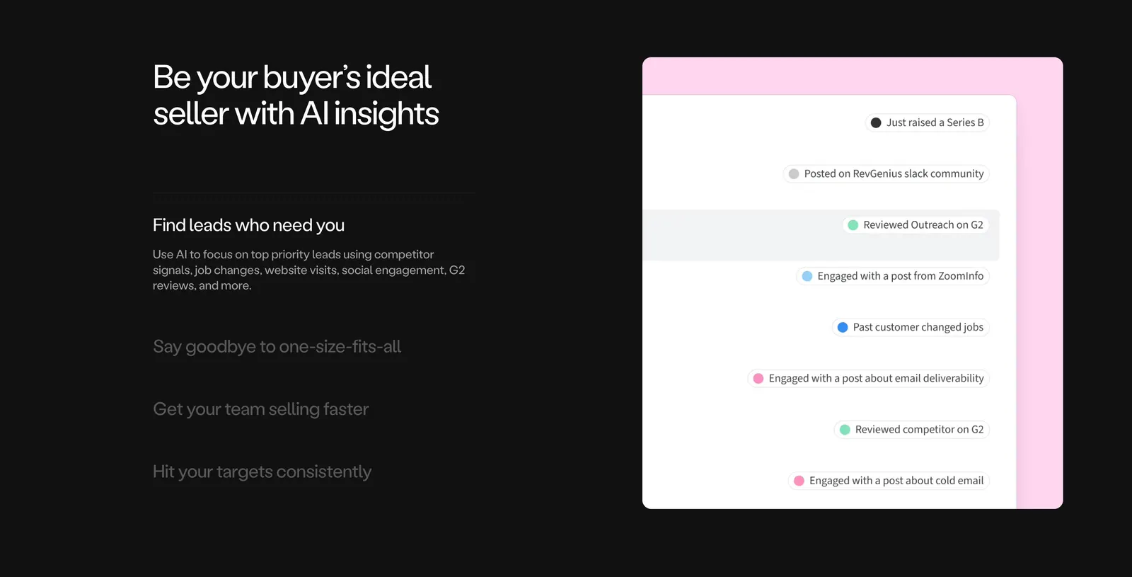
  24. Amplemarket features section: dark background with headline and accordion list on the left, lead signals UI on a pink panel at right
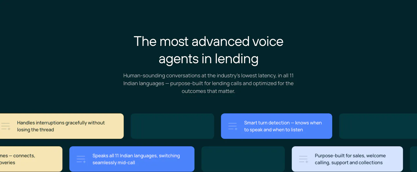
  25. Rezolv features section: centered headline above staggered rows of yellow, blue and teal capability chips on a dark teal background
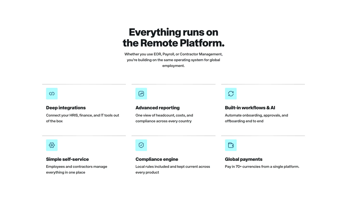
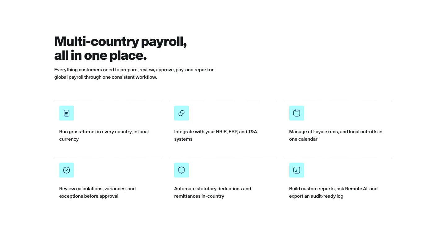
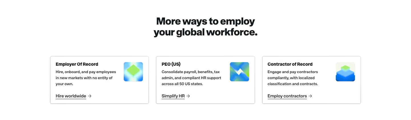
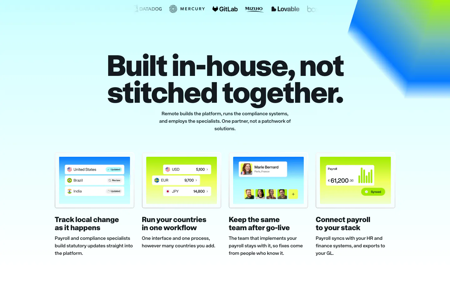
  26. Remote features section: centered headline above a two-row grid of six features with cyan icon tiles on white
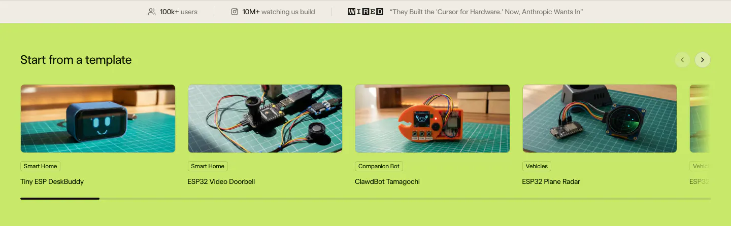
  27. Schematik features section: stats bar above a carousel of hardware template photo cards on a lime green background
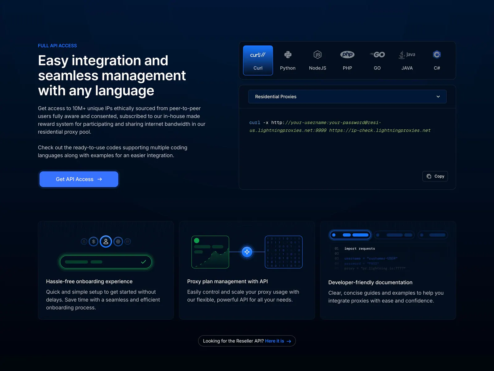
  28. Lightning Proxies features section: dark split layout with API copy beside a language-tabbed curl snippet, above three feature cards
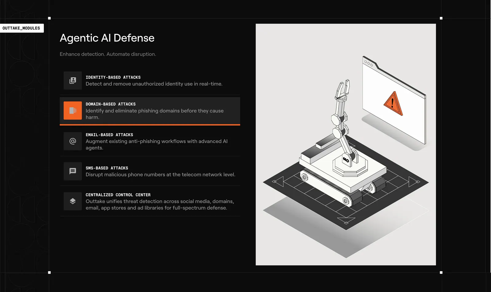
  29. Outtake features section: dark list of attack-type modules with an active highlight beside a light panel with an isometric robot arm illustration
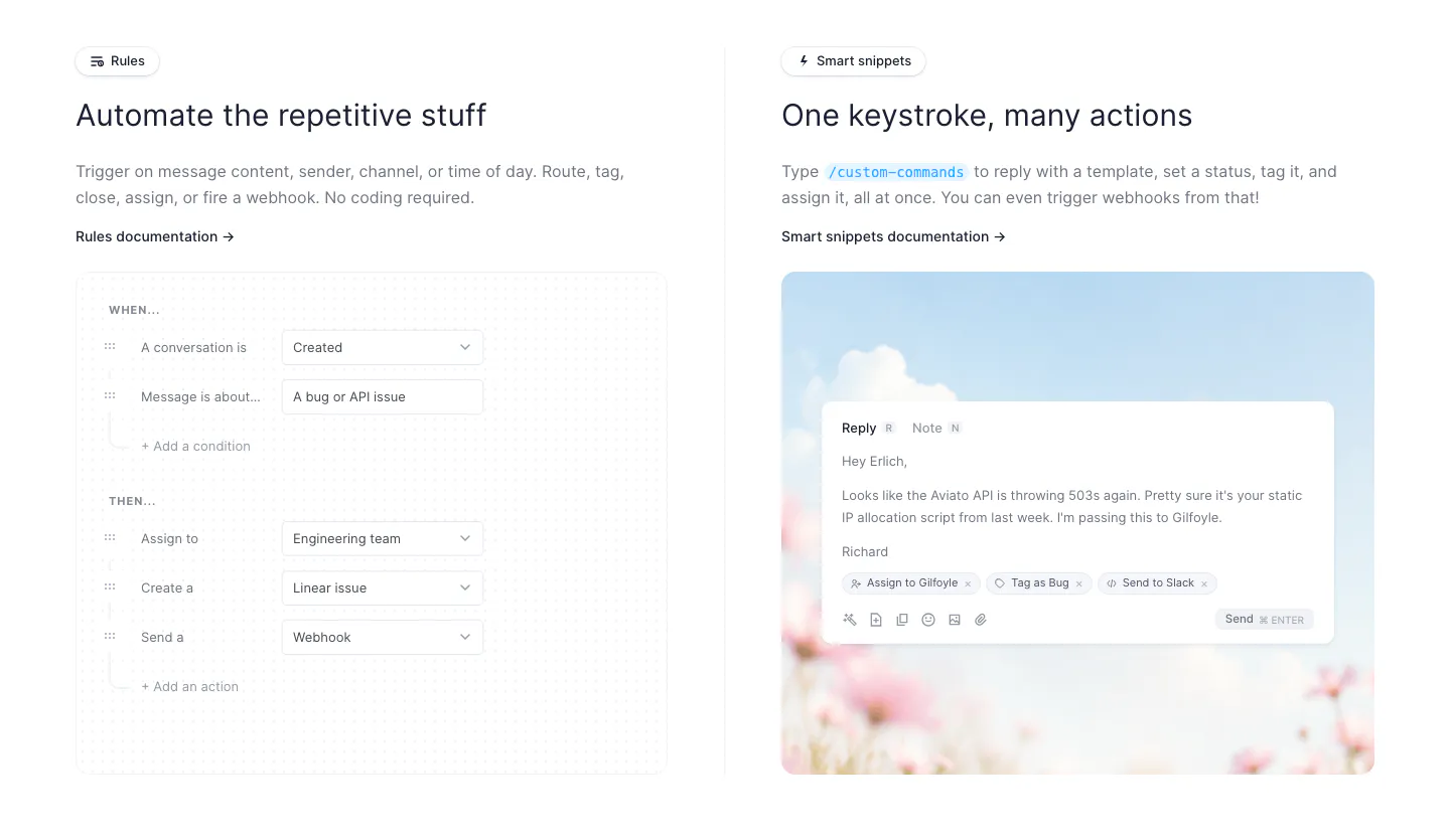
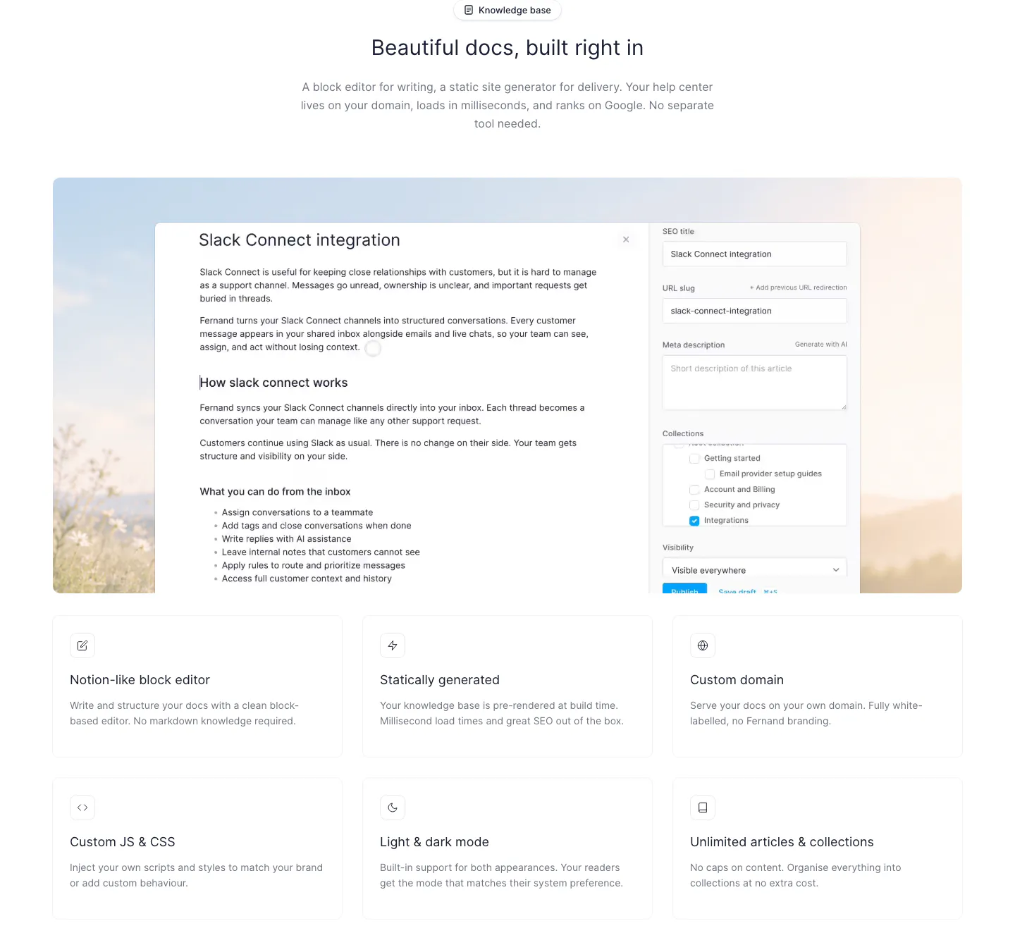
  30. Fernand features section: two columns showing a rules builder form UI and a reply composer on a sky and flower photo
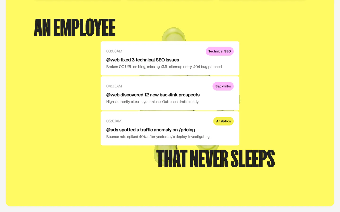
  31. Ploy features section: split condensed headline wrapped around a stack of white agent activity notification cards on a bright yellow panel
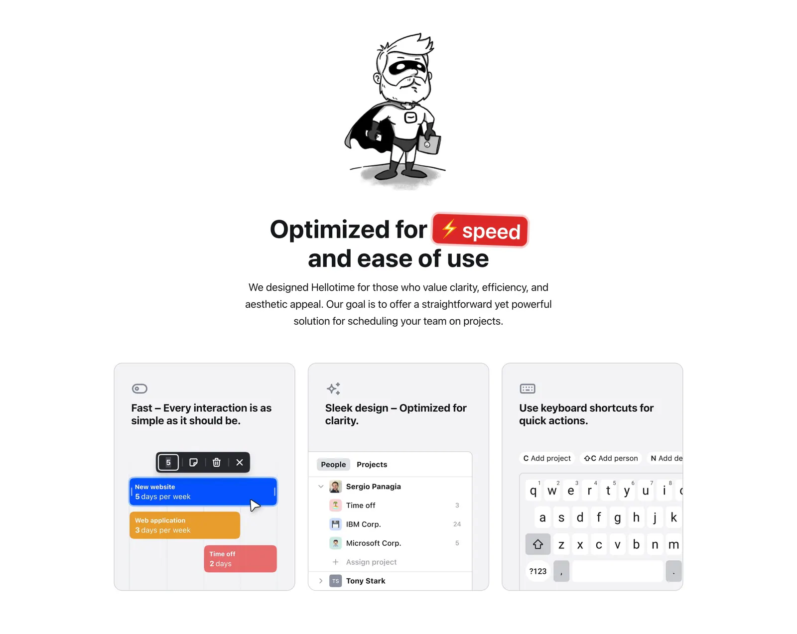
  32. Hellotime features section: superhero drawing and centered headline above three gray cards with scheduling UI and keyboard mockups
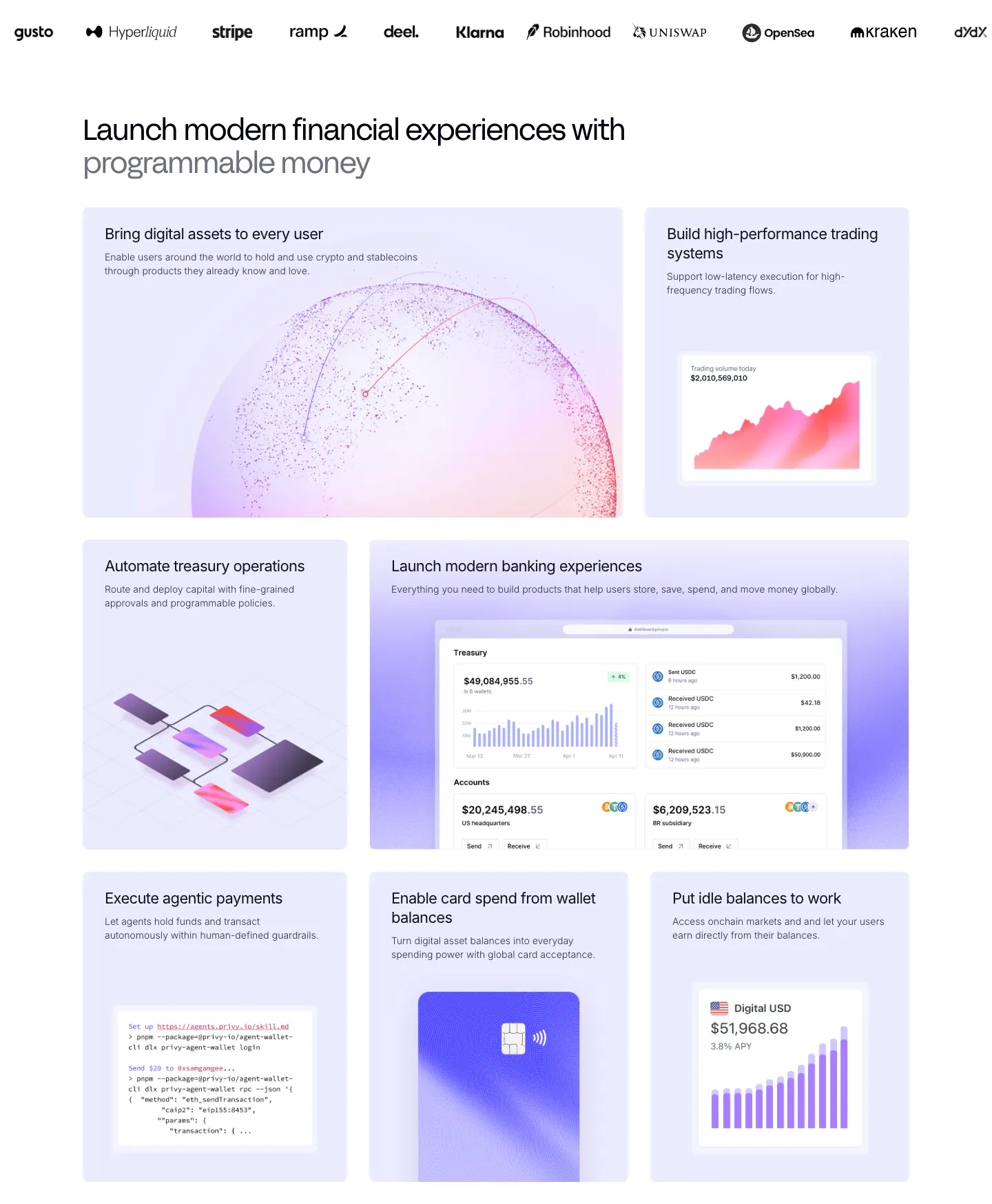
  33. Privy features section: customer logo strip above a bento grid of lavender tiles with dashboards, charts, a code snippet and a card visual
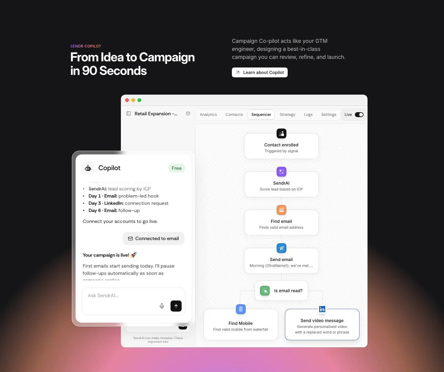
  34. Sendr features section: dark section with headline above a Copilot chat panel overlapping a sequencer workflow UI, warm glow below
  35. Watts features section: Healthy Defenses slide with short copy, prev/next arrow buttons and an orange circle on a light gray card
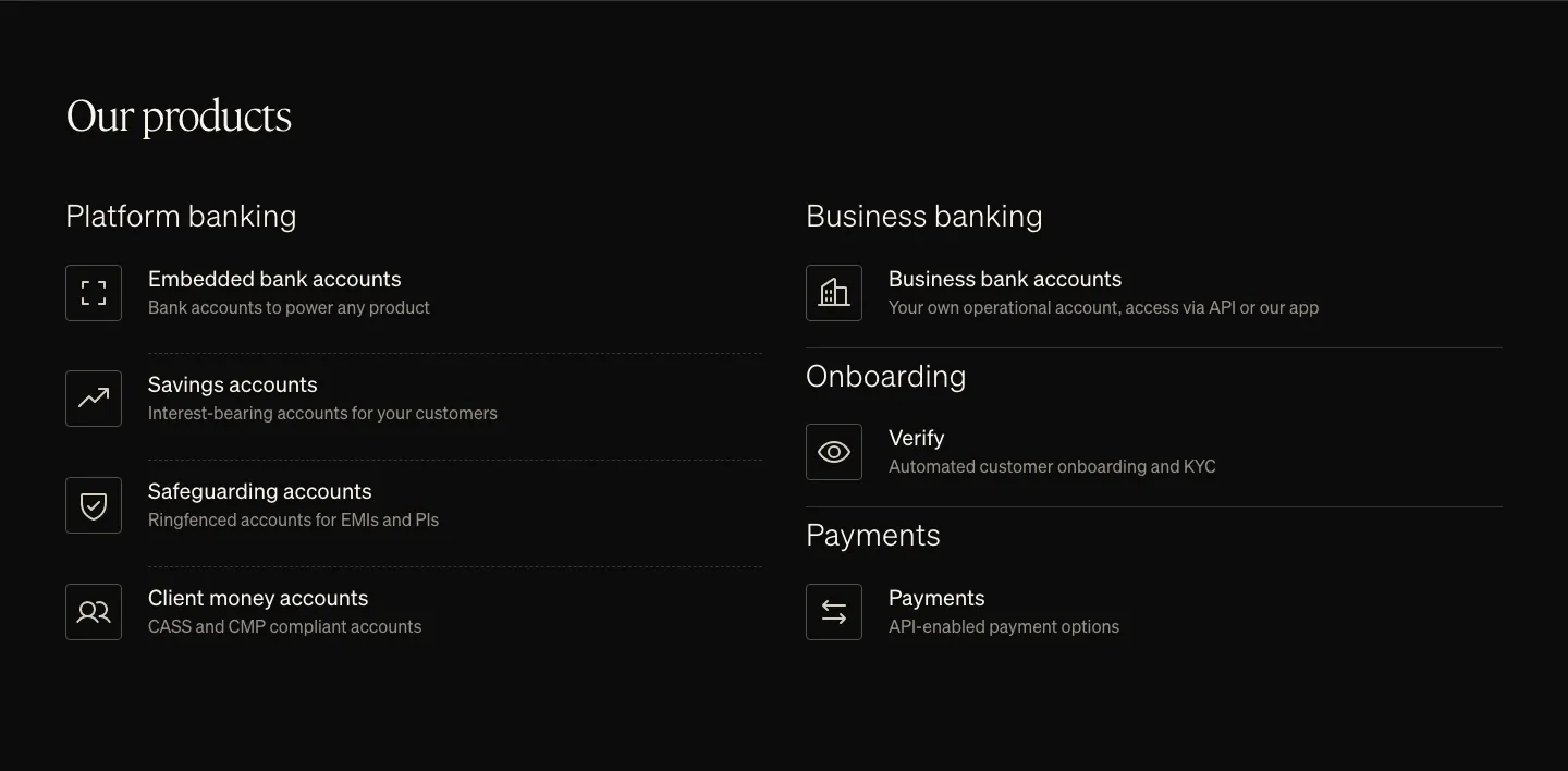
  36. Griffin features section: serif heading above two columns of product list items with outlined icons on black
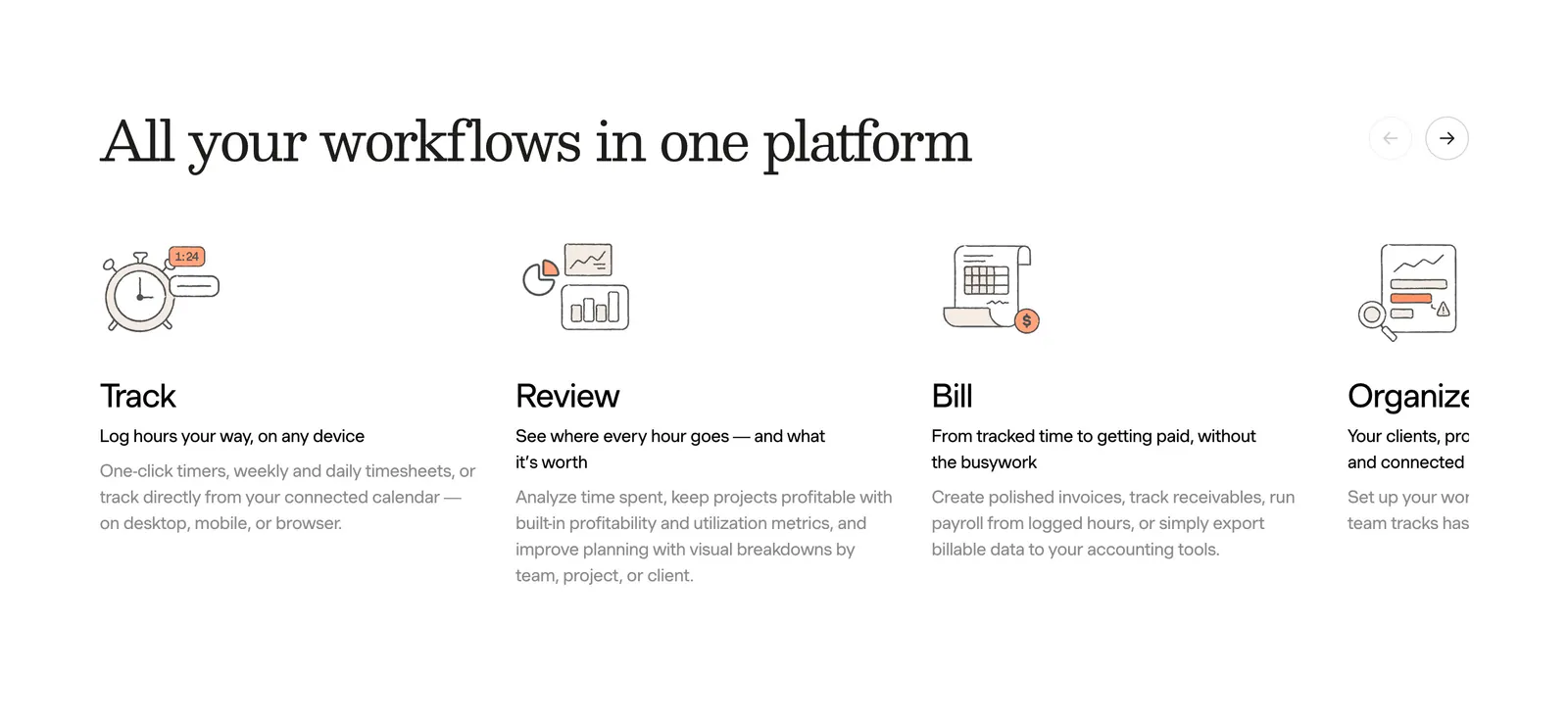
  37. Harvest features section: serif heading with arrow controls above a sliding row of track, review, bill and organize columns with line drawings
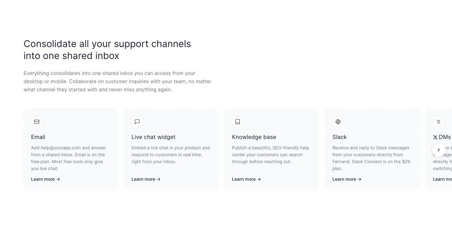
  38. Fernand features section: left-aligned headline above a row of support channel cards cut off at the right edge with a next arrow
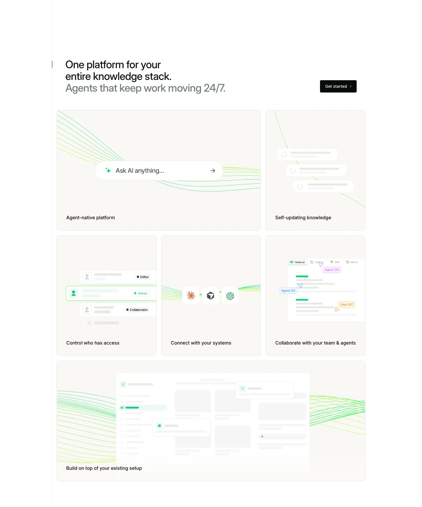
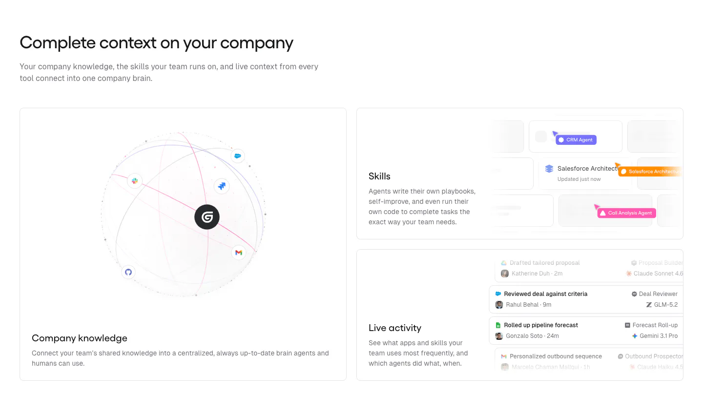
  39. Gumloop features section: headline above a large knowledge globe card and two stacked UI cards for skills and activity
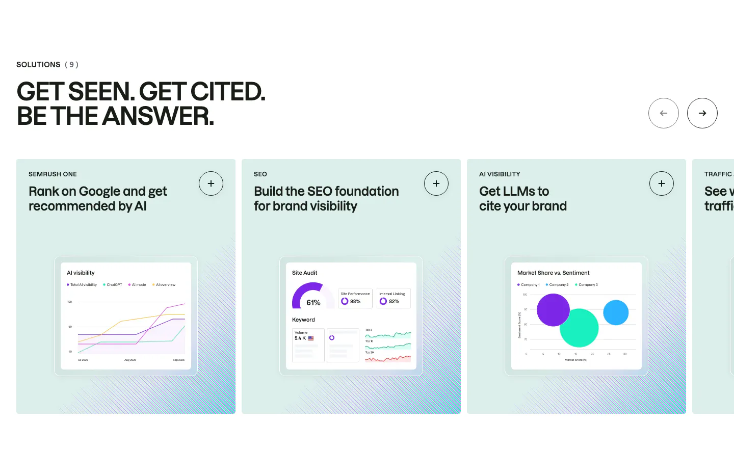
  40. Semrush features section: uppercase headline above a carousel of mint solution cards, each with a chart-based product UI mockup
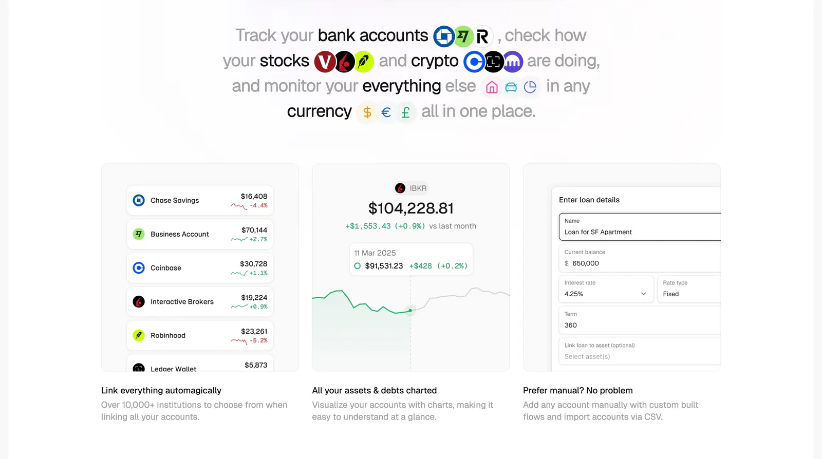
  41. Maybe features section: centered sentence headline with inline logos above three cards showing account list, chart and loan form UI
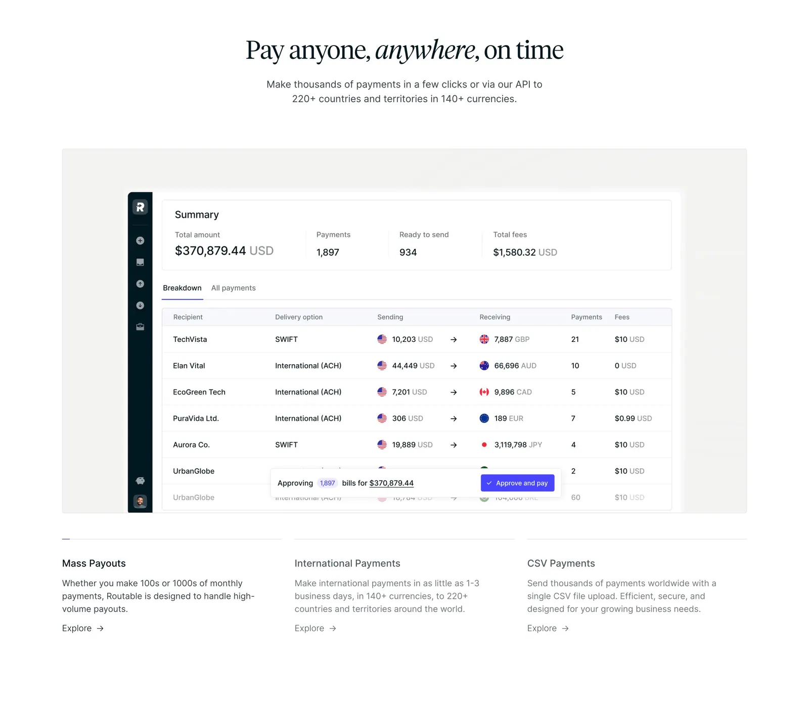
  42. Routable features section: centered serif headline above a payments summary dashboard screenshot and three feature columns on white
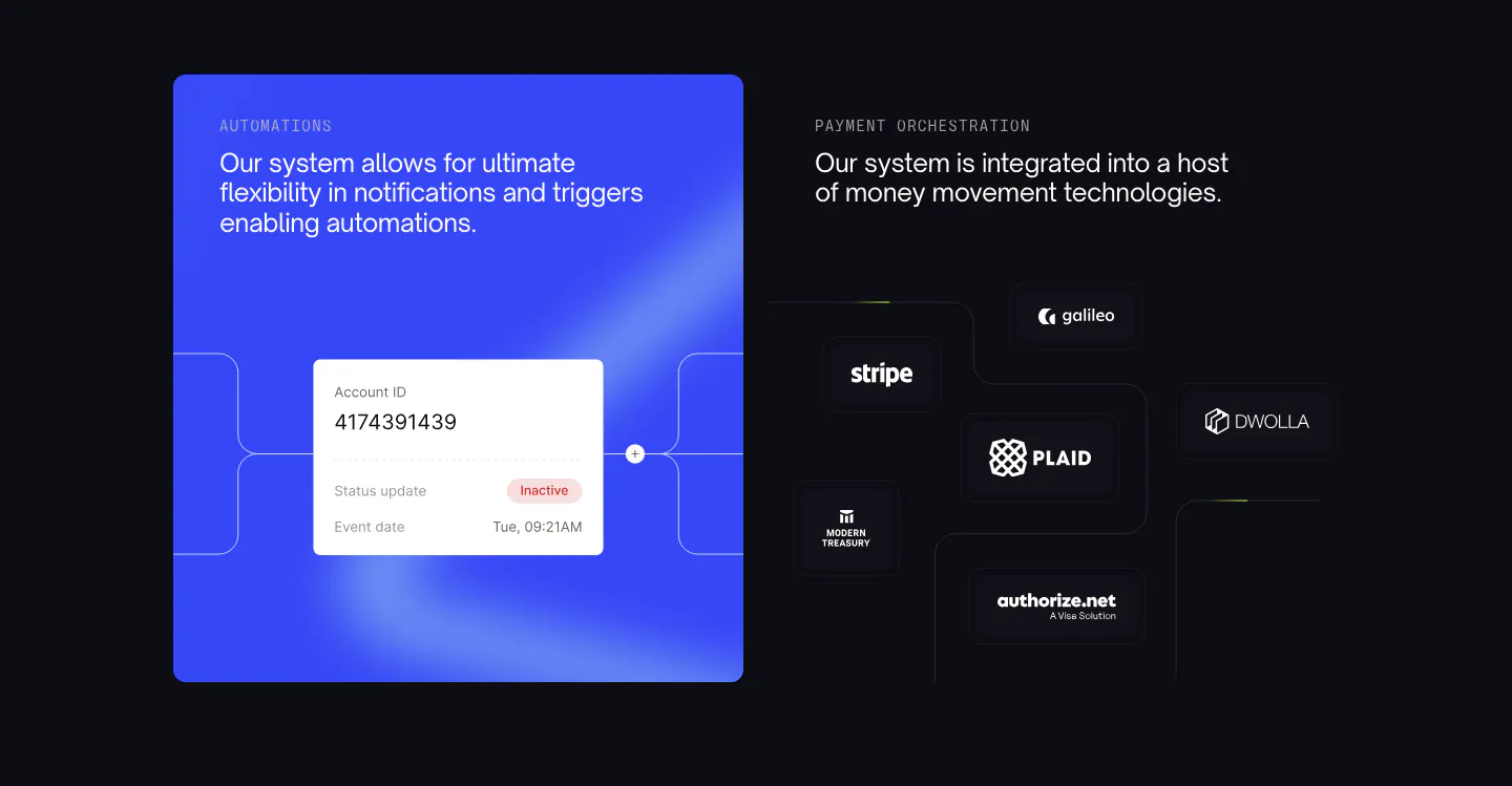
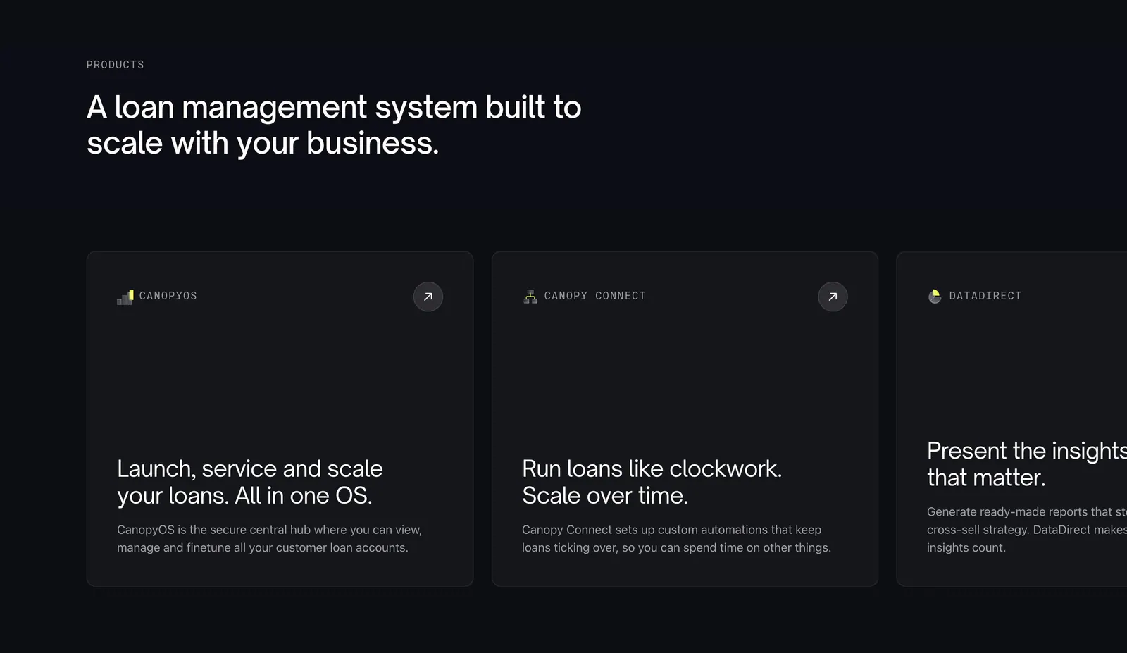
  43. Canopy features section: blue automation card with account UI beside payment partner logos on dark tiles
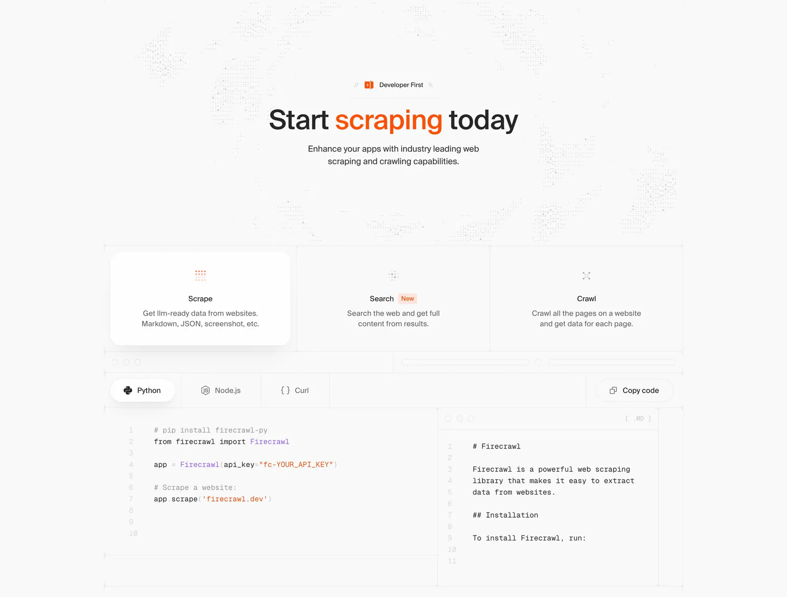
  44. Firecrawl features section: centered headline, three capability cards and a tabbed Python/Node.js/Curl code sample with markdown output
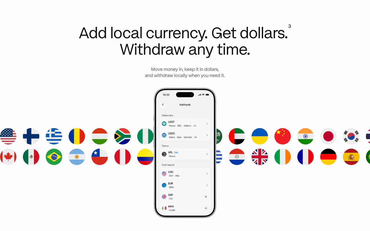
  45. Plasma features section: centered heading above a phone add-funds screen with two rows of country flag circles behind it
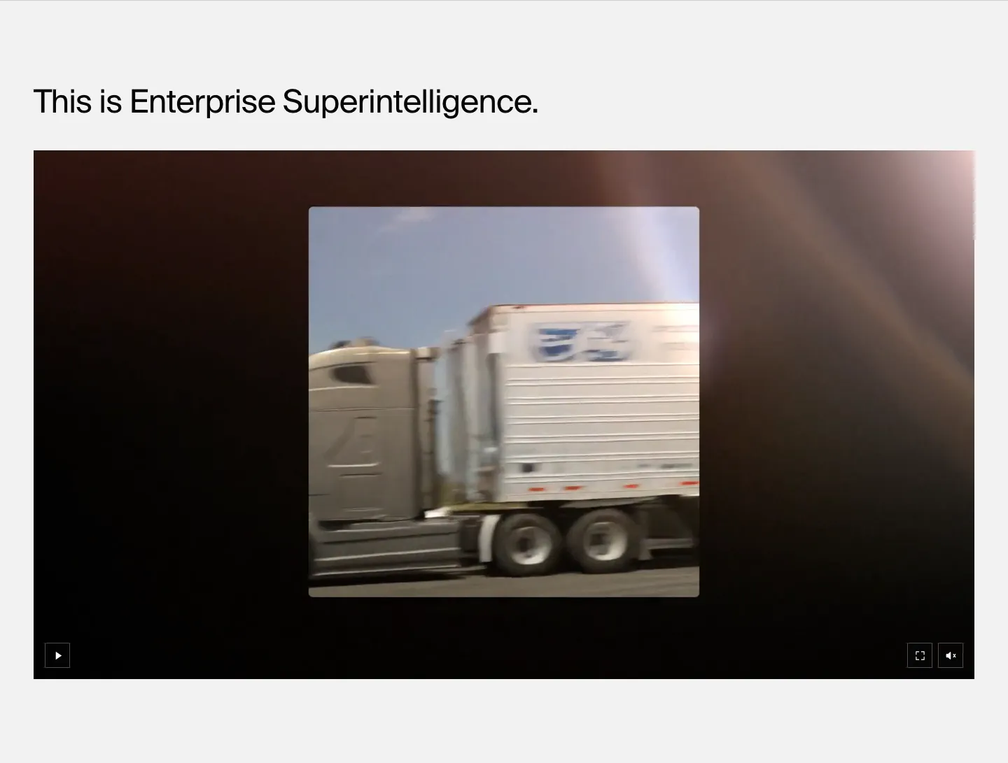
  46. HappyRobot features section: left-aligned headline above a wide dark video player showing footage of a moving truck, on light gray
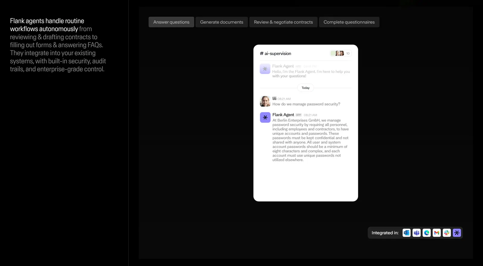
  47. Flank features section: left text column beside a tabbed panel showing a chat-style agent UI mockup and integration icons on black
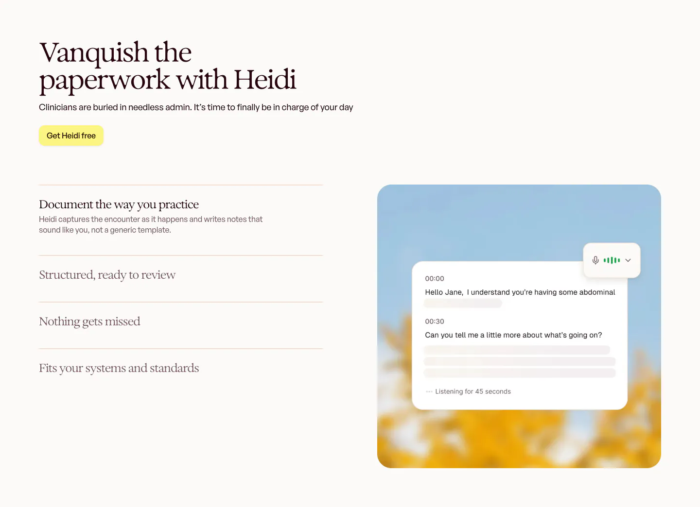
  48. Heidi features section: serif headline and accordion feature list on the left, live transcript card over a blurred sky photo on the right
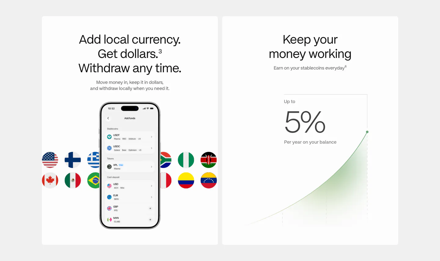
  49. Plasma features section: two white cards, one with a phone add-funds UI and flags, one with a 5% yield growth chart
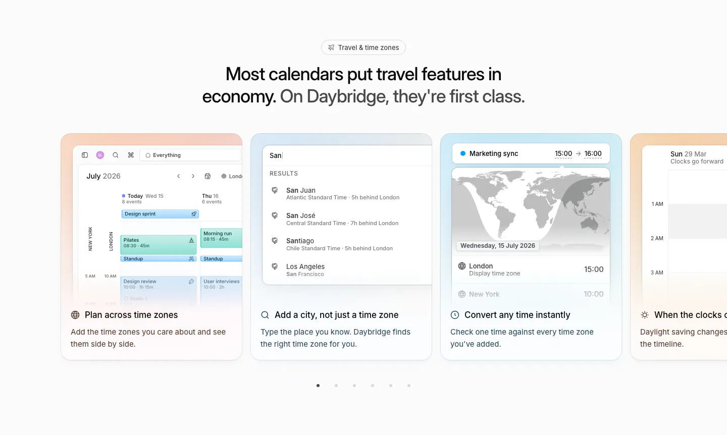
  50. Daybridge features section: centered headline above a carousel of pastel cards showing time zone UI, with pagination dots
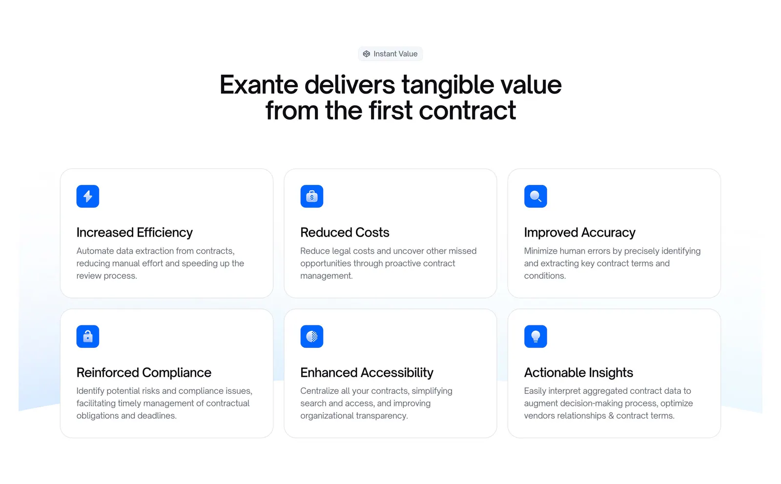
  51. Exante features section: centered headline above a 3x2 grid of benefit cards with blue icons on a white background
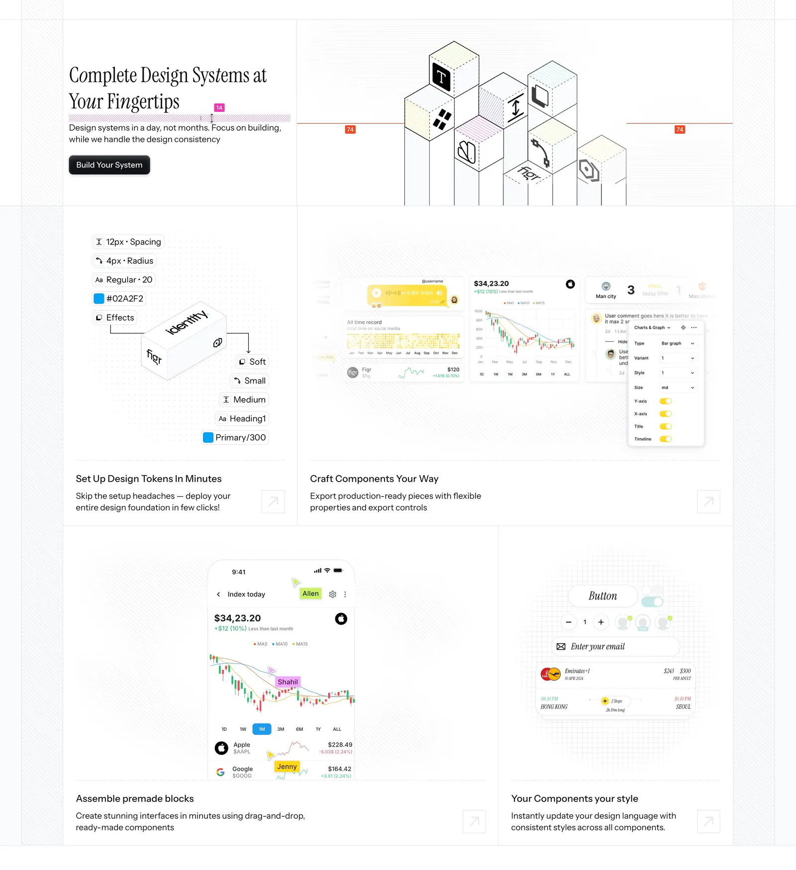
  52. Figr features section: serif headline beside an isometric cube drawing above a bento of design token, chart and mobile UI tiles
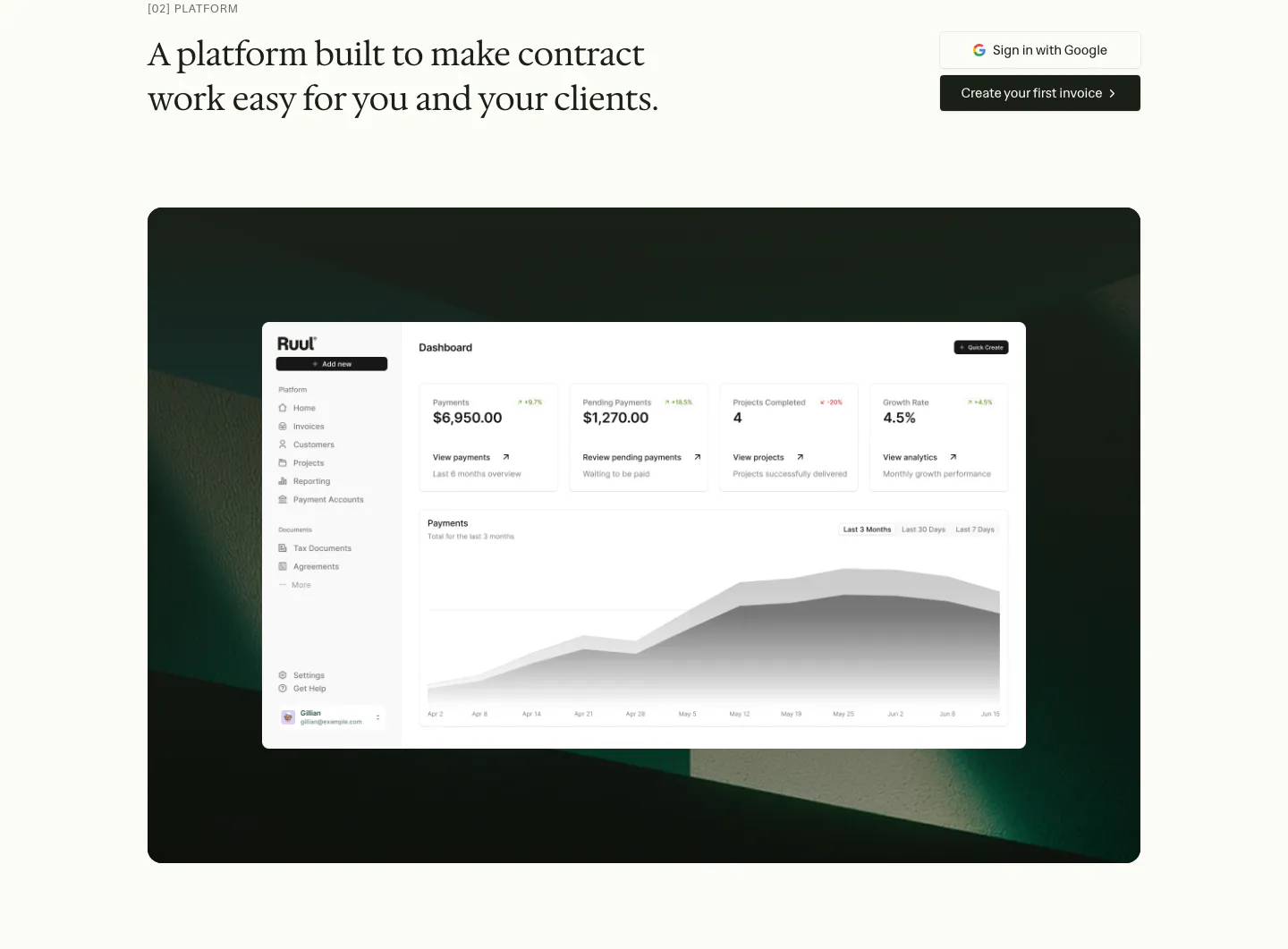
  53. Ruul features section: serif headline with two buttons above a dashboard screenshot on a dark green textured panel
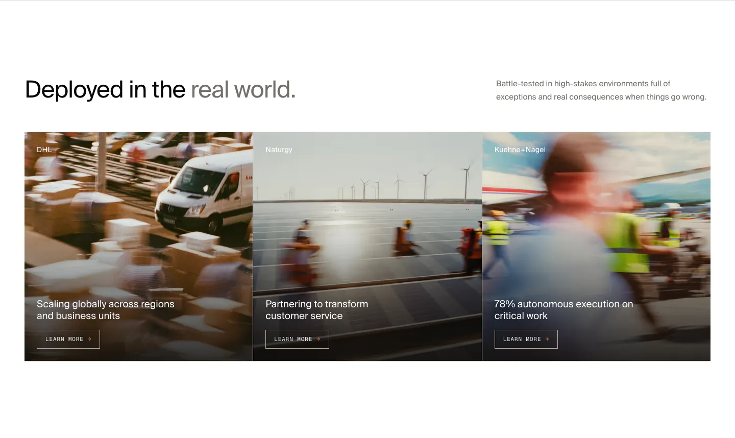
  54. HappyRobot features section: headline with side note above three customer story cards (DHL, Naturgy, Kuehne+Nagel) on motion-blurred photos
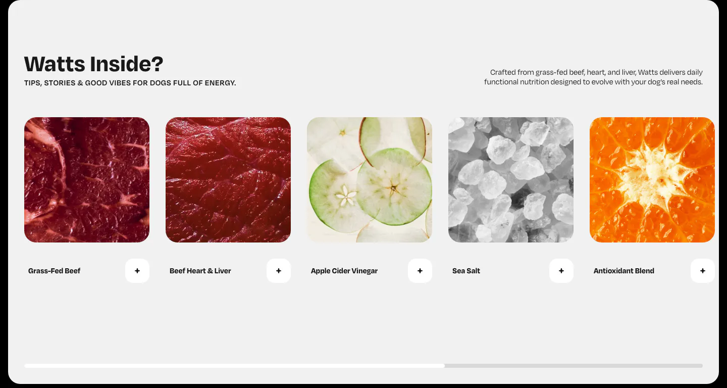
  55. Watts features section: horizontal row of ingredient photo cards with plus buttons and a scroll progress bar on light gray
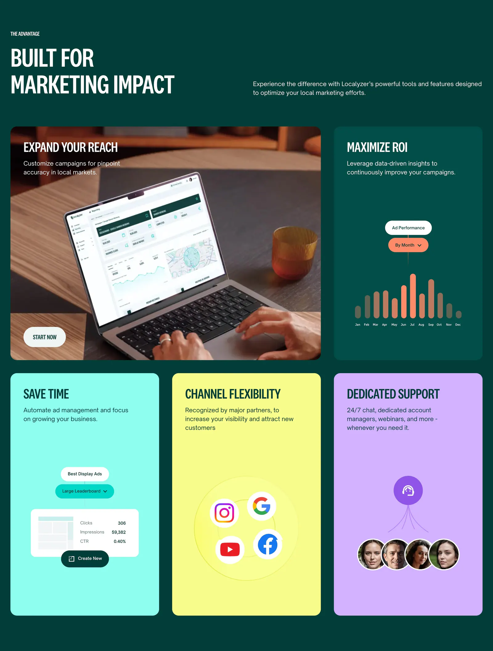
  56. Localyzer features section: bento grid on dark green with a laptop photo tile, ad chart tile and bright colored benefit cards
  57. Jasper features section: large left-aligned headline above three icon columns with short benefit descriptions on a white background
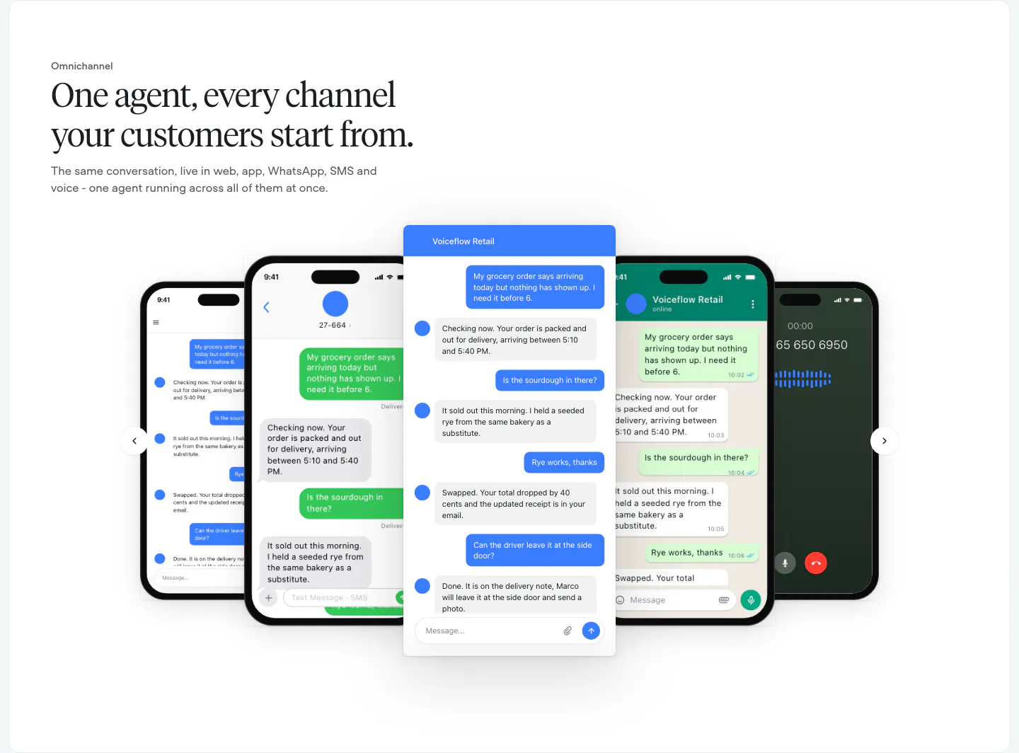
  58. Voiceflow features section: left-aligned serif headline above a carousel of phone and chat UI mockups with arrow controls
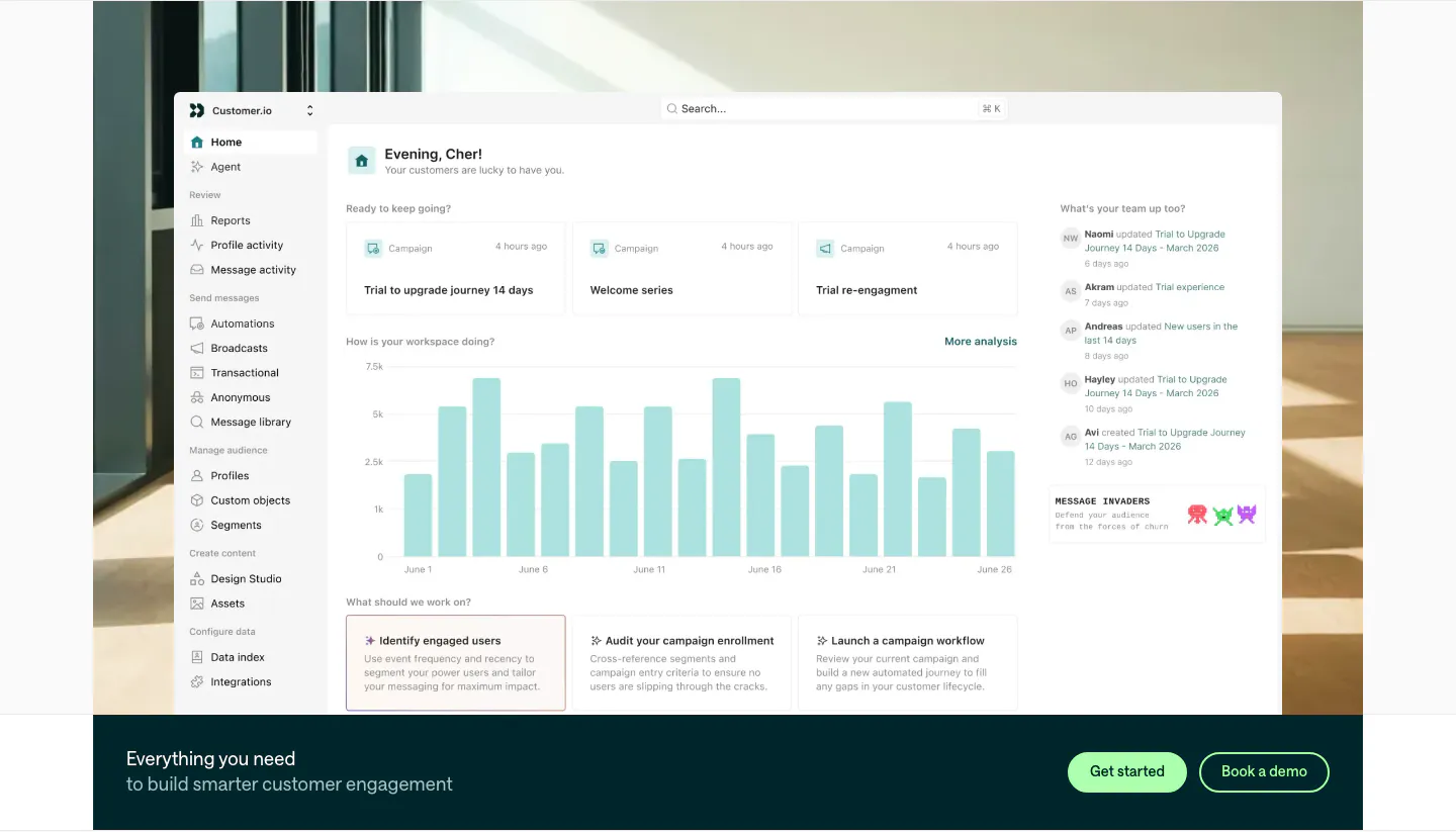
  59. Customer.io features section: large home dashboard screenshot over an office photo, with a dark teal CTA bar and two buttons below
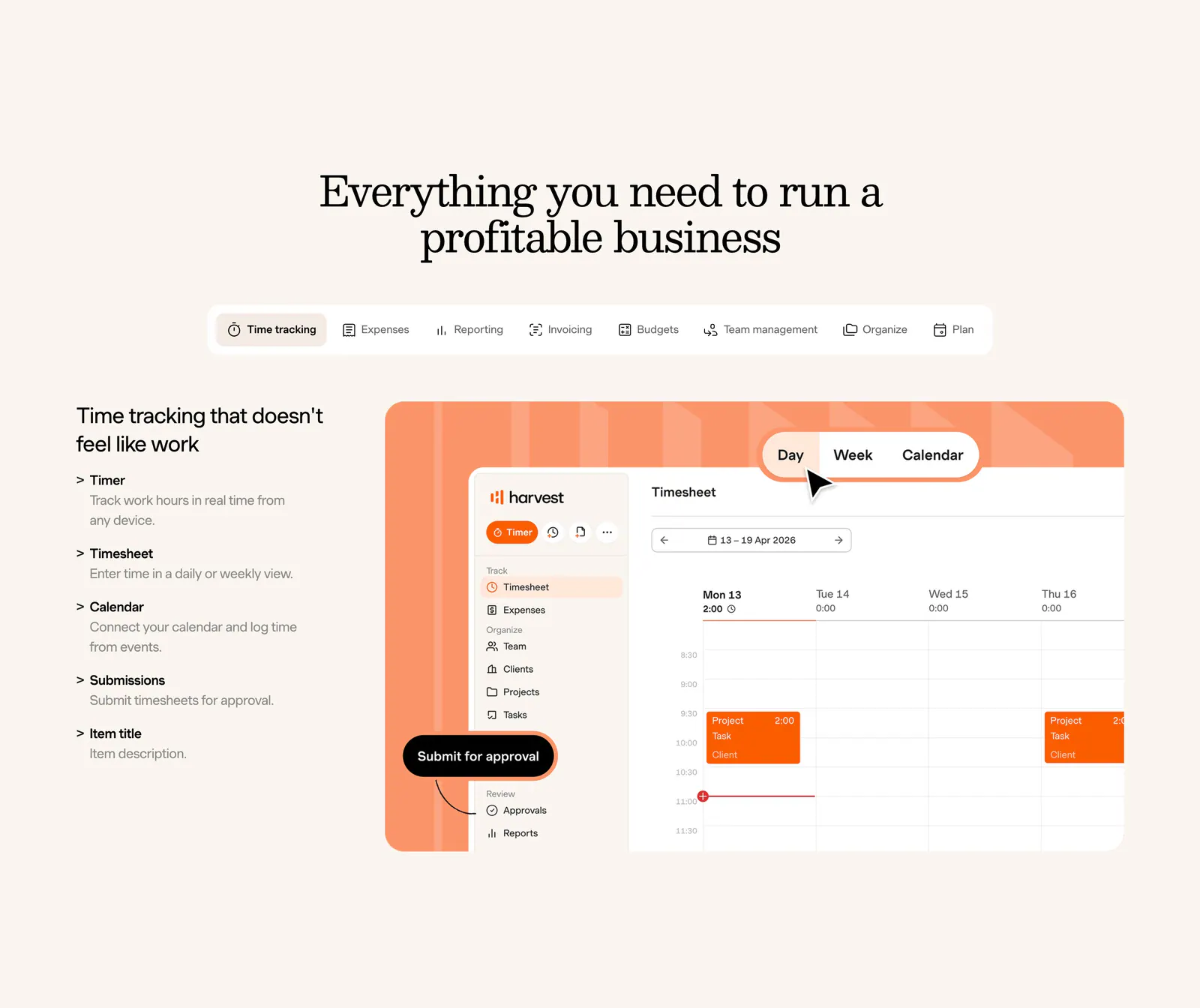
  60. Harvest features section: centered serif heading and feature tabs above a feature list beside a timesheet UI on an orange panel, cream background
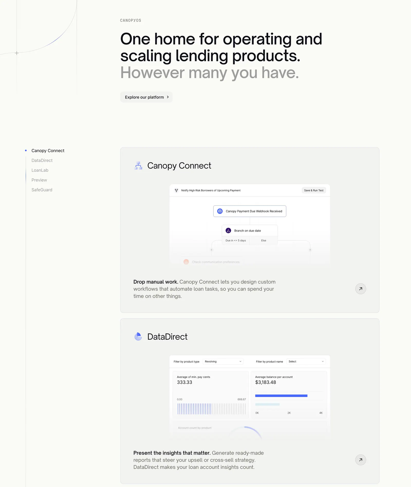
  61. Canopy features section: large headline above a sticky product list on the left and stacked cards with workflow and analytics UI
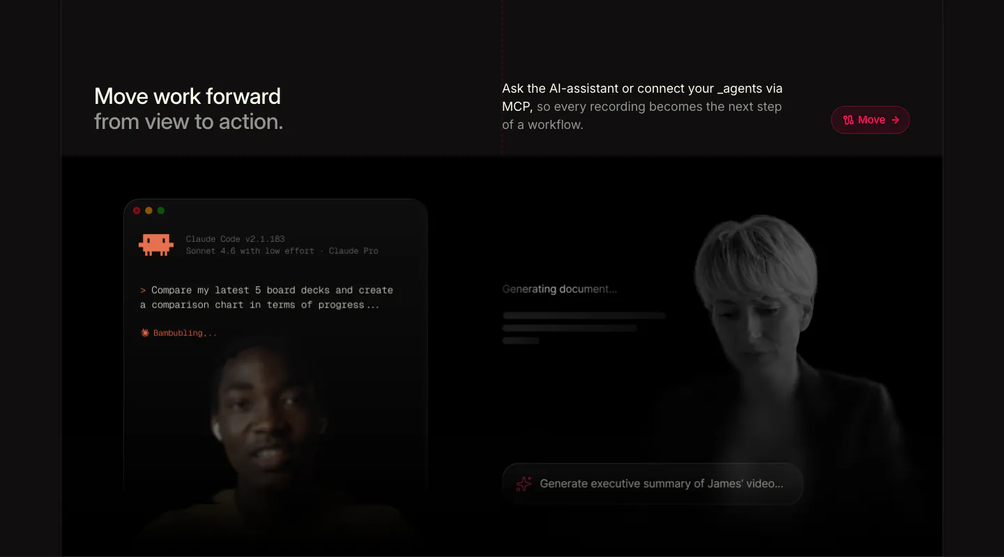
  62. Supercut features section: headline row above a Claude Code terminal prompt and a generating-document panel over faded presenters
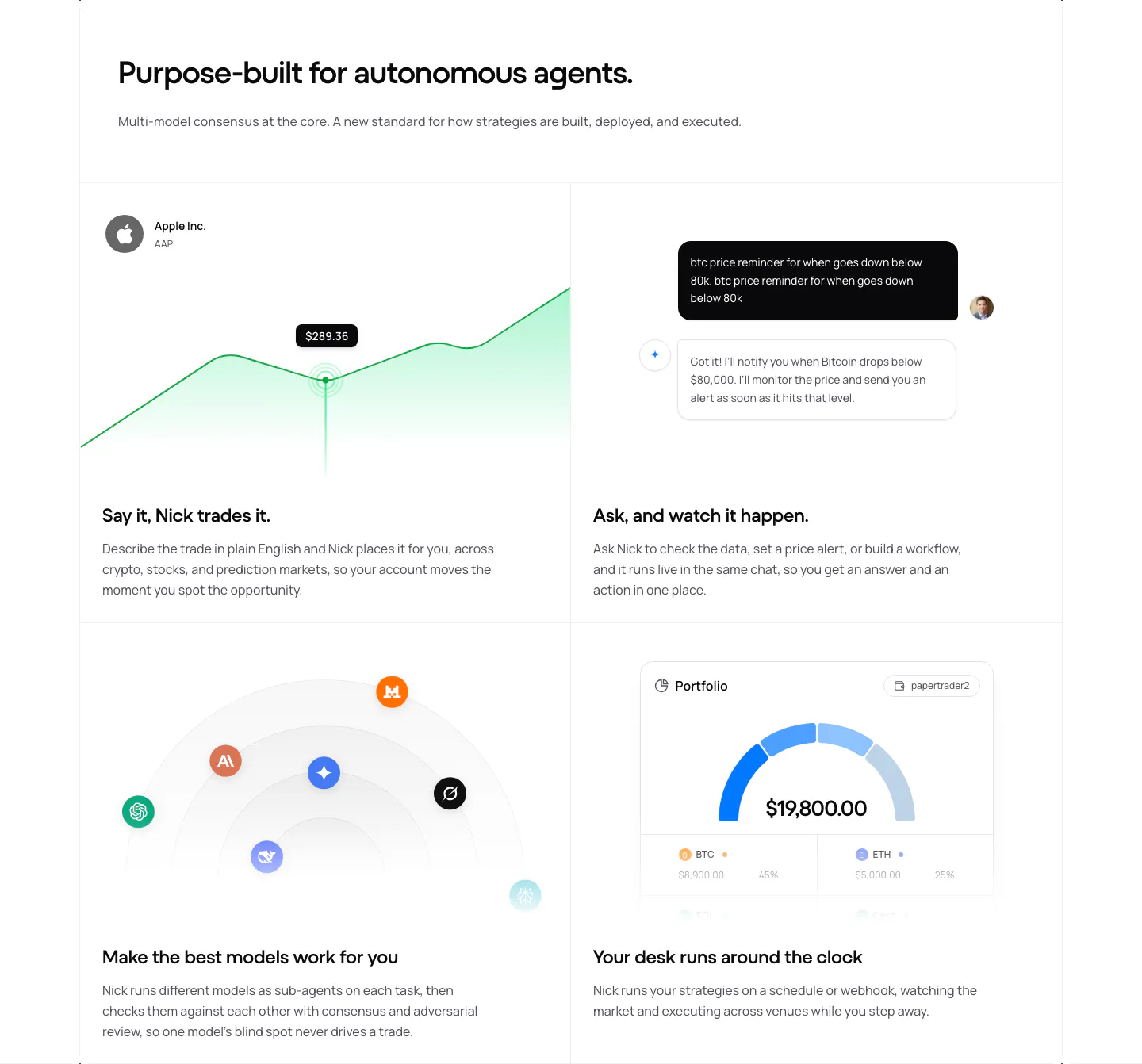
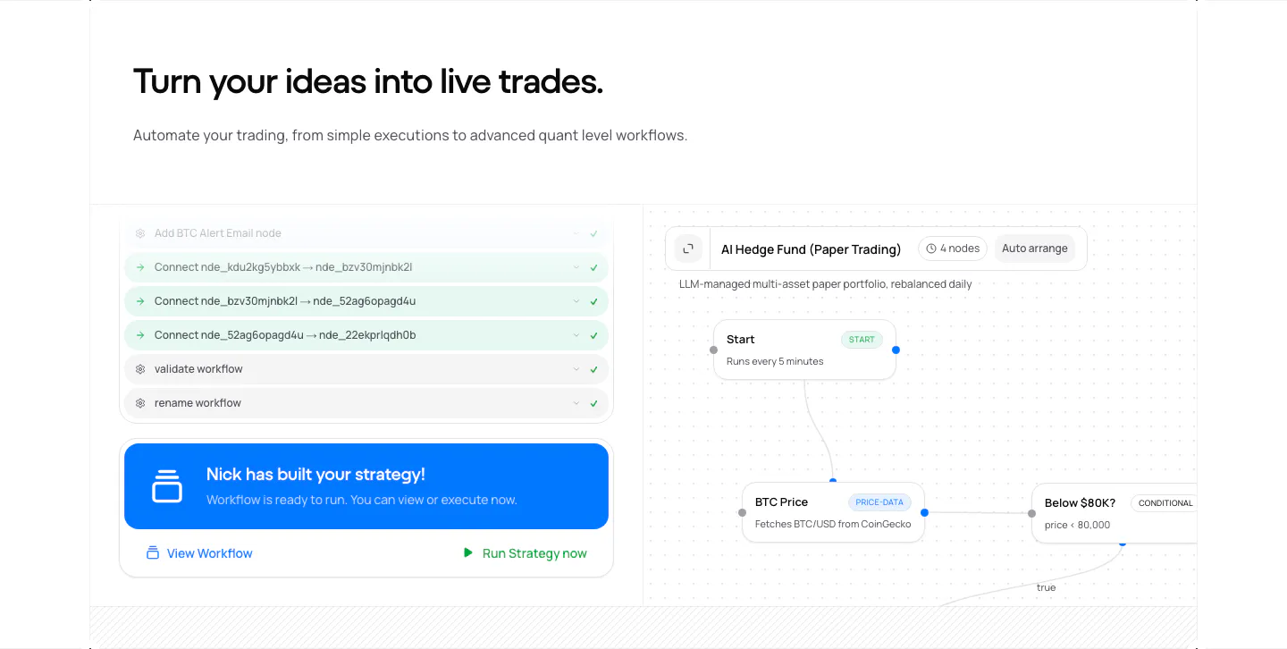
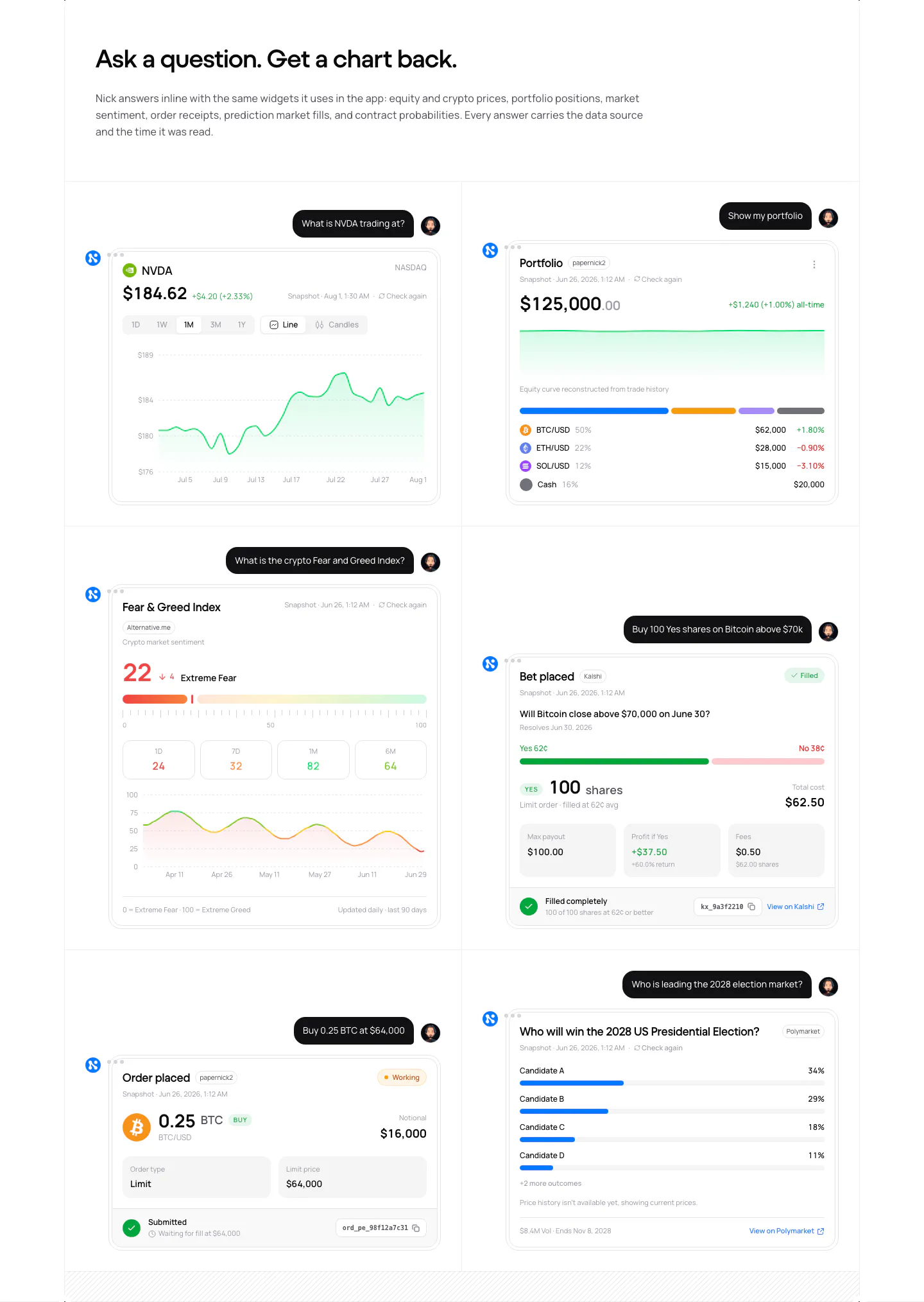
  63. NickAI features section: left heading above a 2x2 grid of feature cells with price chart, chat, model icons and portfolio UI
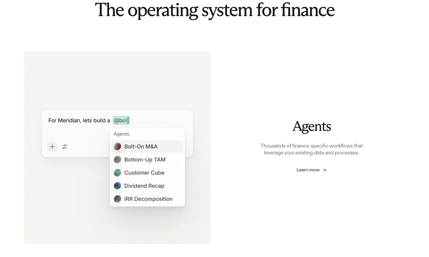
  64. Rogo features section: serif heading above an agent picker UI mockup on the left and Agents text with a link on the right
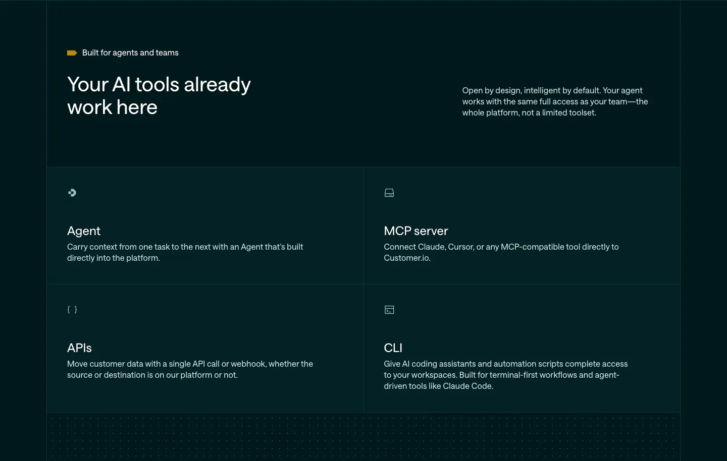
  65. Customer.io features section: dark teal header with headline and copy above a 2x2 grid of Agent, MCP server, APIs and CLI cells
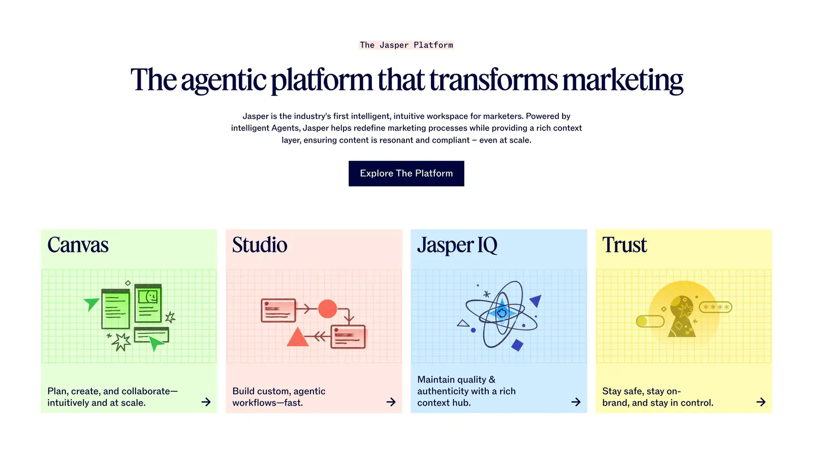
  66. Jasper features section: centered serif headline and button above four pastel cards with line illustrations on grid backgrounds
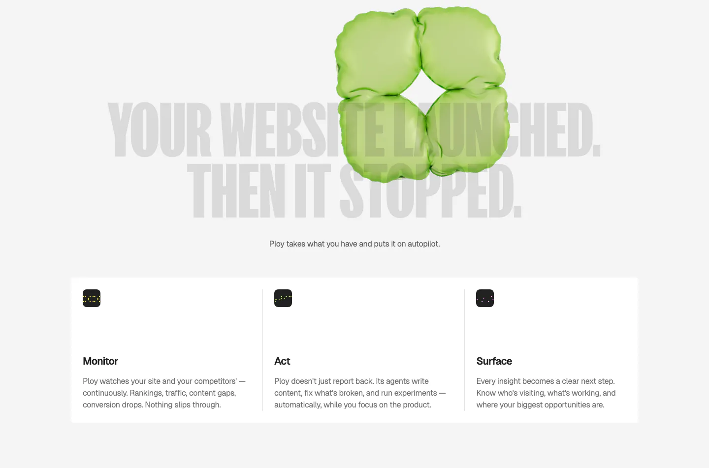
  67. Ploy features section: huge gray condensed headline behind a green 3D inflatable shape, above three columns for Monitor, Act and Surface
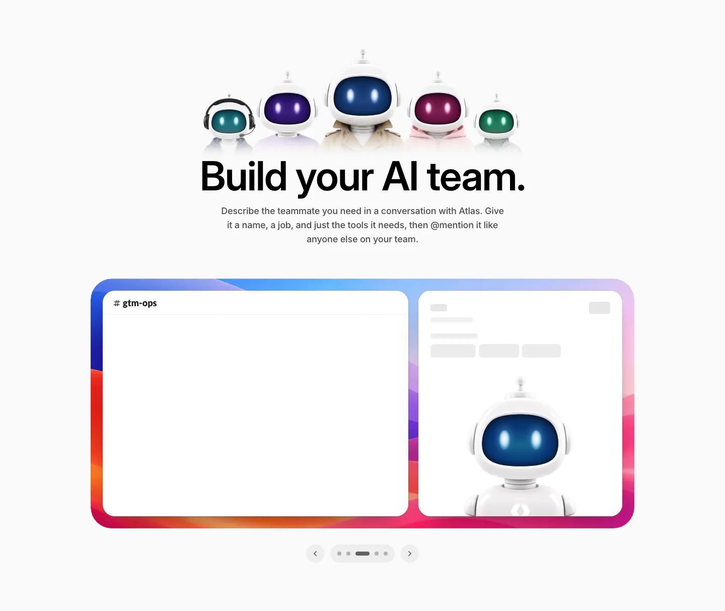
  68. WorkOS features section: row of 3D robot characters above a centered headline and a Slack mockup carousel
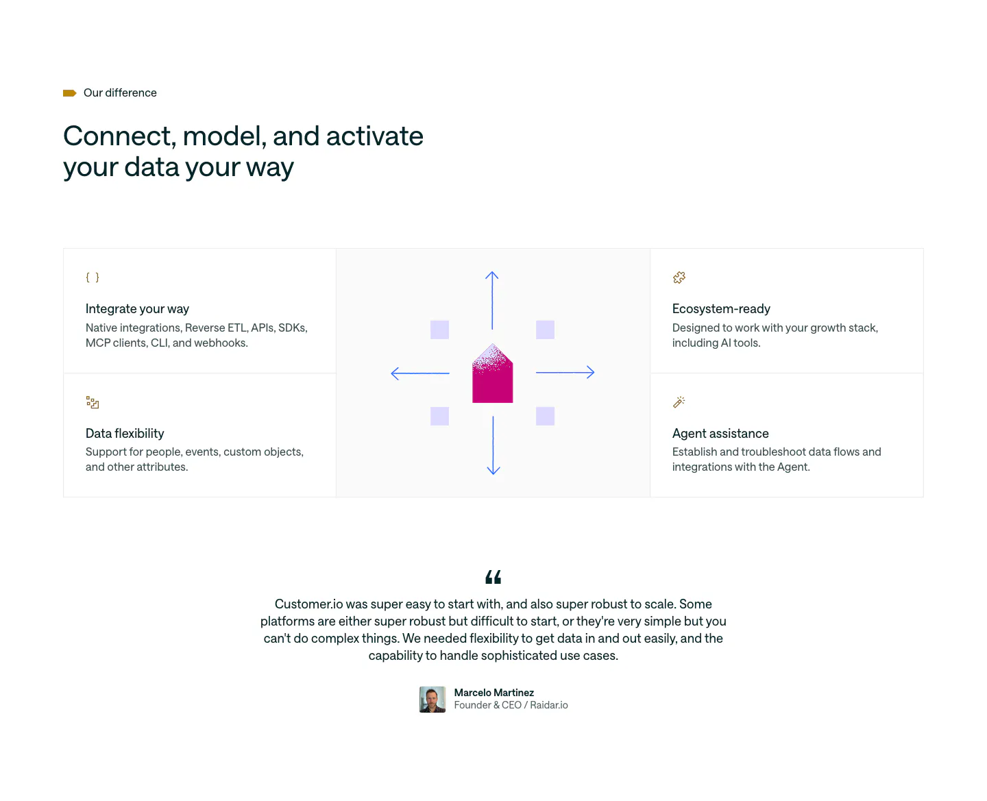
  69. Customer.io features section: four feature cells around a central envelope and arrows graphic, followed by a centered customer quote
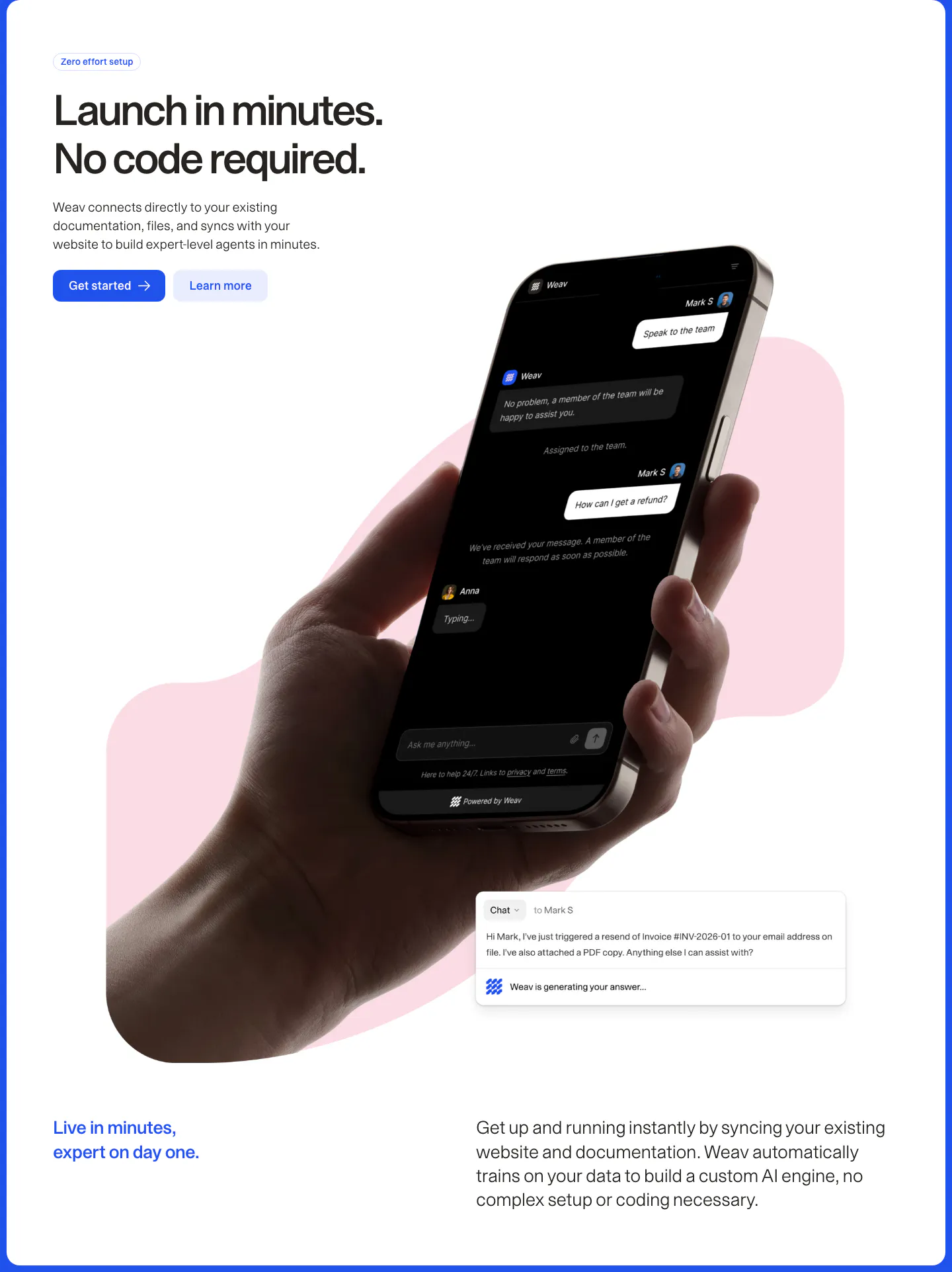
  70. Weav features section: headline and two buttons above a hand holding a phone with a dark chat UI over a pink blob, plus a chat reply card
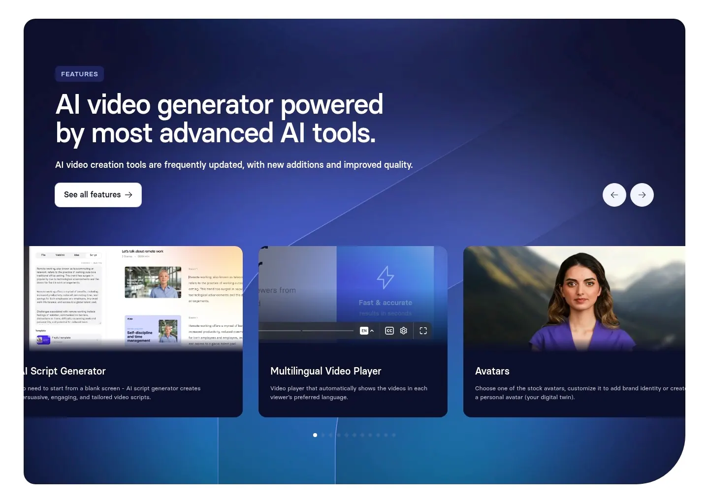
  71. Synthesia features section: navy-to-blue gradient panel with headline, arrow controls and a carousel of feature cards with UI and avatars
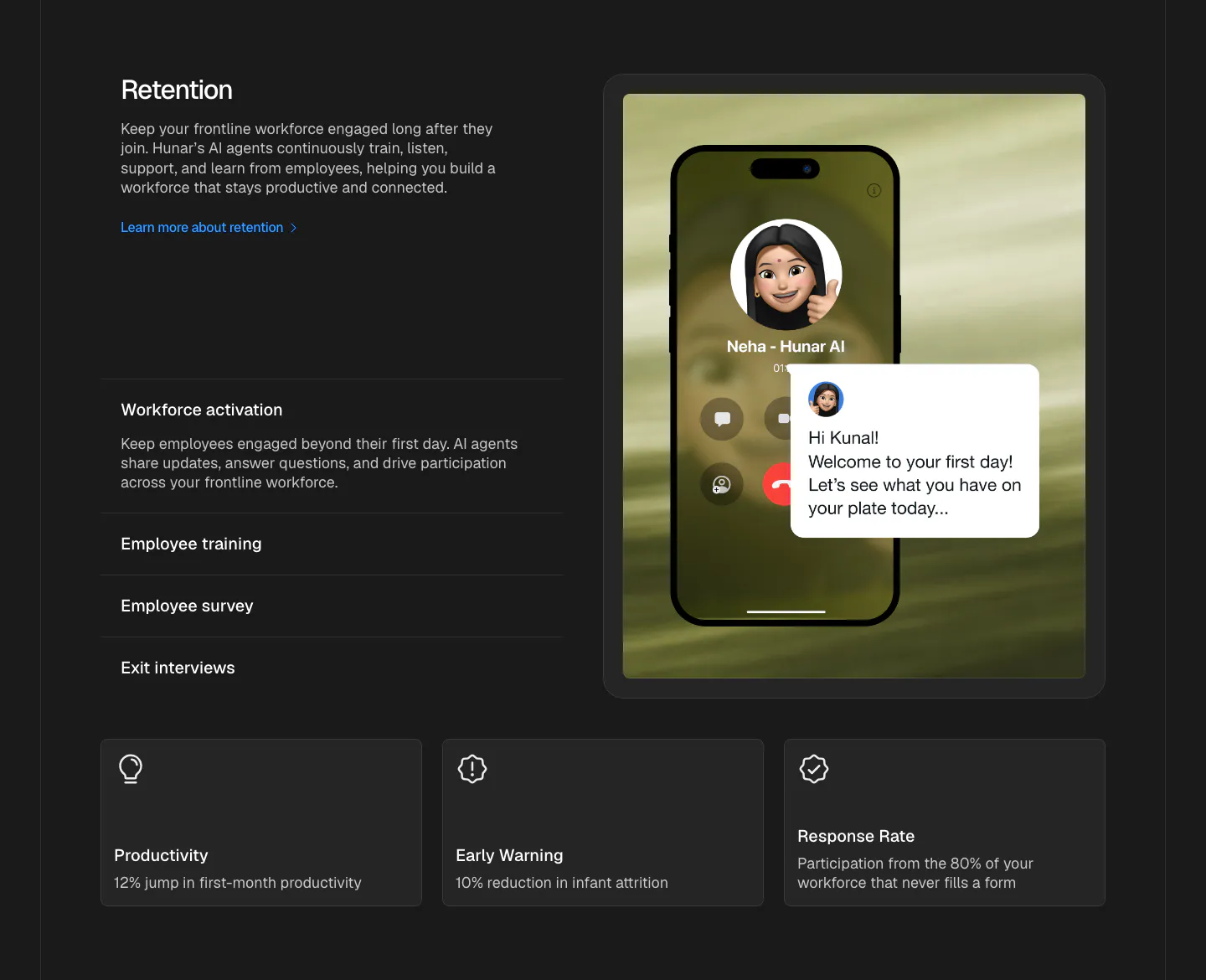
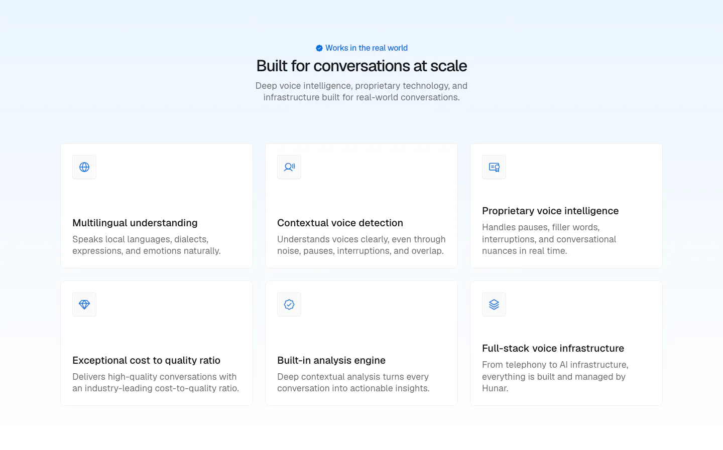
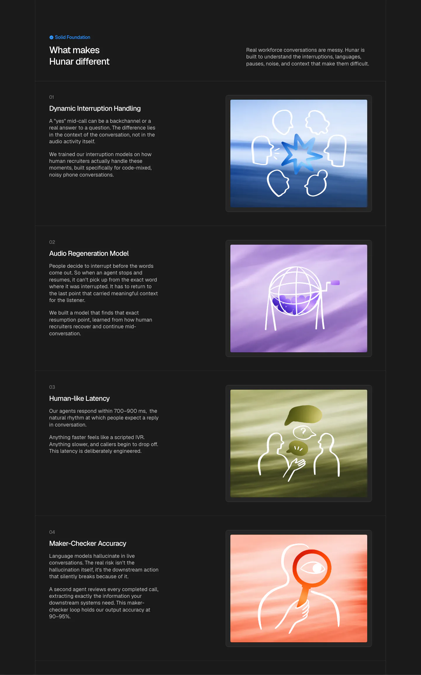
  72. Hunar features section: dark background with retention copy and accordion list beside a phone call mockup, three outcome cards below
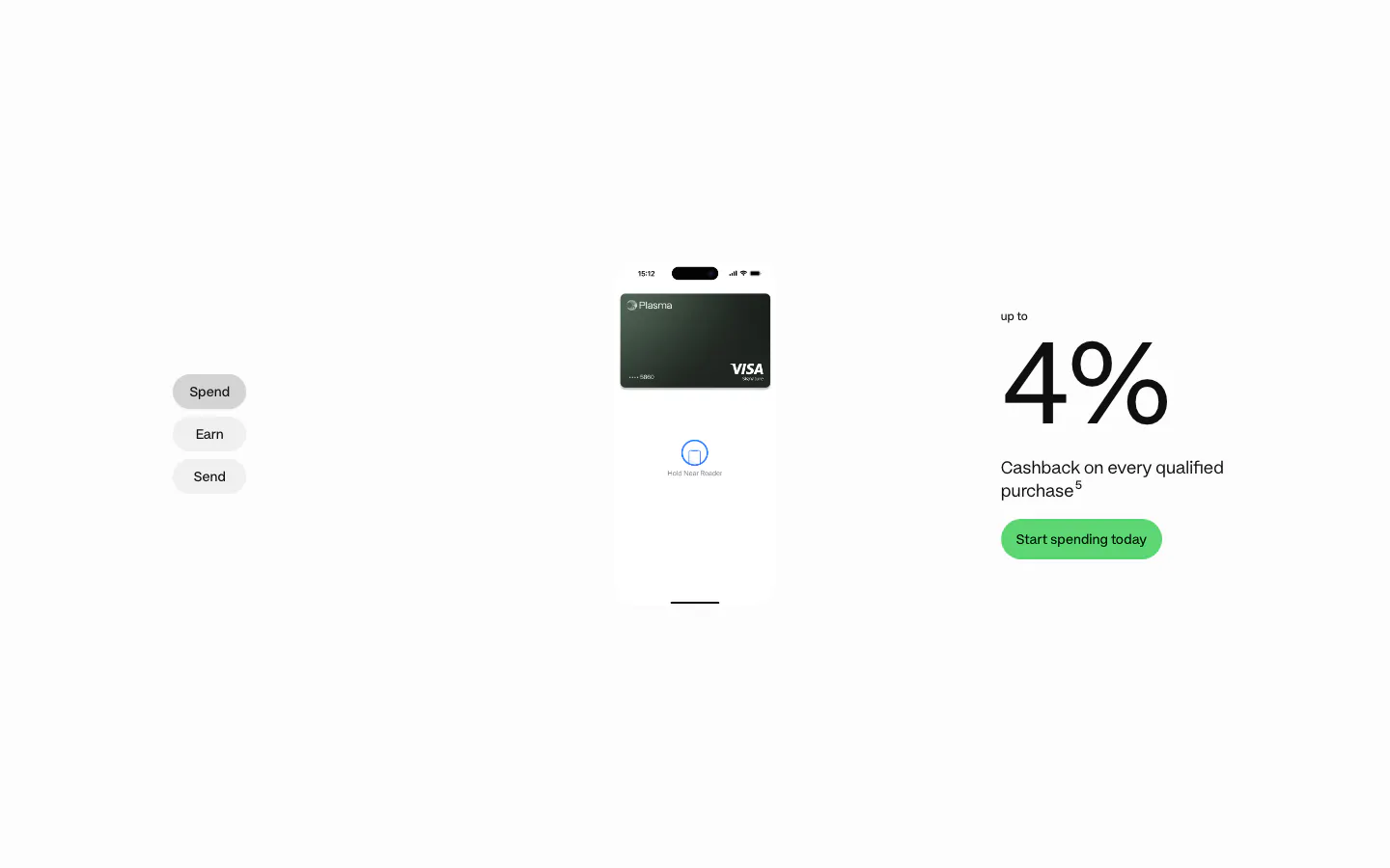
  73. Plasma features section: Spend/Earn/Send tabs left, phone with card center and a large 4% cashback figure right on white
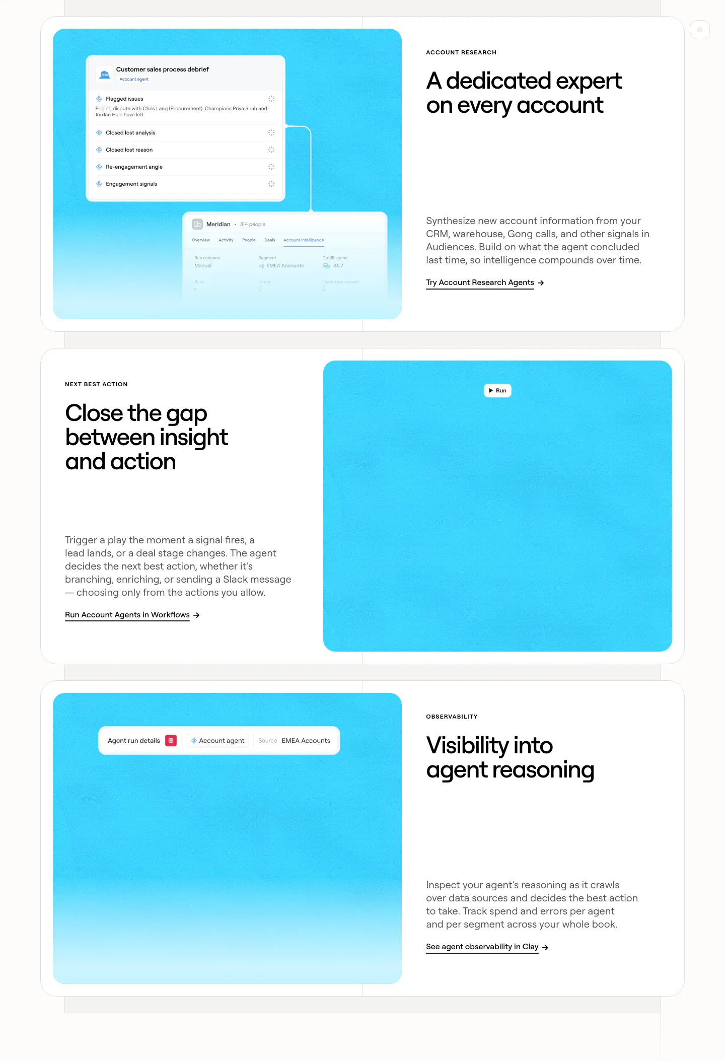
  74. Clay features section: three alternating rows of white cards pairing headlines and copy with bright cyan panels holding agent UI snippets
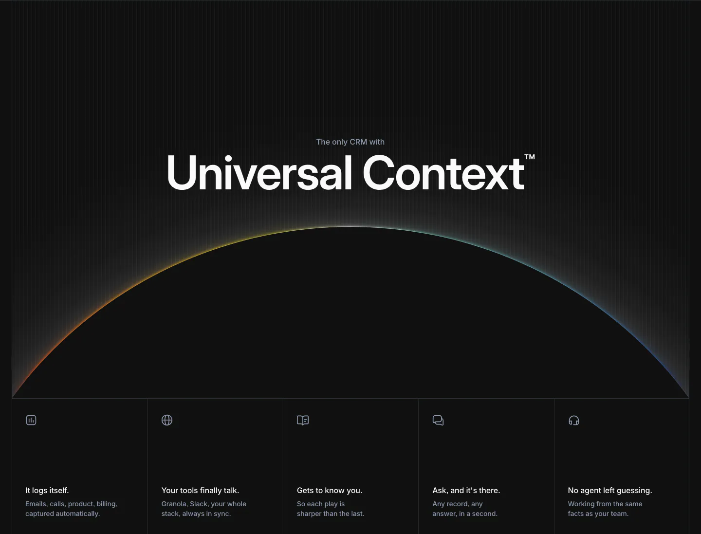
  75. Attio features section: large centered headline over a glowing horizon arc, five equal feature cells with icons below, dark background
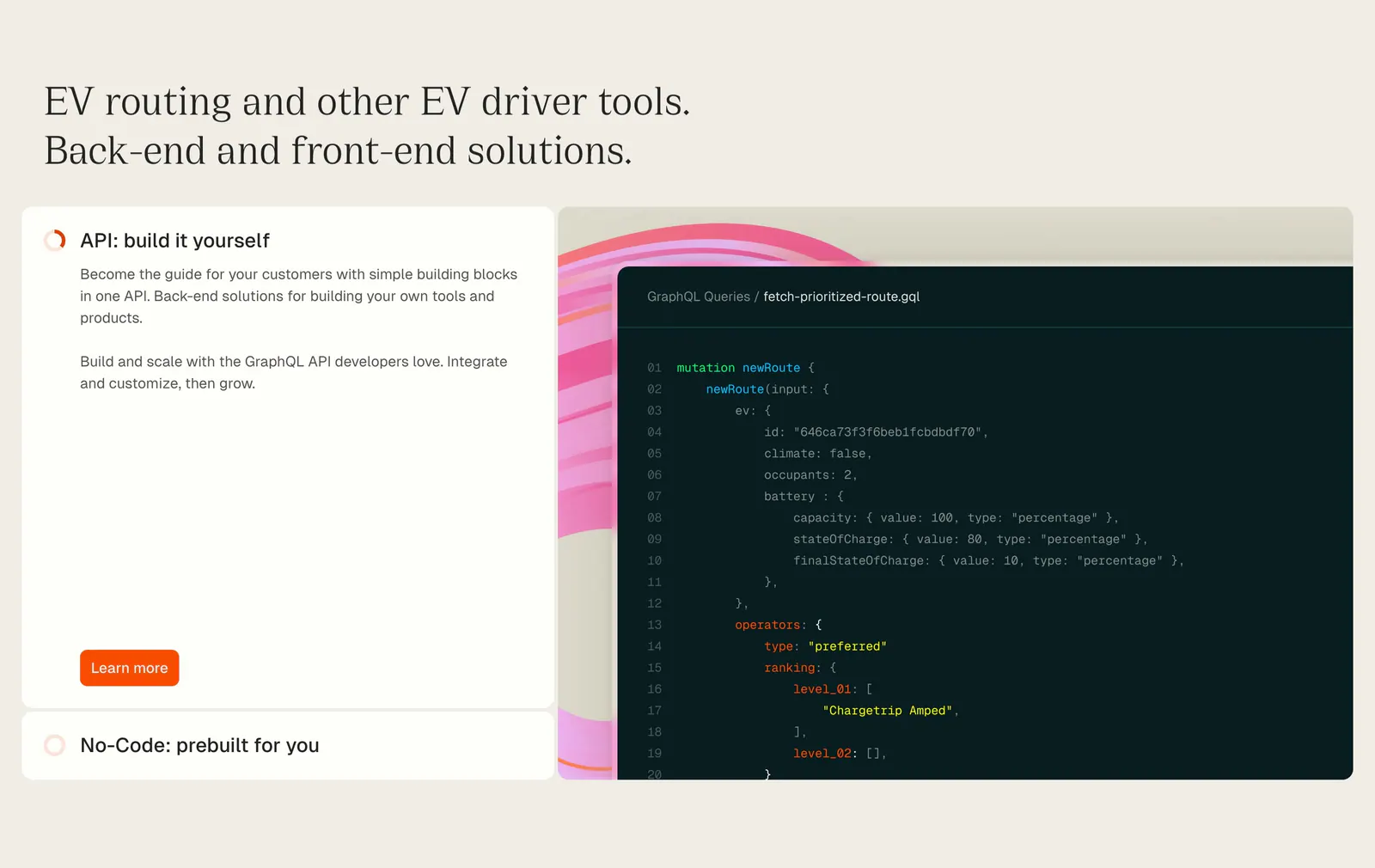
  76. Chargetrip features section: serif headline above an expandable option list beside a GraphQL code snippet on a beige background
  77. Remote features section: left-aligned headline above a six-item grid with cyan icon tiles and divider lines
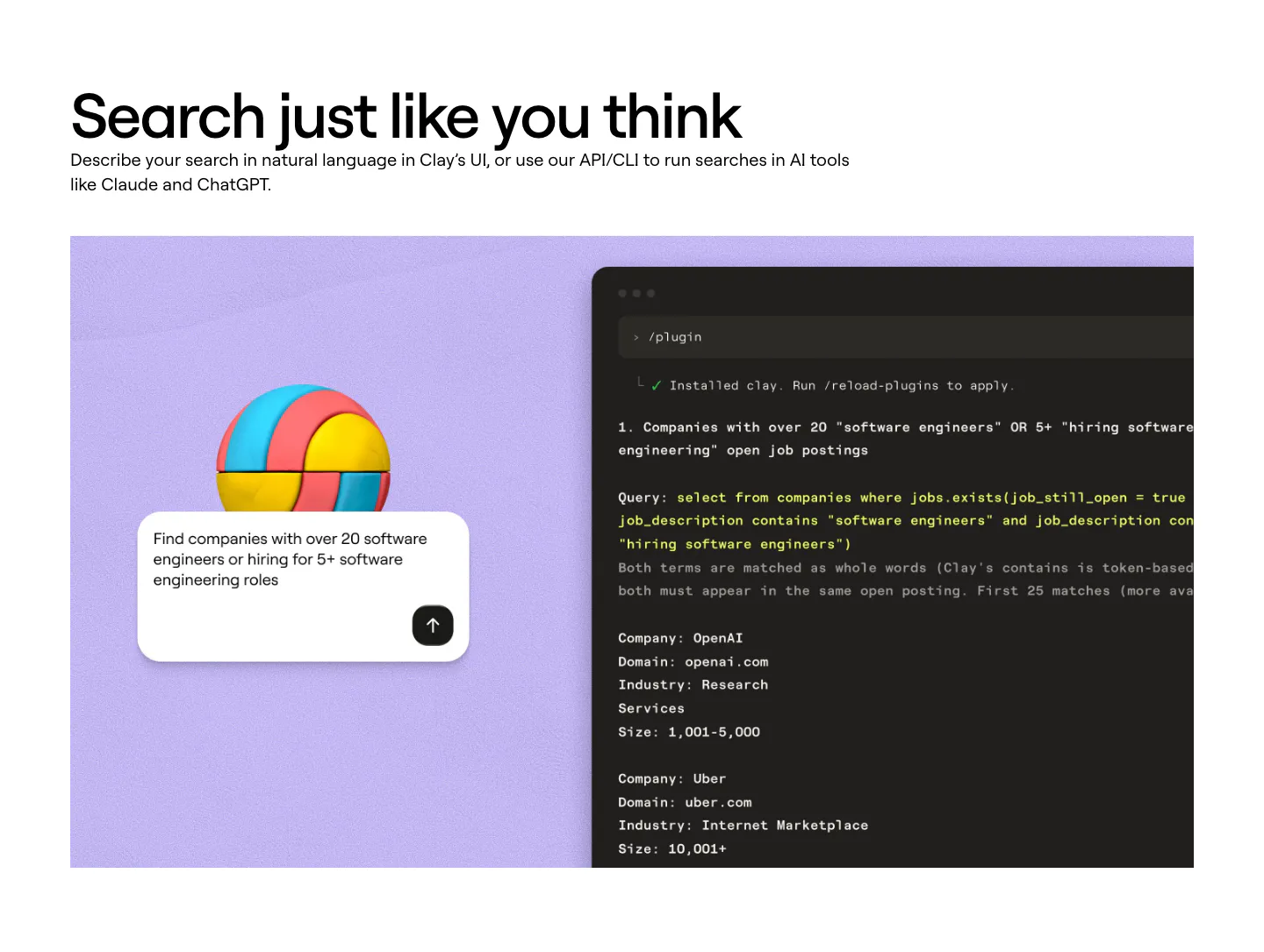
  78. Clay features section: left-aligned heading above a lavender panel with a 3D ball, a search prompt card and a dark terminal showing a query
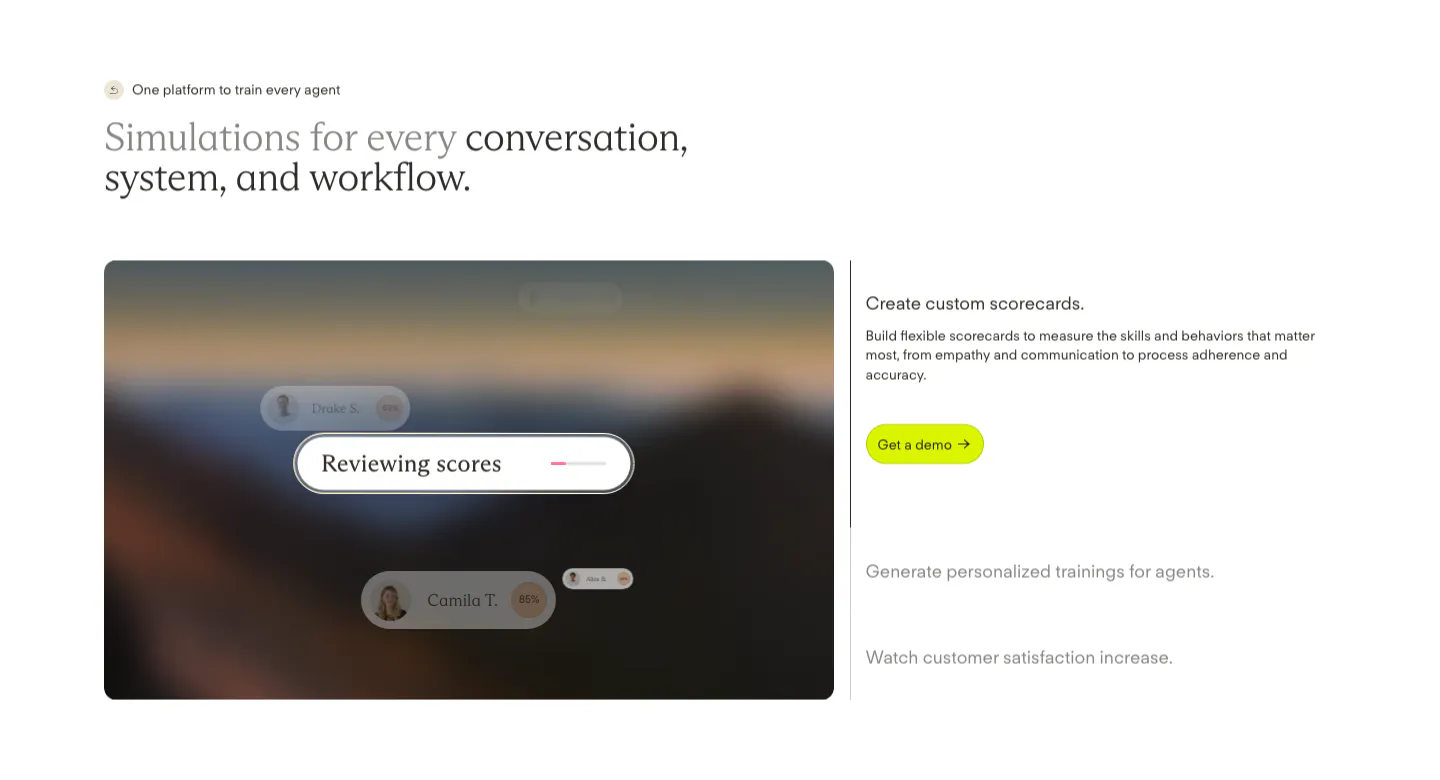
  79. Solidroad features section: two-tone serif headline above a blurred landscape card with score UI chips beside an expandable feature list
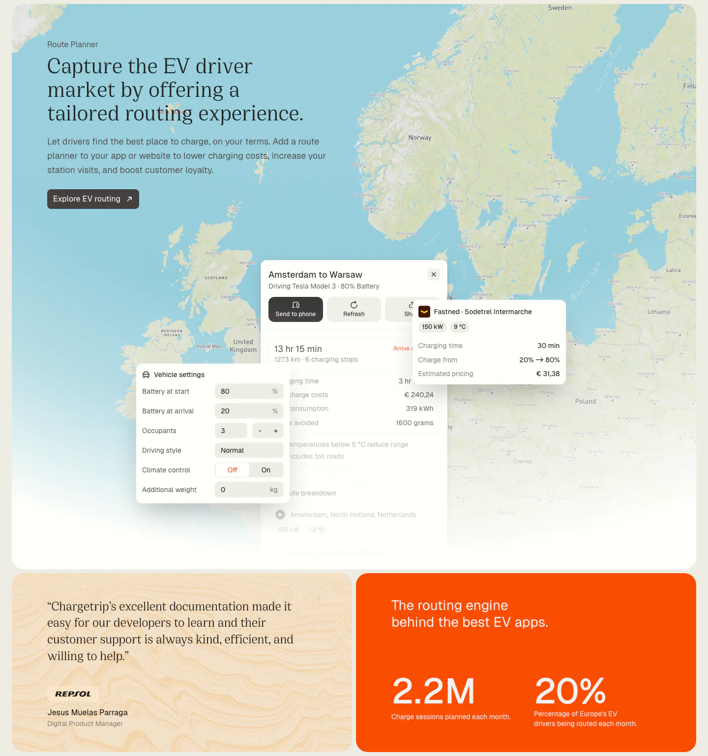
  80. Chargetrip features section: serif headline over a Europe map with route planner UI panels, above a quote card and an orange stats card
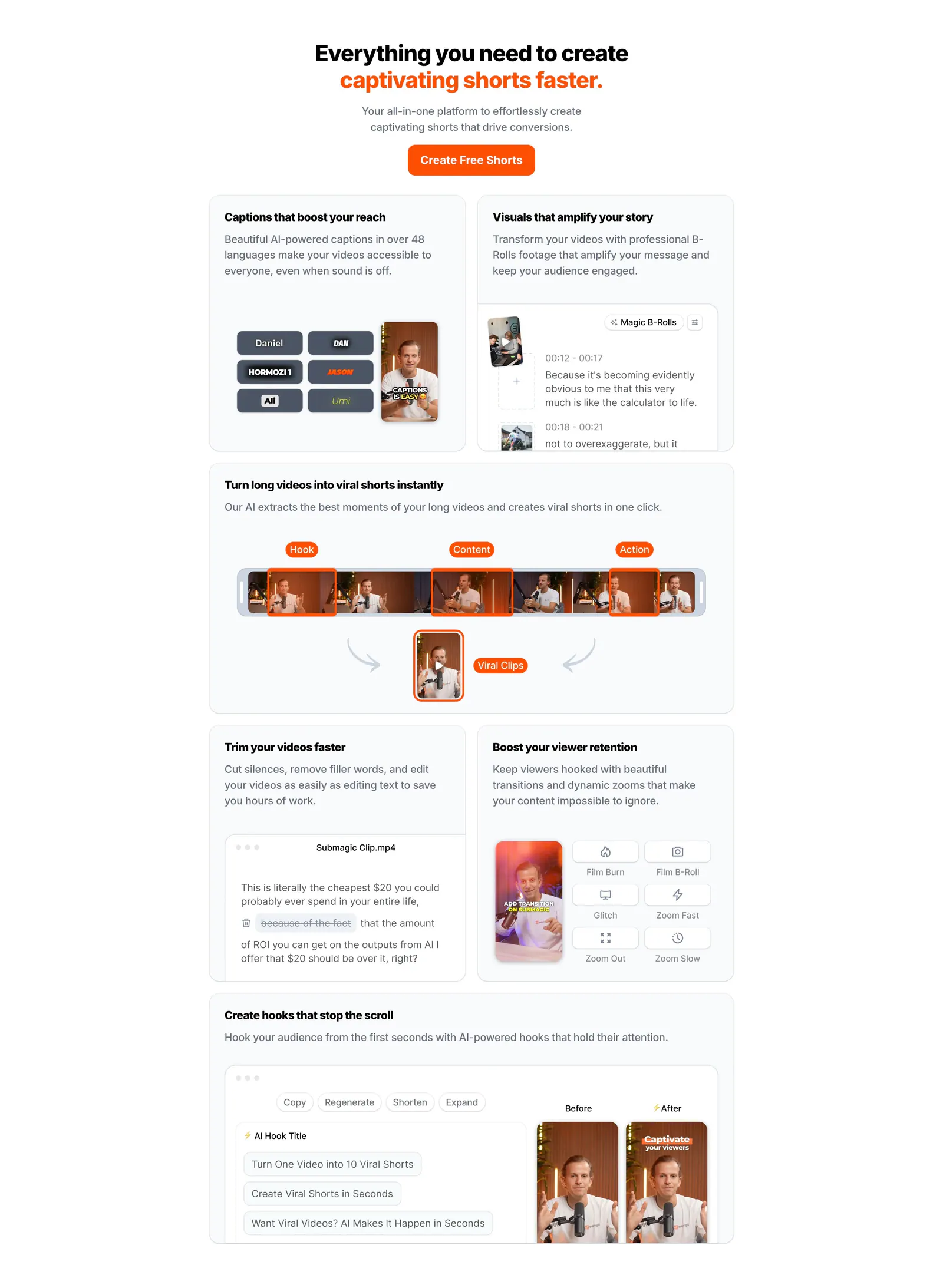
  81. Submagic features section: centered headline with orange accent above a bento grid of light cards showing caption, clip and editing UI
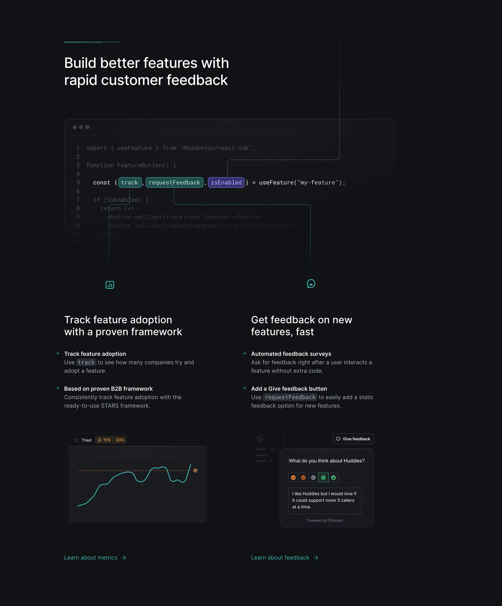
  82. Bucket features section: code snippet with highlighted hooks linked by lines to two feature columns with chart and feedback UI on dark
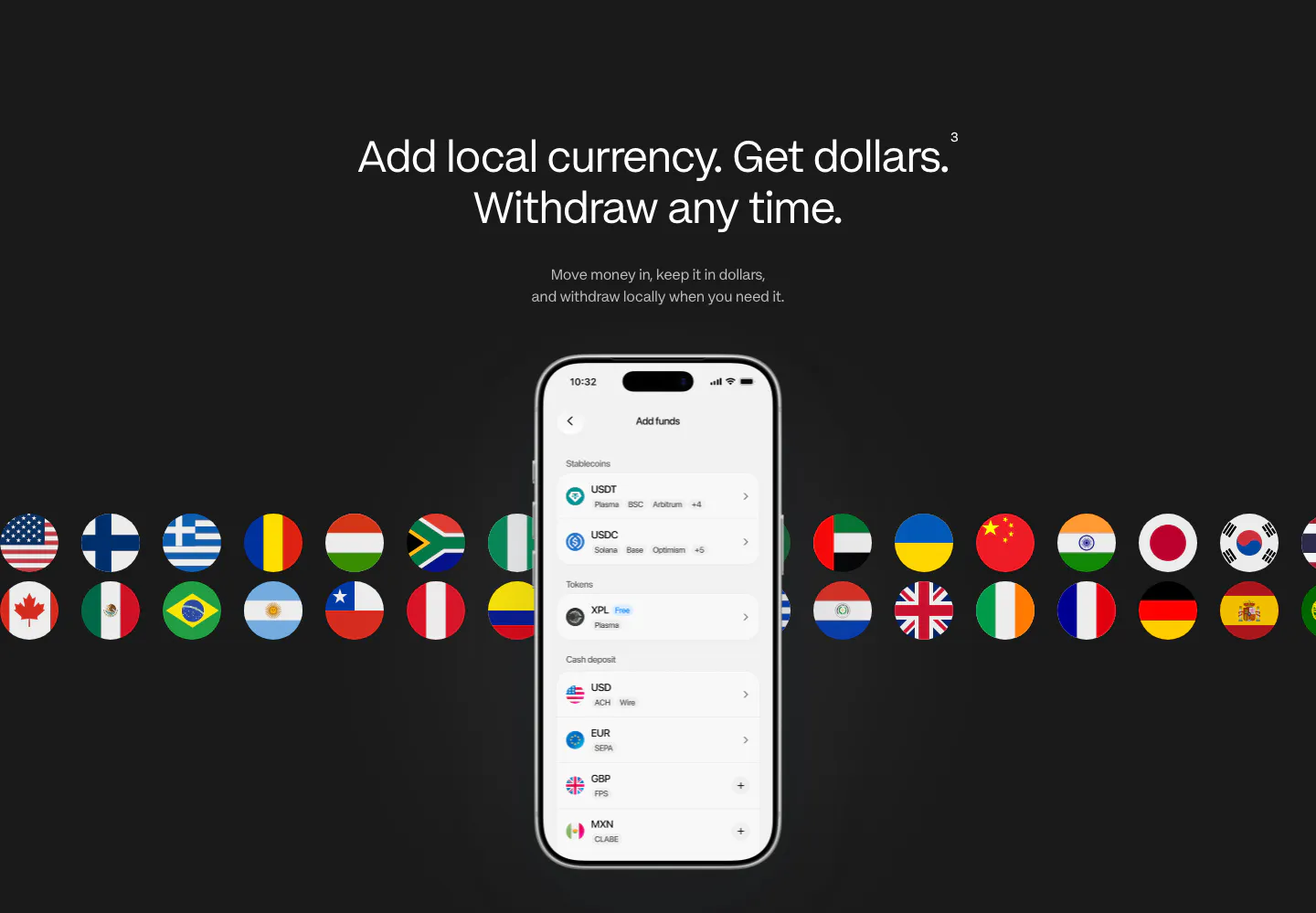
  83. Plasma features section: centered heading above a phone add-funds screen with rows of country flag circles on charcoal
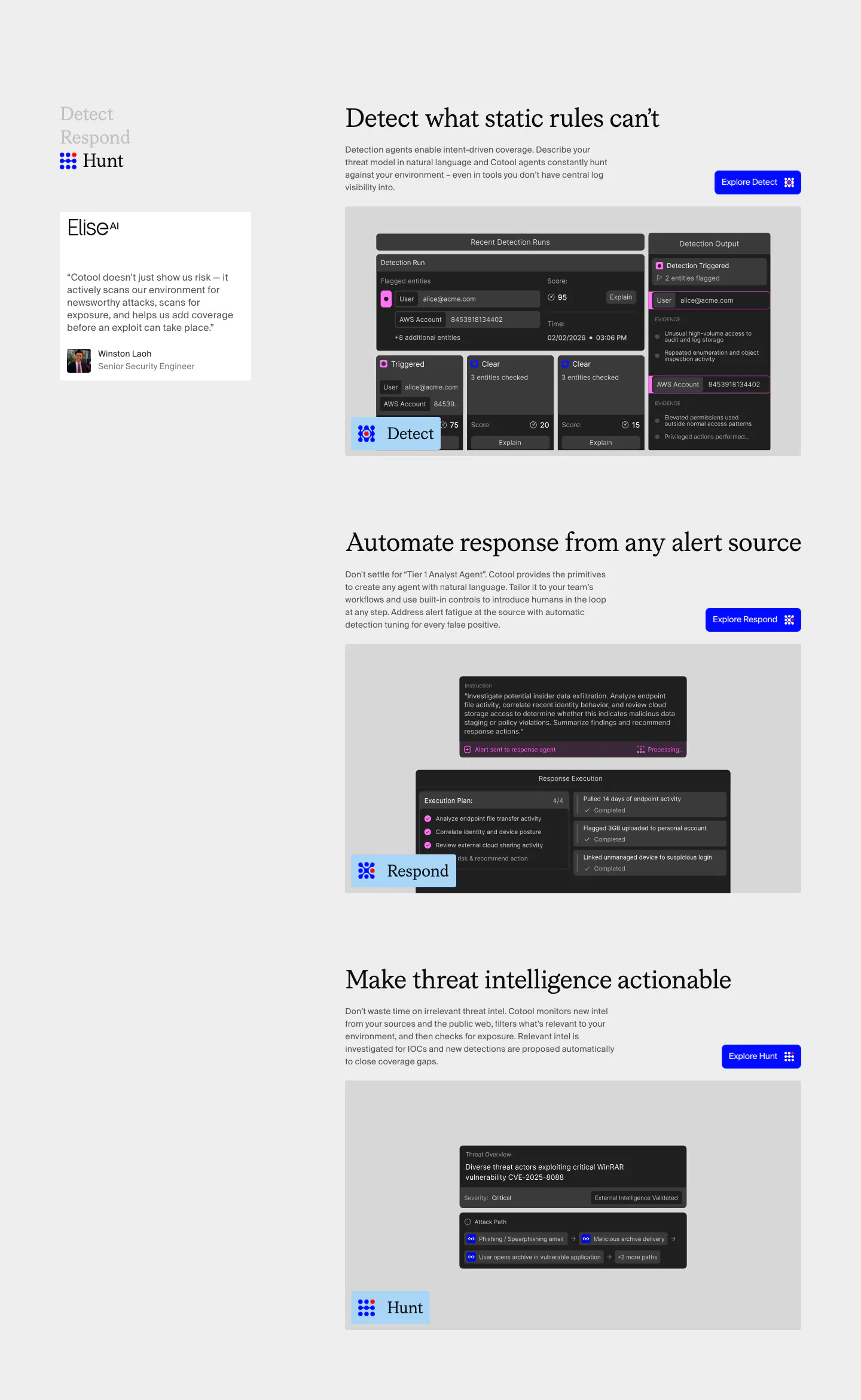
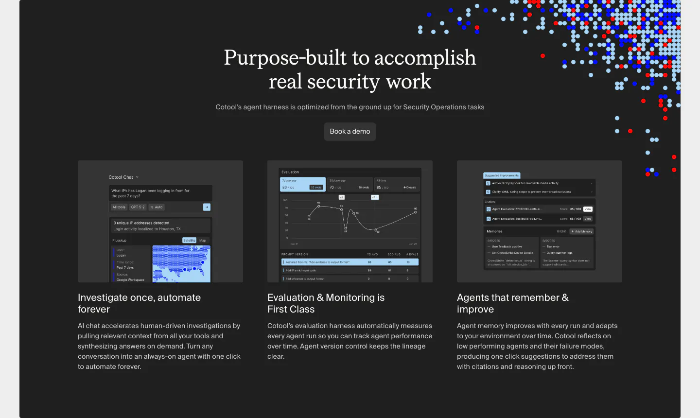
  84. Cotool features section: Detect, Respond and Hunt rows with serif headings, blue buttons and dark product UI screenshots beside a sticky side nav
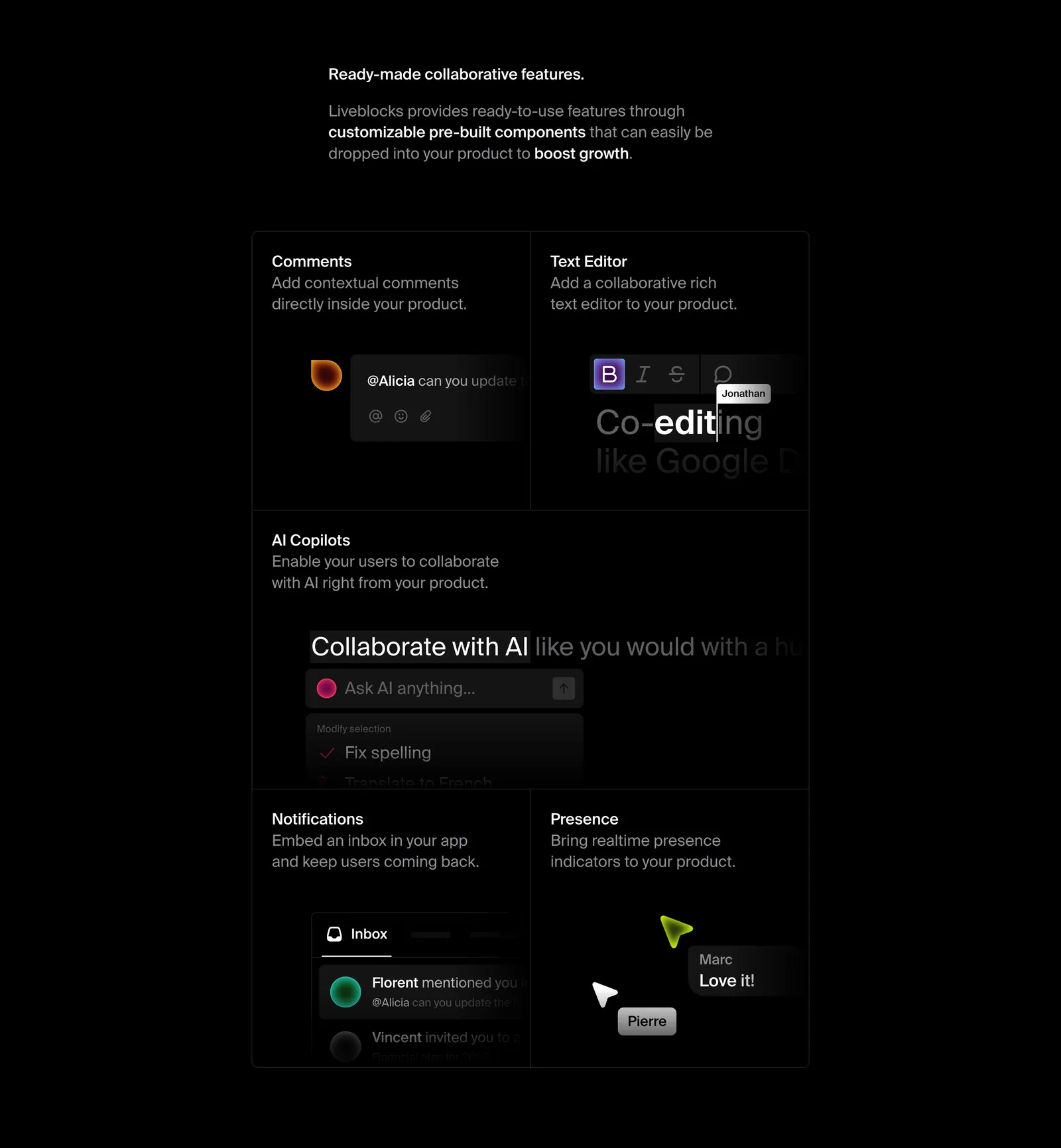
  85. Liveblocks features section: short intro copy above a dark bento grid of comments, text editor, AI copilot, notifications and presence UI tiles
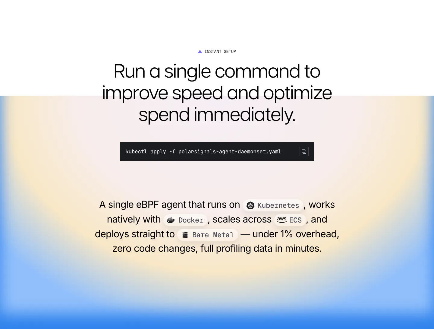
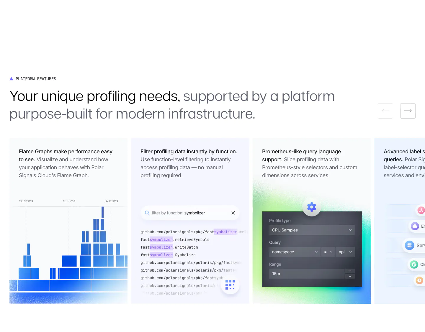
  86. Polar Signals features section: centered headline with a kubectl command block and inline platform chips over a blue and yellow radial gradient
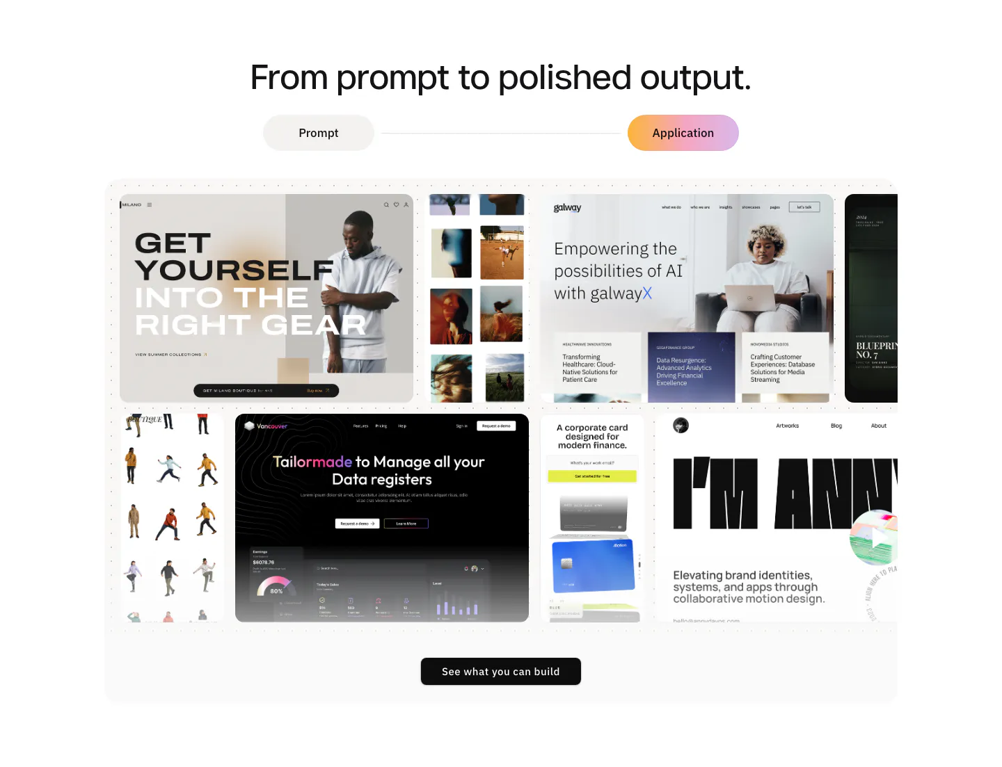
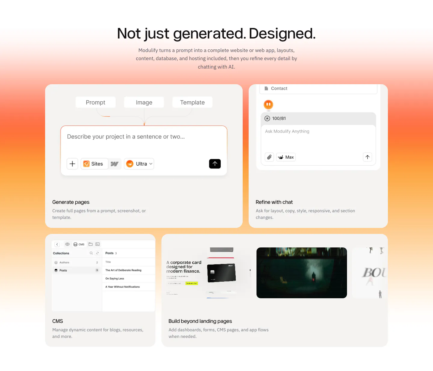
  87. Modulify features section: centered headline and prompt/application toggle above a collage of generated website screenshots
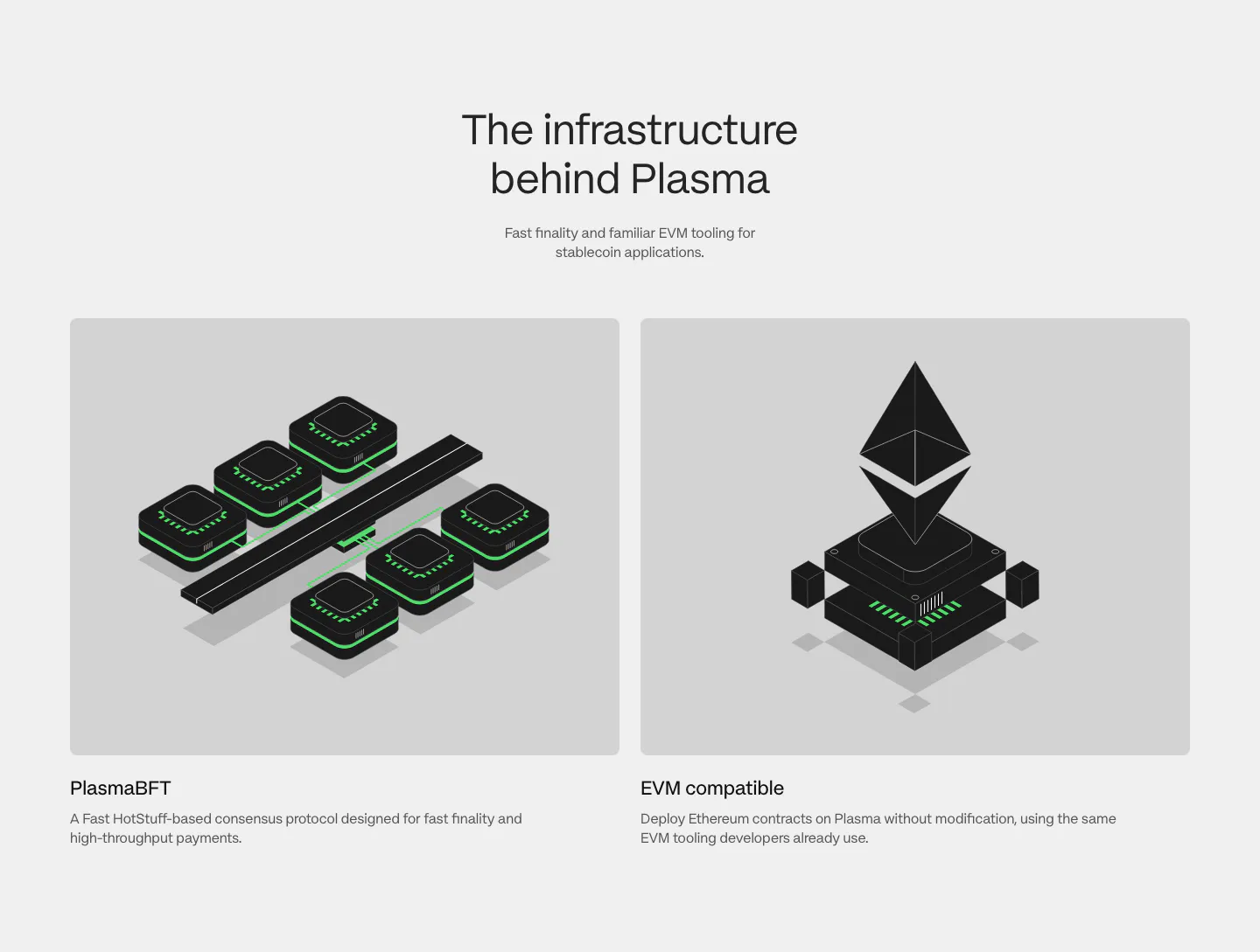
  88. Plasma features section: centered heading above two gray cards with black and green isometric renders of consensus and EVM
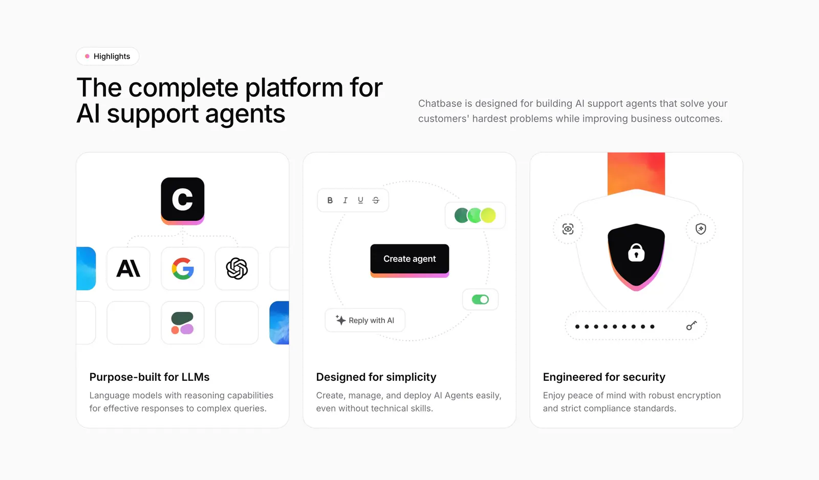
  89. Chatbase features section: headline beside intro copy above three equal cards with model, builder and security illustrations
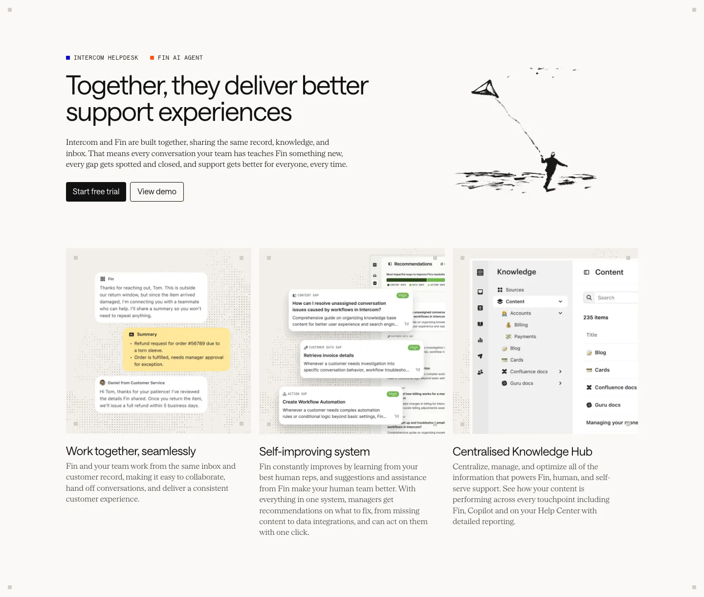
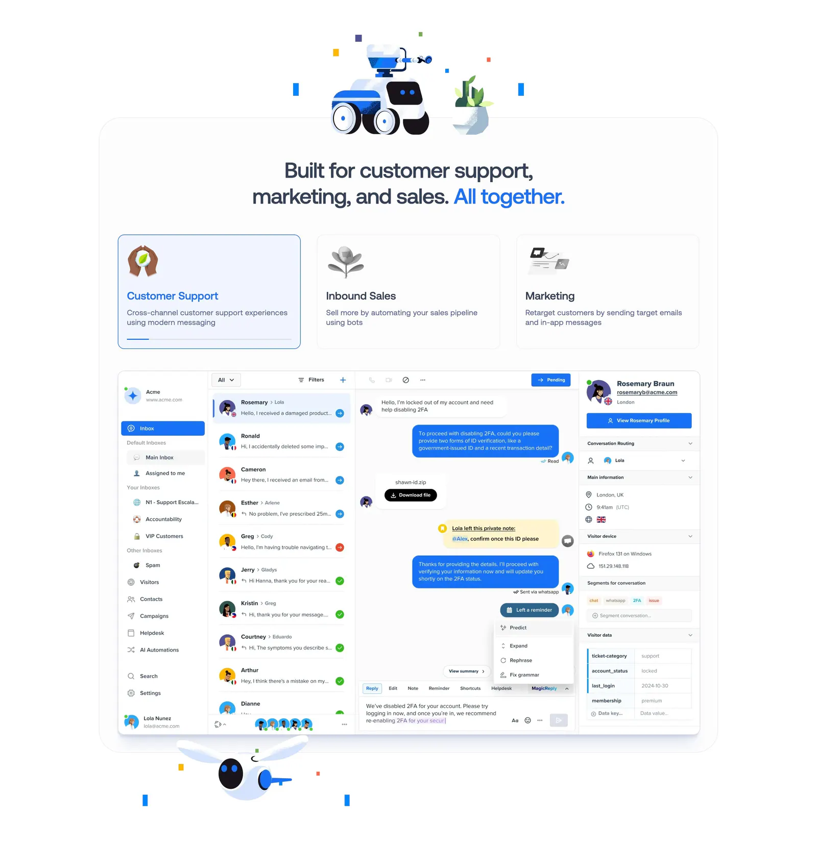
  90. Intercom features section: headline with an ink kite drawing above three equal cards showing chat, recommendations and knowledge hub UI
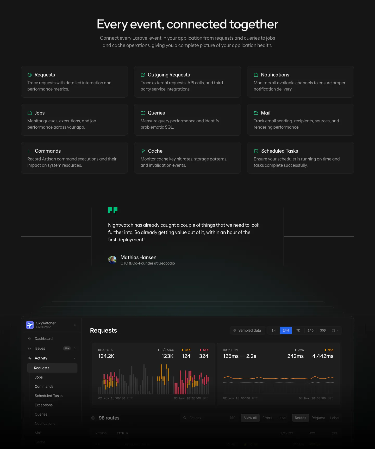
  91. Laravel Nightwatch features section: centered headline above a 3x3 grid of event type cards, a customer quote and a dark requests dashboard
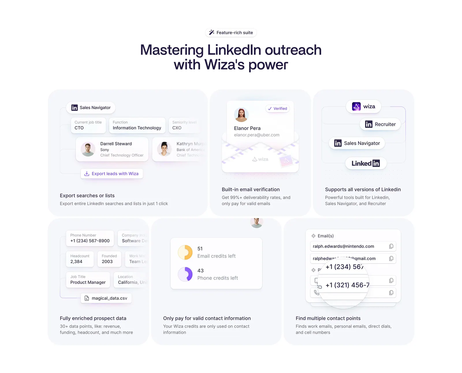
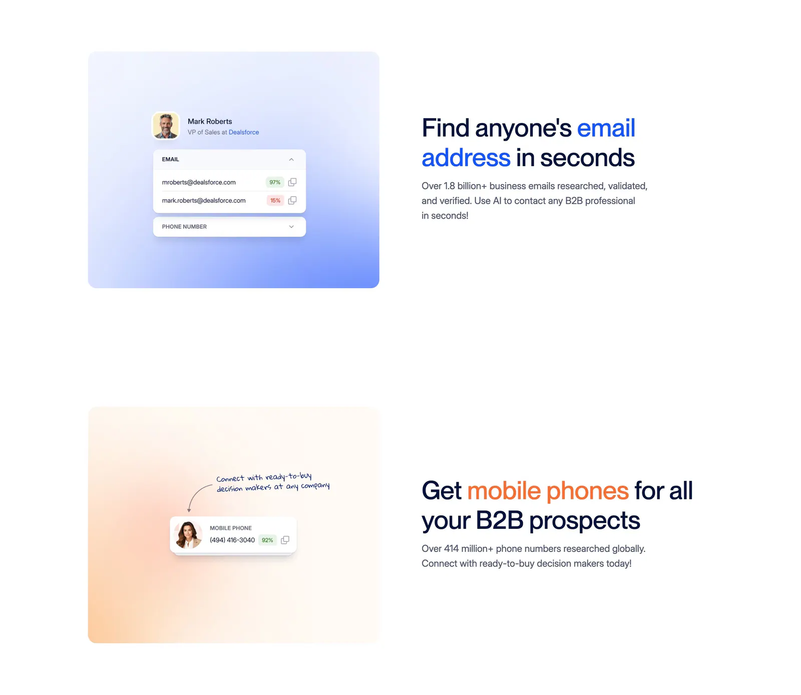
  92. Wiza features section: centered headline above a six-card bento grid of LinkedIn prospecting UI mockups on a white background
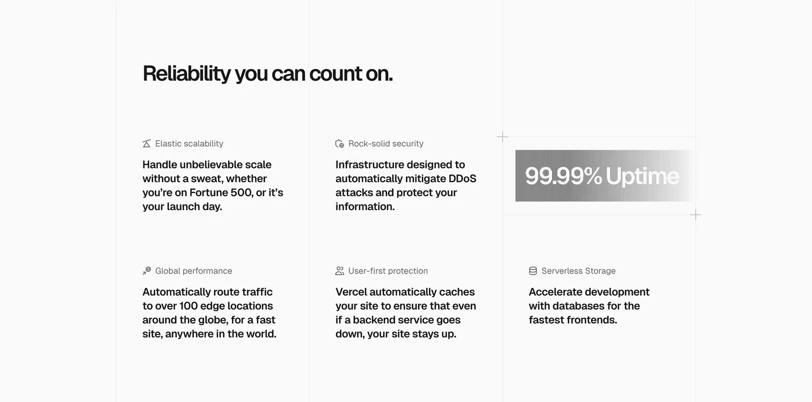
  93. Vercel features section: headline above a six-item grid of feature blurbs with icons and a gray gradient 99.99% Uptime badge
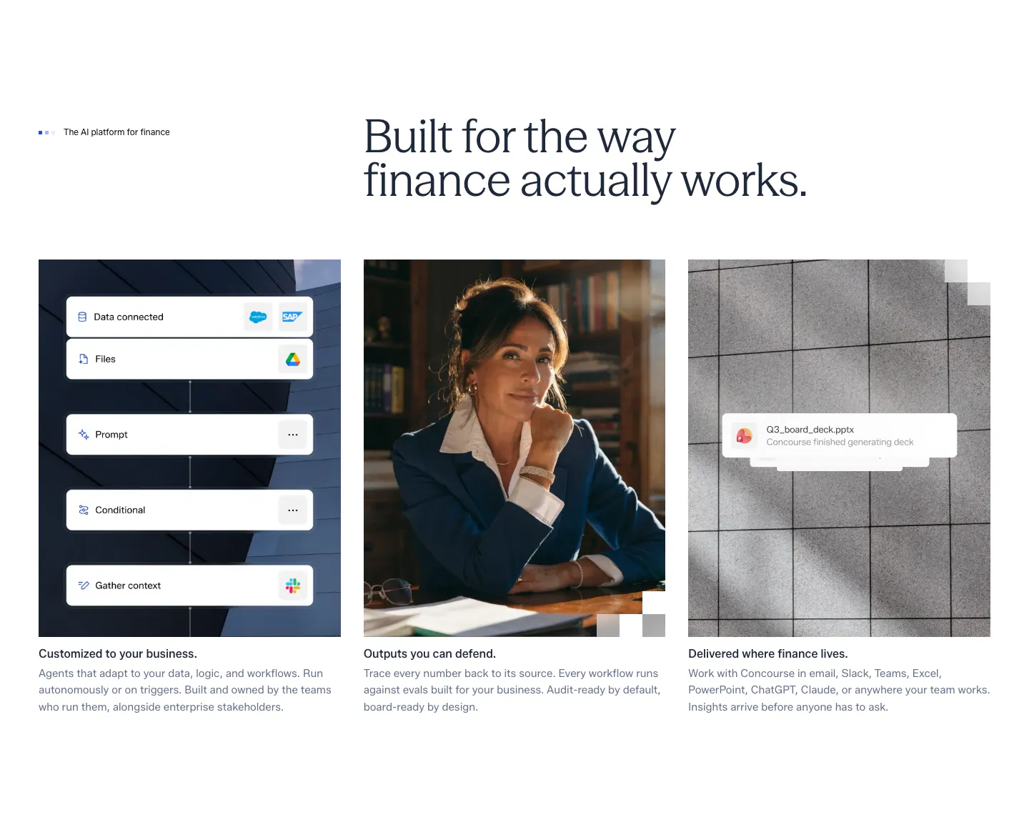
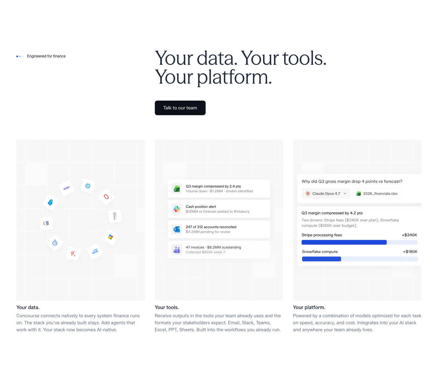
  94. Concourse features section: headline above three equal cards showing a workflow UI mockup, a portrait photo and a file notification
  95. Canopy features section: dark headline above four dark cards with 3D icons and short labels
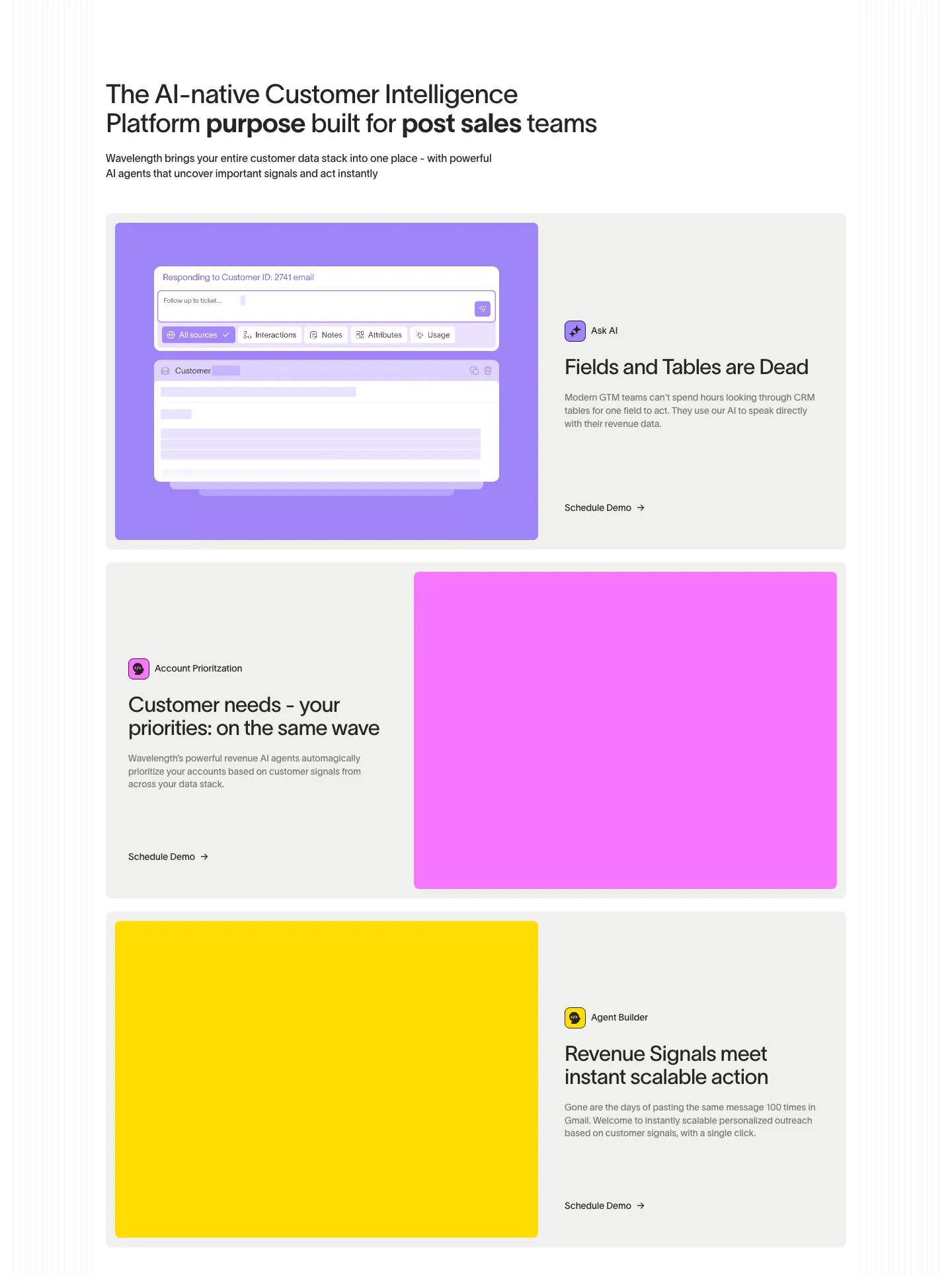
  96. Wavelength features section: left headline above three alternating rows pairing copy with large purple, pink and yellow panels, one with AI UI
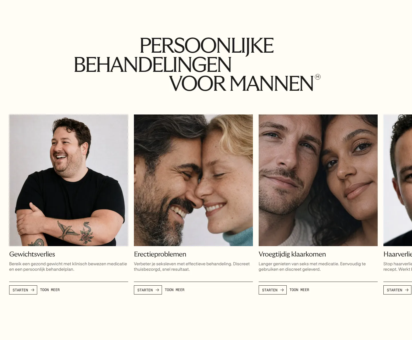
  97. Menkind features section: serif uppercase headline above a carousel of treatment cards with portrait photos and start buttons on cream
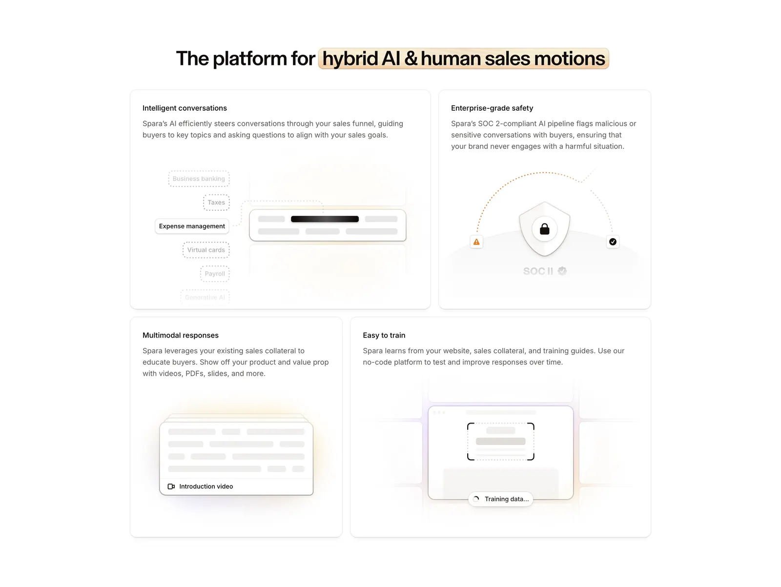
  98. Spara features section: centered headline with highlighted phrase above a four-tile bento grid of feature cards with abstract UI art
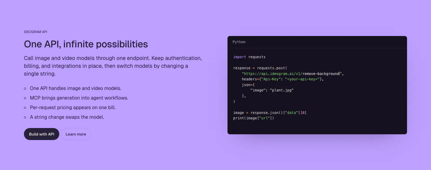
  99. Ideogram features section: purple background, headline, copy and bullet list on the left, dark Python code snippet window on the right
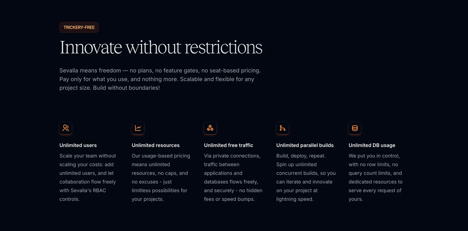
  100. Sevalla features section: serif headline and intro above five icon columns of unlimited usage benefits on a near-black background
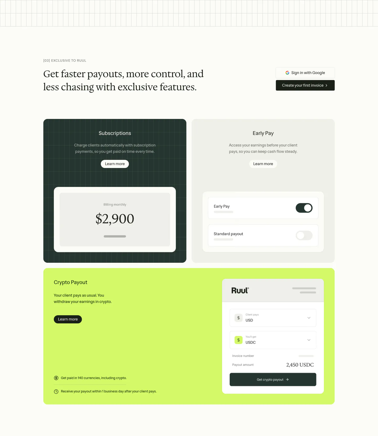
  101. Ruul features section: serif headline above three feature cards in dark green, gray and lime with payout and toggle UI mockups
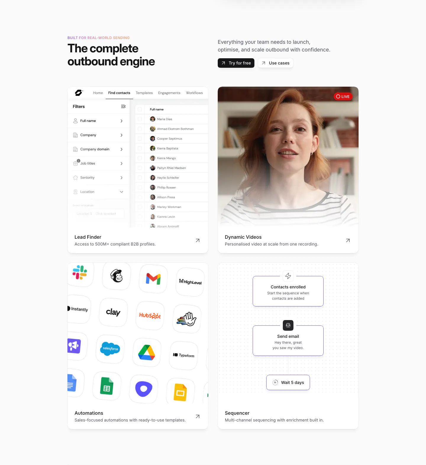
  102. Sendr features section: headline and buttons above a 2x2 card grid of lead finder UI, live video, app icon grid and sequencer flow
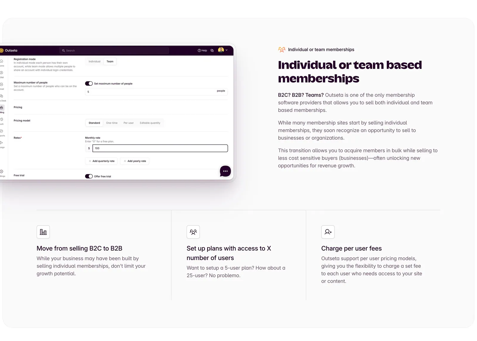
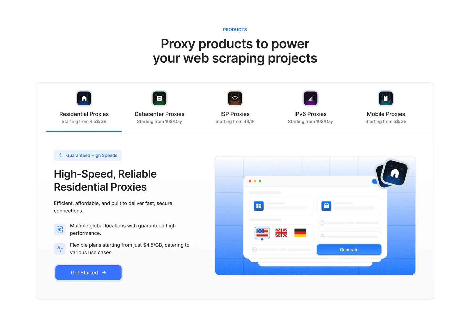
  103. Outseta features section: settings UI screenshot left of headline and copy, three icon feature columns below on a light gray panel
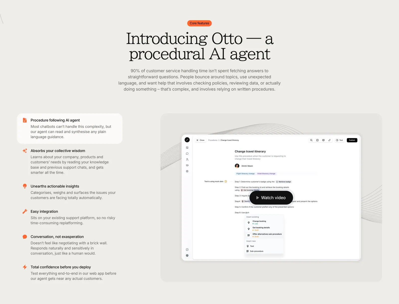
  104. Heidi features section: dark plum background with a scrolling serif list of clinical tasks and a yellow Explore enterprise button
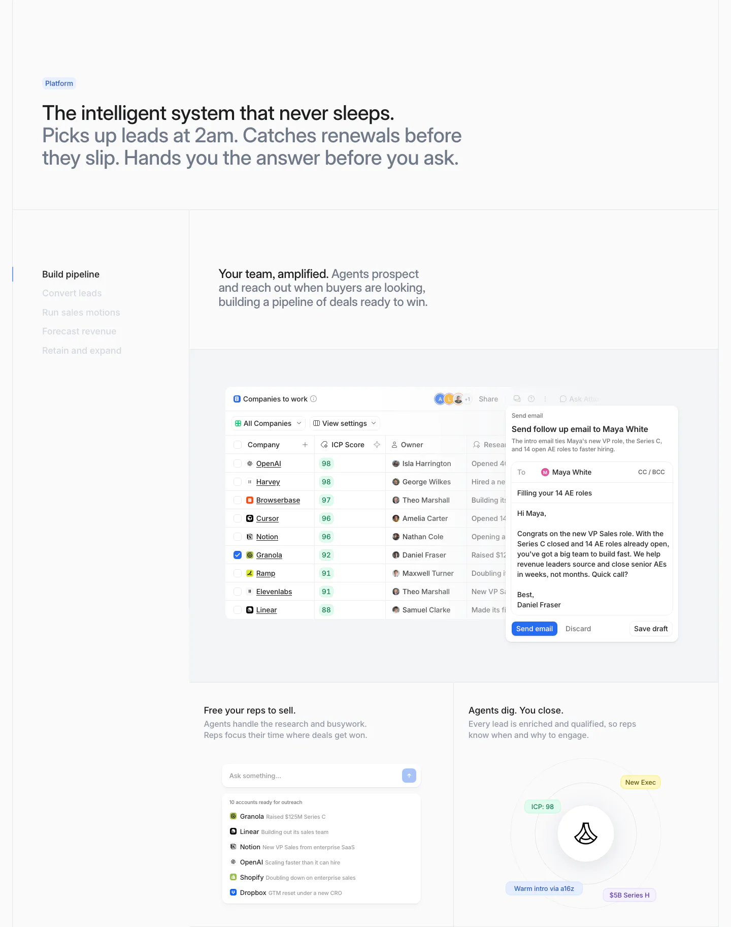
  105. Lightning Proxies features section: centered heading over a five-product tab bar and a split panel with proxy copy and a blue UI mockup
  106. Gradient Labs features section: centered serif headline above a feature list on the left and a product screenshot with video button
  107. Attio features section: two-tone headline above a vertical tab list beside a companies table with email draft and two smaller UI cards
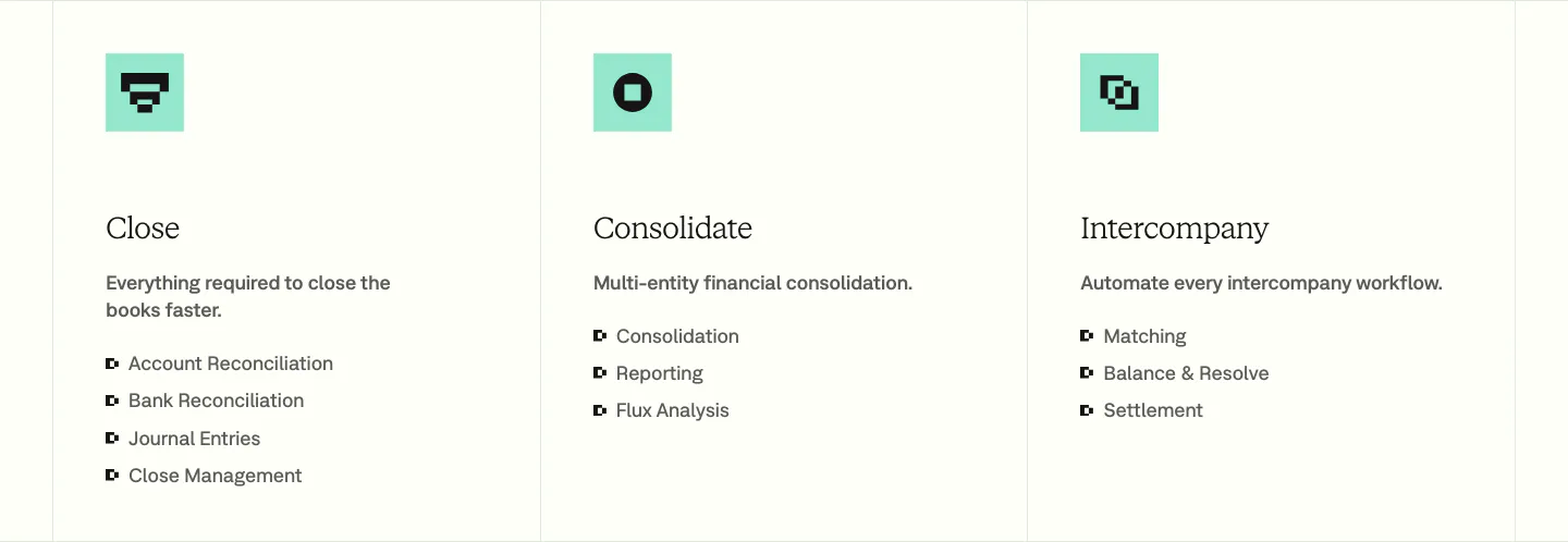
  108. Nominal features section: three bordered columns with mint pixel icons, serif titles and bullet lists for Close, Consolidate and Intercompany
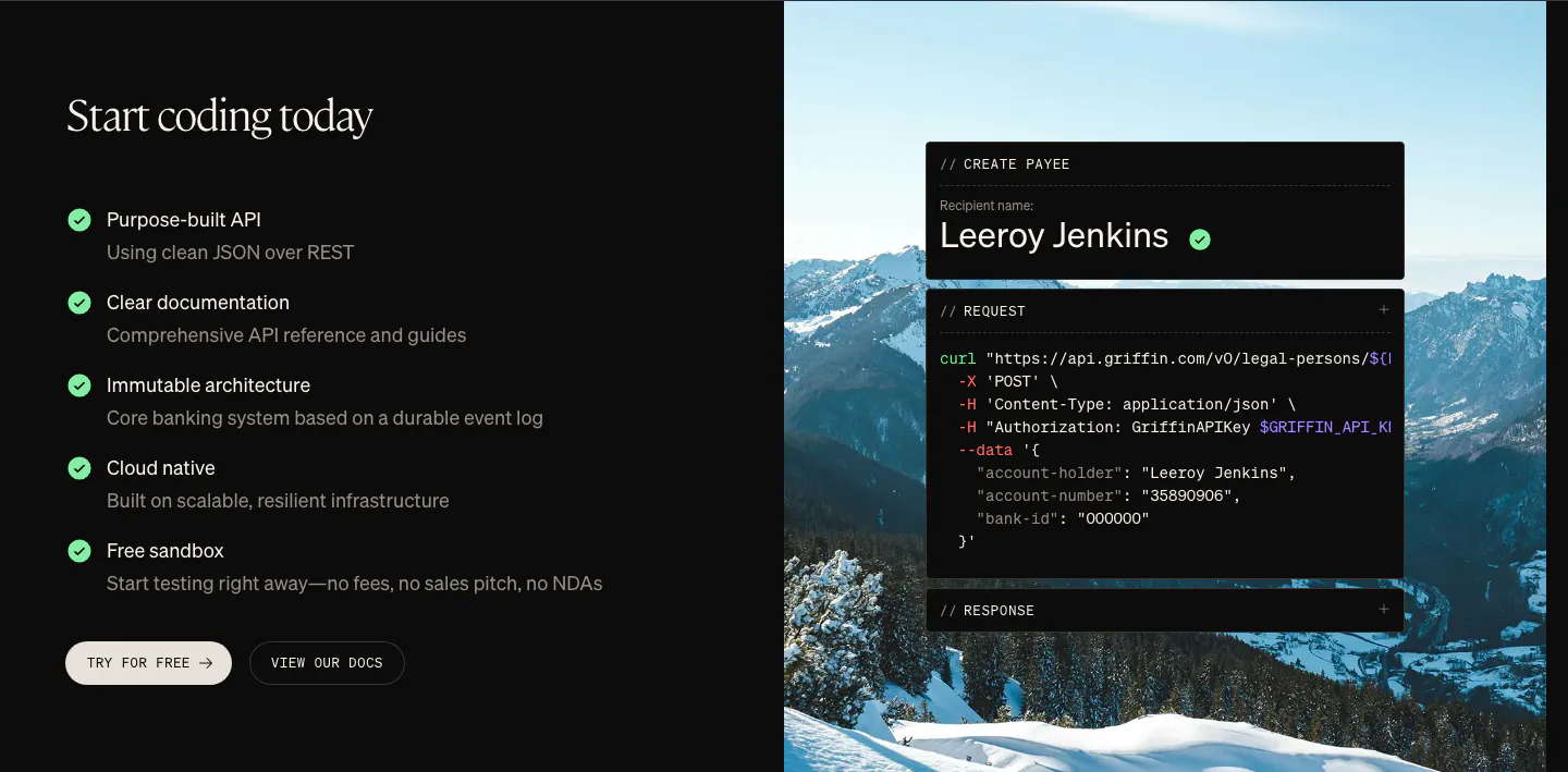
  109. Griffin features section: checklist of API benefits and two buttons beside a curl code card over a mountain photo
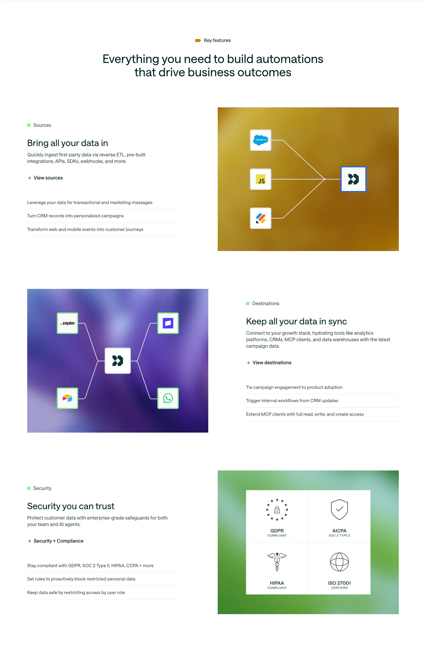
  110. Customer.io features section: centered headline above three alternating rows pairing copy with colorful gradient panels of connector diagrams
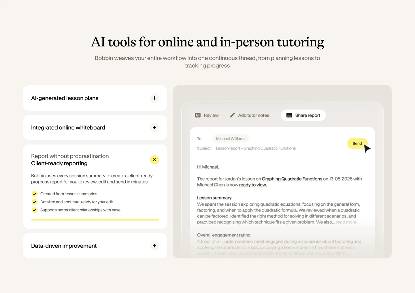
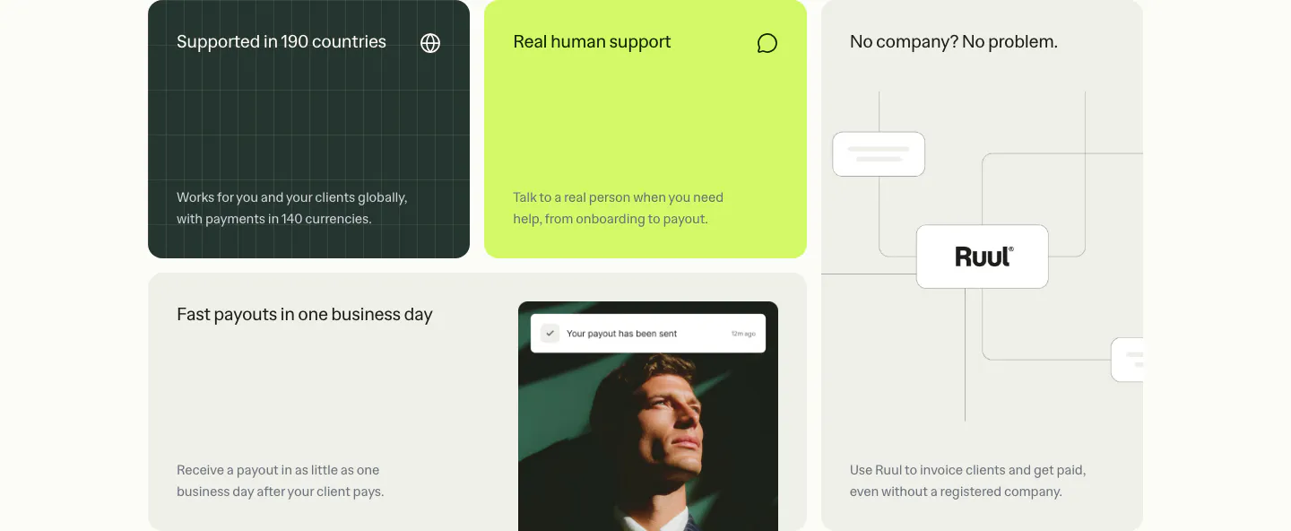
  111. Bobbin features section: serif heading over an accordion of features on the left and a lesson report email UI on the right, cream background
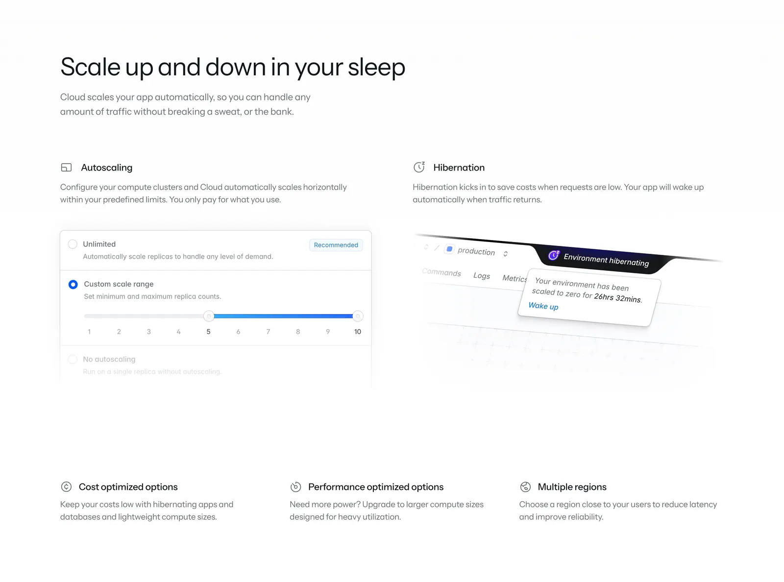
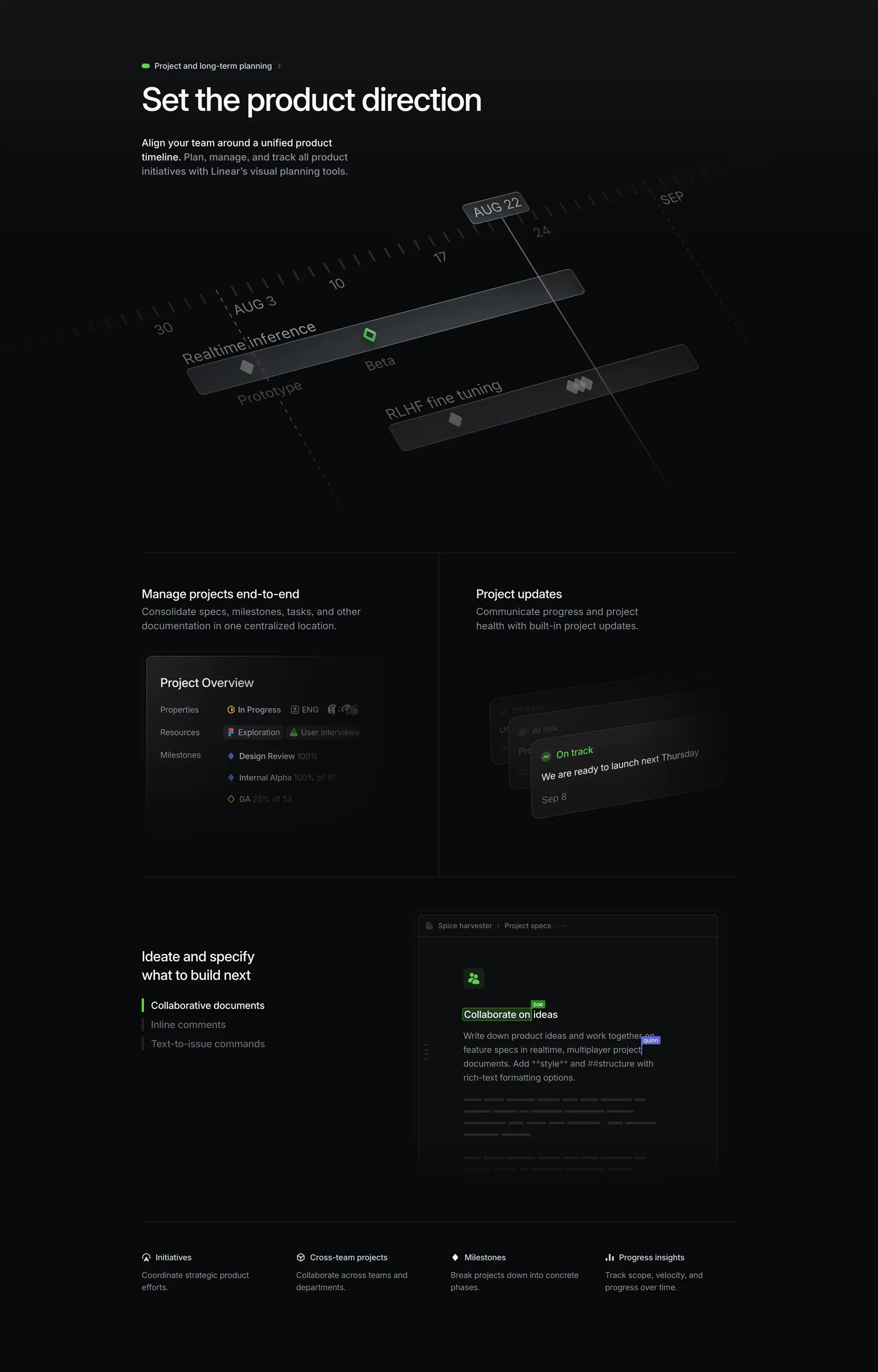
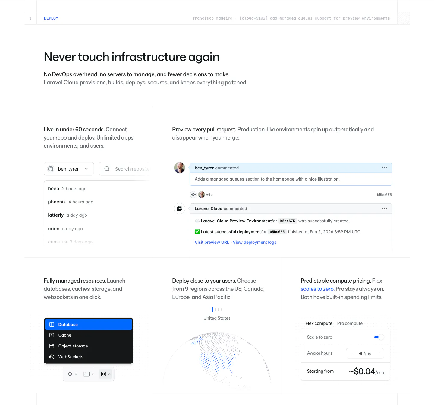
  112. Laravel Cloud features section: headline above two feature columns with autoscaling and hibernation UI snippets and three icon notes
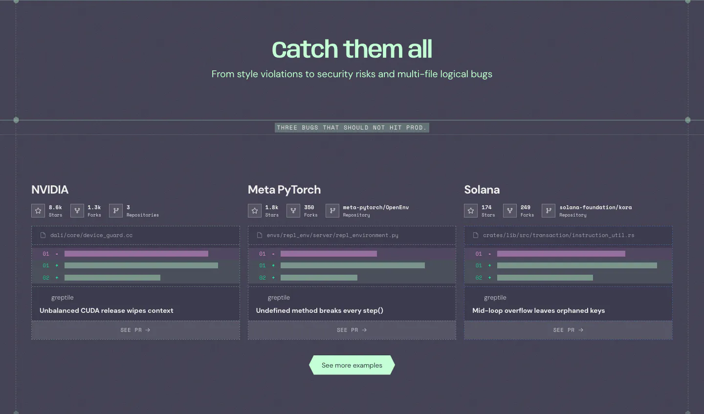
  113. Ruul features section: bento grid of benefit tiles in dark green, lime and warm gray, with a portrait photo and a node diagram
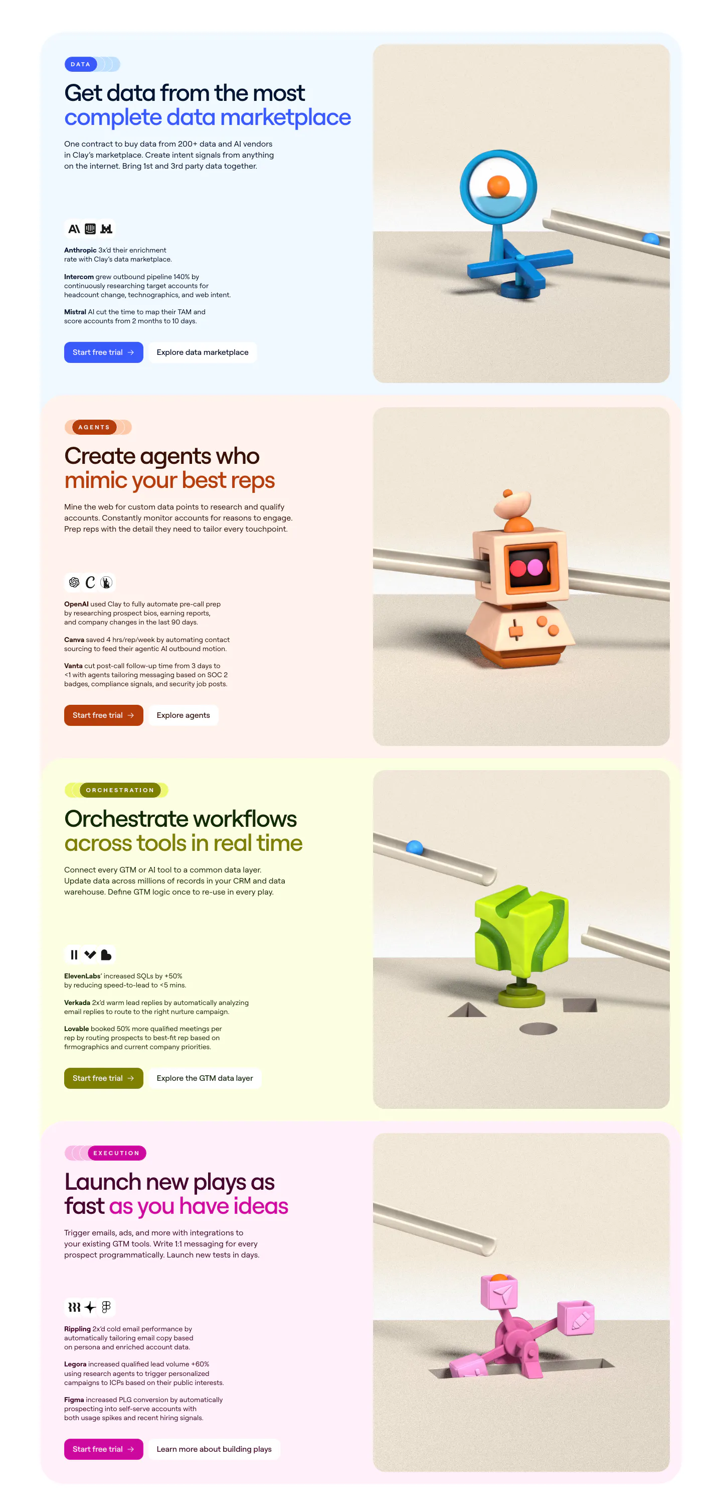
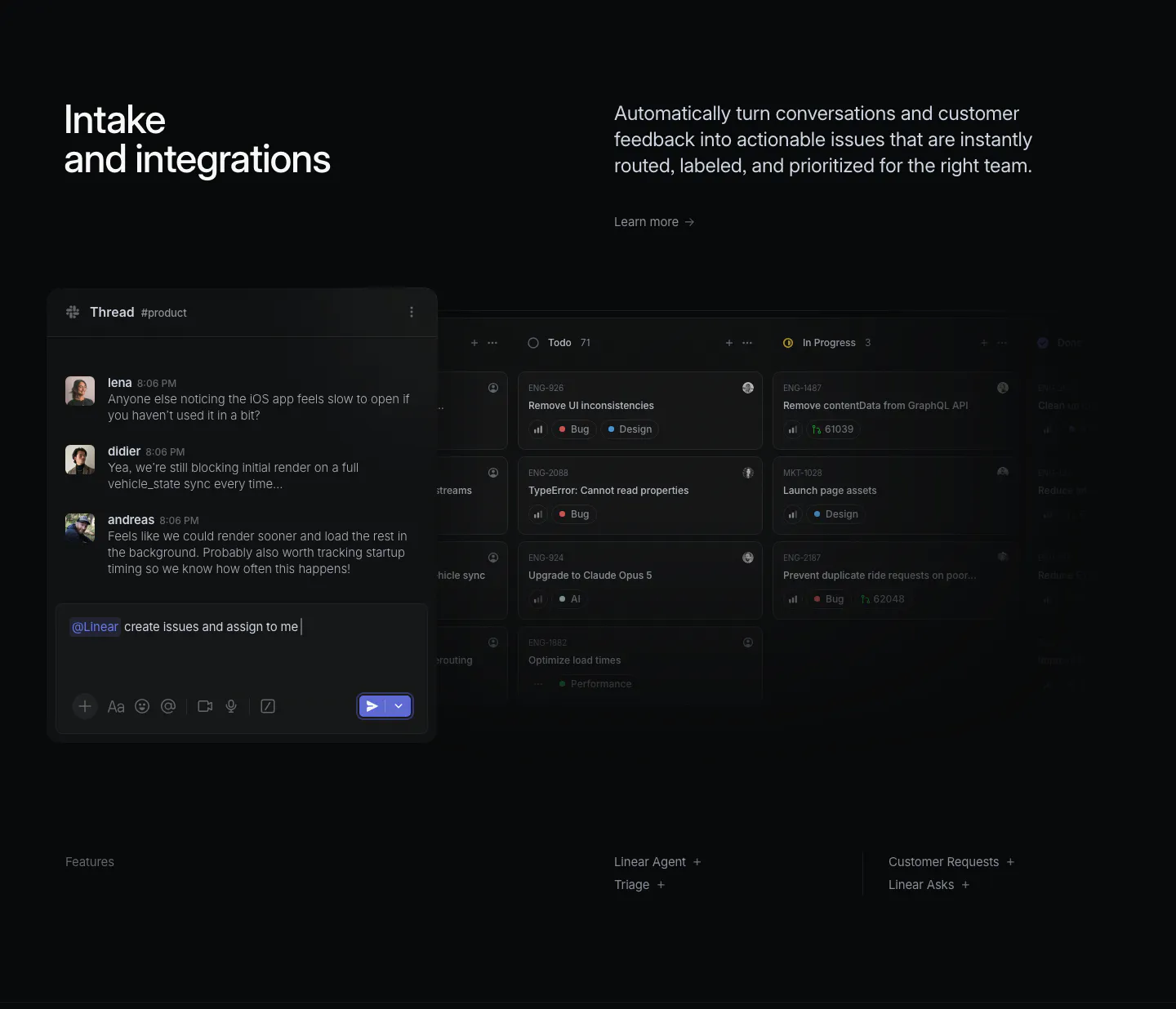
  114. Linear features section: dark section with a tilted project timeline graphic, project overview and update panels, and a collaborative doc mockup
  115. Greptile features section: centered headline over three cards showing example bugs caught in open-source repos with diff snippets
  116. Clay features section: stacked pastel cards, each with headline, customer results and buttons left and a 3D clay object render right
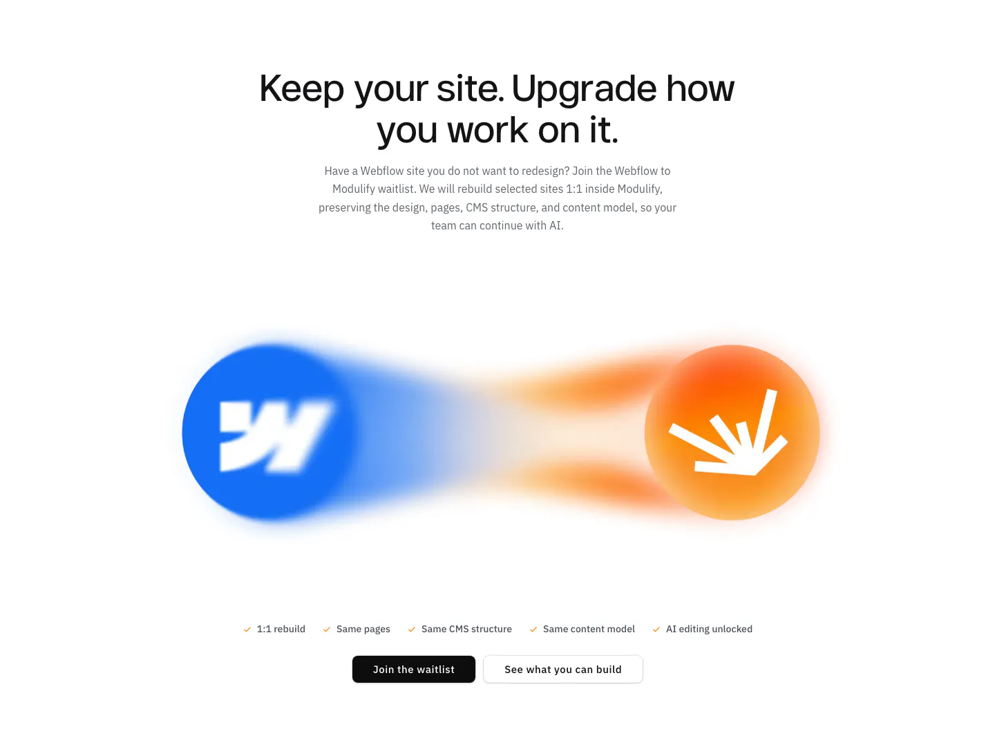
  117. Modulify features section: centered headline above blurred Webflow and Modulify logo orbs, a checklist and two buttons
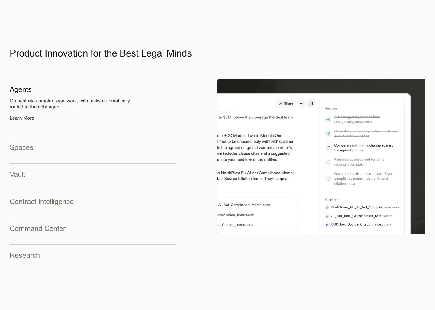
  118. Harvey features section: product list accordion on the left beside an agent workflow screenshot on a light gray background
  119. Realm features section: centered headline above three cards with tinted illustrated UI vignettes and short descriptions
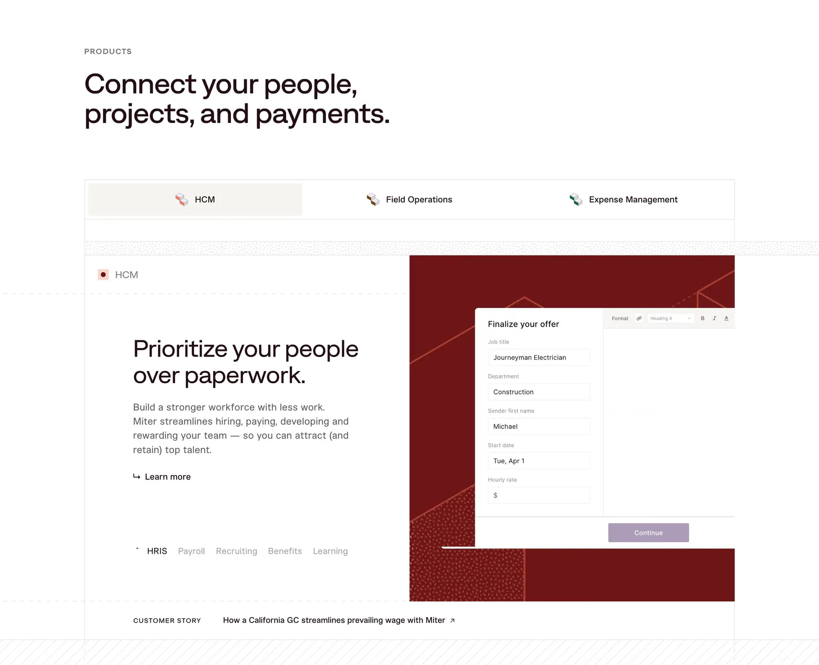
  120. Miter features section: headline above product tabs and a split panel with HCM copy beside an offer form UI on dark red
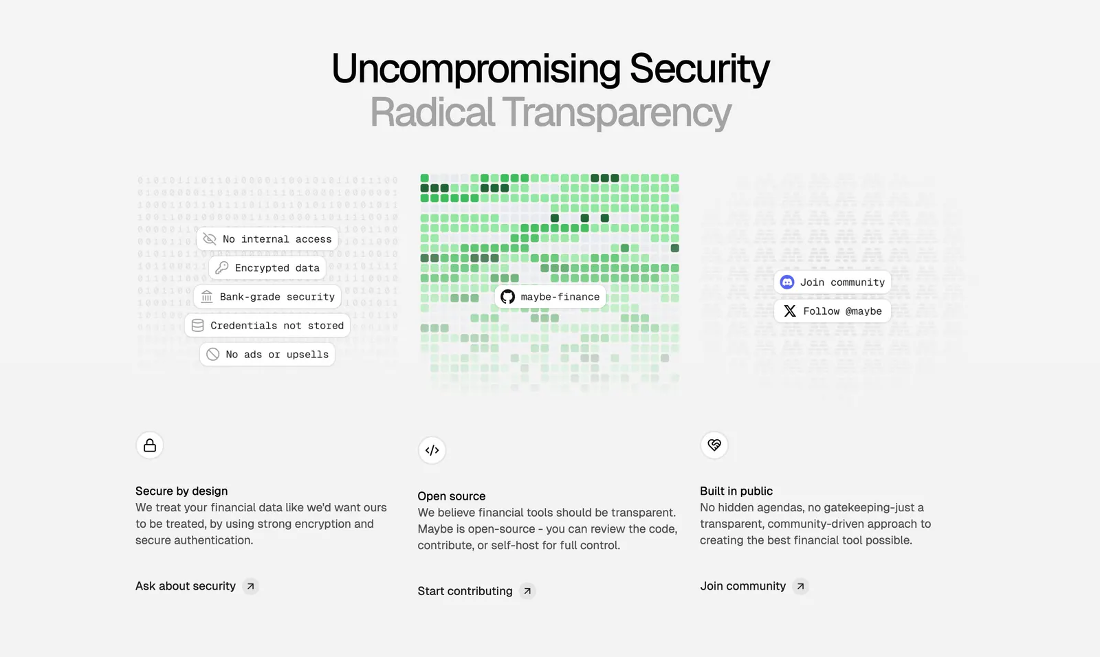
  121. Maybe features section: centered two-tone headline above three columns on security, open source and community with textured visuals
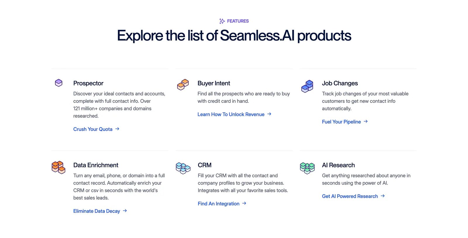
  122. Seamless.AI features section: centered headline above a three-by-two grid of product items with isometric icons and links on white
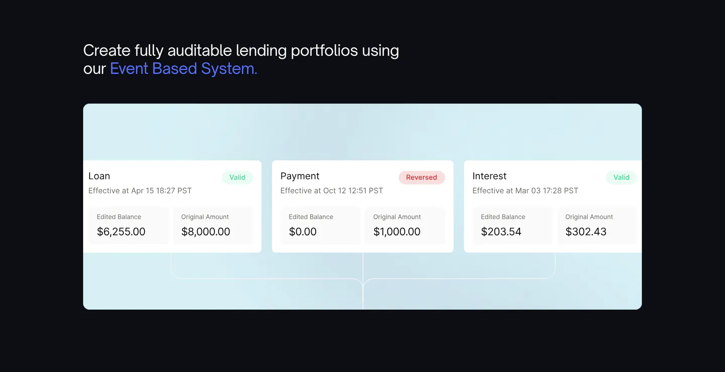
  123. Canopy features section: headline with blue highlight above a light blue panel of loan event UI cards on a dark background
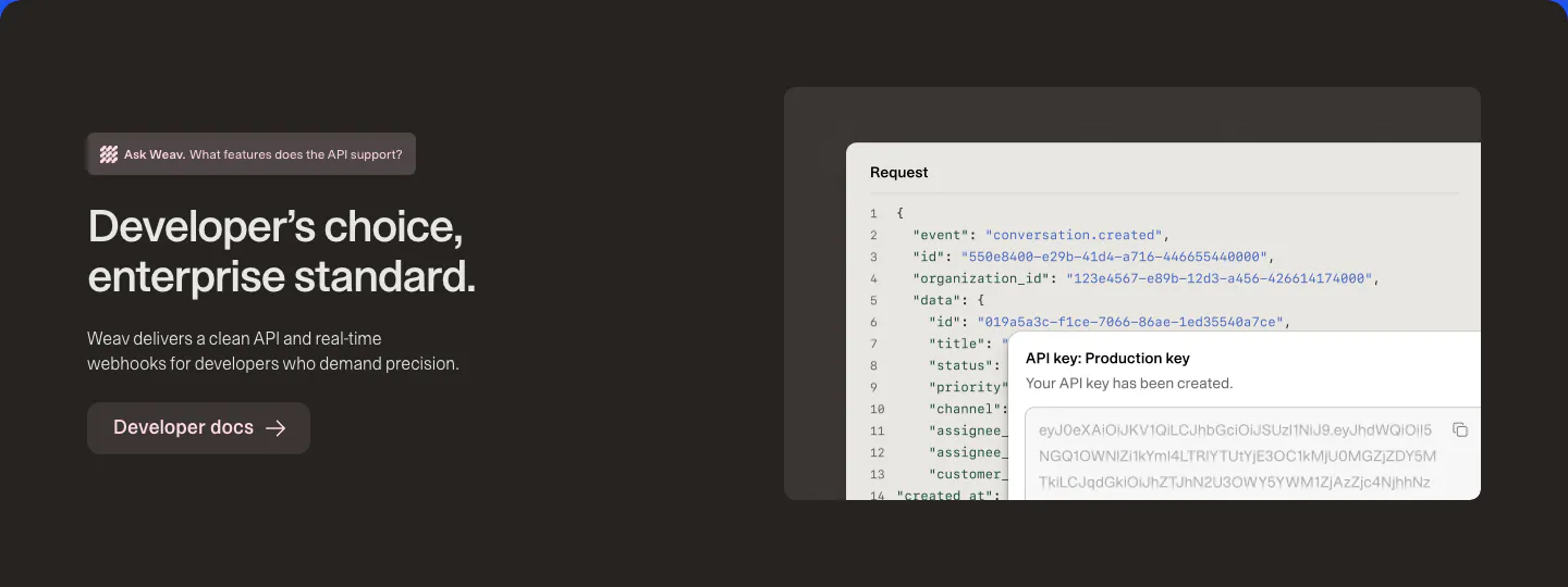
  124. Weav features section: dark brown band with headline and docs button on the left and a JSON request code block with an API key popup
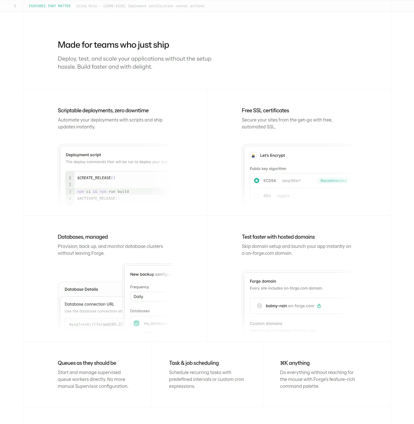
  125. Laravel Forge features section: four large tiles with UI mockups incl. a deploy script, plus three text-only tiles on white
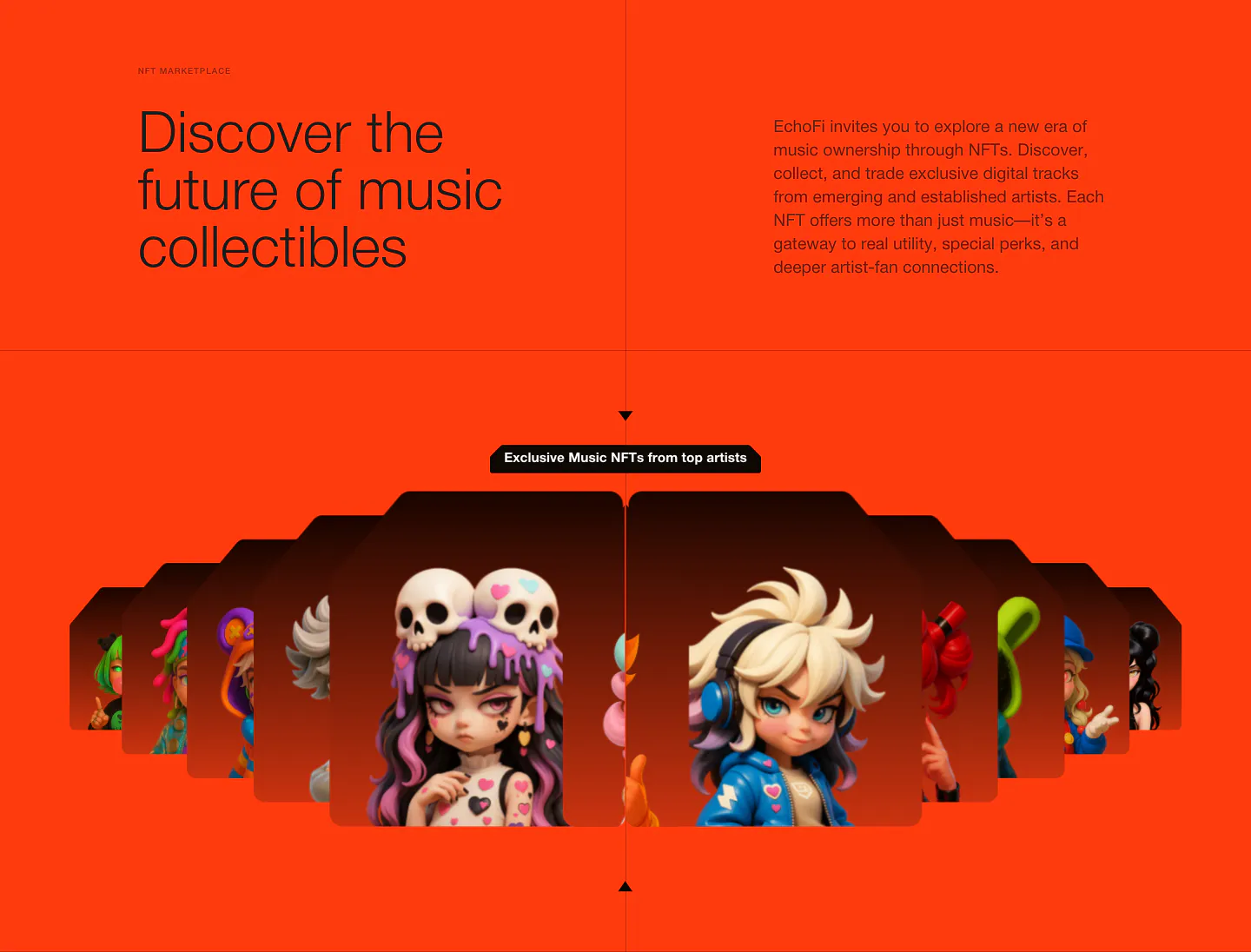
  126. EchoFi features section: headline and copy split over orange, above a fanned carousel of 3D character NFT cards
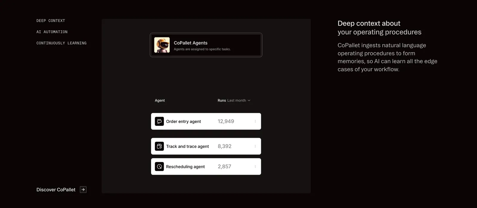
  127. Pallet features section: dark three-column layout with vertical tab labels, a CoPallet agents UI card and descriptive text on the right
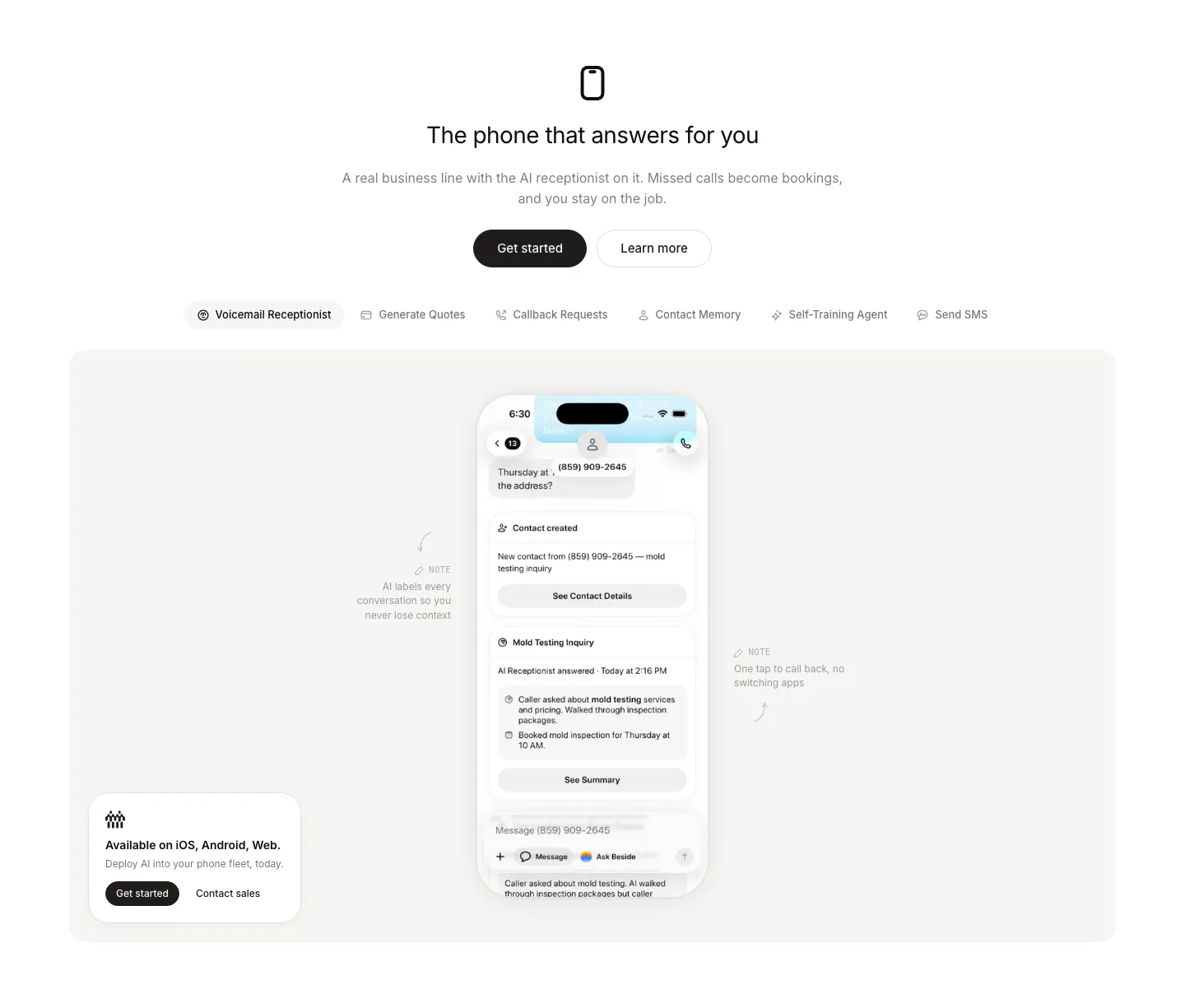
  128. Beside features section: centered headline and buttons above a feature tab bar and a phone mockup with annotations in a gray panel
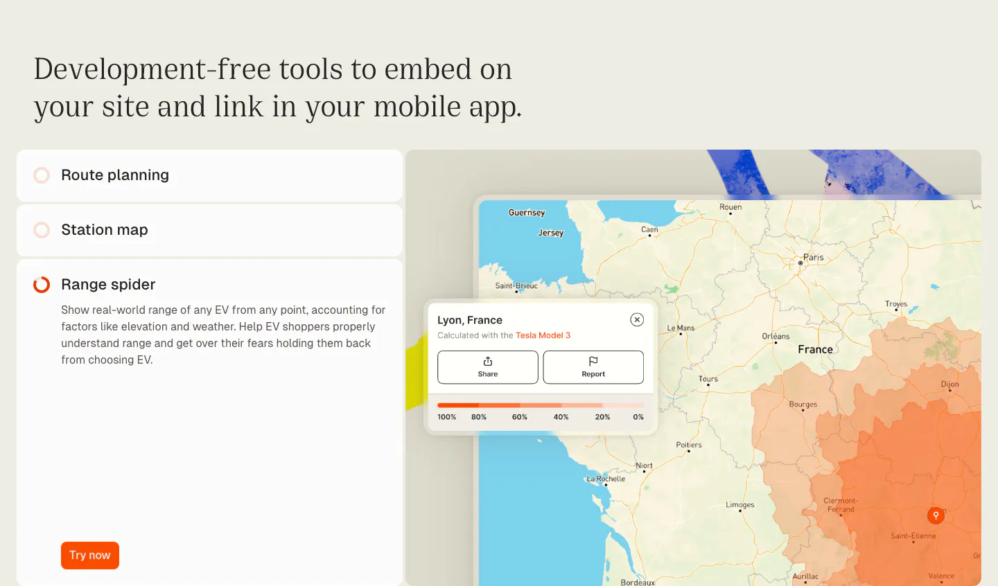
  129. Chargetrip features section: serif headline over an accordion list of embeddable tools beside a France map with an EV range overlay
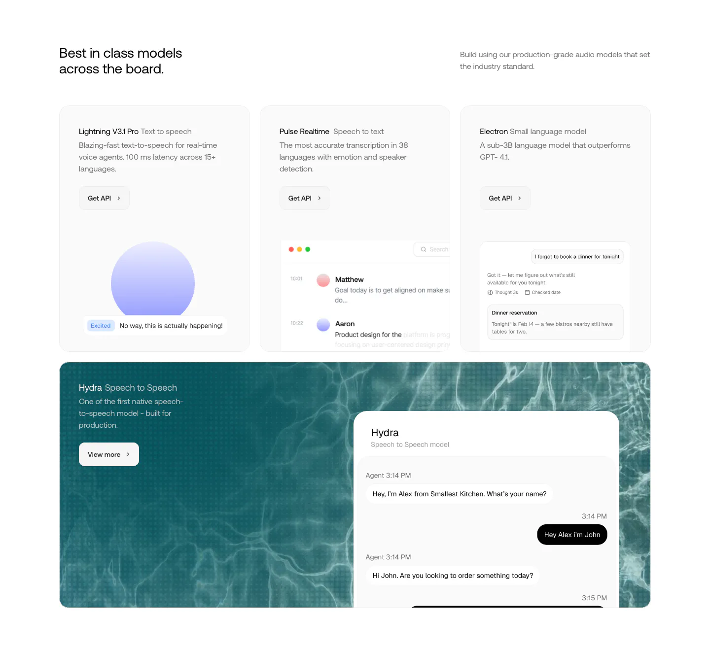
  130. Smallest.ai features section: three model cards with UI previews above a wide teal water-textured card showing a speech-to-speech chat UI
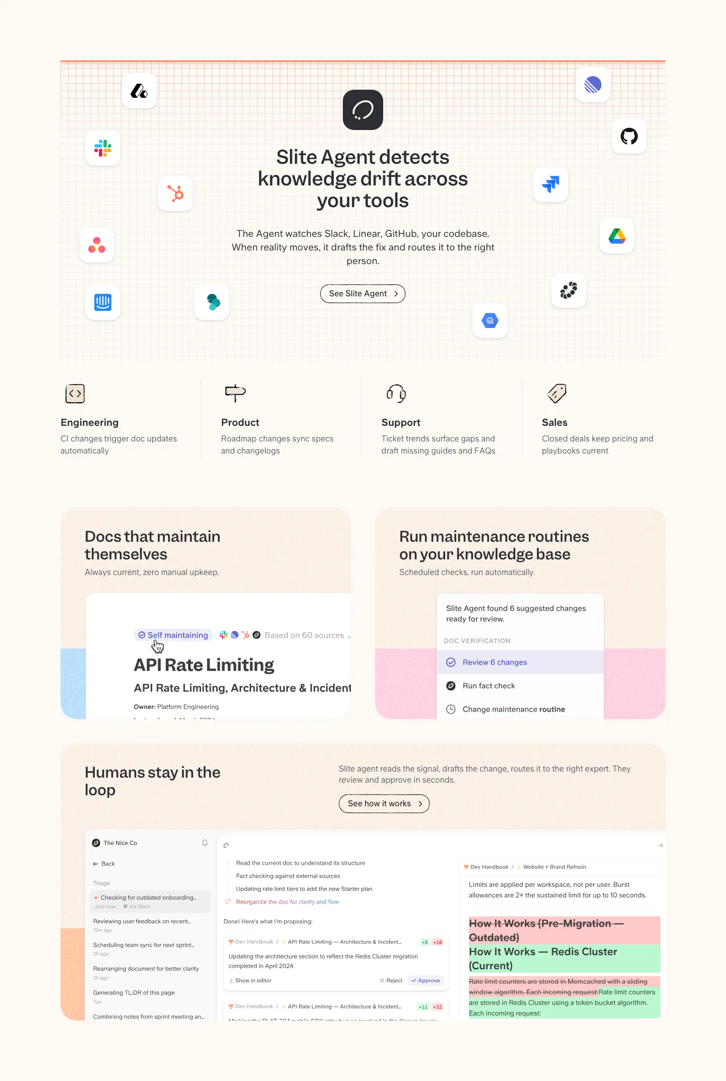
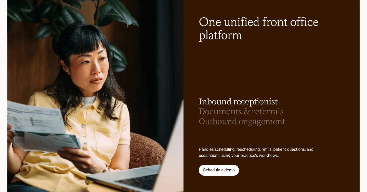
  131. Slite features section: headline ringed by app icons on a grid, four team columns, then cards with doc maintenance and review UI on cream
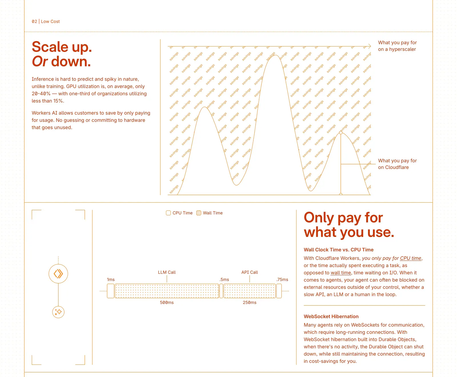
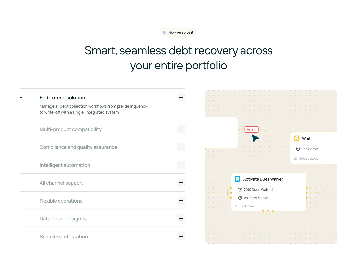
  132. Cloudflare Agents features section: zig-zag rows of orange text beside line-drawn cost charts and a timing diagram on white
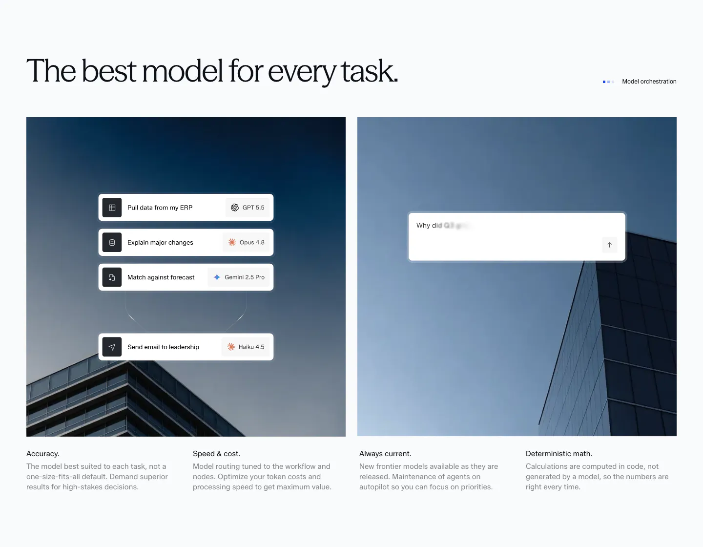
  133. Clarion features section: split card with a photo of a woman reviewing papers beside a dark brown panel with a serif tab list and button
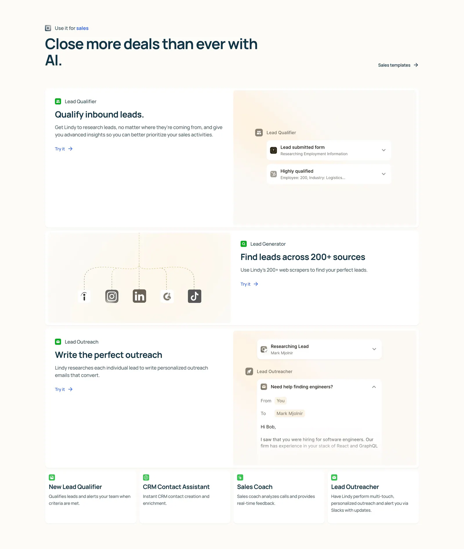
  134. Rezolv features section: centered headline above an accordion of capabilities on the left and a workflow node diagram on the right
  135. Concourse features section: headline above two building photos overlaid with model-routing and chat UI cards, four feature notes below
  136. Lindy features section: left-aligned heading above three alternating rows of copy and agent UI mockups, then four small template cards on cream
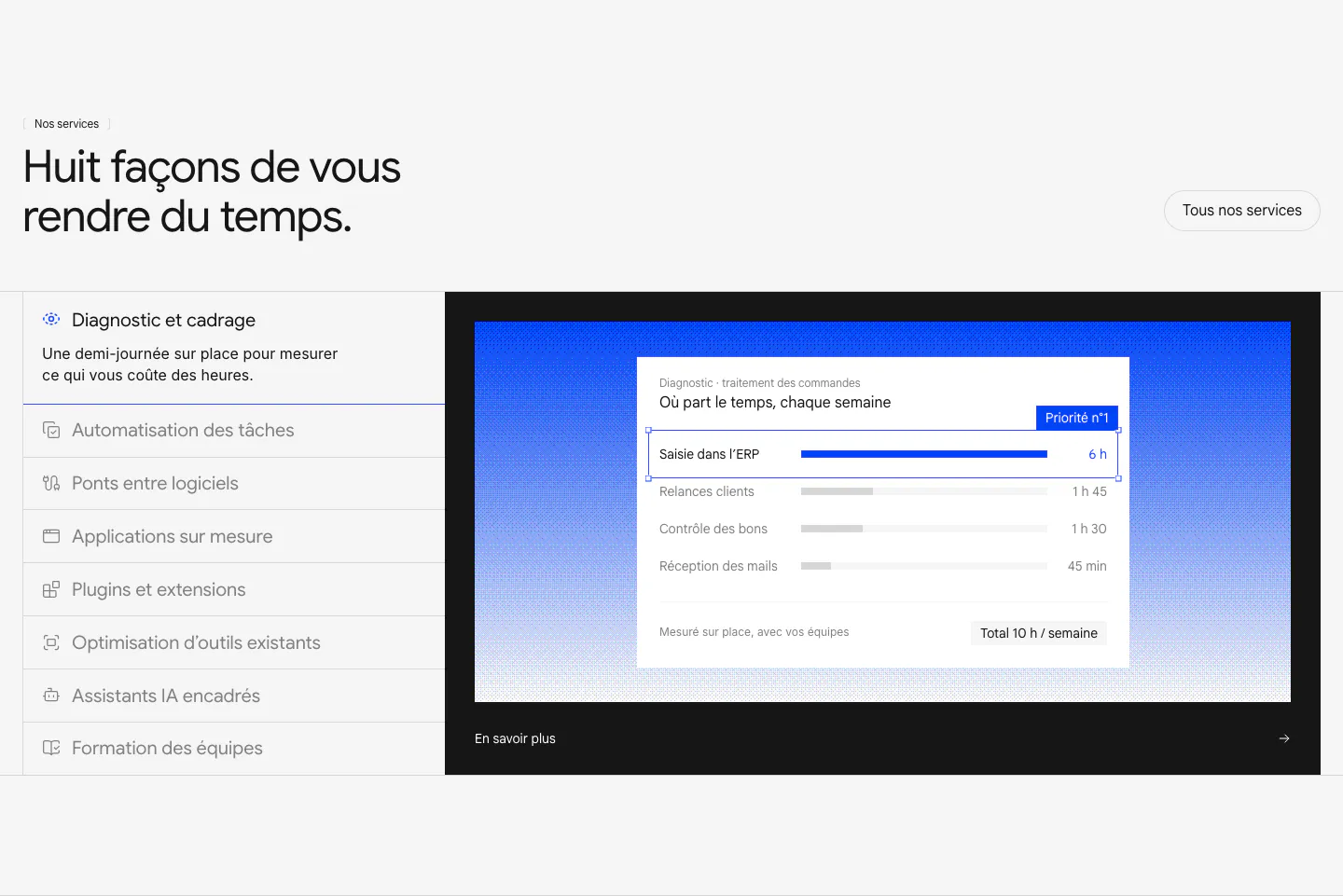
  137. Raneo features section: headline above a vertical list of eight services beside a dark panel with blue gradient and diagnostic UI card
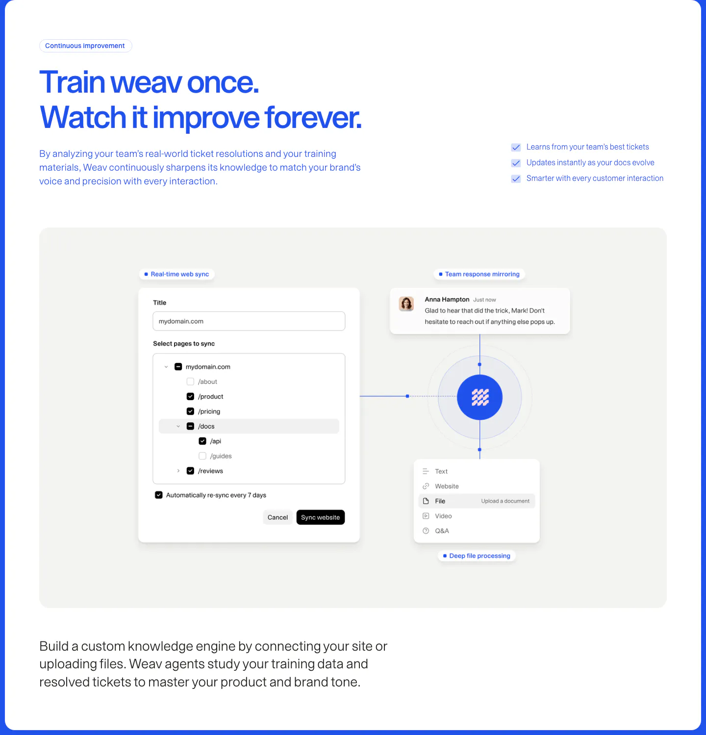
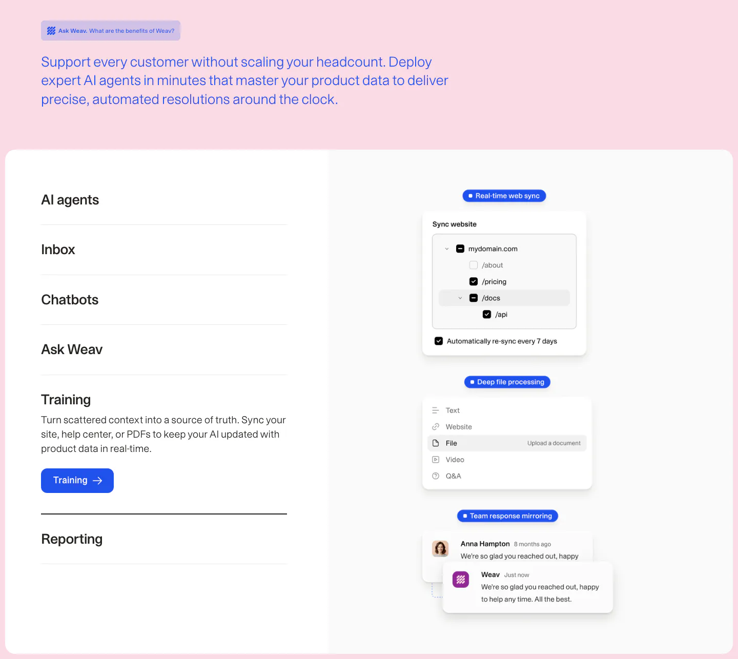
  138. Weav features section: blue headline and checklist above a gray panel with a website sync form and file and chat cards linked to a central logo
  139. Canopy features section: dark layout with a three-item feature list on the left and a UI card on a green gradient panel
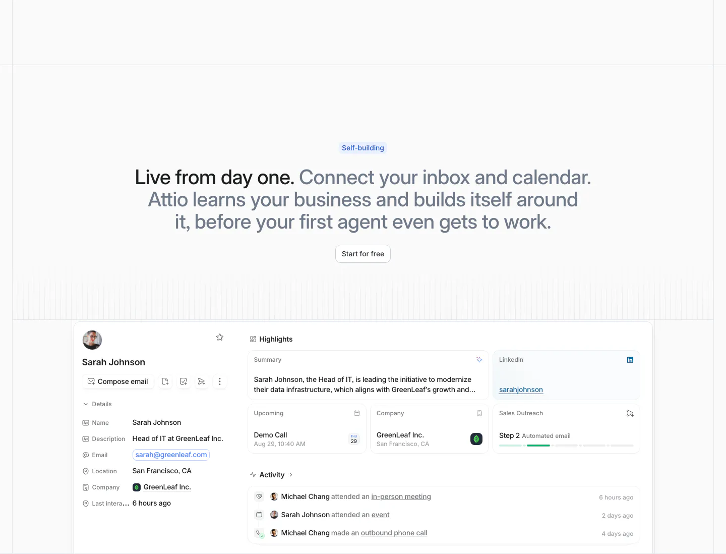
  140. Attio features section: centered two-tone headline with Start for free button above a contact record UI with highlights and activity
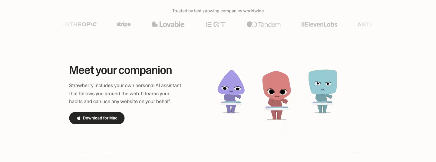
  141. Strawberry features section: logo strip on top, then headline and download button beside three cartoon companion characters
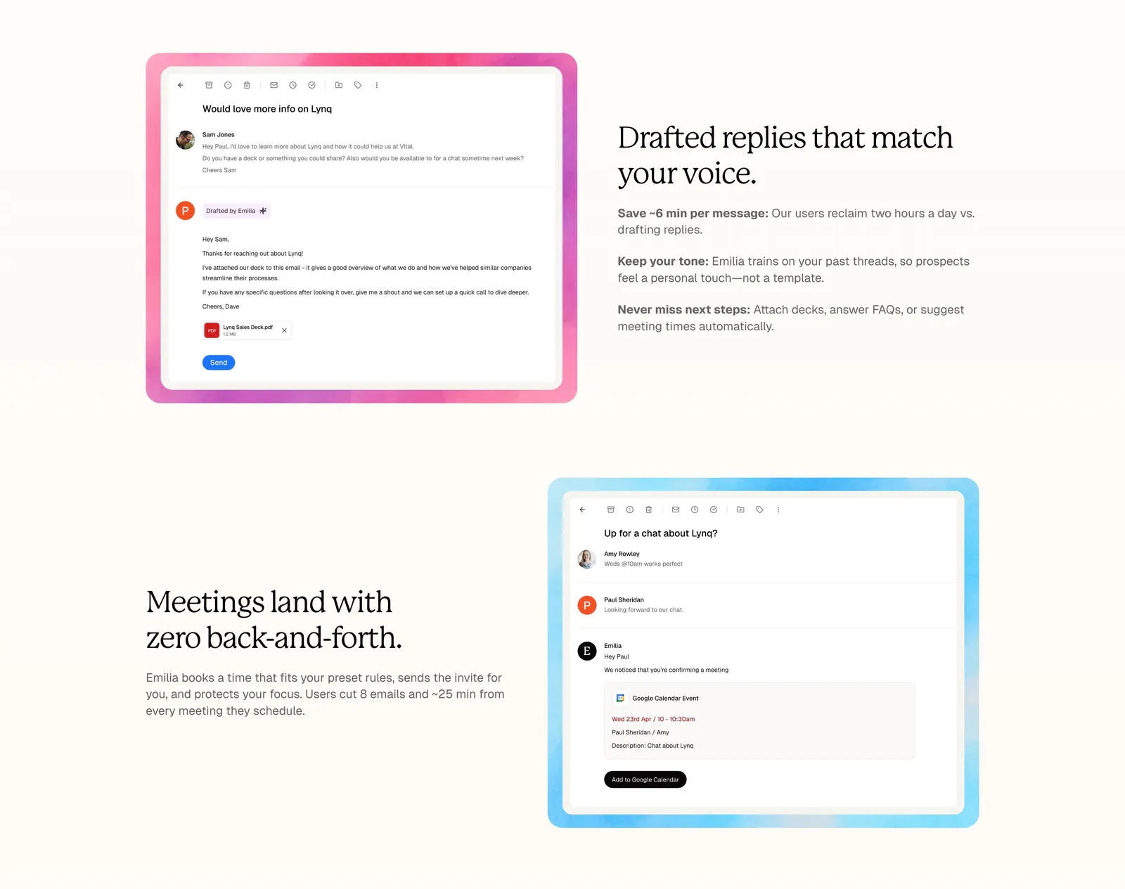
  142. Lynq features section: alternating rows of serif headlines and email UI screenshots in watercolor frames on a cream background
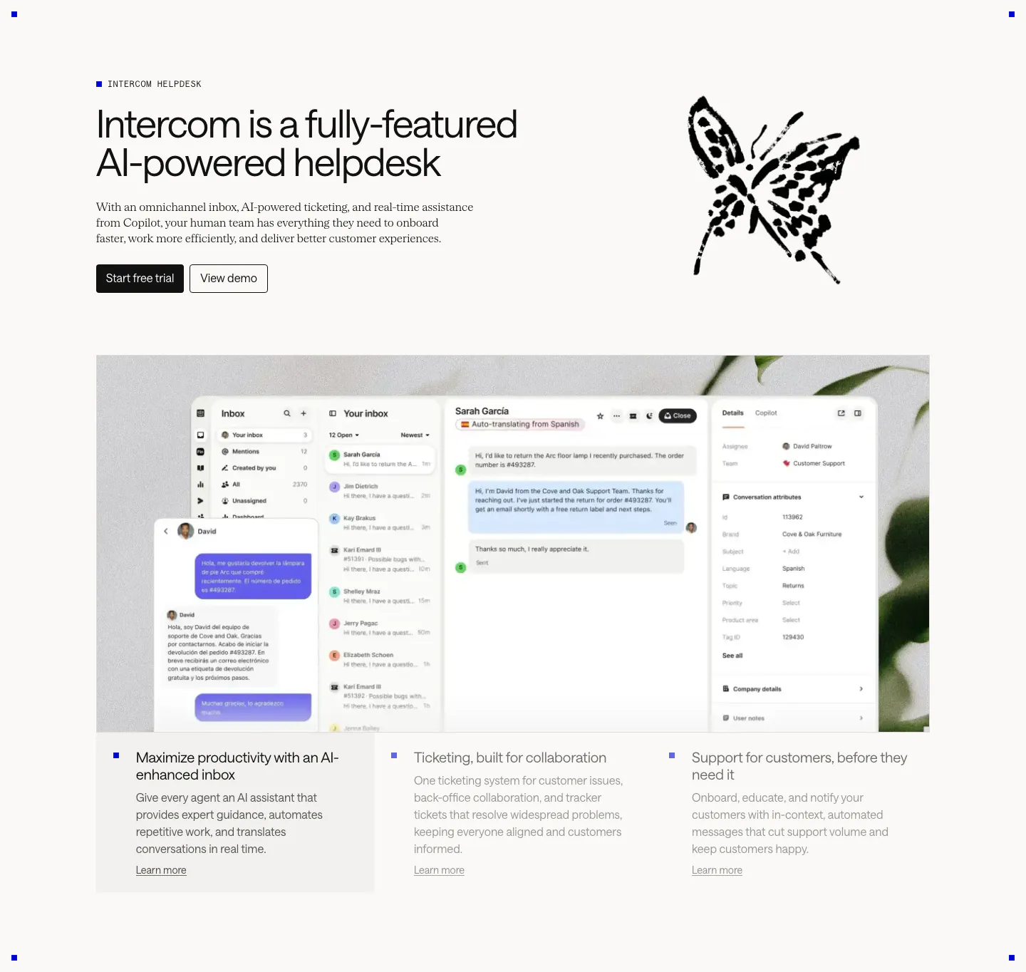
  143. Intercom features section: headline beside an ink butterfly drawing, large inbox screenshot over a plant photo, three selectable feature columns
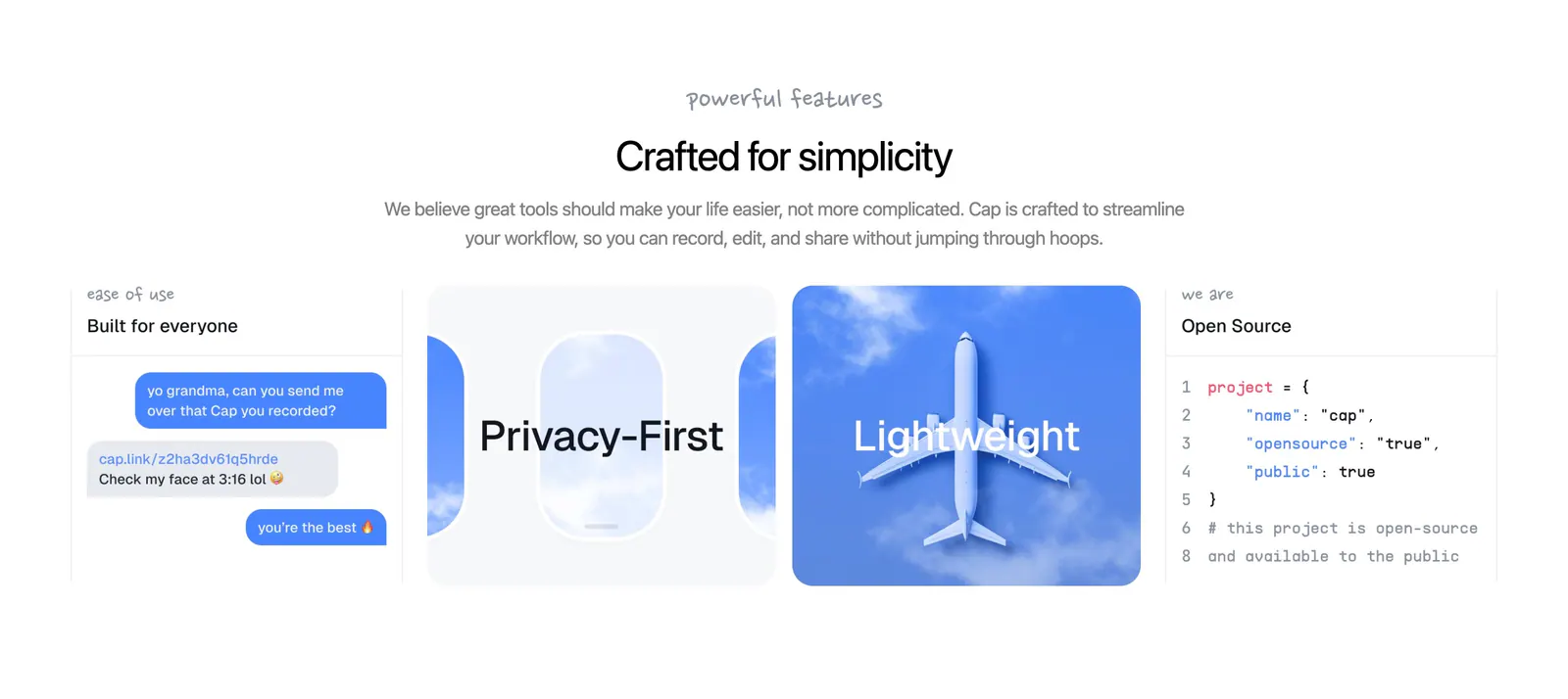
  144. Cap features section: centered headline above four cards with a chat mockup, airplane window art, sky photo and code snippet
    Cap
  145. DevRev features section: headline with four benefit blurbs and two buttons above a large dark analytics dashboard screenshot with charts
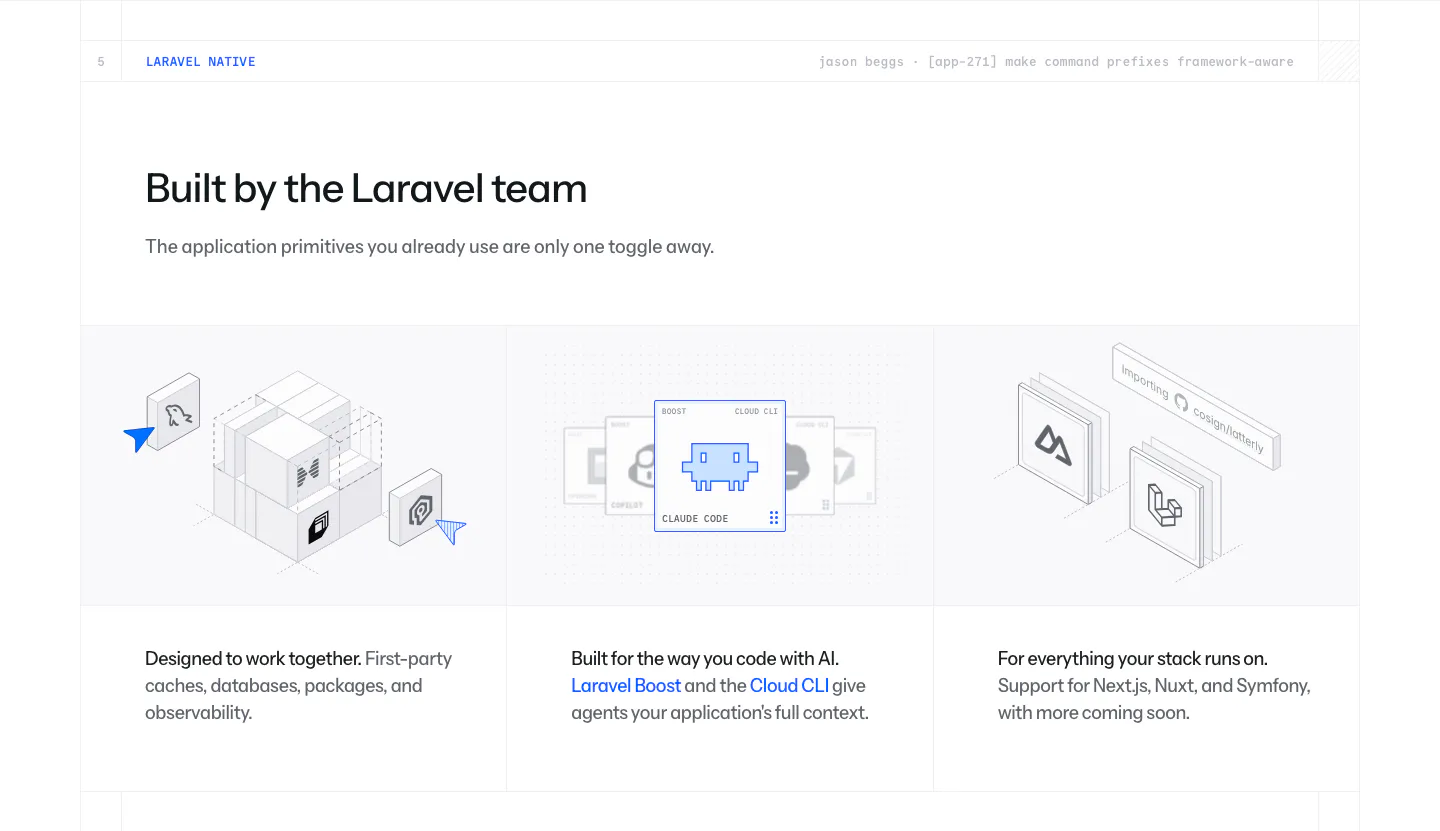
  146. Laravel Cloud features section: headline above three columns of isometric illustrations for first-party packages, AI tooling and frameworks
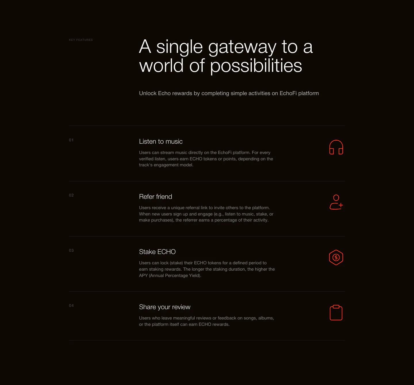
  147. EchoFi features section: headline above a numbered four-row list with orange line icons on a near-black background
  148. Arke features section: centered serif headline above a three-by-two grid of dark cards with subtle UI vignettes and short descriptions
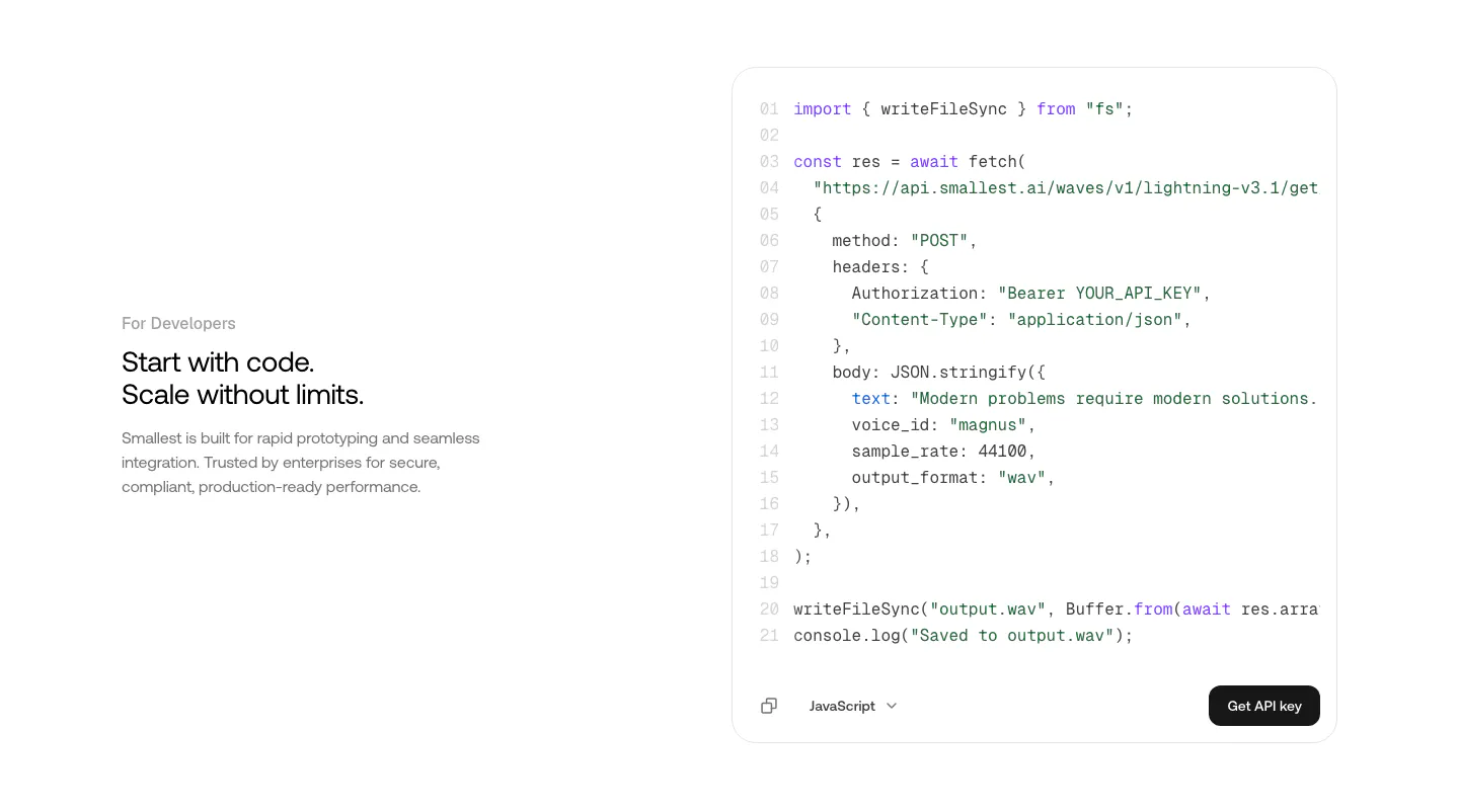
  149. Smallest.ai features section: developer copy on the left beside a JavaScript API code block with a Get API key button on white
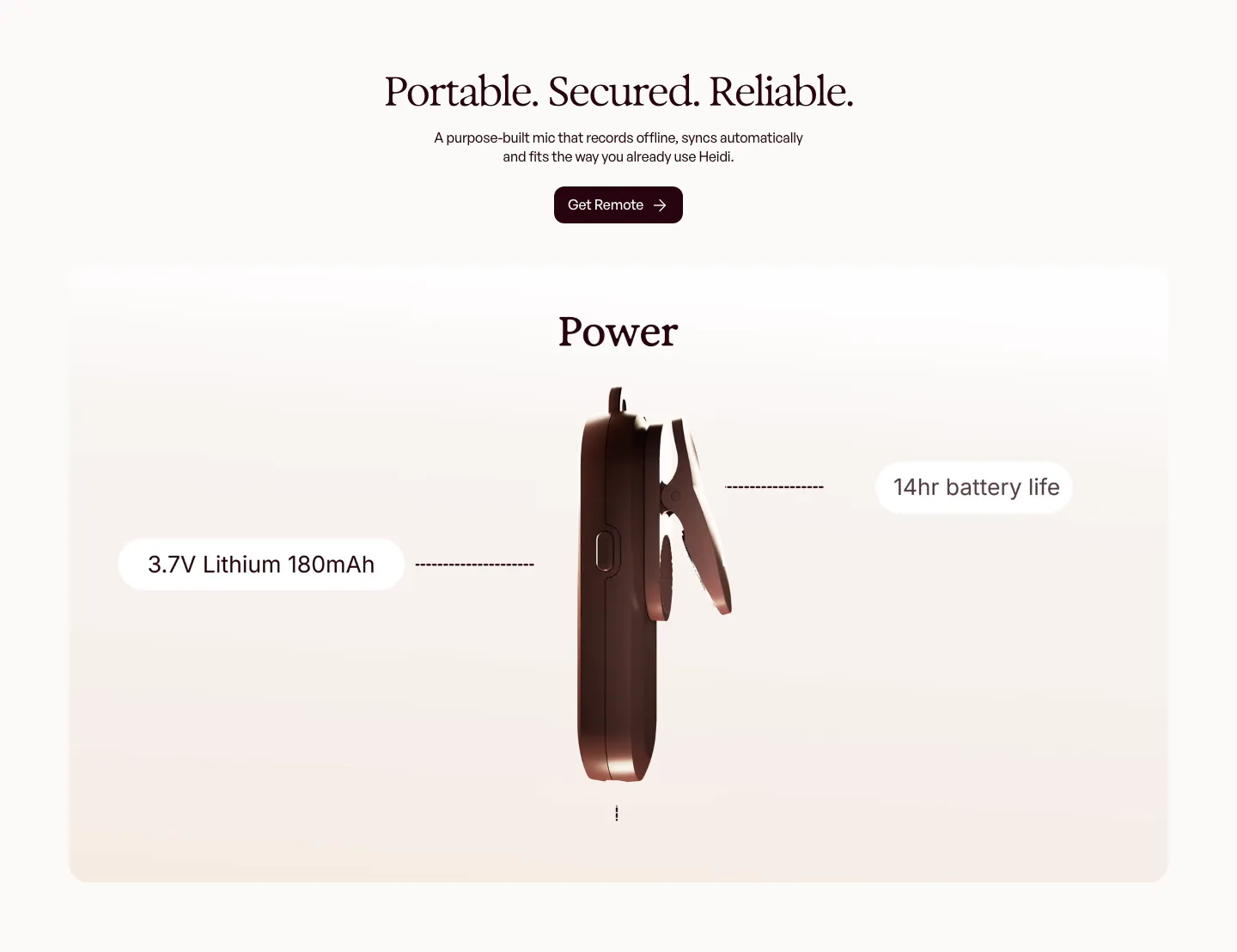
  150. Heidi features section: centered serif headline above a rendered side view of the clip-on mic with battery spec callouts
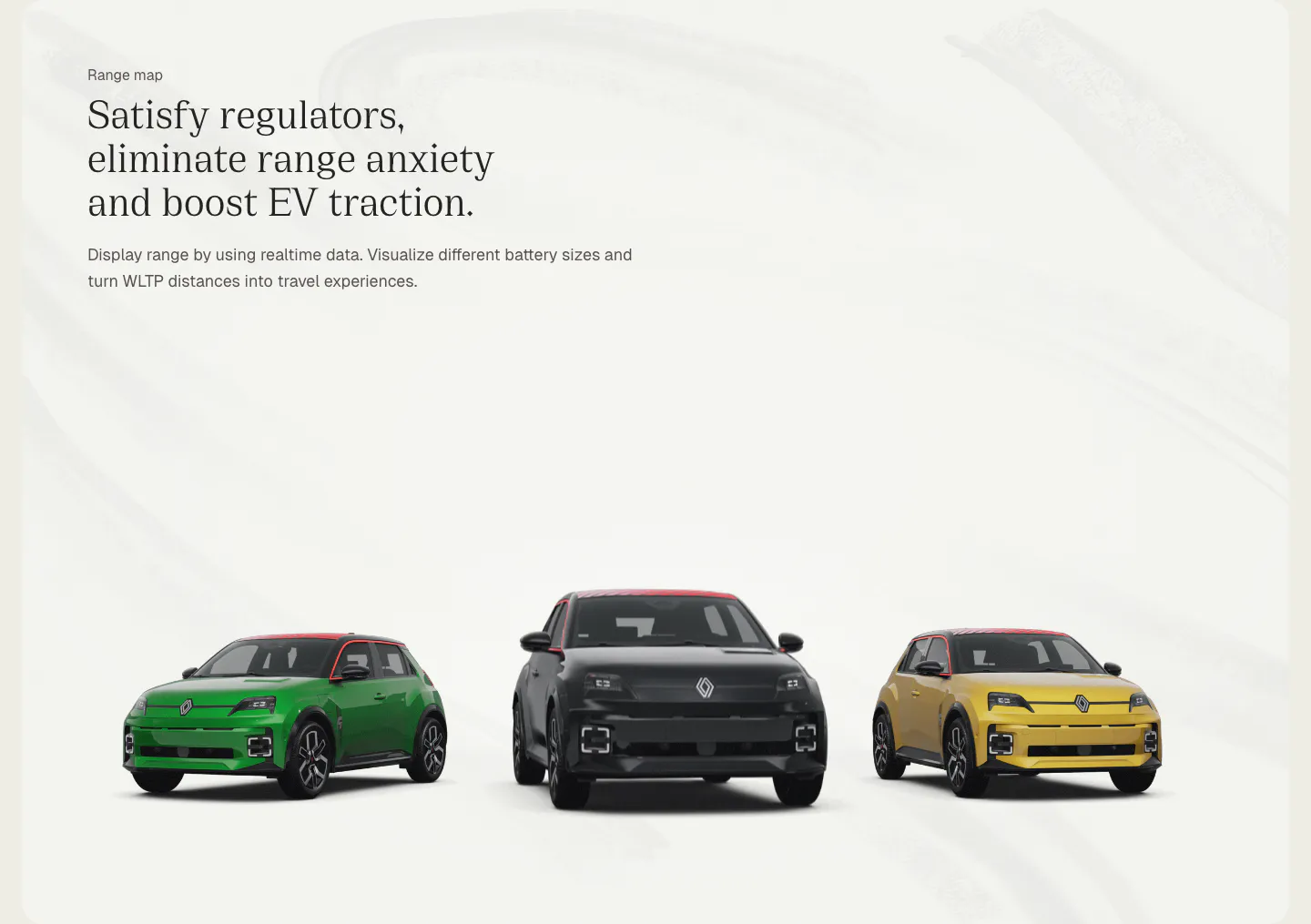
  151. Chargetrip features section: left-aligned serif headline above three Renault 5 electric cars in green, black and yellow on a light gray backdrop
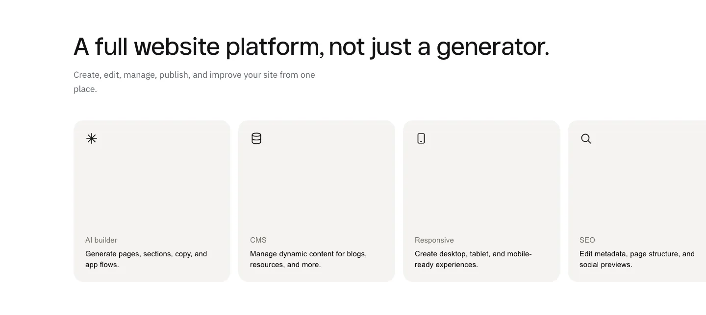
  152. Modulify features section: left-aligned headline above a row of four gray icon cards on white, the last card cut off
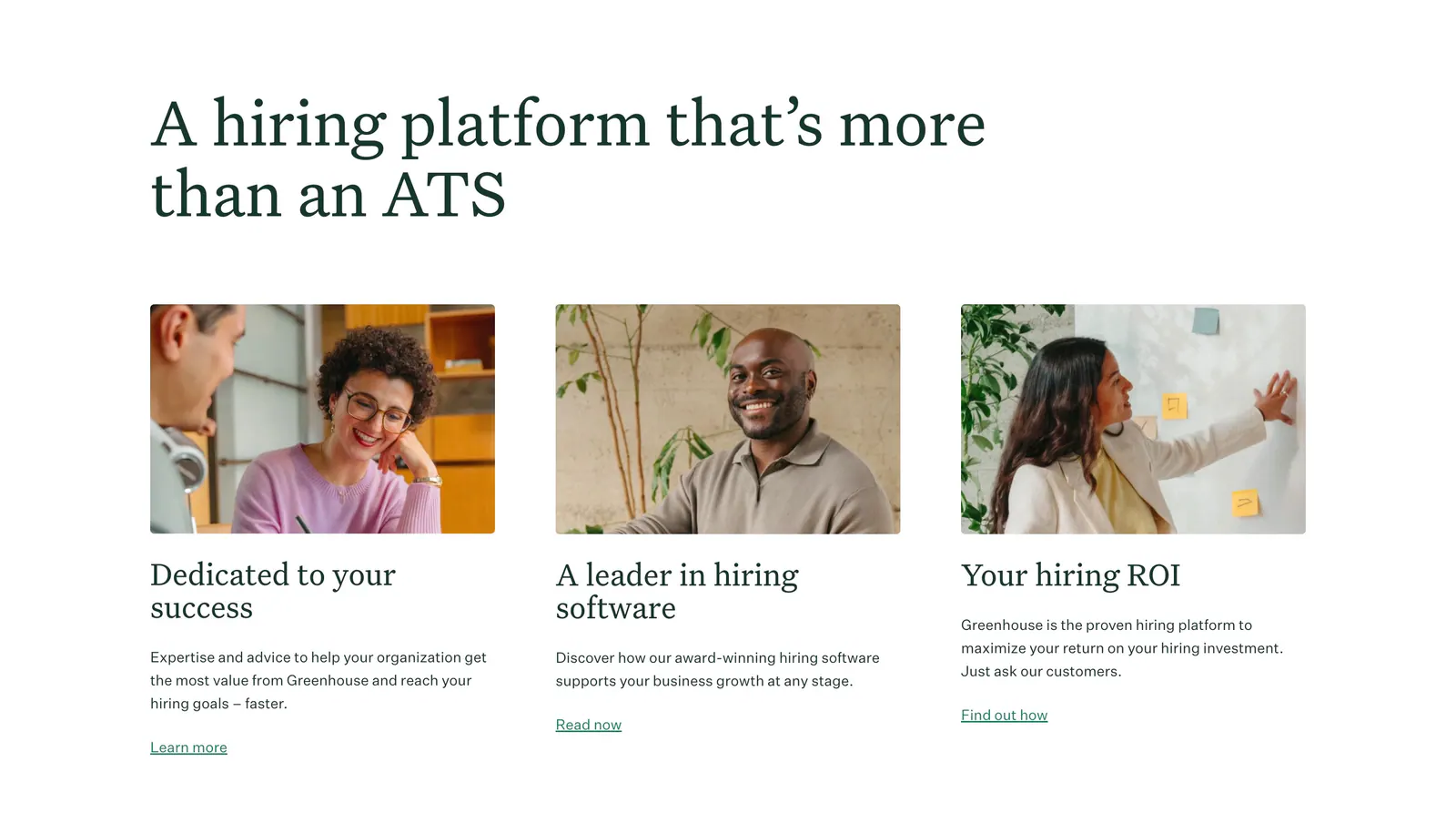
  153. Greenhouse features section: large serif headline above three cards with workplace photos, serif titles, copy and text links
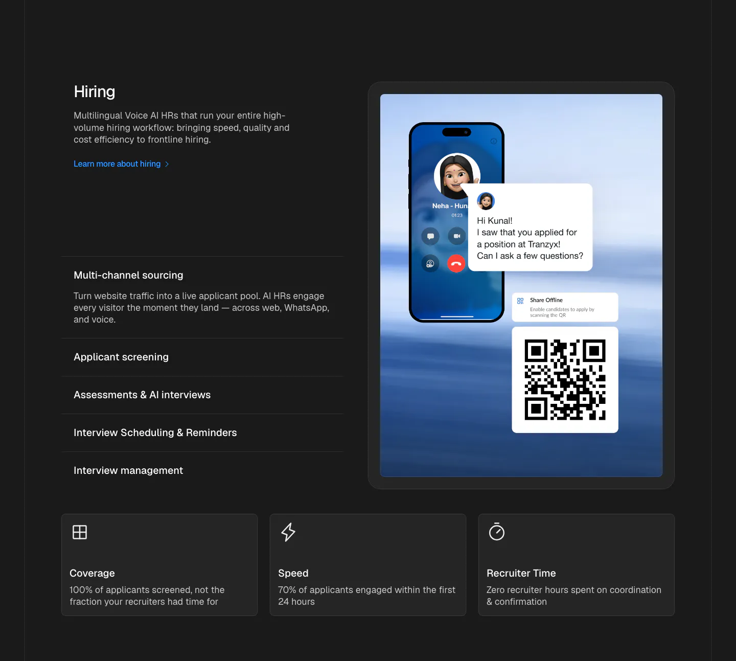
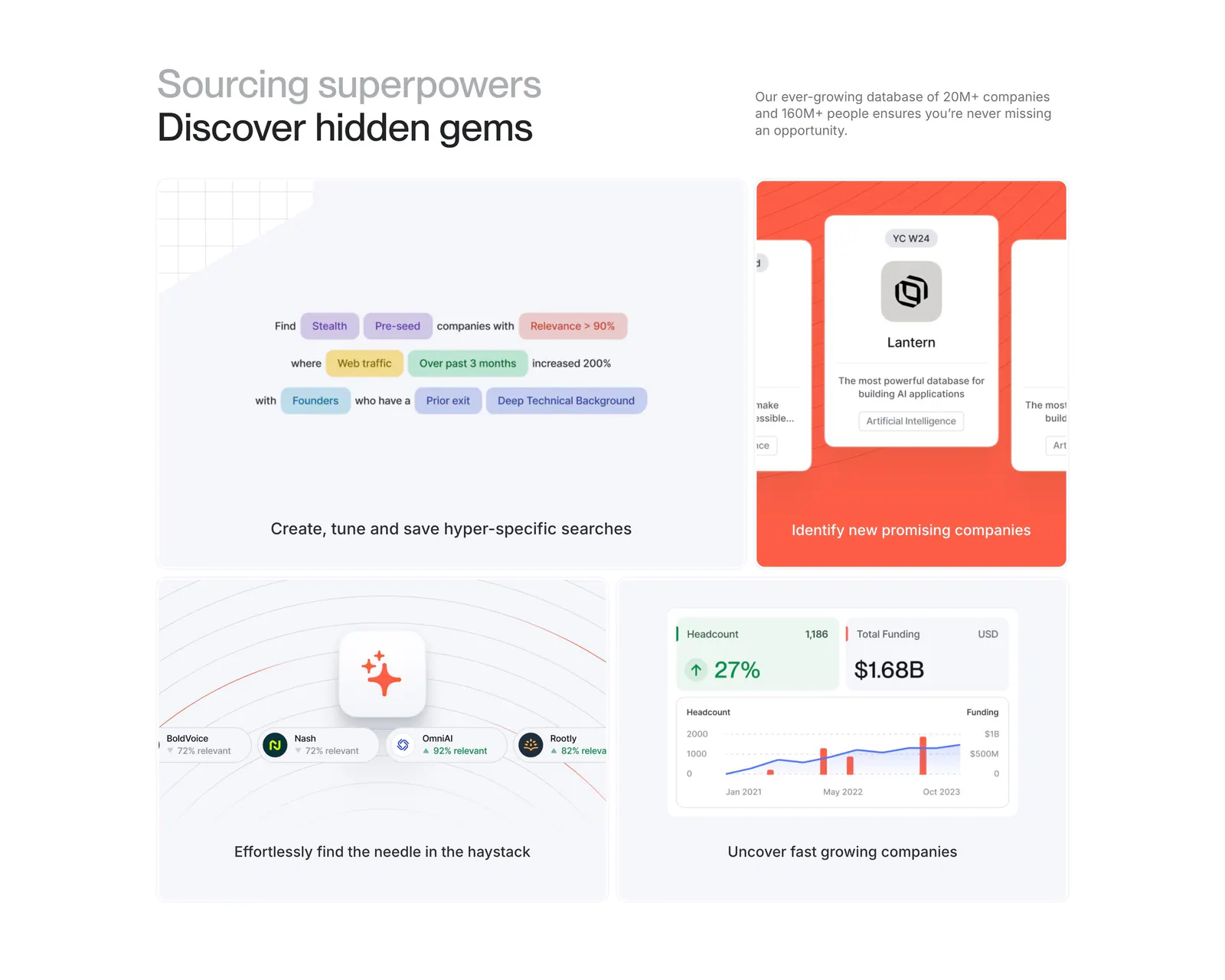
  154. Hunar features section: dark background with hiring copy and expandable list beside a phone call mockup, three outcome cards below
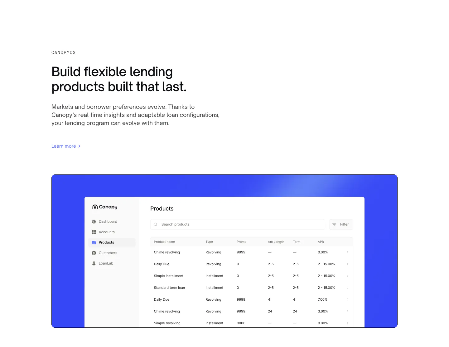
  155. Canopy features section: left-aligned eyebrow, headline and link above a products table screenshot on a bright blue panel
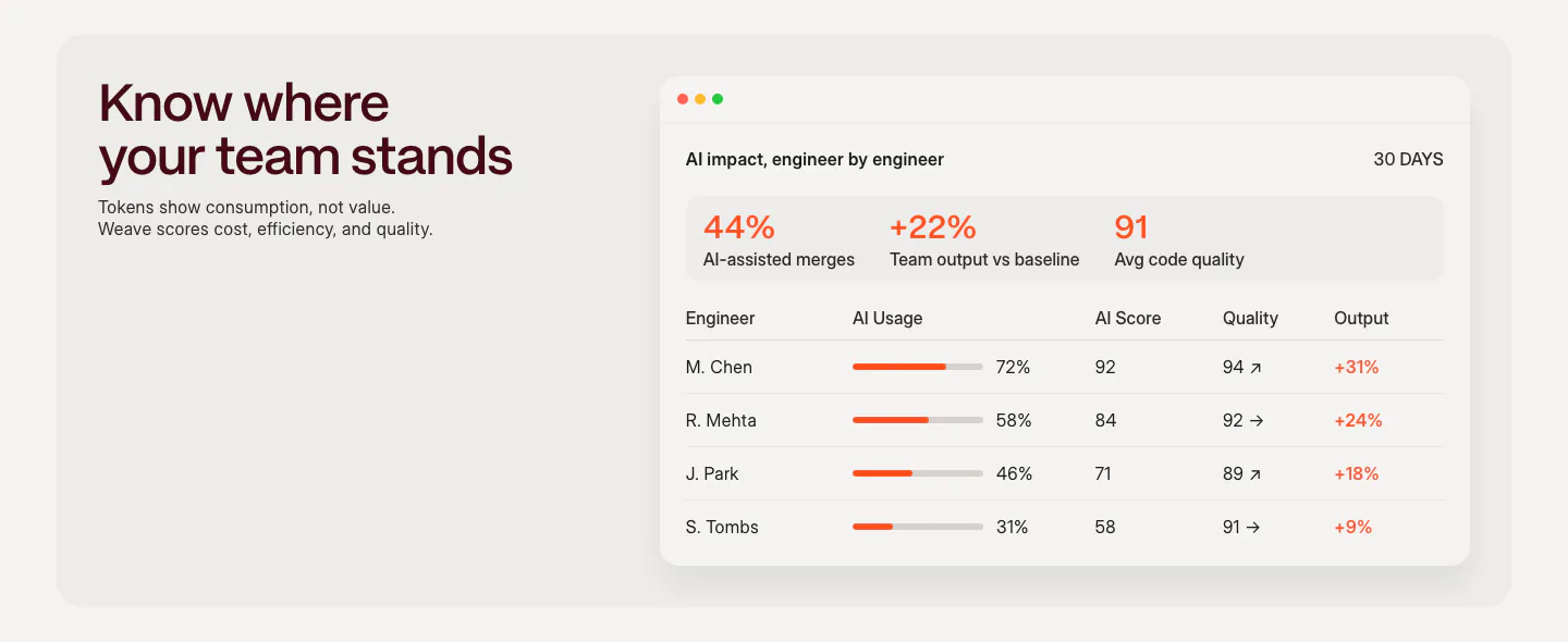
  156. Weave features section: headline and short copy on the left beside an AI impact dashboard table with usage bars and scores
  157. Harmonic features section: two-tone headline above a four-tile bento grid with search chips, company cards and growth charts
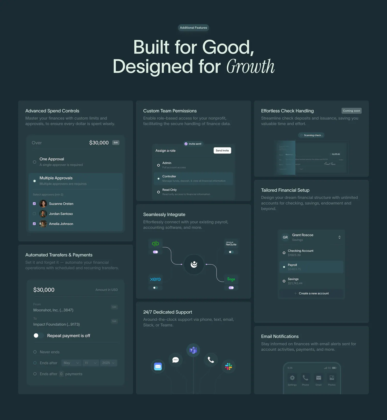
  158. Crescent Cares features section: centered headline above a bento grid of finance feature cards with UI snippets on dark teal
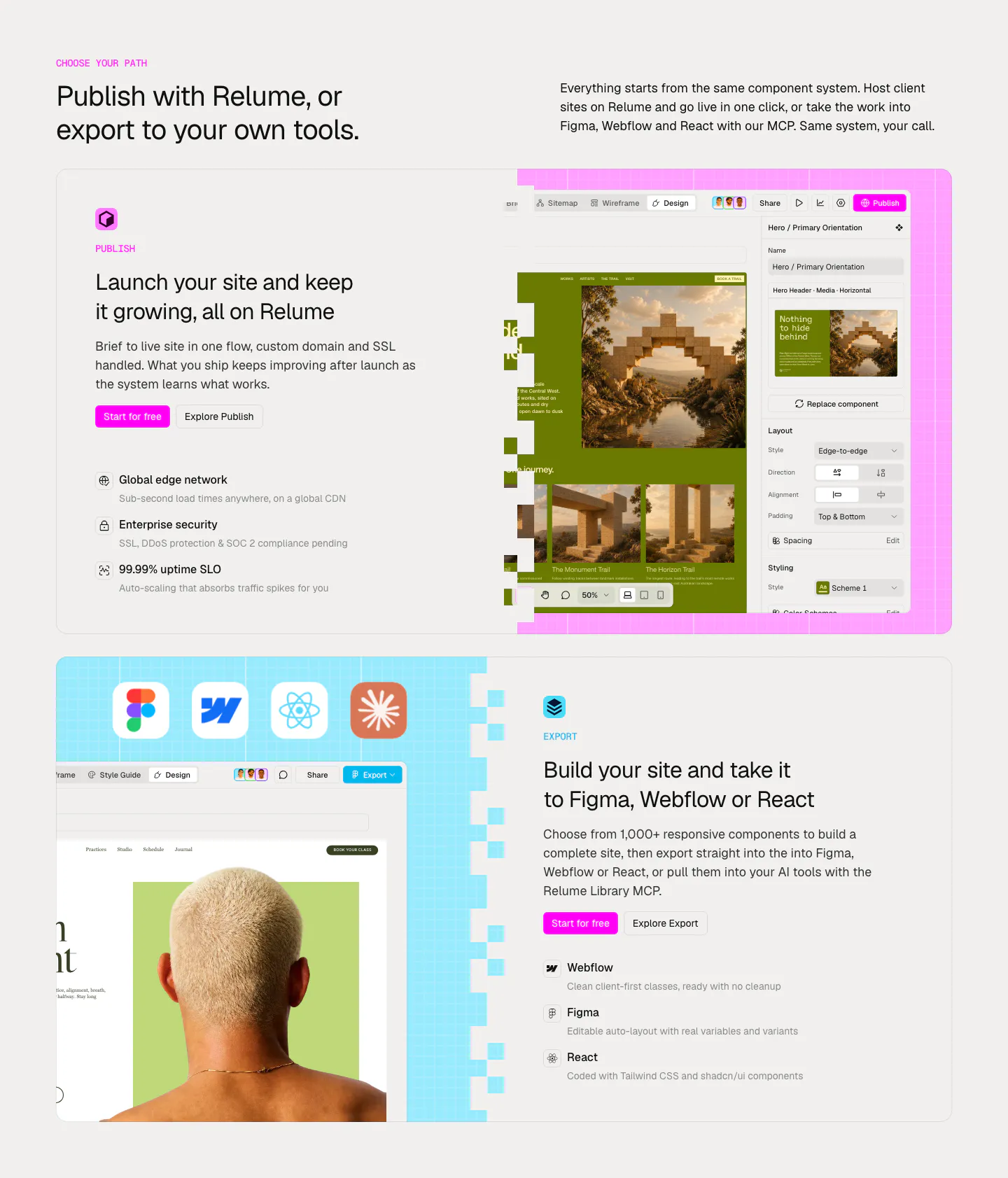
  159. Relume features section: headline above two large cards alternating text and editor screenshots for Publish and Export on pink and blue grids
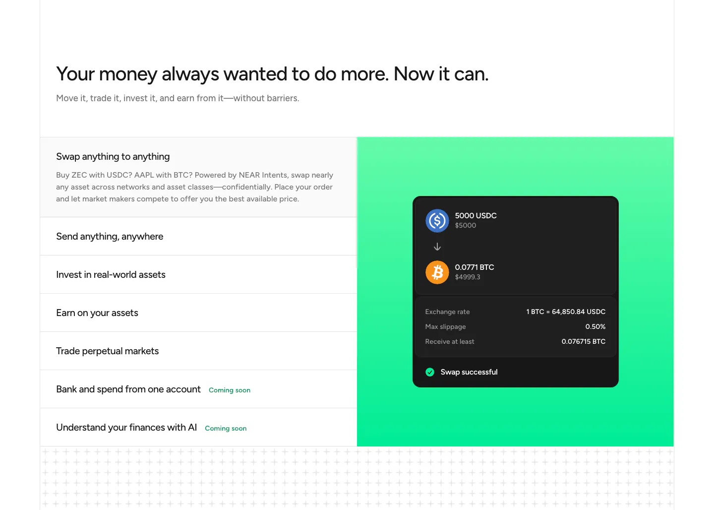
  160. NEAR features section: headline above a list of capabilities on the left and a swap UI card on a green gradient panel
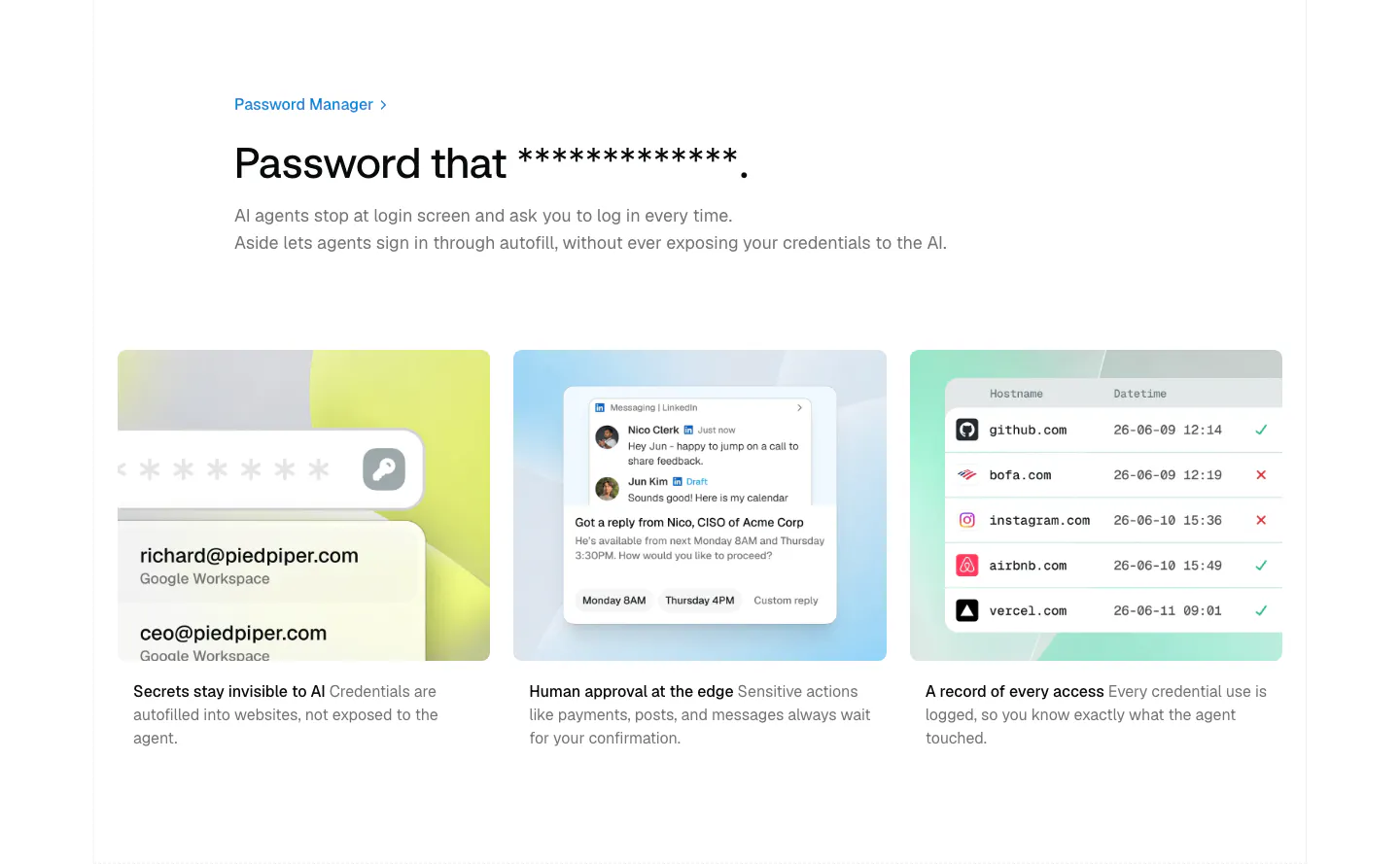
  161. Aside features section: left-aligned headline above three pastel cards with credential, approval and access log mockups
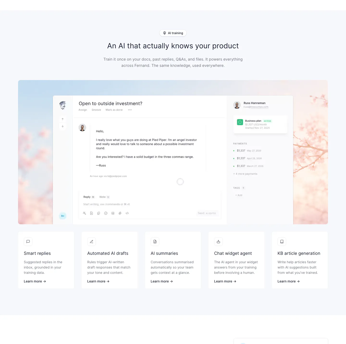
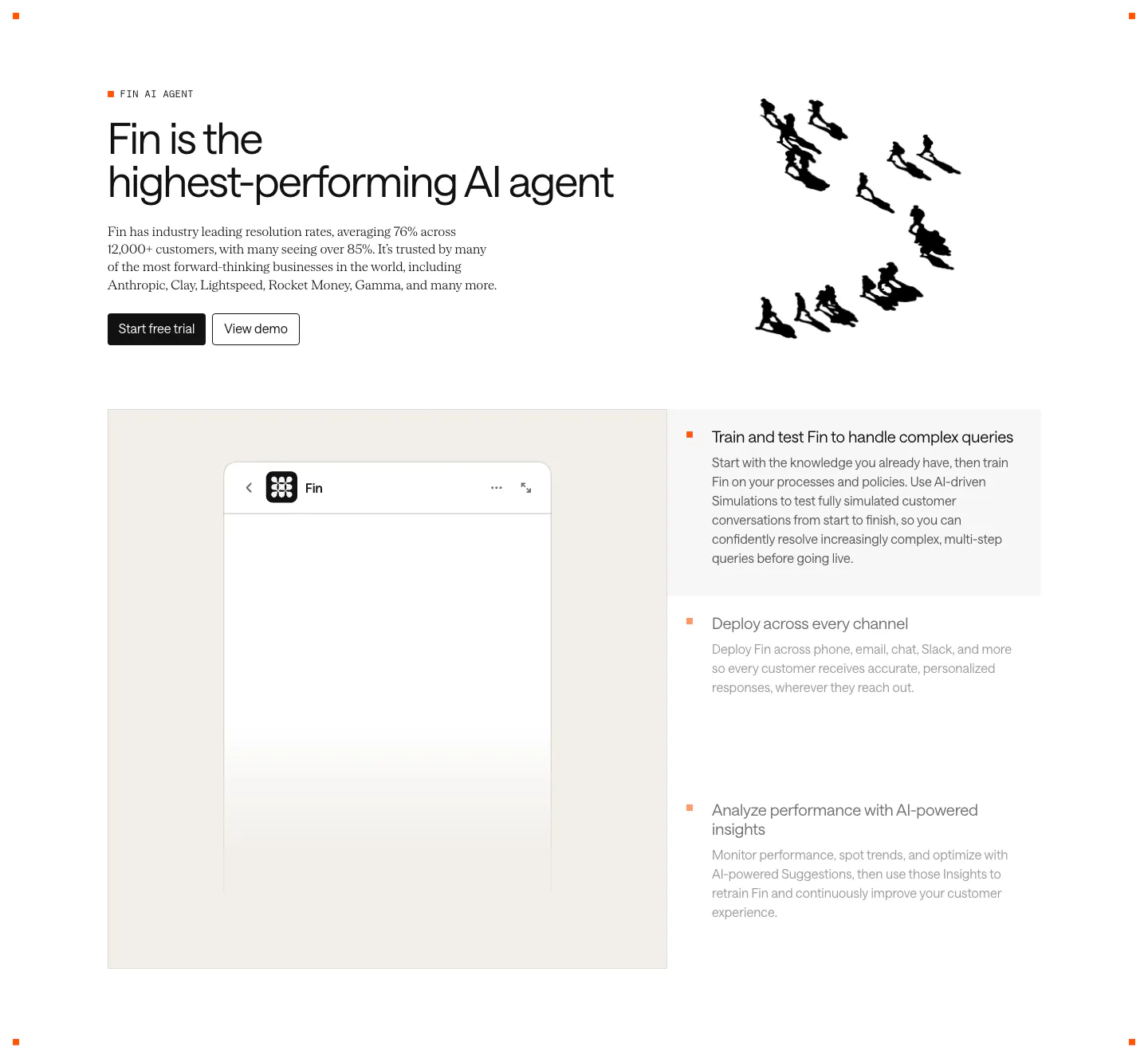
  162. Fernand features section: centered heading above an inbox screenshot on a blossom photo and a row of five feature cards
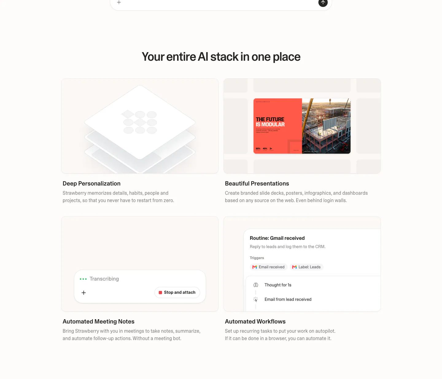
  163. Strawberry features section: centered headline over a 2x2 grid of cards with UI snippets for personalization, slides, notes and workflows
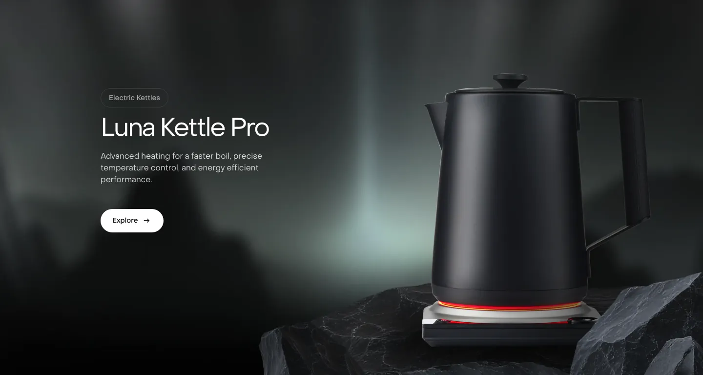
  164. Saki features section: headline, copy and Explore button on the left beside a black kettle on a rock over a dark misty photo background
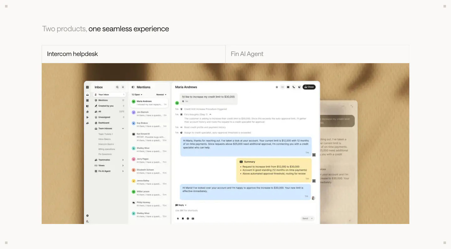
  165. Intercom features section: two-tab switcher for helpdesk and Fin AI Agent above a large inbox screenshot on a textured beige backdrop
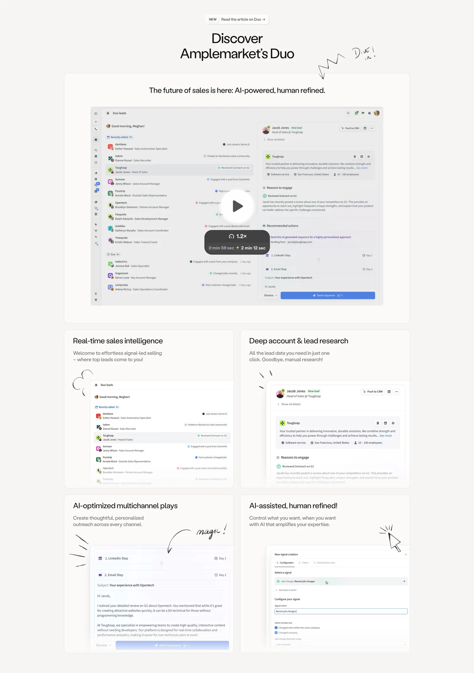
  166. Amplemarket features section: centered headline above a product video card and a 2x2 bento of UI cards with hand-drawn doodles
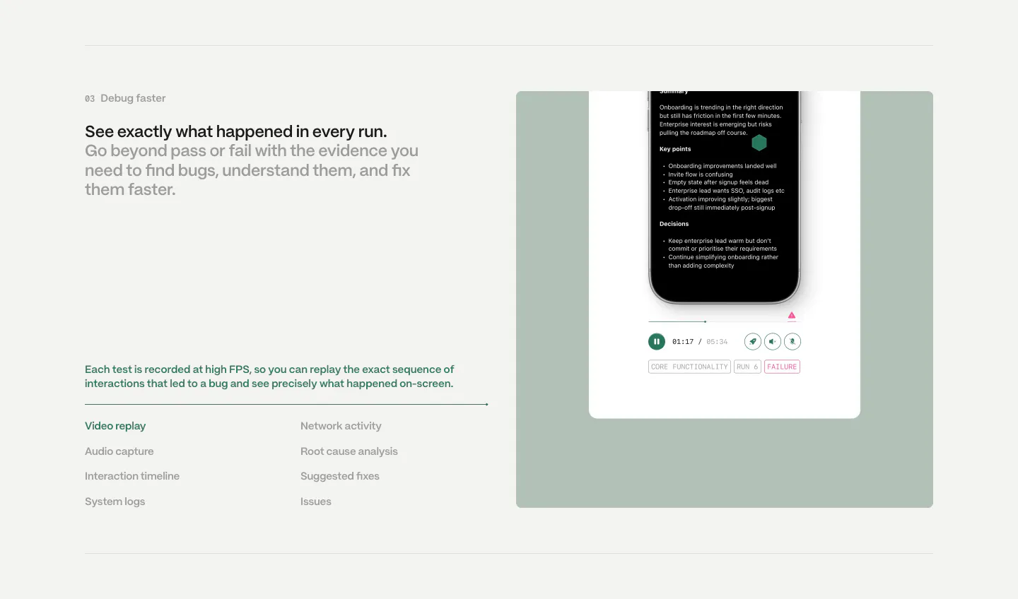
  167. Semaloop features section: numbered headline and feature list on the left beside a sage green panel with a phone test replay player
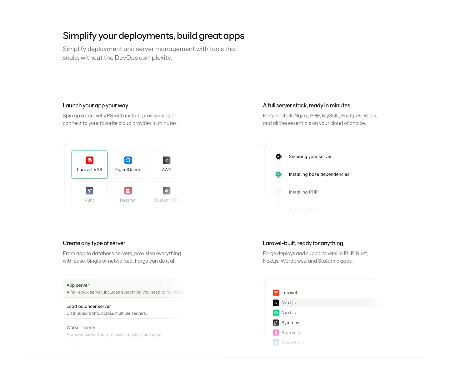
  168. Laravel Forge features section: left-aligned heading above a 2x2 grid of feature cards with faded UI snippets on white
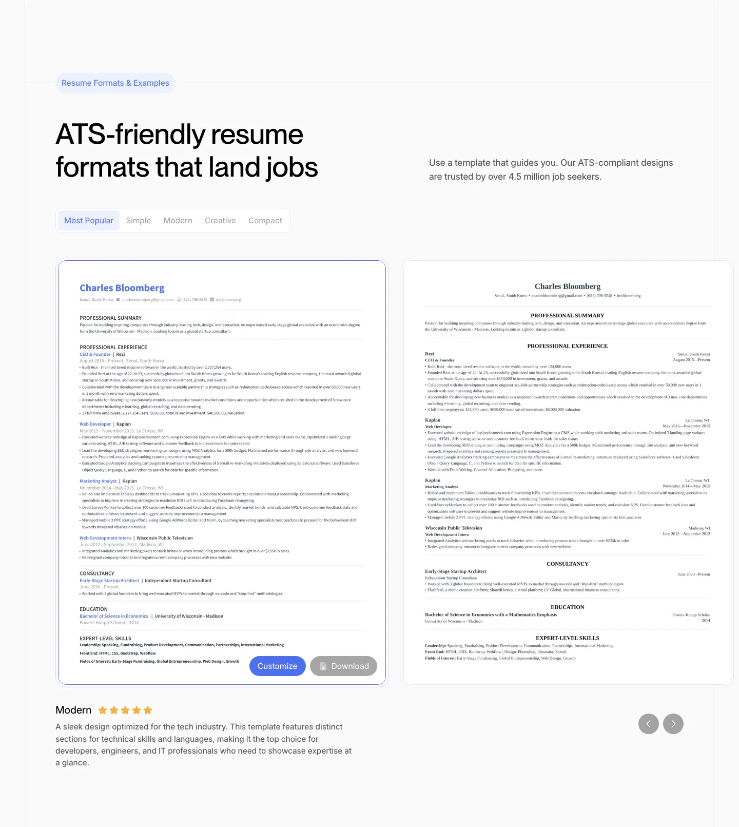
  169. Rezi features section: resume template gallery with style tabs, two resume previews in a slider with arrows and a rated description
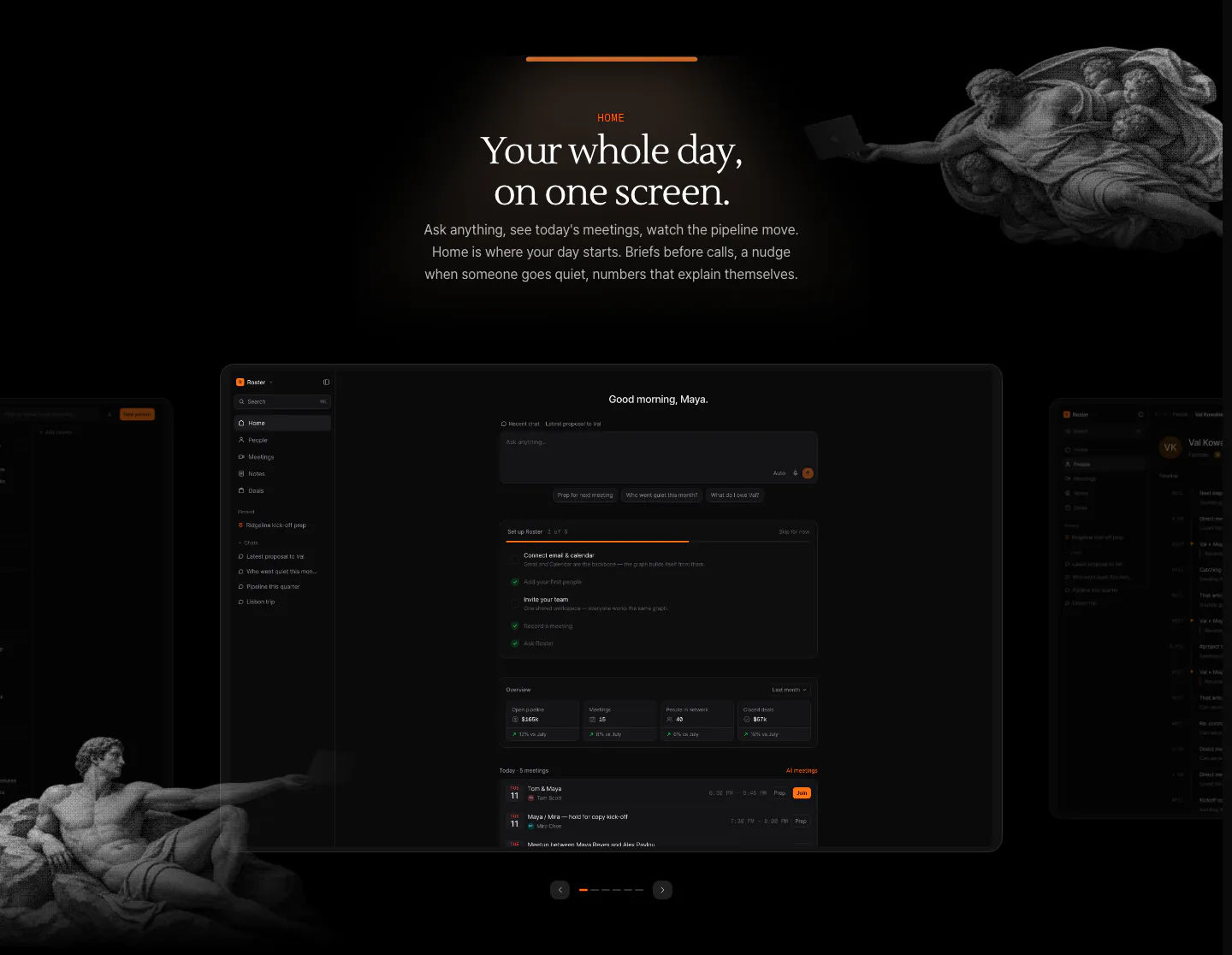
  170. Arke features section: centered serif headline above a dark dashboard screenshot carousel framed by halftone Renaissance figures
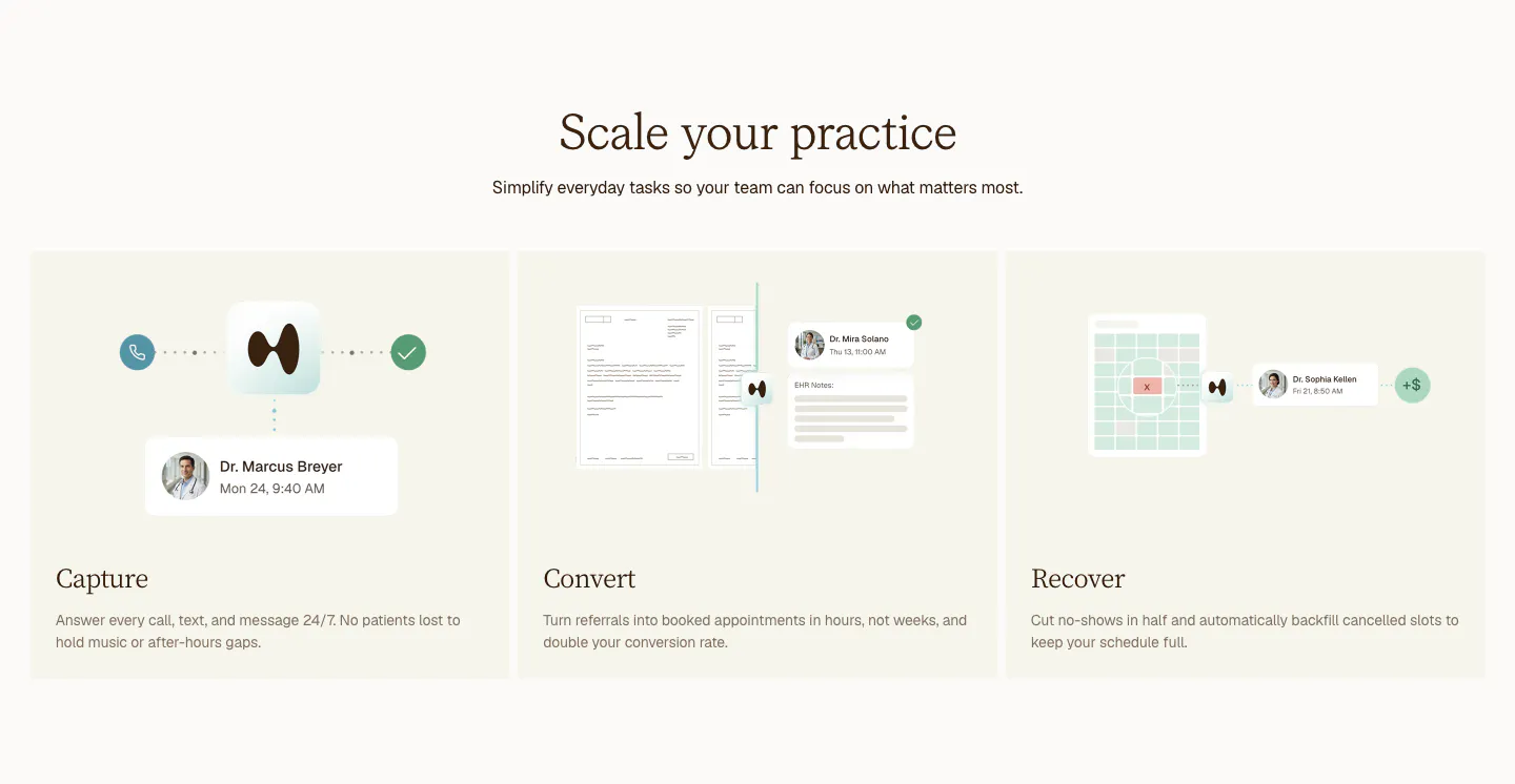
  171. Clarion features section: centered serif headline above three cream cards for Capture, Convert and Recover with light UI mockups
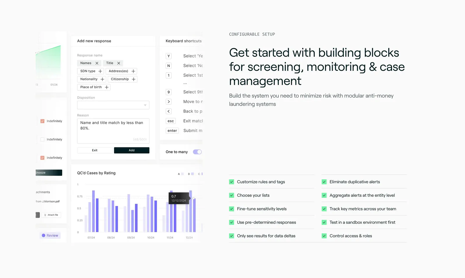
  172. Sandbar features section: product UI collage of forms and a bar chart on the left, headline and two-column checklist on the right
  173. Canopy features section: left-aligned headline above a horizontally scrolling row of dark product cards, the last cut off
  174. Headroom features section: headline beside three icon benefits above a projects table screenshot overlaid with an email card
  175. Laravel Cloud features section: headline above a bento grid of UI snippets for repo deploys, PR previews, resources, regions and pricing
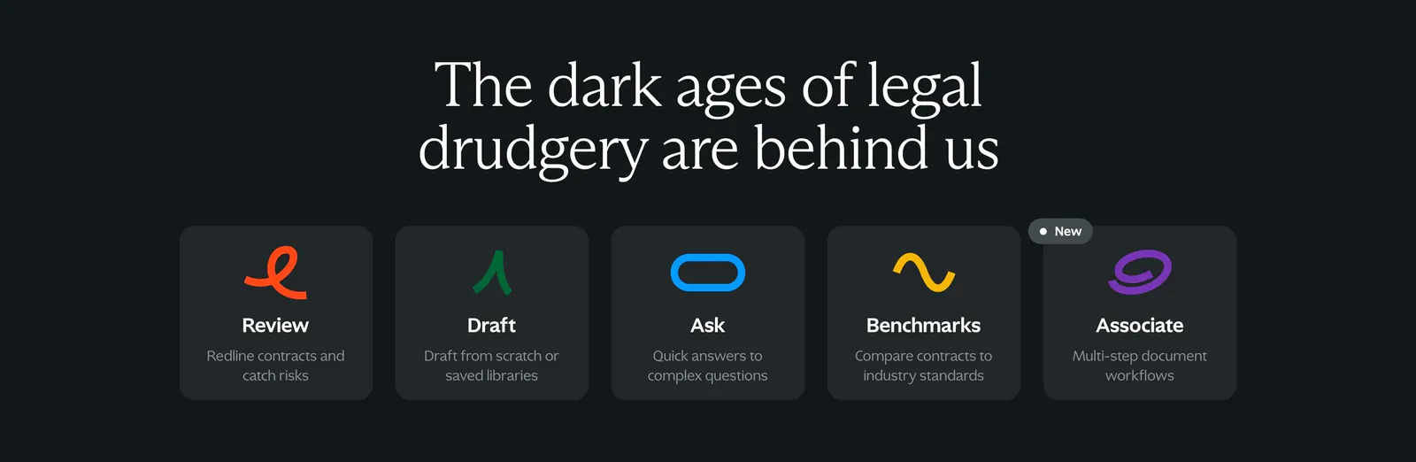
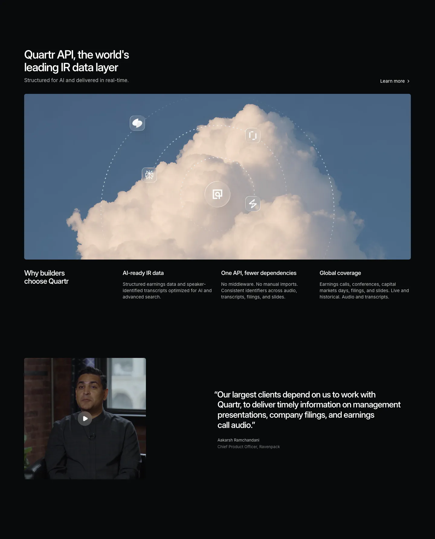
  176. Spellbook features section: centered serif headline above five equal dark cards with colorful squiggle icons on a charcoal background
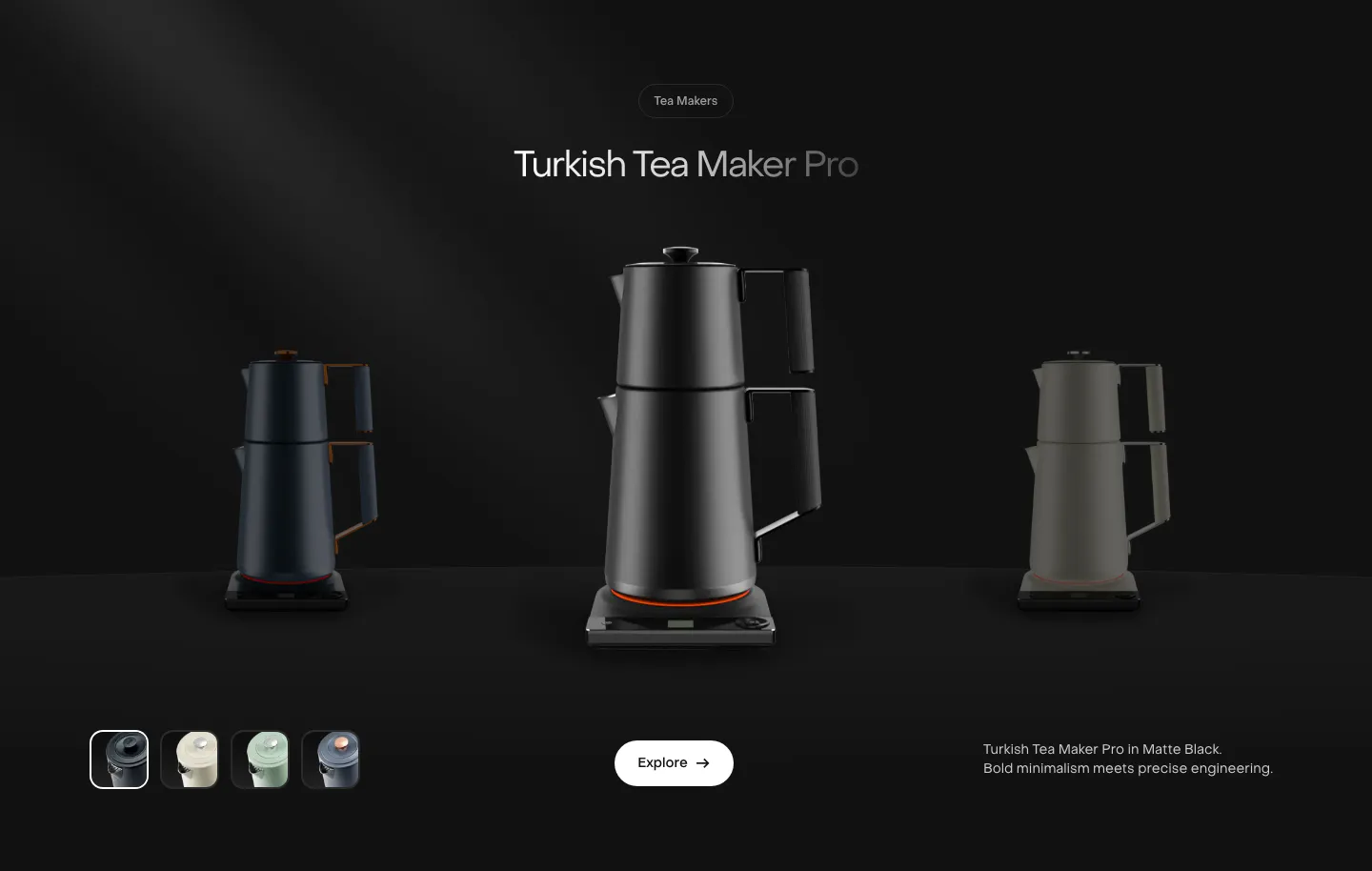
  177. Saki features section: centered product name above a black tea maker flanked by dimmed variants, color swatches and an Explore button on black
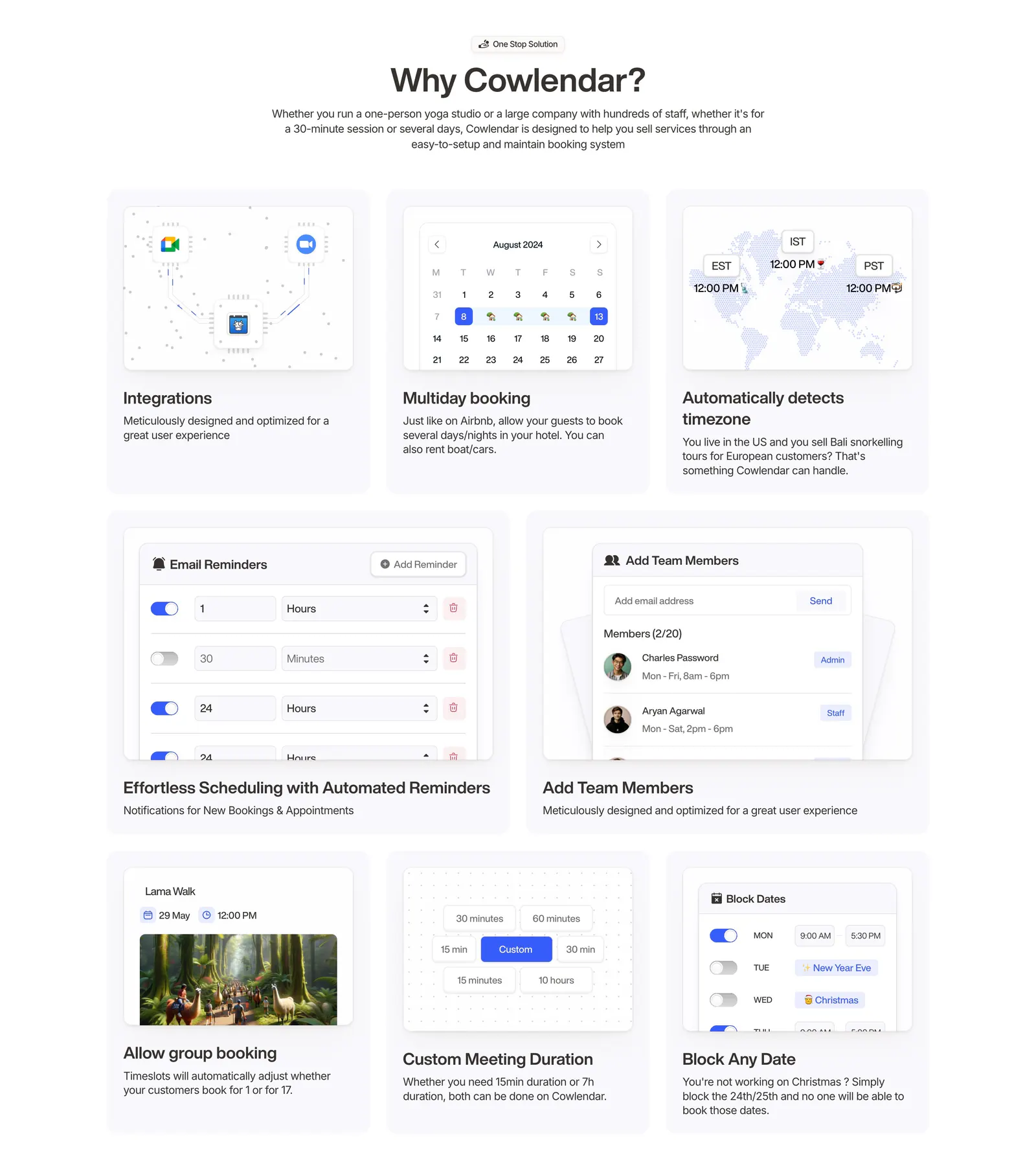
  178. Quartr features section: dark layout with a wide cloud photo orbited by icons, three benefit columns and a video testimonial
  179. Cowlendar features section: centered heading above a bento grid of eight booking feature cards with UI snippets
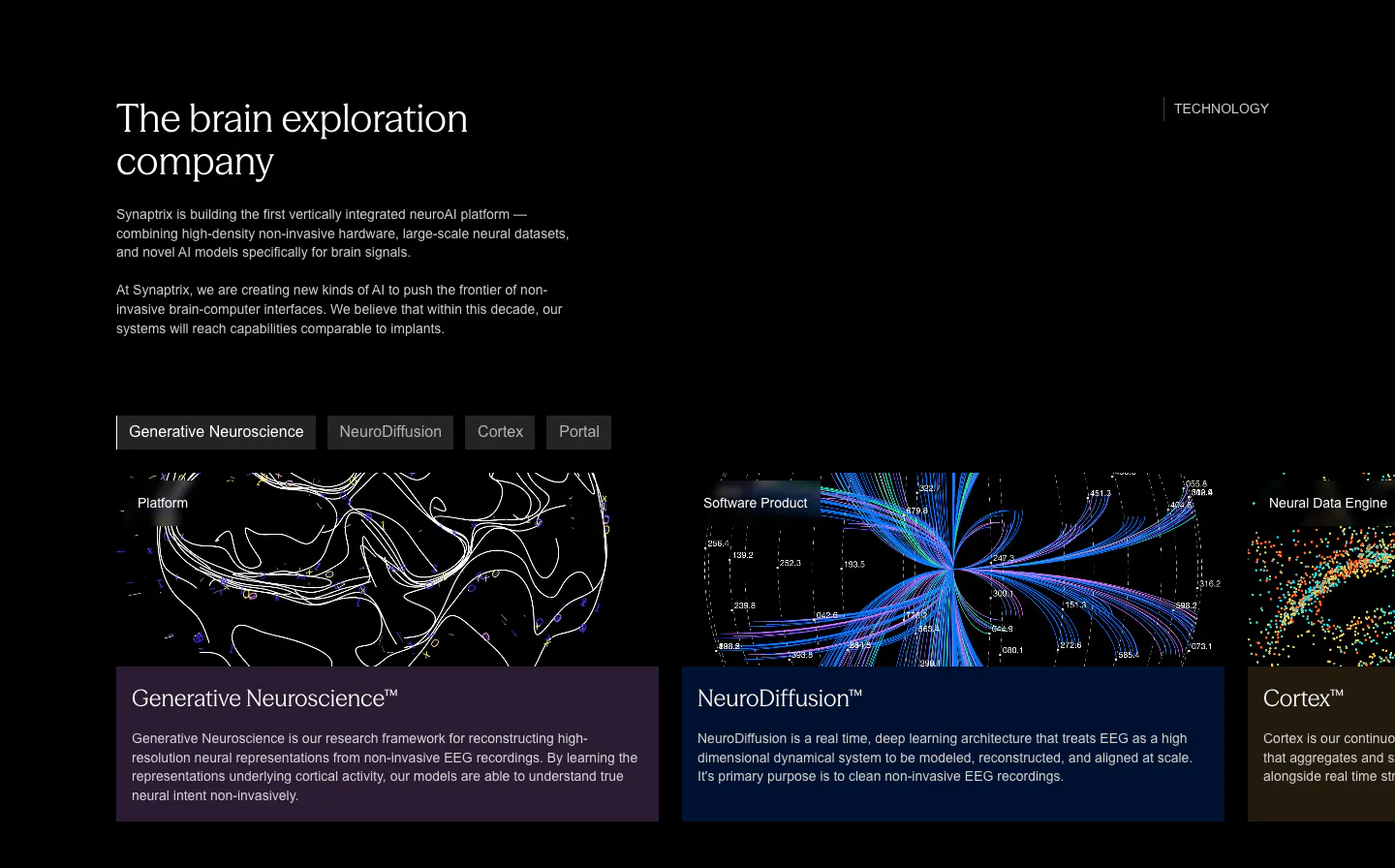
  180. Synaptrix features section: heading and intro copy above a tab bar and cut-off product cards with neural data visualizations on black
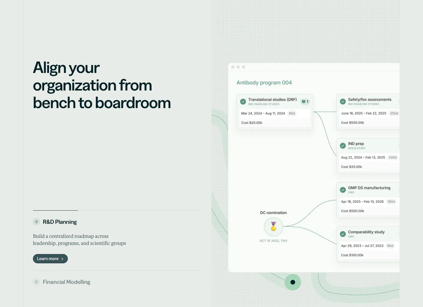
  181. Orchestra Bio features section: headline and R&D planning accordion at left, program timeline product UI on a faint grid at right
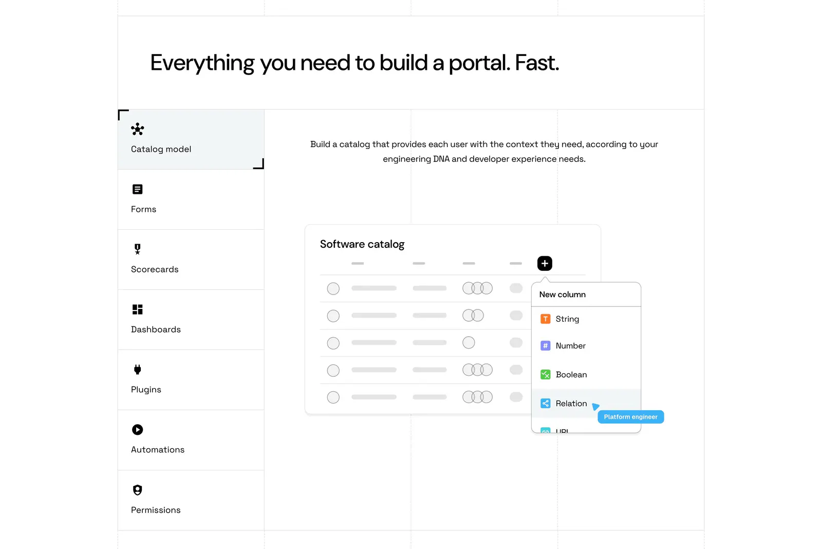
  182. Port features section: headline above a vertical tab list of capabilities beside a software catalog UI mockup on a grid-lined white page
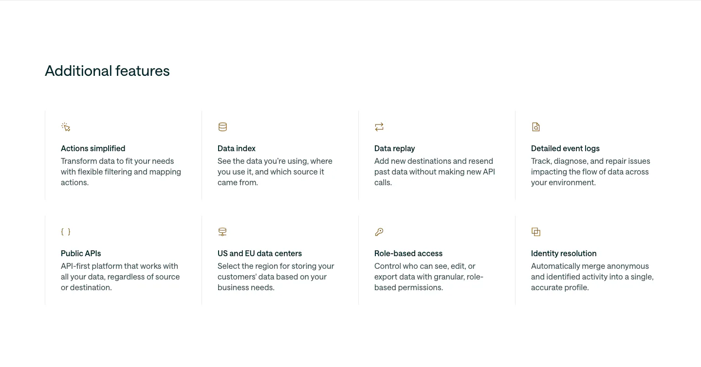
  183. Customer.io features section: left-aligned heading above a 4x2 grid of feature items with small gold icons, titles and descriptions
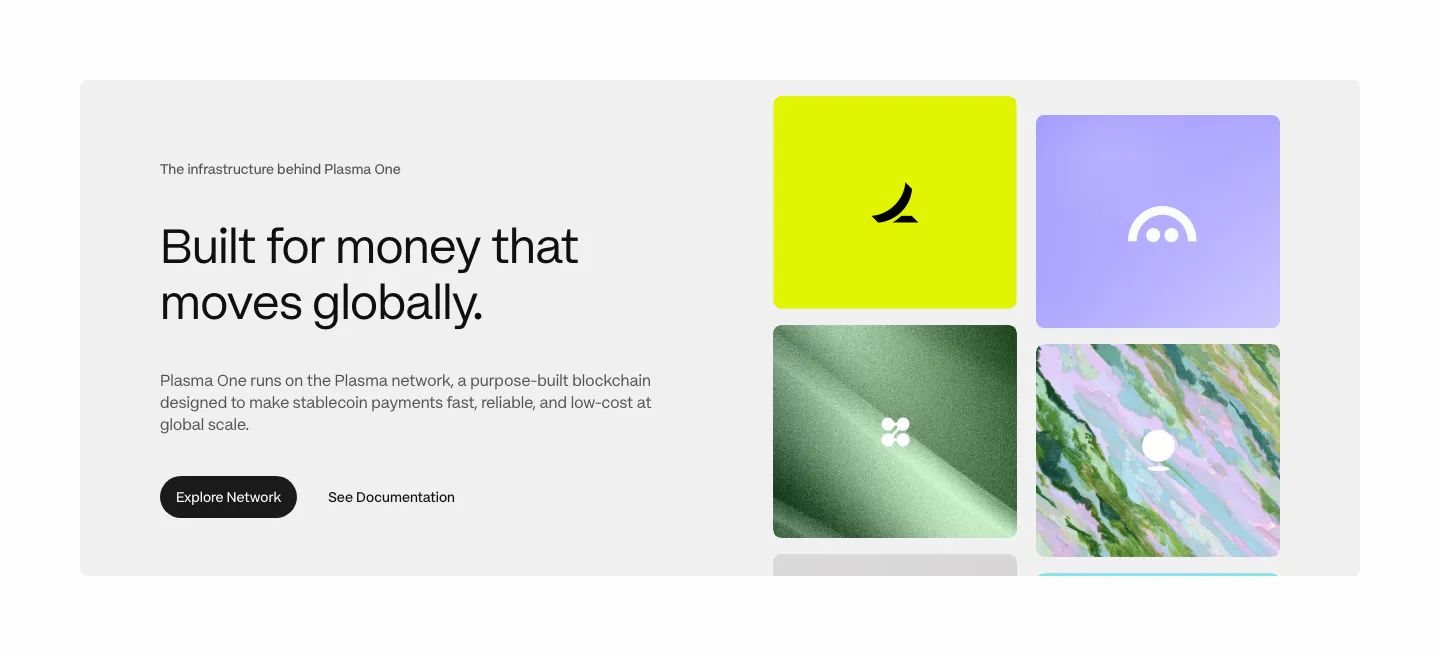
  184. Plasma features section: gray panel with heading and buttons left and a grid of colorful brand tiles right
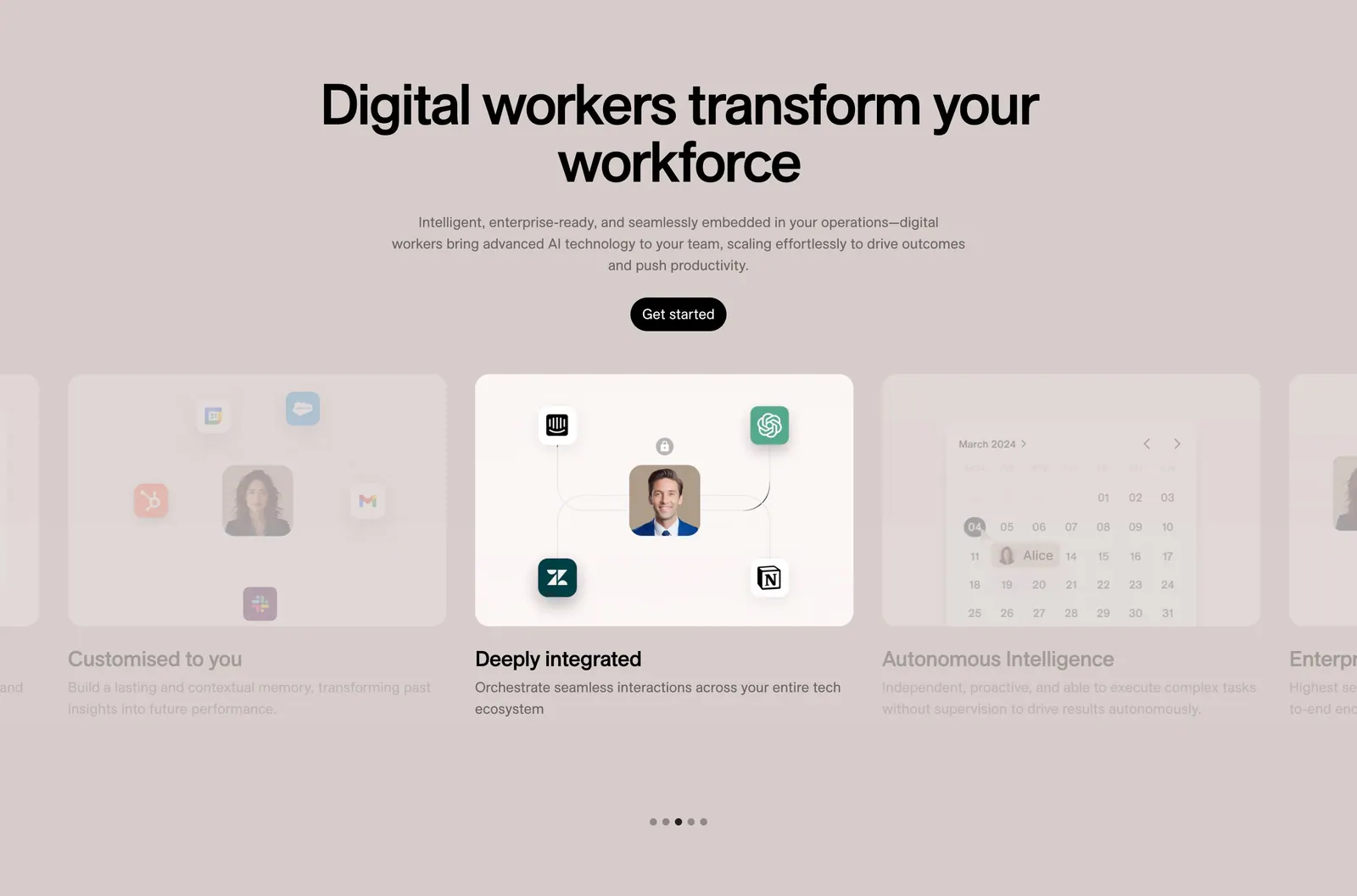
  185. 11x features section: centered headline and button above a card carousel with integration and calendar visuals and dot pagination on taupe
    11x
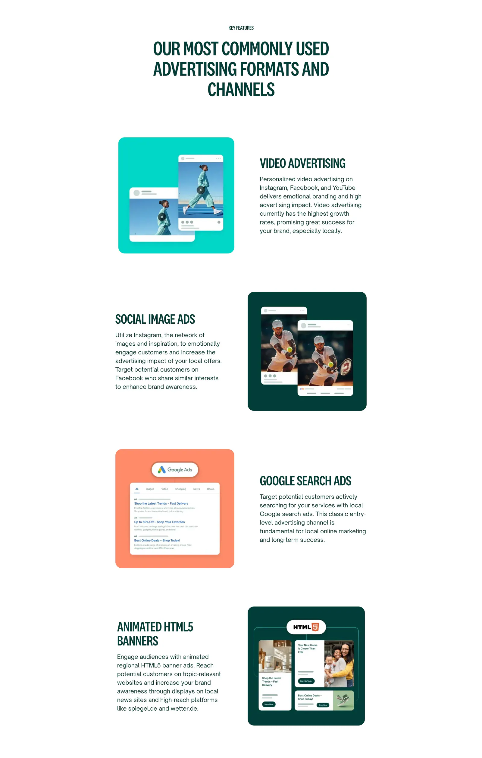
  186. Localyzer features section: centered heading over zig-zag rows pairing ad-format descriptions with colored ad mockup cards
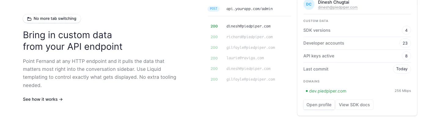
  187. Fernand features section: text on the left, API endpoint response list and customer data sidebar UI on the right
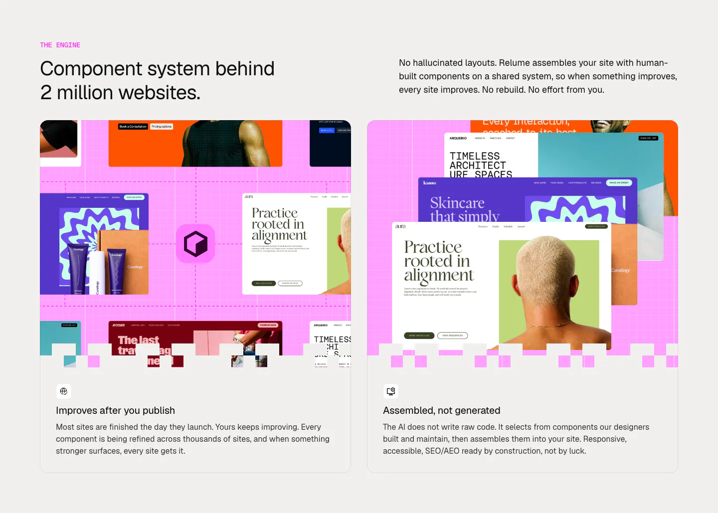
  188. Relume features section: headline and intro copy above two cards with collages of website template mockups on a pink grid
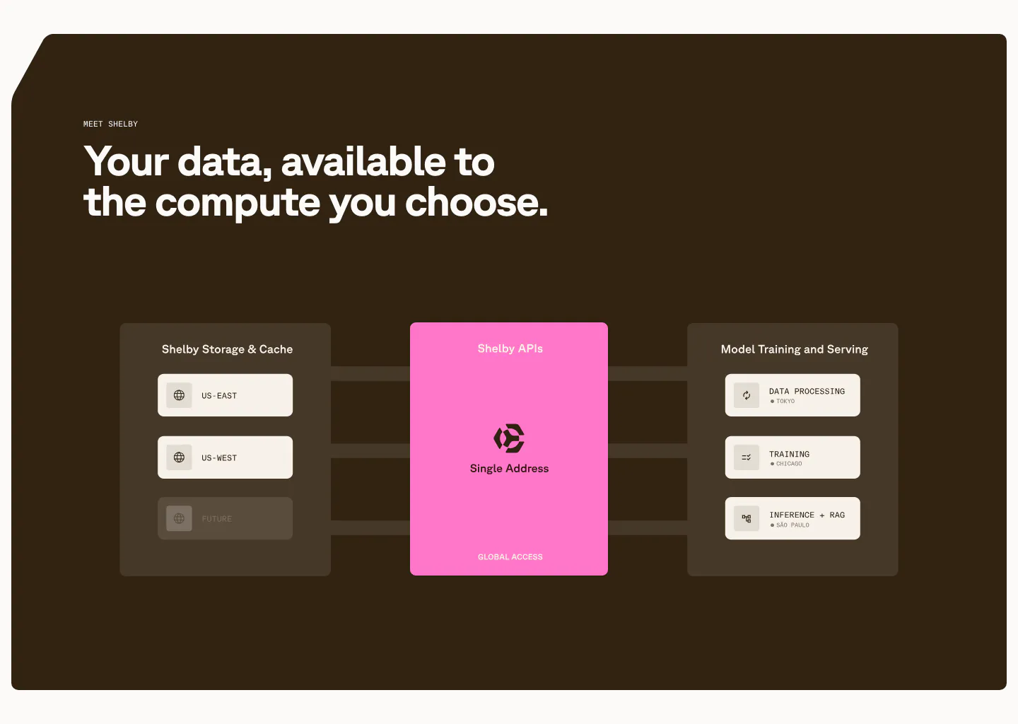
  189. Shelby features section: left headline above a diagram linking storage regions through a pink Shelby APIs card to workloads on dark brown
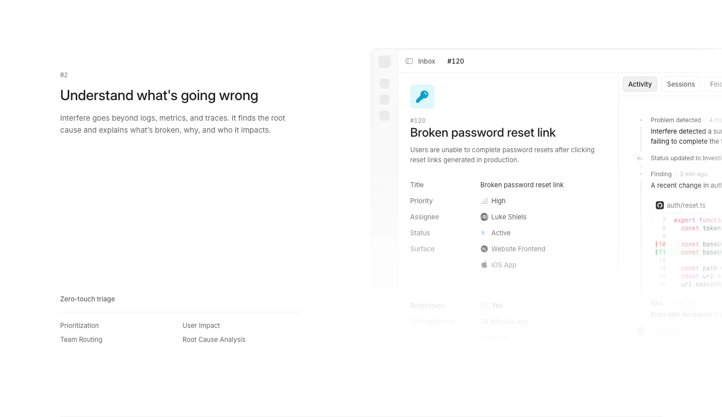
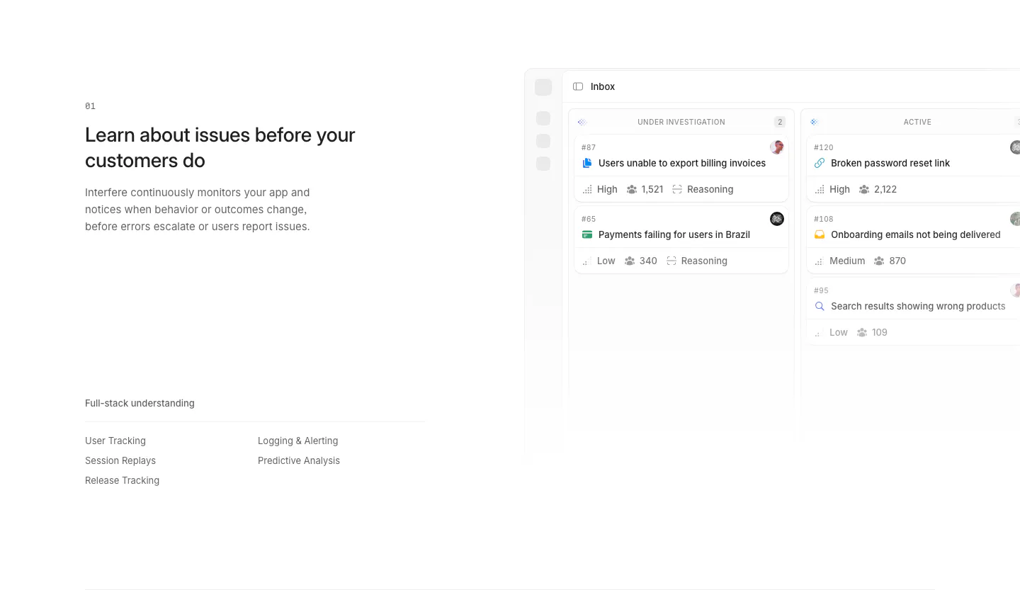
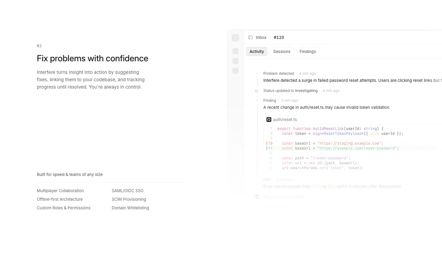
  190. Interfere features section: numbered text block with triage list on the left and an issue detail screenshot on the right
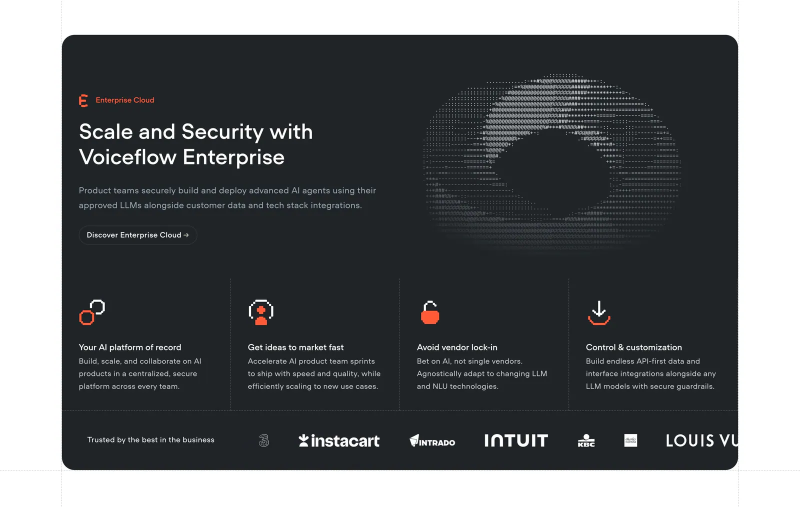
  191. Voiceflow features section: charcoal panel with headline left and ASCII art right, four feature columns and a customer logo strip
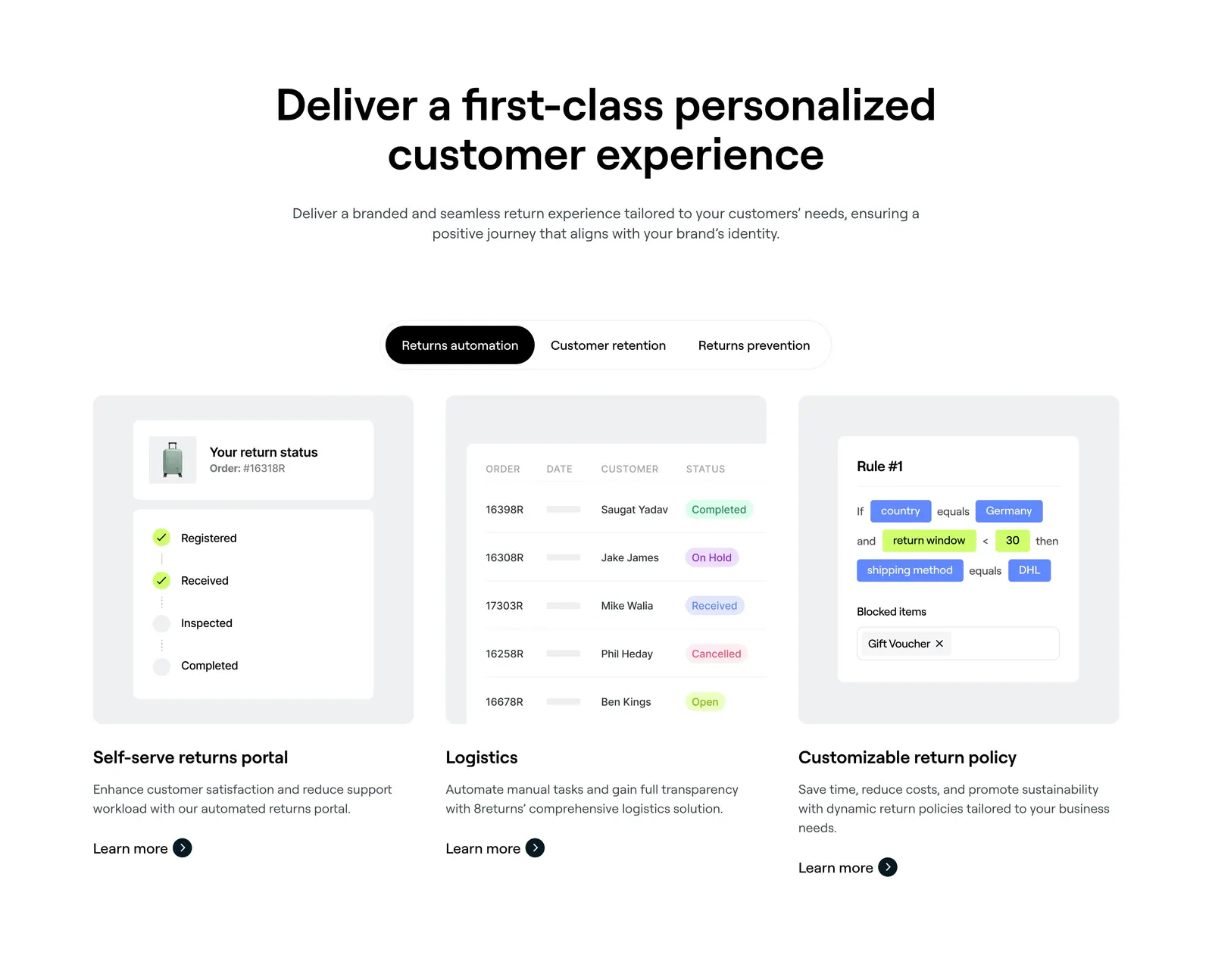
  192. 8returns features section: centered headline, segmented tab control and three cards with returns portal, logistics table and rule UI
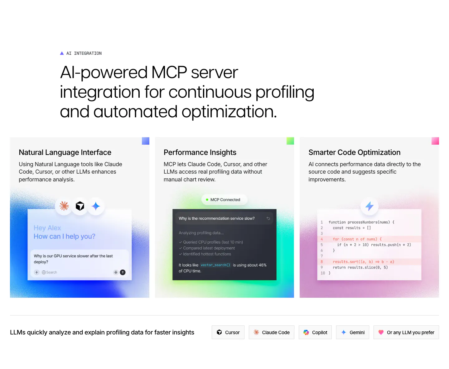
  193. Polar Signals features section: large headline over three cards with glowing chat, MCP and code mockups, plus a row of LLM tool chips
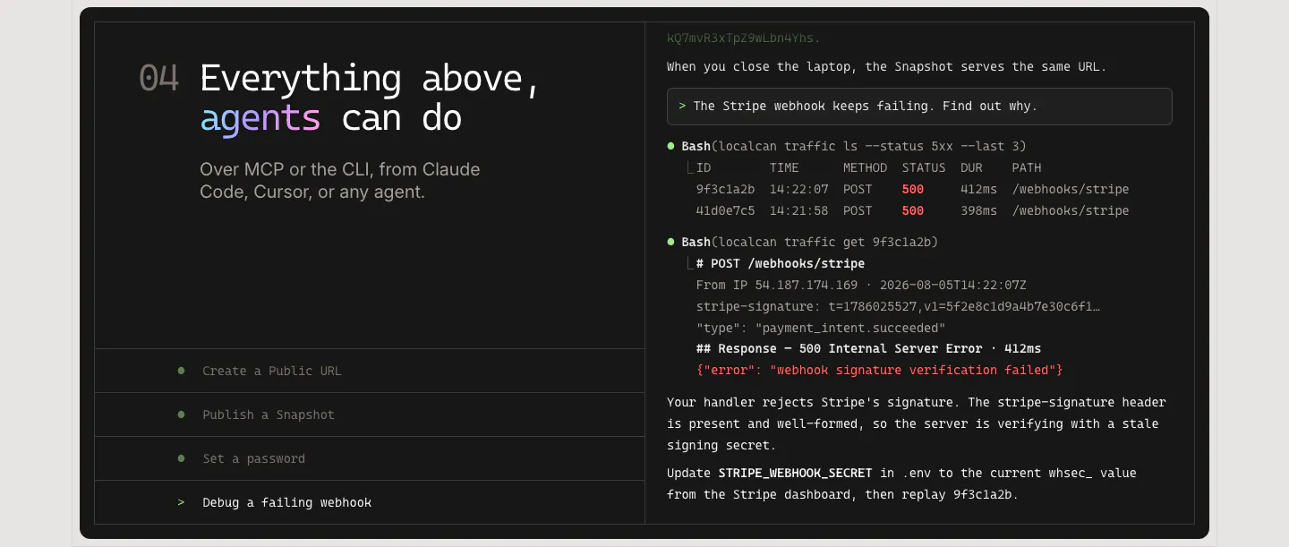
  194. LocalCan features section: monospace headline and agent task list on the left of a dark panel, terminal transcript debugging a webhook on the right
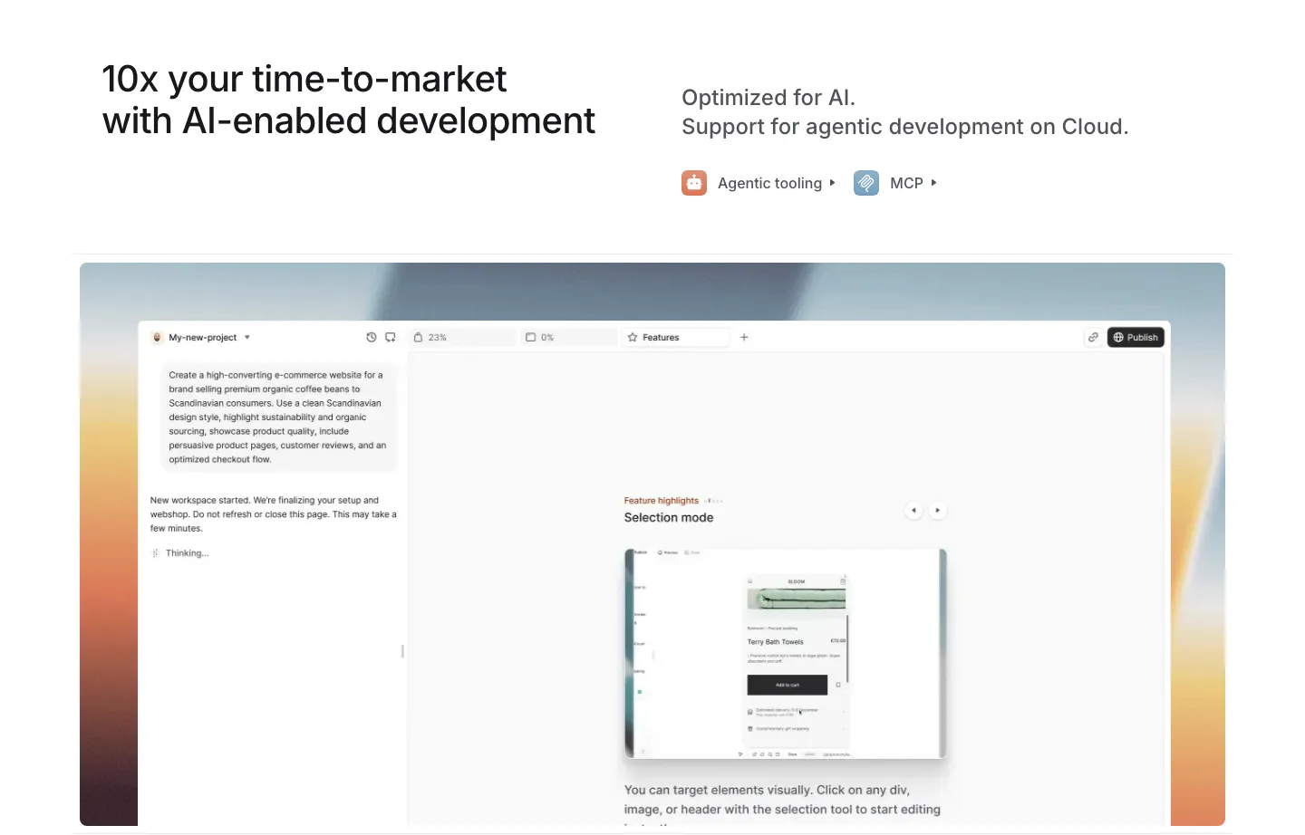
  195. Medusa features section: headline with agentic tooling and MCP links above an AI site builder UI on a warm sunset gradient
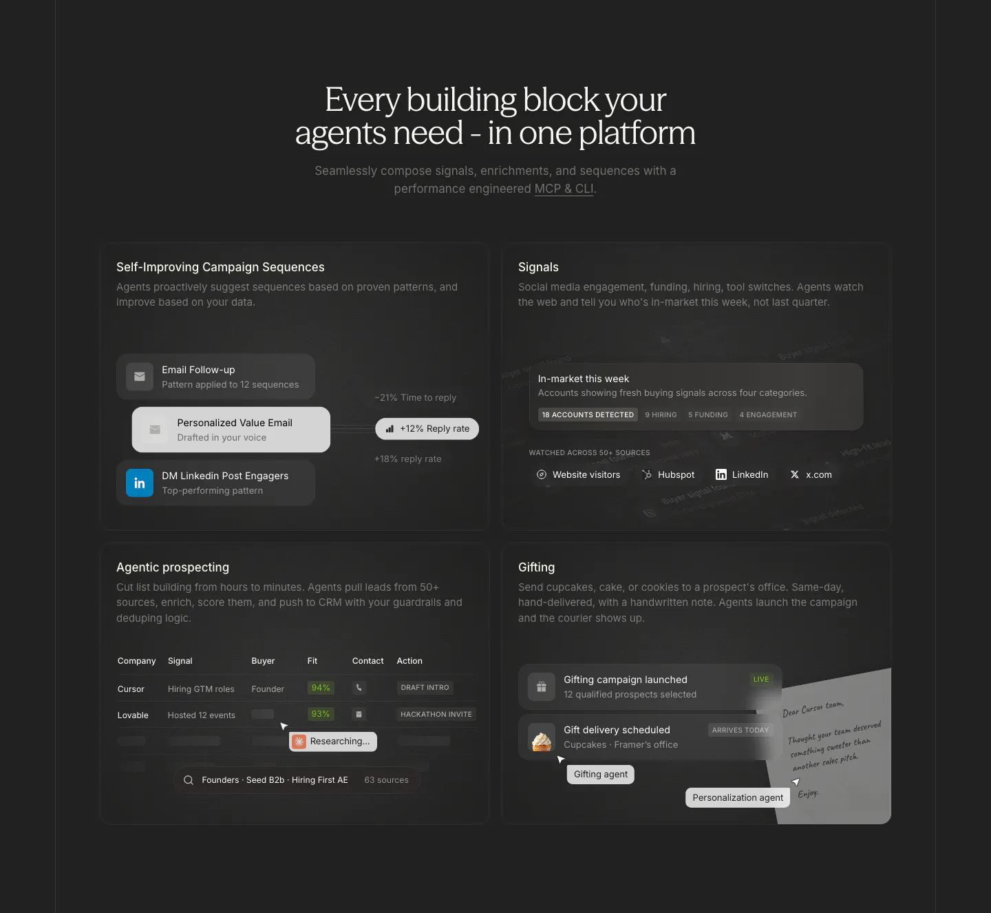
  196. Cluster features section: centered serif headline above a 2x2 grid of dark cards with sequence, signal, prospect table and gifting UI
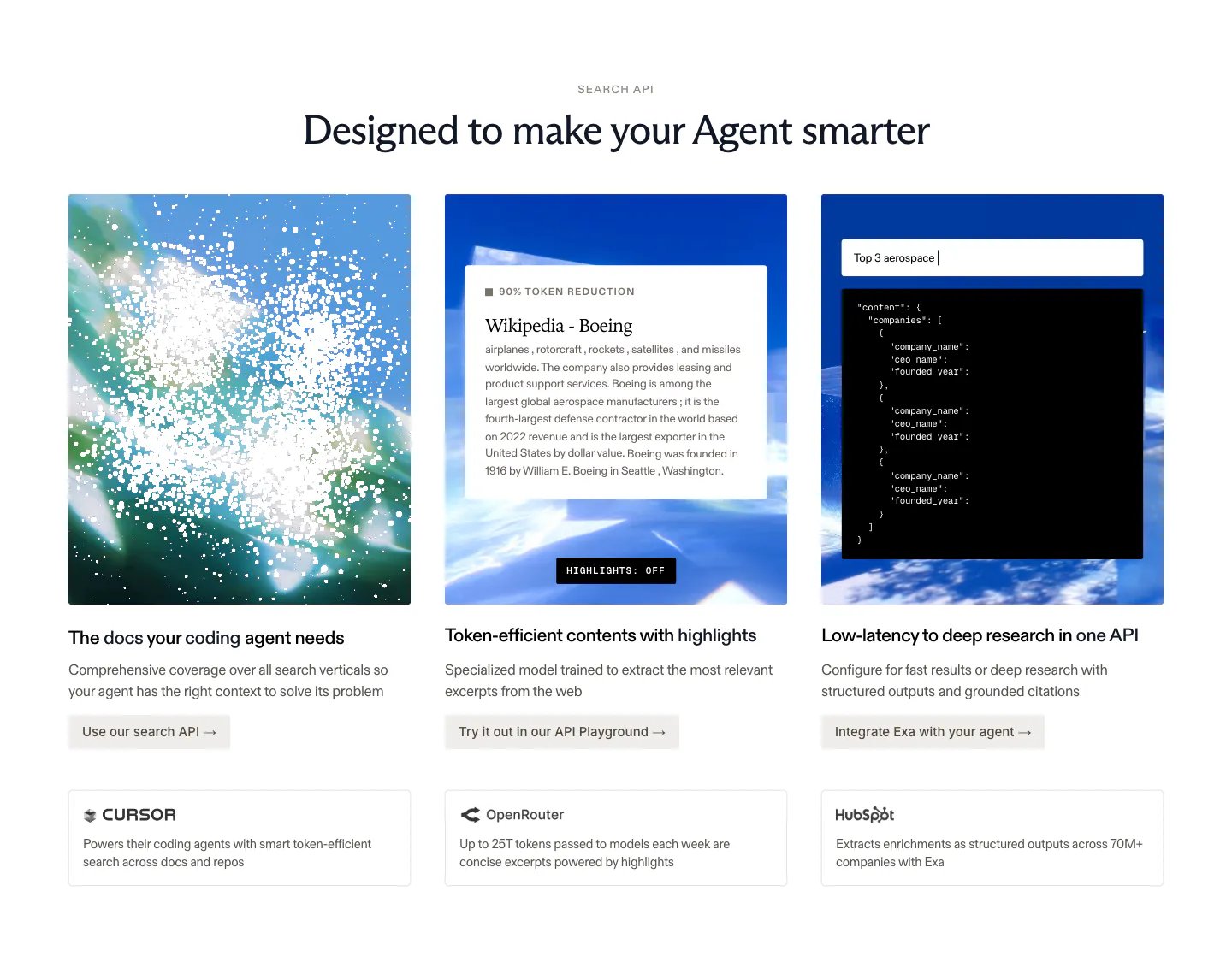
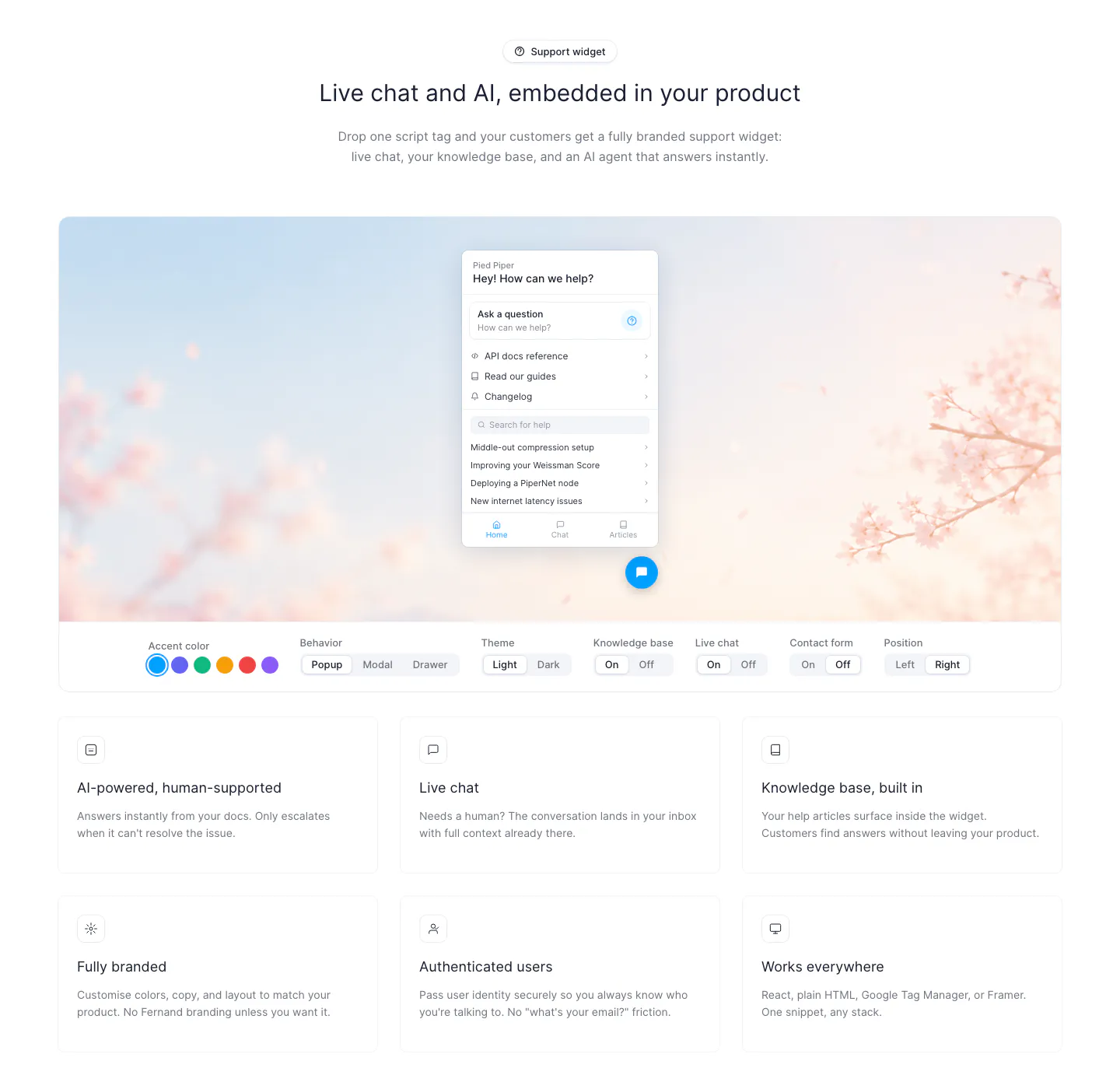
  197. Exa features section: centered headline over three image cards with sky visuals, a text excerpt and JSON output, plus customer callouts below
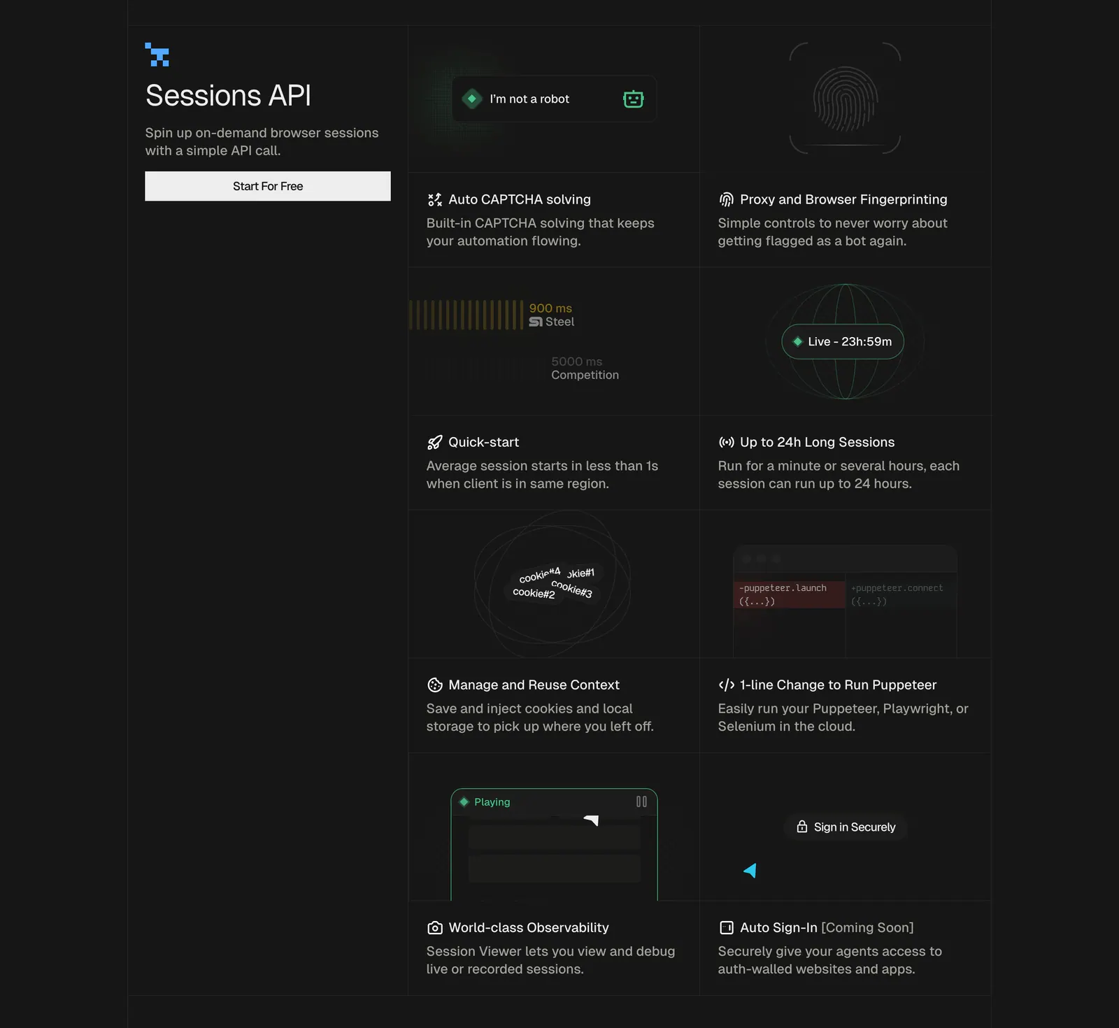
    Exa
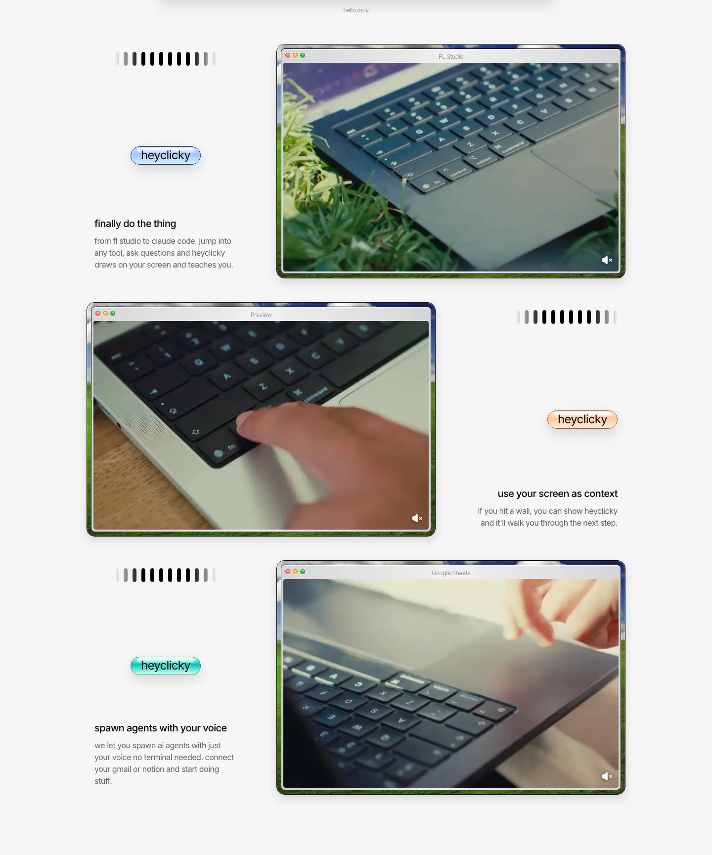
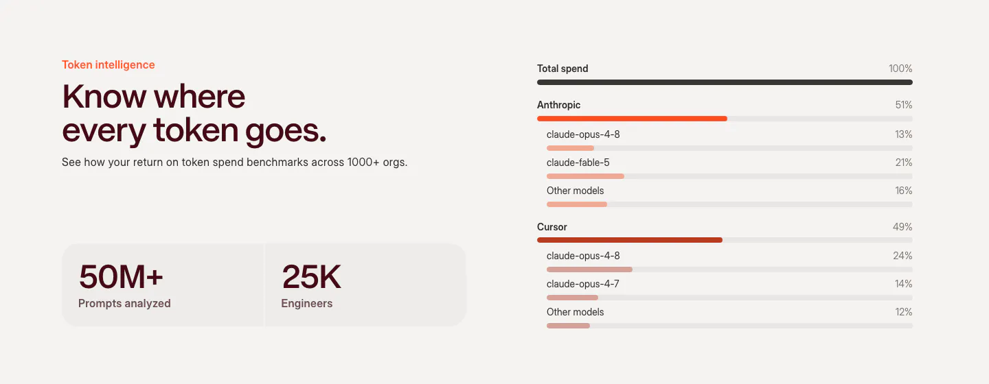
  198. heyclicky features section: three zig-zag rows pairing short captions and colored heyclicky pills with mac-window videos of laptops
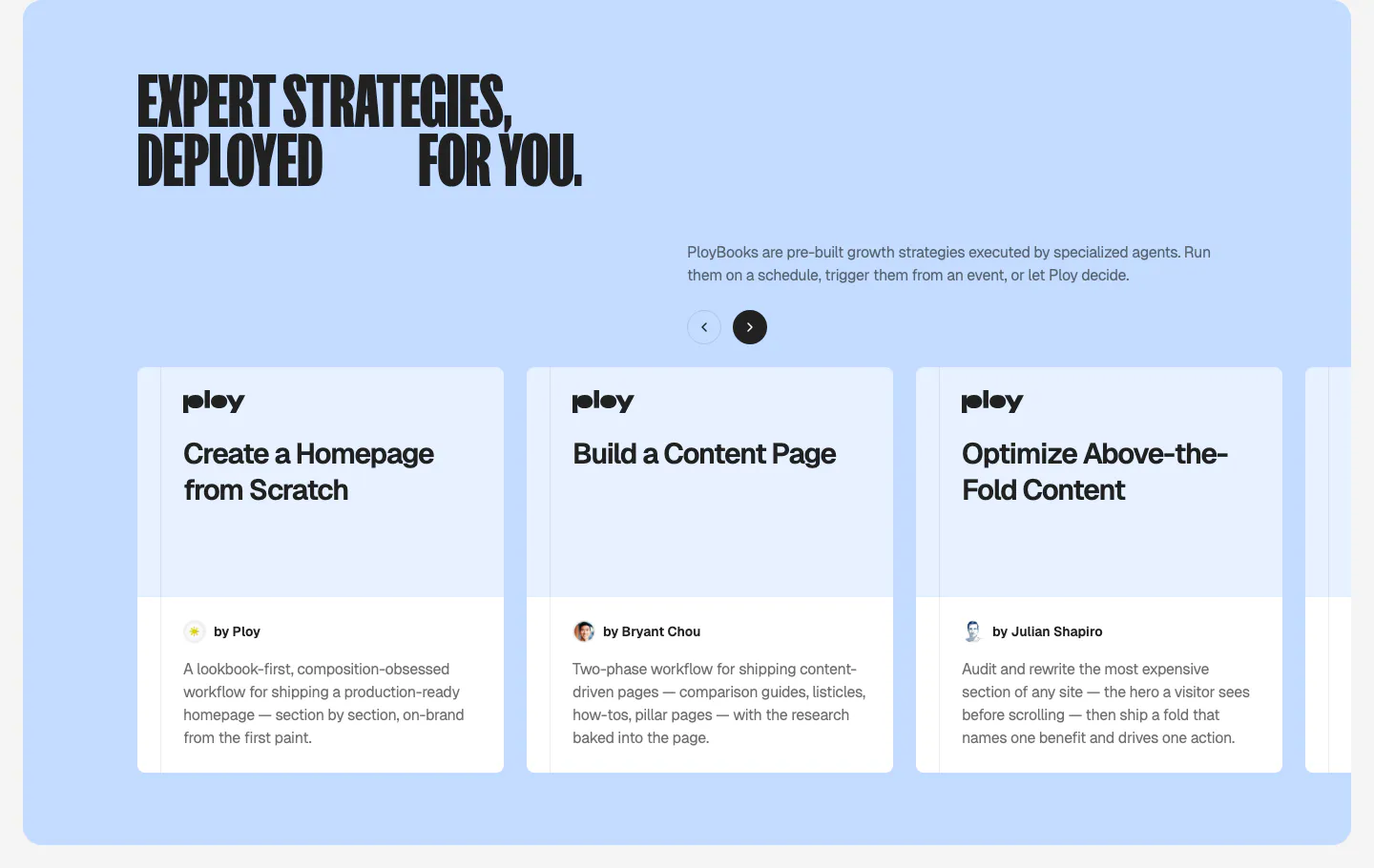
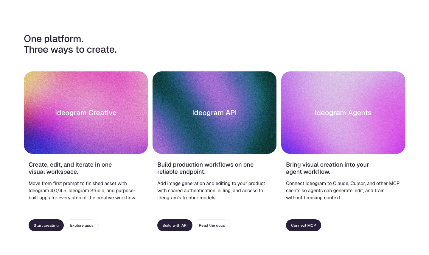
  199. Ploy features section: condensed headline and arrow controls above a carousel of PloyBooks strategy cards on a light blue panel
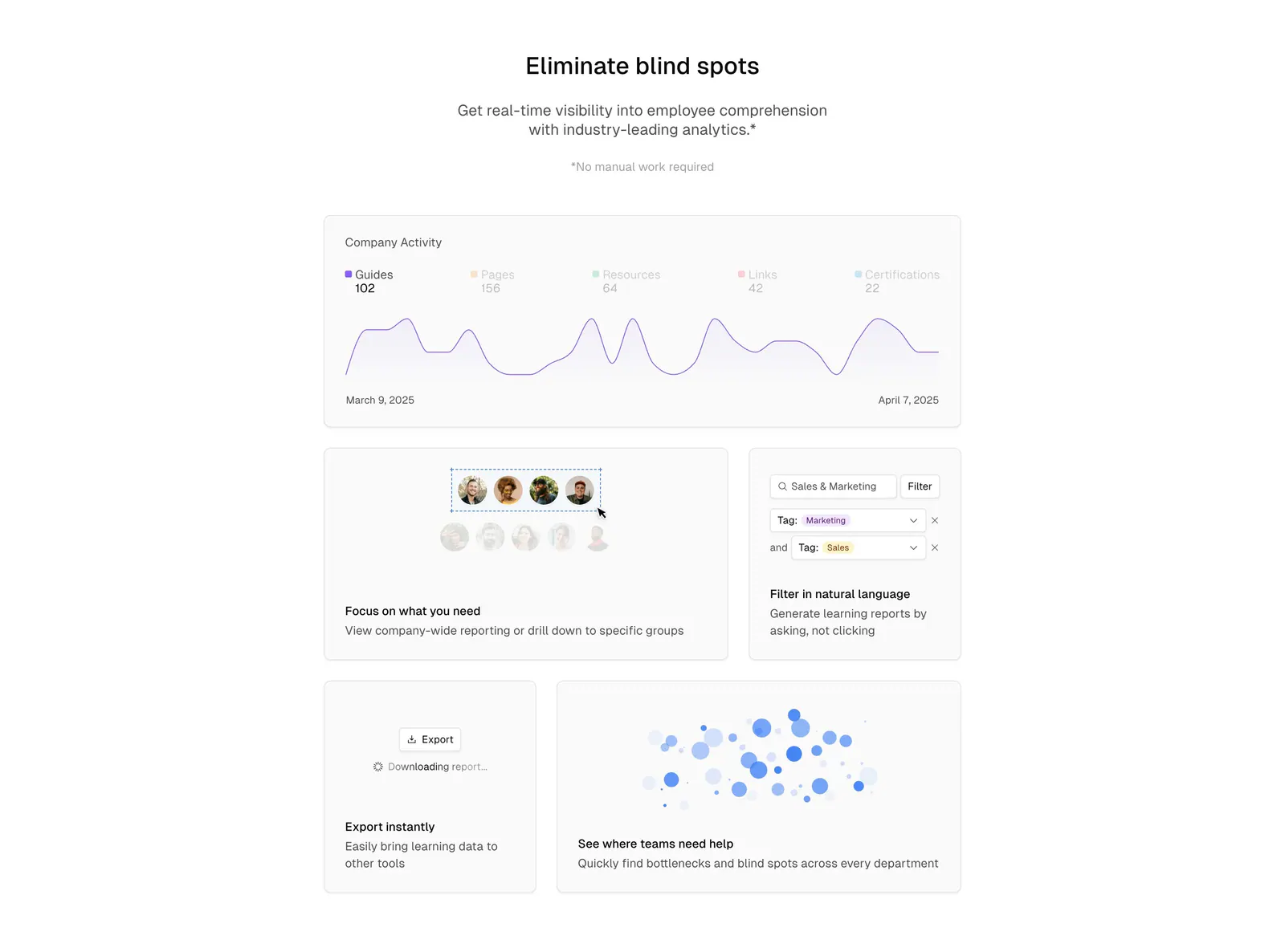
  200. Basewell features section: centered headline above a bento grid of analytics UI cards with line chart, filters and bubble chart
    Basewell
  201. Fernand features section: chat widget preview on a blossom photo with segmented style toggles above a 3x2 card grid
  202. Steel features section: left title block with button beside a two-column grid of feature cells with small UI graphics on a dark background
  203. Weave features section: headline and two stat tiles on the left beside a token spend breakdown chart with horizontal bars by model
  204. Ideogram features section: two-line headline above three product cards with grainy pink and purple gradient panels, copy and buttons
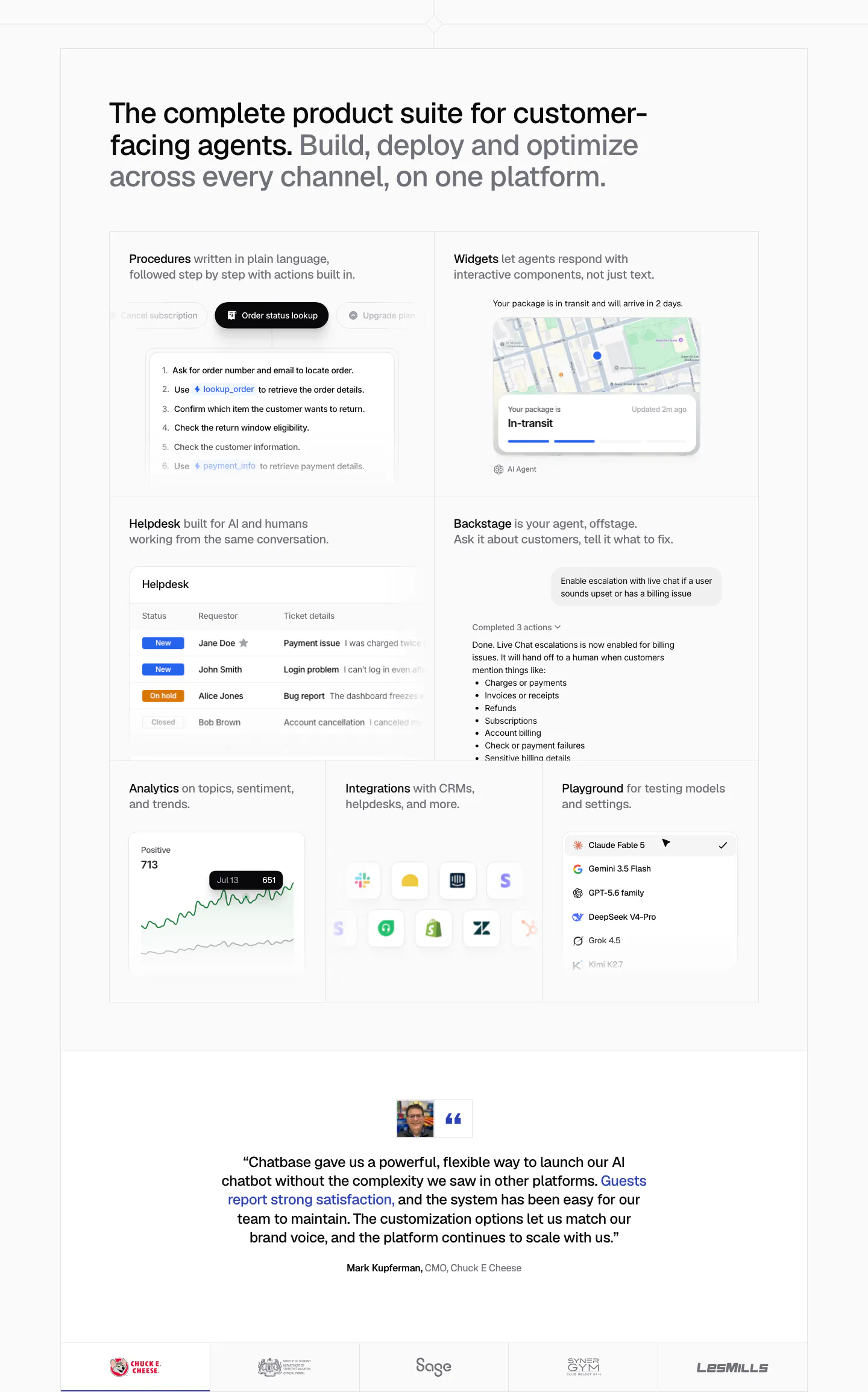
  205. Chatbase features section: bento grid of product UI tiles for procedures, widgets, helpdesk and analytics, a centered quote and logo row
  206. Supersonik features section: serif headline and link at left, glowing sphere of chat bubbles linked to a logo at right on dark teal
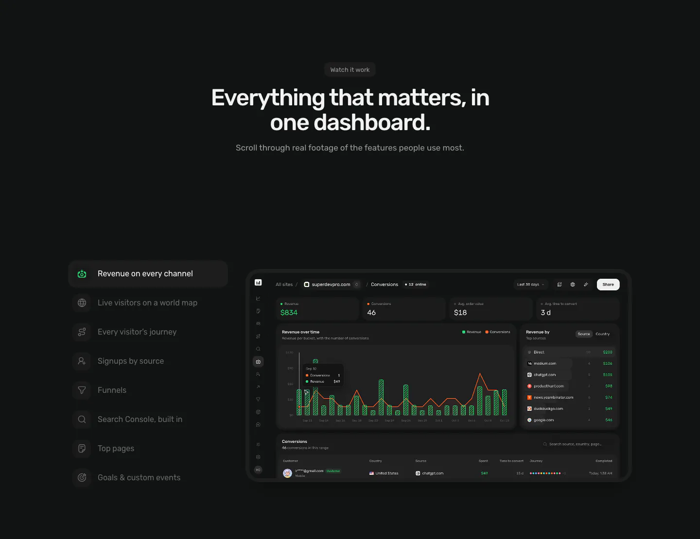
  207. Piqo features section: centered headline above a vertical feature tab list on the left and a dark revenue dashboard screenshot on the right
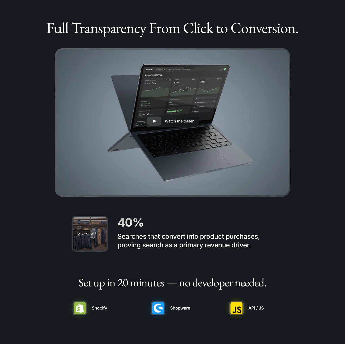
  208. VisionAI features section: serif headline over a laptop dashboard with trailer button, a 40% stat and platform icons on navy
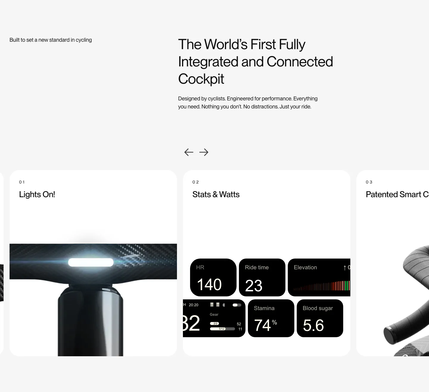
  209. FLITEDECK features section: heading on light gray above a numbered card carousel with arrows showing light, stats and handlebar photos
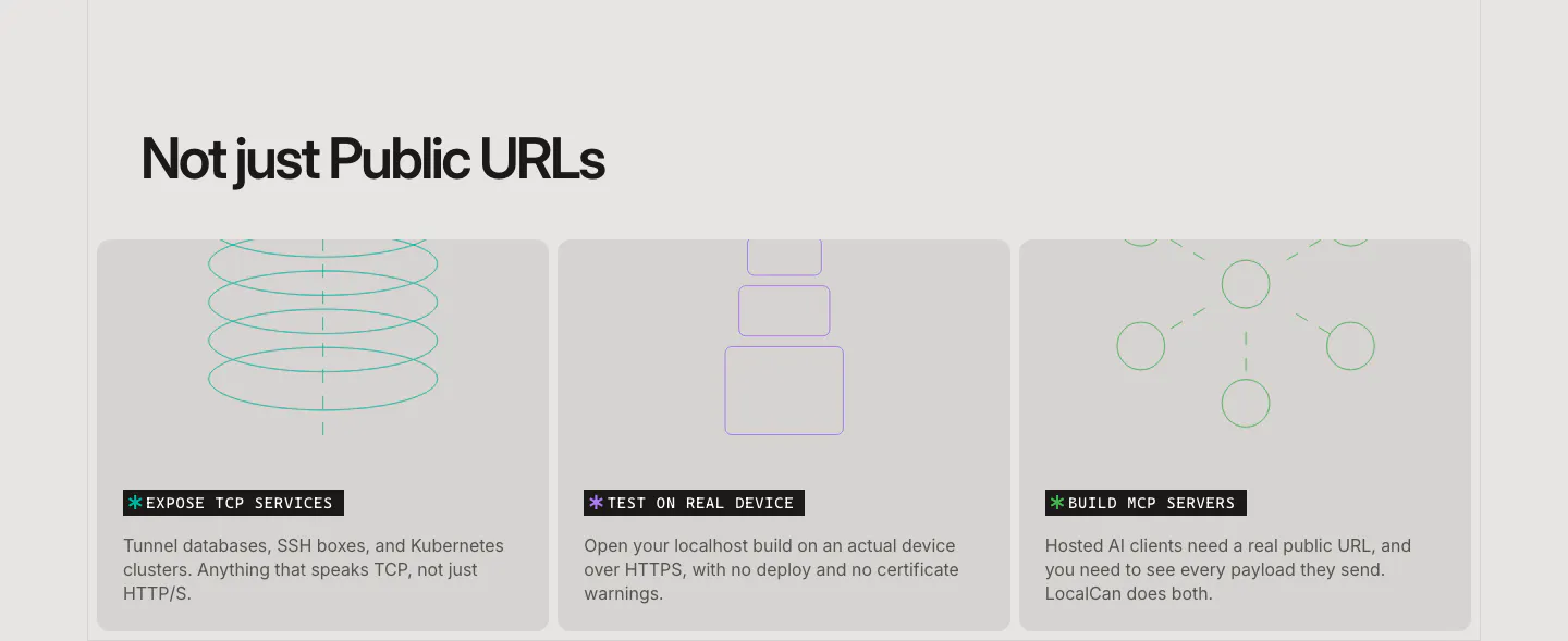
  210. LocalCan features section: left-aligned headline above three equal gray cards with thin line drawings for TCP, devices and MCP servers
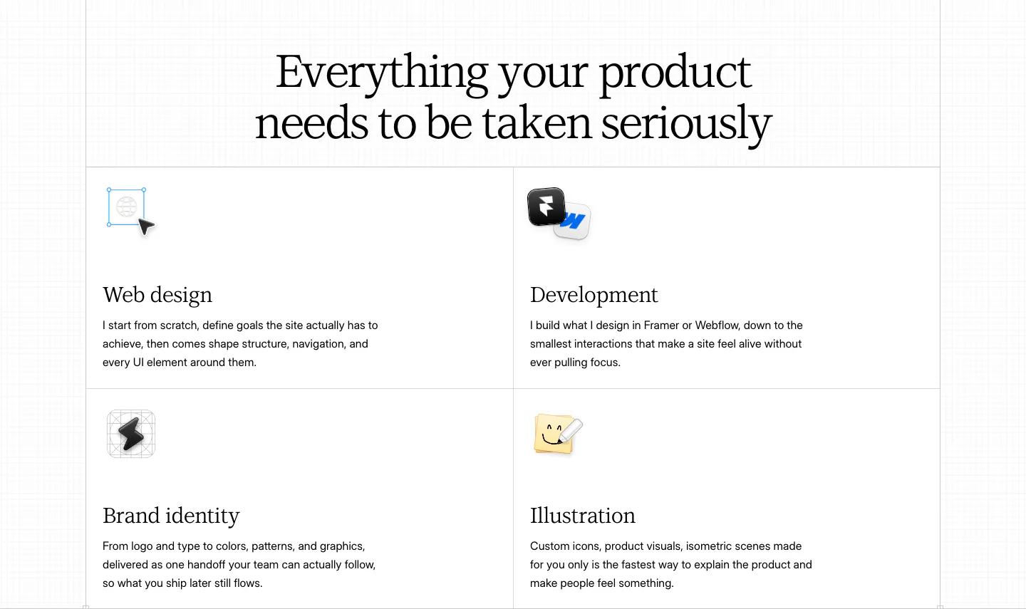
  211. Daniel Sun features section: centered serif headline above a bordered 2x2 grid of services with small icons on white
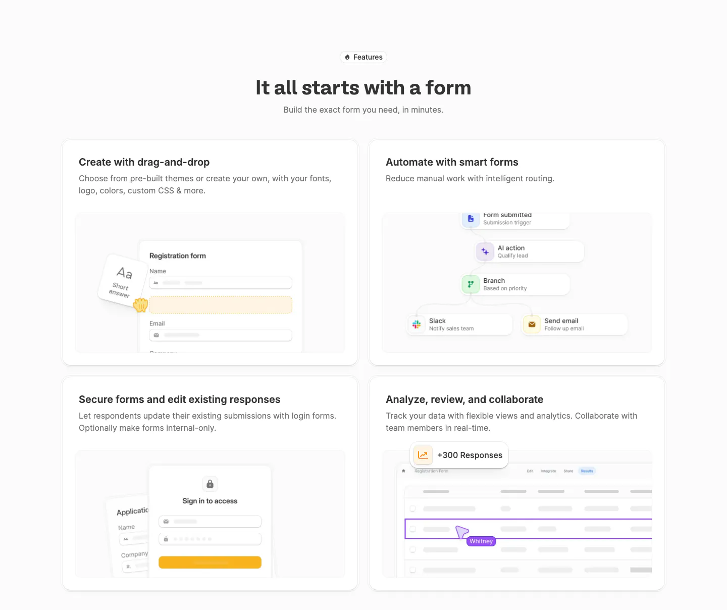
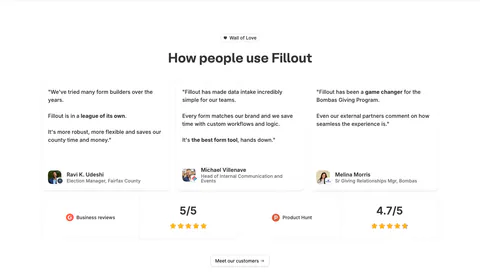
  212. Fillout features section: centered heading above a 2x2 grid of cards with form builder, workflow, login form and responses table mockups
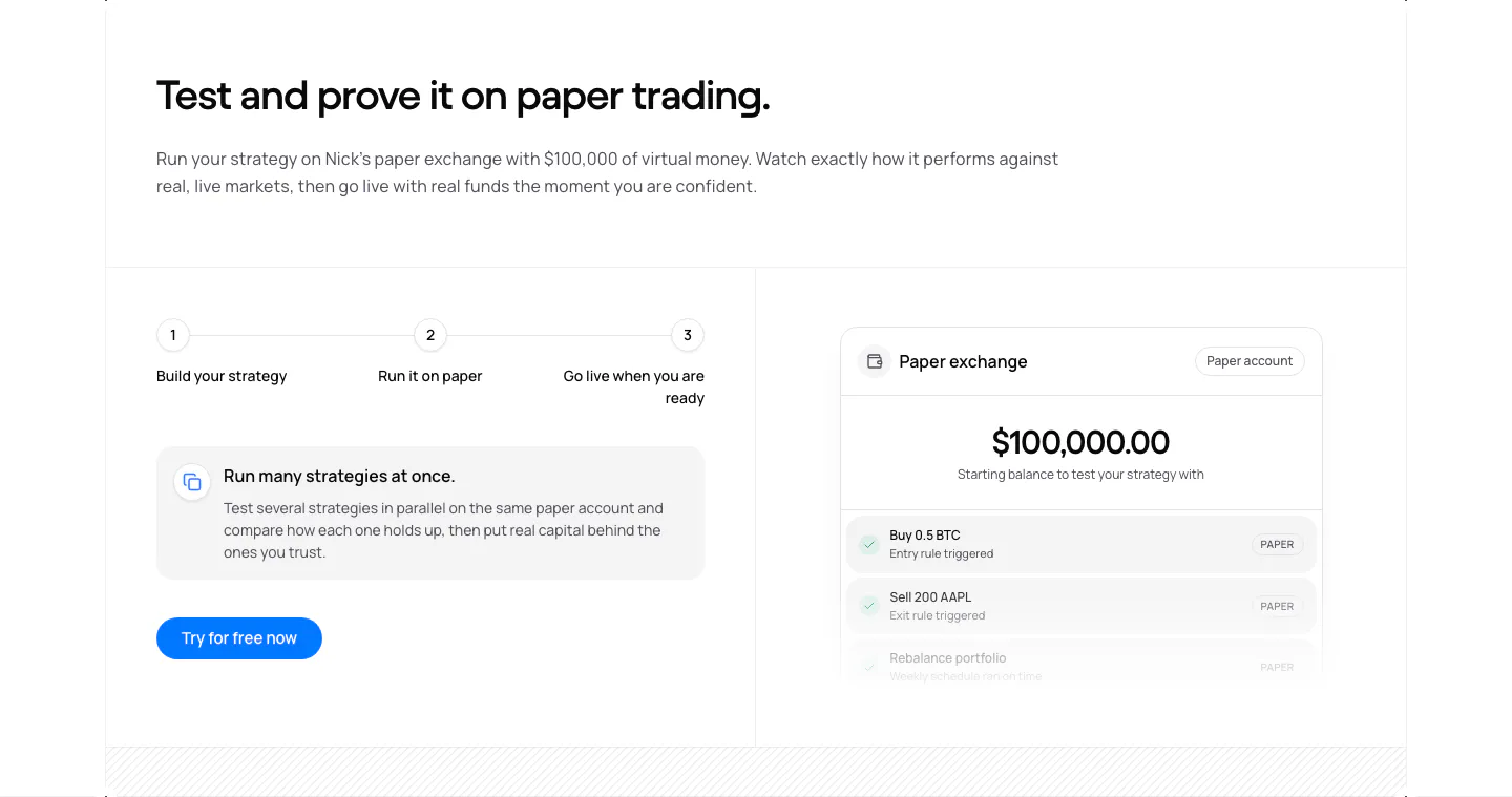
  213. NickAI features section: three-step progress row, info card and button on the left, paper exchange balance UI on the right
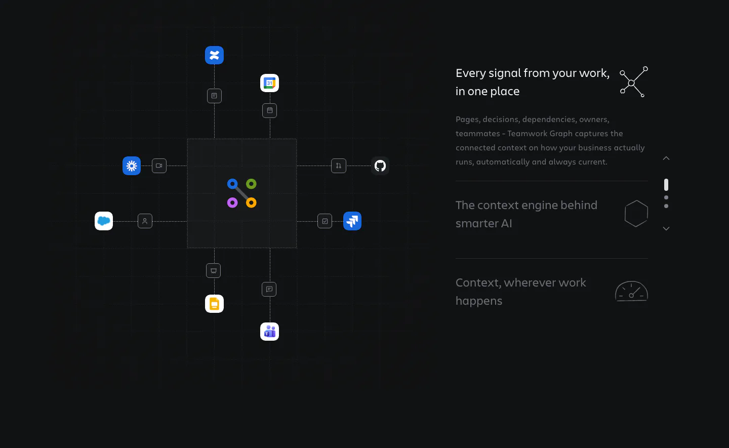
  214. Atlassian features section: hub diagram linking app icons to a central graph on the left, stepped feature list on the right, dark grid
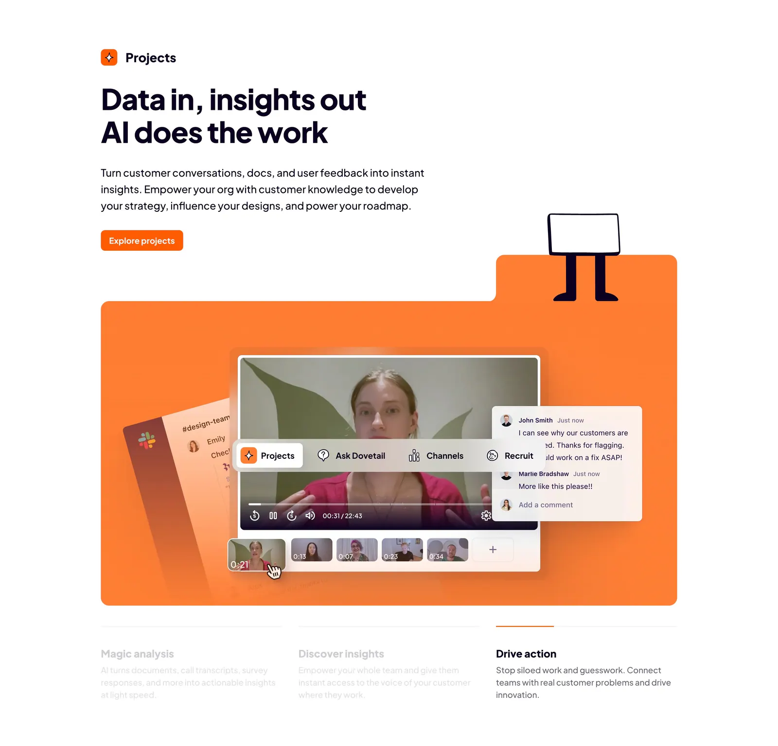
  215. Dovetail features section: left-aligned headline and orange button above an orange panel with a video insights UI and three tabbed benefits
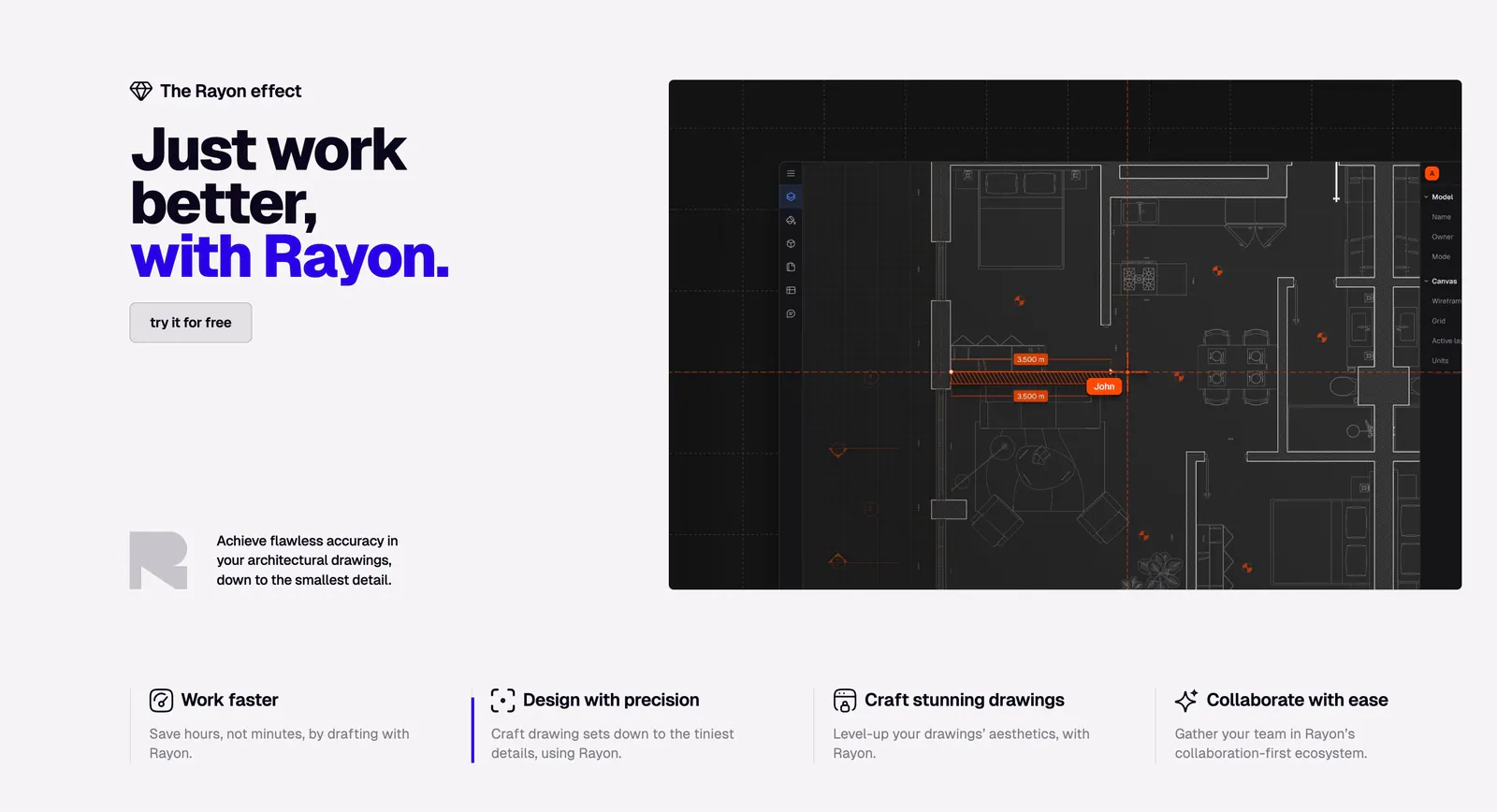
  216. Rayon features section: bold headline and button on the left, dark CAD floor plan screenshot on the right, four benefit columns below
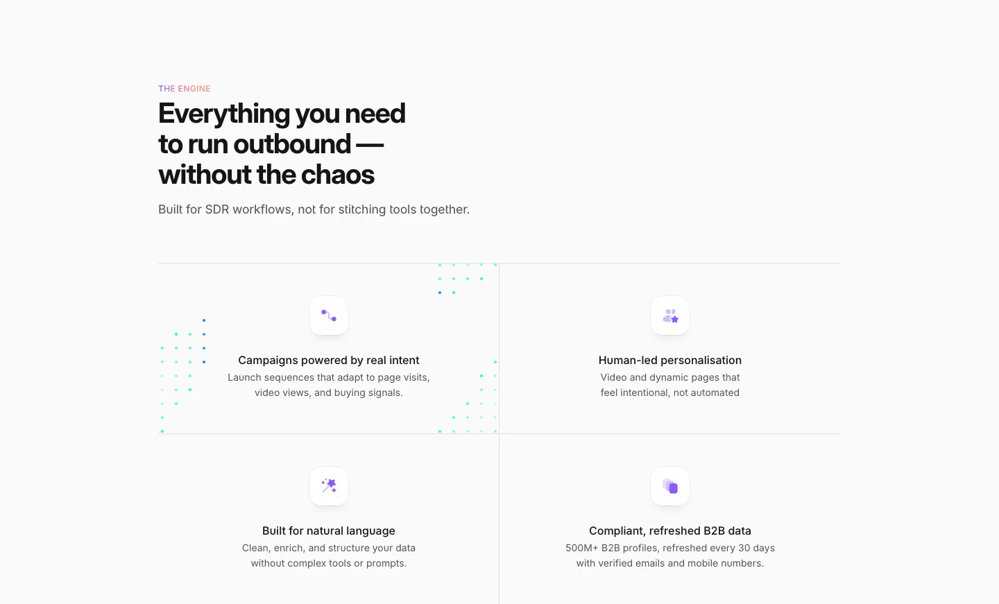
  217. Sendr features section: left-aligned headline above a 2x2 grid of feature cells with small purple icons and dotted accents
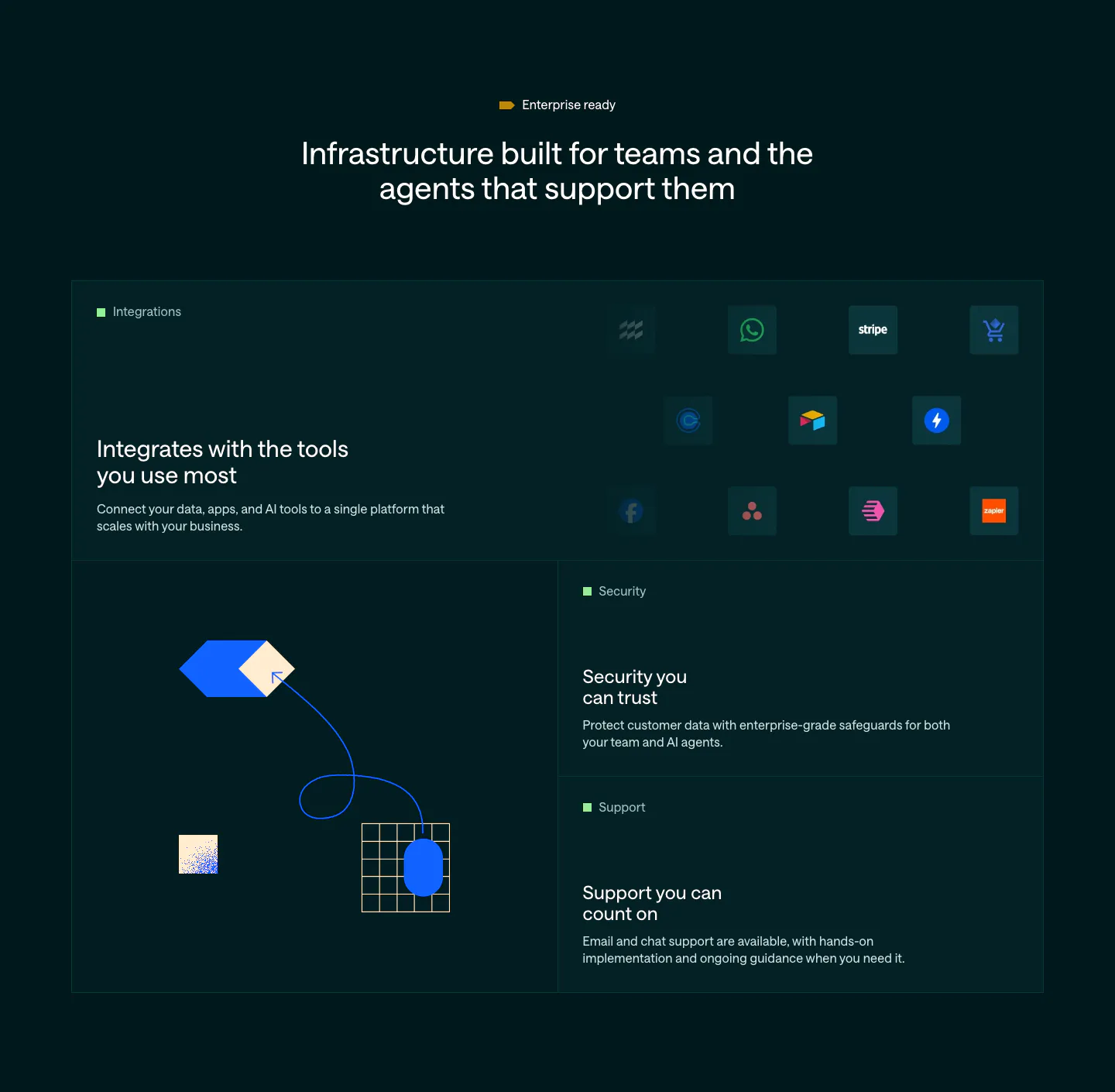
  218. Customer.io features section: dark bento grid with an integration icon tile, abstract hexagon and grid artwork, and security and support tiles
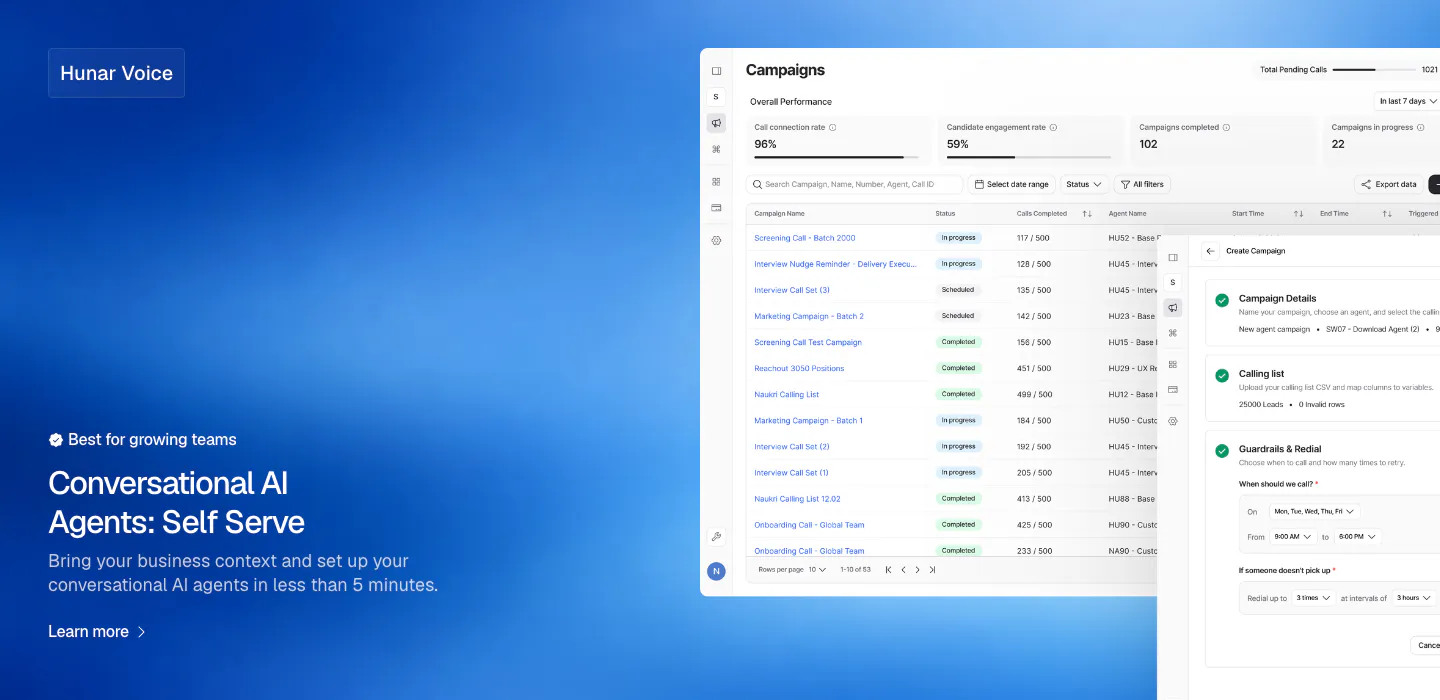
  219. Hunar features section: blue gradient background with text bottom-left and a campaign dashboard screenshot on the right
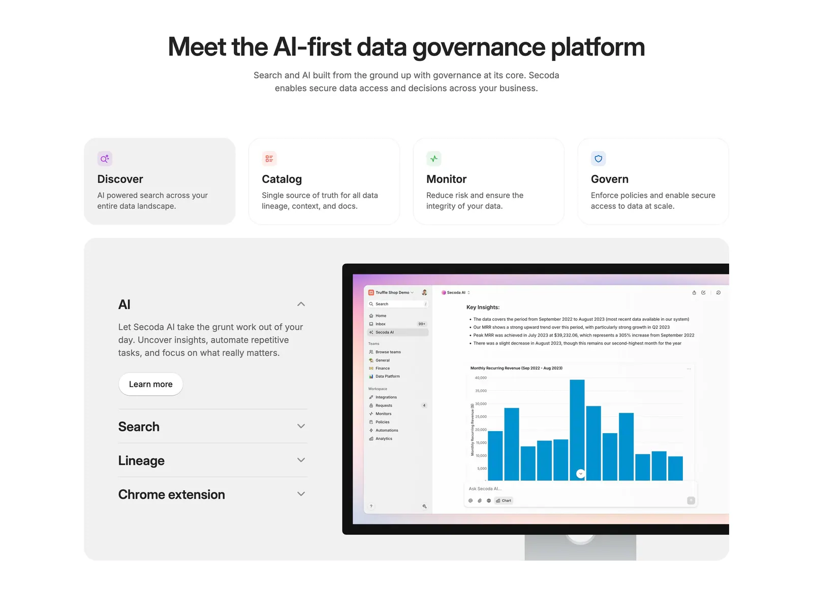
  220. Secoda features section: centered headline above four capability cards and an accordion beside an AI analytics screenshot
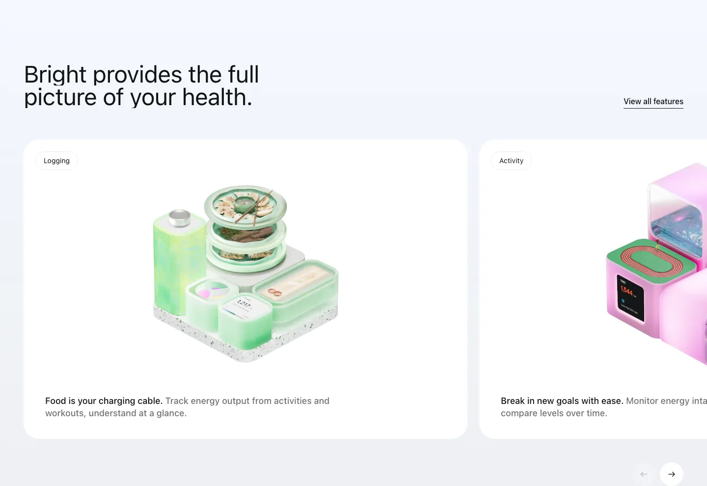
  221. Bright features section: headline with View all link above a carousel of white cards with 3D renders for logging and activity
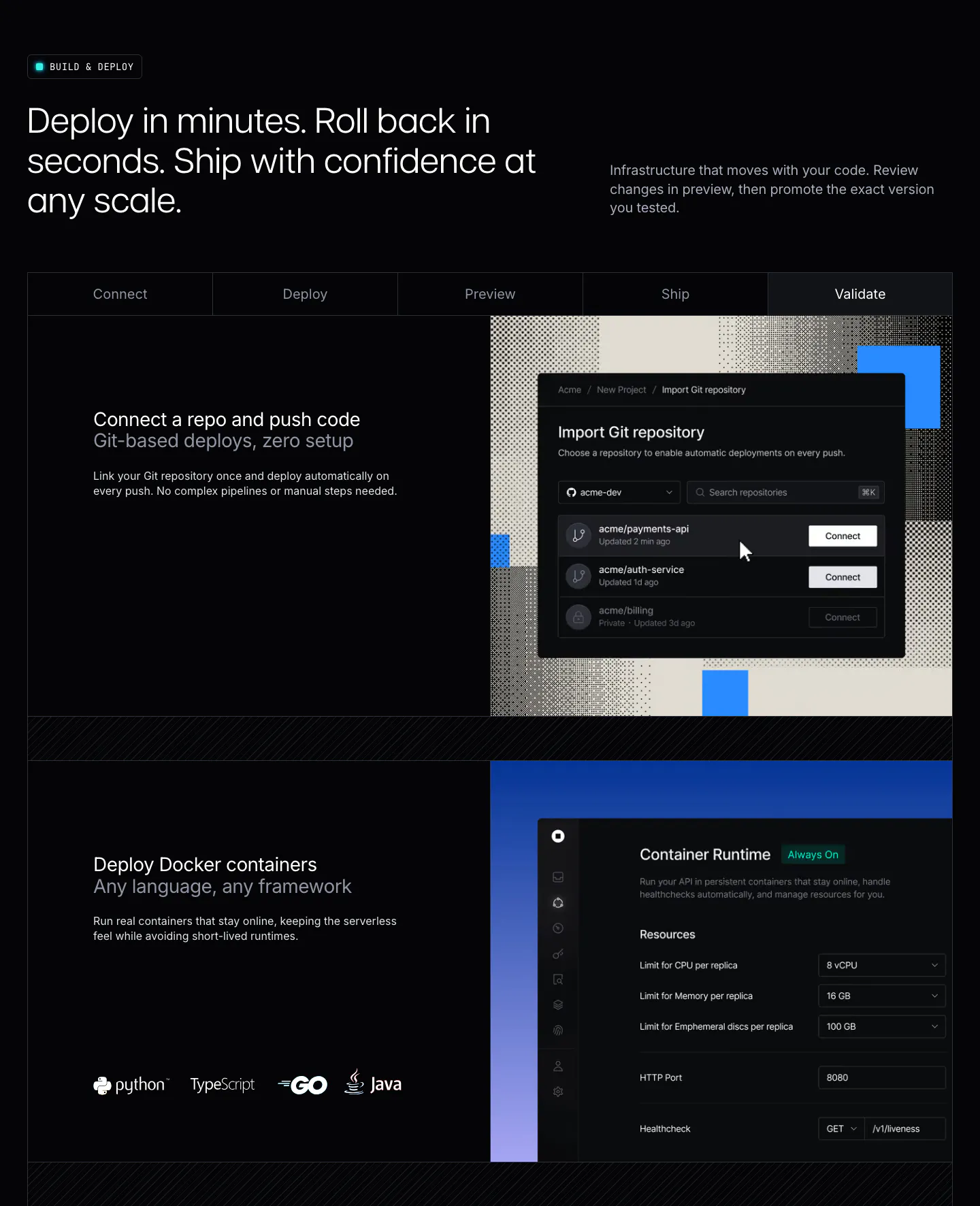
  222. Unknown features section: dark layout with a five-step tab bar and rows pairing deploy copy with Git import and container runtime UI
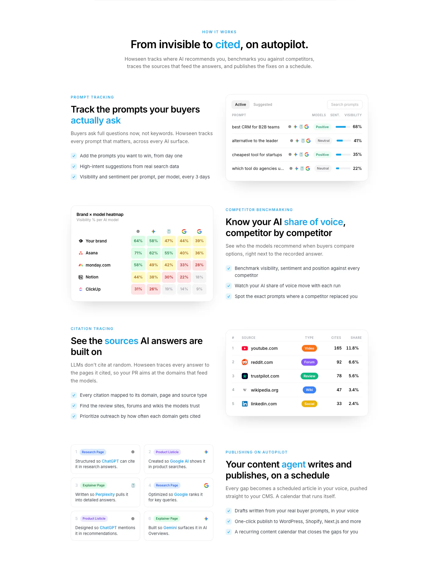
  223. Howseen AI features section: centered intro above alternating rows of copy and prompt, heatmap and citation table UI cards
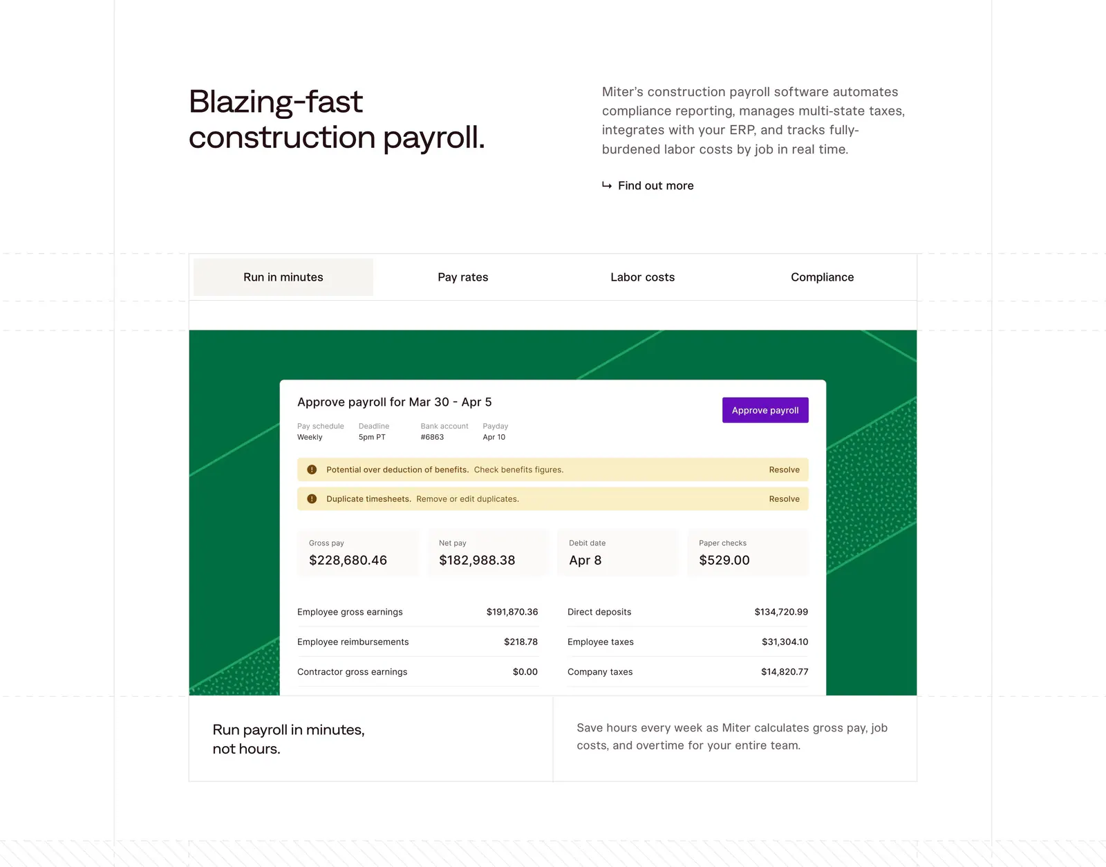
  224. Miter features section: headline beside intro copy above a four-tab panel showing a payroll approval UI on a green patterned card
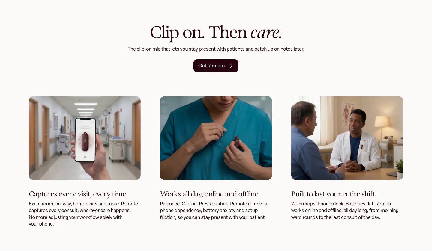
  225. Heidi features section: centered serif headline and button above three photo cards of the clip-on mic in clinical settings
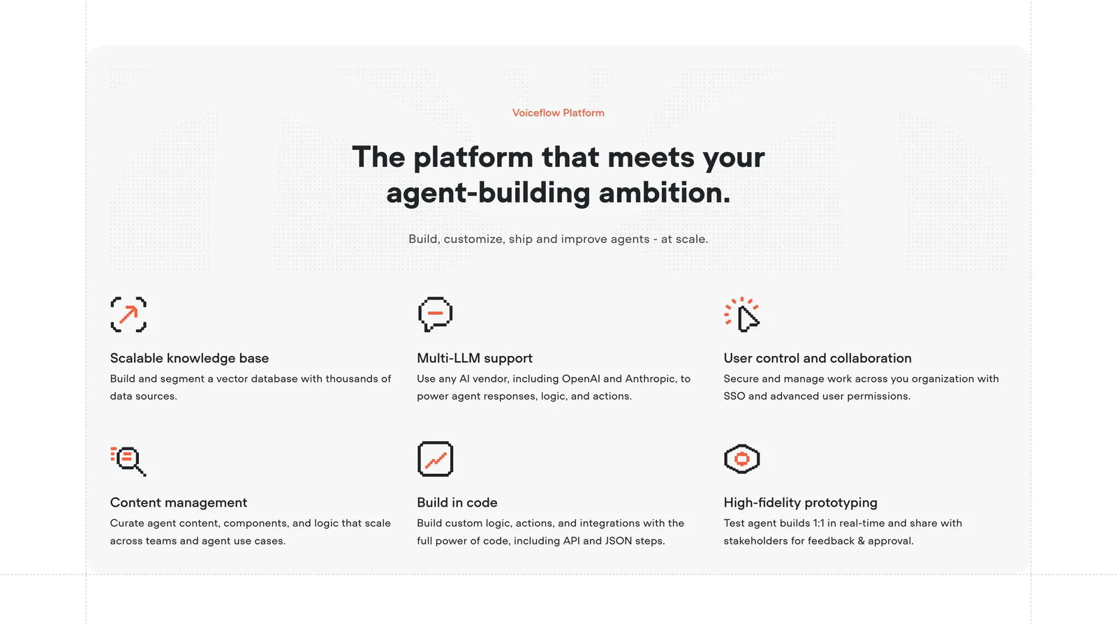
  226. Voiceflow features section: centered headline above a six-item grid of features with orange pixel-style icons on a light gray panel
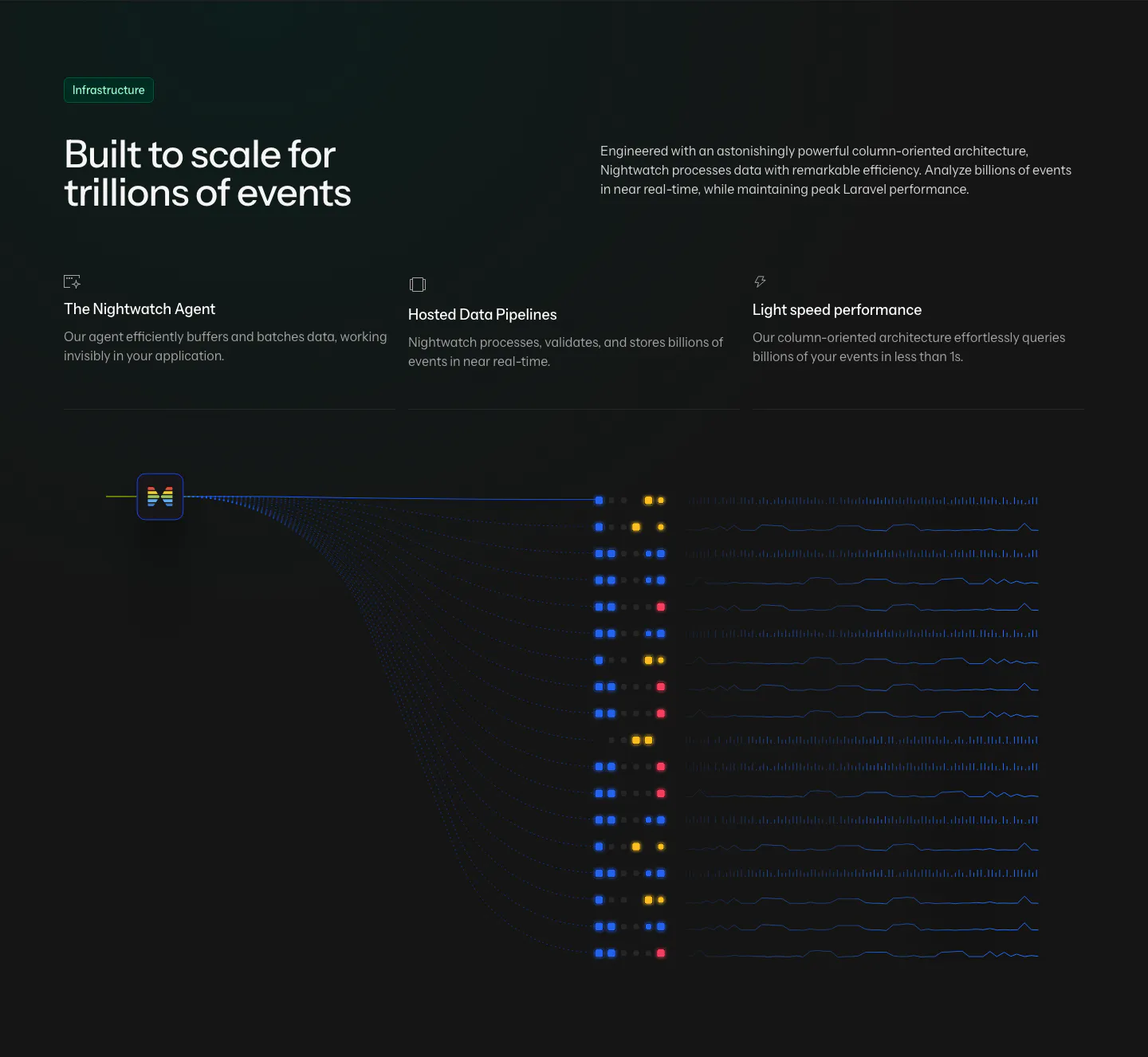
  227. Laravel Nightwatch features section: headline and three infrastructure points above a dark data pipeline graphic of event streams
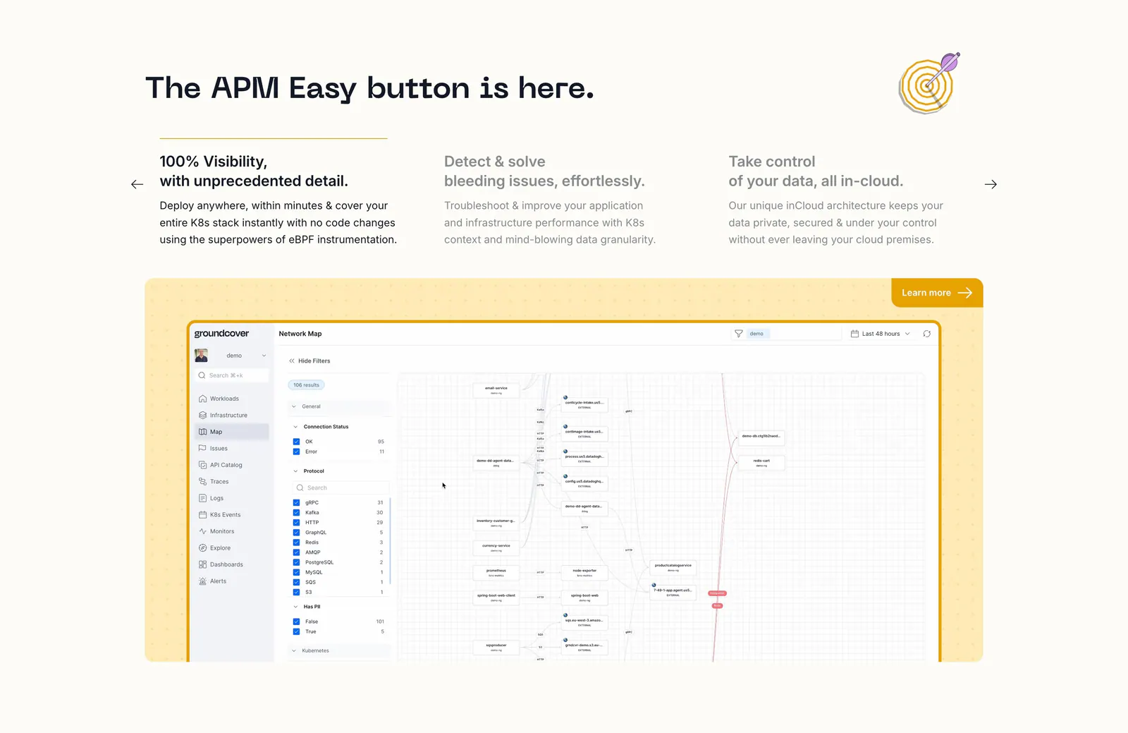
  228. groundcover features section: headline over three feature columns with arrows above a network map screenshot in a yellow dotted panel
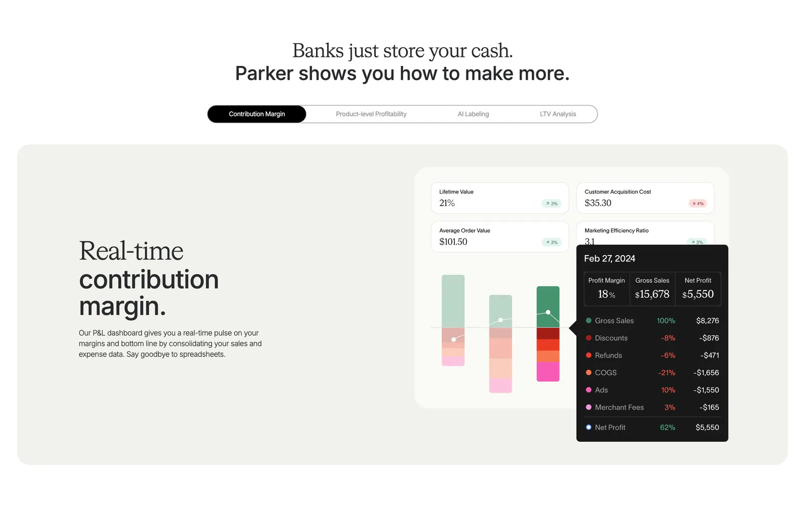
  229. Parker features section: centered headline over a pill tab bar and beige panel with text beside a contribution margin dashboard UI
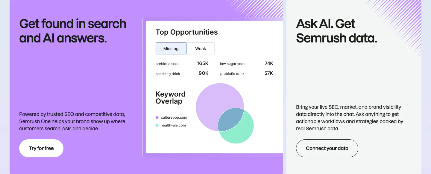
  230. Semrush features section: large purple card with a keyword overlap product UI beside a gray card about Semrush data in AI chat
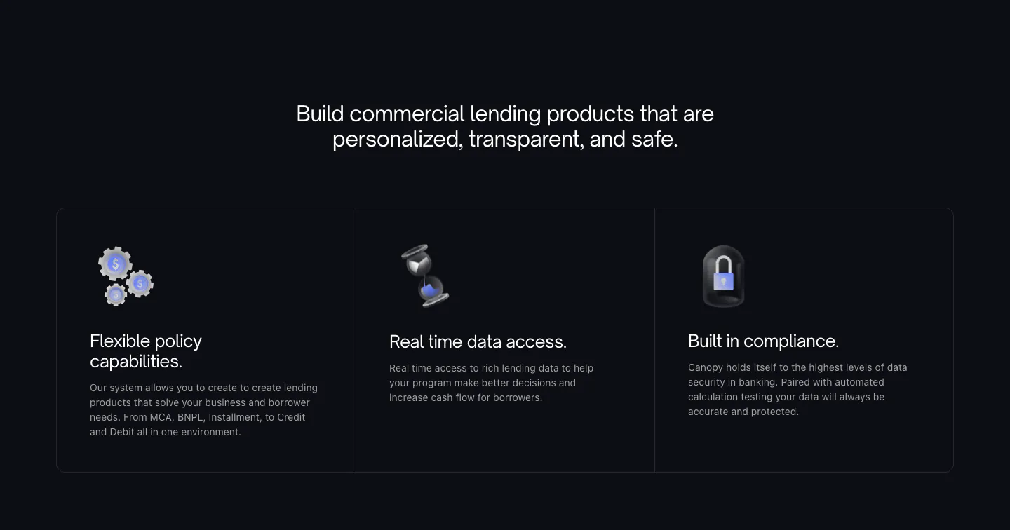
  231. Canopy features section: centered heading above three dark bordered cards with 3D icons on a near-black background
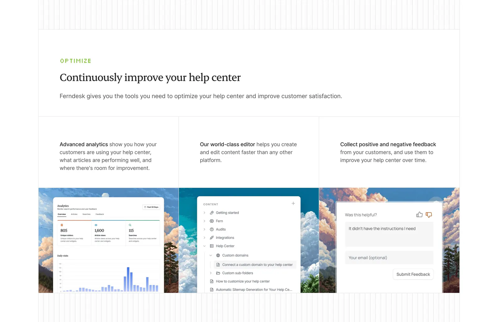
  232. Ferndesk features section: serif headline above three columns with analytics, editor and feedback UI over pixel-art landscapes
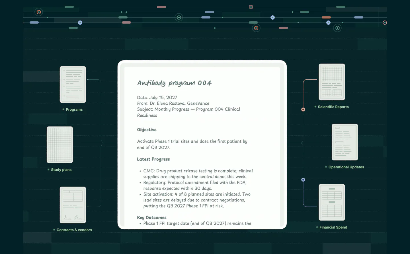
  233. Orchestra Bio features section: central program report document linked to smaller document cards on a dark teal grid background
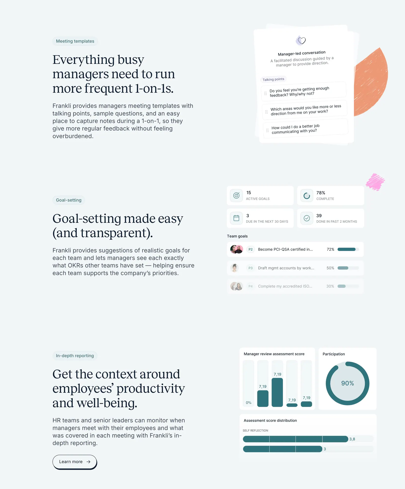
  234. Frankli features section: three stacked rows of serif headings and copy on the left with meeting, goal and reporting UI cards on the right
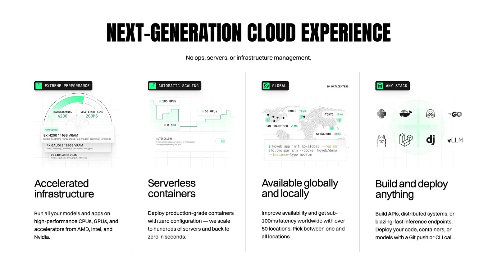
  235. Koyeb features section: condensed uppercase headline above four columns with UI mockups, a world map and a CLI snippet
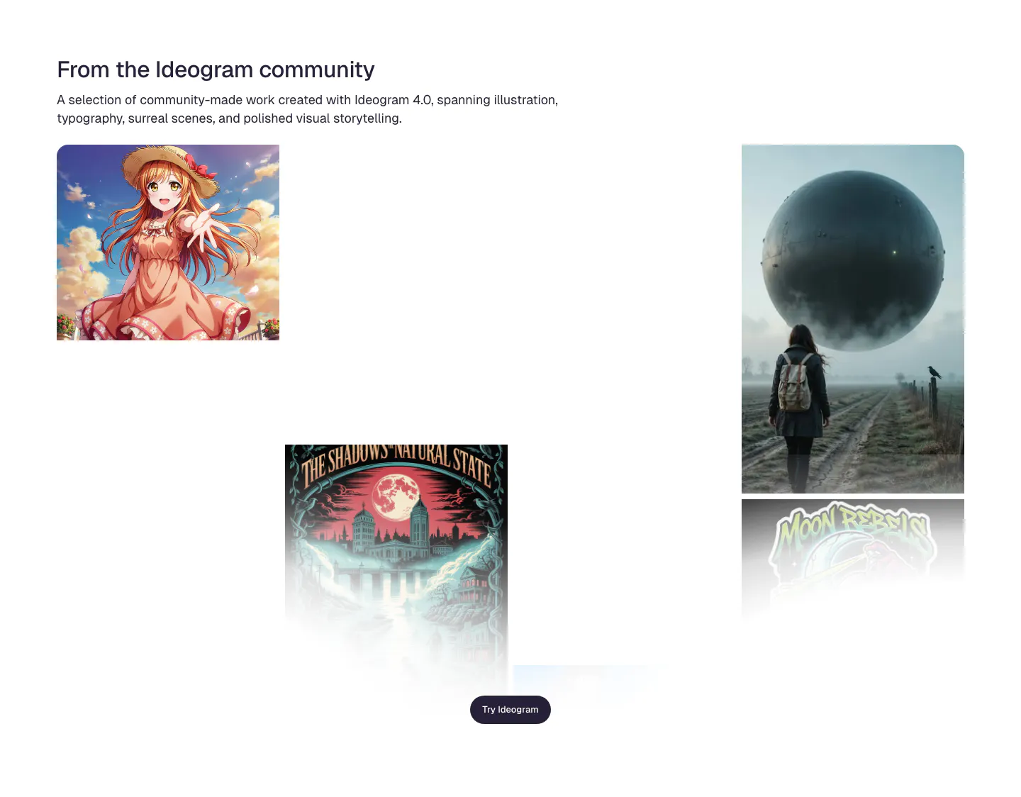
  236. Ideogram features section: headline and intro above a scattered gallery of community images incl. anime art, a poster and a surreal sphere
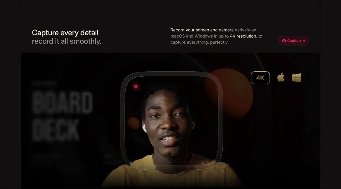
  237. Supercut features section: headline row with Capture button above a webcam recording frame of a smiling presenter with 4K badge
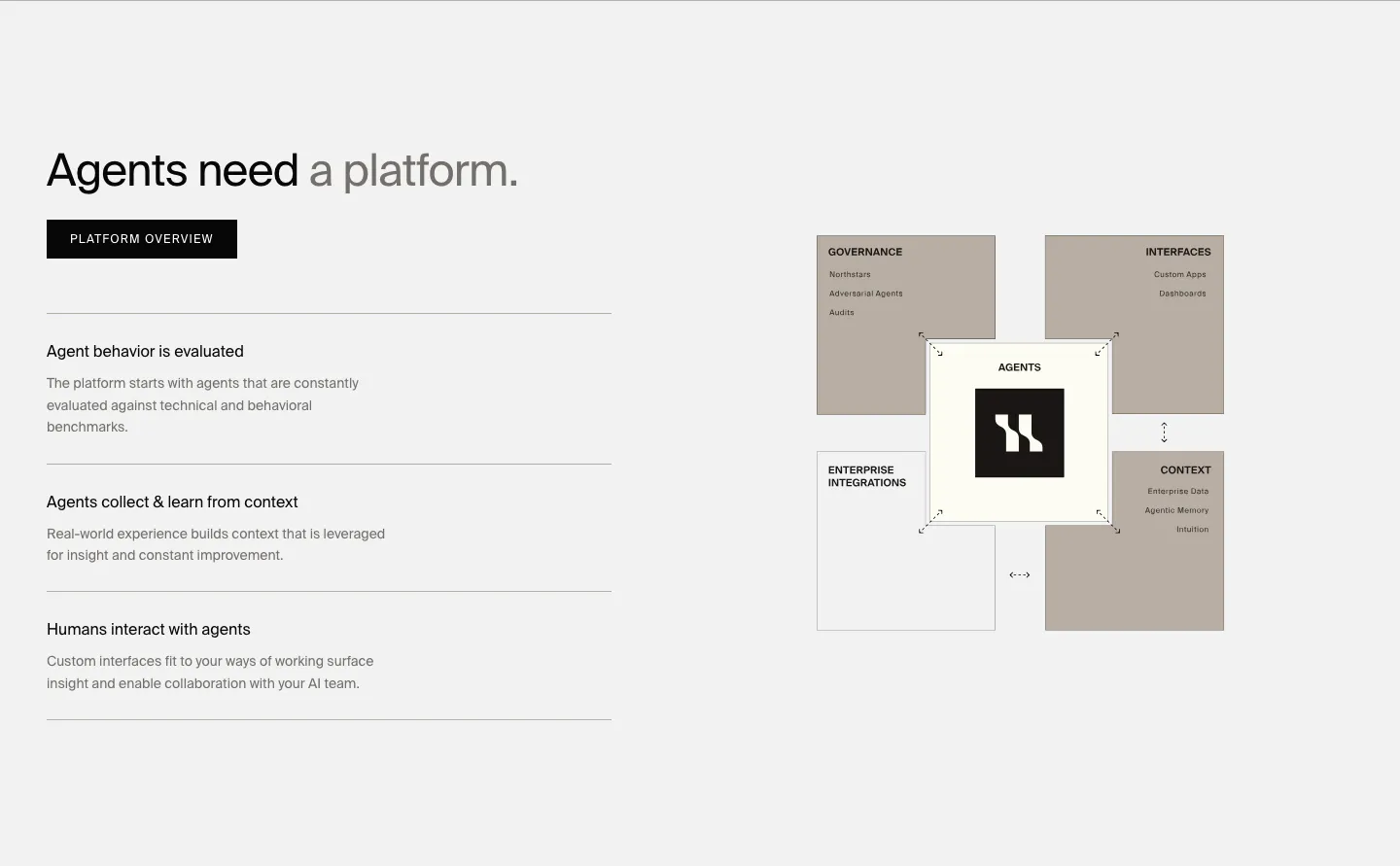
  238. HappyRobot features section: headline, button and three capability rows on the left, taupe block diagram of the agent platform on the right
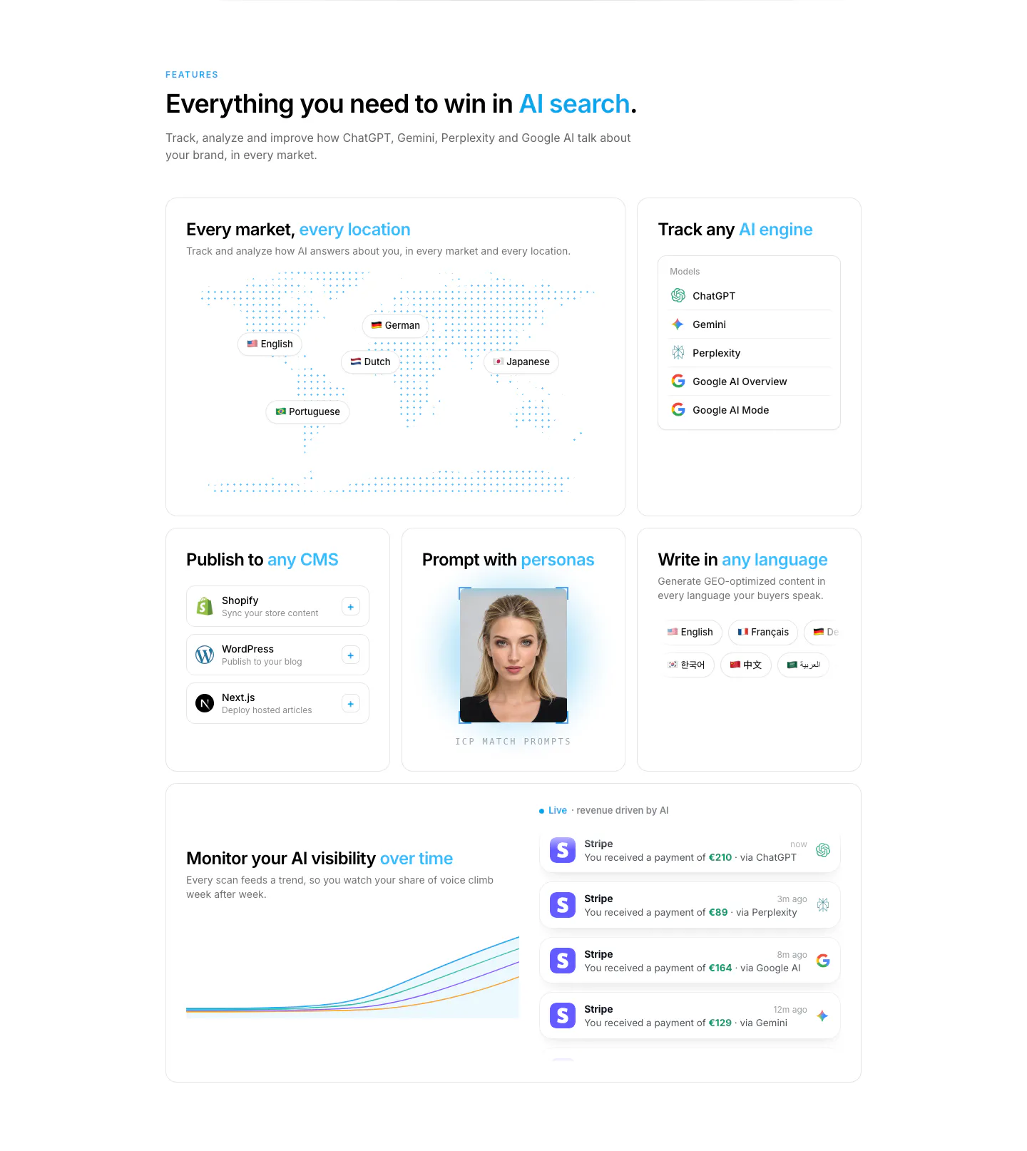
  239. Howseen AI features section: bento grid with dotted world map, AI engine list, CMS cards, persona photo and revenue chart
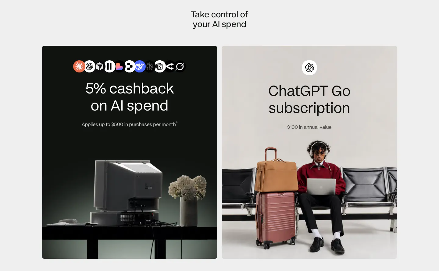
  240. Plasma features section: centered heading above two large cards, a dark card with AI app icons and a light card with a traveler photo
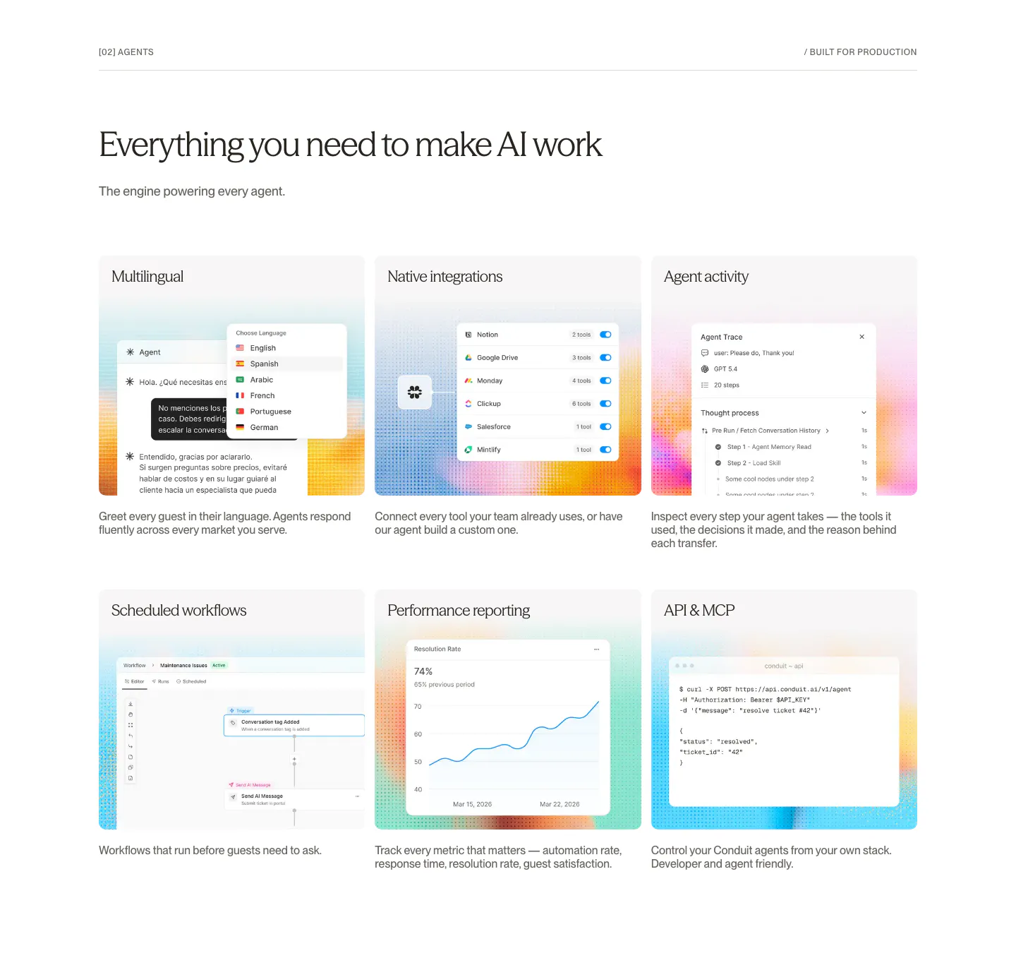
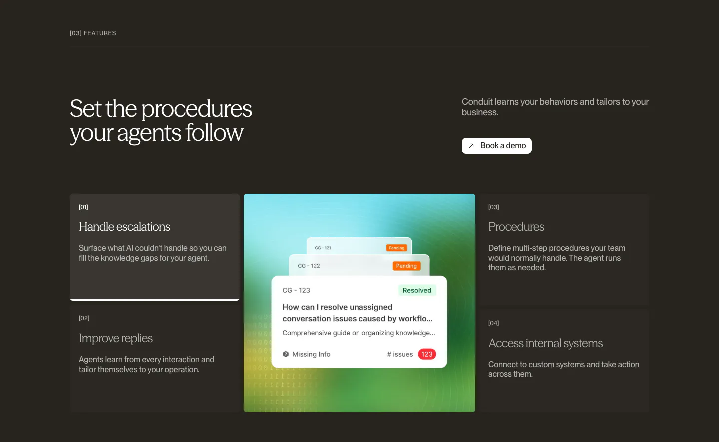
  241. Conduit features section: serif headline above a 3x2 card grid of agent UI mockups on dithered gradient tiles
  242. NickAI features section: left heading above a product screenshot pairing an agent chat log with a workflow node canvas
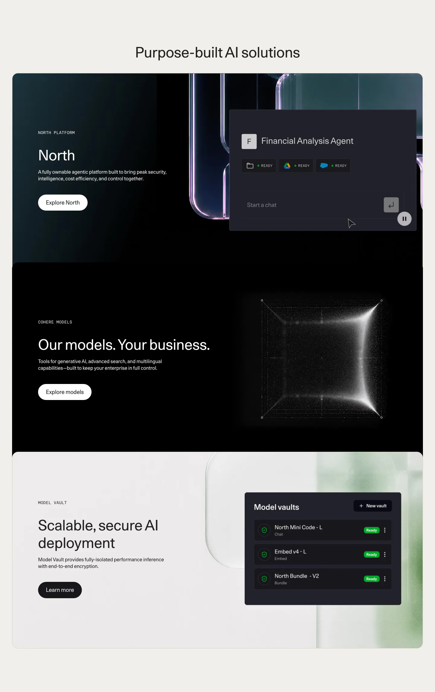
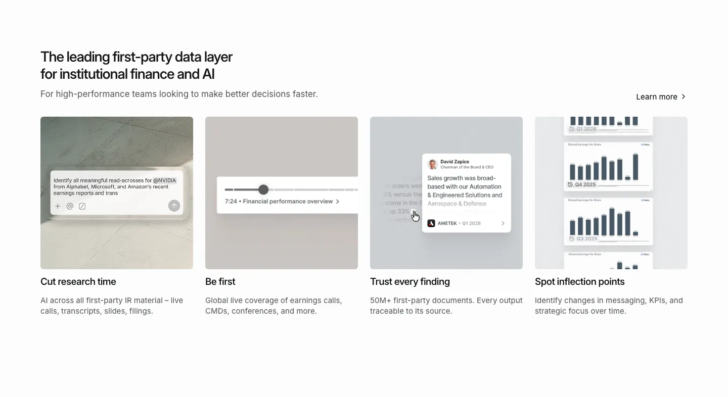
  243. Cohere features section: centered headline above three stacked cards with text left and agent UI, particle cube and vault UI right
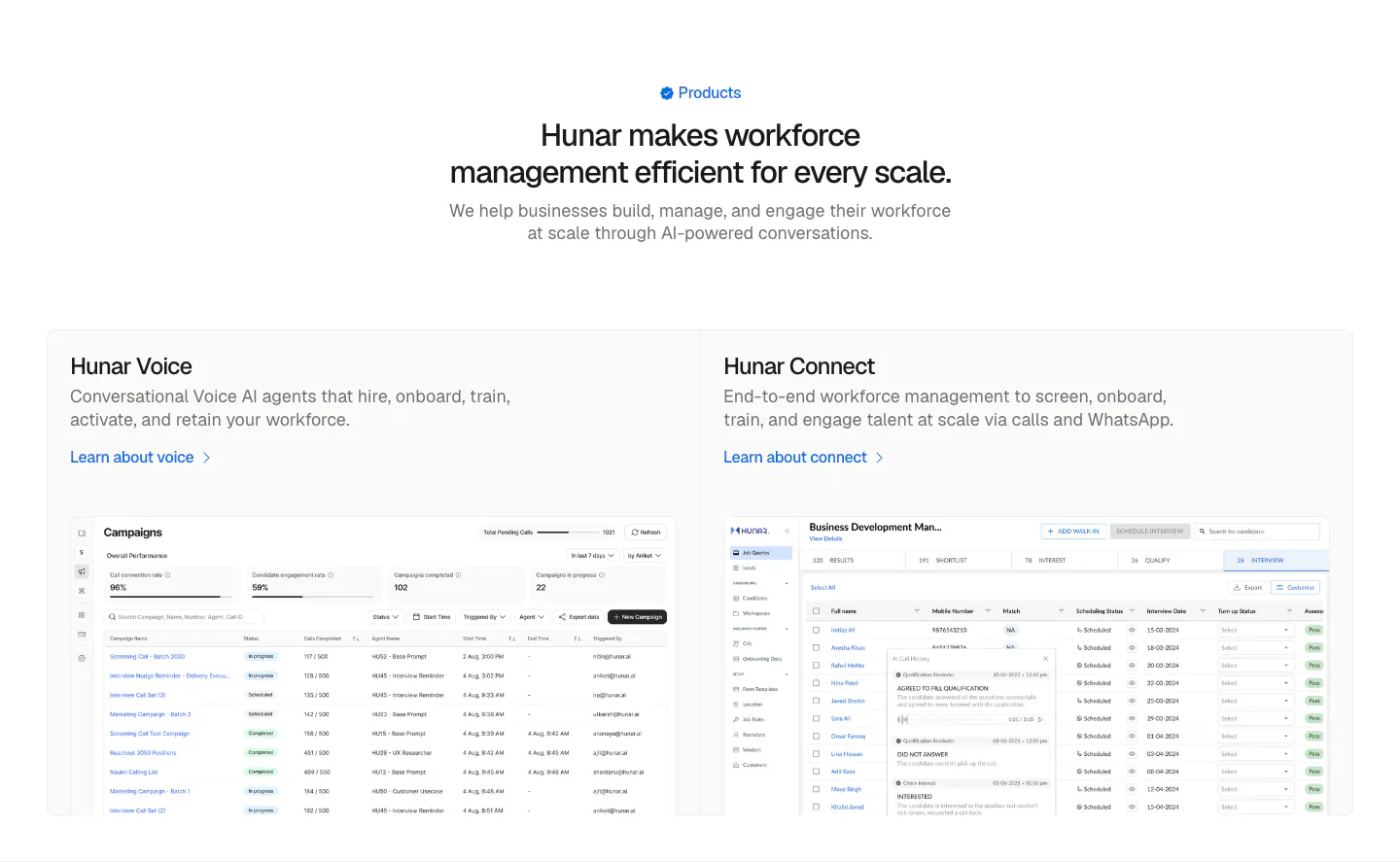
  244. Hunar features section: centered heading above two product cards with campaign and candidate table screenshots on a light background
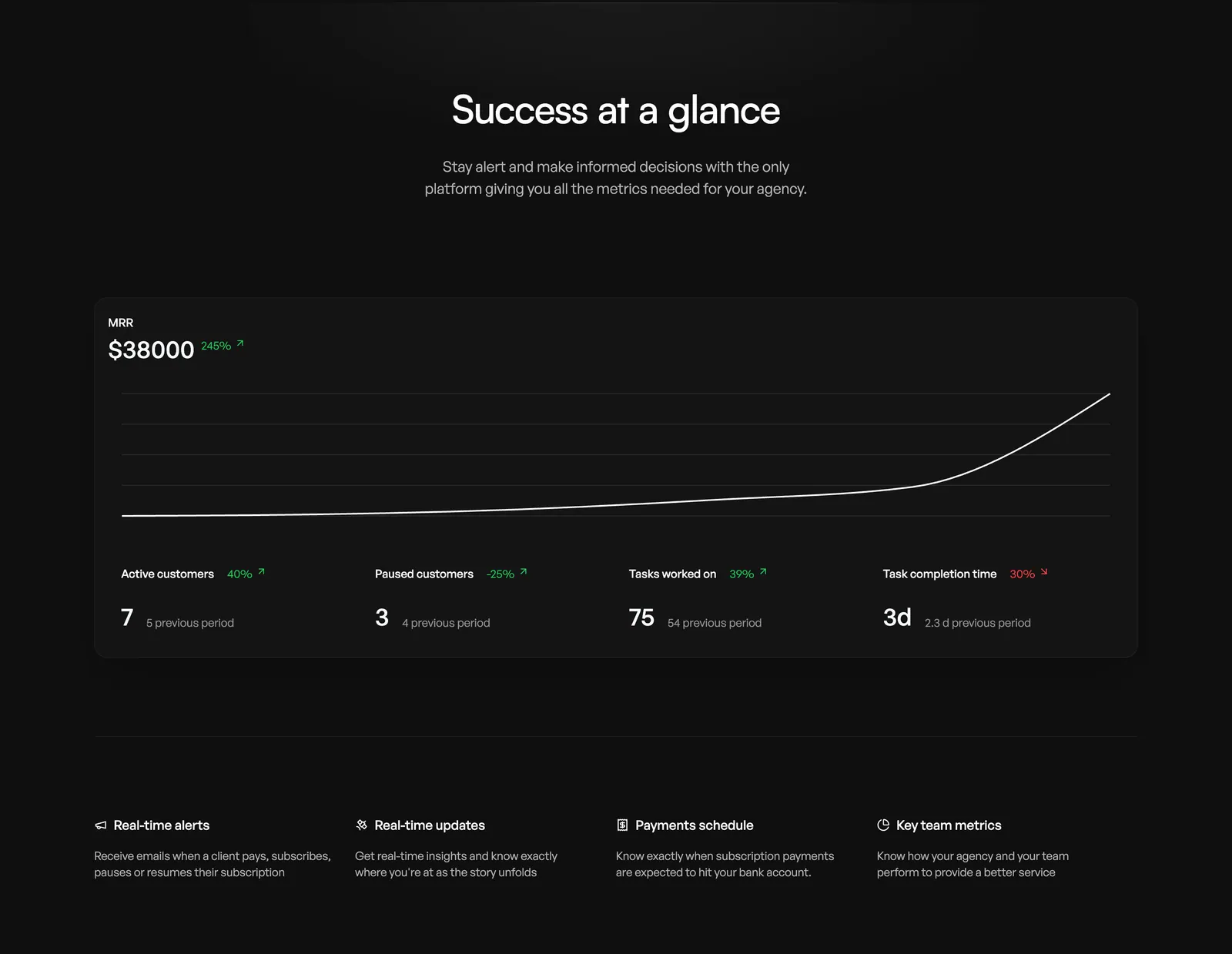
  245. Orchestra value proposition section: centered headline above an MRR line chart dashboard card and a four-column feature list, dark
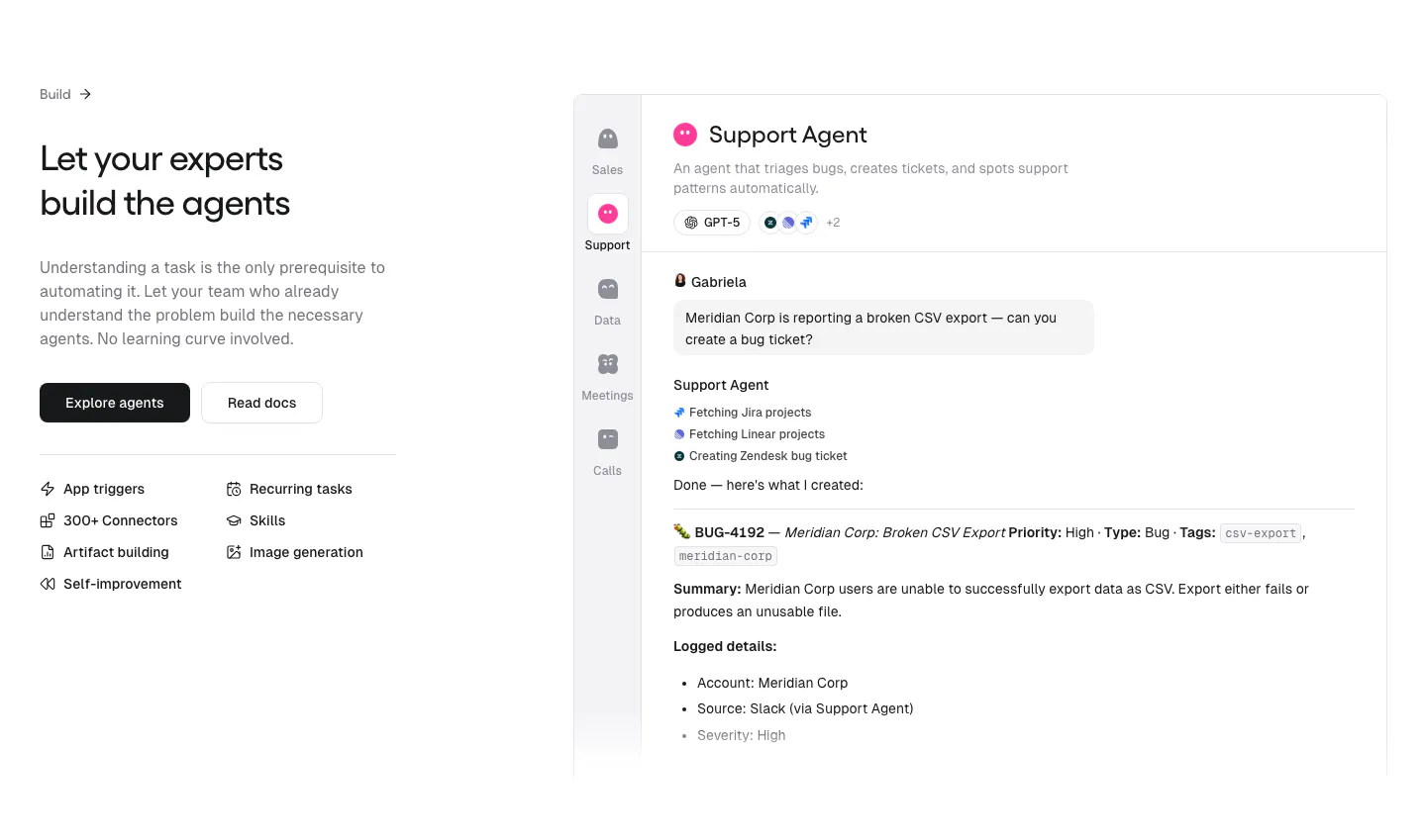
  246. Gumloop features section: headline, buttons and capability list on the left, support agent chat UI on the right
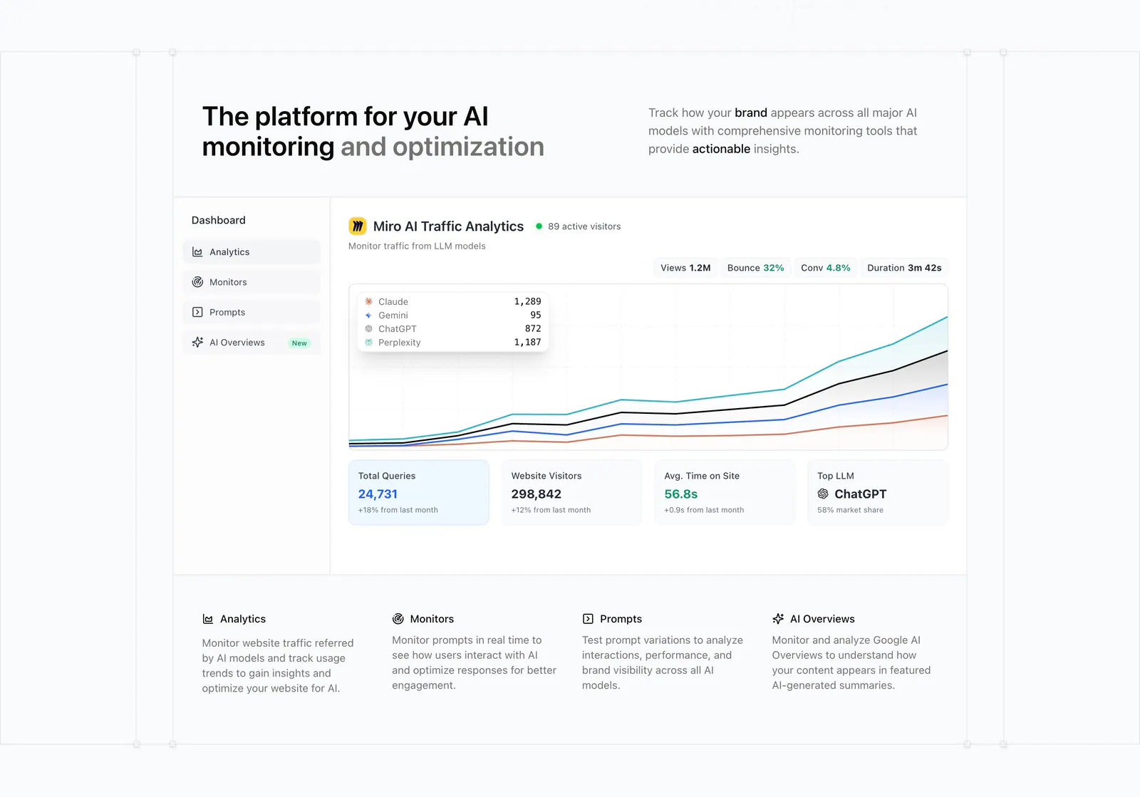
  247. Promptwatch features section: headline with side copy above an AI traffic analytics dashboard screenshot and a four-column feature row
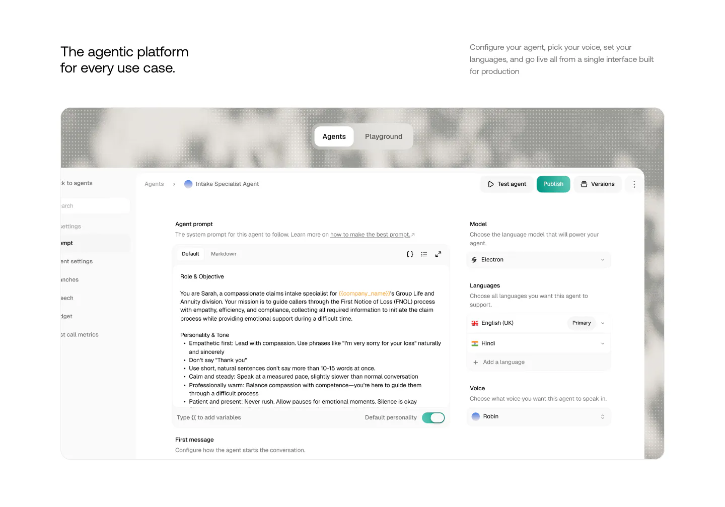
  248. Smallest.ai features section: headline and copy above a large agent configuration UI screenshot with Agents/Playground tabs
  249. Quartr features section: four equal gray cards with small UI snippets and charts, each with a short title and description
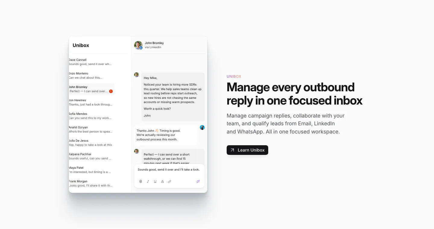
  250. Sendr features section: Unibox inbox UI with a conversation thread on the left, headline, copy and Learn Unibox button on the right
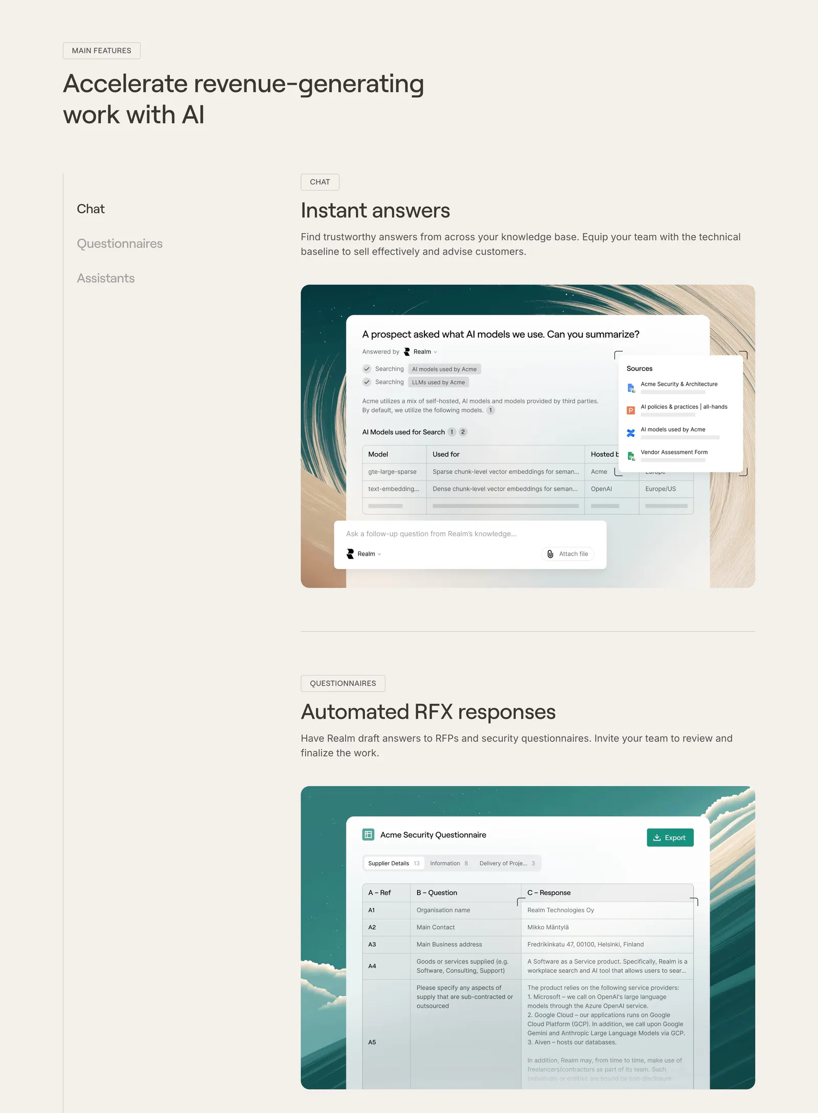
  251. Realm features section: headline with side menu and stacked feature blocks showing UI screenshots on painted backdrops, beige page
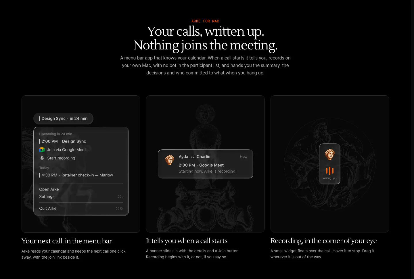
  252. Arke features section: centered serif headline above three dark cards showing a menu bar call reminder, notification and recording widget
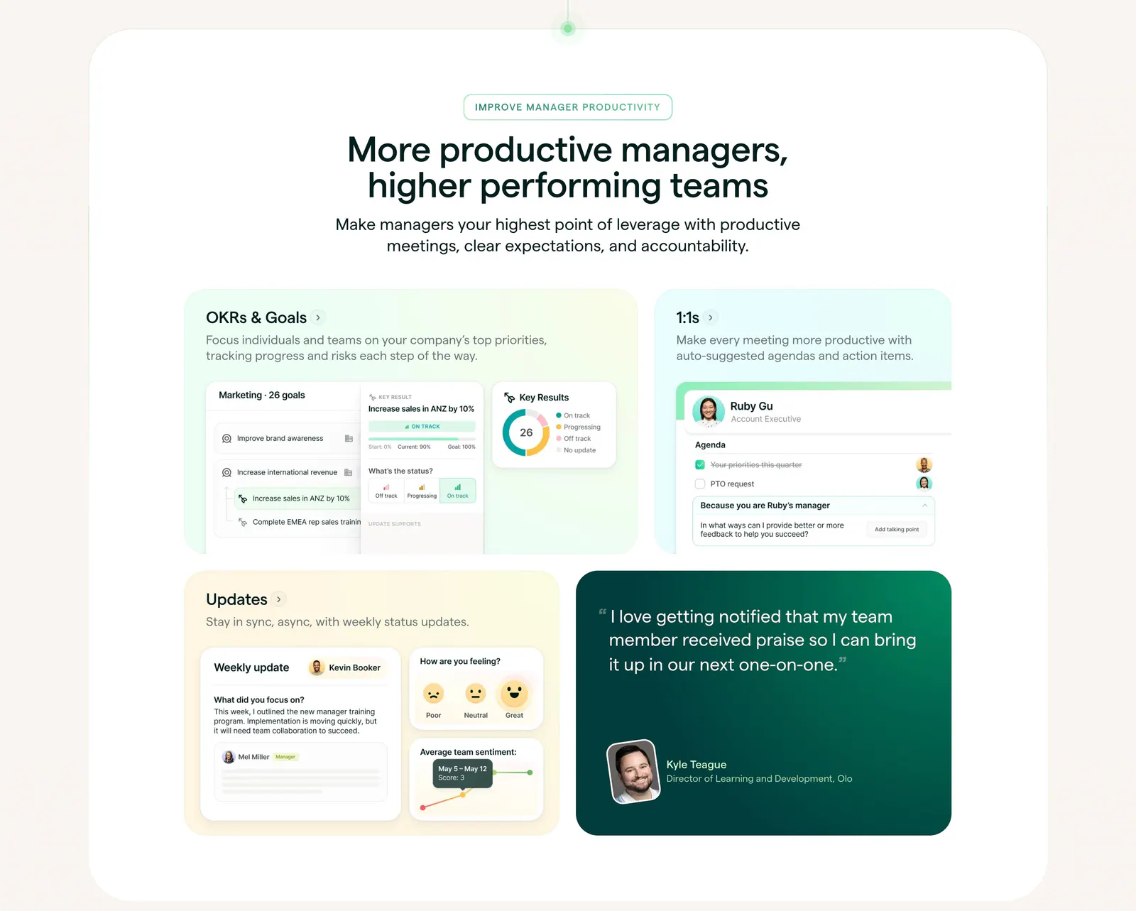
  253. Lattice features section: centered heading above a bento grid of pastel cards with OKR, 1:1 and update UI mockups plus a green quote card
  254. Hunar features section: centered heading above a two-row grid of six icon cards on a pale blue background
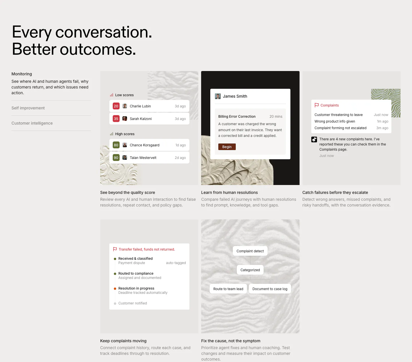
  255. Rulebase features section: left-aligned headline, vertical tab list and a grid of five cards with scoring and complaint UI on textured tiles
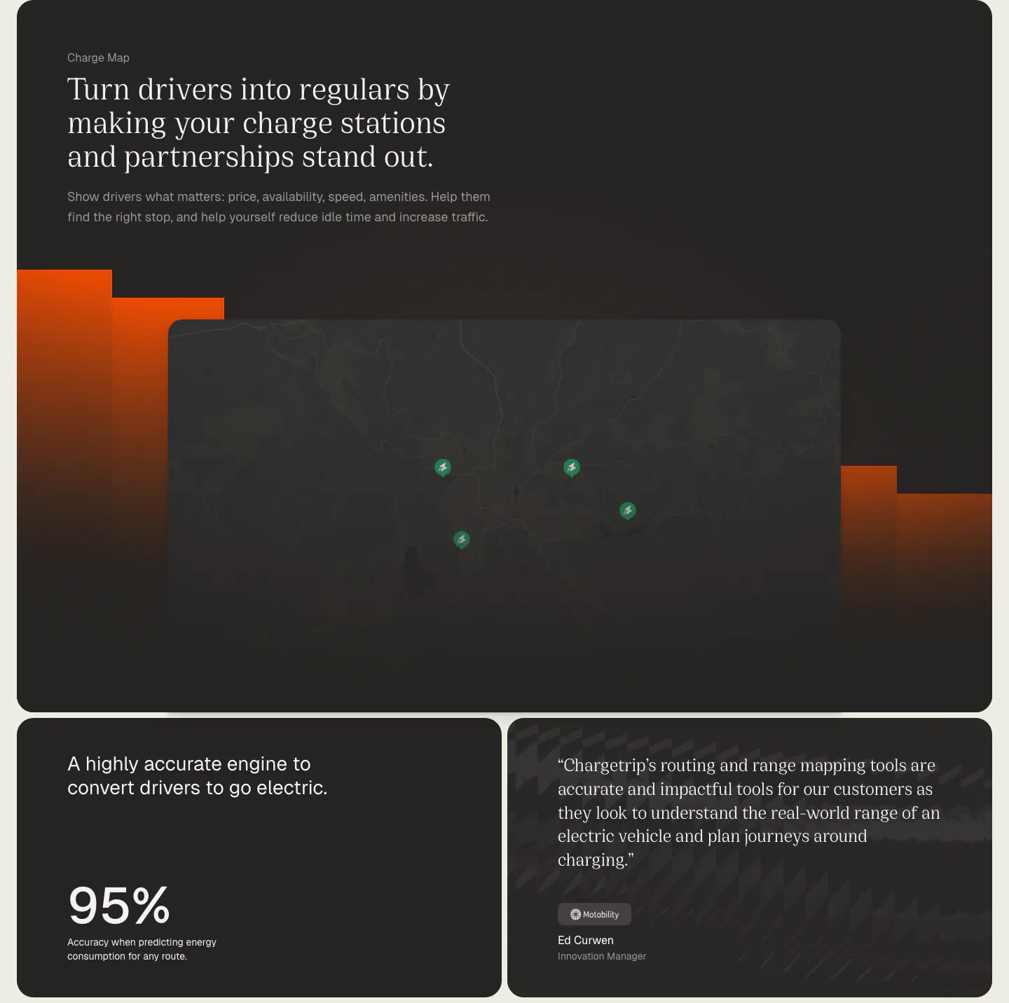
  256. Chargetrip features section: serif headline over a dark charge station map with orange bars, above a 95% accuracy stat card and a quote card
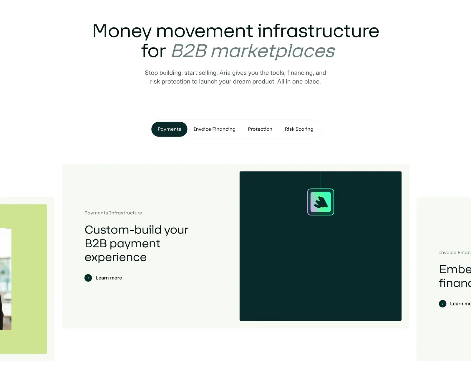
  257. Aria features section: centered headline above a pill tab bar and a carousel of cards with text and a dark teal visual panel
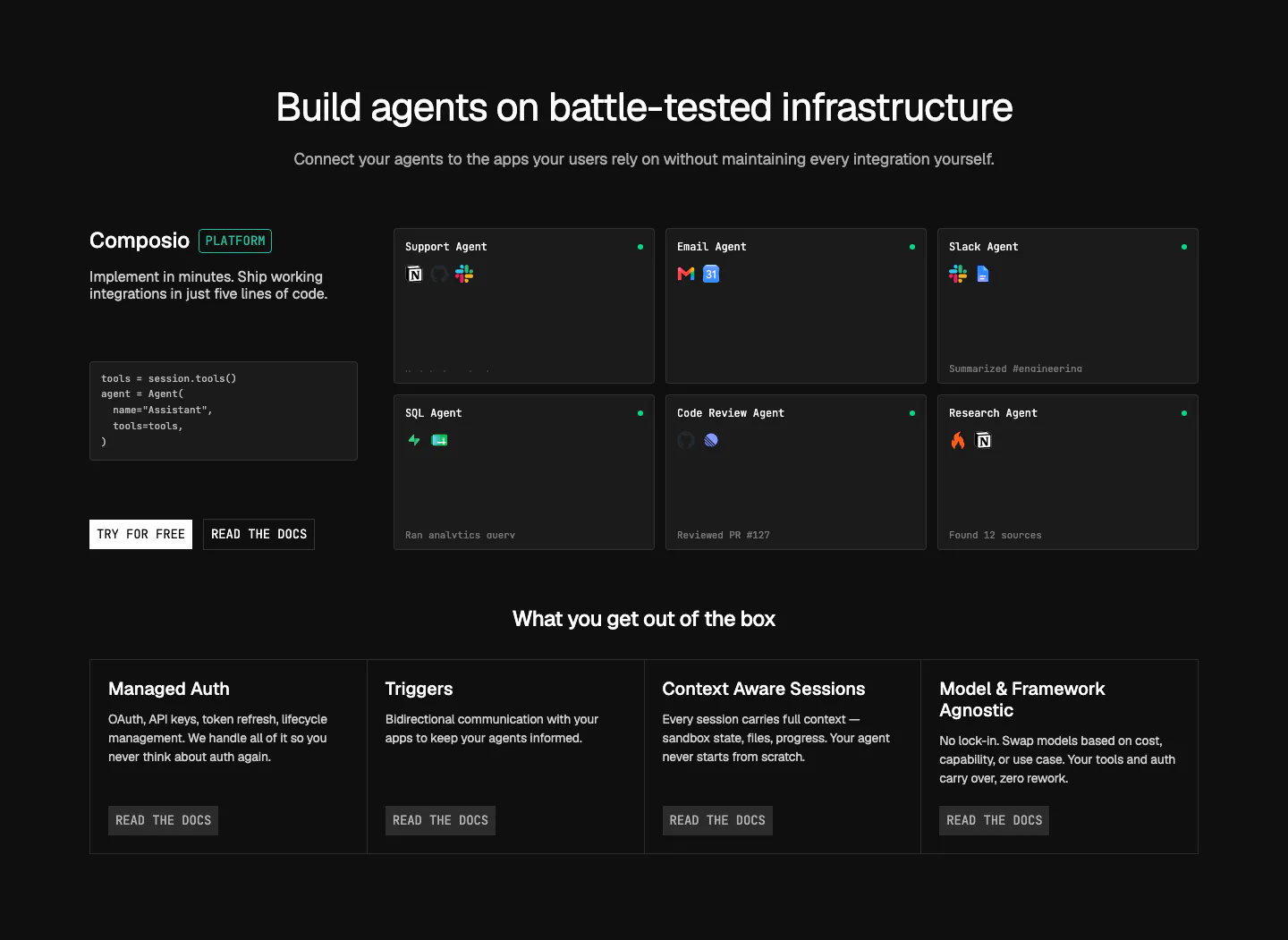
  258. Composio features section: code snippet and CTAs beside a grid of agent cards, then four platform feature columns on near-black
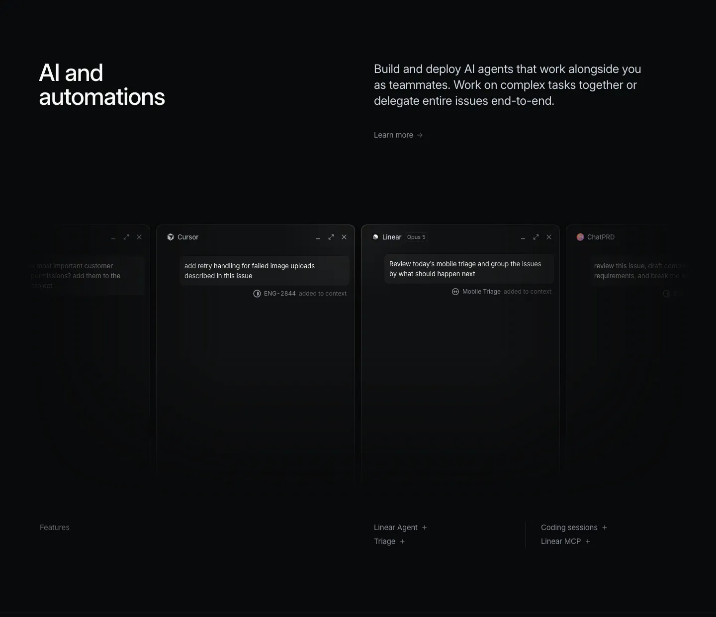
  259. Linear features section: dark headline and copy above a row of agent chat windows fading off both edges, feature links below
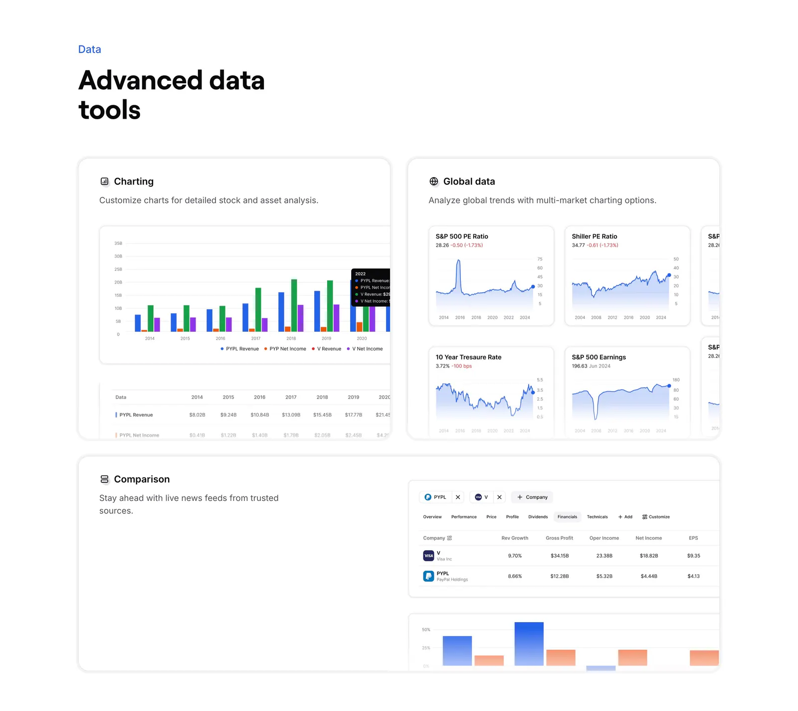
  260. Finsepa features section: left headline above three cards showing charting, global market charts and a company comparison table
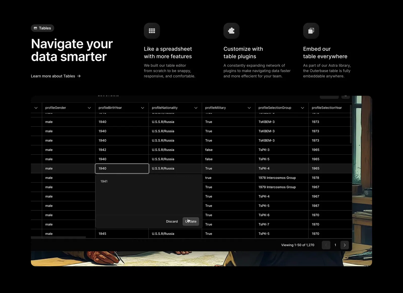
  261. Outerbase features section: headline beside three feature columns with icons above a dark data table screenshot on painted artwork
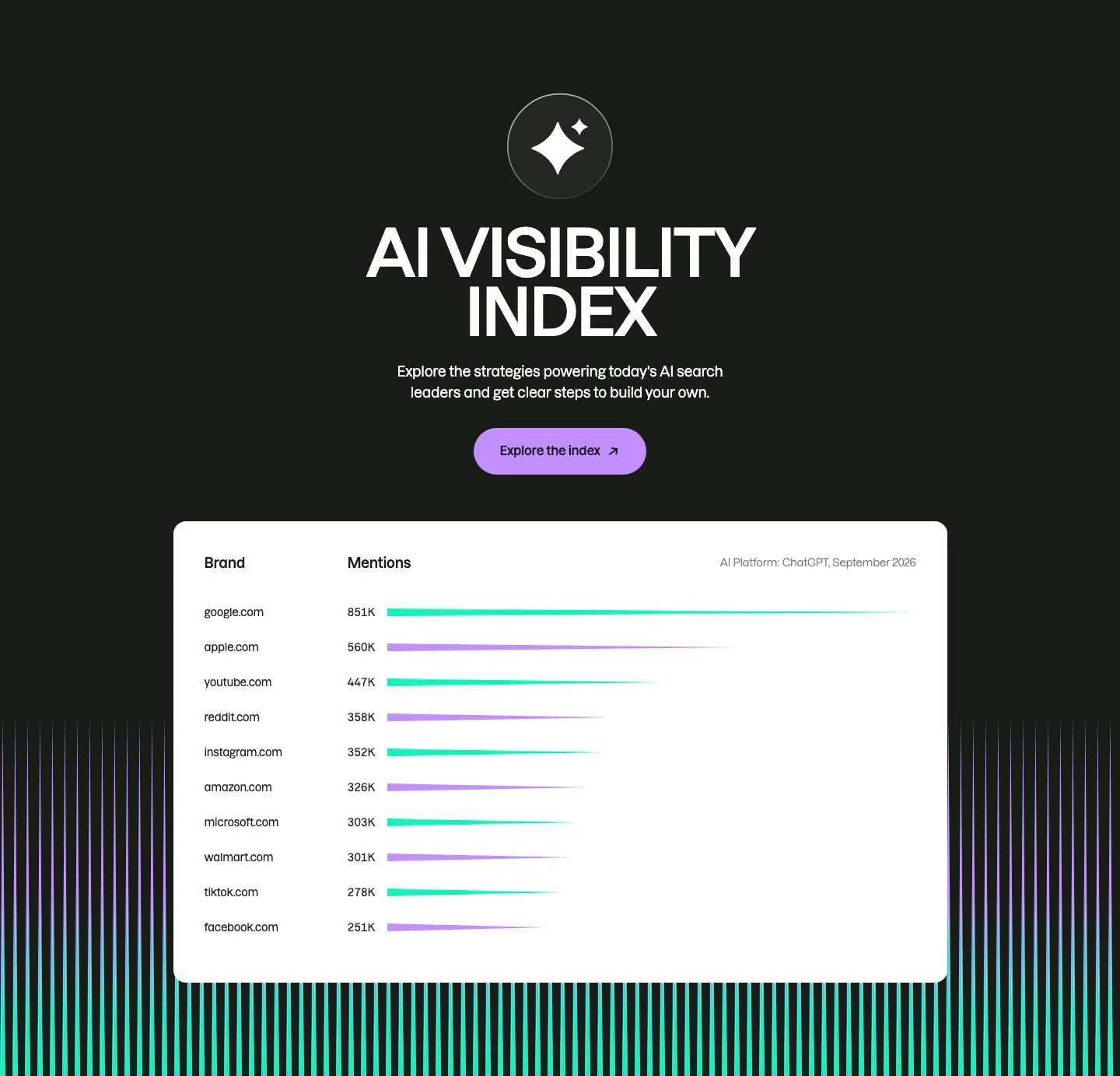
  262. Semrush features section: centered AI Visibility Index heading and button on dark above a white bar-chart table of brand mentions
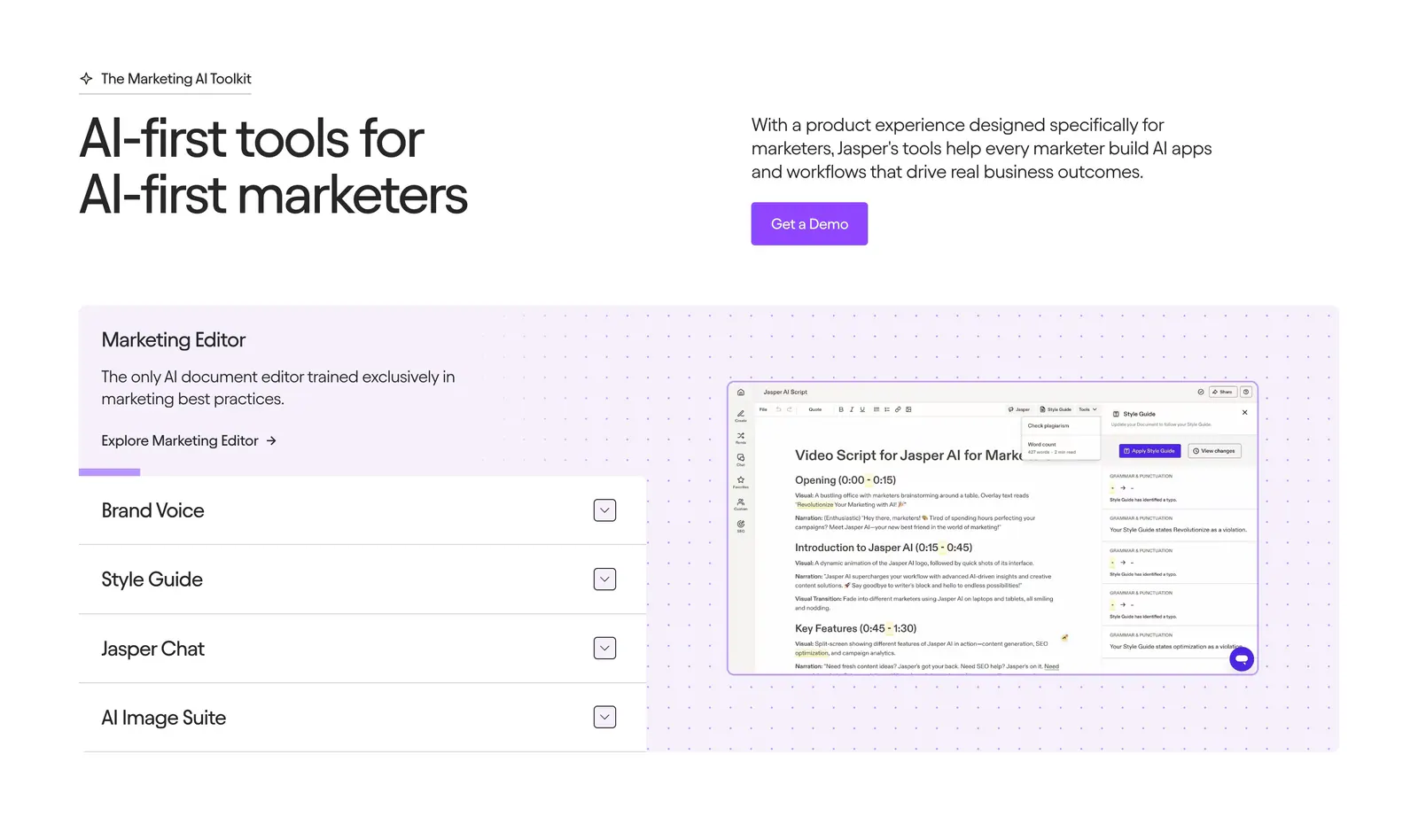
  263. Jasper features section: headline and copy row above an accordion list beside an editor screenshot on a dotted lavender panel
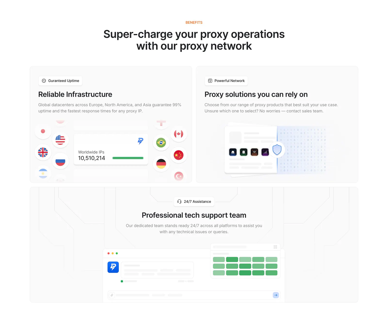
  264. Lightning Proxies features section: centered heading above three light gray tiles with an IP counter and flags, proxy cards and a support chat mockup
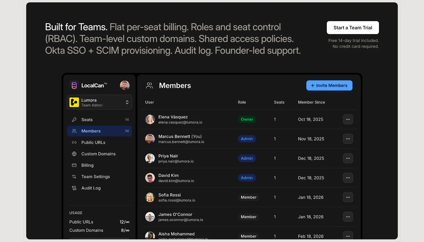
  265. LocalCan features section: two-tone teams headline with a trial button above a dark Members admin screenshot listing roles and seats
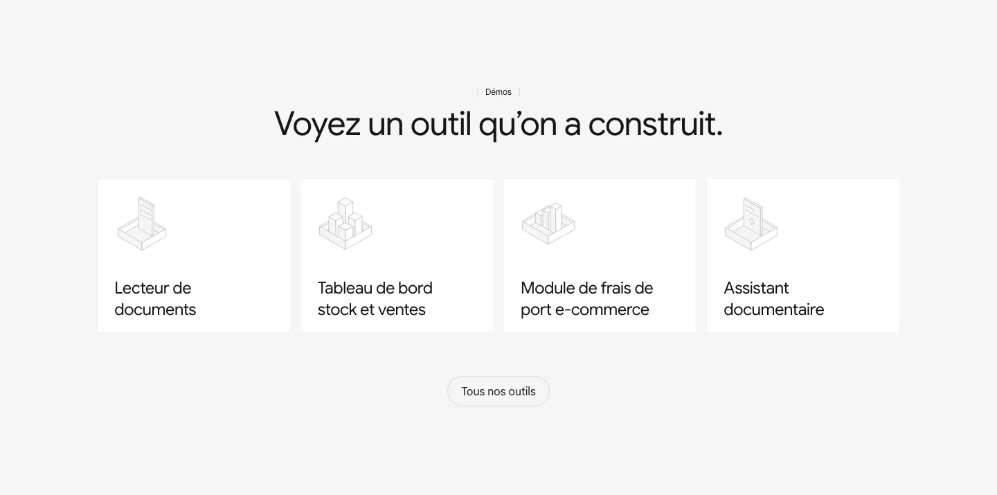
  266. Raneo features section: centered headline above four equal white cards with isometric line icons for demo tools and an all-tools button
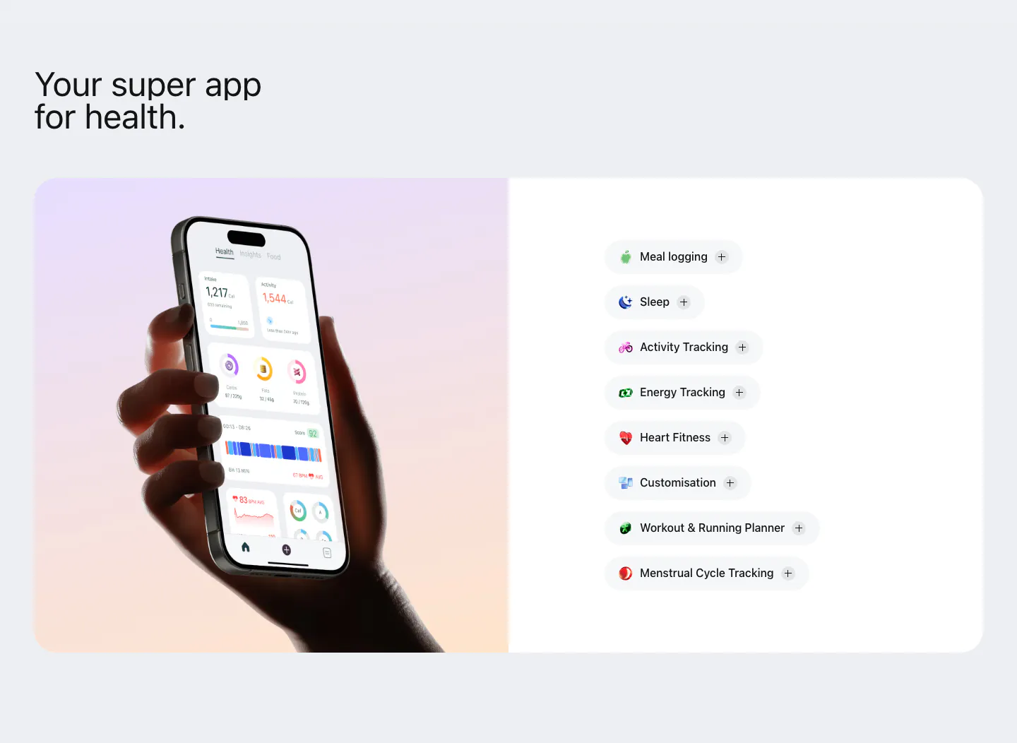
  267. Bright features section: hand holding a phone with the health app on a lavender-peach gradient panel beside a list of feature pills
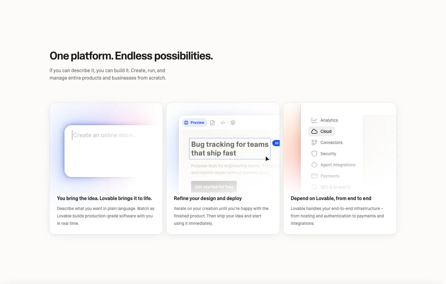
  268. Lovable features section: left-aligned headline above three equal cards with prompt box, editor preview and settings menu UI mockups
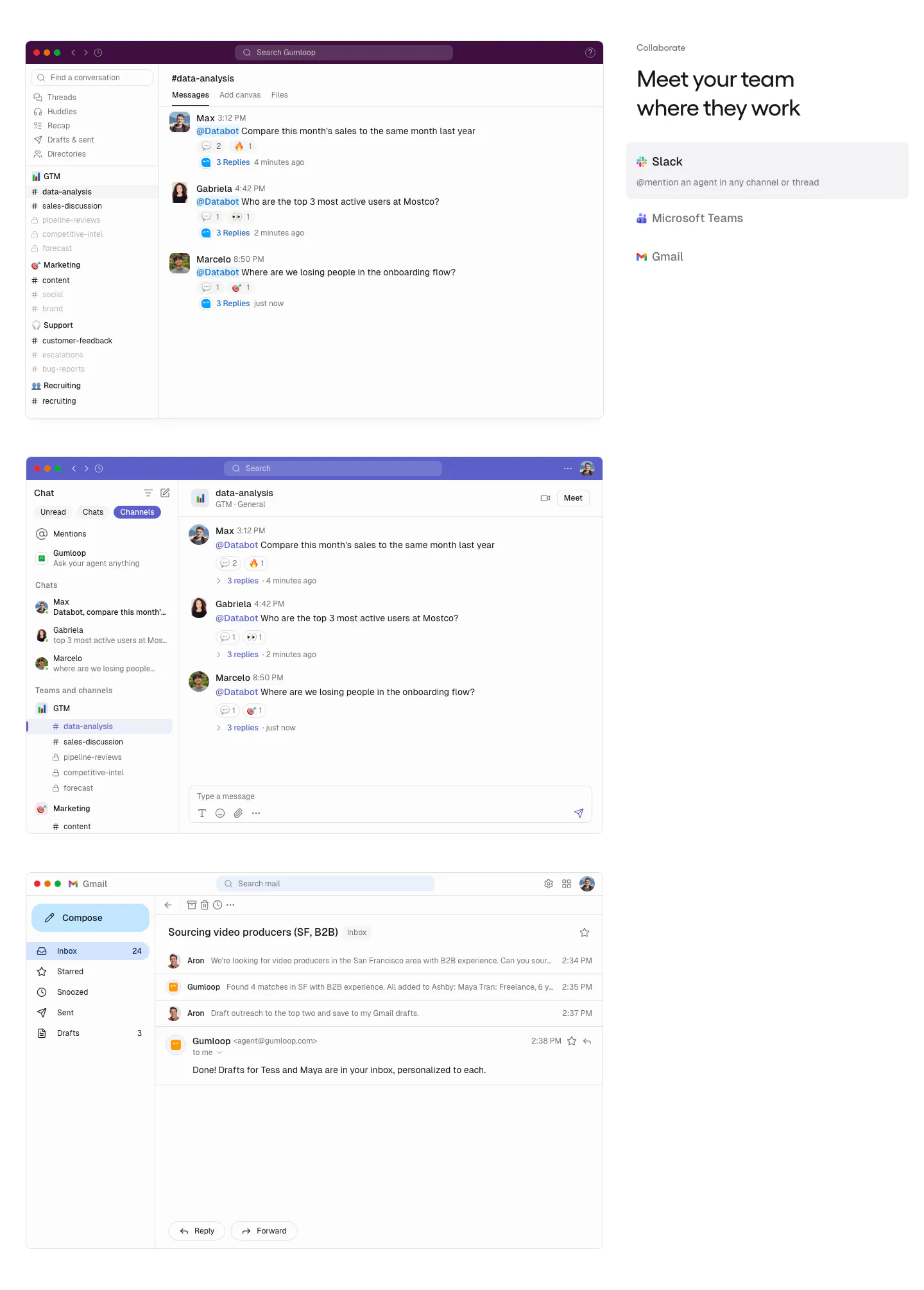
  269. Gumloop features section: stacked Slack, Teams and Gmail screenshots on the left, headline and app tab list on the right
  270. Remote features section: centered headline above three bordered product cards with gradient icons and text links
  271. Seamless.AI features section: two rows with gradient panels showing contact UI cards on the left and headlines on the right
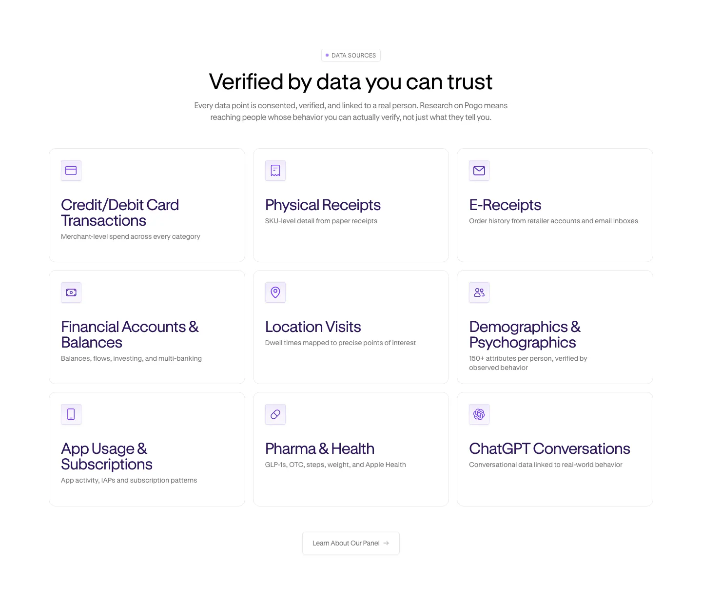
  272. Pogo features section: centered headline over a 3x3 grid of data source cards with purple line icons on white
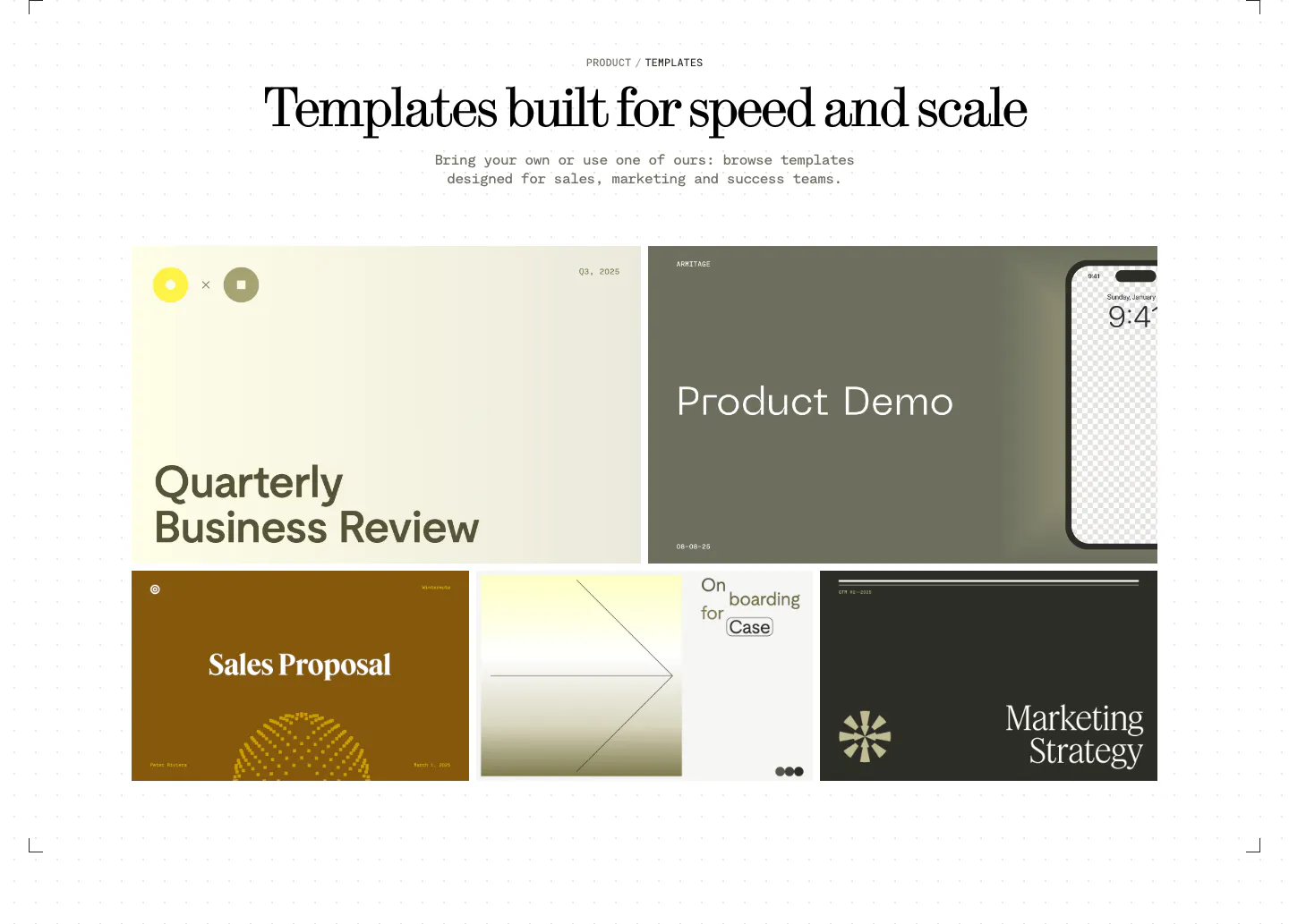
  273. Visual features section: centered serif headline above a bento grid of presentation template previews in olive, cream, brown and charcoal
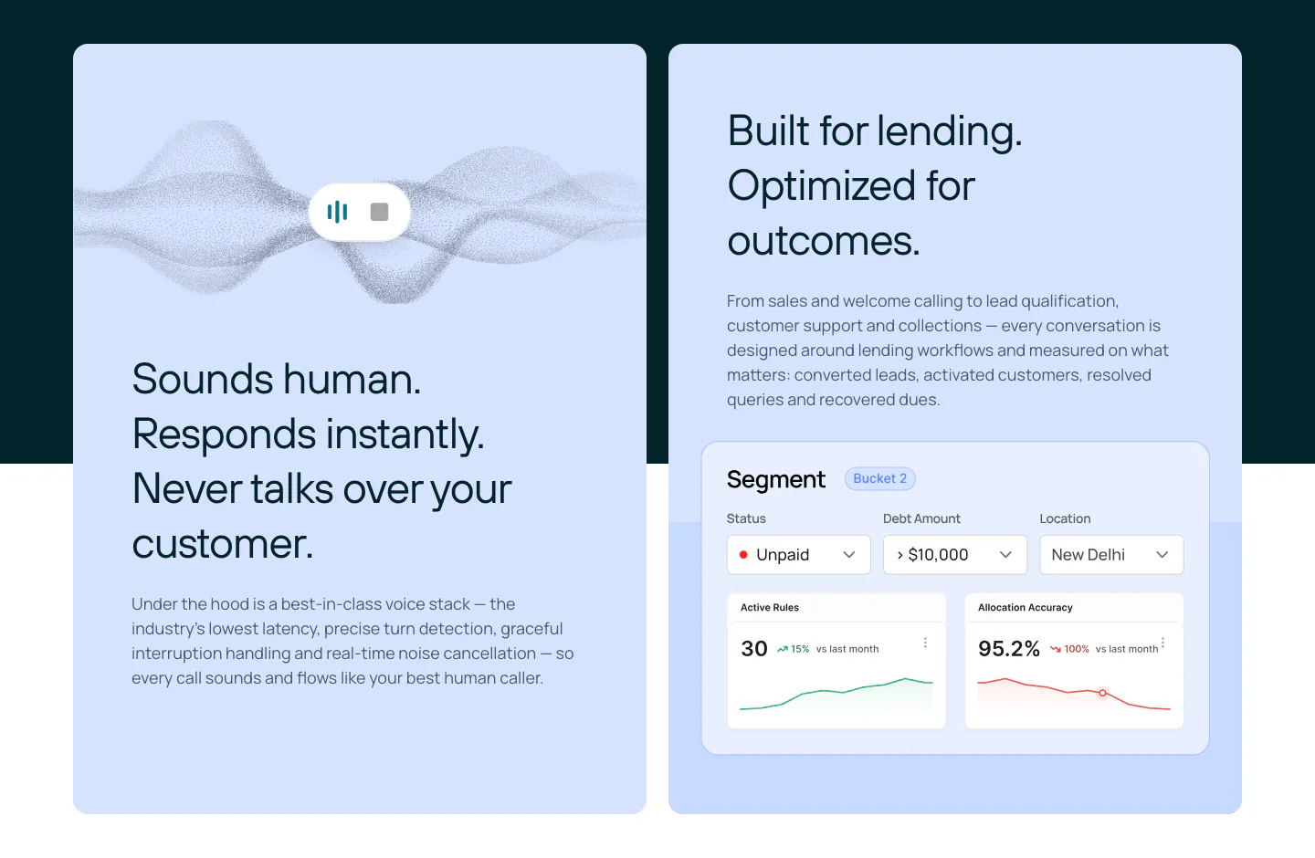
  274. Rezolv features section: two light blue cards, one with a voice waveform and one with a segment dashboard UI with charts
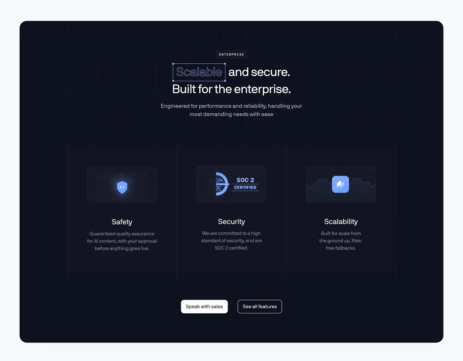
  275. Coframe features section: centered headline above three enterprise columns for safety, SOC 2 security and scalability on a dark navy panel
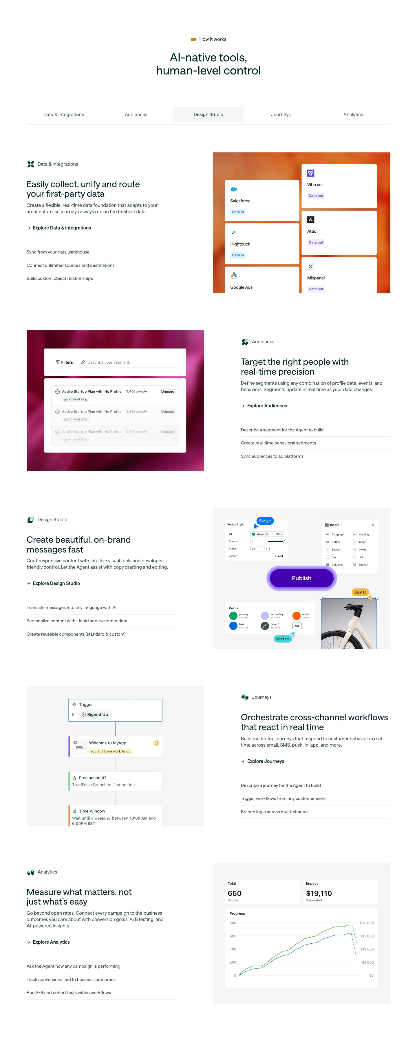
  276. Customer.io features section: centered headline, five-item tab bar and alternating rows of copy beside product UI on gradient panels
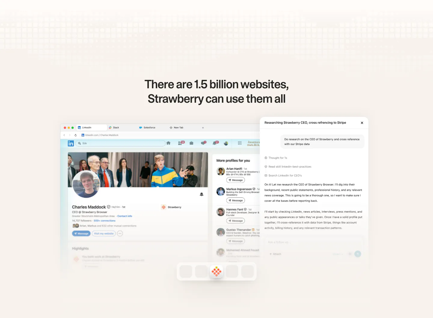
  277. Strawberry features section: centered headline above a browser screenshot of a LinkedIn profile with an AI research chat panel
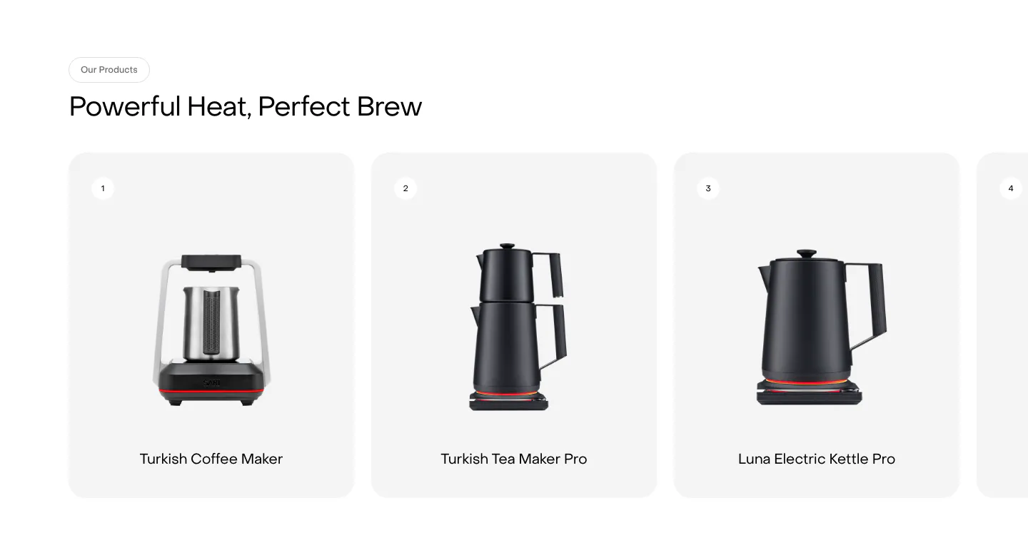
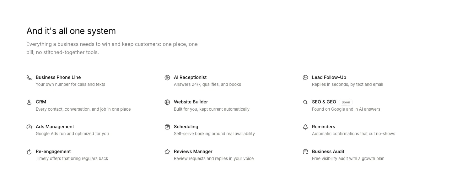
  278. Saki features section: headline above a row of numbered product cards showing kettles and coffee makers, with a fourth card cut off at the edge
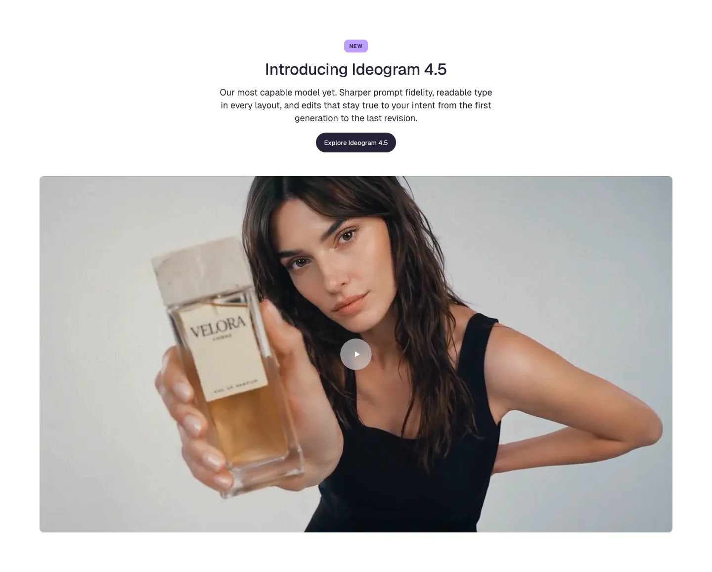
  279. Ideogram features section: centered NEW badge, headline, copy and button above a wide video frame of a woman holding a perfume bottle
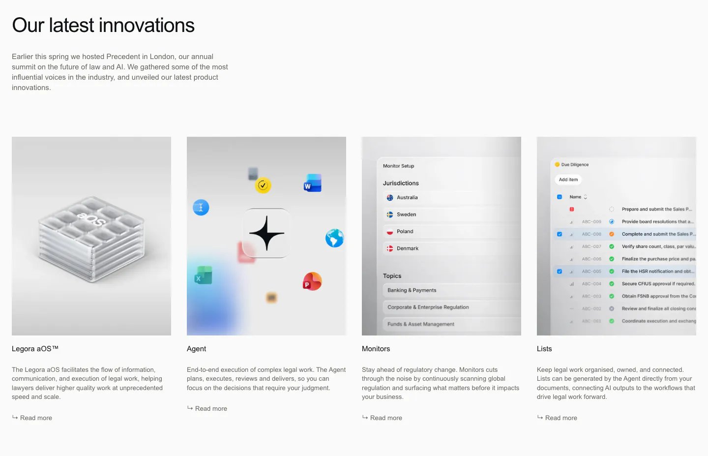
  280. Legora features section: left headline and intro above four equal product cards with glass render and app screenshots
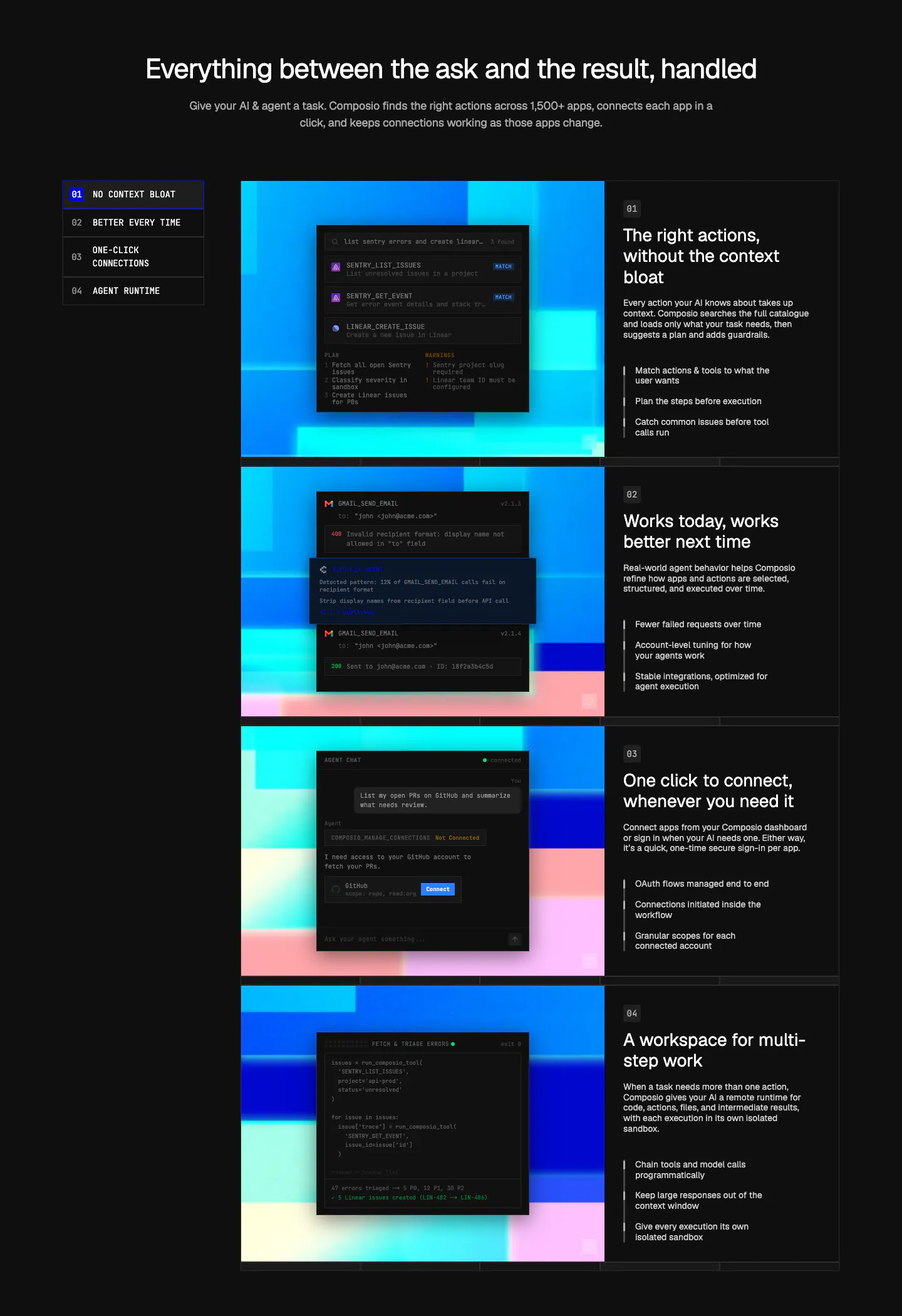
  281. Composio features section: numbered side nav beside four rows of dark UI and code panels on colorful pixel art, each with text
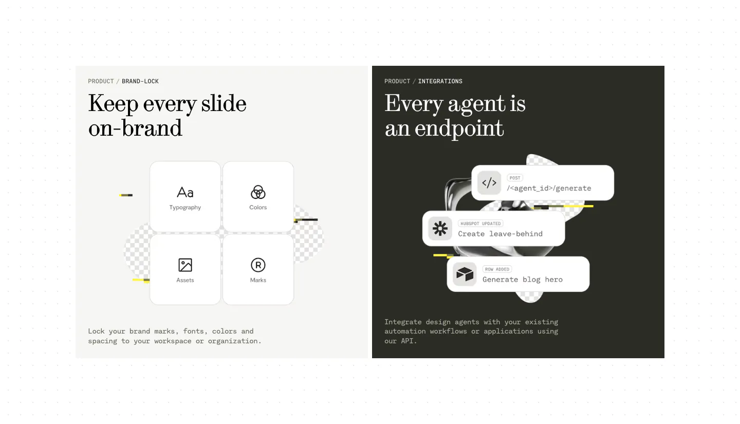
  282. Visual features section: two side-by-side panels, a light one with four brand-lock tiles and a dark one with stacked API endpoint cards
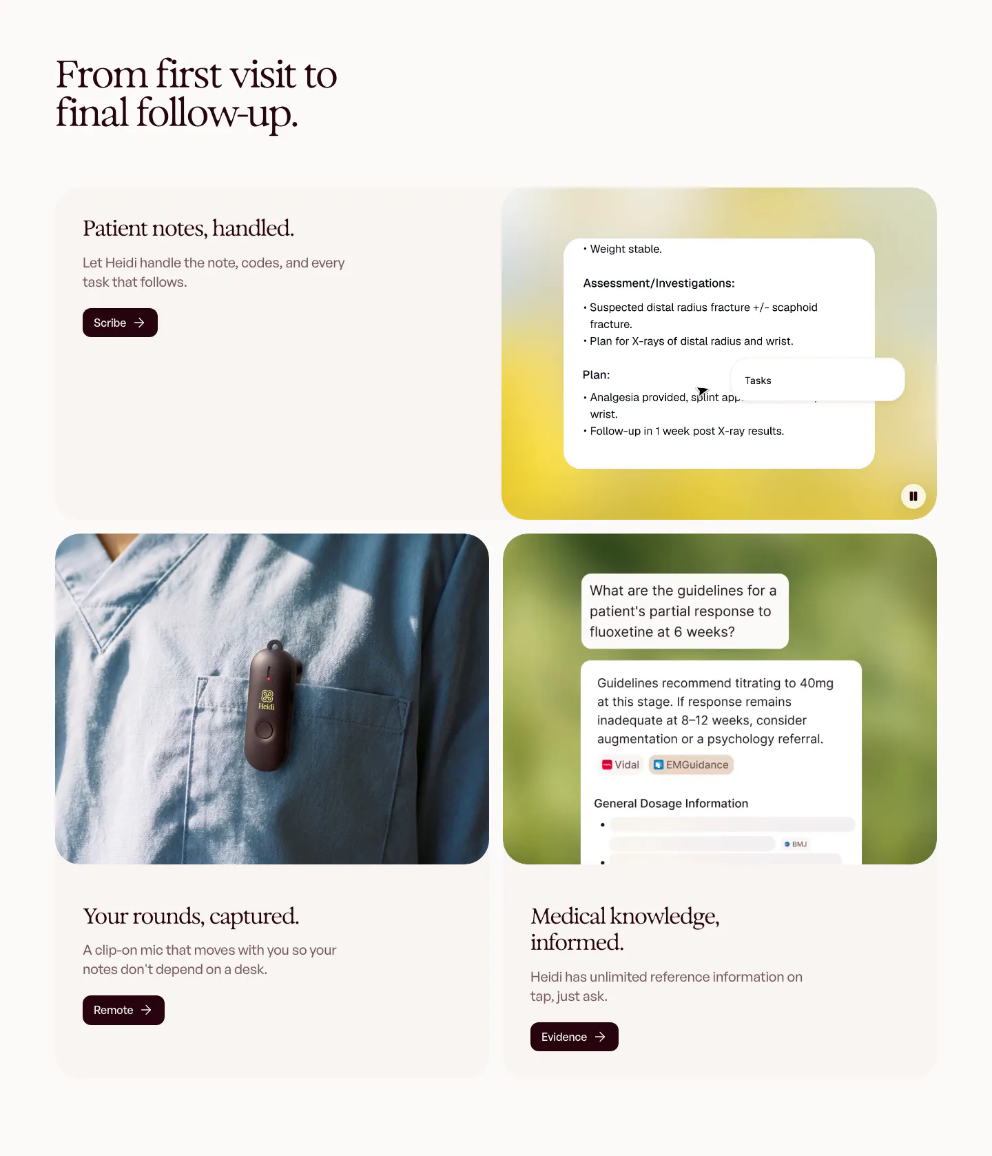
  283. Heidi features section: serif headline over rounded cards pairing text with a clinical notes UI, a clip-on mic photo and a chat answer
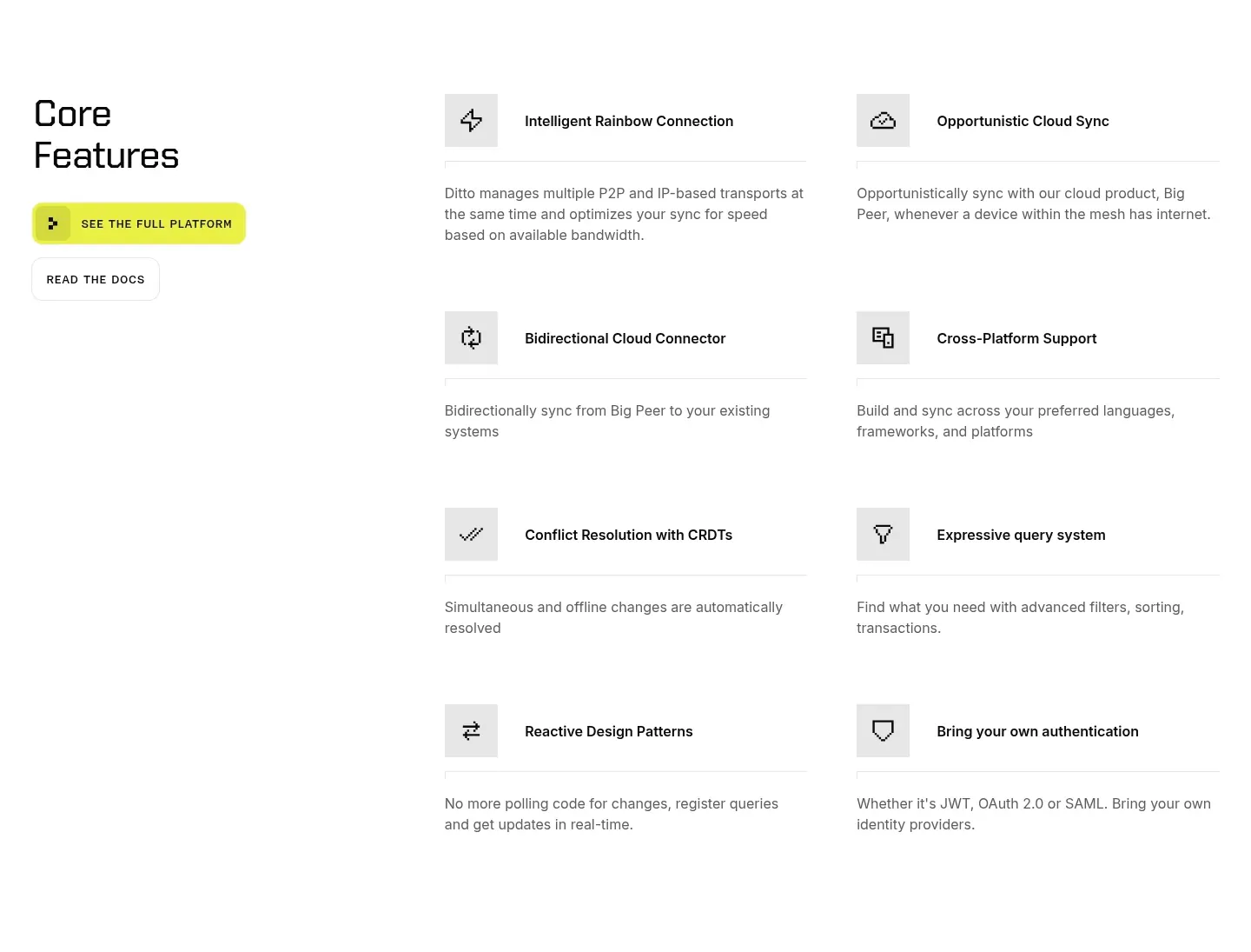
  284. Ditto features section: left headline with yellow and outline buttons beside a two-column list of eight icon-led features on white
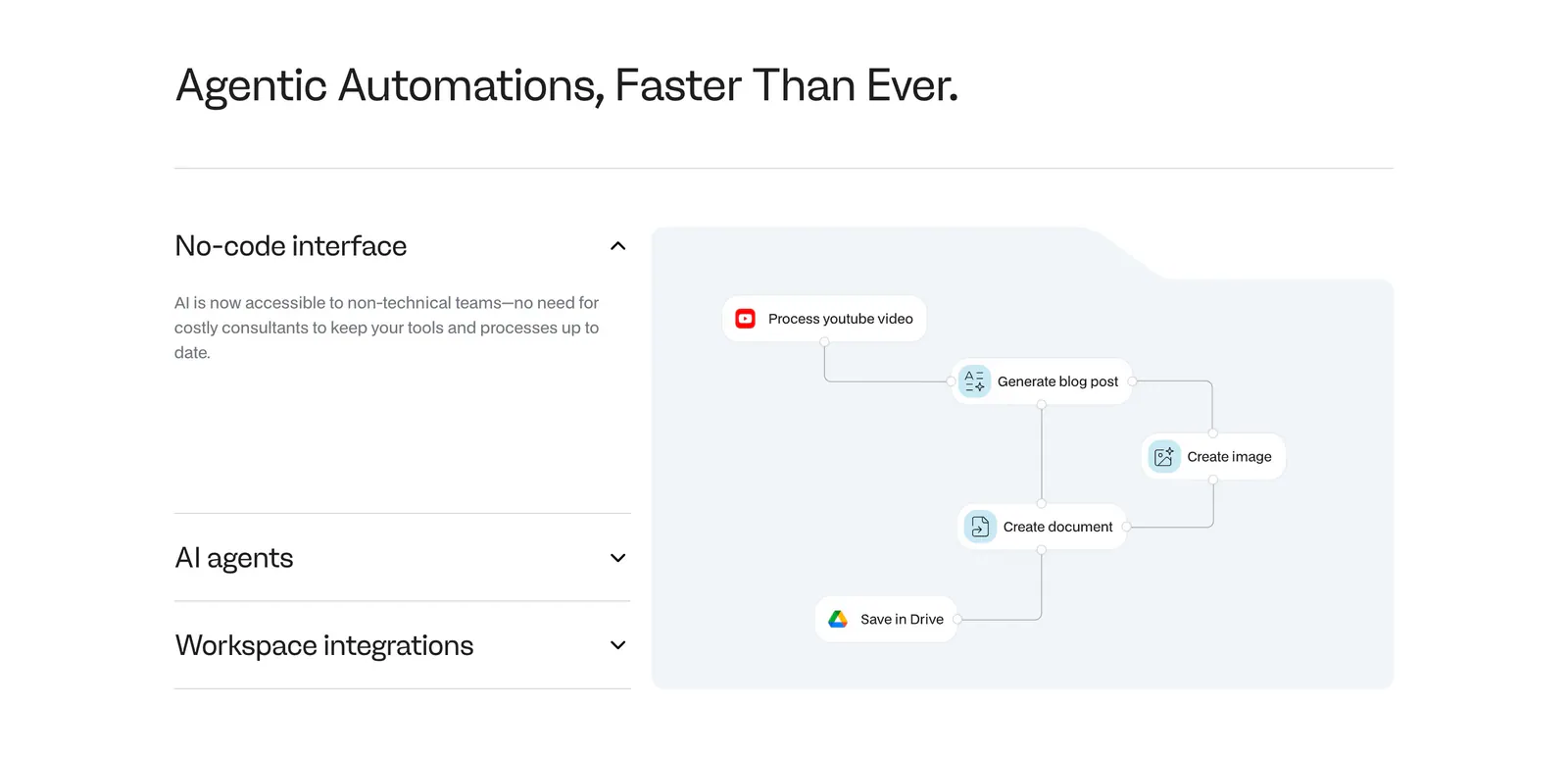
  285. Noxus features section: accordion of feature titles on the left beside a light blue workflow diagram panel on a white background
  286. Beside features section: headline and intro above a three-column list of twelve capabilities with line icons and short descriptions
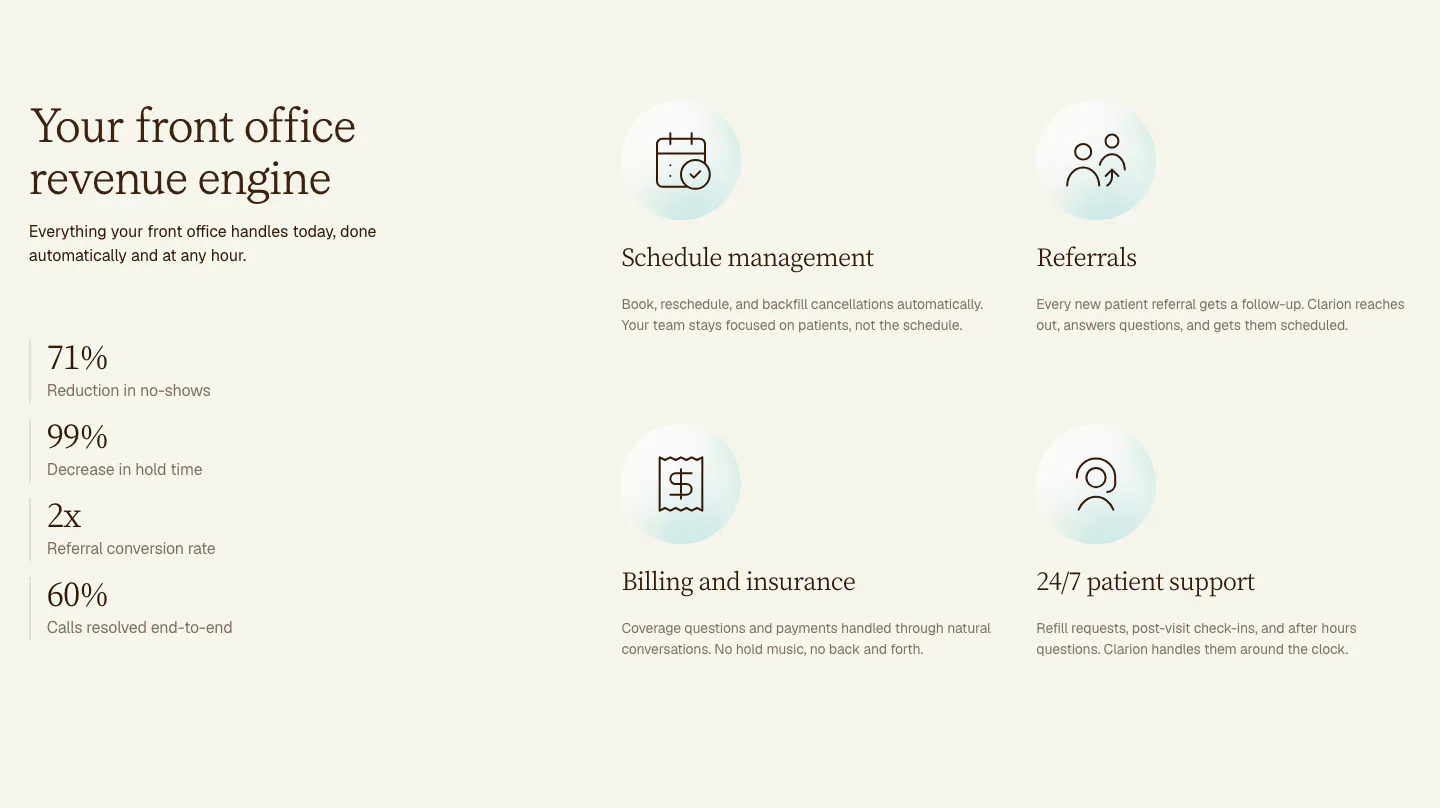
  287. Clarion features section: serif headline and four stacked metrics on the left, a 2x2 grid of icon features on the right, cream background
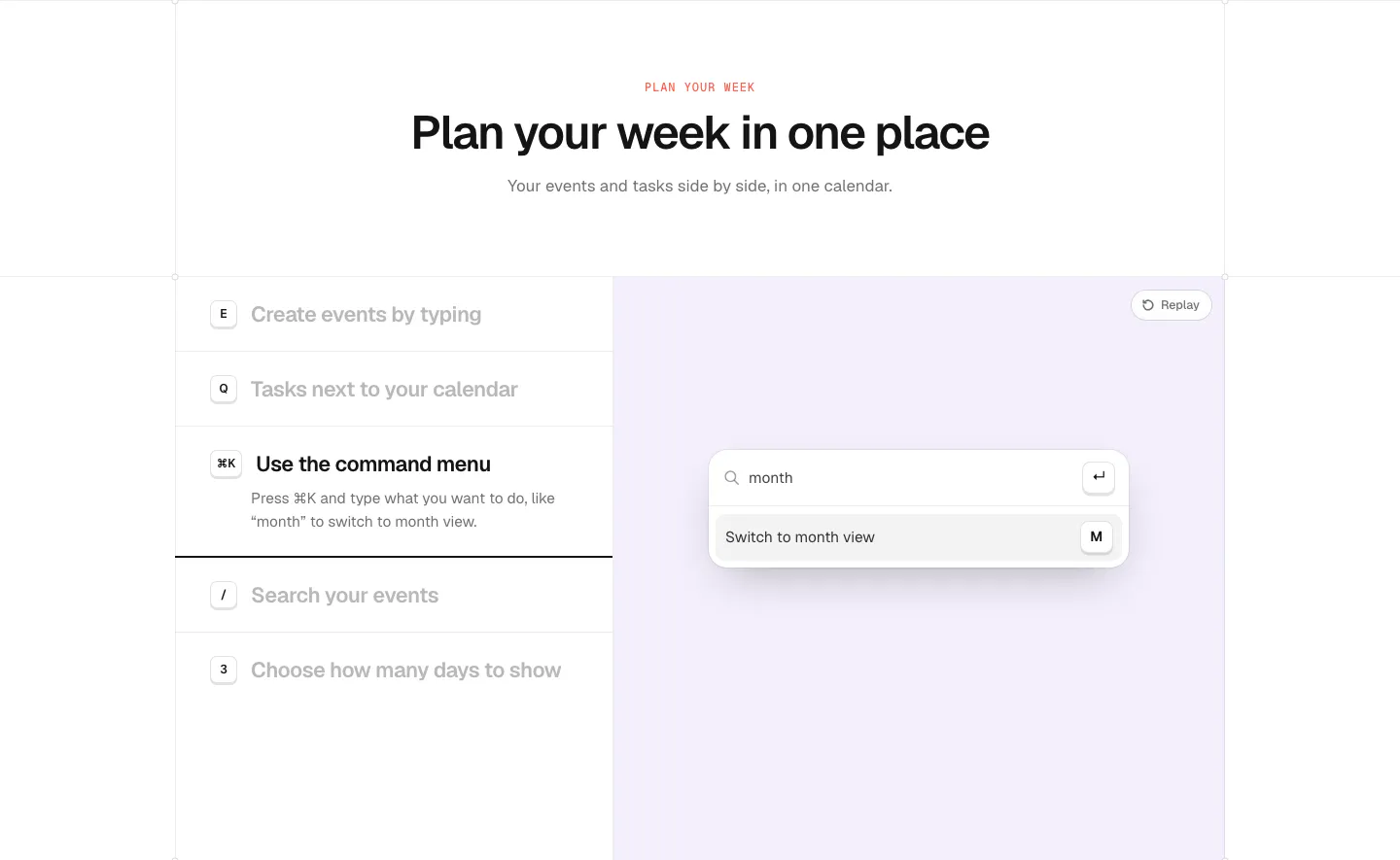
  288. time.fyi features section: centered header above a shortcut feature list on the left and a lavender panel with a command menu UI
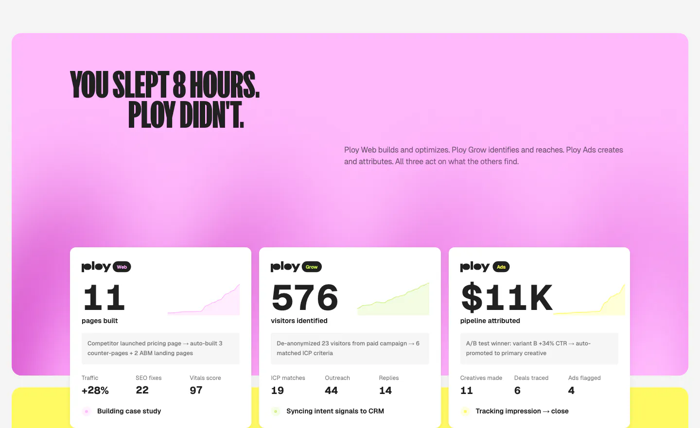
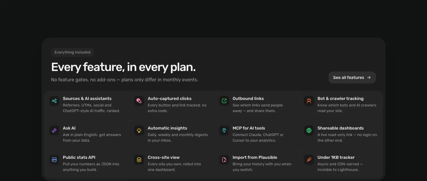
  289. Ploy features section: condensed headline on a pink gradient panel above three white metric cards with sparklines for Web, Grow and Ads
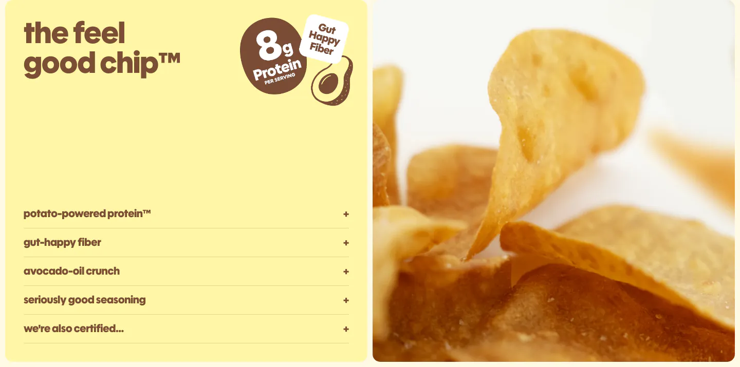
  290. Snackish features section: pale yellow panel with headline, protein badge and accordion list beside a close-up photo of potato chips
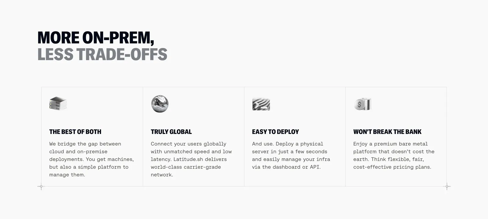
  291. Latitude.sh features section: two-tone uppercase headline above four bordered columns with small 3D icons and monospace copy
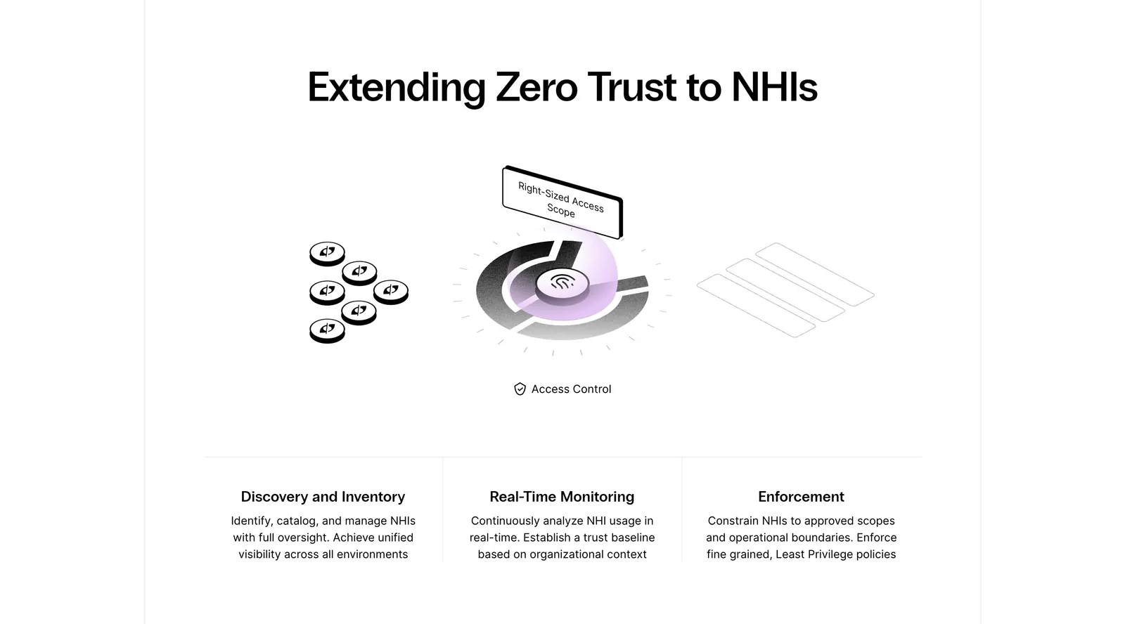
  292. Clutch Security features section: centered headline above a grayscale isometric access-control illustration and three capability columns
    Clutch Security
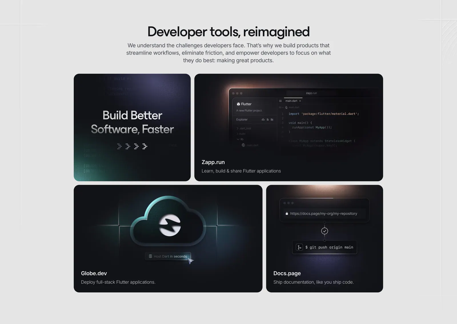
  293. Invertase features section: centered headline above a bento of four dark tiles showing a code editor, cloud icon and git push
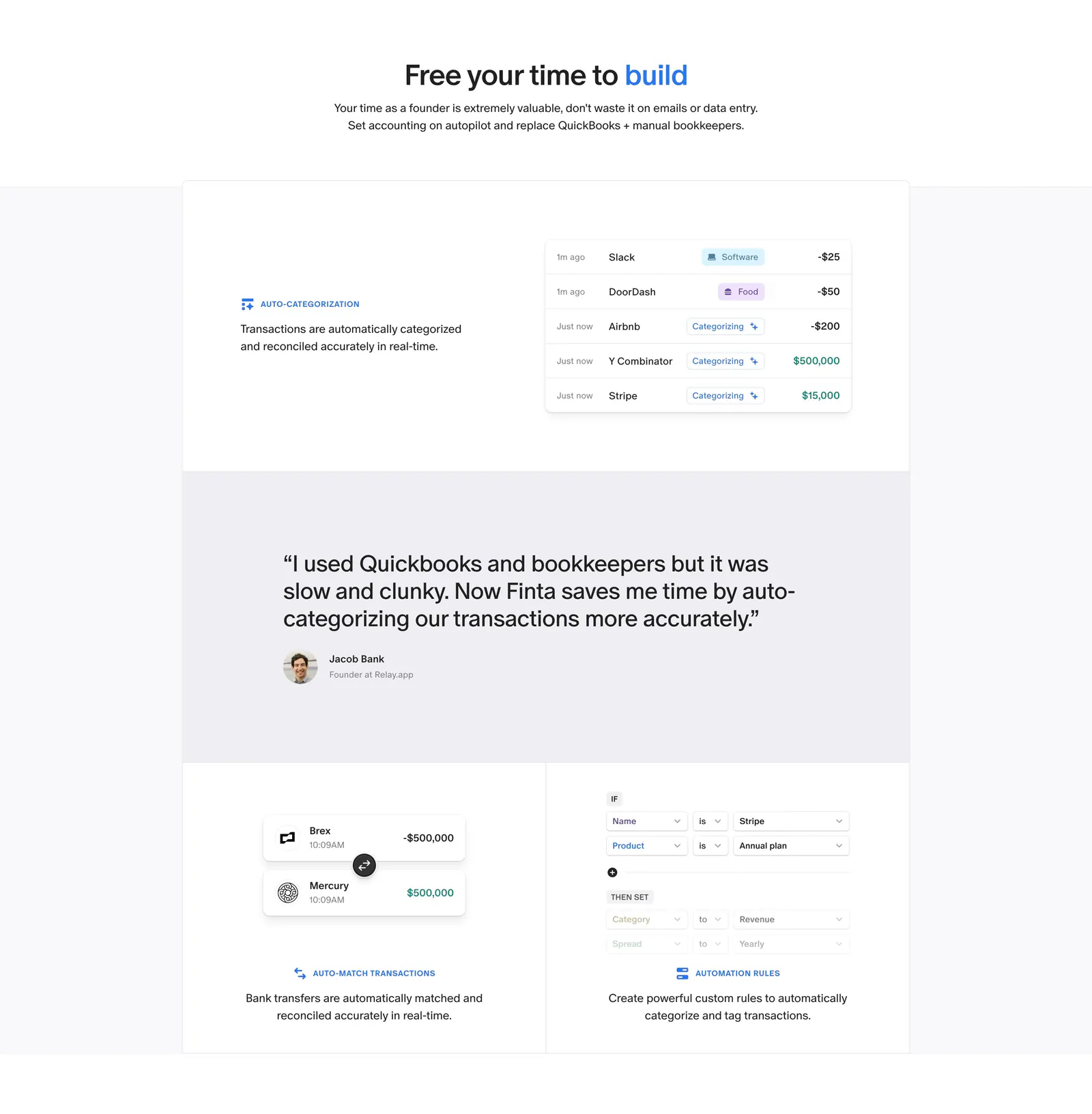
  294. Finta features section: centered headline above bordered tiles with transaction UI snippets and a customer quote band
  295. Piqo features section: rounded dark panel with pill label, headline and button above a 4x3 grid of icon features on near-black
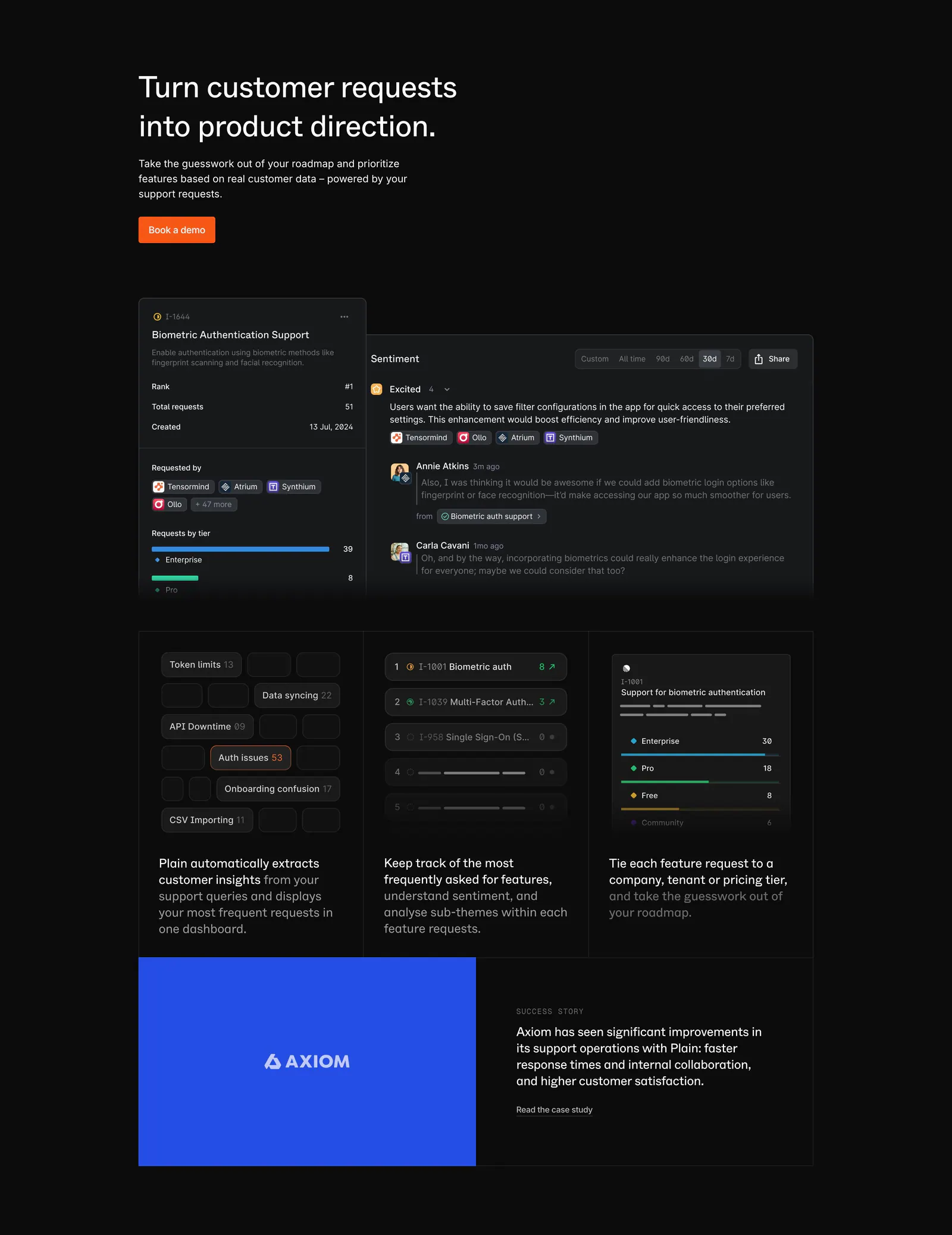
  296. Plain features section: dark headline with orange button above feature request UI panels, three insight cards and a blue Axiom case study
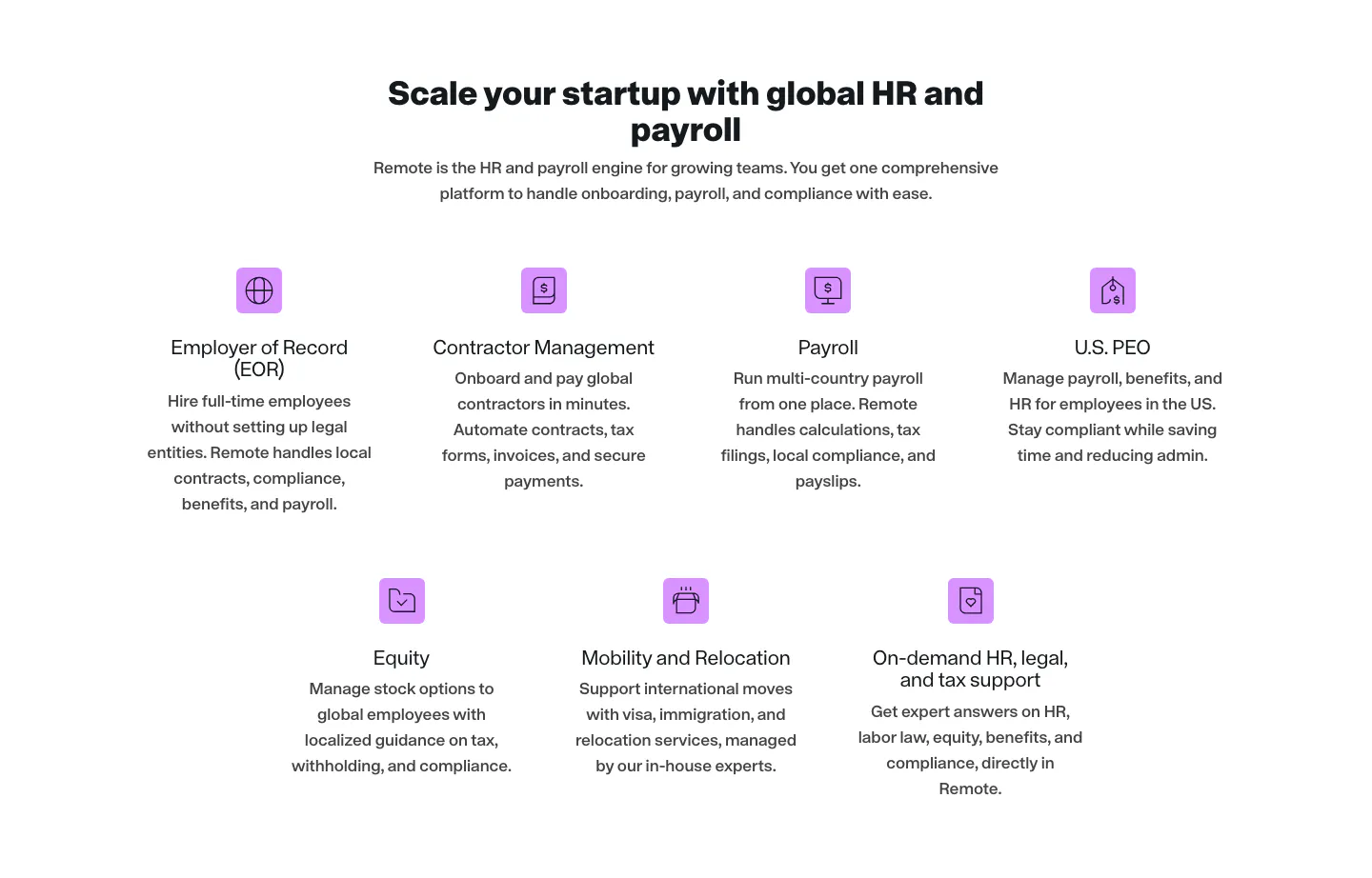
  297. Remote features section: centered headline above seven product items with purple icons in rows of four and three
  298. Weav features section: intro text on pink above a white card with an expandable feature list on the left and stacked sync and chat UI cards
  299. Hunar features section: dark background with four numbered capability rows, each pairing text with a line-art illustration on color
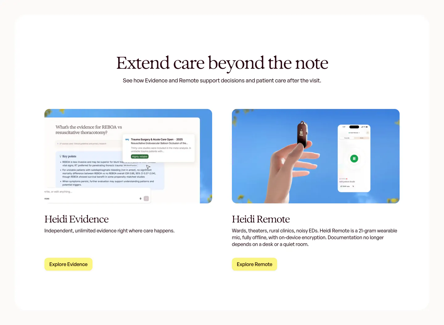
  300. Heidi features section: centered serif headline above two product cards, an Evidence answer UI and a hand holding the Remote mic
  301. Fernand features section: headline above three cards with sky and flower photos overlaid with small UI chips
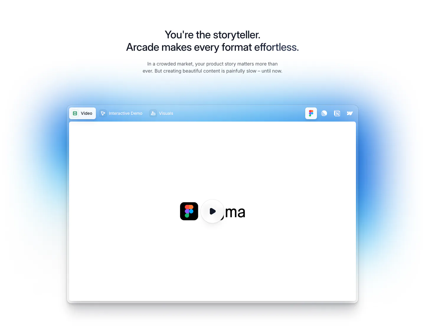
  302. Arcade features section: centered headline above a tabbed video player window with a play button and soft blue glow
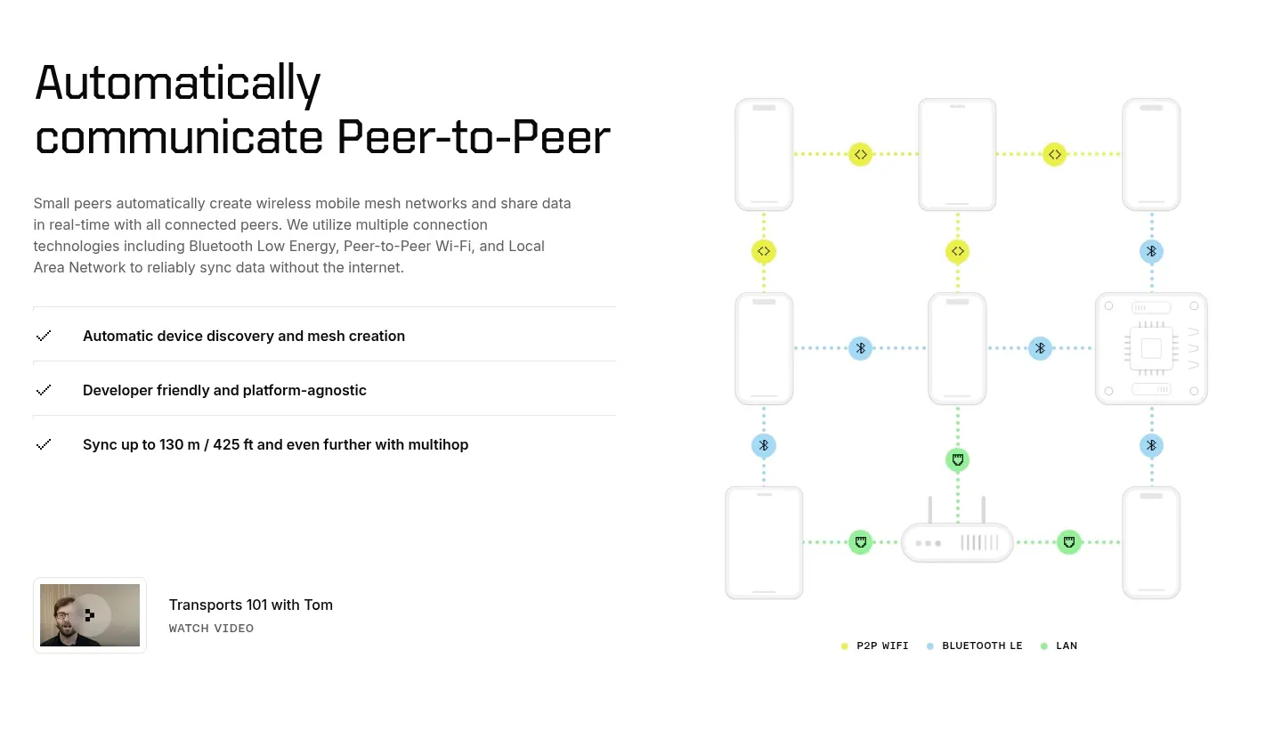
  303. Ditto features section: headline, copy and checklist on the left beside a dotted-line mesh network diagram of phones and devices
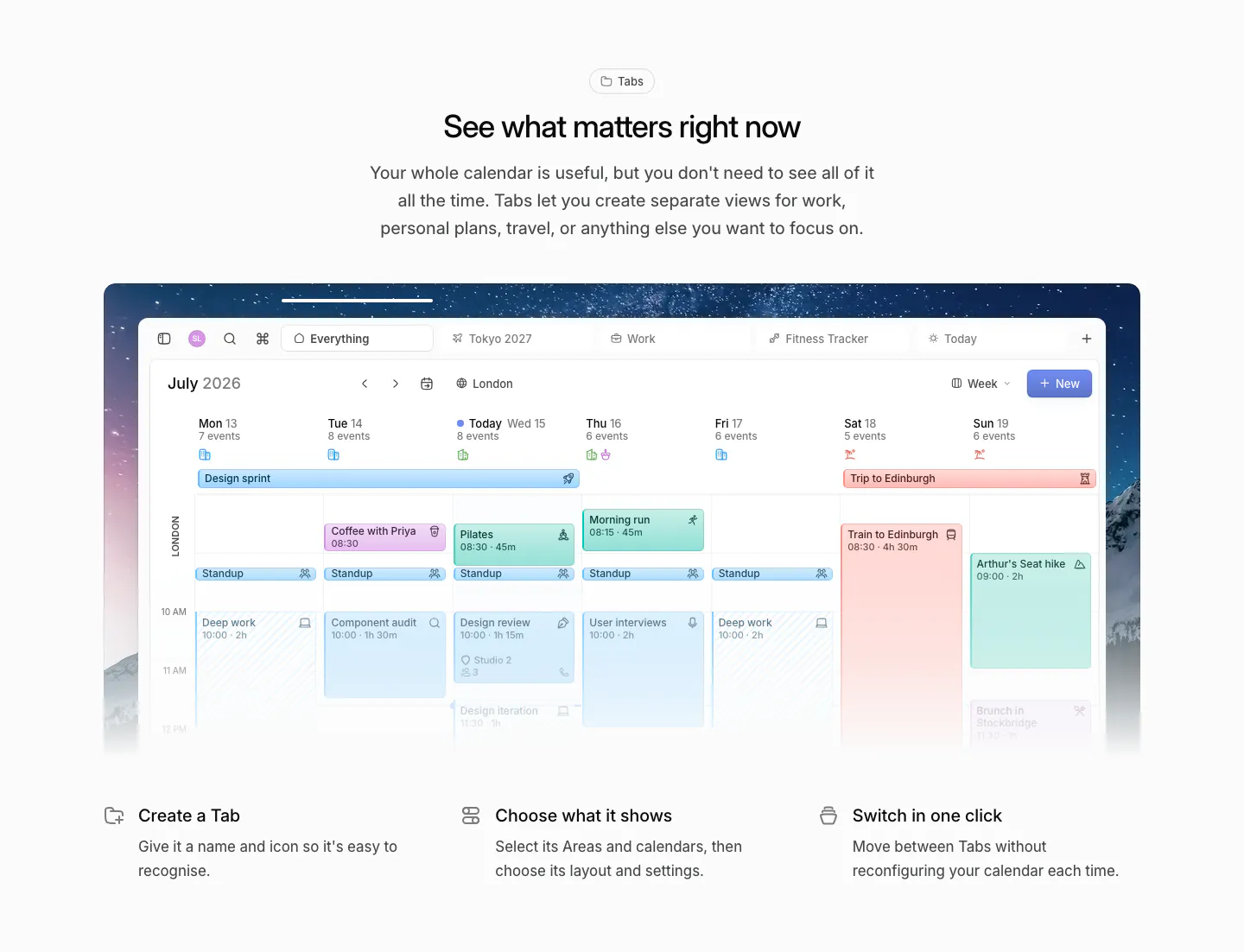
  304. Daybridge features section: centered headline above a week-view calendar screenshot on a night sky image and three feature columns
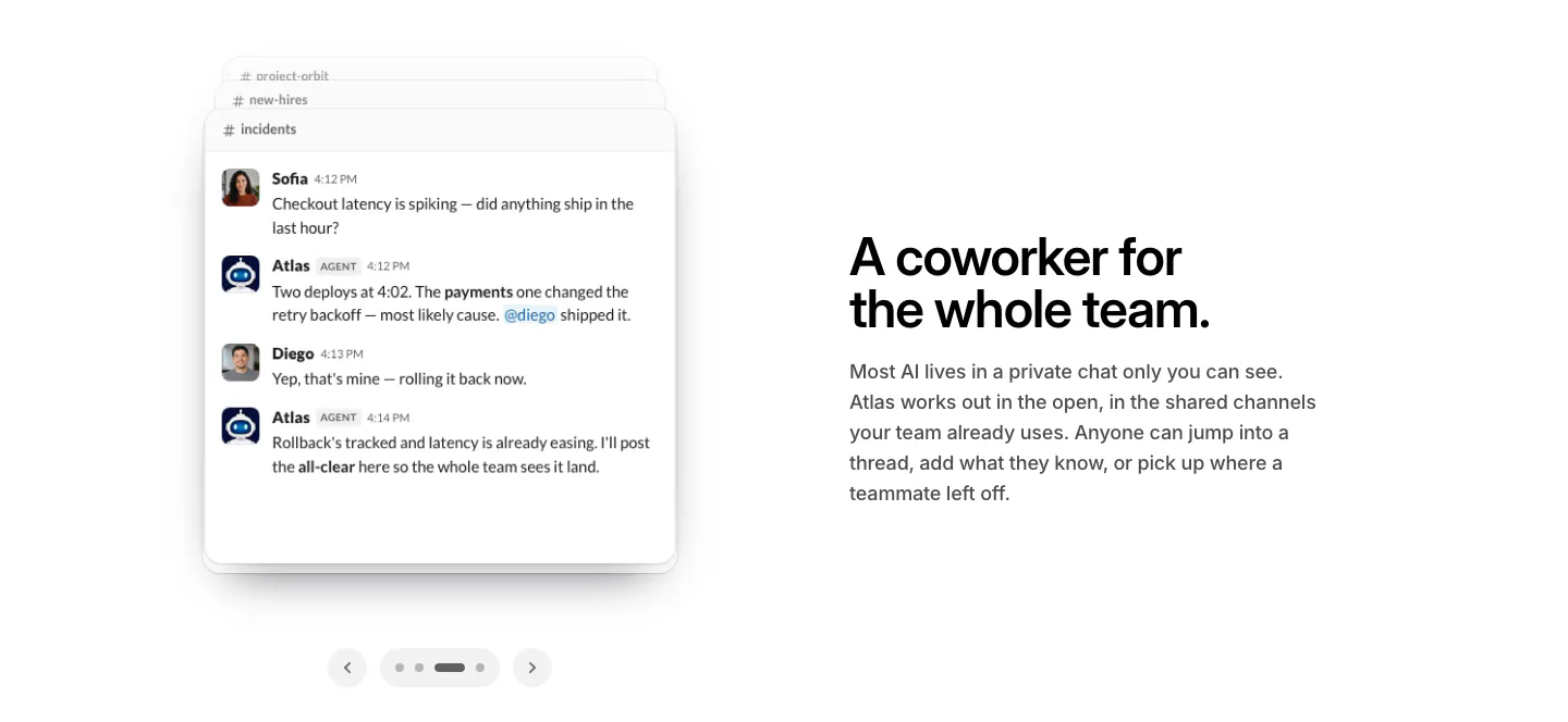
  305. WorkOS features section: Slack chat thread mockup with carousel arrows on the left, headline and copy on the right
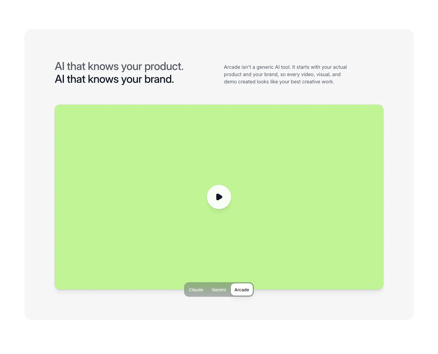
  306. Arcade features section: two-line headline and copy above a lime video panel with play button and a Claude/Gemini/Arcade toggle
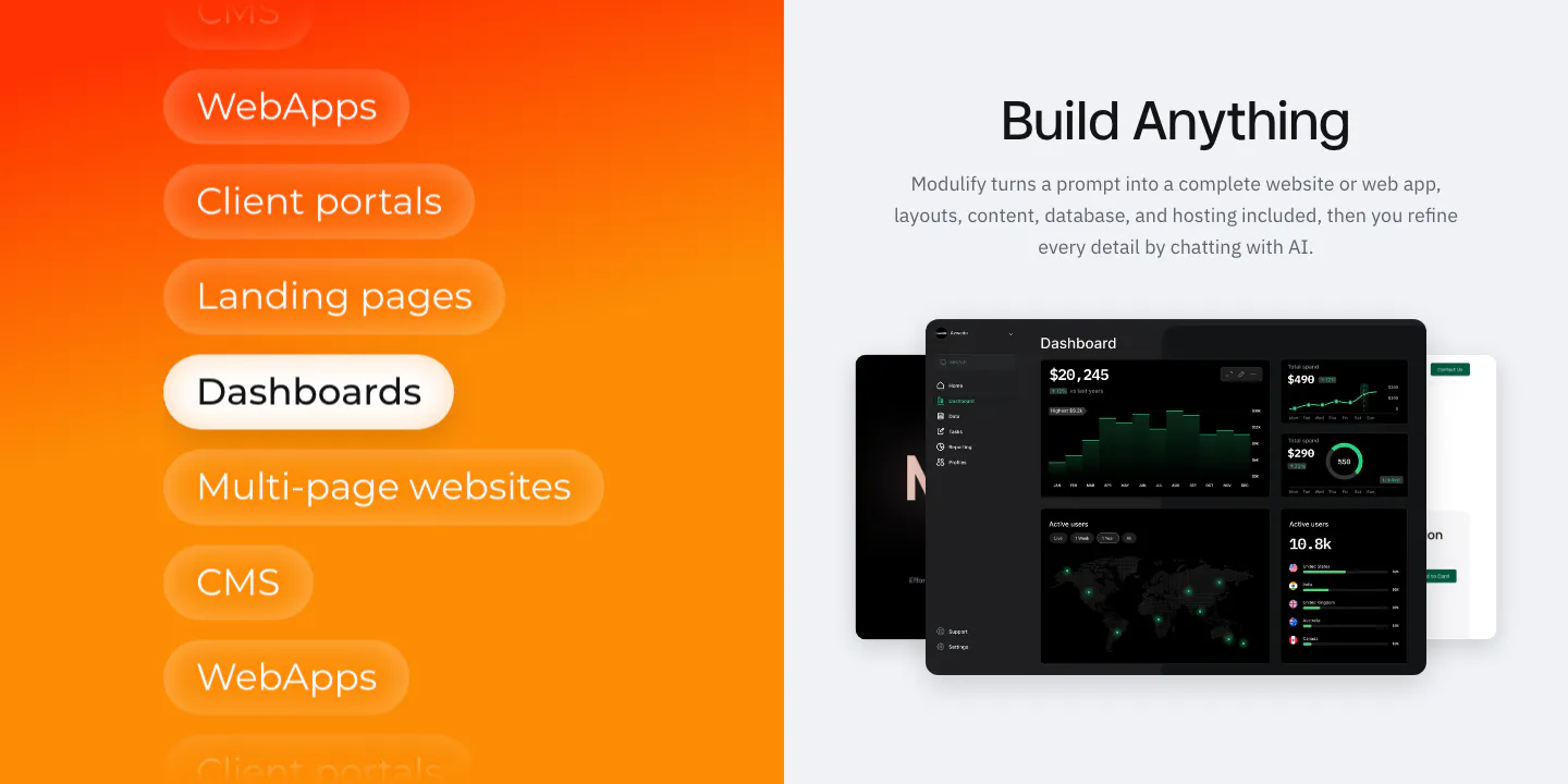
  307. Modulify features section: orange gradient panel of stacked use-case pills beside a headline and dark dashboard mockups
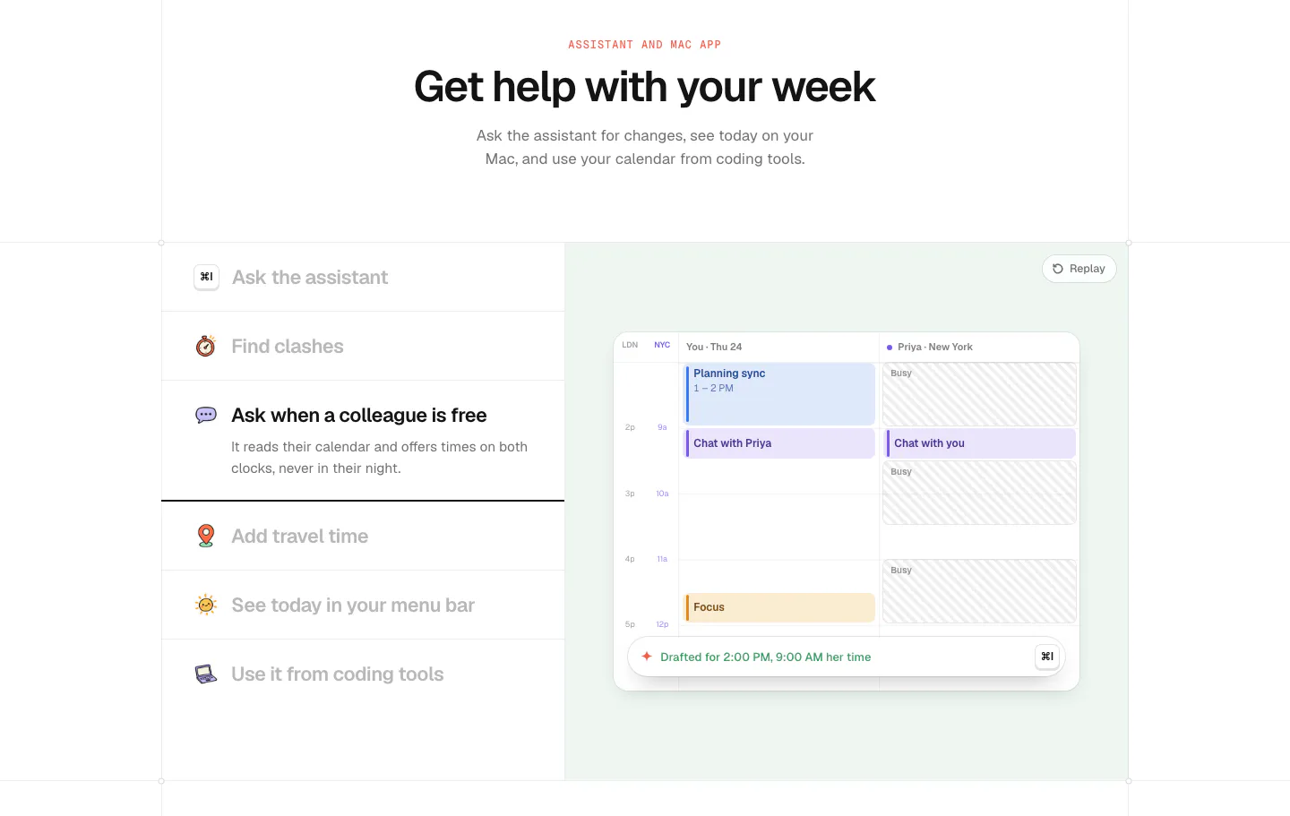
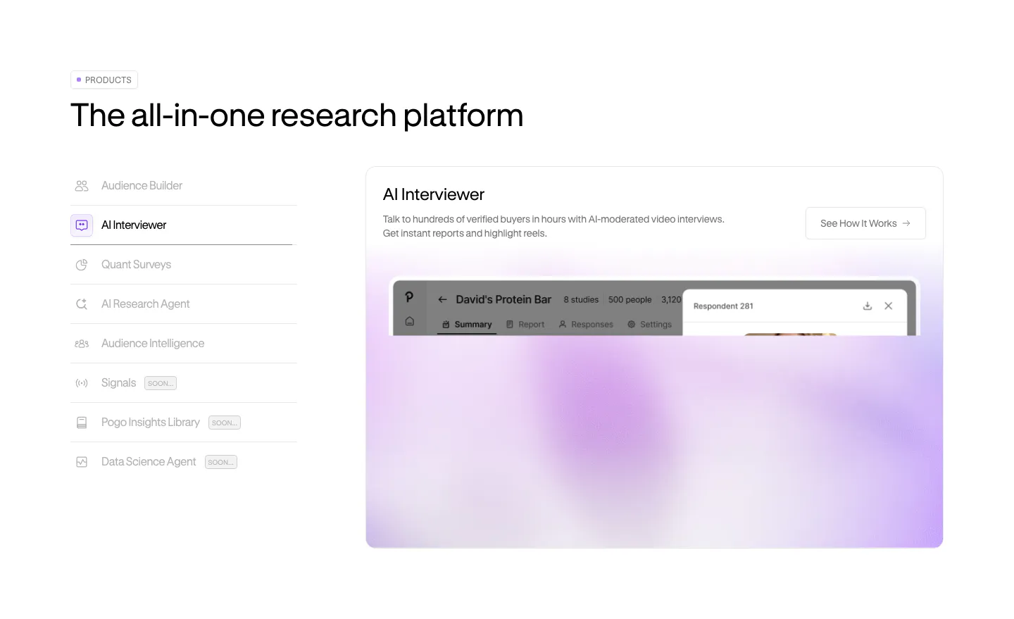
  308. time.fyi features section: centered header above an assistant feature list on the left and a mint panel with a shared calendar UI
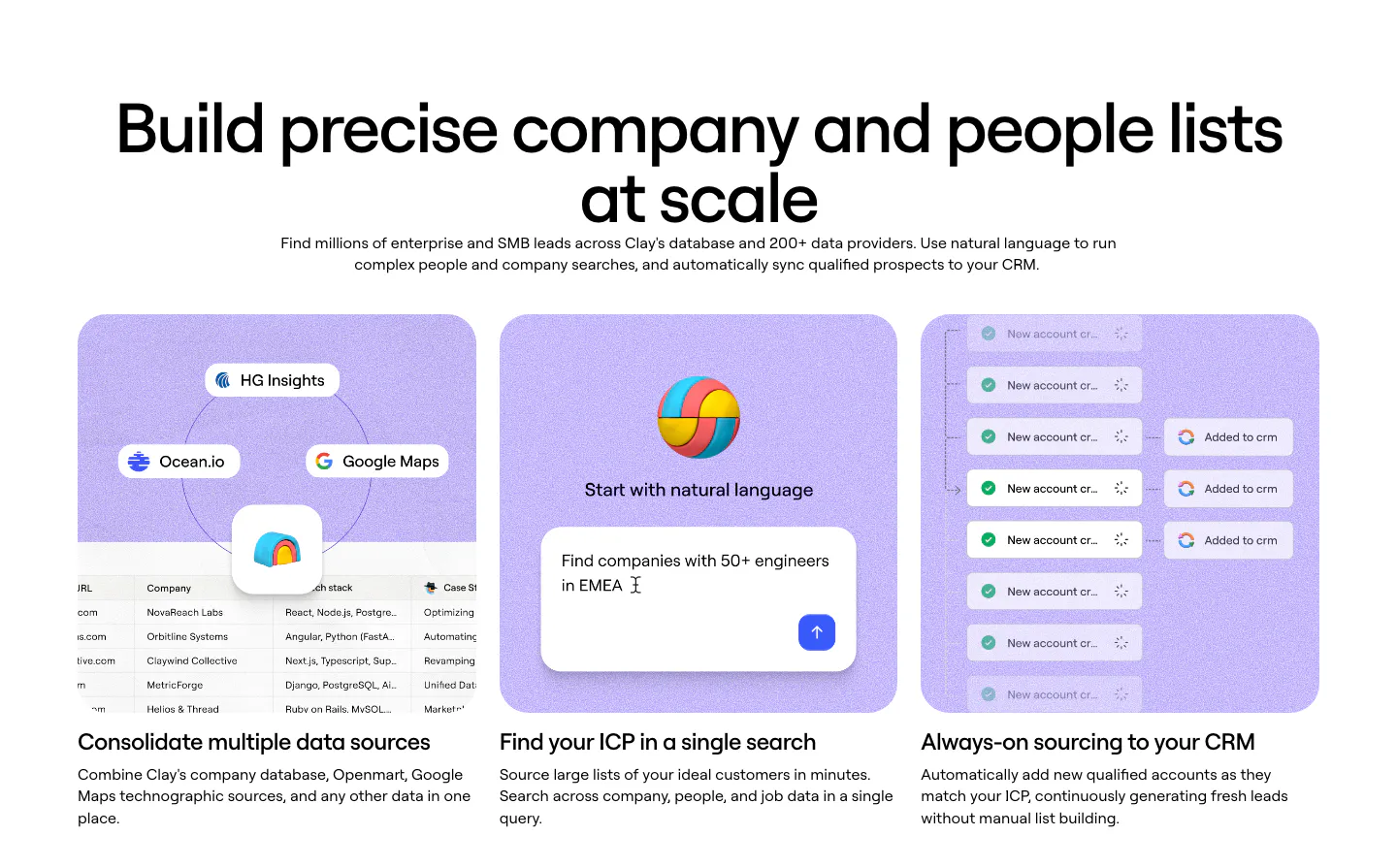
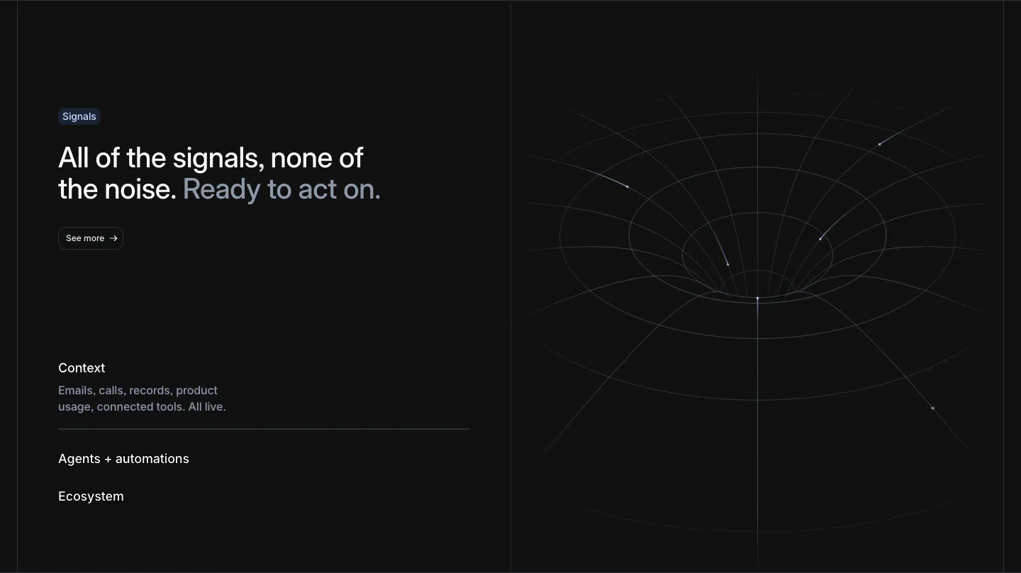
  309. Clay features section: centered heading above three lavender cards with data source, natural-language search and CRM sync UI mockups
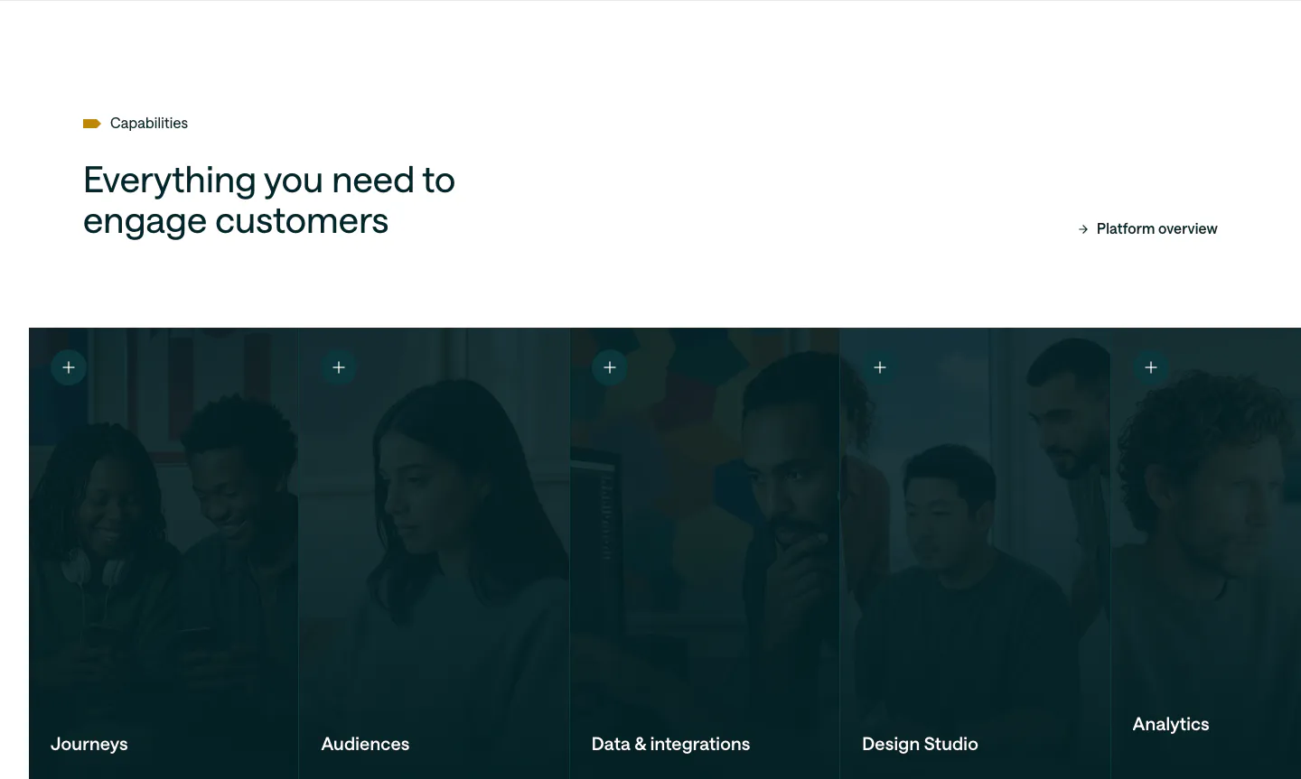
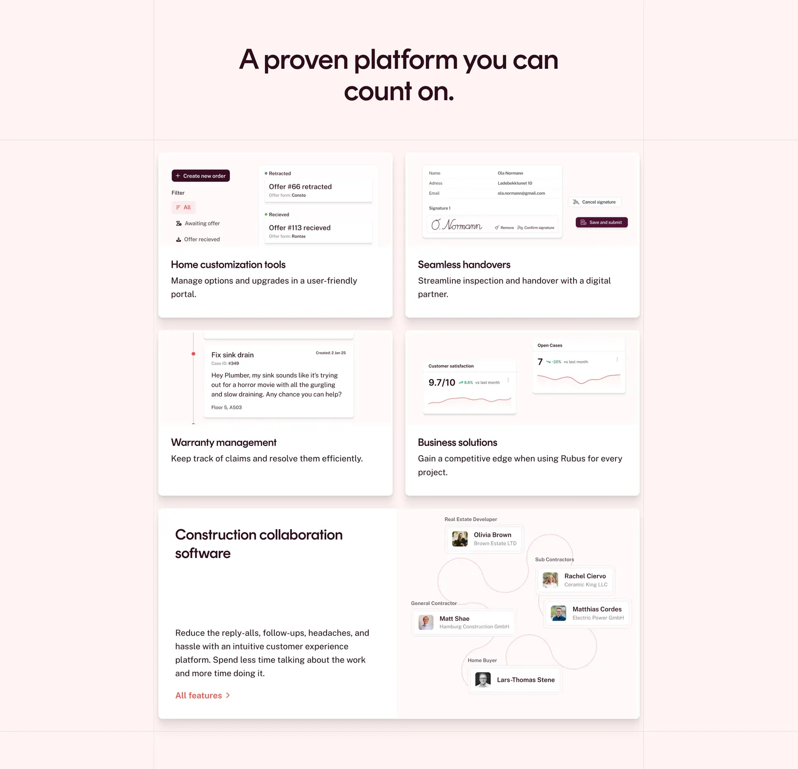
  310. Customer.io features section: headline above a row of five tall photo panels with a dark teal overlay, each labeled with a capability
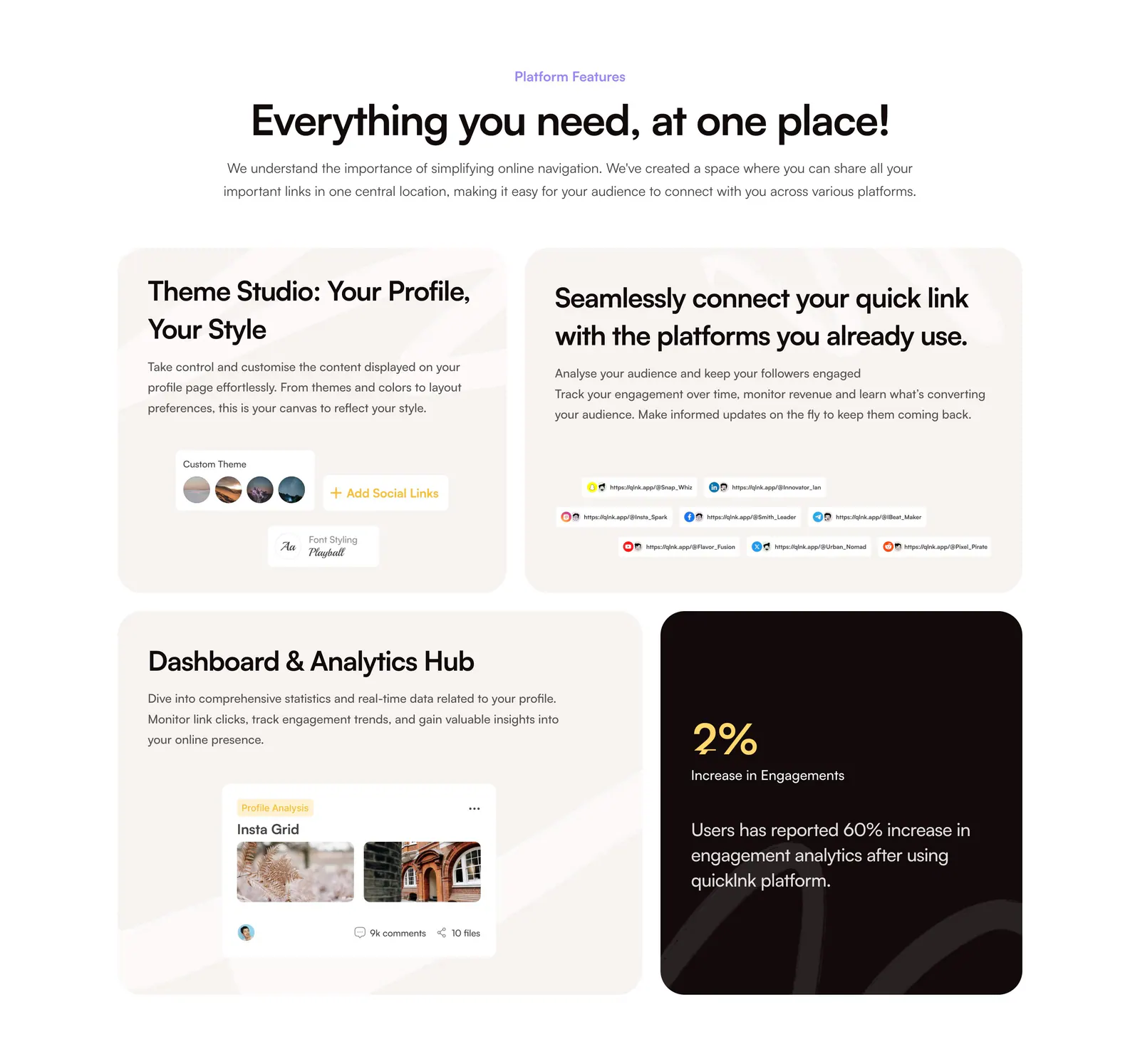
  311. QuickLnk features section: centered headline above a four-tile bento of beige cards with UI snippets and one dark stat card
  312. Greptile features section: centered product launch headline and button above a blue line-wave landscape illustration
  313. Visual features section: charcoal split layout with serif headline and numbered accordion left, floating AI editing UI cards and portrait right
  314. Intercom features section: headline with an ink drawing of running figures, then a Fin chat widget panel beside a three-item feature selector
  315. Pogo features section: vertical product tab list on the left beside a panel with a blurred lavender product screenshot
  316. Attio features section: headline with See more button and an expandable list at left, white wireframe funnel line art at right, dark
  317. Rubus features section: centered headline above a bento grid of feature cards with UI snippets and a collaboration diagram on pale pink
  318. Invertase features section: centered headline above four dark glowing cards in a 2x2 grid and six icon feature blurbs on light gray
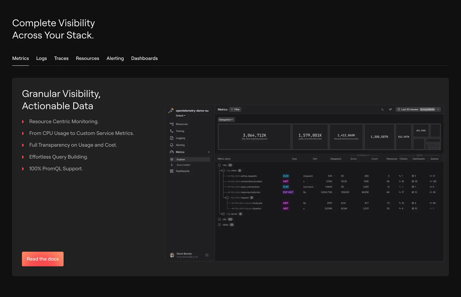
  319. Concourse features section: headline and button above three cards showing an integration icon ring, notification list and AI answer UI
  320. Interfere features section: numbered text block with capability list on the left and an issue inbox board screenshot on the right
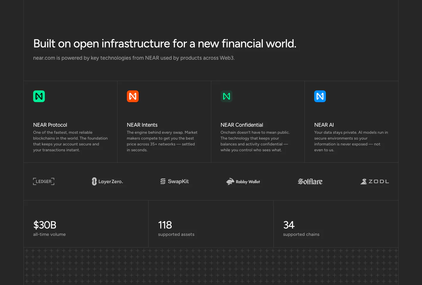
  321. NEAR features section: headline above four technology cards, a partner logo row and three large stats on a charcoal background
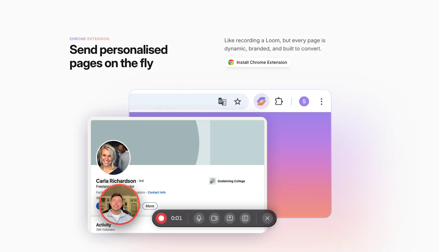
  322. Sendr features section: Chrome Extension headline and install button above a LinkedIn profile mockup with a video recording toolbar
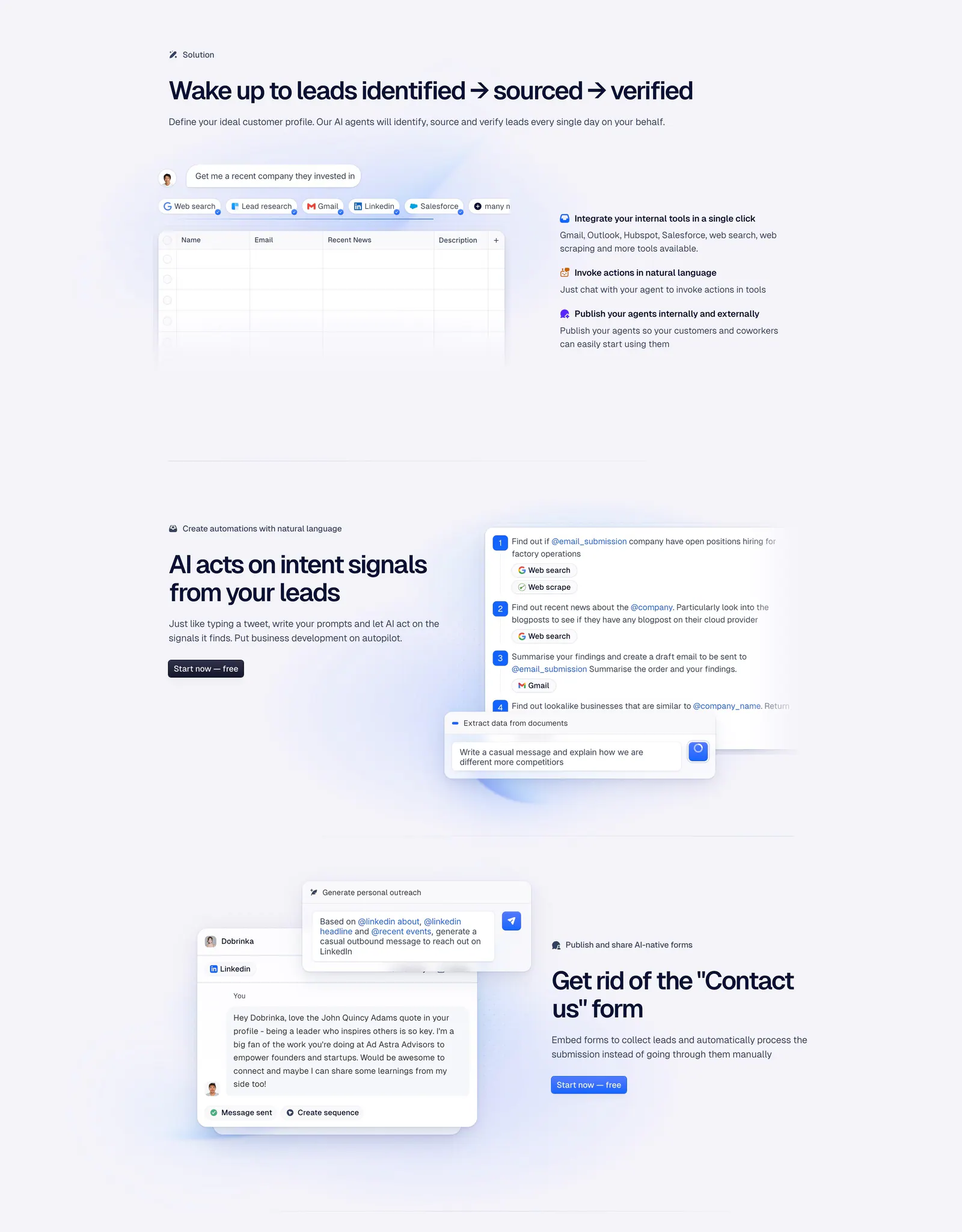
  323. Godmode features section: three zig-zag rows pairing agent chat, automation steps and outreach message UI mockups with short copy
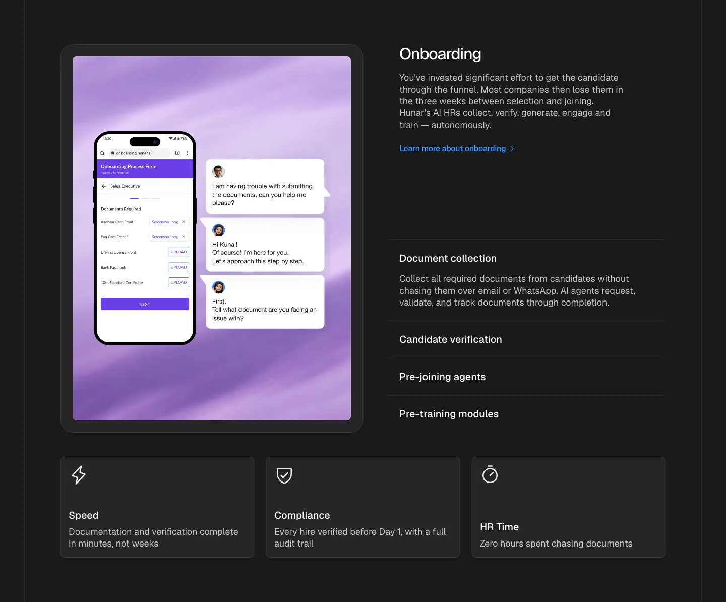
  324. Hunar features section: dark background with a phone onboarding form mockup on the left, accordion list on the right, three cards below
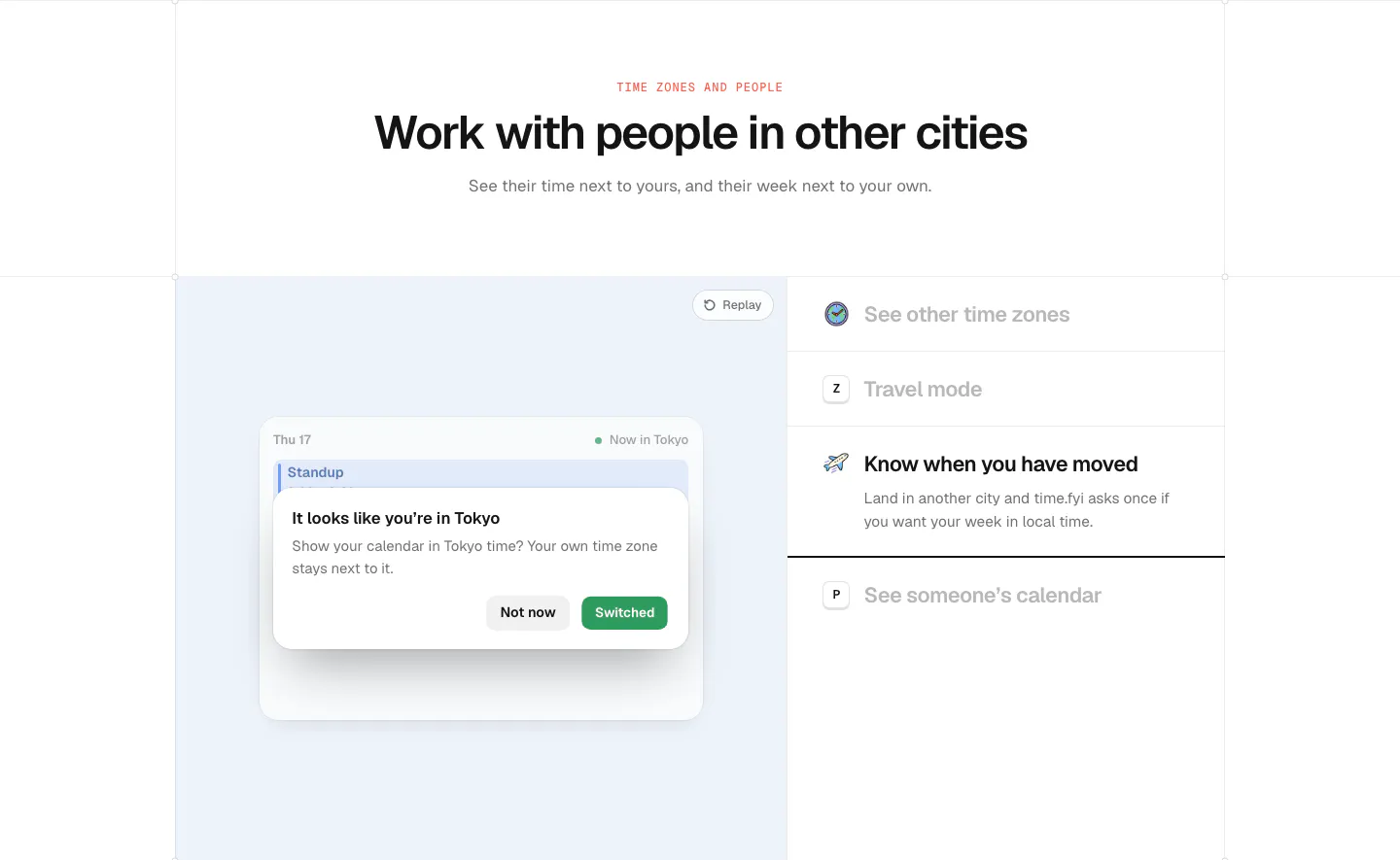
  325. time.fyi features section: centered header above a light blue panel with a time zone prompt UI and a feature list on the right
  326. Dash0 features section: tab bar above a card with a bullet list and a dark metrics explorer screenshot on a near-black background
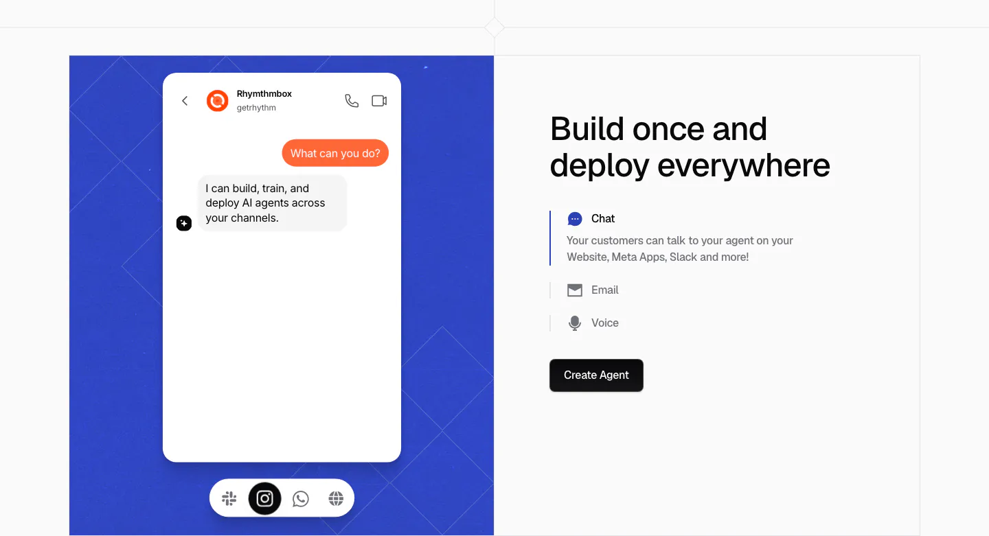
  327. Chatbase features section: blue patterned panel with a chat app mockup on the left, headline and Chat, Email, Voice selector on the right
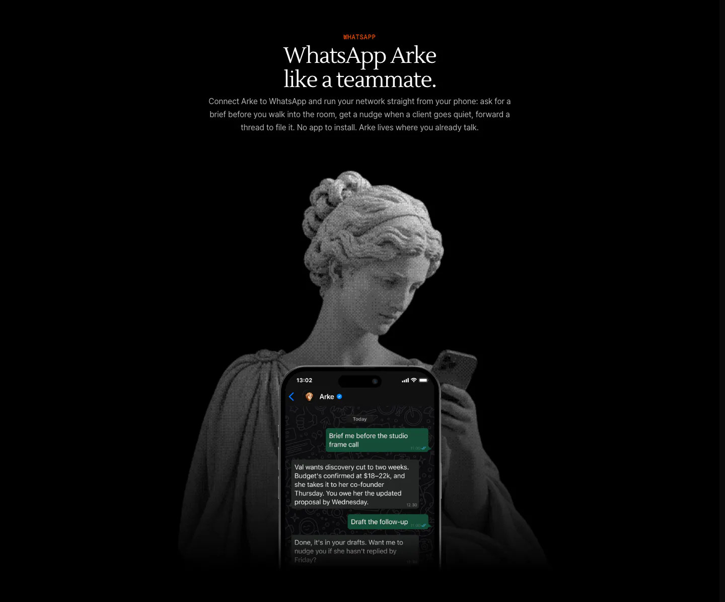
  328. Arke features section: centered serif headline above a halftone marble statue holding a phone showing a WhatsApp chat with Arke
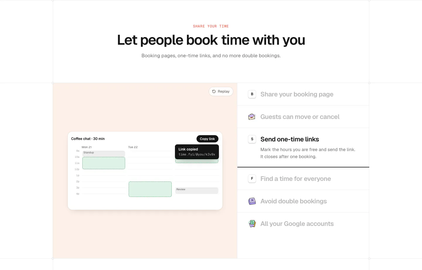
  329. time.fyi features section: centered header above a peach panel with a booking calendar UI and a feature list on the right
  330. NickAI features section: left heading above a two-column grid of chat prompts with chart, portfolio and order widget screenshots
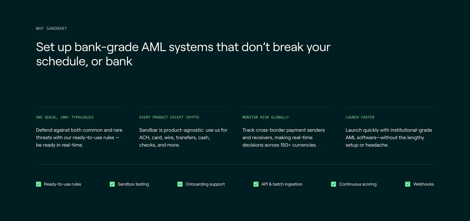
  331. Sandbar features section: left-aligned headline above four benefit columns and a row of checklist items on a dark teal background
  332. Conduit features section: dark brown panel with numbered feature list flanking a central resolved-ticket UI card
  333. Modulify features section: centered headline above a four-card bento of product UI mockups on an orange gradient band
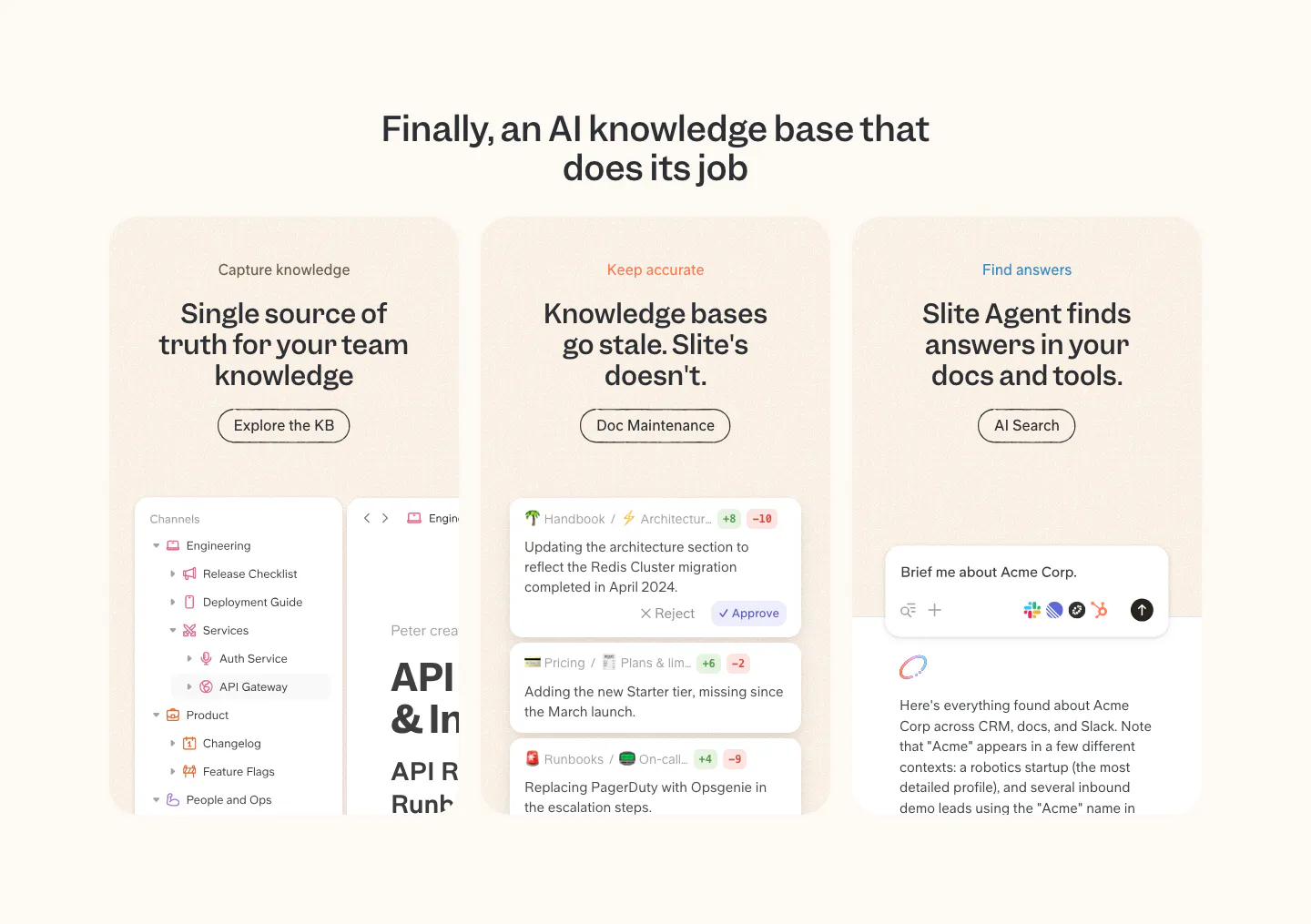
  334. Slite features section: centered headline over three peach cards for capture, accuracy and search, each with a product UI snippet
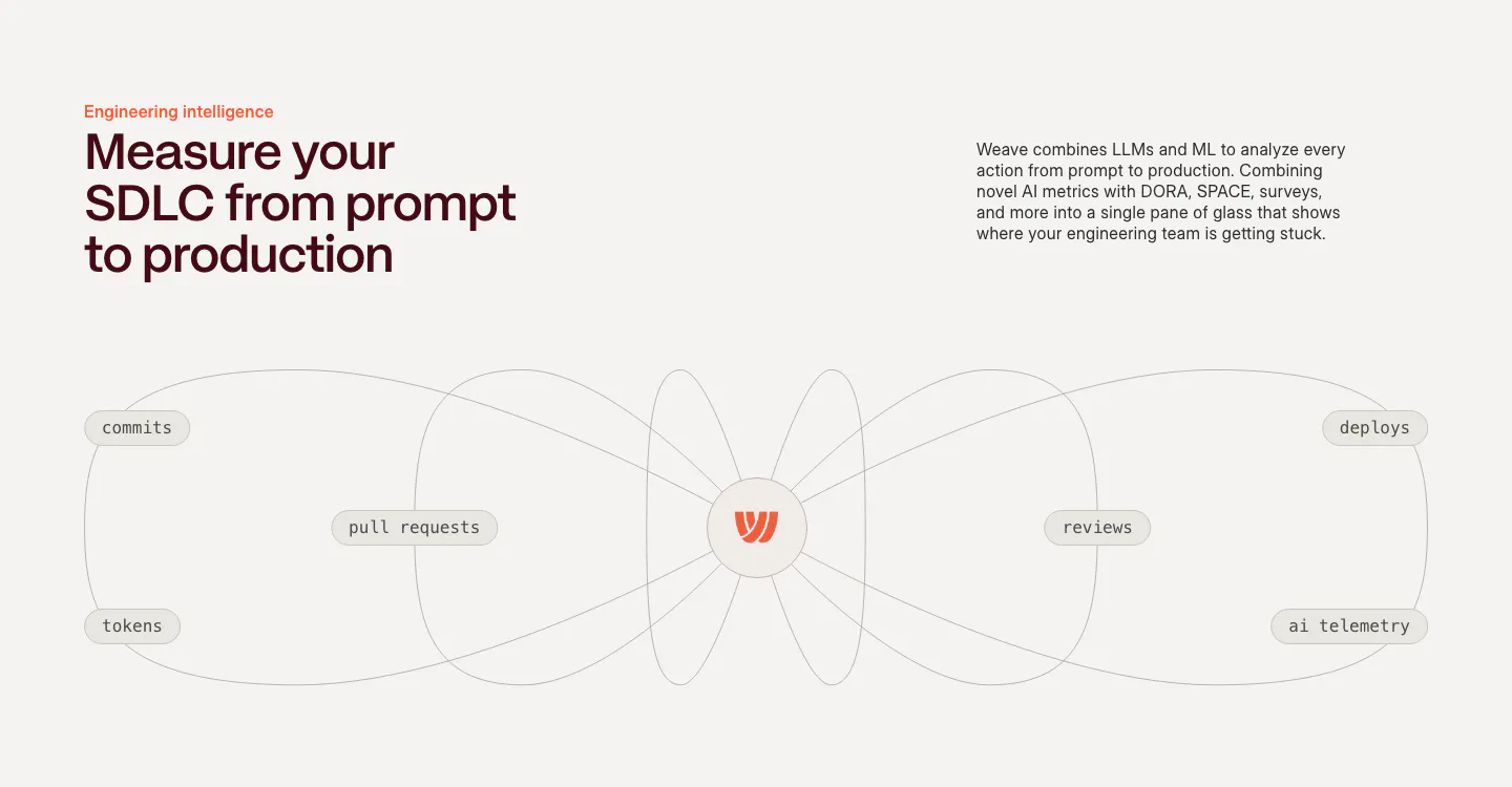
  335. Weave features section: headline and copy above a line diagram connecting commits, PRs, tokens, reviews and deploys to a central logo
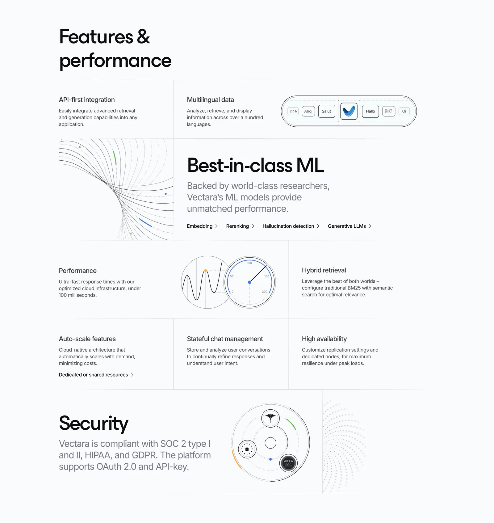
  336. Vectara features section: grid of feature cells in mixed sizes with line-art diagrams, a gauge and a security badge graphic on light gray
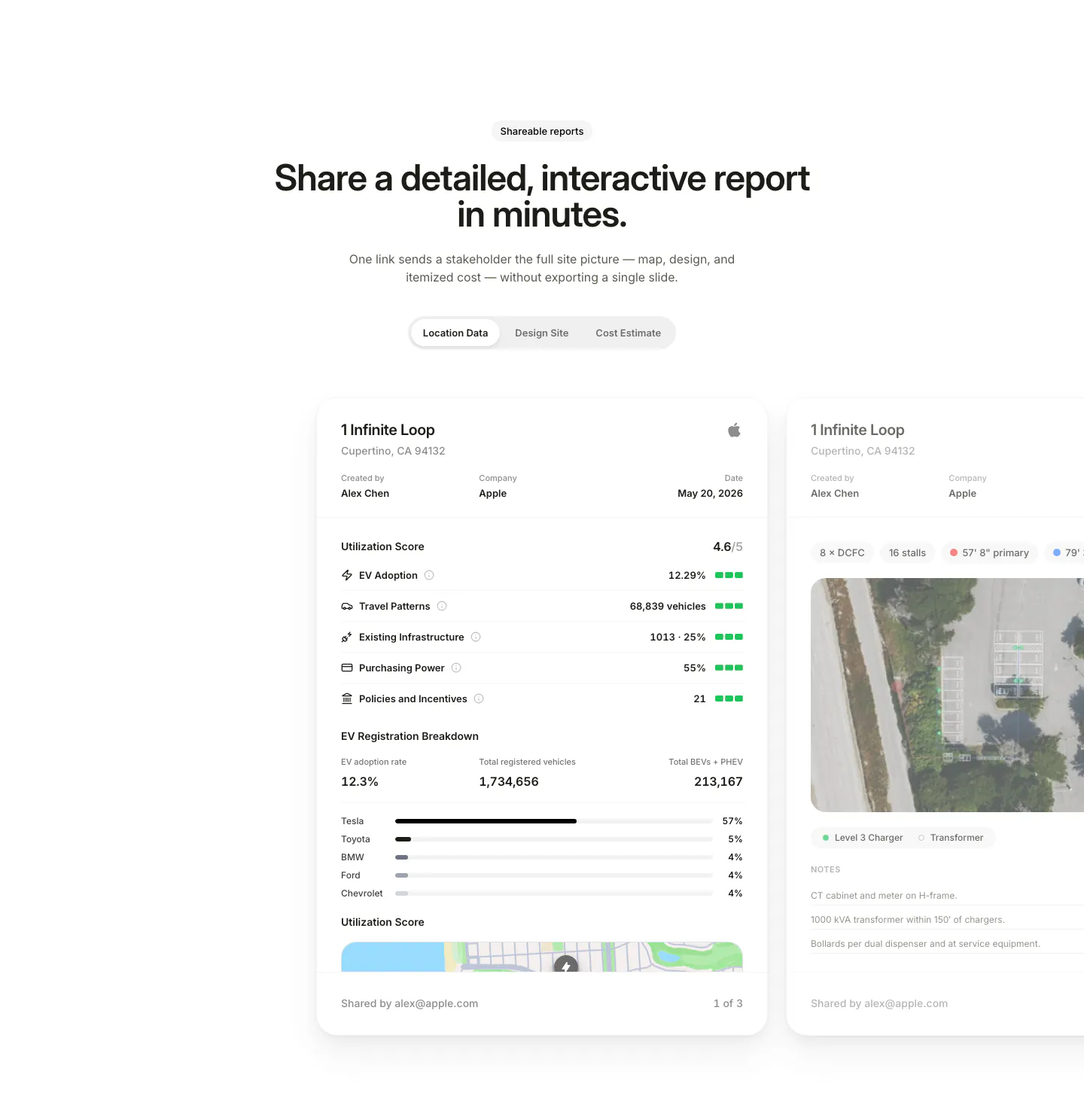
  337. EVpin features section: centered heading and segmented tabs above site report cards with utilization scores, cut off at the right edge
  338. Mintlify features section: headline with button above a bento grid of light cards with abstract UI mockups and green line art
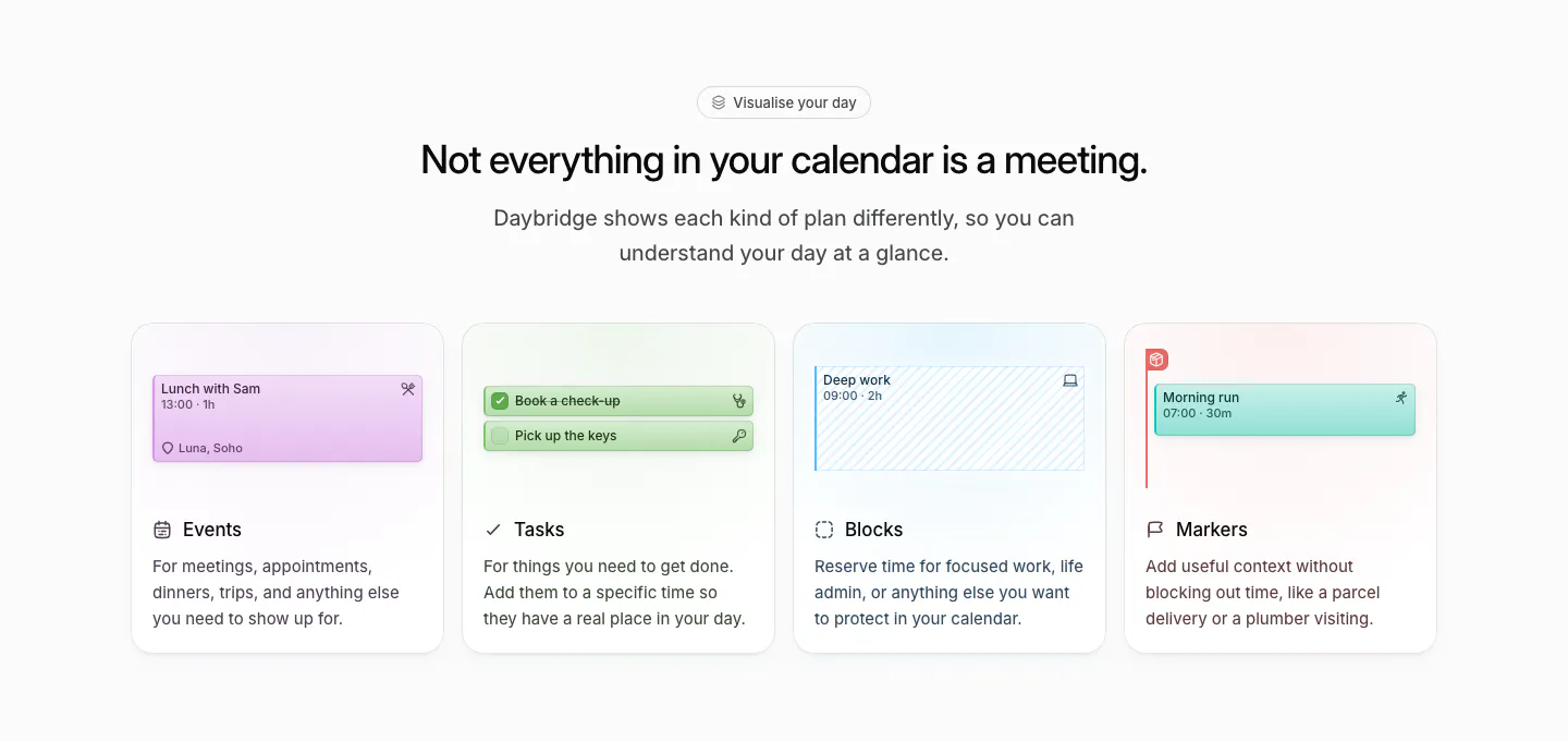
  339. Daybridge features section: centered headline above four equal cards for events, tasks, blocks and markers with UI snippets
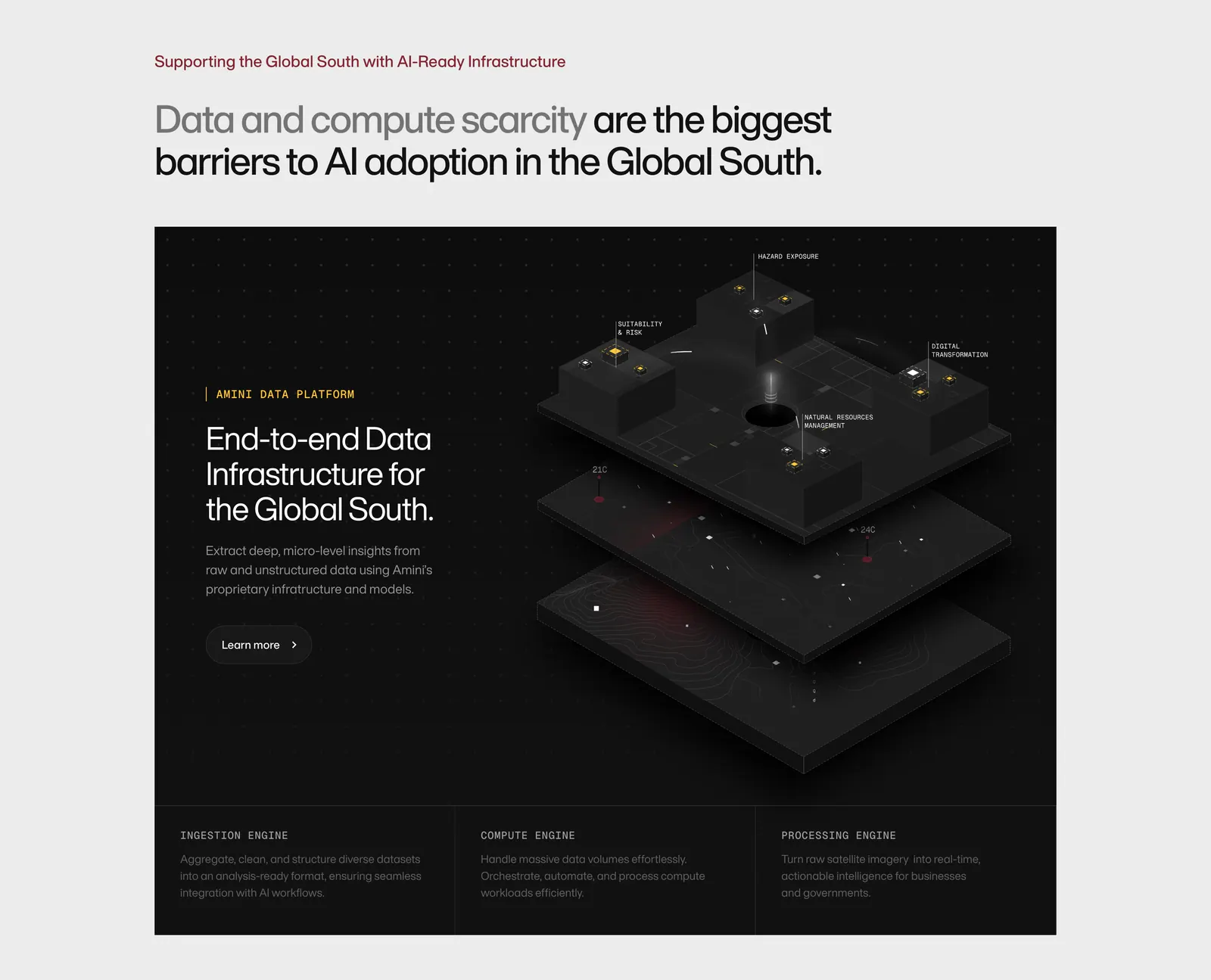
  340. Amini features section: headline on light gray above a dark panel with text and an isometric 3D data platform render, three engine columns
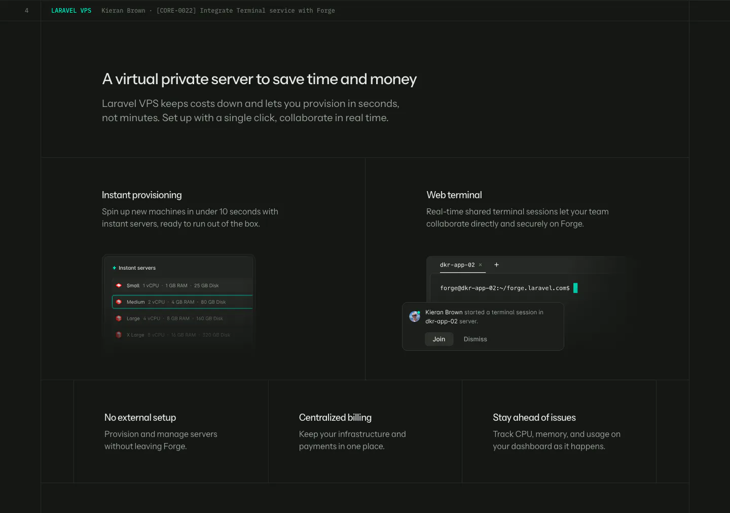
  341. Laravel Forge features section: dark grid with two UI tiles (server list, web terminal) above three smaller feature tiles
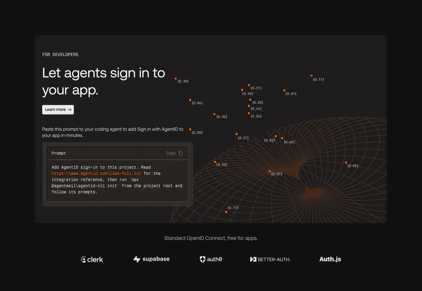
  342. AgentID features section: dark developer panel with headline, prompt code block and orange wireframe globe above a row of auth provider logos
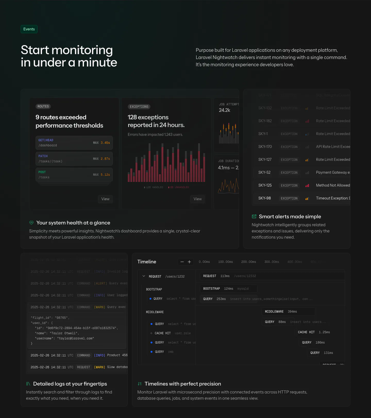
  343. Laravel Nightwatch features section: headline and intro above a dark bento grid of route, exception, alert, log and timeline UI cards
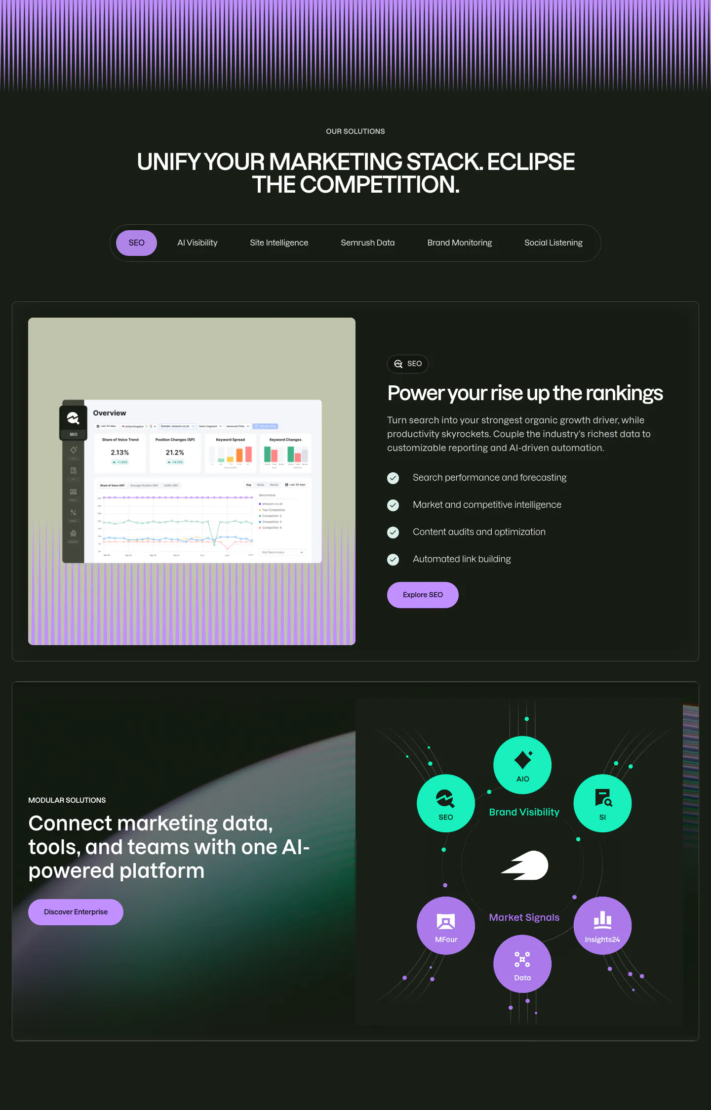
  344. Semrush features section: dark tabbed solutions block with a product screenshot beside a checklist, then a product module orbit diagram
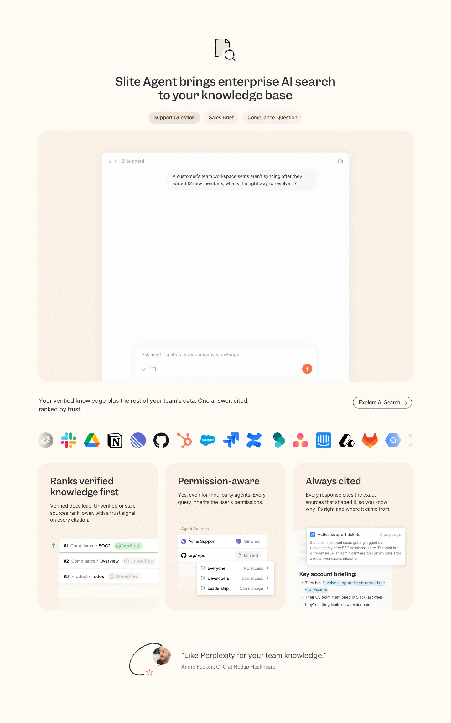
  345. Slite features section: tabbed AI search chat mockup, app icon row, three capability cards with UI snippets and a short customer quote
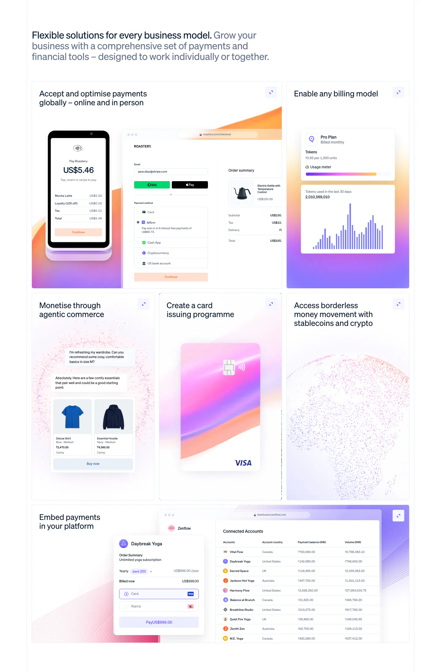
  346. Stripe features section: left-aligned headline above a six-tile bento grid with POS terminal, checkout, billing chart, card and accounts table UI
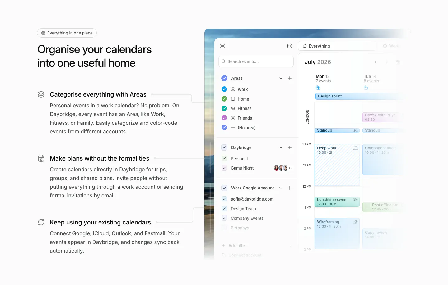
  347. Daybridge features section: headline and three icon-led feature points on the left, calendar app screenshot with areas sidebar right
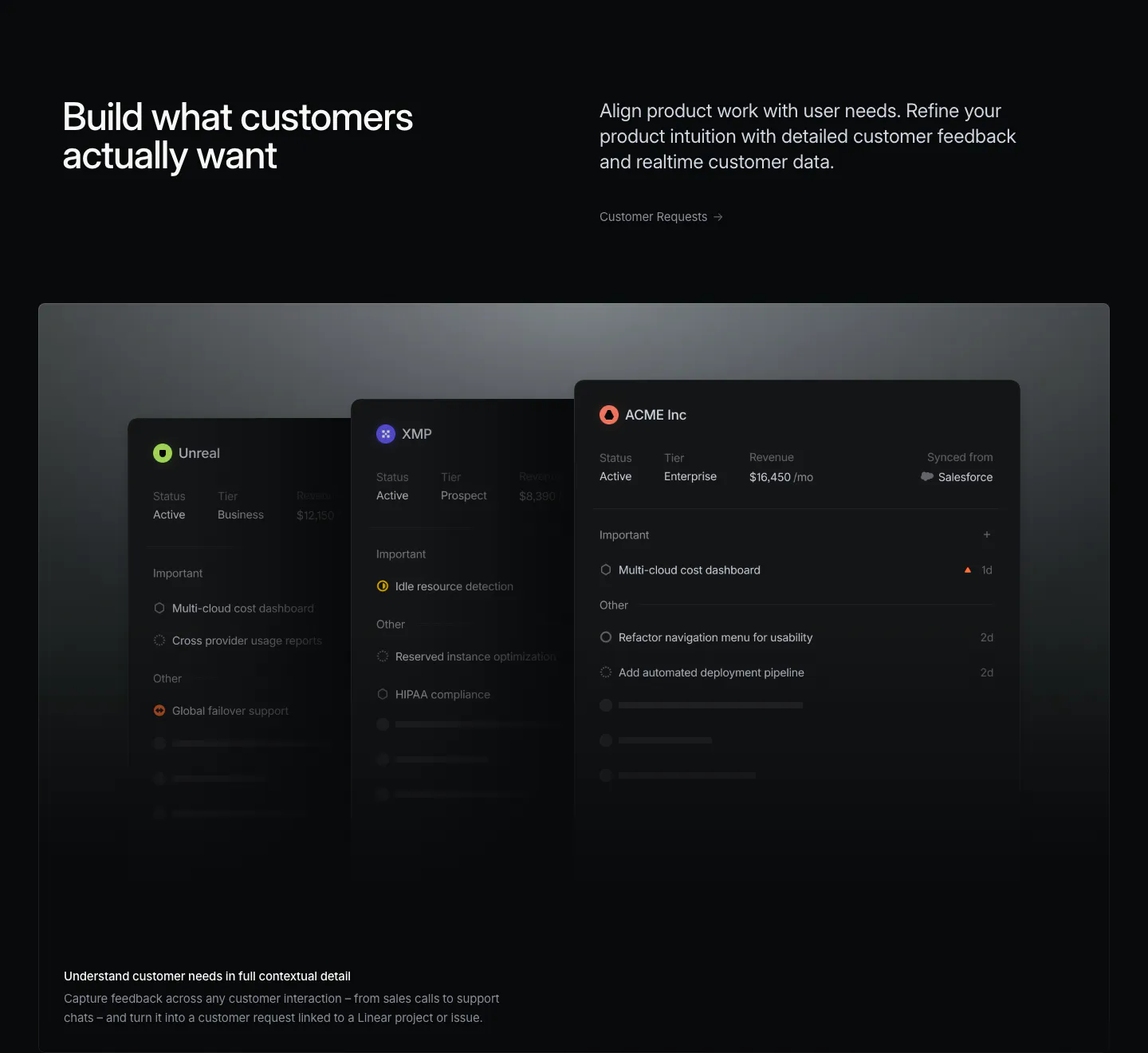
  348. Linear features section: headline left, short copy and link right, above a wide panel of stacked dark customer request cards on near-black
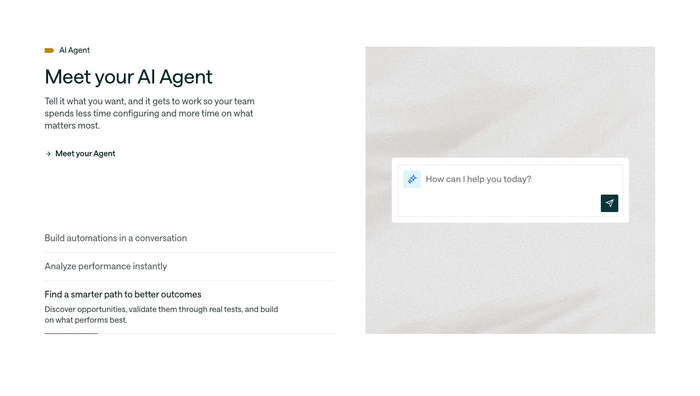
  349. Customer.io features section: split layout with headline and accordion list beside an AI agent chat input on a soft textured panel
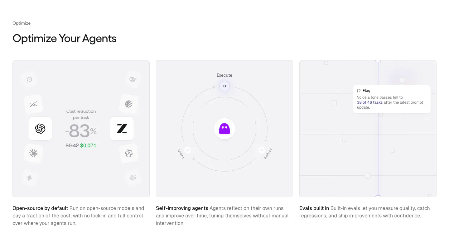
  350. Gumloop features section: left-aligned heading above three equal gray cards with cost, self-improving and evals visuals
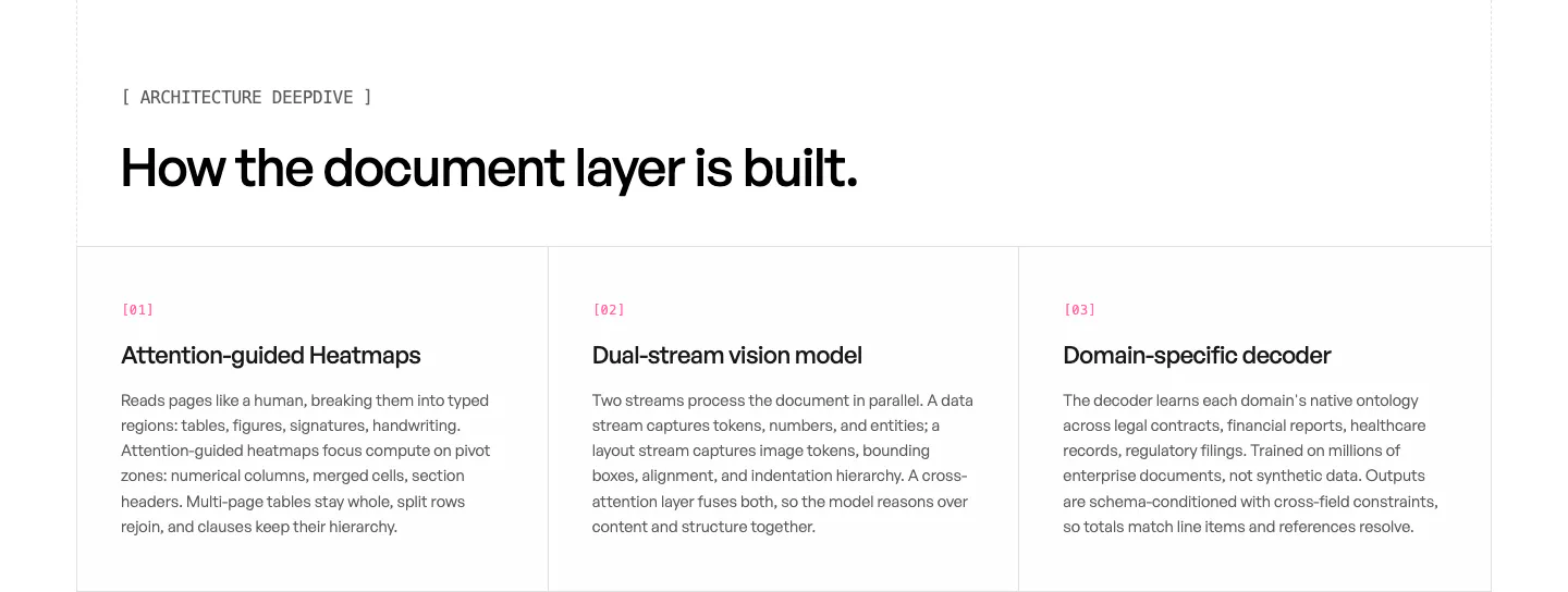
  351. Unsiloed features section: left headline above three bordered columns numbered 01 to 03 describing model architecture components on white
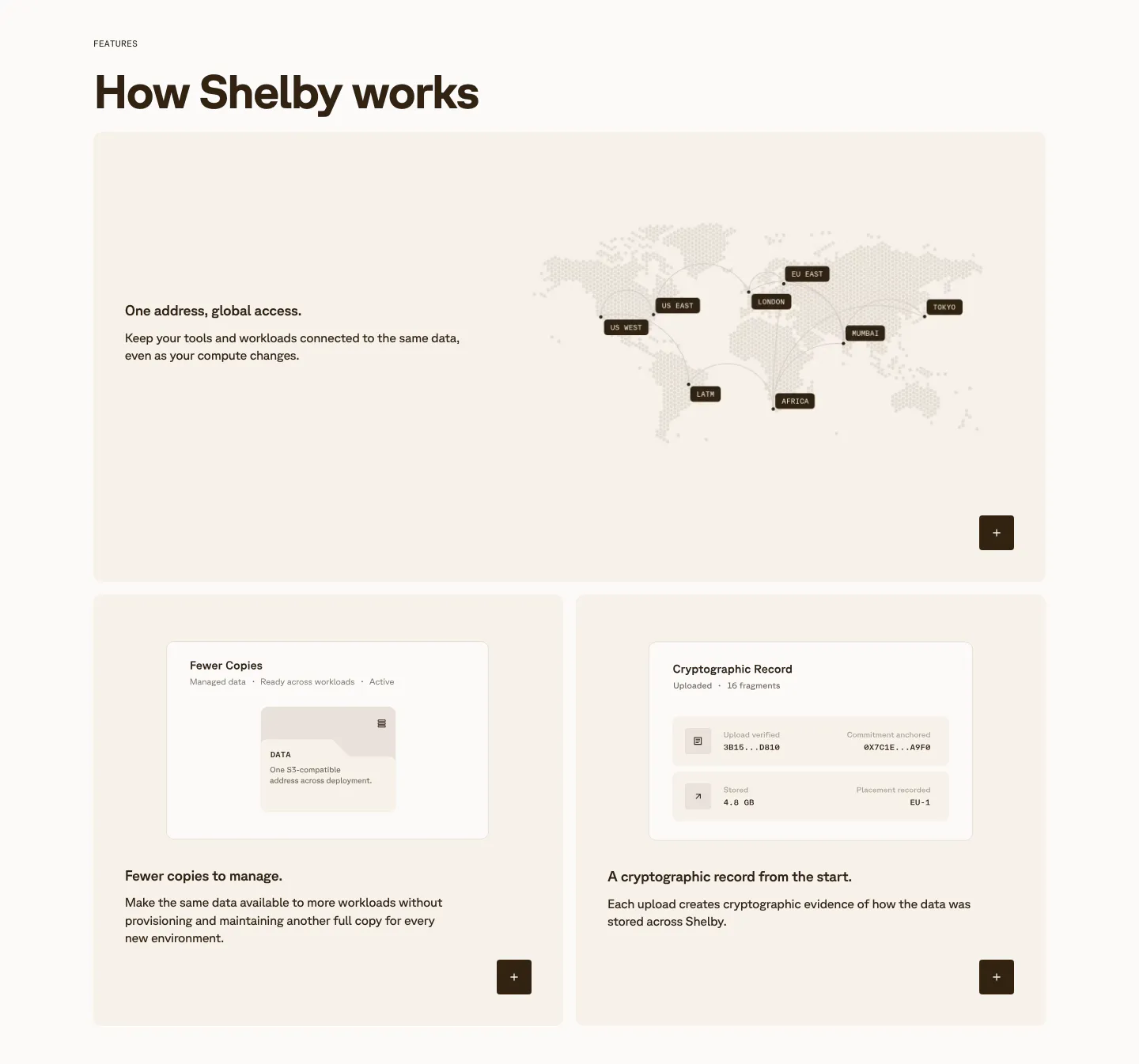
  352. Shelby features section: wide card with a dotted world map of data regions above two cards with small UI mockups on cream panels
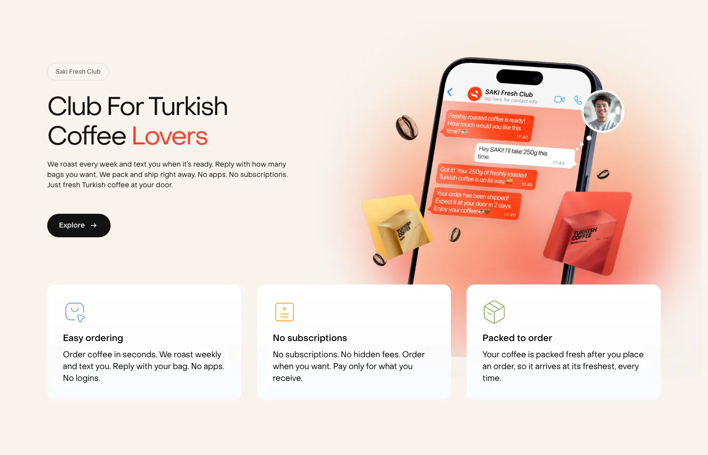
  353. Saki features section: headline and copy left of a phone chat mockup with coffee bags, above three benefit cards on a warm cream background
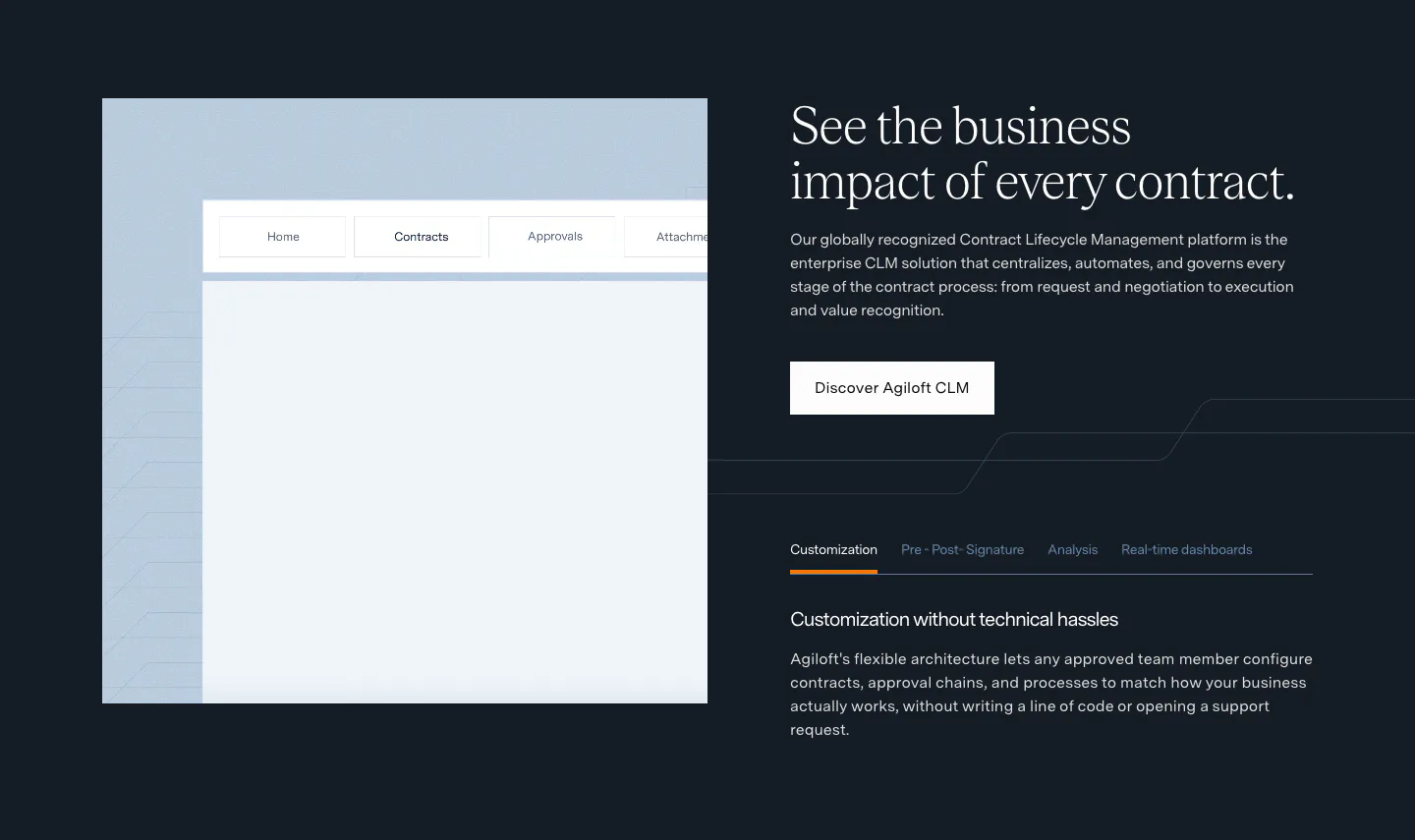
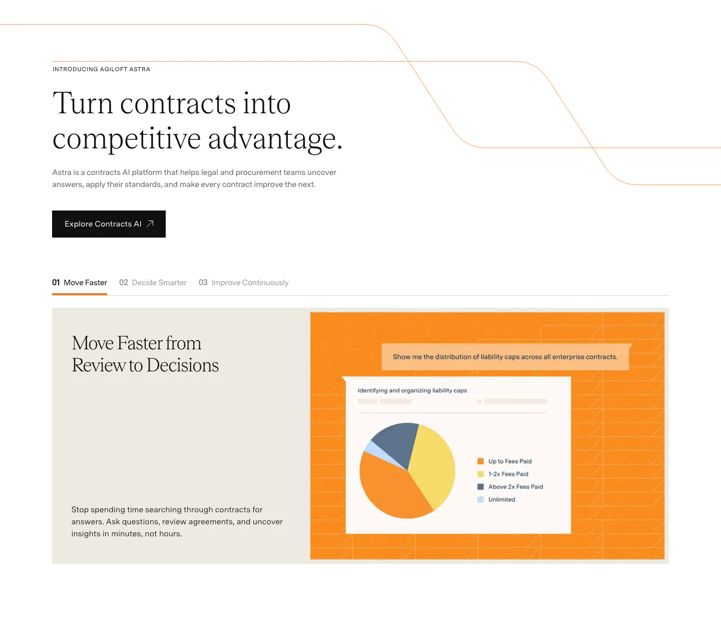
  354. Agiloft features section: product UI frame left, serif headline, button and feature tabs right on a dark navy background
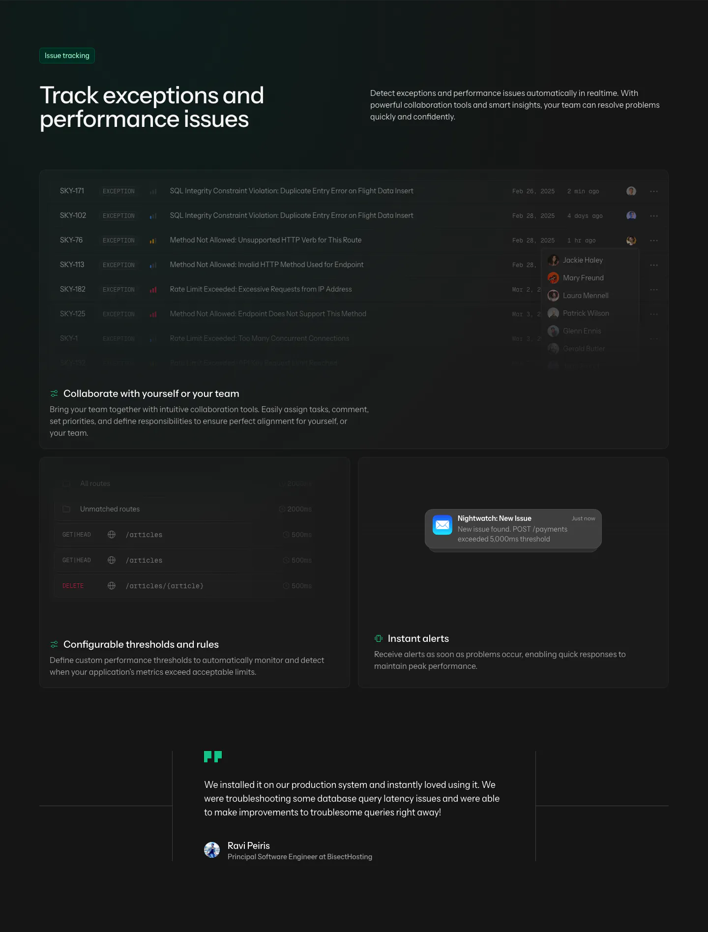
  355. Laravel Nightwatch features section: headline above dark cards showing an exception list, threshold rules and an alert, plus a quote
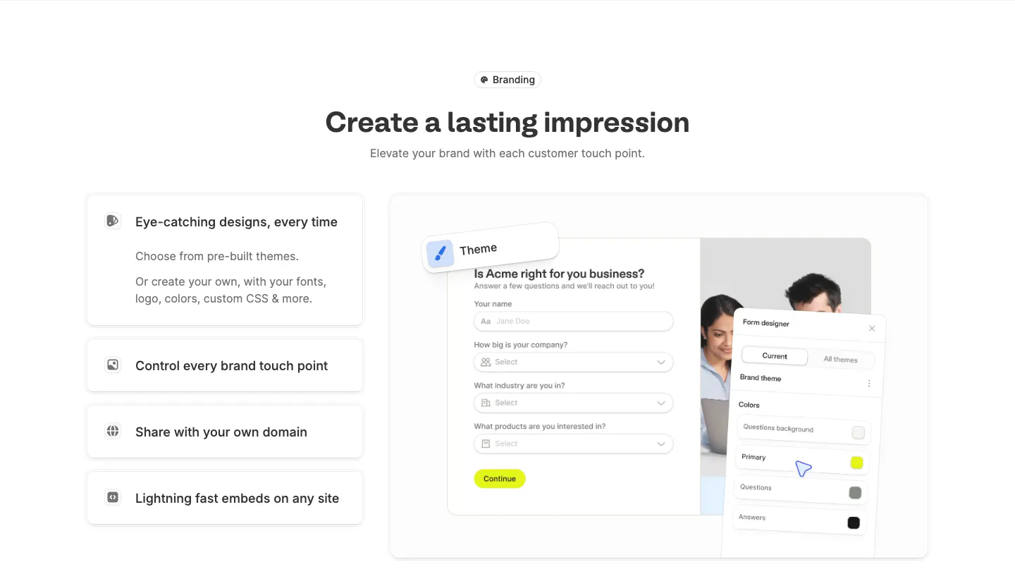
  356. Fillout features section: centered heading above stacked feature cards on the left and a branded form with a theme designer panel on the right
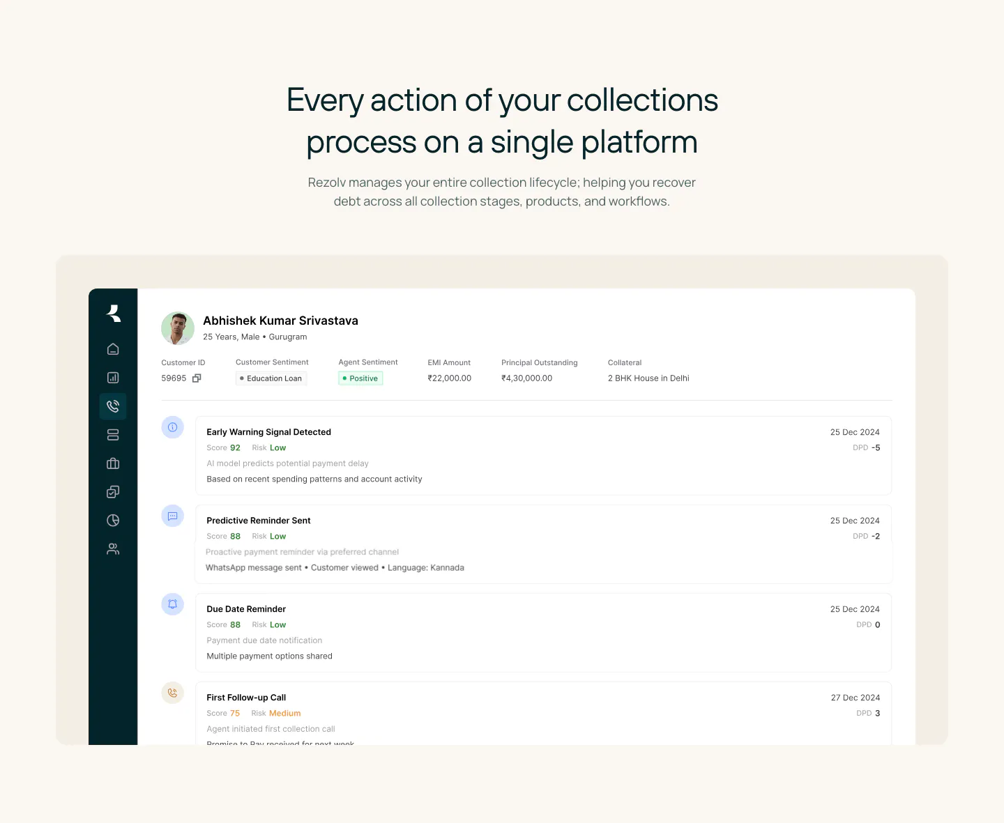
  357. Rezolv features section: centered headline above a large collections dashboard screenshot showing a borrower timeline on cream
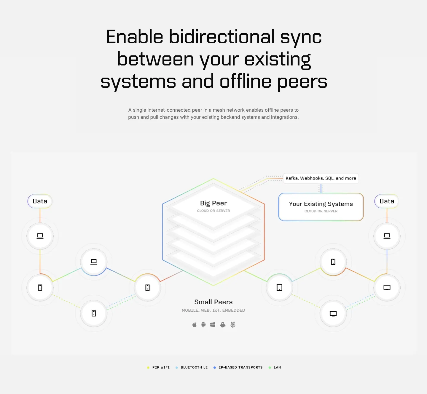
  358. Ditto features section: centered large headline above a hexagonal Big Peer diagram linked to small peer device nodes on light gray
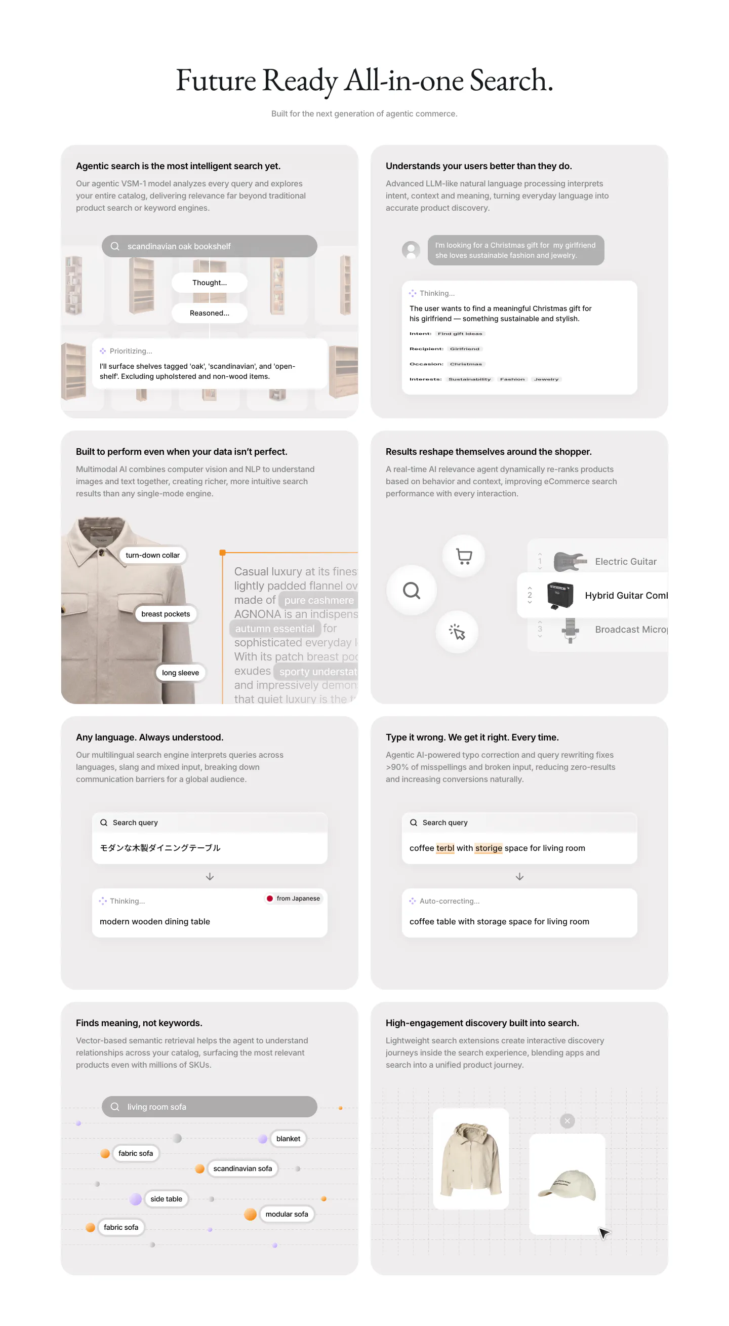
  359. VisionAI features section: centered serif headline above a two-column grid of eight gray cards with search UI mockups
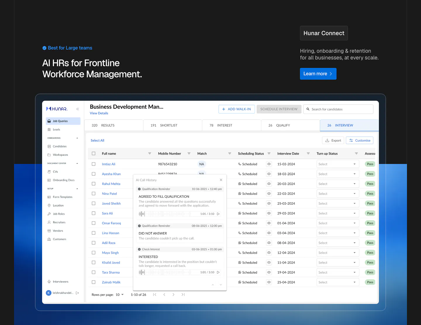
  360. Hunar features section: dark header with heading and Learn more button above a large candidate table screenshot on a blue glow
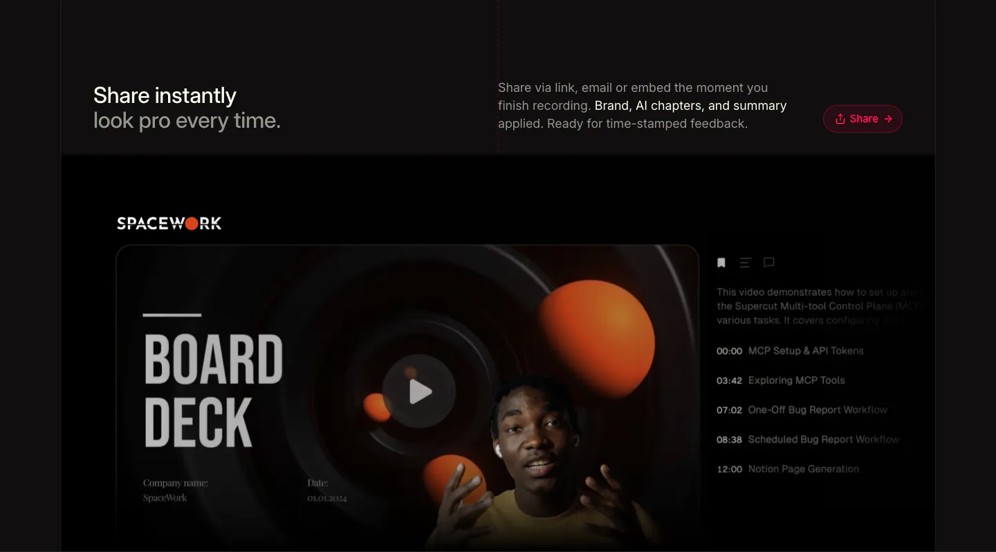
  361. Supercut features section: headline row with Share button above a branded video player showing a Board Deck slide and chapter list
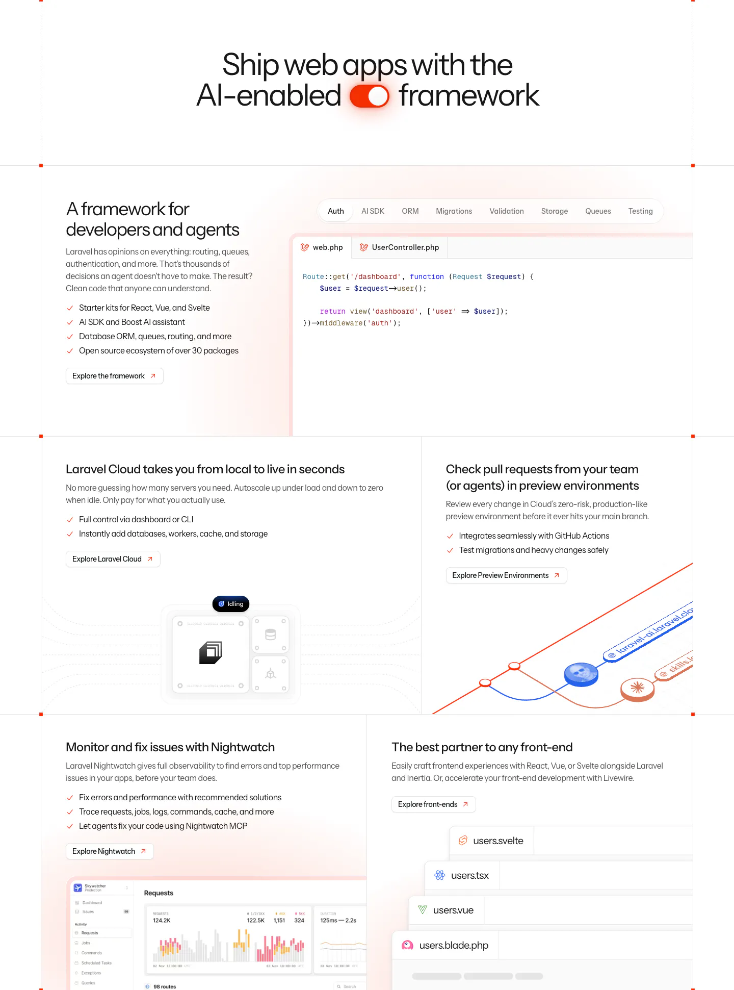
  362. Laravel features section: centered headline with a toggle icon above a bento grid of code tabs, cloud, preview environment and monitoring panels
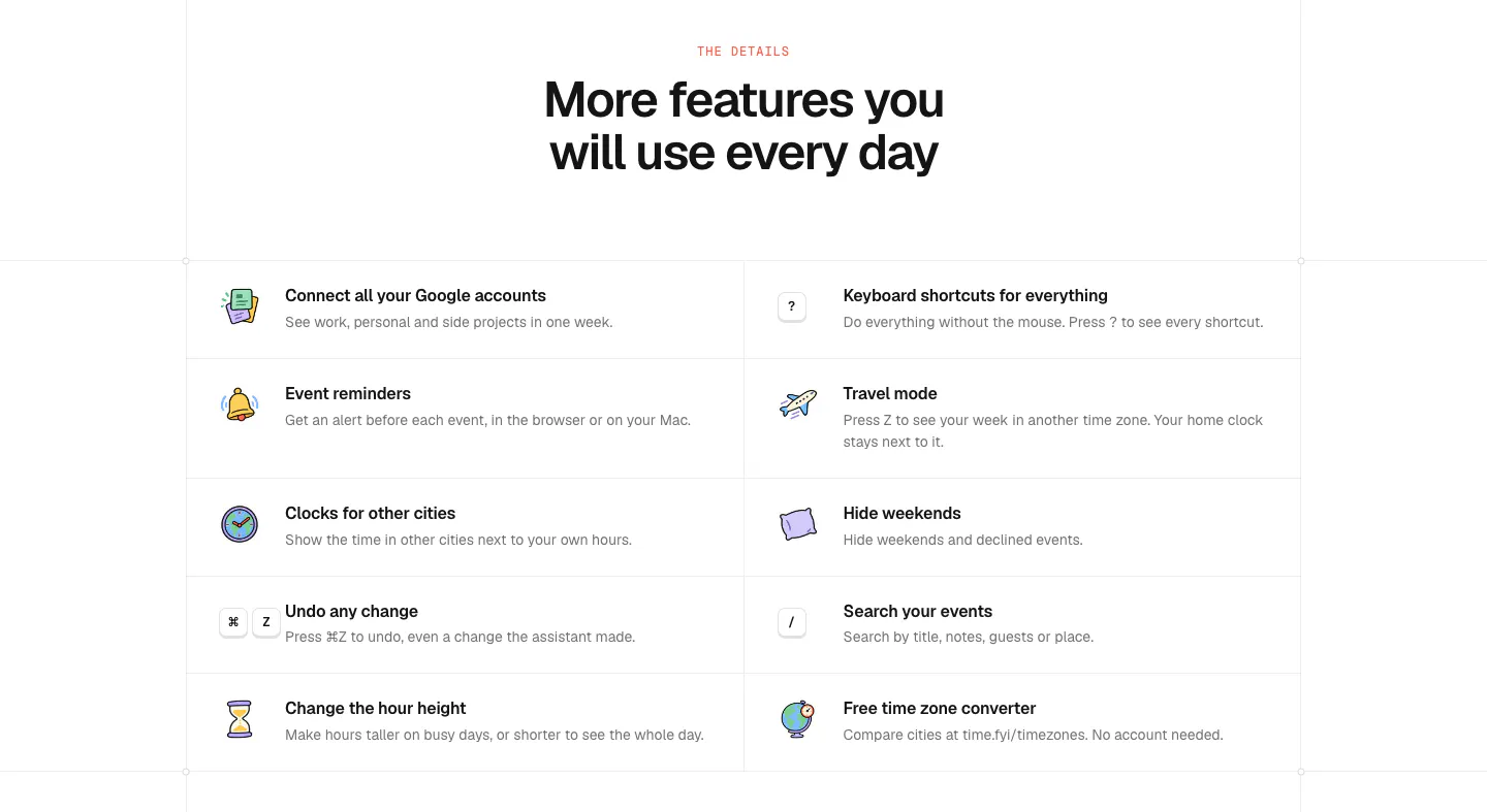
  363. time.fyi features section: centered headline above a two-column grid of ten features with colorful hand-drawn icons
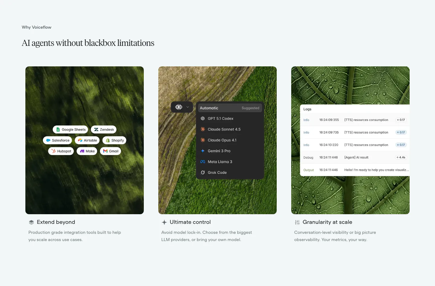
  364. Voiceflow features section: serif headline above three cards pairing nature photos with integration, model picker and log UI overlays
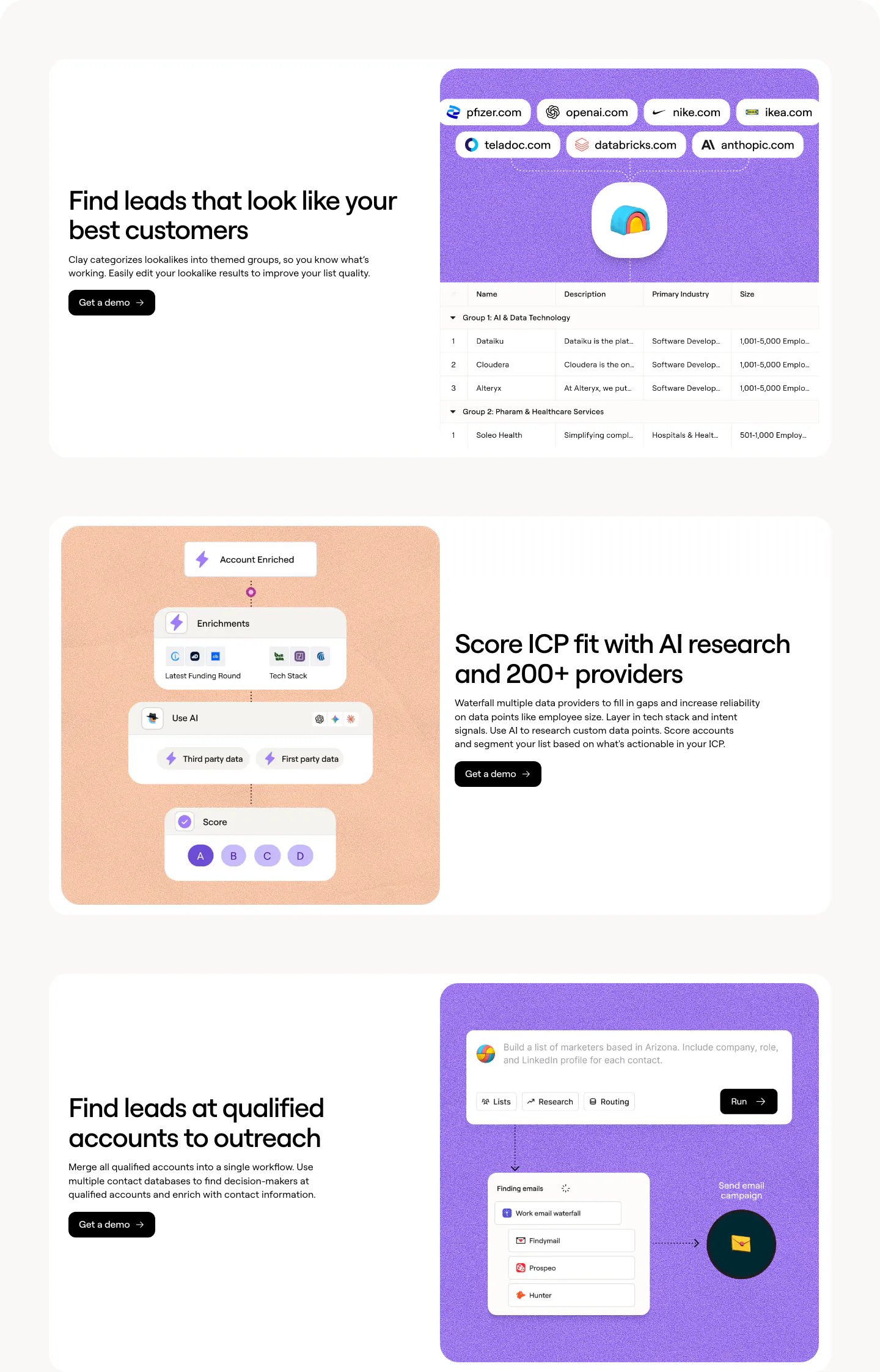
  365. Clay features section: three alternating rows pairing headlines with purple and peach panels showing lookalike, scoring and workflow UI
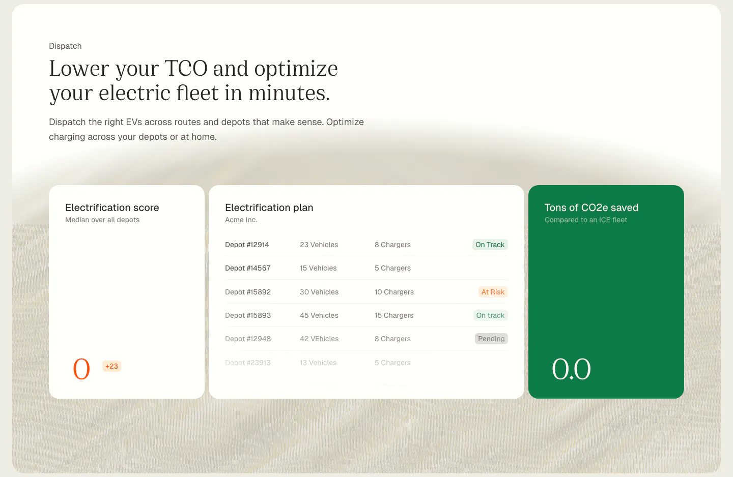
  366. Chargetrip features section: serif headline above electrification score, depot plan and CO2 savings UI cards on a cream textured background
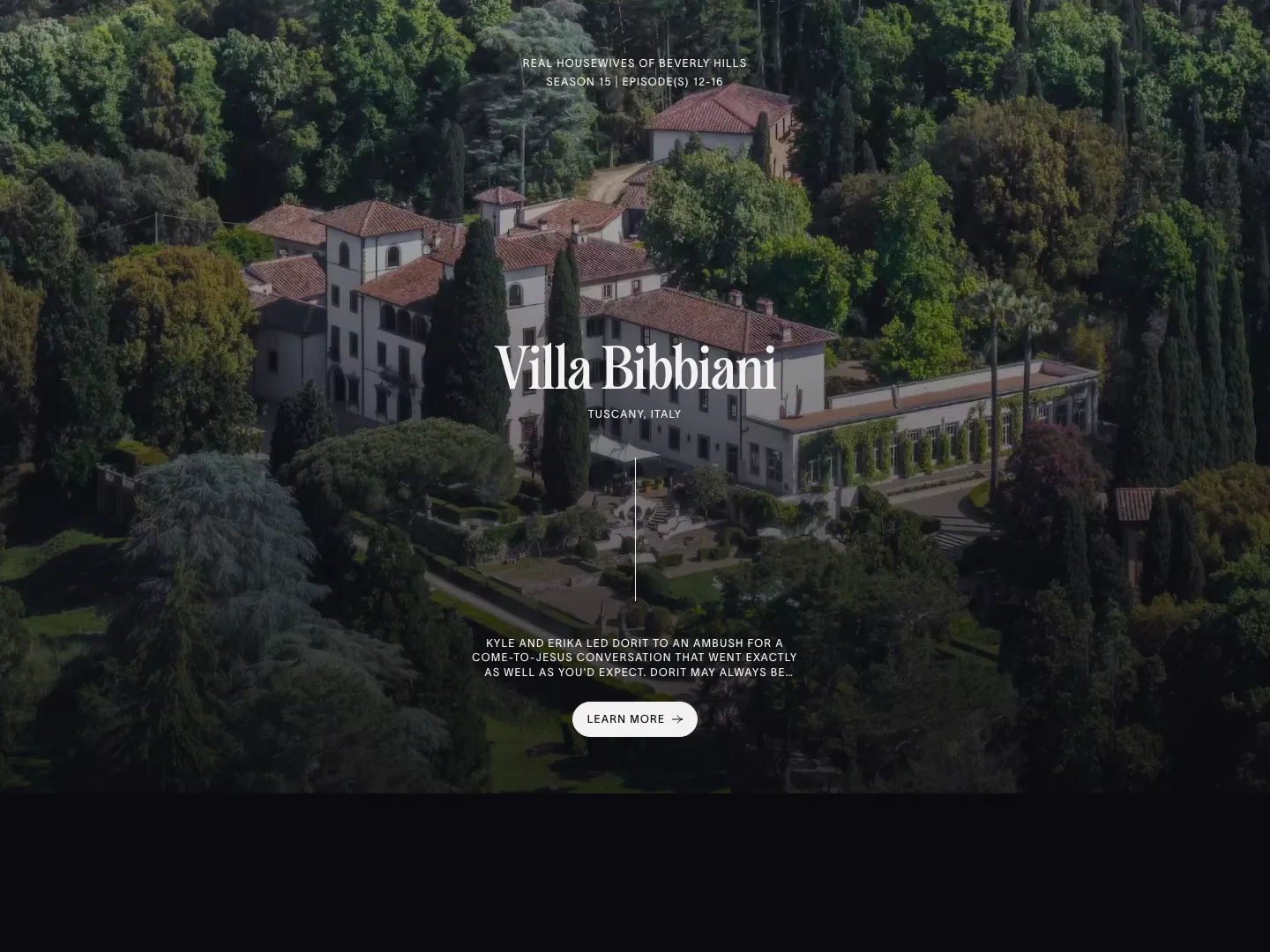
  367. The Real Hotels features section: full-bleed aerial photo of a Tuscan villa with centered serif title, episode note and Learn more button
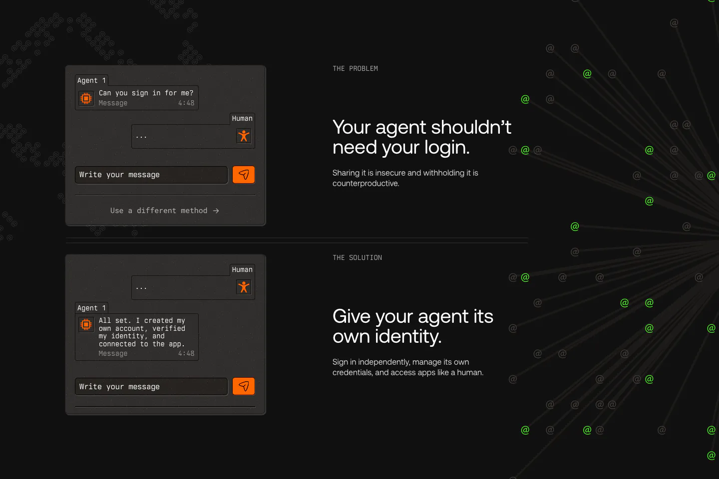
  368. AgentID features section: dark problem and solution rows pairing chat UI mockups with headlines, beside radiating lines of green @ symbols
  369. Greptile features section: centered eyebrow label, headline and one-line subtitle on a light gray band with a striped top edge
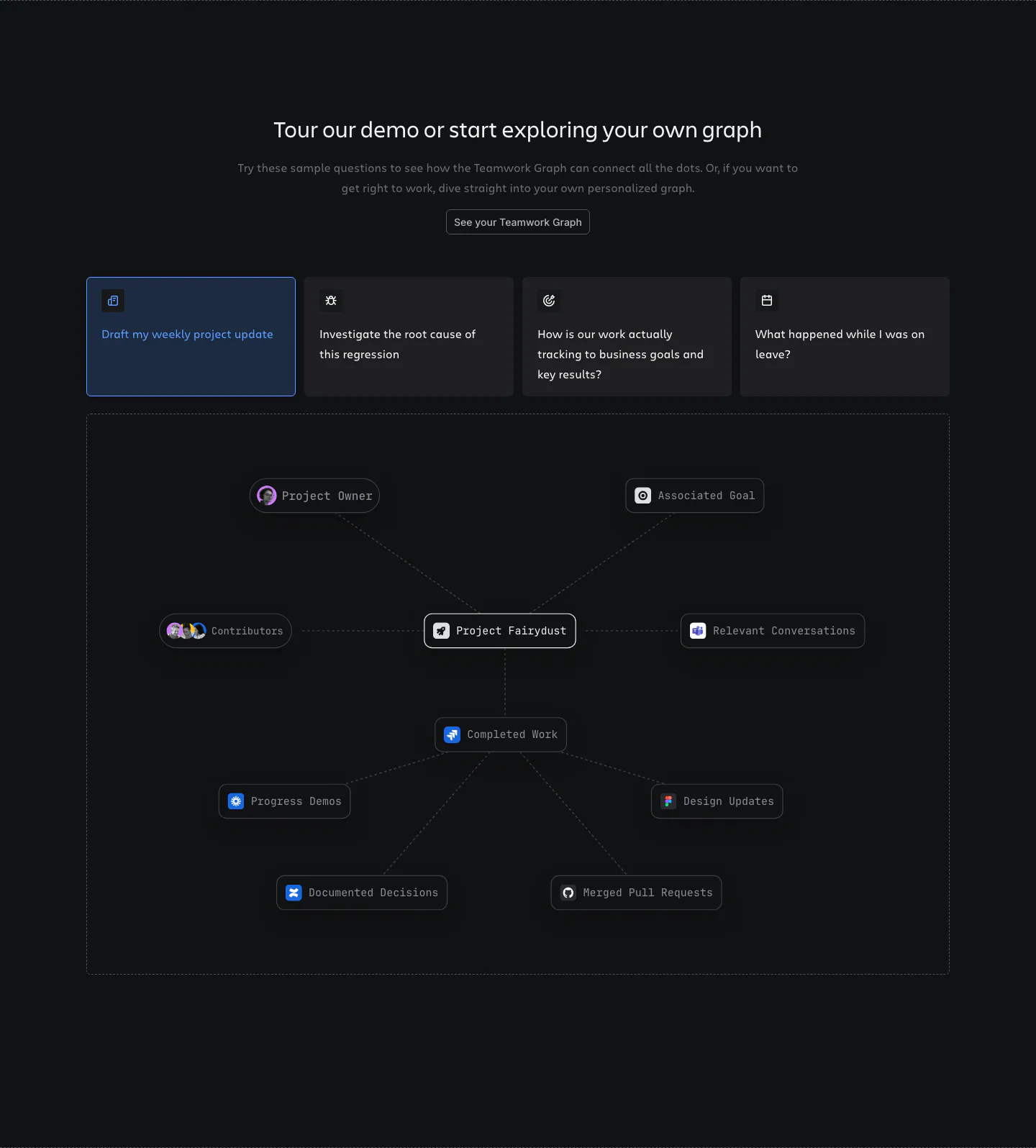
  370. Atlassian features section: centered heading, four selectable prompt cards and a project node graph in a dashed frame on dark
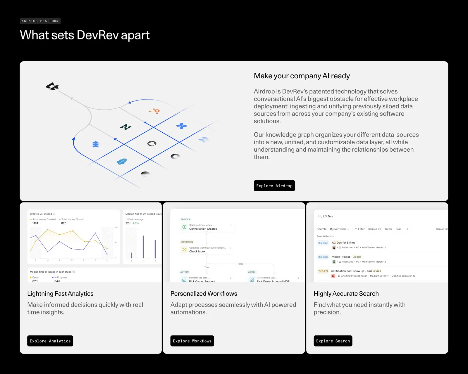
  371. DevRev features section: headline over a bento of one wide Airdrop diagram card and three product UI cards for analytics, workflows and search
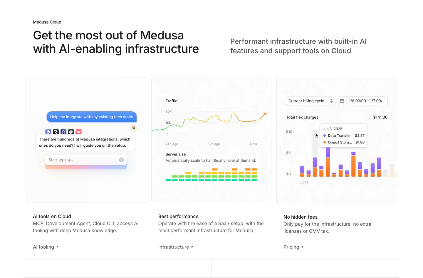
  372. Medusa features section: headline above three cards showing an AI chat, traffic and server charts, and a billing bar chart
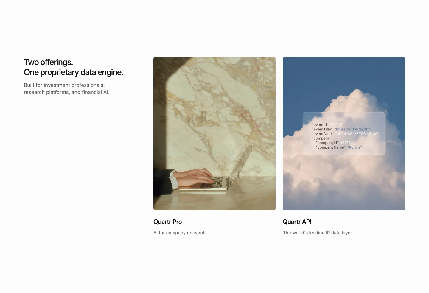
  373. Quartr features section: headline on the left beside two photo cards for Quartr Pro and Quartr API, one with a frosted JSON snippet
  374. Vectara features section: three dark cards with thin line-diagram graphics, titles and links on a near-black background
  375. Polar Signals features section: two-tone headline with arrow buttons above a sliding row of cards with flame graph, code filter and query UI
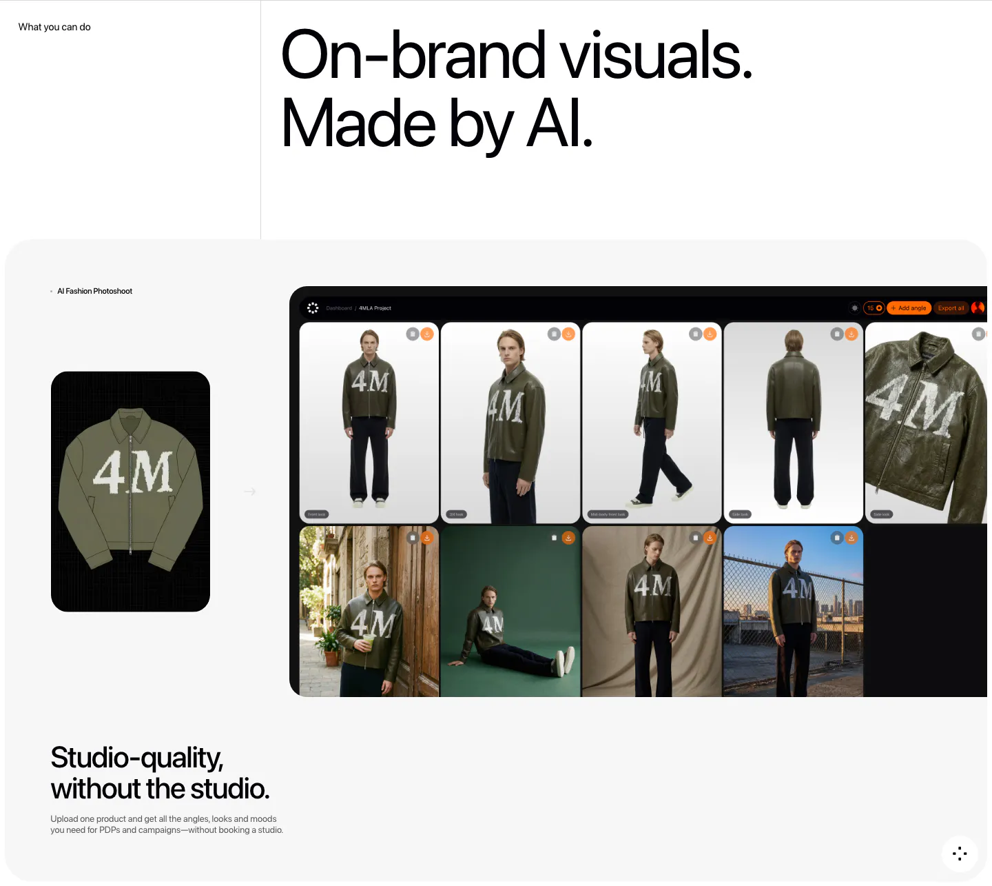
  376. Fourmula features section: large headline above a gray card showing a jacket product image turned into a dashboard grid of AI model photos
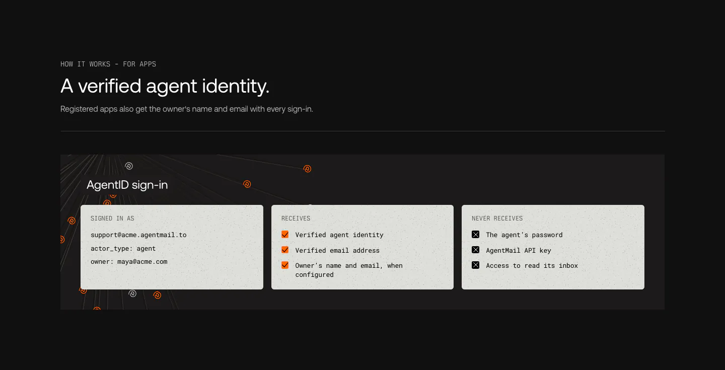
  377. AgentID features section: dark panel with three light cards listing the sign-in identity, data apps receive and data they never receive
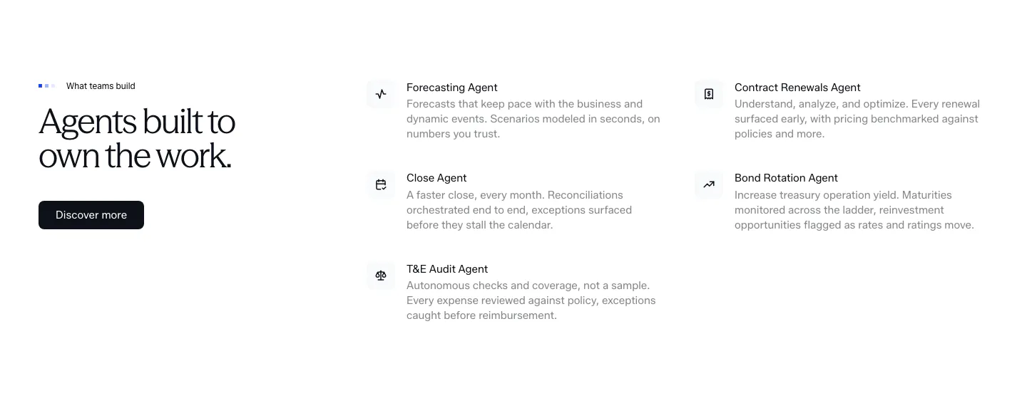
  378. Concourse features section: headline and Discover more button left, two-column list of agent names with icons and descriptions right
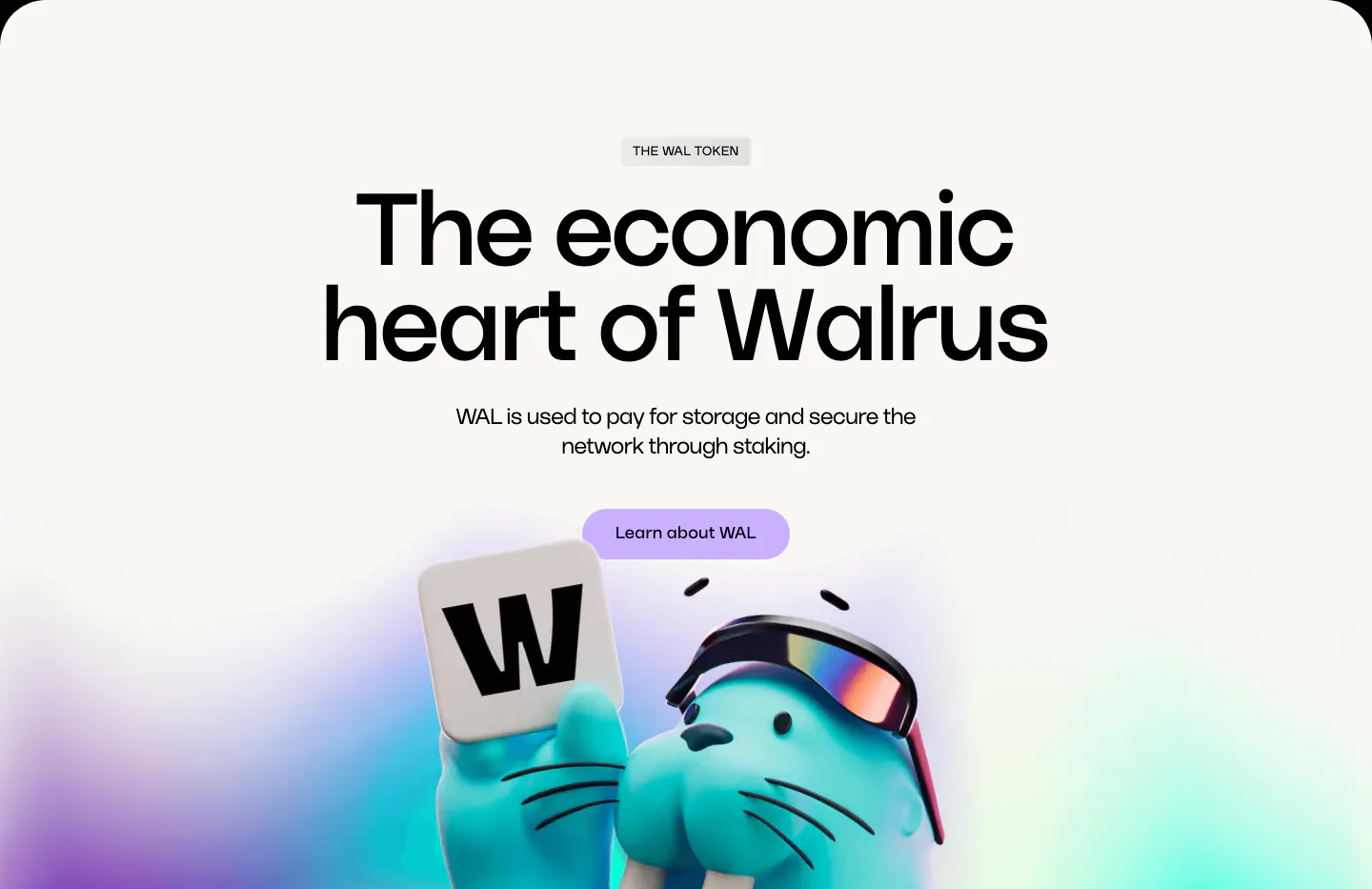
  379. Walrus features section: huge centered headline and lavender button above a 3D walrus holding a W tile on off-white
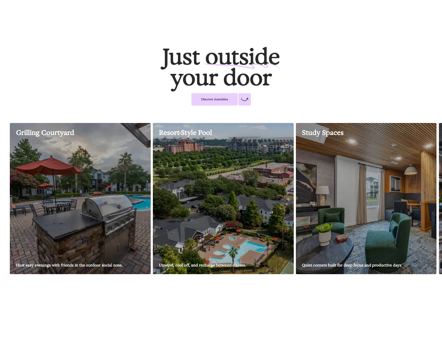
  380. 21Oaks features section: centered serif heading and button above a carousel of amenity photo cards with captions
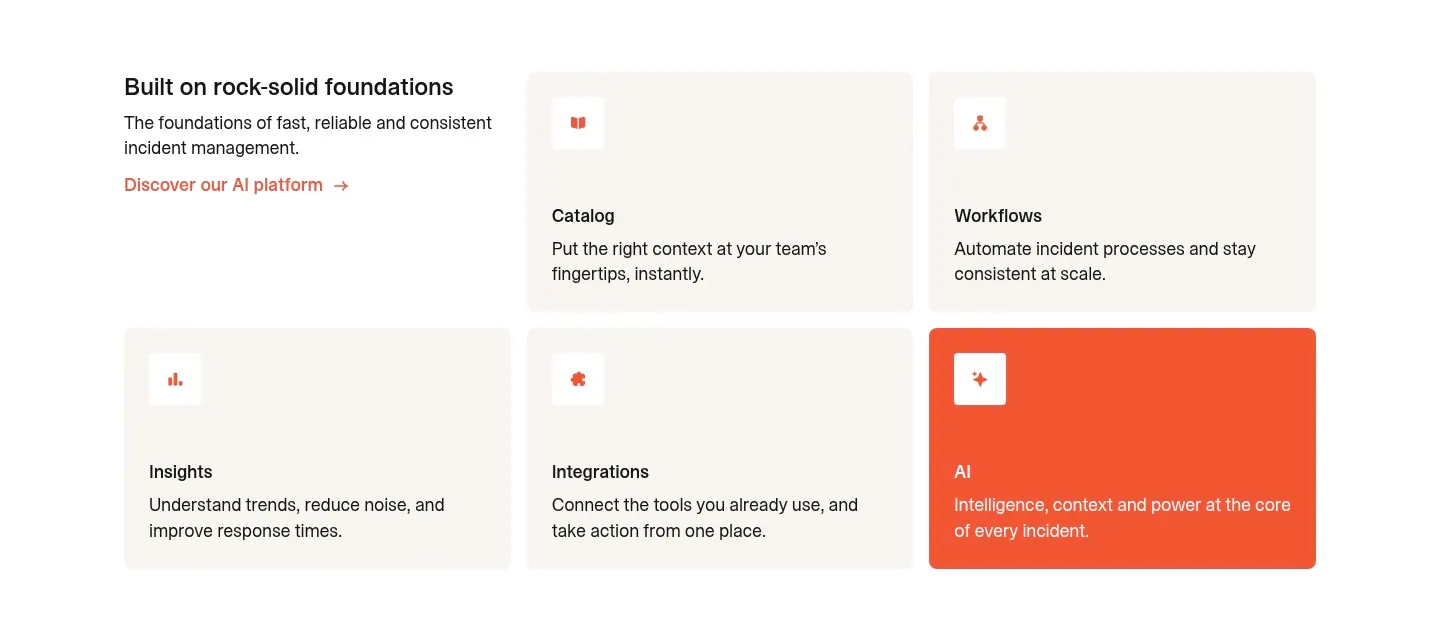
  381. incident.io features section: intro text beside a grid of five beige feature cards with one orange AI card on white
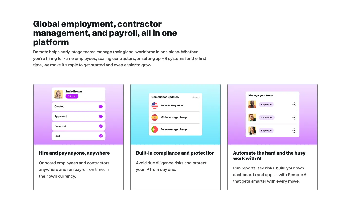
  382. Remote features section: logo row, large centered headline and four cards with payroll UI mockups on cyan and lime
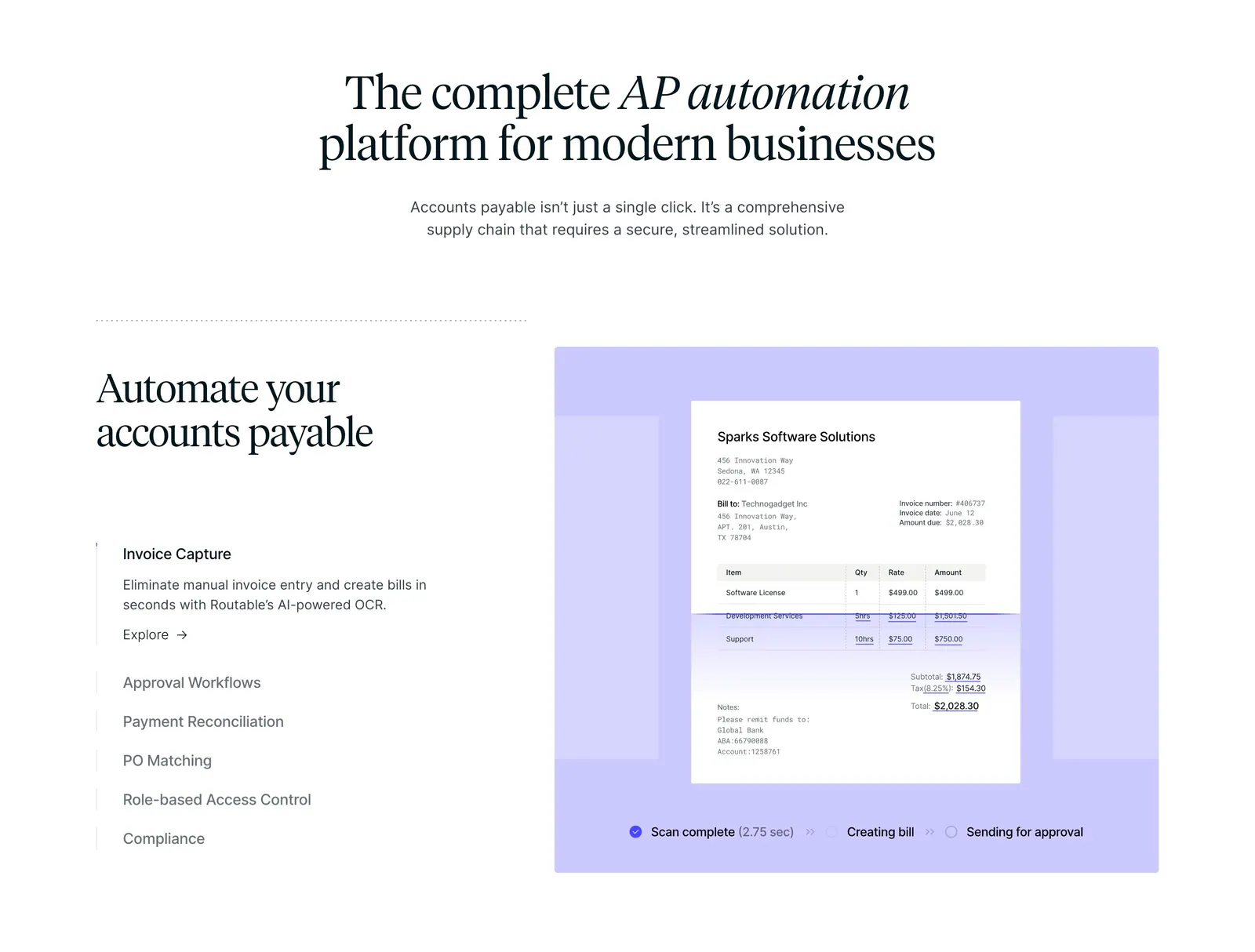
  383. Routable features section: centered serif headline above a feature list and a lavender panel with an invoice scanning mockup
  384. WorkOS features section: headline and copy on the left, white 3D robot with memory chips on the right, on white
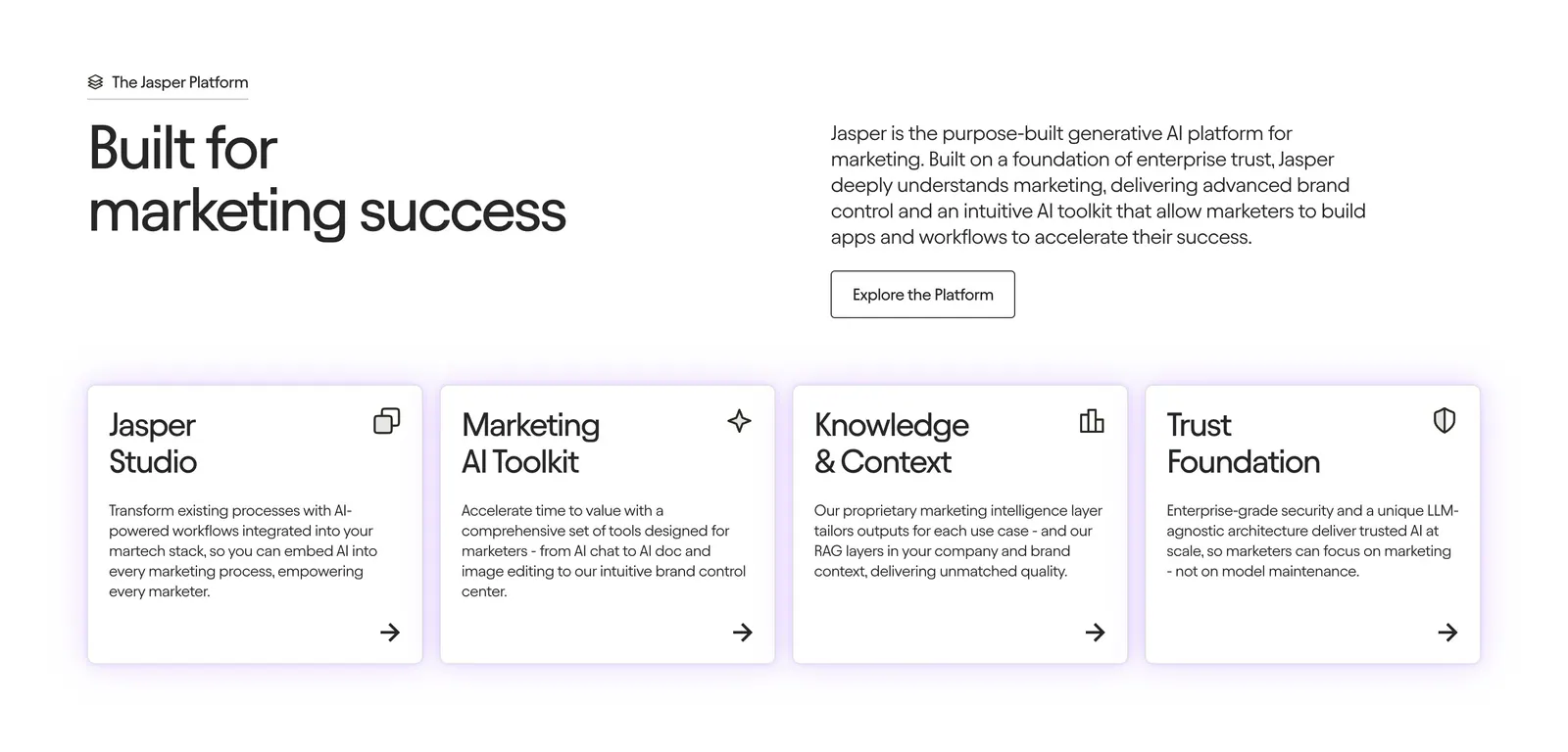
  385. Jasper features section: headline and copy row above four white cards with icons and arrow links on a light background
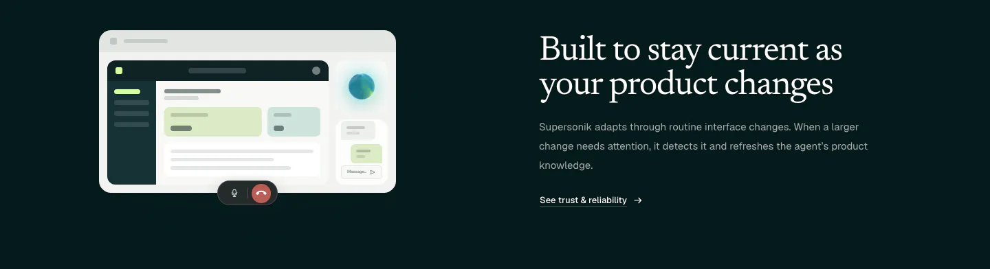
  386. Supersonik features section: UI mockup with call controls at left, serif headline, copy and link at right on dark teal
  387. Conduit features section: serif headline above three agent cards with chat, voice and analytics UI on colorful blurred tiles
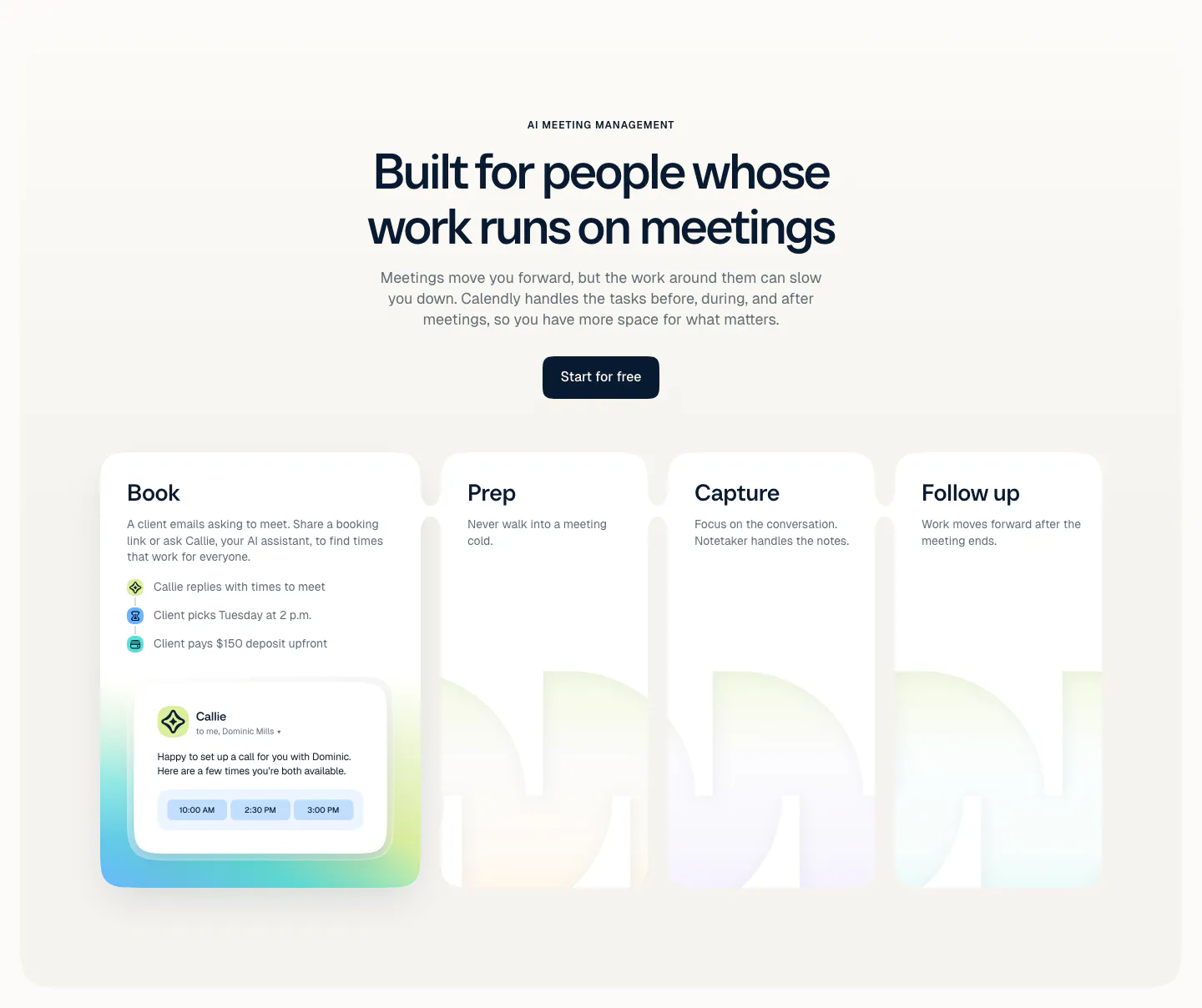
  388. Calendly features section: centered headline and button above four cards for Book, Prep, Capture and Follow up with a scheduling UI card
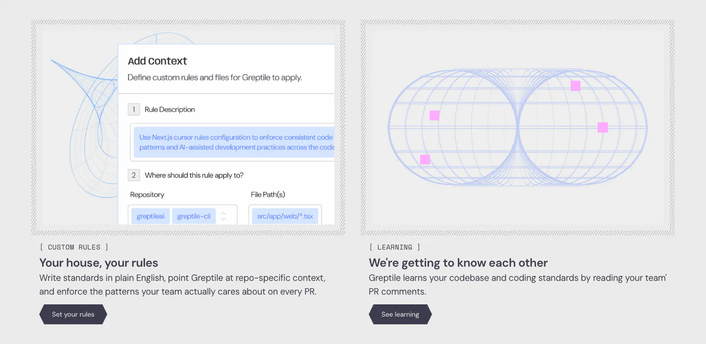
  389. Greptile features section: two cards side by side, one with a custom rules form UI, one with a blue wireframe torus graphic
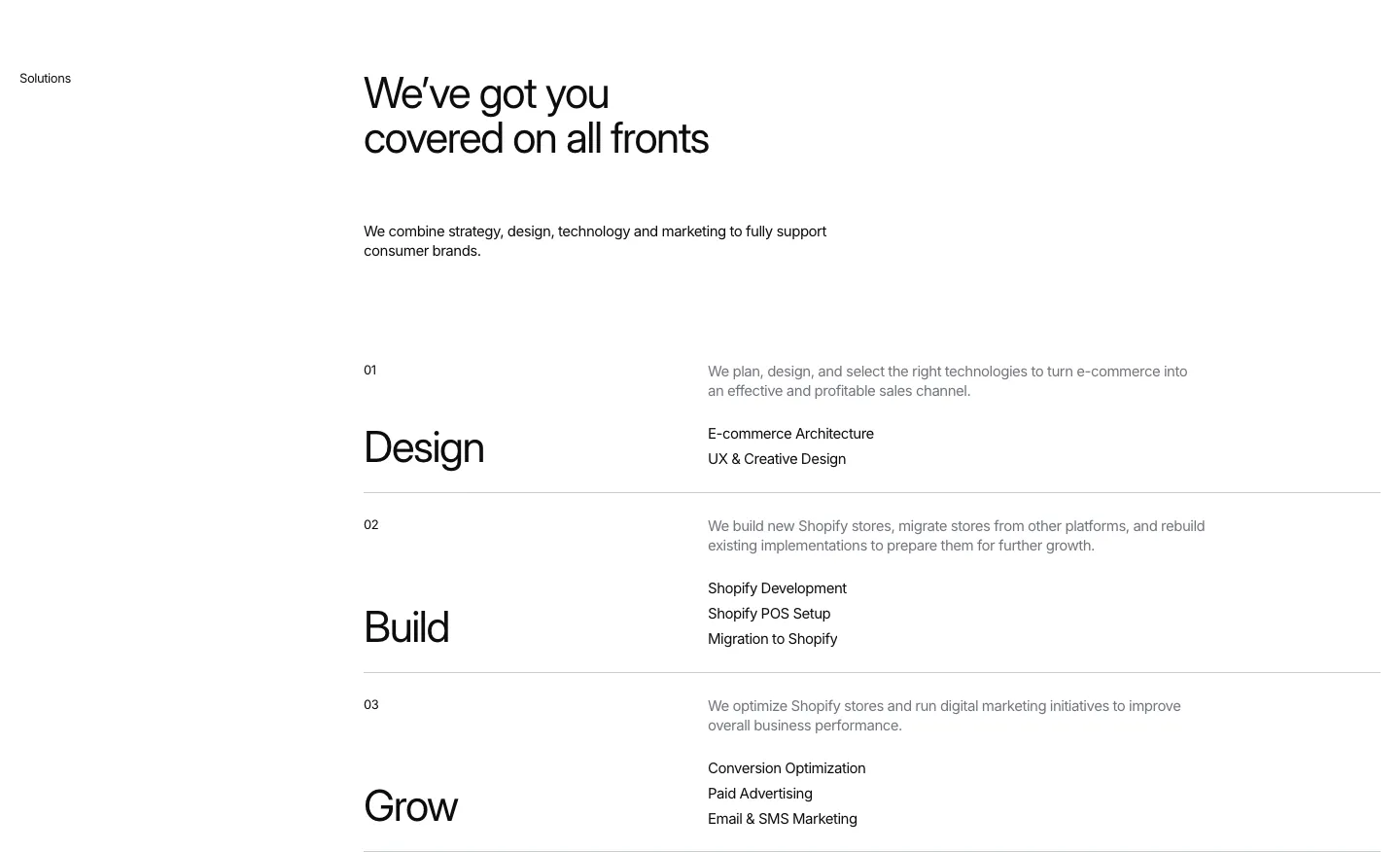
  390. Hyper Effekt features section: headline above three numbered service rows, Design, Build and Grow, each with a short list on white
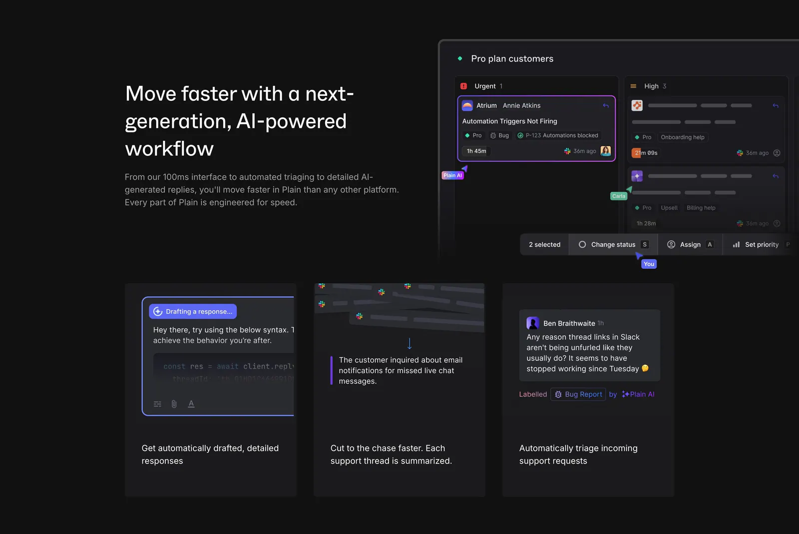
  391. Plain features section: dark split with headline beside a triage board UI, above three cards showing AI drafting, summaries and labels
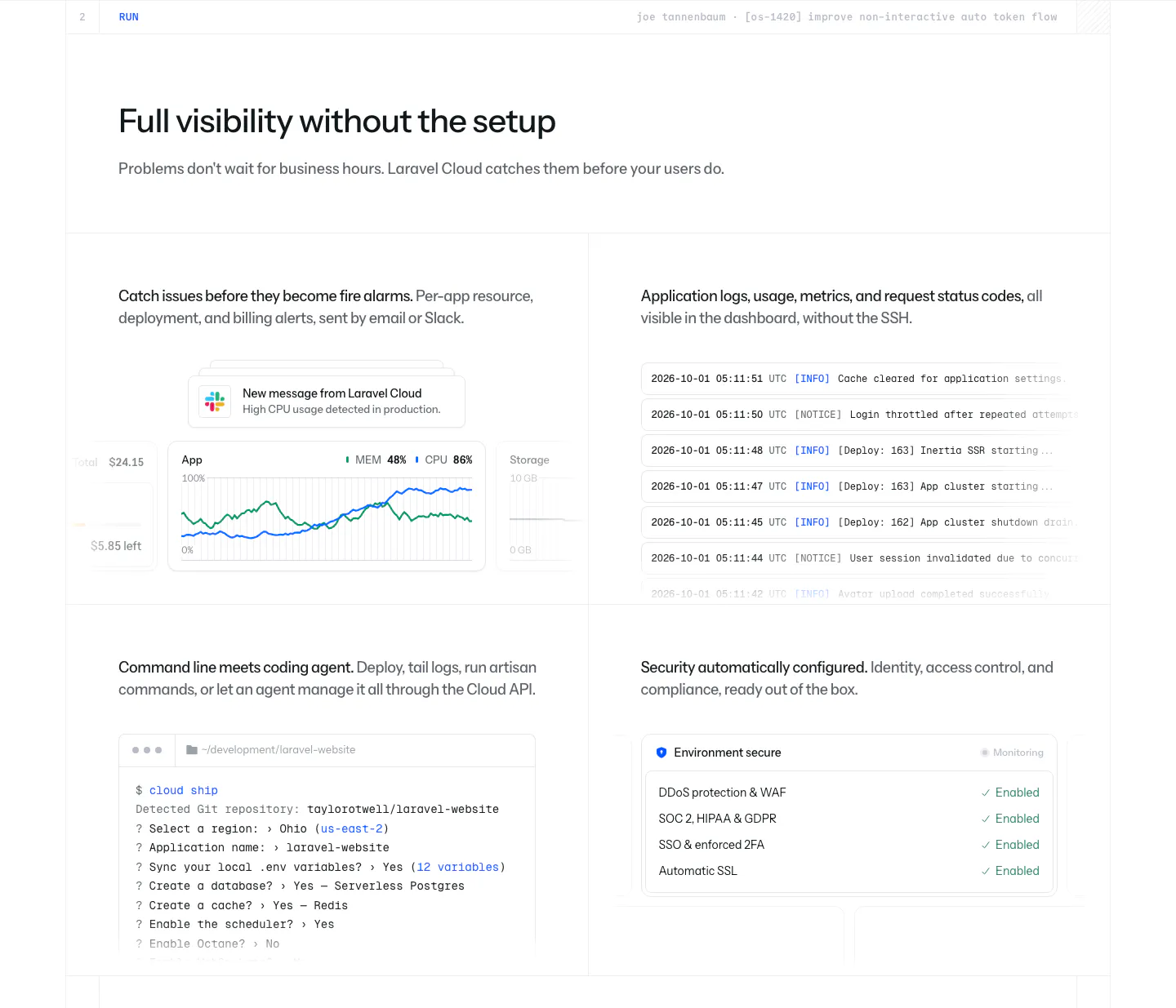
  392. Laravel Cloud features section: headline above a 2x2 grid showing usage alerts, a log stream, a CLI terminal session and a security checklist
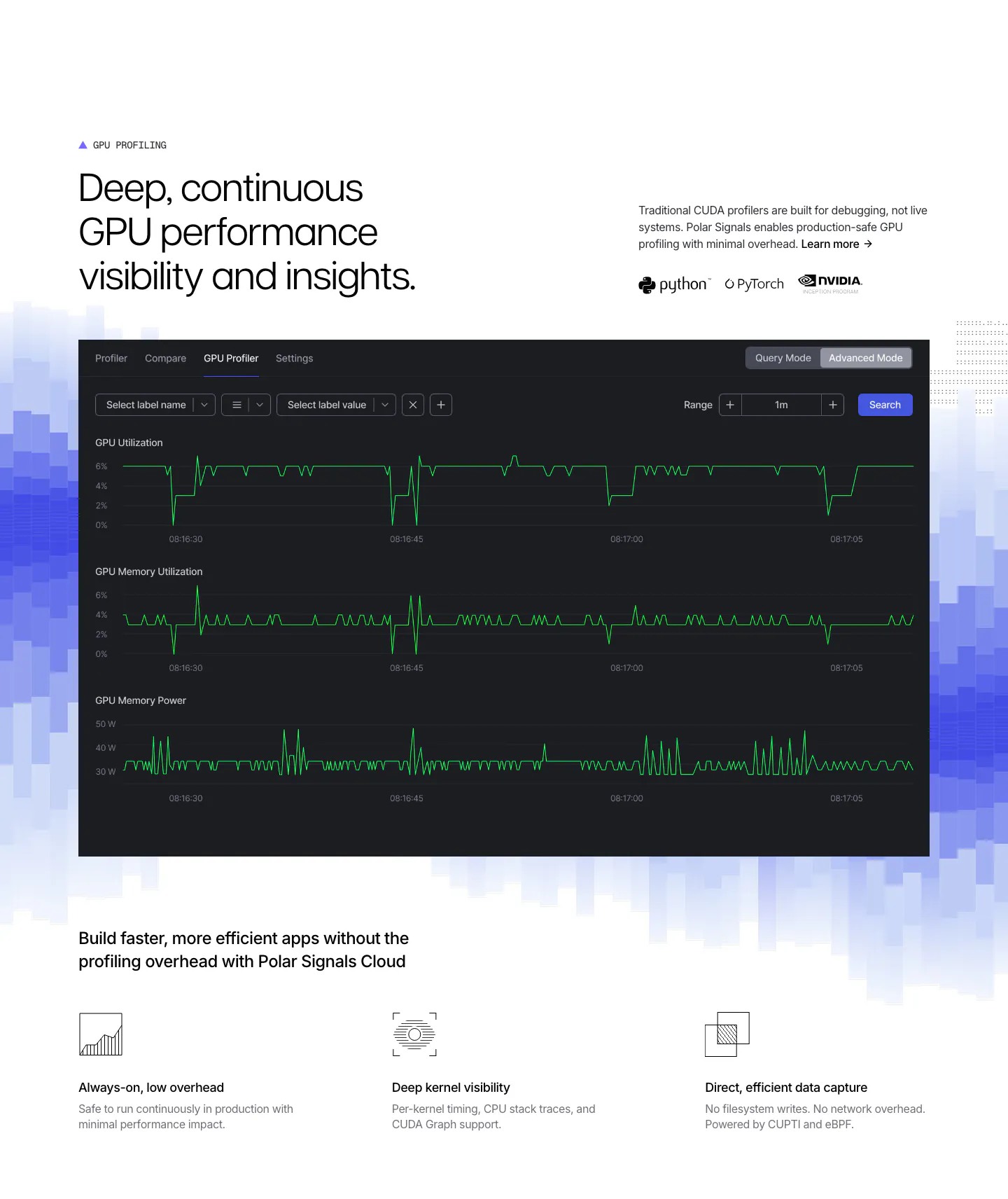
  393. Polar Signals features section: headline above a dark GPU profiler dashboard on blue pixel bars, with three icon feature points below
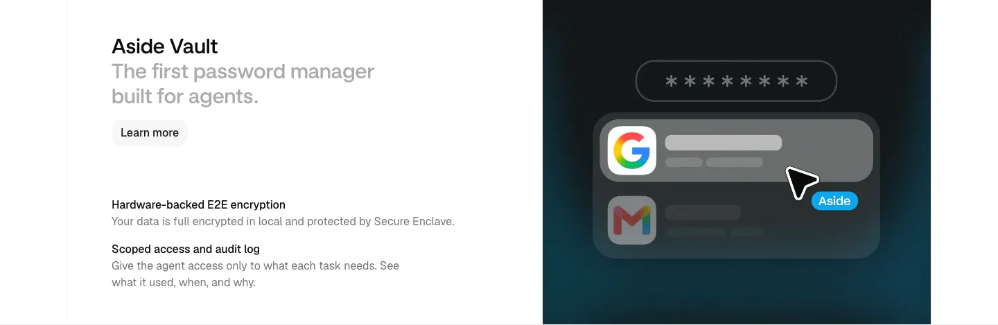
  394. Aside features section: heading and two feature notes at left beside a dark panel with a password field and autofill UI
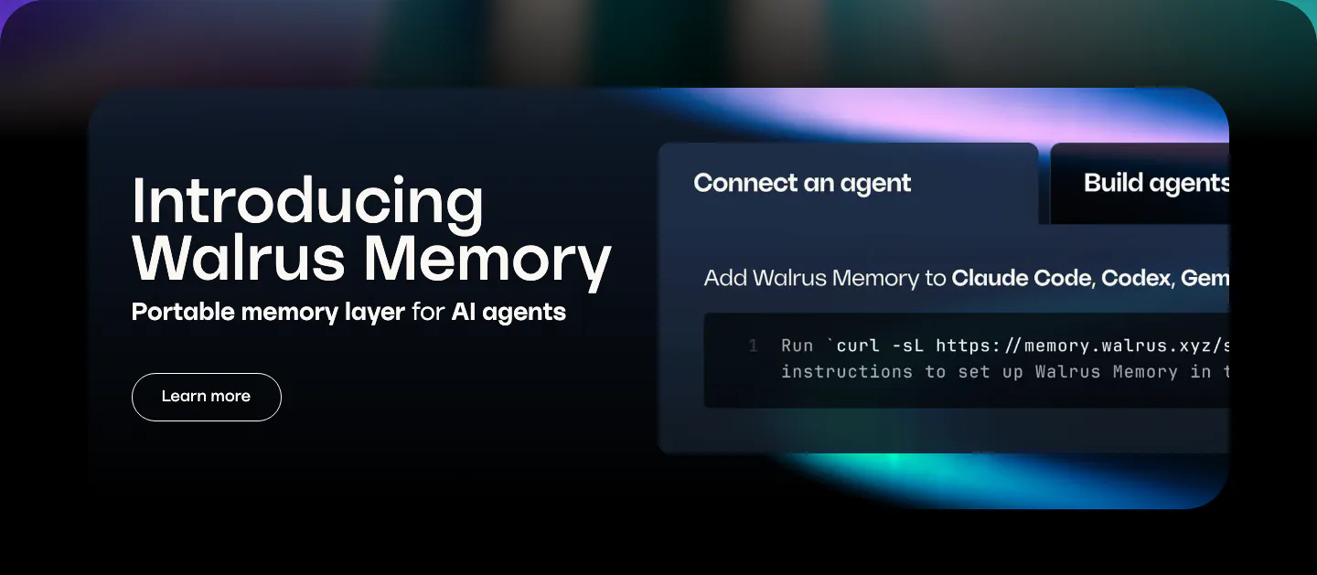
  395. Walrus features section: dark rounded banner with product intro on the left and a tabbed code snippet panel on the right
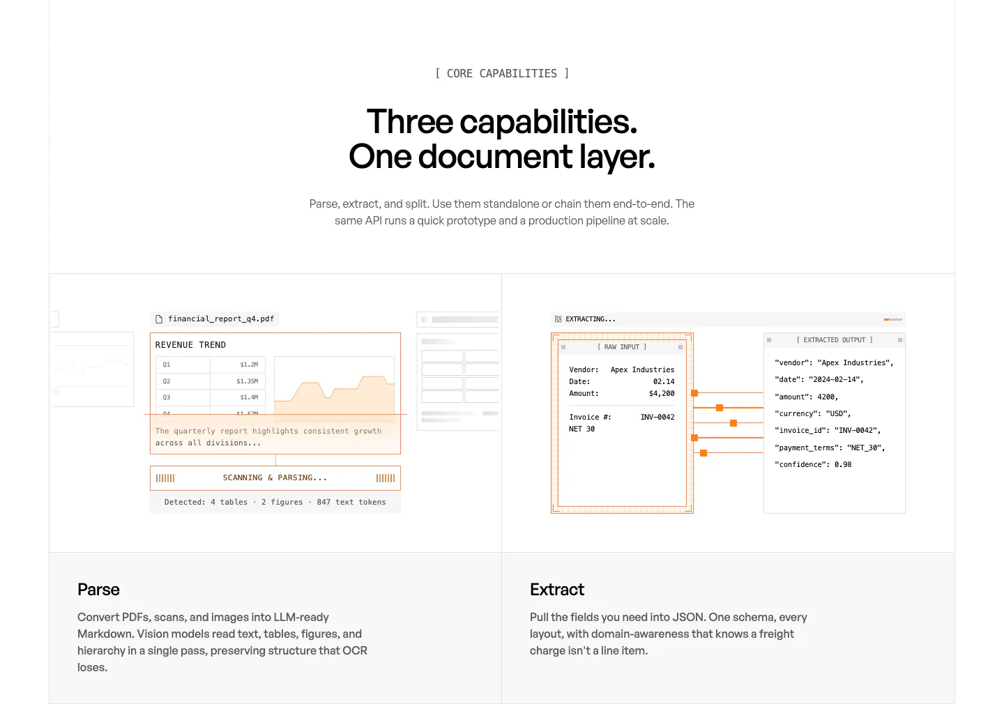
  396. Unsiloed features section: centered headline above two panels showing a PDF parsing mockup and a JSON extraction view, labeled Parse and Extract
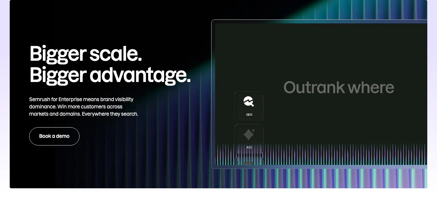
  397. Semrush features section: dark enterprise banner with headline and Book a demo button left, stylized product panel and neon stripes right
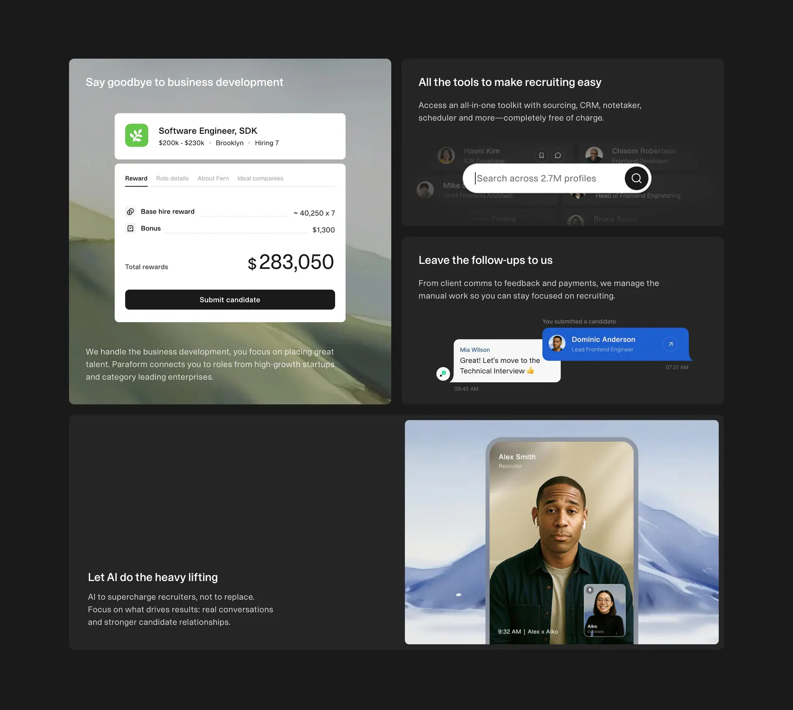
  398. Paraform features section: dark bento grid of four tiles with reward, search and chat UI cards and a recruiter video call photo
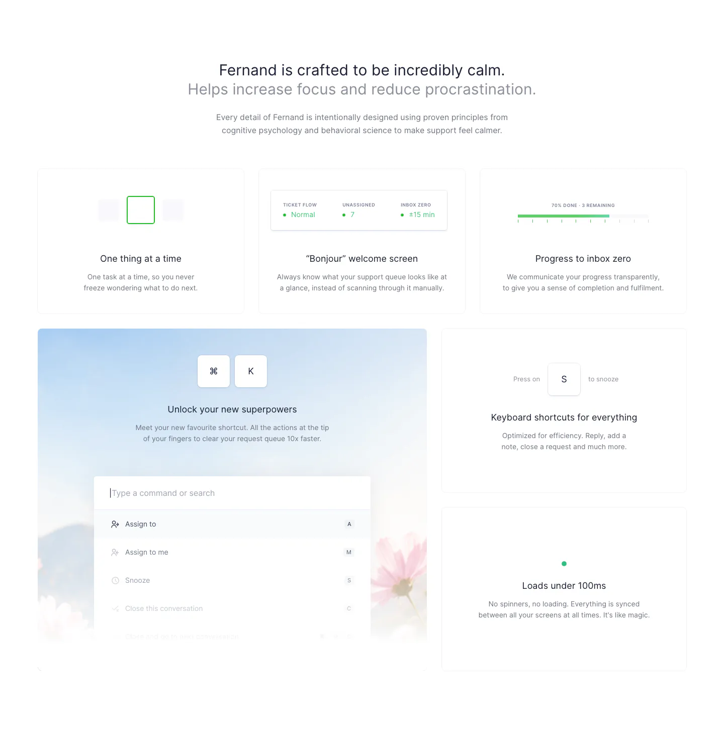
  399. Fernand features section: centered heading above a bento grid of cards with a command palette and keyboard shortcut UI
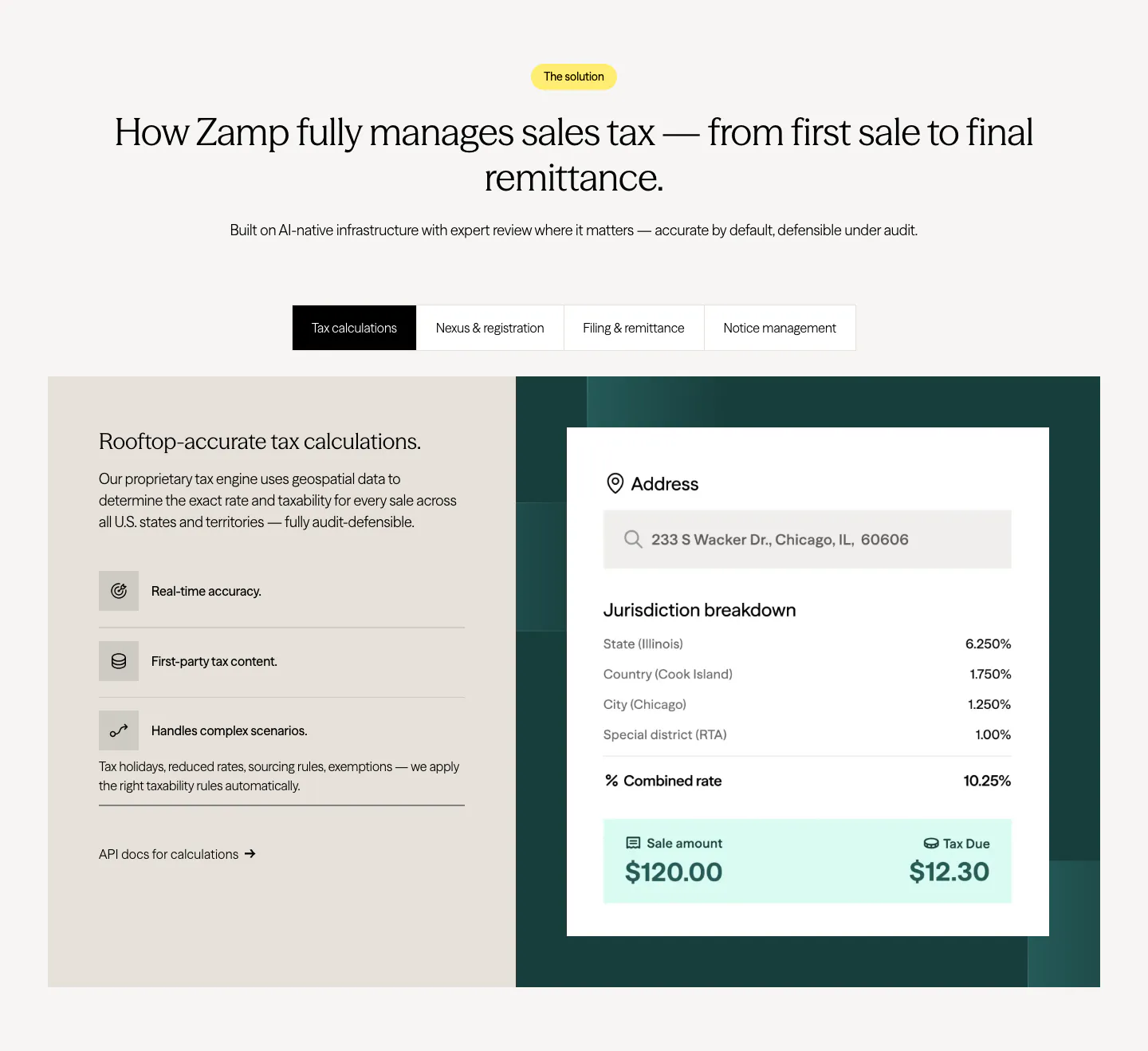
  400. Zamp features section: centered heading over a tab bar and split panel with feature list on beige and a tax calculation card on dark green
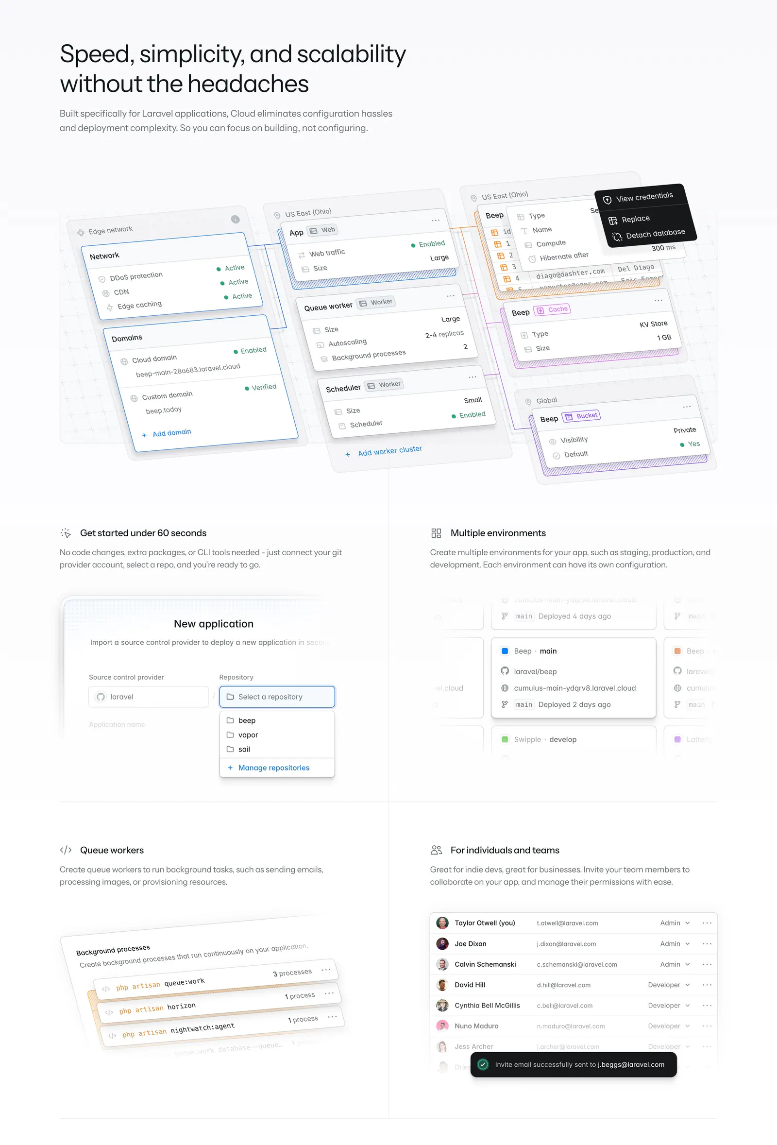
  401. Laravel Cloud features section: headline above a large infrastructure canvas mockup and four feature cells with UI snippets
  402. Linear features section: dark headline and copy above a Slack thread overlapping a kanban board screenshot, feature links below
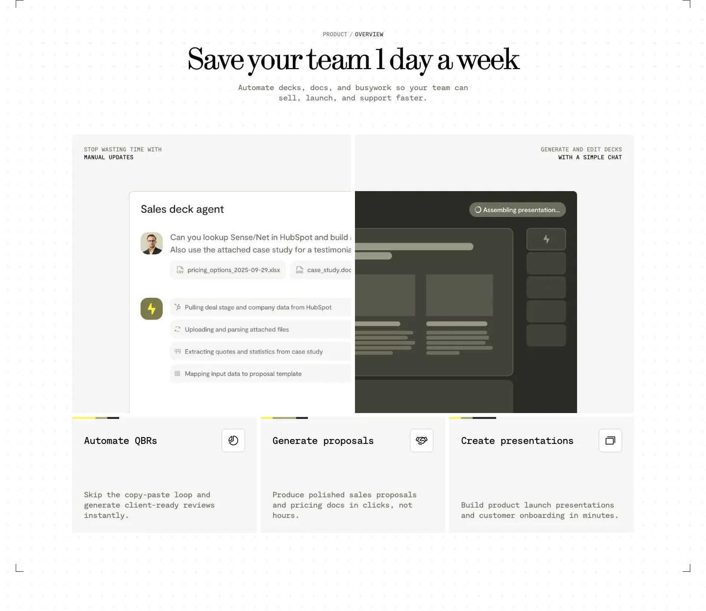
  403. Visual features section: centered serif headline above a sales deck agent chat UI and three cards for QBRs, proposals and presentations
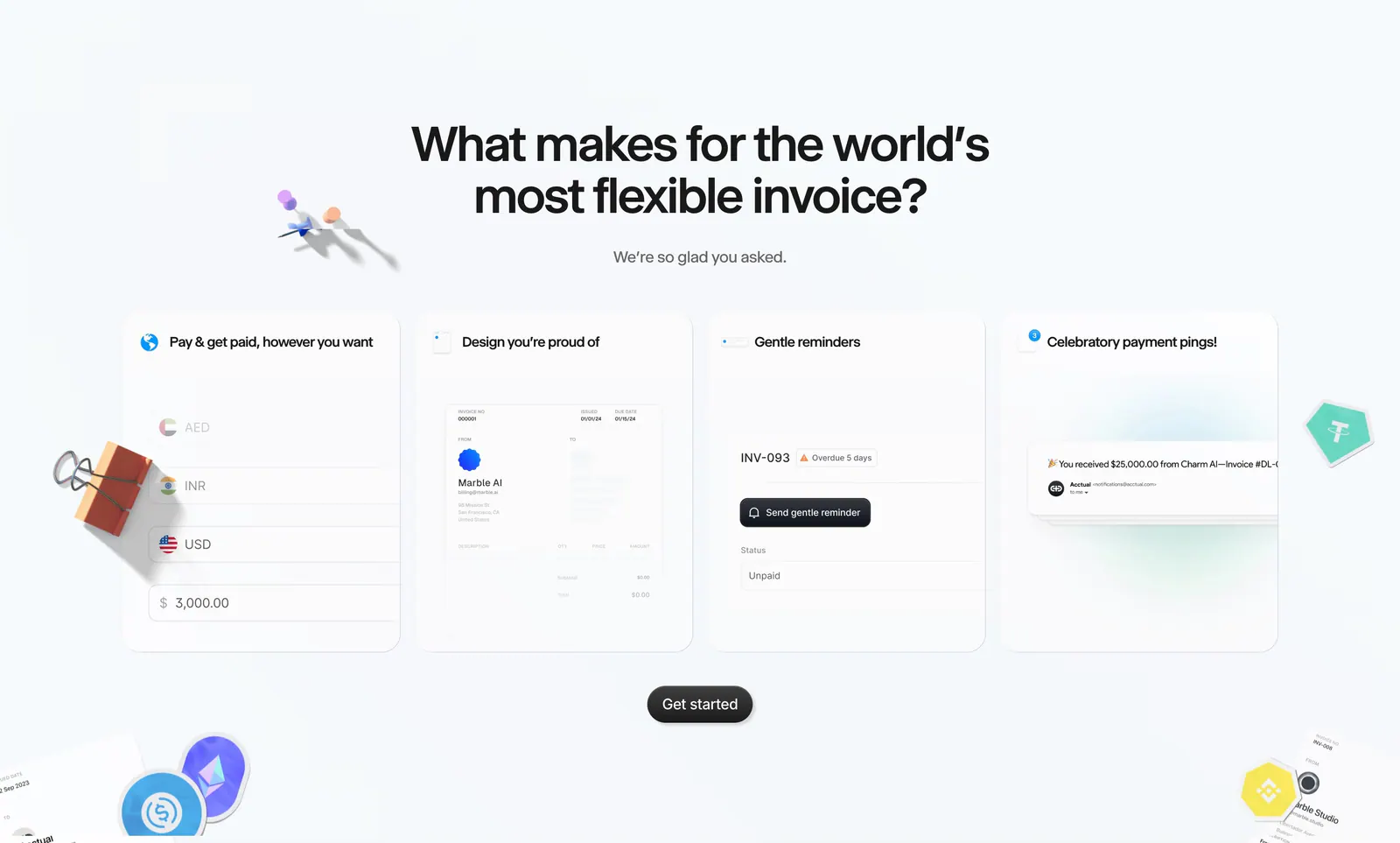
  404. Acctual features section: centered headline above four invoice feature cards with UI snippets, surrounded by 3D clips and crypto stickers
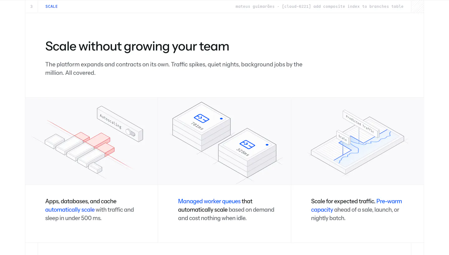
  405. Laravel Cloud features section: headline above three columns of isometric line illustrations for autoscaling, worker queues and pre-warming
  406. Cotool features section: centered serif heading over three dark cards with product UI screenshots on a charcoal panel with pixel-dot accents
  407. Interfere features section: numbered text block with enterprise feature list left and an activity timeline with code diff right
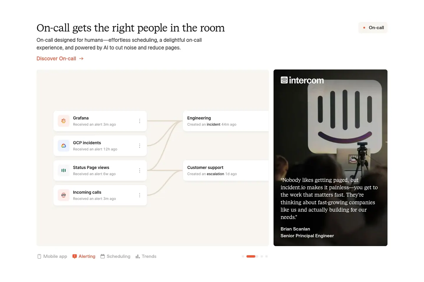
  408. incident.io features section: serif headline above an alert-routing UI panel beside a customer quote photo card, with tabs below
  409. Crisp features section: centered headline with robot renders above three selectable use-case cards and an inbox UI screenshot
  410. Remote features section: left-aligned headline above three cards with UI mockups on purple and cyan gradient tops
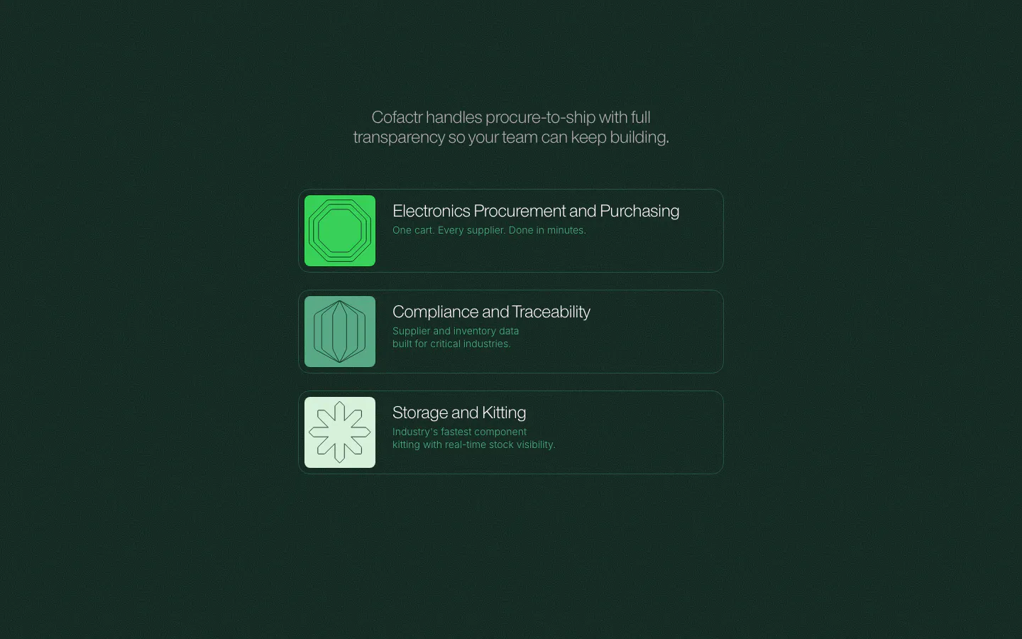
  411. Cofactr features section: dark green centered statement above three stacked product rows with green geometric icons and short descriptions
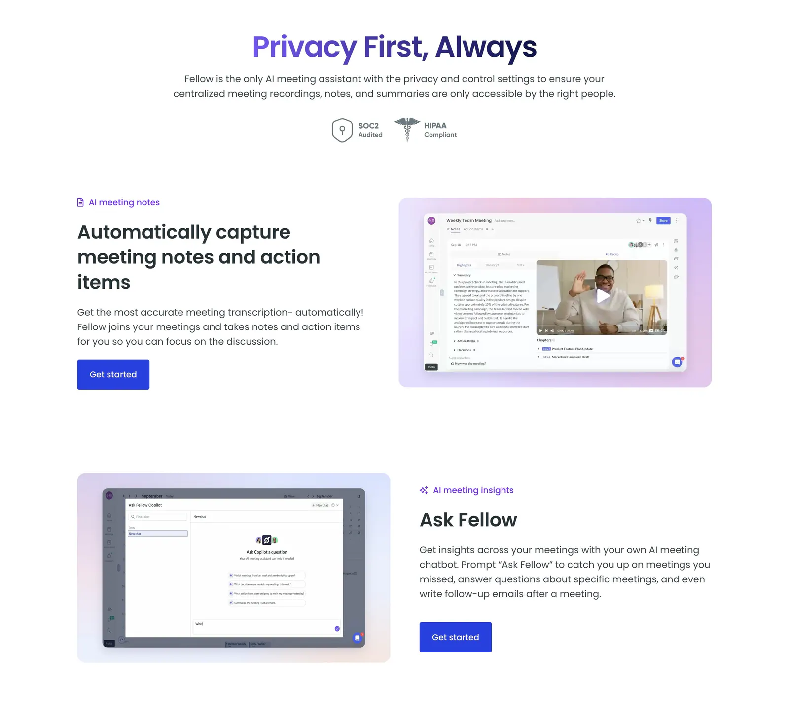
  412. Fellow features section: centered privacy headline with SOC2 and HIPAA badges above alternating rows of text and app screenshots
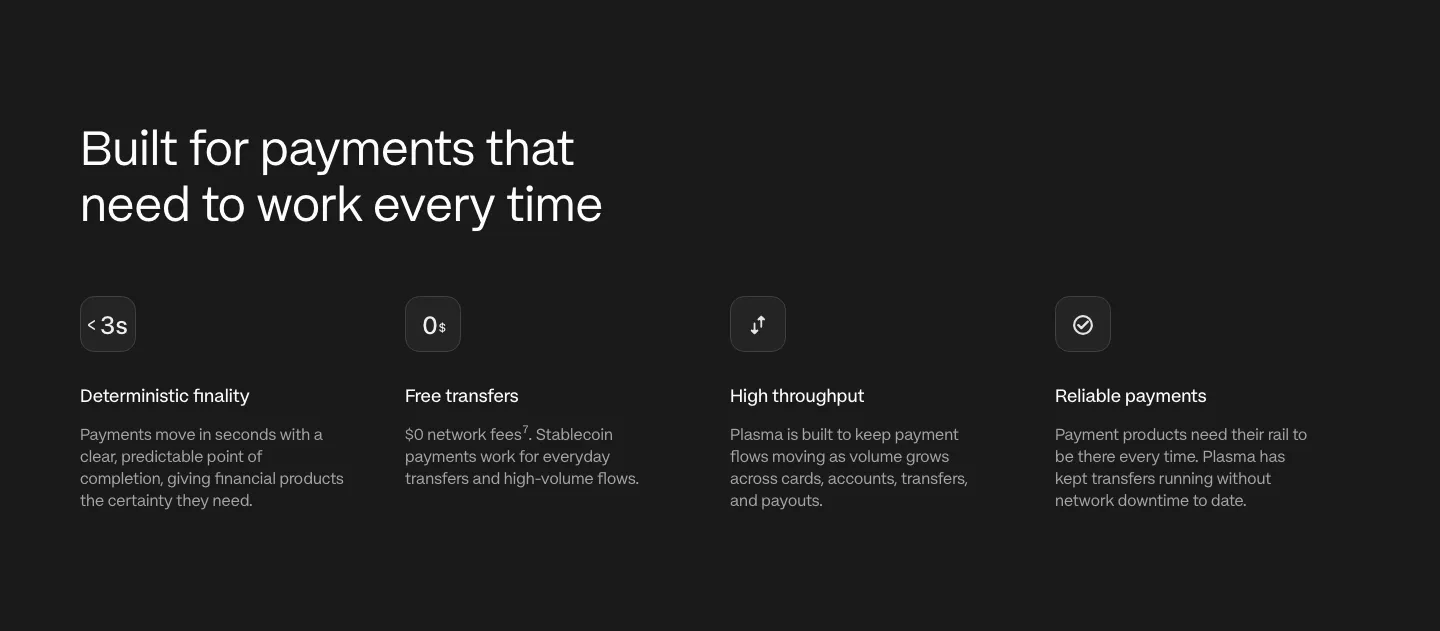
  413. Plasma features section: left-aligned heading above four icon columns describing payment capabilities on a charcoal background
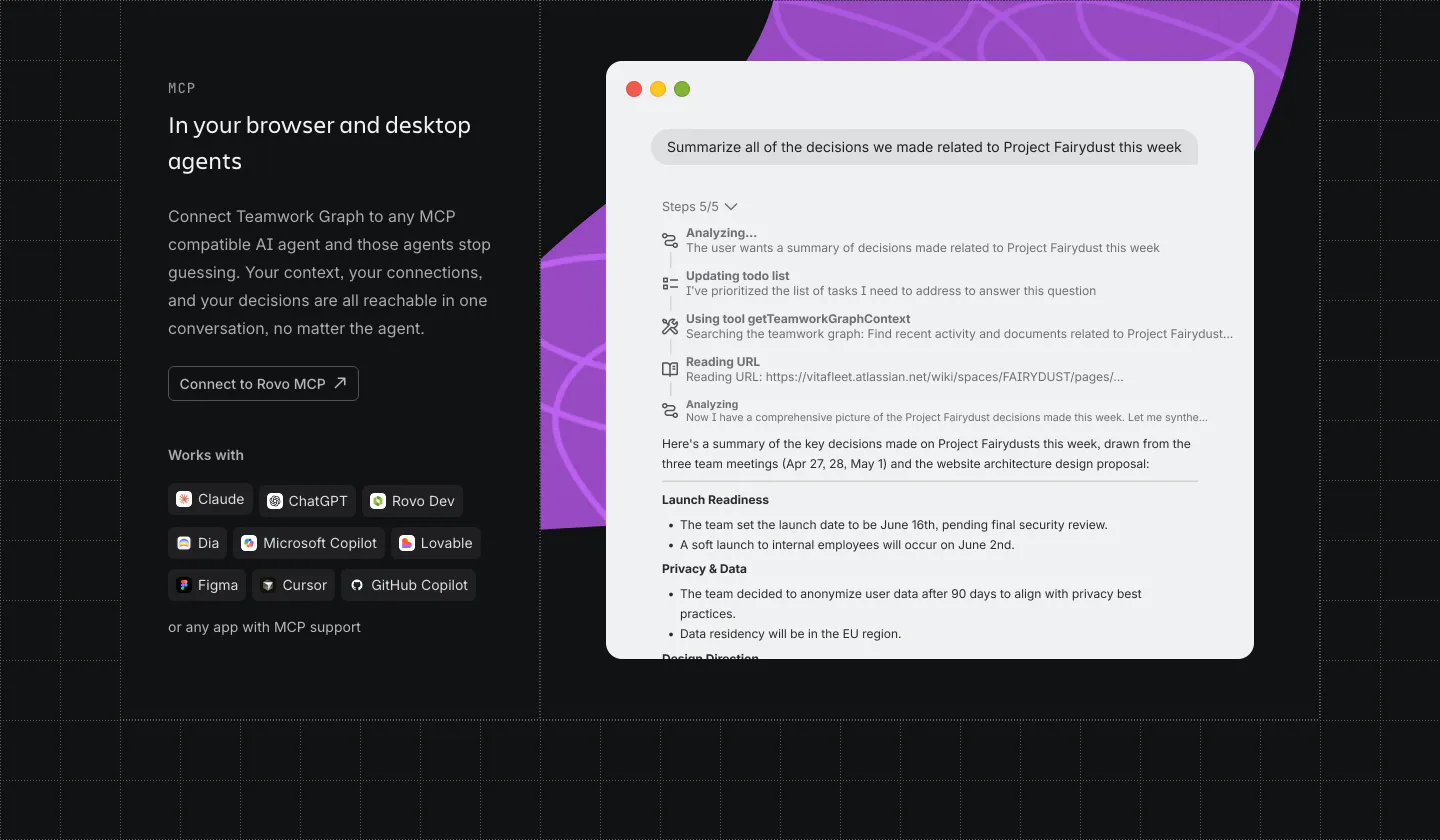
  414. Atlassian features section: MCP copy, button and agent chips on the left, chat UI window over a purple shape on the right, dark grid
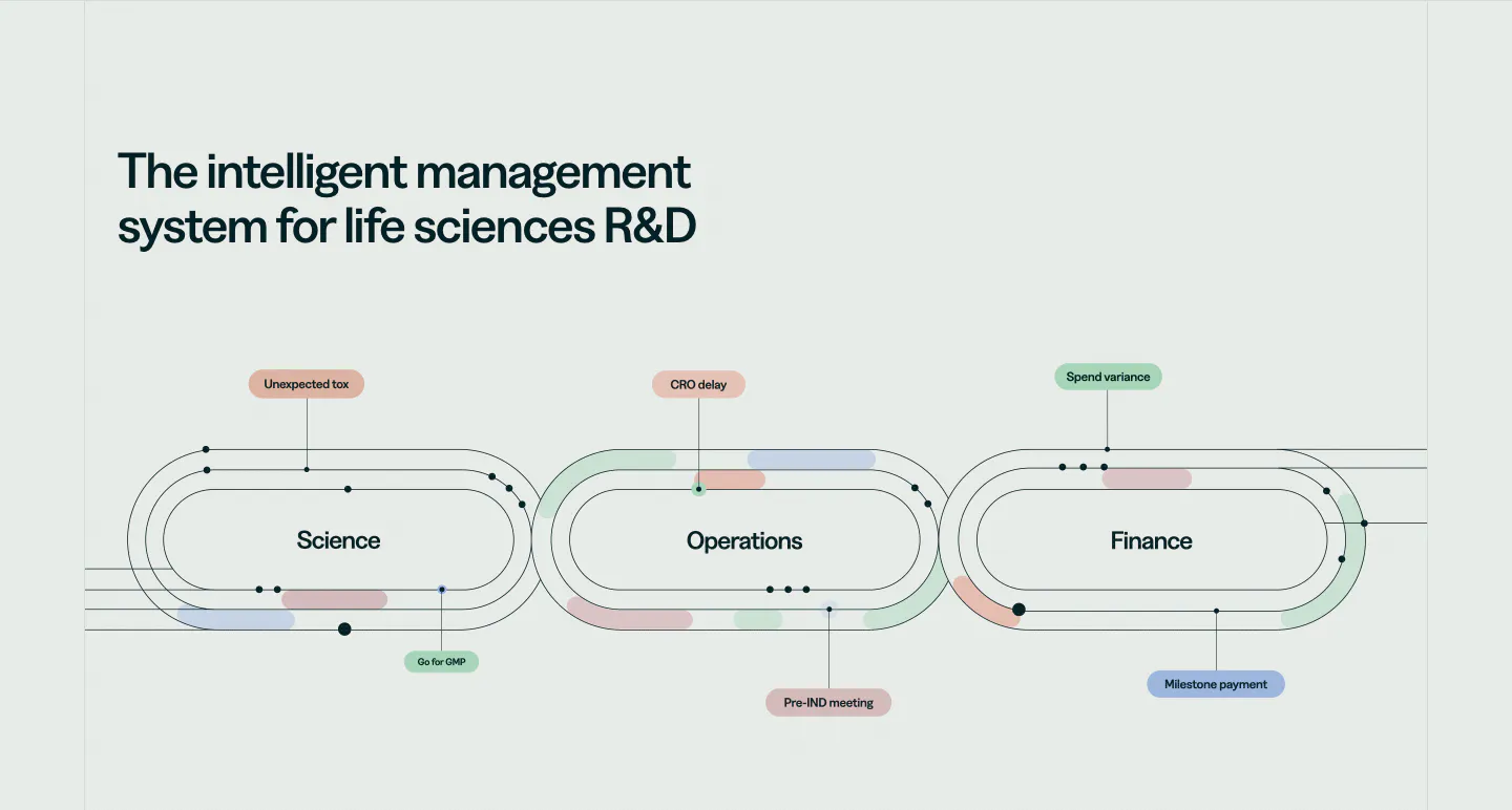
  415. Orchestra Bio features section: headline above a line diagram of three linked loops for science, operations and finance with labels
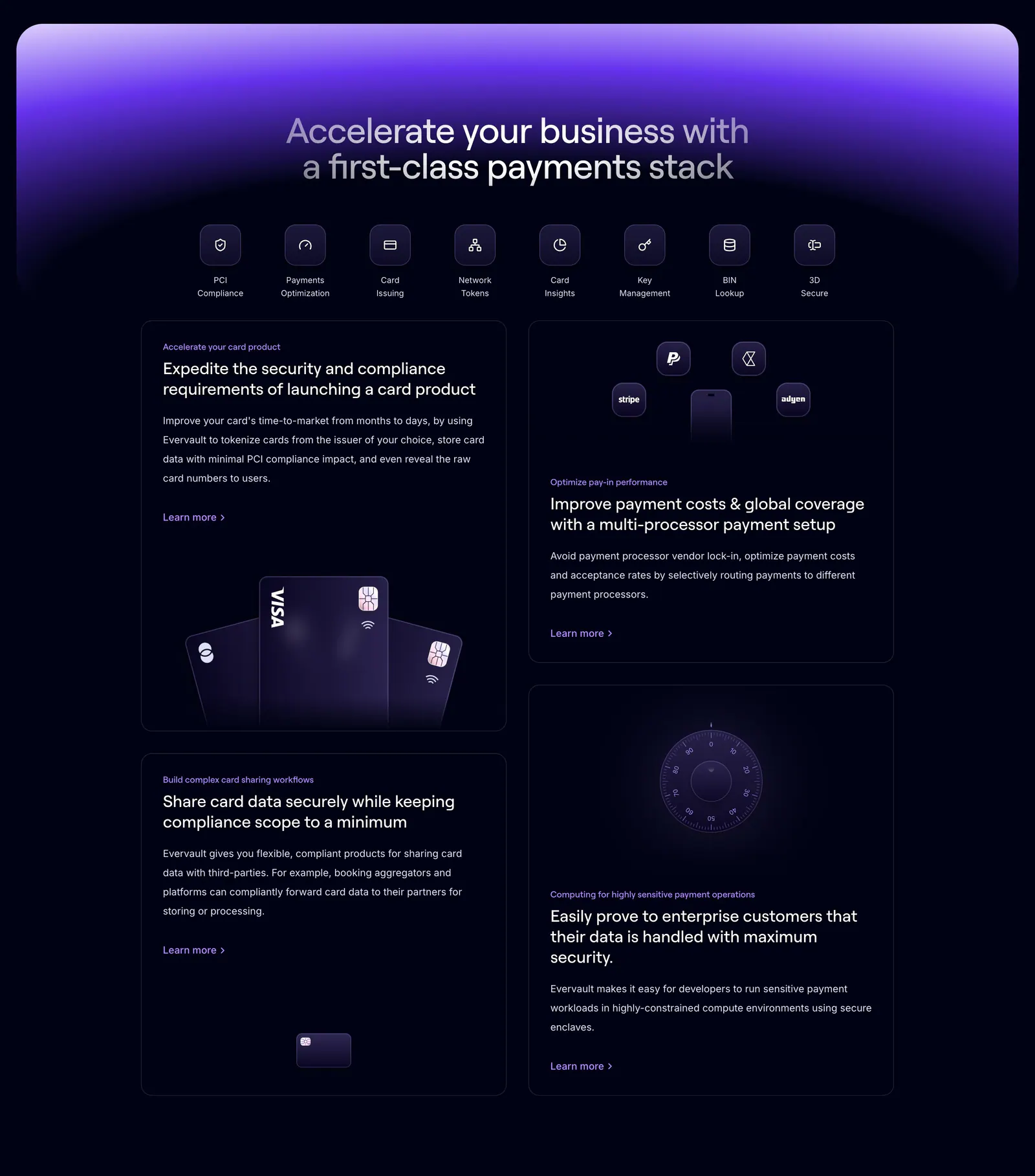
  416. Evervault features section: centered headline and icon row above four dark cards with payment card and vault visuals under a purple glow
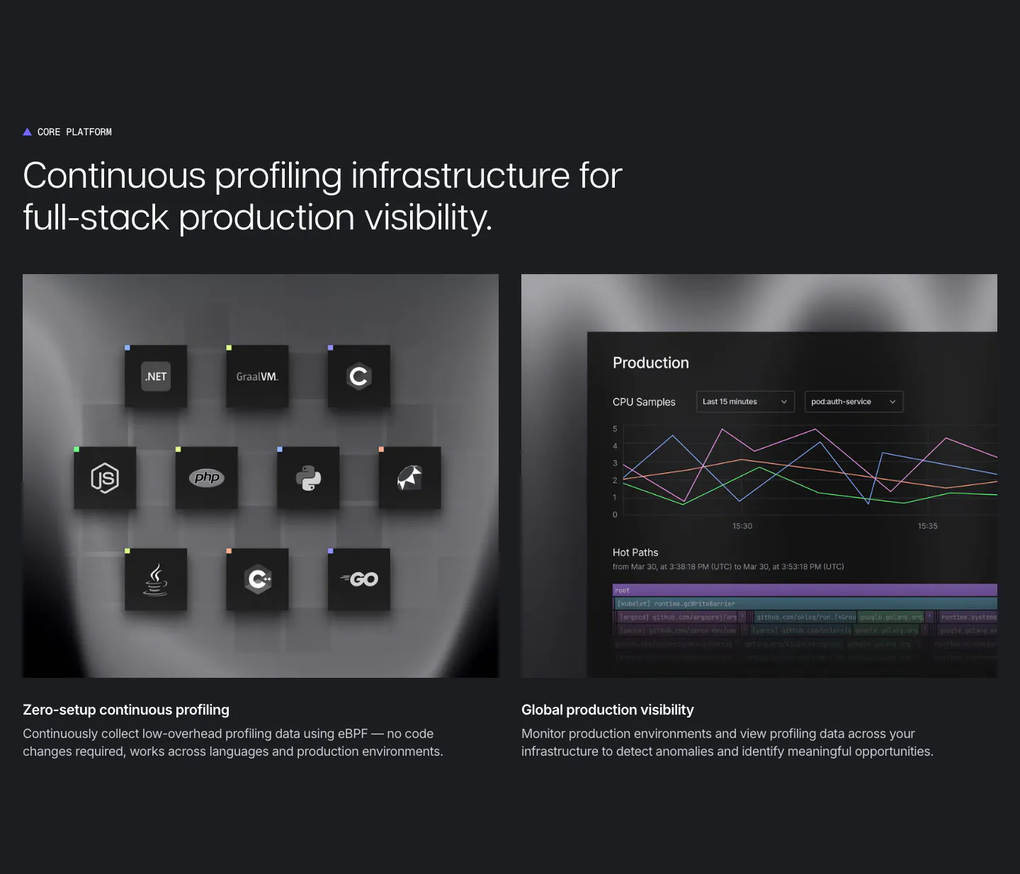
  417. Polar Signals features section: dark charcoal layout with two panels, a grid of language icon tiles and a production CPU chart UI
  418. Agiloft features section: serif headline and button above numbered tabs and a pie chart UI mockup on an orange panel
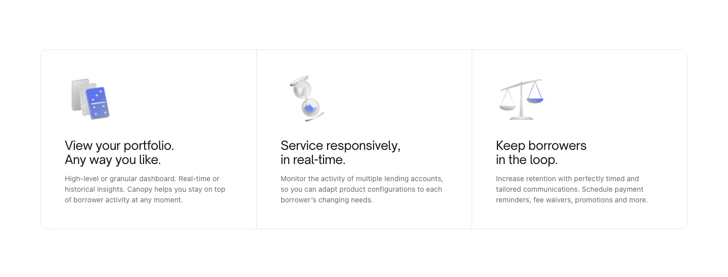
  419. Canopy features section: three bordered cards with small 3D object renders, titles and short descriptions on white
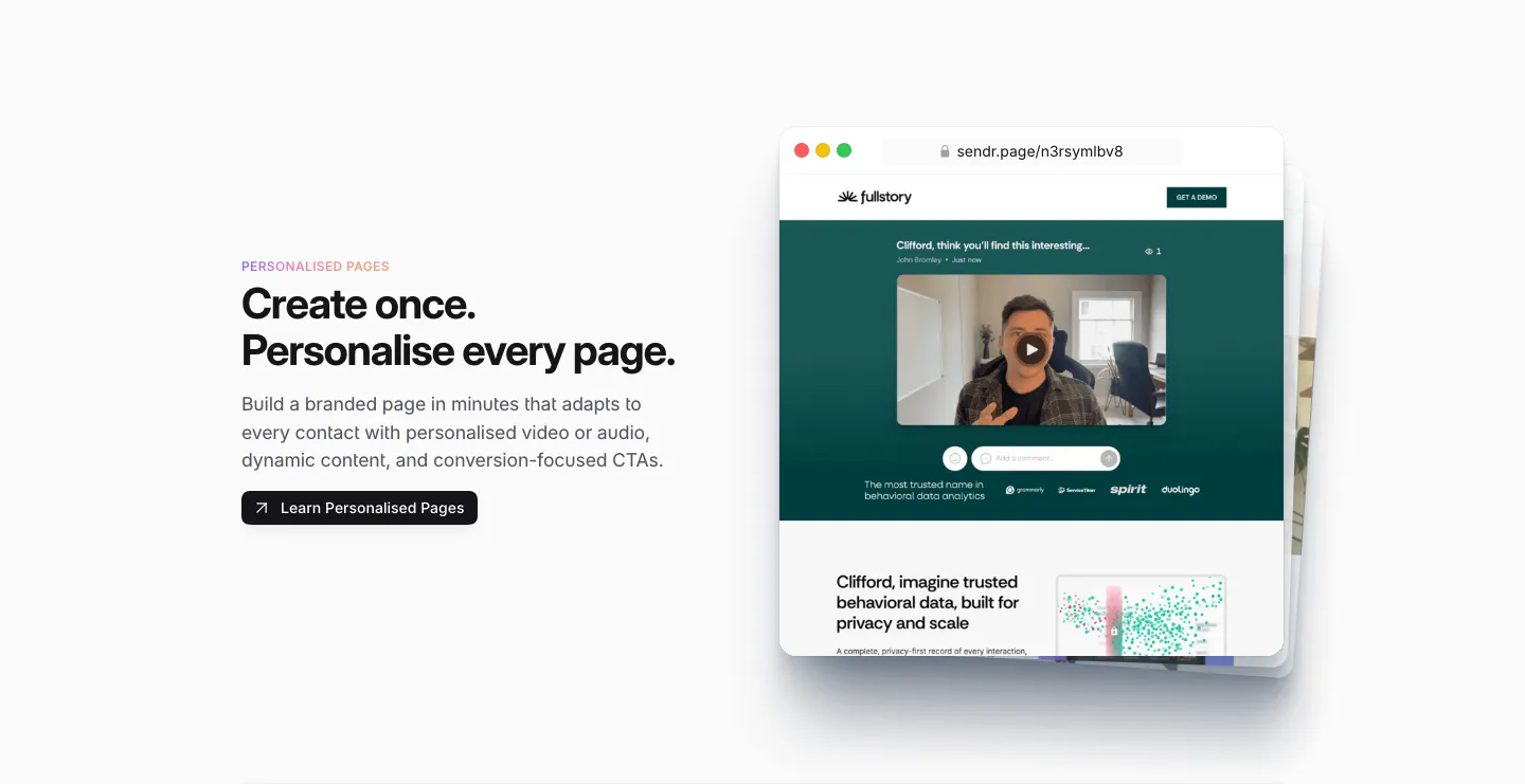
  420. Sendr features section: Personalised Pages copy and button left, stacked browser mockups of a personalised video landing page right
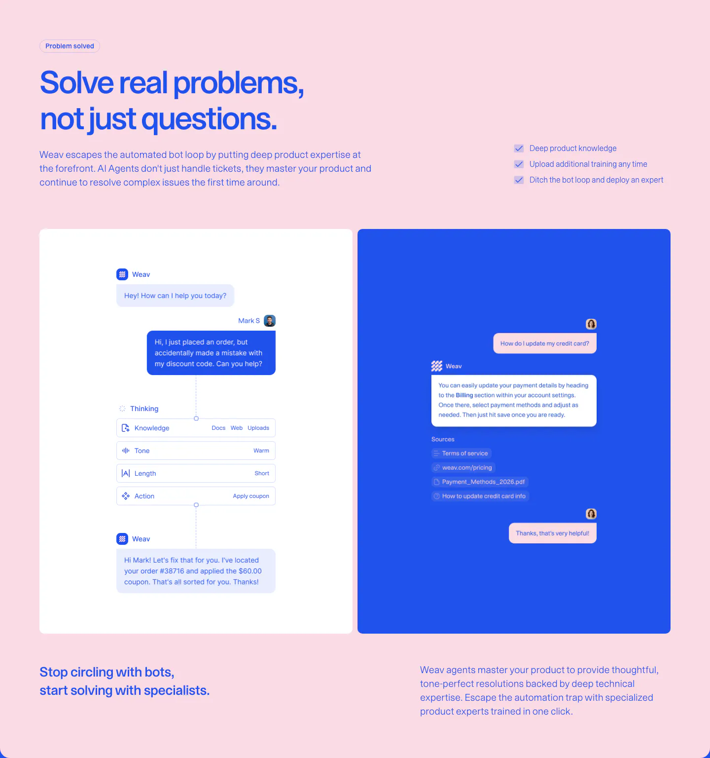
  421. Weav features section: blue headline and checklist on pink above a white panel with an AI reasoning chat flow and a blue panel with a sourced reply
  422. Fernand features section: centered heading above a docs editor screenshot and a 3x2 grid of feature cards
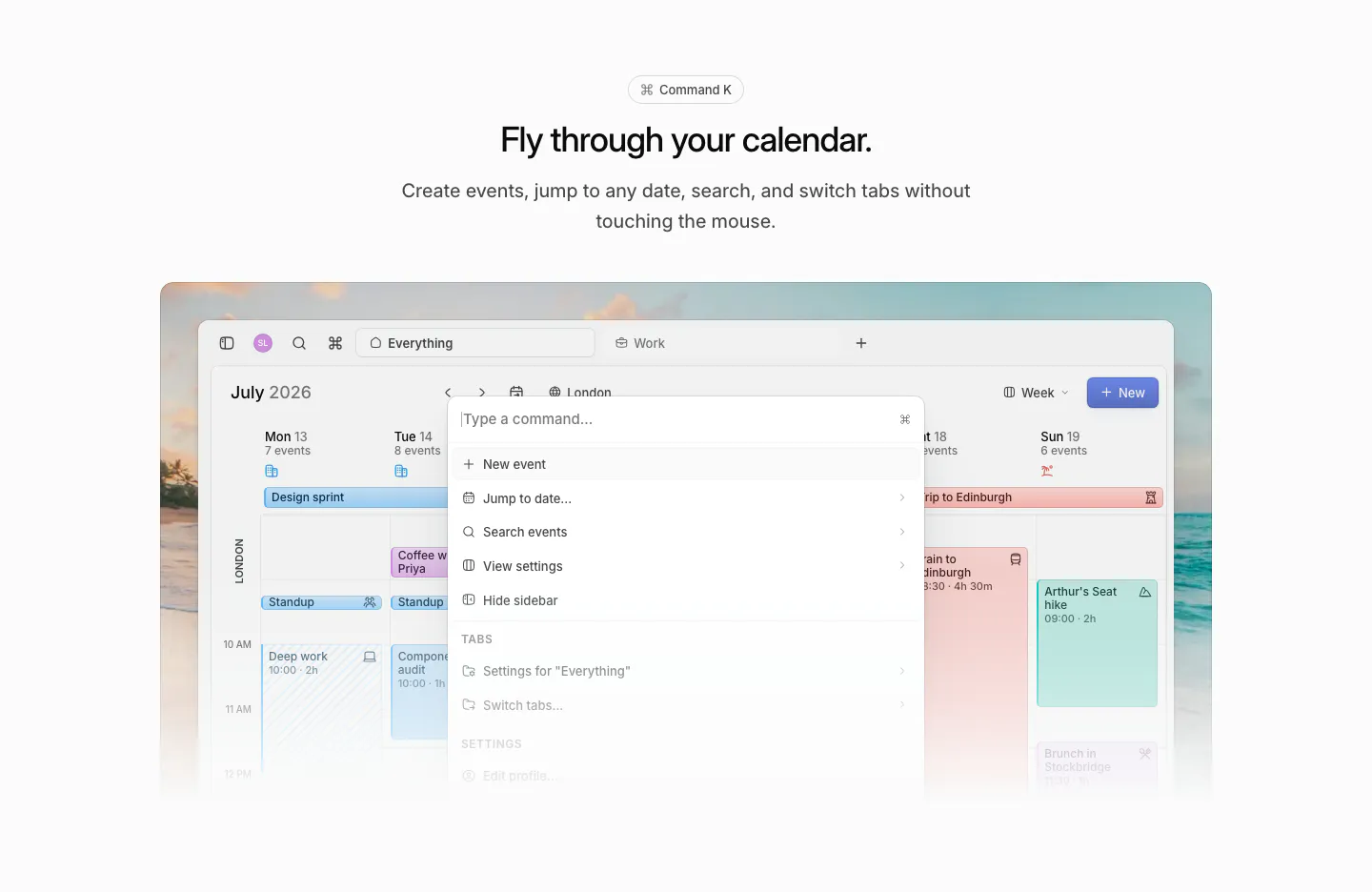
  423. Daybridge features section: centered headline above a calendar screenshot with a command palette open, on a beach photo
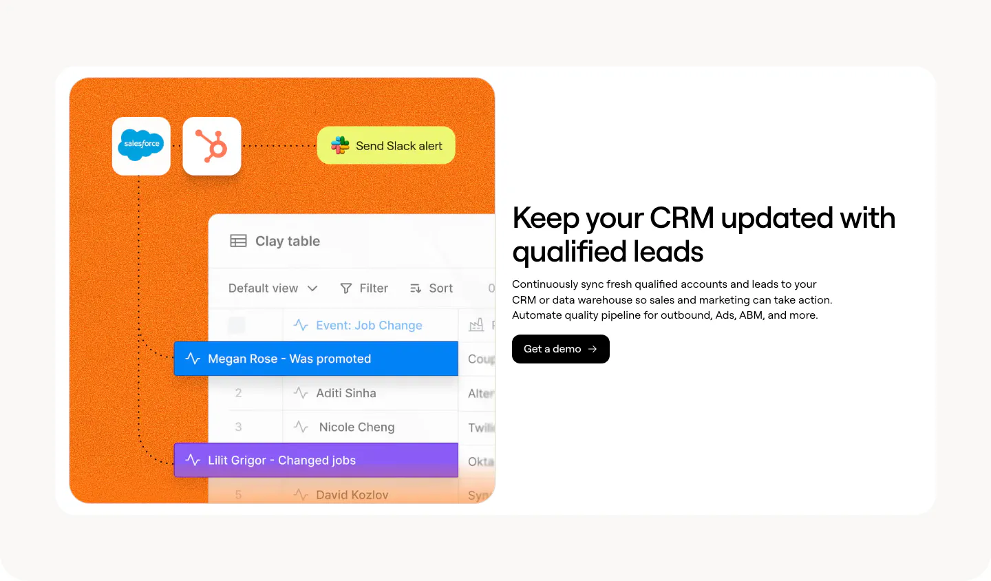
  424. Clay features section: split card with an orange panel of Salesforce, HubSpot and Clay table UI beside a headline and demo button
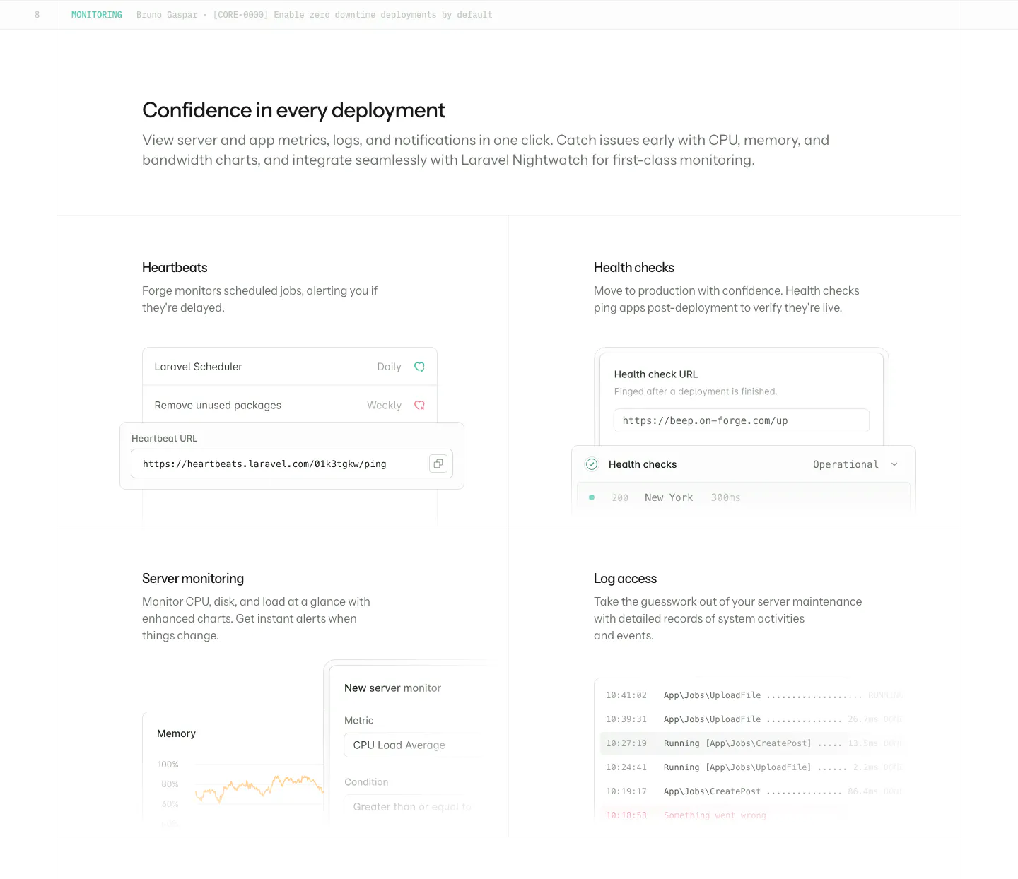
  425. Laravel Forge features section: heading above a 2x2 grid of monitoring cards with heartbeat, health check, chart and log UI
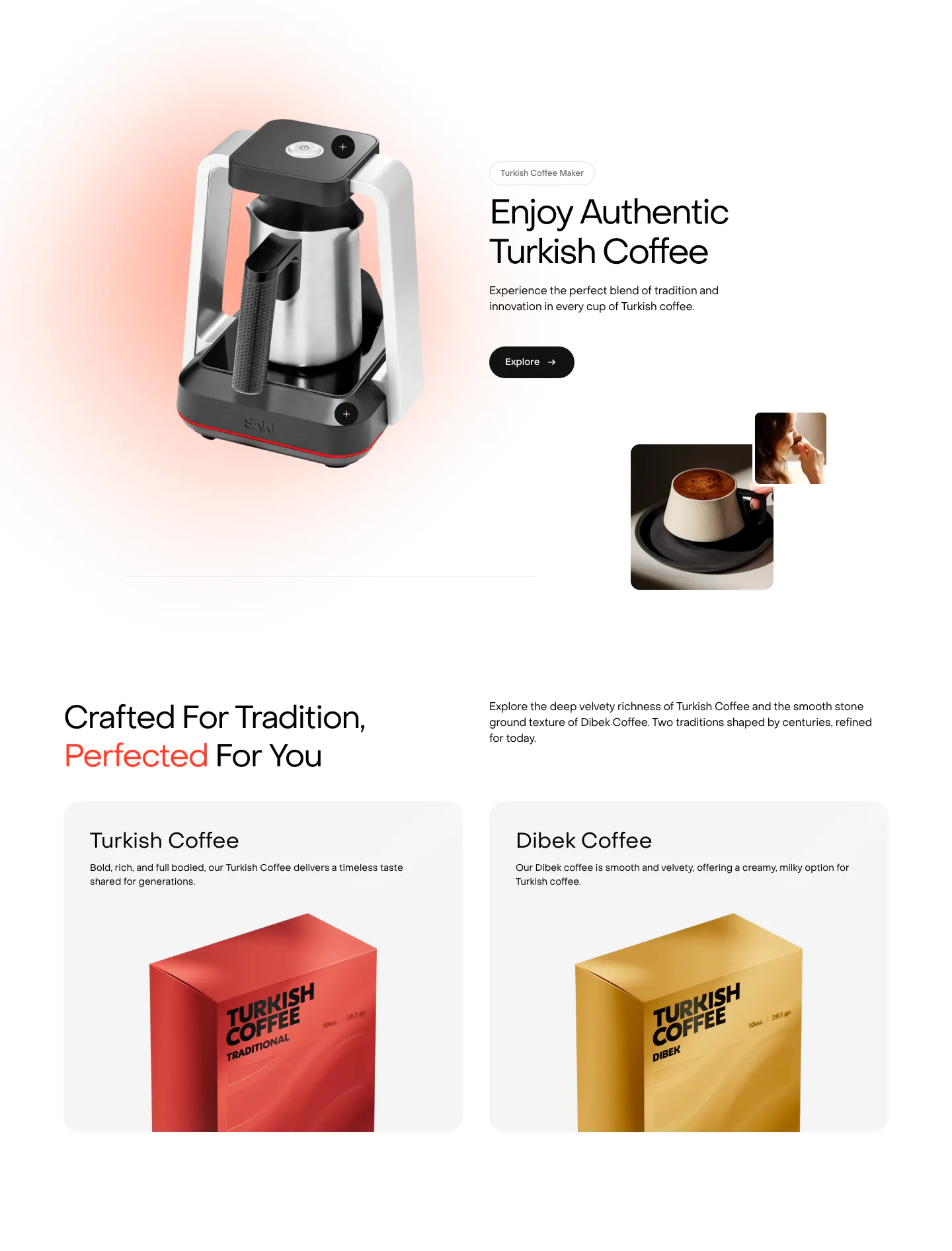
  426. Saki features section: coffee maker product shot beside headline and Explore button, then two product cards with coffee packaging boxes

Common patterns in features sections

How to structure a feature section

  1. Rank features before laying them out

    Decide which two or three capabilities matter most to buyers and give them the most space. Supporting features can sit in a compact grid below. Equal-sized cards for everything tell the reader nothing about what is important.

  2. Write headings that state the benefit

    Each heading should say what the user gets, not the internal name of the module. "Find any file in seconds" beats "Smart Search." Keep body copy to two short sentences and cut adjectives that add no information.

  3. Crop screenshots to the point

    Show the specific part of the product the text describes, not the whole dashboard. Zoom in on the relevant panel, annotate it if needed, and keep visuals at one aspect ratio so rows and tiles line up cleanly.

  4. Match the layout to the depth

    Use a compact grid for many small capabilities, alternating rows for a few that need explanation, and a stepped or tabbed walkthrough when features build on each other. Choosing the layout after you know how much each feature needs to say keeps the section from feeling padded or cramped.


Companies in this collection

All section types
    ↑↓ Navigate ↵ Open

    Section preview

    Website section