Cotool website design

Every section we captured from the Cotool website, in page order, from the hero section down to the footer. Open any thumbnail to see it full size.

Sections 8

In page order, top to bottom

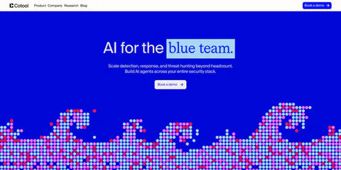
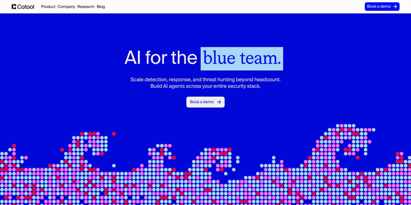
  1. Cotool hero section: centered headline with highlighted serif words on a saturated blue background above a pixel-dot wave artwork
    01 Hero

    AI for the blue team.

  2. Cotool logo cloud section: single row of grayscale customer logos under a small 'Loved by teams at' label on a light gray background

    Loved by teams at:

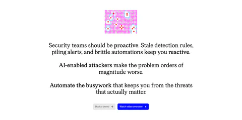
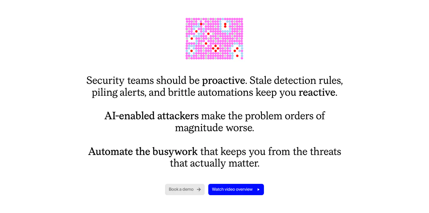
  3. Cotool value proposition section: centered serif problem statement with bolded phrases, small pink pixel graphic and two buttons on white

    Security teams should be proactive. Stale detection rules, piling alerts, and brittle automations keep you reactive.

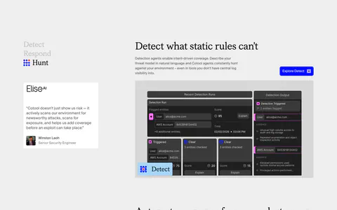
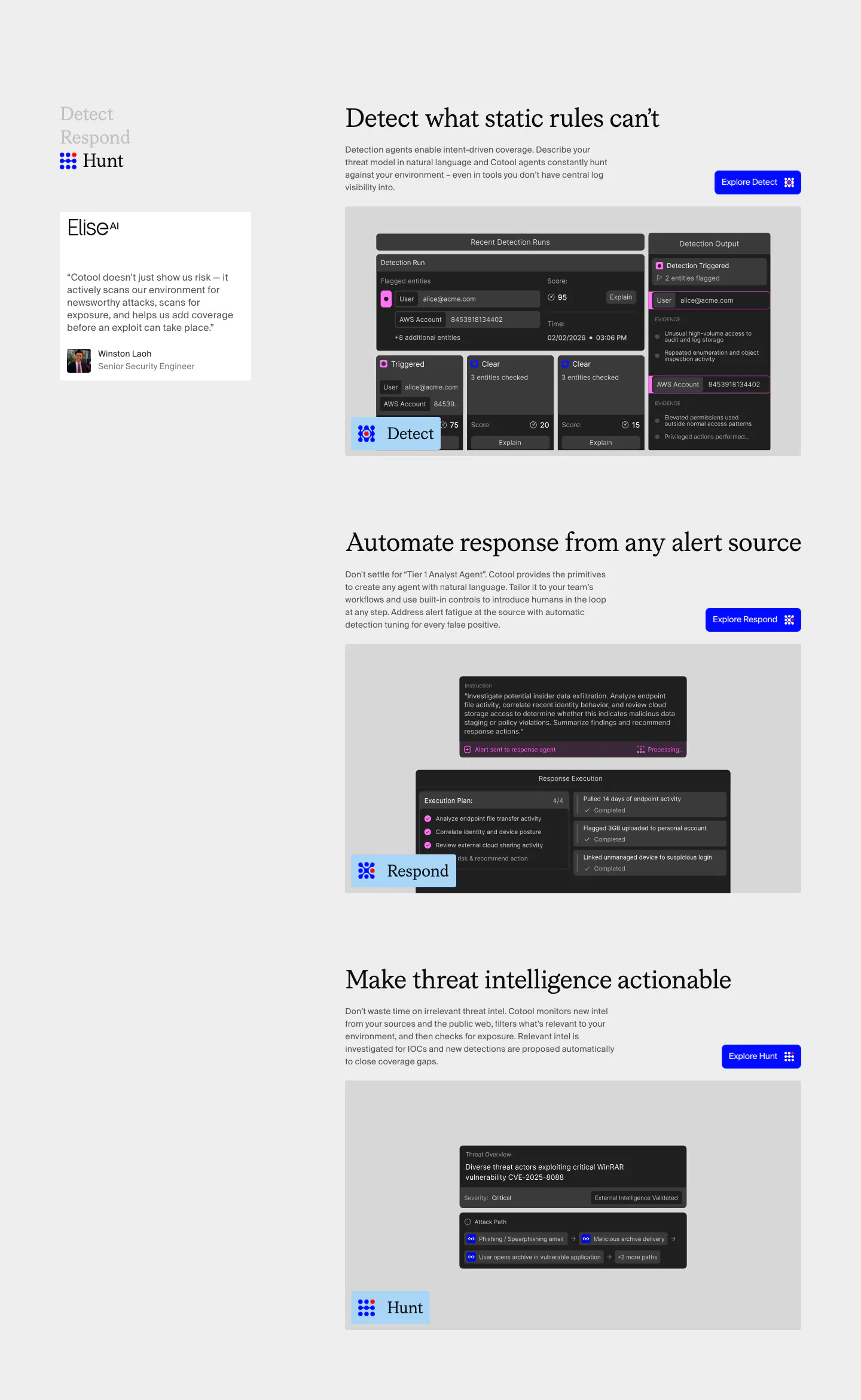
  4. Cotool features section: Detect, Respond and Hunt rows with serif headings, blue buttons and dark product UI screenshots beside a sticky side nav

    Detect what static rules can't

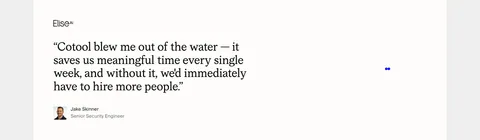
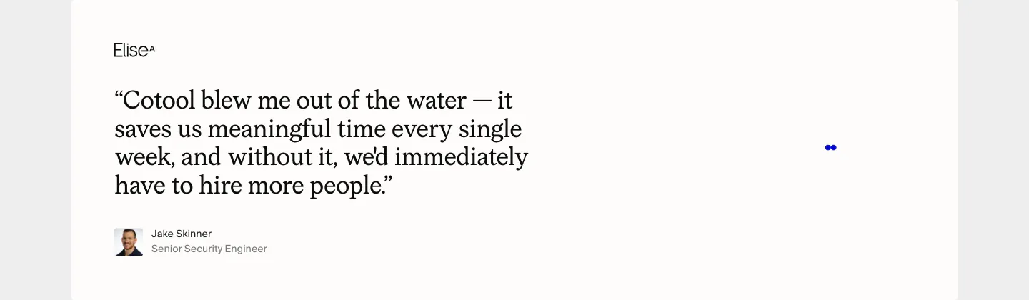
  5. Cotool testimonials section: large serif customer quote with EliseAI logo, avatar and name on an off-white card

    Cotool blew me out of the water — it saves us meaningful time every single week, and without it, we'd immediately have to hire more people.

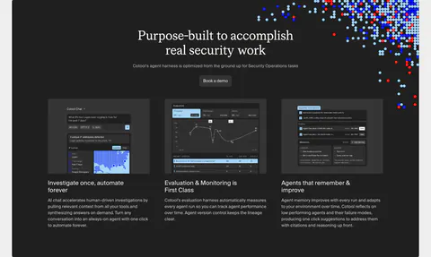
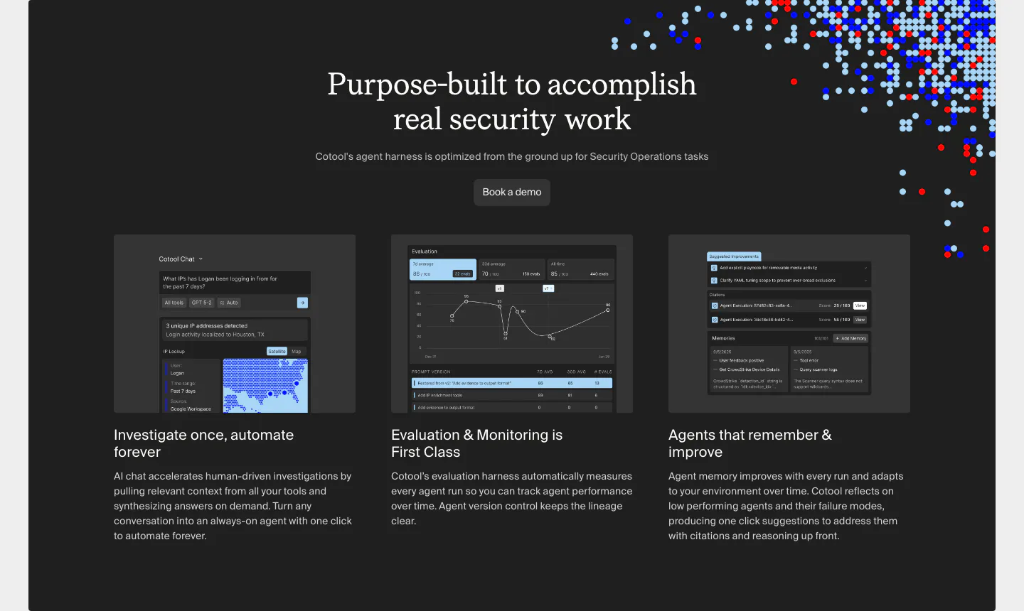
  6. Cotool features section: centered serif heading over three dark cards with product UI screenshots on a charcoal panel with pixel-dot accents

    Purpose-built to accomplish real security work

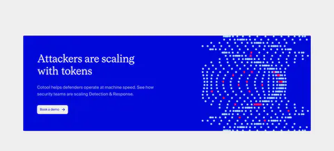
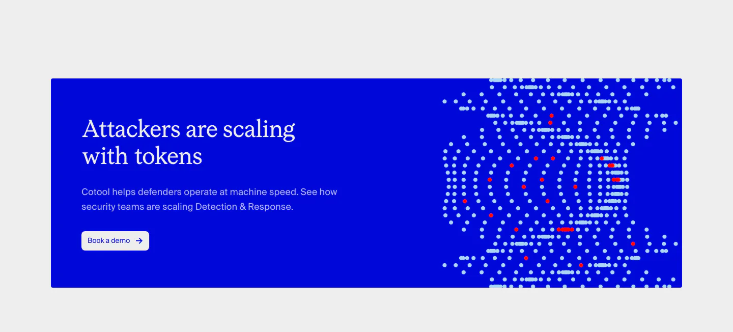
  7. Cotool call-to-action section: saturated blue banner with serif headline and button on the left and a dotted pixel artwork on the right

    Attackers are scaling with tokens

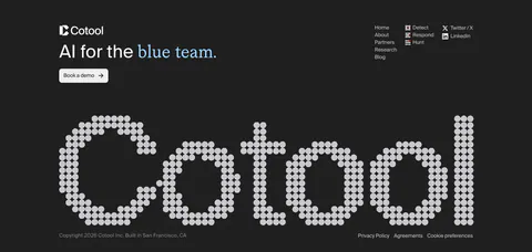
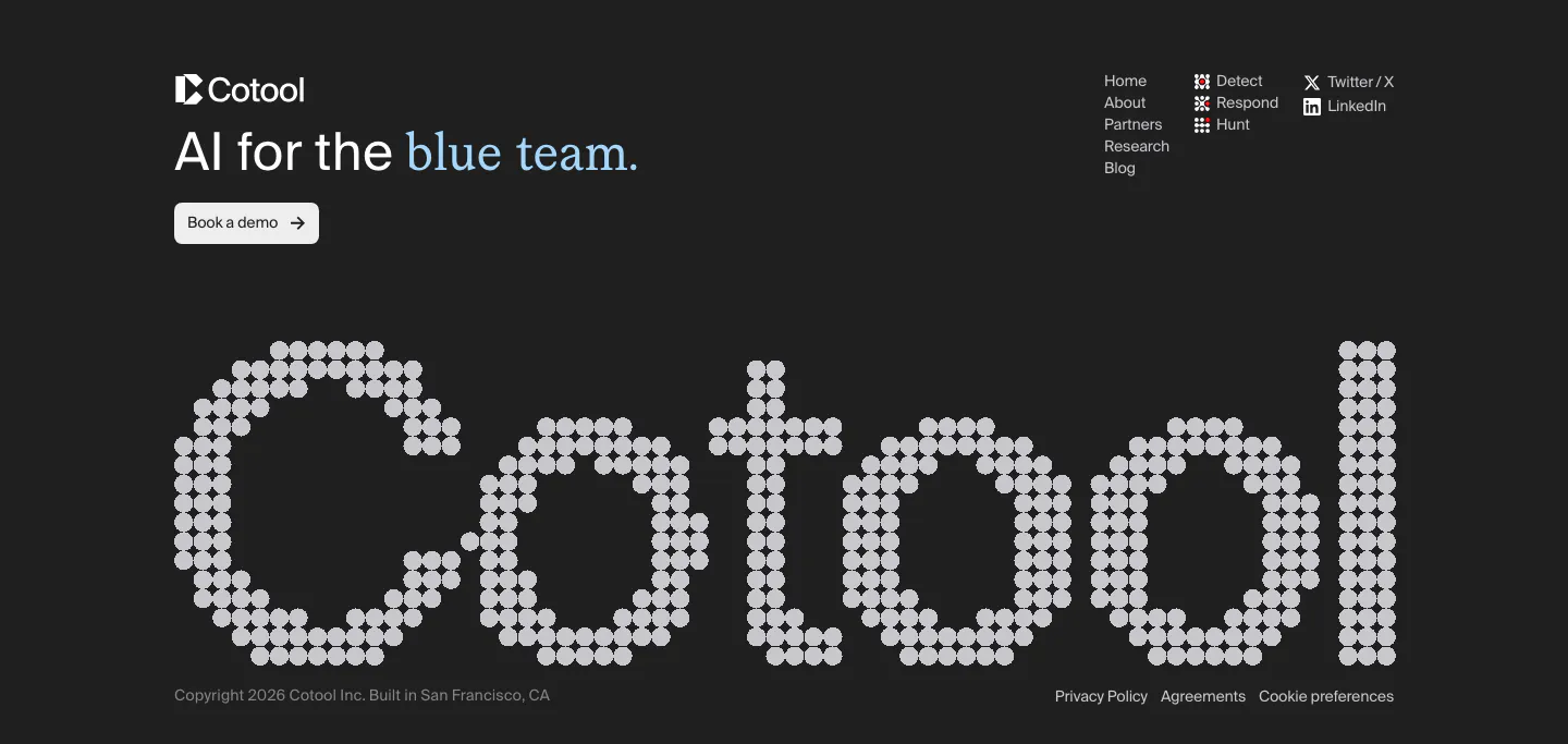
  8. Cotool footer section: tagline, demo button and link columns above a giant dot-matrix Cotool wordmark on a charcoal background
    08 Footer

    AI for the blue team.

Similar companies

All companies
    ↑↓ Navigate ↵ Open

    Section preview

    Website section