Tabs Website Design Examples

Tabs let one section hold several views without growing taller. A tab bar, segmented control, or toggle switches the content in place, whether that is code in different languages, product areas, platforms, or billing periods. Tabs in website design have one big weakness: hidden content. Many visitors never click past the first tab, so the default view has to carry the message by itself.
182 sections

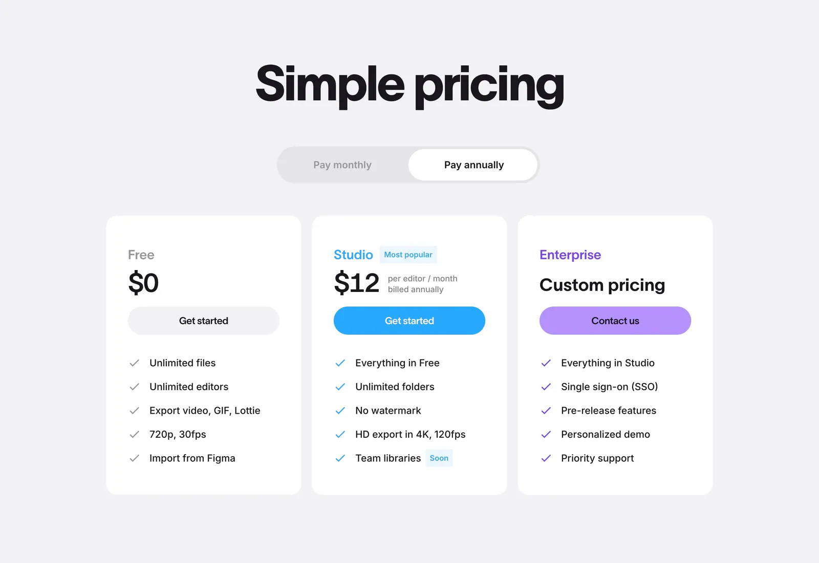
  1. Jitter pricing section: centered headline and billing toggle above three white plan cards with colored buttons on light gray
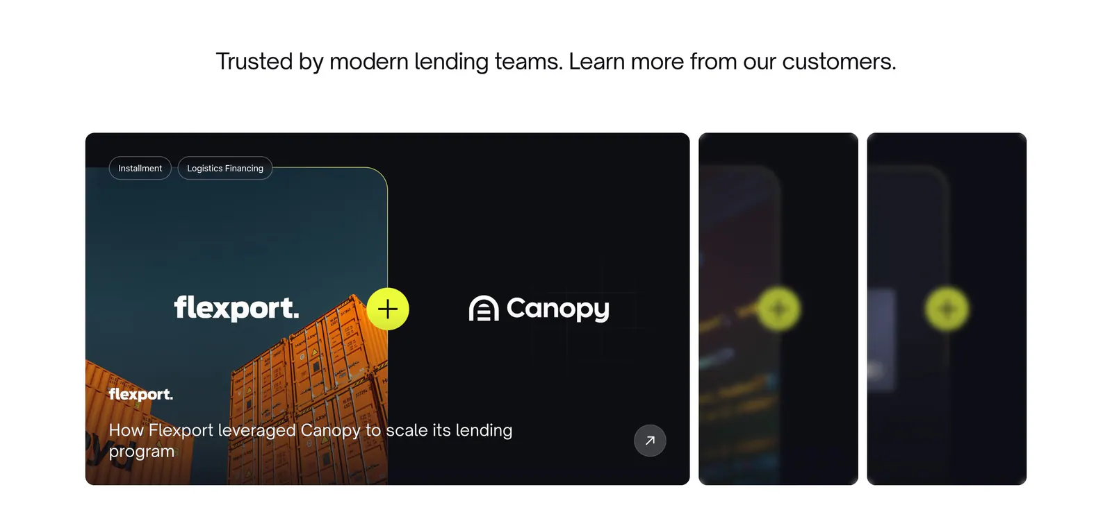
  2. Canopy testimonials section: centered headline above a Flexport case study card with container photo and two collapsed cards
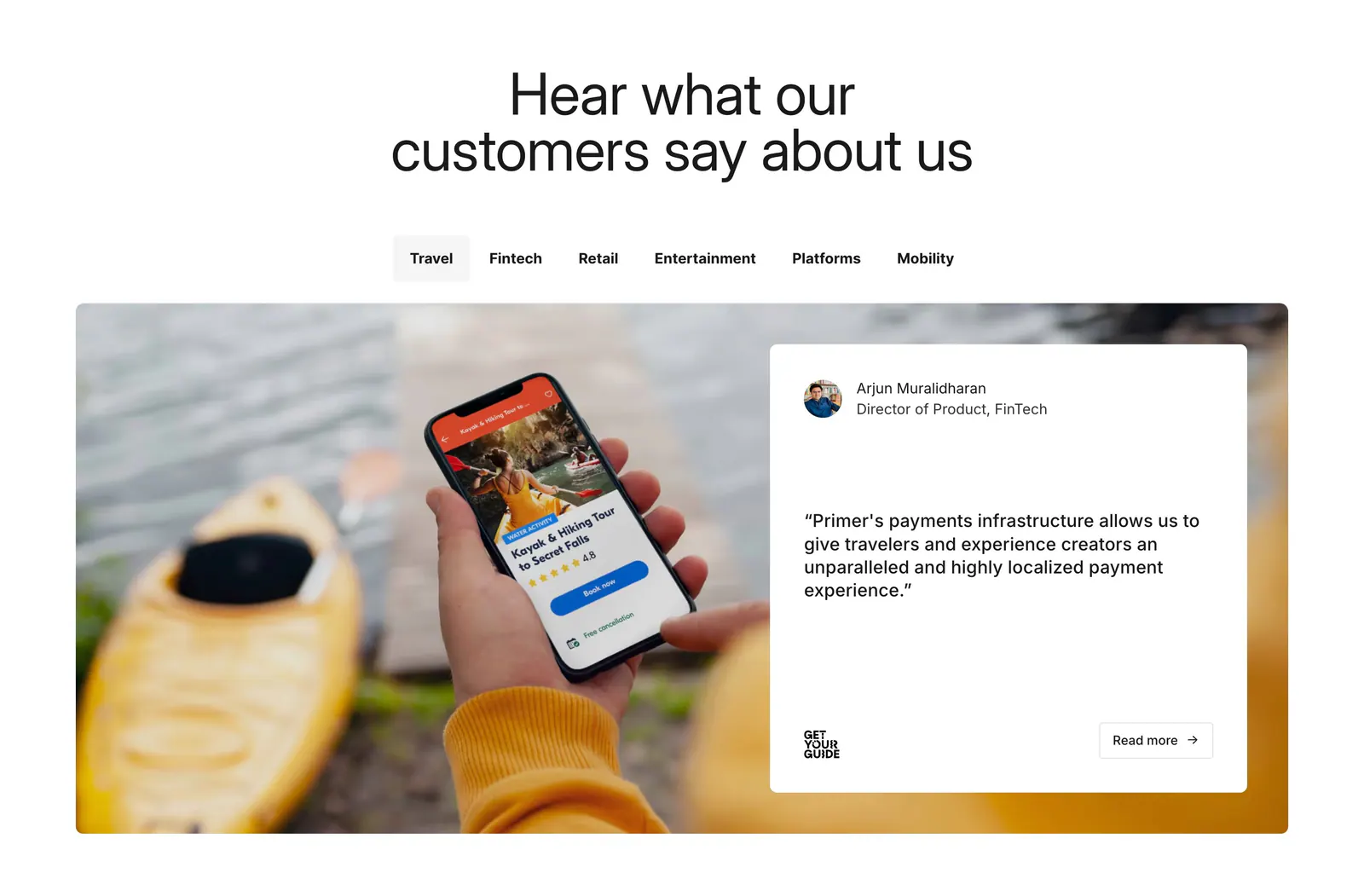
  3. Primer testimonials section: centered headline, industry tabs, and a quote card over a photo of a hand holding a phone
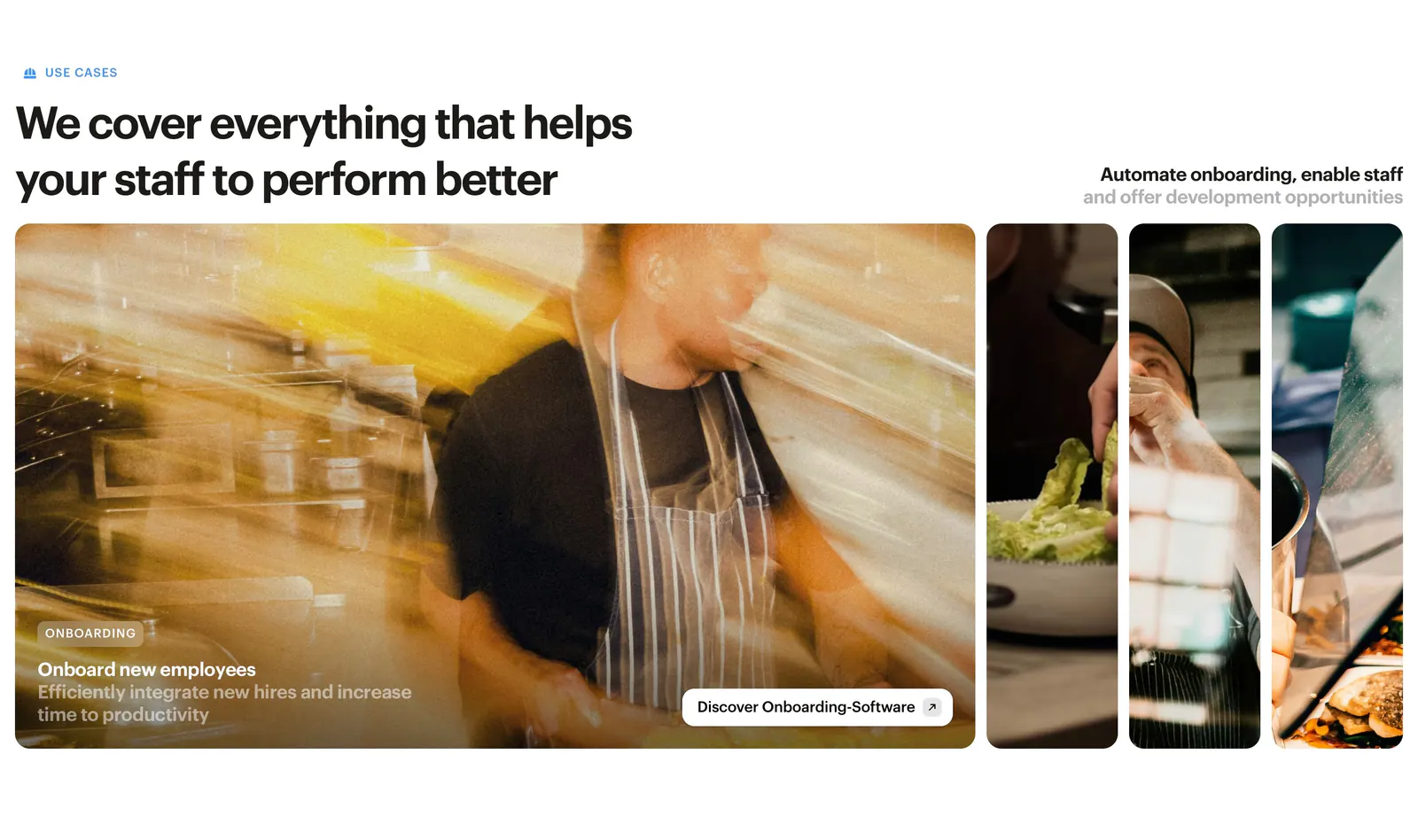
  4. Bounti features section: left headline above expanding photo panels of restaurant staff, the first open with an onboarding caption
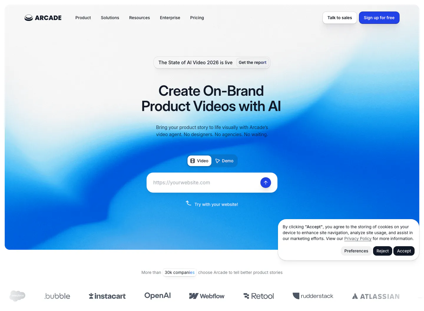
  5. Arcade hero section: centered headline with Video/Demo toggle and URL input on a blue gradient, customer logo row below
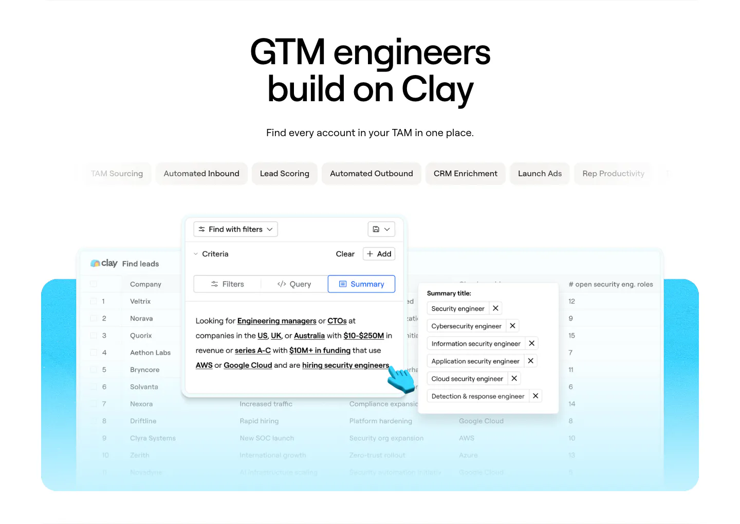
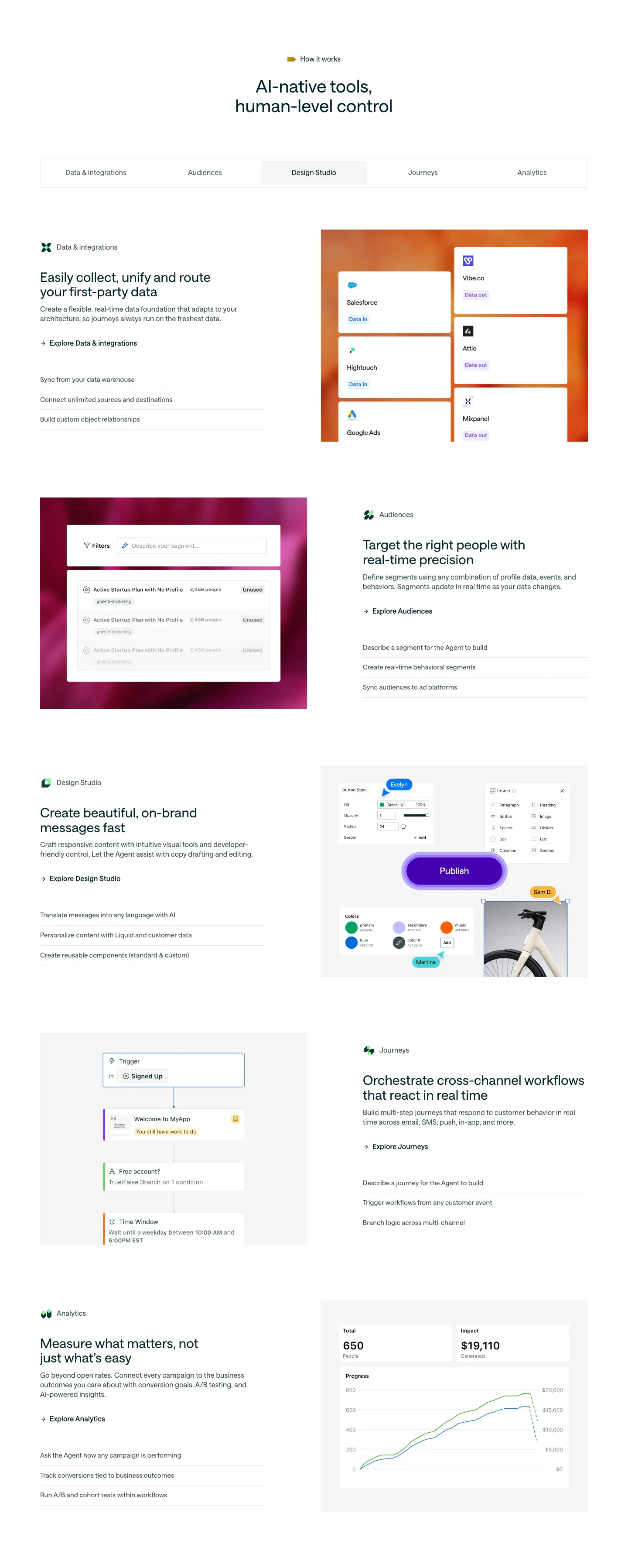
  6. Clay use cases section: centered headline above use-case tab pills and a lead-finding table product screenshot on a cyan panel
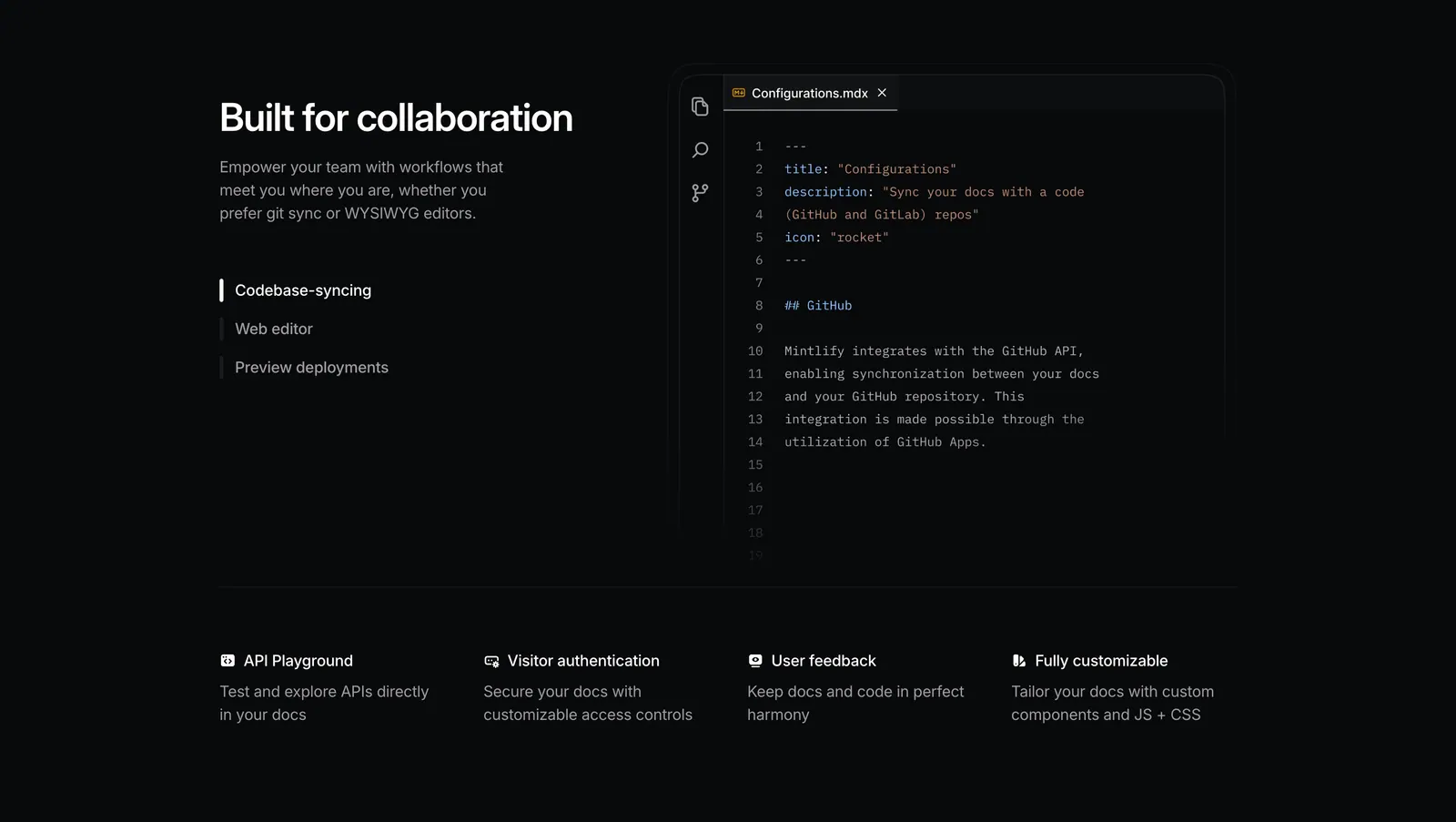
  7. Mintlify features section: dark split layout with tab list beside an MDX code editor, above a four-column feature row
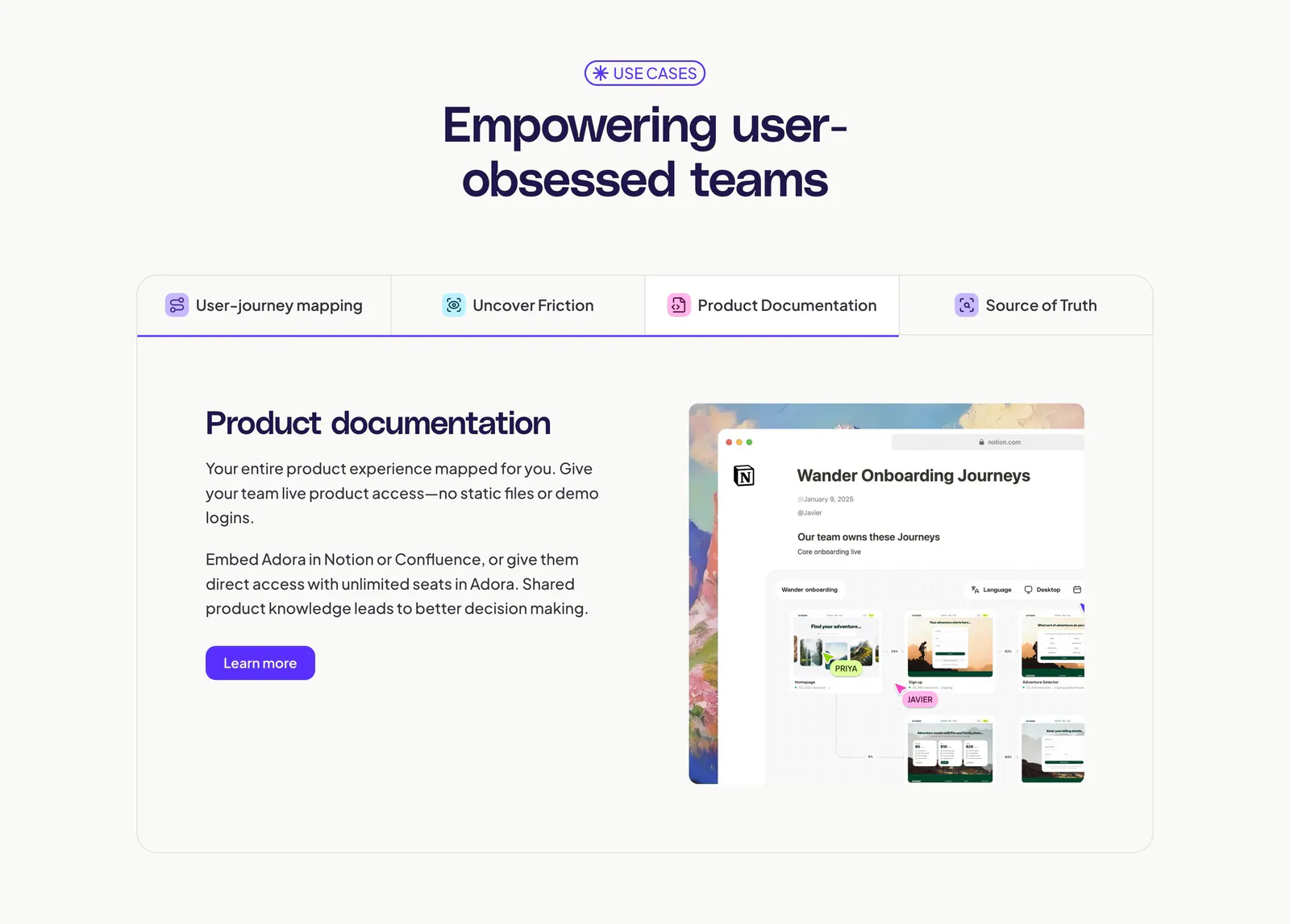
  8. Adora features section: centered headline above a four-tab panel with text on the left and a Notion-style product screenshot on the right
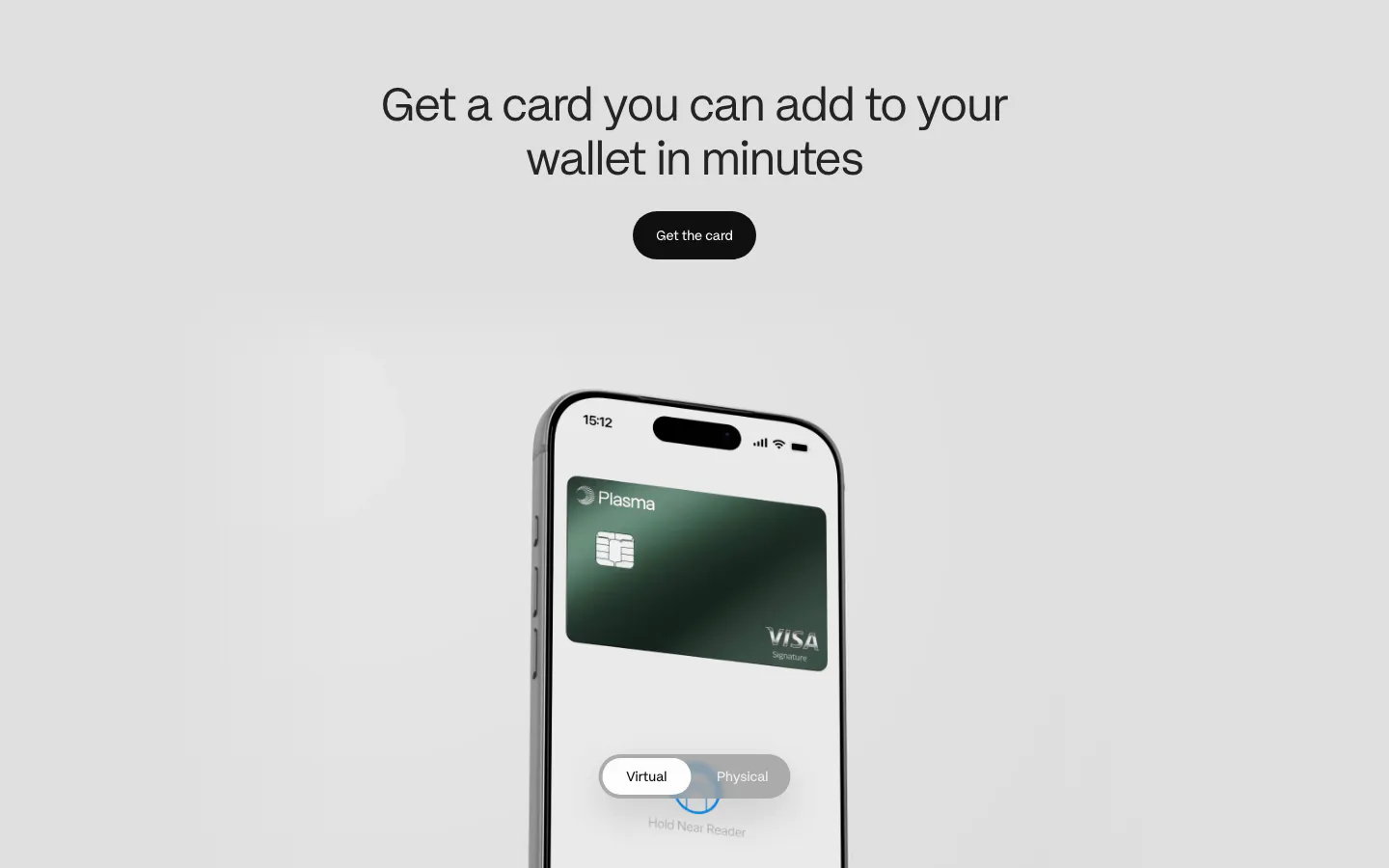
  9. Plasma features section: centered heading and button above a phone showing a green Visa card with a virtual/physical toggle
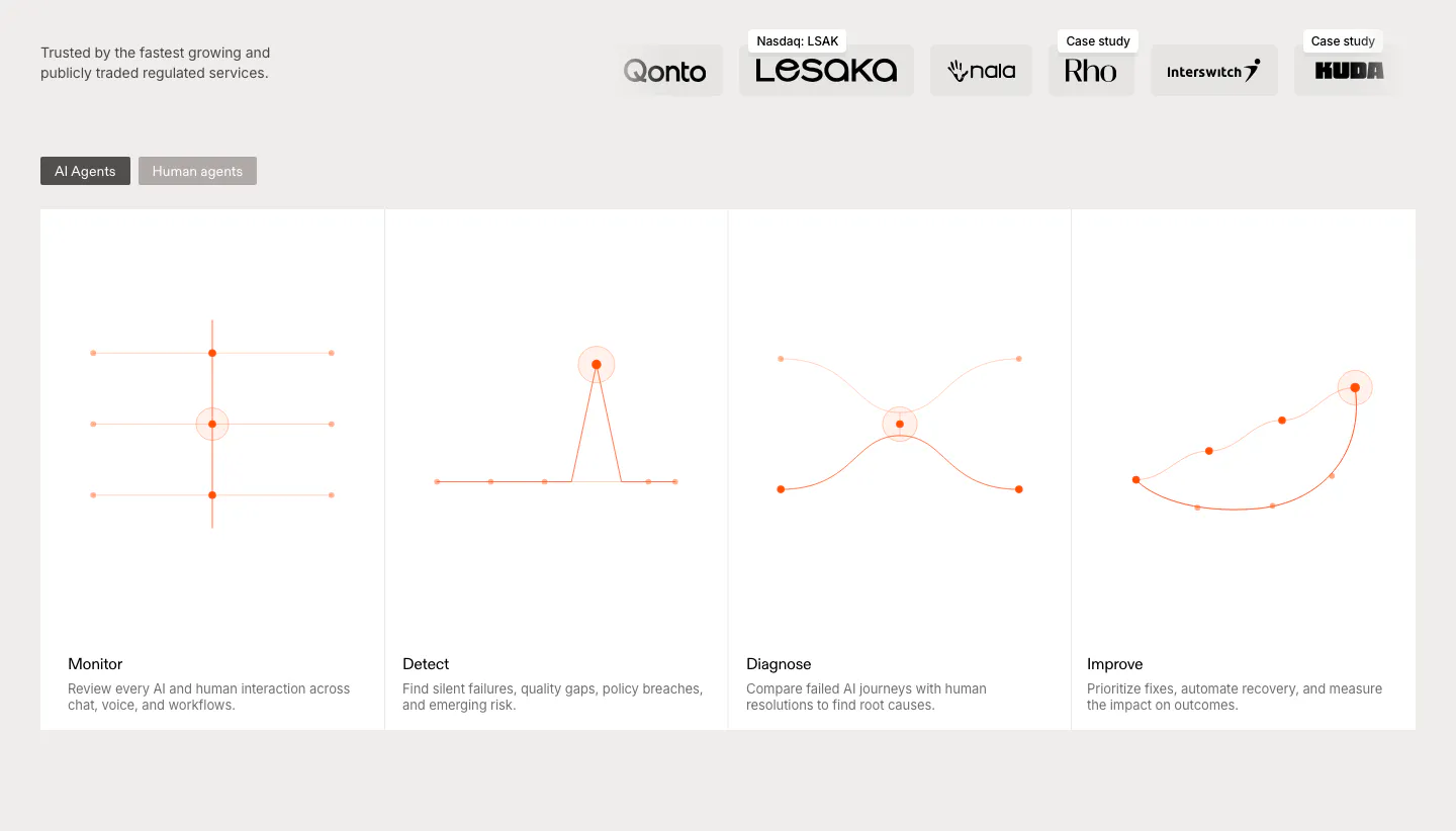
  10. Rulebase features section: customer logo row above an AI/human agents toggle and four equal cards with orange line diagrams
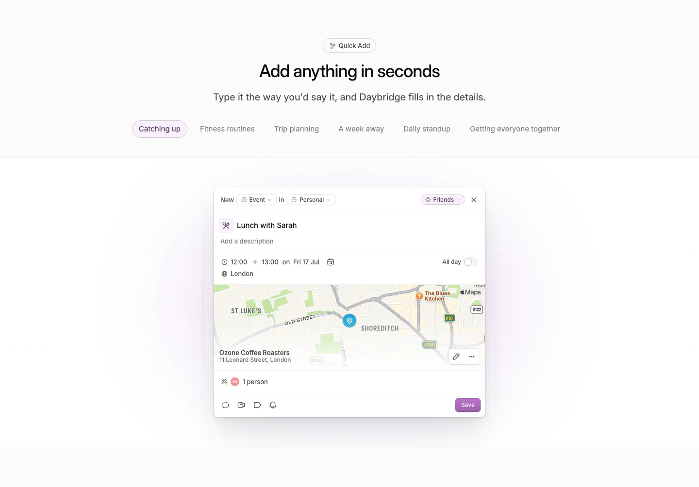
  11. Daybridge features section: centered headline and example tab pills above a quick-add event dialog with a map preview
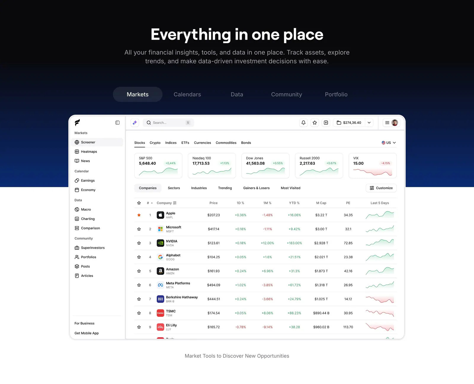
  12. Finsepa features section: centered headline and tab bar on a black-to-navy band above a stock screener dashboard screenshot
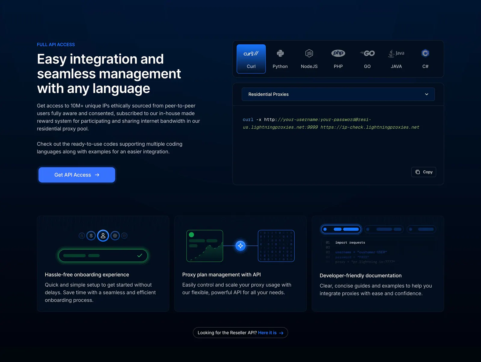
  13. Lightning Proxies features section: dark split layout with API copy beside a language-tabbed curl snippet, above three feature cards
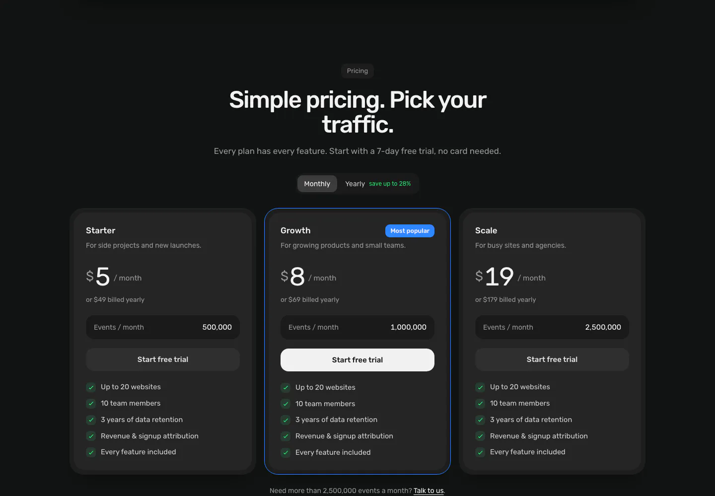
  14. Piqo pricing section: centered headline and monthly/yearly toggle above three dark plan cards, the middle one highlighted as Most popular
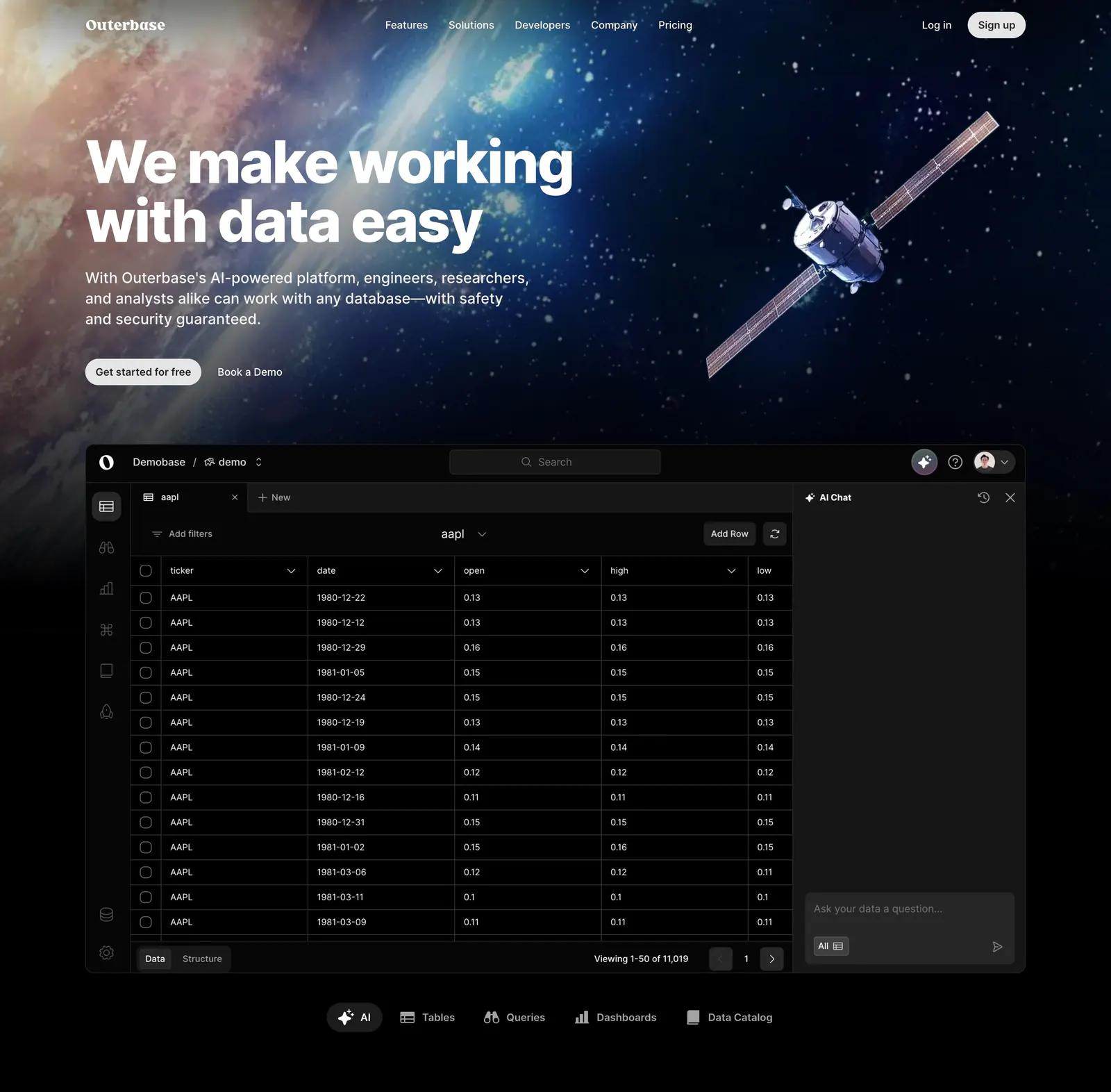
  15. Outerbase hero section: left-aligned headline over space artwork with a satellite, above a dark database table app screenshot and tabs
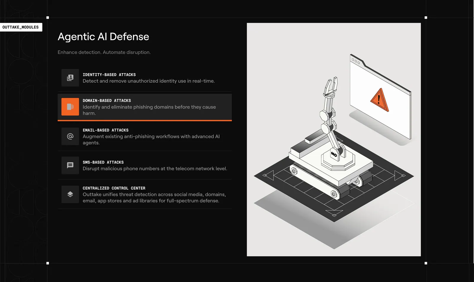
  16. Outtake features section: dark list of attack-type modules with an active highlight beside a light panel with an isometric robot arm illustration
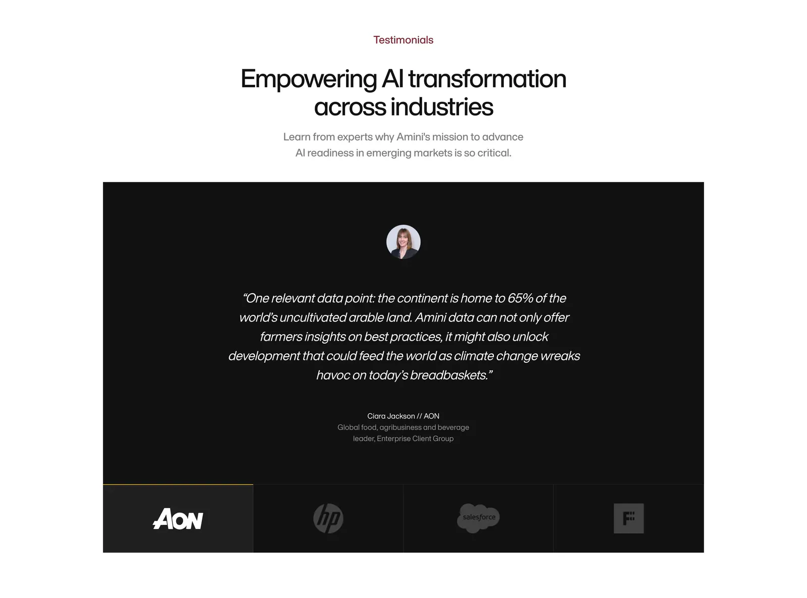
  17. Amini testimonials section: centered headline above a black panel with a centered italic quote and a row of logo tabs
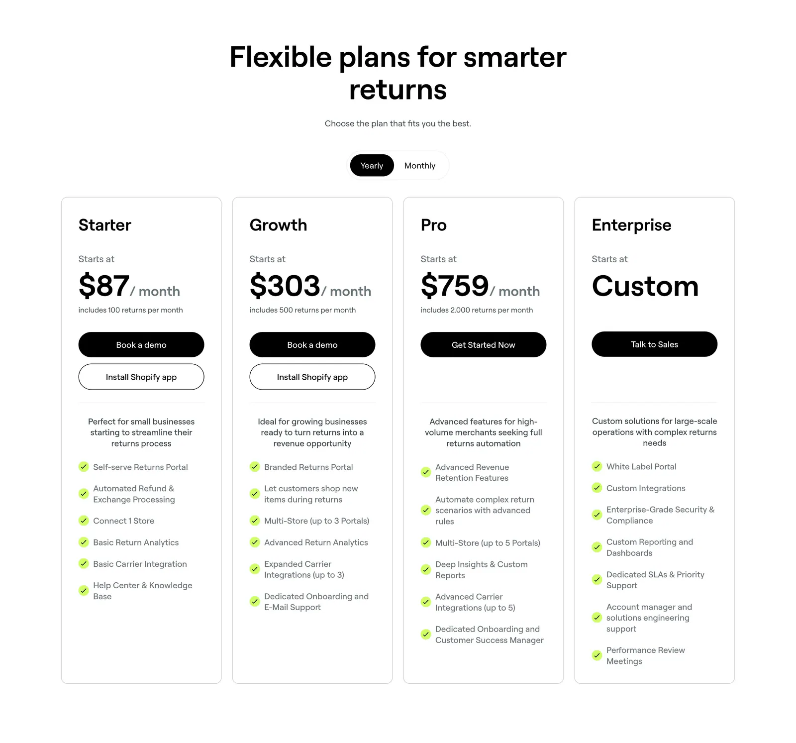
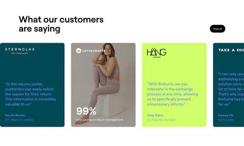
  18. 8returns pricing section: centered headline with yearly/monthly toggle above four white plan cards with prices and checklists
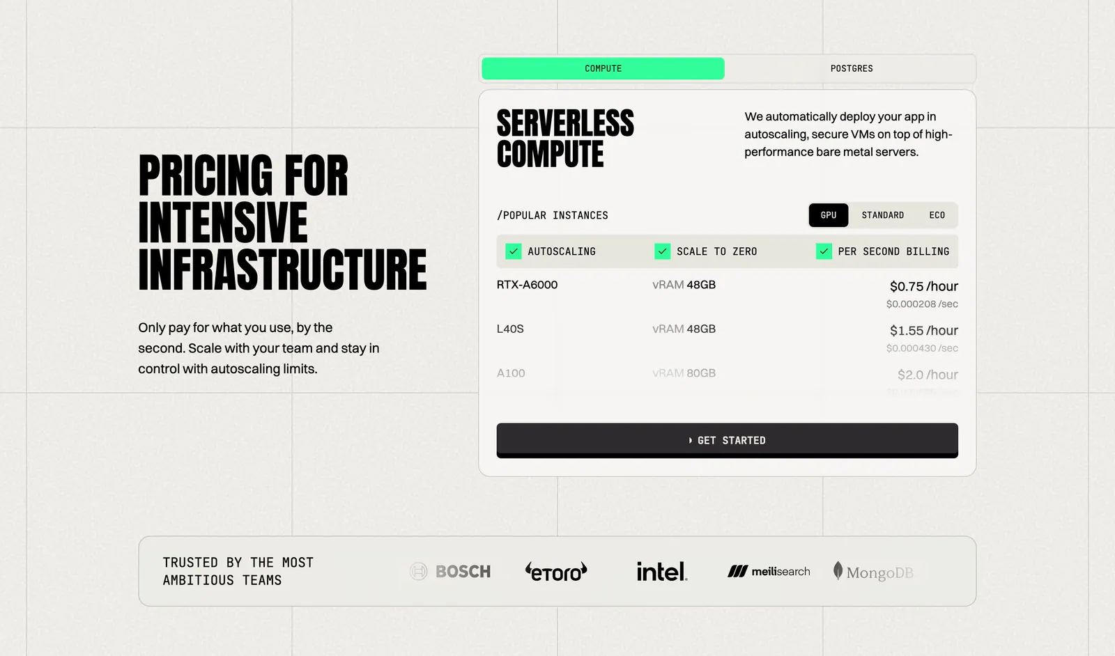
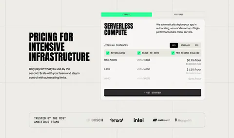
  19. Koyeb pricing section: condensed headline on the left, tabbed GPU instance price card on the right, logo strip below
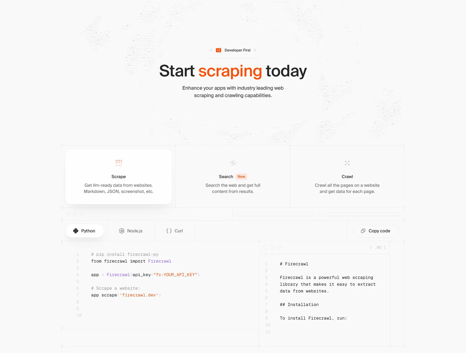
  20. Firecrawl features section: centered headline, three capability cards and a tabbed Python/Node.js/Curl code sample with markdown output
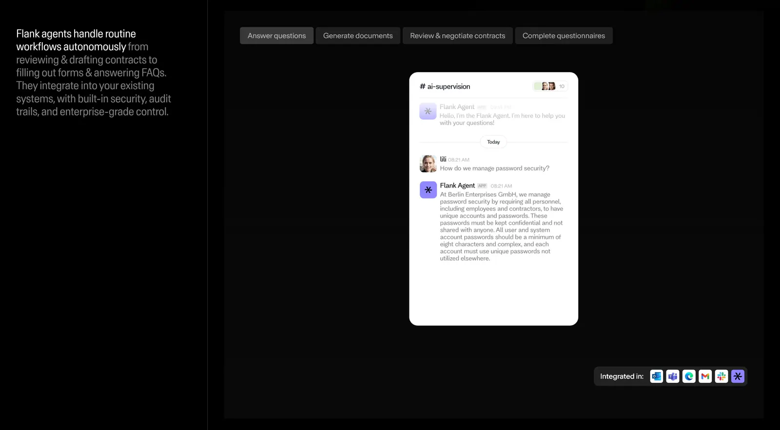
  21. Flank features section: left text column beside a tabbed panel showing a chat-style agent UI mockup and integration icons on black
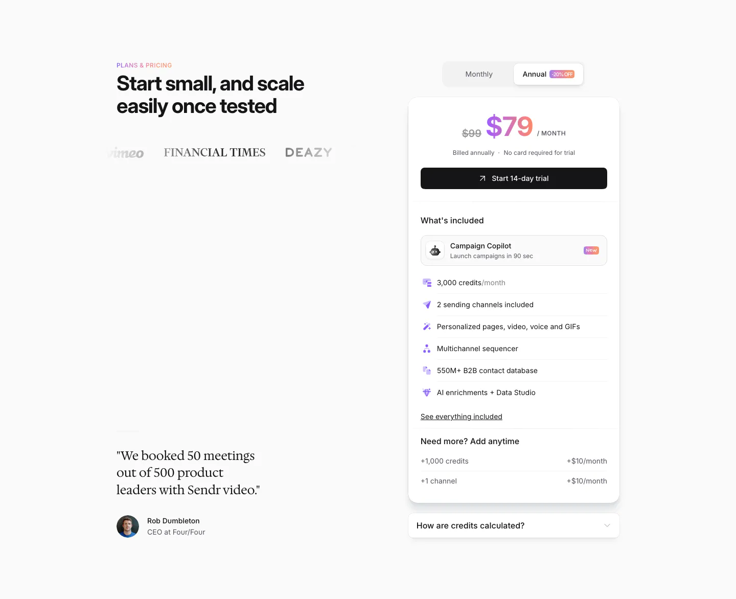
  22. Sendr pricing section: headline, logos and serif customer quote left, single $79 plan card with monthly/annual toggle right
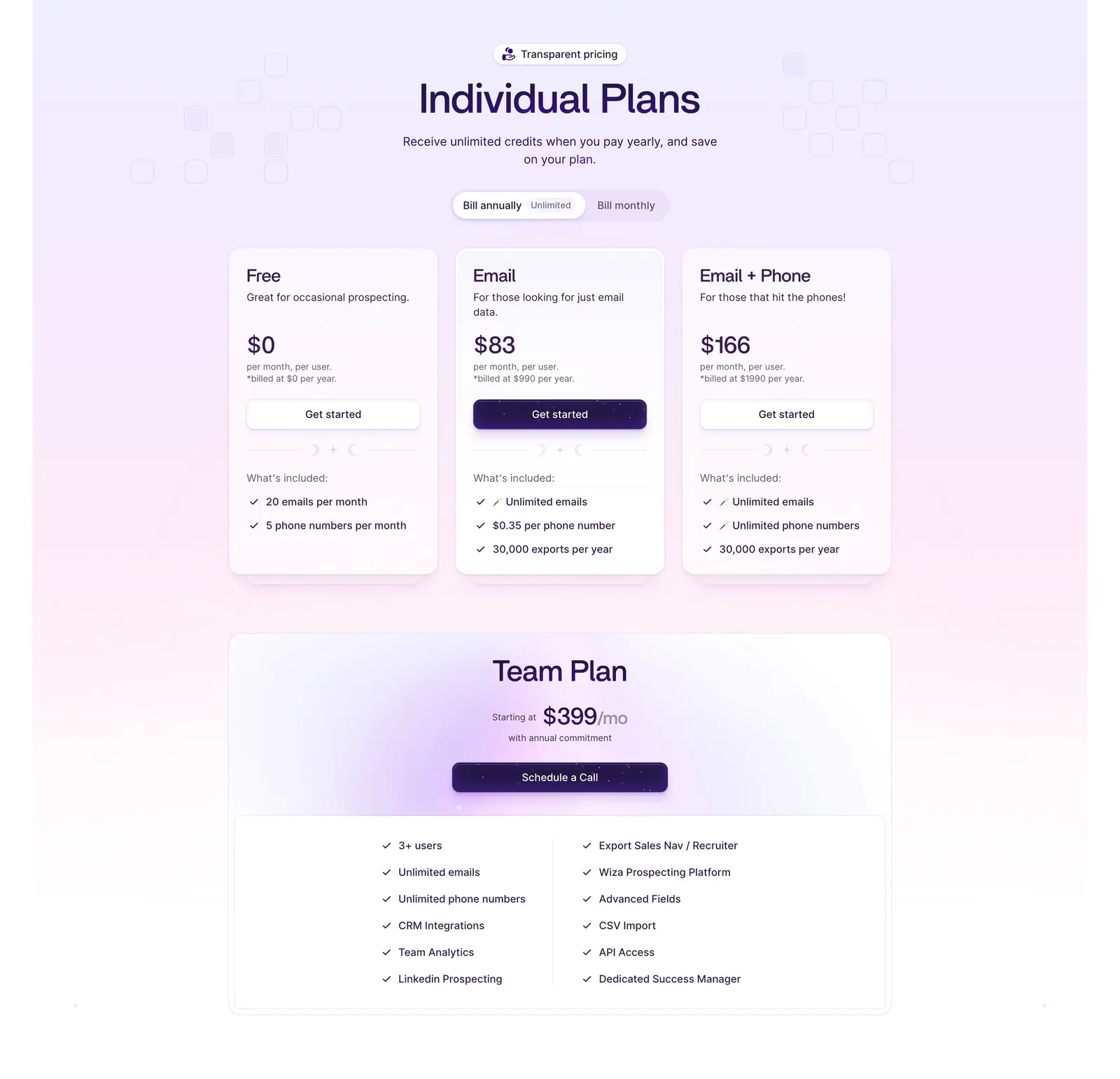
  23. Wiza pricing section: billing toggle above three plan cards and a wide Team Plan card with feature checklist on a lavender gradient
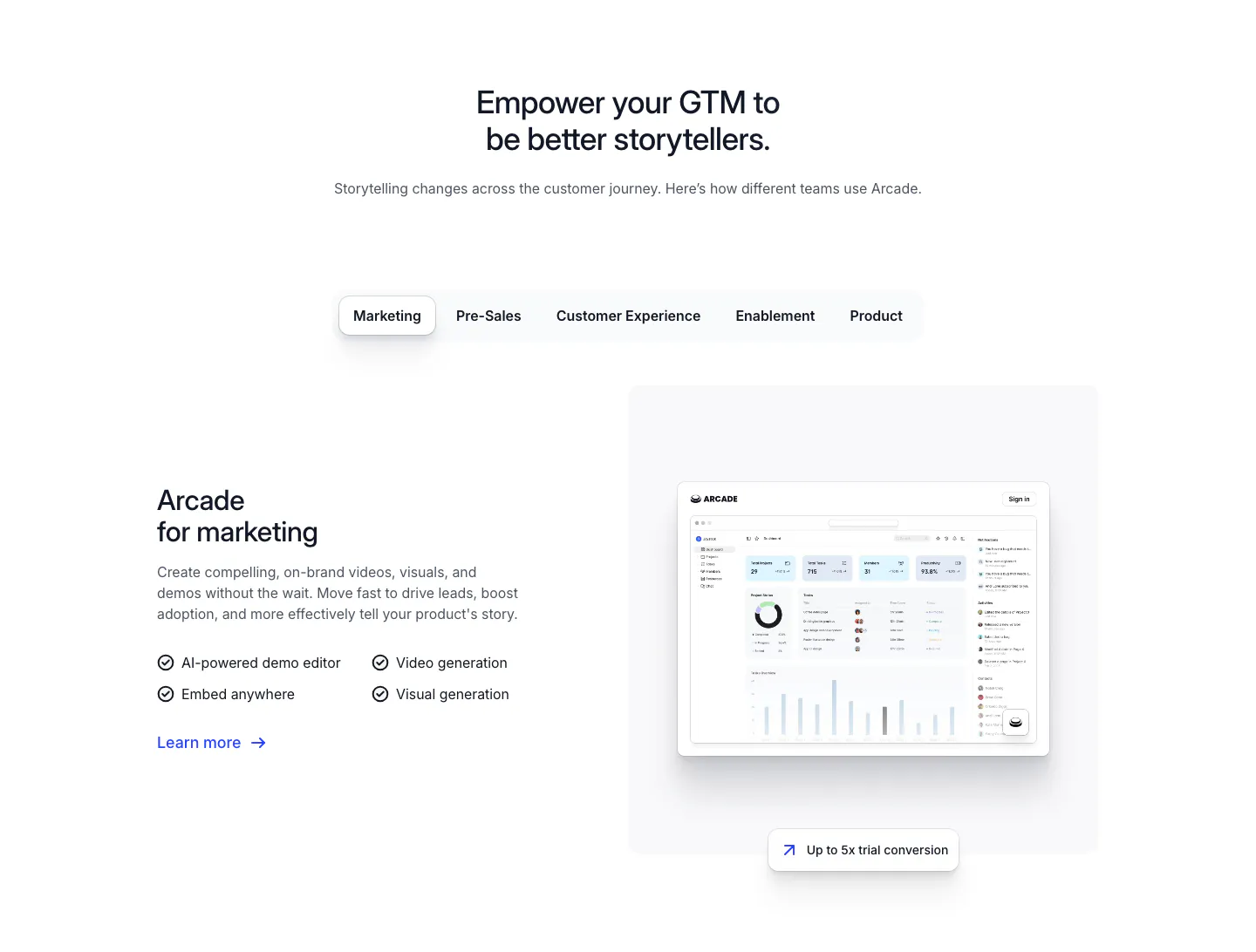
  24. Arcade use cases section: centered headline over team tabs, with marketing copy and checklist beside a dashboard screenshot
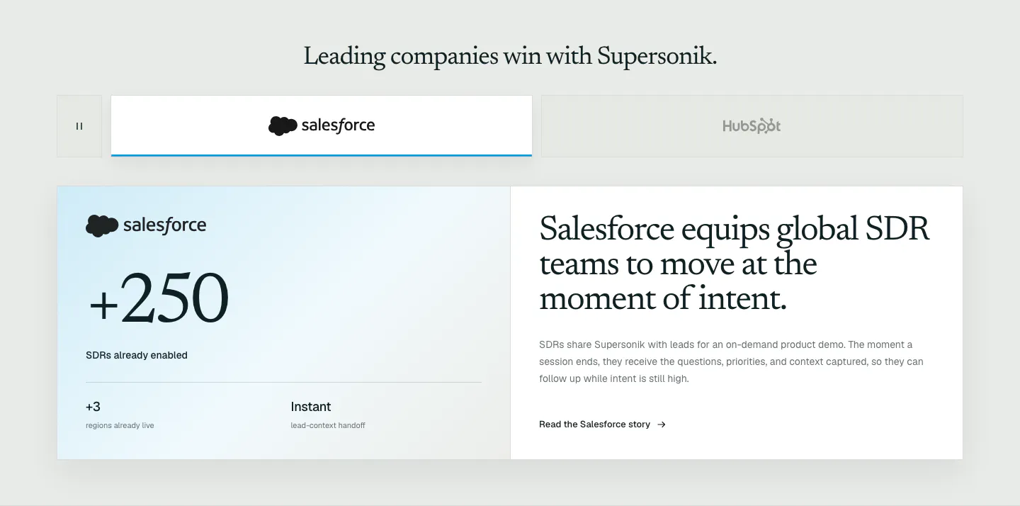
  25. Supersonik testimonials section: customer logo tabs above a Salesforce case study card with a large +250 metric and serif story headline
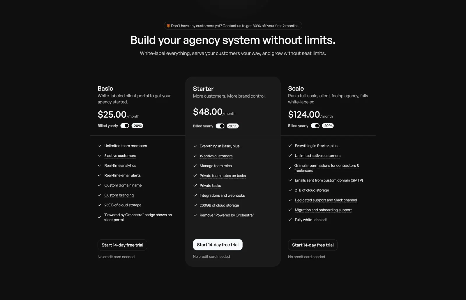
  26. Orchestra pricing section: centered headline above three plan columns with billed-yearly toggles and feature checklists on dark background
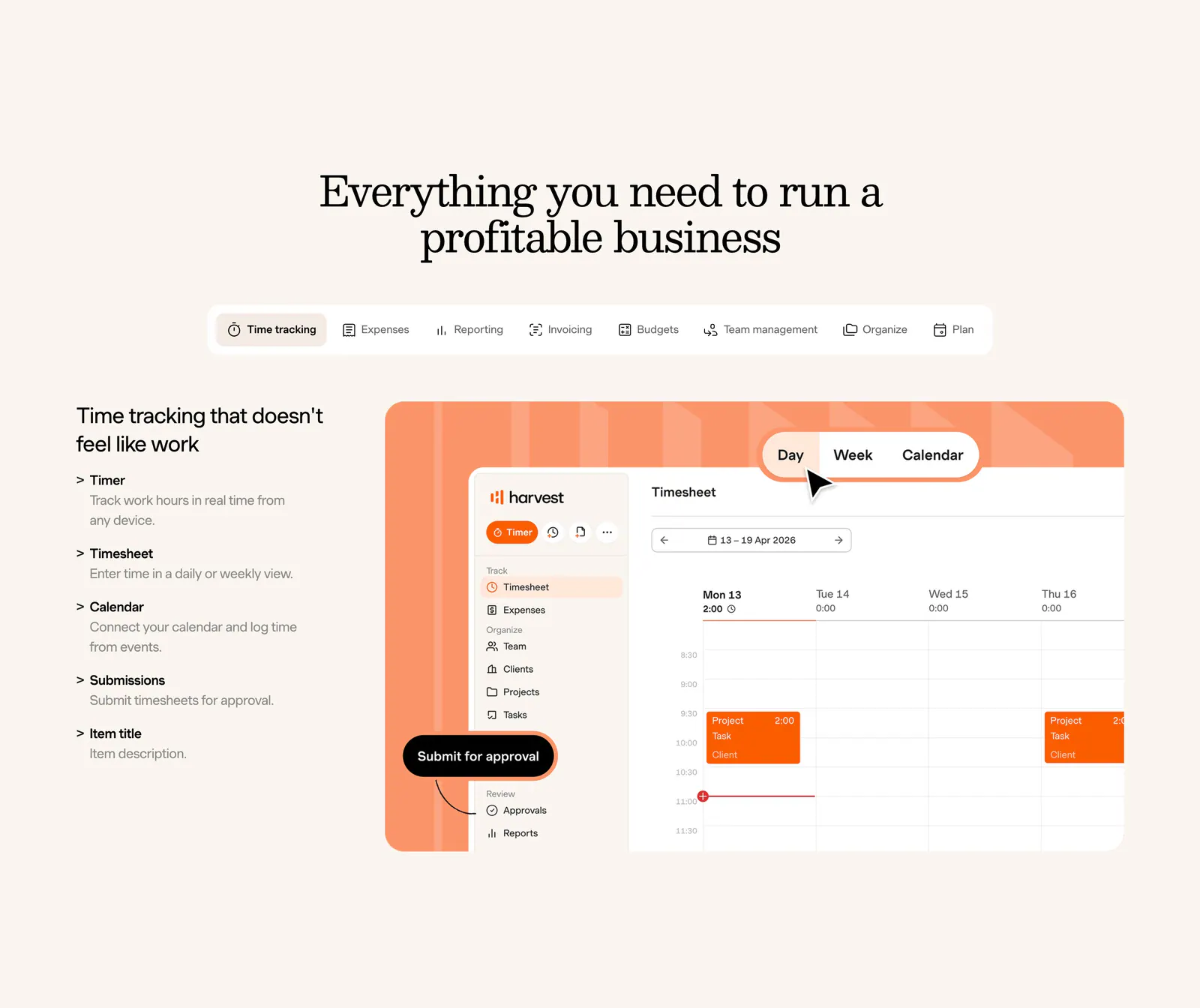
  27. Harvest features section: centered serif heading and feature tabs above a feature list beside a timesheet UI on an orange panel, cream background
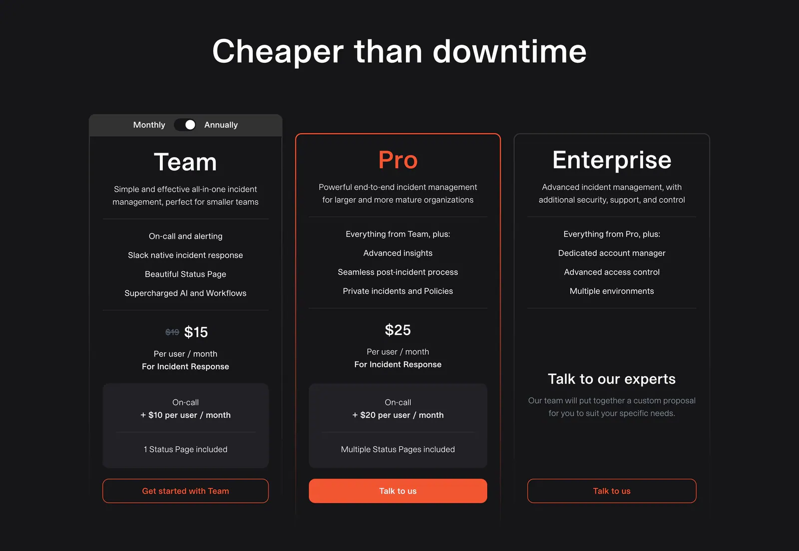
  28. incident.io pricing section: centered headline above three dark plan cards with a monthly/annual toggle and orange buttons
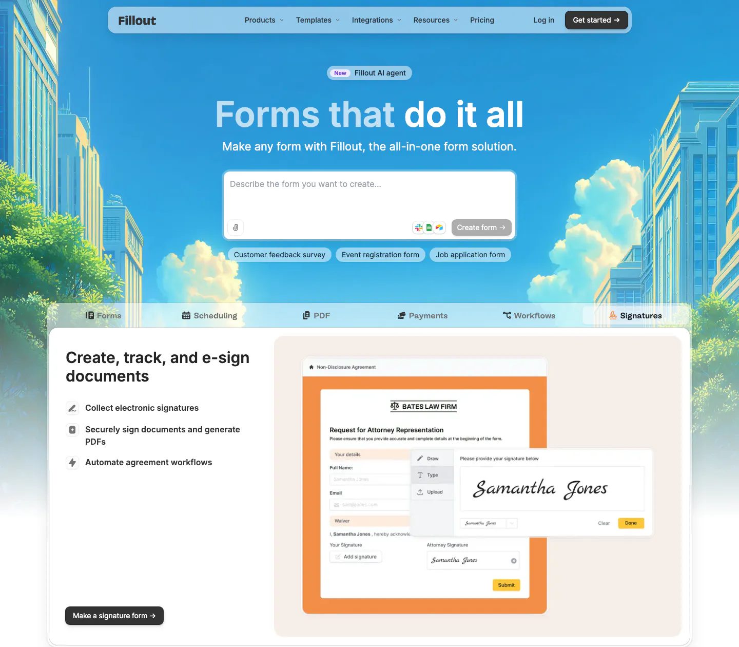
  29. Fillout hero section: centered headline and AI prompt box over an illustrated city skyline, above product tabs and an e-signature form mockup
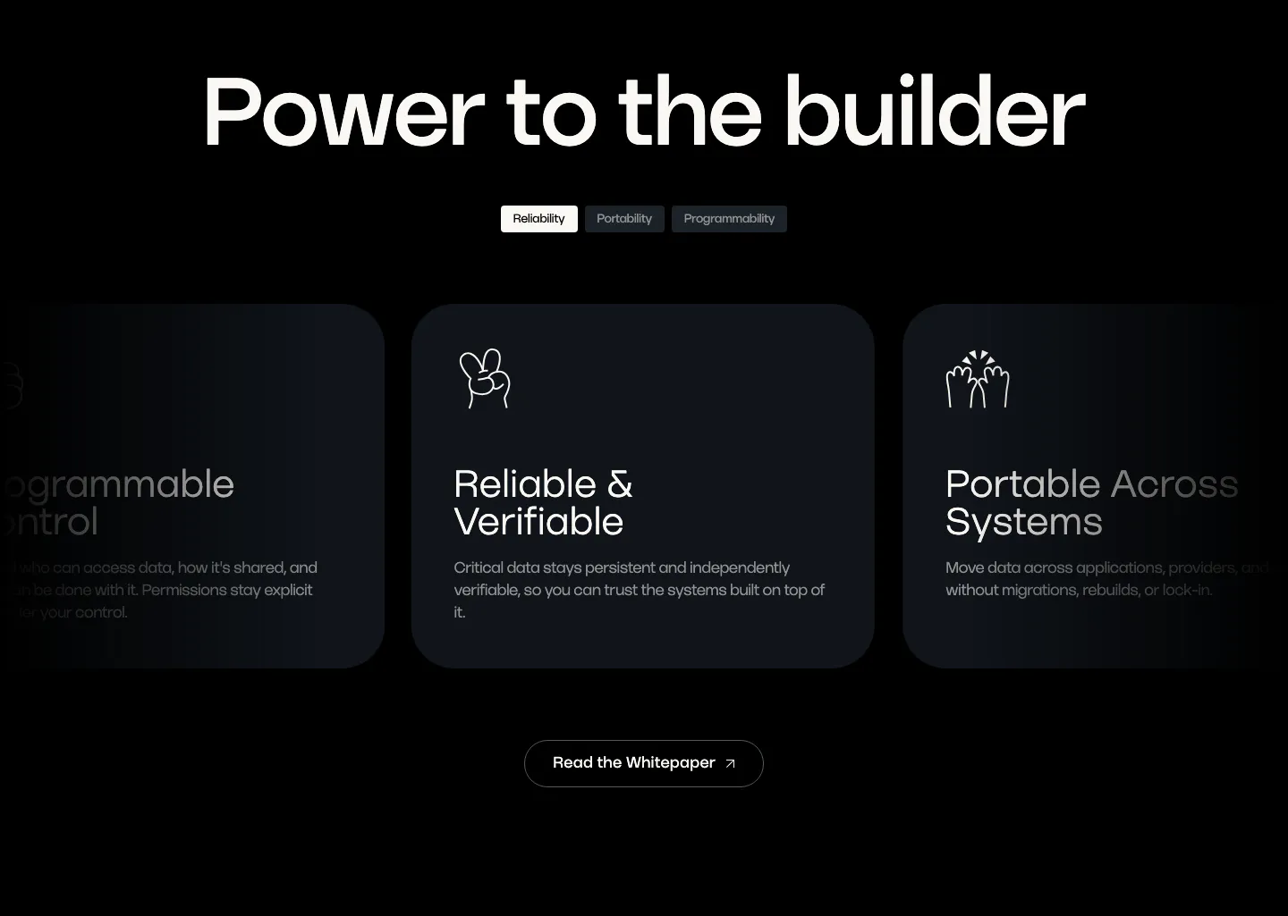
  30. Walrus value proposition section: large headline over tab pills and a carousel of dark benefit cards with line icons
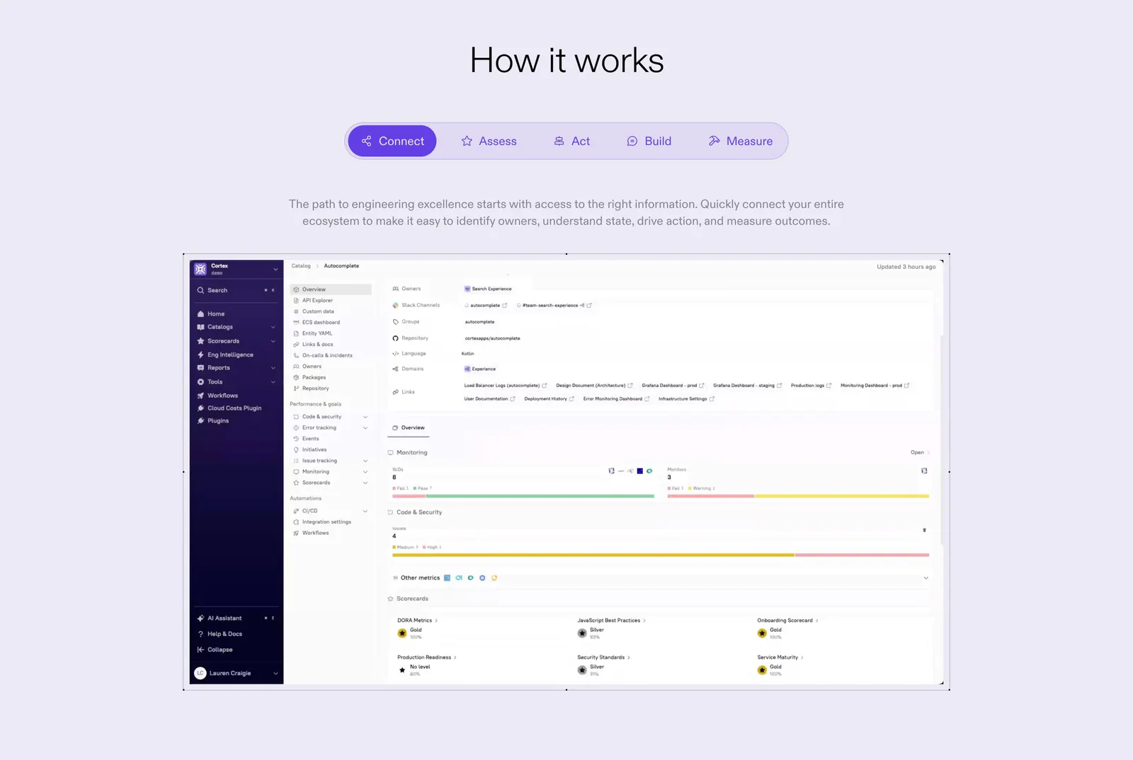
  31. Cortex how it works section: centered heading and five-step tab bar above a catalog dashboard screenshot on lavender
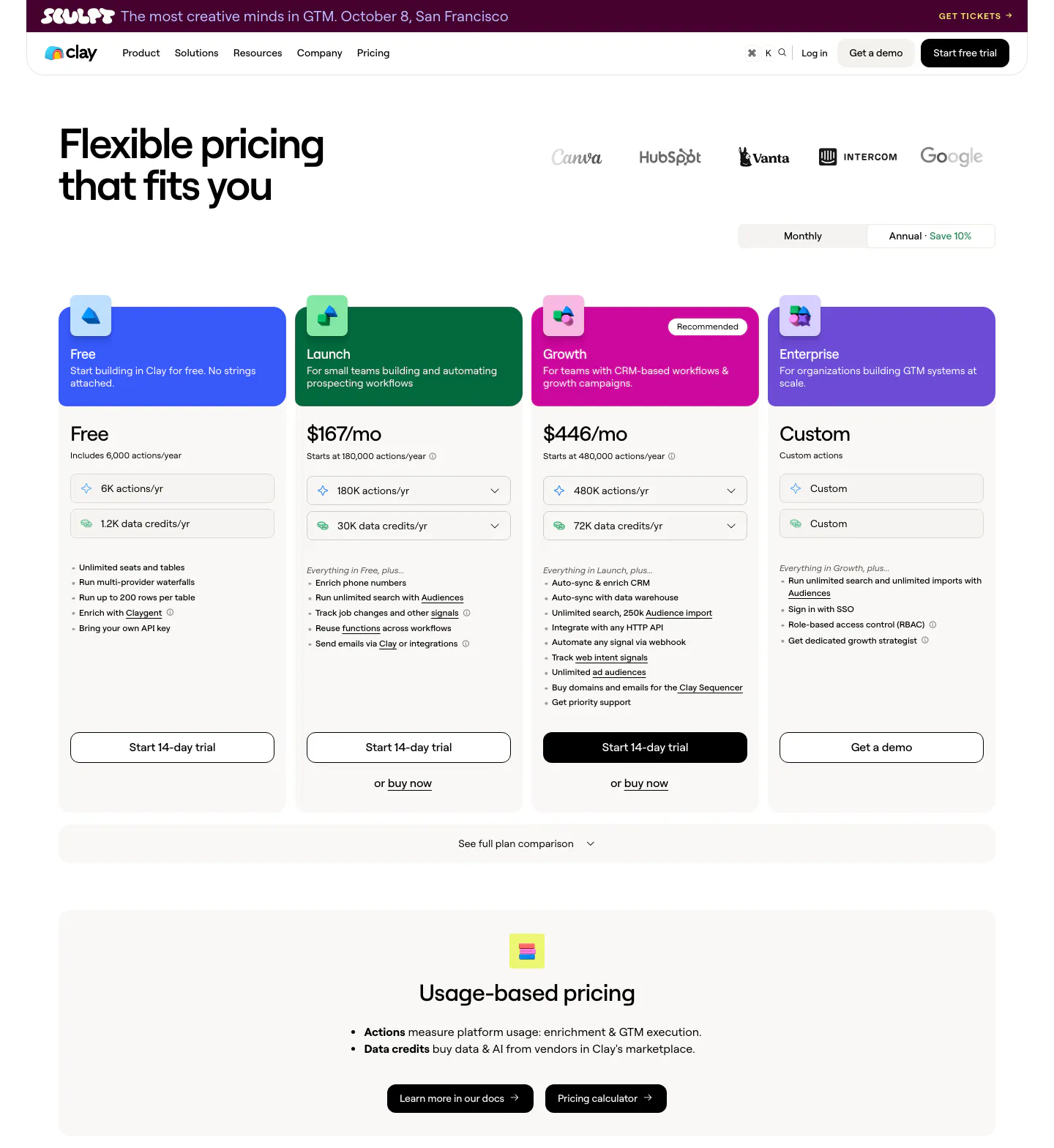
  32. Clay pricing section: headline and logo row above a monthly/annual toggle, four plan cards with colored headers and a usage-based pricing band
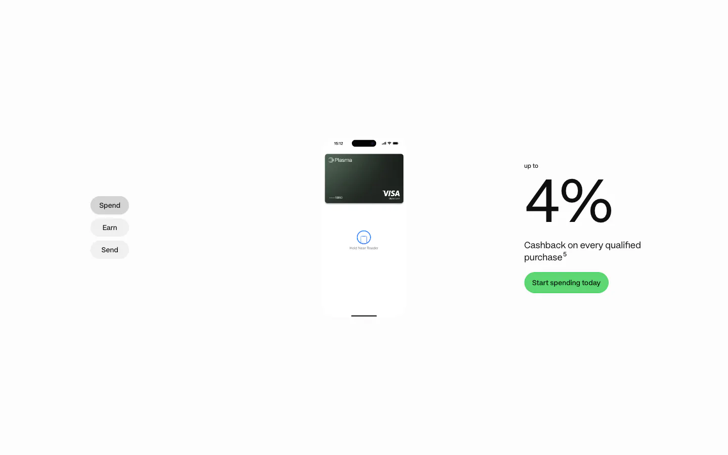
  33. Plasma features section: Spend/Earn/Send tabs left, phone with card center and a large 4% cashback figure right on white
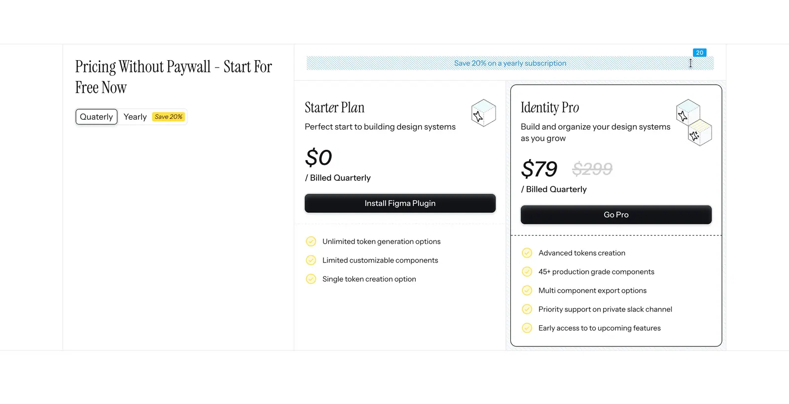
  34. Figr pricing section: serif heading with quarterly/yearly toggle on the left and Starter and Identity Pro plan cards on the right
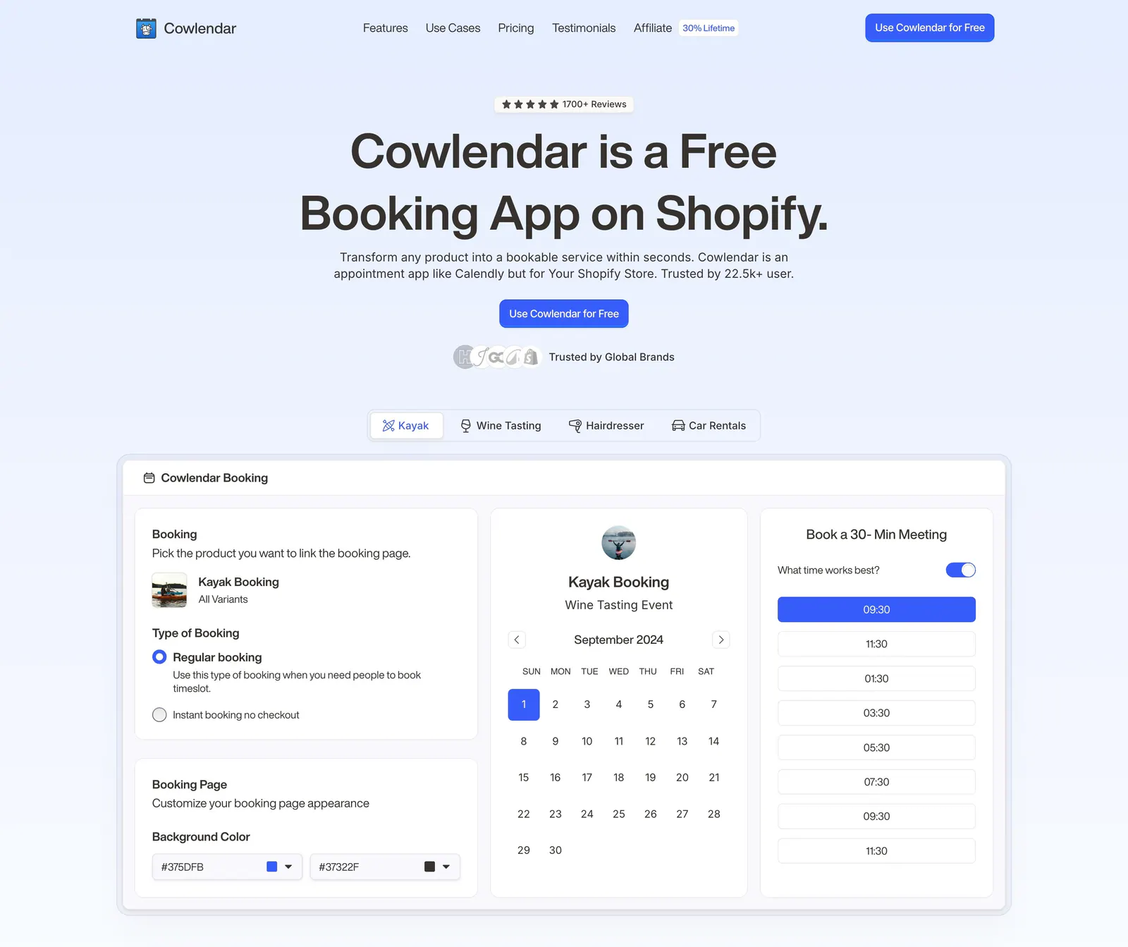
  35. Cowlendar hero section: centered headline and CTA above use-case tabs and a booking calendar product screenshot
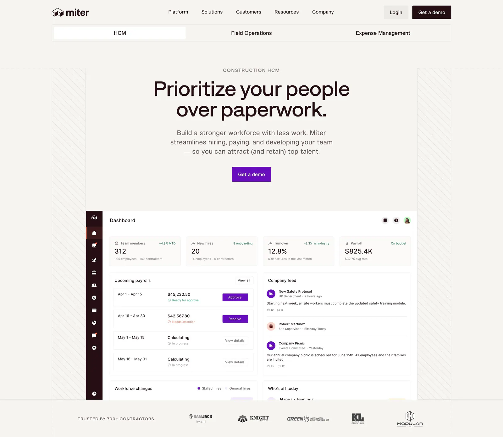
  36. Miter hero section: centered headline and CTA on warm off-white above an HR dashboard screenshot and a contractor logo row
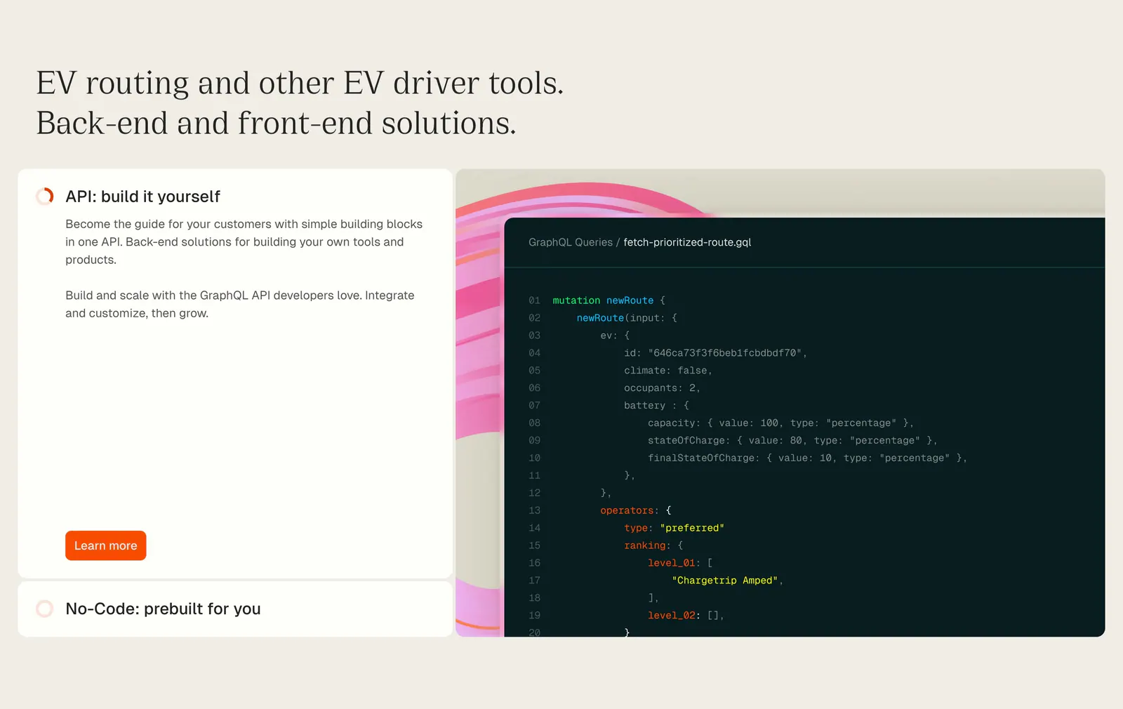
  37. Chargetrip features section: serif headline above an expandable option list beside a GraphQL code snippet on a beige background
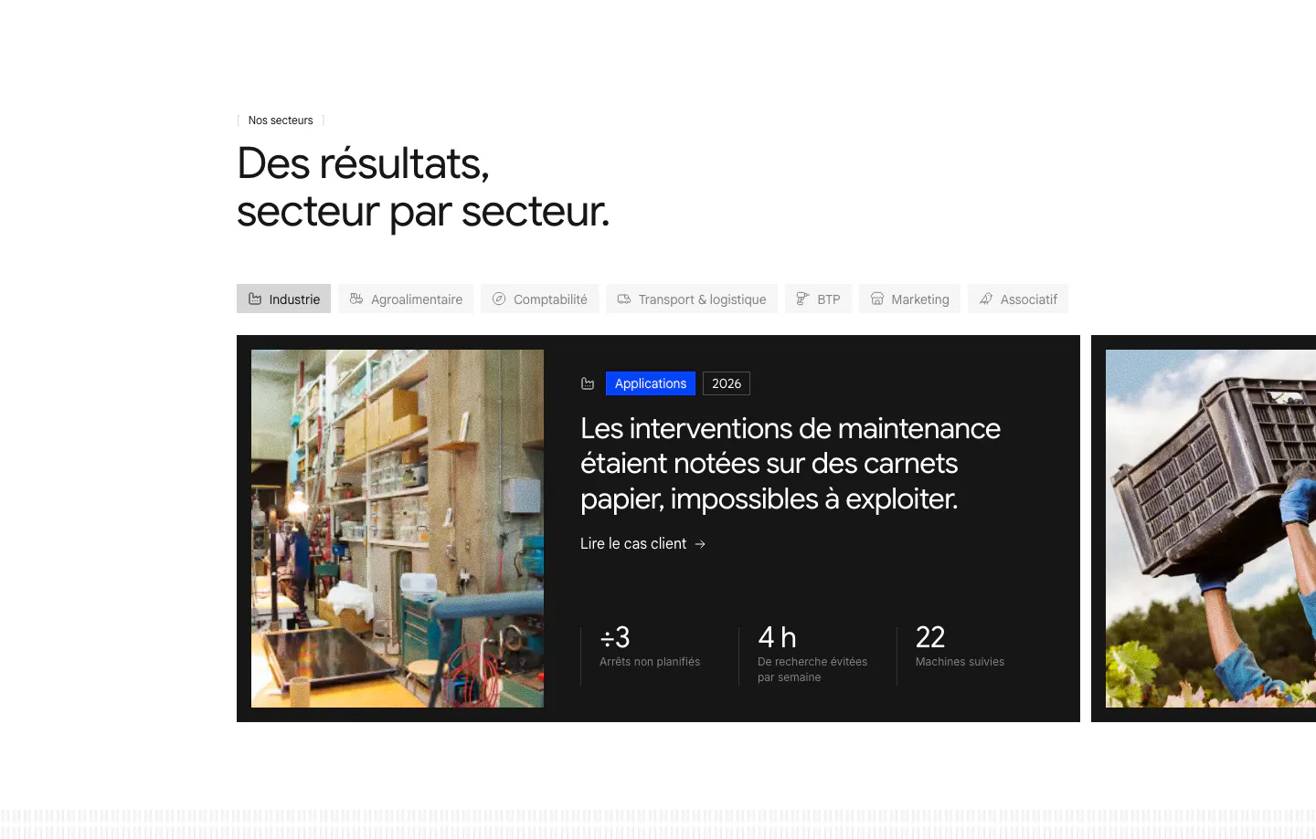
  38. Raneo use cases section: industry tab bar above a carousel of dark case-study cards with photos, headlines and three result metrics
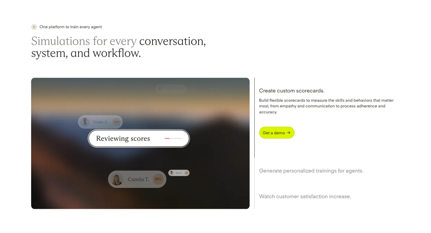
  39. Solidroad features section: two-tone serif headline above a blurred landscape card with score UI chips beside an expandable feature list
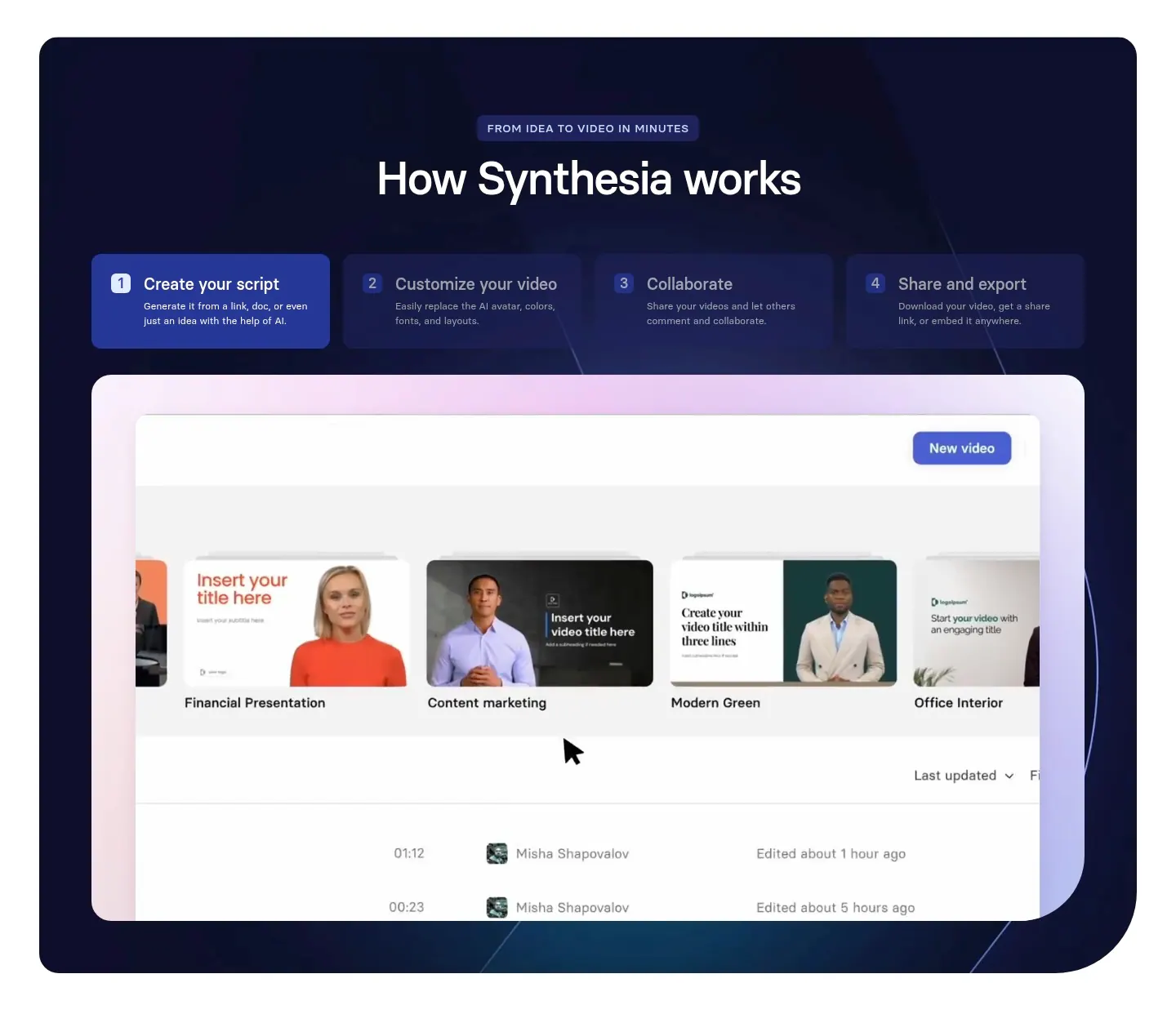
  40. Synthesia how it works section: centered headline over four numbered step tabs and a video library UI screenshot in a dark navy panel
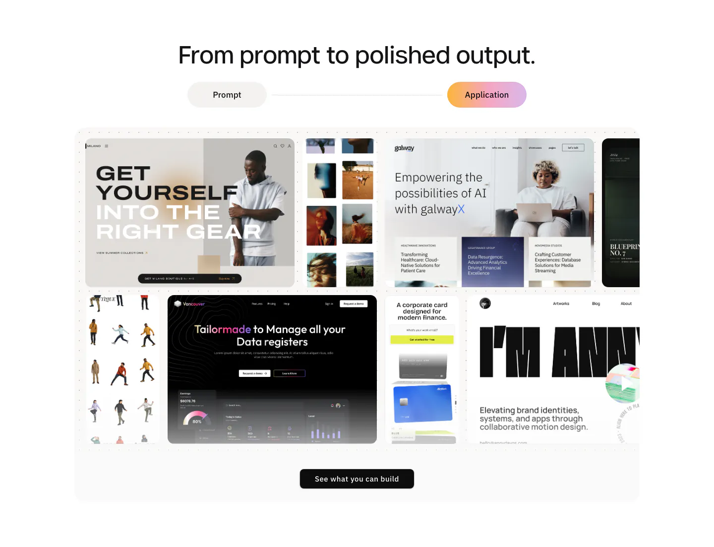
  41. Modulify features section: centered headline and prompt/application toggle above a collage of generated website screenshots
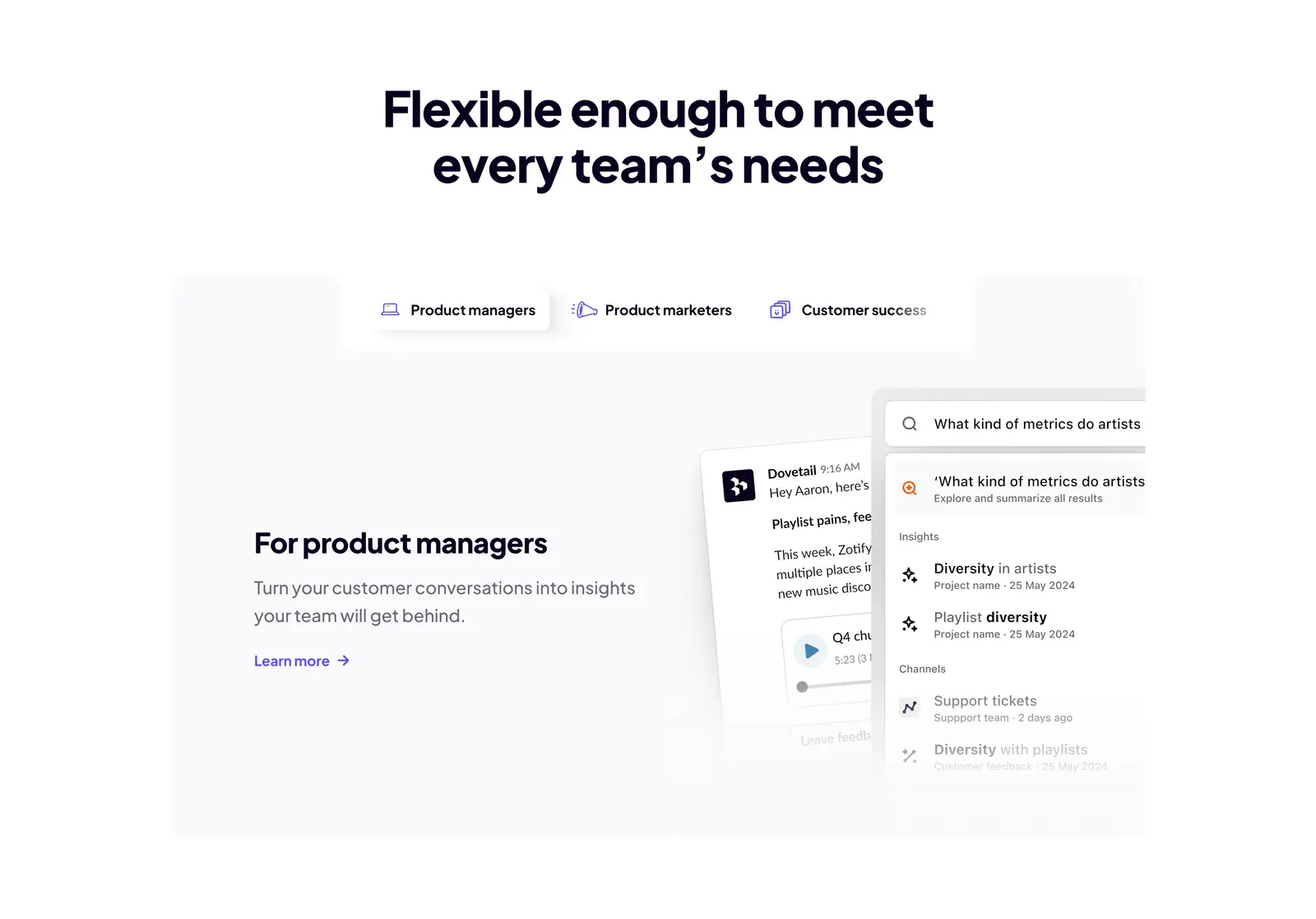
  42. Dovetail features section: centered headline above role tabs and a panel with product manager copy beside chat and search UI cards
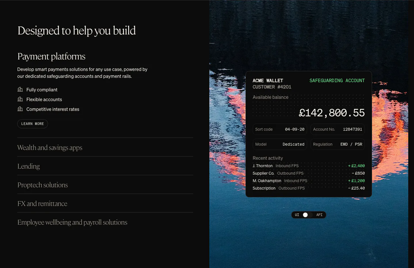
  43. Griffin use cases section: serif heading with use-case accordion on the left, wallet UI card over a lake photo on the right
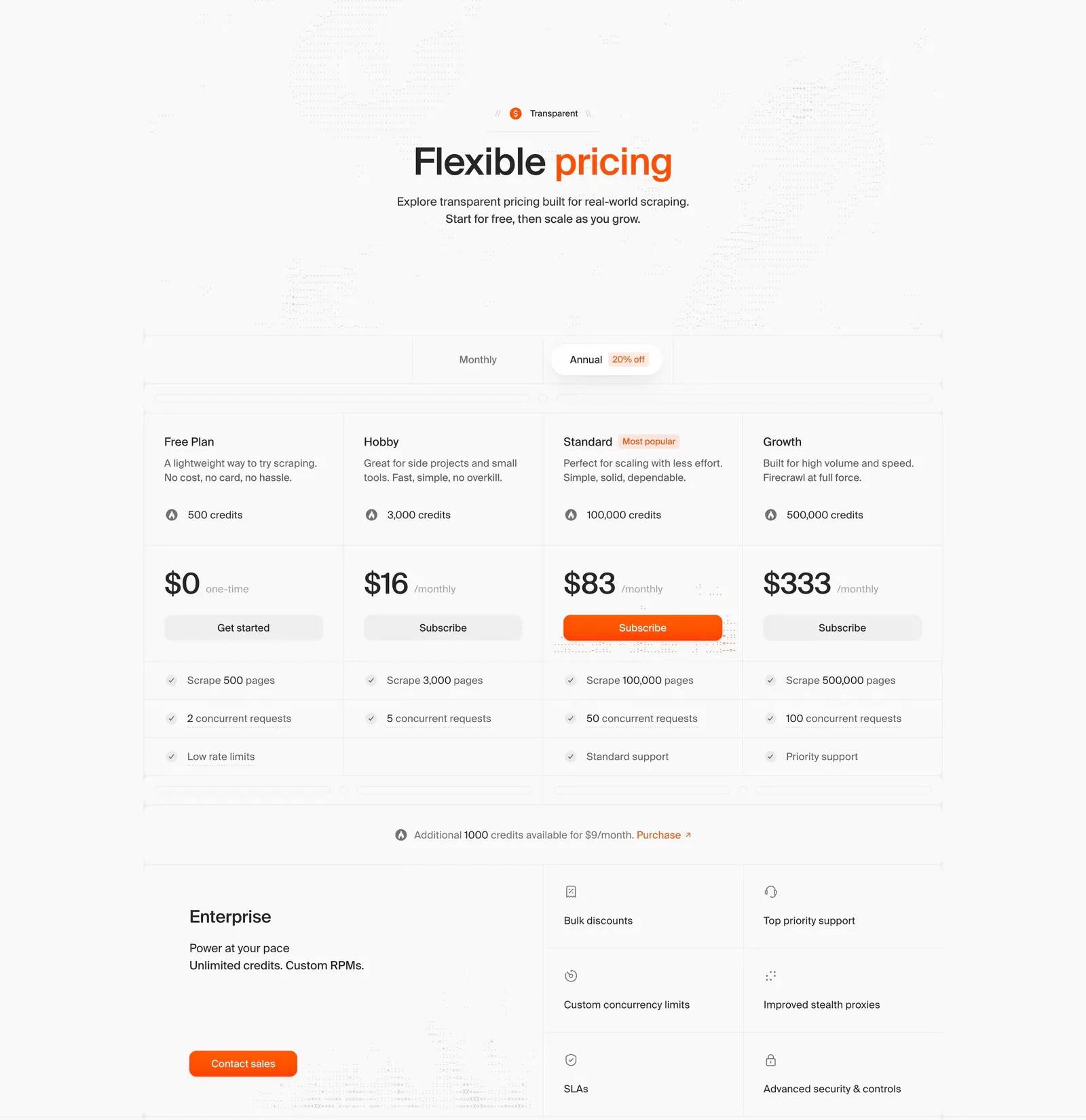
  44. Firecrawl pricing section: centered headline, monthly/annual toggle, four plan columns with prices and an enterprise block on light gray
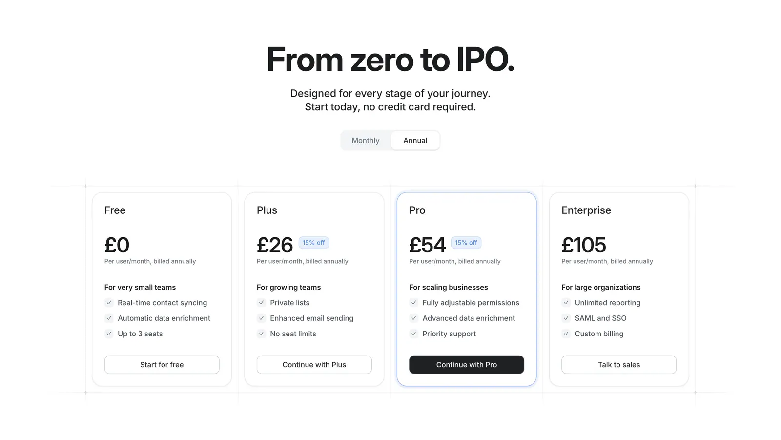
  45. Attio pricing section: centered headline with monthly/annual toggle above four plan cards with prices and checklists on white
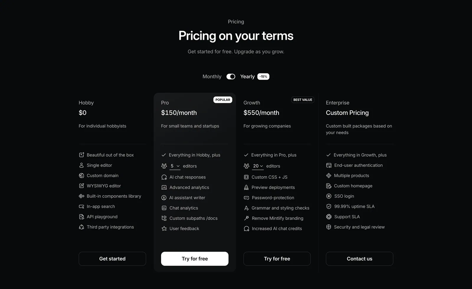
  46. Mintlify pricing section: centered heading with monthly/yearly toggle above four plan columns with icon feature lists on black
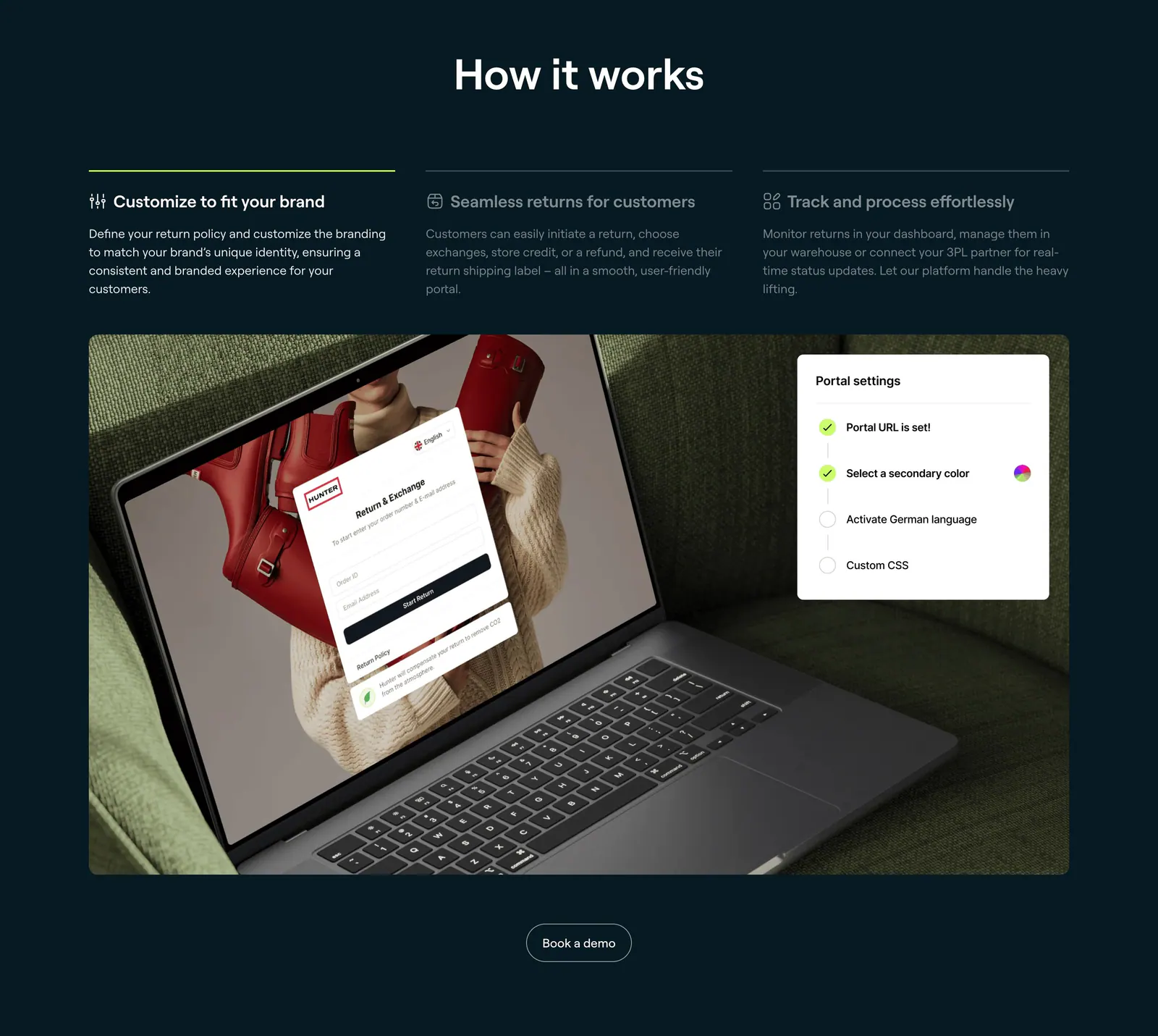
  47. 8returns how it works section: three step tabs on dark navy above a photo of a laptop showing a returns portal with a settings card
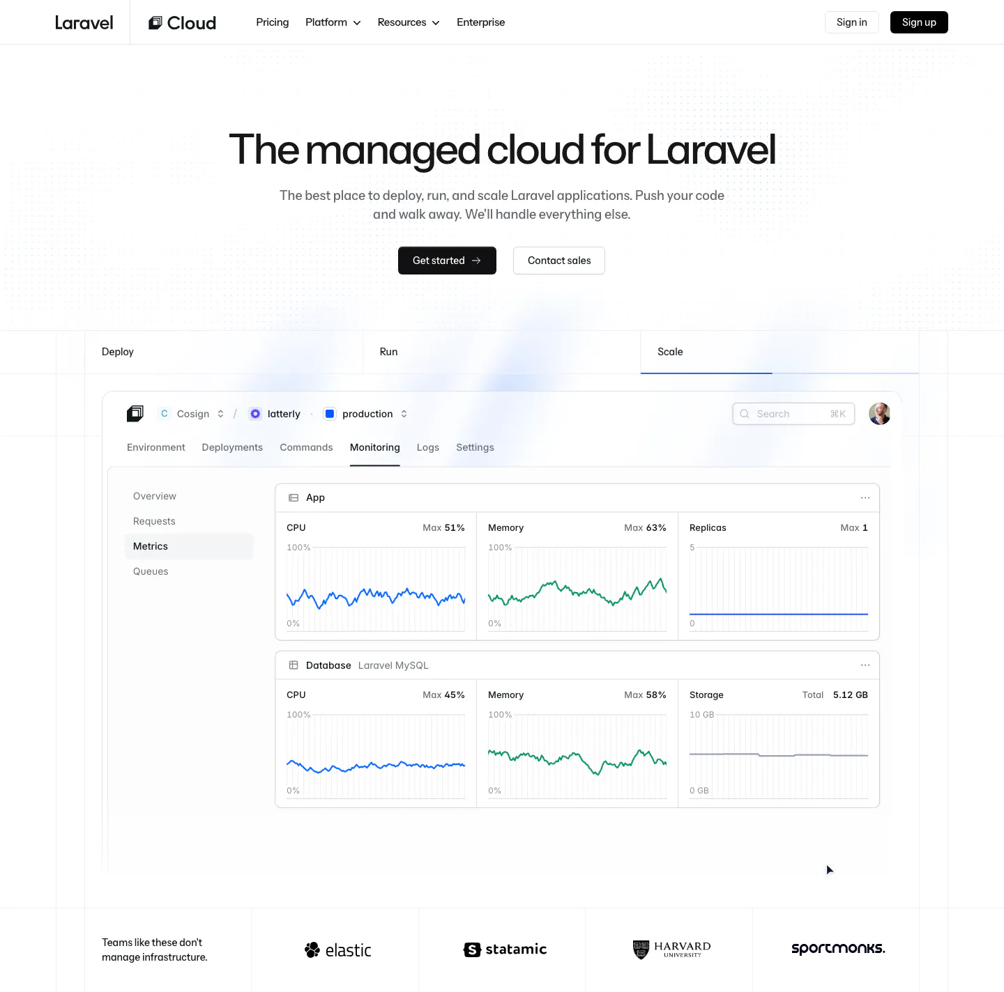
  48. Laravel Cloud hero section: centered headline and two buttons above Deploy/Run/Scale tabs, a monitoring dashboard screenshot and a logo strip
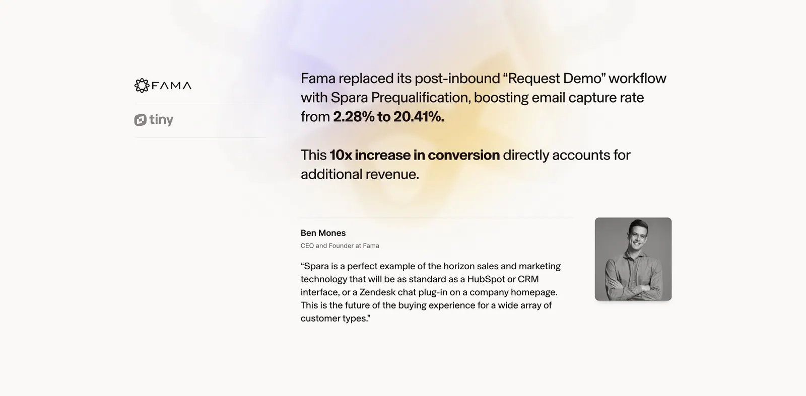
  49. Spara testimonials section: customer logo tabs on the left, case study result and quote with portrait on the right over a soft glow
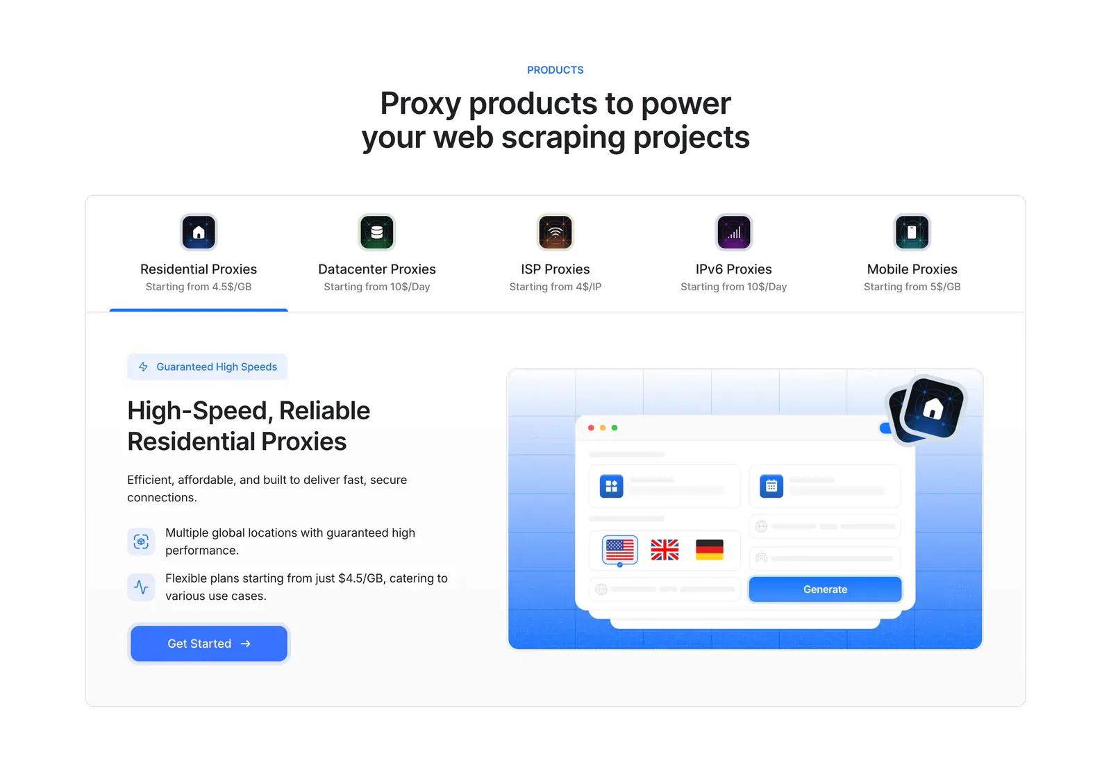
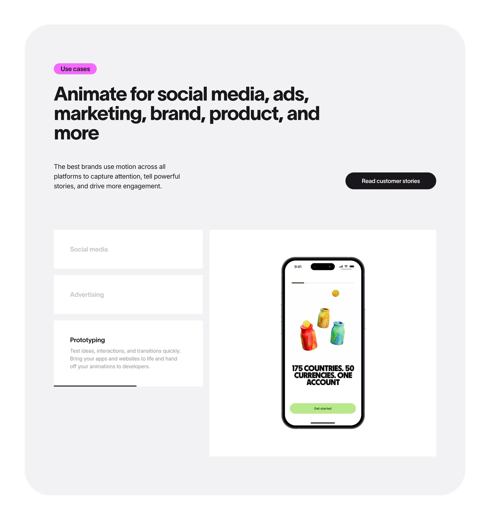
  50. Lightning Proxies features section: centered heading over a five-product tab bar and a split panel with proxy copy and a blue UI mockup
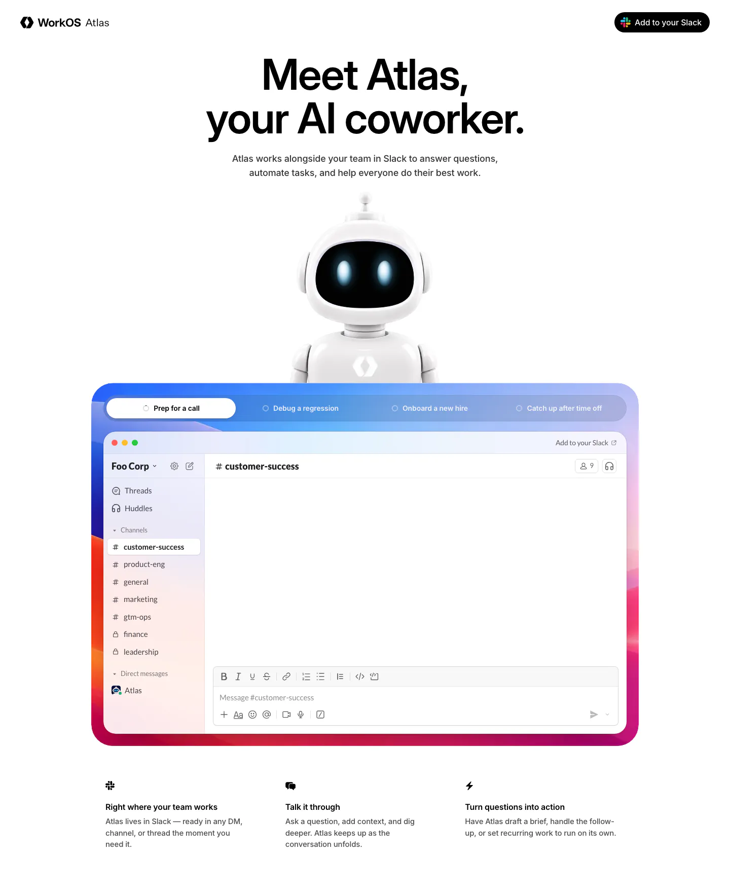
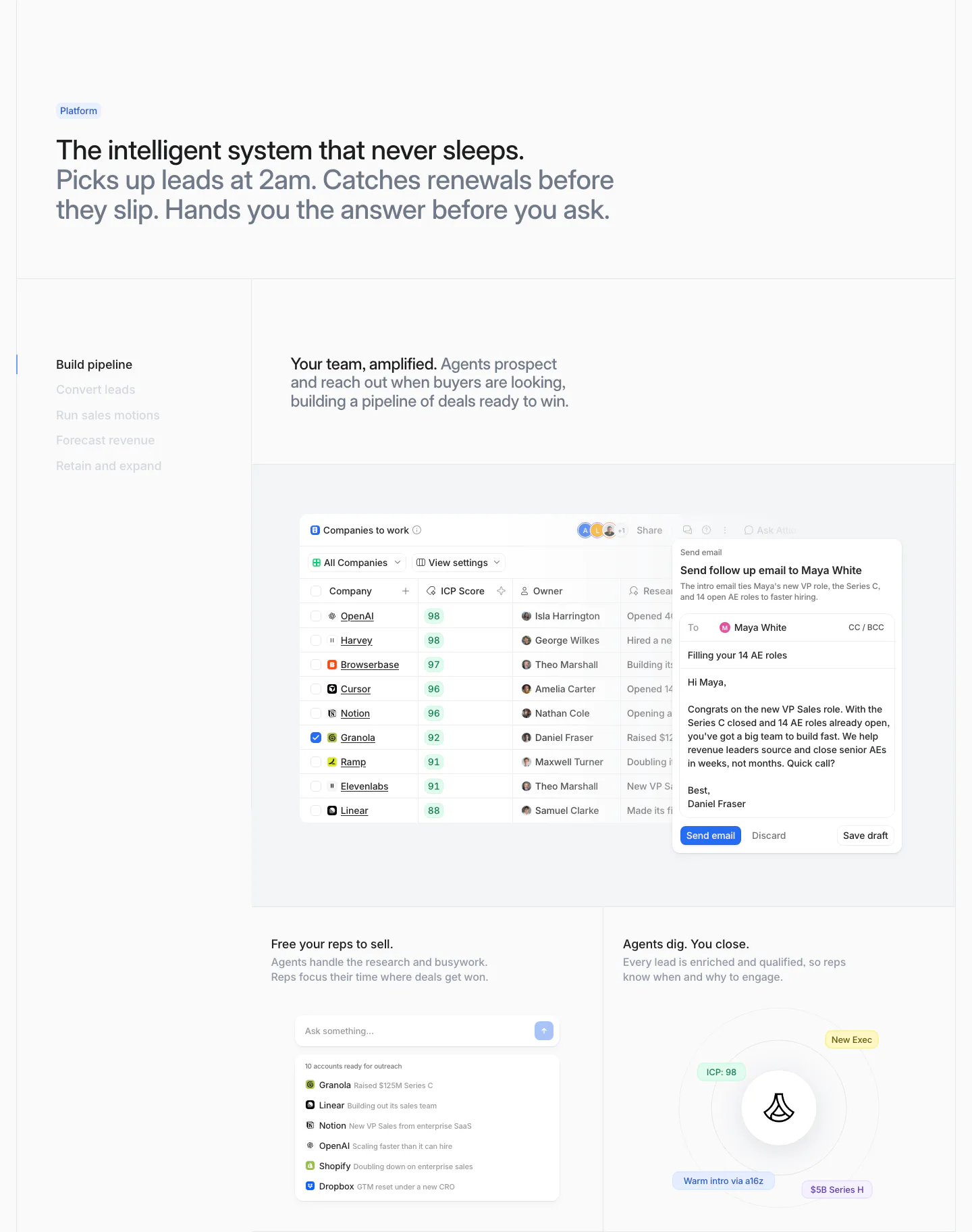
  51. WorkOS hero section: centered headline above a 3D robot mascot and a tabbed Slack app mockup in a colorful gradient frame
  52. Jitter features section: headline in a rounded gray panel above use case tabs beside a phone mockup preview
  53. Attio features section: two-tone headline above a vertical tab list beside a companies table with email draft and two smaller UI cards
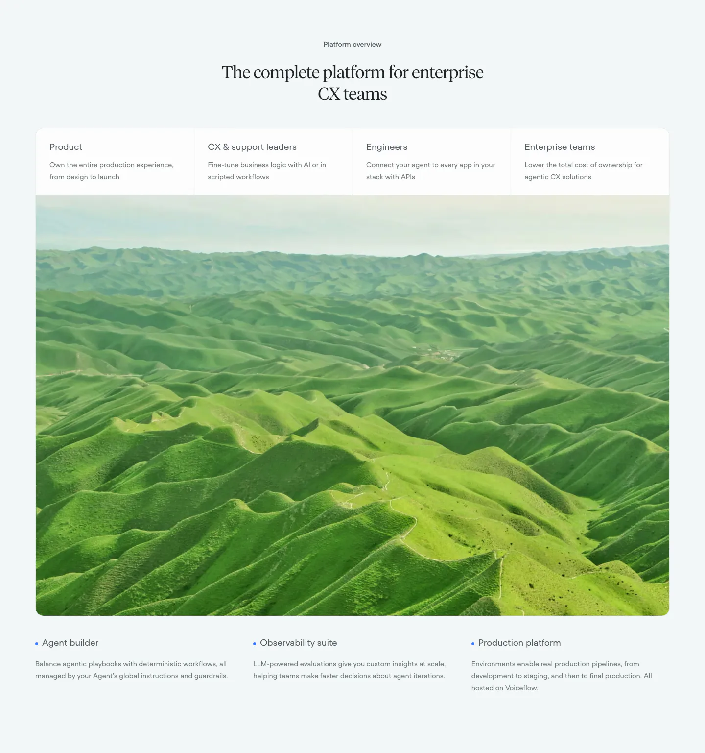
  54. Voiceflow use cases section: centered serif headline, four role tabs over a large green hills photo, three feature notes below
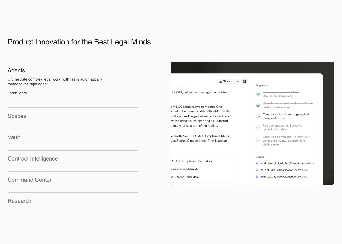
  55. Harvey features section: product list accordion on the left beside an agent workflow screenshot on a light gray background
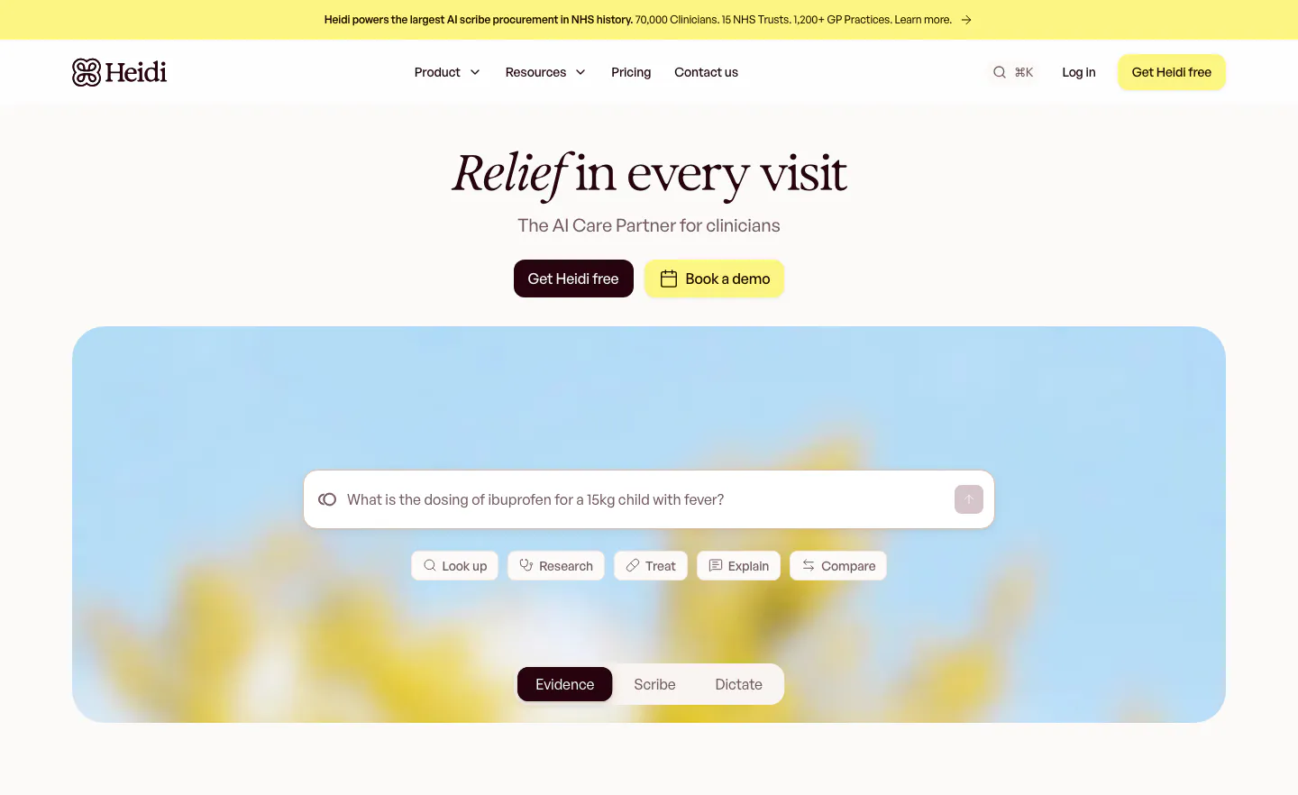
  56. Heidi hero section: centered serif headline with two buttons above a search prompt box and mode tabs on a blurred flower photo
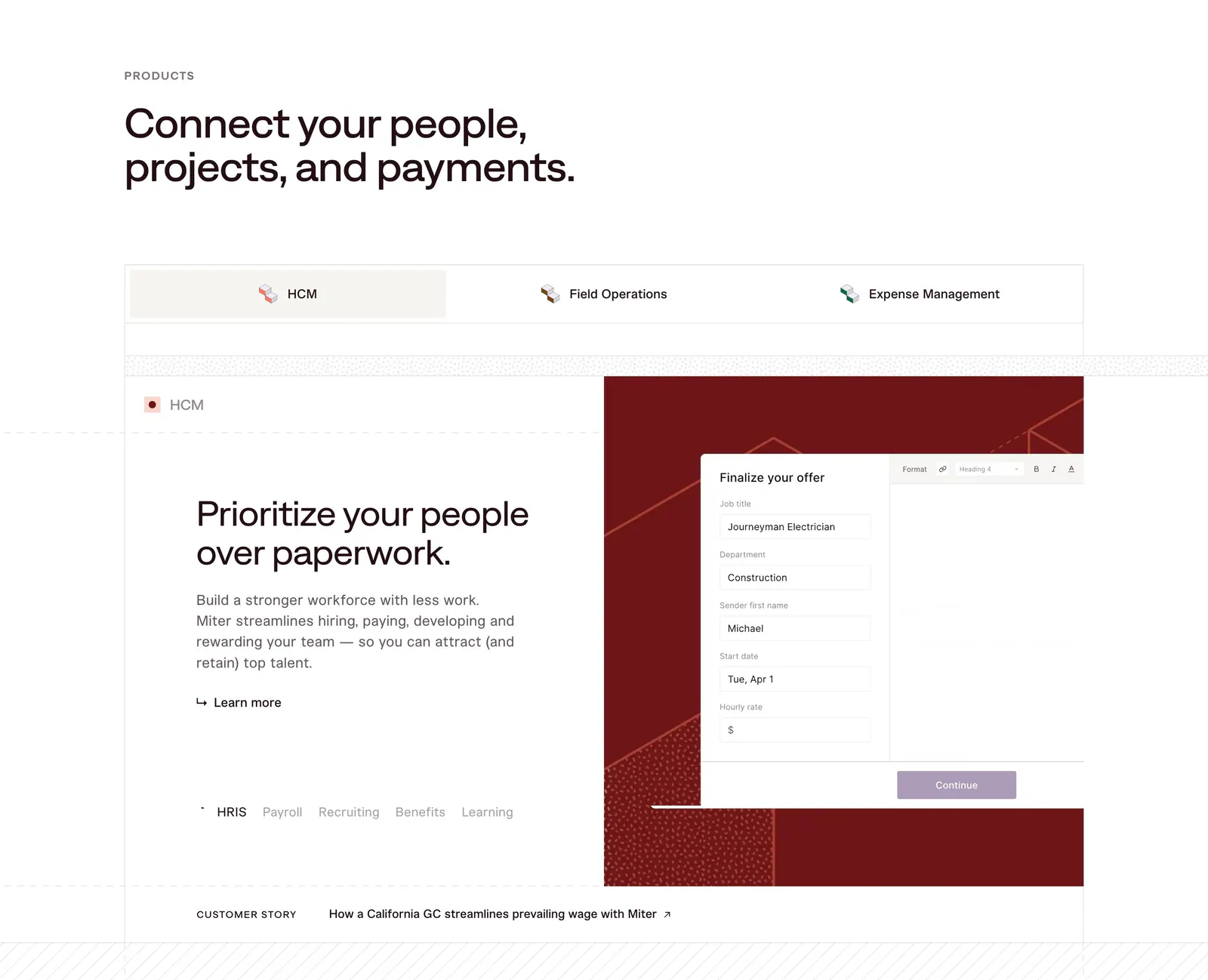
  57. Miter features section: headline above product tabs and a split panel with HCM copy beside an offer form UI on dark red
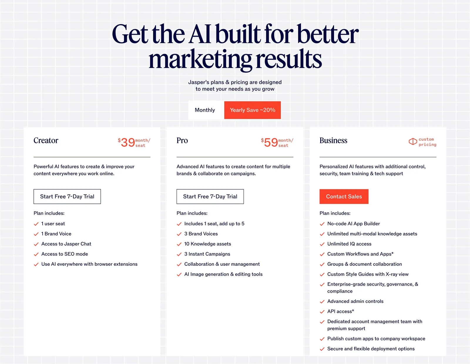
  58. Jasper pricing section: centered serif headline and monthly/yearly toggle above three white plan cards on a light grid background
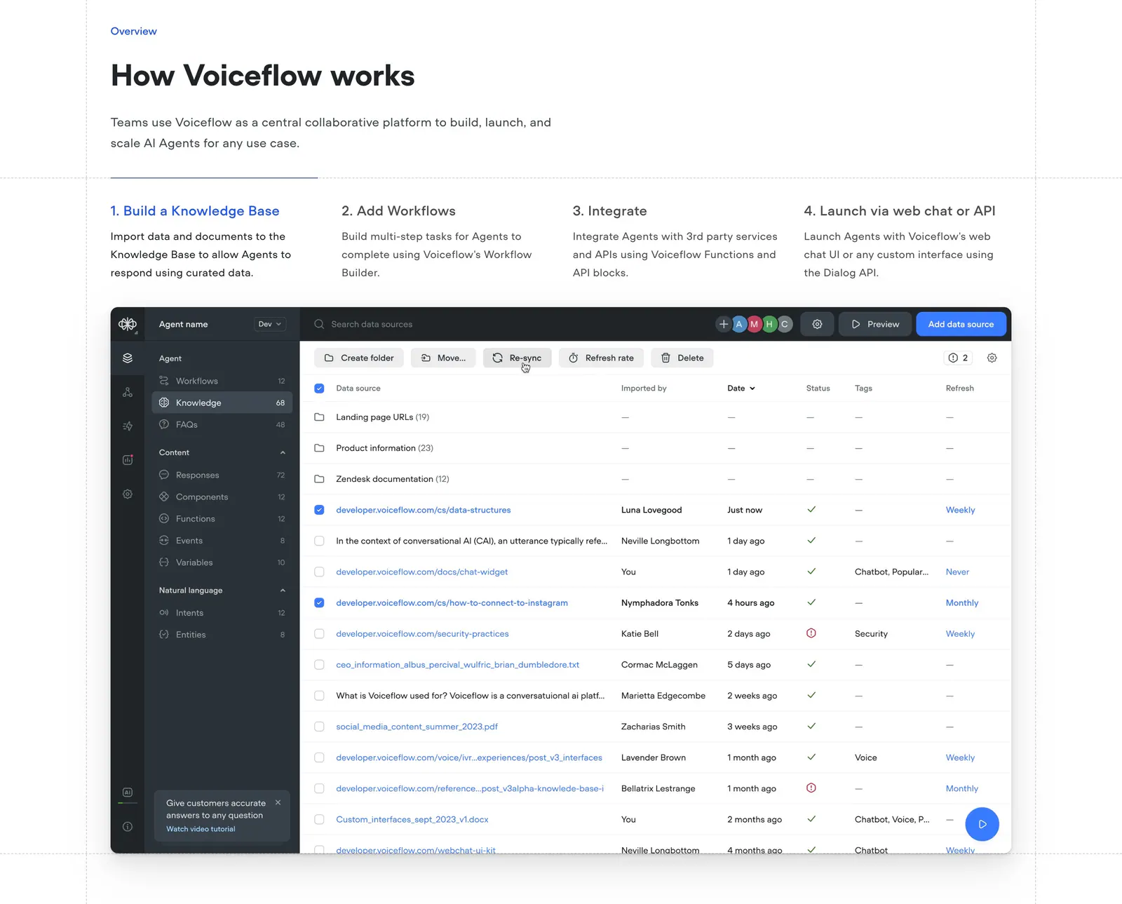
  59. Voiceflow how it works section: headline above four numbered step tabs and a knowledge base data table screenshot
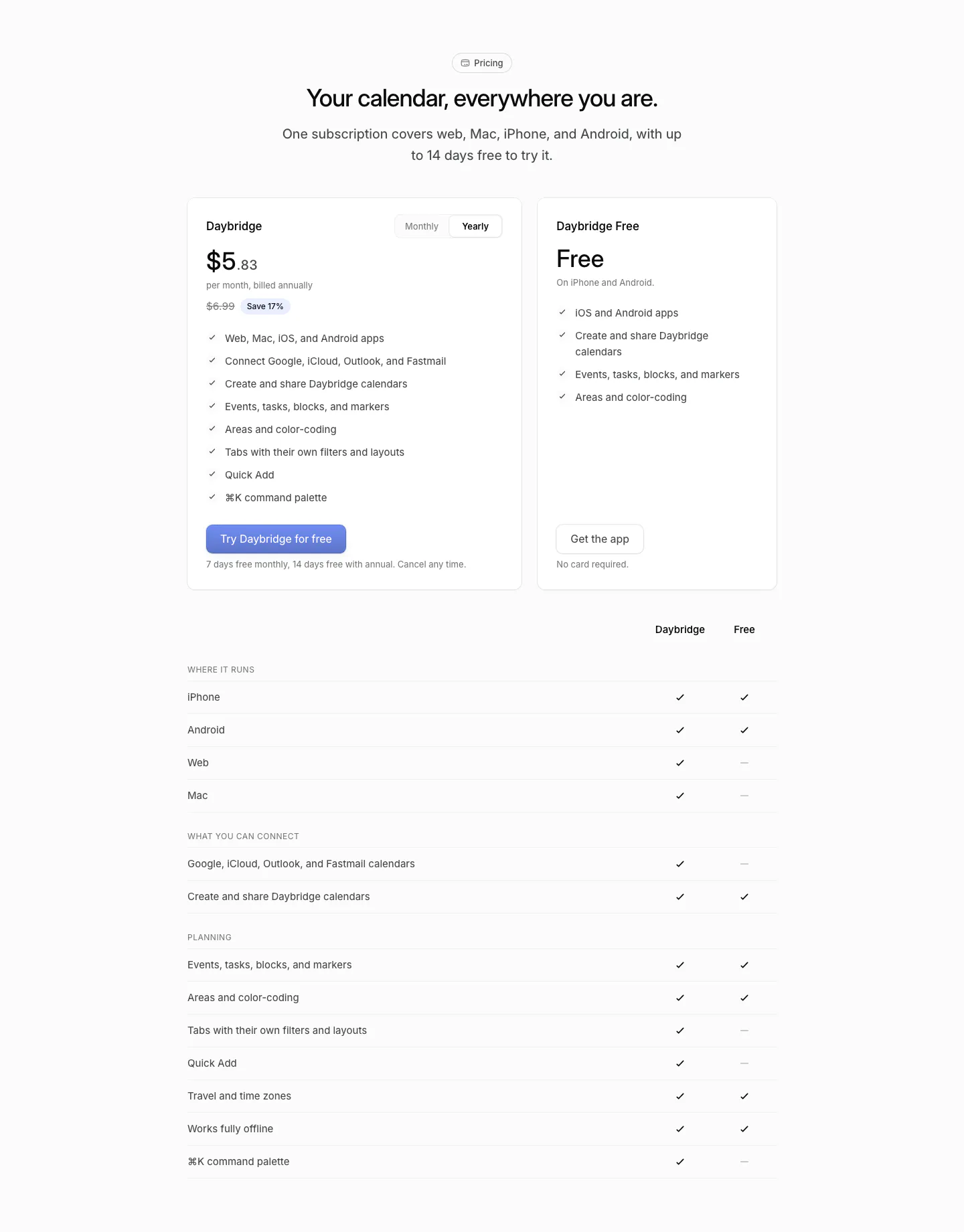
  60. Daybridge pricing section: centered headline above two plan cards with a monthly/yearly toggle and a plan comparison checkmark table
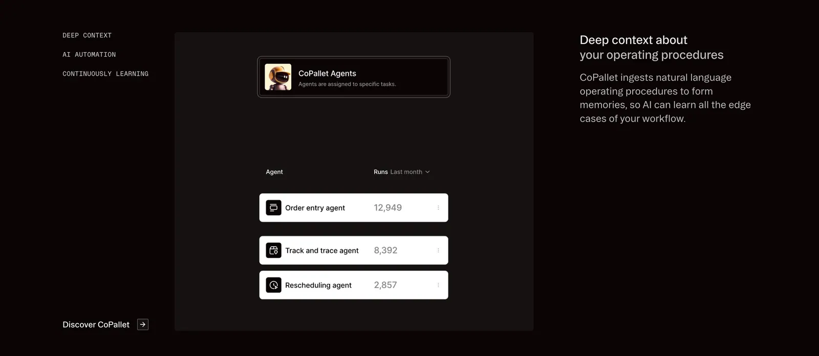
  61. Pallet features section: dark three-column layout with vertical tab labels, a CoPallet agents UI card and descriptive text on the right
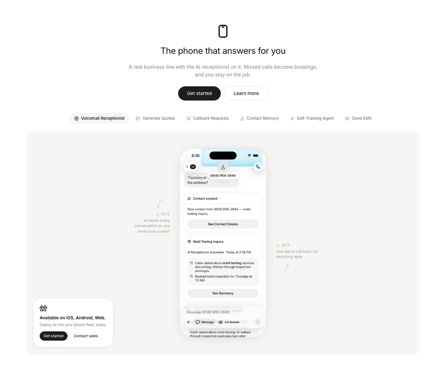
  62. Beside features section: centered headline and buttons above a feature tab bar and a phone mockup with annotations in a gray panel
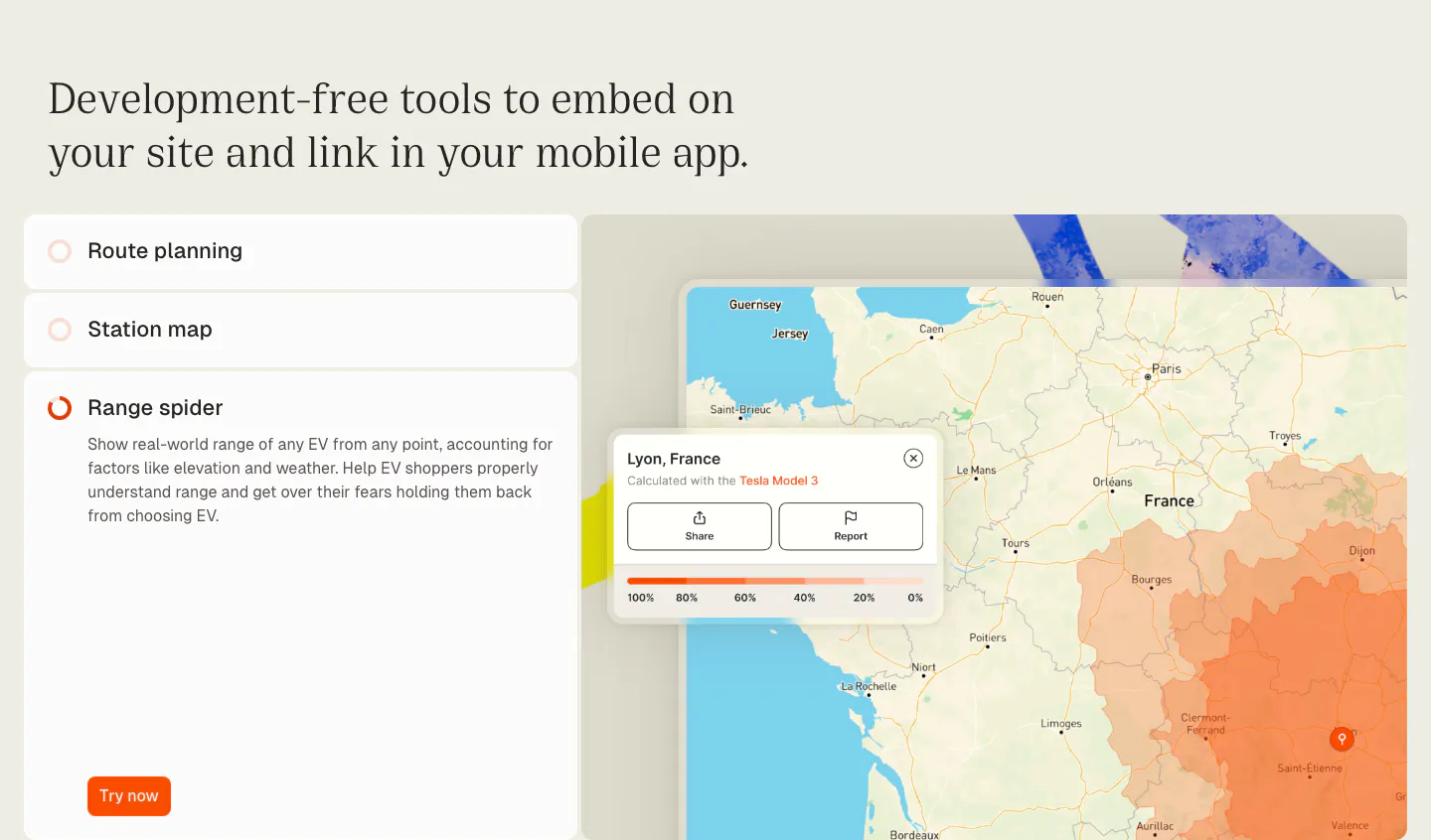
  63. Chargetrip features section: serif headline over an accordion list of embeddable tools beside a France map with an EV range overlay
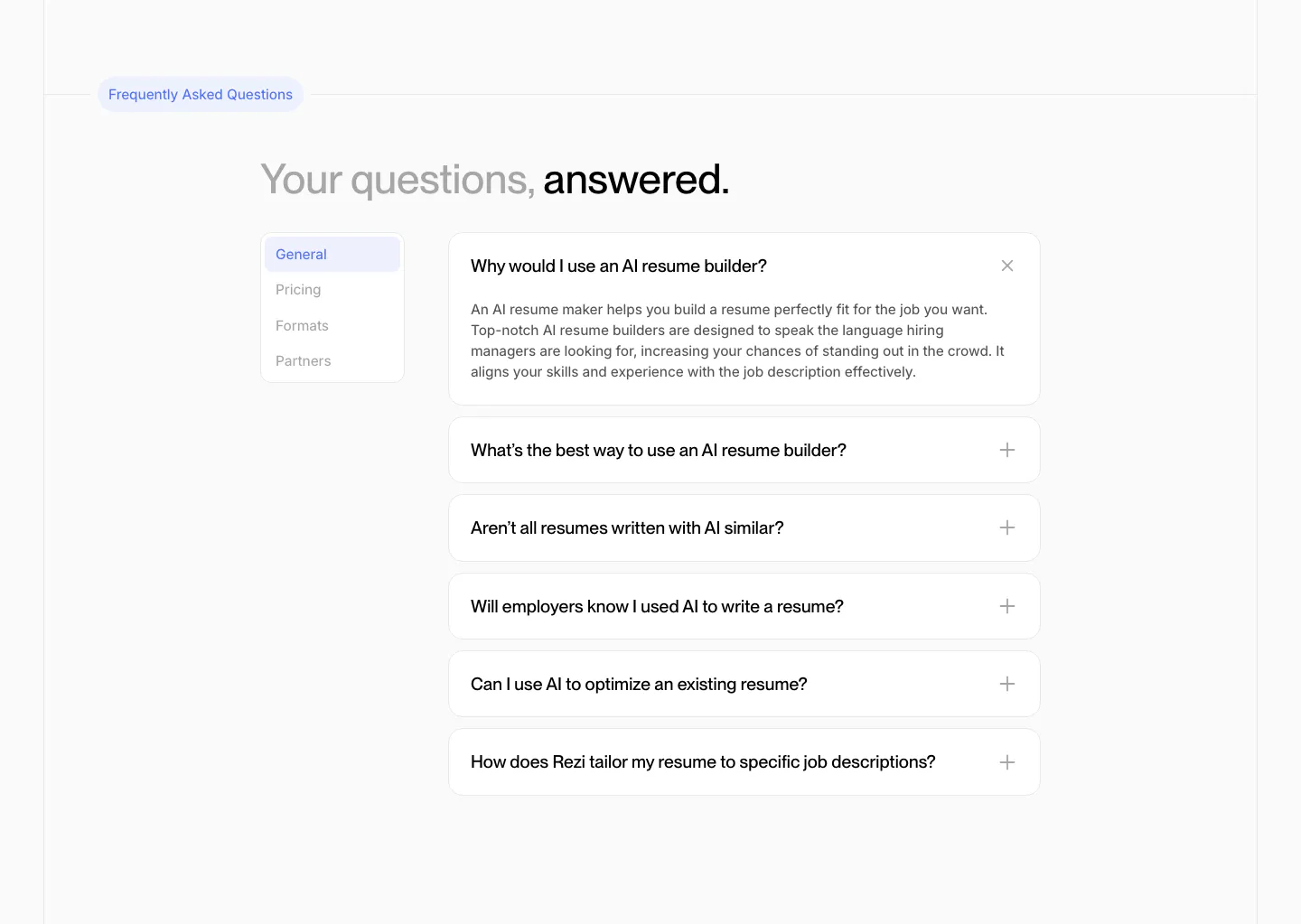
  64. Rezi FAQ section: two-tone headline above a side tab list and an accordion of question cards with one expanded answer
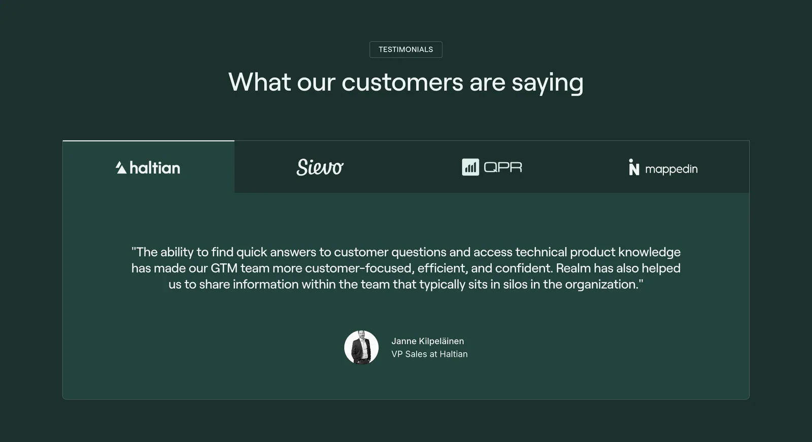
  65. Realm testimonials section: centered headline above a logo tab bar and a single customer quote card on dark green
  66. Clarion features section: split card with a photo of a woman reviewing papers beside a dark brown panel with a serif tab list and button
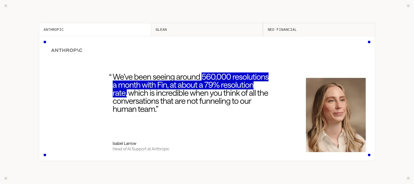
  67. Intercom testimonials section: tabbed customer quote card with a blue-highlighted phrase, Anthropic logo, speaker name and portrait photo
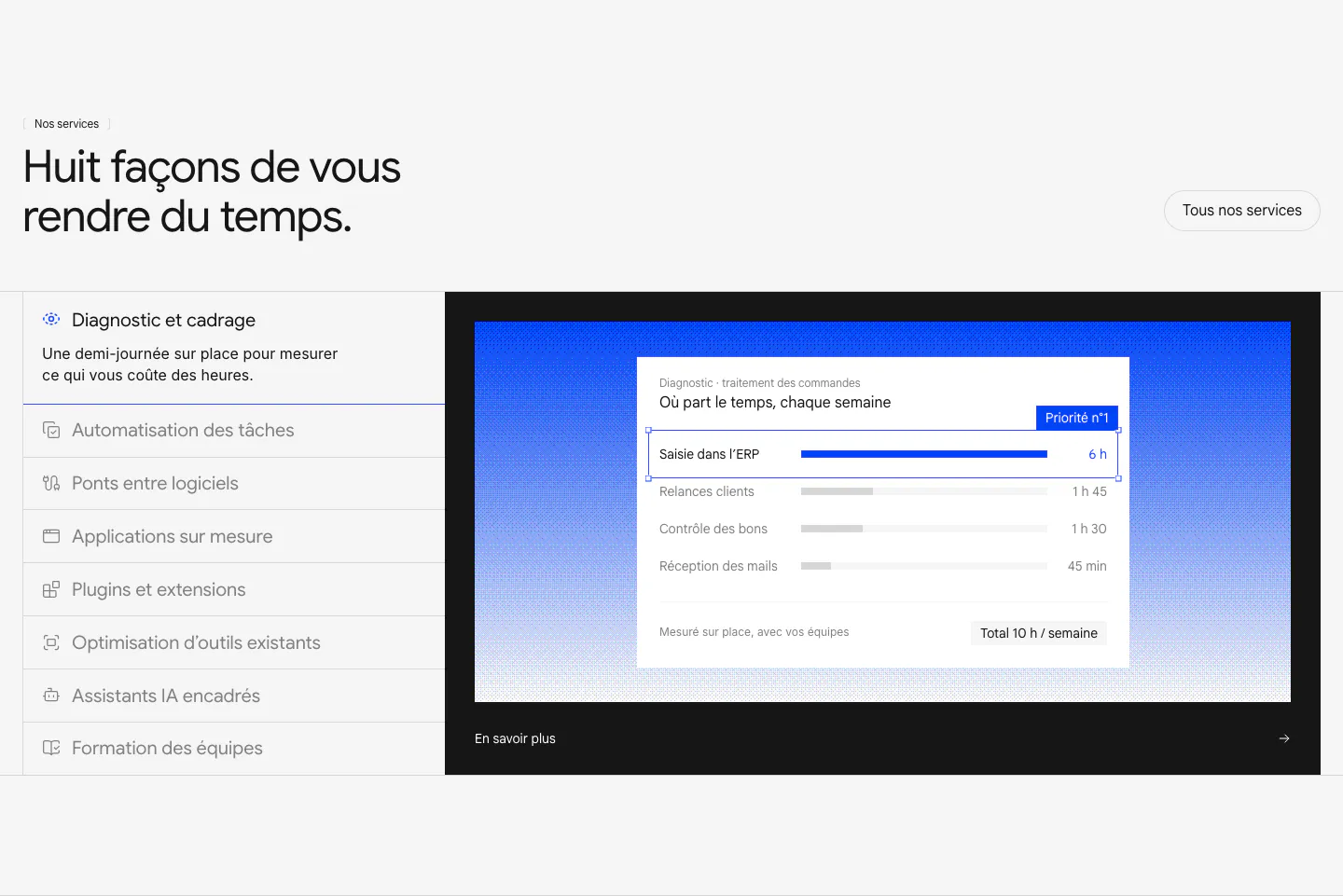
  68. Raneo features section: headline above a vertical list of eight services beside a dark panel with blue gradient and diagnostic UI card
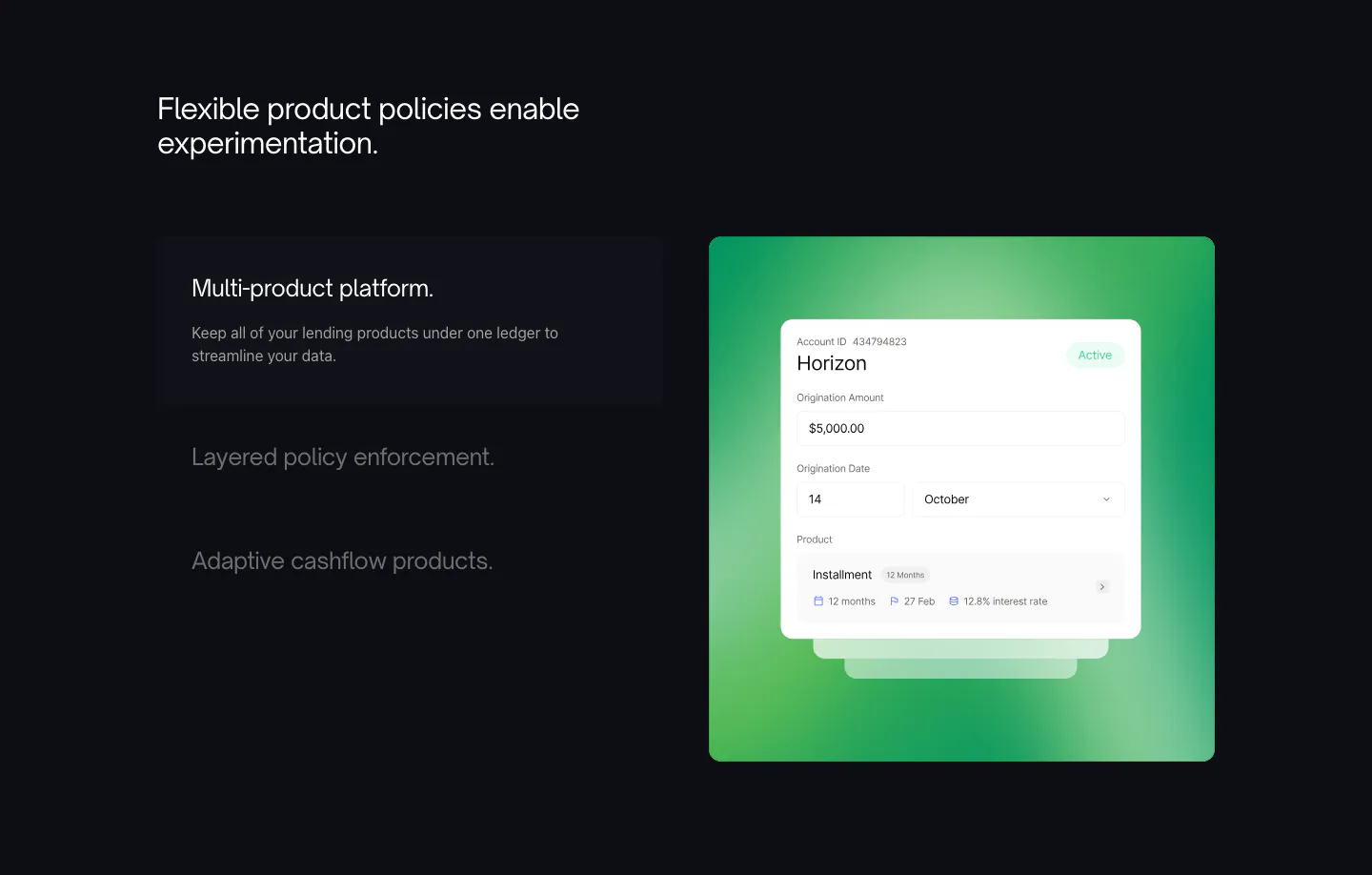
  69. Canopy features section: dark layout with a three-item feature list on the left and a UI card on a green gradient panel
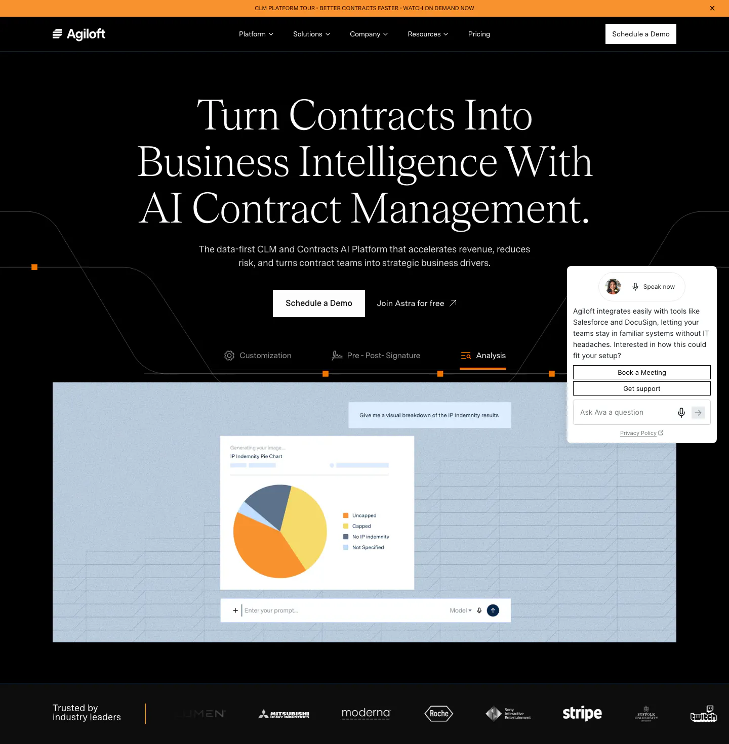
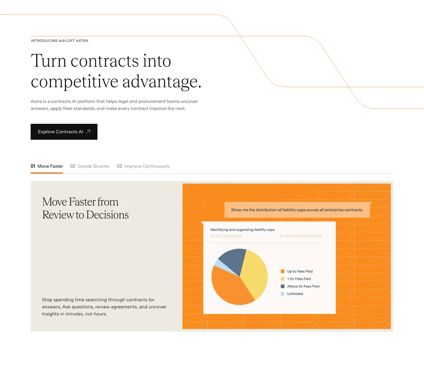
  70. Agiloft hero section: centered serif headline on black above feature tabs, a pie chart product screenshot and a customer logo strip
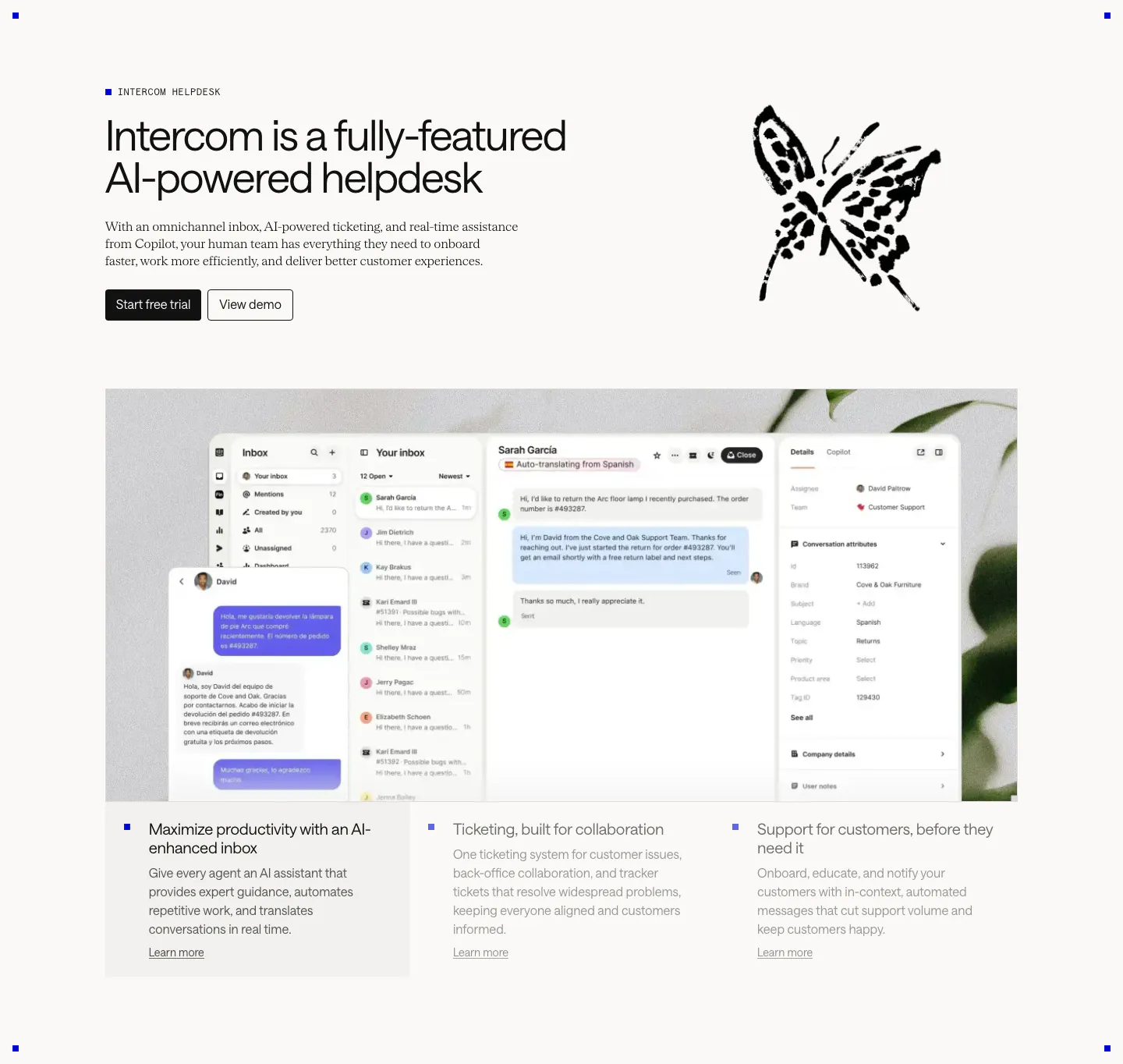
  71. Intercom features section: headline beside an ink butterfly drawing, large inbox screenshot over a plant photo, three selectable feature columns
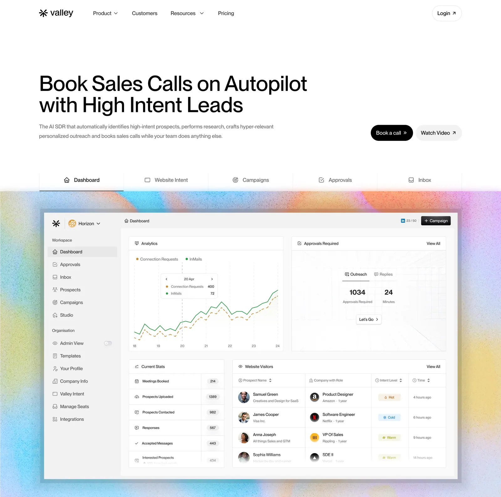
  72. Valley hero section: left-aligned headline with buttons, a tab bar and a sales dashboard screenshot on a grainy pastel gradient background
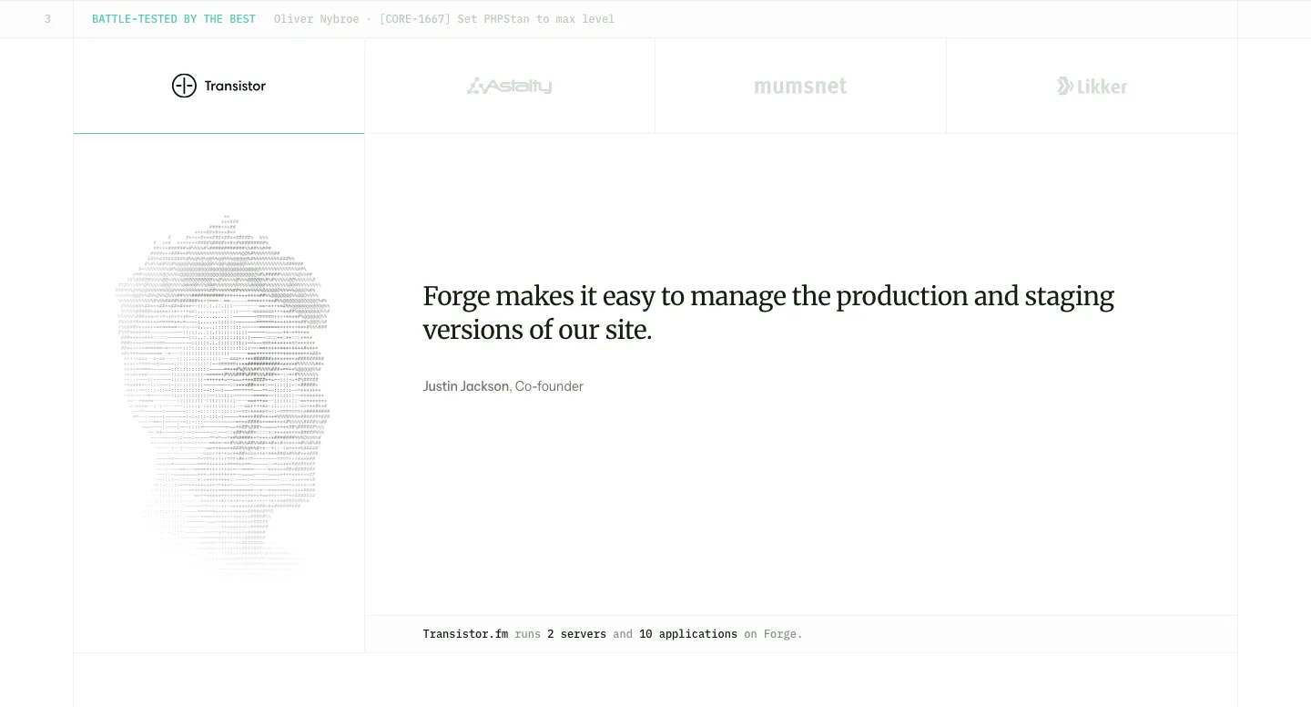
  73. Laravel Forge testimonials section: customer logo tabs above a serif quote with an ASCII-art portrait on the left
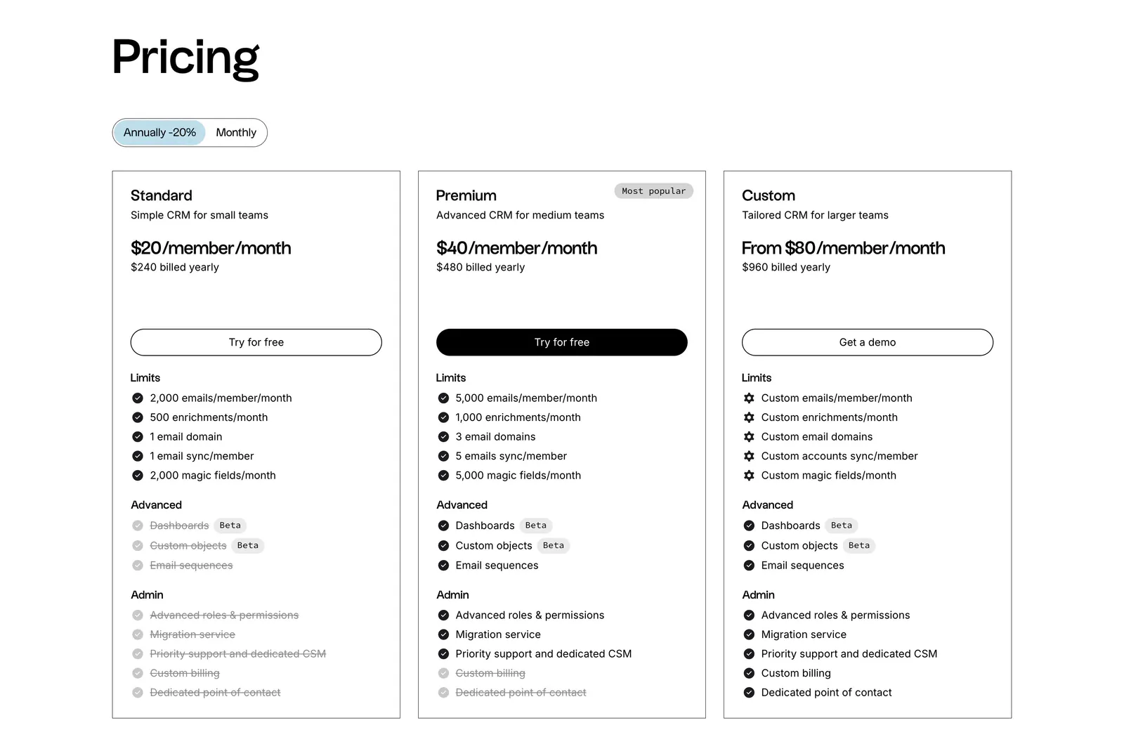
  74. folk pricing section: left-aligned heading, annual/monthly toggle and three outlined plan cards with feature checklists on white
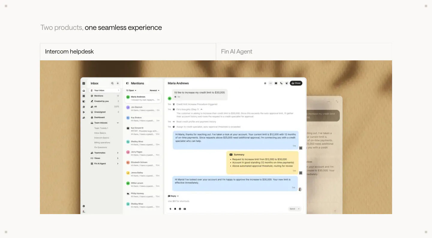
  75. Intercom features section: two-tab switcher for helpdesk and Fin AI Agent above a large inbox screenshot on a textured beige backdrop
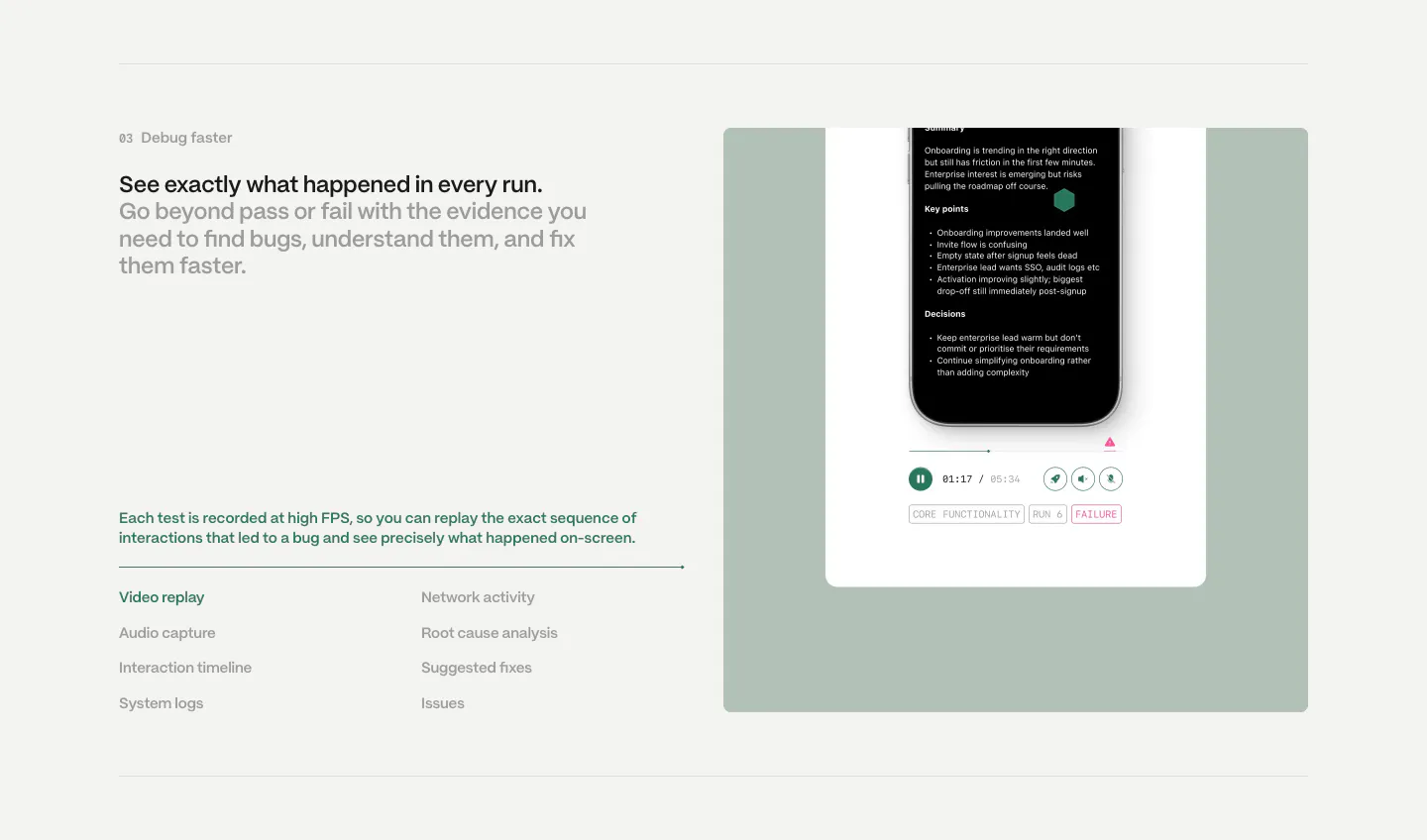
  76. Semaloop features section: numbered headline and feature list on the left beside a sage green panel with a phone test replay player
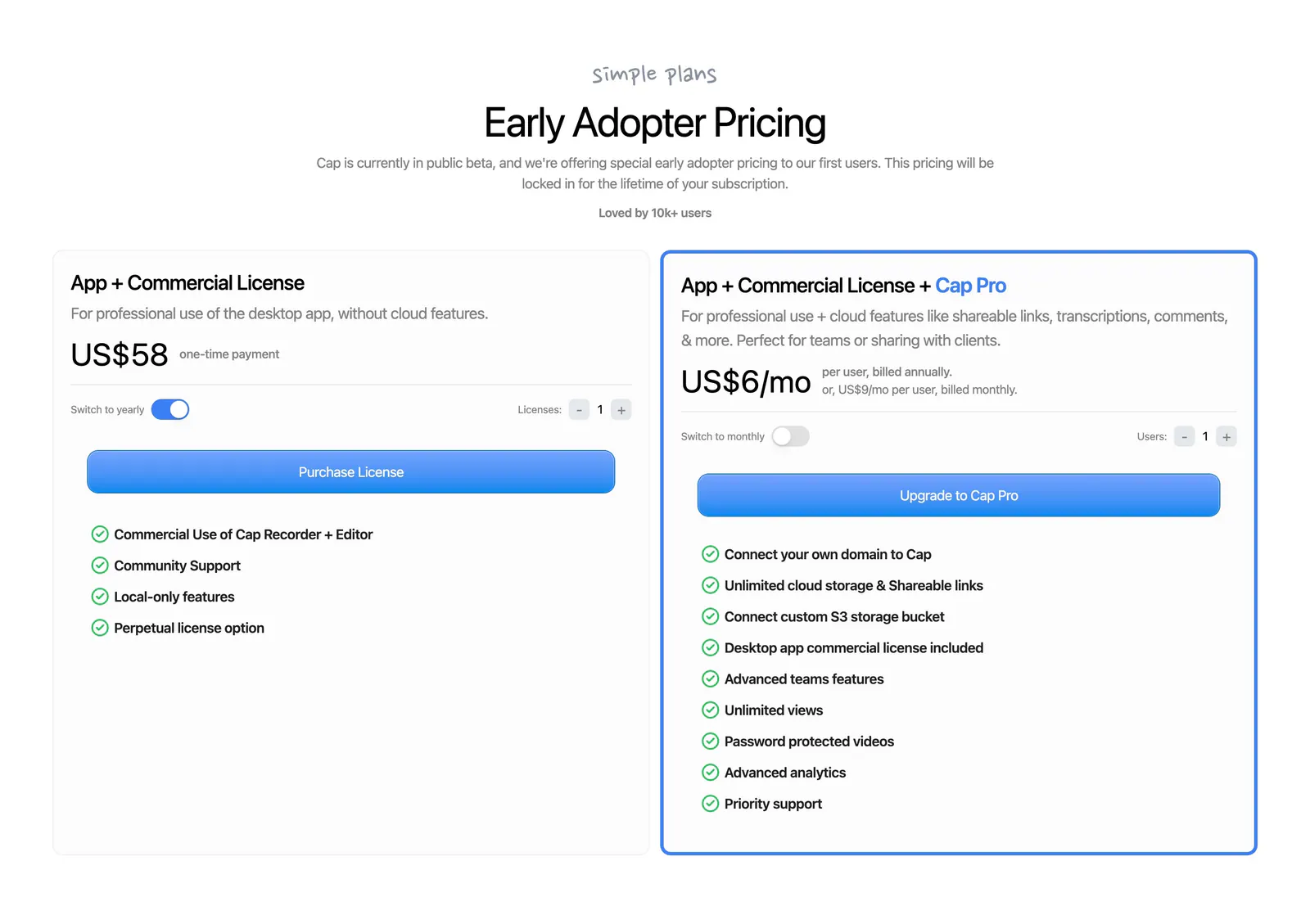
  77. Cap pricing section: centered headline above two license cards with billing toggles, blue buttons and green-check feature lists
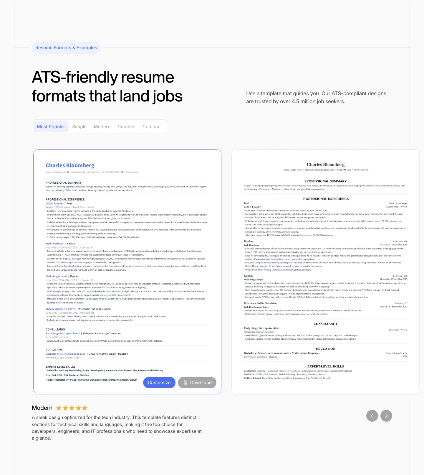
  78. Rezi features section: resume template gallery with style tabs, two resume previews in a slider with arrows and a rated description
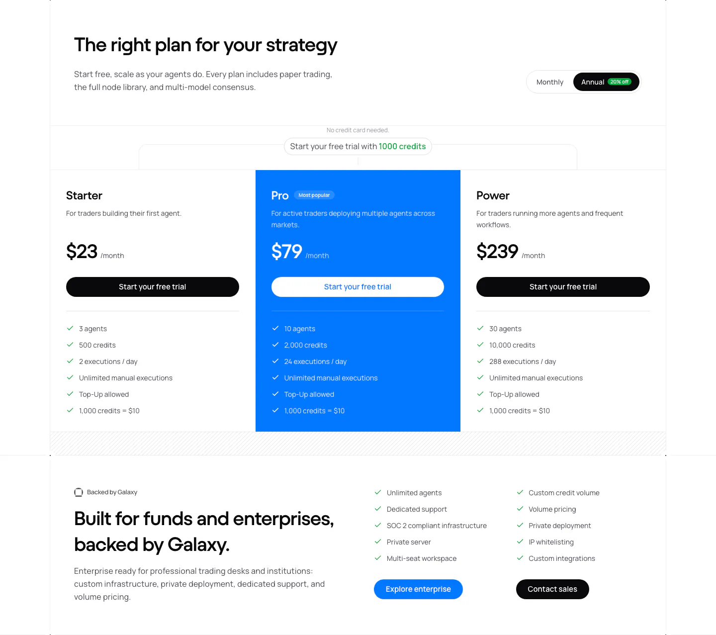
  79. NickAI pricing section: heading with monthly/annual toggle, three plan columns with blue highlighted Pro tier and enterprise band
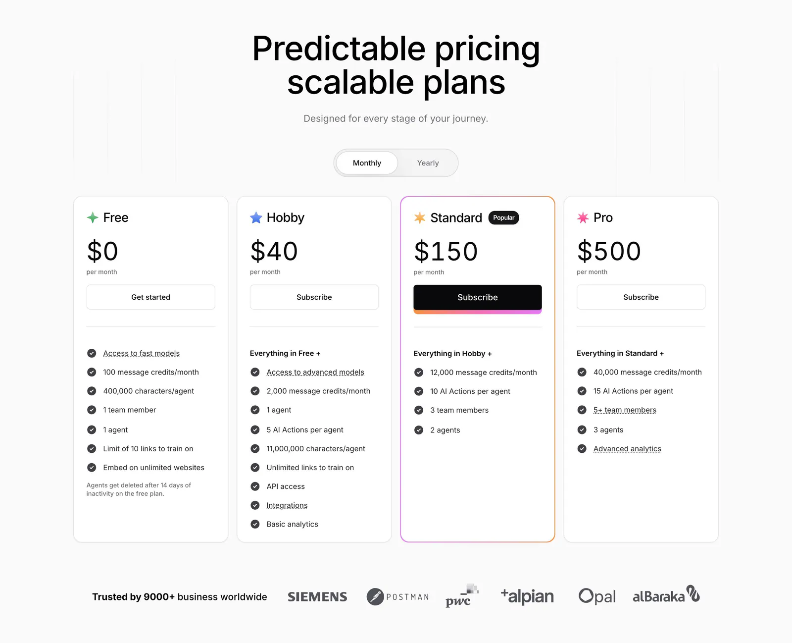
  80. Chatbase pricing section: centered headline and monthly/yearly toggle above four plan cards and a customer logo row
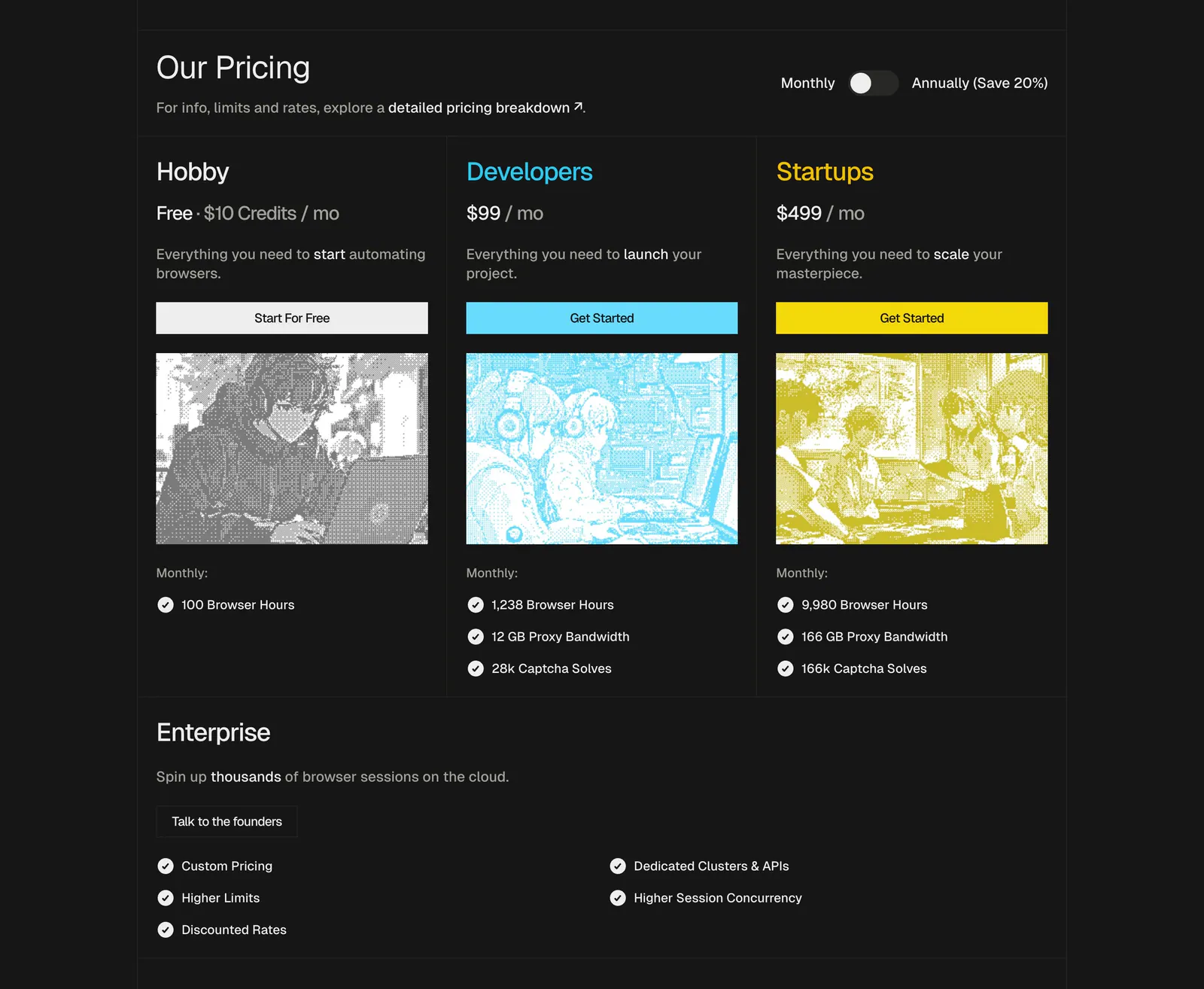
  81. Steel pricing section: three plan cards with dithered anime-style images, monthly/annual toggle and an enterprise row on a dark background
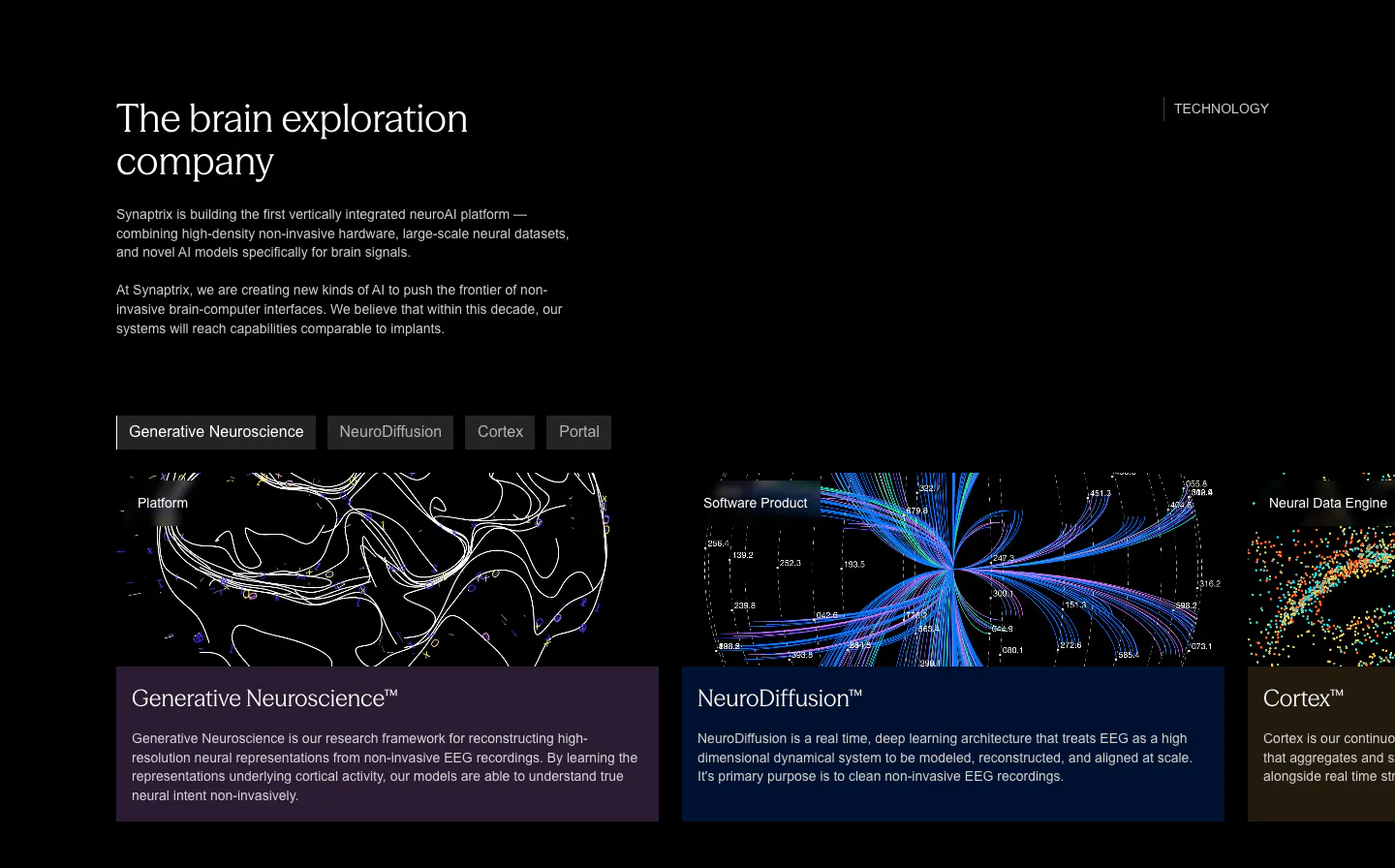
  82. Synaptrix features section: heading and intro copy above a tab bar and cut-off product cards with neural data visualizations on black
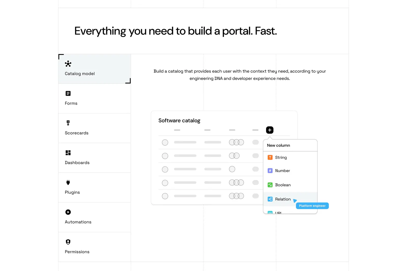
  83. Port features section: headline above a vertical tab list of capabilities beside a software catalog UI mockup on a grid-lined white page
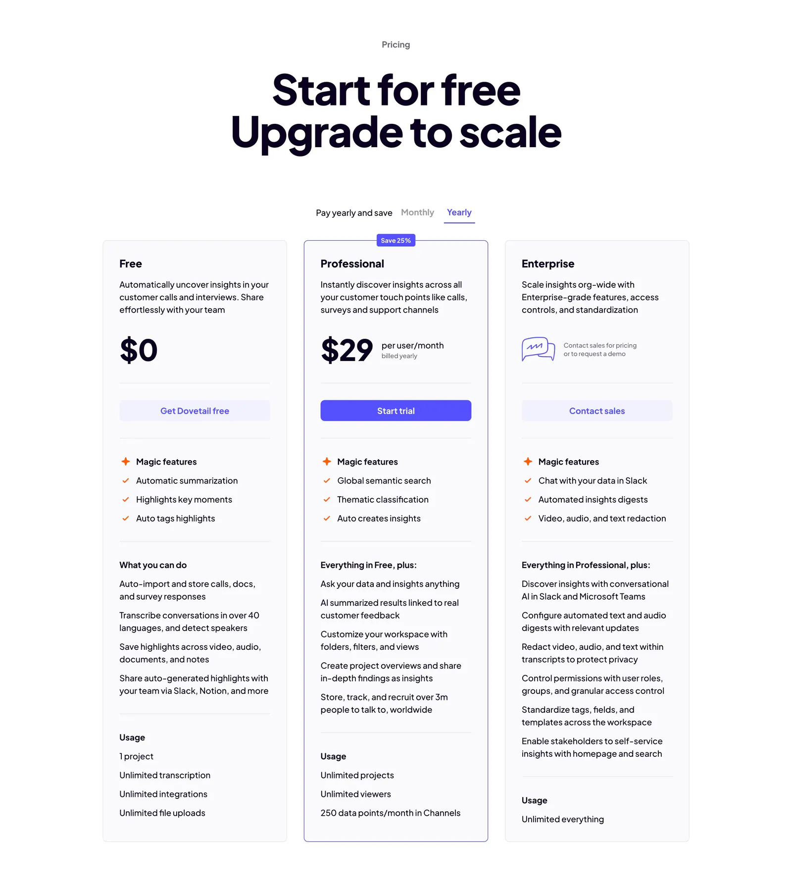
  84. Dovetail pricing section: centered headline, monthly/yearly toggle and three plan cards with the Professional tier outlined in indigo
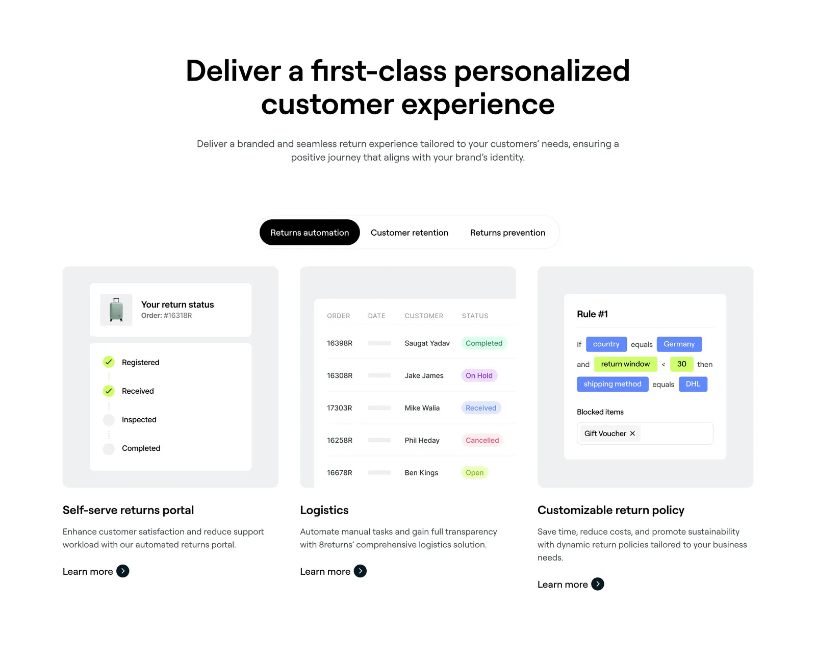
  85. 8returns features section: centered headline, segmented tab control and three cards with returns portal, logistics table and rule UI
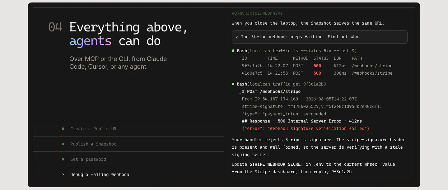
  86. LocalCan features section: monospace headline and agent task list on the left of a dark panel, terminal transcript debugging a webhook on the right
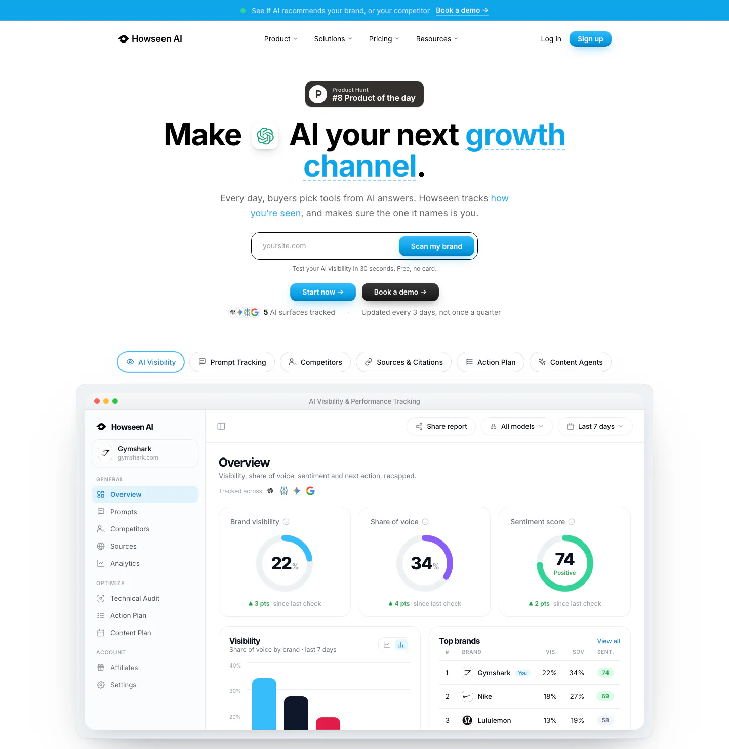
  87. Howseen AI hero section: centered headline with URL scan field and tabs above an AI visibility dashboard screenshot on white
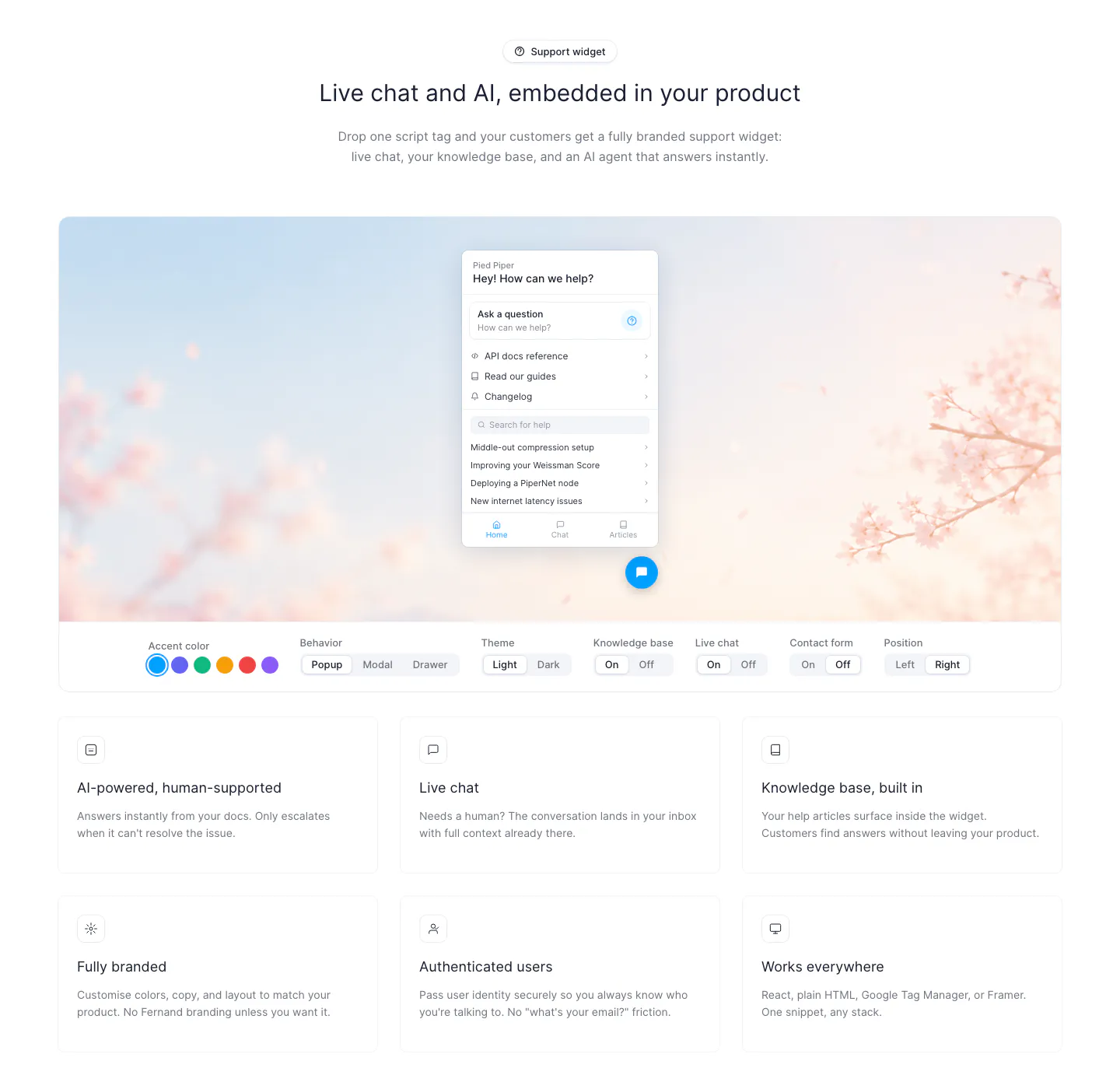
  88. Fernand features section: chat widget preview on a blossom photo with segmented style toggles above a 3x2 card grid
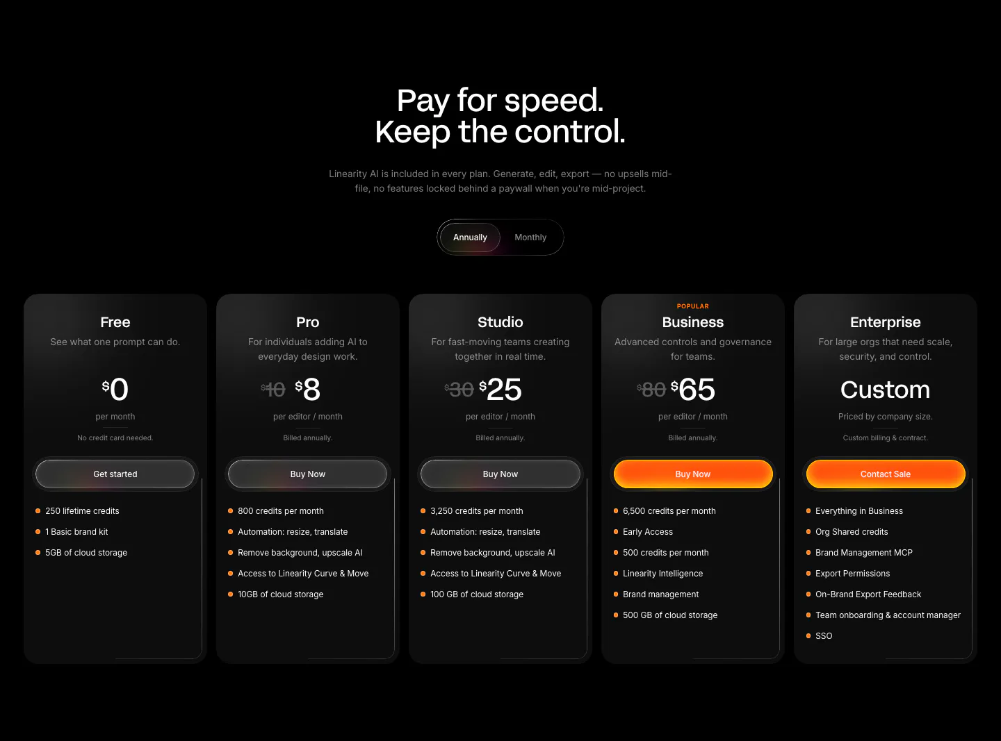
  89. Linearity pricing section: centered headline and annual/monthly toggle above five dark plan cards with orange accent buttons on black
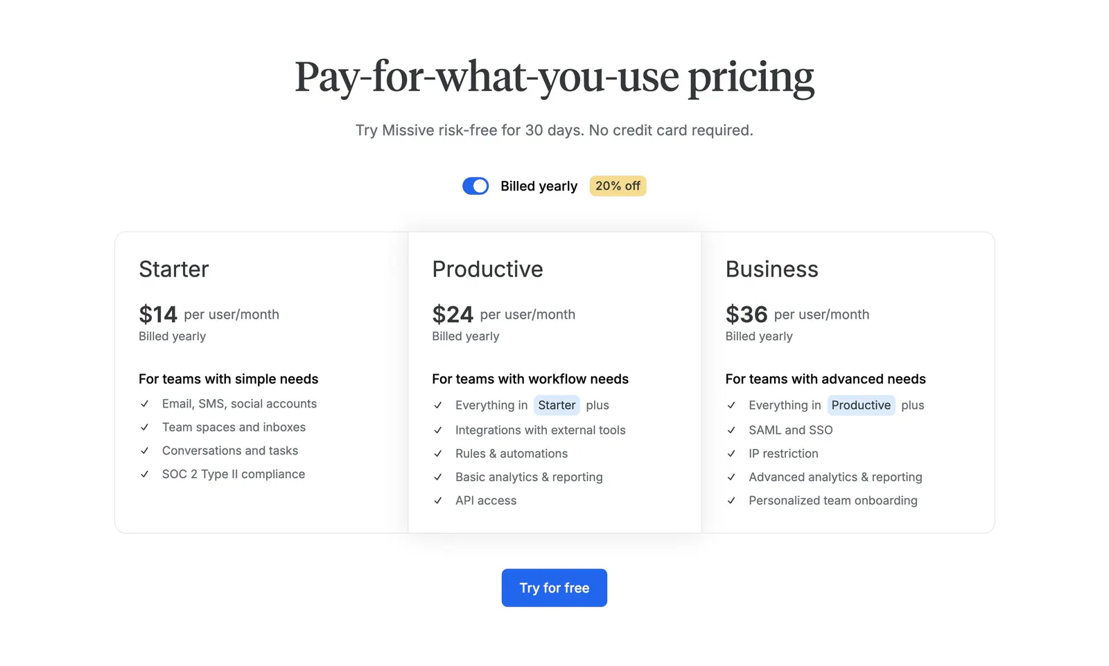
  90. Missive pricing section: centered serif headline with billing toggle above three plan columns and a Try for free button
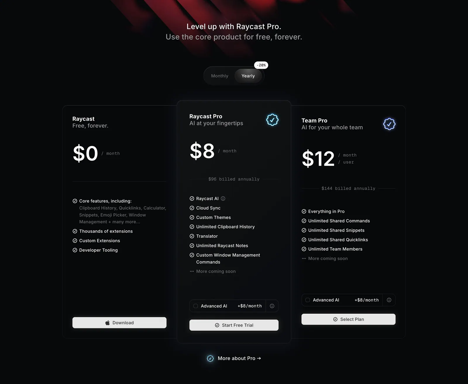
  91. Raycast pricing section: centered headline and monthly/yearly toggle above three dark plan cards with prices and feature lists
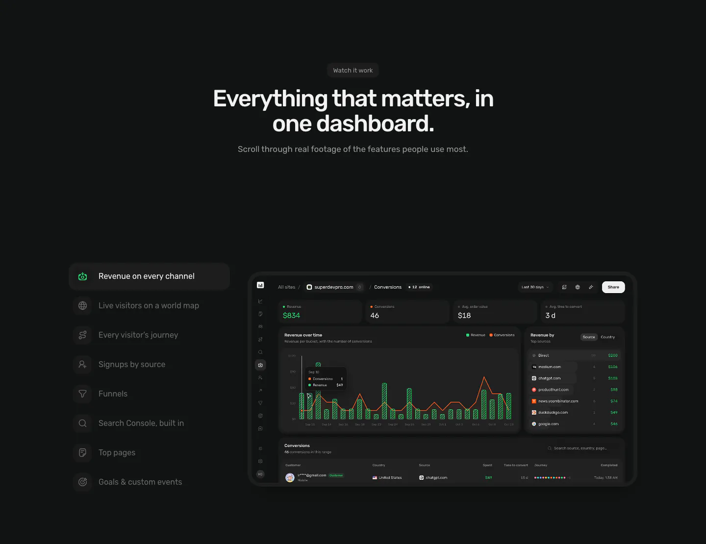
  92. Piqo features section: centered headline above a vertical feature tab list on the left and a dark revenue dashboard screenshot on the right
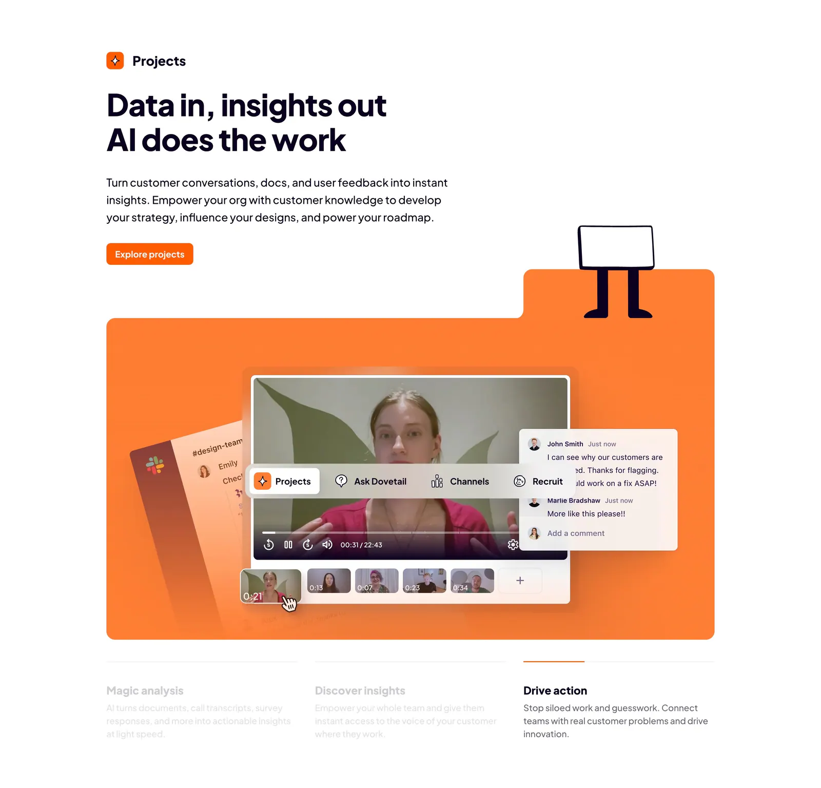
  93. Dovetail features section: left-aligned headline and orange button above an orange panel with a video insights UI and three tabbed benefits
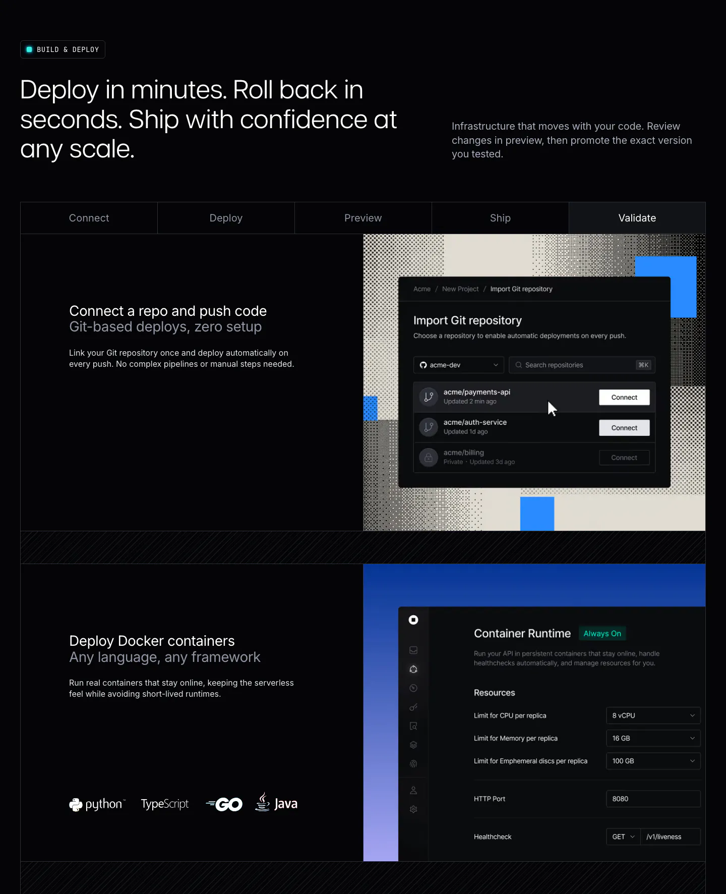
  94. Unknown features section: dark layout with a five-step tab bar and rows pairing deploy copy with Git import and container runtime UI
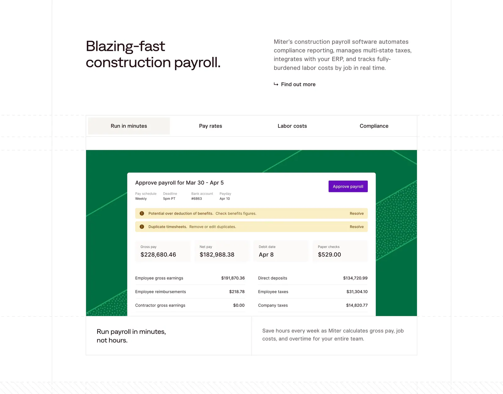
  95. Miter features section: headline beside intro copy above a four-tab panel showing a payroll approval UI on a green patterned card
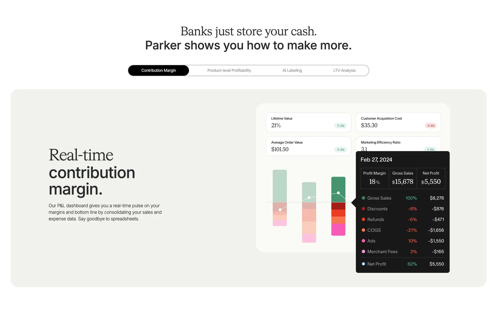
  96. Parker features section: centered headline over a pill tab bar and beige panel with text beside a contribution margin dashboard UI
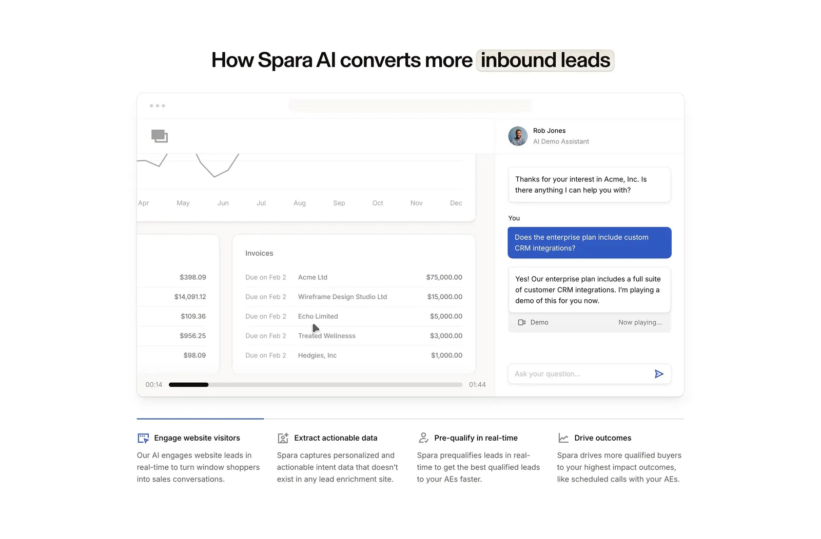
  97. Spara how it works section: centered headline above a demo video player with AI chat panel and four step tabs below
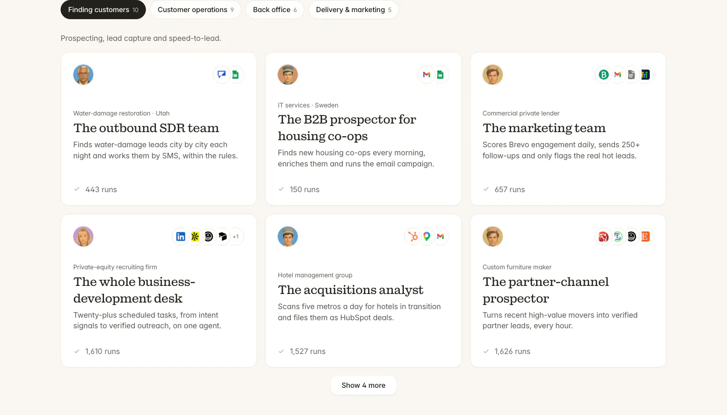
  98. Twin use cases section: tab bar of categories above a three-column grid of agent cards with avatars, app icons and run counts
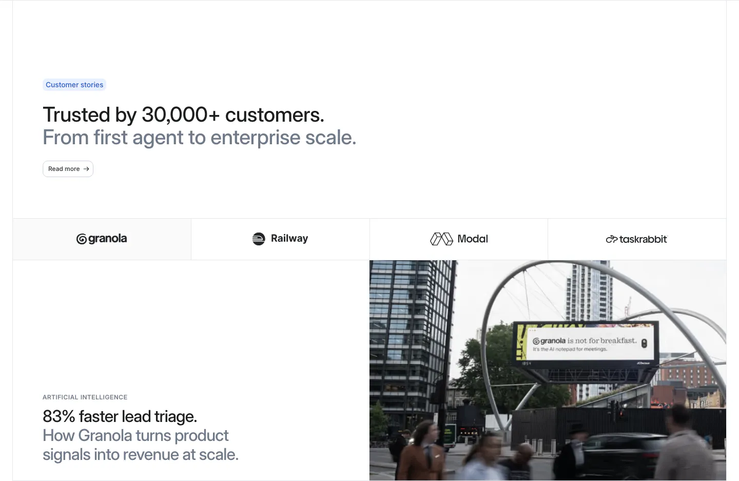
  99. Attio testimonials section: headline above a customer logo tab bar and a Granola case study with stat headline beside a street photo
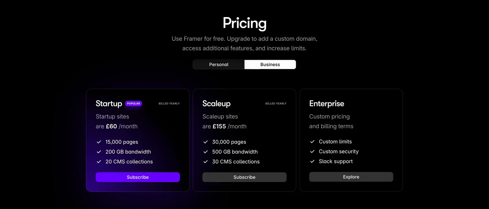
  100. Framer pricing section: centered heading with personal/business toggle above three dark plan cards, the popular one with a purple glow
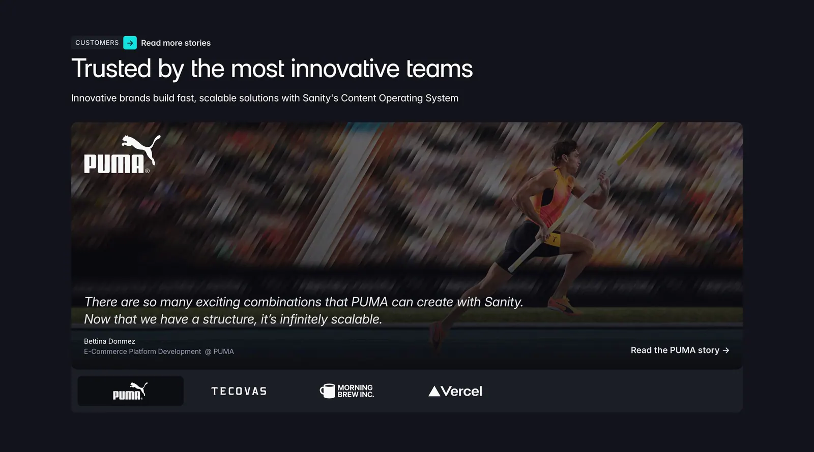
  101. Sanity testimonials section: headline above a PUMA athlete photo card with quote and a row of customer logo tabs on a dark background
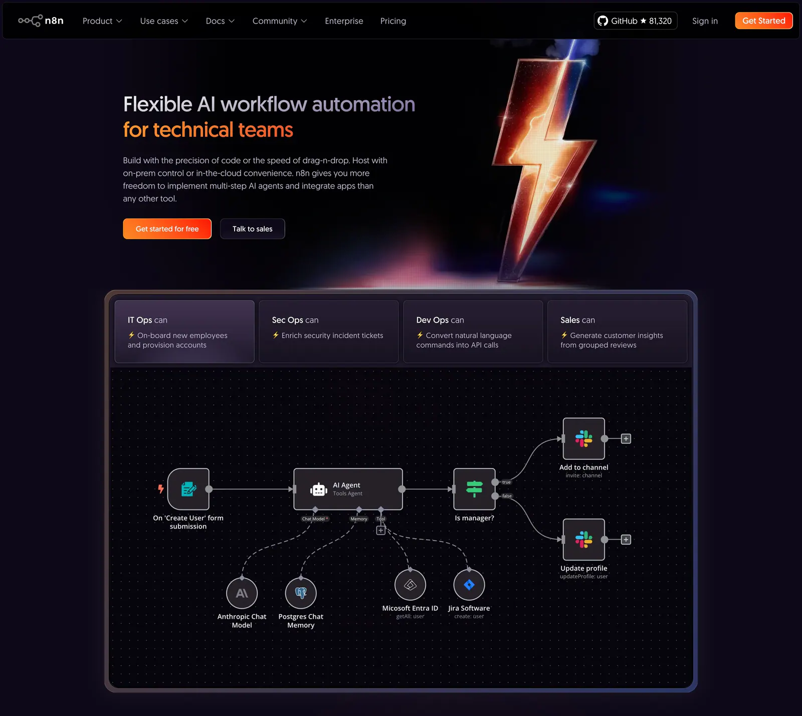
  102. n8n hero section: dark hero with headline and CTAs beside a 3D lightning bolt, above a tabbed AI agent workflow canvas
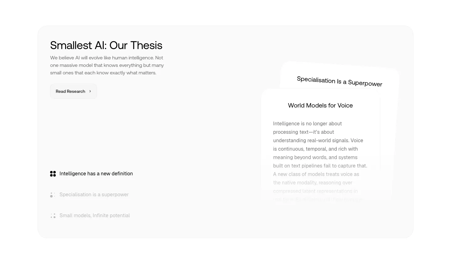
  103. Smallest.ai about & mission section: thesis headline, research button and topic list on the left beside stacked text cards in a gray panel
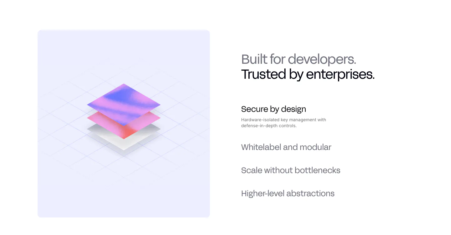
  104. Privy value proposition section: isometric 3D layered render on a lavender panel beside a headline and a list of selectable benefit items
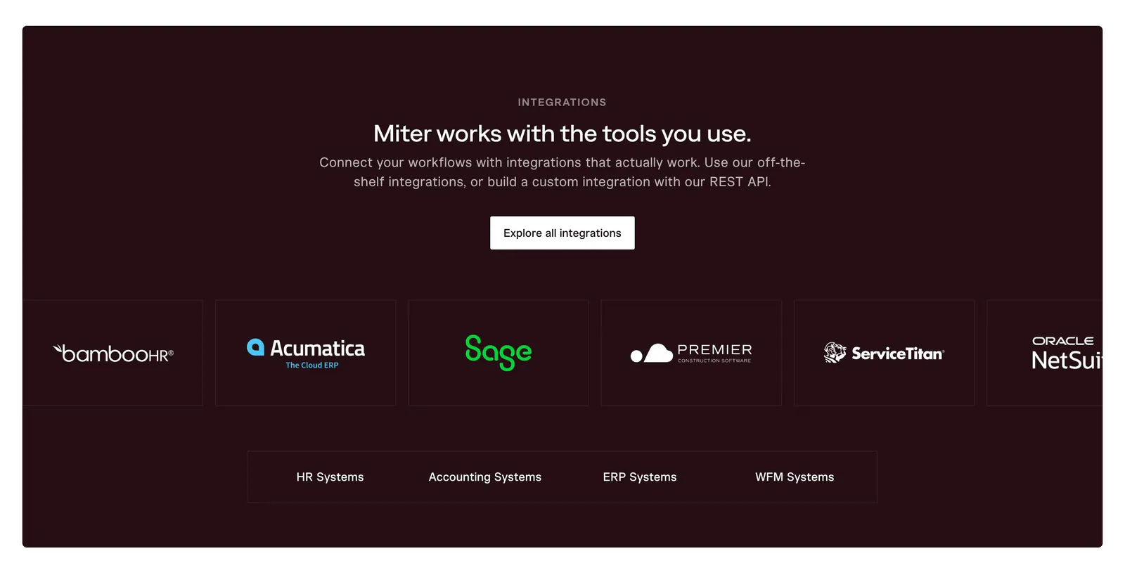
  105. Miter integrations section: centered headline on dark maroon above an edge-cropped row of partner logo cards and category tabs
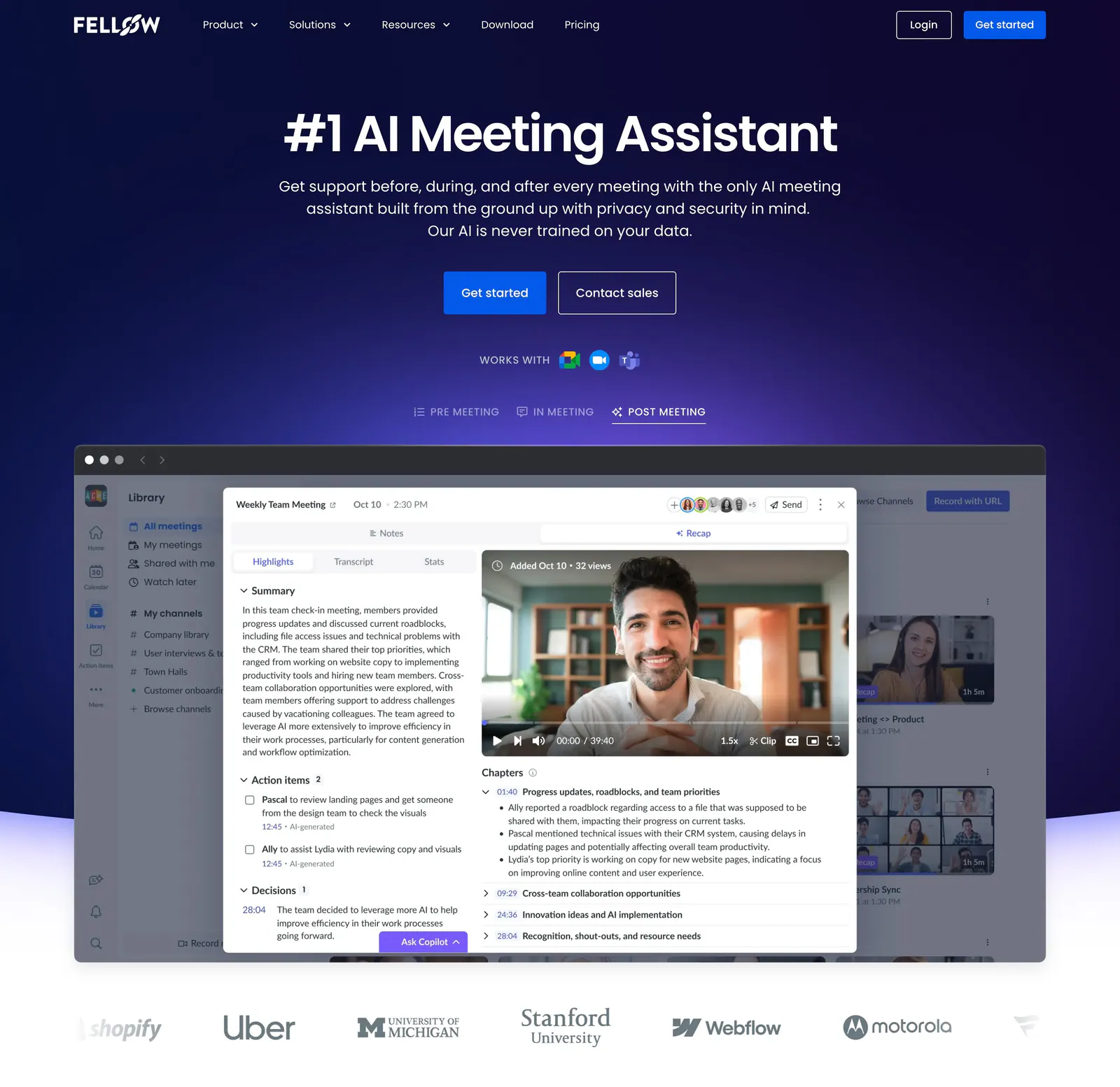
  106. Fellow hero section: centered headline and CTAs on deep navy above a meeting recap app screenshot with tabs and a customer logo row
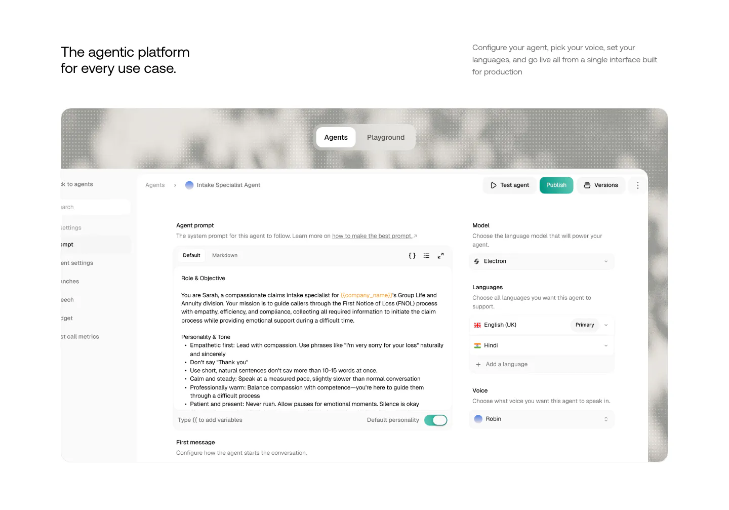
  107. Smallest.ai features section: headline and copy above a large agent configuration UI screenshot with Agents/Playground tabs
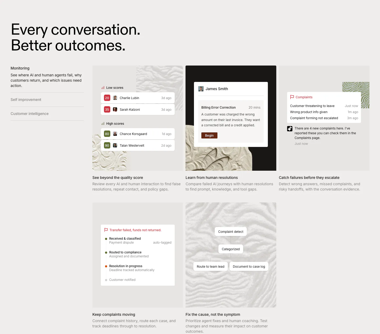
  108. Rulebase features section: left-aligned headline, vertical tab list and a grid of five cards with scoring and complaint UI on textured tiles
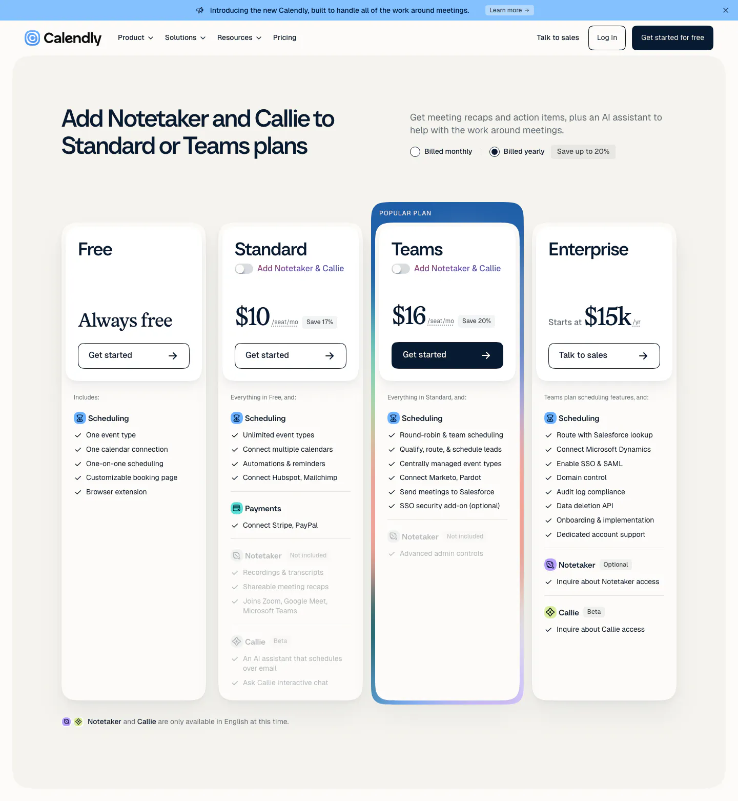
  109. Calendly pricing section: four plan cards with a highlighted Teams plan, monthly/yearly billing toggle and feature checklists below the nav
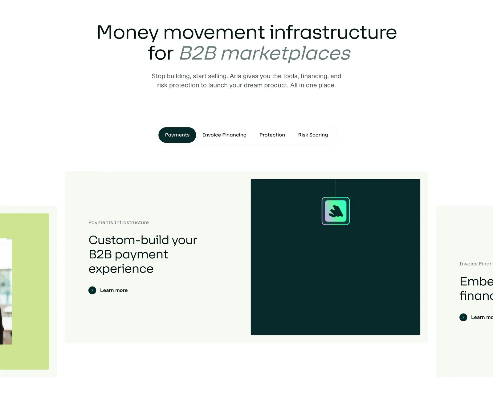
  110. Aria features section: centered headline above a pill tab bar and a carousel of cards with text and a dark teal visual panel
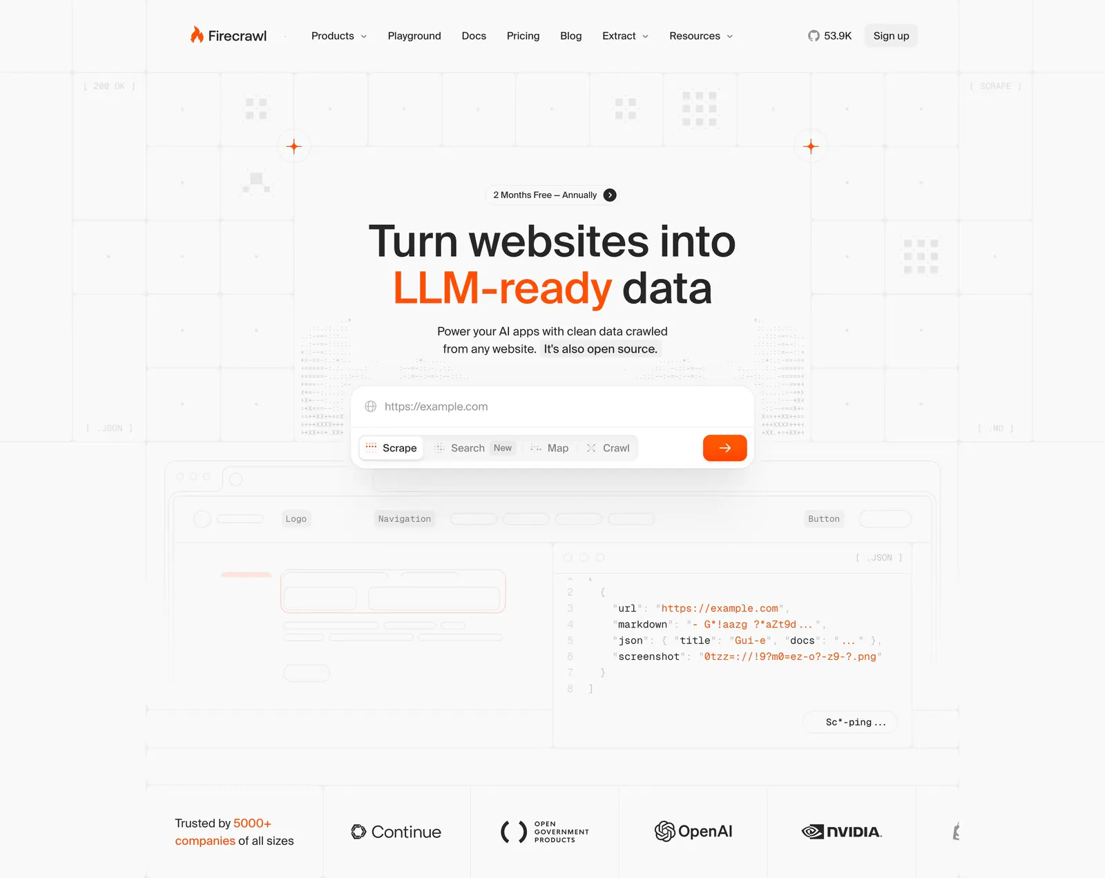
  111. Firecrawl hero section: centered headline with URL input and mode tabs over a grid background, JSON code preview and customer logo row below
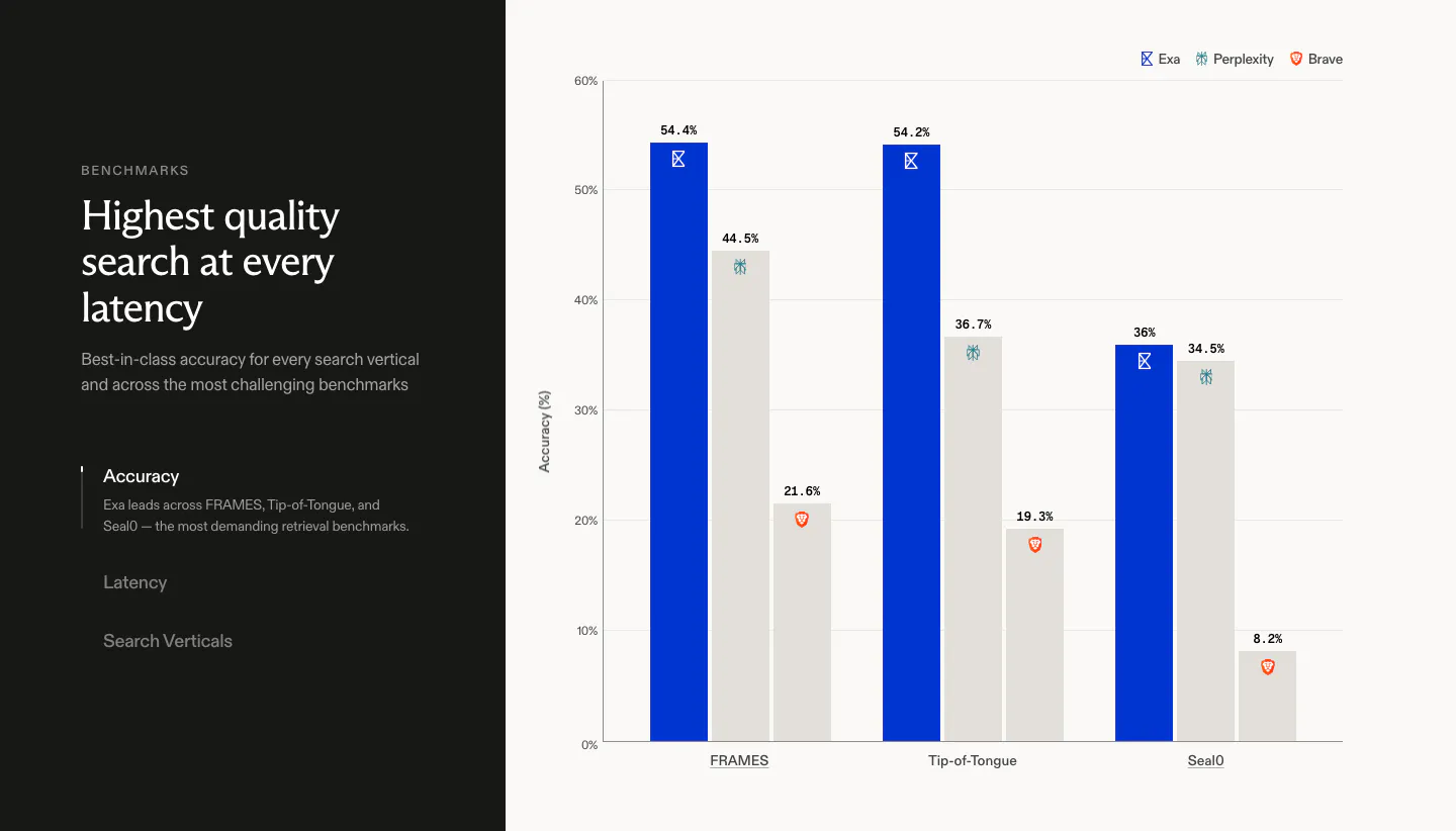
  112. Exa comparison section: dark left panel with headline and vertical tabs beside a bar chart of accuracy scores against Perplexity and Brave
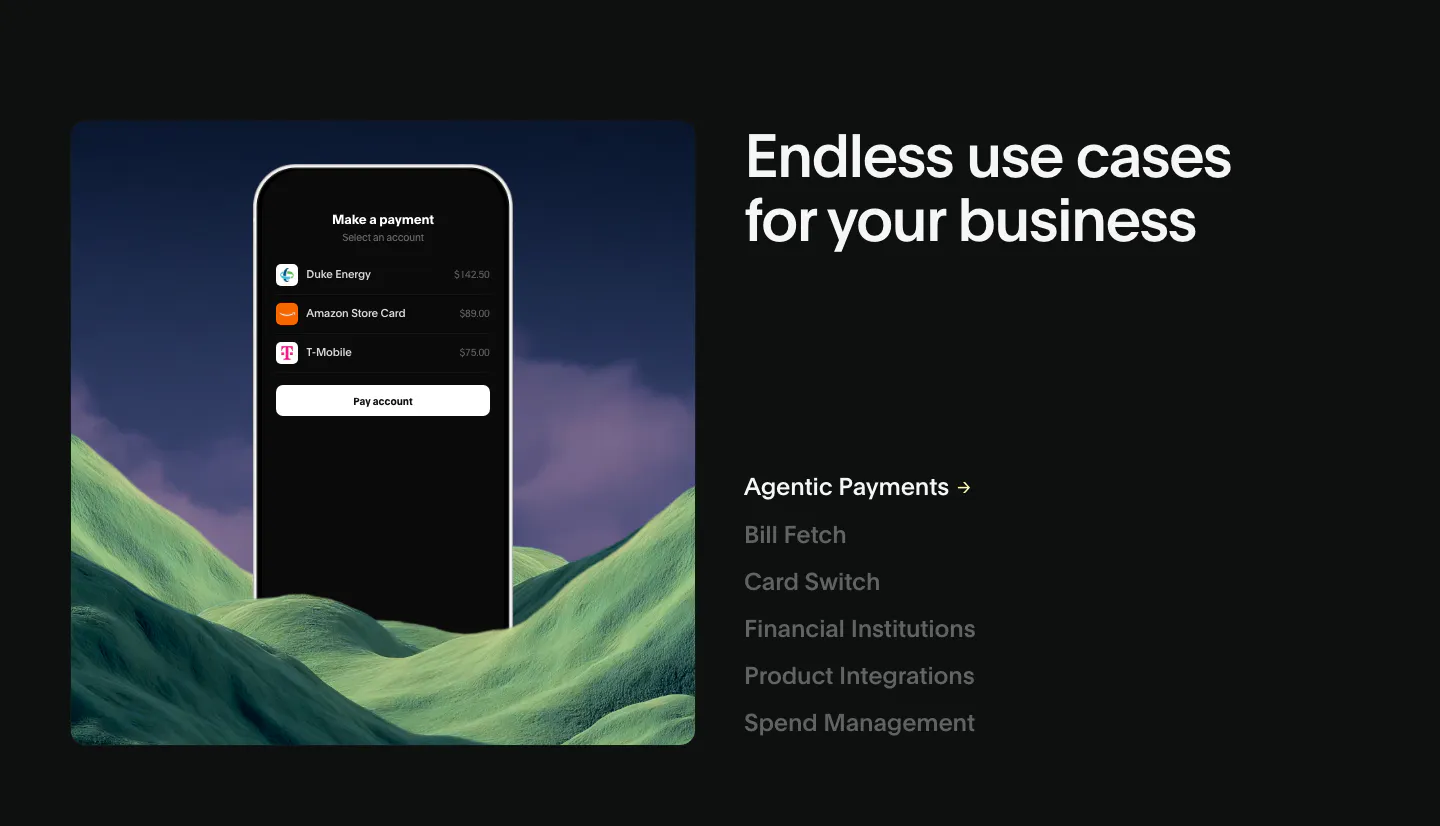
  113. Deck use cases section: phone payment mockup over green hills at left, headline and vertical list of use case links at right, dark
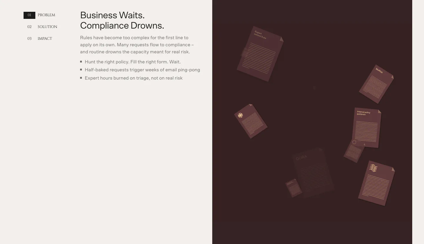
  114. Bayshore value proposition section: numbered Problem/Solution/Impact tabs and bullet copy left, dark maroon panel of floating documents right
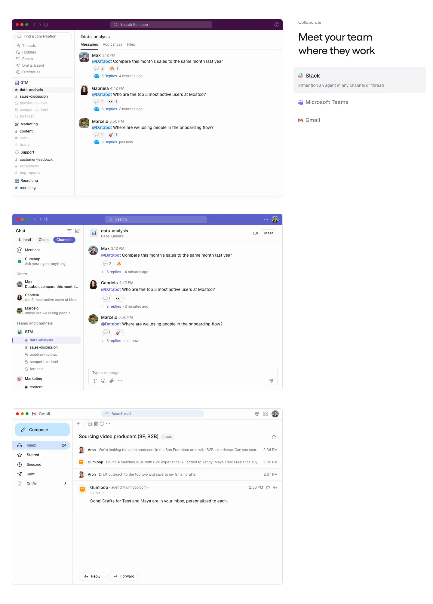
  115. Gumloop features section: stacked Slack, Teams and Gmail screenshots on the left, headline and app tab list on the right
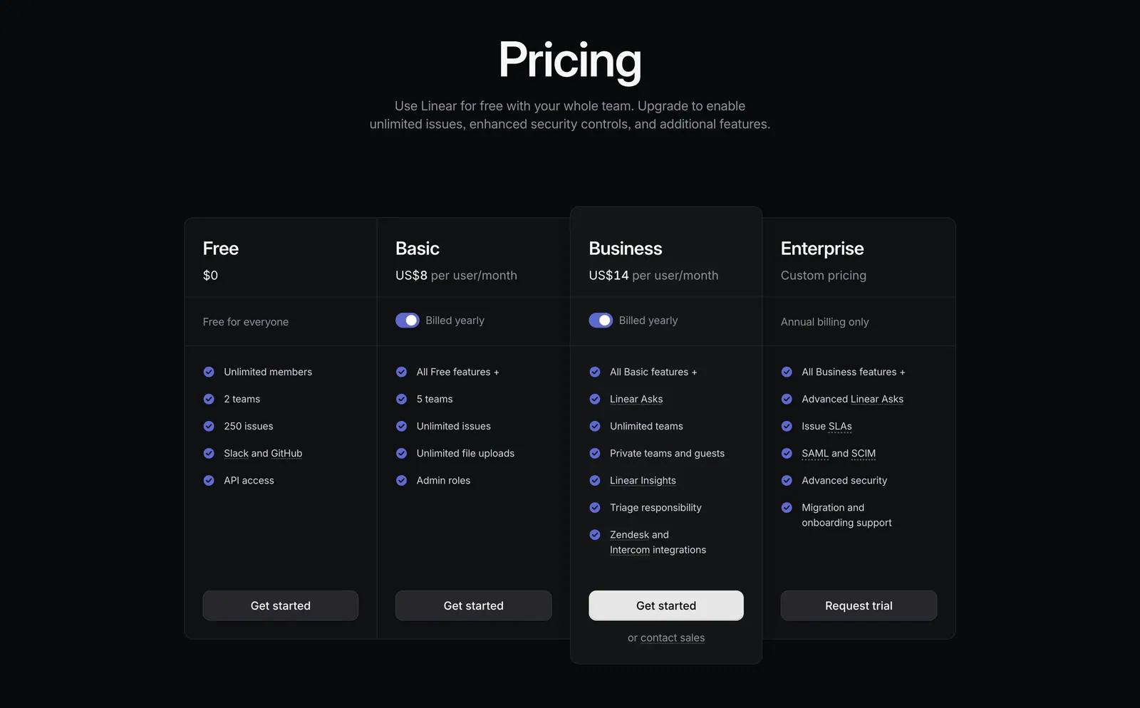
  116. Linear pricing section: centered heading above four dark plan columns, Free, Basic, Business and Enterprise, with billing toggles and checklists
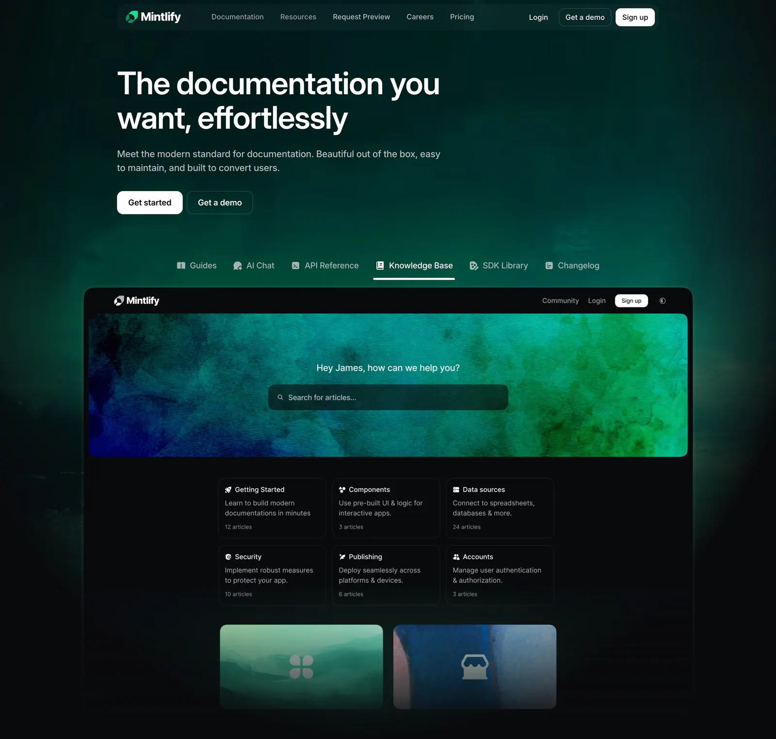
  117. Mintlify hero section: left-aligned headline on dark green glow above product tabs and a knowledge base docs screenshot
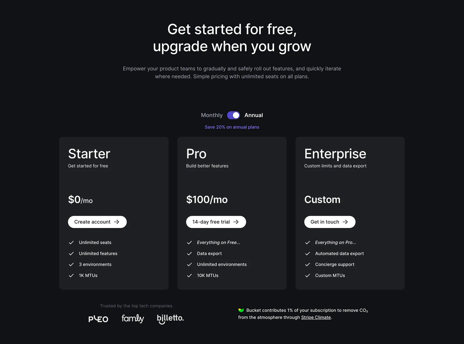
  118. Bucket pricing section: centered headline and monthly/annual toggle above three dark plan cards with checklists and a small logo row
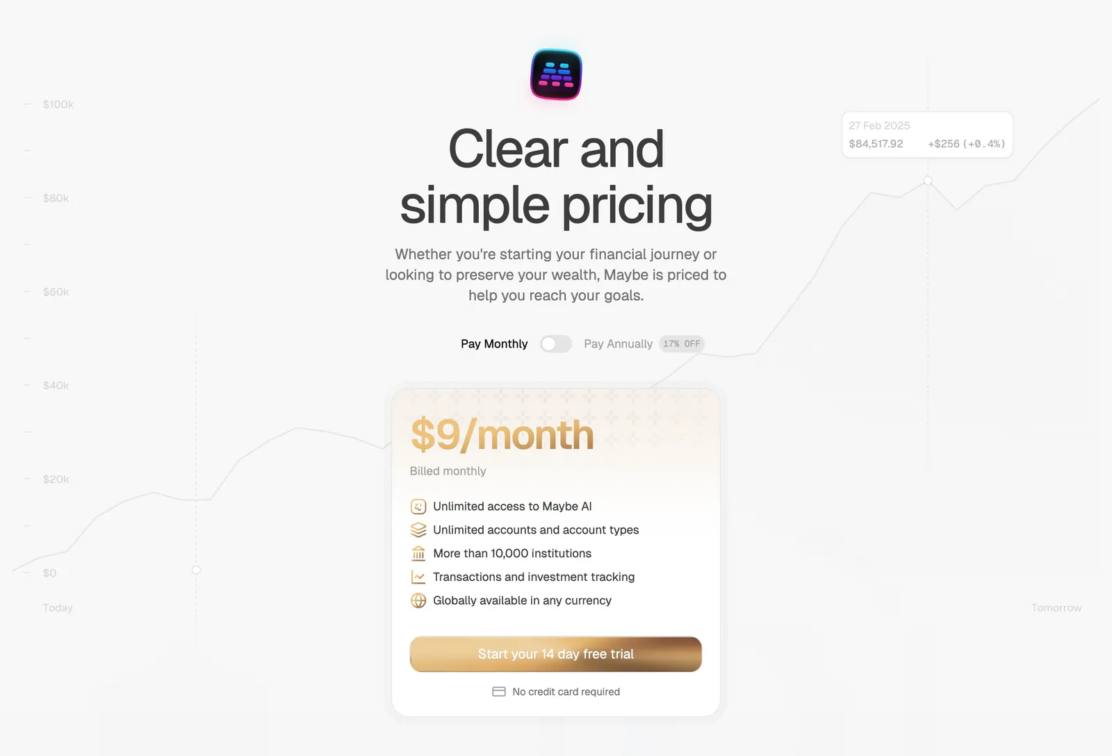
  119. Maybe pricing section: centered headline with monthly/annual toggle above a single gold-accented plan card on a faint chart
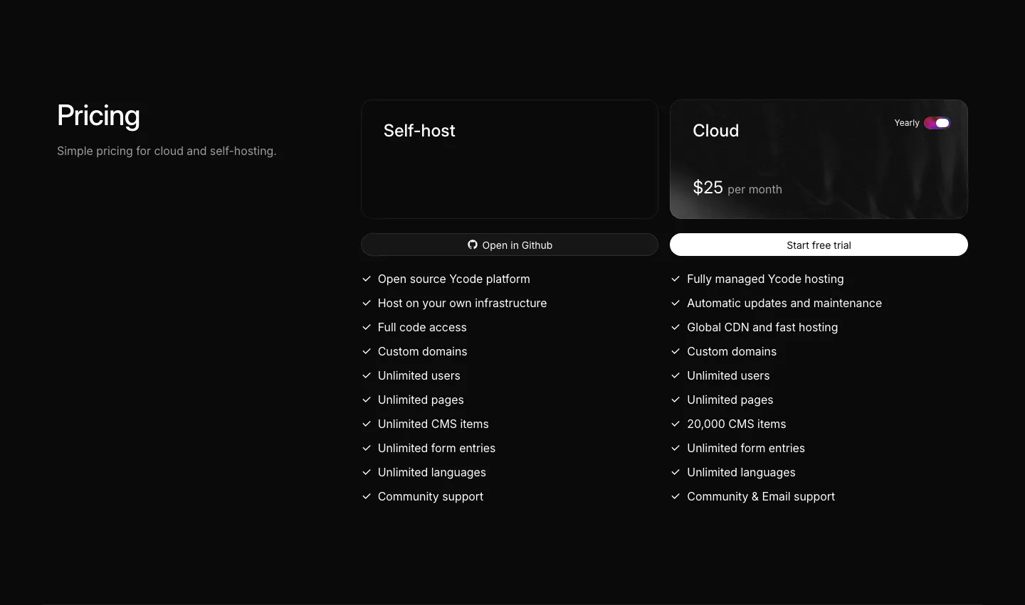
  120. Ycode pricing section: heading on the left, self-host and cloud plan cards with a yearly toggle and checkmark feature lists
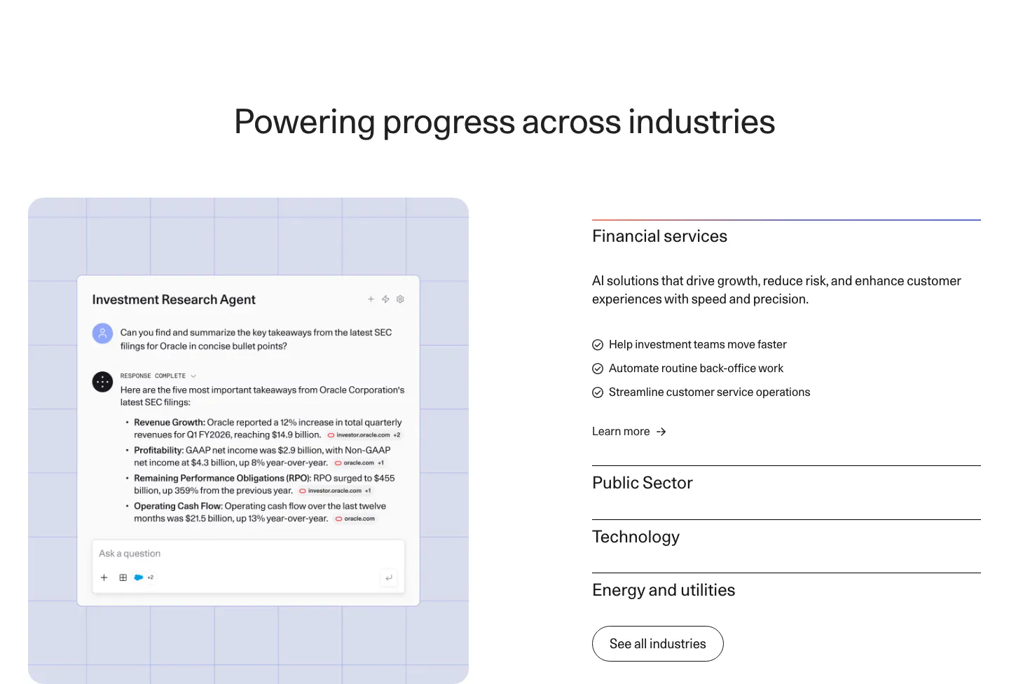
  121. Cohere use cases section: agent chat screenshot on a lavender grid panel left and an industry accordion right
  122. Customer.io features section: centered headline, five-item tab bar and alternating rows of copy beside product UI on gradient panels
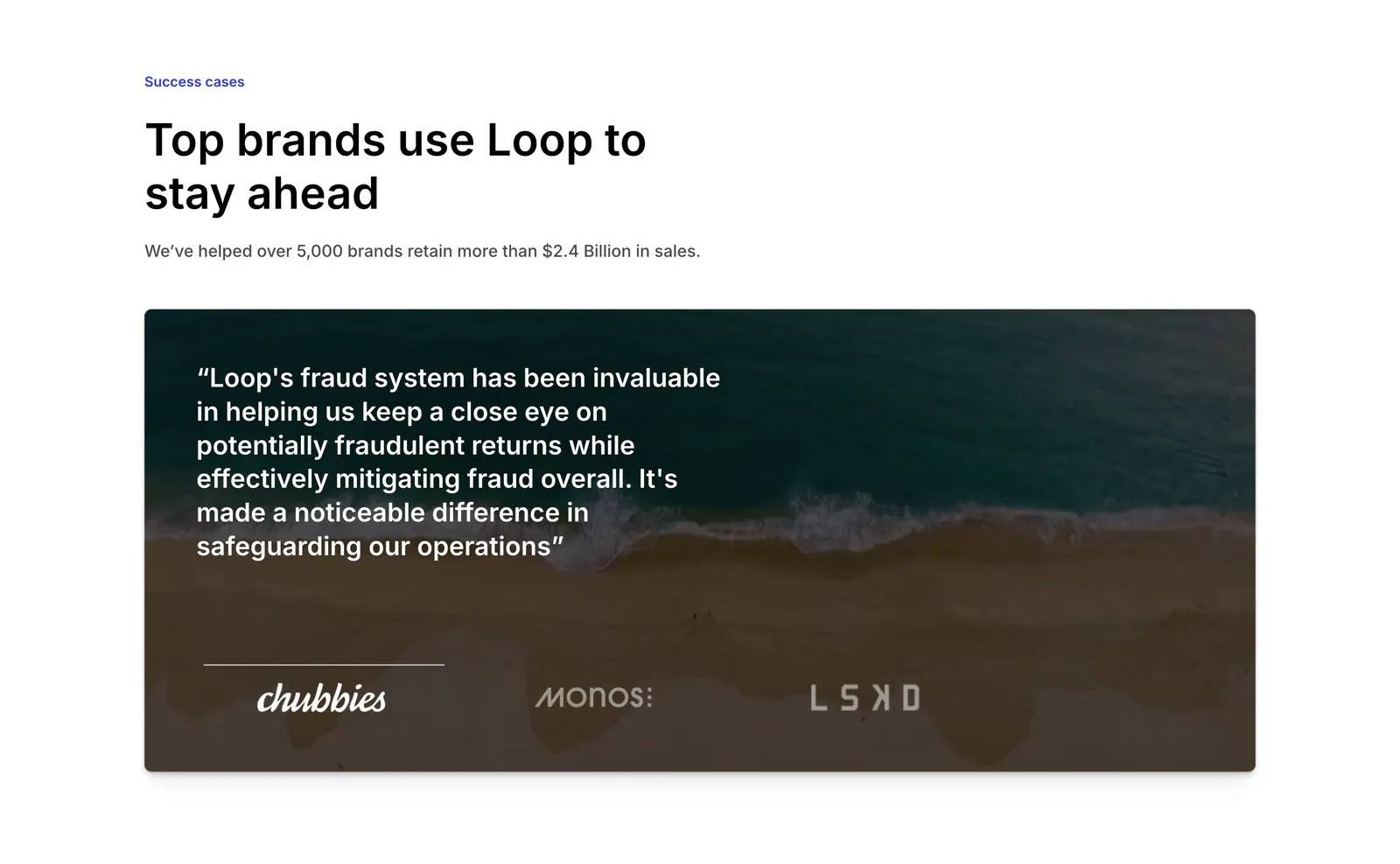
  123. Loop testimonials section: left-aligned headline above a quote card over an aerial beach photo with brand logo tabs
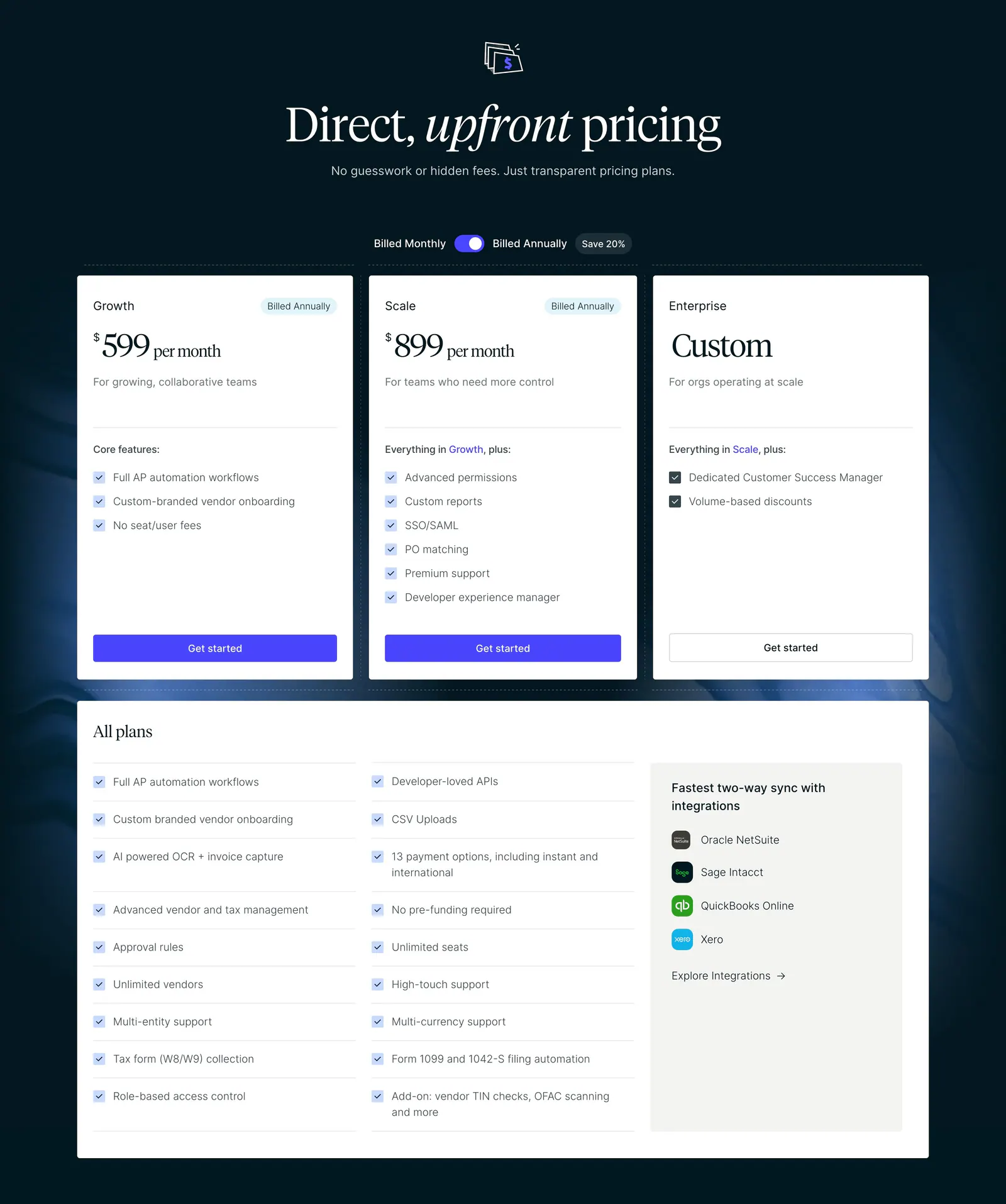
  124. Routable pricing section: serif headline and billing toggle above three plan cards and an all-plans checklist on a dark navy background
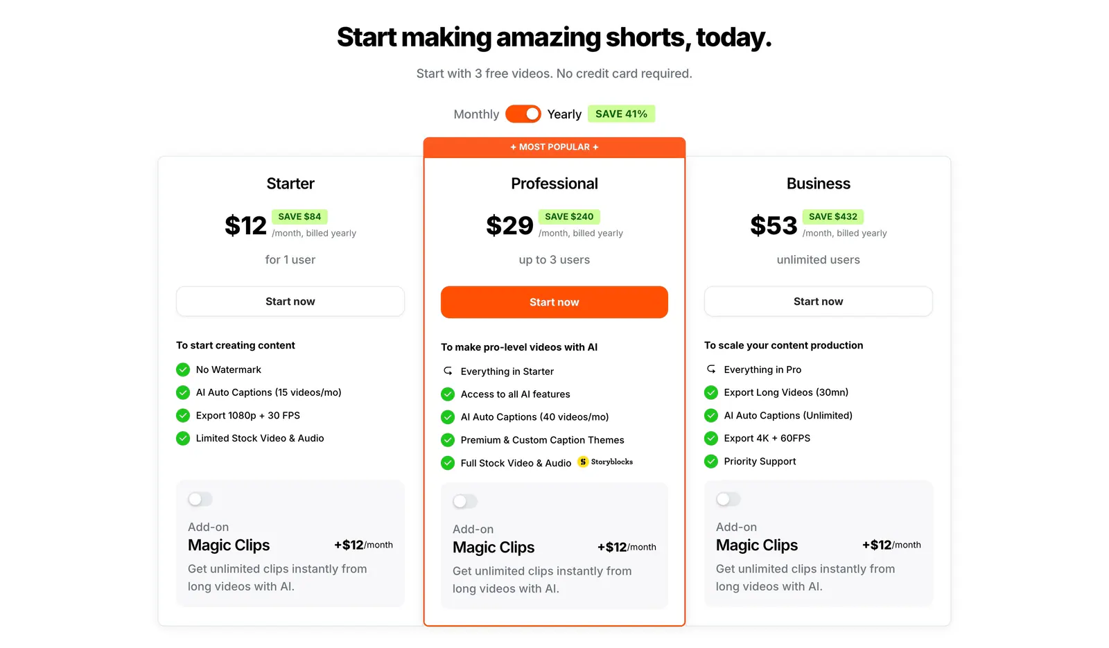
  125. Submagic pricing section: centered headline, monthly/yearly toggle and three plan cards with a highlighted orange Professional tier on white
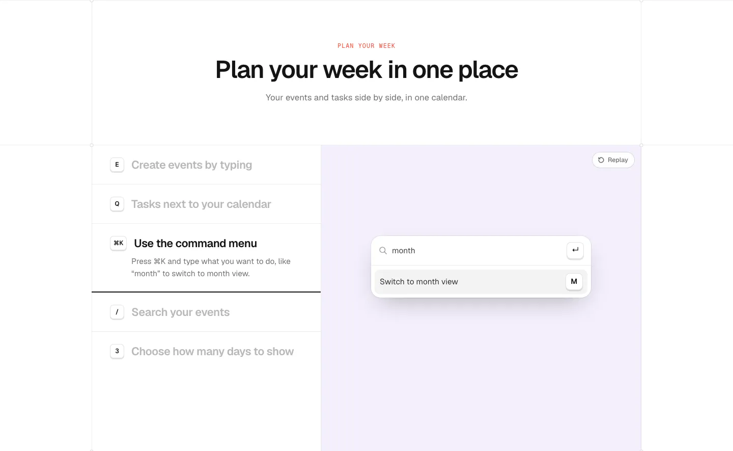
  126. time.fyi features section: centered header above a shortcut feature list on the left and a lavender panel with a command menu UI
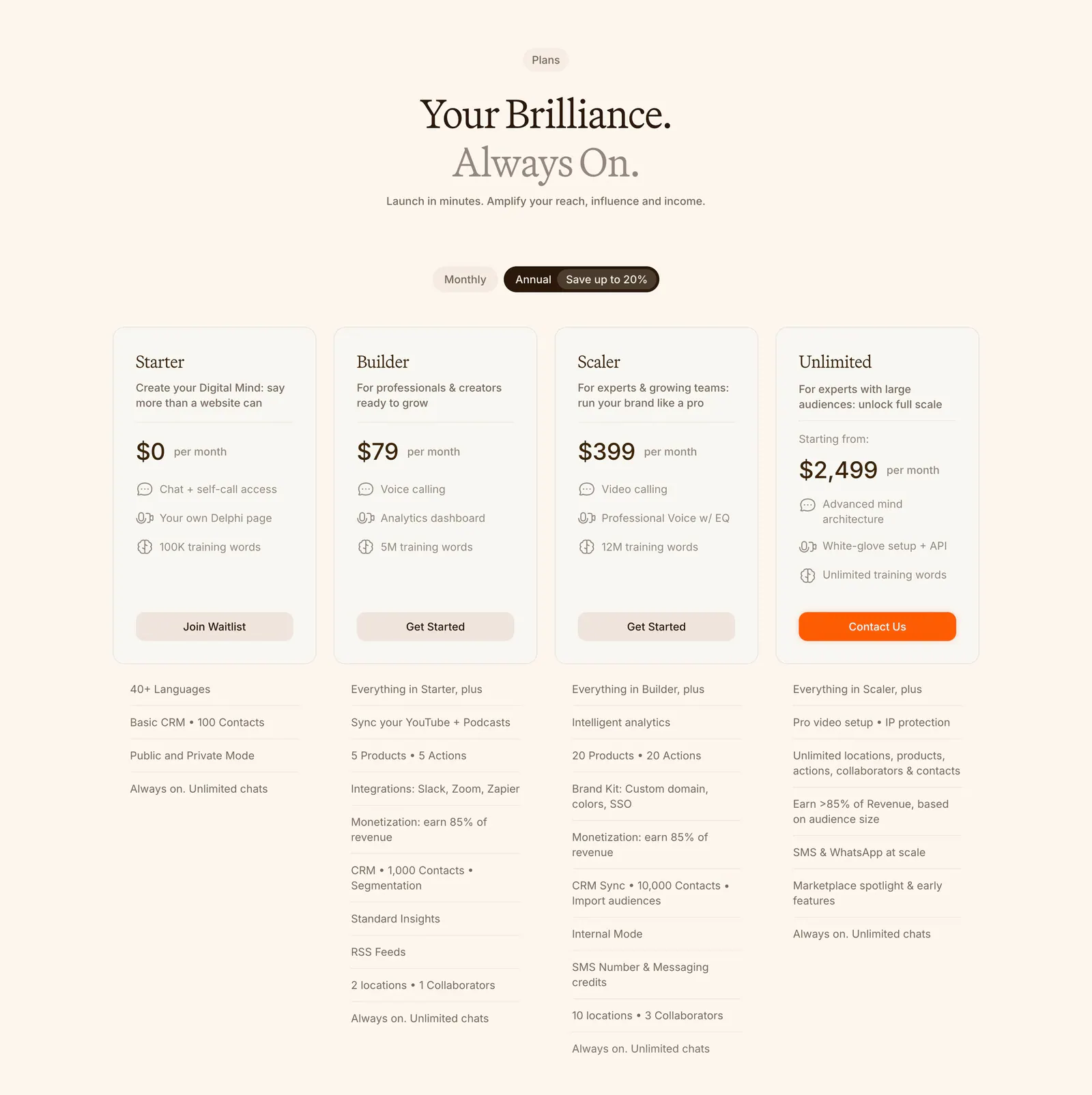
  127. Delphi pricing section: centered serif headline, monthly/annual toggle and four plan cards with feature lists below on a cream background
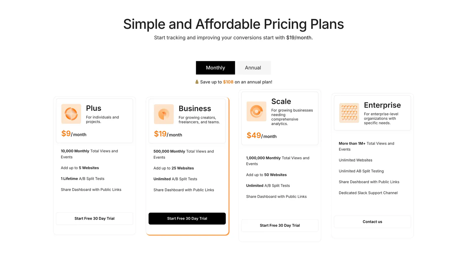
  128. Humblytics pricing section: monthly/annual toggle above four plan cards with orange prices and trial buttons on white
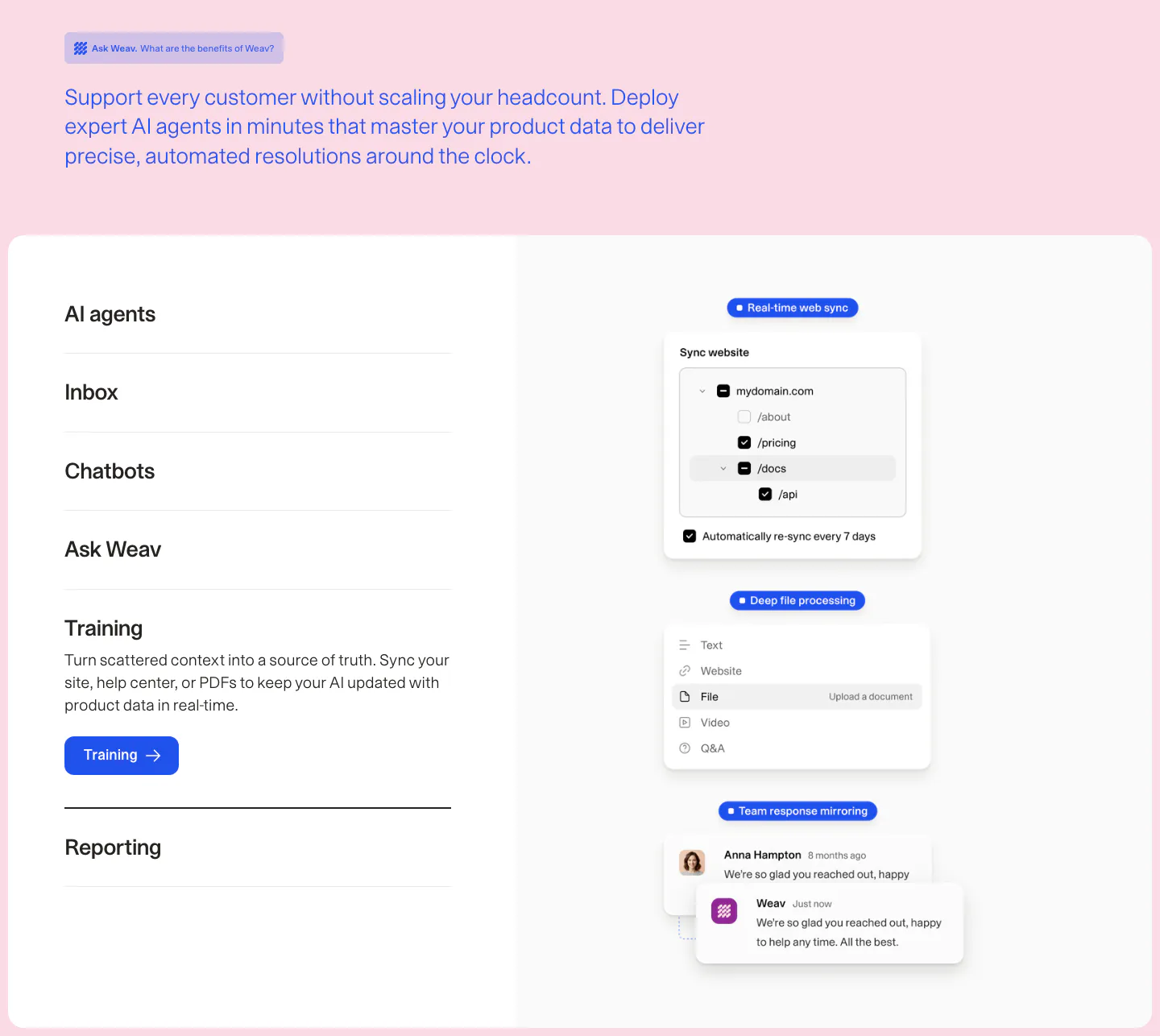
  129. Weav features section: intro text on pink above a white card with an expandable feature list on the left and stacked sync and chat UI cards
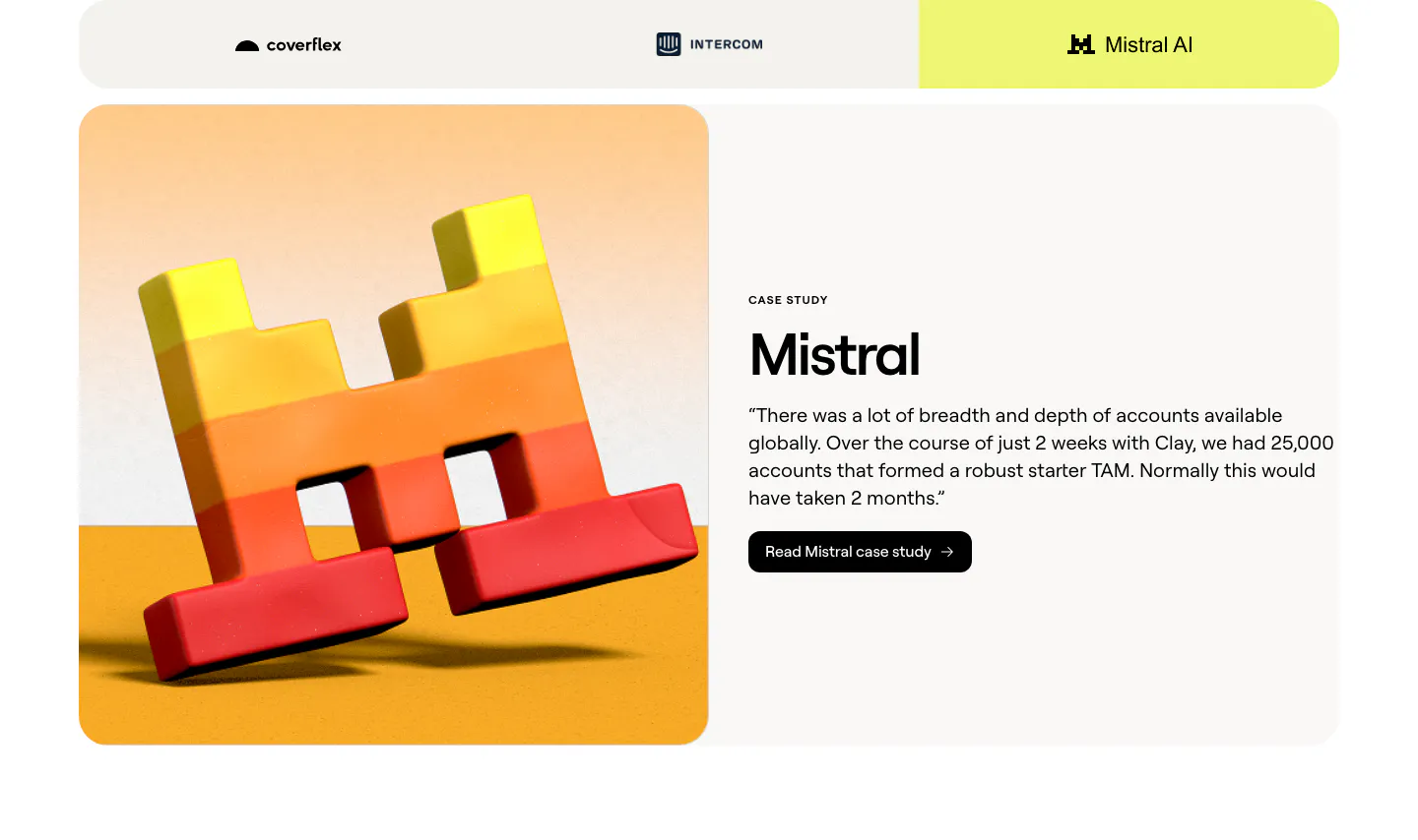
  130. Clay testimonials section: customer tab bar above a split case study card with a 3D Mistral logo render and a quote with case study button
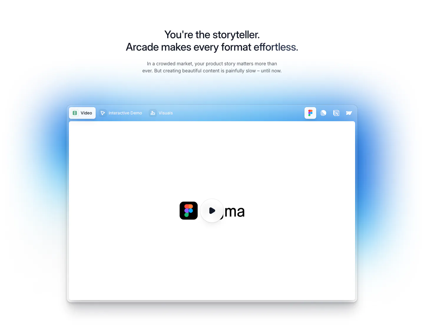
  131. Arcade features section: centered headline above a tabbed video player window with a play button and soft blue glow
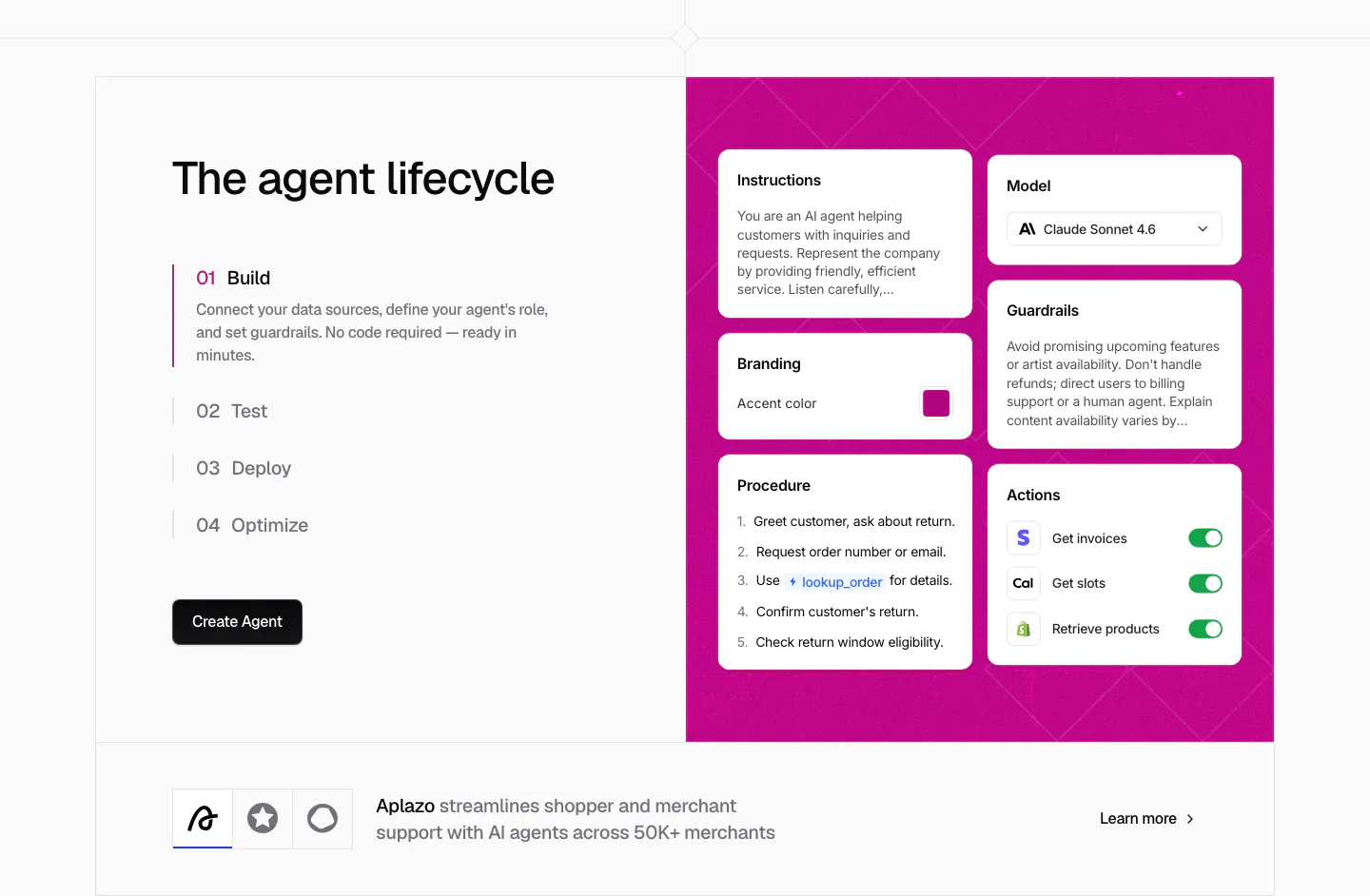
  132. Chatbase how it works section: four numbered lifecycle steps beside a magenta panel of agent config cards, customer story strip below
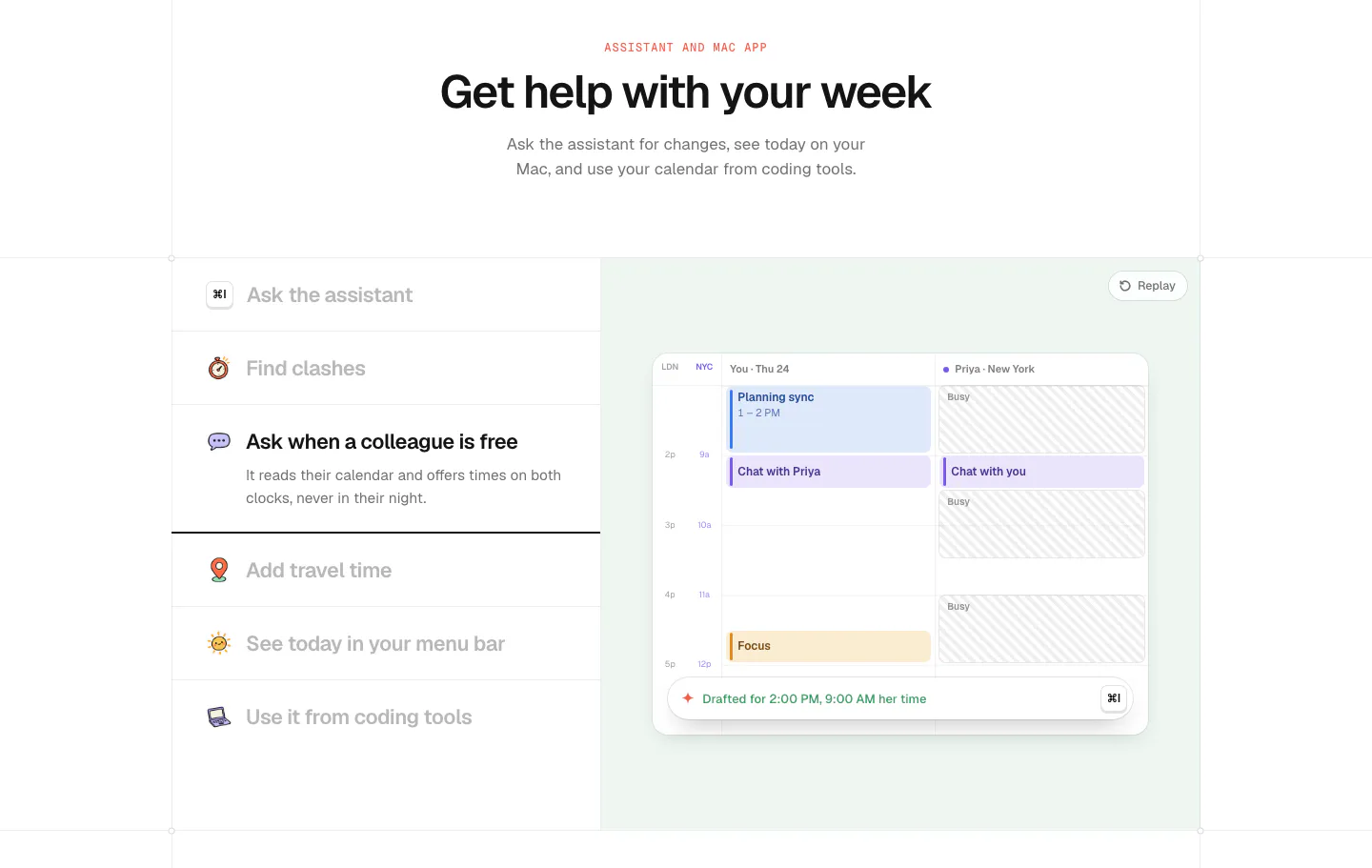
  133. time.fyi features section: centered header above an assistant feature list on the left and a mint panel with a shared calendar UI
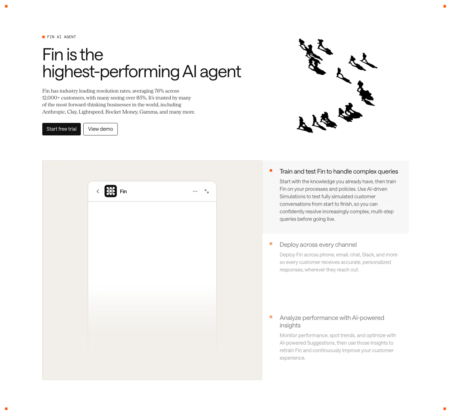
  134. Intercom features section: headline with an ink drawing of running figures, then a Fin chat widget panel beside a three-item feature selector
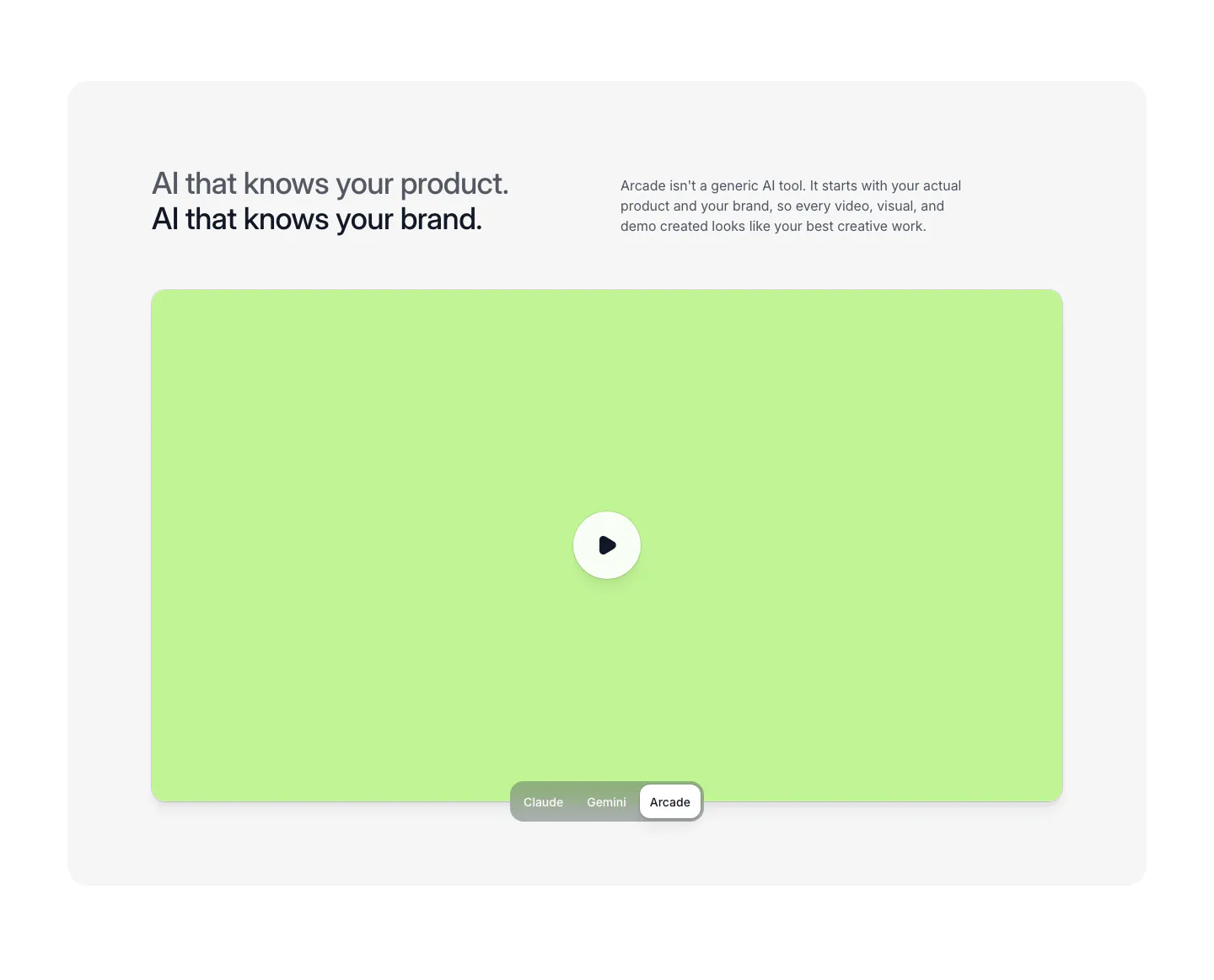
  135. Arcade features section: two-line headline and copy above a lime video panel with play button and a Claude/Gemini/Arcade toggle
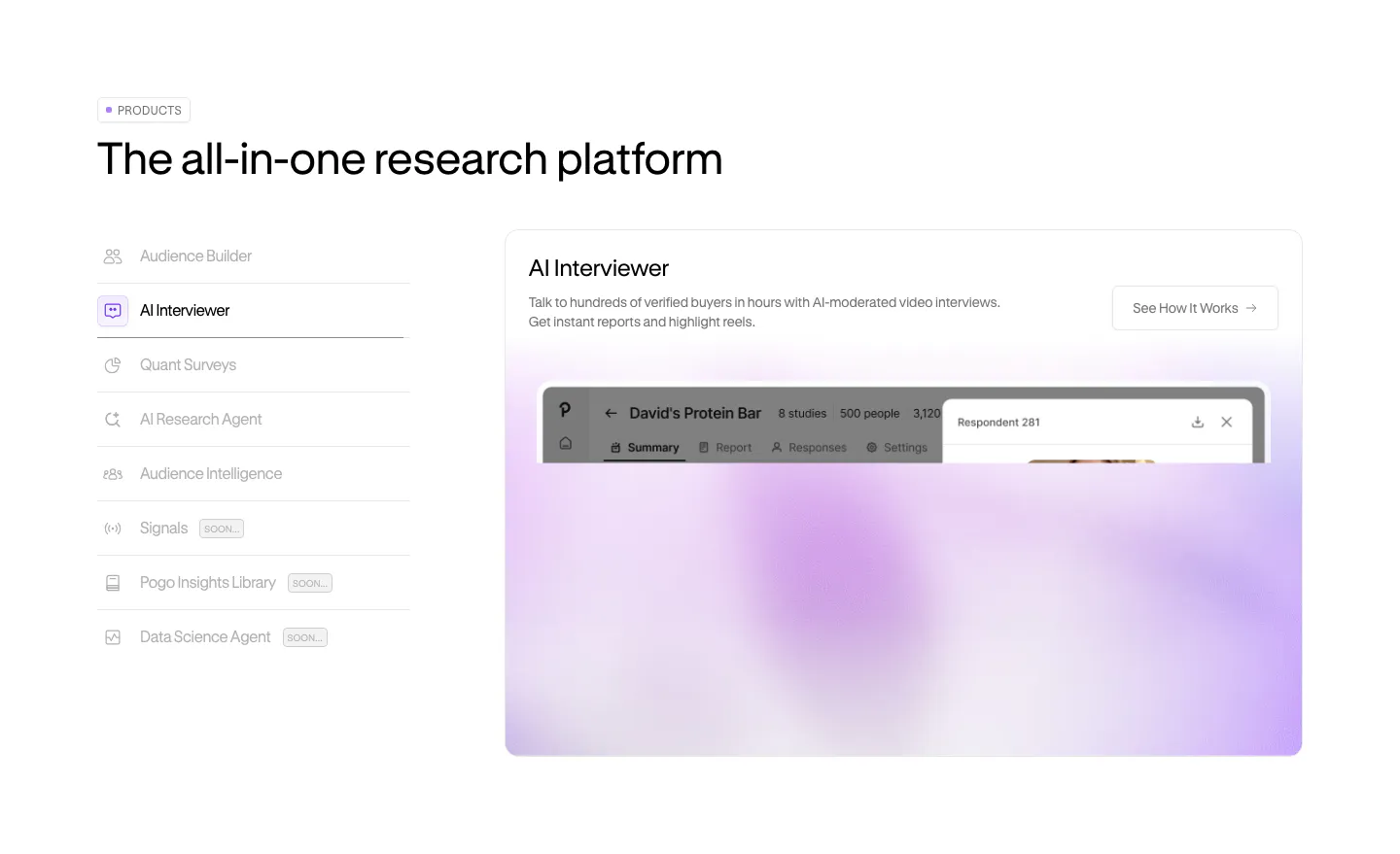
  136. Pogo features section: vertical product tab list on the left beside a panel with a blurred lavender product screenshot
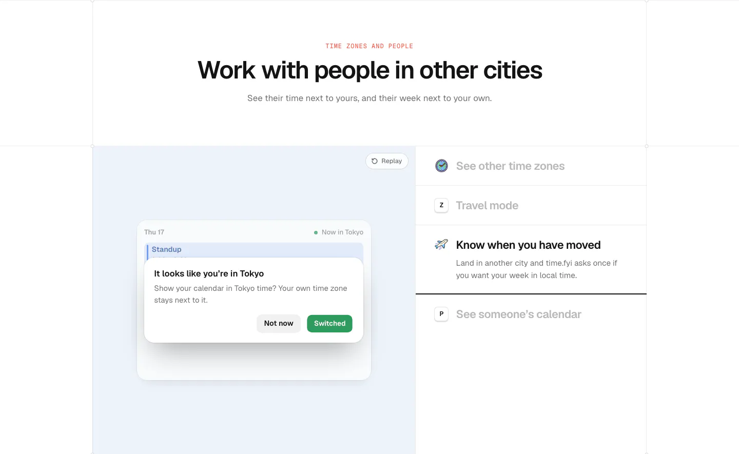
  137. time.fyi features section: centered header above a light blue panel with a time zone prompt UI and a feature list on the right
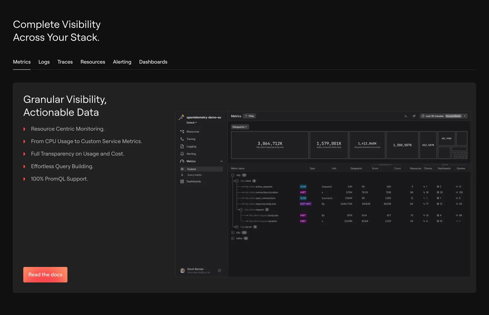
  138. Dash0 features section: tab bar above a card with a bullet list and a dark metrics explorer screenshot on a near-black background
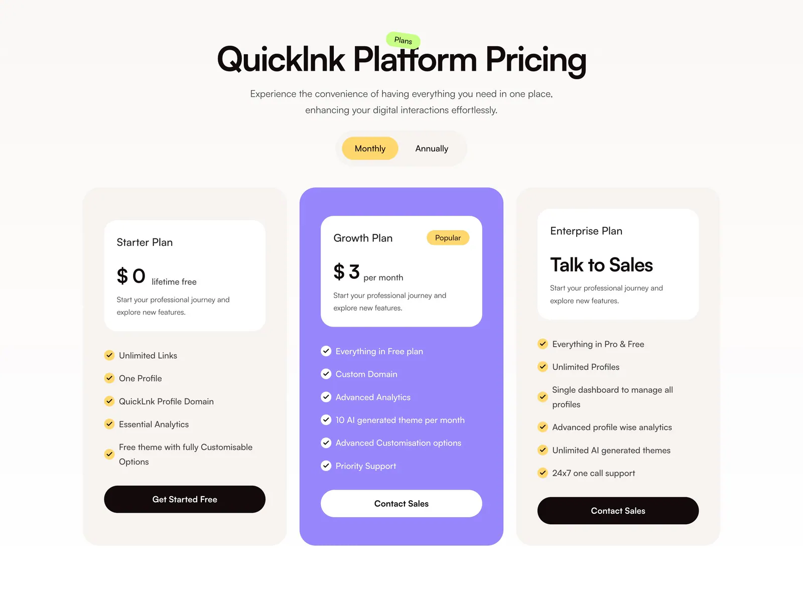
  139. QuickLnk pricing section: centered headline and monthly/annual toggle above three plan cards with a purple highlighted middle tier
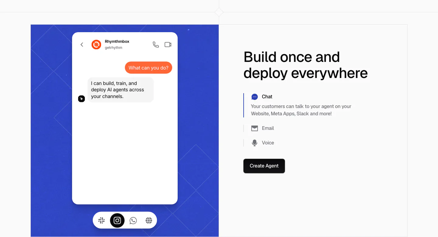
  140. Chatbase features section: blue patterned panel with a chat app mockup on the left, headline and Chat, Email, Voice selector on the right
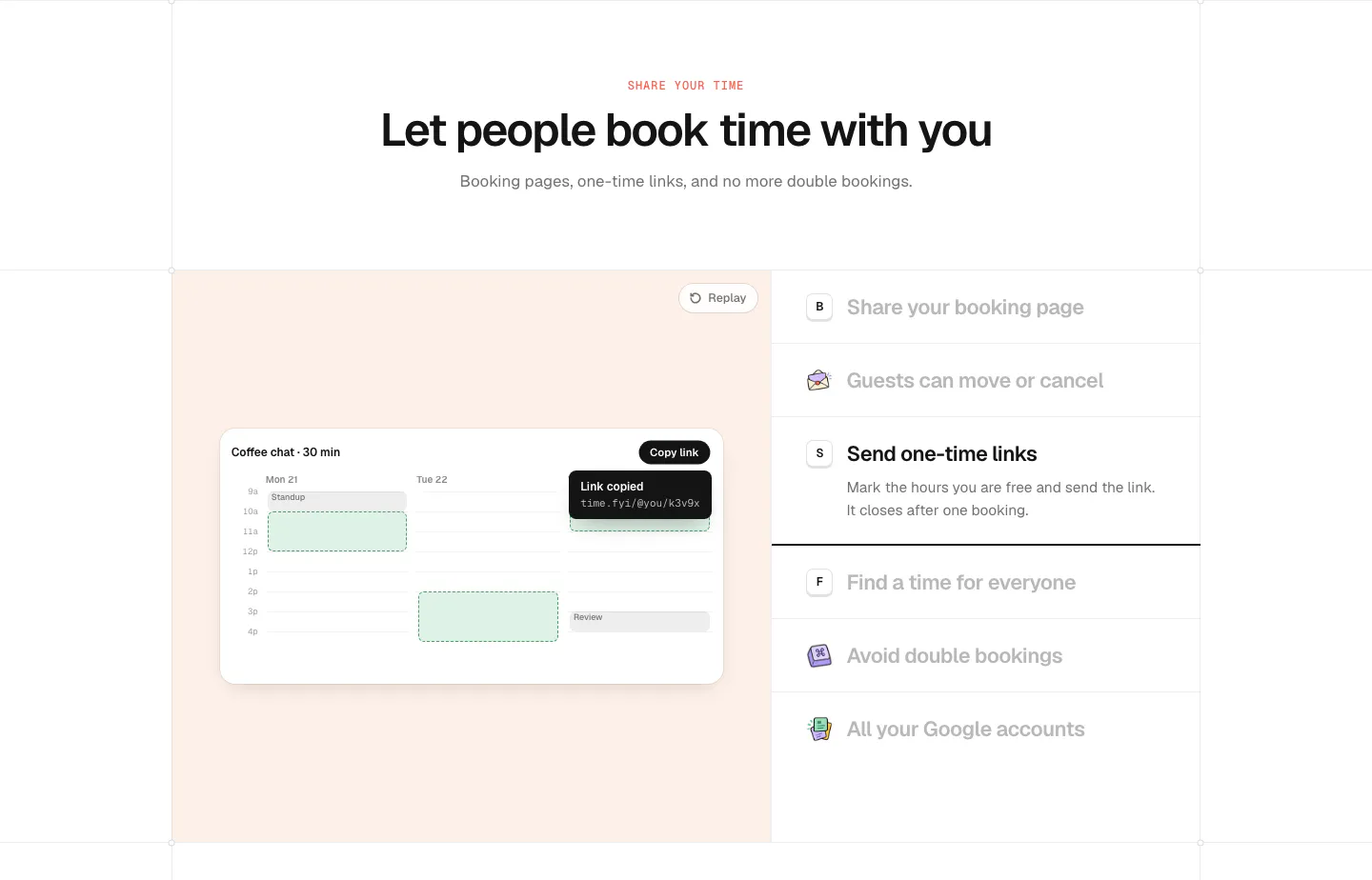
  141. time.fyi features section: centered header above a peach panel with a booking calendar UI and a feature list on the right
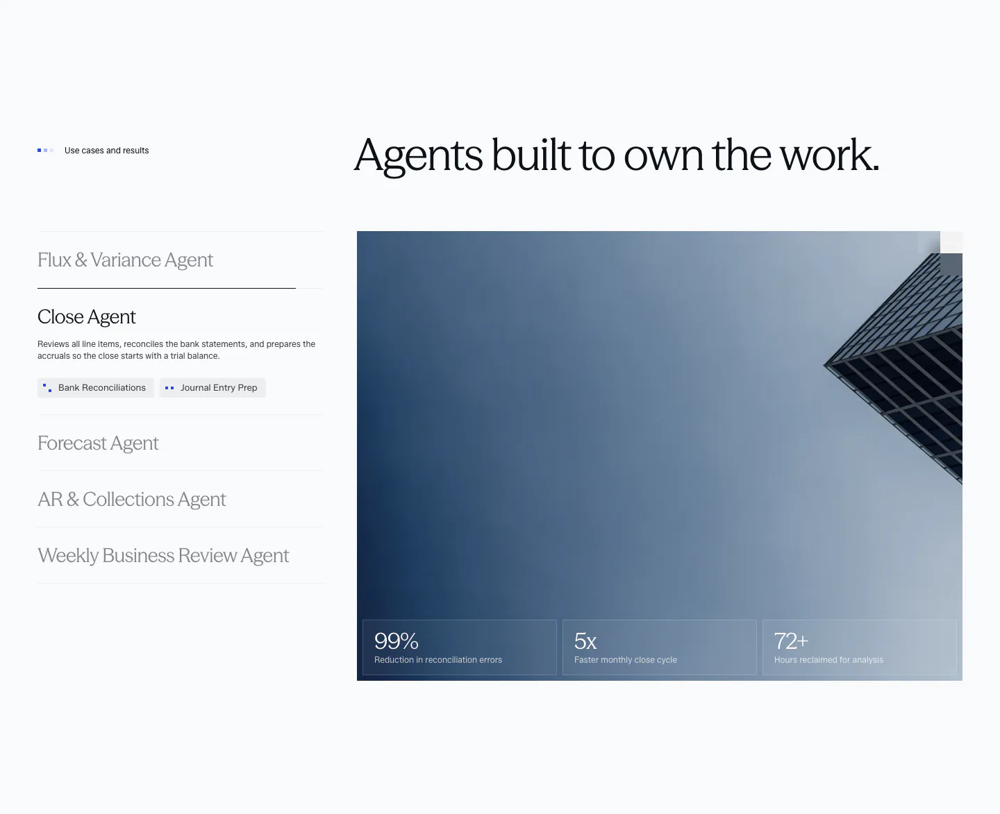
  142. Concourse use cases section: vertical list of agent tabs left, building photo with three metric tiles right on a light background
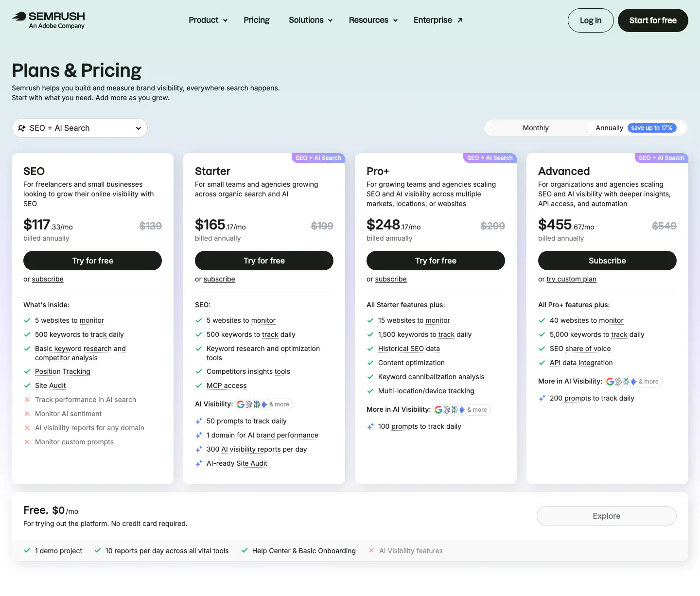
  143. Semrush pricing section: nav, Plans & Pricing title, monthly/annual toggle and four plan cards with checklists above a free plan bar
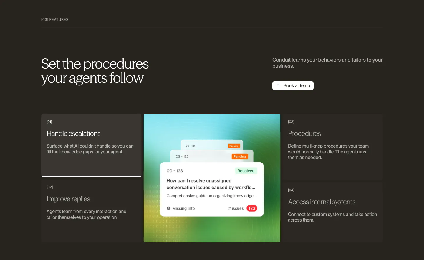
  144. Conduit features section: dark brown panel with numbered feature list flanking a central resolved-ticket UI card
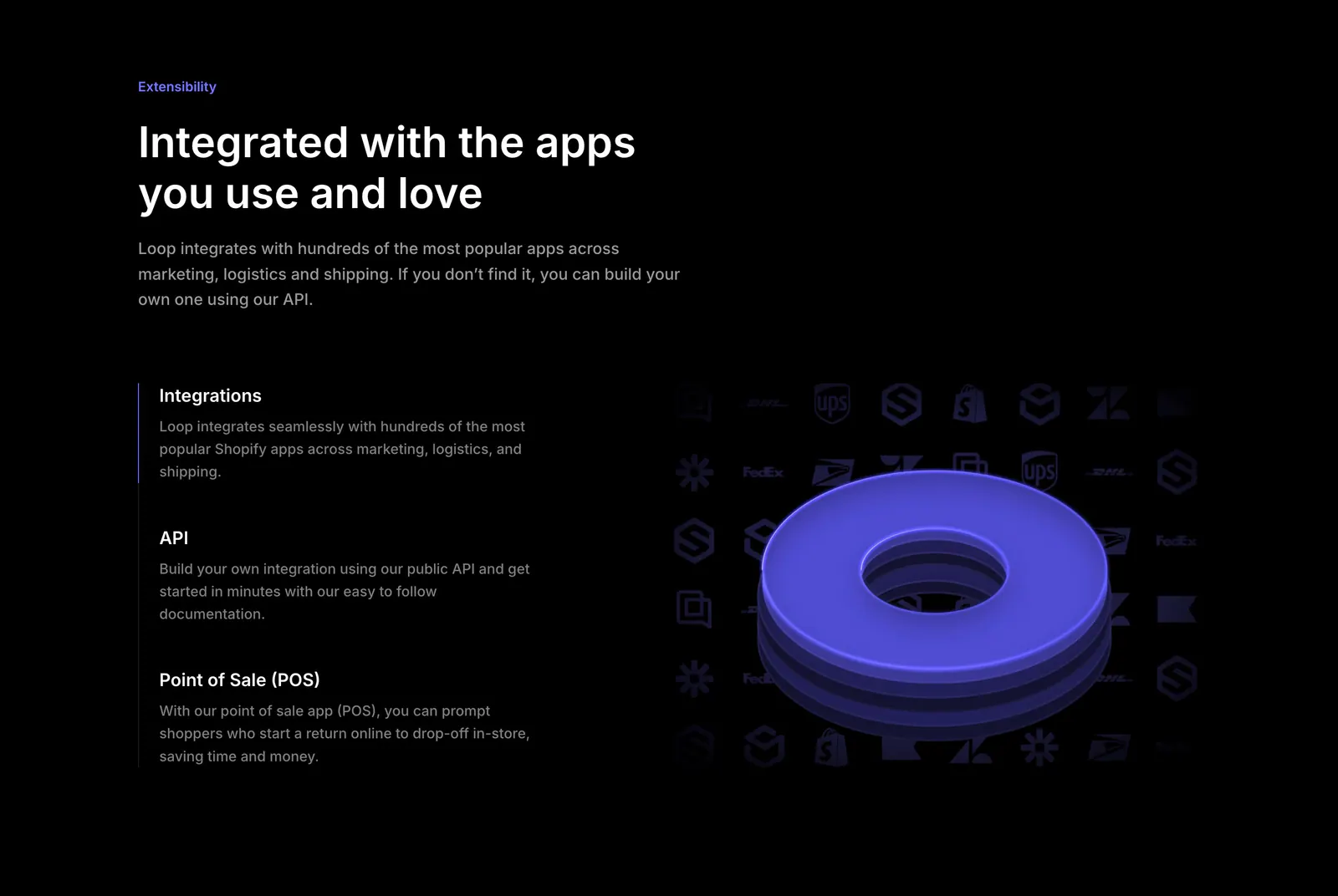
  145. Loop features section: dark split layout with integration, API and POS list beside a 3D purple ring over a grid of app logos
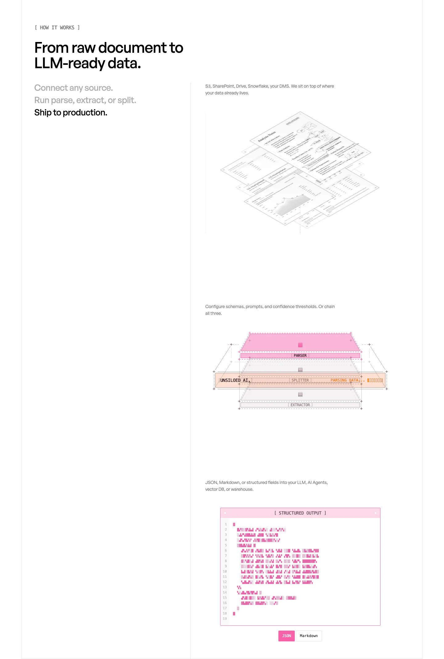
  146. Unsiloed how it works section: three-step list at left beside stacked visuals of isometric documents, a parser layer diagram and a JSON window
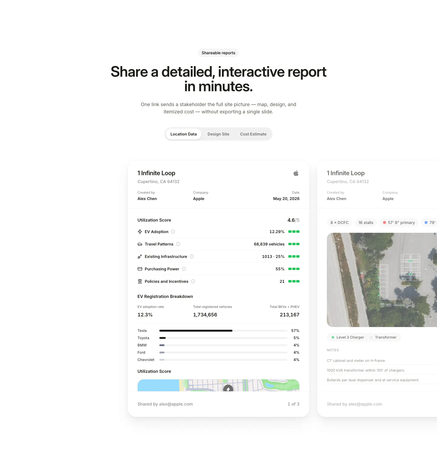
  147. EVpin features section: centered heading and segmented tabs above site report cards with utilization scores, cut off at the right edge
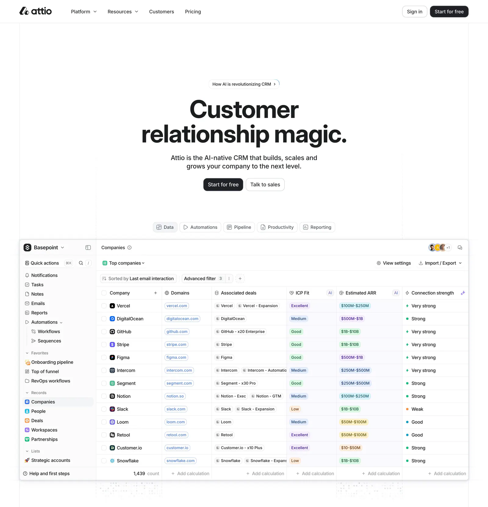
  148. Attio hero section: centered headline, two buttons and a tab bar above a large CRM companies table screenshot on white
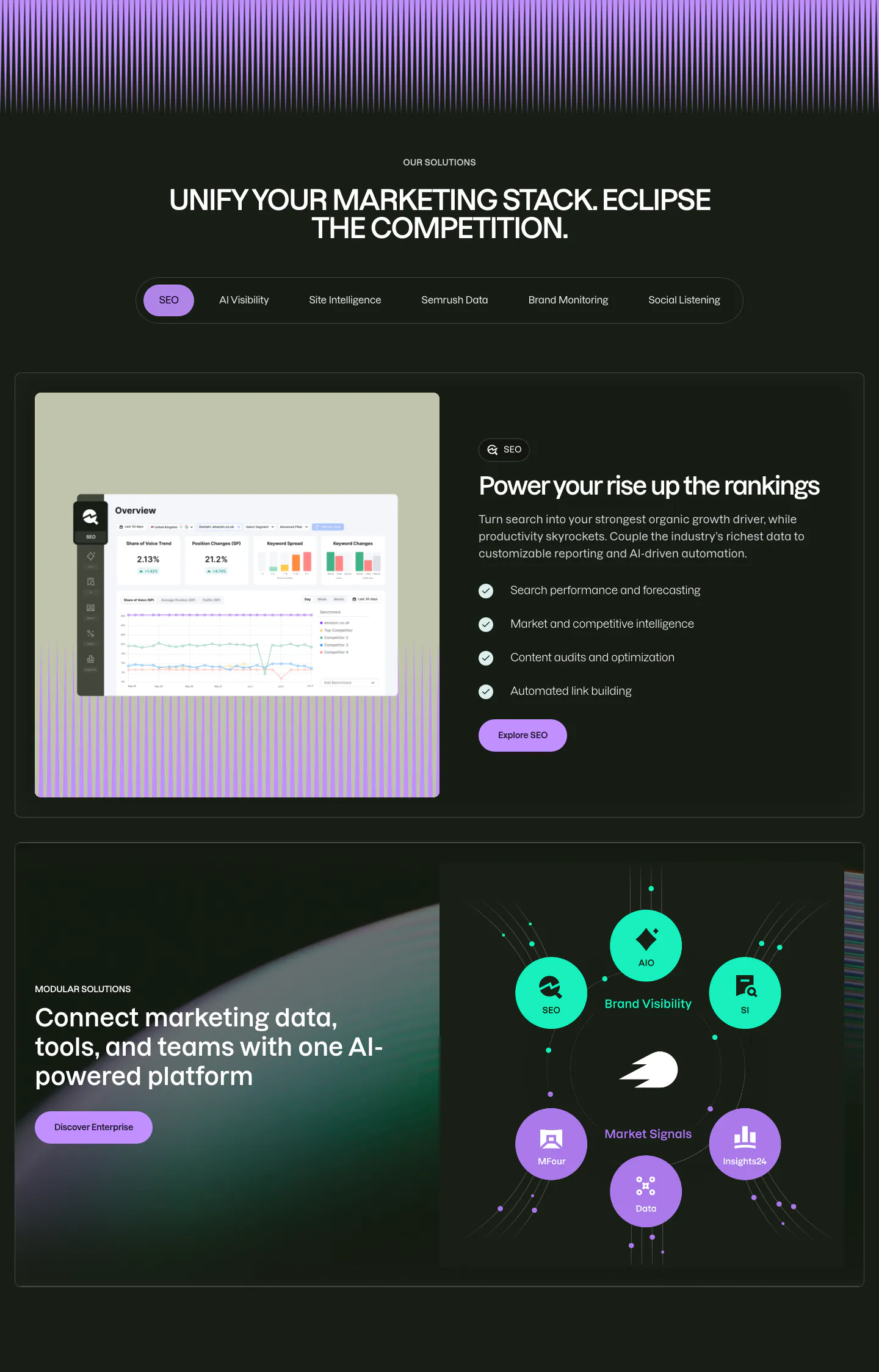
  149. Semrush features section: dark tabbed solutions block with a product screenshot beside a checklist, then a product module orbit diagram
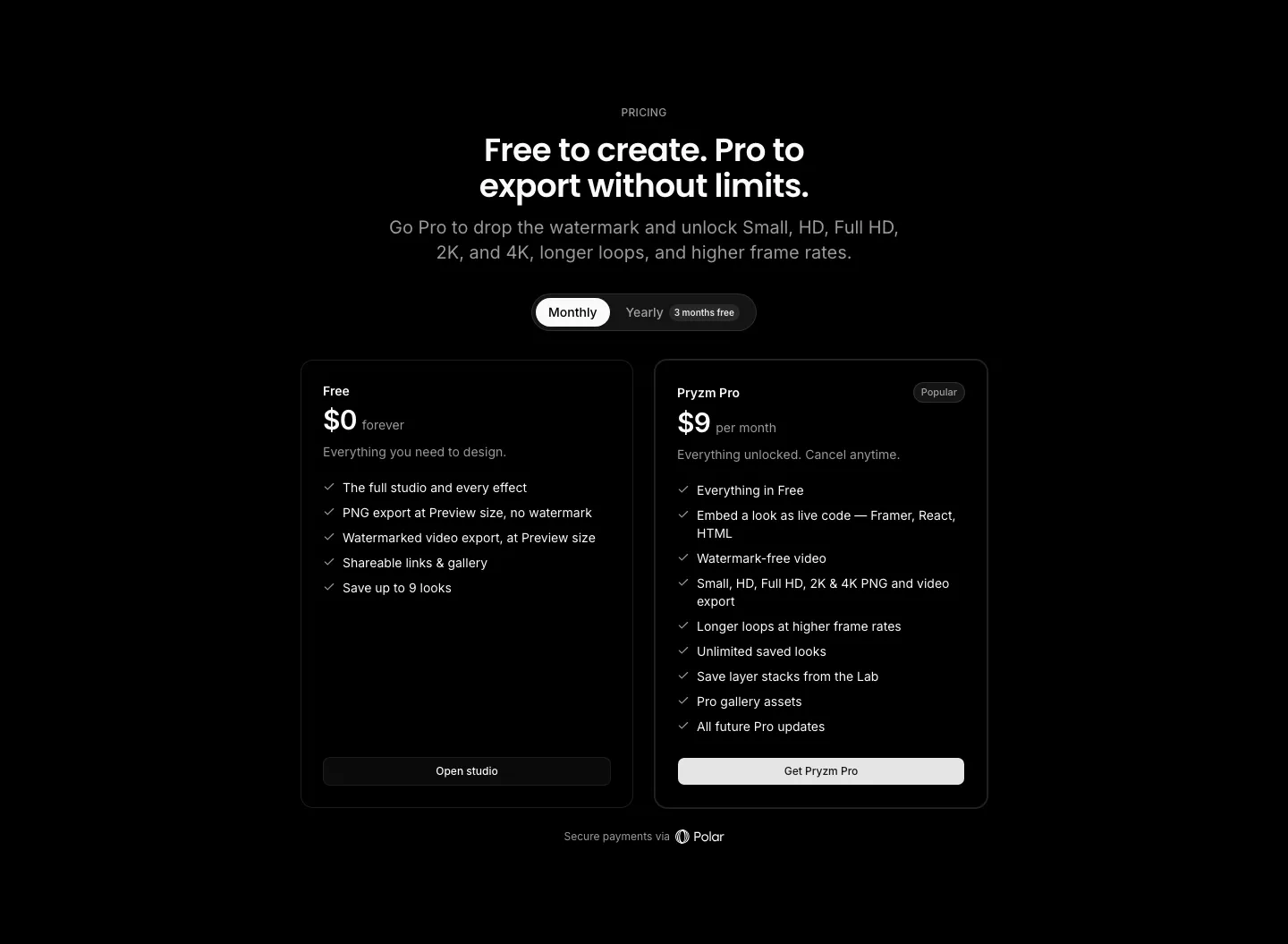
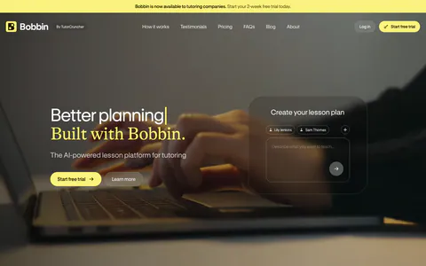
  150. Pryzm pricing section: black background with centered headline, monthly/yearly toggle and two plan cards with feature checklists
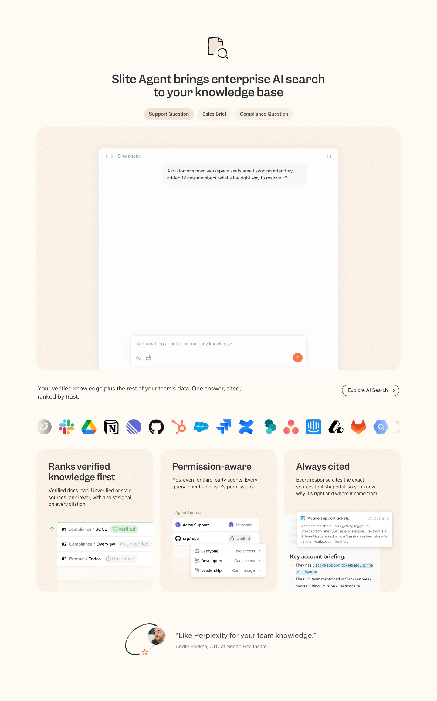
  151. Slite features section: tabbed AI search chat mockup, app icon row, three capability cards with UI snippets and a short customer quote
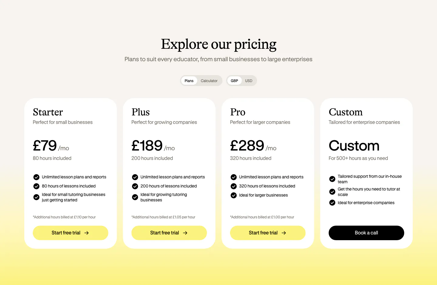
  152. Bobbin pricing section: serif heading, plan and currency toggles, and four white pricing cards on a cream-to-yellow background
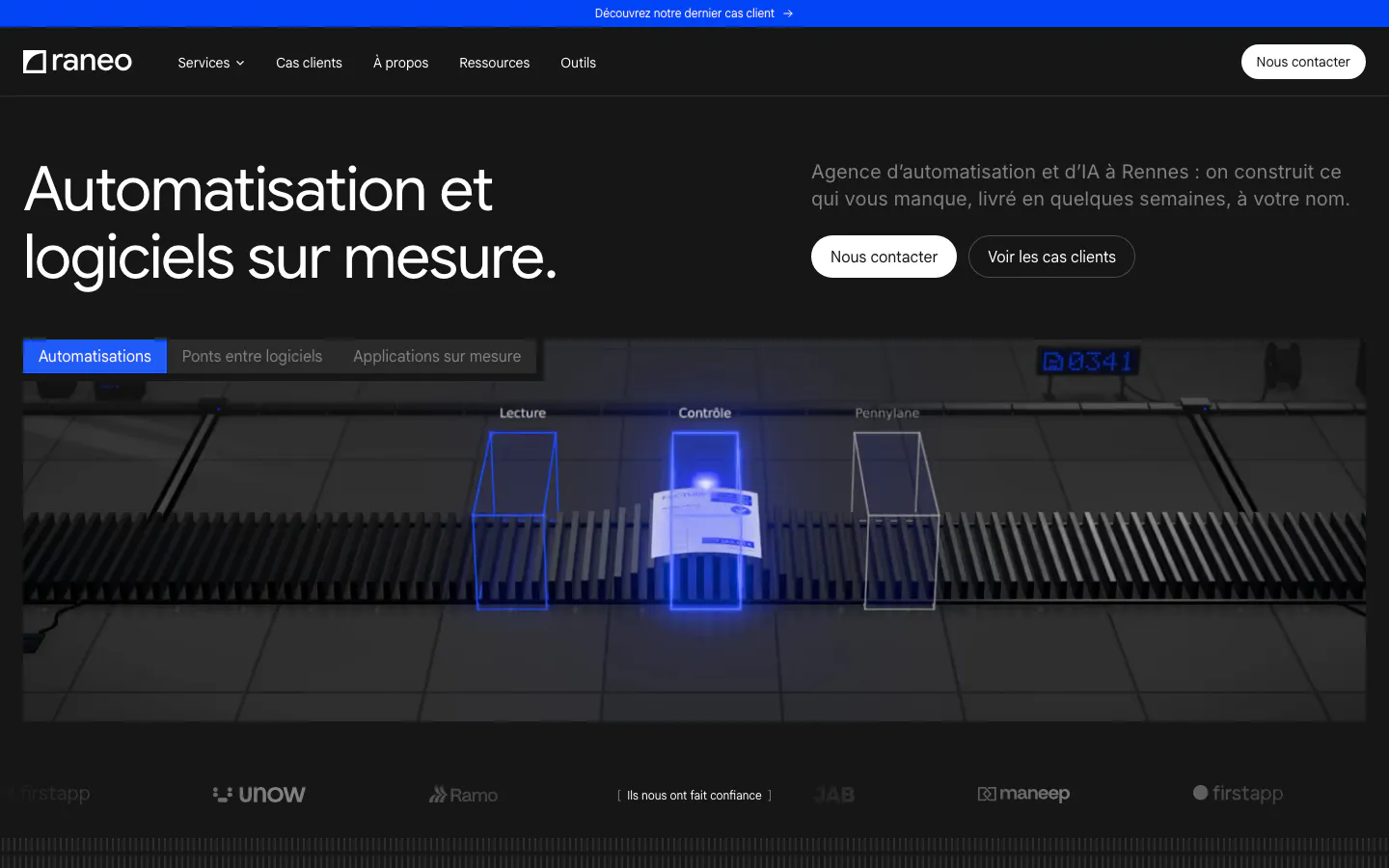
  153. Raneo hero section: dark headline row with contact buttons above a tabbed 3D conveyor scene with scan gates and a client logo strip
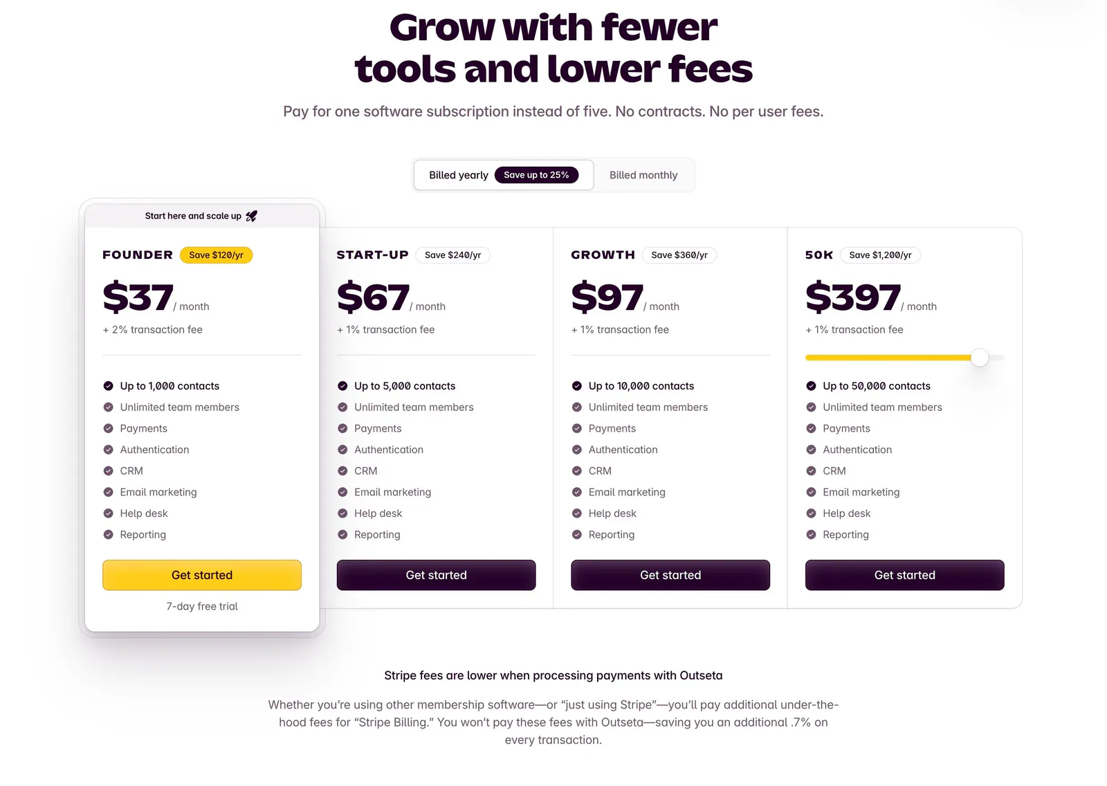
  154. Outseta pricing section: centered headline and billed yearly/monthly toggle above four plan cards with prices and feature checklists
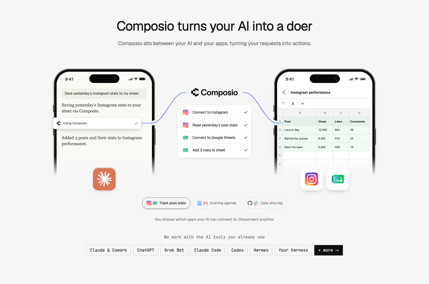
  155. Composio how it works section: two phone mockups linked through a Composio step list, example tabs and a row of AI tool chips
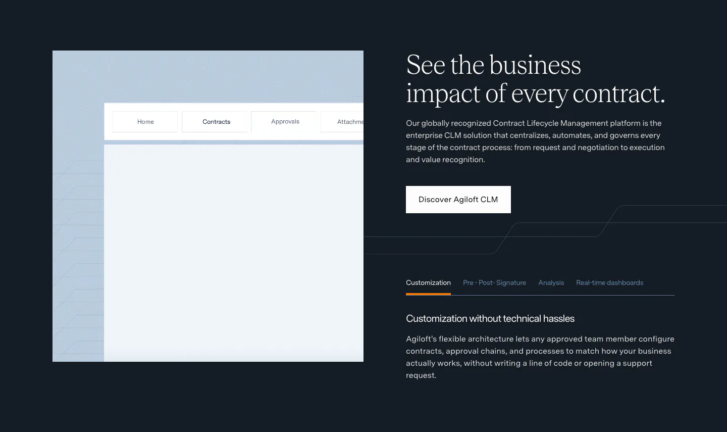
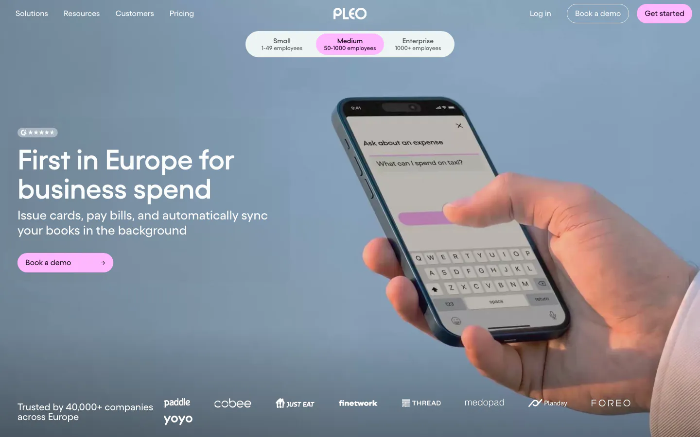
  156. Agiloft features section: product UI frame left, serif headline, button and feature tabs right on a dark navy background
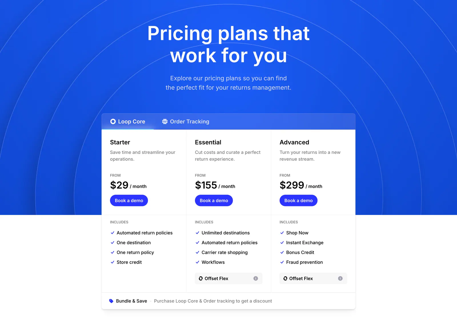
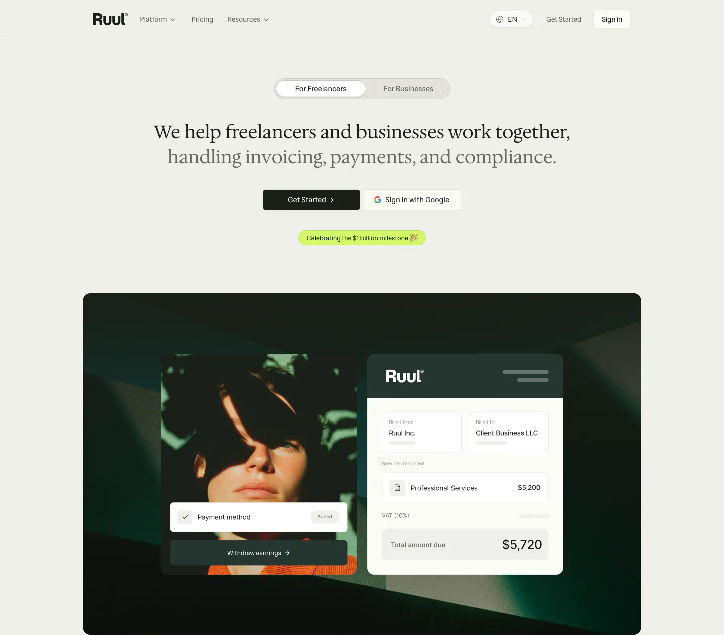
  157. Loop pricing section: centered headline on blue arc background above a tabbed three-tier pricing card with feature checklists
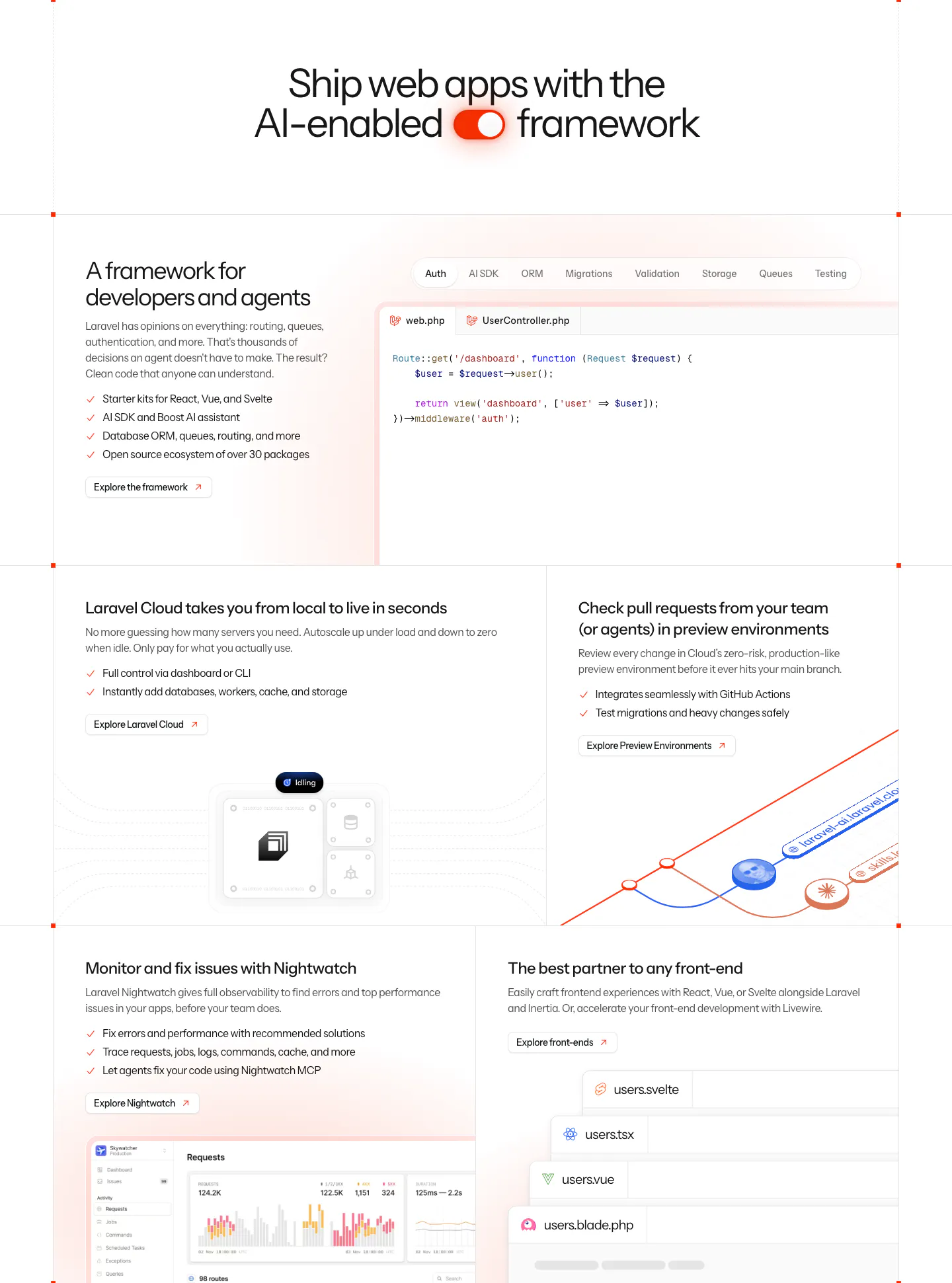
  158. Pleo hero section: left-aligned headline and pink button over a full-bleed photo of a hand holding a phone, logo strip below
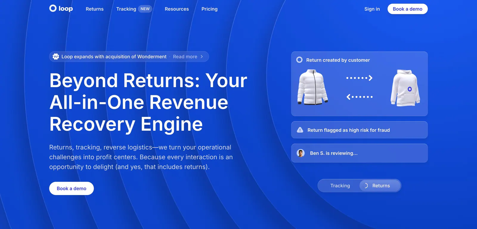
  159. Ruul hero section: audience toggle and centered serif headline above a dark green panel with a portrait photo and invoice UI card
  160. Laravel features section: centered headline with a toggle icon above a bento grid of code tabs, cloud, preview environment and monitoring panels
  161. Loop hero section: split layout on bright blue with concentric arcs, headline and CTA left, translucent returns workflow cards right
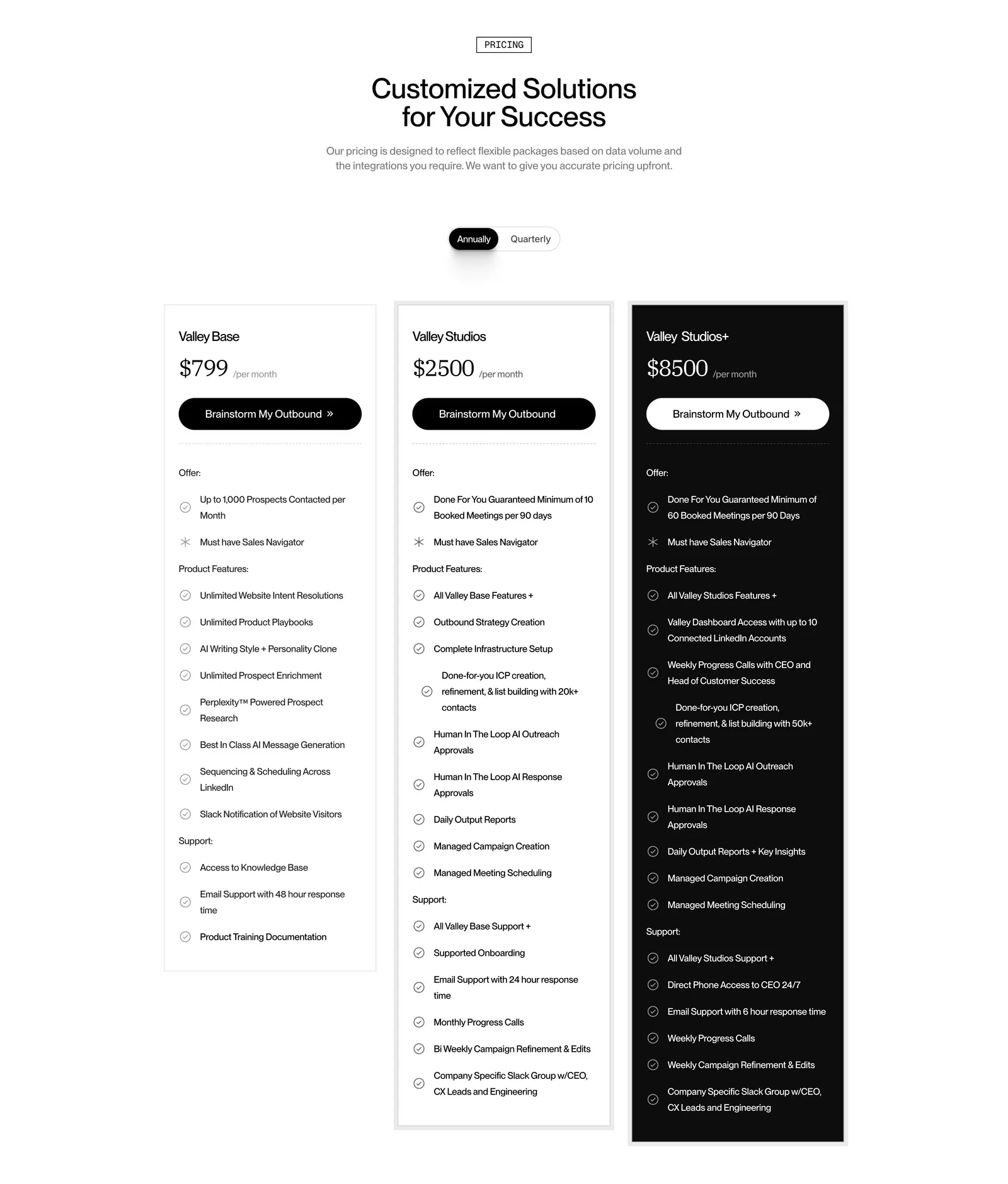
  162. Valley pricing section: centered headline and annual/quarterly toggle above three plan cards, the top tier in black, with feature checklists
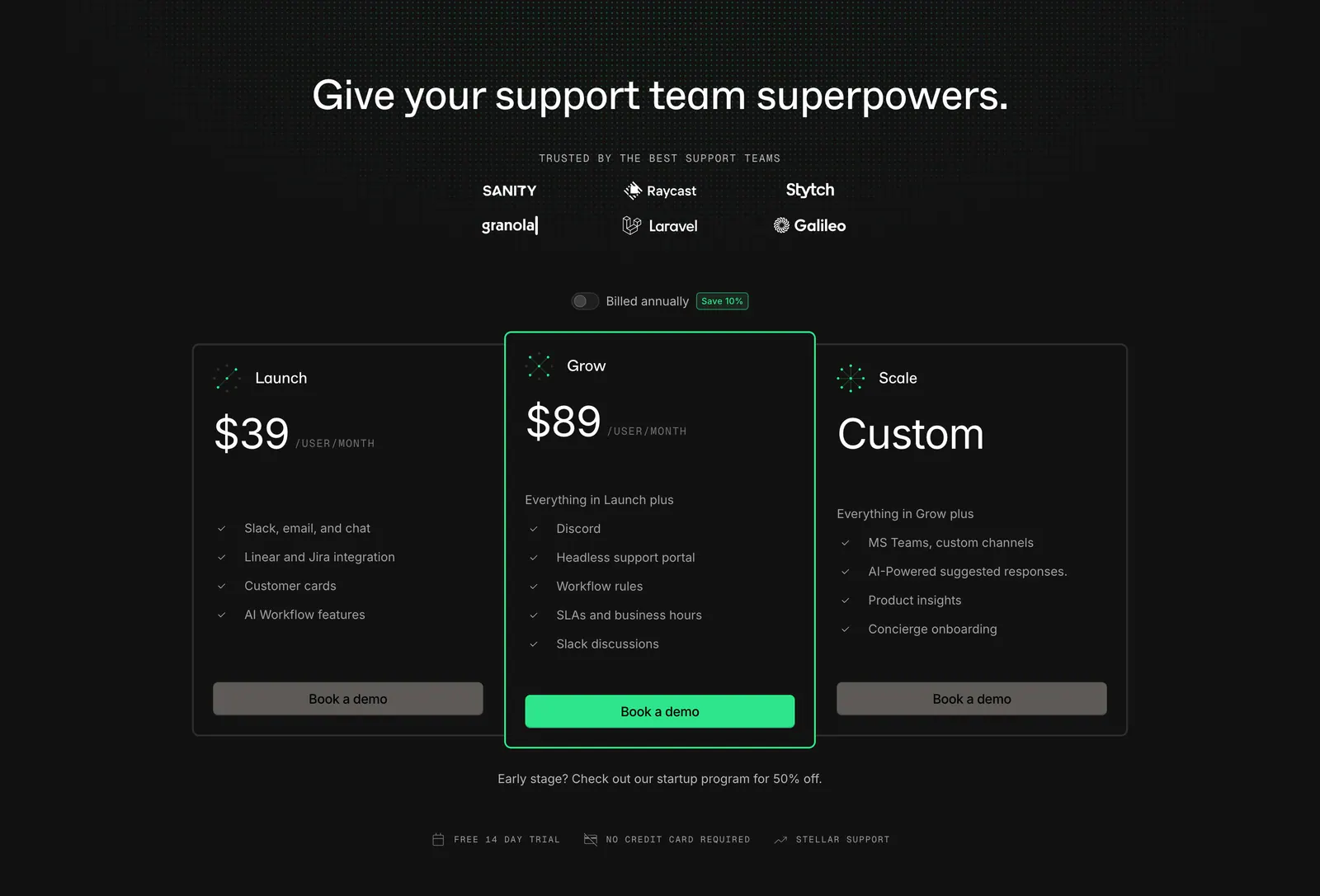
  163. Plain pricing section: dark centered headline with logo grid and billing toggle above three plan cards, the middle one highlighted green
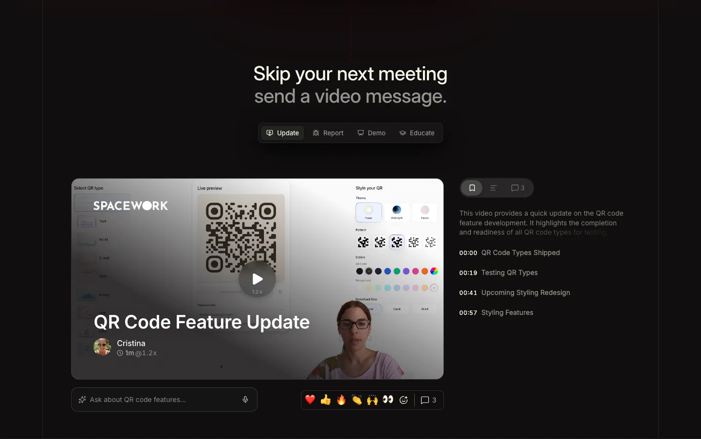
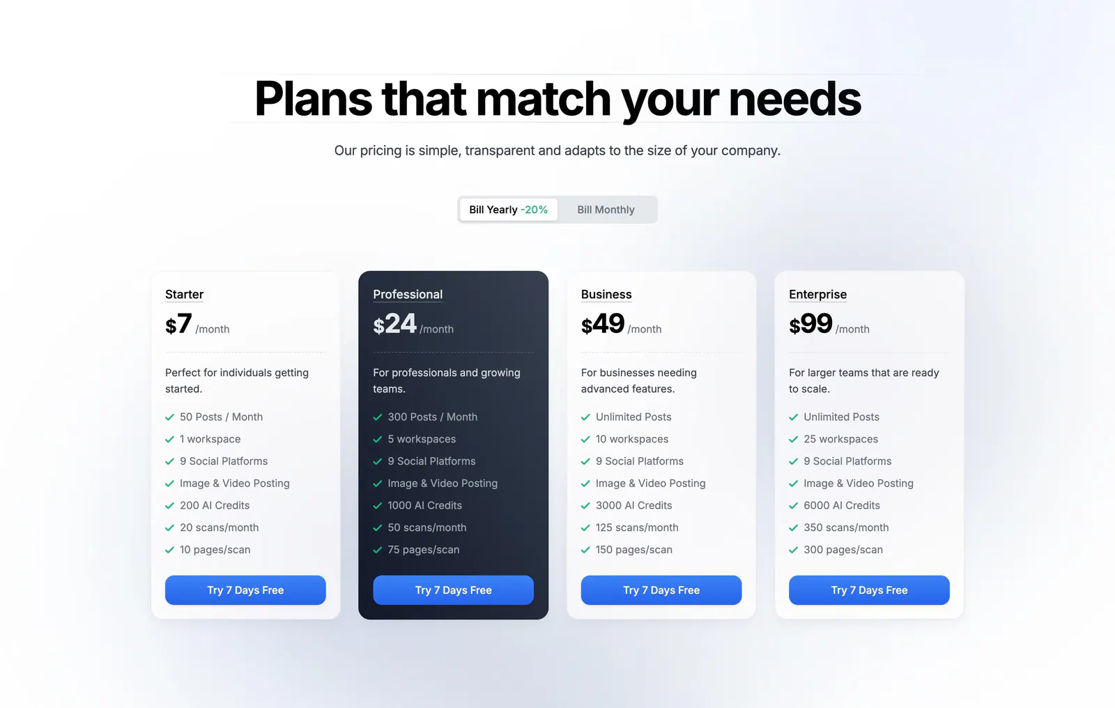
  164. Supercut use cases section: centered headline with Update, Report, Demo, Educate tabs above a video message player with chapter list
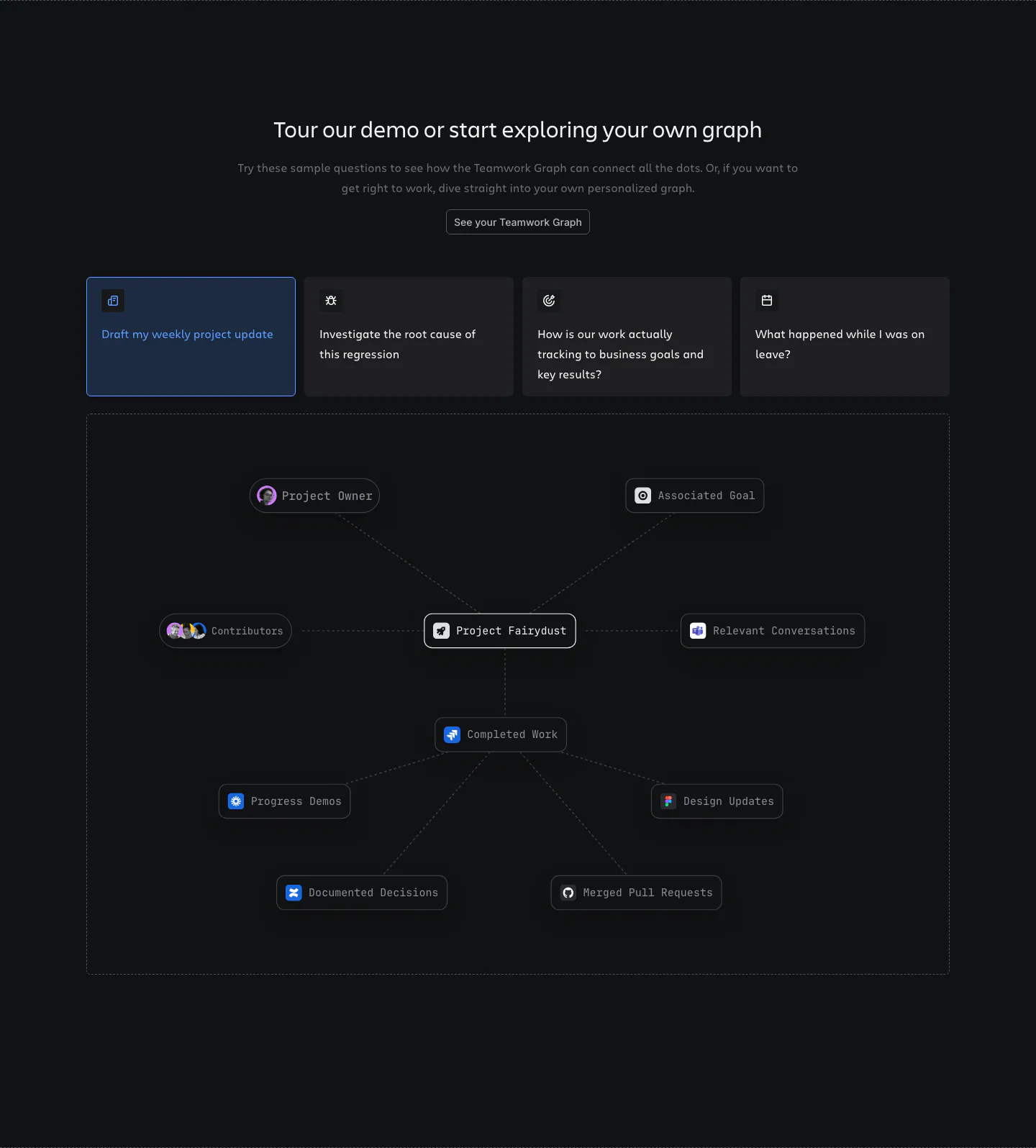
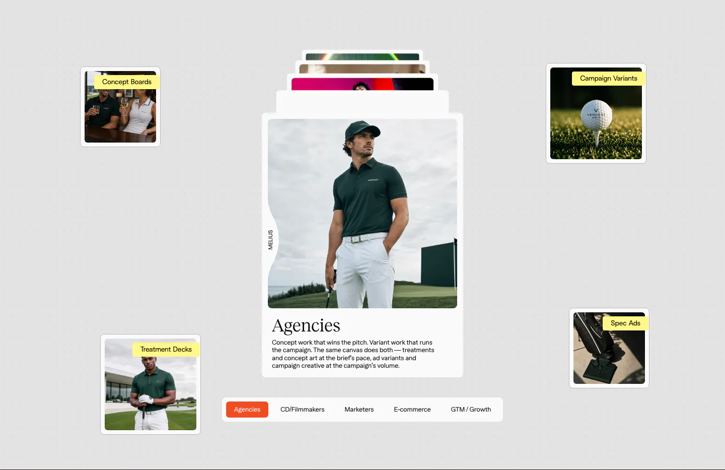
  165. Atlassian features section: centered heading, four selectable prompt cards and a project node graph in a dashed frame on dark
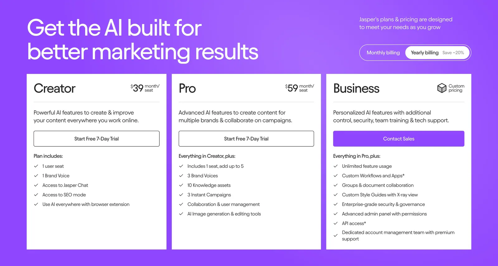
  166. Siterails pricing section: centered headline and yearly/monthly toggle above four plan cards with a dark highlighted tier on white
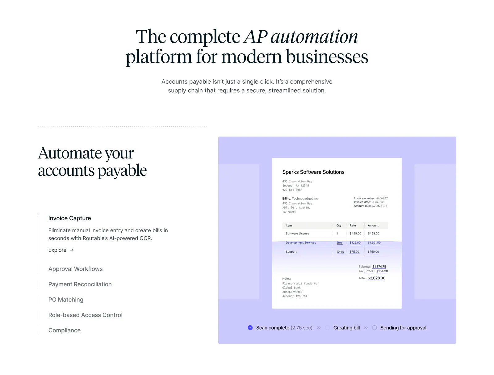
    Siterails Pricing
  167. Melius use cases section: stacked card with a golf apparel photo and serif Agencies copy, floating labeled thumbnails, persona tab bar
  168. Jasper pricing section: headline and billing toggle above three white plan cards with checklists on a bright purple background
  169. Routable features section: centered serif headline above a feature list and a lavender panel with an invoice scanning mockup
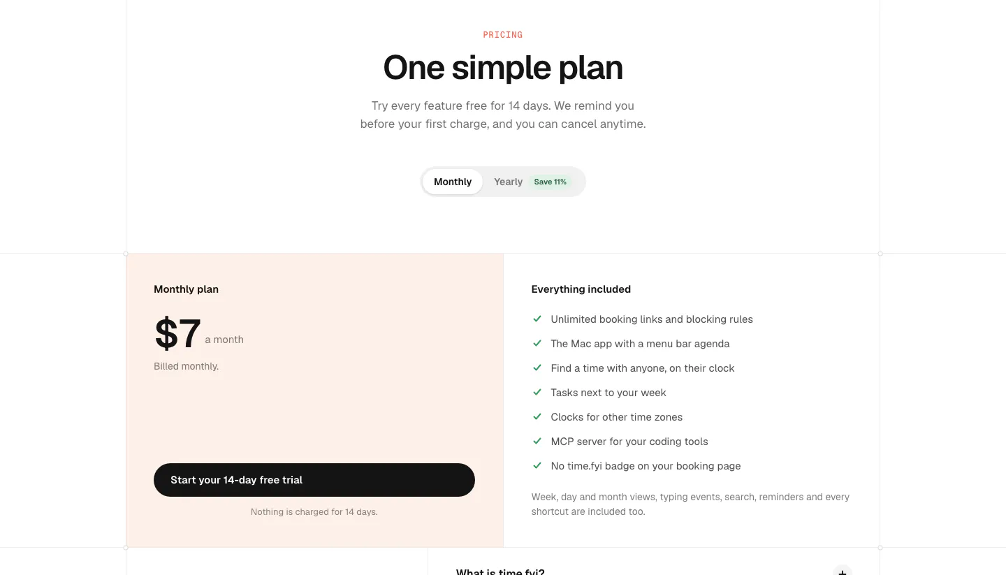
  170. time.fyi pricing section: centered header with monthly/yearly toggle above a single $7 plan card on peach and an included-features list
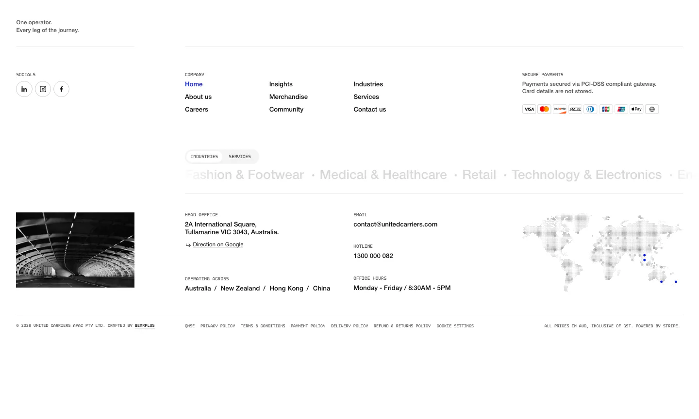
  171. United Carriers footer section: link columns, payment badges, industries marquee, office details and dotted world map on white
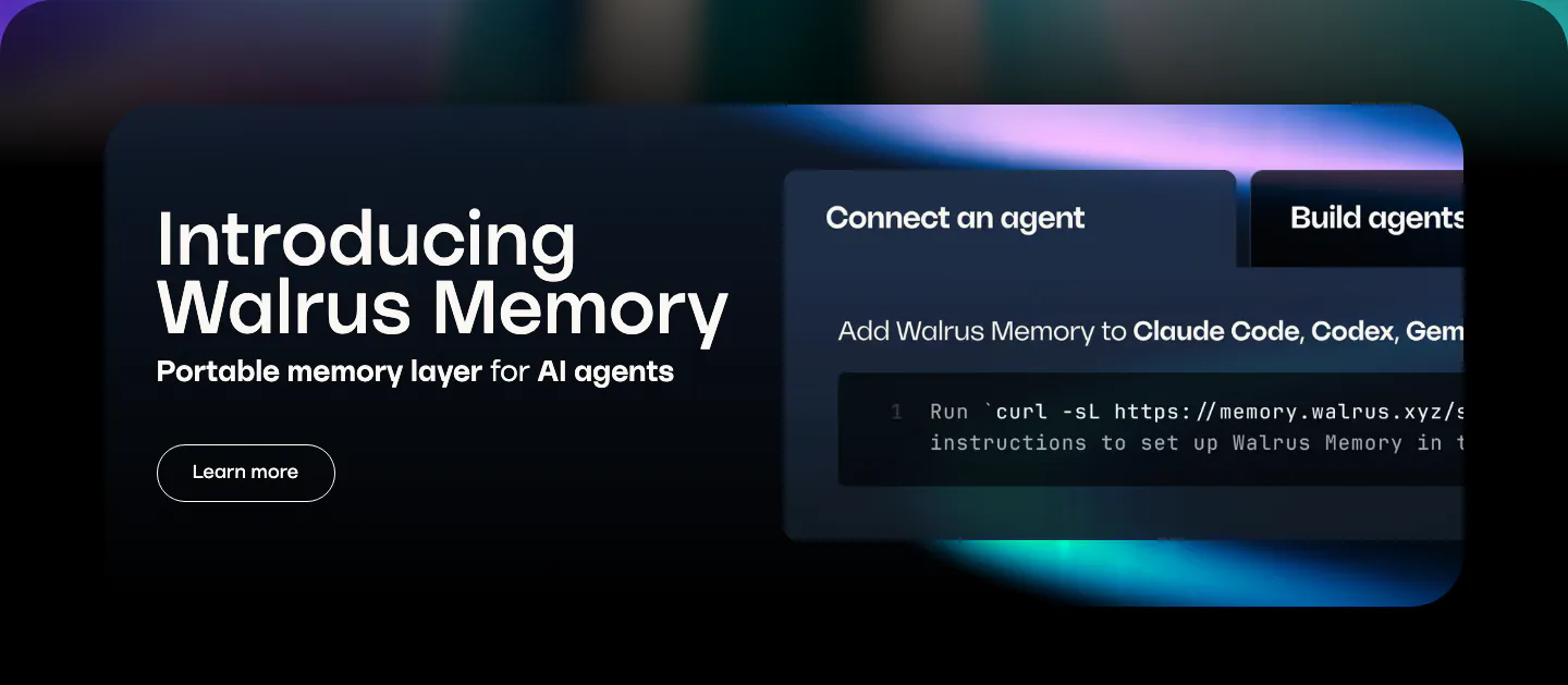
  172. Walrus features section: dark rounded banner with product intro on the left and a tabbed code snippet panel on the right
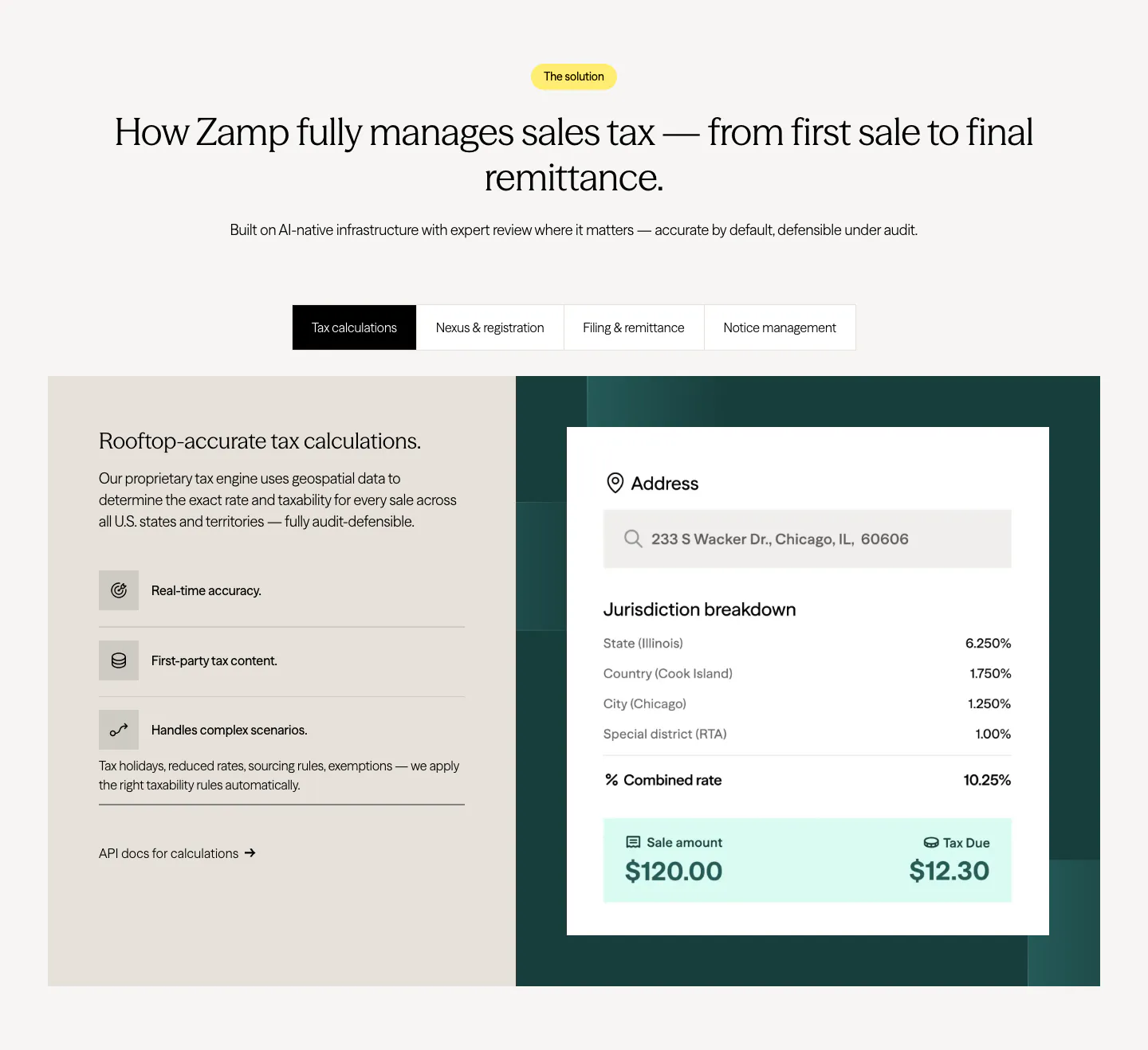
  173. Zamp features section: centered heading over a tab bar and split panel with feature list on beige and a tax calculation card on dark green
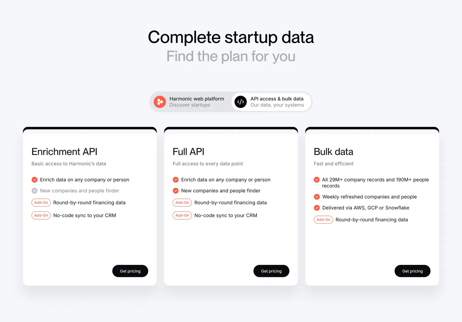
  174. Harmonic pricing section: centered headline and segmented toggle above three white plan cards with checklists and black buttons
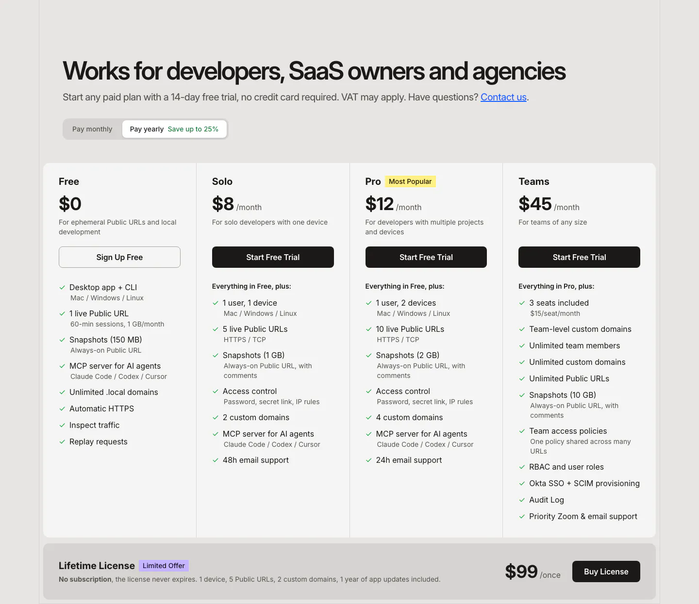
  175. LocalCan pricing section: headline and monthly/yearly toggle above four plan columns with feature checklists and a lifetime license band
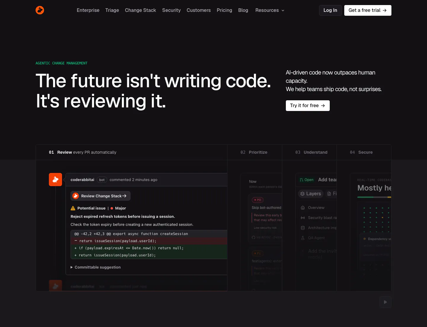
  176. CodeRabbit hero section: dark page with left headline, copy and CTA at right, and a tabbed product panel showing a PR review comment
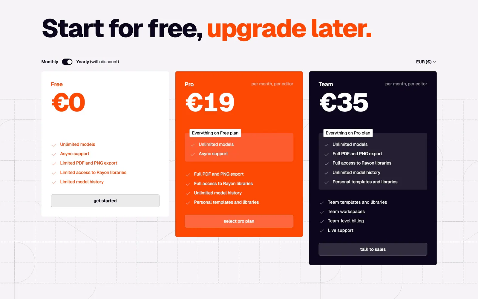
  177. Rayon pricing section: large headline with orange accent, monthly/yearly toggle and white, orange and navy plan cards on a grid
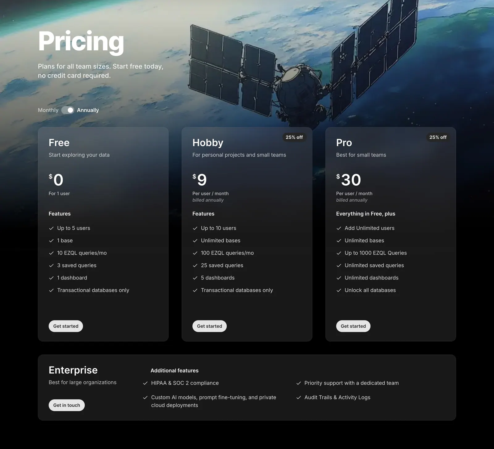
  178. Outerbase pricing section: headline and monthly/annual toggle over satellite artwork, three translucent plan cards and an Enterprise row
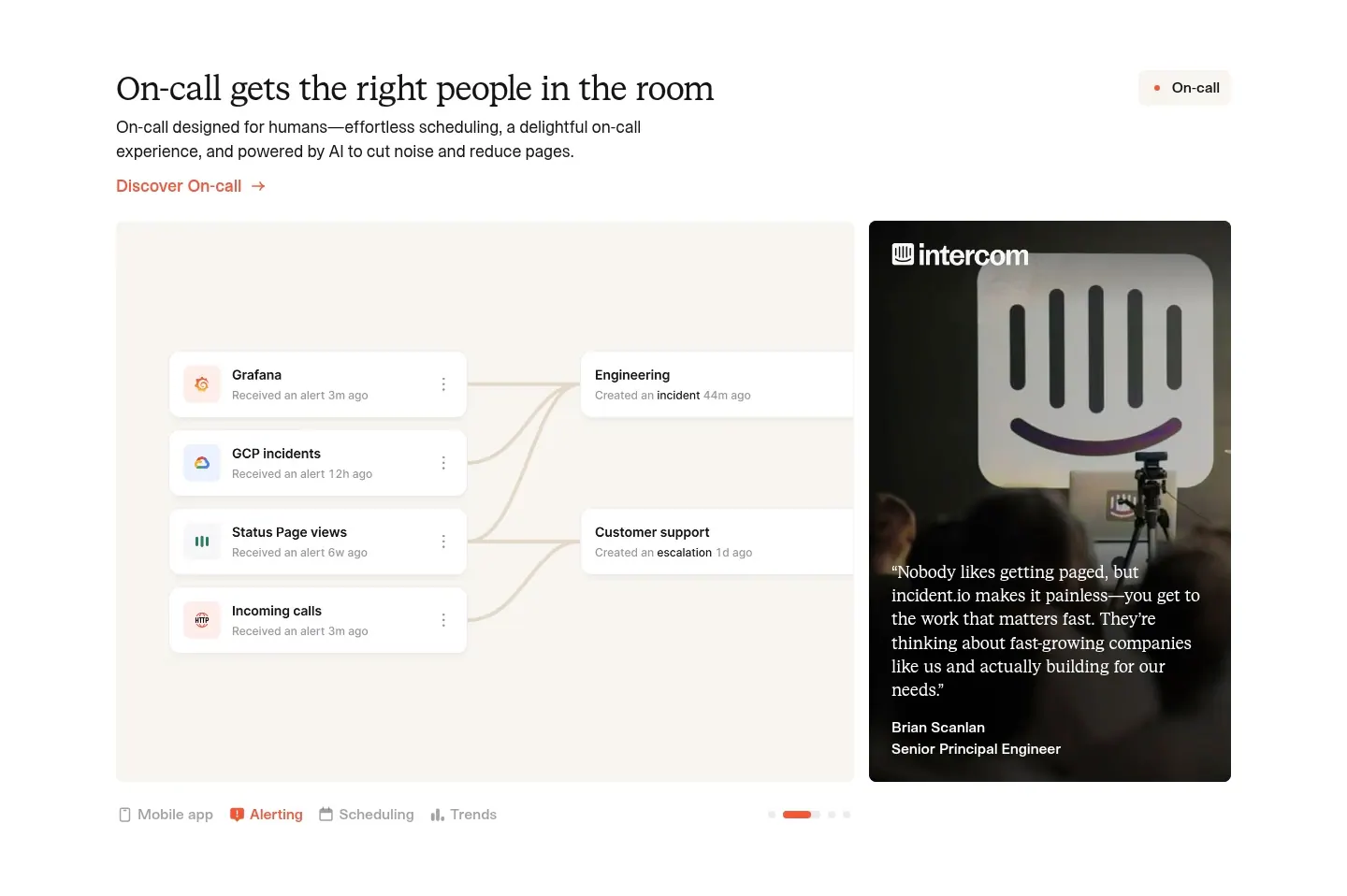
  179. incident.io features section: serif headline above an alert-routing UI panel beside a customer quote photo card, with tabs below
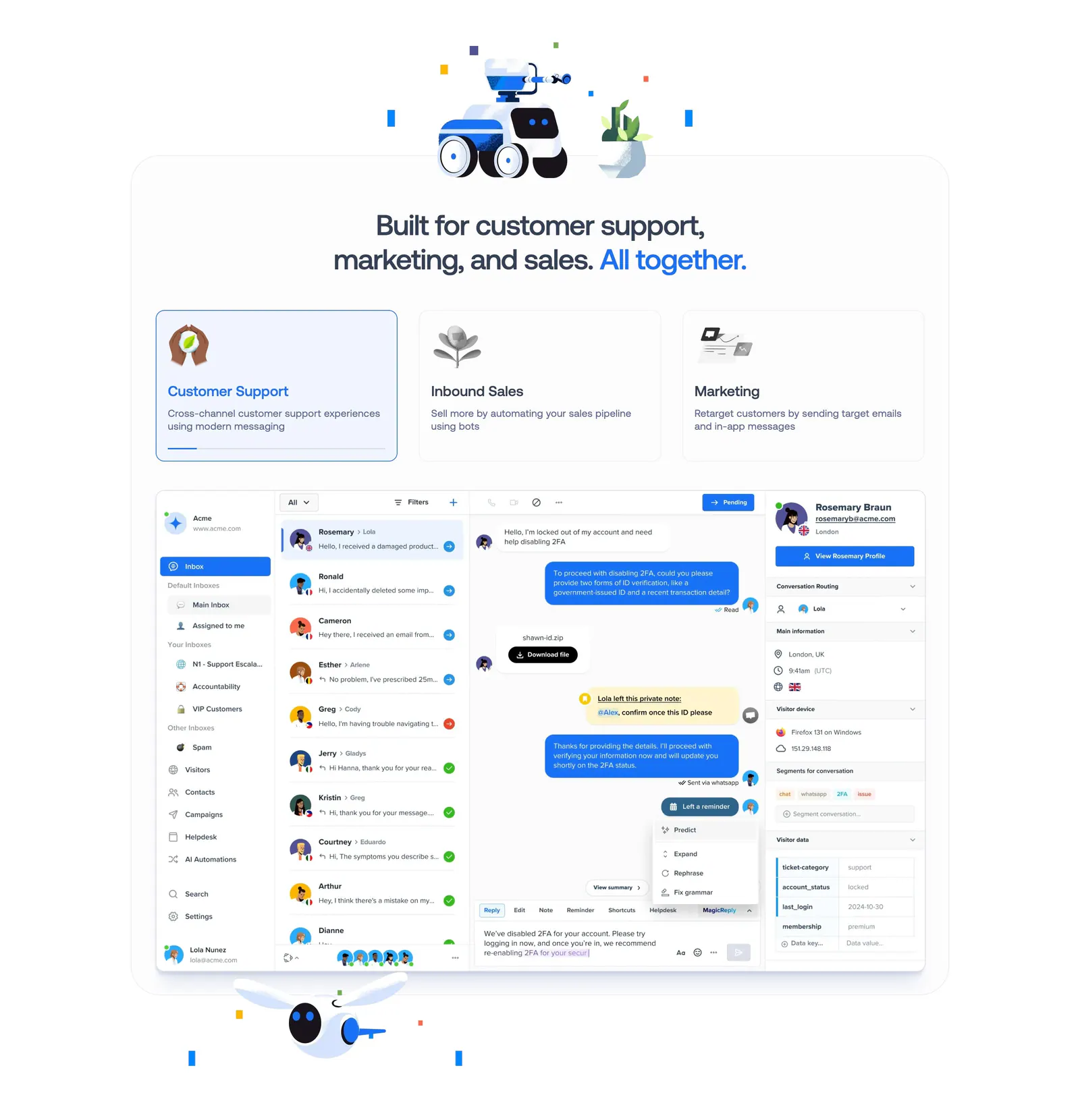
  180. Crisp features section: centered headline with robot renders above three selectable use-case cards and an inbox UI screenshot
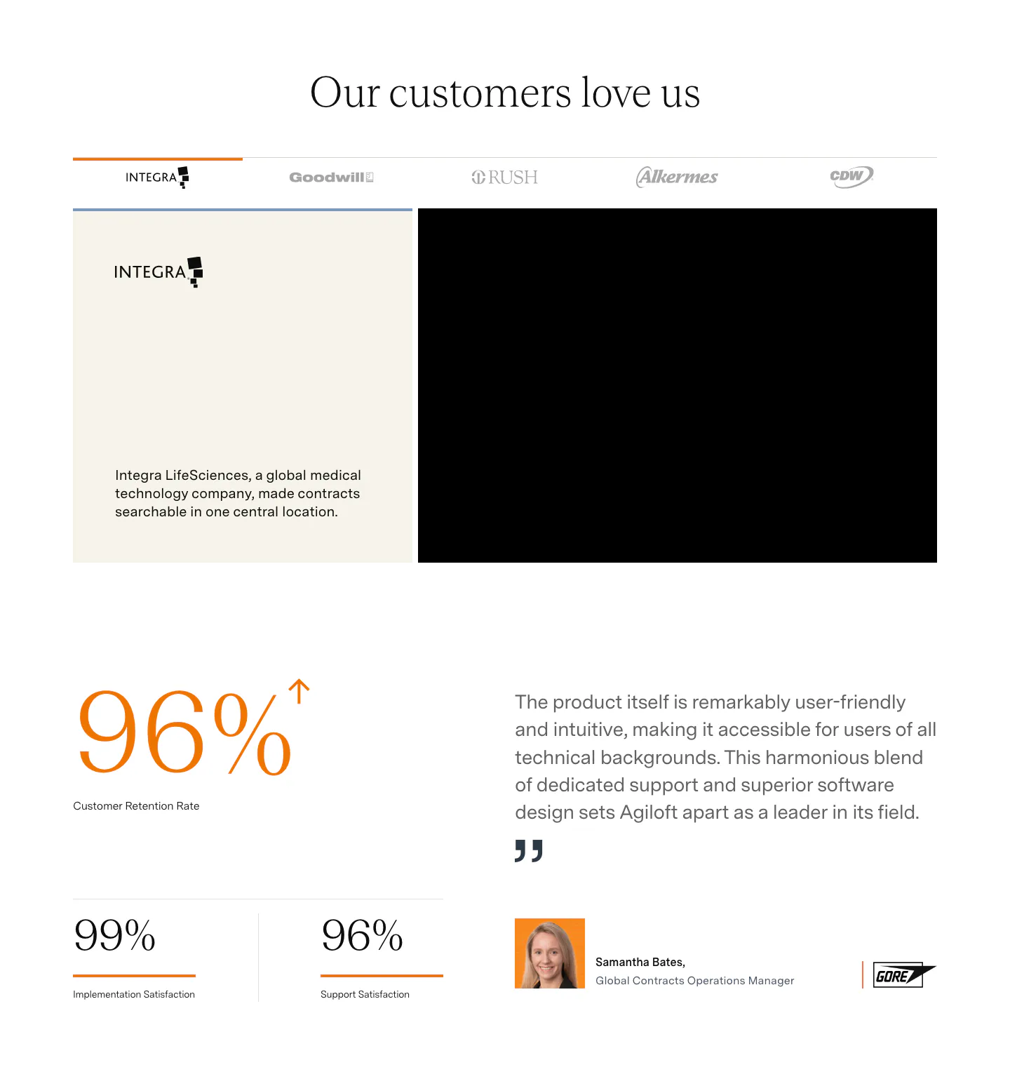
  181. Agiloft testimonials section: customer logo tabs above a case study card, large orange retention stats and a quote with headshot
  182. Agiloft features section: serif headline and button above numbered tabs and a pie chart UI mockup on an orange panel

Where tabs shows up

Often paired with

Share of tabs sections that also use each style

How to design tabbed content

  1. Put the strongest view first

    Because many visitors never switch tabs, the default should show your most common case or most convincing content. Order the remaining tabs by relevance, and name them so a visitor can tell what each one holds before clicking.

  2. Mark the selected tab clearly

    Use a filled background, underline, or weight change that clearly marks the active tab. Faint gray differences are easy to miss. Make sure the selected state works without relying on color alone, so it stays clear for people with color vision deficiencies.

  3. Stop panels from jumping

    When tab content changes height, the page jumps and people lose their place. Set a consistent minimum height for panels, or keep media at a fixed aspect ratio. Short crossfades help, but avoid long animations that delay the content someone asked for.

  4. Follow the ARIA tabs pattern

    Use the tablist, tab, and tabpanel roles, with aria-selected and arrow-key navigation between tabs. Keep labels to one to three words. On mobile, let the tab bar scroll horizontally or switch to a select menu when labels no longer fit.

Companies using tabs

All styles
    ↑↓ Navigate ↵ Open

    Section preview

    Website section