Use Case Section Examples

Generic copy makes every reader translate it into their own situation. A use case section does that work for them, splitting the message by role, team, or industry. The test is whether a sales lead and an engineer each find tasks they recognize, in words they use. Browse these use case section examples for tab, card, and segmented layouts that route each visitor to the pitch meant for them.
41 sections

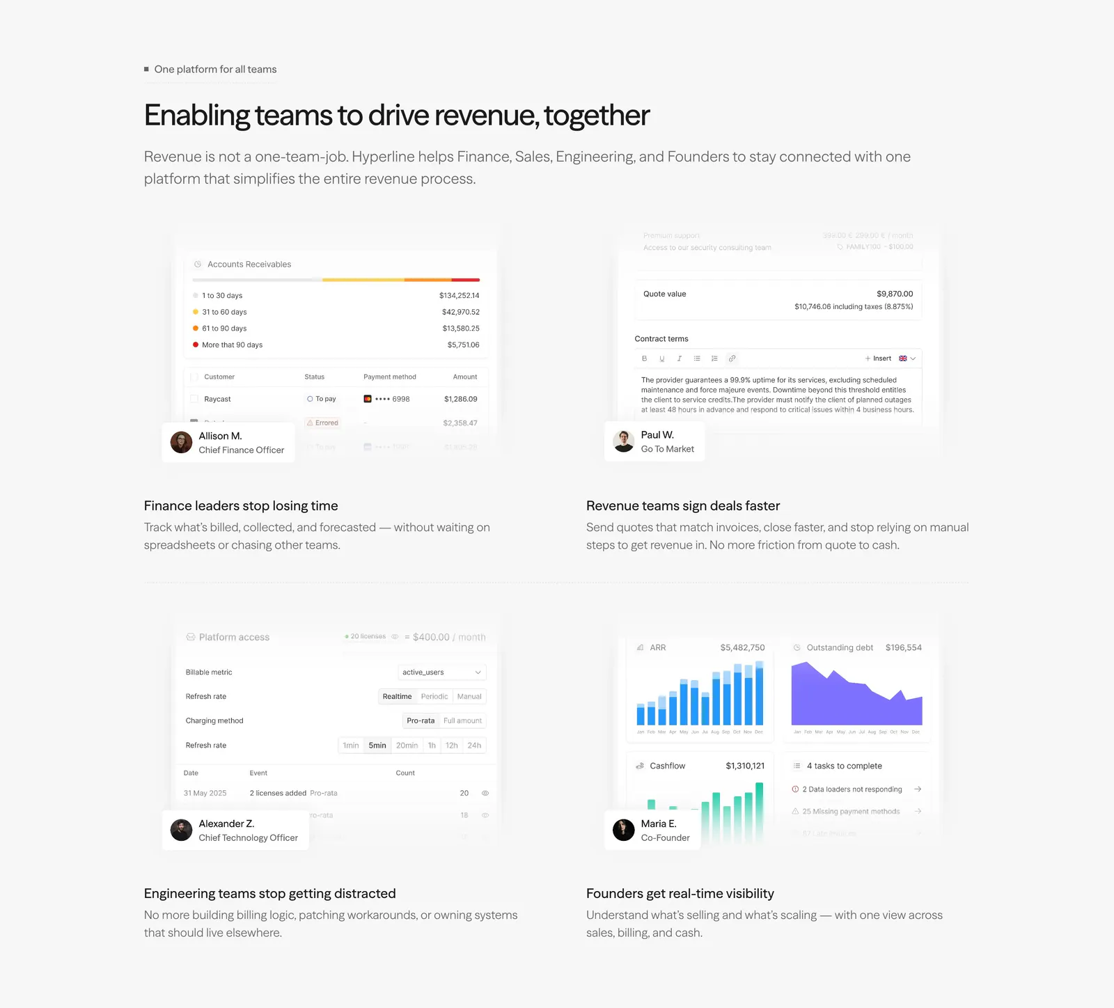
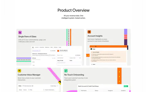
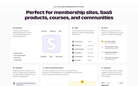
  1. Hyperline features section: left-aligned headline above a 2x2 grid of role-based product UI snippets with persona badges on light gray
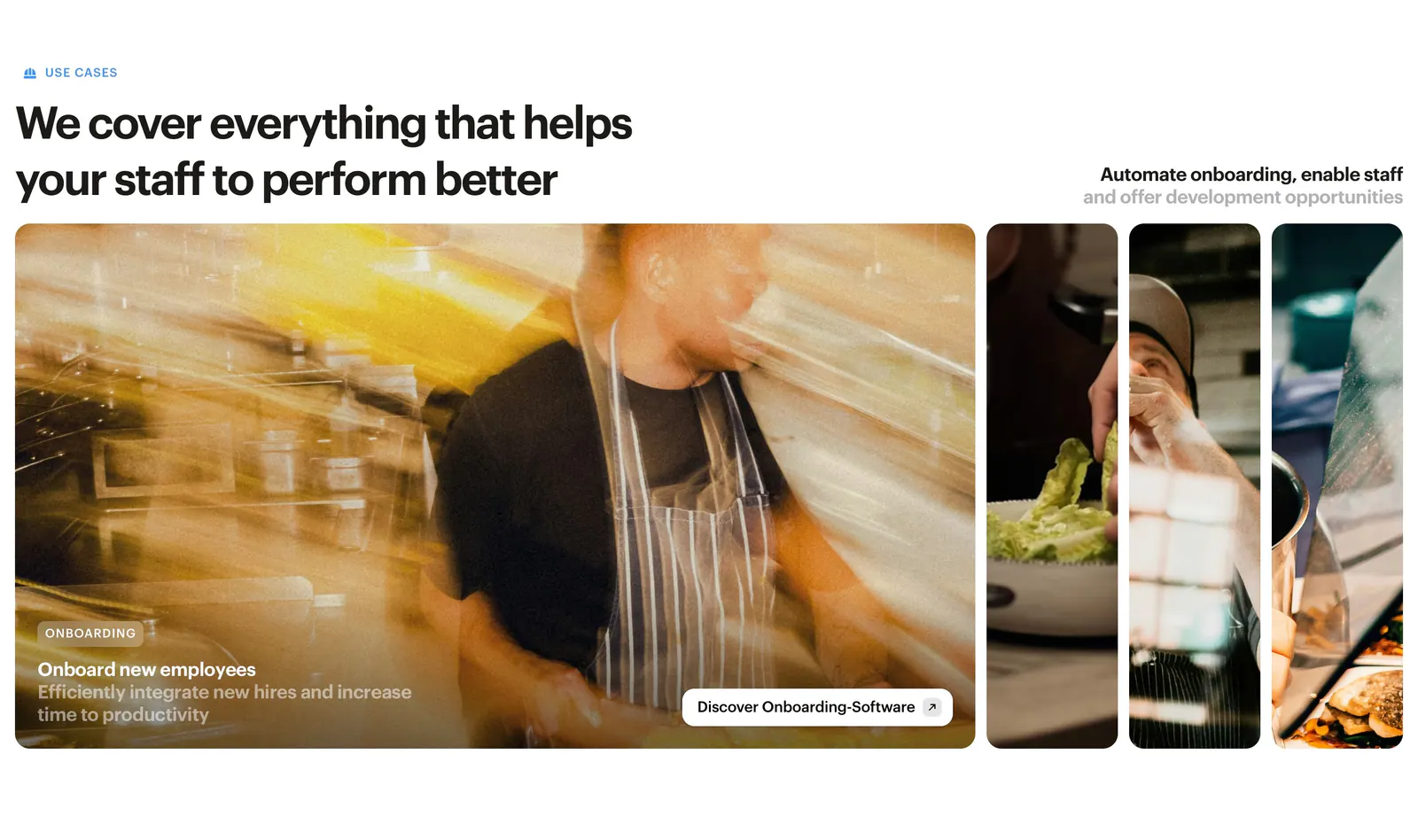
  2. Bounti features section: left headline above expanding photo panels of restaurant staff, the first open with an onboarding caption
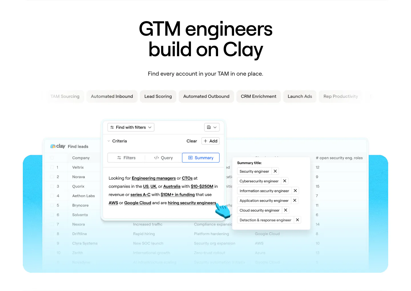
  3. Clay use cases section: centered headline above use-case tab pills and a lead-finding table product screenshot on a cyan panel
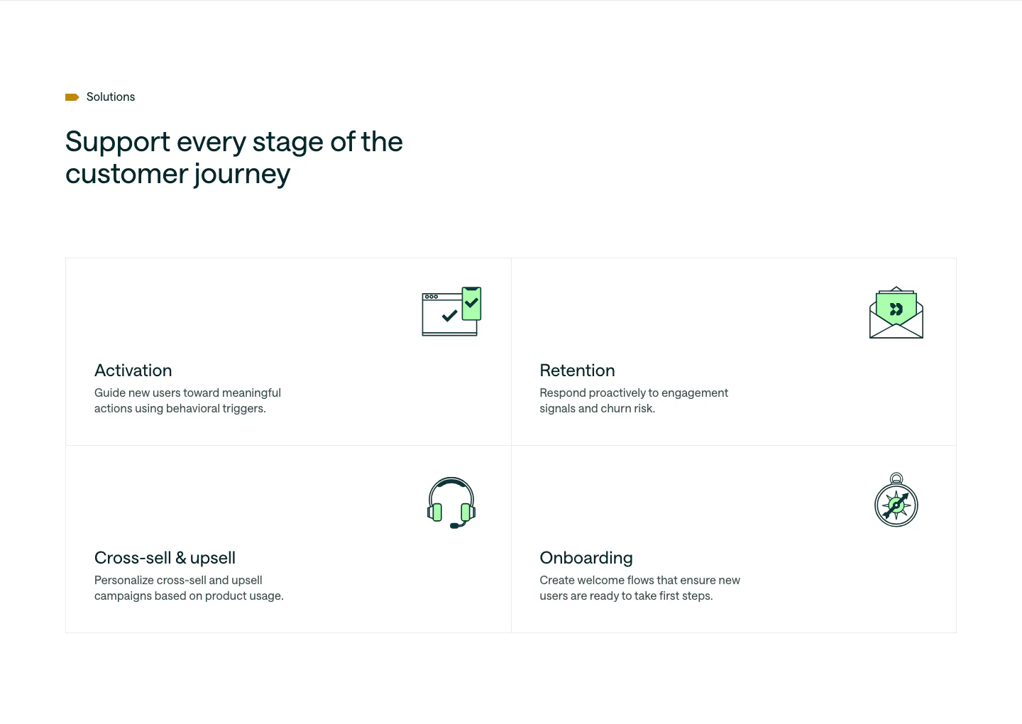
  4. Customer.io use cases section: headline above a 2x2 bordered grid of lifecycle stages, each with a green line icon and short copy
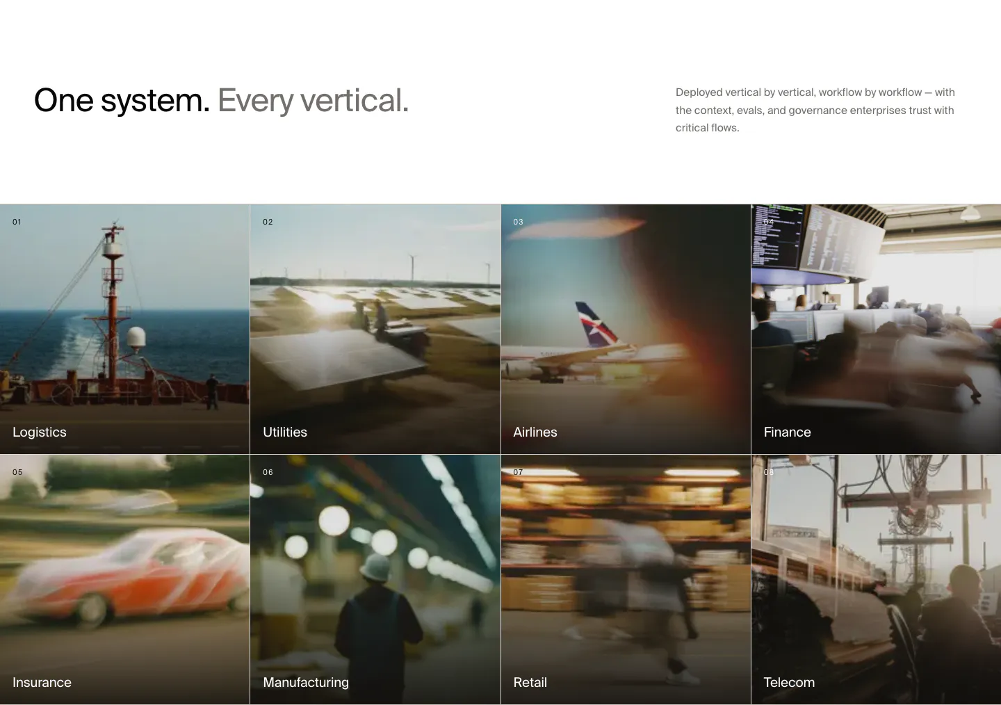
  5. HappyRobot use cases section: headline with side note above a 4x2 grid of numbered industry tiles on blurred photos, Logistics to Telecom
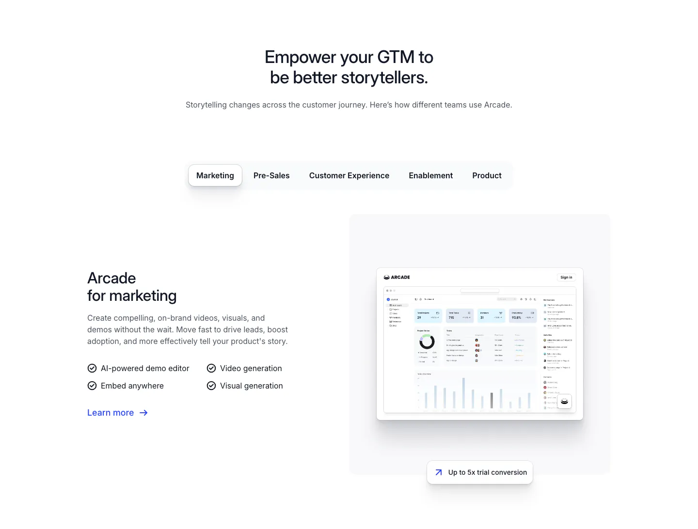
  6. Arcade use cases section: centered headline over team tabs, with marketing copy and checklist beside a dashboard screenshot
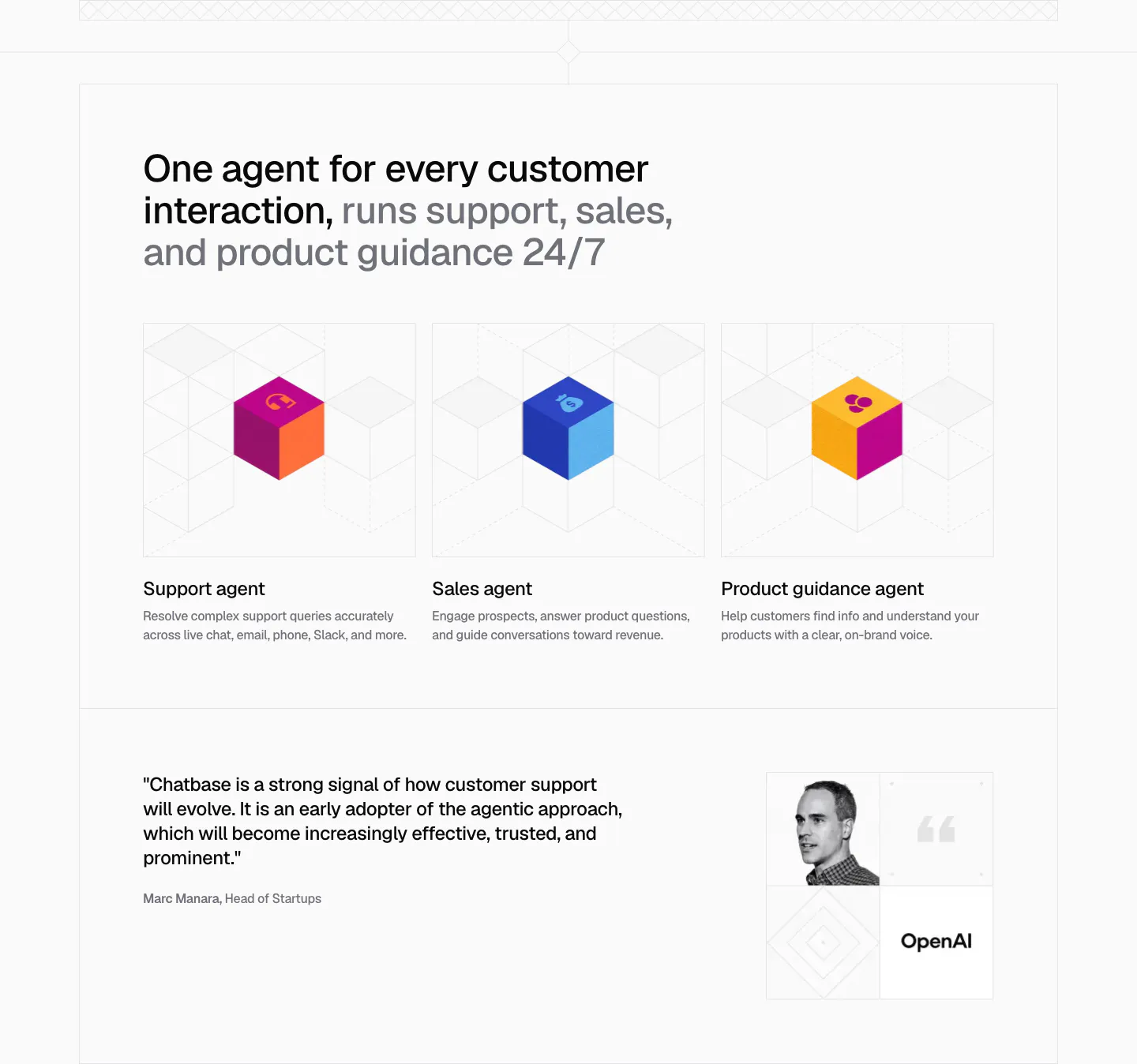
  7. Chatbase use cases section: three agent cards with colorful isometric cubes on line grids, plus an OpenAI quote with portrait below
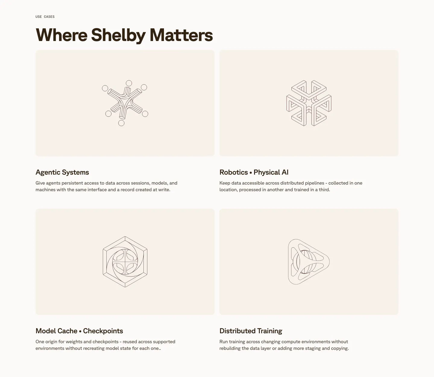
  8. Shelby use cases section: two-by-two grid of cream cards with line-drawn geometric artworks above titles like Agentic Systems
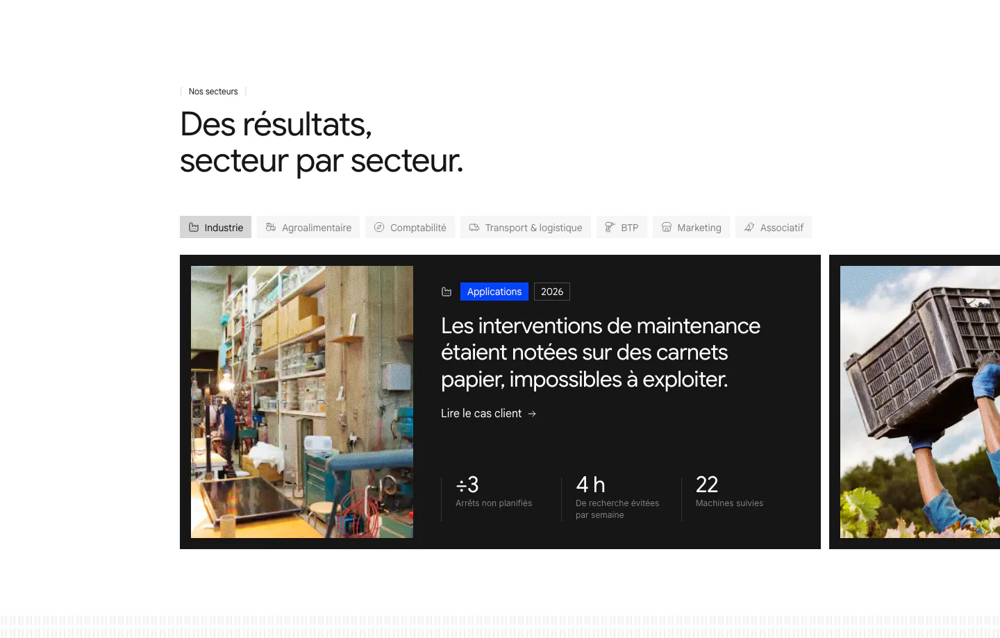
  9. Raneo use cases section: industry tab bar above a carousel of dark case-study cards with photos, headlines and three result metrics
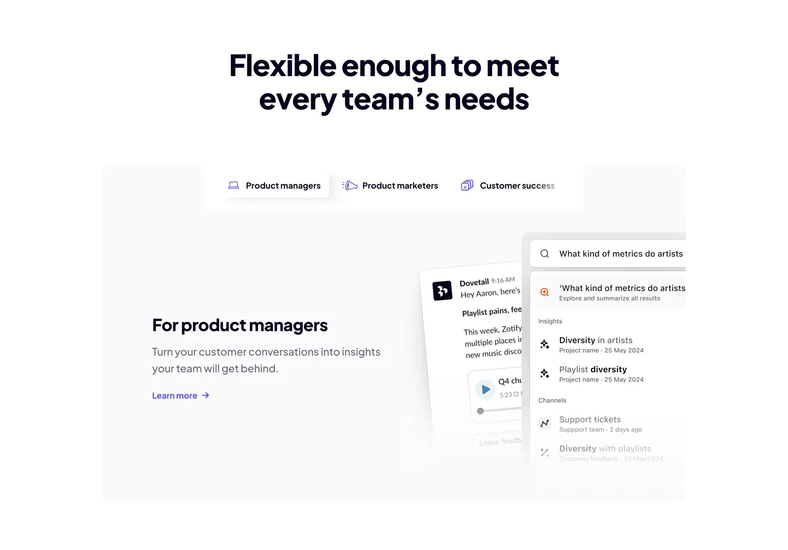
  10. Dovetail features section: centered headline above role tabs and a panel with product manager copy beside chat and search UI cards
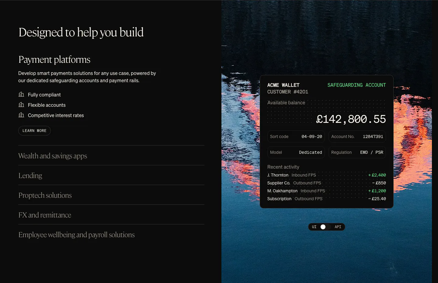
  11. Griffin use cases section: serif heading with use-case accordion on the left, wallet UI card over a lake photo on the right
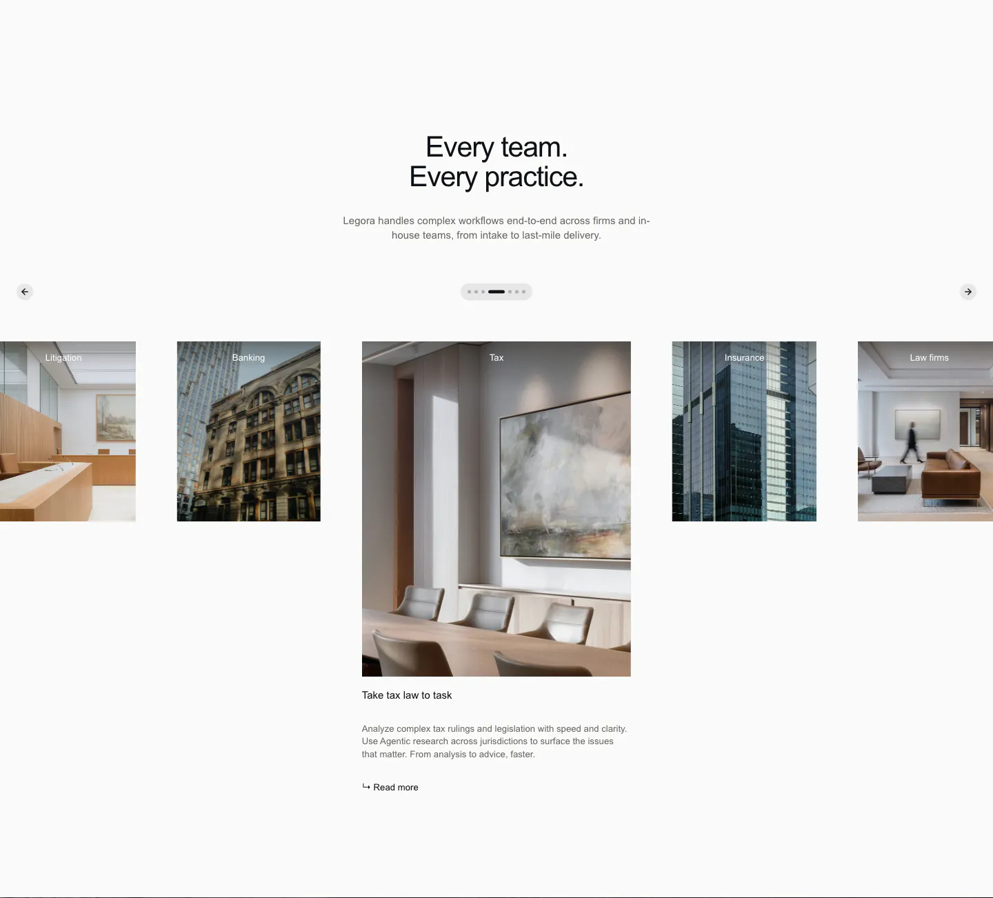
  12. Legora use cases section: centered headline above a photo carousel of practice areas with arrows and pagination dots
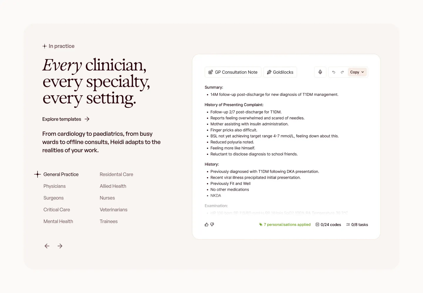
  13. Heidi use cases section: serif headline with a specialty list and arrows on the left, GP consultation note UI on the right
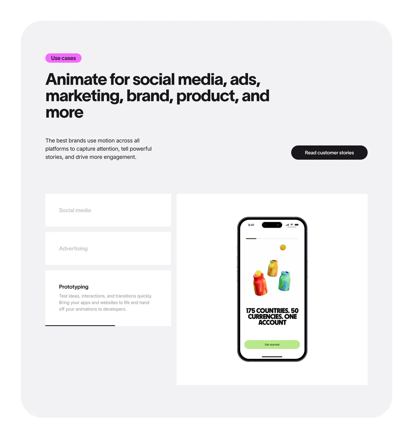
  14. Jitter features section: headline in a rounded gray panel above use case tabs beside a phone mockup preview
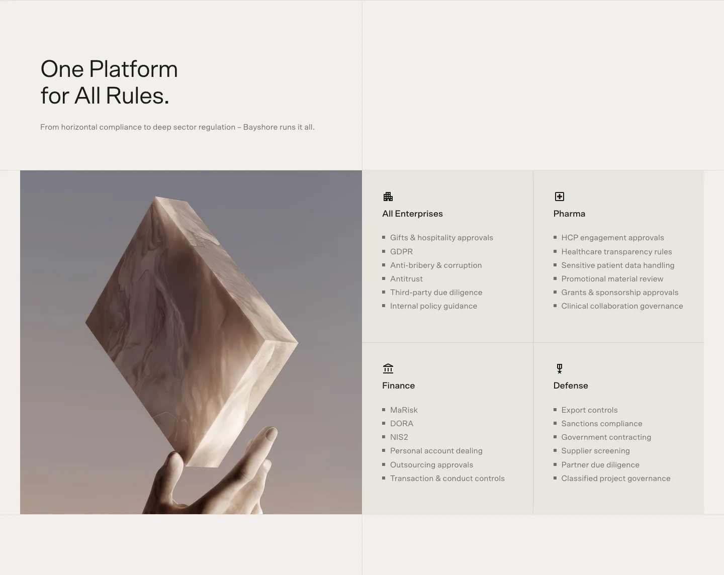
  15. Bayshore use cases section: headline above a 3D marble block held by a hand beside a 2x2 grid of industry cards with bullet lists
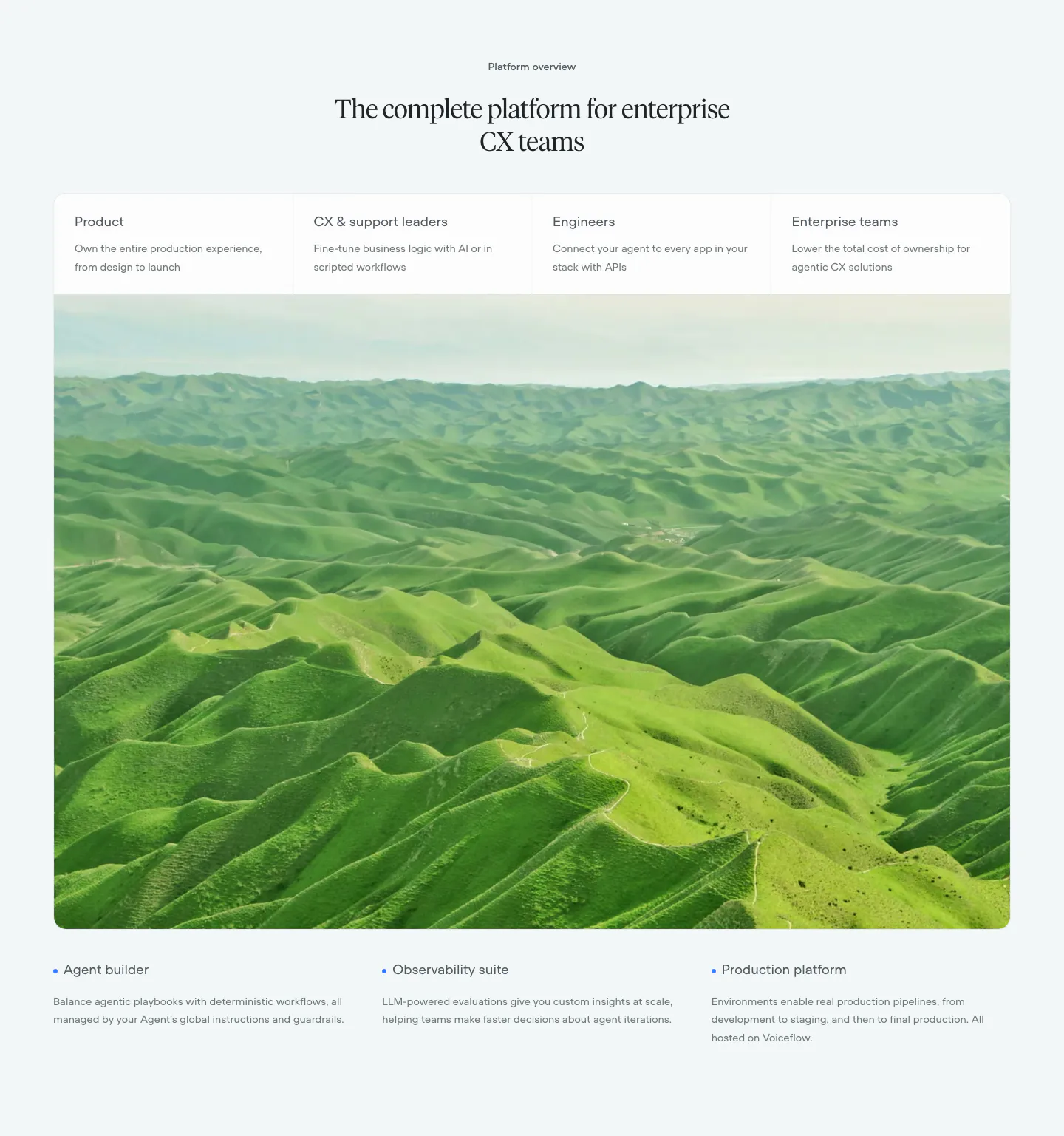
  16. Voiceflow use cases section: centered serif headline, four role tabs over a large green hills photo, three feature notes below
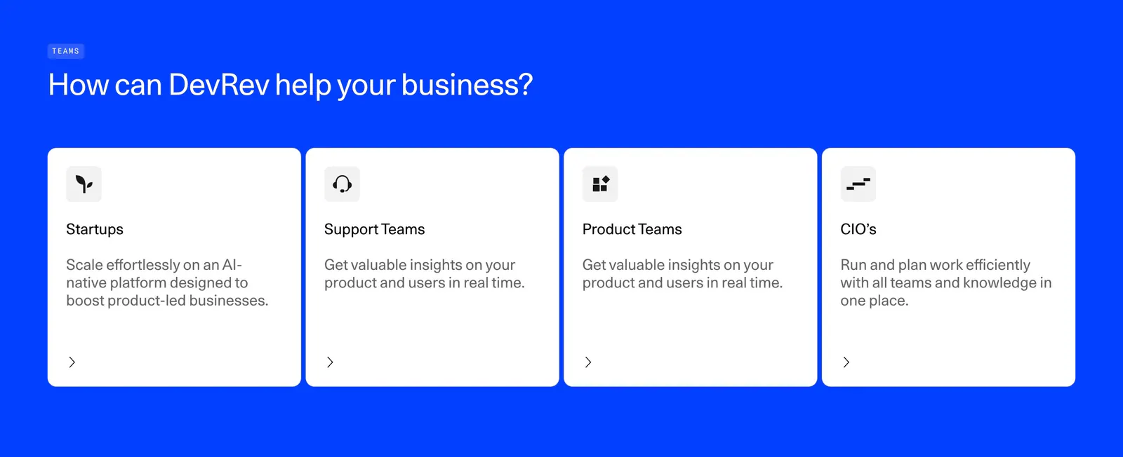
  17. DevRev features section: left-aligned headline above four white audience cards for startups, support, product teams and CIOs on bright blue
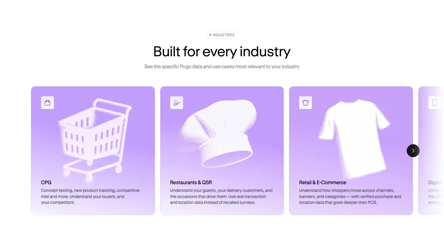
  18. Pogo use cases section: centered headline above a carousel of lavender industry cards with halftone object artwork
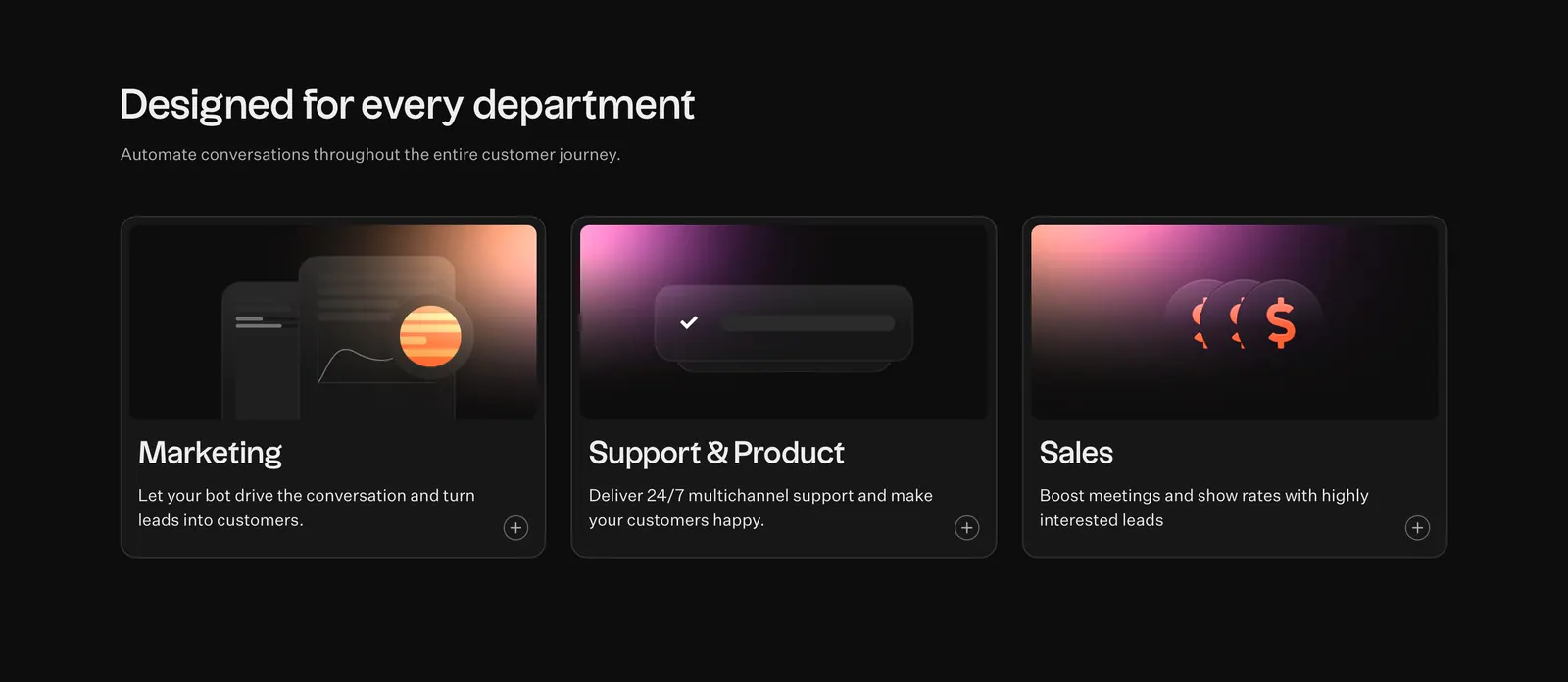
  19. Typebot features section: headline above three dark cards for marketing, support and sales with pink-orange gradient graphics on black
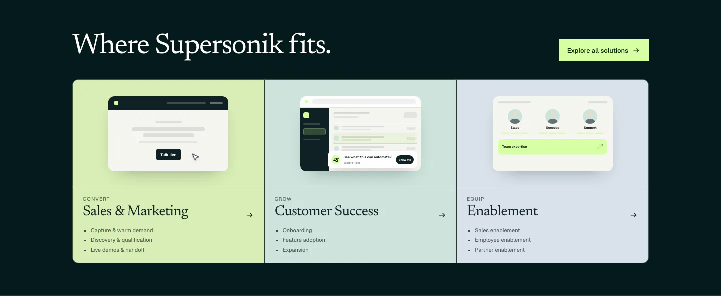
  20. Supersonik use cases section: serif headline over three pastel panels for sales, customer success and enablement with UI sketches
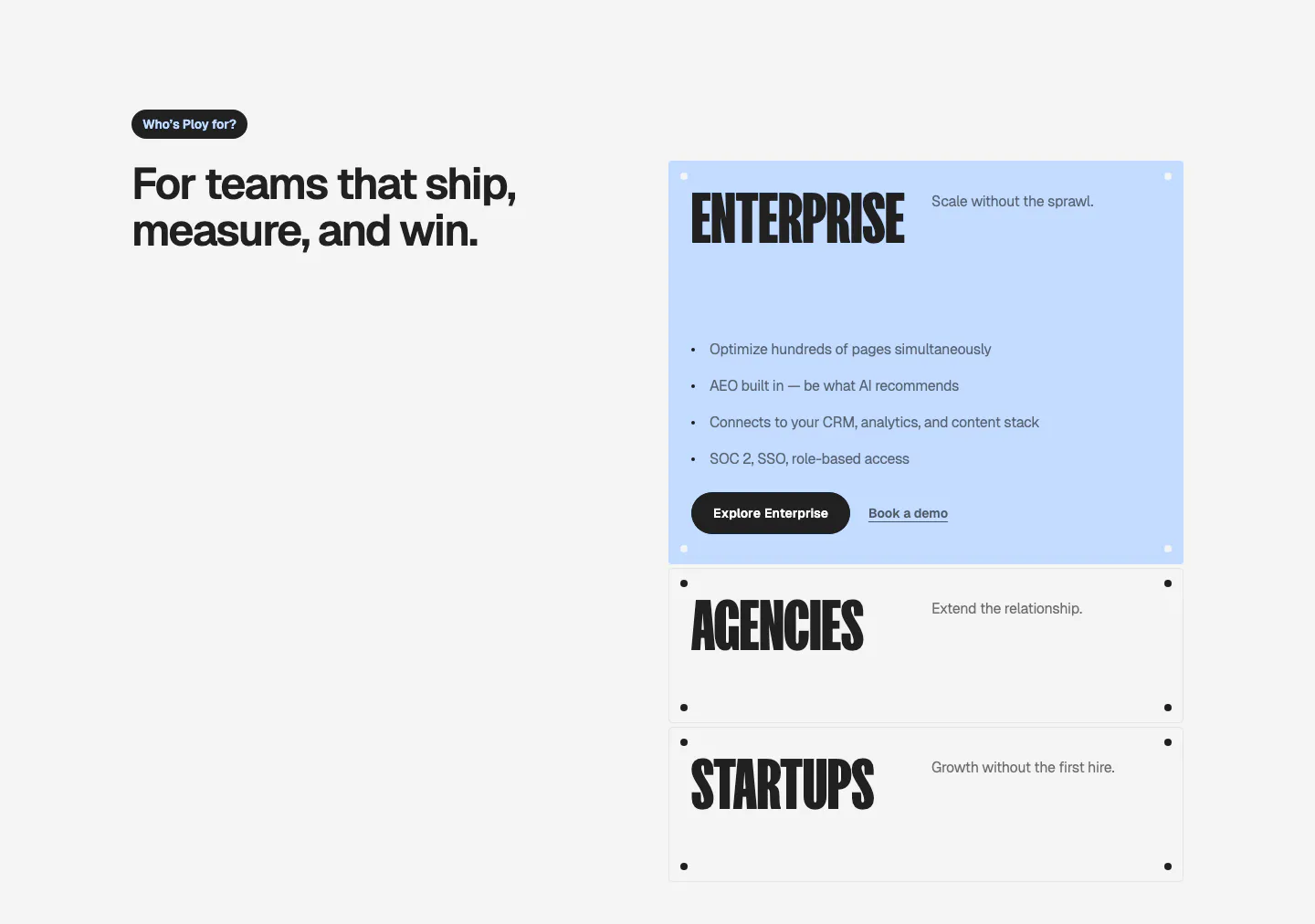
  21. Ploy use cases section: headline on the left with stacked accordion-style cards for Enterprise, Agencies and Startups on the right
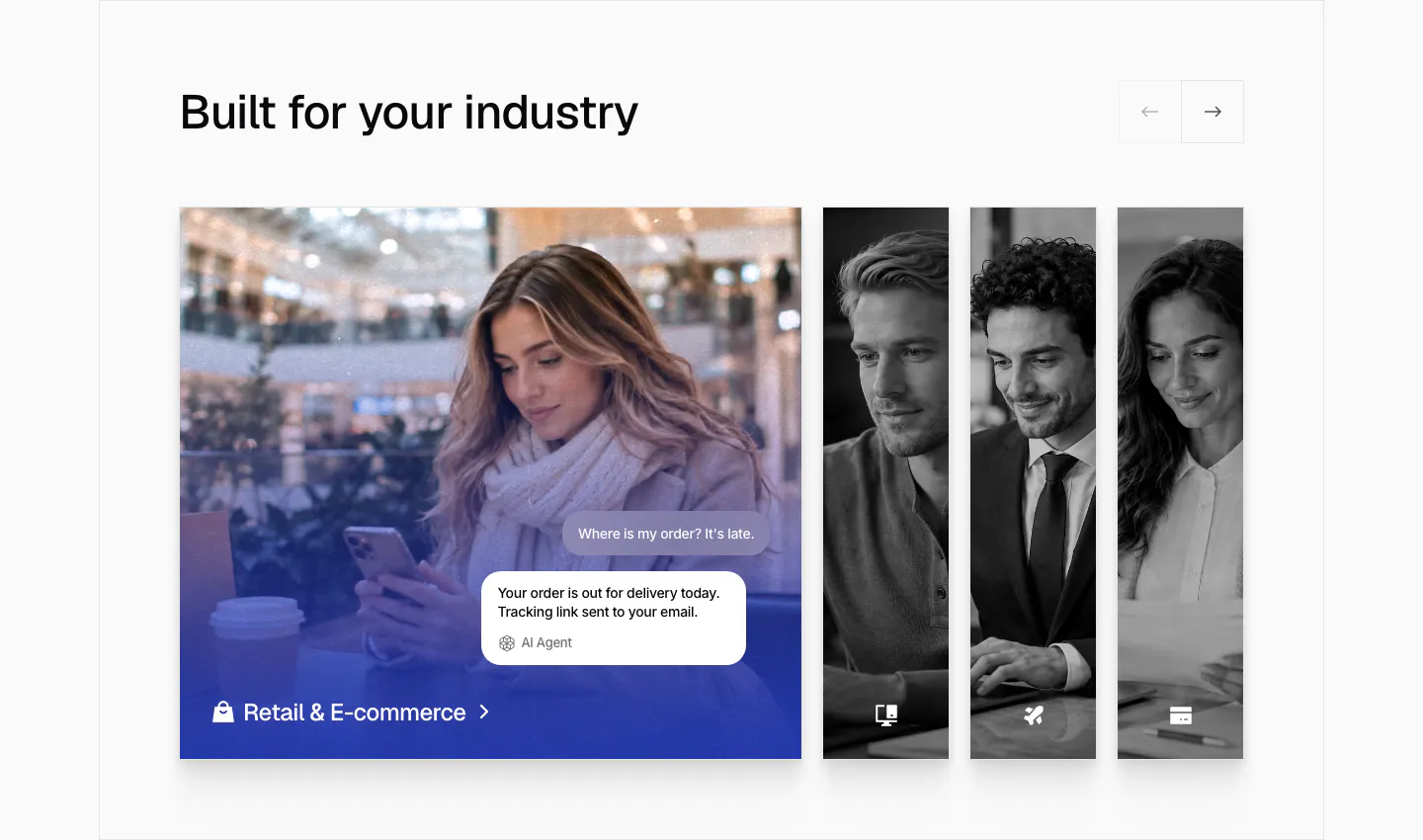
  22. Chatbase use cases section: industry slider with an expanded retail photo card with chat bubbles and narrow grayscale photo cards
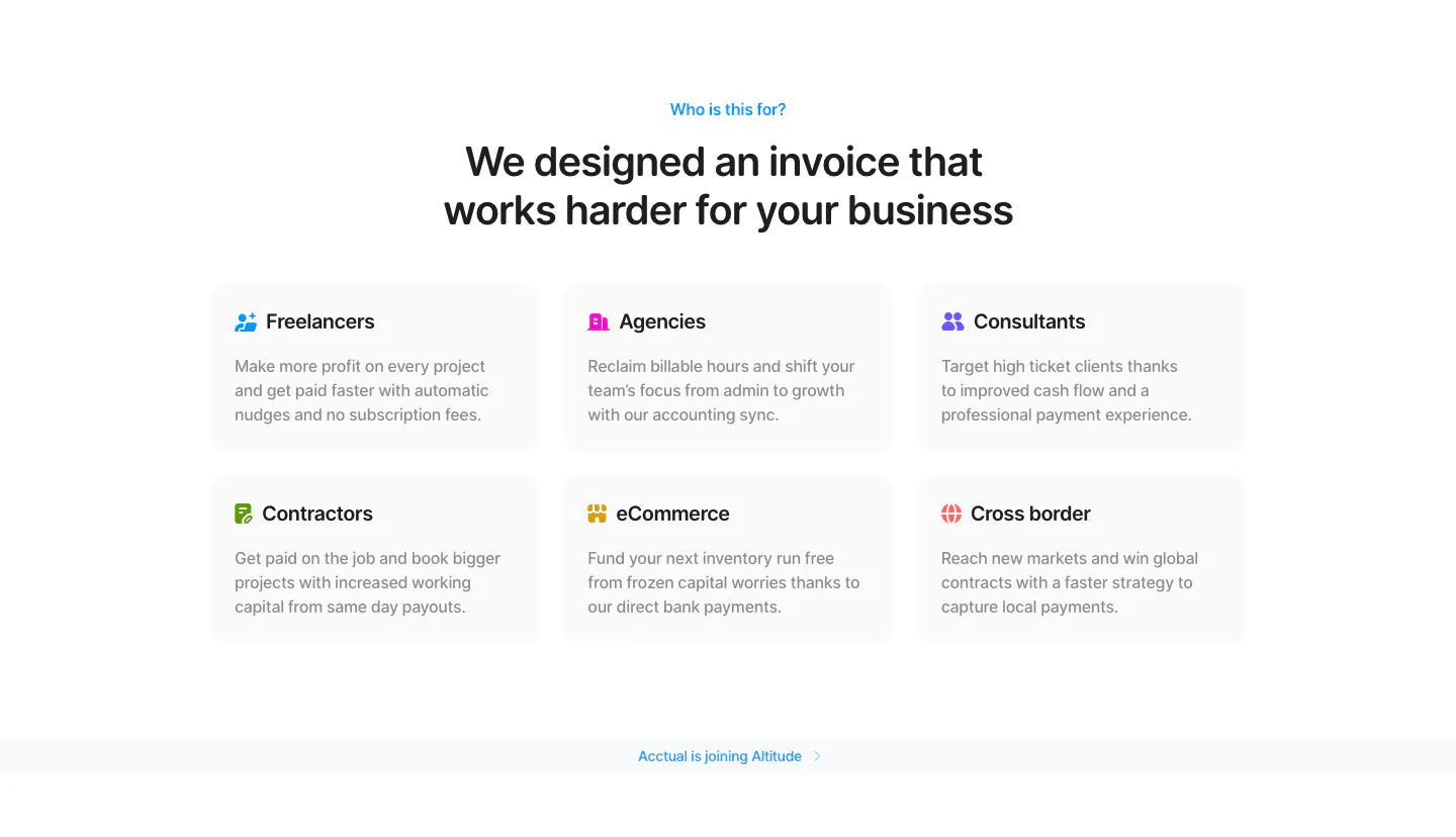
  23. Acctual use cases section: centered headline above a 3x2 grid of audience cards for freelancers, agencies, contractors and more
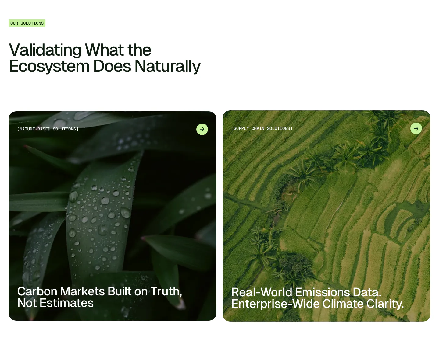
  24. Unknown features section: left-aligned headline with label above two large photo cards of wet leaves and rice terraces
    Unknown
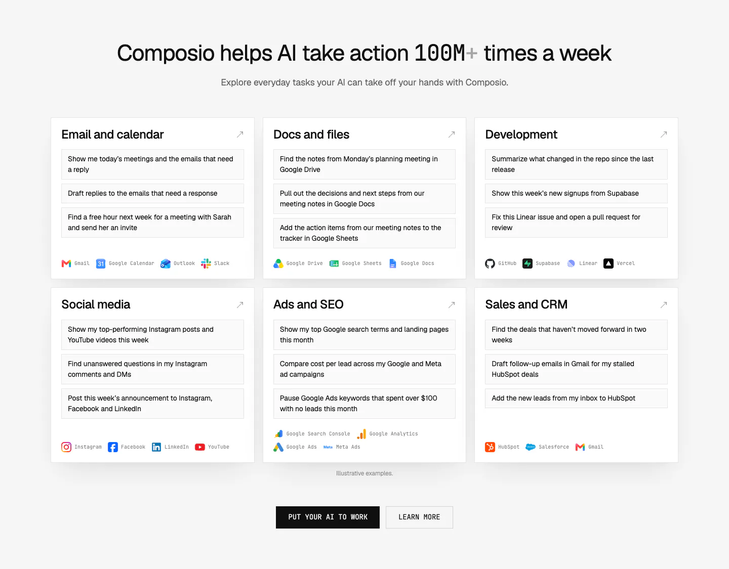
  25. Composio use cases section: centered headline above six white cards of example prompts by category with app names, plus two CTAs
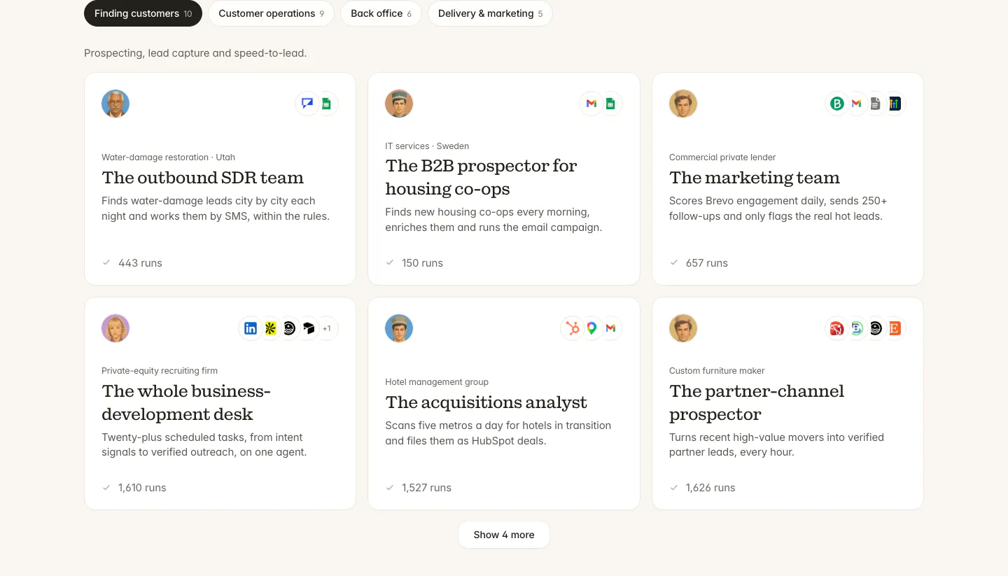
  26. Twin use cases section: tab bar of categories above a three-column grid of agent cards with avatars, app icons and run counts
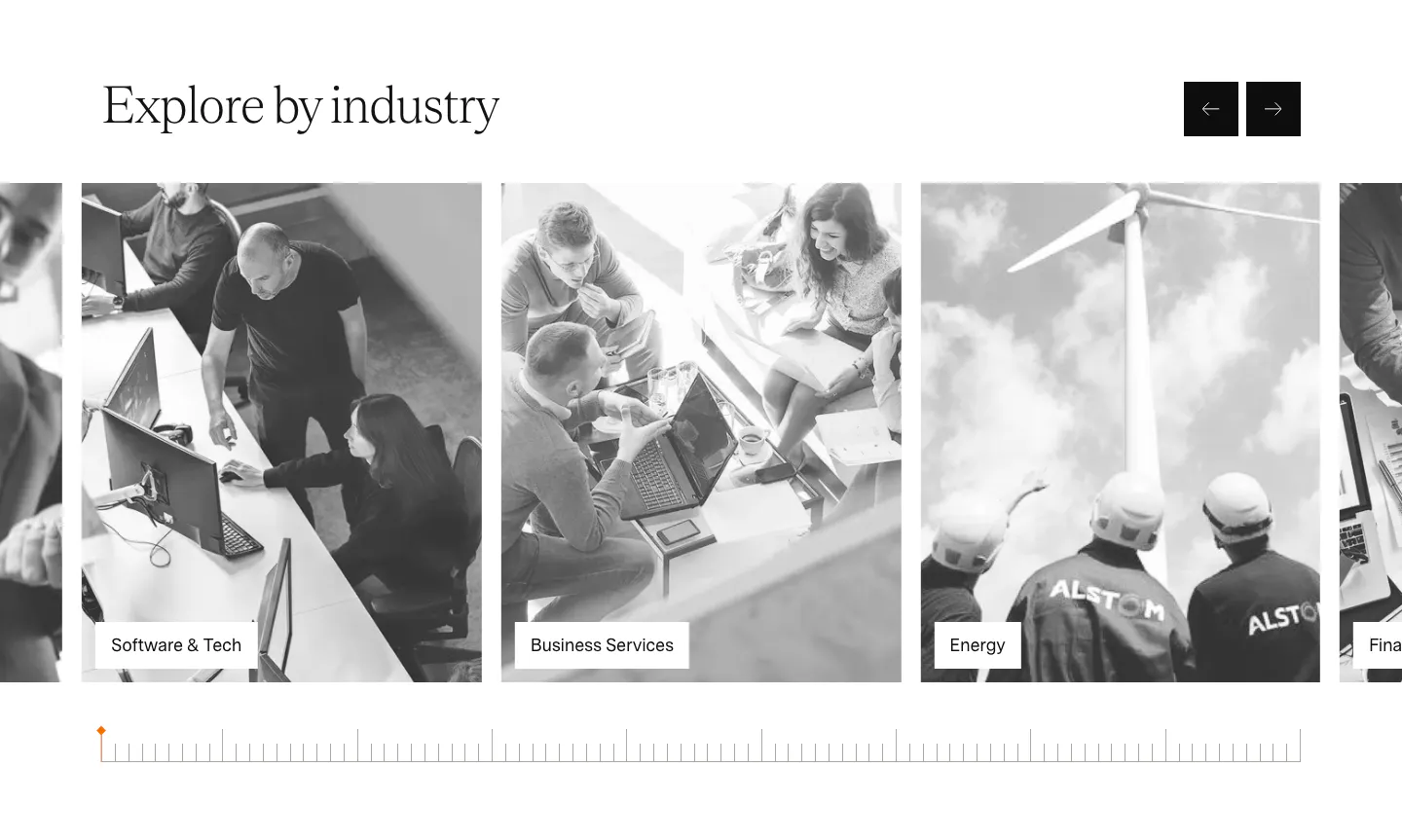
  27. Agiloft use cases section: serif heading with arrow buttons above a carousel of grayscale industry photo cards
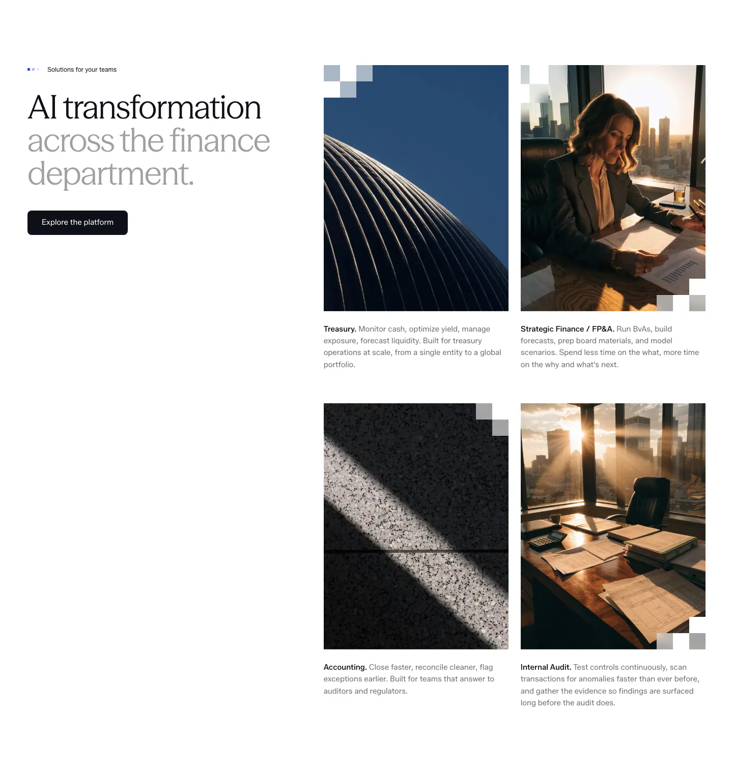
  28. Concourse use cases section: headline and button left, 2x2 grid of photo cards for Treasury, FP&A, Accounting and Internal Audit right
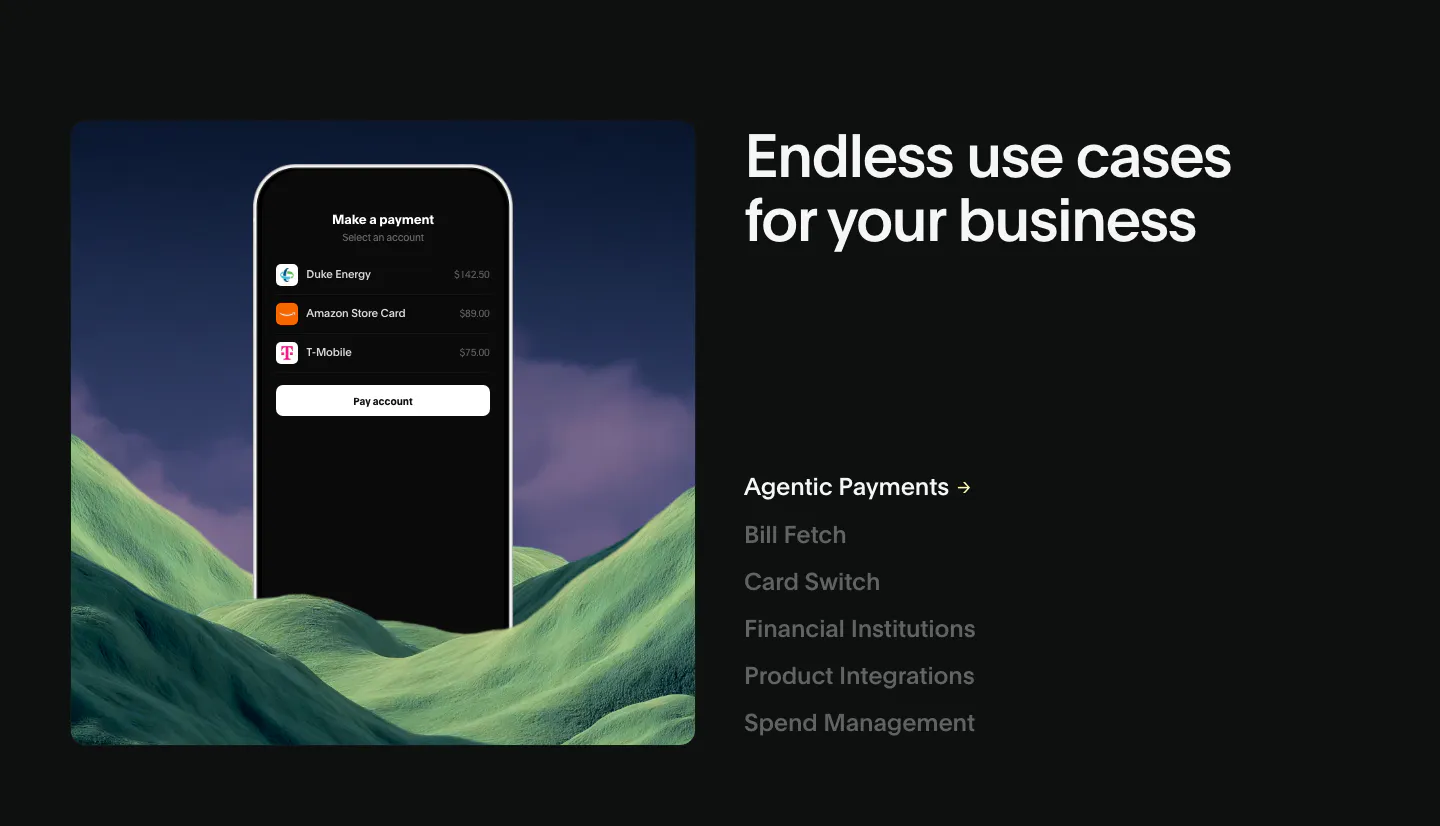
  29. Deck use cases section: phone payment mockup over green hills at left, headline and vertical list of use case links at right, dark
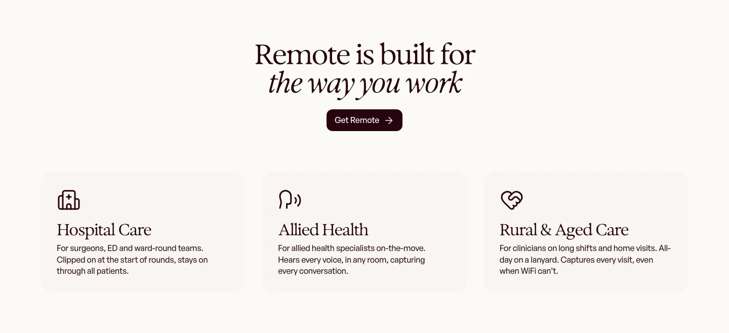
  30. Heidi use cases section: centered serif headline and Get Remote button above three cream cards for hospital, allied and rural care
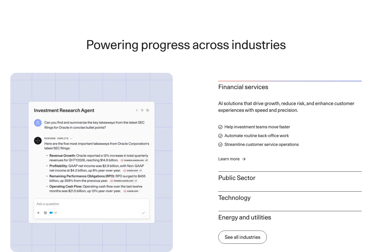
  31. Cohere use cases section: agent chat screenshot on a lavender grid panel left and an industry accordion right
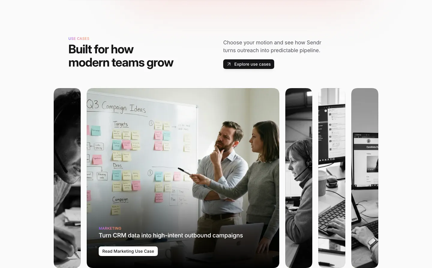
  32. Sendr use cases section: headline and Explore button above expanding photo cards, the Marketing card open showing a whiteboard
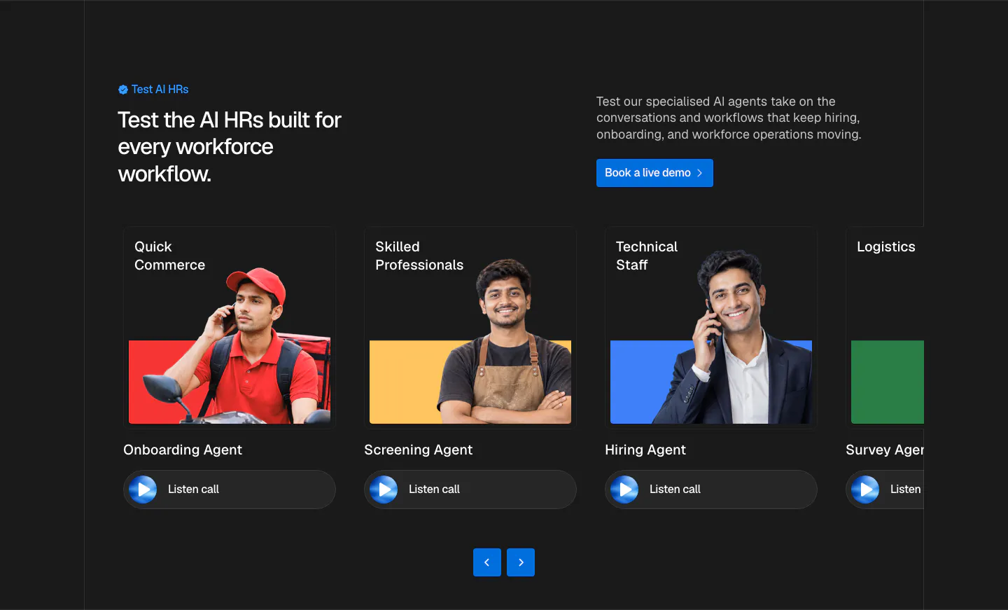
  33. Hunar use cases section: dark background with split header and a carousel of agent cards showing worker photos and listen-call buttons
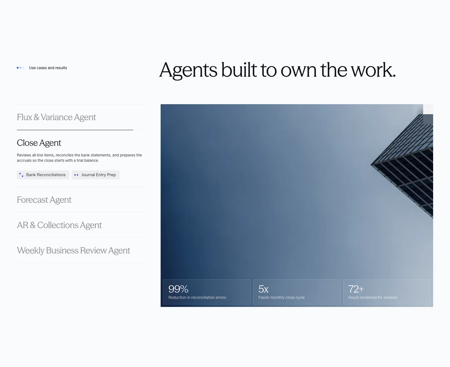
  34. Concourse use cases section: vertical list of agent tabs left, building photo with three metric tiles right on a light background
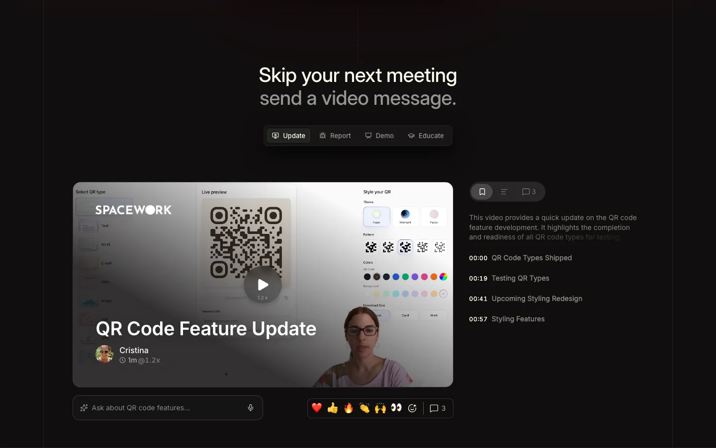
  35. Supercut use cases section: centered headline with Update, Report, Demo, Educate tabs above a video message player with chapter list
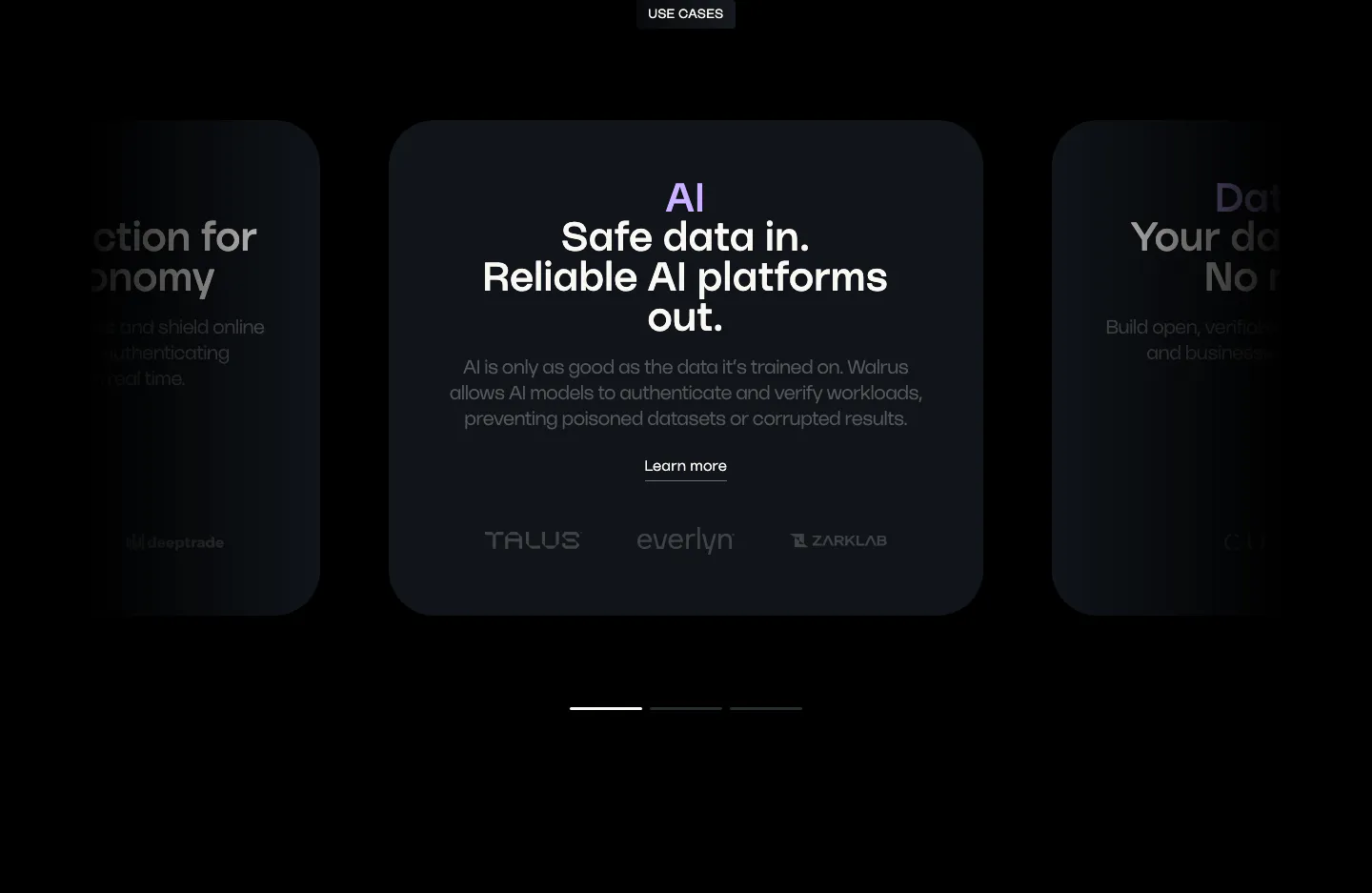
  36. Walrus use cases section: carousel of dark use case cards with a centered AI card, partner logos and pagination bars
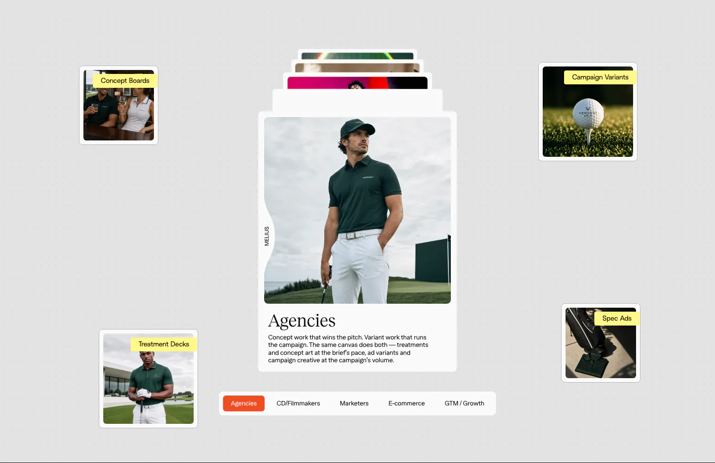
  37. Melius use cases section: stacked card with a golf apparel photo and serif Agencies copy, floating labeled thumbnails, persona tab bar
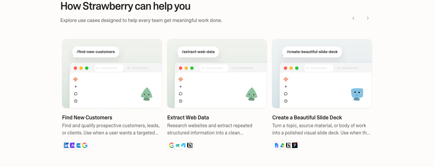
  38. Strawberry use cases section: three use case cards with mini browser mockups, characters and tool icons, with slider arrows
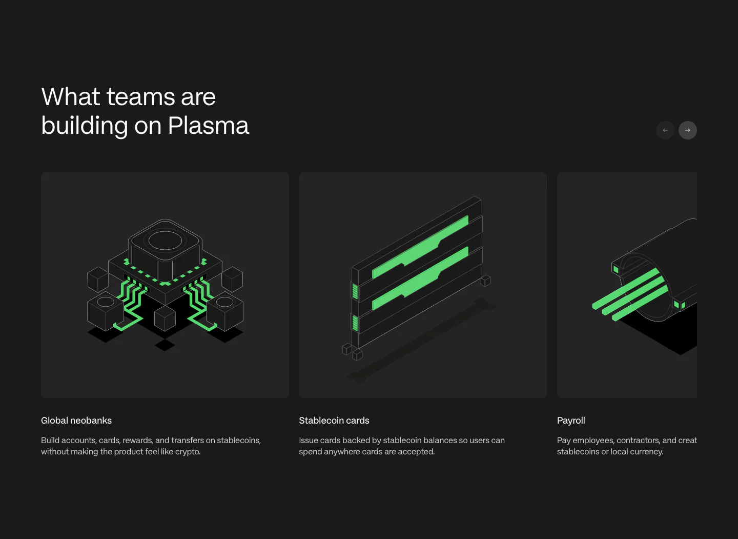
  39. Plasma use cases section: heading with arrow buttons above a carousel of cards with green isometric renders on charcoal
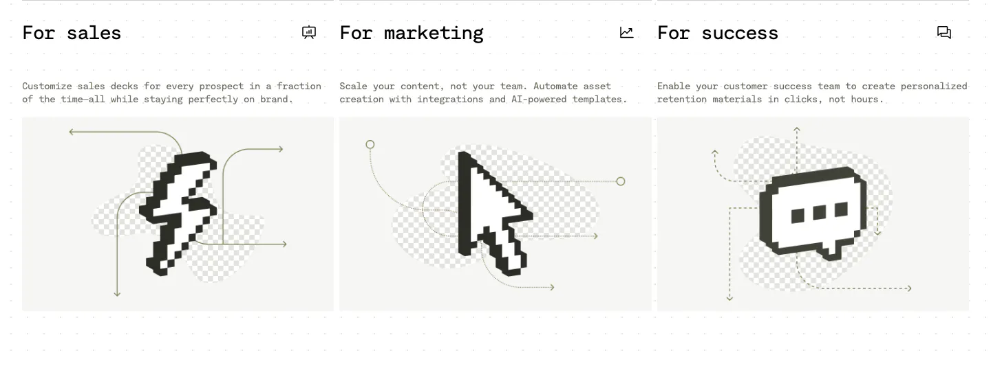
  40. Visual use cases section: three cards for sales, marketing and success with mono titles, short copy and black pixel-art icons on light gray
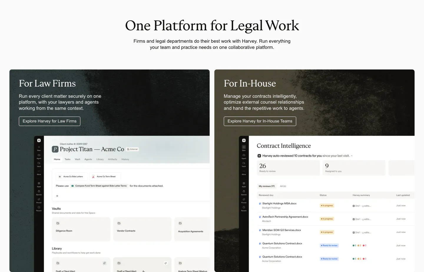
  41. Harvey use cases section: centered serif headline above two dark textured cards for law firms and in-house teams with product UI

Common patterns in use case sections

How to organize a use case section

  1. Name audiences the way they talk

    Use labels visitors would pick for themselves, such as "Finance teams," "Agencies," or "Healthcare," not internal segment names. Keep each label short enough to fit on one line in a tab or card header, and order them by how much business each brings.

  2. Tailor copy to each audience

    Each panel should mention a task, metric, or pain point unique to that group. If you could swap two panels' copy without anyone noticing, the section is not doing its job. One concrete scenario per audience beats a generic list of benefits.

  3. Decide between tabs and cards

    Tabs suit a handful of audiences whose panels share the same structure, since visitors compare them in place. Cards that link out work better when audiences need very different content or there are many of them. Either way, show the most common audience first.
  4. Link each audience to a deeper page

    End every card or tab with a link to a dedicated solution page or a relevant case study. The section then works as navigation for qualified readers, giving each audience a next step without crowding the homepage with detail.
Companies in this collection

All section types
    ↑↓ Navigate ↵ Open

    Section preview

    Website section