Composio website design

Every section we captured from the Composio website, in page order, from the hero section down to the footer. Open any thumbnail to see it full size.

Sections 9

In page order, top to bottom

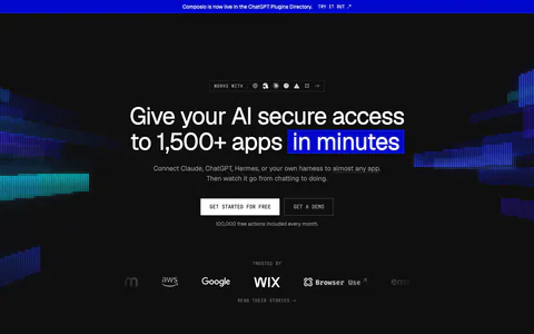
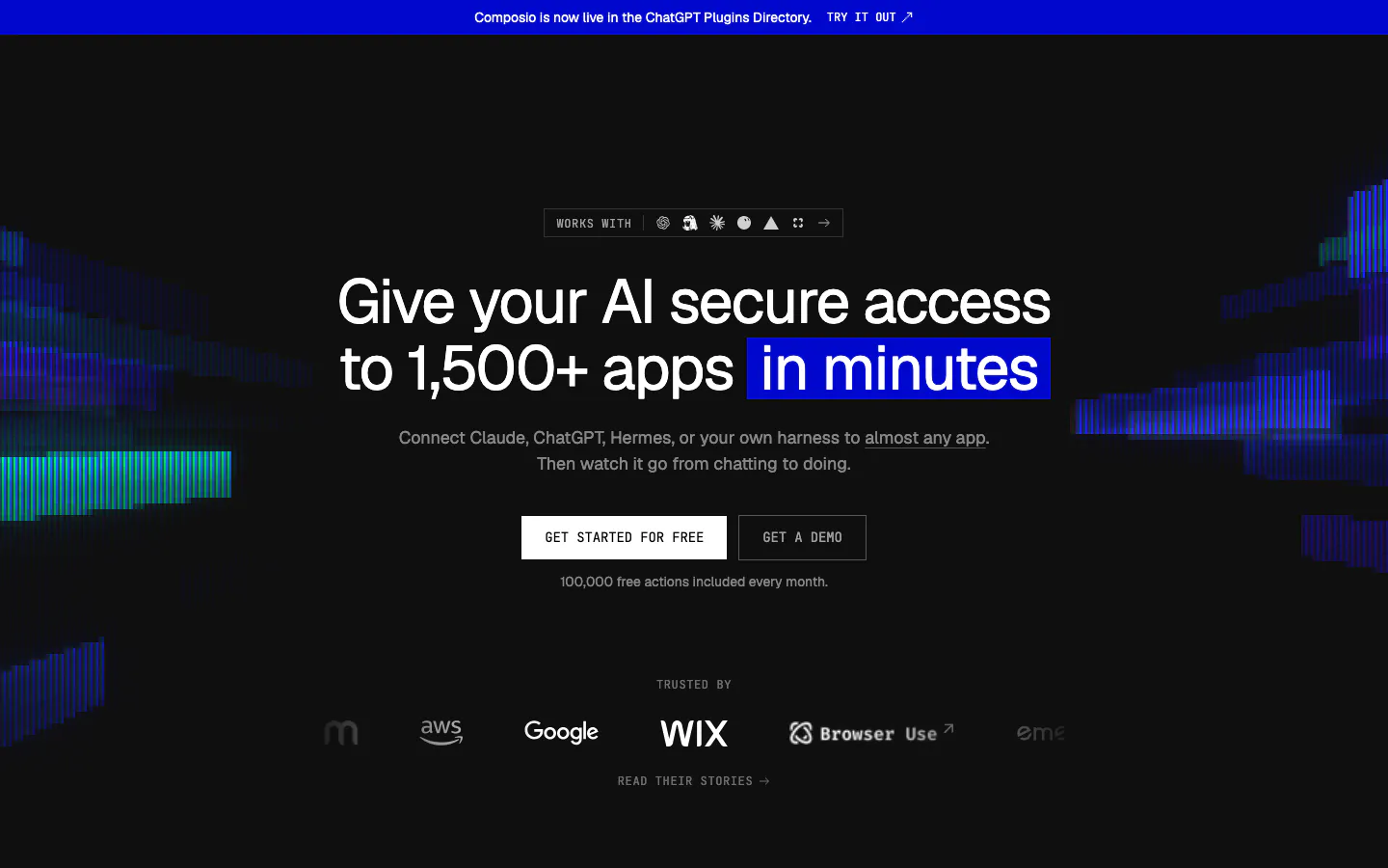
  1. Composio hero section: centered headline with blue highlight, two CTAs and a trusted-by logo row on black with glitchy color bars
    01 Hero

    Give your AI secure access to 1,500+ apps in minutes

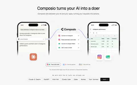
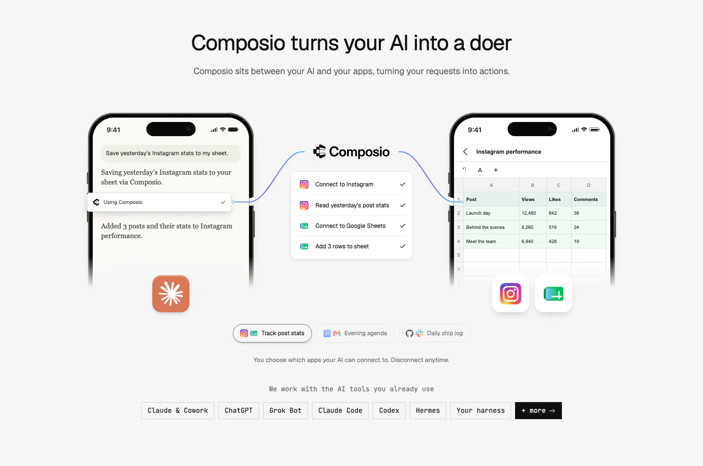
  2. Composio how it works section: two phone mockups linked through a Composio step list, example tabs and a row of AI tool chips

    Composio turns your AI into a doer

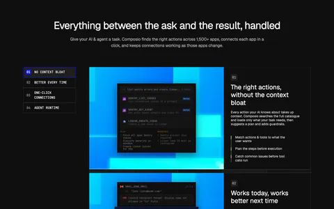
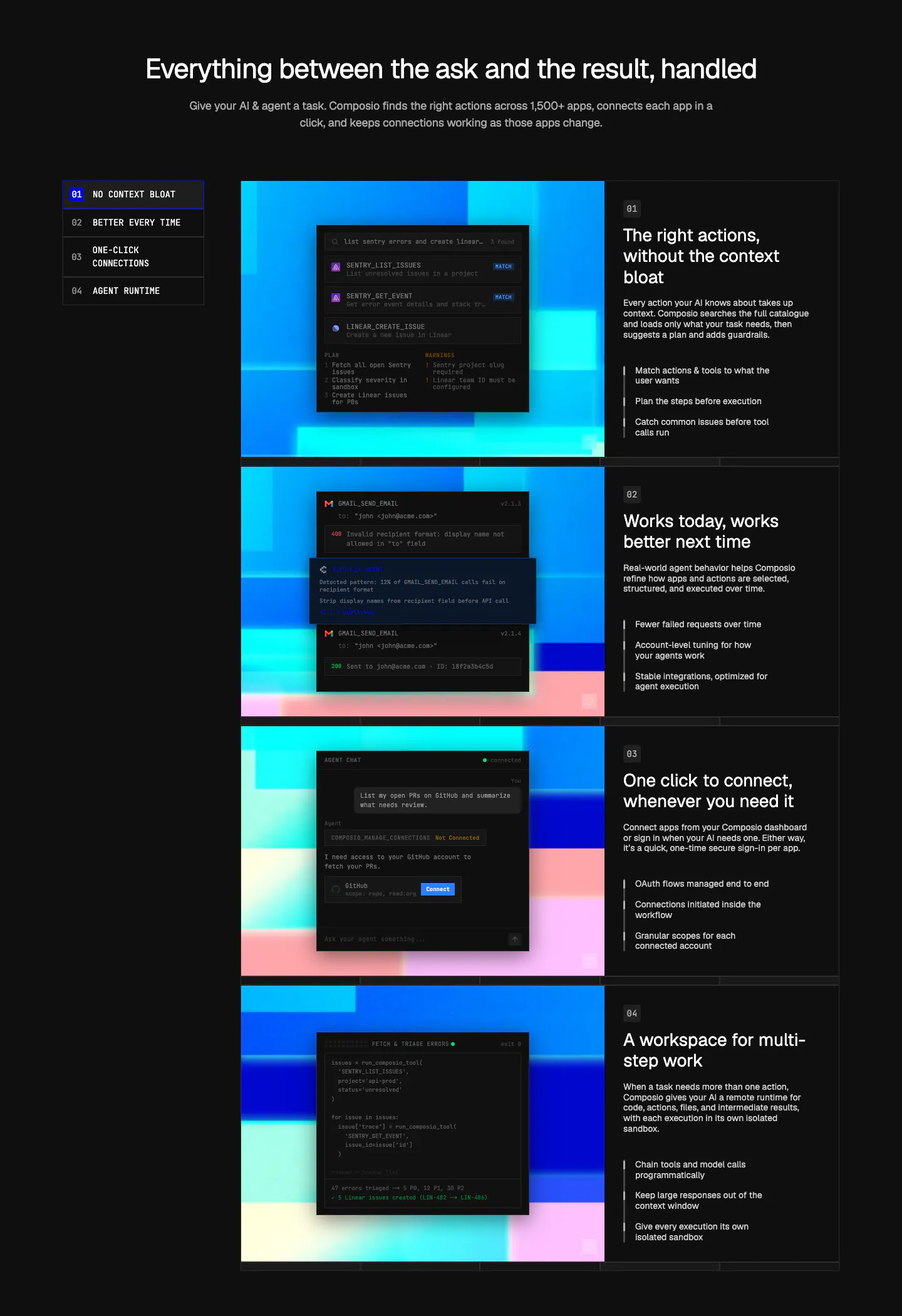
  3. Composio features section: numbered side nav beside four rows of dark UI and code panels on colorful pixel art, each with text

    Everything between the ask and the result, handled

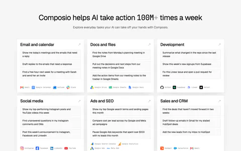
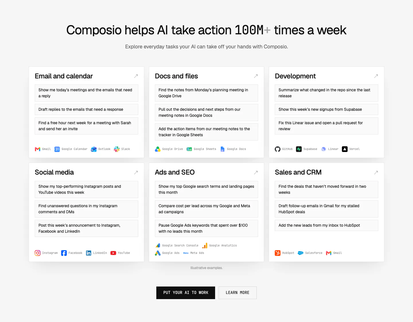
  4. Composio use cases section: centered headline above six white cards of example prompts by category with app names, plus two CTAs

    Composio helps AI take action 100M+ times a week

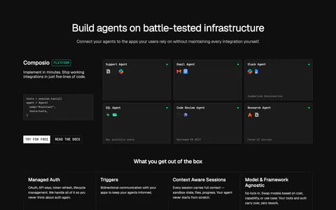
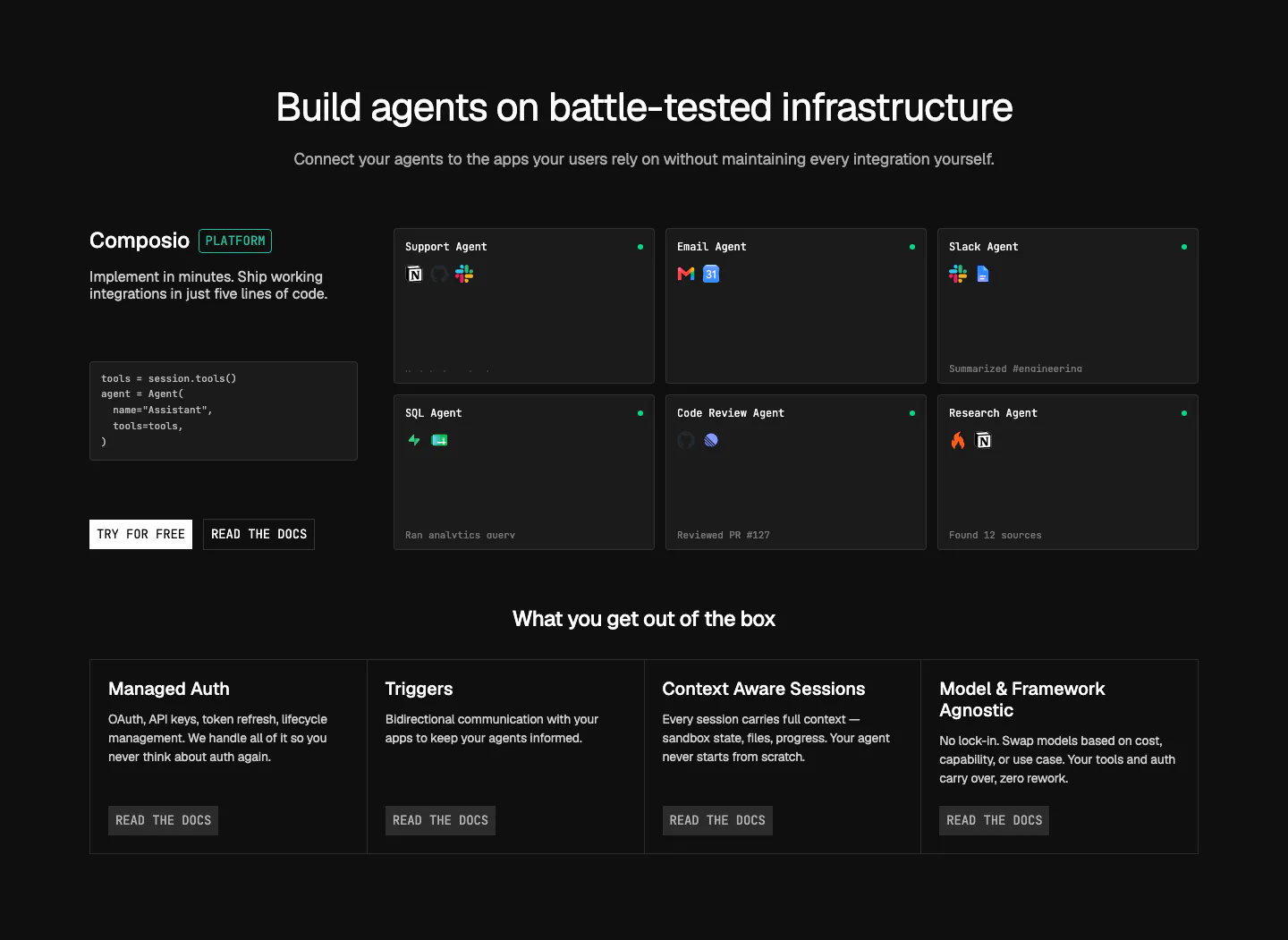
  5. Composio features section: code snippet and CTAs beside a grid of agent cards, then four platform feature columns on near-black

    Build agents on battle-tested infrastructure

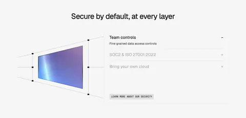
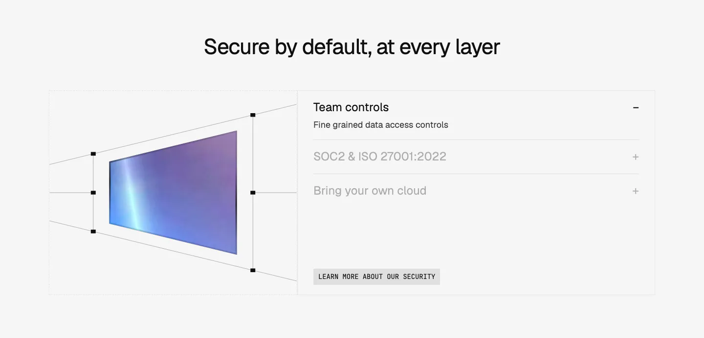
  6. Composio security section: perspective wireframe of a gradient panel at left and an accordion of security topics at right on light gray

    Secure by default, at every layer

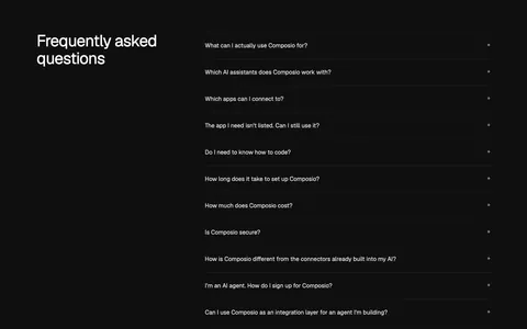
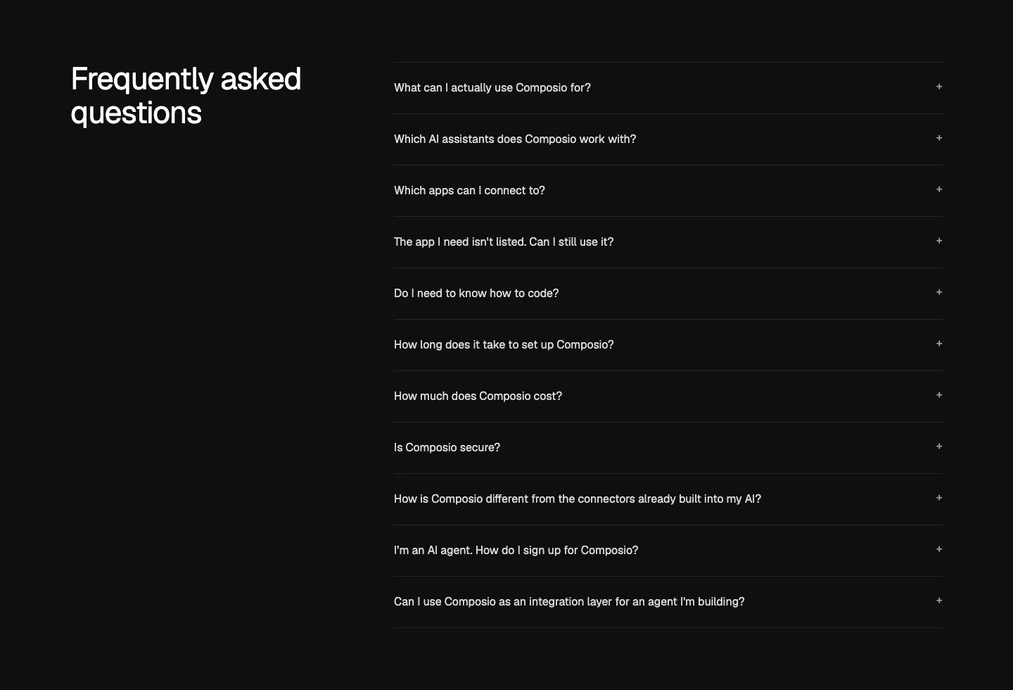
  7. Composio FAQ section: heading at left beside an accordion list of eleven questions with plus icons on near-black
    07 FAQ

    Frequently asked questions

  8. Composio call to action section: single-line headline beside a black Try Composio now button in a slim light gray band

    Connect your AI to 1,500+ apps for free

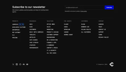
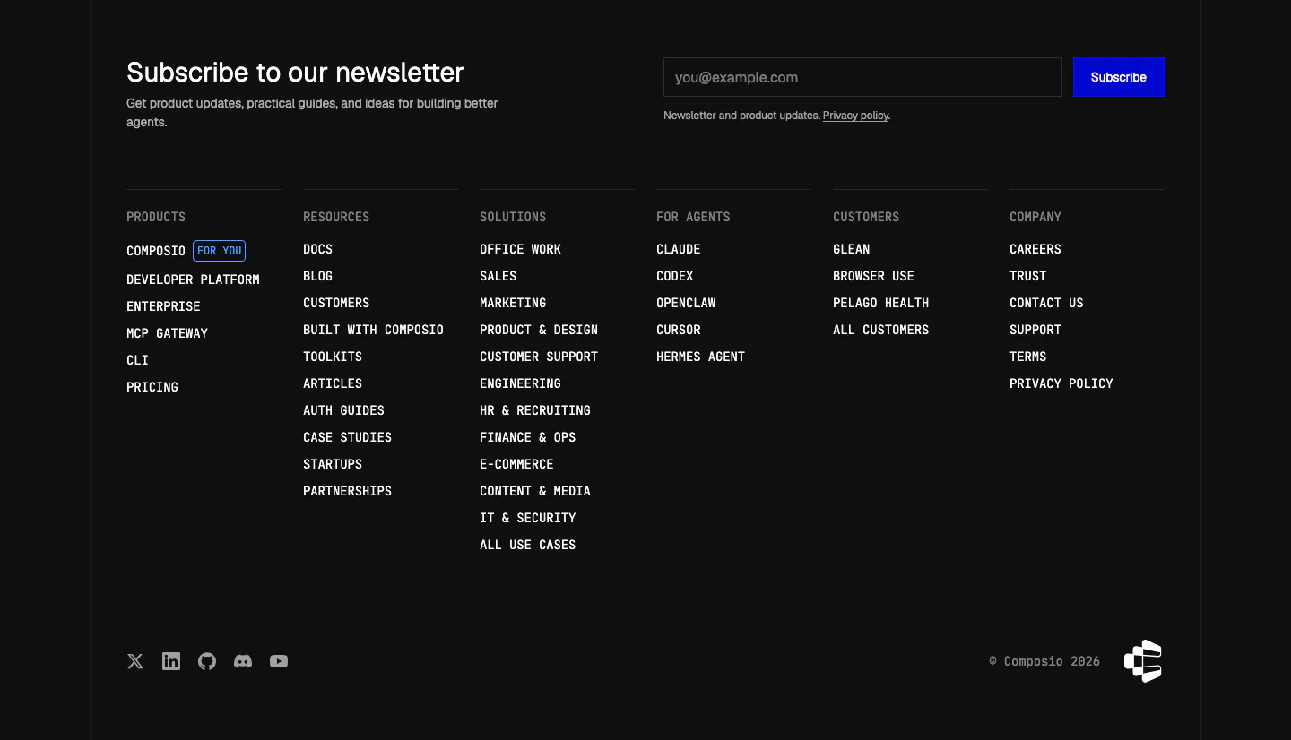
  9. Composio footer section: newsletter heading with email field and blue subscribe button above six monospace link columns on black
    09 Footer

    Subscribe to our newsletter

Similar companies

All companies
    ↑↓ Navigate ↵ Open

    Section preview

    Website section