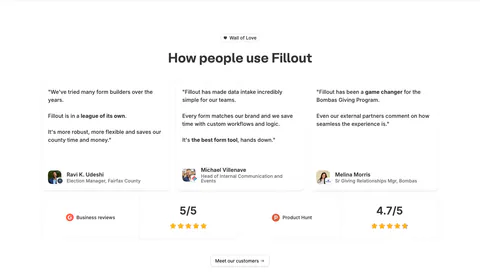
Logo Cloud Examples
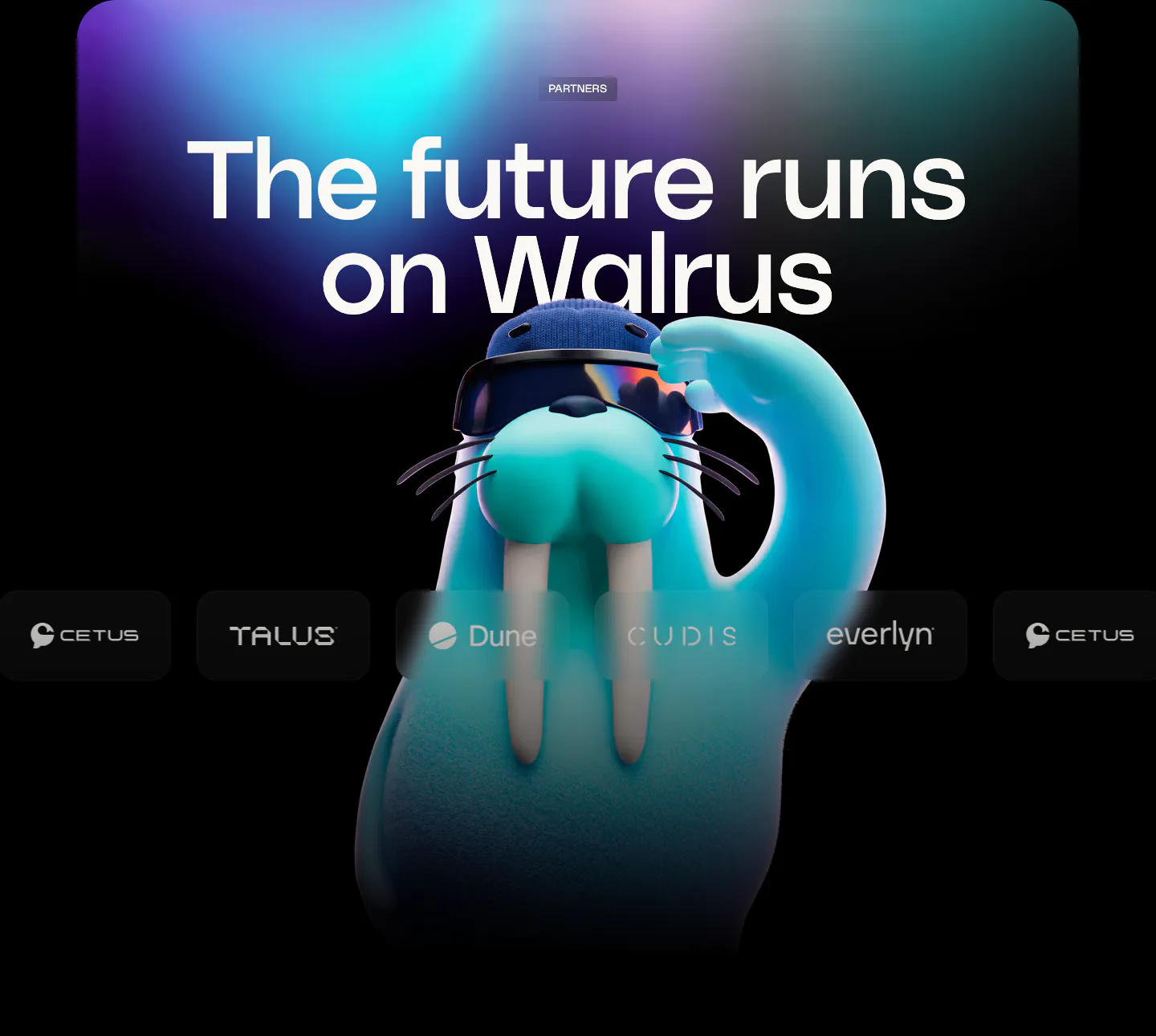
A logo cloud borrows credibility from the companies that already use, fund, or partner with a product. It usually sits just below the hero, and its job is quick reassurance rather than persuasion. That calls for tidy, recognizable, evenly weighted marks, not a jumble of colors and sizes. The logo cloud examples collected here show rows, grids, and marquees that stay out of the way.



















































Common patterns in logo clouds
- Minimal
- Monochrome
- Centered
- Dark mode
- Carousel
- Split layout
- Serif type
How to design a logo cloud
-
Balance logos by visual weight
Logos vary widely in shape, so matching their widths or heights rarely looks even. Adjust each one by eye until they feel equally heavy, and place them in fixed-size containers so the row keeps a steady rhythm.
-
Use a single muted color
Convert every logo to one grayscale or neutral tone and lower the opacity slightly. This stops the strip from competing with the main call to action and hides clashing brand colors. Check that the logos keep enough contrast in dark mode too.
-
Caption the row honestly
A line like "Used by product teams at" gives a row of logos context. Keep it small and aligned with the logos. An inflated claim above a modest row does more harm than no label at all.
-
Handle logo marquees with care
A scrolling row adds motion near the top of the page. Keep the speed slow, pause on hover, and show a static grid when the visitor has reduced motion turned on. Duplicate the set cleanly so the loop has no visible jump.