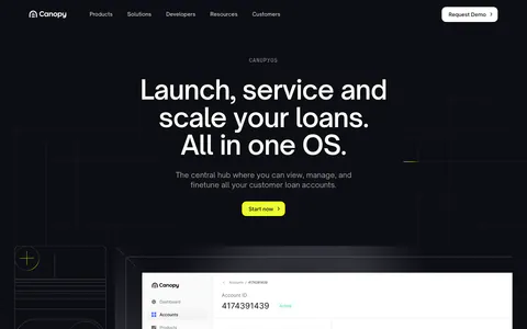
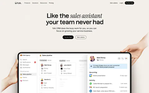
Customer Support Website Design Examples

Support software is judged on two outcomes: faster answers for customers and less strain on the team. Buyers want to see the agent workspace, how automation hands off to people, and what happens to quality as volume grows. Clear customer support website design shows real conversations, makes resolution and satisfaction metrics concrete, and is honest about where AI helps and where a human still steps in.
150 sections

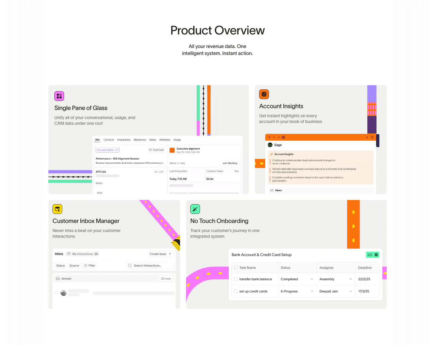
  1. Wavelength features section: centered Product Overview headline above a four-tile bento of UI snippets with colorful transit-line accents
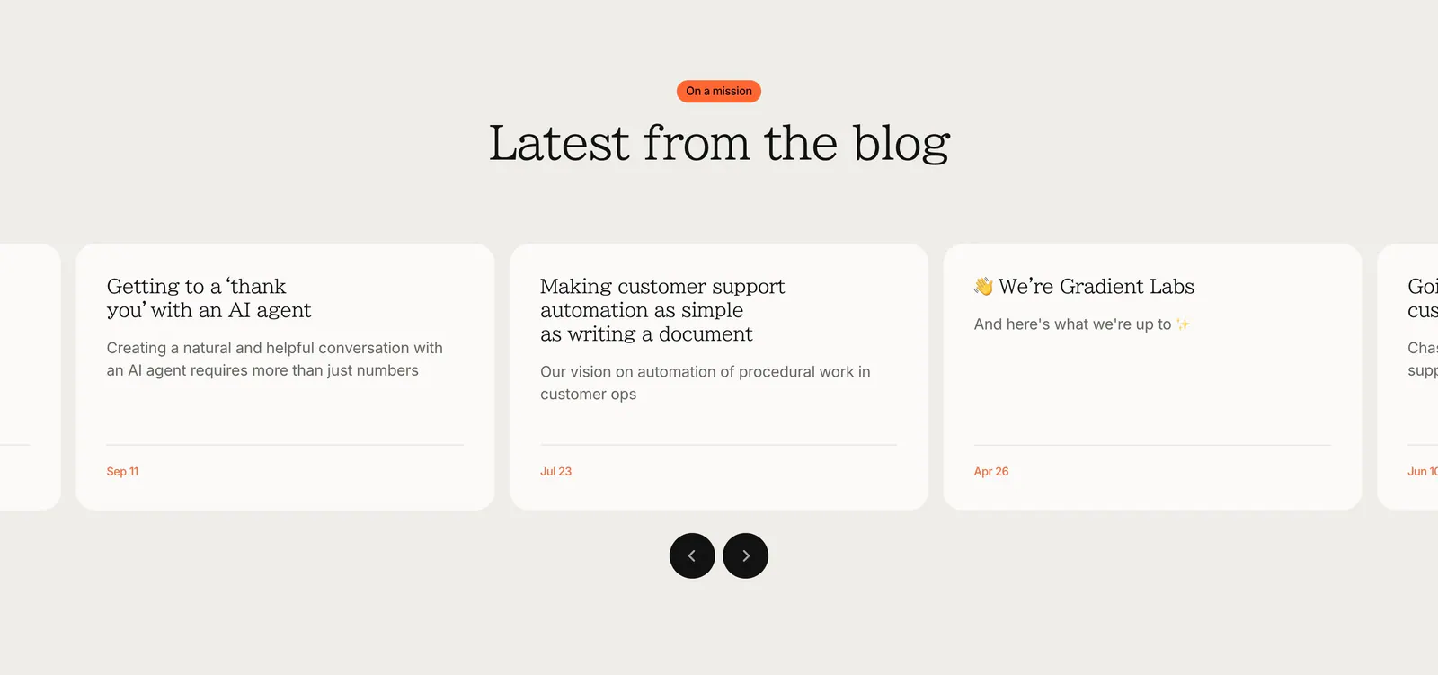
  2. Gradient Labs blog & resources section: centered serif heading above a carousel of off-white article cards with round arrow buttons
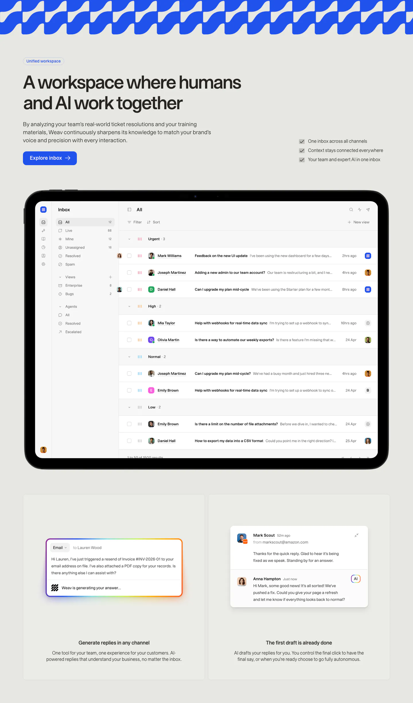
  3. Weav features section: headline, button and checklist above a tablet showing a support inbox, with two cards for AI drafted replies below
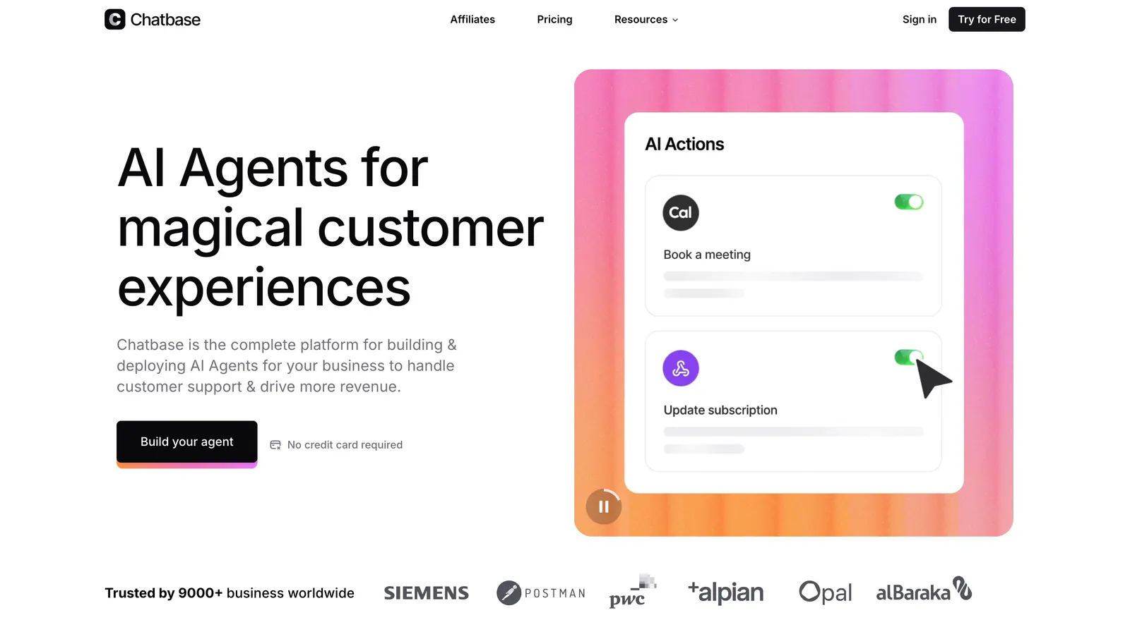
  4. Chatbase hero section: left headline and CTA beside an AI Actions UI card on a pink-orange gradient panel, customer logo row below
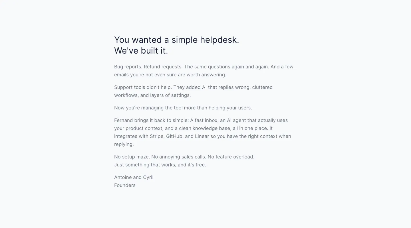
  5. Fernand about & mission section: founders' letter in a narrow left-aligned text column on a pale gray background
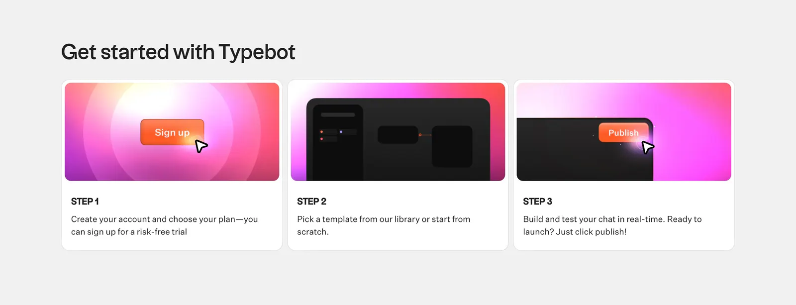
  6. Typebot how it works section: headline above three numbered step cards with pink-orange gradient UI graphics on a light gray background
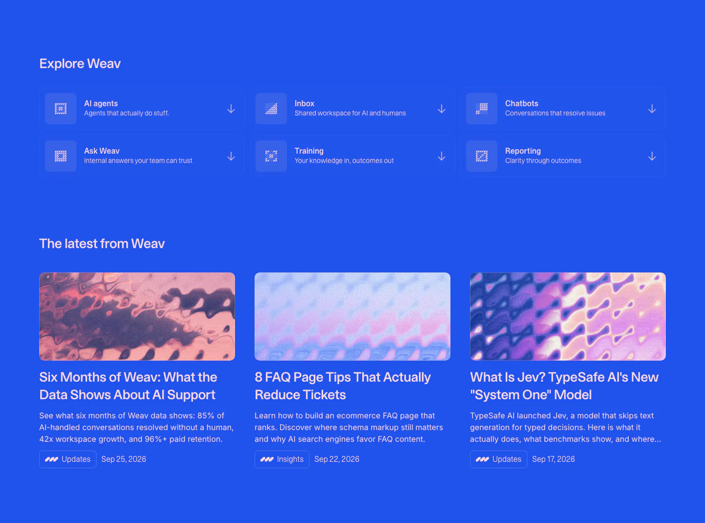
  7. Weav blog & resources section: blue background with a 3x2 grid of product links above three article cards with abstract thumbnails
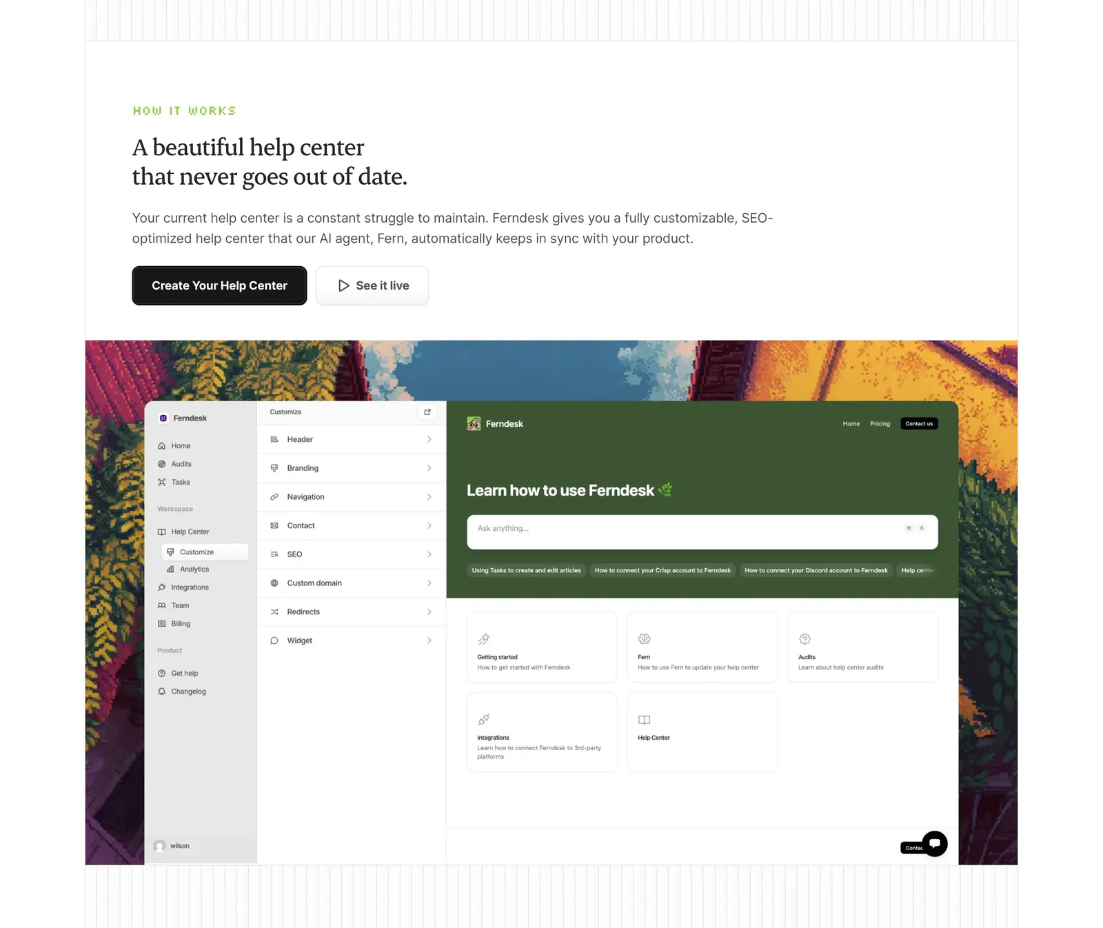
  8. Ferndesk how it works section: serif headline and two buttons above a help center editor screenshot framed by pixel-art scenery
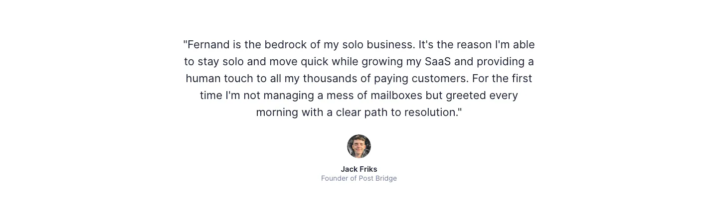
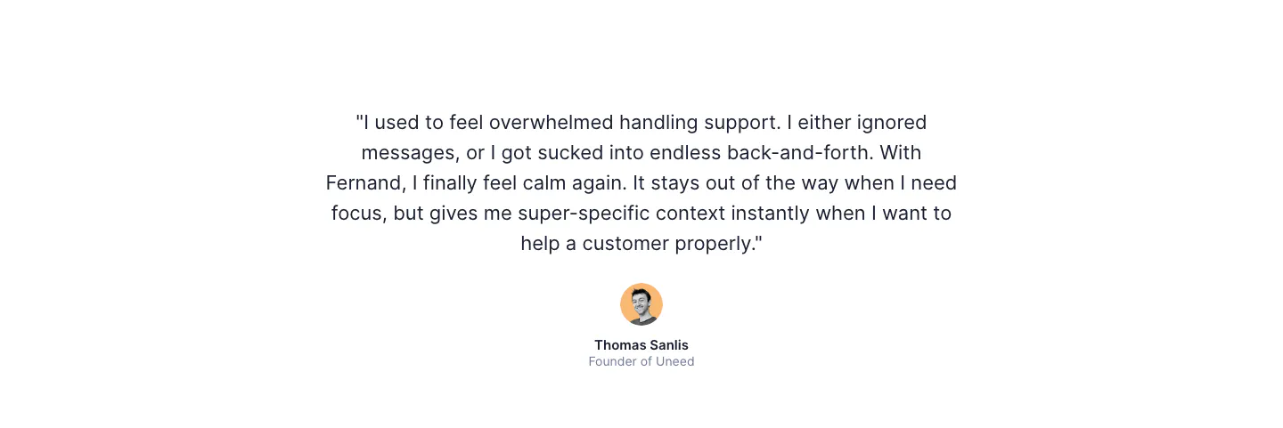
  9. Fernand testimonials section: single centered customer quote with a round avatar, name and title on white
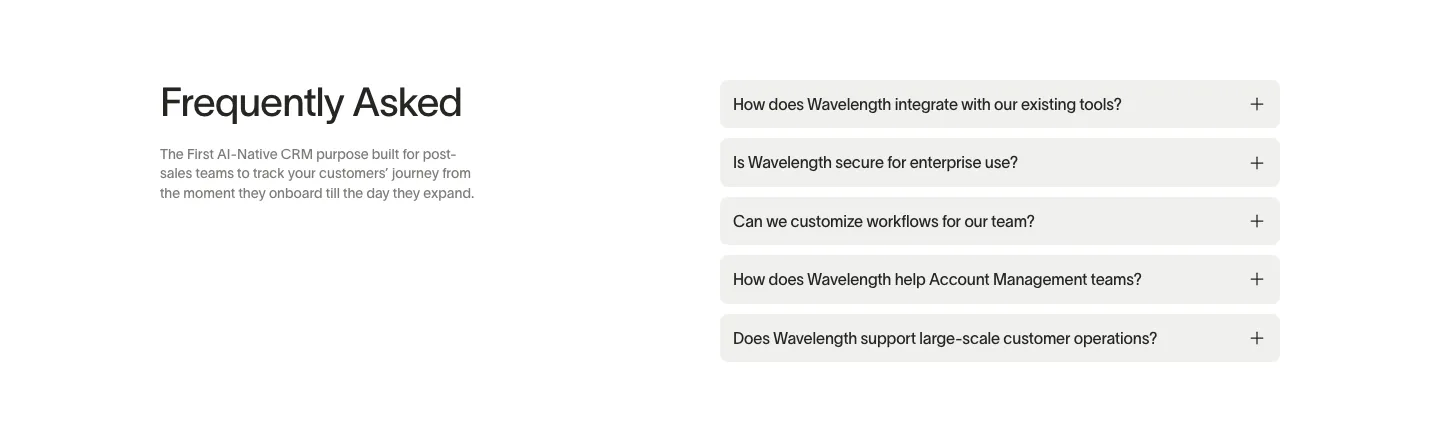
  10. Wavelength FAQ section: headline and short description at left beside a stack of five light gray accordion questions on white
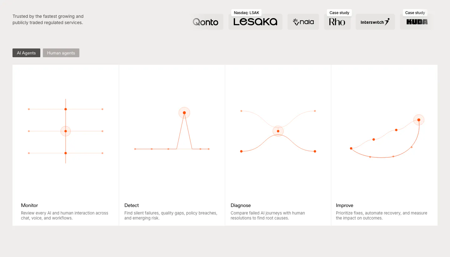
  11. Rulebase features section: customer logo row above an AI/human agents toggle and four equal cards with orange line diagrams
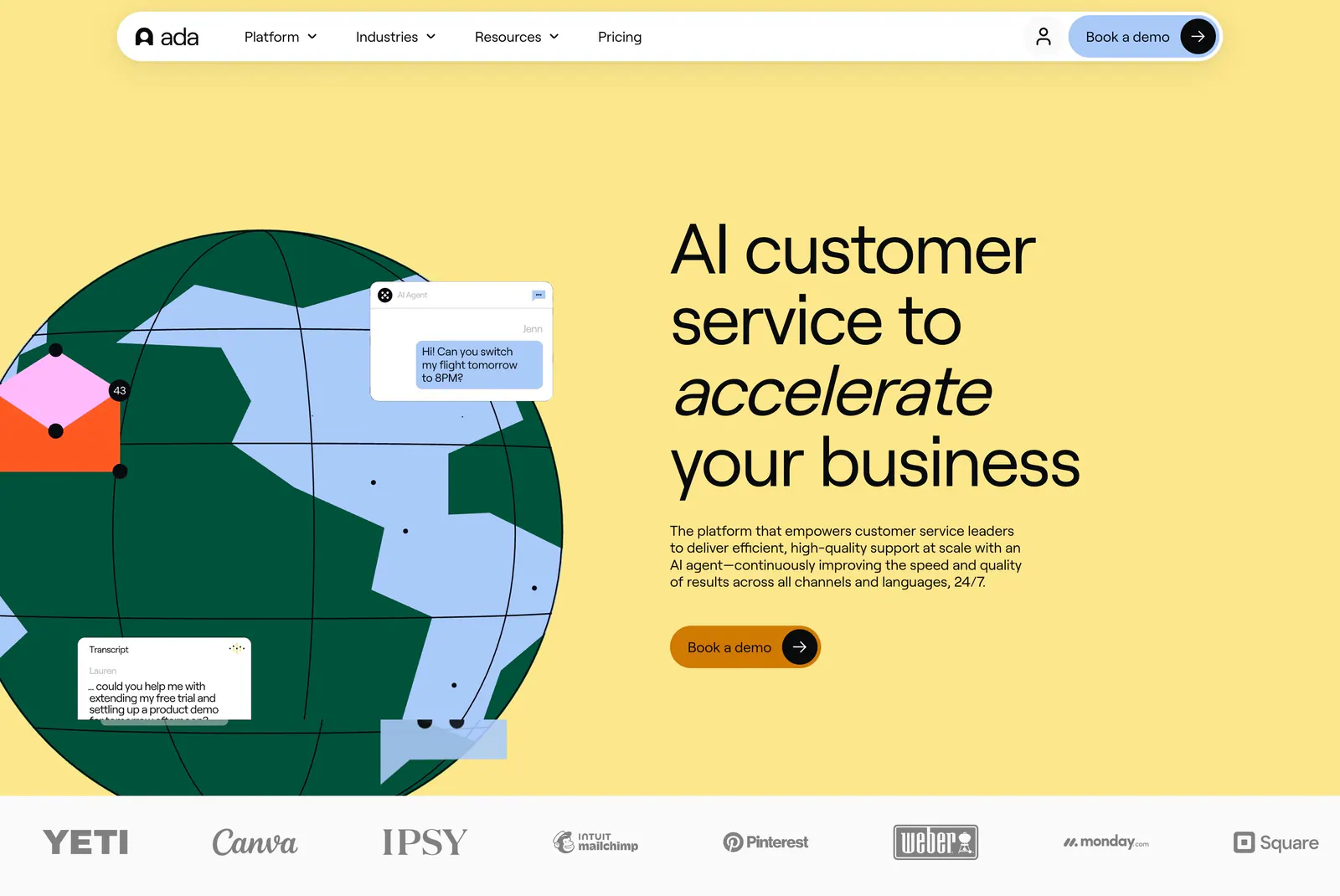
  12. Ada hero section: illustrated globe with chat bubbles beside a large headline on yellow, with a customer logo strip below
  13. DevRev logo cloud section: short headline on the left beside a two-row grid of eight grayscale customer logos separated by thin lines
  14. Wavelength logo cloud section: small centered caption above a row of grayscale logos including Pave, Render and Mintlify on a light gray band
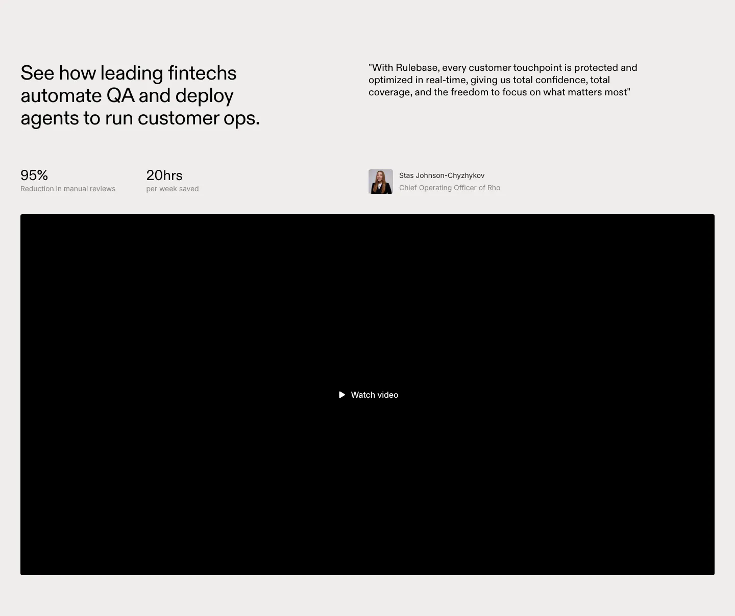
  15. Rulebase testimonials section: headline with two stats beside a customer quote and avatar, above a large black video player
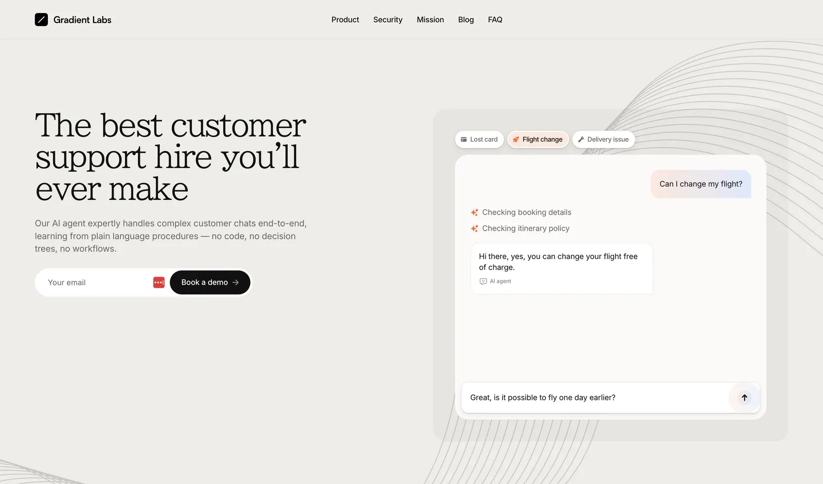
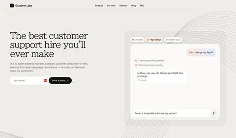
  16. Gradient Labs hero section: serif headline, copy and email field on the left with a support chat mockup on the right on beige
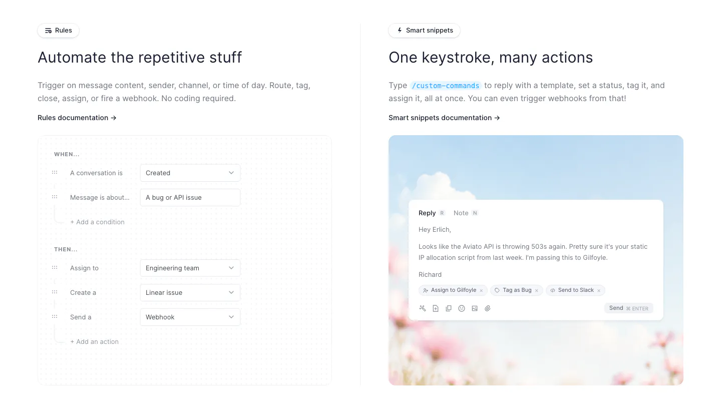
  17. Fernand features section: two columns showing a rules builder form UI and a reply composer on a sky and flower photo
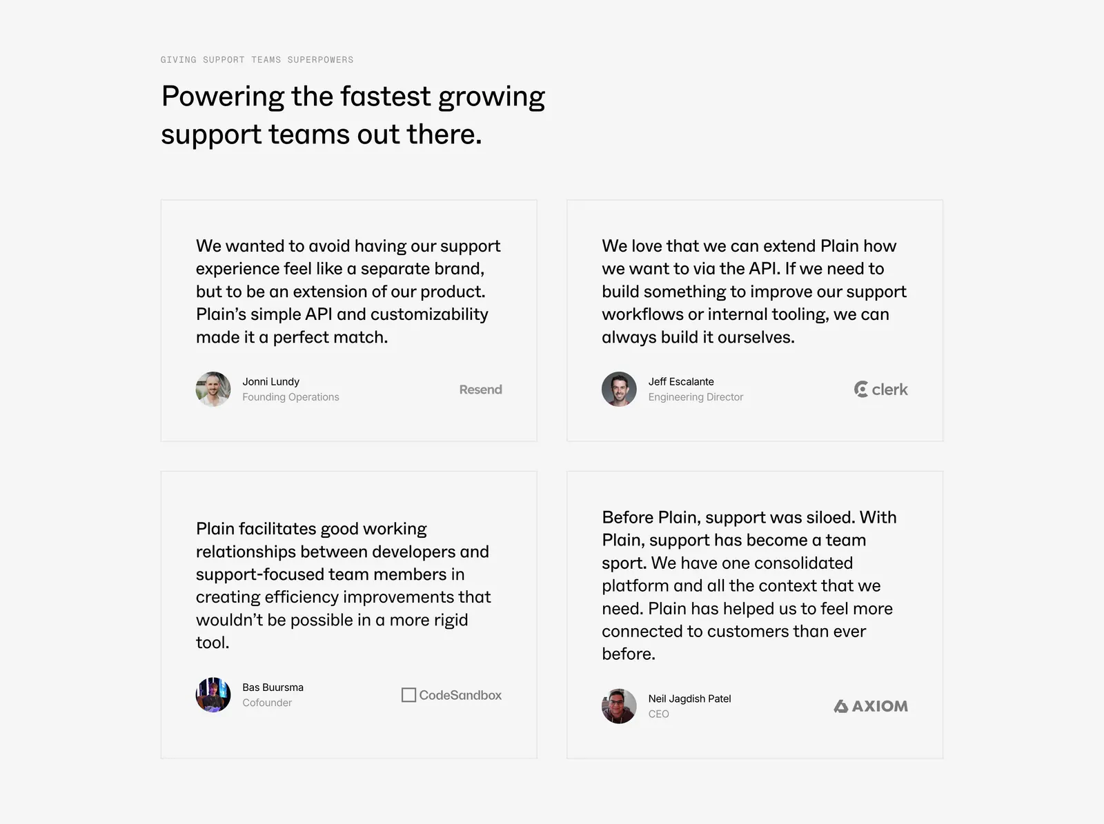
  18. Plain testimonials section: left-aligned headline above a 2x2 grid of bordered quote cards with avatars and company logos on light gray
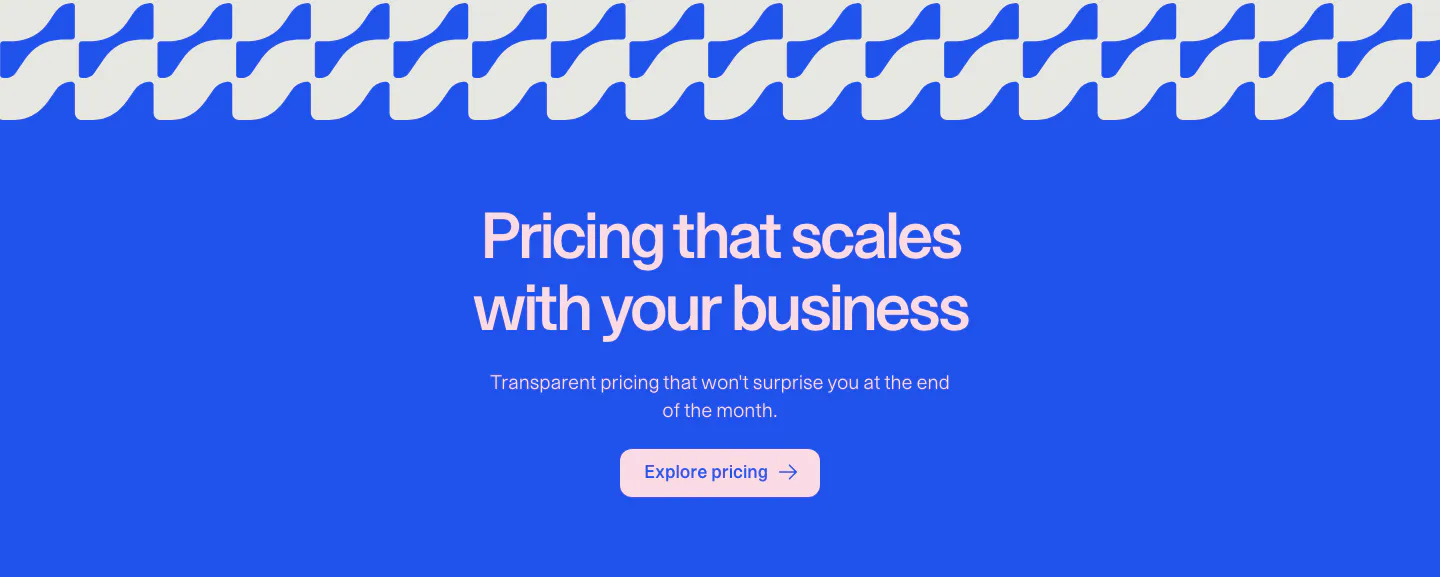
  19. Weav call to action section: centered headline, copy and pink button on a bright blue background under a wave pattern strip
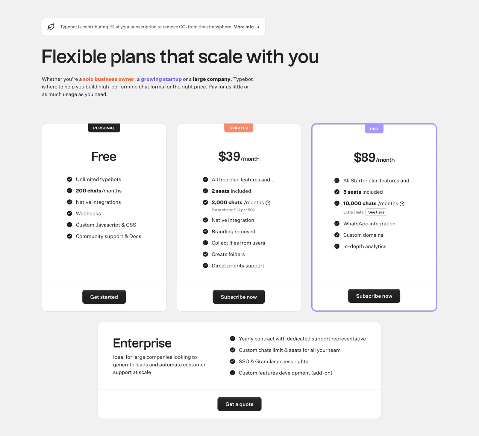
  20. Typebot pricing section: left-aligned headline above three plan cards with check lists and a wide enterprise card on light gray
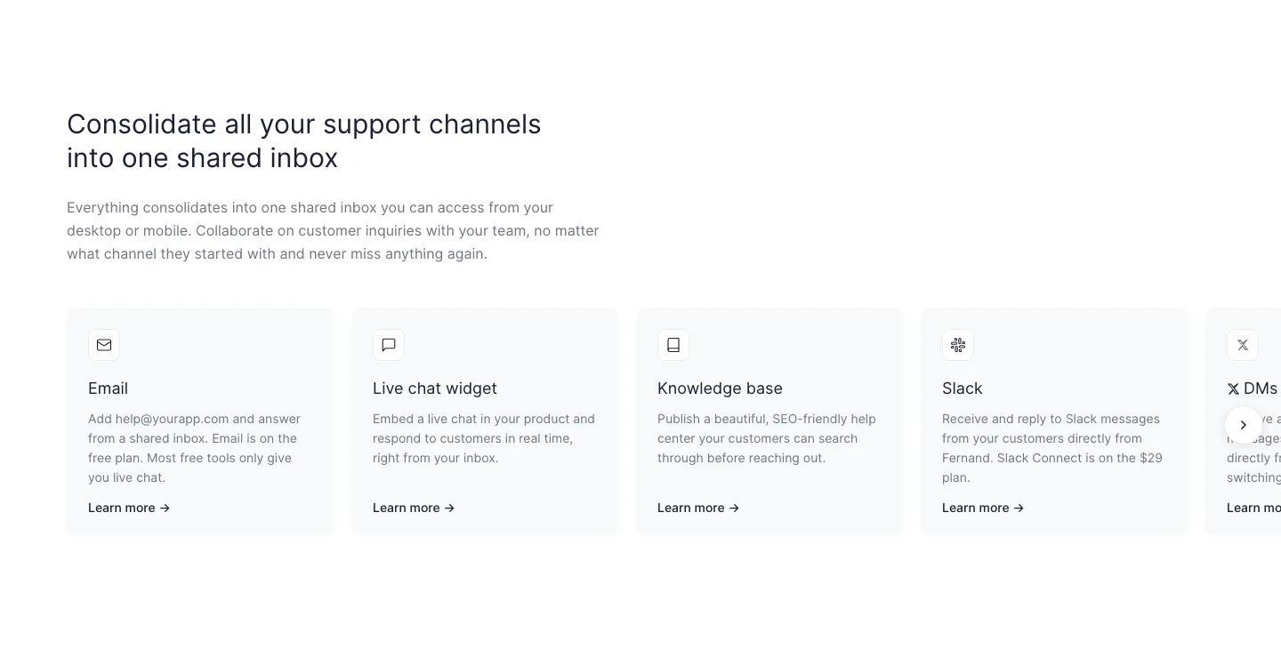
  21. Fernand features section: left-aligned headline above a row of support channel cards cut off at the right edge with a next arrow
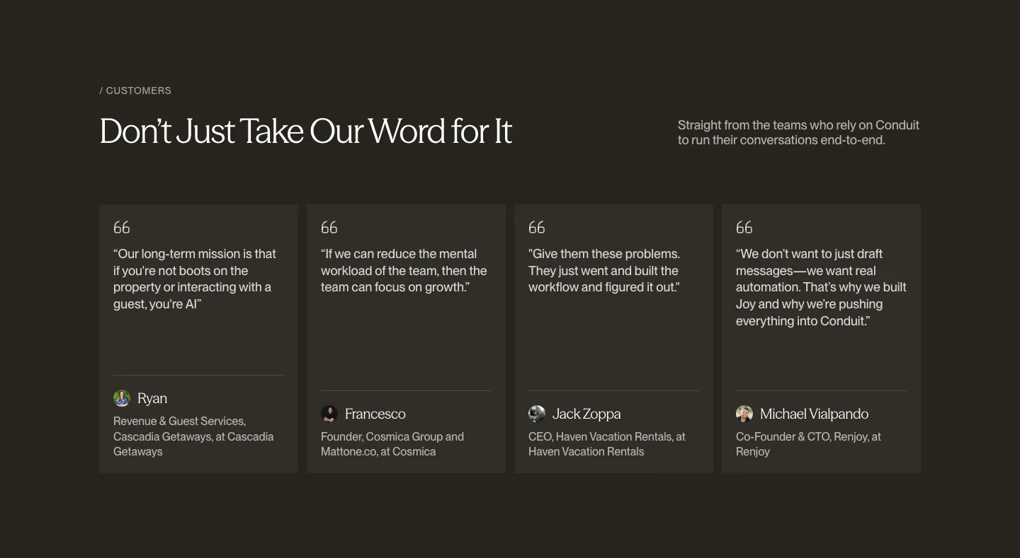
  22. Conduit testimonials section: serif headline above four quote cards with avatars on a dark brown background
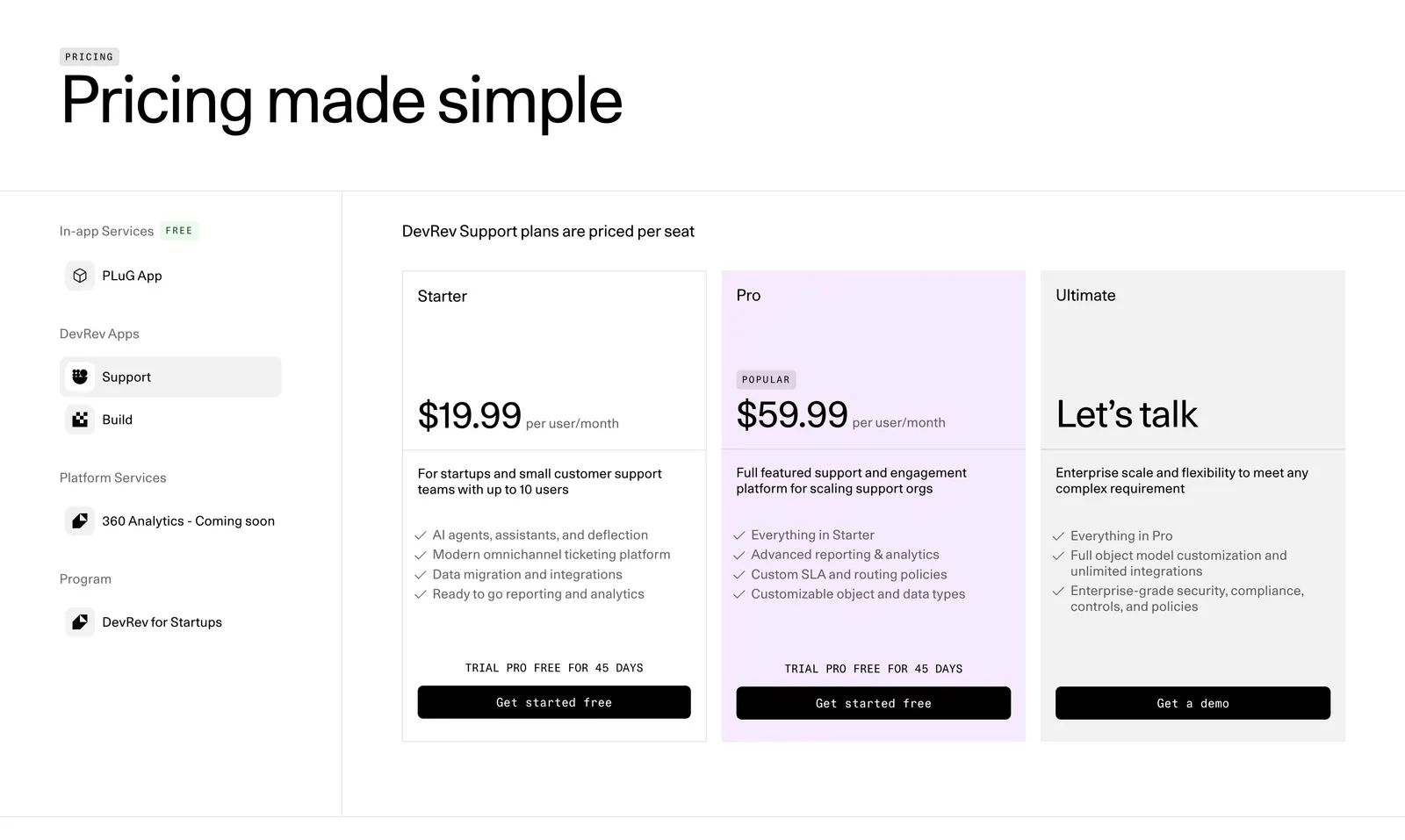
  23. DevRev pricing section: large headline, a left sidebar of product apps and three plan cards with the Pro tier highlighted in lavender
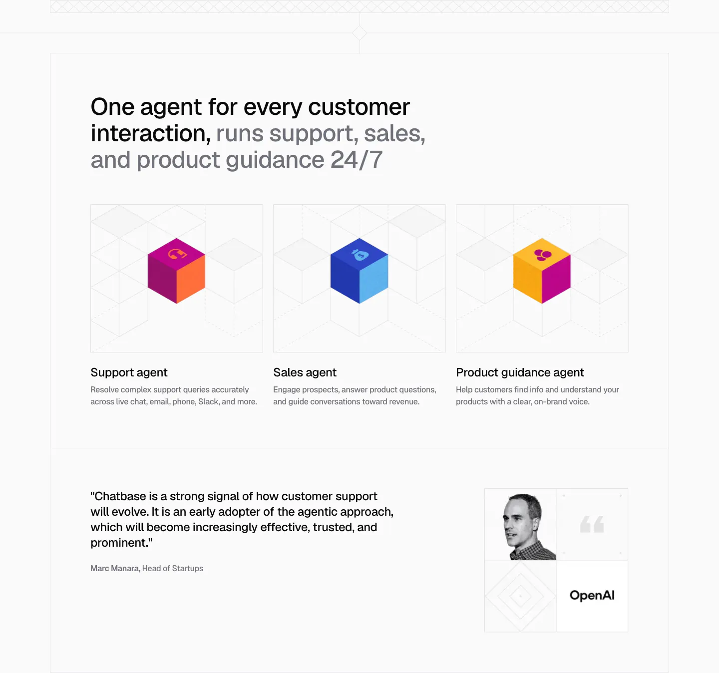
  24. Chatbase use cases section: three agent cards with colorful isometric cubes on line grids, plus an OpenAI quote with portrait below
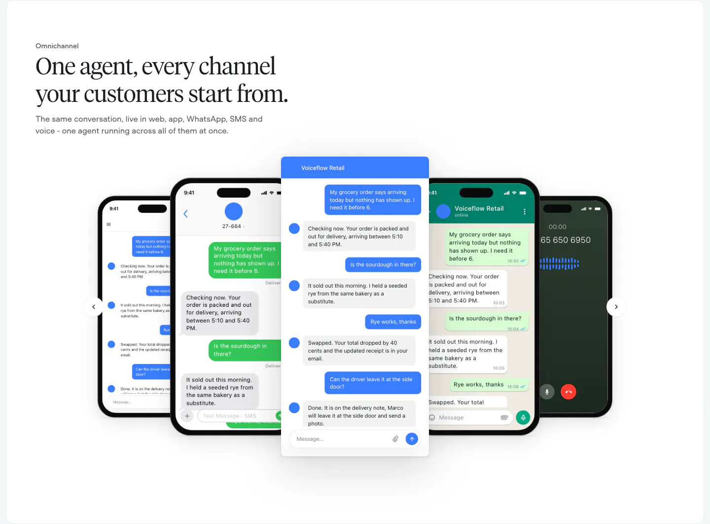
  25. Voiceflow features section: left-aligned serif headline above a carousel of phone and chat UI mockups with arrow controls
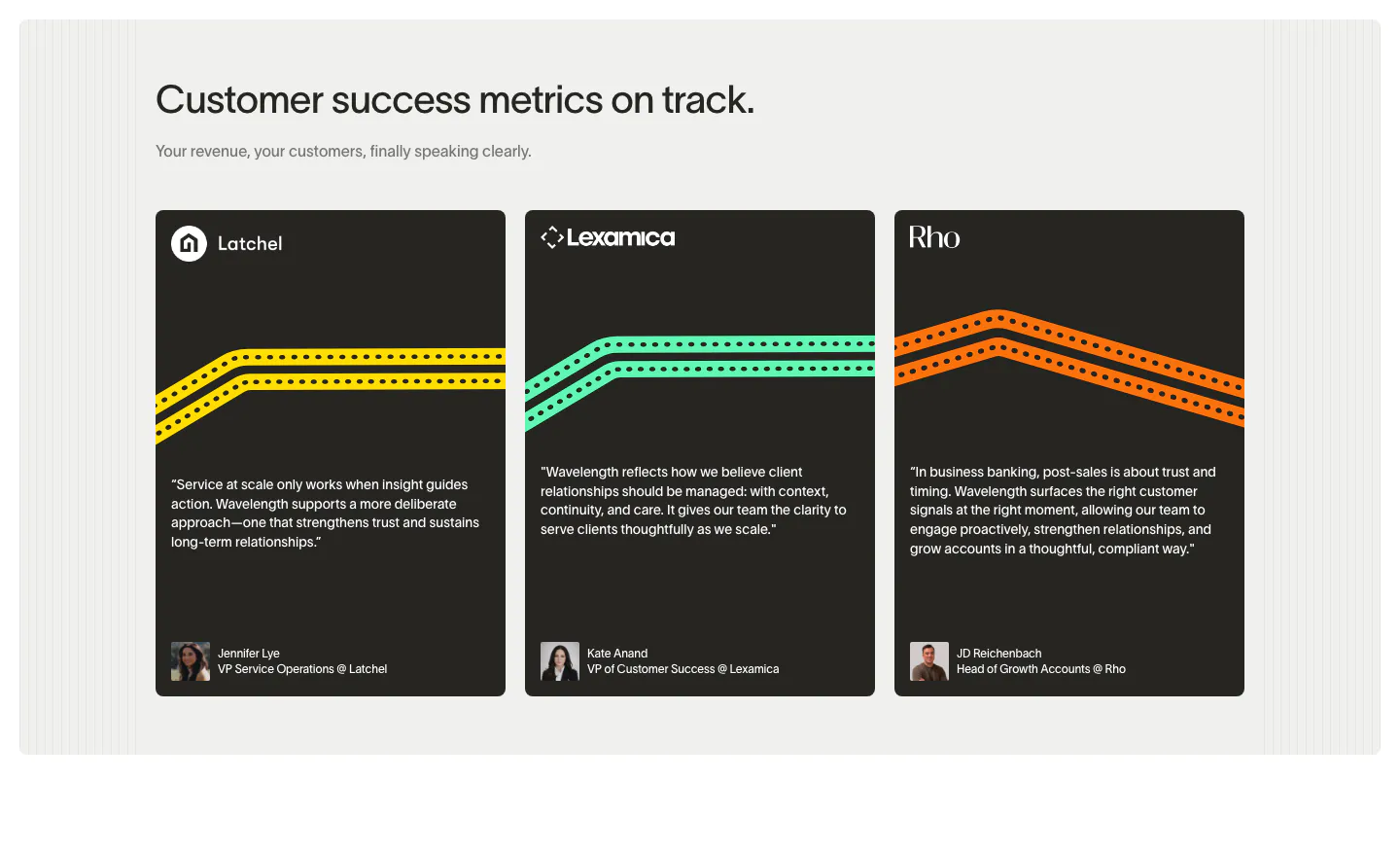
  26. Wavelength testimonials section: left headline above three dark quote cards from Latchel, Lexamica and Rho with colored track lines and avatars
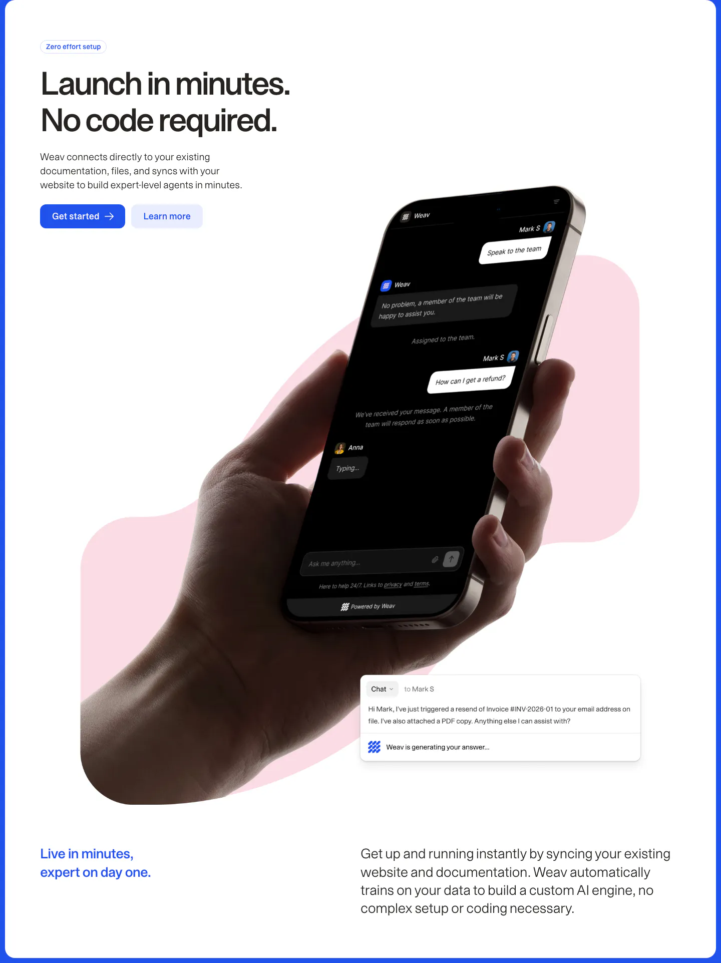
  27. Weav features section: headline and two buttons above a hand holding a phone with a dark chat UI over a pink blob, plus a chat reply card
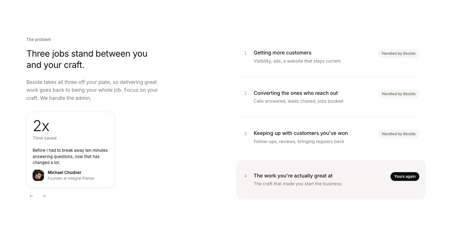
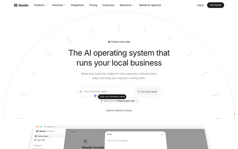
  28. Beside value proposition section: headline and testimonial stat card on the left, four numbered job rows with status pills on the right
  29. Chatbase logo cloud section: bordered three-row grid of gray customer logos on a light background
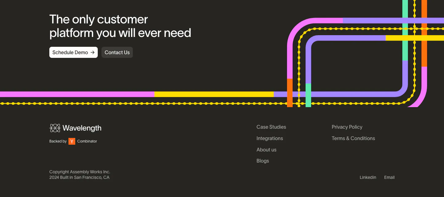
  30. Wavelength footer section: closing headline with two buttons over colorful transit lines, then logo, link columns and copyright on charcoal
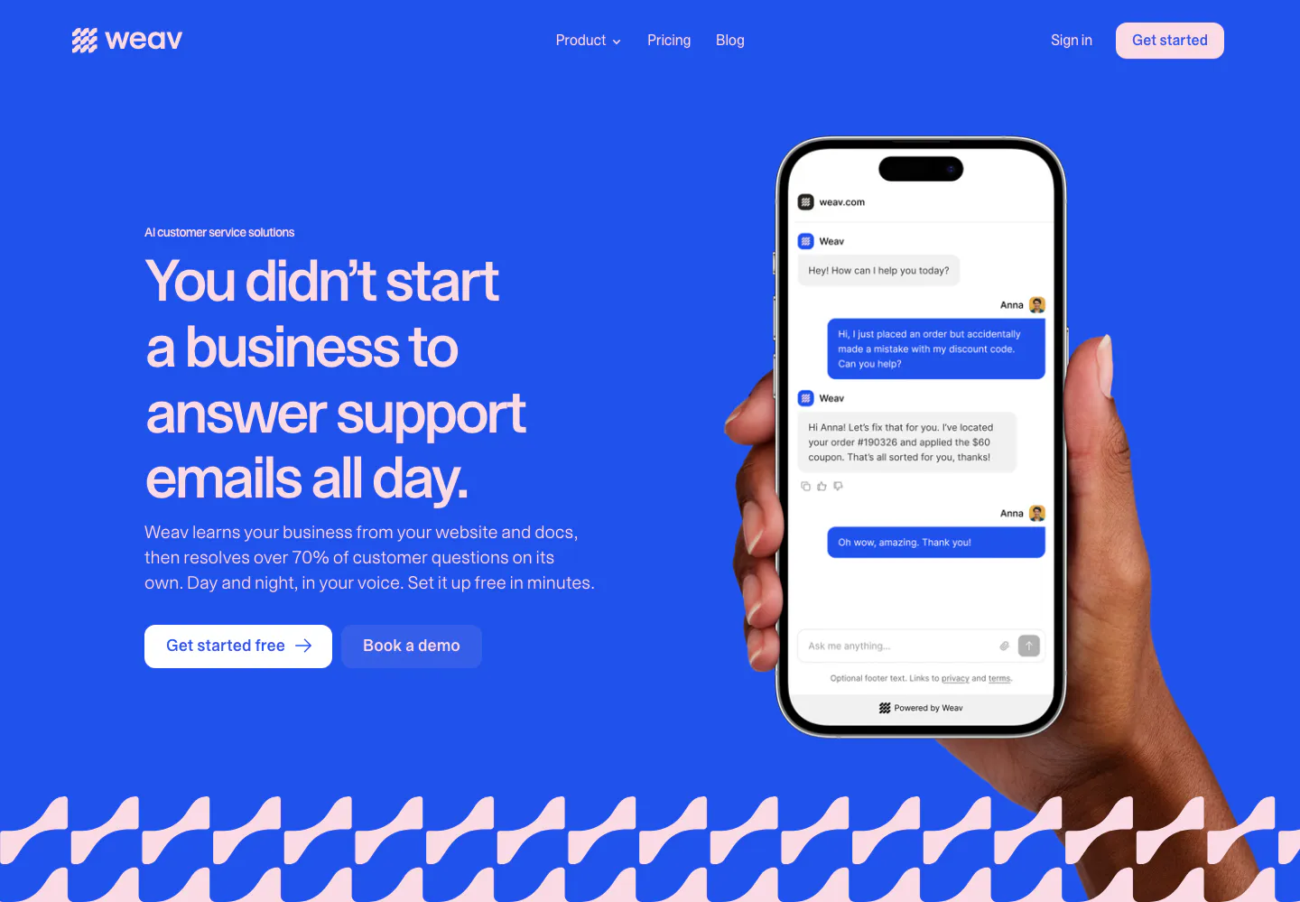
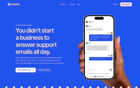
  31. Weav hero section: headline and two buttons on a bright blue background beside a hand holding a phone with a support chat, wave pattern below
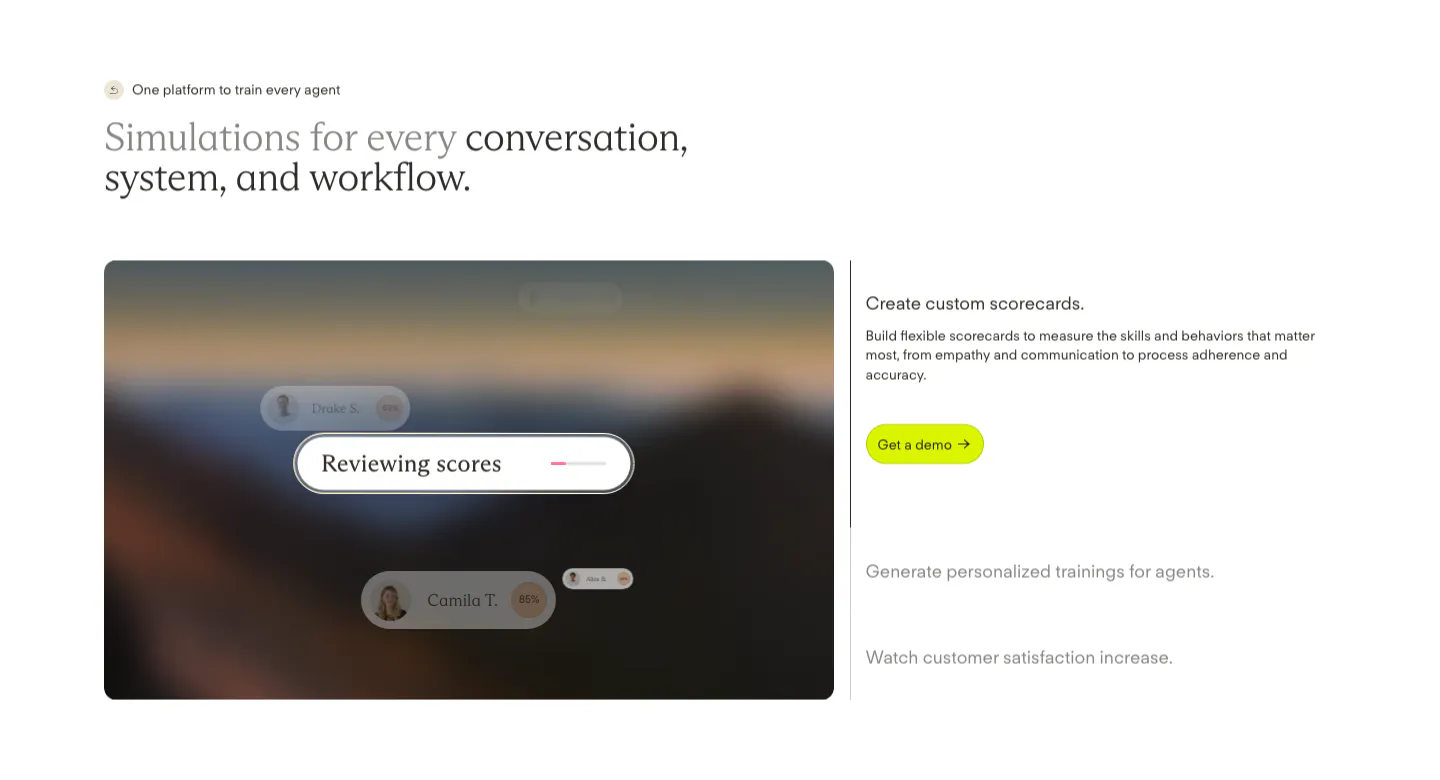
  32. Solidroad features section: two-tone serif headline above a blurred landscape card with score UI chips beside an expandable feature list
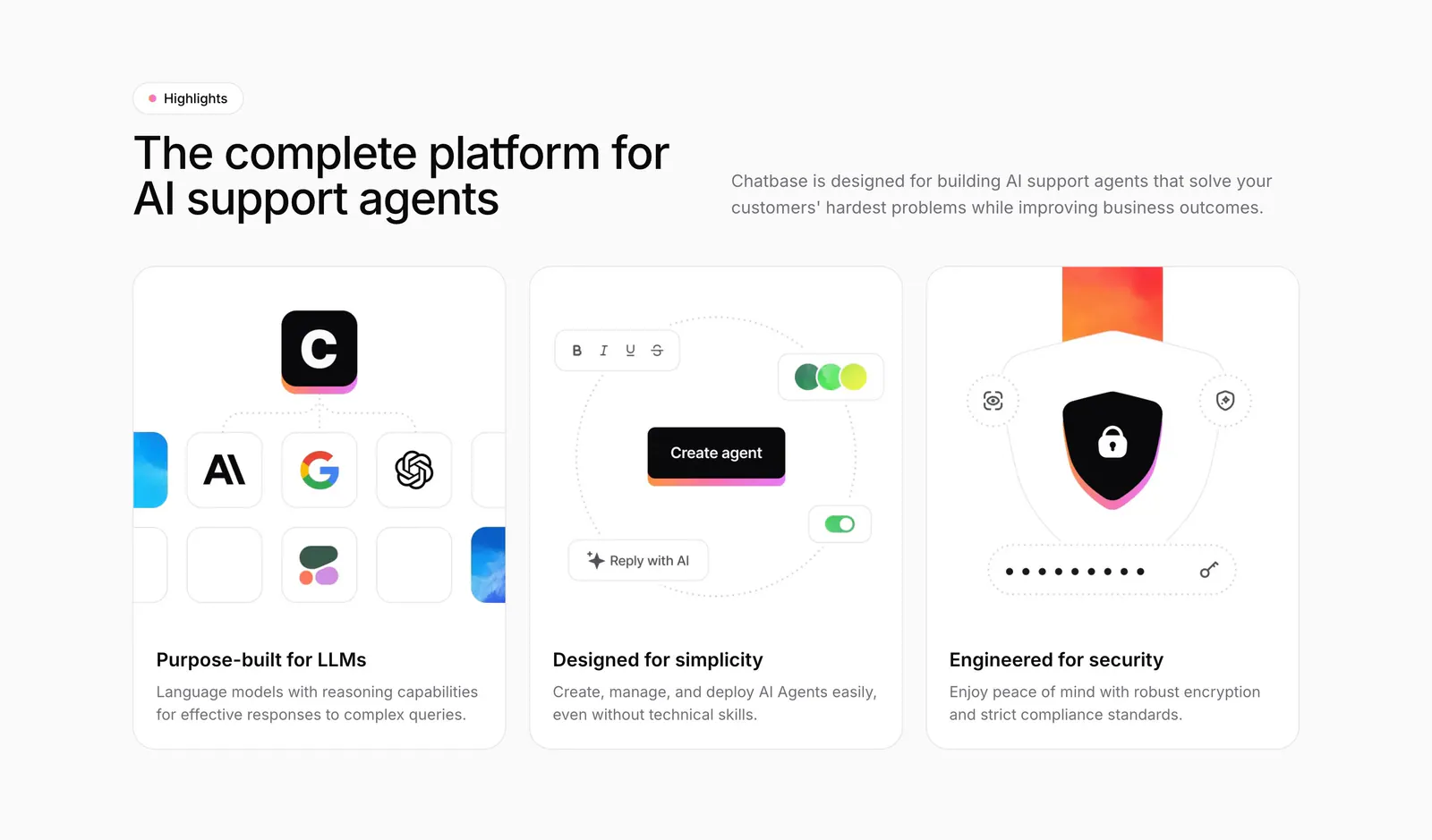
  33. Chatbase features section: headline beside intro copy above three equal cards with model, builder and security illustrations
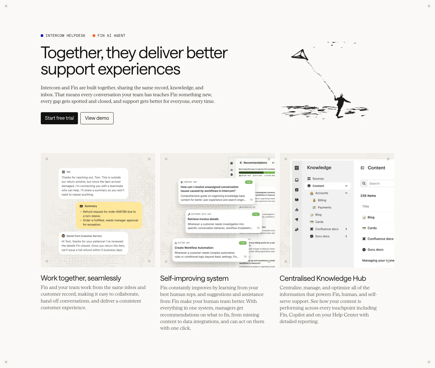
  34. Intercom features section: headline with an ink kite drawing above three equal cards showing chat, recommendations and knowledge hub UI
  35. Weav logo cloud section: thin pink strip with a small trust label and a row of blue customer logos separated by dividers
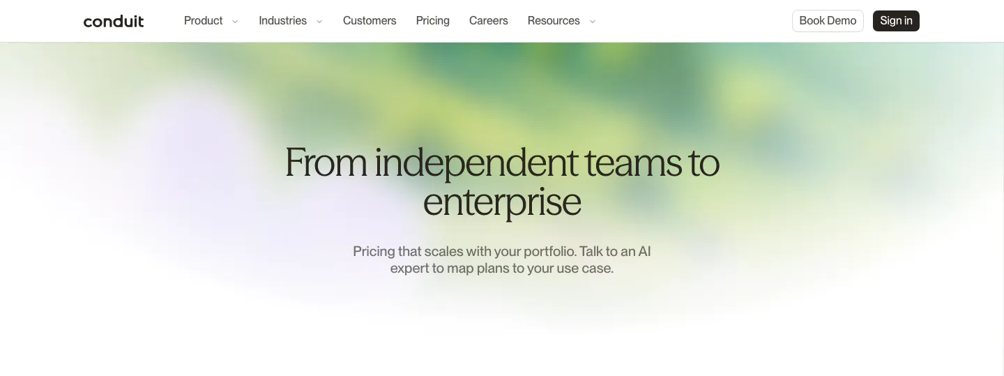
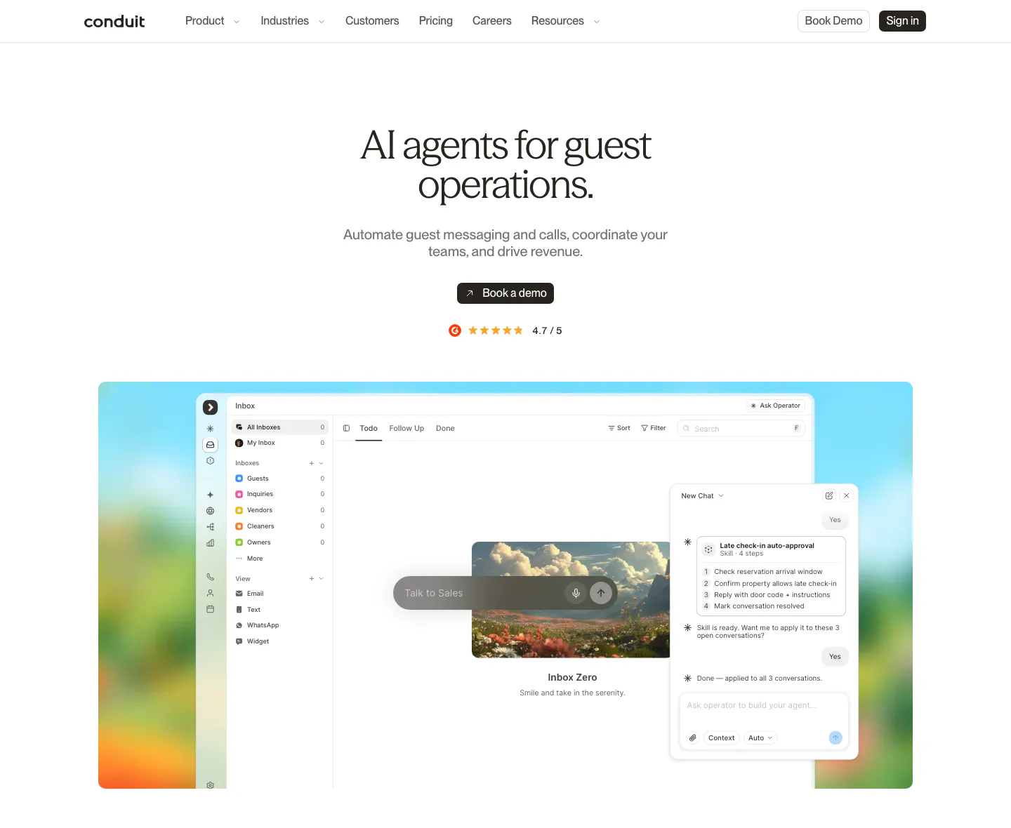
  36. Conduit hero section: centered serif pricing headline and subcopy over a soft green and lavender blurred gradient
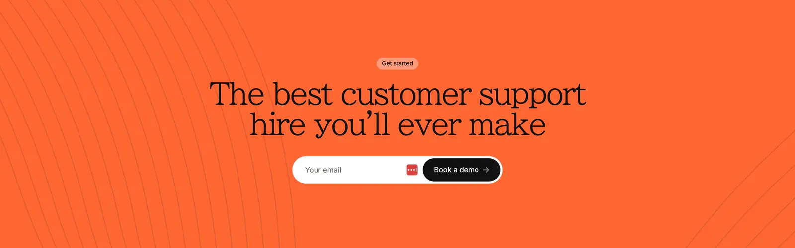
  37. Gradient Labs call-to-action section: centered serif headline and pill email field on a bright orange background with thin curved lines
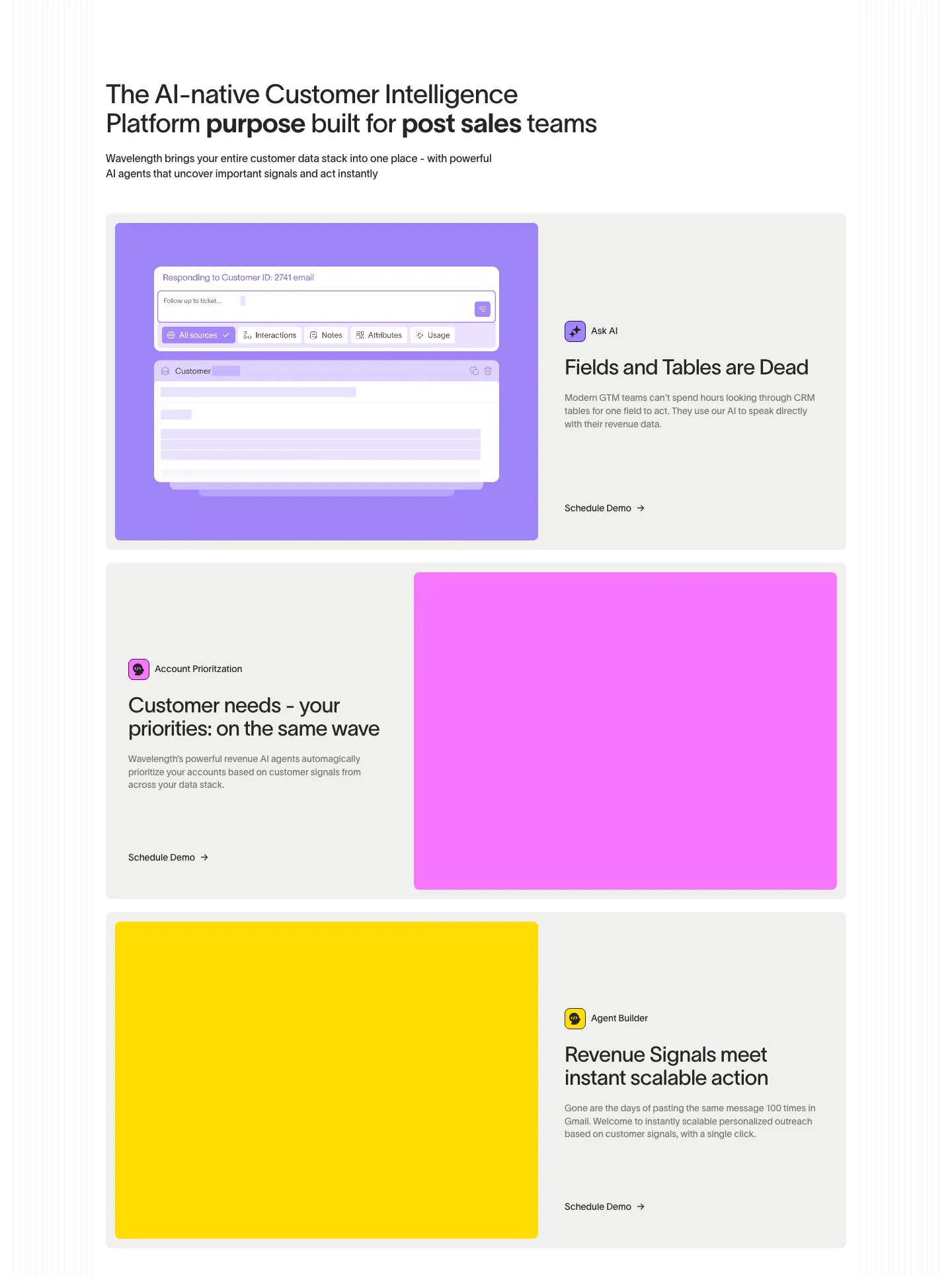
  38. Wavelength features section: left headline above three alternating rows pairing copy with large purple, pink and yellow panels, one with AI UI
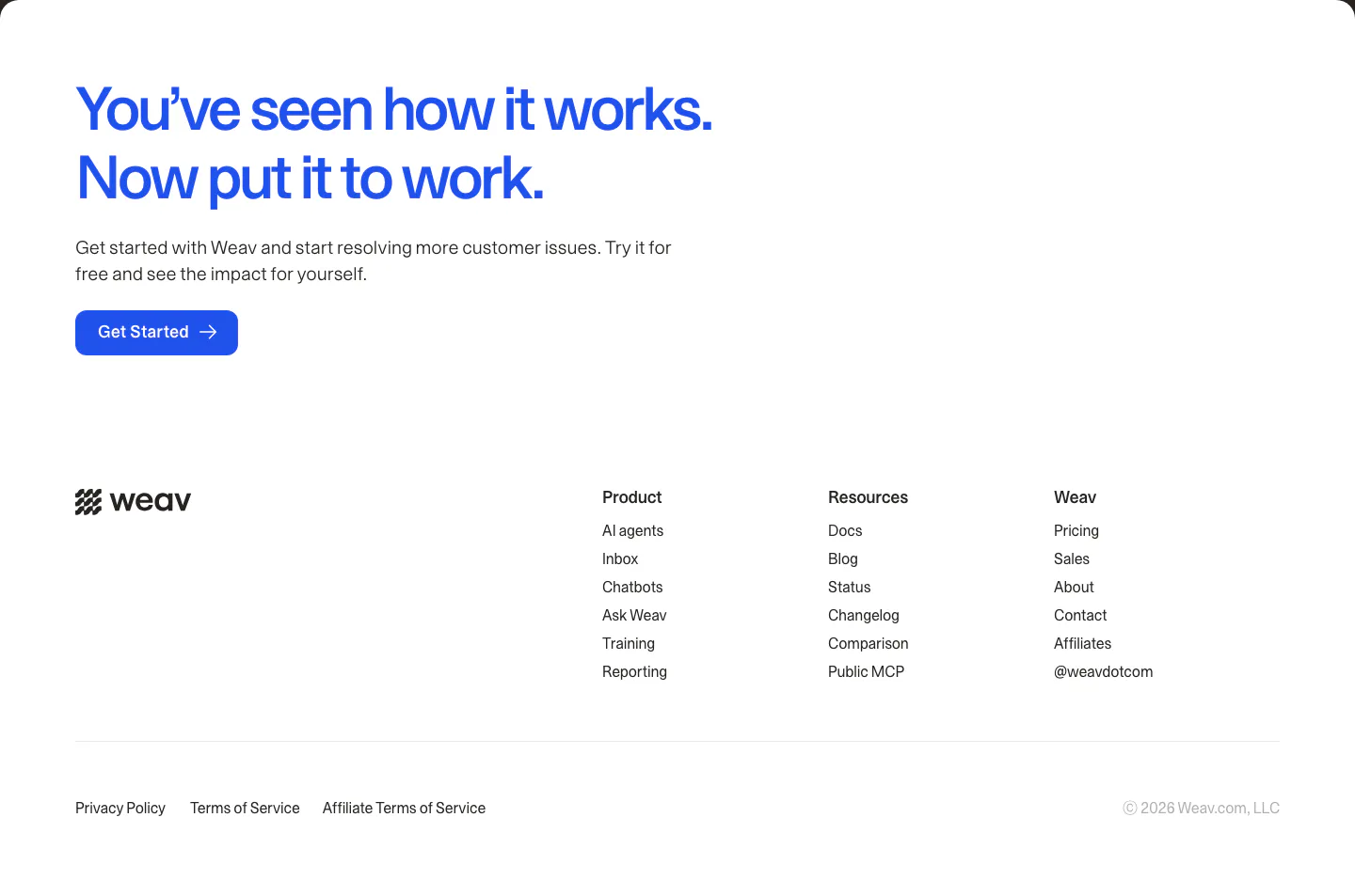
  39. Weav footer section: large blue CTA headline and button above a white footer with wordmark, three link columns and legal links
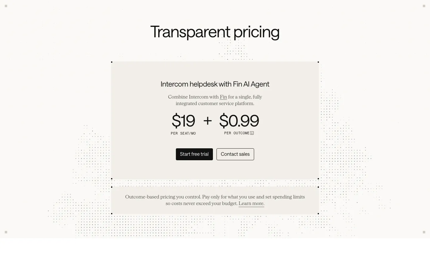
  40. Intercom pricing section: centered beige card with $19 per seat plus $0.99 per outcome pricing and two buttons over a faint dot pattern
  41. Gradient Labs logo cloud section: serif heading above a single row of white customer logos on a near-black background
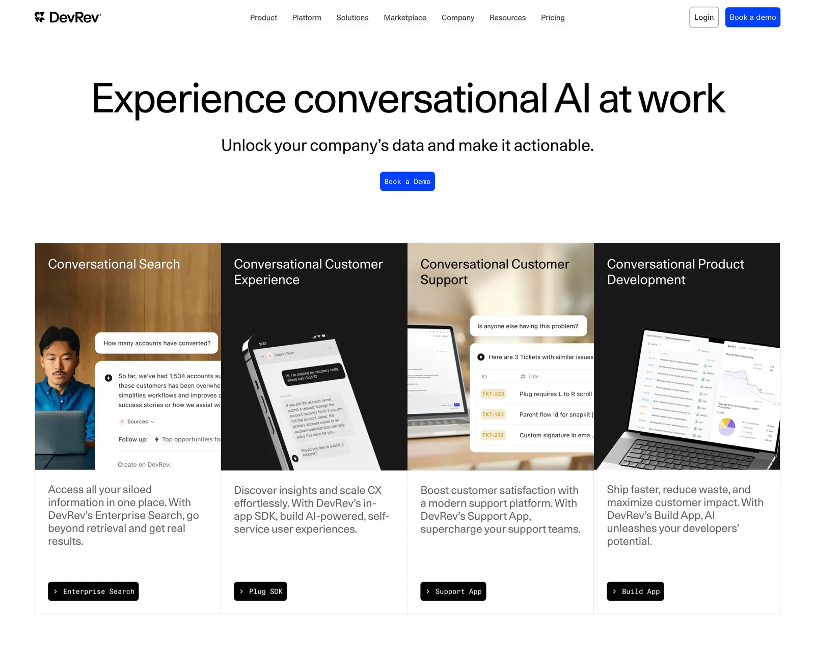
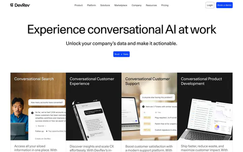
  42. DevRev hero section: centered headline and Book a Demo button above four product cards mixing photos and conversational UI mockups
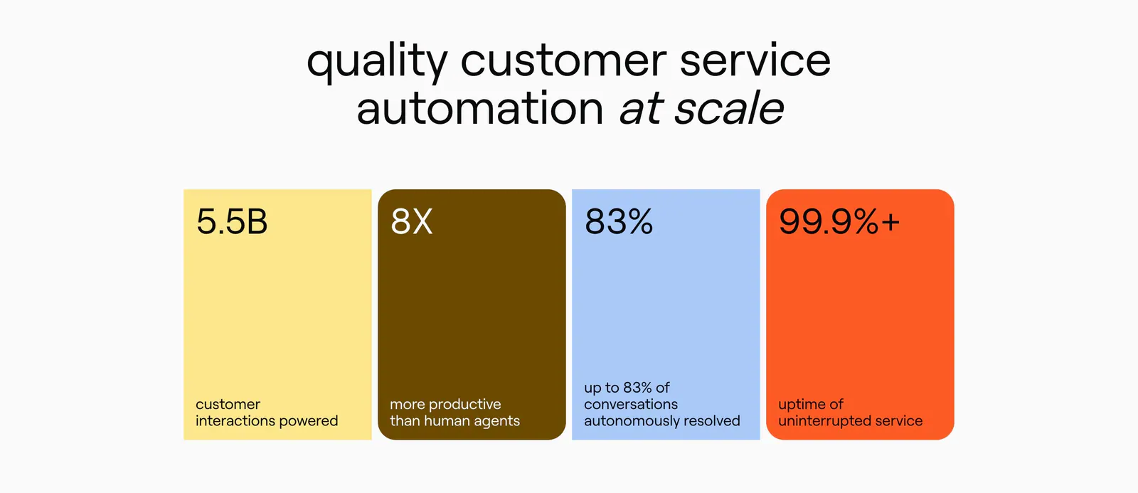
  43. Ada value proposition section: centered headline above four colored stat cards in yellow, brown, blue and orange
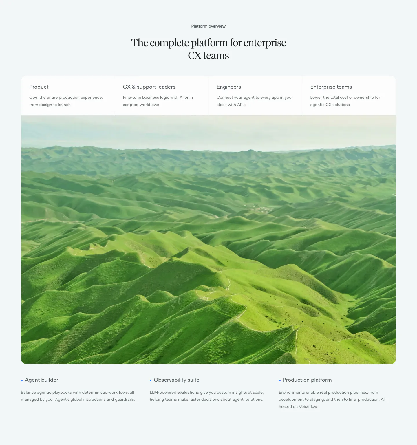
  44. Voiceflow use cases section: centered serif headline, four role tabs over a large green hills photo, three feature notes below
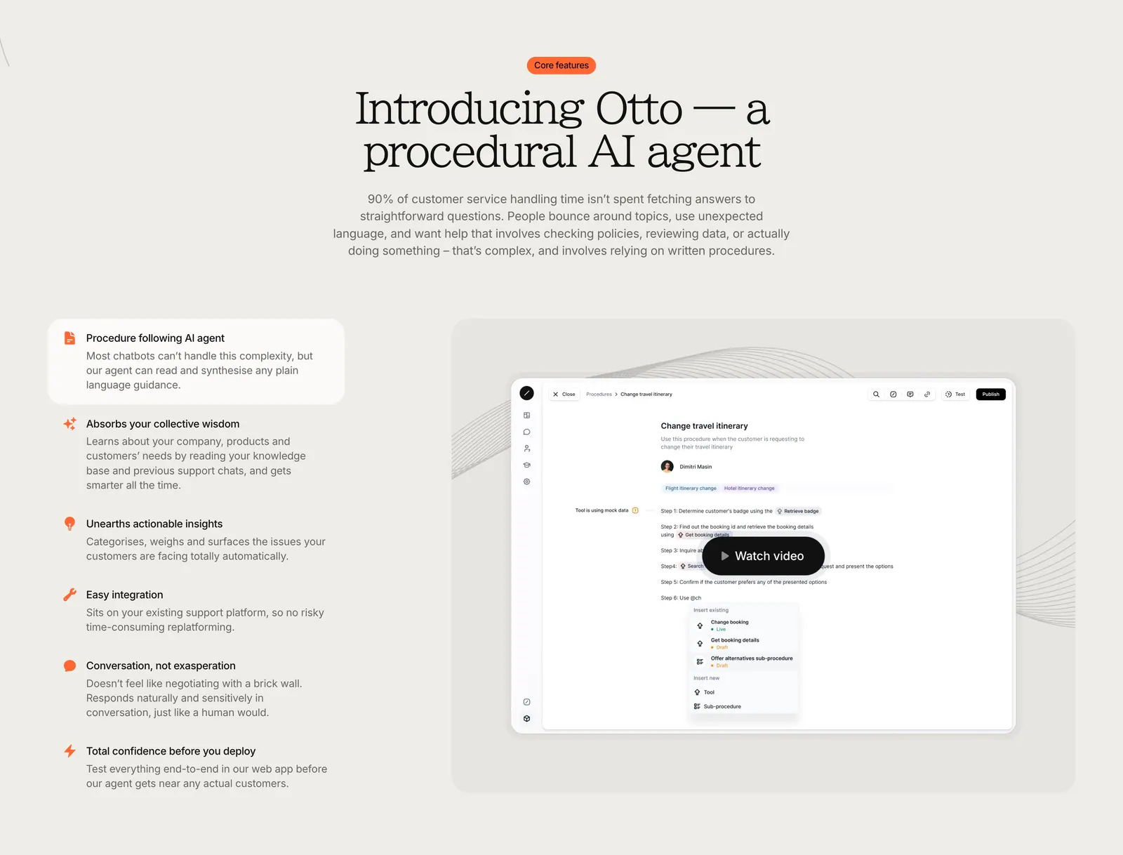
  45. Gradient Labs features section: centered serif headline above a feature list on the left and a product screenshot with video button
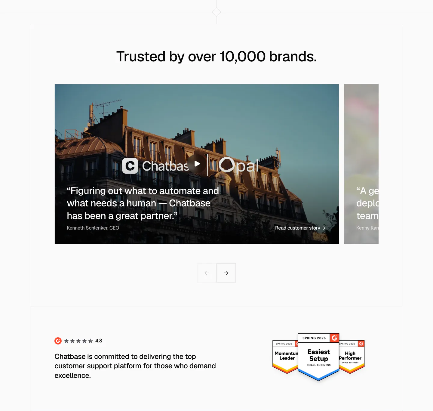
  46. Chatbase testimonials section: slider of photo-backed customer story cards with arrows, G2 rating and badges below
  47. Ada call-to-action section: centered lowercase headline with an inline yellow Get a demo pill button on a white background
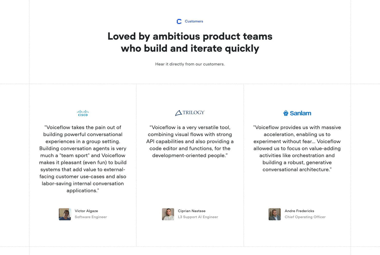
  48. Voiceflow testimonials section: centered headline above three quote columns with company logos and avatar headshots on white
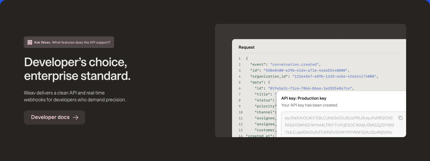
  49. Weav features section: dark brown band with headline and docs button on the left and a JSON request code block with an API key popup
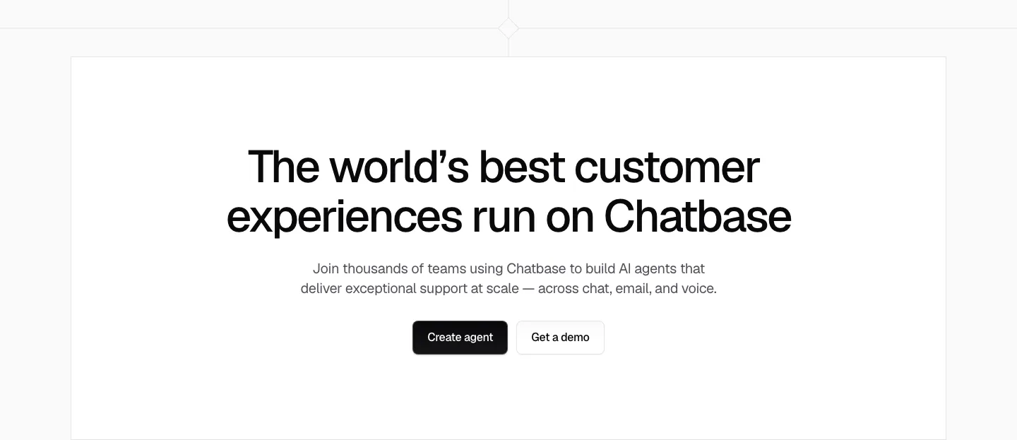
  50. Chatbase call to action section: centered black headline, short copy and two buttons in a white bordered box
  51. Intercom logo cloud section: small monospace label above a six-by-four grid of gray customer logos on white
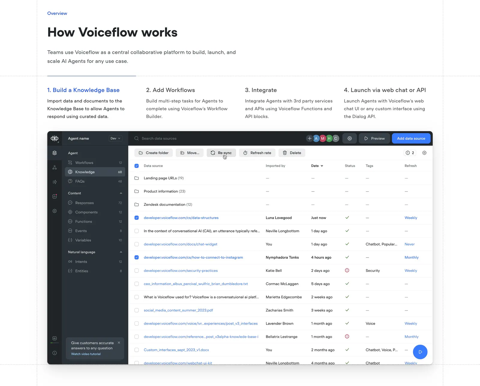
  52. Voiceflow how it works section: headline above four numbered step tabs and a knowledge base data table screenshot
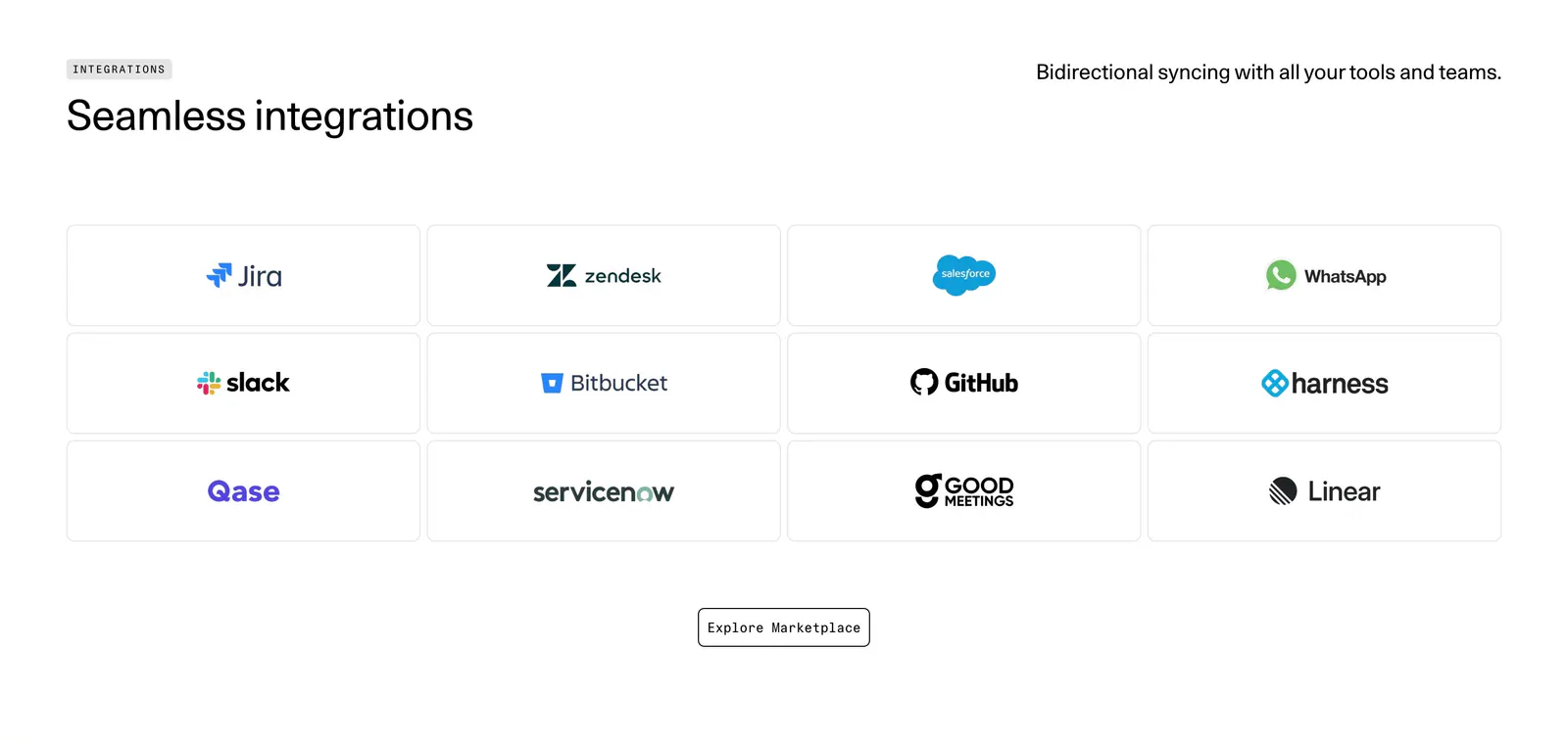
  53. DevRev integrations section: headline above a 4x3 grid of bordered tiles with Jira, Slack, GitHub, Salesforce and other app logos
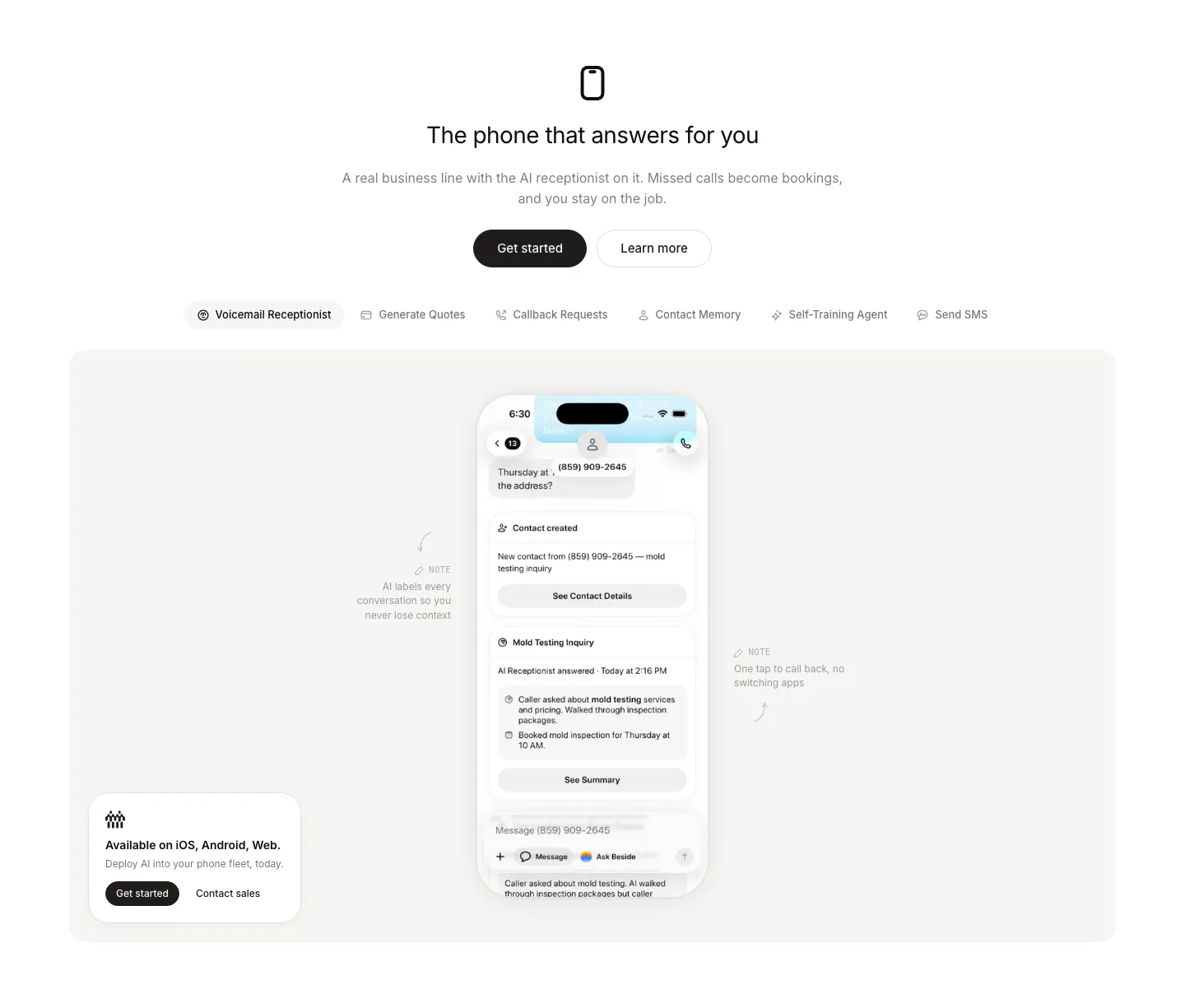
  54. Beside features section: centered headline and buttons above a feature tab bar and a phone mockup with annotations in a gray panel
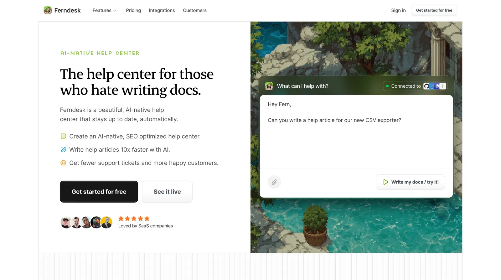
  55. Ferndesk hero section: serif headline, checklist and CTAs on the left beside an AI chat prompt over a pixel-art garden scene
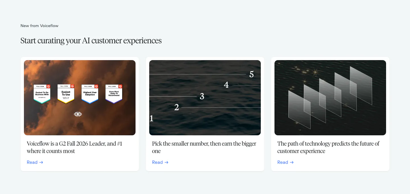
  56. Voiceflow blog & resources section: serif headline above three article cards with photographic thumbnails on a pale gray background
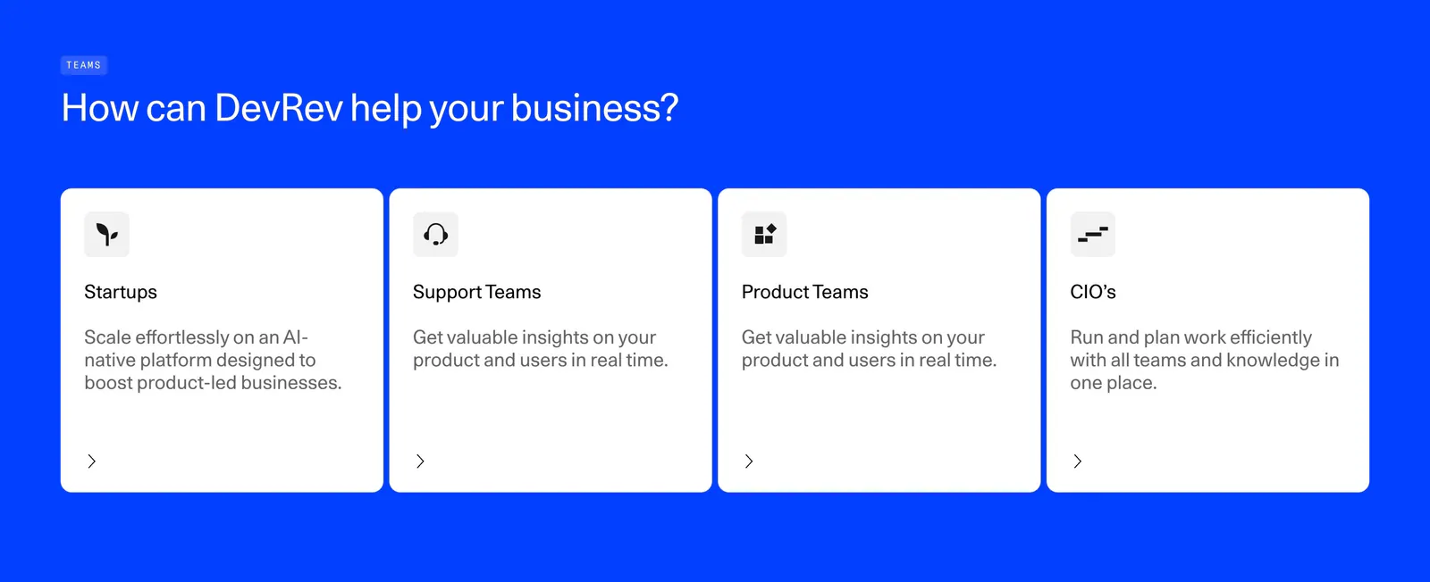
  57. DevRev features section: left-aligned headline above four white audience cards for startups, support, product teams and CIOs on bright blue
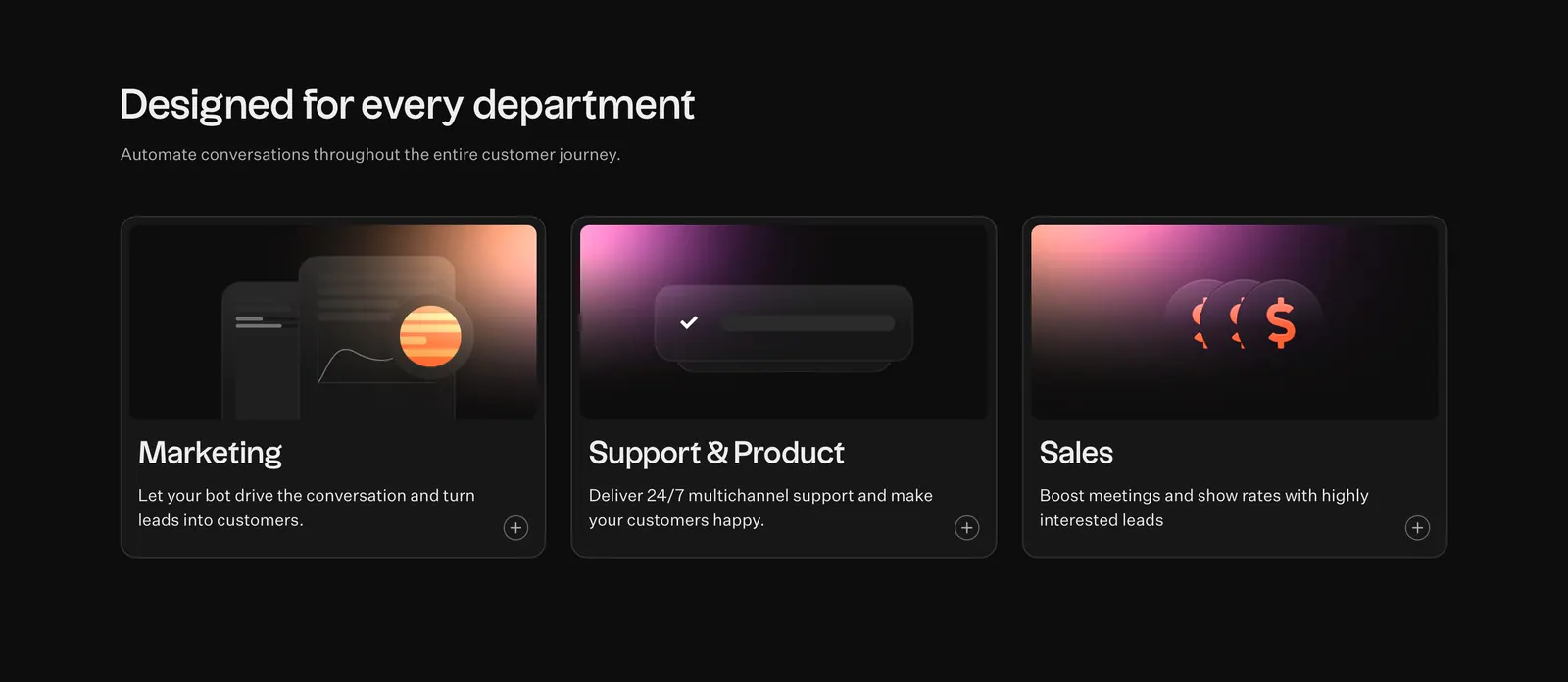
  58. Typebot features section: headline above three dark cards for marketing, support and sales with pink-orange gradient graphics on black
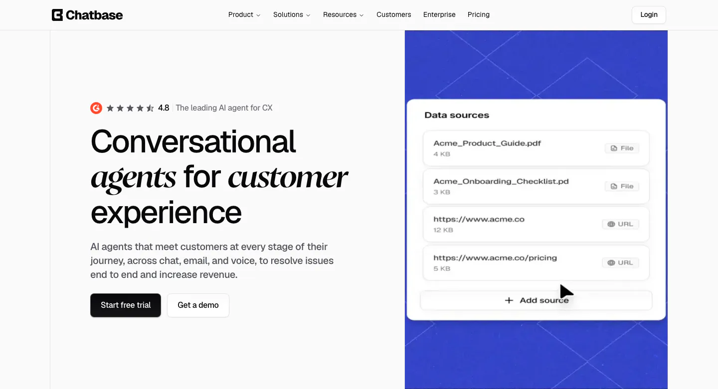
  59. Chatbase hero section: left headline with italic serif words and CTAs, right blue patterned panel with a data sources UI card
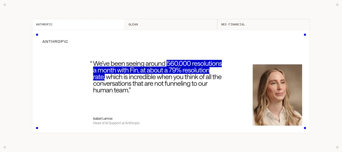
  60. Intercom testimonials section: tabbed customer quote card with a blue-highlighted phrase, Anthropic logo, speaker name and portrait photo
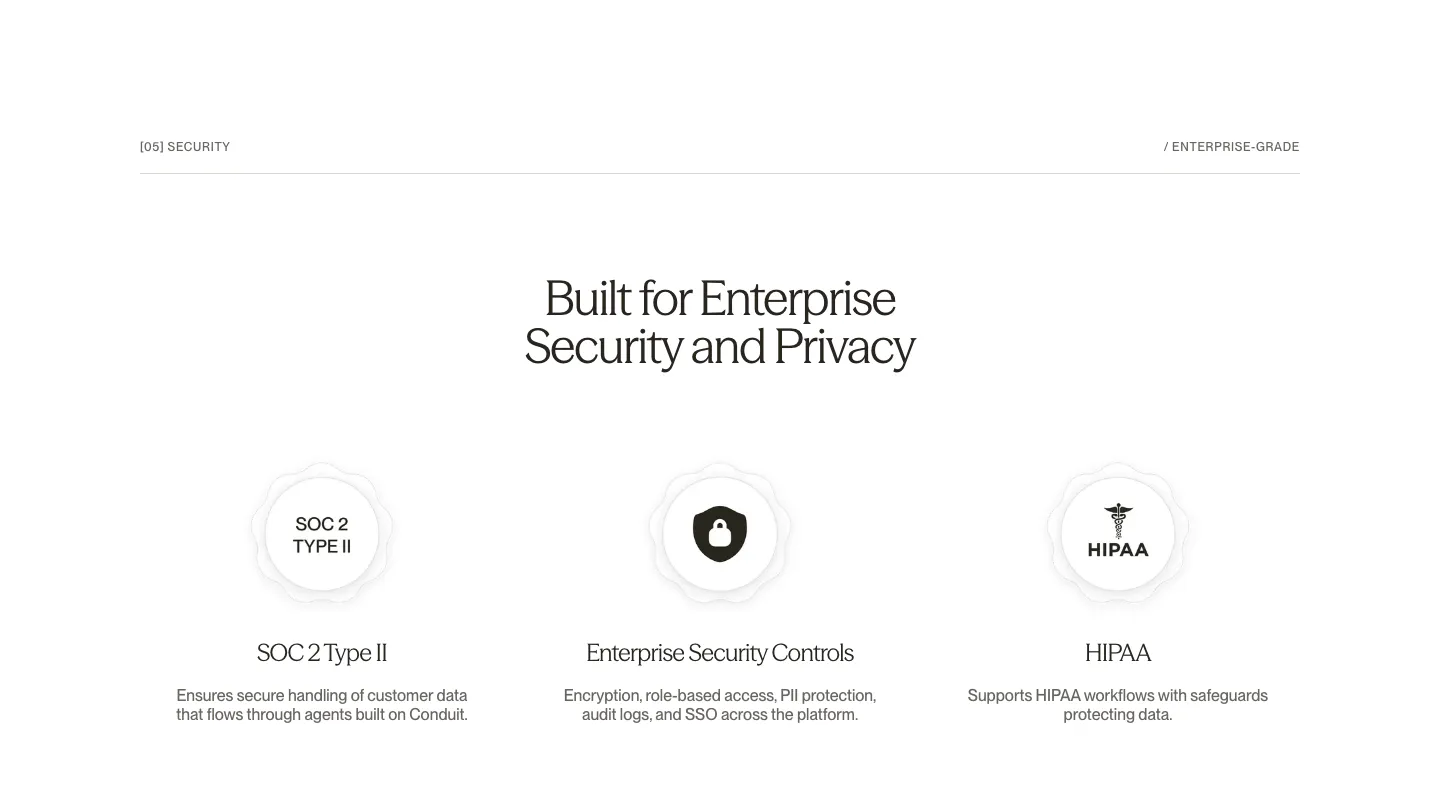
  61. Conduit security section: centered serif headline above SOC 2, security controls and HIPAA badge columns on white
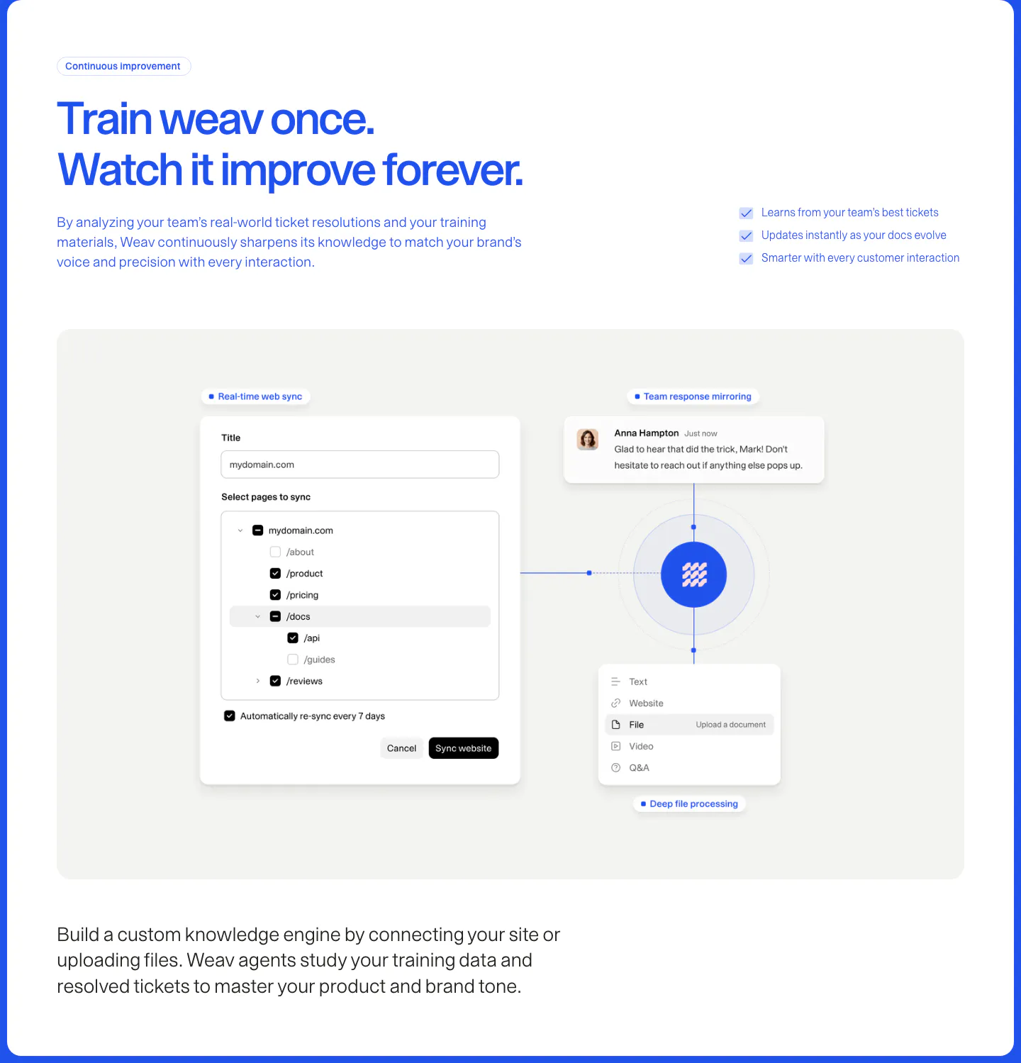
  62. Weav features section: blue headline and checklist above a gray panel with a website sync form and file and chat cards linked to a central logo
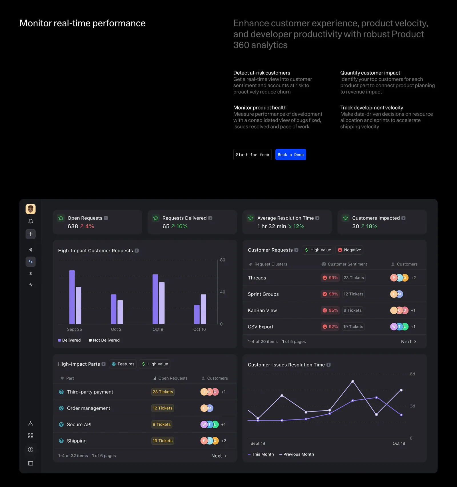
  63. DevRev features section: headline with four benefit blurbs and two buttons above a large dark analytics dashboard screenshot with charts
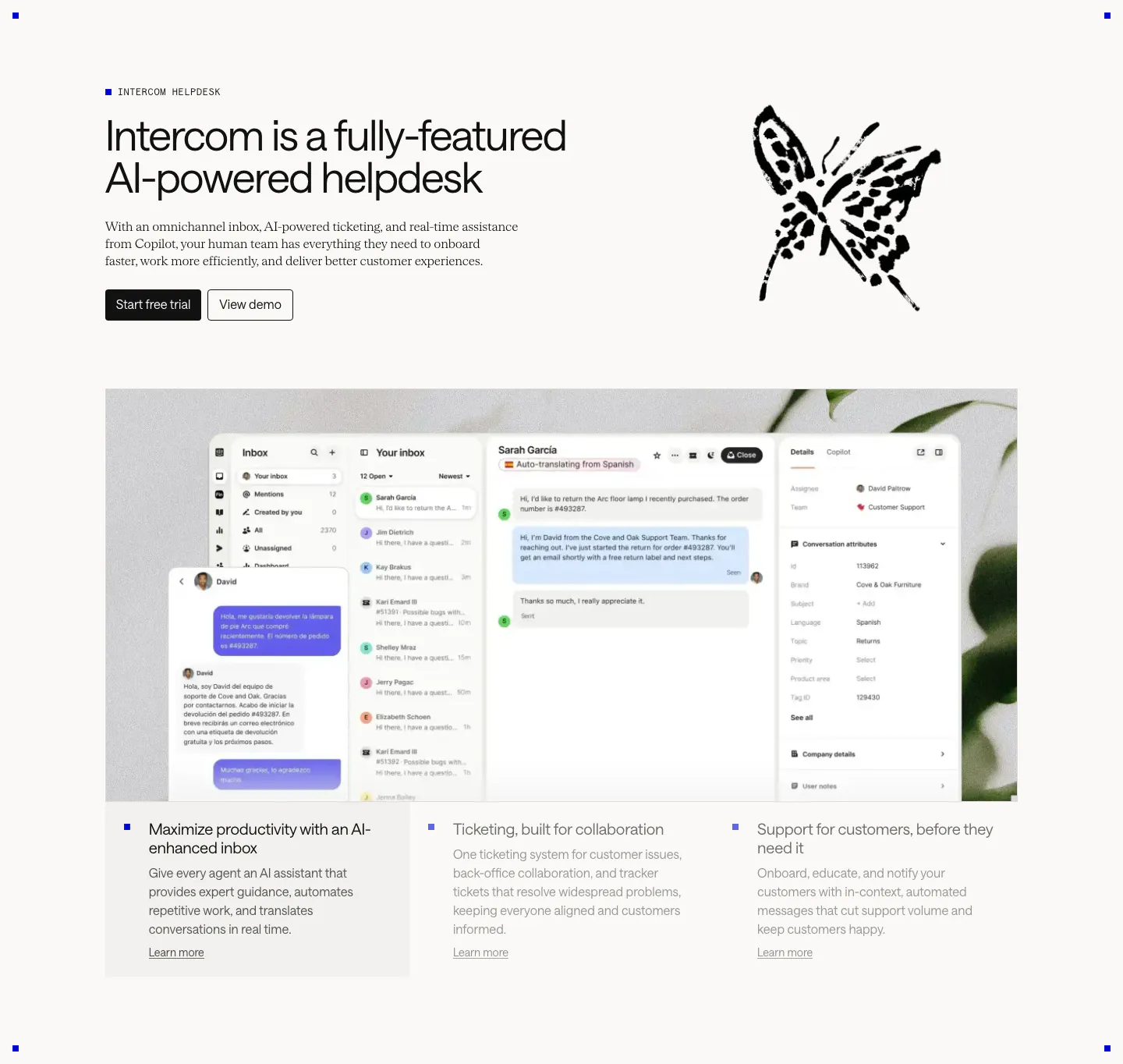
  64. Intercom features section: headline beside an ink butterfly drawing, large inbox screenshot over a plant photo, three selectable feature columns
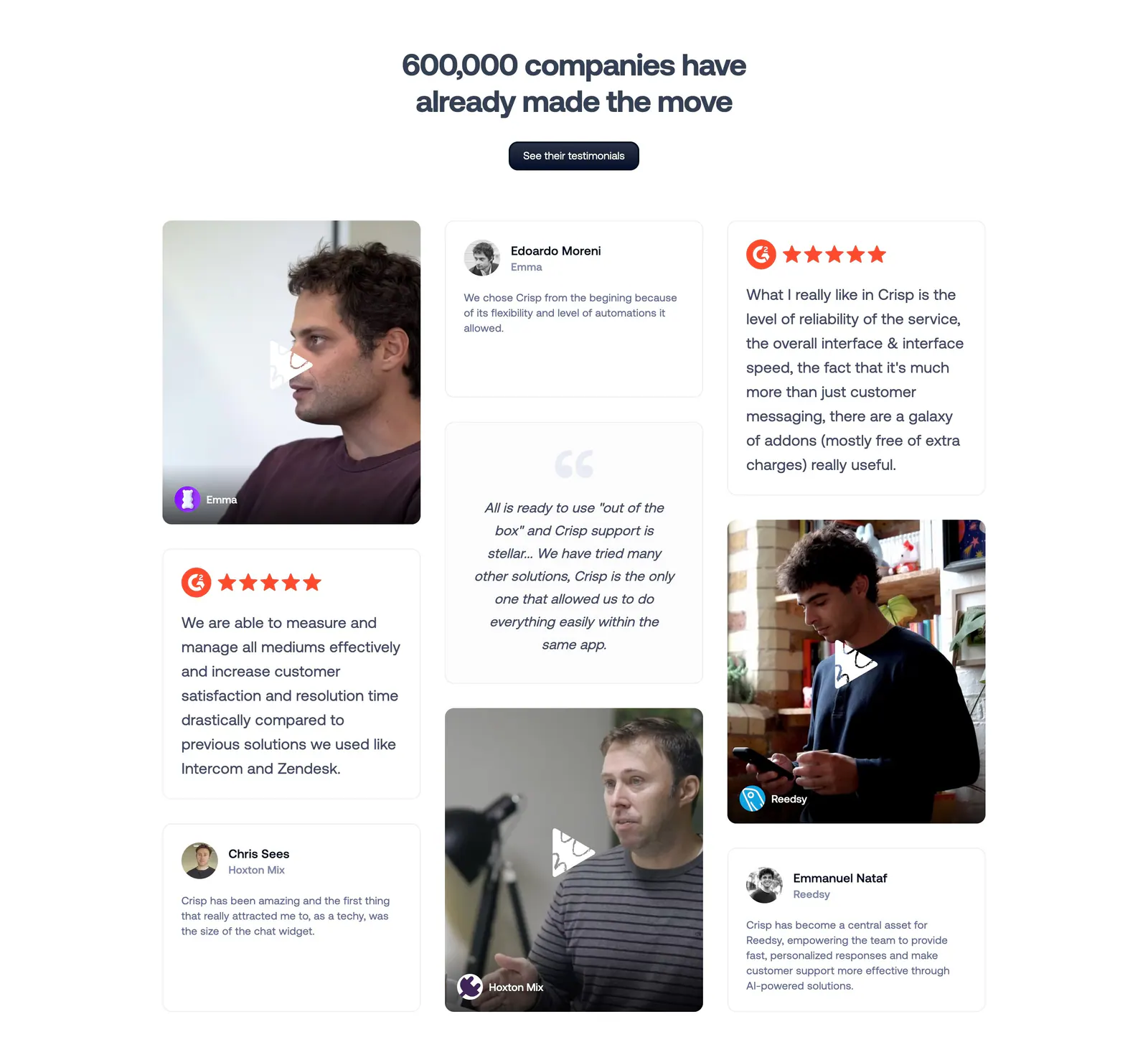
  65. Crisp testimonials section: centered headline above a masonry grid of quote cards and customer video thumbnails
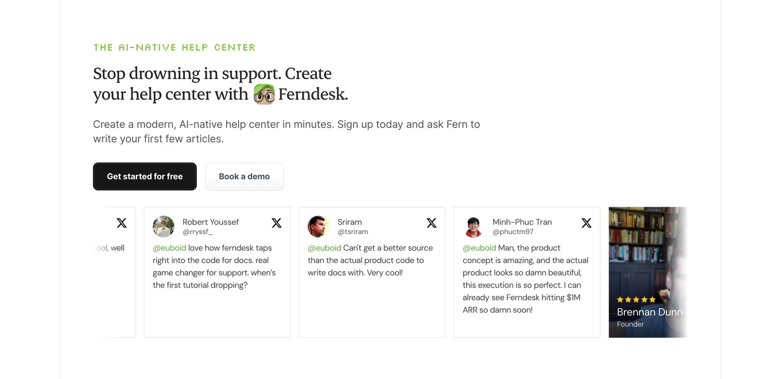
  66. Ferndesk testimonials section: serif headline and two CTAs above a horizontally scrolling row of tweet cards on white
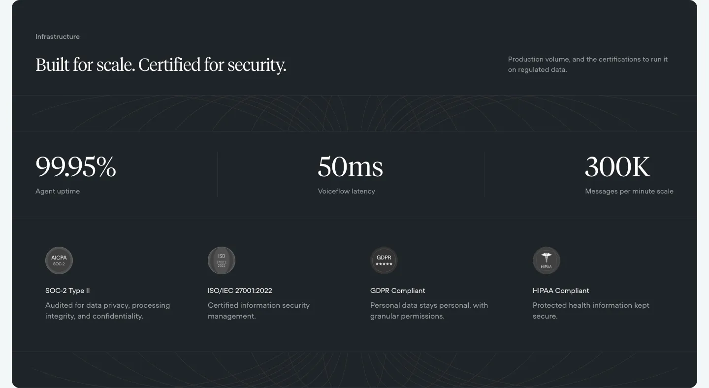
  67. Voiceflow security section: dark panel with serif headline, three large uptime and latency stats and four compliance badges
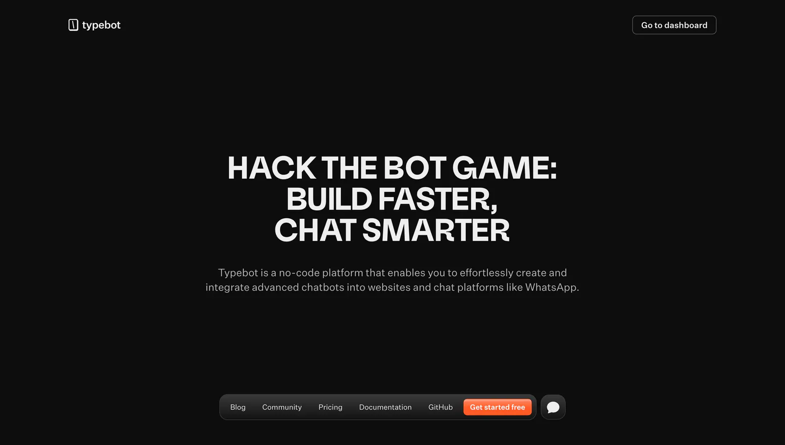
  68. Typebot hero section: centered uppercase headline and description on a black background with a floating bottom pill navigation bar
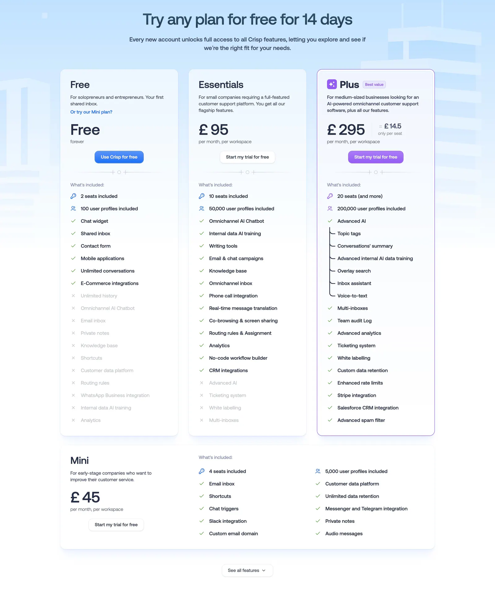
  69. Crisp pricing section: centered headline above three plan cards with checklists and a wide Mini plan card on pale blue
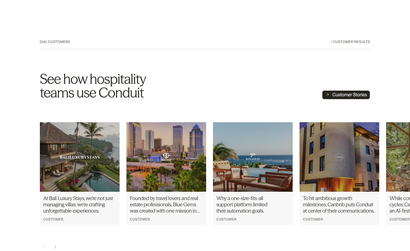
  70. Conduit testimonials section: serif headline above a carousel of customer story cards with hotel and resort photos
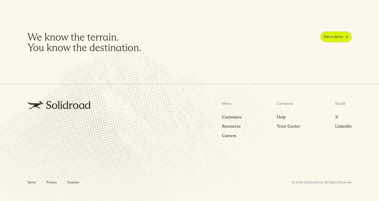
  71. Solidroad footer section: serif CTA headline and lime button above logo and link columns on cream with a faint halftone dot texture
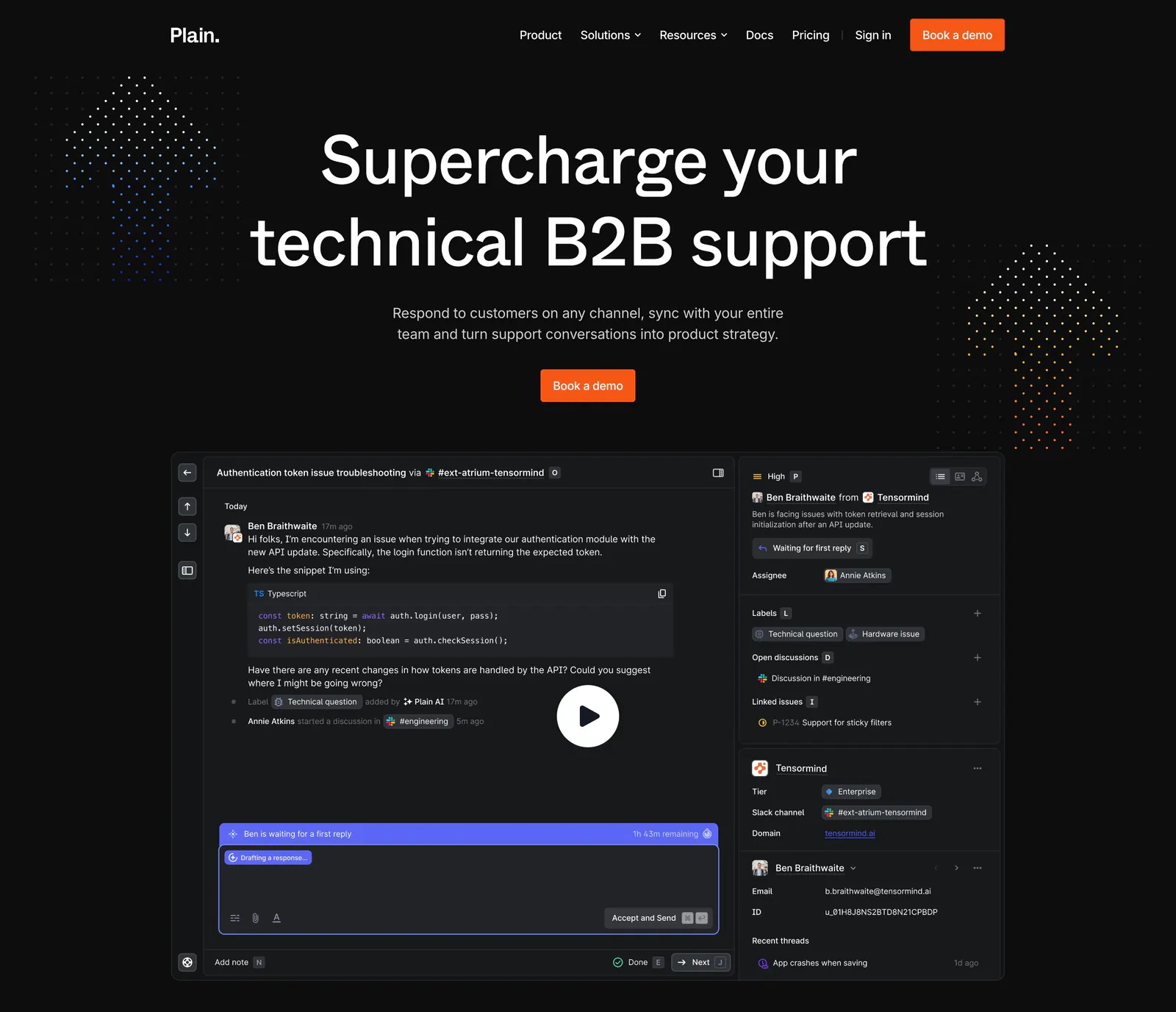
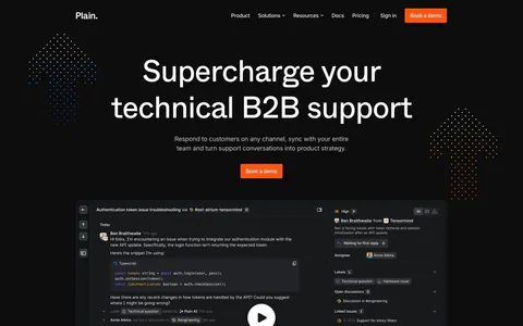
  72. Plain hero section: dark centered headline and orange demo button above a support thread UI with a play button, flanked by dot clusters
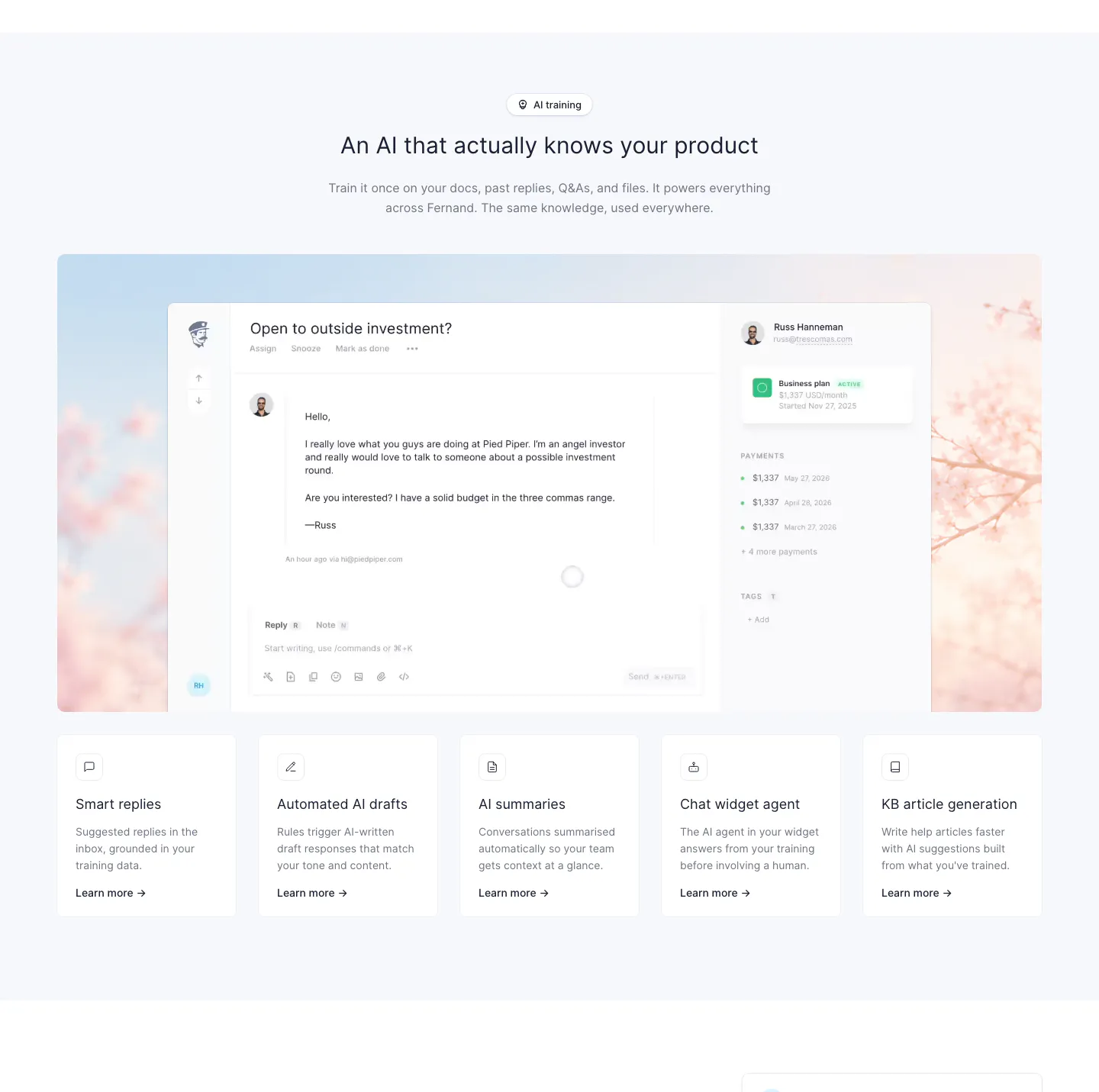
  73. Fernand features section: centered heading above an inbox screenshot on a blossom photo and a row of five feature cards
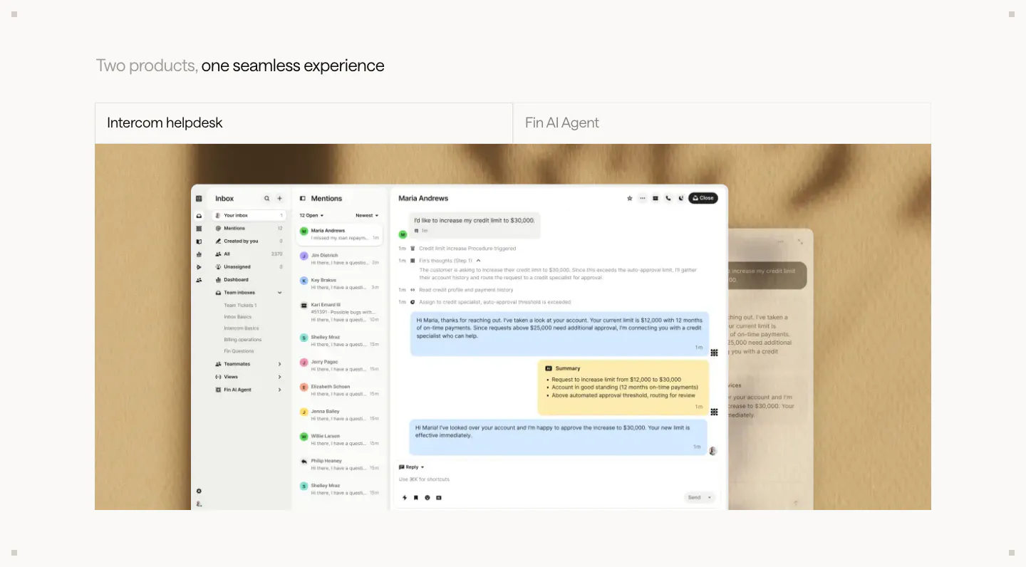
  74. Intercom features section: two-tab switcher for helpdesk and Fin AI Agent above a large inbox screenshot on a textured beige backdrop
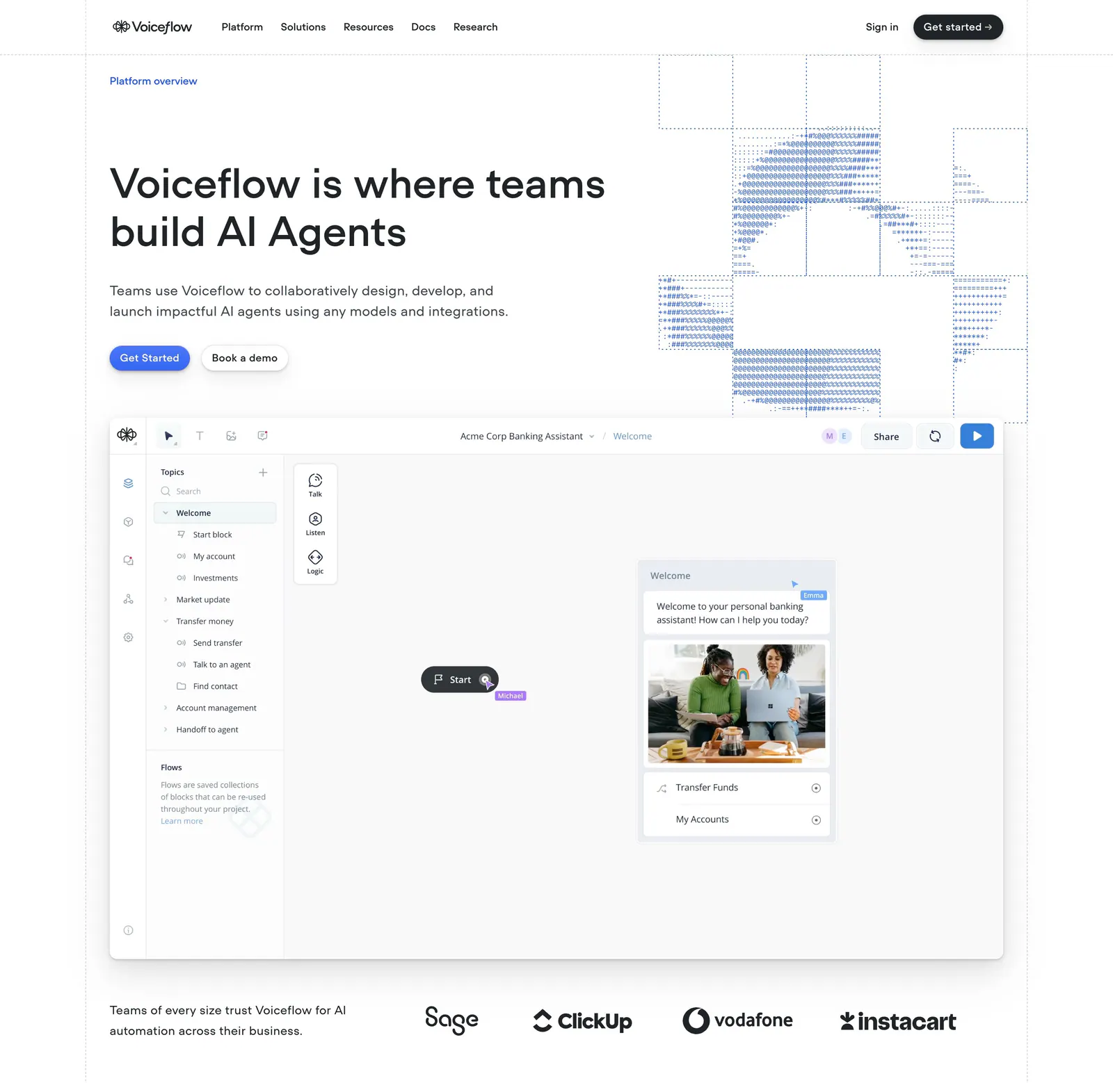
  75. Voiceflow hero section: left-aligned headline with ASCII-art graphic, an agent builder canvas screenshot and a logo strip on white
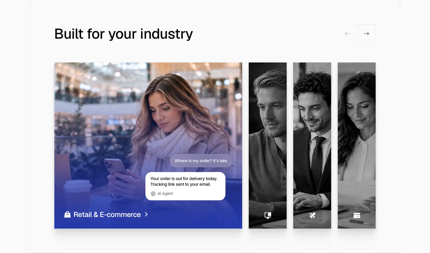
  76. Chatbase use cases section: industry slider with an expanded retail photo card with chat bubbles and narrow grayscale photo cards
  77. Fernand testimonials section: single centered customer quote with a round avatar, name and company on white
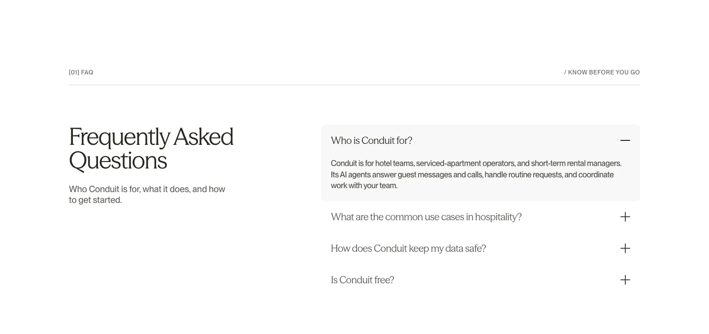
  78. Conduit FAQ section: serif heading on the left beside an accordion with the first answer expanded on white
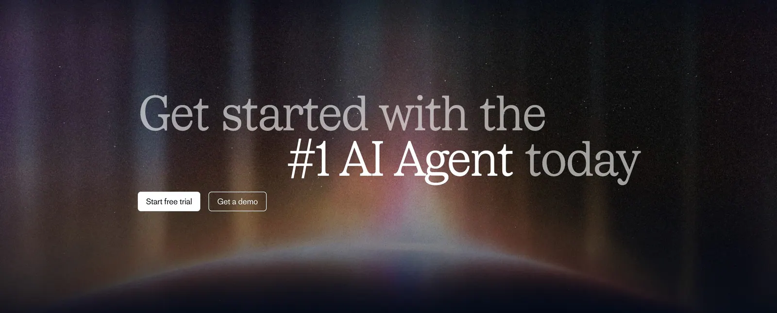
  79. Fin call-to-action section: two-tone serif headline with trial and demo buttons over a glowing aurora on a dark background
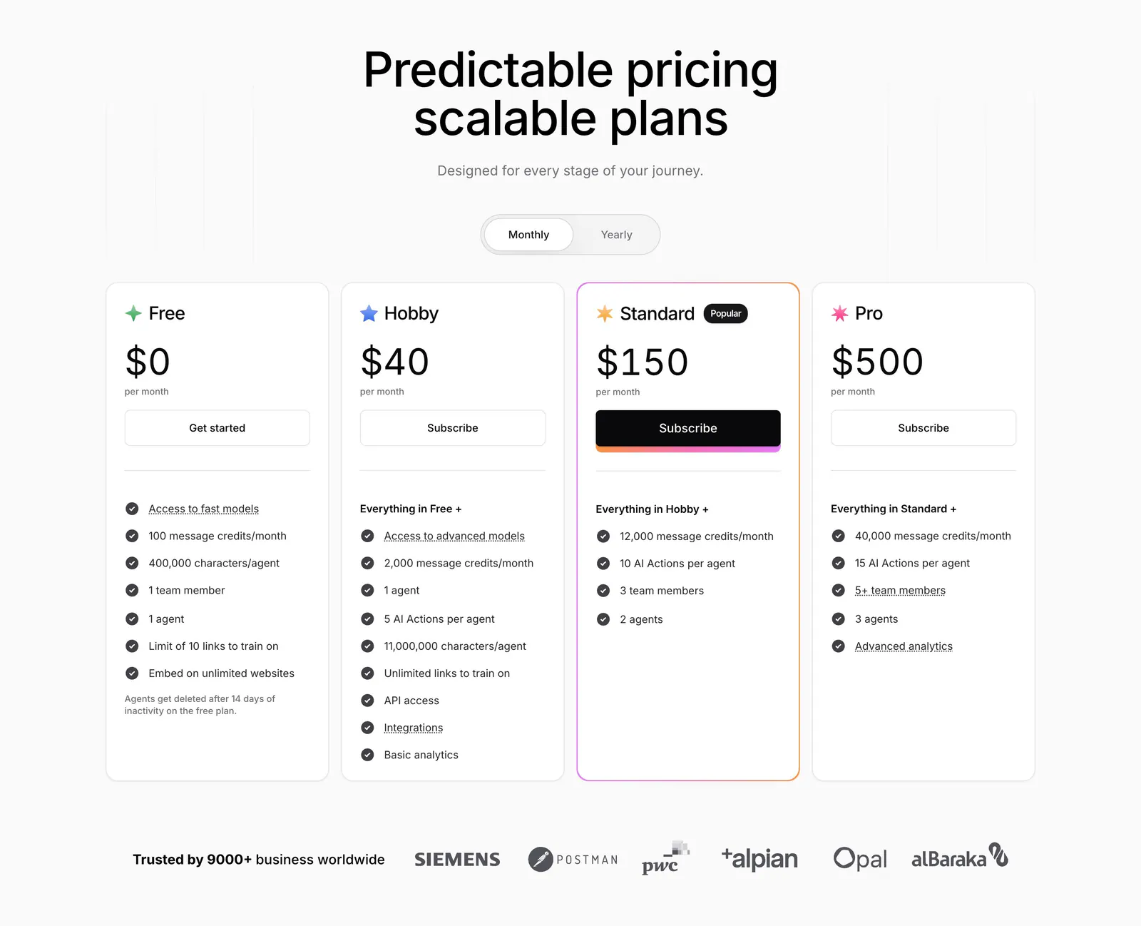
  80. Chatbase pricing section: centered headline and monthly/yearly toggle above four plan cards and a customer logo row
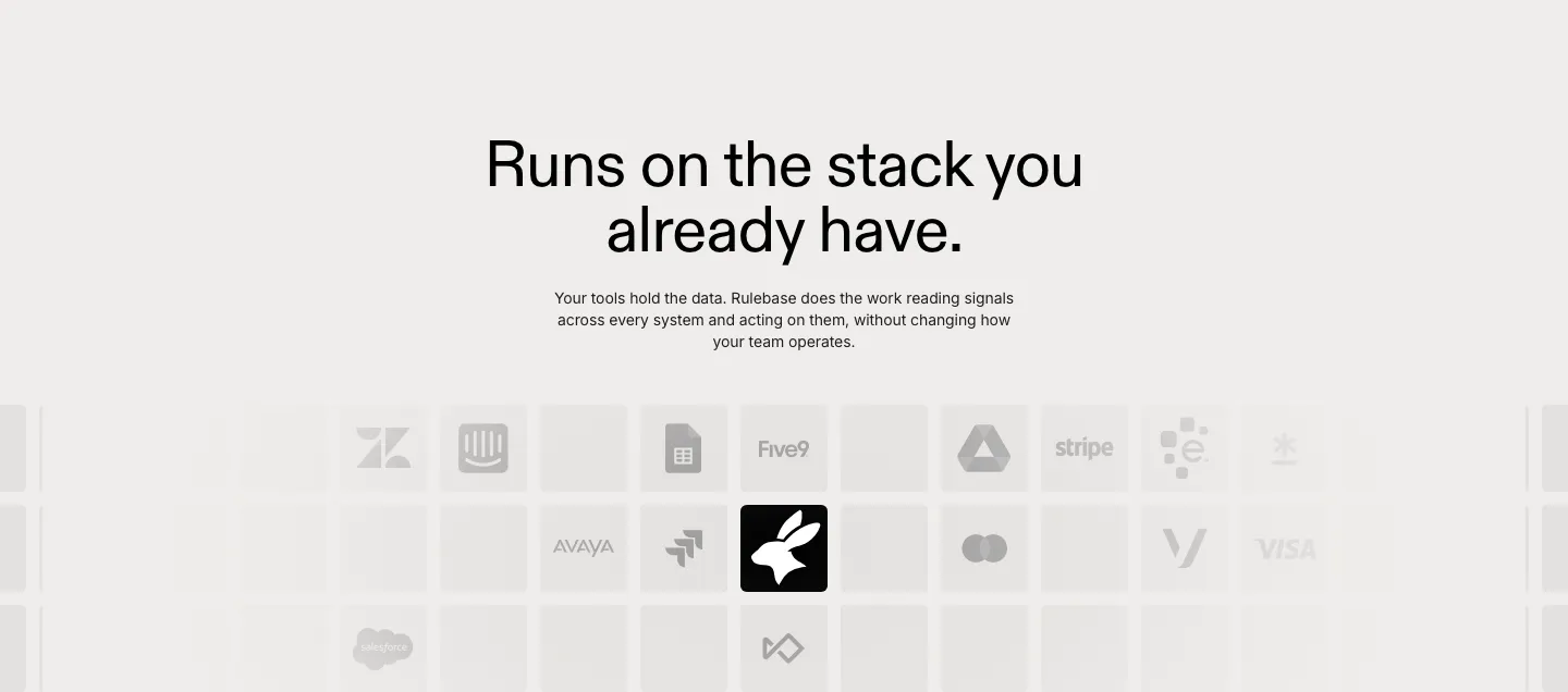
  81. Rulebase integrations section: centered headline and copy above a fading grid of grayscale app logo tiles like Zendesk, Stripe and Visa
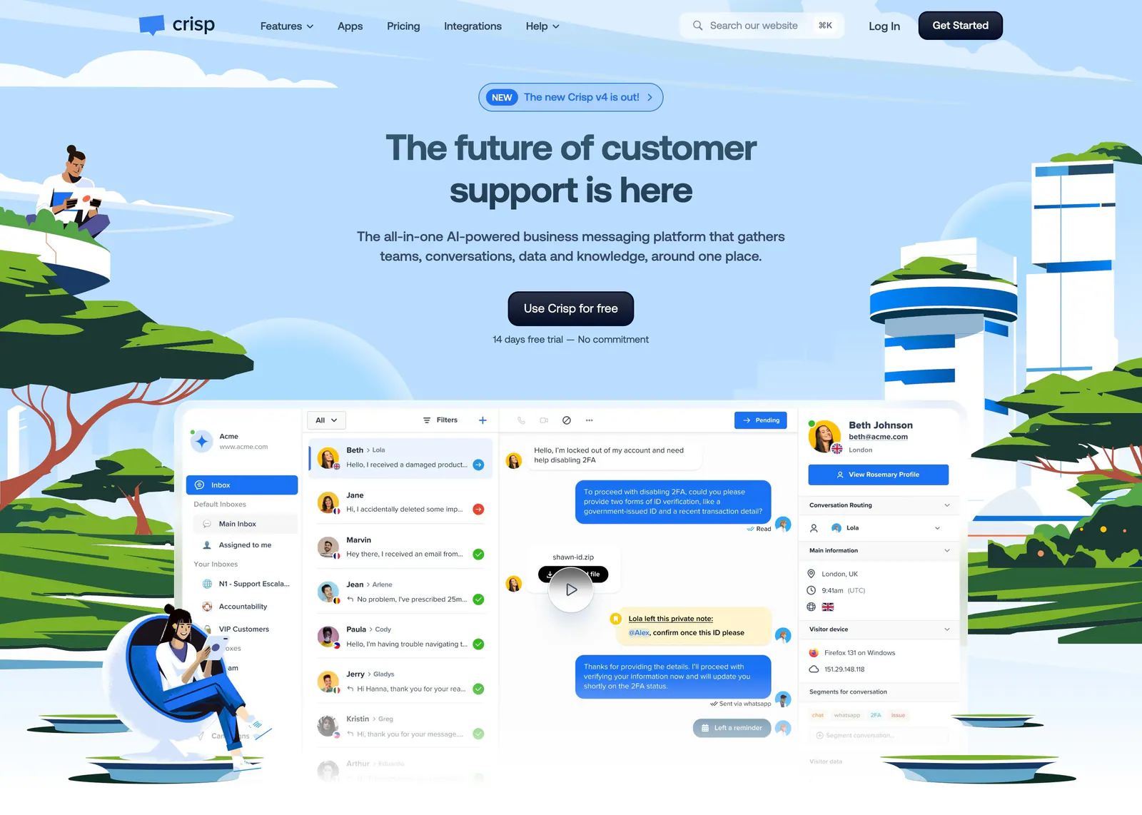
  82. Crisp hero section: centered headline and CTA above an inbox screenshot framed by illustrated people, trees and towers on sky blue
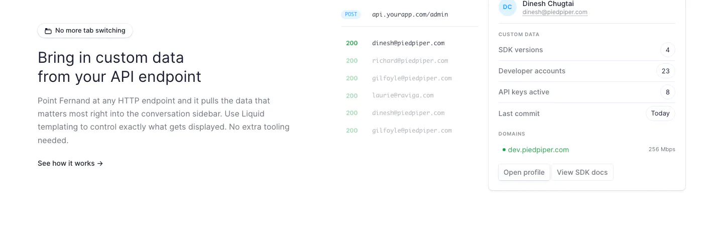
  83. Fernand features section: text on the left, API endpoint response list and customer data sidebar UI on the right
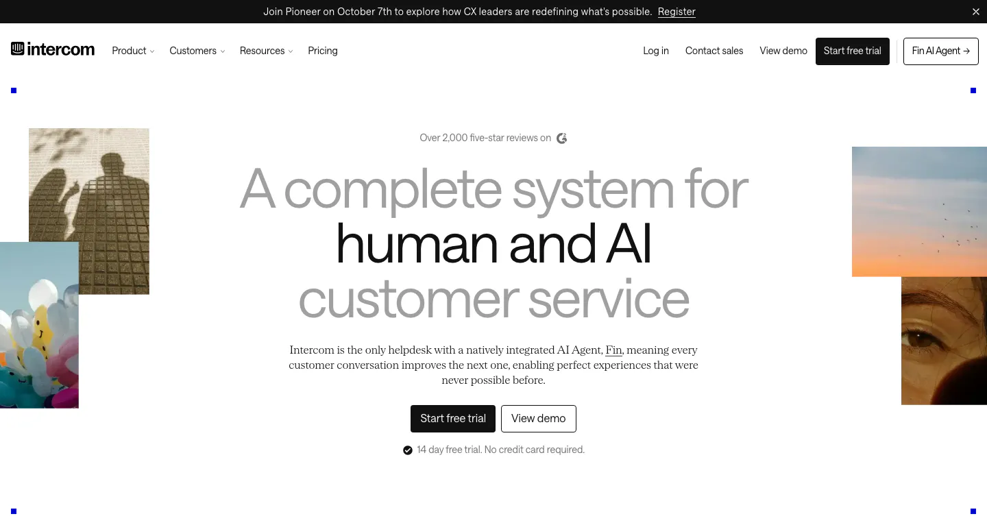
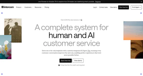
  84. Intercom hero section: centered gray and black headline with two CTA buttons, flanked by cropped photo tiles, below a nav and announcement bar
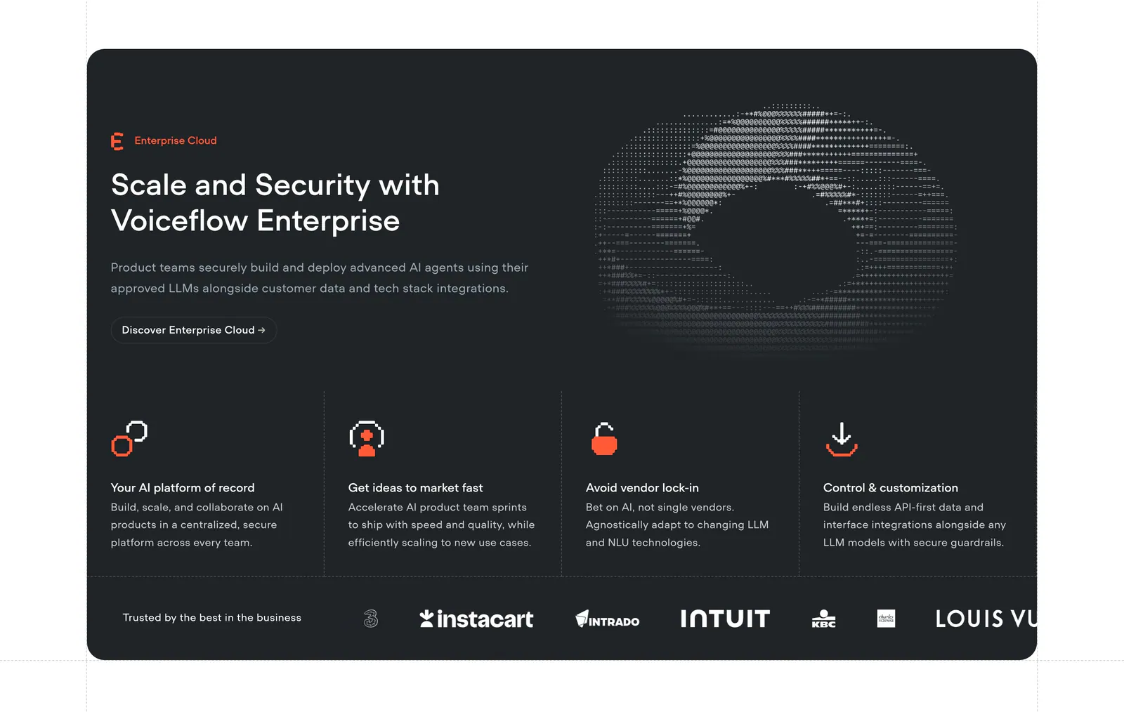
  85. Voiceflow features section: charcoal panel with headline left and ASCII art right, four feature columns and a customer logo strip
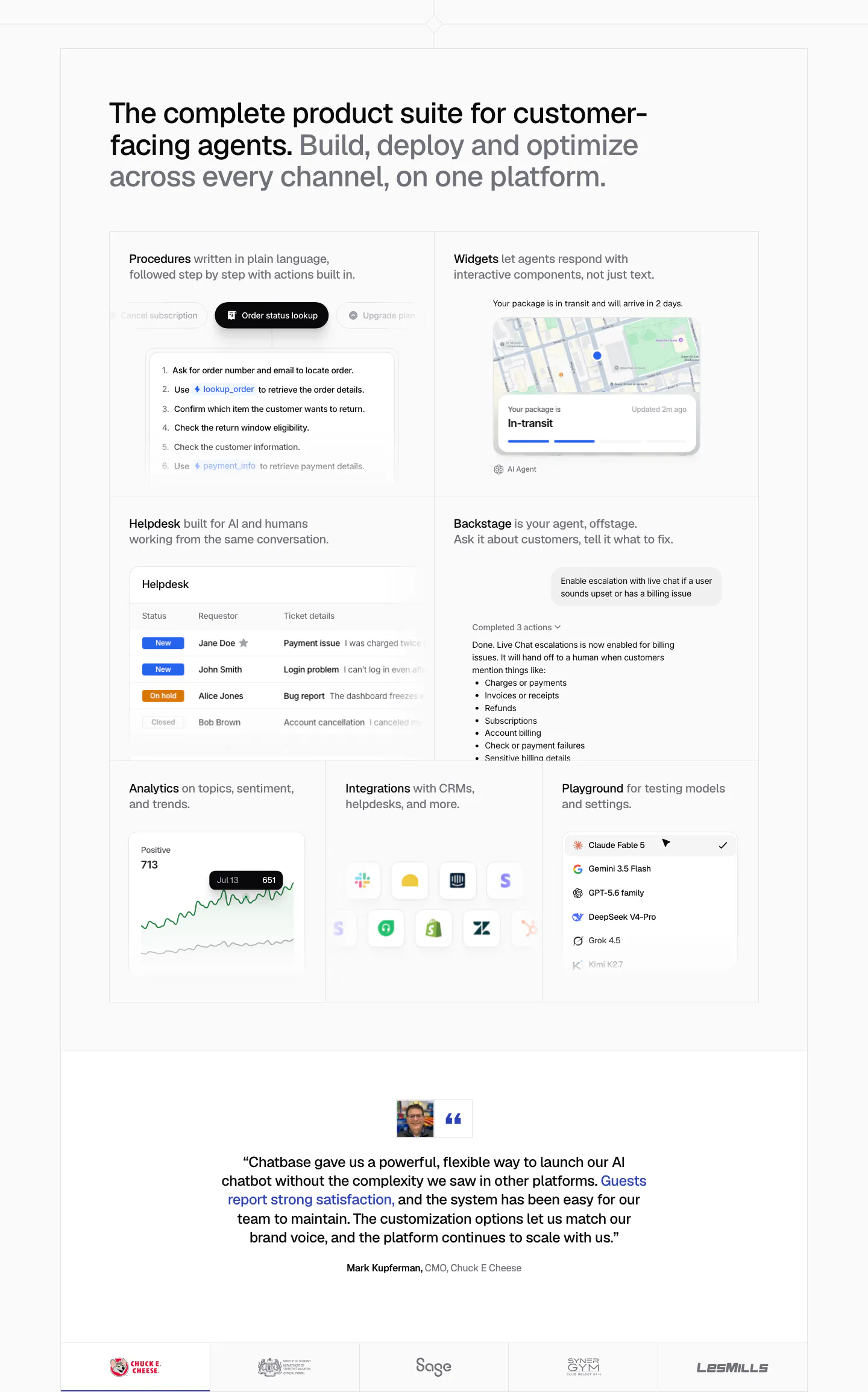
  86. Chatbase features section: bento grid of product UI tiles for procedures, widgets, helpdesk and analytics, a centered quote and logo row
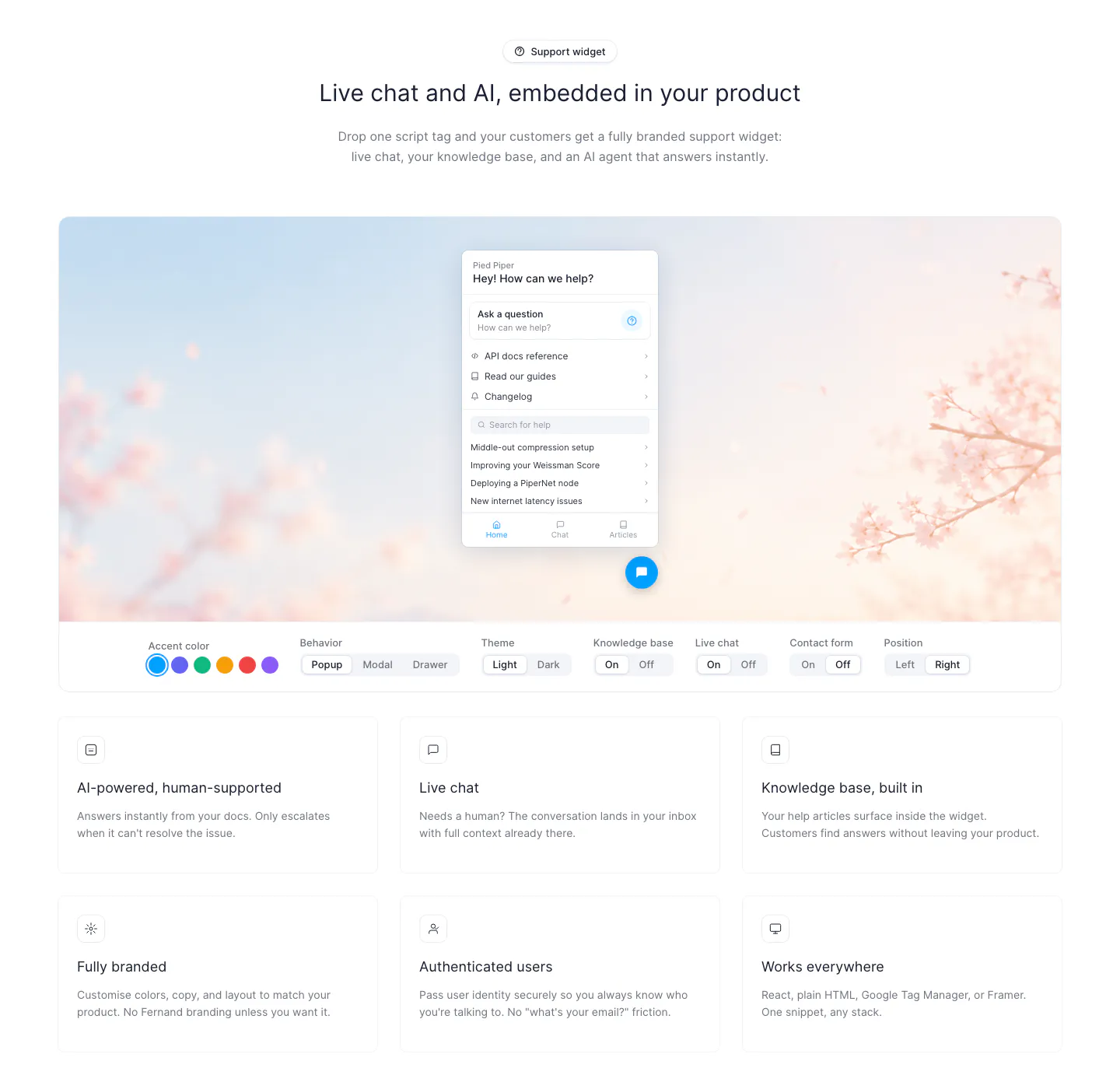
  87. Fernand features section: chat widget preview on a blossom photo with segmented style toggles above a 3x2 card grid
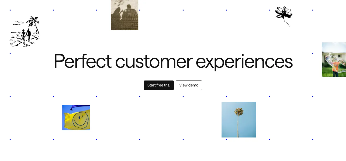
  88. Intercom call to action section: large centered headline and two buttons amid scattered photo tiles, ink sketches and a blue dot grid
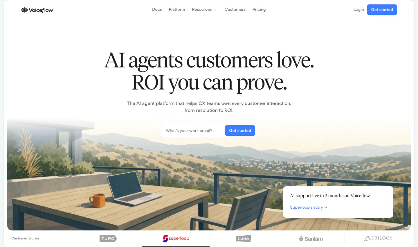
  89. Voiceflow hero section: centered serif headline and email signup field over a painted terrace landscape, customer logo tabs below
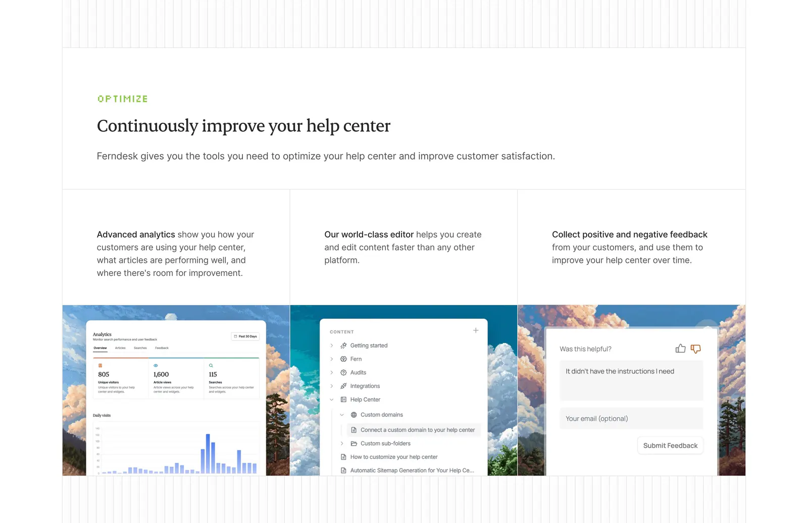
  90. Ferndesk features section: serif headline above three columns with analytics, editor and feedback UI over pixel-art landscapes
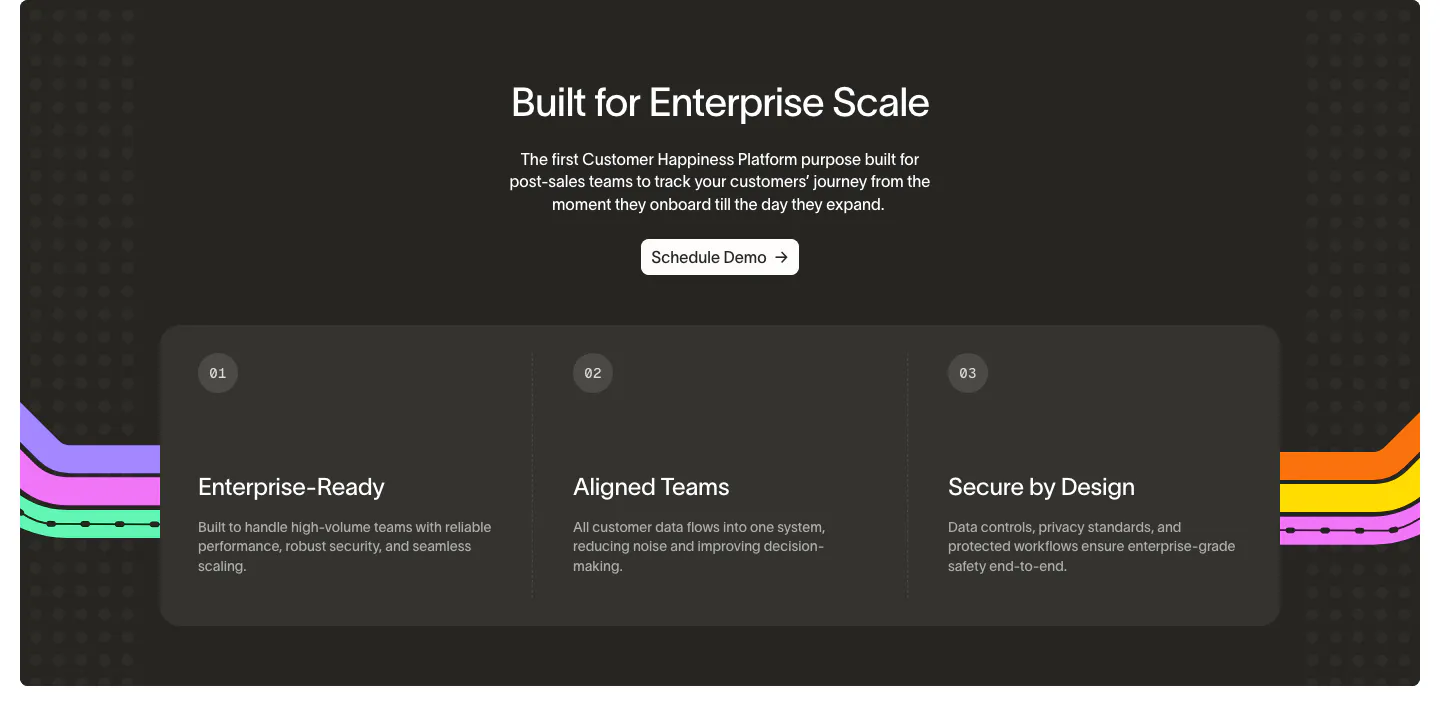
  91. Wavelength value proposition section: centered headline and Schedule Demo button above three numbered benefit columns on a charcoal panel
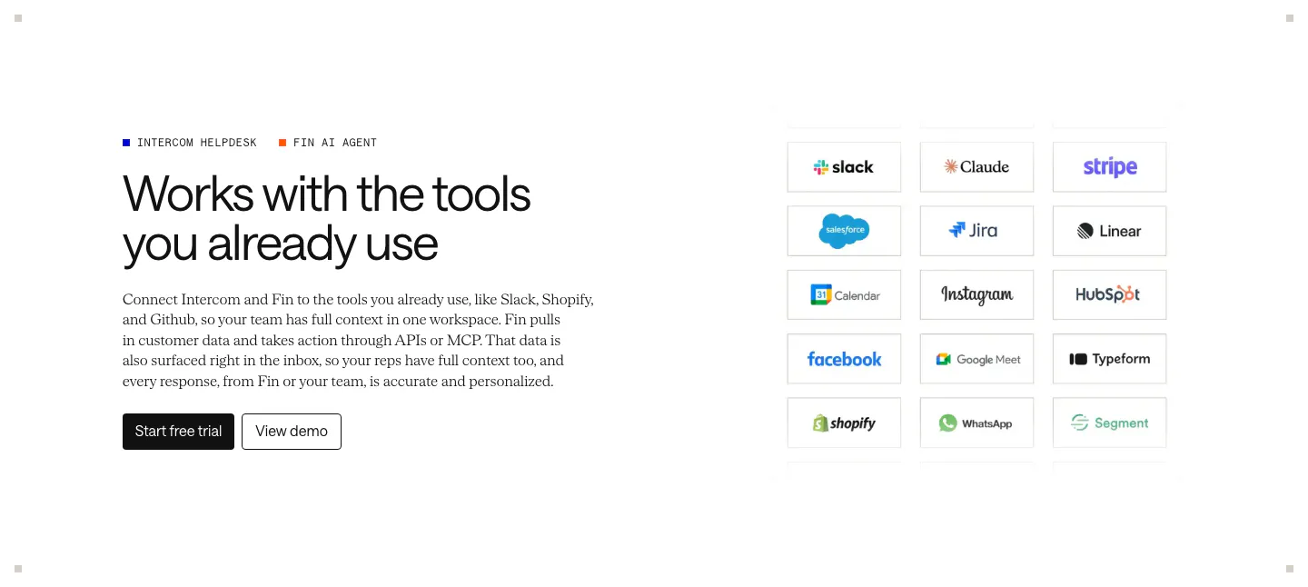
  92. Intercom integrations section: headline, copy and CTAs on the left, grid of bordered app logo tiles like Slack, Stripe and Shopify on the right
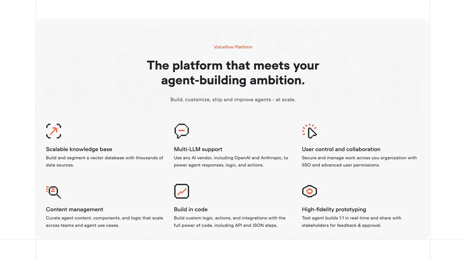
  93. Voiceflow features section: centered headline above a six-item grid of features with orange pixel-style icons on a light gray panel
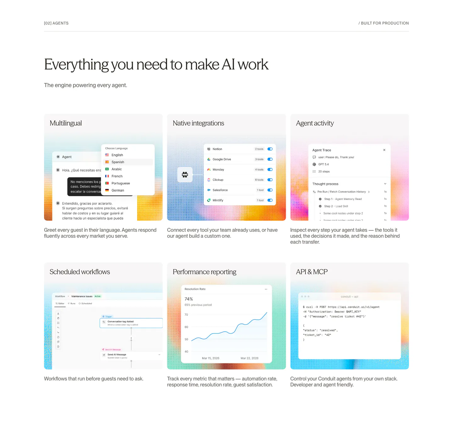
  94. Conduit features section: serif headline above a 3x2 card grid of agent UI mockups on dithered gradient tiles
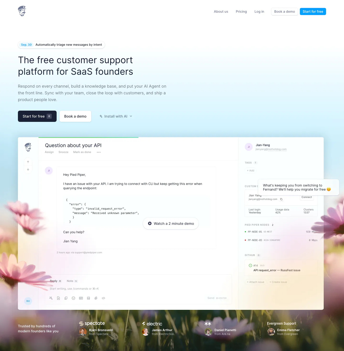
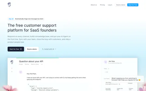
  95. Fernand hero section: left-aligned headline and two CTAs above an inbox product screenshot on a sky-blue gradient with a blurred flower field
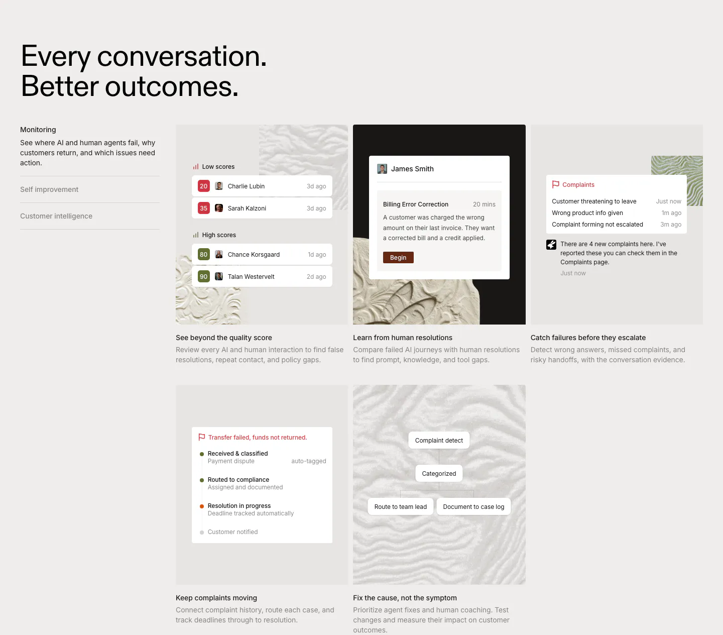
  96. Rulebase features section: left-aligned headline, vertical tab list and a grid of five cards with scoring and complaint UI on textured tiles
  97. Voiceflow testimonials section: centered serif headline above a row of logo and quote cards cut off at the right edge
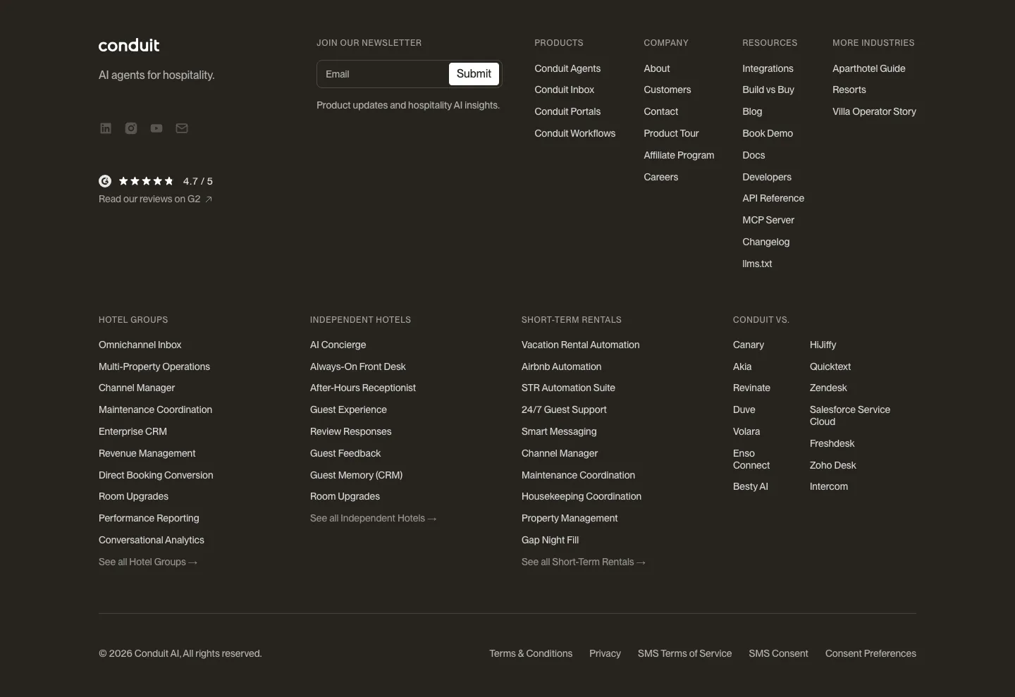
  98. Conduit footer section: dark brown footer with newsletter field, G2 rating and dense multi-column link lists
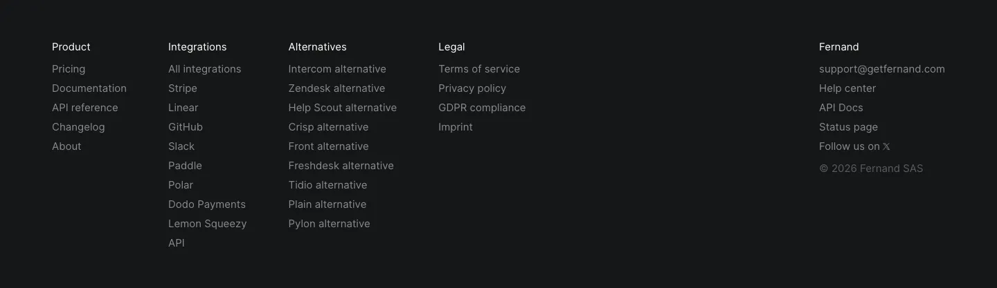
  99. Fernand footer section: five link columns with contact email and copyright on a near-black background
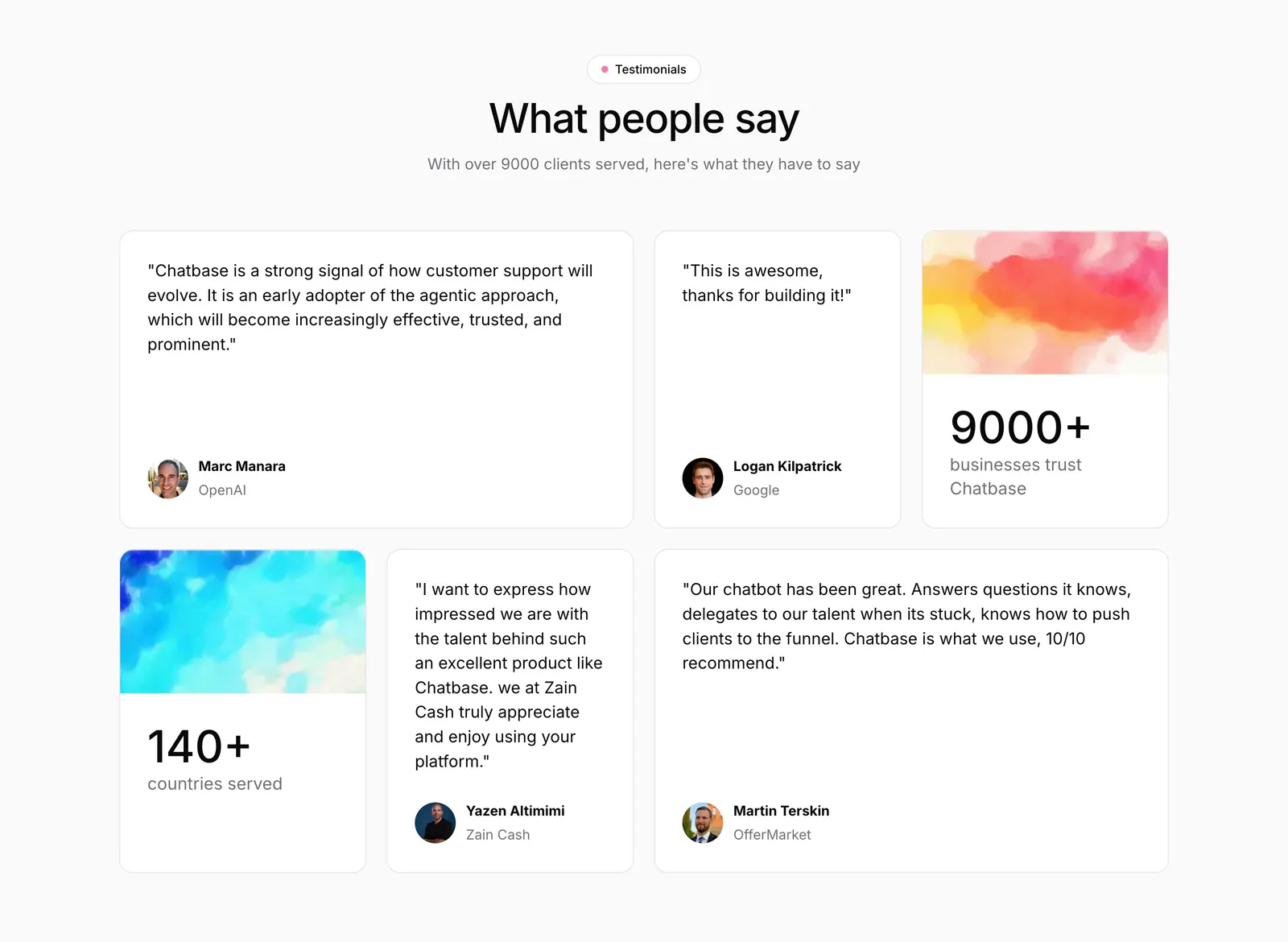
  100. Chatbase testimonials section: centered heading above a bento grid of quote cards and two stat cards with watercolor images
  101. Voiceflow logo cloud section: centered line of text above three rows of grayscale customer logos on a charcoal background
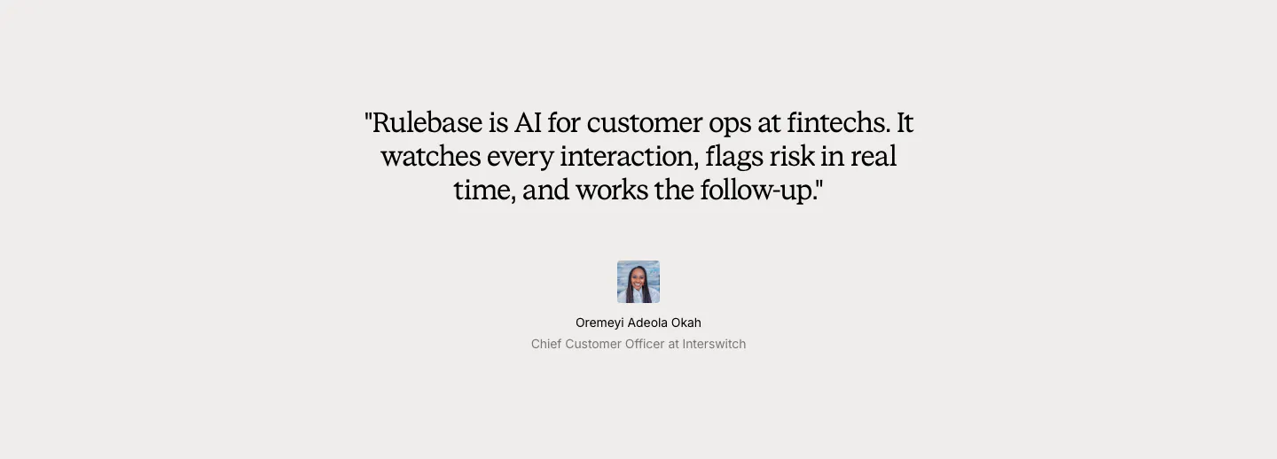
  102. Rulebase testimonials section: centered serif customer quote with a small avatar, name and title on a light gray background
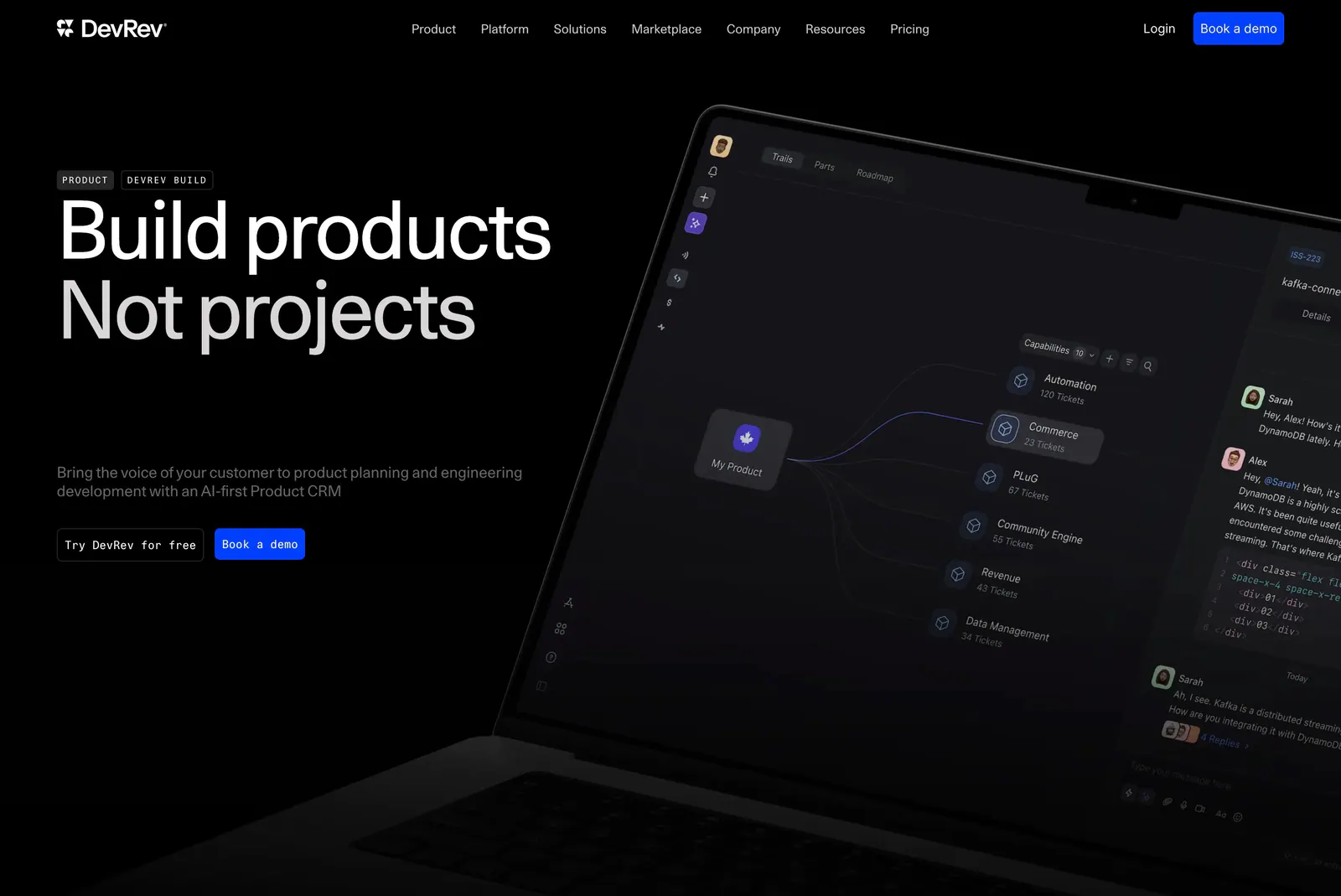
  103. DevRev hero section: large left-aligned headline with two buttons beside an angled laptop showing a dark product interface on black
  104. Conduit logo cloud section: two rows of gray hospitality brand logos separated by thin dividers on white
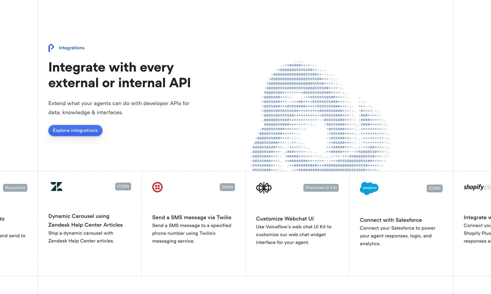
  105. Voiceflow integrations section: headline left and ASCII-art cloud right above a scrolling row of integration cards like Zendesk and Twilio
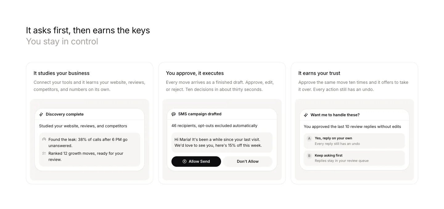
  106. Beside features section: left-aligned headline above three cards, each with a short description and an approval UI snippet
  107. DevRev testimonials section: centered large customer quote with name and title above three pagination bars on a plain white background
  108. Ada footer section: deep green background with link columns, newsletter email field and a huge pink ada wordmark and logo
  109. Voiceflow footer section: dark rounded panel with serif headline and email field on the left, three link columns and social icons
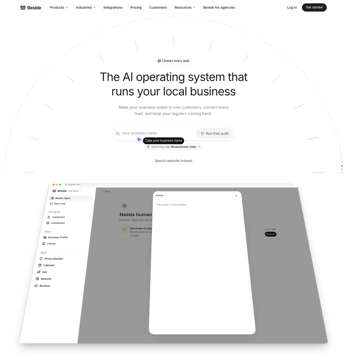
  110. Beside hero section: centered headline with a business name search field above a tilted app dashboard screenshot on white
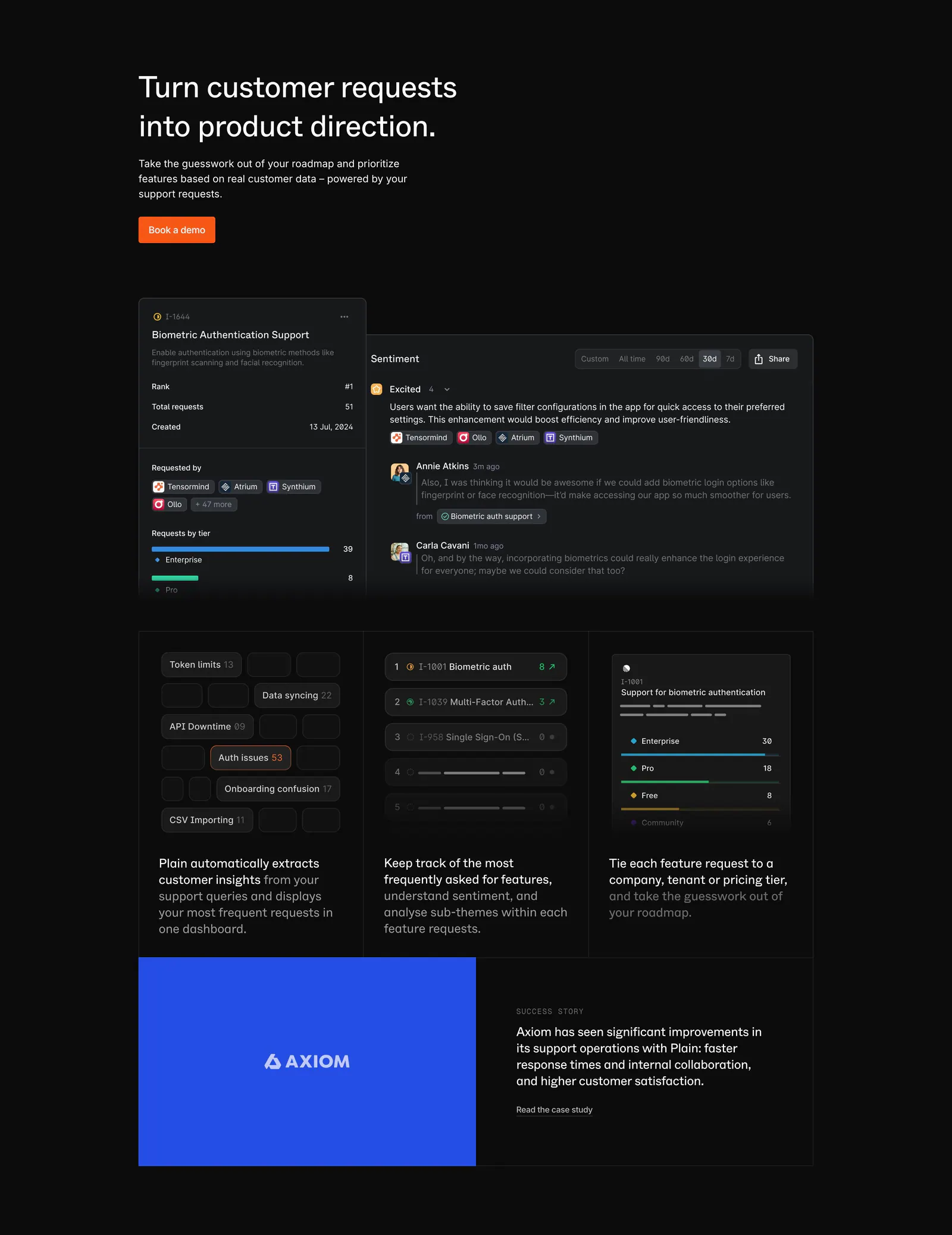
  111. Plain features section: dark headline with orange button above feature request UI panels, three insight cards and a blue Axiom case study
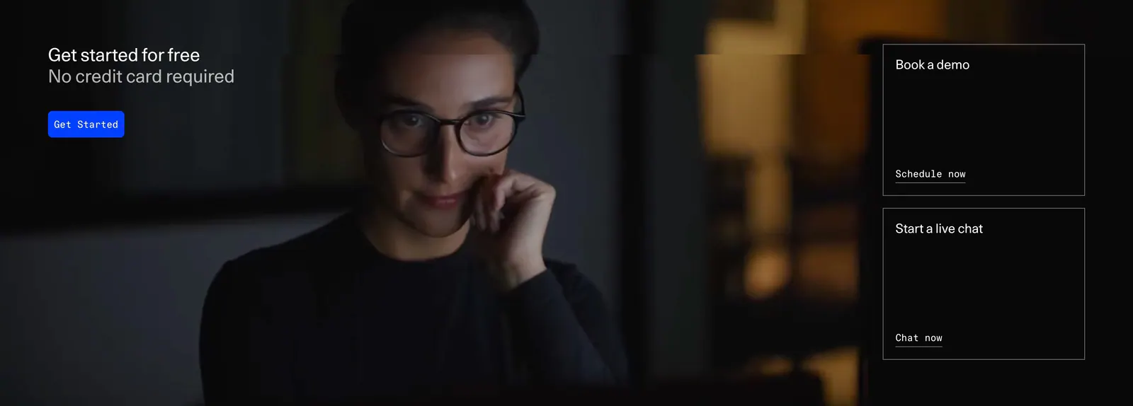
  112. DevRev call-to-action section: headline and blue button over a full-bleed dark photo, with demo and live chat link cards on the right
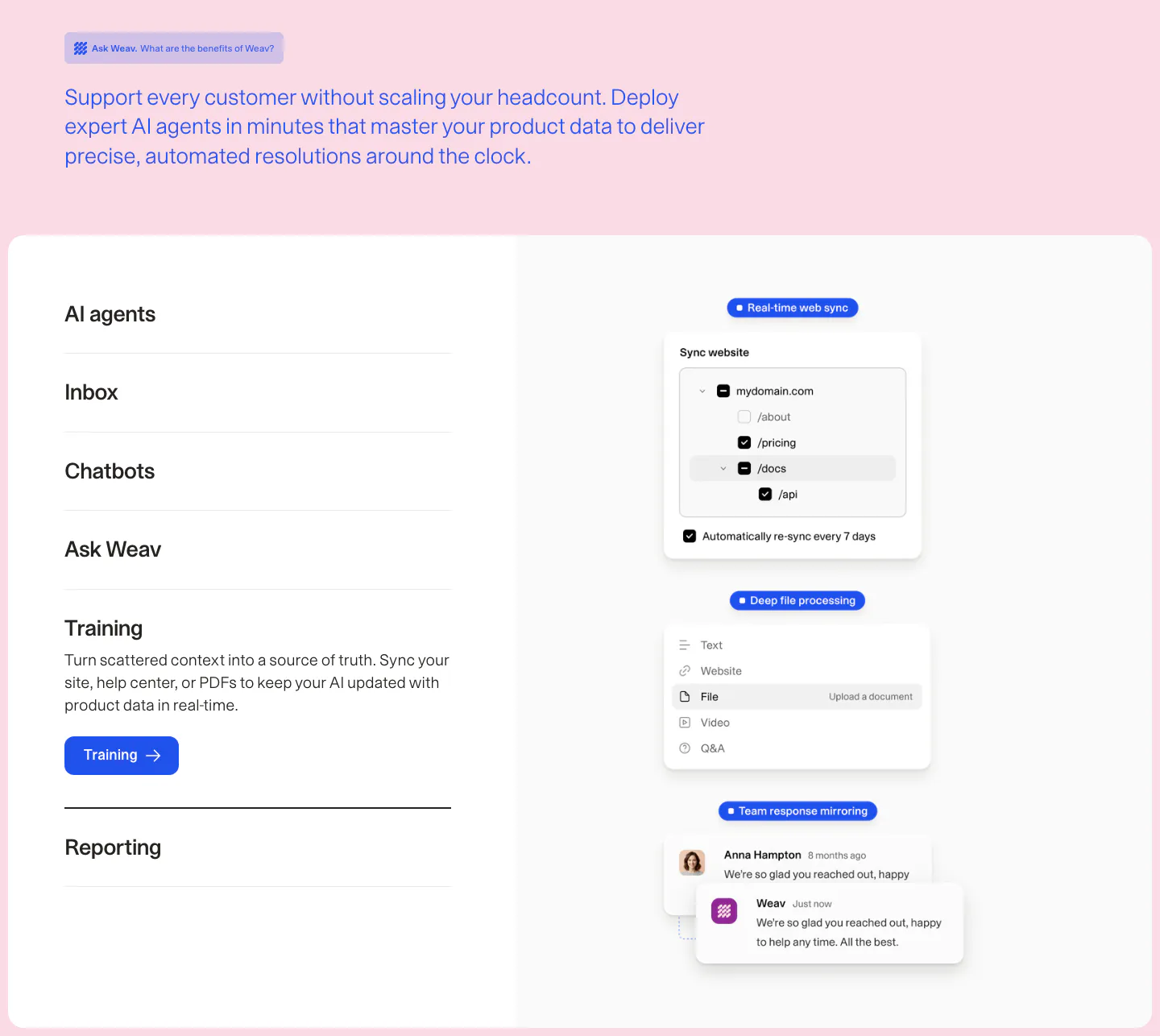
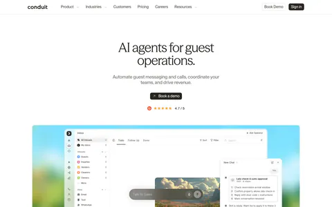
  113. Weav features section: intro text on pink above a white card with an expandable feature list on the left and stacked sync and chat UI cards
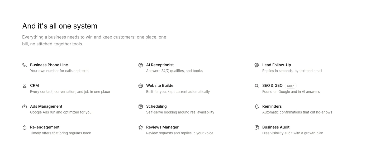
  114. Beside features section: headline and intro above a three-column list of twelve capabilities with line icons and short descriptions
  115. Conduit hero section: centered serif headline and demo button above an inbox app screenshot on a painterly landscape backdrop
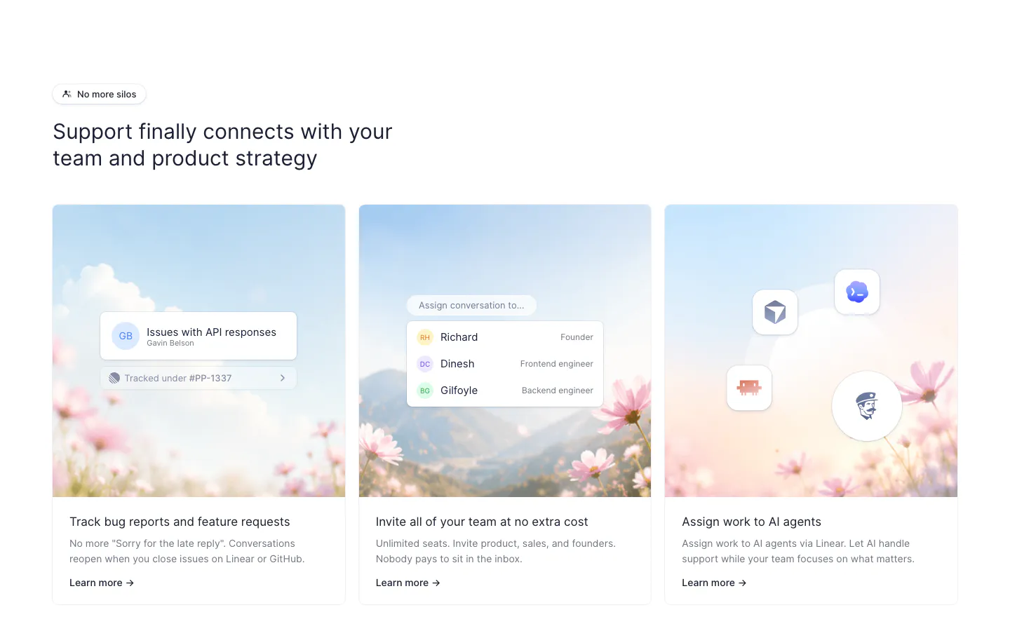
  116. Fernand features section: headline above three cards with sky and flower photos overlaid with small UI chips
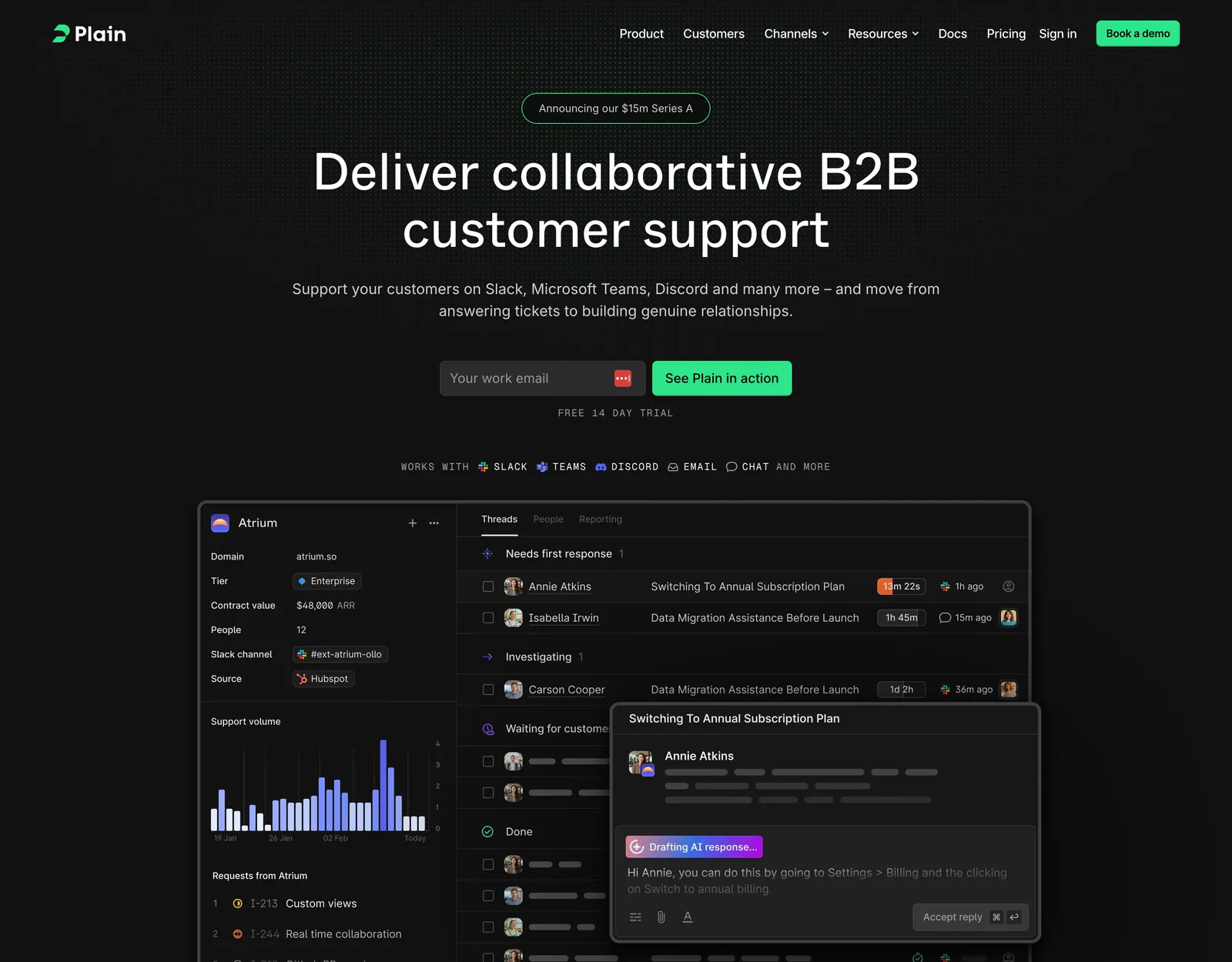
  117. Plain hero section: dark centered headline with email field and green button above a support inbox screenshot on a dot grid
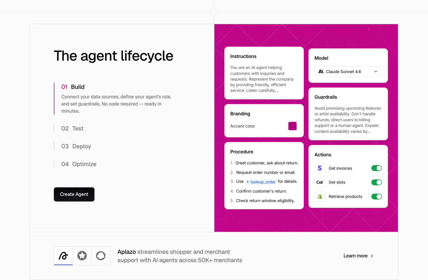
  118. Chatbase how it works section: four numbered lifecycle steps beside a magenta panel of agent config cards, customer story strip below
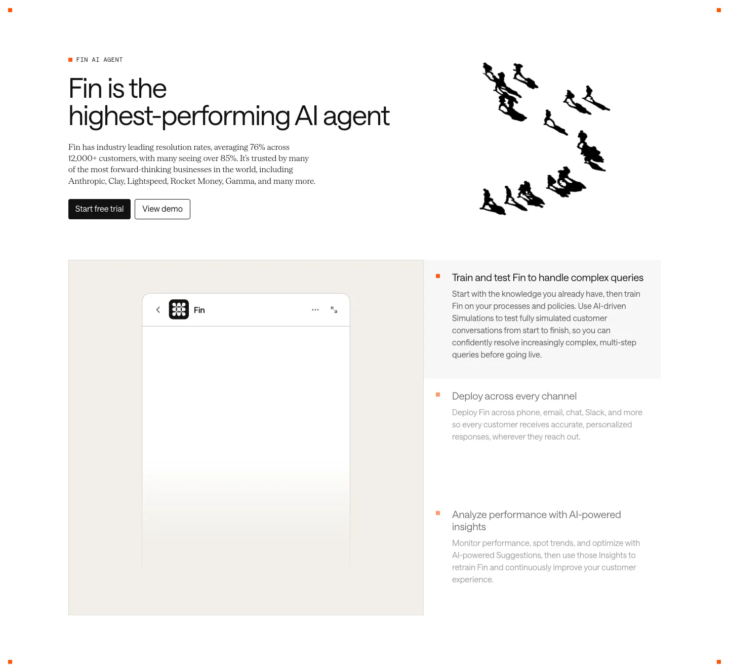
  119. Intercom features section: headline with an ink drawing of running figures, then a Fin chat widget panel beside a three-item feature selector
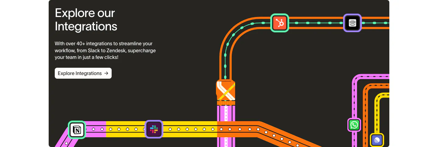
  120. Wavelength integrations section: headline and Explore Integrations button at left beside a colorful transit-map graphic linking app icons
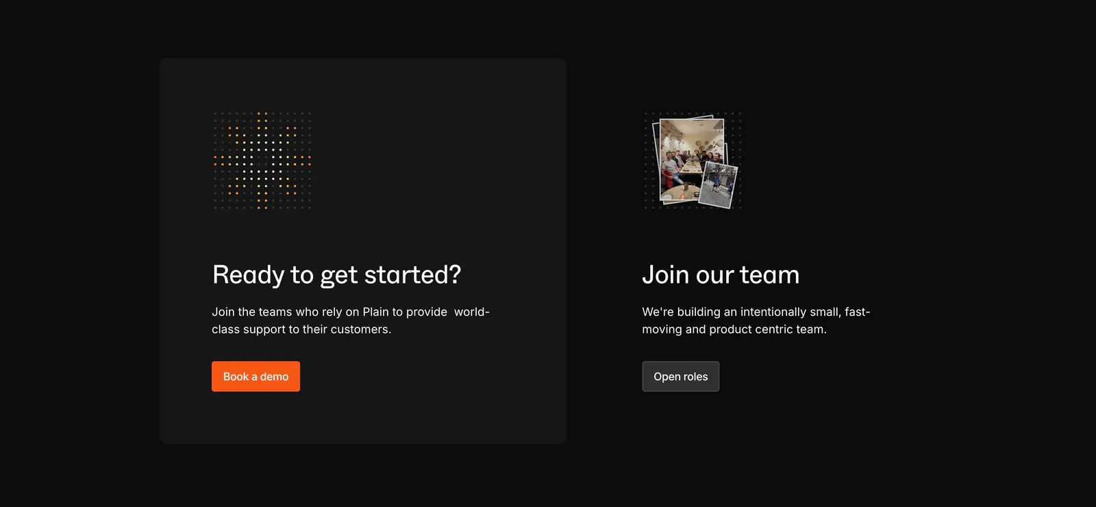
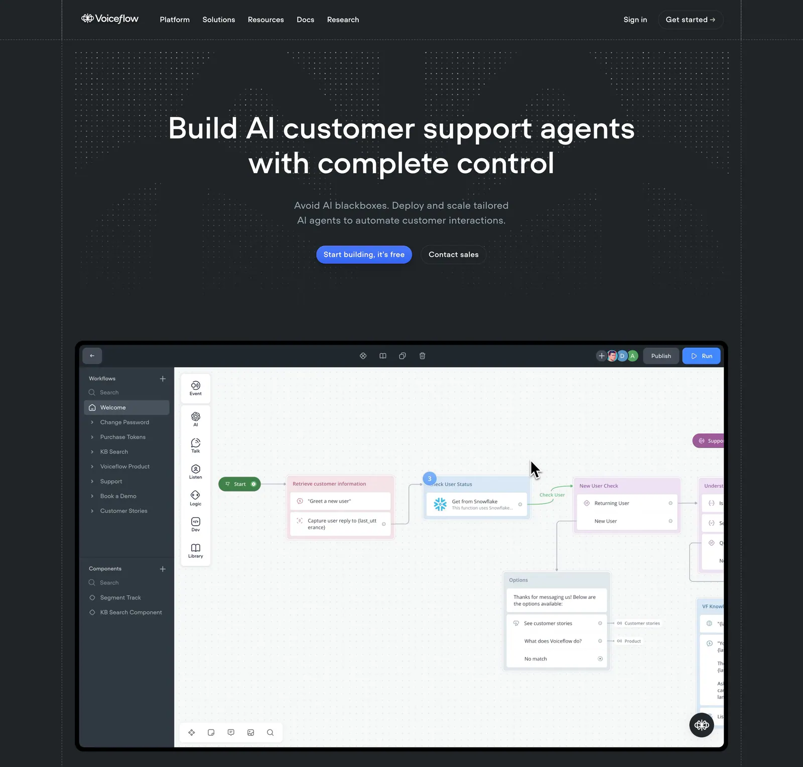
  121. Plain call to action section: dark card with dot icon and orange demo button beside a Join our team block with a small photo stack
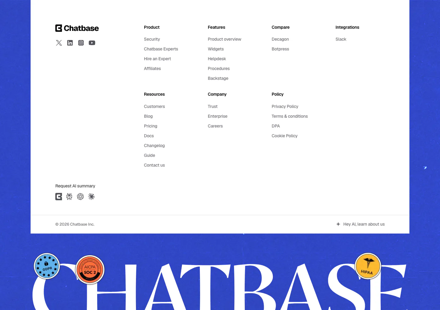
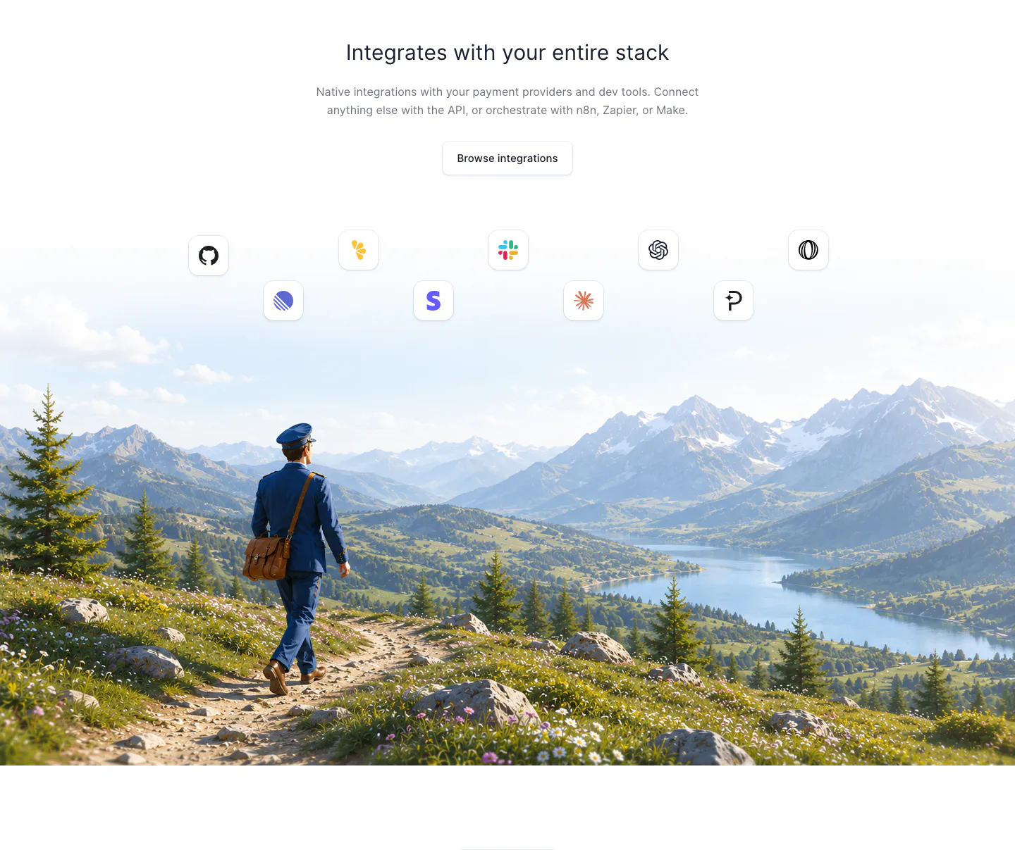
  122. Chatbase footer section: white link-column panel on a blue background above a giant serif Chatbase wordmark with compliance stickers
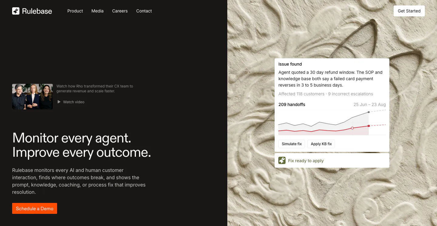
  123. Voiceflow hero section: centered headline and buttons on a charcoal dotted background above a workflow builder canvas screenshot
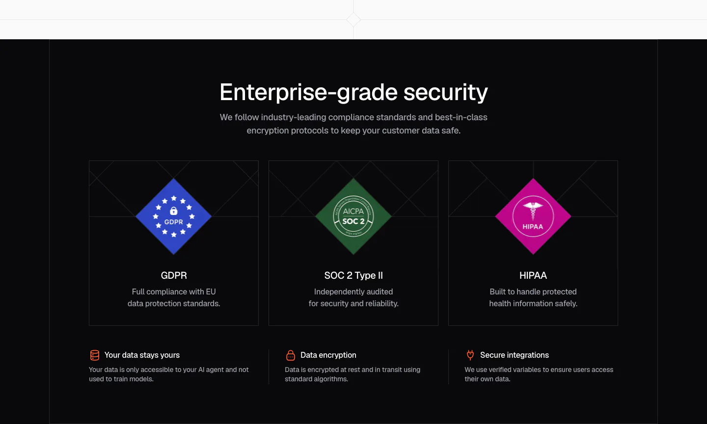
  124. Fernand integrations section: centered heading and button above app icons floating over a painted mountain landscape with a postman
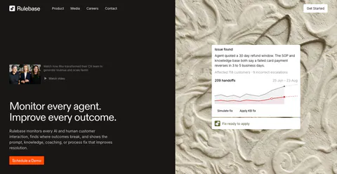
  125. Rulebase hero section: split layout with headline and orange demo button on a dark panel beside a carved plaster texture with an issue-alert UI card
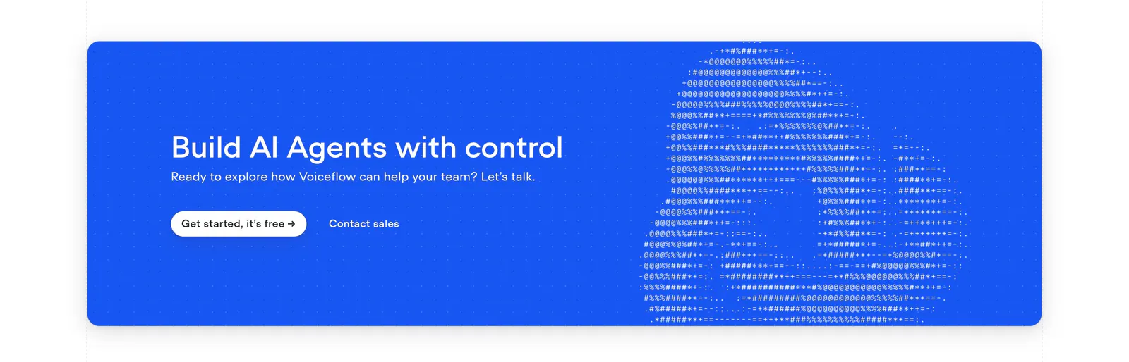
  126. Chatbase security section: dark centered headline over three cards with GDPR, SOC 2 and HIPAA diamond badges and a row of trust points
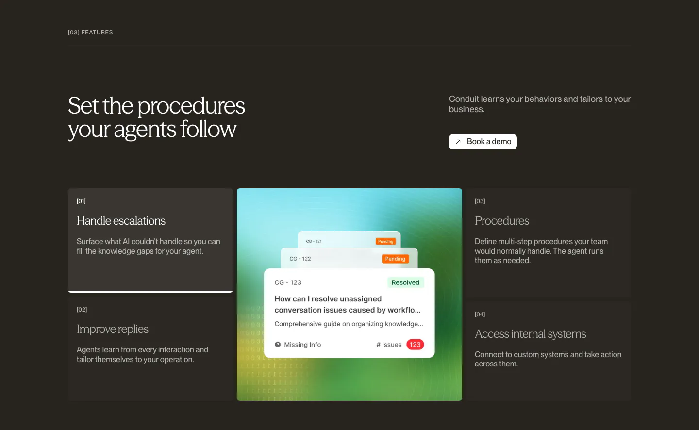
  127. Conduit features section: dark brown panel with numbered feature list flanking a central resolved-ticket UI card
  128. Voiceflow call-to-action section: bright blue rounded banner with left headline and buttons beside ASCII-art logo on a dot grid
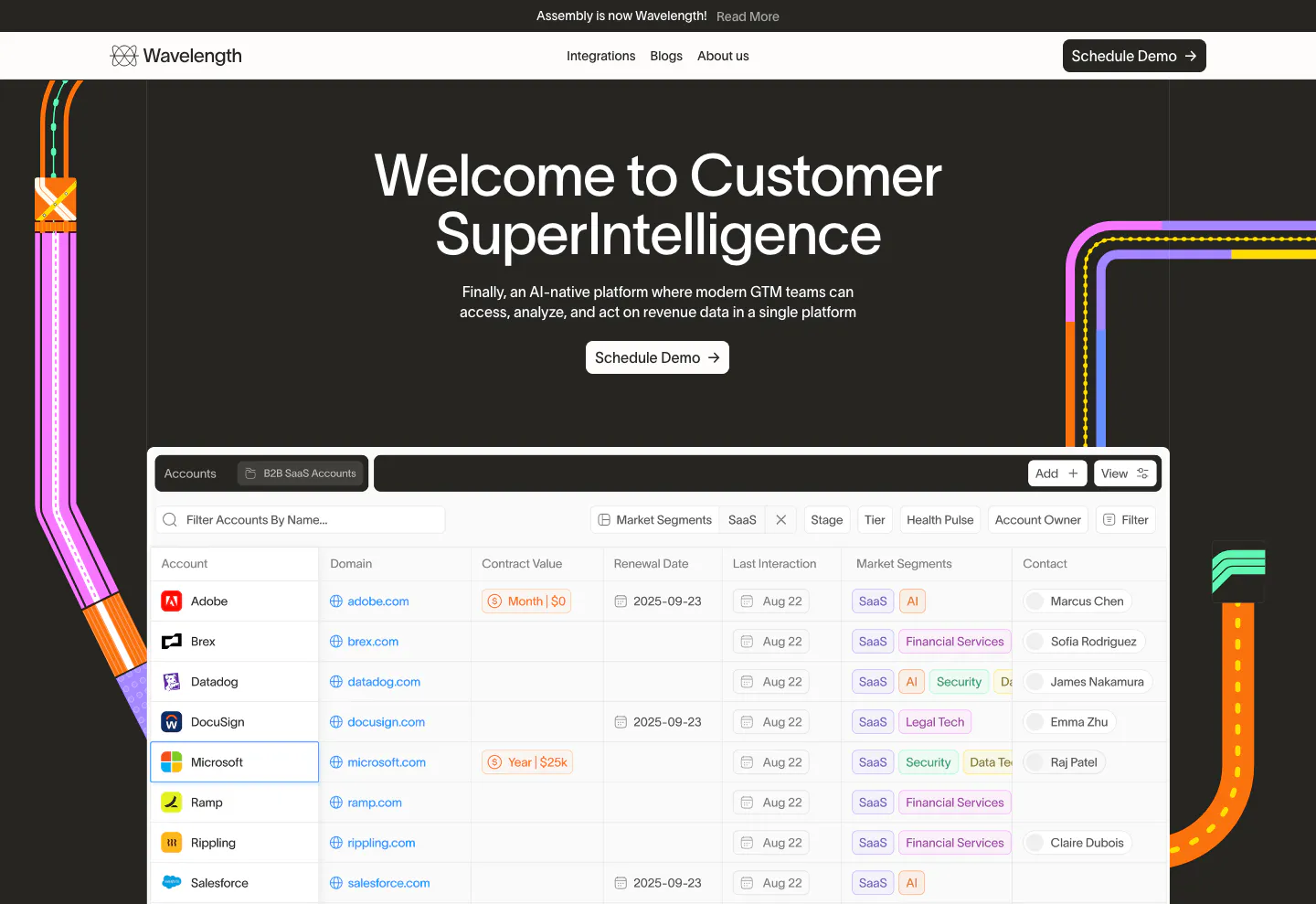
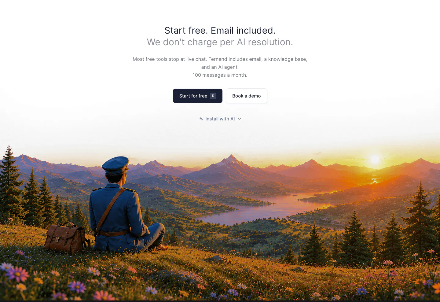
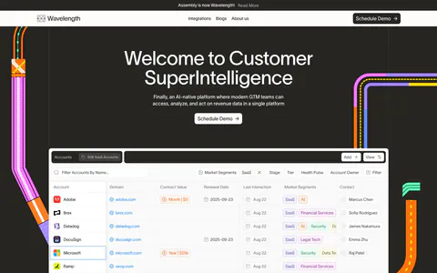
  129. Wavelength hero section: centered headline and Schedule Demo button above an accounts table screenshot, flanked by colorful transit lines on charcoal
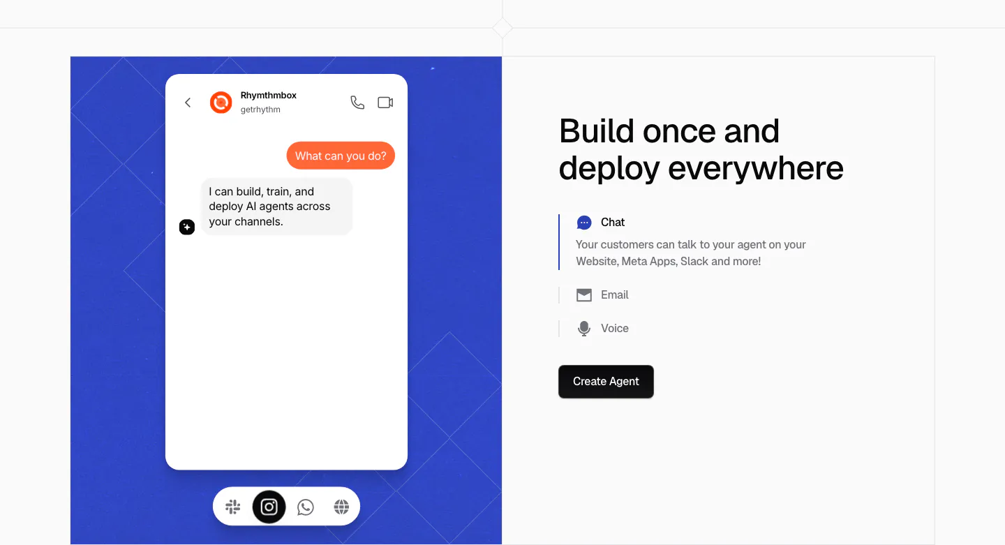
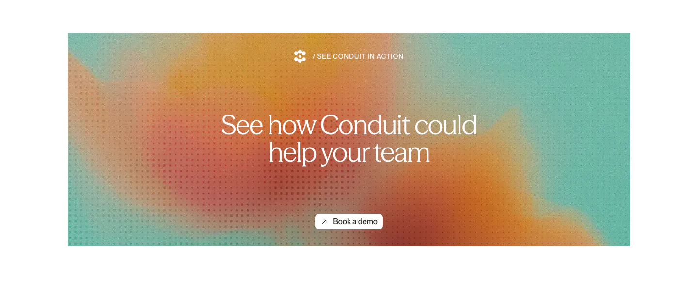
  130. Chatbase features section: blue patterned panel with a chat app mockup on the left, headline and Chat, Email, Voice selector on the right
  131. Fernand call-to-action section: centered headline and buttons above a painted sunset landscape with a seated postman
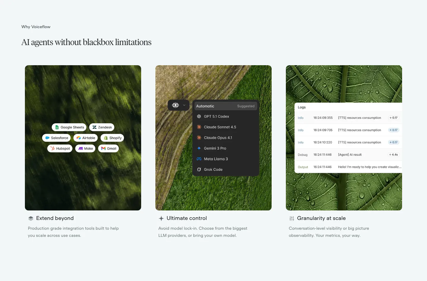
  132. Conduit call-to-action section: centered serif headline and button on an orange and teal gradient panel with dot texture
  133. DevRev logo cloud section: centered gray caption above a single row of six monochrome customer logos on white
  134. Voiceflow features section: serif headline above three cards pairing nature photos with integration, model picker and log UI overlays
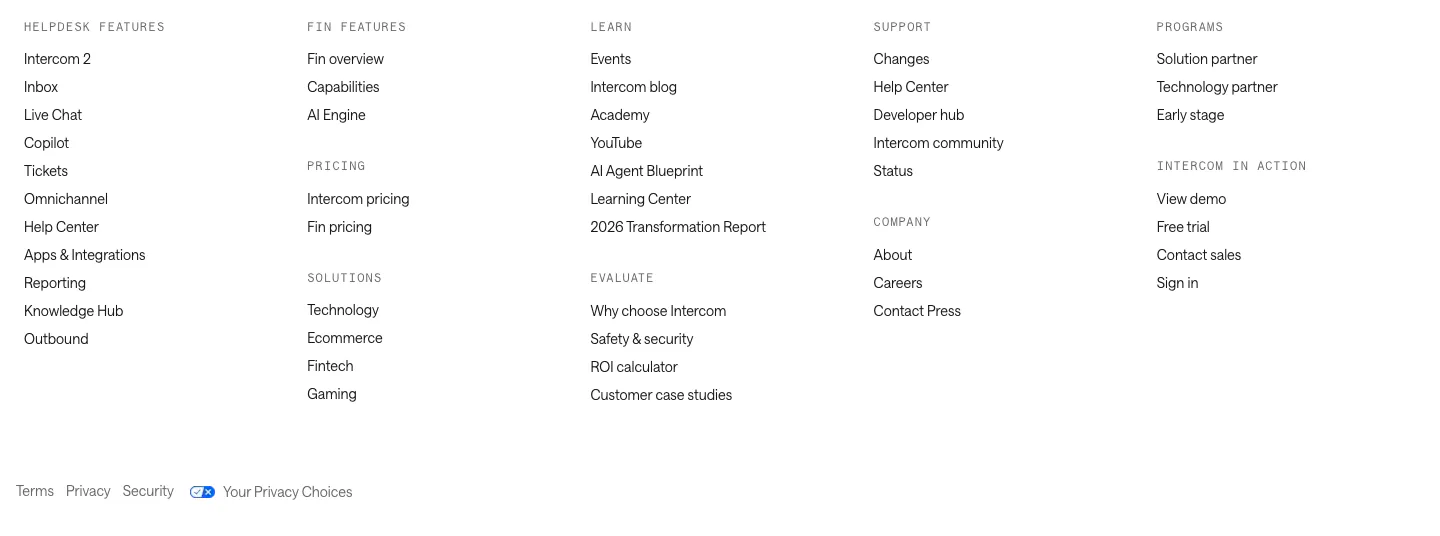
  135. Intercom footer section: five columns of grouped links under monospace labels with a row of legal links on white
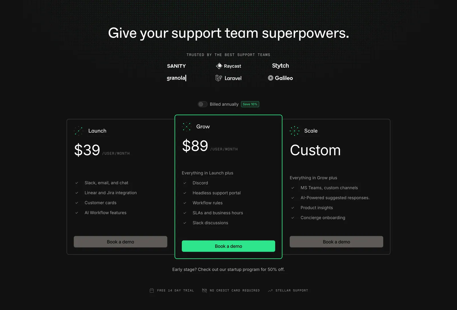
  136. Plain pricing section: dark centered headline with logo grid and billing toggle above three plan cards, the middle one highlighted green
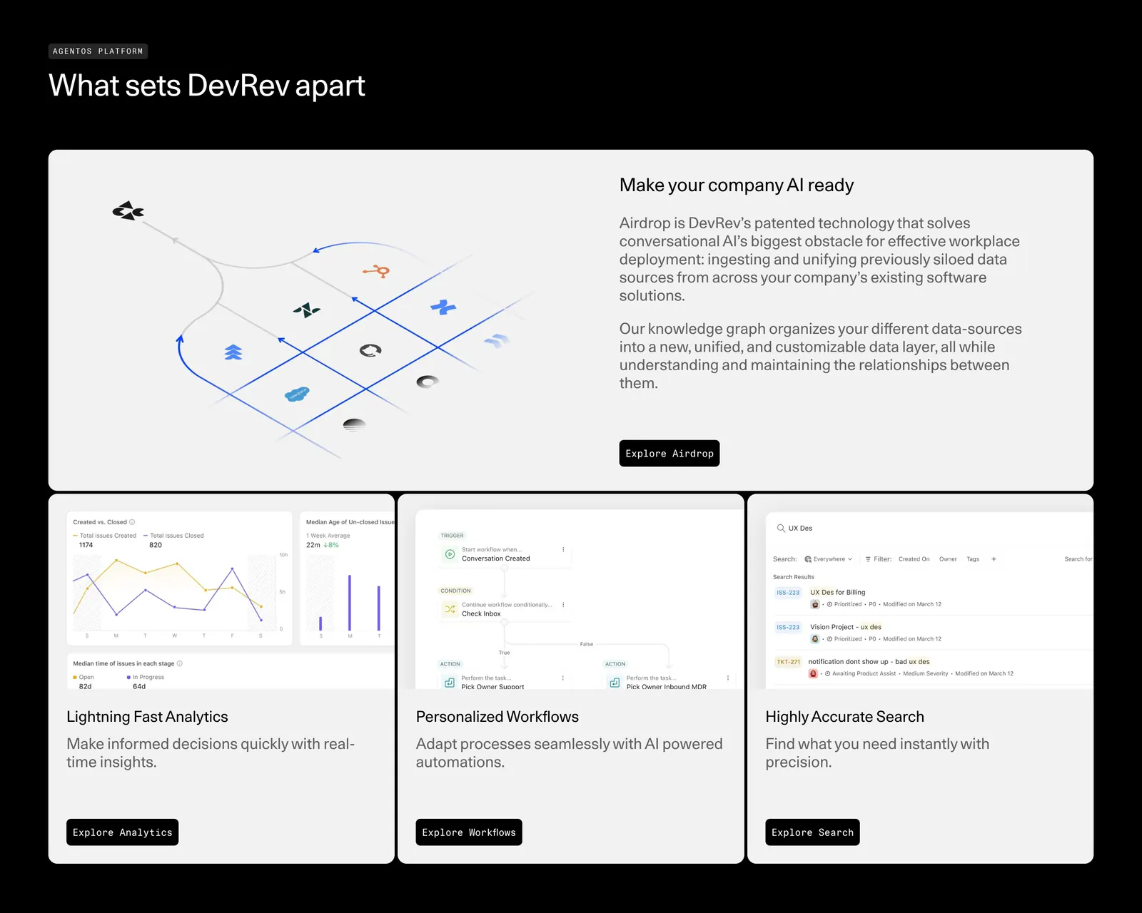
  137. DevRev features section: headline over a bento of one wide Airdrop diagram card and three product UI cards for analytics, workflows and search
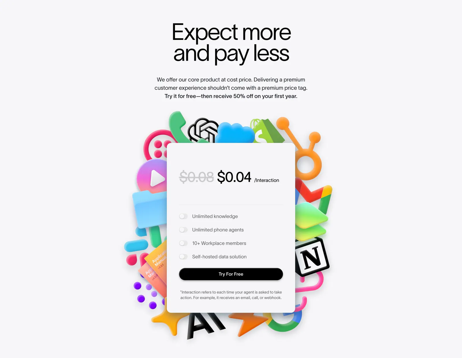
  138. Lemni pricing section: centered headline above a single per-interaction price card with toggle features, framed by colorful 3D app icons
    Lemni Pricing
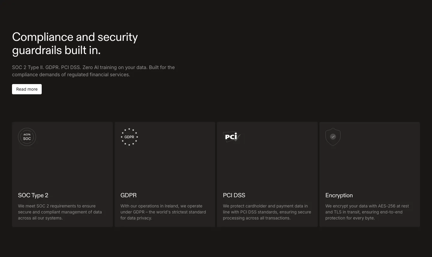
  139. Rulebase security section: left-aligned headline and Read more button above four dark cards for SOC 2, GDPR, PCI DSS and encryption
  140. Conduit features section: serif headline above three agent cards with chat, voice and analytics UI on colorful blurred tiles
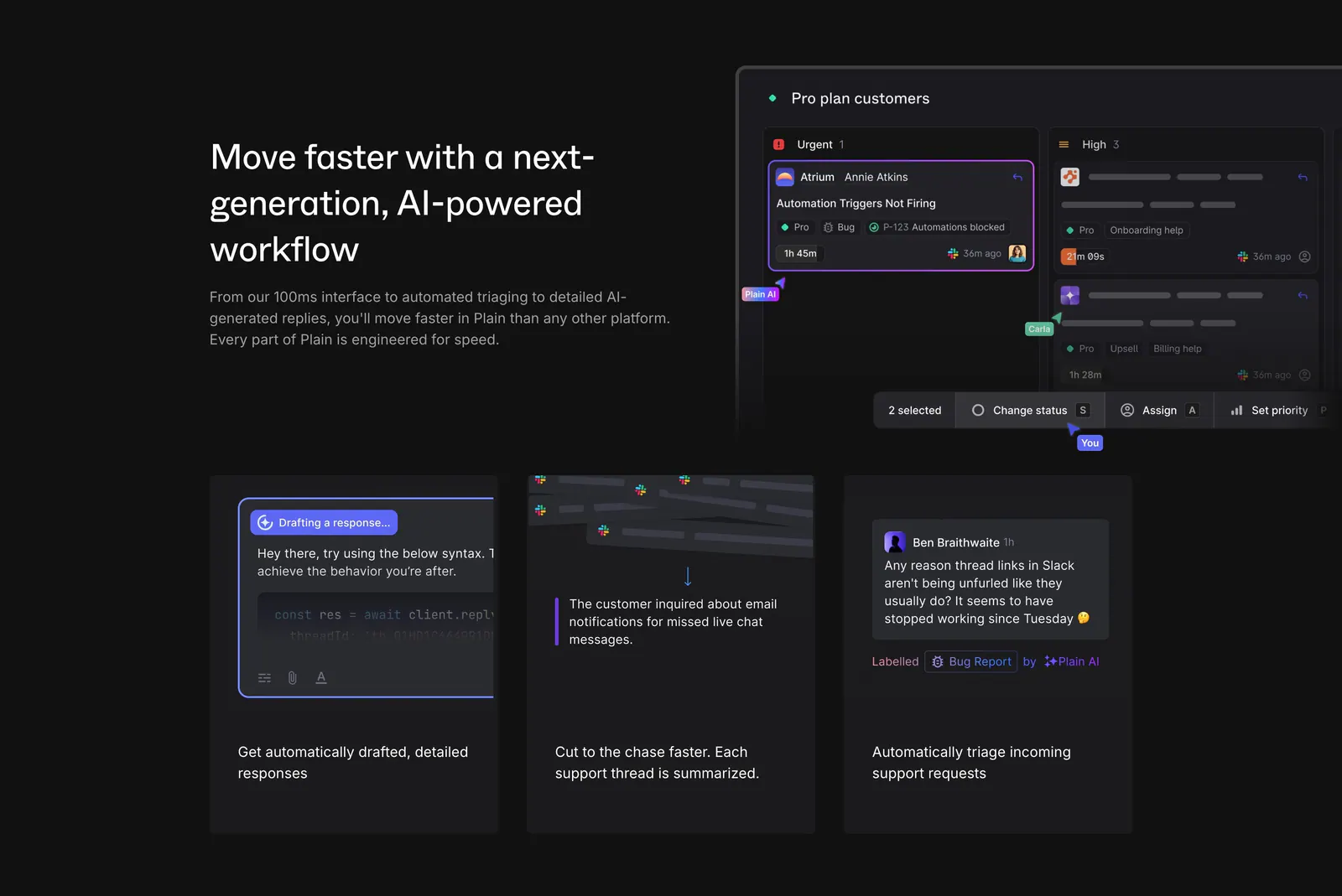
  141. Plain features section: dark split with headline beside a triage board UI, above three cards showing AI drafting, summaries and labels
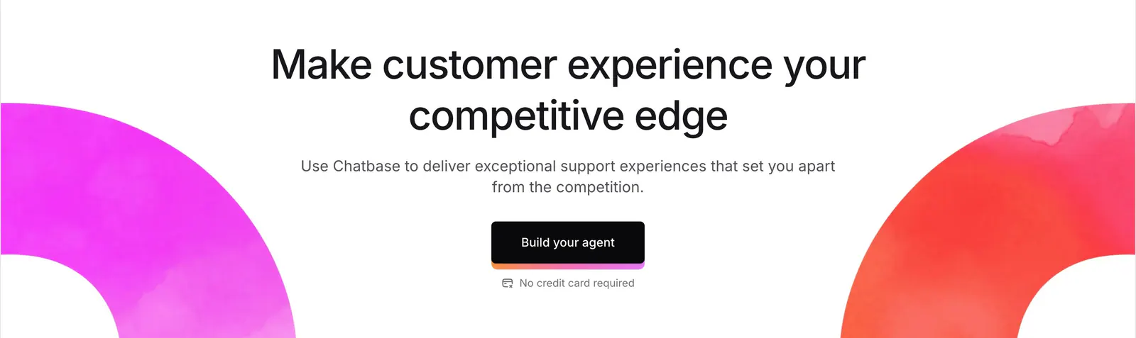
  142. Chatbase call-to-action section: centered headline and dark button framed by magenta and red watercolor arcs on white
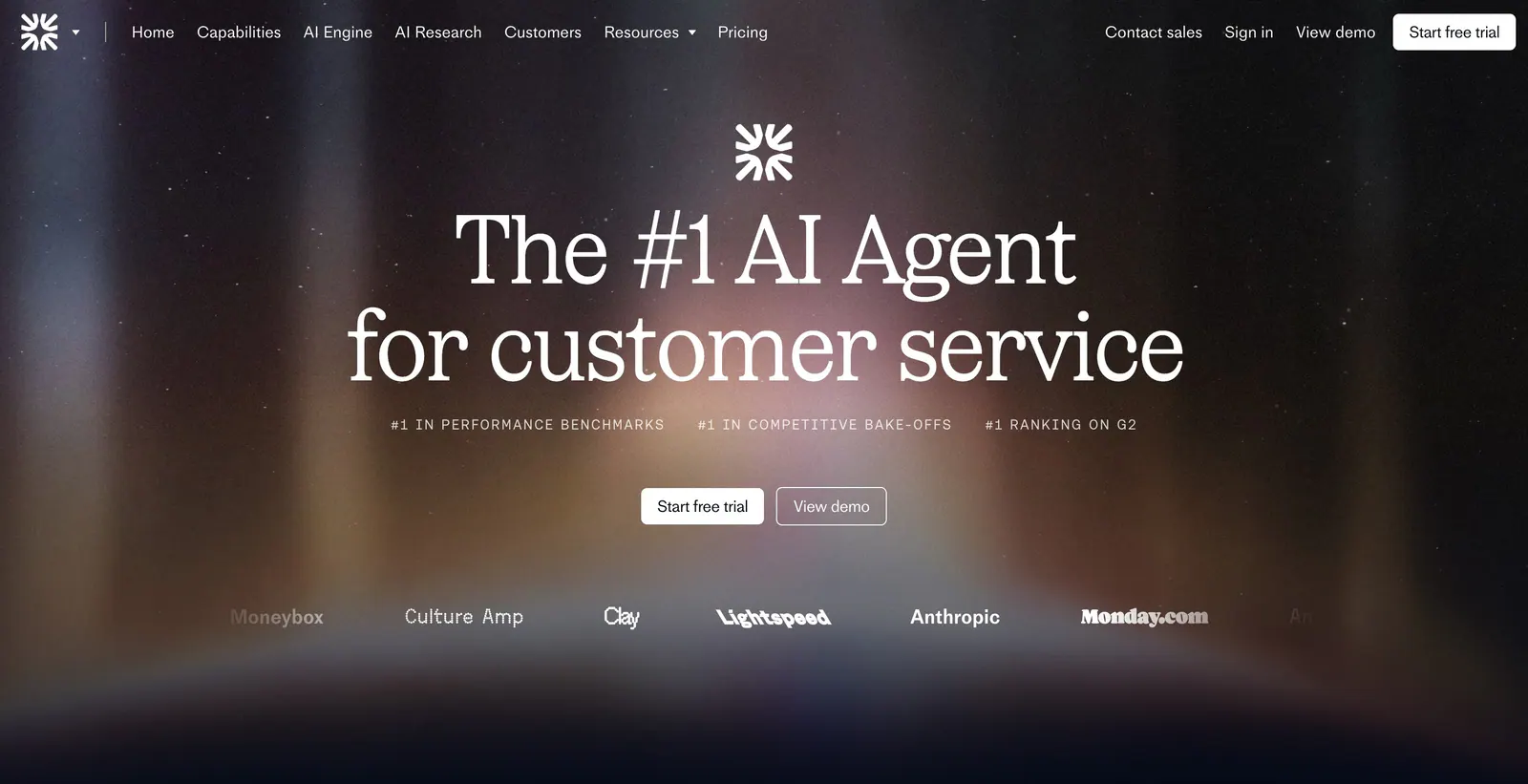
  143. Fin hero section: nav bar, centered serif headline, ranking labels and CTAs over a dark aurora glow with a customer logo row
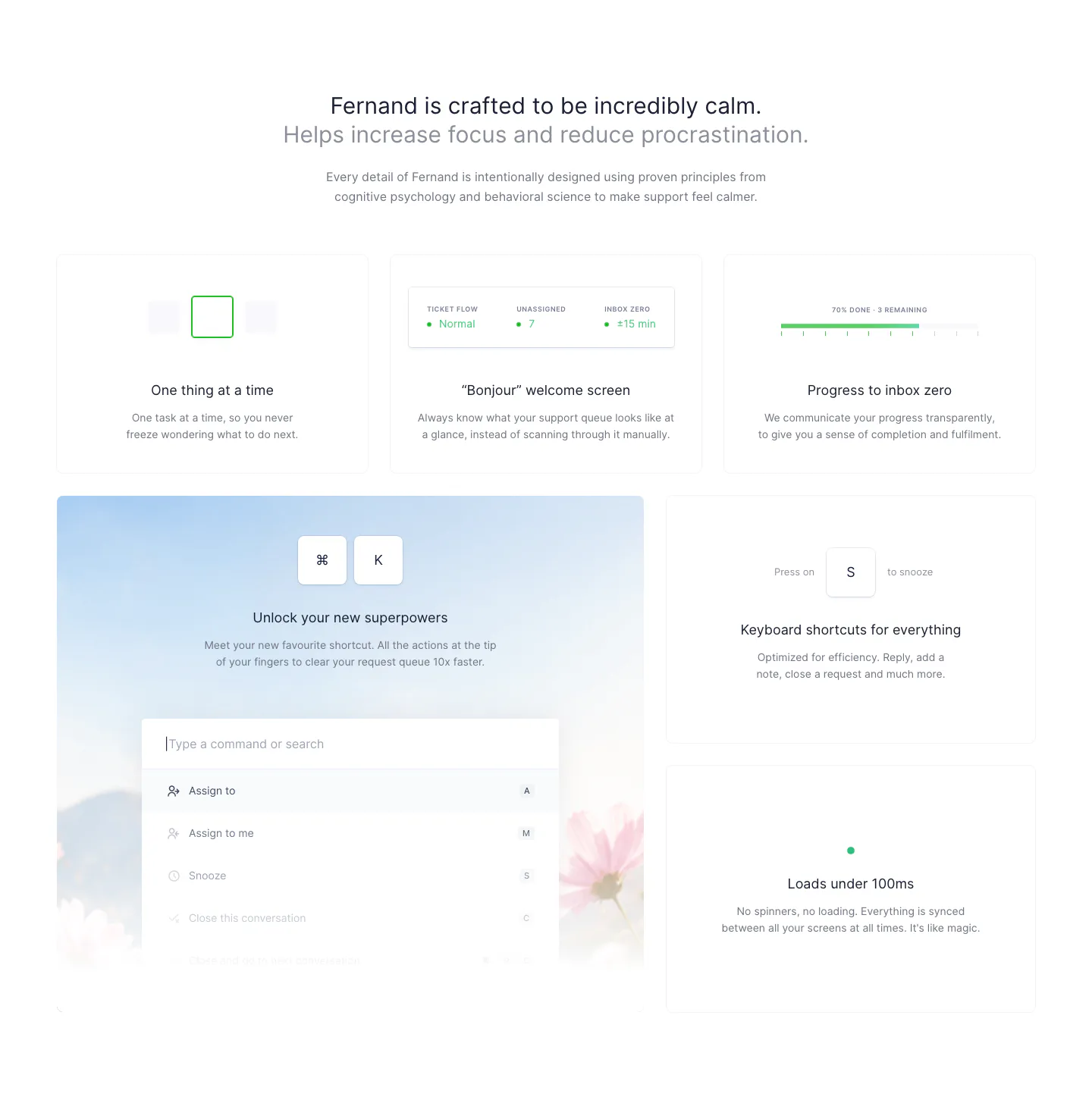
  144. Fernand features section: centered heading above a bento grid of cards with a command palette and keyboard shortcut UI
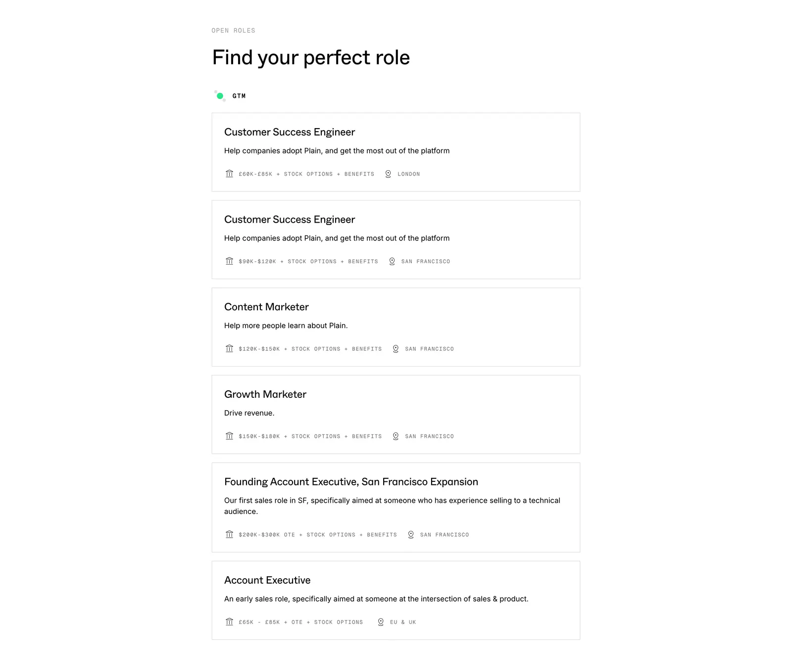
  145. Plain careers section: left-aligned heading above a stacked list of bordered job cards with salary and location details on white
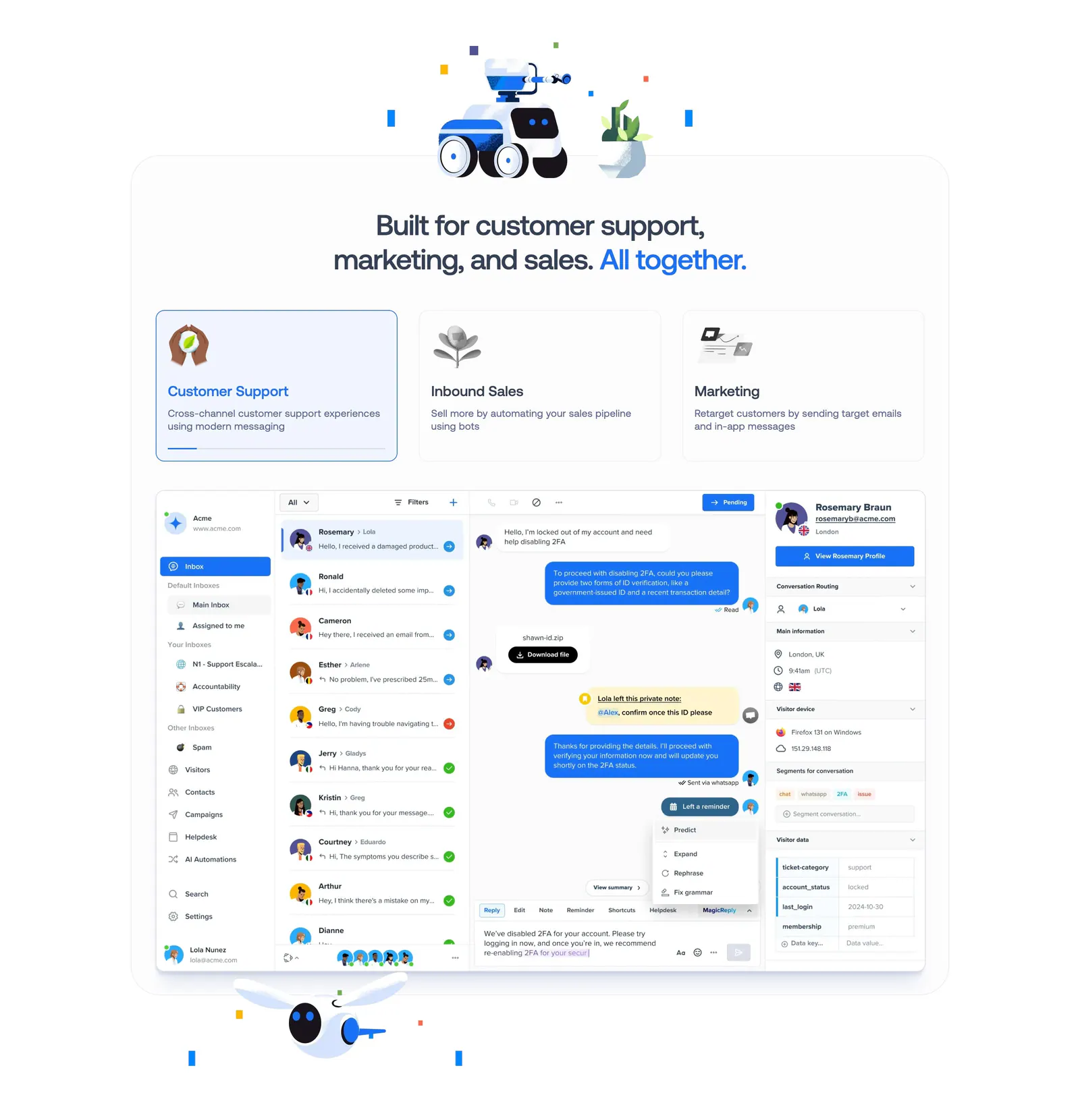
  146. Crisp features section: centered headline with robot renders above three selectable use-case cards and an inbox UI screenshot
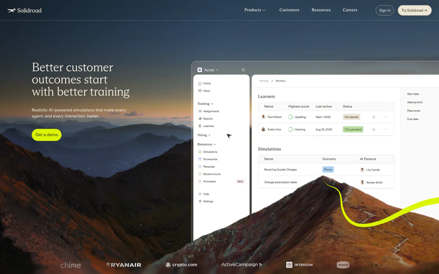
  147. Solidroad hero section: serif headline and lime button over a mountain landscape photo beside a training dashboard UI, logo row below
  148. Rulebase footer section: logo, tagline and compliance badges beside four link columns, with copyright and Y Combinator note on light gray
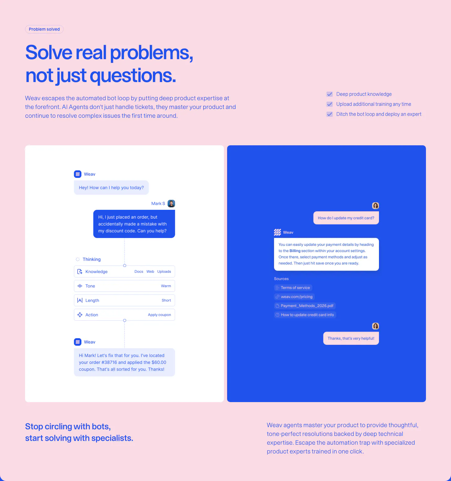
  149. Weav features section: blue headline and checklist on pink above a white panel with an AI reasoning chat flow and a blue panel with a sourced reply
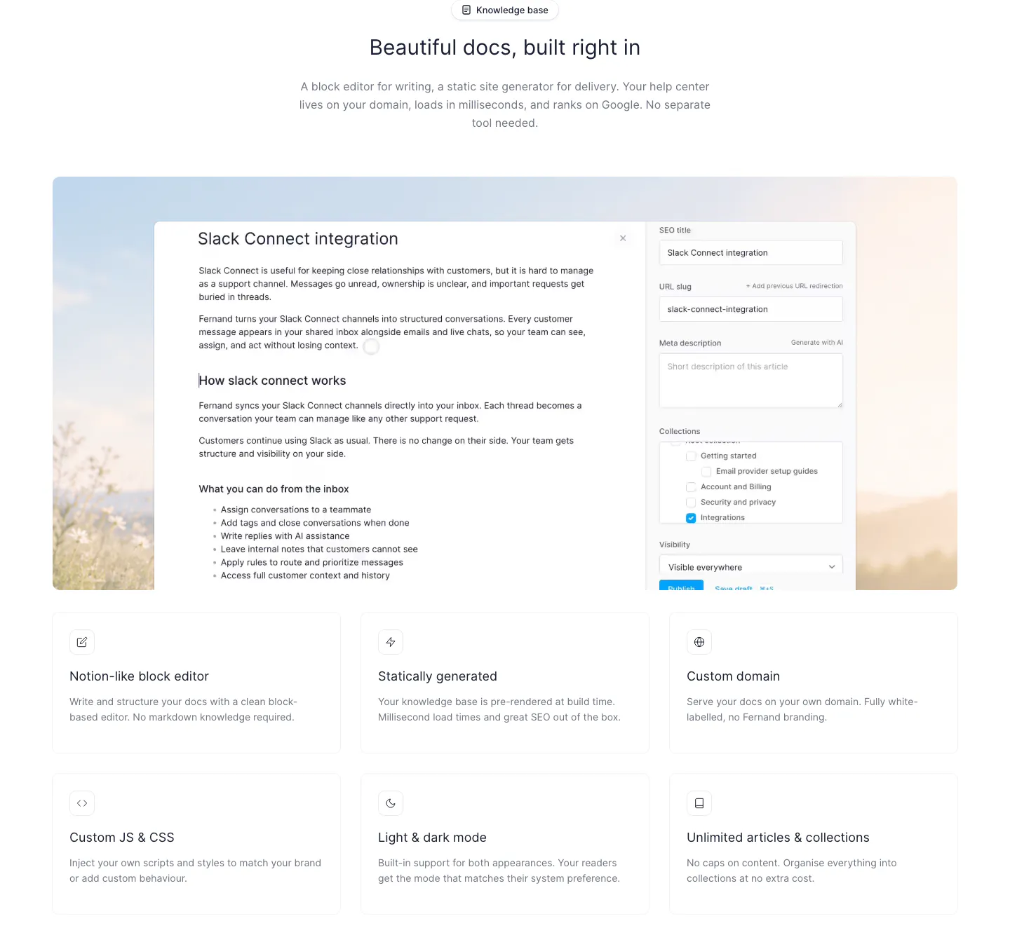
  150. Fernand features section: centered heading above a docs editor screenshot and a 3x2 grid of feature cards

Customer support companies
19 companies in this collection

All companies

Common styles in customer support websites

How to design a customer support website

  1. Show a conversation from start to finish

    Display a customer message, the suggested or automated reply, and the agent's final response in one sequence. A realistic tone and an imperfect question make the demo believable. Buyers want proof that the product handles messy requests, not only tidy ones.

  2. Be honest about automation limits

    Every support leader worries about bots frustrating customers. Explain how the product decides when to hand off to a person, what context the agent receives, and how quality is reviewed. Clear escalation rules build more trust than a high automation percentage.

  3. Use the metrics support leaders report

    Speak the language of the job: first response time, resolution rate, CSAT, and cost per ticket. Show how each one improves and how it is measured. Vanity numbers like messages sent mean little to someone reporting to the head of customer experience.

  4. Show every channel in one view

    Support happens across email, chat, phone, and social. Show which channels the product covers and how agents see them in one place. Include the knowledge base, since buyers want to know where answers come from and how easily the team can keep them current.

All industries
    ↑↓ Navigate ↵ Open

    Section preview

    Website section