Blog Section Examples

Articles, guides, and product updates need a home that people can browse. A blog or resources section gives each piece a card, and readers should be able to judge it at a glance from the title, category, read time, and an image that adds information. Identical cards and titles cut off mid-phrase make that impossible. Card structure, grid density, and filtering vary widely across these blog section examples.
53 sections

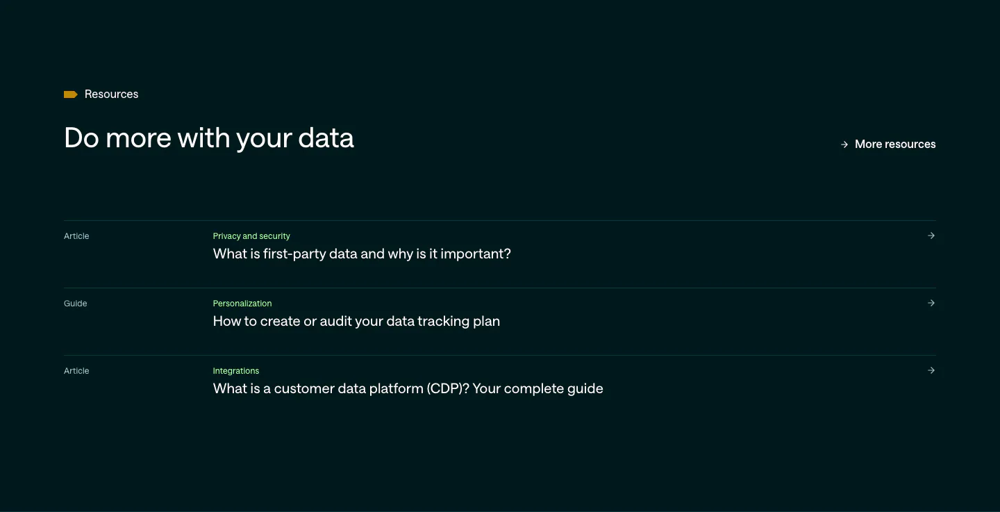
  1. Customer.io blog & resources section: dark teal list of three article and guide links with category labels and arrows
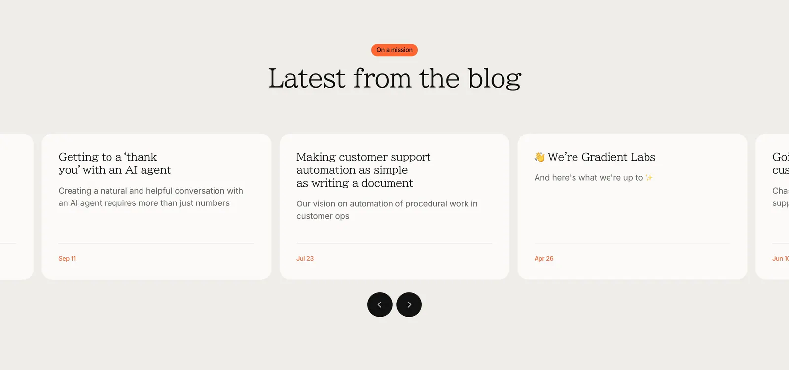
  2. Gradient Labs blog & resources section: centered serif heading above a carousel of off-white article cards with round arrow buttons
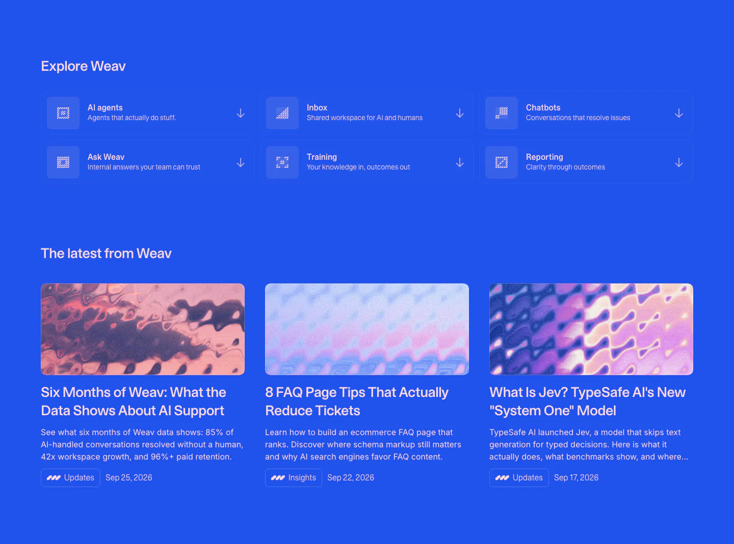
  3. Weav blog & resources section: blue background with a 3x2 grid of product links above three article cards with abstract thumbnails
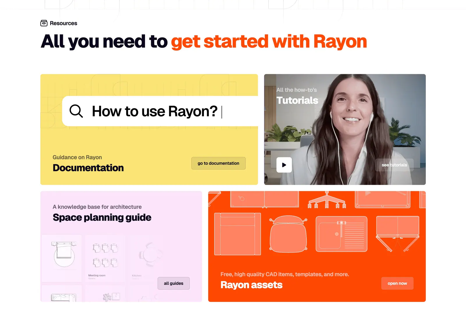
  4. Rayon blog & resources section: headline above a four-tile bento of yellow docs, video tutorial, pink guide and orange assets cards
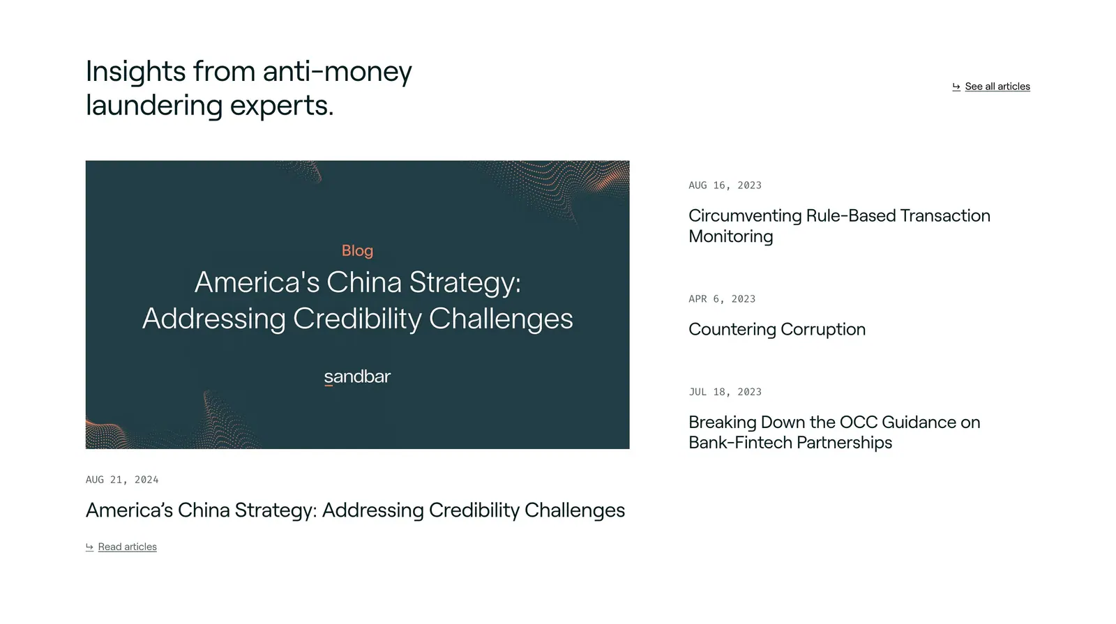
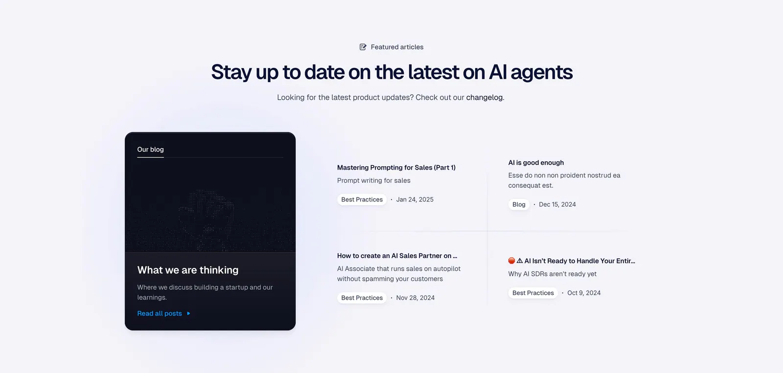
  5. Sandbar blog & resources section: headline above a featured article card on the left and a dated list of three articles on the right
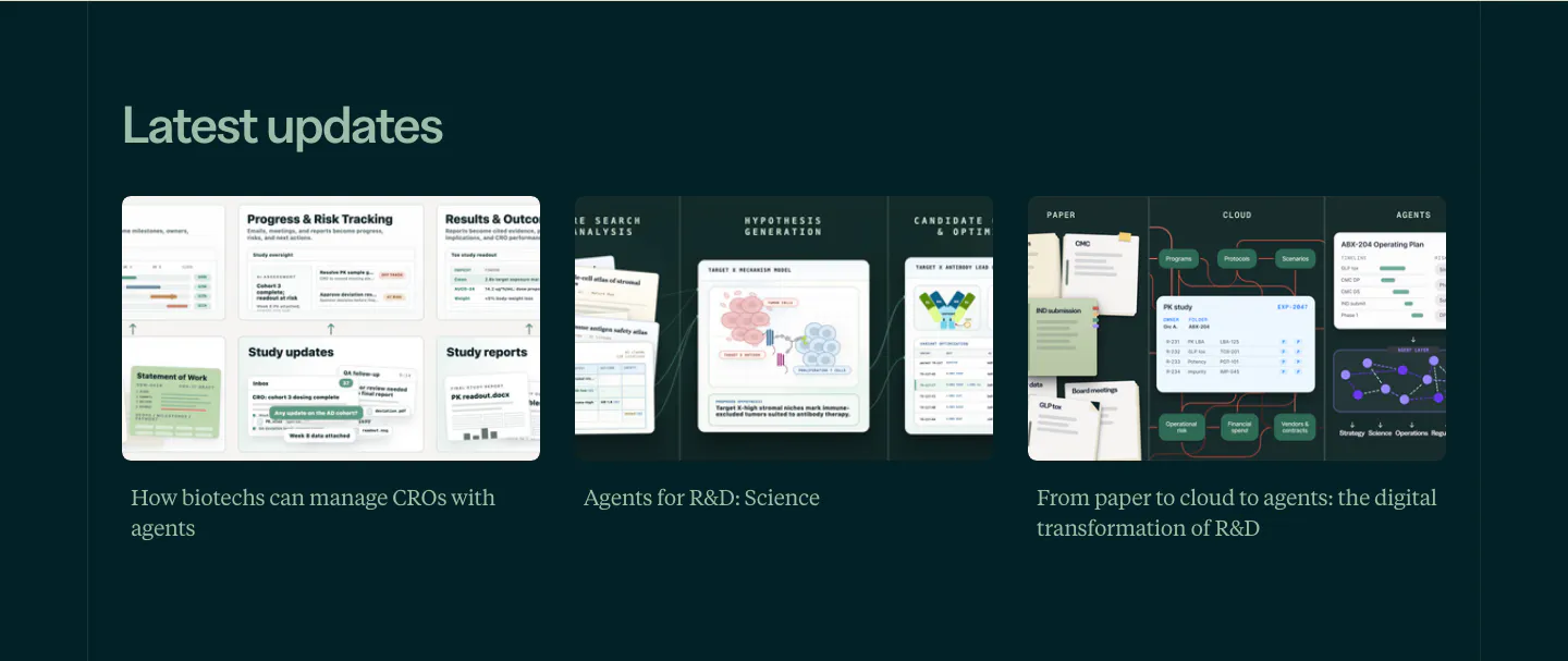
  6. Orchestra Bio blog & resources section: Latest updates heading over three article cards with illustrated thumbnails on dark teal
  7. Rezi blog & resources section: two-row grid of resume example category cards with company logos and a gray view-all tile
  8. Mintlify blog & resources section: headline with All posts button above three article cards with light and dark thumbnails
  9. Sanity blog & resources section: left-aligned headline above three resource cards for templates, docs and a course on a dark background
  10. Shelby blog & resources section: headline with All news button above a wide featured post card with pink abstract art and two post cards
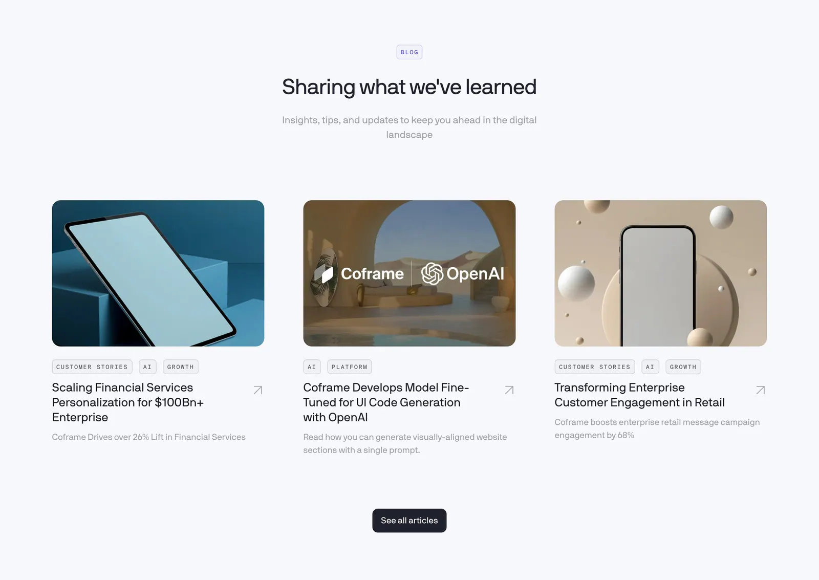
  11. Coframe blog & resources section: centered heading above three article cards with rendered device thumbnails and tags
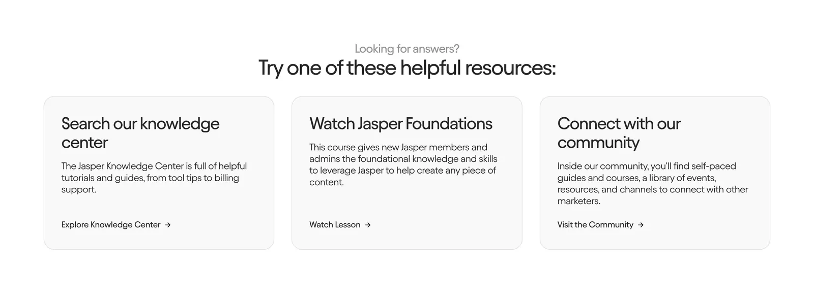
  12. Jasper contact section: centered heading above three light gray cards linking to the knowledge center, a course and the community
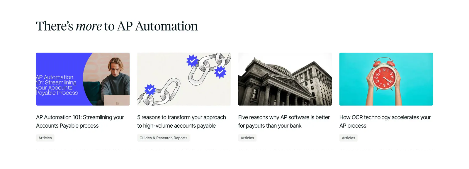
  13. Routable blog & resources section: serif headline above four article cards with photo and illustration thumbnails on white
  14. Chargetrip blog & resources section: webinar banner with serif title and orange button over a full-bleed night photo of an EV charging lot
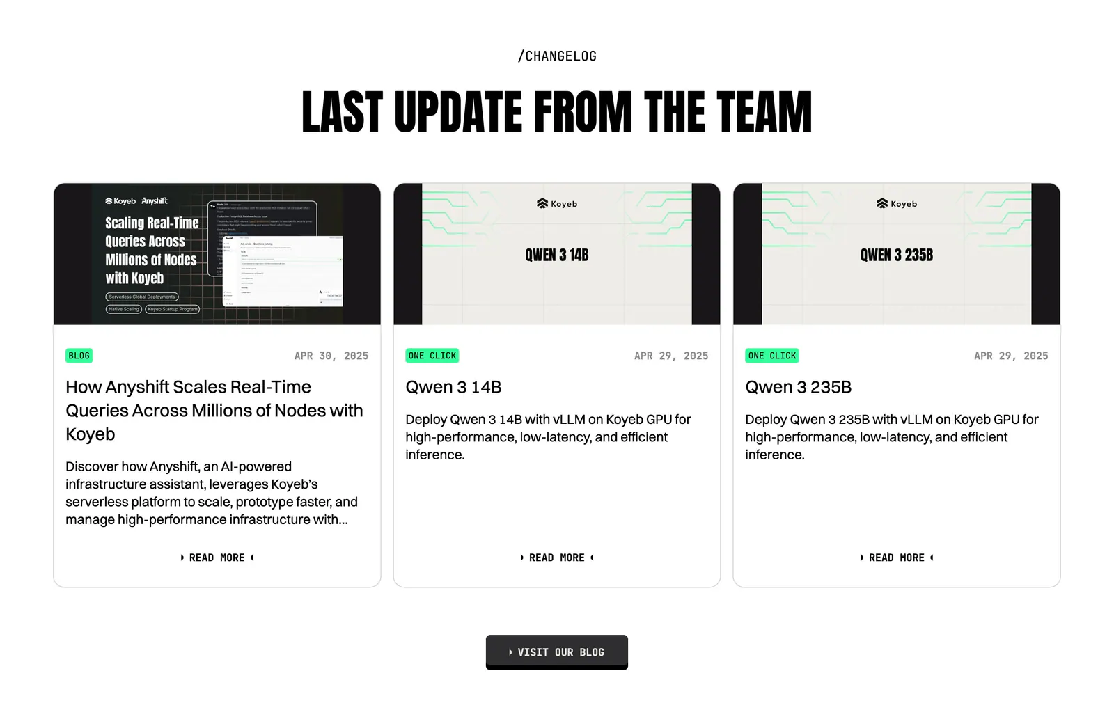
  15. Koyeb blog & resources section: centered condensed headline above three changelog cards with thumbnails, tags and dates
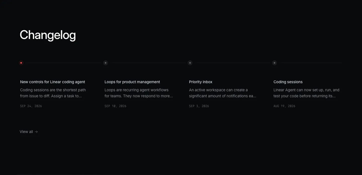
  16. Linear blog & resources section: dark changelog with four dated entries along a horizontal timeline and a view-all link
  17. Exante blog & resources section: centered heading and view more button above a carousel of photo article cards with blurred edges
  18. Canopy blog & resources section: left-aligned heading above two article cards with abstract lending graphics on light gray
  19. Tribe AI blog & resources section: press logo row above a featured article card with a blue geometric cover left and serif title right
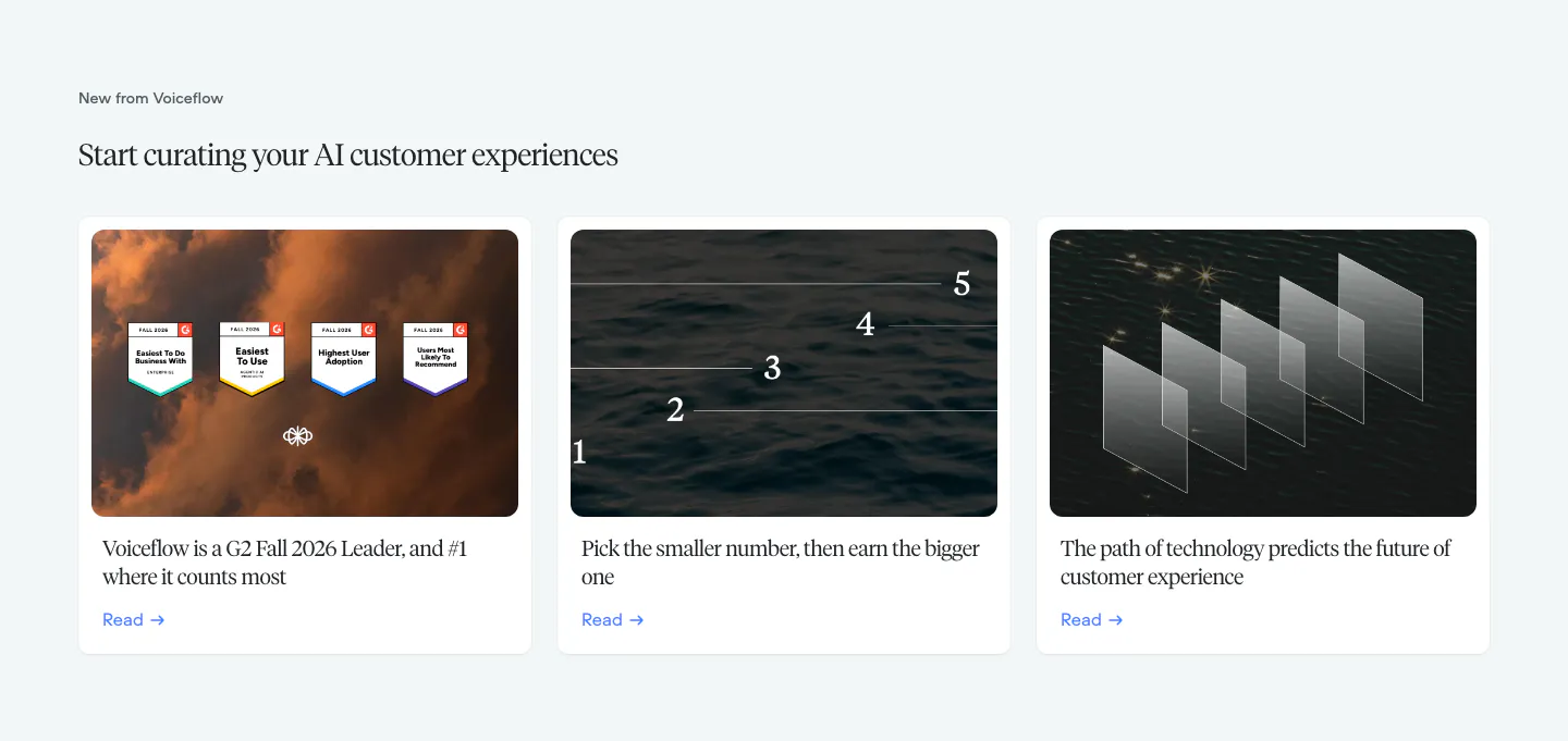
  20. Voiceflow blog & resources section: serif headline above three article cards with photographic thumbnails on a pale gray background
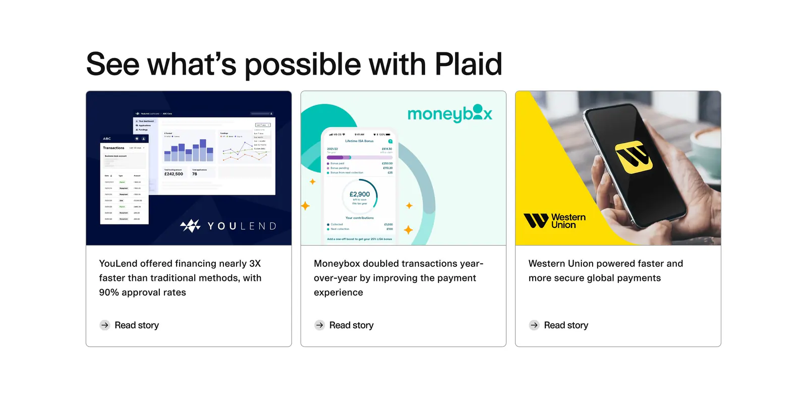
  21. Plaid blog & resources section: headline above three customer story cards with product screenshots, a phone photo and Read story links
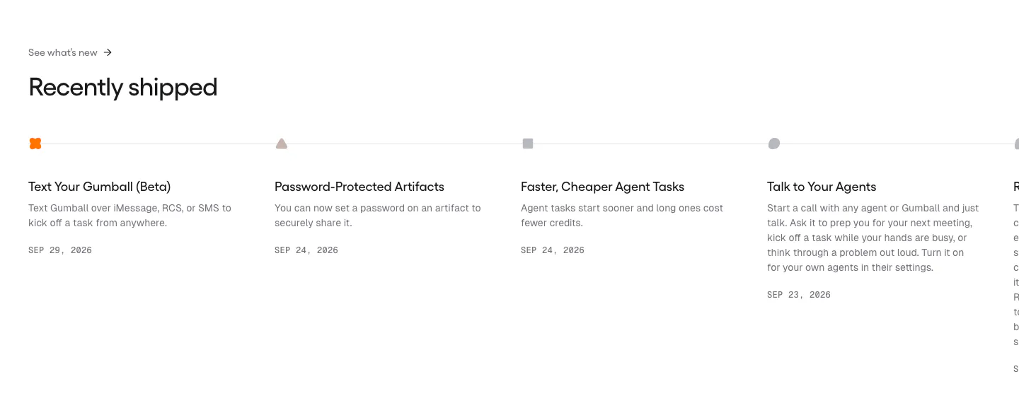
  22. Gumloop blog & resources section: changelog timeline of dated release entries running off the right edge
  23. Legora blog & resources section: ROI report title and read more link over a full-bleed photo of a rainy city street
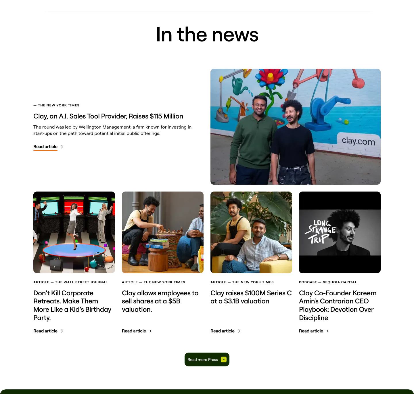
  24. Clay blog & resources section: centered heading over a featured press story with founder photo and a row of four photo article cards
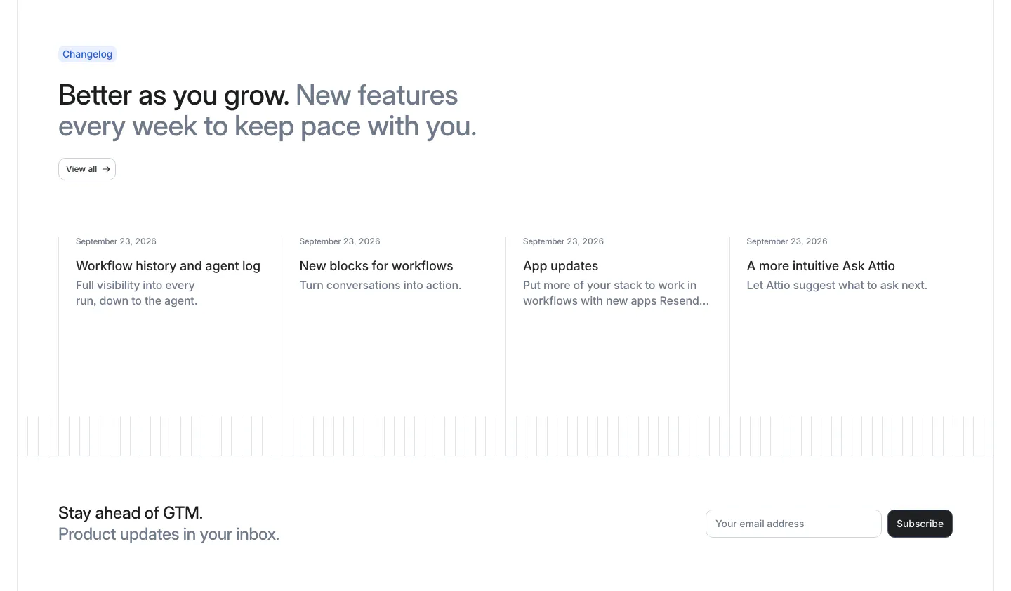
  25. Attio blog & resources section: changelog headline above four dated update columns, with an email subscribe row below
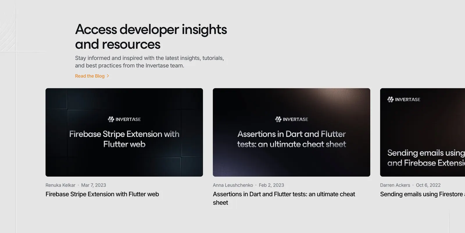
  26. Invertase blog & resources section: left headline above a row of dark article thumbnail cards cut off at the right edge on light gray
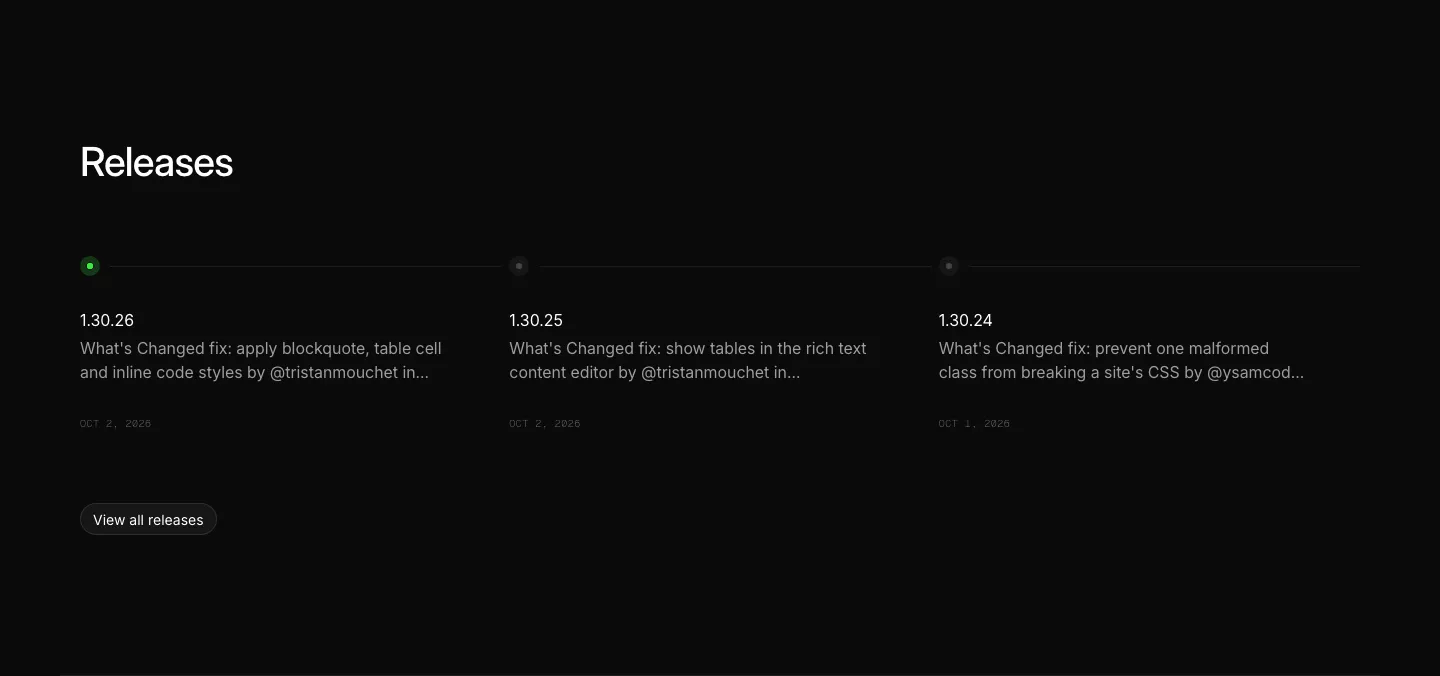
  27. Ycode blog & resources section: releases heading above three changelog entries on a horizontal timeline with a view all button
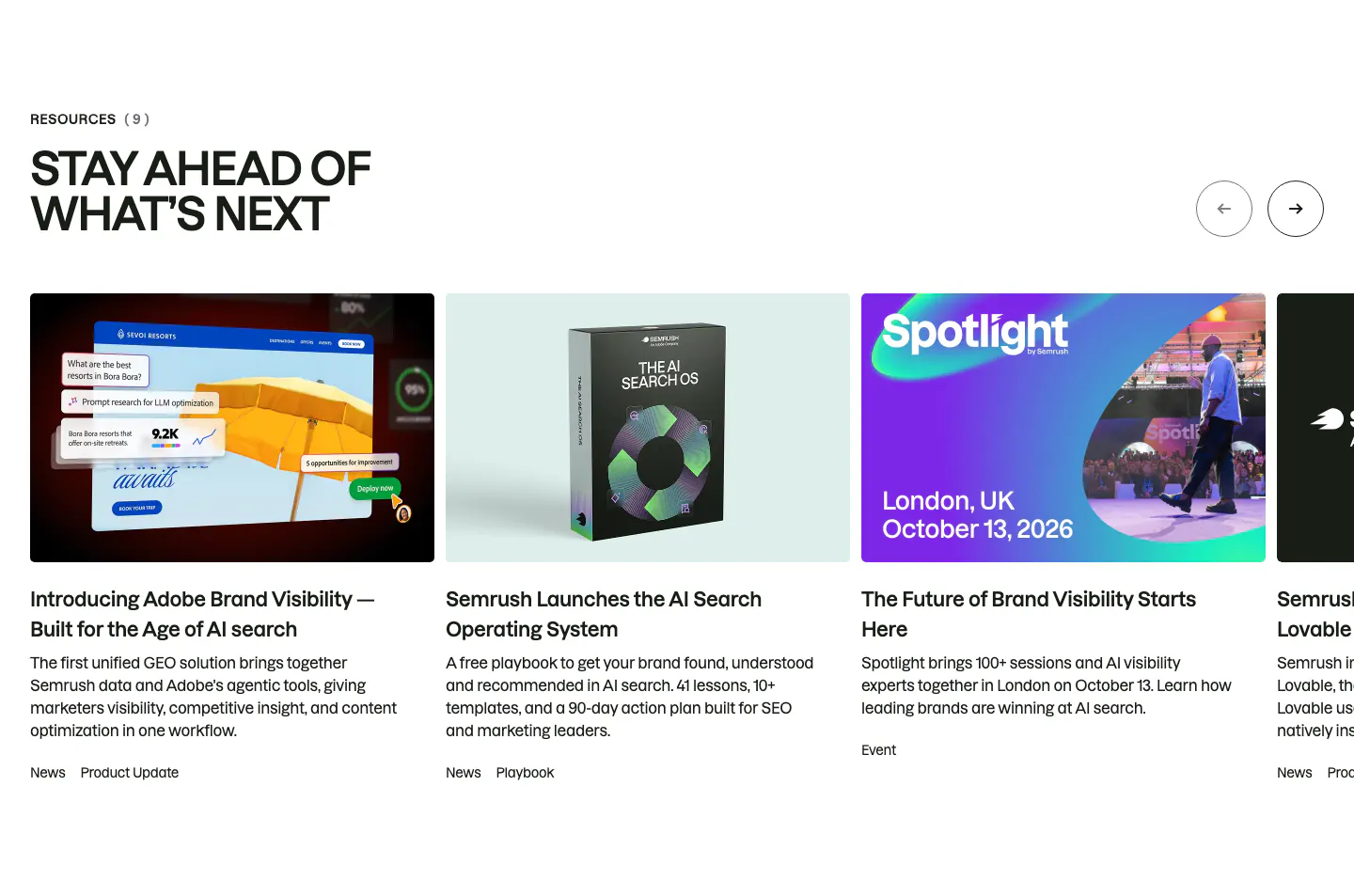
  28. Semrush blog & resources section: uppercase headline and arrow buttons above a carousel of news, playbook and event cards with thumbnails
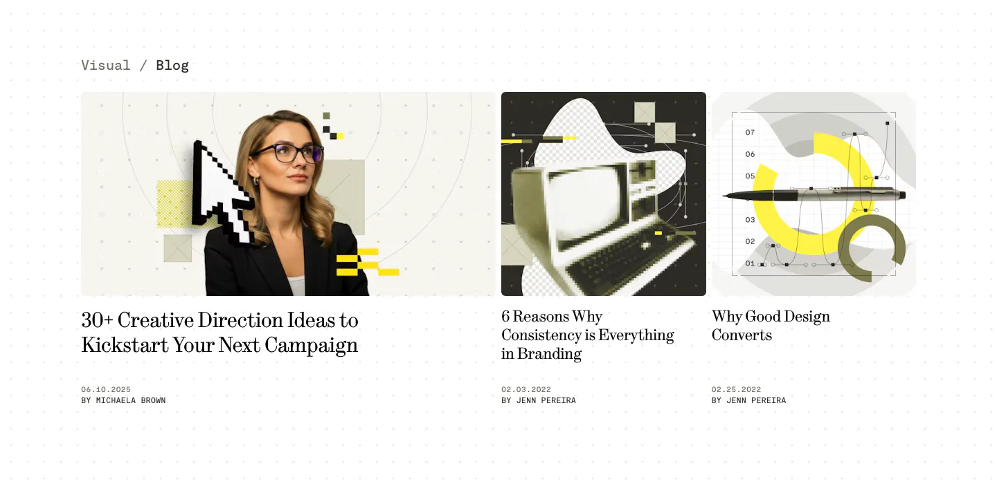
  29. Visual blog & resources section: one wide and two narrow article cards with collage cover images, serif titles and authors on a dotted white page
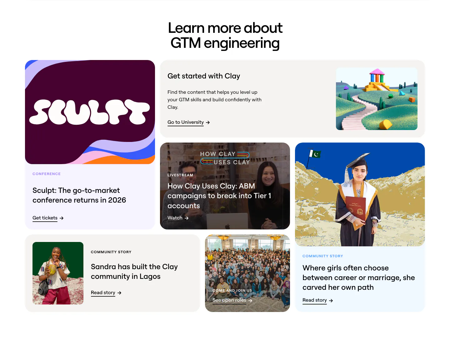
  30. Clay blog & resources section: centered headline above a bento grid of conference, livestream, community story and careers cards
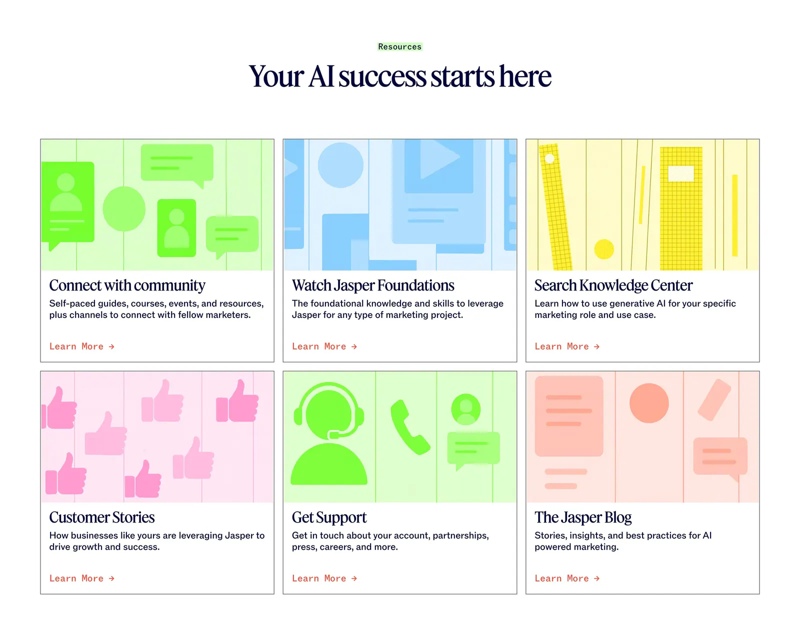
  31. Jasper blog & resources section: centered serif headline above six cards with colorful flat illustrations and Learn More links
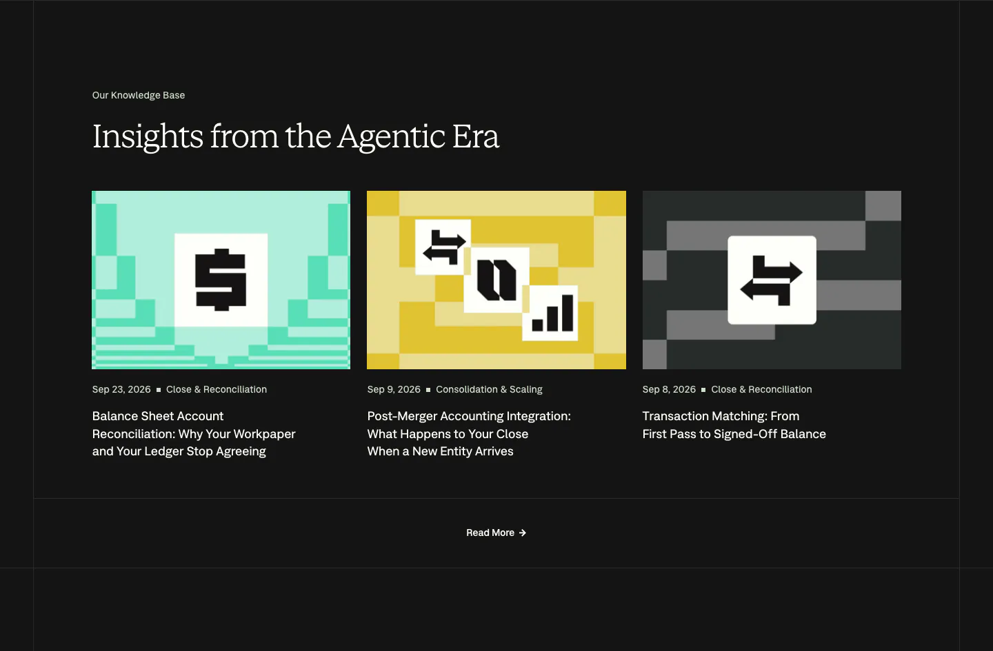
  32. Nominal blog & resources section: serif headline over three article cards with pixel-art thumbnails on a near-black background
  33. Godmode blog & resources section: centered heading above a dark blog card on the left and a two-by-two list of article links
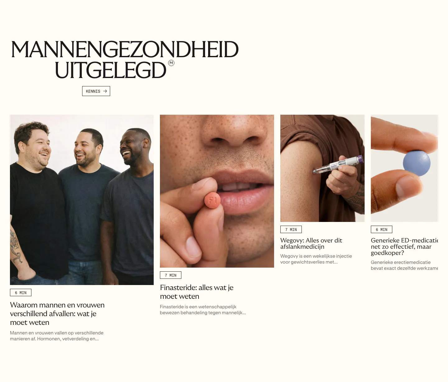
  34. Menkind blog & resources section: serif headline above a row of article cards with photos and read times, cut off at the edge
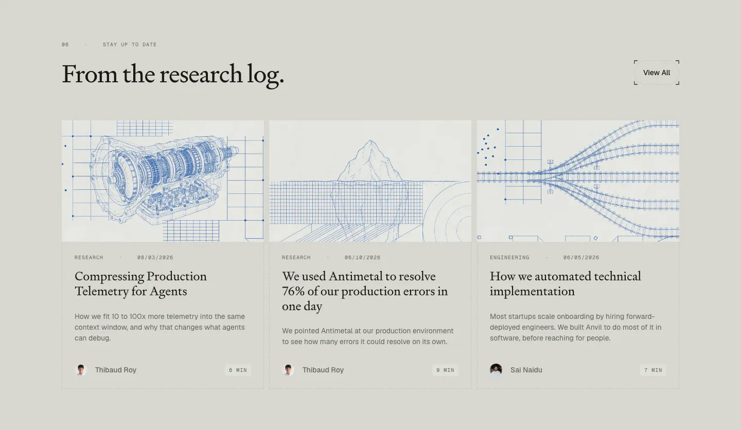
  35. Antimetal blog & resources section: serif headline with View All button over three article cards with blue blueprint line drawings
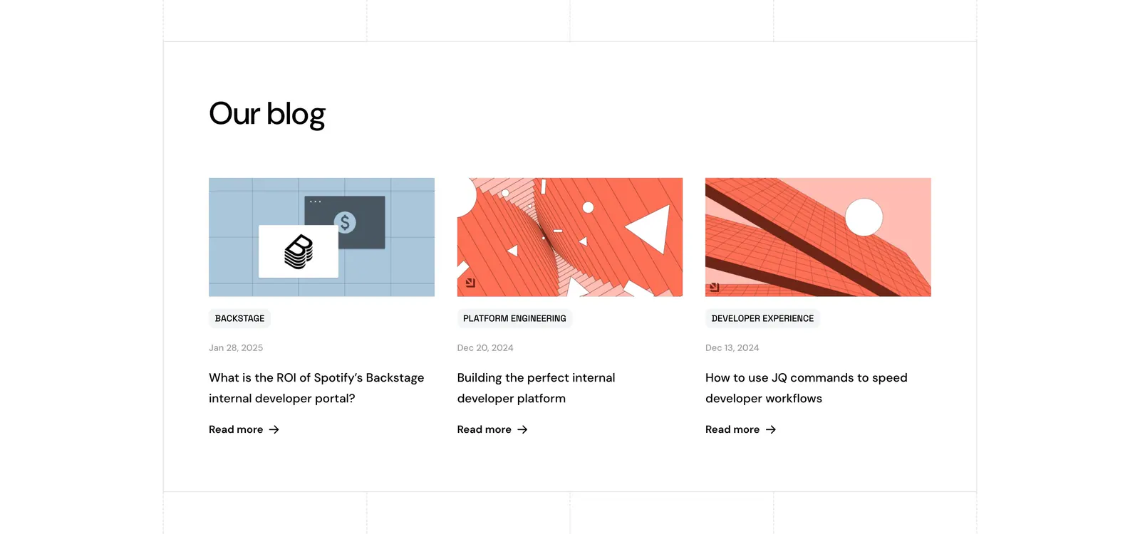
  36. Port blog & resources section: headline above three blog cards with abstract geometric artwork, category tags, dates and Read more links
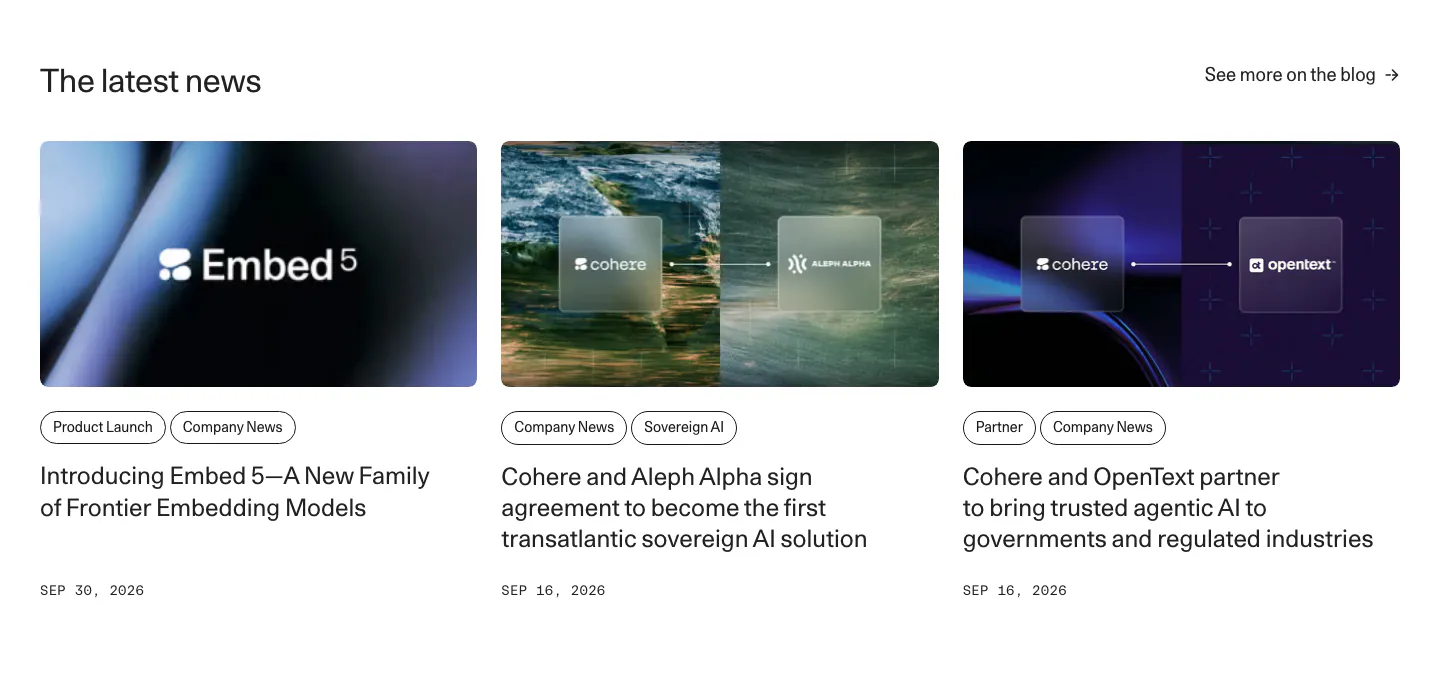
  37. Cohere blog & resources section: headline with blog link above three news cards with images, pill tags and dates
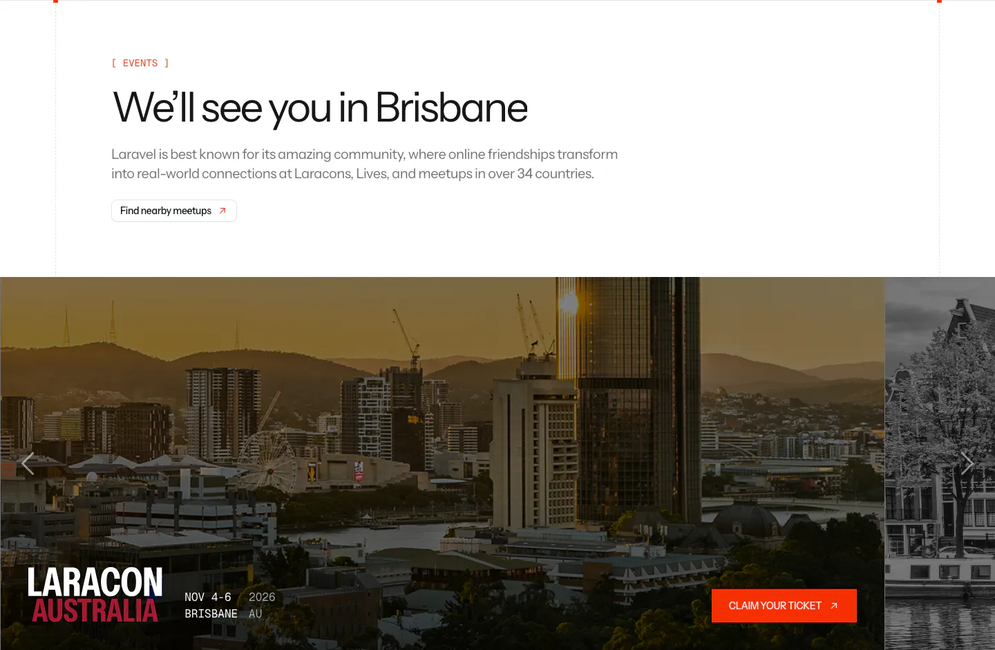
  38. Laravel blog & resources section: events headline above a photo carousel card for Laracon Australia in Brisbane with a ticket button
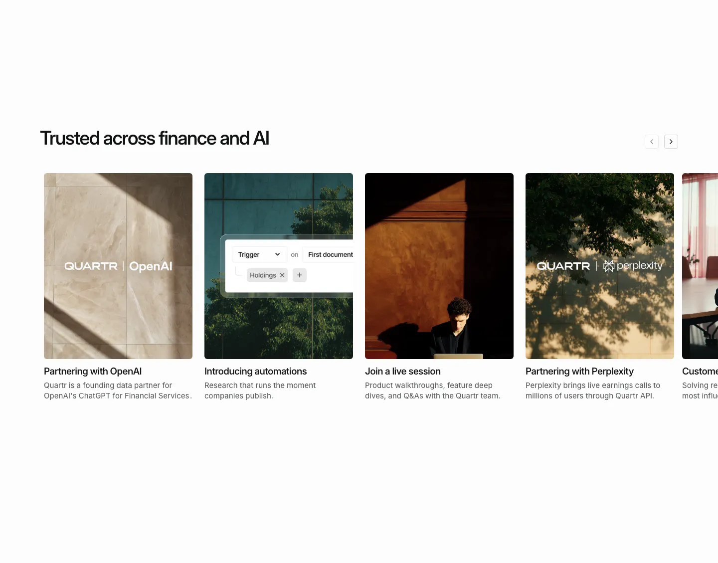
  39. Quartr blog & resources section: horizontal carousel of photo cards for partnership news, automations and a live session
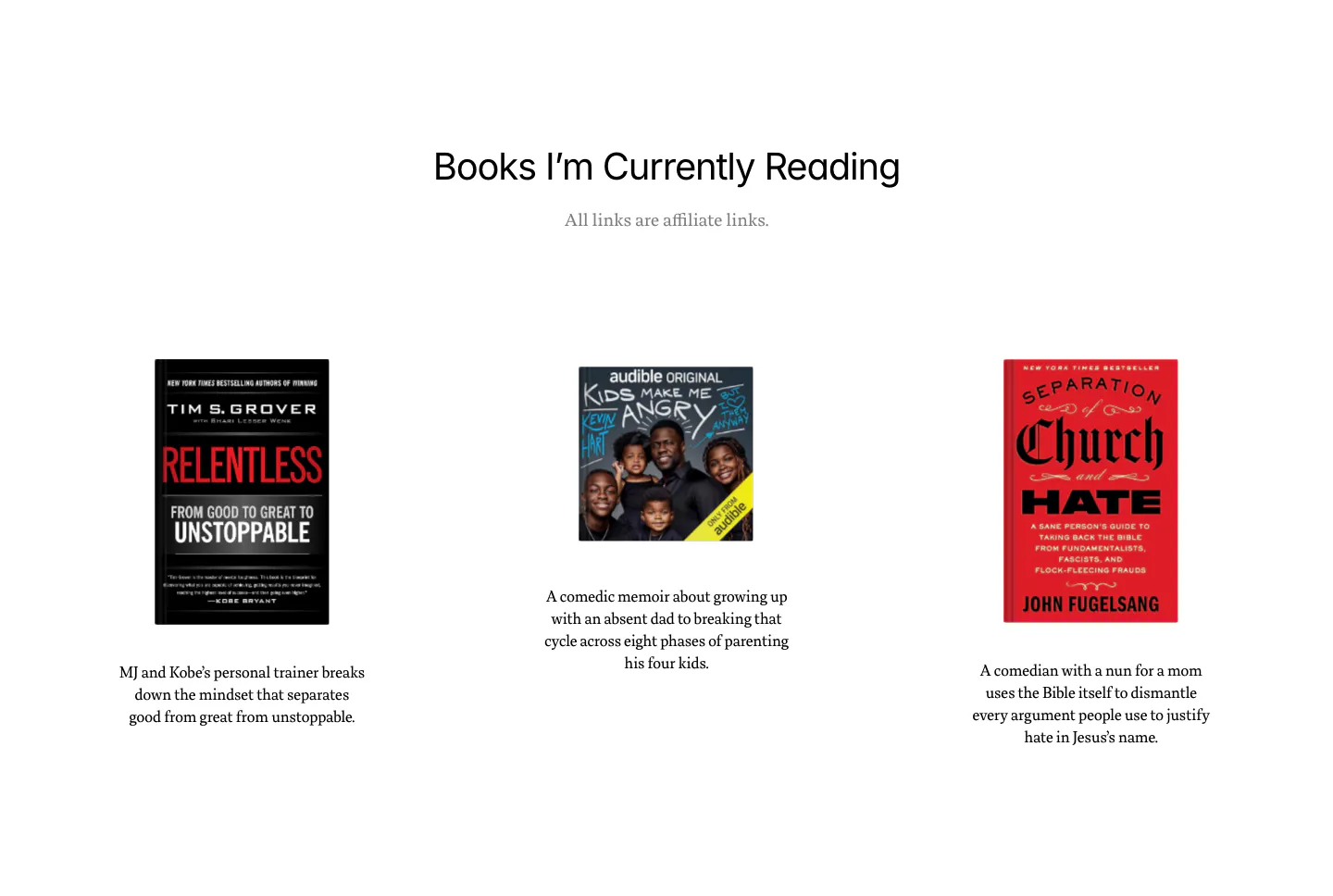
  40. Dan Mall blog & resources section: centered heading above three book covers with short descriptions on white
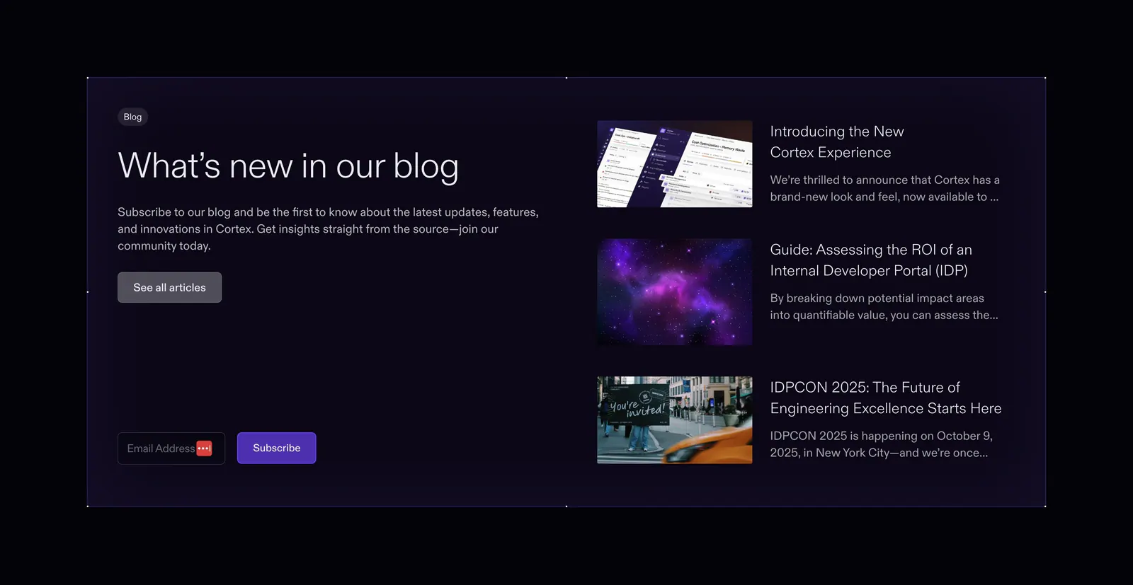
  41. Cortex blog & resources section: headline and email subscribe field on the left beside three article thumbnails in a dark panel
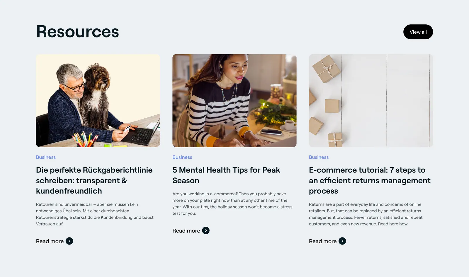
  42. 8returns blog & resources section: left headline with View all button above three article cards with photos on light gray
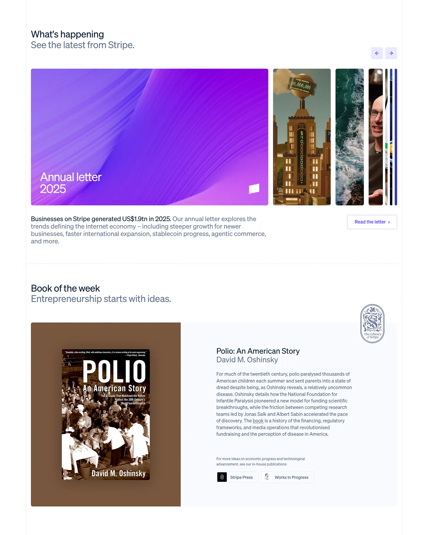
  43. Stripe blog & resources section: news carousel with a large purple Annual letter card and arrows, above a Book of the week cover and blurb
  44. Raneo blog & resources section: headline and all-resources button above three article cards with photos, read-time tags and excerpts
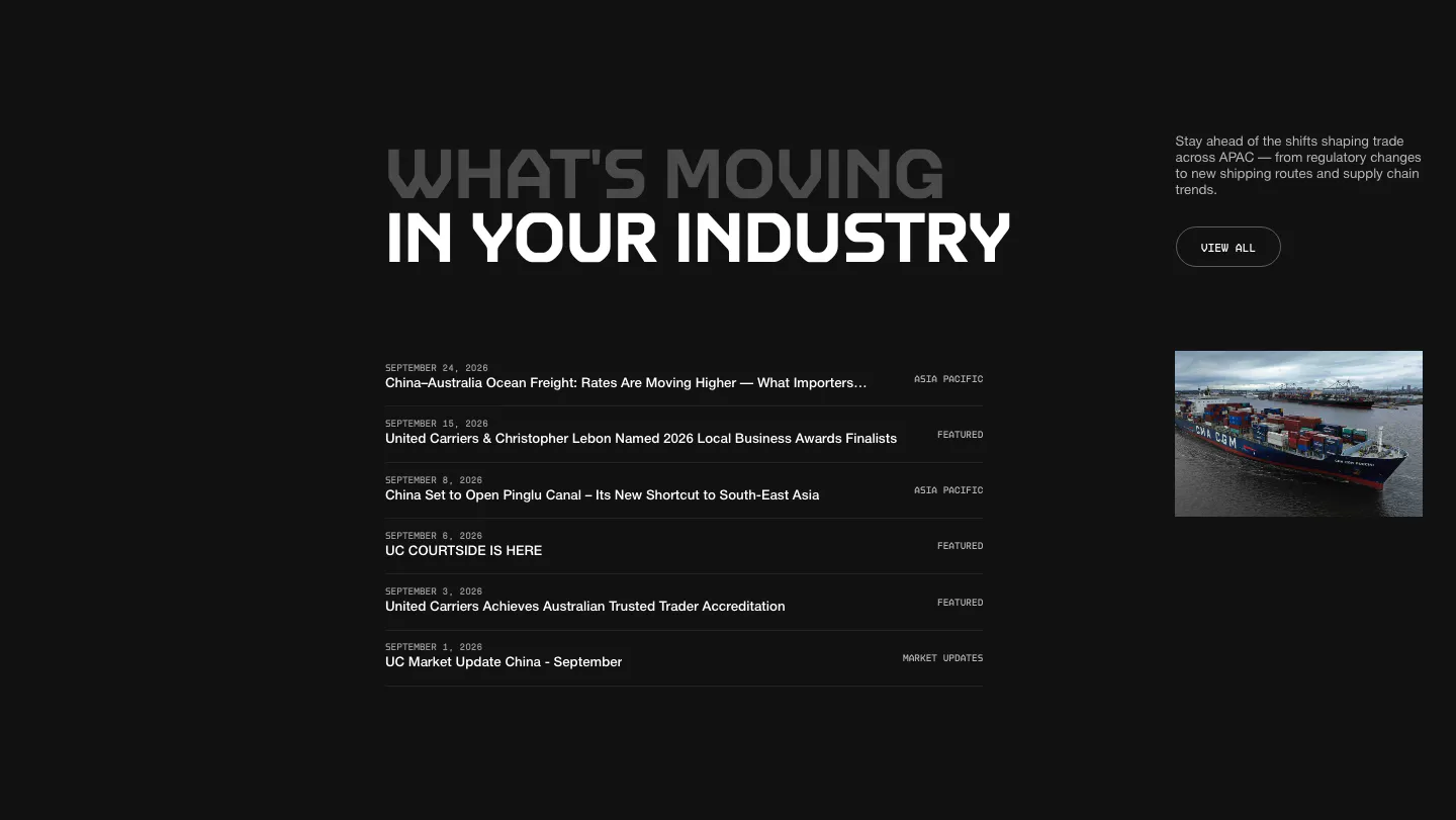
  45. United Carriers blog & resources section: uppercase heading over a dated news list with category labels and a ship photo on dark
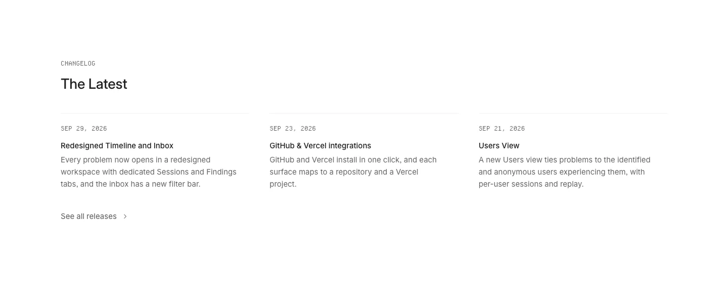
  46. Interfere blog & resources section: changelog heading above three dated release notes in columns on a white background
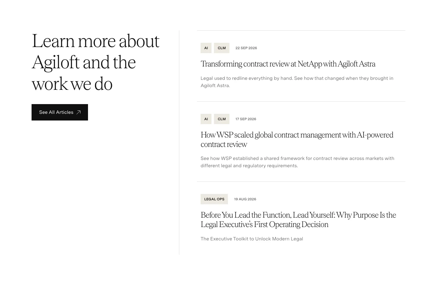
  47. Agiloft blog & resources section: serif heading and See All Articles button left, list of three tagged article entries right
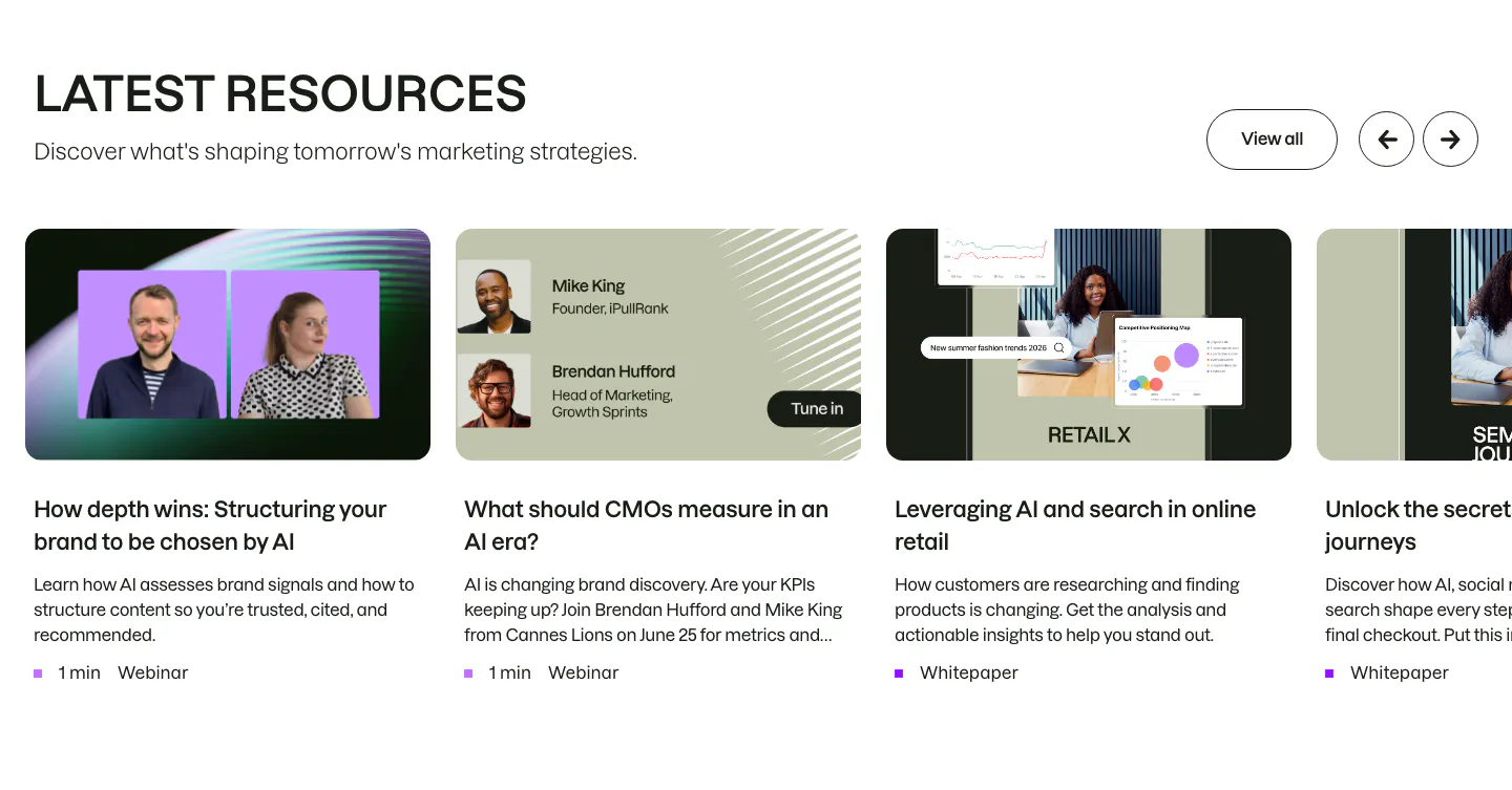
  48. Semrush blog & resources section: headline with View all and arrow buttons above a carousel of webinar and whitepaper cards
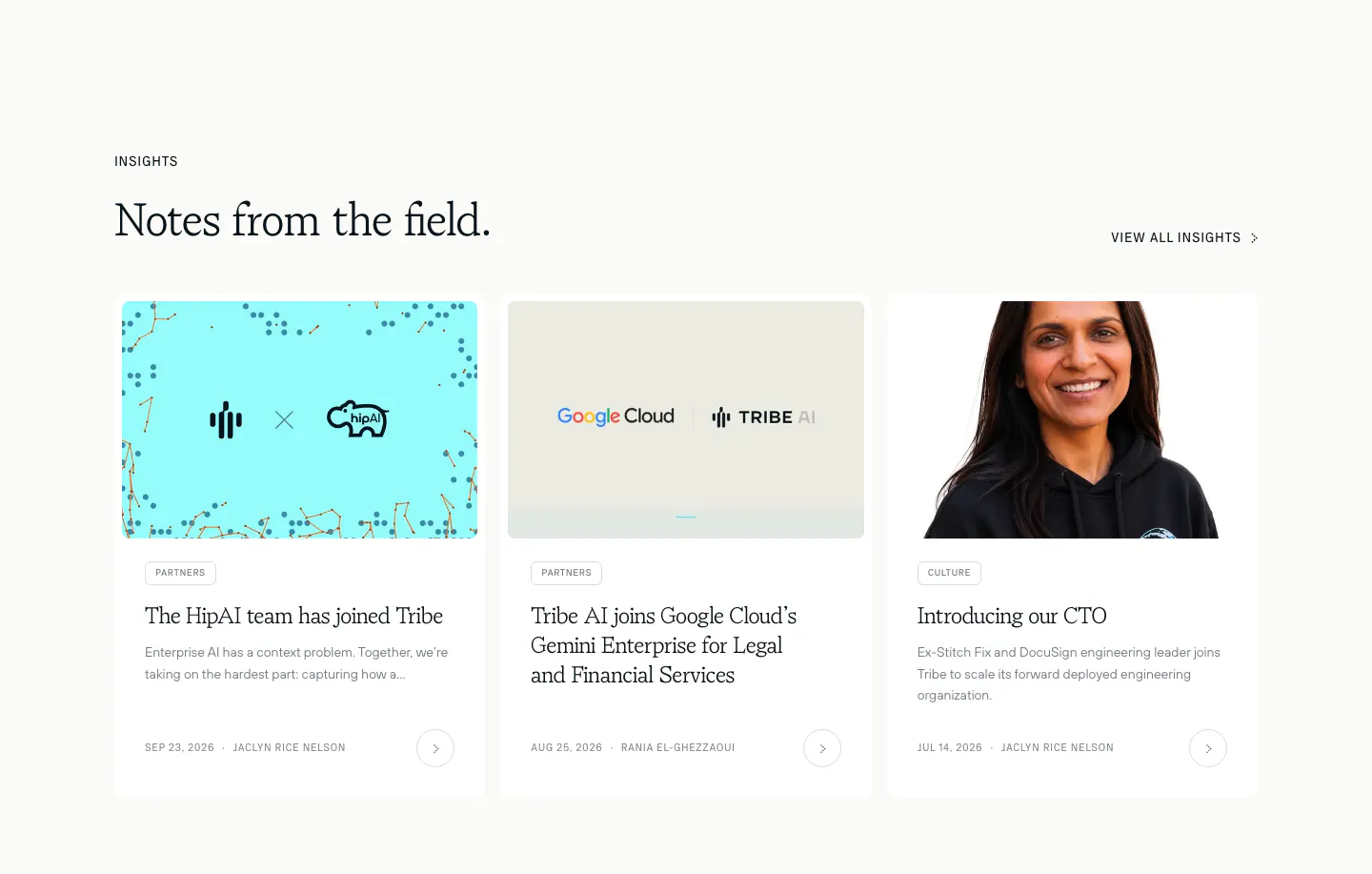
  49. Tribe AI blog & resources section: serif headline above three insight cards with cover images, tag pills, dates and authors on off-white
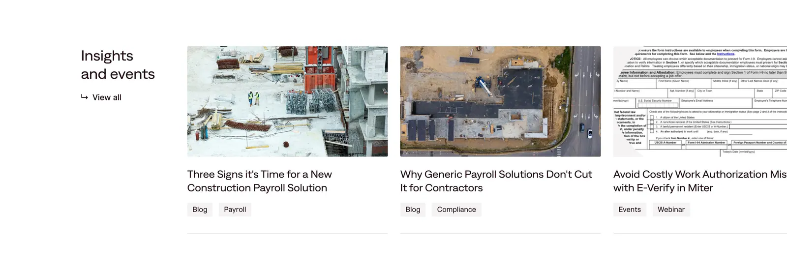
  50. Miter blog & resources section: heading with view-all link beside edge-cropped article cards with construction photos and tags
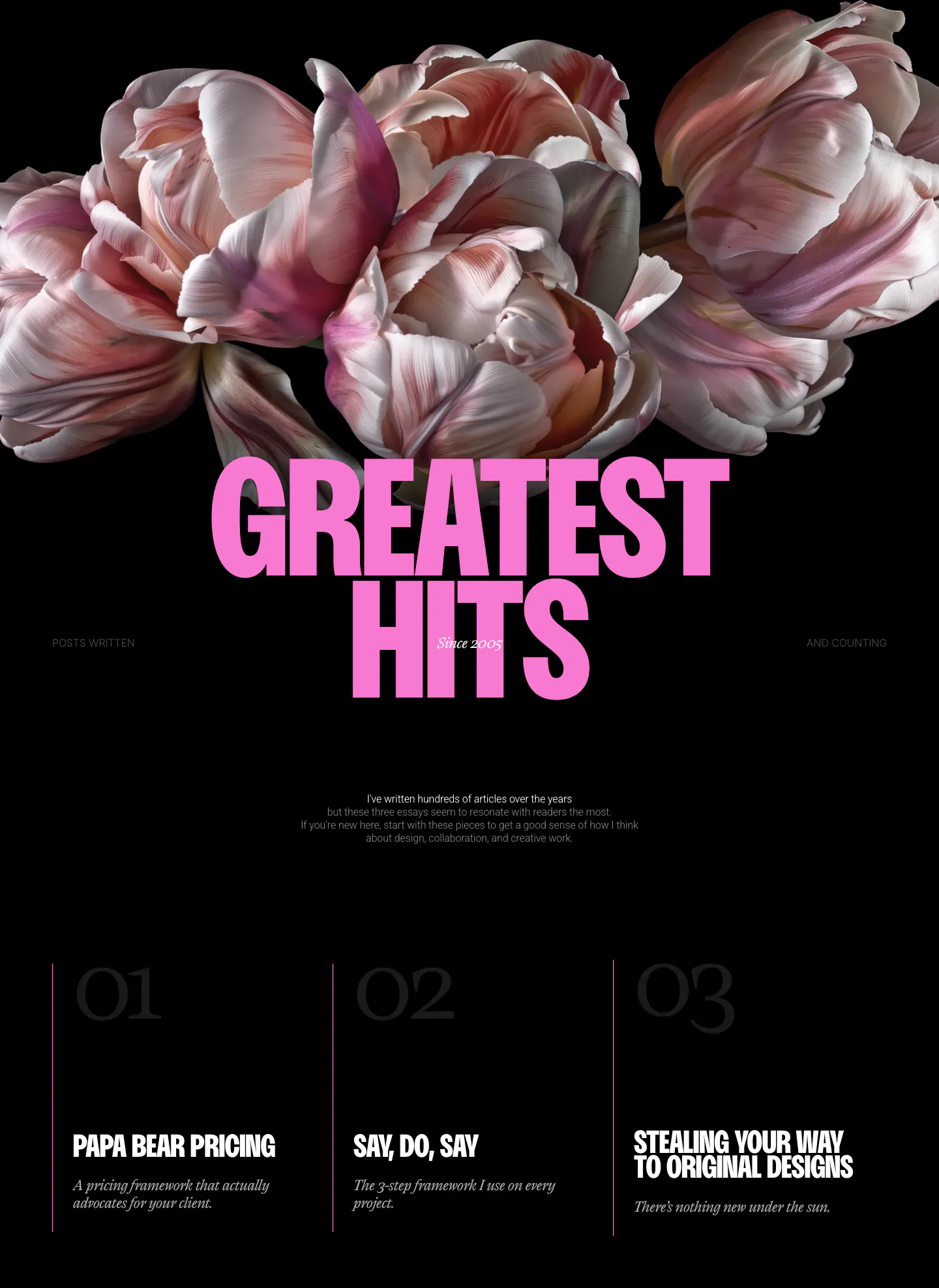
  51. Dan Mall blog & resources section: tulip photo above a huge pink headline and three numbered essay columns on black
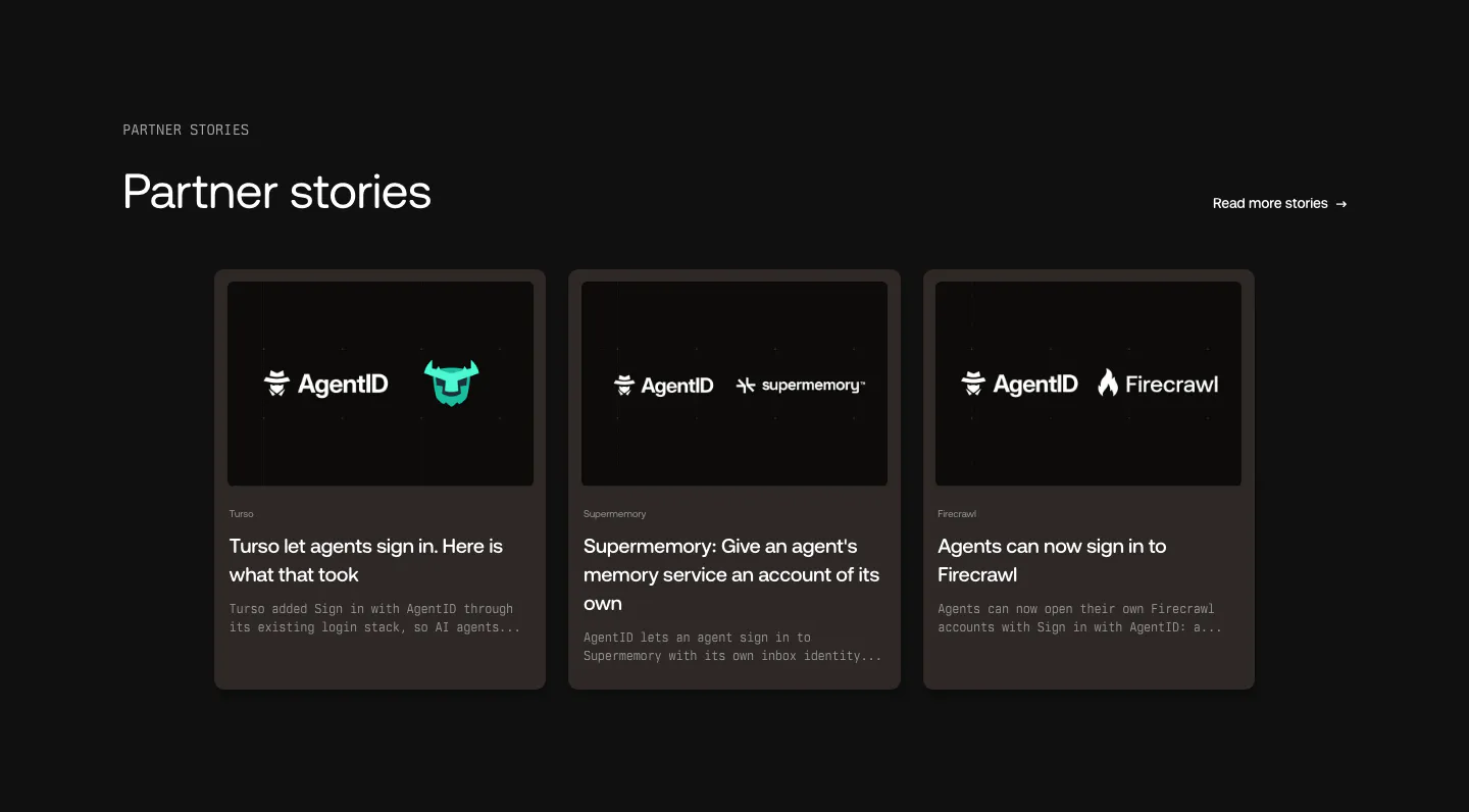
  52. AgentID blog & resources section: dark three-card row of partner story posts with co-branded logo thumbnails and excerpts
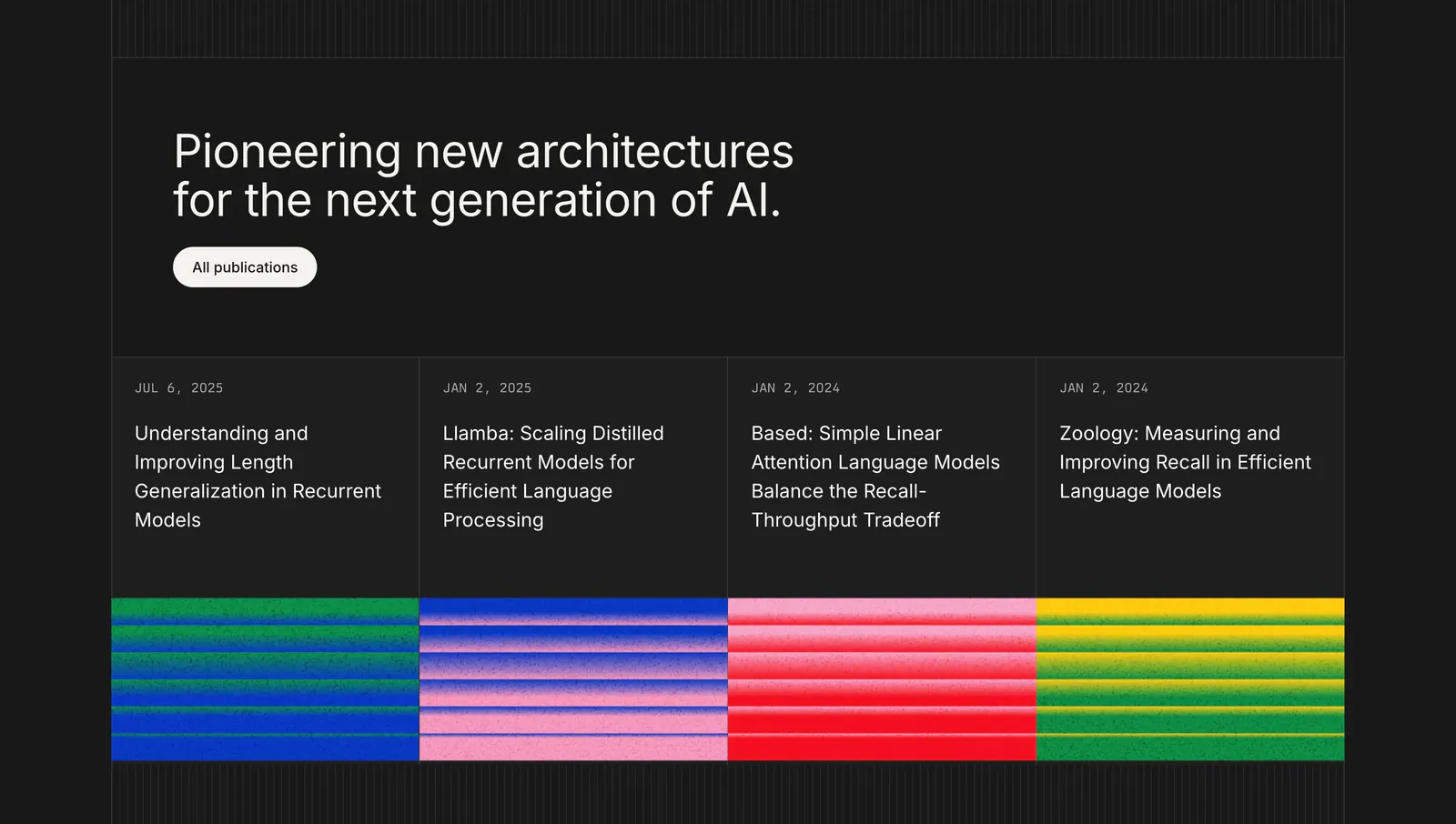
  53. Cartesia blog & resources section: left-aligned headline above four research publication cards with grainy striped color thumbnails on dark

Common patterns in blog and resources sections

How to design a blog and resources section

  1. Lead each card with its title

    Make the post title the most prominent element after the image, in a size and weight that holds up at a glance. Allow two or three lines before truncating. Set category, author, and read time smaller and muted so they support the title.

  2. Lock thumbnails to one aspect ratio

    Crop every image to the same ratio, such as 16:9 or 3:2, because mixed ratios break the grid and push titles out of line. Lazy-load images below the fold and serve properly sized versions so a long list of cards stays fast.

  3. Feature one post, then list the rest

    Give the newest or most important piece a larger card that spans more columns, then show the rest in an even grid. That creates a clear entry point. Use it sparingly, because when every card is featured, none of them stands out.

  4. Filter by type and link the archive

    Add category tabs or chips when content spans types like guides, news, and changelog entries. Make the whole card one link instead of separate links on the image and title, and finish with a visible "View all" link to the full archive.
Companies in this collection

All section types
    ↑↓ Navigate ↵ Open

    Section preview

    Website section