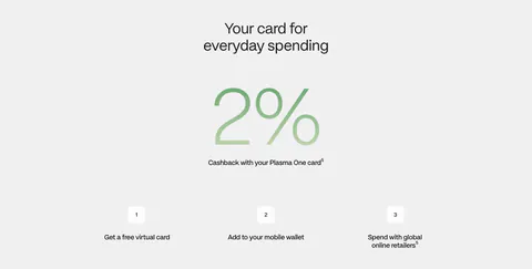
Website design styles
Styles describe how a section looks: its colours, layout, visuals and type. Each one has a written definition, so a style means the same thing on every screenshot.
Color & theme
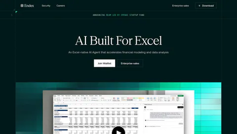
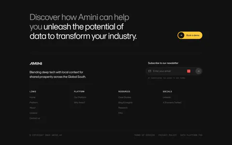
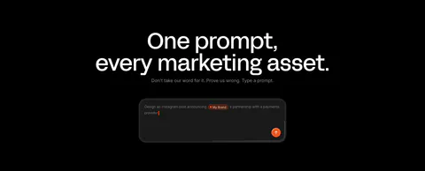
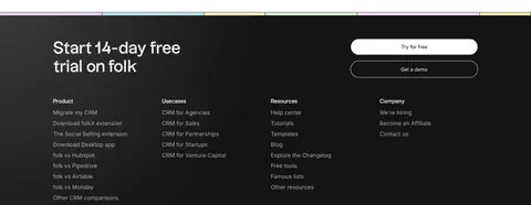
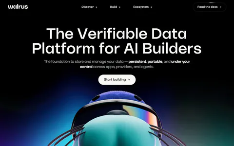
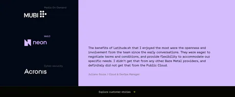
- Dark mode
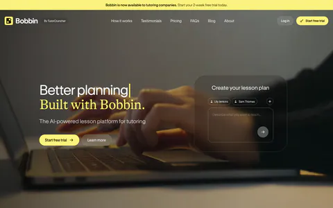
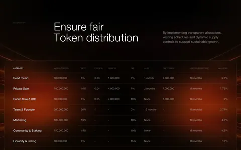
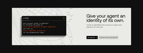
At least 60% of the section's area is a very dark background (near-black, charcoal, deep navy).
- Monochrome
The whole palette is black, white and gray (light or dark); any accent colour covers less than ~5% of the area.
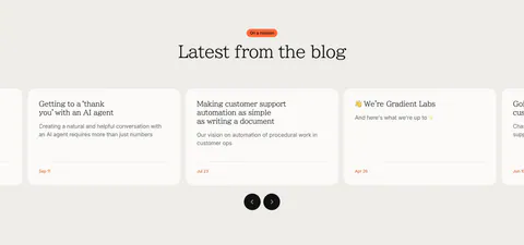
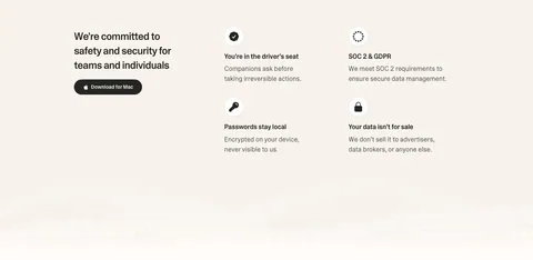
- Warm neutral
The page background is cream, beige, sand or warm off-white rather than pure white or cool gray.
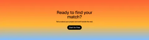
- Gradient
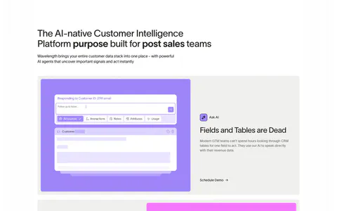
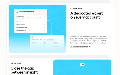
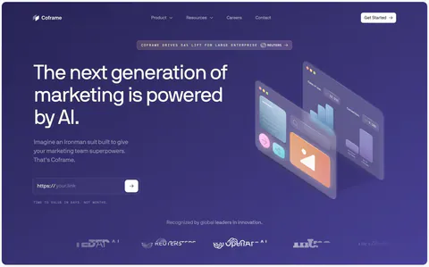
A visible colour gradient, mesh, aurora or glow covers at least 25% of the section background.
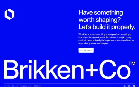
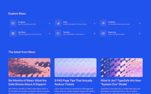
- Bold color
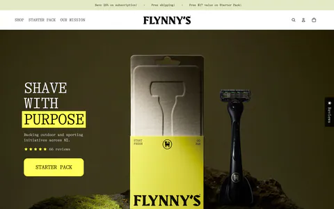
A saturated, clearly non-neutral colour (bright blue, orange, lime, purple, deep green…) fills at least ~30% of the area as background or large panels.
- Pastel
Soft, light tinted backgrounds or cards (mint, lavender, peach, baby blue, pale yellow) dominate the look.




Layout
- Tabs
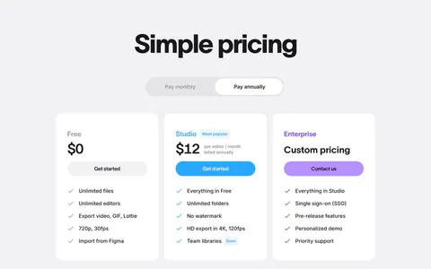
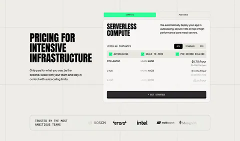
A visible tab bar, segmented control or toggle that switches the displayed content (incl. monthly/yearly toggles).
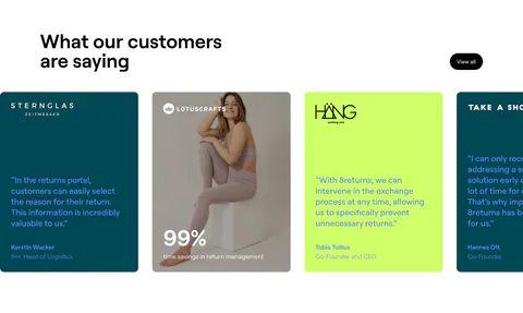
- Carousel
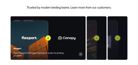
A slider: prev/next arrows, dots/pagination, or cards cut off at the edge implying horizontal scrolling.
- Bento grid
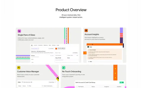
At least 4 tiles/cards arranged in a grid using at least 2 different tile sizes (spanning cells), like a bento box.
- Full-bleed media
A photo, video frame or artwork fills the whole section background behind the text.
- Table
A rows × columns grid of data, prices or check/cross marks.
- Alternating rows
Two or more rows where text and media switch sides (zig-zag).


Visuals
- Photography
Real-world photos (people, places, physical products) are a prominent visual.
- Illustration
A distinct, non-repeating drawn artwork is a focal visual: 2D illustrations, characters, hand-drawn or pixel-art figures, editorial drawings.
- 3D
Rendered 3D objects, scenes or isometric 3D renders are a prominent visual.
- Code
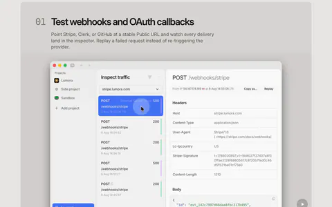
A code block, terminal window or API snippet is visible.


Treatment
- Minimal
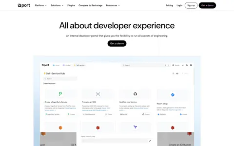
At most 2 colours besides neutrals, at least ~50% empty space, no decoration beyond the content itself.
- Pattern background
A repeating texture sits behind the content: grid lines, dot grids, stripes, dither fields, noise or grain.
- Glassmorphism
Frosted, translucent panels with visible background blur.
Typography
- Serif type
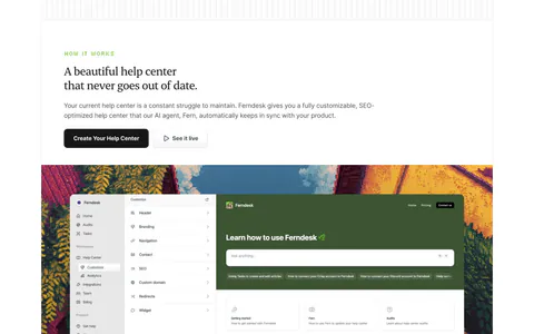
The main headline is set in a serif typeface.
- Oversized type
The headline is a dominant visual element: huge display text whose cap height is at least ~8% of the section height, or text spanning the full width.
- Gradient text
Headline words are filled with a colour gradient.