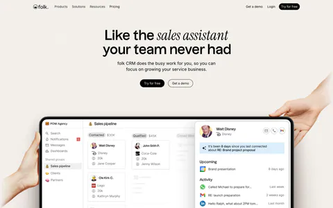
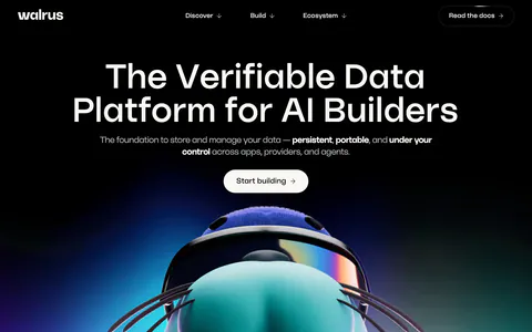
Pastel Website Design Examples

Soft tints change how a product feels before anyone reads a word. In pastel website design, light mint, lavender, peach, baby blue, or pale yellow backgrounds and cards set a friendly tone for consumer apps, wellness products, and learning tools. Contrast is the weak spot. Pale fills beside pale text wash out quickly, and a page with too many tints stops looking calm and starts looking unfocused.

73 sections

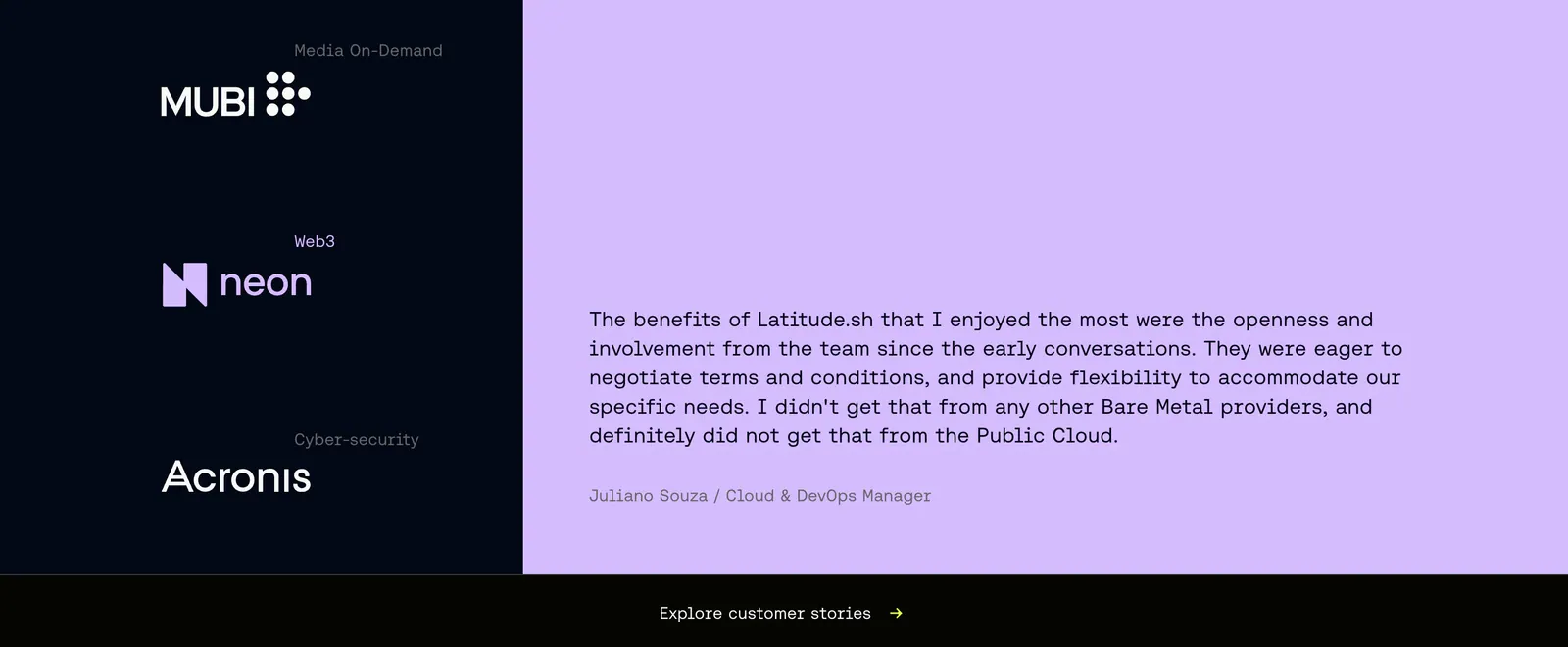
  1. Latitude.sh testimonials section: customer logos stacked on a dark navy left panel beside a monospace quote on lavender
  2. Lattice call-to-action section: centered headline, demo button and G2 and Capterra ratings over a soft green cloud glow background
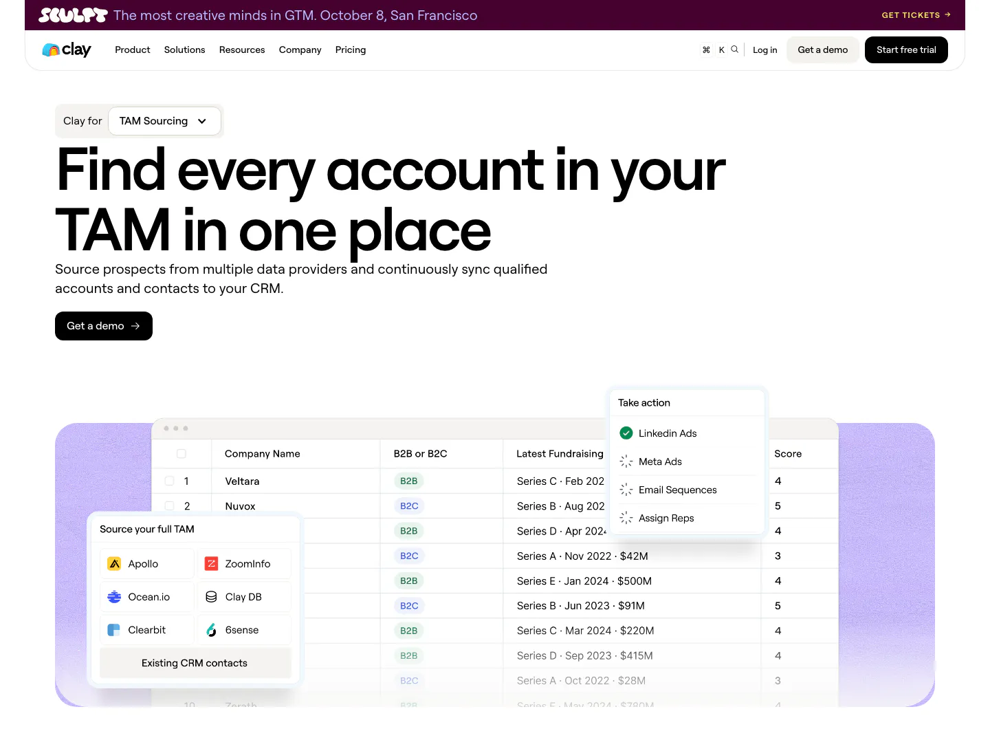
  3. Clay hero section: left-aligned headline with use-case dropdown and demo button above a company table UI with data source picker on lavender
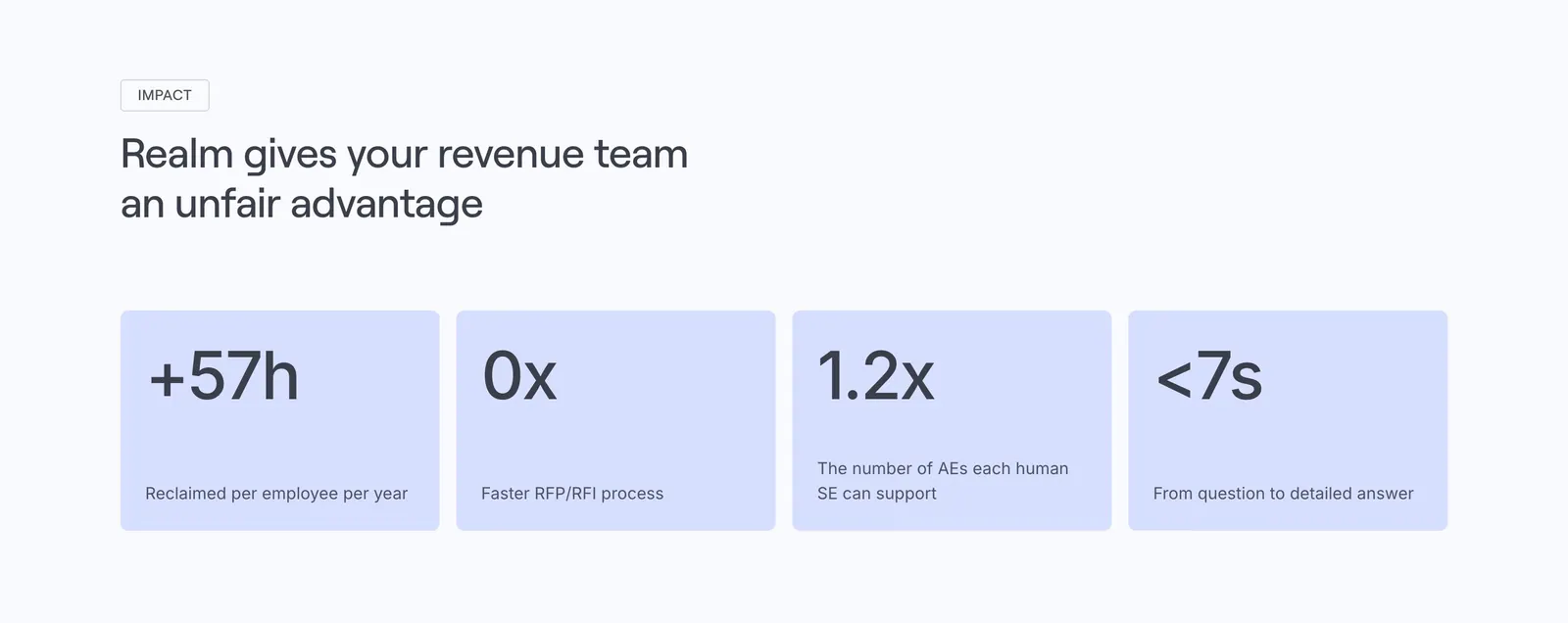
  4. Realm value proposition section: left-aligned headline above four lavender stat cards with large figures and labels
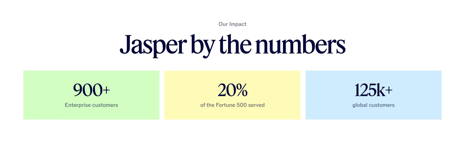
  5. Jasper value proposition section: centered serif headline above three pastel tiles with large customer metrics
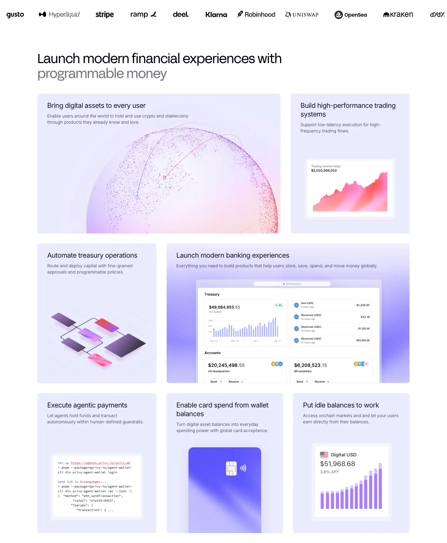
  6. Privy features section: customer logo strip above a bento grid of lavender tiles with dashboards, charts, a code snippet and a card visual
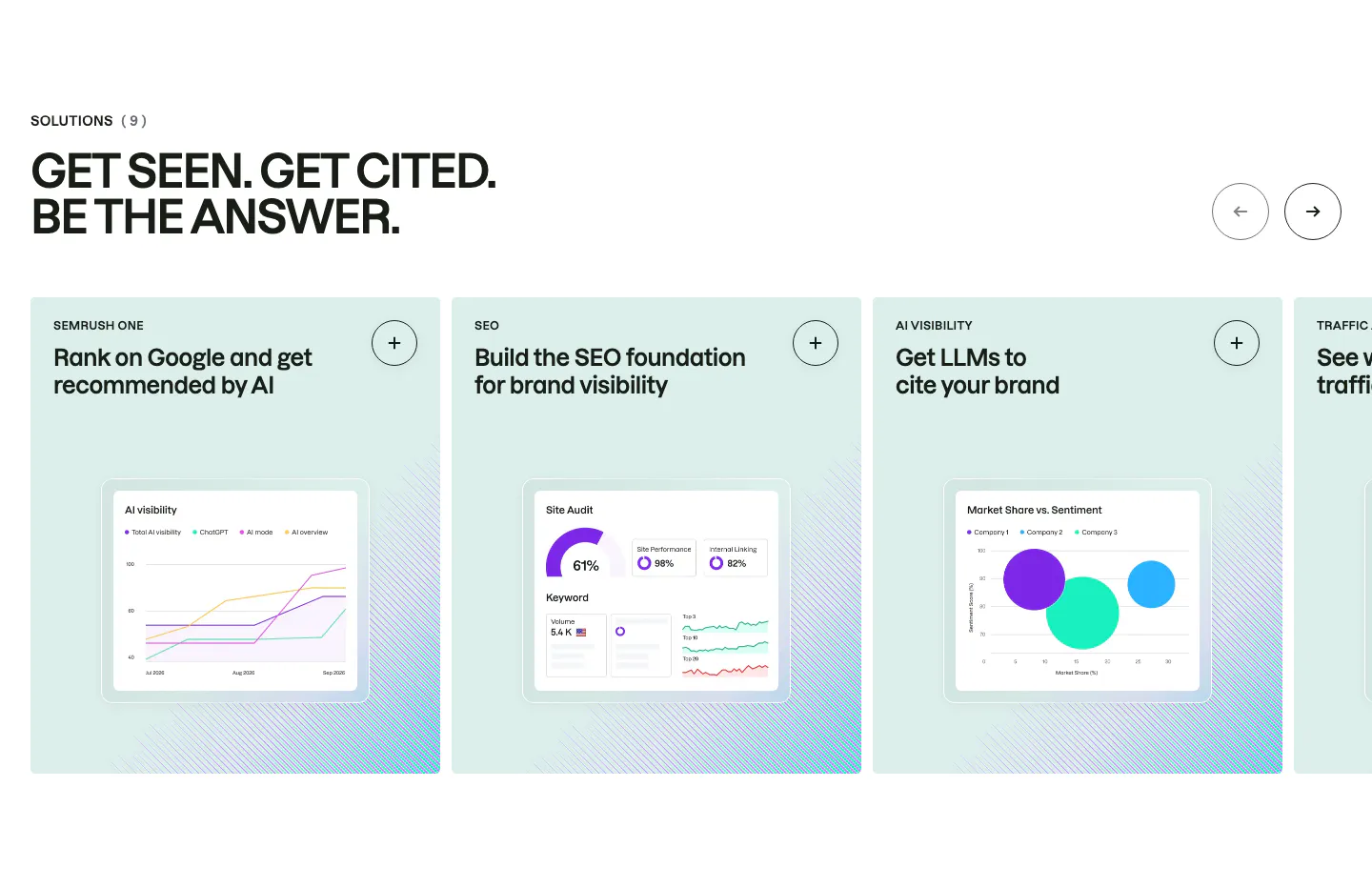
  7. Semrush features section: uppercase headline above a carousel of mint solution cards, each with a chart-based product UI mockup
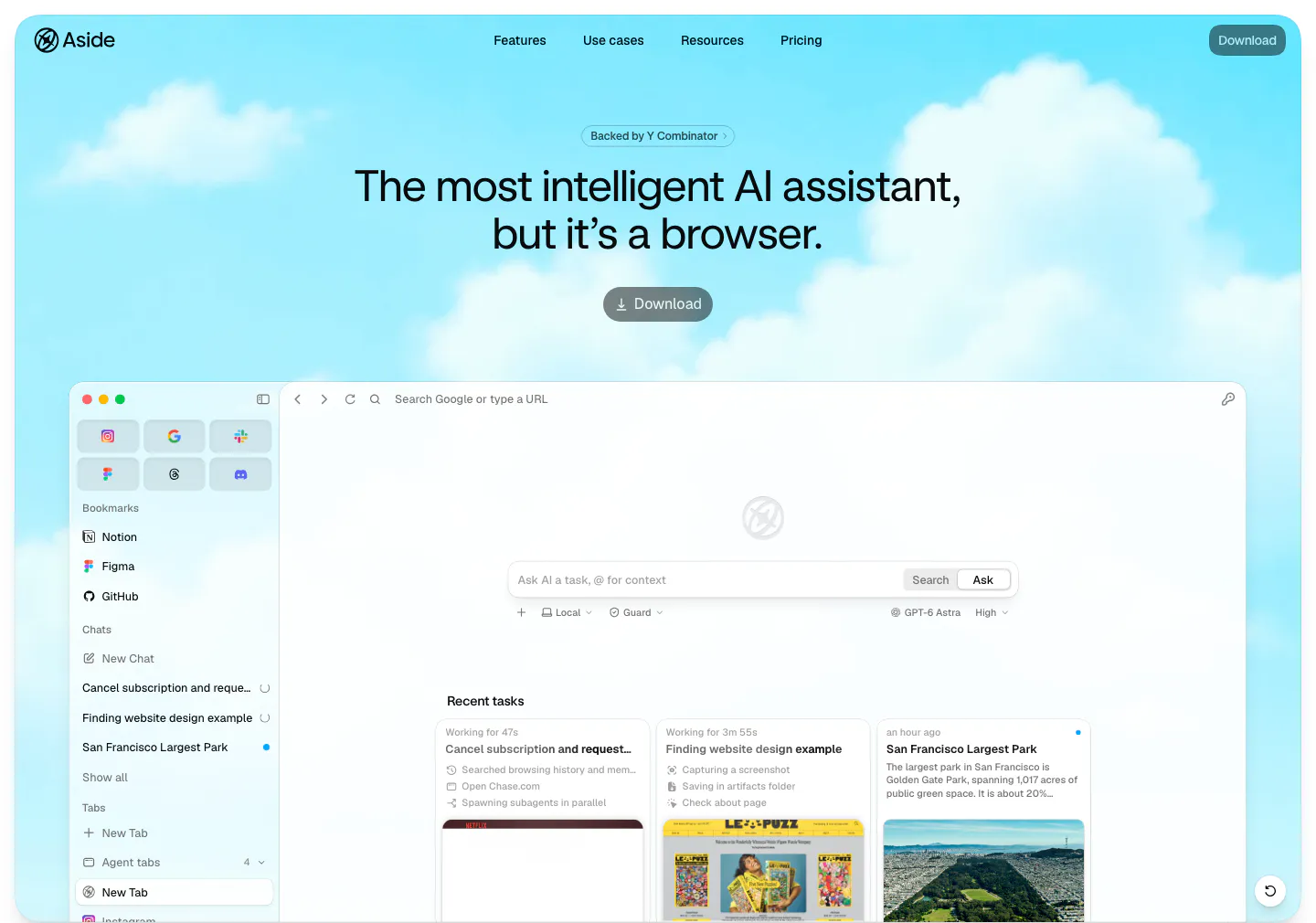
  8. Aside hero section: centered headline, YC badge and download button over a cloudy sky, above a browser app screenshot
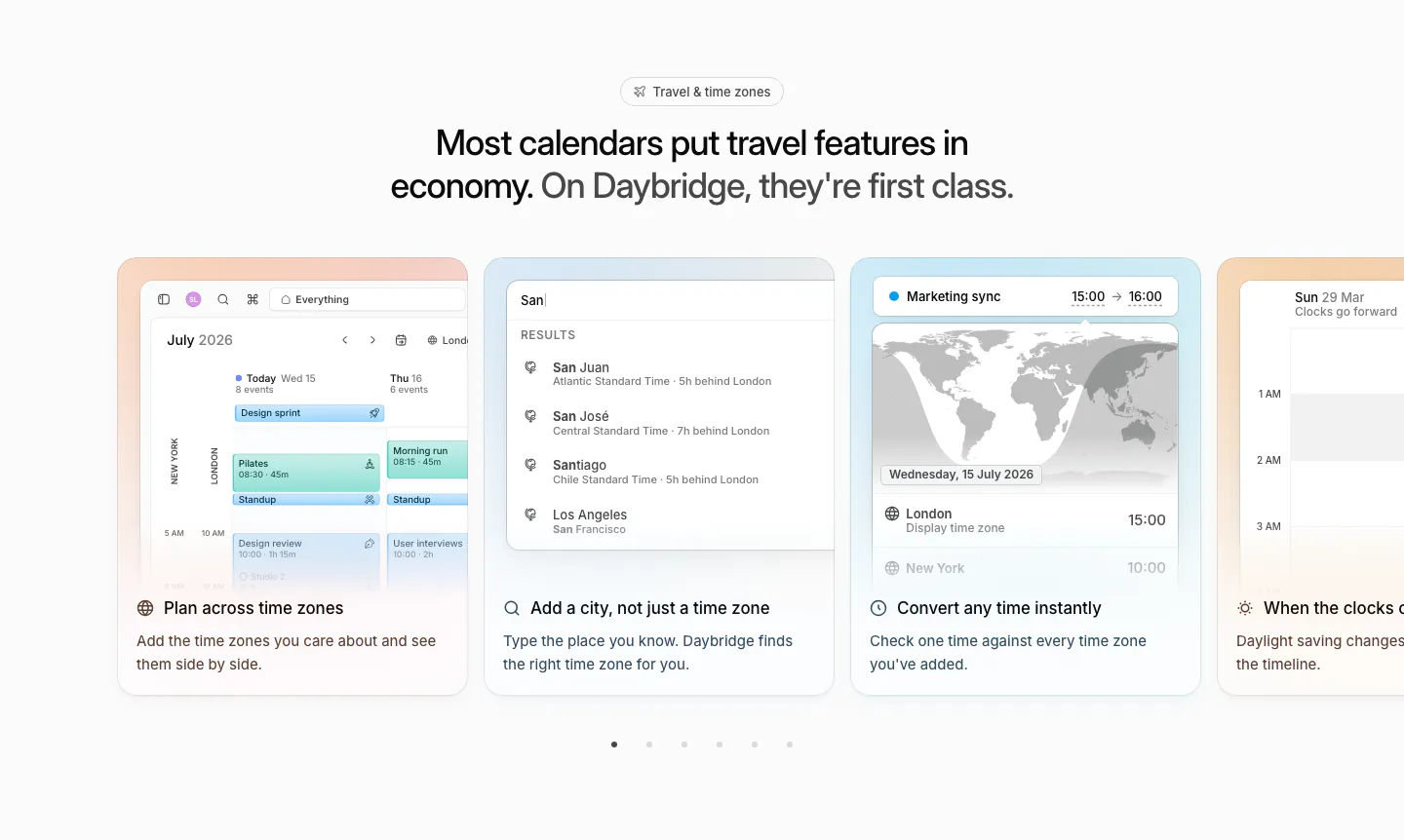
  9. Daybridge features section: centered headline above a carousel of pastel cards showing time zone UI, with pagination dots
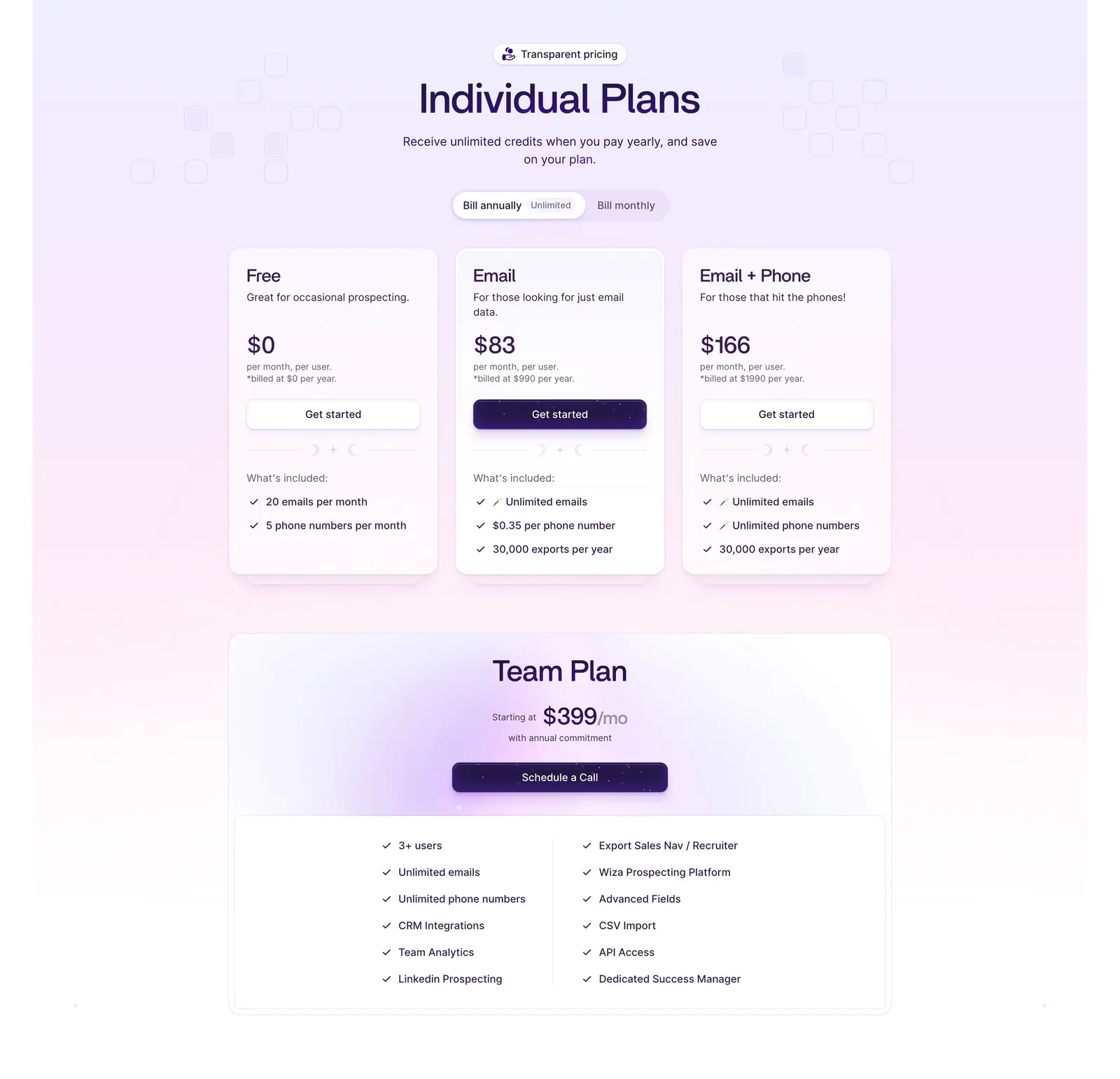
  10. Wiza pricing section: billing toggle above three plan cards and a wide Team Plan card with feature checklist on a lavender gradient
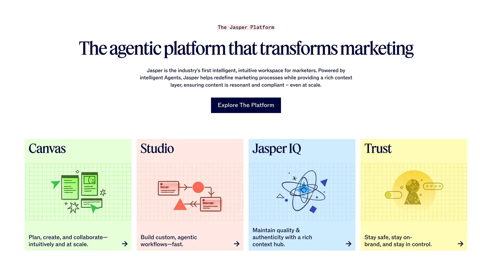
  11. Jasper features section: centered serif headline and button above four pastel cards with line illustrations on grid backgrounds
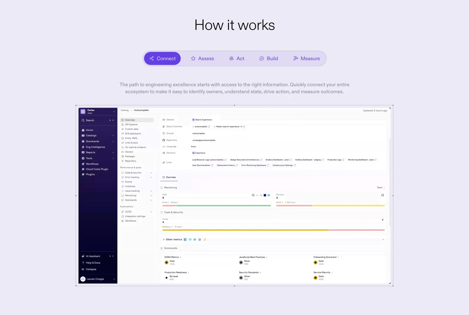
  12. Cortex how it works section: centered heading and five-step tab bar above a catalog dashboard screenshot on lavender
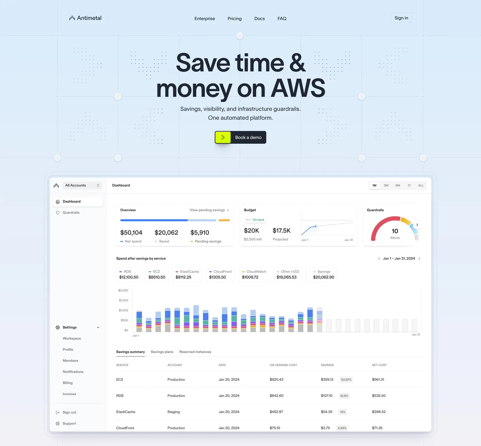
  13. Antimetal hero section: centered headline and button on a light blue grid pattern above a large AWS cost dashboard screenshot
  14. Weav logo cloud section: thin pink strip with a small trust label and a row of blue customer logos separated by dividers
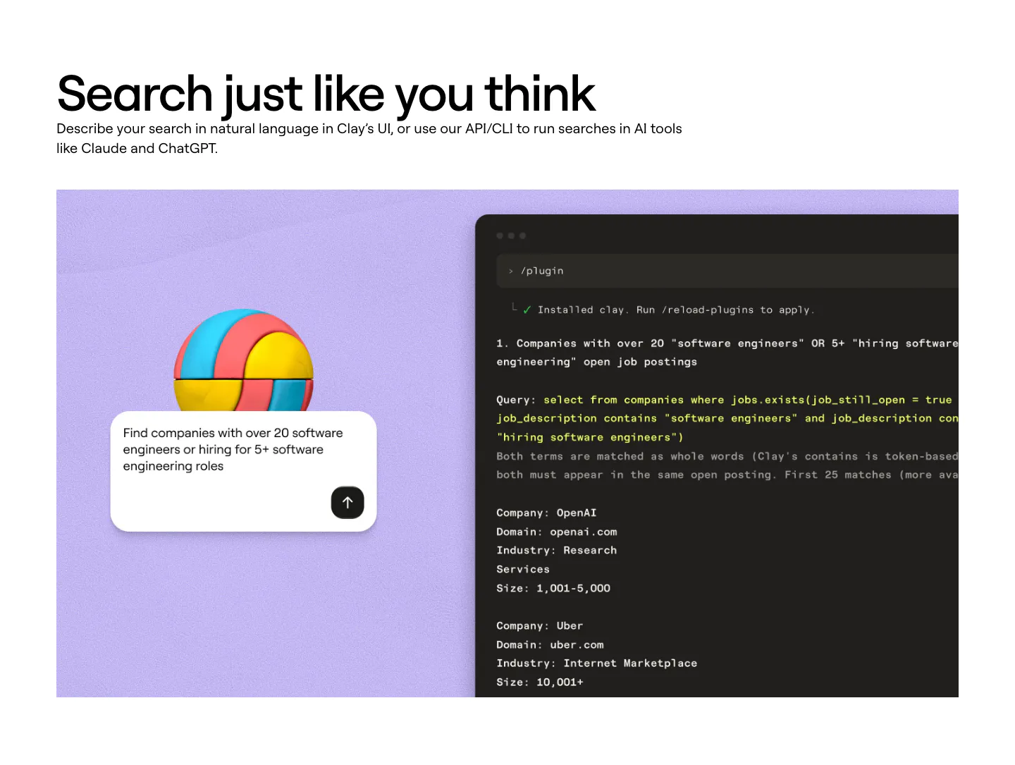
  15. Clay features section: left-aligned heading above a lavender panel with a 3D ball, a search prompt card and a dark terminal showing a query
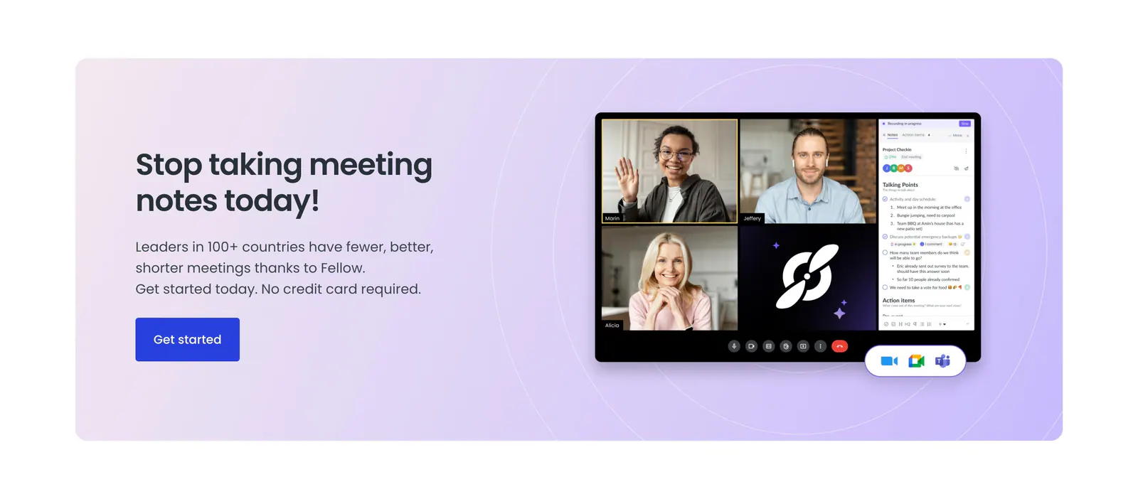
  16. Fellow call-to-action section: lavender panel with headline and blue button beside a video meeting app screenshot with notes sidebar
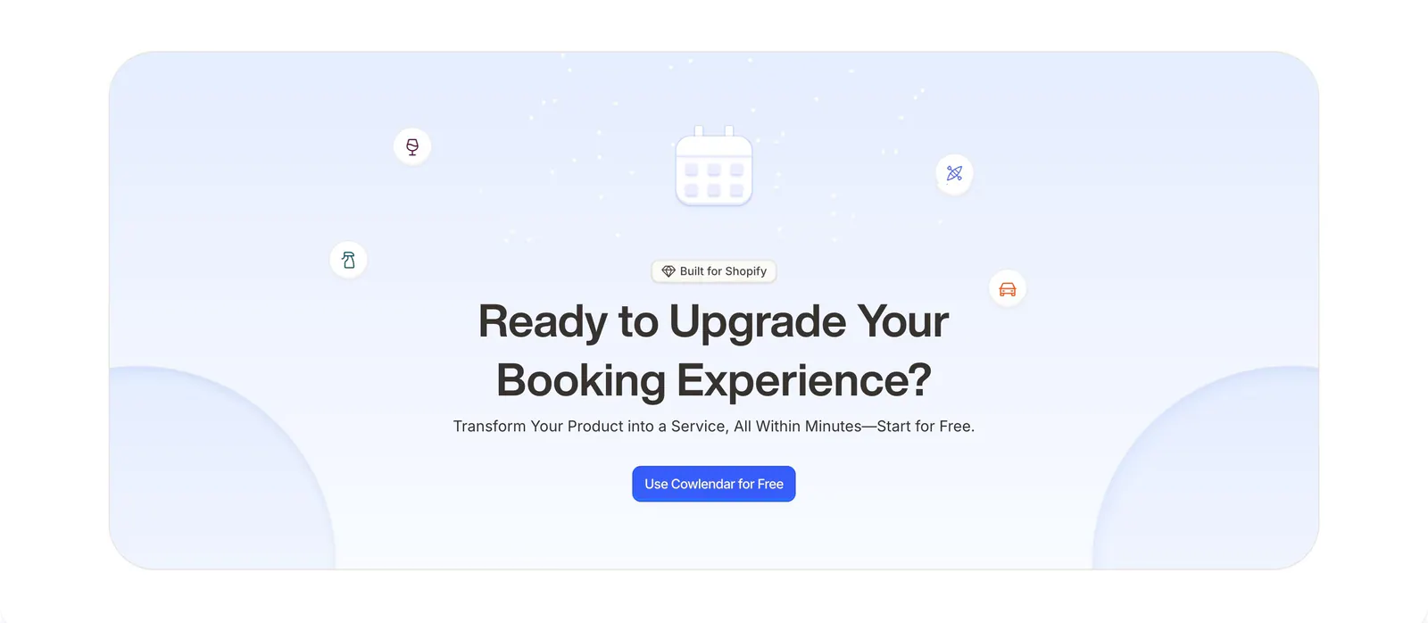
  17. Cowlendar call-to-action section: centered headline and blue button with calendar icon in a pale blue rounded panel
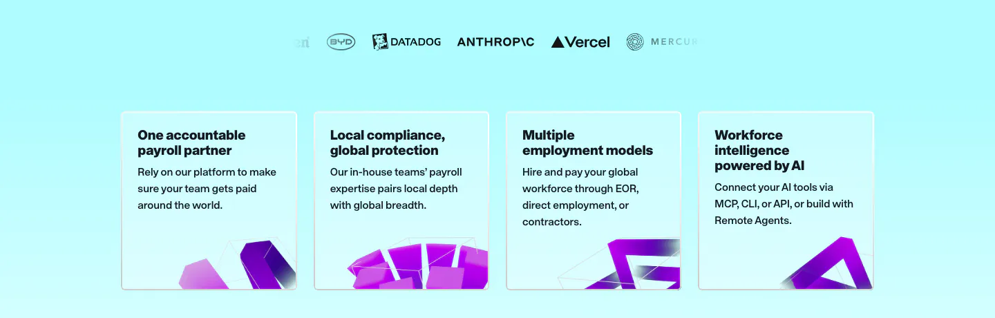
  18. Remote value proposition section: faded logo row above four light cyan benefit cards with purple 3D shapes at the bottom
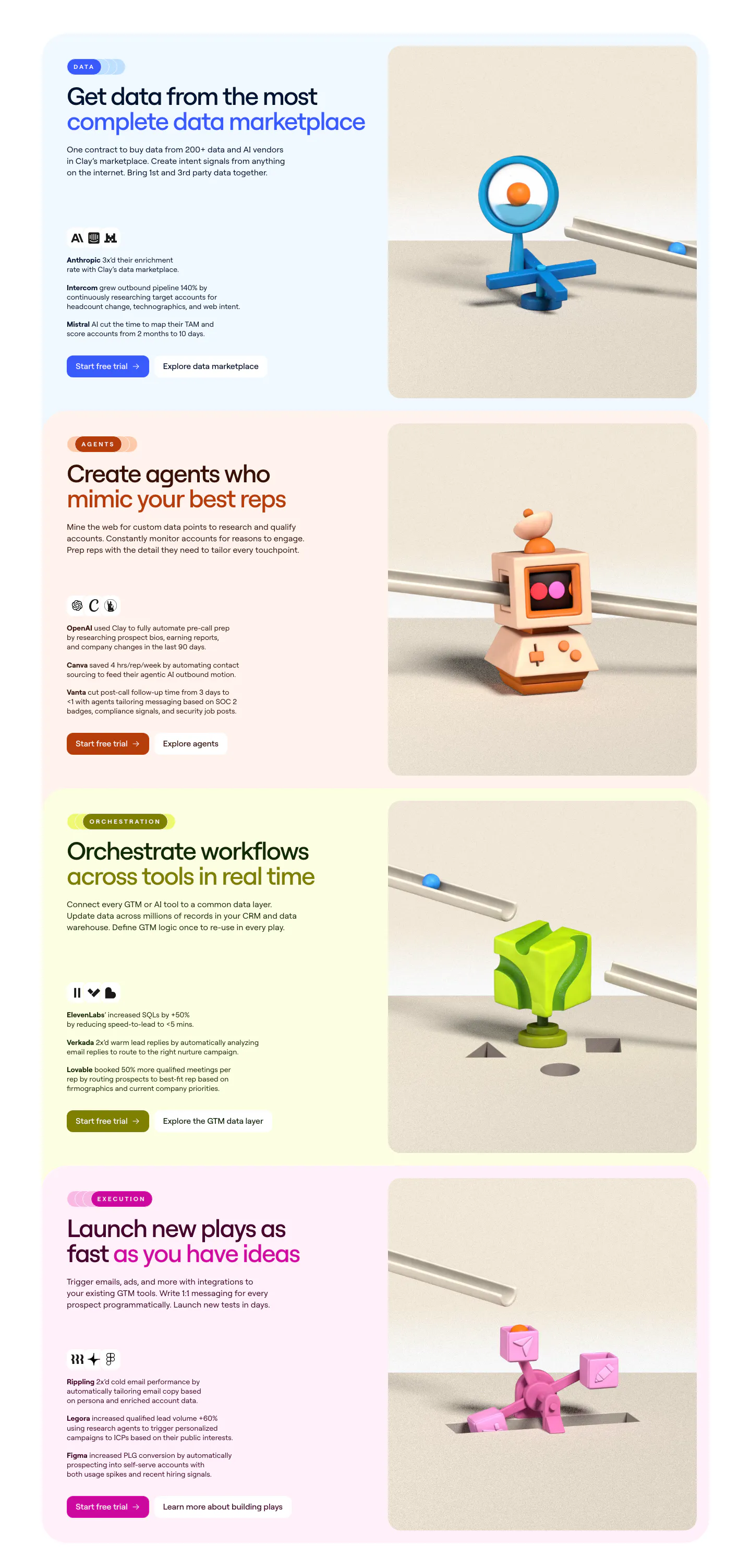
  19. Clay features section: stacked pastel cards, each with headline, customer results and buttons left and a 3D clay object render right
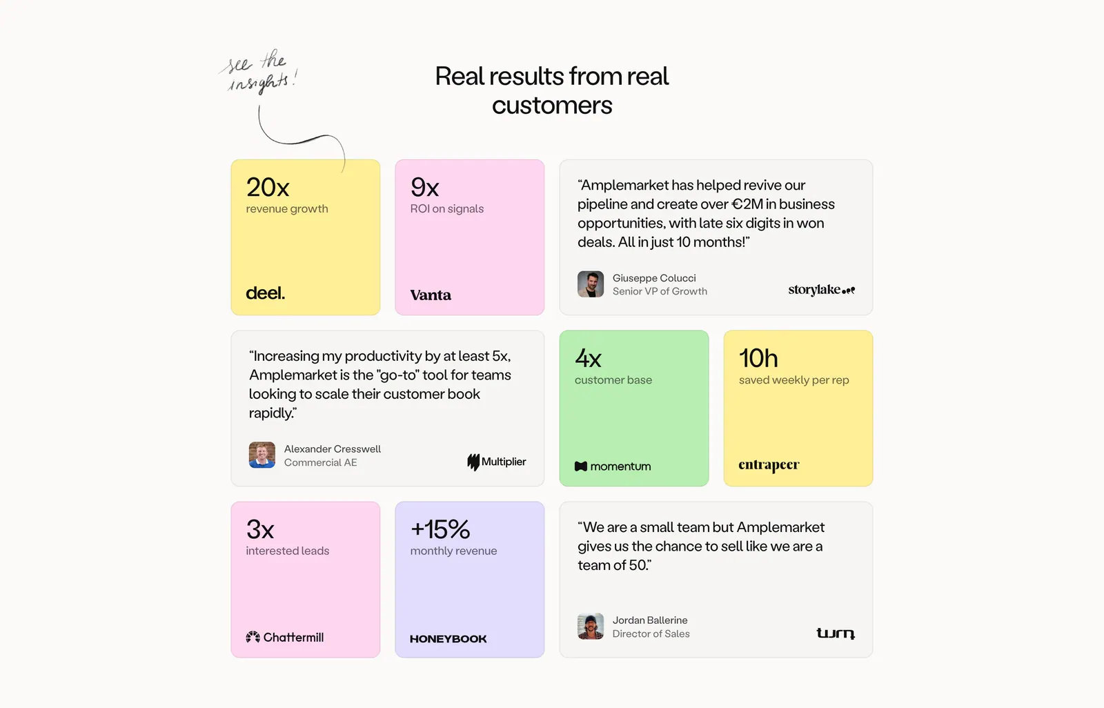
  20. Amplemarket testimonials section: centered headline above a bento grid of pastel metric tiles and gray quote cards with logos
  21. Realm features section: centered headline above three cards with tinted illustrated UI vignettes and short descriptions
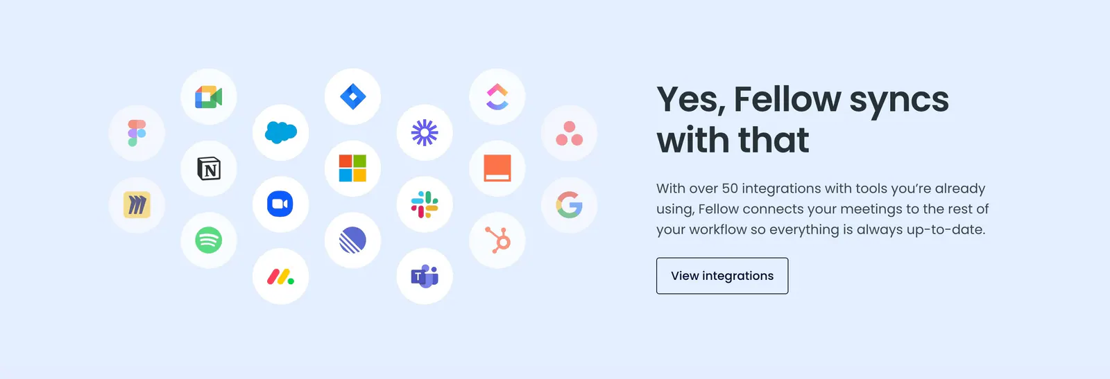
  22. Fellow integrations section: cluster of circular app icons on the left beside headline and button on a pale blue background
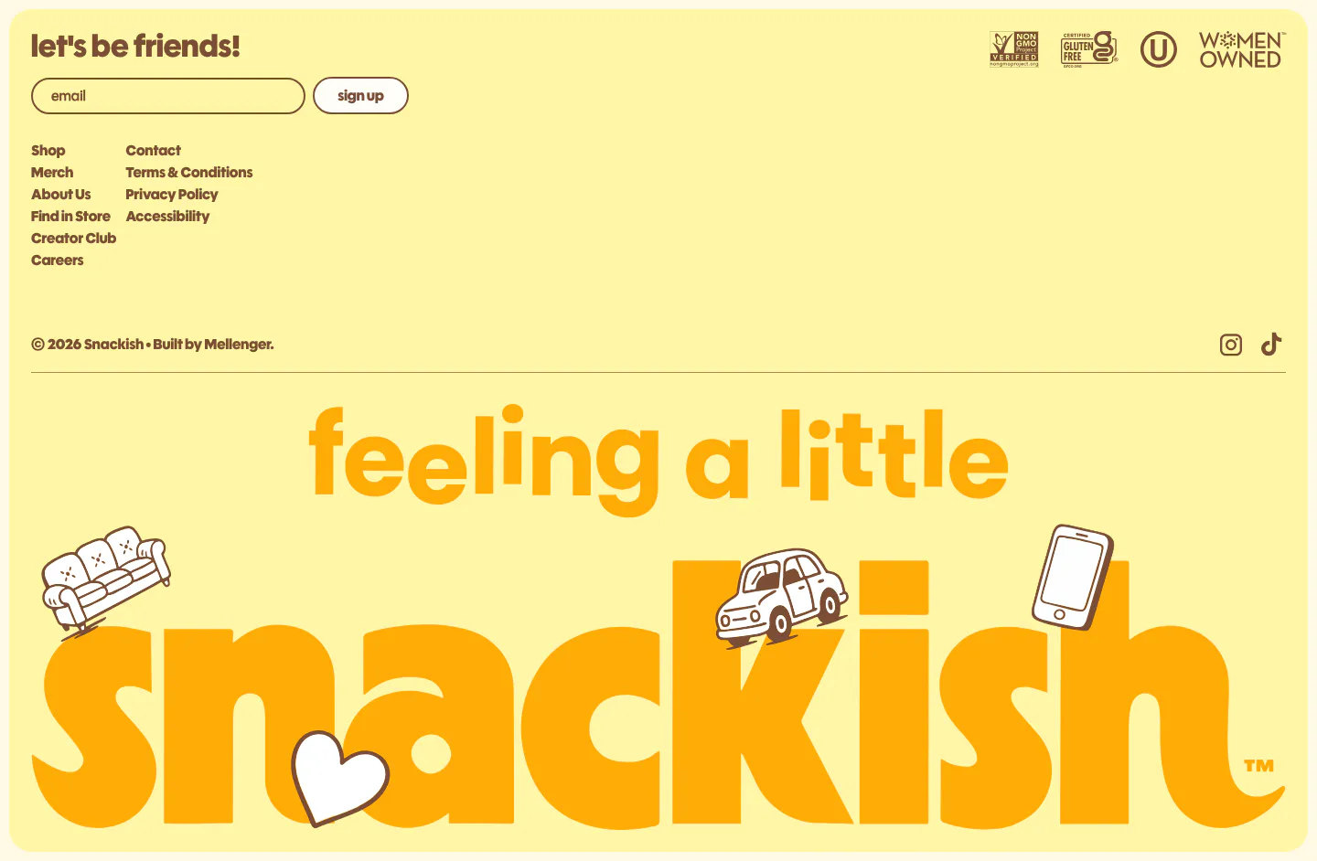
  23. Snackish footer section: pale yellow footer with email signup, link columns, certification badges and a giant illustrated snackish wordmark
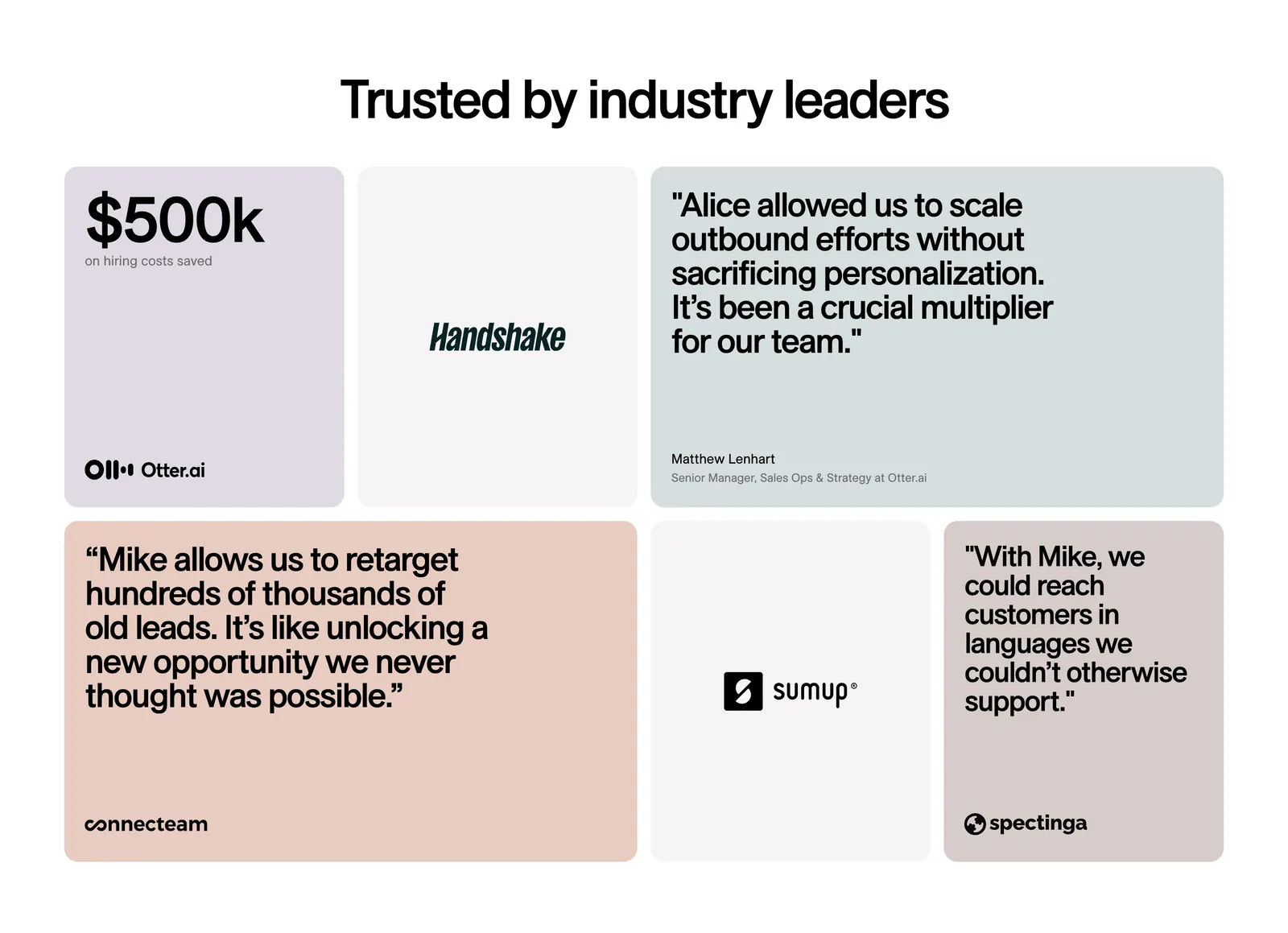
  24. 11x testimonials section: centered headline above a bento grid of pastel quote cards, a $500k metric tile and customer logo tiles
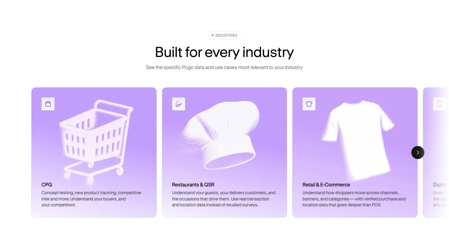
  25. Pogo use cases section: centered headline above a carousel of lavender industry cards with halftone object artwork
  26. Semrush logo cloud section: single row of black customer logos incl. Shopify, Samsung, FedEx and Amazon on a pale lavender band
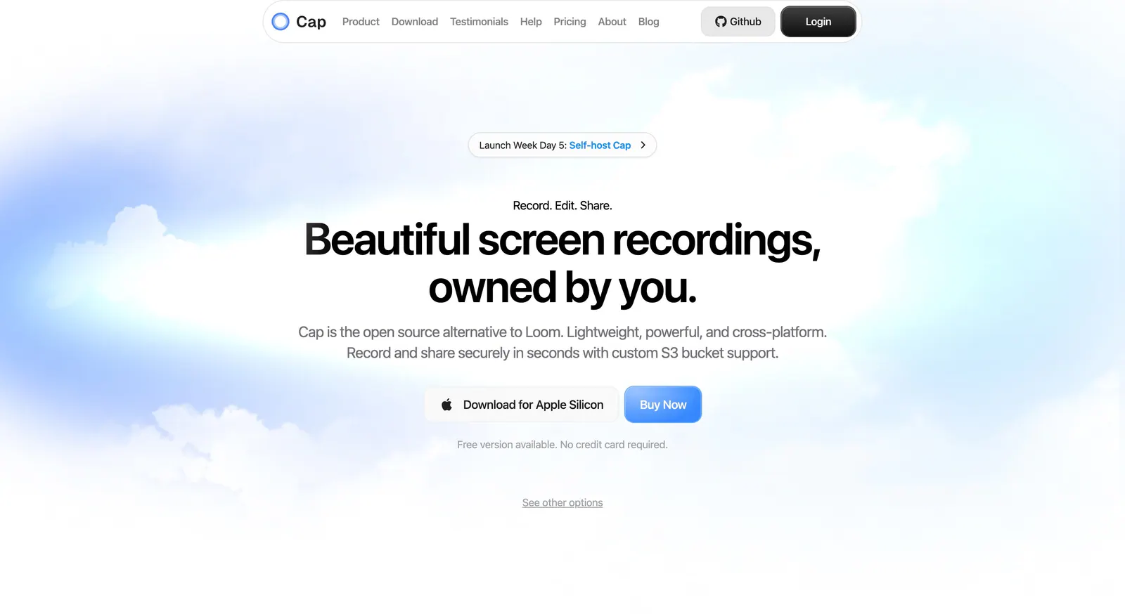
  27. Cap hero section: centered headline with download and buy buttons over a soft blue sky and cloud background
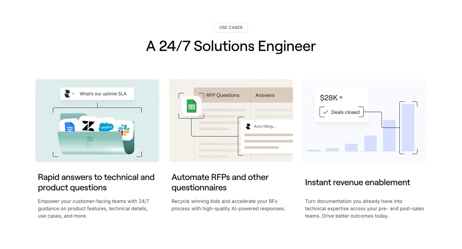
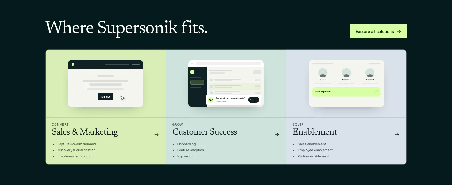
  28. Supersonik use cases section: serif headline over three pastel panels for sales, customer success and enablement with UI sketches
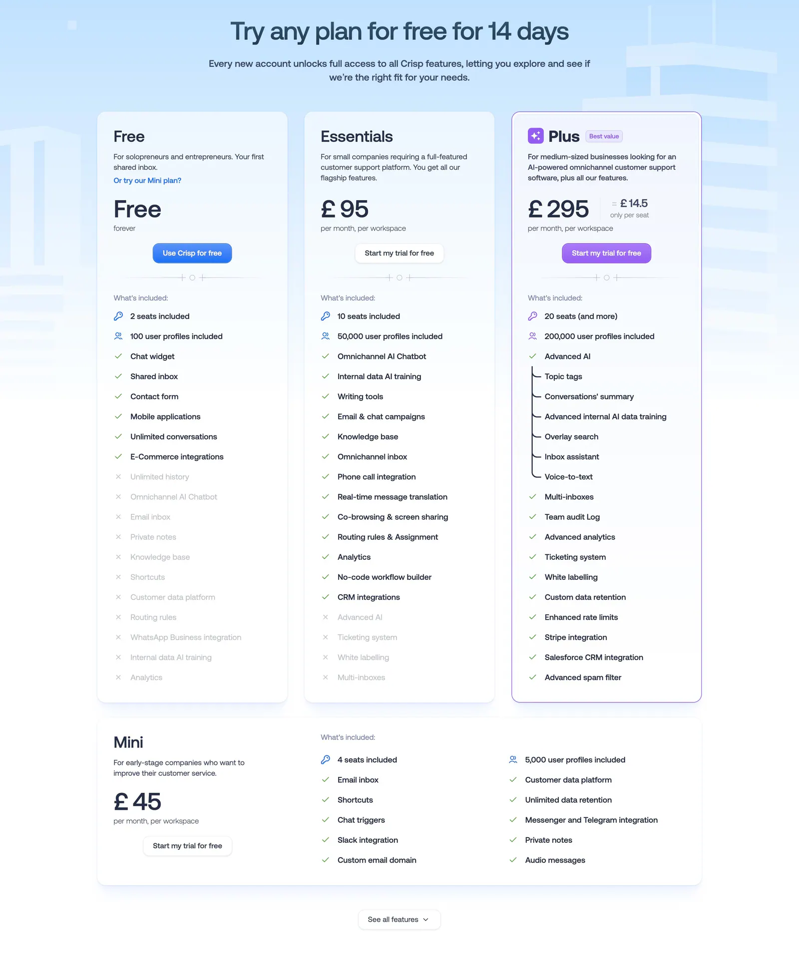
  29. Crisp pricing section: centered headline above three plan cards with checklists and a wide Mini plan card on pale blue
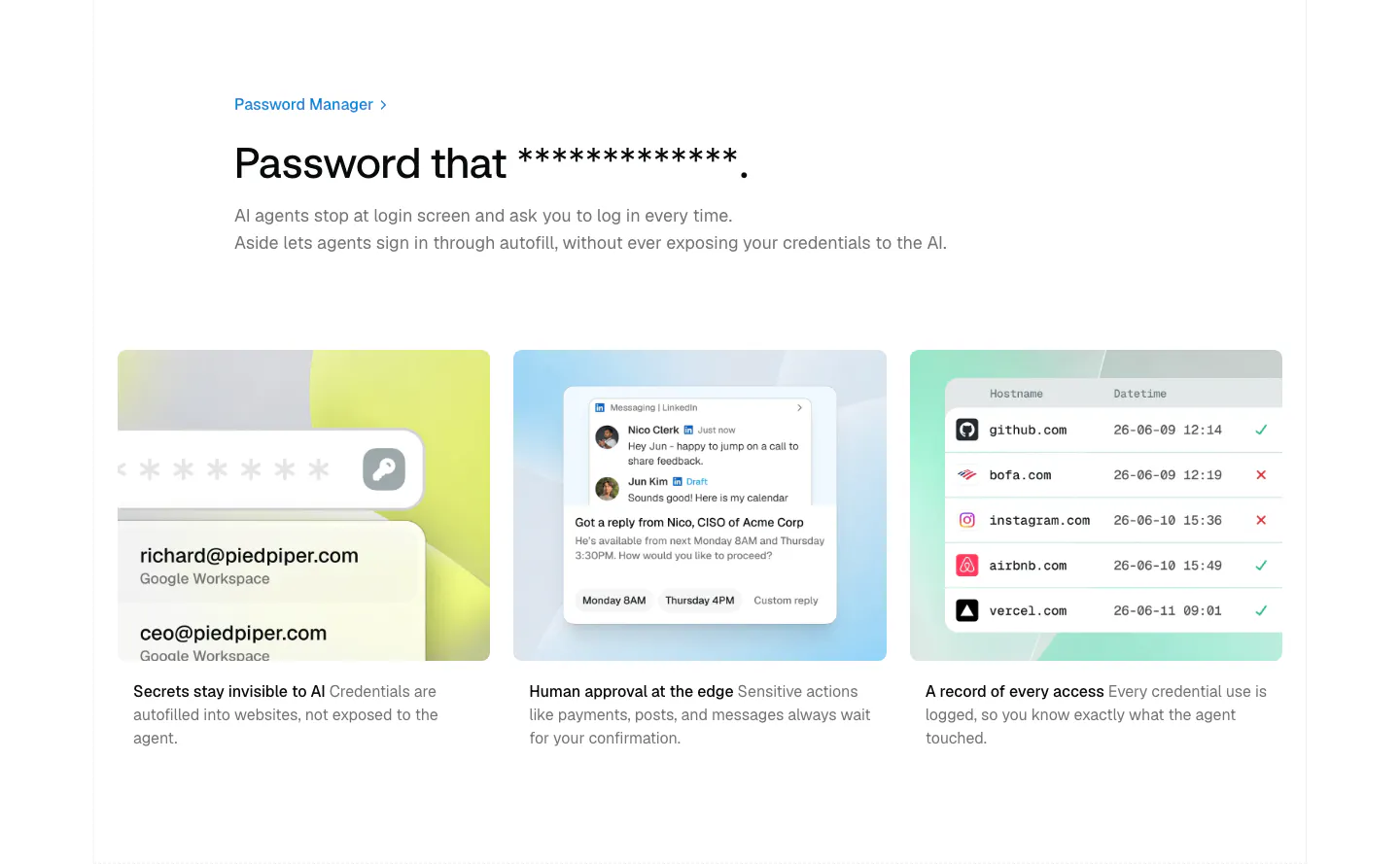
  30. Aside features section: left-aligned headline above three pastel cards with credential, approval and access log mockups
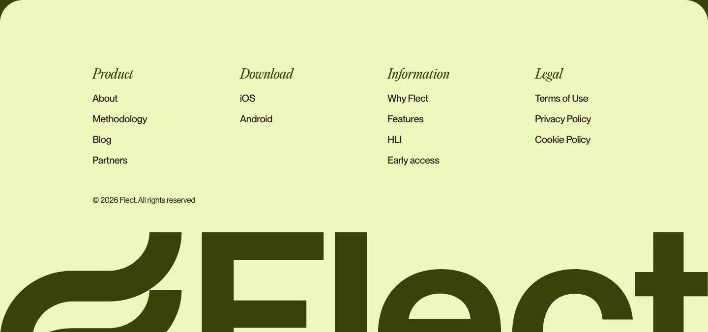
  31. Flect footer section: italic serif column headings and links above a giant cropped Flect wordmark on a pale lime background
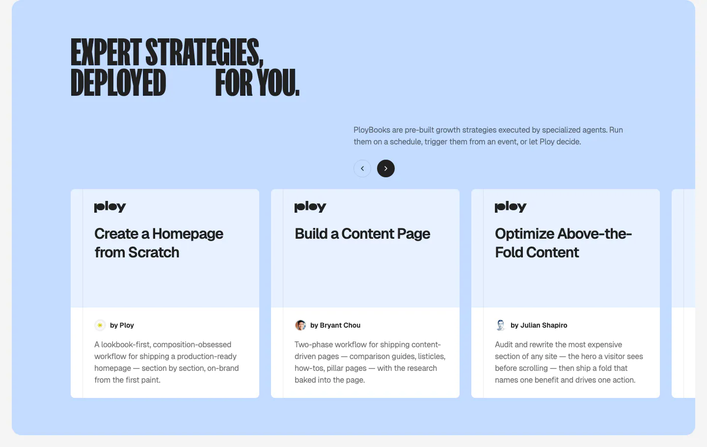
  32. Ploy features section: condensed headline and arrow controls above a carousel of PloyBooks strategy cards on a light blue panel
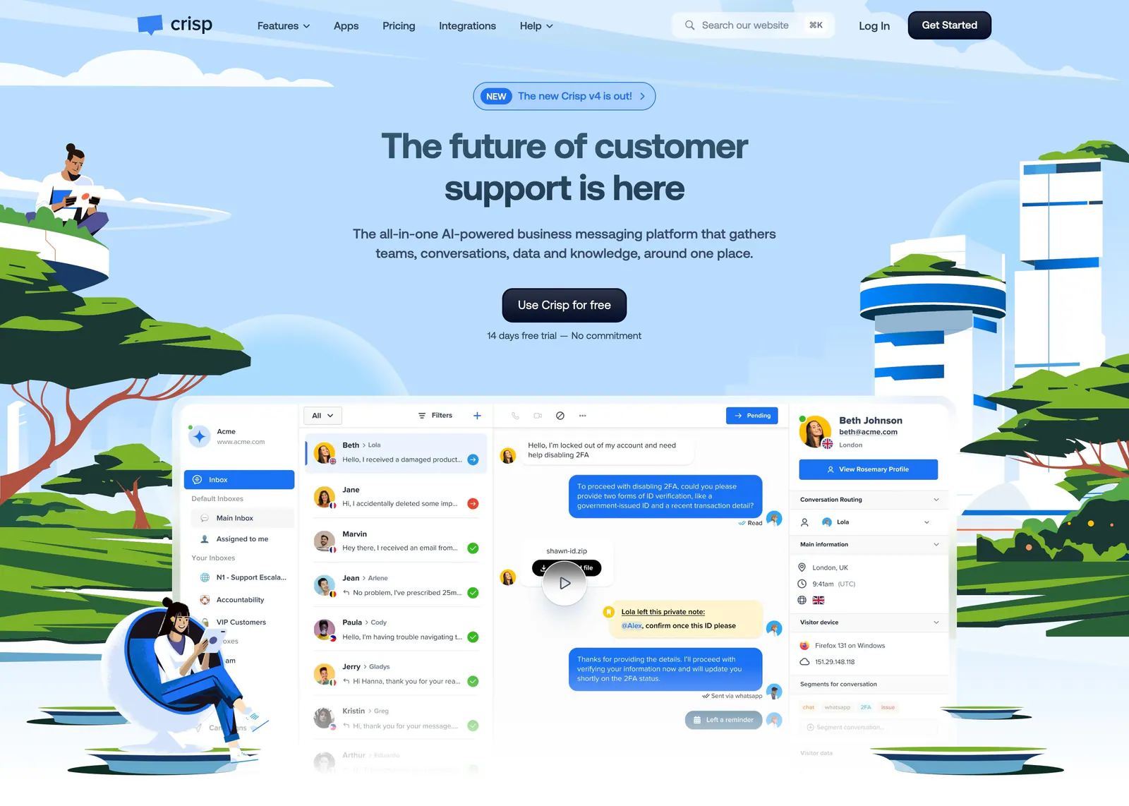
  33. Crisp hero section: centered headline and CTA above an inbox screenshot framed by illustrated people, trees and towers on sky blue
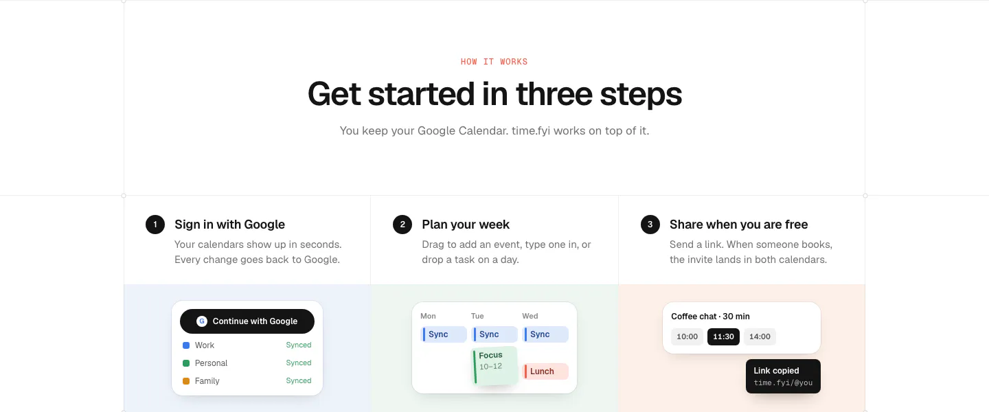
  34. time.fyi how it works section: centered header above three numbered step columns with small UI snippets on pastel panels
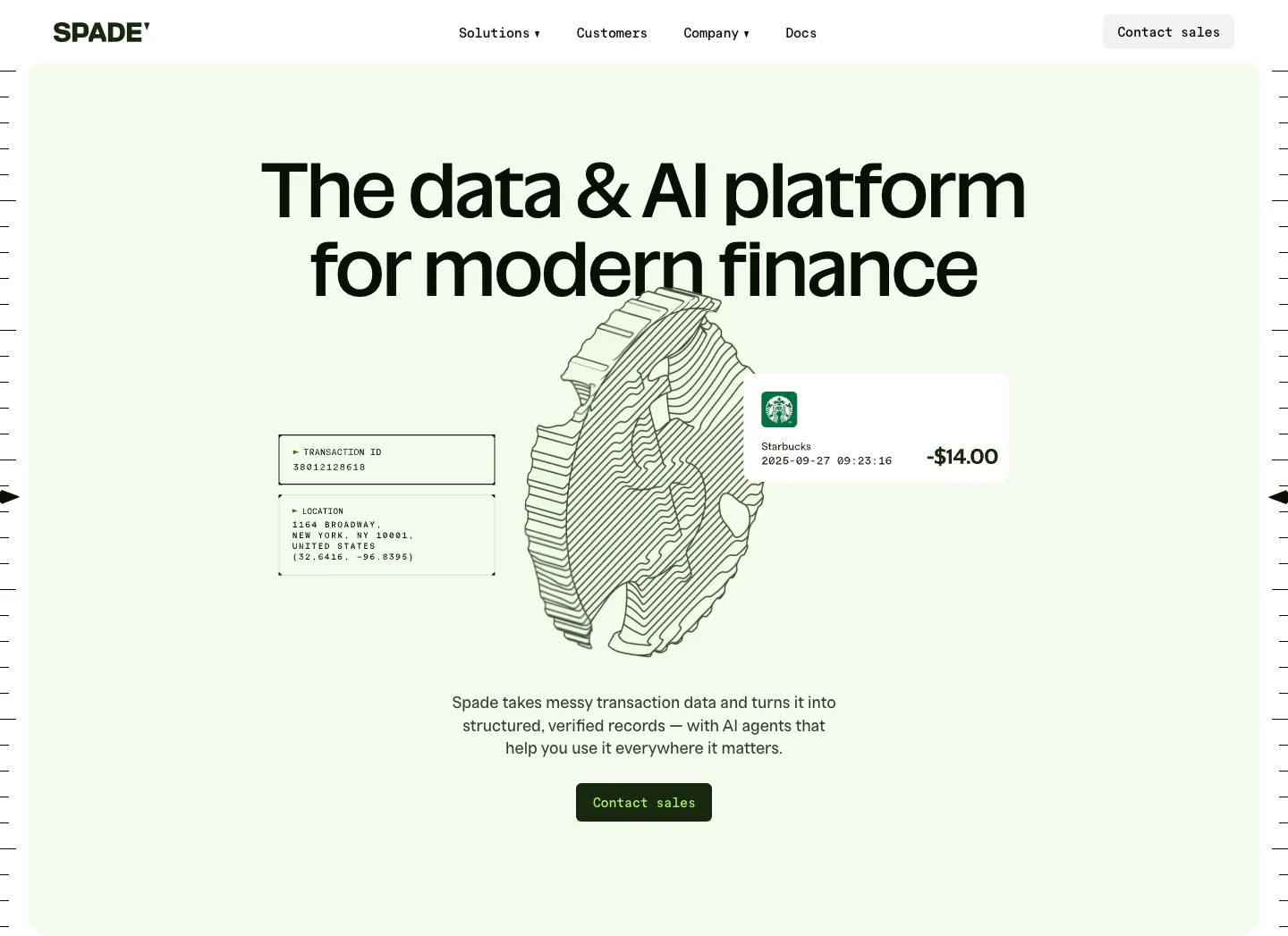
  35. Spade hero section: centered headline over a line-art coin drawing with transaction data cards on a mint green panel, button below
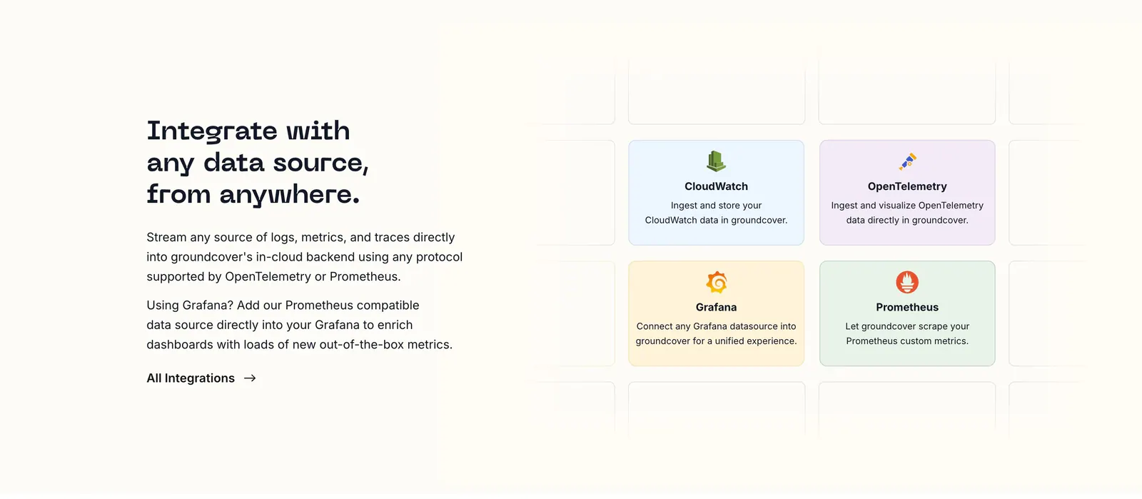
  36. groundcover integrations section: headline, copy and link on the left beside a grid of pastel integration cards on a cream background
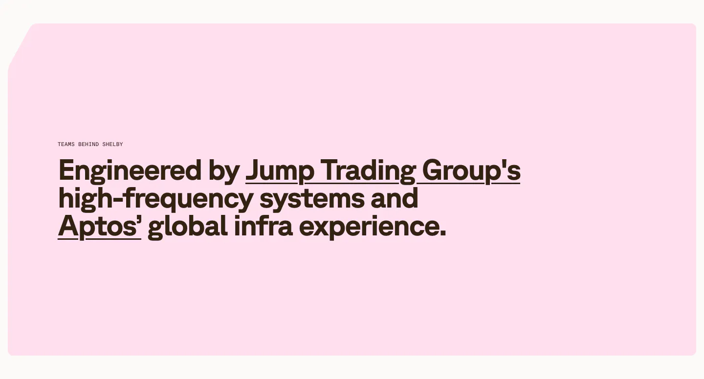
  37. Shelby about & mission section: large left-aligned statement naming Jump Trading Group and Aptos as underlined links on a pale pink panel
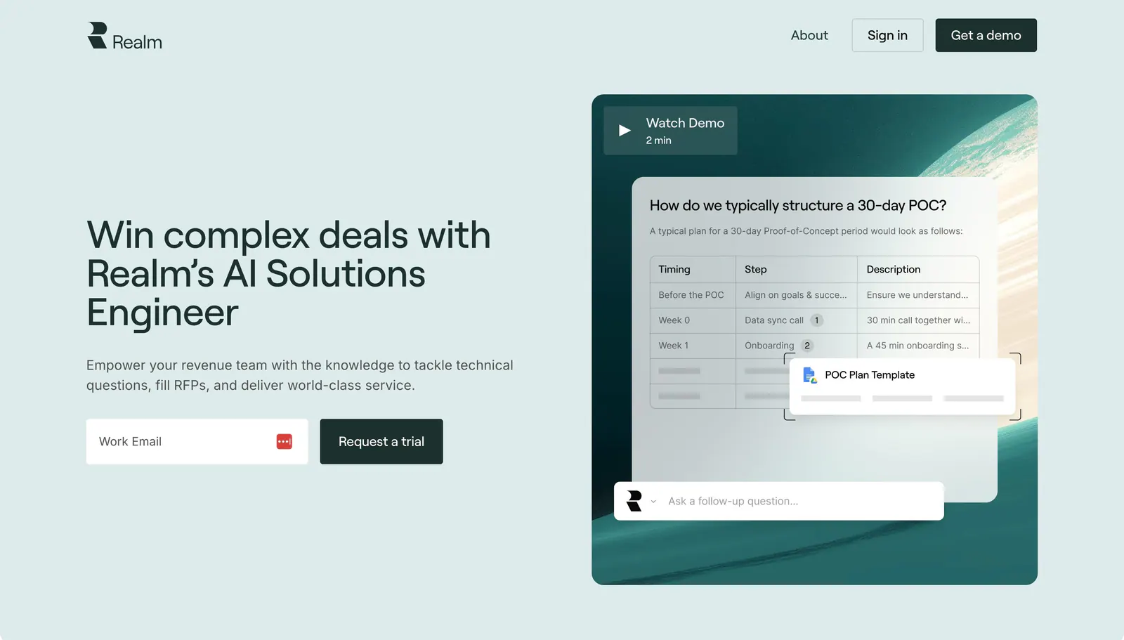
  38. Realm hero section: headline and email signup on the left, chat answer UI over a teal planet image with Watch Demo on the right
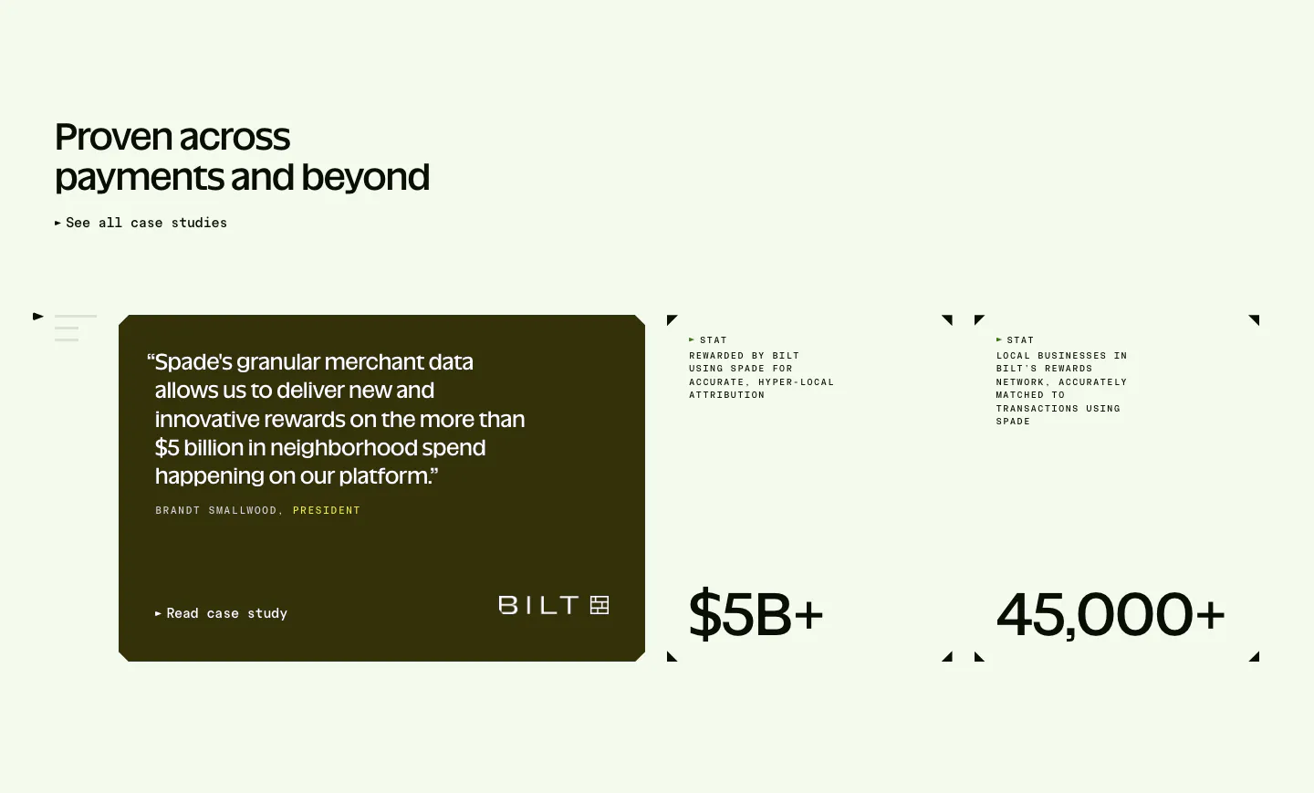
  39. Spade testimonials section: headline above a dark olive quote card with Bilt logo beside two stat blocks with corner marks on mint green
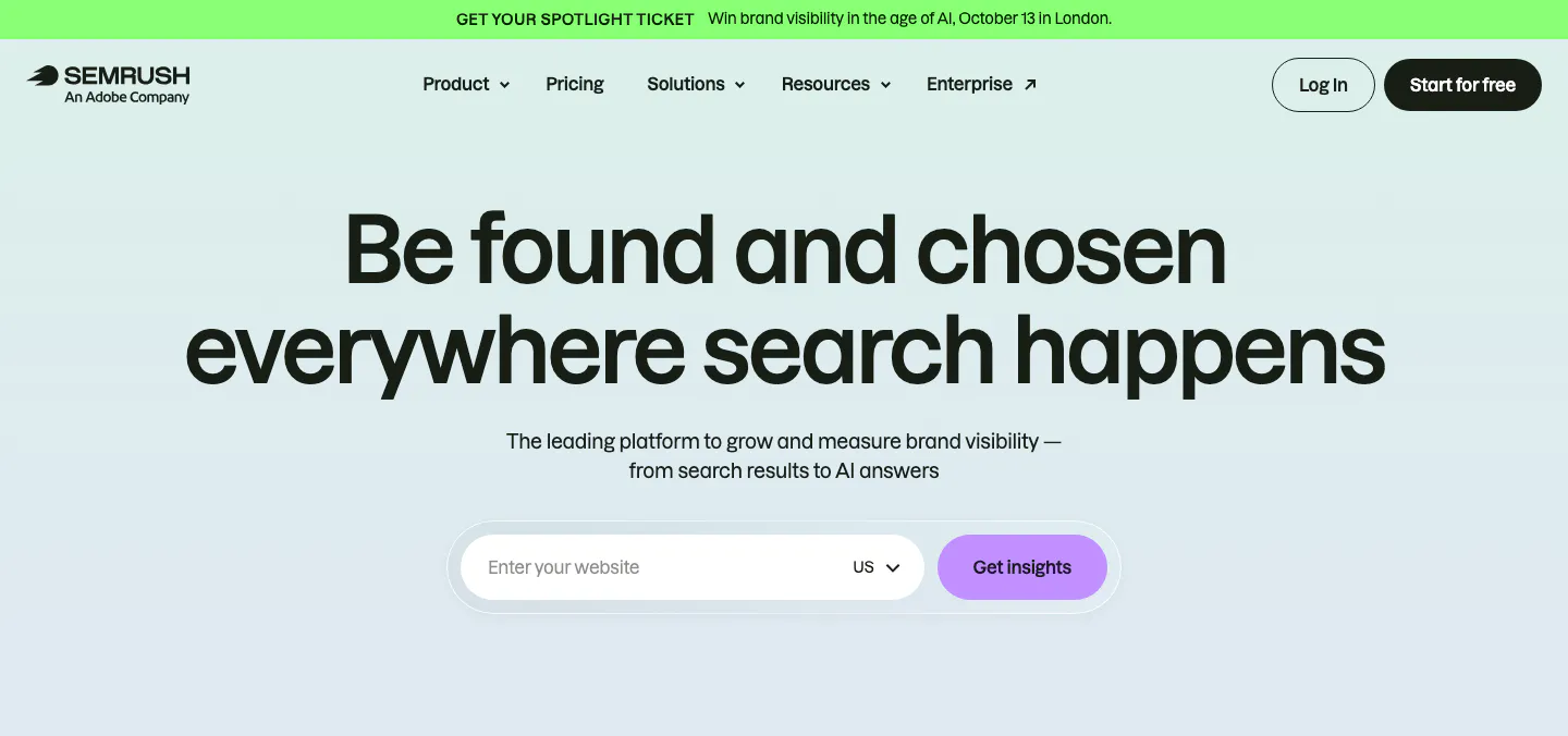
  40. Semrush hero section: nav with promo bar, centered headline and a website URL input with Get insights button on pale mint
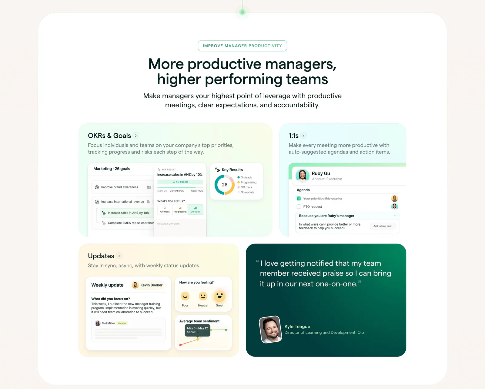
  41. Lattice features section: centered heading above a bento grid of pastel cards with OKR, 1:1 and update UI mockups plus a green quote card
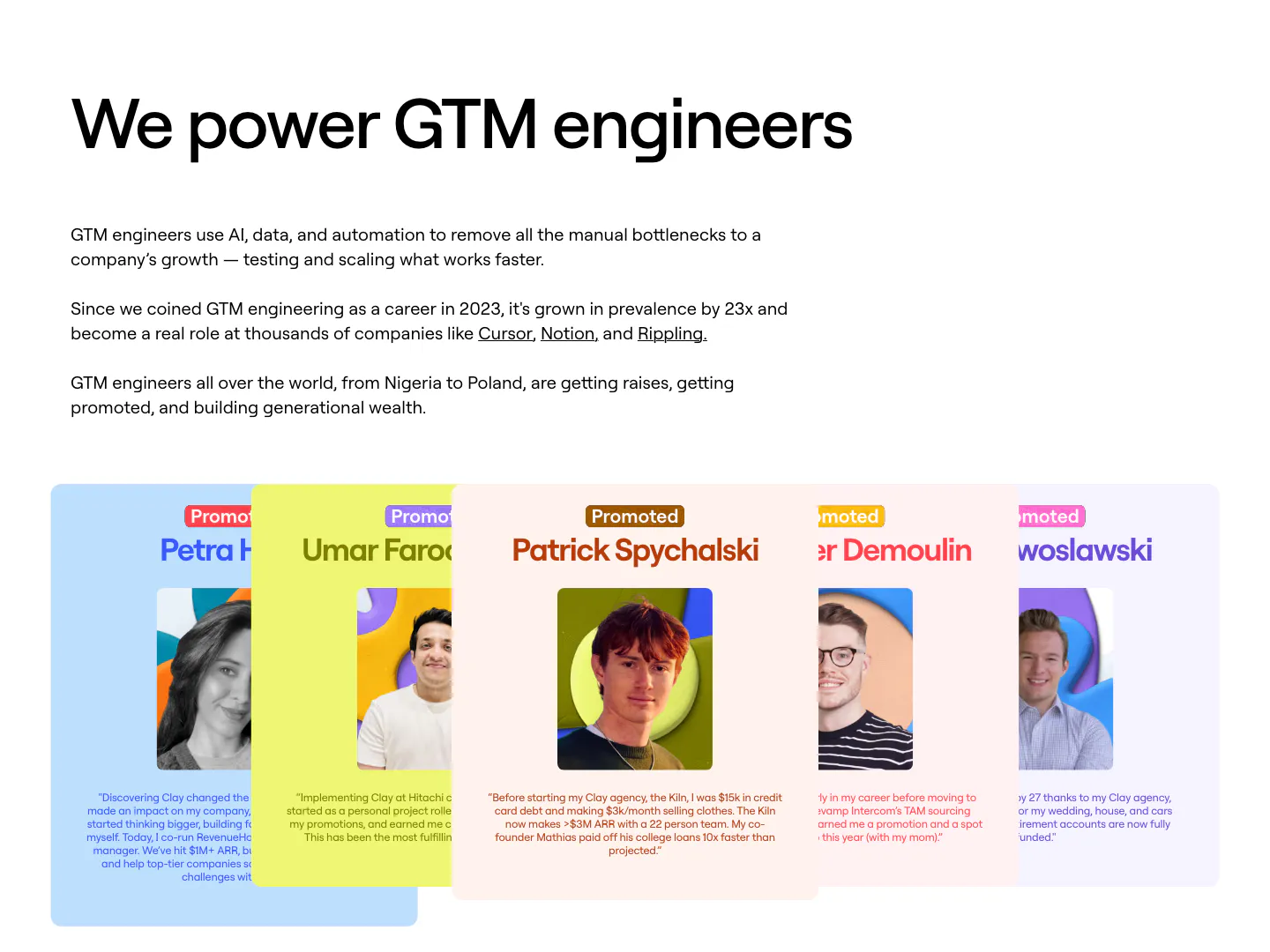
  42. Clay testimonials section: left-aligned heading and copy above a fanned stack of colored cards with portrait photos and promotion quotes
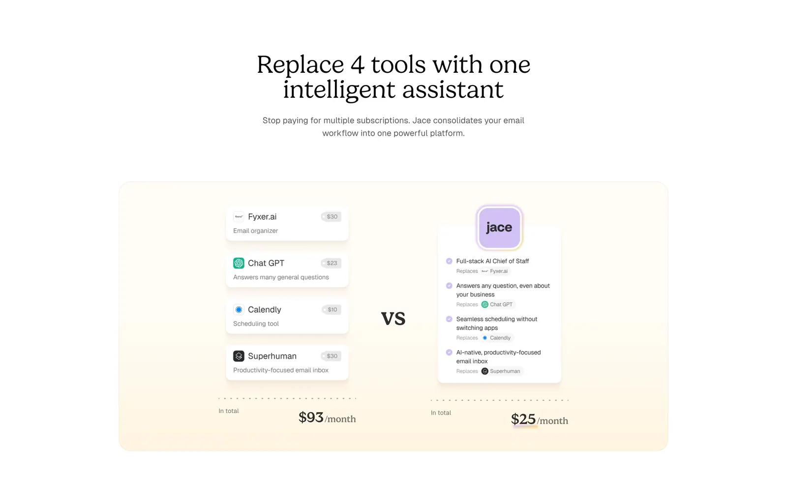
  43. Jace comparison section: serif centered headline above a cream panel comparing four tool cards and prices vs one Jace card
    Jace Comparison
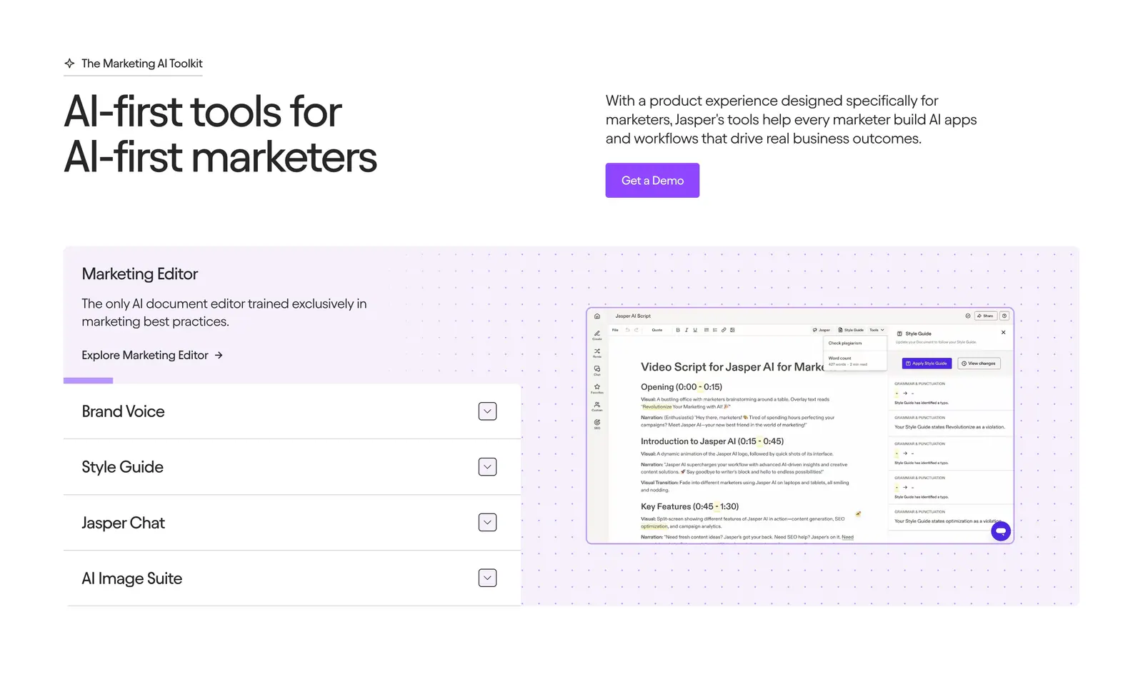
  44. Jasper features section: headline and copy row above an accordion list beside an editor screenshot on a dotted lavender panel
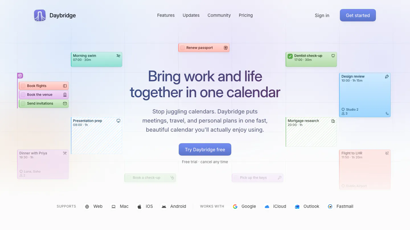
  45. Daybridge hero section: centered headline and button surrounded by floating calendar event cards, with platform and integration row
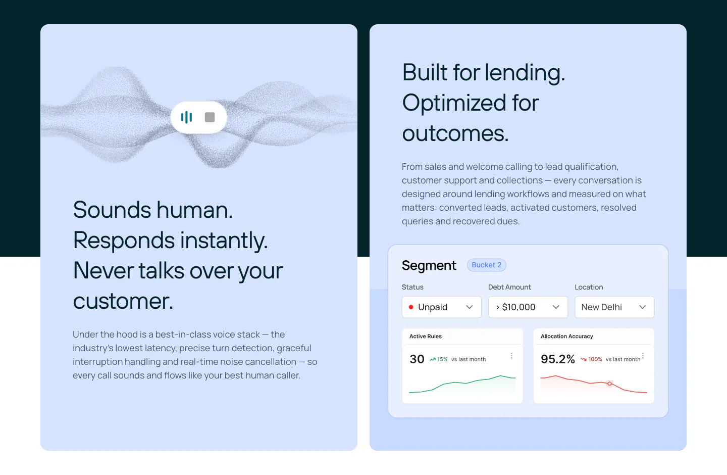
  46. Rezolv features section: two light blue cards, one with a voice waveform and one with a segment dashboard UI with charts
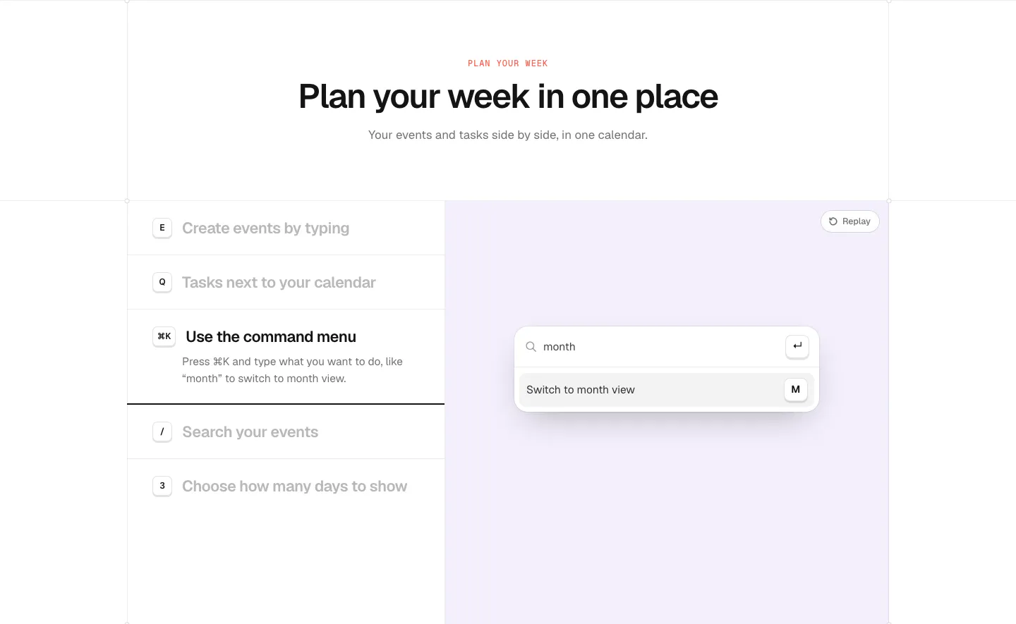
  47. time.fyi features section: centered header above a shortcut feature list on the left and a lavender panel with a command menu UI
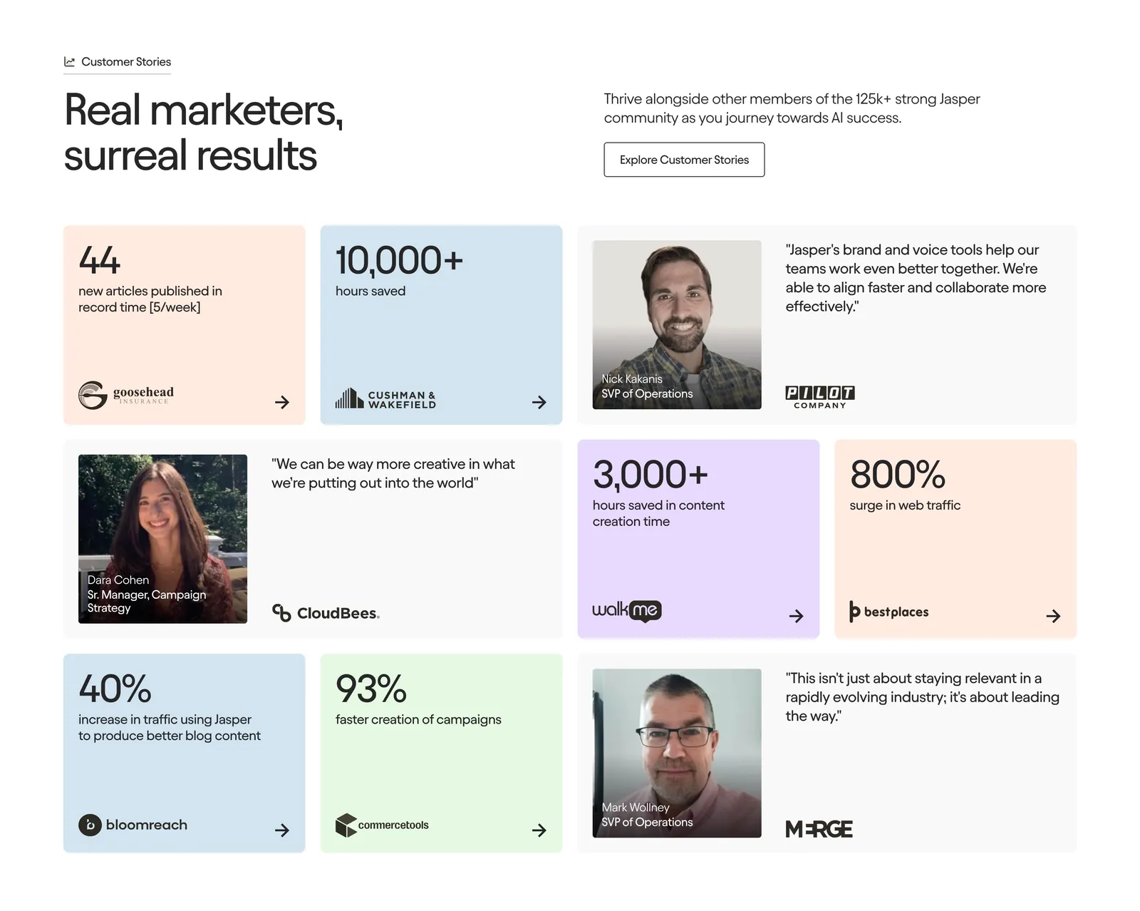
  48. Jasper testimonials section: headline and button row above a bento grid of pastel metric tiles and quote cards with portraits
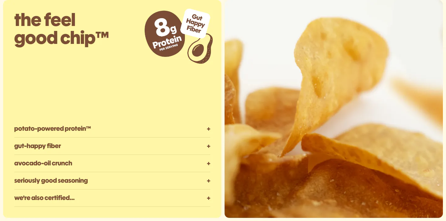
  49. Snackish features section: pale yellow panel with headline, protein badge and accordion list beside a close-up photo of potato chips
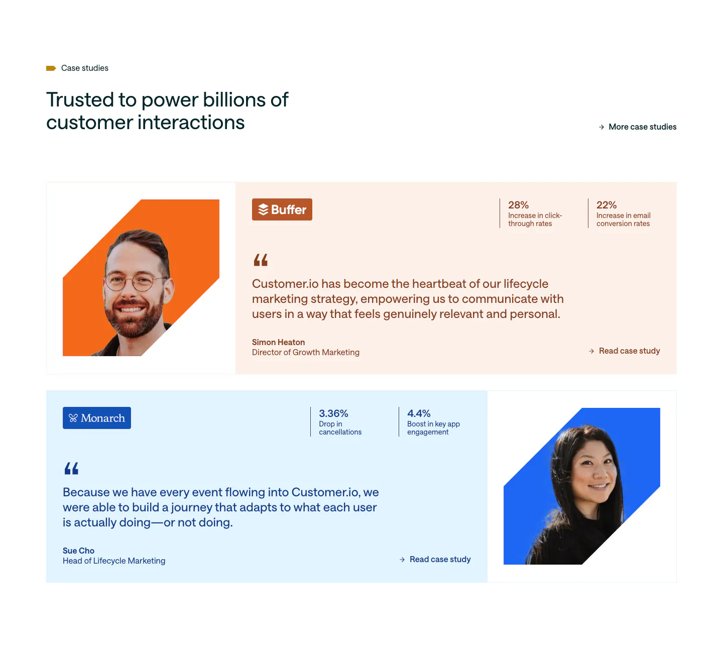
  50. Customer.io testimonials section: two case study rows on peach and pale blue cards with cut-out portraits, quotes and stat pairs
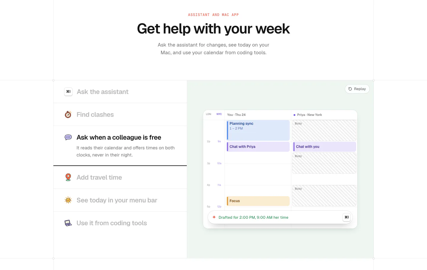
  51. time.fyi features section: centered header above an assistant feature list on the left and a mint panel with a shared calendar UI
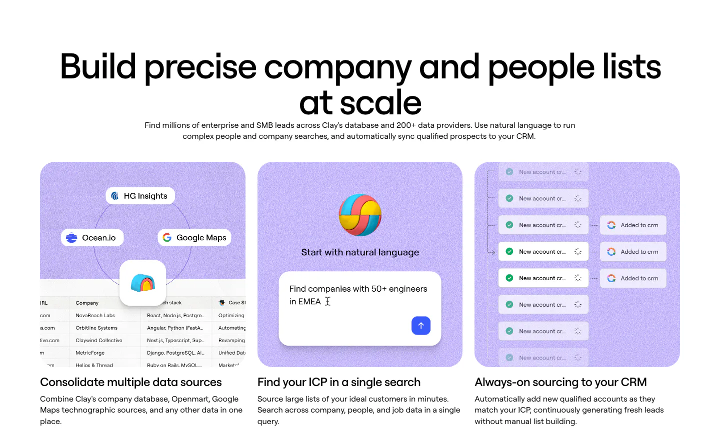
  52. Clay features section: centered heading above three lavender cards with data source, natural-language search and CRM sync UI mockups
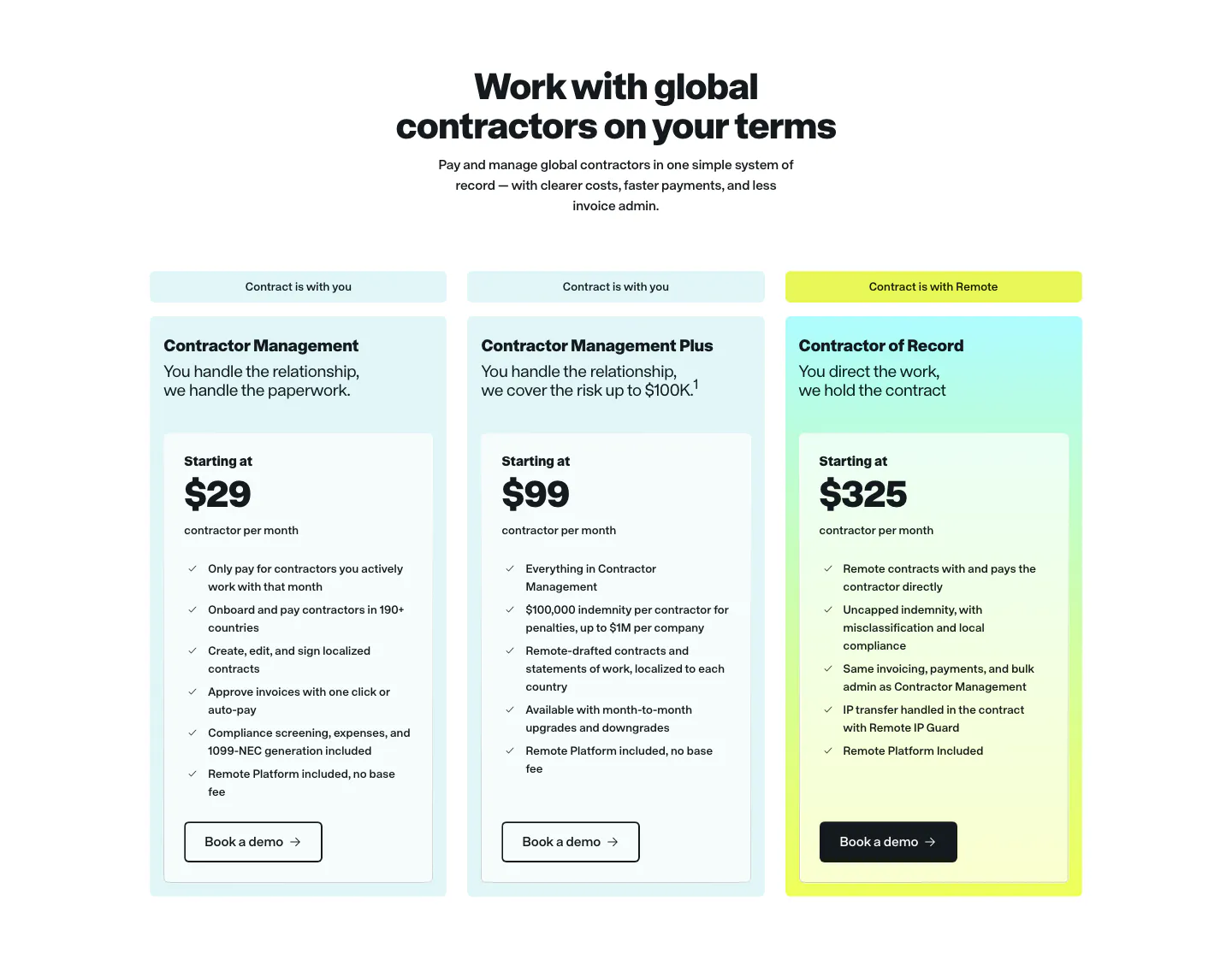
  53. Remote pricing section: centered headline above three contractor plan cards in light cyan with a yellow-tinted highlight
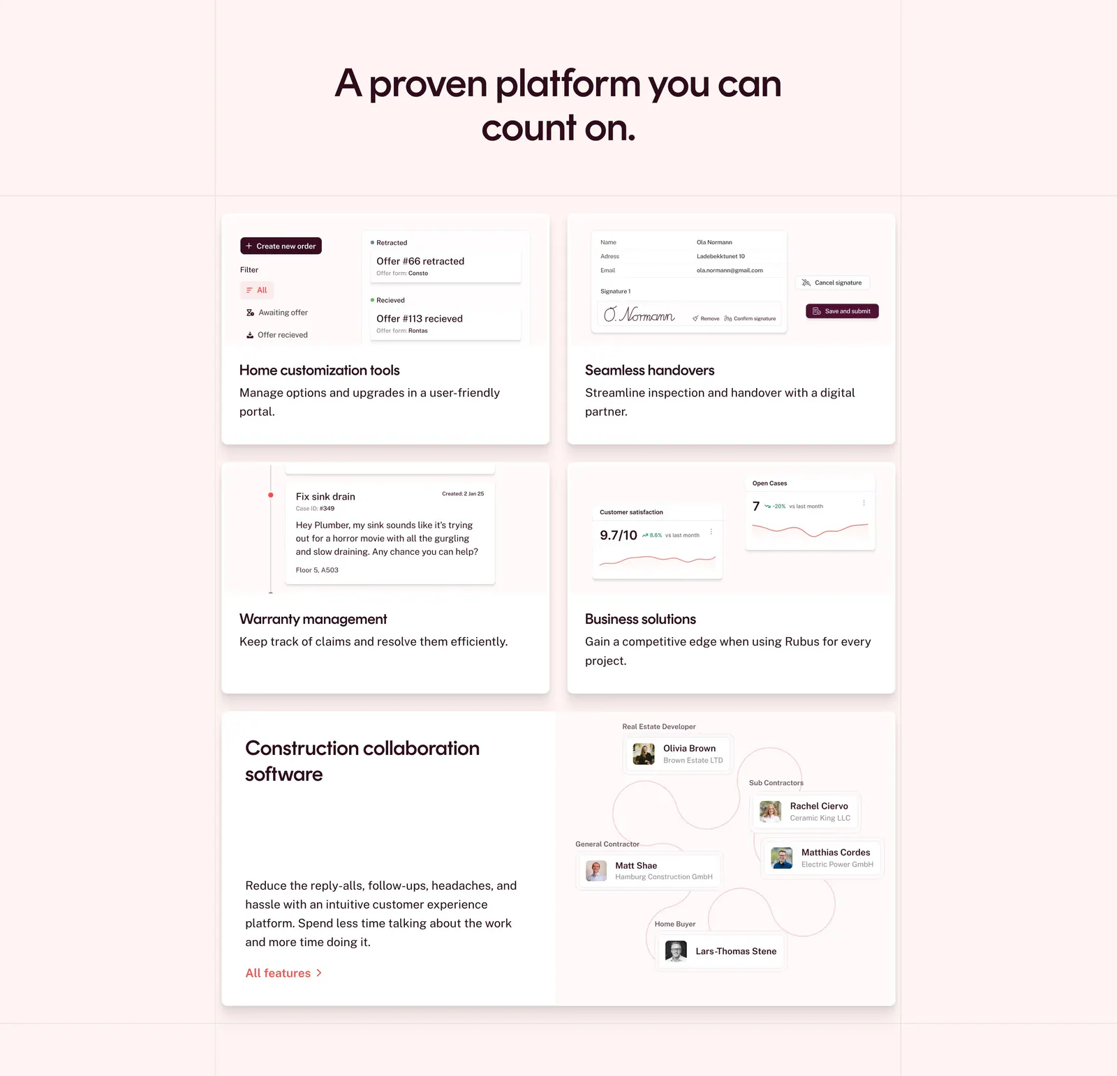
  54. Rubus features section: centered headline above a bento grid of feature cards with UI snippets and a collaboration diagram on pale pink
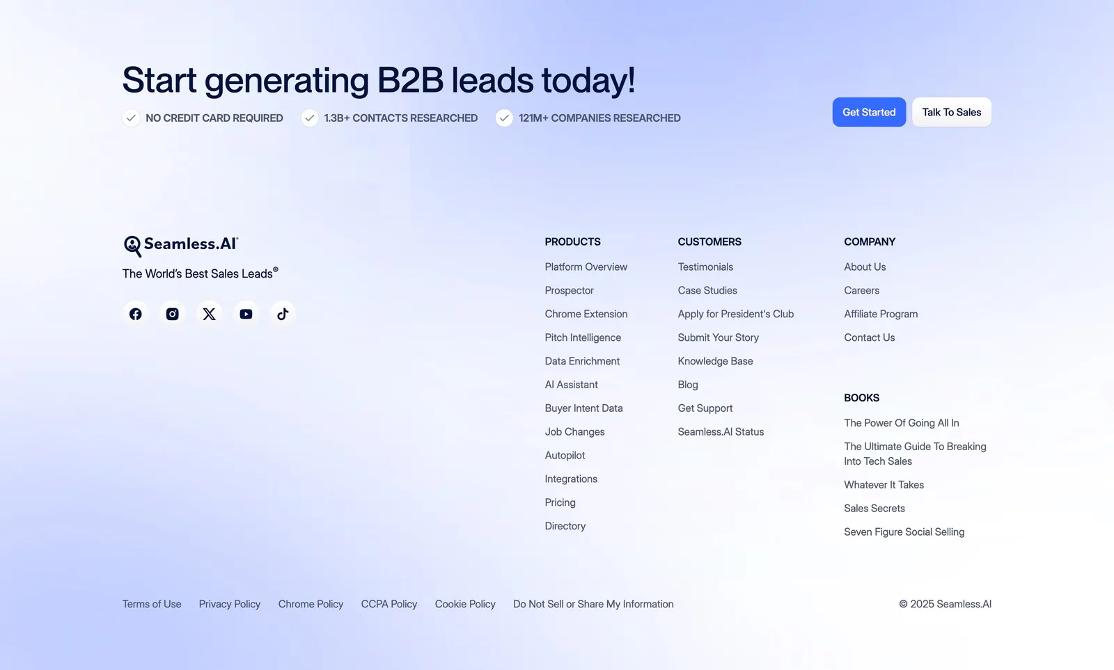
  55. Seamless.AI footer section: CTA headline with buttons above logo, social icons and link columns on a soft blue gradient background
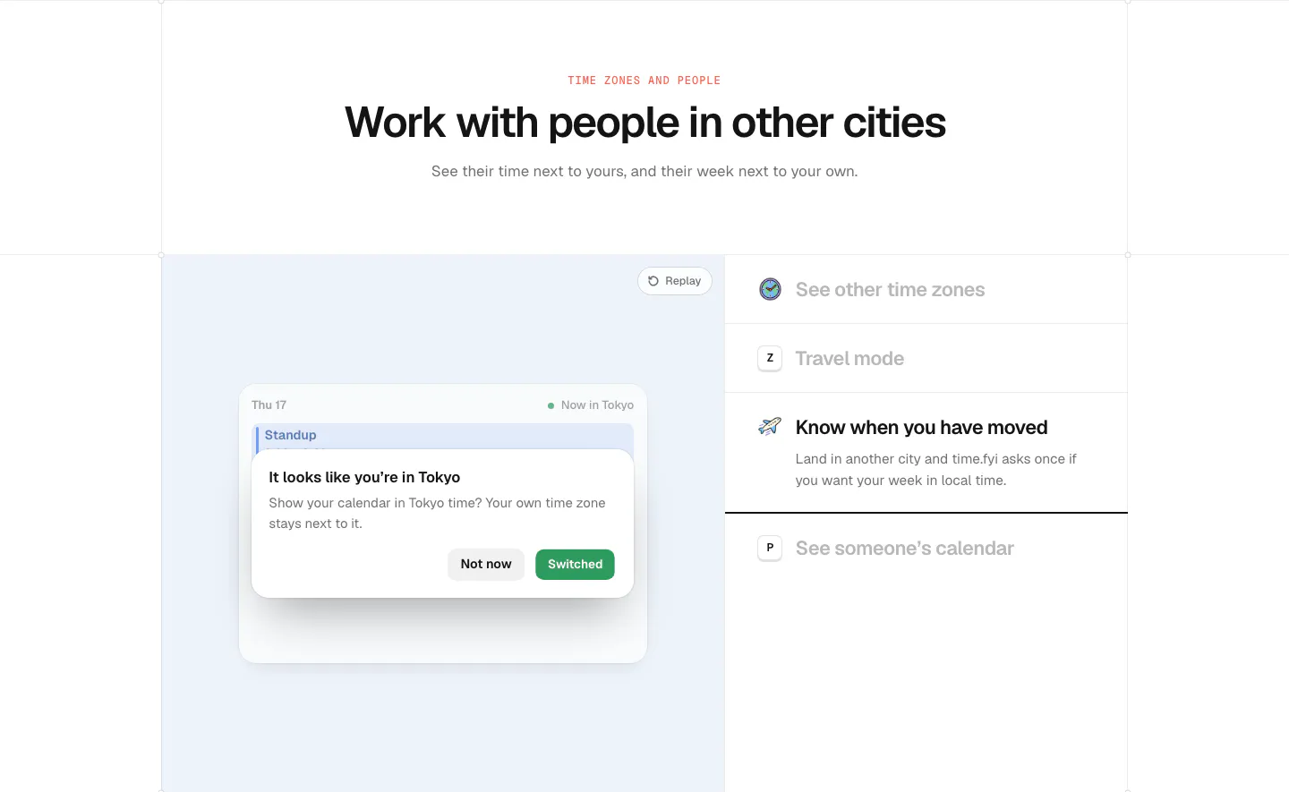
  56. time.fyi features section: centered header above a light blue panel with a time zone prompt UI and a feature list on the right
  57. Rezolv call-to-action section: light blue rounded banner with left-aligned headline and Get in touch button and curved line art
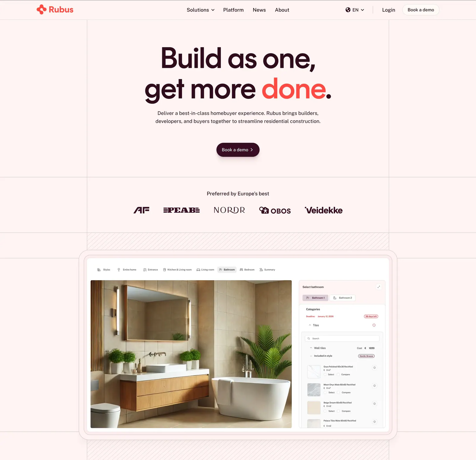
  58. Rubus hero section: centered headline and demo button above a customer logo row and a home customization app screenshot on pale pink
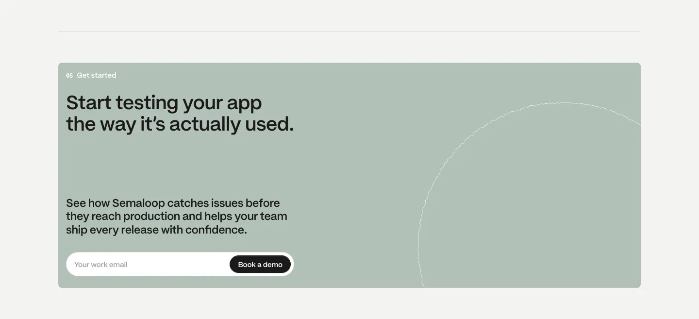
  59. Semaloop call to action section: sage green card with headline, short copy and an email field with demo button, thin circle outline at right
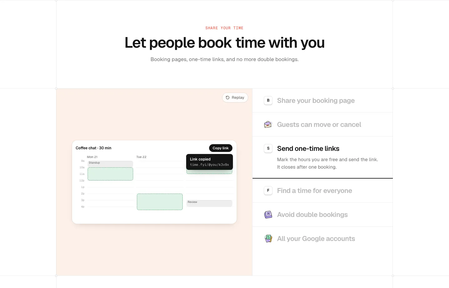
  60. time.fyi features section: centered header above a peach panel with a booking calendar UI and a feature list on the right
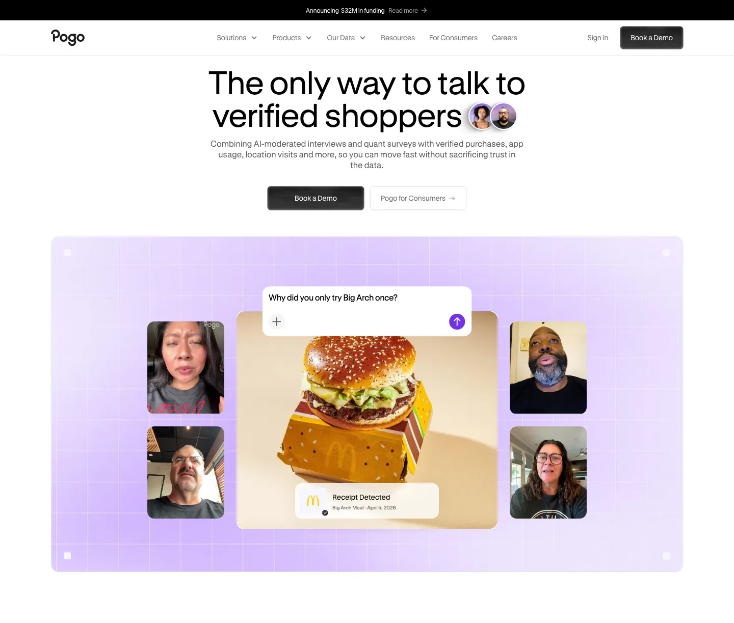
  61. Pogo hero section: centered headline and demo buttons above a lavender grid panel of video interview tiles around a burger photo
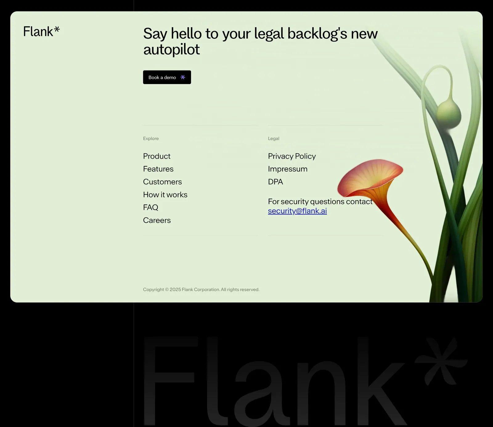
  62. Flank footer section: mint-green card with headline, demo button, link columns and a rendered flower above a giant faint wordmark on black
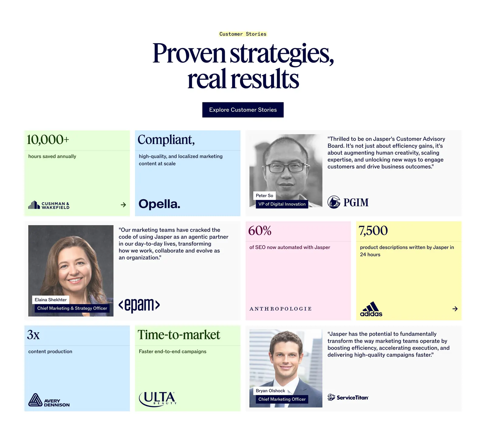
  63. Jasper testimonials section: centered serif headline above a bento grid of pastel stat tiles and customer quote cards with portraits
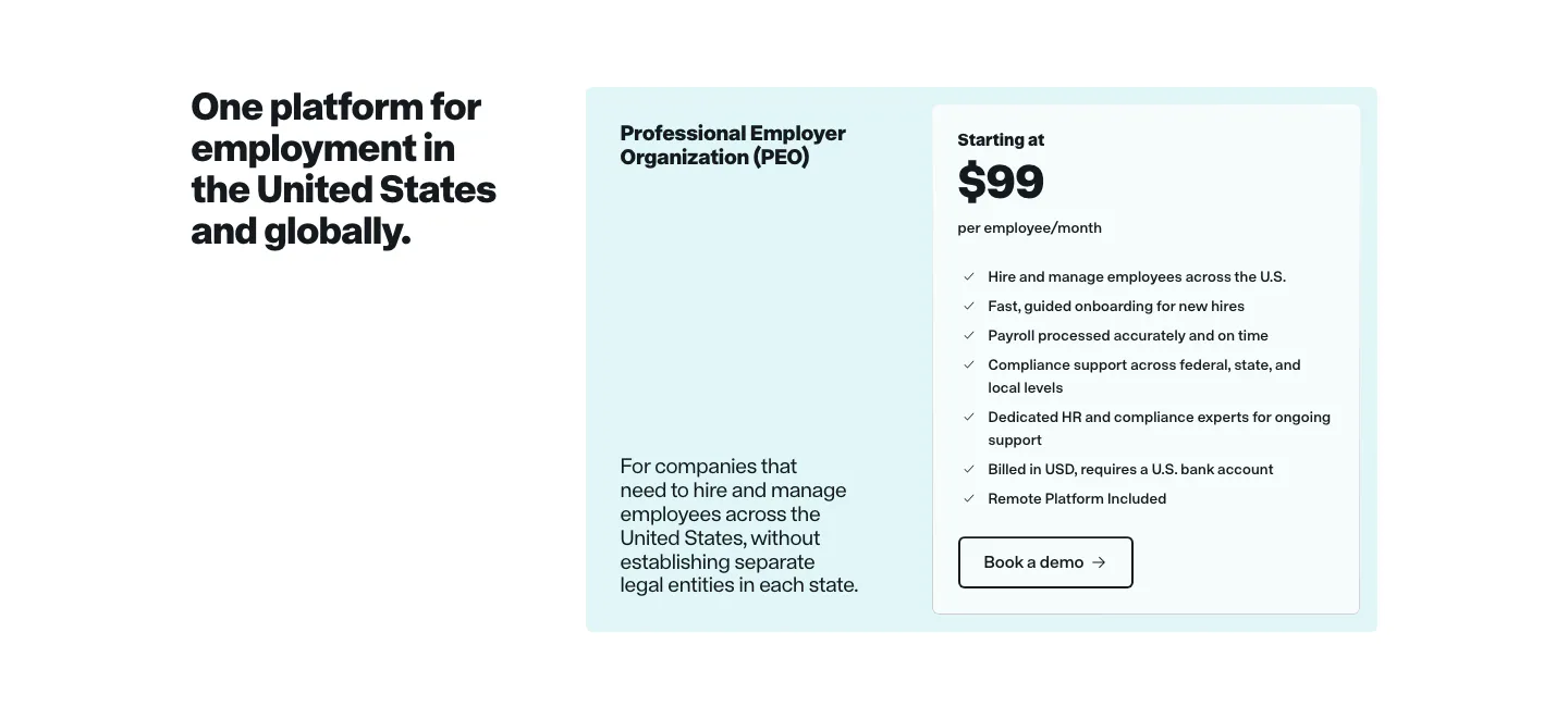
  64. Remote pricing section: headline on the left beside a light cyan PEO plan card with price and feature checklist
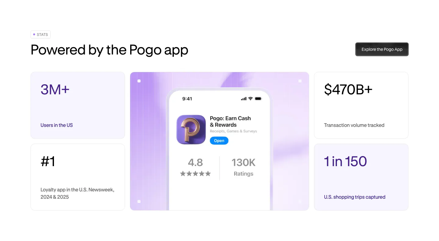
  65. Pogo stats section: bento grid of four metric cards around a lavender panel with a phone showing the Pogo app store listing
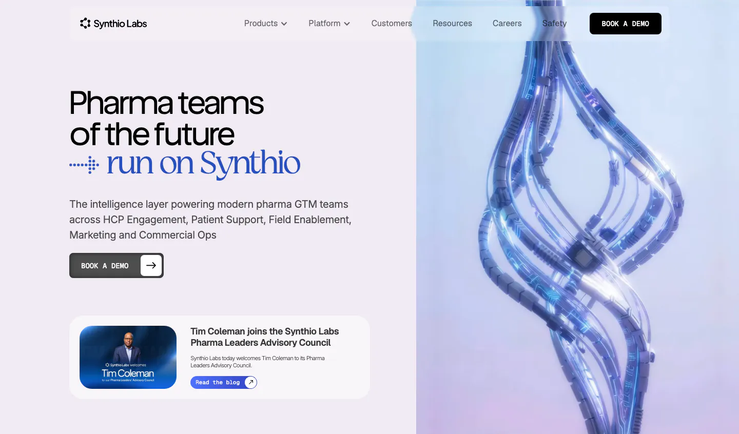
  66. Synthio Labs hero section: split layout with headline, demo button and news card on lavender beside a 3D render of twisting blue cables
    Synthio Labs Hero
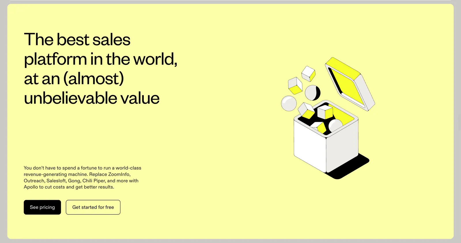
  67. Apollo call-to-action section: headline, copy and two buttons left with an isometric line-art box illustration right on a pale yellow panel
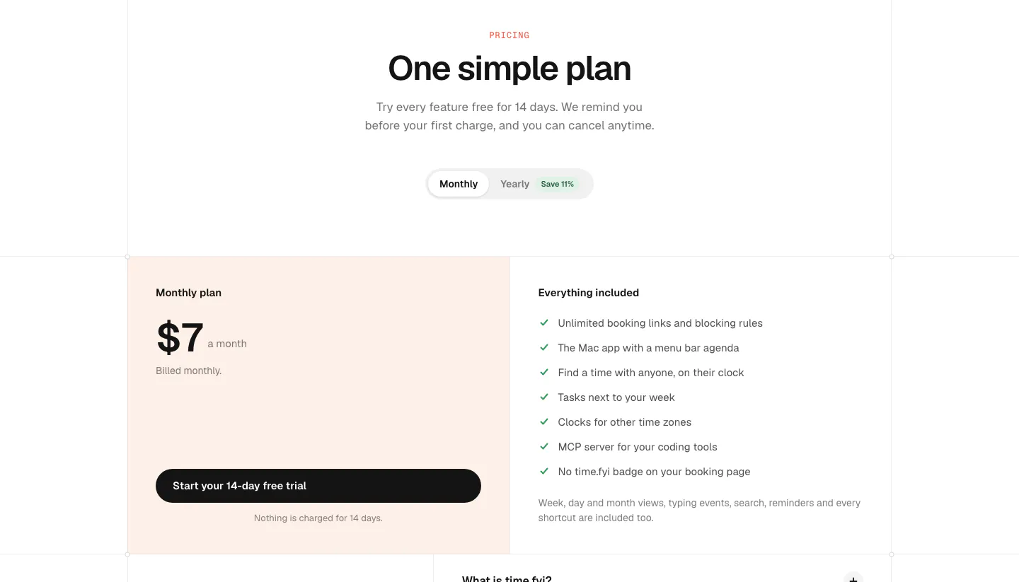
  68. time.fyi pricing section: centered header with monthly/yearly toggle above a single $7 plan card on peach and an included-features list
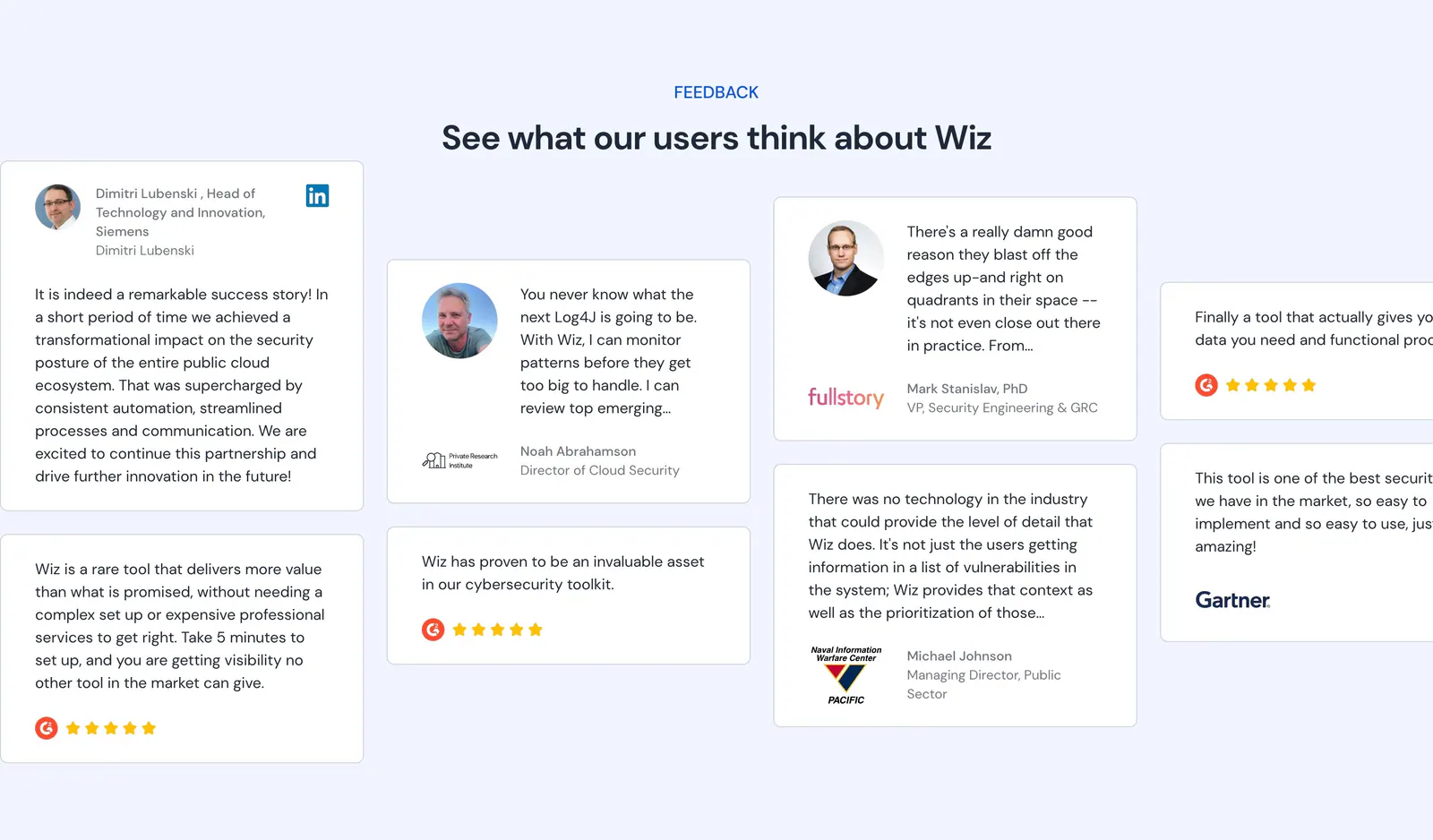
  69. Wiz testimonials section: centered headline above staggered quote cards with headshots, logos and G2 star ratings on pale blue
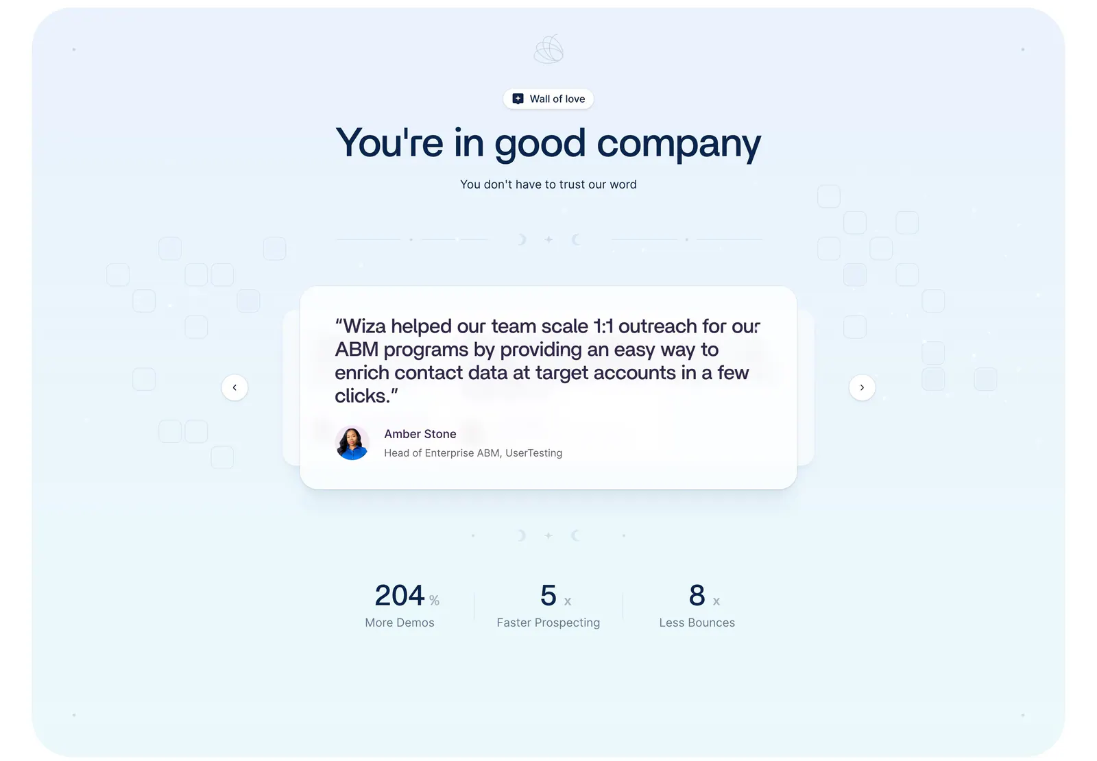
  70. Wiza testimonials section: centered headline above a quote card carousel with arrows and three metrics on a pale blue background
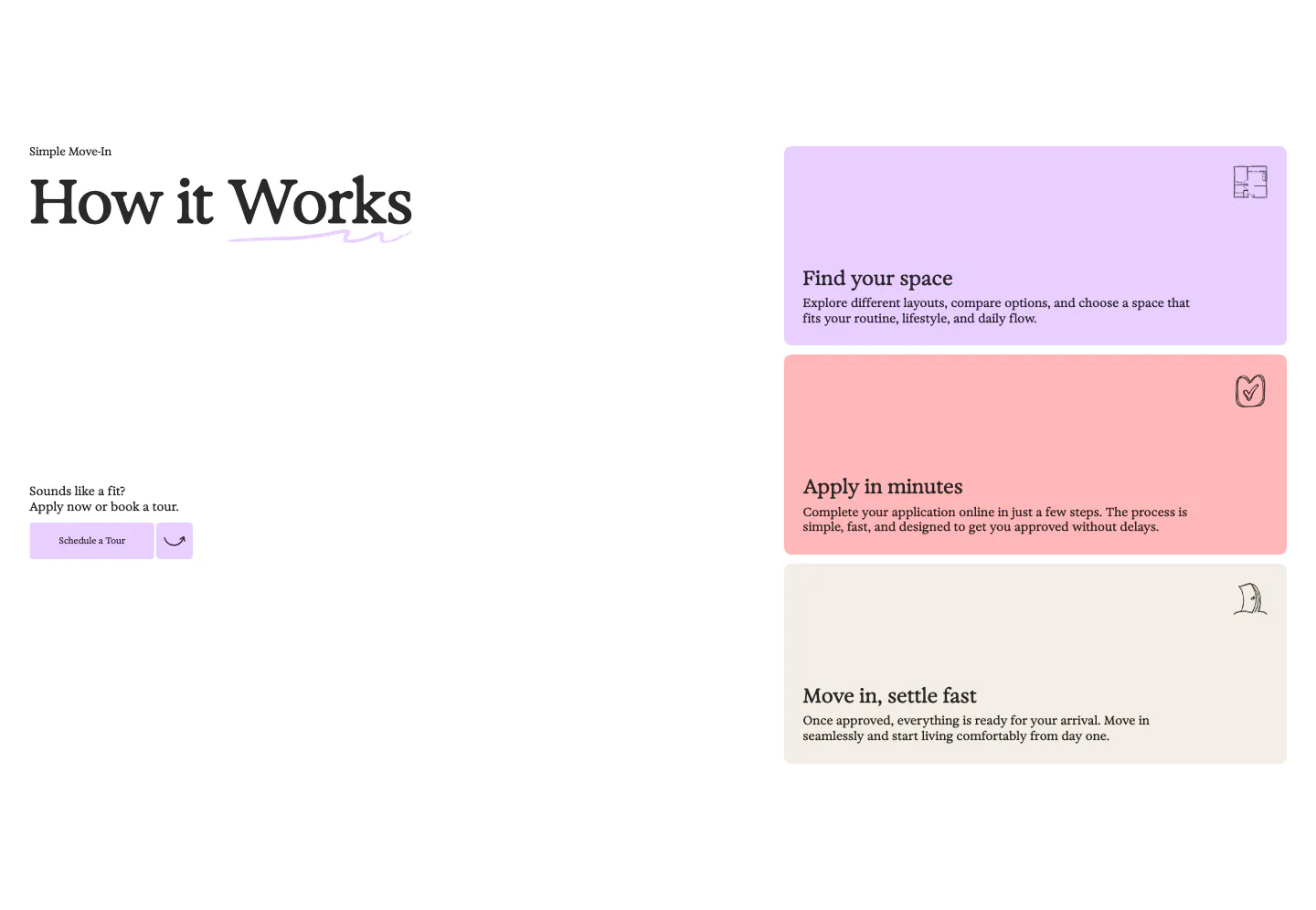
  71. 21Oaks how it works section: serif heading and tour button on the left, three stacked pastel step cards on the right
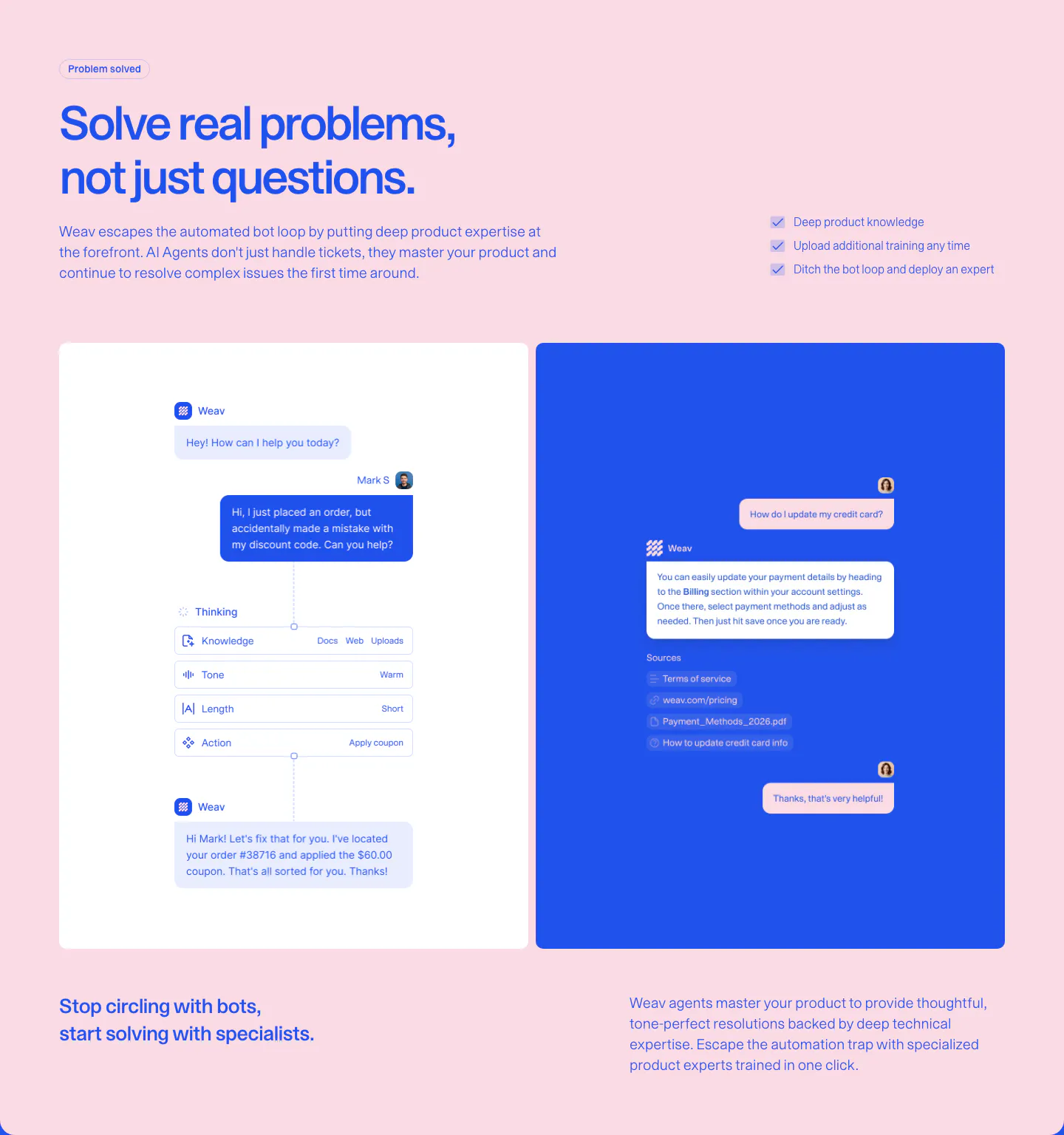
  72. Weav features section: blue headline and checklist on pink above a white panel with an AI reasoning chat flow and a blue panel with a sourced reply
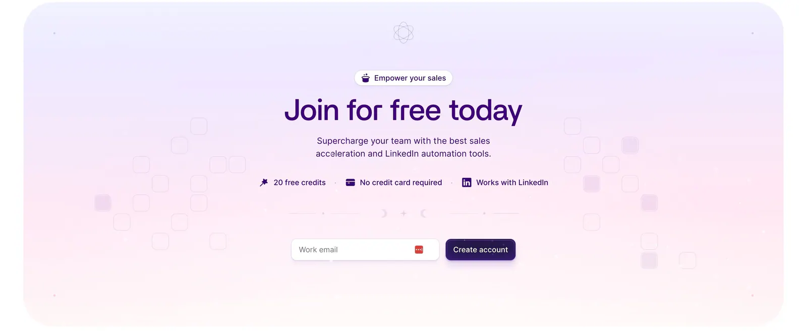
  73. Wiza call-to-action section: centered headline, benefit badges and work-email signup field on a lavender-to-pink gradient card

Where pastel shows up

Often paired with

Share of pastel sections that also use each style

How to build a pastel color palette

  1. Use dark text, not mid-tones

    Pastel backgrounds need near-black or deeply tinted text to stay legible. Avoid matching text to the tint, such as purple type on lavender, unless it is dark enough to pass 4.5:1. Save mid-tone color for icons and decorative details.

  2. Assign each tint a meaning

    If cards use different pastel colors, tie each color to a category, feature, or product area and keep it consistent across the page. Random tints look playful at first but give people nothing to learn. Three or four tints is usually plenty.

  3. Anchor actions with one stronger color

    An all-pastel palette lacks a clear focal point. Introduce one more saturated color for primary buttons and key links so actions stand out. Keep it in the same hue family as one of your tints so the palette still feels related.
  4. Define edges on light backgrounds
    Pastel cards on white can vanish on washed-out screens. Give fills enough saturation to read as distinct shapes, or add a subtle border one shade darker than the fill. Check the section on a dim laptop screen and in bright daylight.

Companies using pastel

All styles
    ↑↓ Navigate ↵ Open

    Section preview

    Website section