Wiza website design

Every section we captured from the Wiza website, in page order, from the hero section down to the footer. Open any thumbnail to see it full size.

Sections 7

In page order, top to bottom

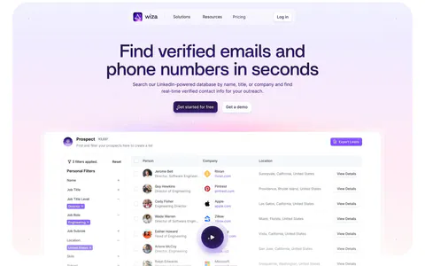
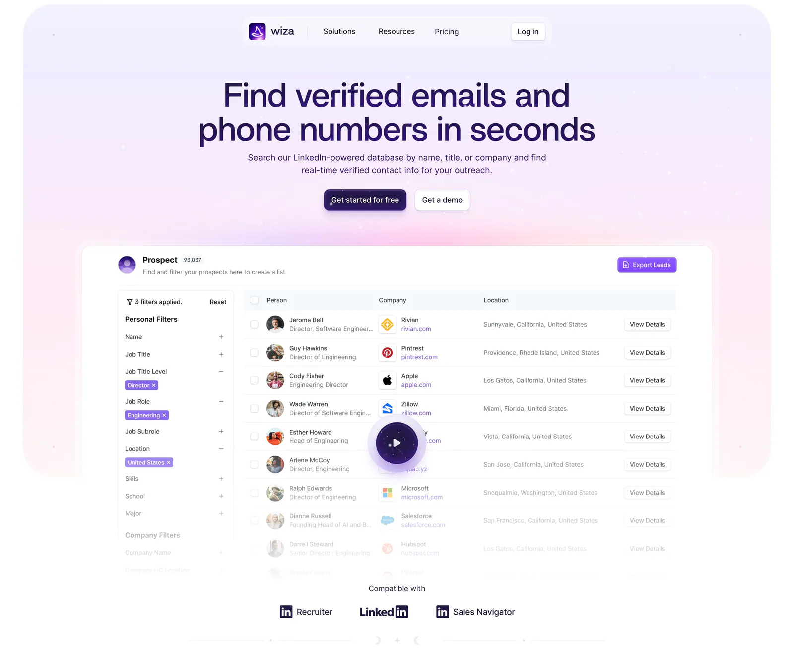
  1. Wiza hero section: centered headline and two buttons above a prospect table product screenshot with play button on a lavender glow
    01 Hero

    Find verified emails and phone numbers in seconds

  2. Wiza logo cloud section: single row of customer logos above G2 and Chrome Store rating badges on a white background

    Trusted by 50,000+ businesses to scale outbound sales and drive new revenue

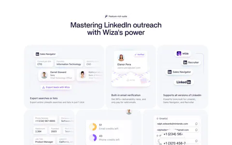
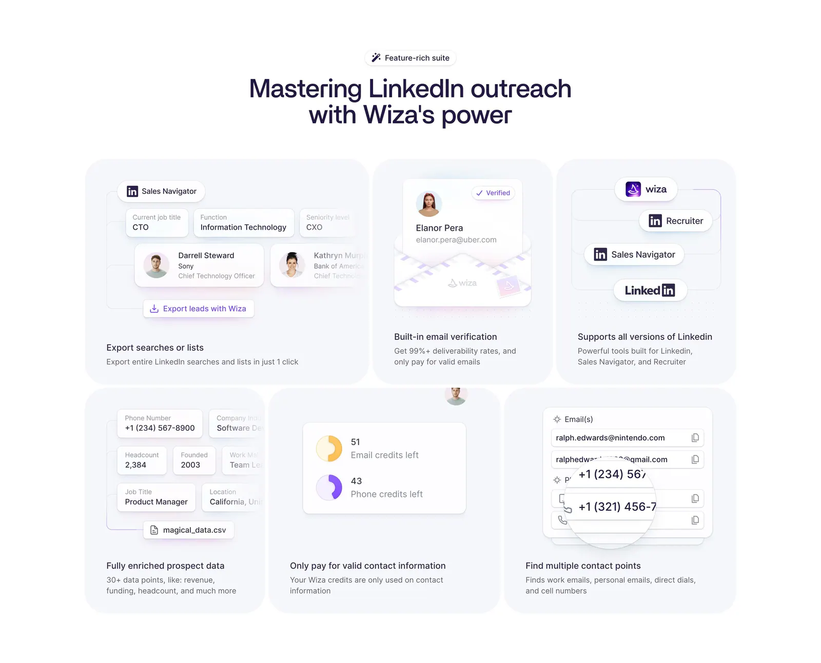
  3. Wiza features section: centered headline above a six-card bento grid of LinkedIn prospecting UI mockups on a white background

    Mastering LinkedIn outreach with Wiza's power

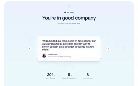
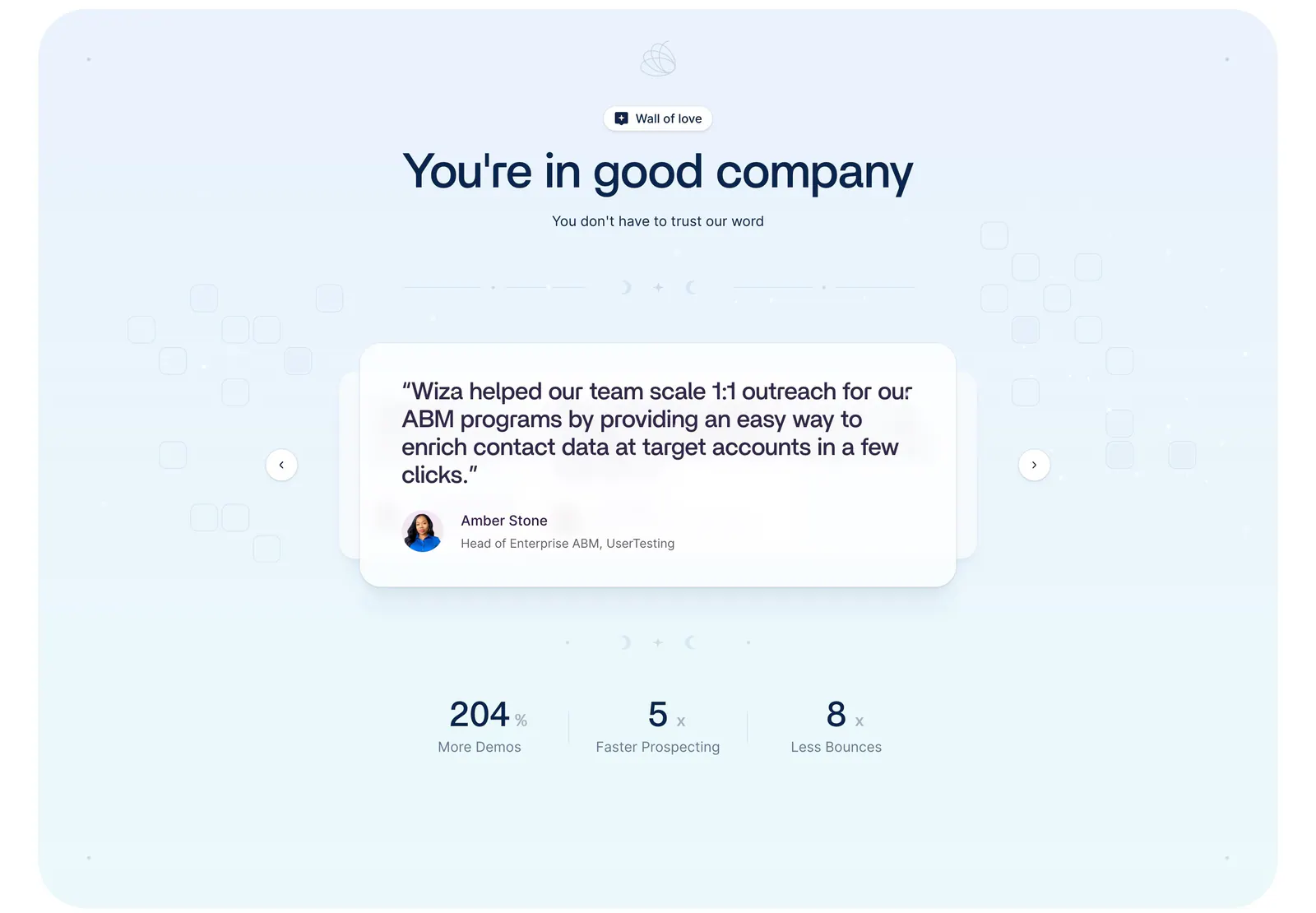
  4. Wiza testimonials section: centered headline above a quote card carousel with arrows and three metrics on a pale blue background

    You're in good company

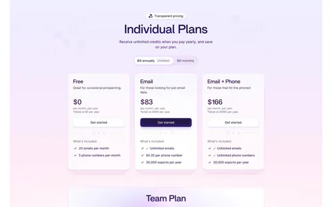
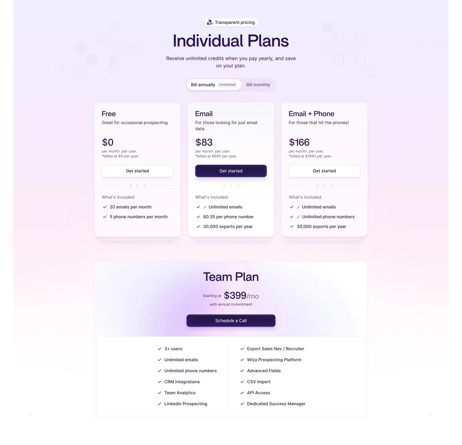
  5. Wiza pricing section: billing toggle above three plan cards and a wide Team Plan card with feature checklist on a lavender gradient
    05 Pricing

    Individual Plans

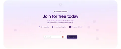
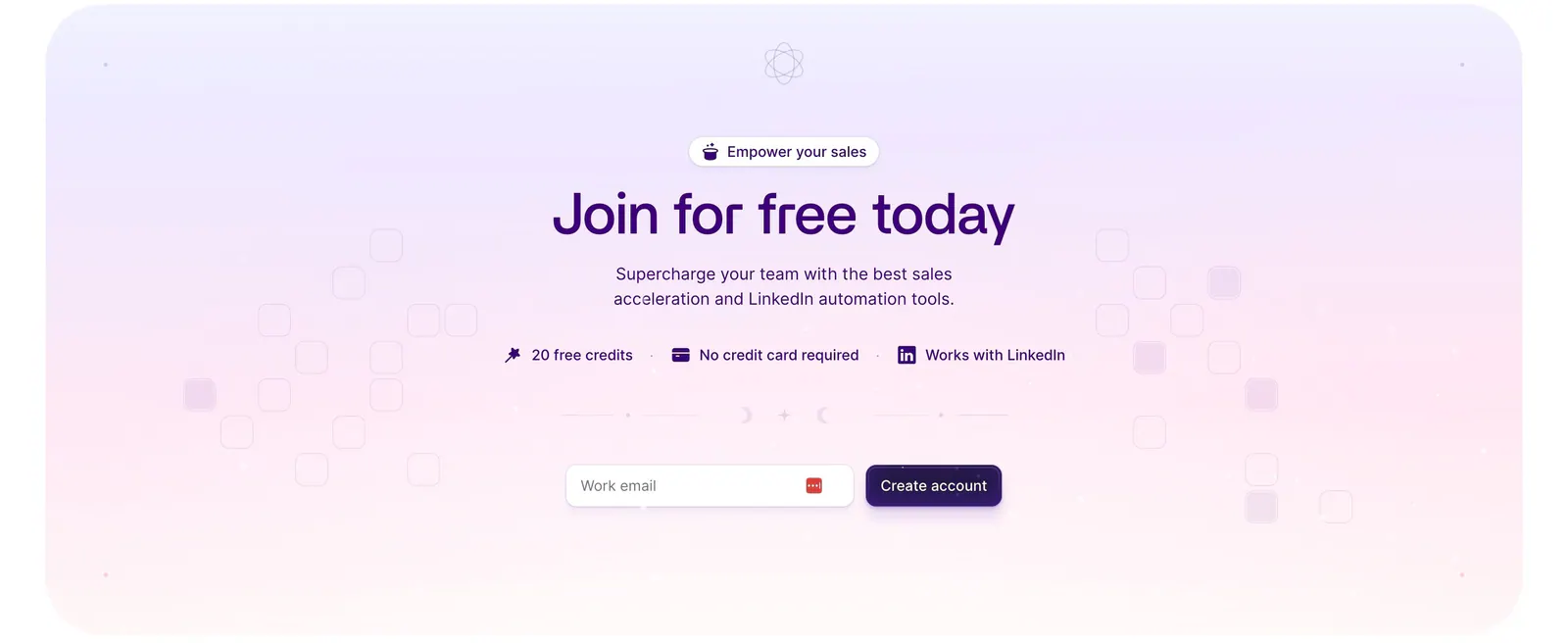
  6. Wiza call-to-action section: centered headline, benefit badges and work-email signup field on a lavender-to-pink gradient card

    Join for free today

  7. Wiza footer section: logo and tagline above three link columns, email button and social icons on a white background
    07 Footer

Similar companies

All companies
    ↑↓ Navigate ↵ Open

    Section preview

    Website section