Gradient Website Design Examples

Color blends, meshes, auroras, and soft glows can fill a section background with mood and depth without commissioned photography. That makes gradient website design a common choice for launch pages and product openers. Generic results come easily. Versions that hold up tie the colors to the brand, keep text on calm areas, and let the gradient sit behind the content.

127 sections

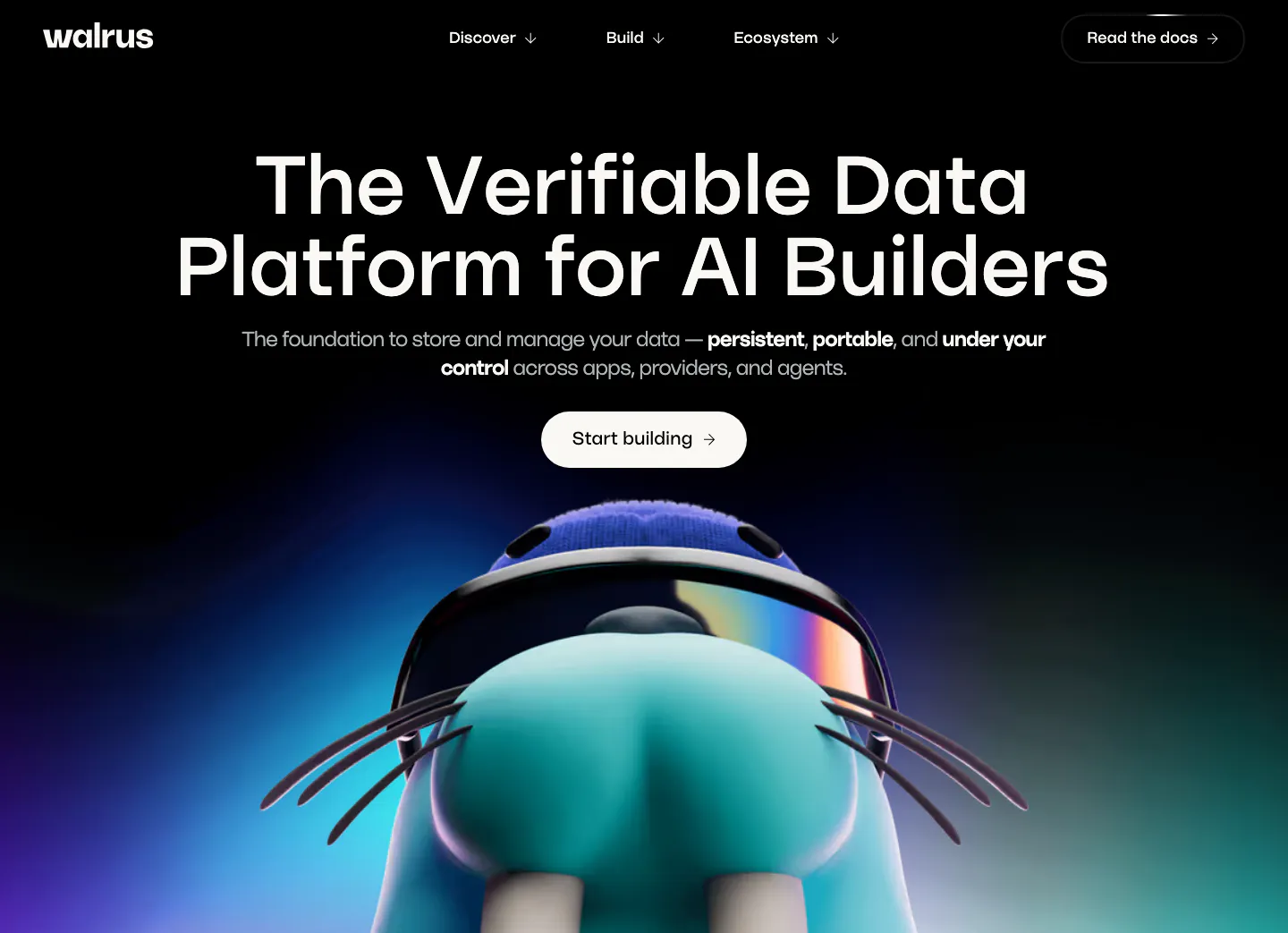
  1. Walrus hero section: centered headline and button on black above a 3D walrus mascot rising from a blue-purple glow
  2. Palette call-to-action section: centered headline, short copy and black Start for Free button on an orange-to-blue gradient band
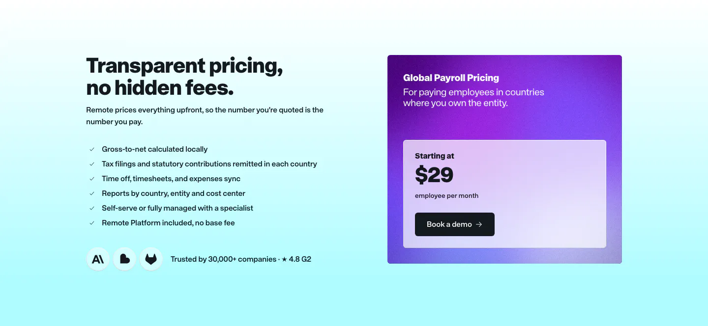
  3. Remote pricing section: headline and checklist on the left beside a purple gradient Global Payroll price card on cyan
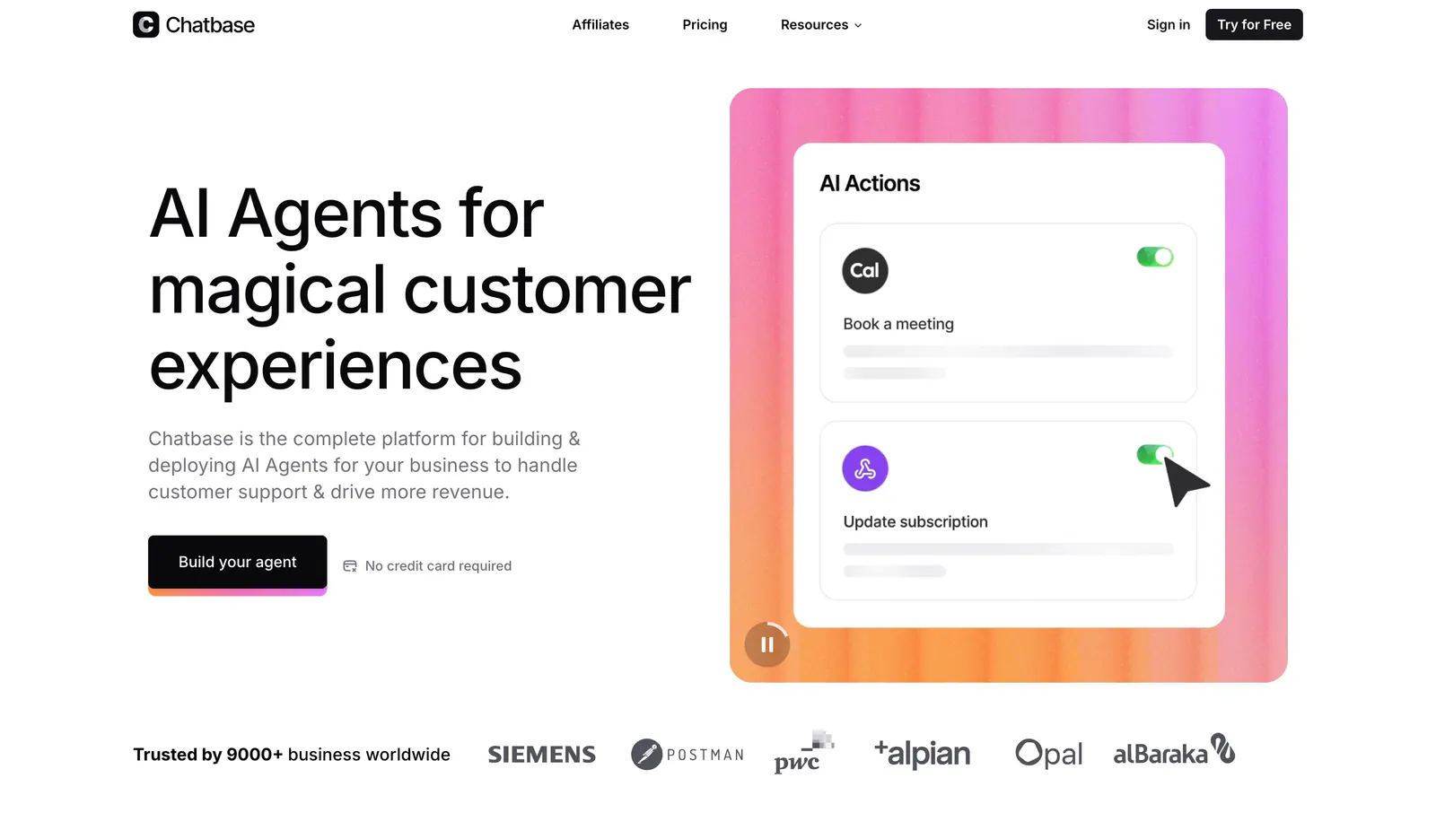
  4. Chatbase hero section: left headline and CTA beside an AI Actions UI card on a pink-orange gradient panel, customer logo row below
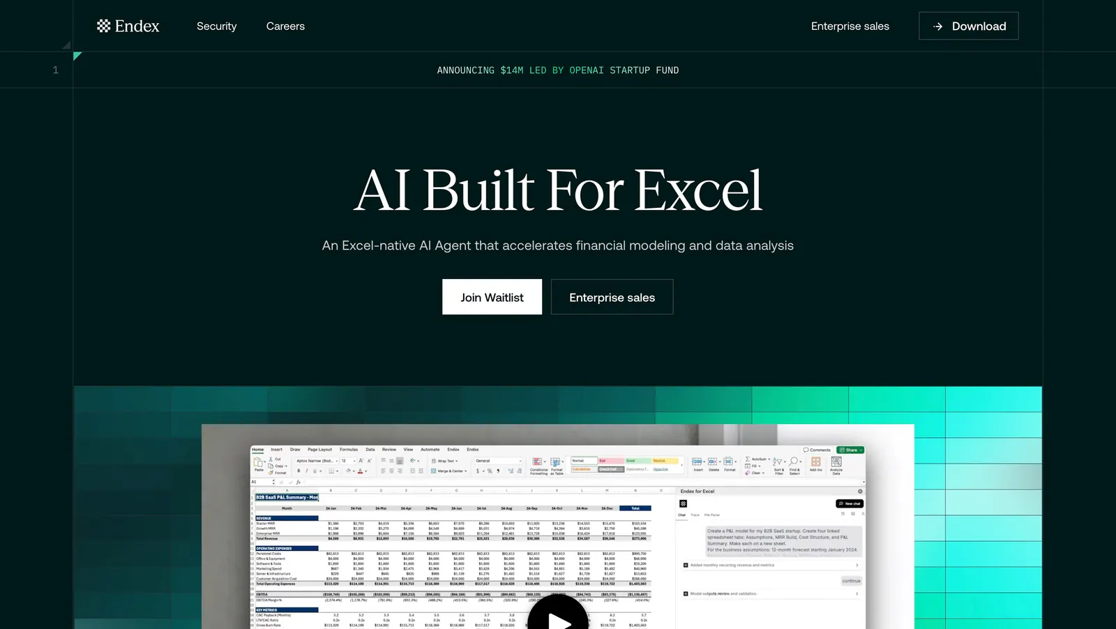
  5. Endex hero section: centered serif headline with two buttons above an Excel AI screenshot set on a teal pixel-gradient band, on dark green
  6. Polar Signals security section: headline on a lavender gradient with pixel squares and dot texture, beside NVIDIA, Google Cloud and SOC credentials
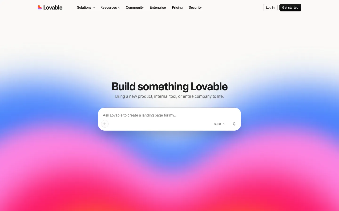
  7. Lovable hero section: centered headline and AI prompt input box over a vivid blue, pink and red gradient, with top navigation bar
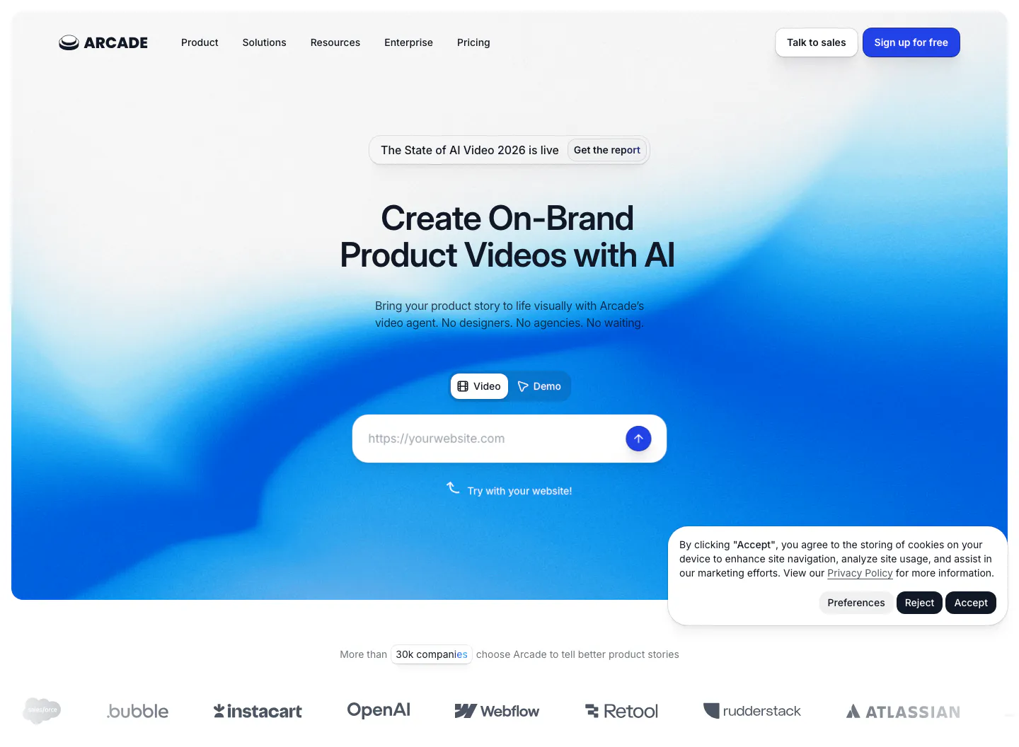
  8. Arcade hero section: centered headline with Video/Demo toggle and URL input on a blue gradient, customer logo row below
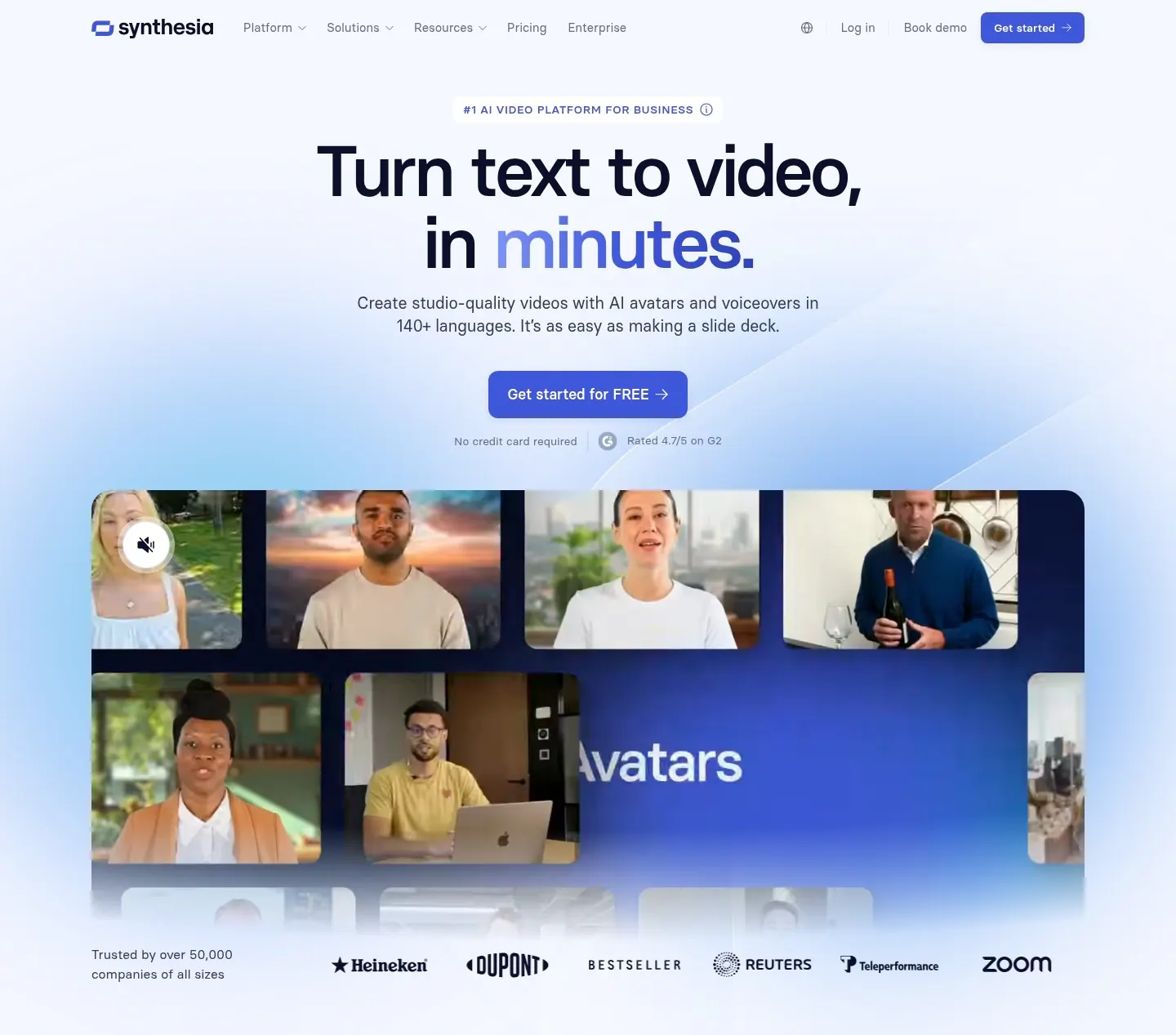
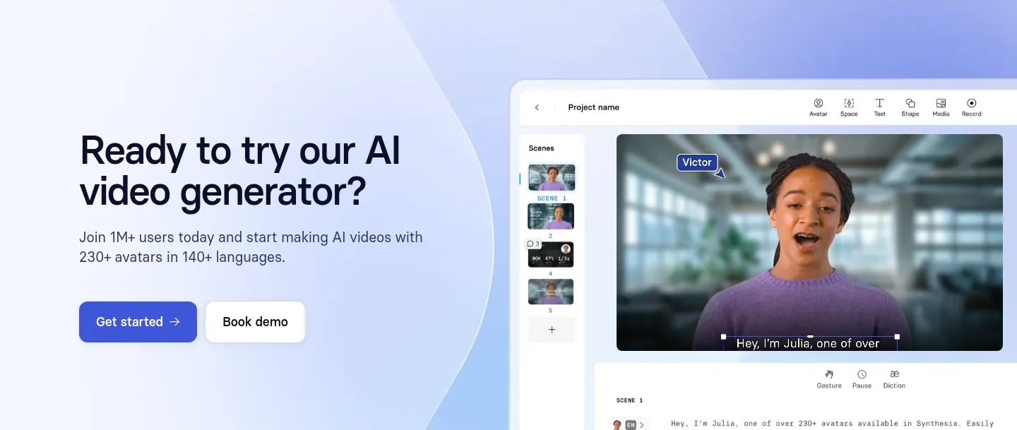
  9. Synthesia hero section: centered headline and blue button above a grid of AI avatar video frames and a customer logo row on soft blue glow
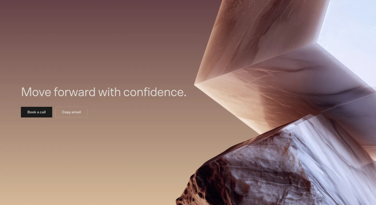
  10. Bayshore call-to-action section: headline with Book a call and Copy email buttons on a mauve-to-tan gradient beside 3D marble shapes
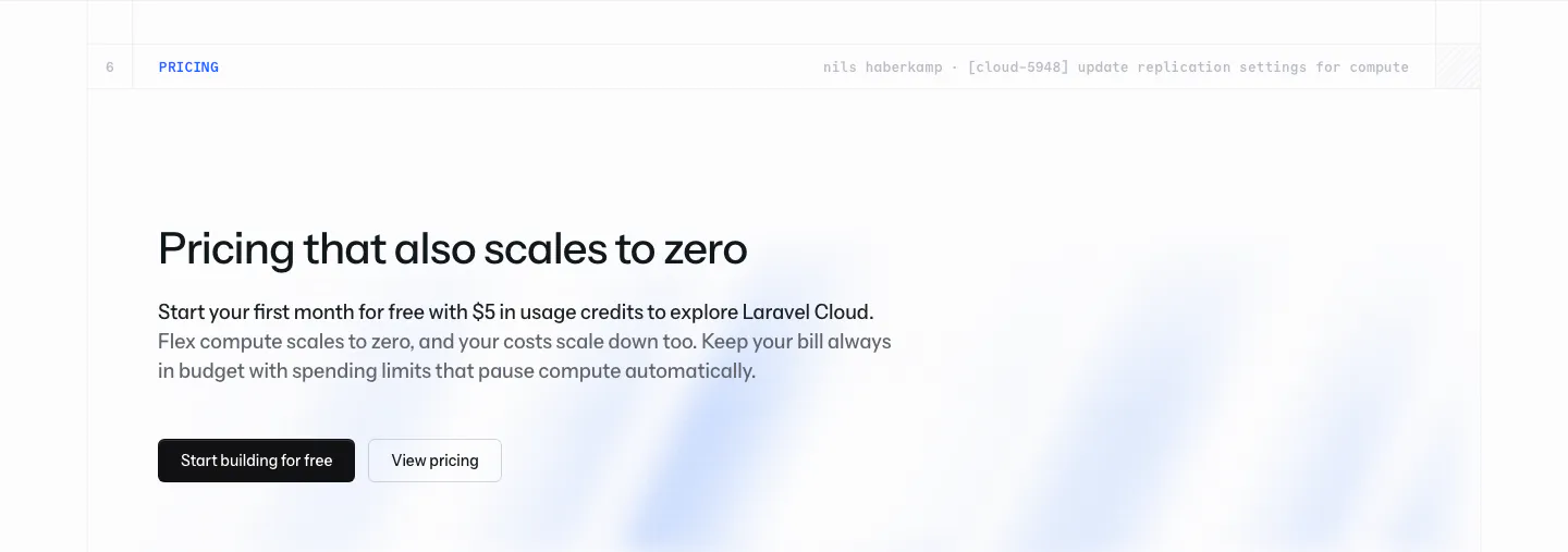
  11. Laravel Cloud call-to-action section: left-aligned pricing headline with free-credit copy and two buttons over a faint blue glow on white
  12. Lattice call-to-action section: centered headline, demo button and G2 and Capterra ratings over a soft green cloud glow background
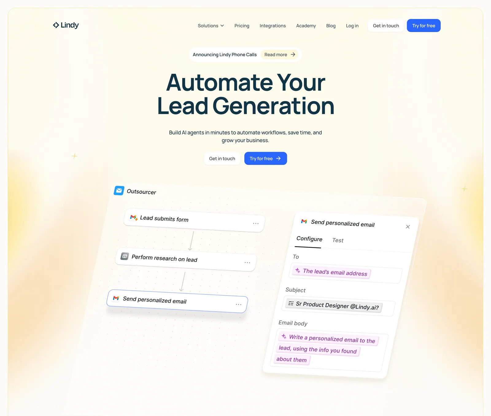
  13. Lindy hero section: nav bar, centered headline and two CTAs above a tilted workflow builder UI with an email step panel, framed by yellow glows
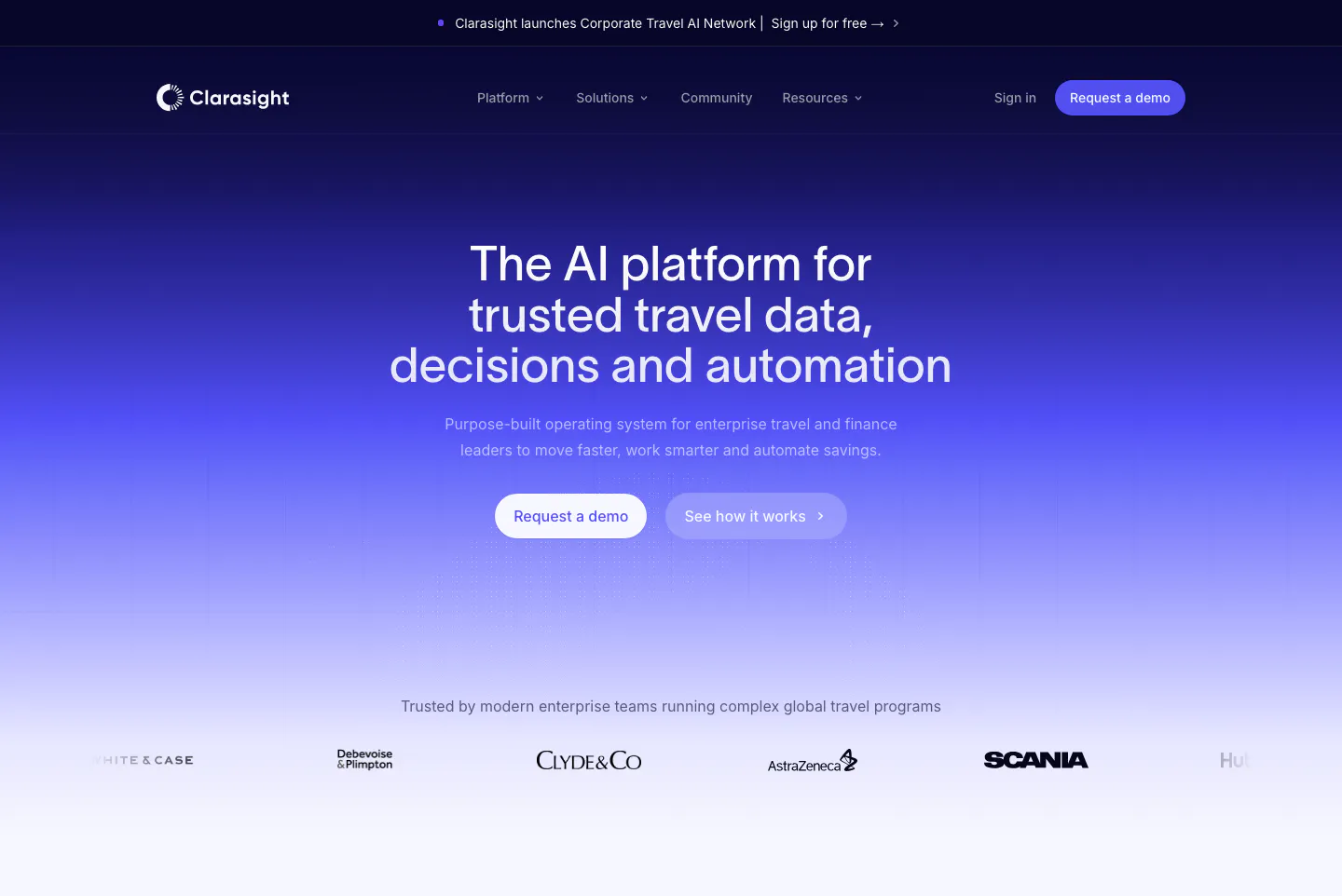
  14. Clarasight hero section: centered headline and two buttons on a navy-to-indigo gradient fading to white, above a customer logo row
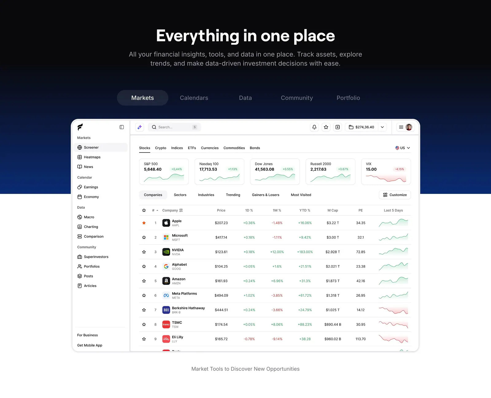
  15. Finsepa features section: centered headline and tab bar on a black-to-navy band above a stock screener dashboard screenshot
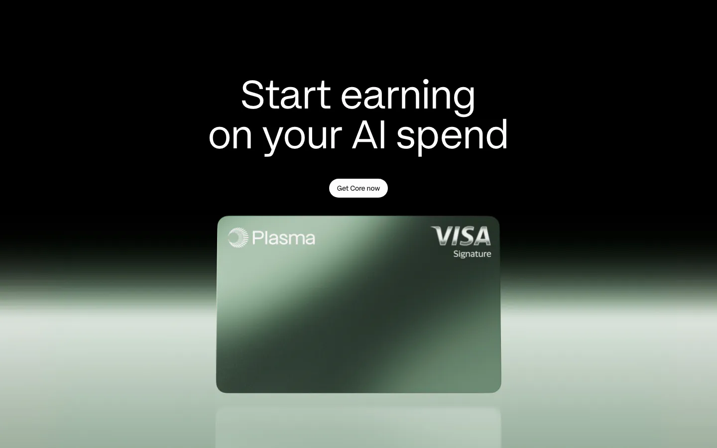
  16. Plasma call-to-action section: centered headline and button above a green Plasma card render with a green glow on black
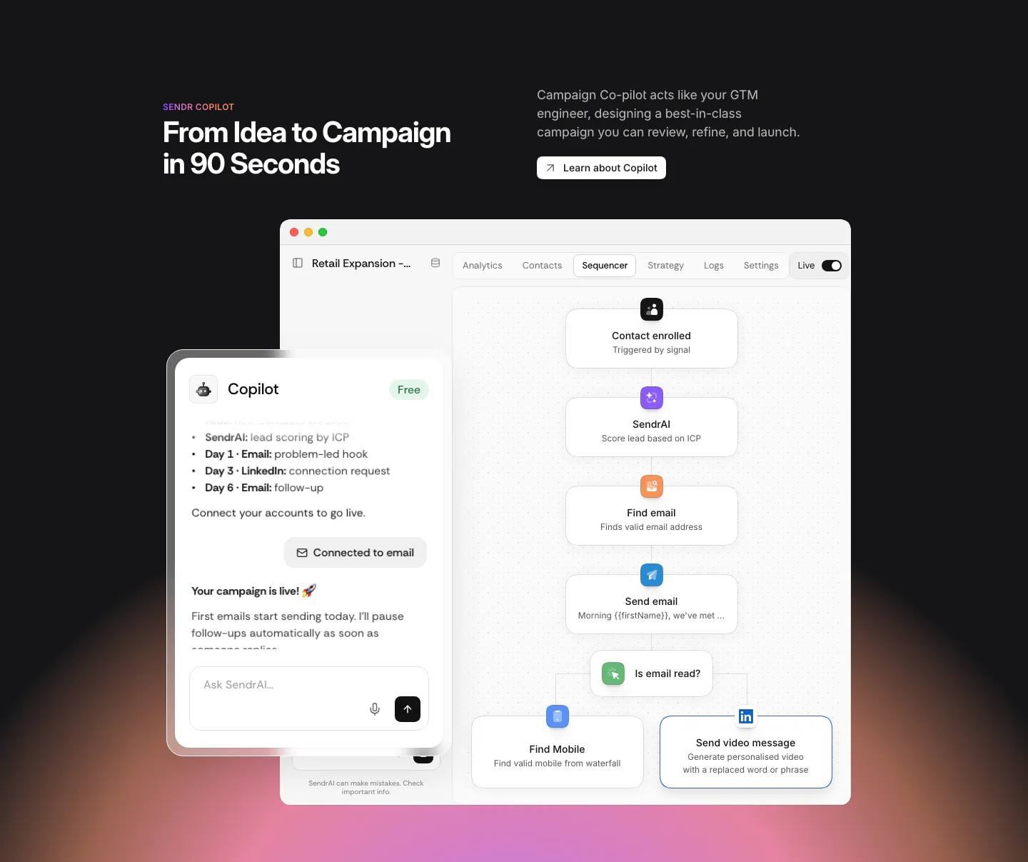
  17. Sendr features section: dark section with headline above a Copilot chat panel overlapping a sequencer workflow UI, warm glow below
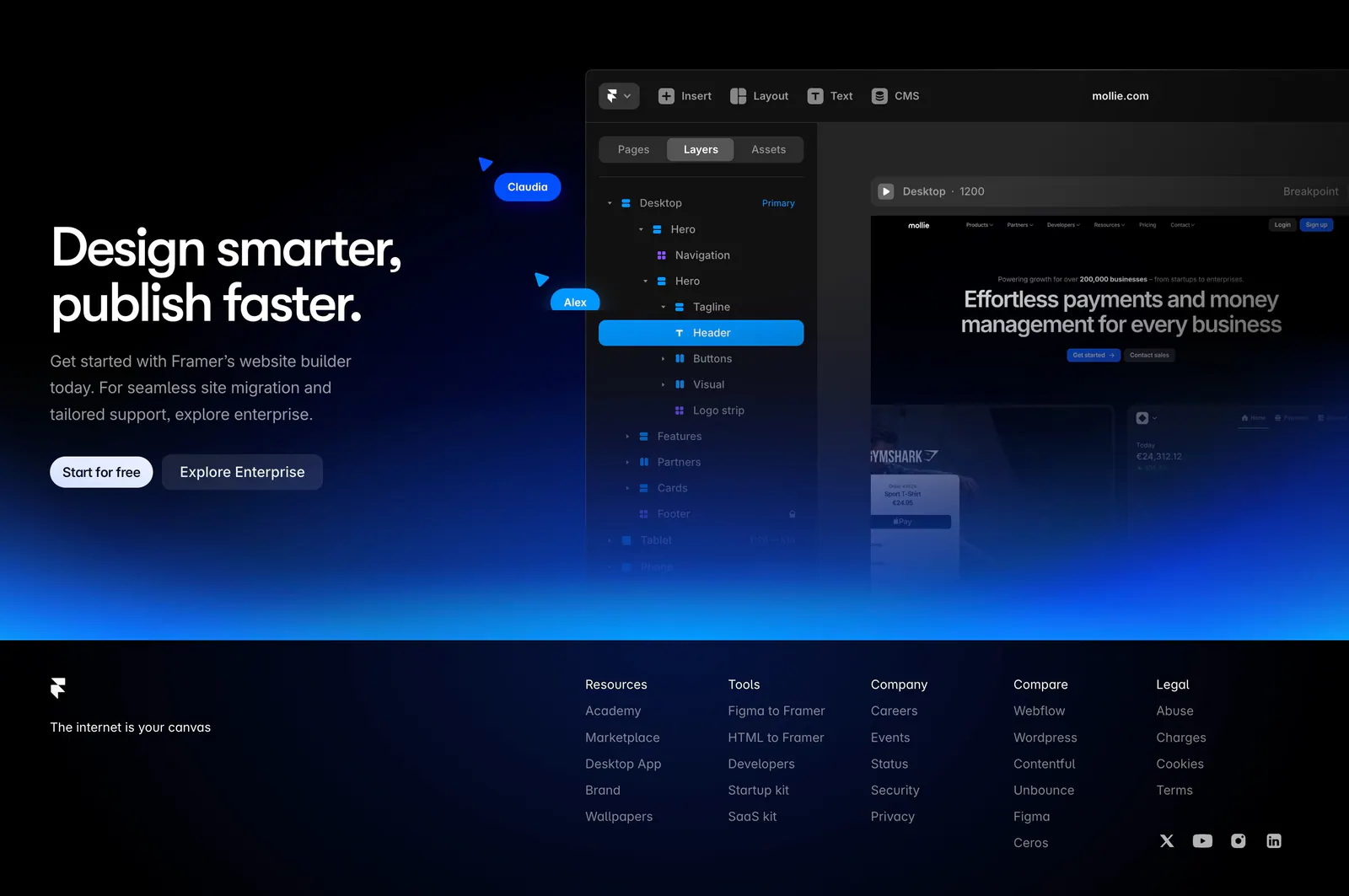
  18. Framer footer section: CTA with editor UI and blue glow above a black footer with logo, tagline, five link columns and social icons
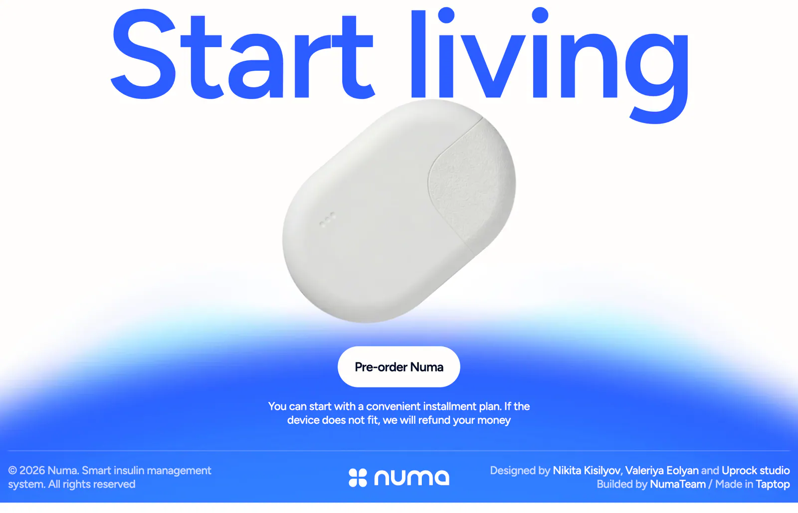
  19. Numa call to action section: full-width blue headline above a white insulin device, pre-order button on a blue glow, slim footer row below
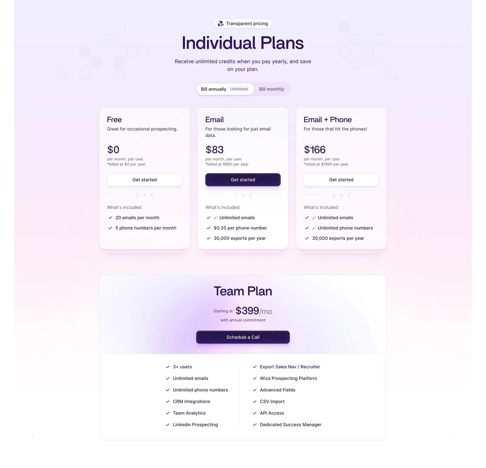
  20. Wiza pricing section: billing toggle above three plan cards and a wide Team Plan card with feature checklist on a lavender gradient
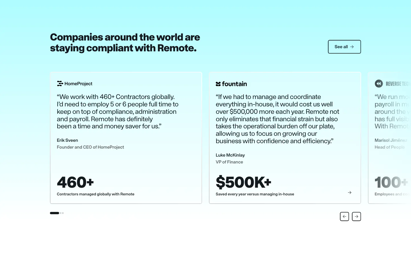
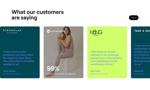
  21. Remote testimonials section: headline and See all button above a carousel of quote cards with large metrics on cyan
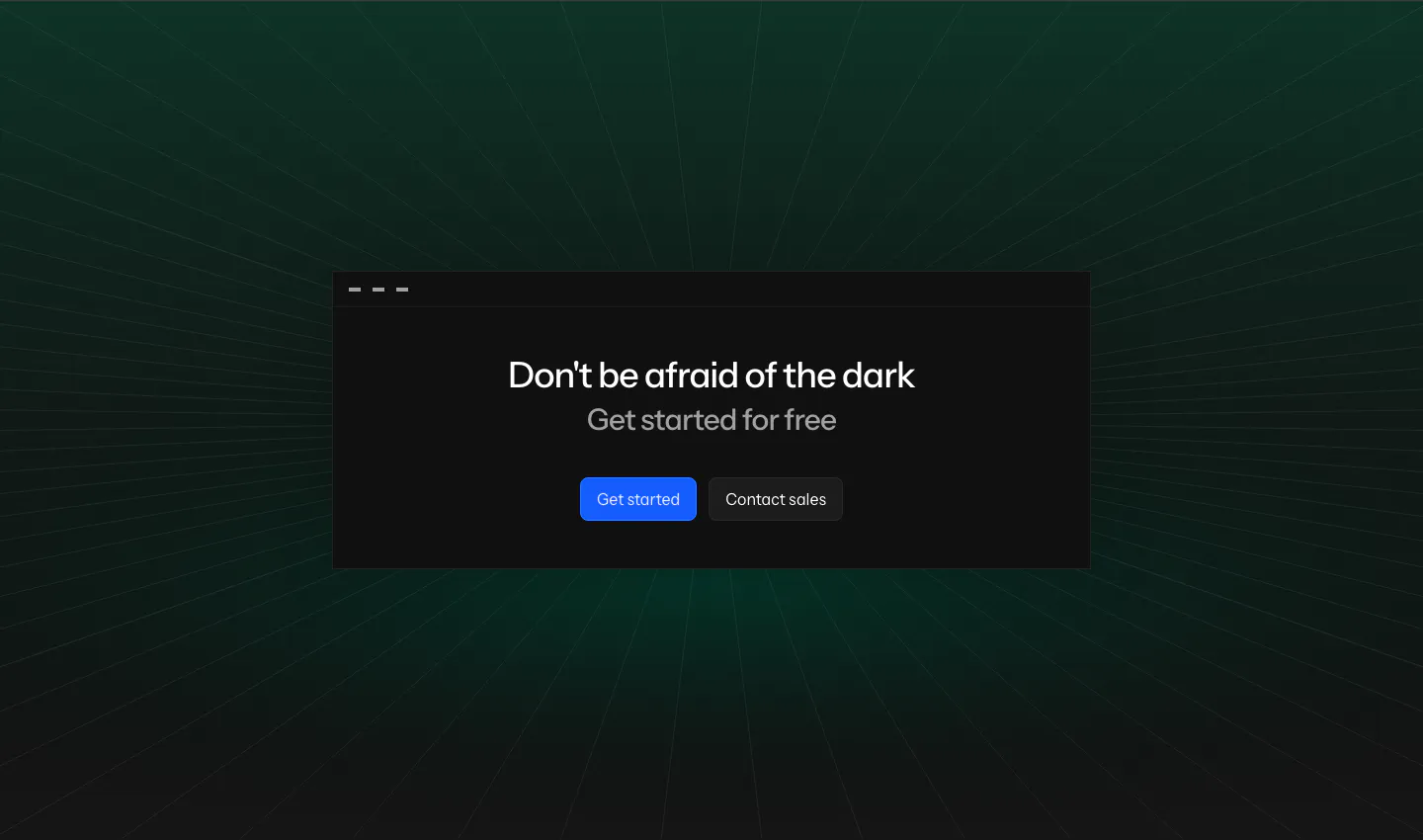
  22. Laravel Nightwatch call-to-action section: centered headline and buttons in a dark window card over a green-tinted perspective grid
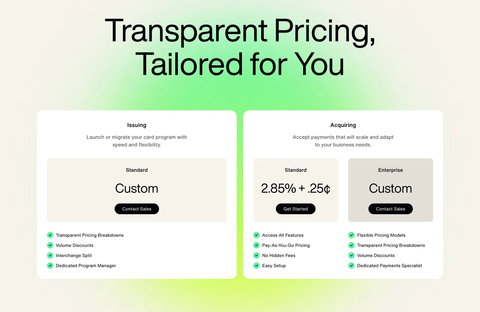
  23. Highnote pricing section: large centered headline above two white plan cards with price boxes and checklists on a green glow
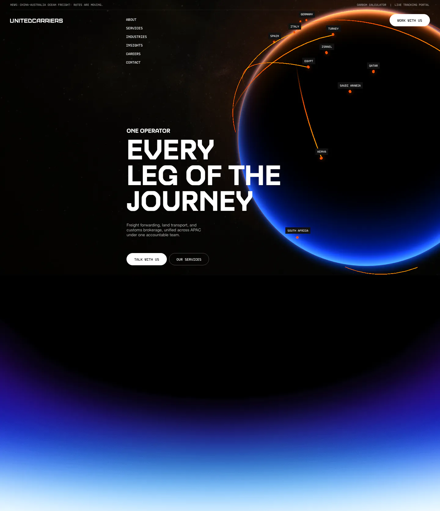
  24. United Carriers hero section: uppercase headline and two buttons beside a glowing globe with route arcs on black, fading into a blue glow
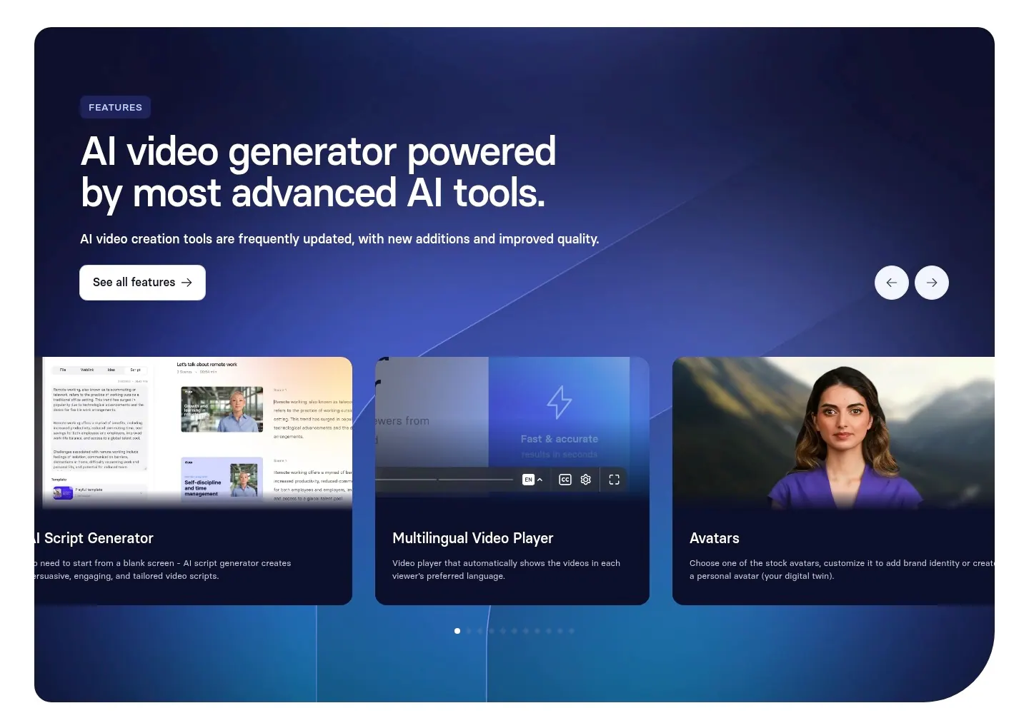
  25. Synthesia features section: navy-to-blue gradient panel with headline, arrow controls and a carousel of feature cards with UI and avatars
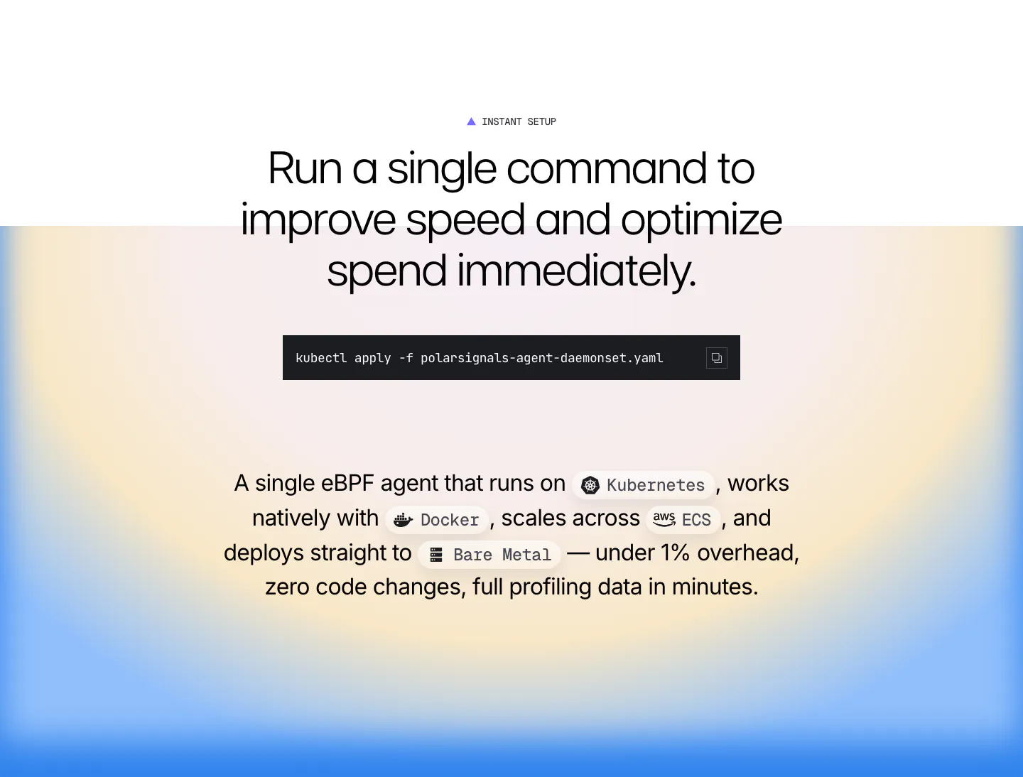
  26. Polar Signals features section: centered headline with a kubectl command block and inline platform chips over a blue and yellow radial gradient
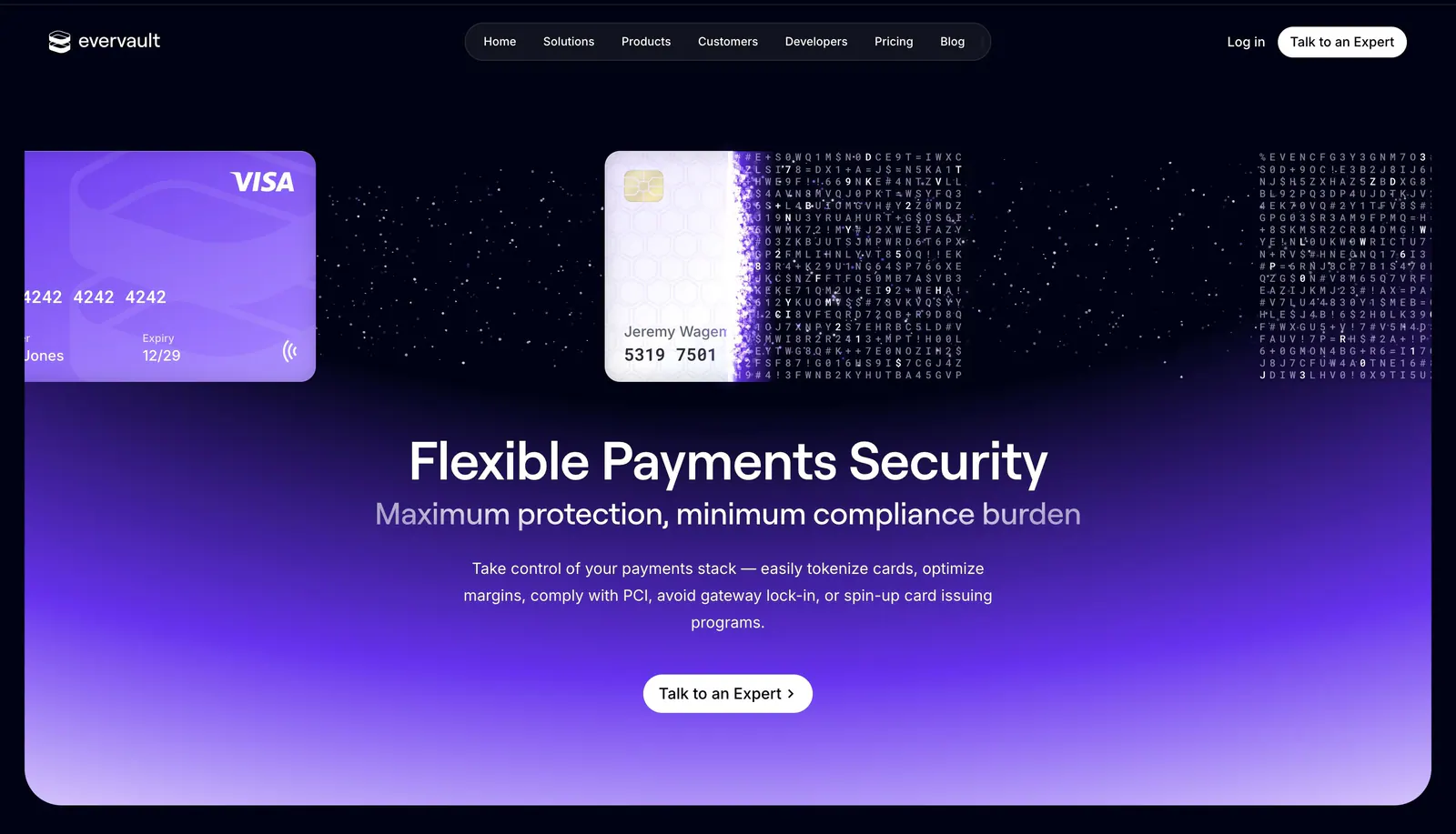
  27. Evervault hero section: credit cards dissolving into encrypted characters above a centered headline and CTA on a violet glow
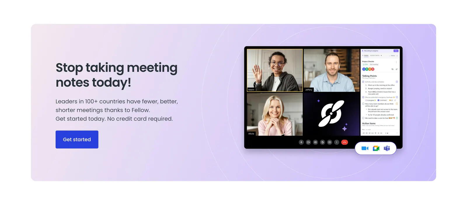
  28. Fellow call-to-action section: lavender panel with headline and blue button beside a video meeting app screenshot with notes sidebar
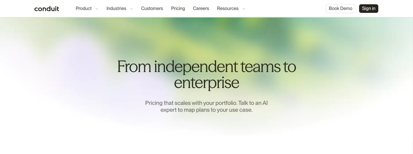
  29. Conduit hero section: centered serif pricing headline and subcopy over a soft green and lavender blurred gradient
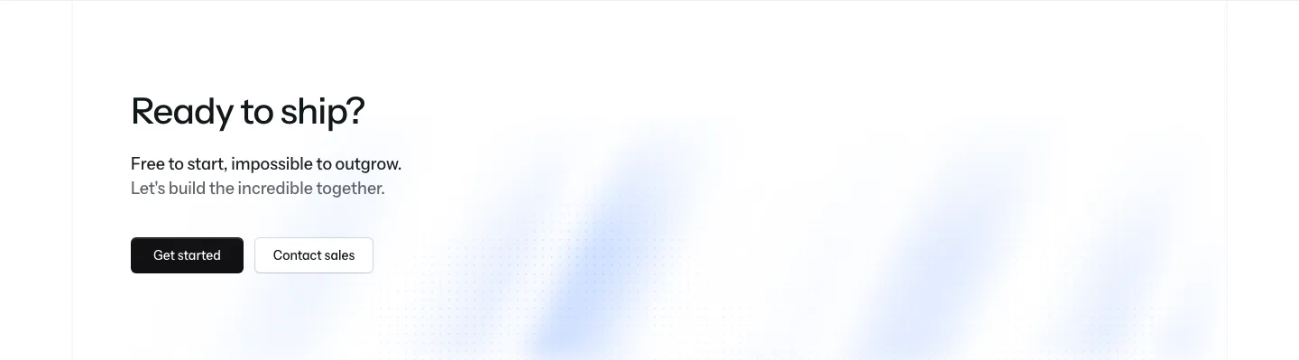
  30. Laravel Cloud call-to-action section: left-aligned headline with short copy, Get started and Contact sales buttons over a faint blue glow
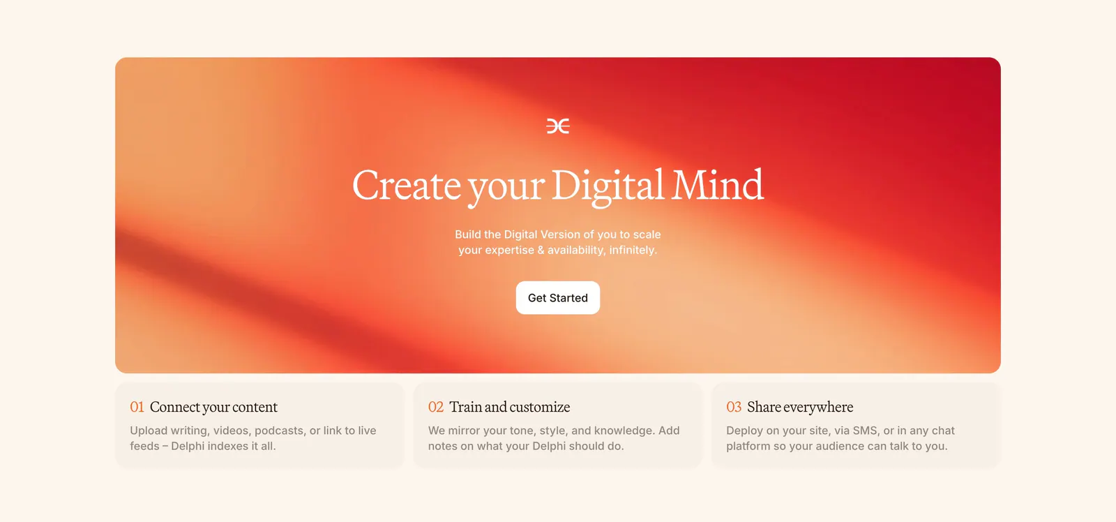
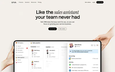
  31. Delphi call-to-action section: centered serif headline and Get Started button on an orange-red gradient card above three numbered step cards
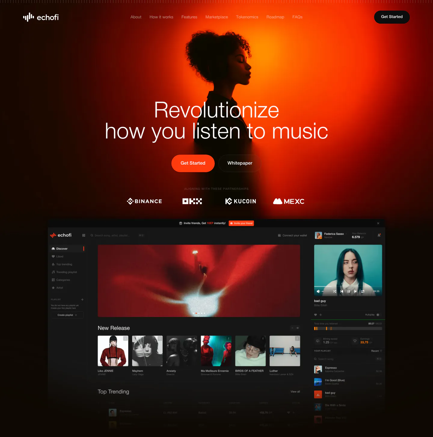
  32. EchoFi hero section: centered headline over an orange-lit portrait photo, exchange logo row and dark music app screenshot on black
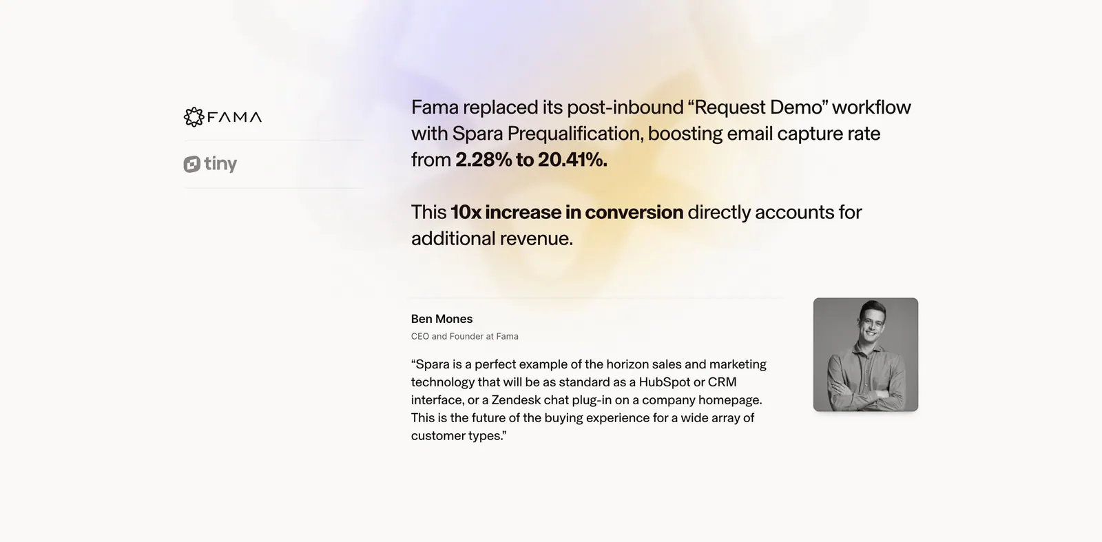
  33. Spara testimonials section: customer logo tabs on the left, case study result and quote with portrait on the right over a soft glow
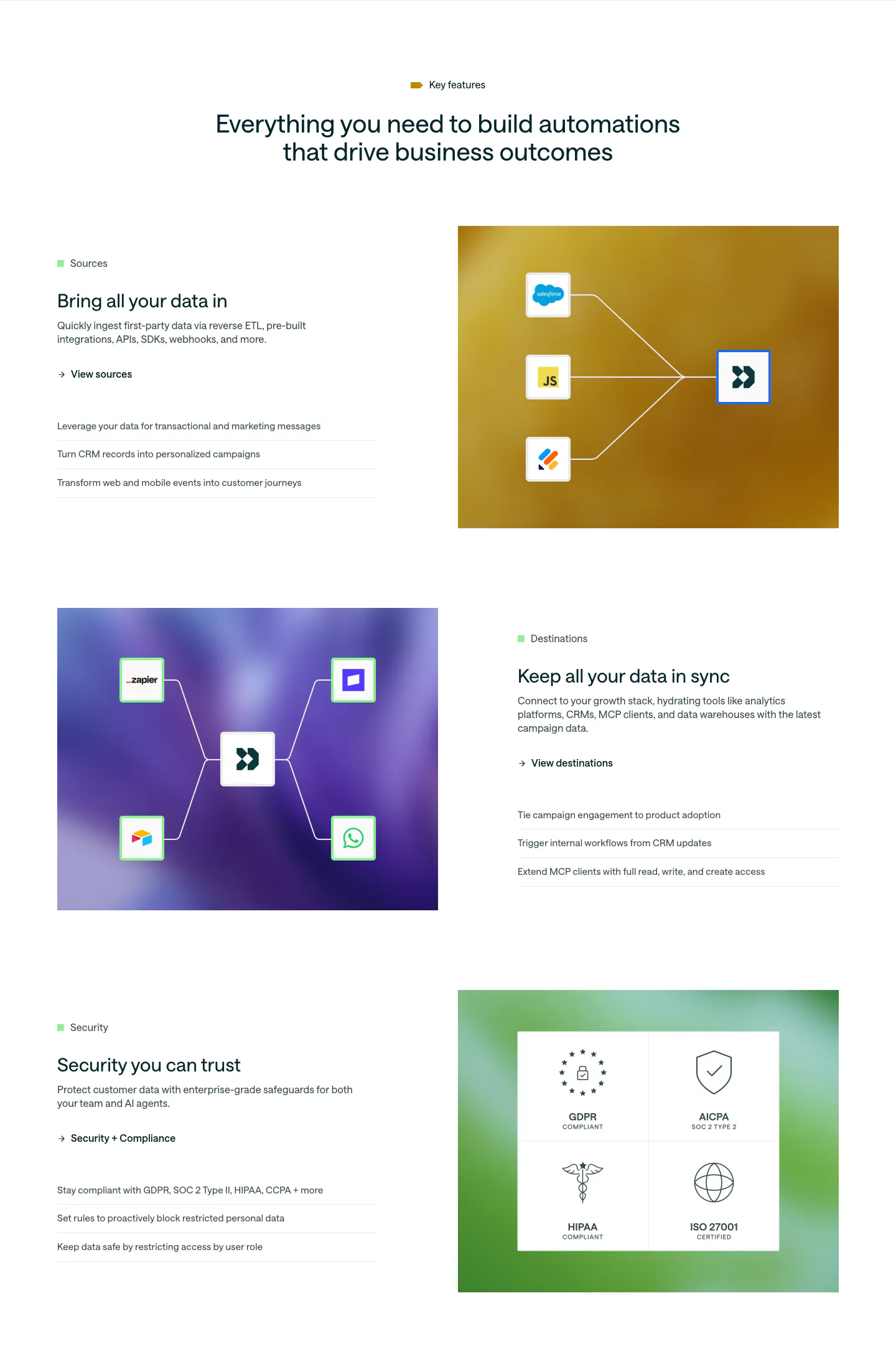
  34. Customer.io features section: centered headline above three alternating rows pairing copy with colorful gradient panels of connector diagrams
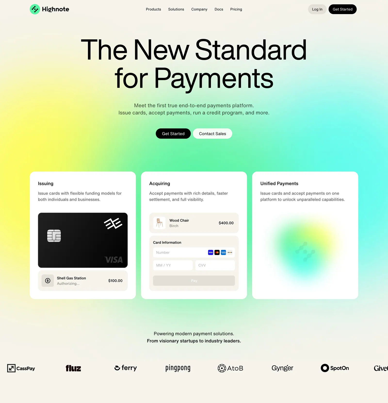
  35. Highnote hero section: centered headline over a yellow-green-cyan glow above three product cards and a scrolling logo row
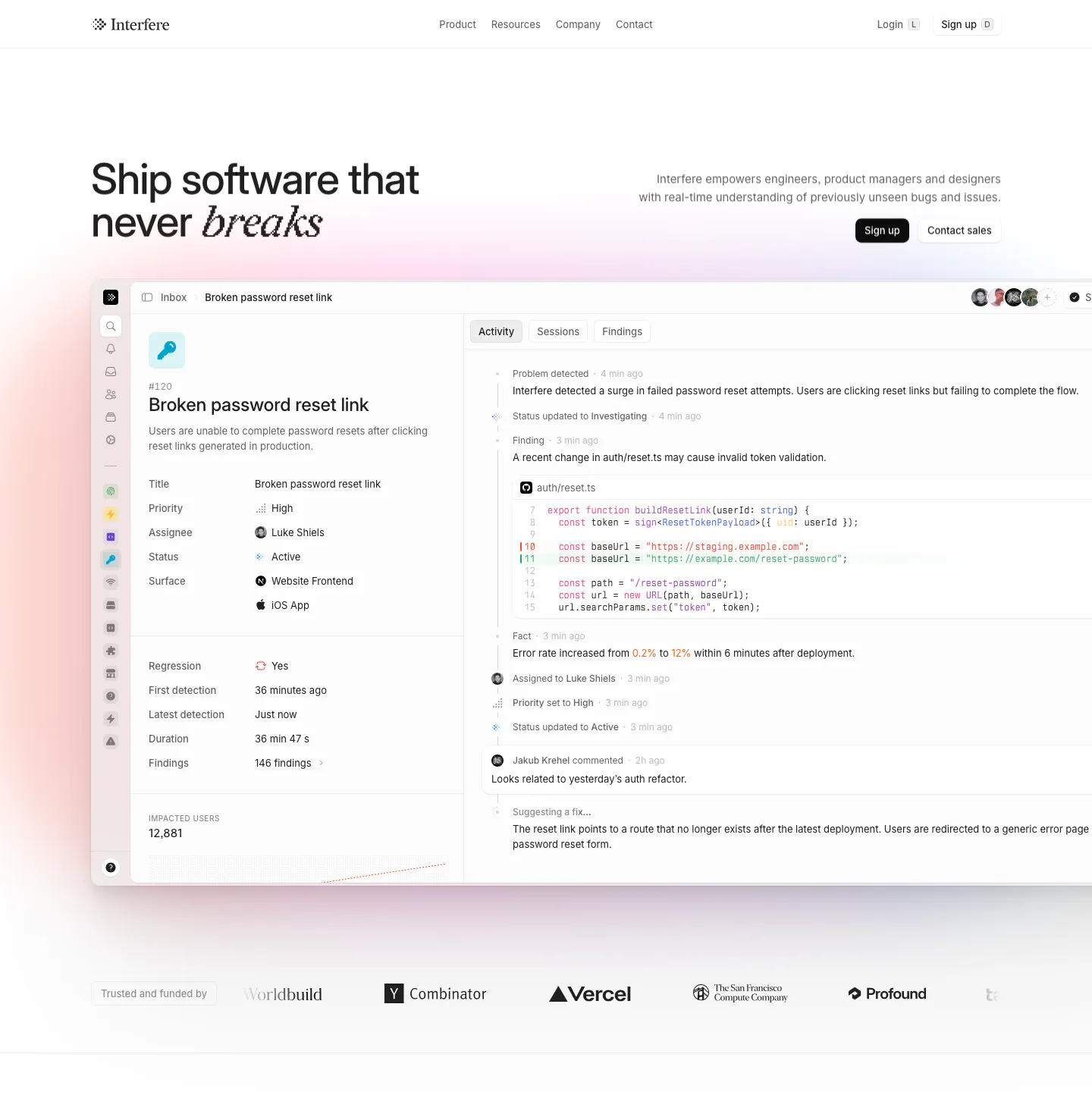
  36. Interfere hero section: headline left and copy with buttons right above a large issue-tracker product screenshot and a logo row
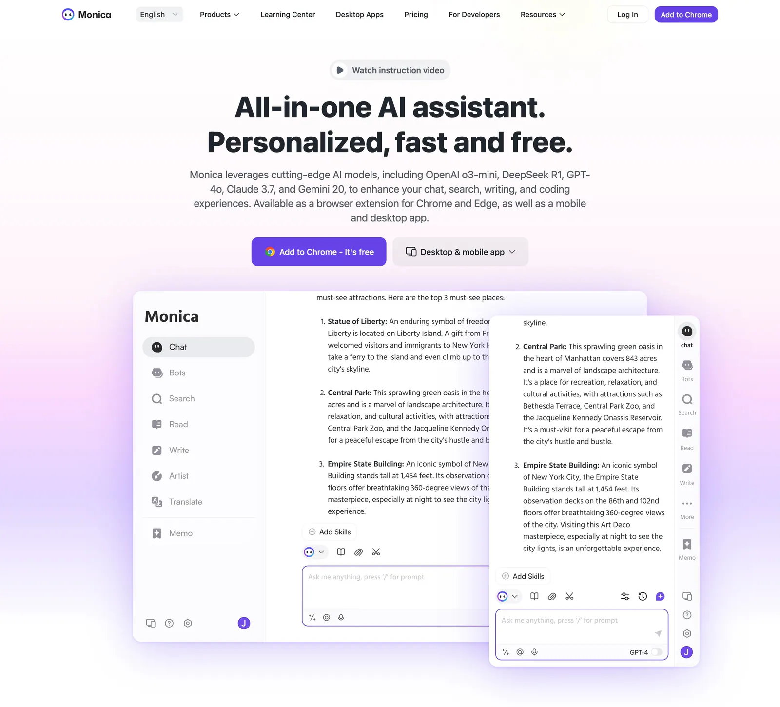
  37. Monica hero section: centered headline with video pill and two CTAs above overlapping chat app screenshots on a lavender glow
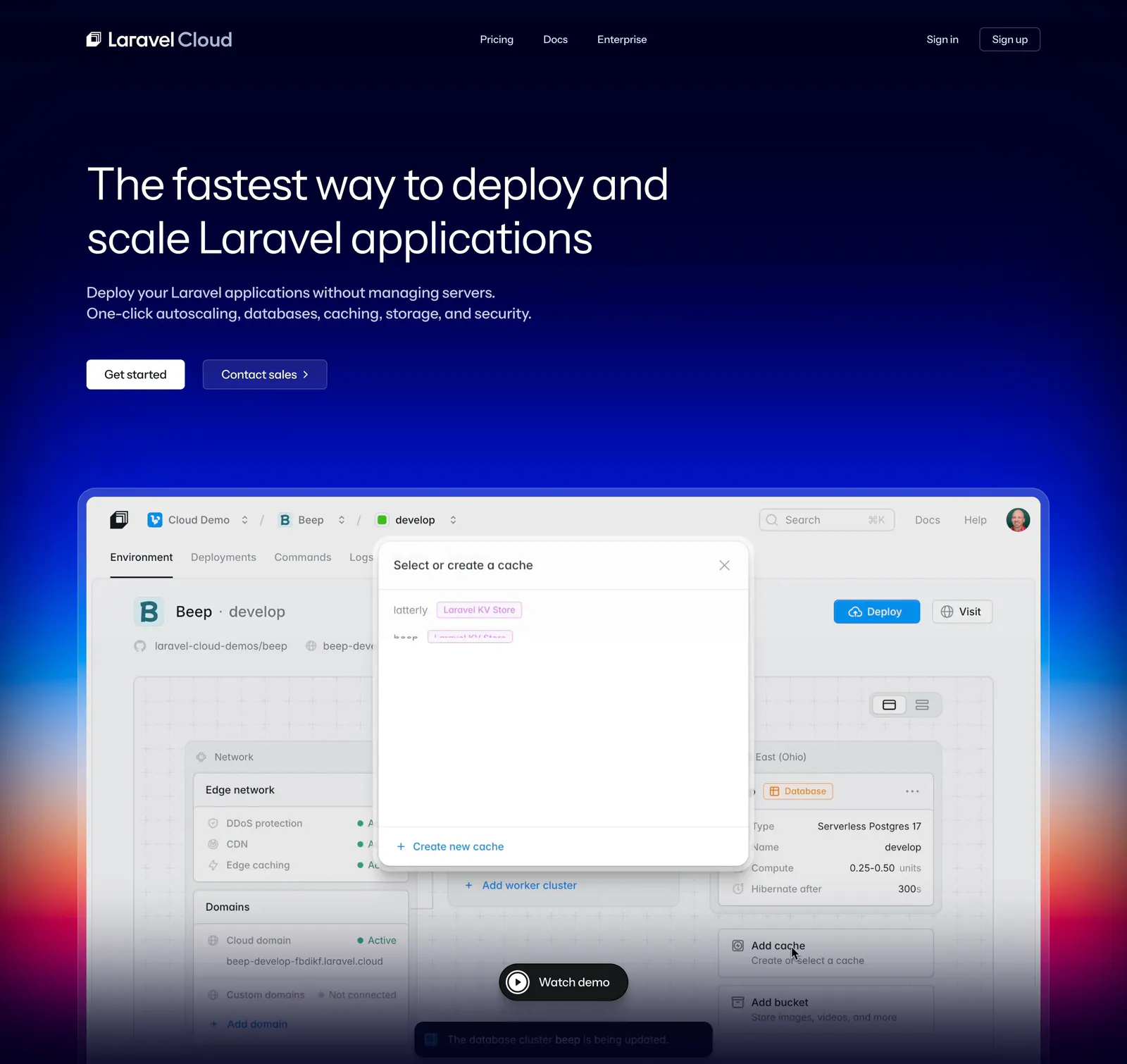
  38. Laravel Cloud hero section: nav and left-aligned headline on dark navy above a dashboard screenshot over a blue-to-red glow
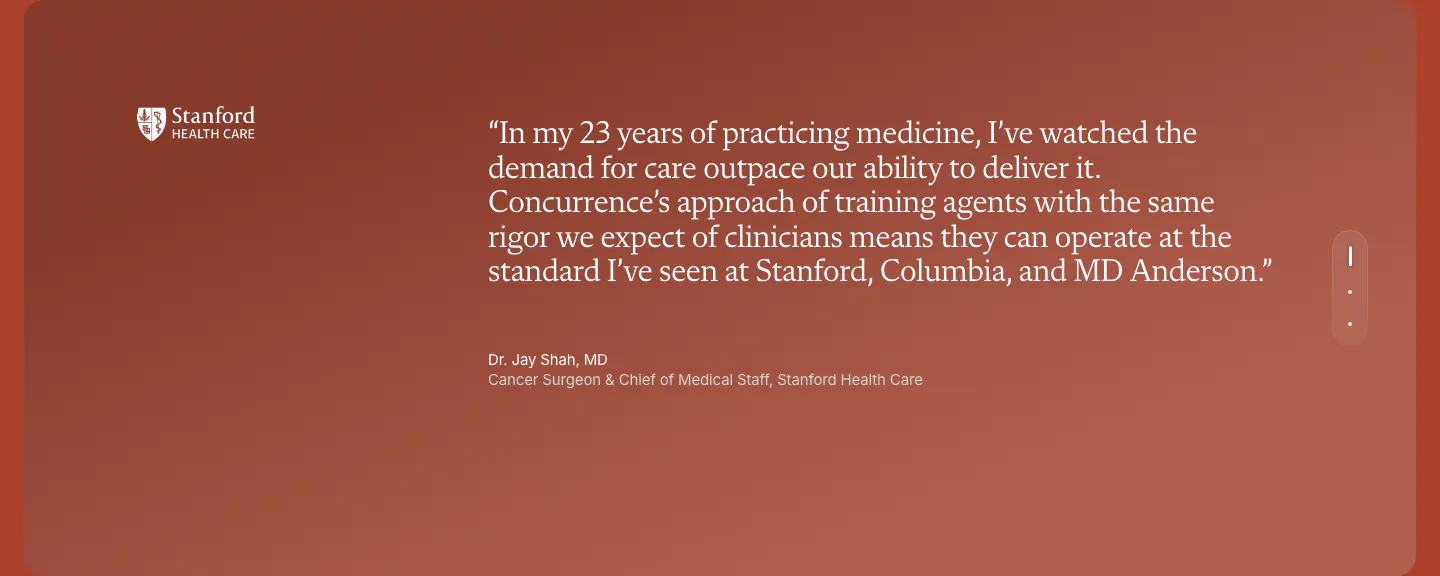
  39. Concurrence testimonials section: serif quote from a Stanford Health Care surgeon on a rust gradient card with vertical pagination dots
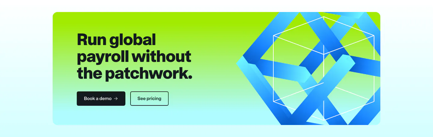
  40. Remote call to action section: dark headline and two buttons on a lime-to-cyan gradient card with a blue 3D ribbon cube
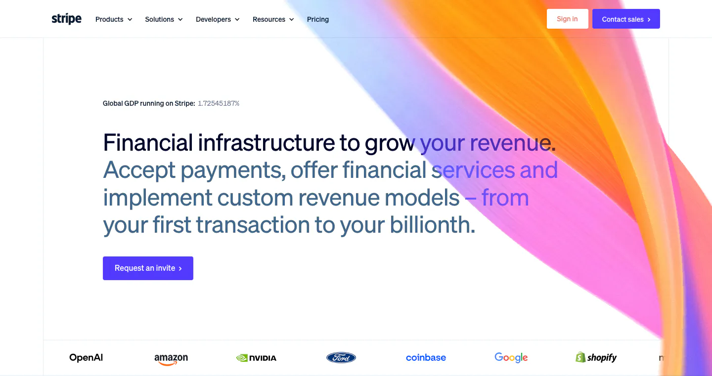
  41. Stripe hero section: nav bar, left-aligned headline with gray subcopy and invite button, orange-pink gradient ribbon at right, customer logo row
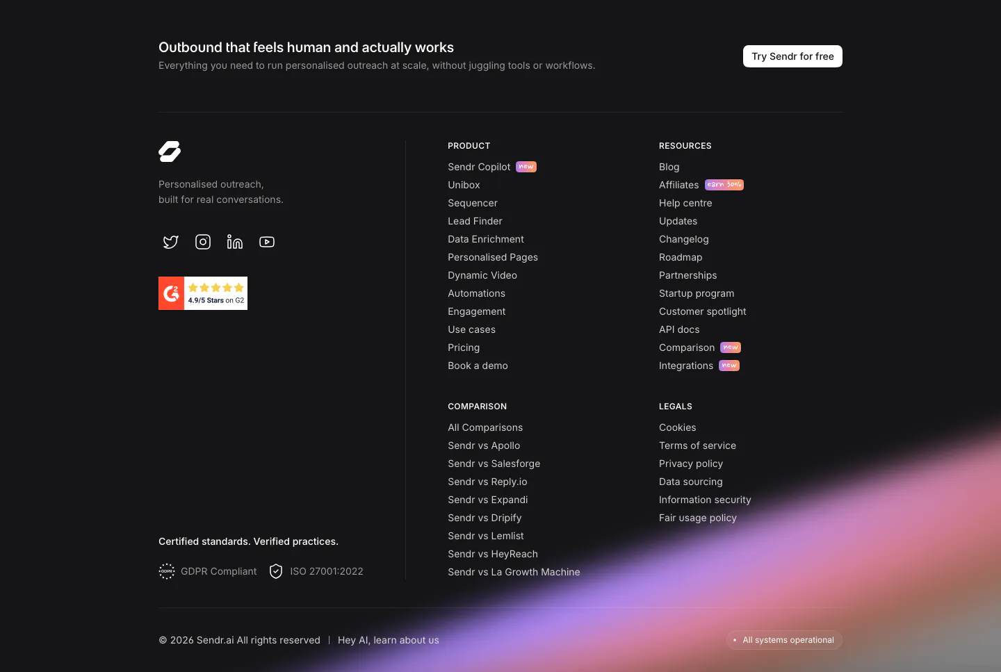
  42. Sendr footer section: dark footer with CTA strip, logo, G2 badge, product, resources, comparison and legal columns and a purple glow
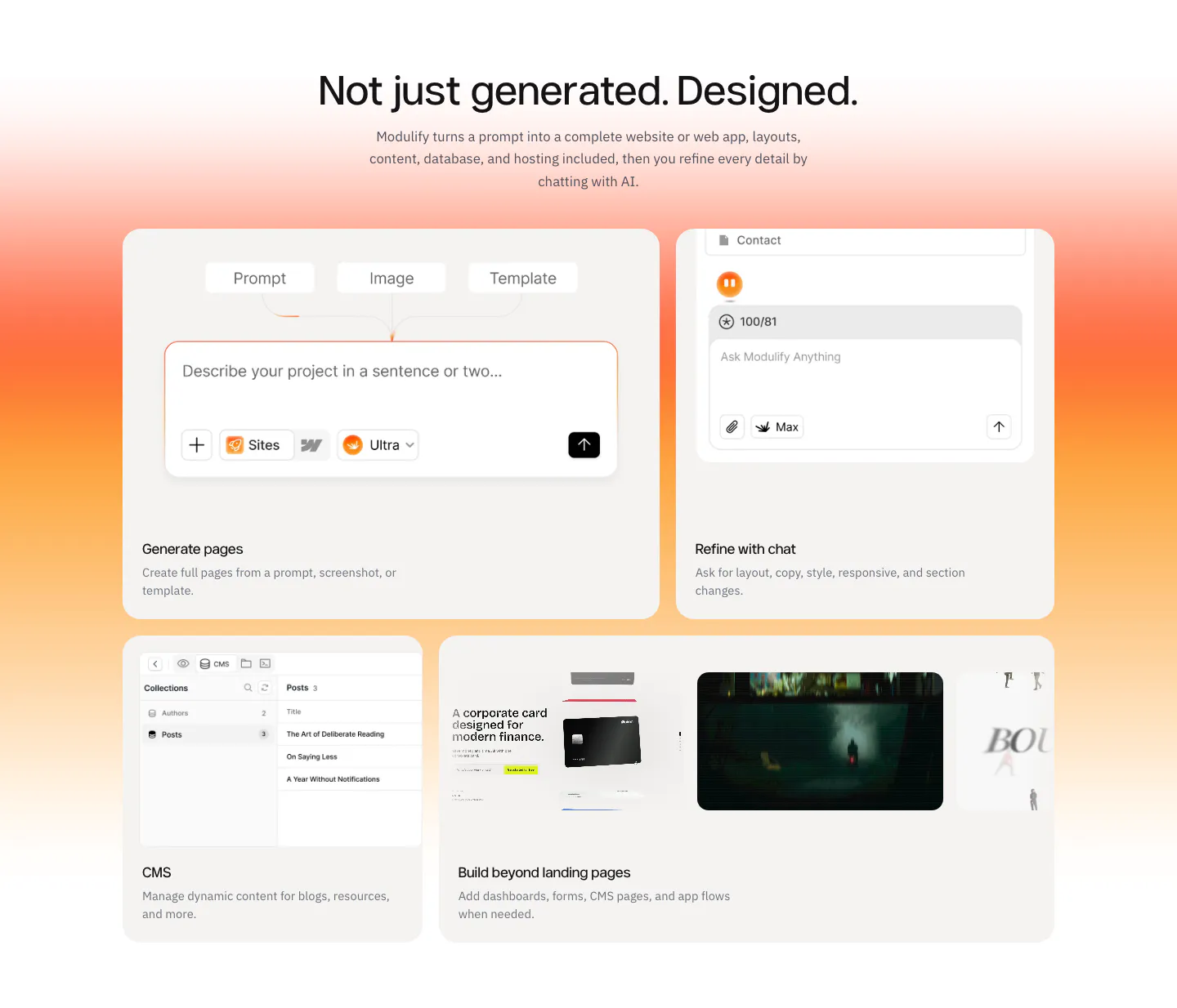
  43. Modulify call-to-action section: centered headline and black button inside a rounded orange-to-pink gradient card
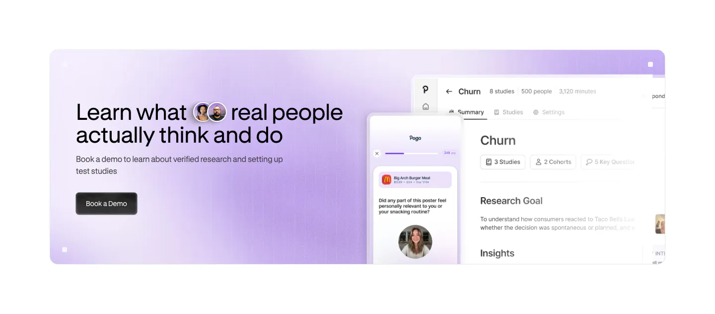
  44. Pogo call to action section: lavender gradient banner with headline and demo button left and app and phone UI screenshots right
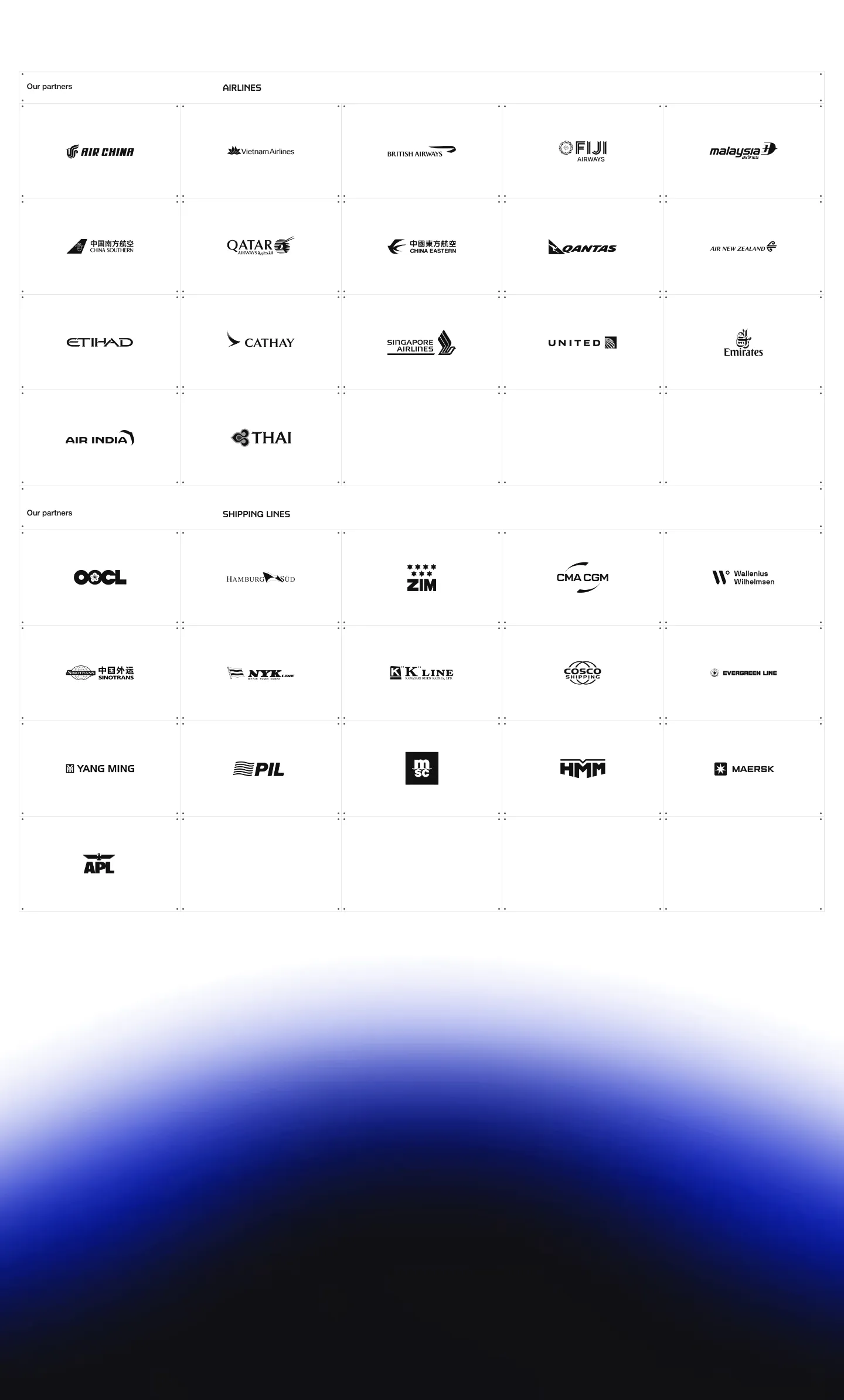
  45. United Carriers logo cloud section: bordered grid of airline and shipping line logos on white above a blue glow gradient
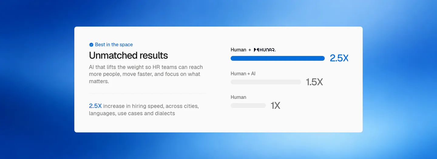
  46. Hunar comparison section: white card with copy on the left and a bar chart of hiring speed multipliers on a blue gradient background
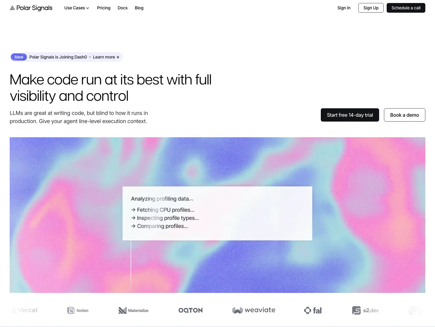
  47. Polar Signals hero section: left headline with CTAs at right above a wide pink and blue gradient panel with a status card, logo row below
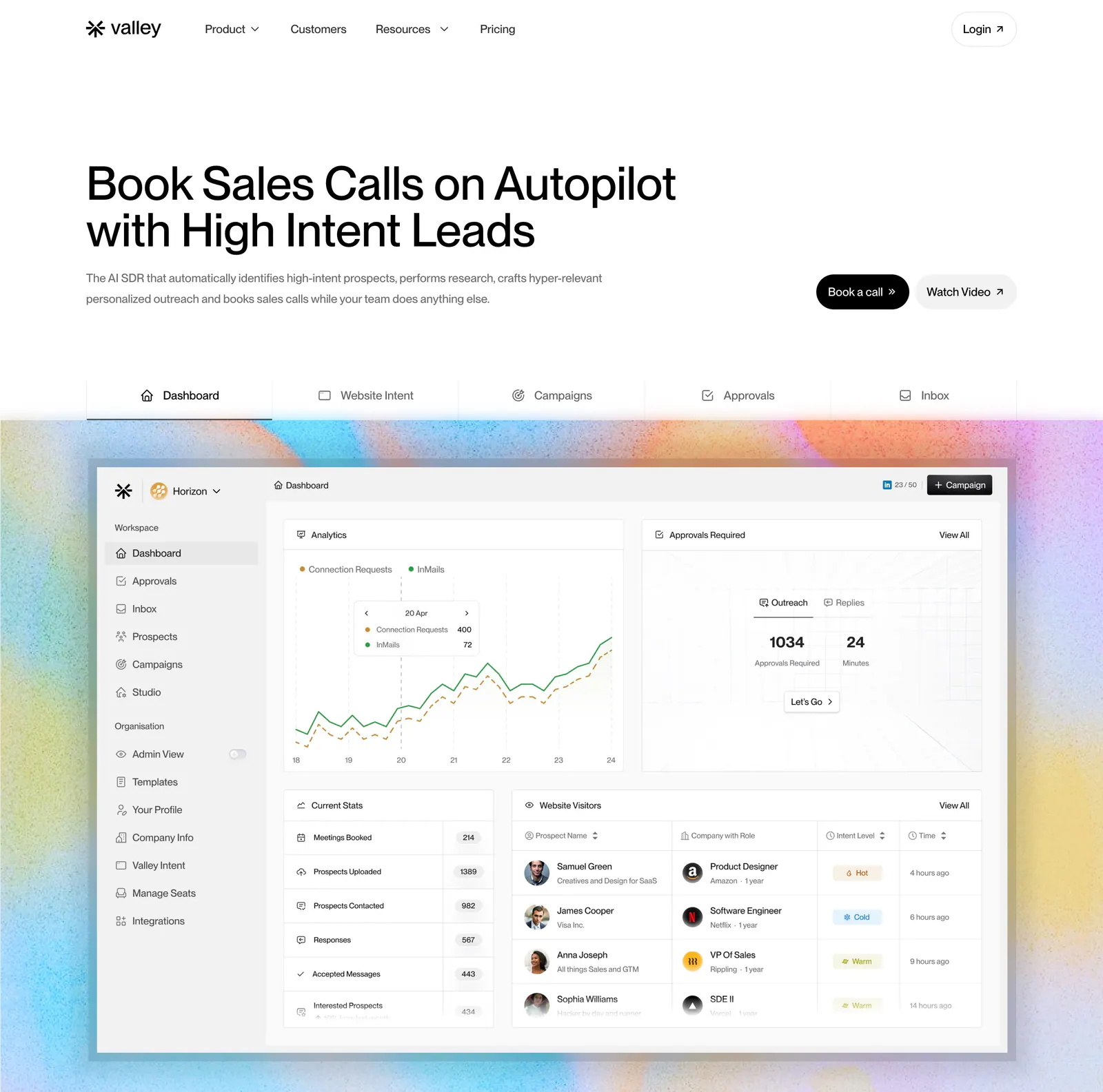
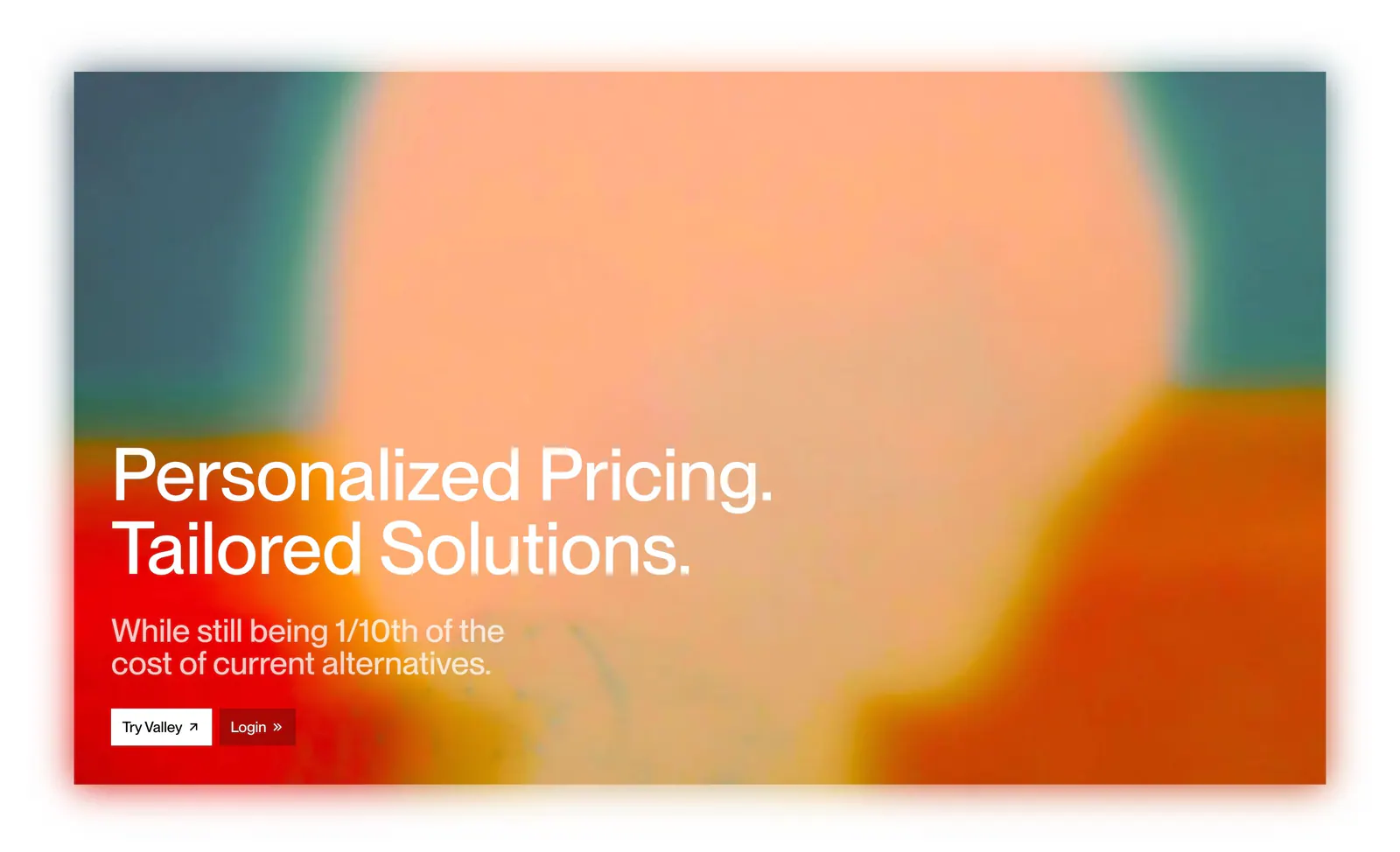
  48. Valley hero section: left-aligned headline with buttons, a tab bar and a sales dashboard screenshot on a grainy pastel gradient background
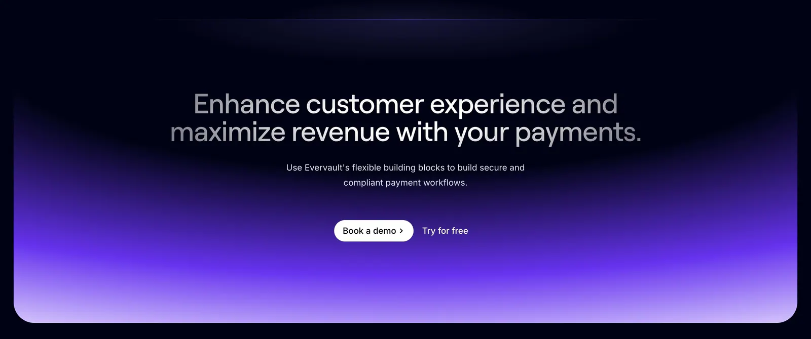
  49. Evervault call-to-action section: centered two-tone headline and demo buttons above a violet gradient glow on a dark navy background
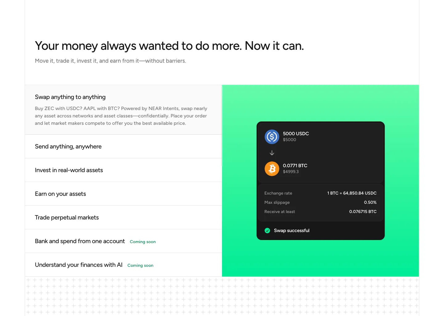
  50. NEAR features section: headline above a list of capabilities on the left and a swap UI card on a green gradient panel
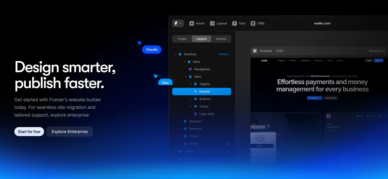
  51. Framer call-to-action section: left headline with two buttons beside the Framer editor layers panel, blue glow along the bottom on black
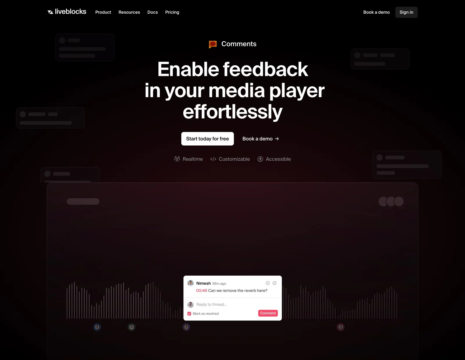
  52. Liveblocks hero section: nav bar, centered headline and two CTAs above a media player waveform mockup with a comment thread on a maroon glow
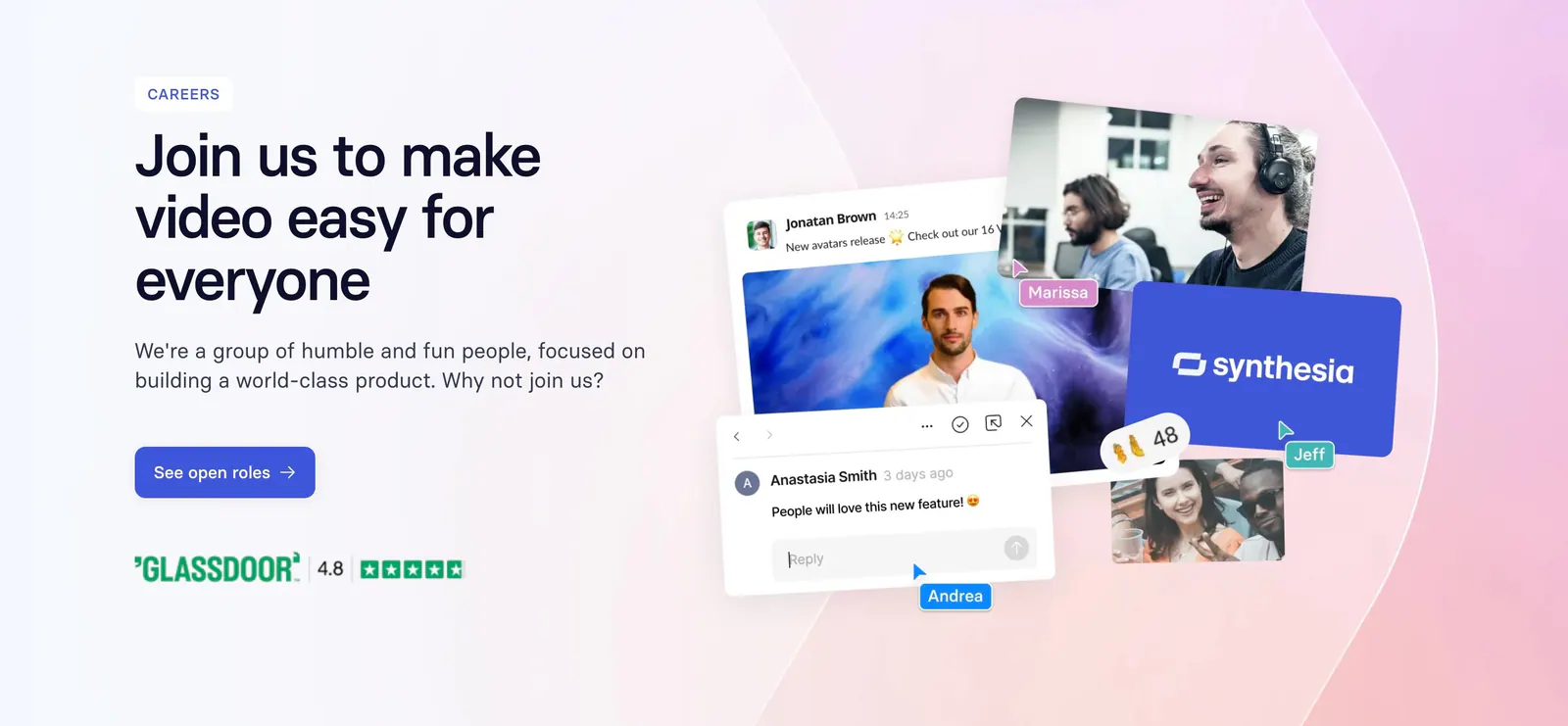
  53. Synthesia call-to-action section: careers banner with headline and blue button left, collage of team photos and chat UI on a pink gradient
  54. Hunar call-to-action section: white card with headline, AI model icons and a demo button on a blue gradient background
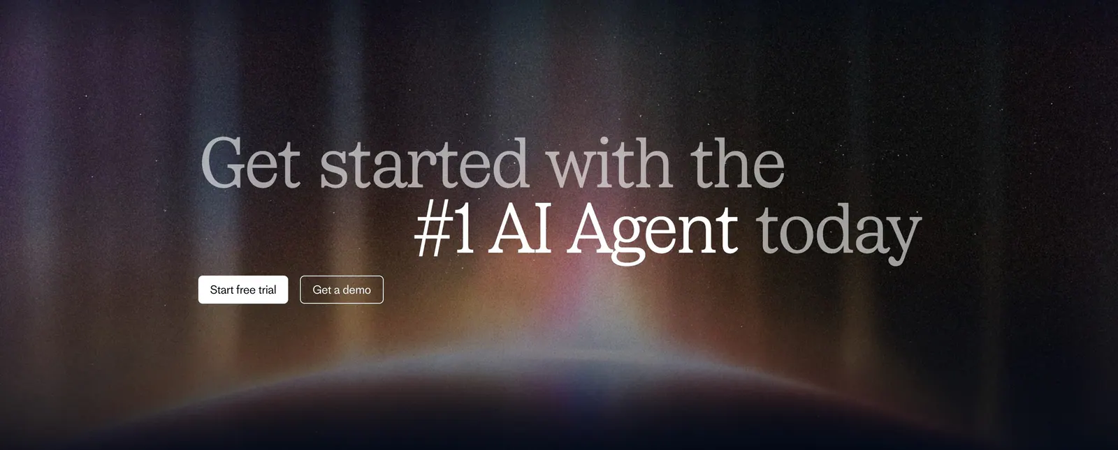
  55. Fin call-to-action section: two-tone serif headline with trial and demo buttons over a glowing aurora on a dark background
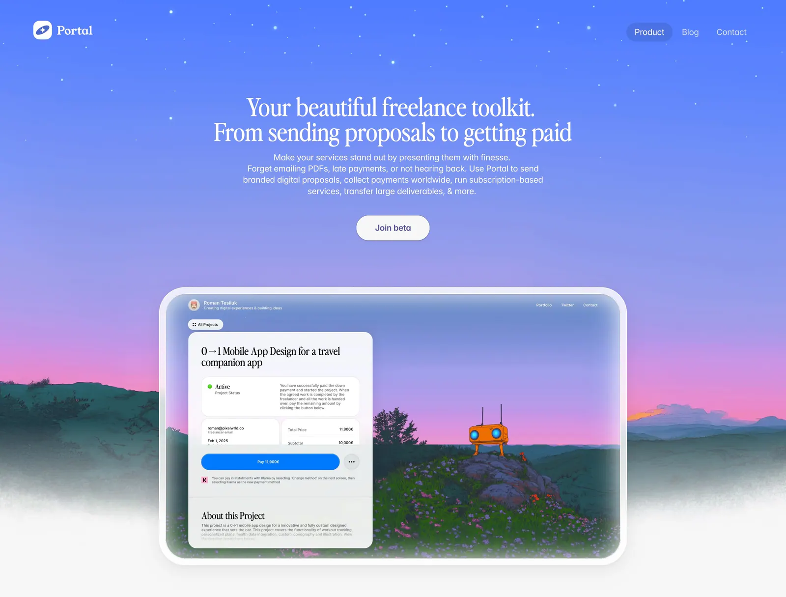
  56. Portal hero section: centered serif headline on a blue-to-purple sky gradient above a proposal UI framed in a painted landscape
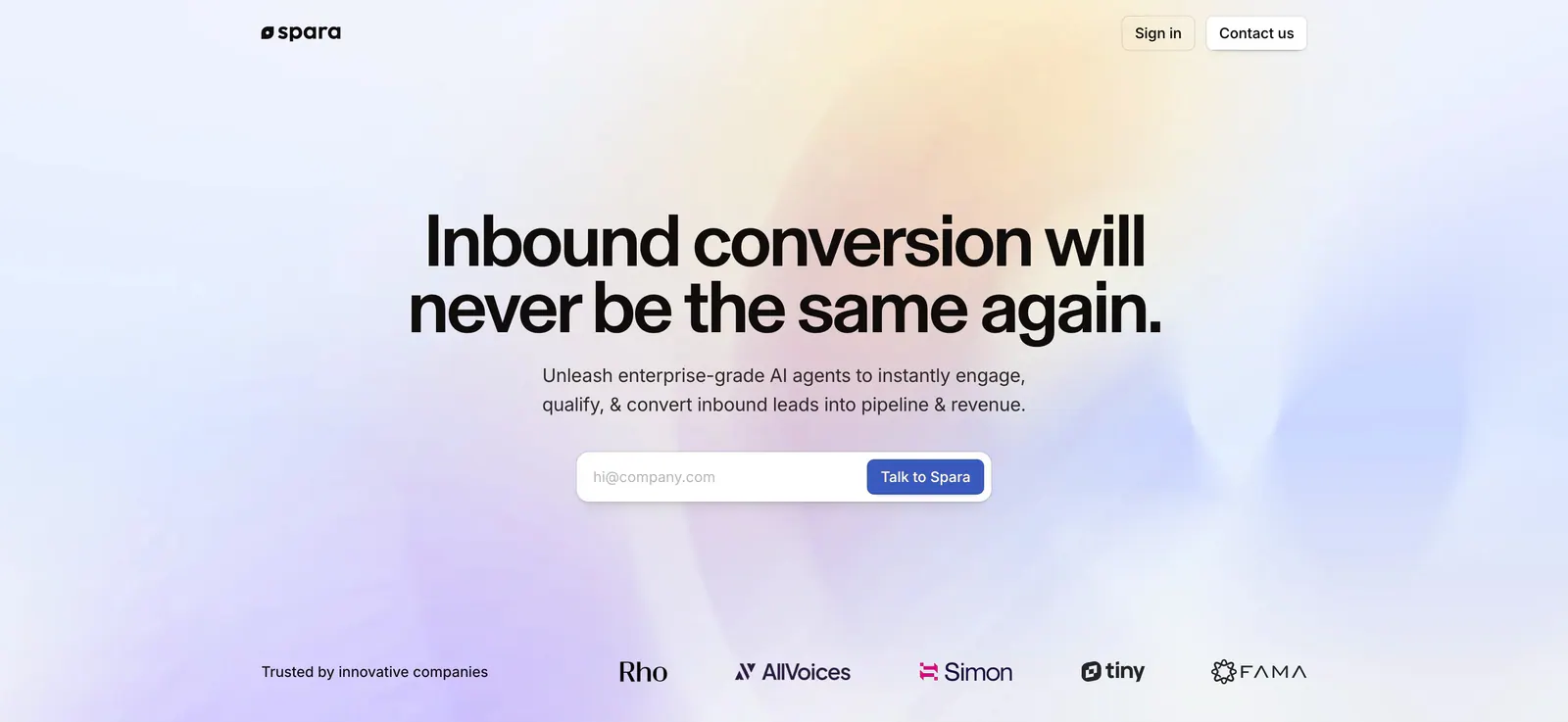
  57. Spara hero section: centered headline and email form over a soft pastel gradient, with a trusted-by logo row at the bottom
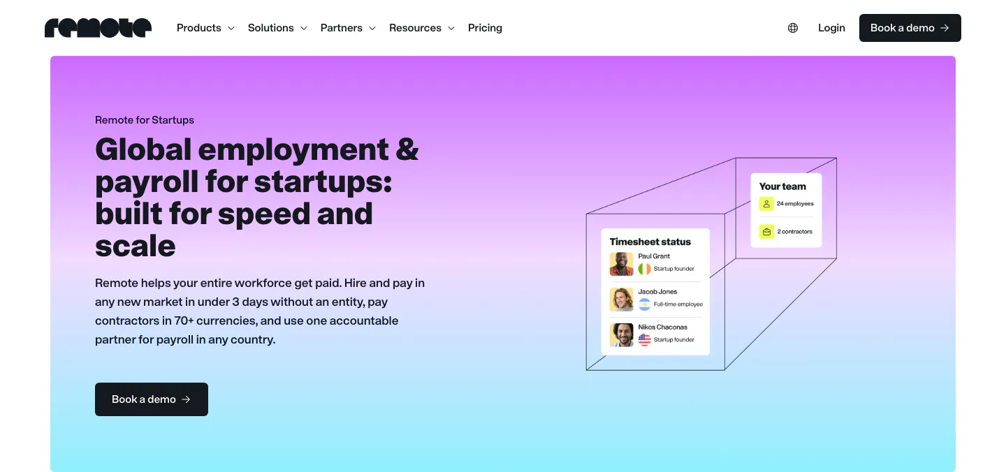
  58. Remote hero section: nav above a purple-to-cyan gradient card with headline left and timesheet UI cards in a wireframe box
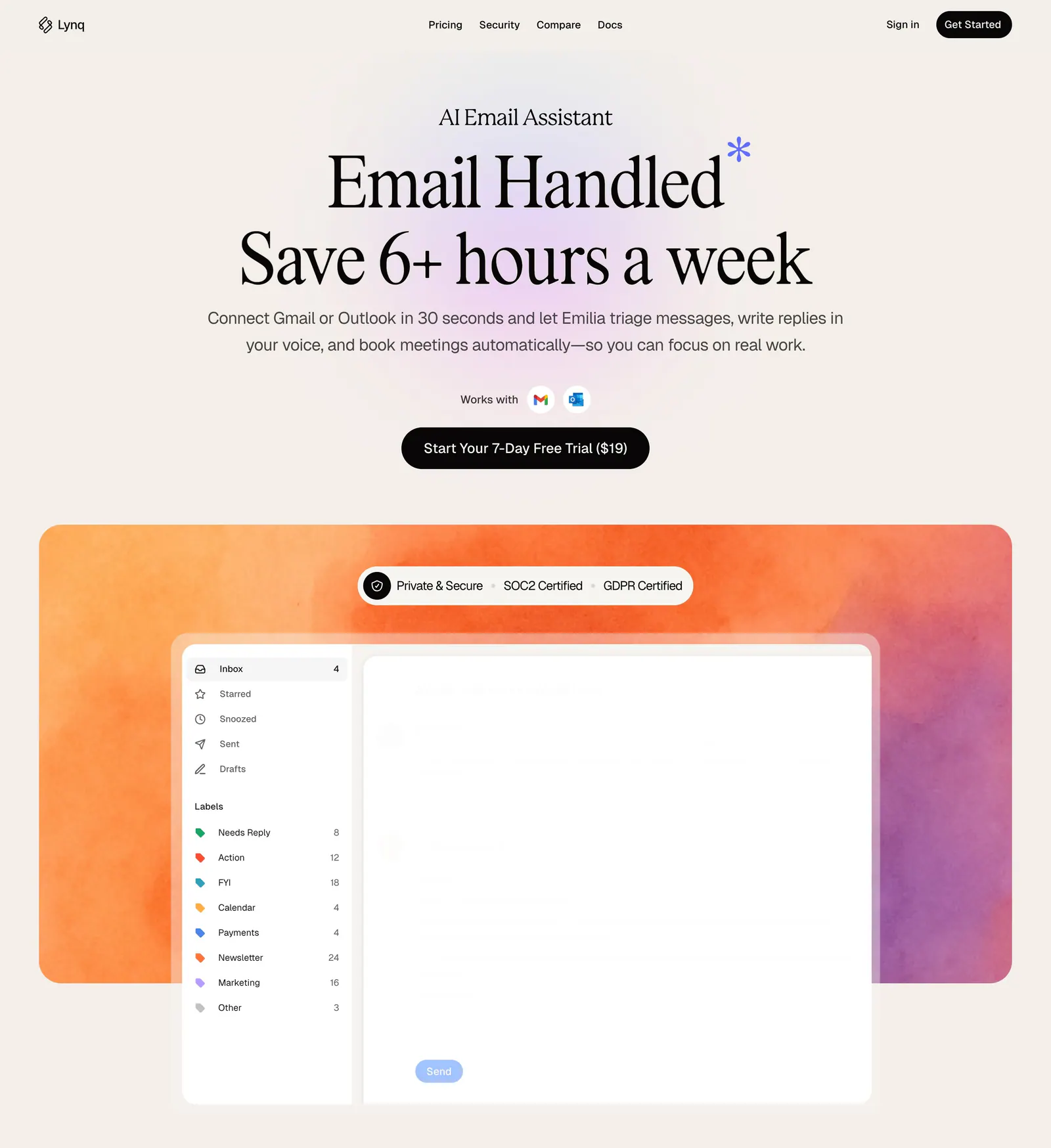
  59. Lynq hero section: centered serif headline and CTA on cream above an inbox UI mockup on an orange-purple watercolor panel
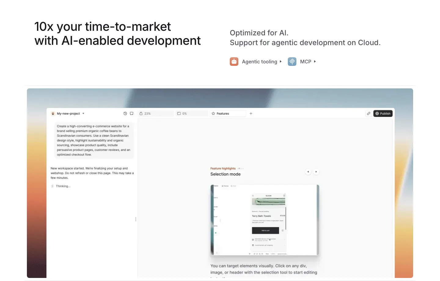
  60. Medusa features section: headline with agentic tooling and MCP links above an AI site builder UI on a warm sunset gradient
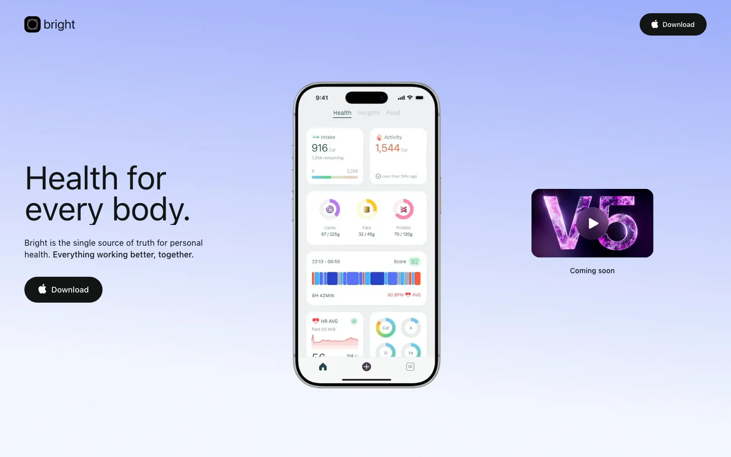
  61. Bright hero section: headline and Download button left, phone app screenshot center and V5 video thumbnail right on periwinkle gradient
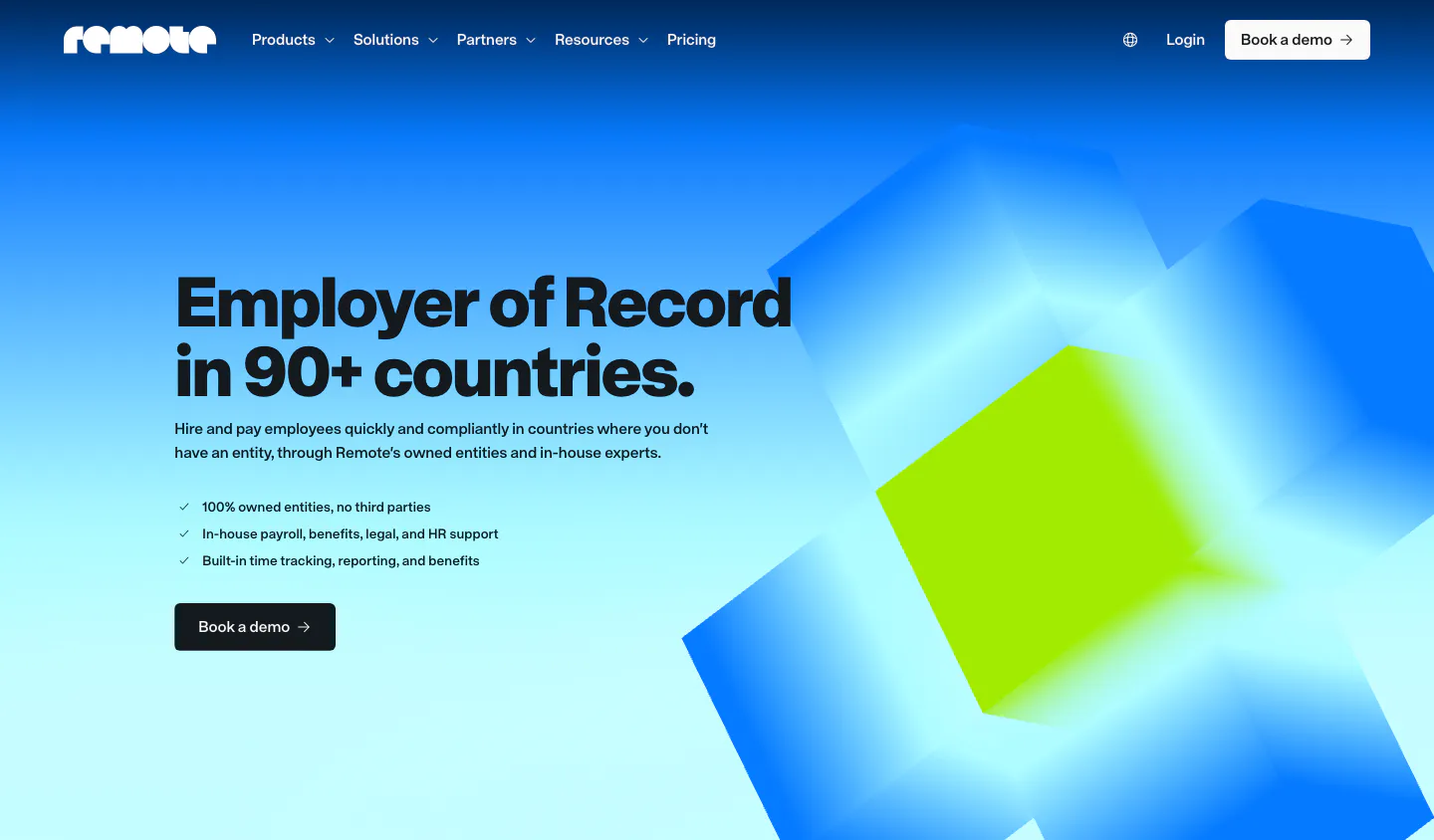
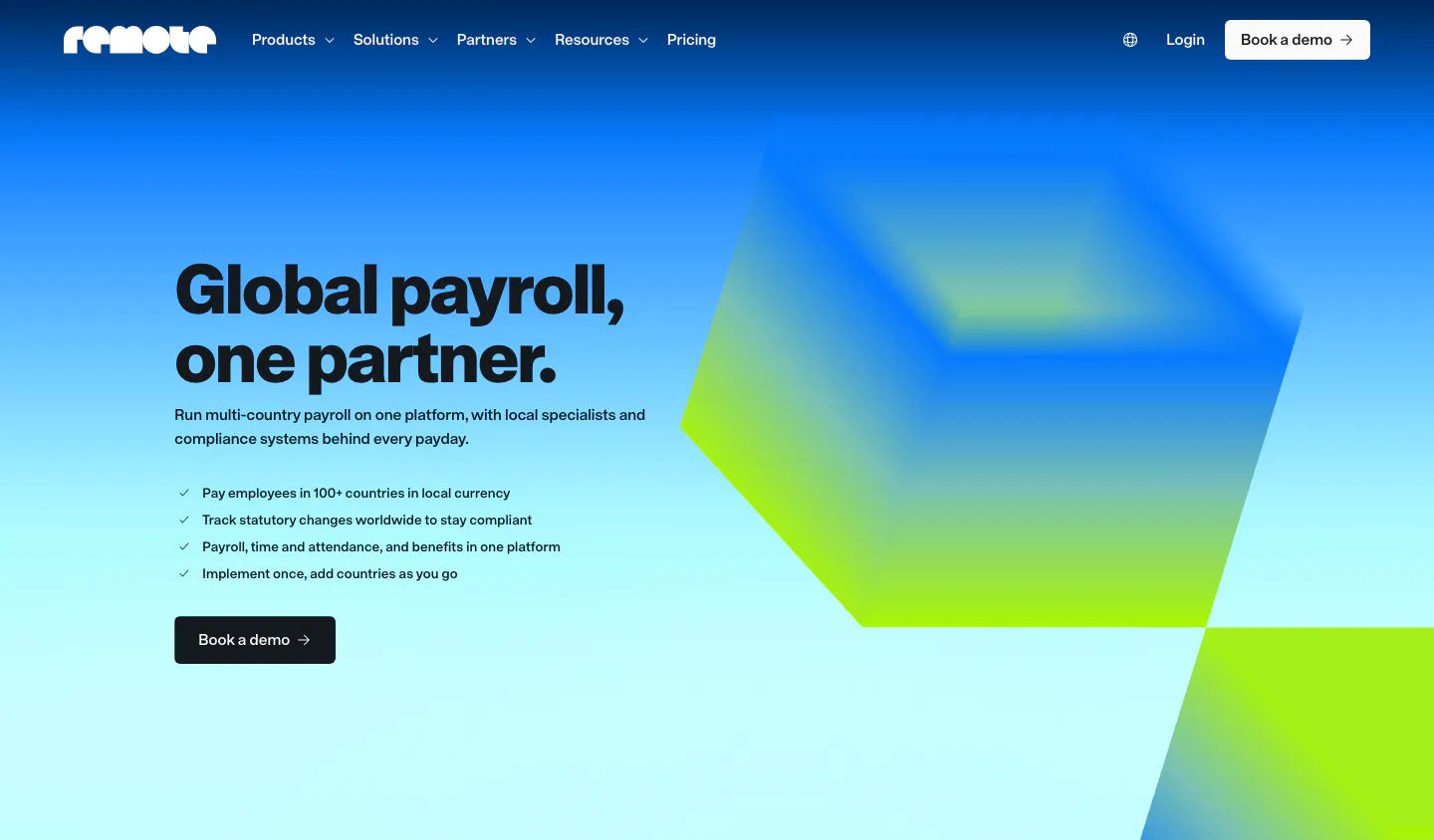
  62. Remote hero section: nav, left headline with checklist and demo button beside blurred blue and lime 3D cubes on gradient
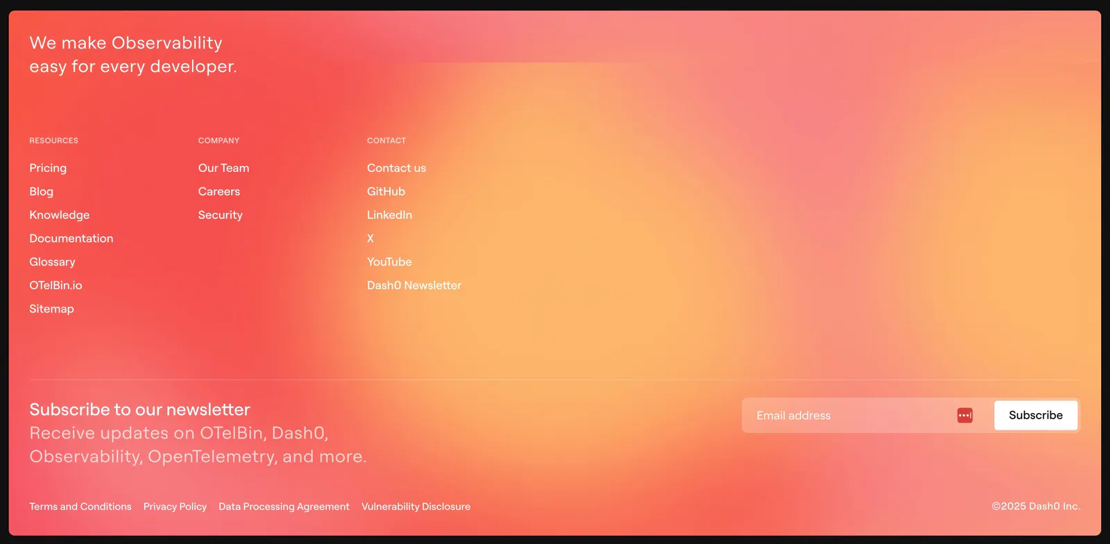
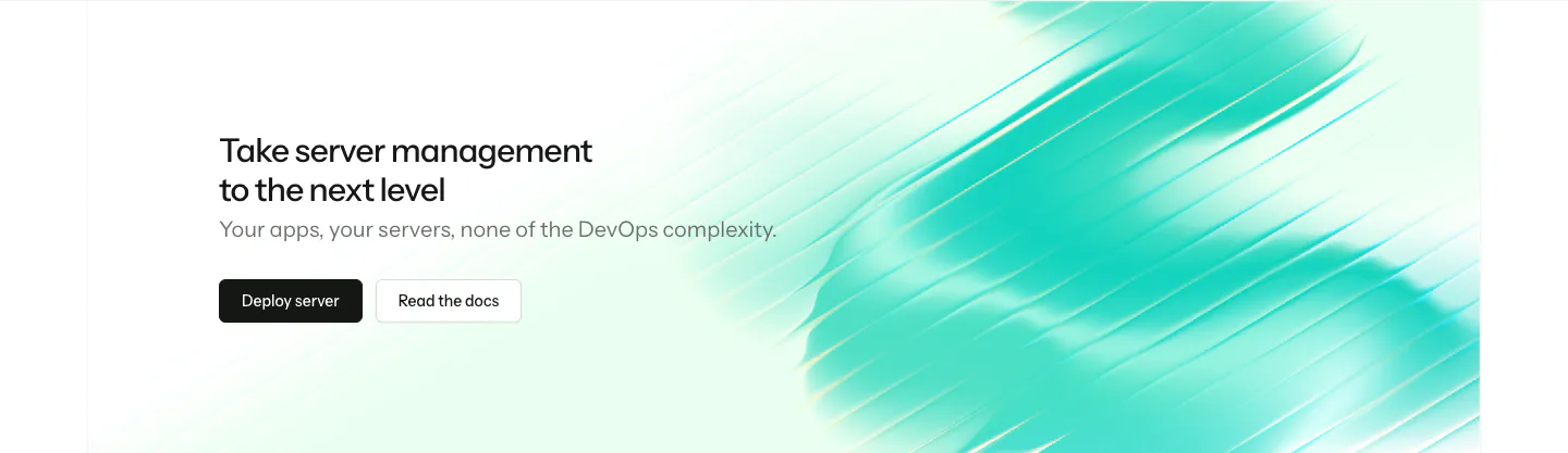
  63. Dash0 footer section: link columns and a newsletter email field over a warm coral-to-orange gradient background
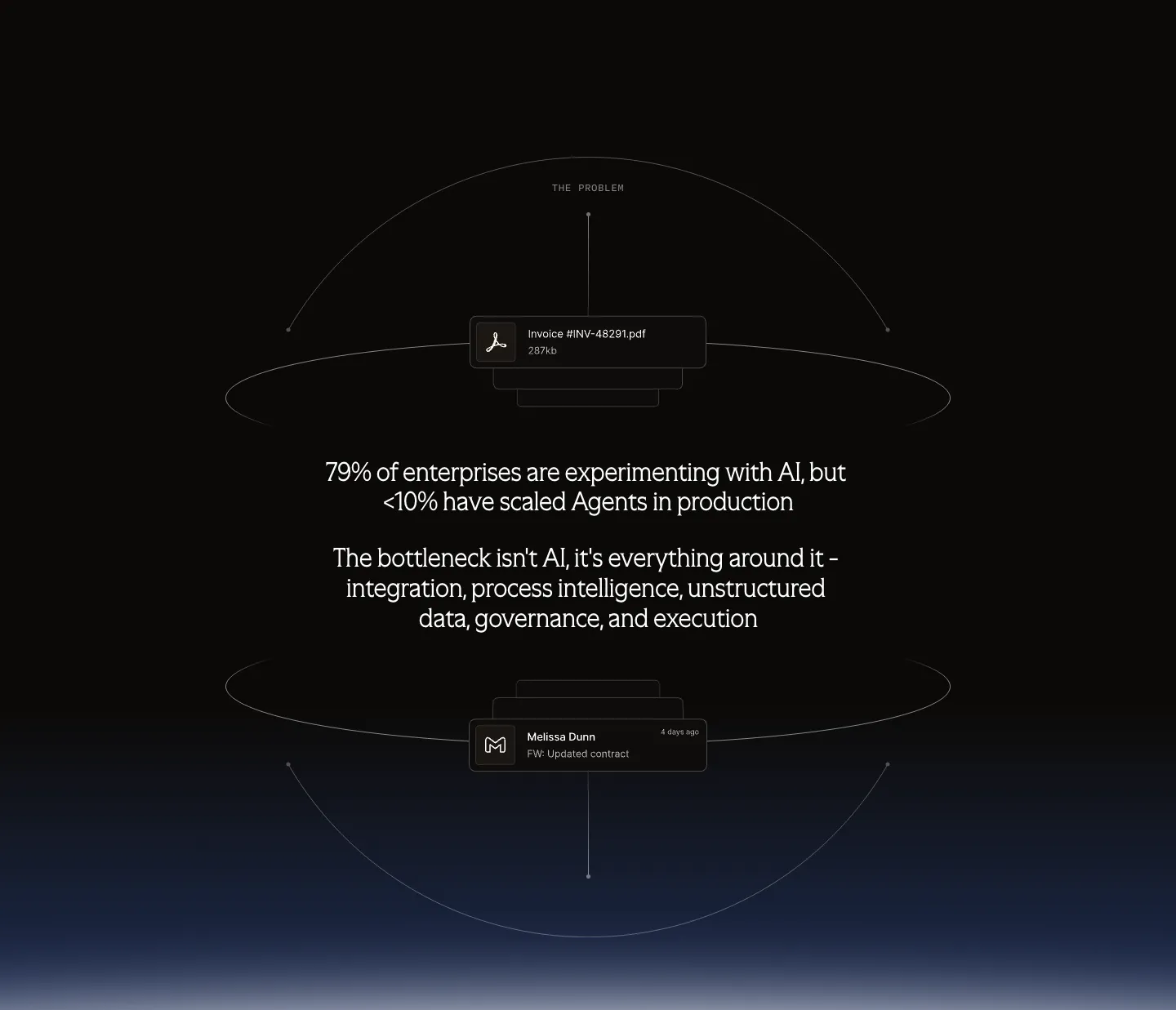
  64. Arrakis value proposition section: dark centered problem statement inside wireframe orbit lines with floating file and email cards
  65. Laravel Forge call-to-action section: left-aligned headline and two buttons beside a streaky teal gradient artwork
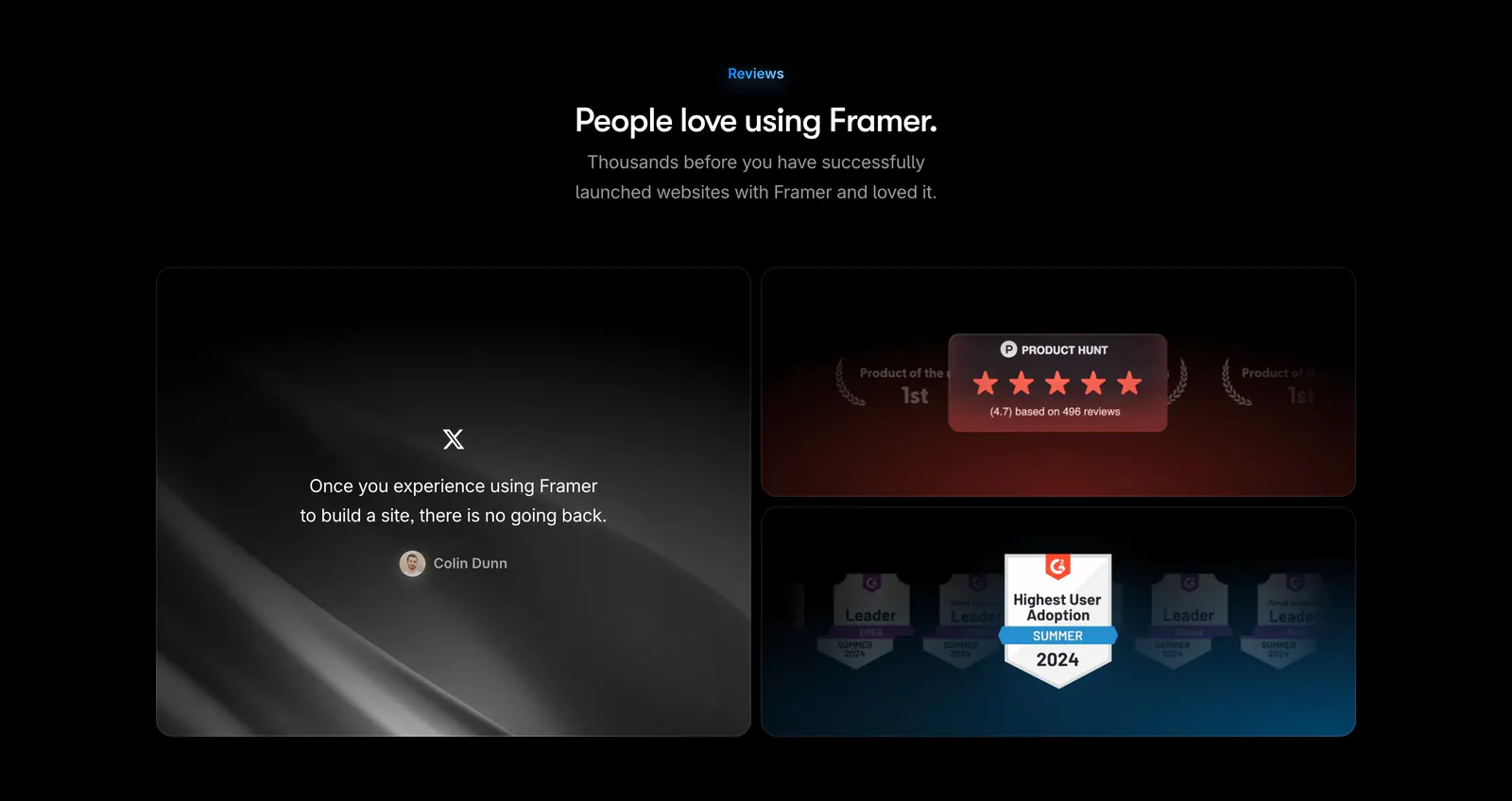
  66. Framer testimonials section: centered heading above a large tweet quote tile beside stacked Product Hunt and G2 badge tiles on black
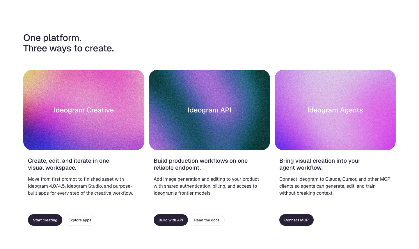
  67. Ideogram features section: two-line headline above three product cards with grainy pink and purple gradient panels, copy and buttons
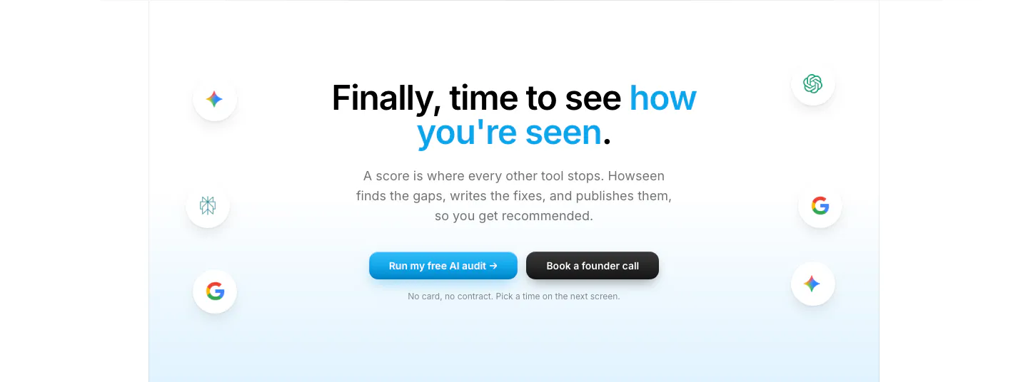
  68. Howseen AI call-to-action section: centered headline and two buttons flanked by floating AI engine icons on a pale blue fade
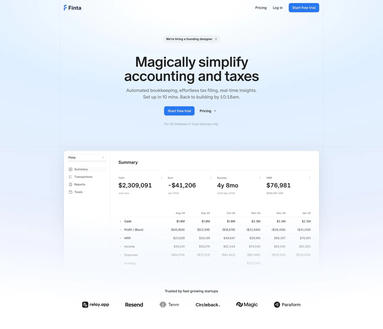
  69. Finta hero section: centered headline and CTAs on a pale blue wash above a financial summary dashboard and a startup logo row
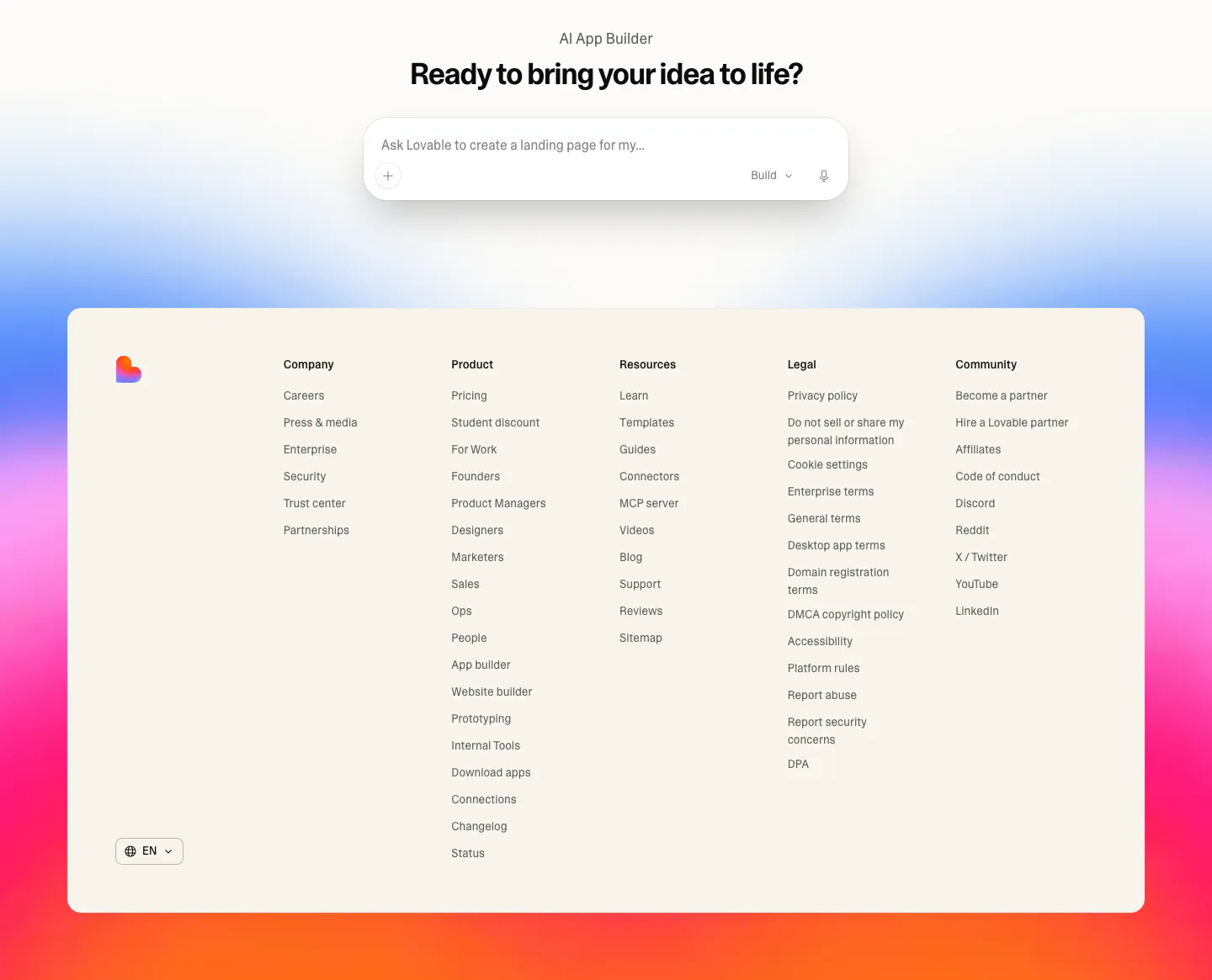
  70. Lovable footer section: centered prompt input CTA above a cream footer card with five link columns, set on a blue, pink and orange gradient
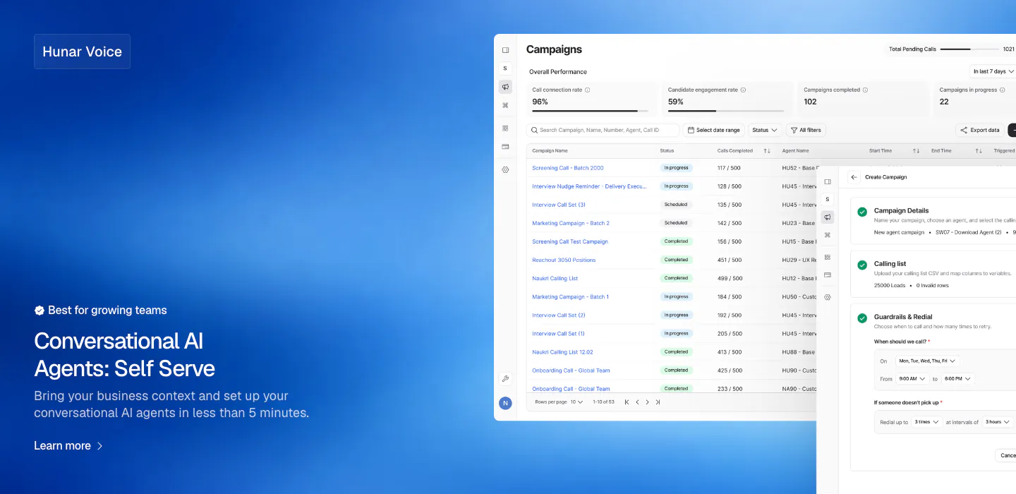
  71. Hunar features section: blue gradient background with text bottom-left and a campaign dashboard screenshot on the right
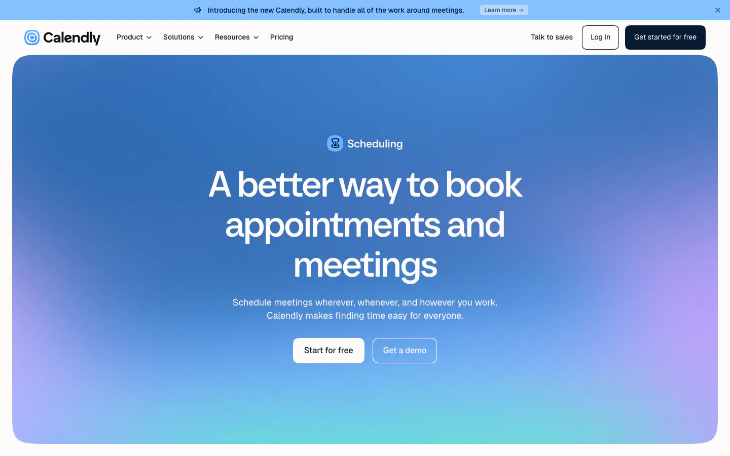
  72. Calendly hero section: centered headline and two buttons inside a rounded blue-to-purple gradient panel below the nav and announcement bar
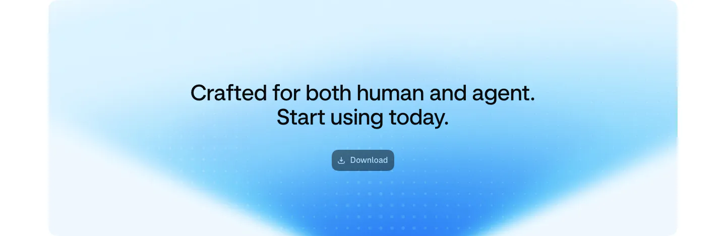
  73. Aside call-to-action section: centered two-line headline and download button on a soft blue gradient card
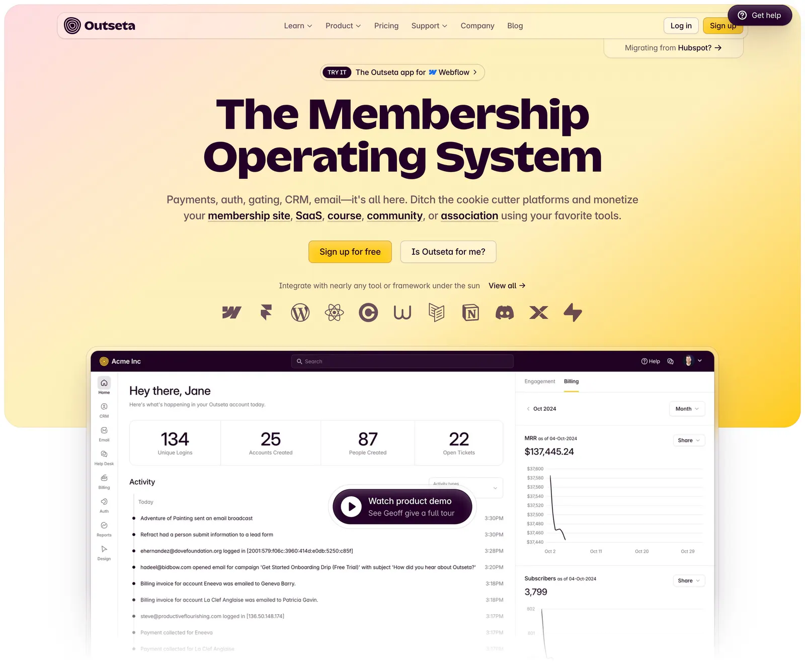
  74. Outseta hero section: centered headline, two buttons and integration icons on a peach-to-yellow gradient above a dashboard with demo button
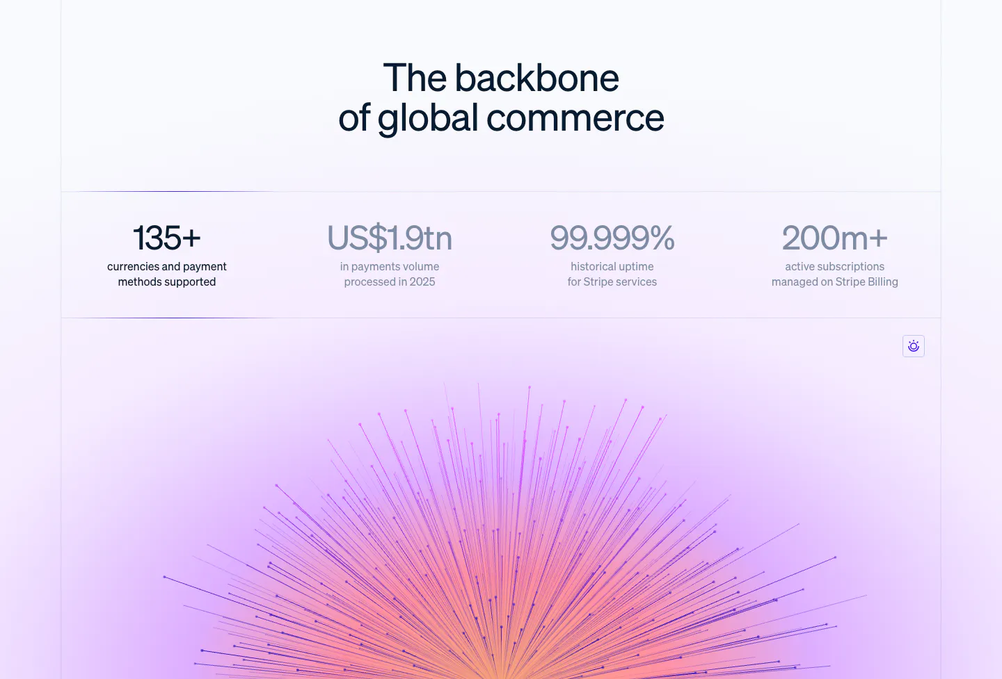
  75. Stripe stats section: centered headline above a row of four large metrics, with a purple-pink radiating line artwork glowing below
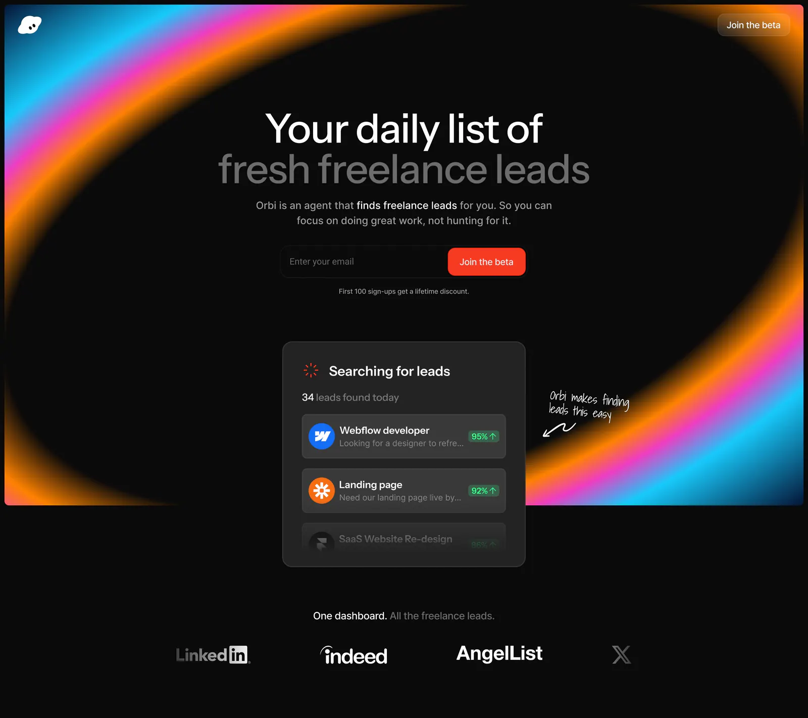
  76. Orbi hero section: centered headline and email signup inside a neon gradient ring on black, a leads UI card and job-board logos below
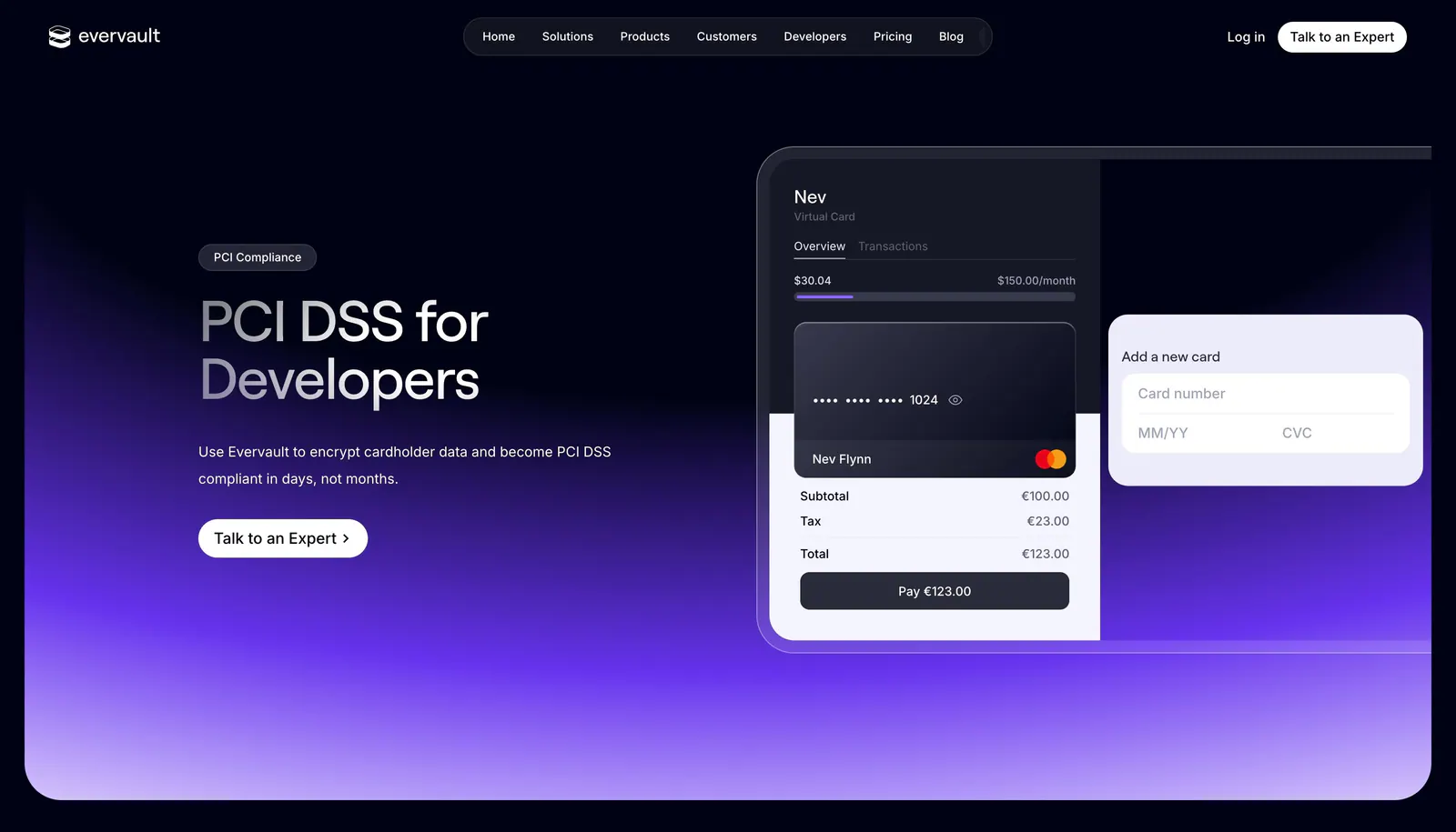
  77. Evervault hero section: nav bar, left headline with expert CTA beside a virtual card payment UI mockup over a purple glow on dark navy
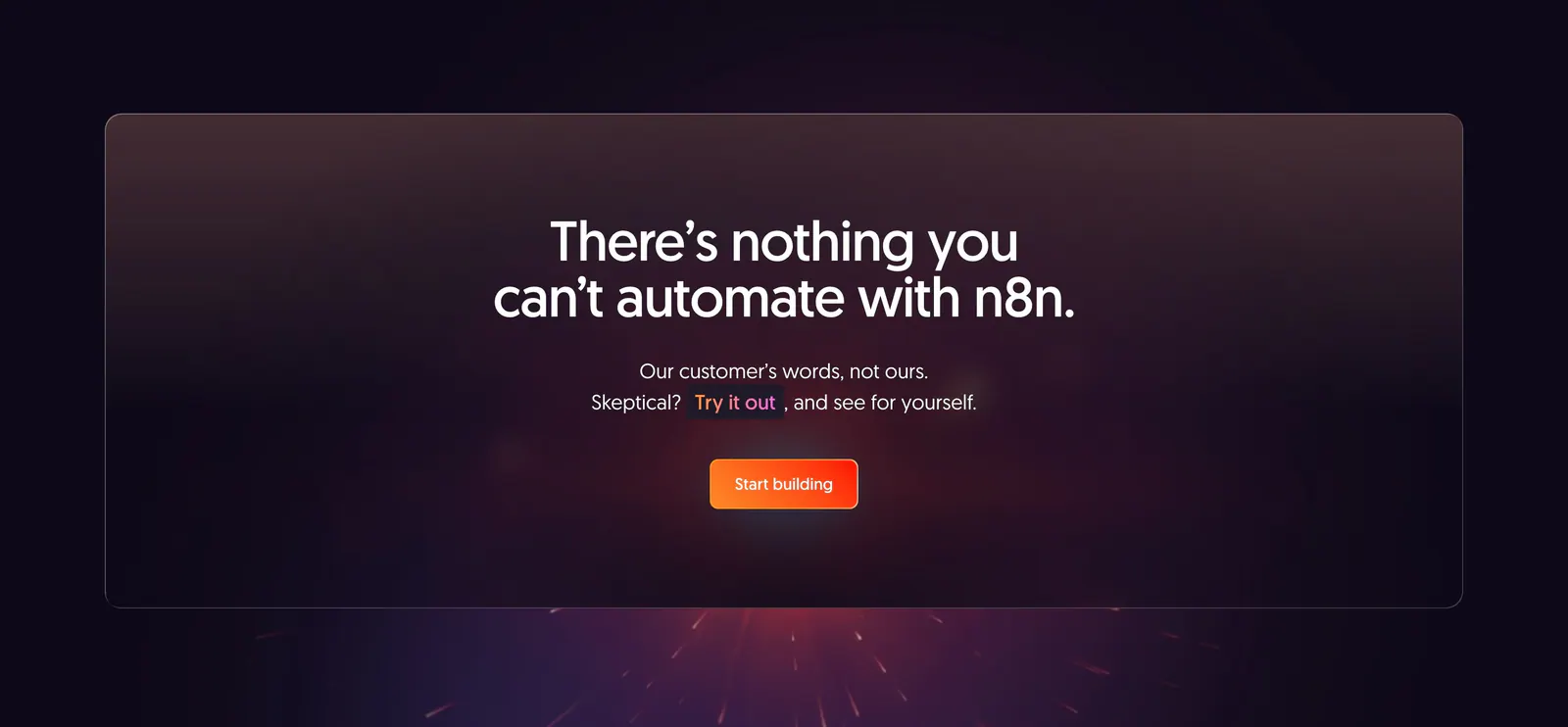
  78. n8n call-to-action section: centered headline and orange button in a translucent panel over a dark purple glow with sparks
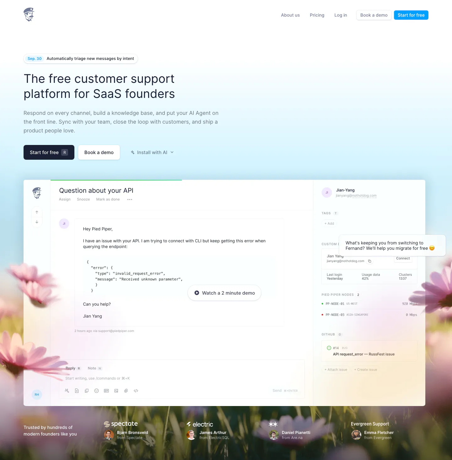
  79. Fernand hero section: left-aligned headline and two CTAs above an inbox product screenshot on a sky-blue gradient with a blurred flower field
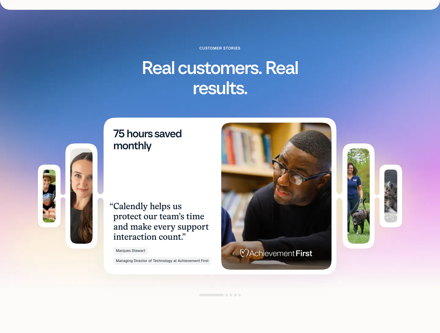
  80. Calendly testimonials section: centered headline on a blue-purple gradient above a quote card carousel with customer photos and pagination dots
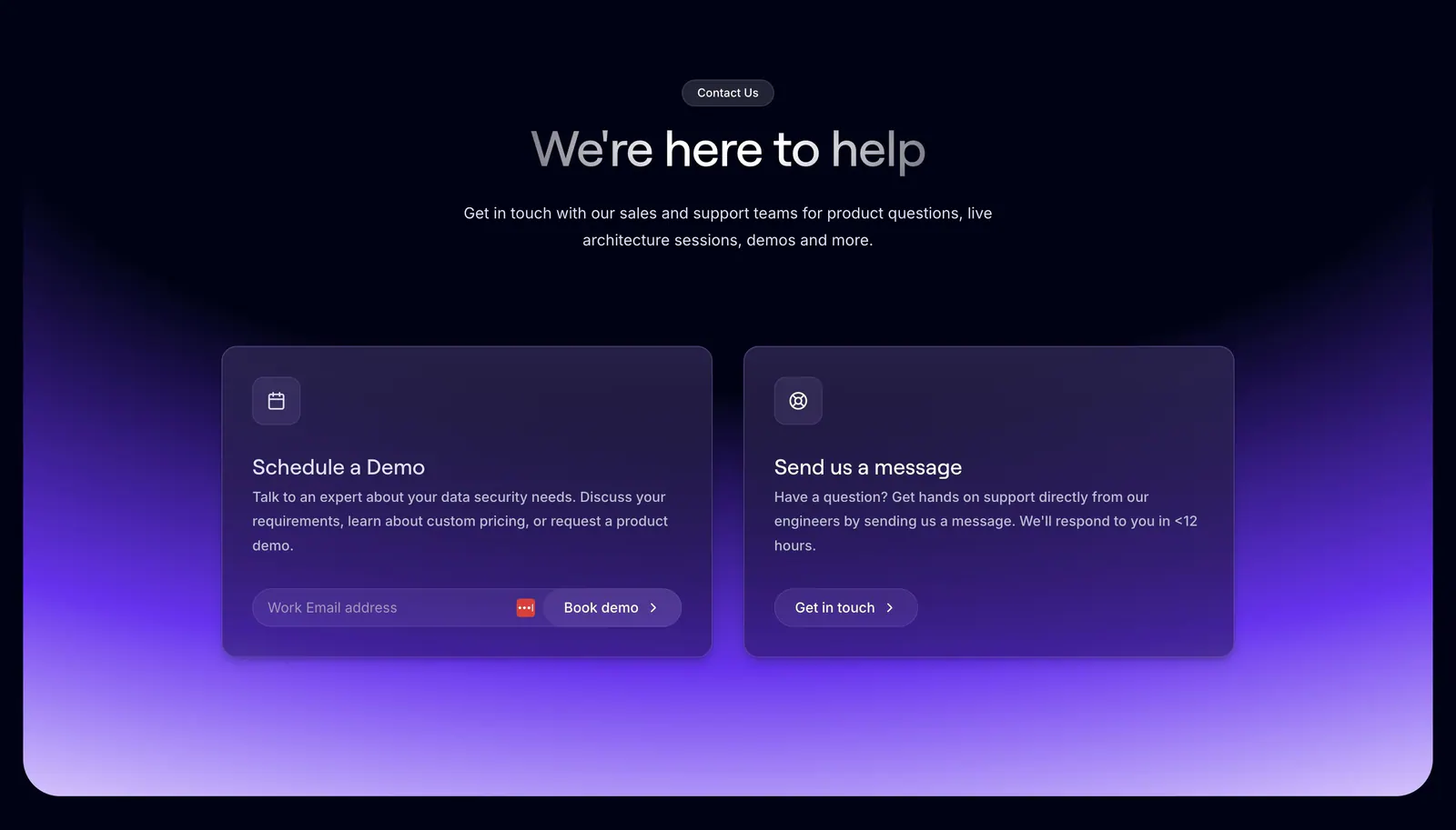
  81. Evervault contact section: centered heading above two cards for booking a demo and messaging support over a purple glow on dark navy
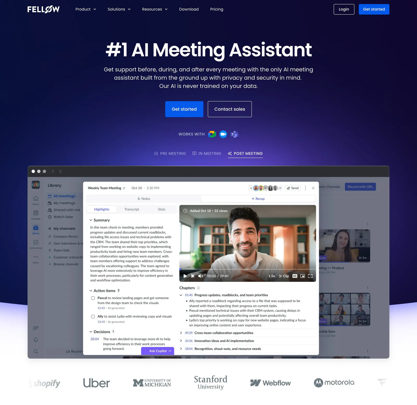
  82. Fellow hero section: centered headline and CTAs on deep navy above a meeting recap app screenshot with tabs and a customer logo row
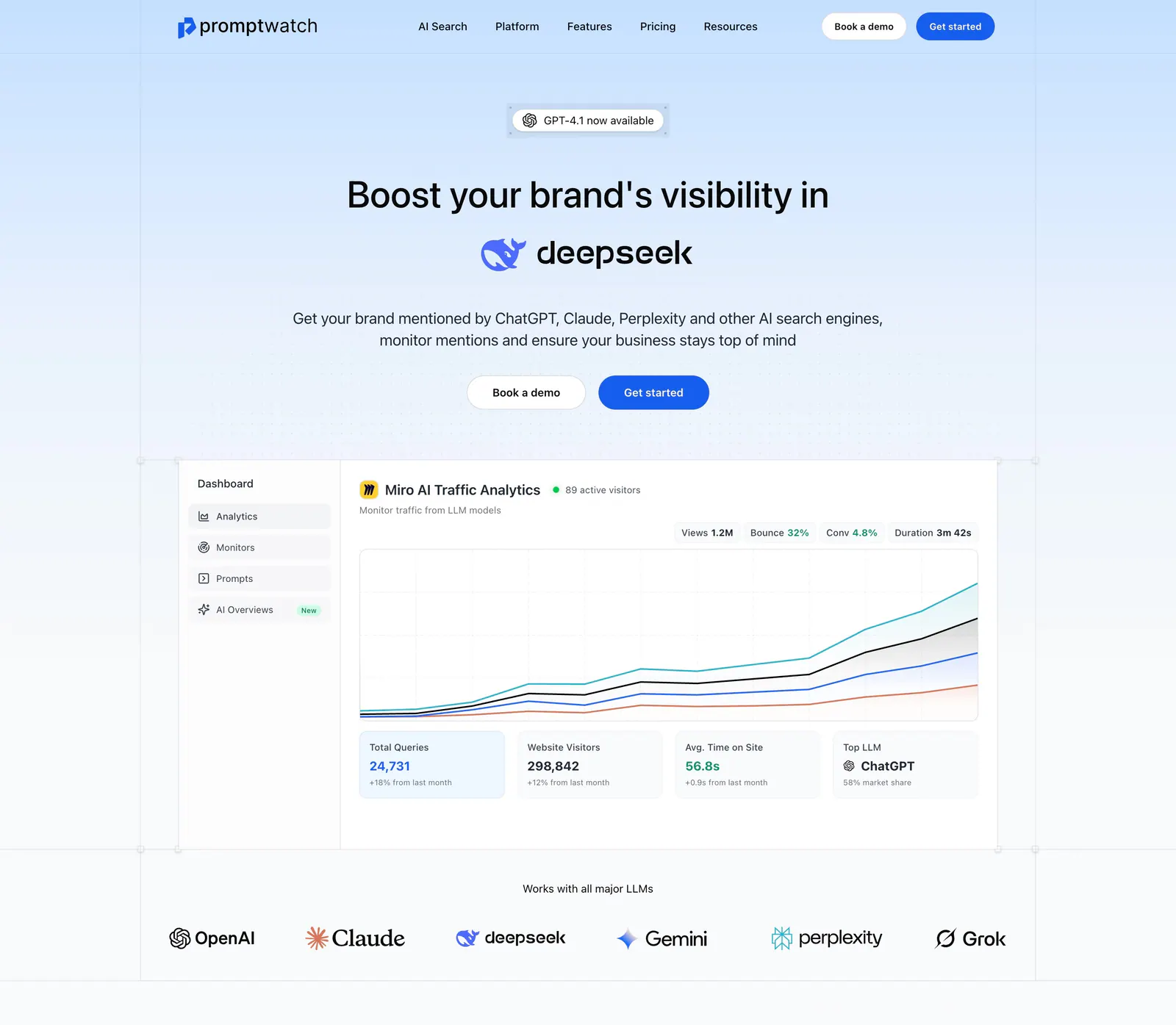
  83. Promptwatch hero section: centered headline with DeepSeek logo, two buttons, analytics dashboard screenshot and LLM logo row
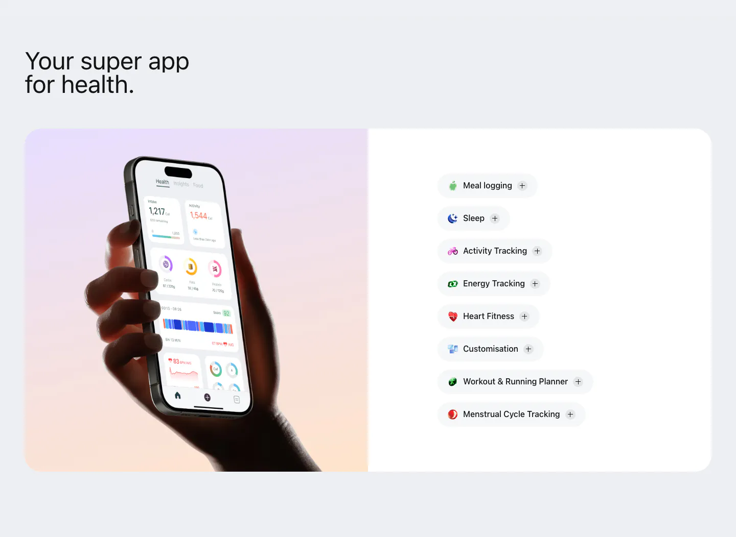
  84. Bright features section: hand holding a phone with the health app on a lavender-peach gradient panel beside a list of feature pills
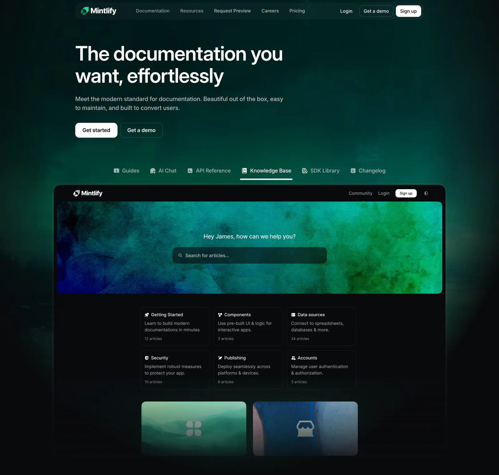
  85. Mintlify hero section: left-aligned headline on dark green glow above product tabs and a knowledge base docs screenshot
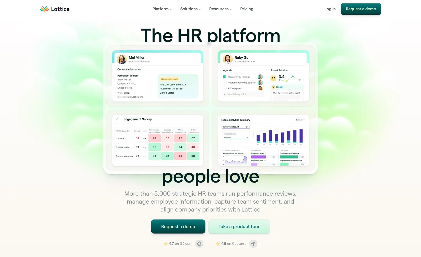
  86. Lattice hero section: nav bar, large headline split around a grid of four HR product UI cards, centered copy, two CTAs and ratings on green glow
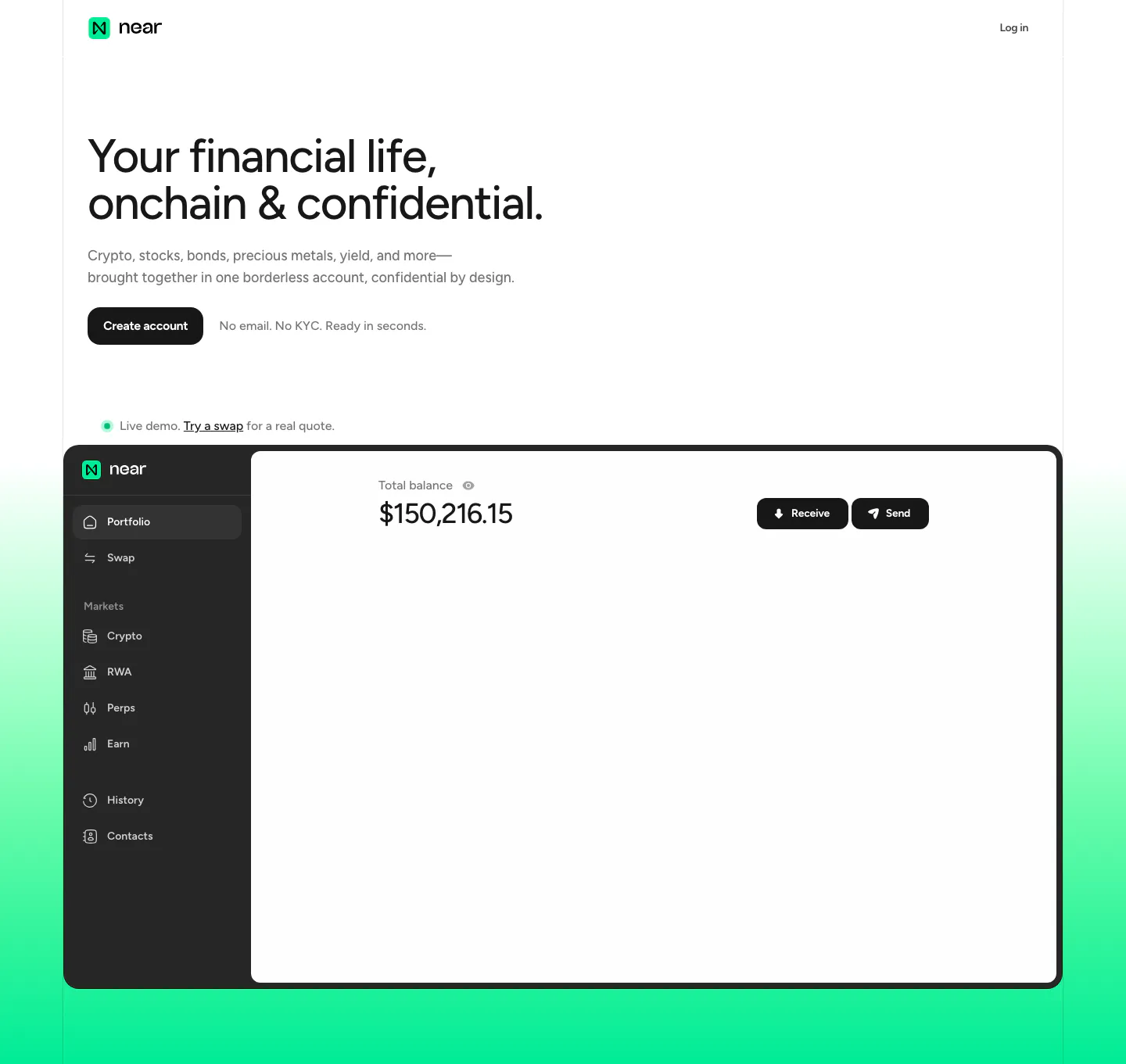
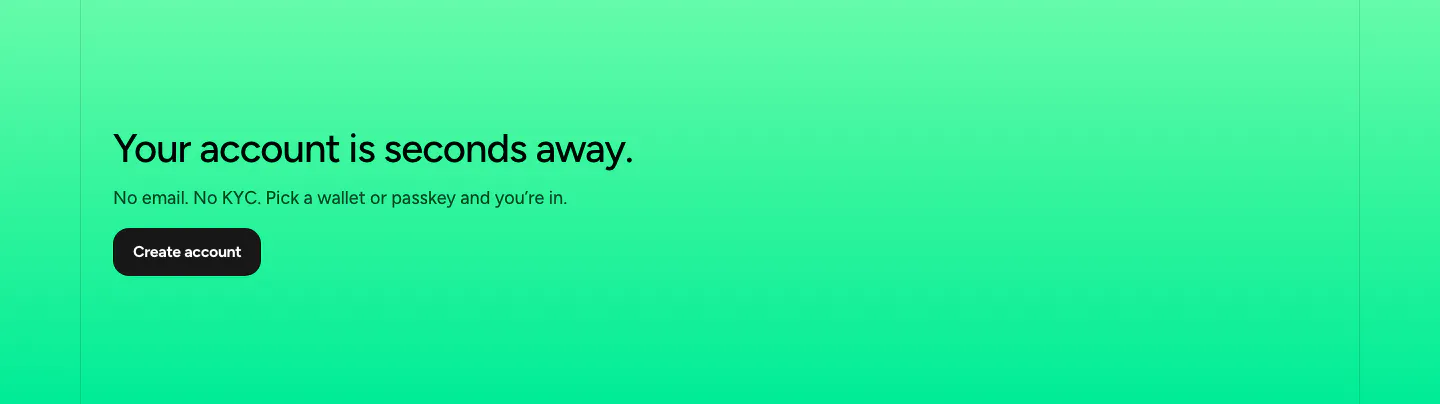
  87. NEAR hero section: left-aligned headline and Create account button above a portfolio app screenshot on a mint green gradient
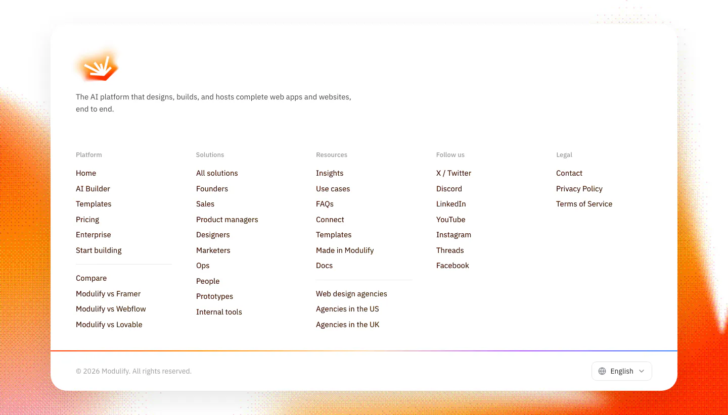
  88. Modulify footer section: white rounded card with logo, five link columns and language picker over grainy orange edges
  89. Synthesia call-to-action section: headline with two buttons on the left and a video editor UI screenshot on a lavender-blue gradient right
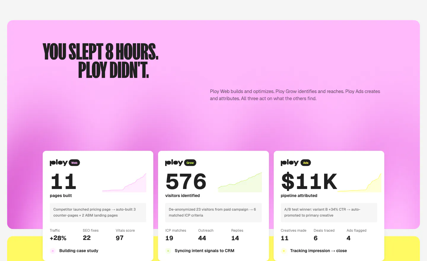
  90. Ploy features section: condensed headline on a pink gradient panel above three white metric cards with sparklines for Web, Grow and Ads
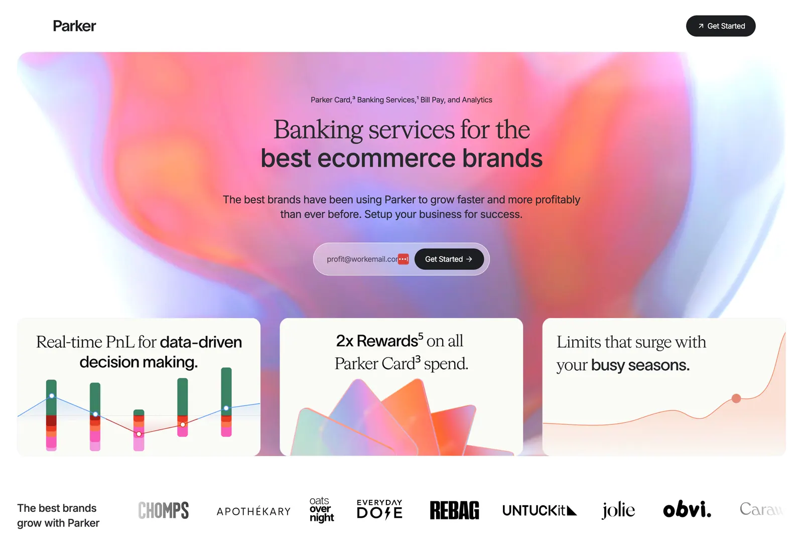
  91. Parker hero section: centered headline and email signup on a pink-orange aurora gradient above three feature cards and a brand logo row
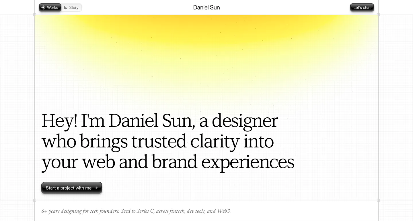
  92. Daniel Sun hero section: left-aligned serif headline and dark pill button under a yellow glow on a faint grid-line background
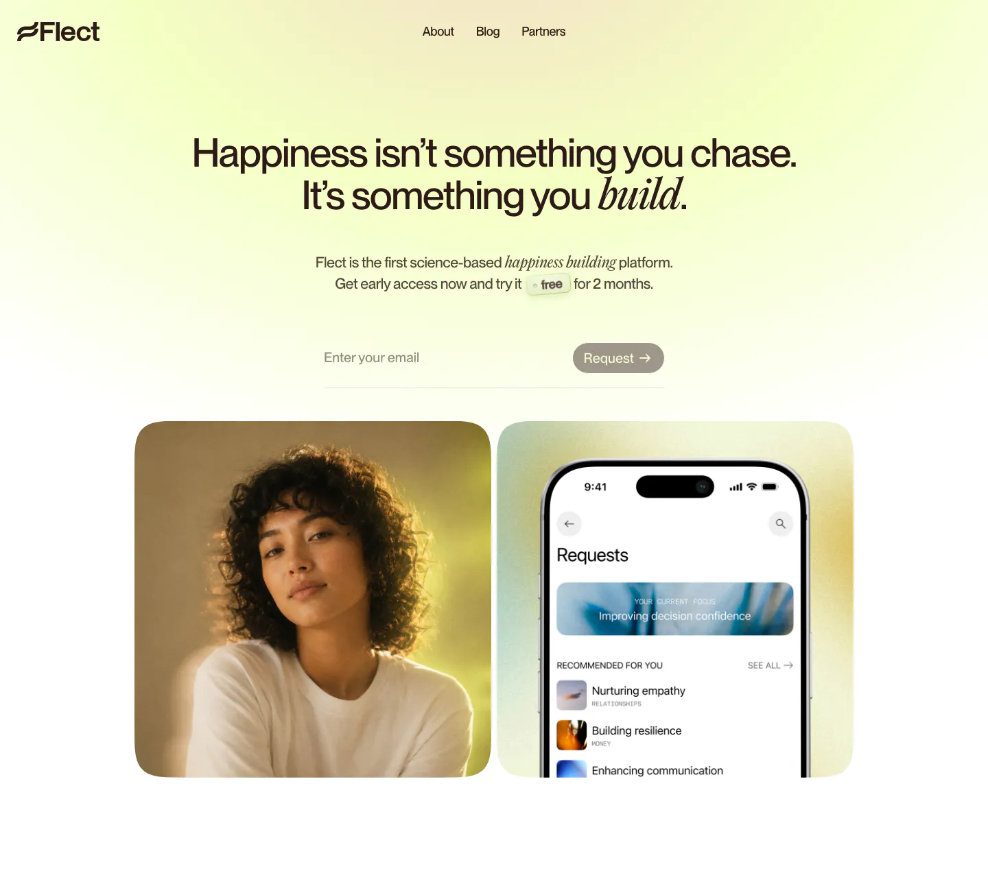
  93. Flect hero section: centered headline with email request field above a portrait photo and a phone app screenshot on yellow-green glow
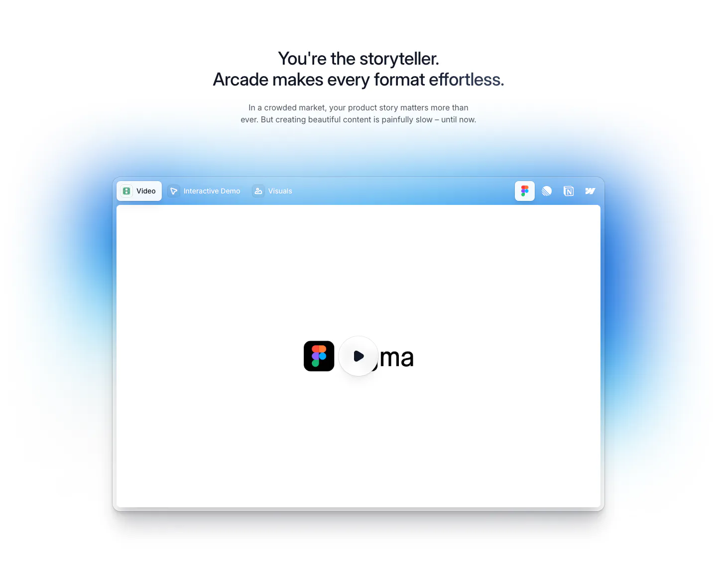
  94. Arcade features section: centered headline above a tabbed video player window with a play button and soft blue glow
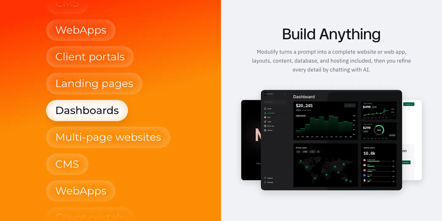
  95. Modulify features section: orange gradient panel of stacked use-case pills beside a headline and dark dashboard mockups
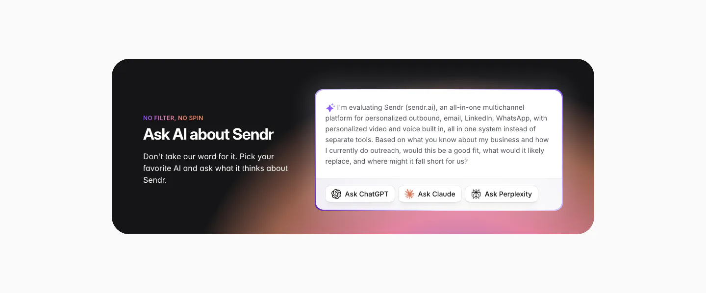
  96. Sendr call to action section: dark rounded card with warm glow, headline left, prefilled AI prompt with Ask ChatGPT, Claude, Perplexity buttons
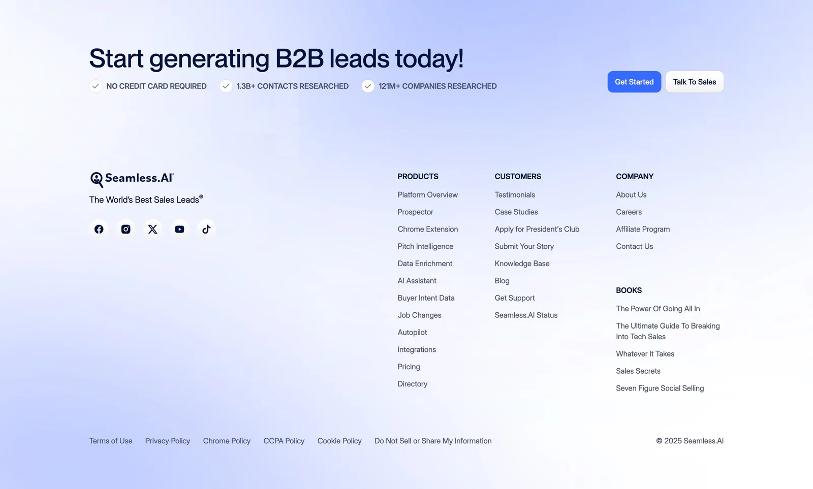
  97. Seamless.AI footer section: CTA headline with buttons above logo, social icons and link columns on a soft blue gradient background
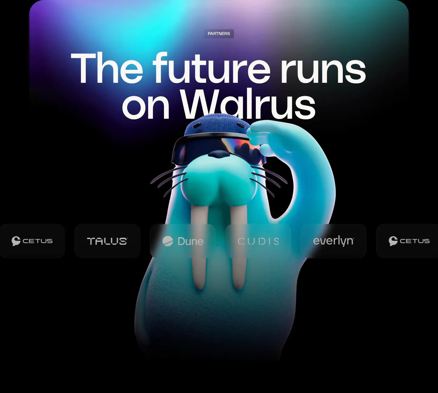
  98. Walrus logo cloud section: huge headline over aurora glow with a 3D walrus mascot behind a row of partner logos
  99. Modulify features section: centered headline above a four-card bento of product UI mockups on an orange gradient band
  100. NEAR call-to-action section: left-aligned headline, short copy and dark button on a bright green gradient band
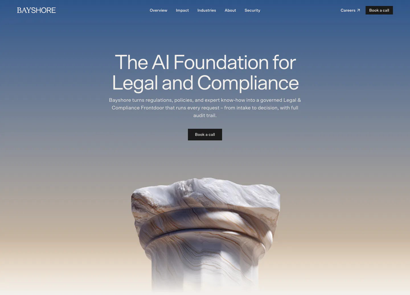
  101. Bayshore hero section: centered headline and Book a call button over a blue-to-sand gradient with a 3D marble column render
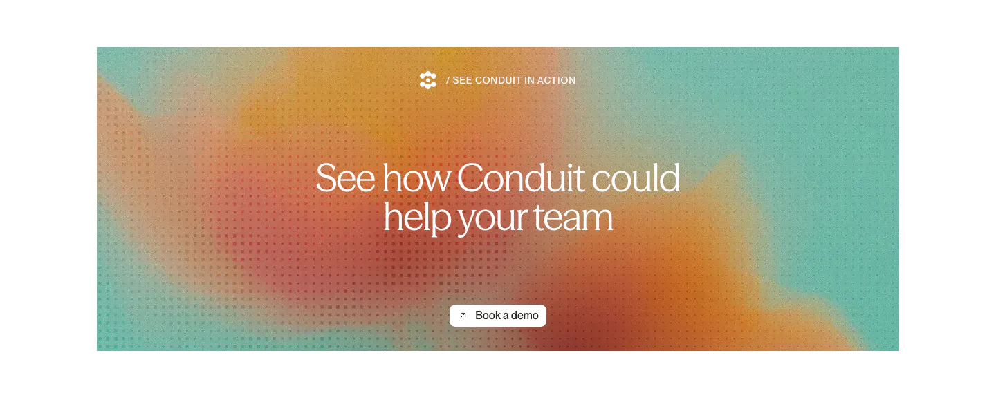
  102. Conduit call-to-action section: centered serif headline and button on an orange and teal gradient panel with dot texture
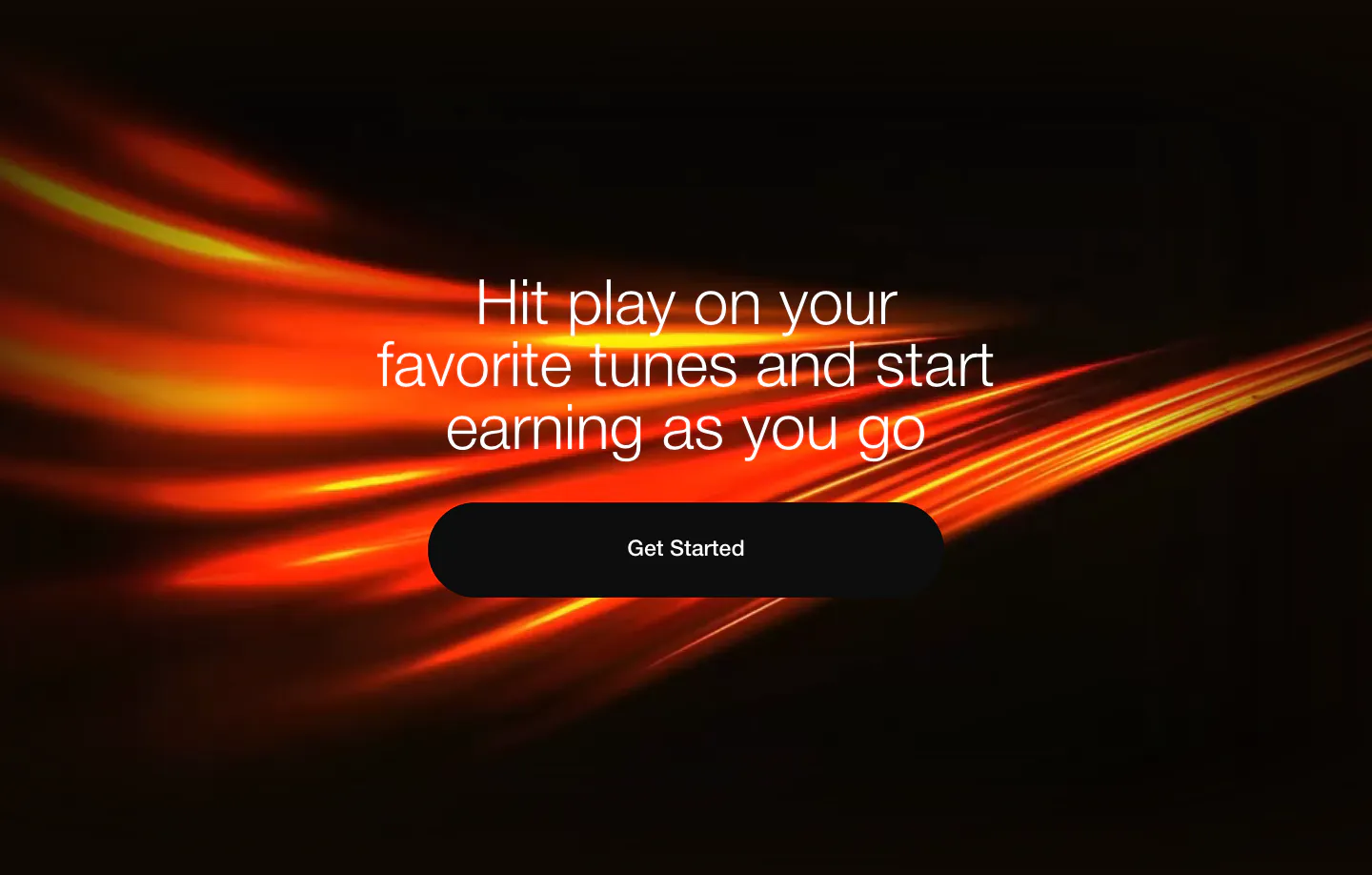
  103. EchoFi call-to-action section: centered headline and black pill button over sweeping orange light streaks on black
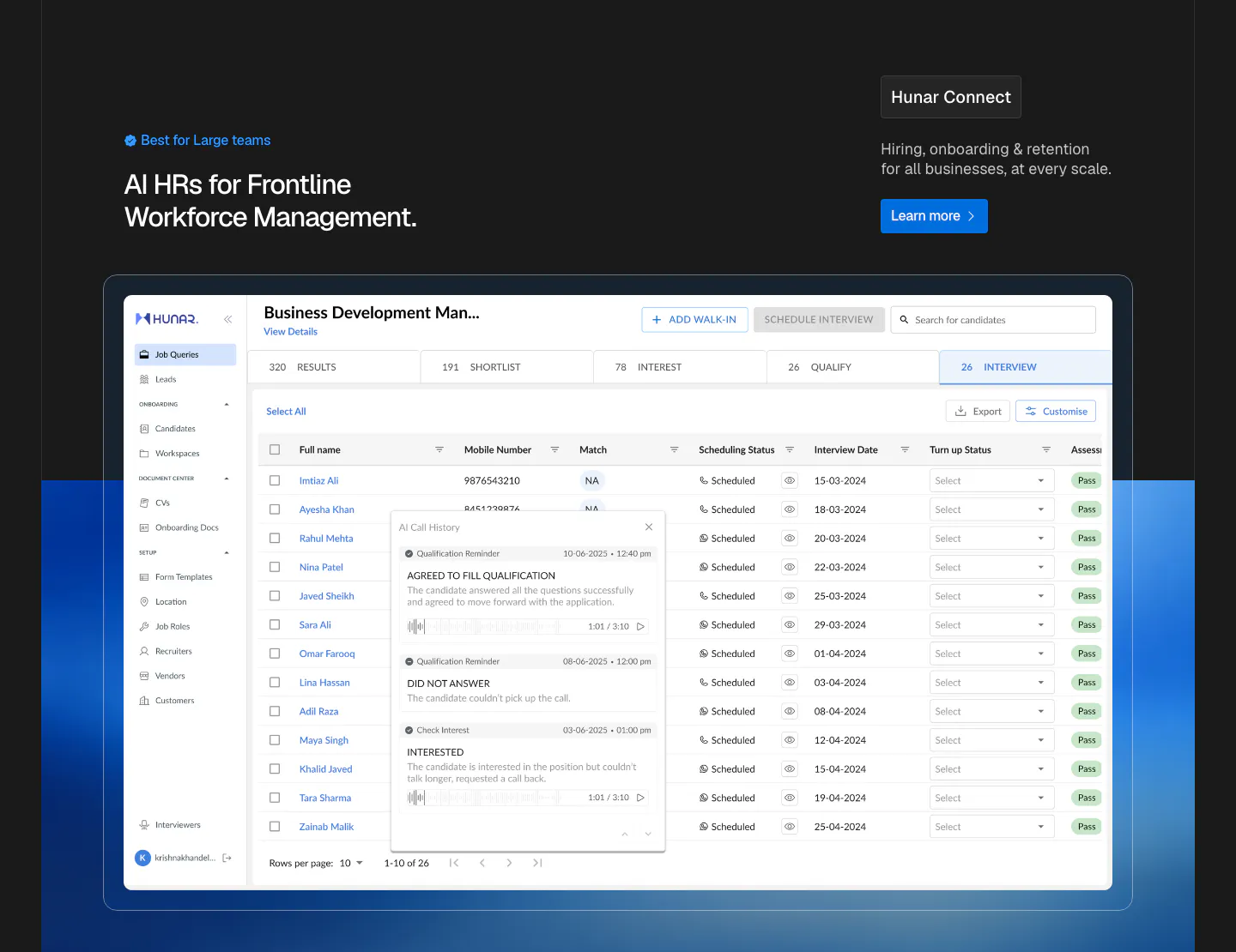
  104. Hunar features section: dark header with heading and Learn more button above a large candidate table screenshot on a blue glow
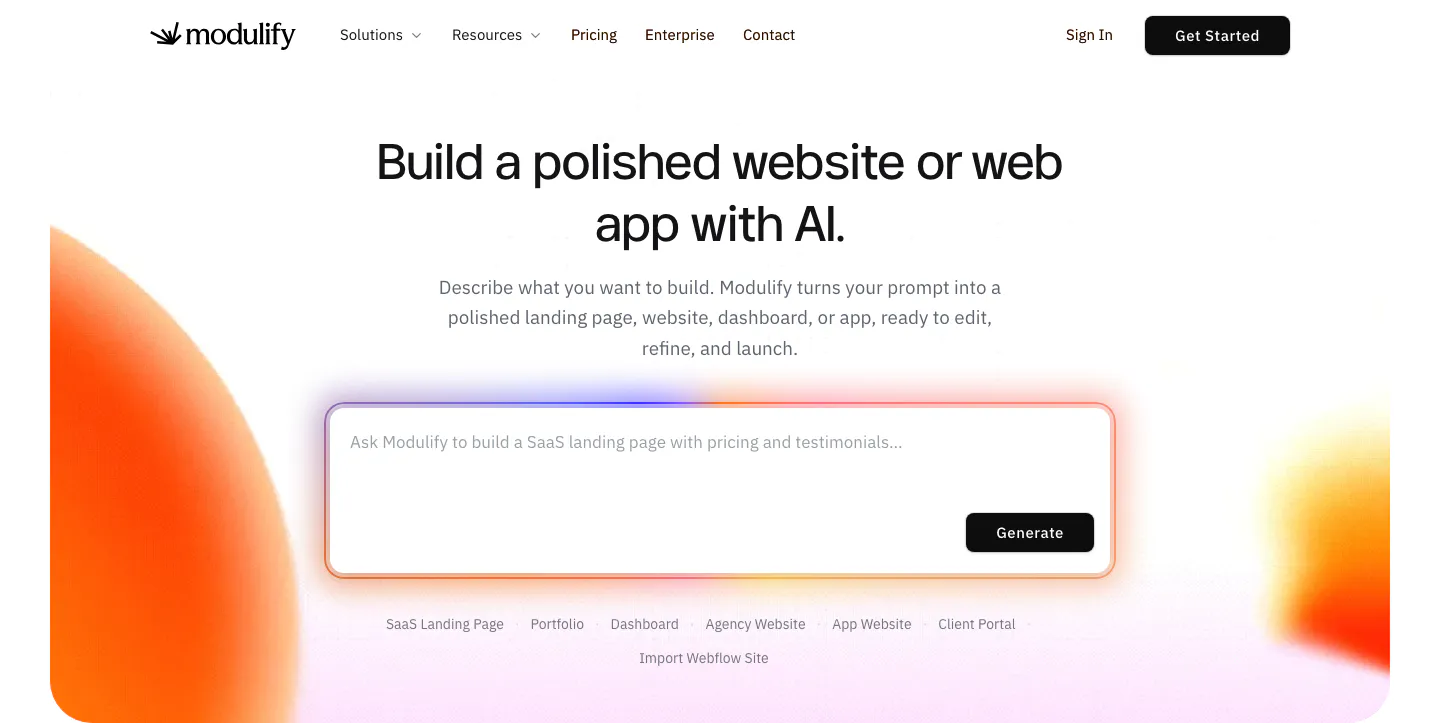
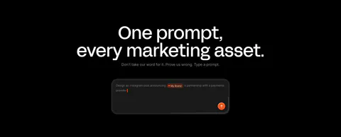
  105. Modulify hero section: centered headline above a large AI prompt box with template chips, flanked by orange gradient blobs
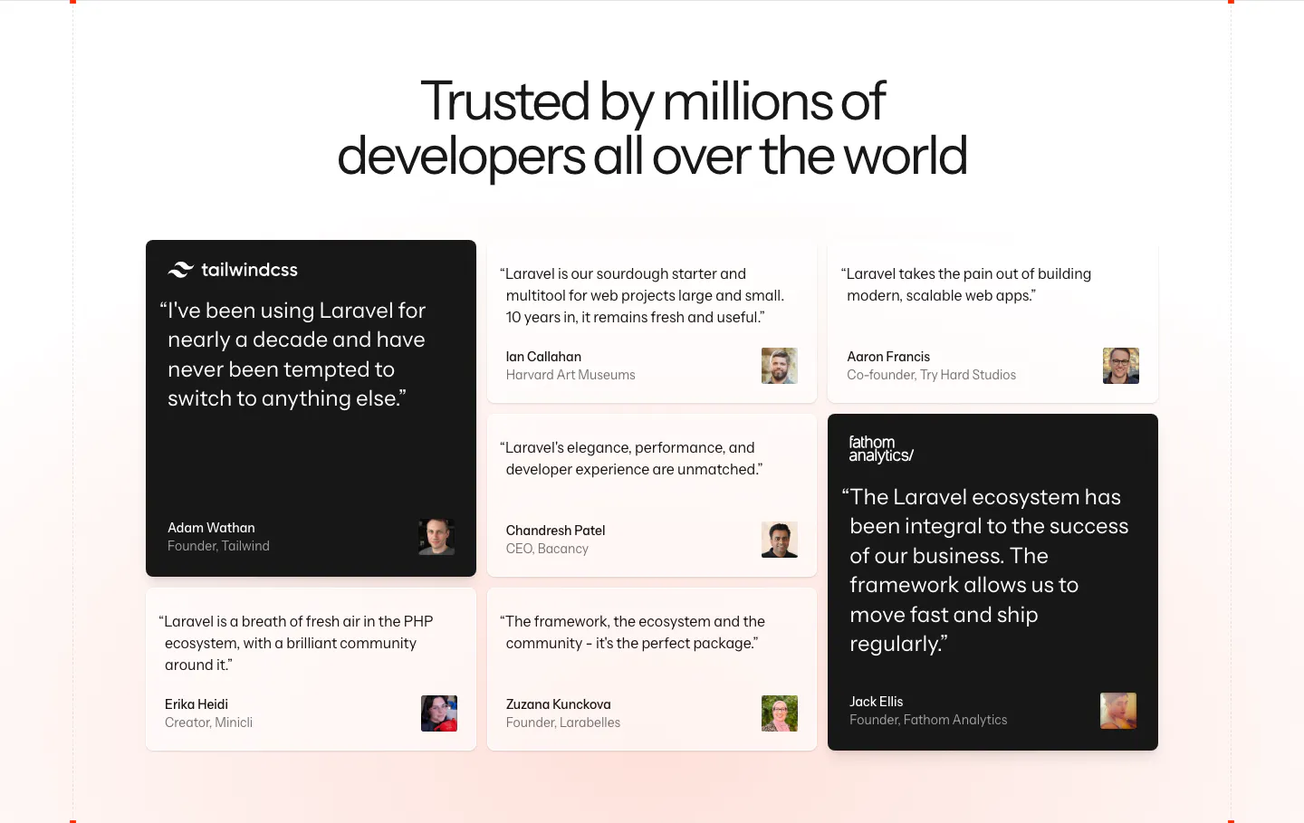
  106. Laravel testimonials section: centered headline above a masonry grid of developer quote cards, two highlighted in black, on a soft pink fade
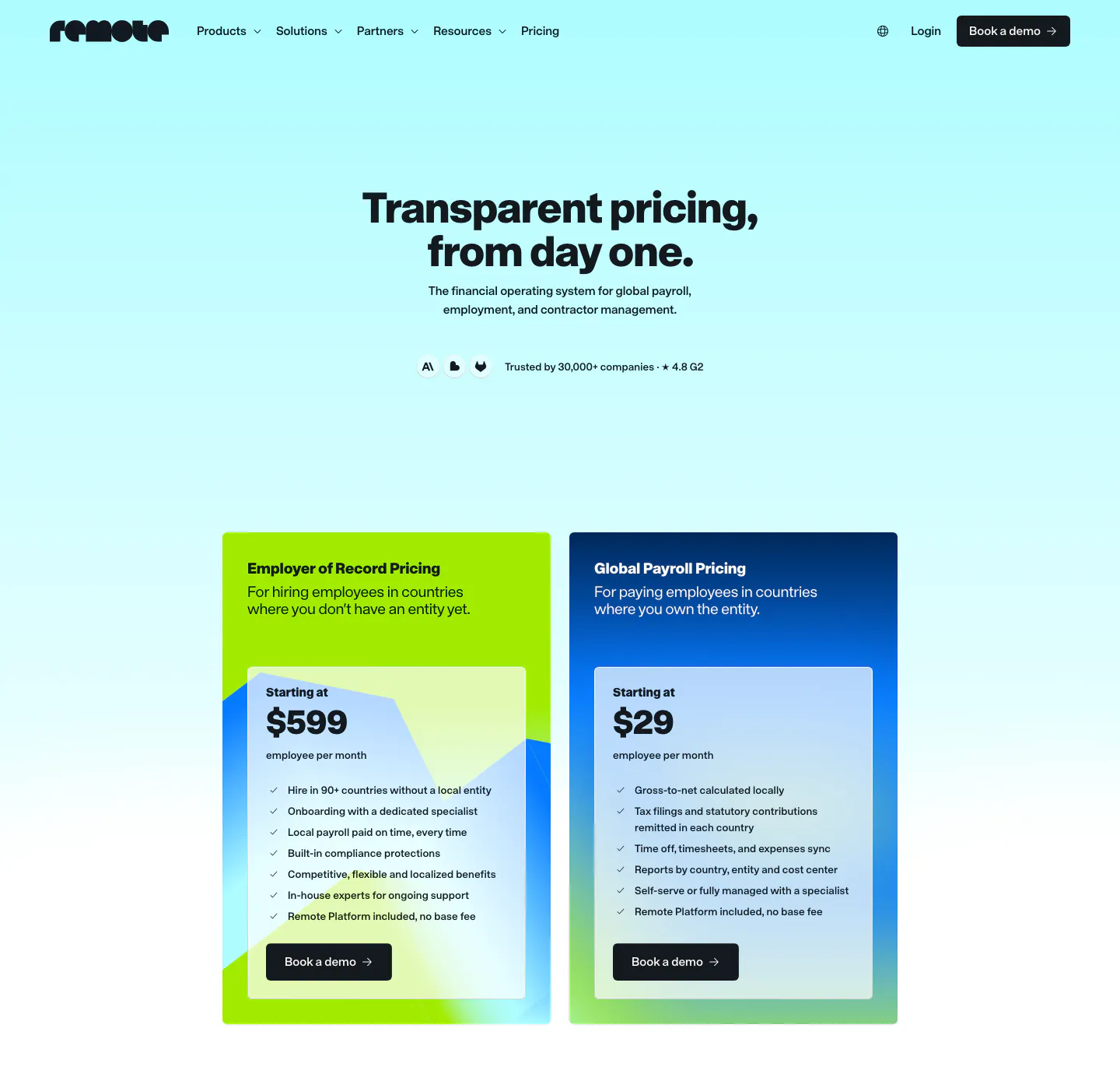
  107. Remote pricing section: nav and centered headline above two plan cards, lime EOR and blue Global Payroll, on cyan gradient
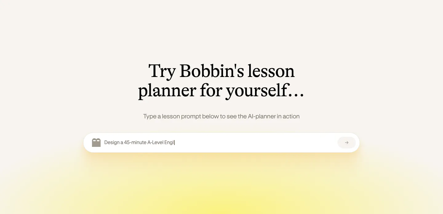
  108. Bobbin call to action section: centered serif heading above a lesson prompt input field with a soft yellow glow on cream
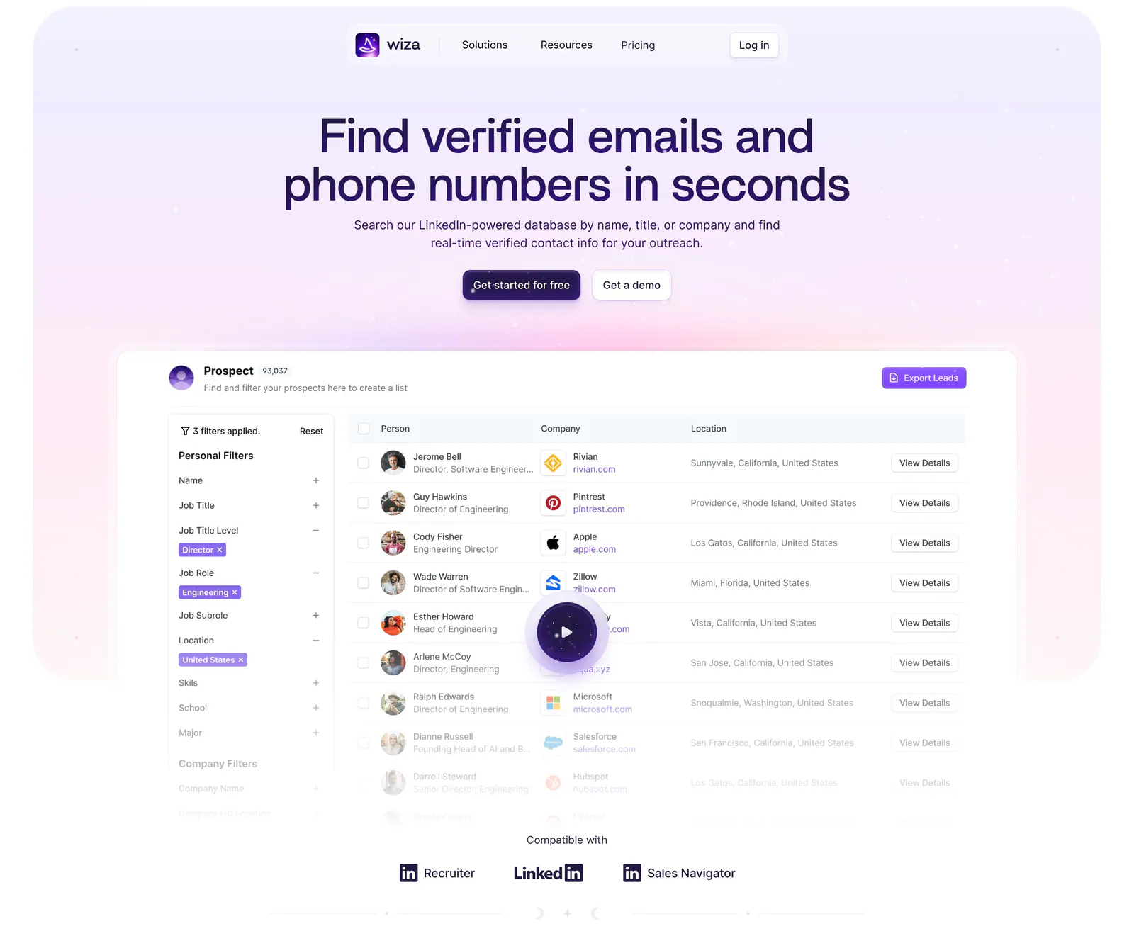
  109. Wiza hero section: centered headline and two buttons above a prospect table product screenshot with play button on a lavender glow
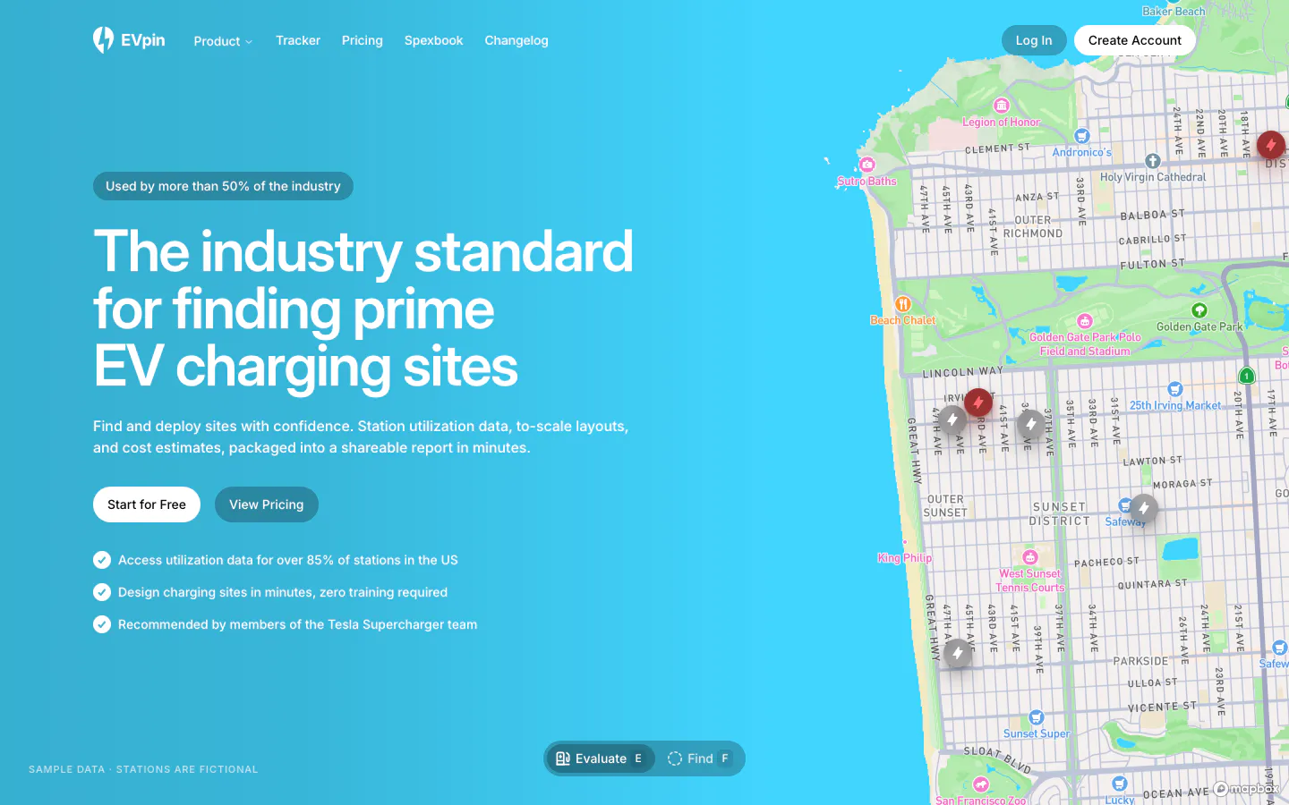
  110. EVpin hero section: headline, buttons and checklist on a bright cyan gradient beside a street map with charging station pins
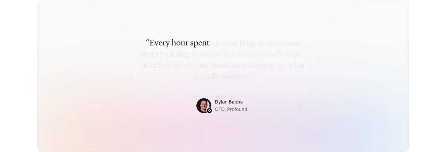
  111. Interfere testimonials section: centered serif quote fading in over a soft pastel gradient card with author avatar below
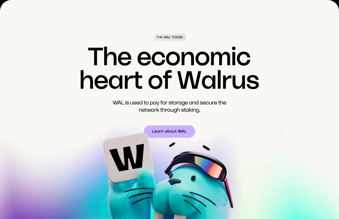
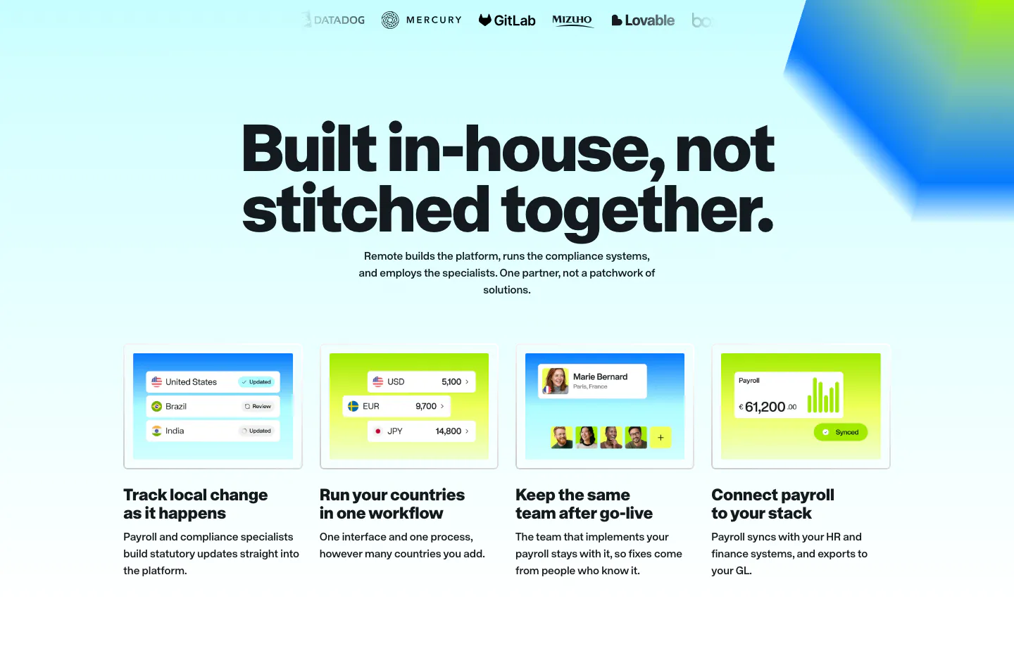
  112. Walrus features section: huge centered headline and lavender button above a 3D walrus holding a W tile on off-white
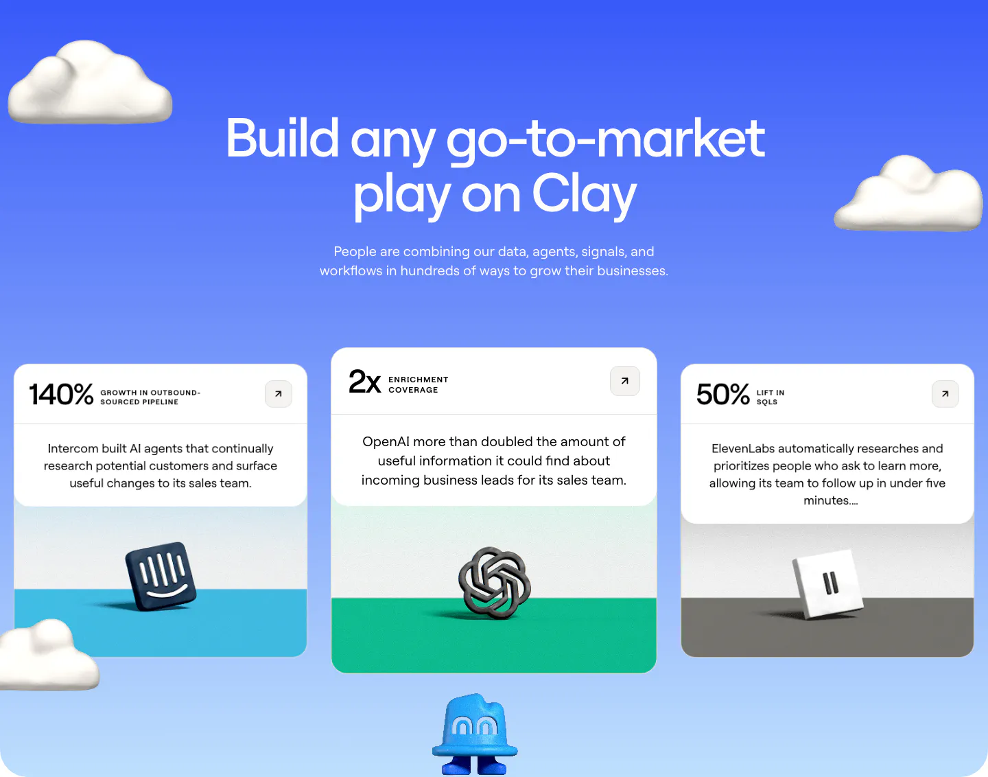
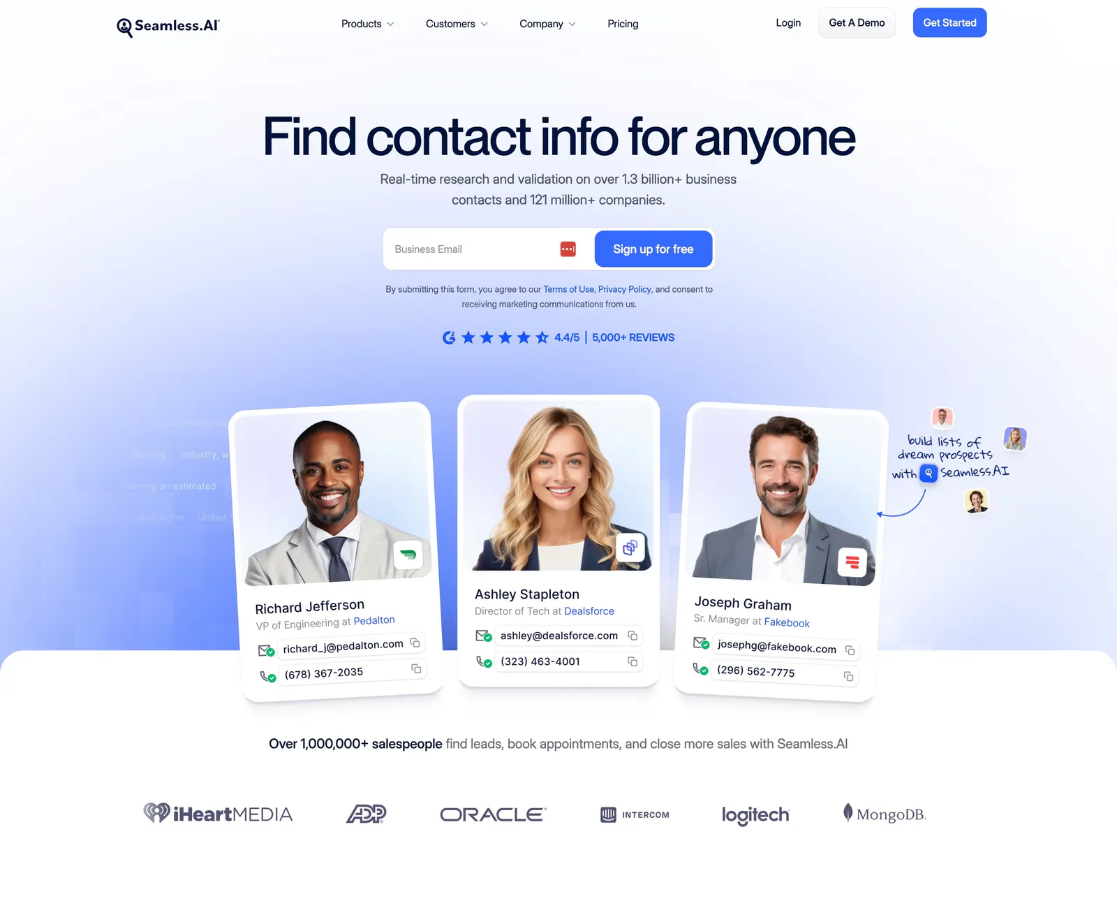
  113. Clay testimonials section: centered heading on a blue gradient with 3D clouds above three case study cards with metrics and 3D brand logos
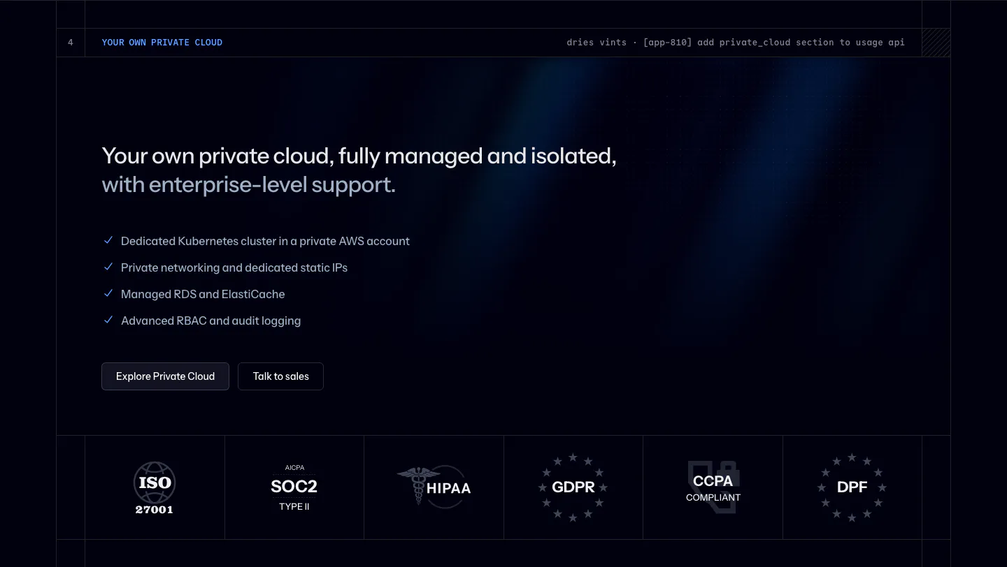
  114. Remote features section: logo row, large centered headline and four cards with payroll UI mockups on cyan and lime
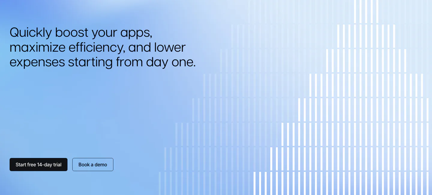
  115. Seamless.AI hero section: centered headline and email signup above contact cards with portrait photos and a customer logo row
  116. Laravel Cloud security section: headline, private cloud checklist and buttons above a row of ISO, SOC 2, HIPAA and GDPR badges on dark navy
  117. Polar Signals call to action section: left headline and two buttons on a blue gradient with white vertical bars rising like a bar chart
  118. Valley call-to-action section: white headline and two buttons over a full-bleed blurred orange, peach and teal abstract image
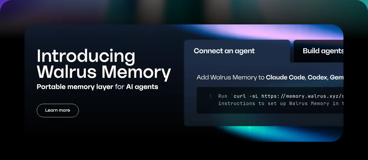
  119. Walrus features section: dark rounded banner with product intro on the left and a tabbed code snippet panel on the right
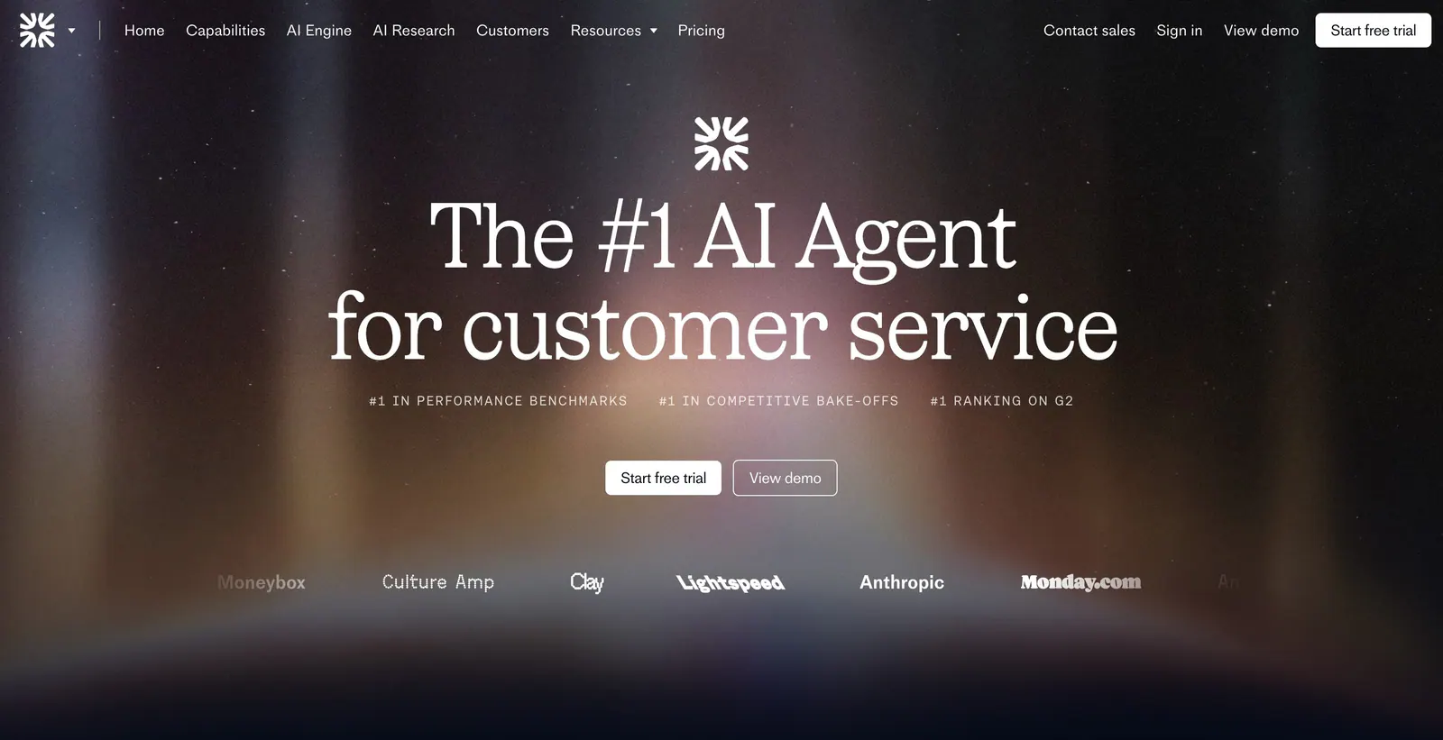
  120. Fin hero section: nav bar, centered serif headline, ranking labels and CTAs over a dark aurora glow with a customer logo row
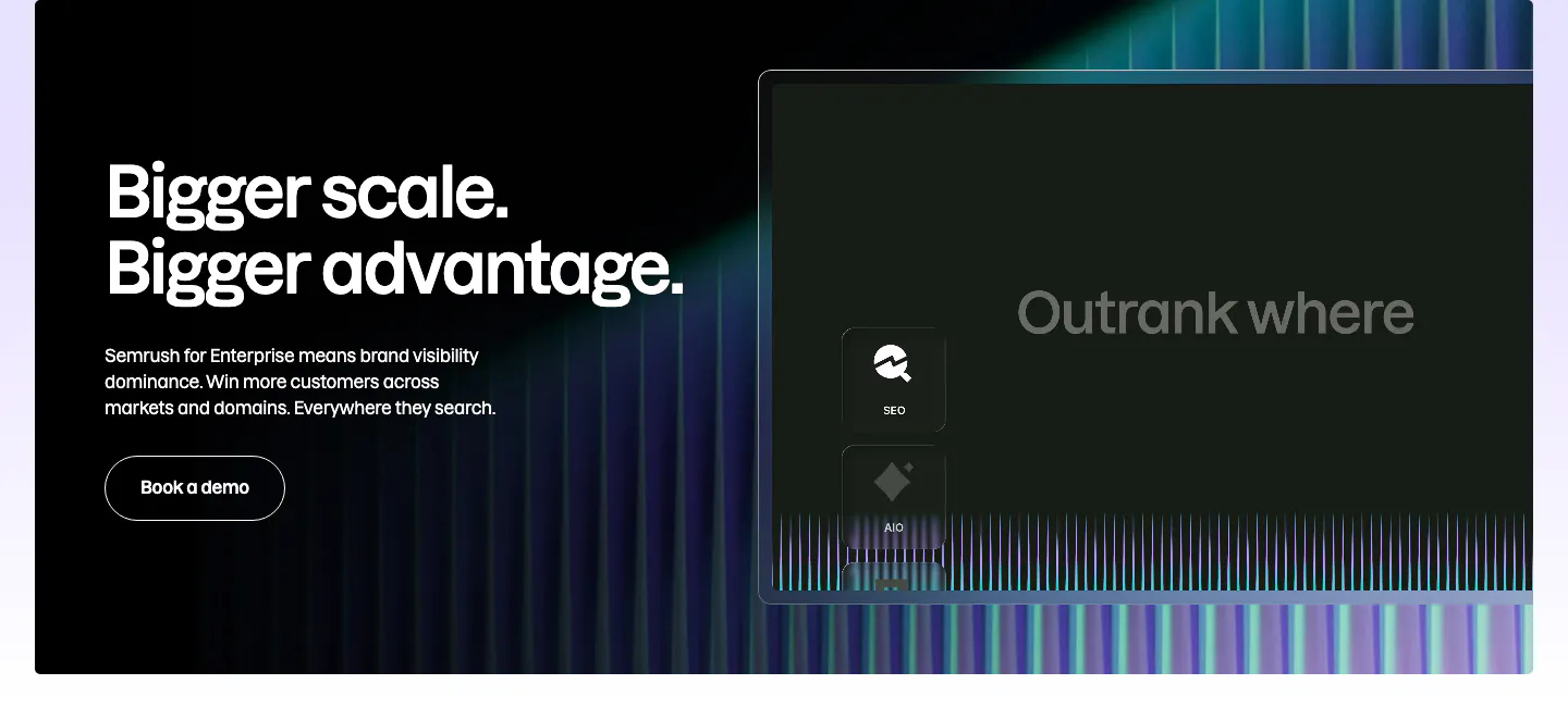
  121. Semrush features section: dark enterprise banner with headline and Book a demo button left, stylized product panel and neon stripes right
  122. Remote hero section: nav, left headline with checklist and demo button beside a blurred blue and lime 3D cube on gradient
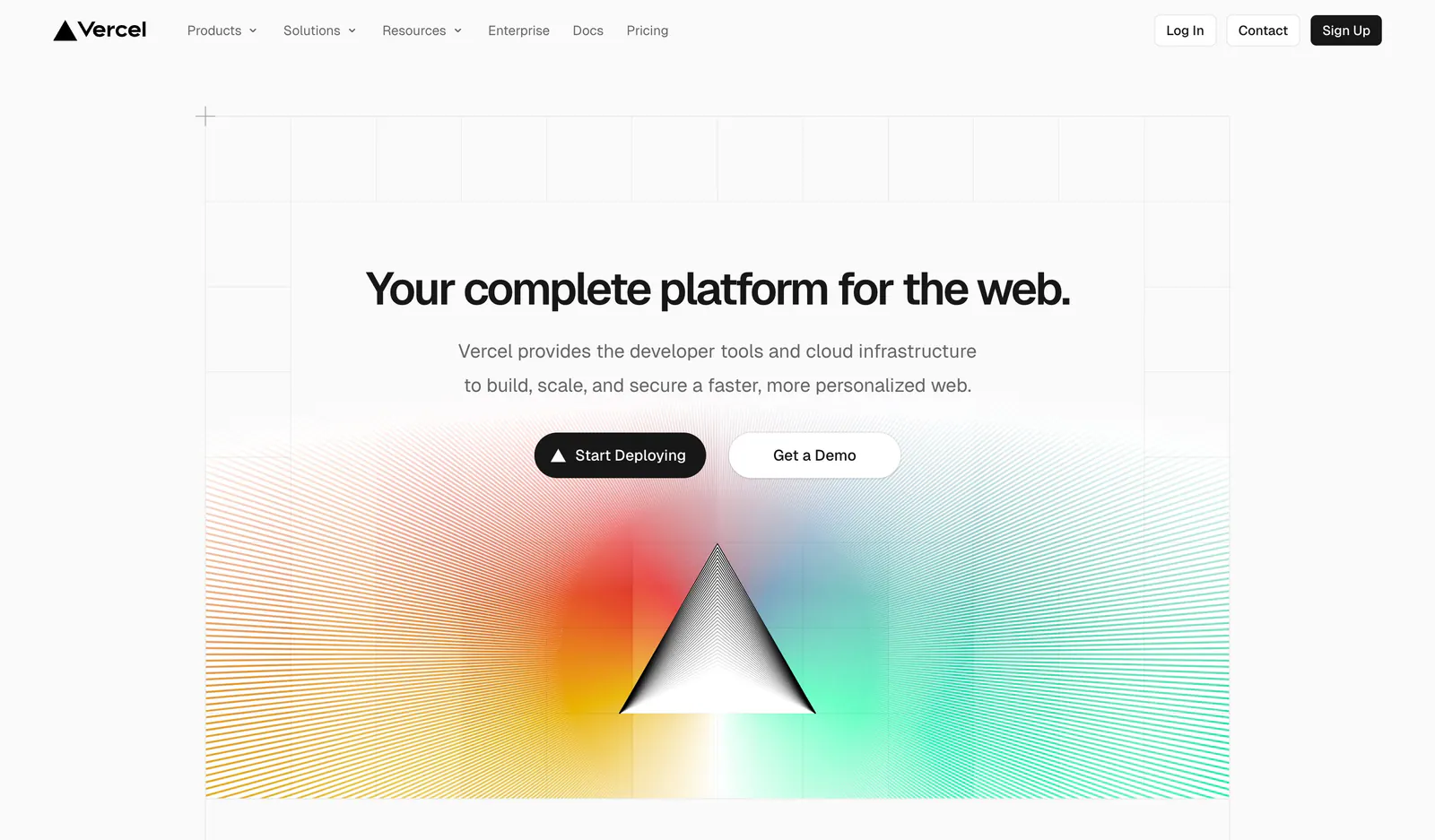
  123. Vercel hero section: centered headline and two buttons on a grid background above a black prism radiating rainbow gradient line rays
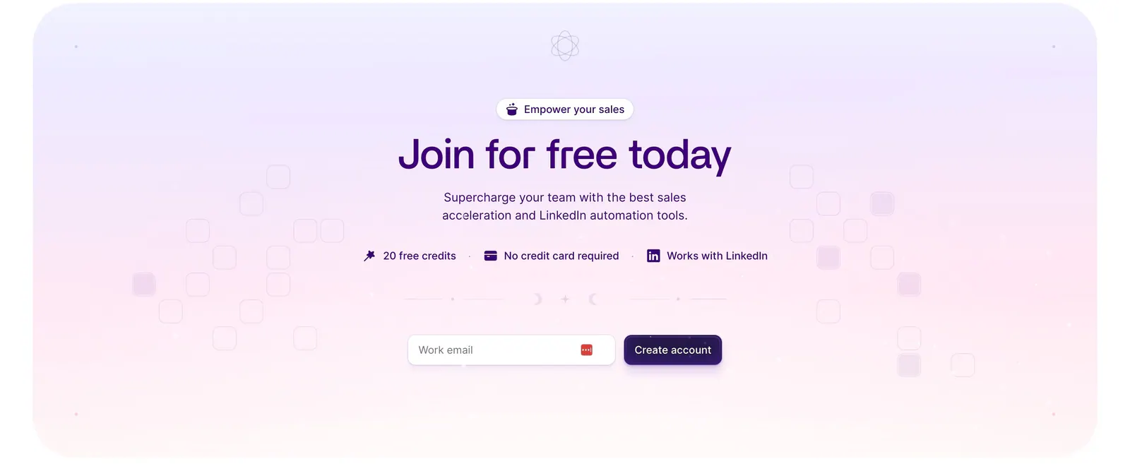
  124. Wiza call-to-action section: centered headline, benefit badges and work-email signup field on a lavender-to-pink gradient card
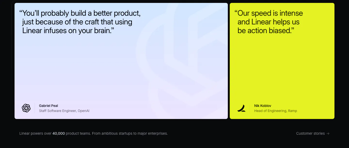
  125. Linear testimonials section: dark background with a large blue-lavender gradient quote card and a lime quote card, caption below
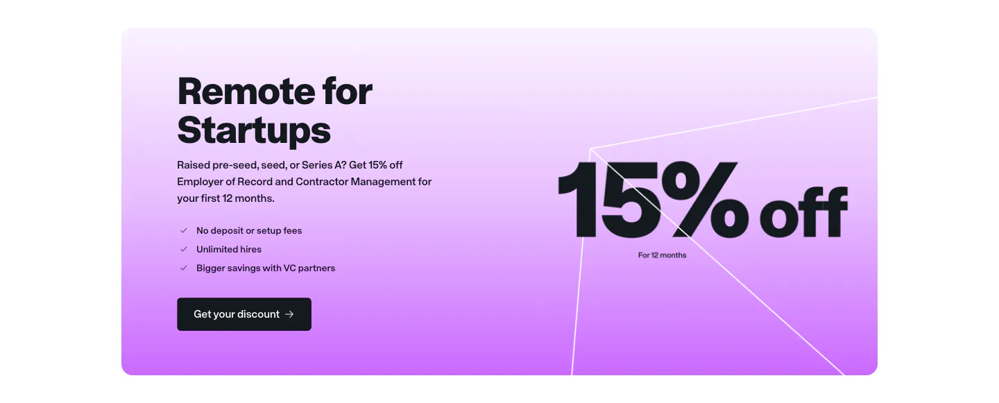
  126. Remote call to action section: startup offer card with headline, checklist and button beside large 15% off text on purple gradient
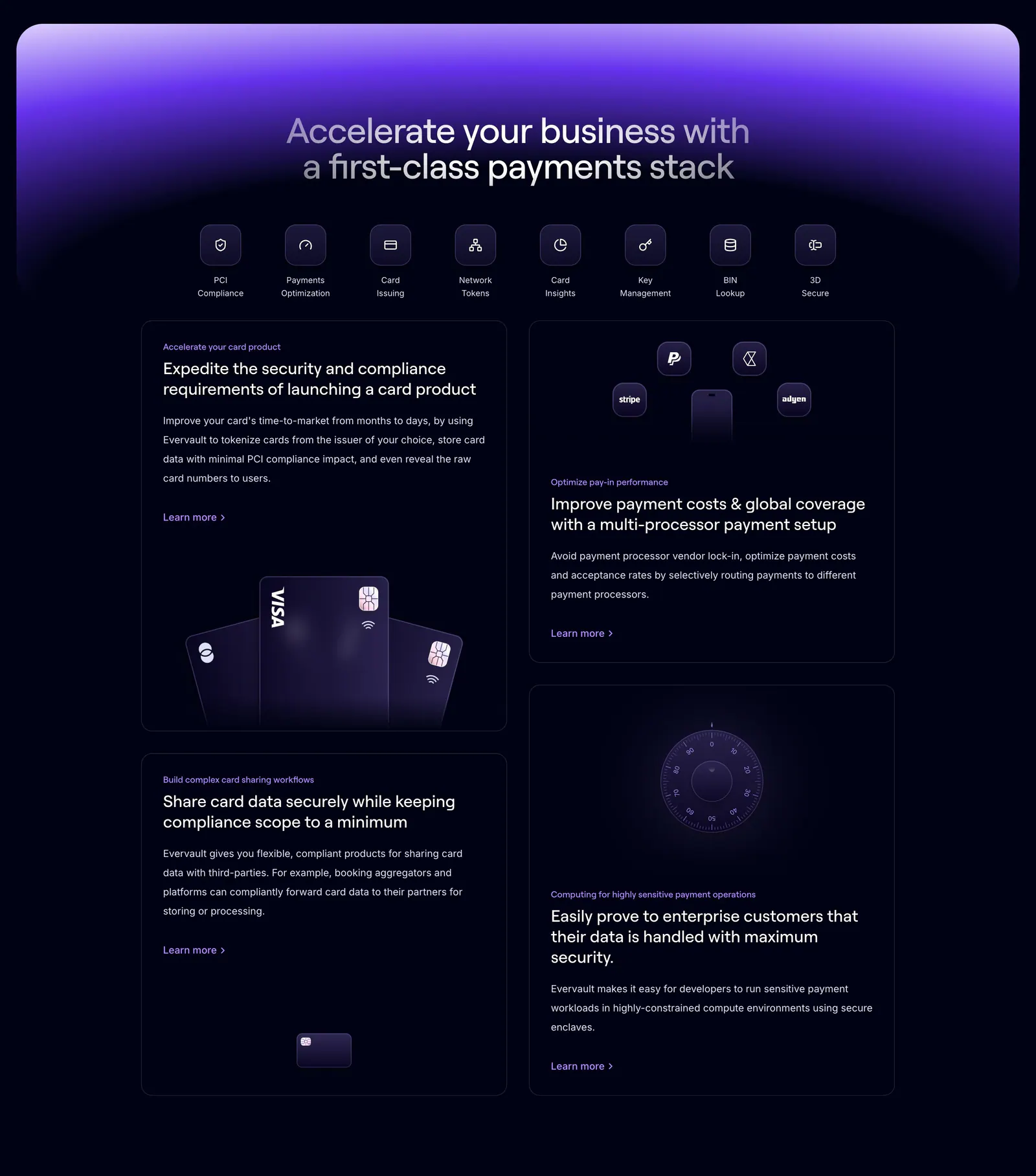
  127. Evervault features section: centered headline and icon row above four dark cards with payment card and vault visuals under a purple glow

Where gradient shows up

Often paired with

Share of gradient sections that also use each style

How to use gradient backgrounds well

  1. Place text where the blend is calm

    Put headlines and body copy where the gradient is lightest or most uniform. If the blend passes through mid-tones behind text, add a subtle scrim or reduce saturation in that zone. Check contrast at the worst point the text crosses, not the average.

  2. Build palettes from brand colors

    Start from two or three colors already in your brand and blend between hues that sit near each other on the color wheel. Complementary pairs pass through a muddy gray in the middle, so add an intermediate stop or interpolate in OKLCH to keep the transition clean.

  3. Add grain to prevent banding

    Smooth gradients often show visible steps on large screens and in compressed screenshots. A light noise overlay at two to four percent opacity hides banding and adds texture. Use a small tiled image or an SVG filter so it does not bloat page weight.
  4. Render with CSS, not huge images
    Use layered radial and linear gradients in CSS instead of full-width PNGs. They scale to any viewport, cost almost nothing to load, and are easy to tweak. If you animate the glow, keep the motion slow and respect reduced-motion preferences.

Companies using gradient

All styles
    ↑↓ Navigate ↵ Open

    Section preview

    Website section