Photography Website Design Examples

Real photos of people, places, and physical products build trust faster than most other visuals. Hardware, hospitality, retail, and service businesses lean on photography in website design most, because their customers want to see the real thing. Shortcuts show immediately, though. A generic stock image or a slow, oversized file undoes the credibility that good photos are supposed to create.
275 sections

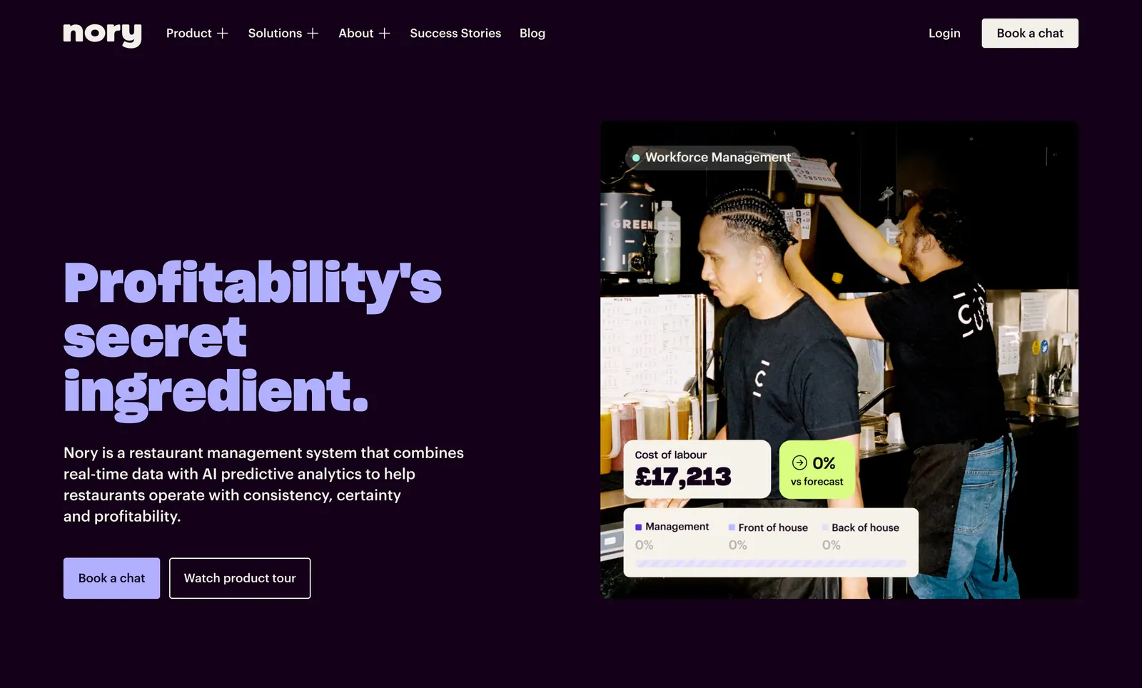
  1. Nory hero section: lavender headline, copy and two buttons left of a kitchen staff photo with labour-cost UI cards on dark purple
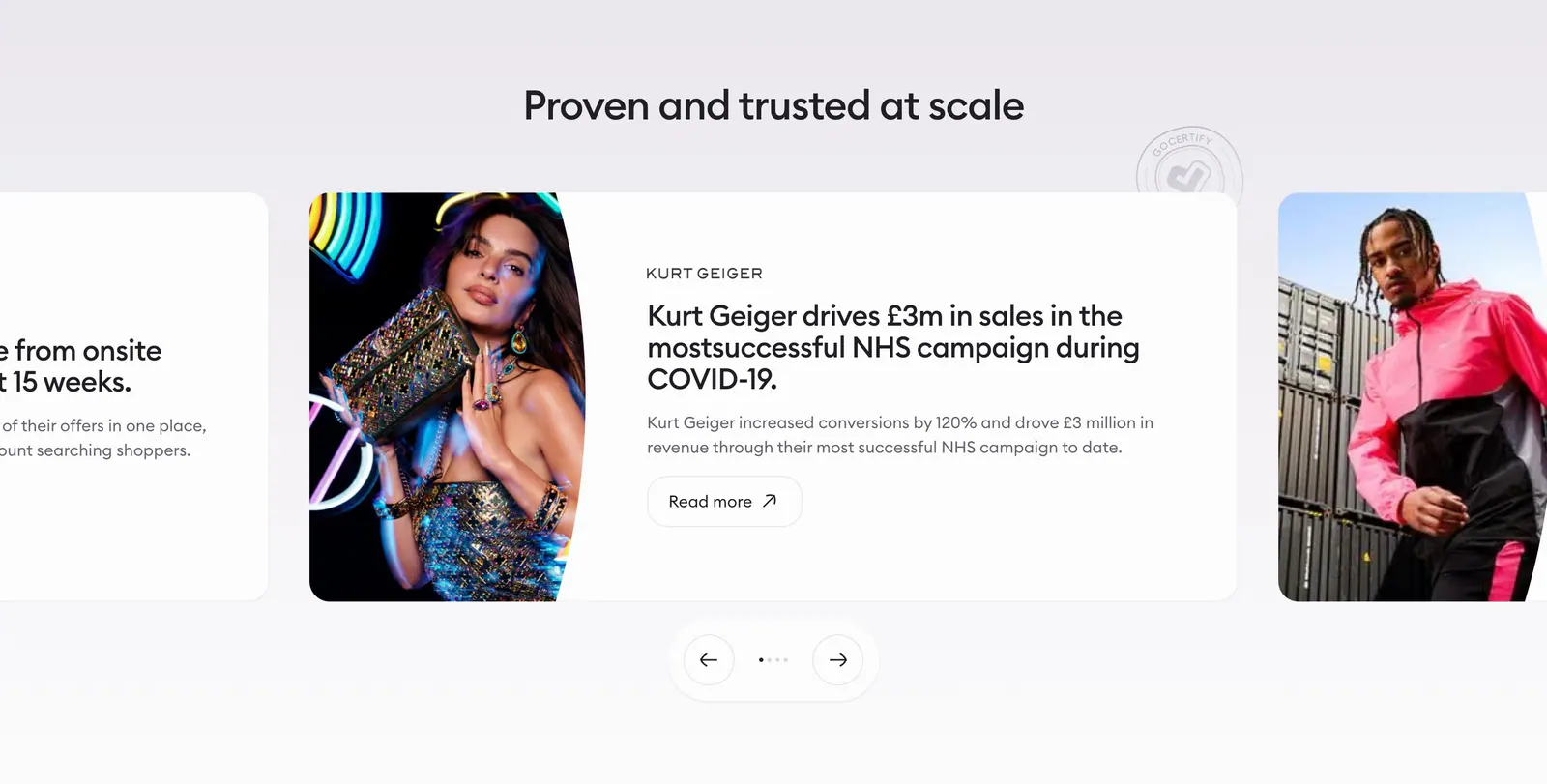
  2. Gocertify testimonials section: centered heading above a case-study carousel with fashion photography, cut-off side cards and arrows
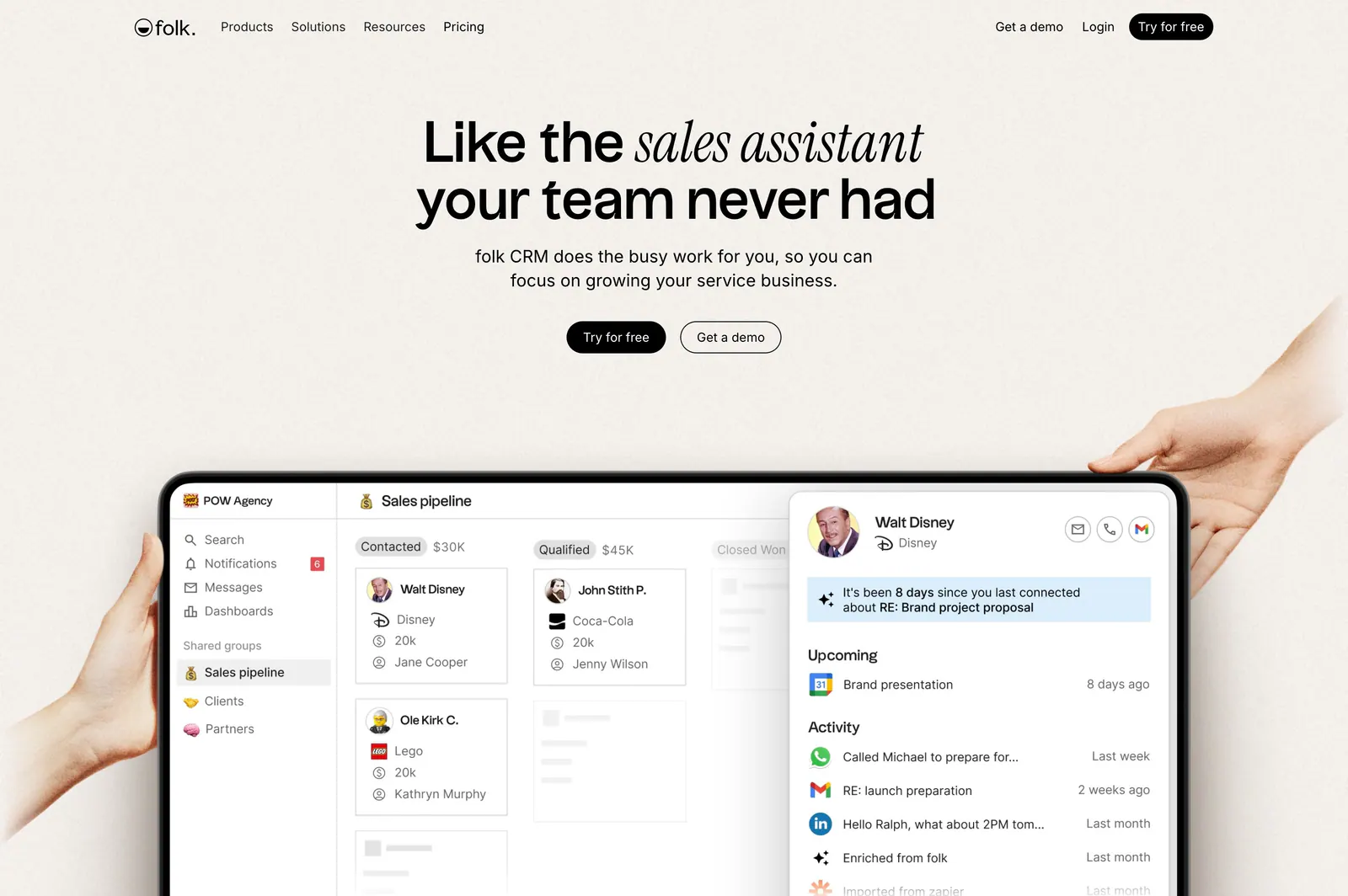
  3. folk hero section: centered headline with two buttons above hands holding a tablet showing a CRM pipeline UI on a warm beige background
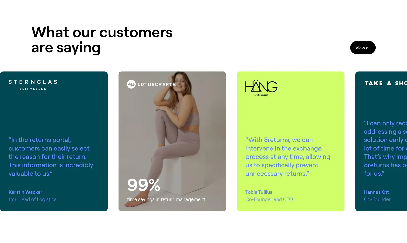
  4. 8returns testimonials section: headline above a horizontal carousel of teal, lime and photo quote cards cut off at the right edge
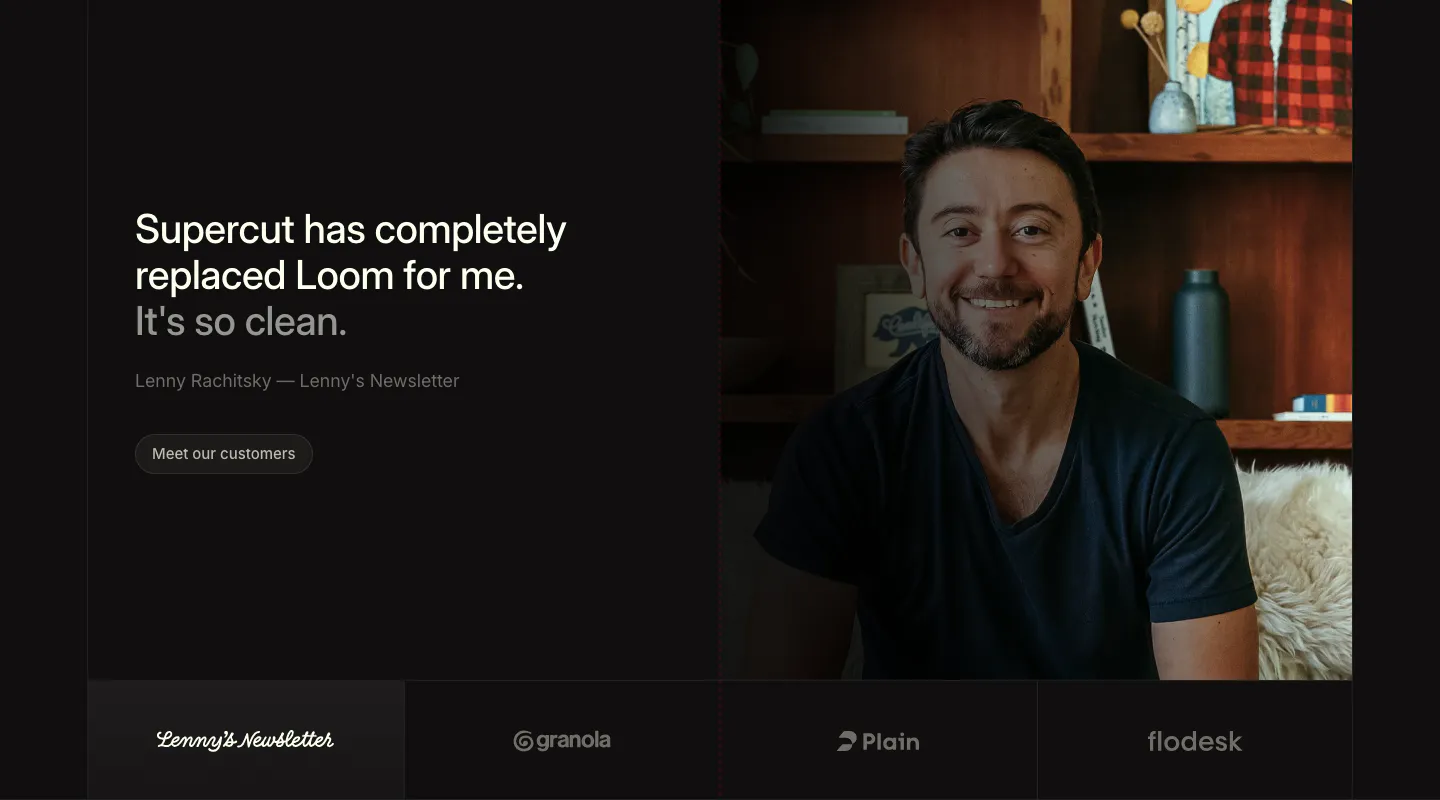
  5. Supercut testimonials section: large quote and Meet our customers button at left, portrait photo at right, four logo tiles below
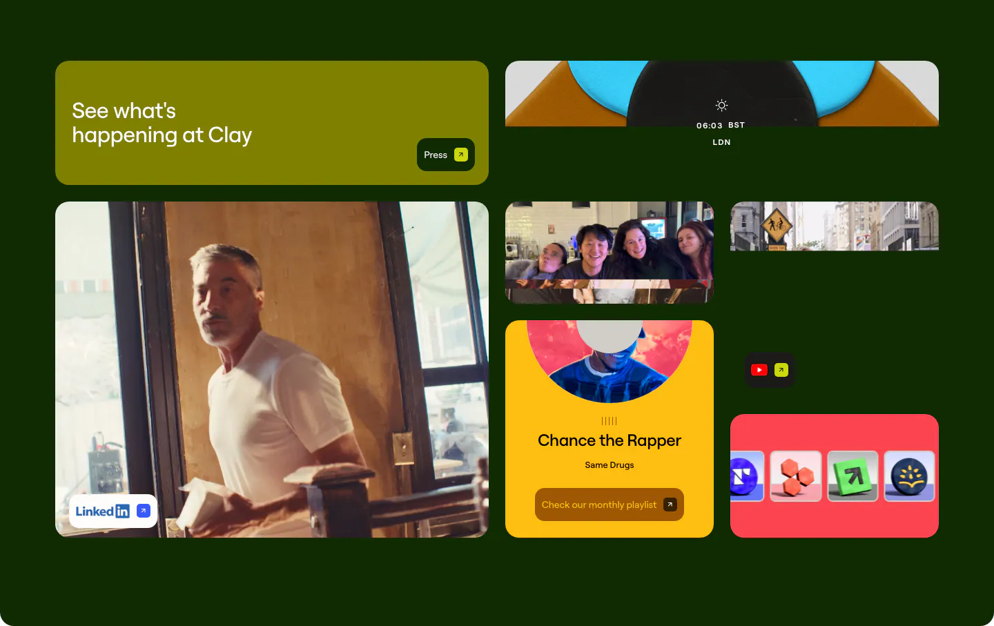
  6. Clay other section: bento grid of photo, playlist and social link tiles on a very dark green background
    Clay Other
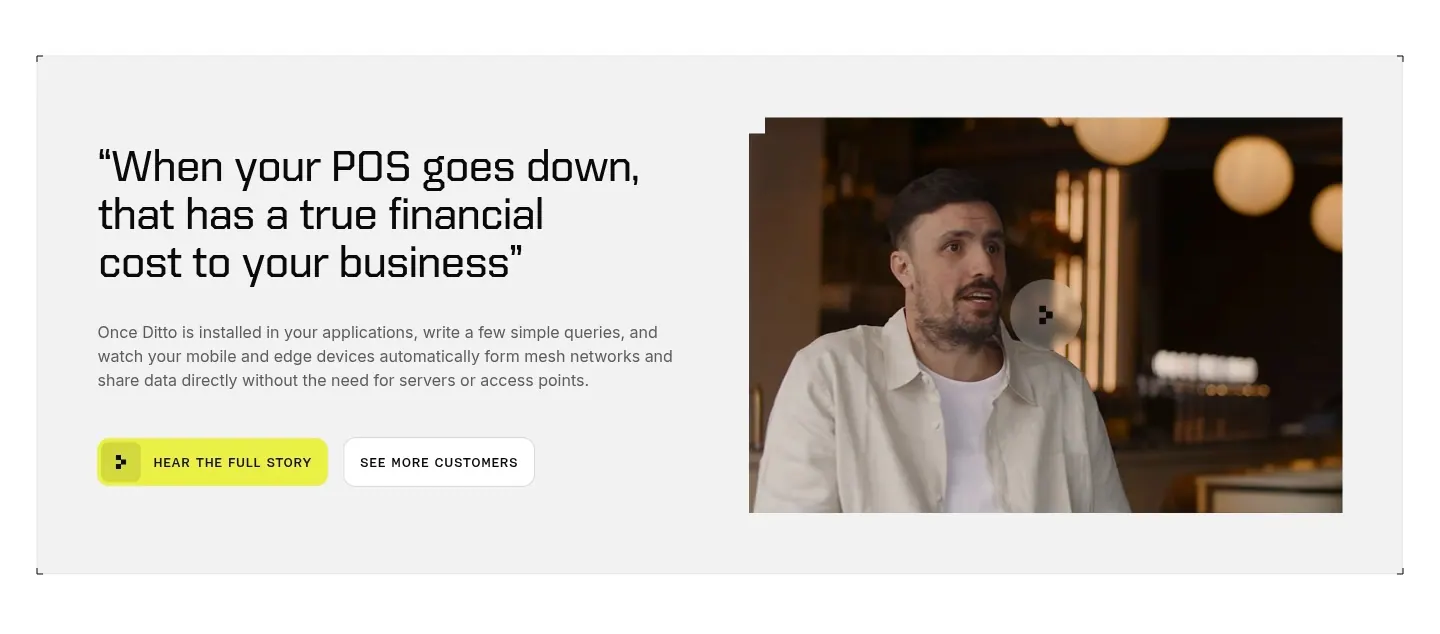
  7. Ditto testimonials section: large quote with copy and two buttons on the left beside a video frame of a customer speaking, in a gray panel
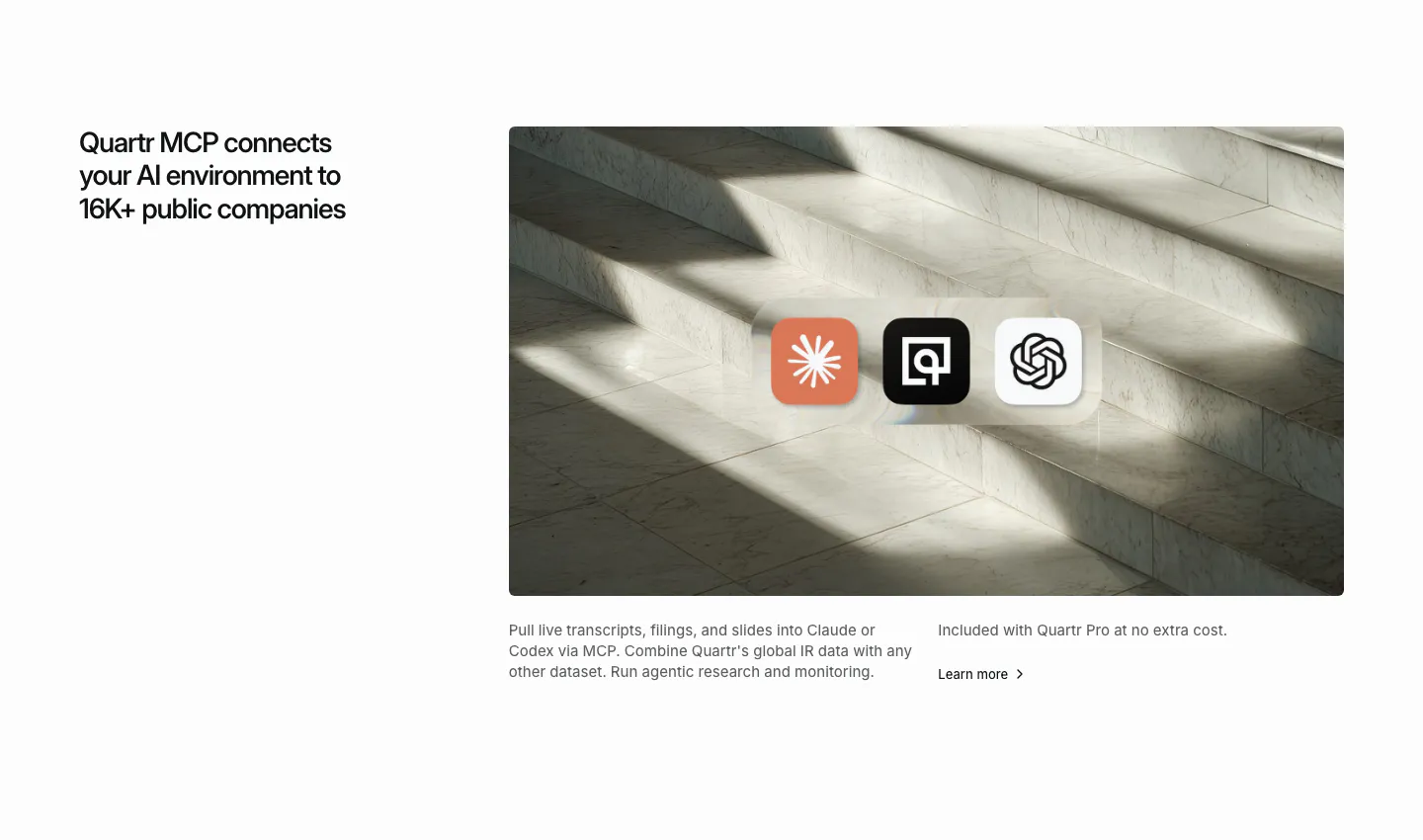
  8. Quartr integrations section: headline on the left, marble staircase photo on the right with Claude, Quartr and OpenAI app icons
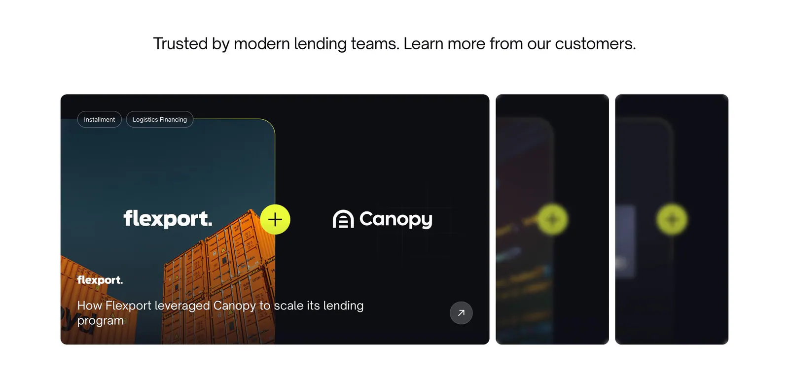
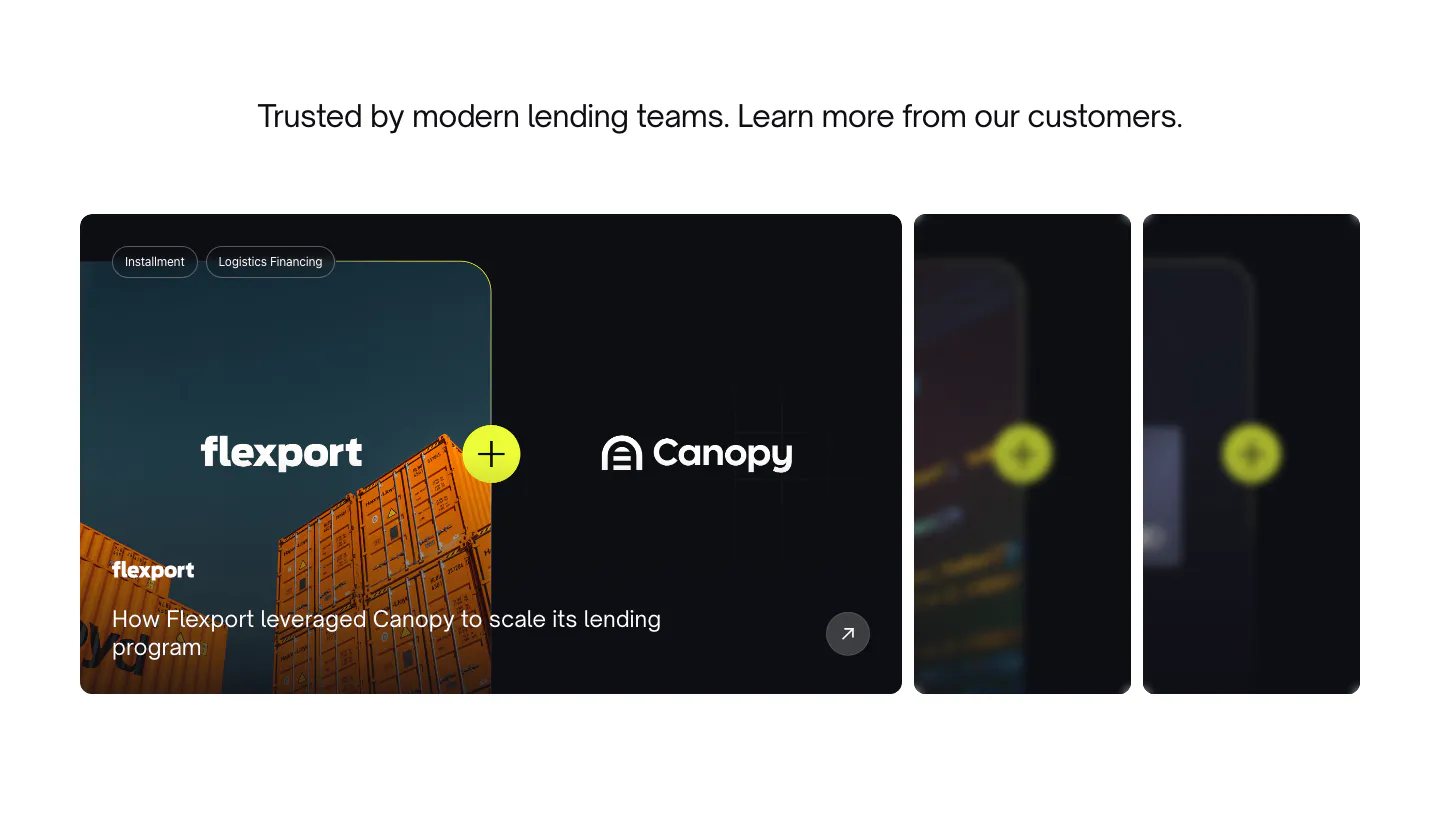
  9. Canopy testimonials section: centered headline above a Flexport case study card with container photo and two collapsed cards
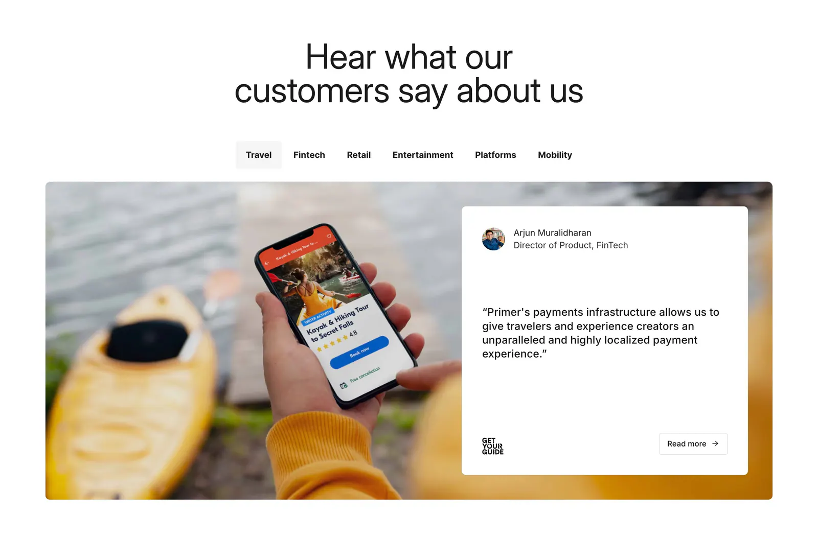
  10. Primer testimonials section: centered headline, industry tabs, and a quote card over a photo of a hand holding a phone
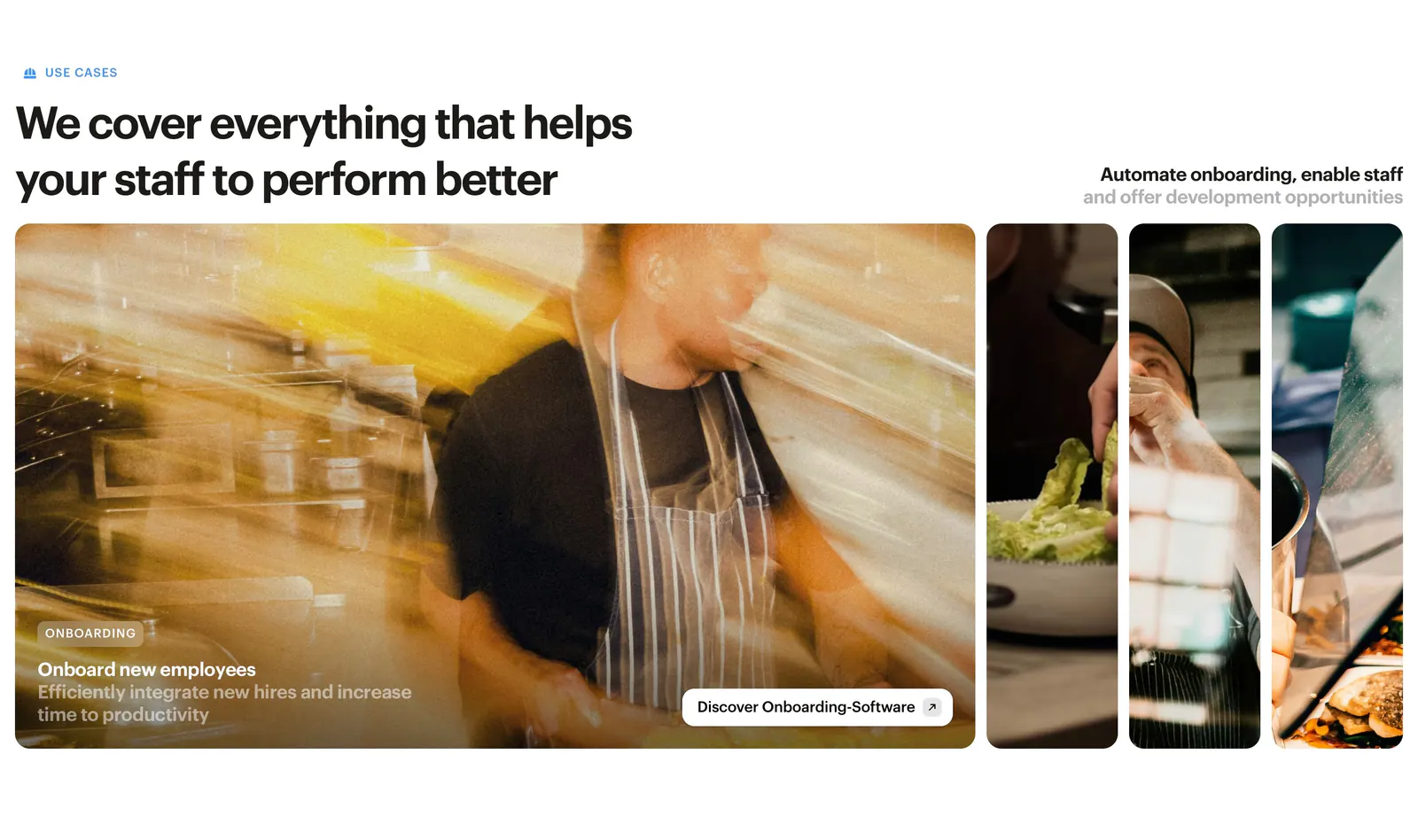
  11. Bounti features section: left headline above expanding photo panels of restaurant staff, the first open with an onboarding caption
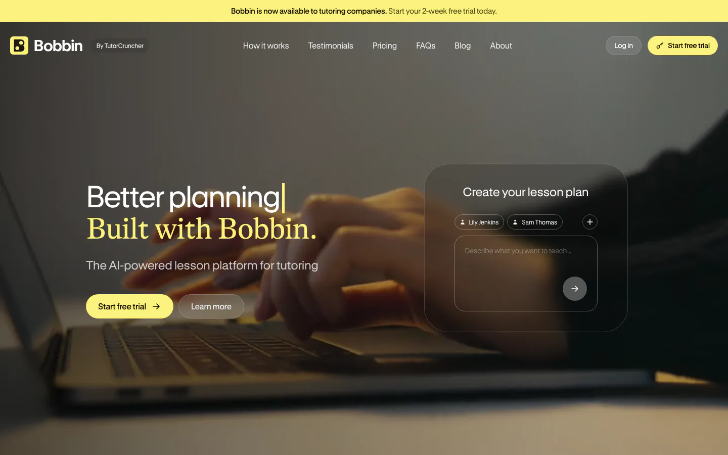
  12. Bobbin hero section: headline and buttons left, frosted lesson-plan prompt card right, over a dim full-bleed photo of hands on a laptop
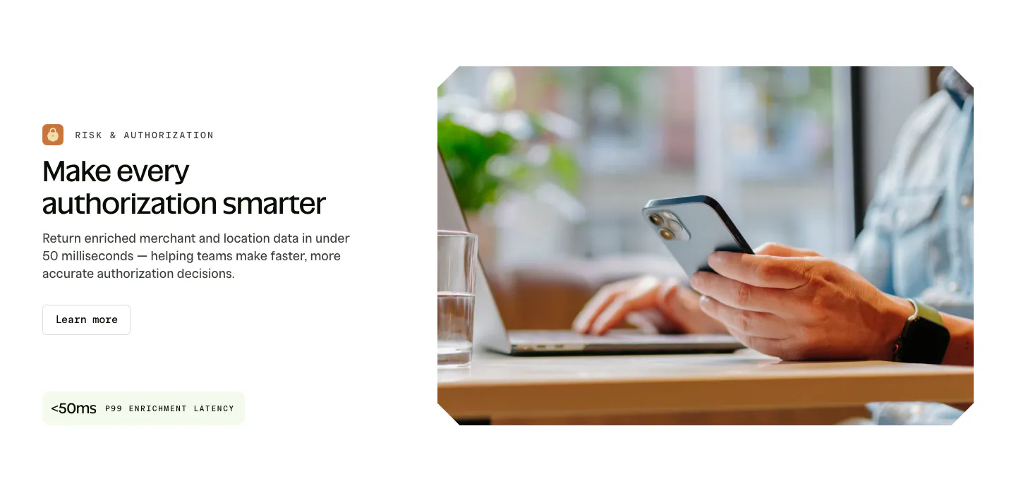
  13. Spade features section: labeled headline, copy, button and latency stat chip on the left beside a photo of hands holding a phone at a laptop
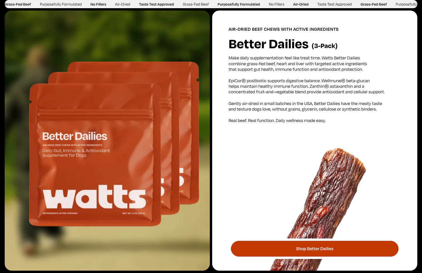
  14. Watts features section: product bag photo on the left, Better Dailies details, jerky photo and shop button on a white card on the right
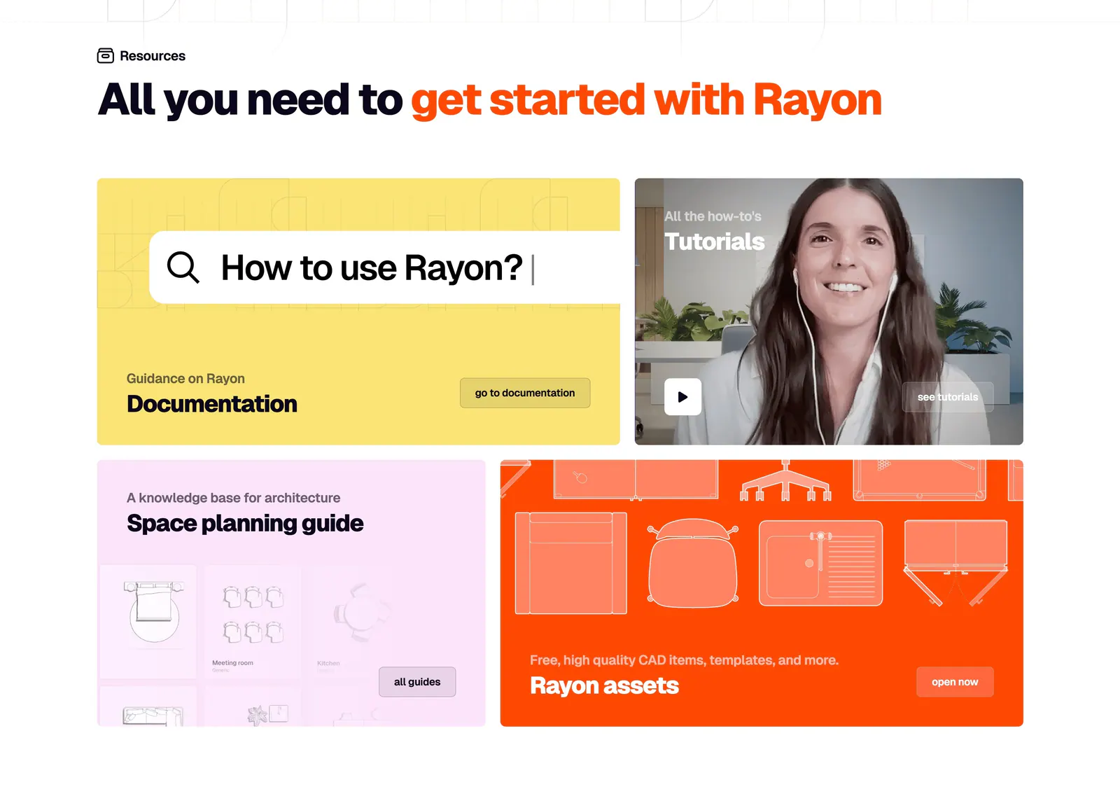
  15. Rayon blog & resources section: headline above a four-tile bento of yellow docs, video tutorial, pink guide and orange assets cards
  16. Rezolv hero section: centered headline with two buttons above three cards, a headset agent photo, voice demo play card and phone app
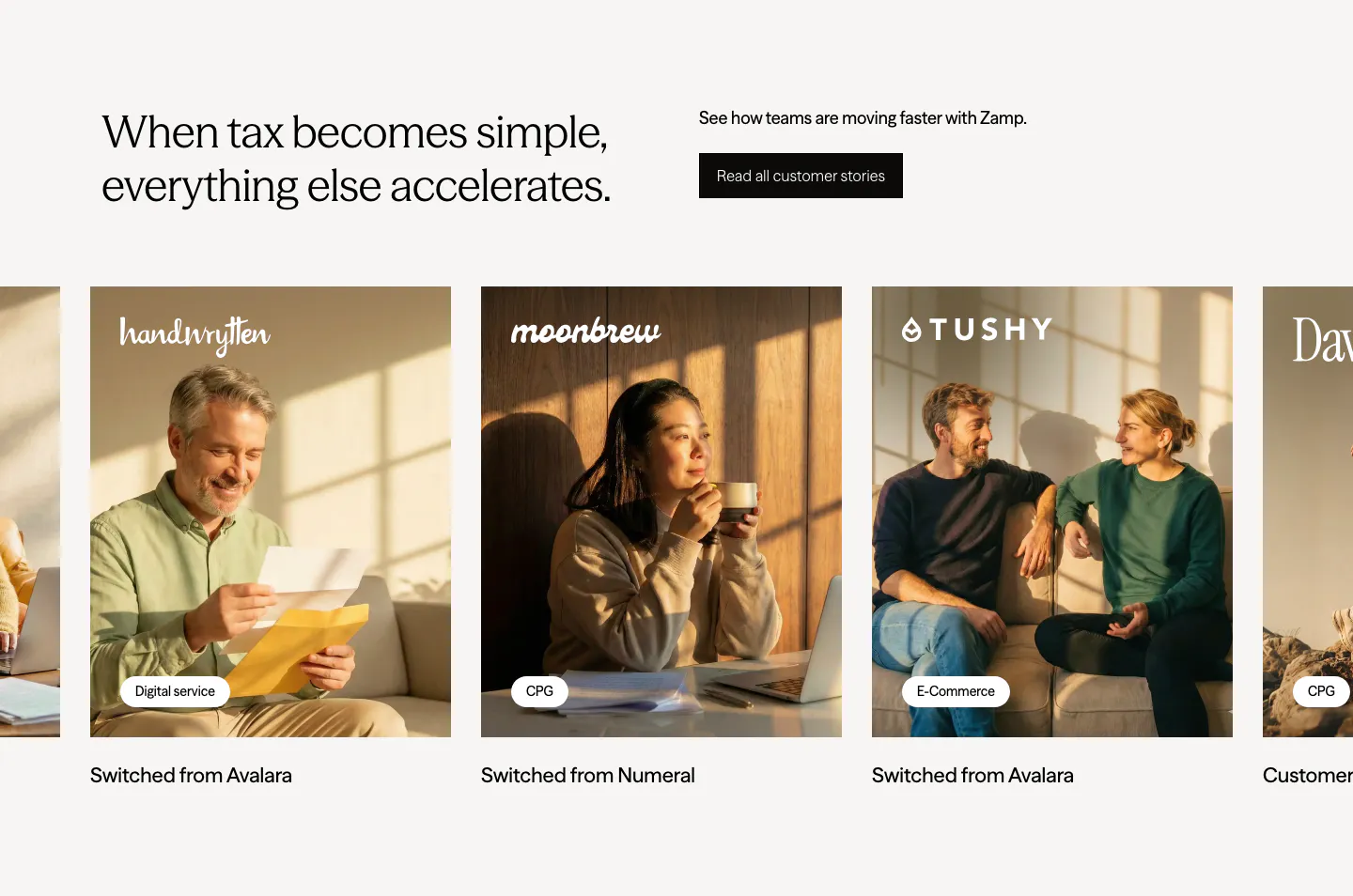
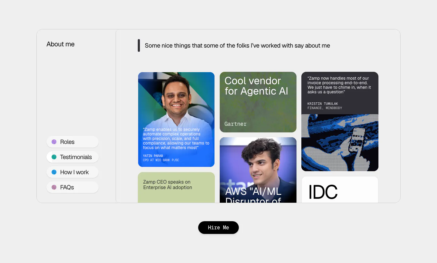
  17. Zamp testimonials section: headline and stories button above a carousel of customer photo cards with brand logos and tags
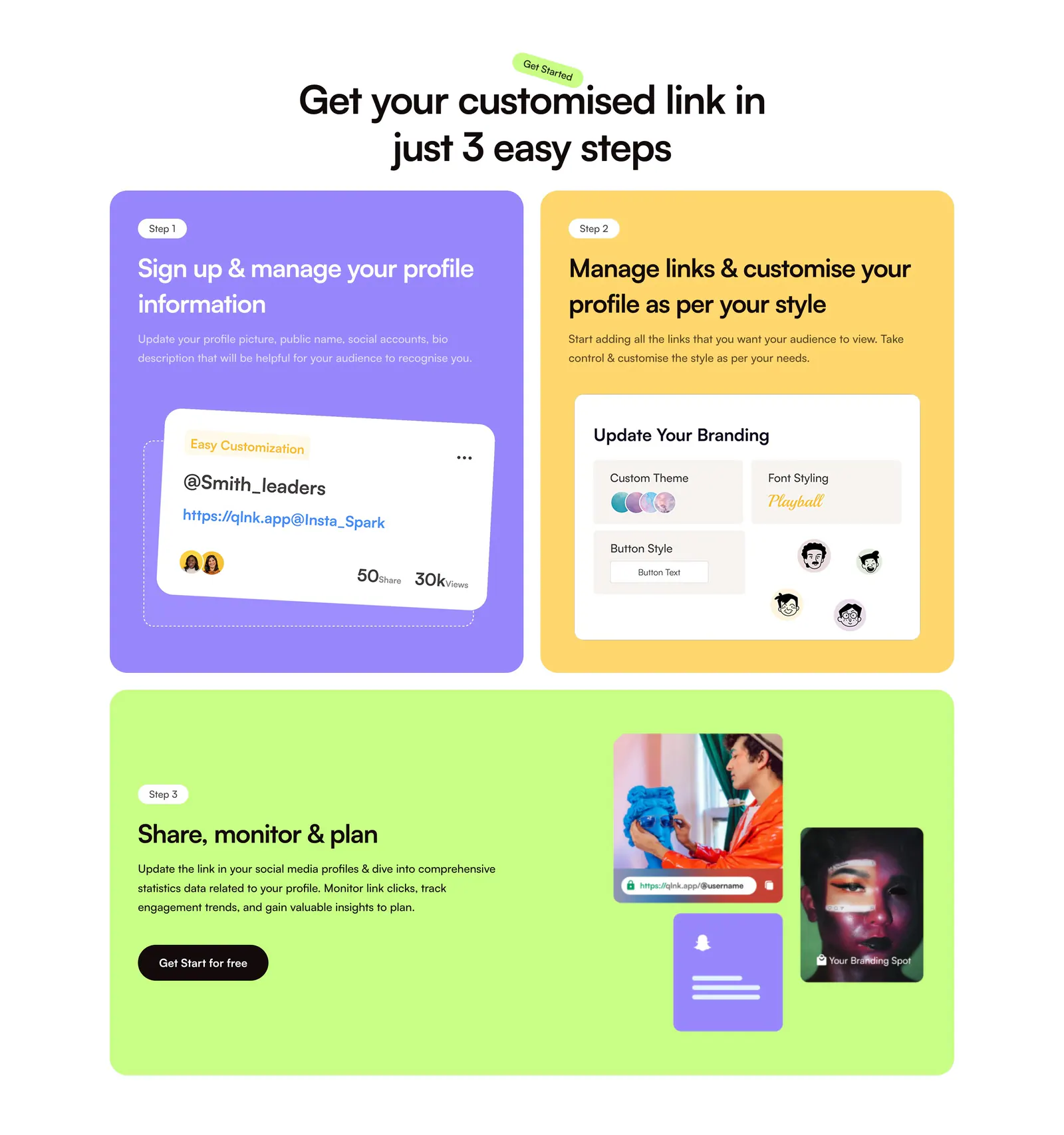
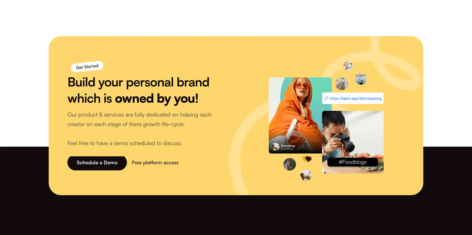
  18. QuickLnk how it works section: centered headline above three step cards in purple, yellow and lime with profile UI mockups and photos
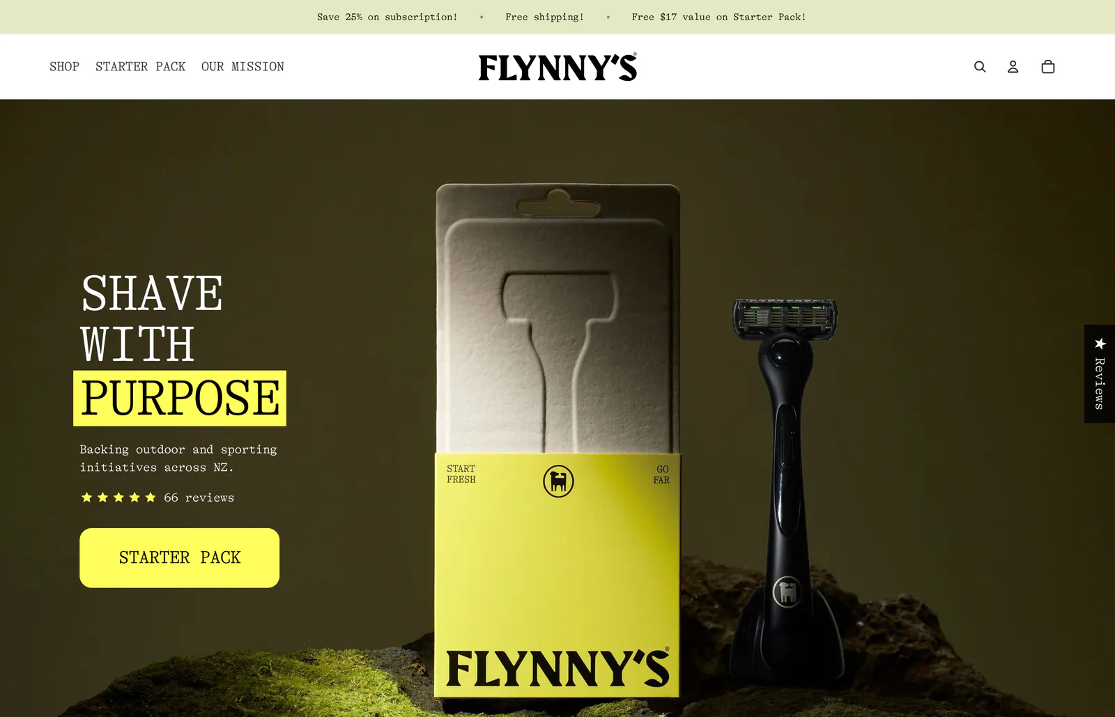
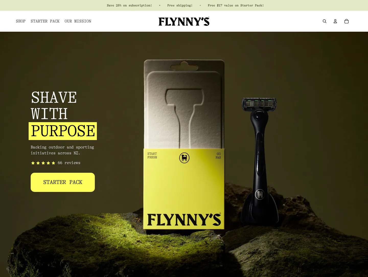
  19. Flynny's hero section: serif headline with a yellow-highlighted word, star rating and yellow CTA over a dark photo of a razor and its box on moss
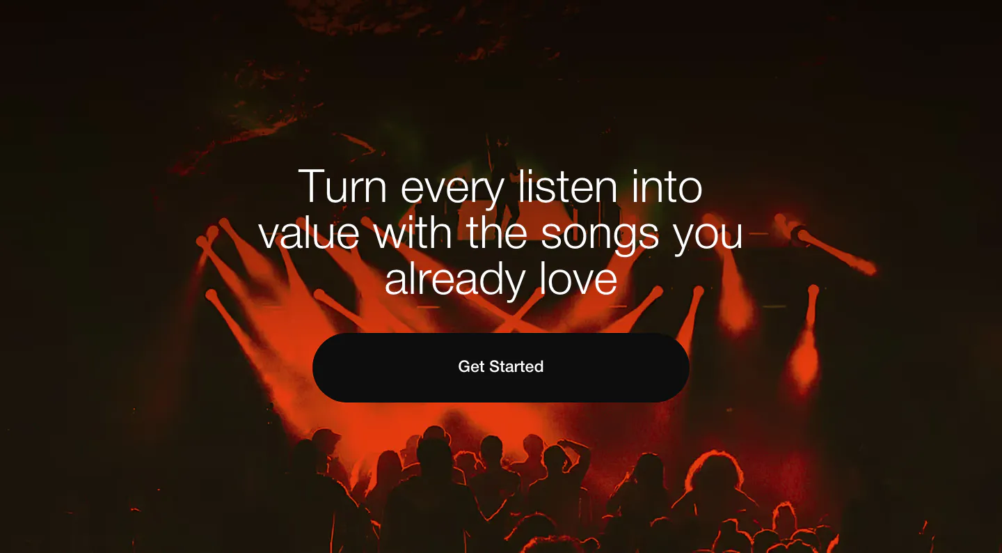
  20. EchoFi call-to-action section: centered headline and black pill button over a full-bleed red-lit concert crowd photo
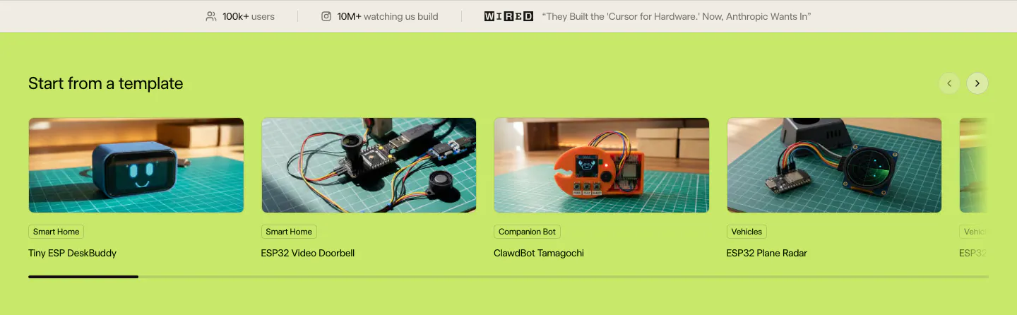
  21. Schematik features section: stats bar above a carousel of hardware template photo cards on a lime green background
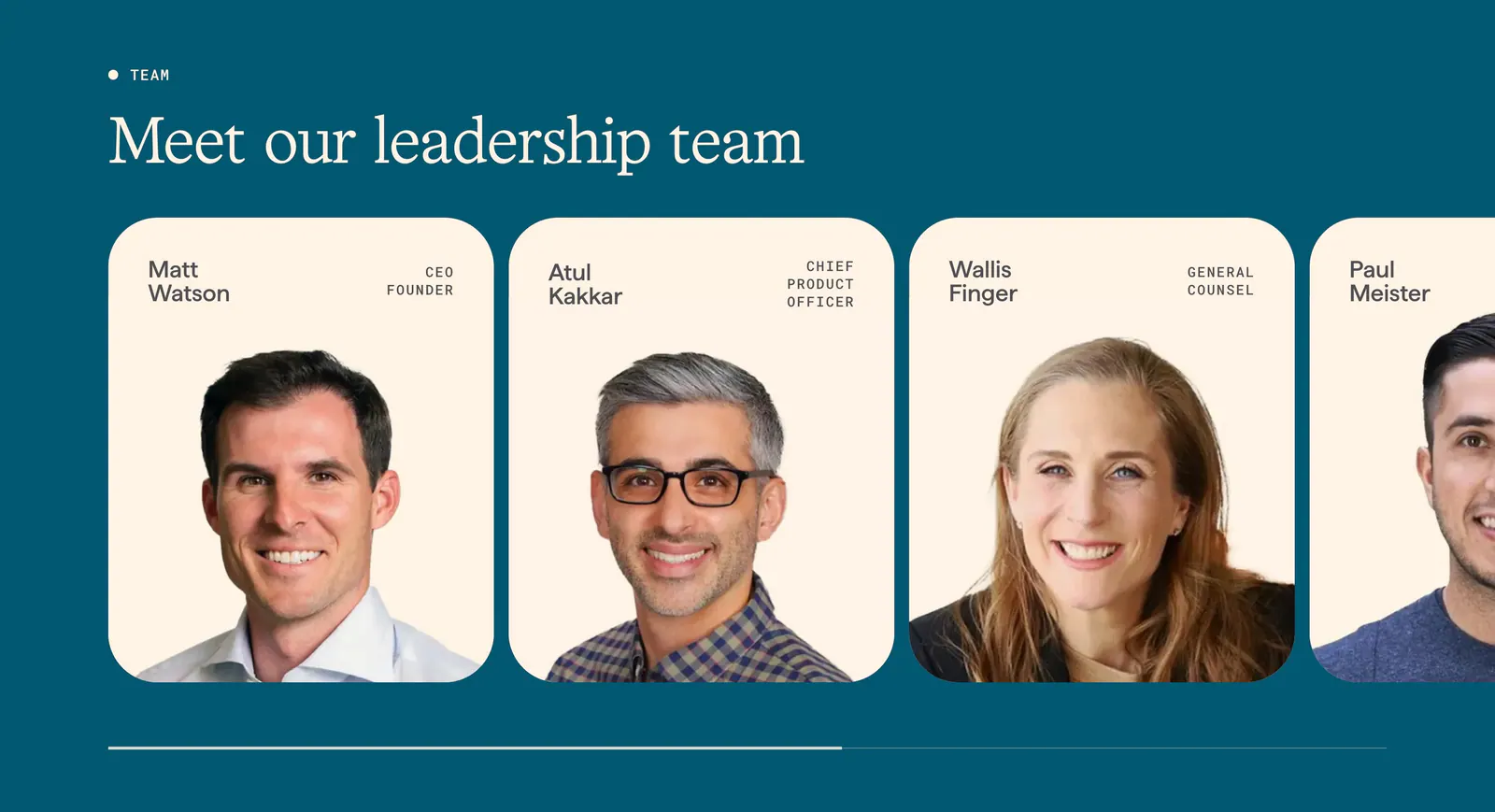
  22. Origin team section: serif headline above a scrolling row of cream leadership cards with portrait photos and titles on deep teal
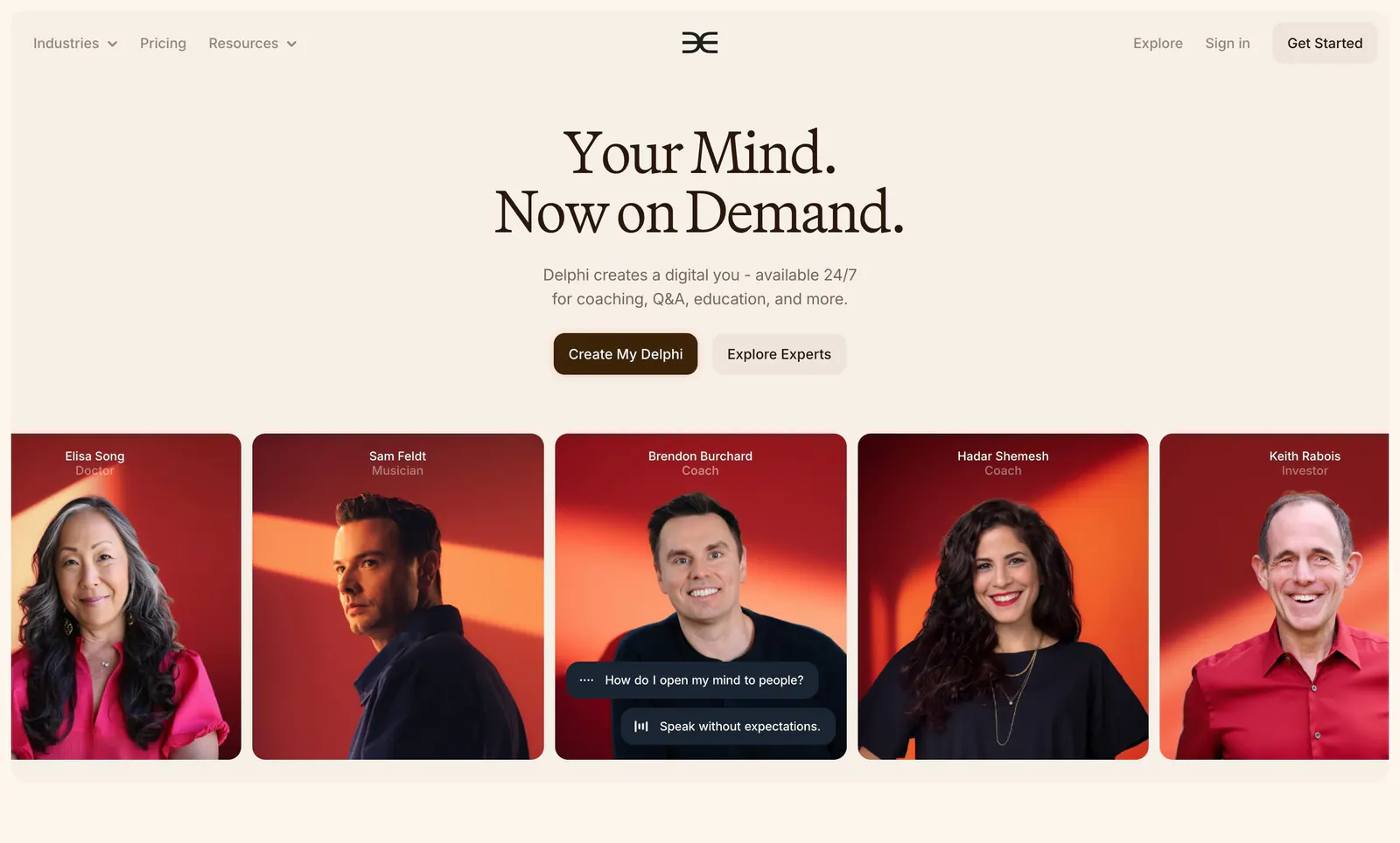
  23. Delphi hero section: centered serif headline with two buttons above a row of expert portrait cards on red backgrounds, on a cream page
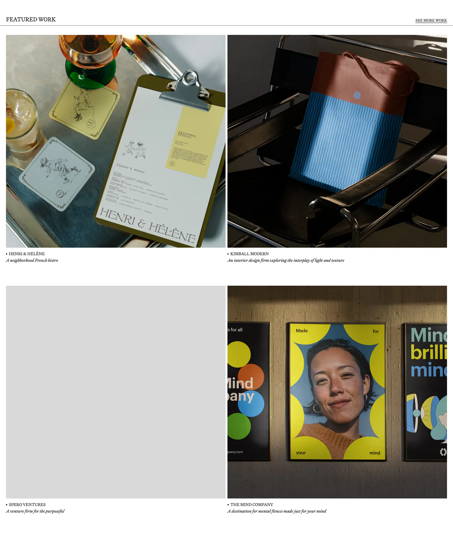
  24. Goodside other section: 2x2 grid of brand project photos with serif captions under a Featured Work header rule
    Goodside Other
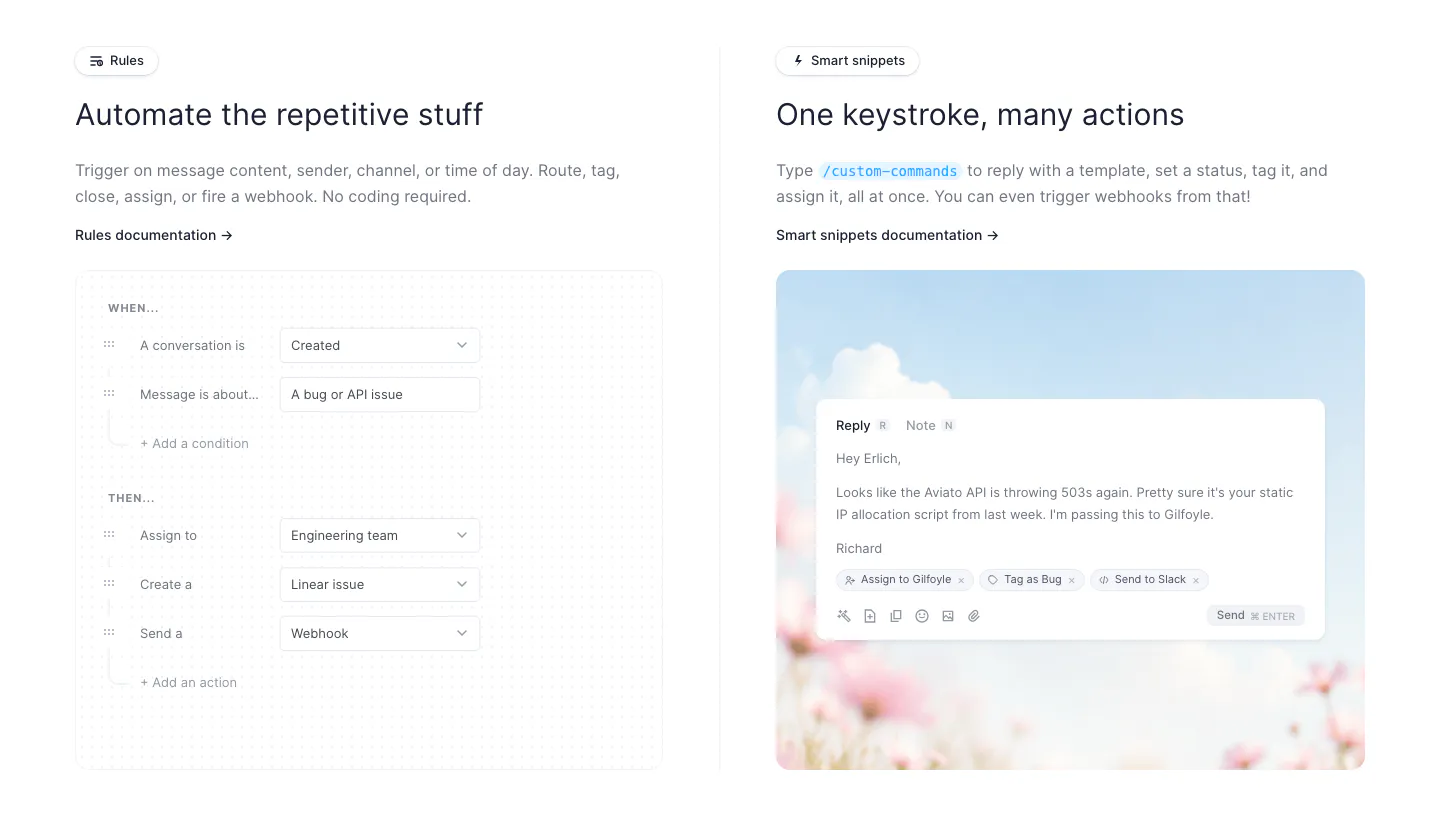
  25. Fernand features section: two columns showing a rules builder form UI and a reply composer on a sky and flower photo
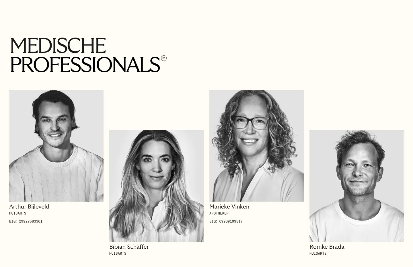
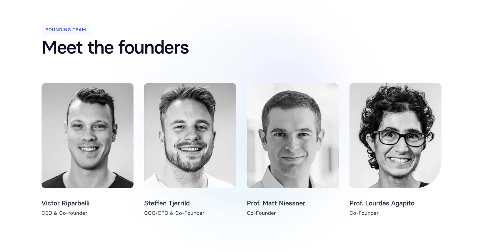
  26. Menkind team section: serif headline above four staggered black-and-white portraits of medical professionals with roles on cream
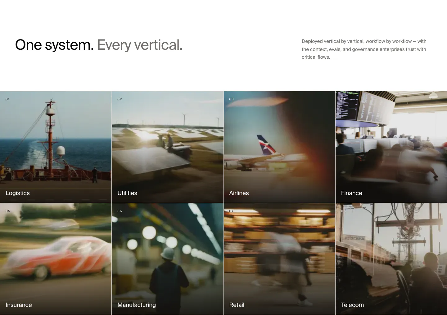
  27. HappyRobot use cases section: headline with side note above a 4x2 grid of numbered industry tiles on blurred photos, Logistics to Telecom
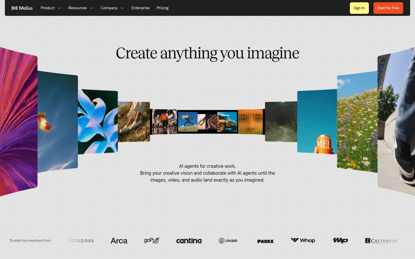
  28. Melius hero section: dark nav bar over a centered serif headline inside a curved gallery of photos and artwork, logo row at bottom
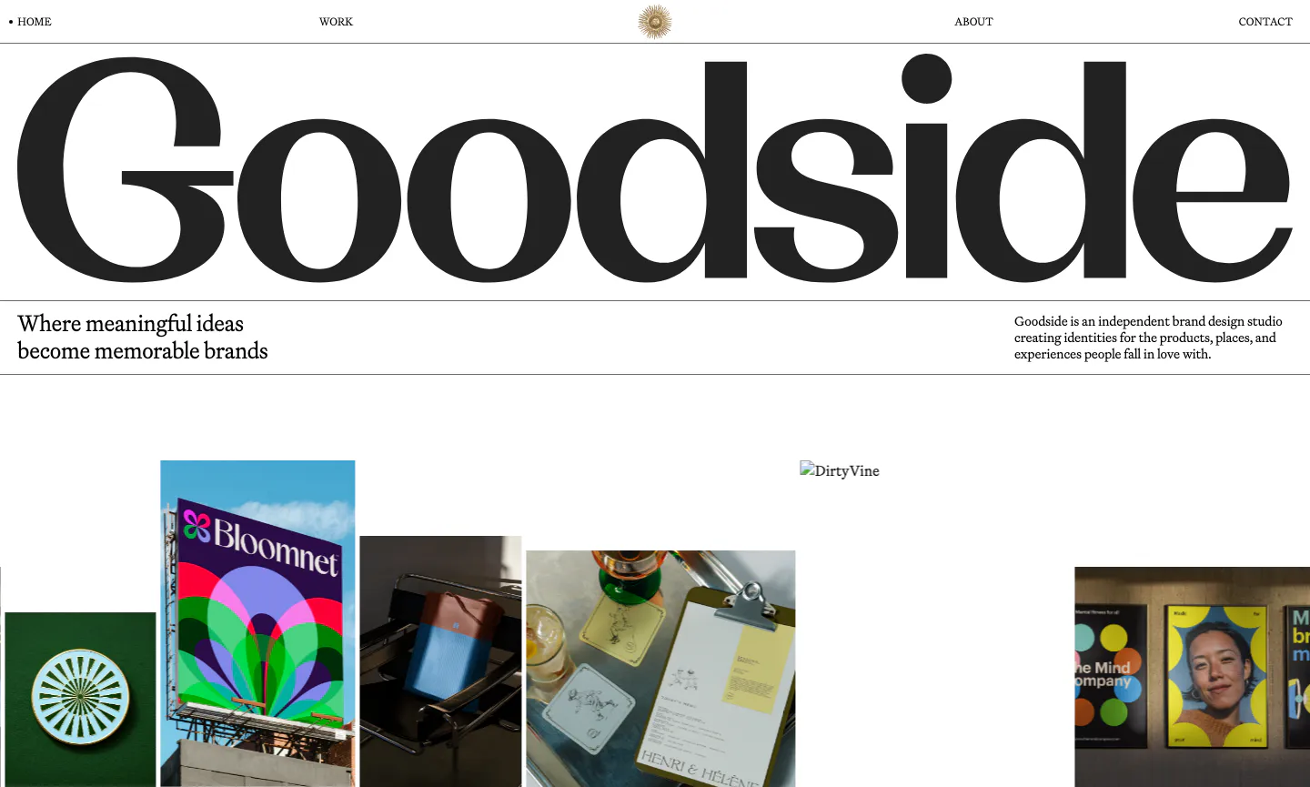
  29. Goodside hero section: full-width serif wordmark under a minimal nav, tagline row and a strip of brand project photos on white
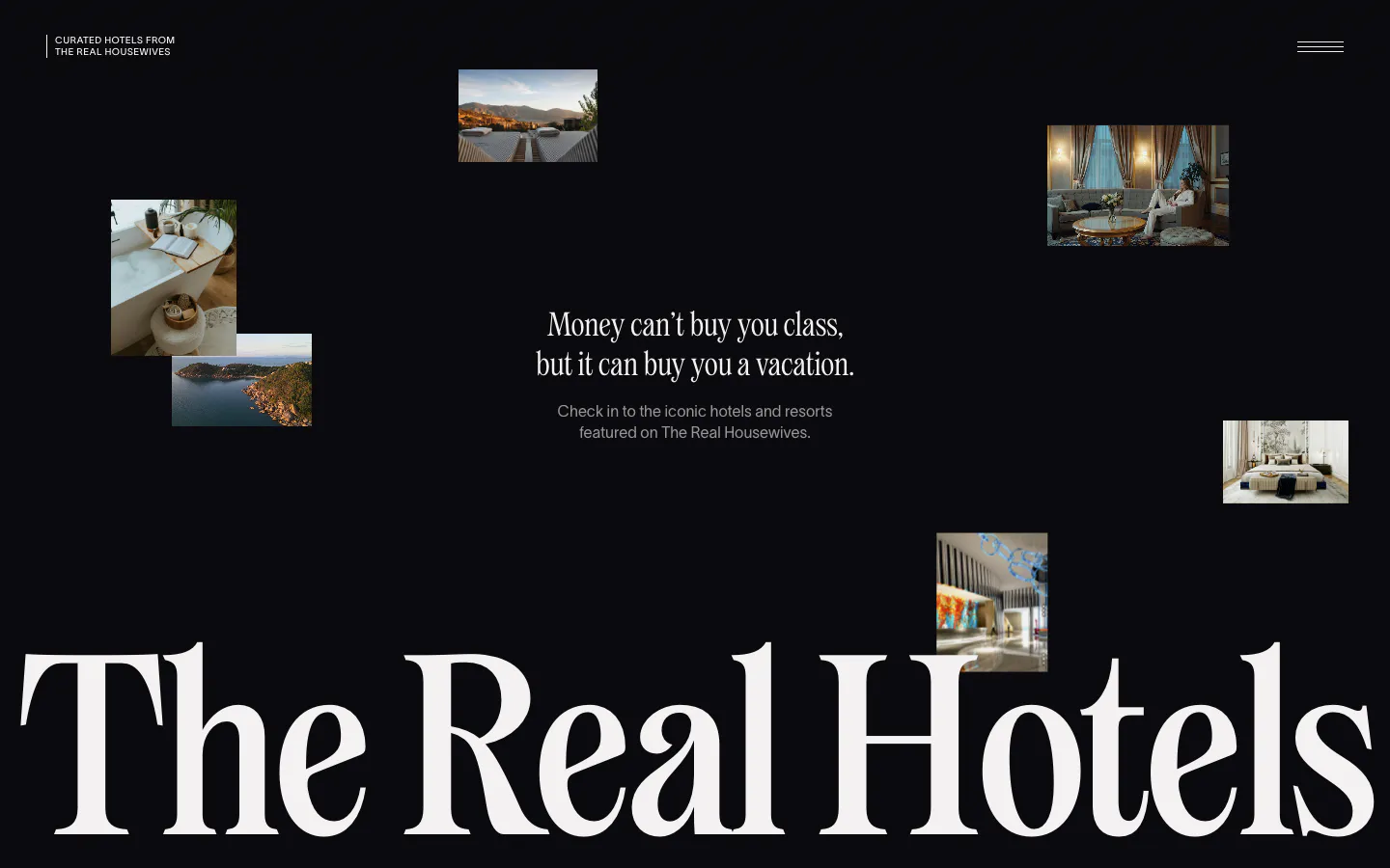
  30. The Real Hotels hero section: scattered hotel photos on black around a centered serif tagline, huge serif wordmark across the bottom
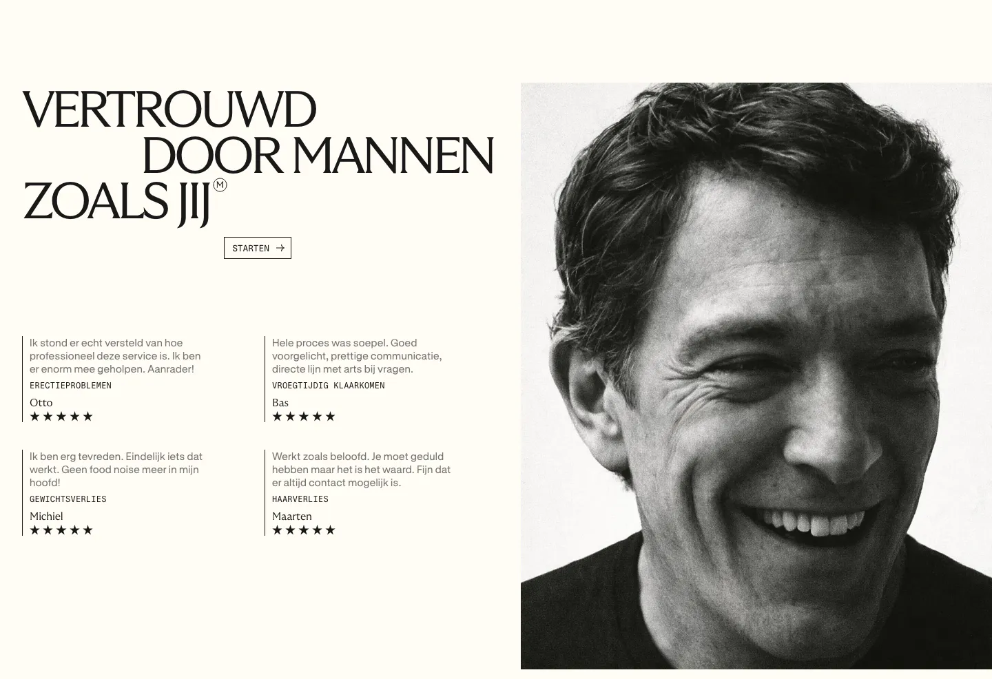
  31. Menkind testimonials section: serif headline and four starred review quotes beside a large black-and-white portrait on cream
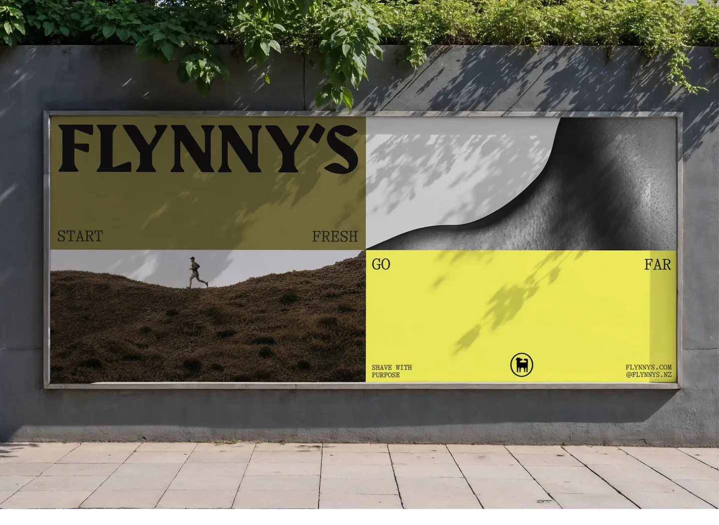
  32. Flynny's other section: photo of a street billboard showing the olive and yellow Flynny's campaign with a runner and wordmark
    Flynny's Other
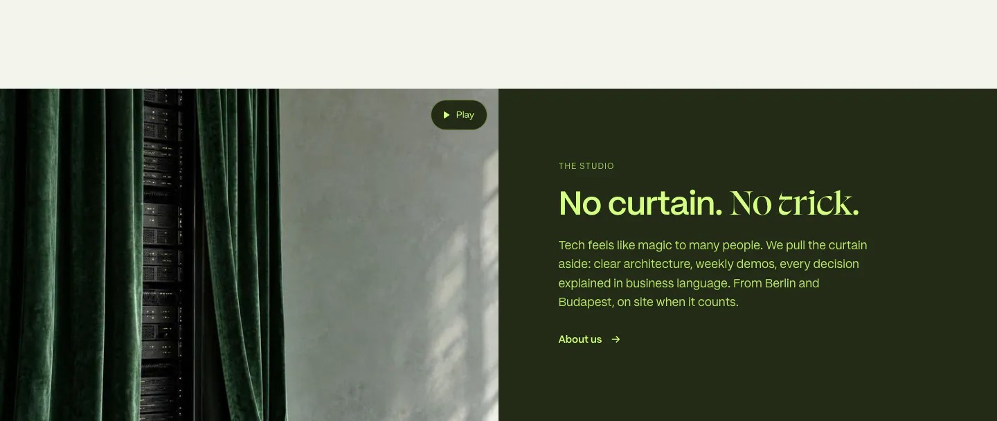
  33. DUNA about & mission section: curtain and server rack photo with play button beside lime heading and copy on dark olive panel
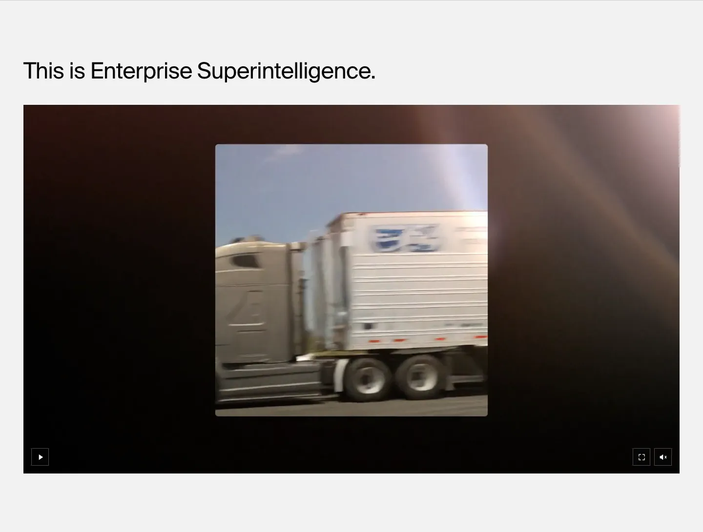
  34. HappyRobot features section: left-aligned headline above a wide dark video player showing footage of a moving truck, on light gray
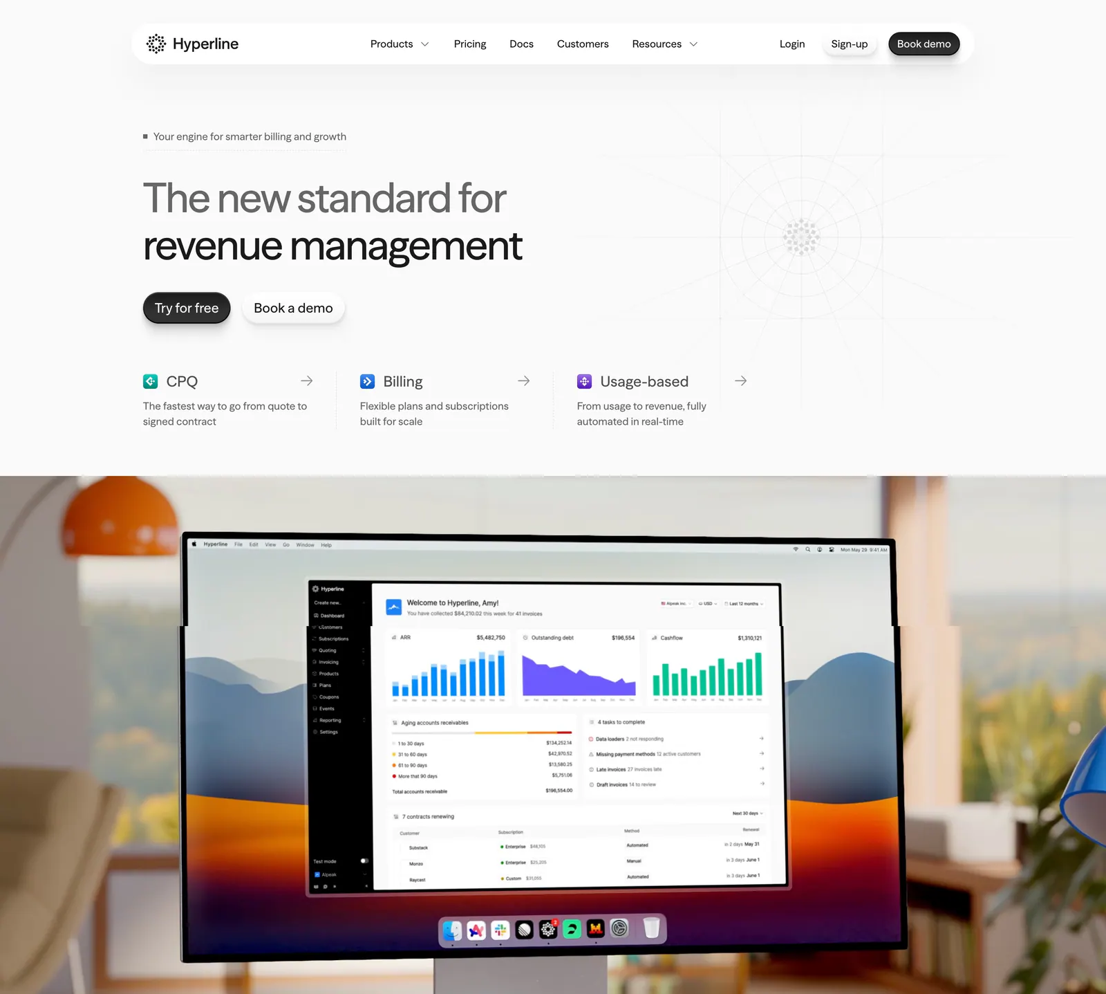
  35. Hyperline hero section: left-aligned headline and three product links above a photo of a desktop monitor showing the billing dashboard
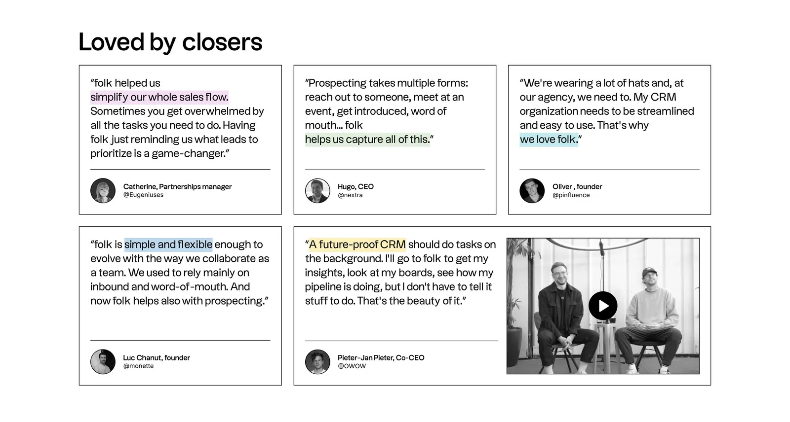
  36. folk testimonials section: bento grid of outlined quote cards with highlighted phrases and a wide card holding a video thumbnail
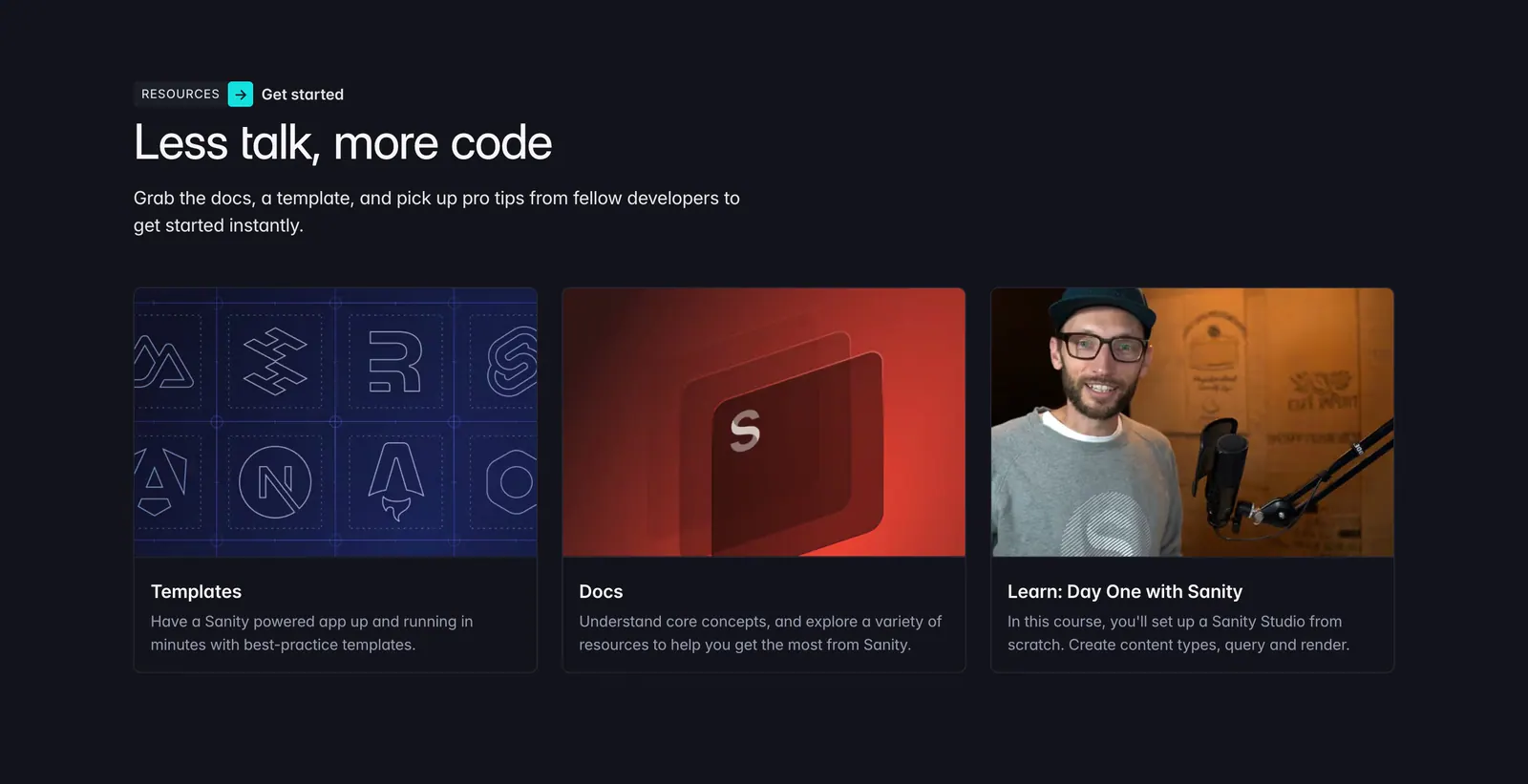
  37. Sanity blog & resources section: left-aligned headline above three resource cards for templates, docs and a course on a dark background
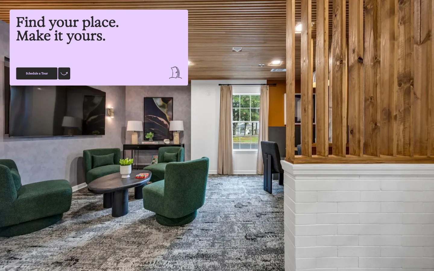
  38. 21Oaks call-to-action section: full-bleed lounge photo with a lavender card holding a serif headline and tour button
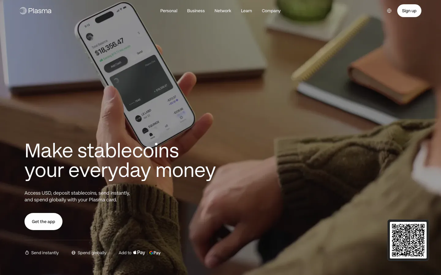
  39. Plasma hero section: large headline and app button bottom left over a full-bleed photo of a hand holding a phone with the app
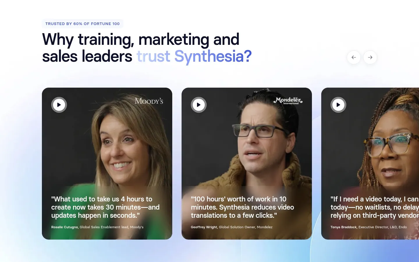
  40. Synthesia testimonials section: headline with arrow controls above a carousel of video testimonial cards with customer portraits and quotes
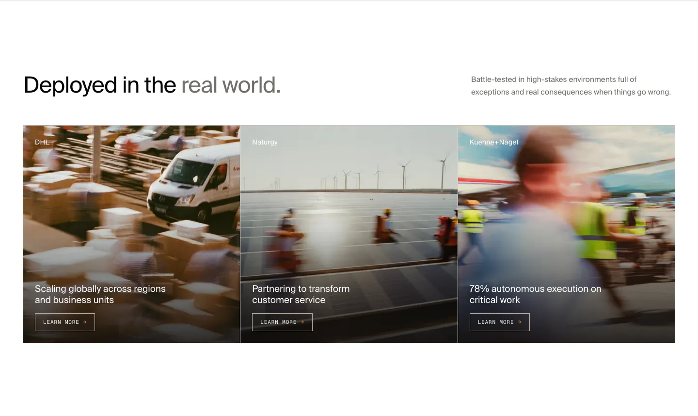
  41. HappyRobot features section: headline with side note above three customer story cards (DHL, Naturgy, Kuehne+Nagel) on motion-blurred photos
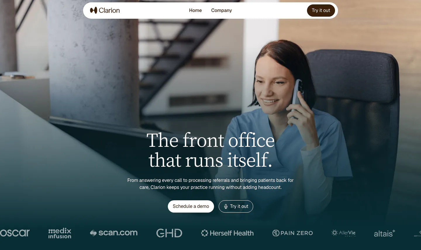
  42. Clarion hero section: full-bleed photo of a clinic worker on the phone, centered serif headline, two buttons and a customer logo row
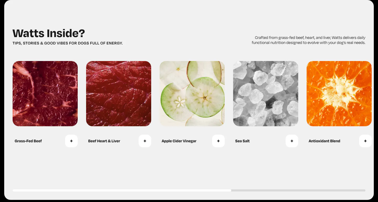
  43. Watts features section: horizontal row of ingredient photo cards with plus buttons and a scroll progress bar on light gray
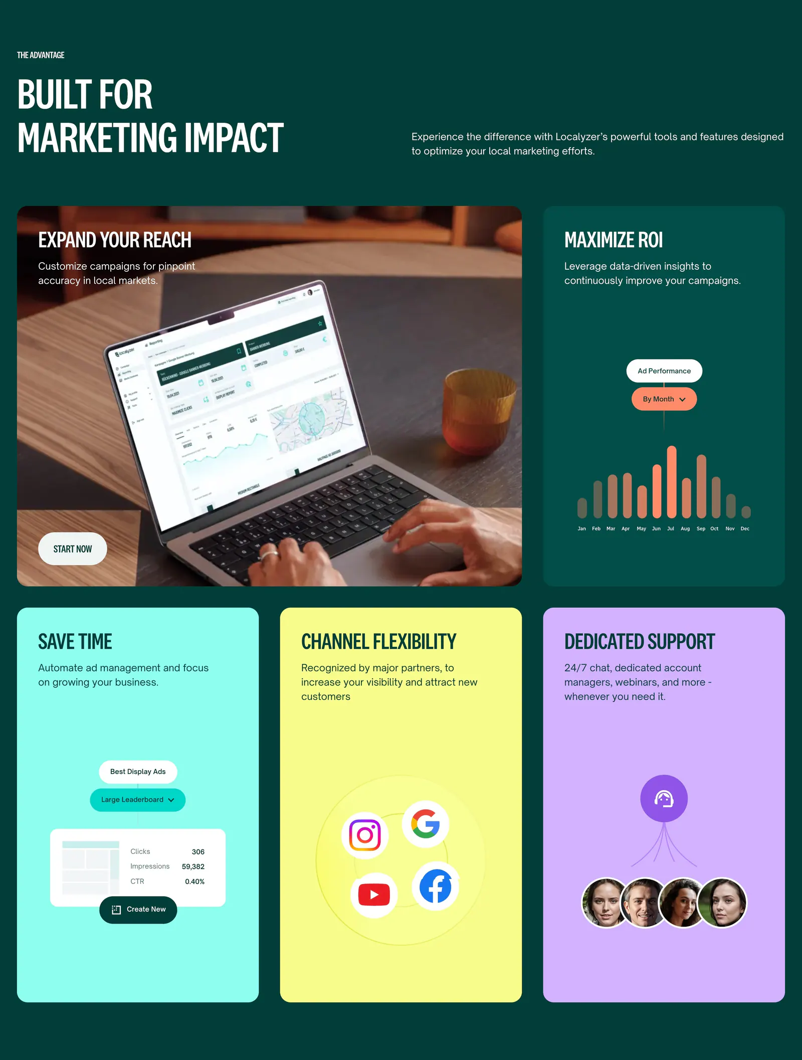
  44. Localyzer features section: bento grid on dark green with a laptop photo tile, ad chart tile and bright colored benefit cards
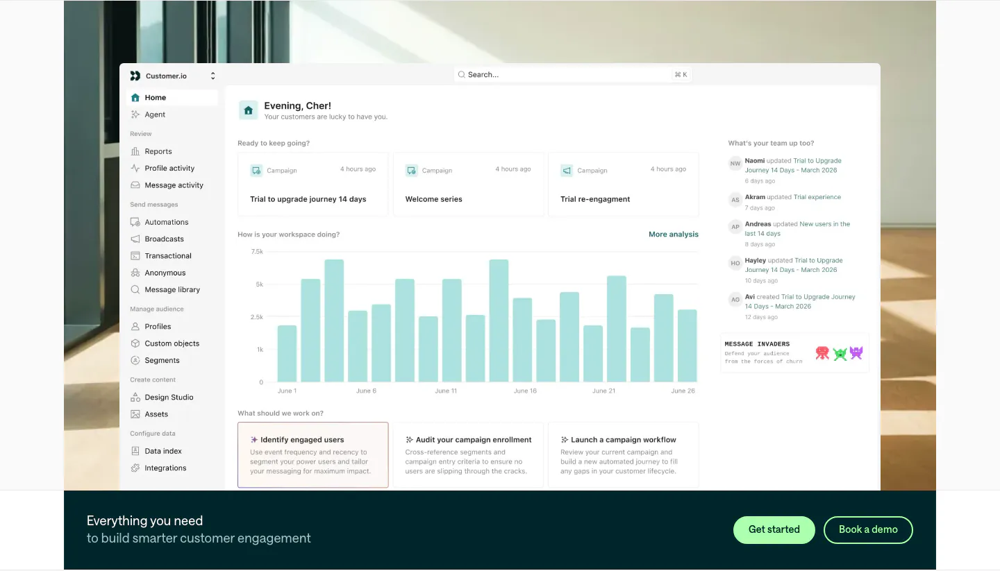
  45. Customer.io features section: large home dashboard screenshot over an office photo, with a dark teal CTA bar and two buttons below
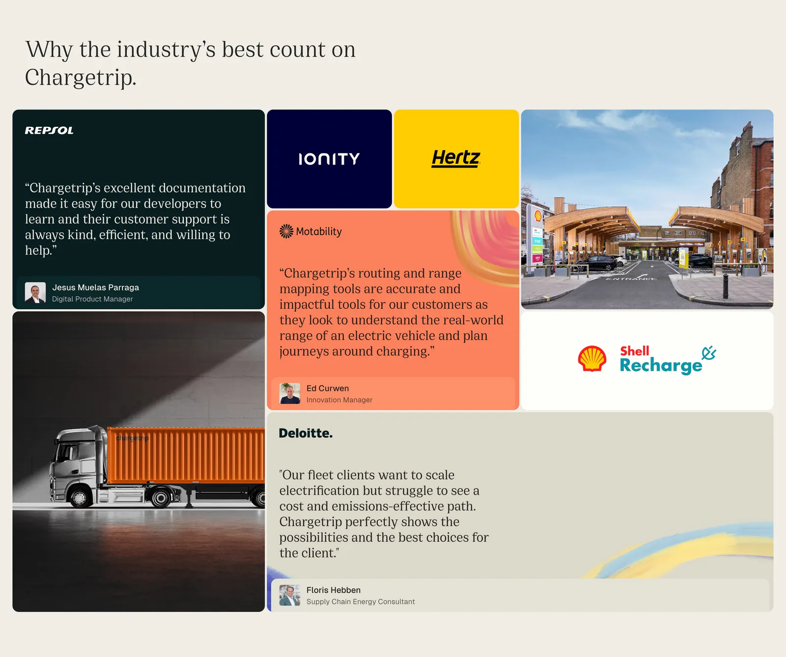
  46. Chargetrip testimonials section: bento grid of quote cards, partner logo tiles and photos of a truck and charging station on beige
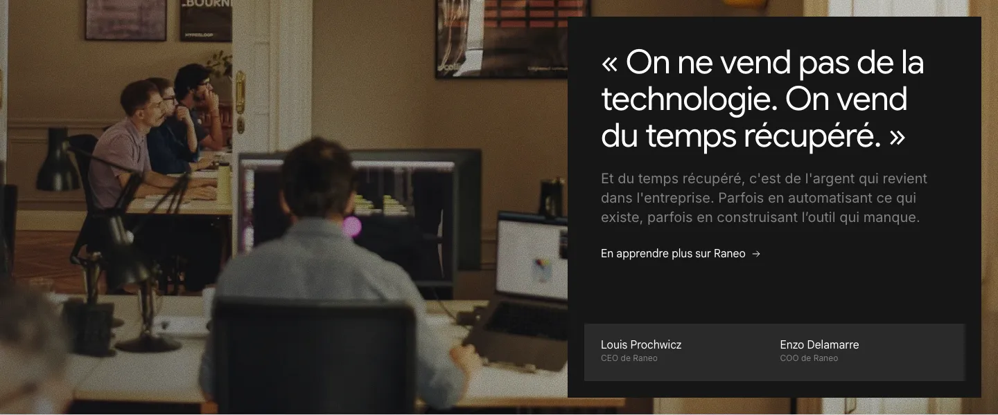
  47. Raneo about & mission section: full-bleed office photo with a dark panel holding the founders' quote, a link and CEO/COO names
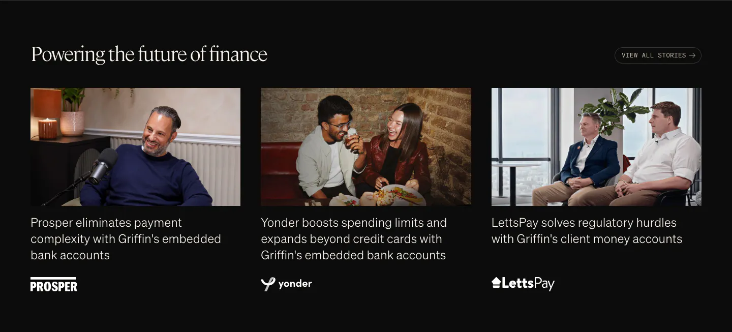
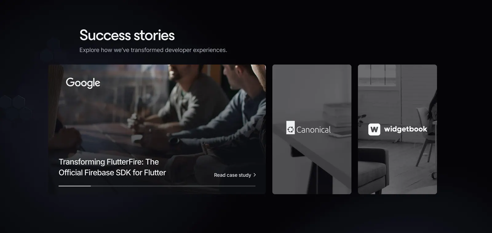
  48. Griffin testimonials section: serif heading above three customer story cards with photos, captions and logos on black
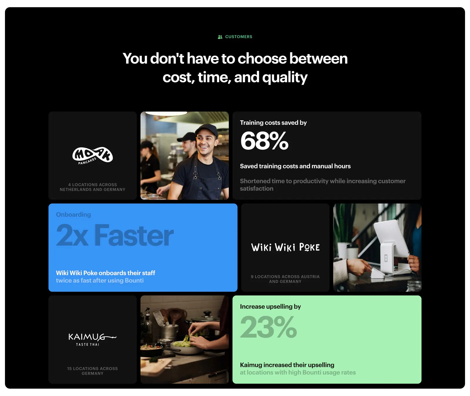
  49. Bounti value proposition section: centered headline over a bento grid of customer logos, kitchen photos and stat tiles on a black panel
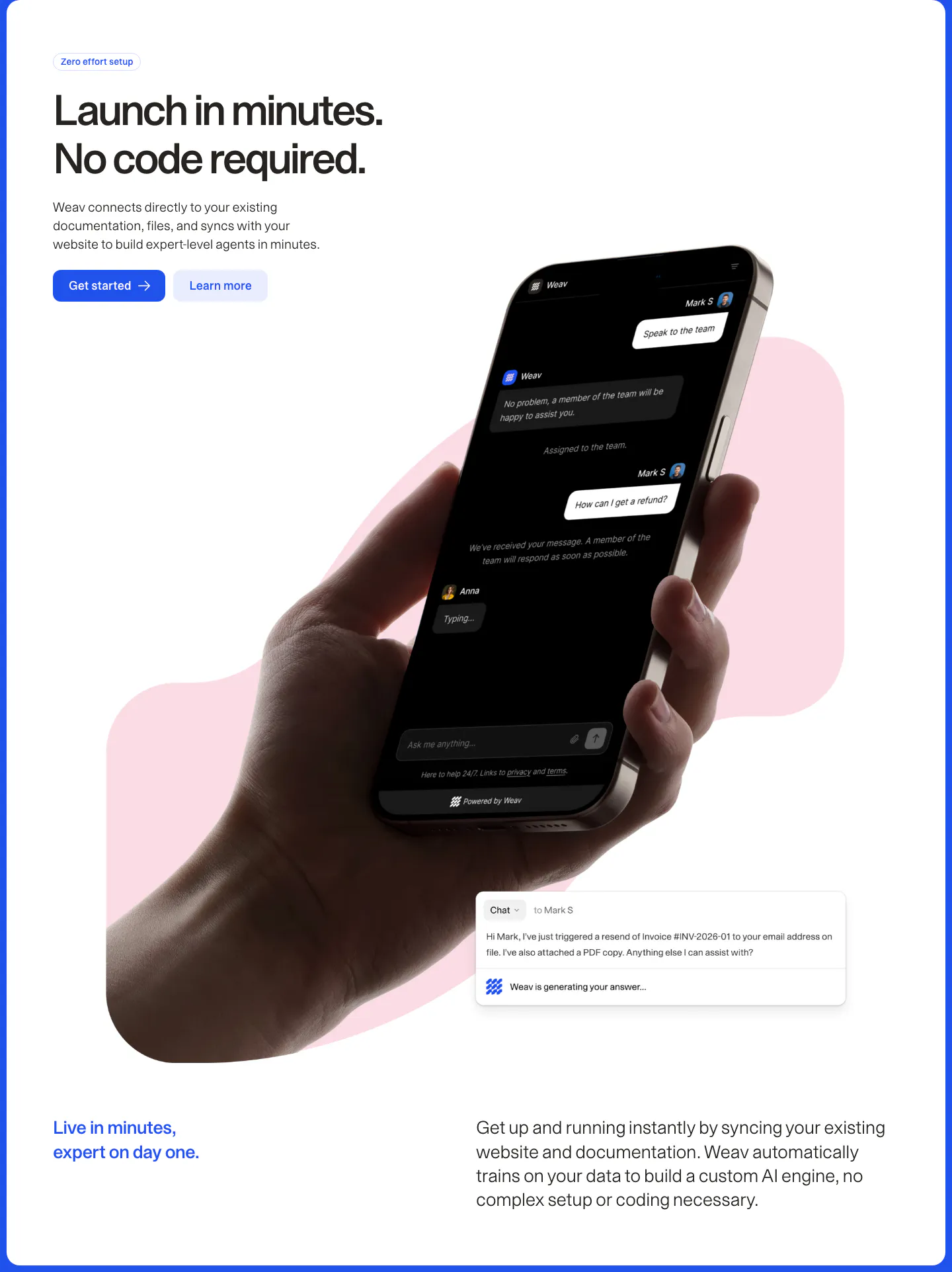
  50. Weav features section: headline and two buttons above a hand holding a phone with a dark chat UI over a pink blob, plus a chat reply card
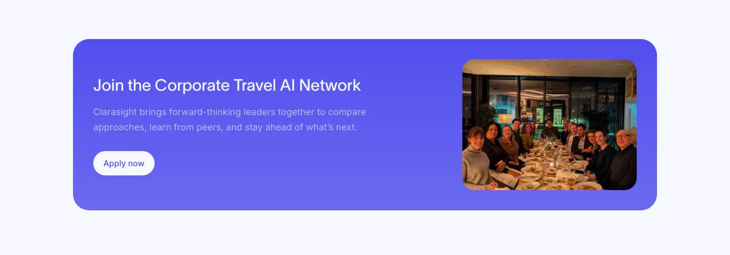
  51. Clarasight call to action section: indigo rounded banner with headline, copy and white button beside a photo of a group at a dinner table
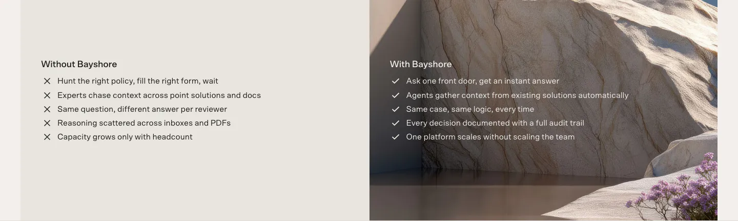
  52. Bayshore comparison section: Without Bayshore cross list on beige beside a With Bayshore check list over a sandstone landscape photo
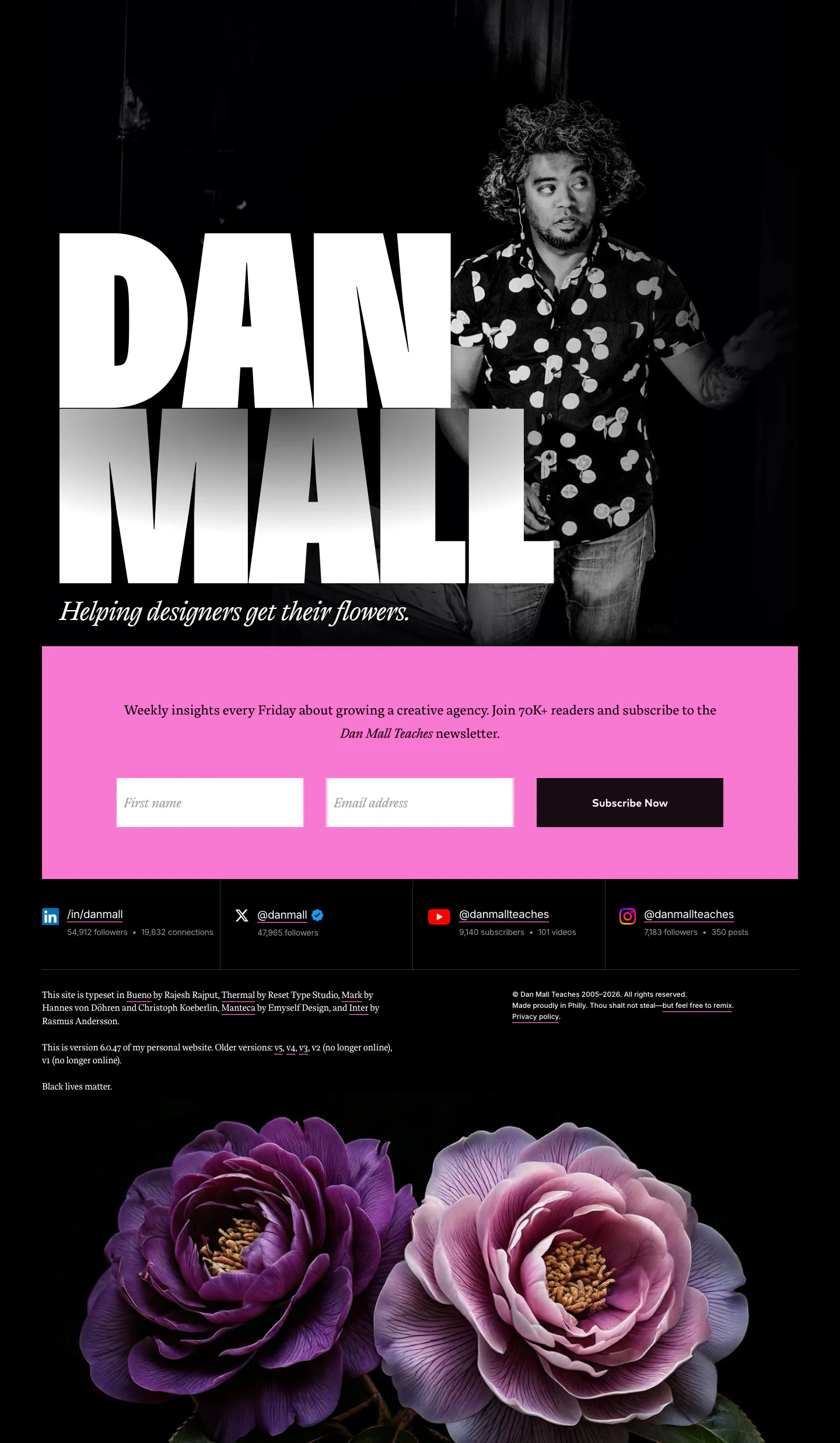
  53. Dan Mall footer section: huge name beside a portrait photo, pink newsletter form band, social stats and flowers on black
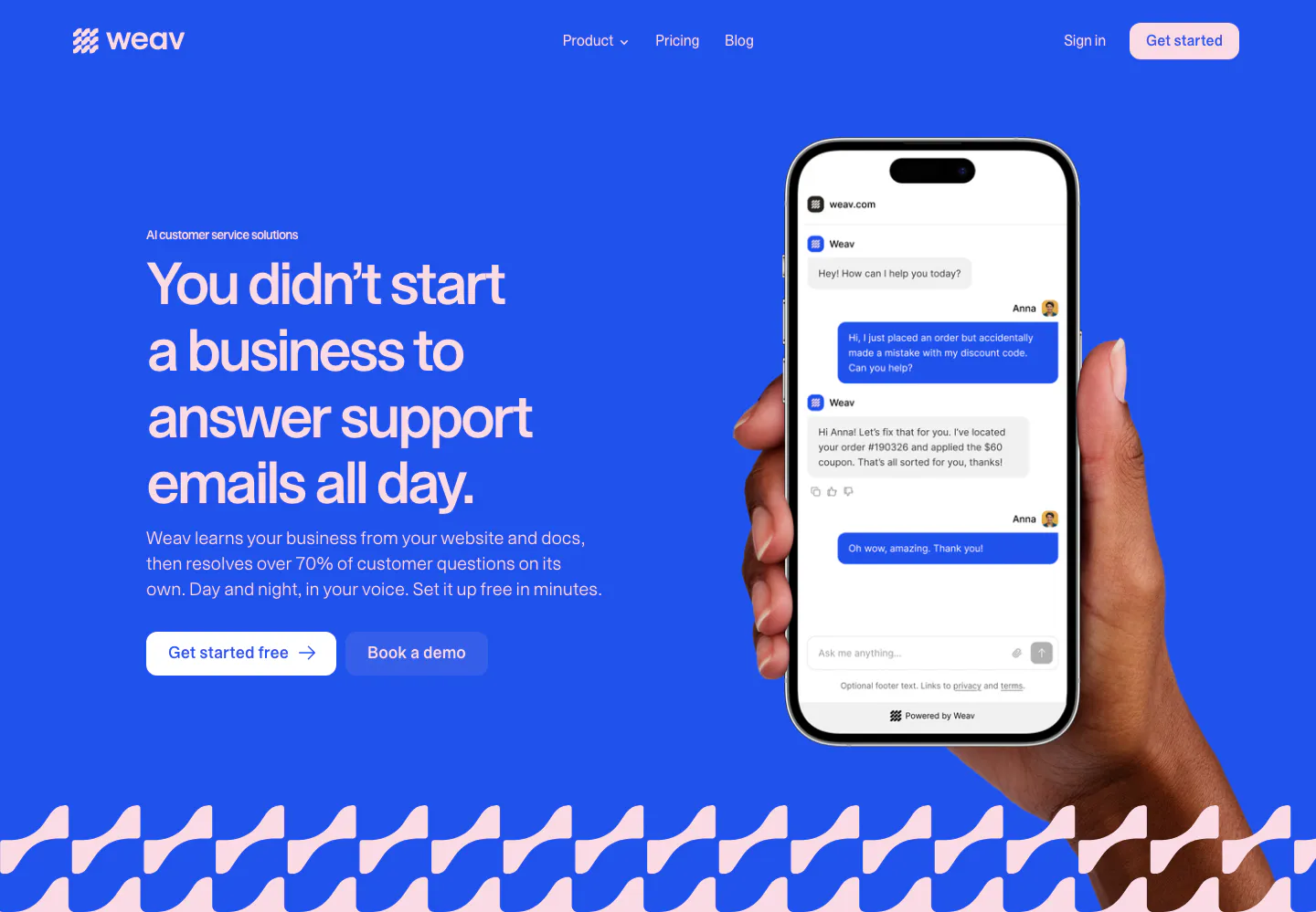
  54. Weav hero section: headline and two buttons on a bright blue background beside a hand holding a phone with a support chat, wave pattern below
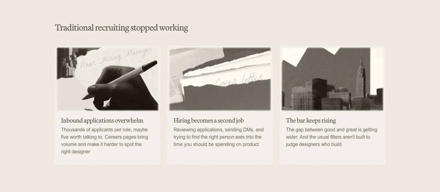
  55. Decimals value proposition section: serif heading above three cards with sepia photo collages and short problem descriptions on beige
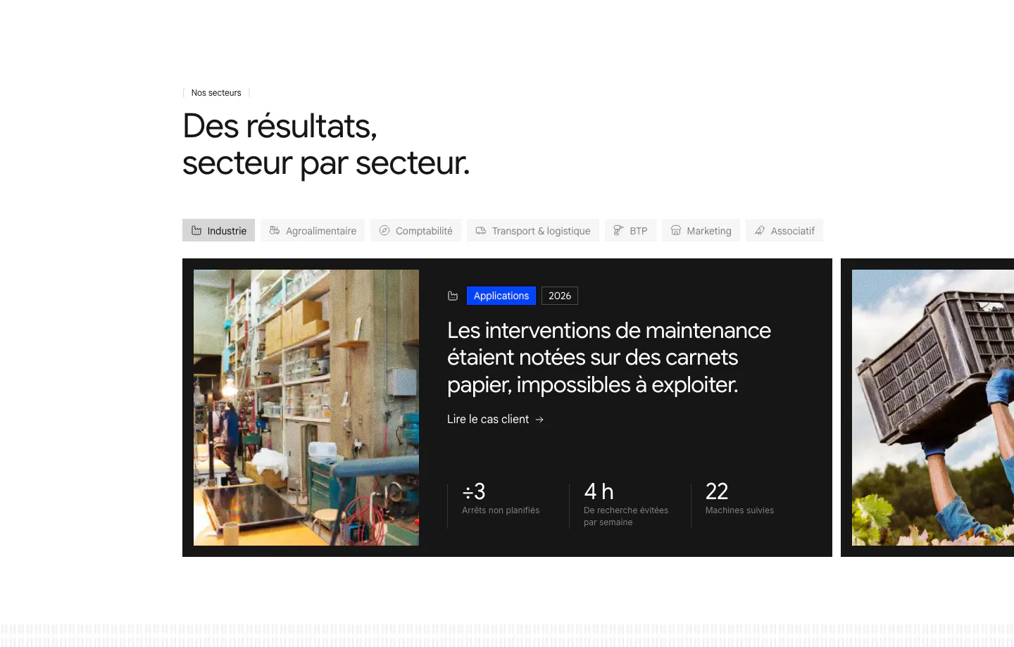
  56. Raneo use cases section: industry tab bar above a carousel of dark case-study cards with photos, headlines and three result metrics
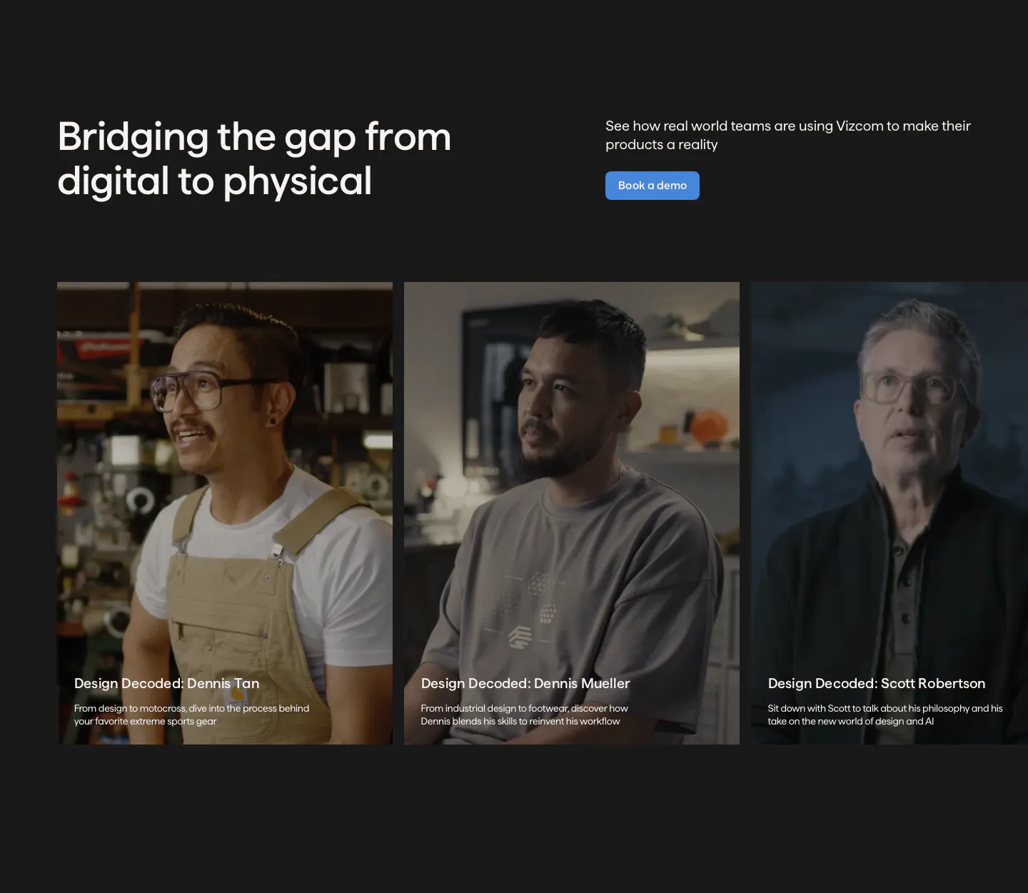
  57. Vizcom testimonials section: headline and demo button above a row of customer video story cards with portrait photos on a charcoal background
  58. Invertase testimonials section: headline above an expanded case-study card and two narrow photo cards with client logos on dark
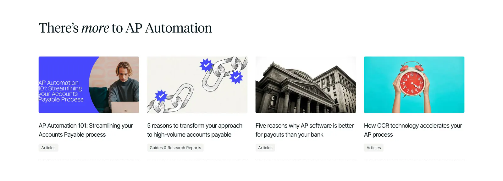
  59. Routable blog & resources section: serif headline above four article cards with photo and illustration thumbnails on white
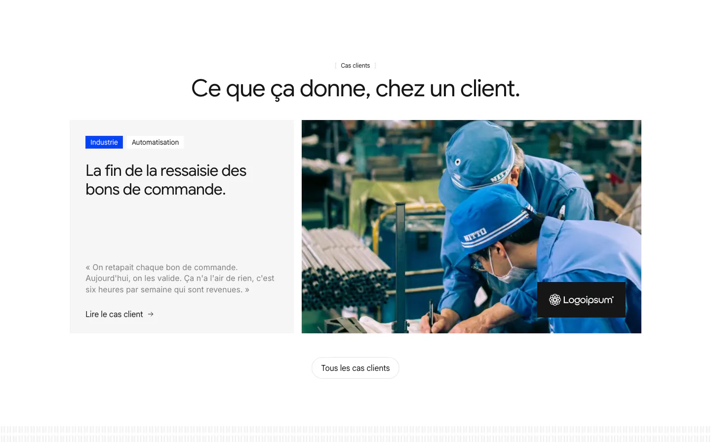
  60. Raneo testimonials section: centered headline above a case-study card with tags, client quote and link beside a factory worker photo
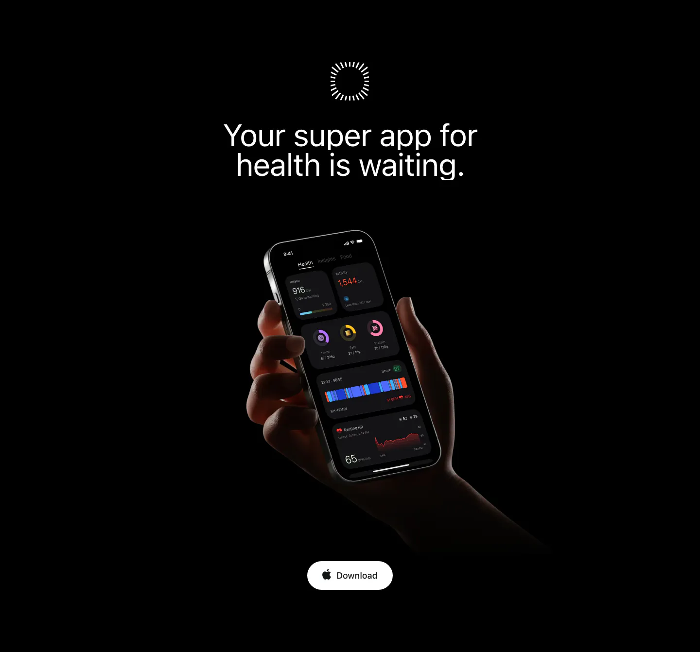
  61. Bright call to action section: centered headline on black above a hand holding a phone with the dark app UI and a Download button
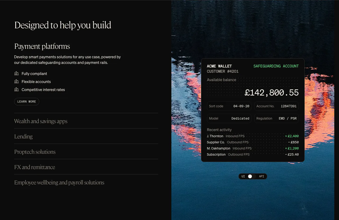
  62. Griffin use cases section: serif heading with use-case accordion on the left, wallet UI card over a lake photo on the right
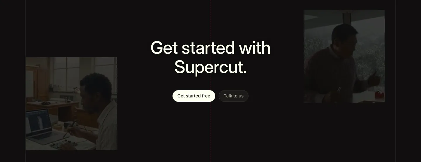
  63. Supercut call to action section: centered headline with two buttons between dimmed photos of people working, near-black background
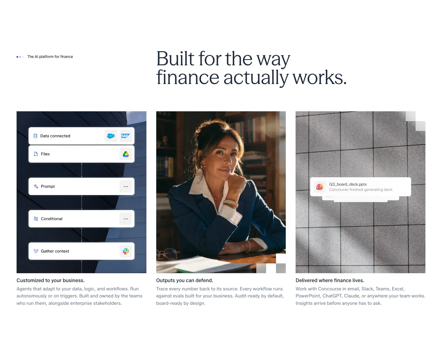
  64. Concourse features section: headline above three equal cards showing a workflow UI mockup, a portrait photo and a file notification
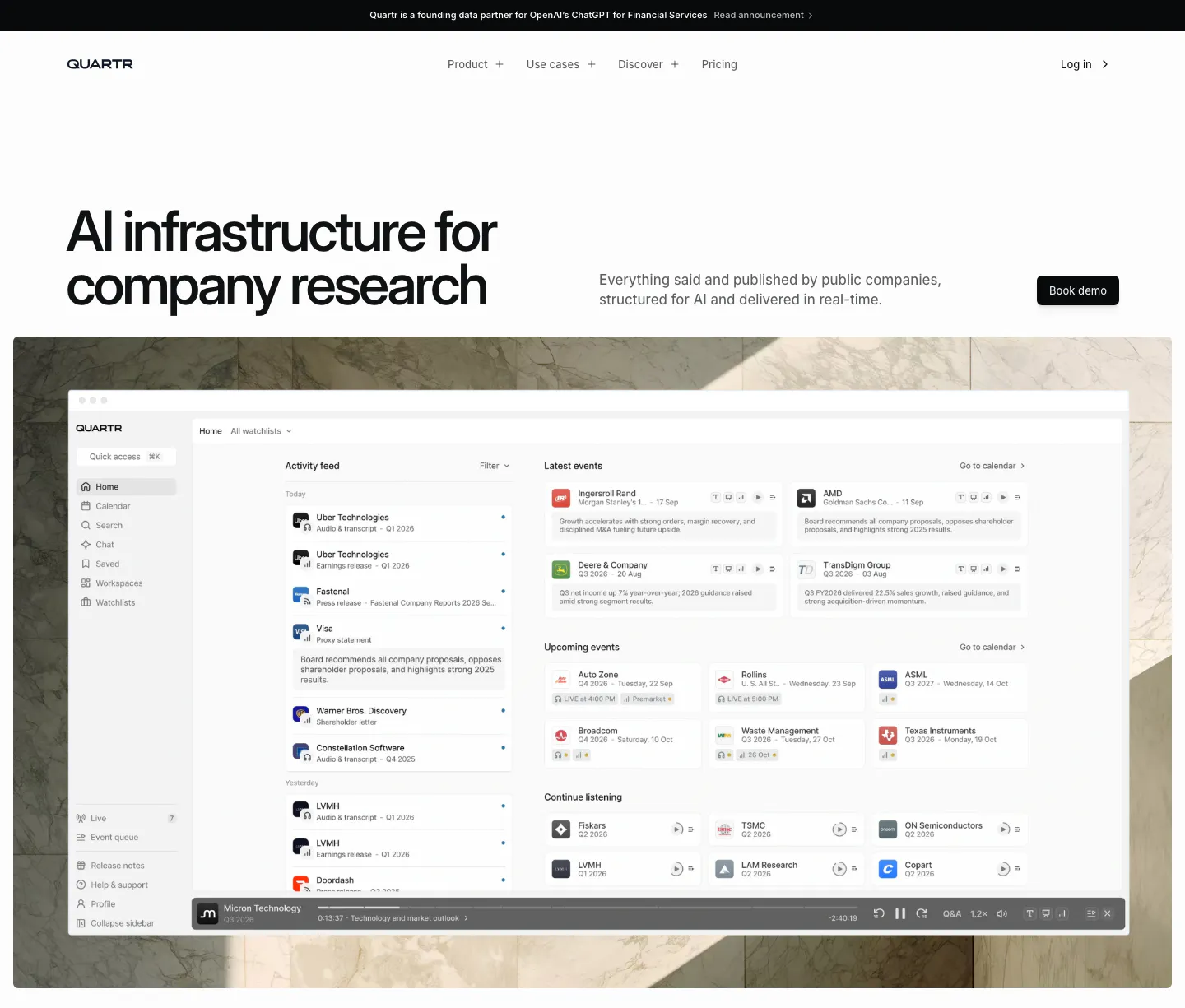
  65. Quartr hero section: left-aligned headline with Book demo button above a research app dashboard set on a marble photo backdrop
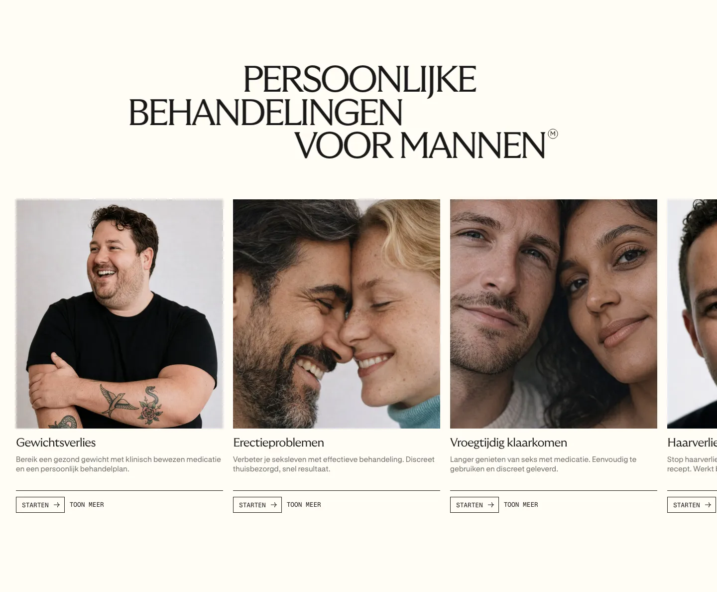
  66. Menkind features section: serif uppercase headline above a carousel of treatment cards with portrait photos and start buttons on cream
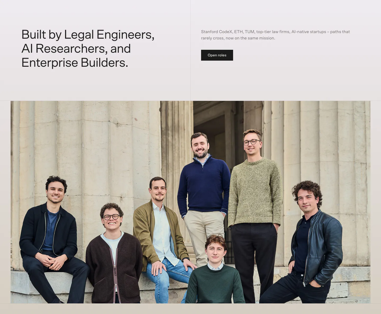
  67. Bayshore team section: headline and Open roles button above a wide group photo of the team in front of stone columns
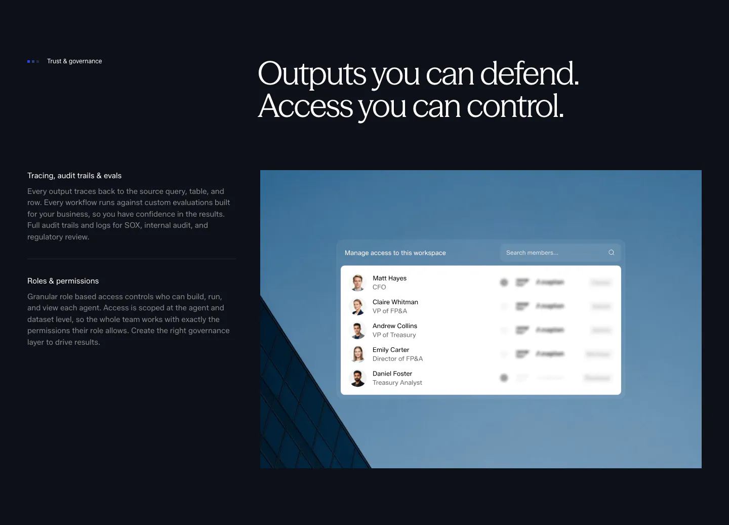
  68. Concourse security section: governance points left, access-control UI over a blue building photo right on a dark background
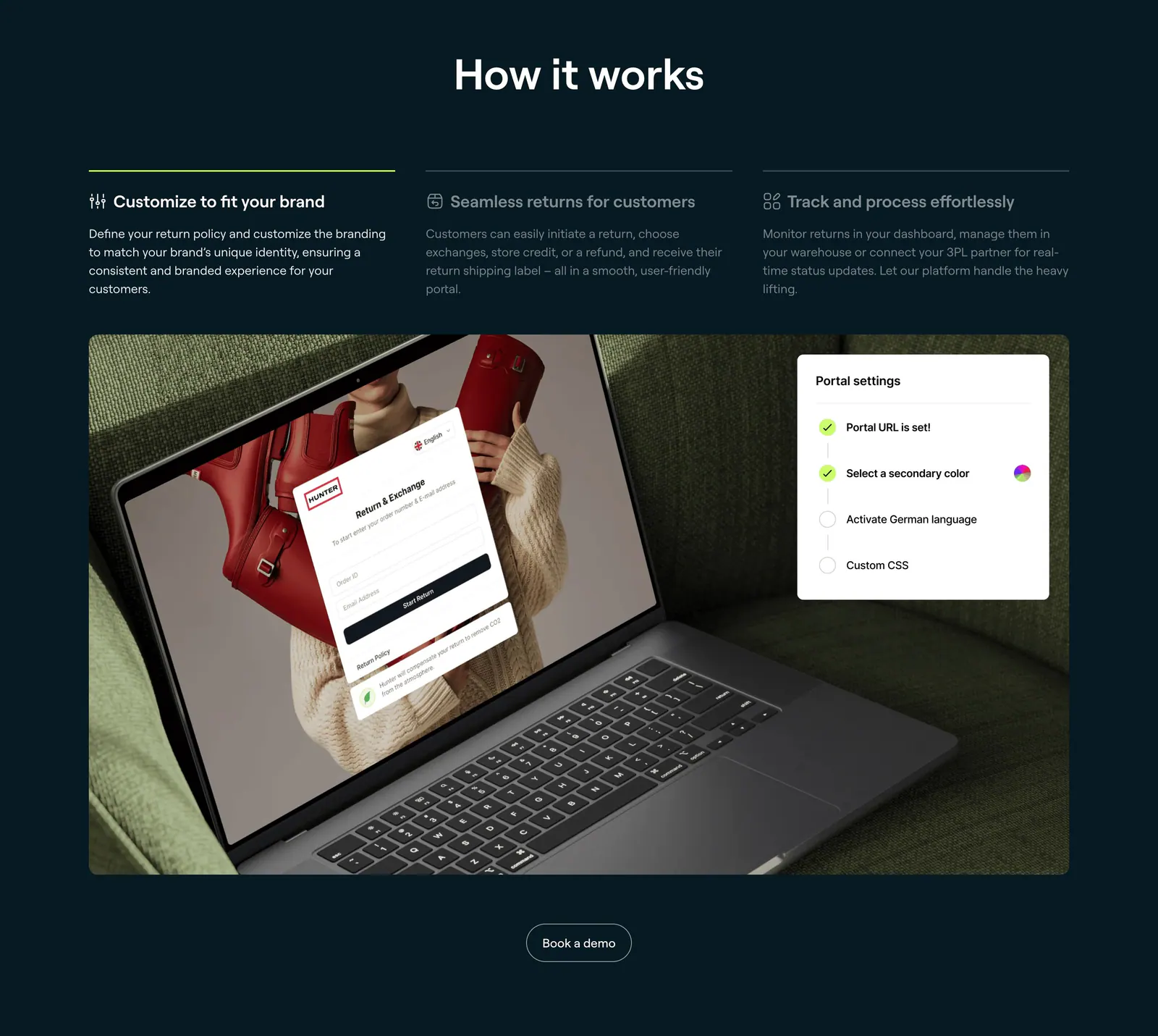
  69. 8returns how it works section: three step tabs on dark navy above a photo of a laptop showing a returns portal with a settings card
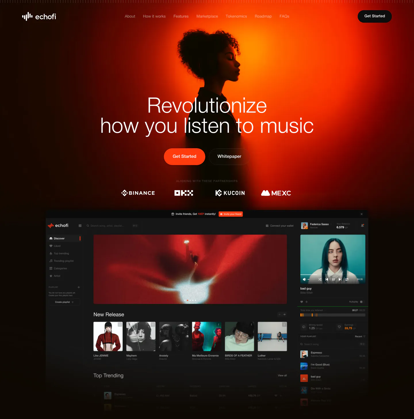
  70. EchoFi hero section: centered headline over an orange-lit portrait photo, exchange logo row and dark music app screenshot on black
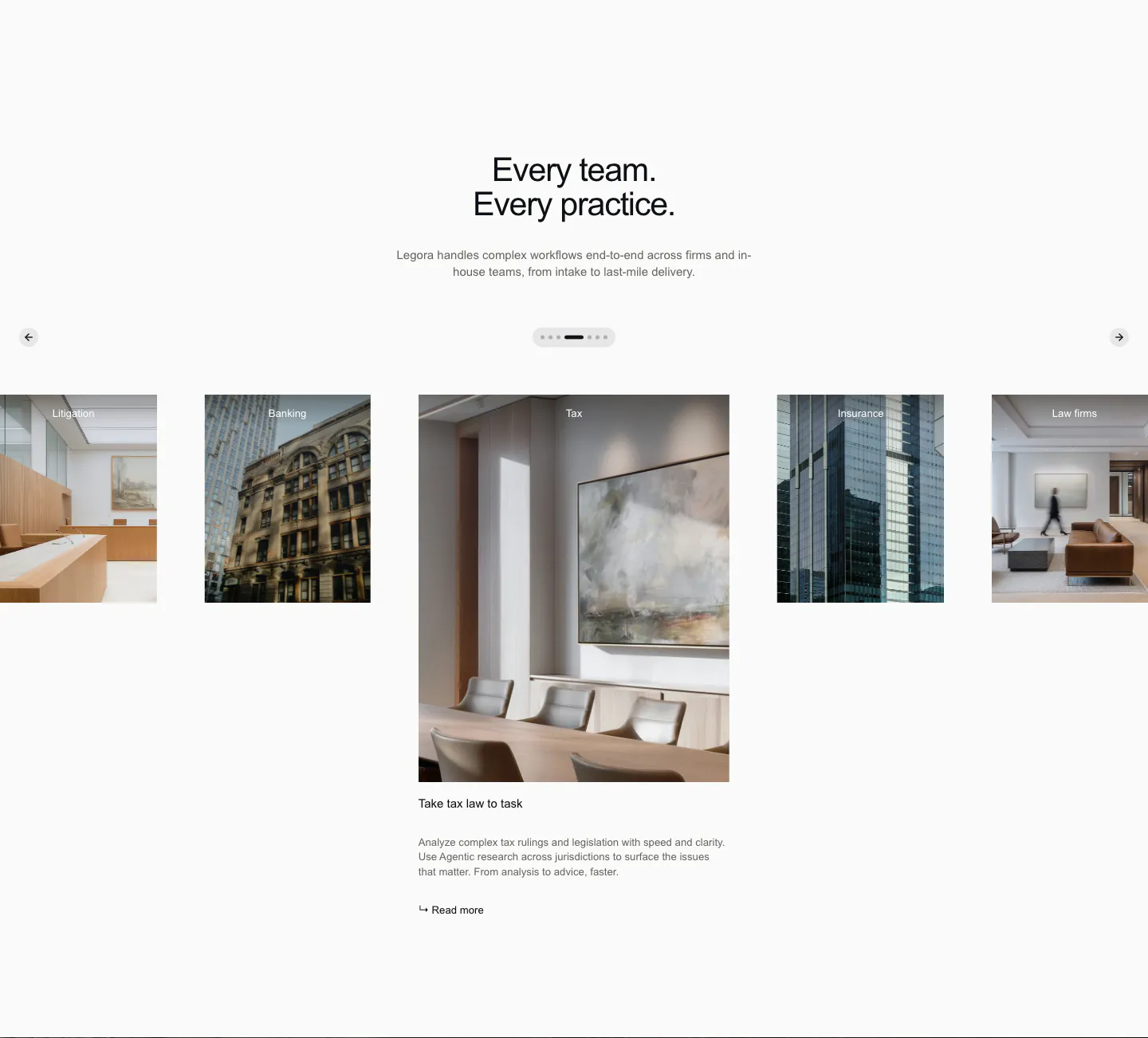
  71. Legora use cases section: centered headline above a photo carousel of practice areas with arrows and pagination dots
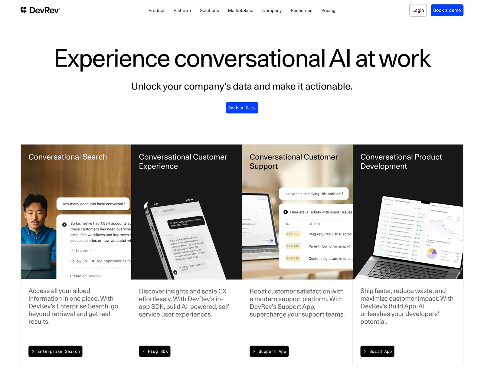
  72. DevRev hero section: centered headline and Book a Demo button above four product cards mixing photos and conversational UI mockups
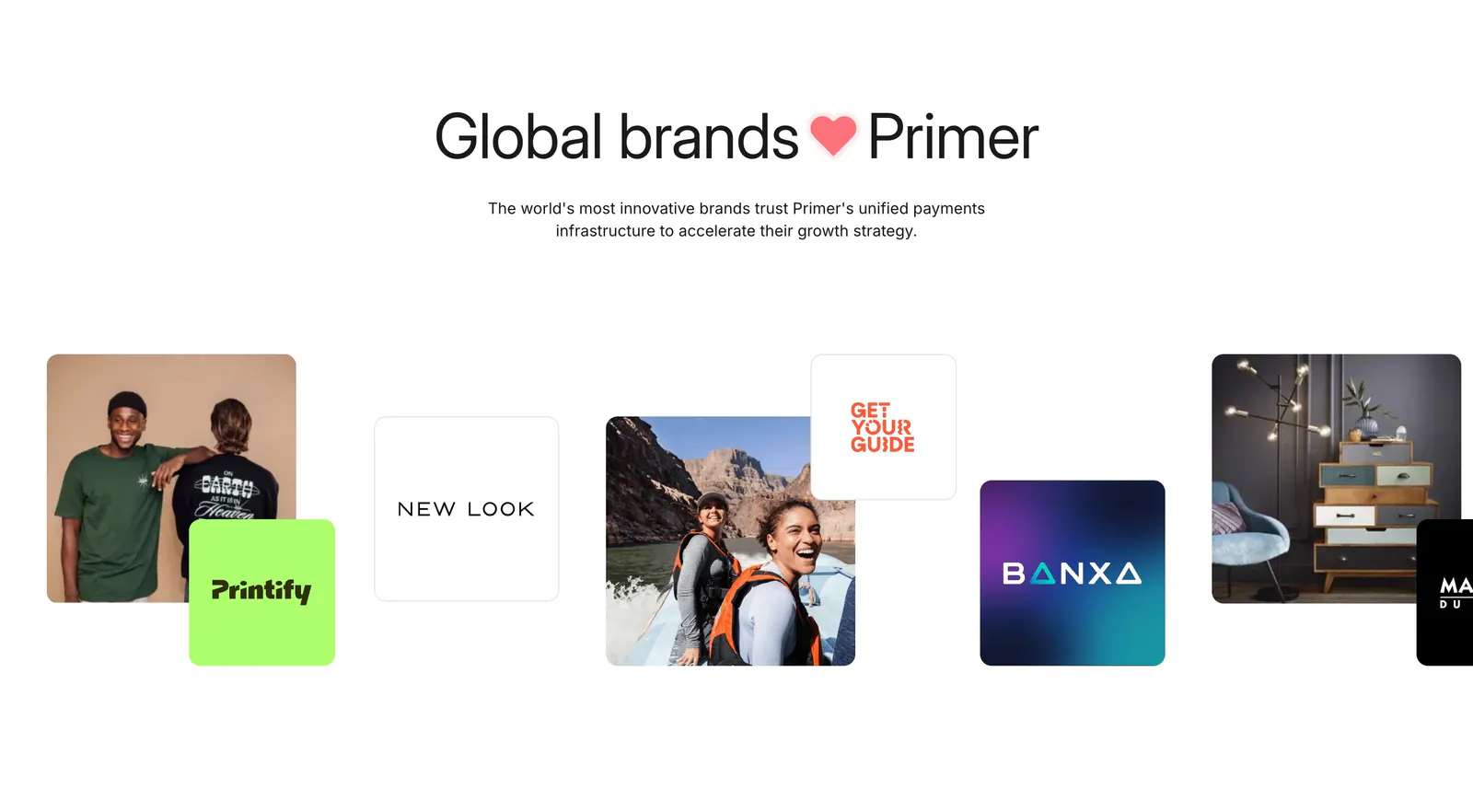
  73. Primer logo cloud section: centered headline above a staggered row of customer logo tiles mixed with lifestyle photos
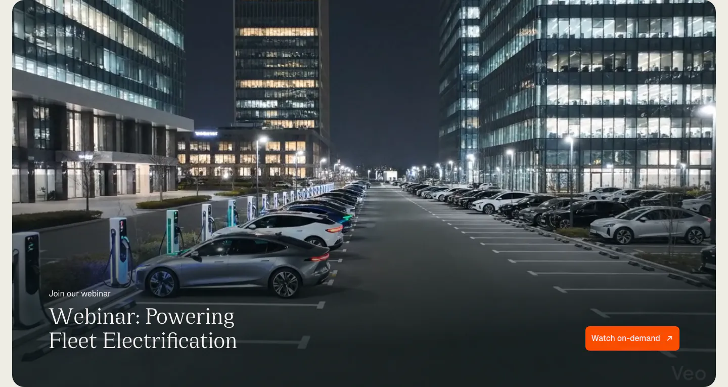
  74. Chargetrip blog & resources section: webinar banner with serif title and orange button over a full-bleed night photo of an EV charging lot
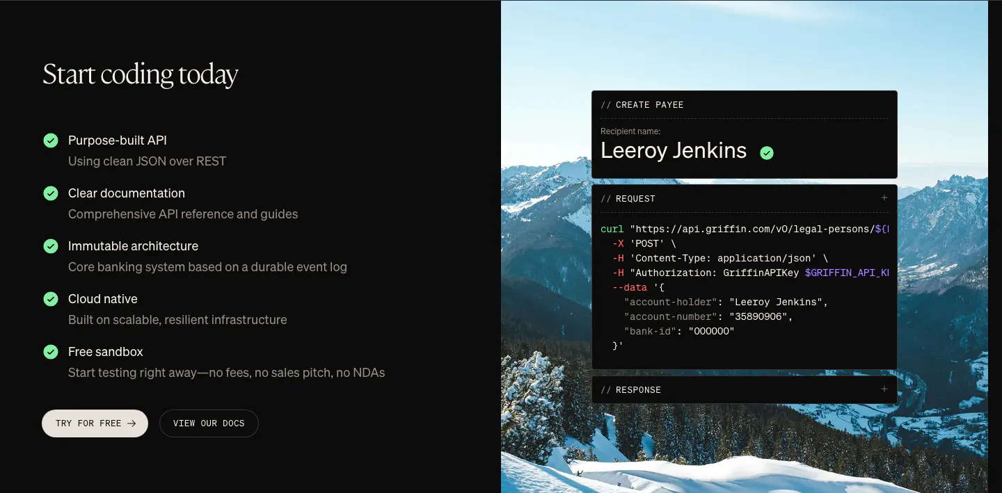
  75. Griffin features section: checklist of API benefits and two buttons beside a curl code card over a mountain photo
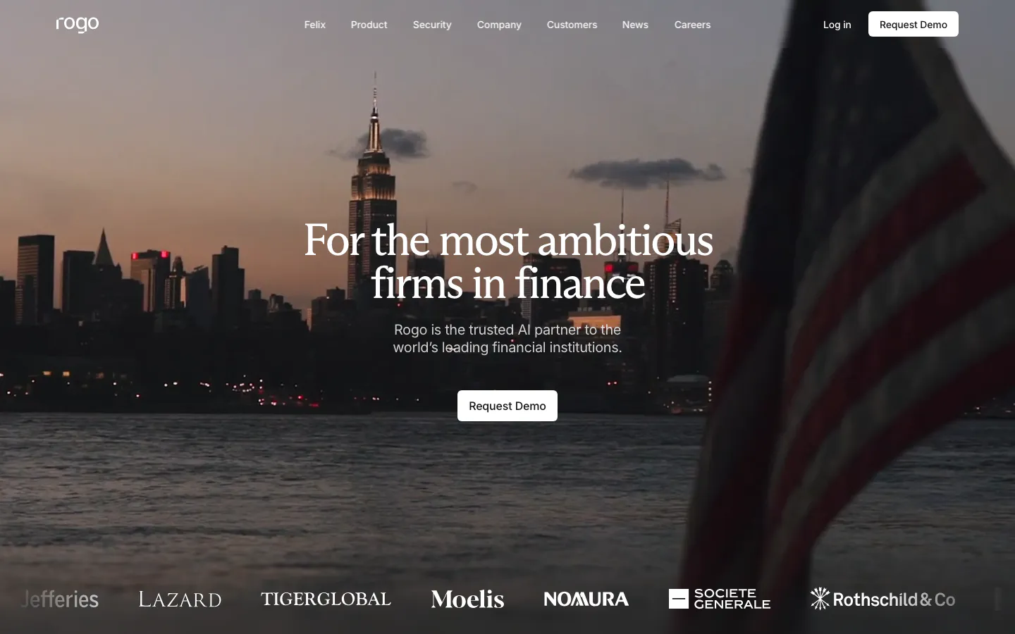
  76. Rogo hero section: centered serif headline and demo button over a full-bleed dusk photo of a city skyline, logo strip at the bottom
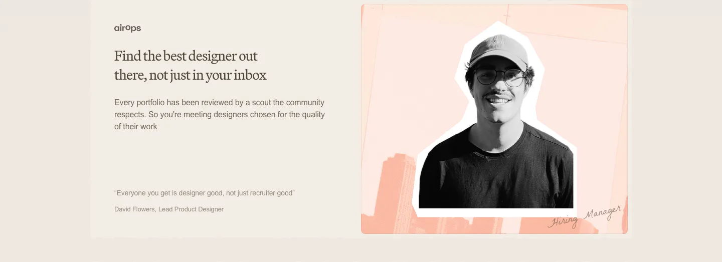
  77. Decimals testimonials section: serif headline, copy and short quote on the left beside a cutout photo of a hiring manager on a peach collage
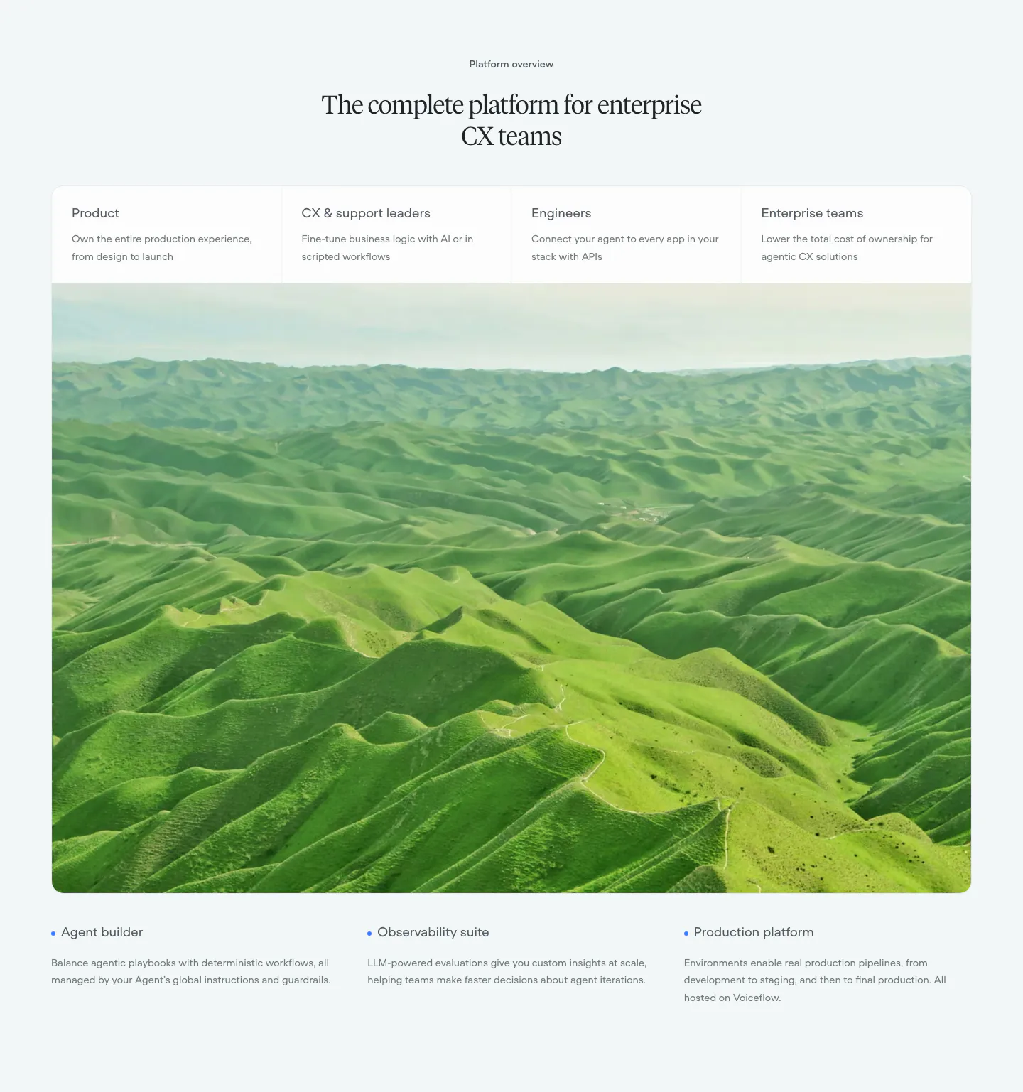
  78. Voiceflow use cases section: centered serif headline, four role tabs over a large green hills photo, three feature notes below
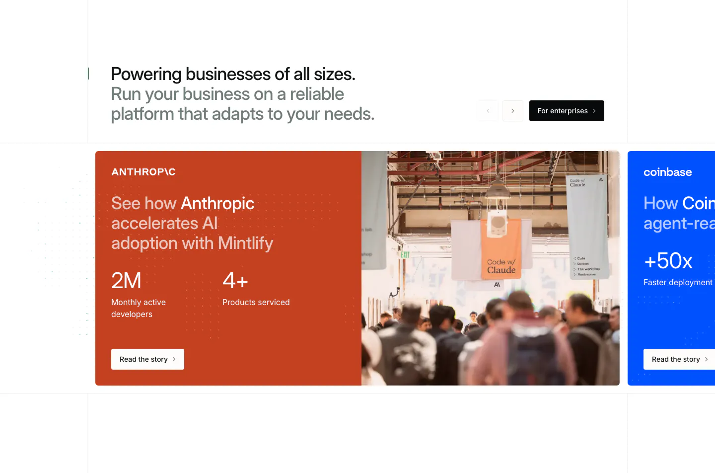
  79. Mintlify testimonials section: headline with arrows above a carousel of customer story cards, orange Anthropic card with stats and photo
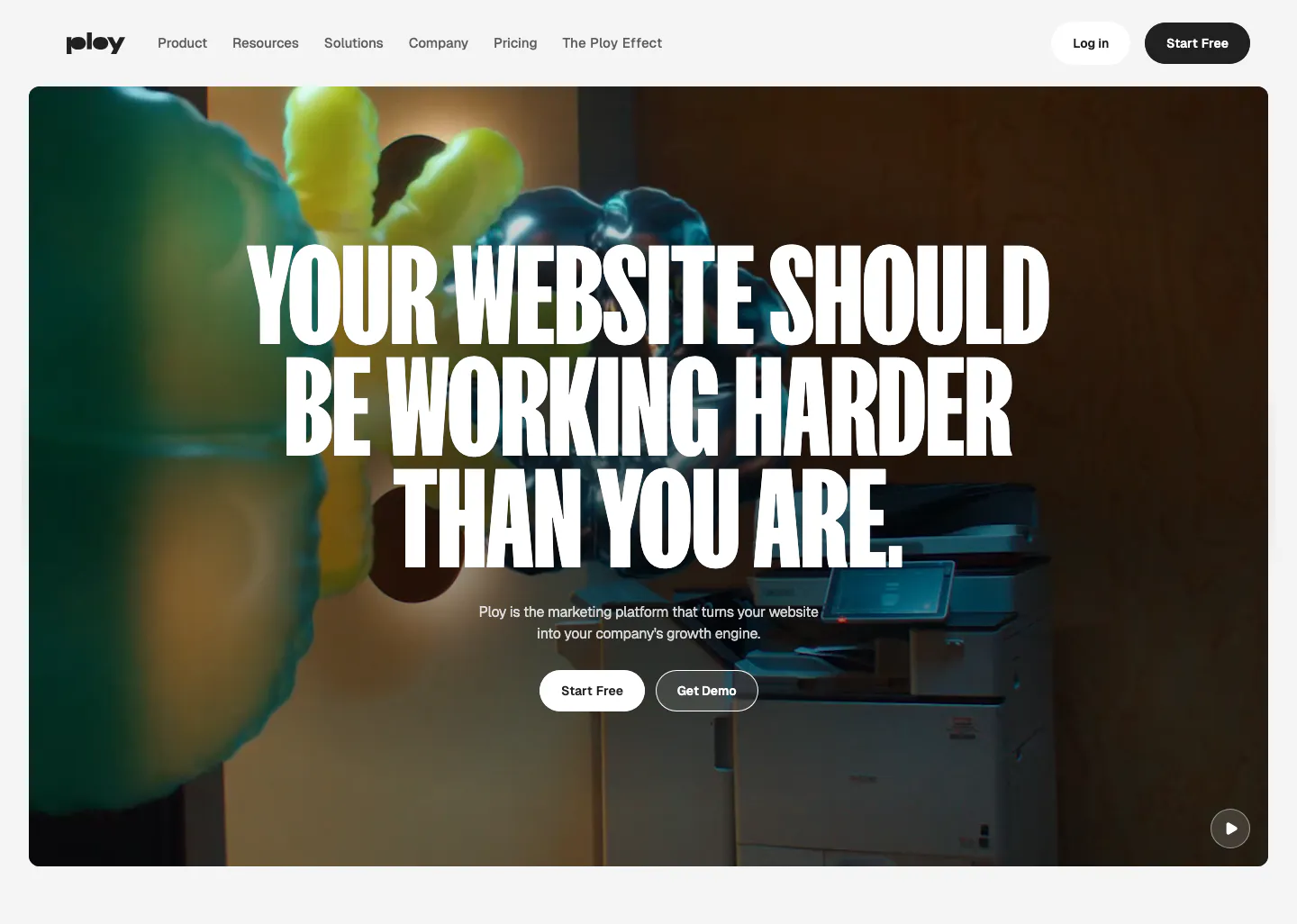
  80. Ploy hero section: centered condensed uppercase headline and two buttons over a full-bleed office video frame with inflatable shapes
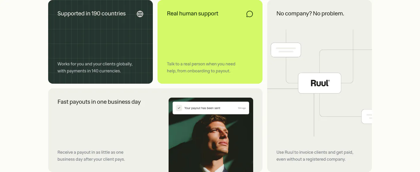
  81. Ruul features section: bento grid of benefit tiles in dark green, lime and warm gray, with a portrait photo and a node diagram
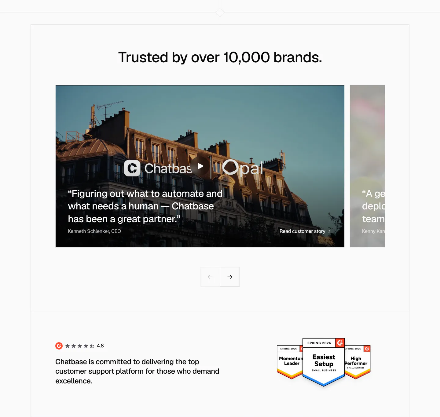
  82. Chatbase testimonials section: slider of photo-backed customer story cards with arrows, G2 rating and badges below
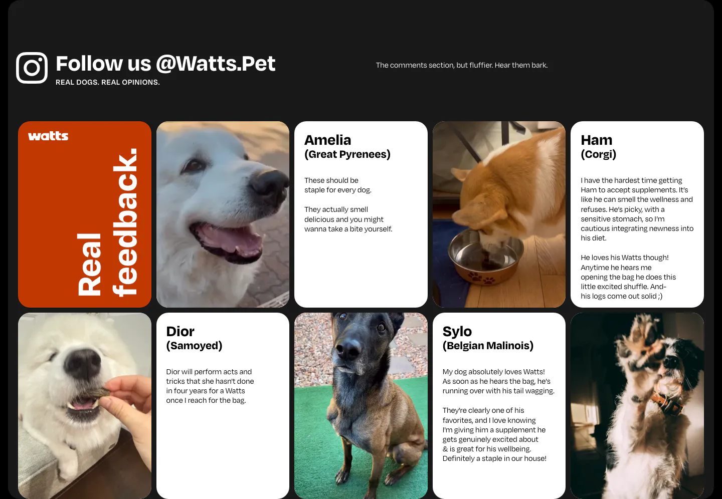
  83. Watts testimonials section: grid of dog photos and customer review cards under an Instagram handle heading on a dark frame
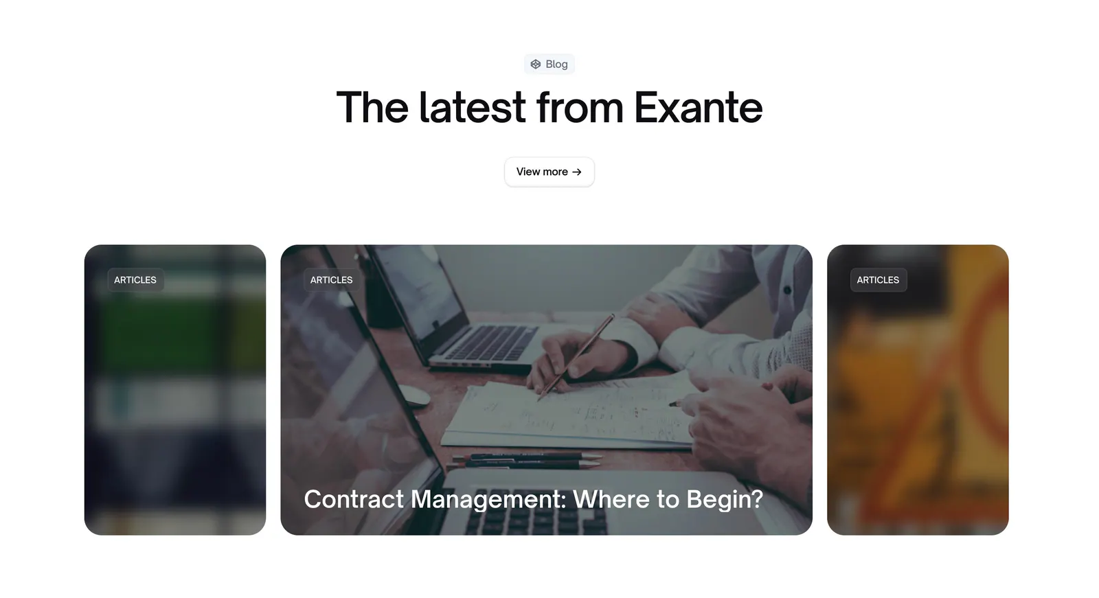
  84. Exante blog & resources section: centered heading and view more button above a carousel of photo article cards with blurred edges
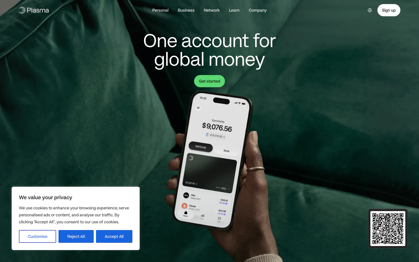
  85. Plasma hero section: centered headline and green button above a hand holding a phone over a full-bleed green sofa photo
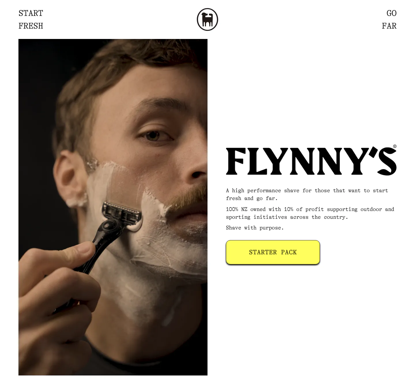
  86. Flynny's about & mission section: tall photo of a man shaving left, large serif wordmark, short brand copy and yellow Starter Pack button right
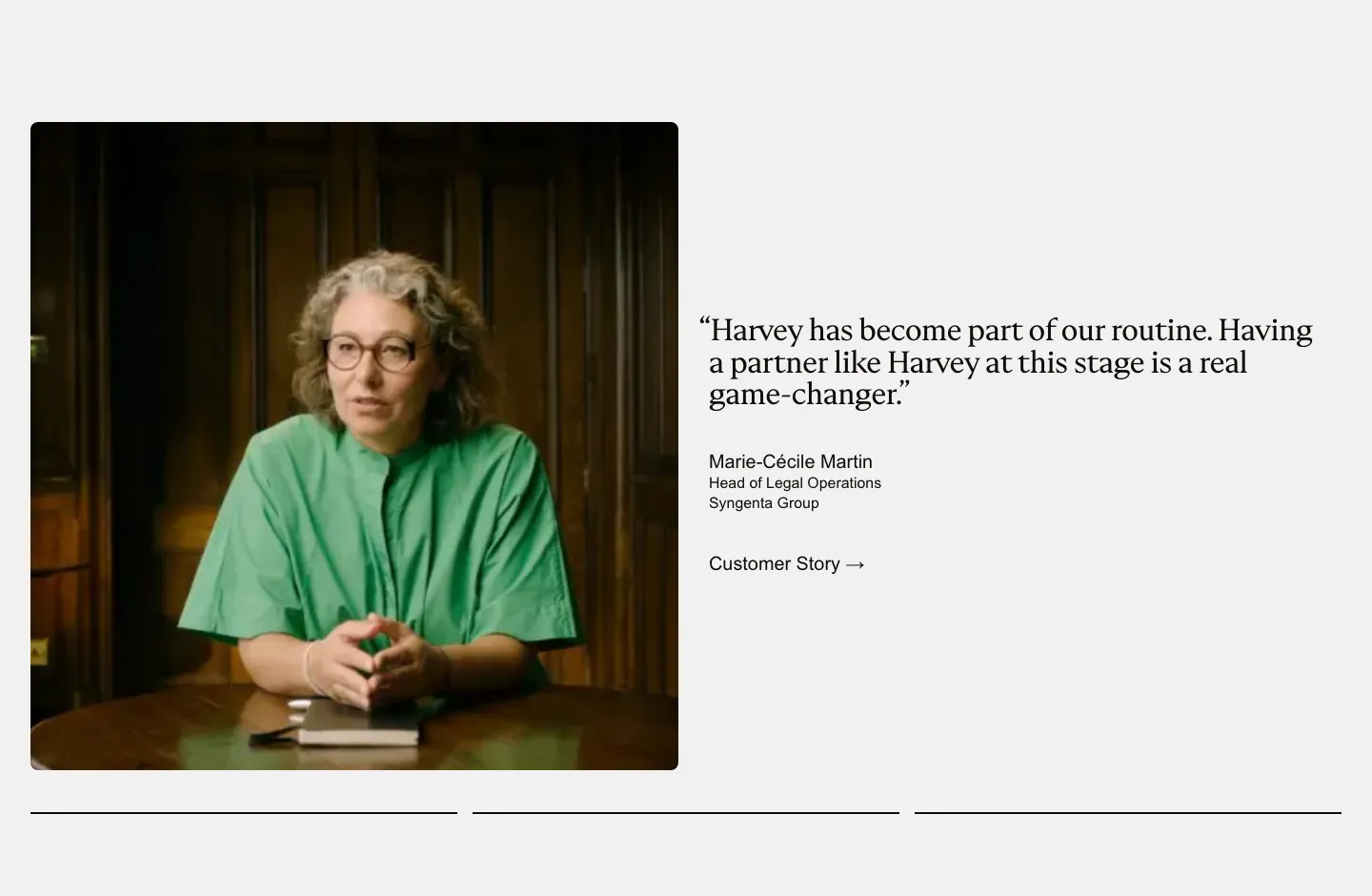
  87. Harvey testimonials section: photo of a customer at a table beside a serif quote with name and customer story link
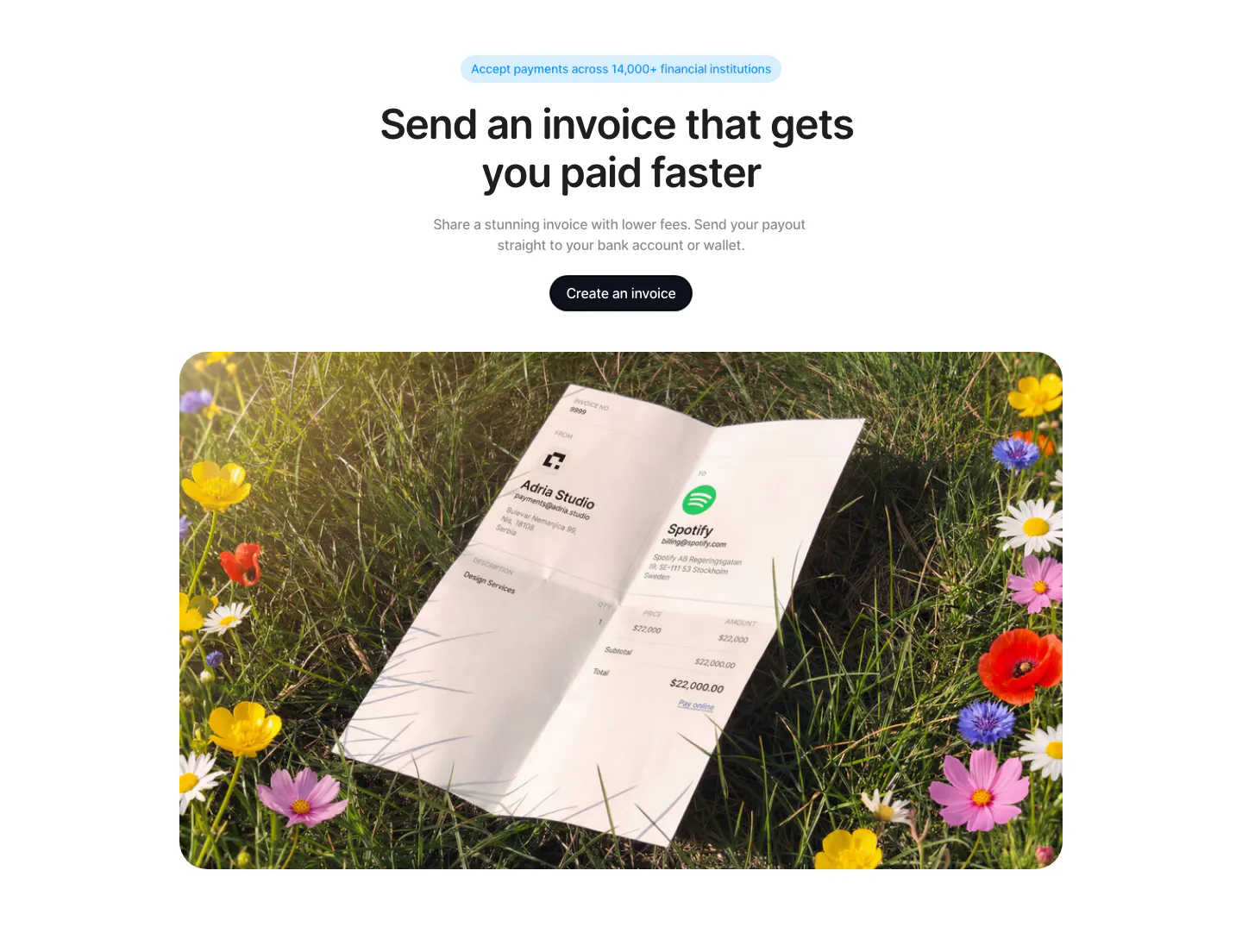
  88. Acctual call to action section: centered headline and button above a rounded photo of a printed invoice lying in a flower meadow
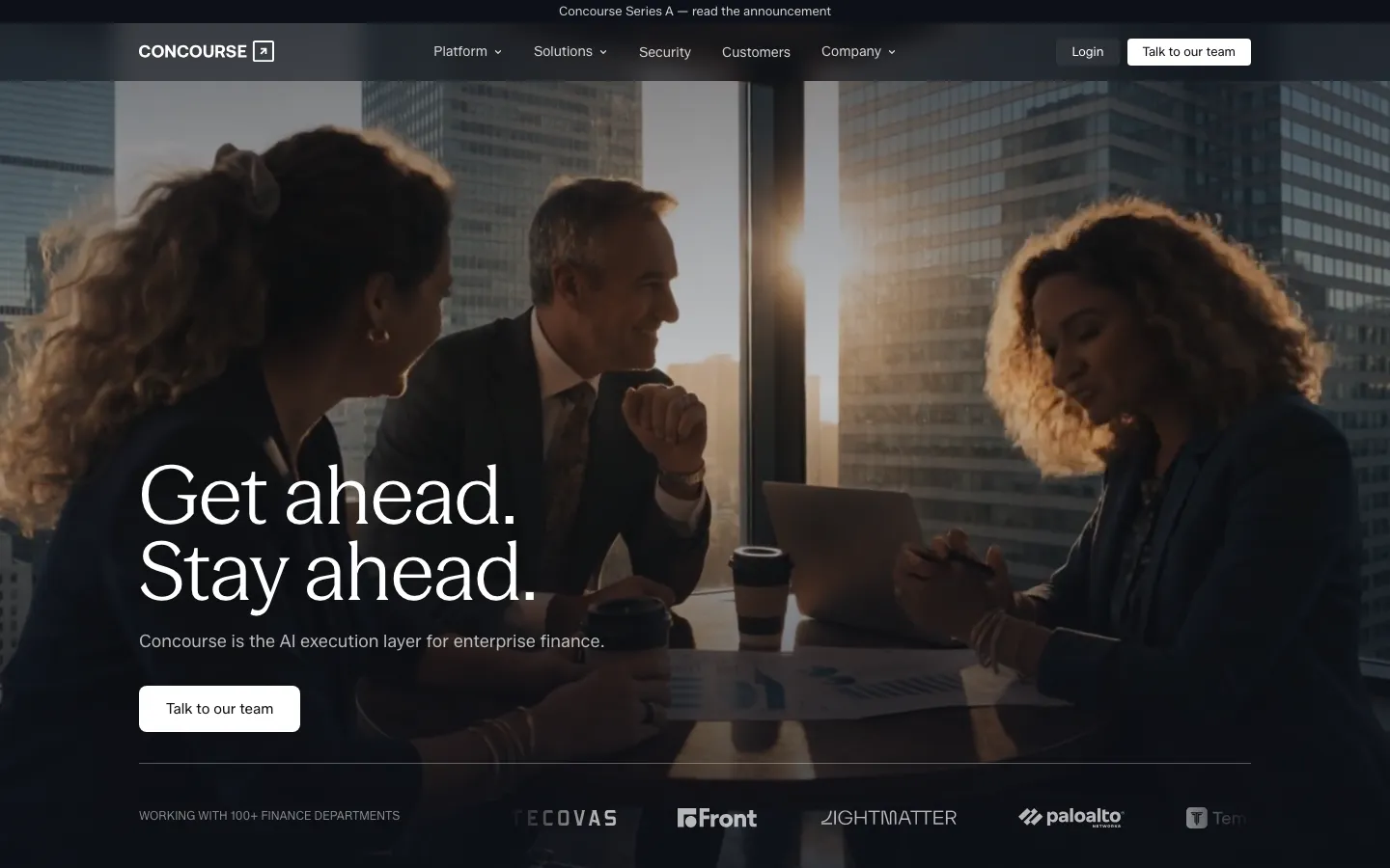
  89. Concourse hero section: left-aligned headline and button over a dark full-bleed office meeting photo with a logo strip below
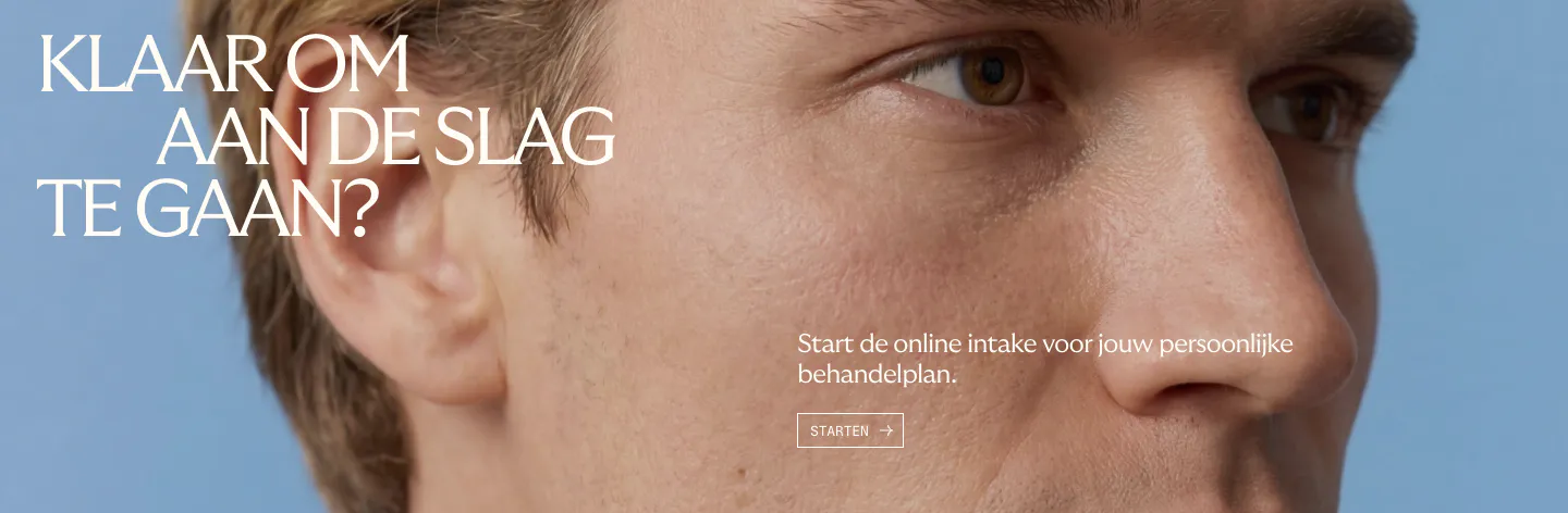
  90. Menkind call-to-action section: white serif headline and start button over a full-bleed close-up face photo on blue
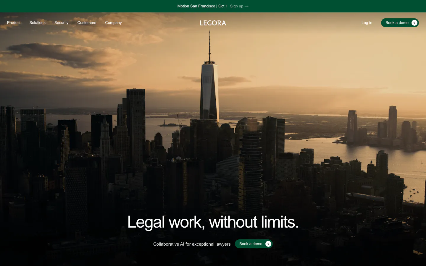
  91. Legora hero section: centered headline and green demo button over a full-bleed dusk photo of the Manhattan skyline
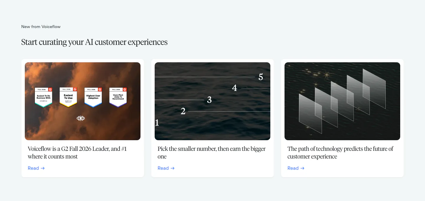
  92. Voiceflow blog & resources section: serif headline above three article cards with photographic thumbnails on a pale gray background
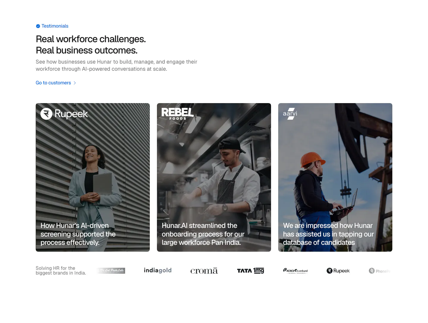
  93. Hunar testimonials section: left heading above three photo cards with customer quotes over images and a customer logo row
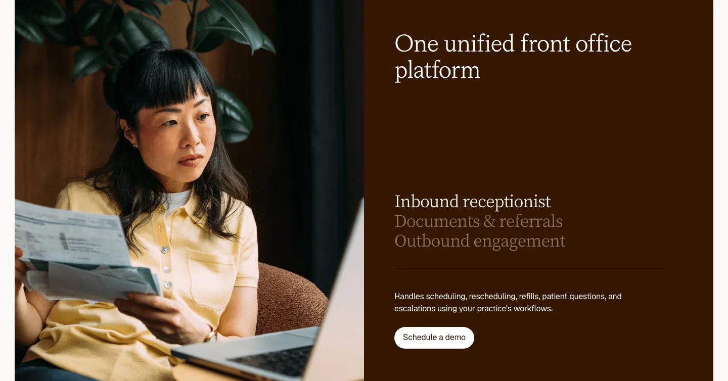
  94. Clarion features section: split card with a photo of a woman reviewing papers beside a dark brown panel with a serif tab list and button
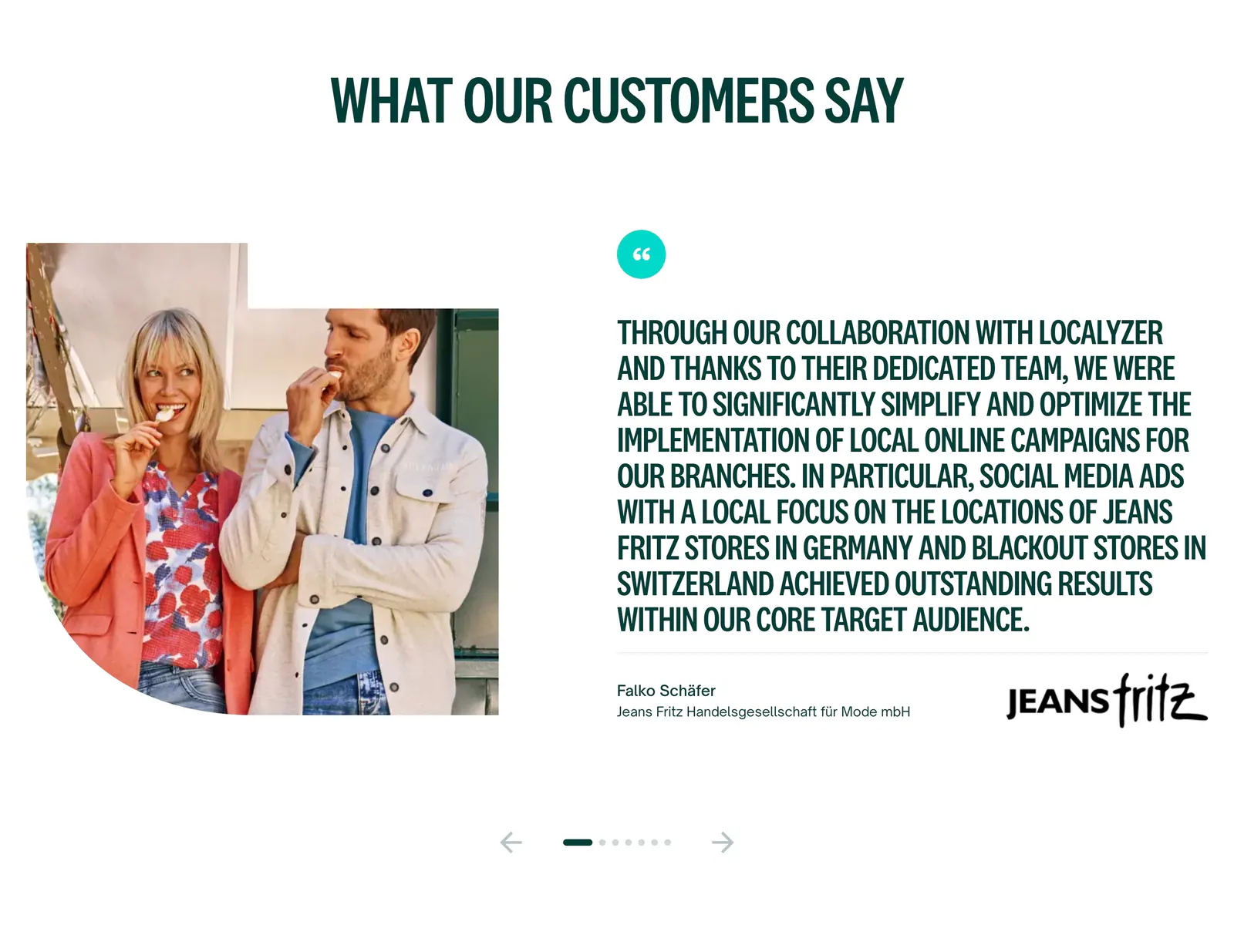
  95. Localyzer testimonials section: customer photo beside a large uppercase quote with client logo and carousel arrows on white
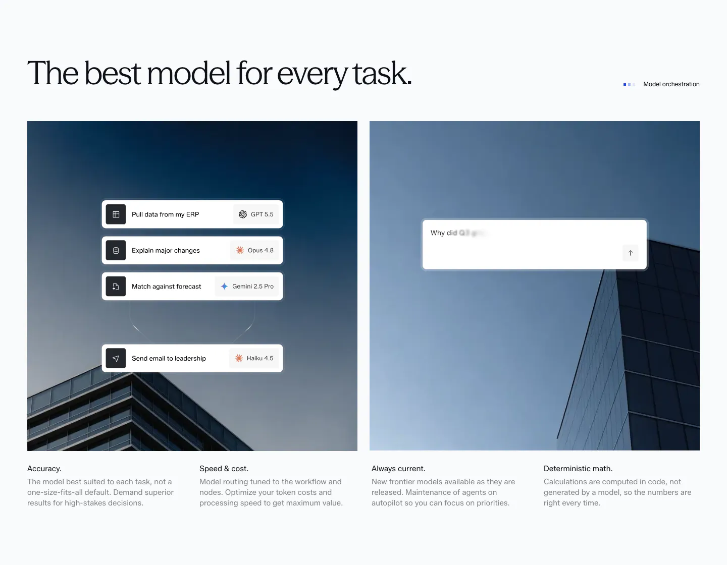
  96. Concourse features section: headline above two building photos overlaid with model-routing and chat UI cards, four feature notes below
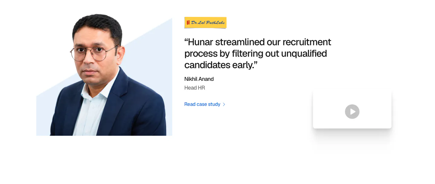
  97. Hunar testimonials section: headshot photo on the left, customer quote with logo and case study link, and a video thumbnail
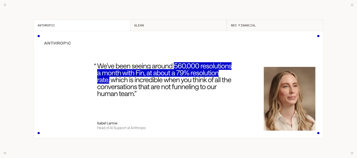
  98. Intercom testimonials section: tabbed customer quote card with a blue-highlighted phrase, Anthropic logo, speaker name and portrait photo
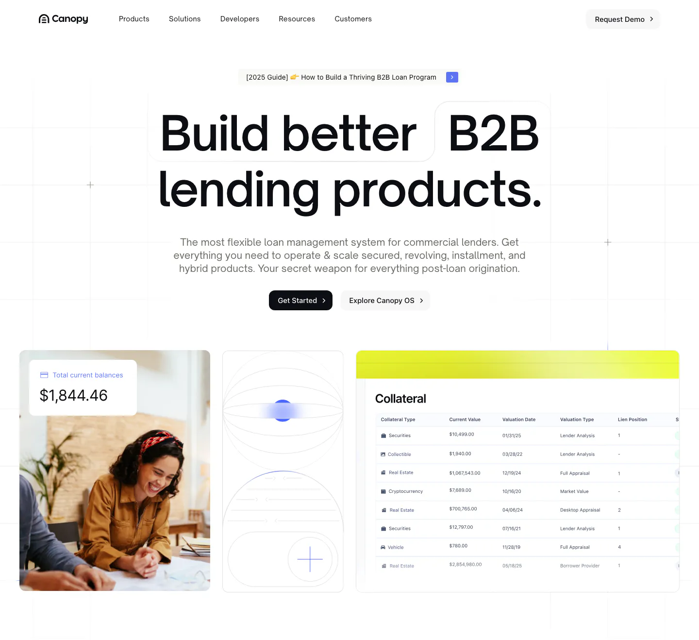
  99. Canopy hero section: centered bold headline and two buttons above a photo, abstract tile and collateral table UI on a white grid
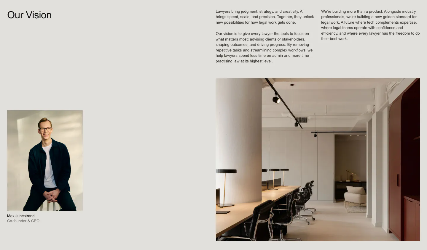
  100. Legora about & mission section: Our Vision heading with text columns, a CEO portrait and a large office interior photo
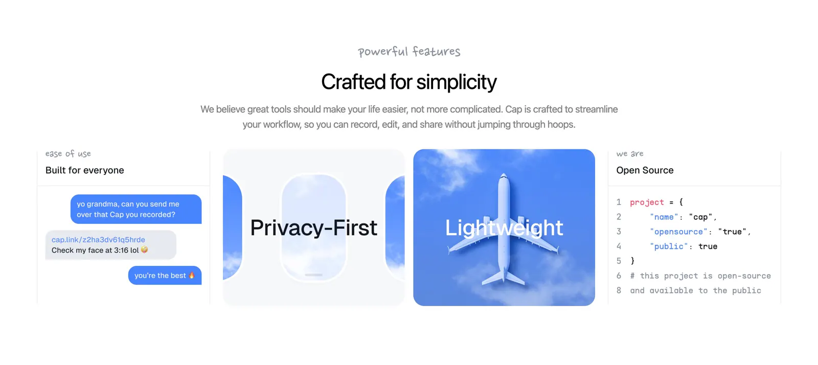
  101. Cap features section: centered headline above four cards with a chat mockup, airplane window art, sky photo and code snippet
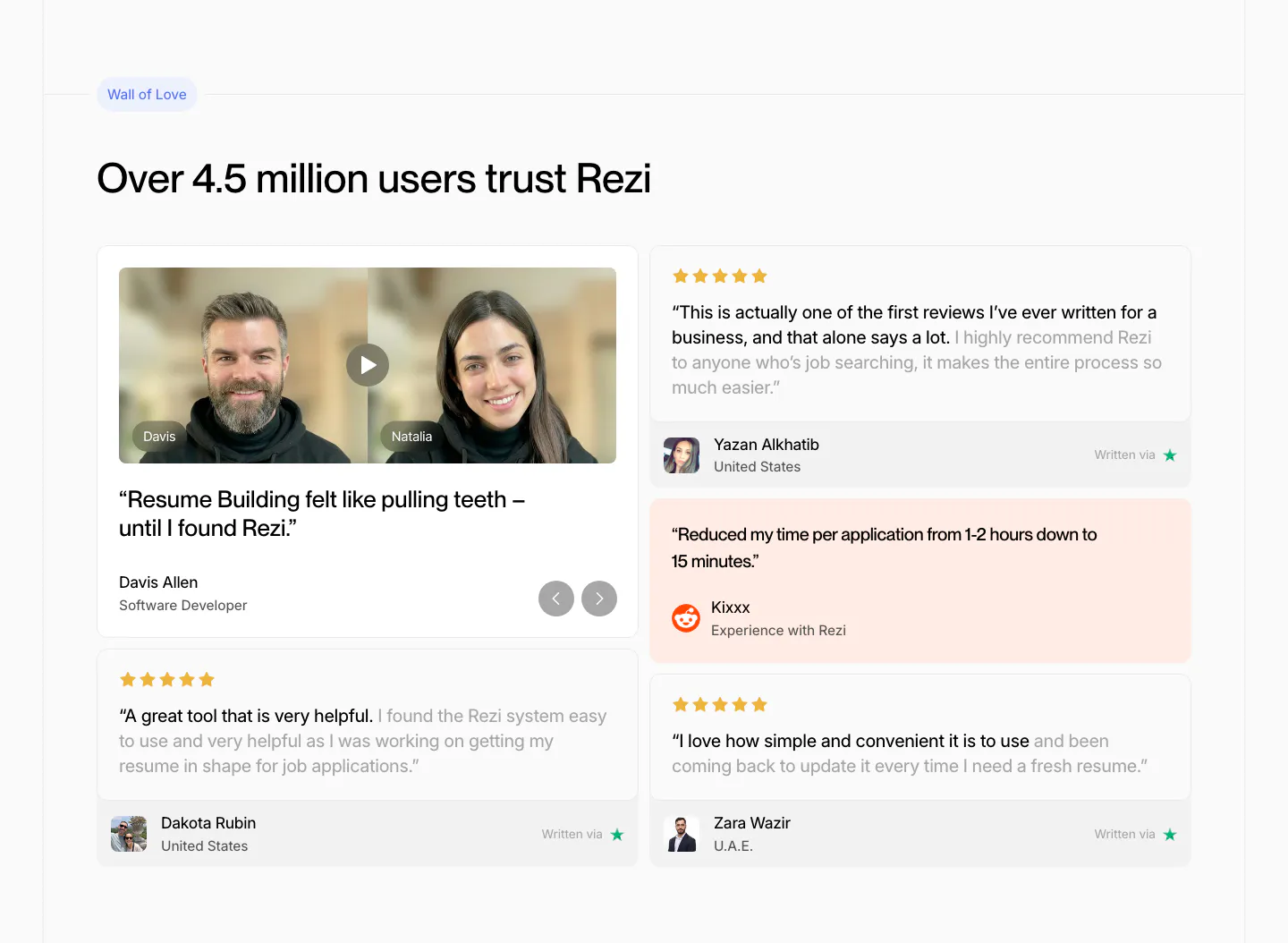
  102. Rezi testimonials section: two-column review wall with a video testimonial card, star-rated quote cards and a peach Reddit quote
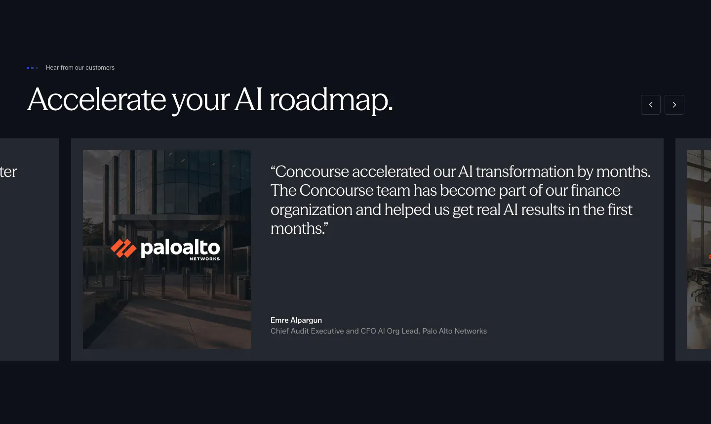
  103. Concourse testimonials section: headline with arrow buttons above a carousel of quote cards with a Palo Alto Networks photo on dark navy
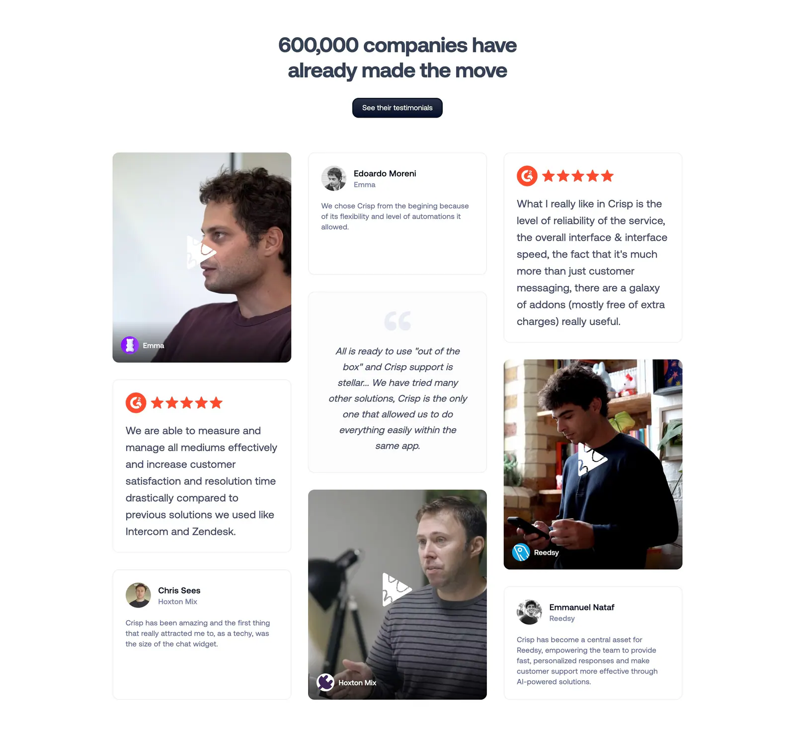
  104. Crisp testimonials section: centered headline above a masonry grid of quote cards and customer video thumbnails
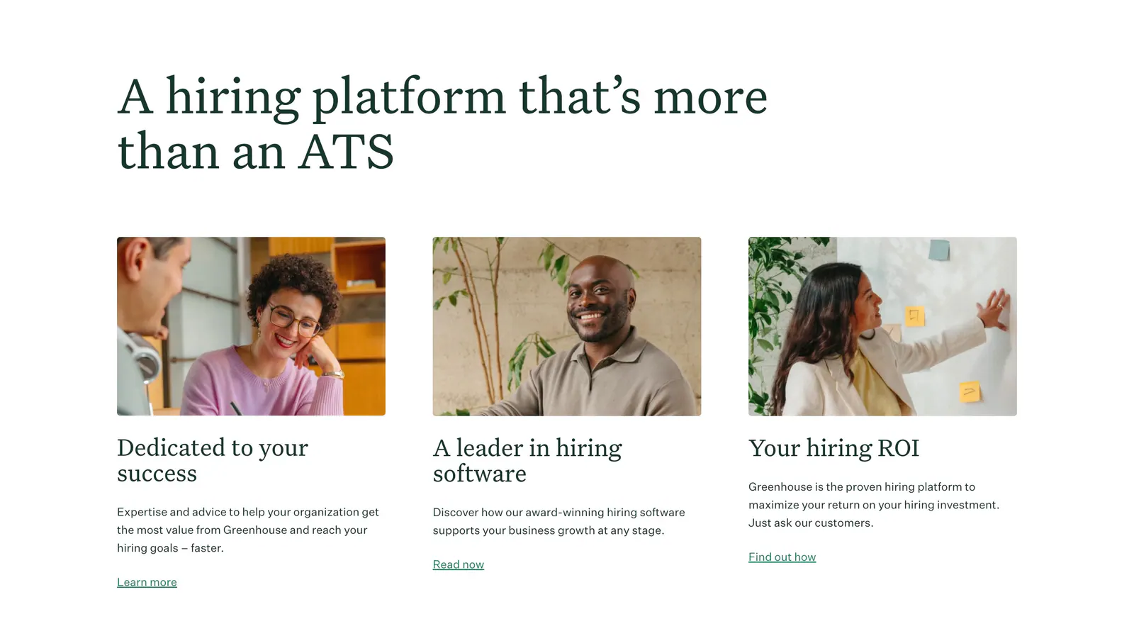
  105. Greenhouse features section: large serif headline above three cards with workplace photos, serif titles, copy and text links
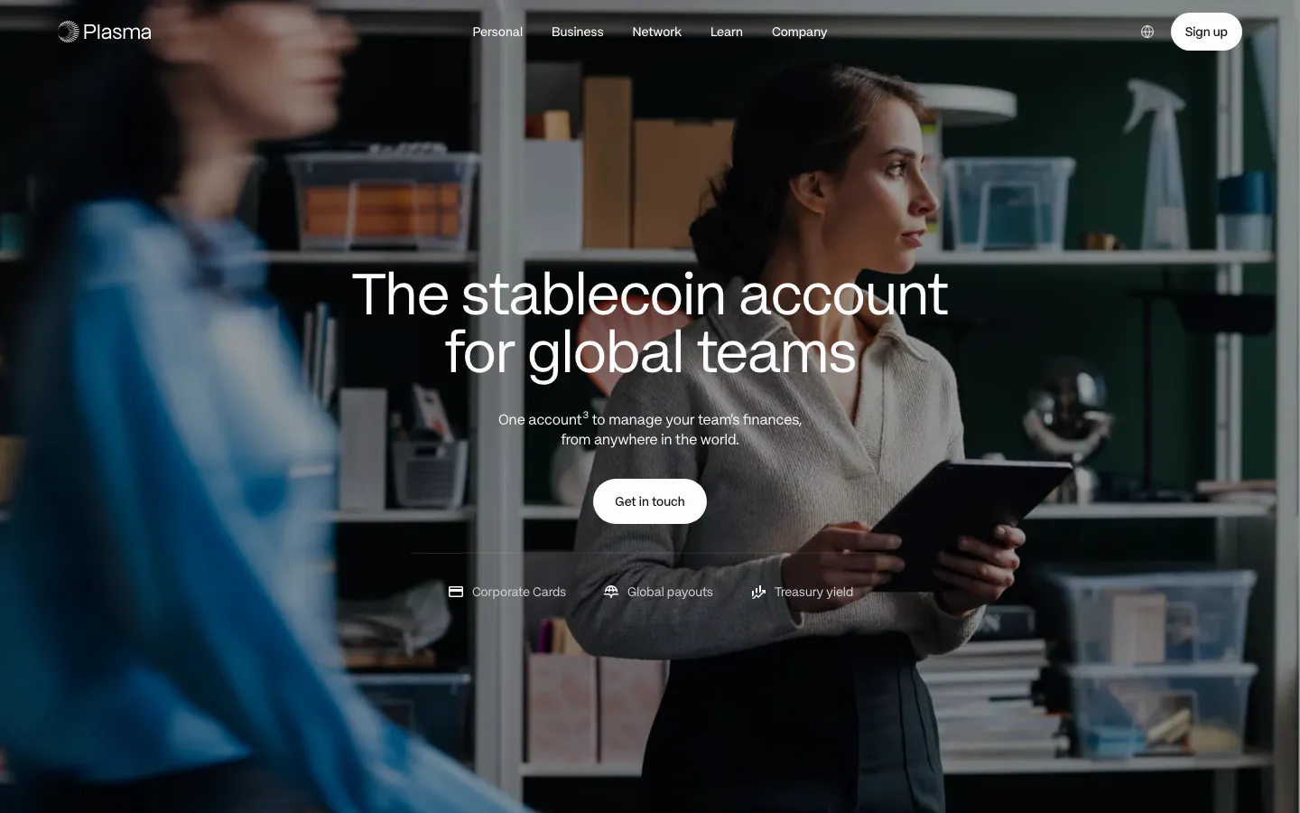
  106. Plasma hero section: nav and centered headline with Get in touch button over a full-bleed office photo of a woman holding a tablet
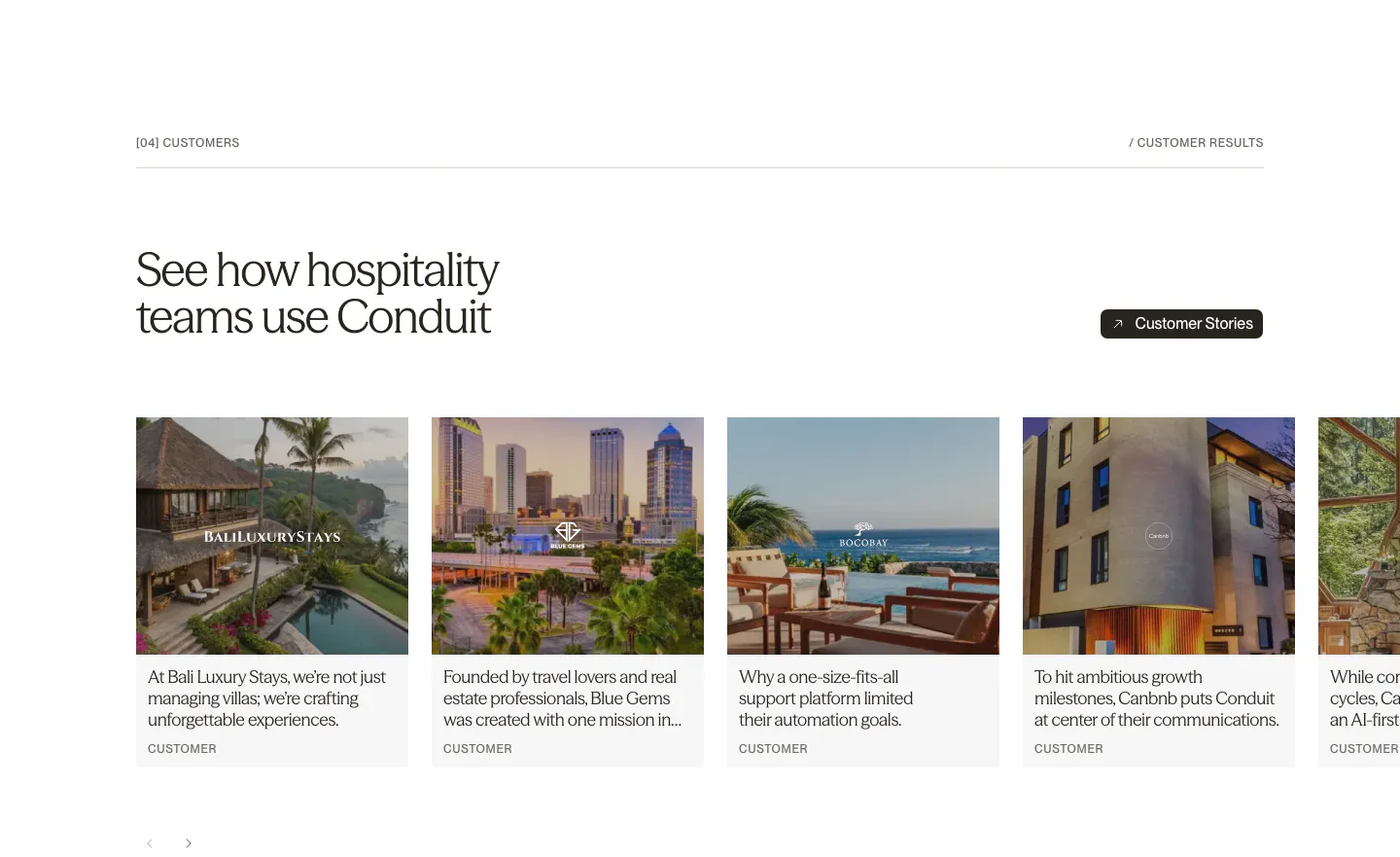
  107. Conduit testimonials section: serif headline above a carousel of customer story cards with hotel and resort photos
  108. QuickLnk call-to-action section: yellow rounded card with headline and demo button on the left, creator photo collage on the right
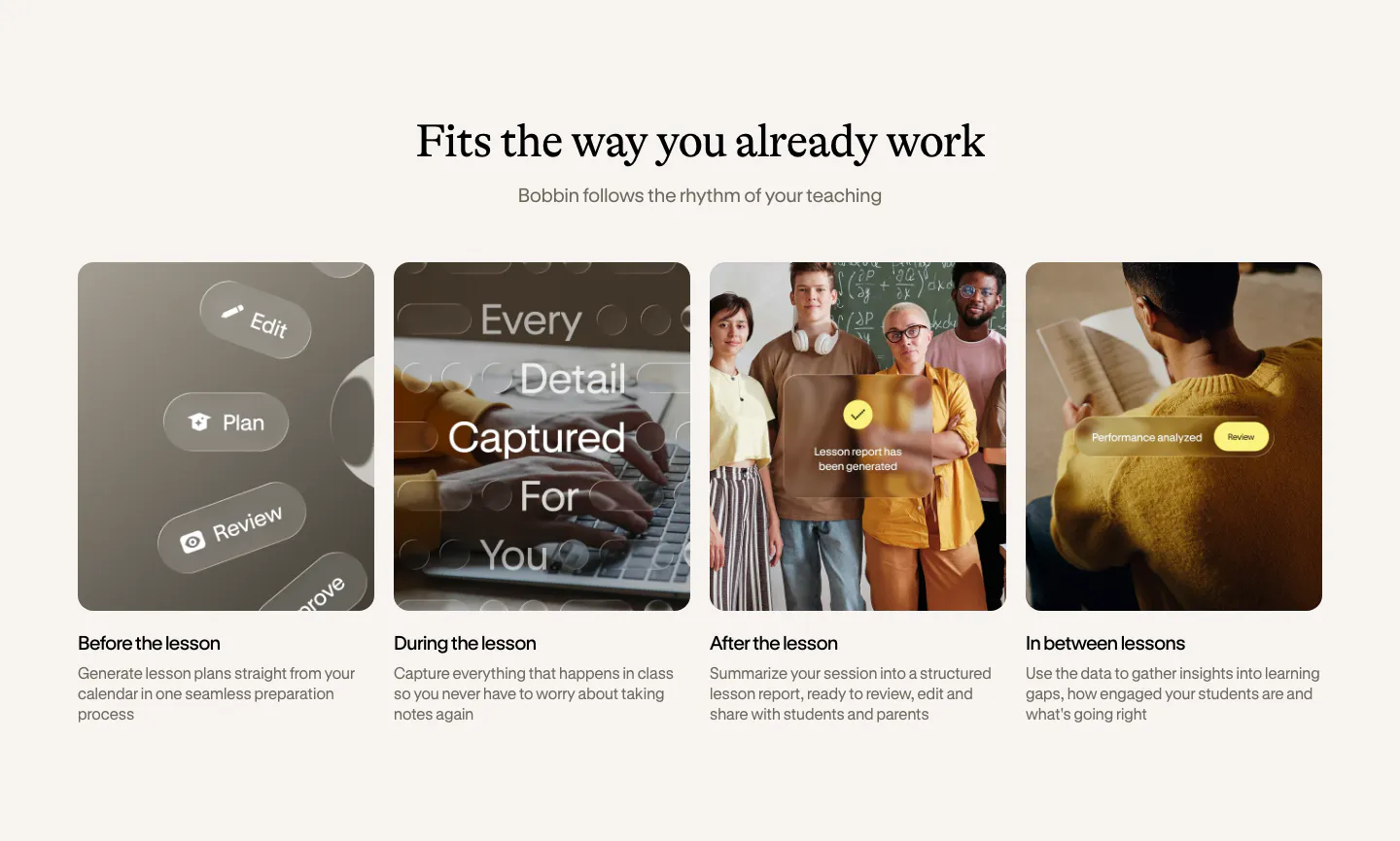
  109. Bobbin how it works section: serif heading above four equal photo cards for before, during, after and between lessons
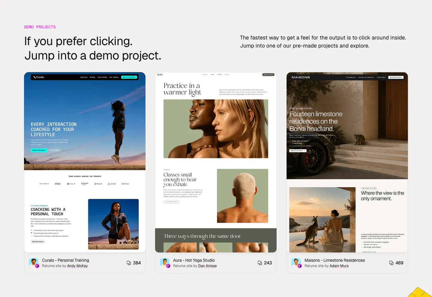
  110. Relume other section: headline and intro above three cards previewing demo websites for coaching, yoga and residences with author credits
    Relume Other
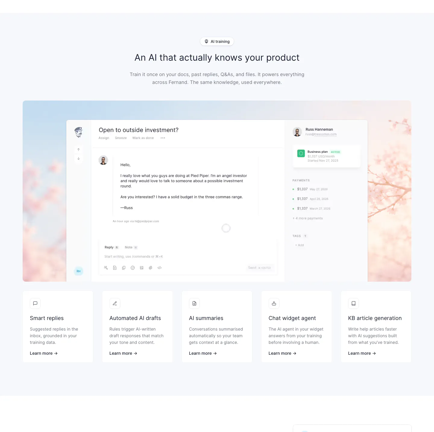
  111. Fernand features section: centered heading above an inbox screenshot on a blossom photo and a row of five feature cards
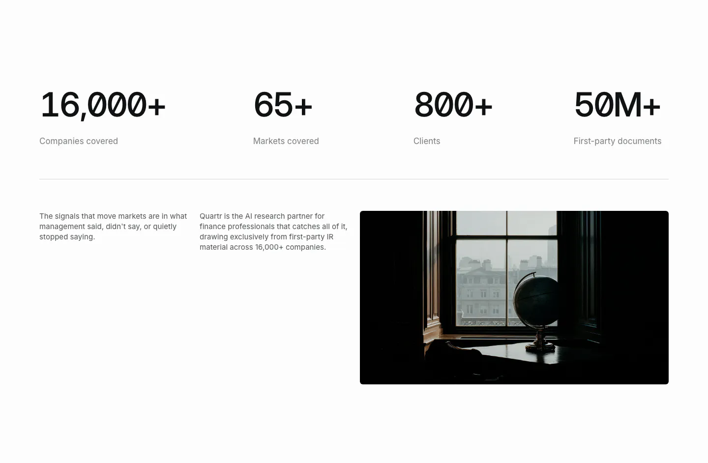
  112. Quartr stats section: four large monospace figures in a row above two short text columns and a dark photo of a globe by a window
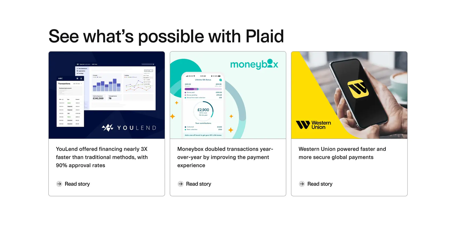
  113. Plaid blog & resources section: headline above three customer story cards with product screenshots, a phone photo and Read story links
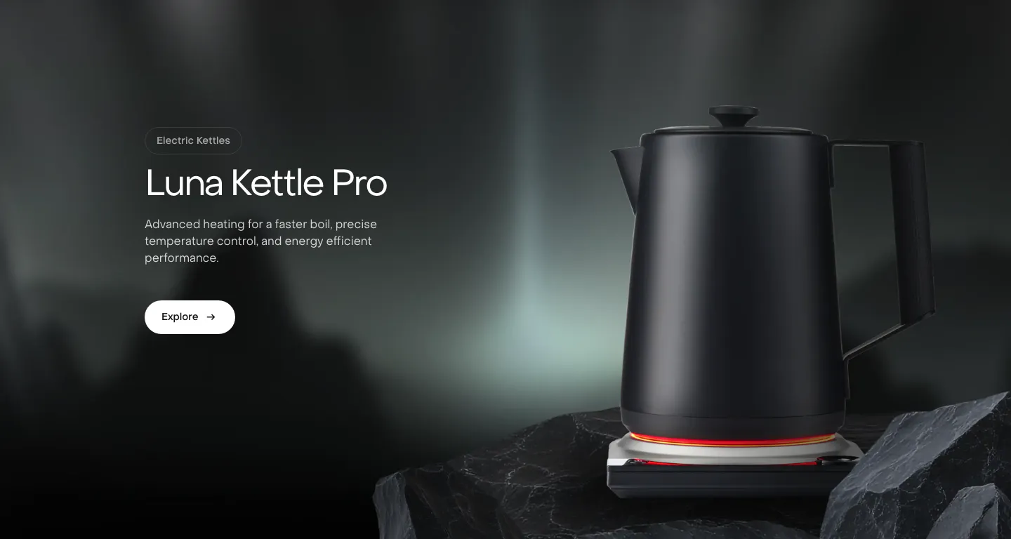
  114. Saki features section: headline, copy and Explore button on the left beside a black kettle on a rock over a dark misty photo background
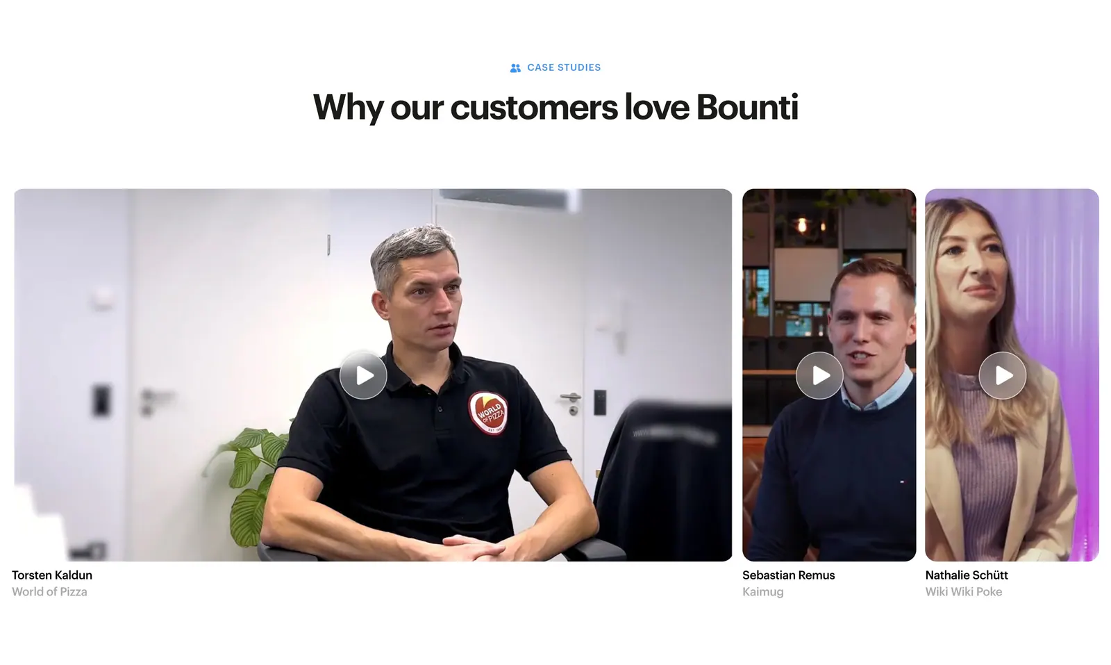
  115. Bounti testimonials section: centered headline above a row of customer video thumbnails with play buttons and names
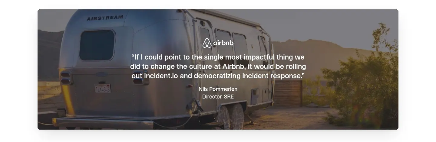
  116. incident.io testimonials section: centered Airbnb customer quote overlaid on a full-width photo of an Airstream trailer
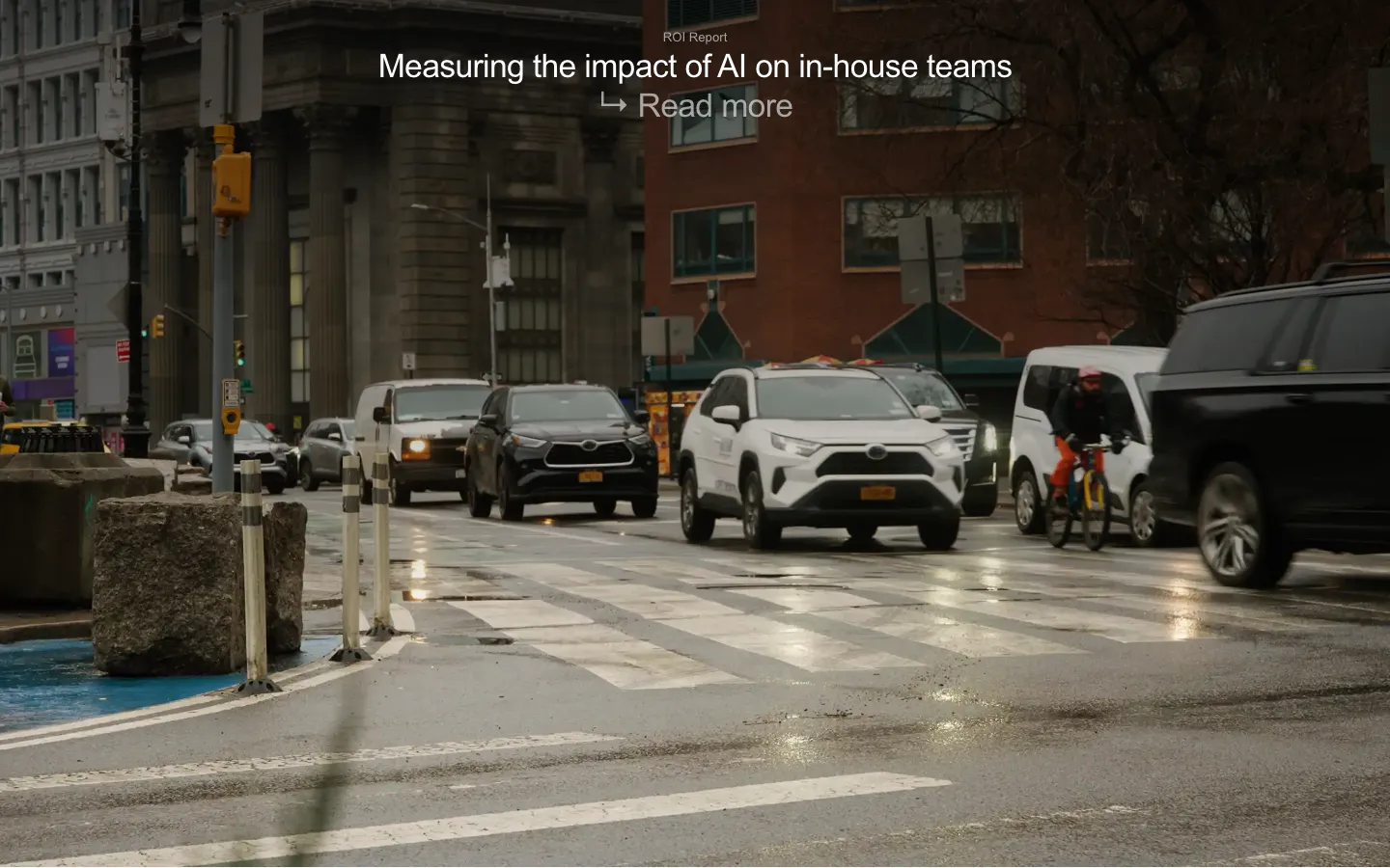
  117. Legora blog & resources section: ROI report title and read more link over a full-bleed photo of a rainy city street
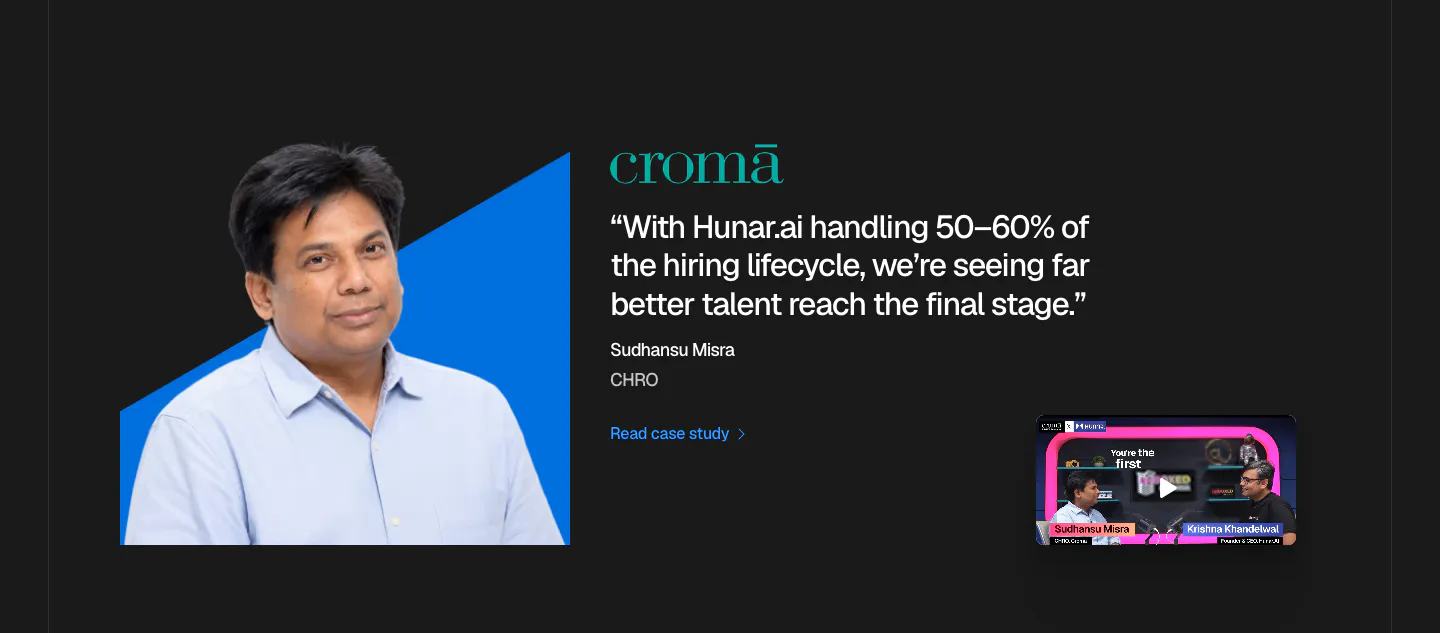
  118. Hunar testimonials section: dark background with an executive photo on a blue shape, Croma quote and a podcast video thumbnail
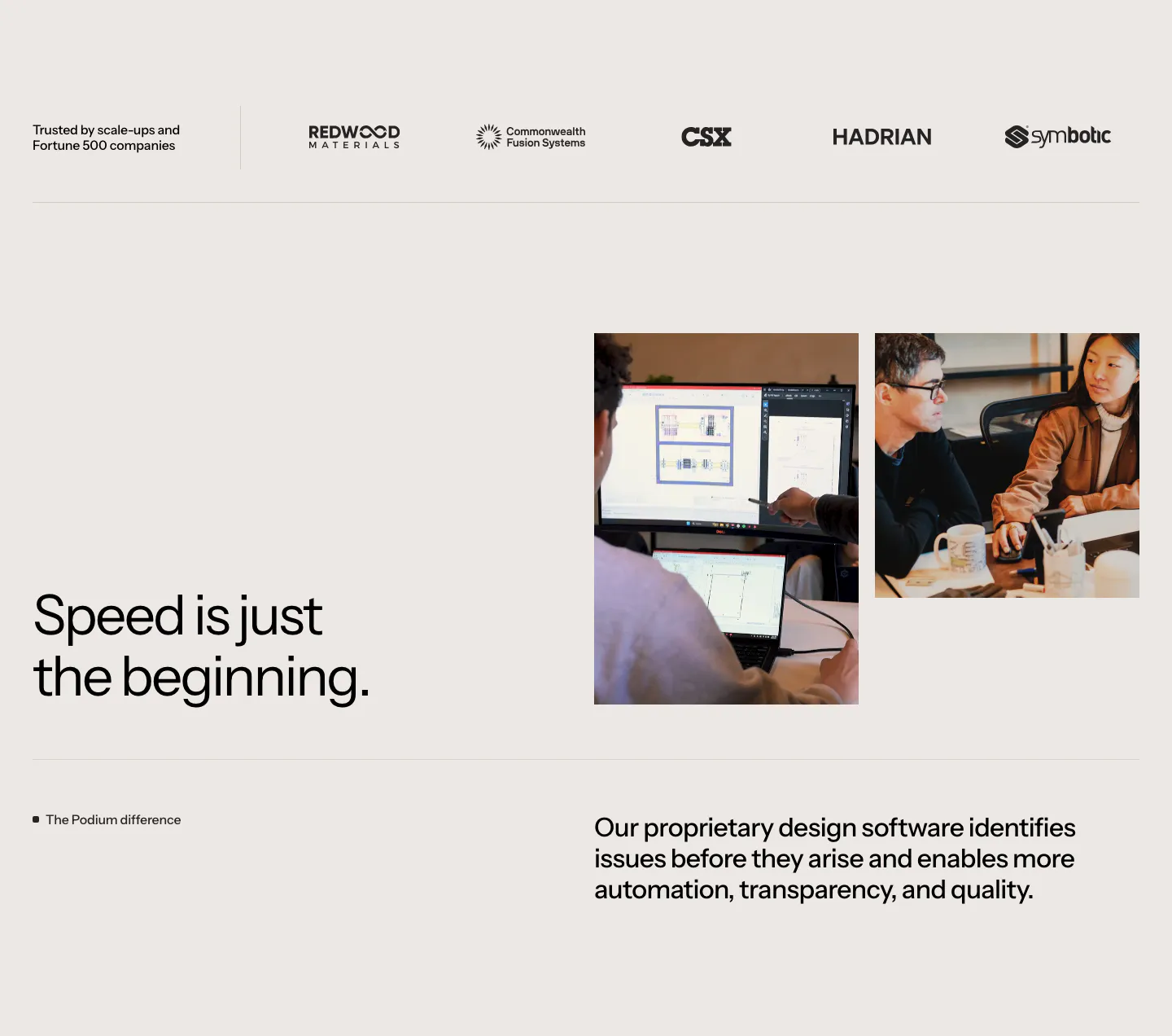
  119. Podium Automation value proposition section: customer logo row above a headline beside two team photos on a warm gray background
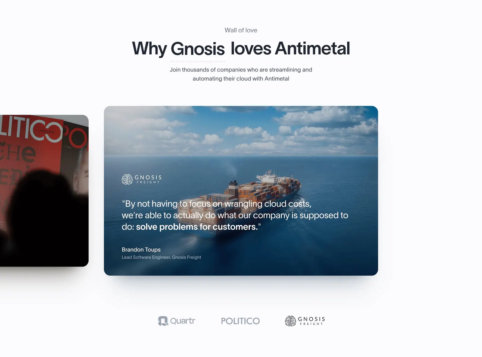
  120. Antimetal testimonials section: centered headline above a carousel of photo quote cards with a cargo ship image and logo selectors
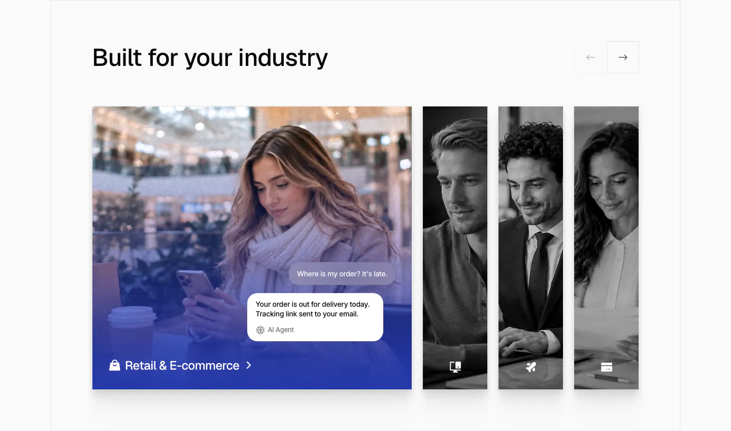
  121. Chatbase use cases section: industry slider with an expanded retail photo card with chat bubbles and narrow grayscale photo cards
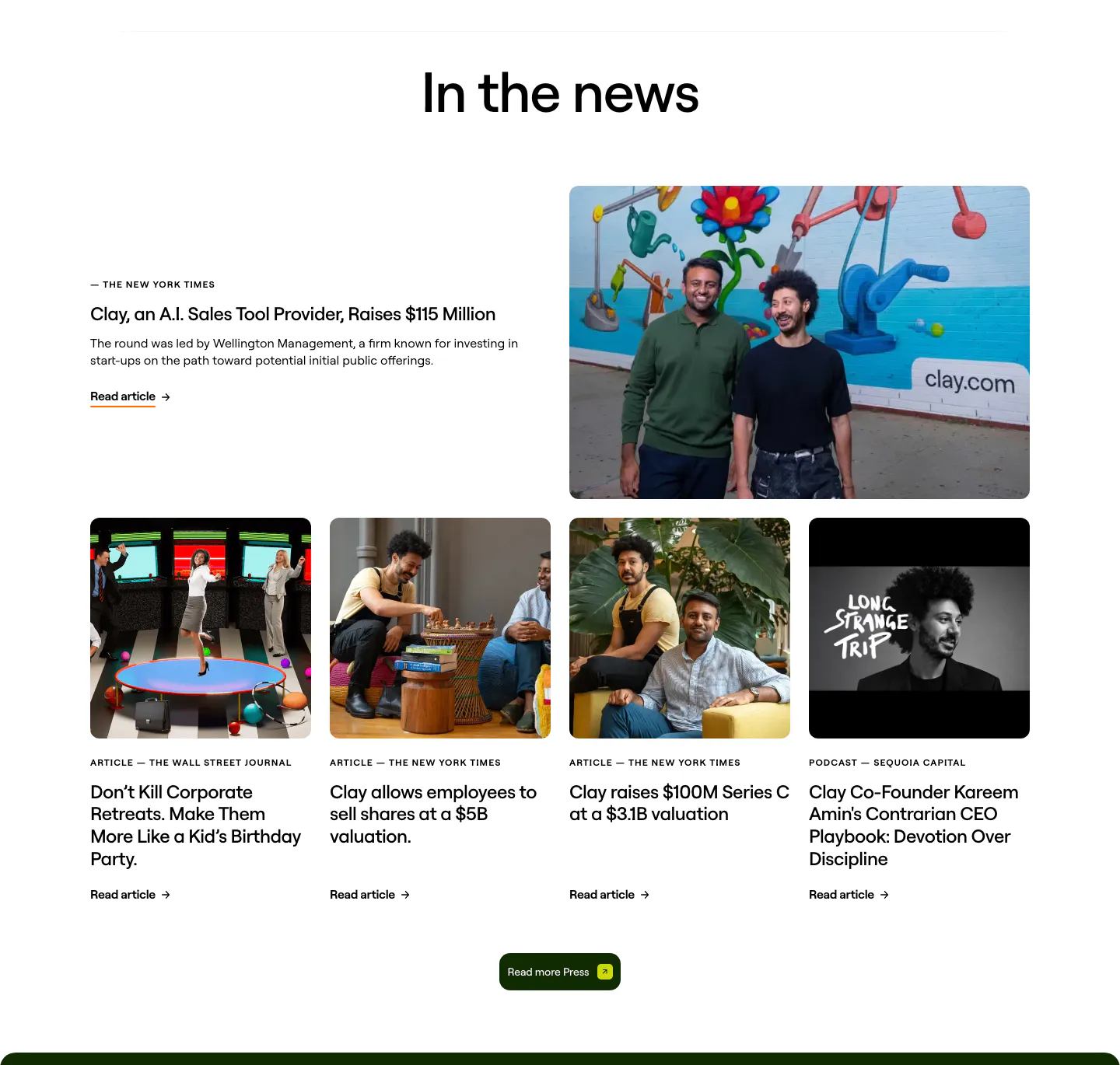
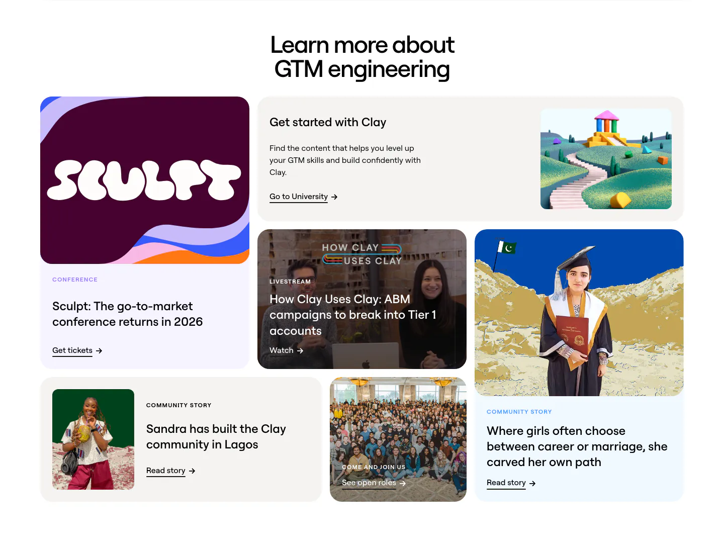
  122. Clay blog & resources section: centered heading over a featured press story with founder photo and a row of four photo article cards
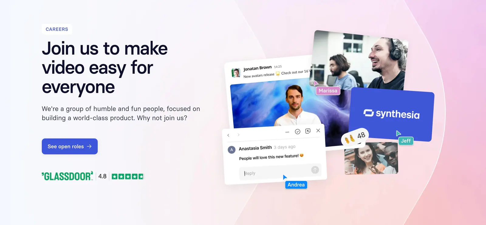
  123. Synthesia call-to-action section: careers banner with headline and blue button left, collage of team photos and chat UI on a pink gradient
  124. Zamp testimonials section: framed panel with side menu and masonry grid of quote cards, analyst badges and portrait photos on light gray
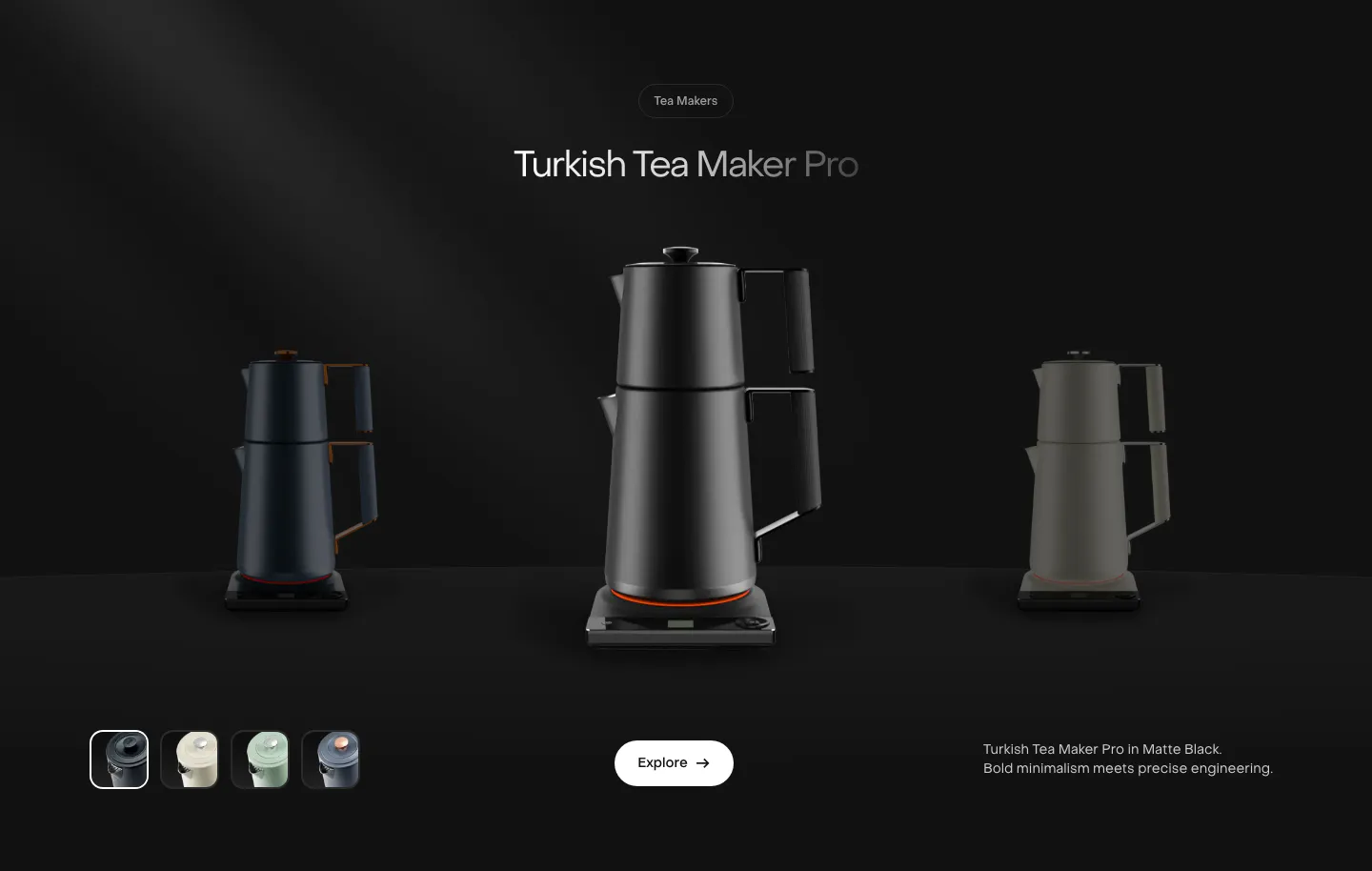
  125. Saki features section: centered product name above a black tea maker flanked by dimmed variants, color swatches and an Explore button on black
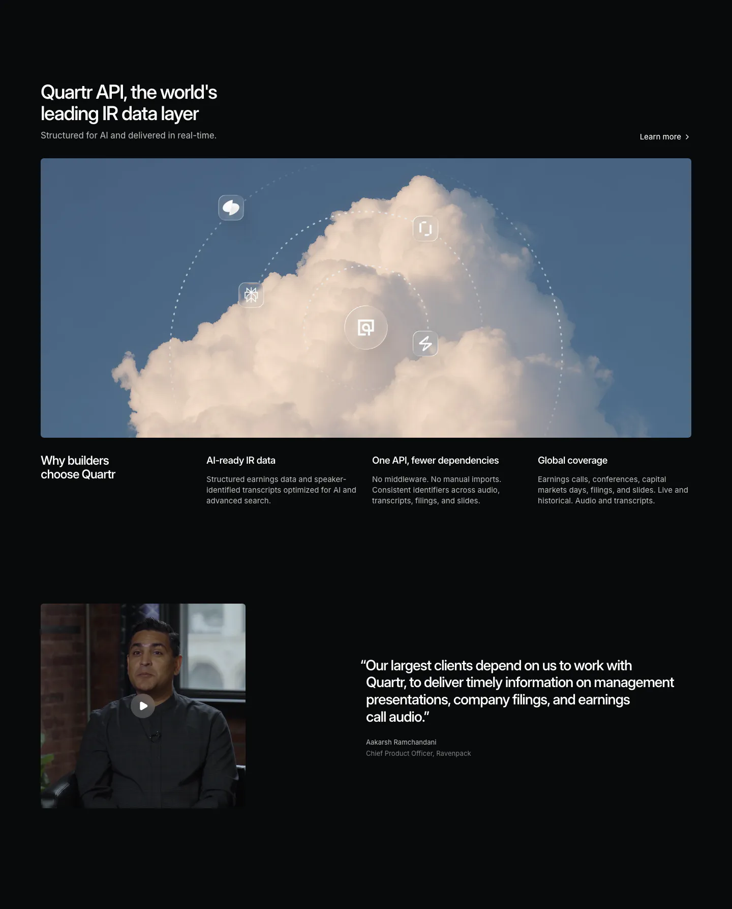
  126. Quartr features section: dark layout with a wide cloud photo orbited by icons, three benefit columns and a video testimonial
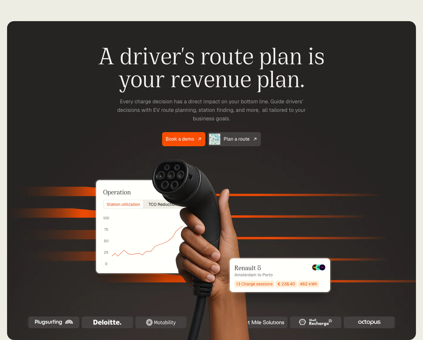
  127. Chargetrip hero section: centered serif headline above a hand holding an EV charger, floating UI cards and a logo strip on a dark panel
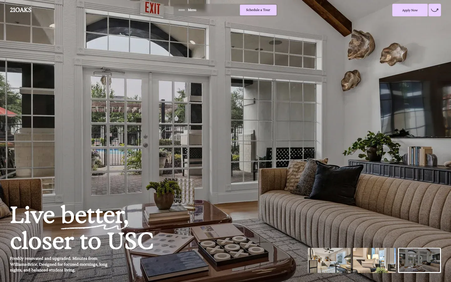
  128. 21Oaks hero section: full-bleed living room photo with serif headline bottom-left, lavender nav buttons and gallery thumbnails
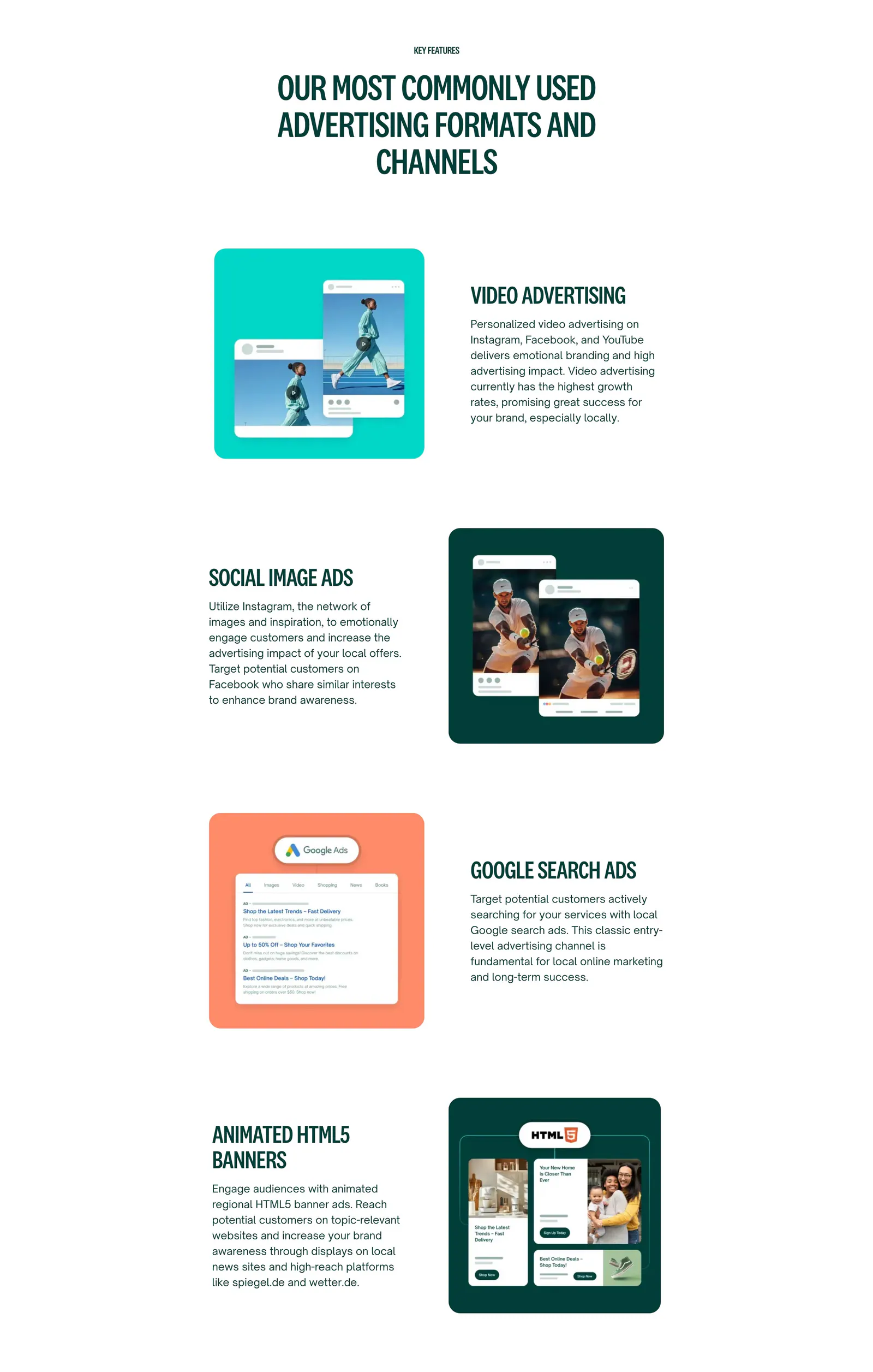
  129. Localyzer features section: centered heading over zig-zag rows pairing ad-format descriptions with colored ad mockup cards
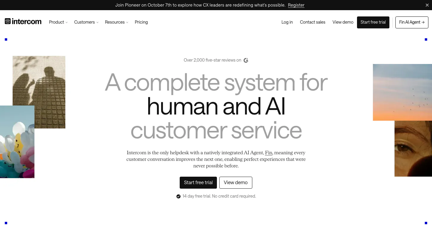
  130. Intercom hero section: centered gray and black headline with two CTA buttons, flanked by cropped photo tiles, below a nav and announcement bar
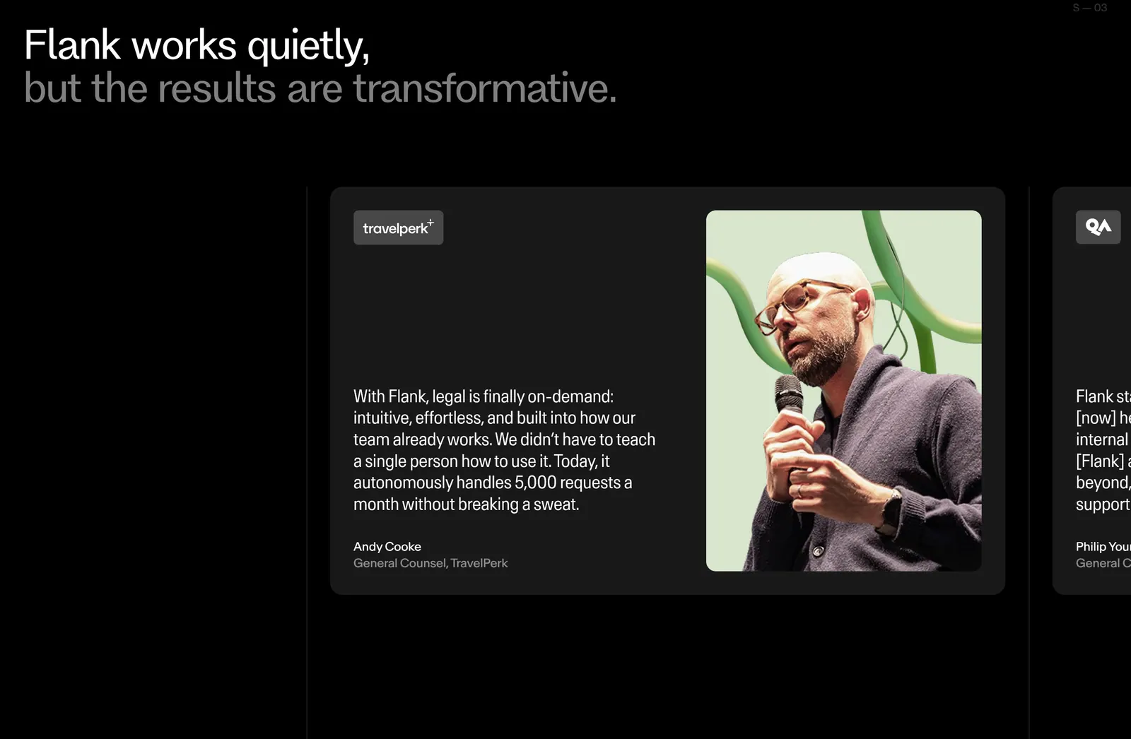
  131. Flank testimonials section: two-tone headline above a carousel of quote cards with a large speaker photo, next card cut off, on black
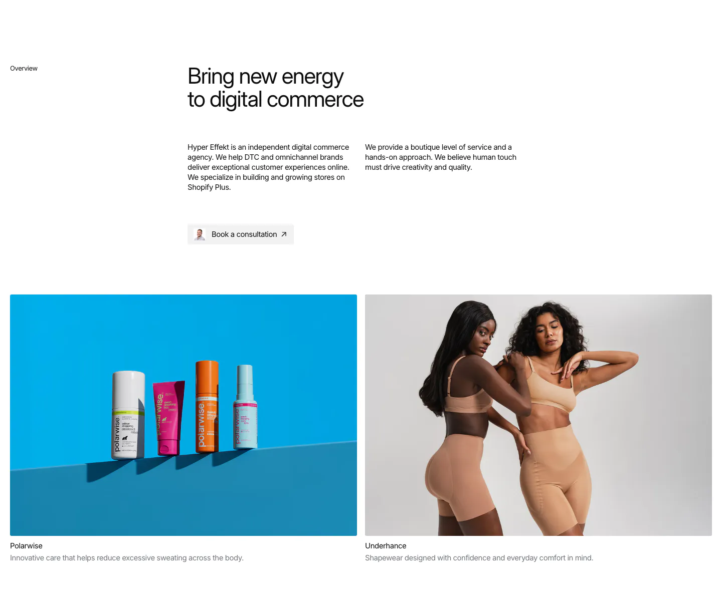
  132. Hyper Effekt about & mission section: agency overview text and consultation button above two client photo cards for Polarwise and Underhance
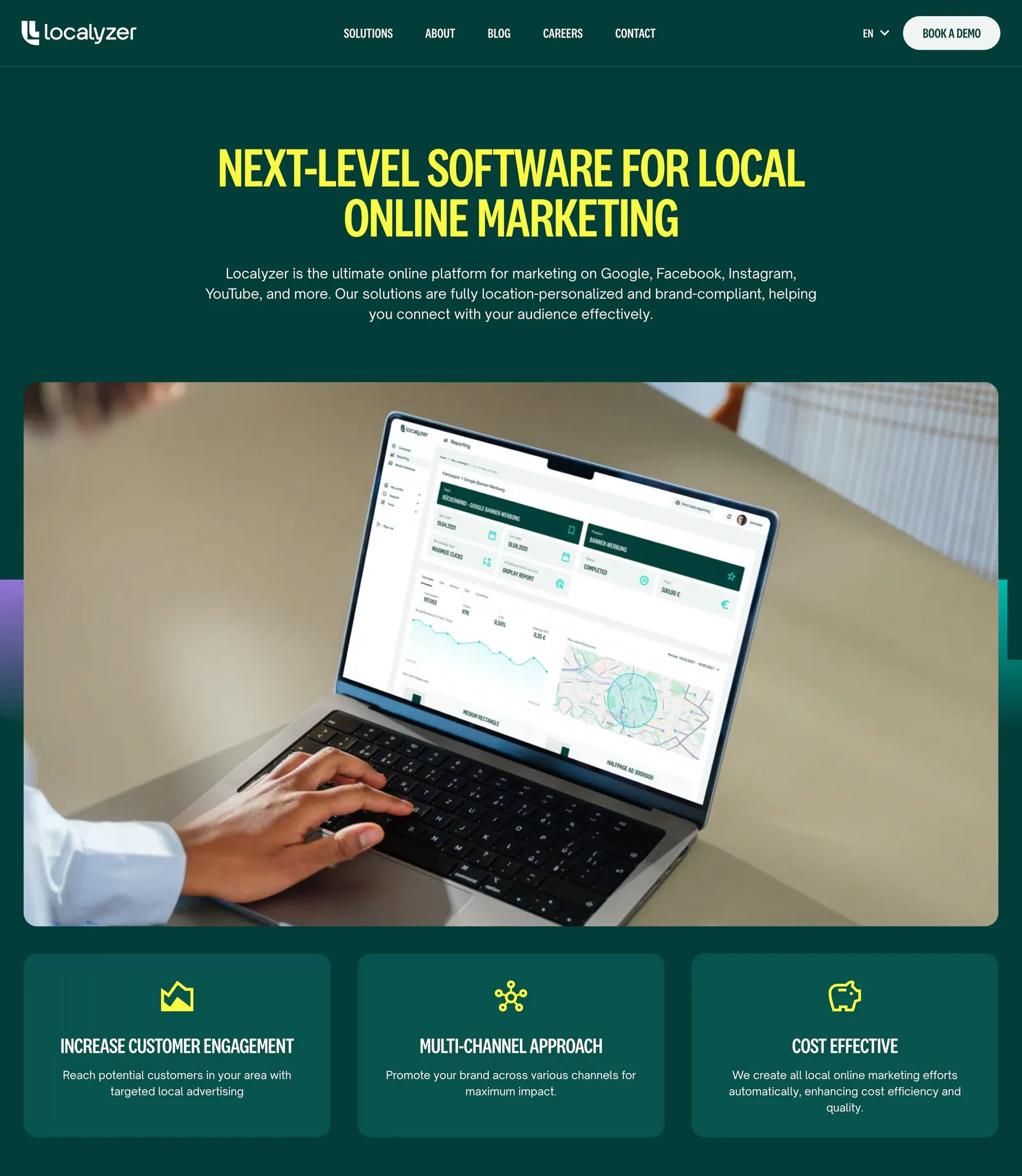
  133. Localyzer hero section: centered yellow headline on dark green above a laptop photo showing the dashboard and three benefit cards
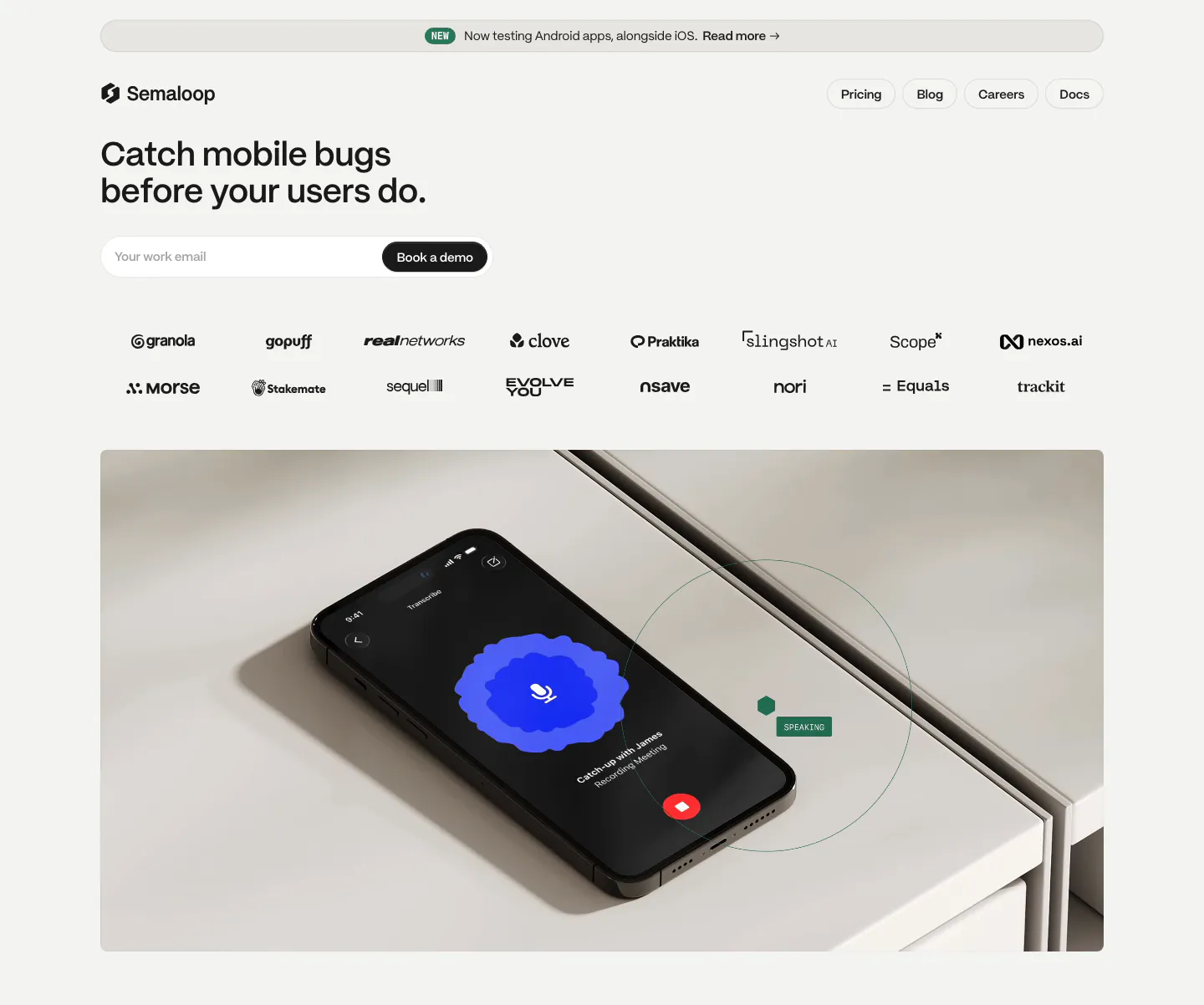
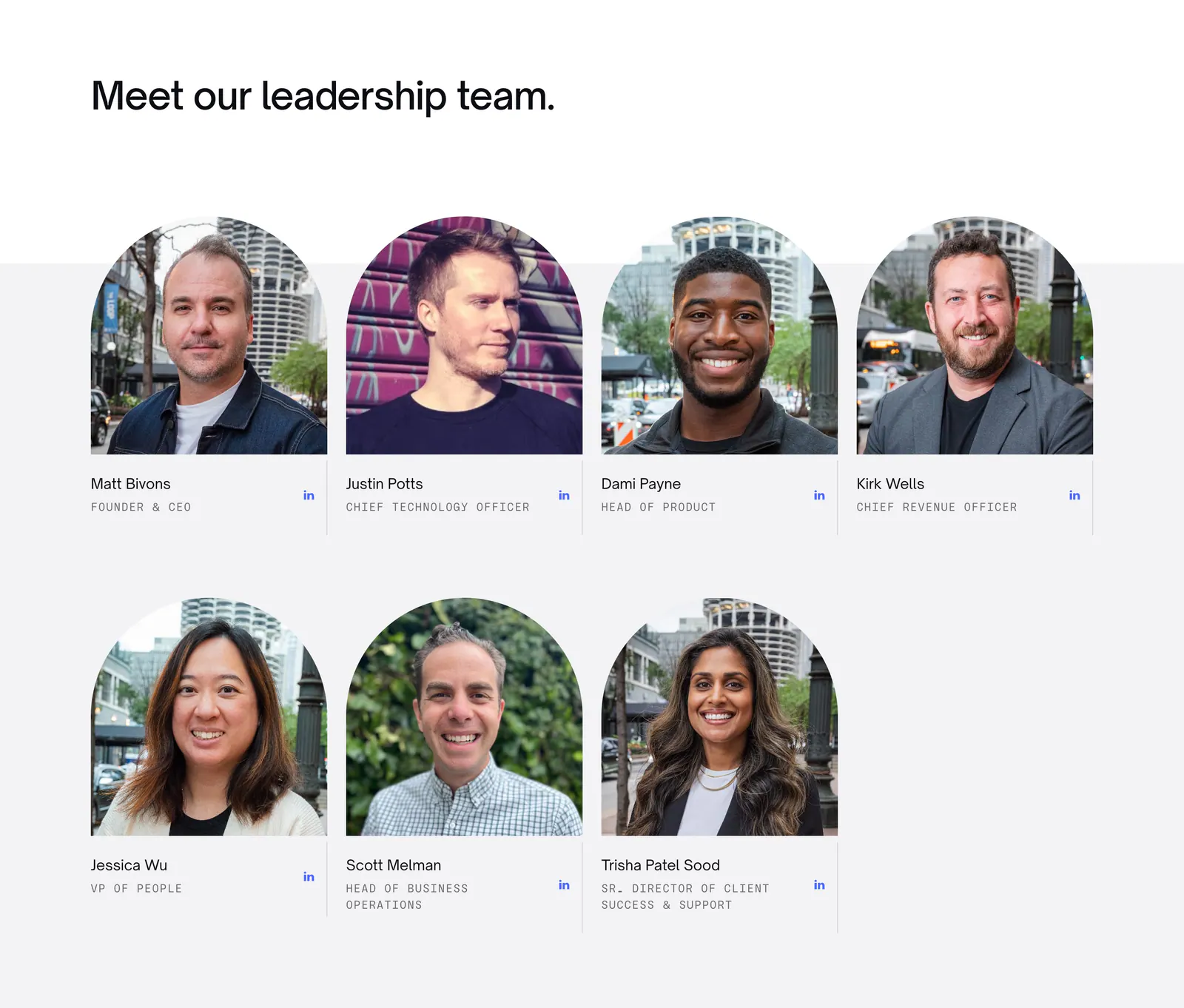
  134. Semaloop hero section: left-aligned headline and email field with demo button above two rows of logos and a photo of a phone on a shelf
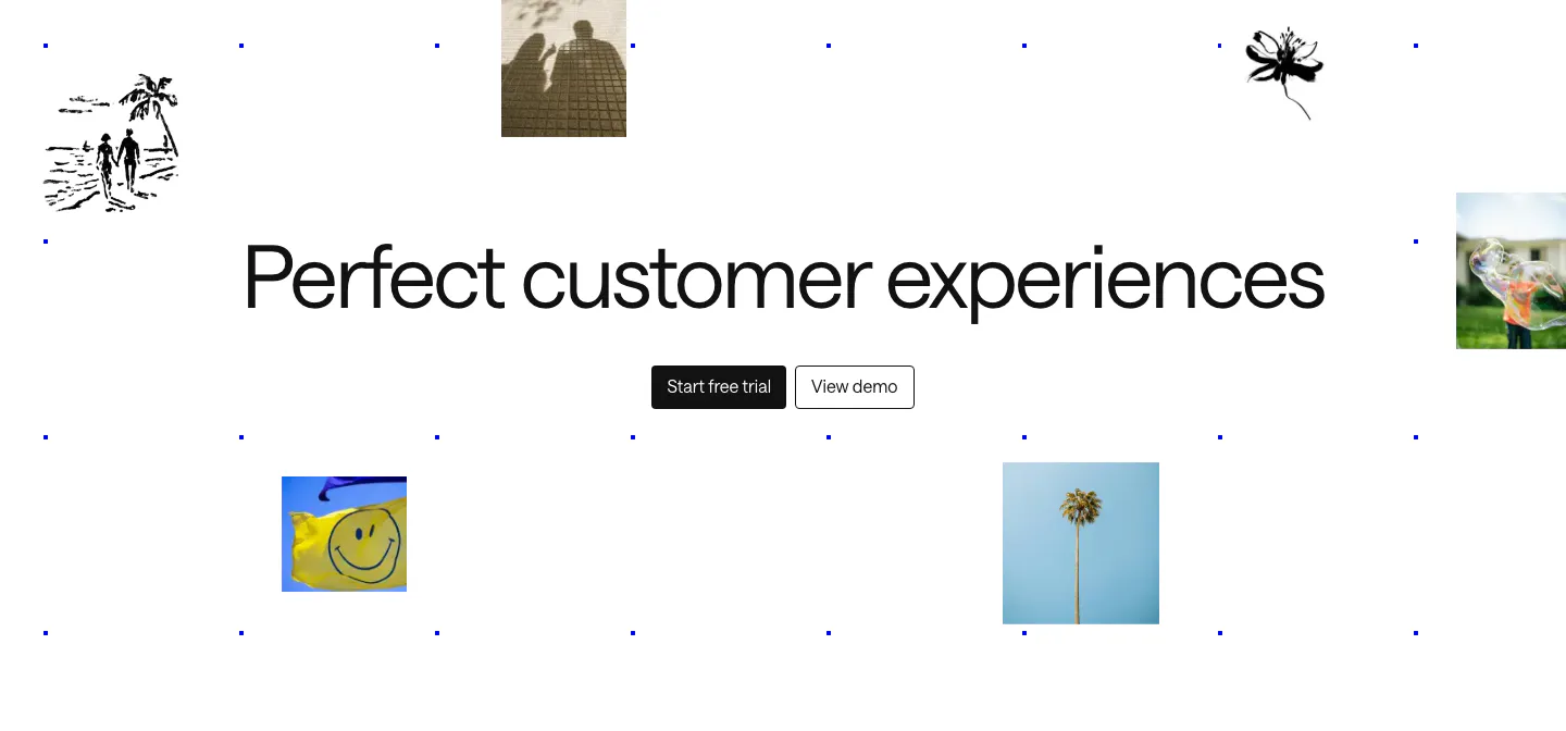
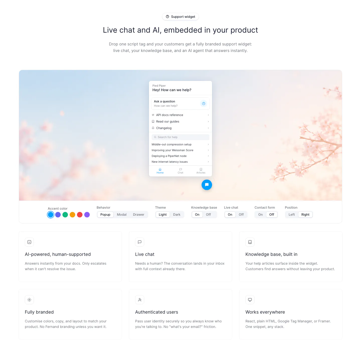
  135. Intercom call to action section: large centered headline and two buttons amid scattered photo tiles, ink sketches and a blue dot grid
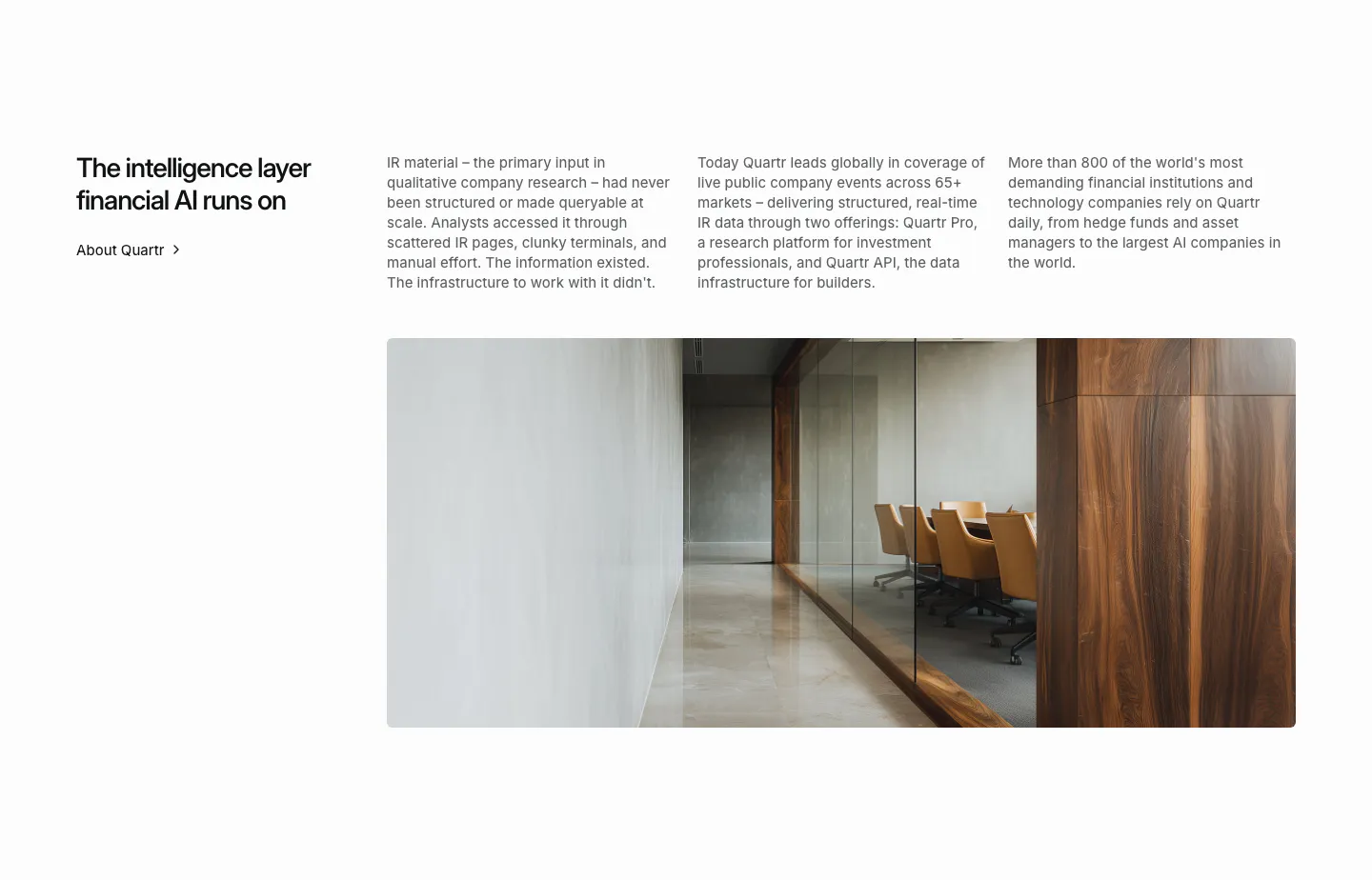
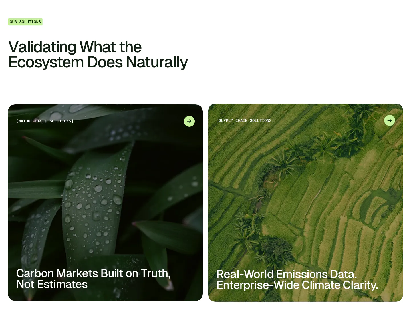
  136. Quartr about & mission section: headline with About link, three columns of company story text and a wide office interior photo
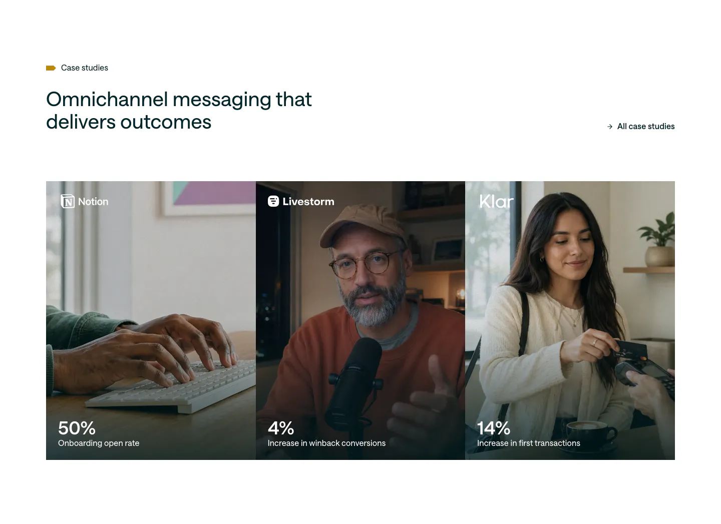
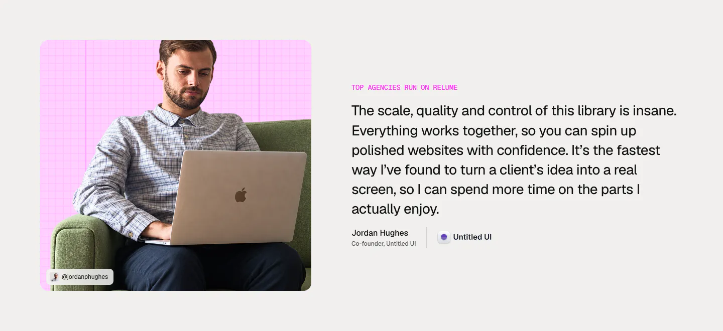
  137. Customer.io testimonials section: headline and case studies link above three photo panels for Notion, Livestorm and Klar with large stats
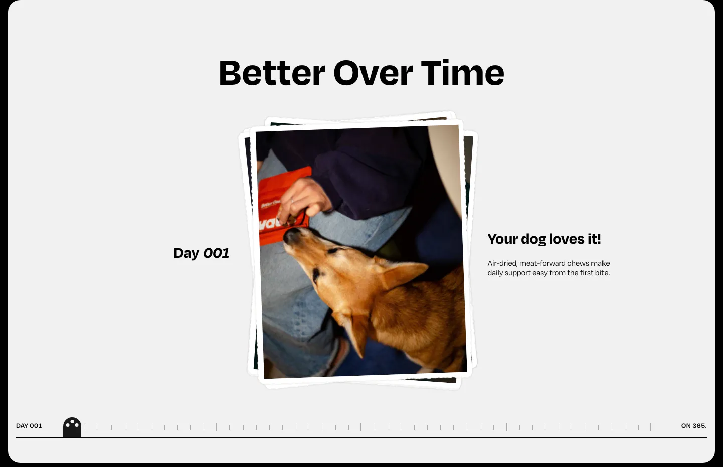
  138. Watts how it works section: centered heading over a stacked dog photo, day label and caption with a day-by-day timeline scrubber
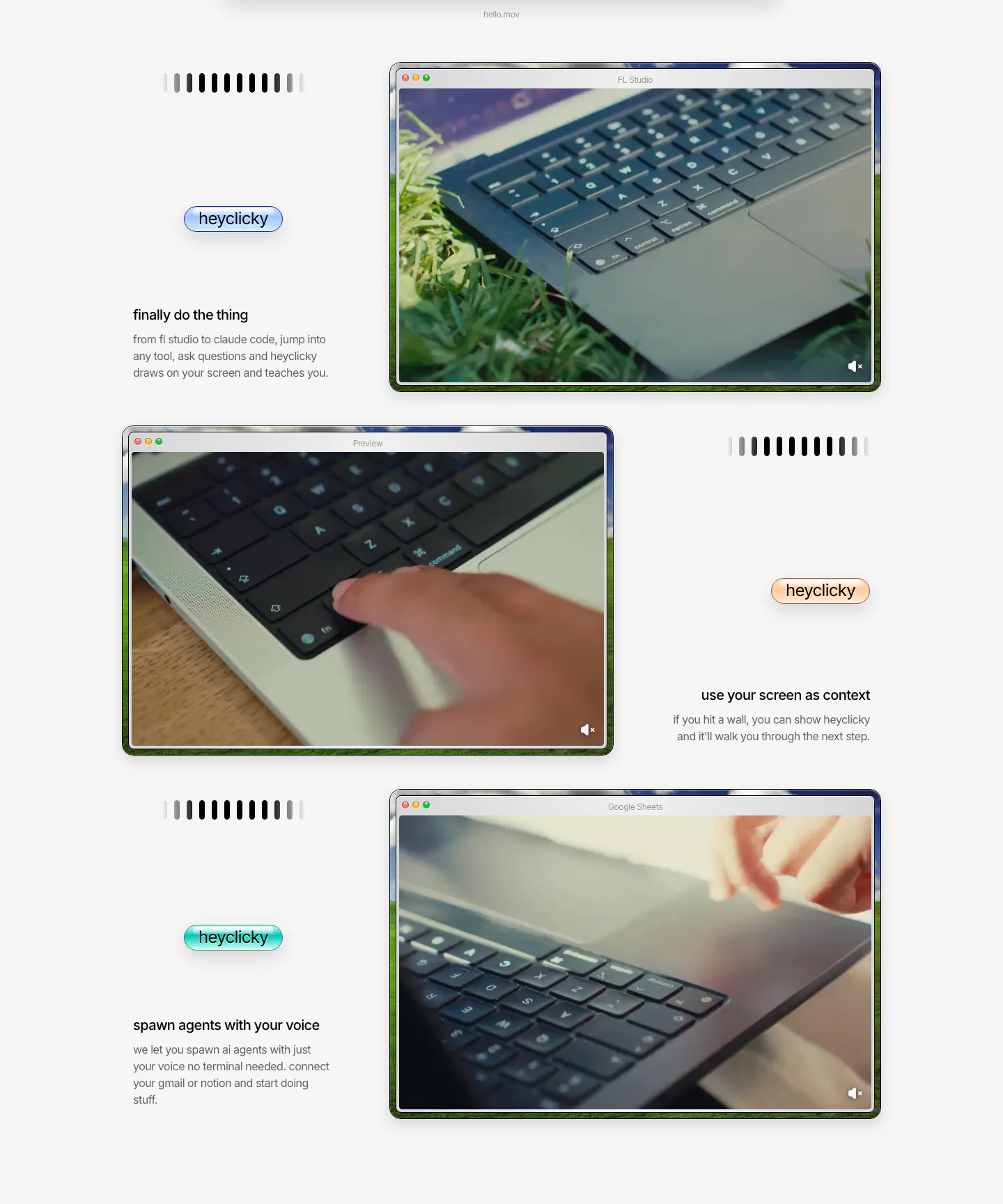
  139. heyclicky features section: three zig-zag rows pairing short captions and colored heyclicky pills with mac-window videos of laptops
  140. Canopy team section: heading above a grid of arch-framed leadership headshot photos with names, titles and LinkedIn icons
  141. Fernand features section: chat widget preview on a blossom photo with segmented style toggles above a 3x2 card grid
  142. Unknown features section: left-aligned headline with label above two large photo cards of wet leaves and rice terraces
    Unknown Use cases
  143. Relume testimonial section: photo of a man with a laptop on a pink grid card on the left, large quote with name and company on the right
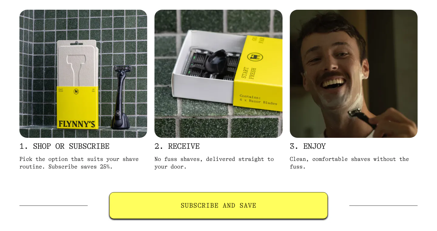
  144. Flynny's how it works section: three numbered step cards with product and lifestyle photos above a wide yellow Subscribe and Save button
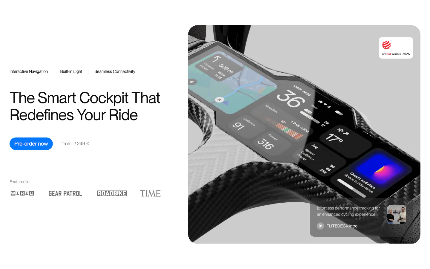
  145. FLITEDECK hero section: headline, pre-order button and press logos on the left, large carbon bike cockpit product photo on the right
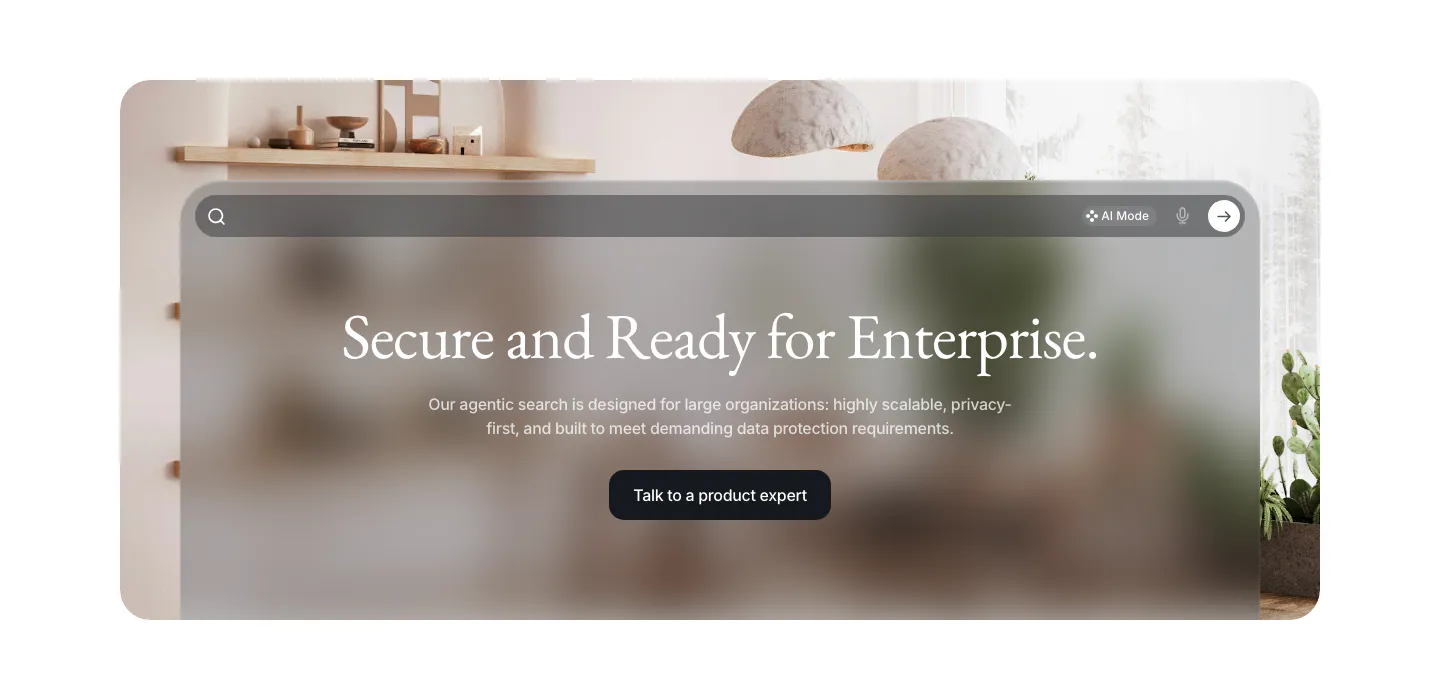
  146. VisionAI call-to-action section: centered serif headline and button on a frosted glass search panel over an interior photo
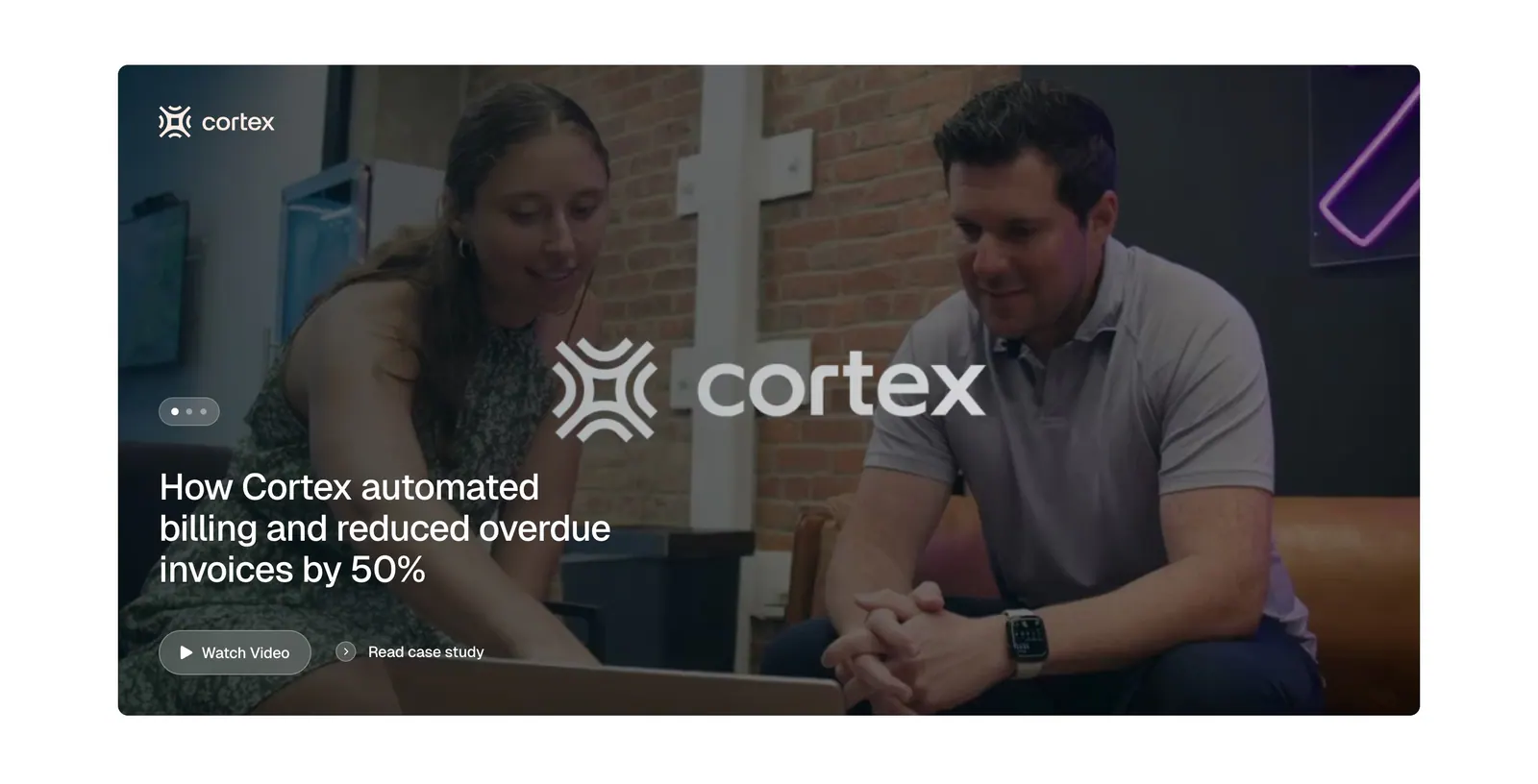
  147. Tabs testimonials section: full-width case study card with an office photo of two people, Cortex logo, headline and watch video button
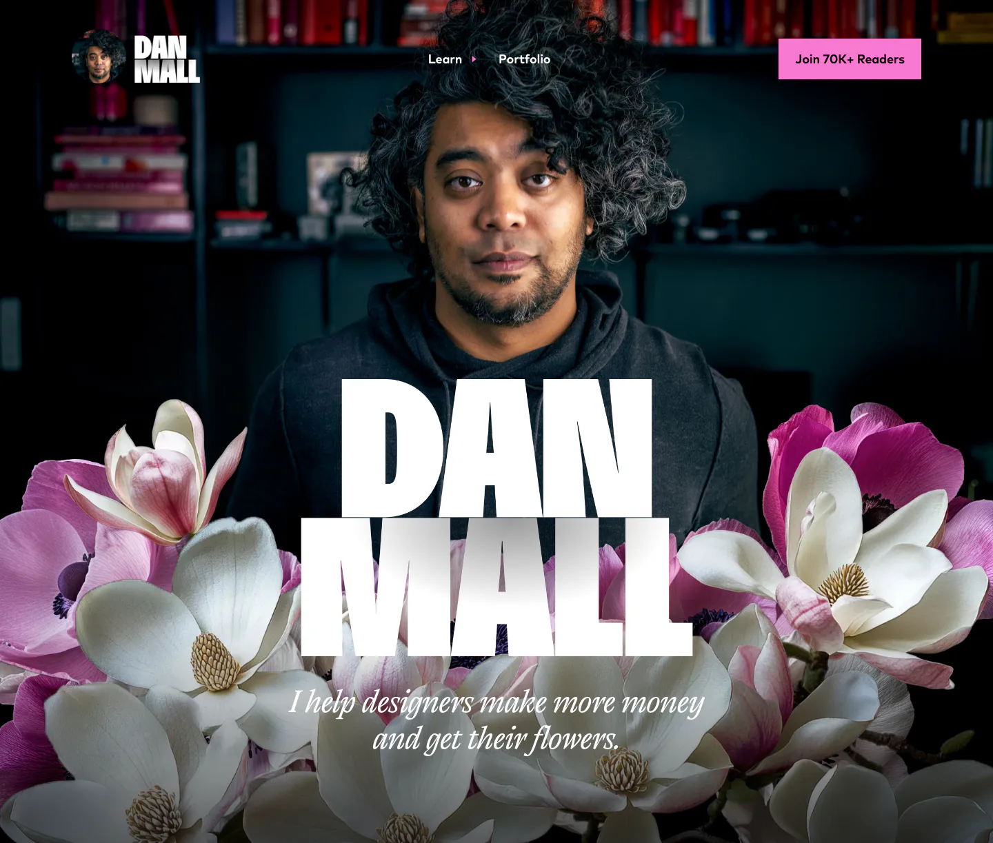
  148. Dan Mall hero section: huge name over a full-bleed portrait photo with magnolia flowers and a serif tagline
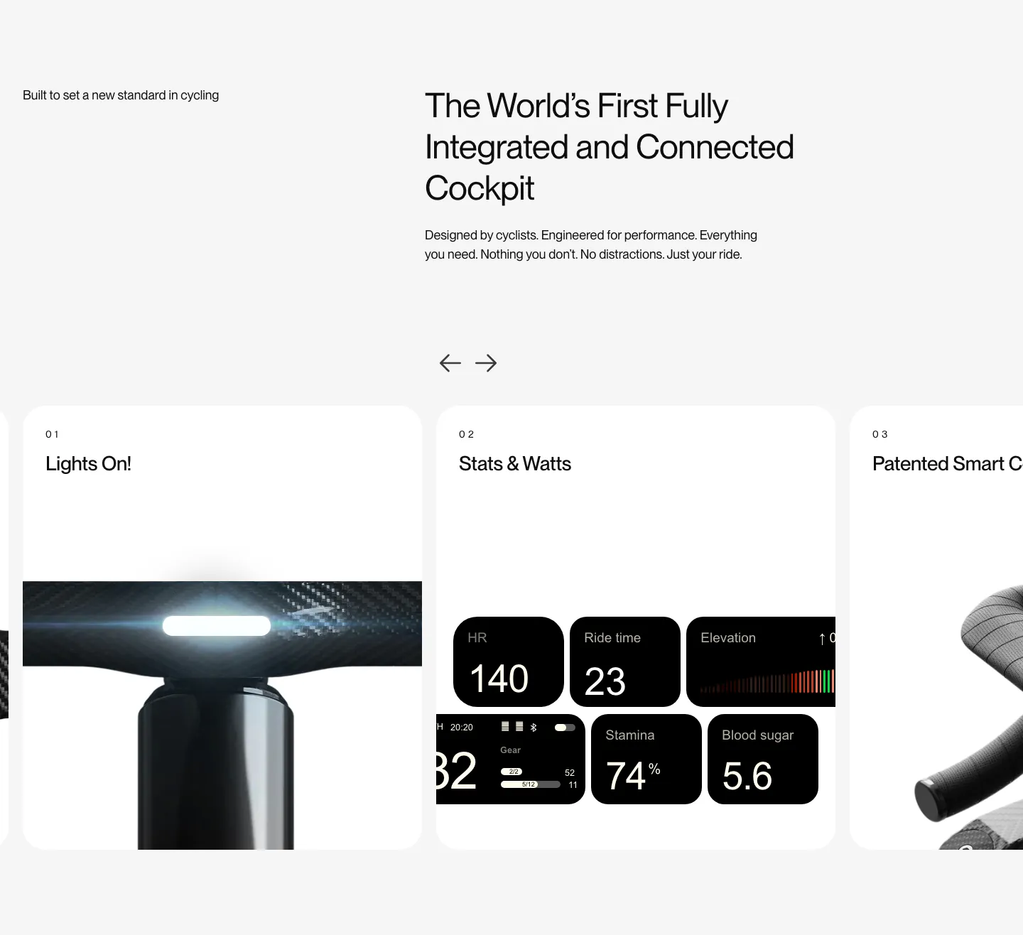
  149. FLITEDECK features section: heading on light gray above a numbered card carousel with arrows showing light, stats and handlebar photos
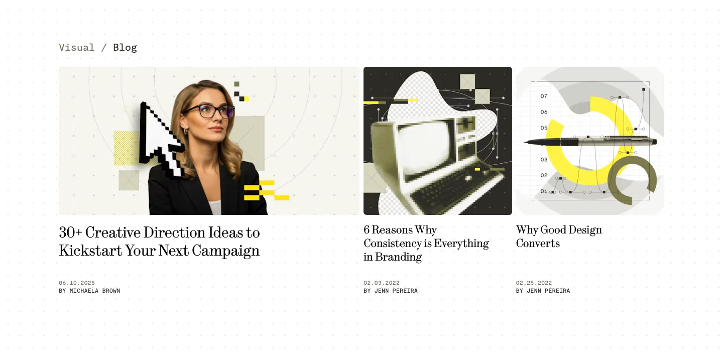
  150. Visual blog & resources section: one wide and two narrow article cards with collage cover images, serif titles and authors on a dotted white page
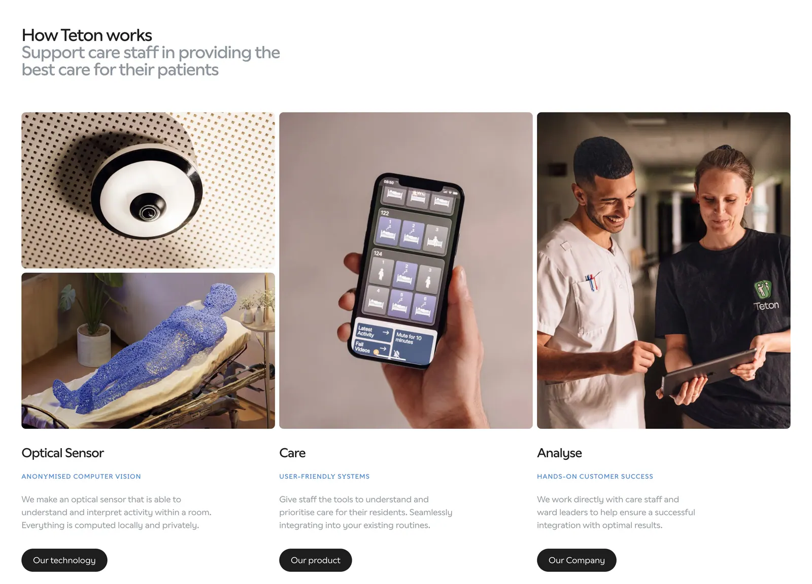
  151. Teton how it works section: headline above three columns of photos (sensor, phone app, care staff) with titles, descriptions and buttons
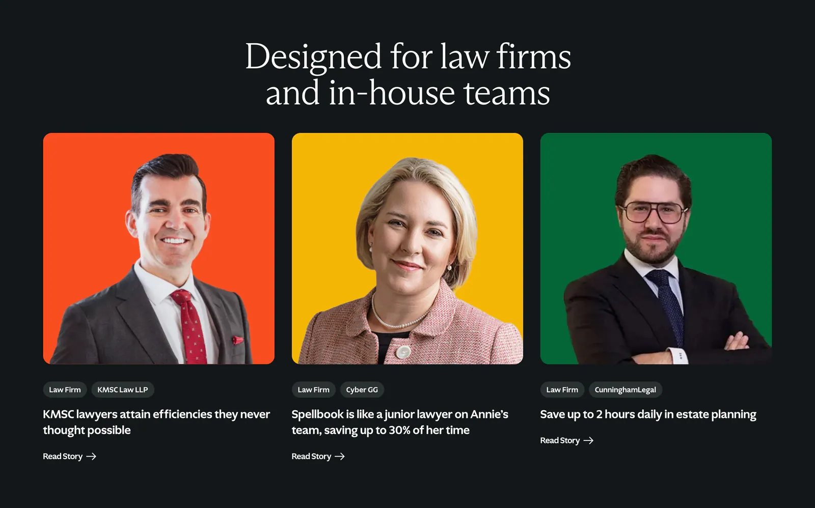
  152. Spellbook testimonials section: serif headline above three customer story cards with lawyer portraits on orange, yellow and green backdrops
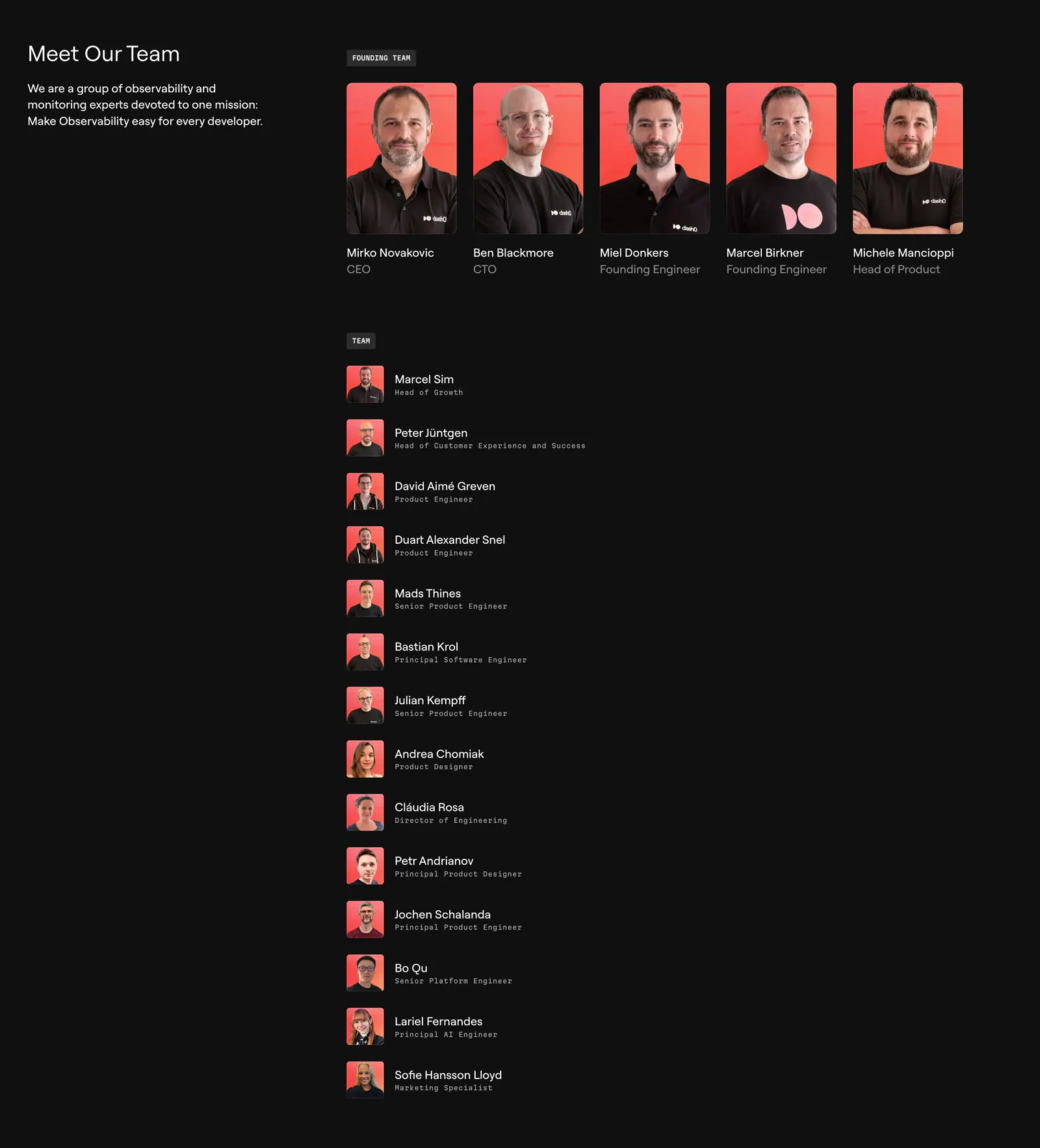
  153. Dash0 team section: intro text on the left, a row of five founder portraits on coral backgrounds and a list of team members on near-black
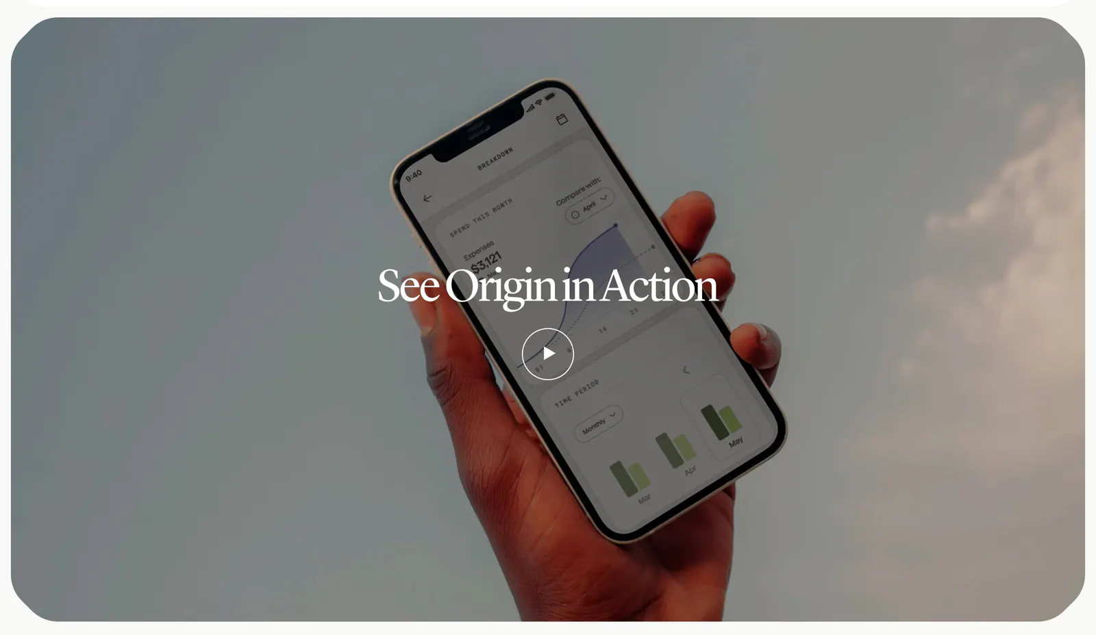
  154. Origin how it works section: serif title and play button over a full-width photo of a hand holding a phone with the app against the sky
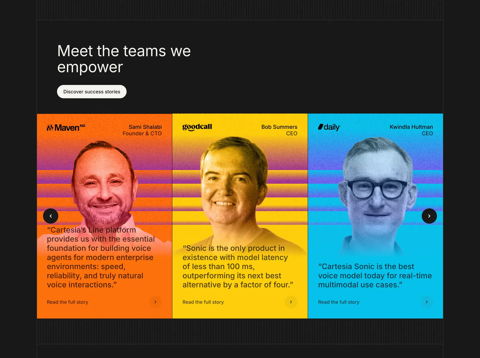
  155. Cartesia testimonials section: carousel of three bright orange, yellow and blue cards with tinted portraits and quotes on a dark background
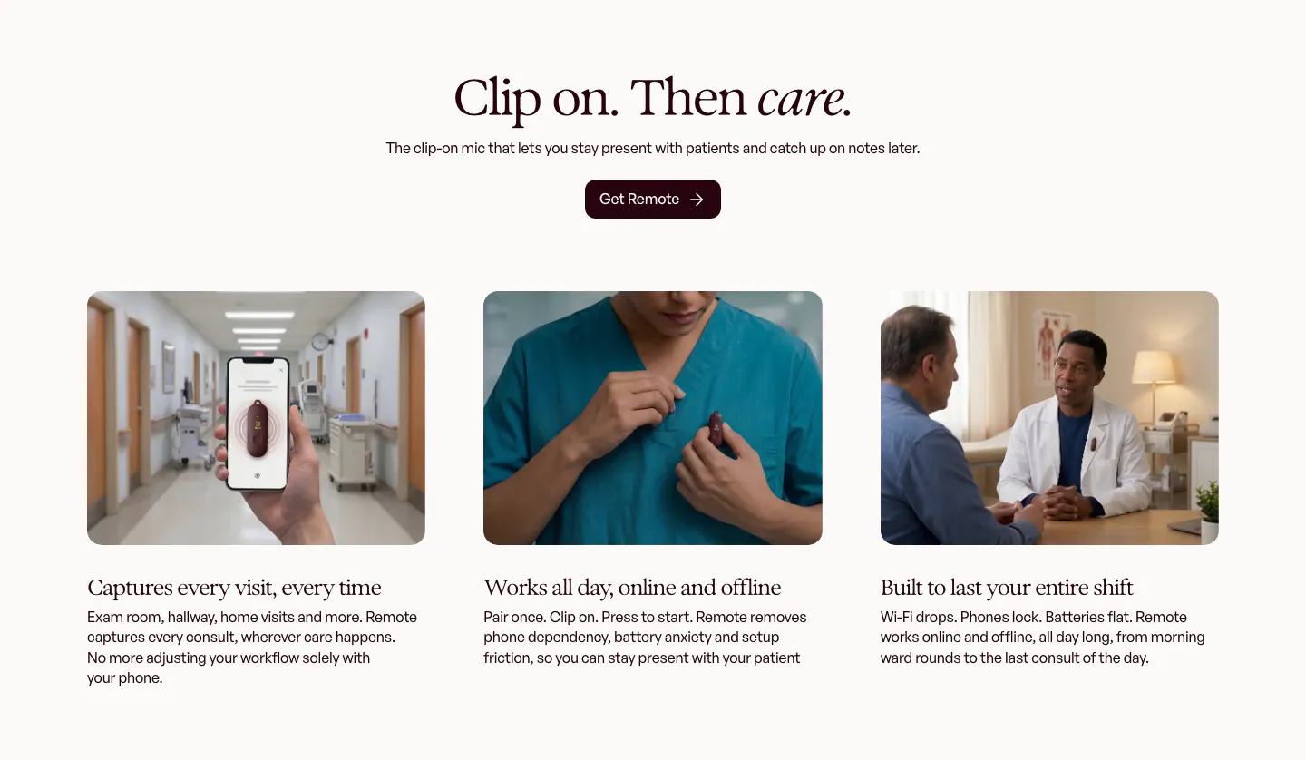
  156. Heidi features section: centered serif headline and button above three photo cards of the clip-on mic in clinical settings
  157. Synthesia team section: left-aligned headline above four black-and-white founder headshot cards with names and titles on white
  158. Clay blog & resources section: centered headline above a bento grid of conference, livestream, community story and careers cards
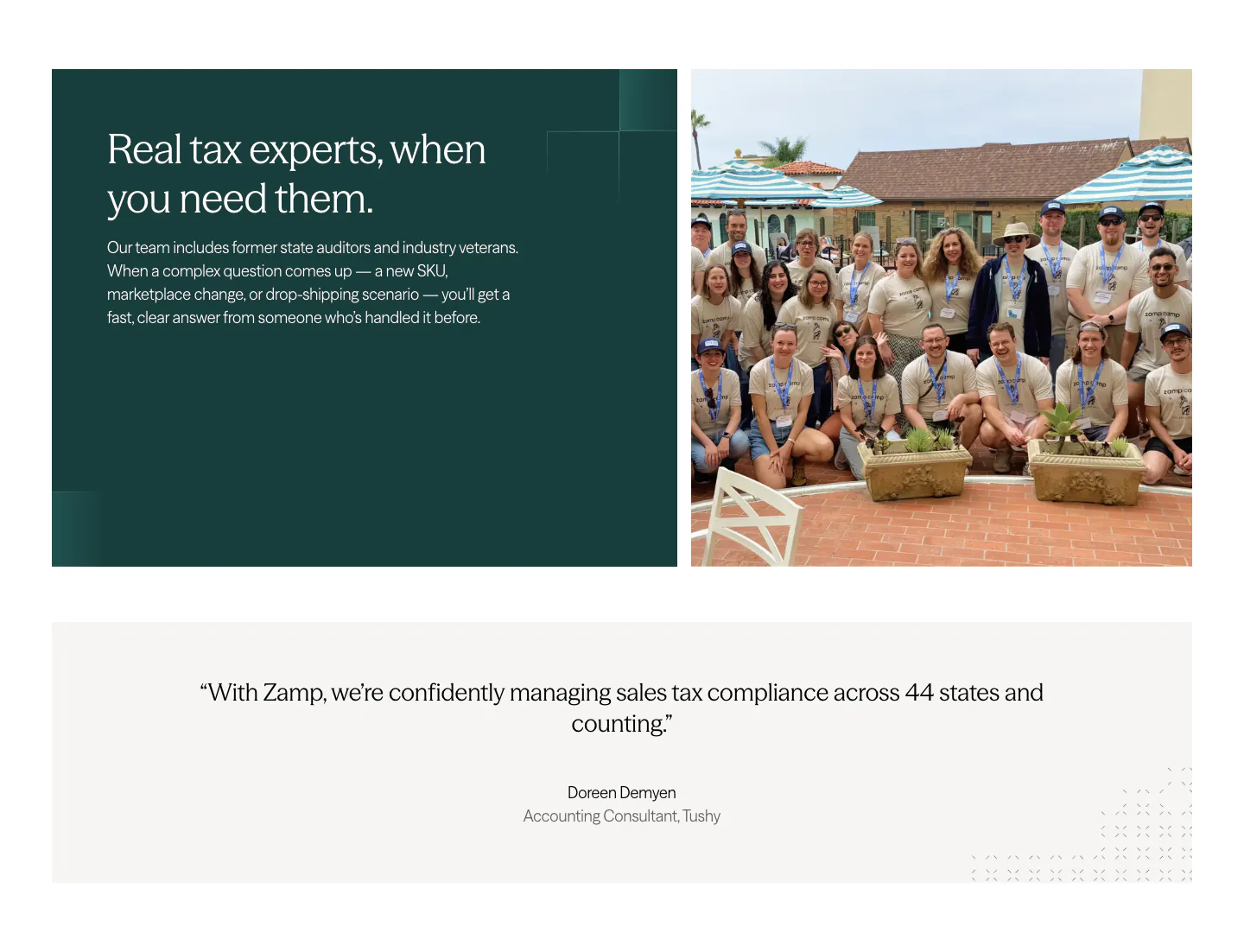
  159. Zamp value proposition section: dark green text panel beside a staff group photo, above a centered customer quote band on light gray
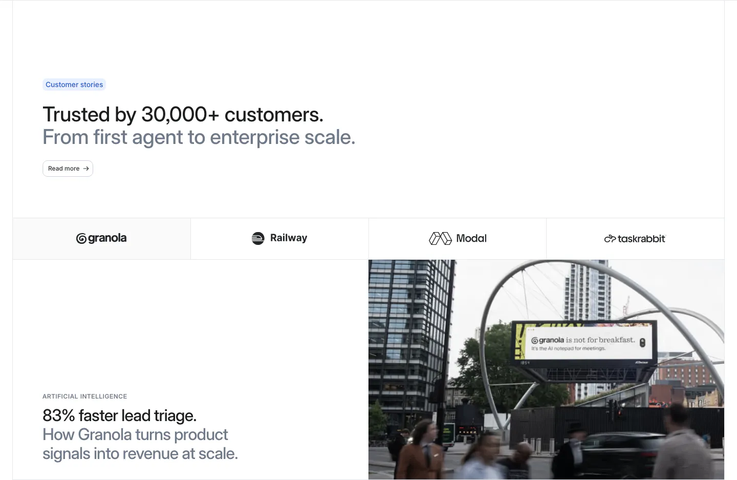
  160. Attio testimonials section: headline above a customer logo tab bar and a Granola case study with stat headline beside a street photo
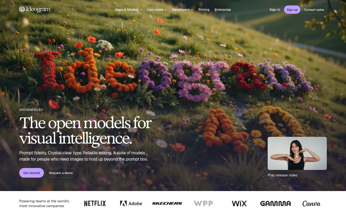
  161. Ideogram hero section: serif headline and buttons over a full-bleed hillside of flowers, release video thumbnail, logo strip below
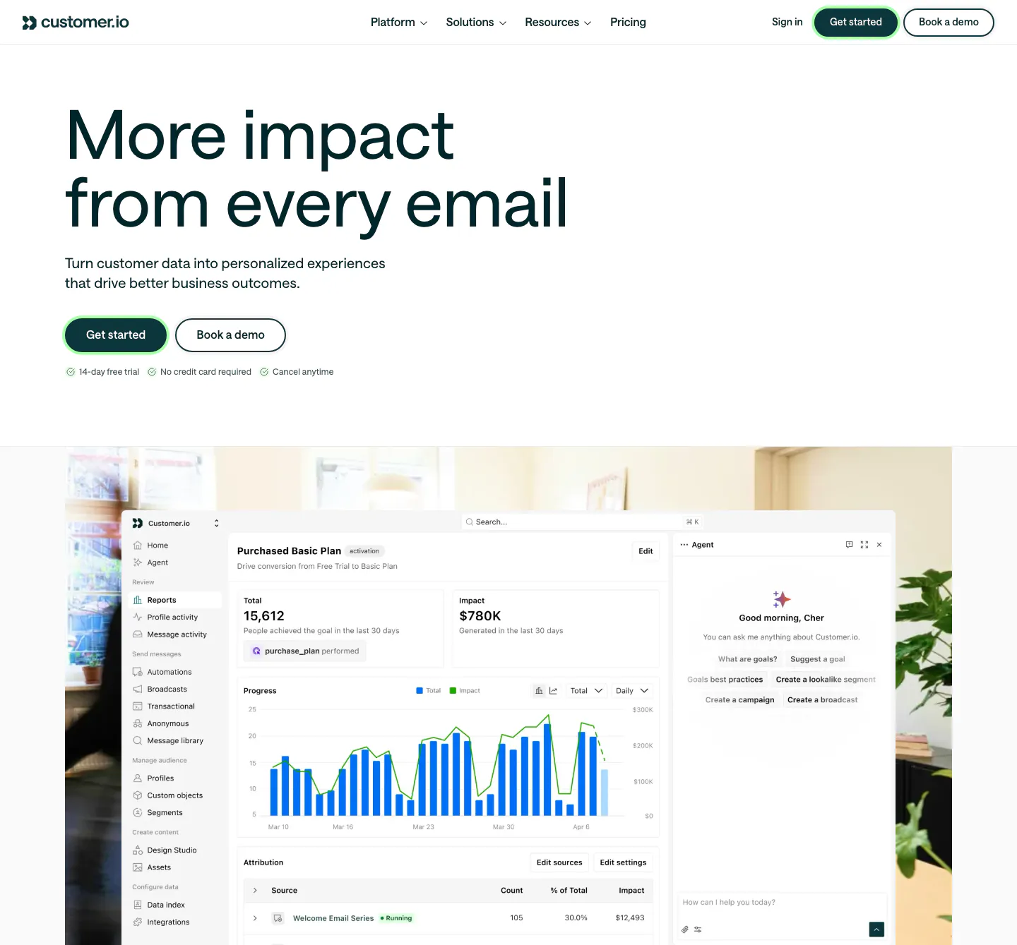
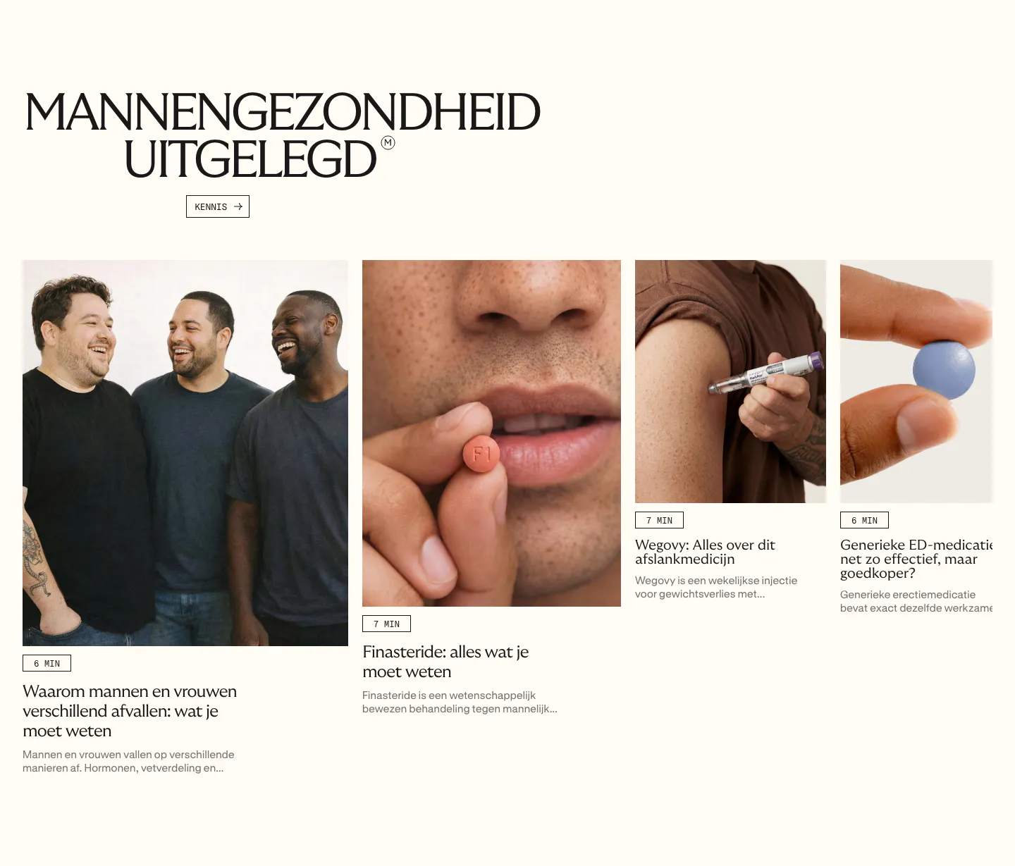
  162. Customer.io hero section: large left-aligned headline with two buttons above a reports dashboard screenshot set over an office photo
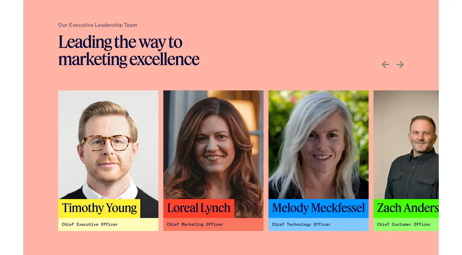
  163. Jasper team section: serif headline and arrows above executive portrait cards with colored name labels on a salmon background
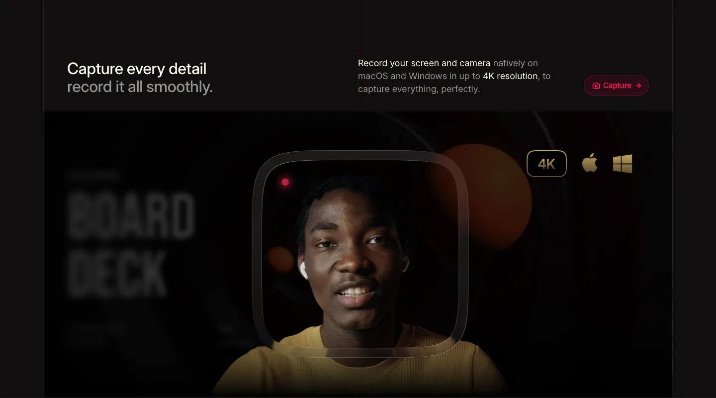
  164. Supercut features section: headline row with Capture button above a webcam recording frame of a smiling presenter with 4K badge
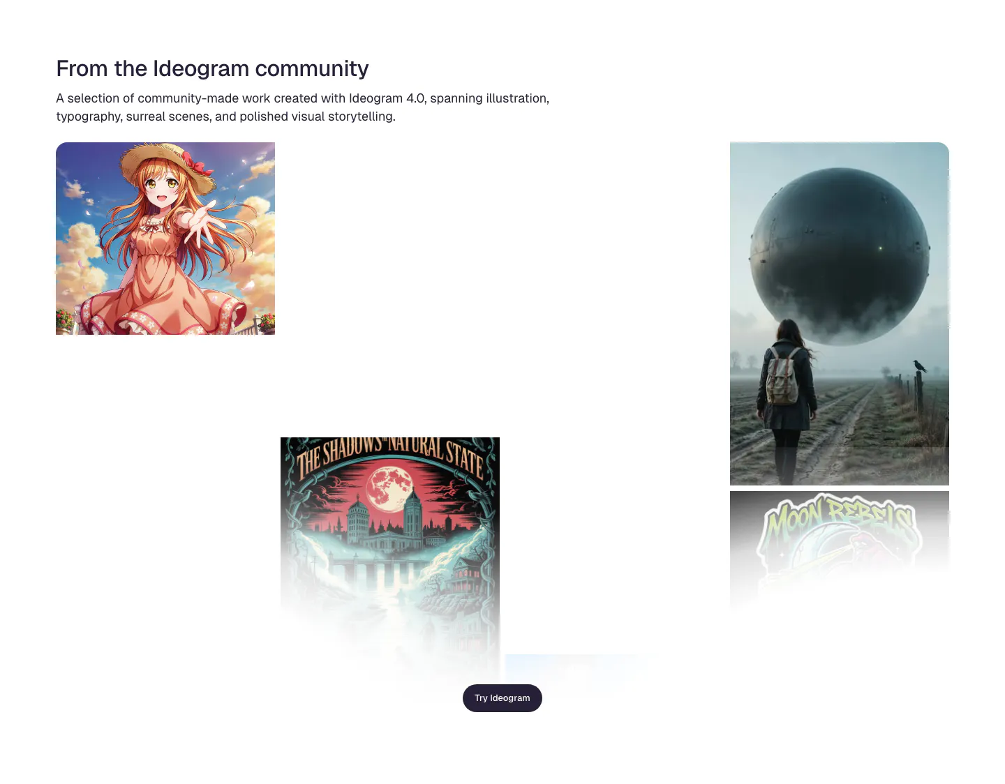
  165. Ideogram features section: headline and intro above a scattered gallery of community images incl. anime art, a poster and a surreal sphere
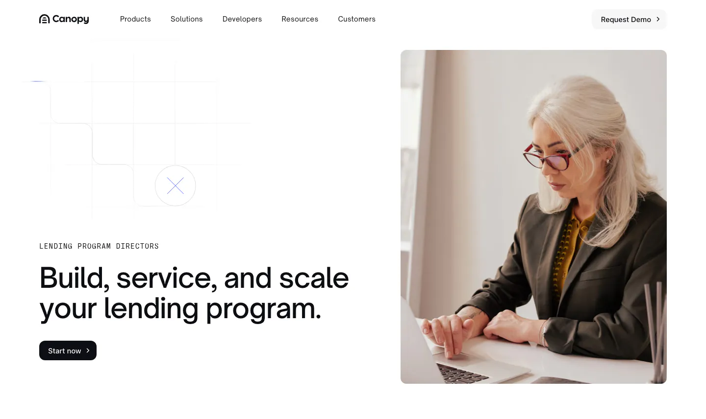
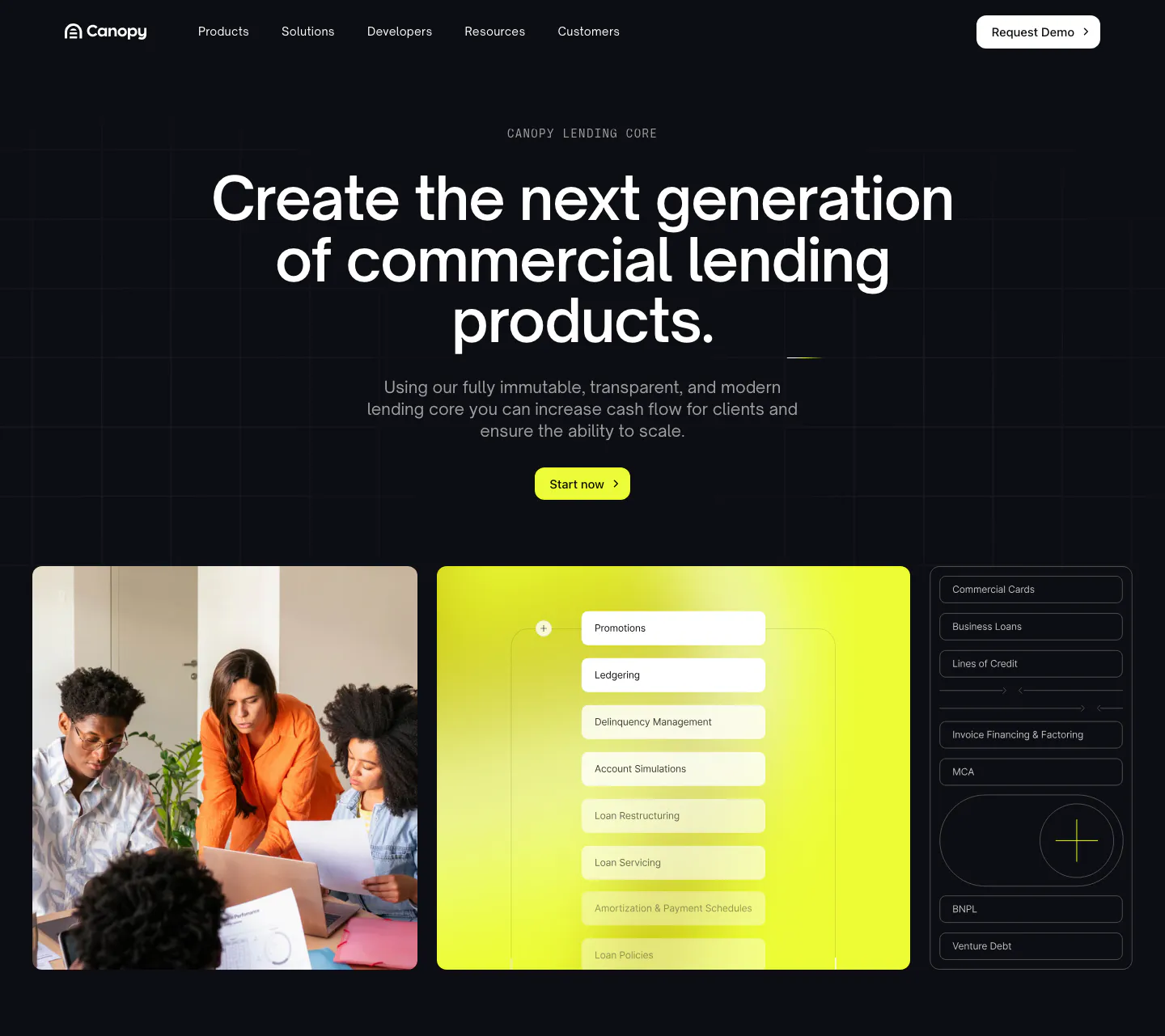
  166. Canopy hero section: left-aligned headline with eyebrow and button beside a photo of a woman working on a laptop
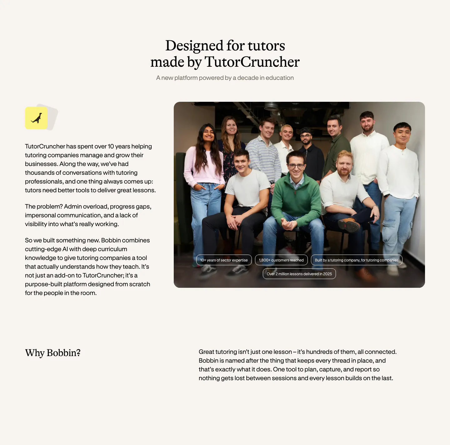
  167. Bobbin about & mission section: serif heading, company story text left and a team group photo right, with a Why Bobbin row below
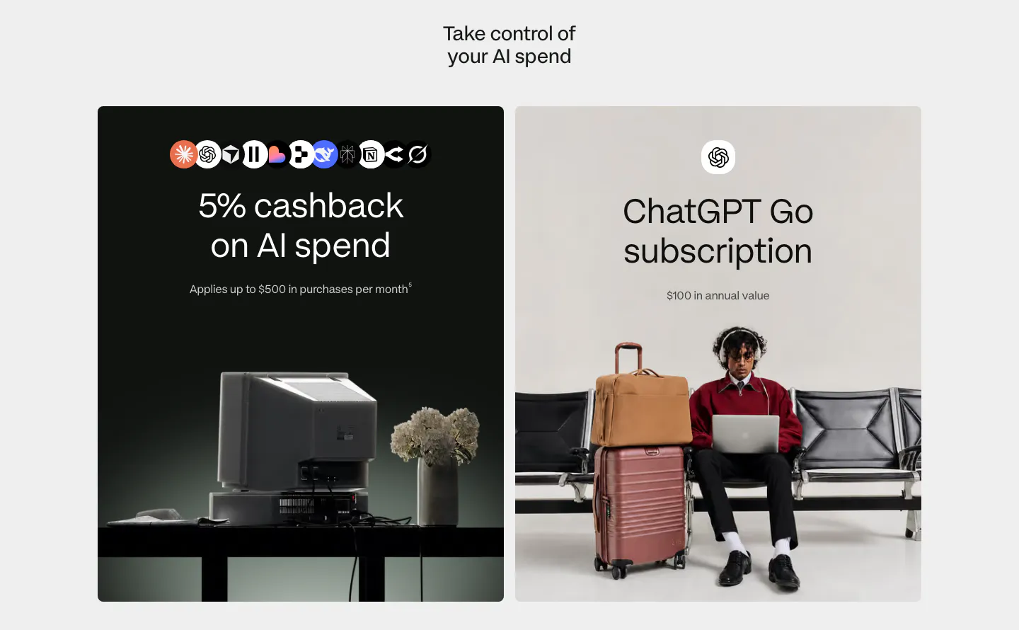
  168. Plasma features section: centered heading above two large cards, a dark card with AI app icons and a light card with a traveler photo
  169. Menkind blog & resources section: serif headline above a row of article cards with photos and read times, cut off at the edge
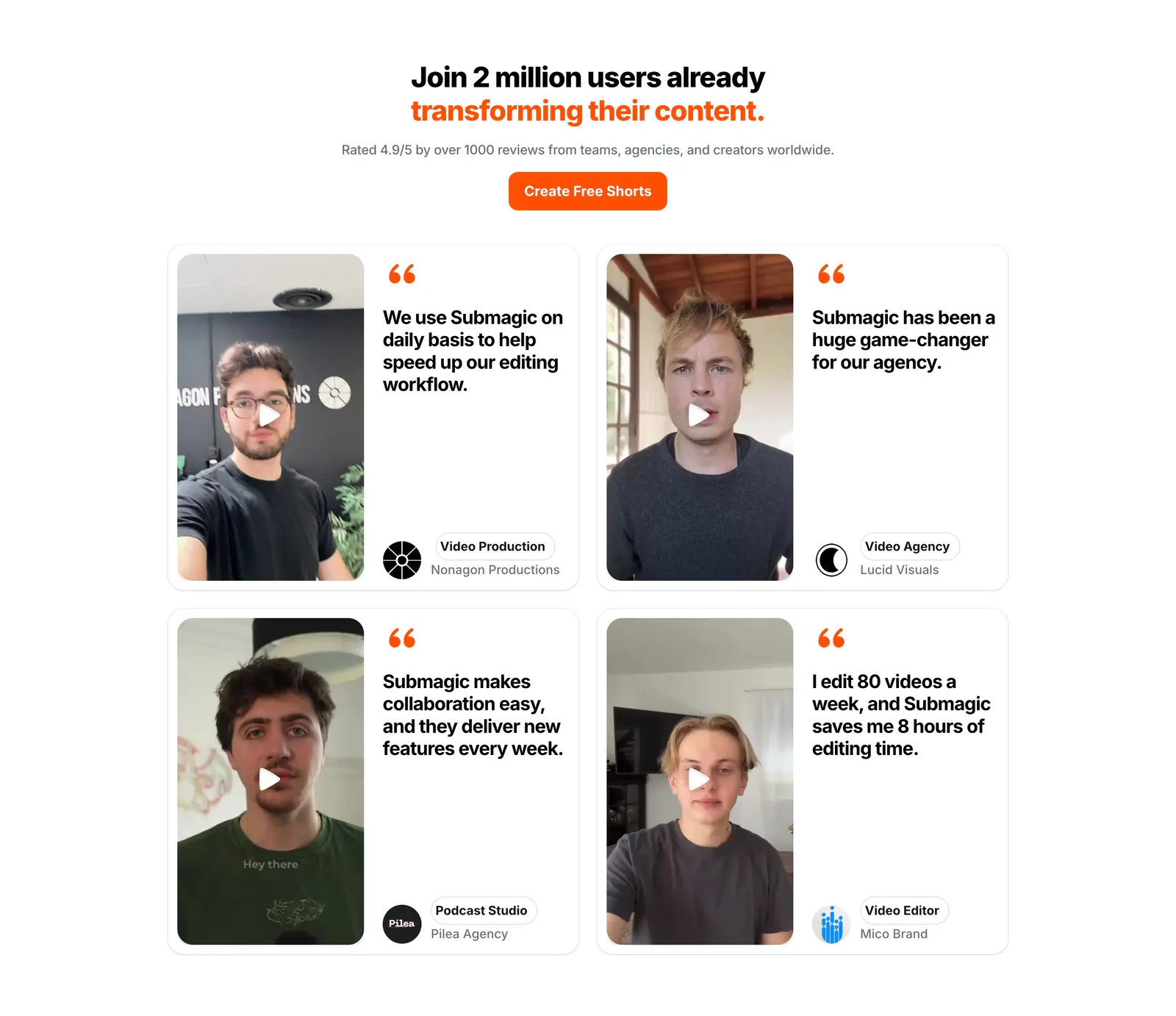
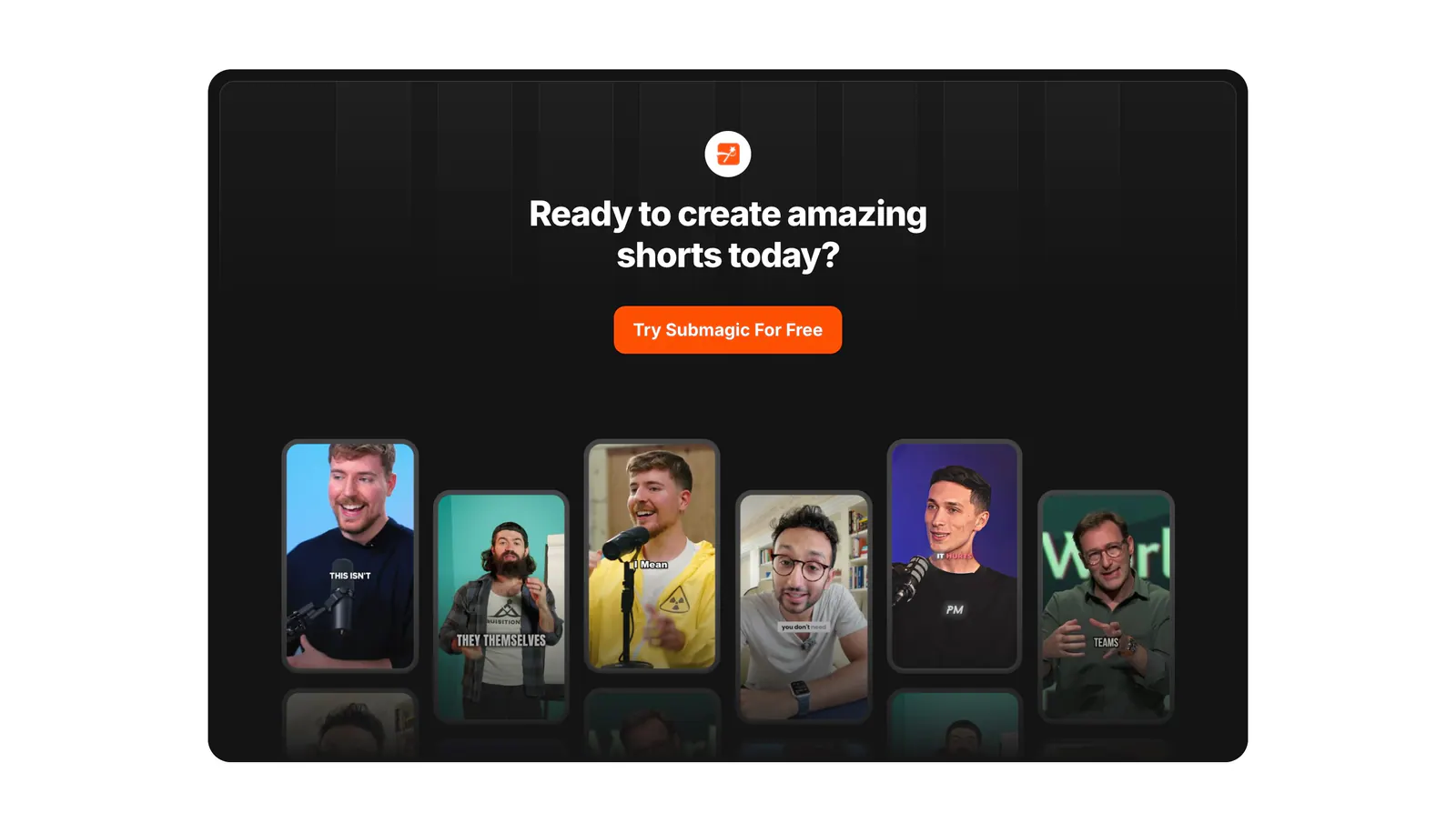
  170. Submagic testimonials section: centered headline and orange button above a 2x2 grid of quote cards with creator video thumbnails
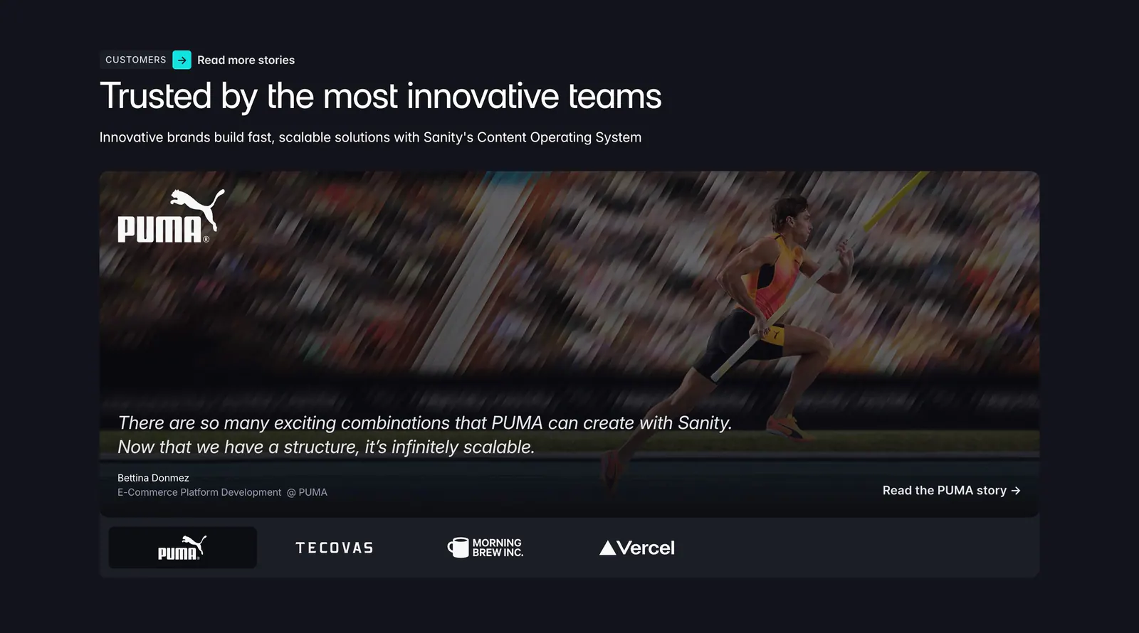
  171. Sanity testimonials section: headline above a PUMA athlete photo card with quote and a row of customer logo tabs on a dark background
  172. Canopy hero section: dark centered headline and lime button above a team photo, lime UI panel and product list tiles
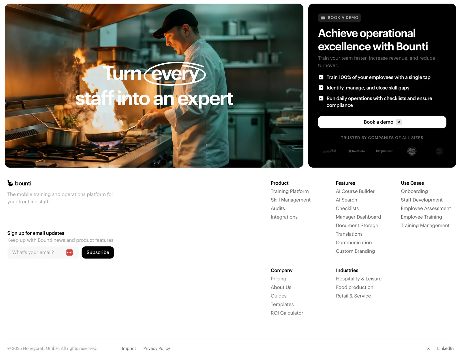
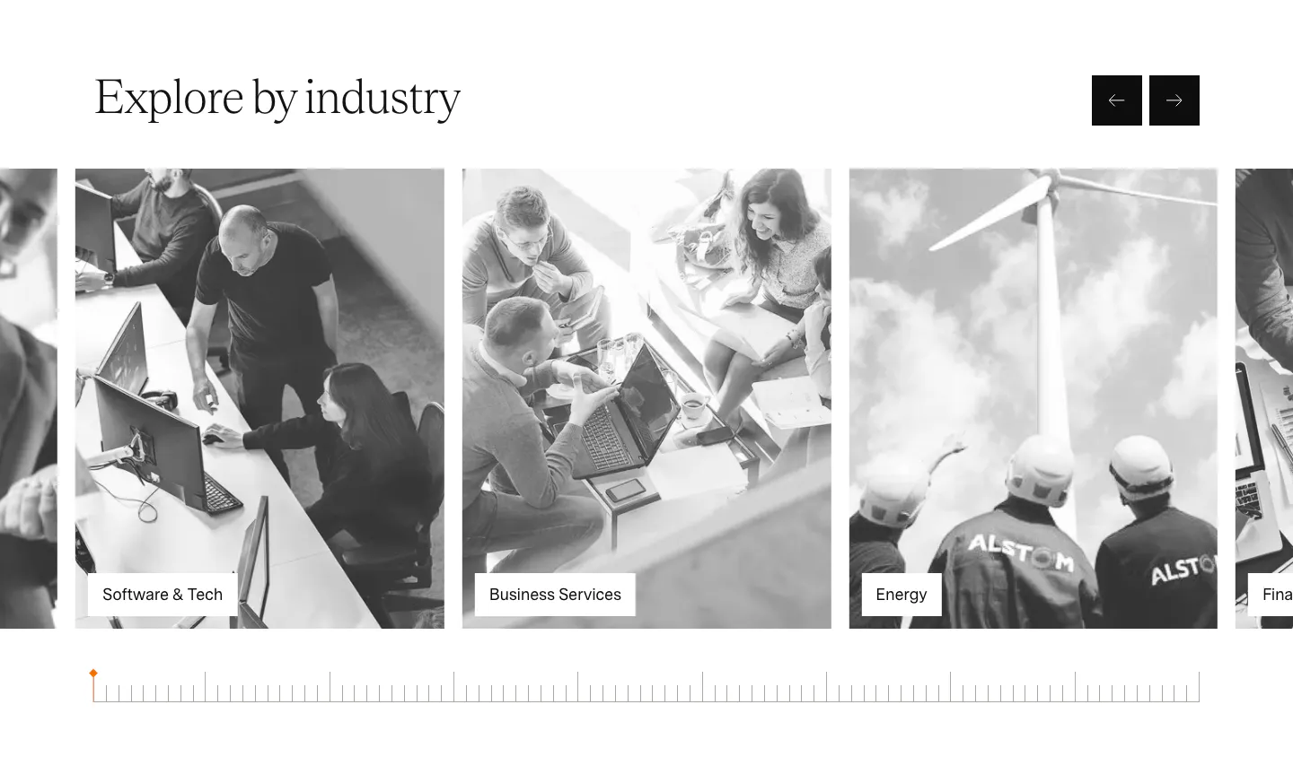
  173. Bounti footer section: kitchen photo card and black demo card with checklist above a white footer with email signup and link columns
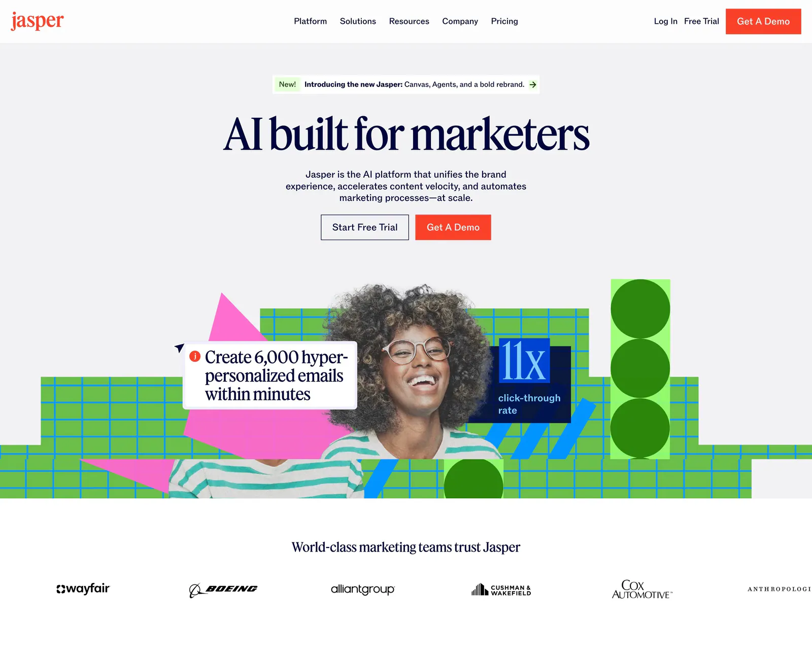
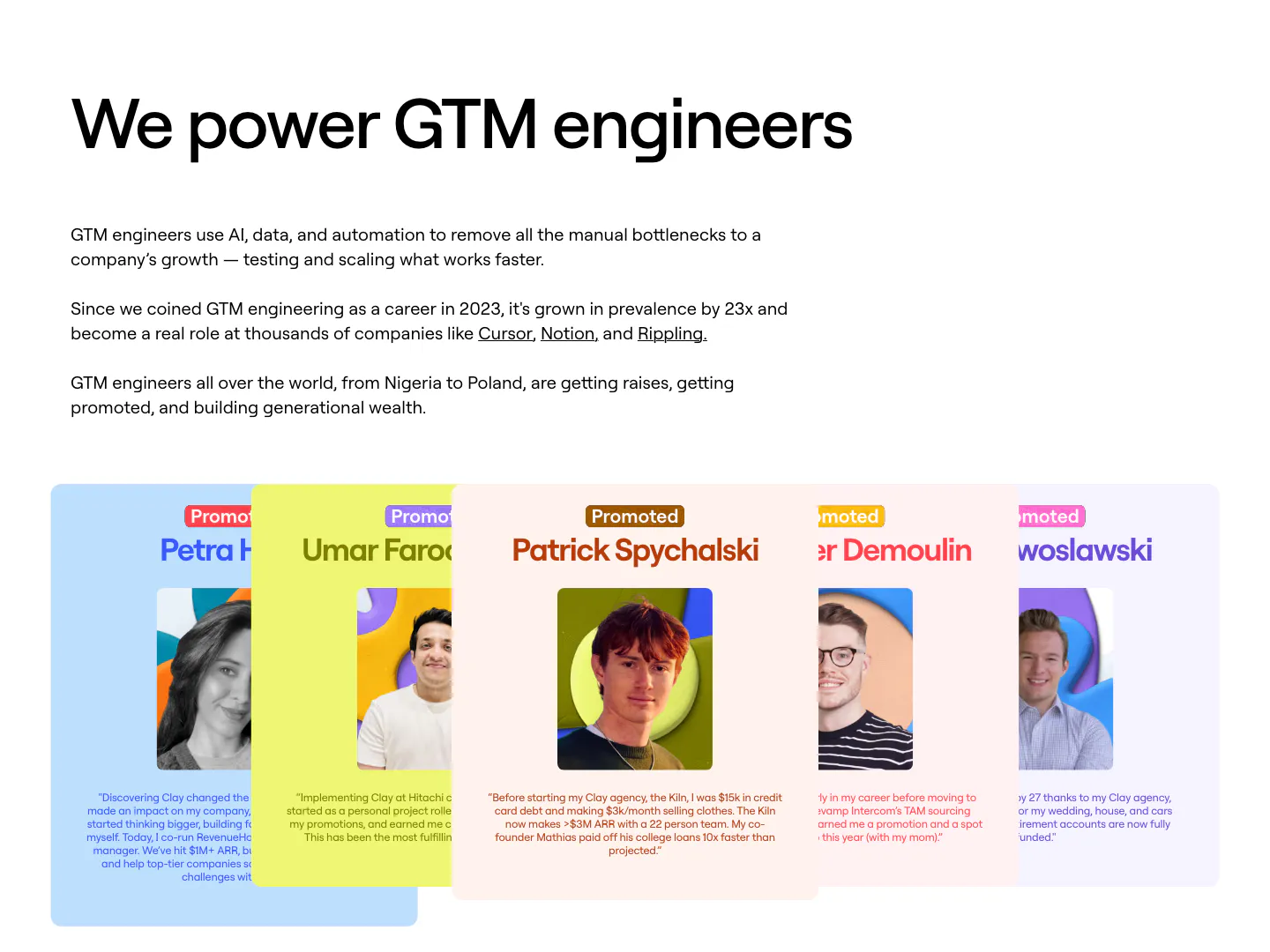
  174. Jasper hero section: nav and centered serif headline over a photo of a smiling woman with green grid shapes, customer logo row below
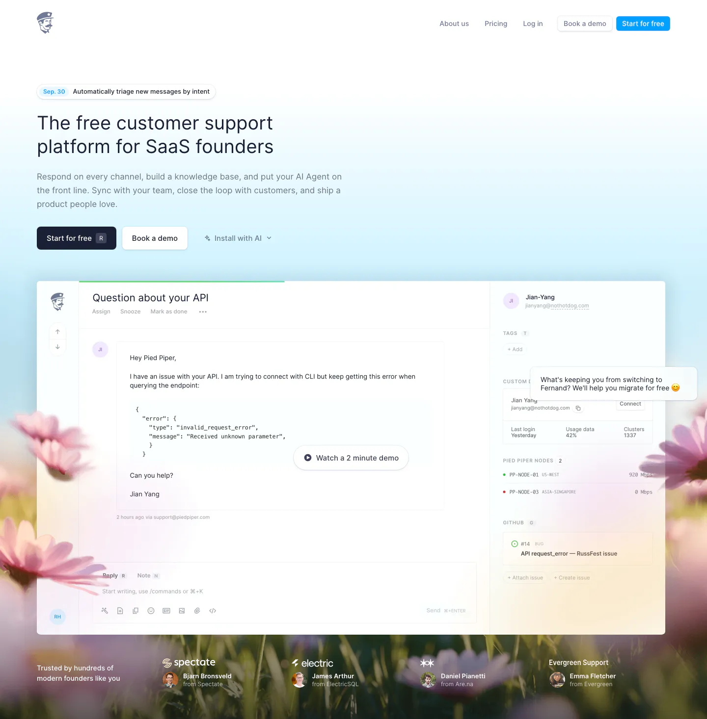
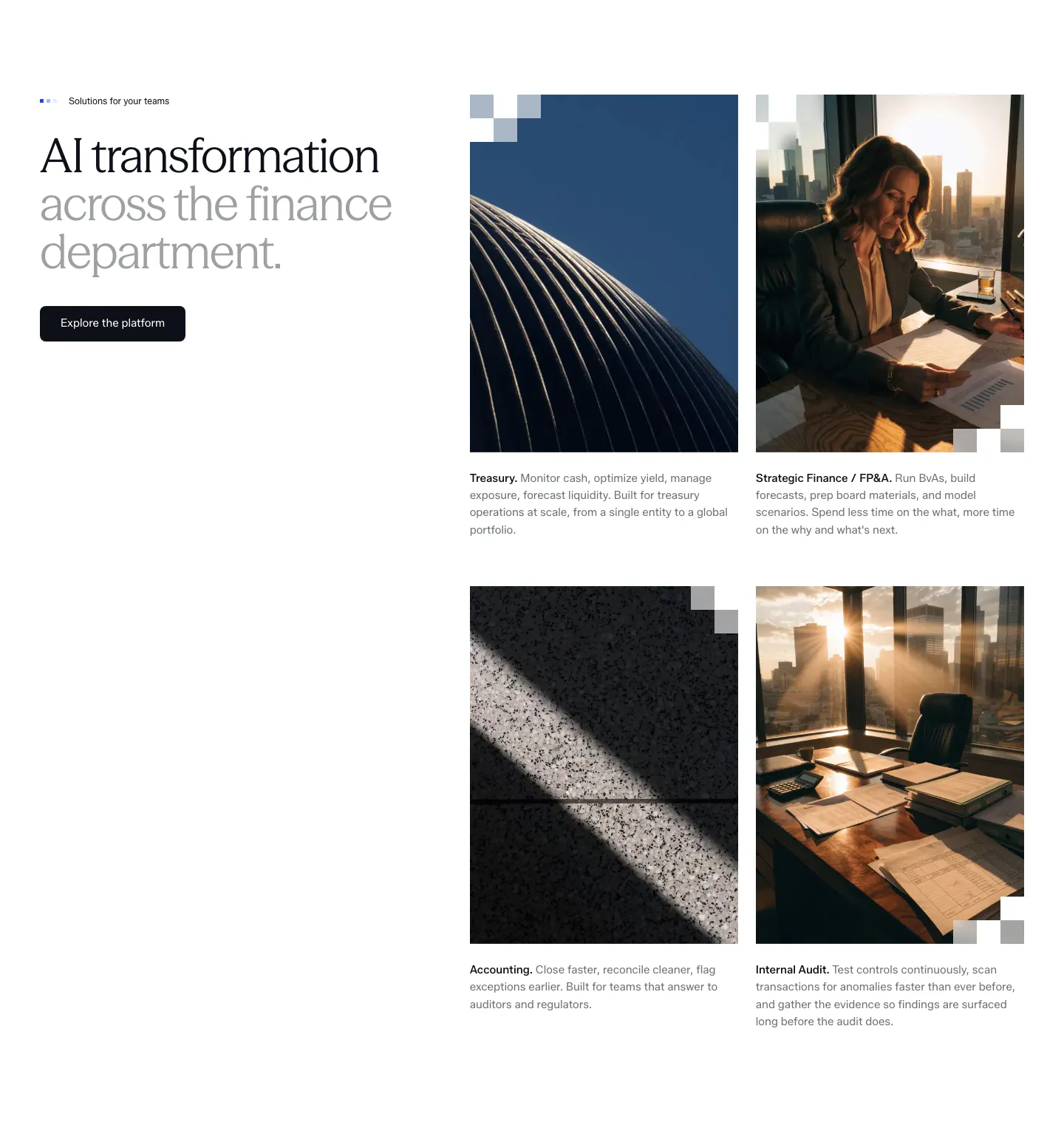
  175. Fernand hero section: left-aligned headline and two CTAs above an inbox product screenshot on a sky-blue gradient with a blurred flower field
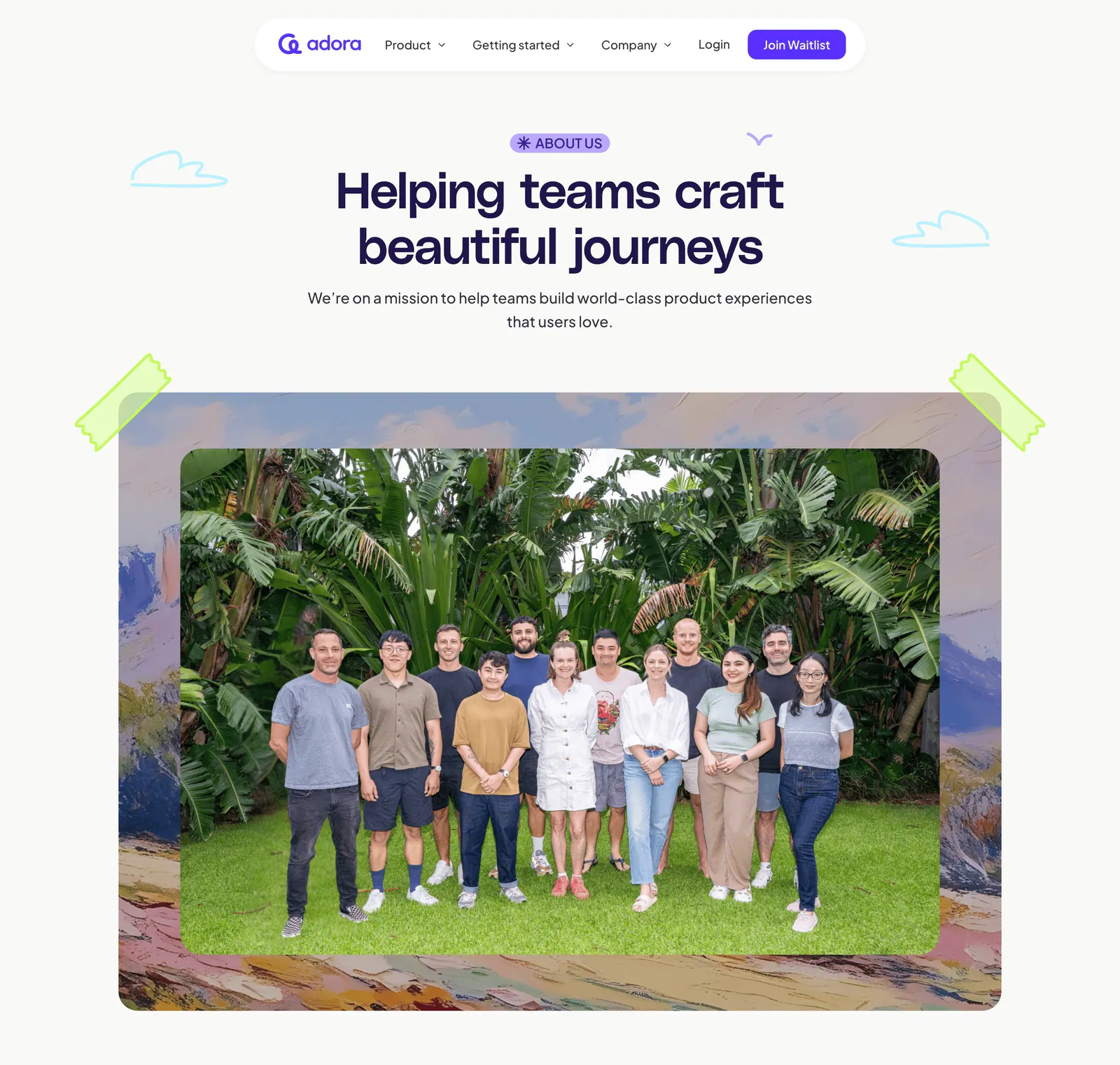
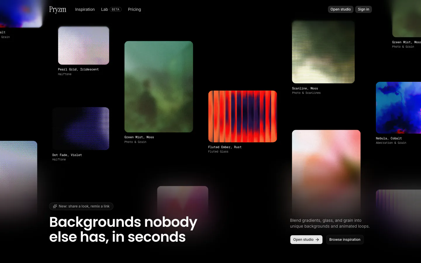
  176. Adora hero section: floating nav, centered About us headline and a large team photo framed by painted artwork and tape
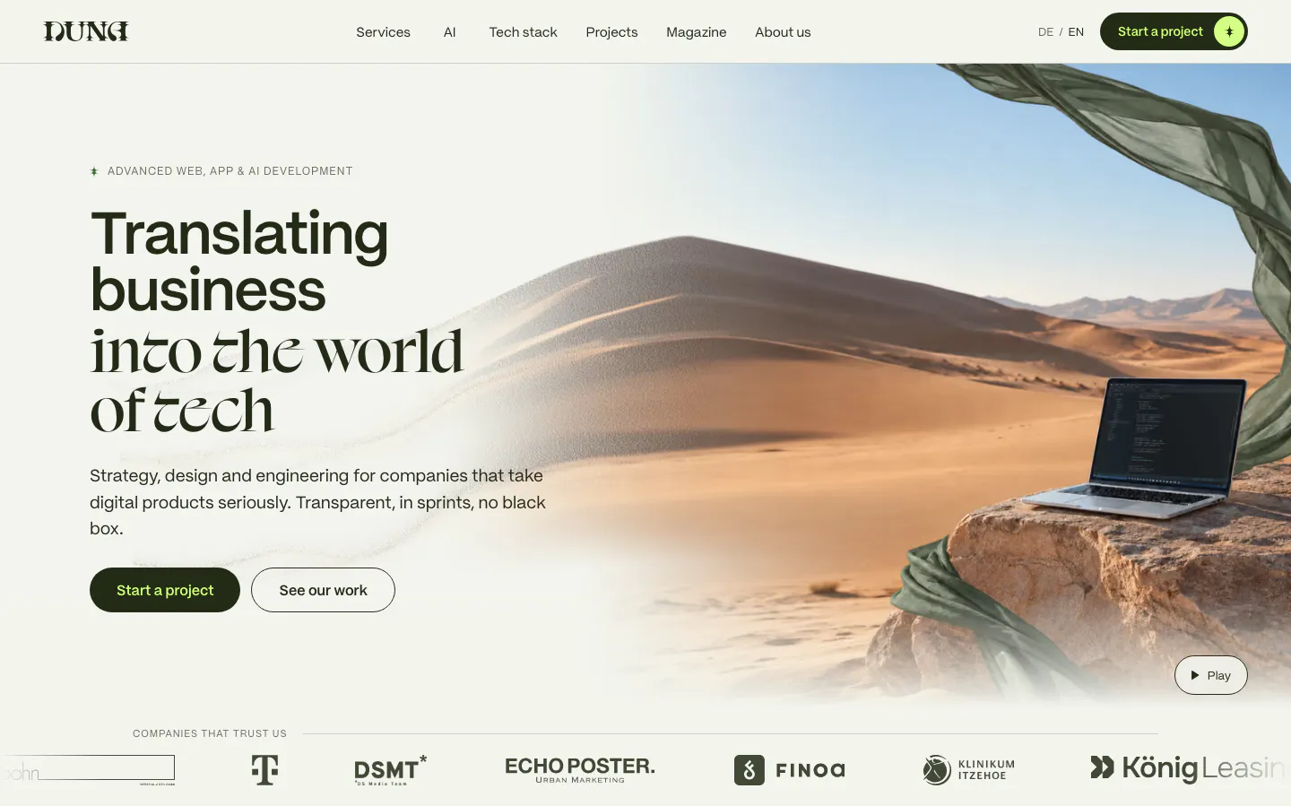
  177. DUNA hero section: mixed sans and serif headline with two buttons beside a desert dune photo with laptop, client logo strip below
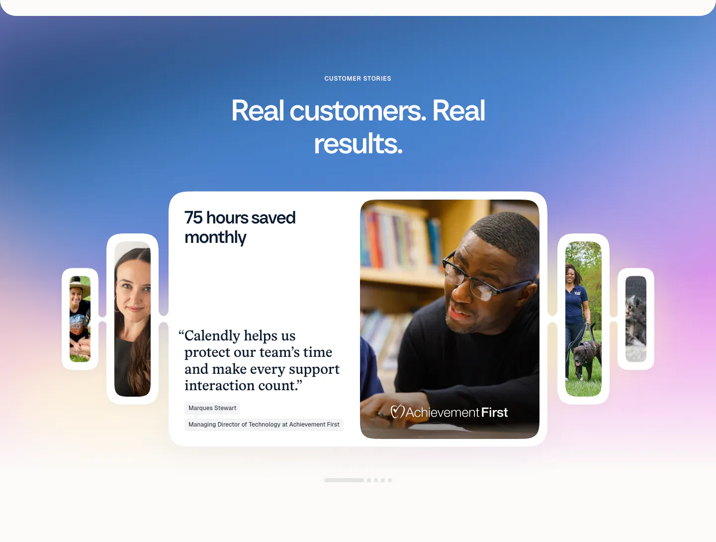
  178. Calendly testimonials section: centered headline on a blue-purple gradient above a quote card carousel with customer photos and pagination dots
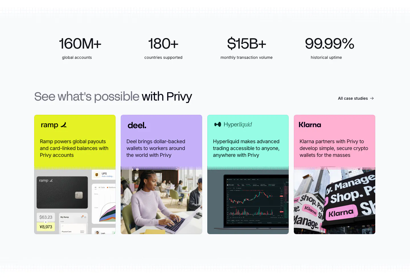
  179. Privy testimonials section: four large metrics above a row of colorful customer case study cards with logos, short copy and photos
  180. Agiloft use cases section: serif heading with arrow buttons above a carousel of grayscale industry photo cards
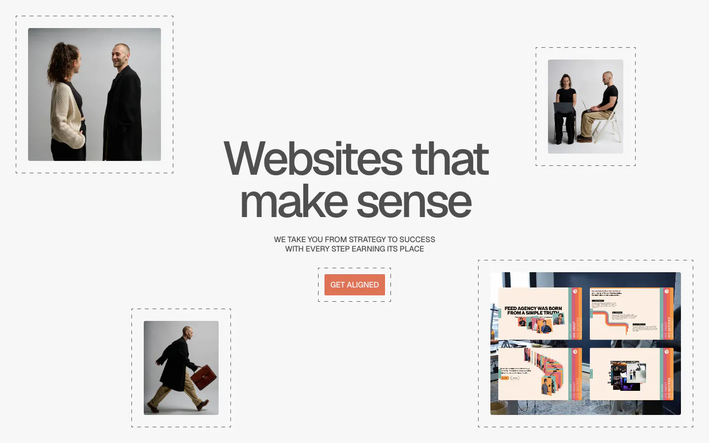
  181. Clay testimonials section: left-aligned heading and copy above a fanned stack of colored cards with portrait photos and promotion quotes
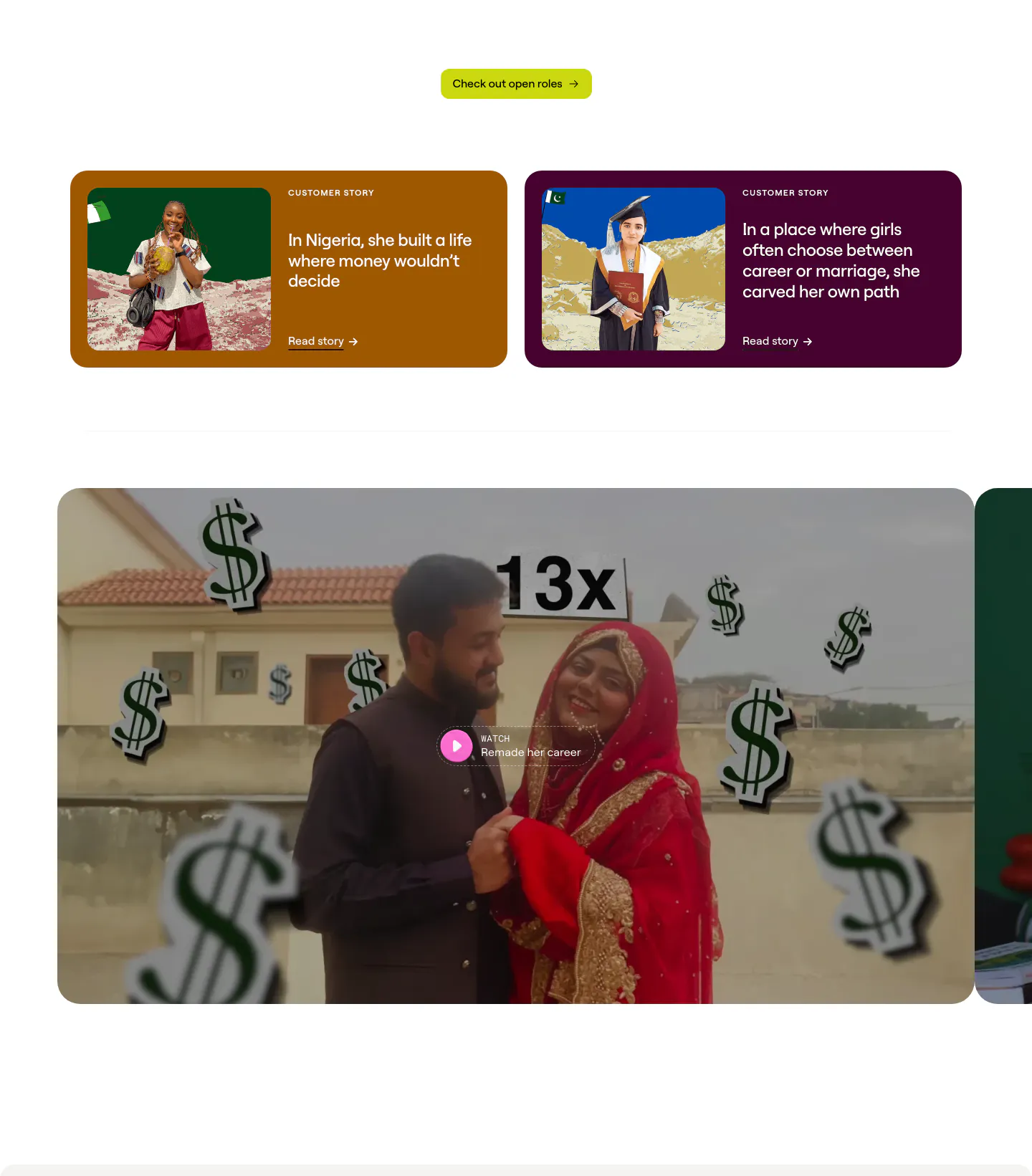
  182. Concourse use cases section: headline and button left, 2x2 grid of photo cards for Treasury, FP&A, Accounting and Internal Audit right
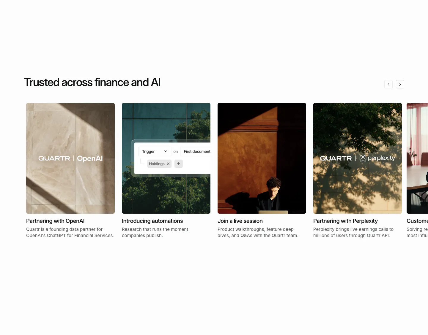
  183. Pryzm hero section: black canvas of scattered colorful background sample cards with labels, headline at bottom left and buttons at right
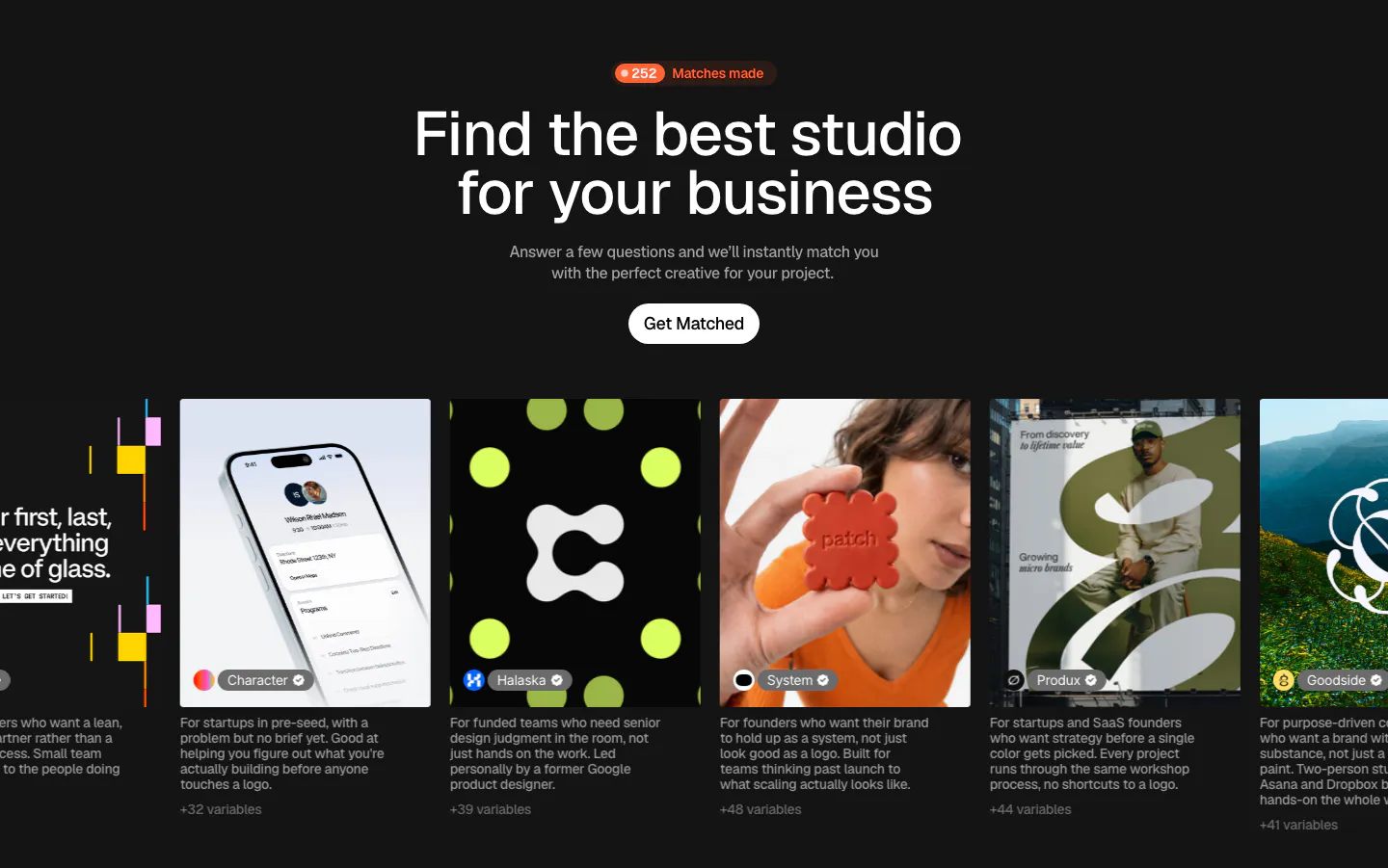
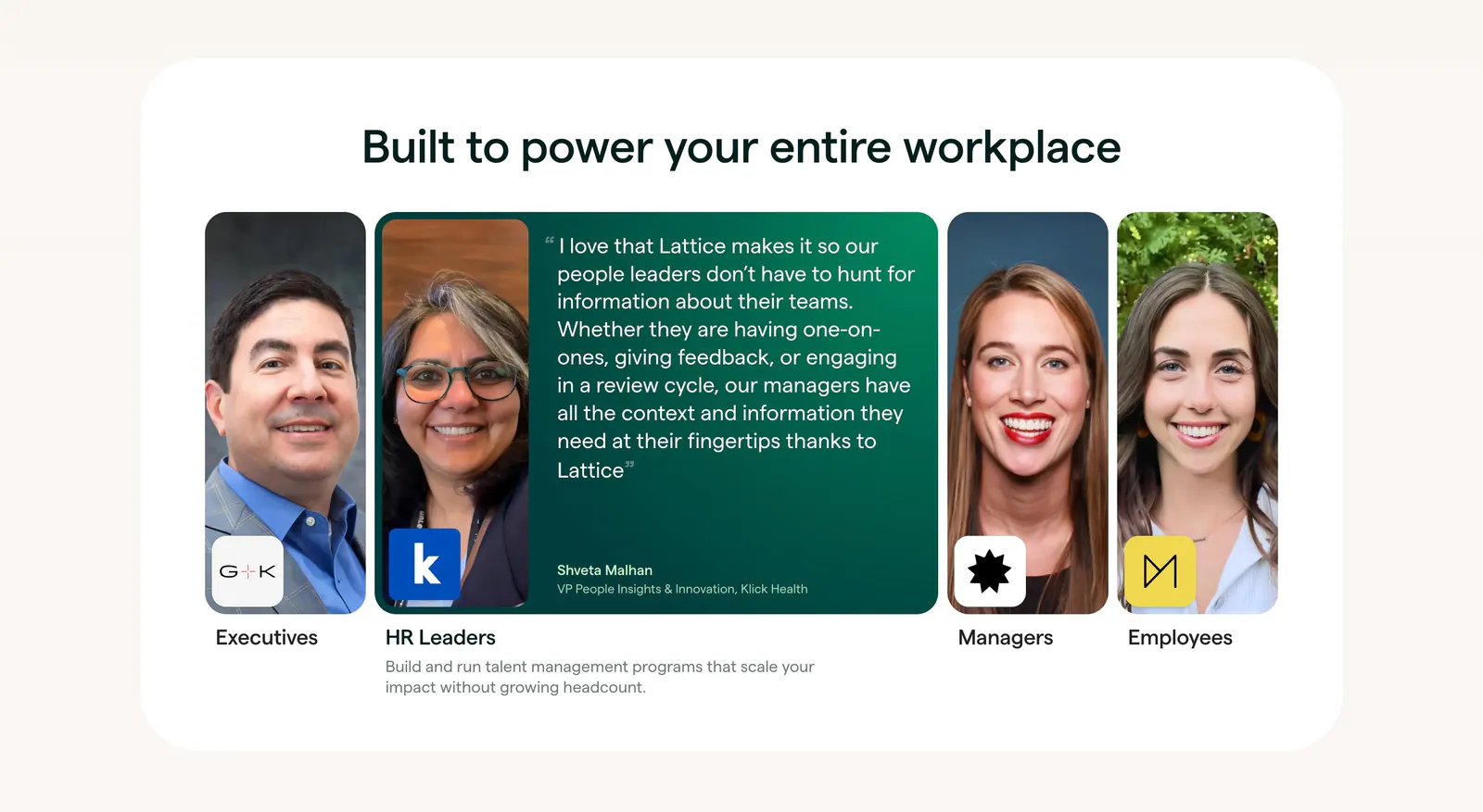
  184. Palette hero section: centered headline with match counter badge and Get Matched button above a carousel of studio photo cards on dark
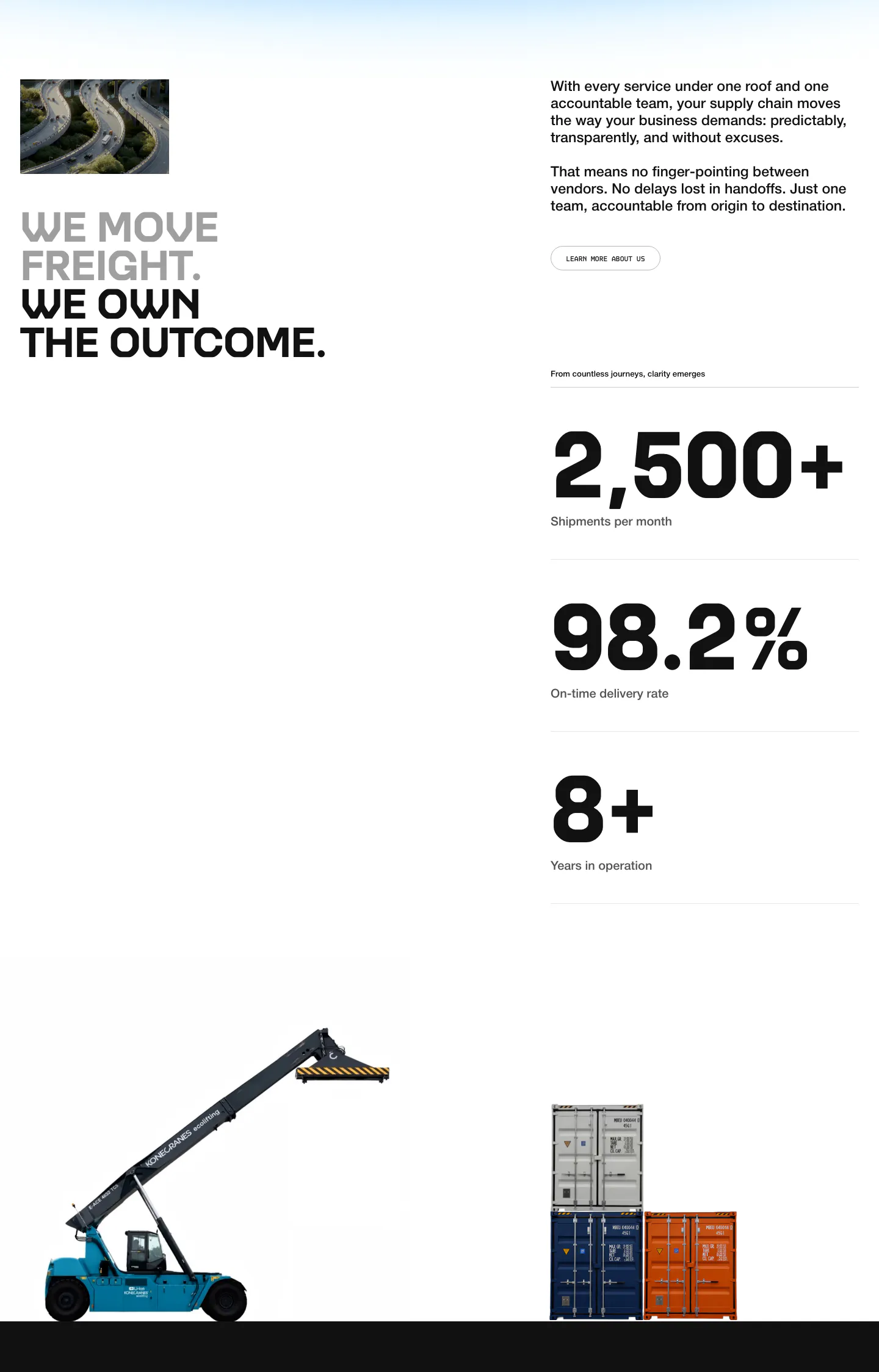
  185. United Carriers stats section: uppercase headline, intro copy and three large metrics with cutout photos of a reach stacker and containers
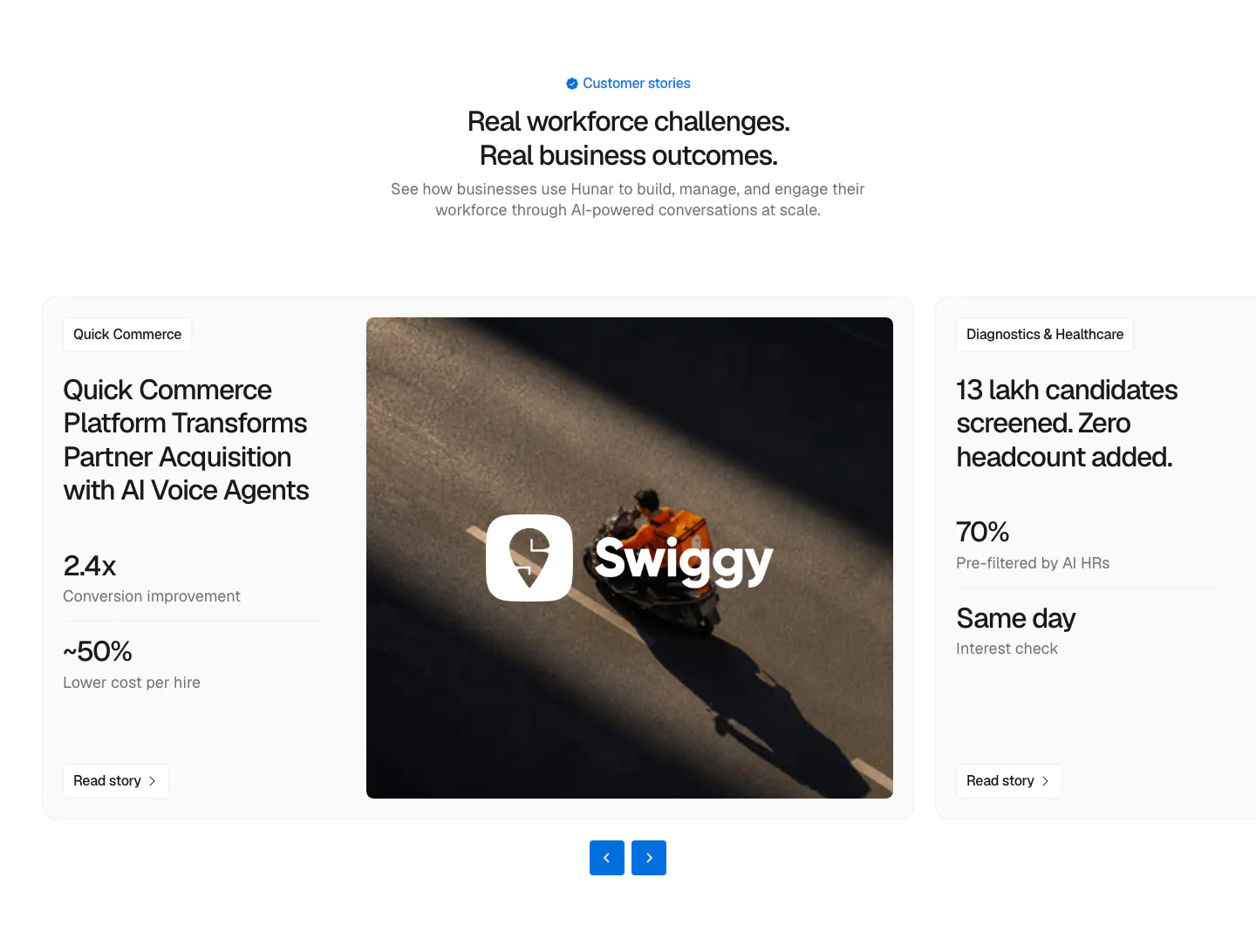
  186. Hunar testimonials section: centered heading above a case-study carousel card with metrics, a Swiggy delivery photo and arrow controls
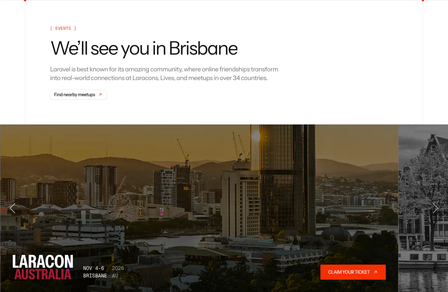
  187. Laravel blog & resources section: events headline above a photo carousel card for Laracon Australia in Brisbane with a ticket button
  188. A-LIGN hero section: centered headline, subline and orange button surrounded by four dashed-frame photos of the team and a project
  189. Clay testimonials section: two colored customer story cards with photos above a large video thumbnail with play button, cut off at the right
  190. Quartr blog & resources section: horizontal carousel of photo cards for partnership news, automations and a live session
  191. Lattice testimonials section: centered heading over a row of role portrait cards, one expanded into a green quote card from an HR leader
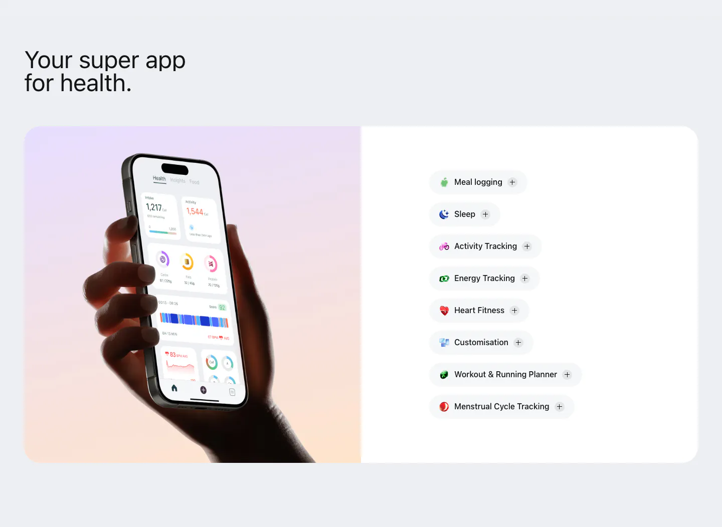
  192. Bright features section: hand holding a phone with the health app on a lavender-peach gradient panel beside a list of feature pills
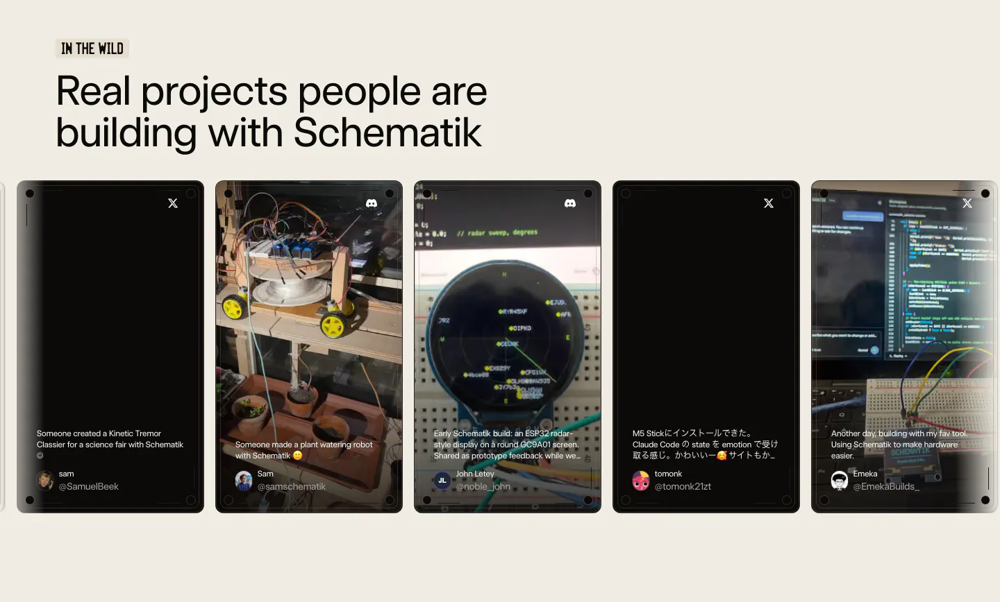
  193. Schematik testimonials section: headline above a carousel of user post cards with project photos on a beige background
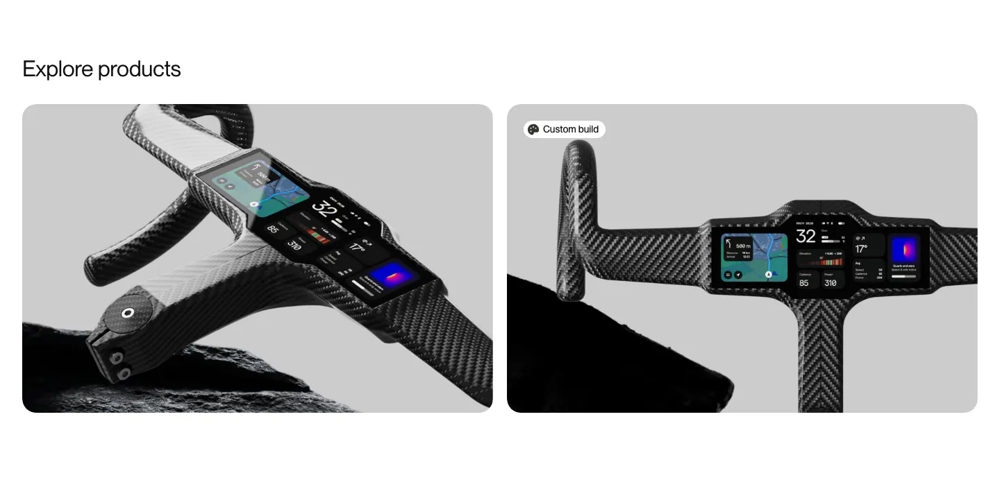
  194. FLITEDECK other section: Explore products heading above two rounded cards with carbon handlebar cockpit product photos on gray
    Flitedeck Other
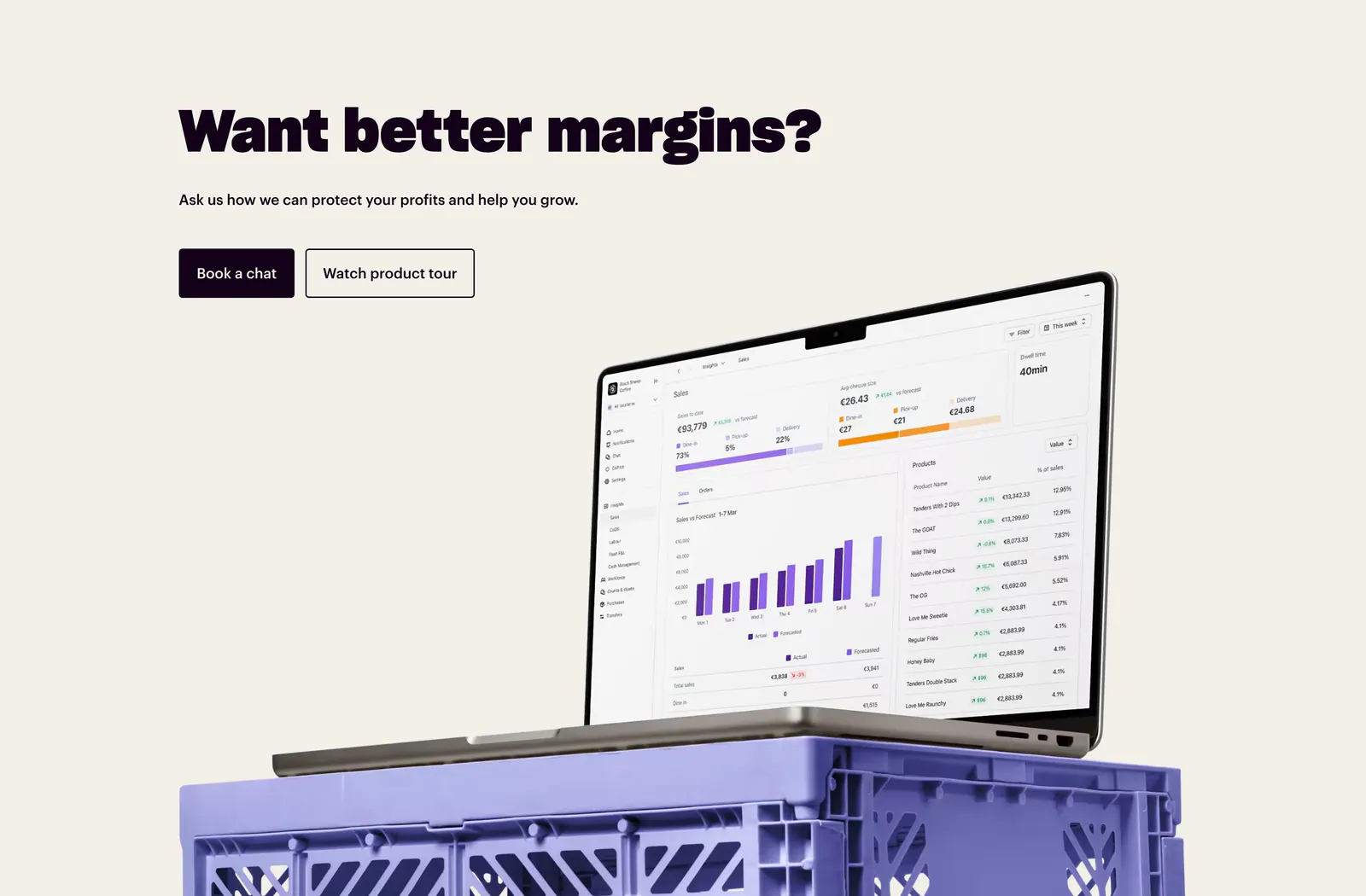
  195. Nory call-to-action section: bold headline with two buttons above a laptop showing a sales dashboard on a purple crate, cream background
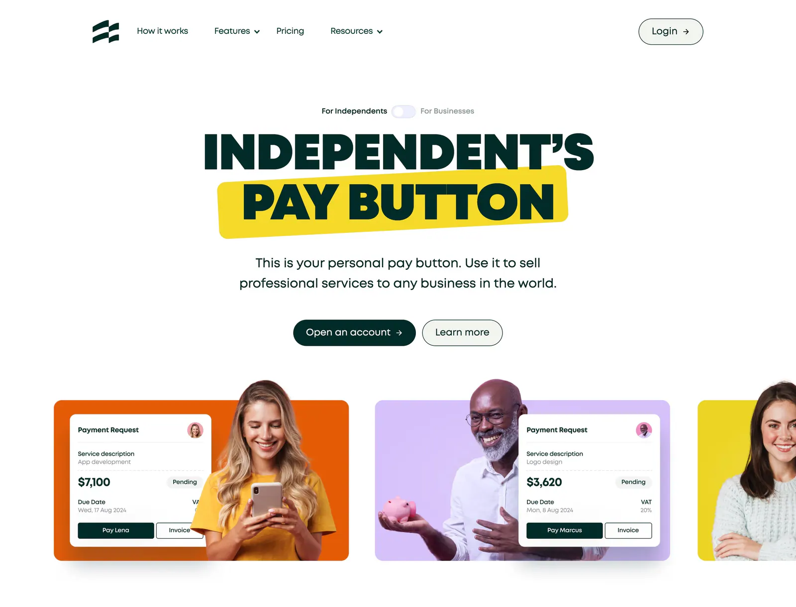
  196. Ruul hero section: centered uppercase headline with yellow highlight above colored cards pairing people photos with payment request UI
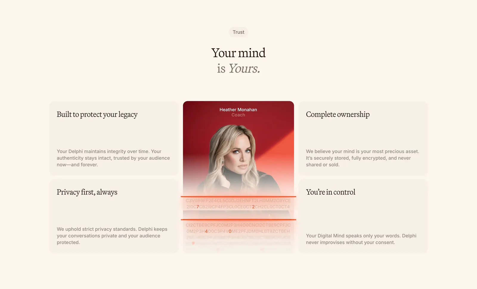
  197. Delphi features section: centered serif headline above a bento of four trust cards around a tall portrait card with an encryption text effect
  198. Concurrence hero section: serif headline and rust Book a Demo button beside a blurred dark portrait image, healthcare logo row below
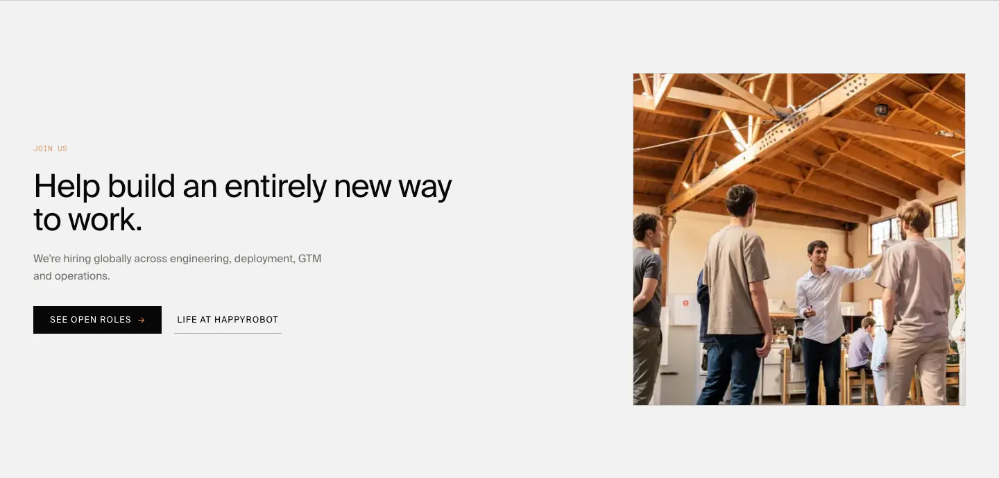
  199. HappyRobot careers section: Join us eyebrow, headline and two buttons on the left, photo of a team in a timber-roofed office on the right
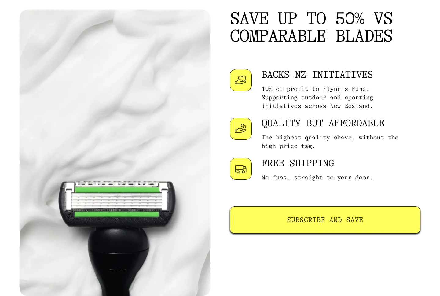
  200. Flynny's value proposition section: razor head on shaving foam photo left, benefit list with yellow icons and a Subscribe and Save button right
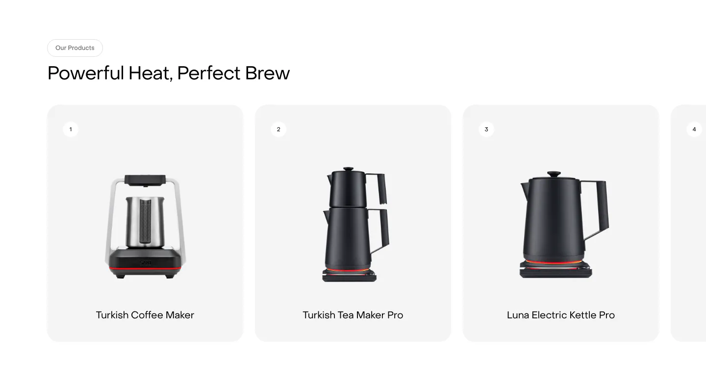
  201. Saki features section: headline above a row of numbered product cards showing kettles and coffee makers, with a fourth card cut off at the edge
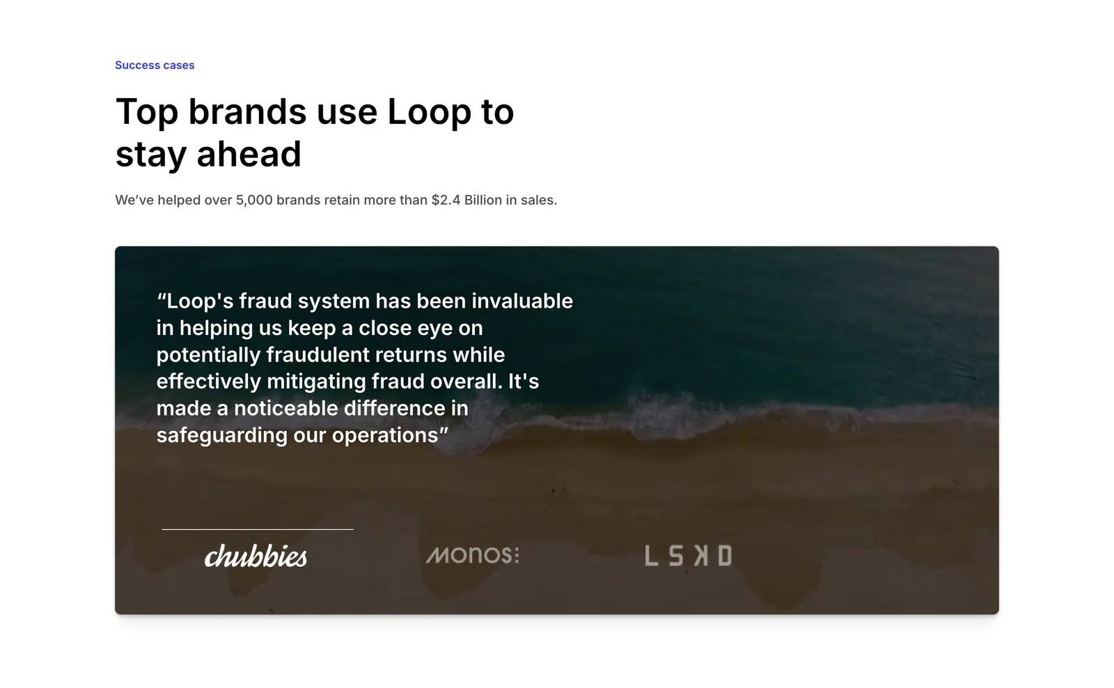
  202. Loop testimonials section: left-aligned headline above a quote card over an aerial beach photo with brand logo tabs
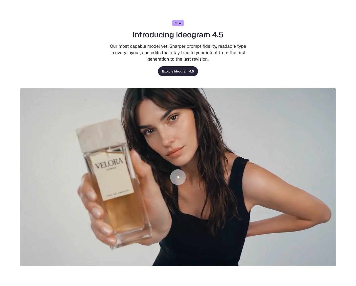
  203. Ideogram features section: centered NEW badge, headline, copy and button above a wide video frame of a woman holding a perfume bottle
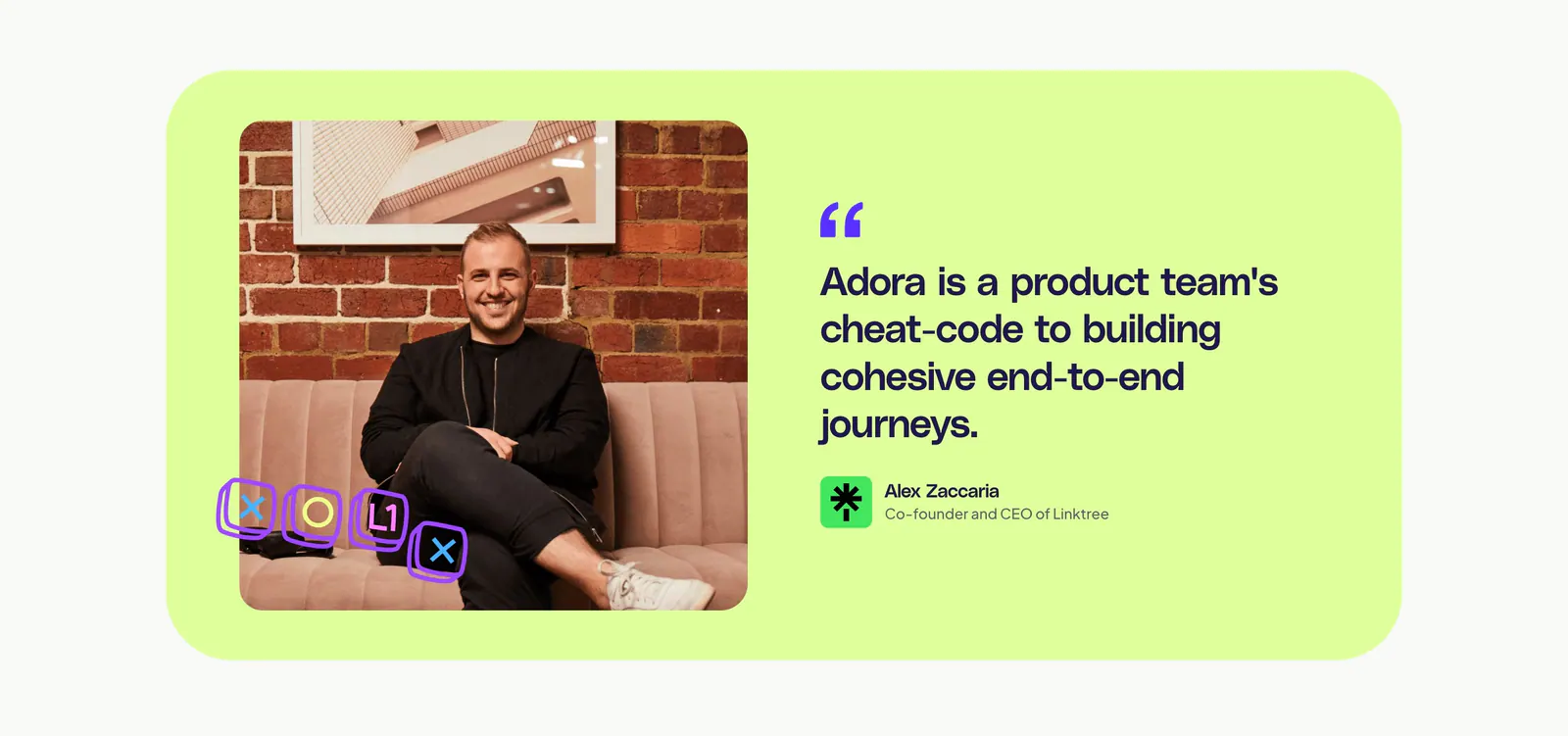
  204. Adora testimonials section: lime card with a portrait photo on the left and a large customer quote with attribution on the right
  205. Canopy testimonials section: centered heading above a case study carousel with a Flexport container photo card and blurred cards
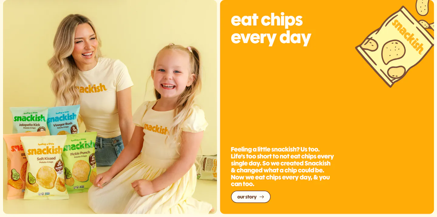
  206. Snackish about & mission section: photo of a woman and girl with chip bags beside an orange panel with headline, story copy and button
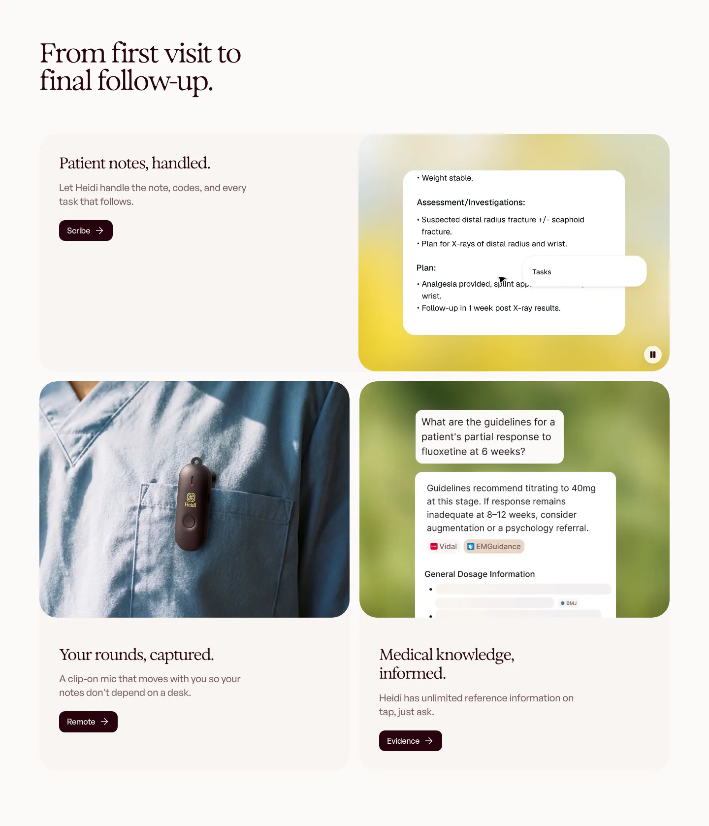
  207. Heidi features section: serif headline over rounded cards pairing text with a clinical notes UI, a clip-on mic photo and a chat answer
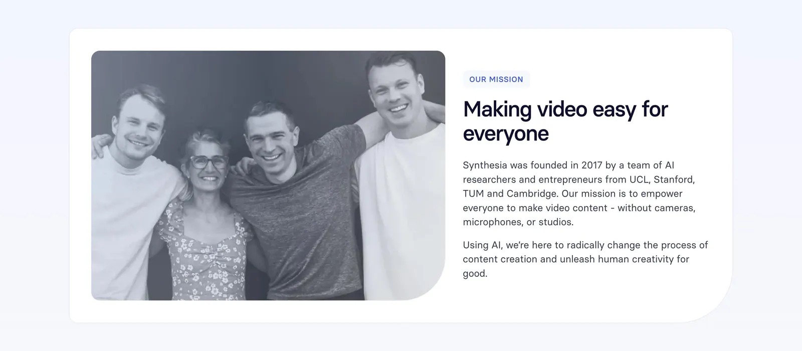
  208. Synthesia about & mission section: black-and-white founders photo on the left with mission label, headline and paragraphs on the right
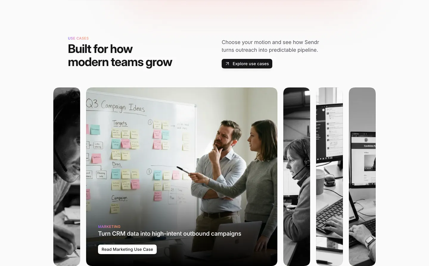
  209. Sendr use cases section: headline and Explore button above expanding photo cards, the Marketing card open showing a whiteboard
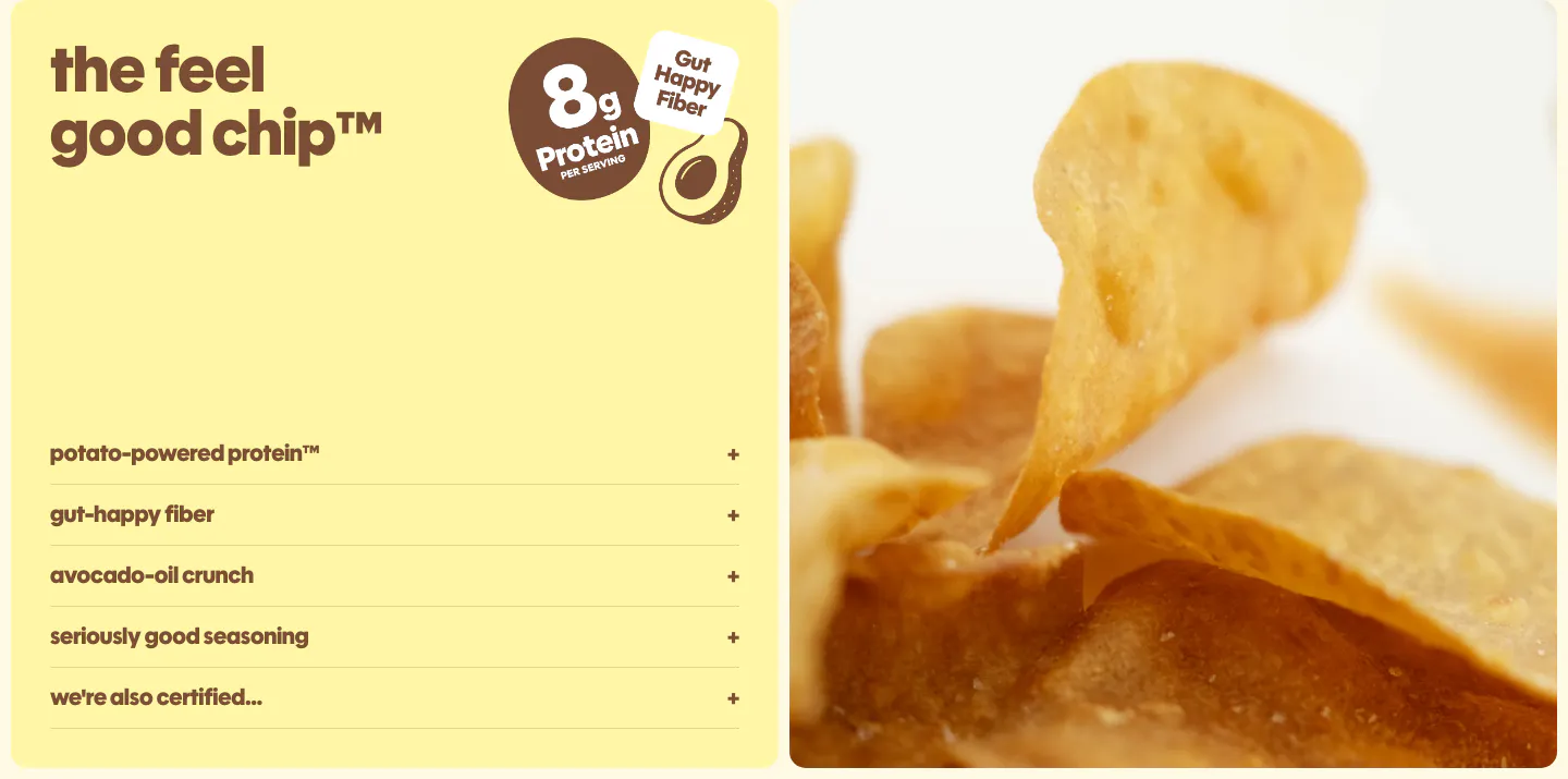
  210. Snackish features section: pale yellow panel with headline, protein badge and accordion list beside a close-up photo of potato chips
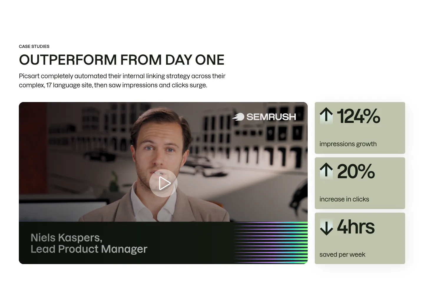
  211. Semrush testimonials section: case study video of a product manager with a play button beside three sage metric cards
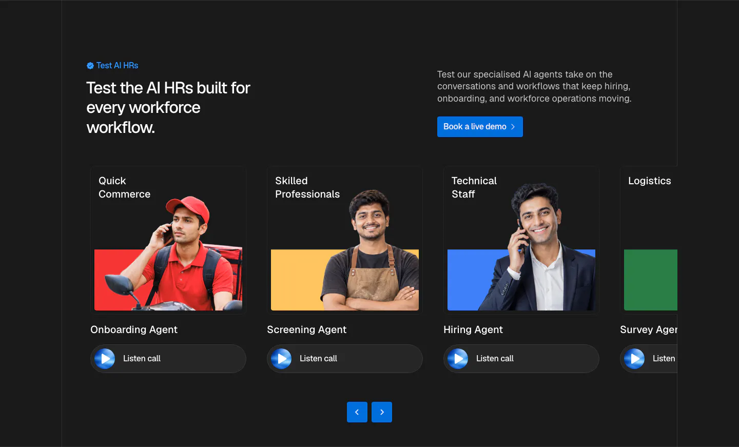
  212. Hunar use cases section: dark background with split header and a carousel of agent cards showing worker photos and listen-call buttons
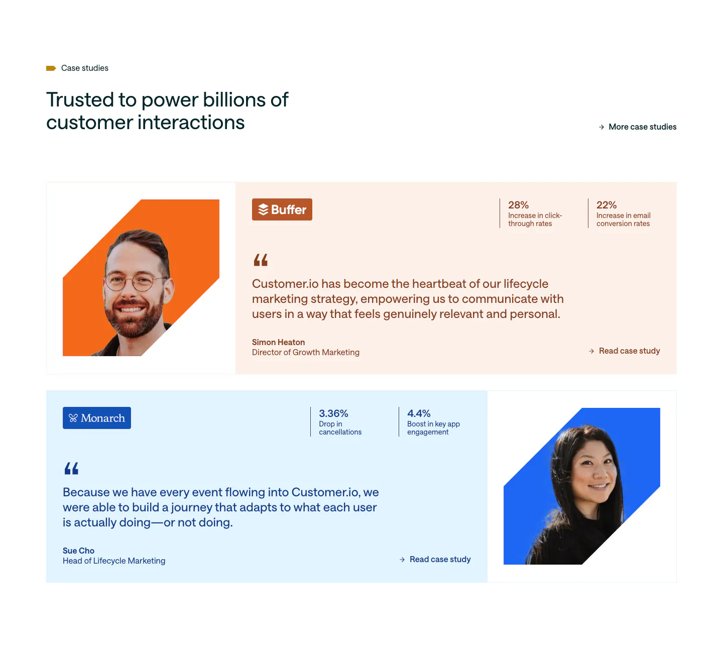
  213. Customer.io testimonials section: two case study rows on peach and pale blue cards with cut-out portraits, quotes and stat pairs
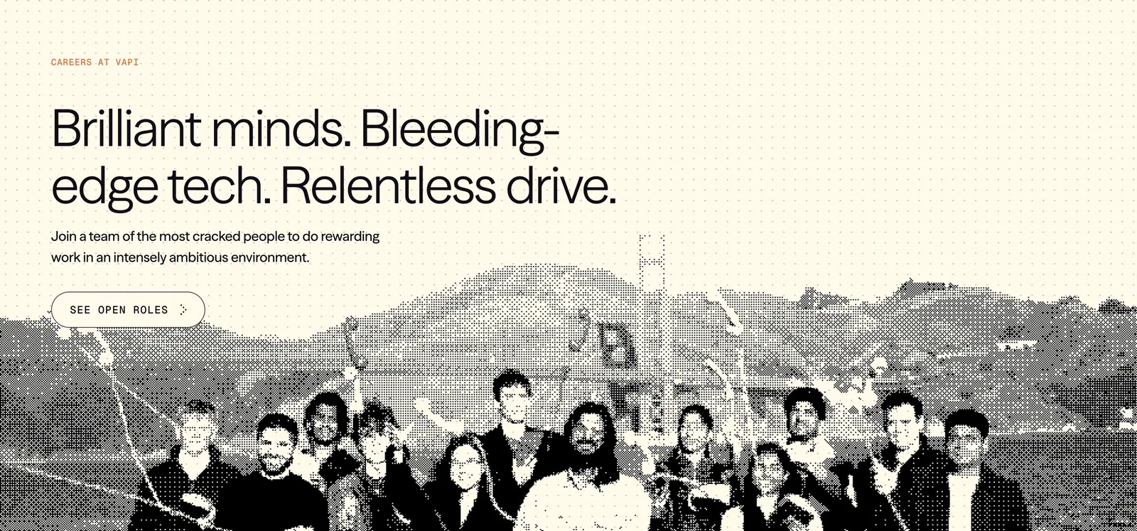
  214. Vapi careers section: left-aligned headline and See open roles button over a dithered team photo on a cream dot-grid background
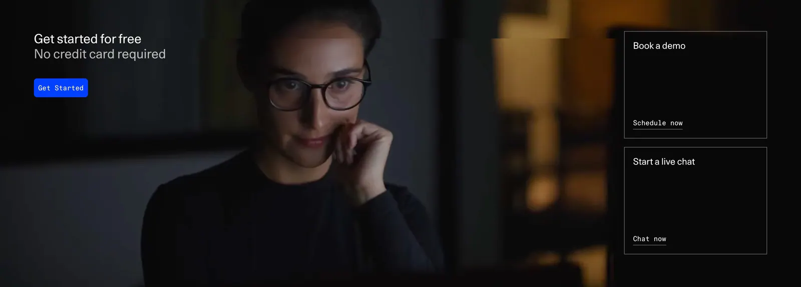
  215. DevRev call-to-action section: headline and blue button over a full-bleed dark photo, with demo and live chat link cards on the right
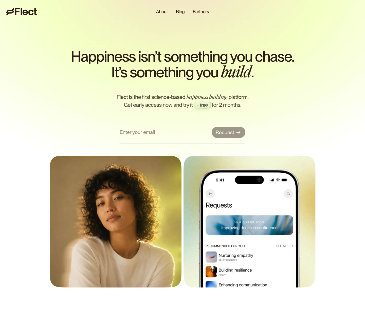
  216. Flect hero section: centered headline with email request field above a portrait photo and a phone app screenshot on yellow-green glow
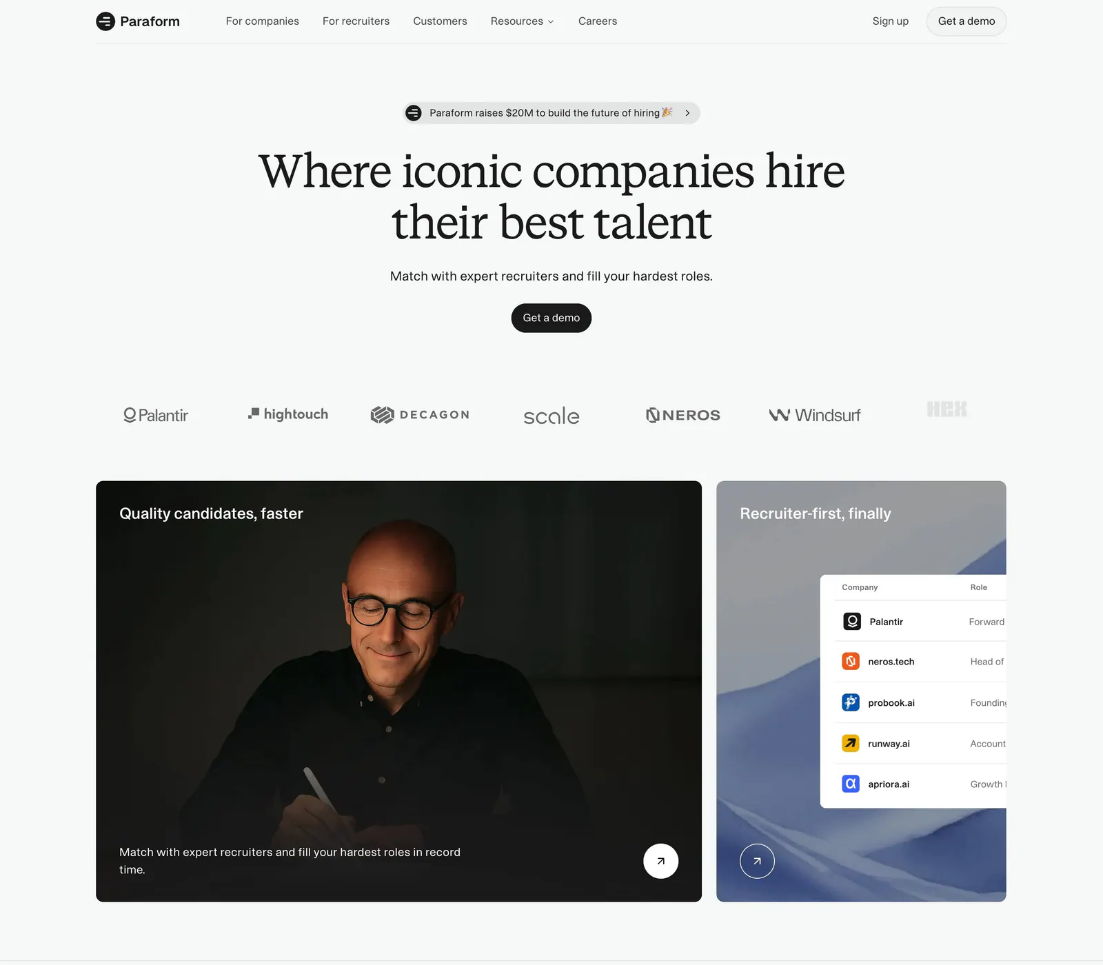
  217. Paraform hero section: centered serif headline with demo button above a customer logo row and two cards with a portrait photo and UI table
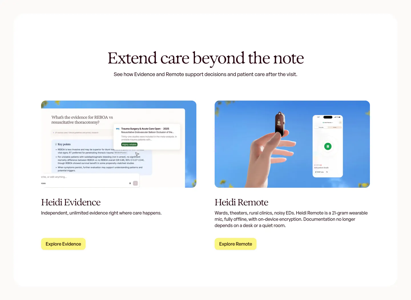
  218. Heidi features section: centered serif headline above two product cards, an Evidence answer UI and a hand holding the Remote mic
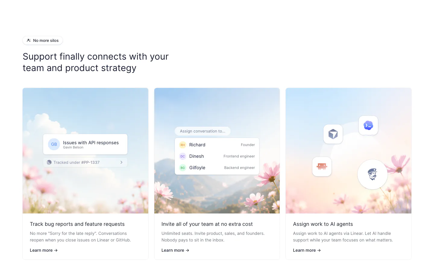
  219. Fernand features section: headline above three cards with sky and flower photos overlaid with small UI chips
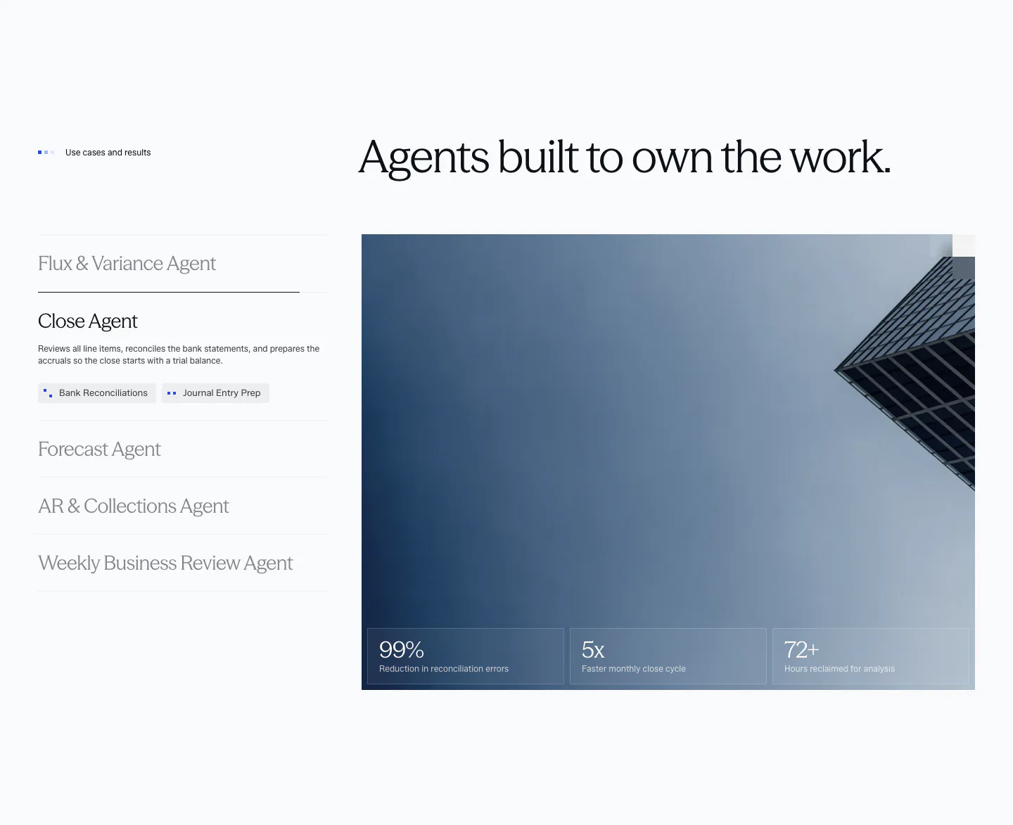
  220. Flynny's hero section: promo bar and centered logo nav over a dark moss photo of a razor and yellow box, headline, reviews and button left
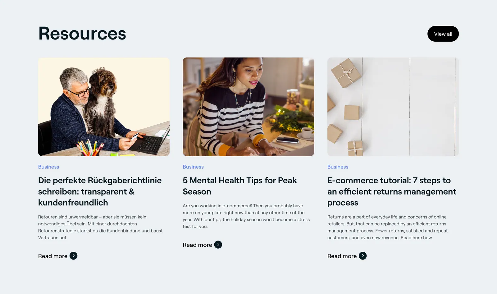
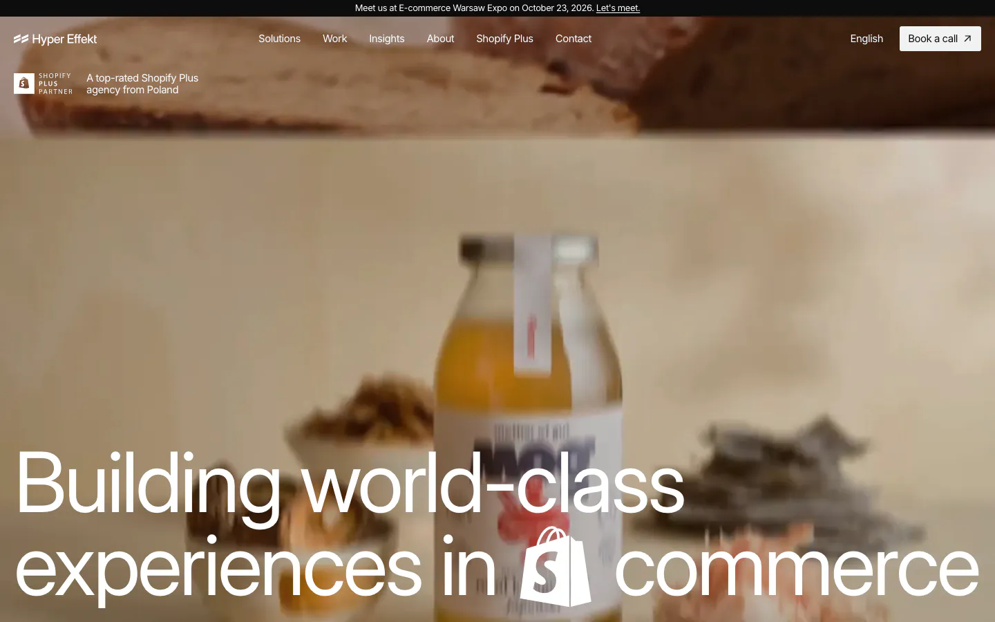
  221. 8returns blog & resources section: left headline with View all button above three article cards with photos on light gray
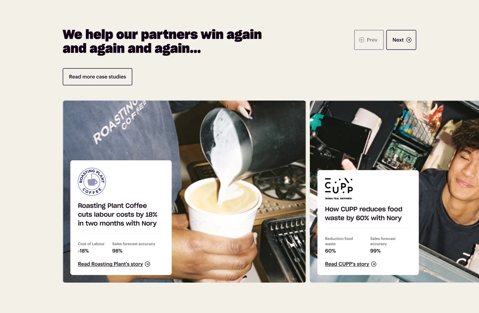
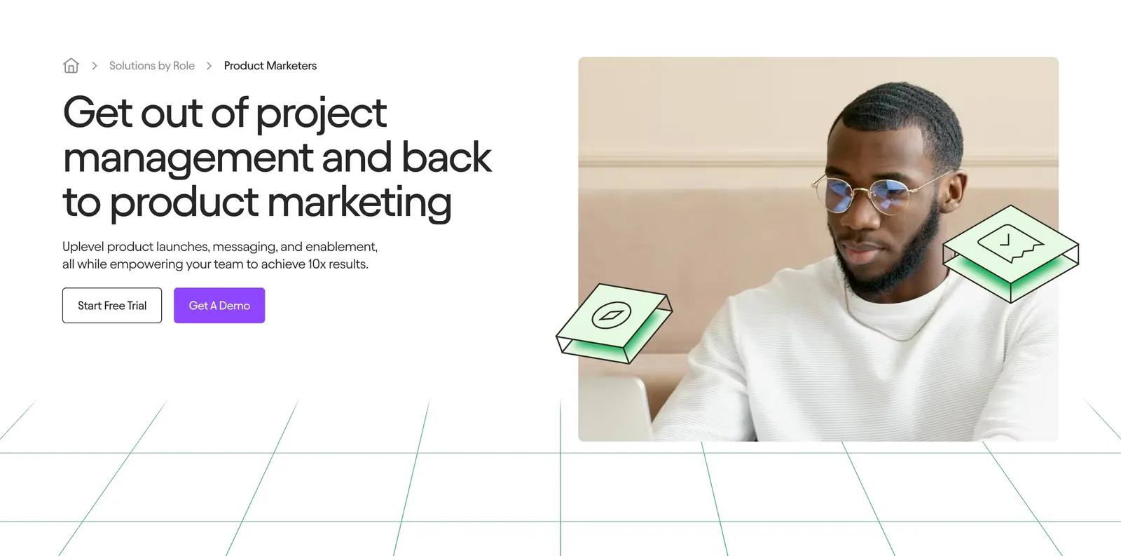
  222. Nory testimonials section: headline with prev/next buttons above case-study cards overlaid on cafe photos, cream background
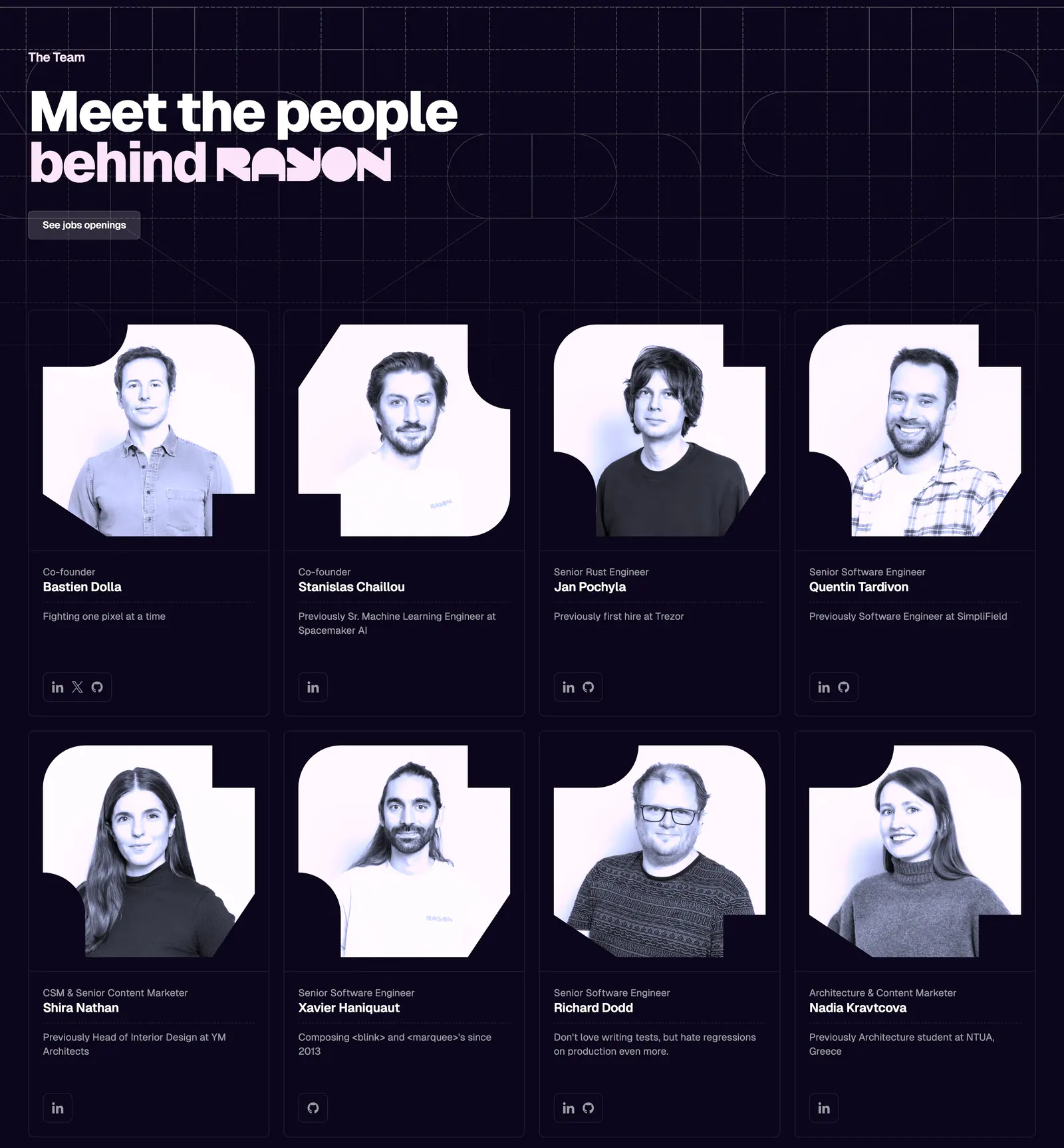
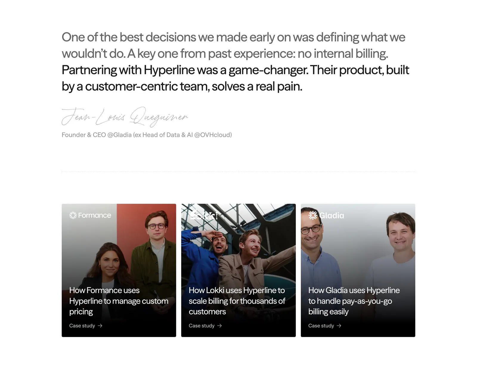
  223. Rayon team section: headline on a dark navy grid above two rows of four team member cards with tinted portrait photos
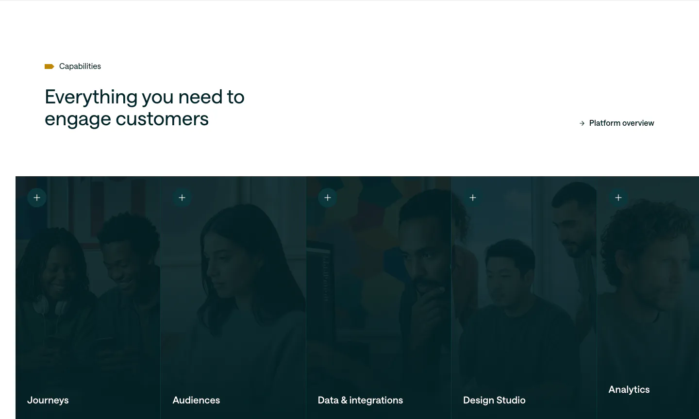
  224. Customer.io features section: headline above a row of five tall photo panels with a dark teal overlay, each labeled with a capability
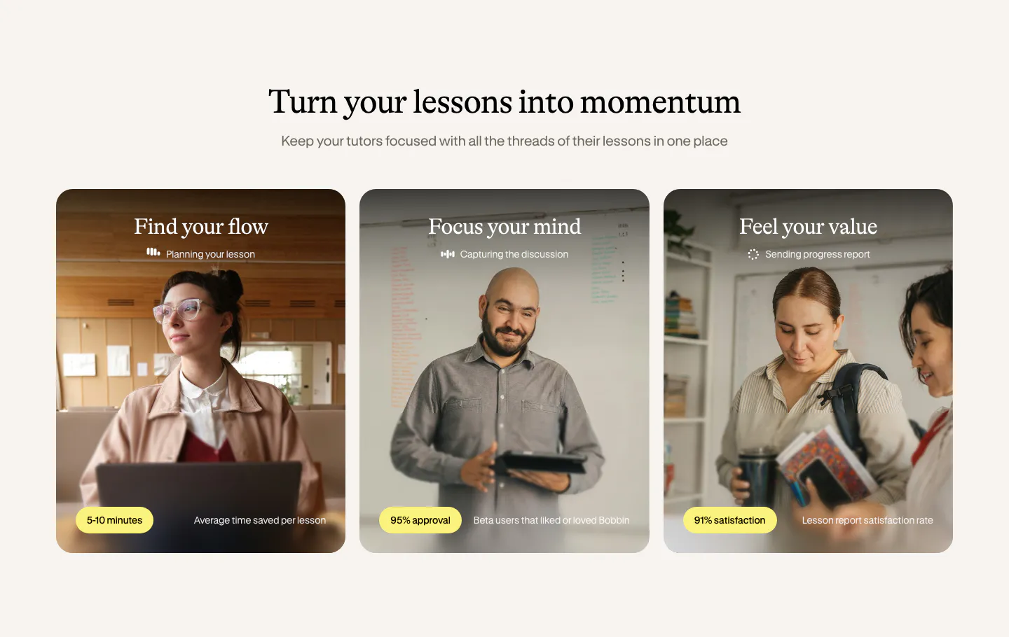
  225. Bobbin value proposition section: serif heading above three photo cards of tutors with yellow stat pills on a cream background
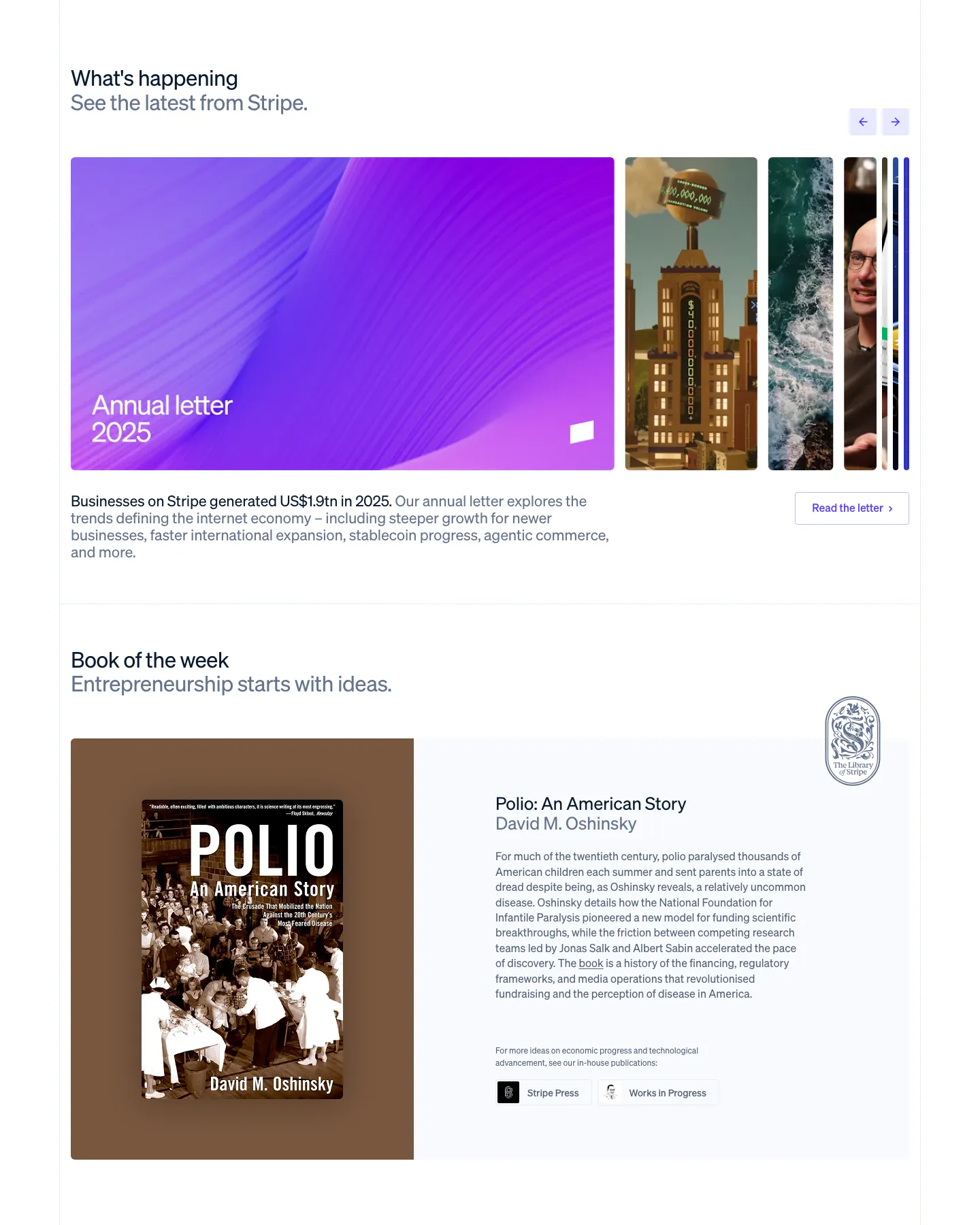
  226. Stripe blog & resources section: news carousel with a large purple Annual letter card and arrows, above a Book of the week cover and blurb
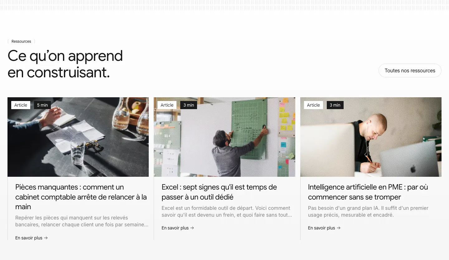
  227. Raneo blog & resources section: headline and all-resources button above three article cards with photos, read-time tags and excerpts
  228. Concourse use cases section: vertical list of agent tabs left, building photo with three metric tiles right on a light background
  229. Hyper Effekt hero section: oversized white headline with an inline Shopify icon over a full-bleed blurred product photo, with nav
  230. Jasper hero section: breadcrumb, headline and two buttons on the left, photo of a man at a laptop on the right above green grid lines
  231. Hyperline testimonials section: large quote with handwritten signature above three photo case-study cards on white
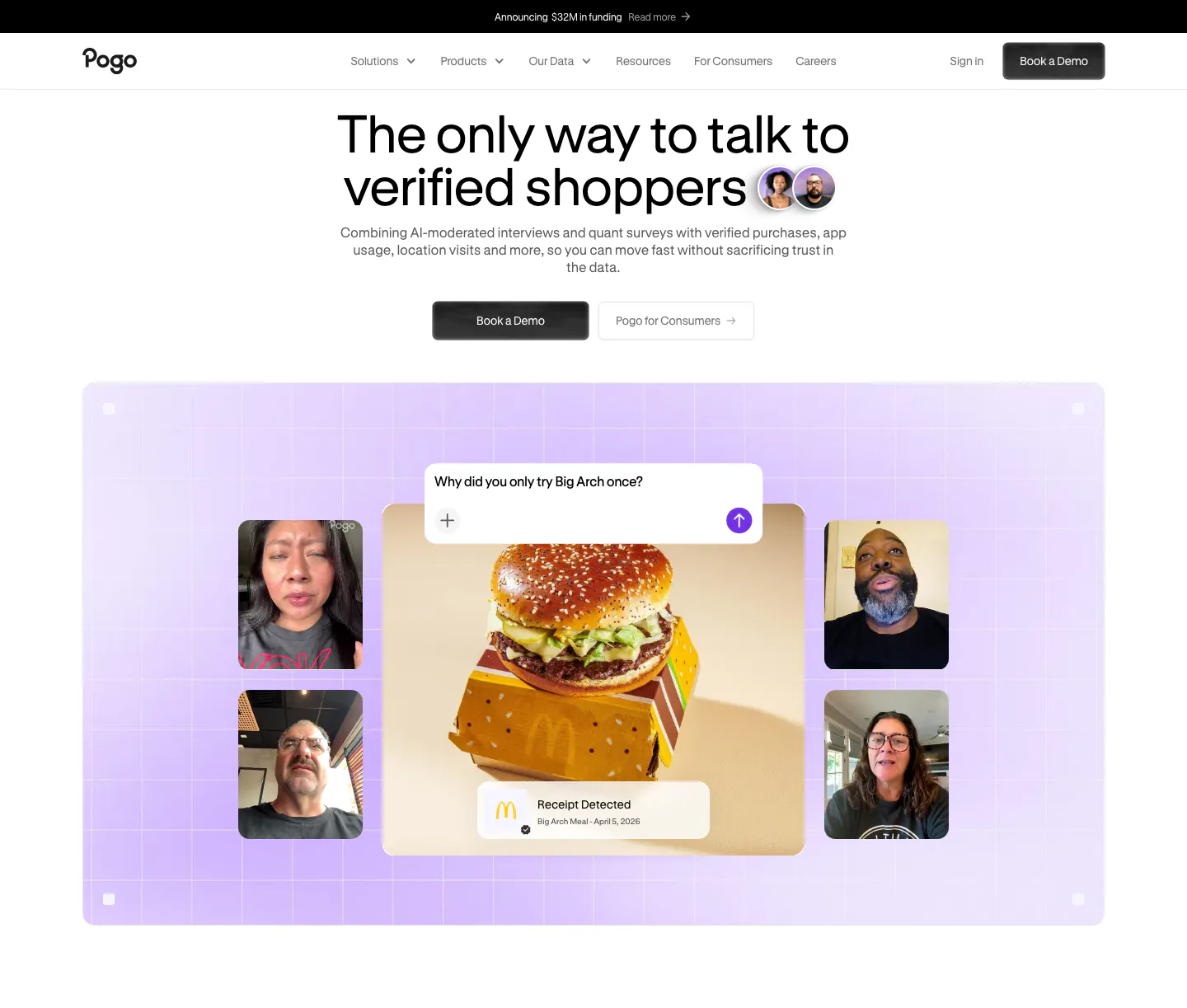
  232. Pogo hero section: centered headline and demo buttons above a lavender grid panel of video interview tiles around a burger photo
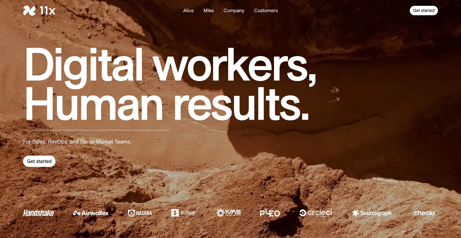
  233. 11x hero section: oversized white headline over a full-bleed rocky desert photo with a customer logo strip along the bottom
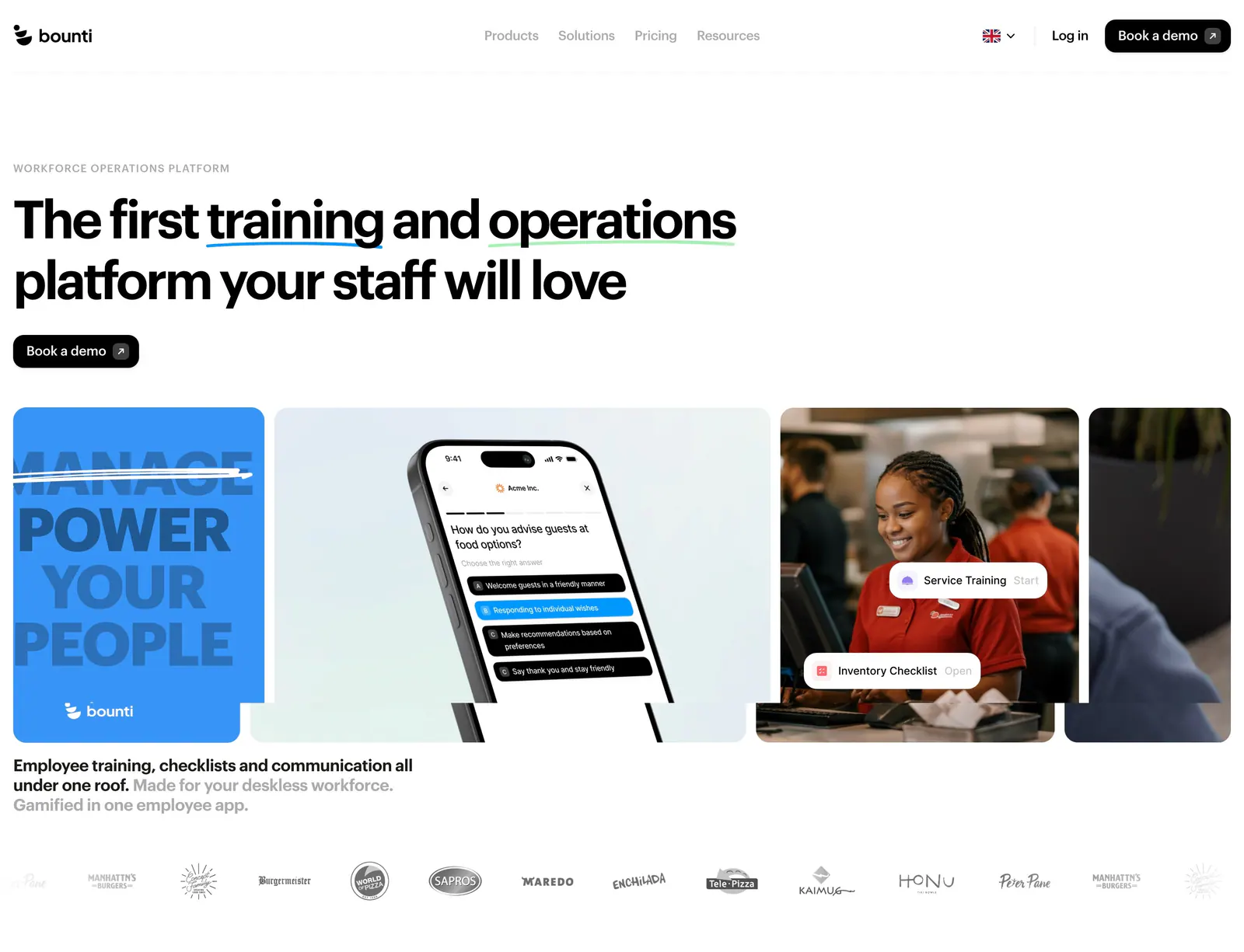
  234. Bounti hero section: left-aligned headline and button above a row of cards with type art, a phone app mockup and staff photo, logos below
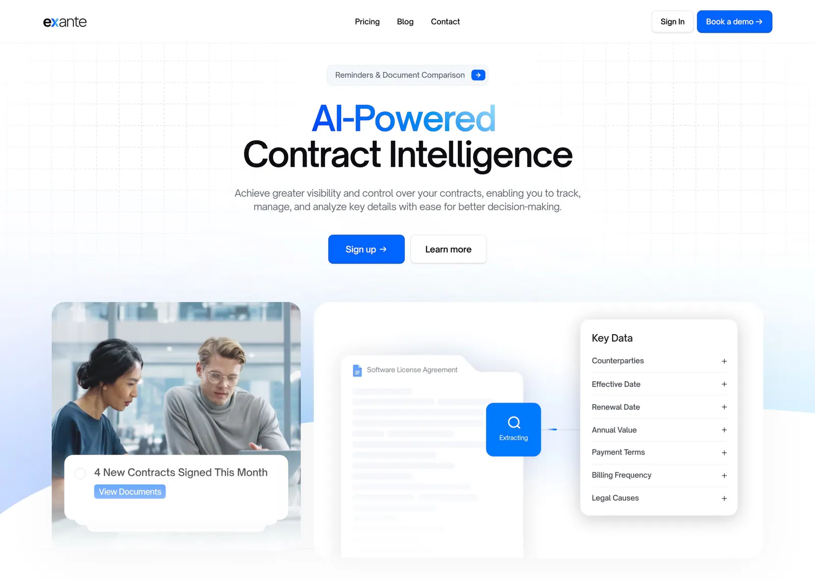
  235. Exante hero section: centered headline with blue gradient text and two CTAs above an office photo and a contract data extraction mockup
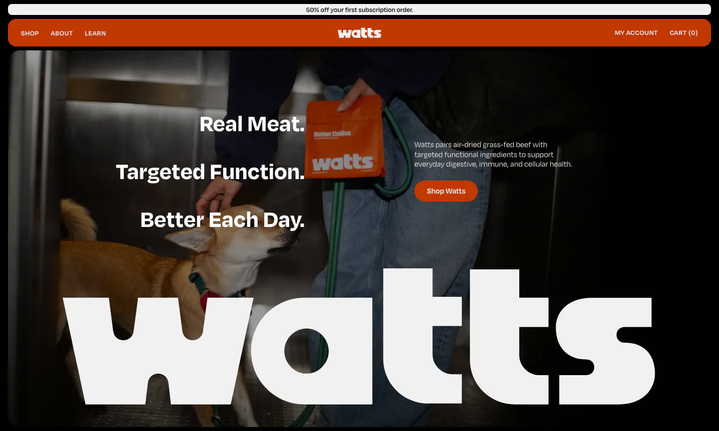
  236. Watts hero section: stacked headline and shop button over a full-bleed photo of a dog and owner, with a giant white watts wordmark
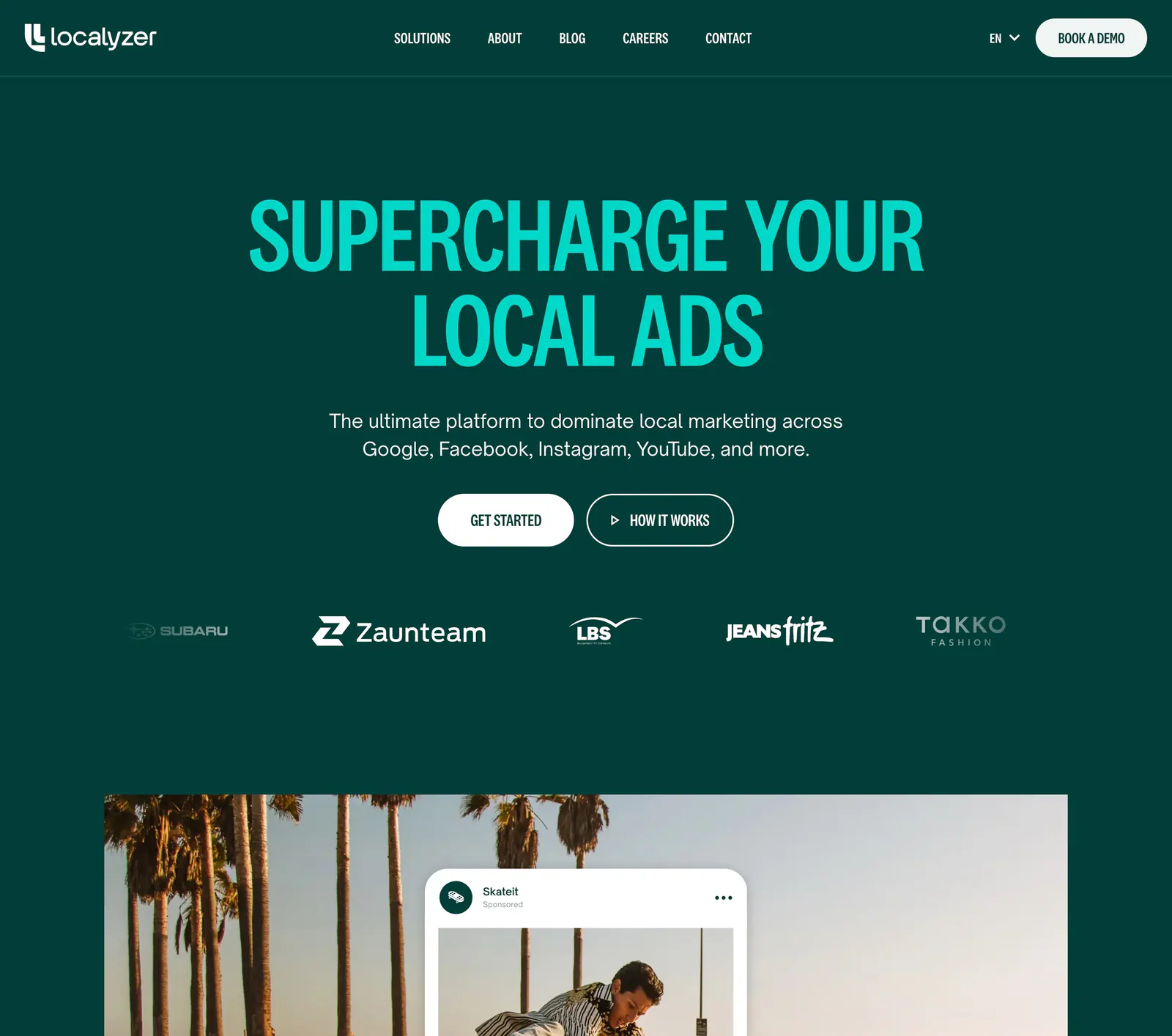
  237. Localyzer hero section: centered teal headline on dark green with two CTAs, a customer logo row and a palm-tree ad photo below
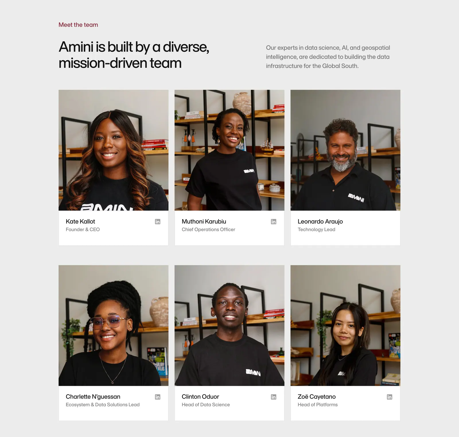
  238. Amini team section: headline and intro above a three-column grid of team member photo cards with names and roles
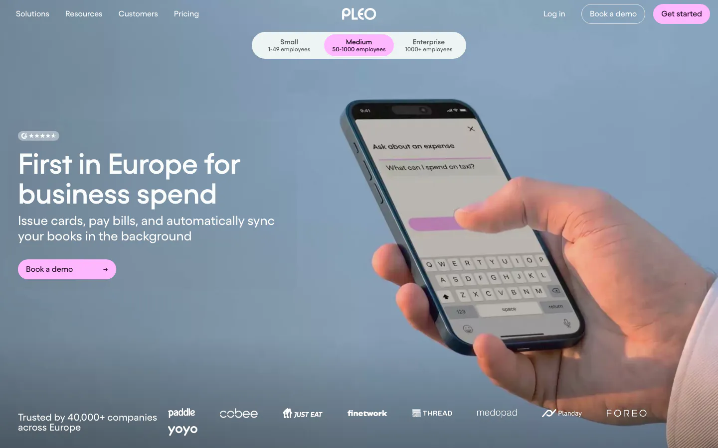
  239. Pleo hero section: left-aligned headline and pink button over a full-bleed photo of a hand holding a phone, logo strip below
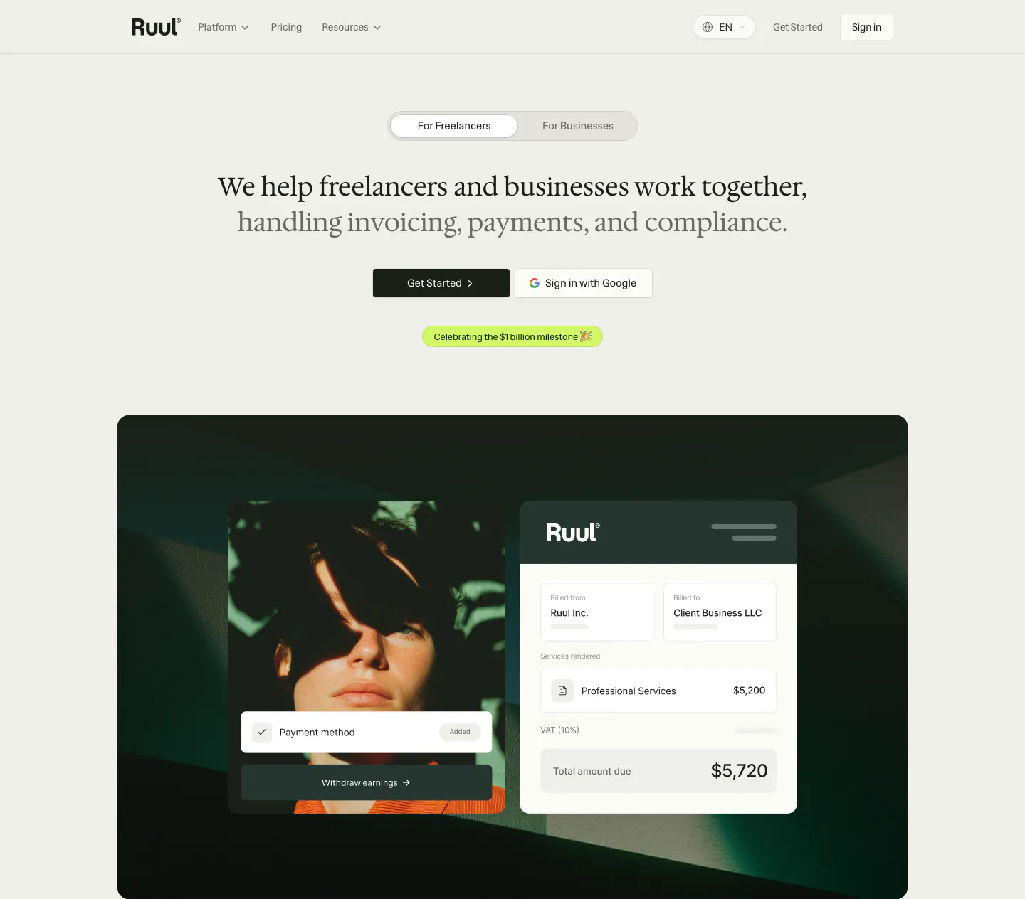
  240. Ruul hero section: audience toggle and centered serif headline above a dark green panel with a portrait photo and invoice UI card
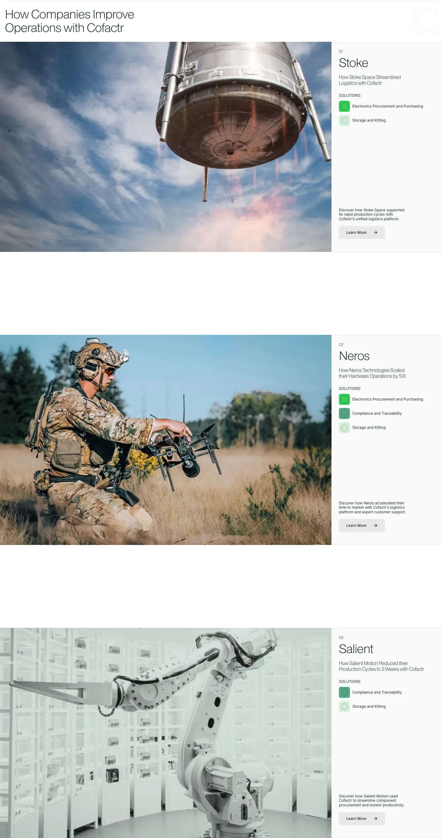
  241. Cofactr testimonials section: stacked customer case studies, each a large photo left with company name, solution chips and Learn More right
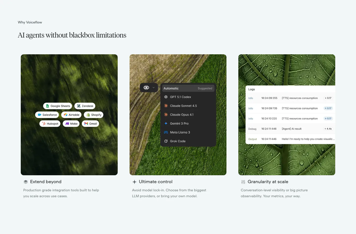
  242. Voiceflow features section: serif headline above three cards pairing nature photos with integration, model picker and log UI overlays
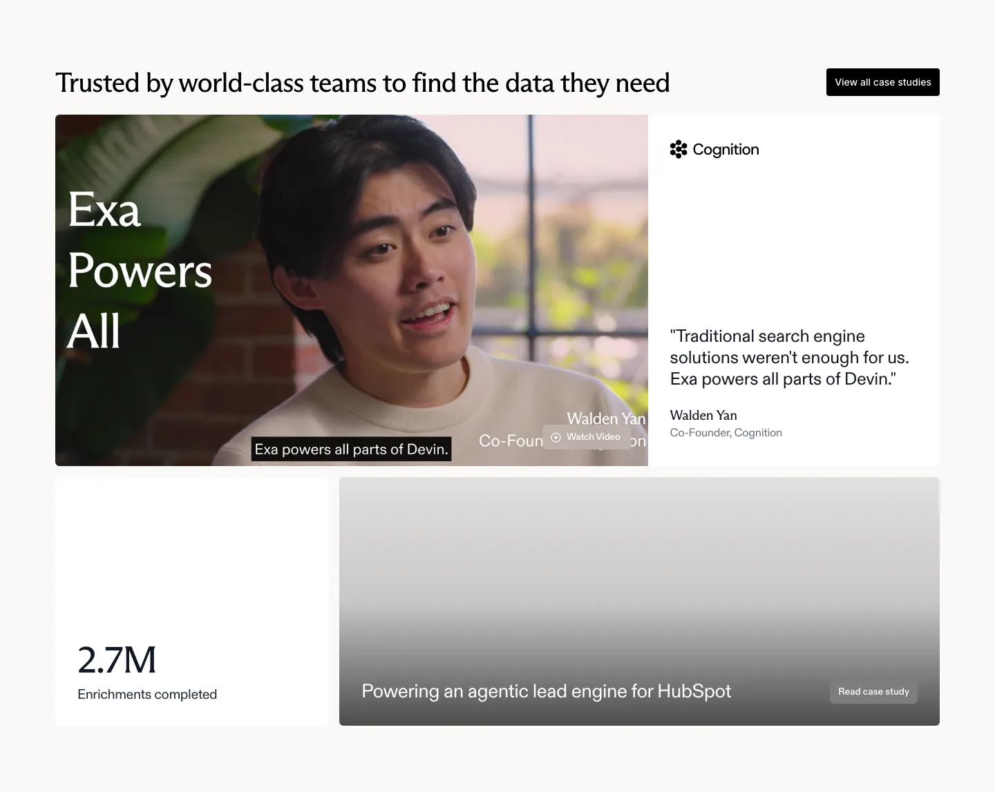
  243. Exa testimonials section: bento with a cofounder video still, Cognition quote card, 2.7M stat tile and a HubSpot case study card
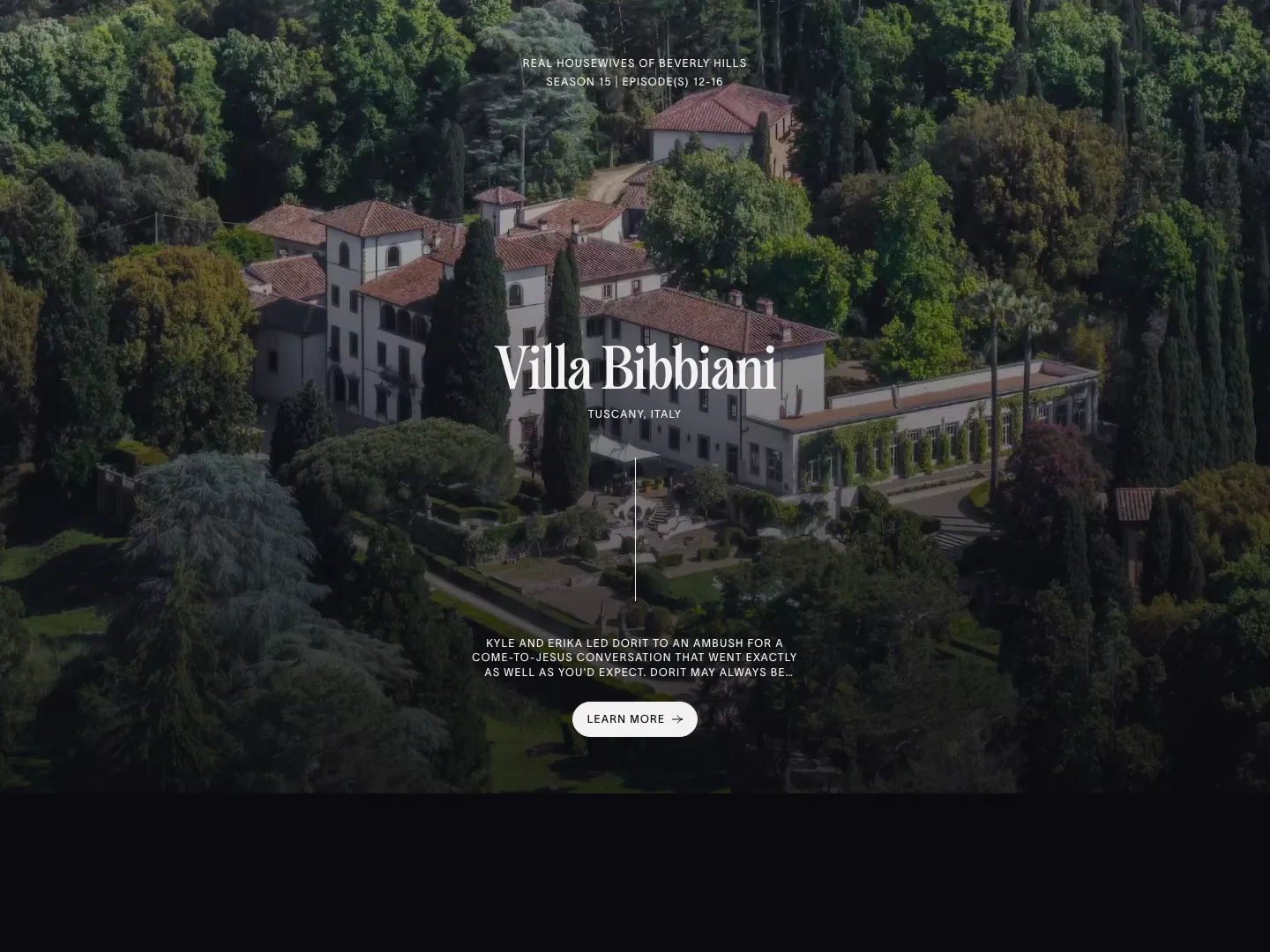
  244. The Real Hotels features section: full-bleed aerial photo of a Tuscan villa with centered serif title, episode note and Learn more button
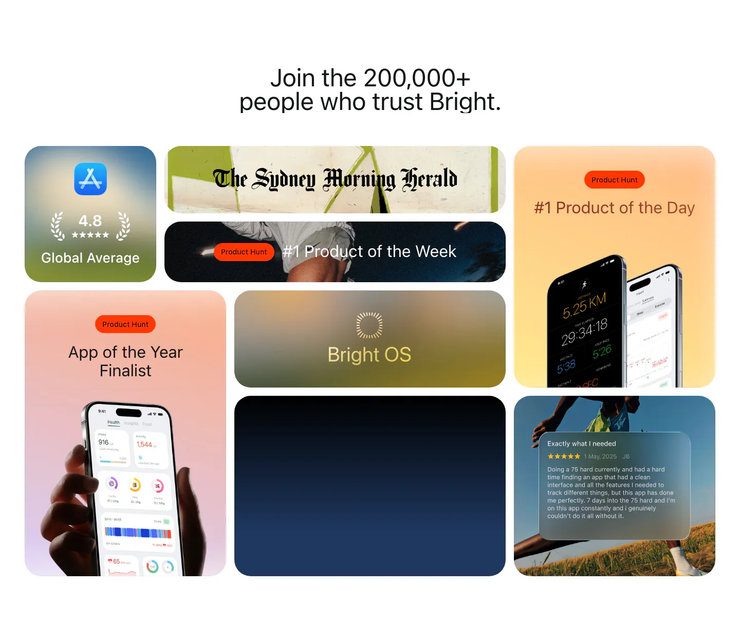
  245. Bright testimonials section: centered headline above a bento grid of App Store rating, Product Hunt awards, press logo and a review card
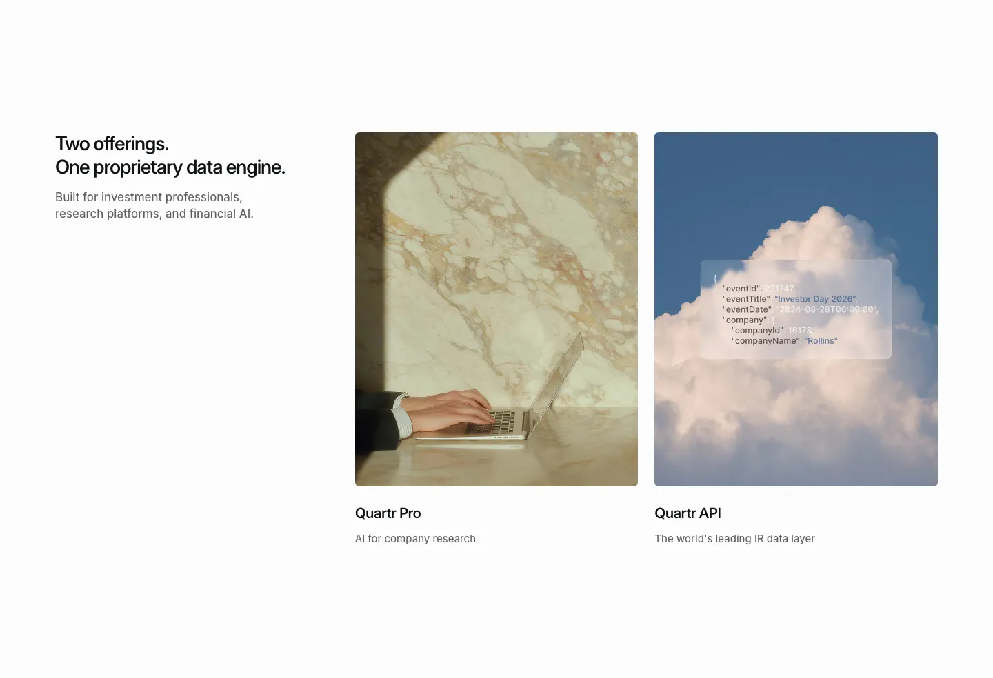
  246. Quartr features section: headline on the left beside two photo cards for Quartr Pro and Quartr API, one with a frosted JSON snippet
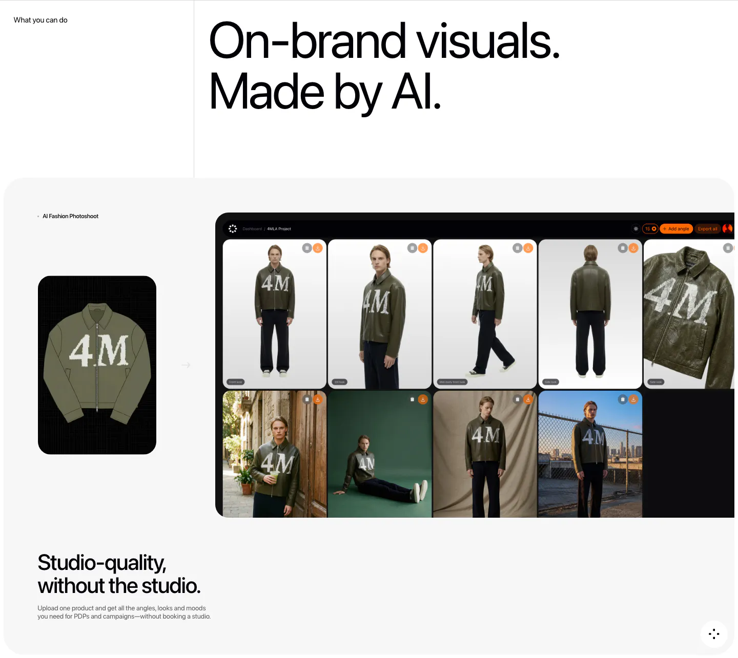
  247. Fourmula features section: large headline above a gray card showing a jacket product image turned into a dashboard grid of AI model photos
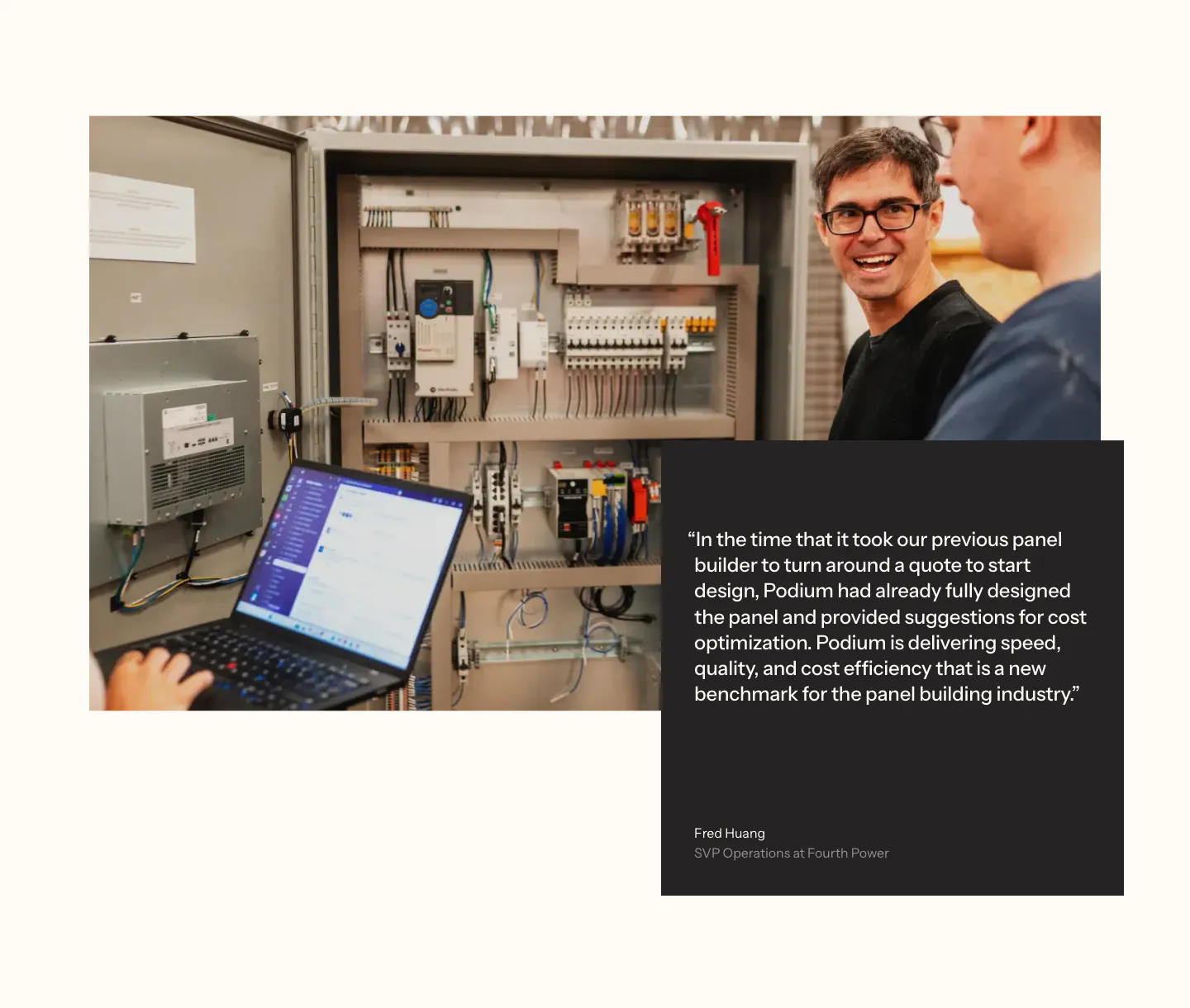
  248. Podium Automation testimonials section: photo of engineers at a control panel overlapped by a dark quote card on a cream background
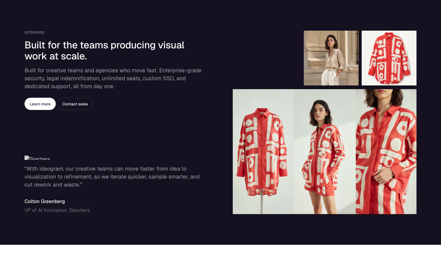
  249. Ideogram testimonials section: dark navy split with headline, buttons and a Skechers quote left, photo grid of a red patterned shirt right
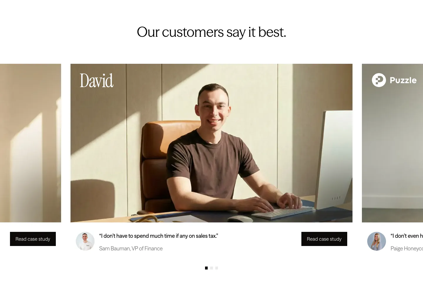
  250. Zamp testimonials section: centered headline above a carousel of customer photo cards with short quotes and case study buttons
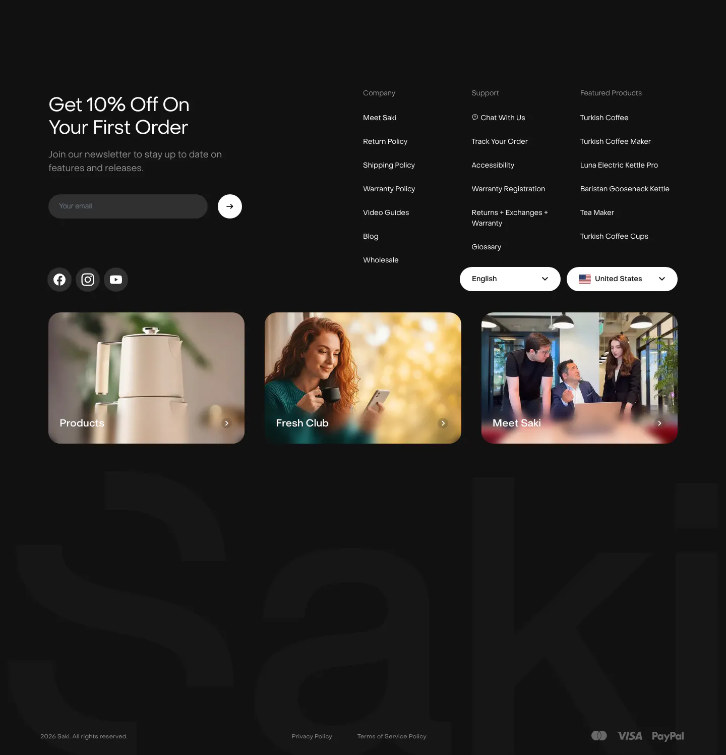
  251. Saki footer section: dark footer with newsletter email field, link columns, three photo cards and a giant faint Saki wordmark
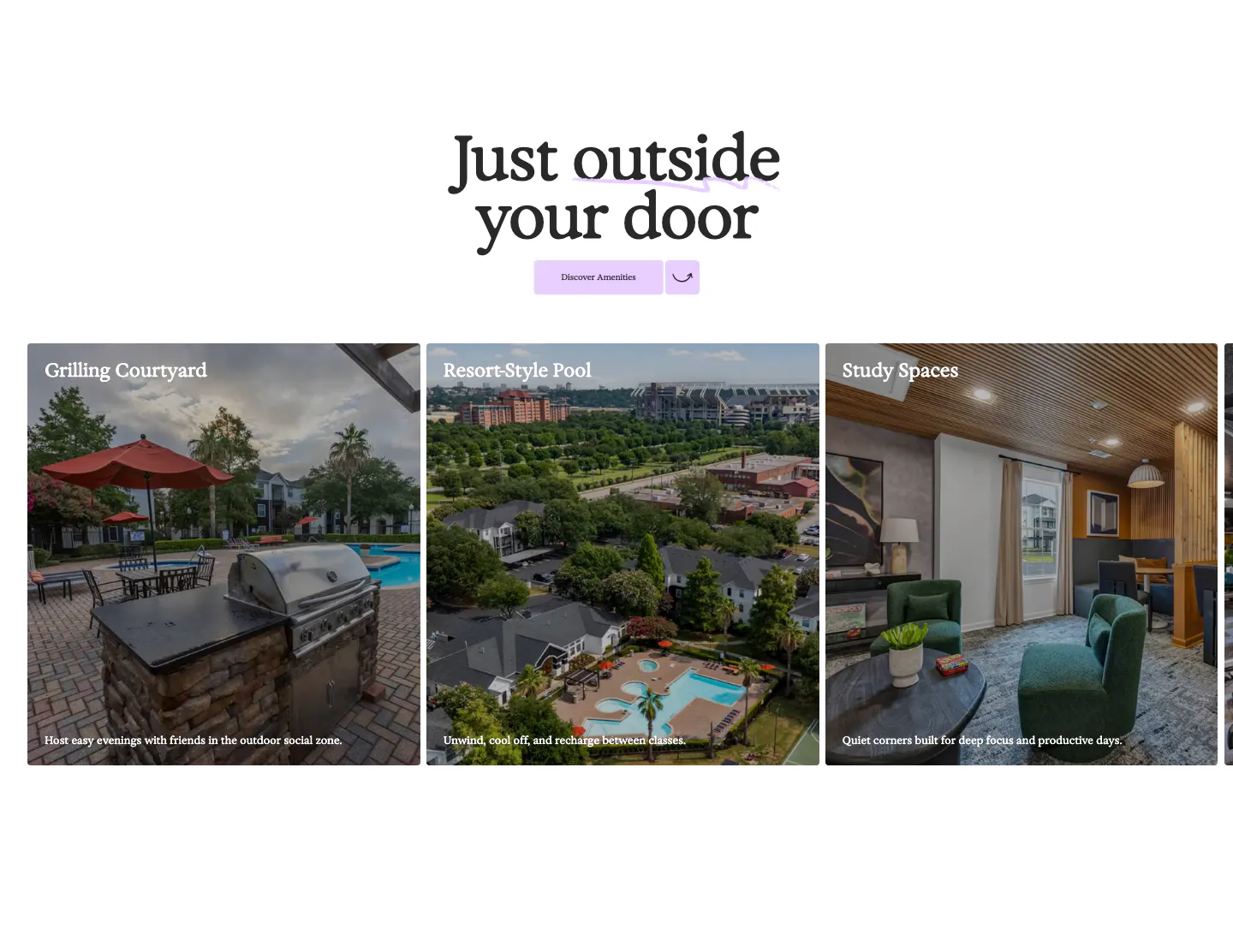
  252. 21Oaks features section: centered serif heading and button above a carousel of amenity photo cards with captions
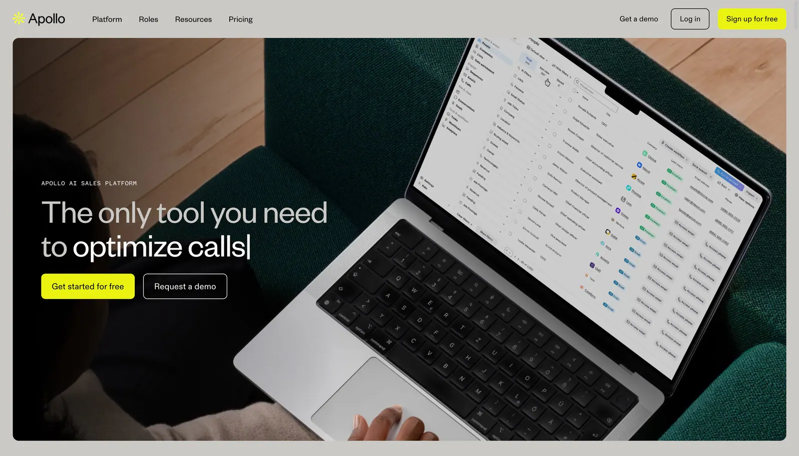
  253. Apollo hero section: nav bar above a headline and two buttons overlaid on a full-bleed photo of a laptop showing a sales app
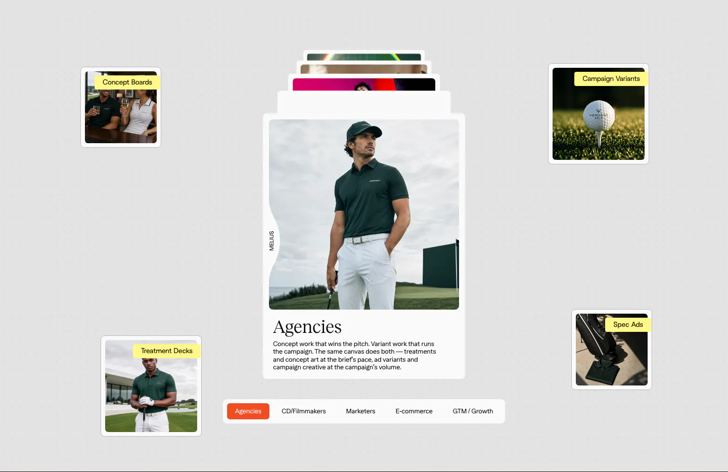
  254. Melius use cases section: stacked card with a golf apparel photo and serif Agencies copy, floating labeled thumbnails, persona tab bar
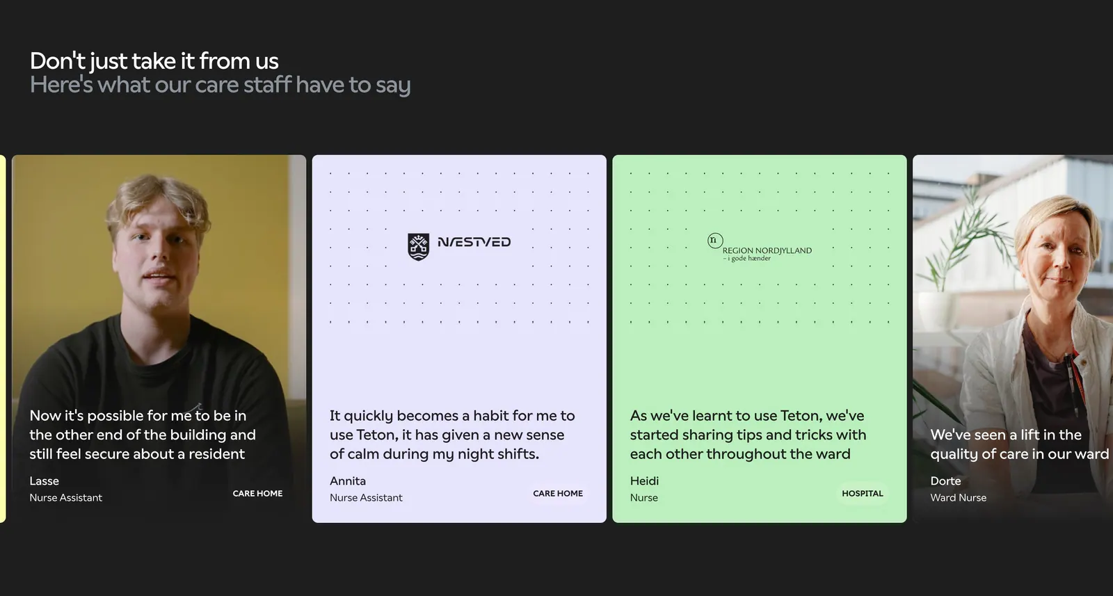
  255. Teton testimonials section: two-tone headline over a carousel of quote cards with staff photos and pastel cards on a dark background
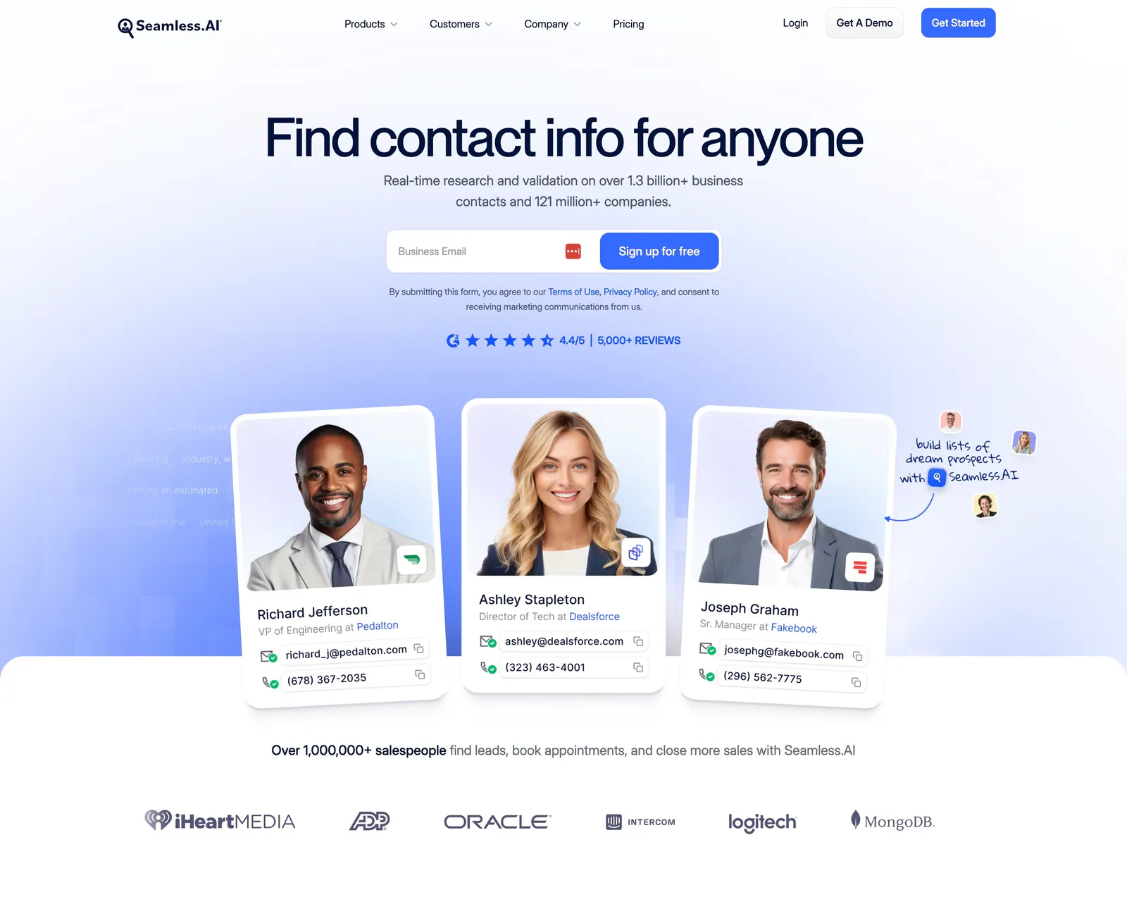
  256. Seamless.AI hero section: centered headline and email signup above contact cards with portrait photos and a customer logo row
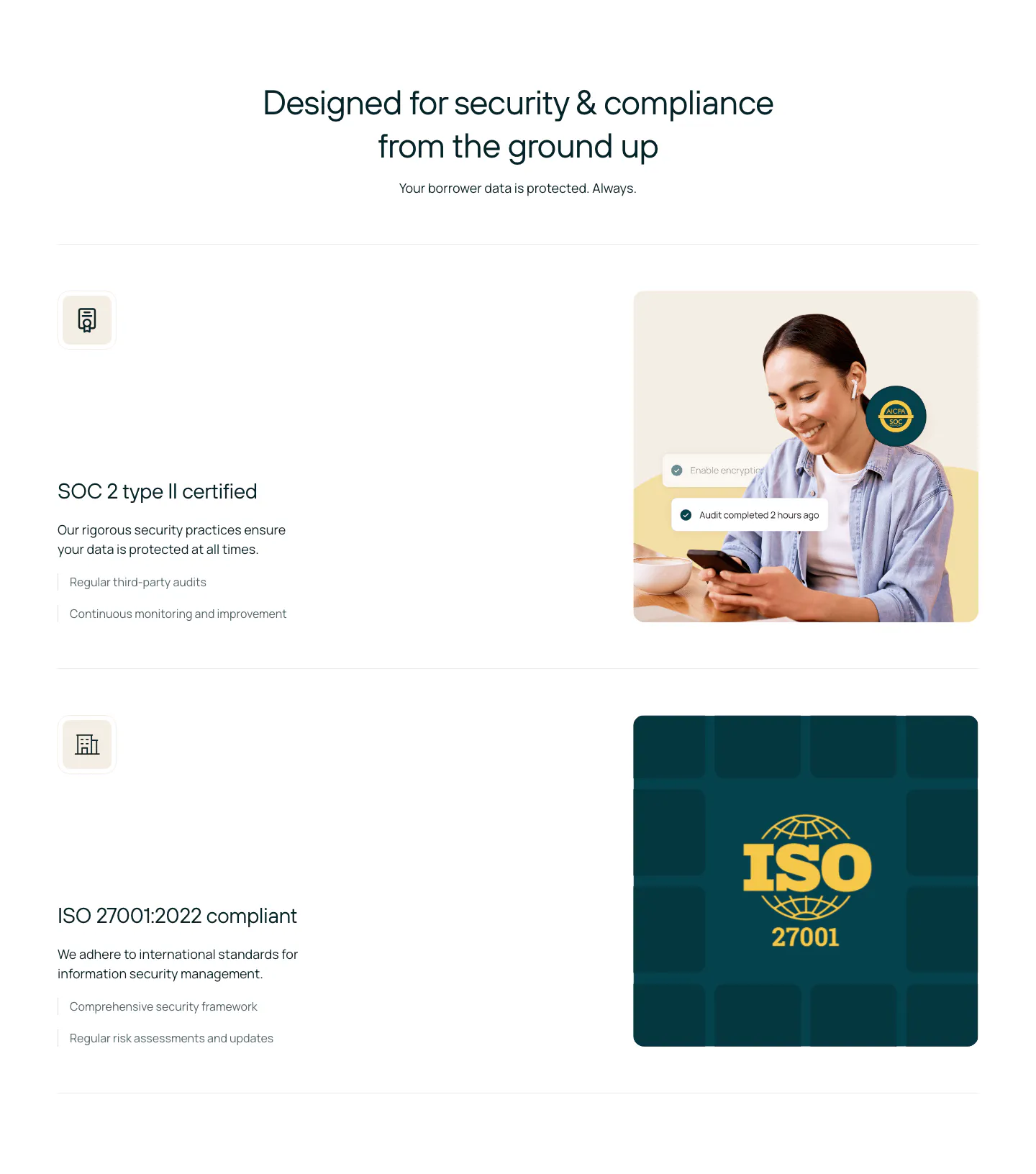
  257. Rezolv security section: centered headline above SOC 2 and ISO 27001 rows, each with text left and a photo or ISO badge right
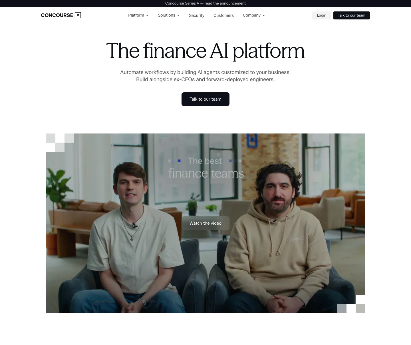
  258. Concourse hero section: centered headline and button above a large video thumbnail of two founders with a Watch the video button
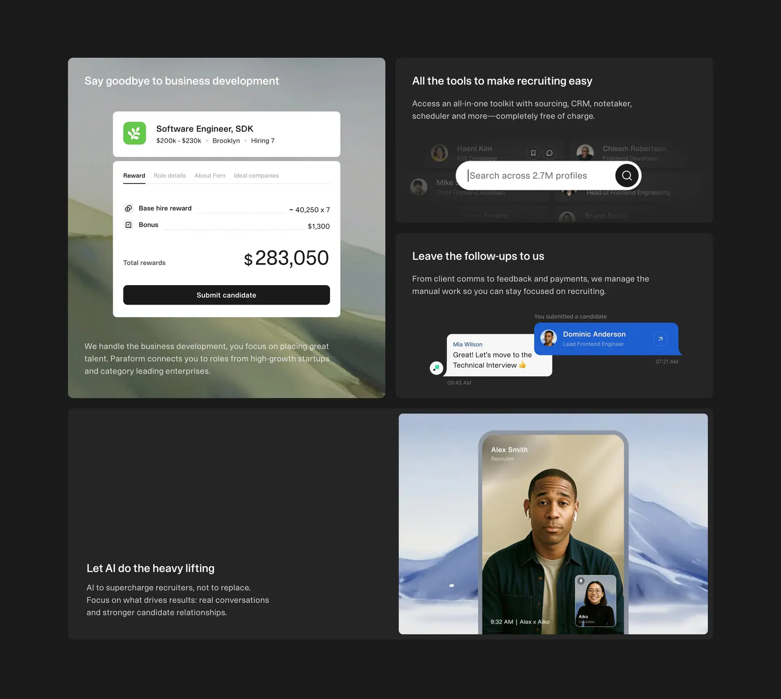
  259. Paraform features section: dark bento grid of four tiles with reward, search and chat UI cards and a recruiter video call photo
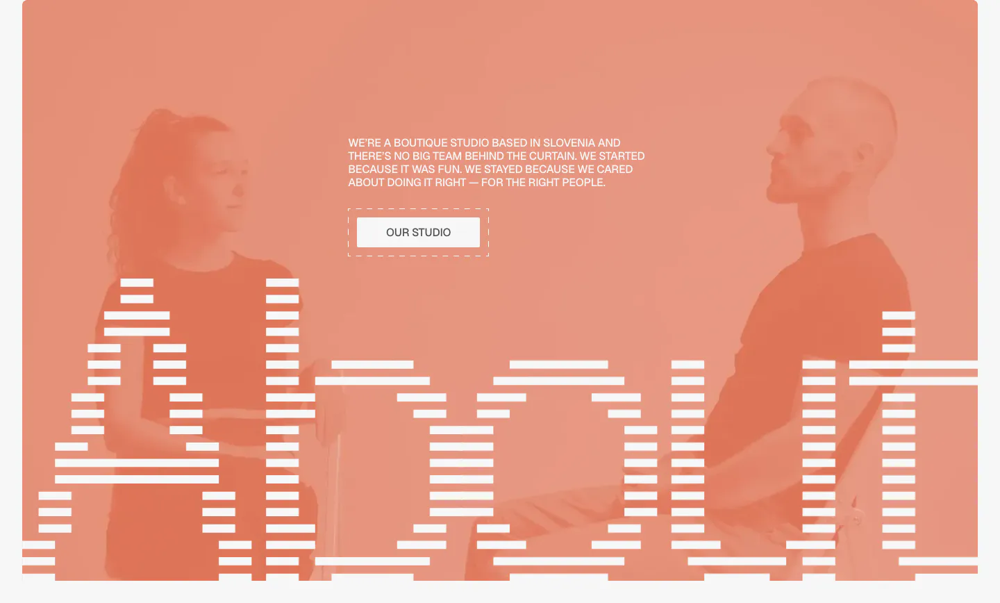
  260. Submagic call-to-action section: centered headline and orange button in a dark rounded panel above a row of vertical creator video thumbnails
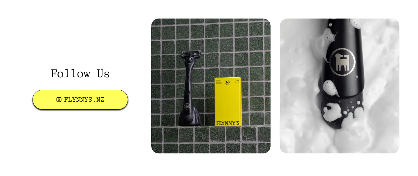
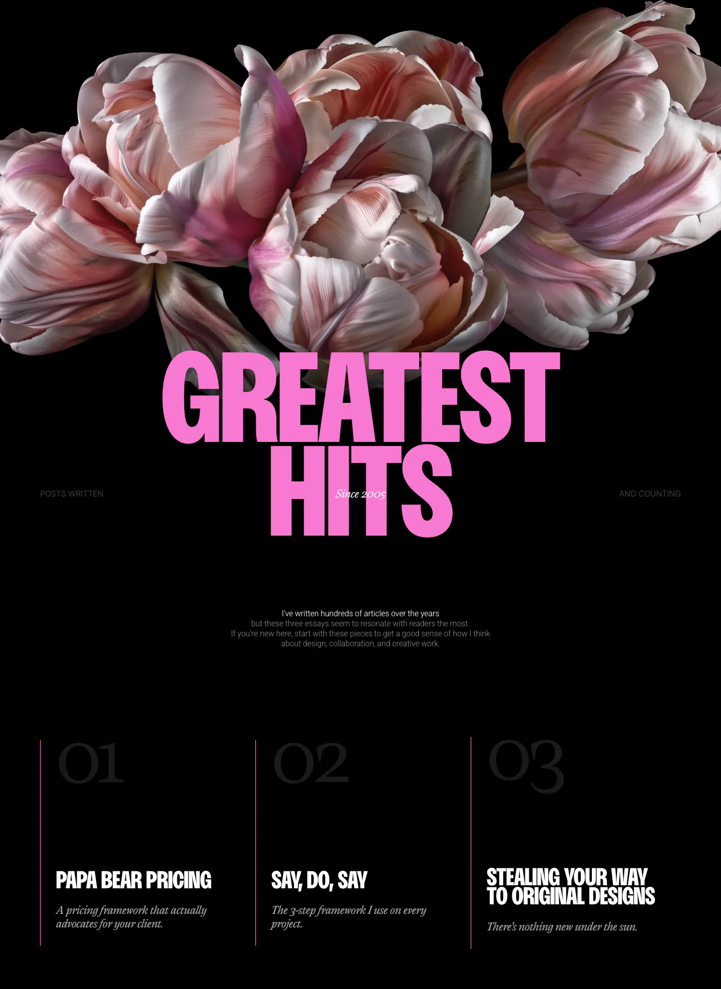
  261. Flynny's call to action section: Follow Us heading and yellow Instagram button left, two product photos of a black razor and yellow box right
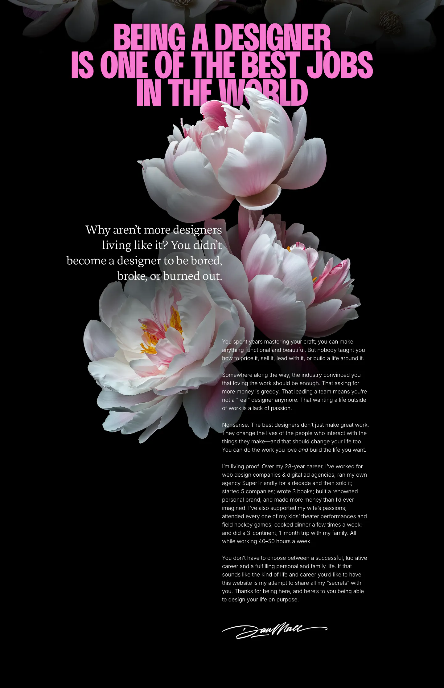
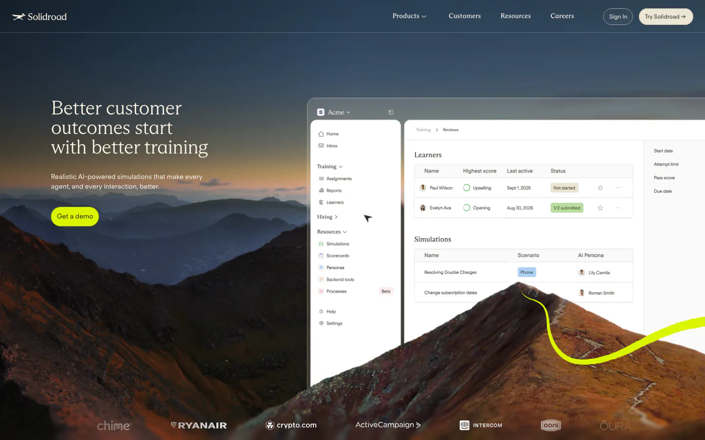
  262. Dan Mall about & mission section: pink condensed headline over peony photos with a signed personal letter on black
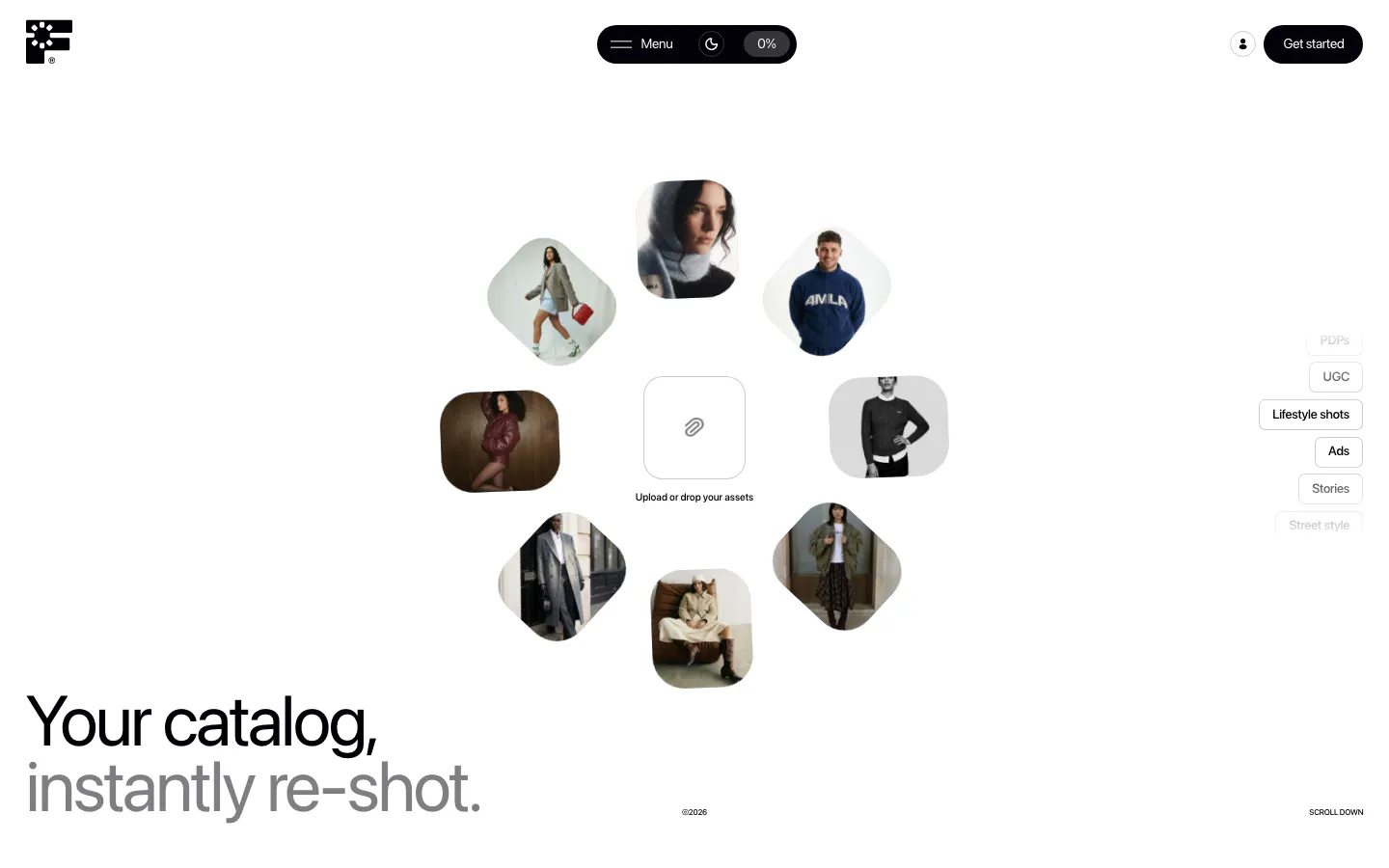
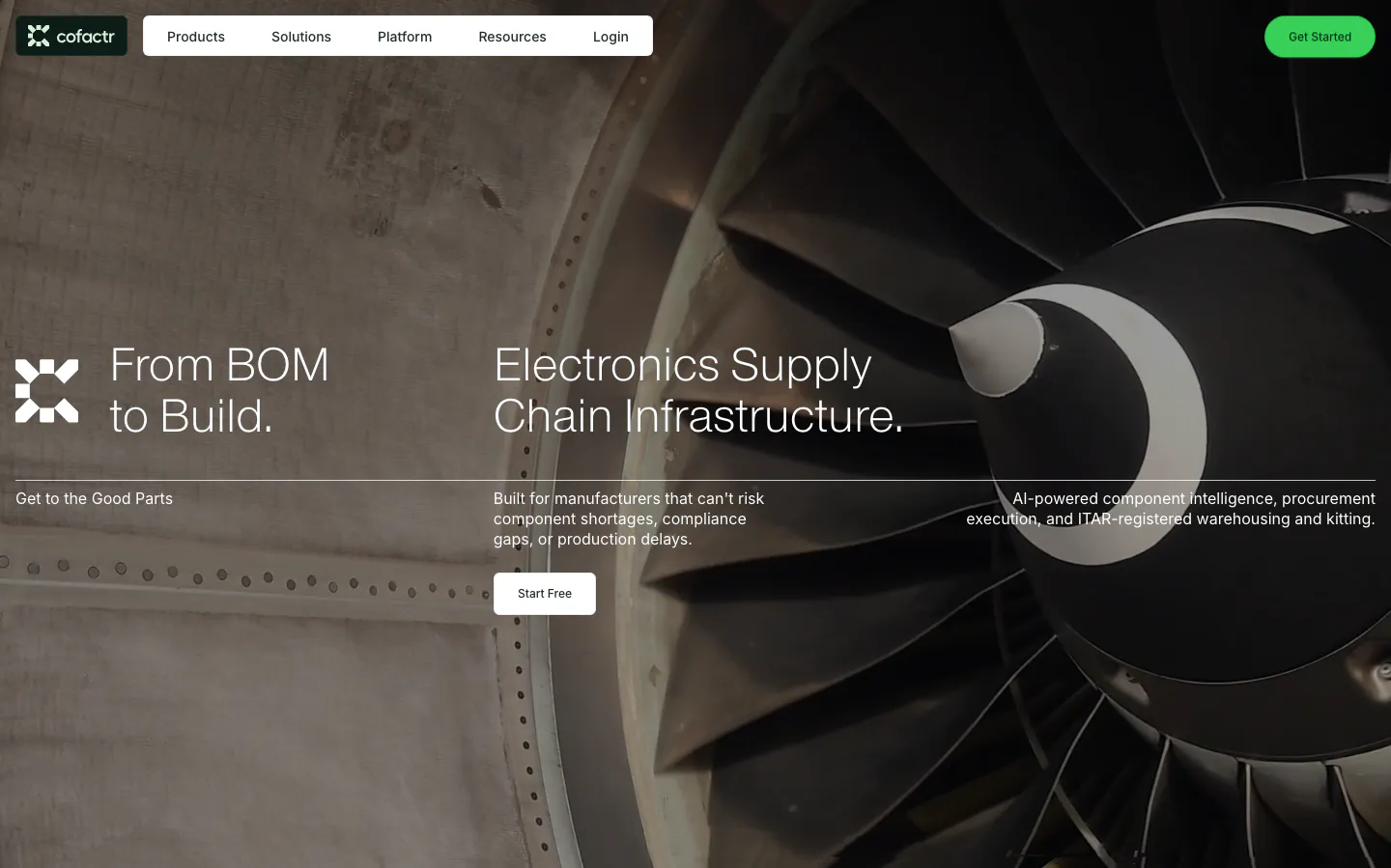
  263. Fourmula hero section: ring of rounded fashion model photos around an upload box, with a large two-tone headline at bottom left on white
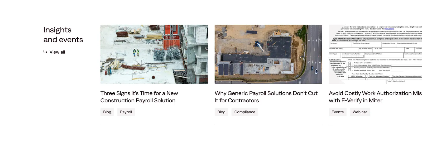
  264. Miter blog & resources section: heading with view-all link beside edge-cropped article cards with construction photos and tags
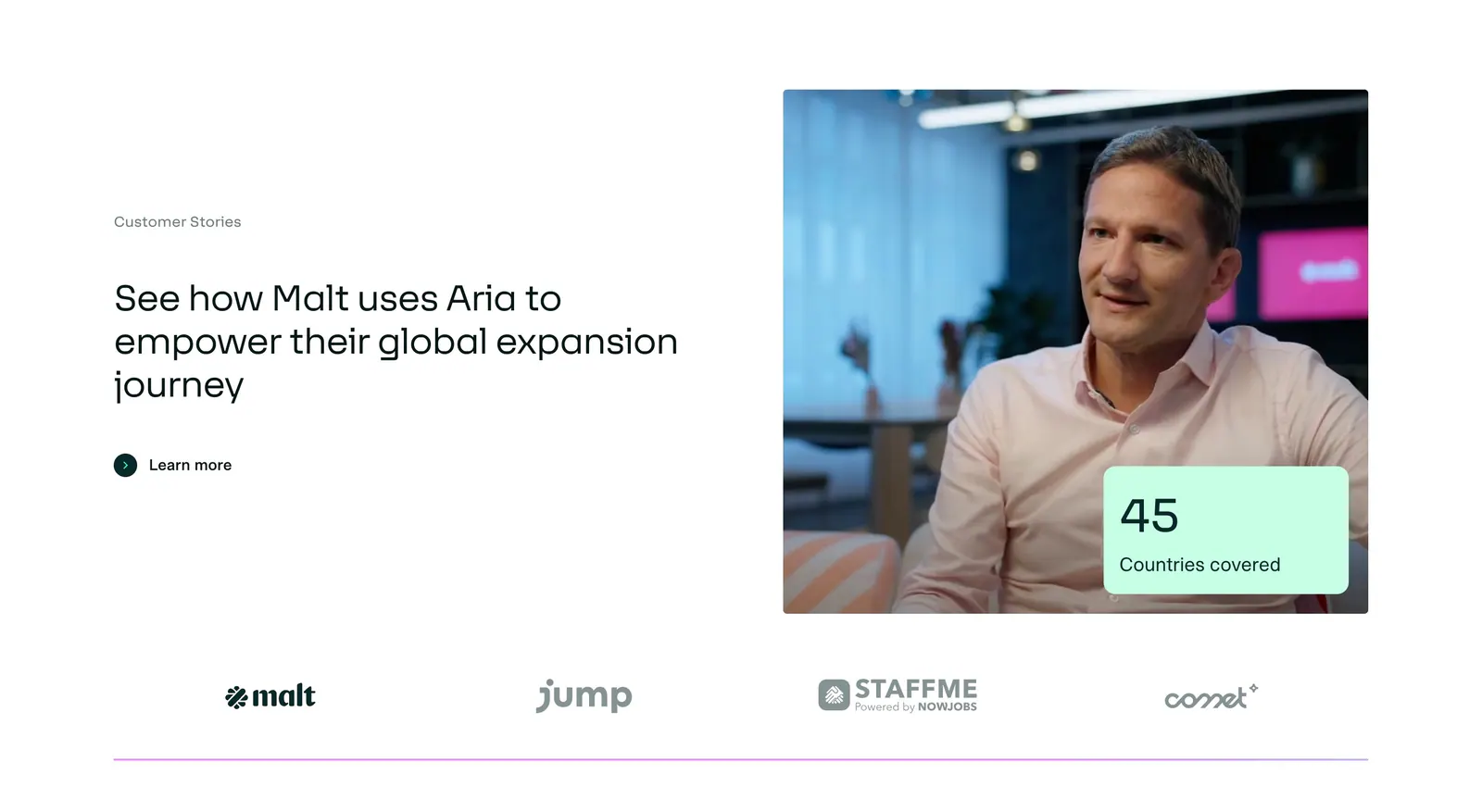
  265. Aria testimonials section: customer story headline left, customer photo with a stat card right, and a row of customer logos below
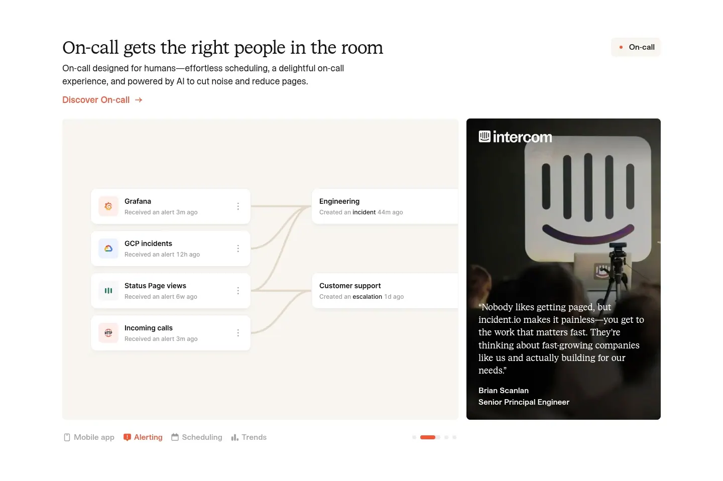
  266. incident.io features section: serif headline above an alert-routing UI panel beside a customer quote photo card, with tabs below
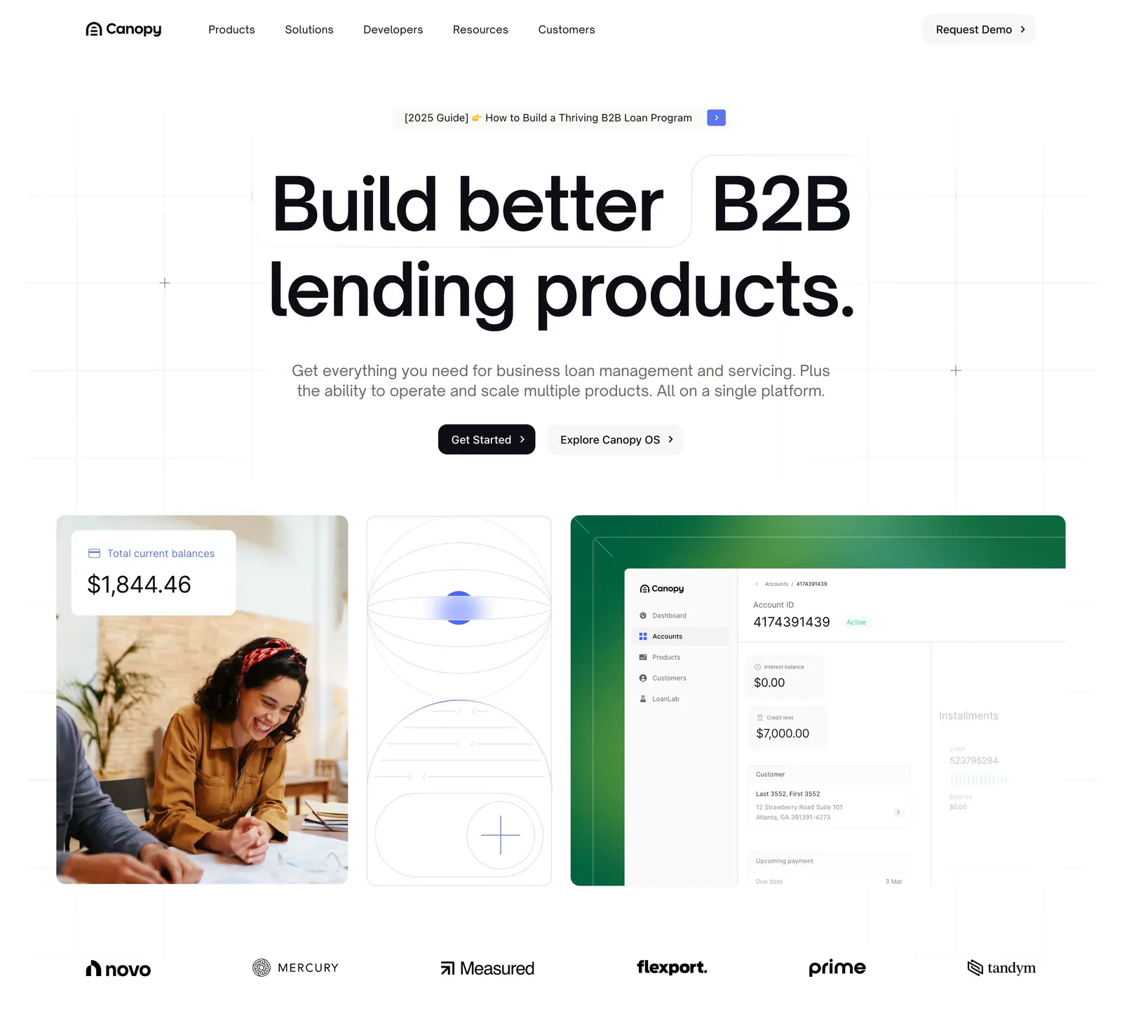
  267. Canopy hero section: centered headline and two buttons above cards with a customer photo, line art and a loan dashboard, logos below
  268. A-LIGN about & mission section: giant striped About wordmark over a coral duotone photo of two founders, short studio intro and button
  269. Dan Mall blog & resources section: tulip photo above a huge pink headline and three numbered essay columns on black
  270. Solidroad hero section: serif headline and lime button over a mountain landscape photo beside a training dashboard UI, logo row below
  271. Cofactr hero section: nav and two headlines over a full-bleed dark photo of a jet engine fan, with supporting copy and a Start Free button
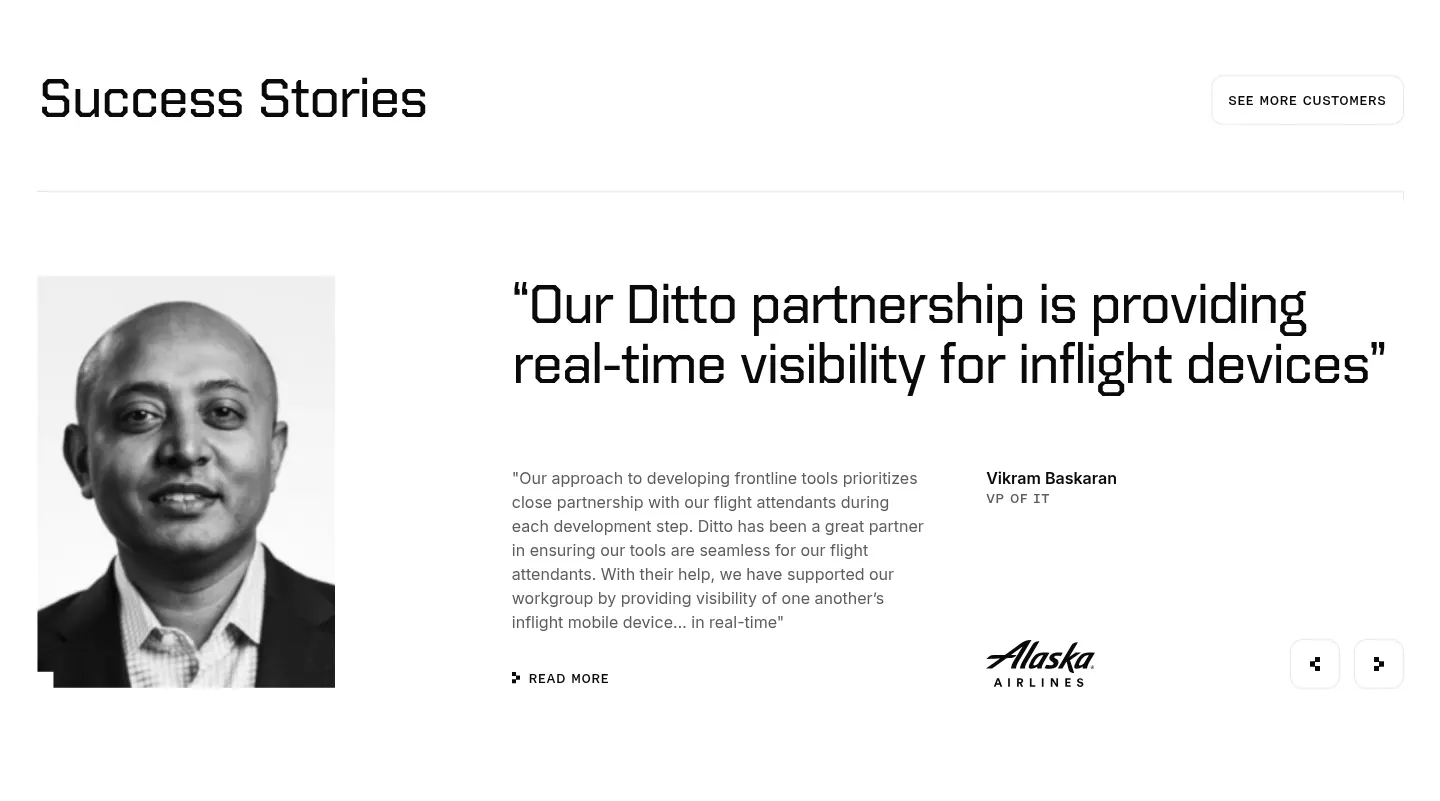
  272. Ditto testimonials section: black-and-white portrait beside a large quote, customer name, Alaska Airlines logo and prev/next arrows
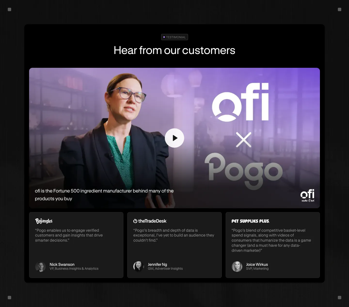
  273. Pogo testimonials section: dark panel with a video thumbnail and play button above three customer quote cards
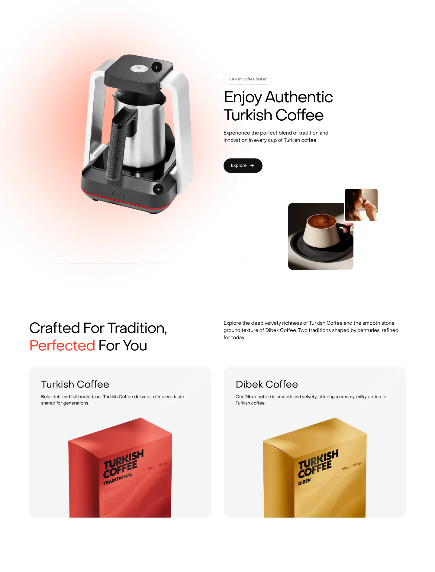
  274. Saki features section: coffee maker product shot beside headline and Explore button, then two product cards with coffee packaging boxes
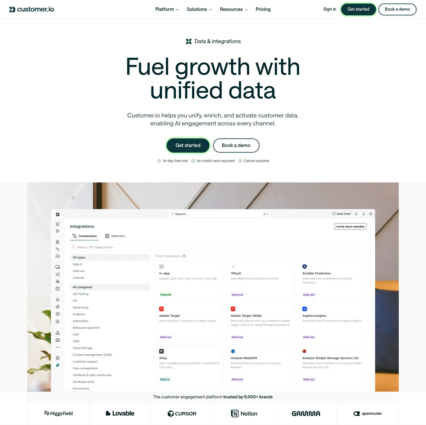
  275. Customer.io hero section: centered headline and buttons above an integrations directory screenshot on an office photo, with a logo row

Where photography shows up

Often paired with

Share of photography sections that also use each style

How to choose and prepare photos

  1. Shoot original photos where possible

    Photos of your actual team, customers, product, or location are more convincing than polished stock. Even simple, well-lit shots beat generic handshakes and laptops. If you must use stock, choose images that feel specific to your context and avoid widely used ones.

  2. Apply one consistent color grade

    Photos from different shoots often vary in warmth, saturation, and contrast. Grade them to a shared look so the page feels cohesive. Subtle adjustments, like matching white balance and black levels, make a bigger difference than heavy filters or presets.
  3. Crop for the layout, not the camera

    Choose aspect ratios that fit your grid, such as 4:5 for cards or 16:9 for wide panels, and crop every photo to match. Keep subjects away from edges that get trimmed at smaller breakpoints. Faces should look into the page, toward the copy.

  4. Serve responsive, compressed images

    Large photos are often the heaviest assets on a page. Use srcset with several widths, modern formats like AVIF or WebP, and lazy loading below the fold. Write alt text that describes what matters in the photo, not the file name.

Companies using photography

All styles
    ↑↓ Navigate ↵ Open

    Section preview

    Website section