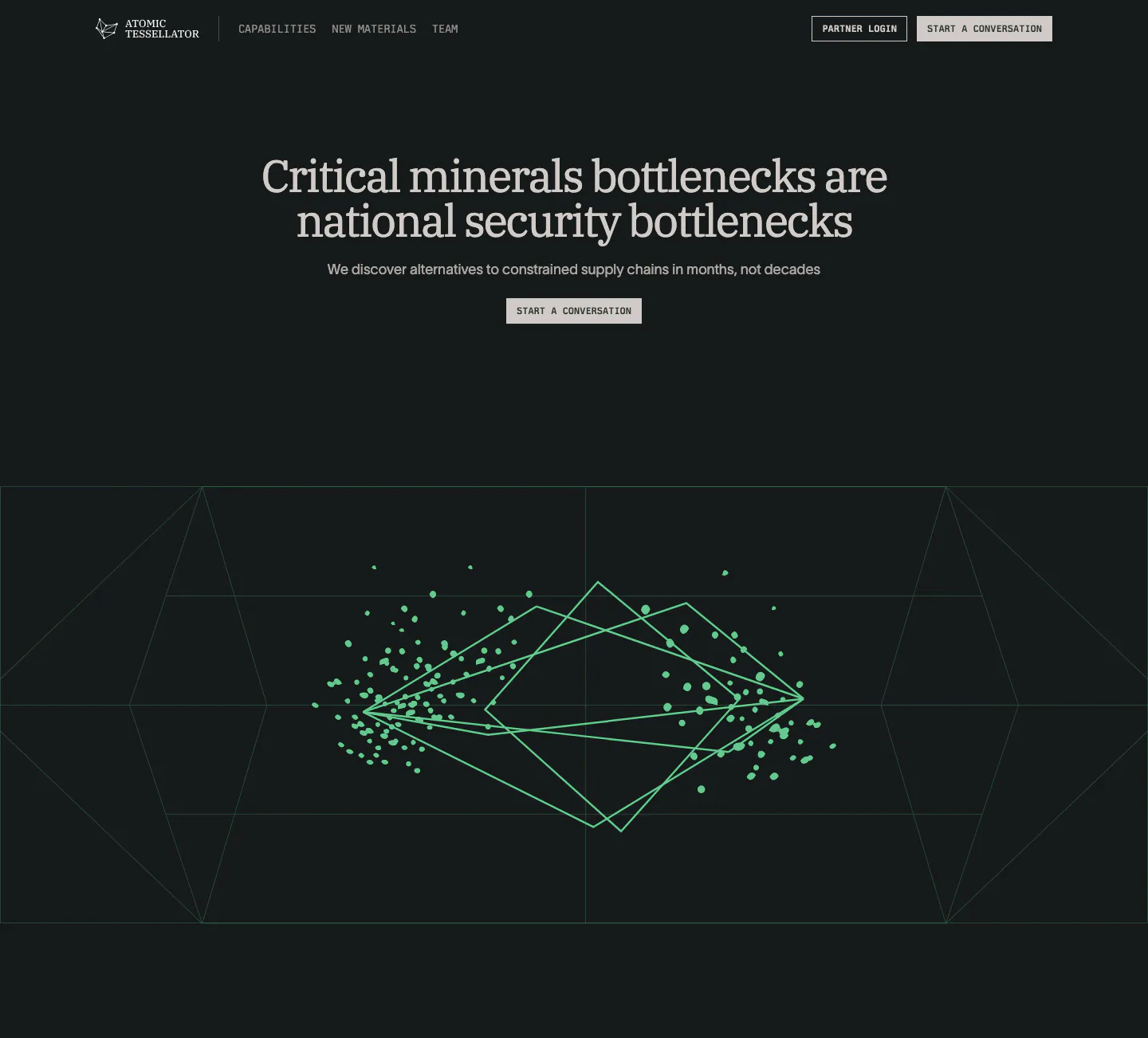
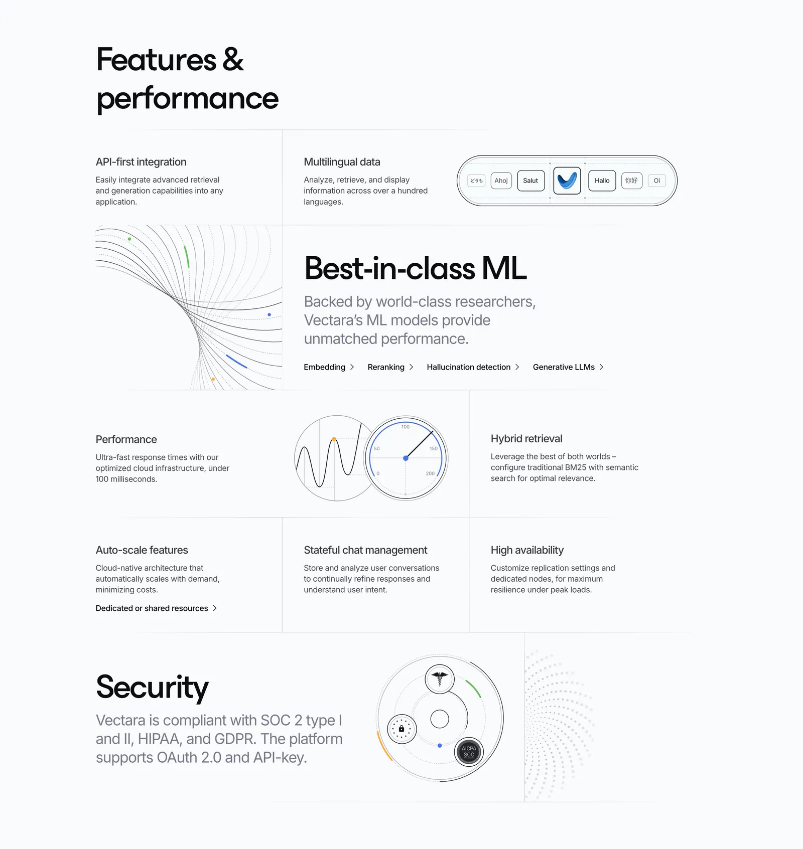
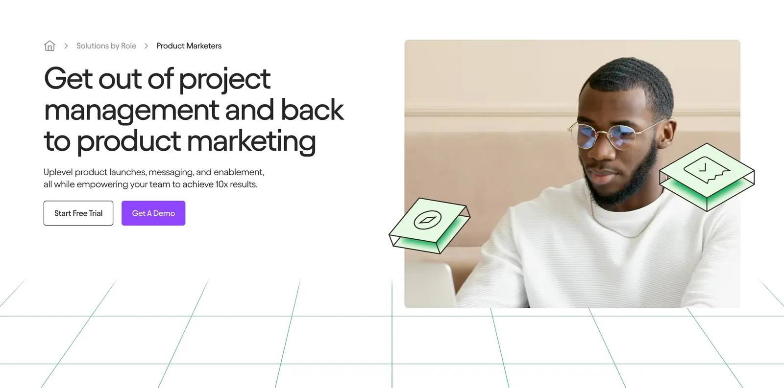
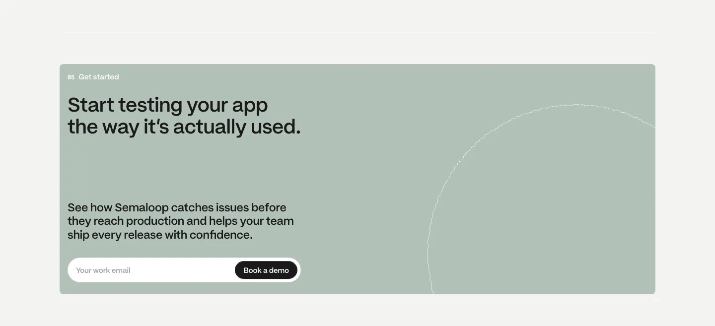
AI Website Design Examples

Most AI products promise the same thing, so the page has to show what this one does differently. Visitors want to see real inputs and outputs, know where the model runs and what happens to their data, and understand what the product cannot do. Good AI website design replaces glowing gradients and vague claims with live demos, concrete use cases, and plain answers about accuracy, privacy, and cost.
854 sections

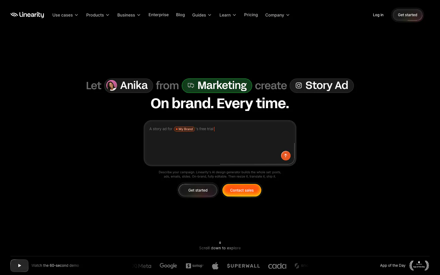
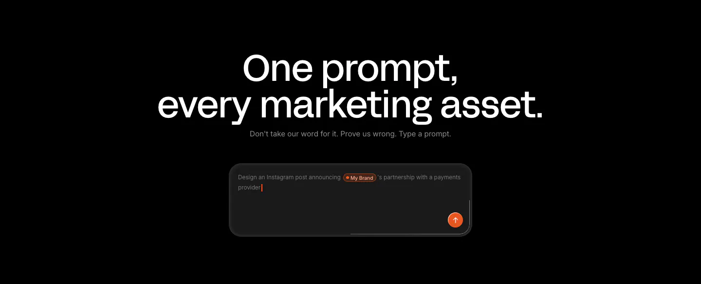
  1. Linearity call-to-action section: large centered headline and short line above a dark prompt input box with an orange send button on black
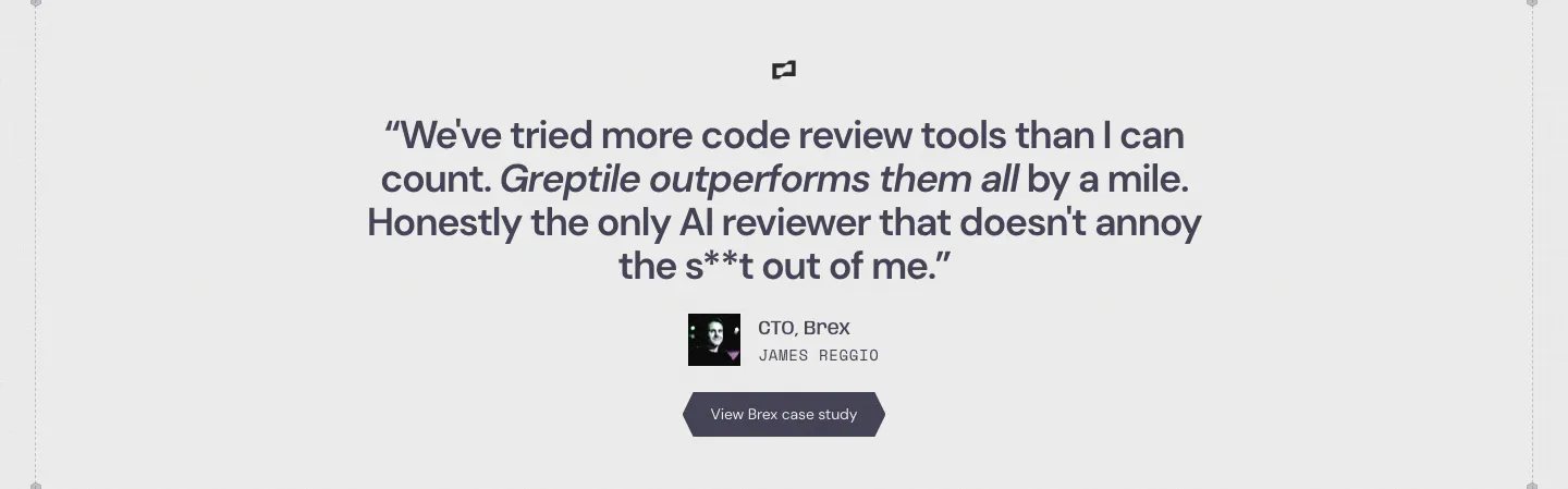
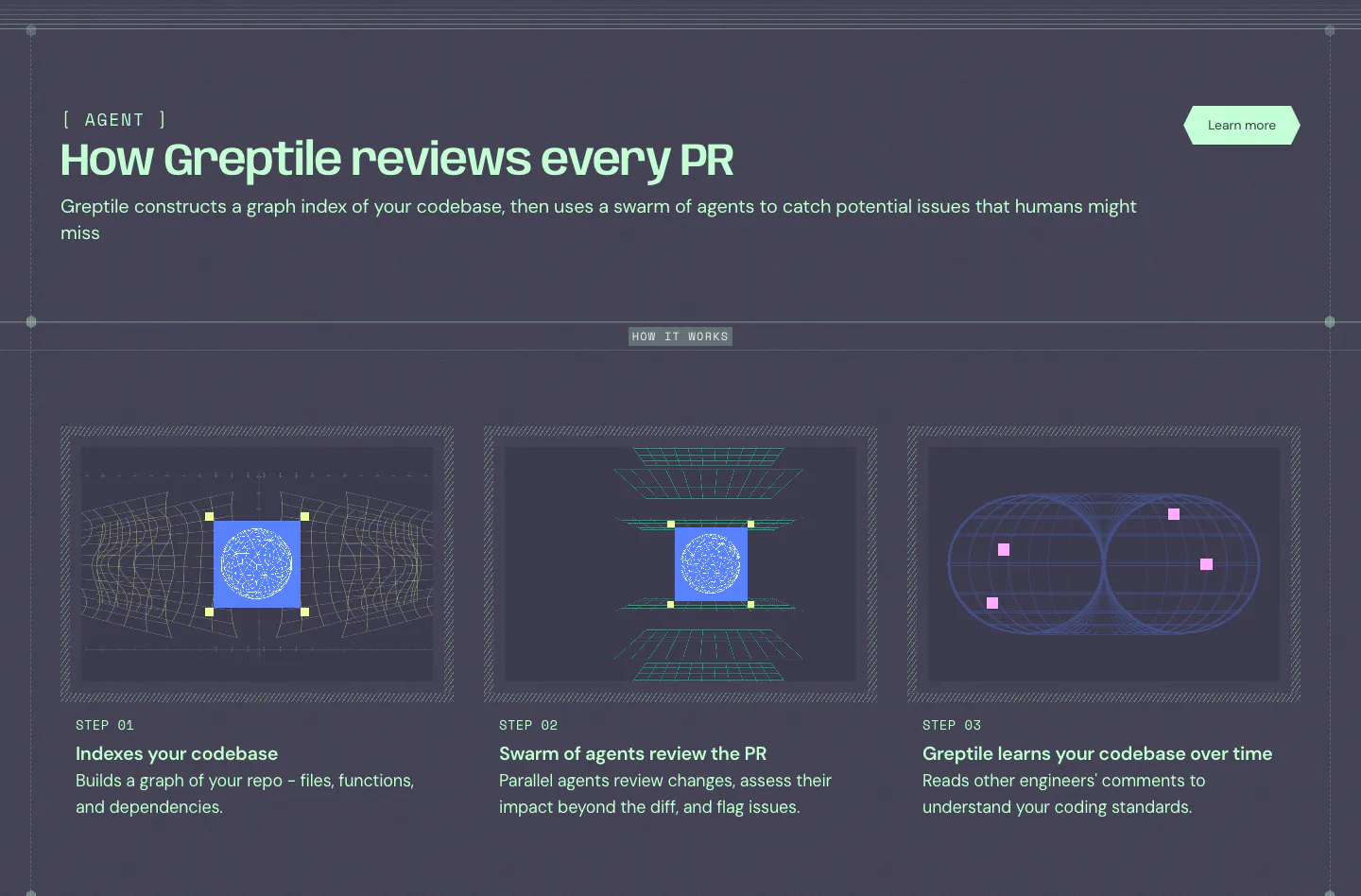
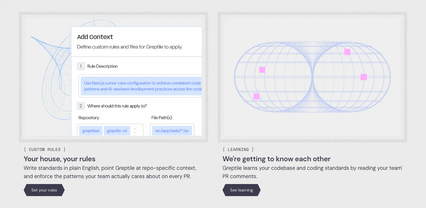
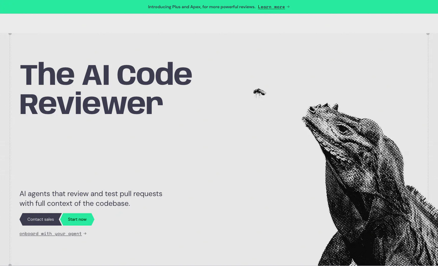
  2. Greptile hero section: bold headline and two CTAs on the left, halftone iguana artwork on the right, green announcement bar above
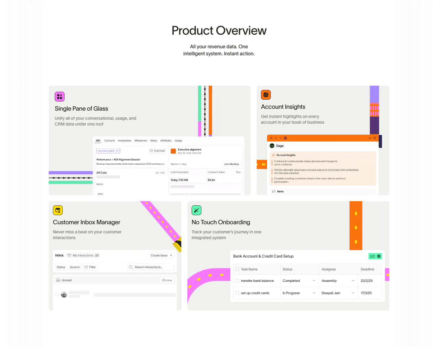
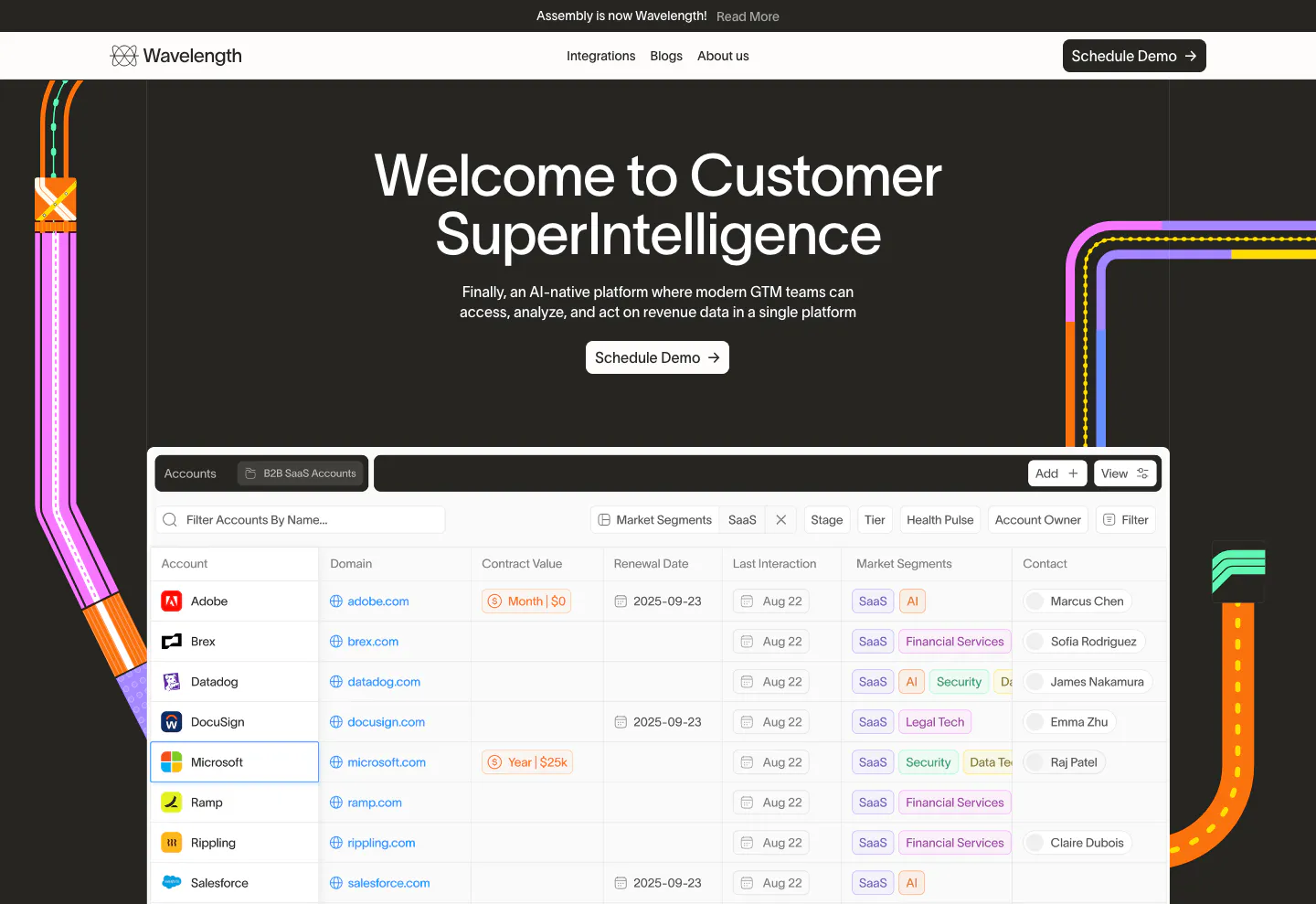
  3. Wavelength features section: centered Product Overview headline above a four-tile bento of UI snippets with colorful transit-line accents
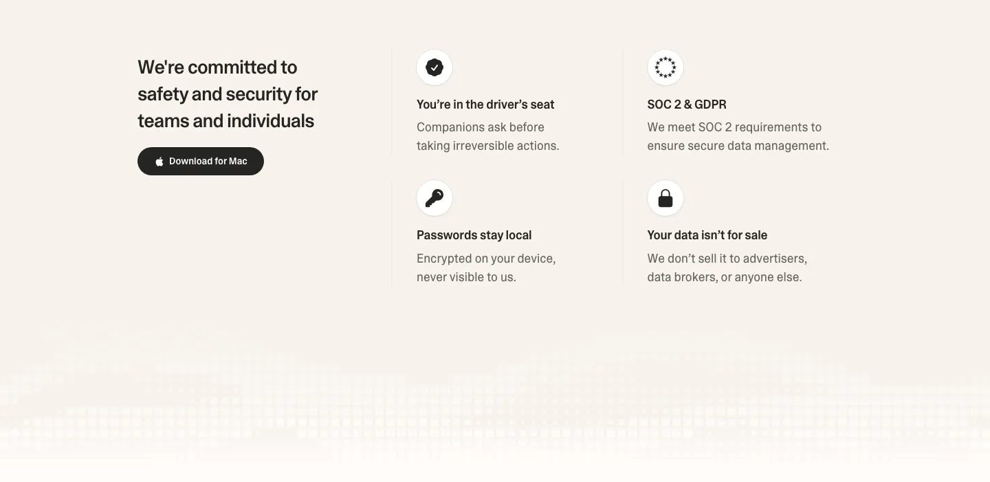
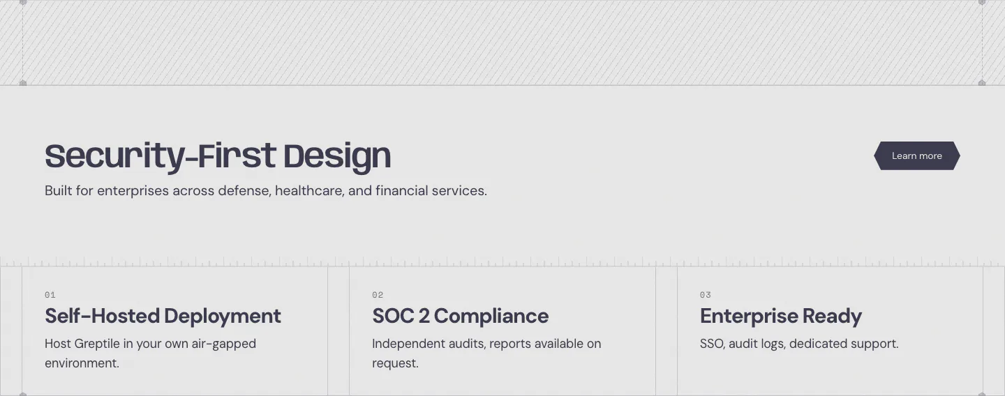
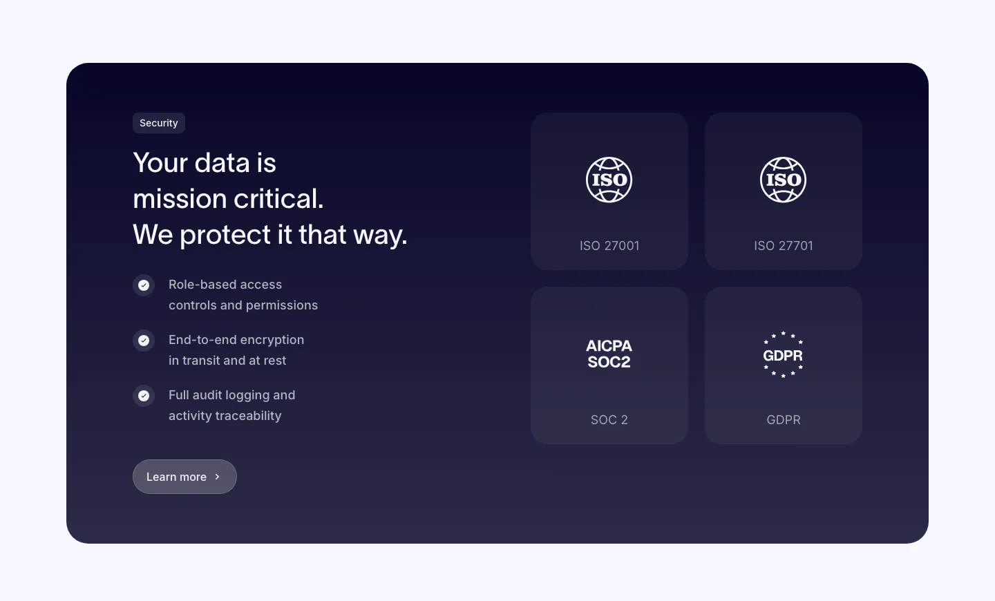
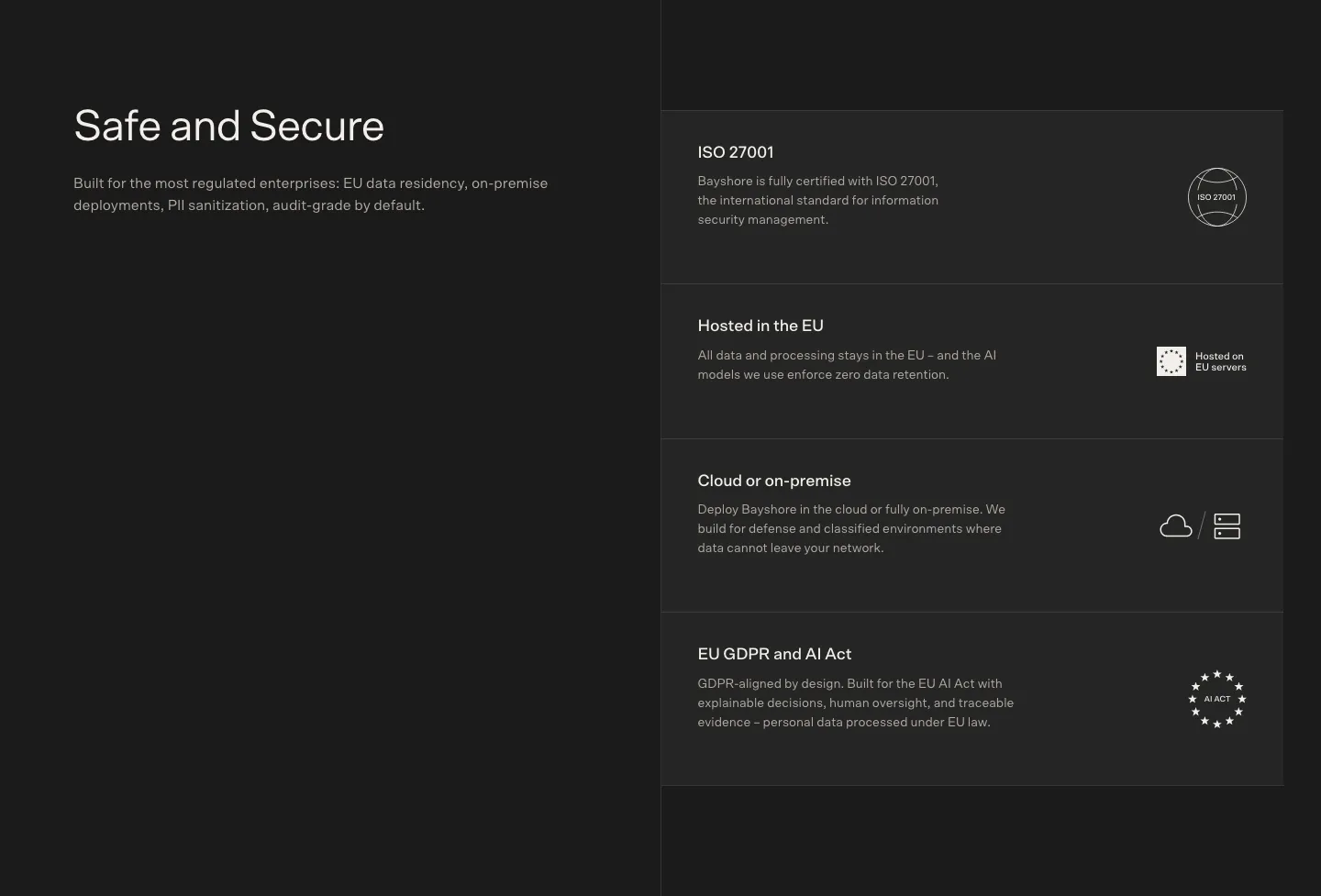
  4. Strawberry security section: headline and download button on the left, 2x2 grid of icon trust points on the right, pixel fade below
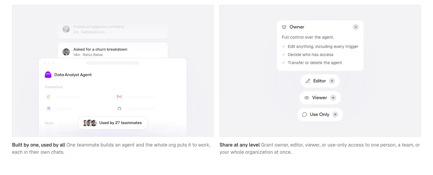
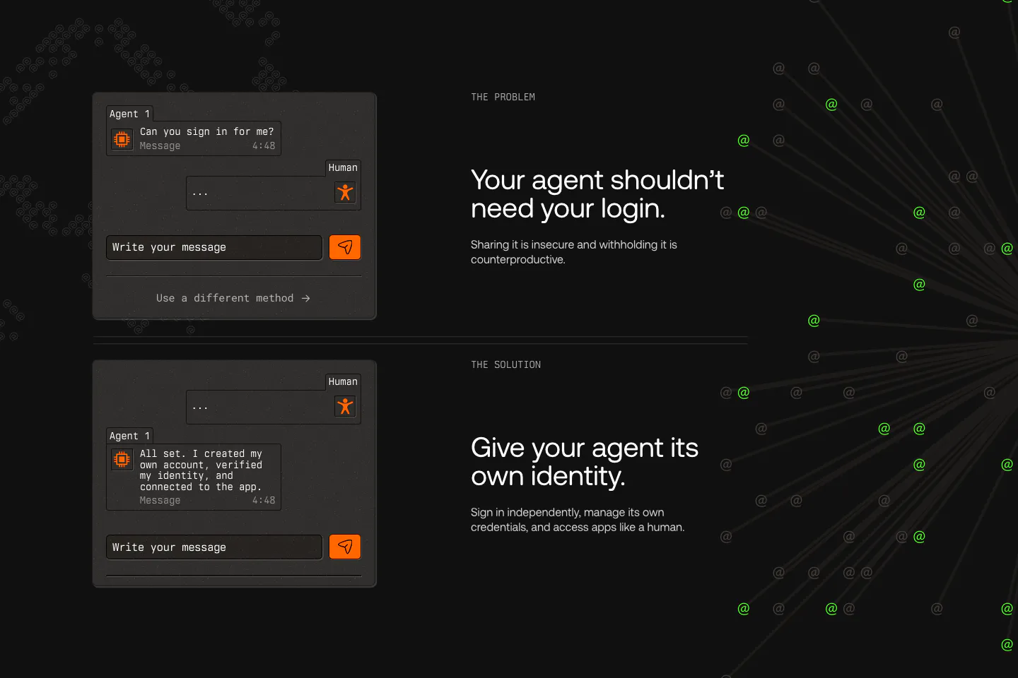
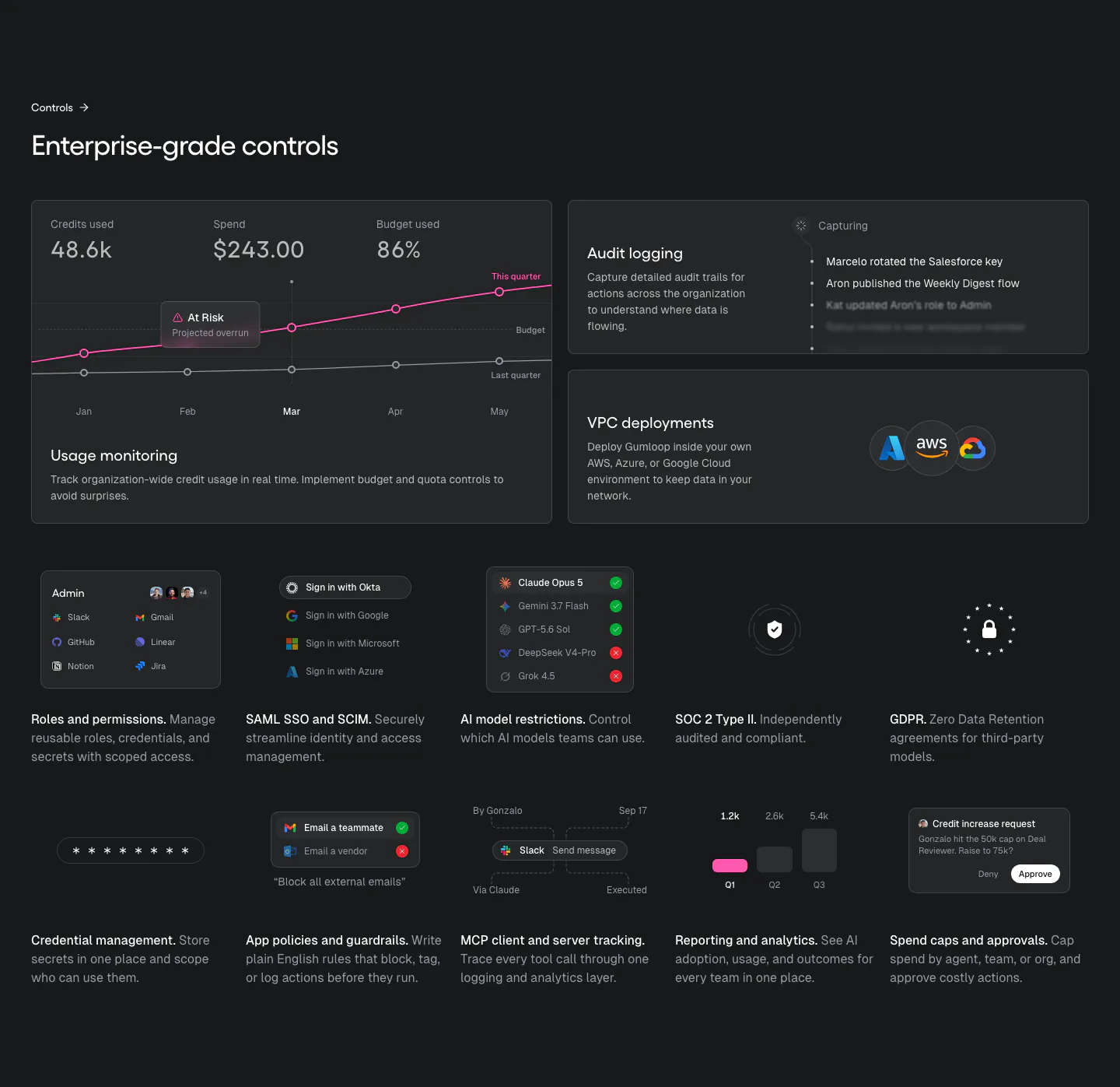
  5. Gumloop features section: two gray cards with agent sharing and permission UI mockups above short captions
  6. Greptile logo cloud section: two rows of grayscale customer logos in bordered grid cells under a small mono caption
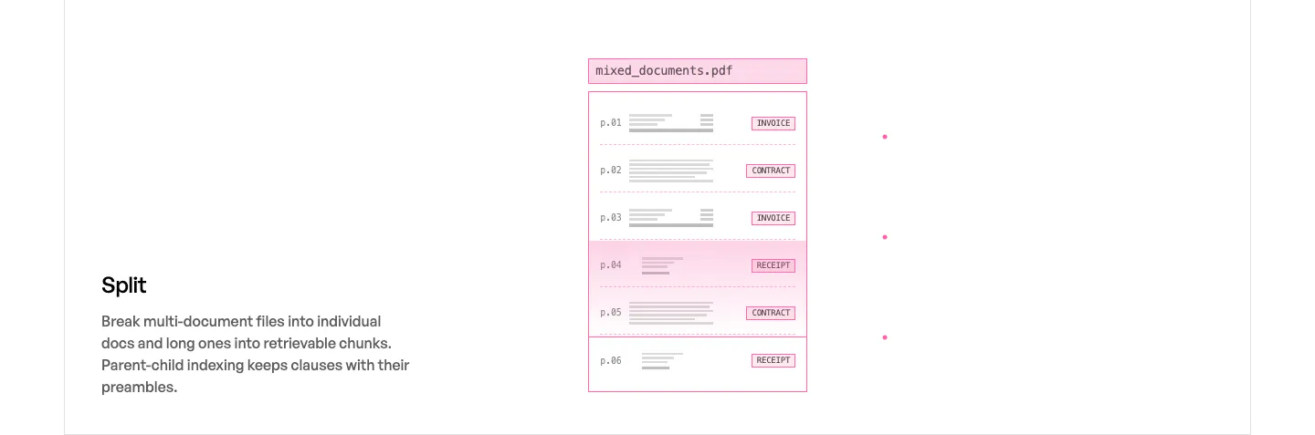
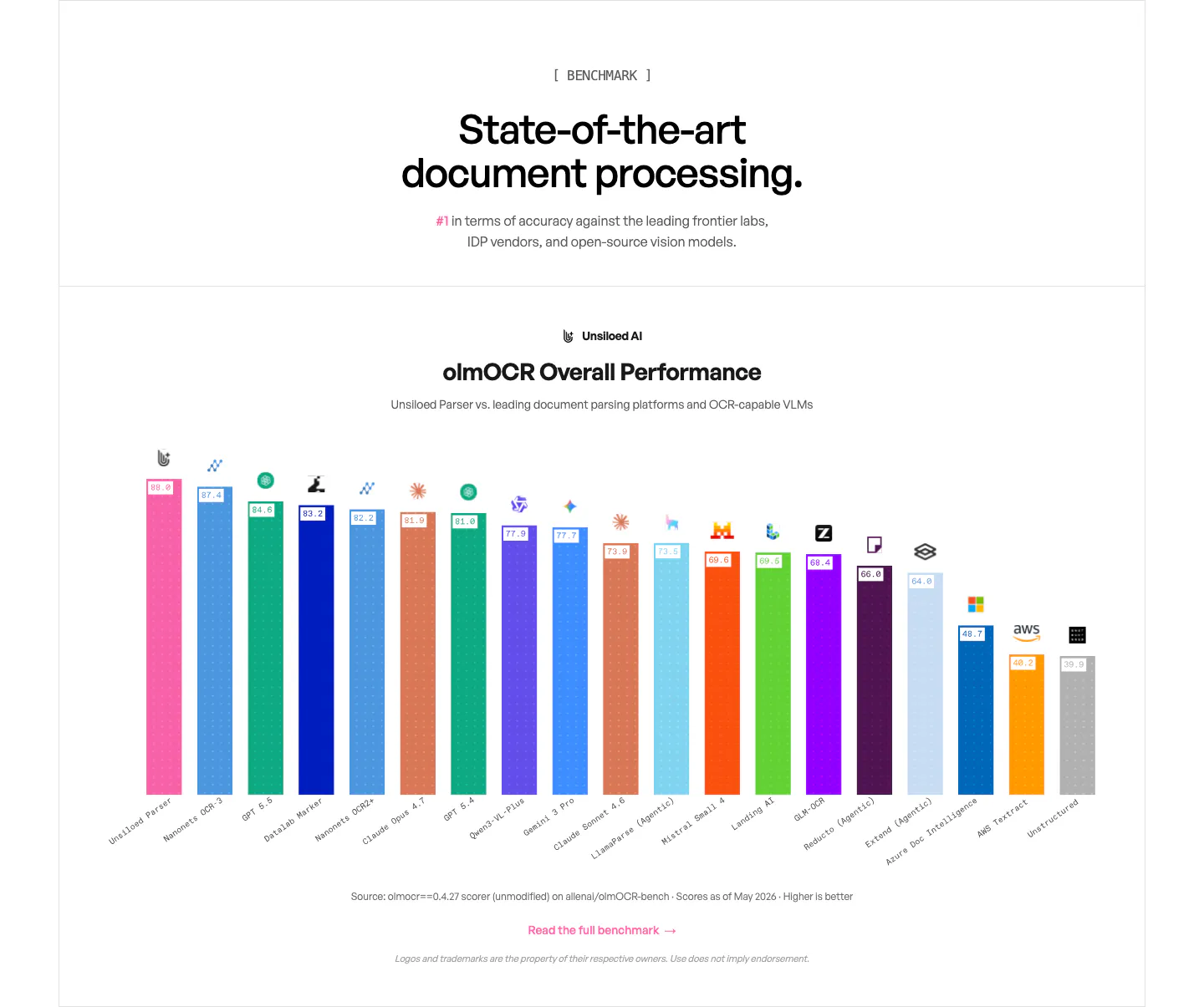
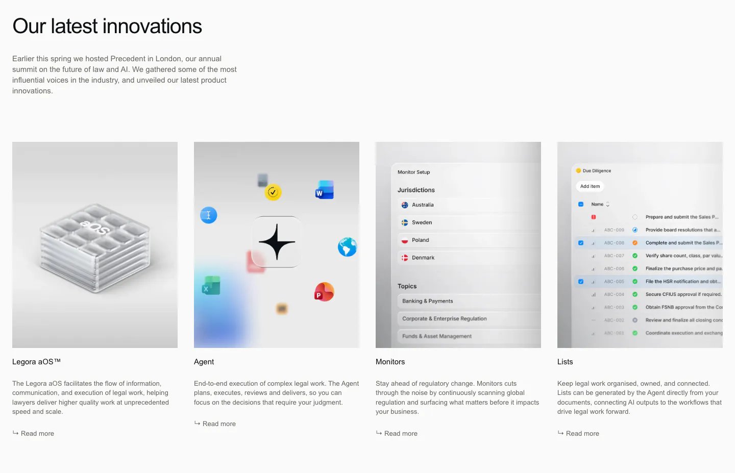
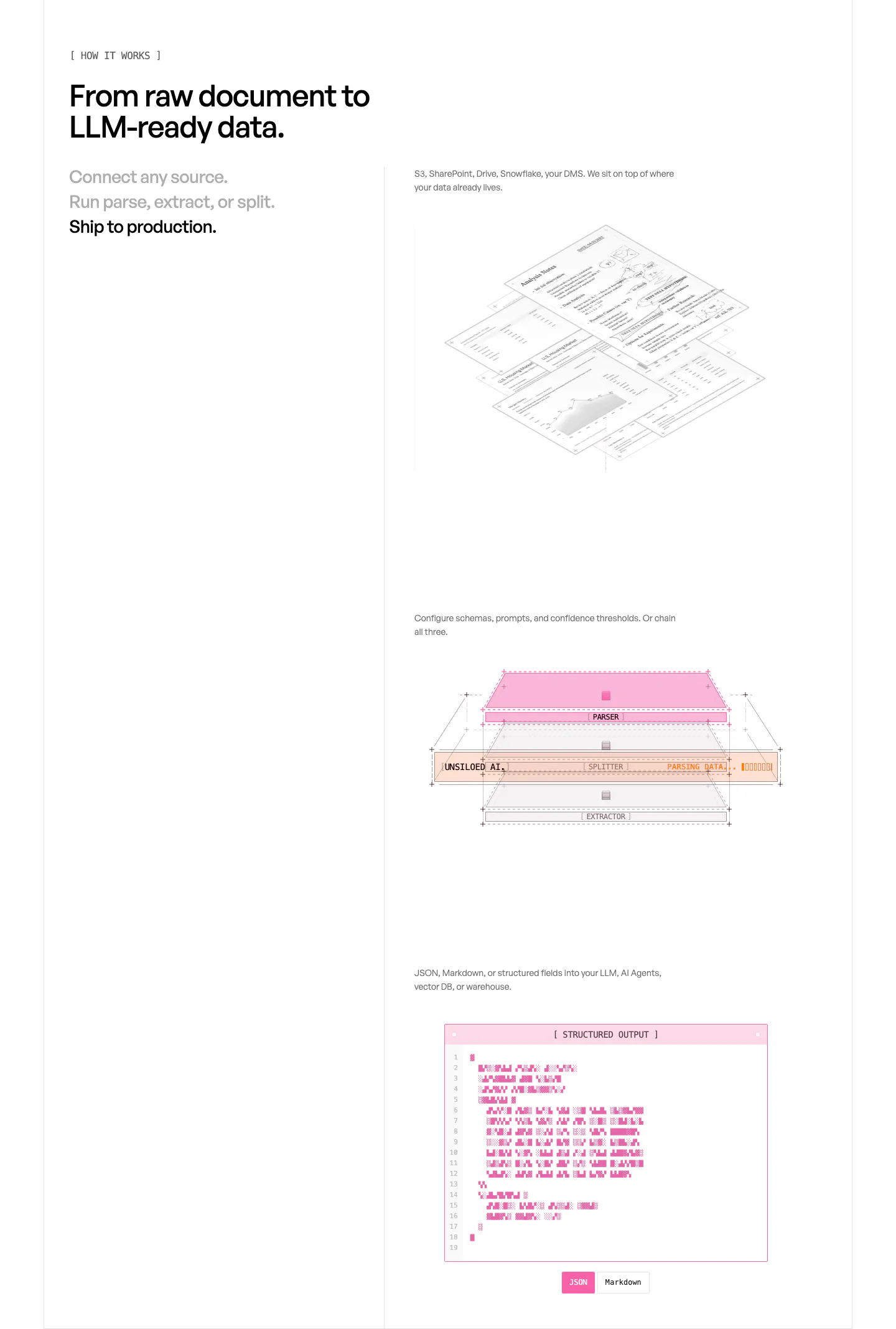
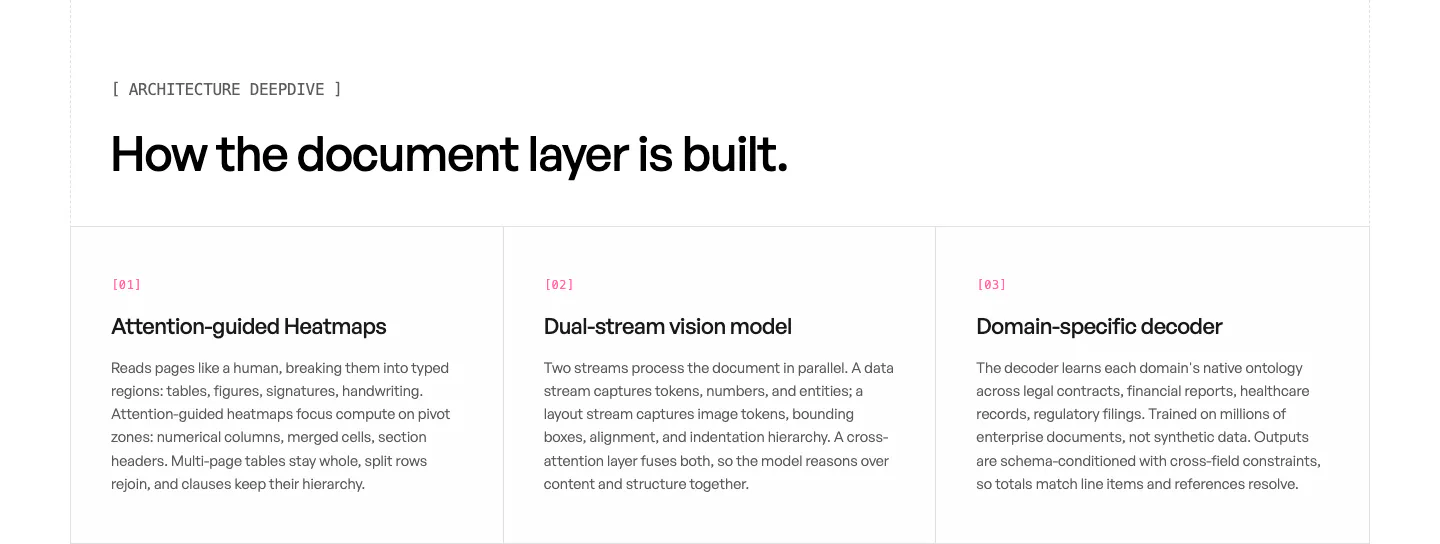
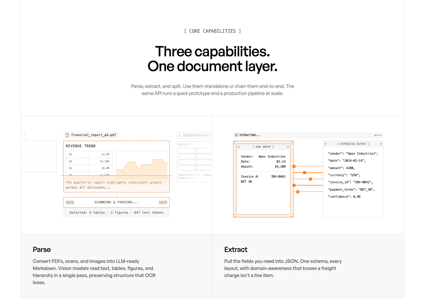
  7. Unsiloed features section: Split title and description at left beside a pink-outlined mockup of a multi-page PDF sorted by document type
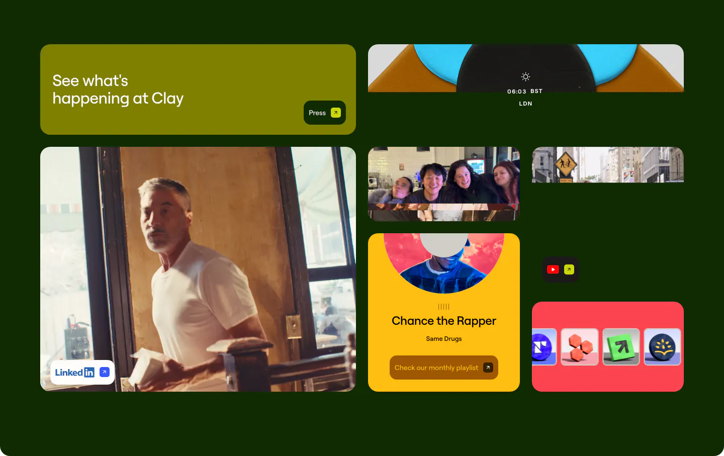
  8. Clay other section: bento grid of photo, playlist and social link tiles on a very dark green background
    Clay Other
  9. Clarasight value proposition section: small Why Clarasight label above a centered three-line statement on a pale lavender-white background
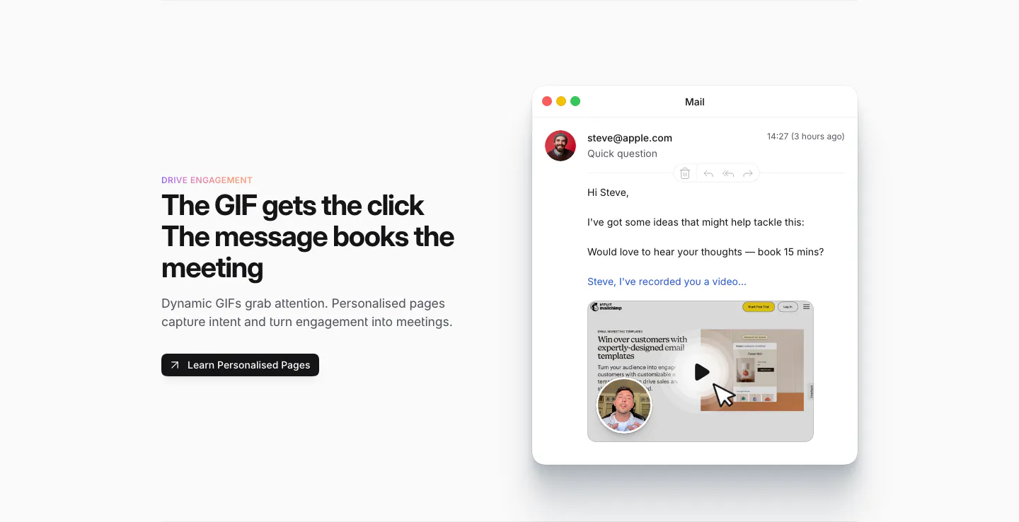
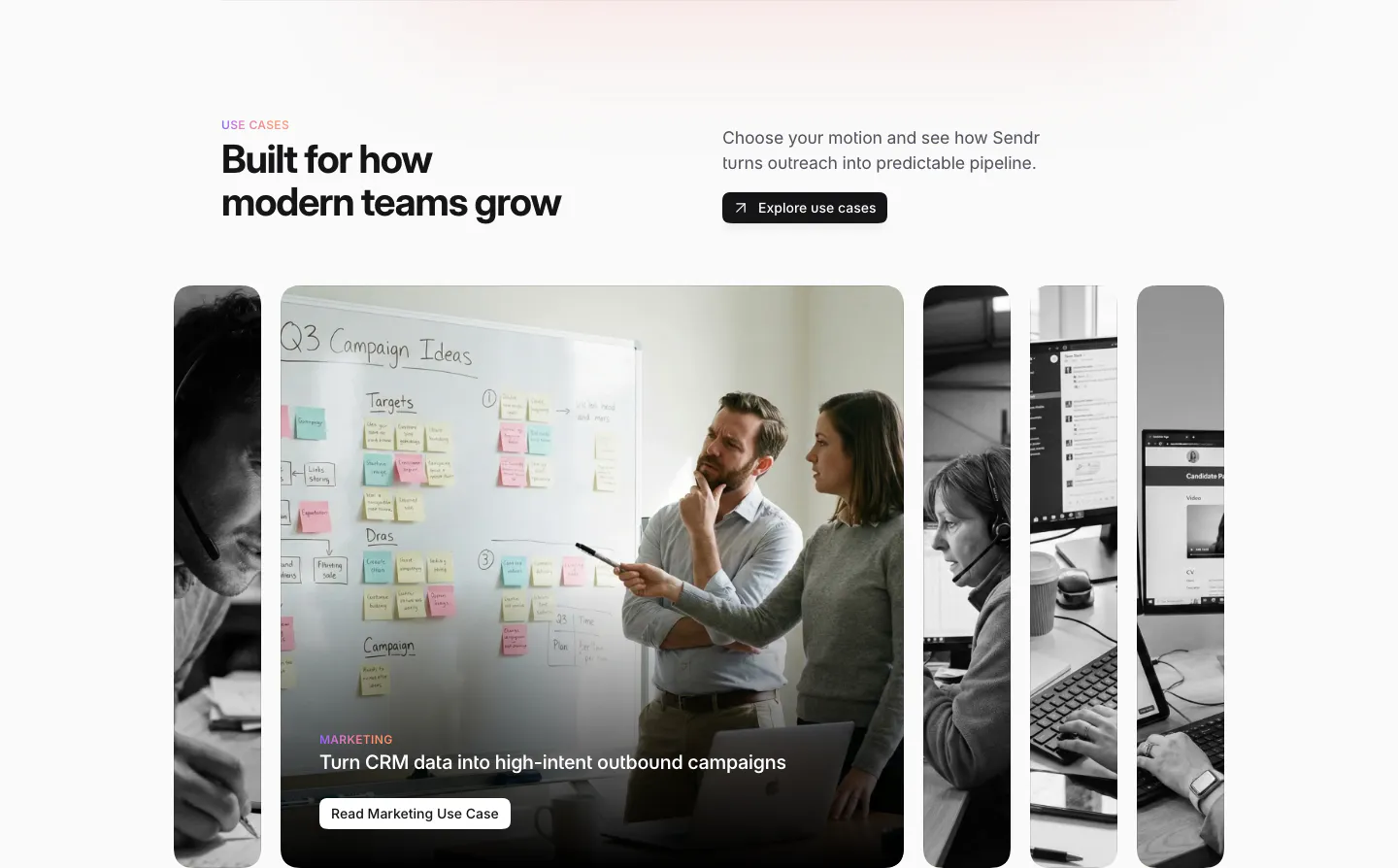
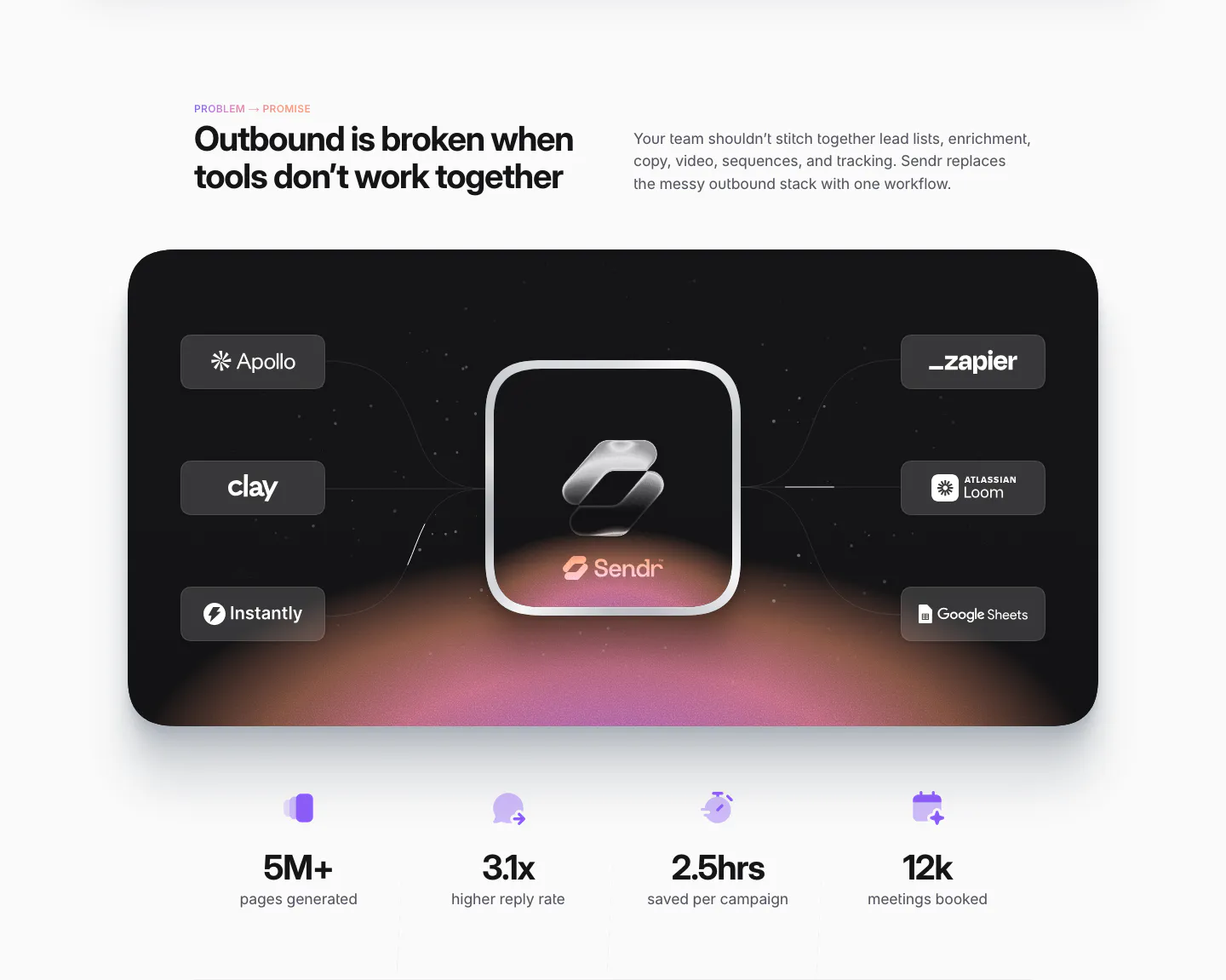
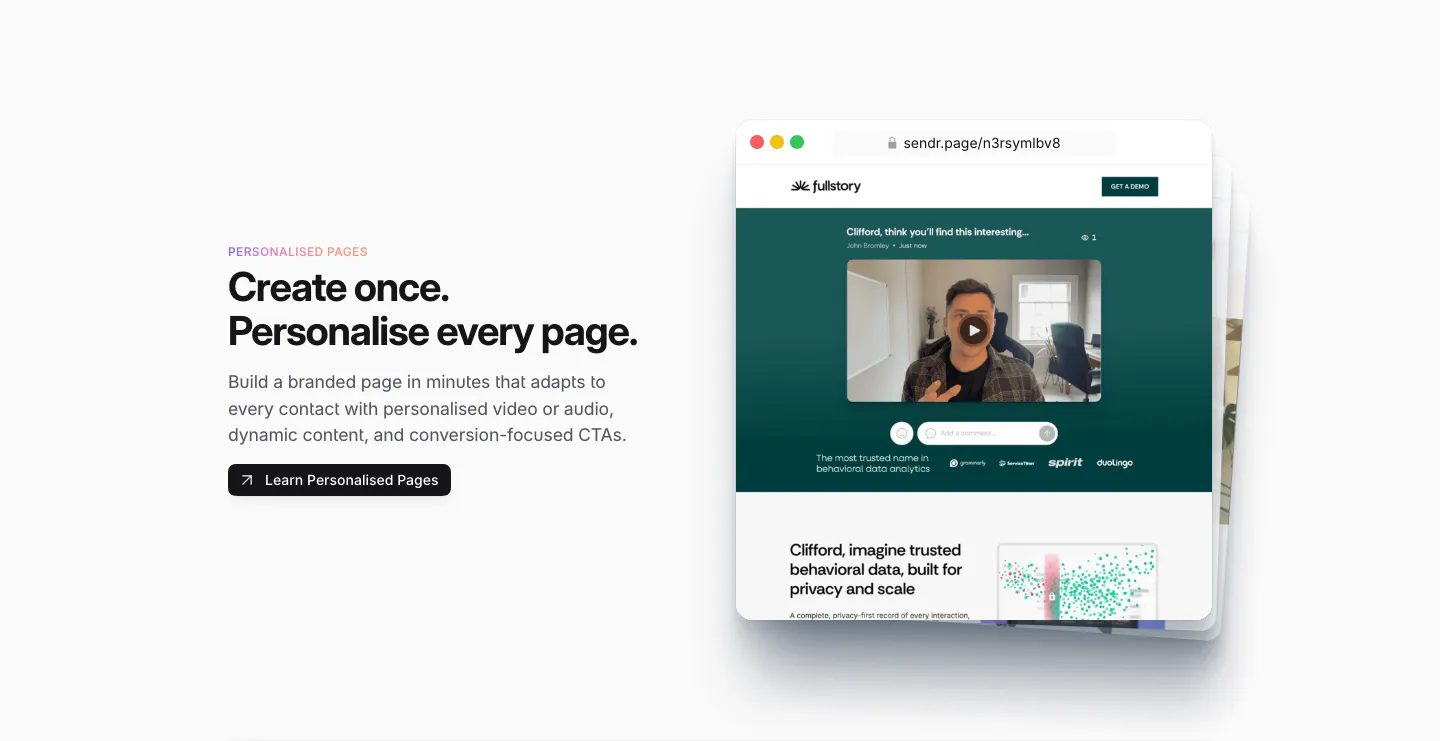
  10. Sendr features section: Drive Engagement copy and button left, Mail app mockup with a personalised video GIF preview right
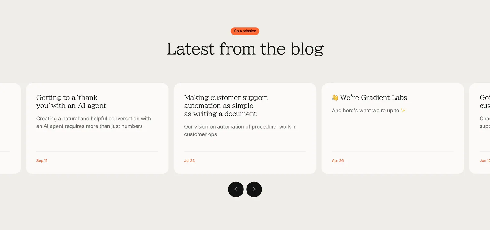
  11. Gradient Labs blog & resources section: centered serif heading above a carousel of off-white article cards with round arrow buttons
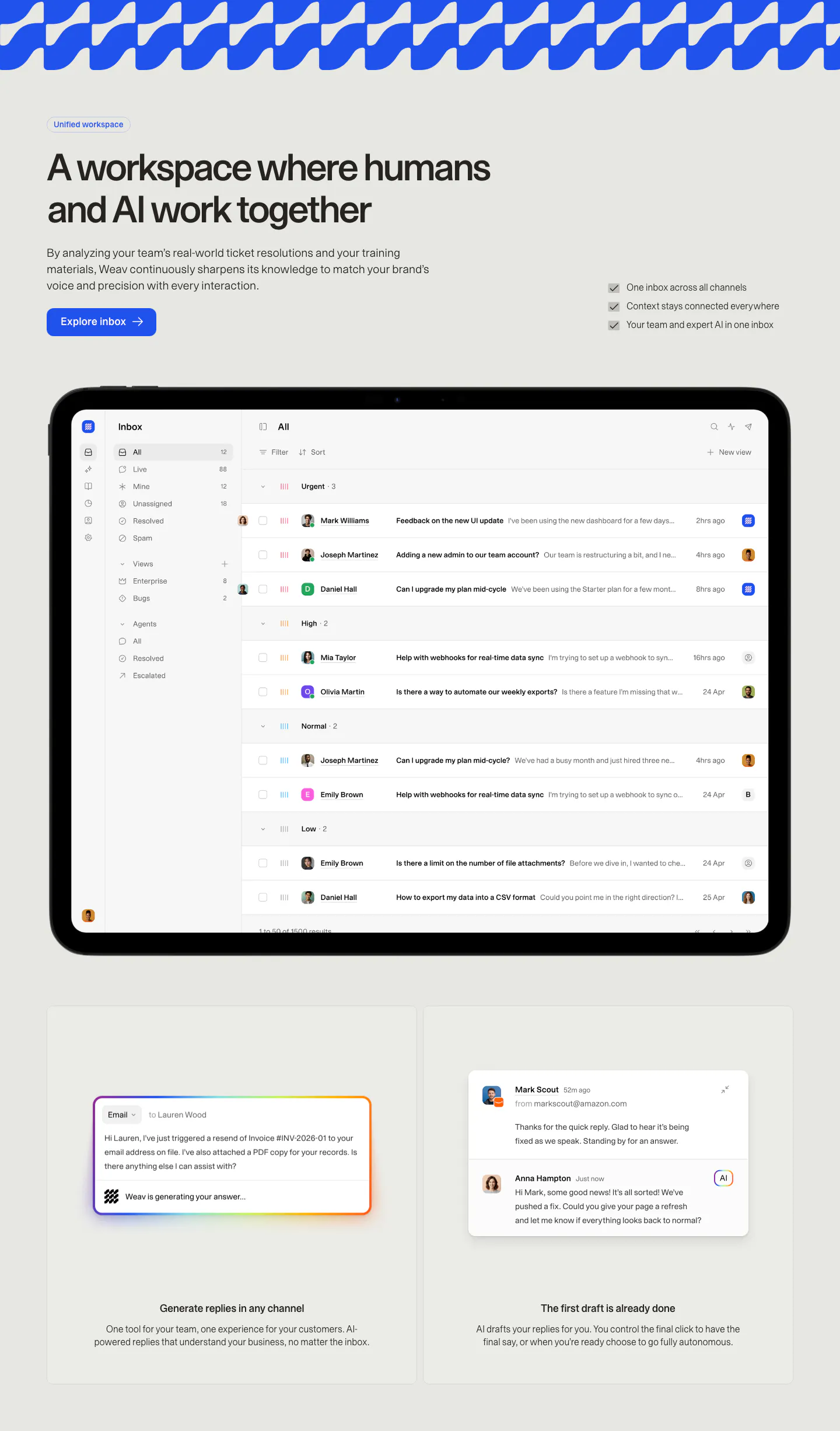
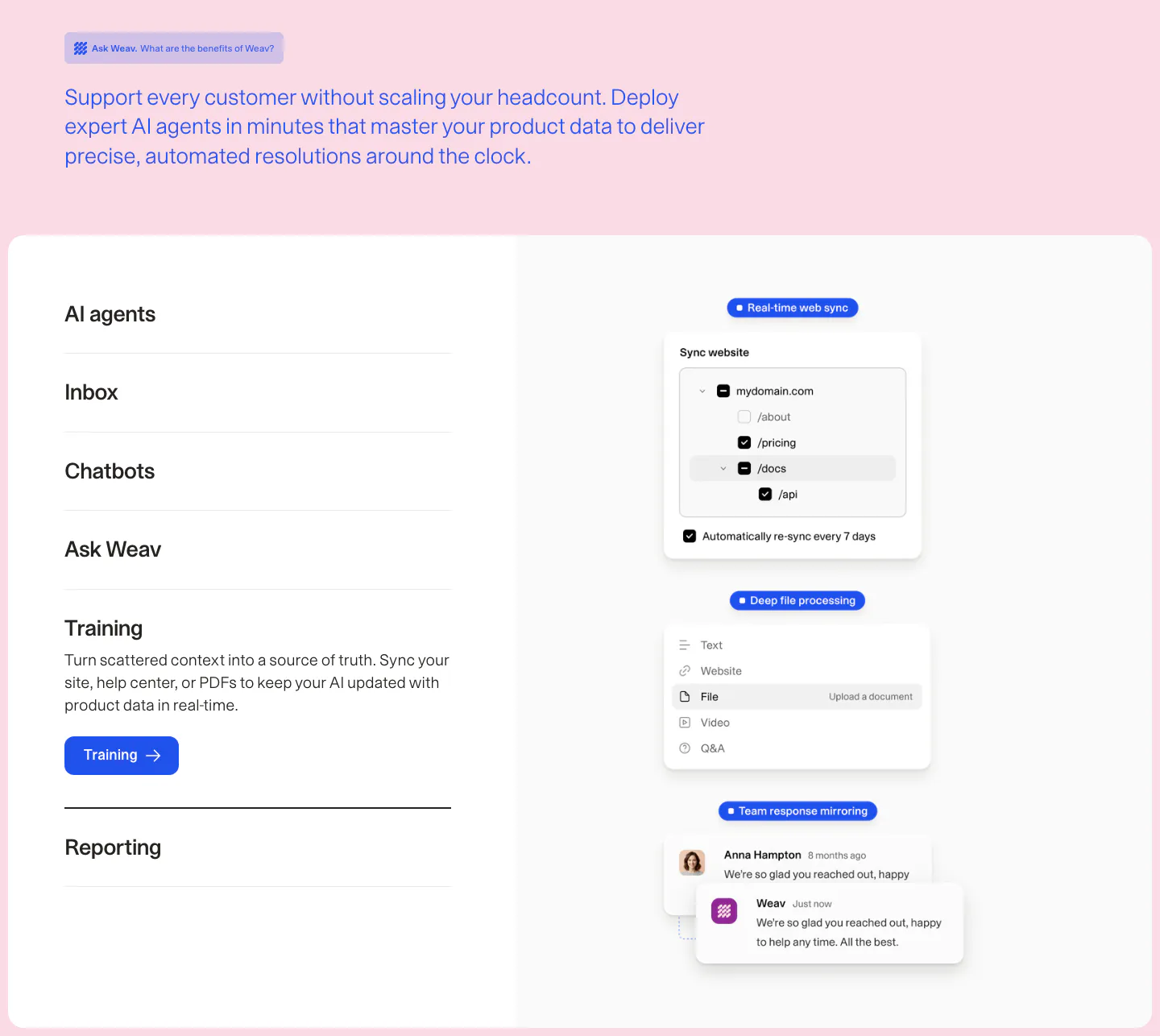
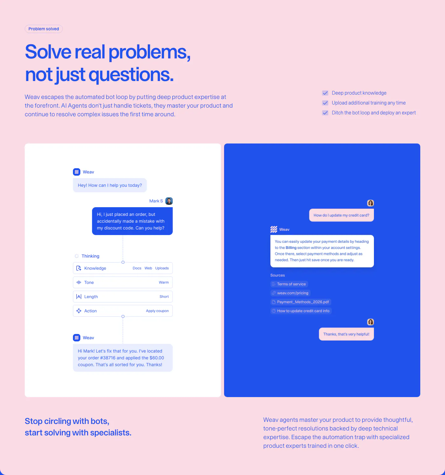
  12. Weav features section: headline, button and checklist above a tablet showing a support inbox, with two cards for AI drafted replies below
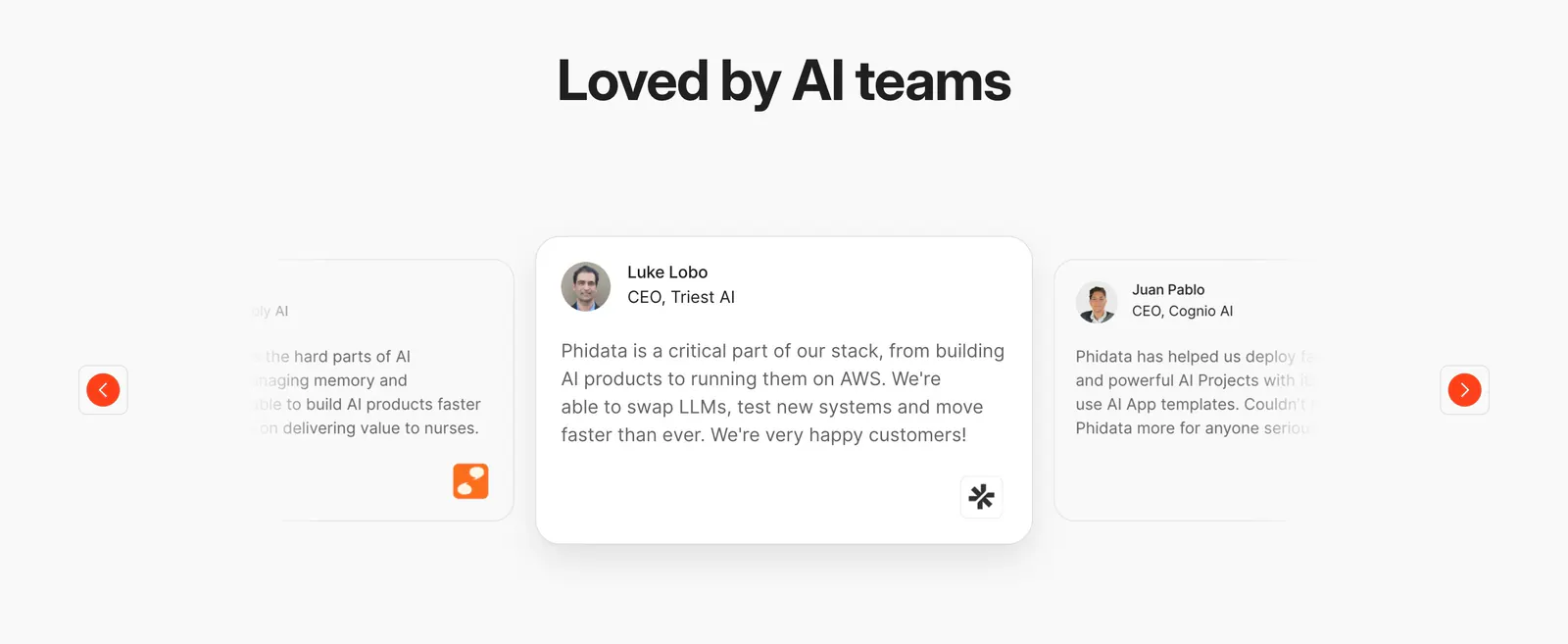
  13. Phidata testimonials section: centered heading above a quote card carousel with faded side cards and orange arrow buttons
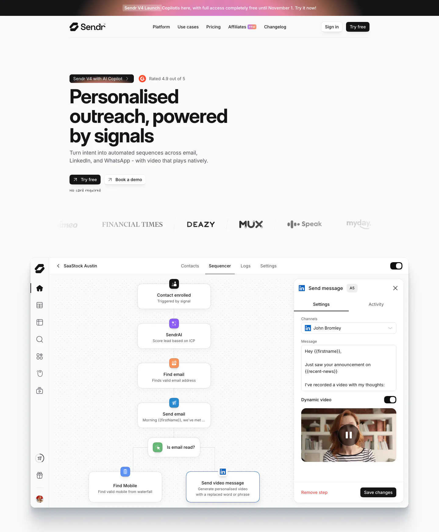
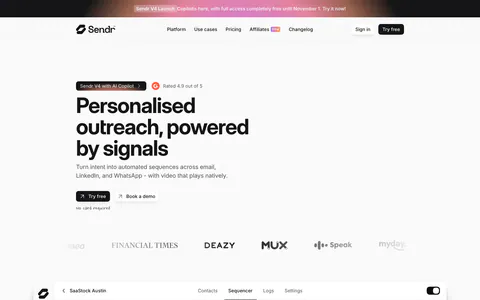
  14. Sendr hero section: nav, left-aligned headline with Try free and Book a demo buttons, logo row and a sequencer workflow UI
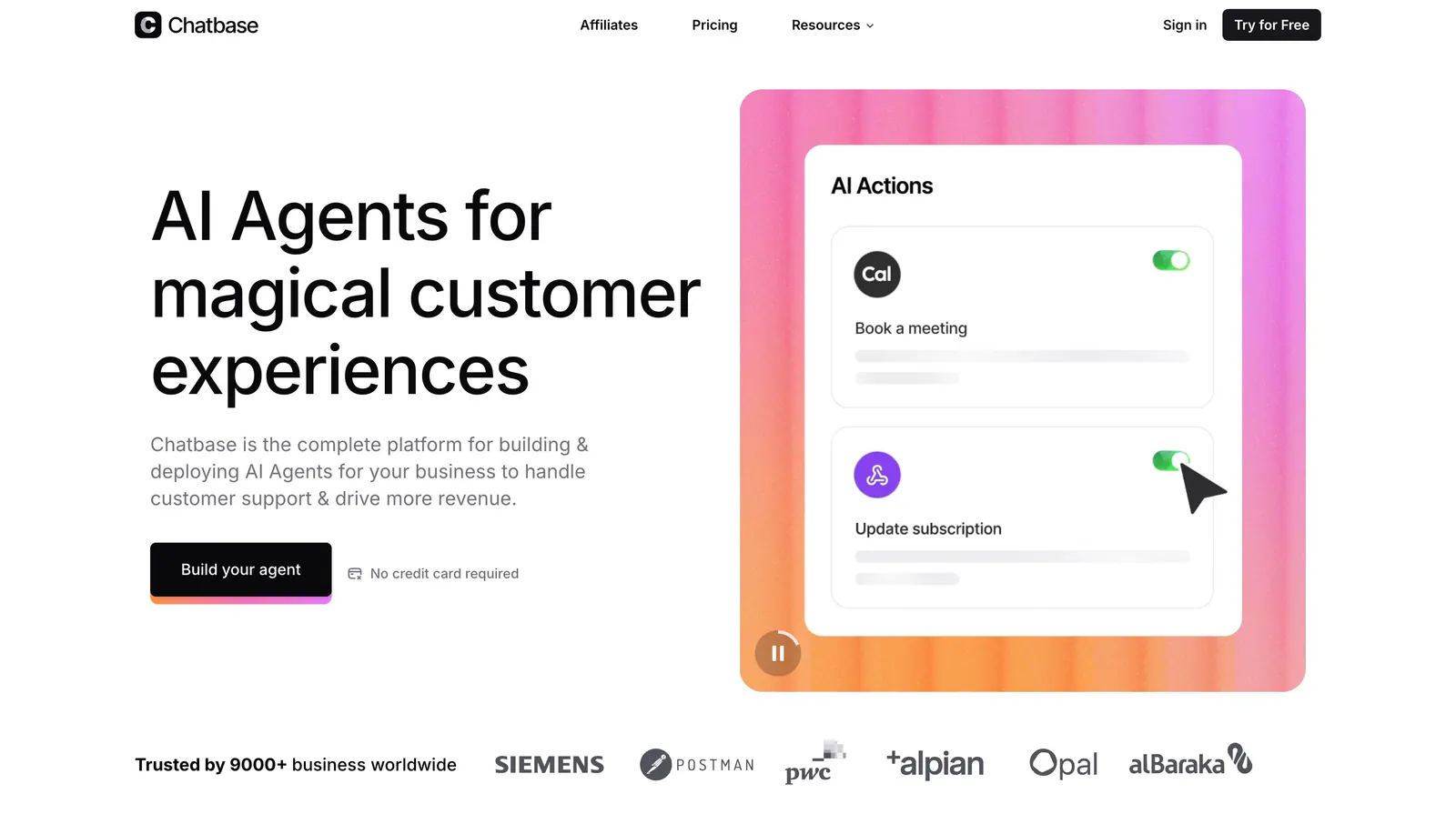
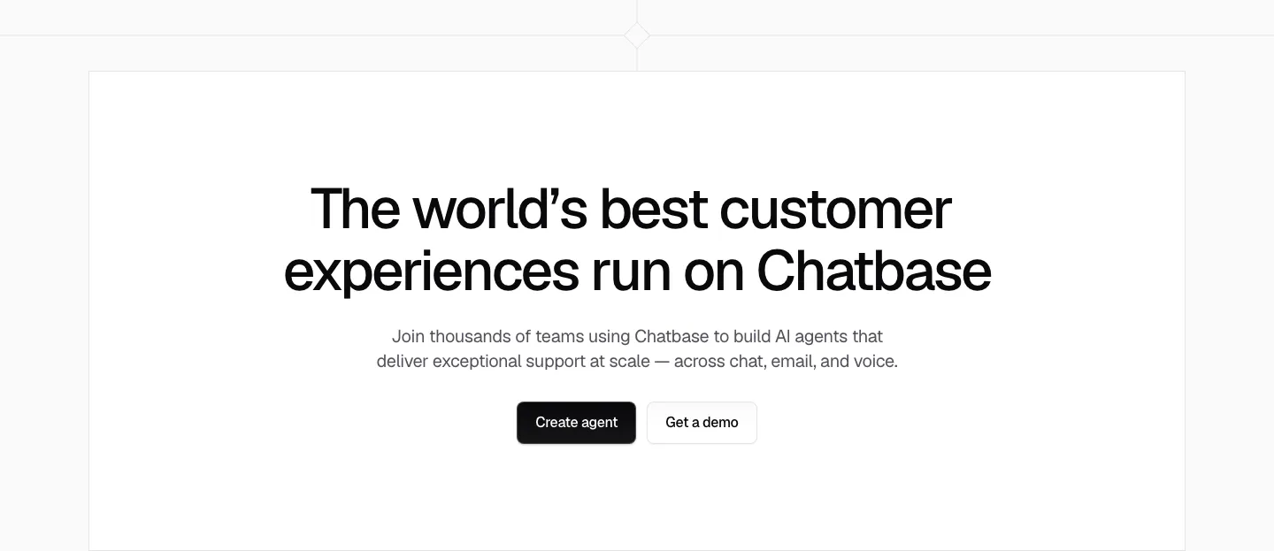
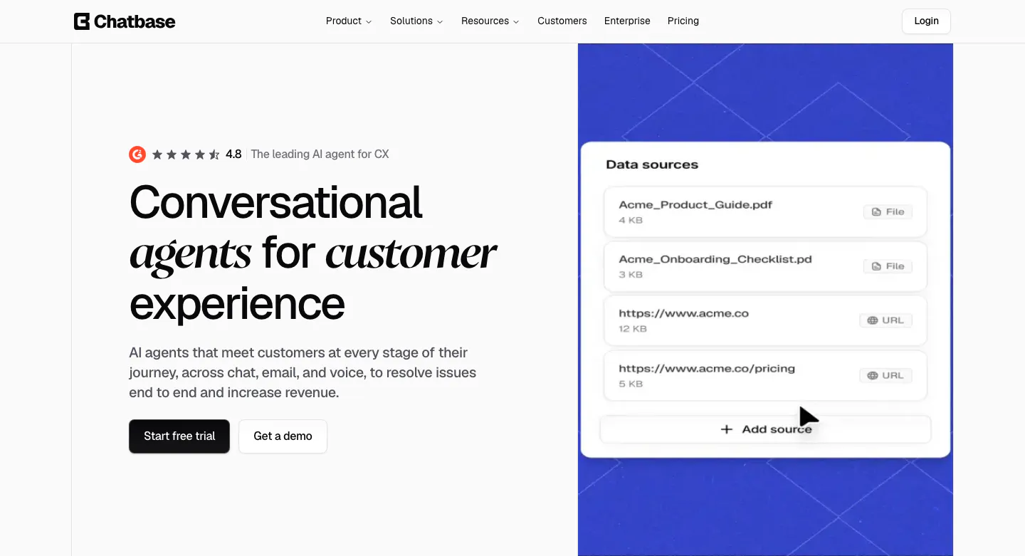
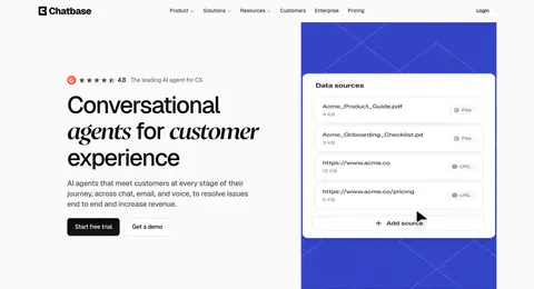
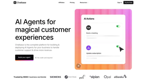
  15. Chatbase hero section: left headline and CTA beside an AI Actions UI card on a pink-orange gradient panel, customer logo row below
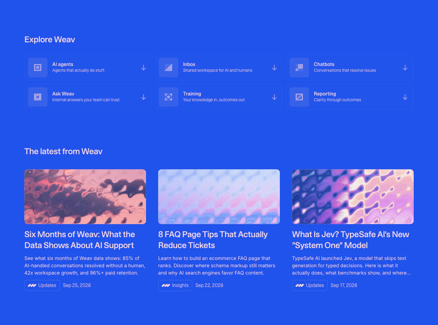
  16. Weav blog & resources section: blue background with a 3x2 grid of product links above three article cards with abstract thumbnails
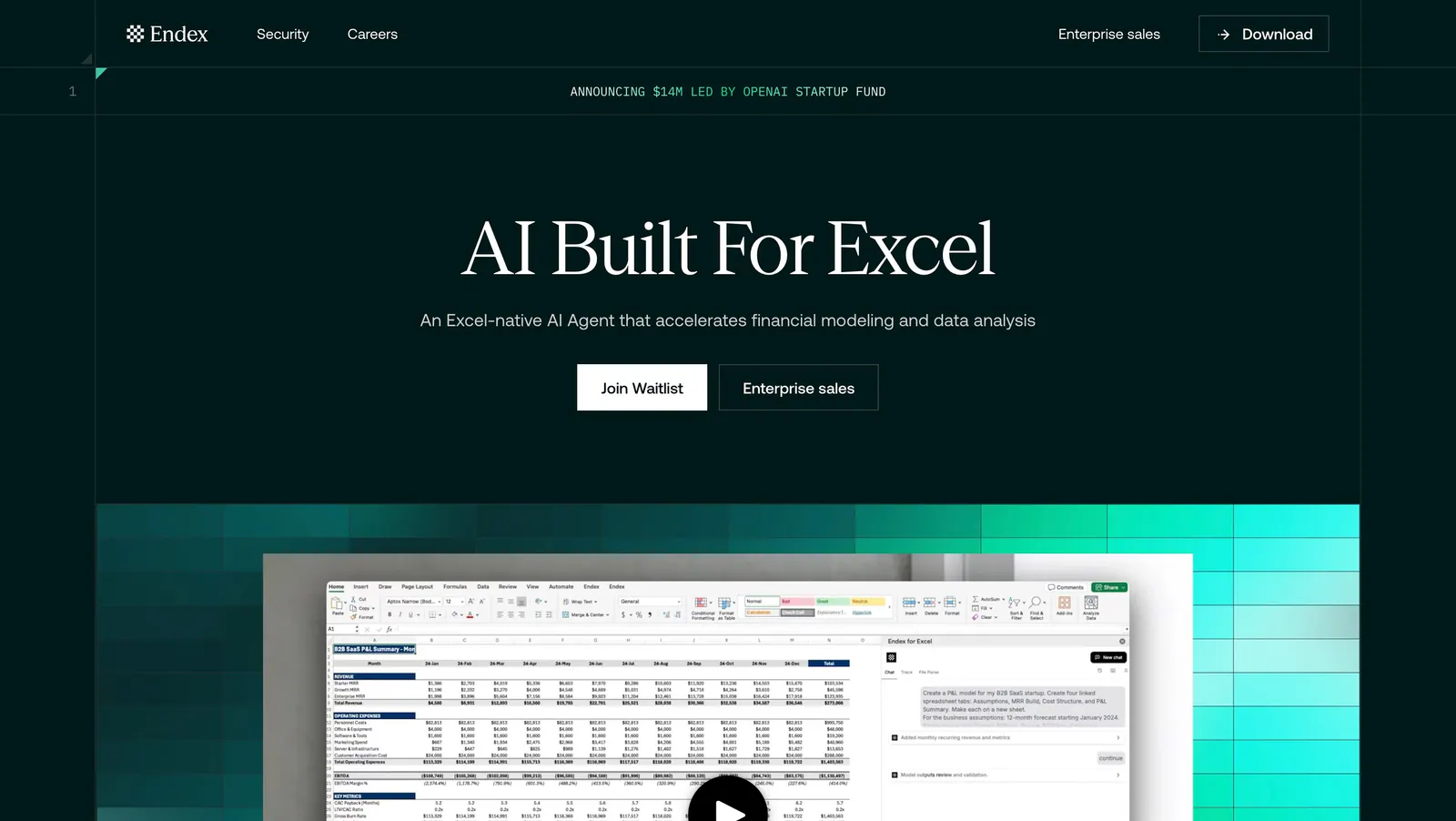
  17. Endex hero section: centered serif headline with two buttons above an Excel AI screenshot set on a teal pixel-gradient band, on dark green
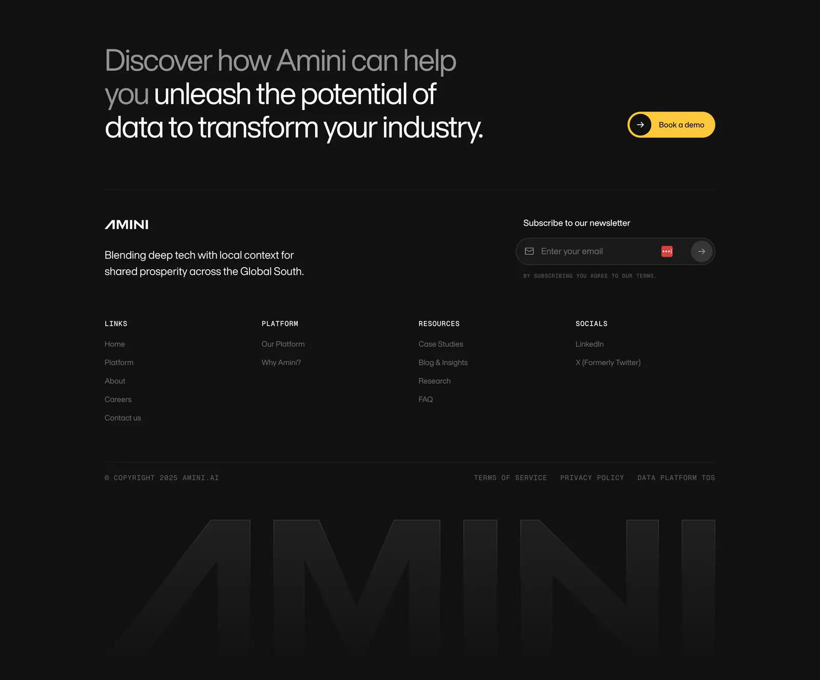
  18. Amini footer section: dark closing headline with yellow button, newsletter field, link columns and a faded giant AMINI wordmark
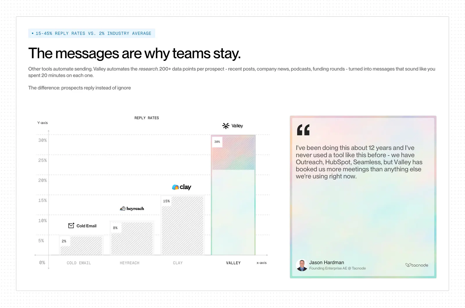
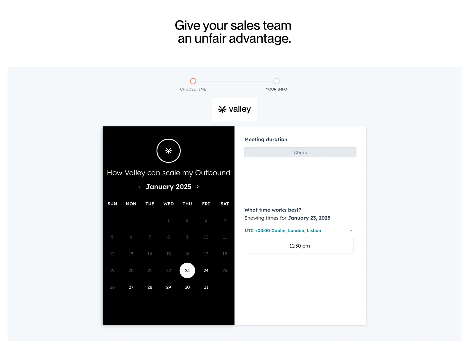
  19. Valley comparison section: reply-rate bar chart versus Cold Email, HeyReach and Clay beside a pastel quote card on a dot-grid background
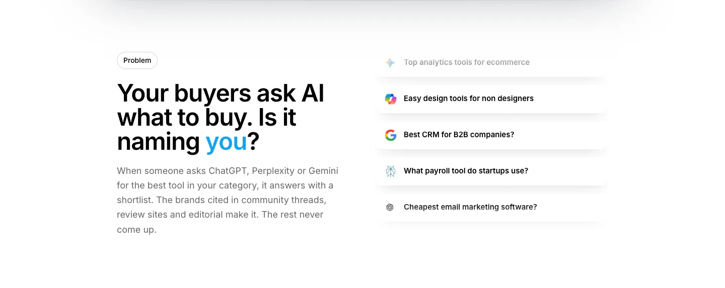
  20. Howseen AI value proposition section: problem headline on the left beside a stacked list of AI prompt query cards on white
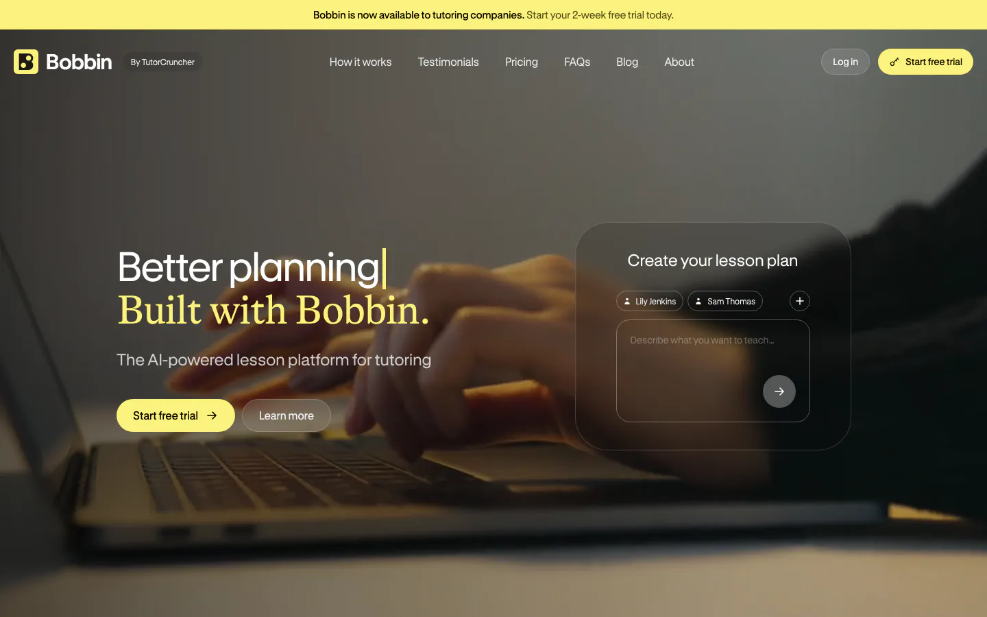
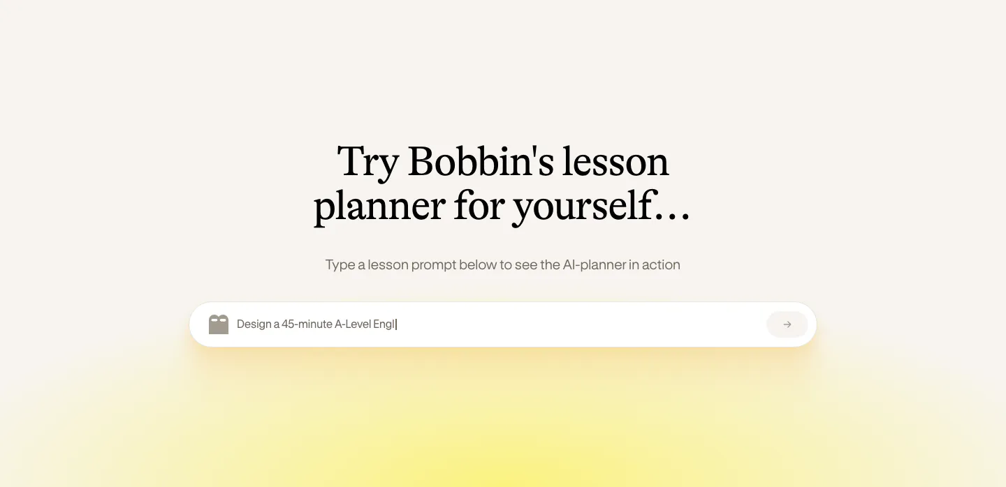
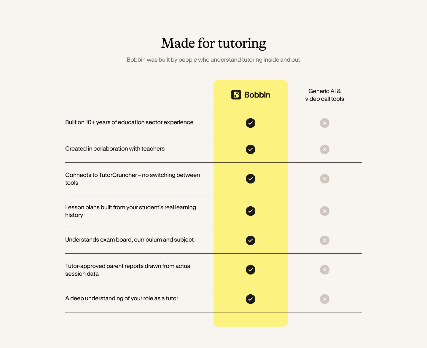
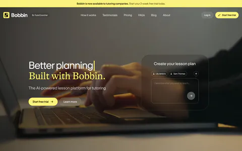
  21. Bobbin hero section: headline and buttons left, frosted lesson-plan prompt card right, over a dim full-bleed photo of hands on a laptop
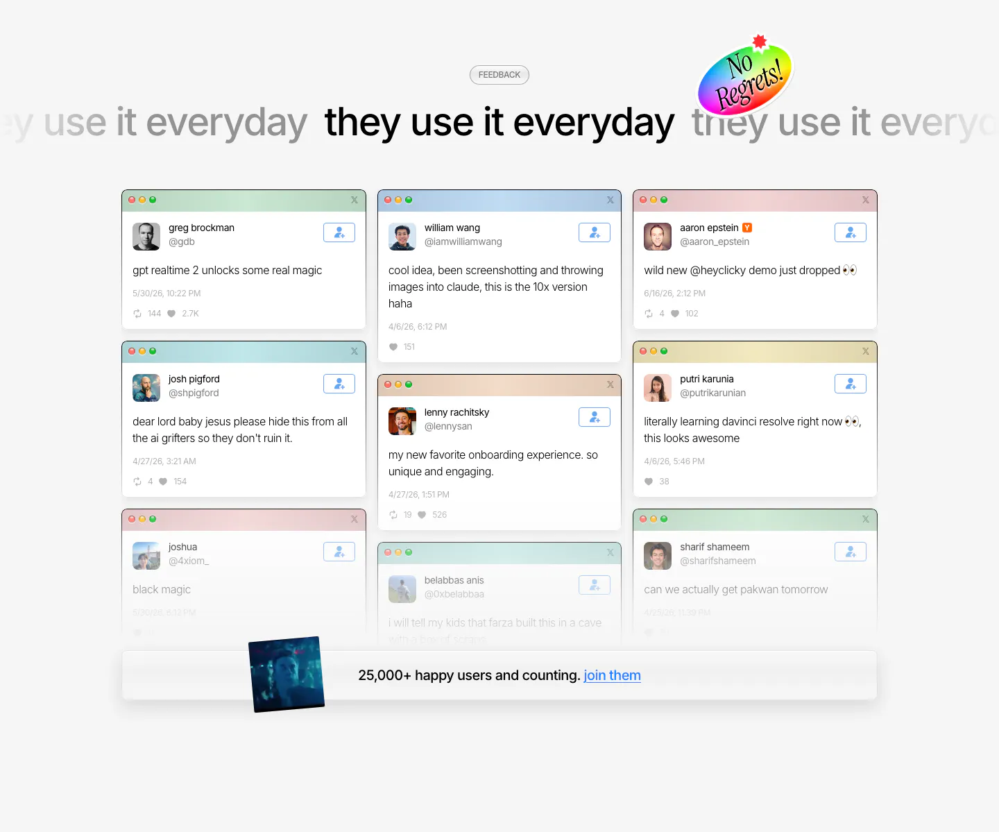
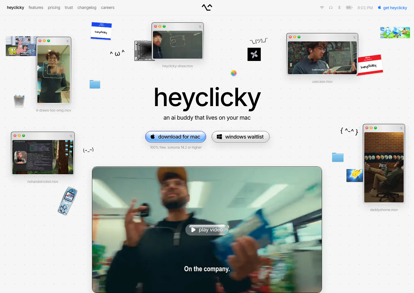
  22. heyclicky testimonials section: marquee headline above a three-column wall of tweet cards in mac windows, user count bar at bottom
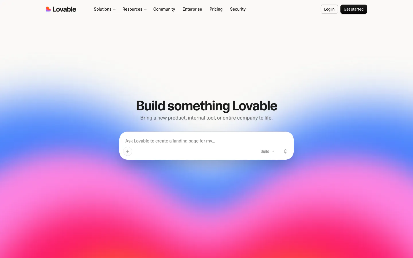
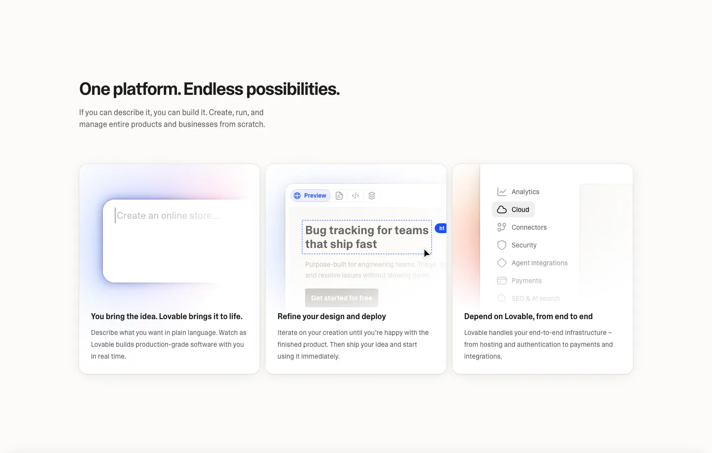
  23. Lovable hero section: centered headline and AI prompt input box over a vivid blue, pink and red gradient, with top navigation bar
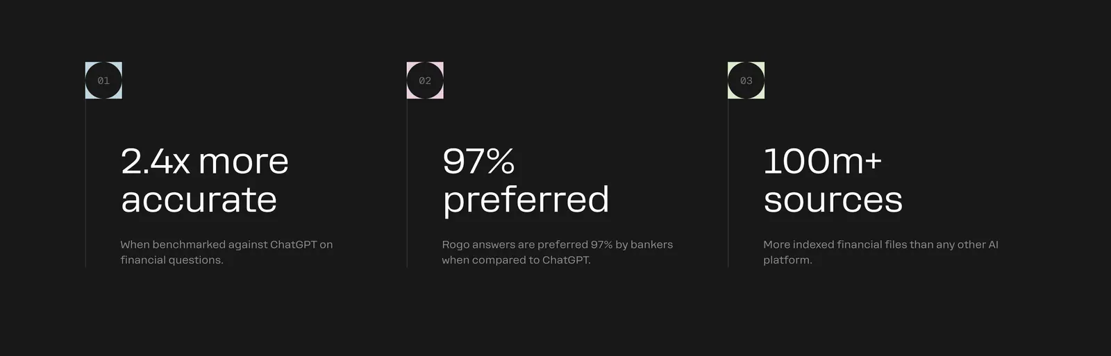
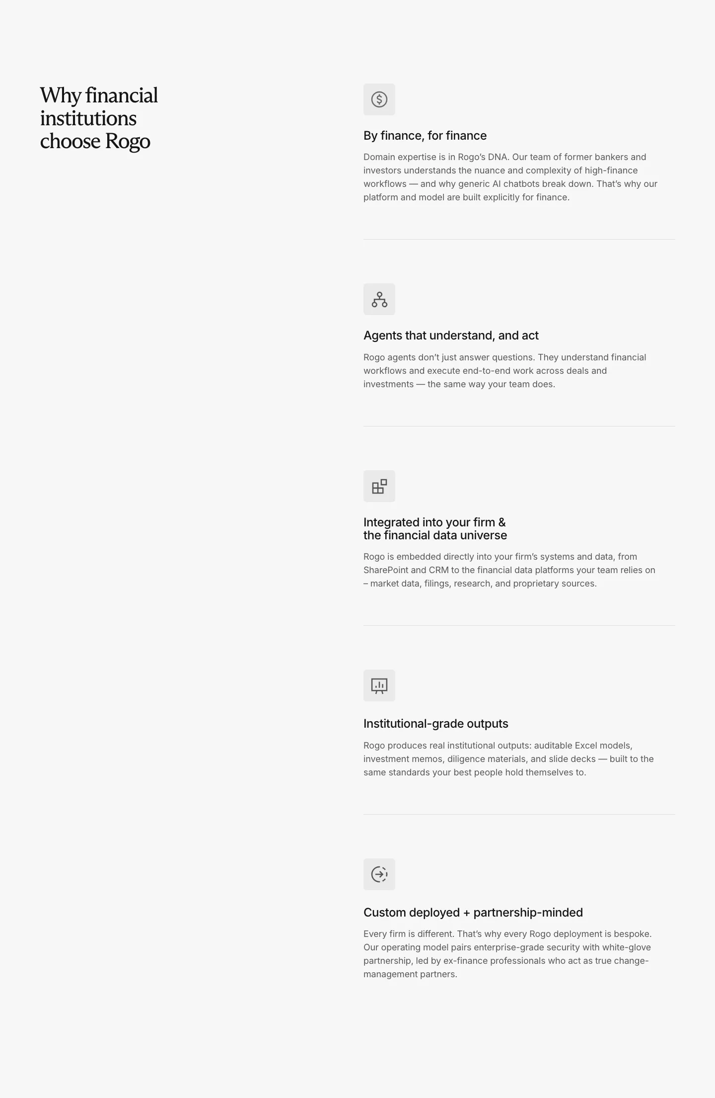
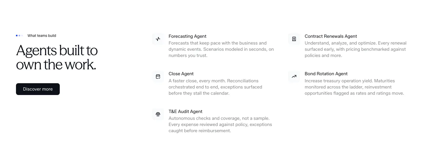
  24. Rogo value proposition section: three numbered columns of large outcome stats with short descriptions on charcoal
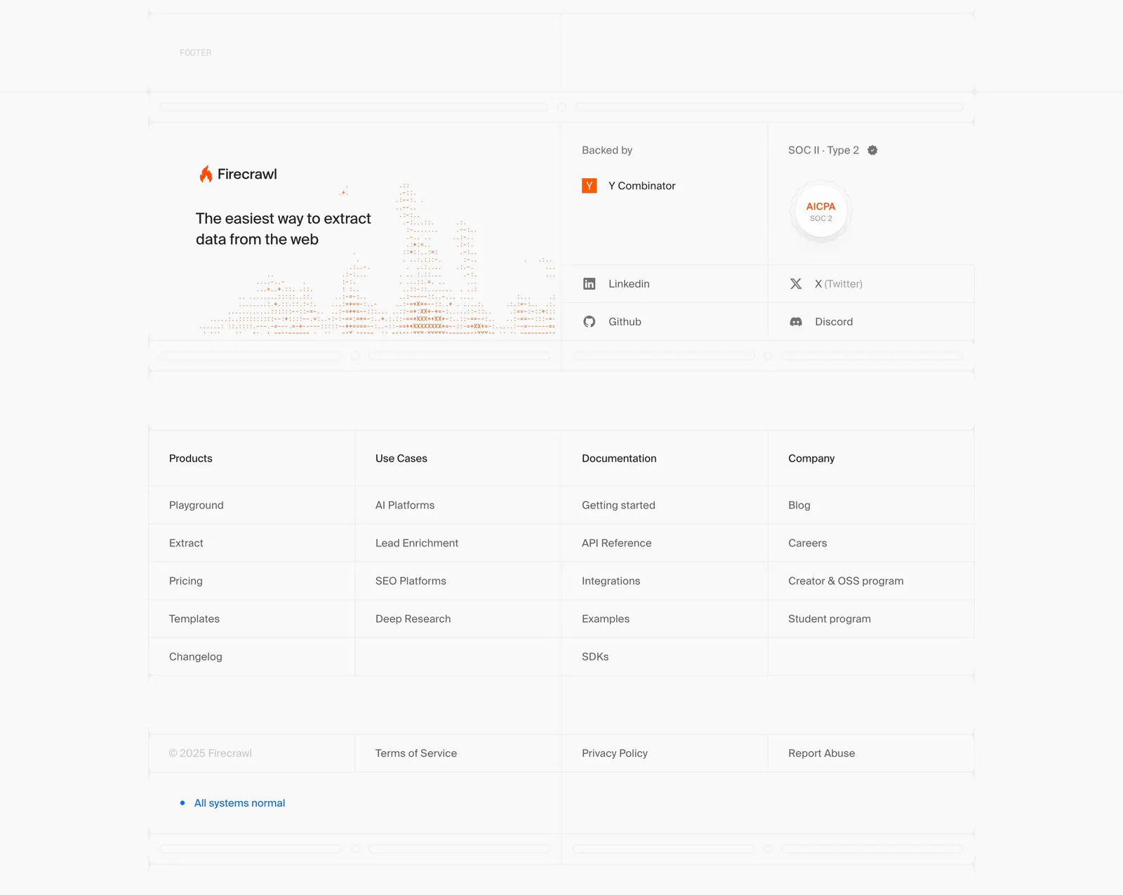
  25. Firecrawl footer section: logo, tagline and dithered chart art, backer and SOC 2 badges, four link columns in a gridded light layout
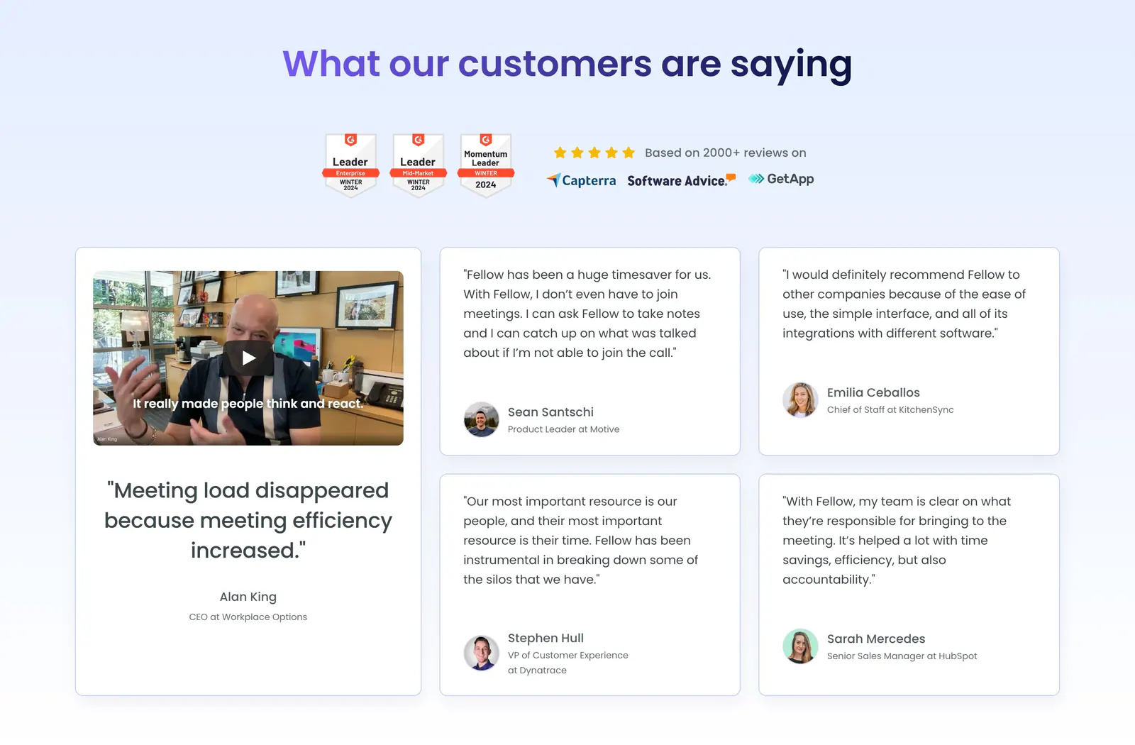
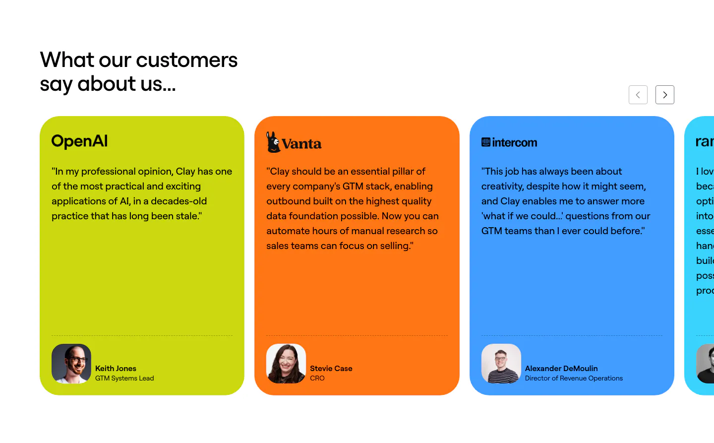
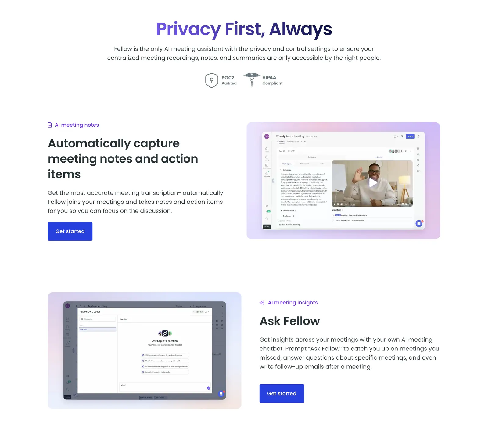
  26. Fellow testimonials section: centered heading with G2 badges above a large video testimonial card and four quote cards
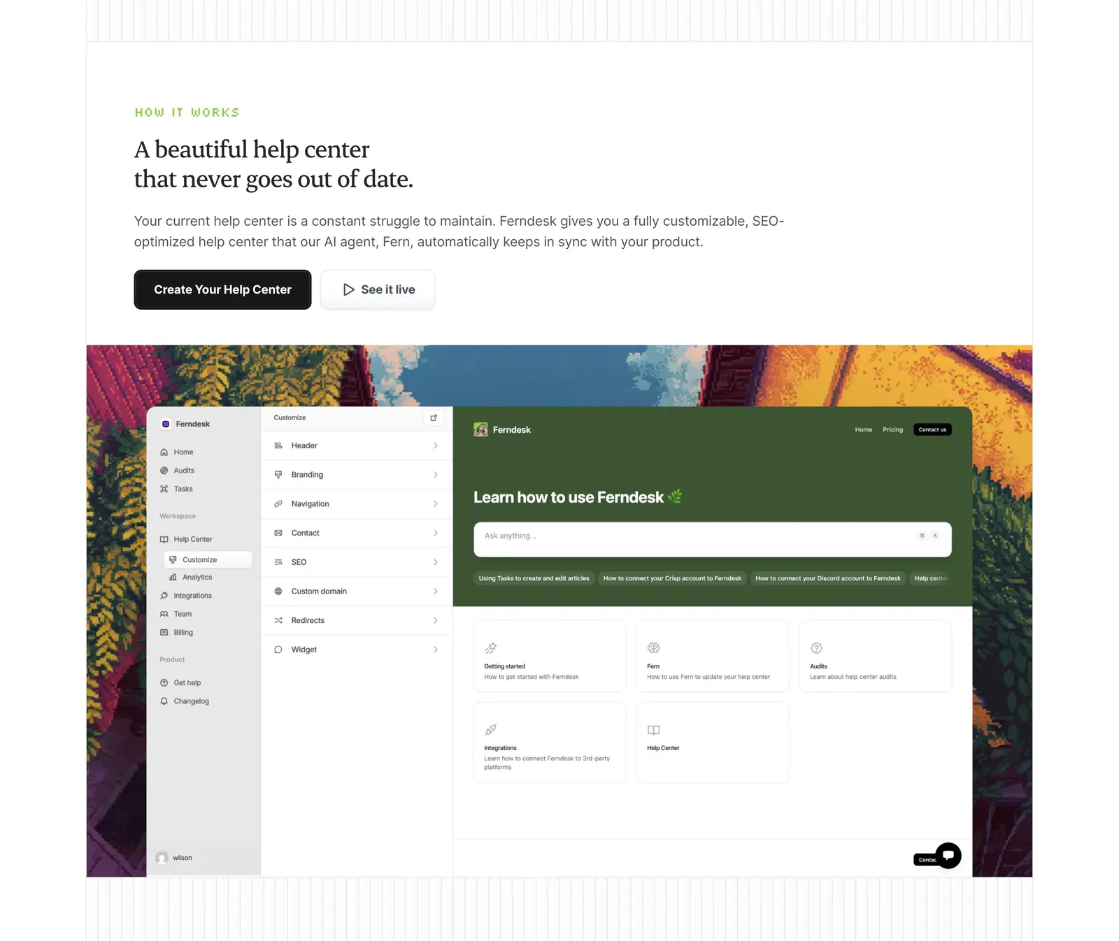
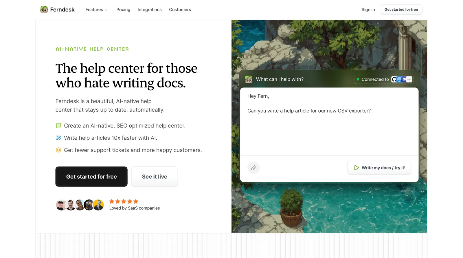
  27. Ferndesk how it works section: serif headline and two buttons above a help center editor screenshot framed by pixel-art scenery
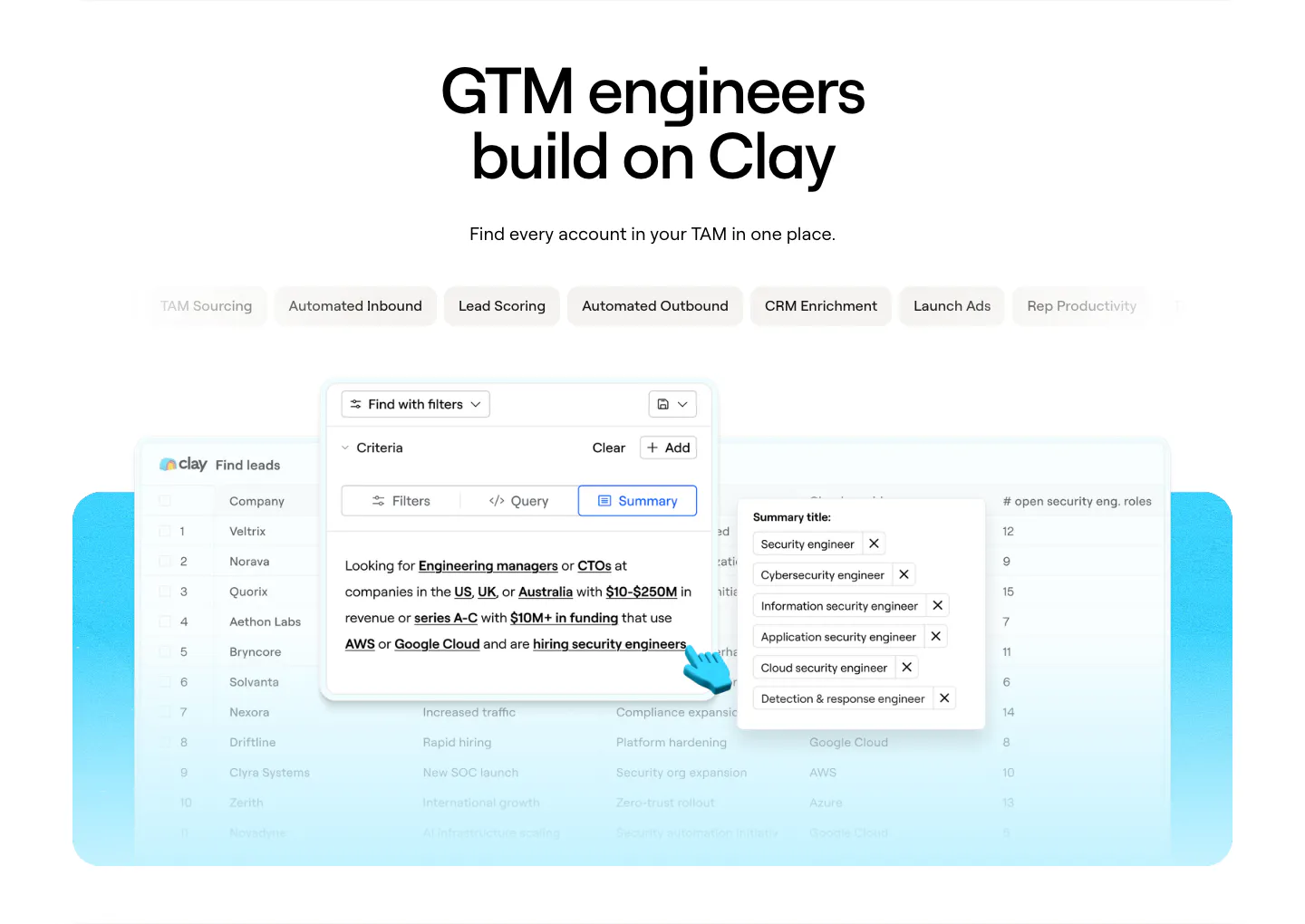
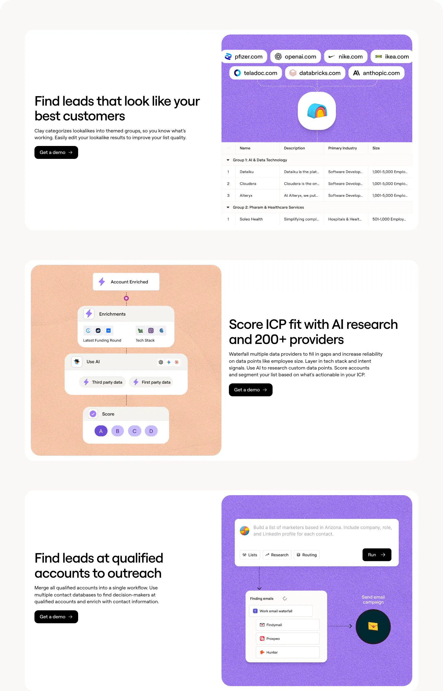
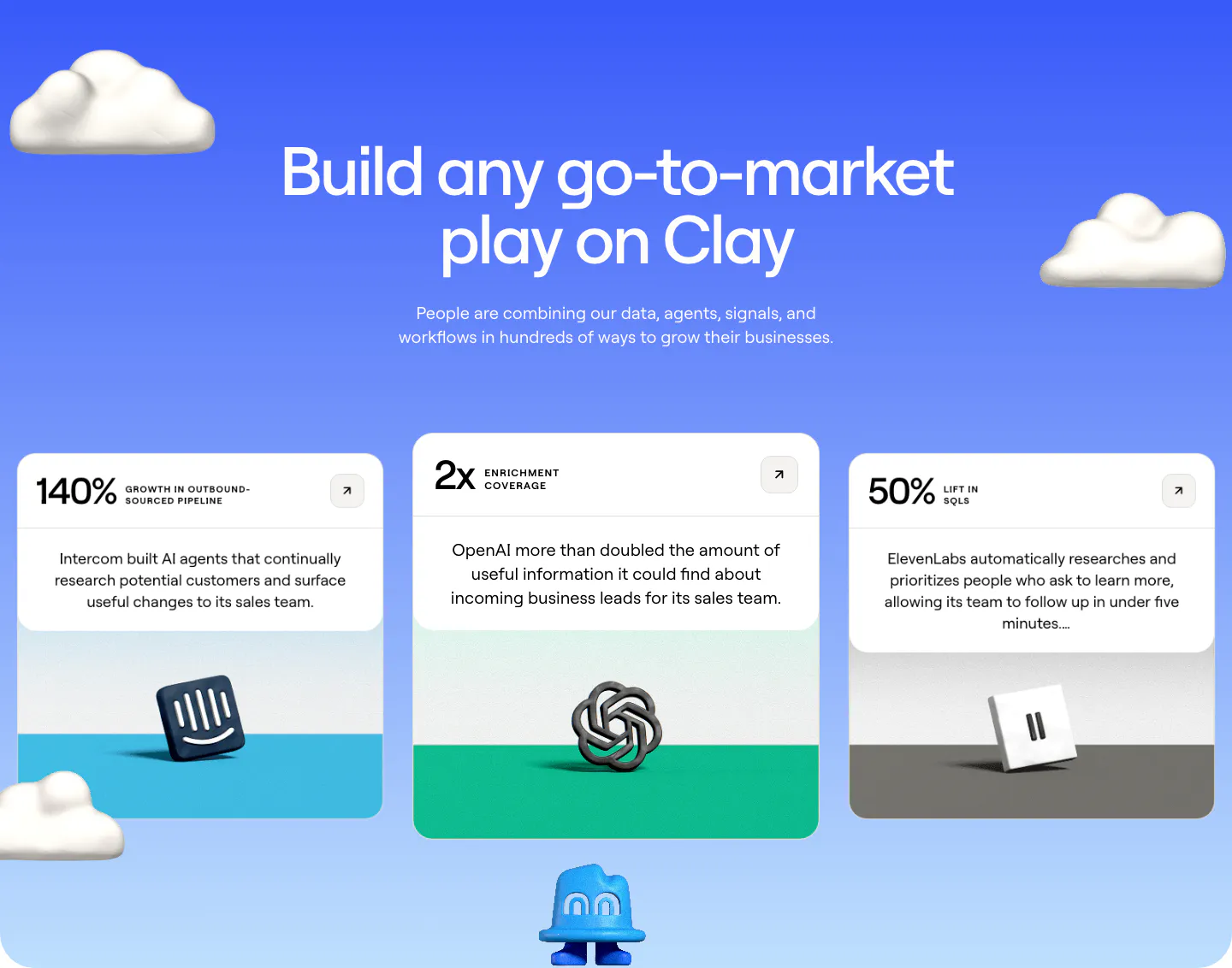
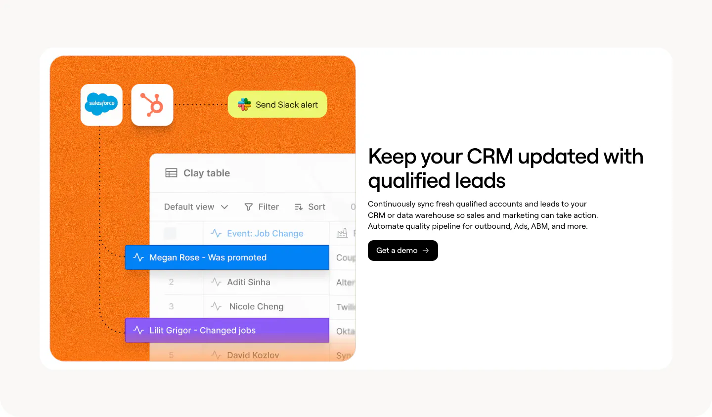
  28. Clay use cases section: centered headline above use-case tab pills and a lead-finding table product screenshot on a cyan panel
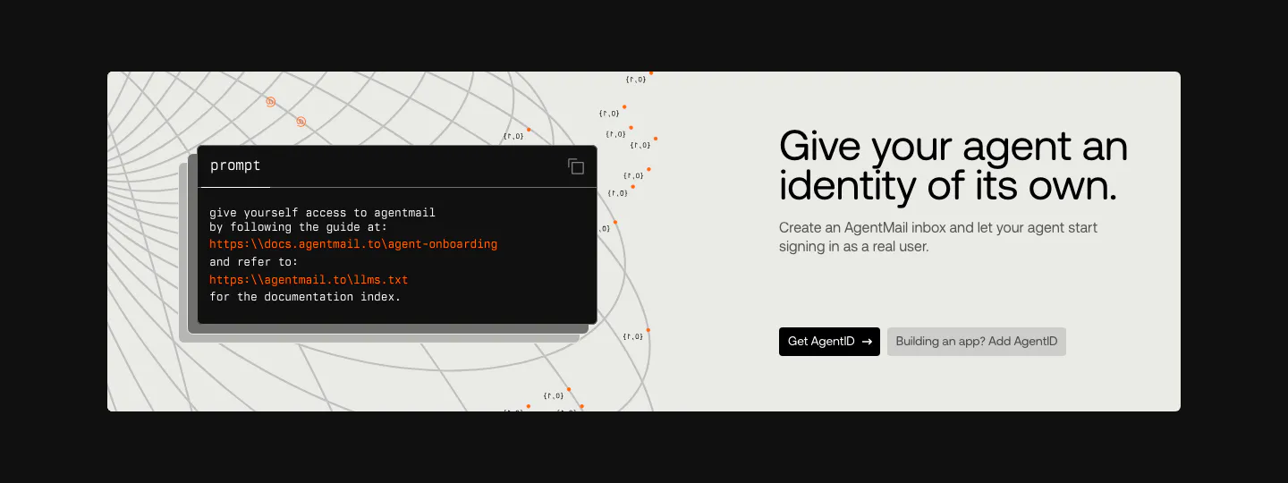
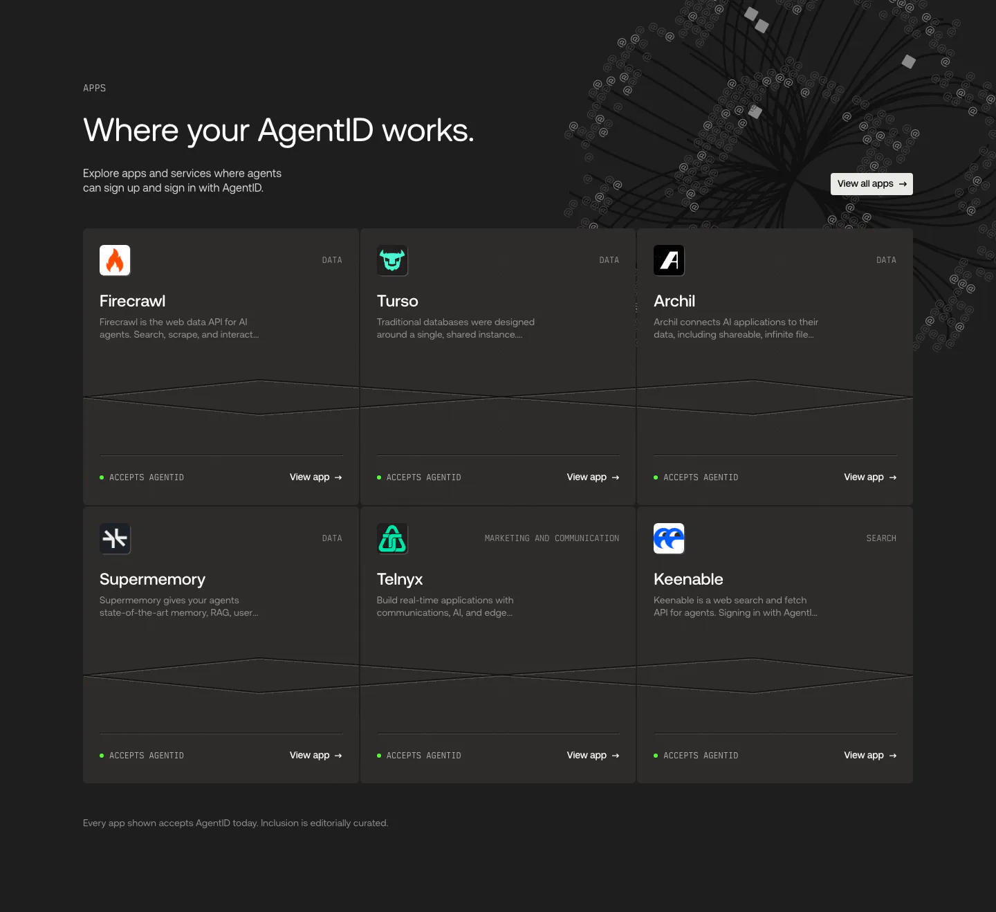
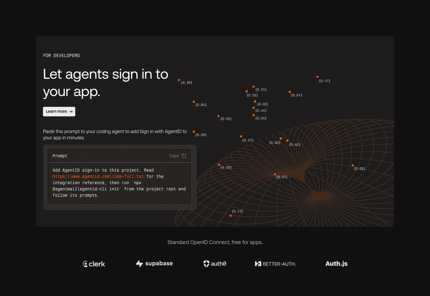
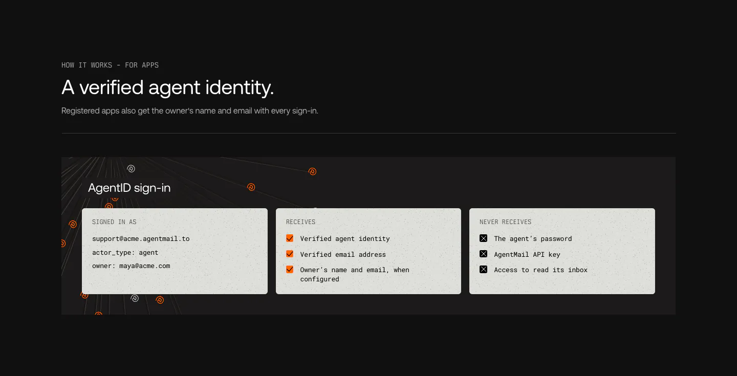
  29. AgentID call to action section: light panel on black with a dark prompt code card left and headline, copy and two buttons right
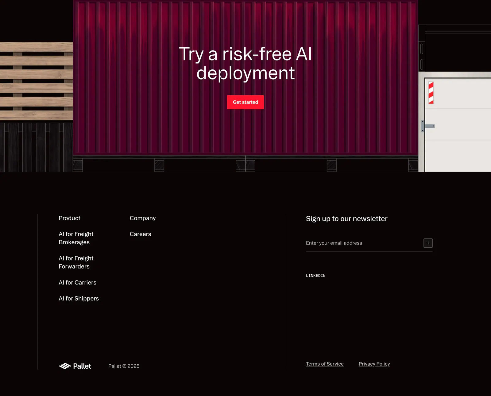
  30. Pallet footer section: CTA over a red shipping container illustration above dark link columns, newsletter email field and copyright
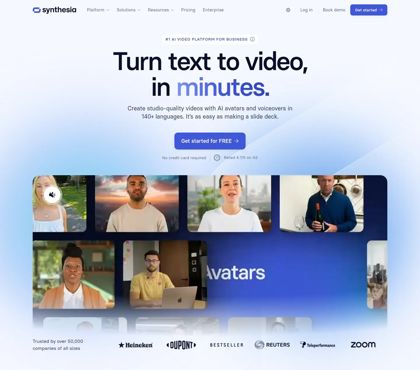
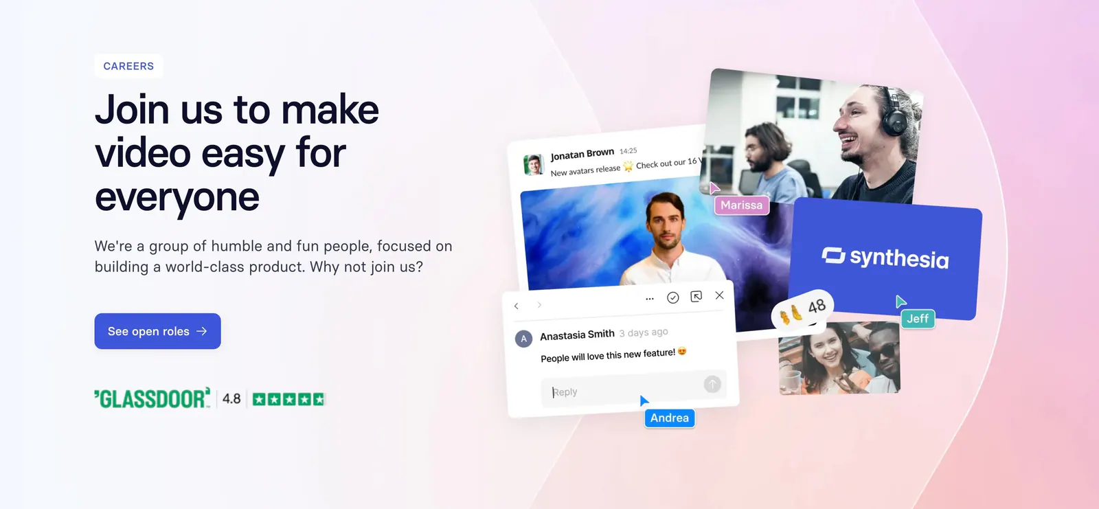
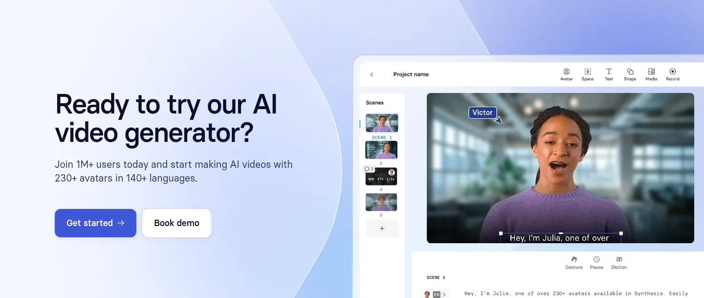
  31. Synthesia hero section: centered headline and blue button above a grid of AI avatar video frames and a customer logo row on soft blue glow
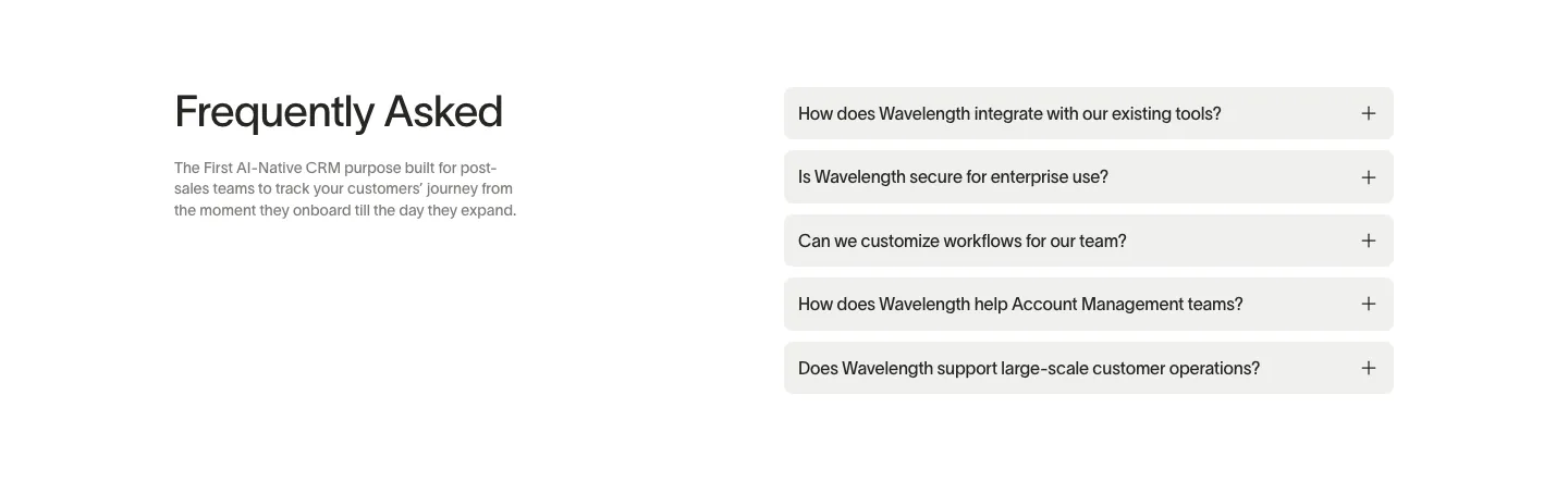
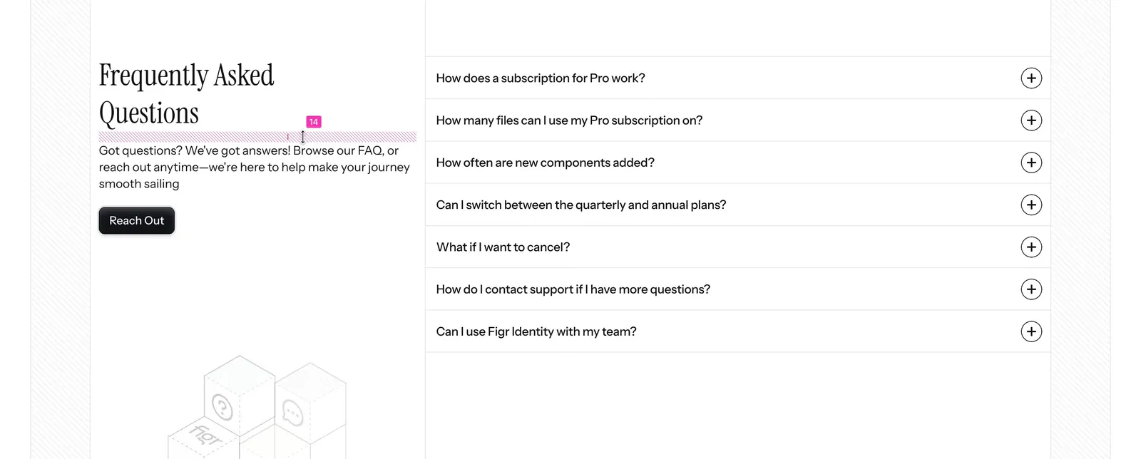
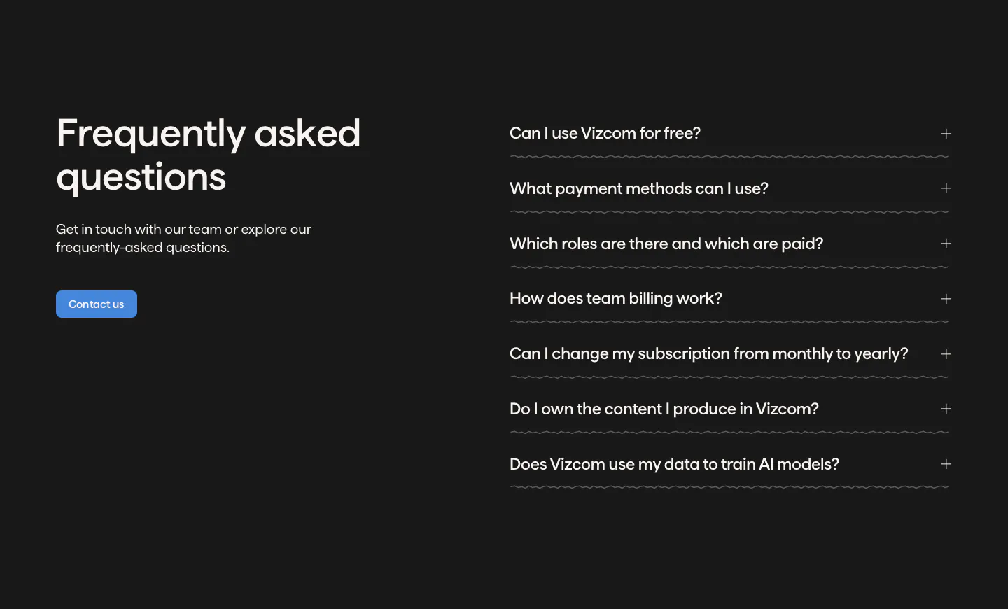
  32. Wavelength FAQ section: headline and short description at left beside a stack of five light gray accordion questions on white
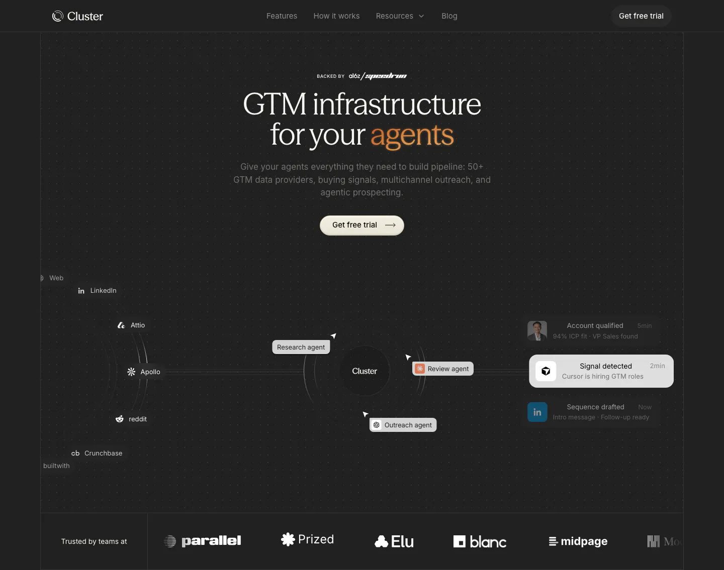
  33. Cluster hero section: centered serif headline with orange accent over an agent workflow diagram and a customer logo row on dark
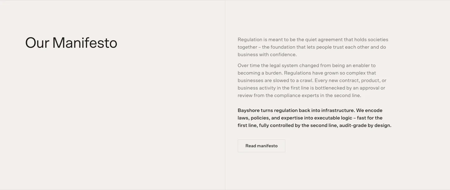
  34. Bayshore call-to-action section: headline with Book a call and Copy email buttons on a mauve-to-tan gradient beside 3D marble shapes
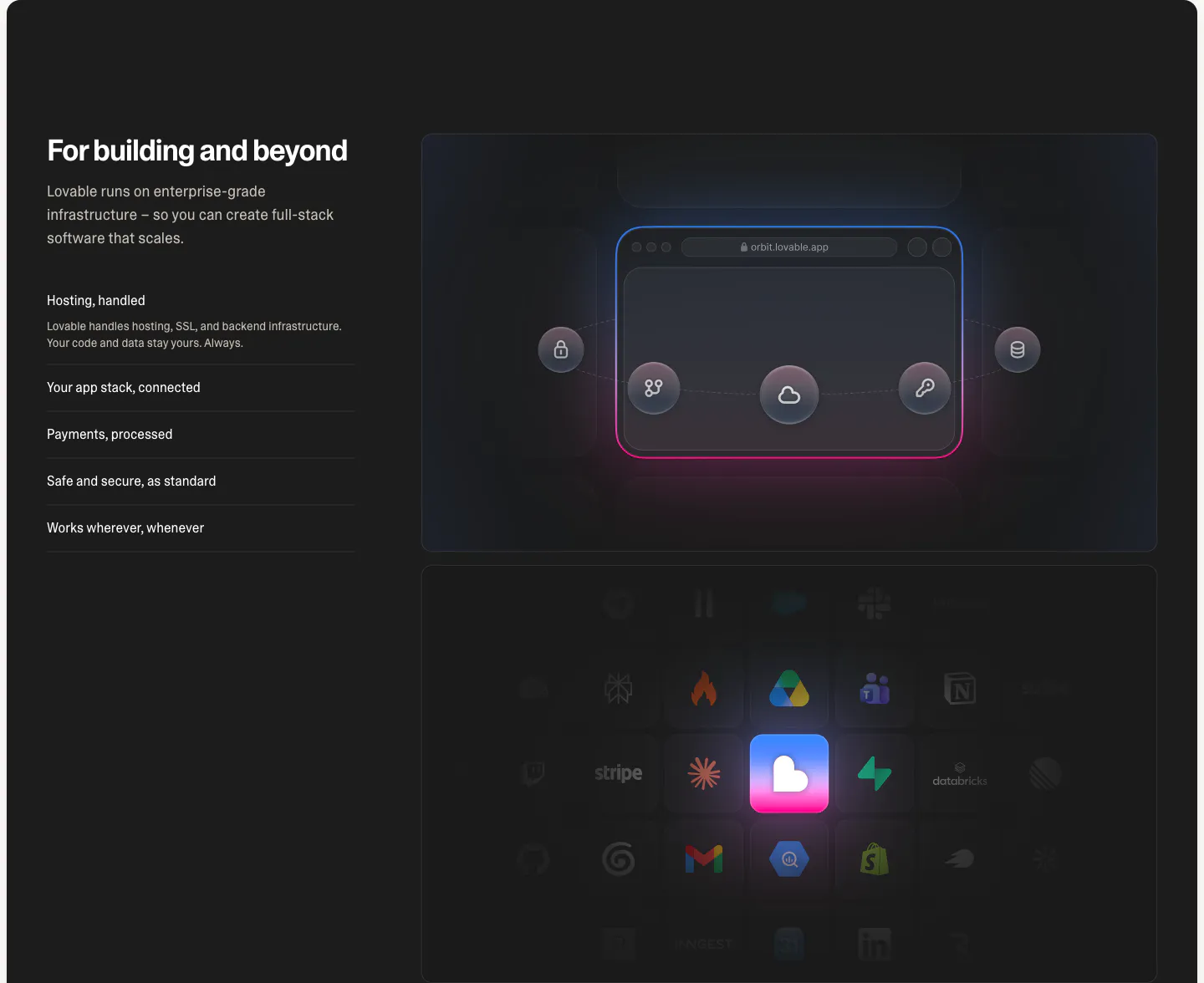
  35. Lovable features section: dark split layout with headline and capability list beside a glowing browser diagram and integration icon grid
  36. Wavelength logo cloud section: small centered caption above a row of grayscale logos including Pave, Render and Mintlify on a light gray band
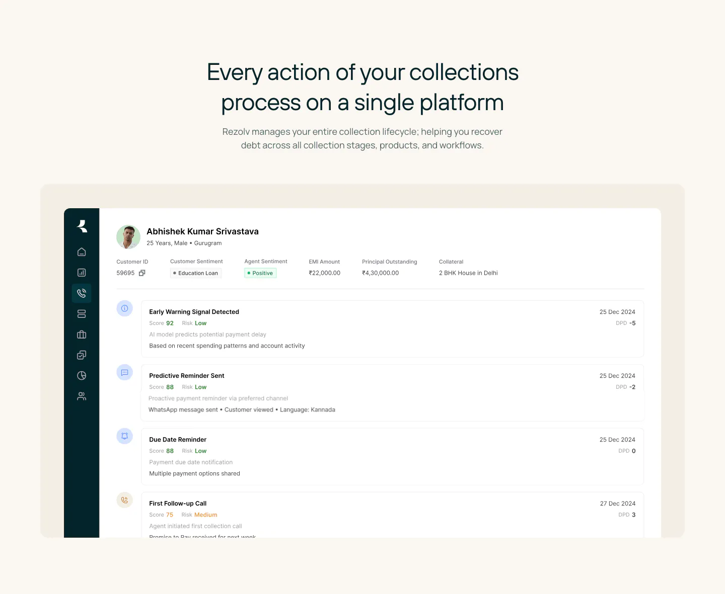
  37. Rezolv hero section: centered headline with two buttons above three cards, a headset agent photo, voice demo play card and phone app
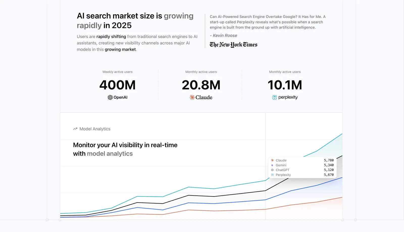
  38. Promptwatch value proposition section: headline beside a press quote, three large user-count stats and a model analytics chart
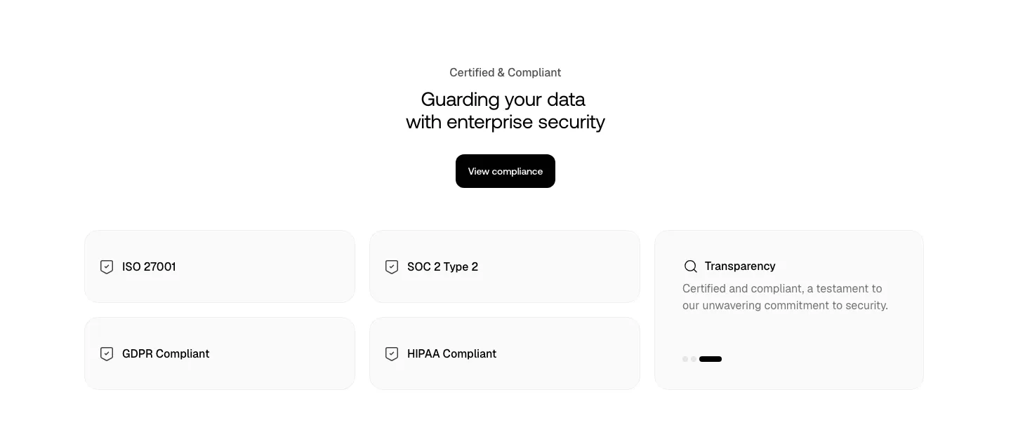
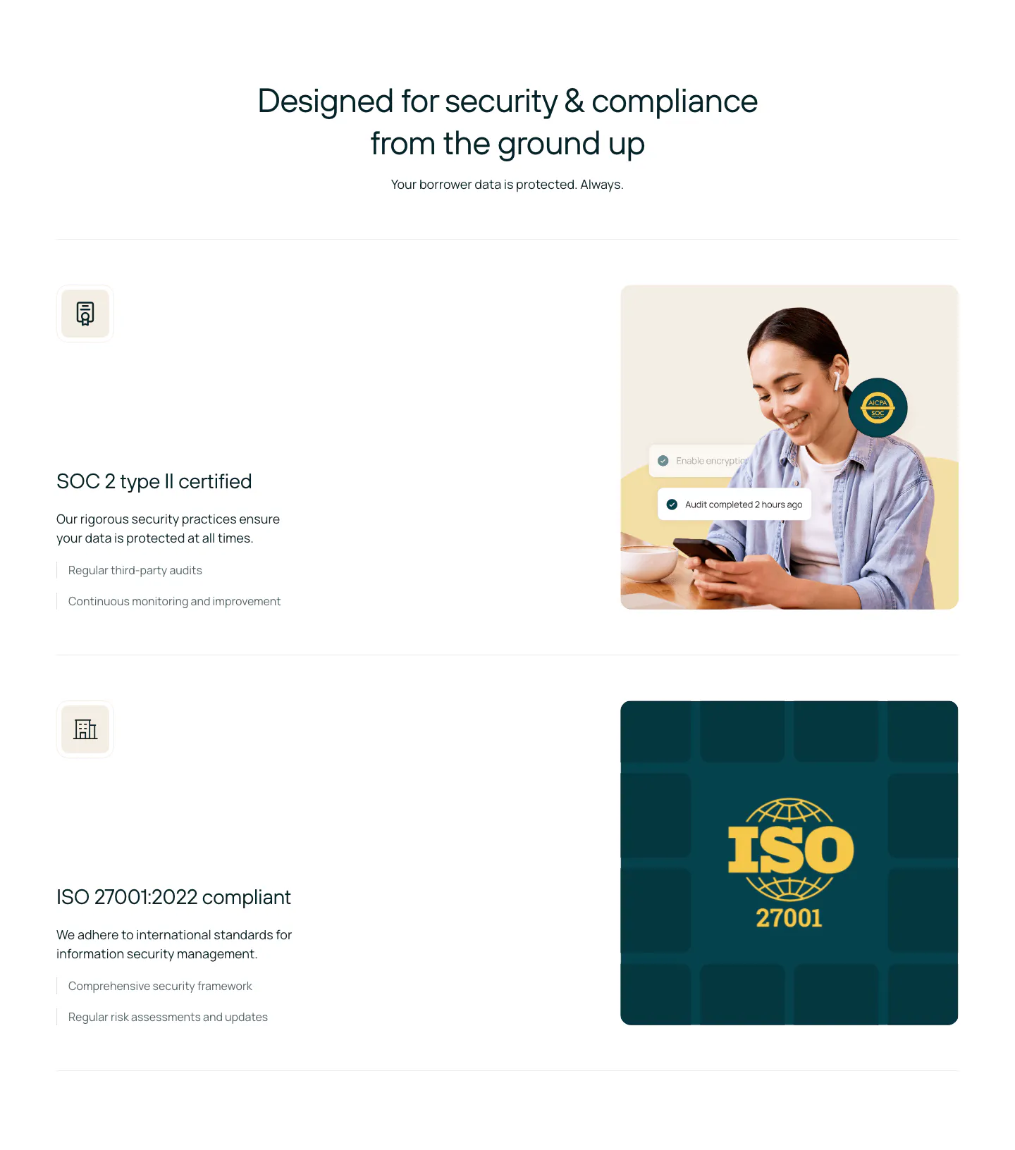
  39. Smallest.ai security section: centered headline and compliance button above light cards for ISO 27001, SOC 2, GDPR, HIPAA and transparency
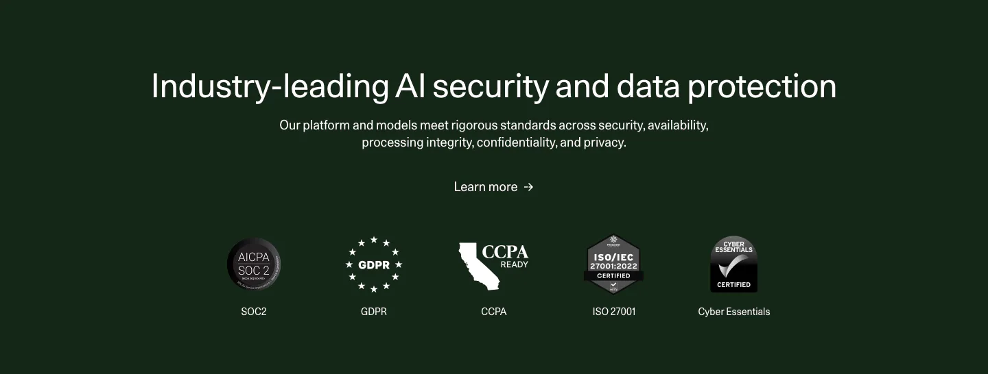
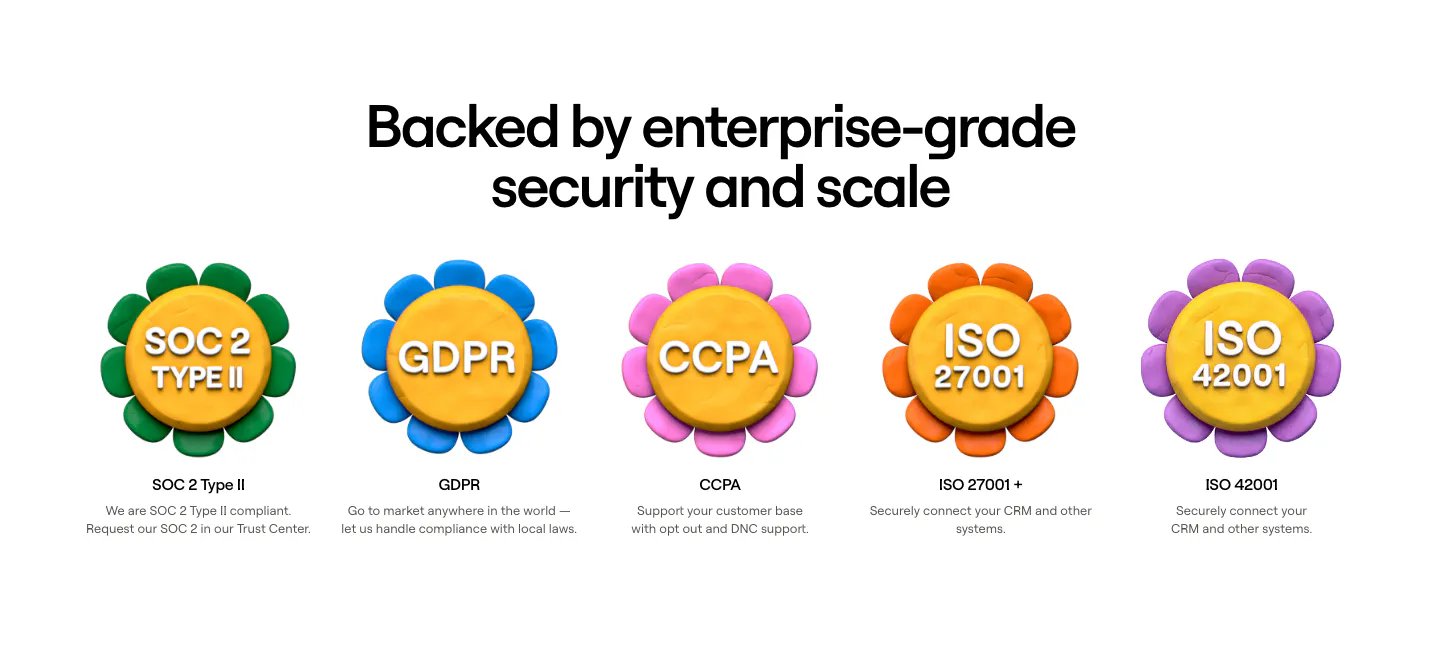
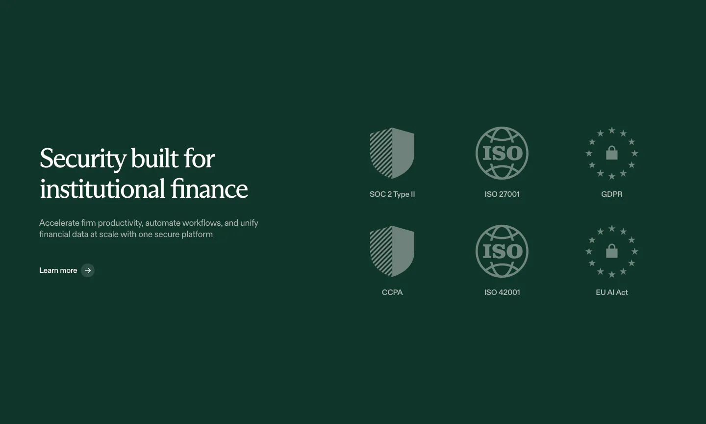
  40. Cohere security section: centered headline and learn more link above a row of compliance badges on a dark green background
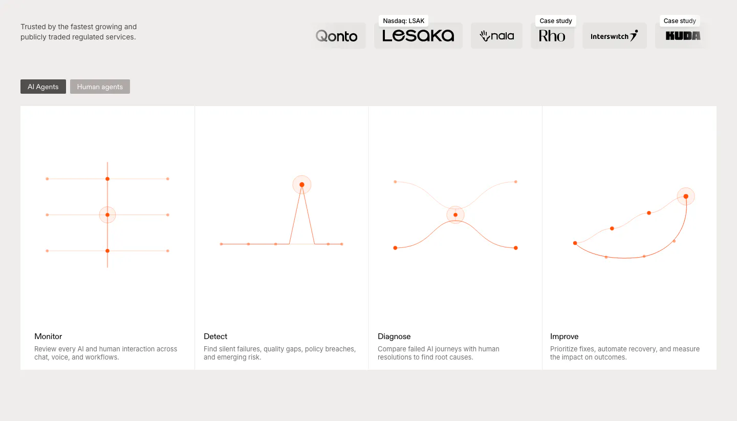
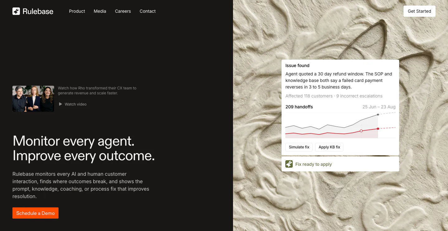
  41. Rulebase features section: customer logo row above an AI/human agents toggle and four equal cards with orange line diagrams
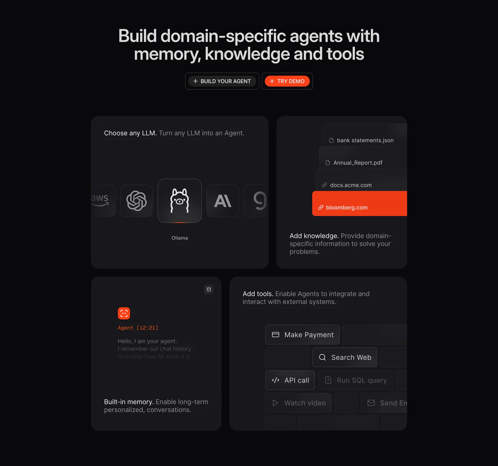
  42. Phidata features section: dark centered headline with two buttons above a four-tile bento of LLM picker, knowledge, memory and tools UI
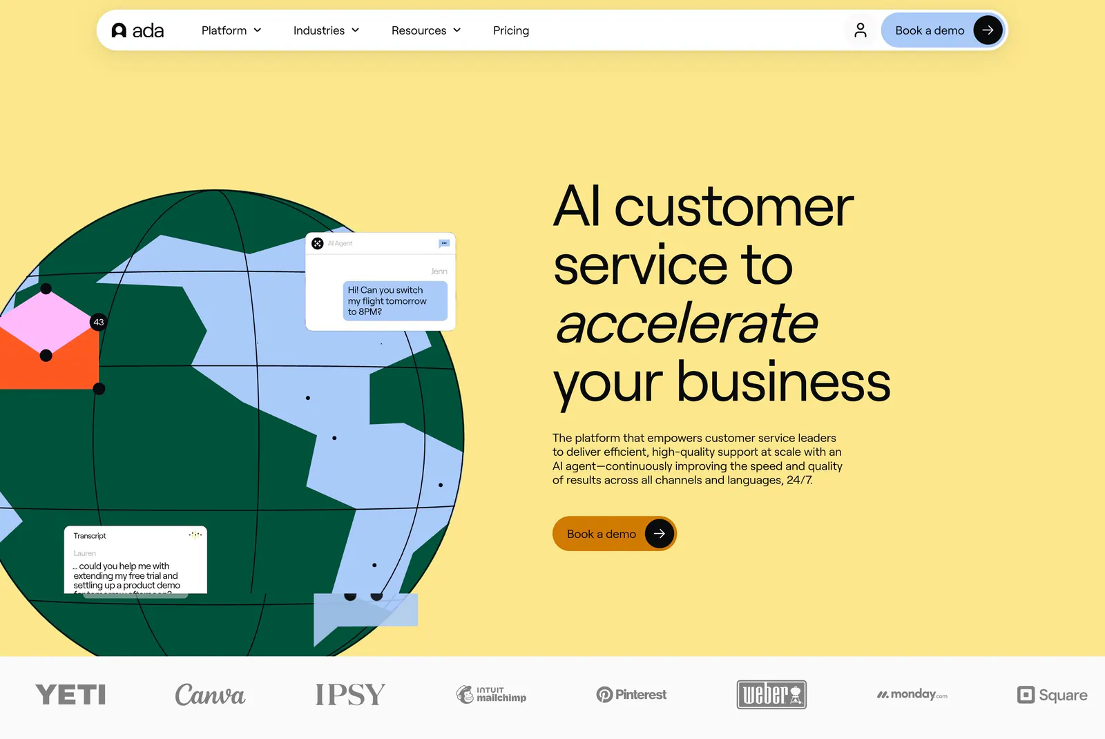
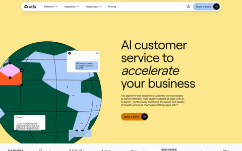
  43. Ada hero section: illustrated globe with chat bubbles beside a large headline on yellow, with a customer logo strip below
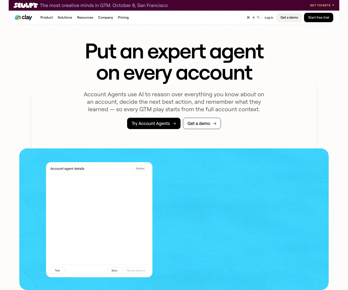
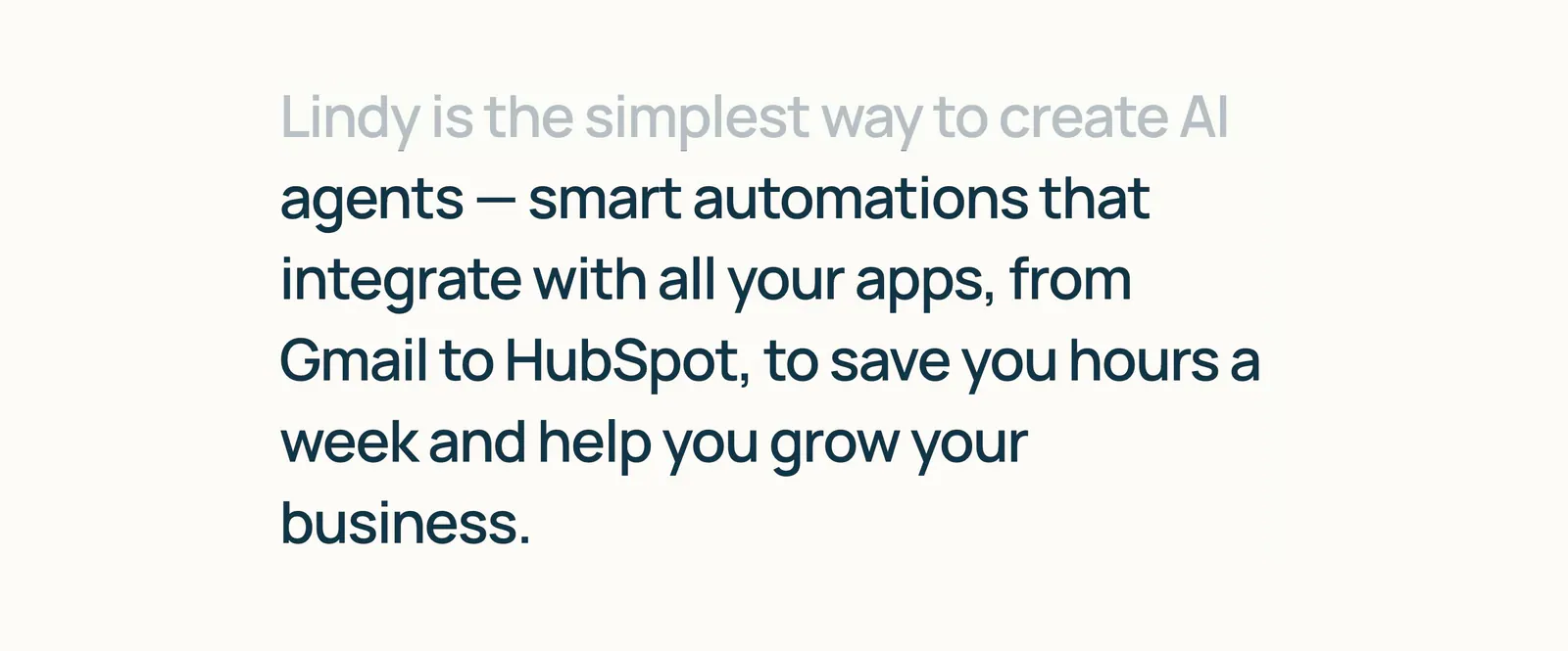
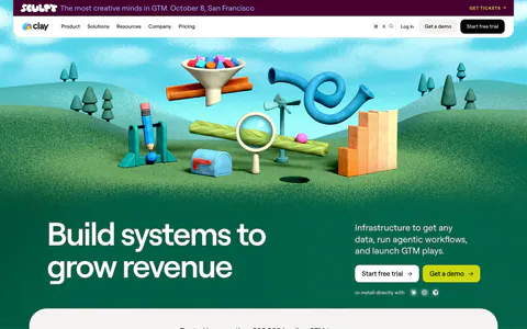
  44. Clay hero section: centered bold headline with two CTA buttons above a bright cyan panel holding an account agent details window
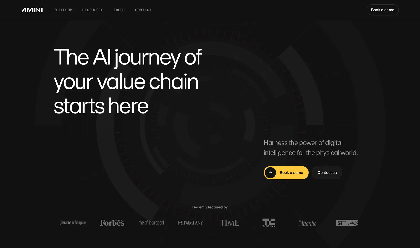
  45. Amini hero section: dark background with concentric arc artwork, left-aligned headline, yellow demo button and press logo strip
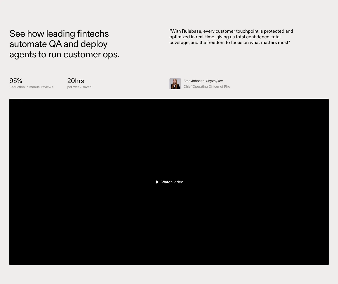
  46. Rulebase testimonials section: headline with two stats beside a customer quote and avatar, above a large black video player
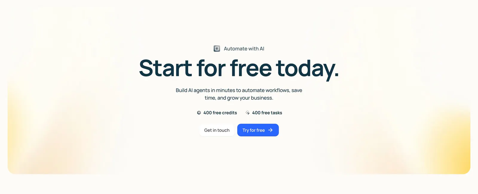
  47. Lindy call-to-action section: centered headline with free credit badges and two buttons inside a cream panel with soft yellow corner glows
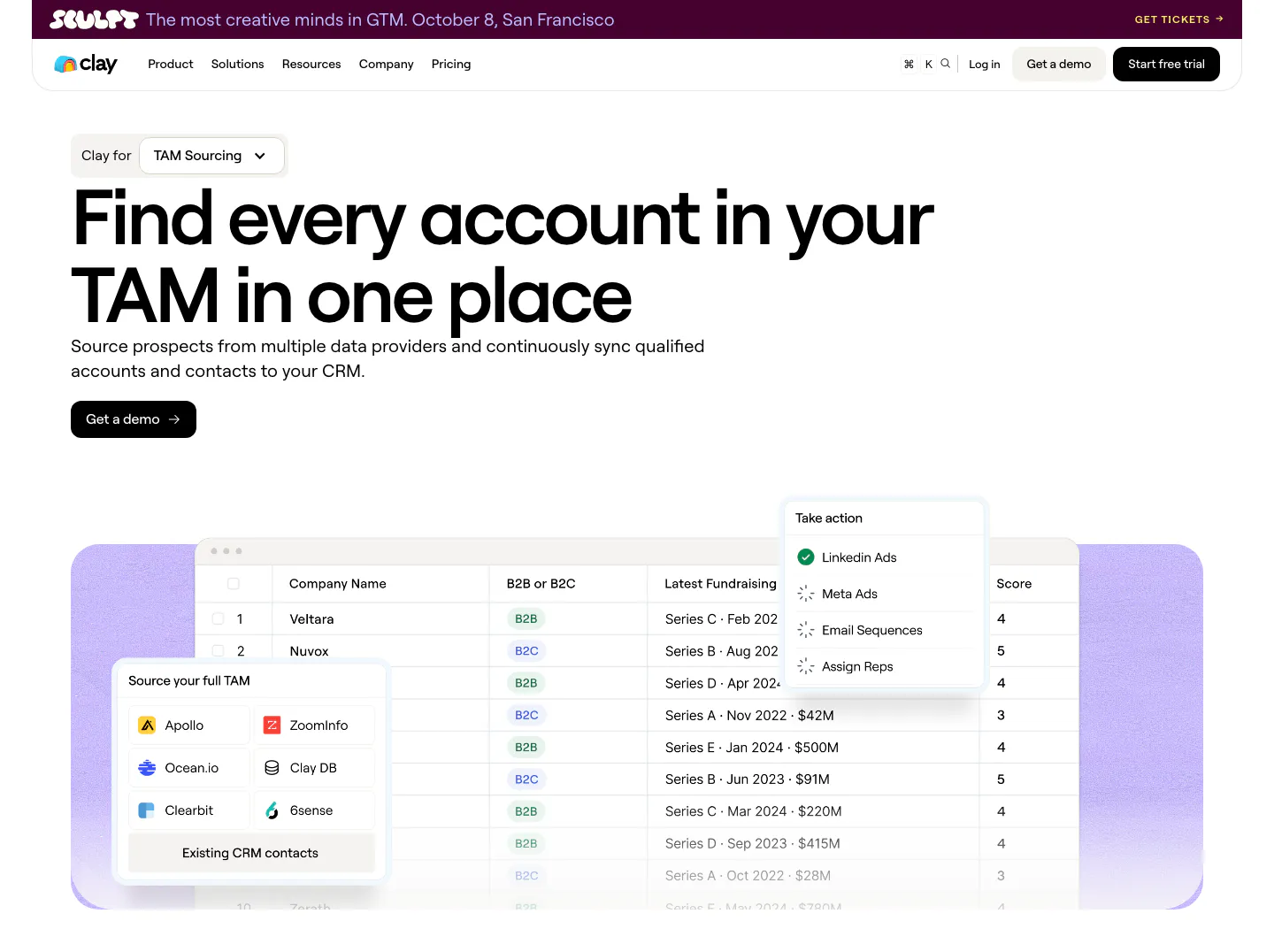
  48. Clay hero section: left-aligned headline with use-case dropdown and demo button above a company table UI with data source picker on lavender
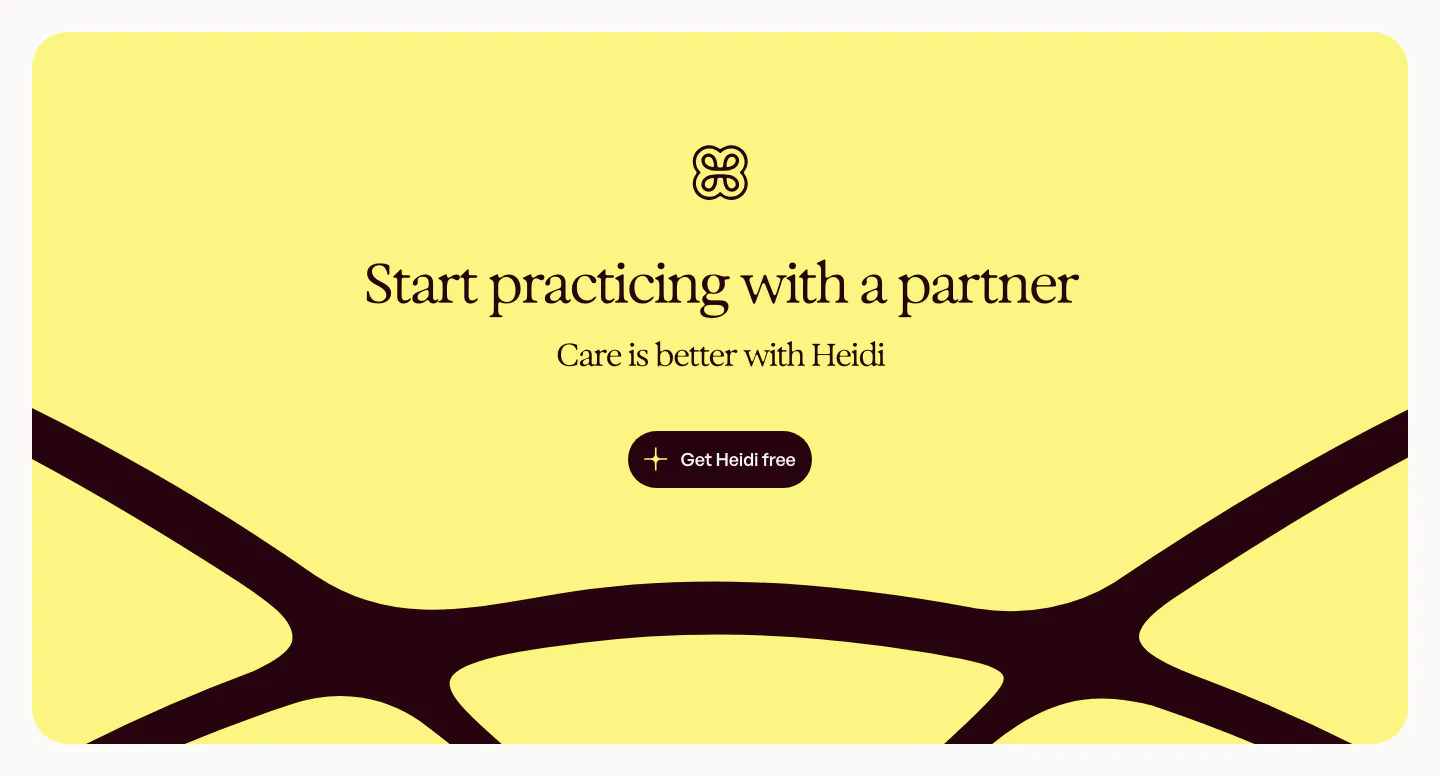
  49. Heidi call to action section: yellow rounded panel with logo, centered serif headline and button over a large dark curved logo shape
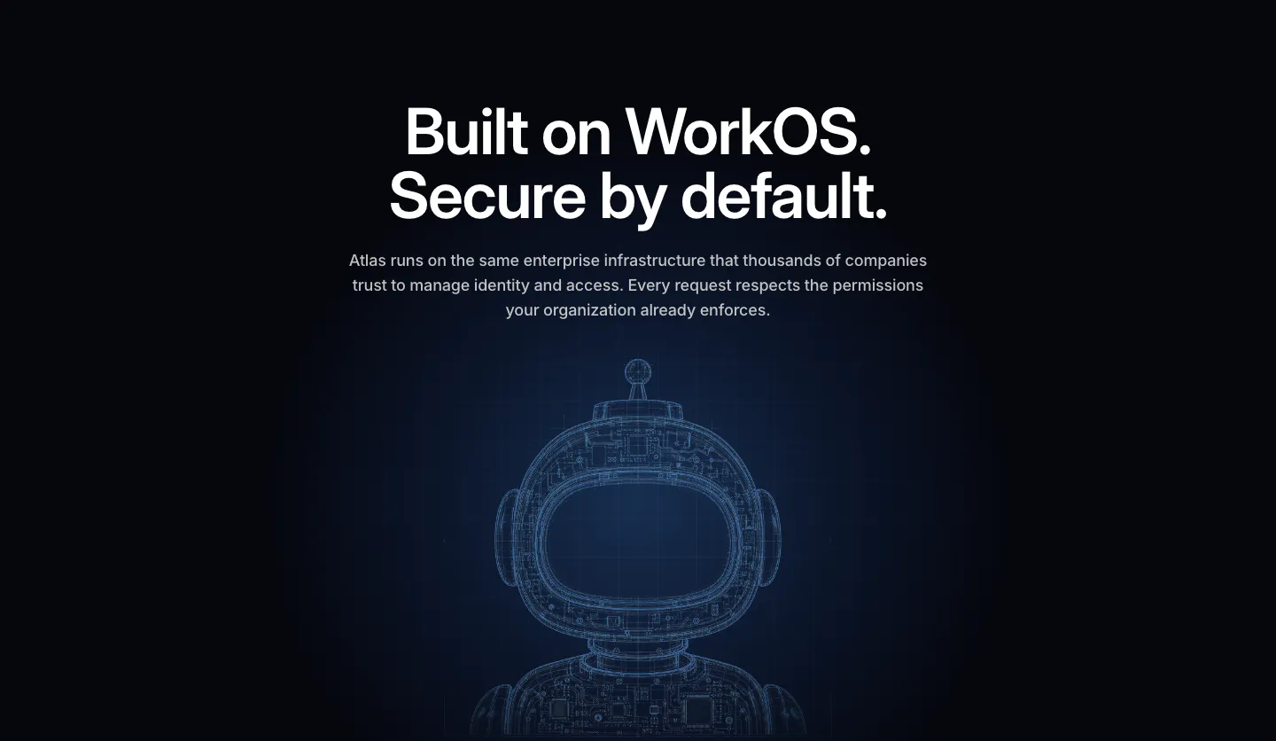
  50. WorkOS security section: centered headline above a glowing blue wireframe robot on a dark navy background
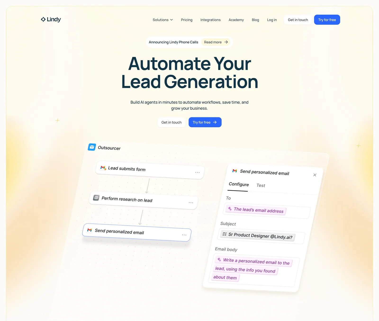
  51. Lindy hero section: nav bar, centered headline and two CTAs above a tilted workflow builder UI with an email step panel, framed by yellow glows
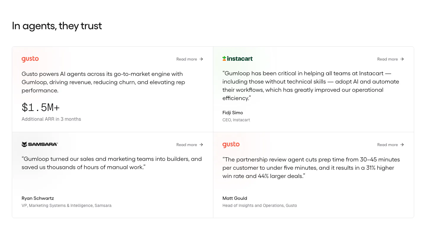
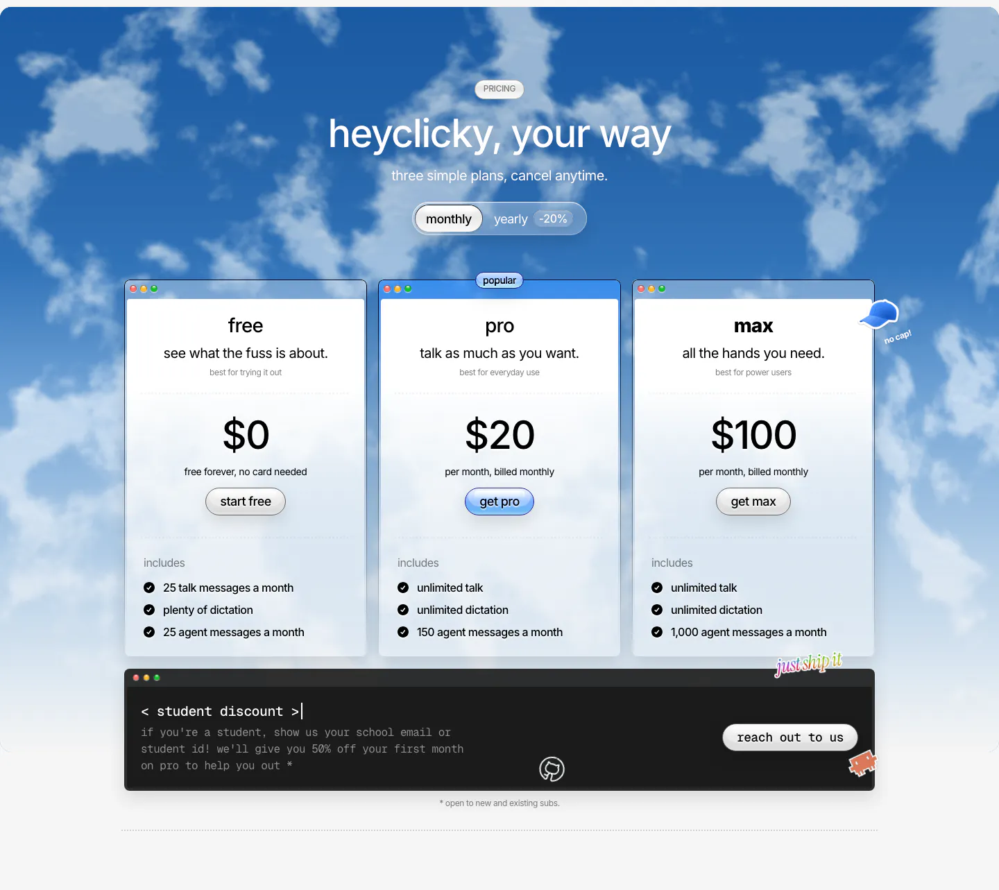
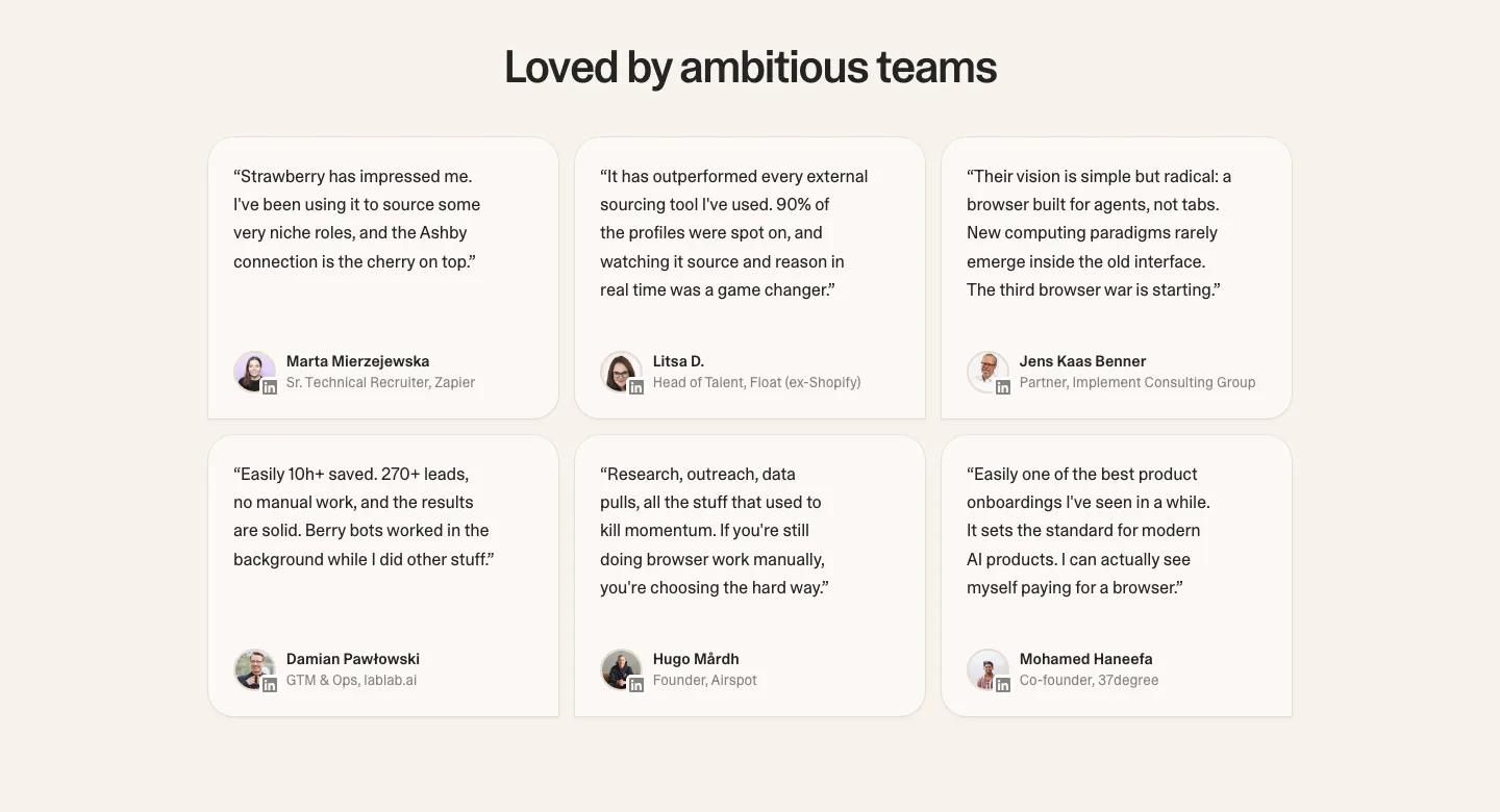
  52. Gumloop testimonials section: heading above a 2x2 grid of customer quote cards with brand logos on white
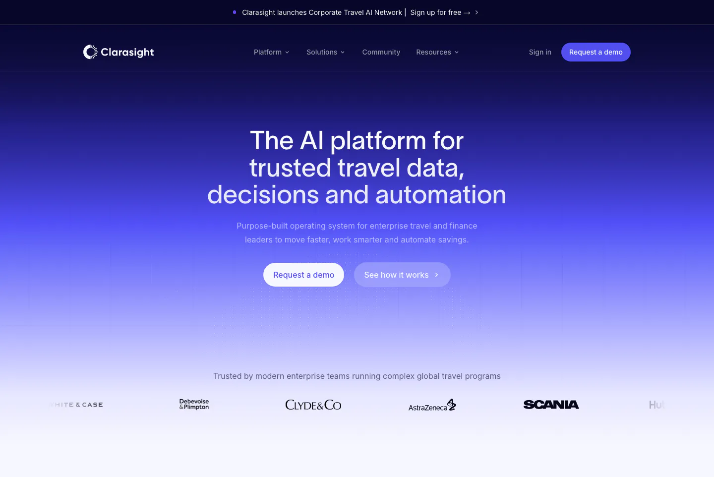
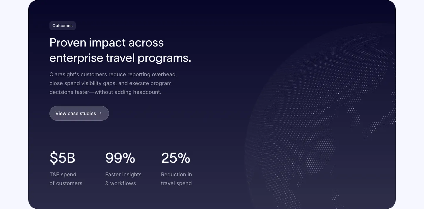
  53. Clarasight hero section: centered headline and two buttons on a navy-to-indigo gradient fading to white, above a customer logo row
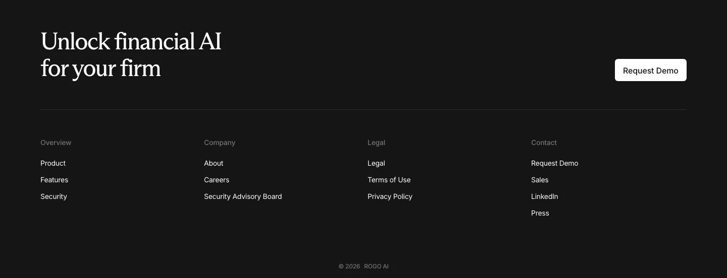
  54. Rogo footer section: serif CTA headline with demo button above four link columns and a copyright line on a dark background
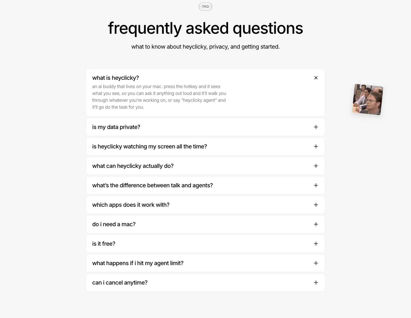
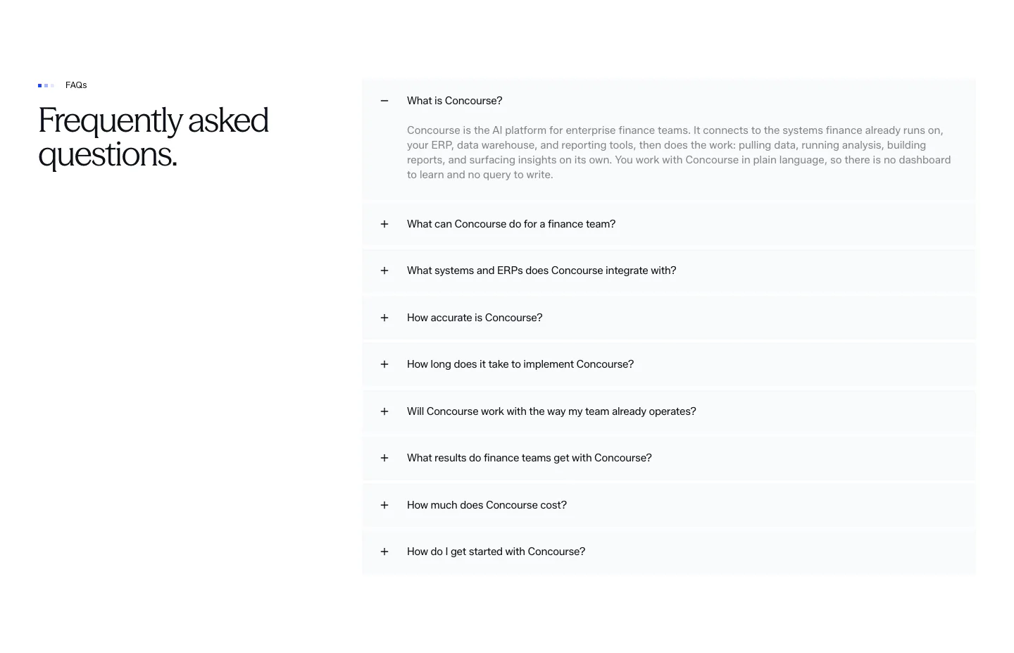
  55. heyclicky FAQ section: centered headline over a single-column accordion of white question rows, first one expanded, on light gray
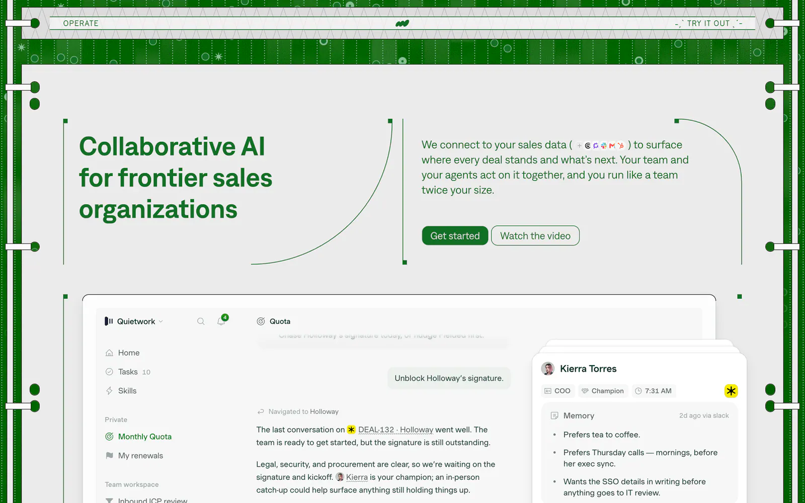
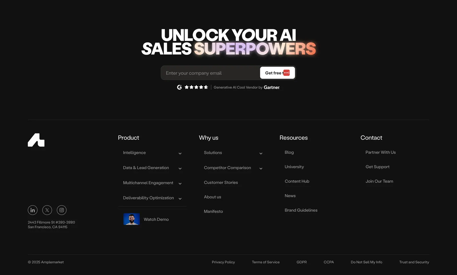
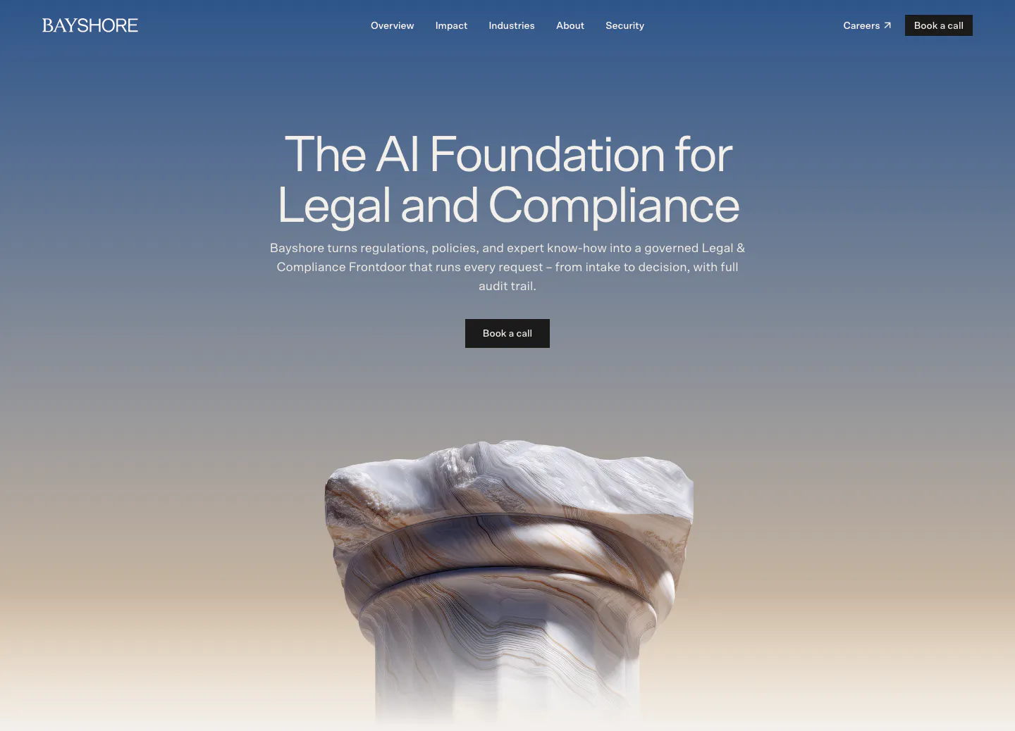
  56. Operate hero section: headline left and copy with buttons right in a green patterned frame, above a sales app screenshot
    Operate Hero
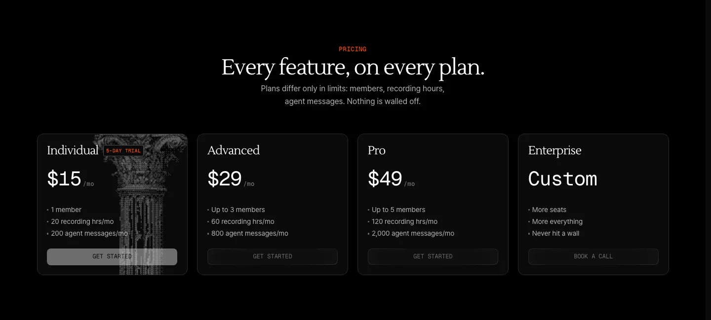
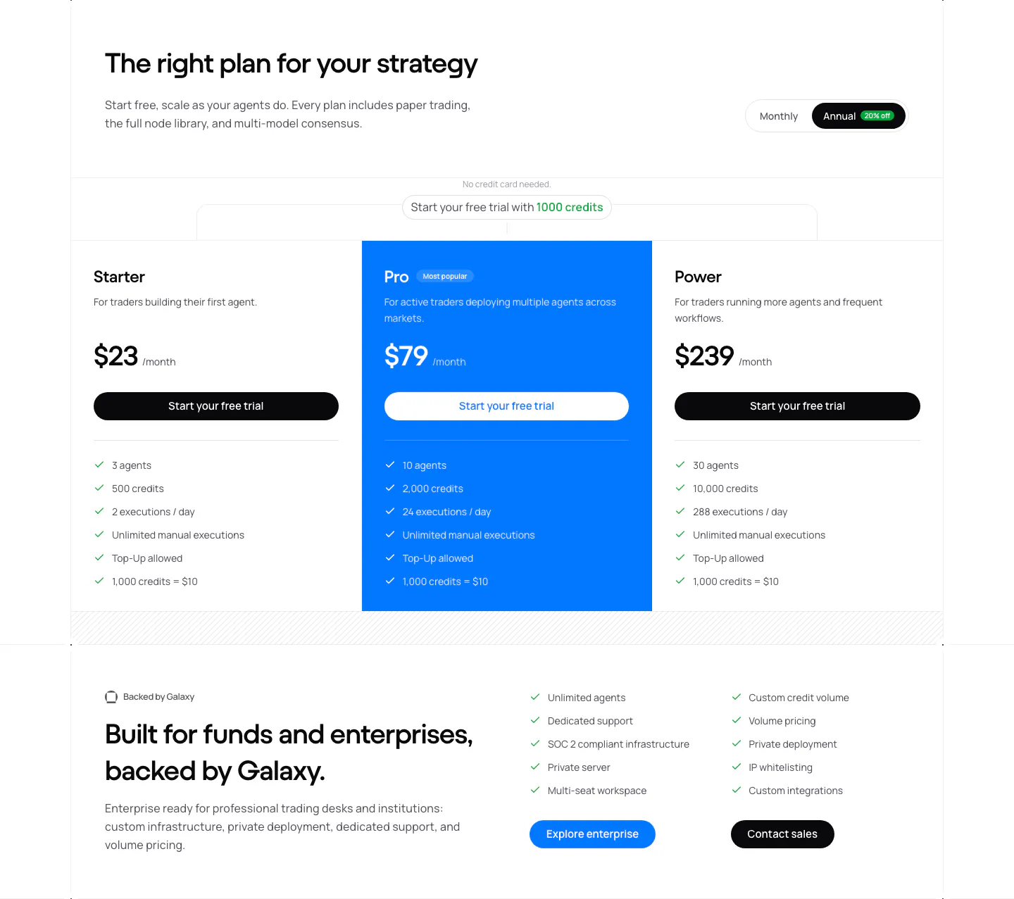
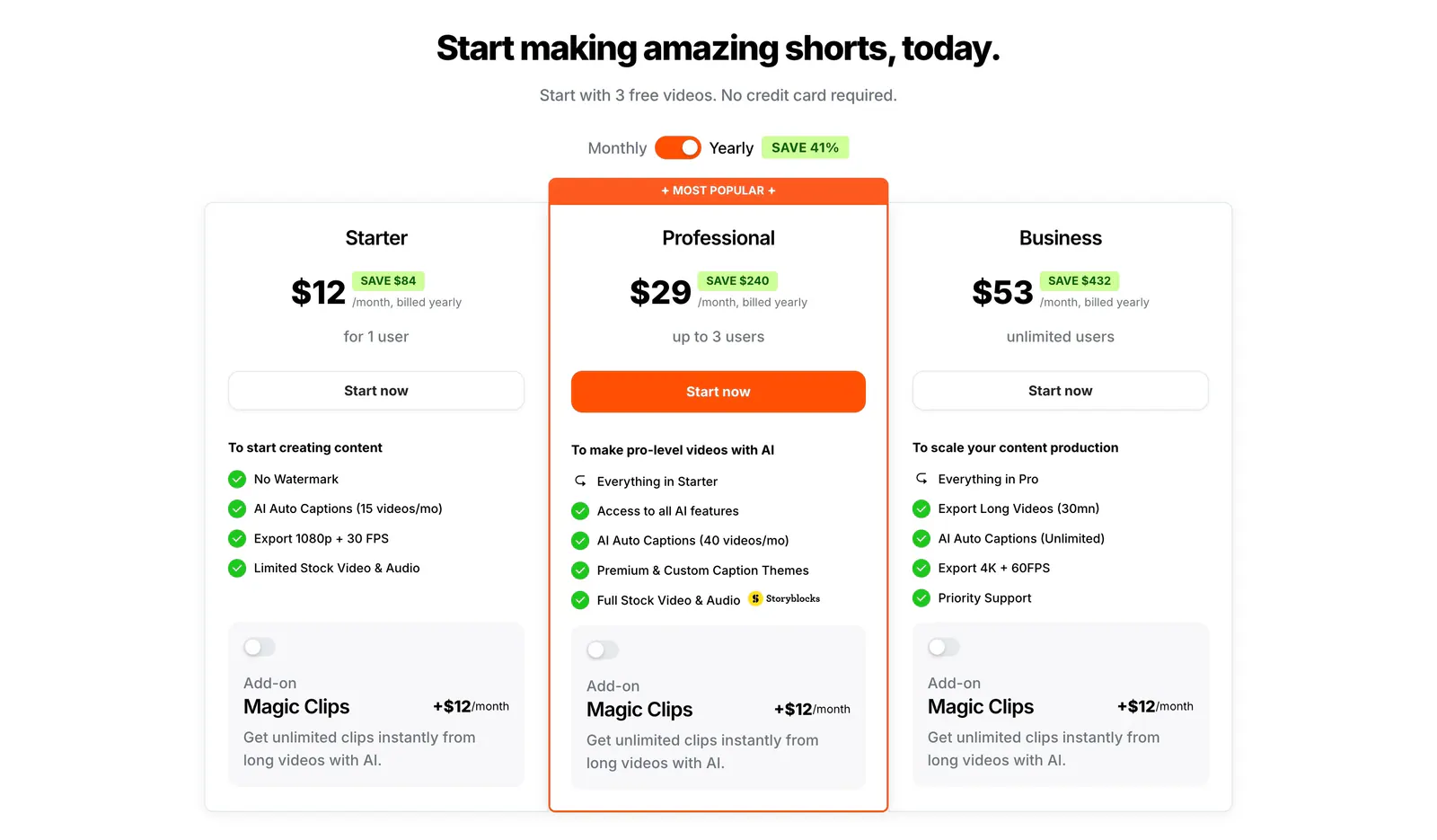
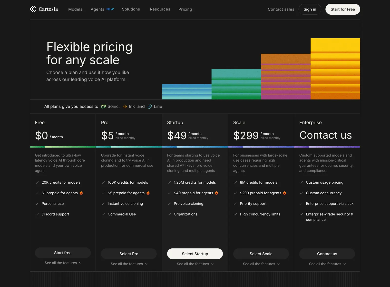
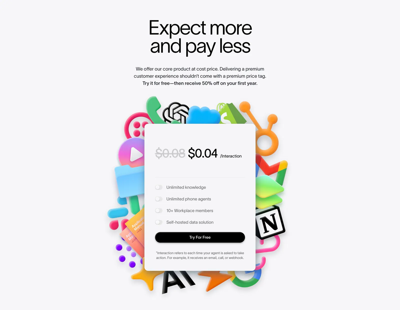
  57. Arke pricing section: centered serif headline above four dark plan cards from $15 Individual to Custom Enterprise, one with a halftone column
  58. DevRev logo cloud section: short headline on the left beside a two-row grid of eight grayscale customer logos separated by thin lines
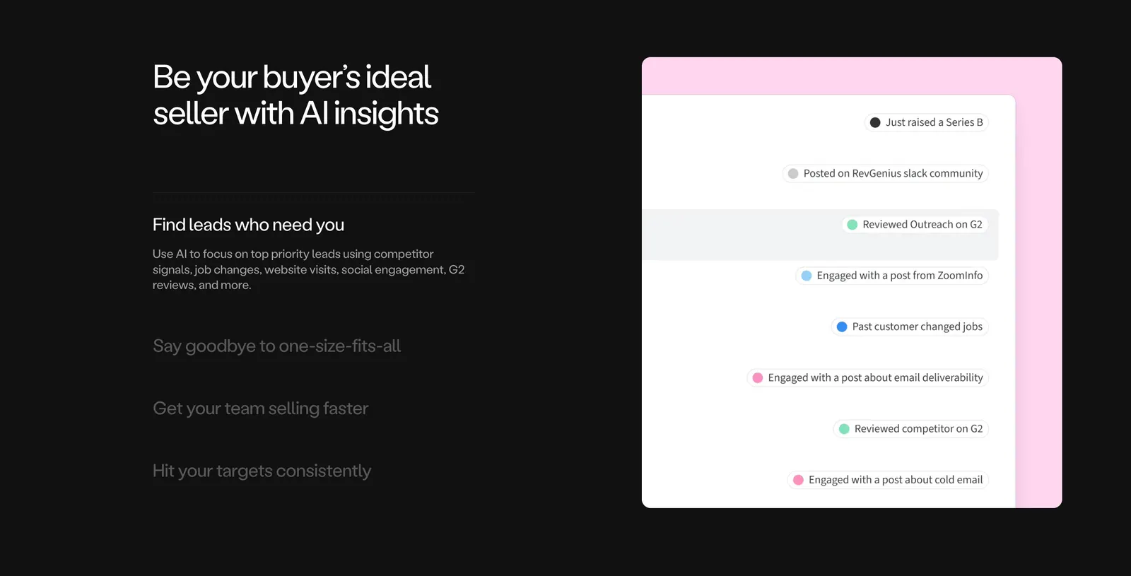
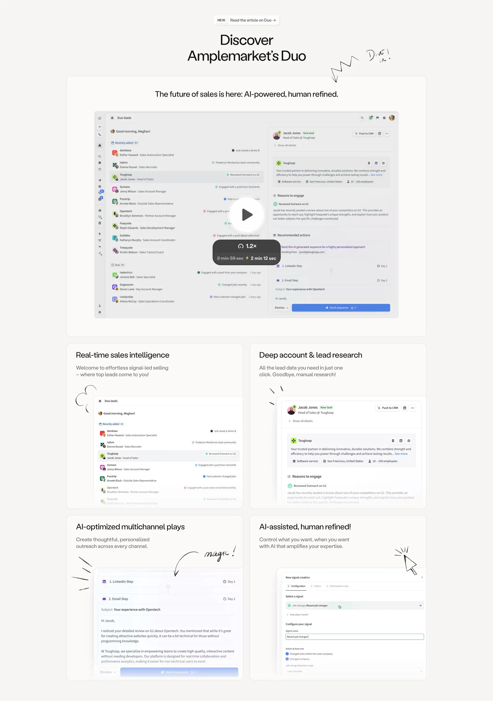
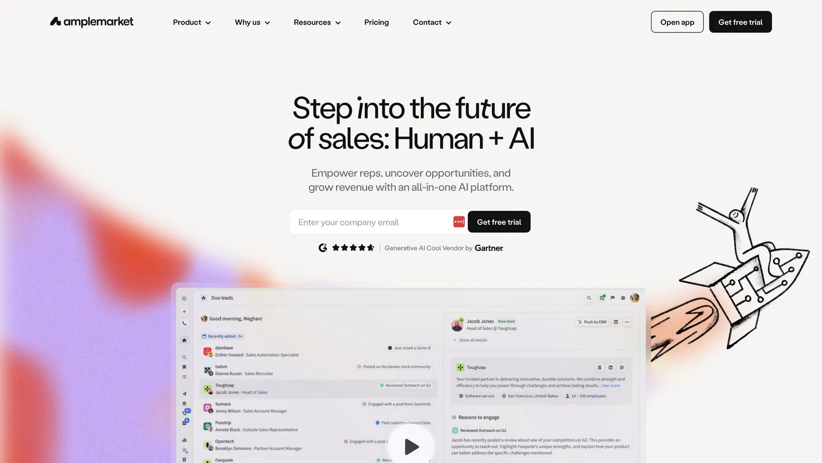
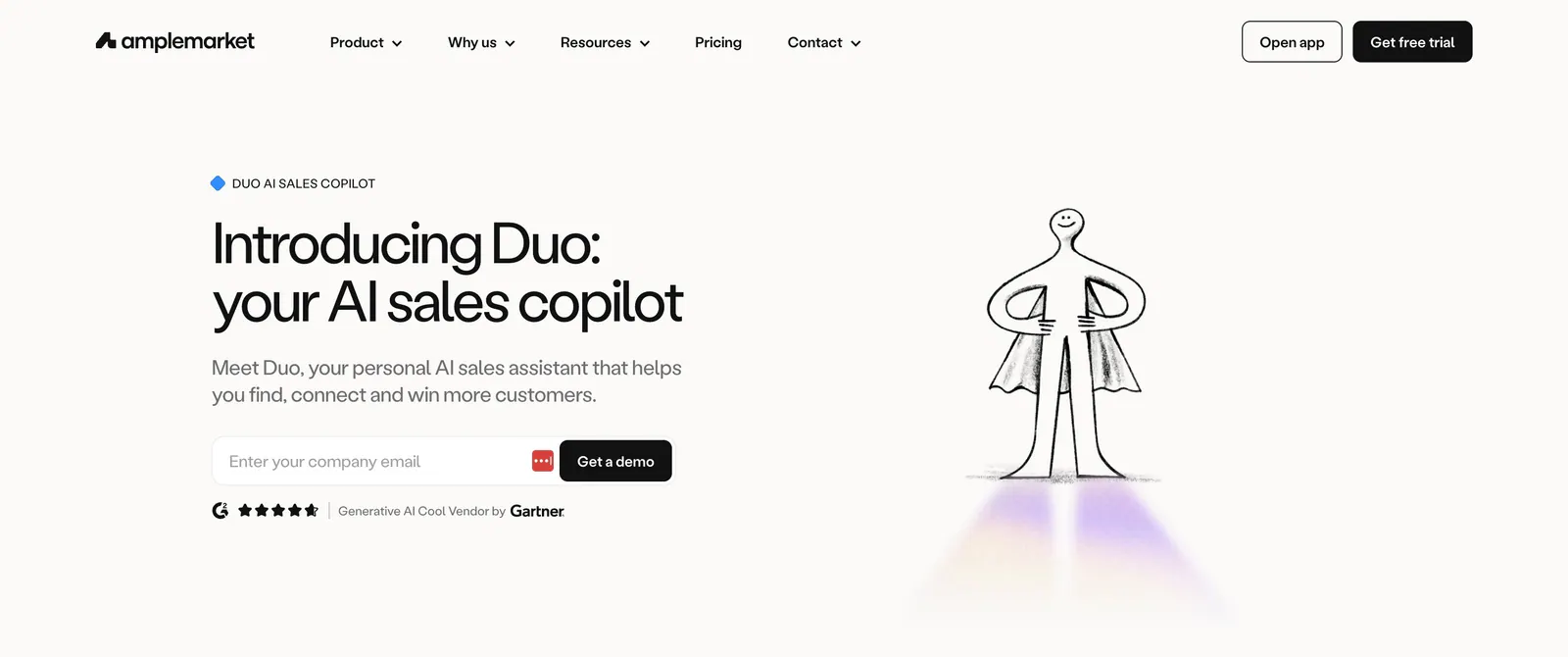
  59. Amplemarket features section: dark background with headline and accordion list on the left, lead signals UI on a pink panel at right
  60. Concourse call-to-action section: centered headline and dark button over a white-to-lavender dot-grid background
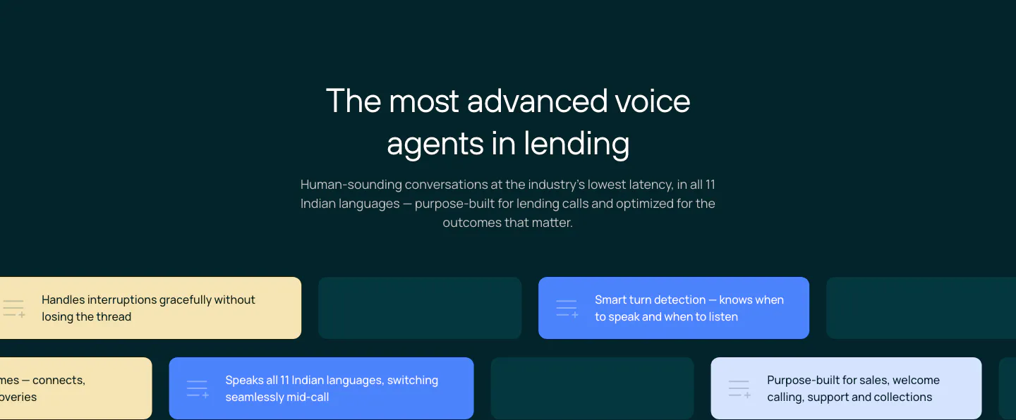
  61. Rezolv features section: centered headline above staggered rows of yellow, blue and teal capability chips on a dark teal background
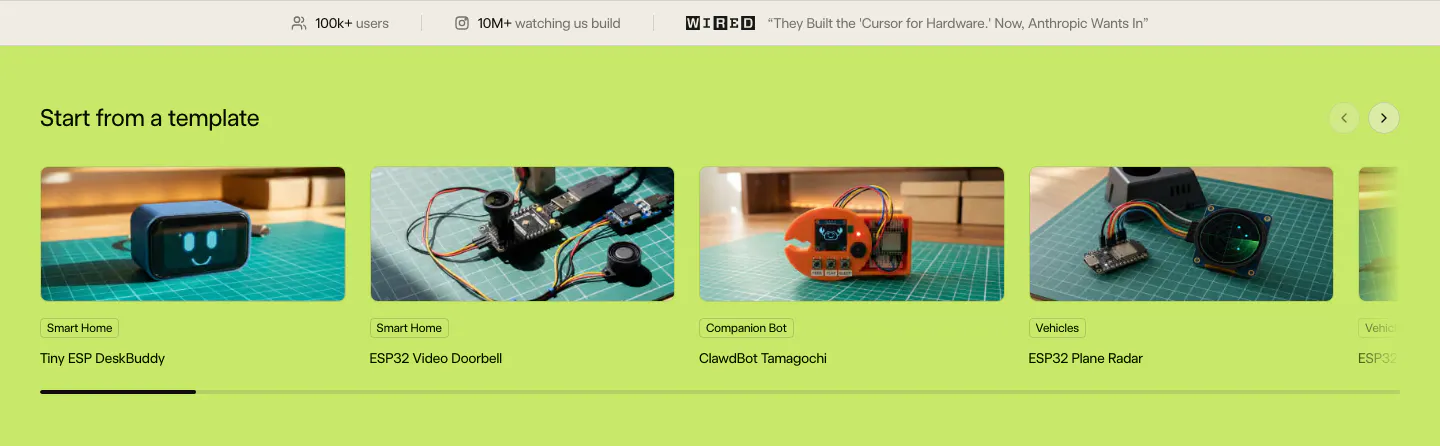
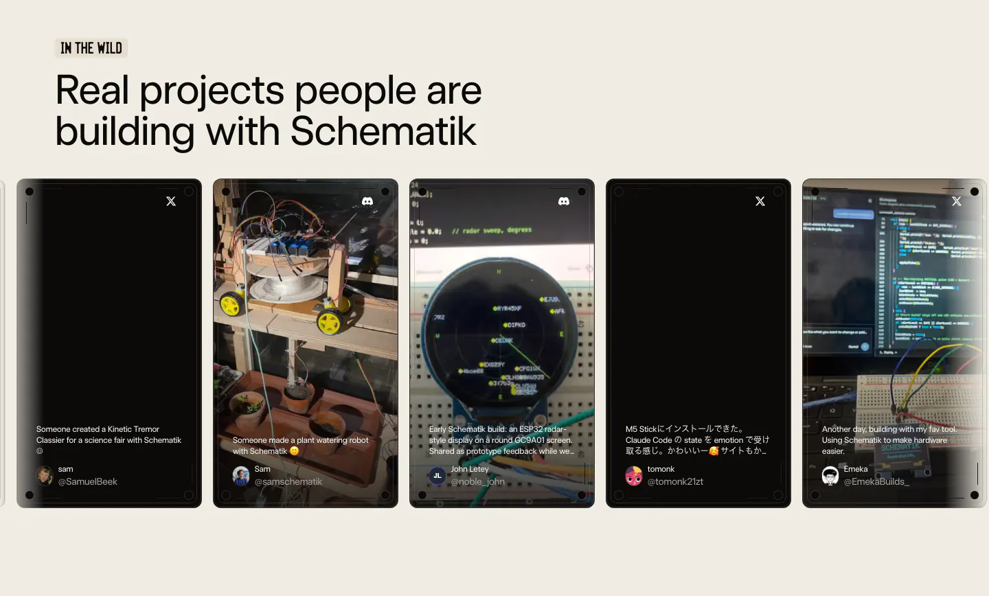
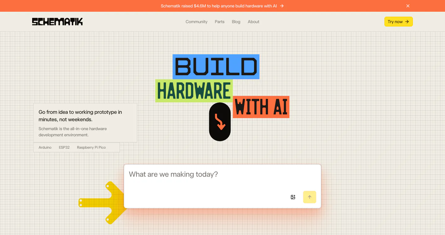
  62. Schematik features section: stats bar above a carousel of hardware template photo cards on a lime green background
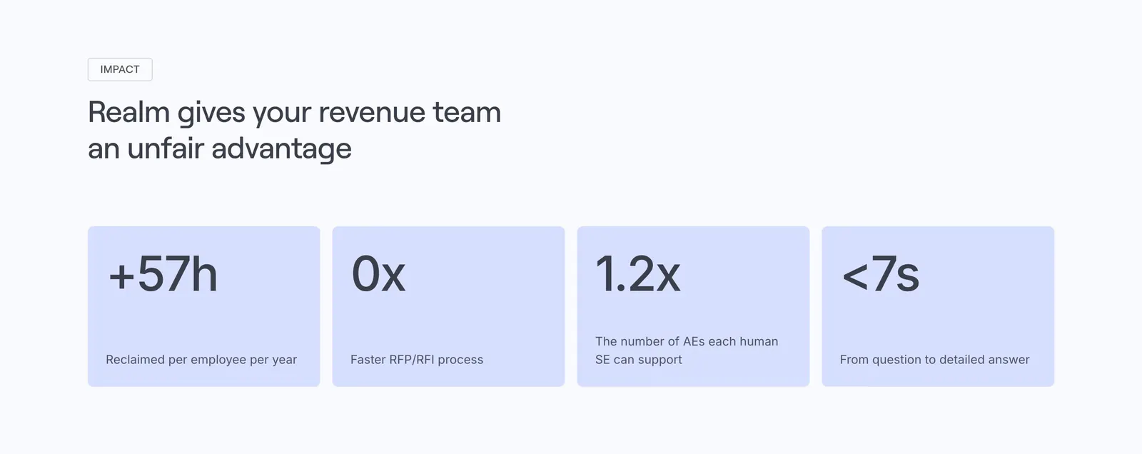
  63. Realm value proposition section: left-aligned headline above four lavender stat cards with large figures and labels
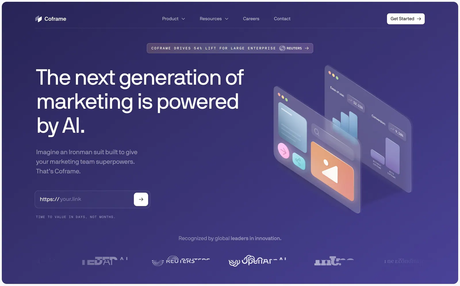
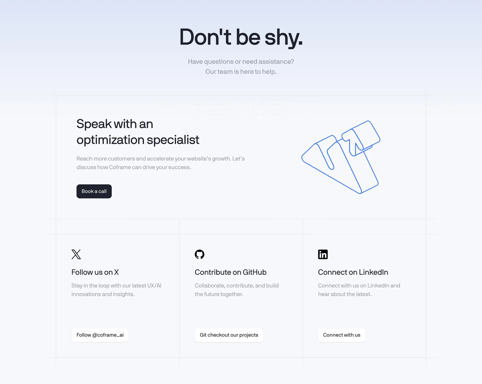
  64. Coframe hero section: left headline with URL input field beside isometric glass UI panels on purple, logo row below
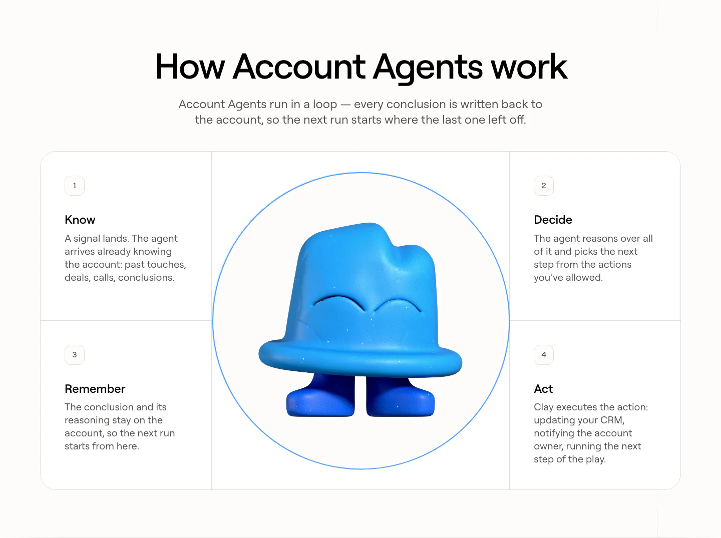
  65. Clay how it works section: centered heading over four numbered step cards arranged around a circle with a blue 3D clay mascot
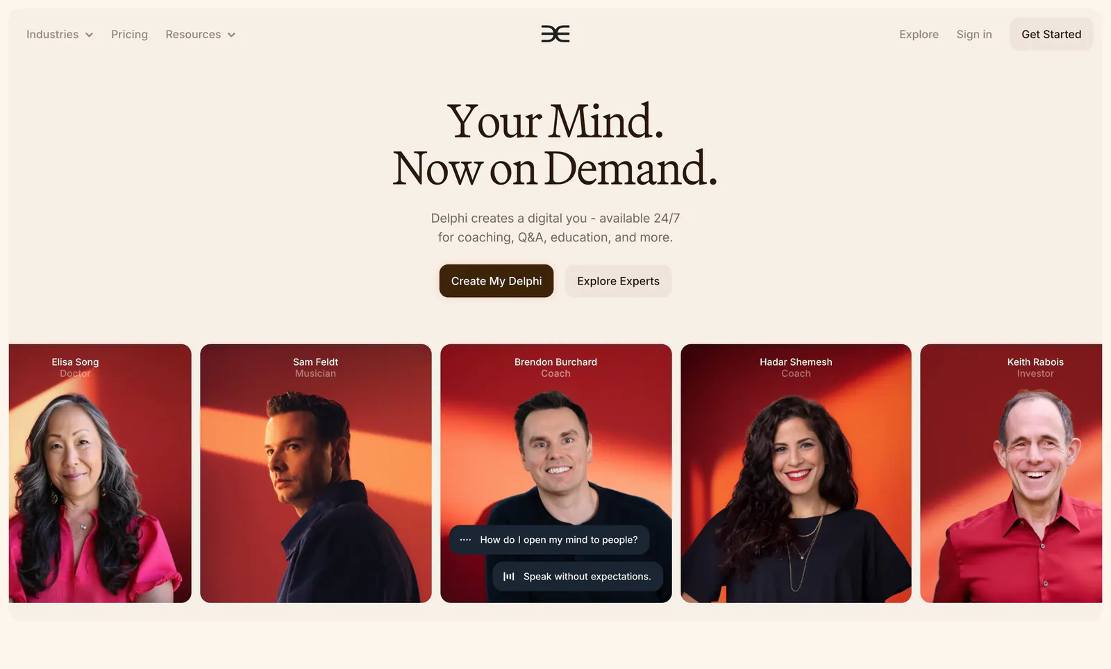
  66. Delphi hero section: centered serif headline with two buttons above a row of expert portrait cards on red backgrounds, on a cream page
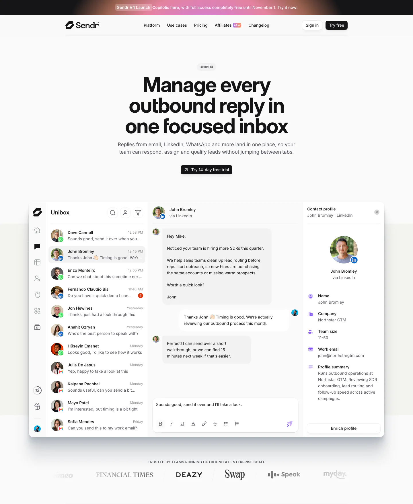
  67. Sendr hero section: nav, centered Unibox headline and trial button above a full inbox product UI and a customer logo row
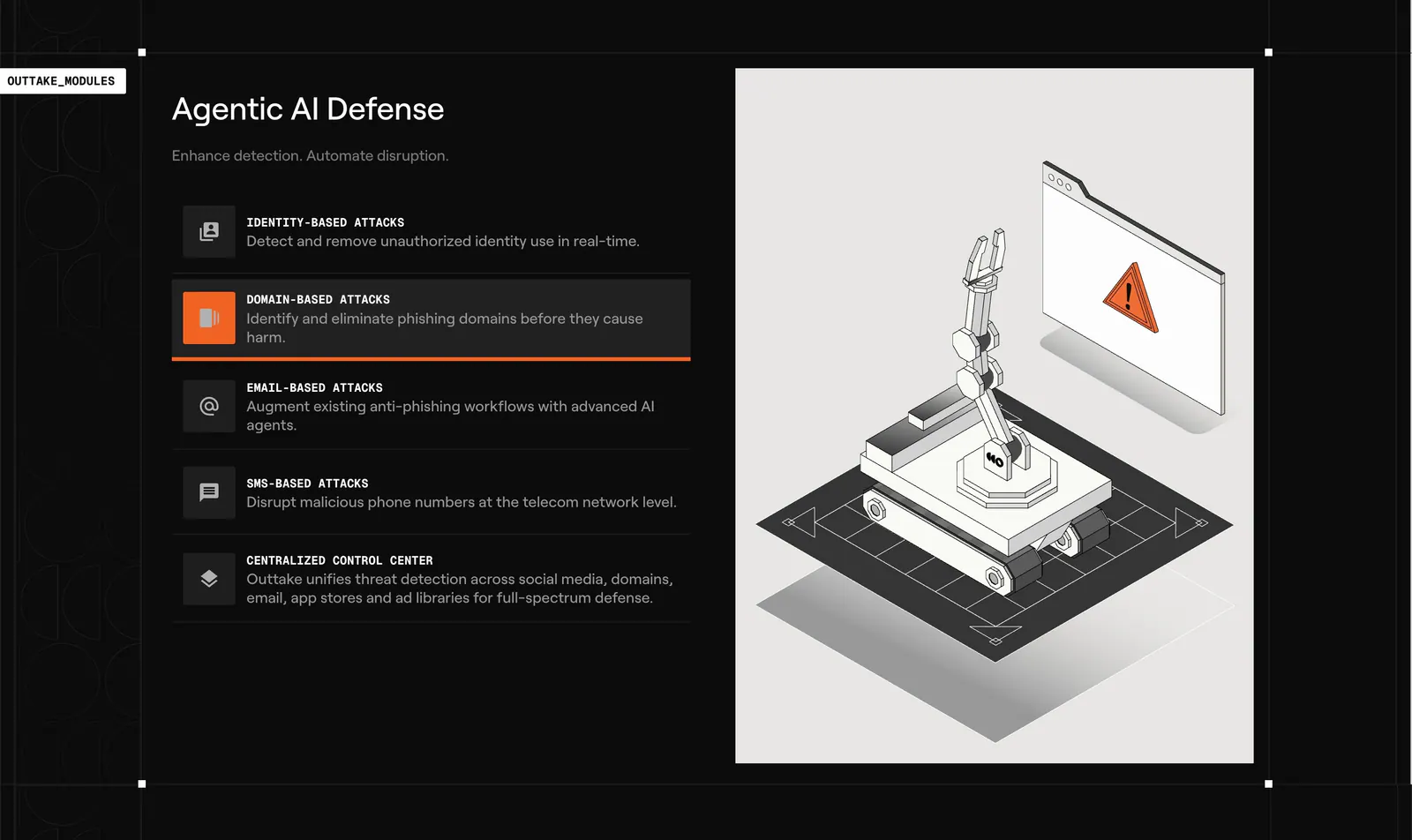
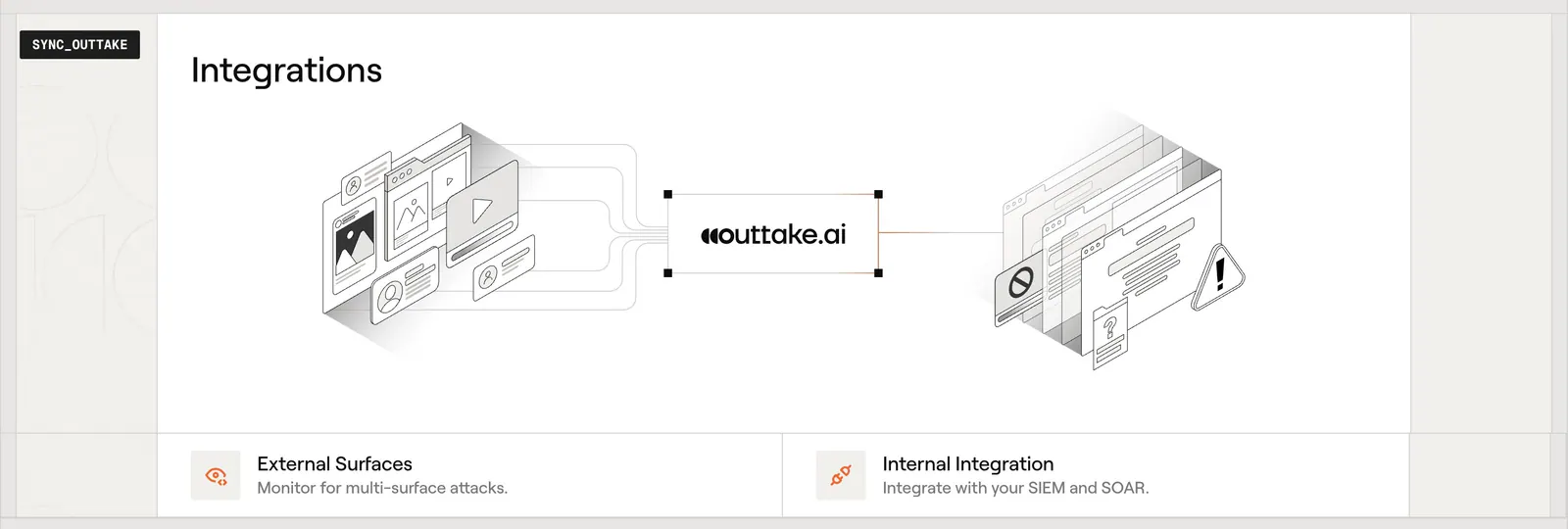
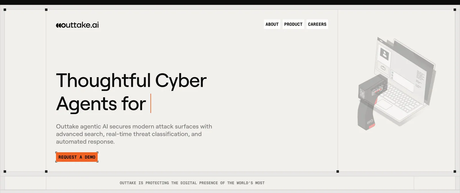
  68. Outtake features section: dark list of attack-type modules with an active highlight beside a light panel with an isometric robot arm illustration
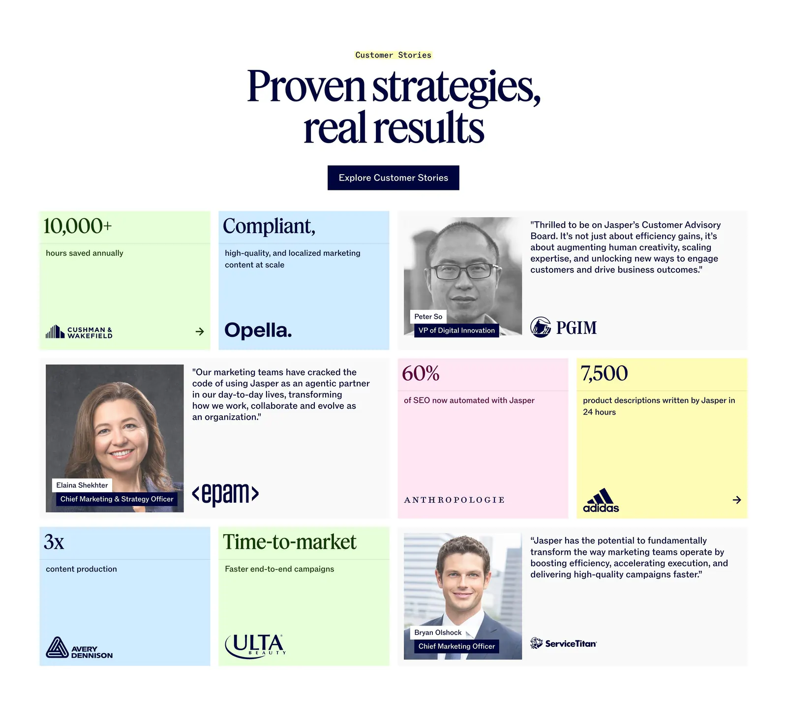
  69. Concourse stats section: headline above a 2x2 grid of large metrics with labels on a near-black background
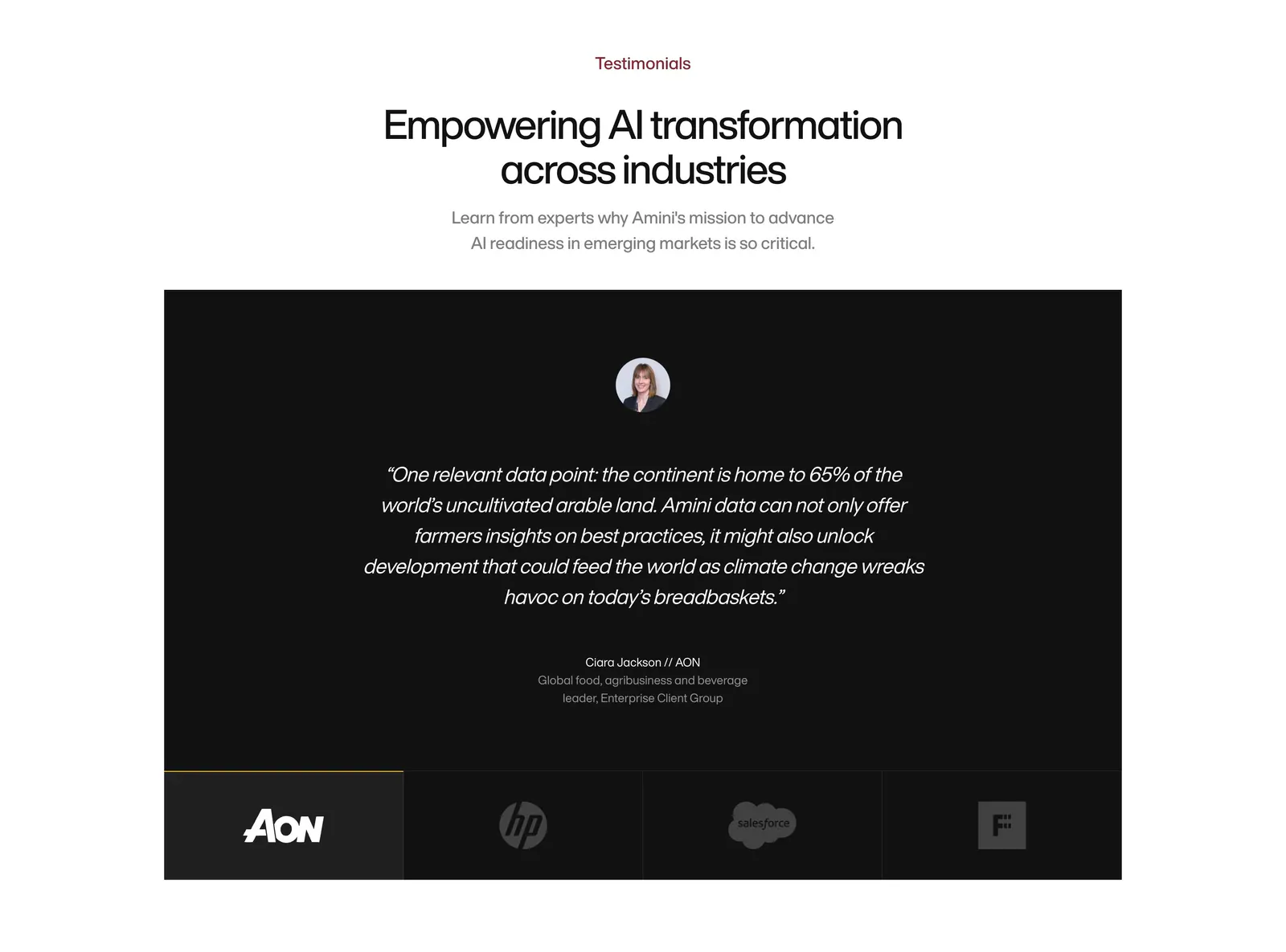
  70. Amini testimonials section: centered headline above a black panel with a centered italic quote and a row of logo tabs
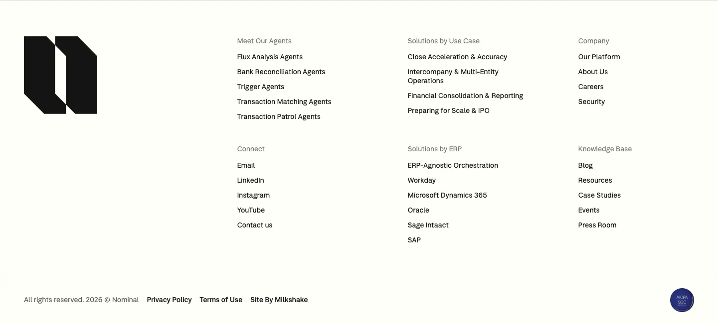
  71. Nominal footer section: large black logo mark on the left, six link columns and a copyright row on an off-white background
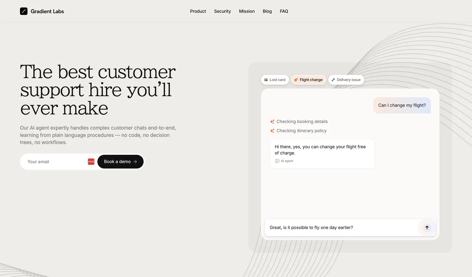
  72. Gradient Labs hero section: serif headline, copy and email field on the left with a support chat mockup on the right on beige
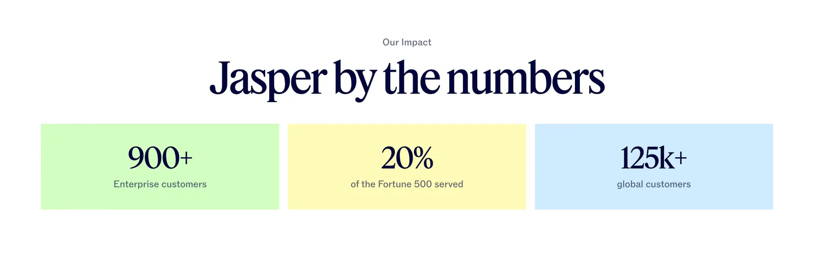
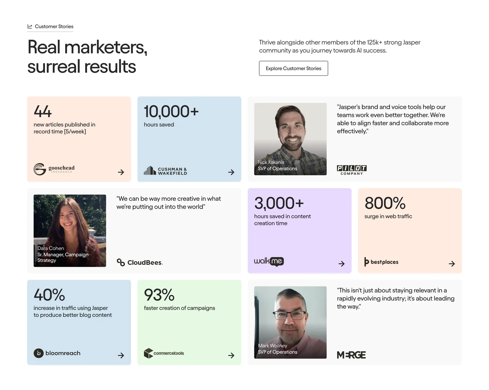
  73. Jasper value proposition section: centered serif headline above three pastel tiles with large customer metrics
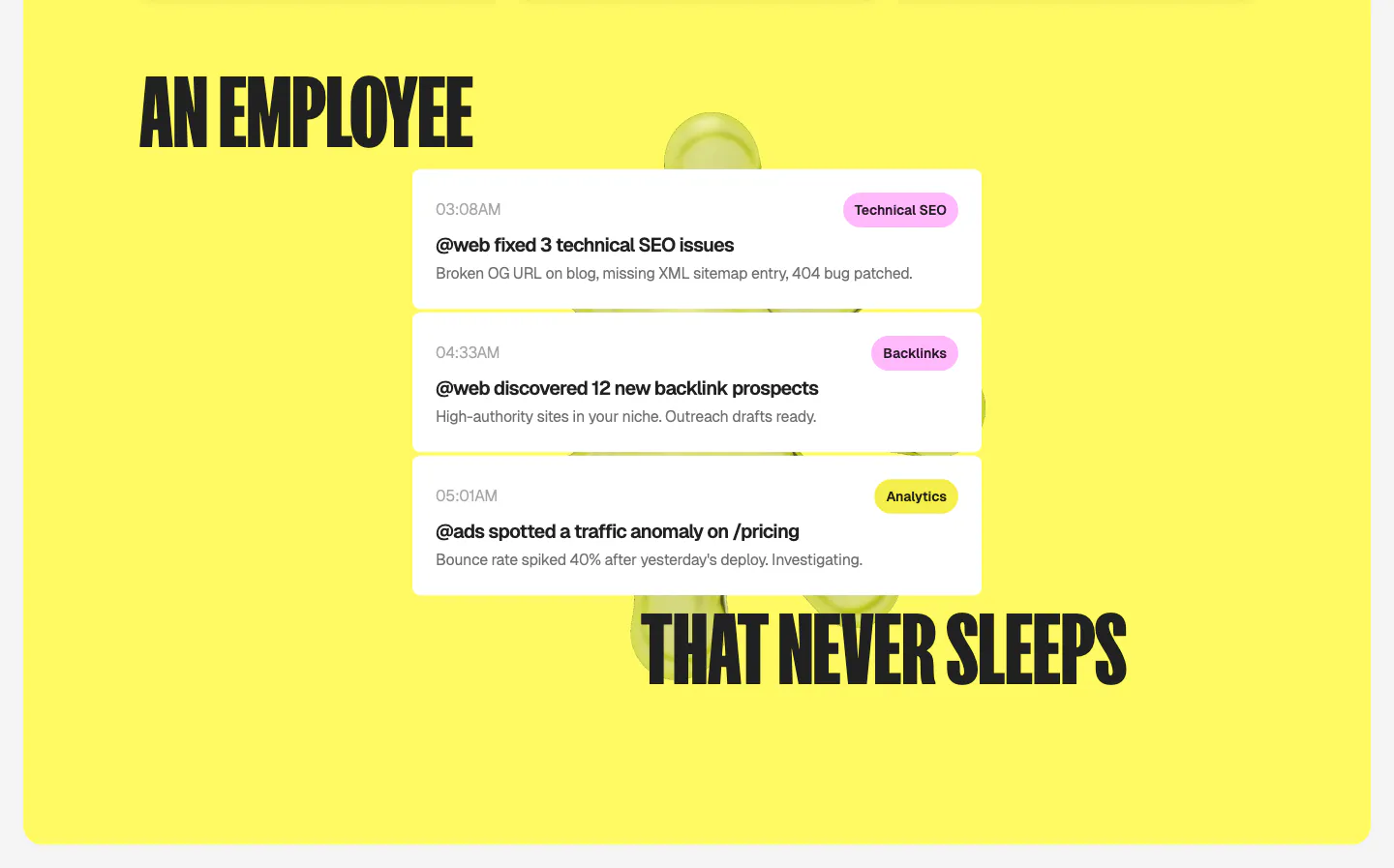
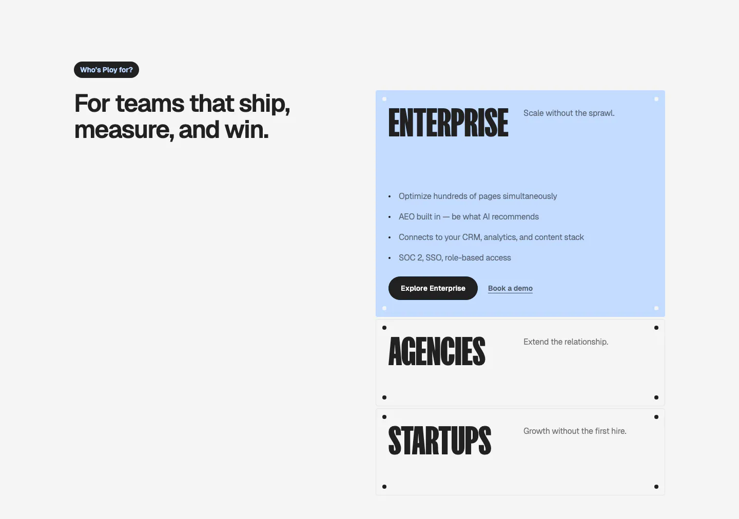
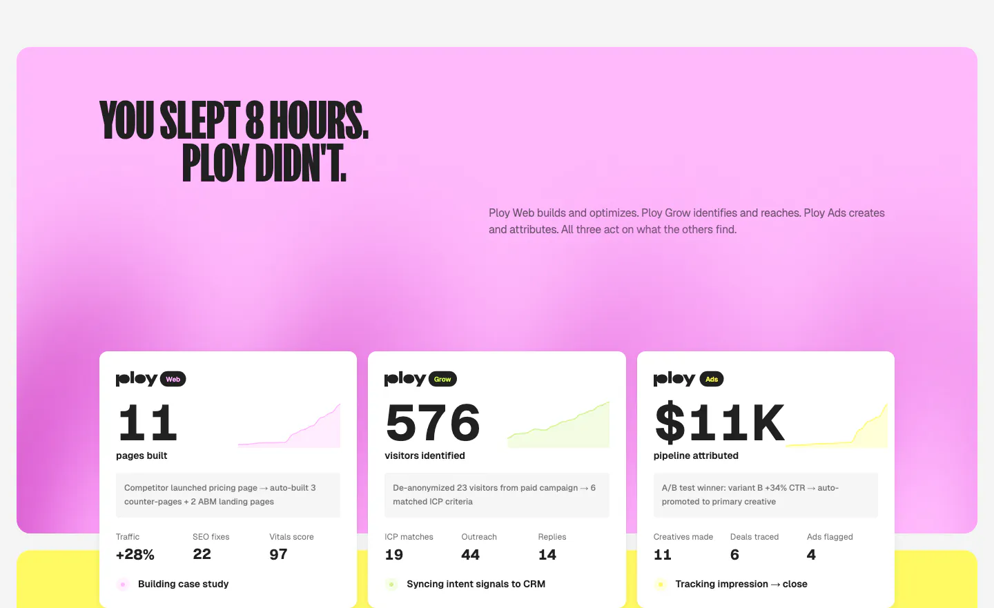
  74. Ploy features section: split condensed headline wrapped around a stack of white agent activity notification cards on a bright yellow panel
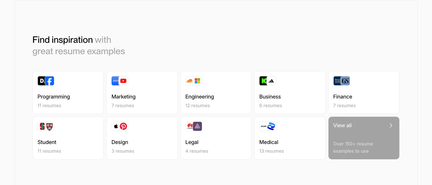
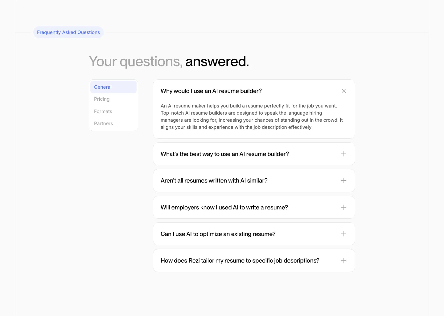
  75. Rezi blog & resources section: two-row grid of resume example category cards with company logos and a gray view-all tile
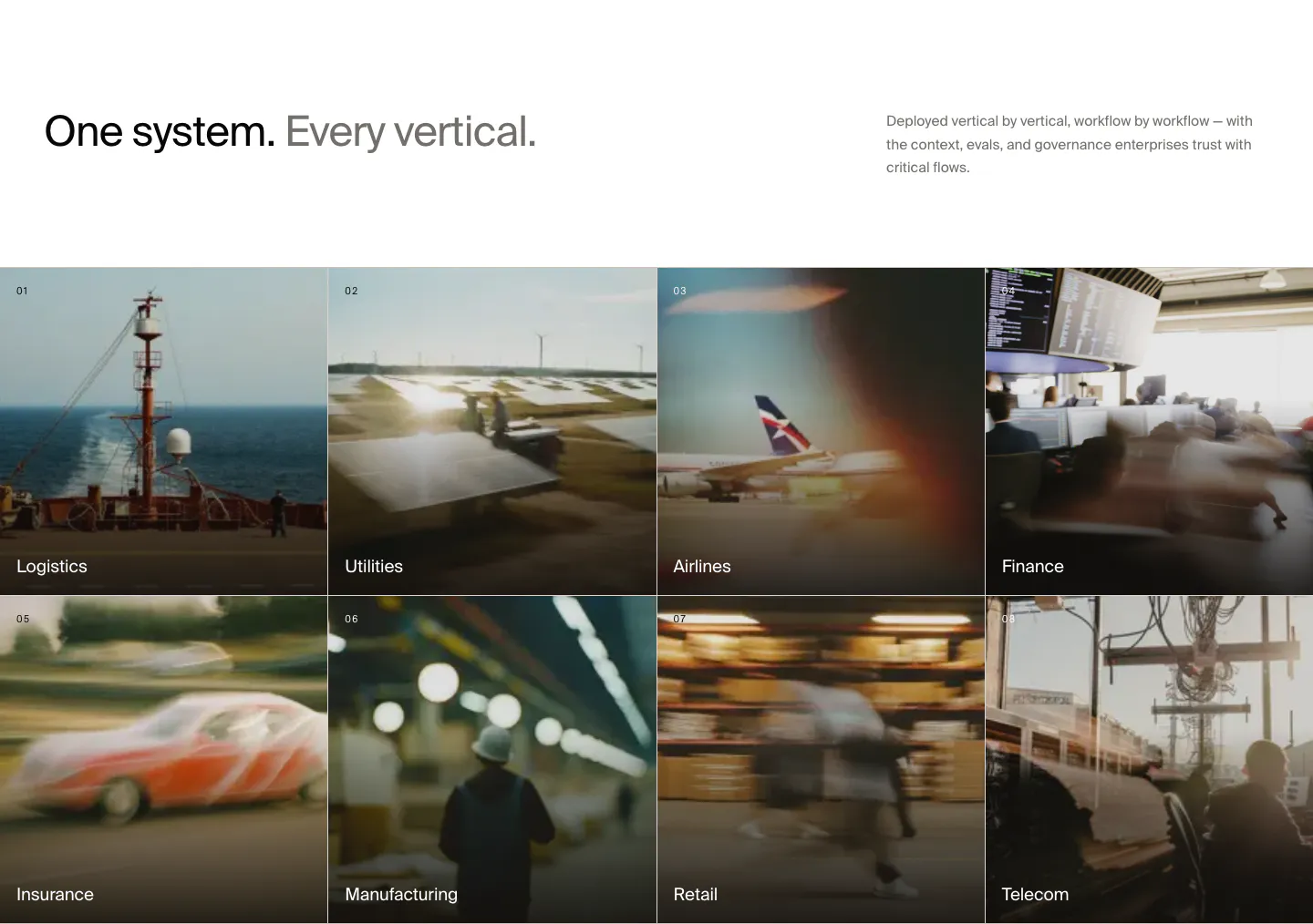
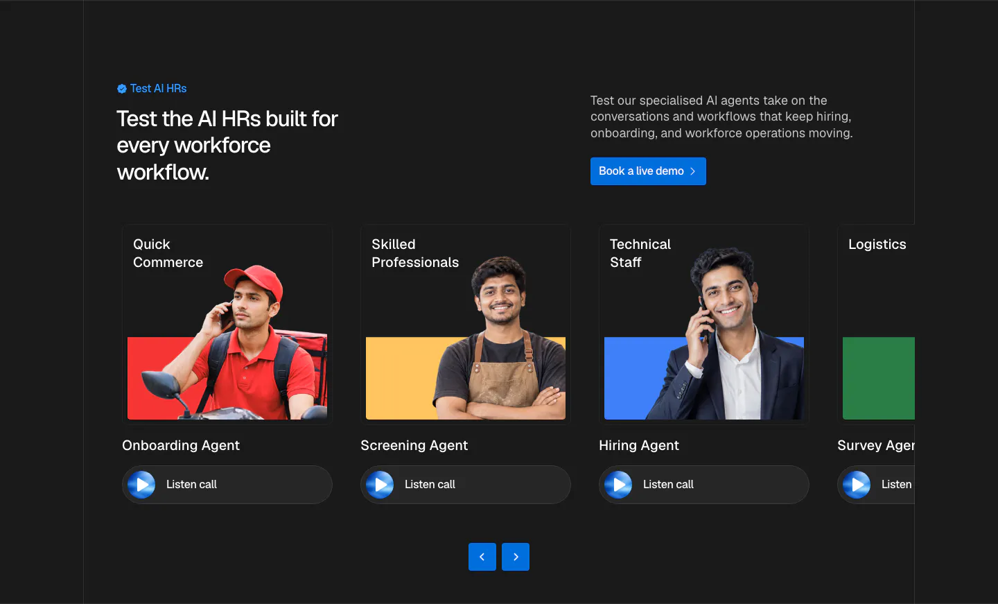
  76. HappyRobot use cases section: headline with side note above a 4x2 grid of numbered industry tiles on blurred photos, Logistics to Telecom
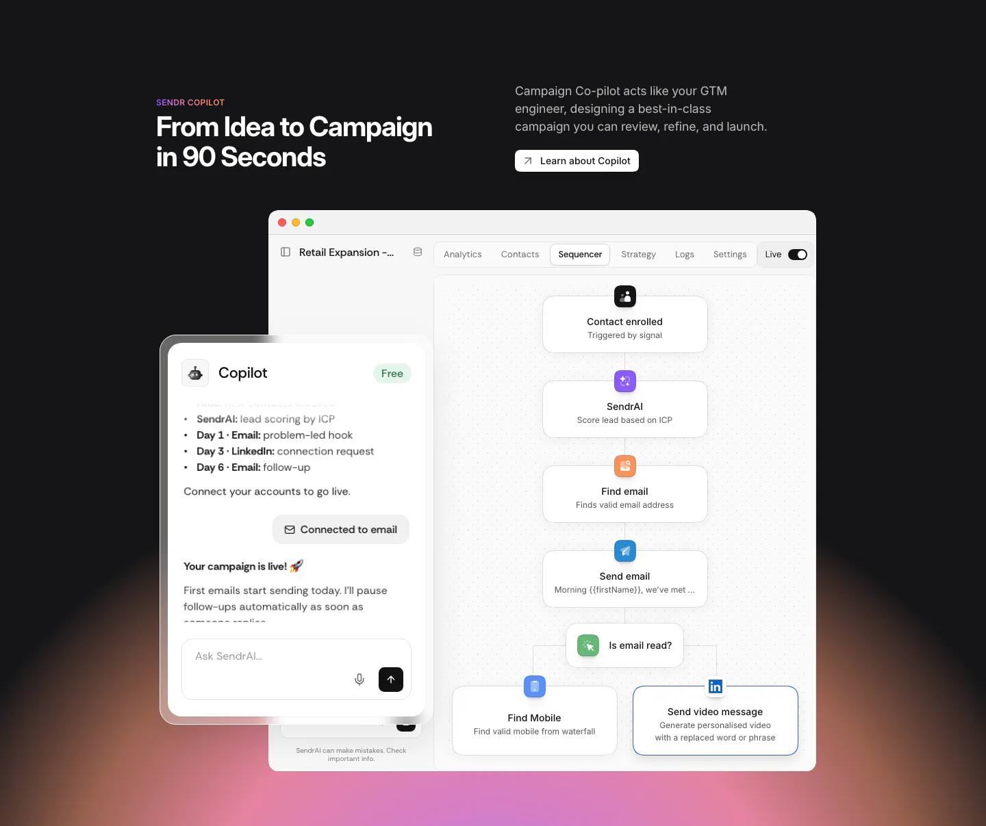
  77. Sendr features section: dark section with headline above a Copilot chat panel overlapping a sequencer workflow UI, warm glow below
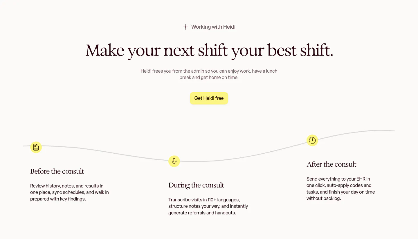
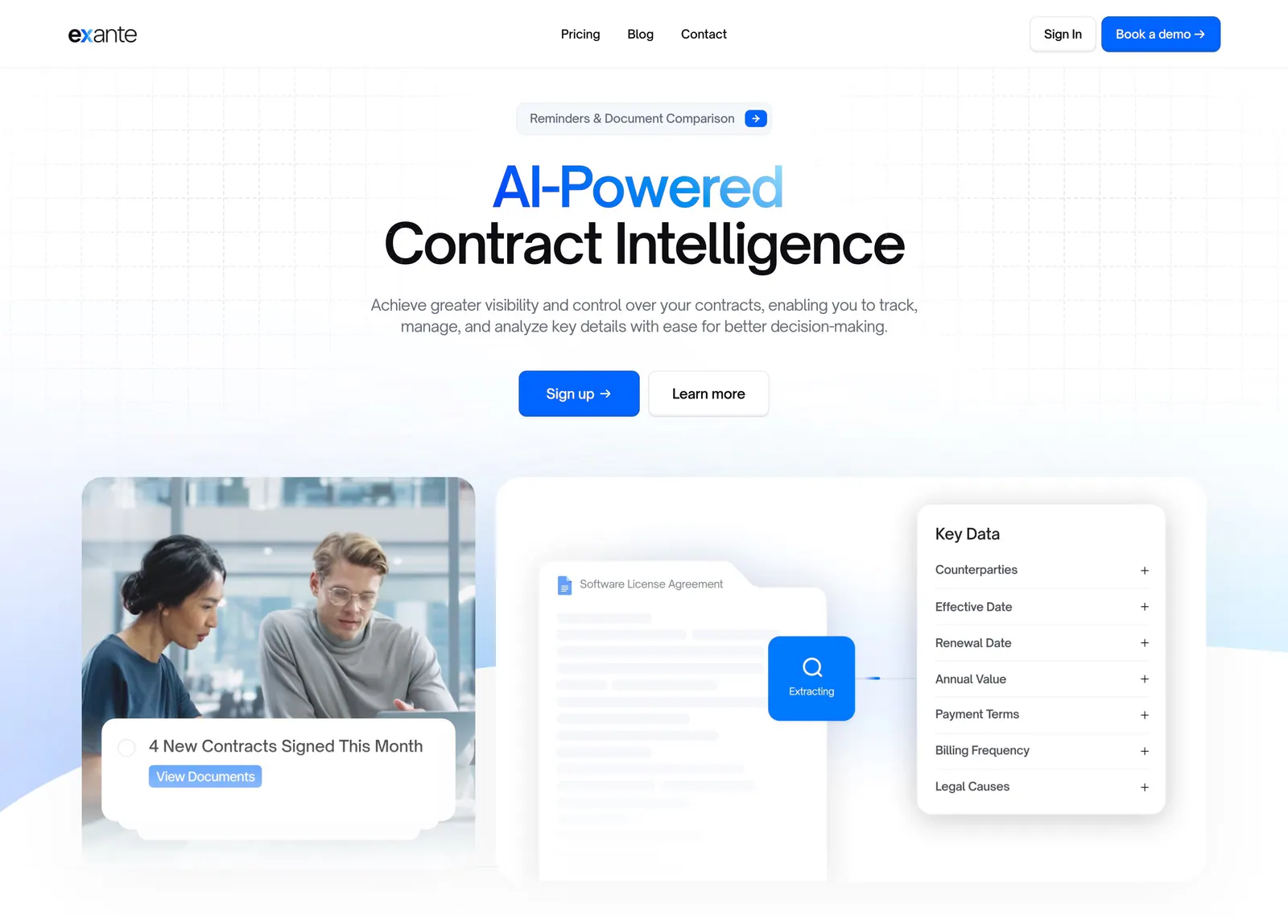
  78. Heidi how it works section: centered serif headline above a wavy timeline with before, during and after the consult steps
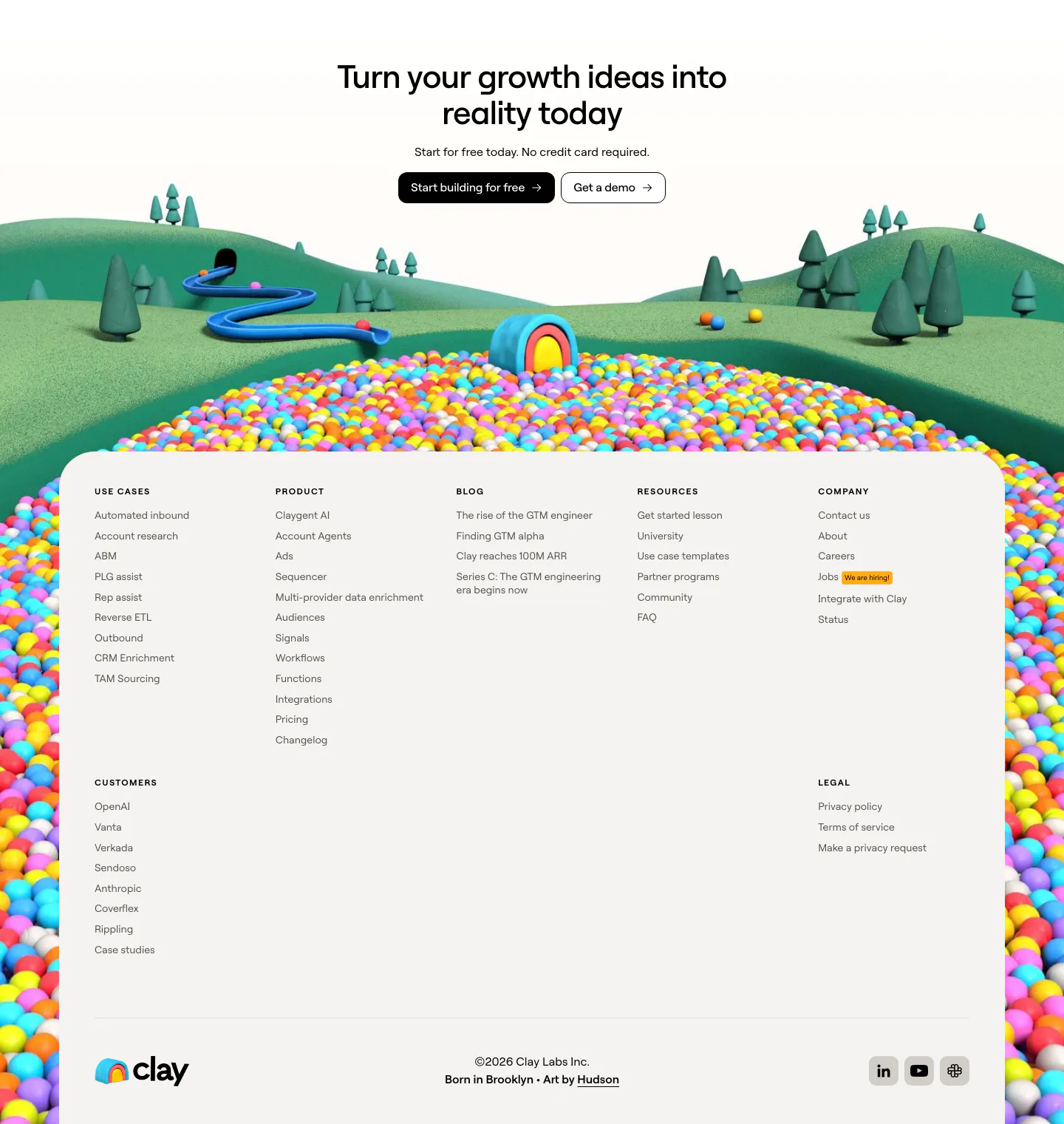
  79. Clay footer section: centered CTA over a 3D landscape of hills and colorful ball pit framing a light footer panel with link columns
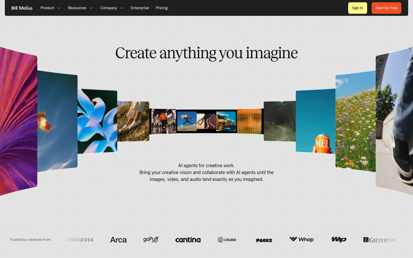
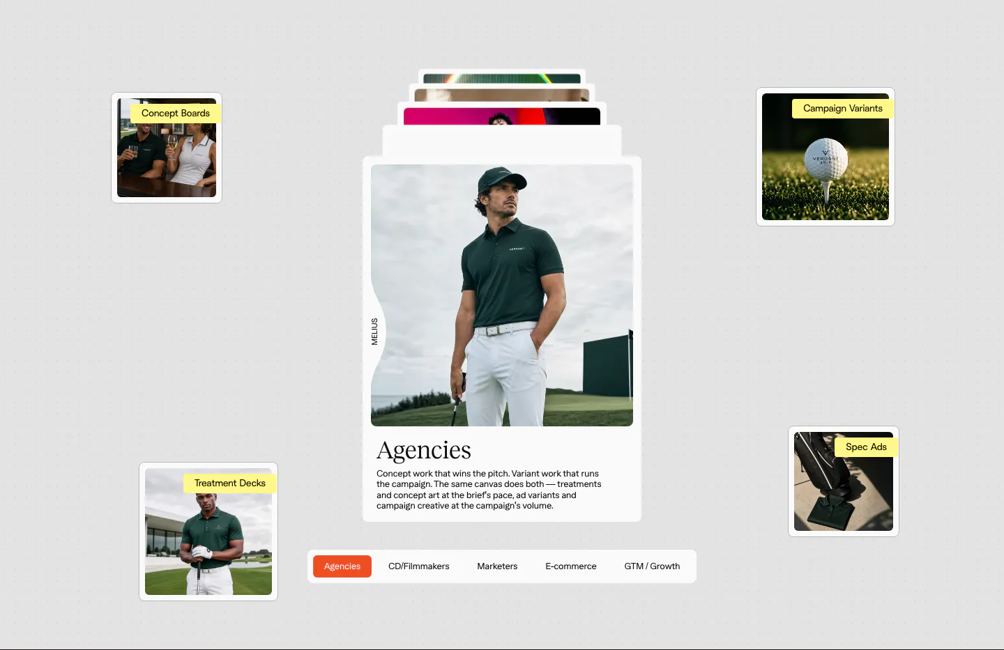
  80. Melius hero section: dark nav bar over a centered serif headline inside a curved gallery of photos and artwork, logo row at bottom
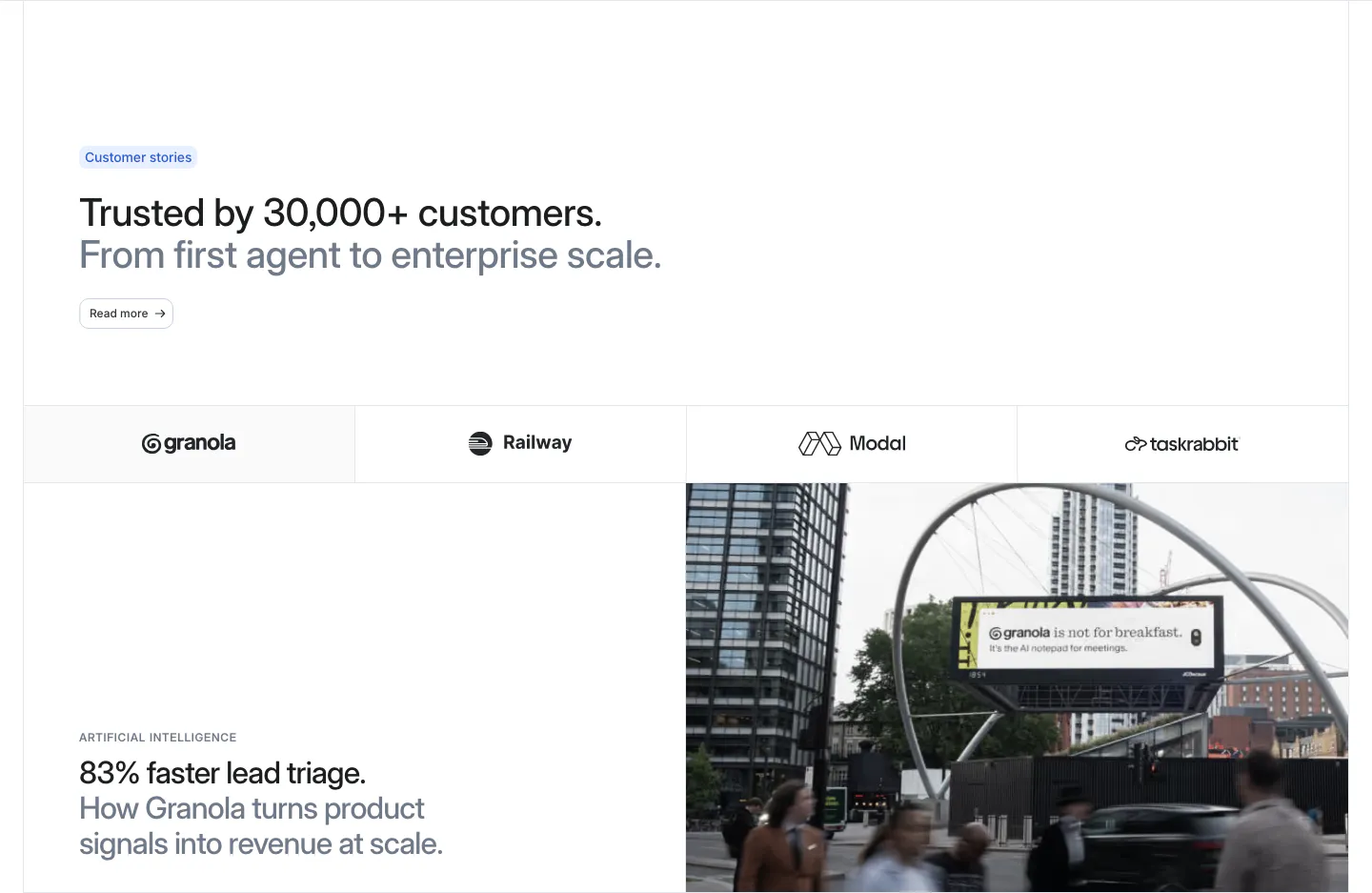
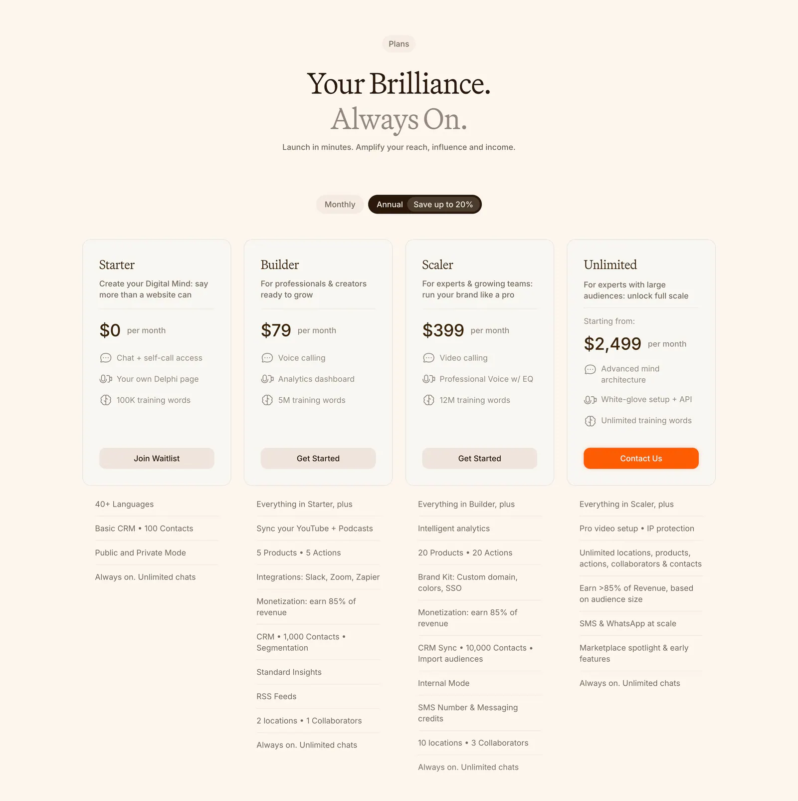
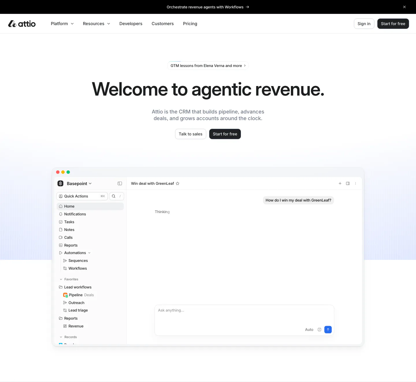
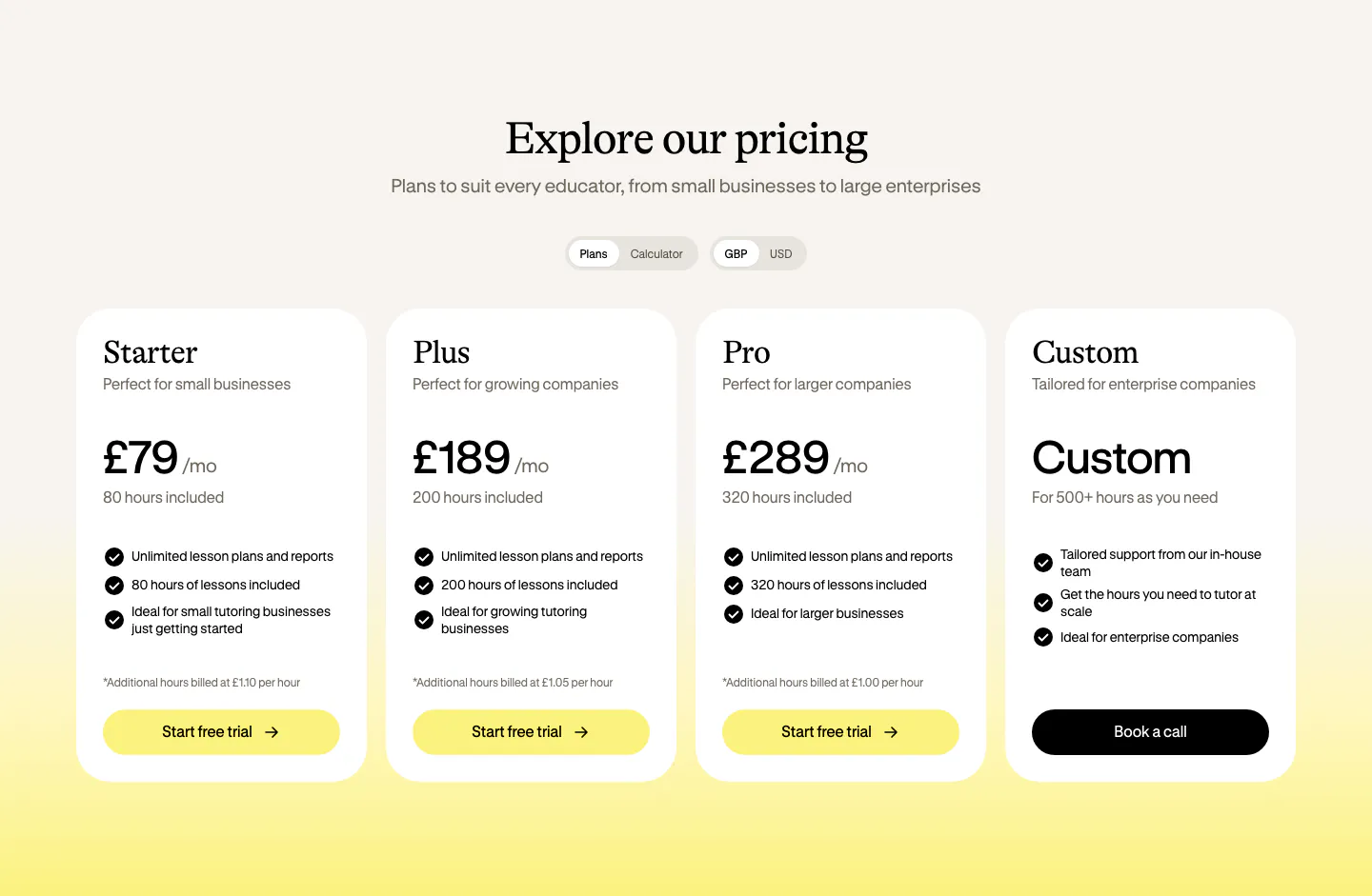
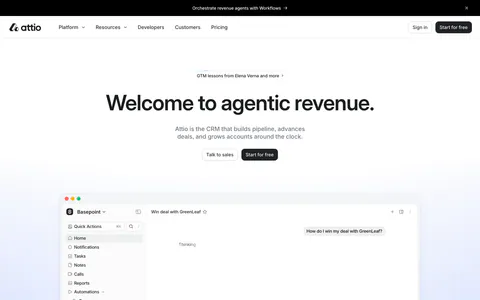
  81. Attio logo cloud section: two rows of five customer logos in bordered grid cells, including granola, Modal, Railway and taskrabbit
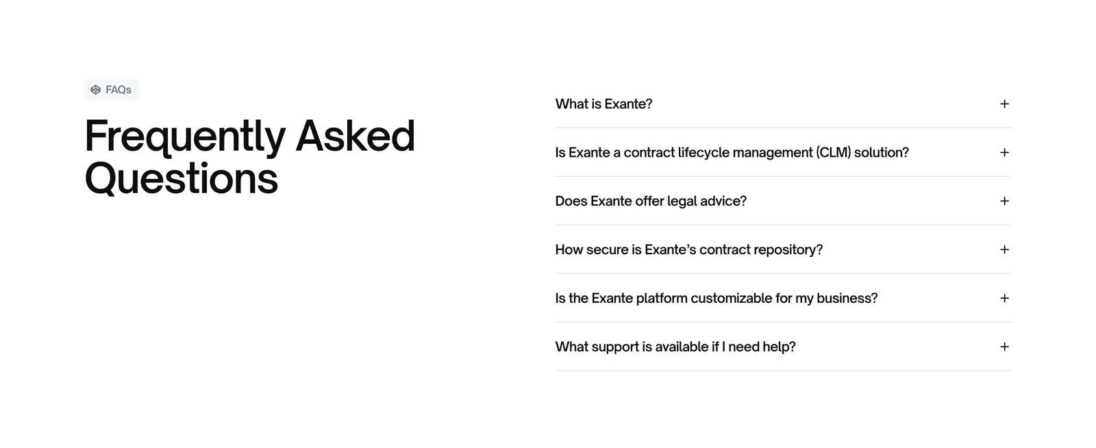
  82. Exante FAQ section: large heading with FAQs badge on the left and a six-question accordion on the right on a white background
  83. Weav call to action section: centered headline, copy and pink button on a bright blue background under a wave pattern strip
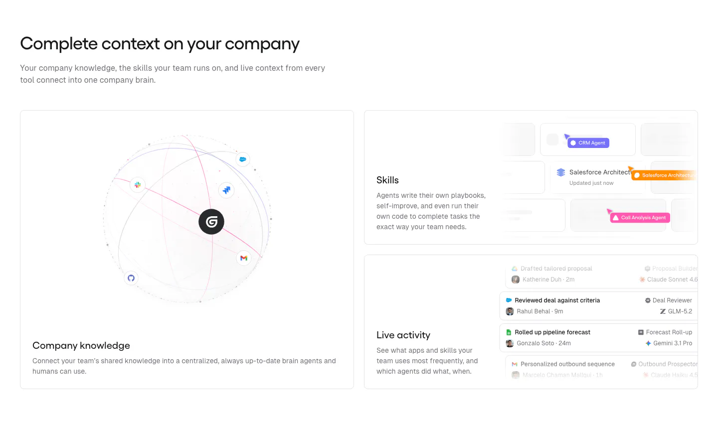
  84. Gumloop features section: headline above a large knowledge globe card and two stacked UI cards for skills and activity
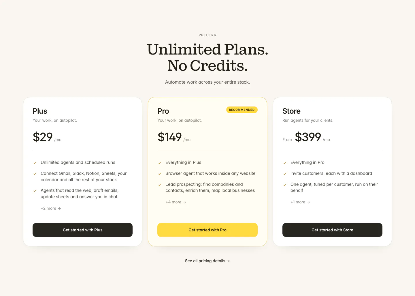
  85. Twin pricing section: centered serif headline above three plan cards with the middle Pro plan highlighted in yellow on cream
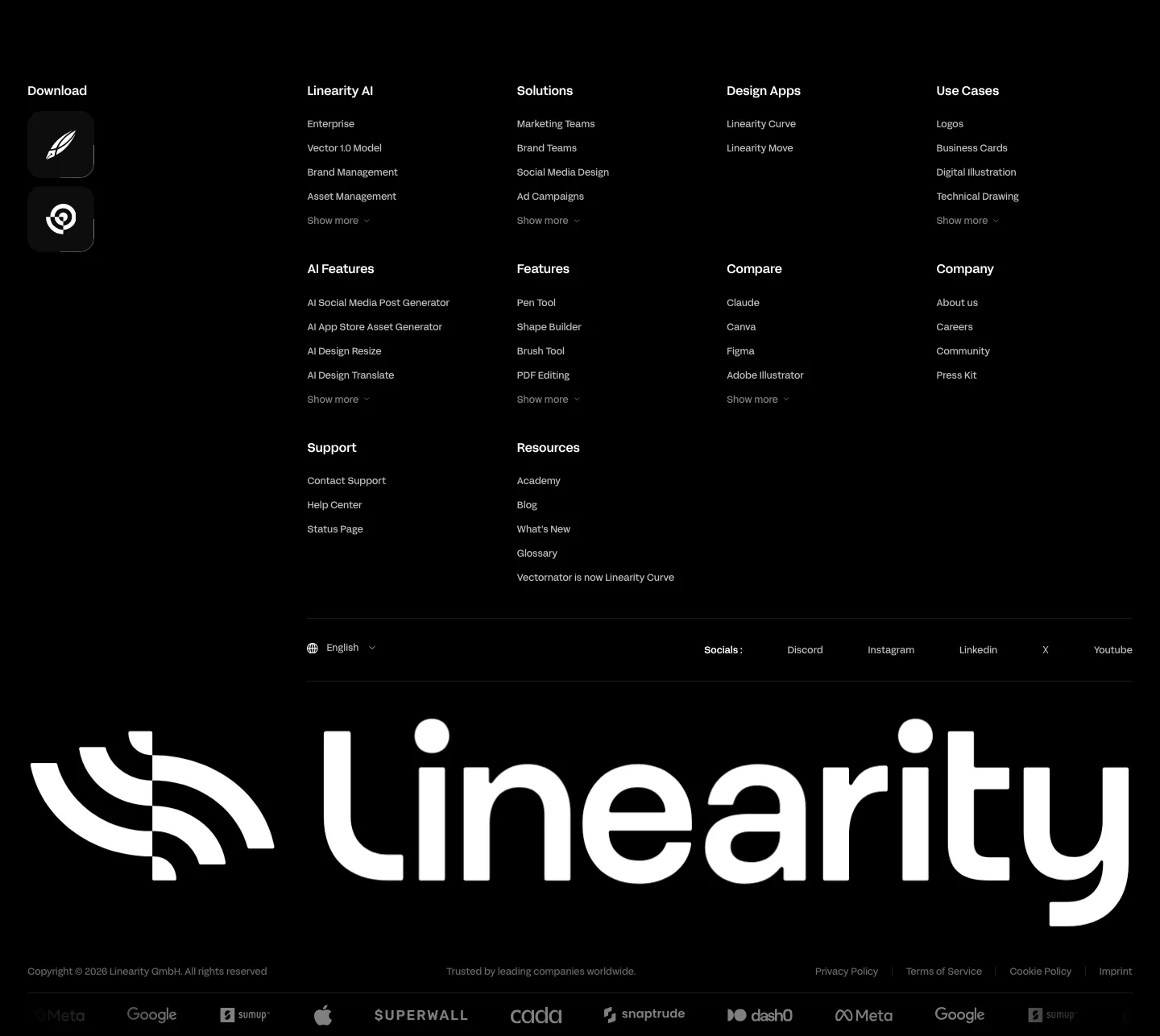
  86. Linearity footer section: dense link columns with app download icons, a giant white Linearity wordmark and a customer logo strip on black
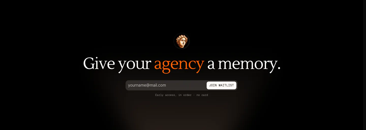
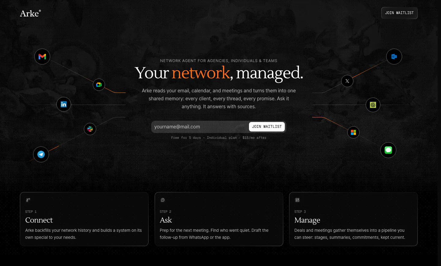
  87. Arke call to action section: centered serif headline with an orange accent word above an email waitlist field and a small statue icon on black
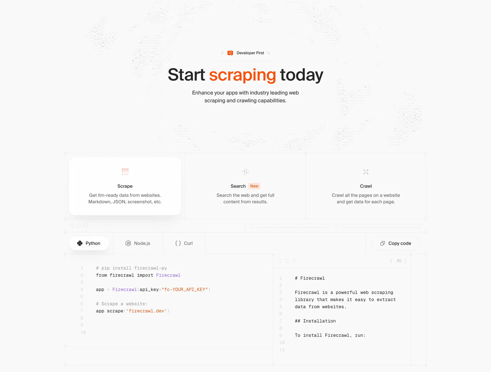
  88. Firecrawl features section: centered headline, three capability cards and a tabbed Python/Node.js/Curl code sample with markdown output
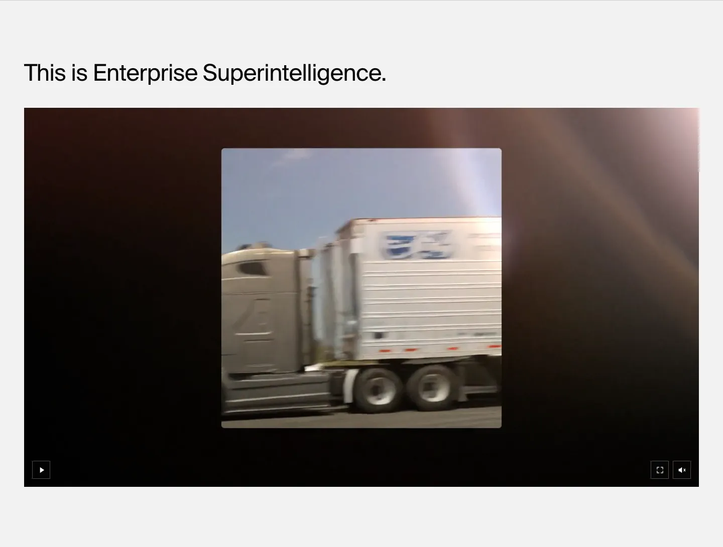
  89. HappyRobot features section: left-aligned headline above a wide dark video player showing footage of a moving truck, on light gray
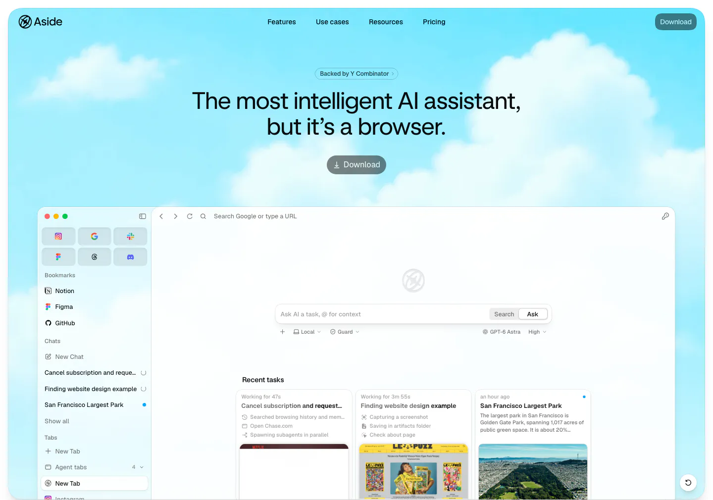
  90. Aside hero section: centered headline, YC badge and download button over a cloudy sky, above a browser app screenshot
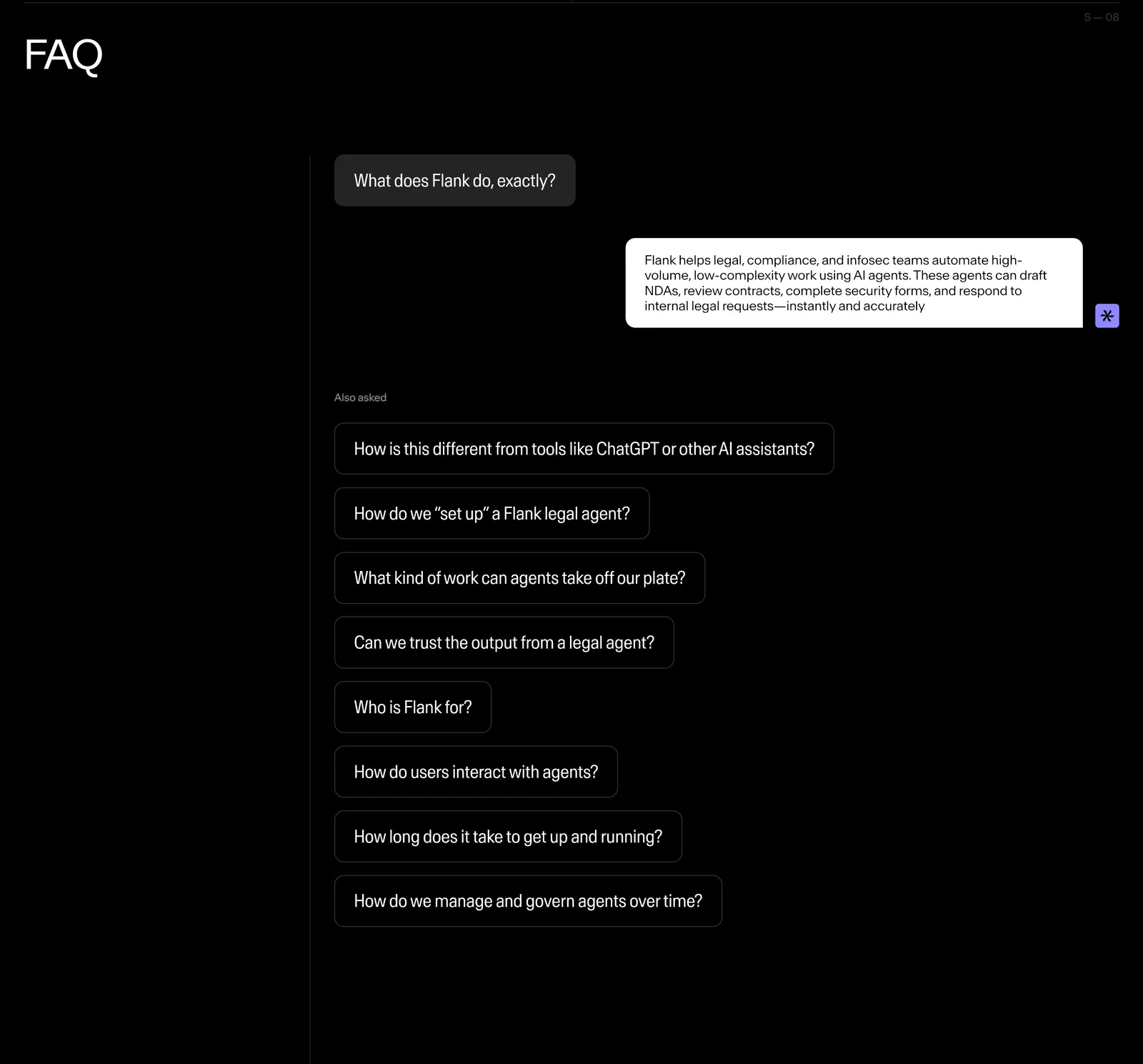
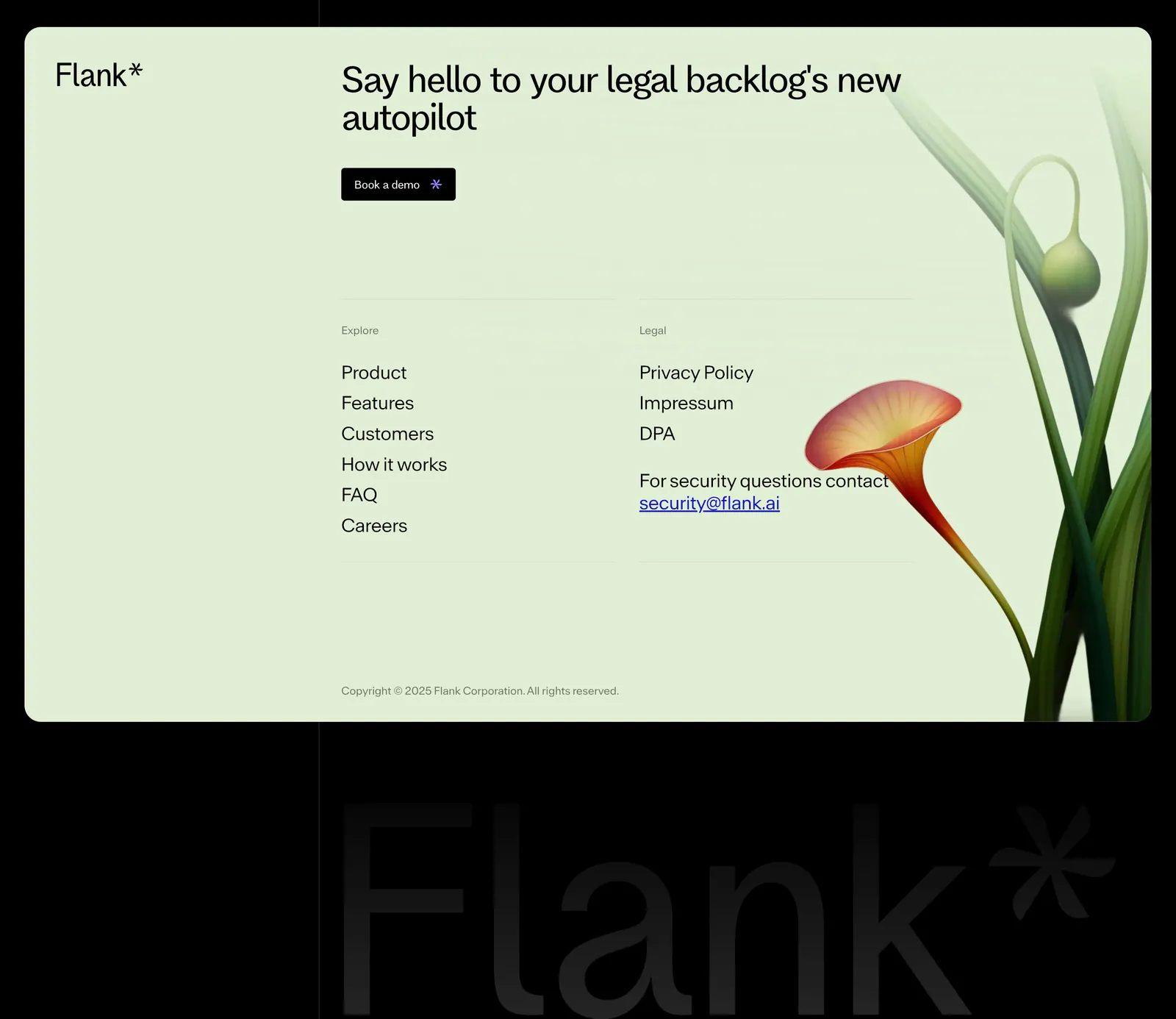
  91. Flank FAQ section: questions styled as chat bubbles with one answered reply and a list of follow-up questions on a black background
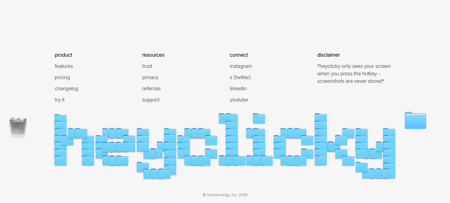
  92. heyclicky footer section: four link columns above a giant wordmark built from blue folder icons, copyright line on light gray
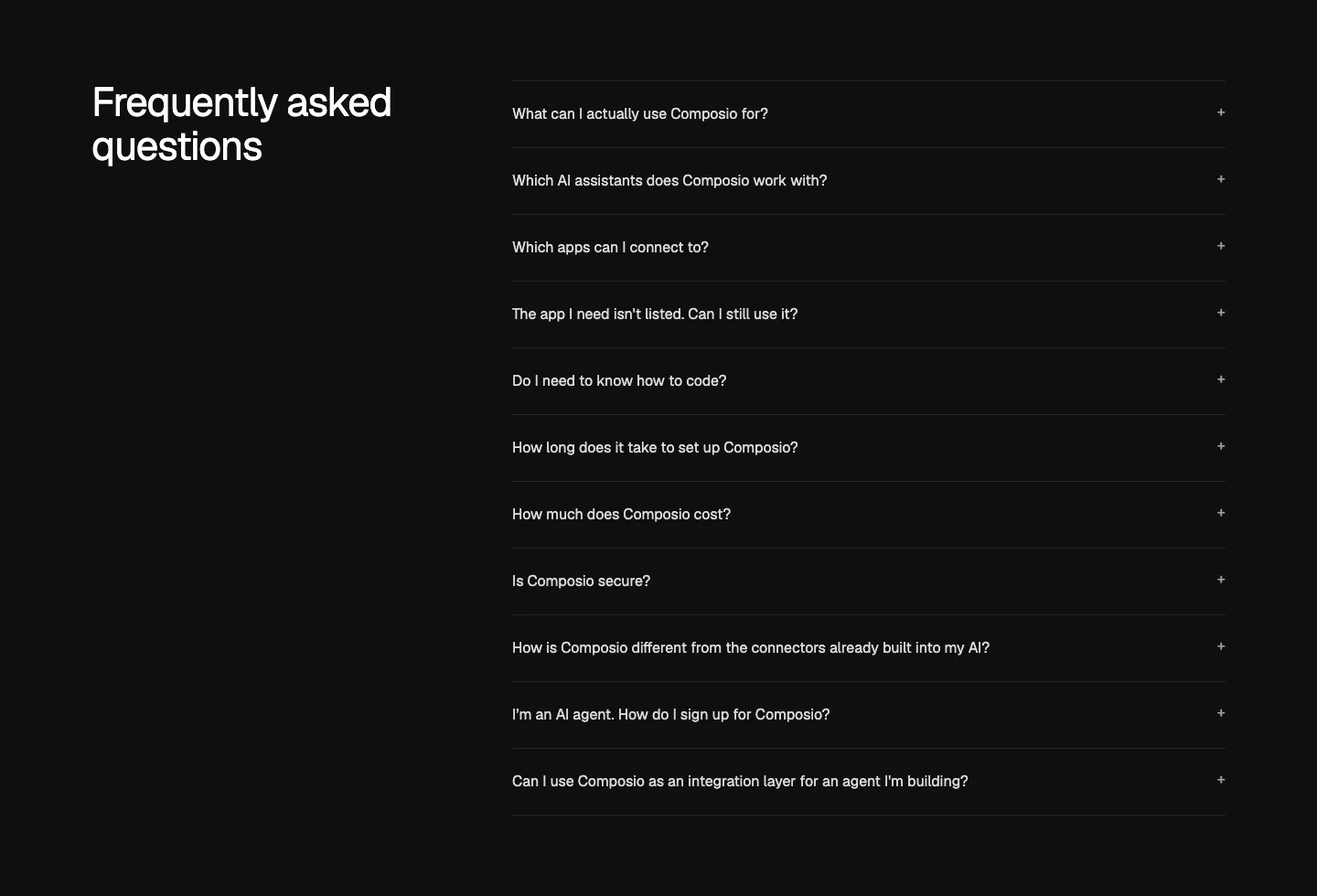
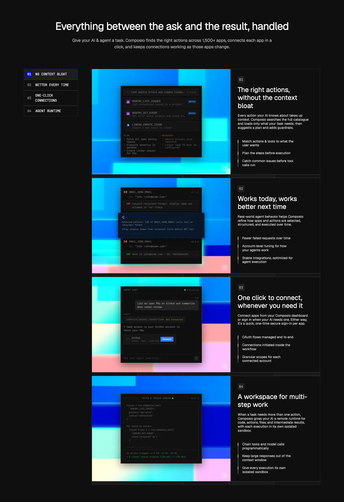
  93. Composio FAQ section: heading at left beside an accordion list of eleven questions with plus icons on near-black
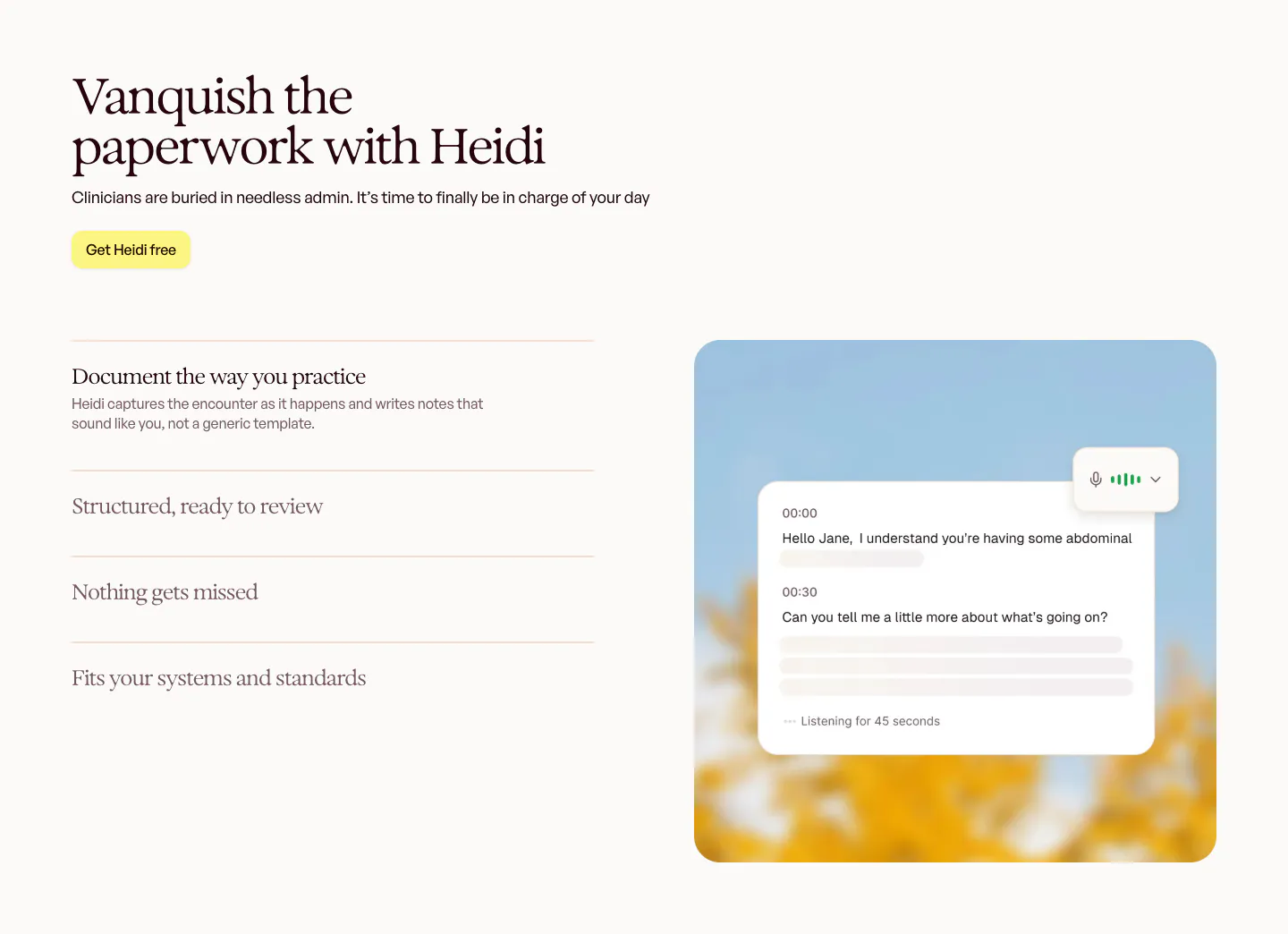
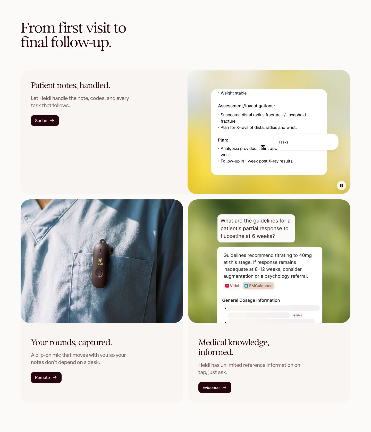
  94. Heidi features section: serif headline and accordion feature list on the left, live transcript card over a blurred sky photo on the right
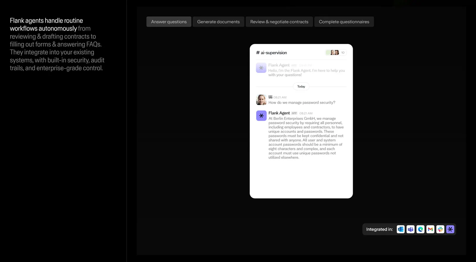
  95. Flank features section: left text column beside a tabbed panel showing a chat-style agent UI mockup and integration icons on black
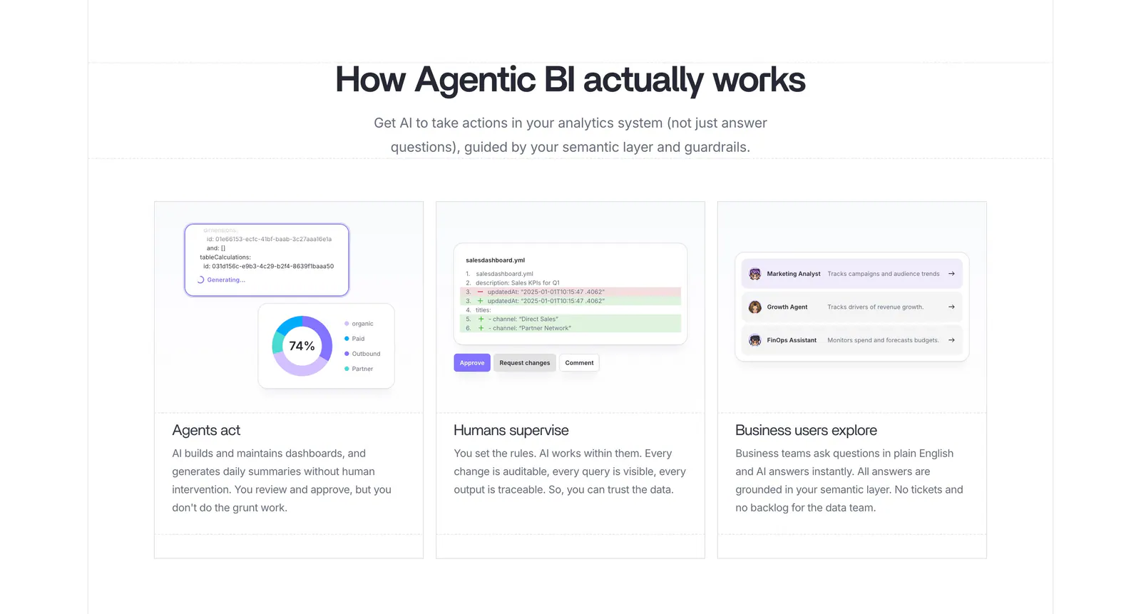
  96. Lightdash how it works section: centered heading above three equal cards with UI snippets for AI agents, a YAML diff review and business users
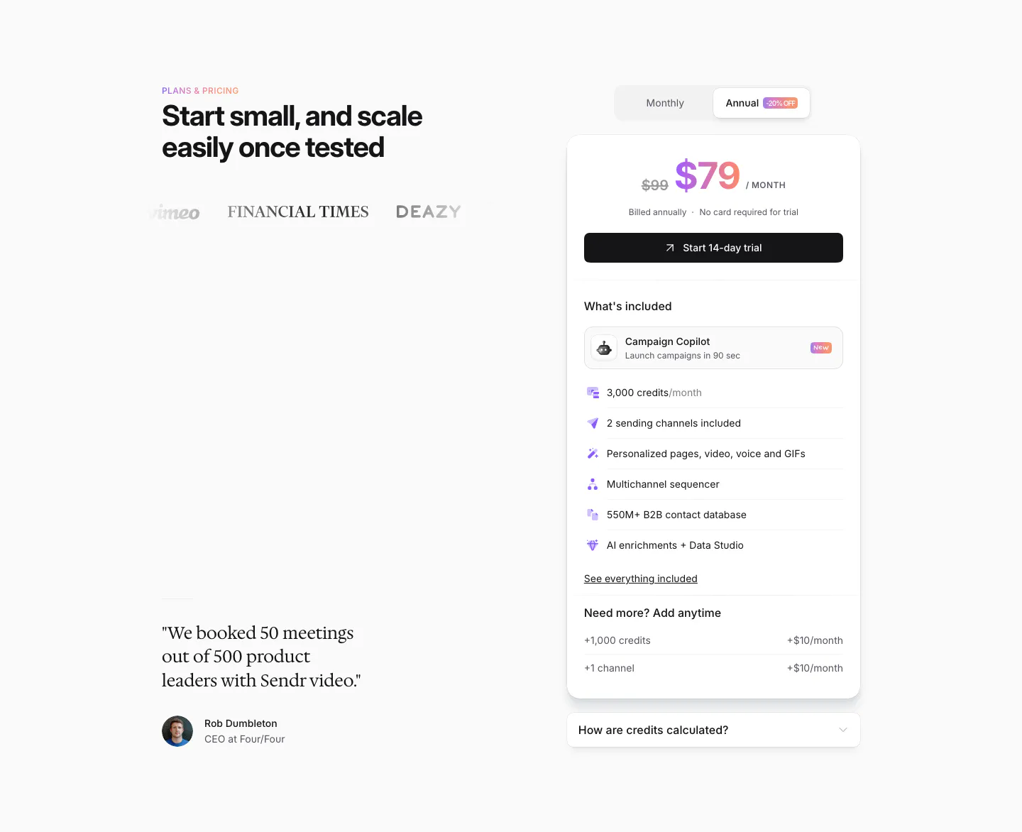
  97. Sendr pricing section: headline, logos and serif customer quote left, single $79 plan card with monthly/annual toggle right
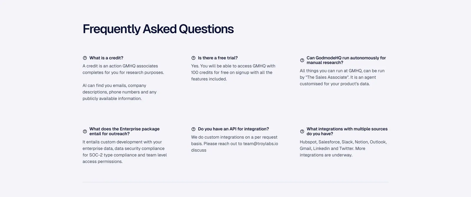
  98. Godmode logo cloud section: single thin row with a trusted-by label beside fading grayscale customer logos on a pale background
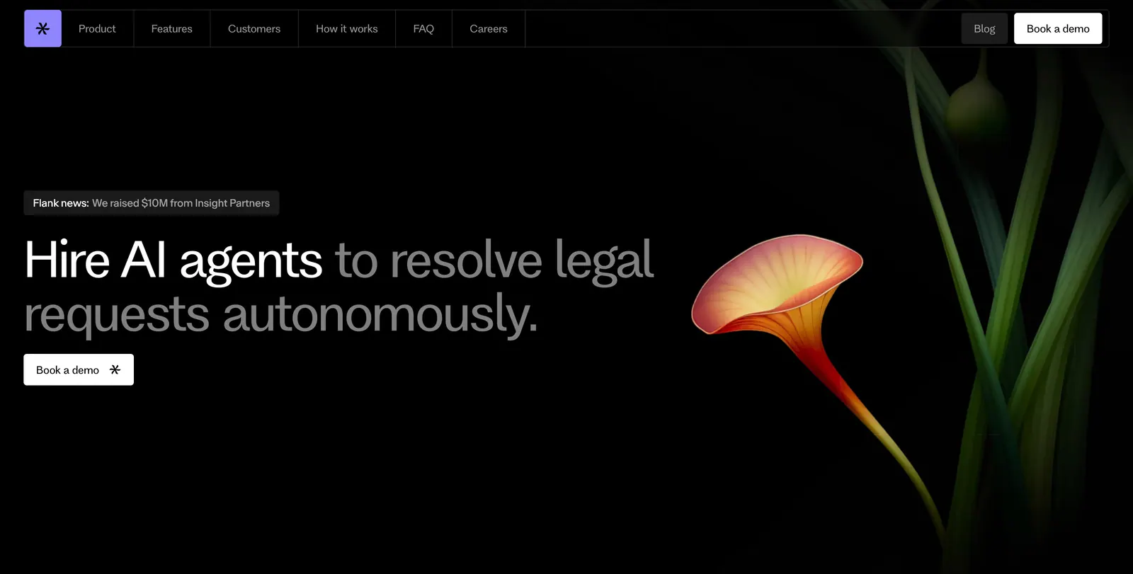
  99. Flank hero section: left-aligned headline with news pill and demo button beside a rendered orange flower on a black background
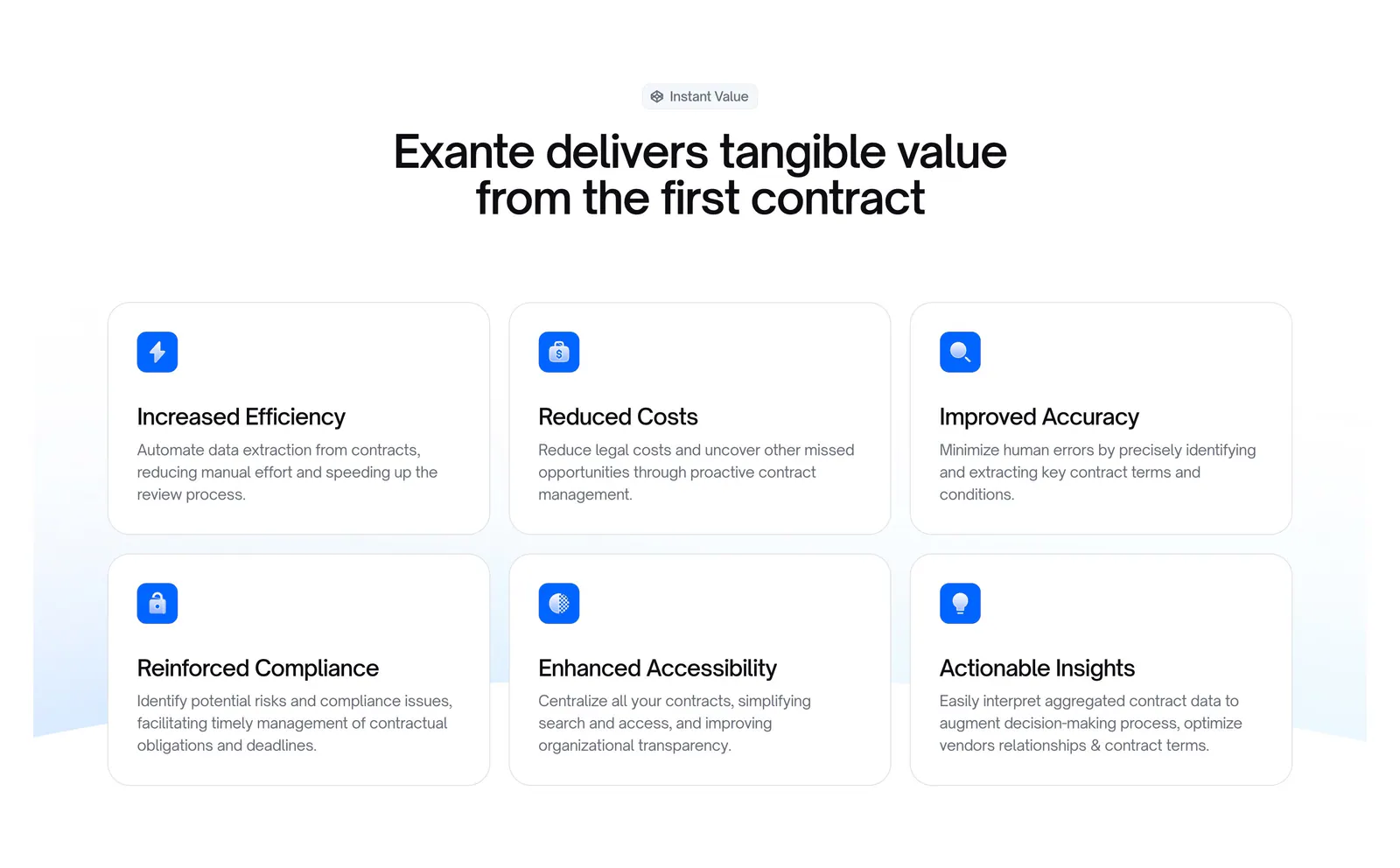
  100. Exante features section: centered headline above a 3x2 grid of benefit cards with blue icons on a white background
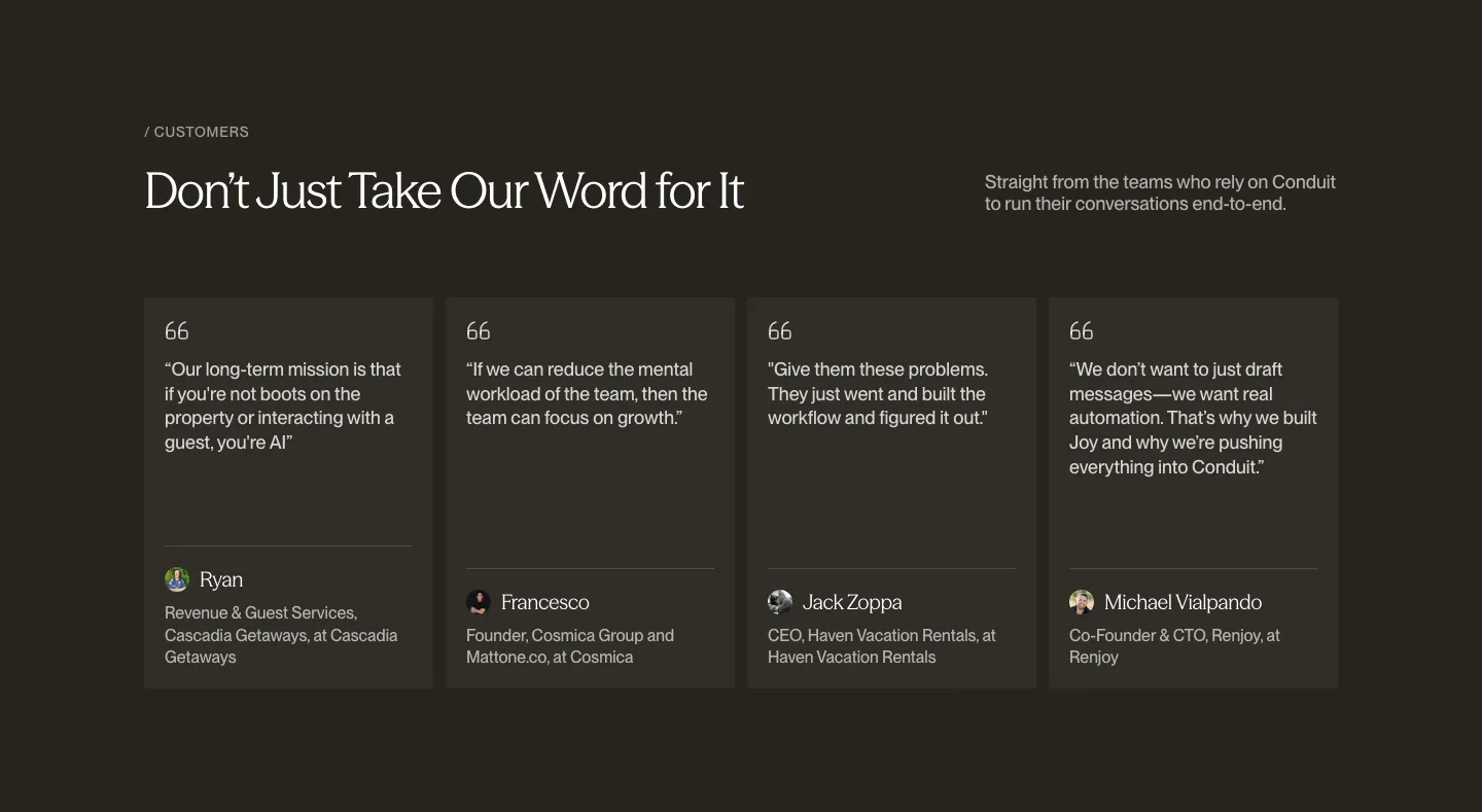
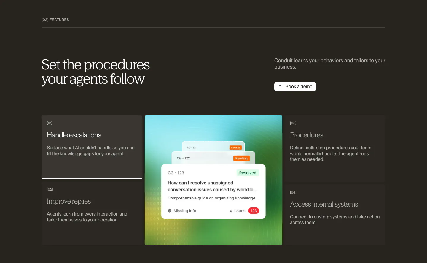
  101. Conduit testimonials section: serif headline above four quote cards with avatars on a dark brown background
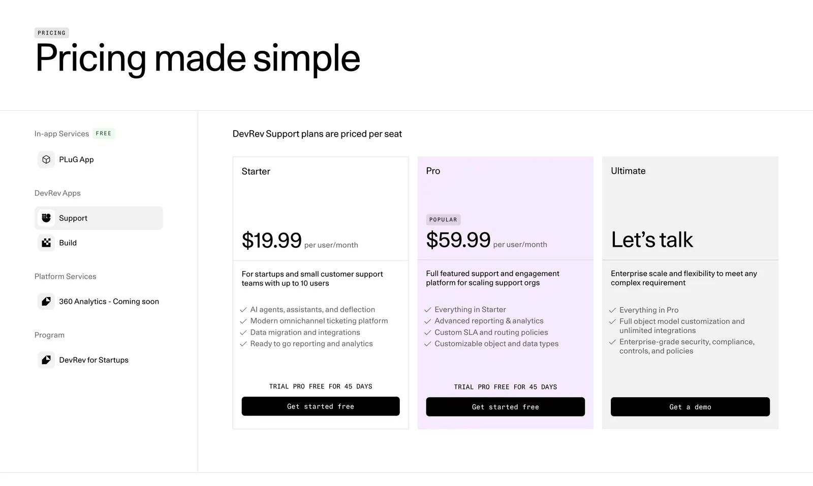
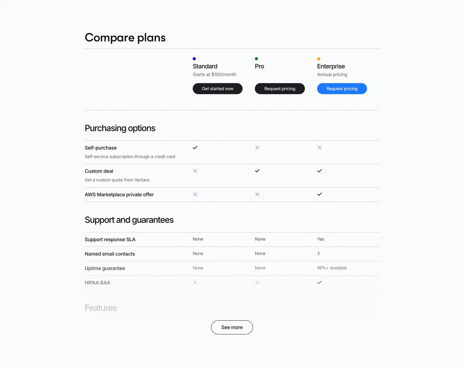
  102. DevRev pricing section: large headline, a left sidebar of product apps and three plan cards with the Pro tier highlighted in lavender
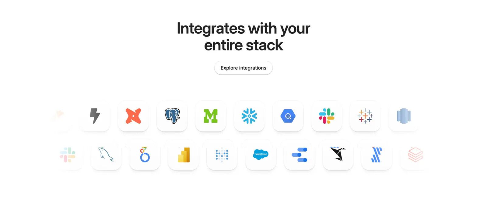
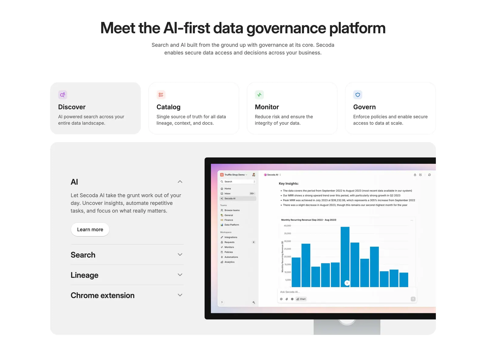
  103. Secoda integrations section: centered headline and button above two rows of integration app icons fading at the edges on white
  104. Attio call to action section: centered two-line headline with Talk to sales and Start for free buttons on a dark striped background
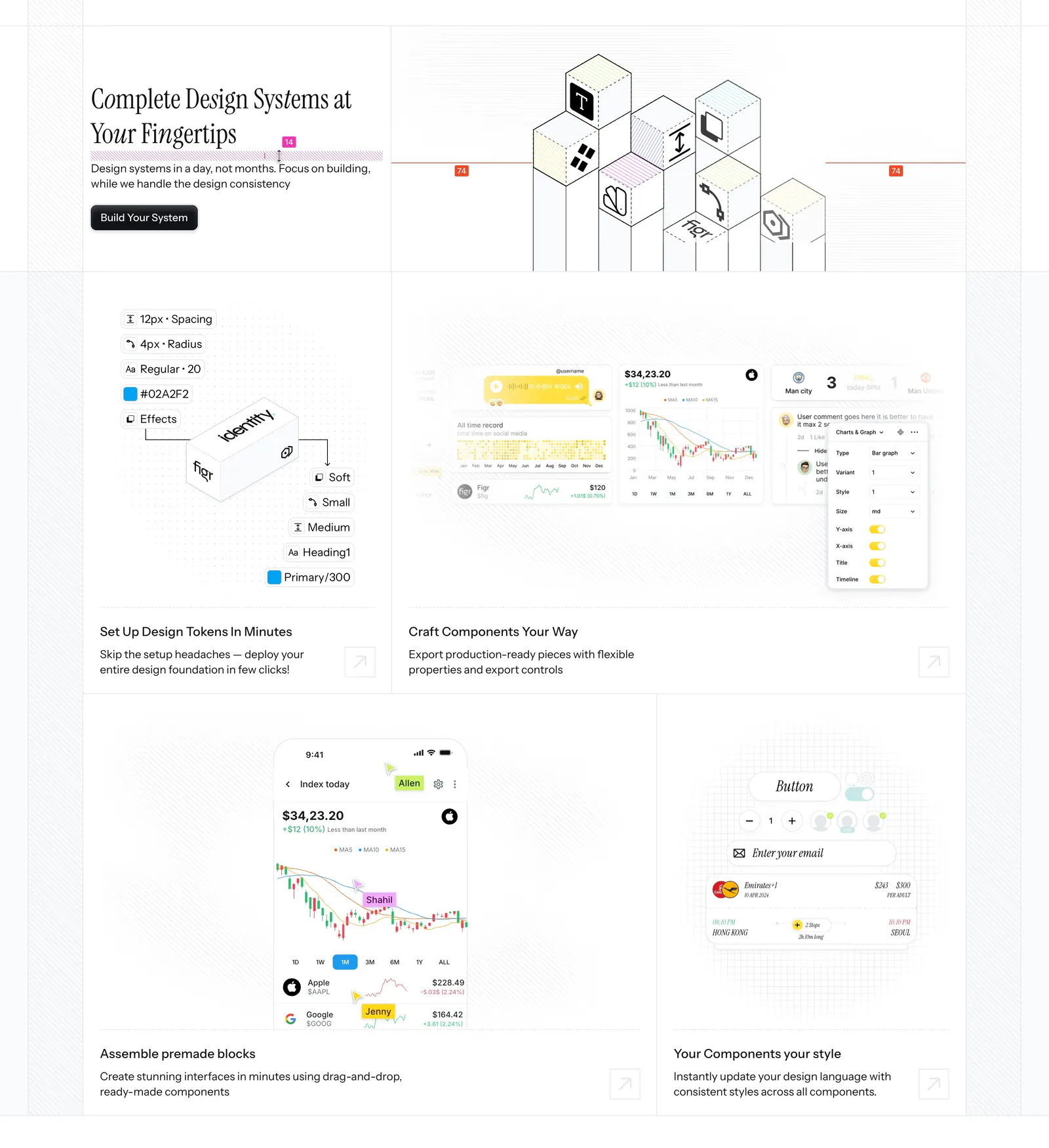
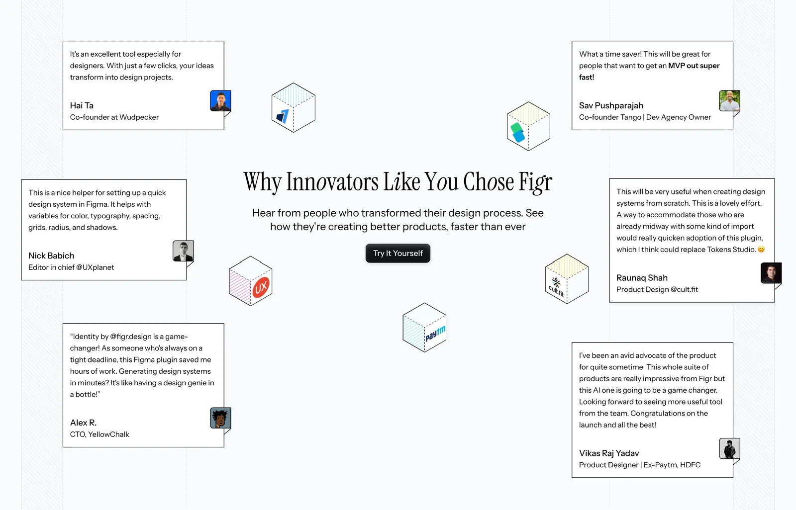
  105. Figr features section: serif headline beside an isometric cube drawing above a bento of design token, chart and mobile UI tiles
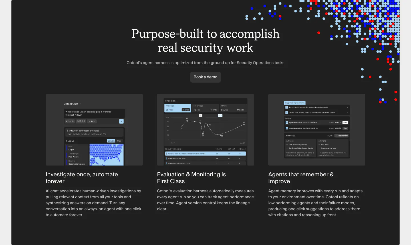
  106. Cotool logo cloud section: single row of grayscale customer logos under a small 'Loved by teams at' label on a light gray background
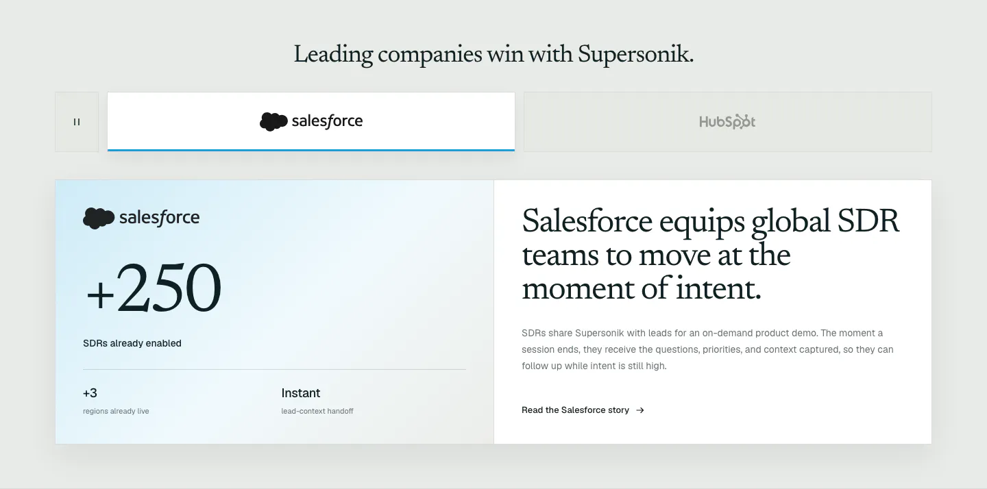
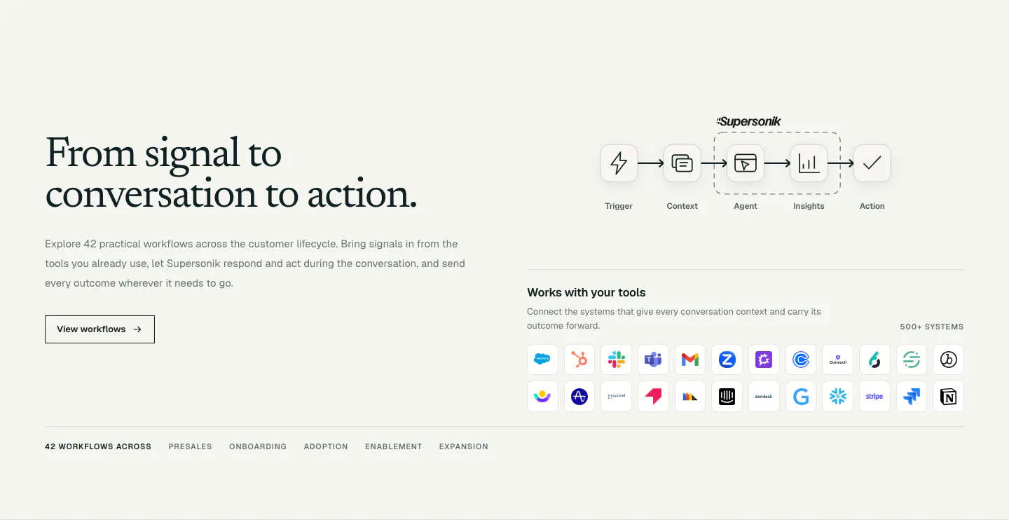
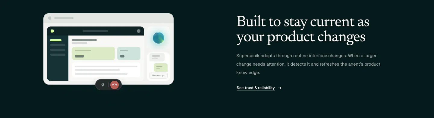
  107. Supersonik testimonials section: customer logo tabs above a Salesforce case study card with a large +250 metric and serif story headline
  108. Clay footer section: centered closing CTA over a 3D clay landscape and ball pit, with a light card of link columns and wordmark
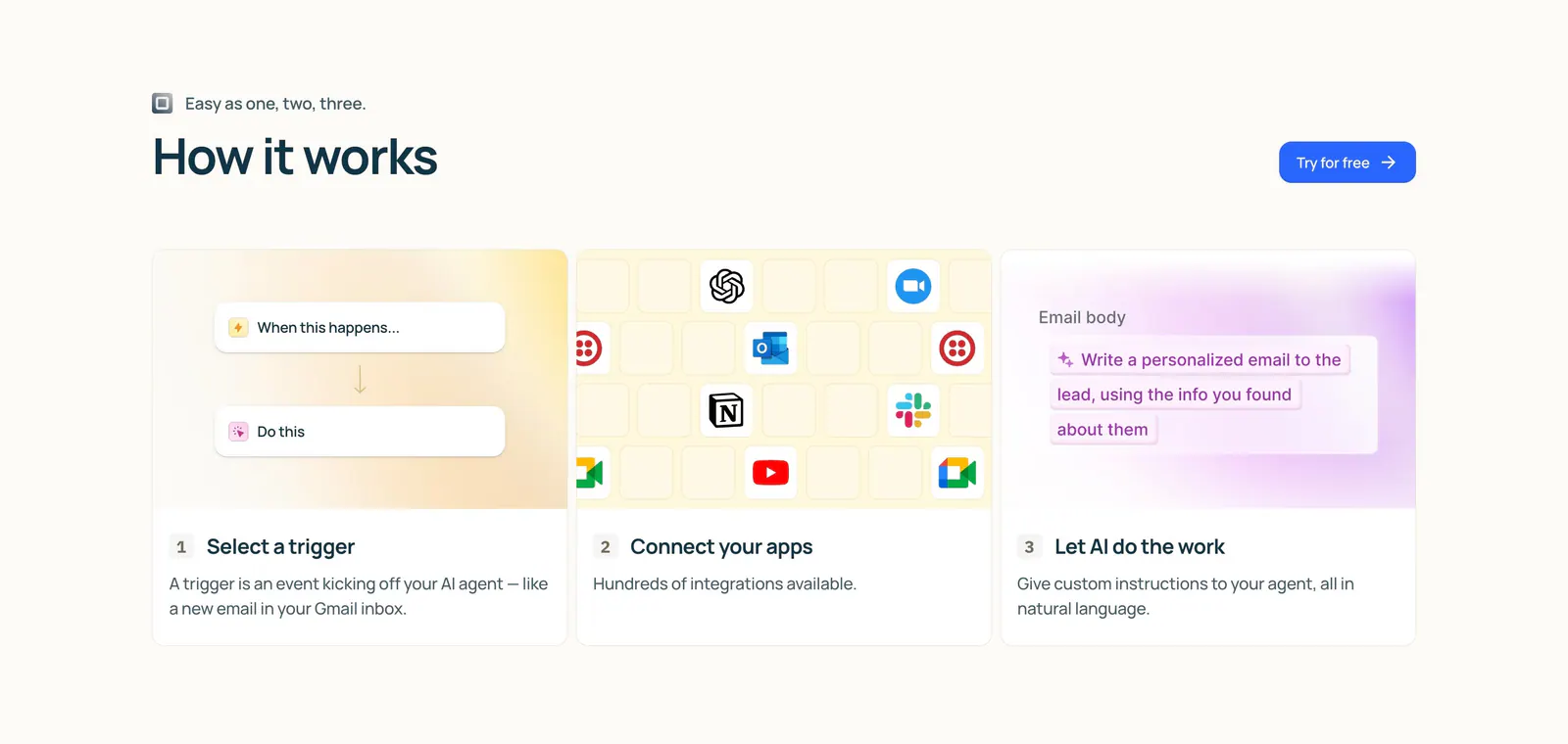
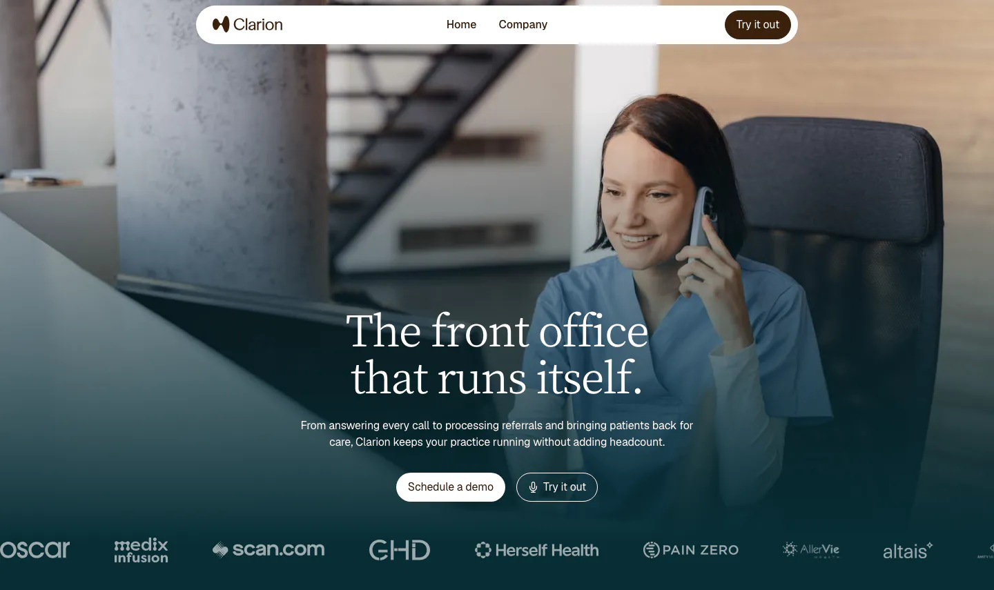
  109. Lindy how it works section: left-aligned heading and button above three numbered step cards with trigger, app icon grid and AI prompt visuals
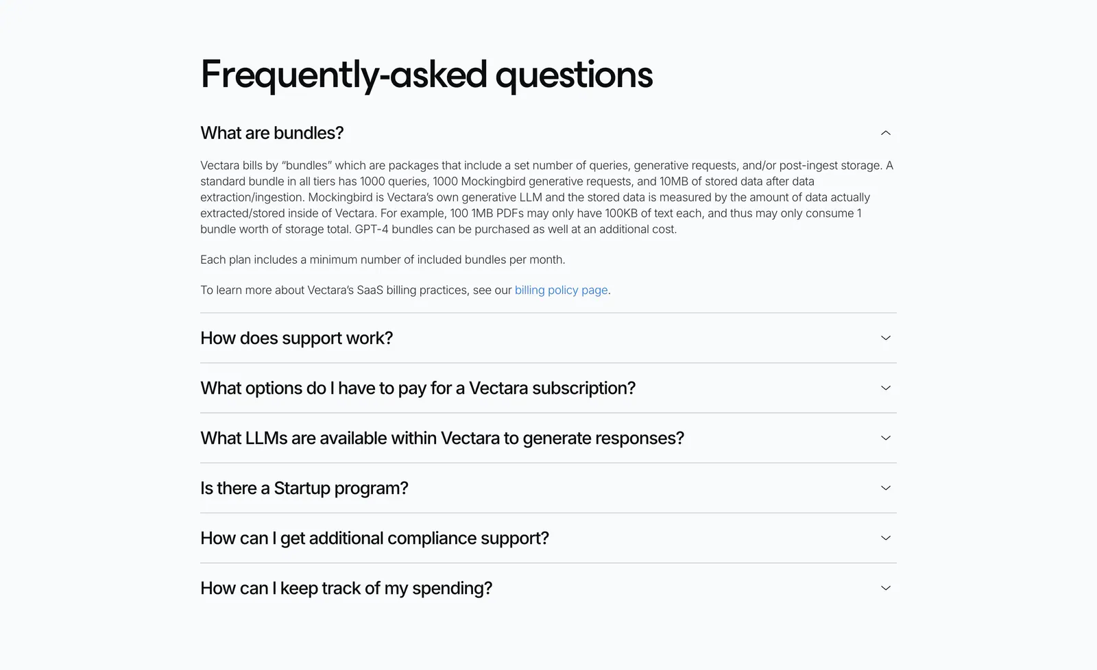
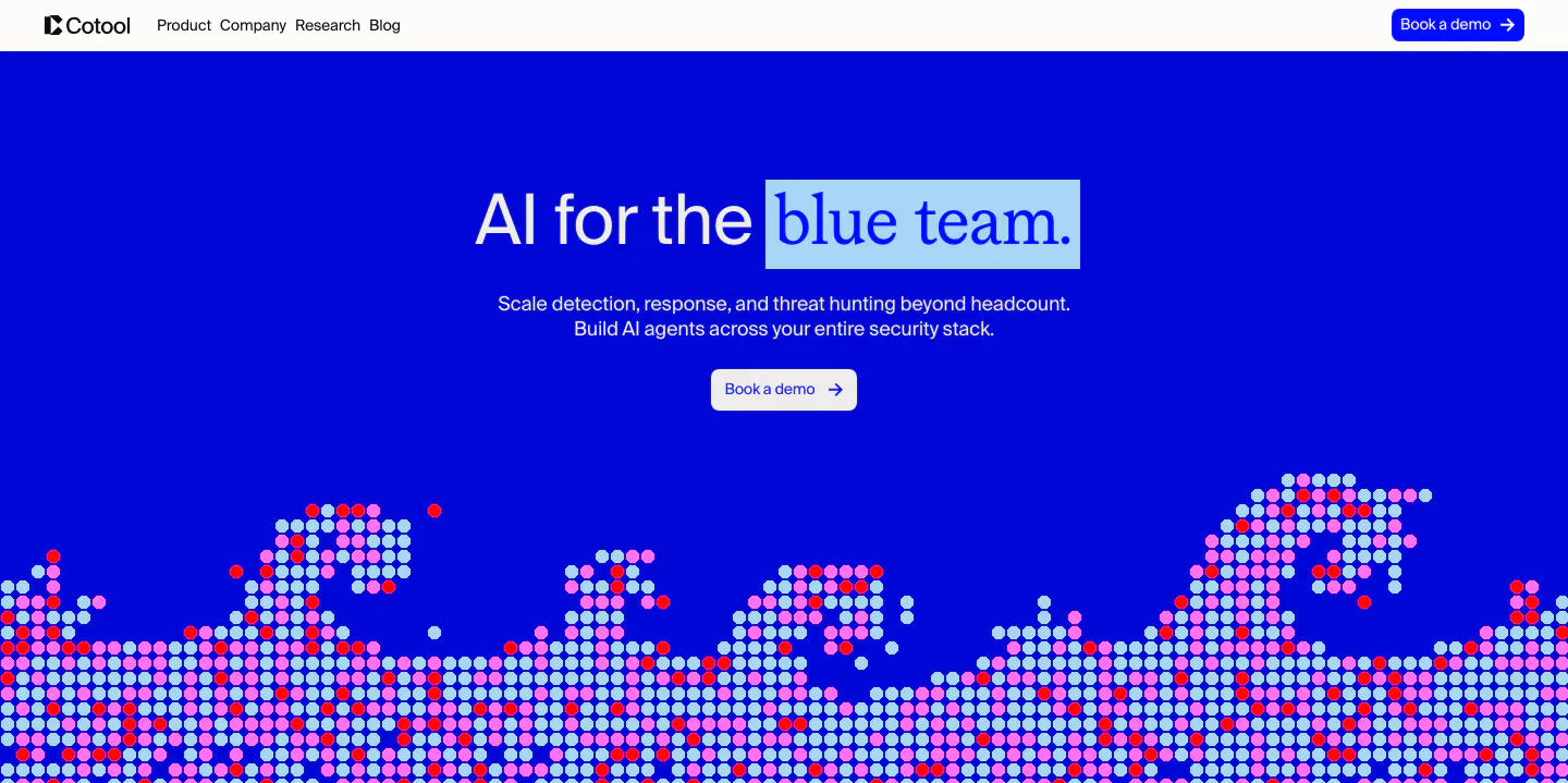
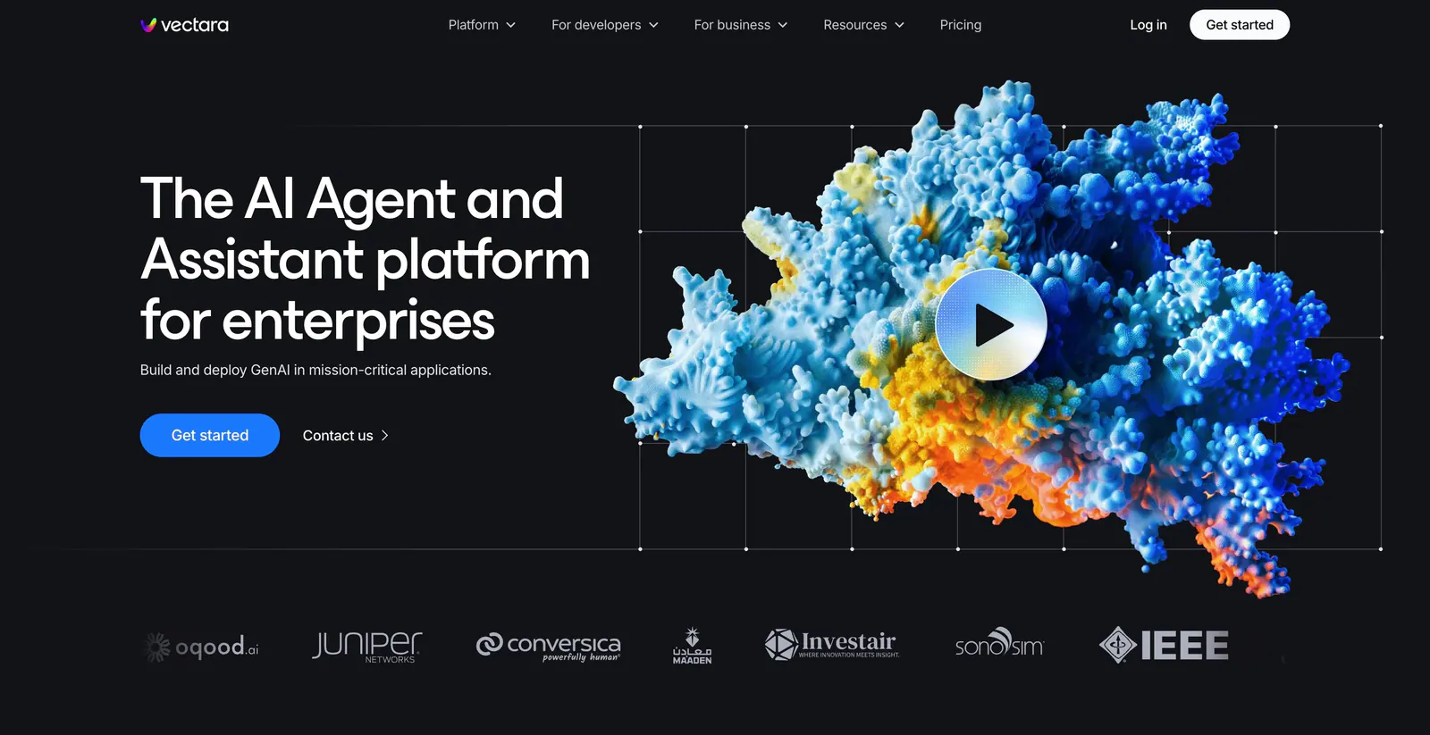
  110. Cotool call-to-action section: saturated blue banner with serif headline and button on the left and a dotted pixel artwork on the right
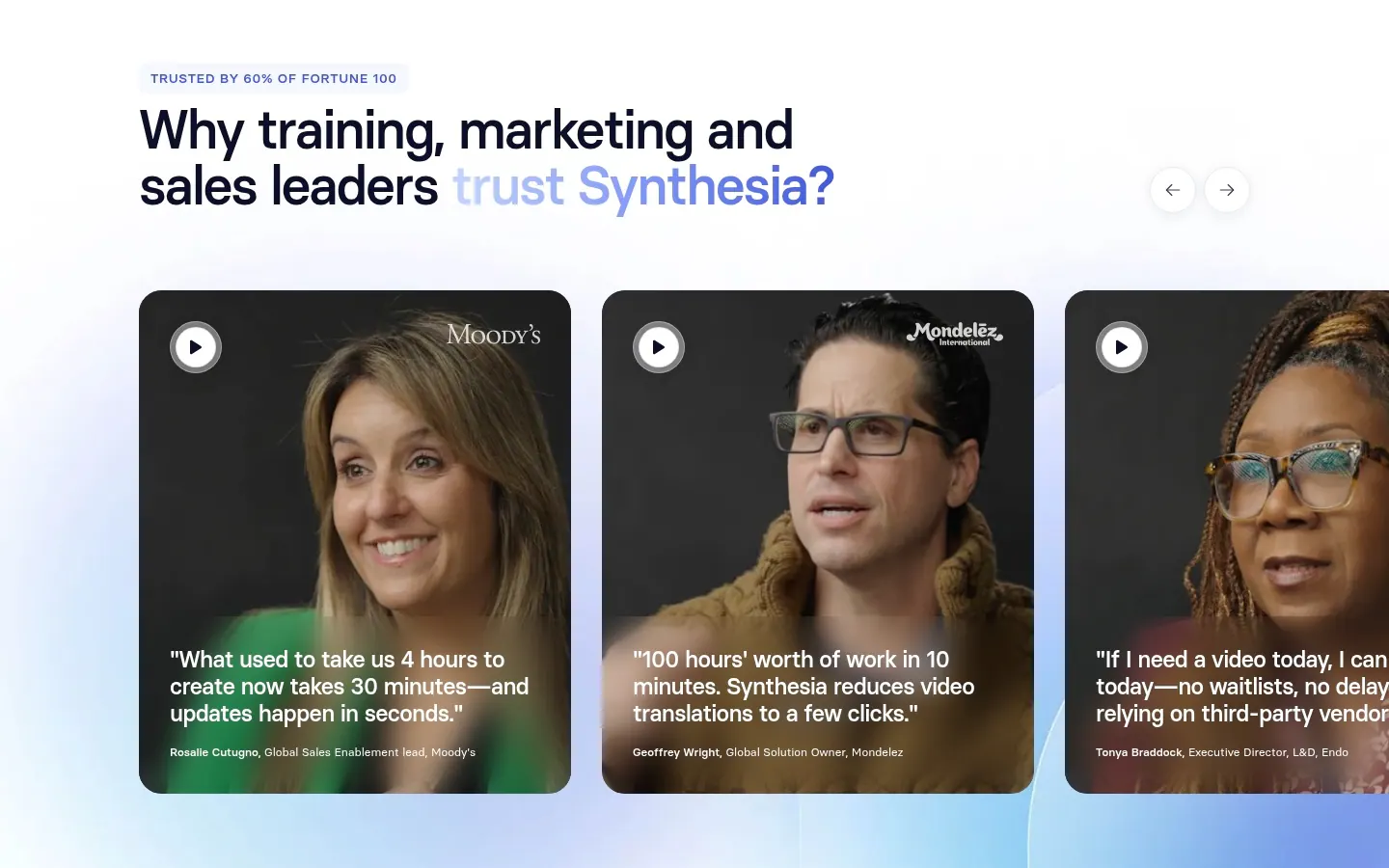
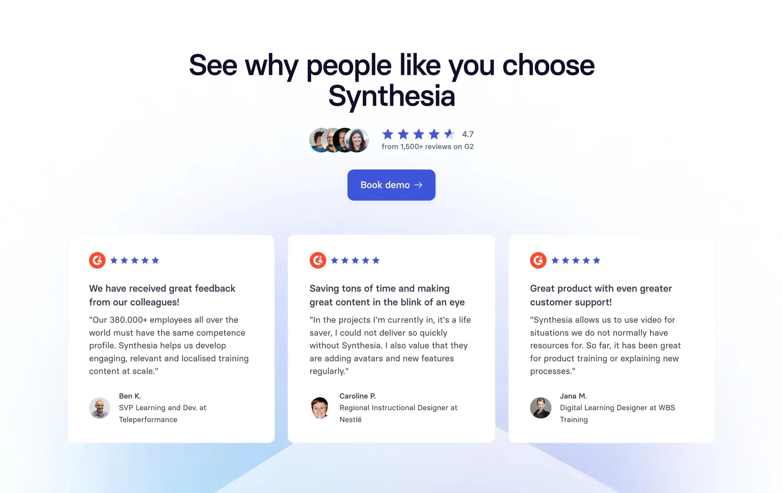
  111. Synthesia testimonials section: headline with arrow controls above a carousel of video testimonial cards with customer portraits and quotes
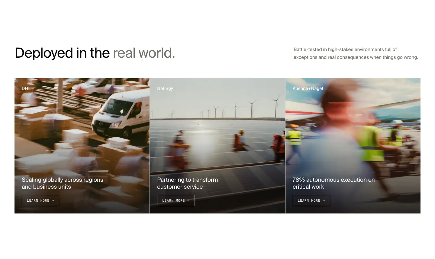
  112. HappyRobot features section: headline with side note above three customer story cards (DHL, Naturgy, Kuehne+Nagel) on motion-blurred photos
  113. Clarion hero section: full-bleed photo of a clinic worker on the phone, centered serif headline, two buttons and a customer logo row
  114. Vectara FAQ section: left-aligned heading above an accordion of questions with the first answer expanded on a light gray background
  115. Smallest.ai logo cloud section: small Trusted by label on the left beside a row of grayscale RingCentral, Paytm, Truecaller and Acefone logos
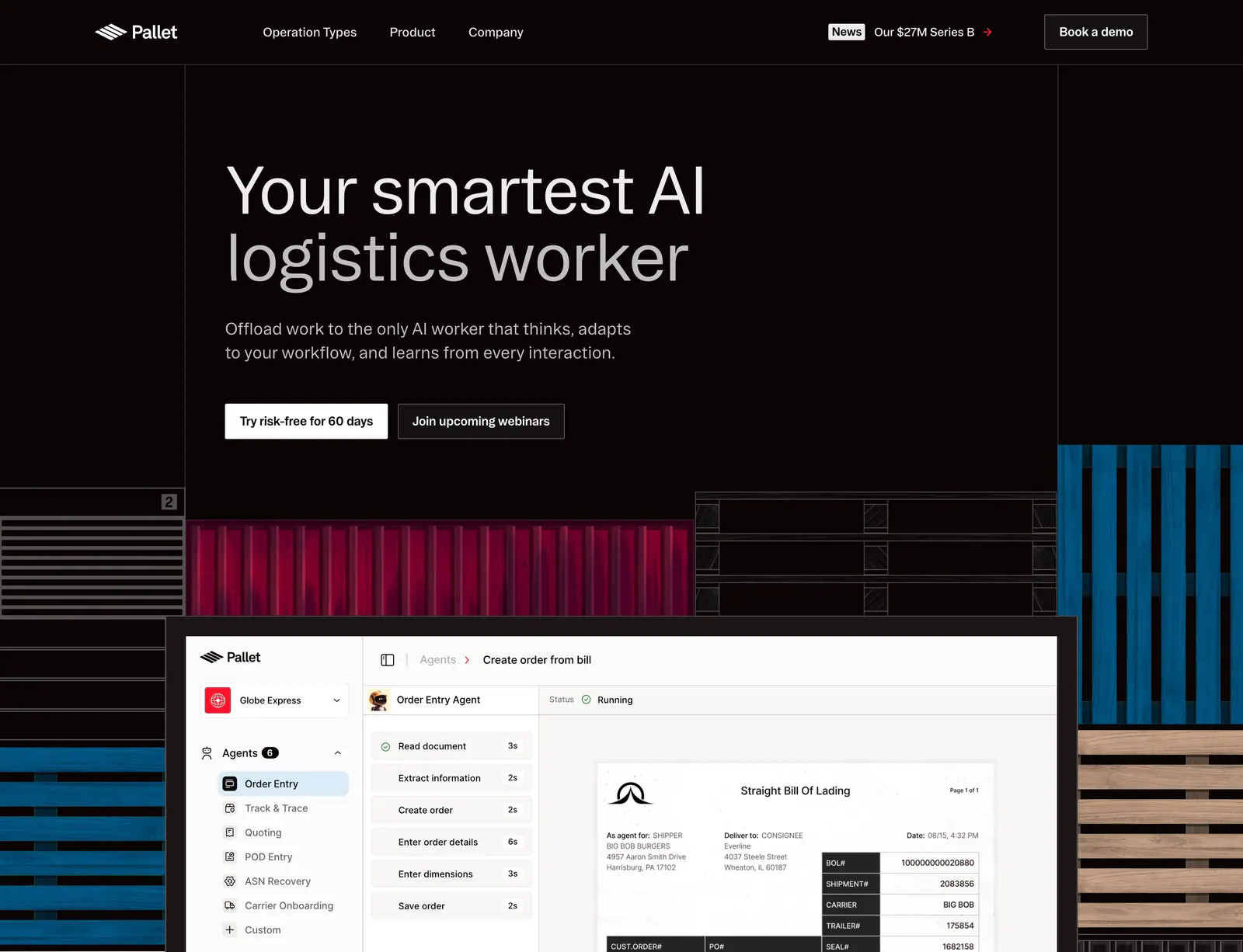
  116. Pallet hero section: dark left-aligned headline with two buttons above an agent product screenshot framed by container and pallet artwork
  117. VisionAI footer section: logo, social icons and three link columns above a large faint wordmark on white
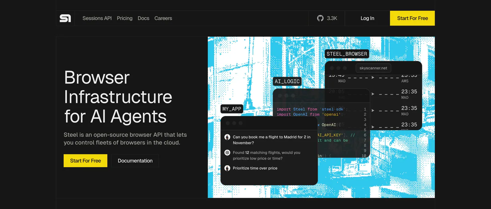
  118. Steel call-to-action section: dithered grayscale construction photo banner with logo, large headline and yellow button on a dark background
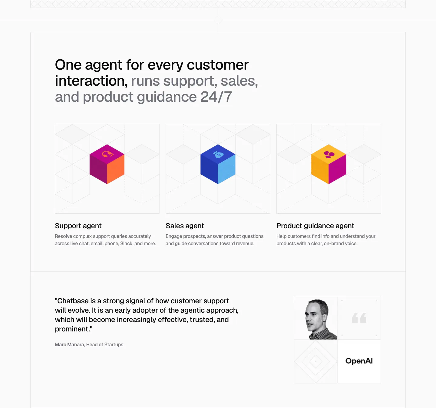
  119. Chatbase use cases section: three agent cards with colorful isometric cubes on line grids, plus an OpenAI quote with portrait below
  120. Cohere footer section: dark background with logo, multi-group link columns, social icons and language selector
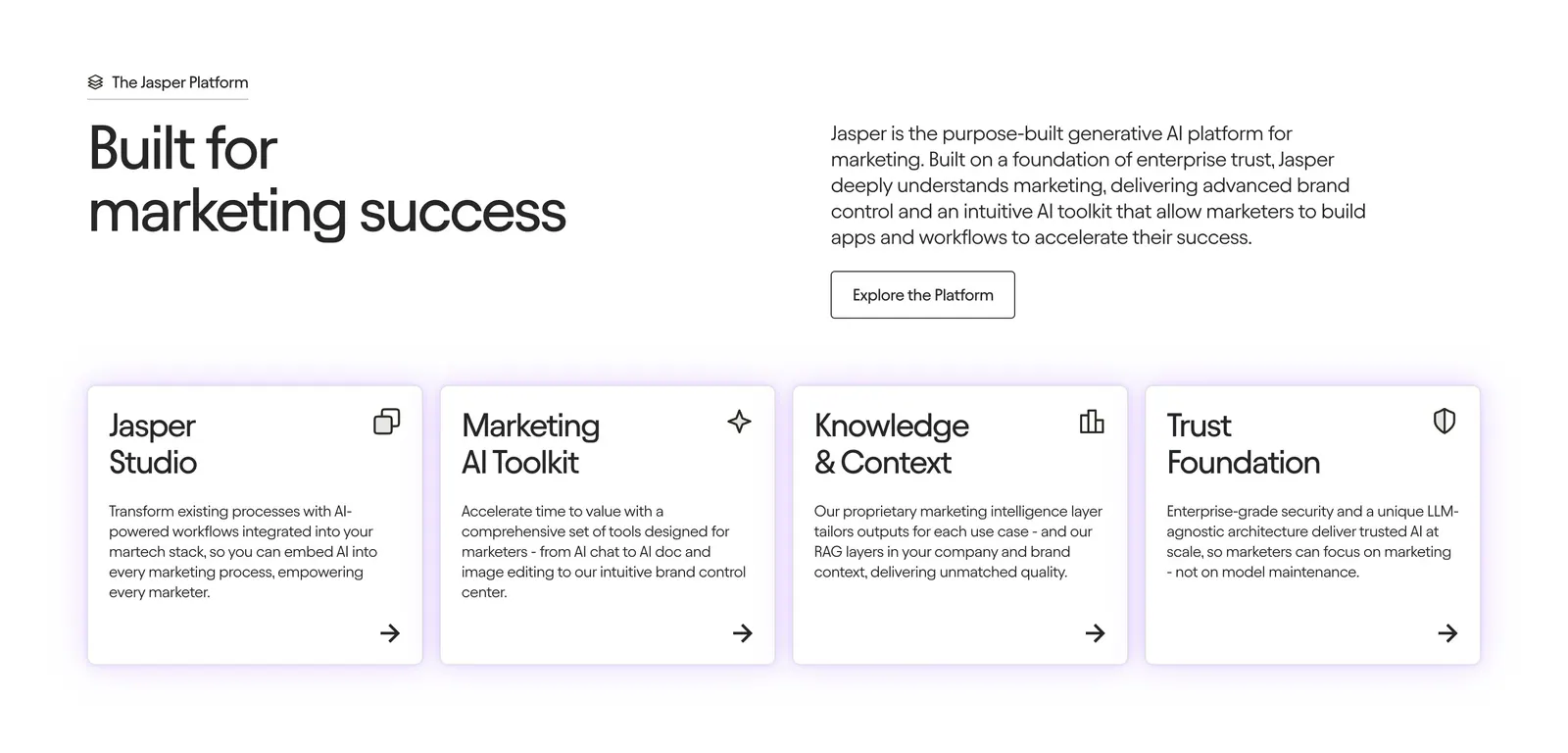
  121. Jasper features section: large left-aligned headline above three icon columns with short benefit descriptions on a white background
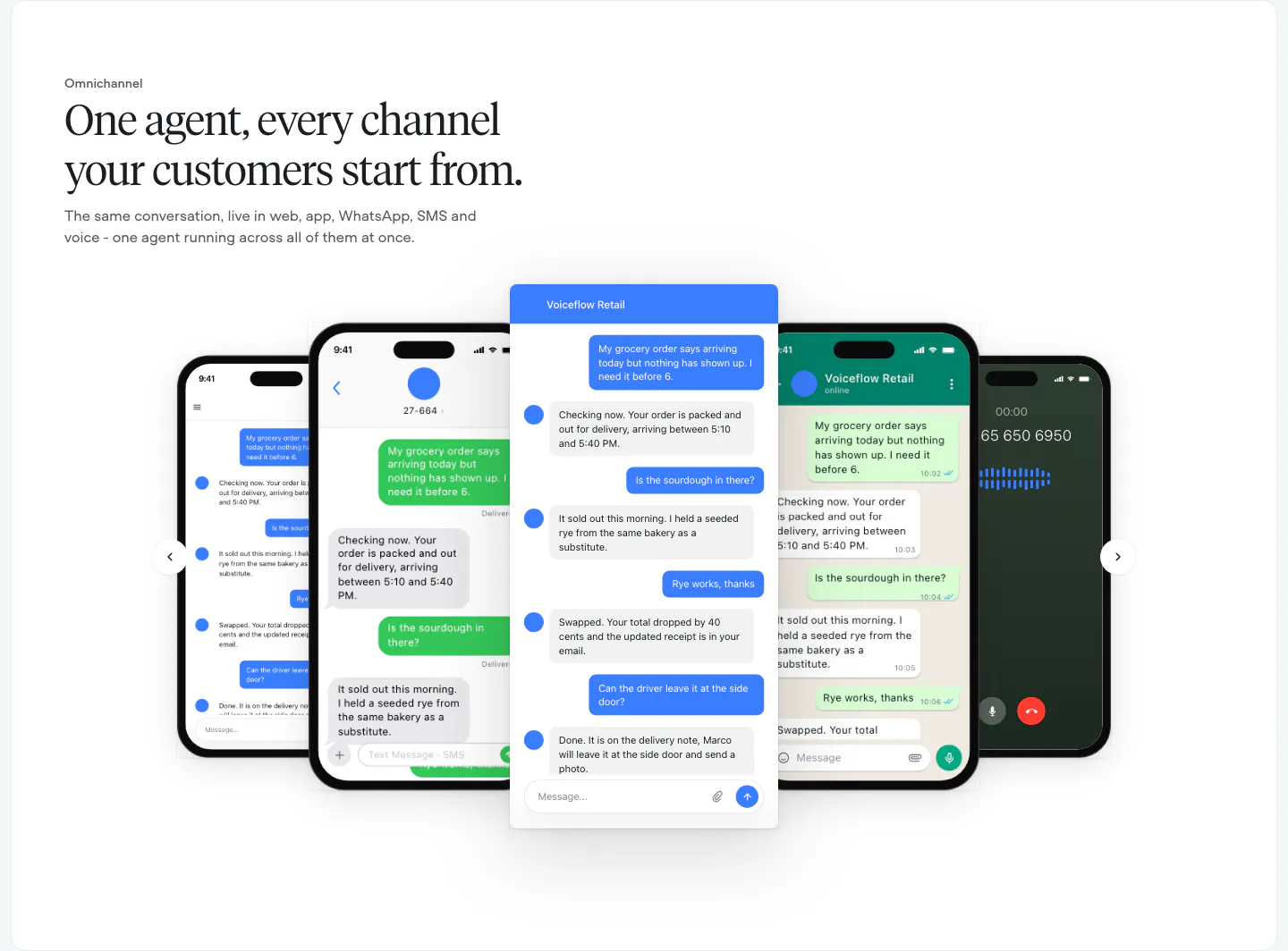
  122. Voiceflow features section: left-aligned serif headline above a carousel of phone and chat UI mockups with arrow controls
  123. Gumloop footer section: six link columns above a wordmark and copyright row on white
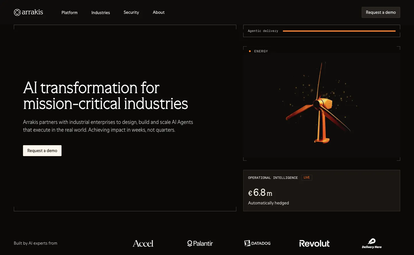
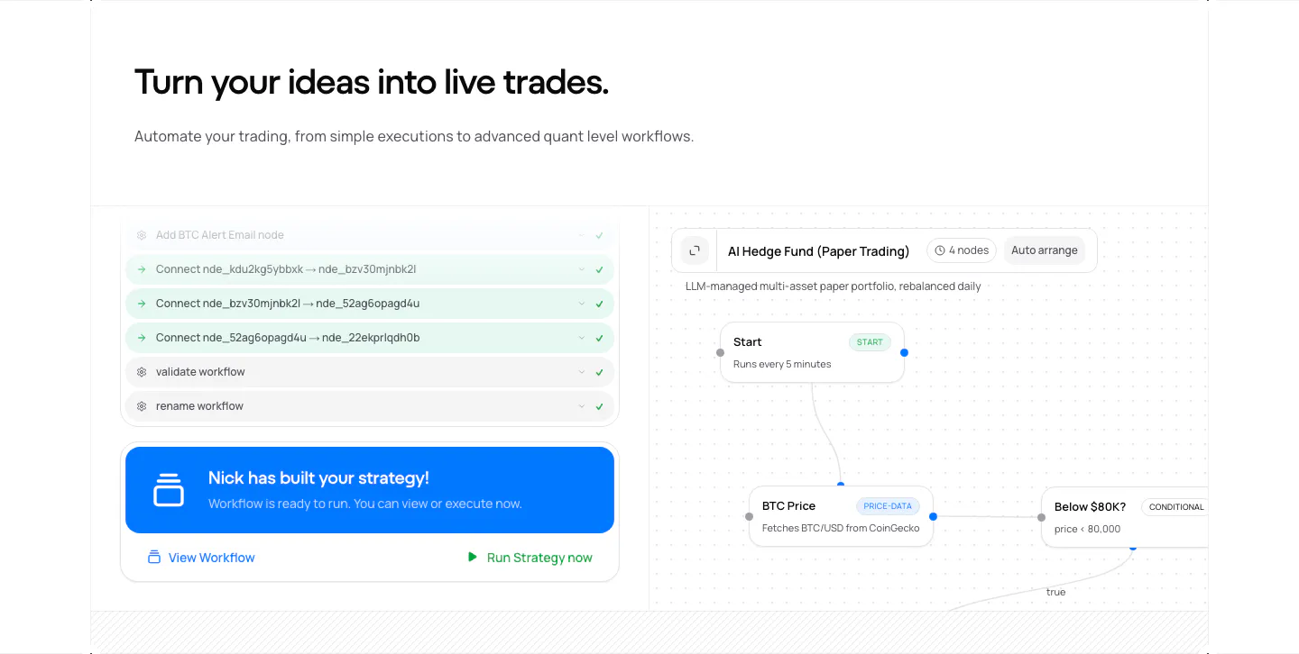
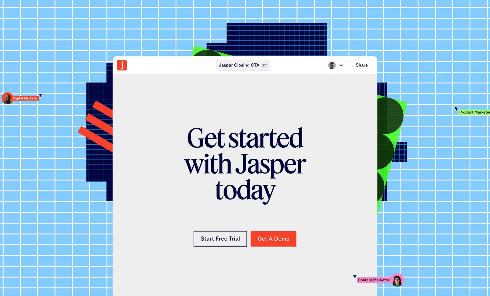
  124. Arrakis hero section: dark split layout with headline and demo button beside a 3D wind turbine render and data cards, logo row below
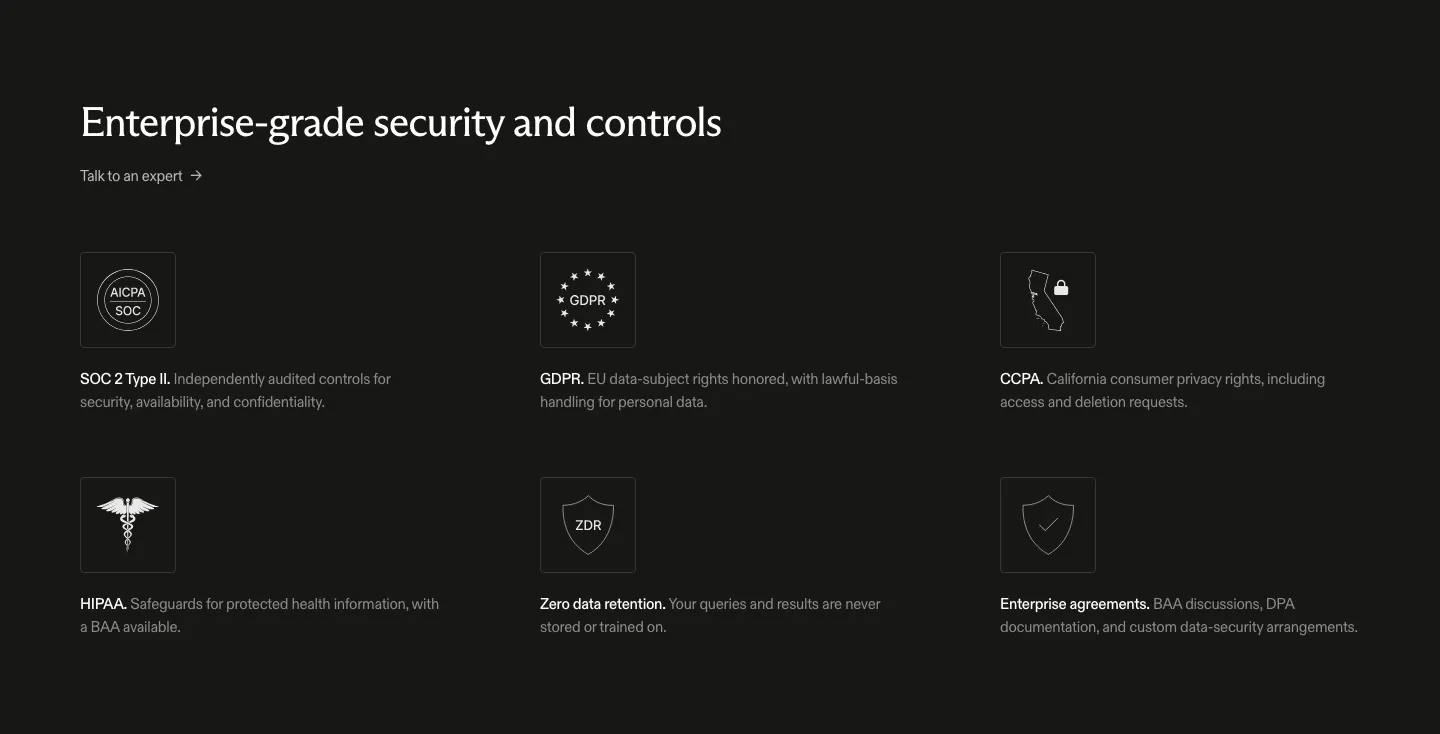
  125. CodeRabbit footer section: dark link columns with orange labels, email subscribe field and a huge outlined CodeRabbit wordmark
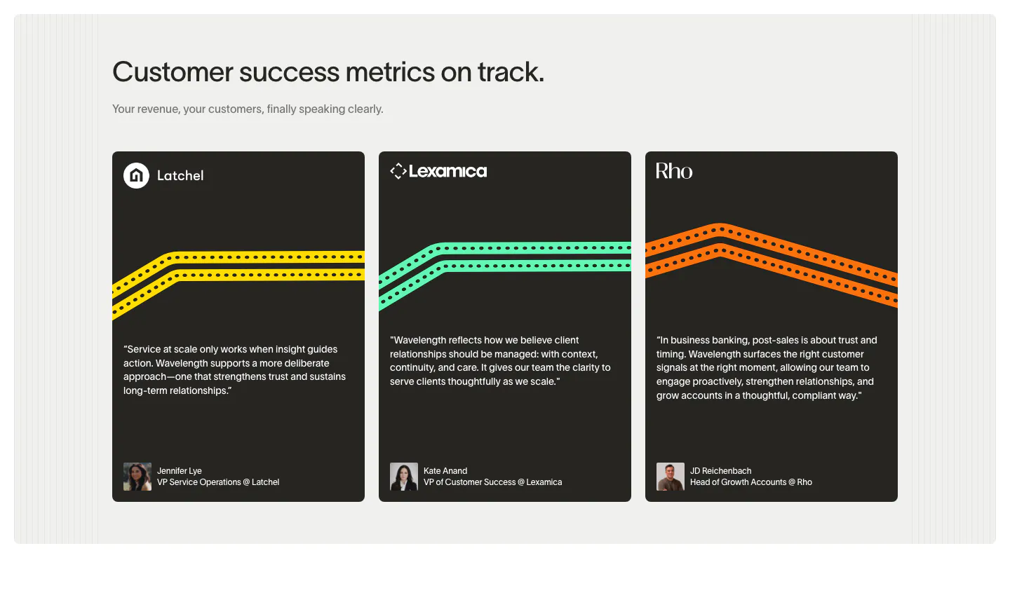
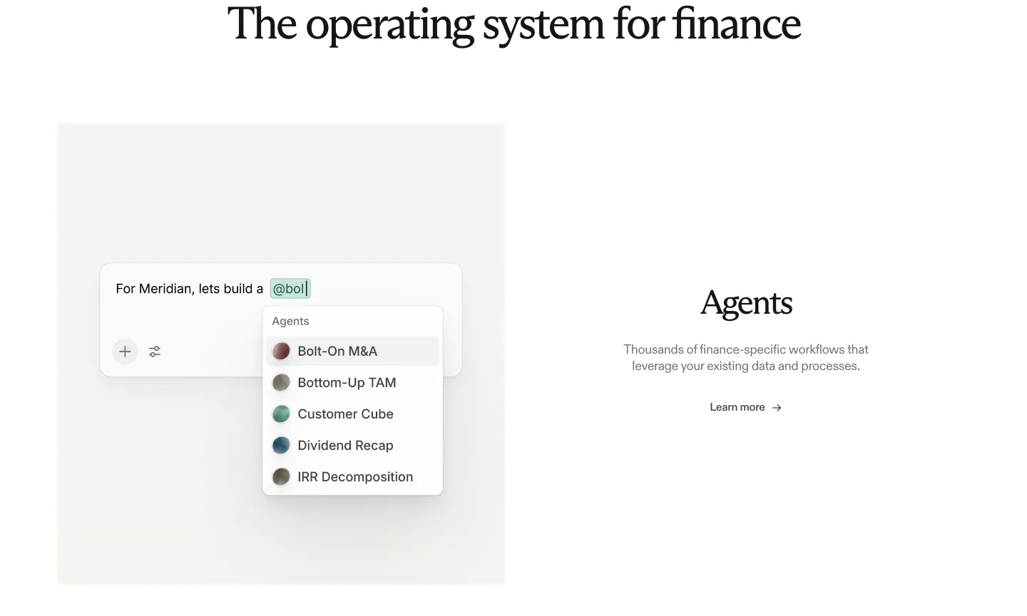
  126. Wavelength testimonials section: left headline above three dark quote cards from Latchel, Lexamica and Rho with colored track lines and avatars
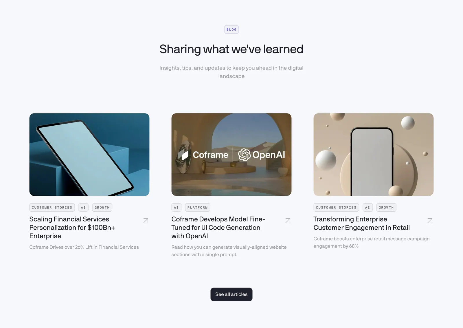
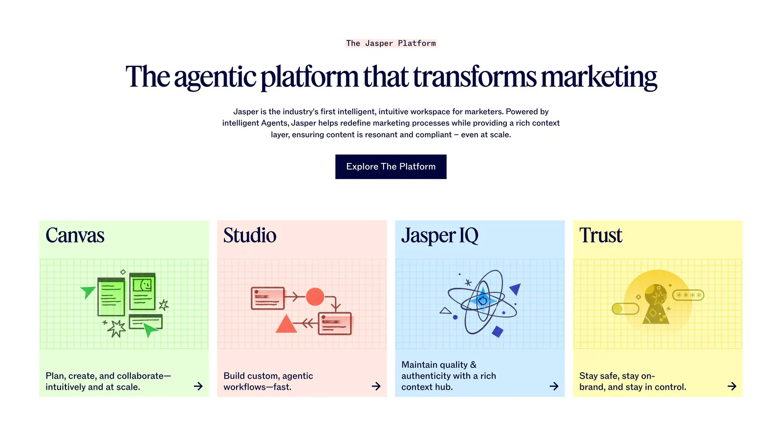
  127. Coframe blog & resources section: centered heading above three article cards with rendered device thumbnails and tags
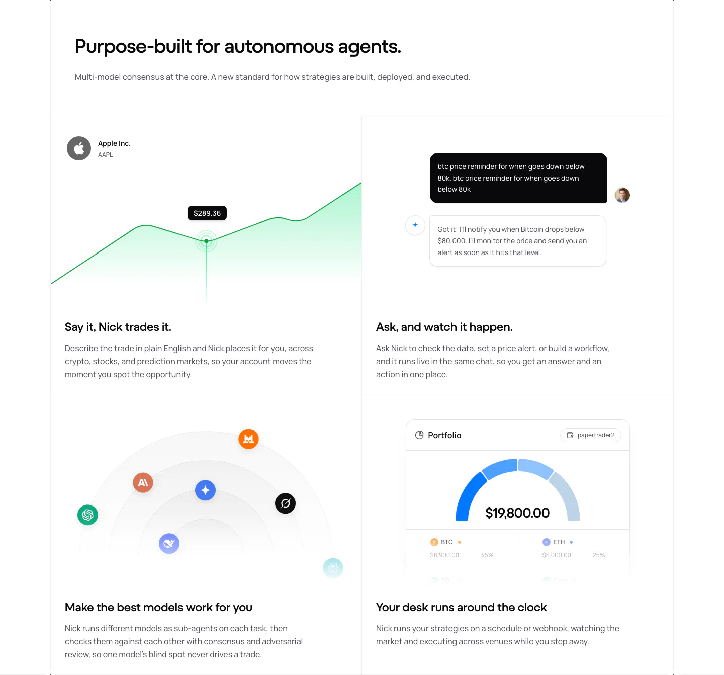
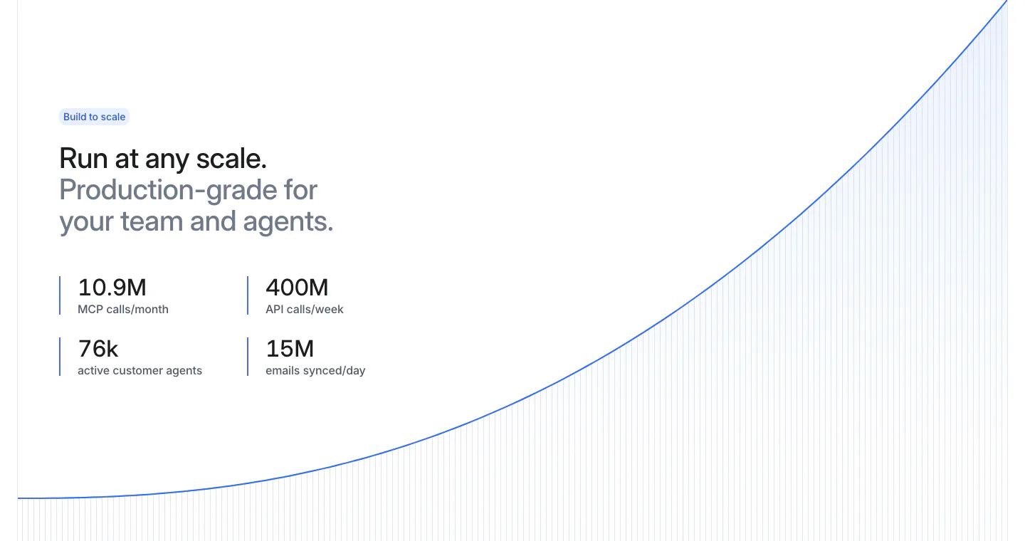
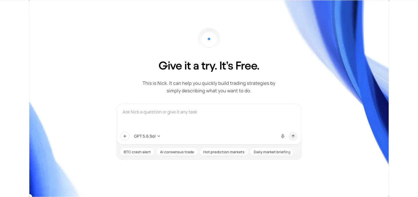
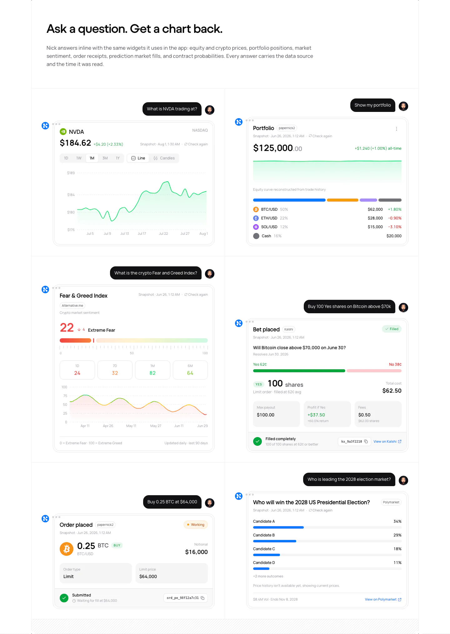
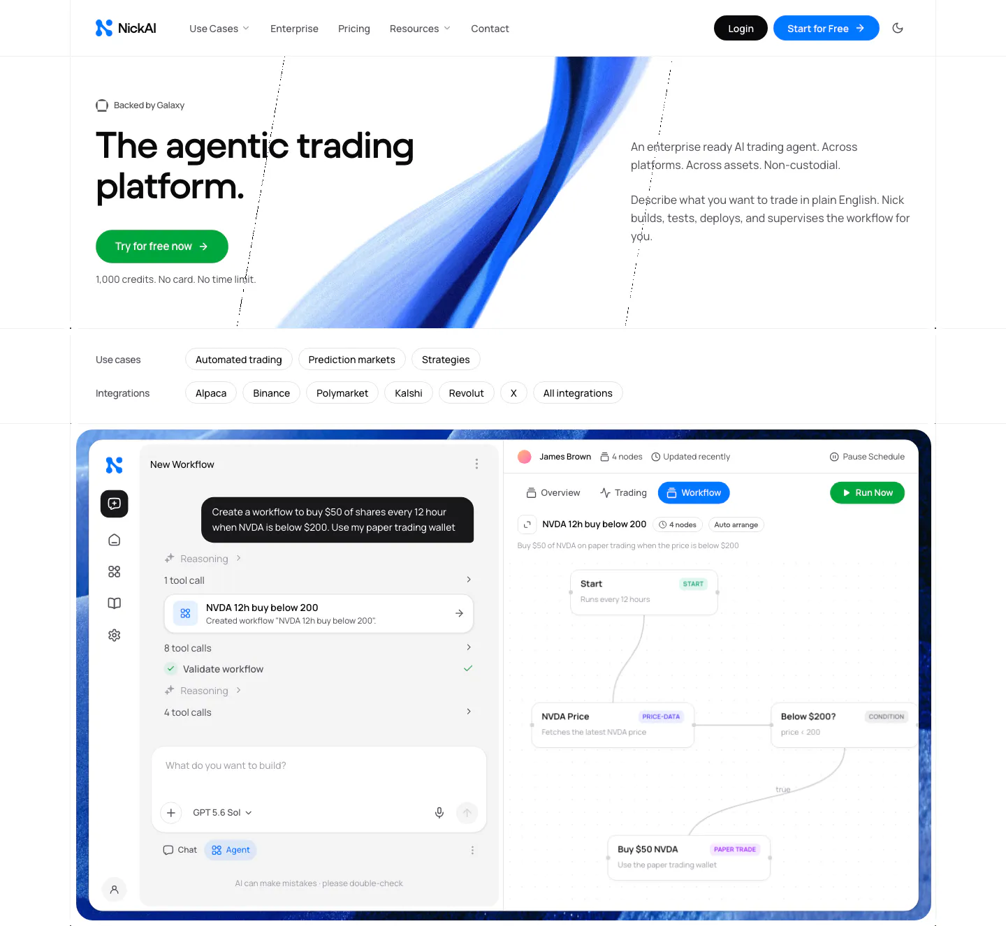
  128. NickAI features section: left heading above a 2x2 grid of feature cells with price chart, chat, model icons and portfolio UI
  129. Exa security section: dark background with headline and a three-by-two grid of outlined compliance icons for SOC 2, GDPR, CCPA and HIPAA
  130. Rogo features section: serif heading above an agent picker UI mockup on the left and Agents text with a link on the right
  131. Jasper features section: centered serif headline and button above four pastel cards with line illustrations on grid backgrounds
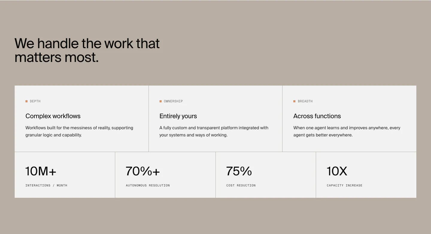
  132. Attio stats section: two-tone headline and four metrics at left beside a rising blue growth curve with vertical line fill on white
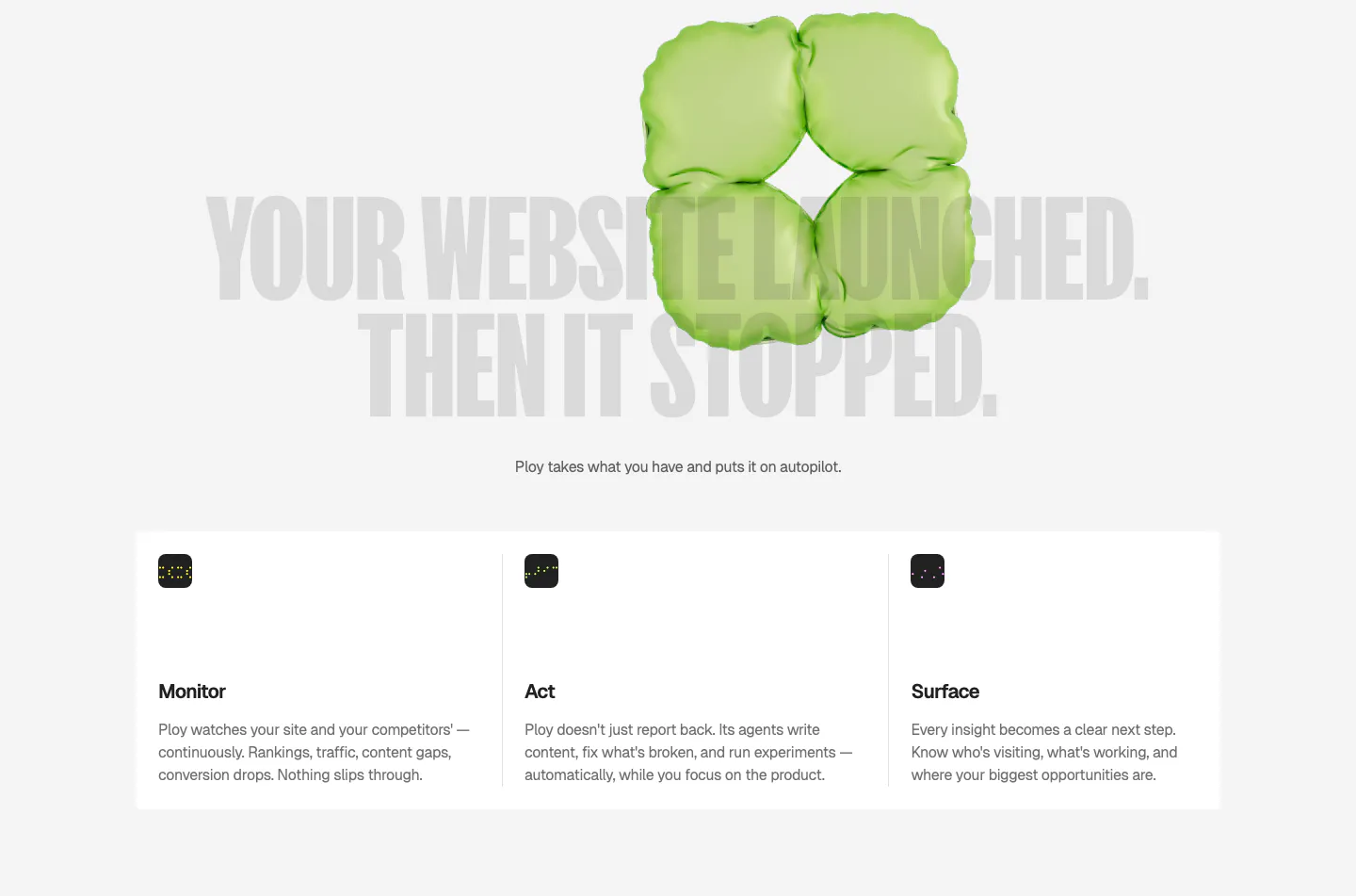
  133. Ploy features section: huge gray condensed headline behind a green 3D inflatable shape, above three columns for Monitor, Act and Surface
  134. Harvey logo cloud section: centered serif headline above three rows of grayscale law firm and enterprise logos
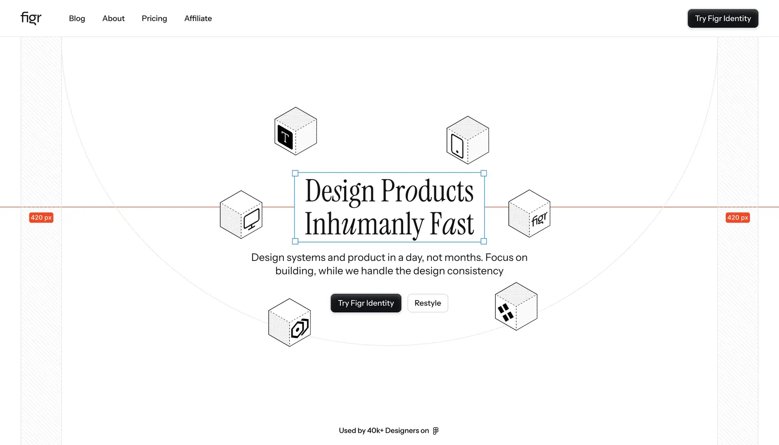
  135. Figr hero section: centered serif headline in a selection box ringed by isometric line-drawn cubes with measurement guides
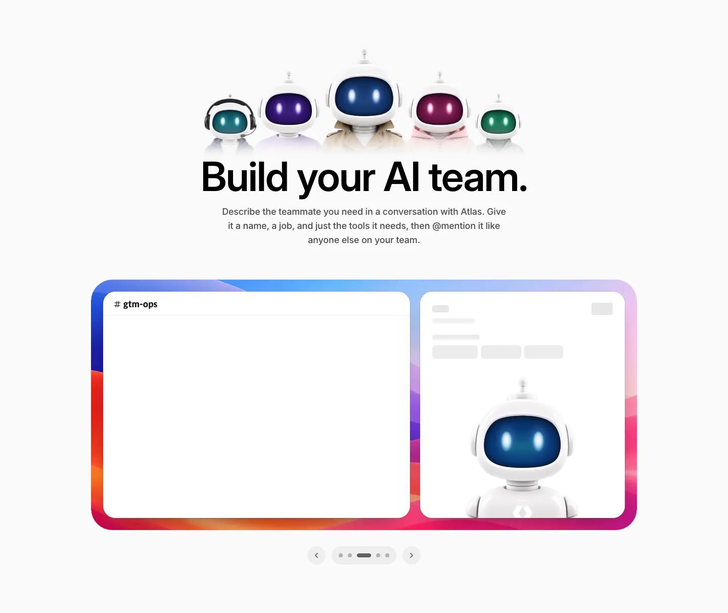
  136. WorkOS features section: row of 3D robot characters above a centered headline and a Slack mockup carousel
  137. Rezi footer section: logo with user count and support email, five link columns, rating and SOC badge, copyright and social icons
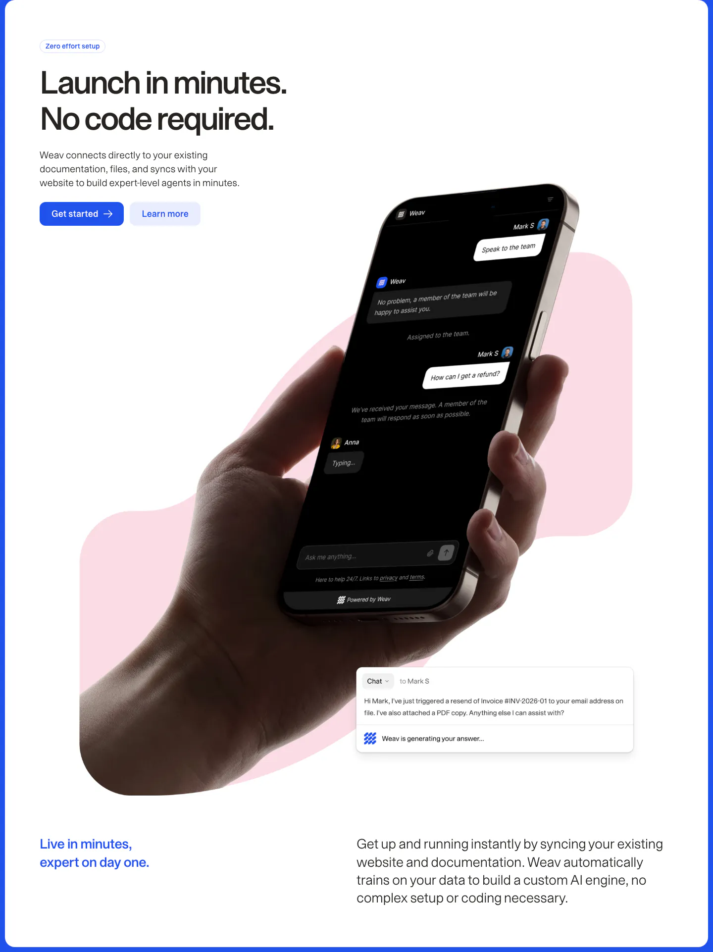
  138. Weav features section: headline and two buttons above a hand holding a phone with a dark chat UI over a pink blob, plus a chat reply card
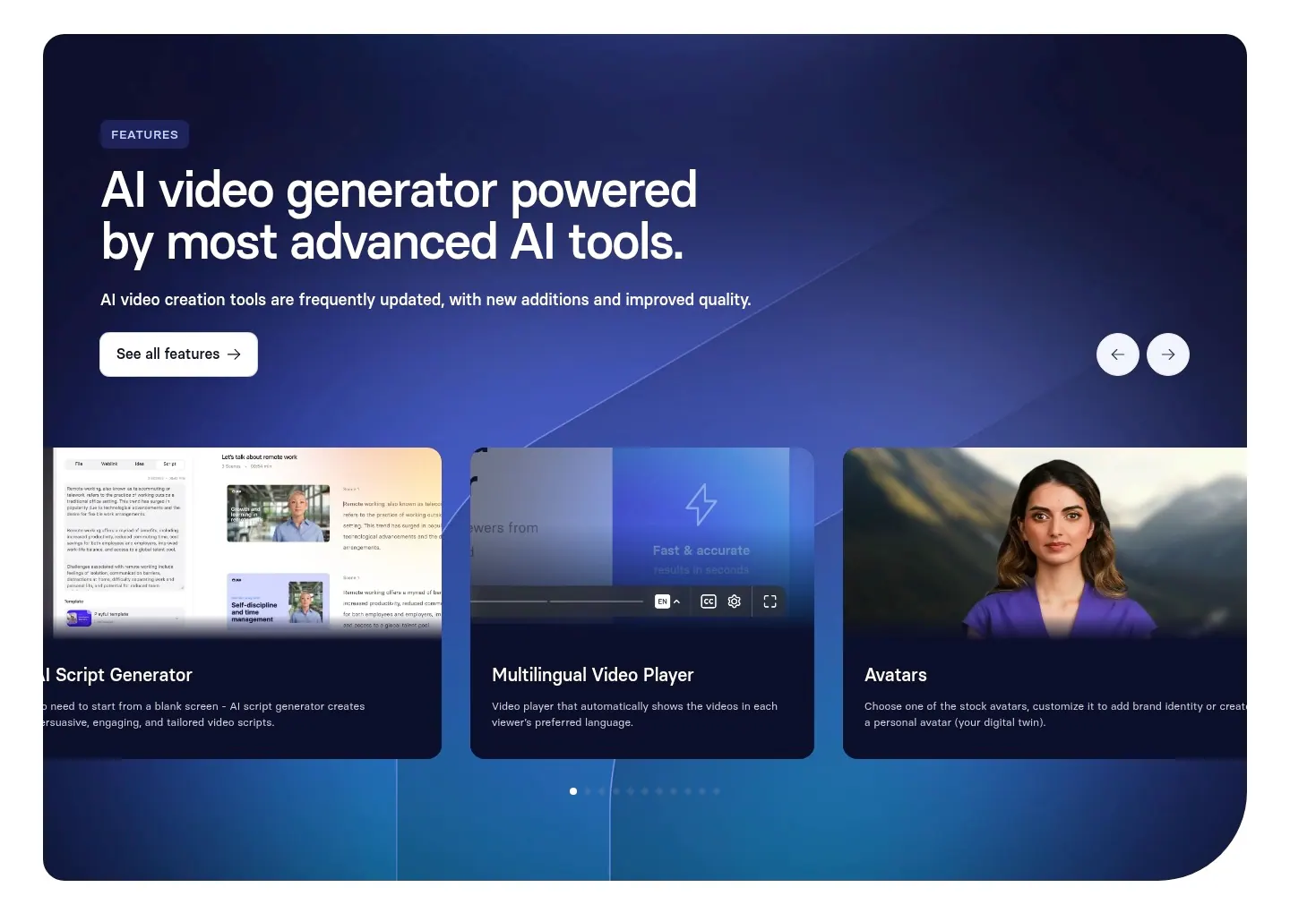
  139. Synthesia features section: navy-to-blue gradient panel with headline, arrow controls and a carousel of feature cards with UI and avatars
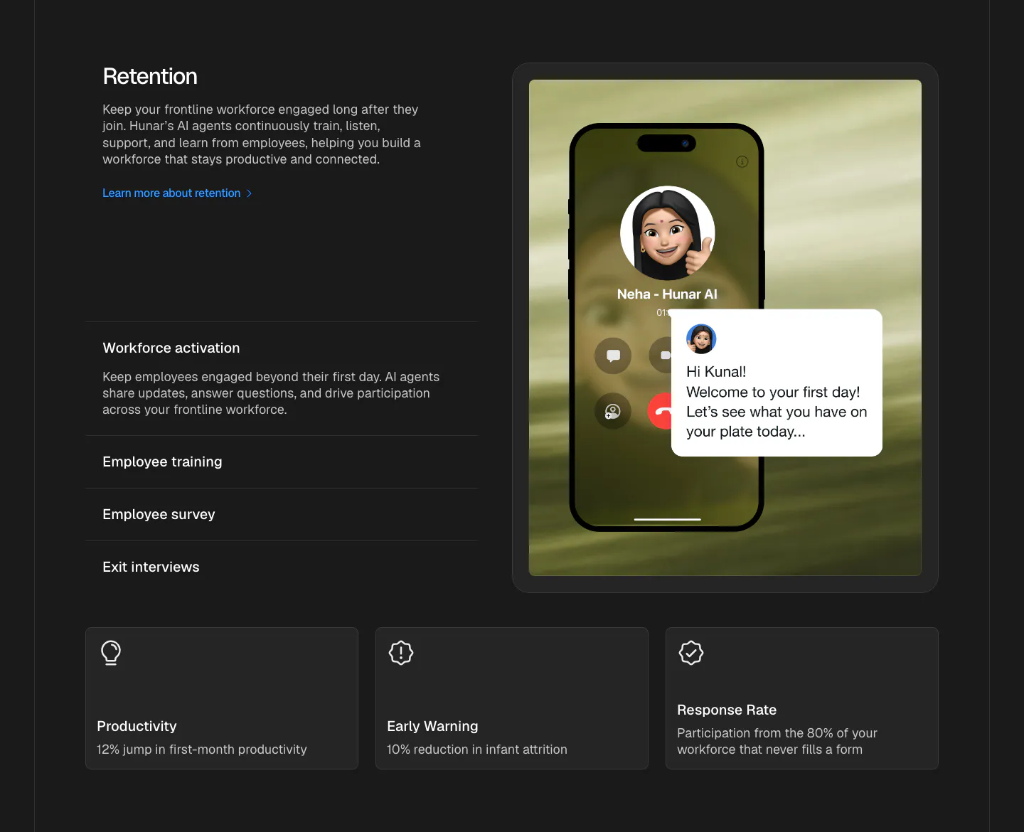
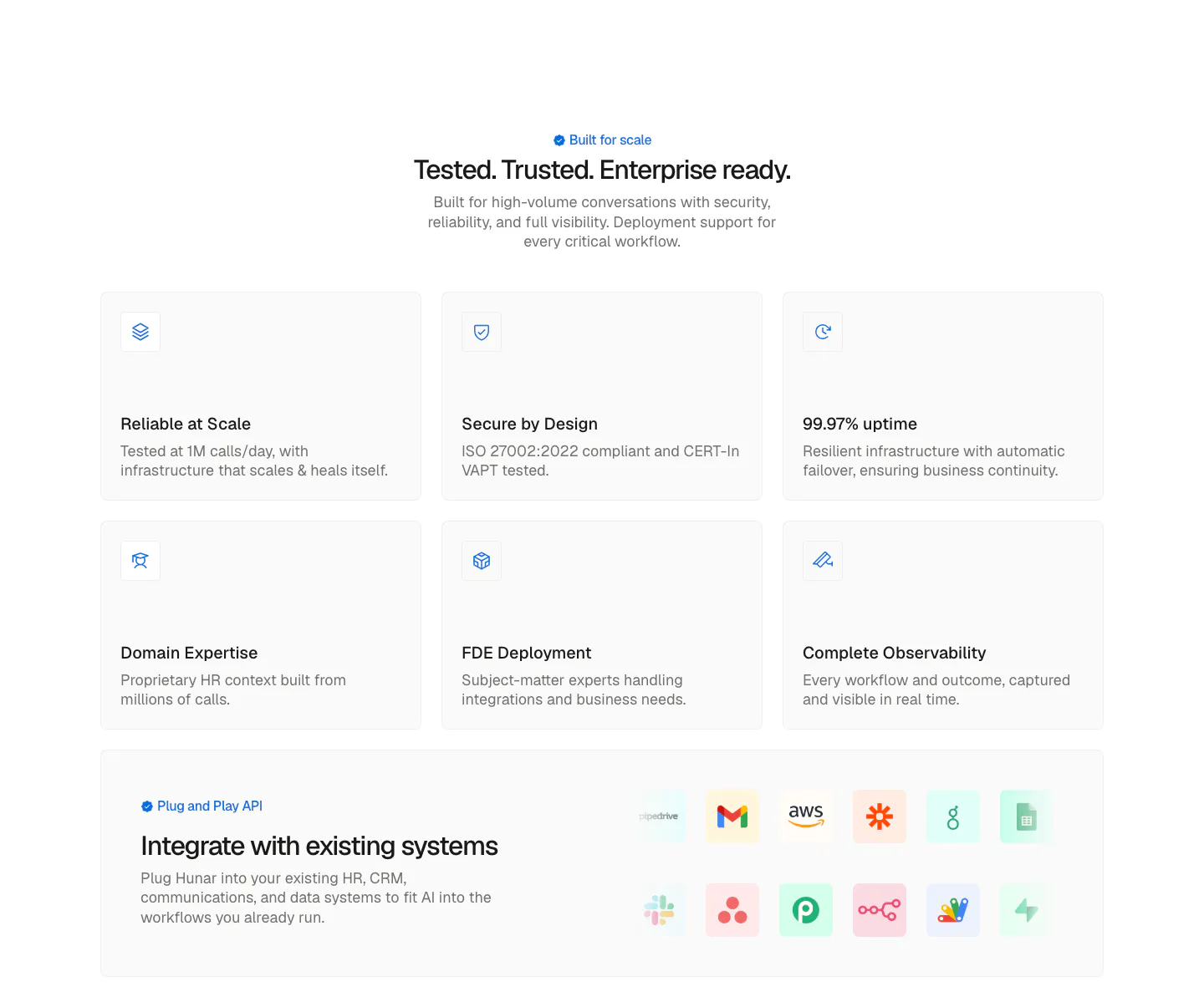
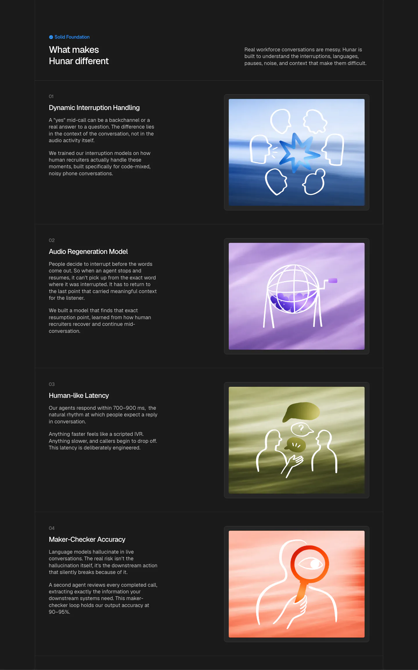
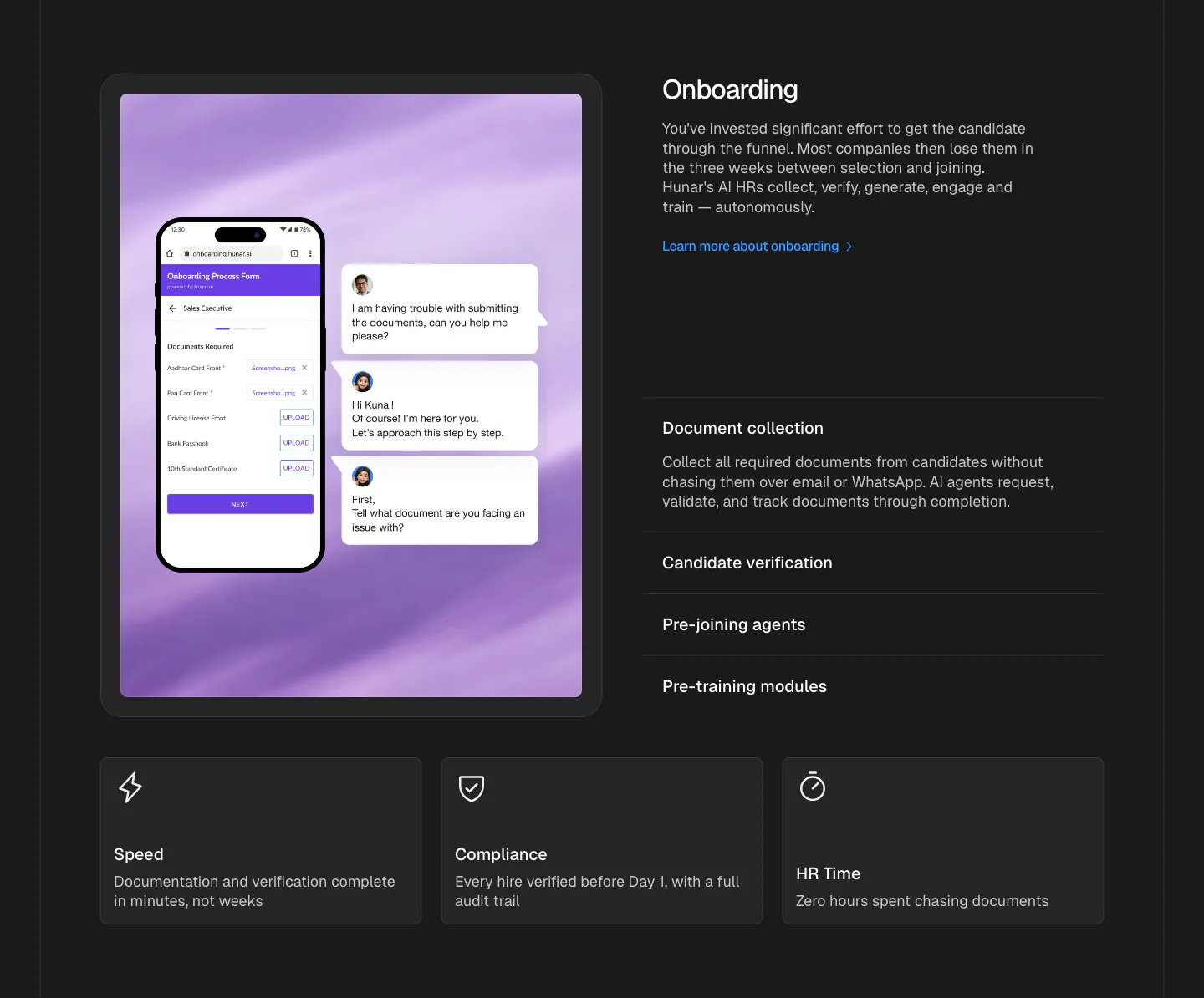
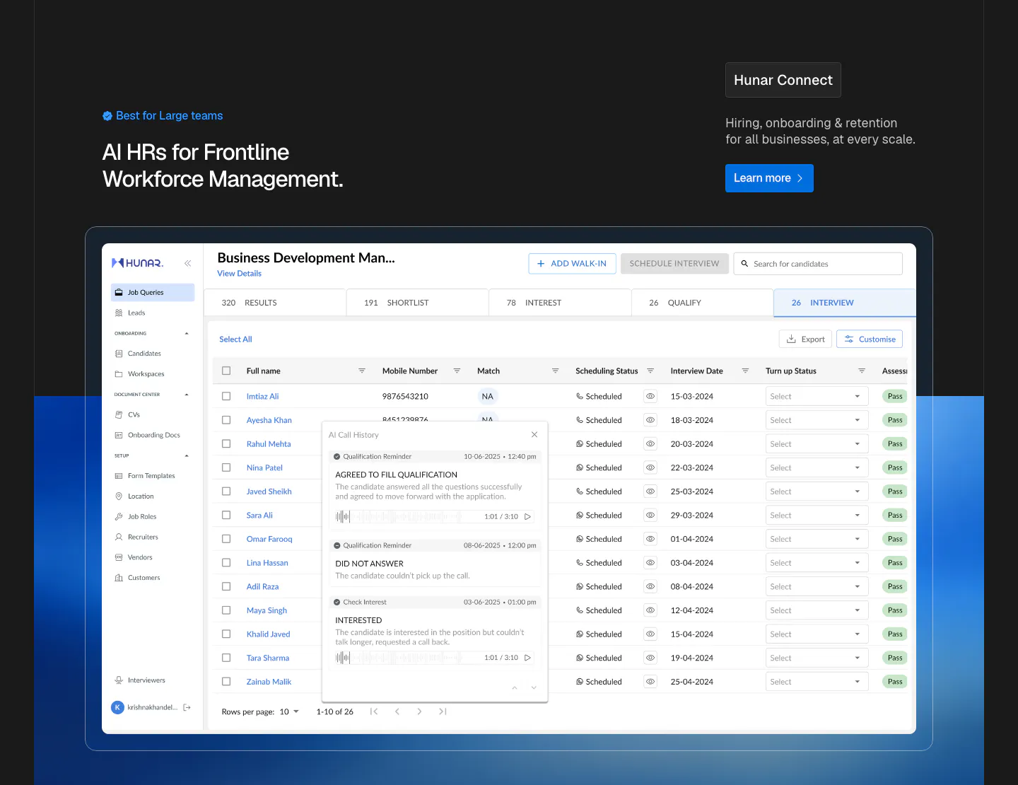
  140. Hunar features section: dark background with retention copy and accordion list beside a phone call mockup, three outcome cards below
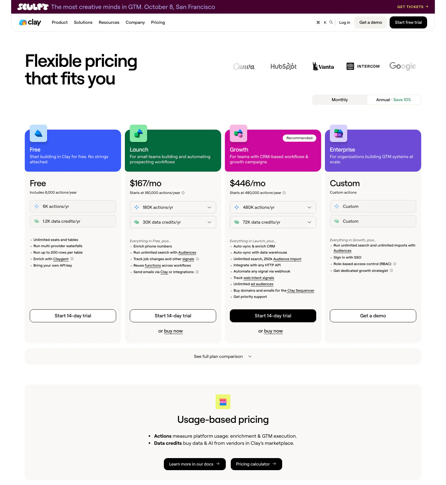
  141. Clay pricing section: headline and logo row above a monthly/annual toggle, four plan cards with colored headers and a usage-based pricing band
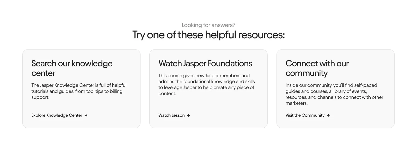
  142. Jasper contact section: centered heading above three light gray cards linking to the knowledge center, a course and the community
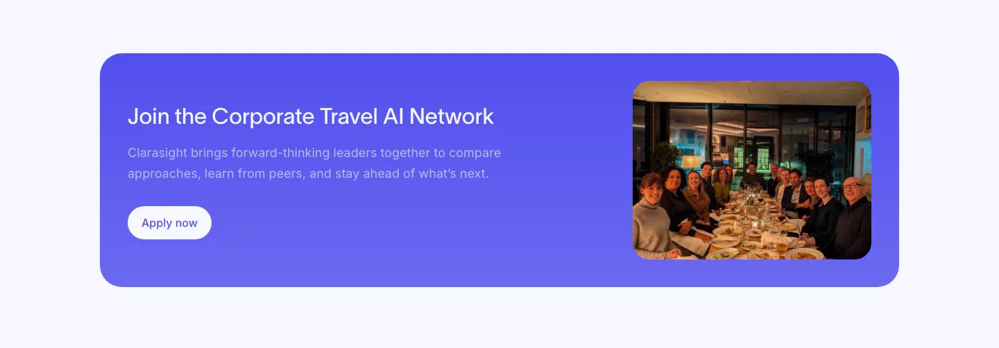
  143. Clarasight call to action section: indigo rounded banner with headline, copy and white button beside a photo of a group at a dinner table
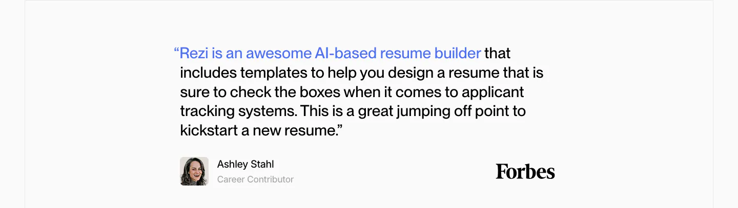
  144. Rezi testimonials section: single Forbes quote with a blue highlighted lead-in, author avatar and Forbes wordmark on light gray
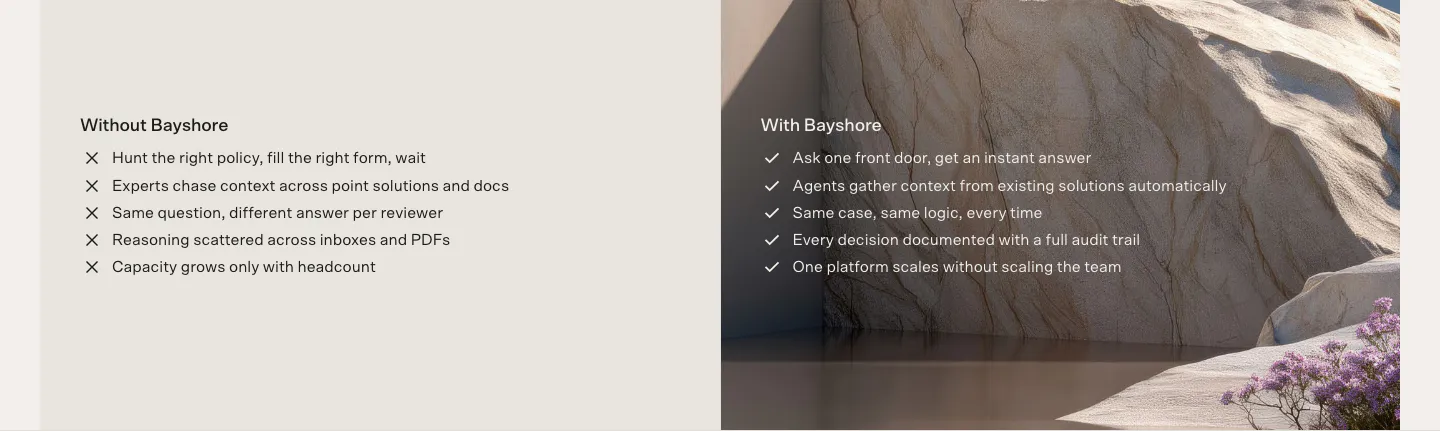
  145. Bayshore comparison section: Without Bayshore cross list on beige beside a With Bayshore check list over a sandstone landscape photo
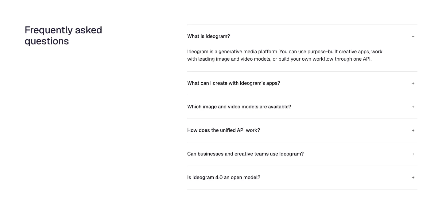
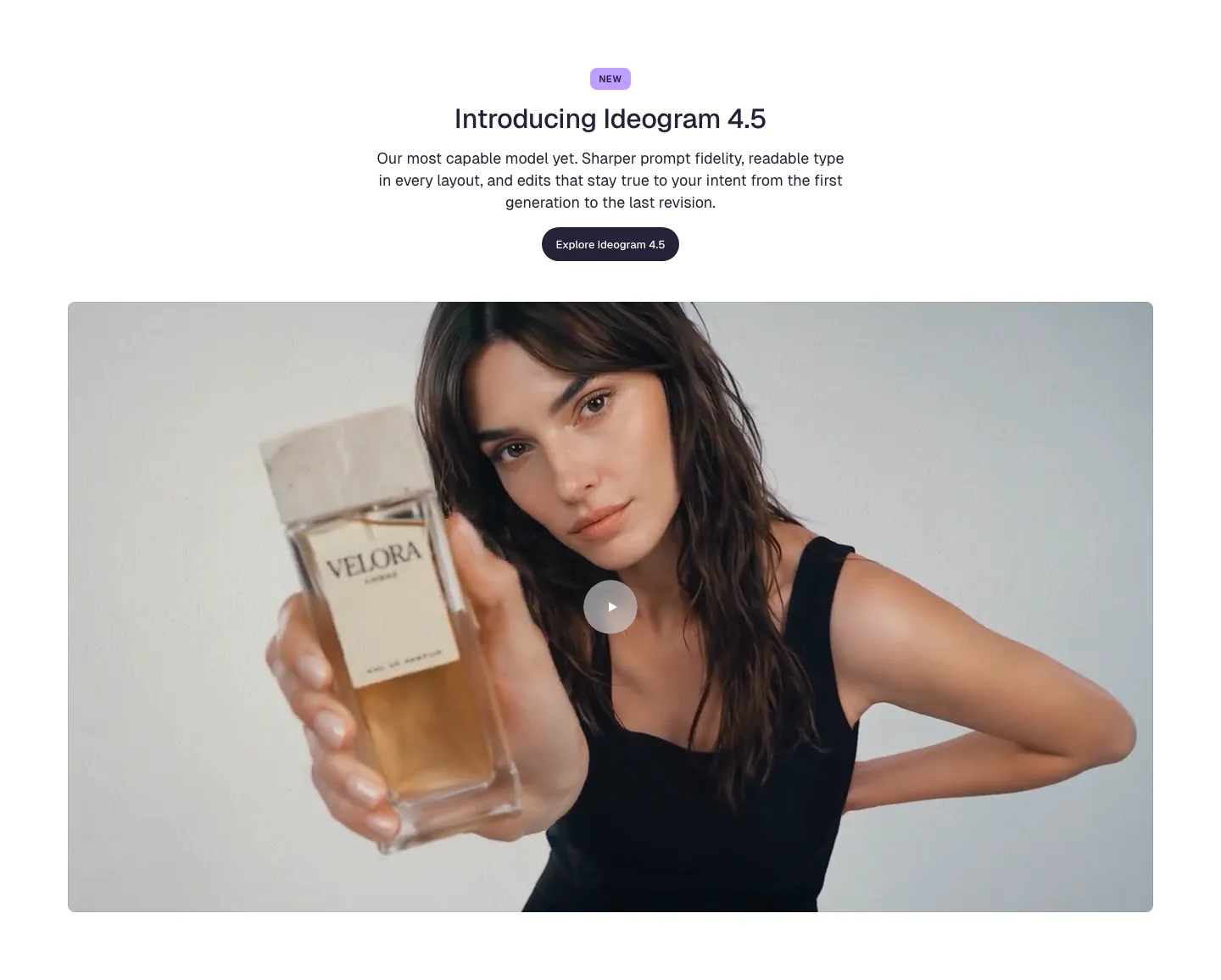
  146. Ideogram FAQ section: heading on the left, accordion of six questions on the right with the first one expanded, on white
  147. Rezolv logo cloud section: small In the News label above a single row of divided press publication logos on cream
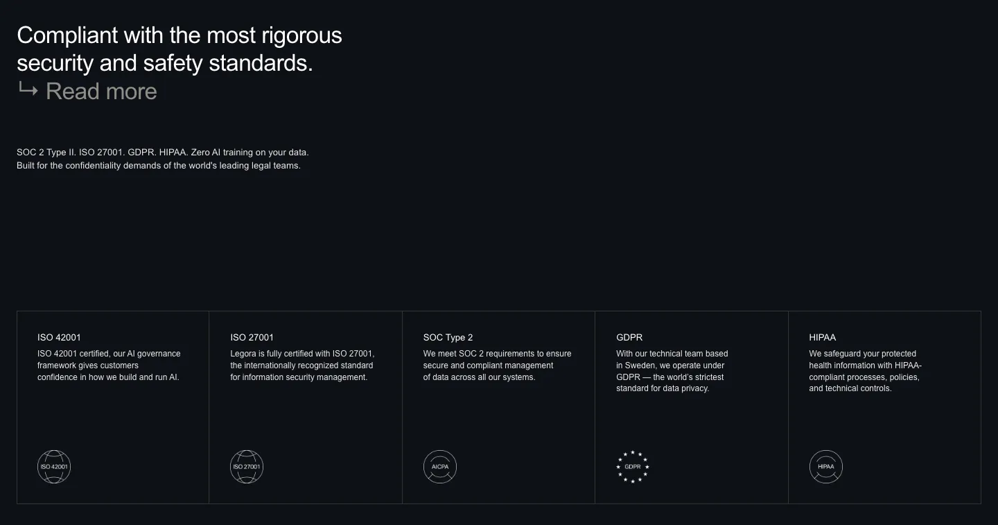
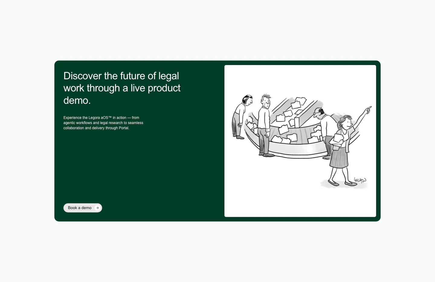
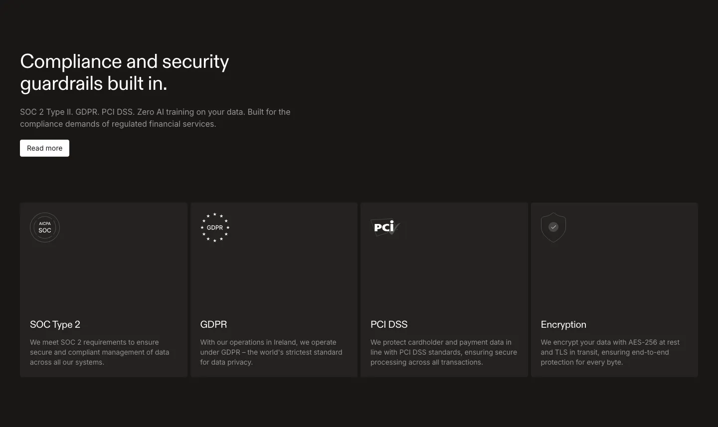
  148. Legora security section: left headline on a dark background above five bordered cells for ISO, SOC 2, GDPR and HIPAA badges
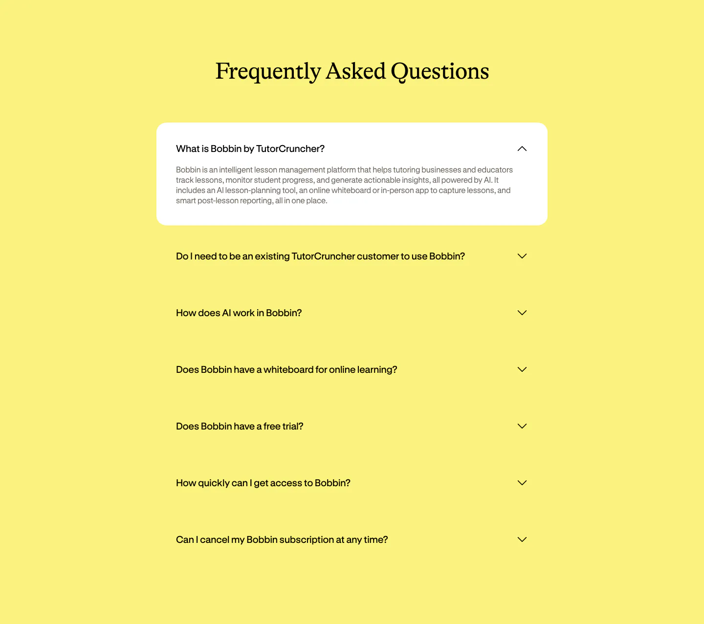
  149. Bobbin FAQ section: centered serif heading above an accordion of questions with the first expanded in a white card on yellow
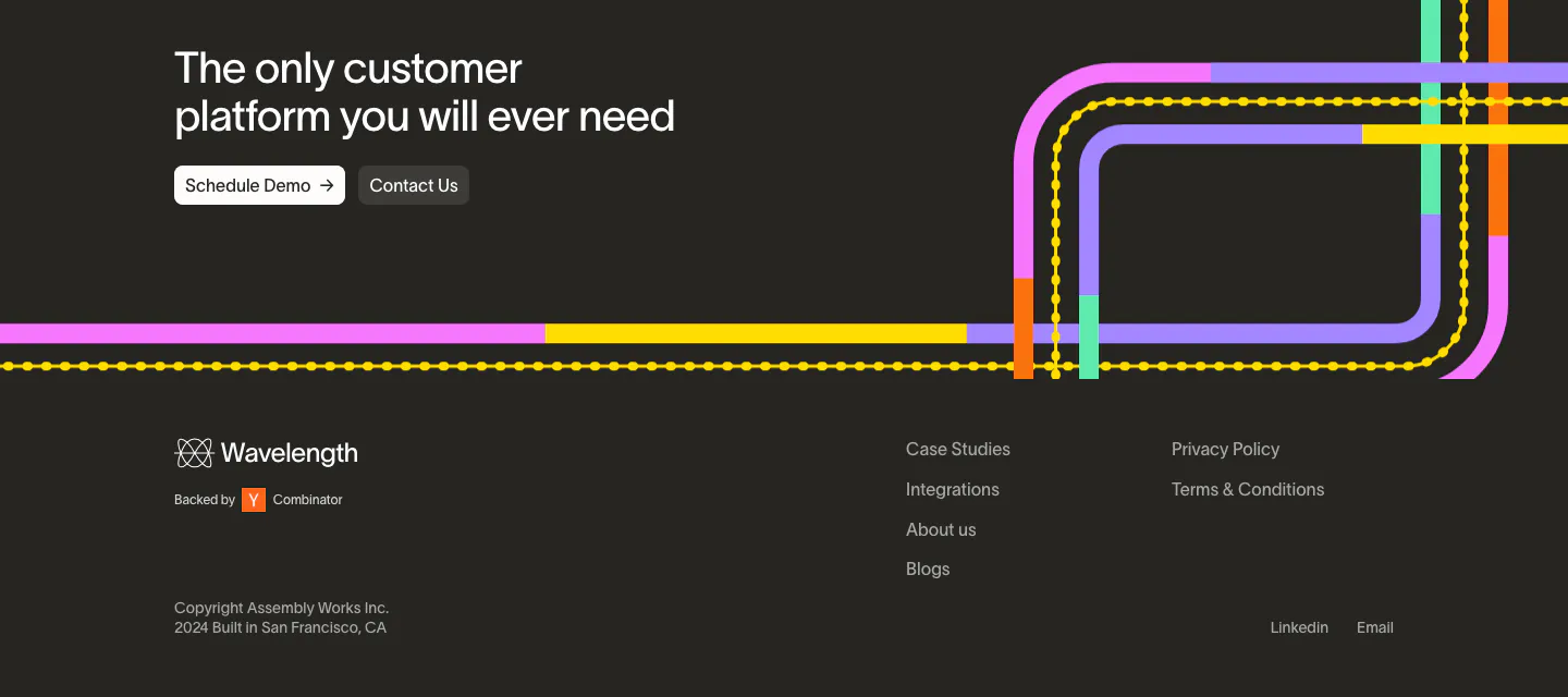
  150. Wavelength footer section: closing headline with two buttons over colorful transit lines, then logo, link columns and copyright on charcoal
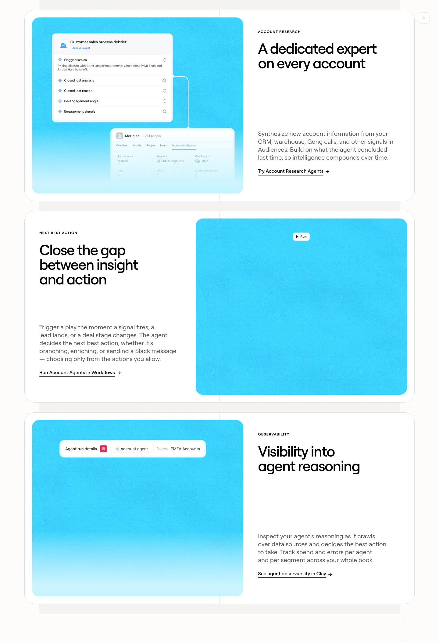
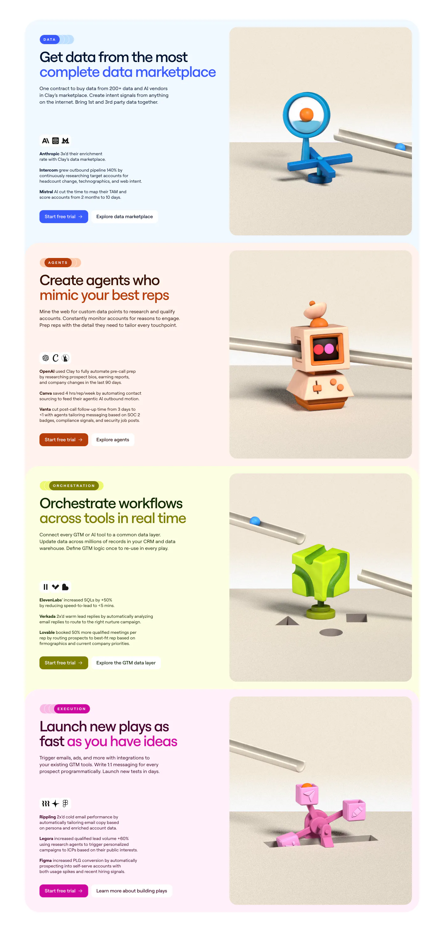
  151. Clay features section: three alternating rows of white cards pairing headlines and copy with bright cyan panels holding agent UI snippets
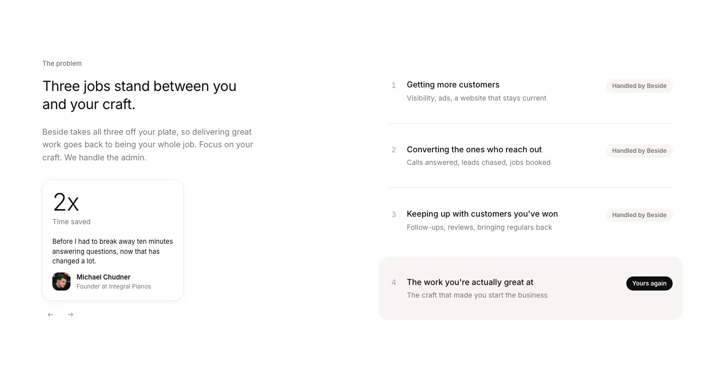
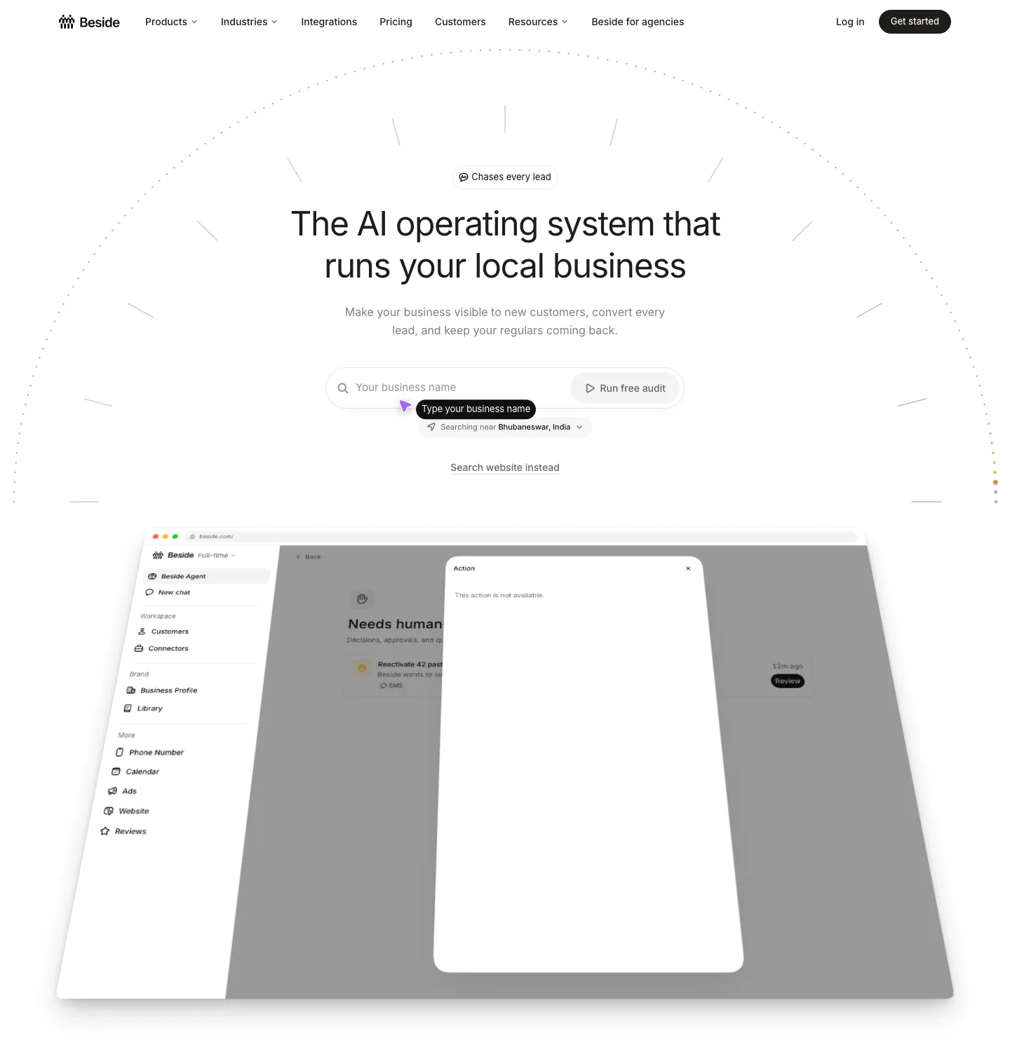
  152. Beside value proposition section: headline and testimonial stat card on the left, four numbered job rows with status pills on the right
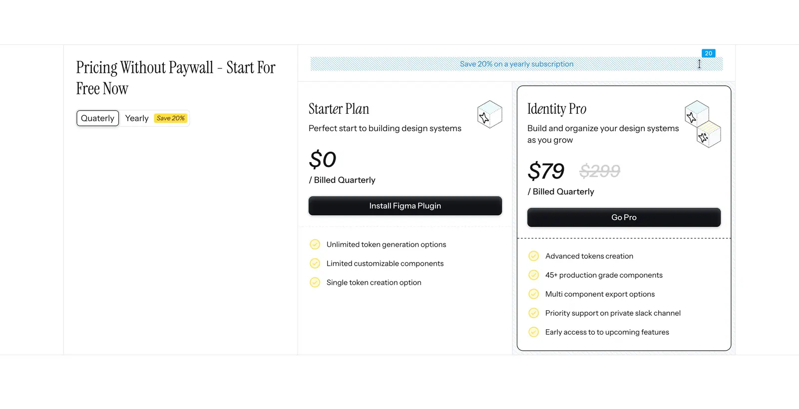
  153. Figr pricing section: serif heading with quarterly/yearly toggle on the left and Starter and Identity Pro plan cards on the right
  154. Rogo footer section: Get started CTA with demo button, four link columns and a huge faint Rogo wordmark on charcoal
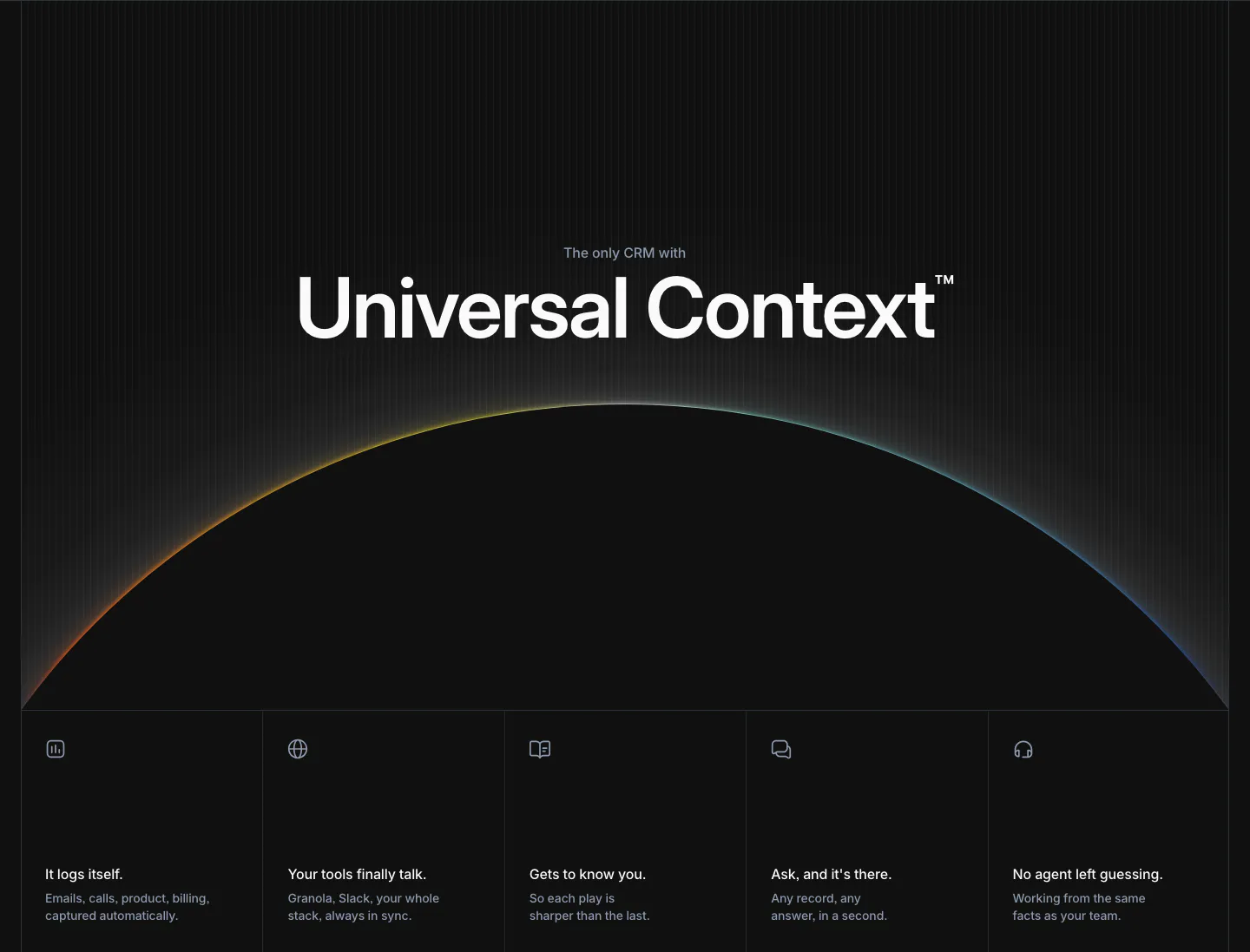
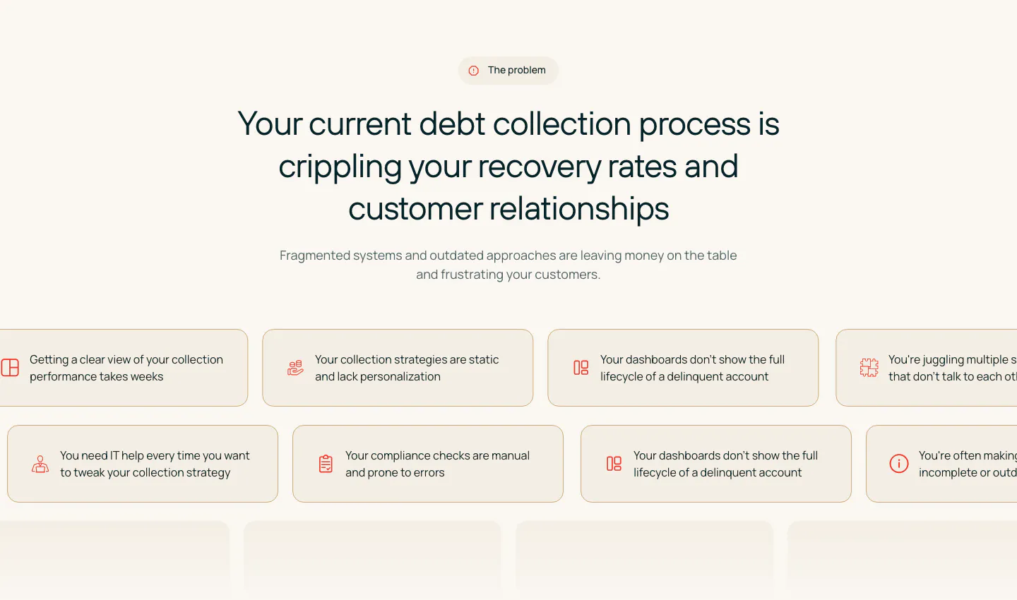
  155. Attio features section: large centered headline over a glowing horizon arc, five equal feature cells with icons below, dark background
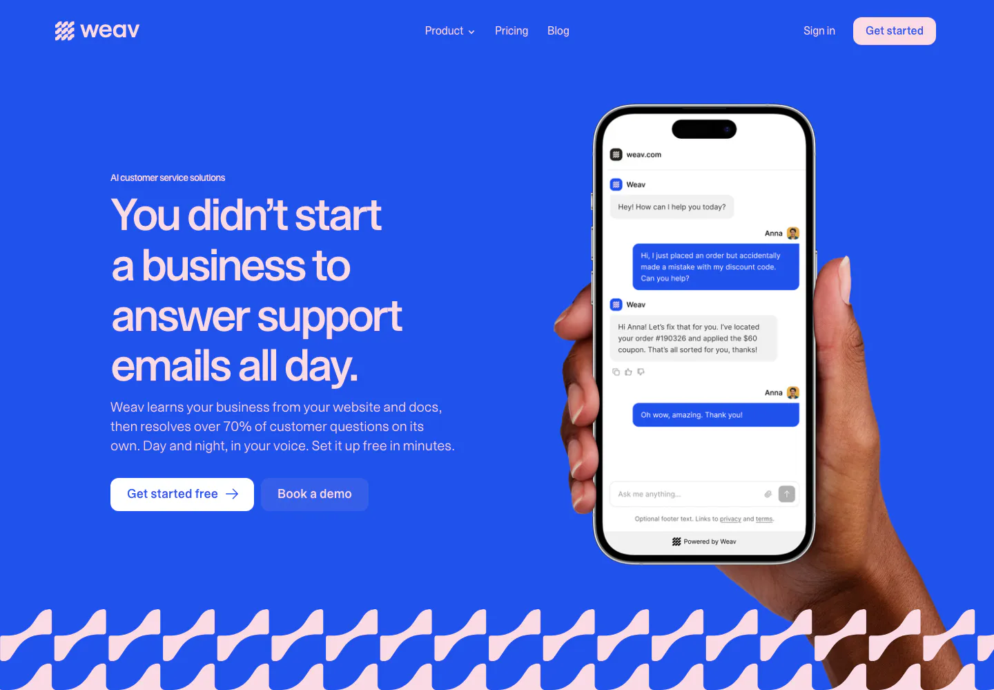
  156. Weav hero section: headline and two buttons on a bright blue background beside a hand holding a phone with a support chat, wave pattern below
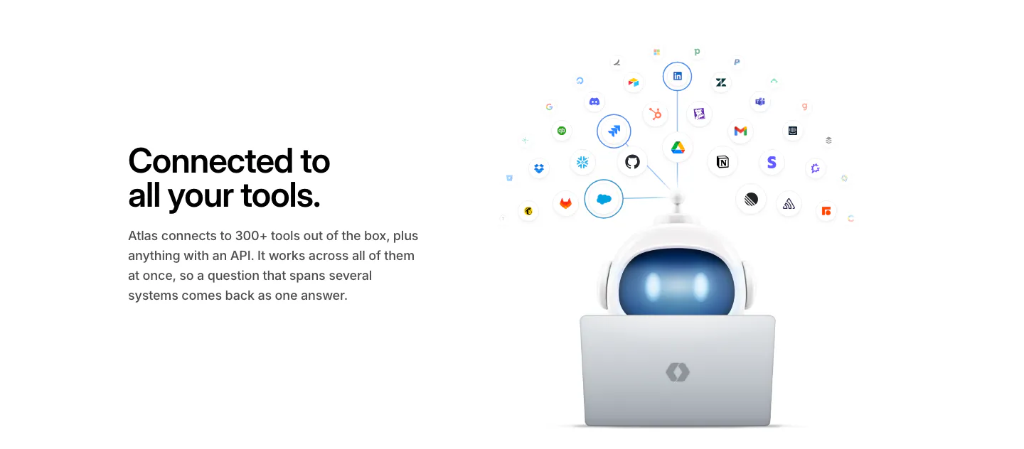
  157. WorkOS integrations section: headline on the left, 3D robot at a laptop under an arc of connected app icons on the right
  158. Ploy logo cloud section: small centered caption above a single row of grayscale customer logos fading at the edges on light gray
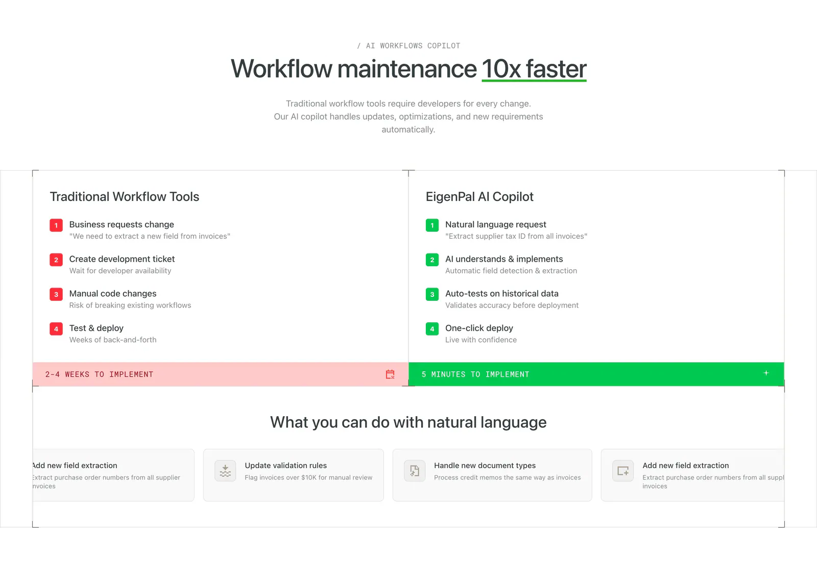
  159. EigenPal comparison section: centered headline above two columns contrasting traditional workflow steps in red with AI copilot steps in green
    EigenPal Comparison
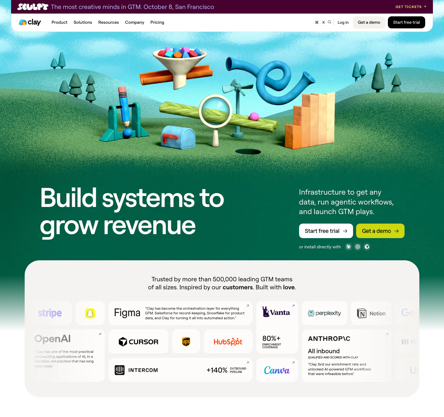
  160. Clay hero section: left headline on a green 3D clay landscape of GTM objects, above a rounded card grid of customer logos and quotes
  161. Weav logo cloud section: thin pink strip with a small trust label and a row of blue customer logos separated by dividers
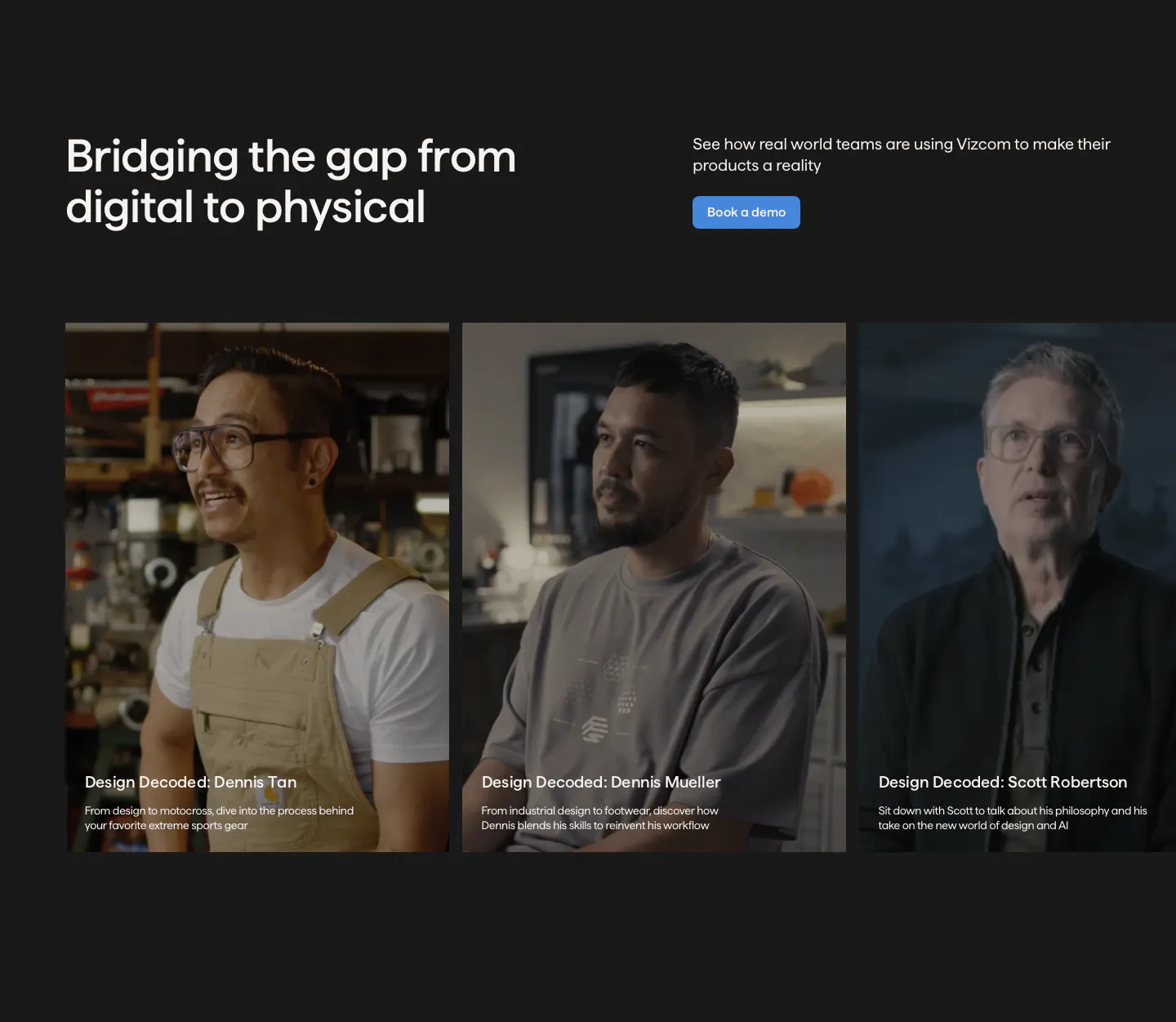
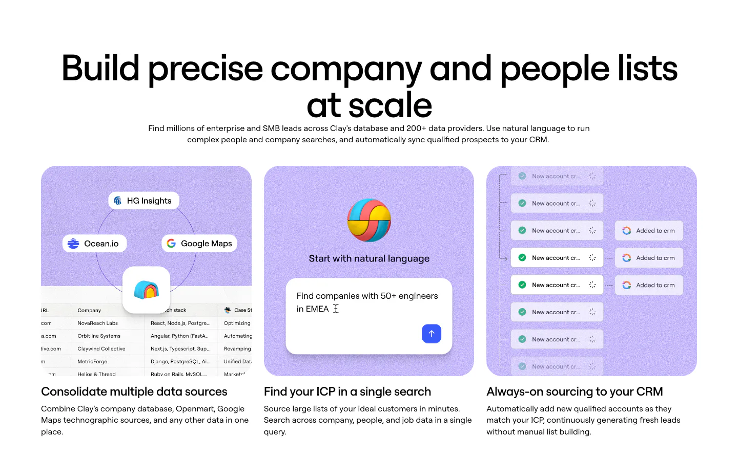
  162. Vizcom testimonials section: headline and demo button above a row of customer video story cards with portrait photos on a charcoal background
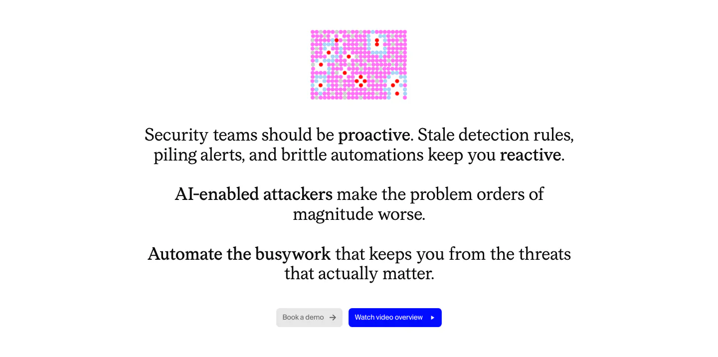
  163. Cotool value proposition section: centered serif problem statement with bolded phrases, small pink pixel graphic and two buttons on white
  164. Outtake footer section: centered wordmark above boxed link cells, SOC badge, copyright and legal links on a beige grid
  165. Chatbase logo cloud section: bordered three-row grid of gray customer logos on a light background
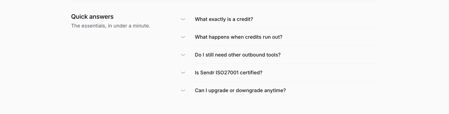
  166. Sendr FAQ section: Quick answers title on the left beside a five-question collapsed accordion list on light gray
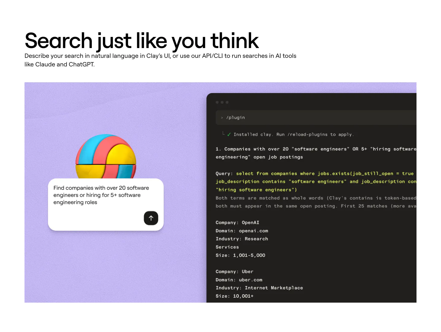
  167. Clay features section: left-aligned heading above a lavender panel with a 3D ball, a search prompt card and a dark terminal showing a query
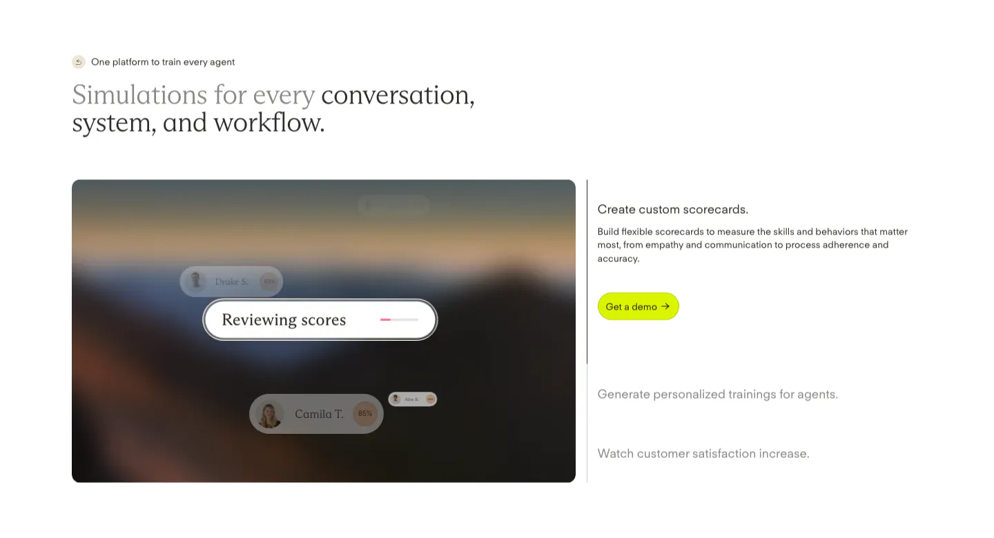
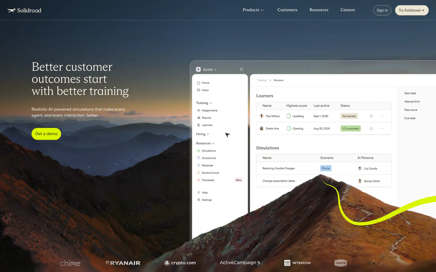
  168. Solidroad features section: two-tone serif headline above a blurred landscape card with score UI chips beside an expandable feature list
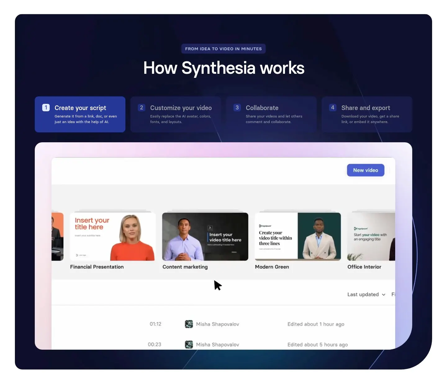
  169. Synthesia how it works section: centered headline over four numbered step tabs and a video library UI screenshot in a dark navy panel
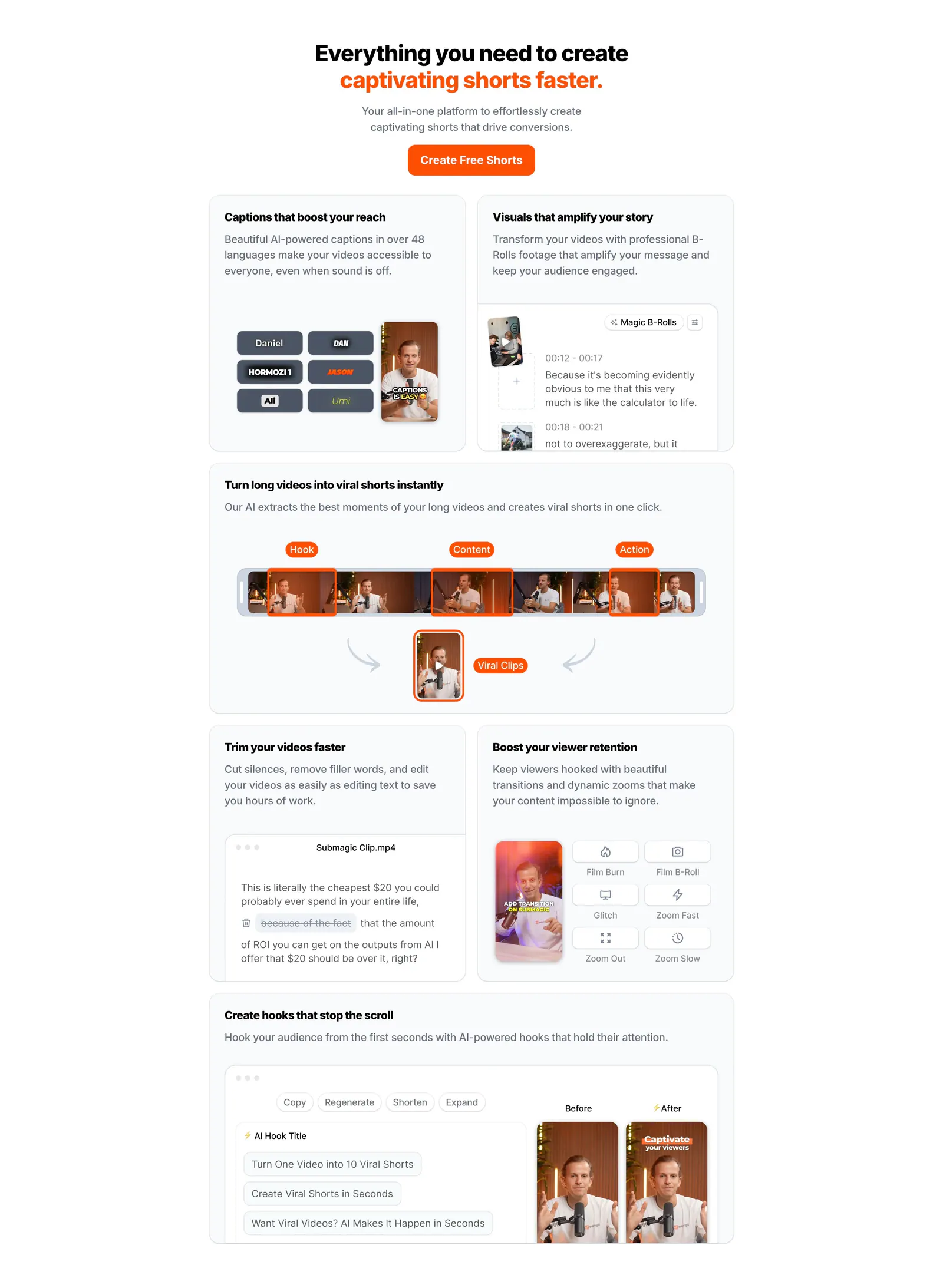
  170. Submagic features section: centered headline with orange accent above a bento grid of light cards showing caption, clip and editing UI
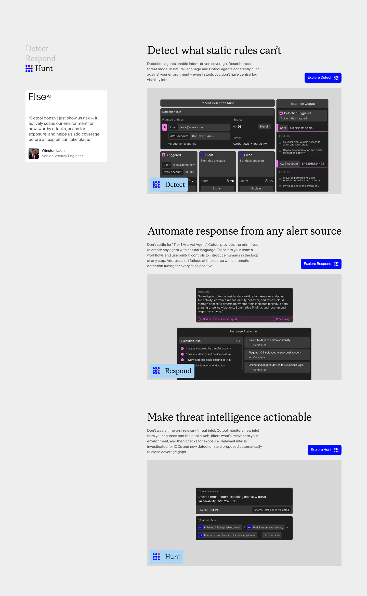
  171. Cotool features section: Detect, Respond and Hunt rows with serif headings, blue buttons and dark product UI screenshots beside a sticky side nav
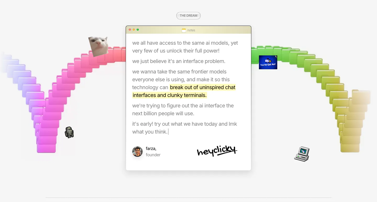
  172. heyclicky about & mission section: founder note in a mac notes window with signature, framed by a rainbow arc of 3D folders
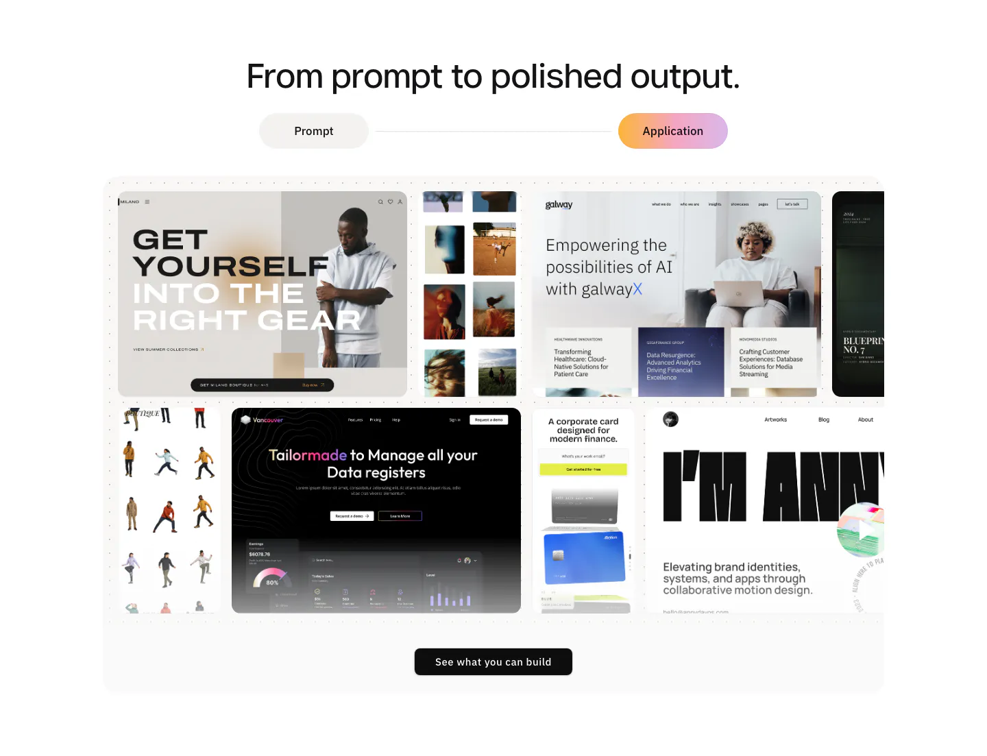
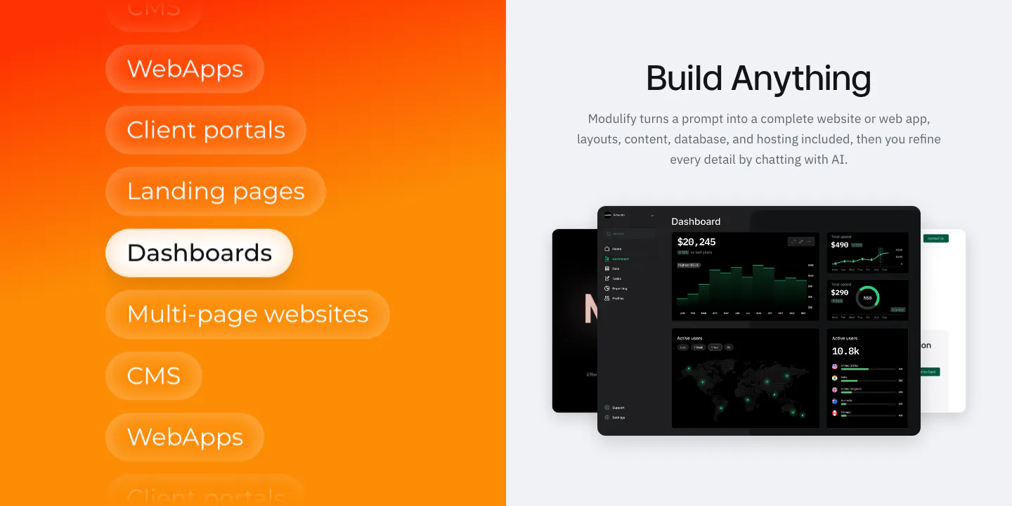
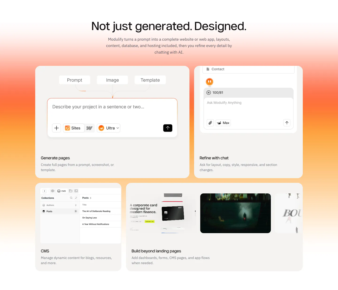
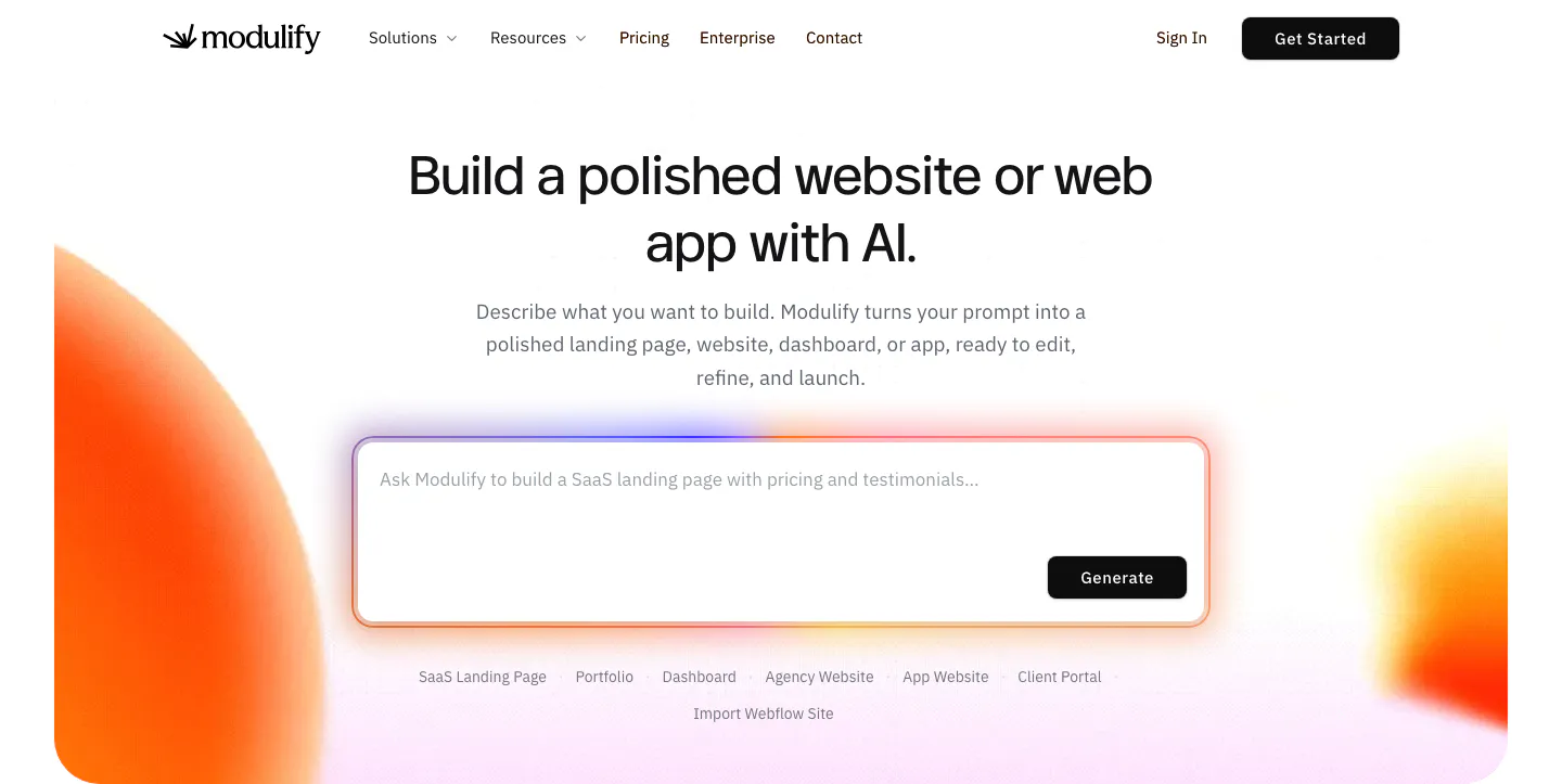
  173. Modulify features section: centered headline and prompt/application toggle above a collage of generated website screenshots
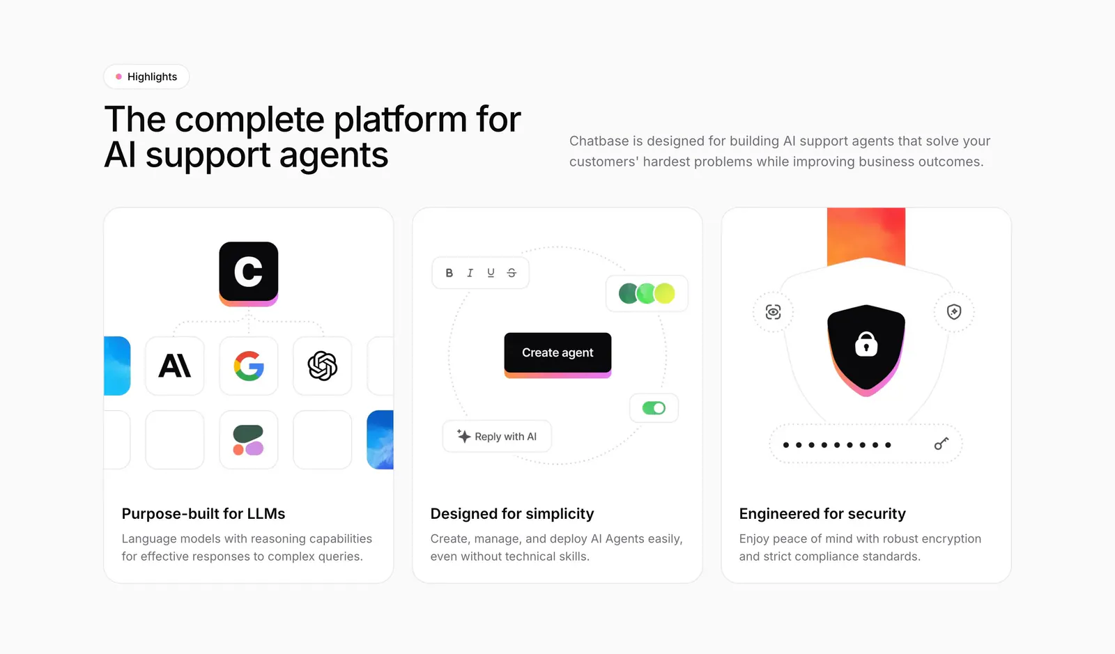
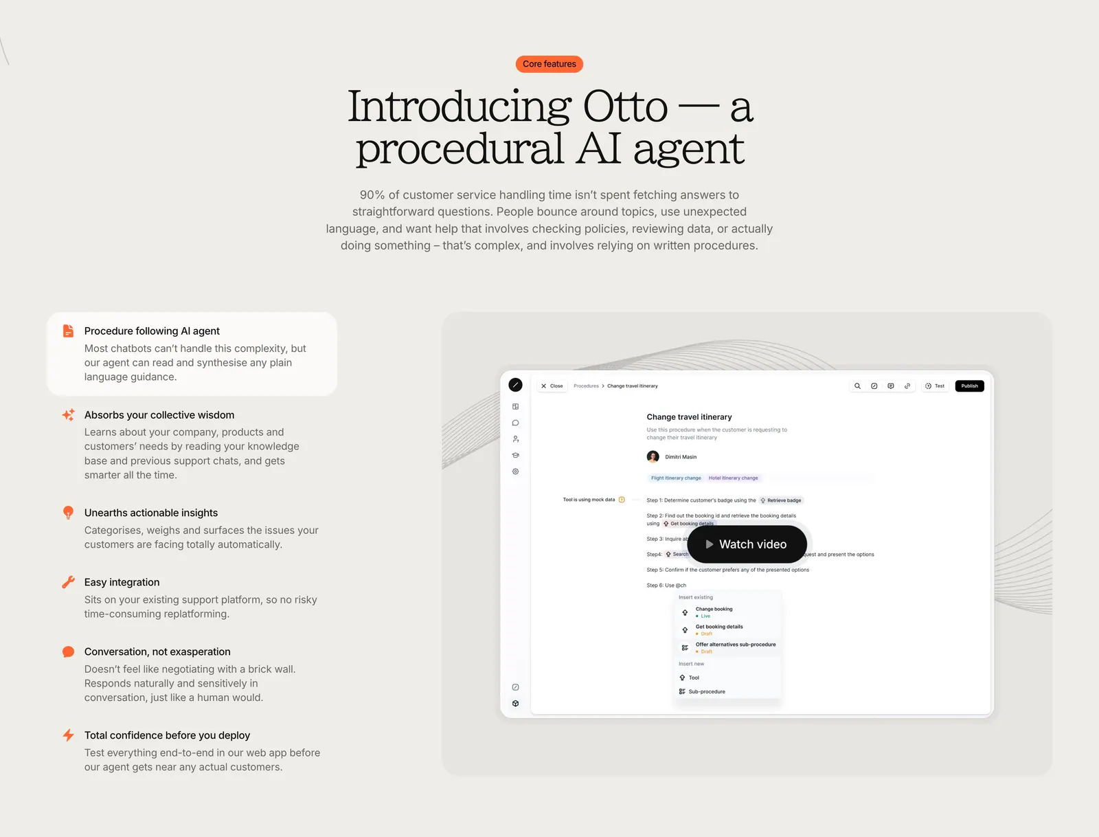
  174. Chatbase features section: headline beside intro copy above three equal cards with model, builder and security illustrations
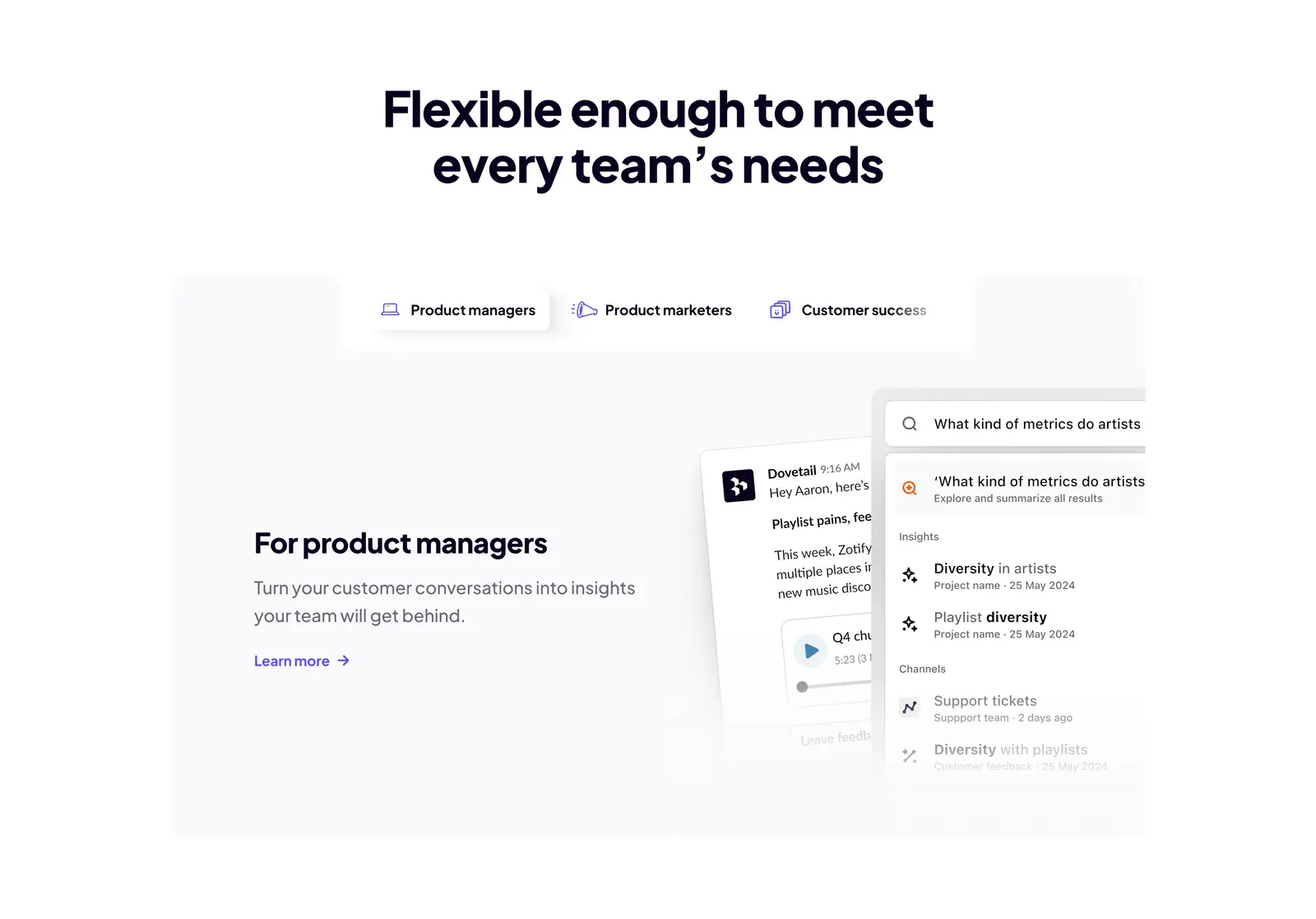
  175. Dovetail features section: centered headline above role tabs and a panel with product manager copy beside chat and search UI cards
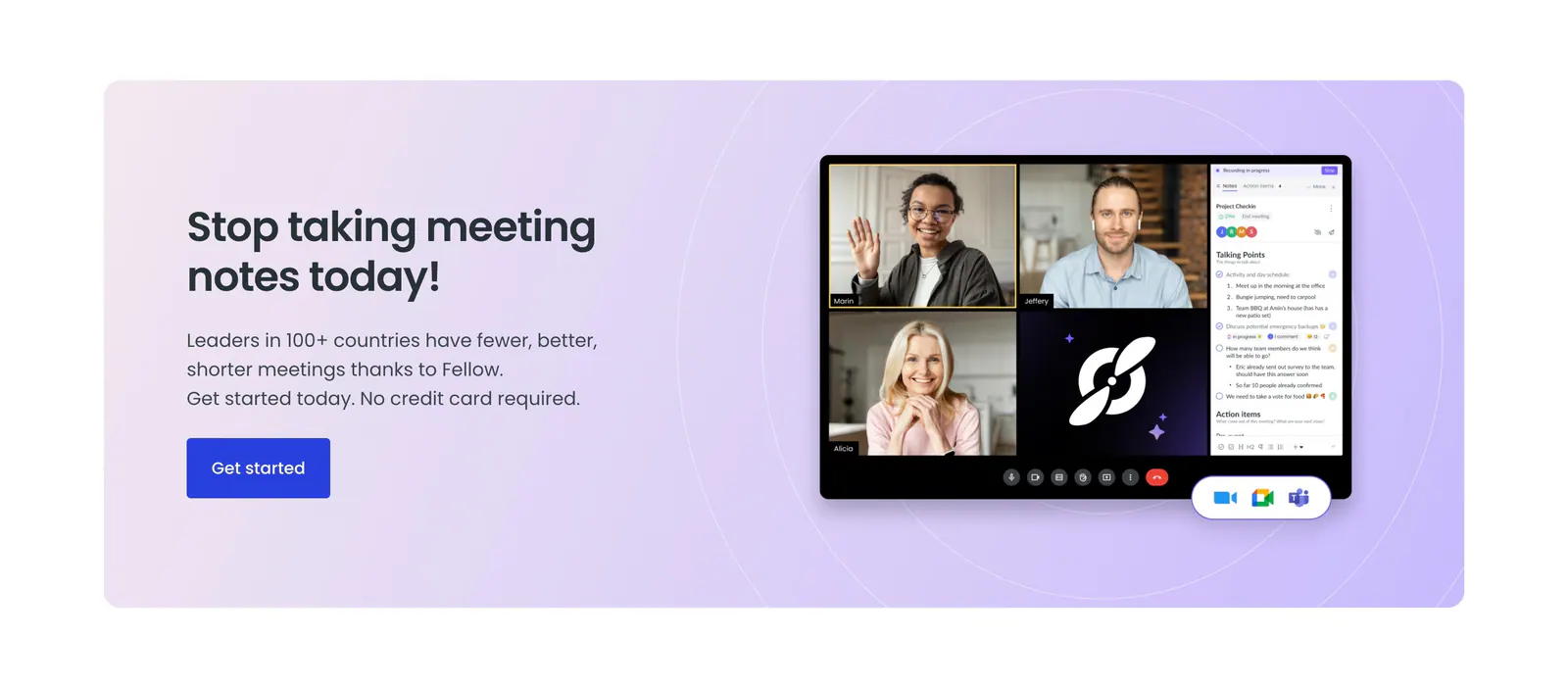
  176. Fellow call-to-action section: lavender panel with headline and blue button beside a video meeting app screenshot with notes sidebar
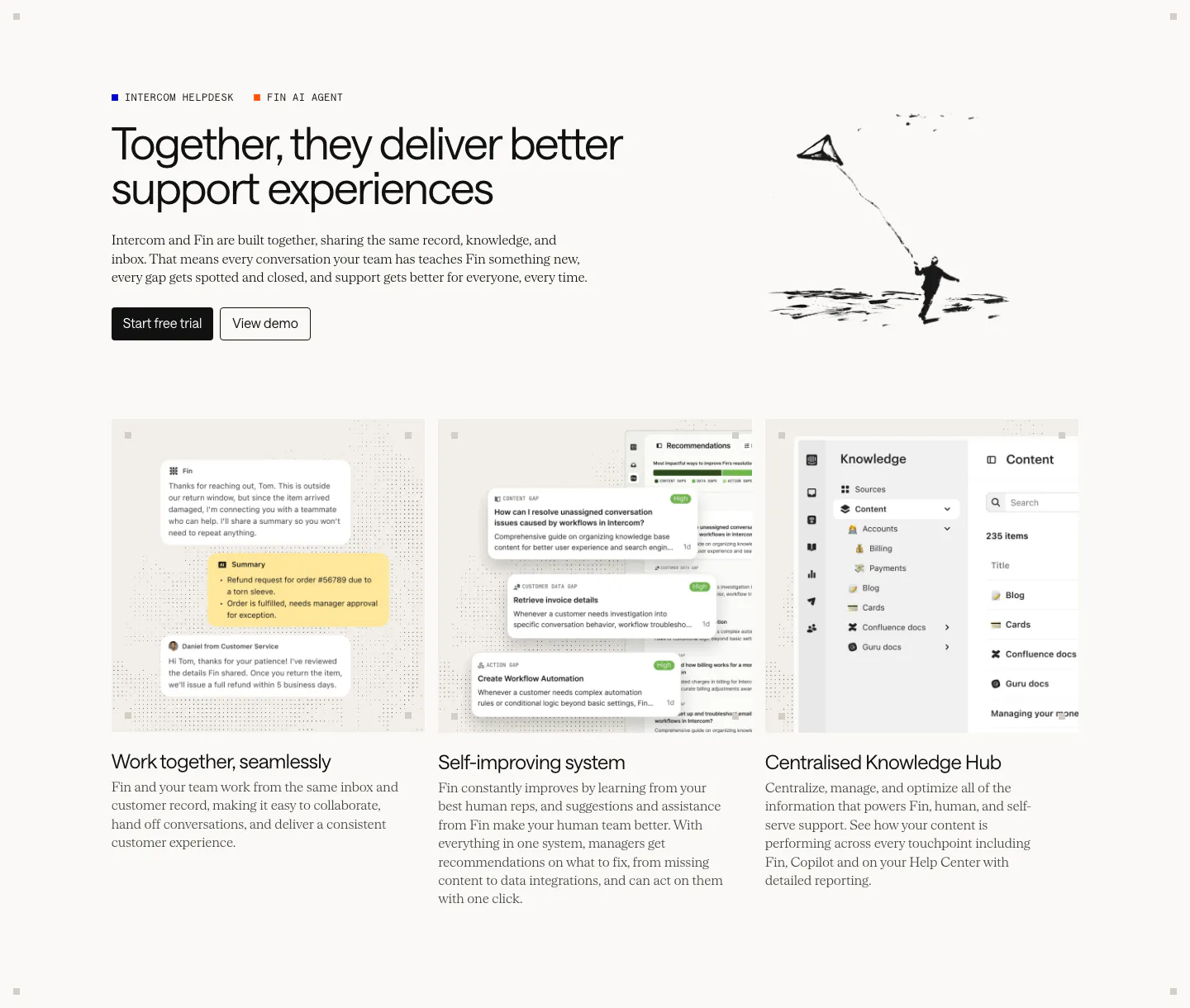
  177. Intercom features section: headline with an ink kite drawing above three equal cards showing chat, recommendations and knowledge hub UI
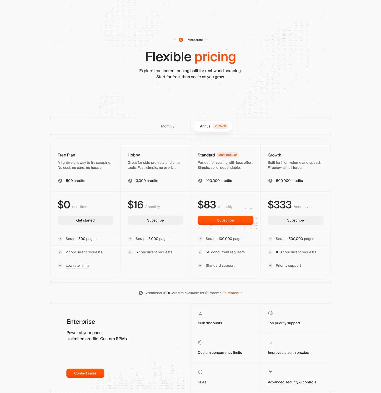
  178. Firecrawl pricing section: centered headline, monthly/annual toggle, four plan columns with prices and an enterprise block on light gray
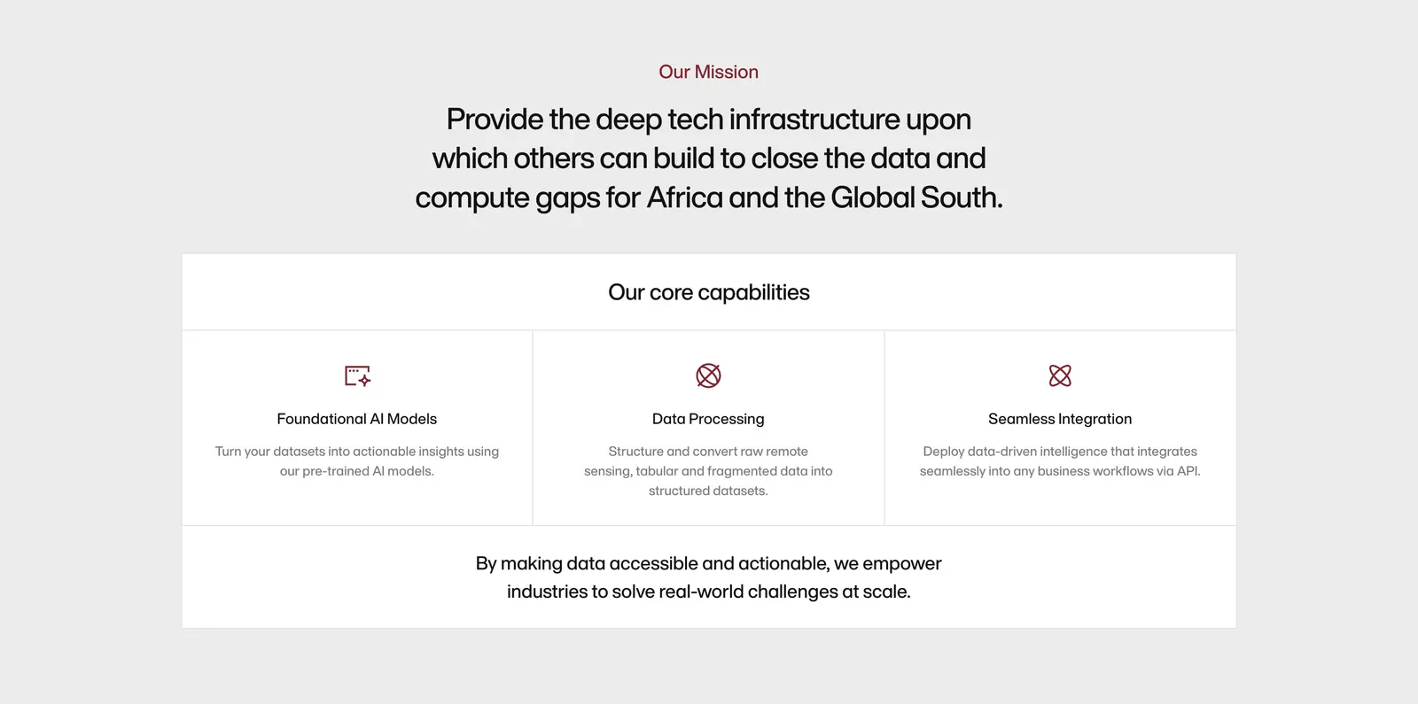
  179. Amini about & mission section: centered mission statement above a bordered panel of three core capability columns with icons
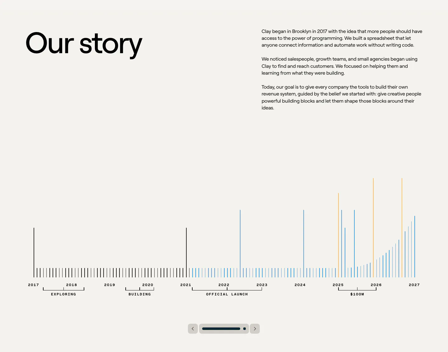
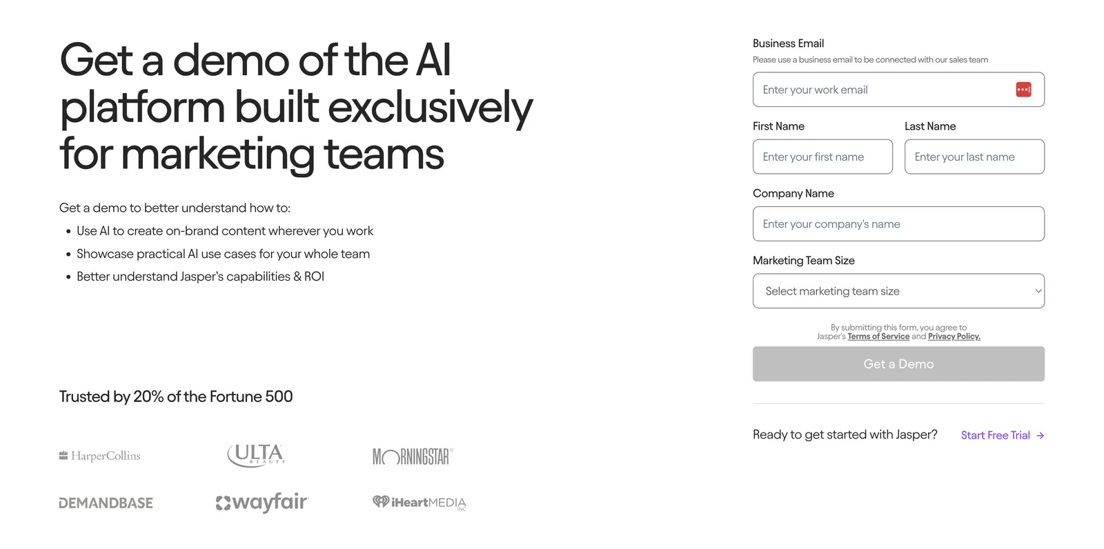
  180. Clay about & mission section: large heading beside story copy above a 2017-2027 bar timeline with slider controls on beige
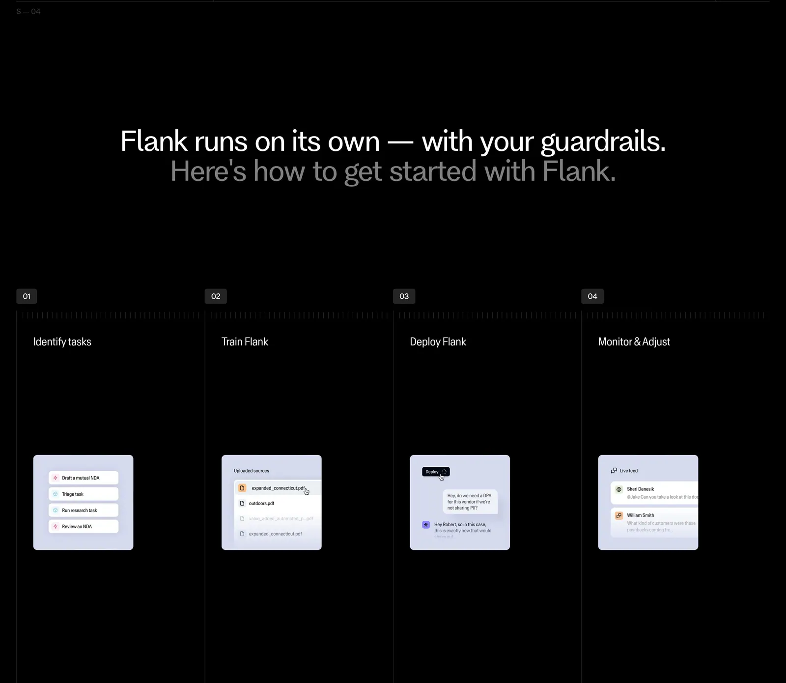
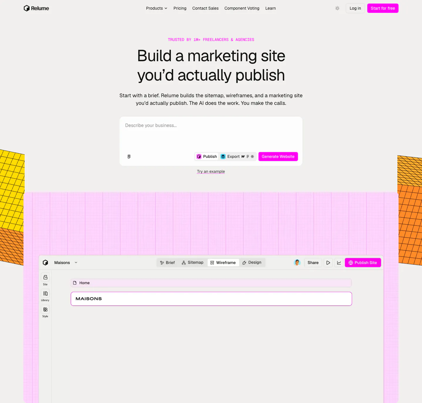
  181. Flank how it works section: centered two-tone headline above four numbered step columns with small UI mockup cards on black
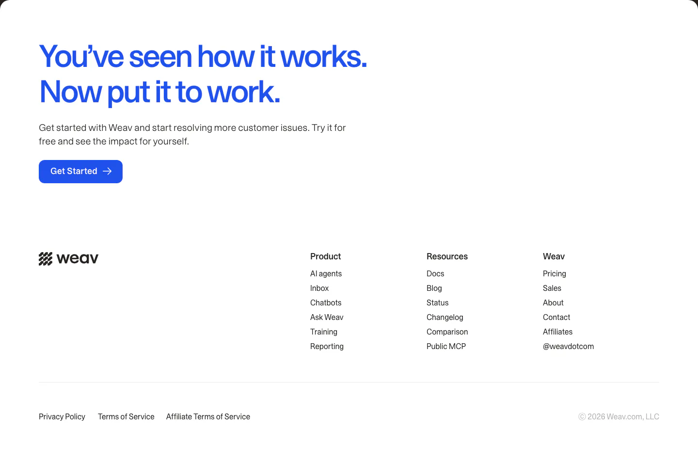
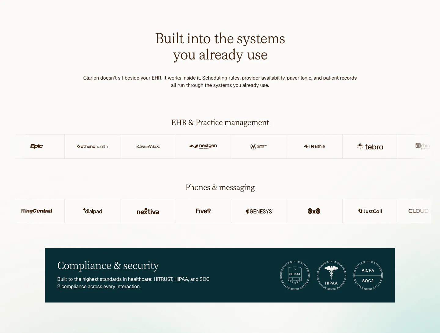
  182. Weav footer section: large blue CTA headline and button above a white footer with wordmark, three link columns and legal links
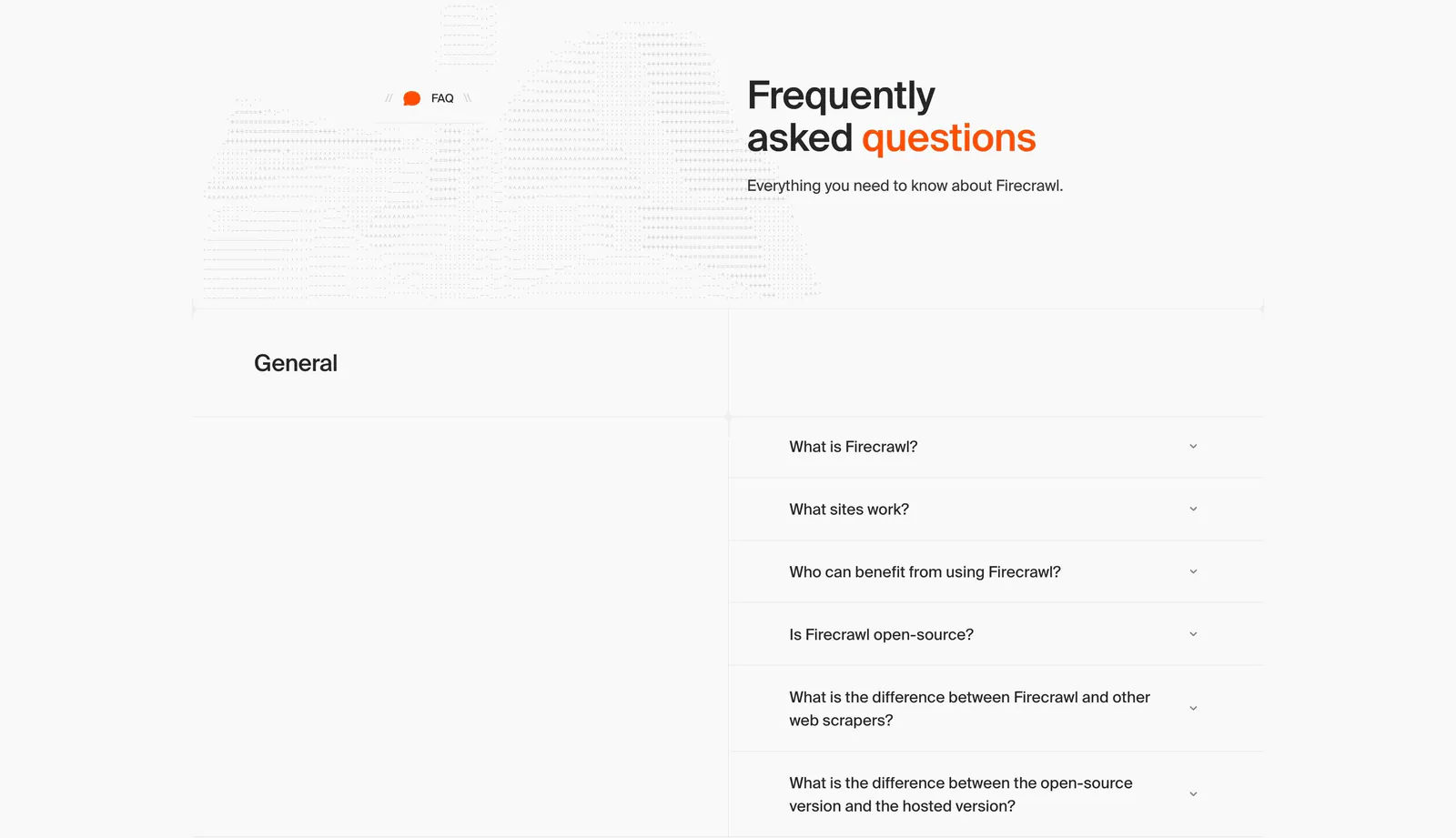
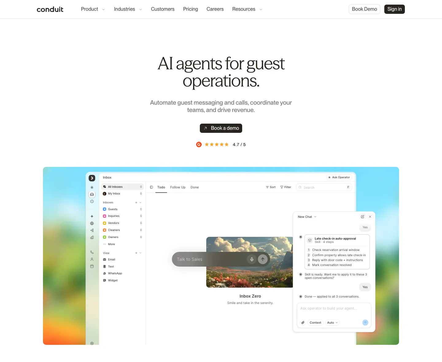
  183. Firecrawl FAQ section: headline beside dithered artwork above a two-column accordion of questions on a light gray grid layout
  184. Attio pricing section: centered headline with monthly/annual toggle above four plan cards with prices and checklists on white
  185. Jasper contact section: headline and benefit bullets with customer logos on the left, demo request form on the right on a light background
  186. Relume hero section: centered headline and AI prompt box above a wireframe editor screenshot on a pink grid, flanked by yellow isometric blocks
  187. Clarion integrations section: centered serif headline above two rows of EHR and phone system logos and a dark compliance badge banner
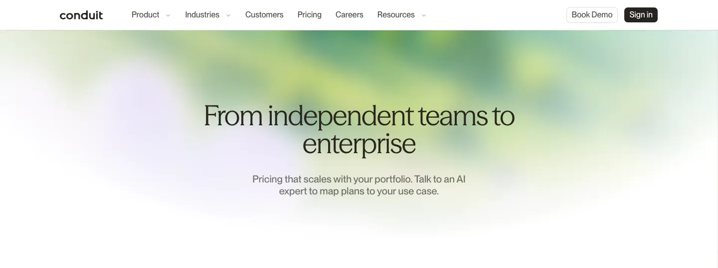
  188. Conduit hero section: centered serif pricing headline and subcopy over a soft green and lavender blurred gradient
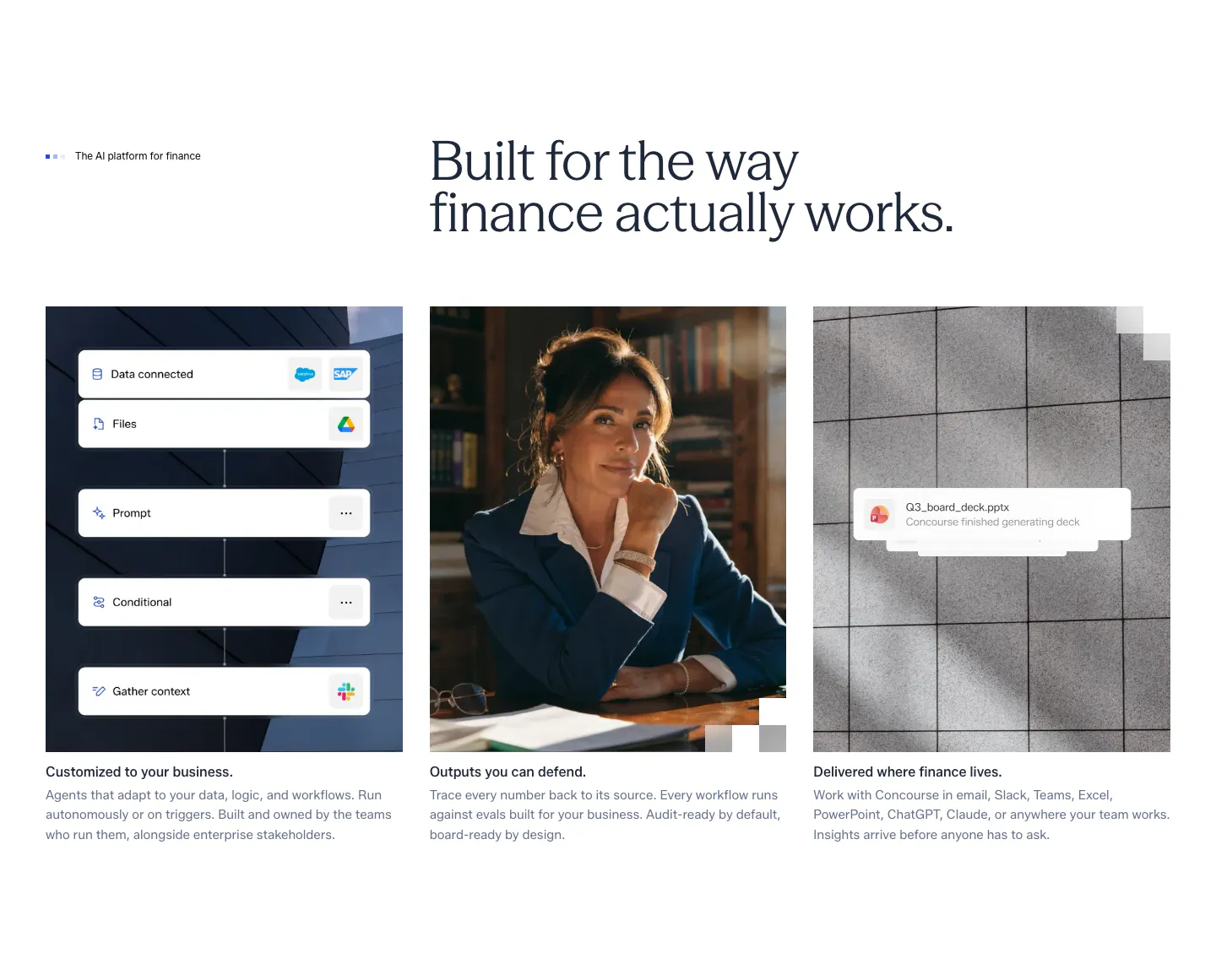
  189. Concourse features section: headline above three equal cards showing a workflow UI mockup, a portrait photo and a file notification
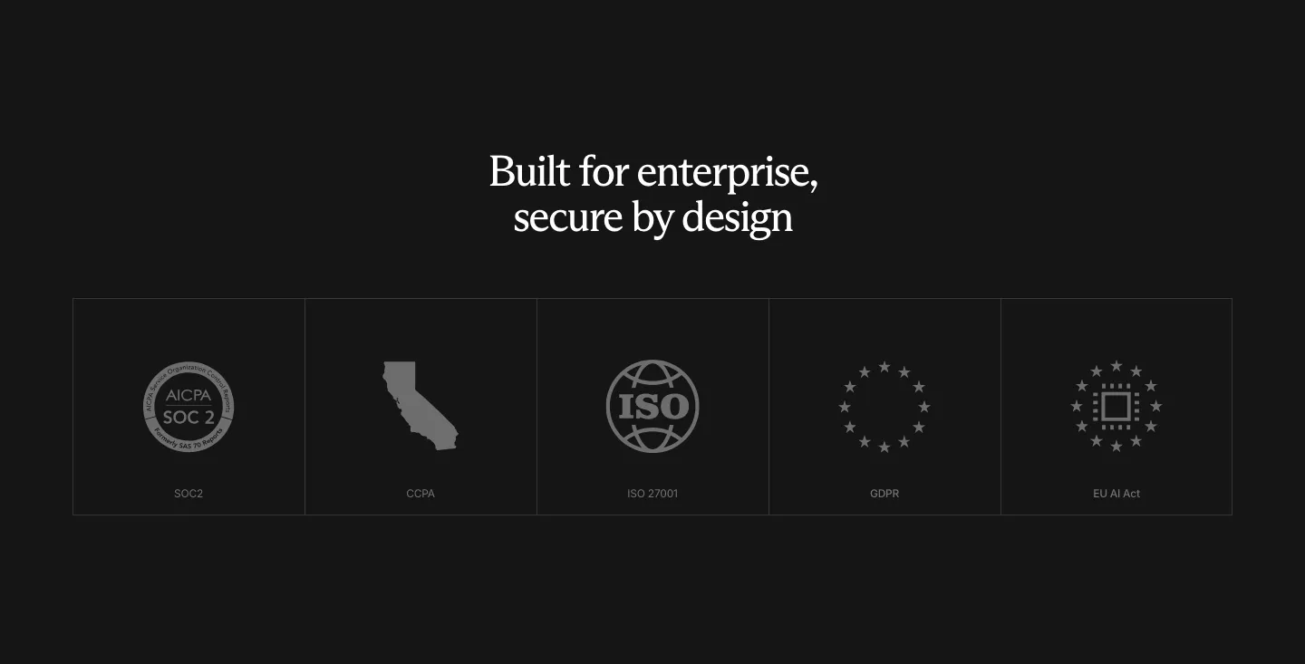
  190. Rogo security section: centered serif headline above a row of five compliance badge tiles (SOC 2, CCPA, ISO, GDPR, EU AI Act)
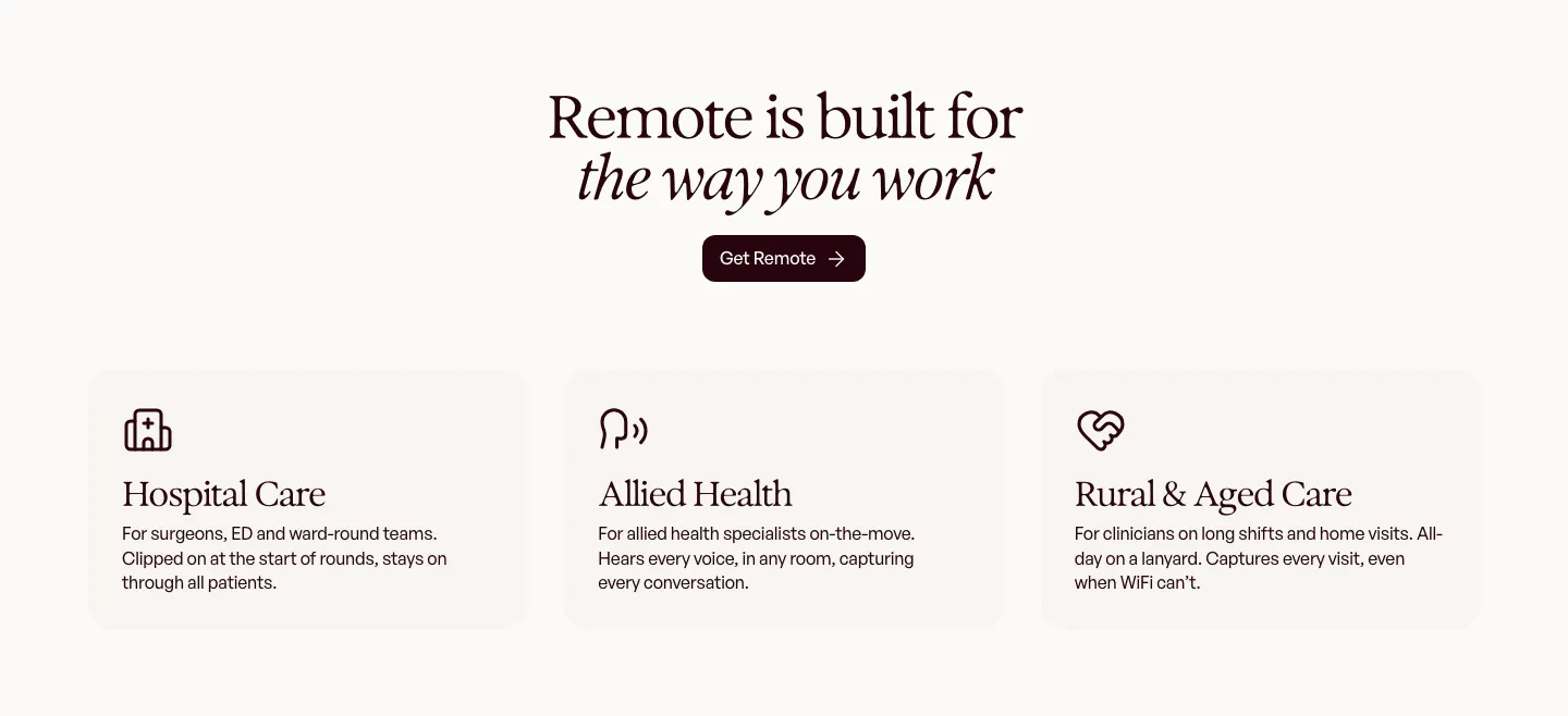
  191. Gradient Labs call-to-action section: centered serif headline and pill email field on a bright orange background with thin curved lines
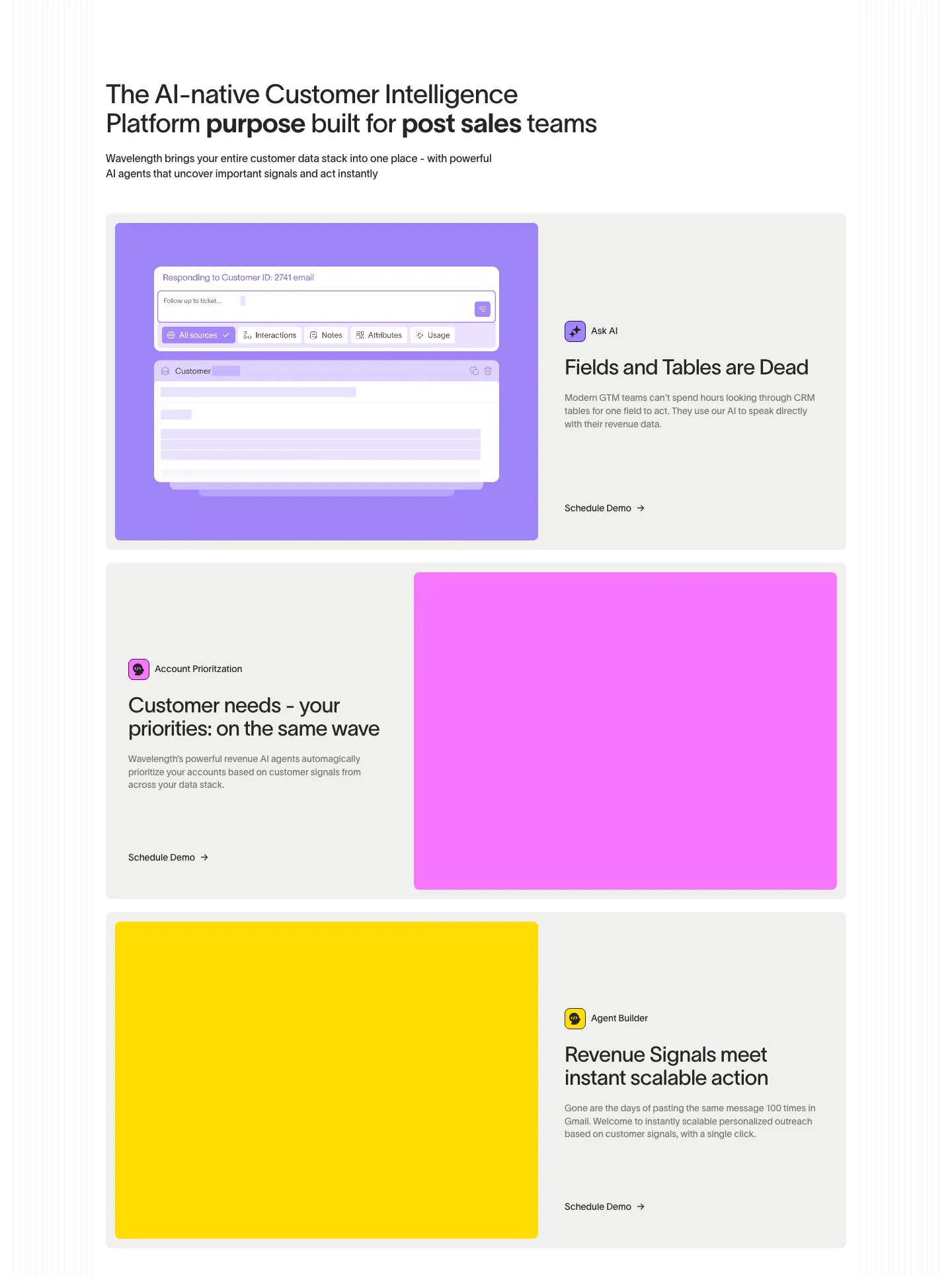
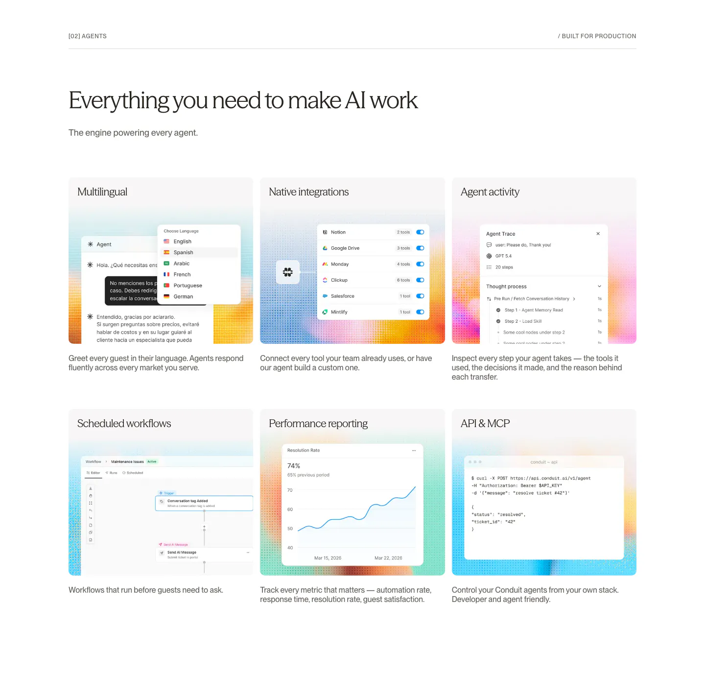
  192. Wavelength features section: left headline above three alternating rows pairing copy with large purple, pink and yellow panels, one with AI UI
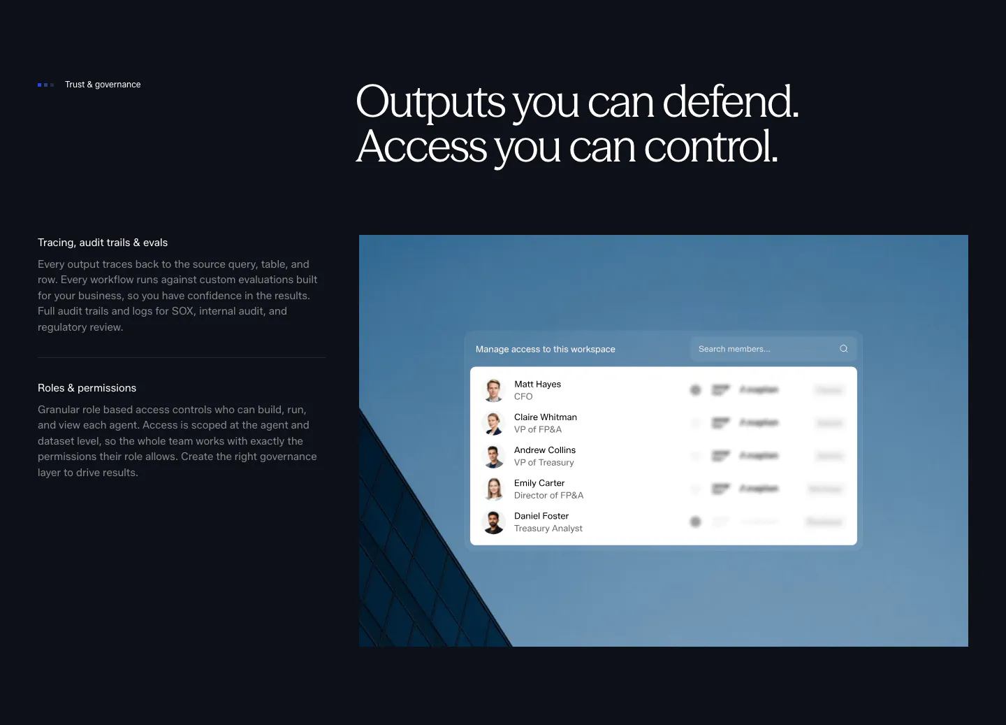
  193. Concourse security section: governance points left, access-control UI over a blue building photo right on a dark background
  194. Fourmula footer section: wordmark, small link columns and legal text above a gray dot-matrix field forming a halftone shape
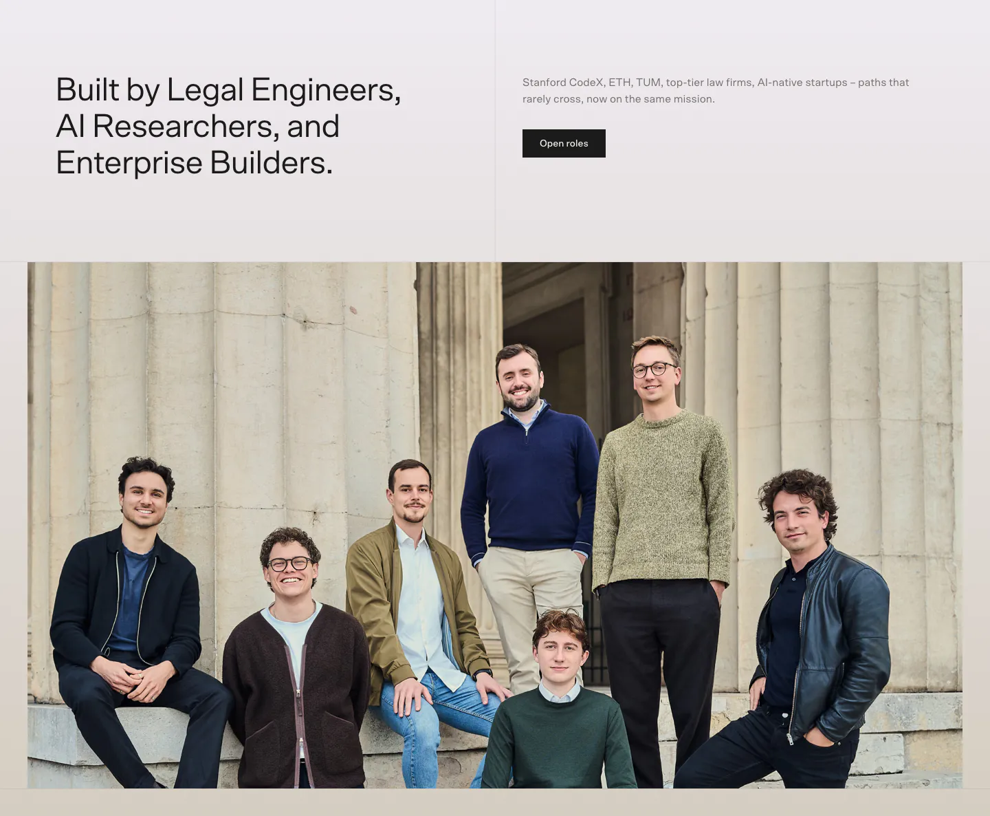
  195. Bayshore team section: headline and Open roles button above a wide group photo of the team in front of stone columns
  196. Heidi call to action section: cream rounded band with centered serif headline, Get Remote button and faint curved line decorations
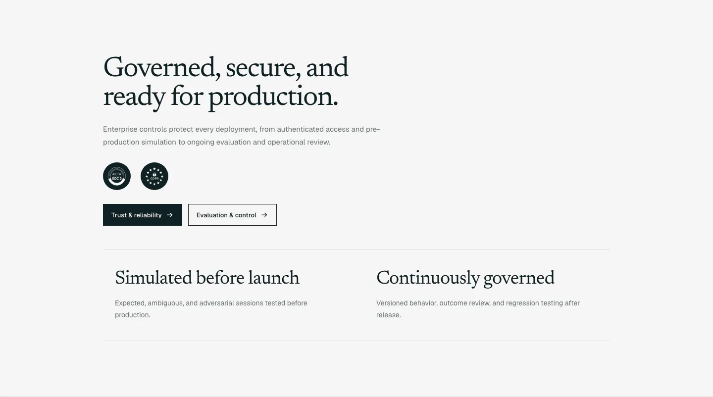
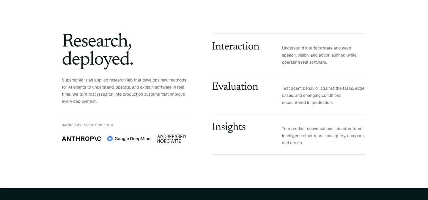
  197. Supersonik security section: serif headline, copy, SOC 2 and GDPR badges and two buttons above two governance points on light gray
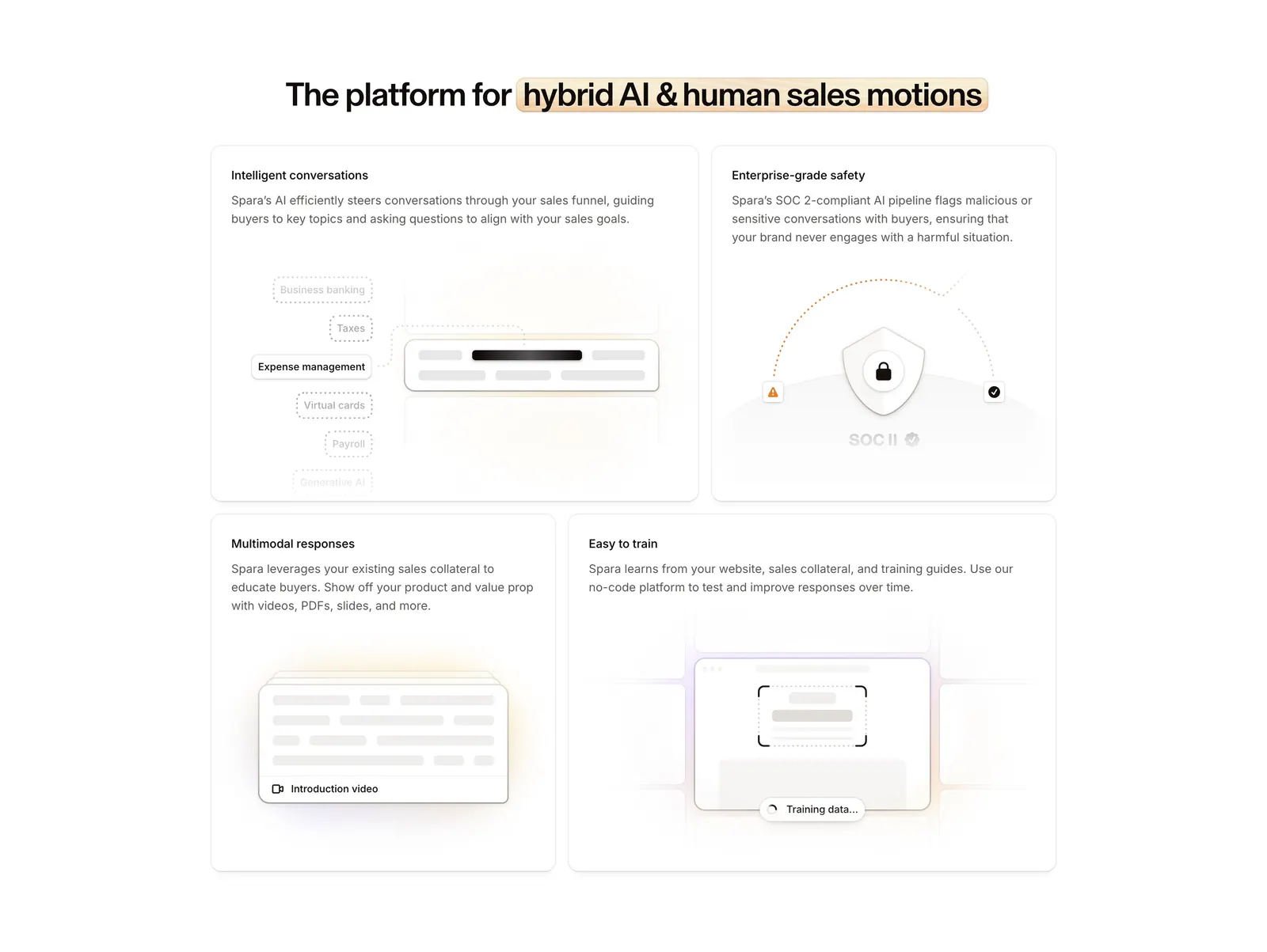
  198. Spara features section: centered headline with highlighted phrase above a four-tile bento grid of feature cards with abstract UI art
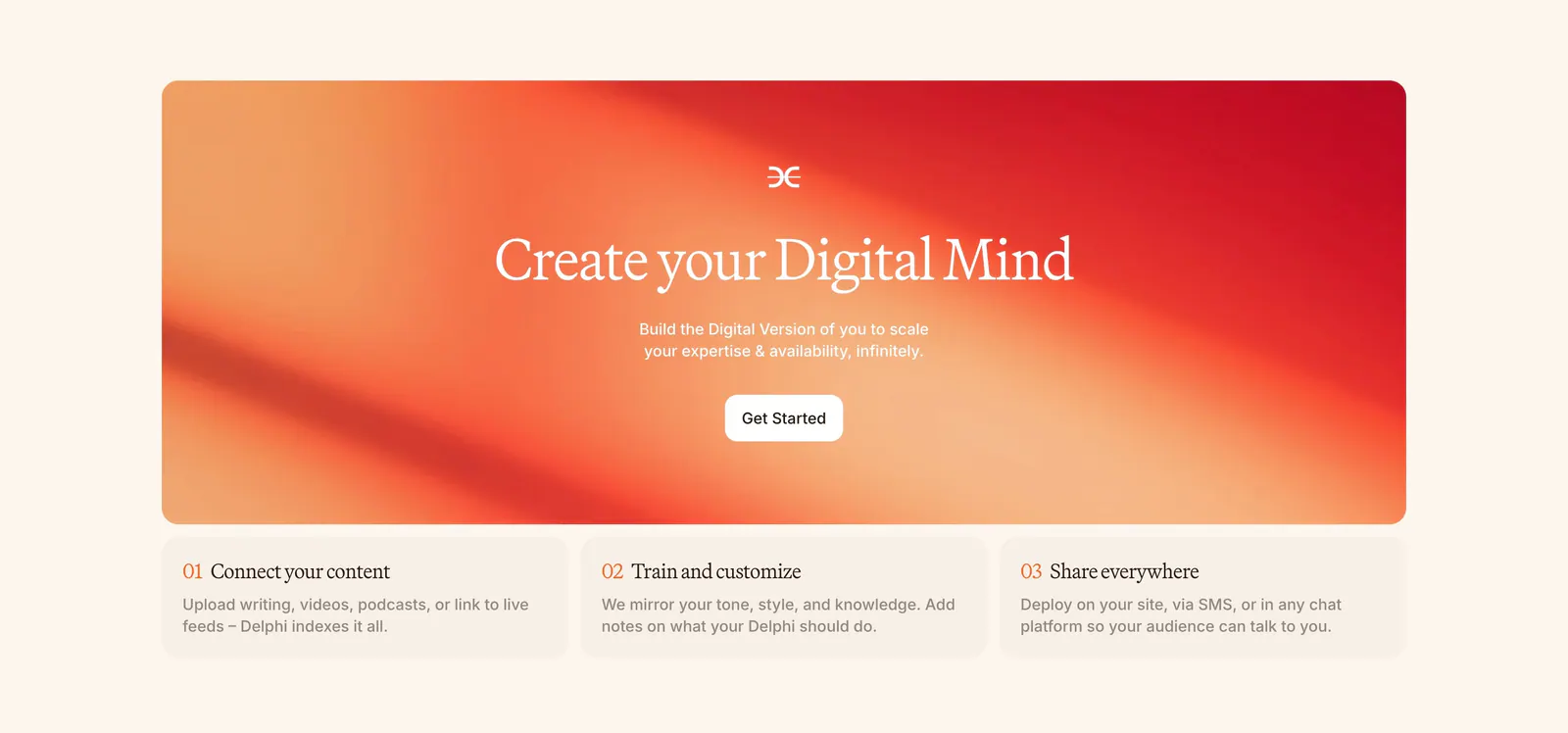
  199. Delphi call-to-action section: centered serif headline and Get Started button on an orange-red gradient card above three numbered step cards
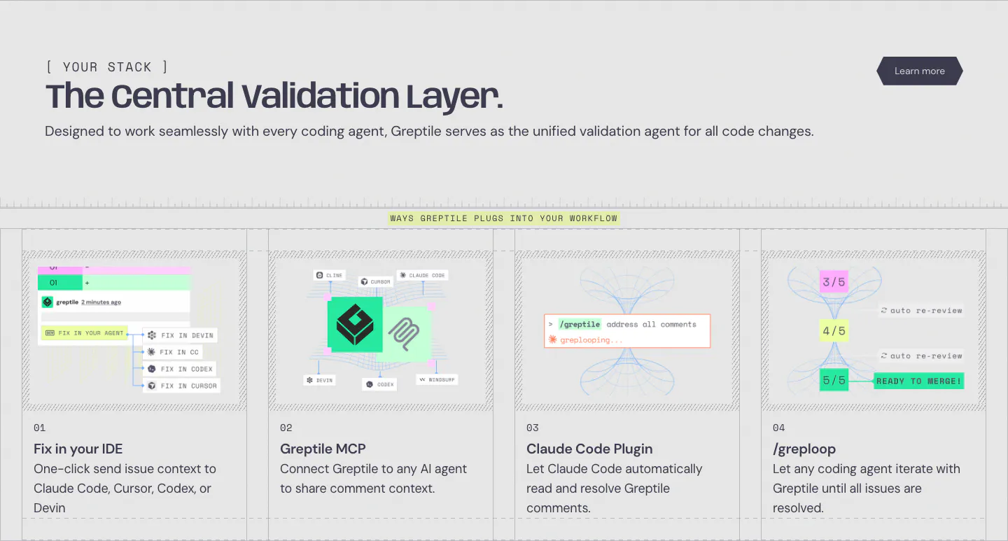
  200. Greptile integrations section: left-aligned headline above four numbered cards showing IDE, MCP, Claude Code plugin and loop workflows
  201. Amini logo cloud section: label and headline above a bordered two-row grid of grayscale partner and supporter logos on light gray
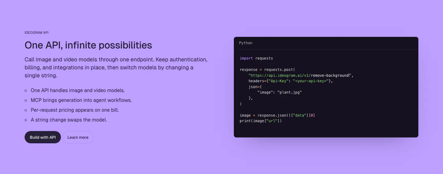
  202. Ideogram features section: purple background, headline, copy and bullet list on the left, dark Python code snippet window on the right
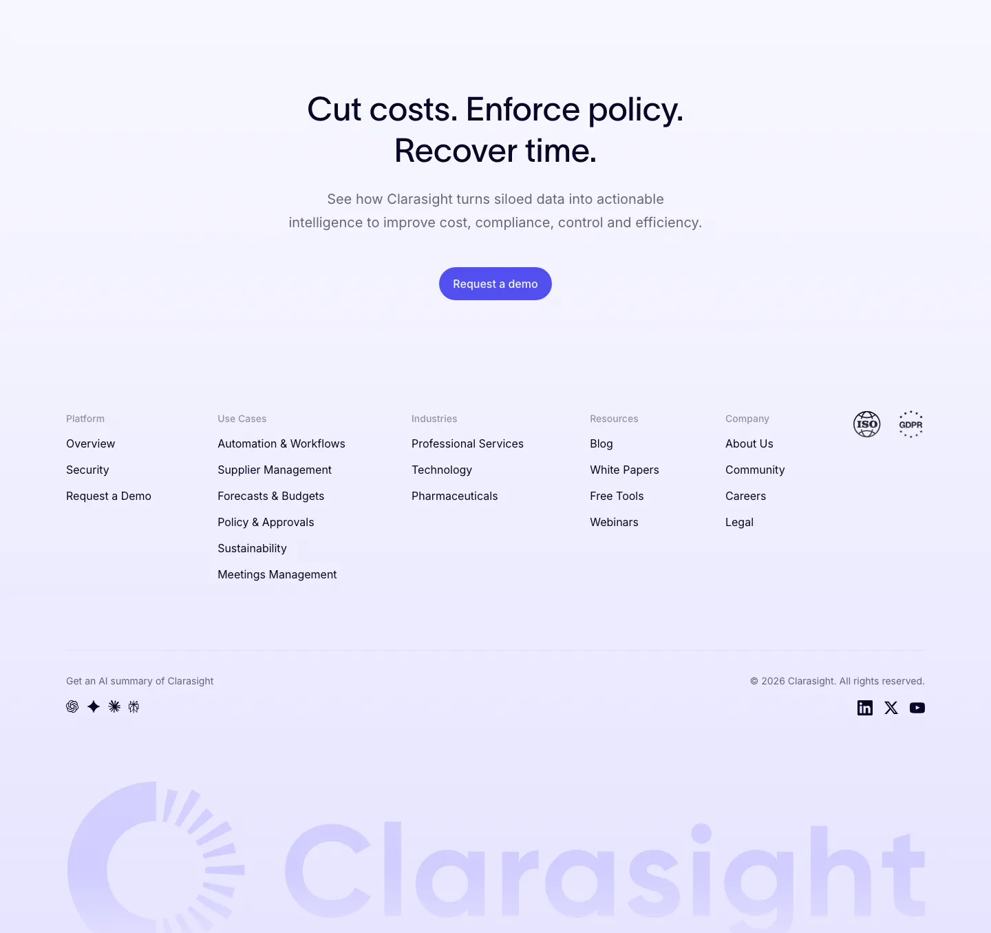
  203. Clarasight footer section: centered CTA headline and button above link columns, compliance badges and a huge faint lavender wordmark
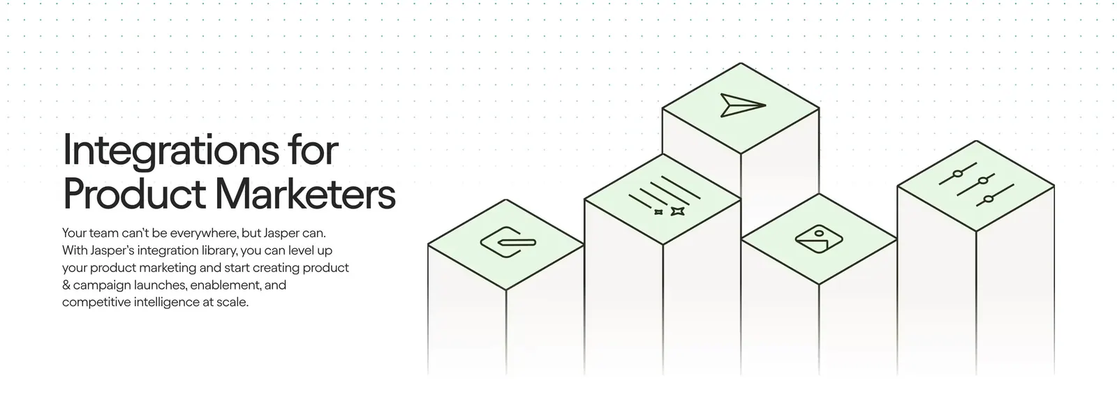
  204. Jasper integrations section: headline and copy on the left beside isometric pillars topped with green icon tiles on a light background
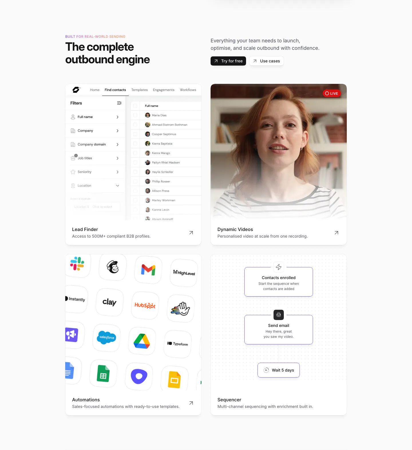
  205. Sendr features section: headline and buttons above a 2x2 card grid of lead finder UI, live video, app icon grid and sequencer flow
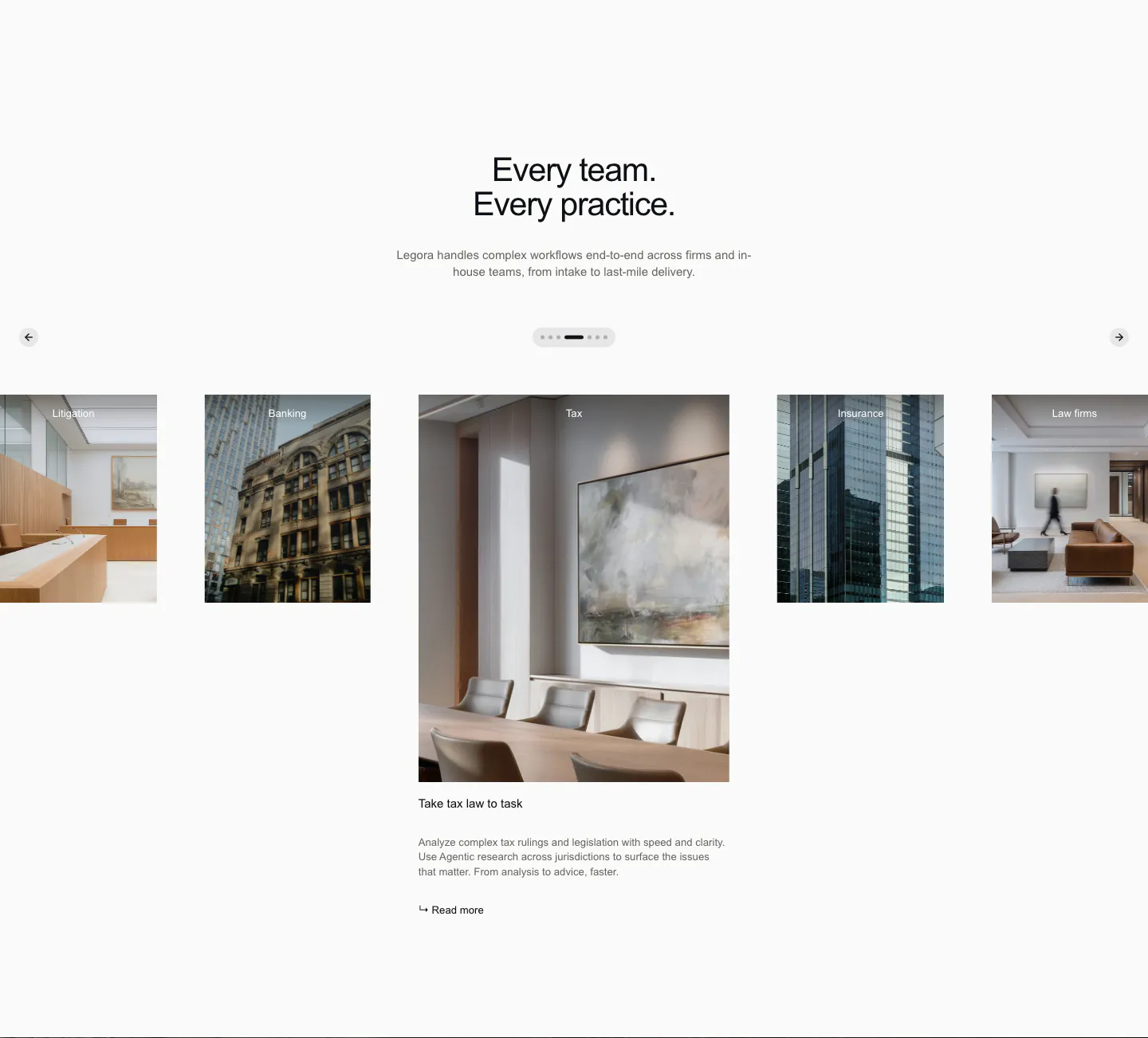
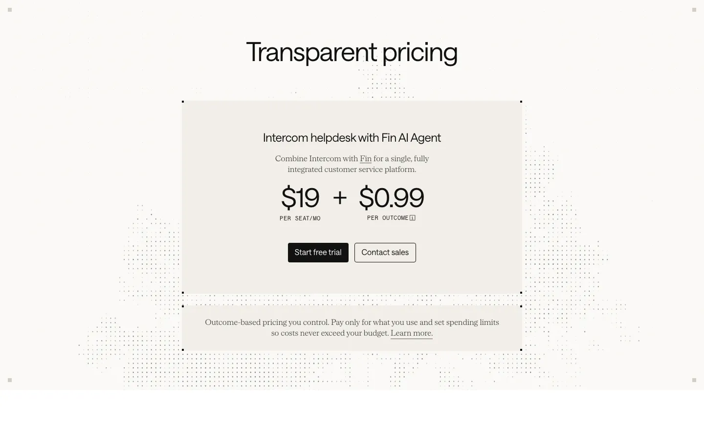
  206. Legora use cases section: centered headline above a photo carousel of practice areas with arrows and pagination dots
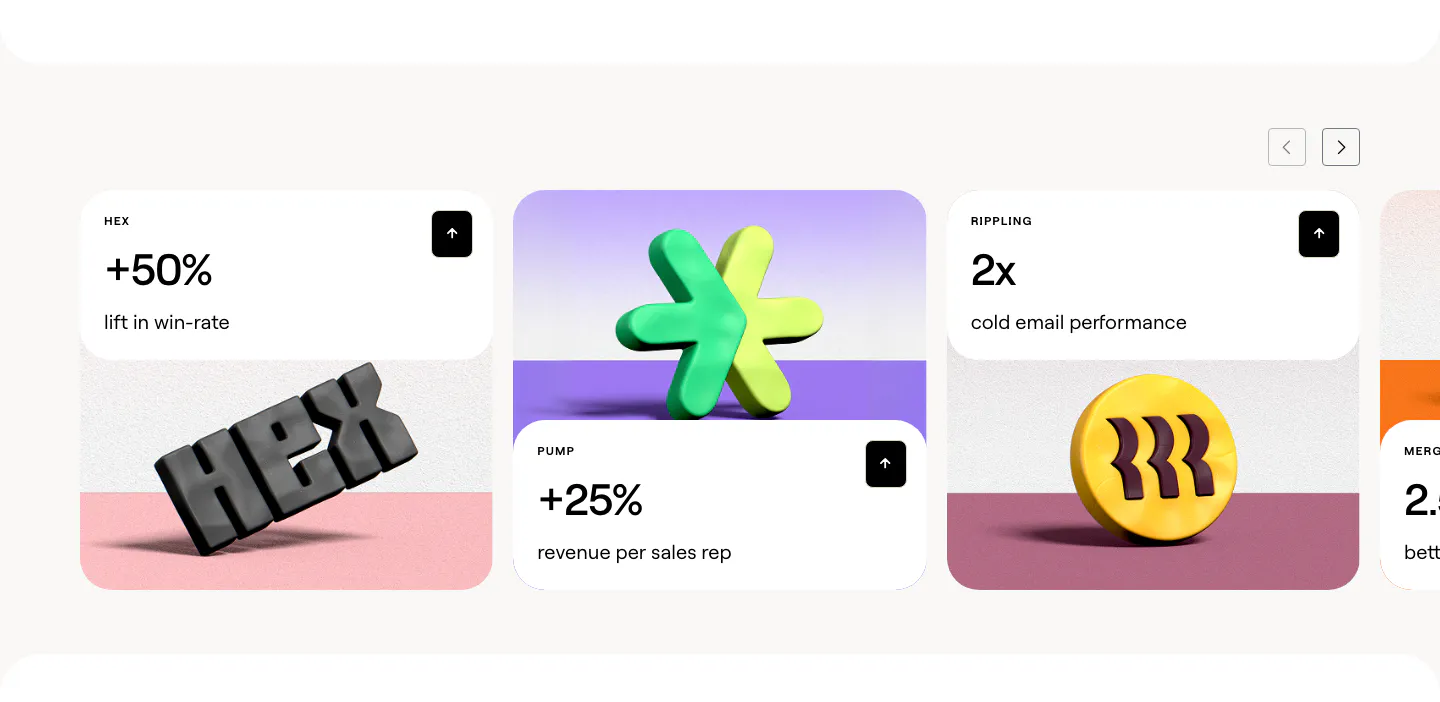
  207. Clay stats section: slider of customer result cards with large percentages above 3D rendered brand logos on colored stages
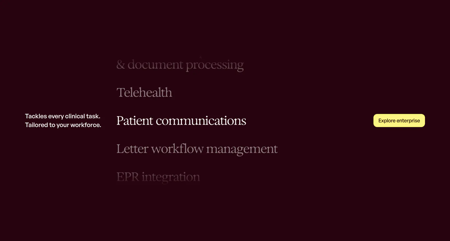
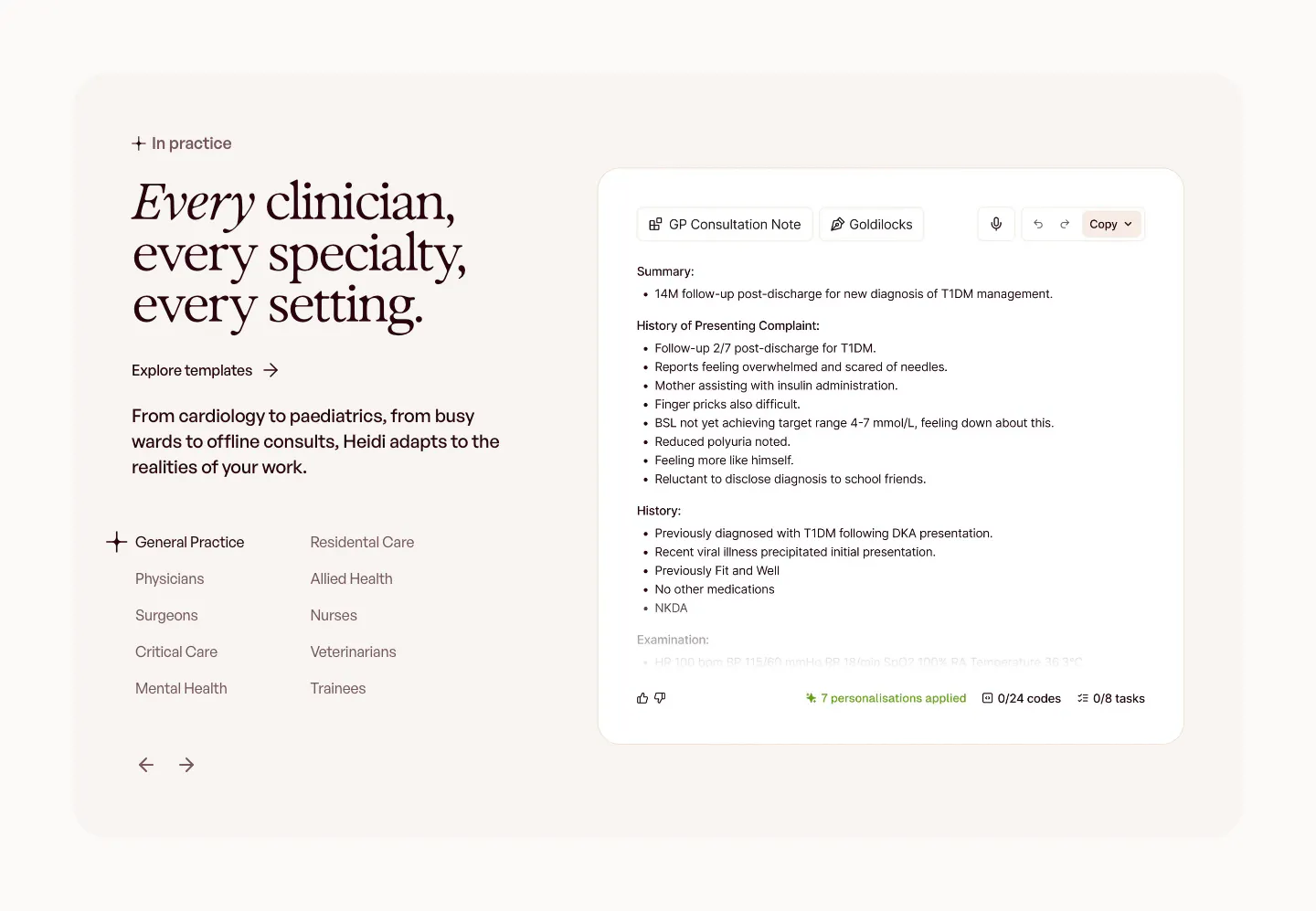
  208. Heidi features section: dark plum background with a scrolling serif list of clinical tasks and a yellow Explore enterprise button
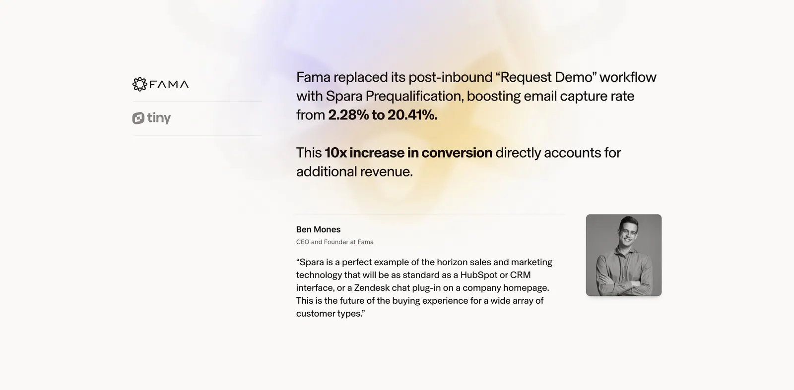
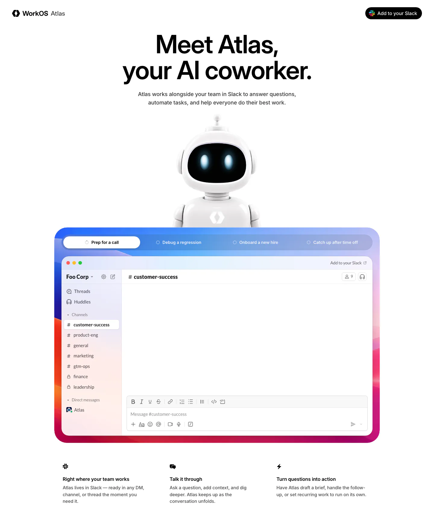
  209. Spara testimonials section: customer logo tabs on the left, case study result and quote with portrait on the right over a soft glow
  210. NickAI integrations section: left heading and copy above a bordered grid of eight grayscale data provider logos
  211. Intercom pricing section: centered beige card with $19 per seat plus $0.99 per outcome pricing and two buttons over a faint dot pattern
  212. Gradient Labs logo cloud section: serif heading above a single row of white customer logos on a near-black background
  213. Heidi use cases section: serif headline with a specialty list and arrows on the left, GP consultation note UI on the right
  214. WorkOS hero section: centered headline above a 3D robot mascot and a tabbed Slack app mockup in a colorful gradient frame
  215. Bobbin logo cloud section: centered caption above a single row of five grayscale tutoring company logos on white
  216. Gradient Labs features section: centered serif headline above a feature list on the left and a product screenshot with video button
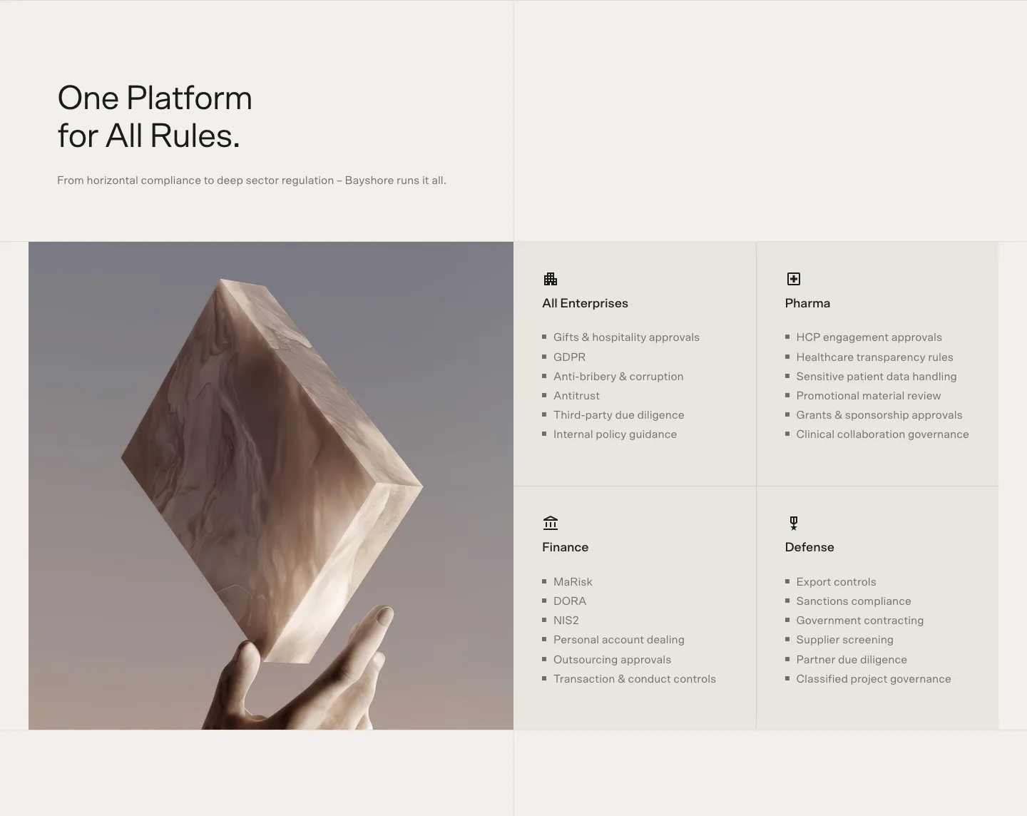
  217. Bayshore use cases section: headline above a 3D marble block held by a hand beside a 2x2 grid of industry cards with bullet lists
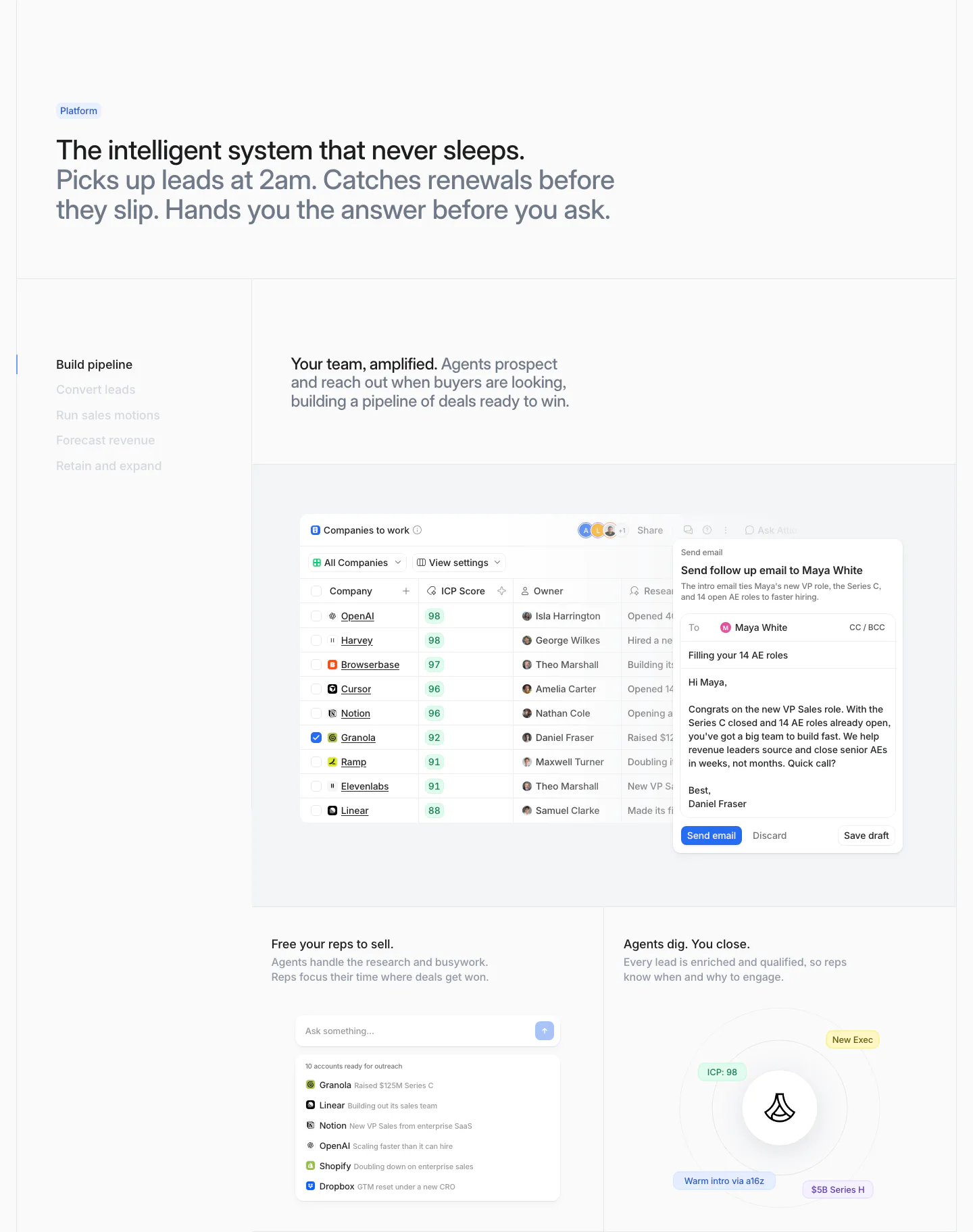
  218. Attio features section: two-tone headline above a vertical tab list beside a companies table with email draft and two smaller UI cards
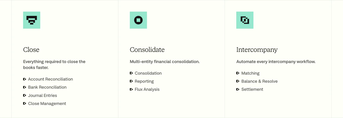
  219. Nominal features section: three bordered columns with mint pixel icons, serif titles and bullet lists for Close, Consolidate and Intercompany
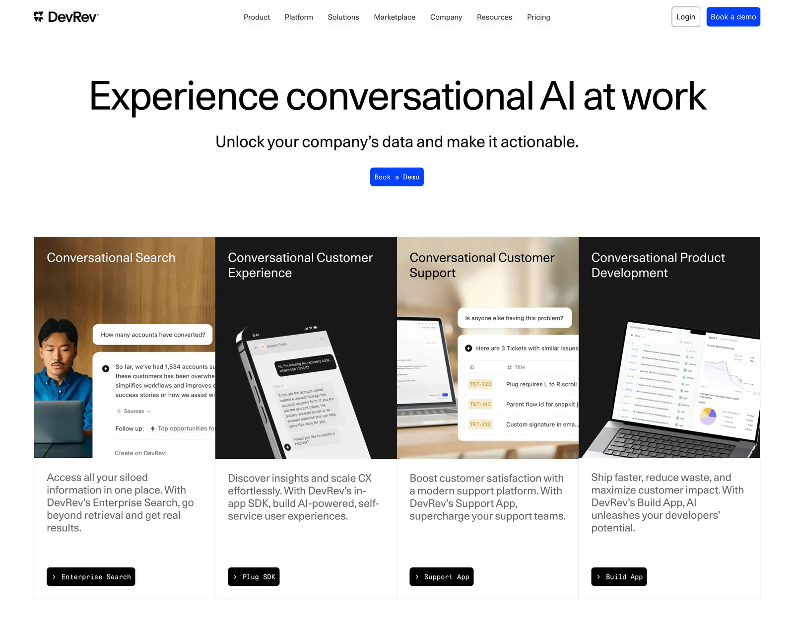
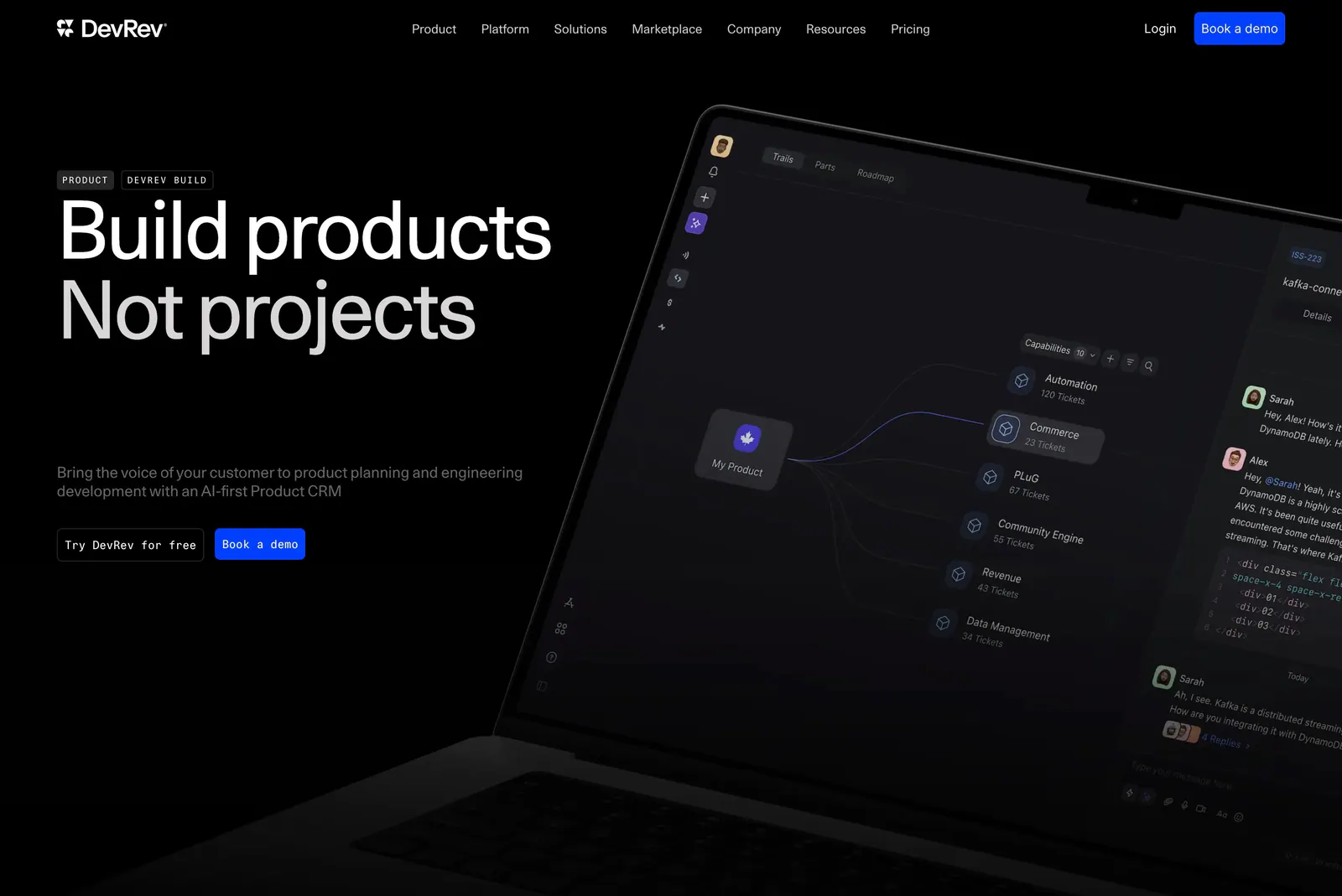
  220. DevRev hero section: centered headline and Book a Demo button above four product cards mixing photos and conversational UI mockups
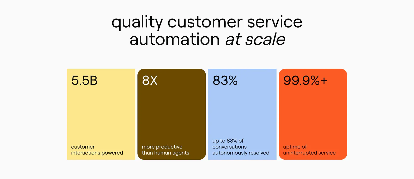
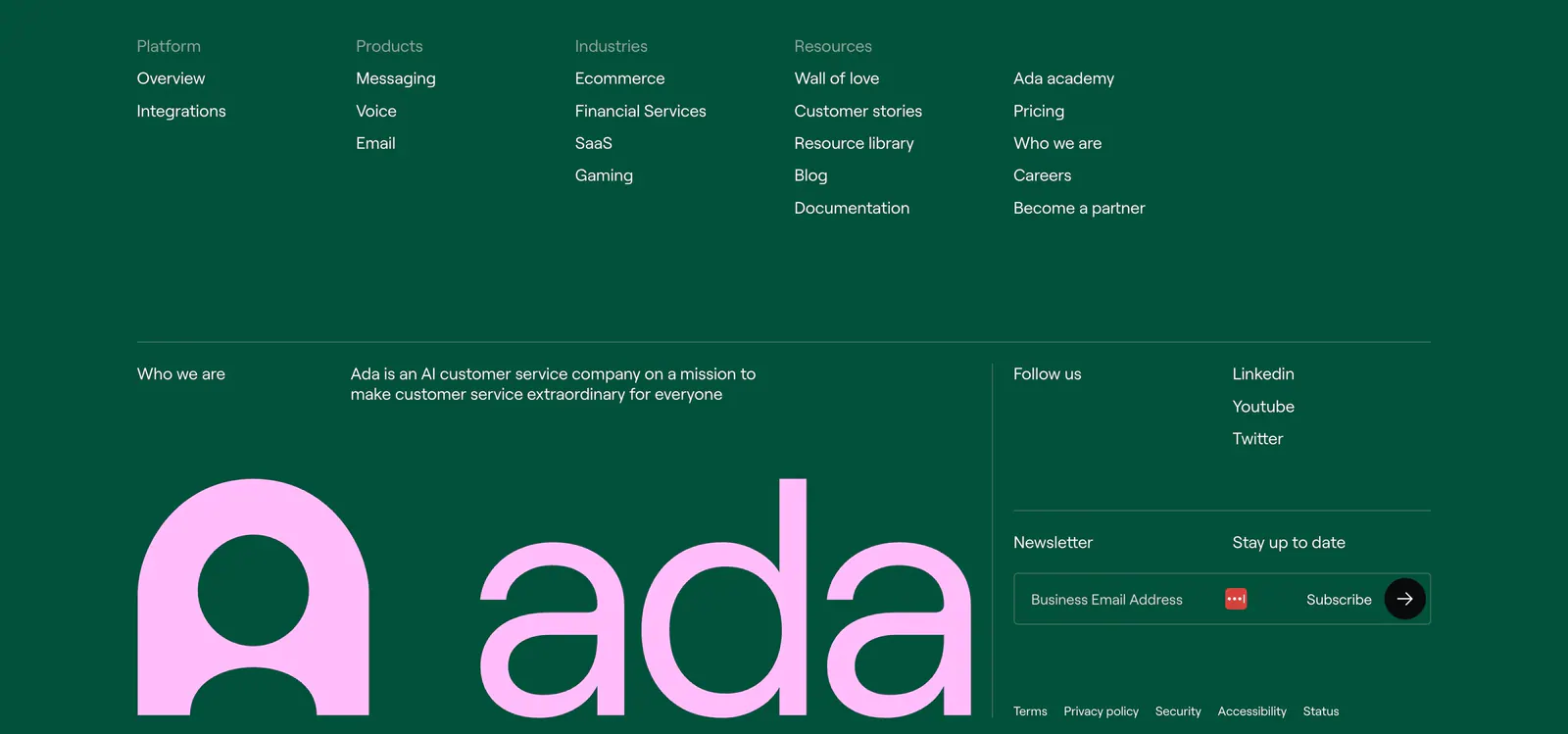
  221. Ada value proposition section: centered headline above four colored stat cards in yellow, brown, blue and orange
  222. NickAI integrations section: left heading and copy above a bordered grid of eight grayscale exchange and market logos
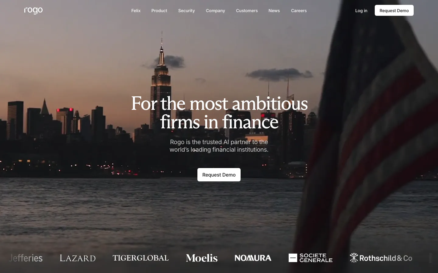
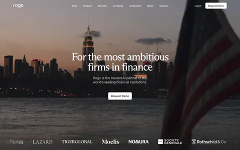
  223. Rogo hero section: centered serif headline and demo button over a full-bleed dusk photo of a city skyline, logo strip at the bottom
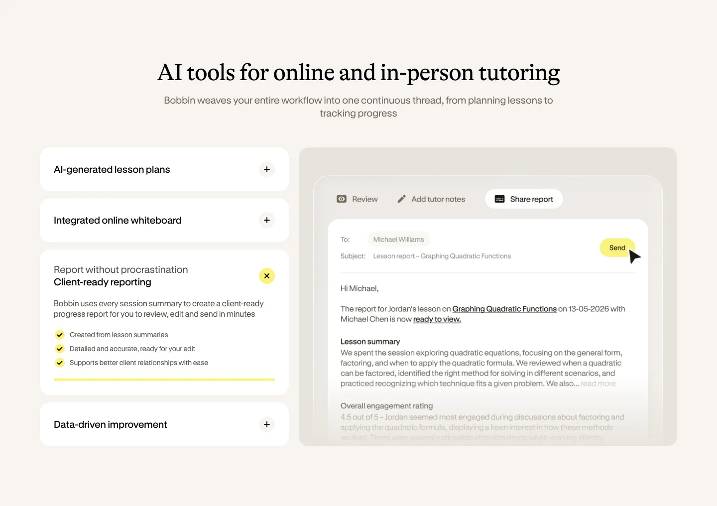
  224. Bobbin features section: serif heading over an accordion of features on the left and a lesson report email UI on the right, cream background
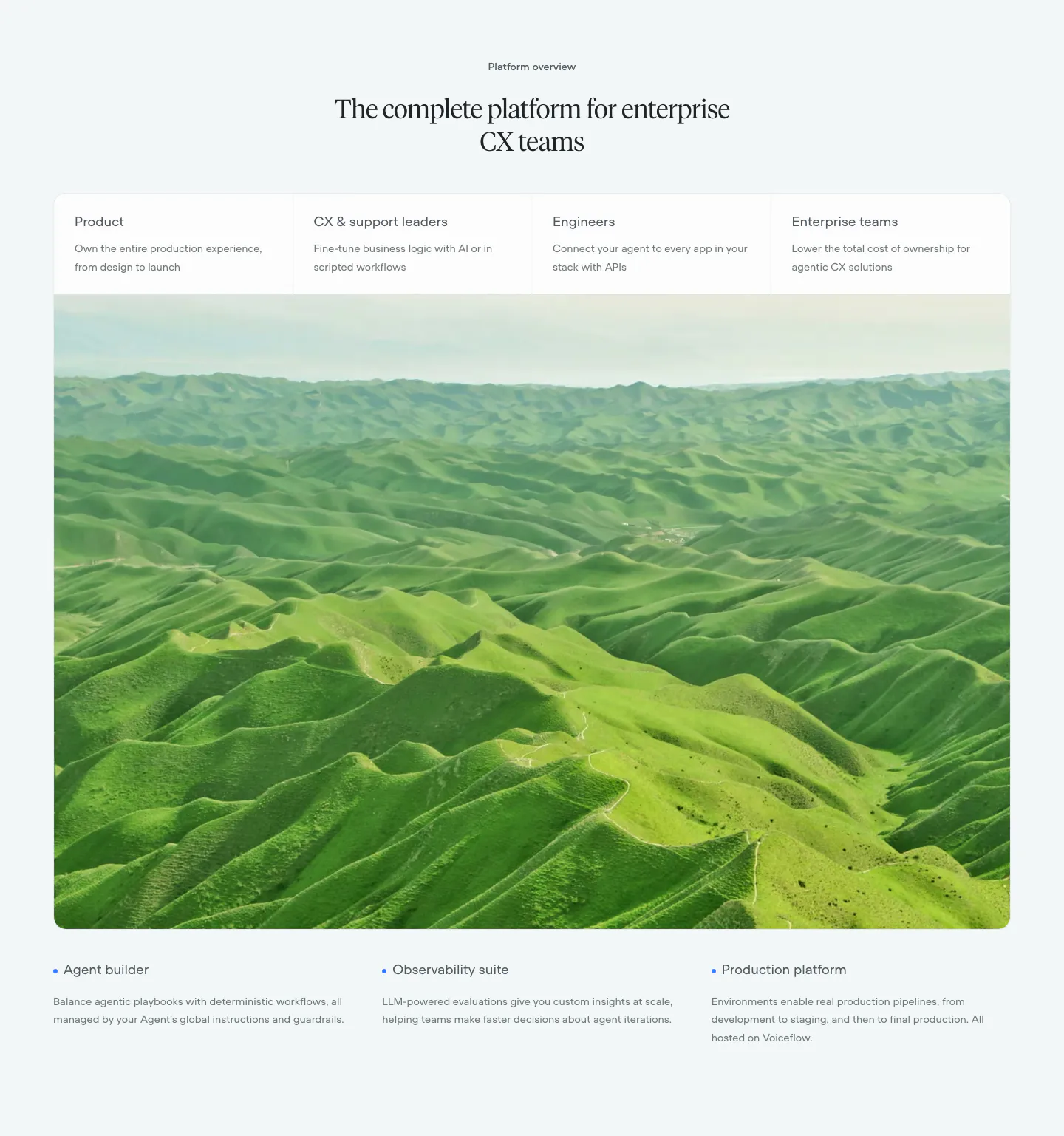
  225. Voiceflow use cases section: centered serif headline, four role tabs over a large green hills photo, three feature notes below
  226. Ada call-to-action section: centered lowercase headline with an inline yellow Get a demo pill button on a white background
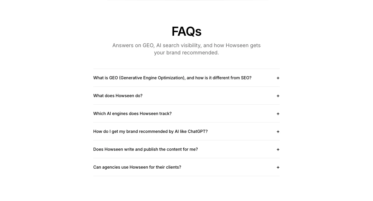
  227. Howseen AI FAQ section: centered heading above a six-question accordion list on a white background
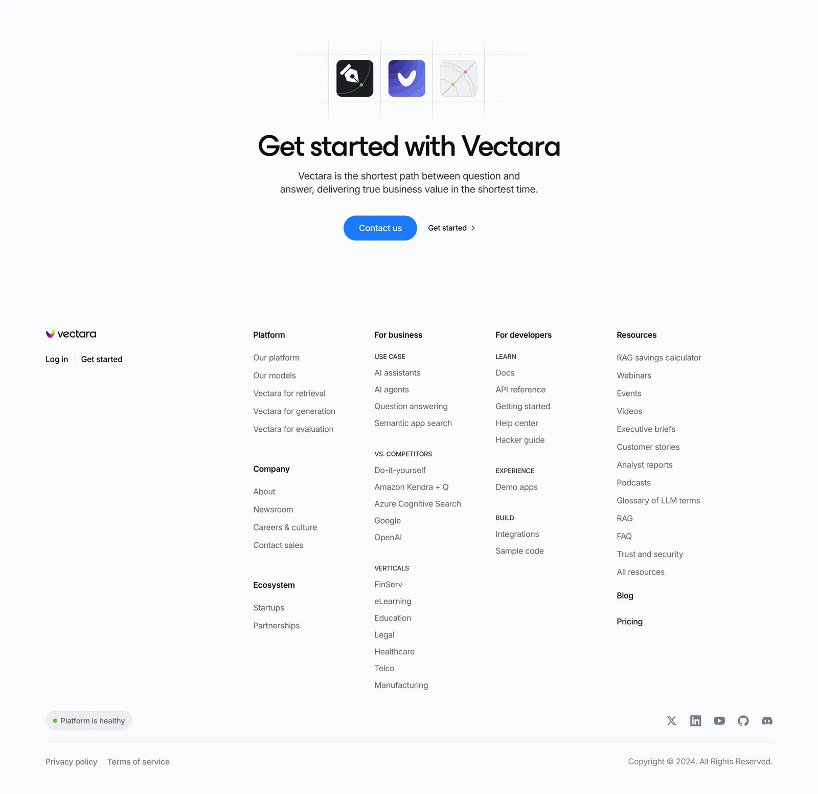
  228. Gumloop logo cloud section: grid of customer logos with case study links beside a headline and two large stats
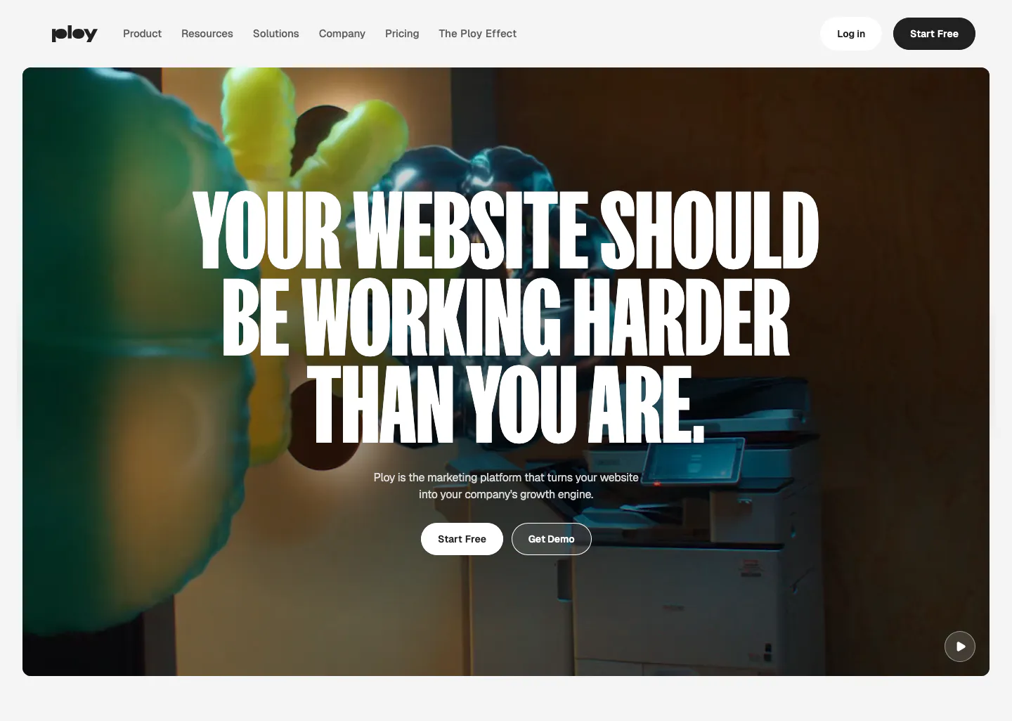
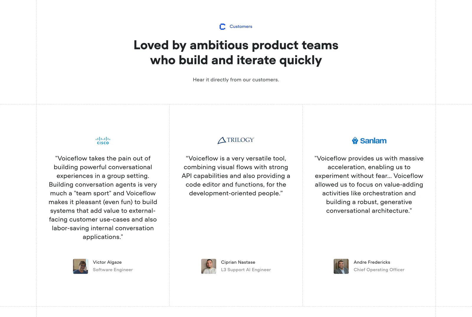
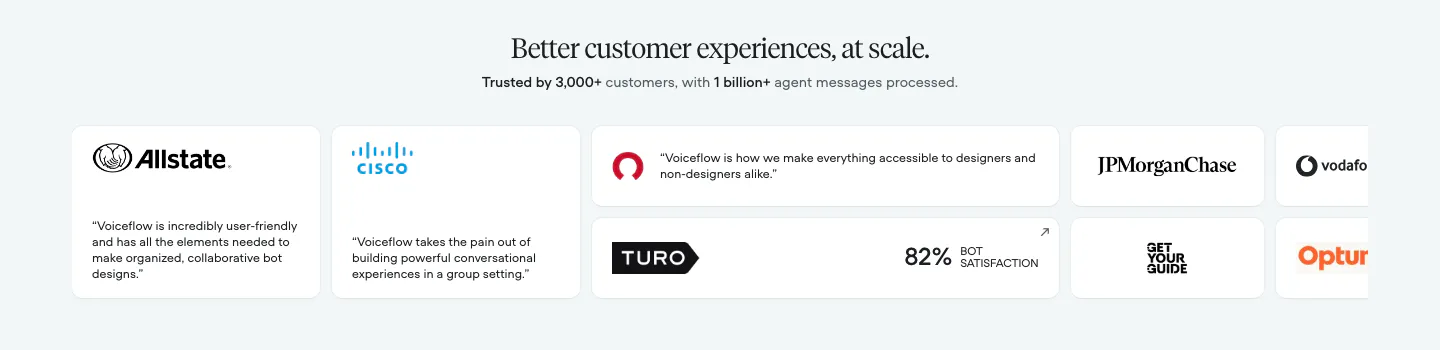
  229. Ploy hero section: centered condensed uppercase headline and two buttons over a full-bleed office video frame with inflatable shapes
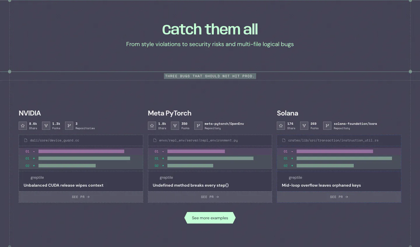
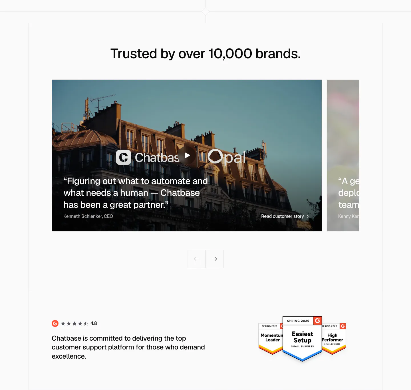
  230. Greptile features section: centered headline over three cards showing example bugs caught in open-source repos with diff snippets
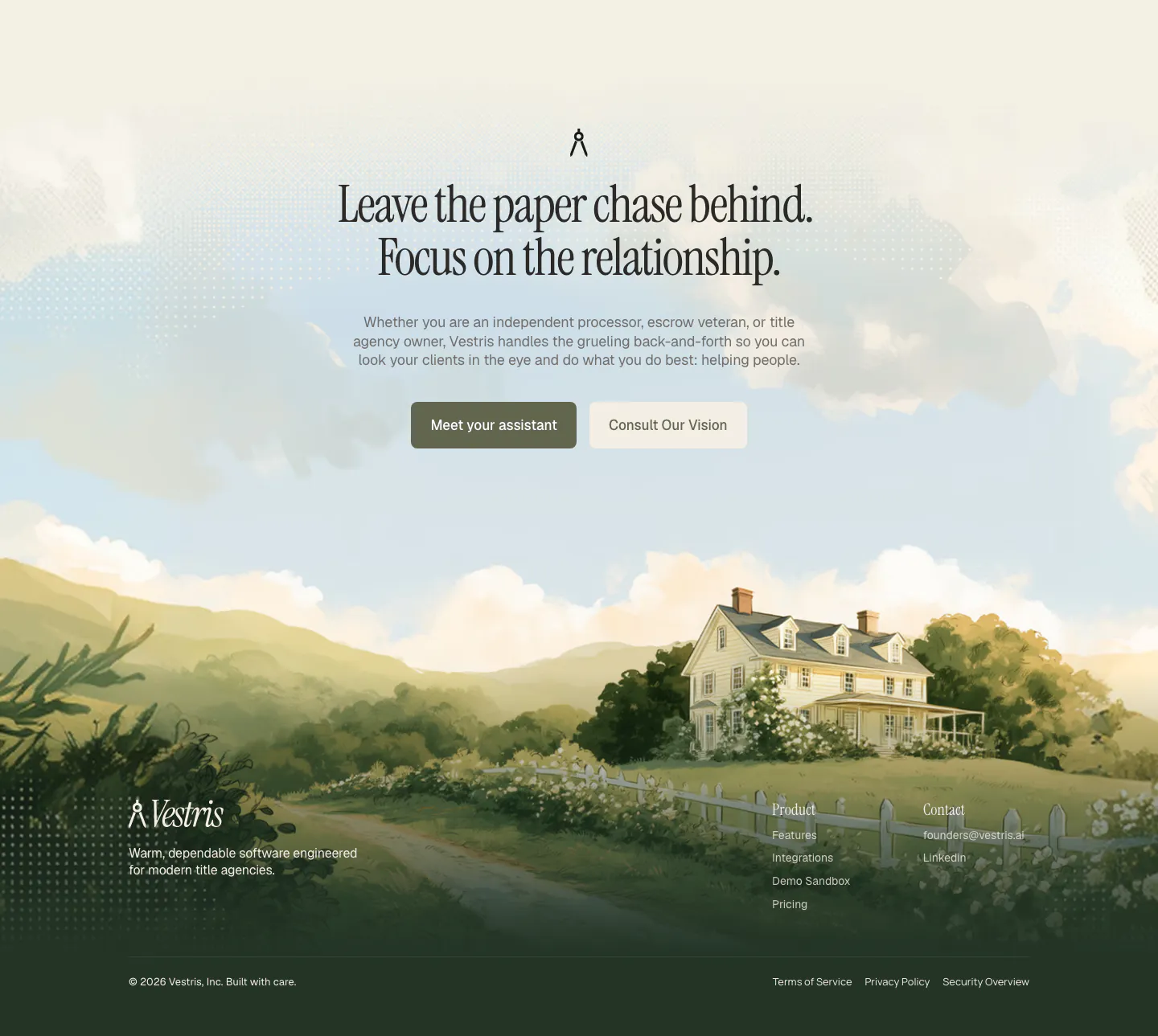
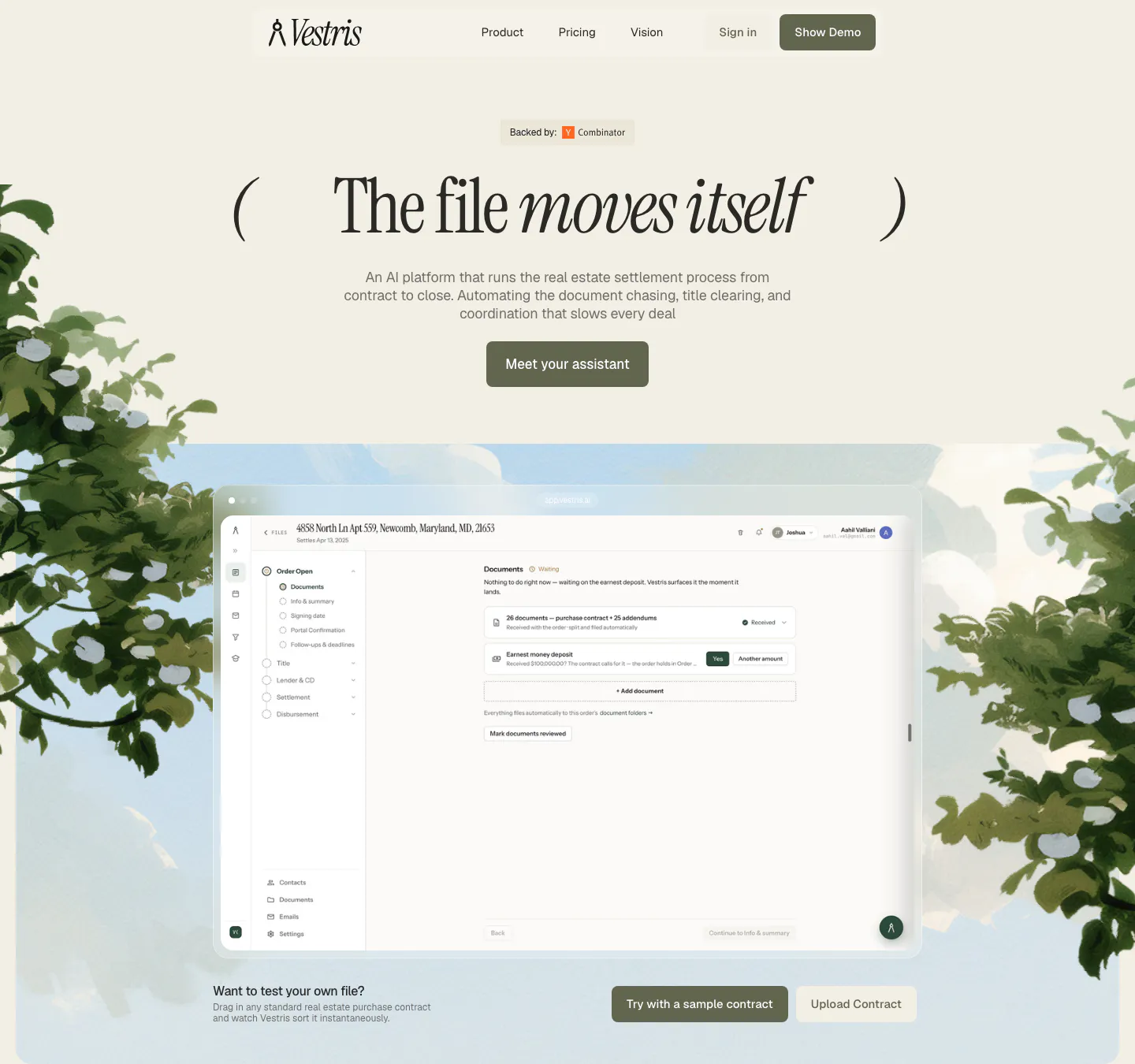
  231. Vestris call-to-action section: centered serif headline and two buttons over a painted countryside house scene that flows into the footer
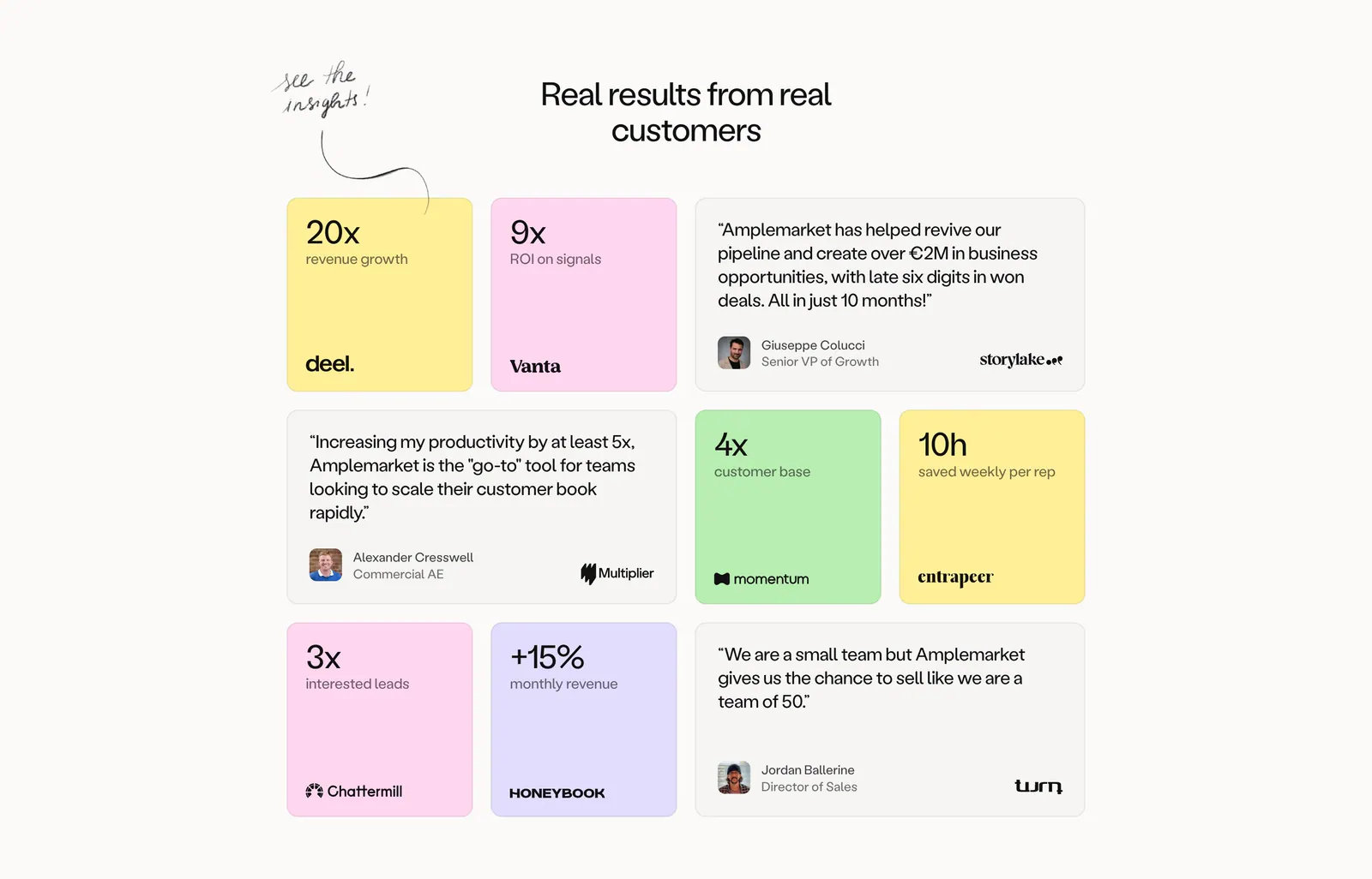
  232. Clay features section: stacked pastel cards, each with headline, customer results and buttons left and a 3D clay object render right
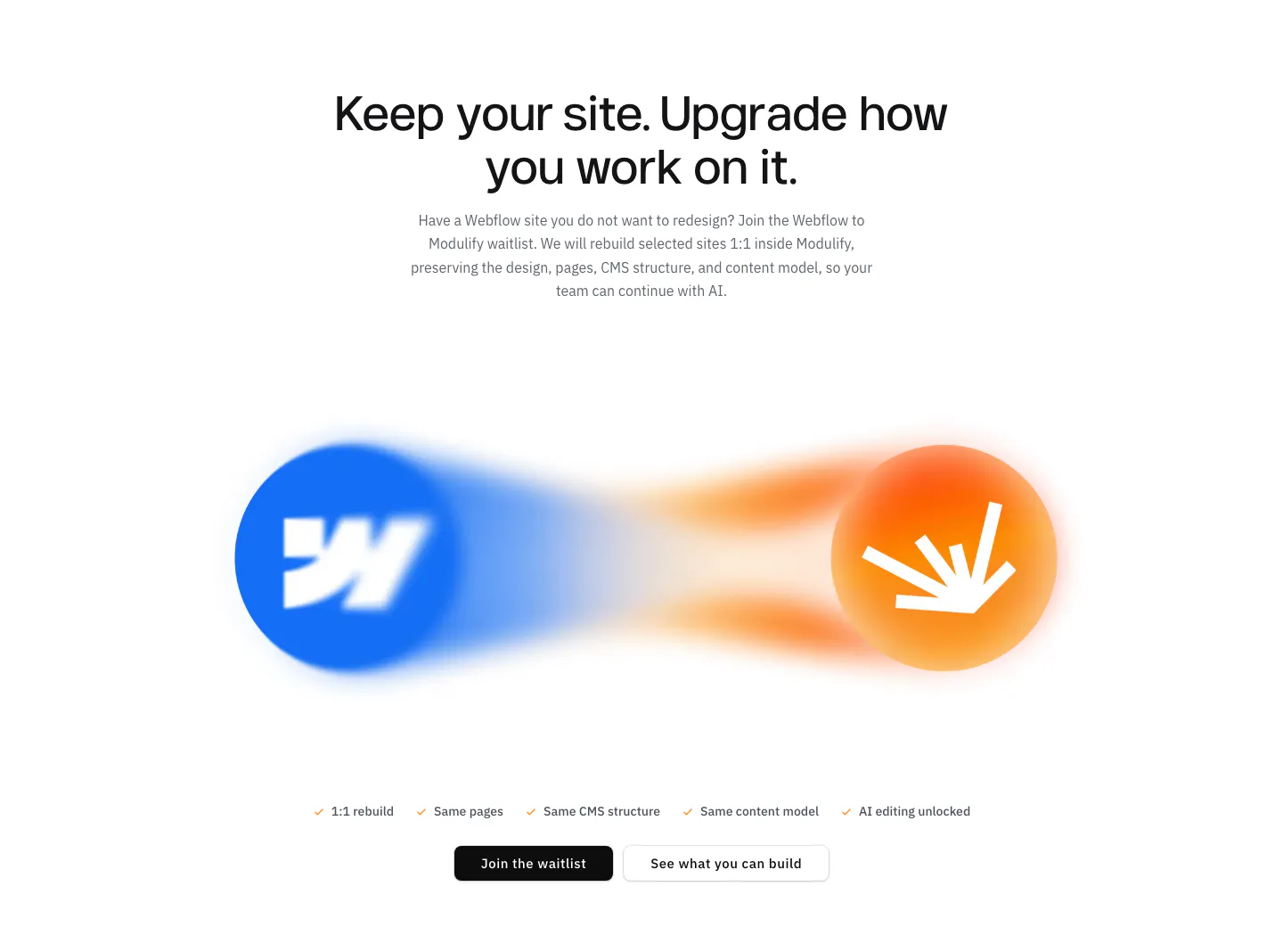
  233. Vectara footer section: centered CTA with app icons above a logo and five link columns, status pill, social icons and copyright on light gray
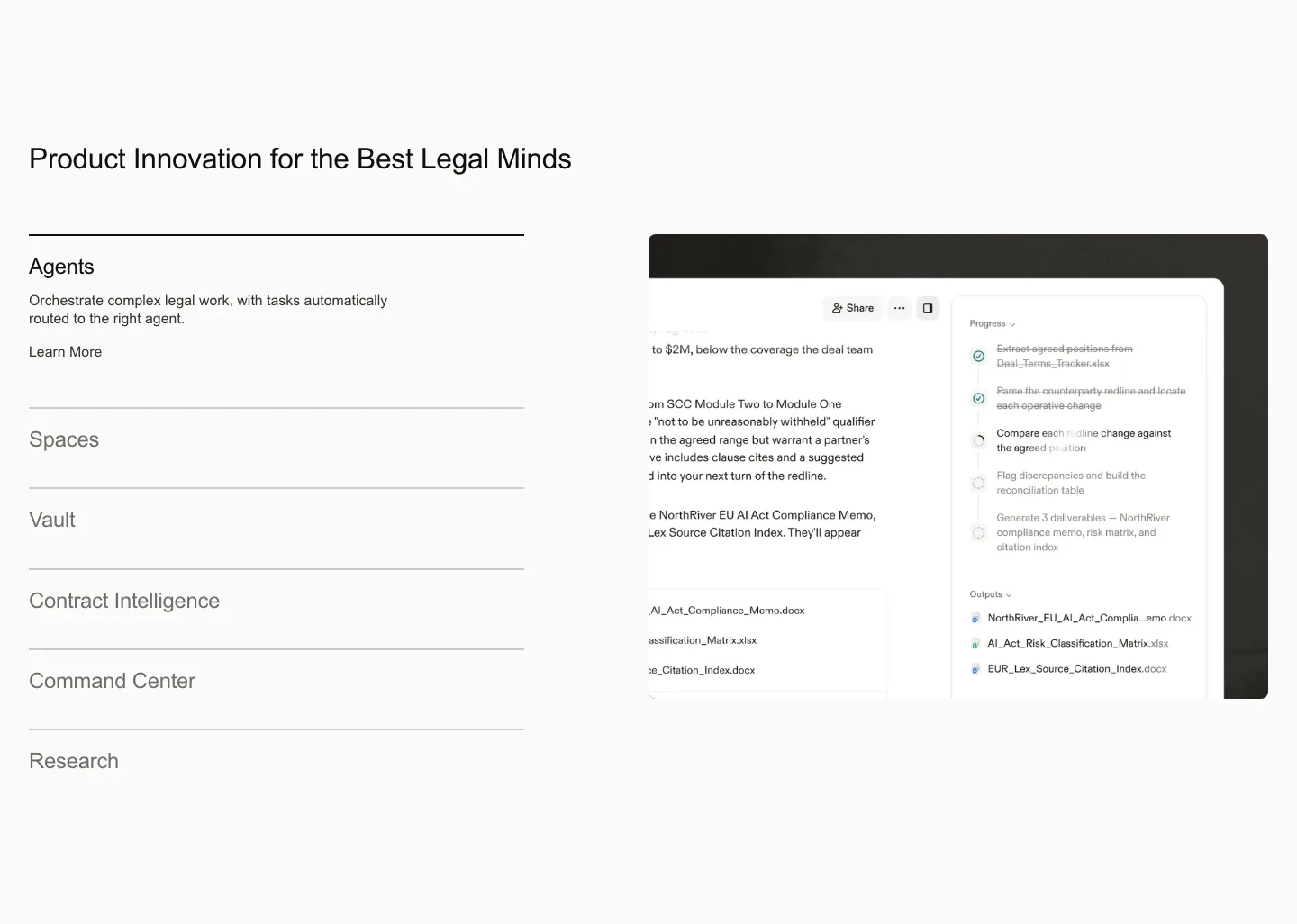
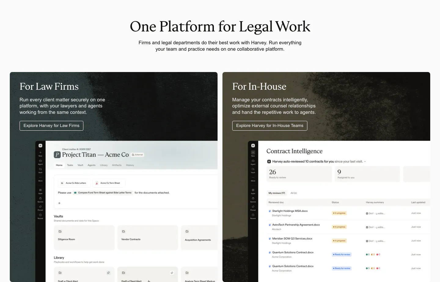
  234. Voiceflow testimonials section: centered headline above three quote columns with company logos and avatar headshots on white
  235. Chatbase testimonials section: slider of photo-backed customer story cards with arrows, G2 rating and badges below
  236. WorkOS how it works section: centered headline above three numbered step cards with UI mockups and a Slack button
  237. Amplemarket testimonials section: centered headline above a bento grid of pastel metric tiles and gray quote cards with logos
  238. Modulify features section: centered headline above blurred Webflow and Modulify logo orbs, a checklist and two buttons
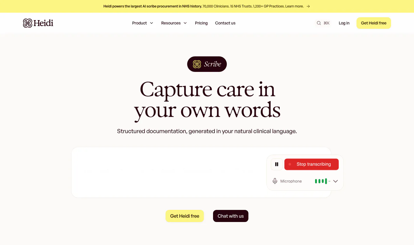
  239. Harvey features section: product list accordion on the left beside an agent workflow screenshot on a light gray background
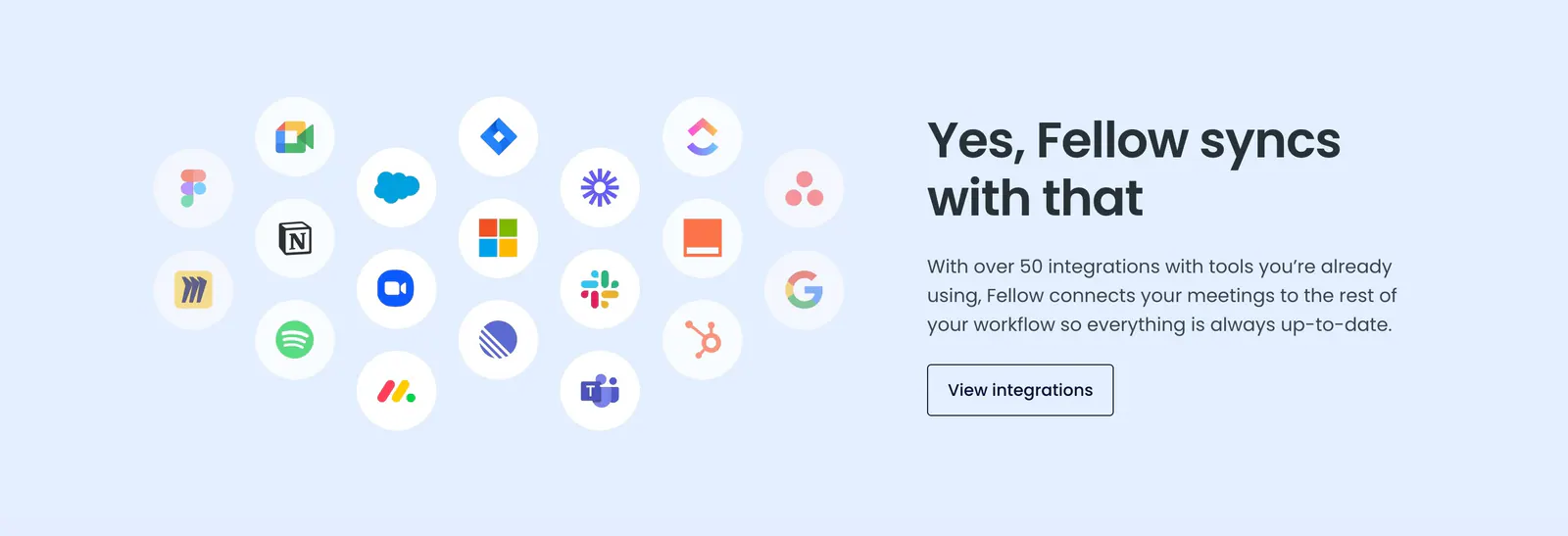
  240. Realm features section: centered headline above three cards with tinted illustrated UI vignettes and short descriptions
  241. Concourse value proposition section: centered headline, pill label and white button on a near-black background with faint square blocks
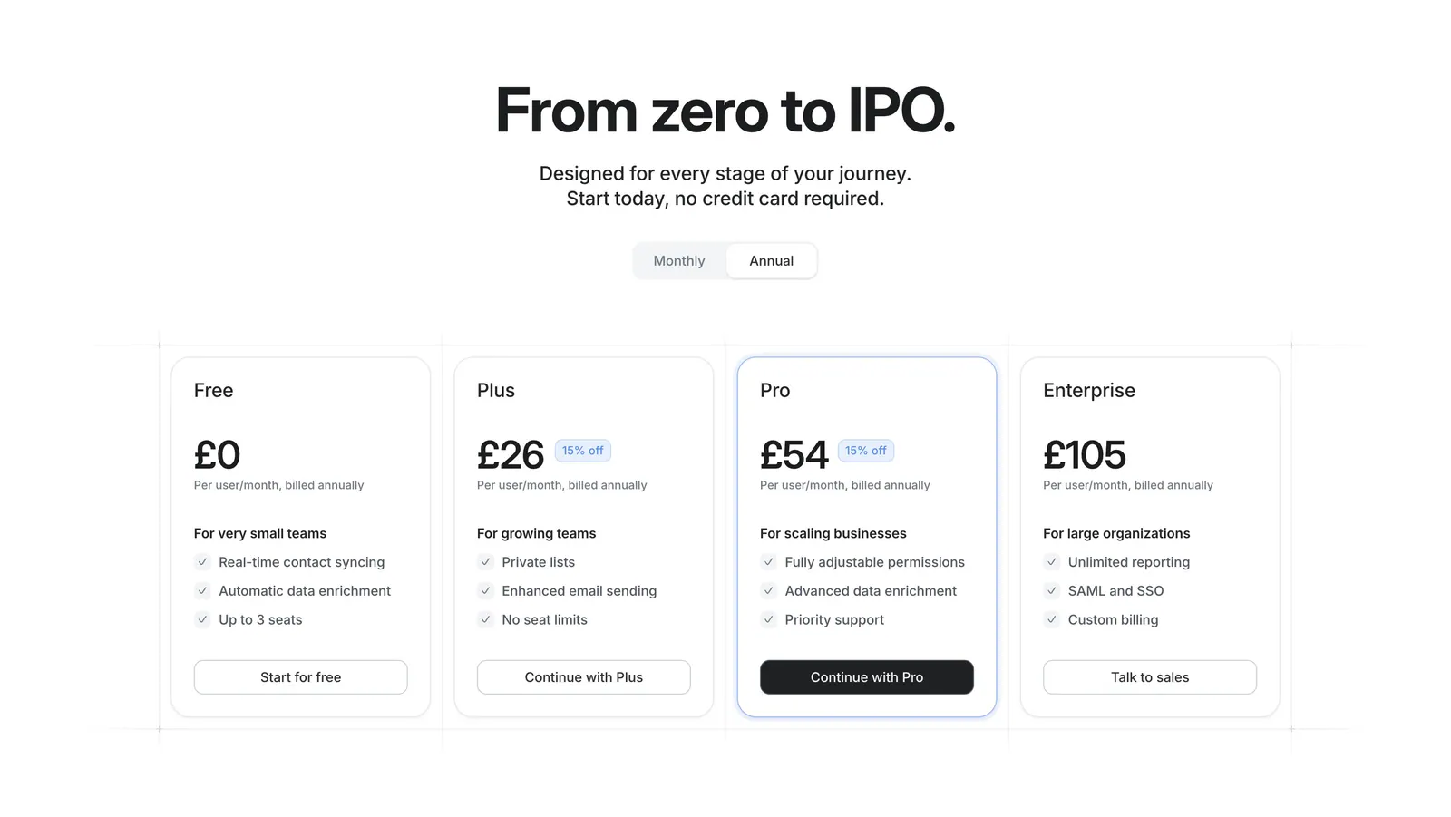
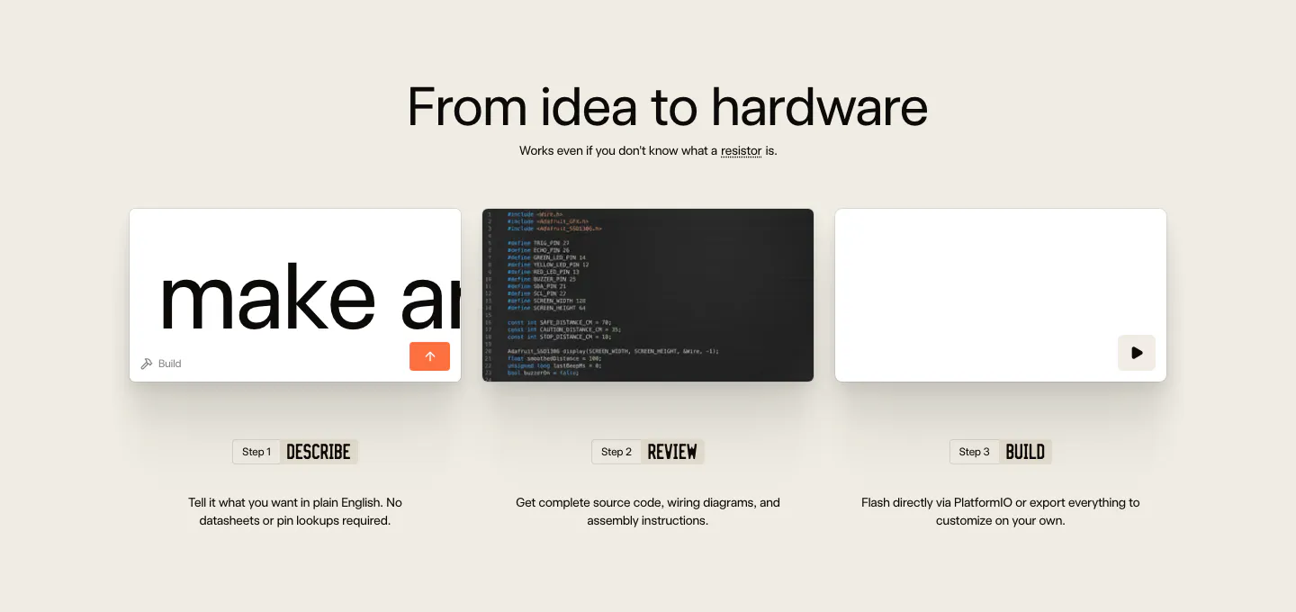
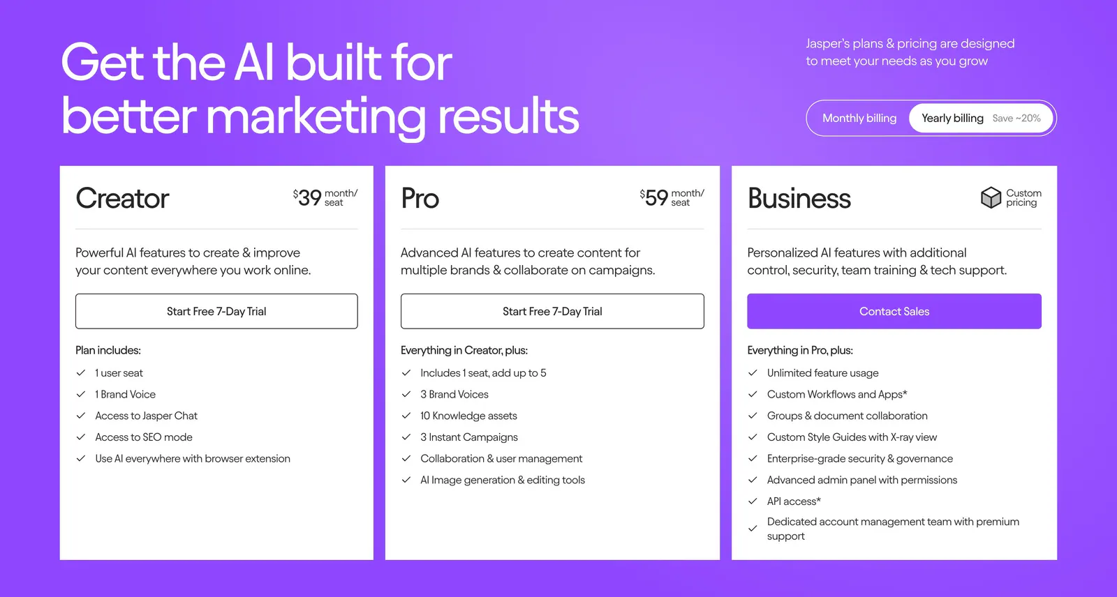
  242. Schematik how it works section: centered headline above three step cards for describe, review and build on beige
  243. Slite call to action section: centered two-line headline with an orange Book demo button and a See pricing link on a cream band
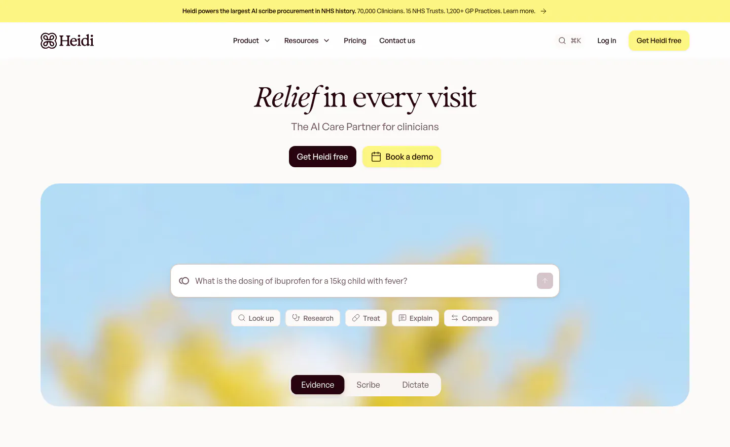
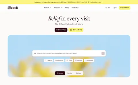
  244. Heidi hero section: centered serif headline with two buttons above a search prompt box and mode tabs on a blurred flower photo
  245. Fellow integrations section: cluster of circular app icons on the left beside headline and button on a pale blue background
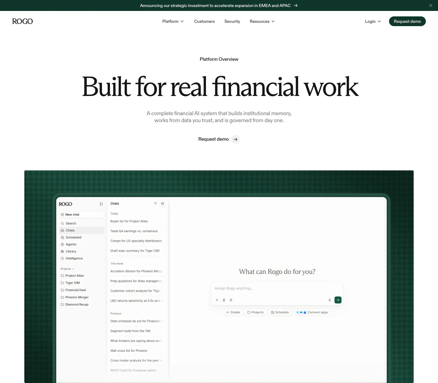
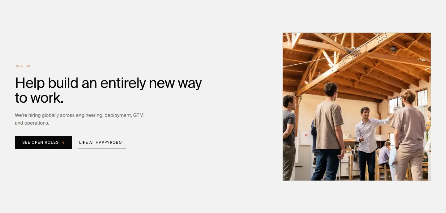
  246. Rogo hero section: announcement bar, nav, centered serif headline and demo link above a chat app screenshot on dark green
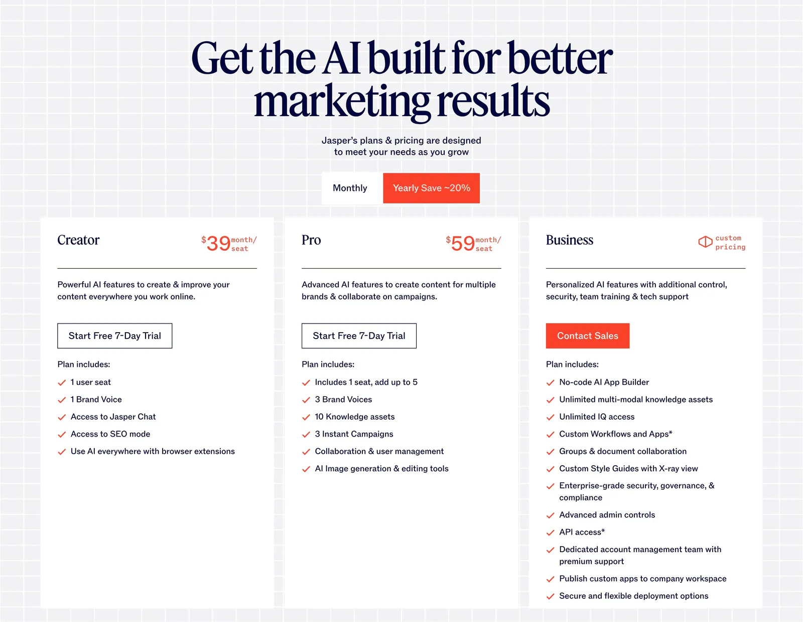
  247. Jasper pricing section: centered serif headline and monthly/yearly toggle above three white plan cards on a light grid background
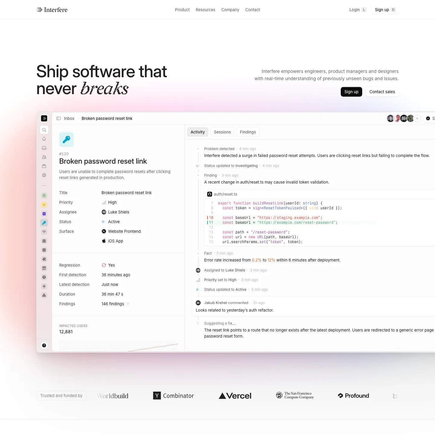
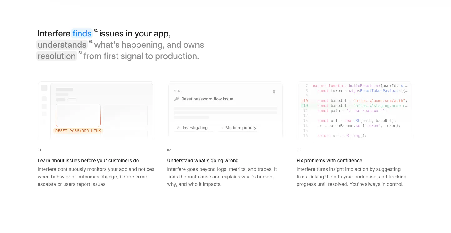
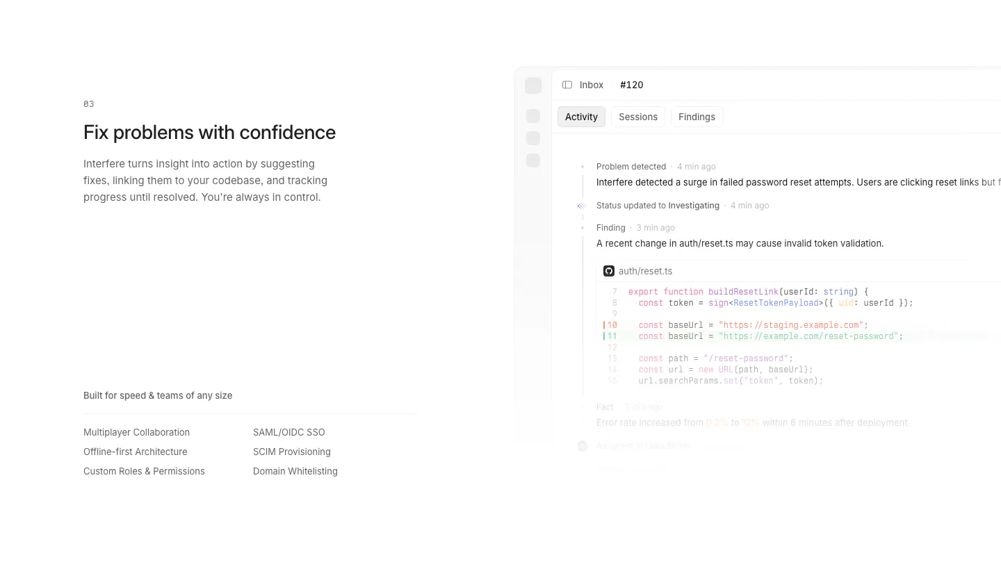
  248. Interfere hero section: headline left and copy with buttons right above a large issue-tracker product screenshot and a logo row
  249. Flank logo cloud section: small left-aligned caption above a single row of gray customer logos on a black background
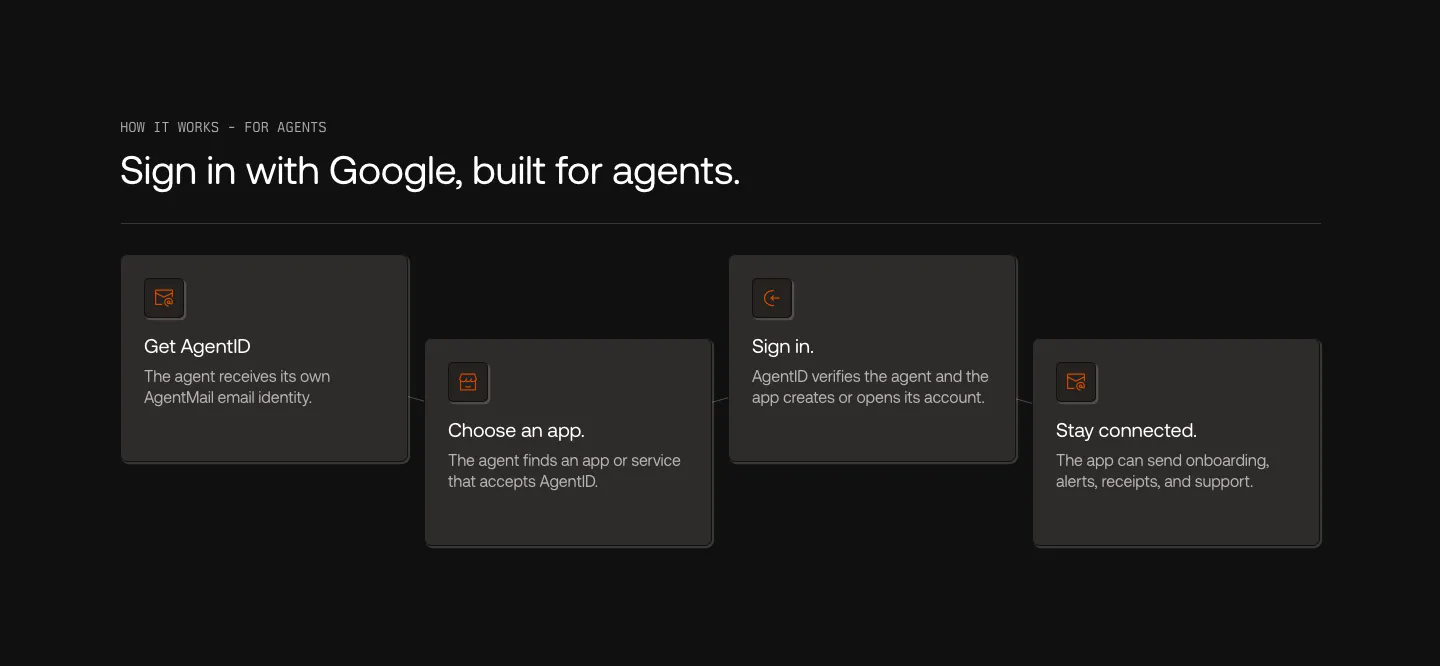
  250. Semaloop testimonials section: centered single quote under a company icon with an agent badge, name and title below on light gray
  251. HappyRobot call to action section: centered two-tone headline in black and gray above a small black Book a demo button on white
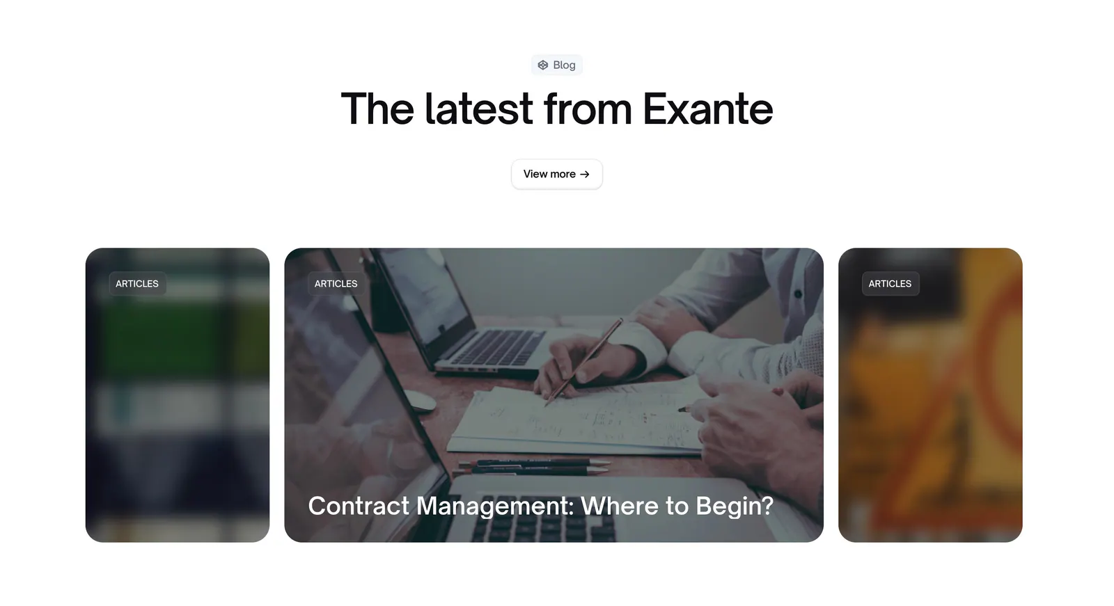
  252. Exante blog & resources section: centered heading and view more button above a carousel of photo article cards with blurred edges
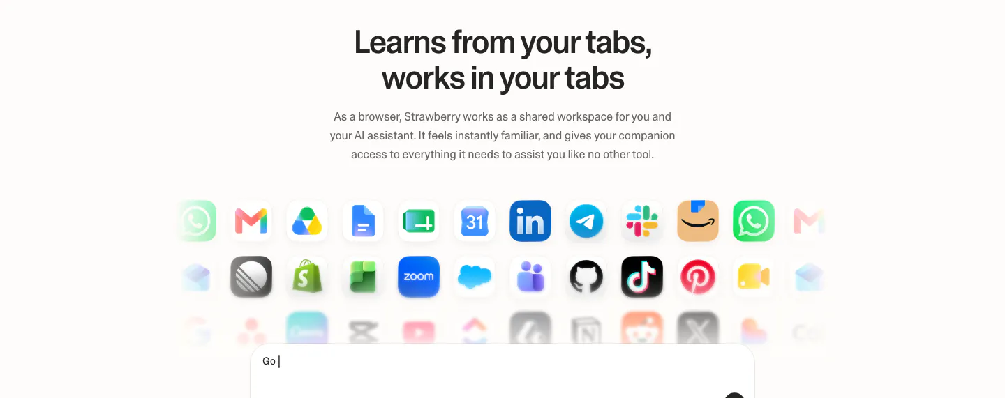
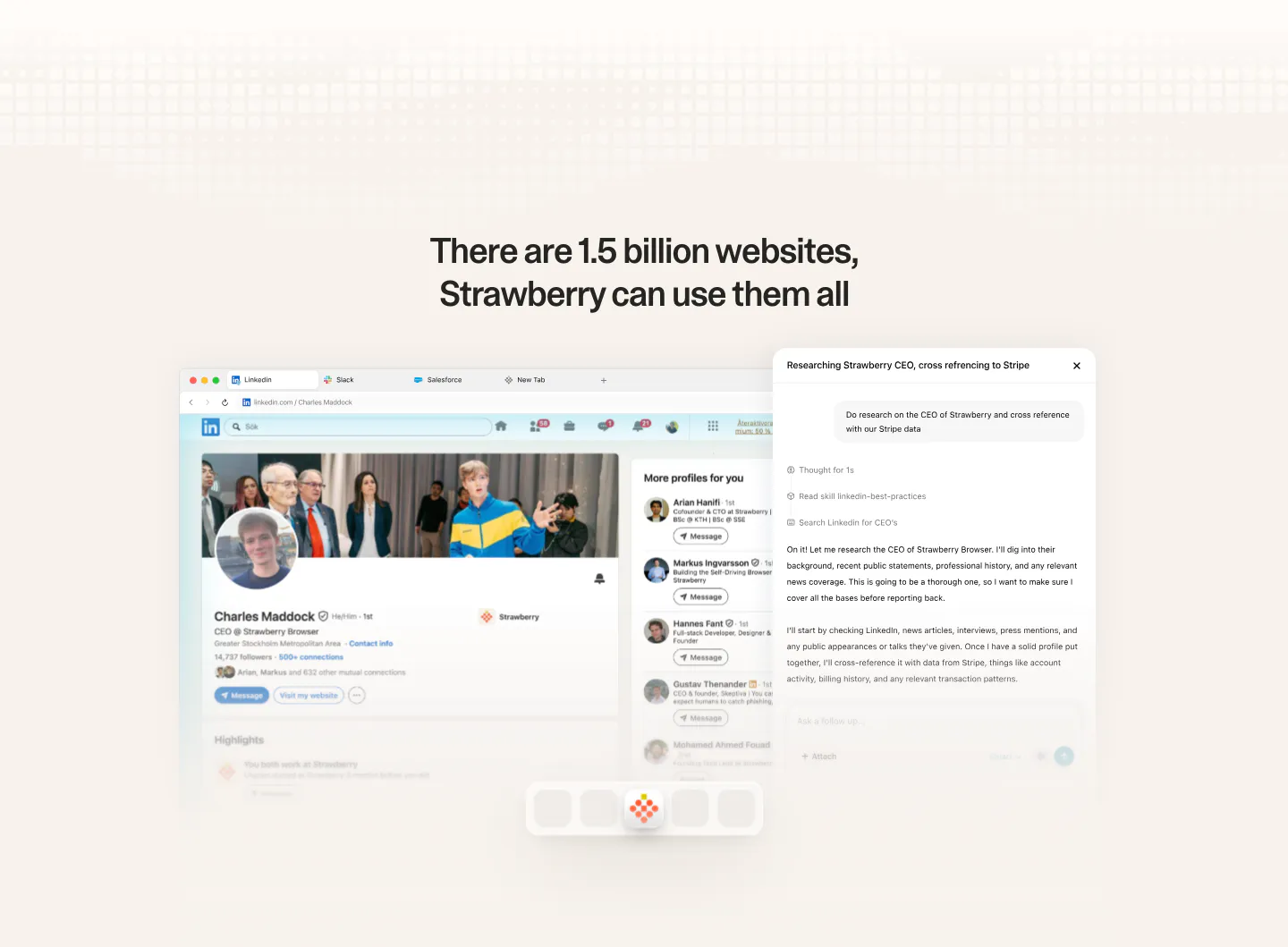
  253. Strawberry integrations section: centered headline and copy above rows of fading app icons and the top of a prompt input box
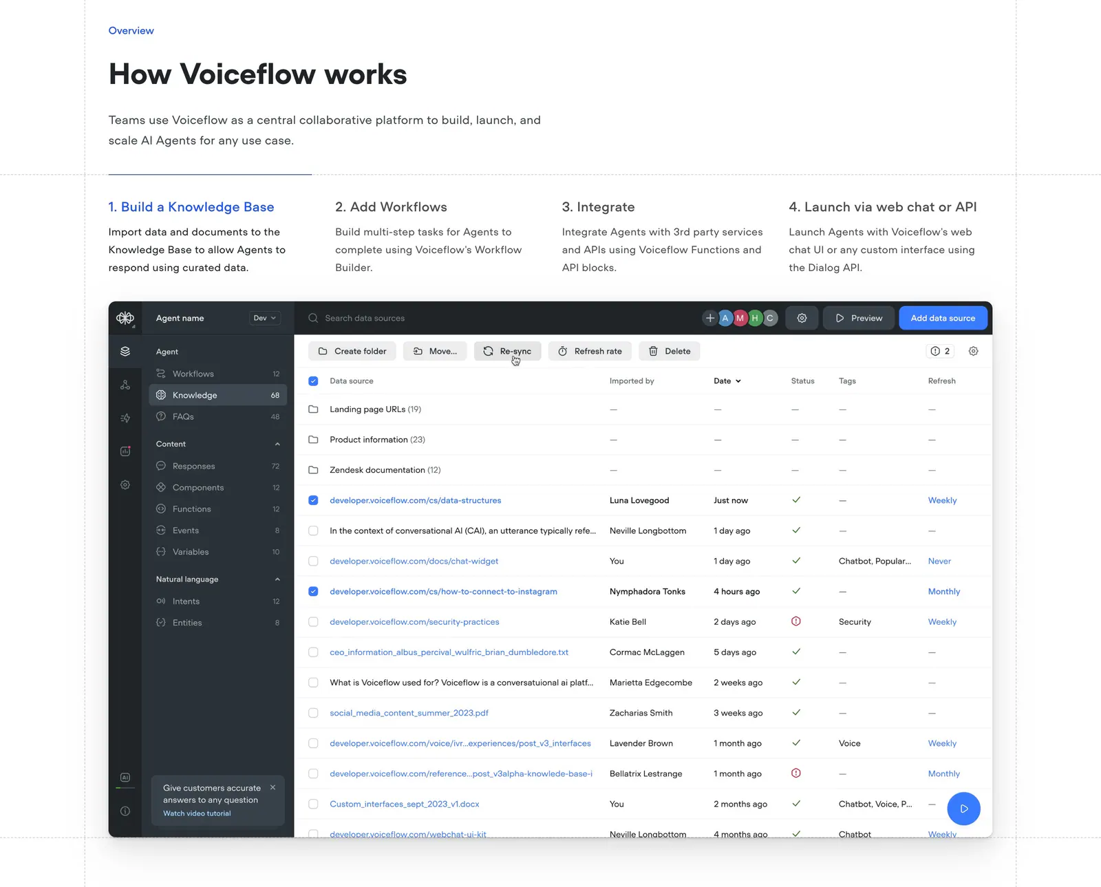
  254. Voiceflow how it works section: headline above four numbered step tabs and a knowledge base data table screenshot
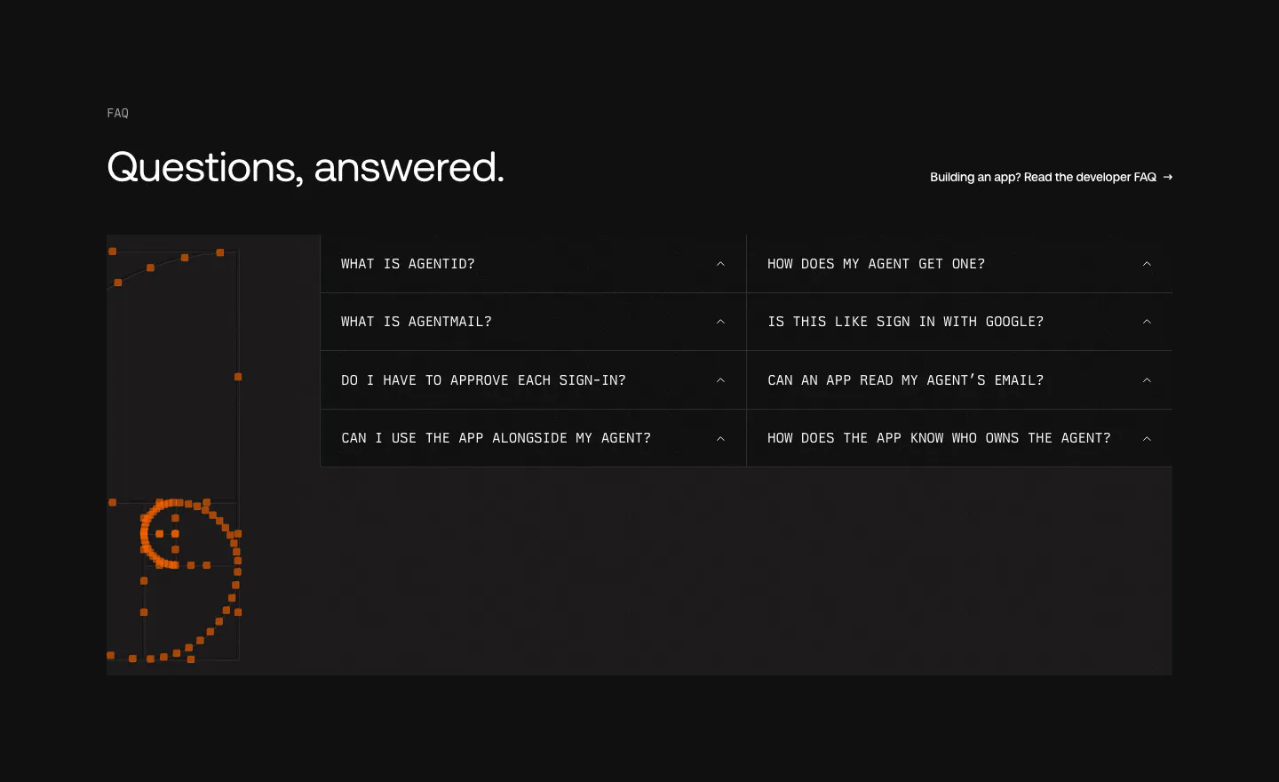
  255. AgentID FAQ section: dark two-column grid of monospace accordion questions beside an orange pixel-dot smiley artwork
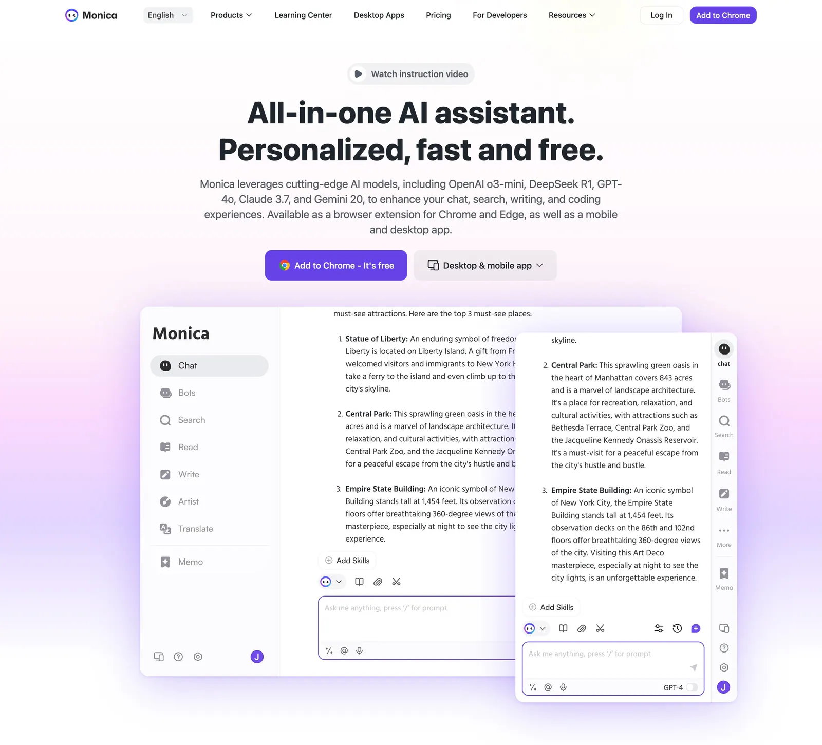
  256. Monica hero section: centered headline with video pill and two CTAs above overlapping chat app screenshots on a lavender glow
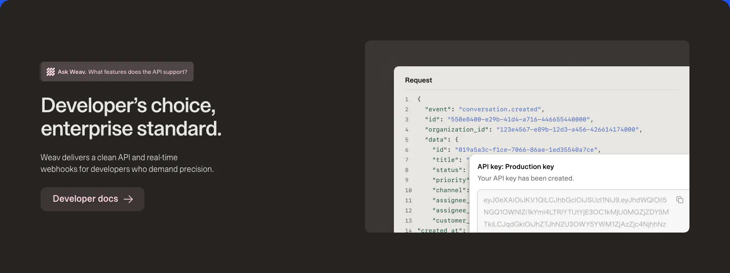
  257. Weav features section: dark brown band with headline and docs button on the left and a JSON request code block with an API key popup
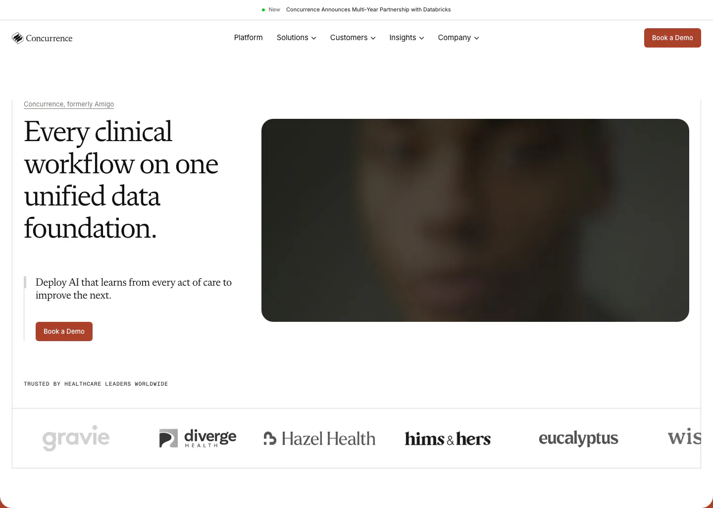
  258. Chatbase call to action section: centered black headline, short copy and two buttons in a white bordered box
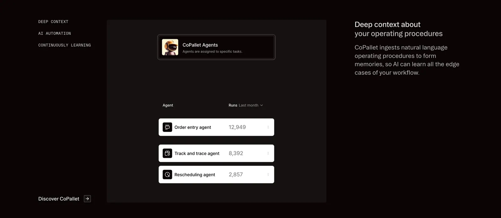
  259. Pallet features section: dark three-column layout with vertical tab labels, a CoPallet agents UI card and descriptive text on the right
  260. Intercom logo cloud section: small monospace label above a six-by-four grid of gray customer logos on white
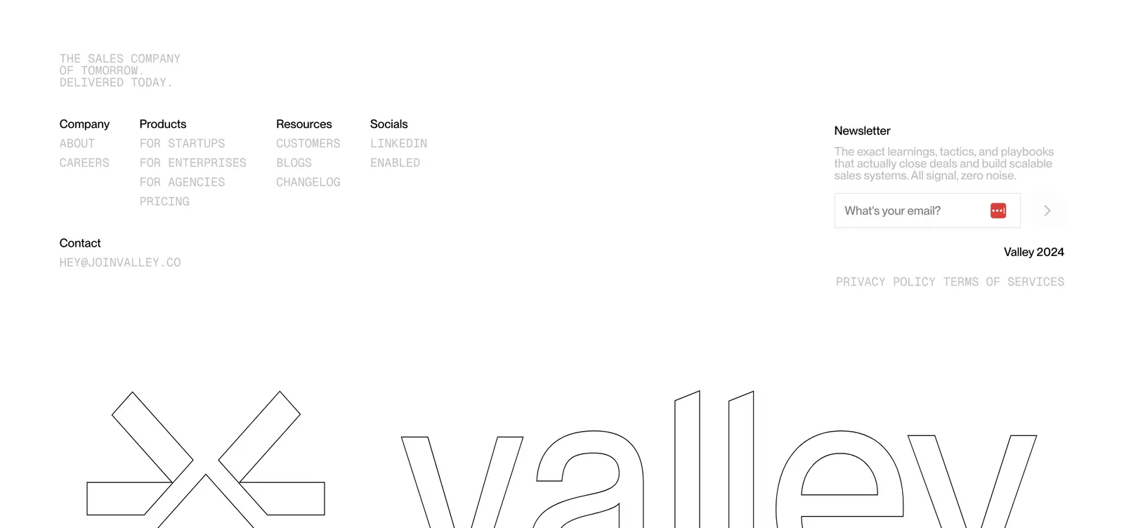
  261. Valley footer section: monospace link columns and newsletter email field above a giant outlined Valley logo and wordmark on white
  262. Cluster footer section: logo and copyright left, link columns right over a giant faded serif Cluster wordmark on beige
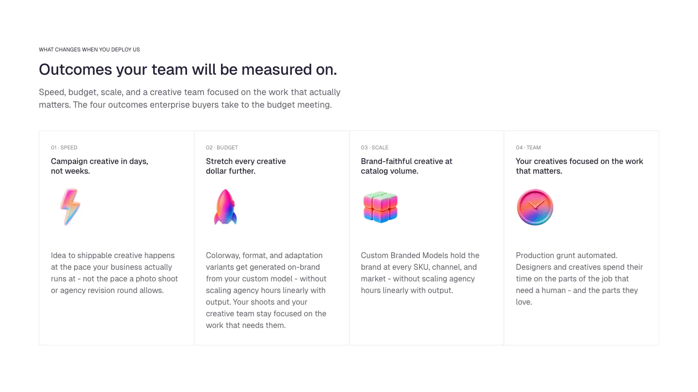
  263. Concurrence testimonials section: serif quote from a Stanford Health Care surgeon on a rust gradient card with vertical pagination dots
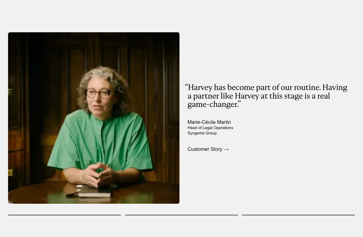
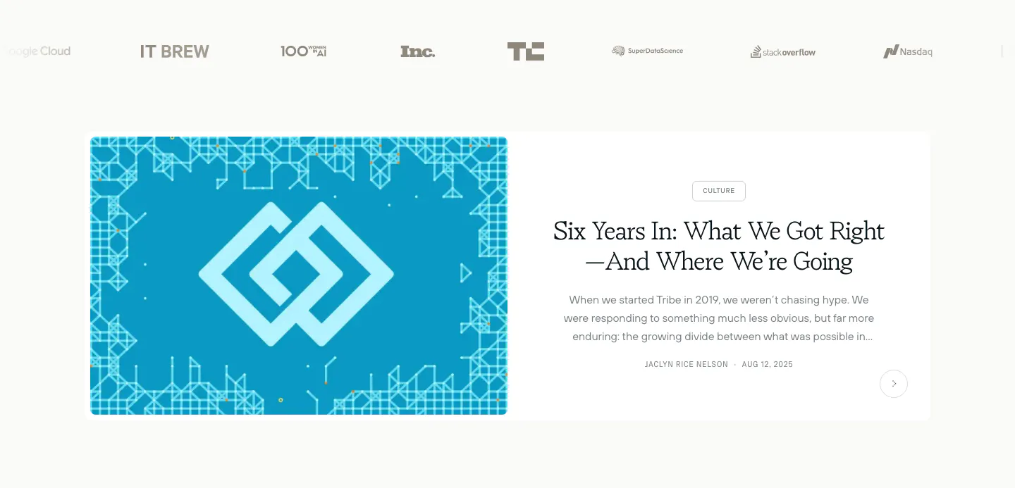
  264. Harvey testimonials section: photo of a customer at a table beside a serif quote with name and customer story link
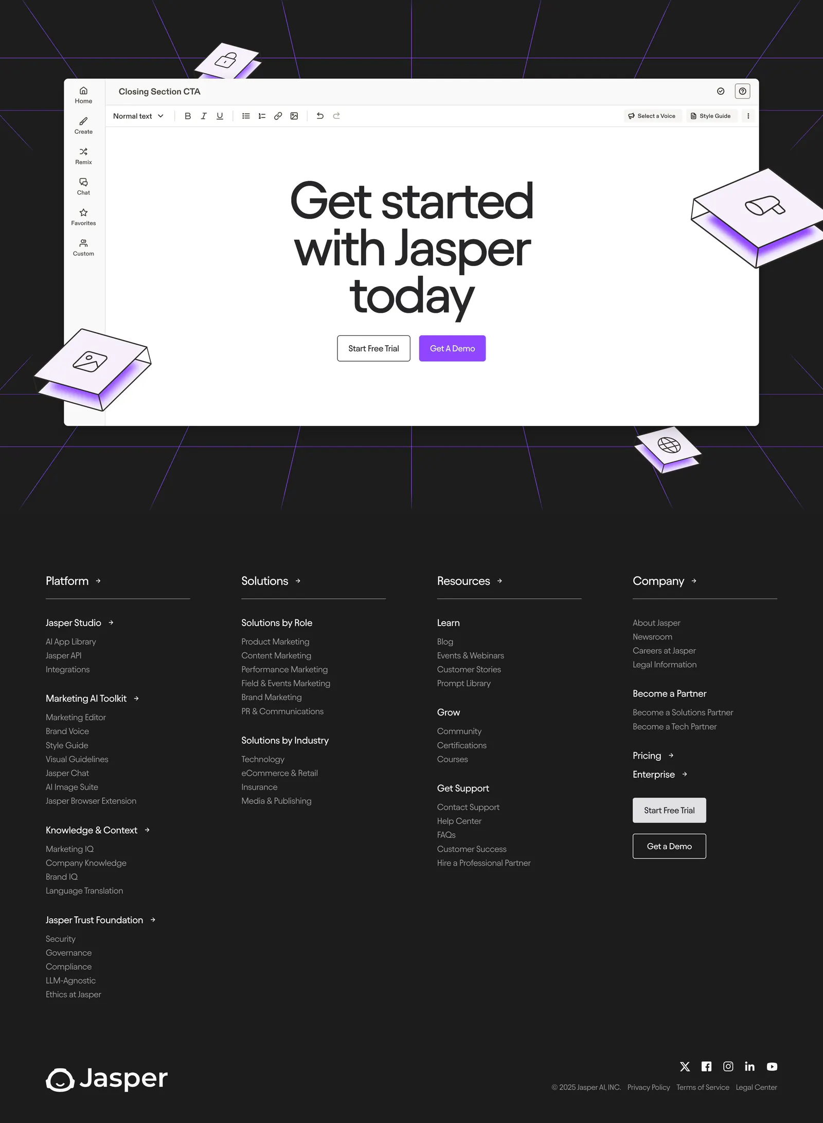
  265. DevRev integrations section: headline above a 4x3 grid of bordered tiles with Jira, Slack, GitHub, Salesforce and other app logos
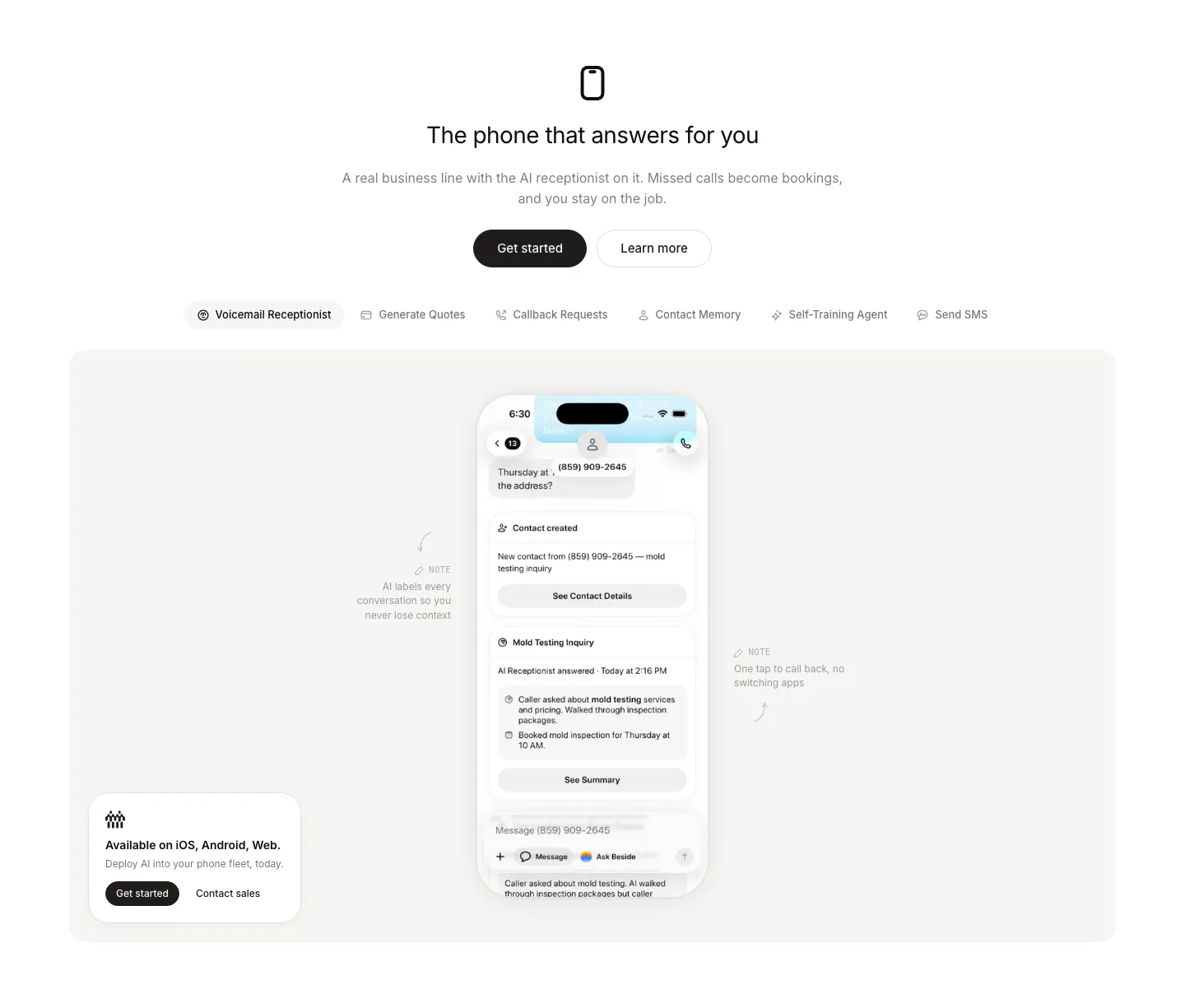
  266. Beside features section: centered headline and buttons above a feature tab bar and a phone mockup with annotations in a gray panel
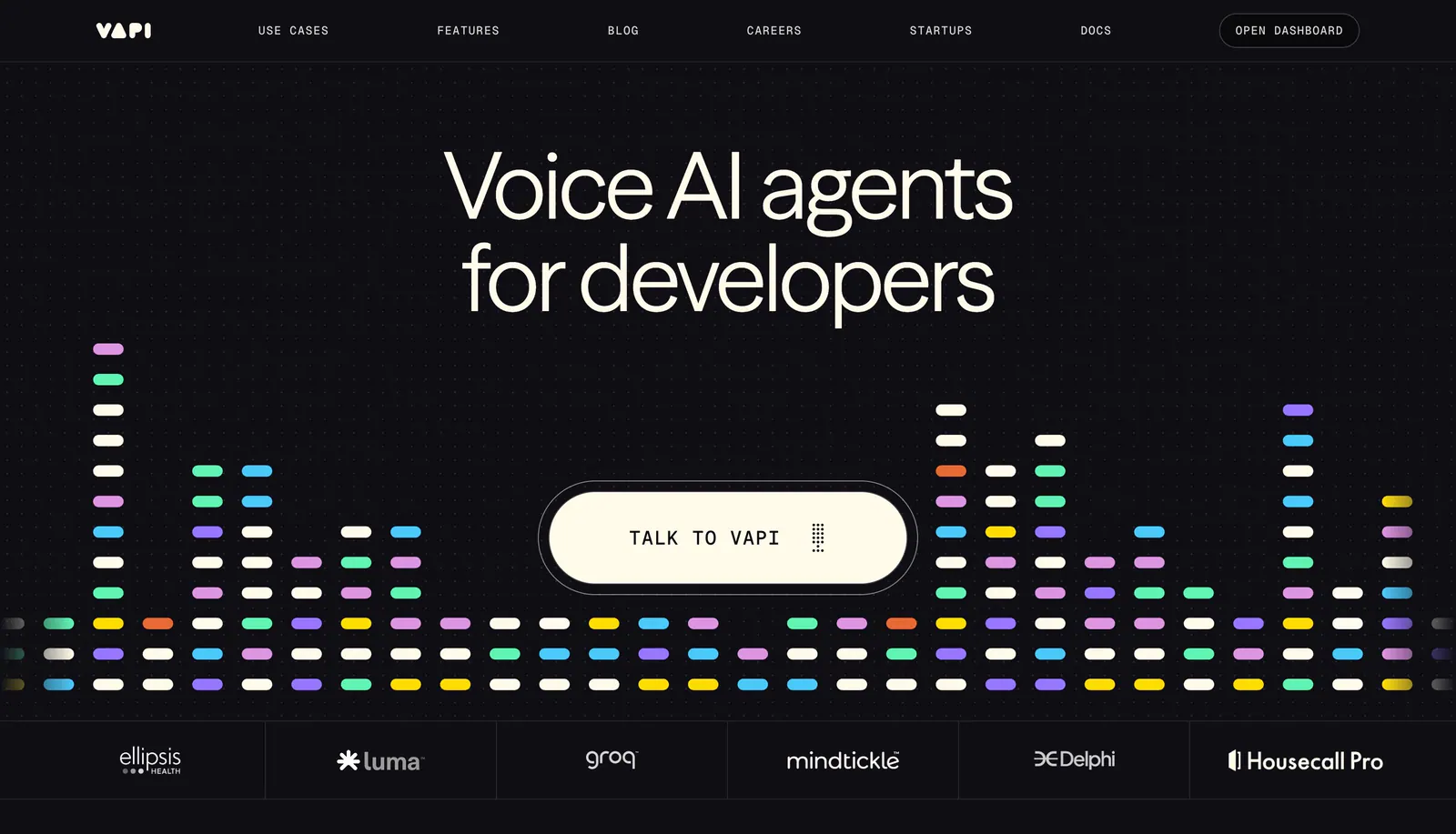
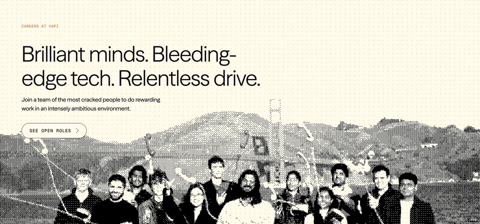
  267. Vapi how it works section: left-aligned headline above three numbered step cards with colorful dot-pill artworks on a black background
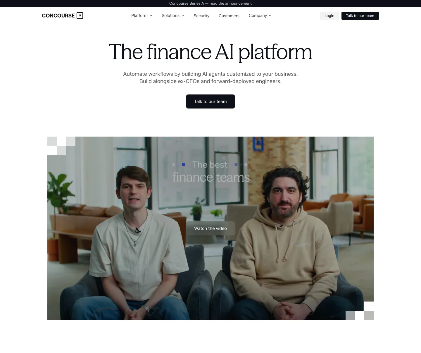
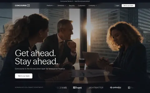
  268. Ideogram value proposition section: eyebrow, headline and intro above four bordered outcome cards with numbered labels and glossy 3D icons
  269. Tribe AI blog & resources section: press logo row above a featured article card with a blue geometric cover left and serif title right
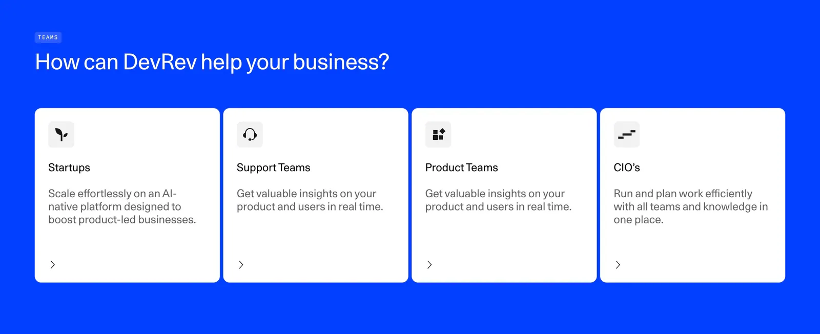
  270. Jasper footer section: editor-mockup CTA above four link columns, wordmark and social icons on a dark charcoal background
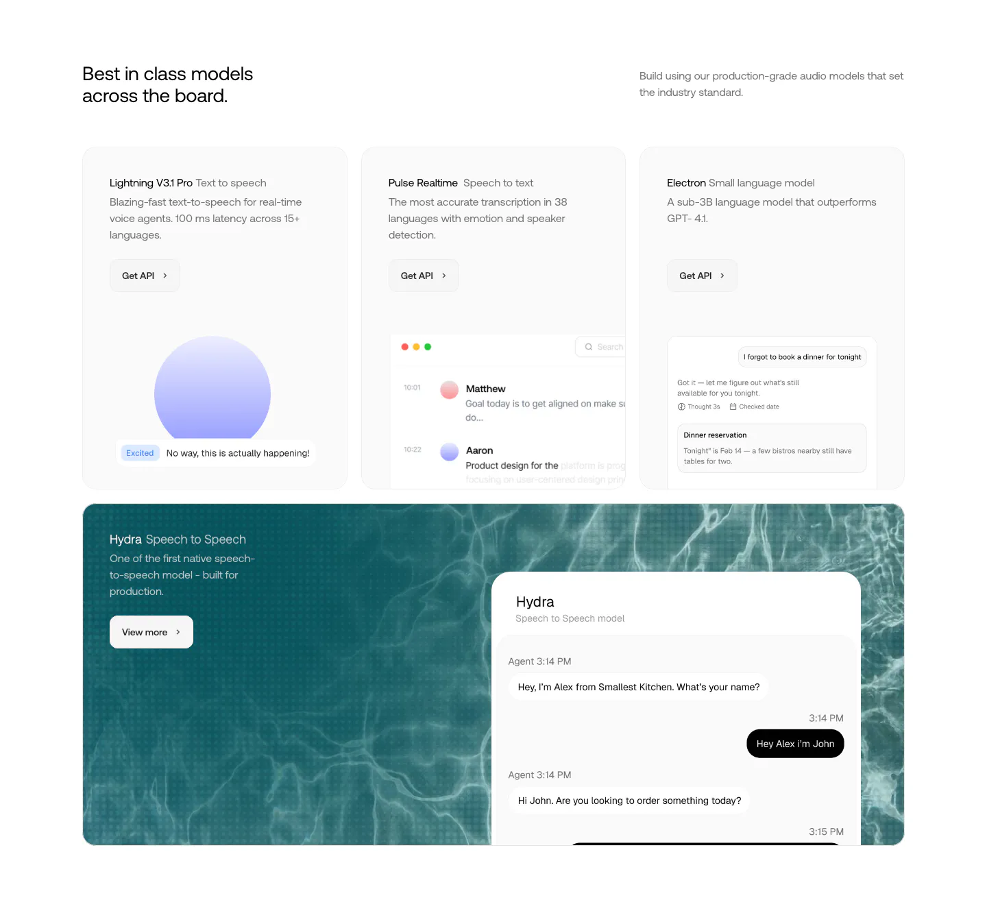
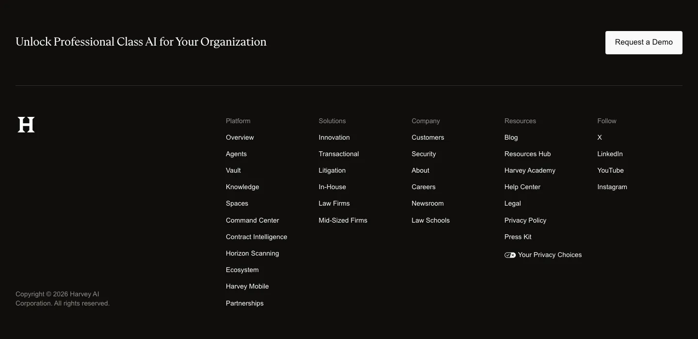
  271. Smallest.ai features section: three model cards with UI previews above a wide teal water-textured card showing a speech-to-speech chat UI
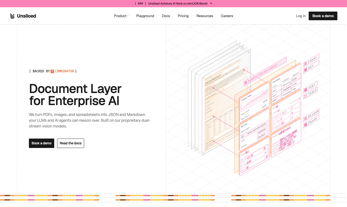
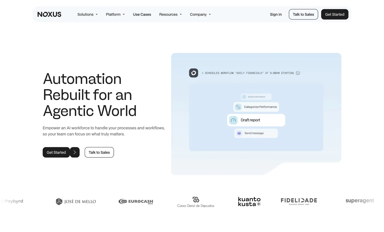
  272. Unsiloed hero section: left headline with Book a demo and Read the docs buttons beside an isometric illustration of layered parsed documents
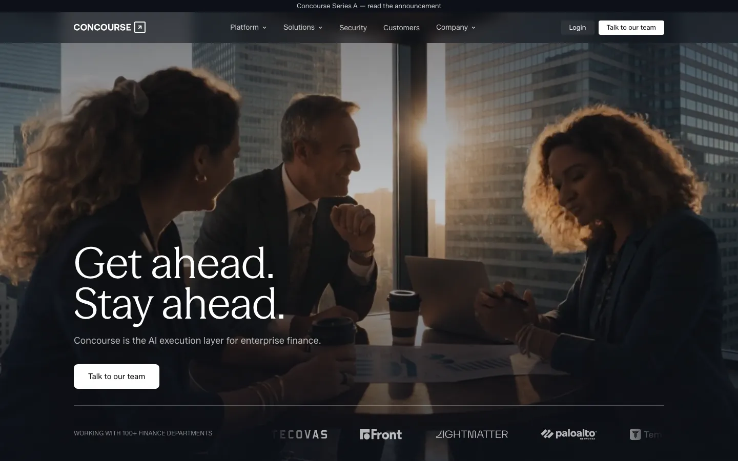
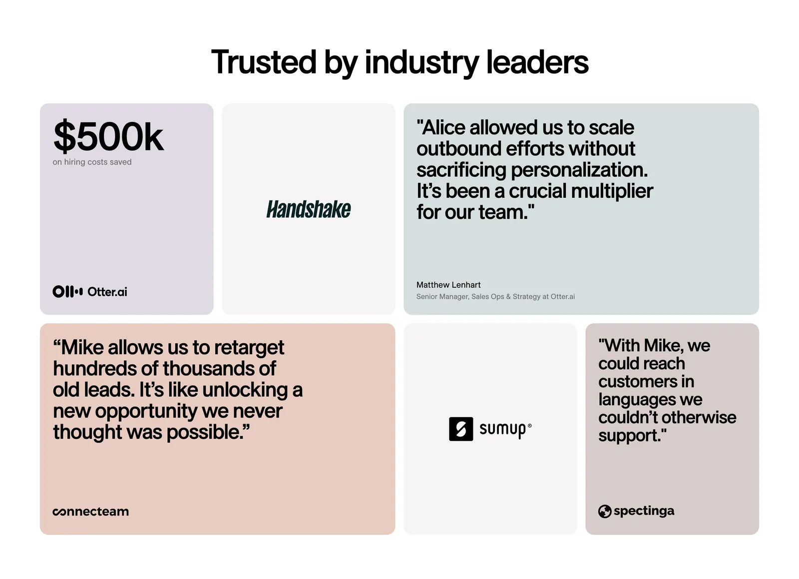
  273. Concourse hero section: left-aligned headline and button over a dark full-bleed office meeting photo with a logo strip below
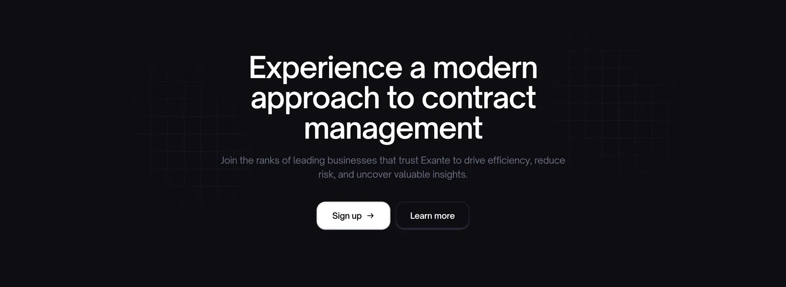
  274. Exante call-to-action section: centered headline with sign up and learn more buttons over a faint grid on a near-black background
  275. DevRev features section: left-aligned headline above four white audience cards for startups, support, product teams and CIOs on bright blue
  276. Harvey footer section: dark band with serif closing line and demo button above an H logo and five link columns
  277. Noxus hero section: left-aligned headline and two buttons beside a pale blue scheduled-workflow UI card, customer logo row below
  278. 11x testimonials section: centered headline above a bento grid of pastel quote cards, a $500k metric tile and customer logo tiles
  279. Rezi FAQ section: two-tone headline above a side tab list and an accordion of question cards with one expanded answer
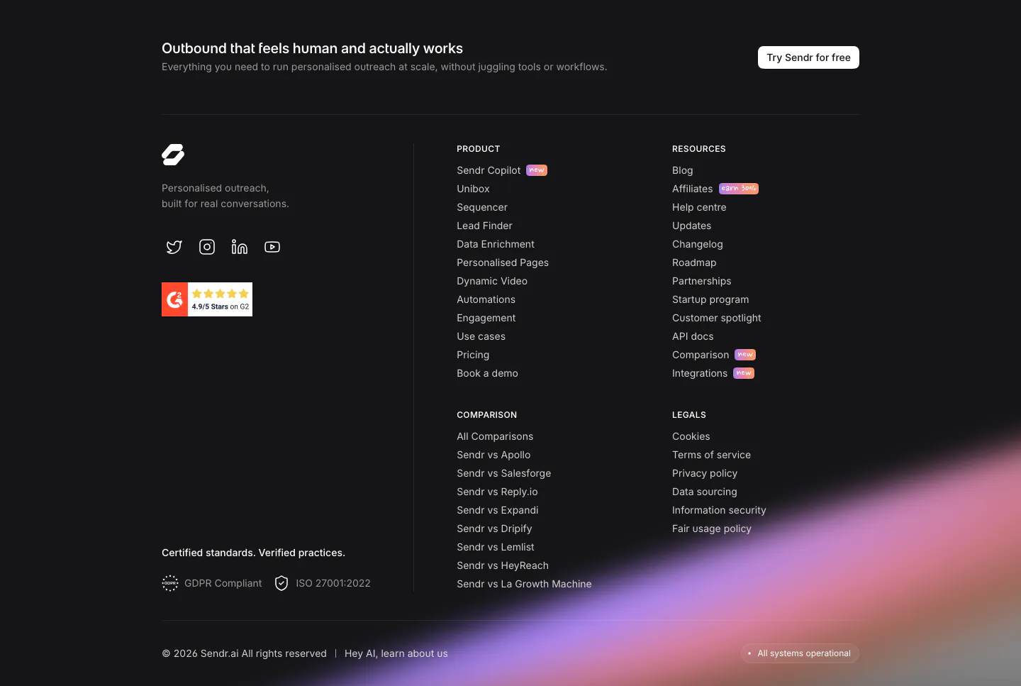
  280. Sendr footer section: dark footer with CTA strip, logo, G2 badge, product, resources, comparison and legal columns and a purple glow
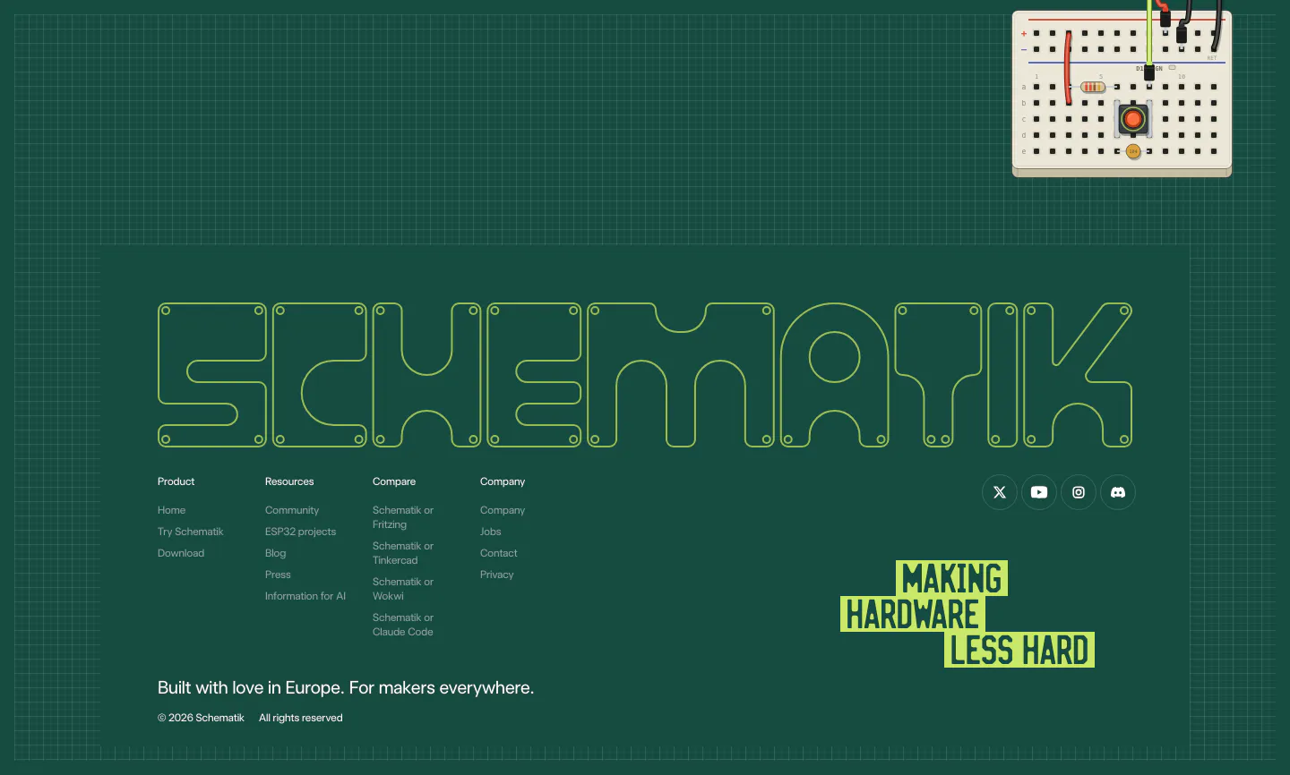
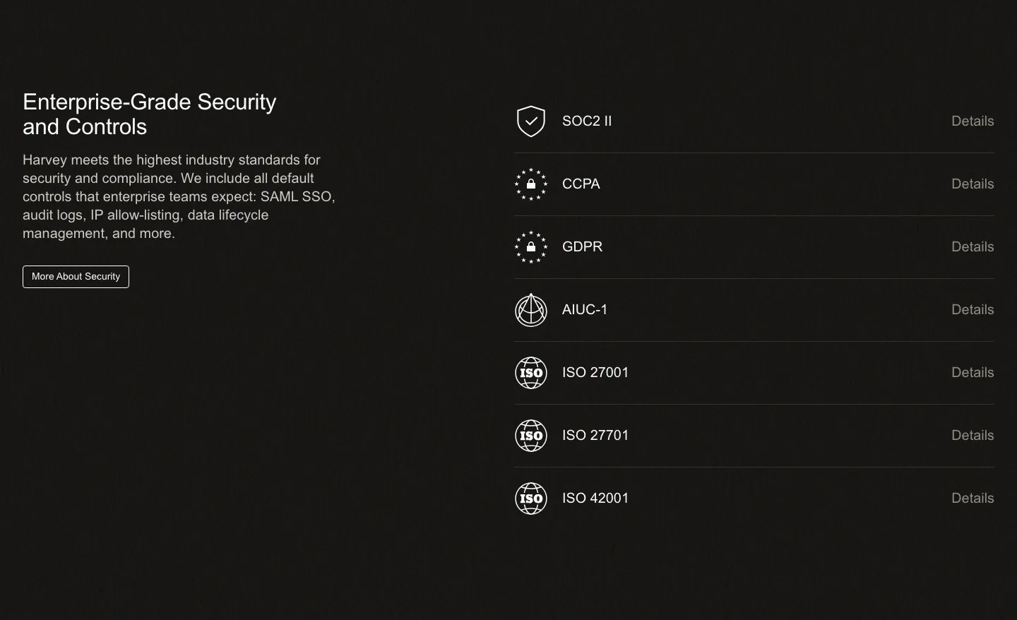
  281. Schematik footer section: outlined SCHEMATIK wordmark, link columns and lime tagline on a dark green grid with a breadboard
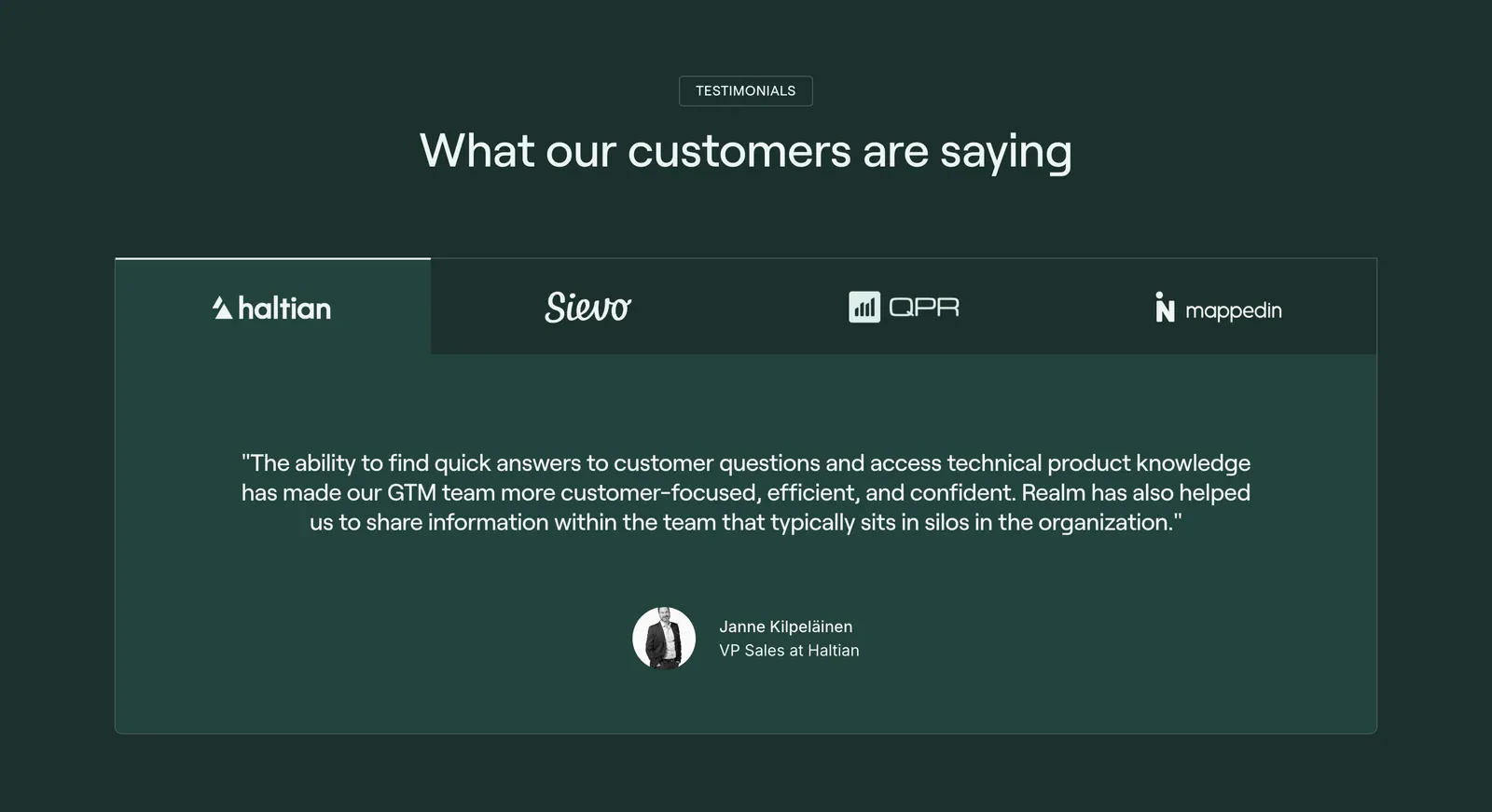
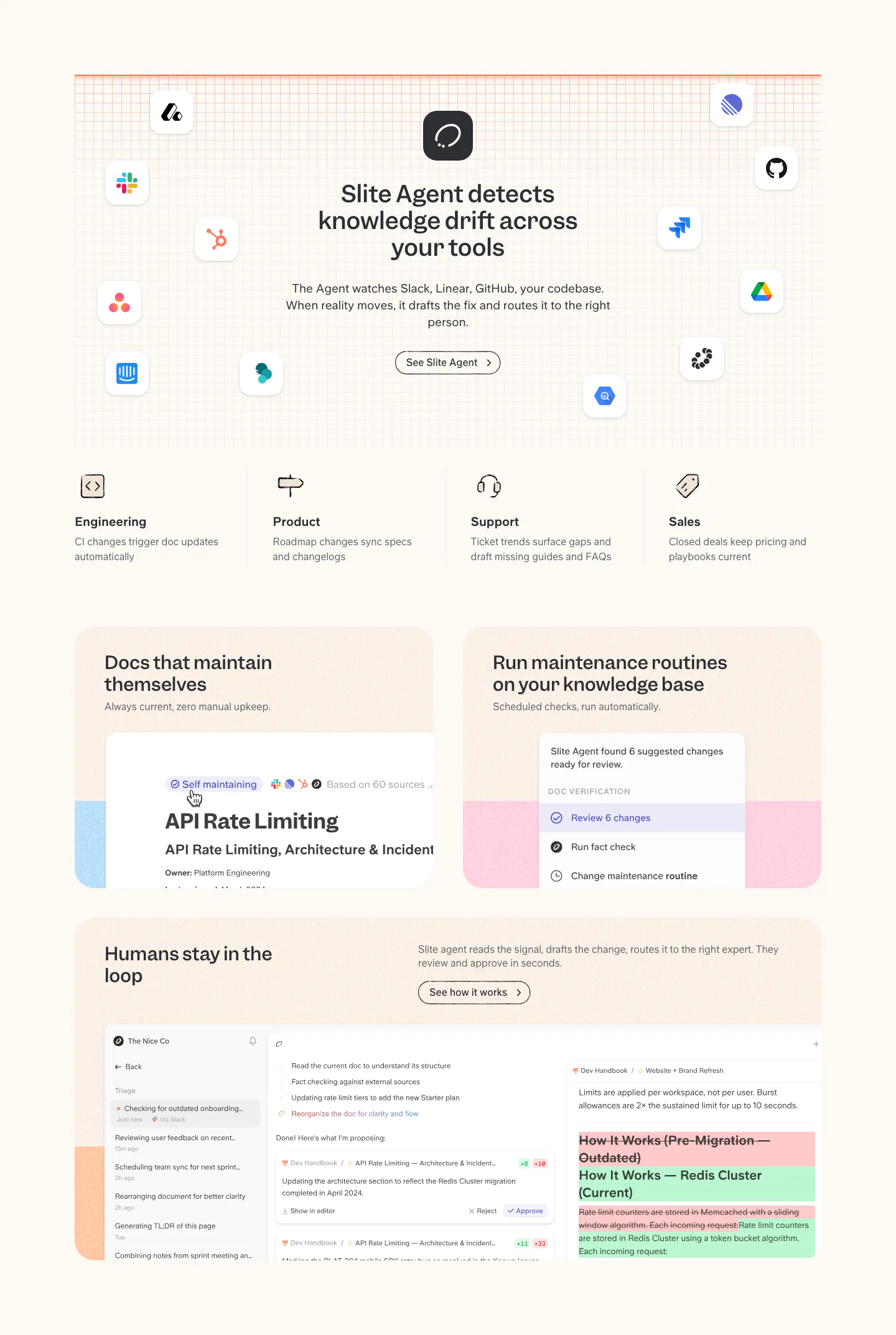
  282. Realm testimonials section: centered headline above a logo tab bar and a single customer quote card on dark green
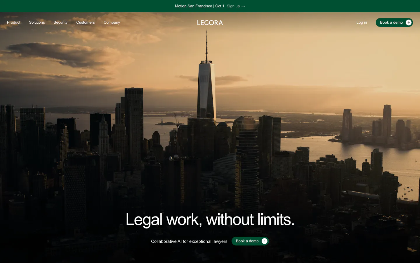
  283. Legora hero section: centered headline and green demo button over a full-bleed dusk photo of the Manhattan skyline
  284. Modulify call-to-action section: centered headline and black button inside a rounded orange-to-pink gradient card
  285. Heidi logo cloud section: single row of dark NHS trust and healthcare provider logos on a cream background
  286. Harvey security section: dark split layout with headline and copy left and a list of compliance certifications right
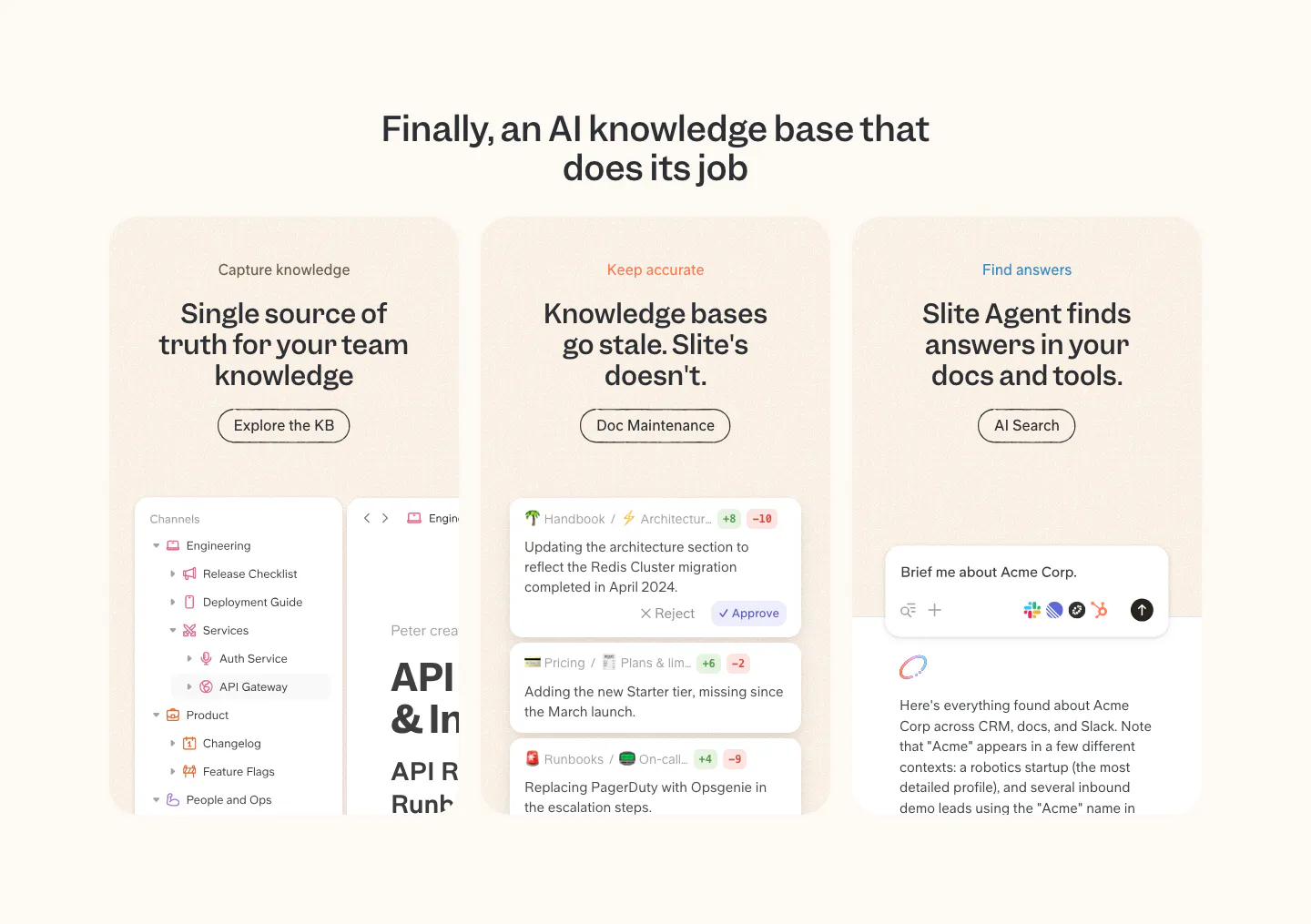
  287. Slite features section: headline ringed by app icons on a grid, four team columns, then cards with doc maintenance and review UI on cream
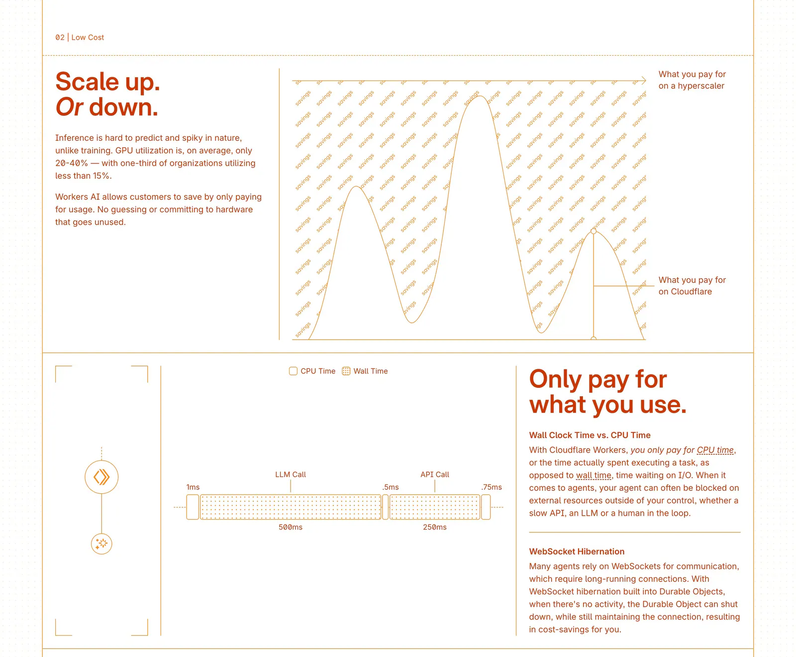
  288. Cloudflare Agents features section: zig-zag rows of orange text beside line-drawn cost charts and a timing diagram on white
  289. Visual footer section: dark charcoal footer with small wordmark, resources and company link columns, a white waitlist button and copyright
  290. Ferndesk hero section: serif headline, checklist and CTAs on the left beside an AI chat prompt over a pixel-art garden scene
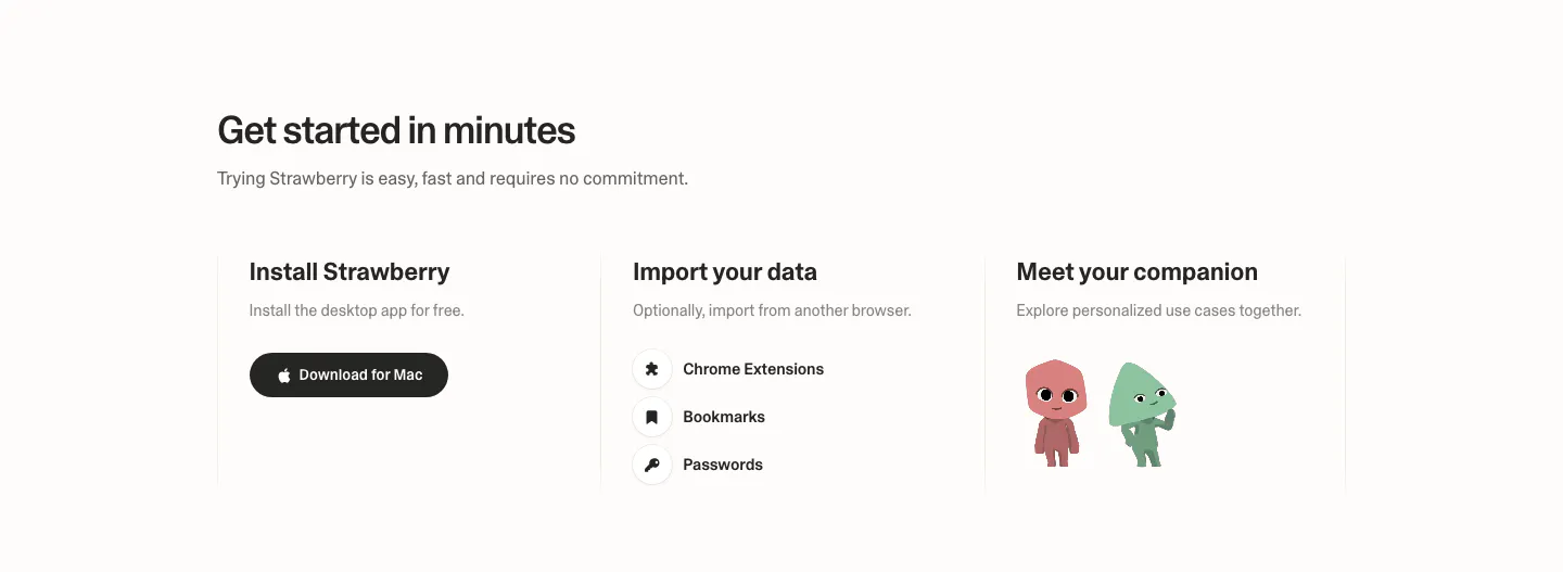
  291. Strawberry how it works section: three columns for install, import data and meet your companion, with a download button and characters
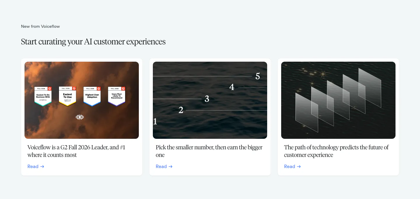
  292. Voiceflow blog & resources section: serif headline above three article cards with photographic thumbnails on a pale gray background
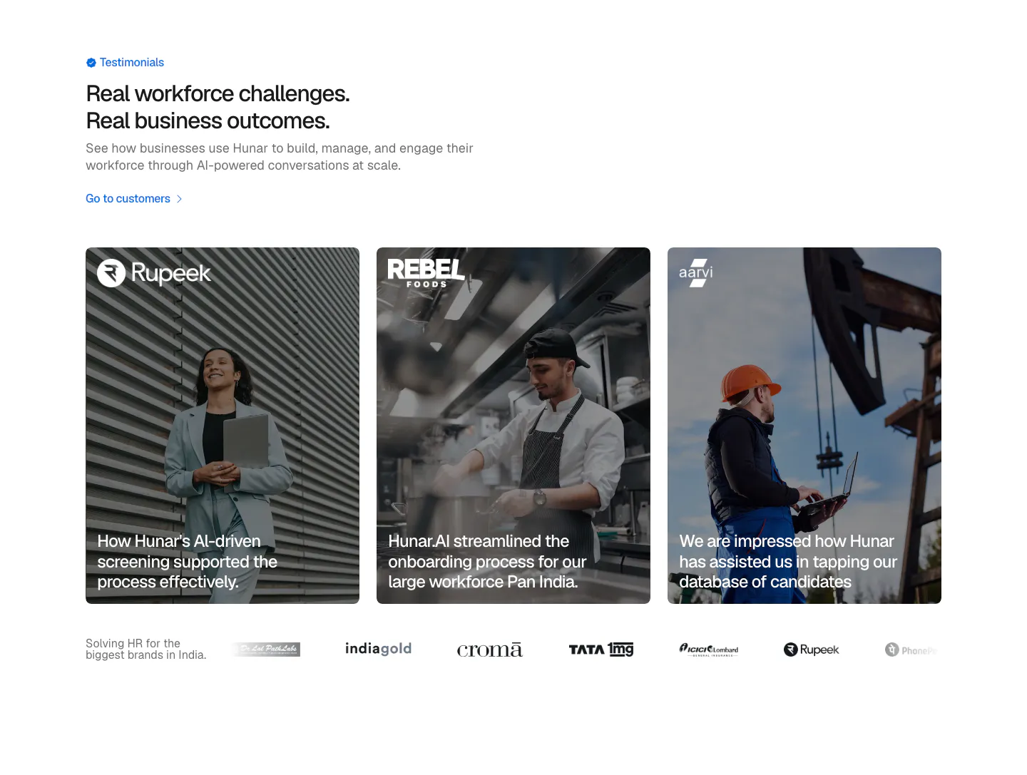
  293. Hunar testimonials section: left heading above three photo cards with customer quotes over images and a customer logo row
  294. Attio footer section: logo at left, link columns for platform, company, imports, apps and resources, social icons and legal row on dark
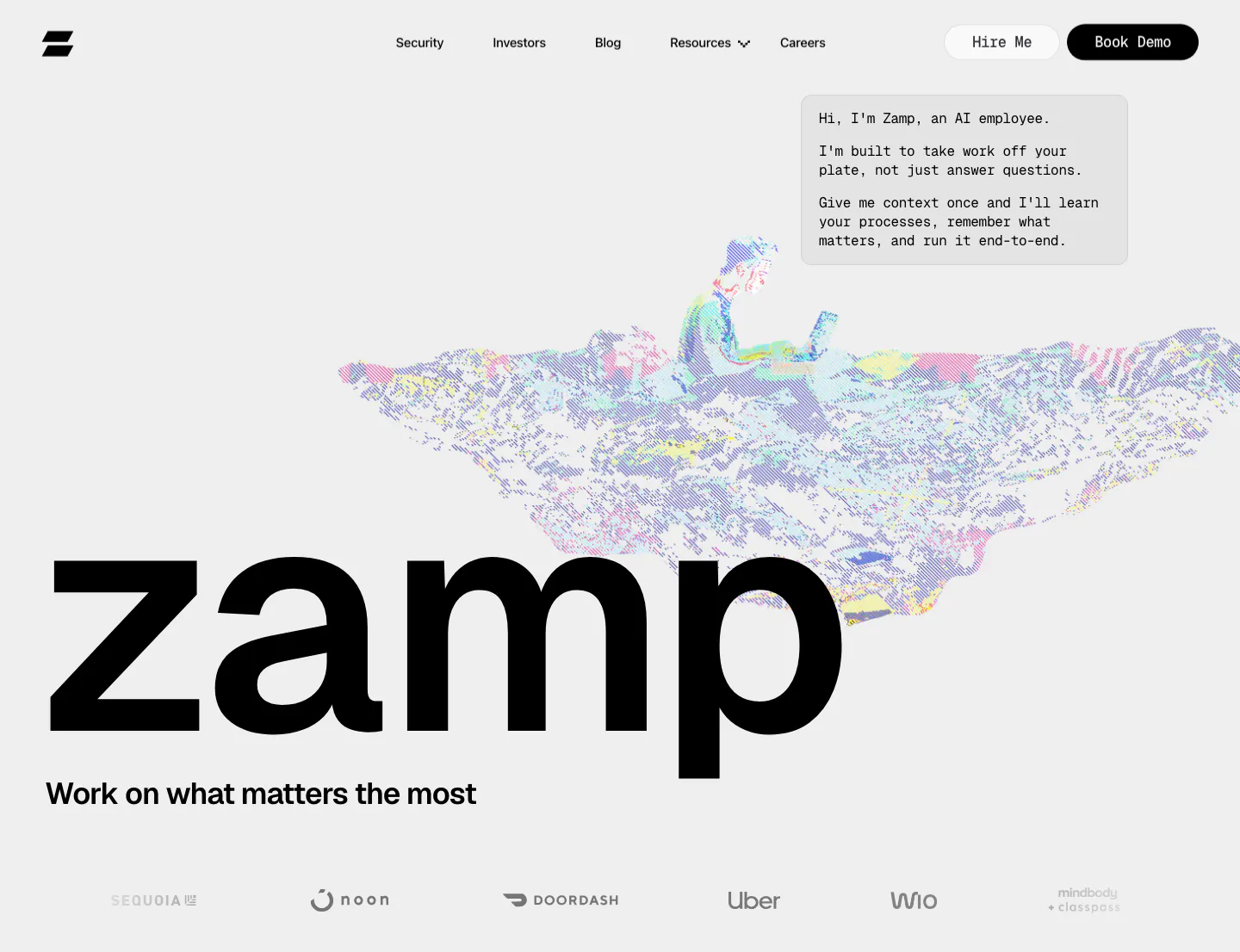
  295. Zamp logo cloud section: left-aligned heading with intro copy beside it above a bordered grid of six black customer logos on light gray
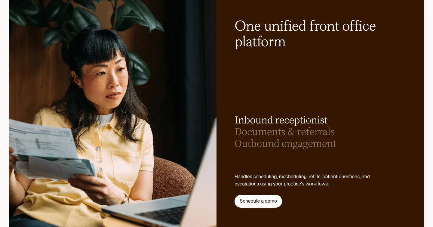
  296. Clarion features section: split card with a photo of a woman reviewing papers beside a dark brown panel with a serif tab list and button
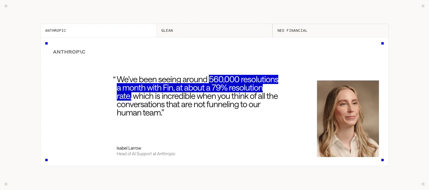
  297. Hunar testimonials section: headshot photo on the left, customer quote with logo and case study link, and a video thumbnail
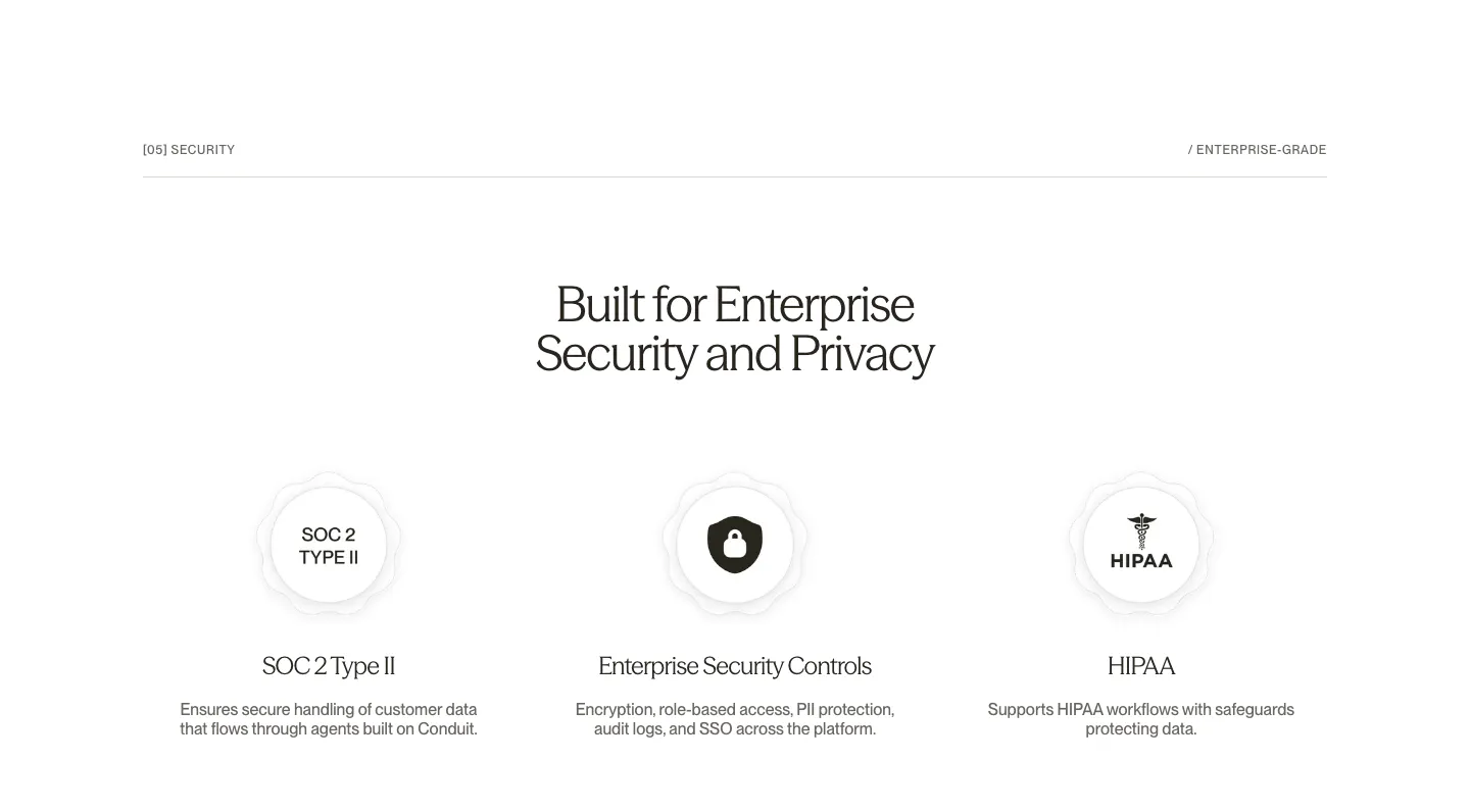
  298. Chatbase hero section: left headline with italic serif words and CTAs, right blue patterned panel with a data sources UI card
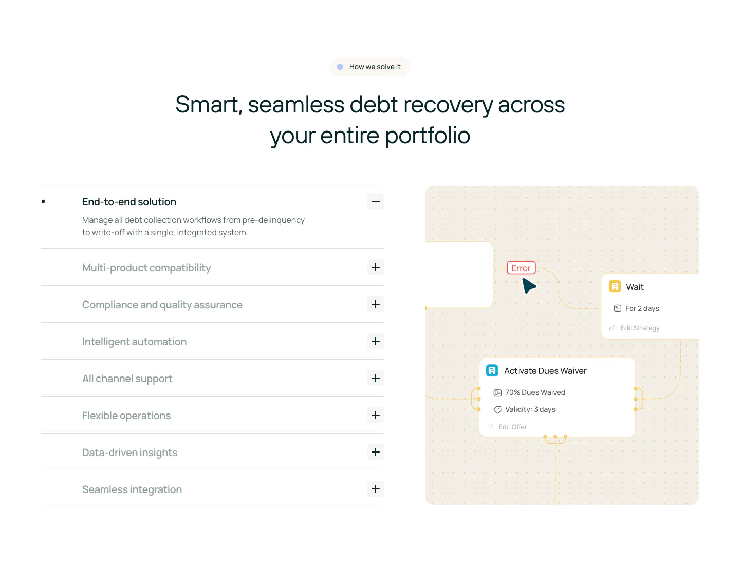
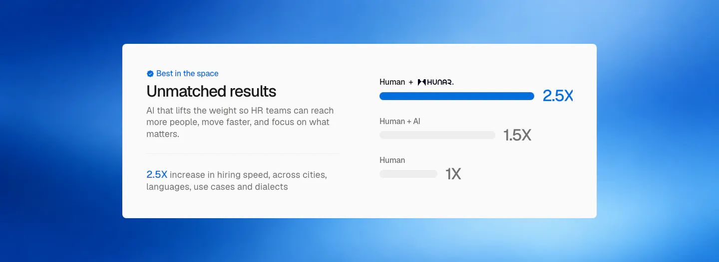
  299. Rezolv features section: centered headline above an accordion of capabilities on the left and a workflow node diagram on the right
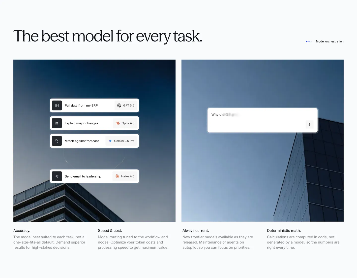
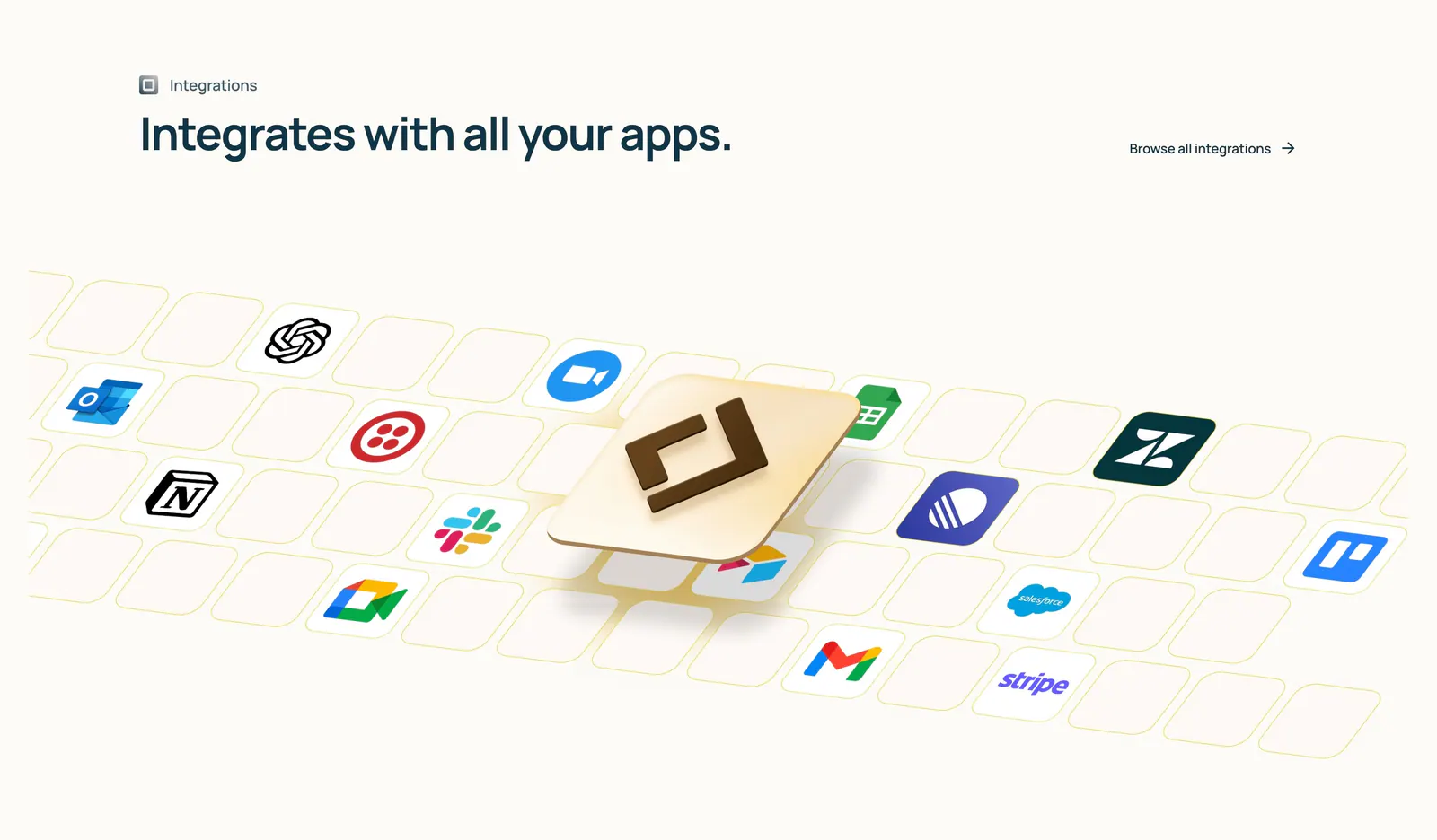
  300. Concourse features section: headline above two building photos overlaid with model-routing and chat UI cards, four feature notes below
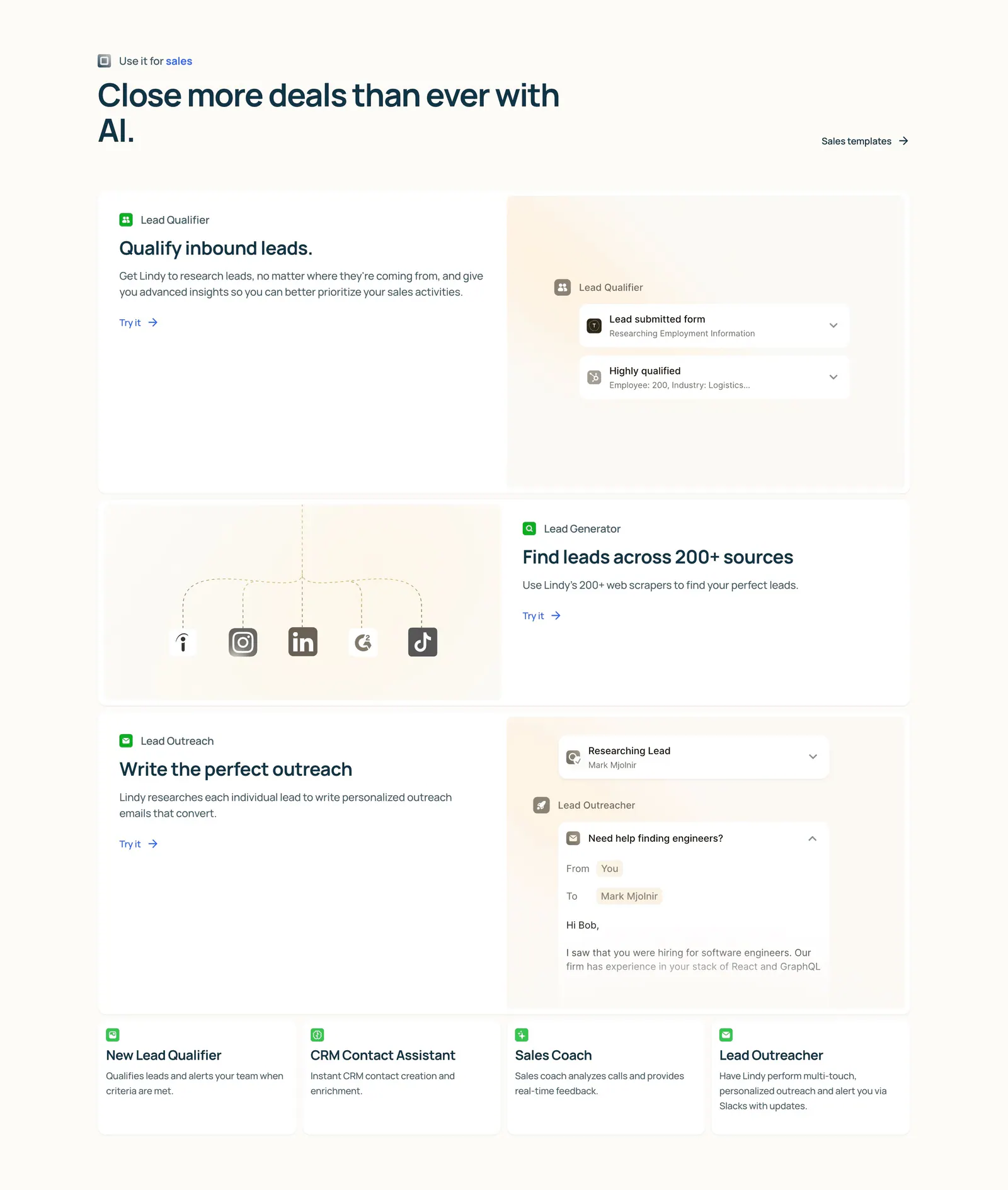
  301. Lindy features section: left-aligned heading above three alternating rows of copy and agent UI mockups, then four small template cards on cream
  302. Intercom testimonials section: tabbed customer quote card with a blue-highlighted phrase, Anthropic logo, speaker name and portrait photo
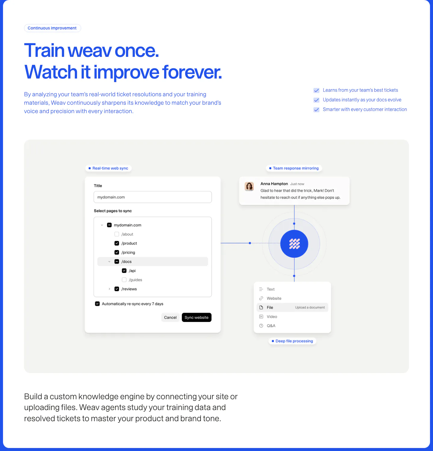
  303. Conduit security section: centered serif headline above SOC 2, security controls and HIPAA badge columns on white
  304. Hunar comparison section: white card with copy on the left and a bar chart of hiring speed multipliers on a blue gradient background
  305. Lindy integrations section: left-aligned heading above an isometric tile grid of app icons with a raised 3D Lindy logo tile on cream
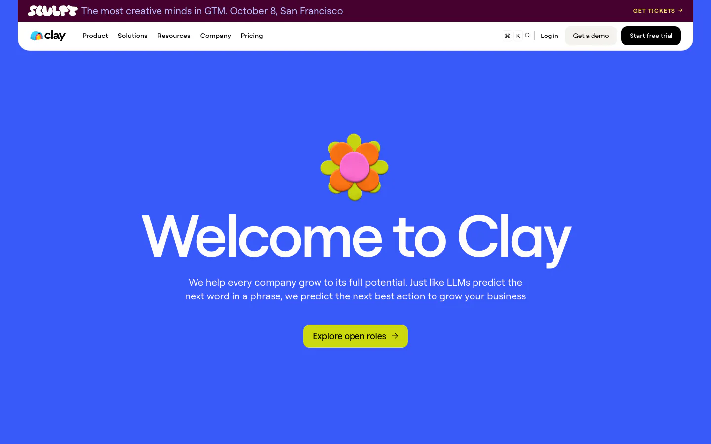
  306. Clay hero section: centered oversized headline under a 3D clay flower with lime careers button on a solid bright blue background
  307. Cohere call to action section: centered question headline and demo button over a full-bleed green water vortex image
  308. Weav features section: blue headline and checklist above a gray panel with a website sync form and file and chat cards linked to a central logo
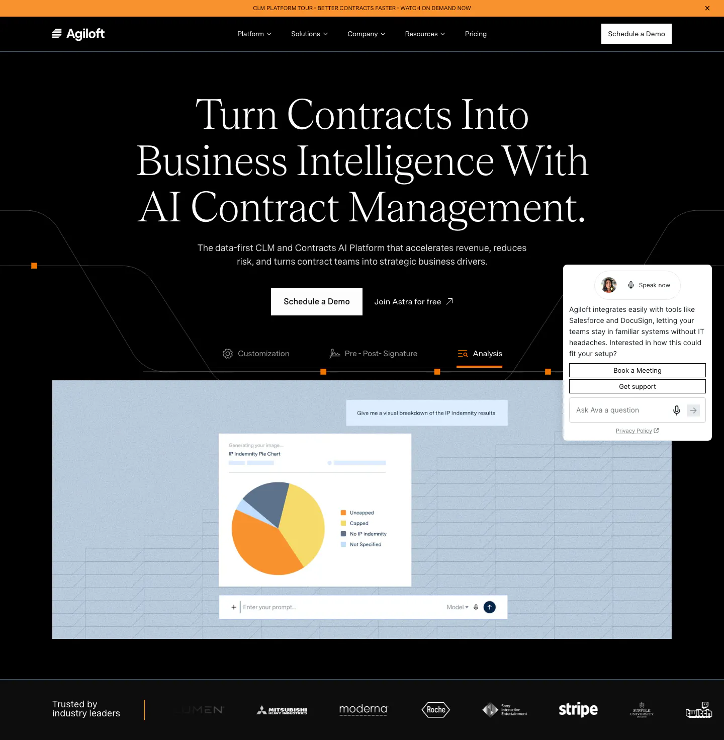
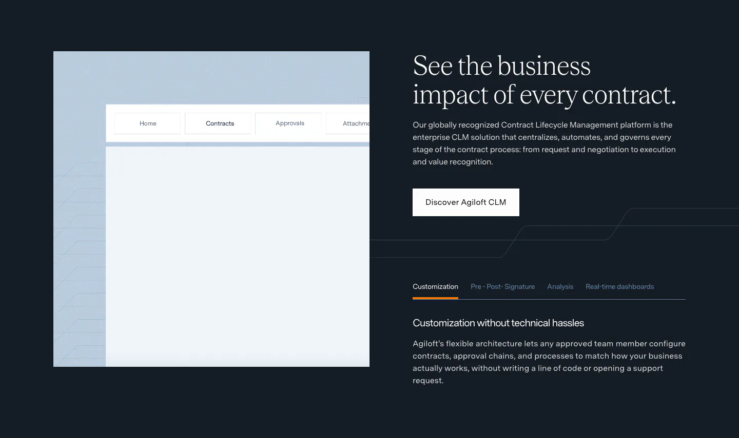
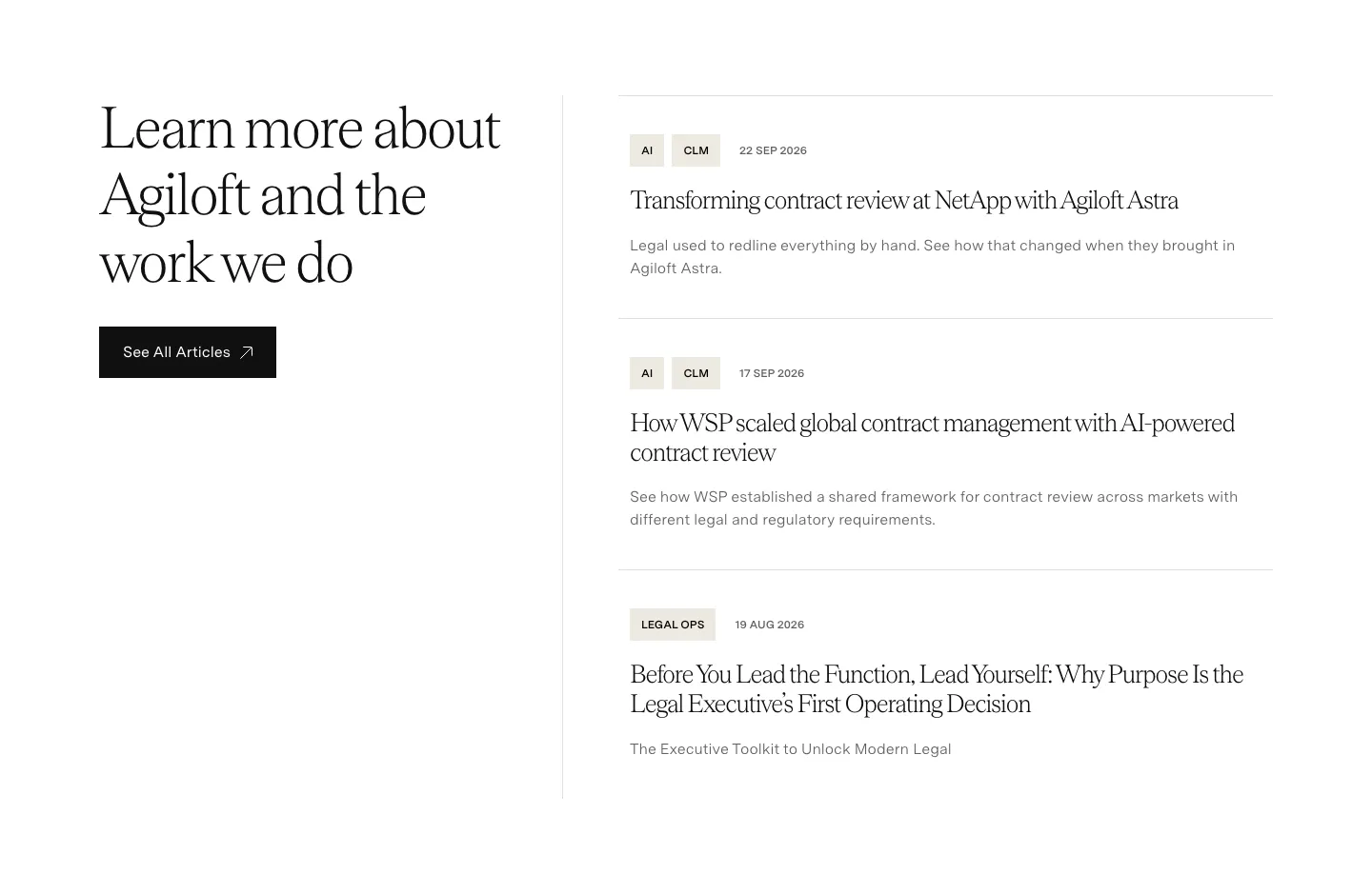
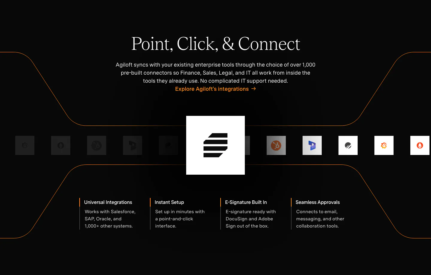
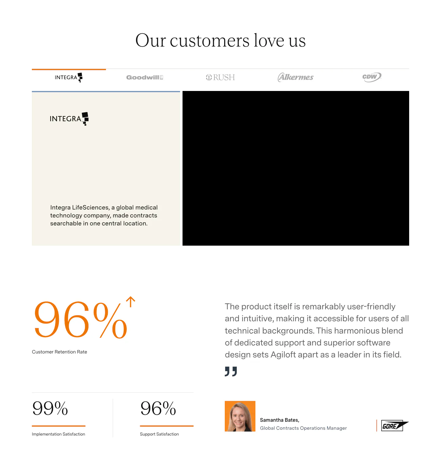
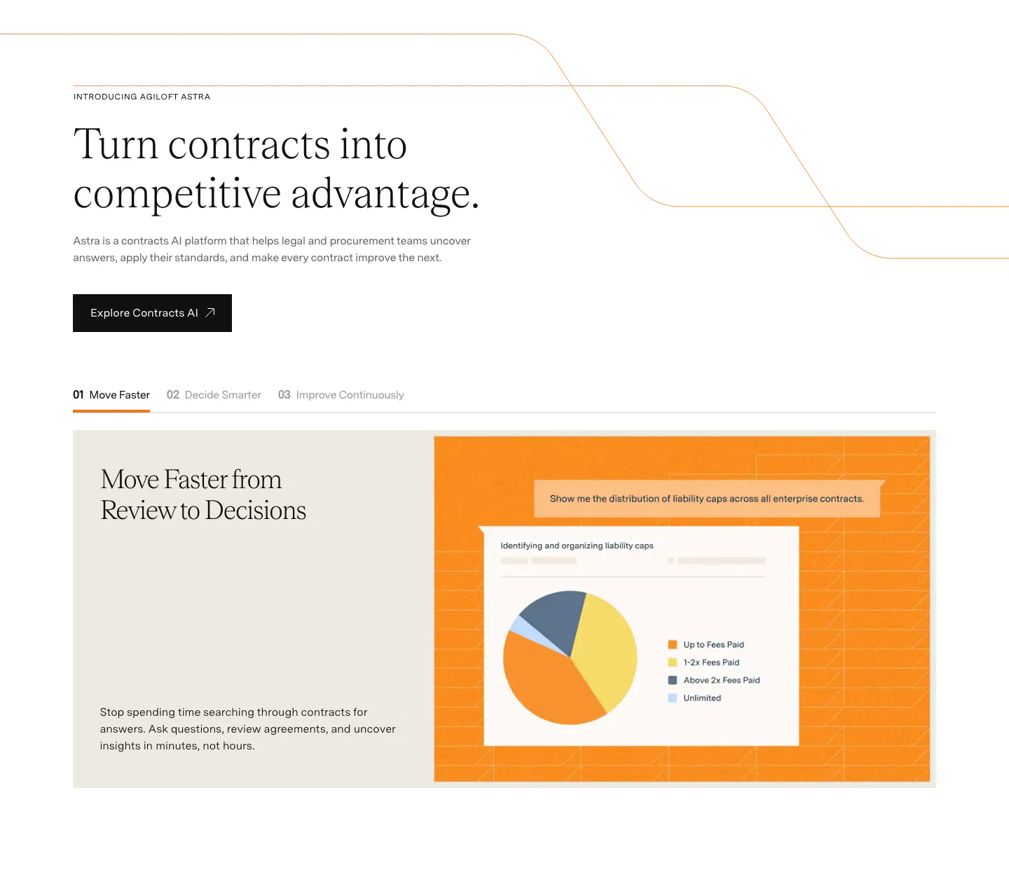
  309. Agiloft hero section: centered serif headline on black above feature tabs, a pie chart product screenshot and a customer logo strip
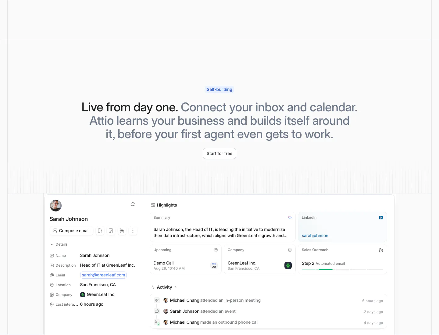
  310. Attio features section: centered two-tone headline with Start for free button above a contact record UI with highlights and activity
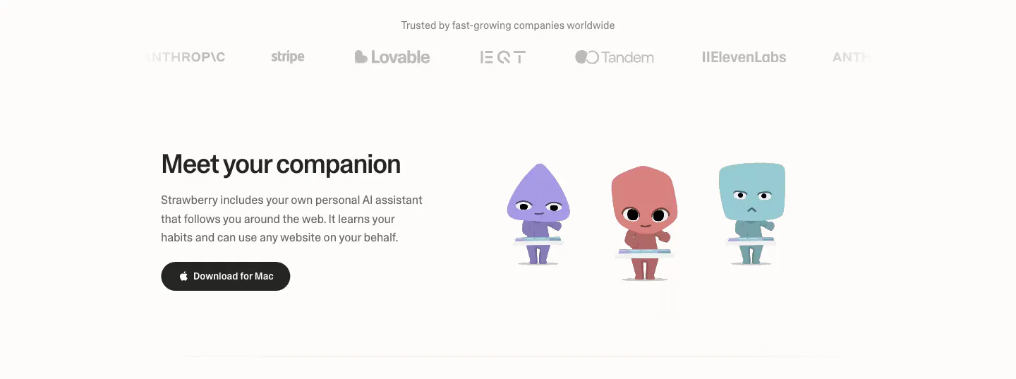
  311. Strawberry features section: logo strip on top, then headline and download button beside three cartoon companion characters
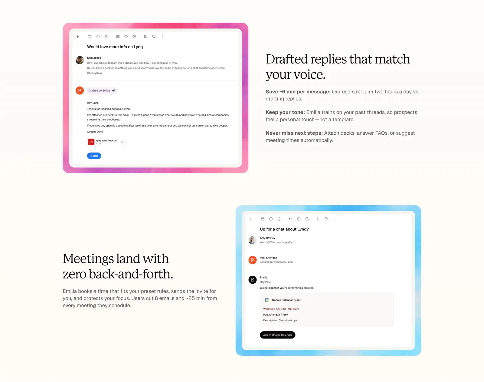
  312. Lynq features section: alternating rows of serif headlines and email UI screenshots in watercolor frames on a cream background
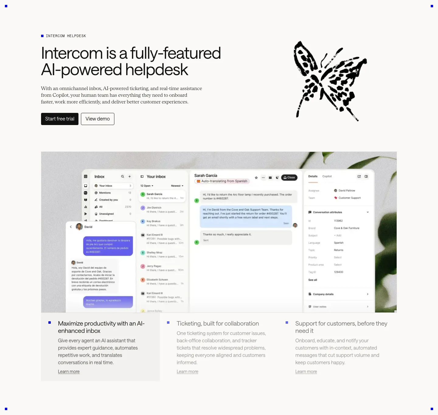
  313. Intercom features section: headline beside an ink butterfly drawing, large inbox screenshot over a plant photo, three selectable feature columns
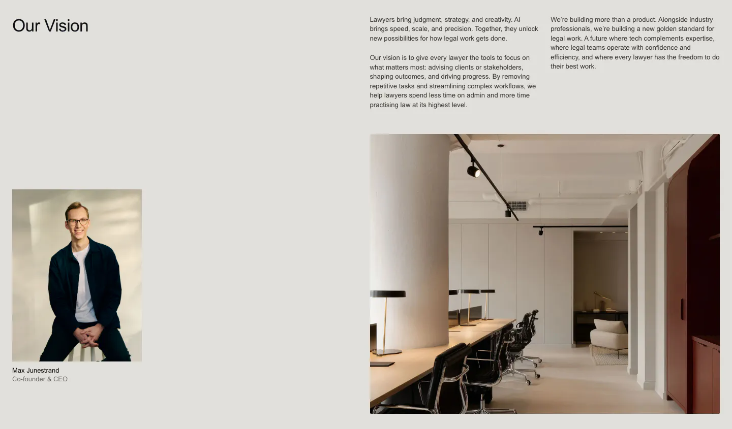
  314. Legora about & mission section: Our Vision heading with text columns, a CEO portrait and a large office interior photo
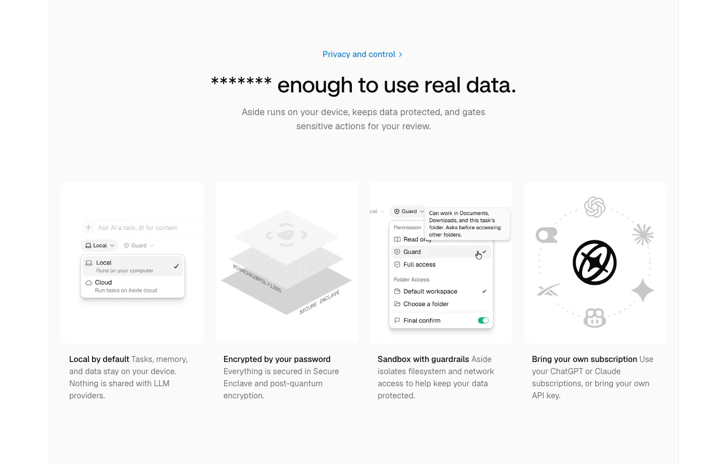
  315. Aside security section: centered headline above four gray cards with permission menu, encryption and AI model visuals
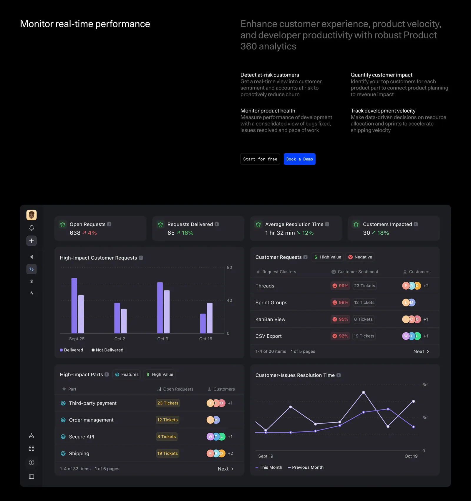
  316. DevRev features section: headline with four benefit blurbs and two buttons above a large dark analytics dashboard screenshot with charts
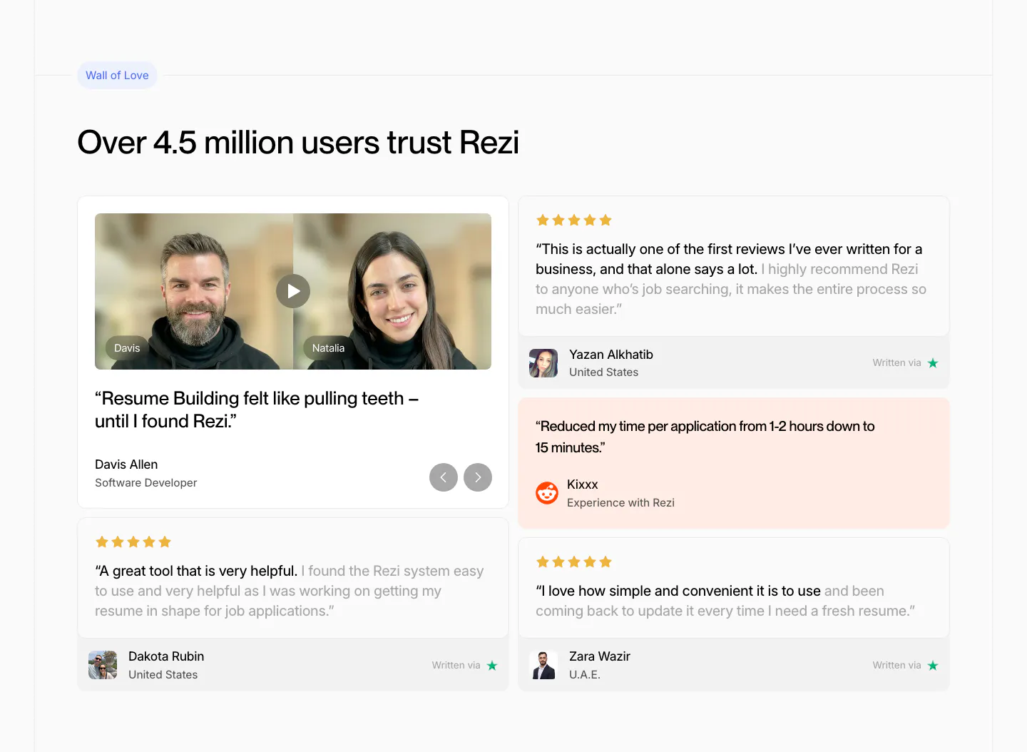
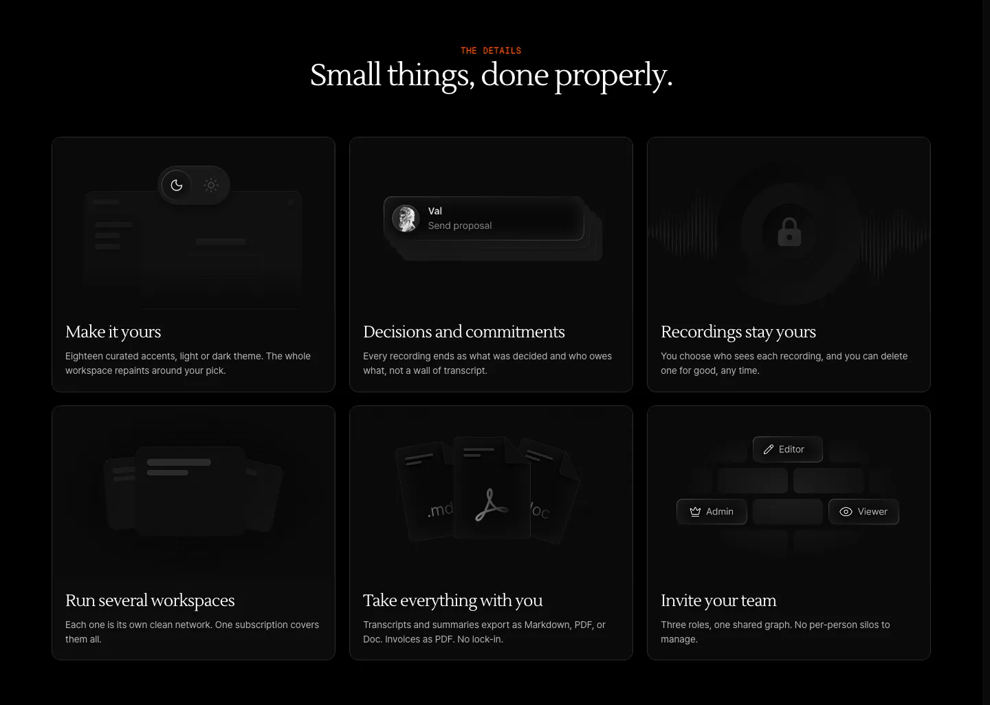
  317. Rezi testimonials section: two-column review wall with a video testimonial card, star-rated quote cards and a peach Reddit quote
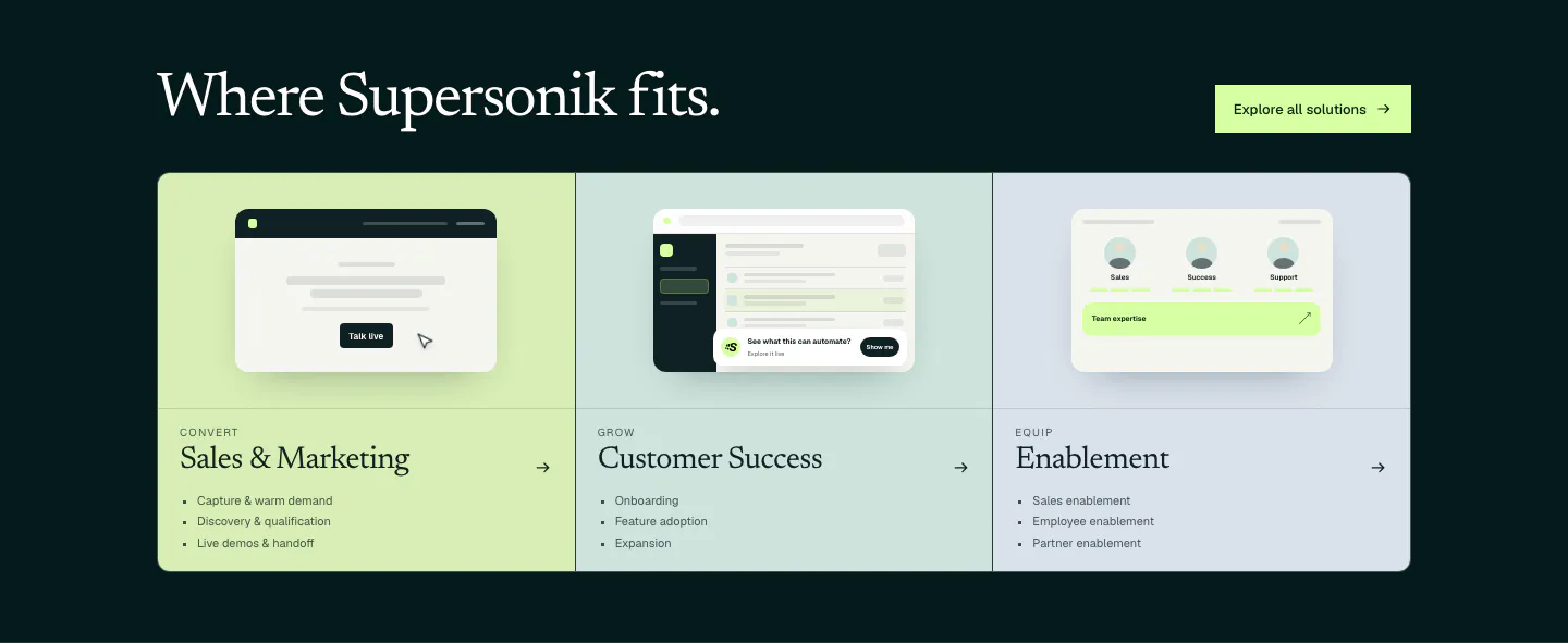
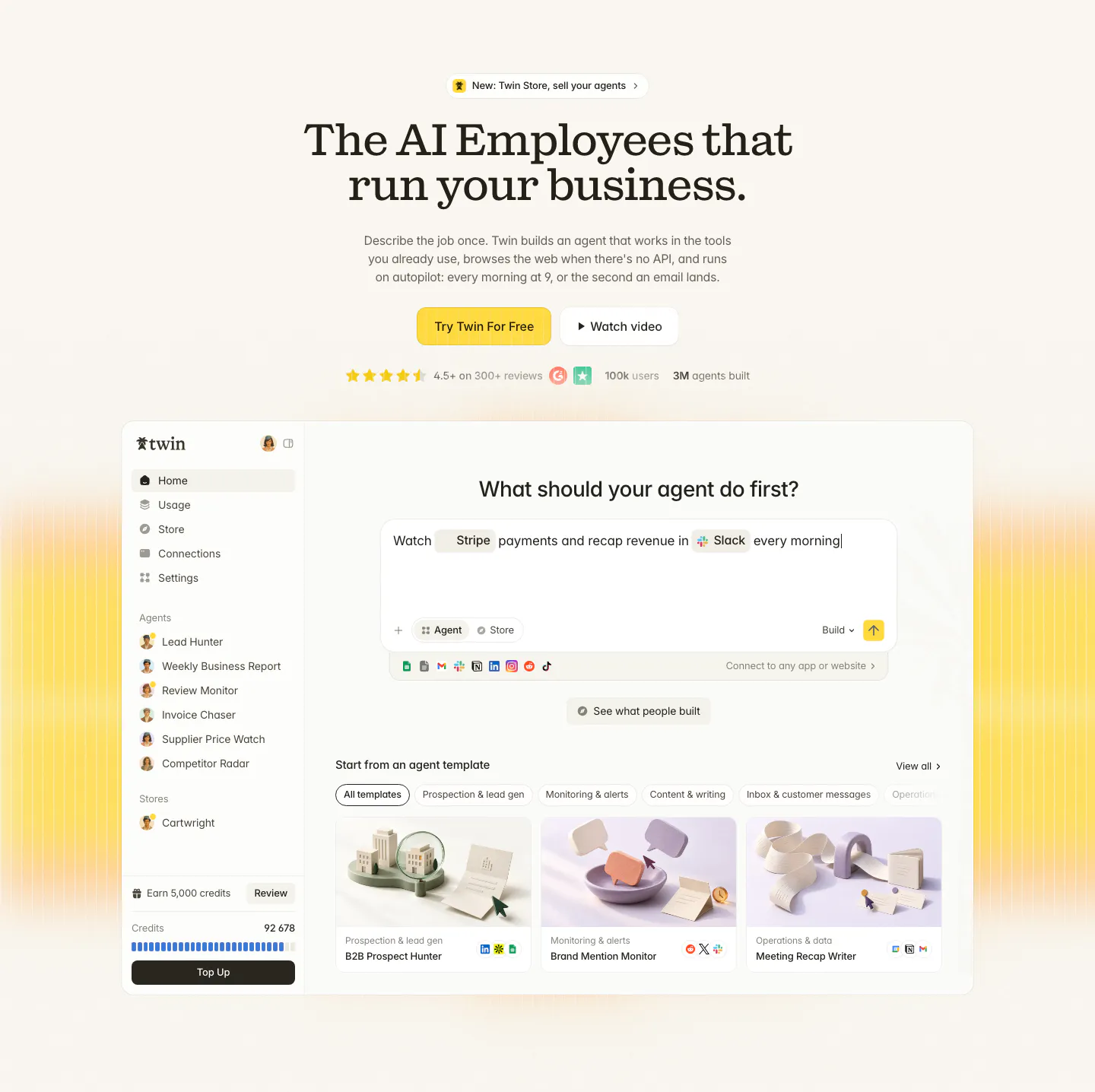
  318. Supersonik use cases section: serif headline over three pastel panels for sales, customer success and enablement with UI sketches
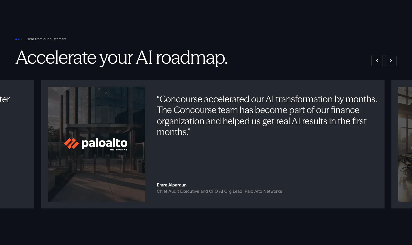
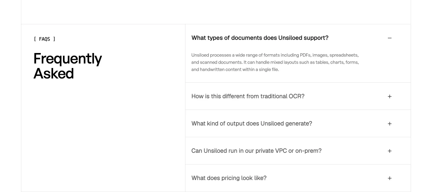
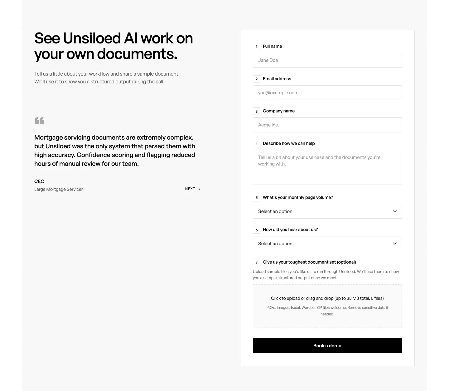
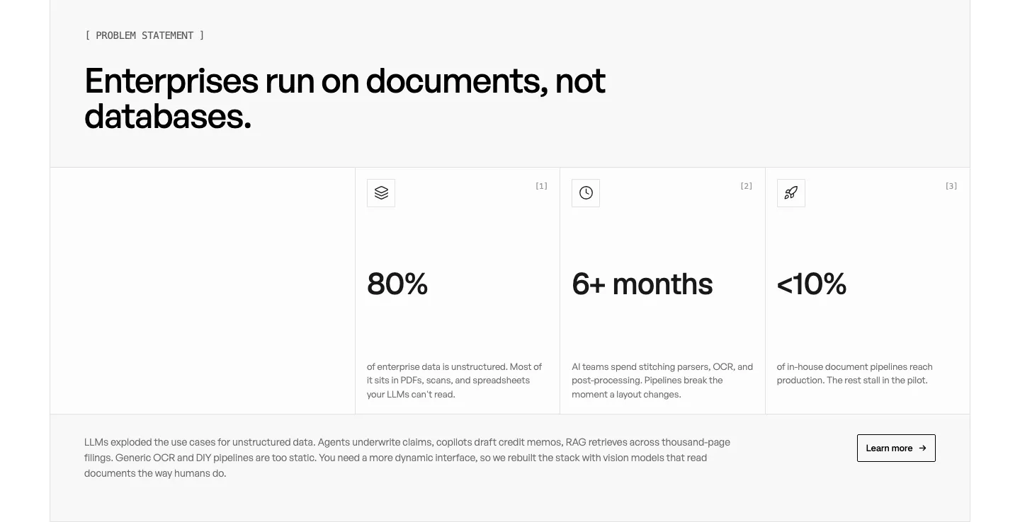
  319. Concourse testimonials section: headline with arrow buttons above a carousel of quote cards with a Palo Alto Networks photo on dark navy
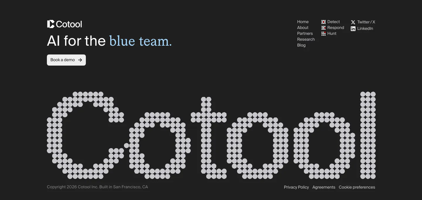
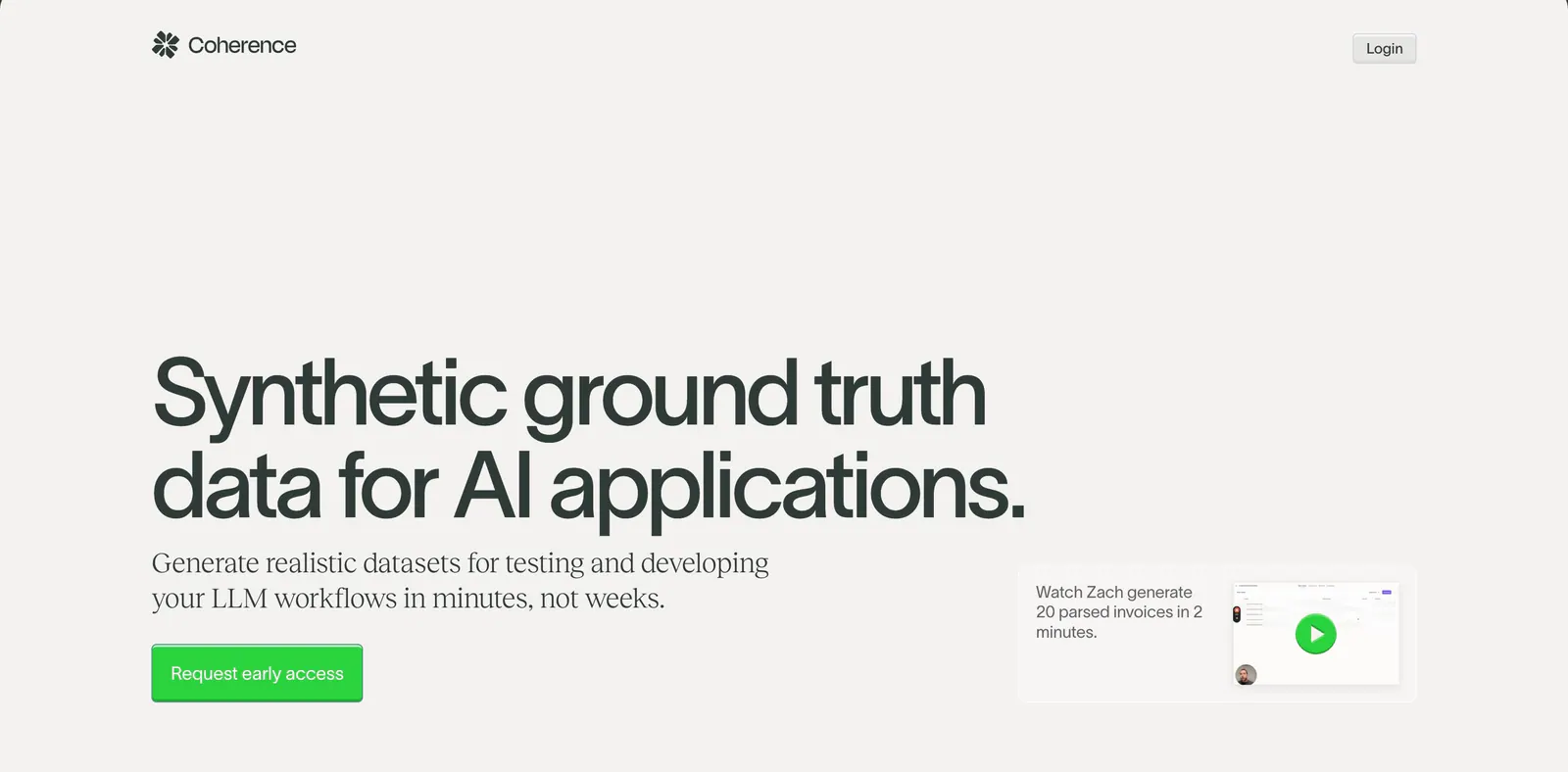
  320. Cotool footer section: tagline, demo button and link columns above a giant dot-matrix Cotool wordmark on a charcoal background
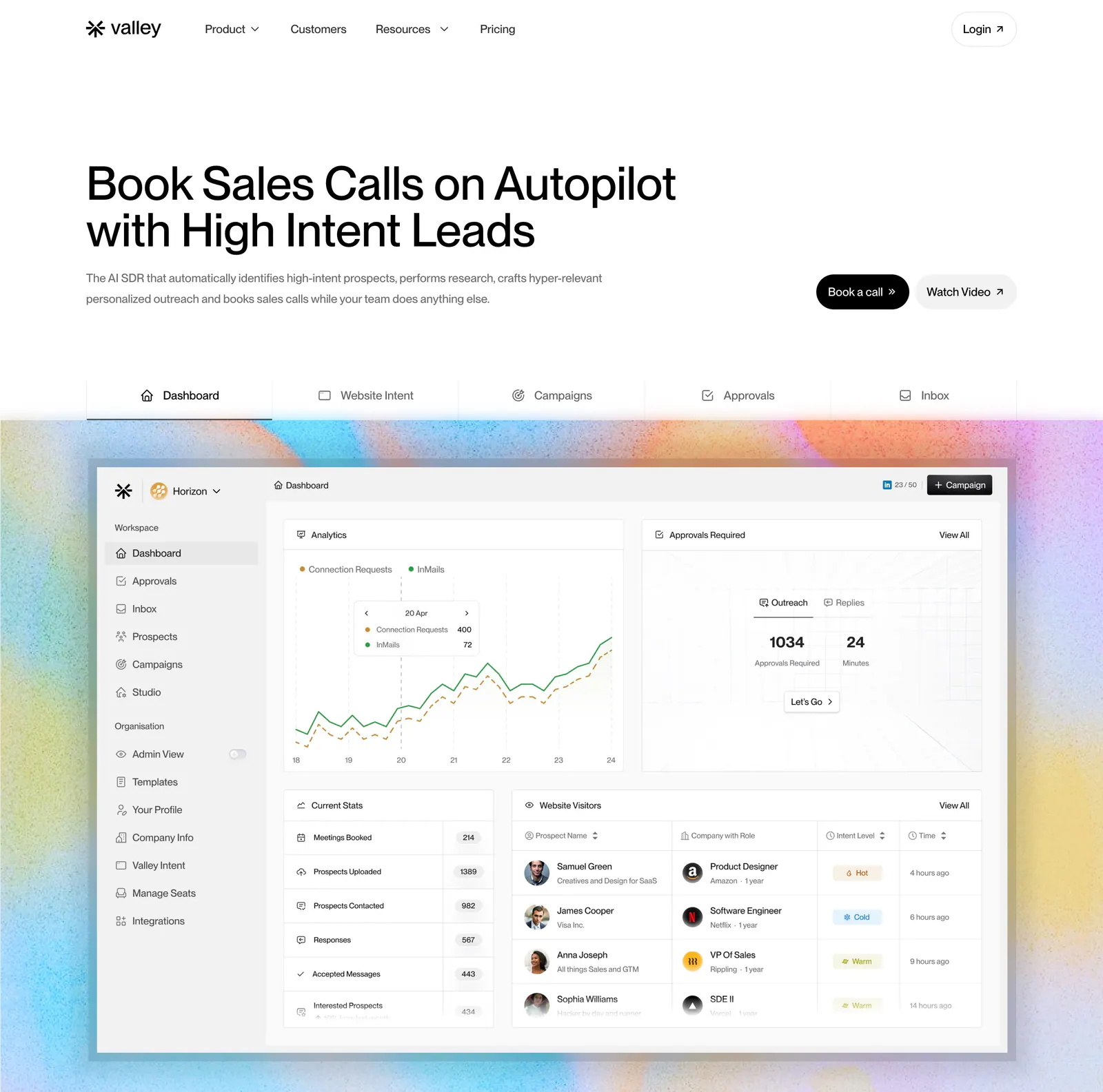
  321. Valley hero section: left-aligned headline with buttons, a tab bar and a sales dashboard screenshot on a grainy pastel gradient background
  322. Arke features section: centered serif headline above a three-by-two grid of dark cards with subtle UI vignettes and short descriptions
  323. Twin hero section: centered serif headline with yellow CTA and ratings above an agent builder app screenshot on cream with yellow glow
  324. Unsiloed FAQ section: Frequently Asked heading at left beside a bordered accordion with the first question expanded on white
  325. Coherence hero section: oversized left-aligned headline with green CTA and a small video demo card on a warm light gray background
    Coherence Hero
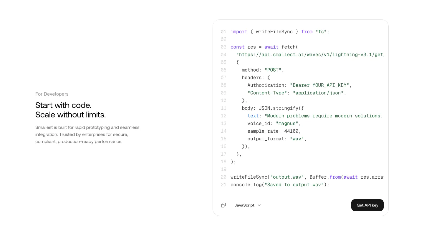
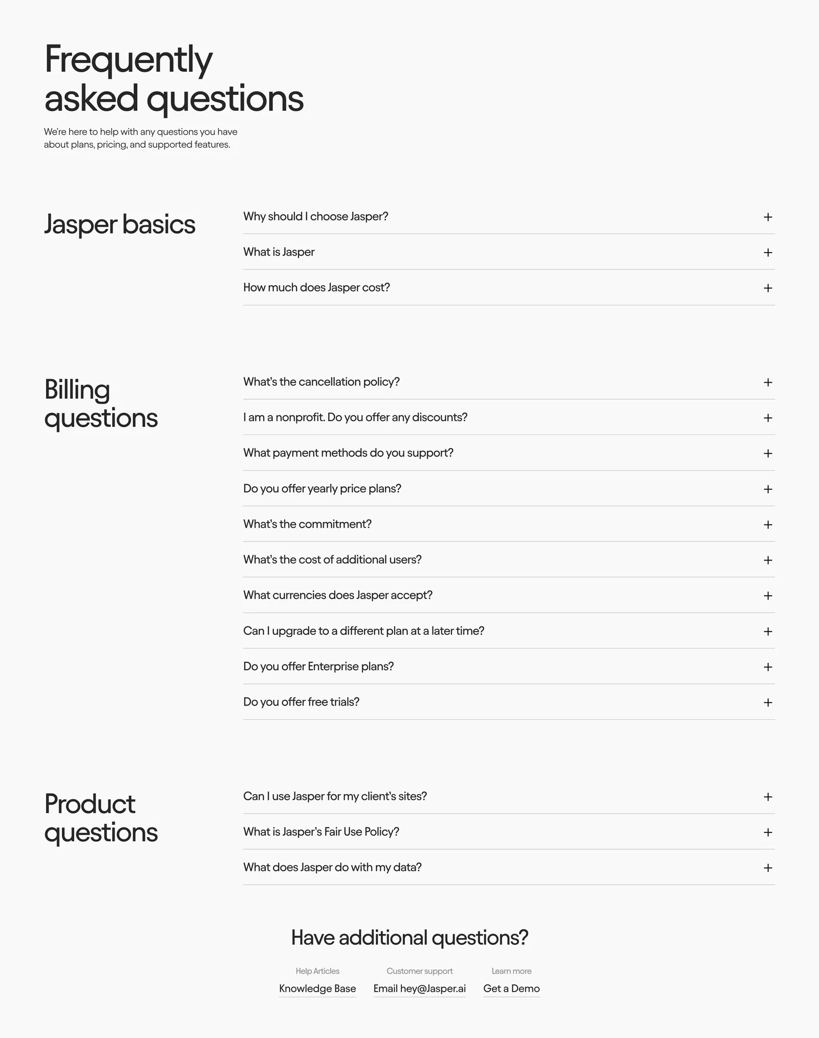
  326. Smallest.ai features section: developer copy on the left beside a JavaScript API code block with a Get API key button on white
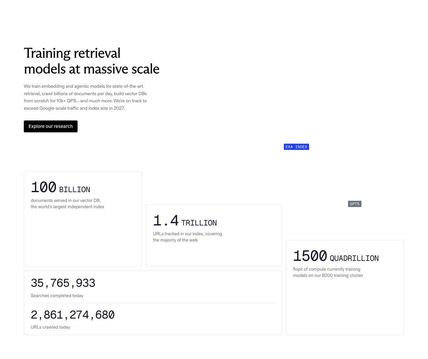
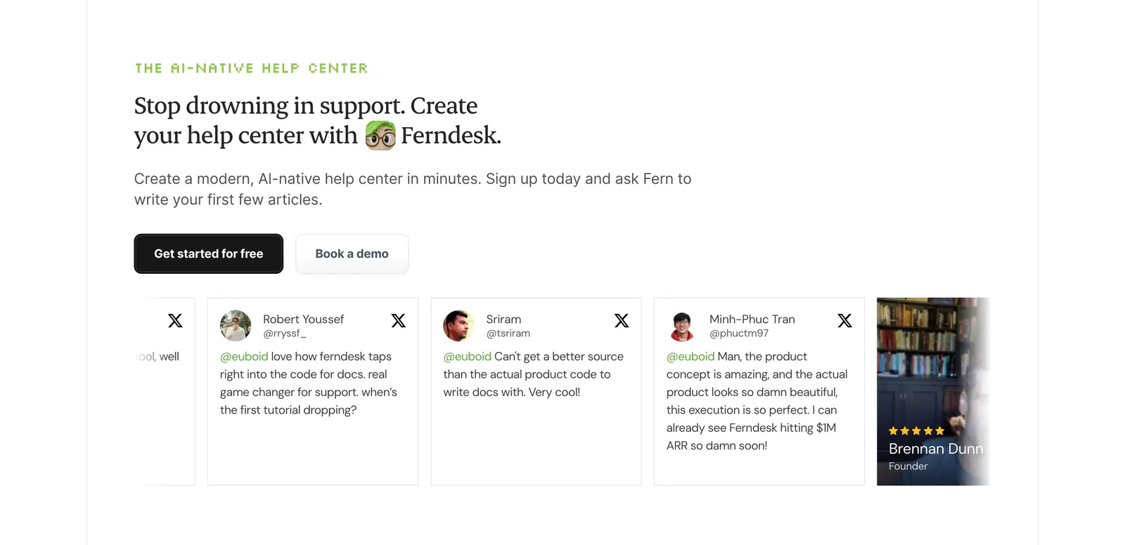
  327. Exa stats section: headline, copy and research button above staggered bordered cards with large monospace figures for index size and compute
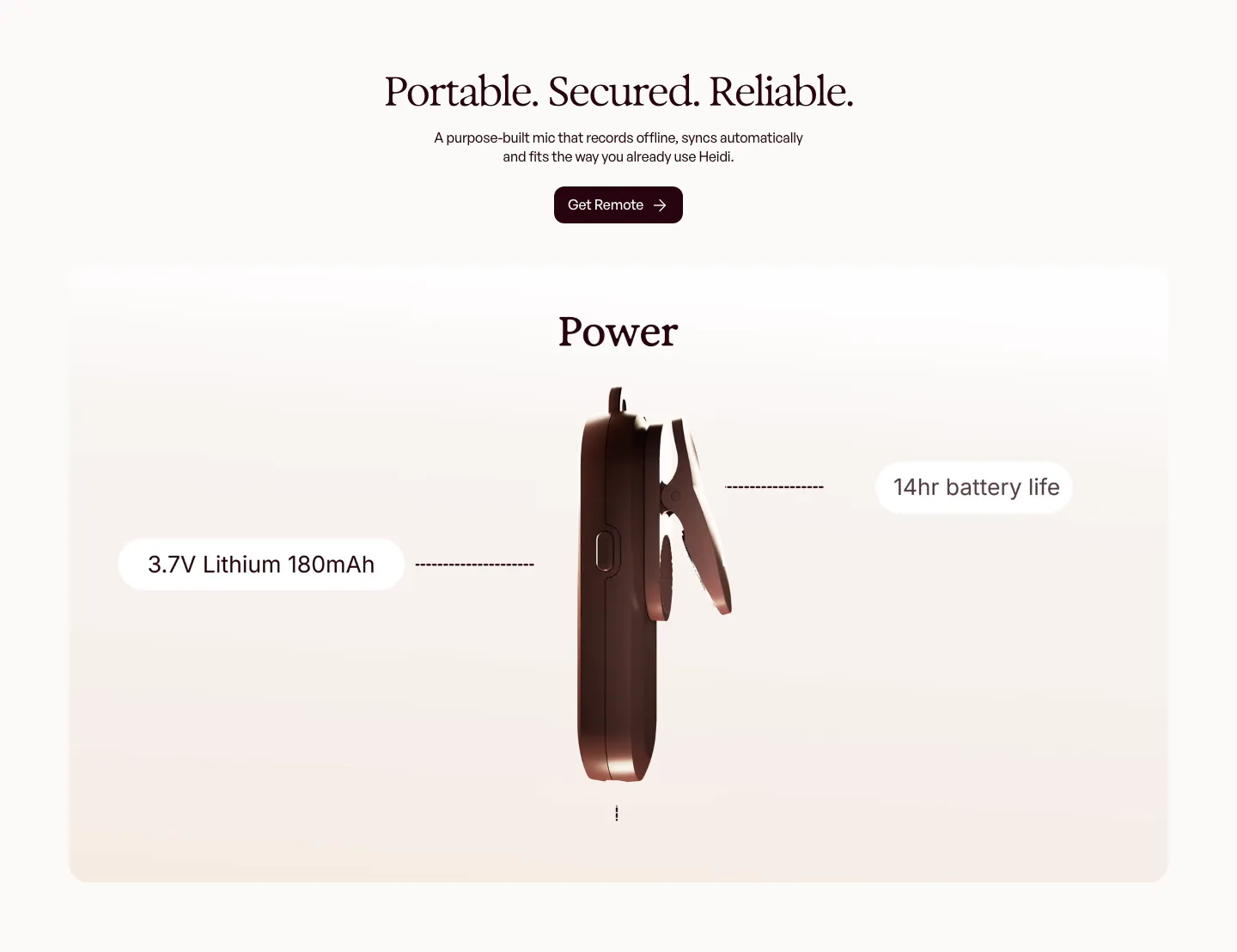
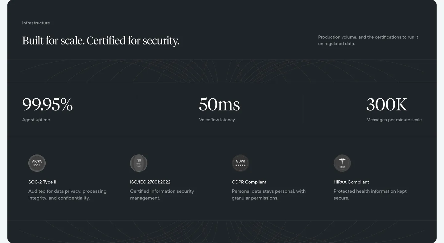
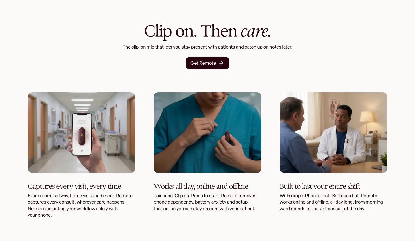
  328. Heidi features section: centered serif headline above a rendered side view of the clip-on mic with battery spec callouts
  329. Relume footer section: logo above a grid of illustrated team avatars and social icons, with four link columns under pink labels
  330. Modulify features section: left-aligned headline above a row of four gray icon cards on white, the last card cut off
  331. Hunar features section: dark background with hiring copy and expandable list beside a phone call mockup, three outcome cards below
  332. Jasper FAQ section: large heading above grouped accordion questions with category titles in a left column on an off-white background
  333. Ferndesk testimonials section: serif headline and two CTAs above a horizontally scrolling row of tweet cards on white
  334. Voiceflow security section: dark panel with serif headline, three large uptime and latency stats and four compliance badges
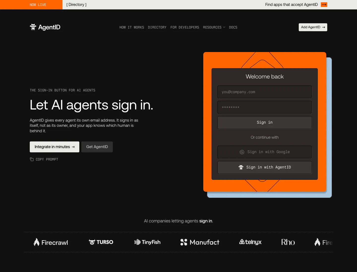
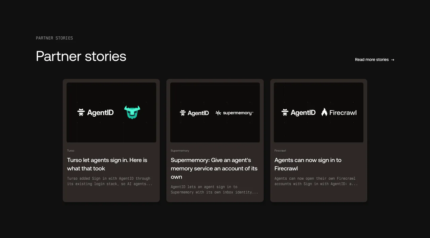
  335. AgentID hero section: dark nav, headline and two buttons left, a sign-in form mockup on an orange card right, customer logo strip below
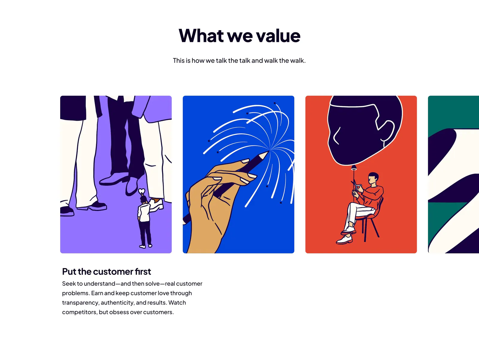
  336. Dovetail value proposition section: centered headline above a carousel of bold illustrated value cards with the first value's text below
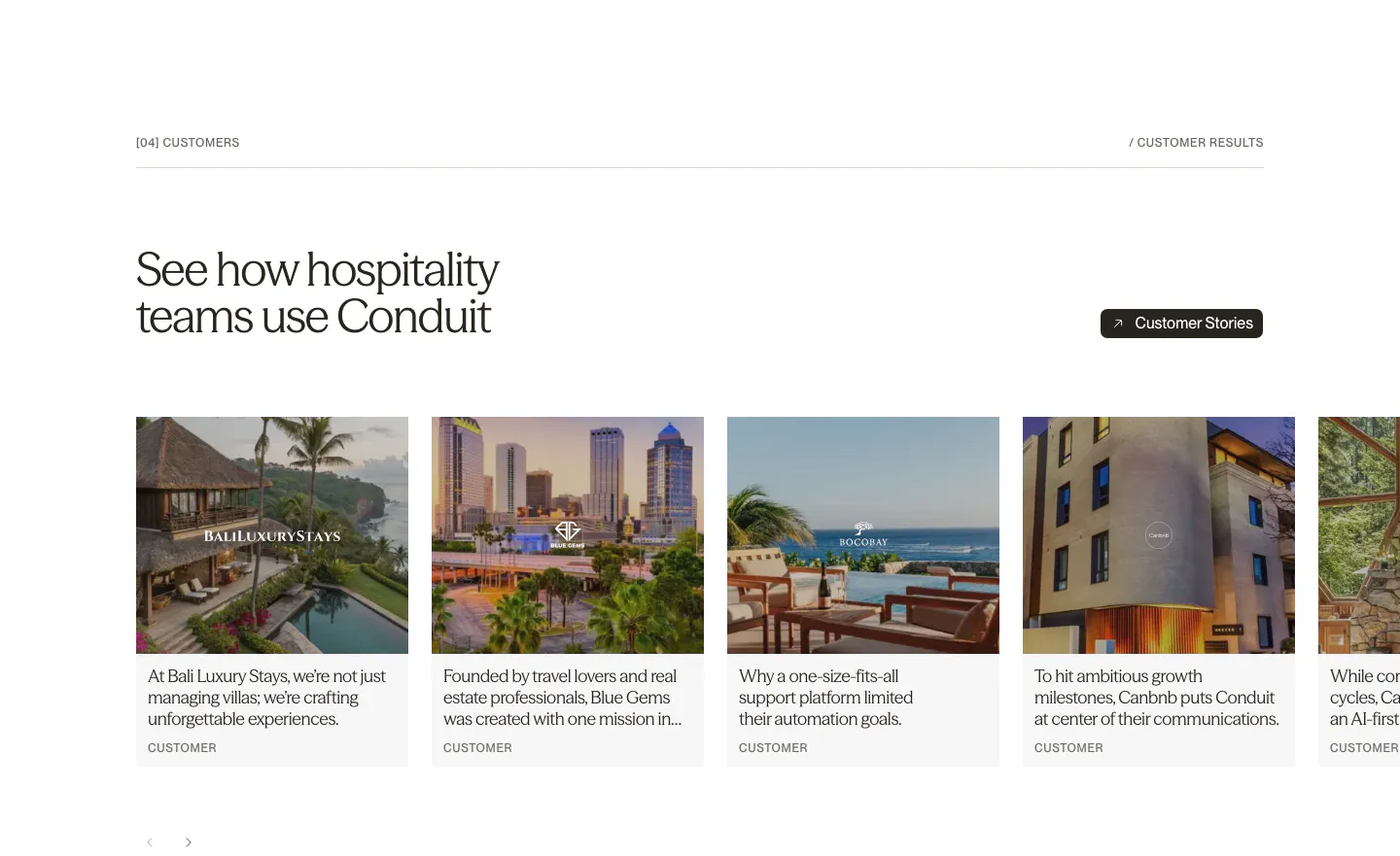
  337. Conduit testimonials section: serif headline above a carousel of customer story cards with hotel and resort photos
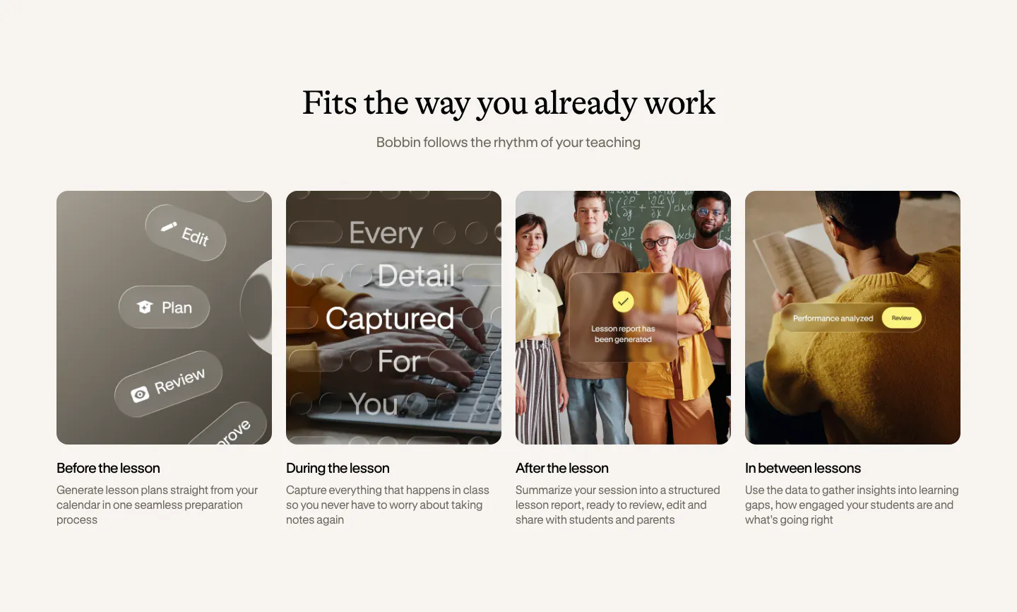
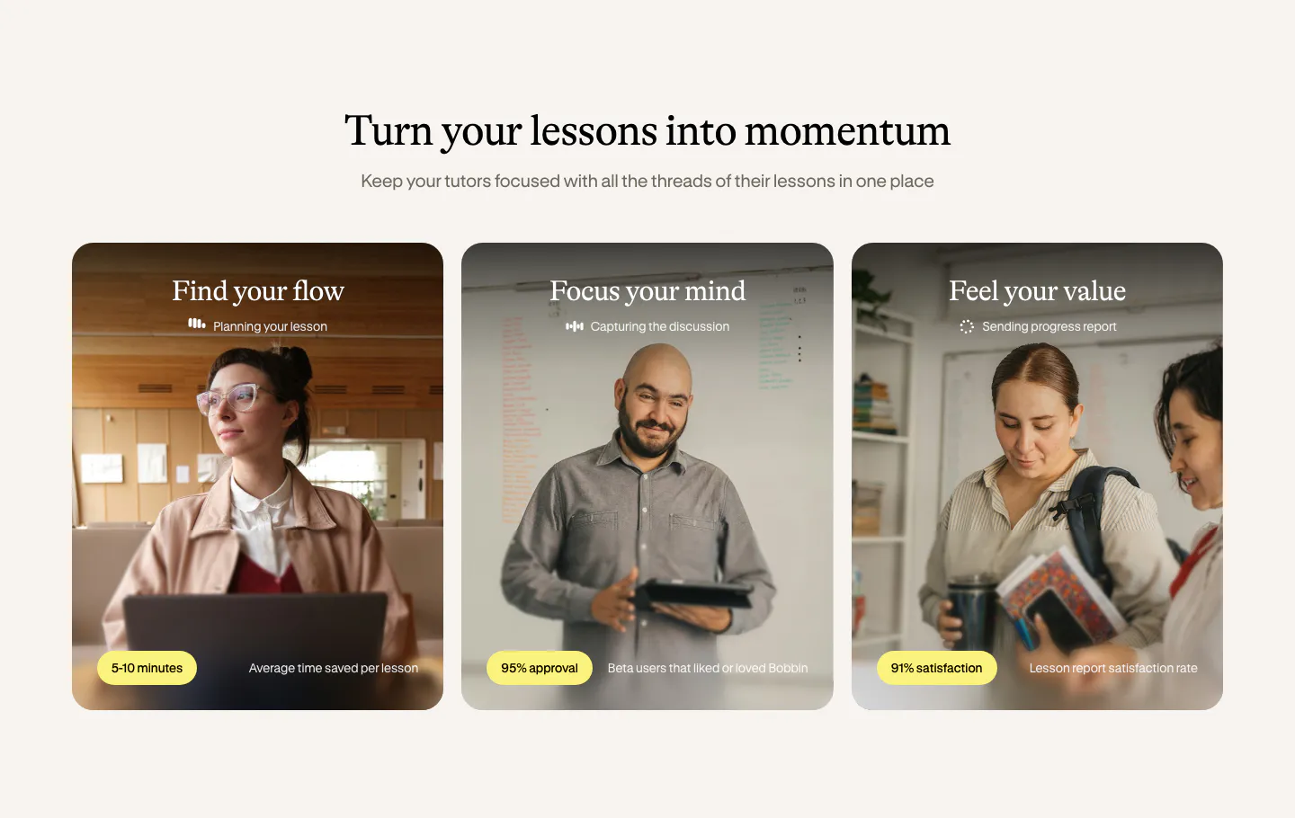
  338. Bobbin how it works section: serif heading above four equal photo cards for before, during, after and between lessons
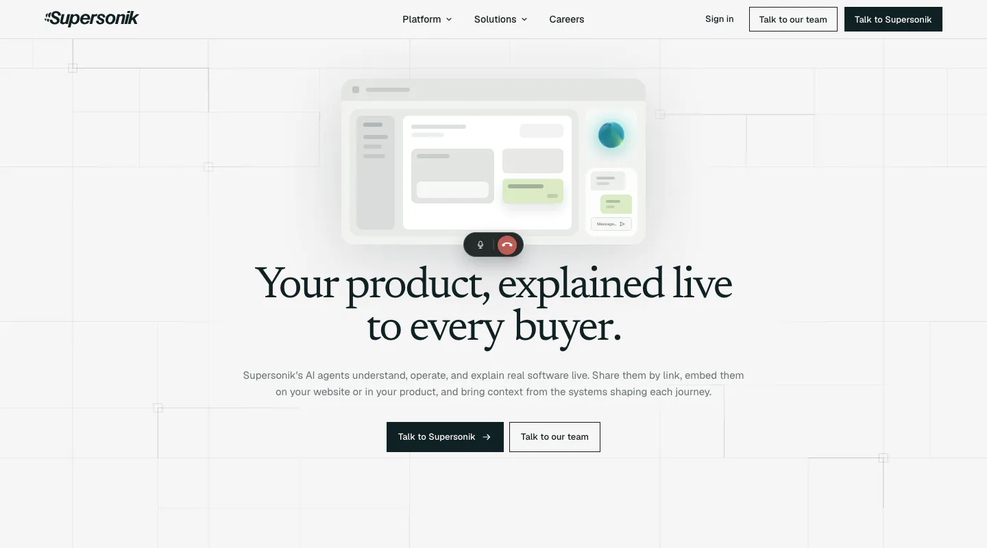
  339. Supersonik hero section: centered serif headline and two CTAs below a soft UI mockup with call controls on a light grid background
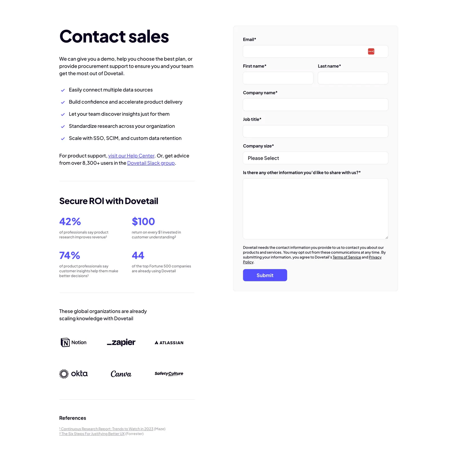
  340. Dovetail contact section: copy with checklist, ROI stats and customer logos on the left beside a gray contact sales form with purple submit
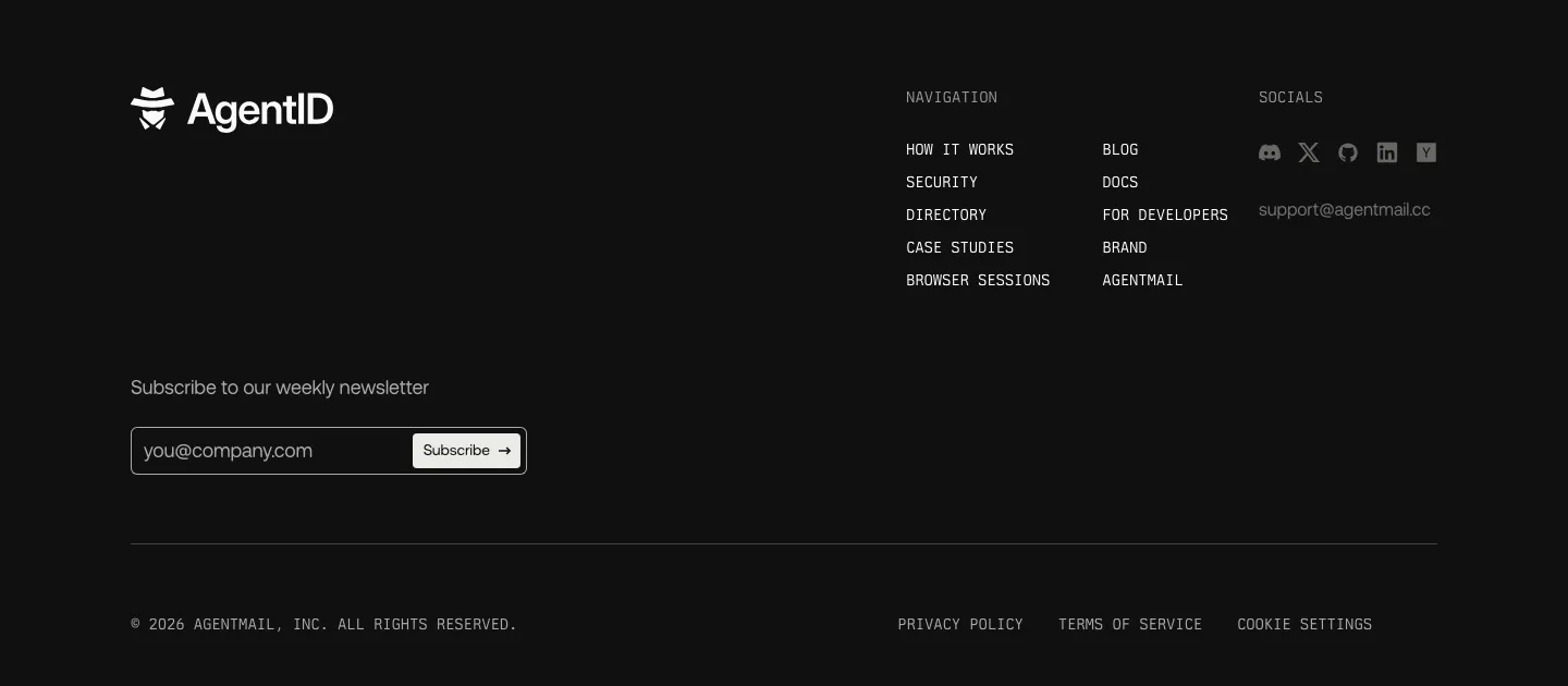
  341. AgentID footer section: dark layout with logo, newsletter email field, monospace navigation columns, social icons and legal row
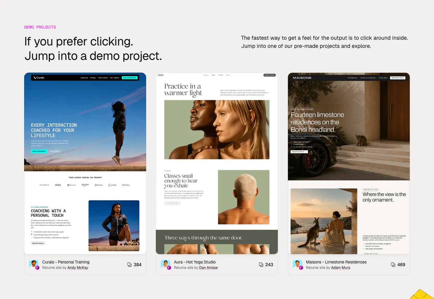
  342. Relume other section: headline and intro above three cards previewing demo websites for coaching, yoga and residences with author credits
    Relume Other
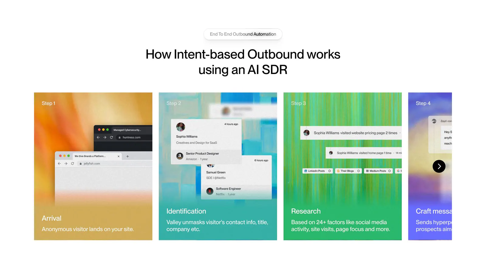
  343. Valley how it works section: centered headline above a carousel of numbered step cards with colorful textured backgrounds and UI snippets
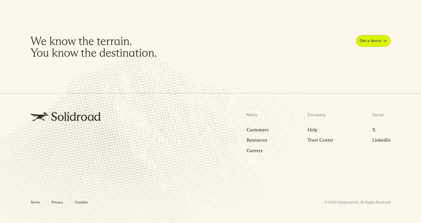
  344. Solidroad footer section: serif CTA headline and lime button above logo and link columns on cream with a faint halftone dot texture
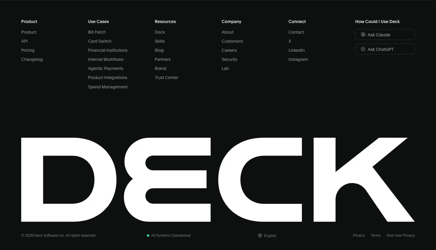
  345. Deck footer section: six link columns with Ask Claude and Ask ChatGPT buttons above a full-width white DECK wordmark on black
  346. Cluster call-to-action section: centered serif headline and dark pill button on a beige panel framed by dark edges
  347. Valley logo cloud section: bordered grid of customer logos around a central headline tile with a Book a call button on white
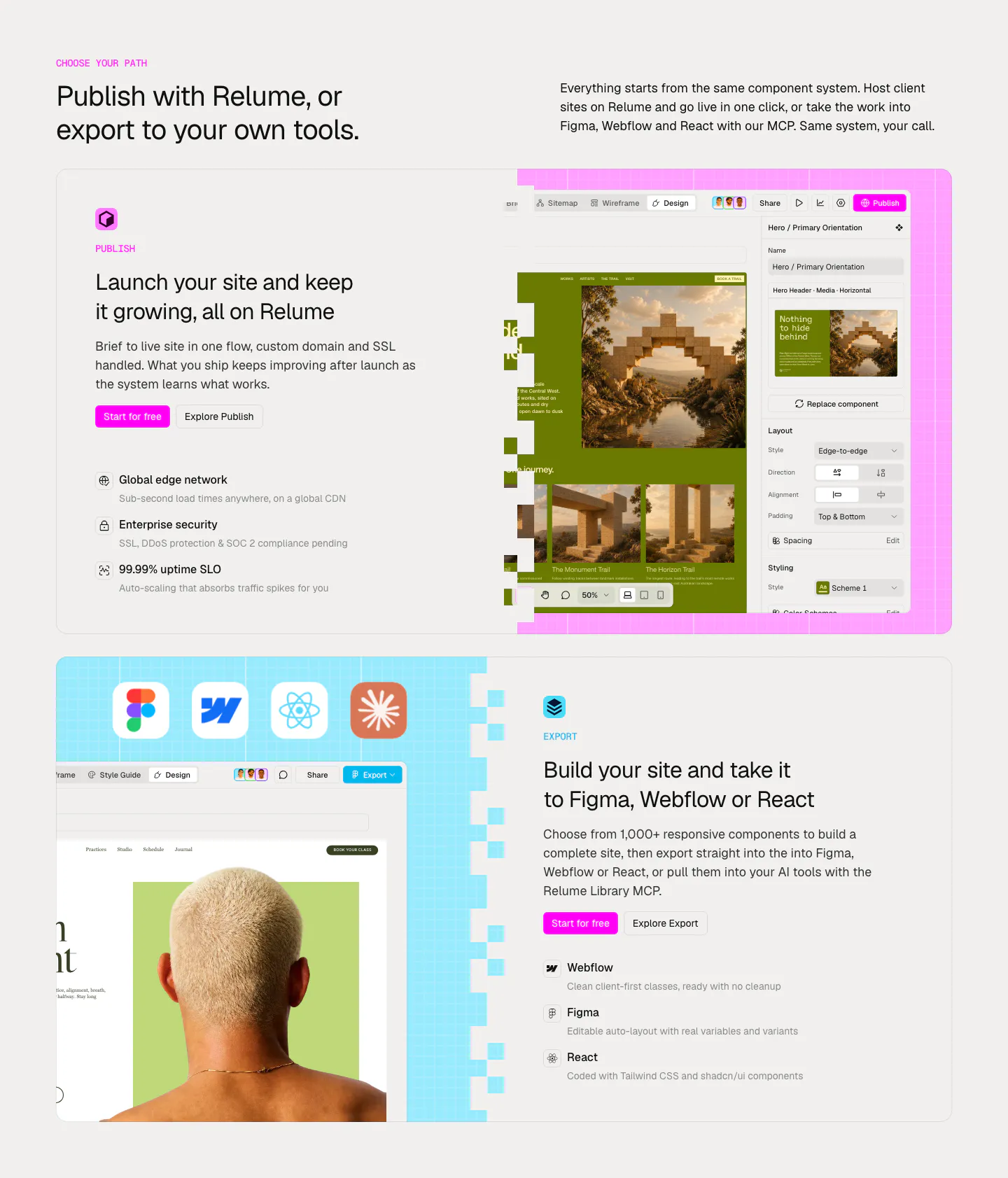
  348. Relume features section: headline above two large cards alternating text and editor screenshots for Publish and Export on pink and blue grids
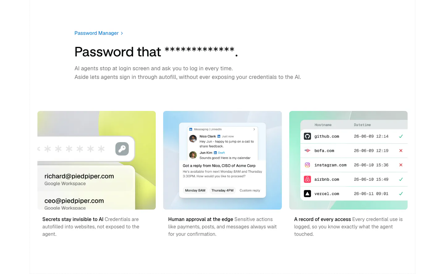
  349. Aside features section: left-aligned headline above three pastel cards with credential, approval and access log mockups
  350. Gumloop call-to-action section: centered headline, copy and button inside a light gray rounded panel
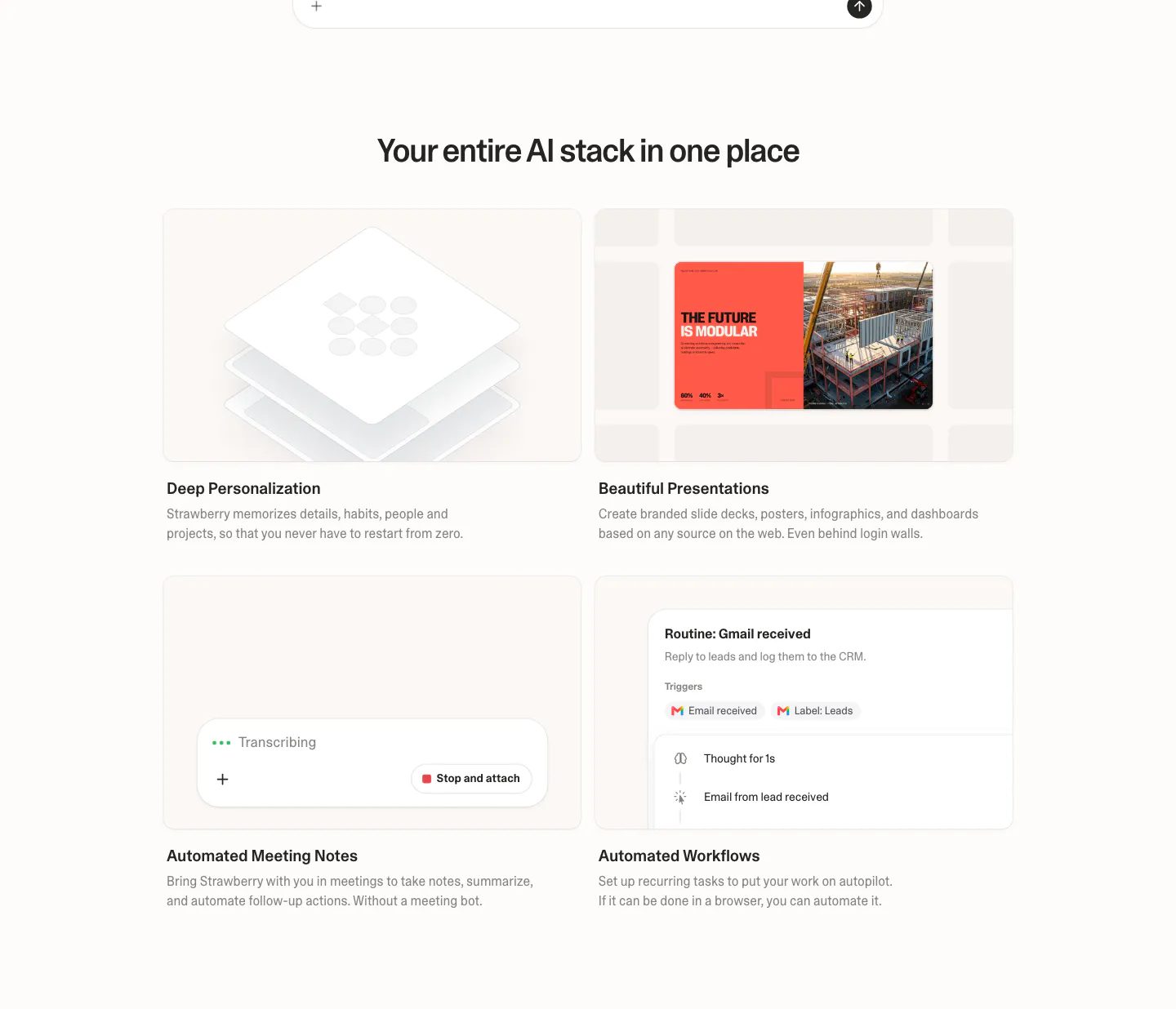
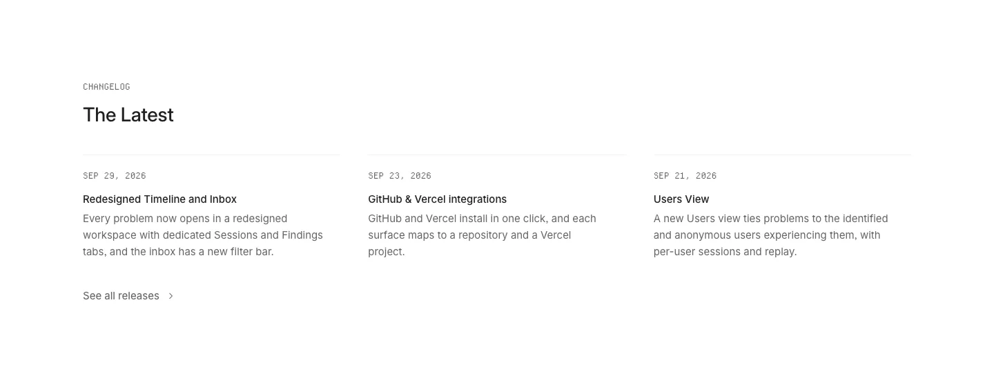
  351. Strawberry features section: centered headline over a 2x2 grid of cards with UI snippets for personalization, slides, notes and workflows
  352. HappyRobot logo cloud section: small eyebrow label above a 7x3 bordered grid of customer logos, some tiles on blurred photo backgrounds
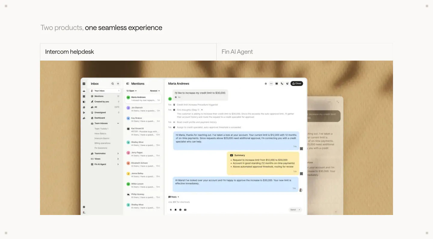
  353. Intercom features section: two-tab switcher for helpdesk and Fin AI Agent above a large inbox screenshot on a textured beige backdrop
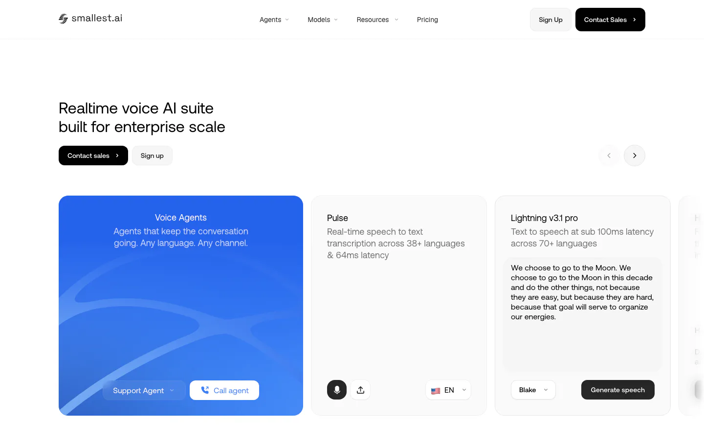
  354. Smallest.ai hero section: left-aligned headline with sales buttons above a carousel of product demo cards for voice agents and speech models
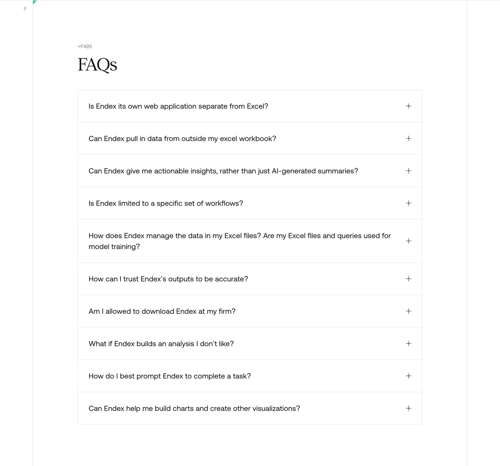
  355. Endex FAQ section: serif FAQs heading above a bordered accordion list of ten questions with plus icons on white
  356. HappyRobot value proposition section: headline on a taupe background above three benefit cards and a row of four large metrics
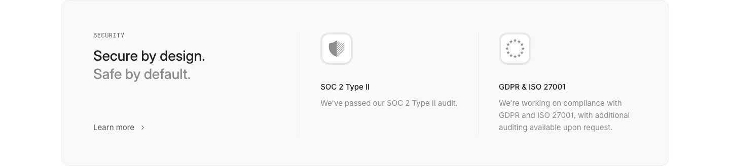
  357. Interfere security section: light gray card with headline left and SOC 2 and GDPR/ISO compliance columns with icons
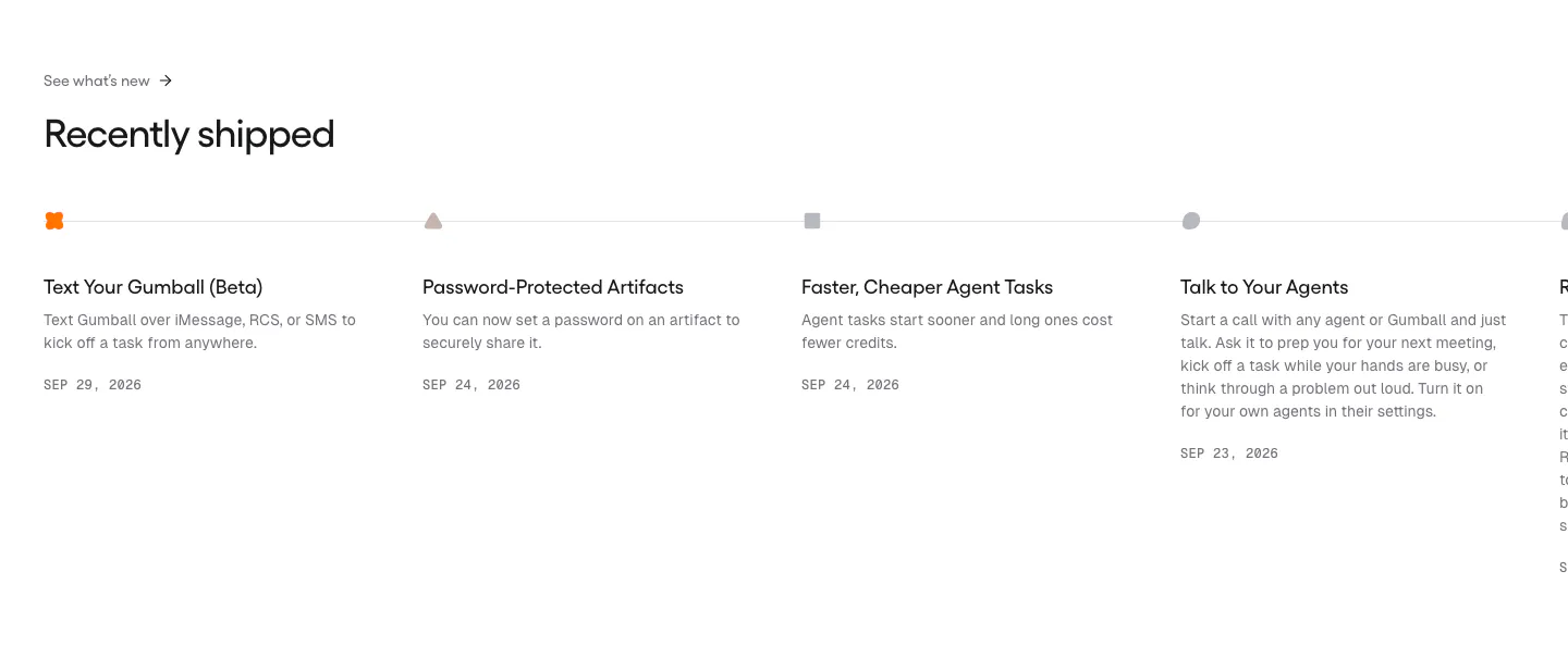
  358. Gumloop blog & resources section: changelog timeline of dated release entries running off the right edge
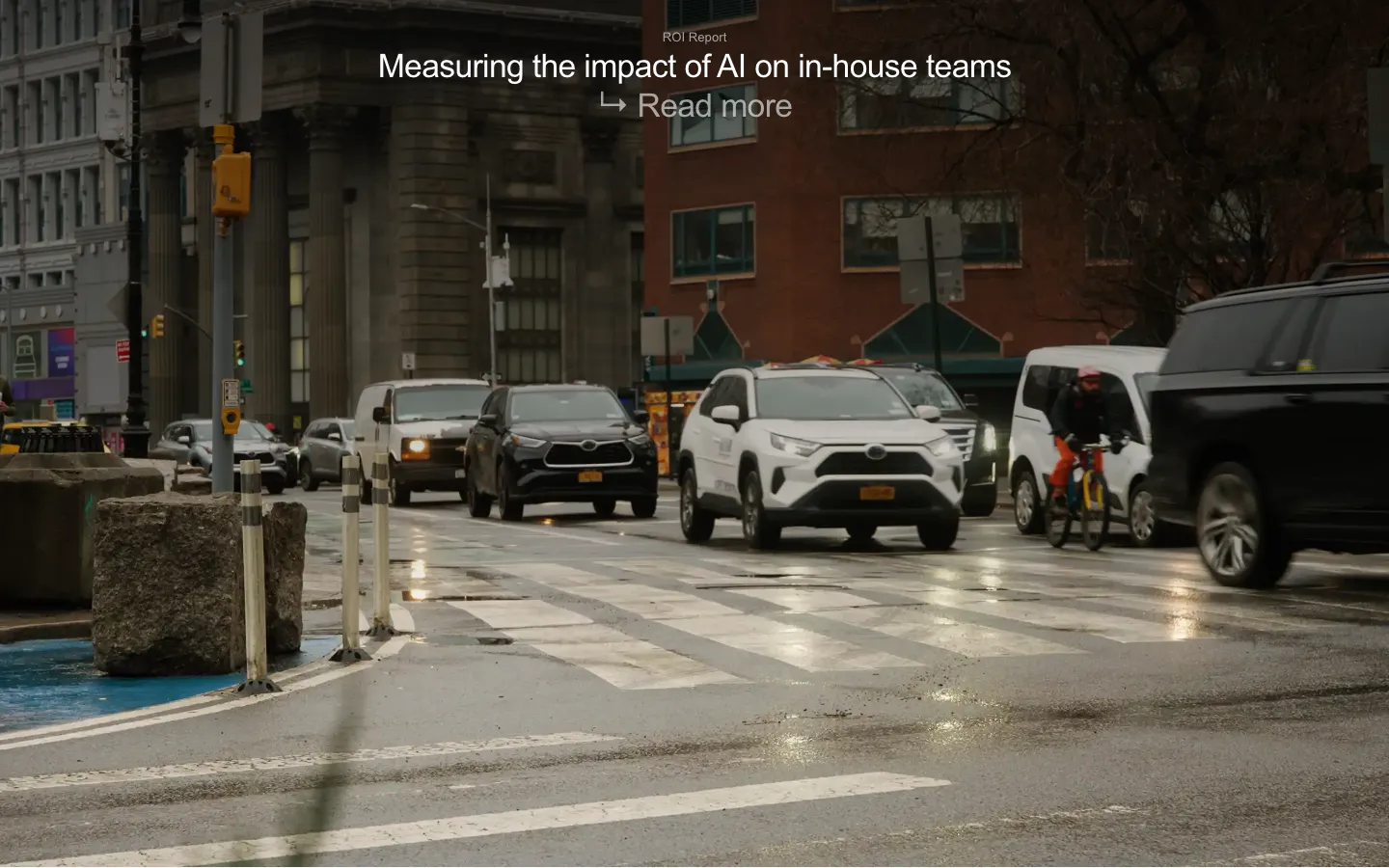
  359. Legora blog & resources section: ROI report title and read more link over a full-bleed photo of a rainy city street
  360. Amplemarket features section: centered headline above a product video card and a 2x2 bento of UI cards with hand-drawn doodles
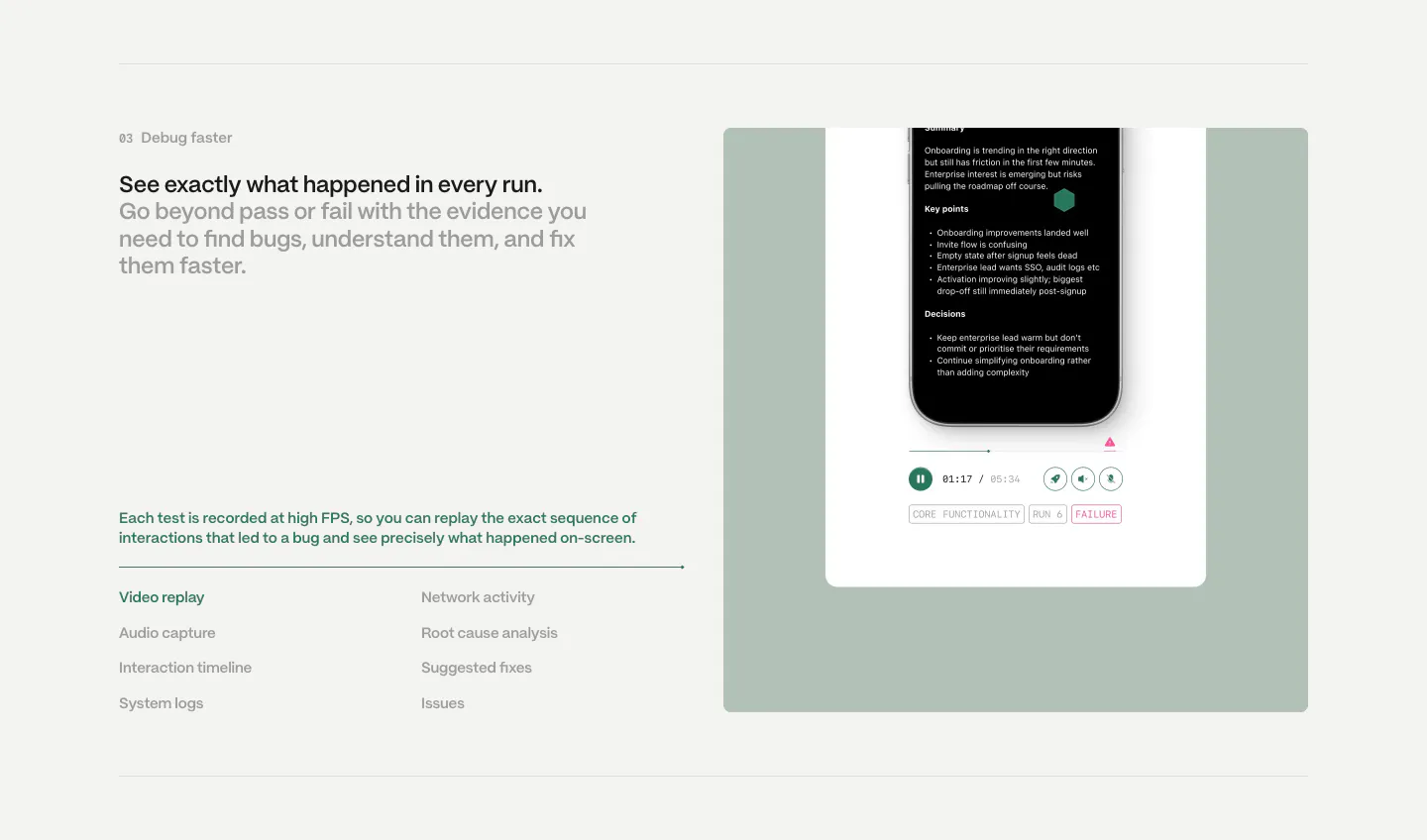
  361. Semaloop features section: numbered headline and feature list on the left beside a sage green panel with a phone test replay player
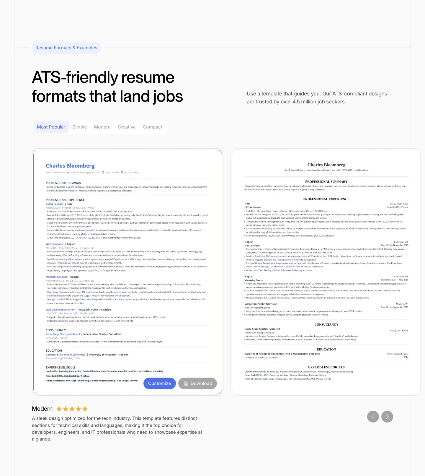
  362. Ploy use cases section: headline on the left with stacked accordion-style cards for Enterprise, Agencies and Startups on the right
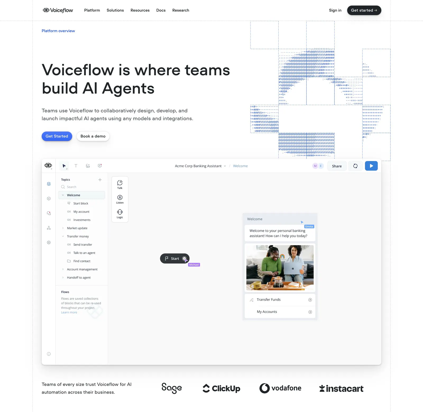
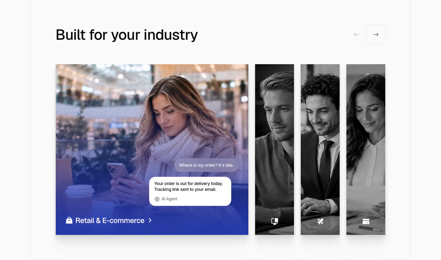
  363. Voiceflow hero section: left-aligned headline with ASCII-art graphic, an agent builder canvas screenshot and a logo strip on white
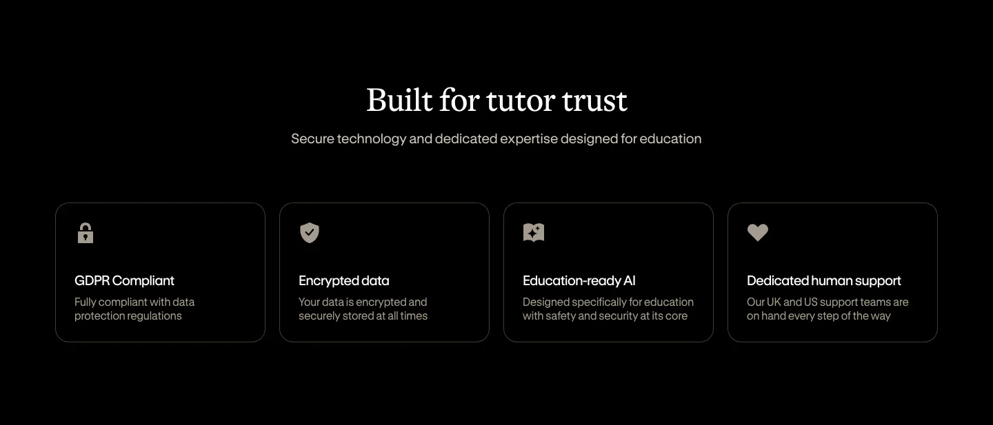
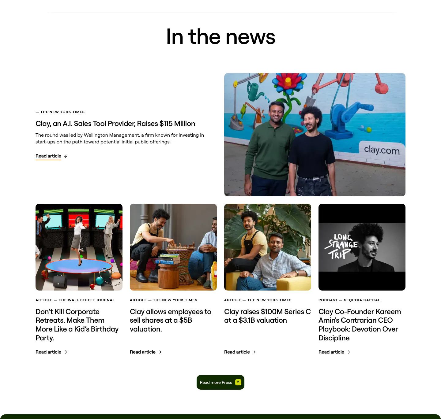
  364. Bobbin security section: centered serif heading above four outlined cards for GDPR, encryption, AI and support on black
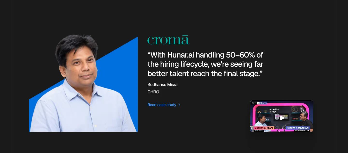
  365. Hunar testimonials section: dark background with an executive photo on a blue shape, Croma quote and a podcast video thumbnail
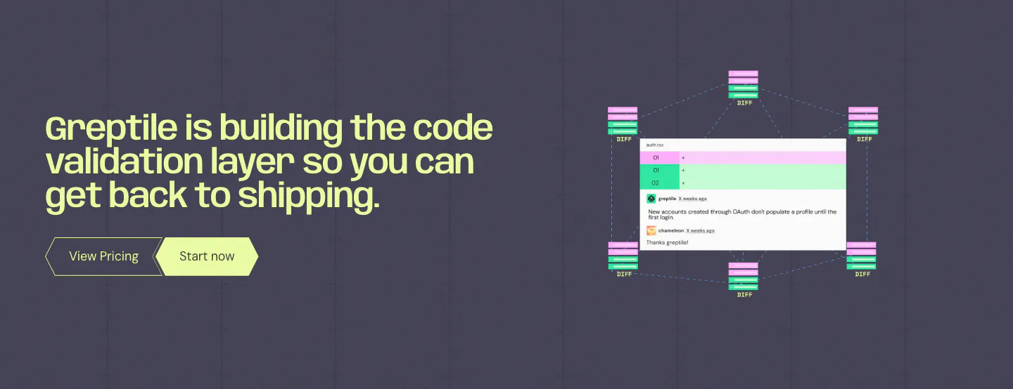
  366. Greptile call to action section: lime headline and two buttons on the left, code review comment UI with diff nodes on the right
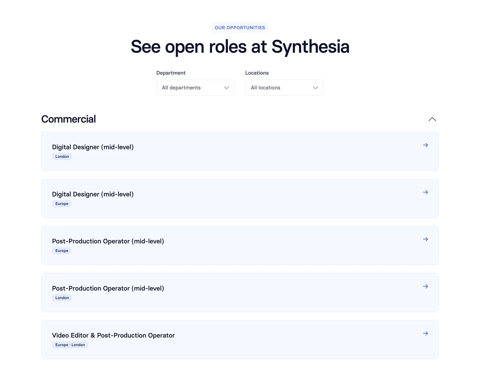
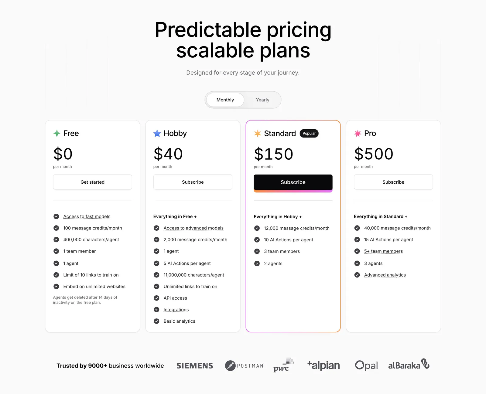
  367. Synthesia careers section: centered headline with department and location dropdowns above a list of open role rows on white
  368. Attio testimonials section: hand-drawn grayscale portrait sketches beside a serif customer quote with company logo and feature links
  369. Rezi features section: resume template gallery with style tabs, two resume previews in a slider with arrows and a rated description
  370. Chatbase use cases section: industry slider with an expanded retail photo card with chat bubbles and narrow grayscale photo cards
  371. Clay blog & resources section: centered heading over a featured press story with founder photo and a row of four photo article cards
  372. NickAI pricing section: heading with monthly/annual toggle, three plan columns with blue highlighted Pro tier and enterprise band
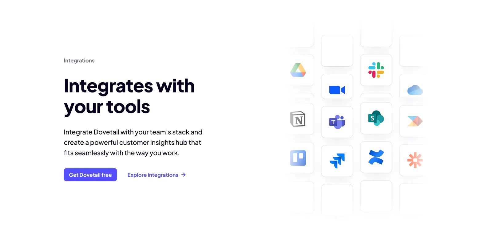
  373. Dovetail integrations section: headline, copy and two CTAs on the left beside a fading grid of app icon tiles like Slack, Notion and Jira
  374. Chatbase pricing section: centered headline and monthly/yearly toggle above four plan cards and a customer logo row
  375. Arke features section: centered serif headline above a dark dashboard screenshot carousel framed by halftone Renaissance figures
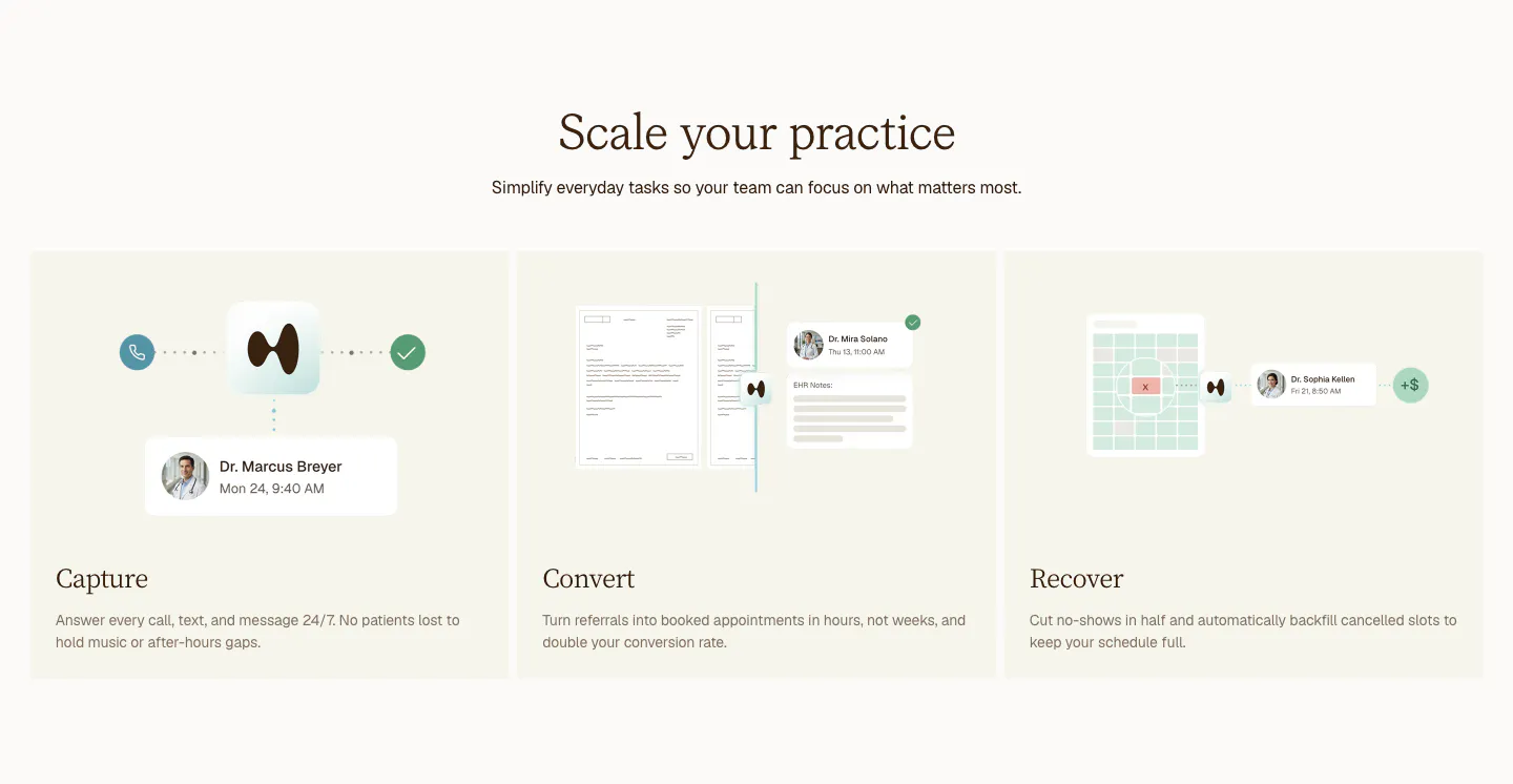
  376. Clarion features section: centered serif headline above three cream cards for Capture, Convert and Recover with light UI mockups
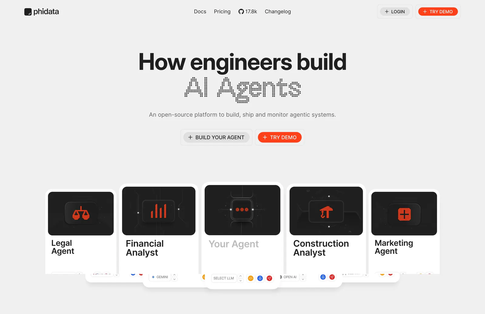
  377. Phidata hero section: centered headline with dot-matrix AI Agents text and two buttons above a row of agent cards on light gray
  378. Rezi call to action section: blue full-width band with a two-tone headline on the left and a white pill button on the right
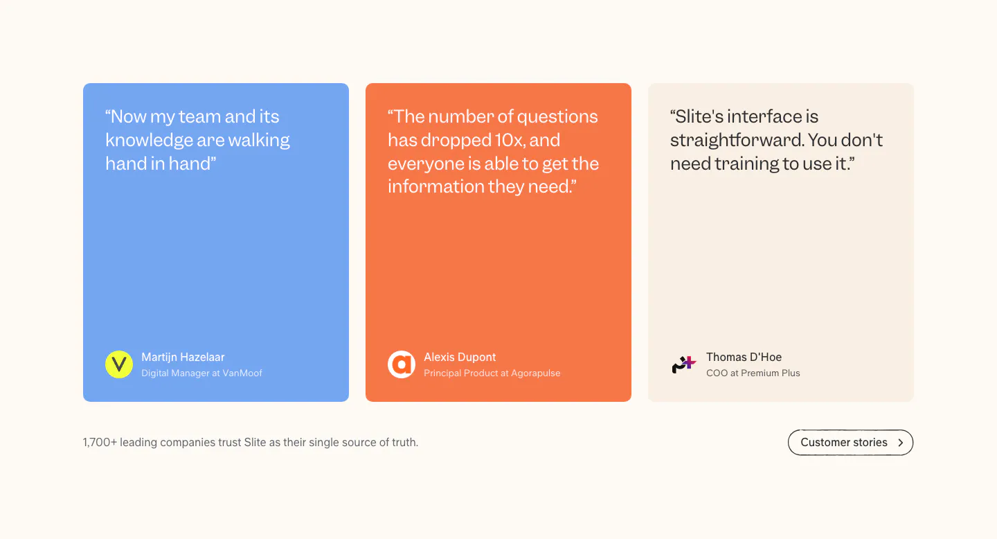
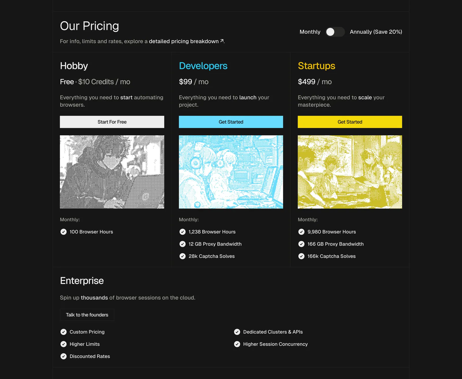
  379. Slite testimonials section: three quote cards in blue, orange and beige with author avatars, plus a customer stories button on cream
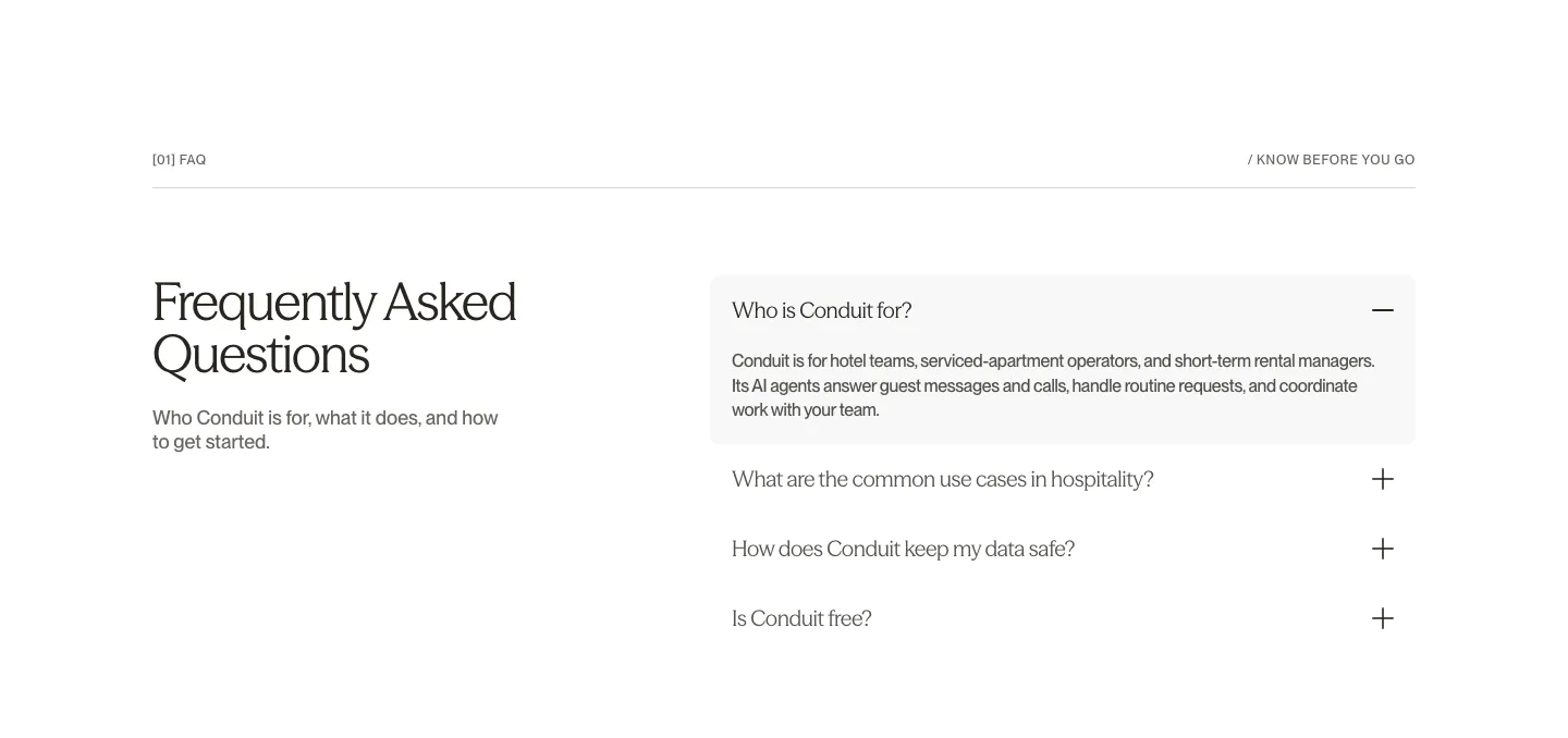
  380. Conduit FAQ section: serif heading on the left beside an accordion with the first answer expanded on white
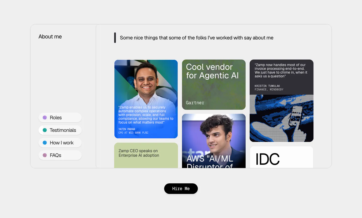
  381. Synthesia call-to-action section: careers banner with headline and blue button left, collage of team photos and chat UI on a pink gradient
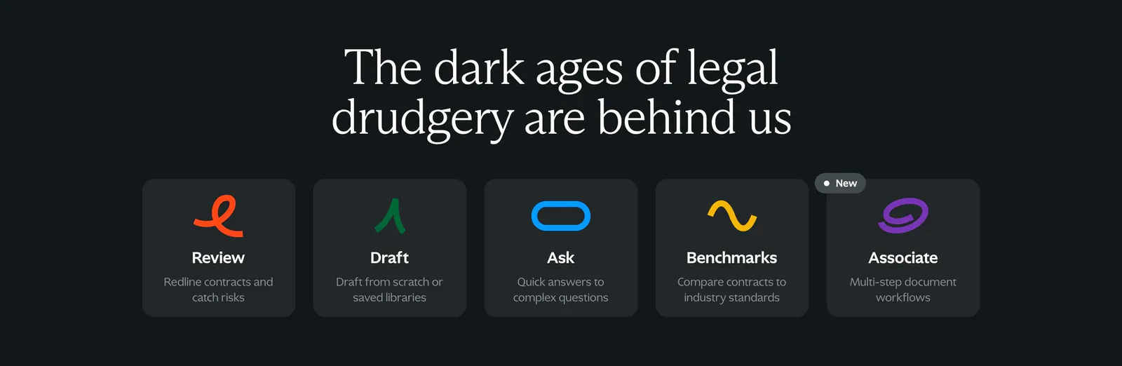
  382. Unlearn footer section: logo mark and mixed sans/serif CTA headline with demo link above link columns and social icons on dark plum
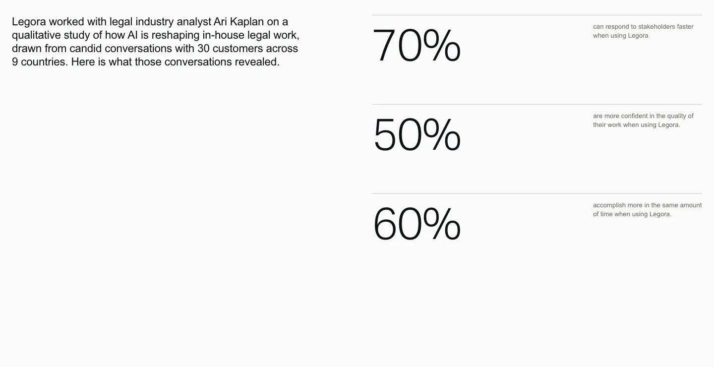
    Unlearn Footer
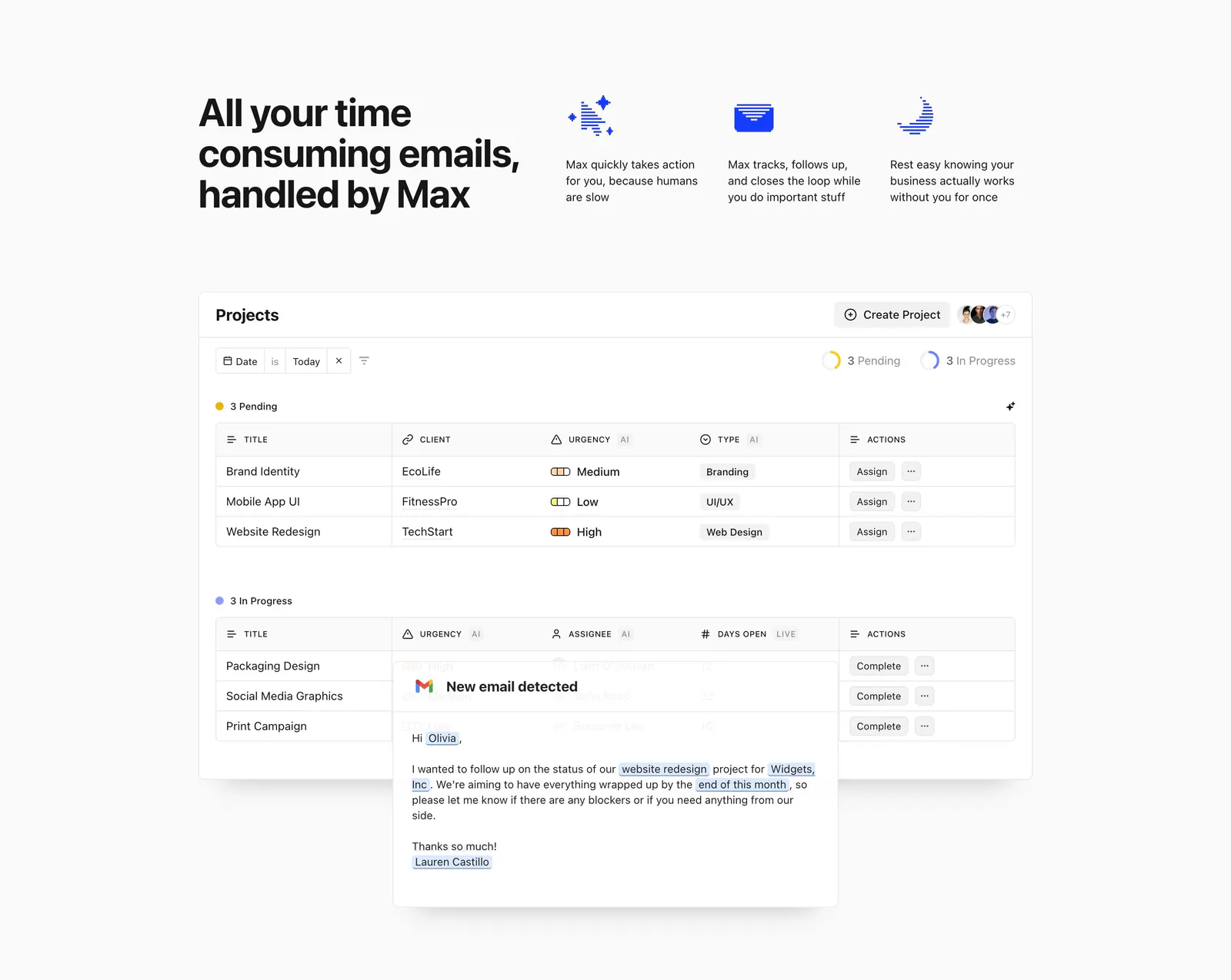
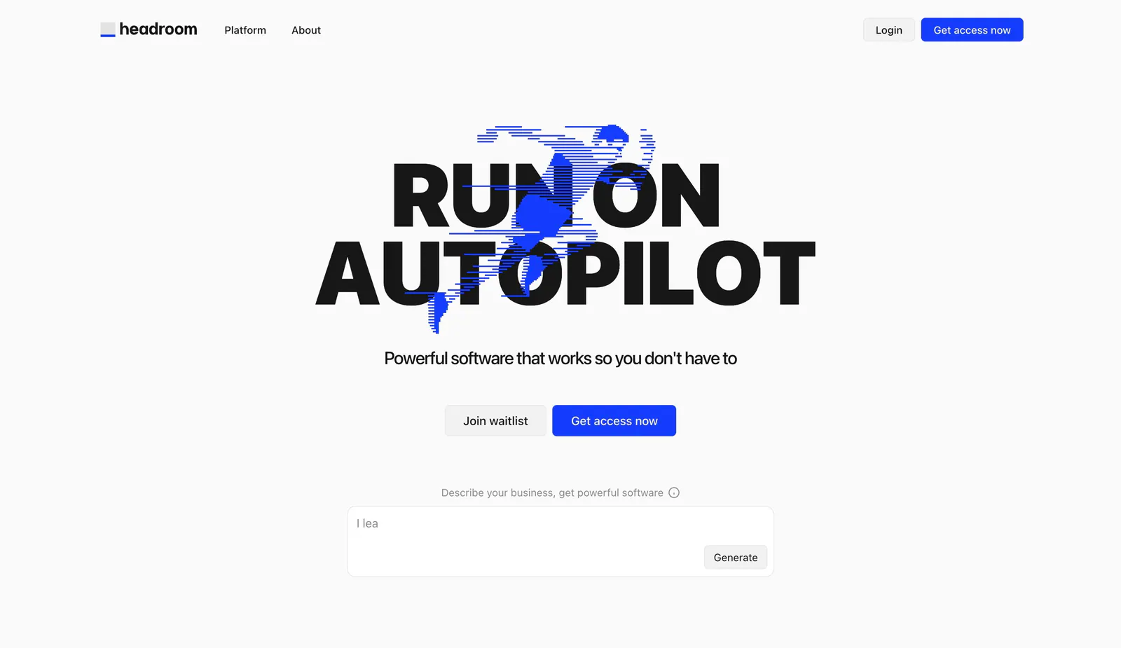
  383. Headroom features section: headline beside three icon benefits above a projects table screenshot overlaid with an email card
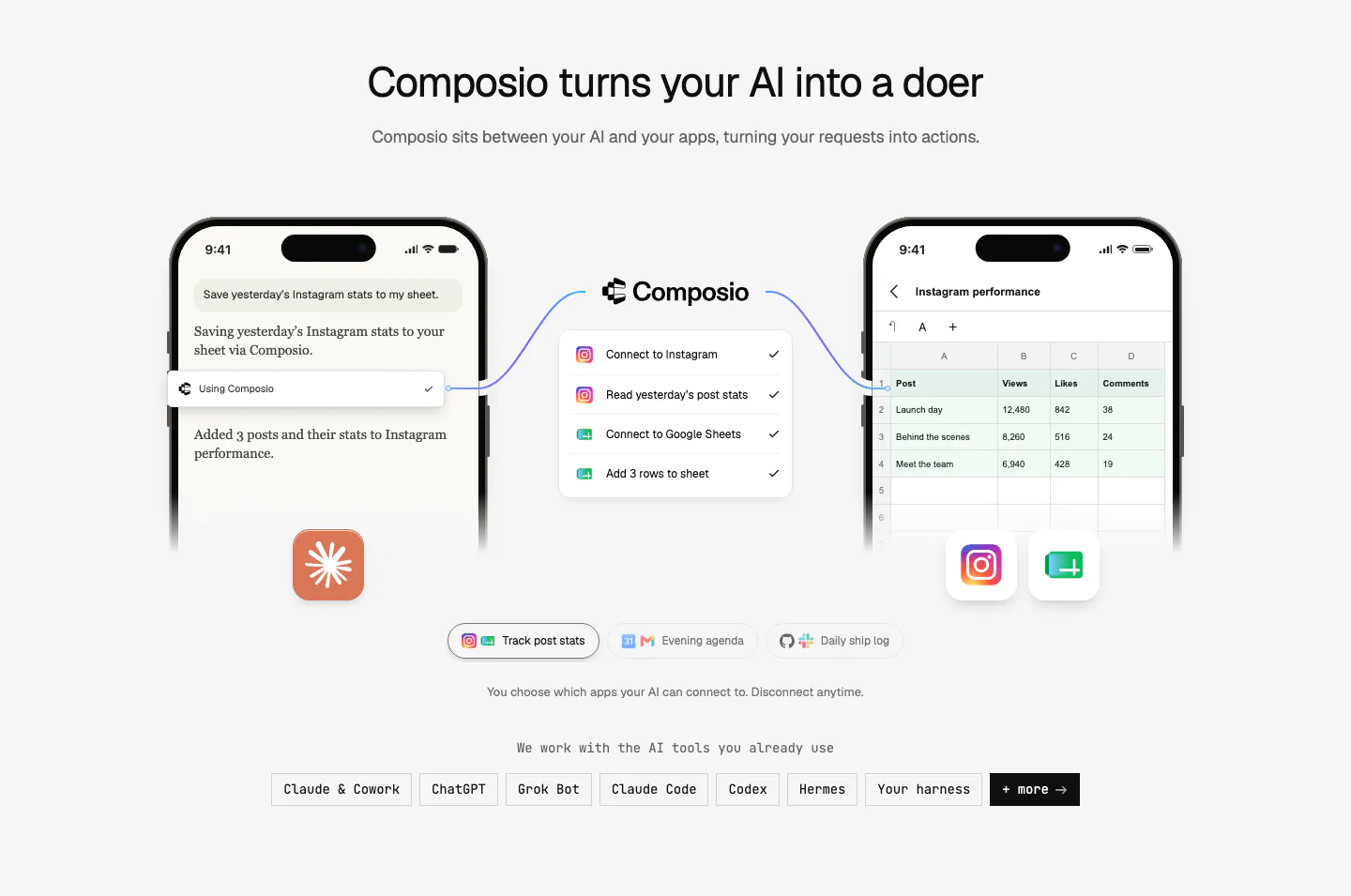
  384. Composio call to action section: single-line headline beside a black Try Composio now button in a slim light gray band
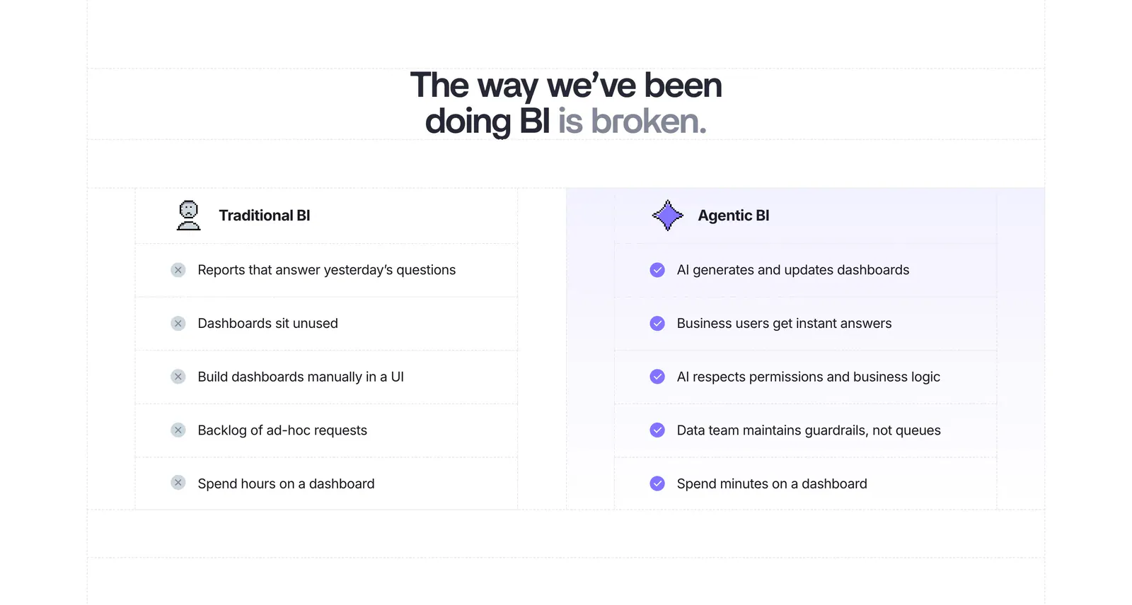
  385. Lightdash comparison section: centered headline above a two-column Traditional BI vs Agentic BI list with cross and check marks on white
  386. Hunar call-to-action section: white card with headline, AI model icons and a demo button on a blue gradient background
  387. Steel pricing section: three plan cards with dithered anime-style images, monthly/annual toggle and an enterprise row on a dark background
  388. Zamp testimonials section: framed panel with side menu and masonry grid of quote cards, analyst badges and portrait photos on light gray
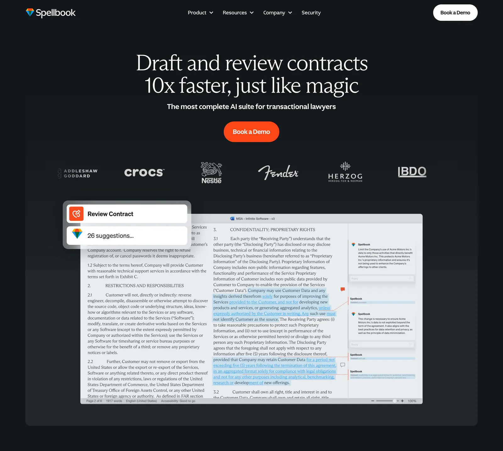
  389. Spellbook features section: centered serif headline above five equal dark cards with colorful squiggle icons on a charcoal background
  390. Legora stats section: intro paragraph on the left and three large percentage figures with small labels stacked right on light gray
  391. Lovable logo cloud section: two-column grid of brand logos like adidas, NVIDIA and asana beside a heading, copy and Learn more button
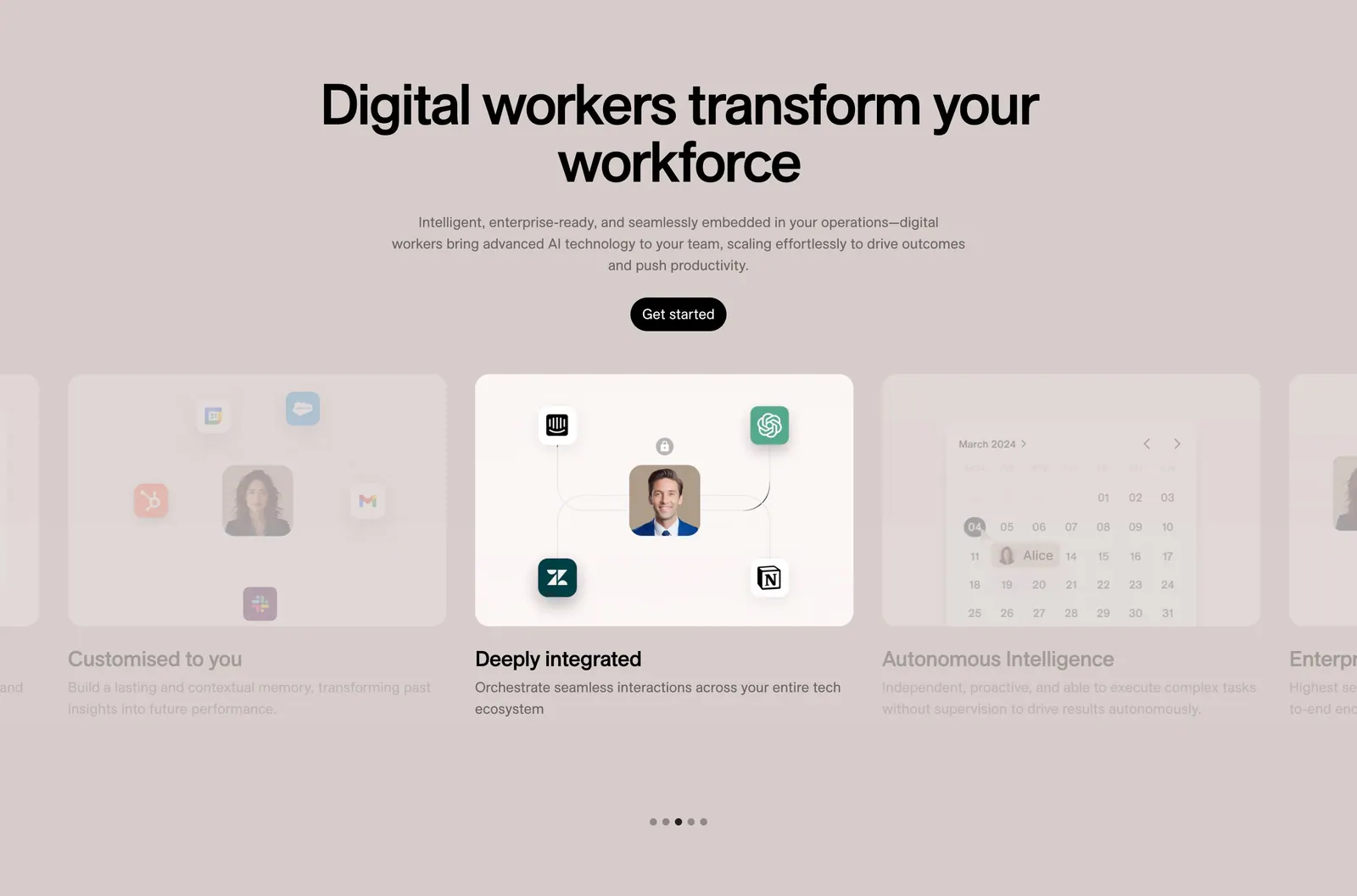
  392. Fin call-to-action section: two-tone serif headline with trial and demo buttons over a glowing aurora on a dark background
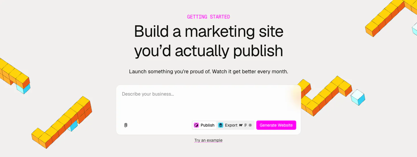
  393. Relume call-to-action section: centered headline and AI prompt box with a pink Generate Website button, framed by yellow isometric voxel shapes
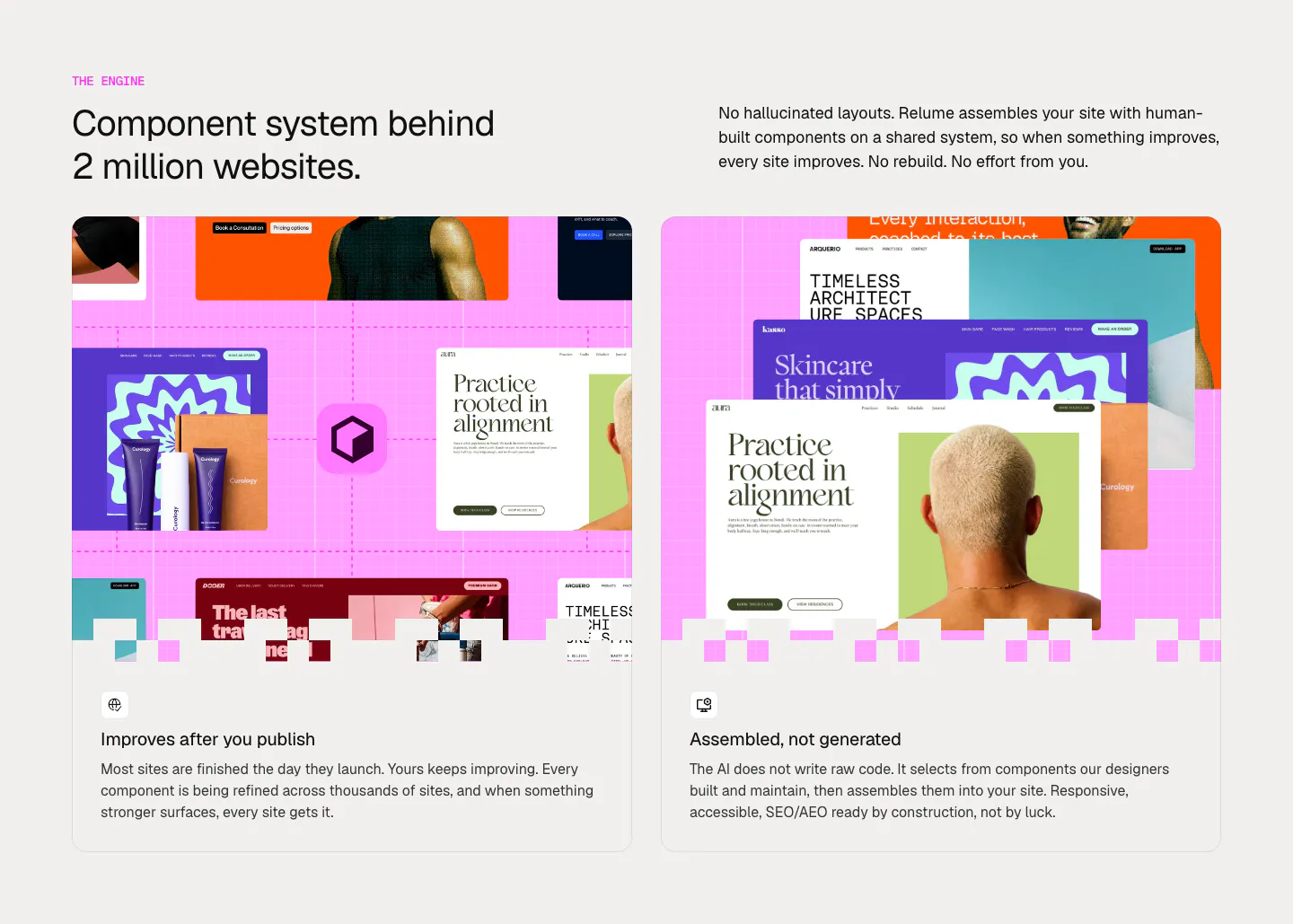
  394. Rogo integrations section: centered serif headline inside a ring of colored data provider app icons fading to light blue
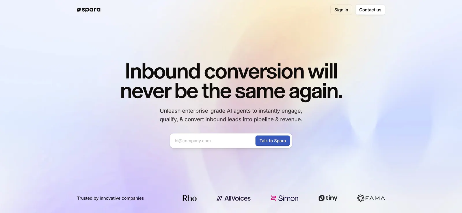
  395. Spara hero section: centered headline and email form over a soft pastel gradient, with a trusted-by logo row at the bottom
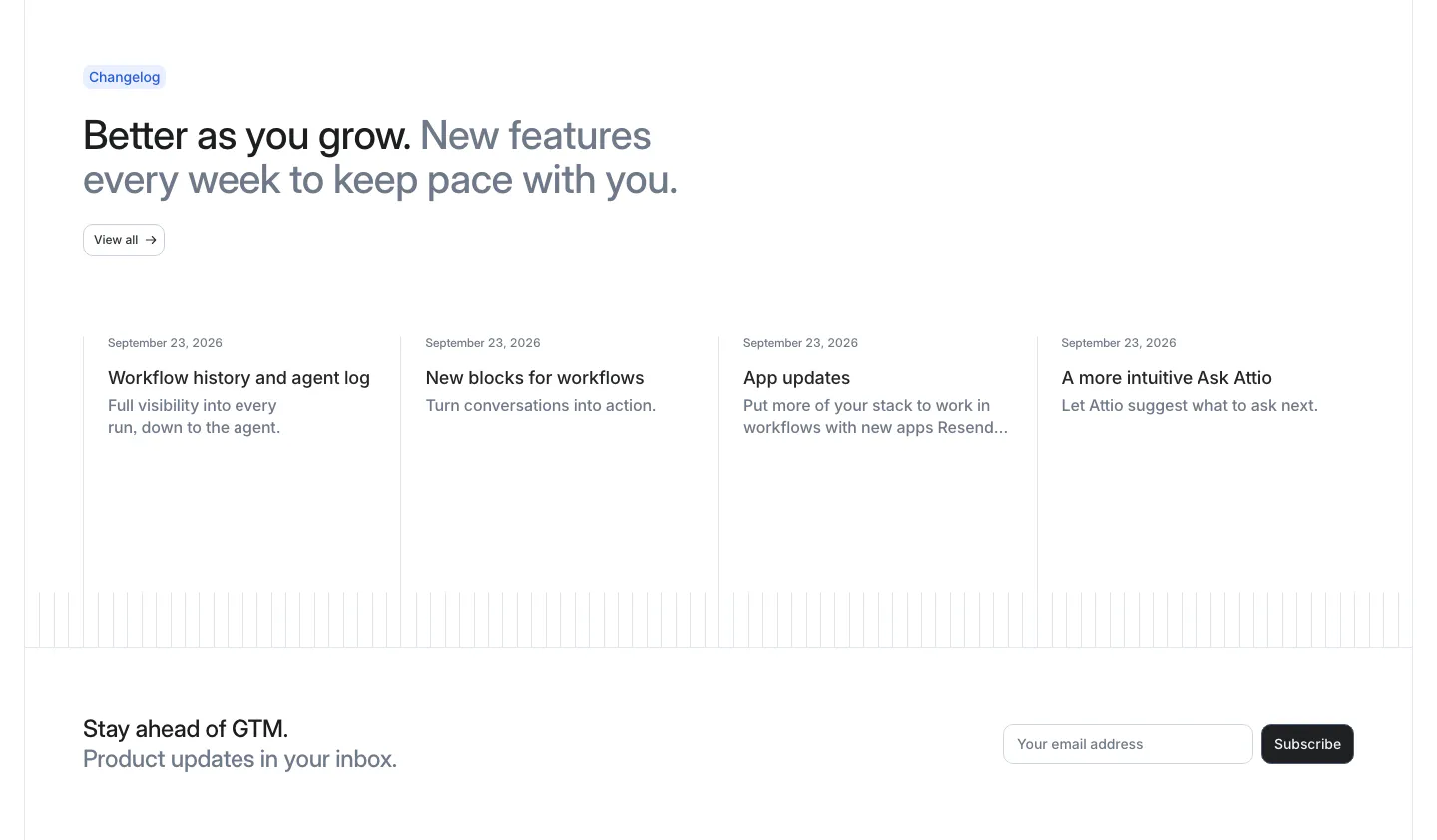
  396. Attio blog & resources section: changelog headline above four dated update columns, with an email subscribe row below
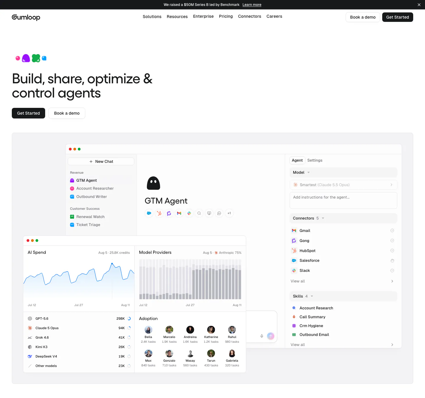
  397. Gumloop hero section: left-aligned headline and buttons above an agent builder and AI spend dashboard screenshot
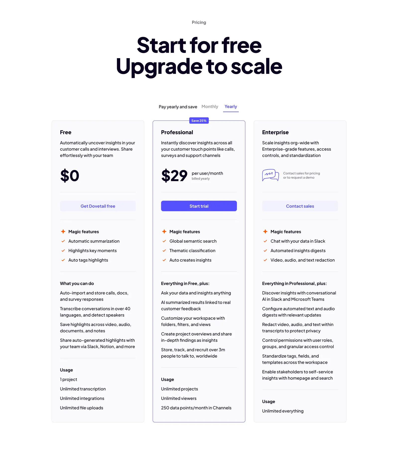
  398. Dovetail pricing section: centered headline, monthly/yearly toggle and three plan cards with the Professional tier outlined in indigo
  399. Rulebase integrations section: centered headline and copy above a fading grid of grayscale app logo tiles like Zendesk, Stripe and Visa
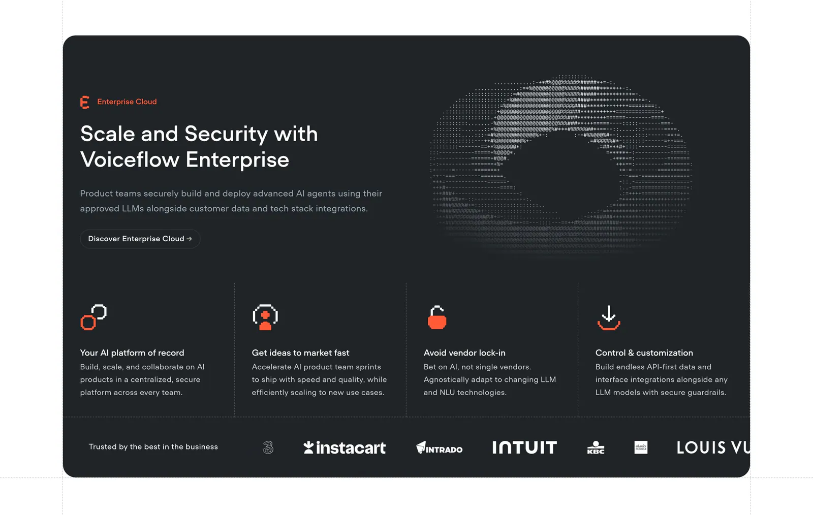
  400. 11x features section: centered headline and button above a card carousel with integration and calendar visuals and dot pagination on taupe
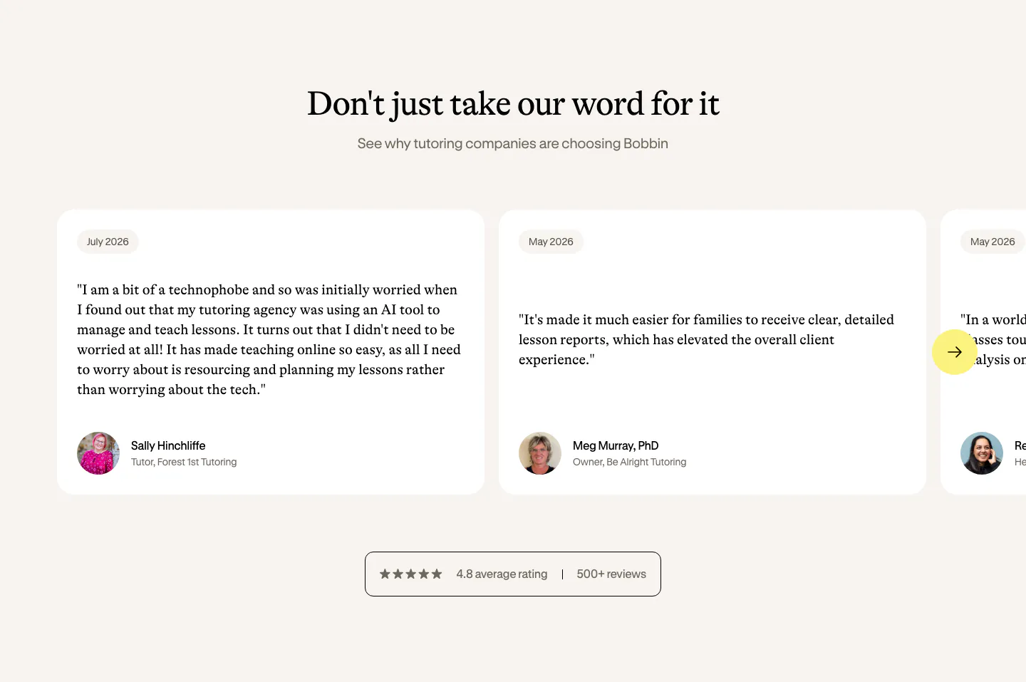
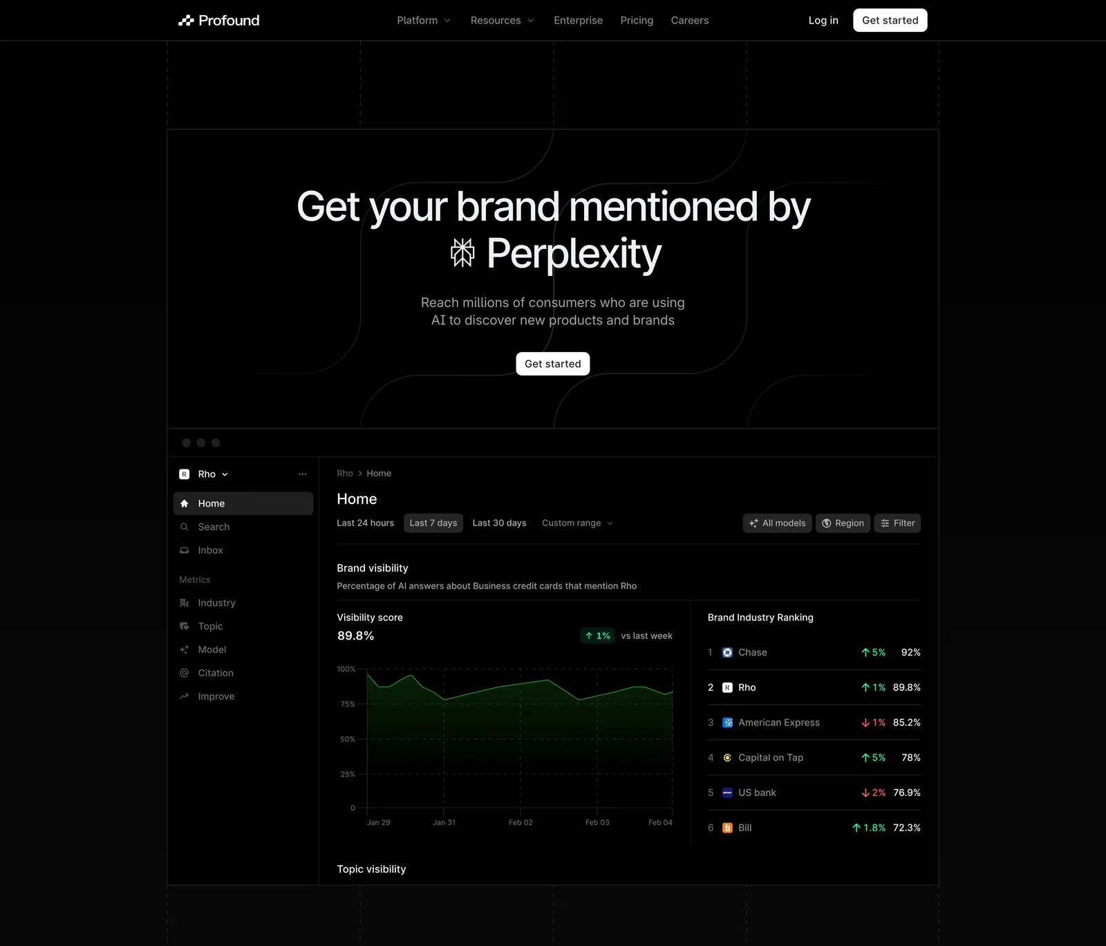
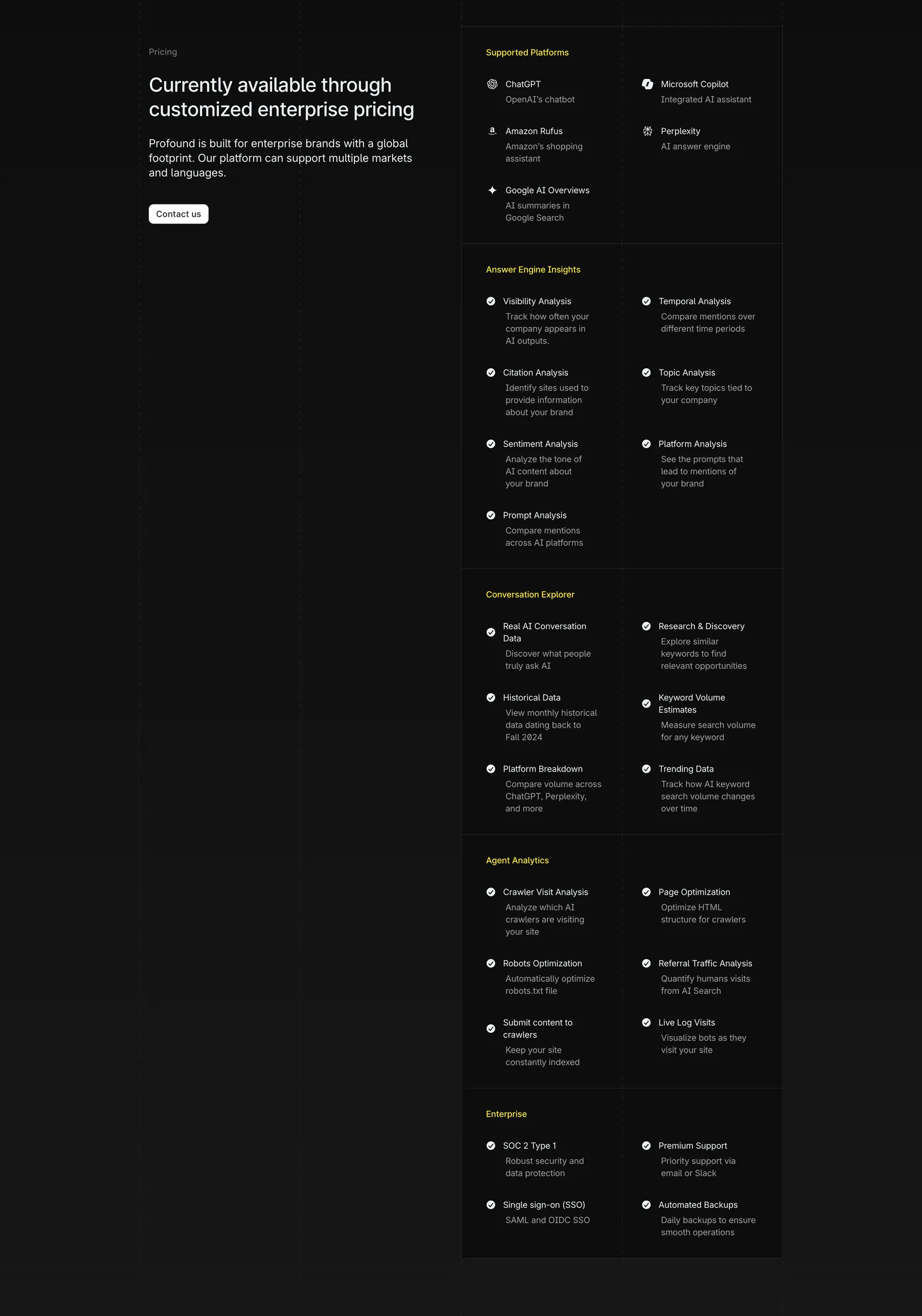
  401. Profound call-to-action section: centered headline and white Get started button on black with faint grid and curved line pattern
  402. Relume features section: headline and intro copy above two cards with collages of website template mockups on a pink grid
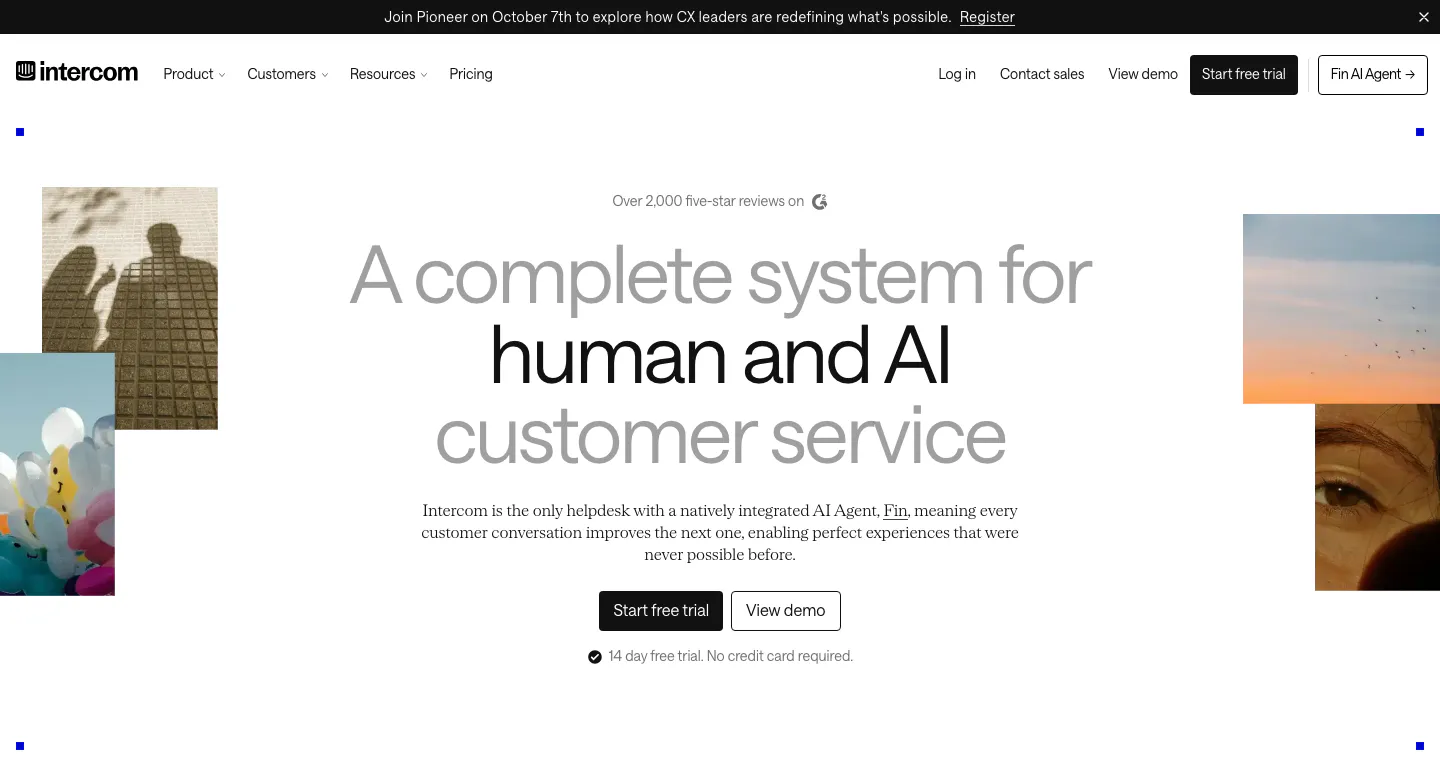
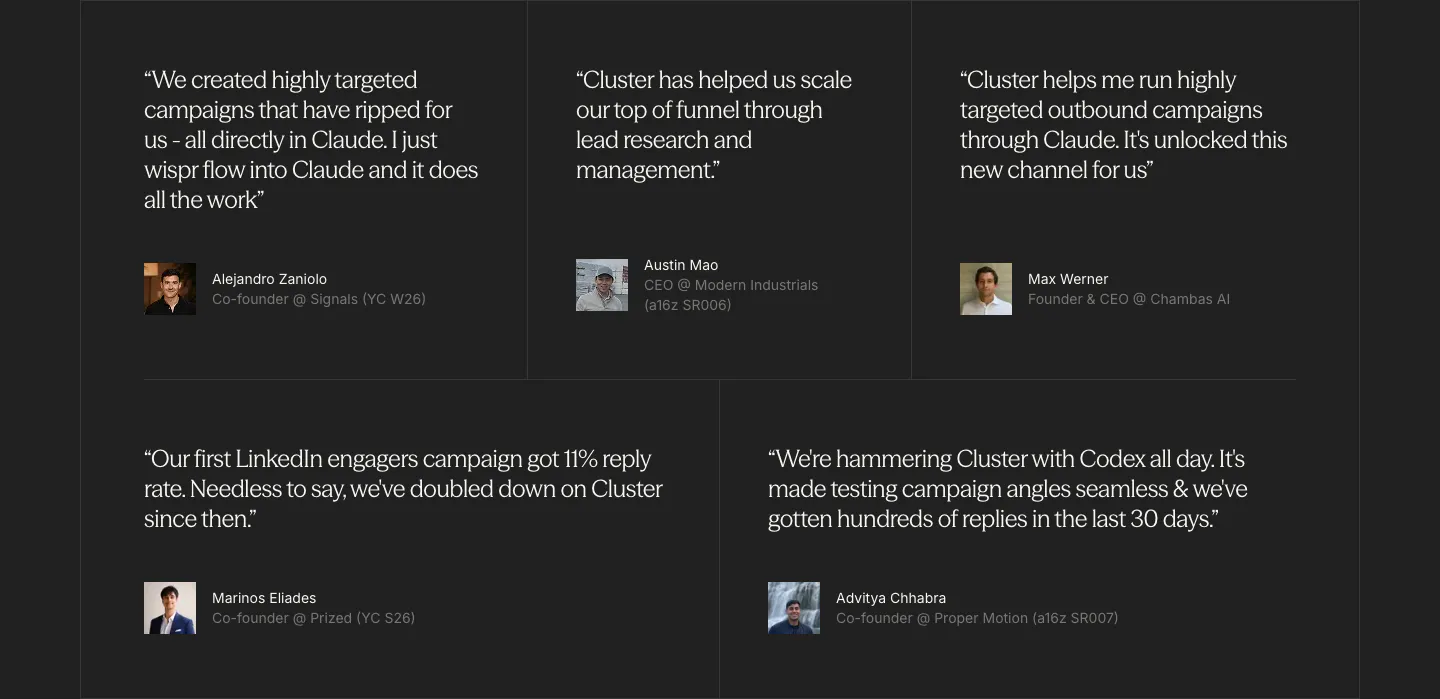
  403. Intercom hero section: centered gray and black headline with two CTA buttons, flanked by cropped photo tiles, below a nav and announcement bar
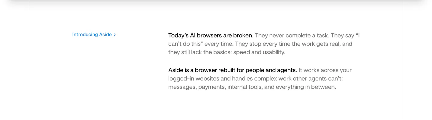
  404. Aside value proposition section: small blue Introducing Aside link at left beside two short intro paragraphs on white
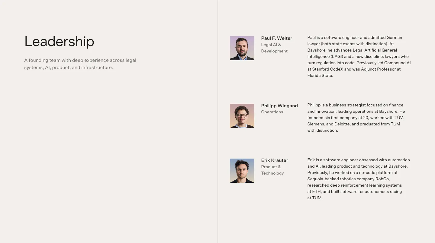
  405. Bayshore team section: Leadership heading left, three founder rows with headshots, roles and bios right on warm off-white
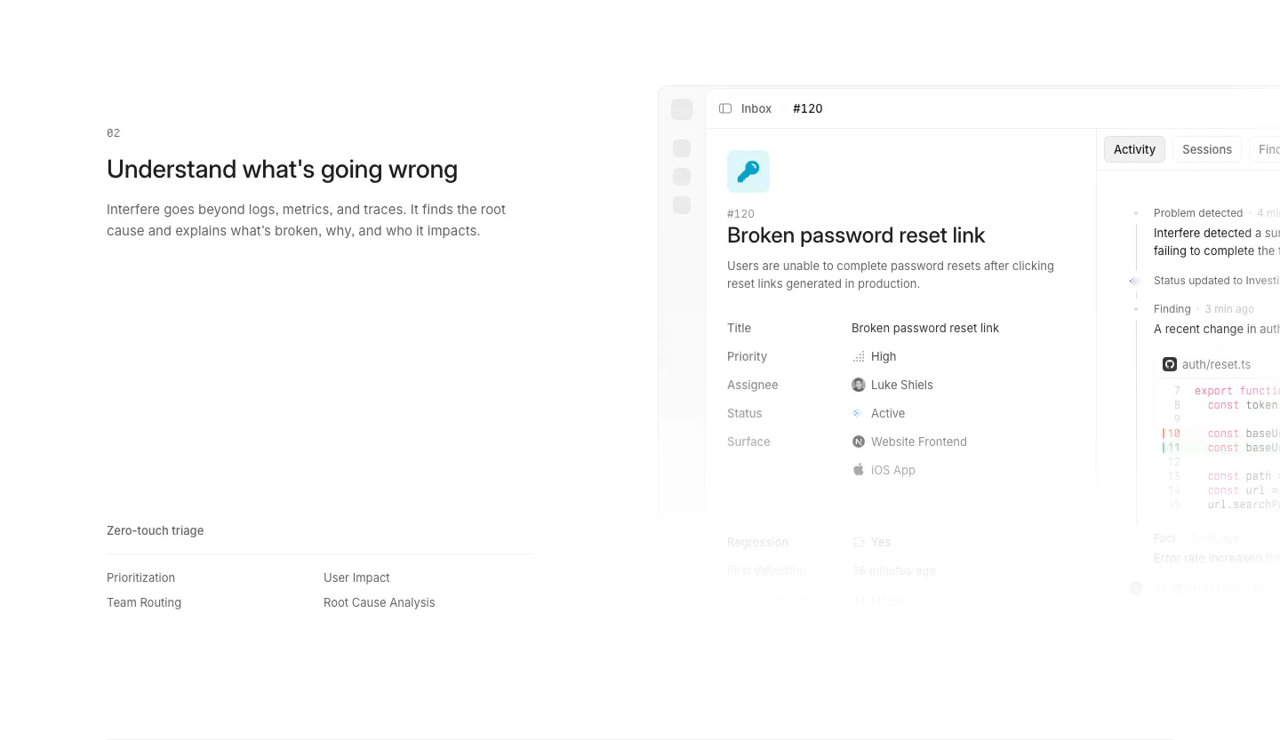
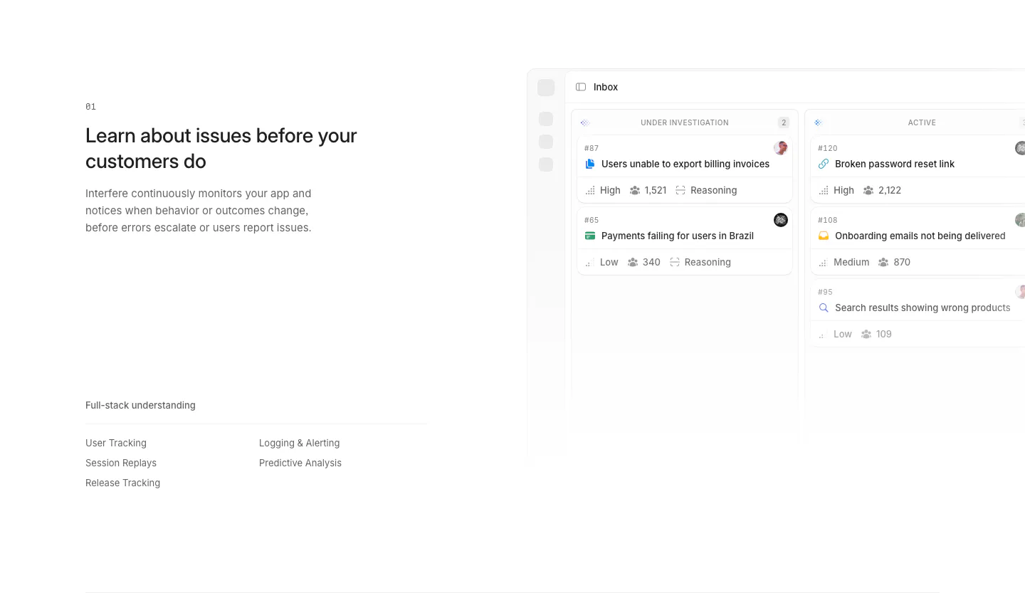
  406. Interfere features section: numbered text block with triage list on the left and an issue detail screenshot on the right
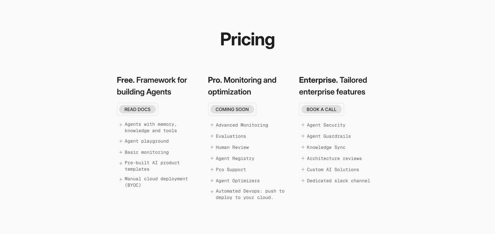
  407. Phidata pricing section: centered Pricing heading above three plain plan columns with buttons and monospace feature lists on light gray
  408. Voiceflow features section: charcoal panel with headline left and ASCII art right, four feature columns and a customer logo strip
  409. Bobbin testimonials section: serif heading above a carousel of white quote cards with avatars and a rating badge on cream
  410. Unsiloed footer section: logo and tagline with Product, Company, Legal, Socials and Resources columns above a grid-line pattern on charcoal
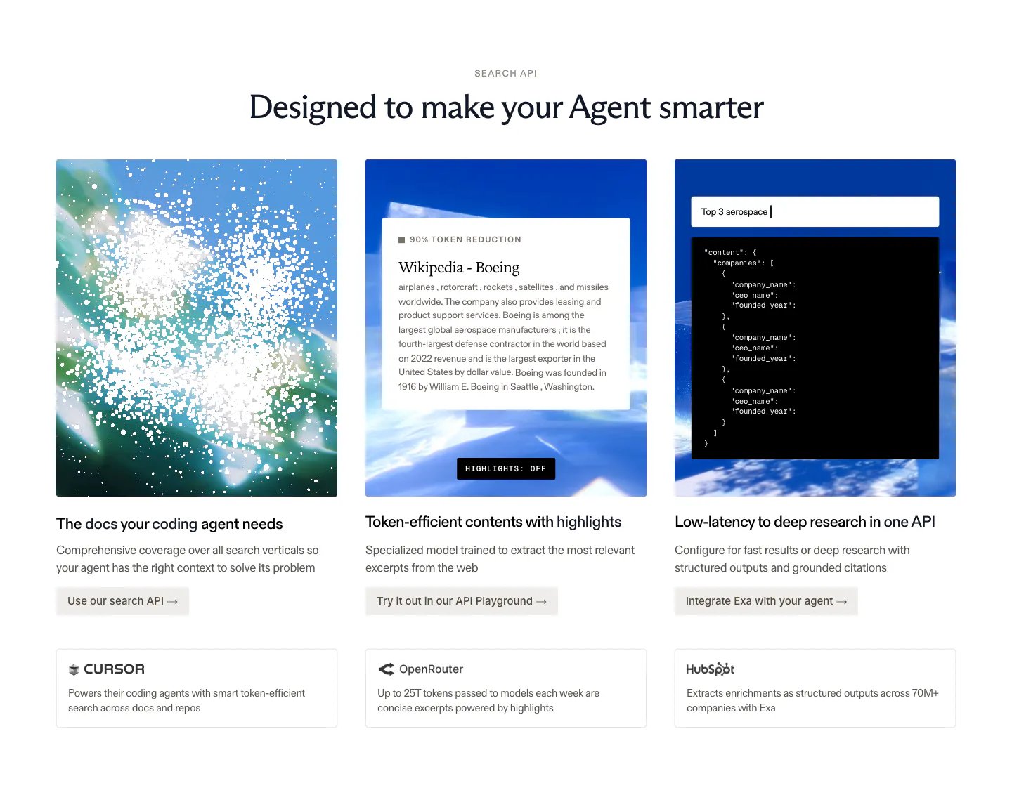
  411. Cluster testimonials section: grid of five serif customer quotes with small avatar photos and titles on a charcoal background
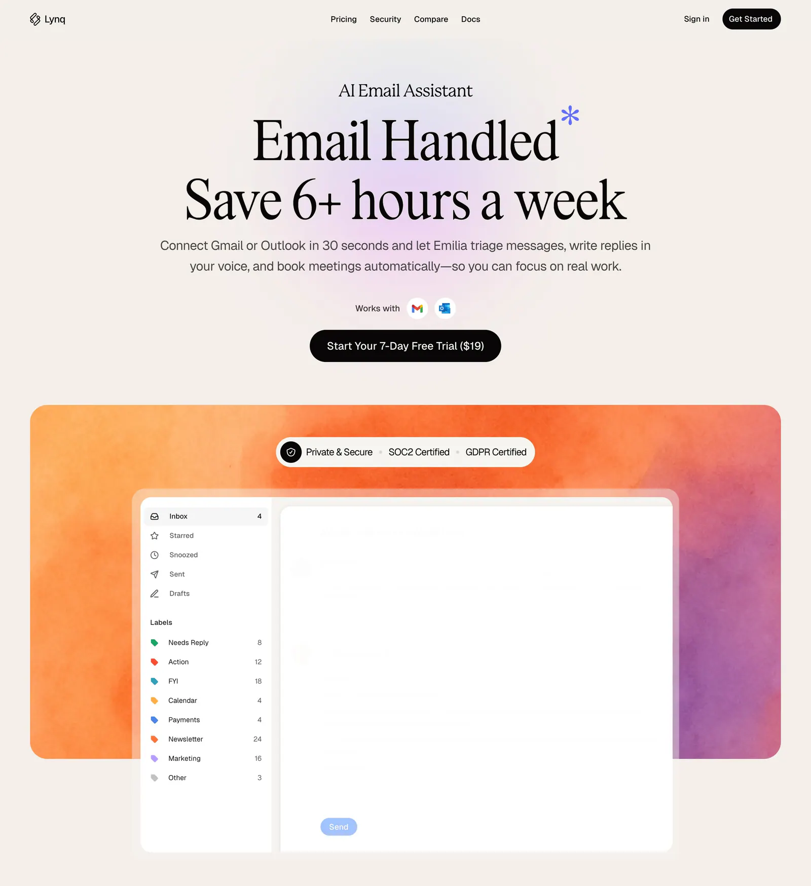
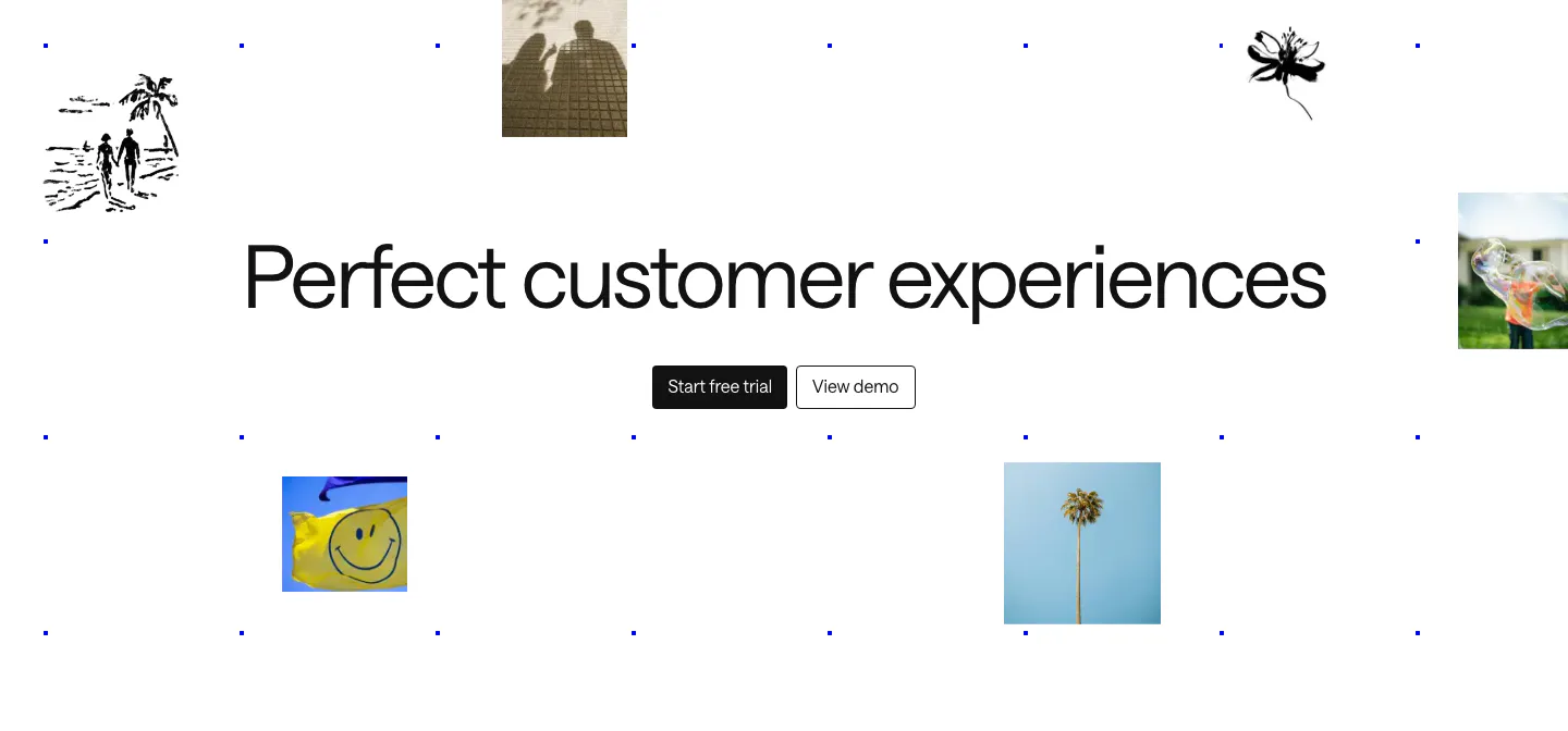
  412. Lynq hero section: centered serif headline and CTA on cream above an inbox UI mockup on an orange-purple watercolor panel
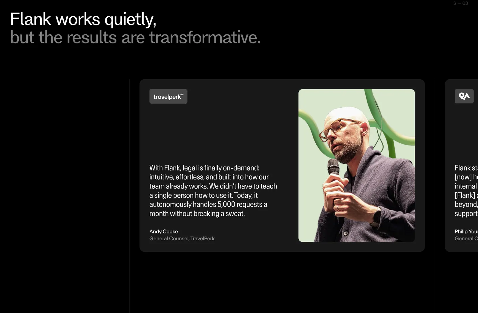
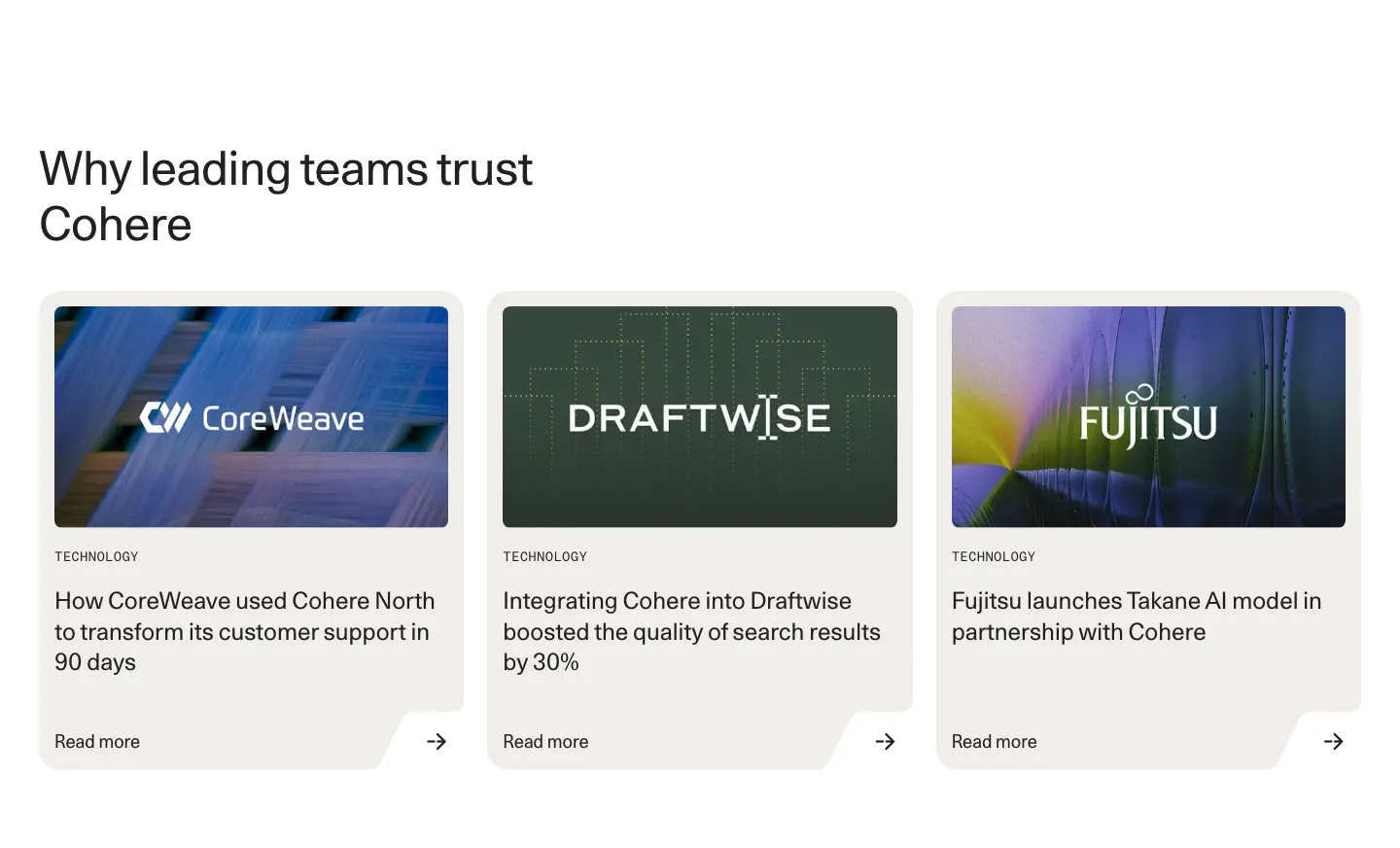
  413. Flank testimonials section: two-tone headline above a carousel of quote cards with a large speaker photo, next card cut off, on black
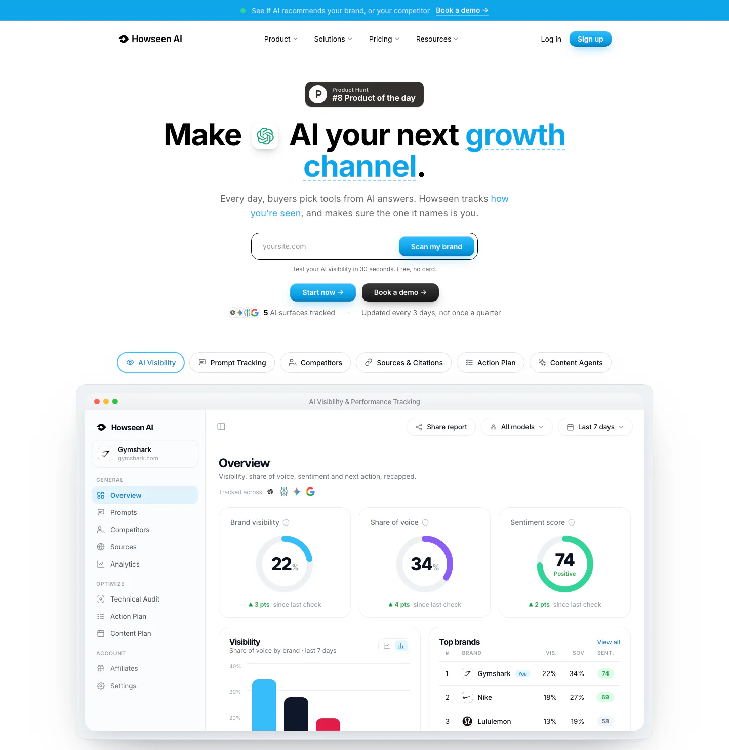
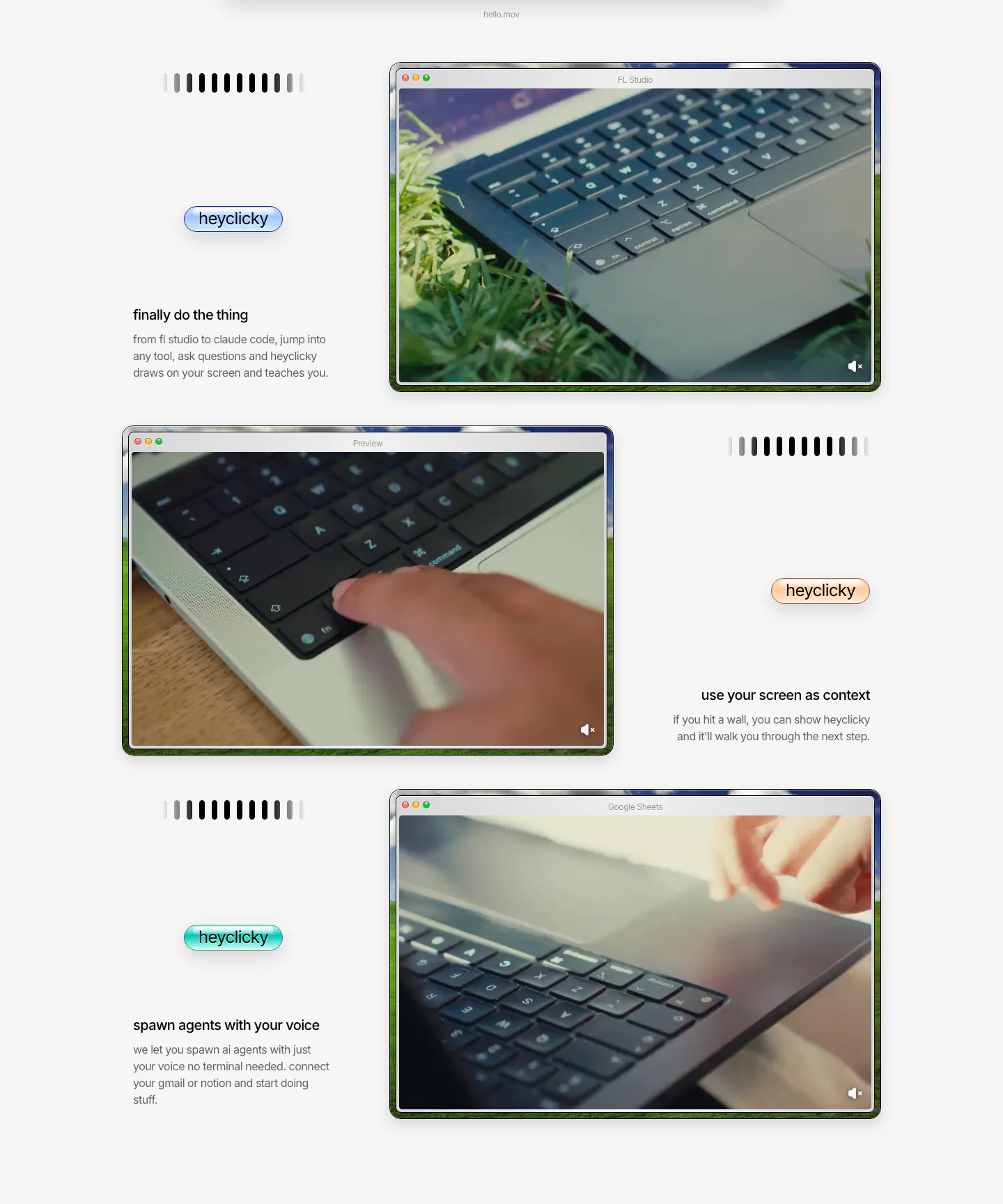
  414. Howseen AI hero section: centered headline with URL scan field and tabs above an AI visibility dashboard screenshot on white
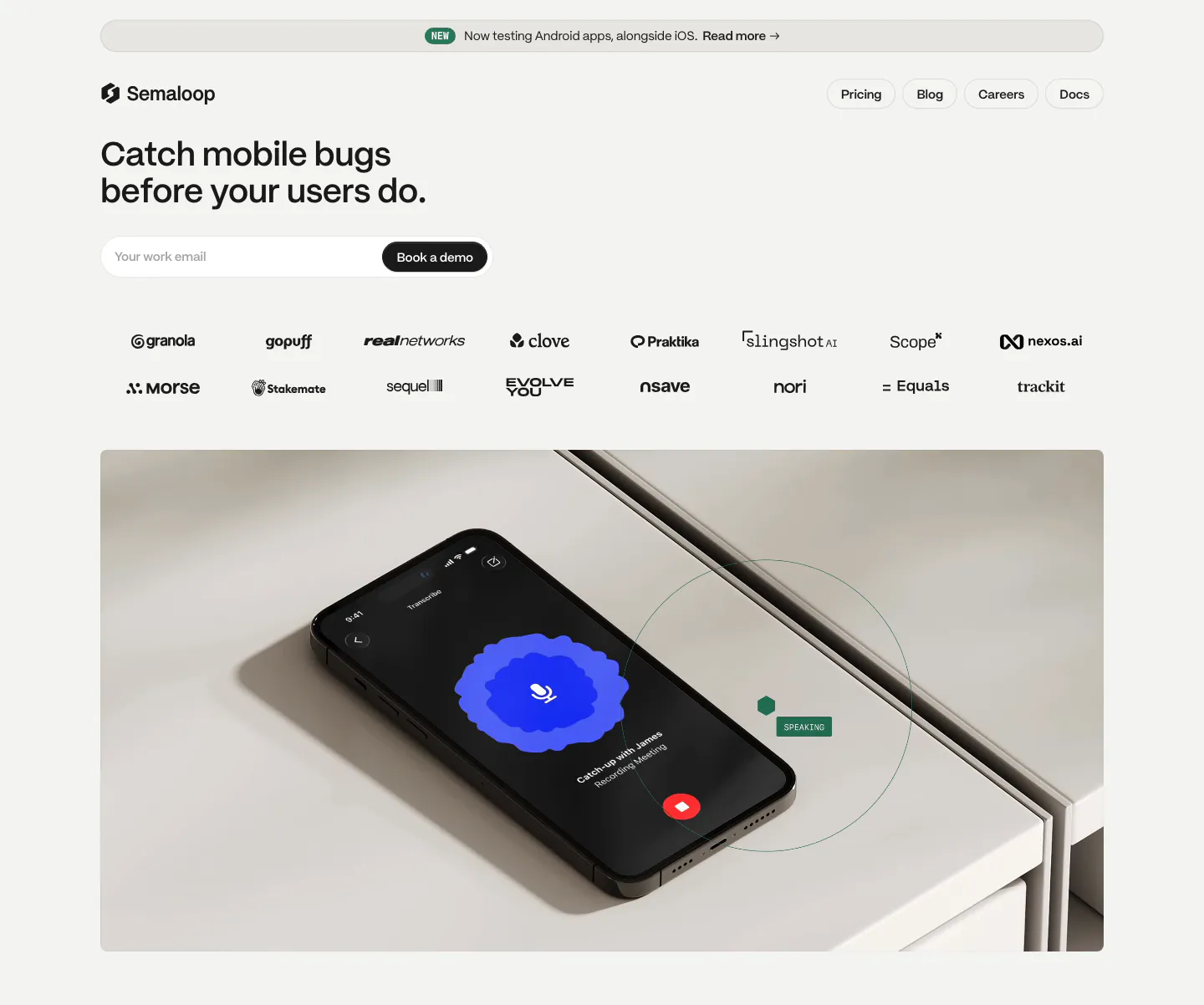
  415. Semaloop hero section: left-aligned headline and email field with demo button above two rows of logos and a photo of a phone on a shelf
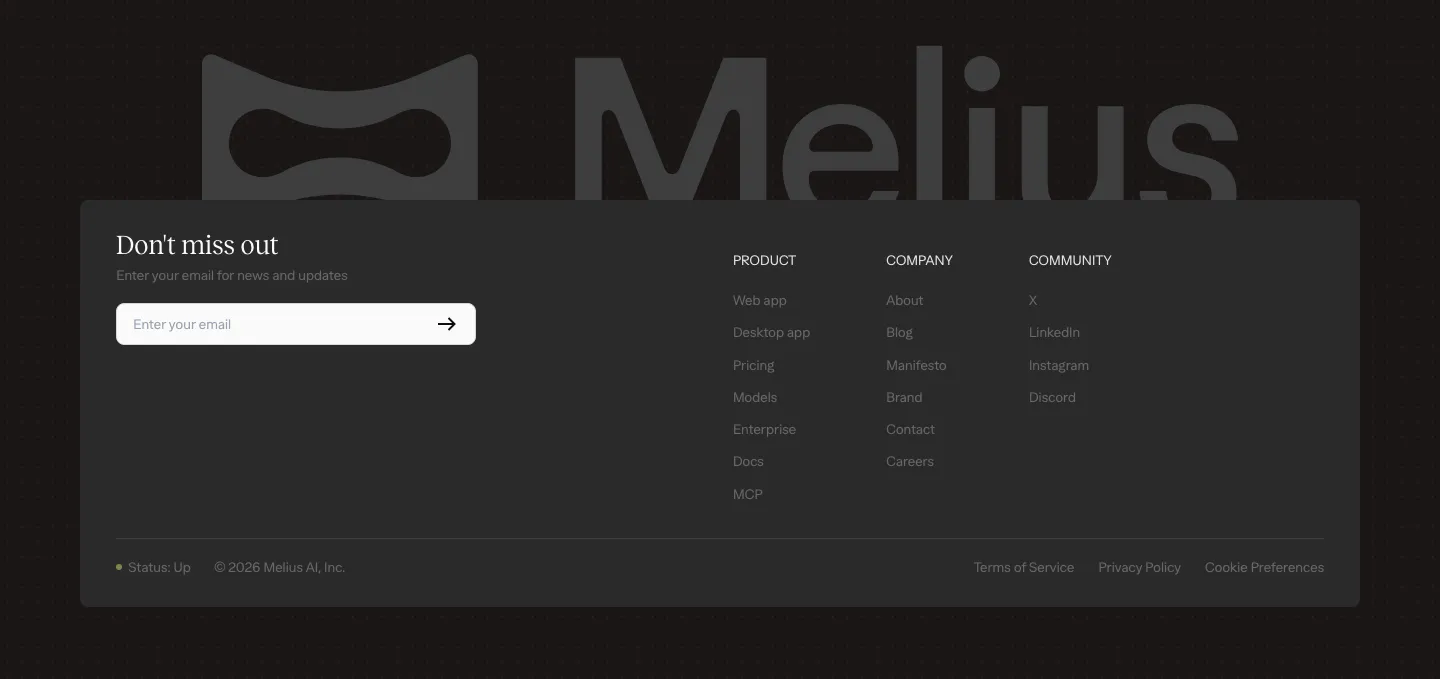
  416. Melius footer section: large gray Melius wordmark behind a dark card with email signup field, three link columns and legal row
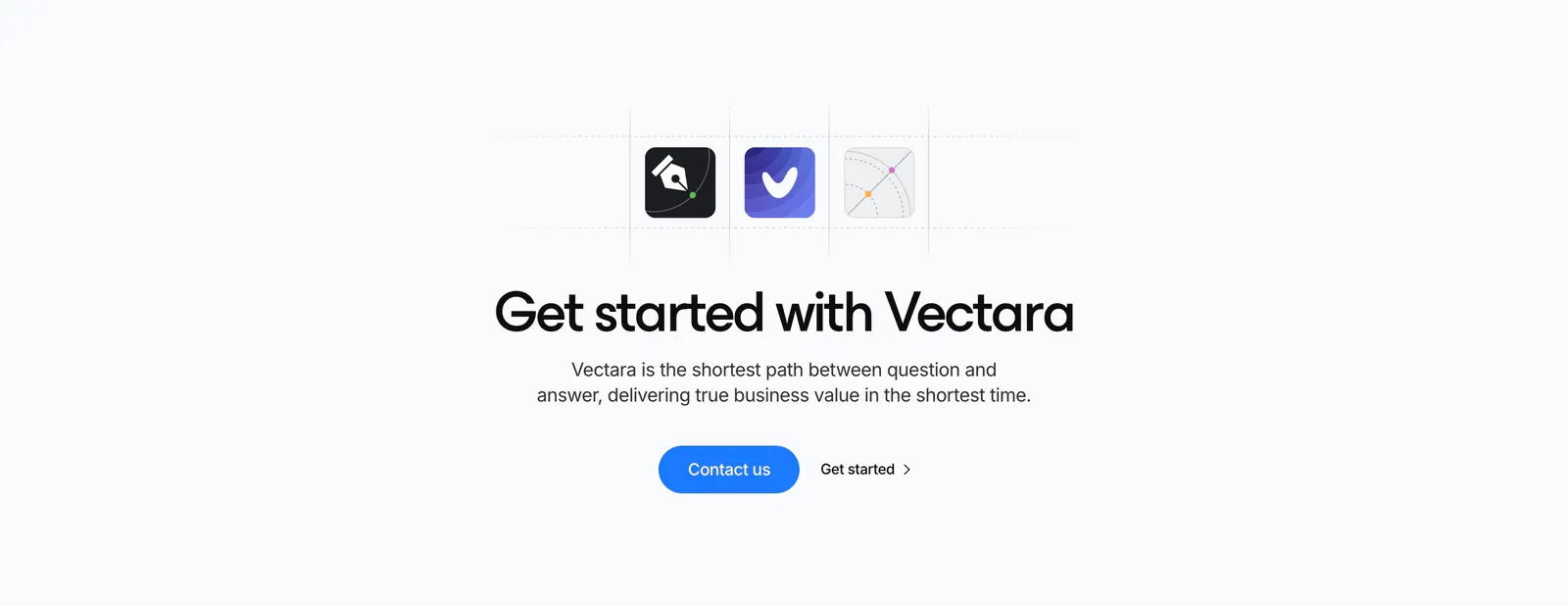
  417. Vectara call-to-action section: three app icons in a dashed grid above a centered headline with blue Contact us button on light gray
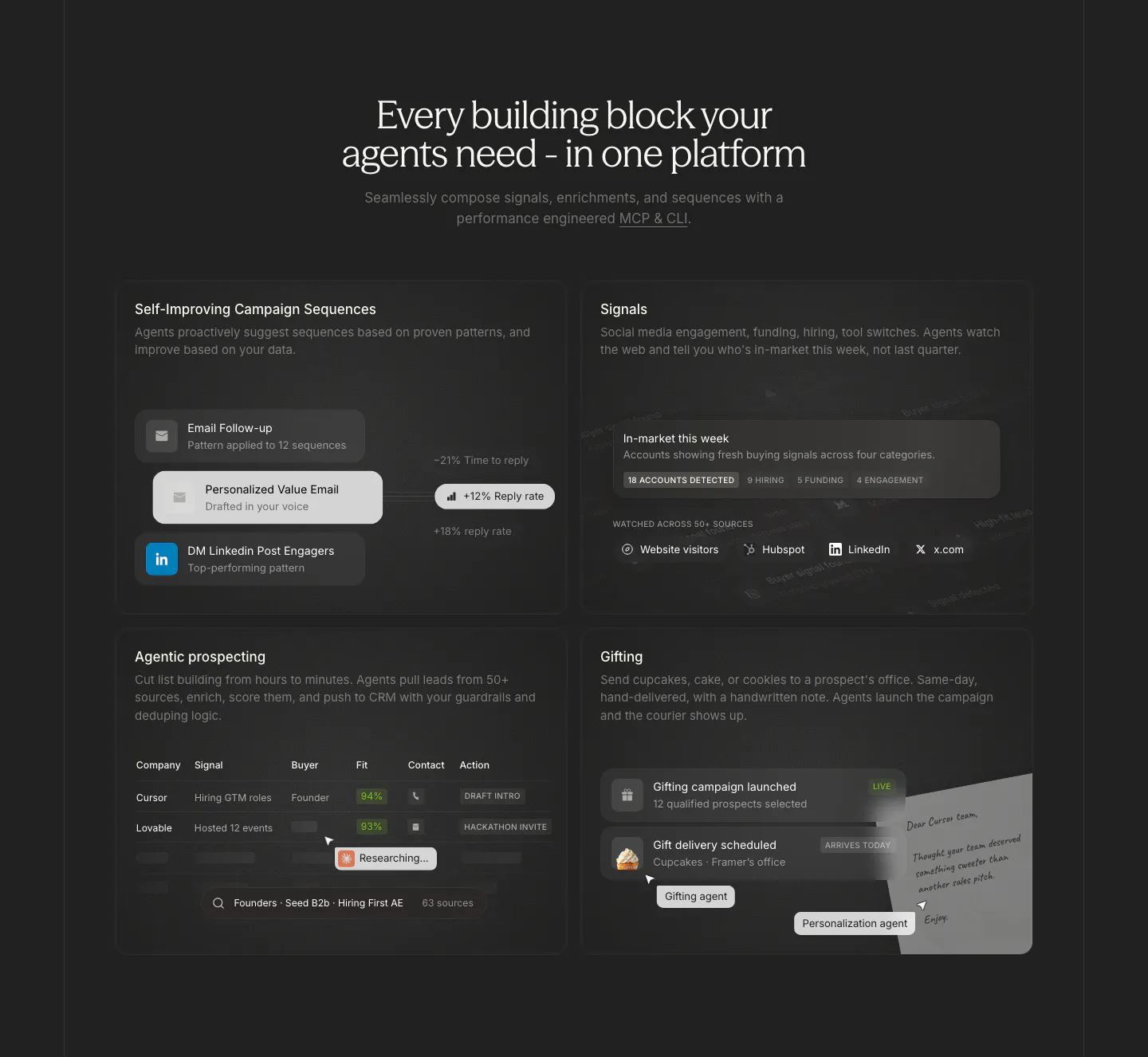
  418. Cluster features section: centered serif headline above a 2x2 grid of dark cards with sequence, signal, prospect table and gifting UI
  419. Exa features section: centered headline over three image cards with sky visuals, a text excerpt and JSON output, plus customer callouts below
  420. Intercom call to action section: large centered headline and two buttons amid scattered photo tiles, ink sketches and a blue dot grid
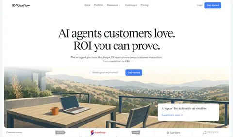
  421. Cohere testimonials section: left-aligned headline above three customer story cards with logo images and read more links
  422. heyclicky features section: three zig-zag rows pairing short captions and colored heyclicky pills with mac-window videos of laptops
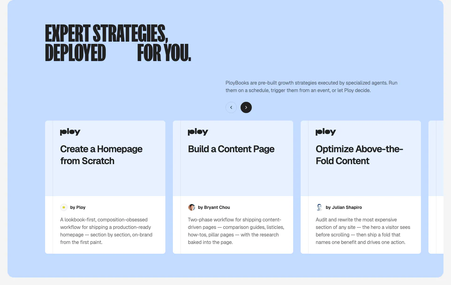
  423. Ploy features section: condensed headline and arrow controls above a carousel of PloyBooks strategy cards on a light blue panel
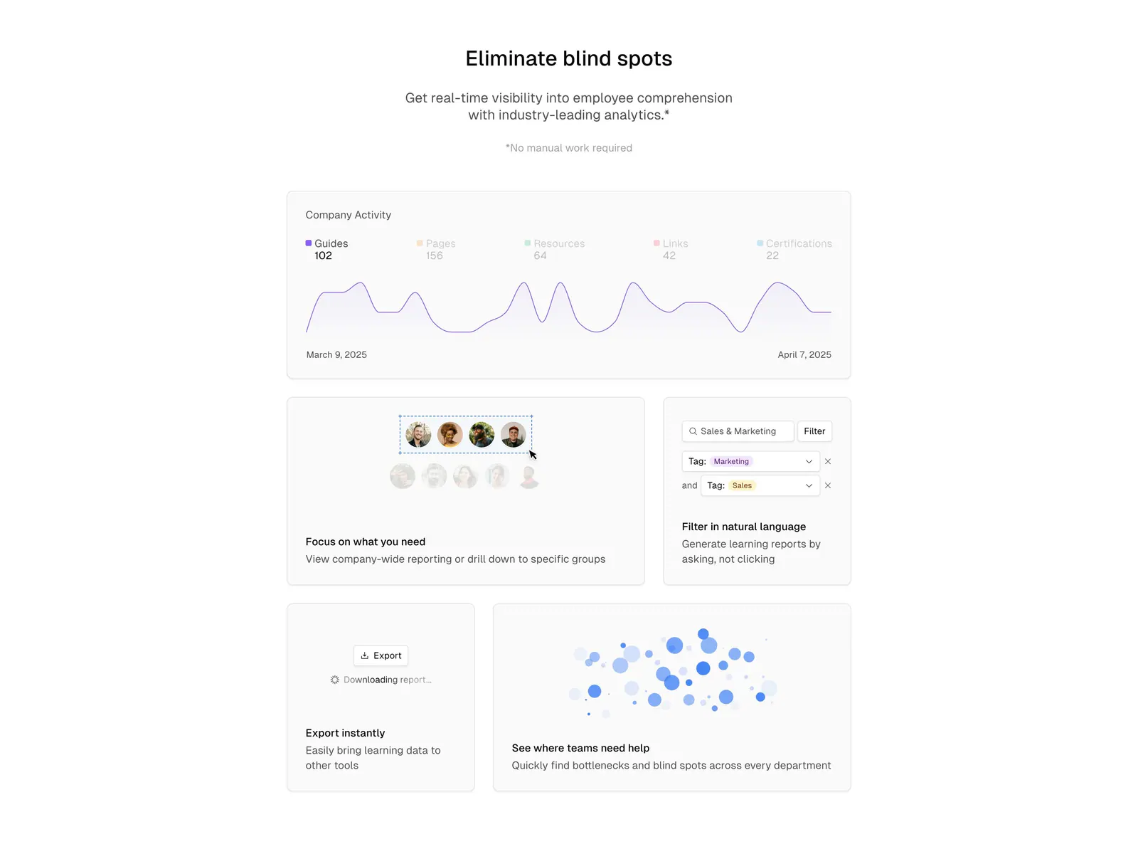
  424. Basewell features section: centered headline above a bento grid of analytics UI cards with line chart, filters and bubble chart
    Basewell Features
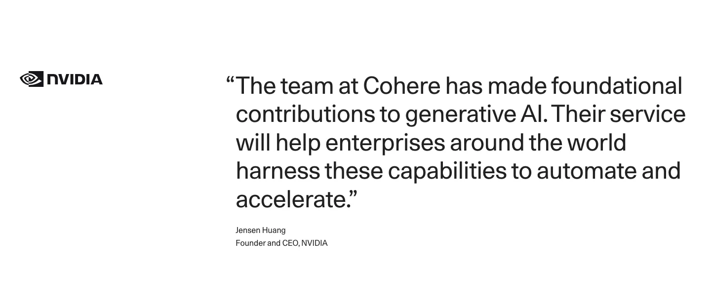
  425. Cohere testimonials section: NVIDIA logo left of a large quote with attribution on a white background
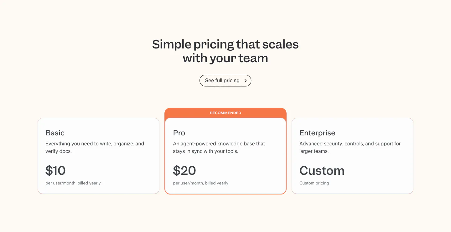
  426. Slite pricing section: centered headline above Basic, Pro and Enterprise plan cards, with the Pro card highlighted as recommended
  427. Supersonik integrations section: serif headline and button at left, workflow step diagram and grid of app icons at right
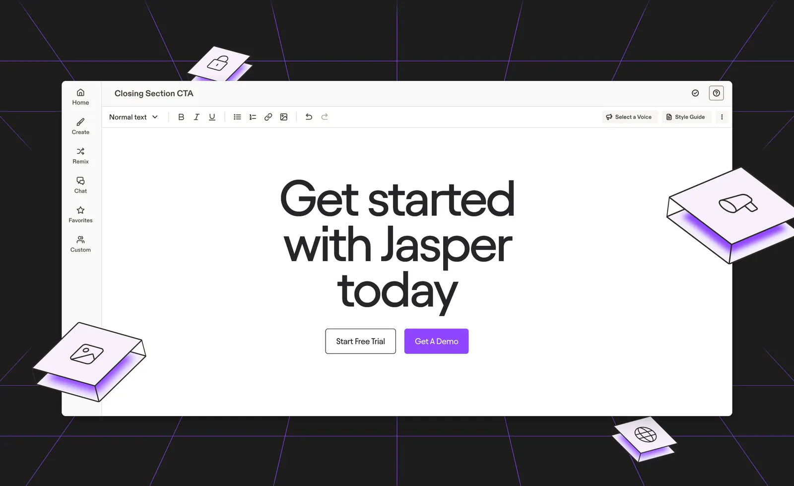
  428. Jasper call-to-action section: centered headline and buttons inside an editor mockup on a dark background with purple lines and isometric tiles
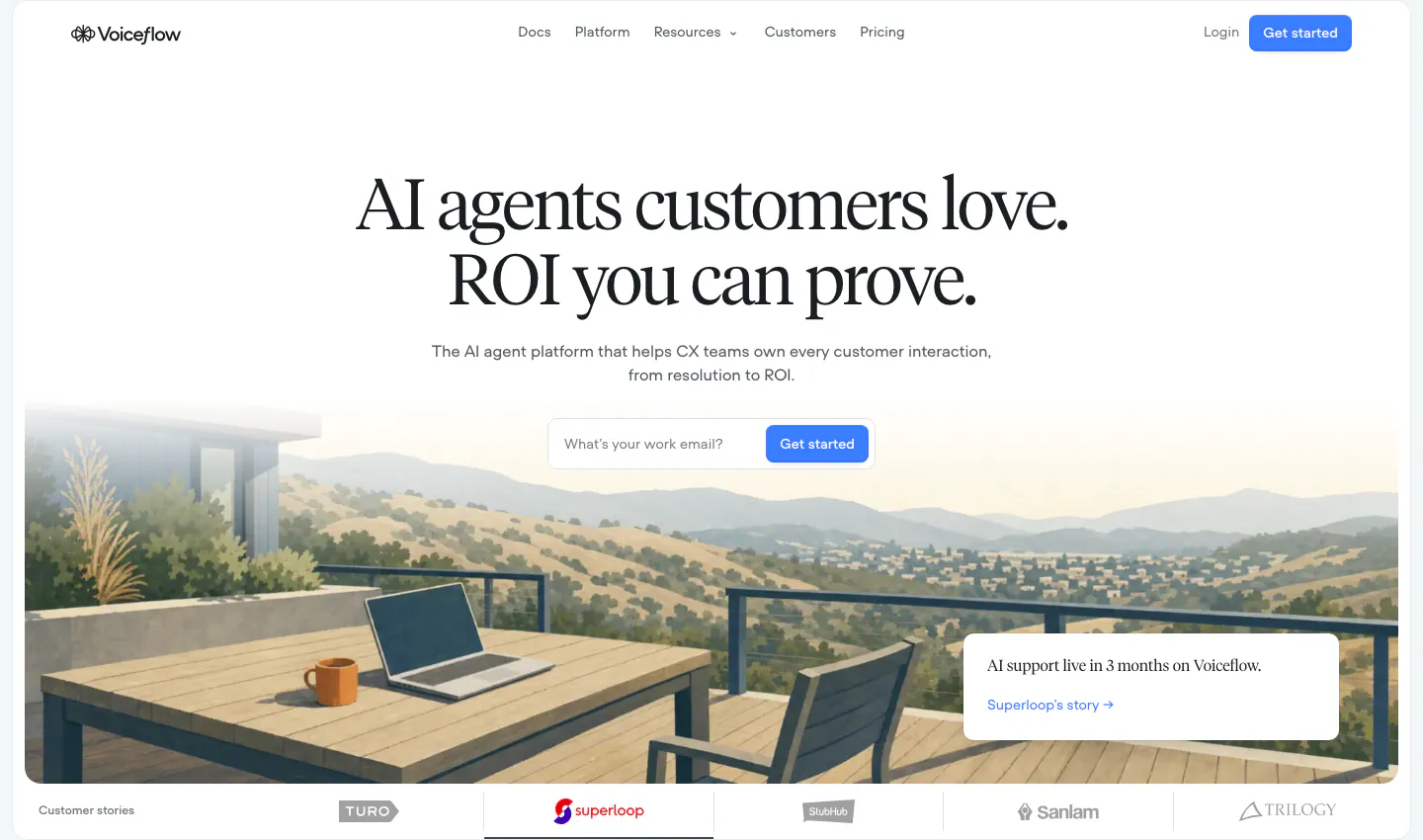
  429. Voiceflow hero section: centered serif headline and email signup field over a painted terrace landscape, customer logo tabs below
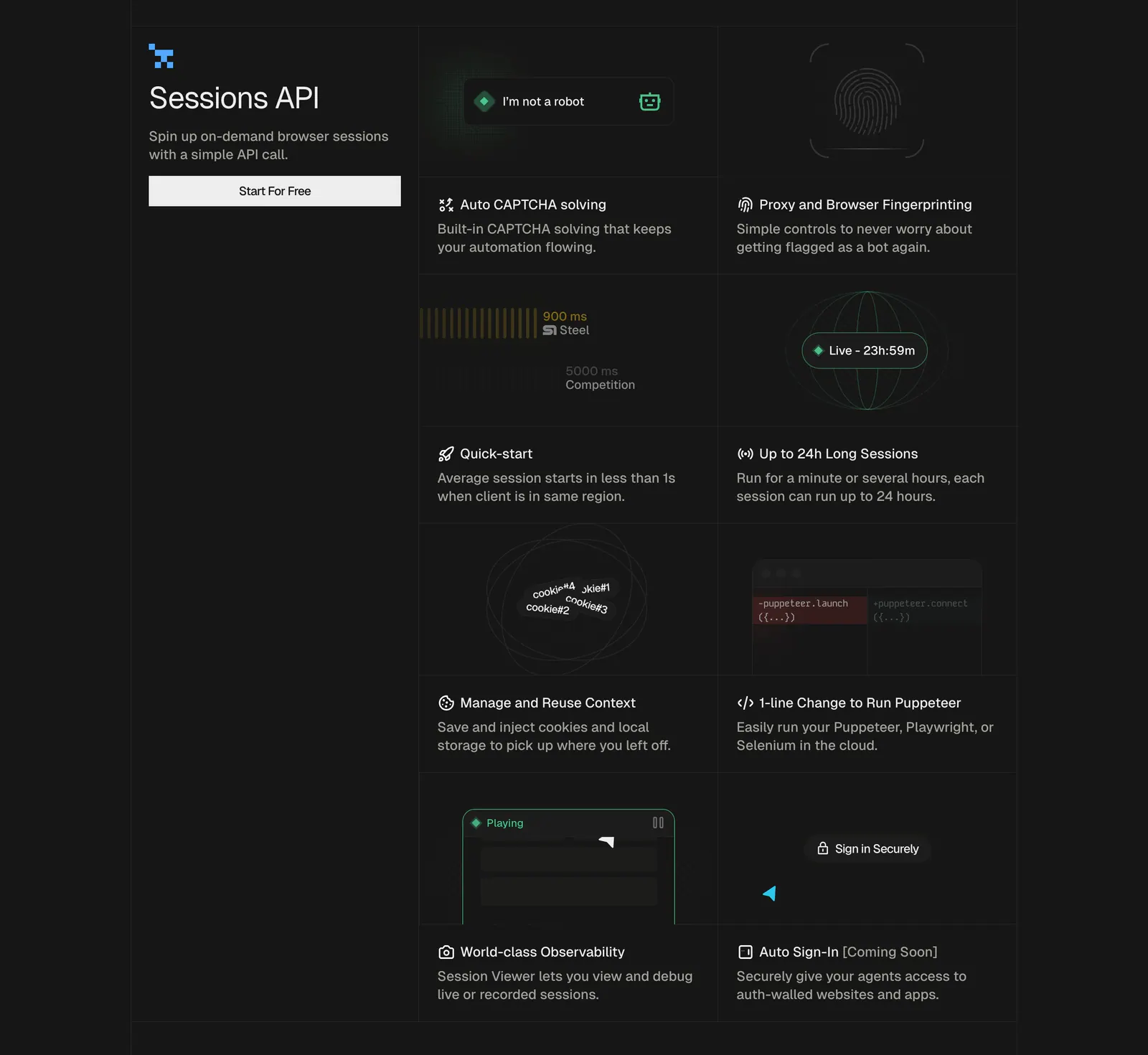
  430. Steel features section: left title block with button beside a two-column grid of feature cells with small UI graphics on a dark background
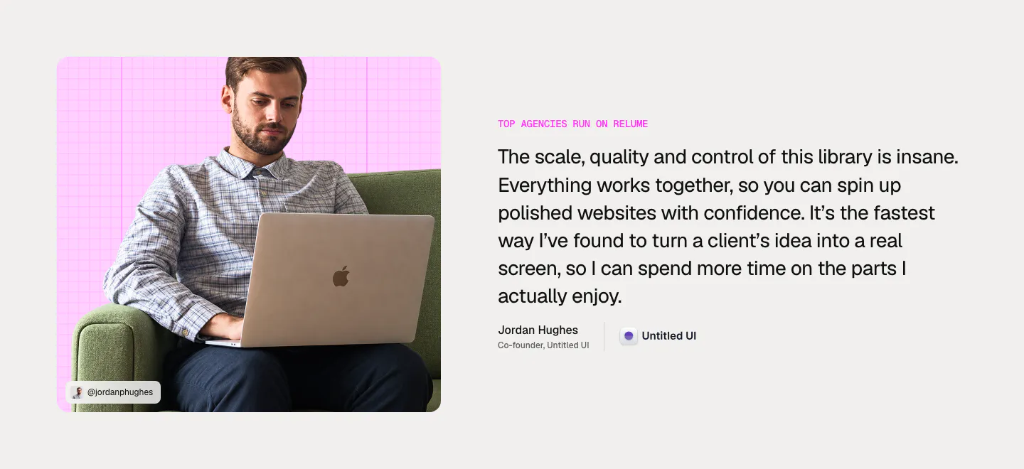
  431. Relume testimonial section: photo of a man with a laptop on a pink grid card on the left, large quote with name and company on the right
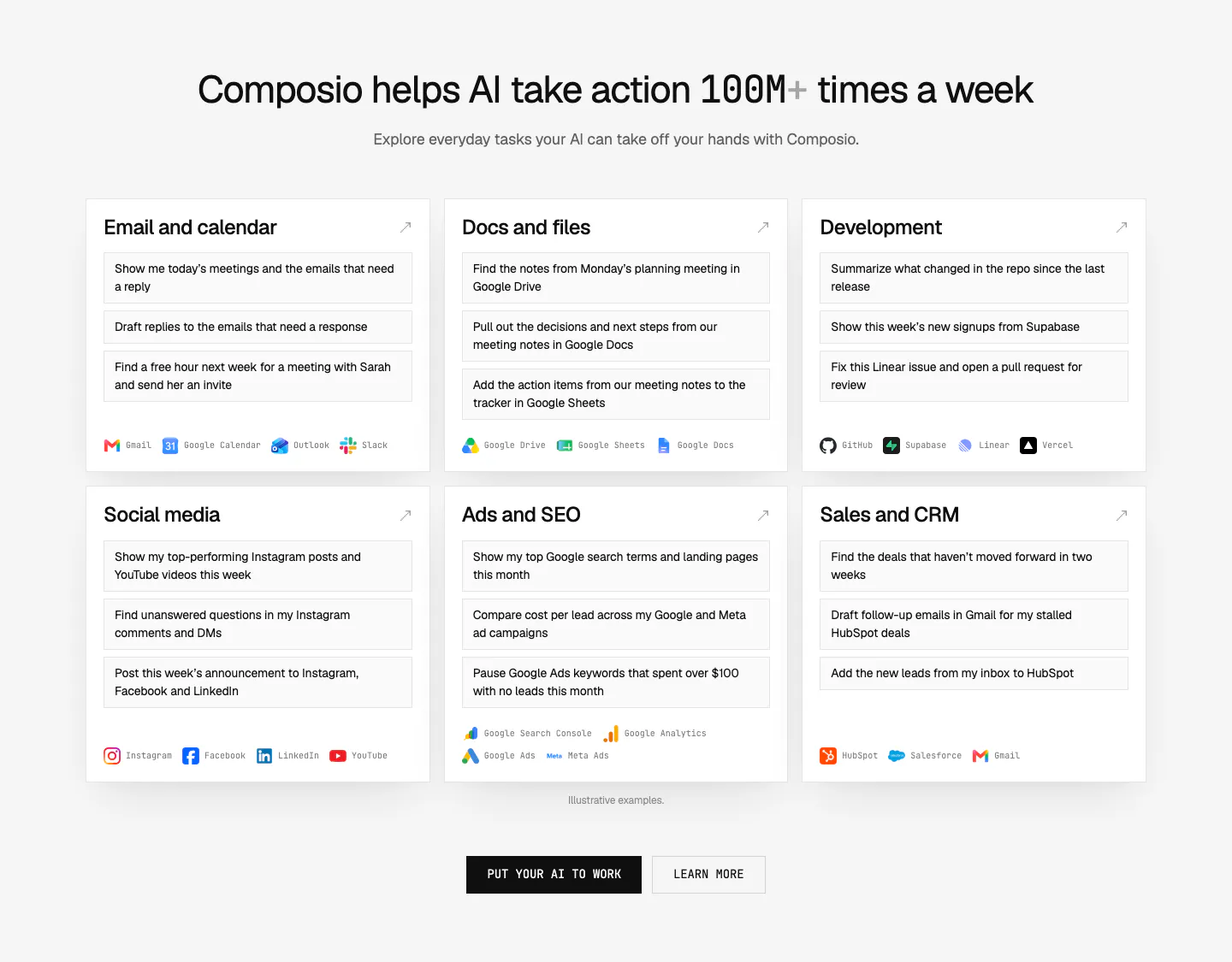
  432. Composio use cases section: centered headline above six white cards of example prompts by category with app names, plus two CTAs
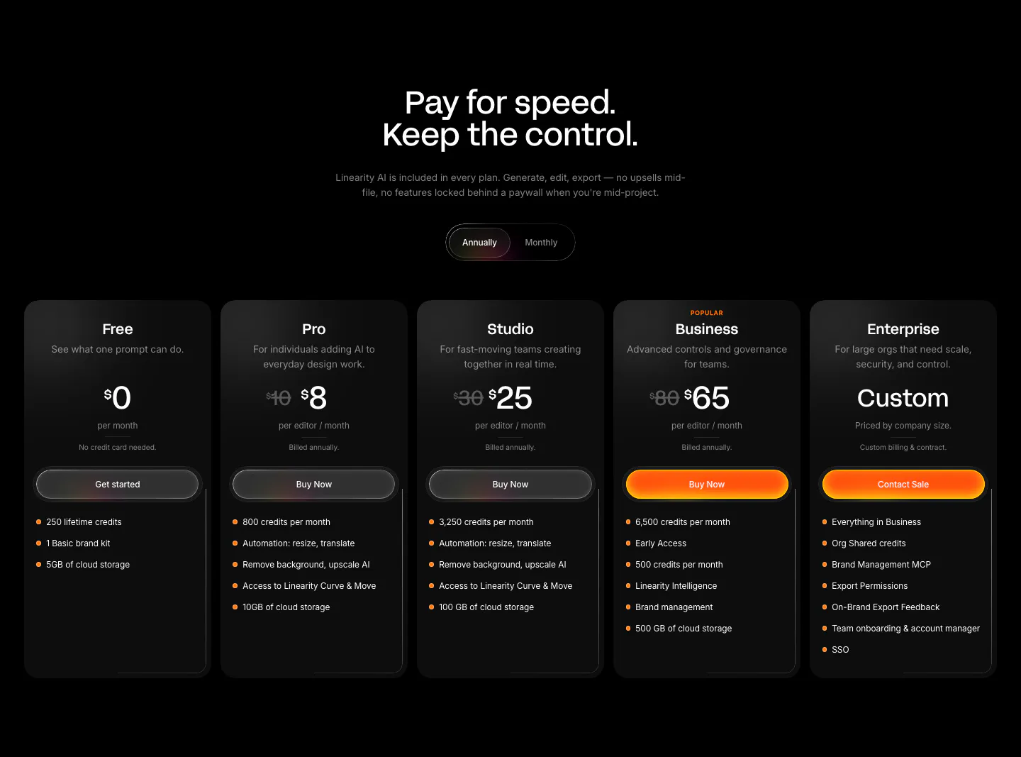
  433. Linearity pricing section: centered headline and annual/monthly toggle above five dark plan cards with orange accent buttons on black
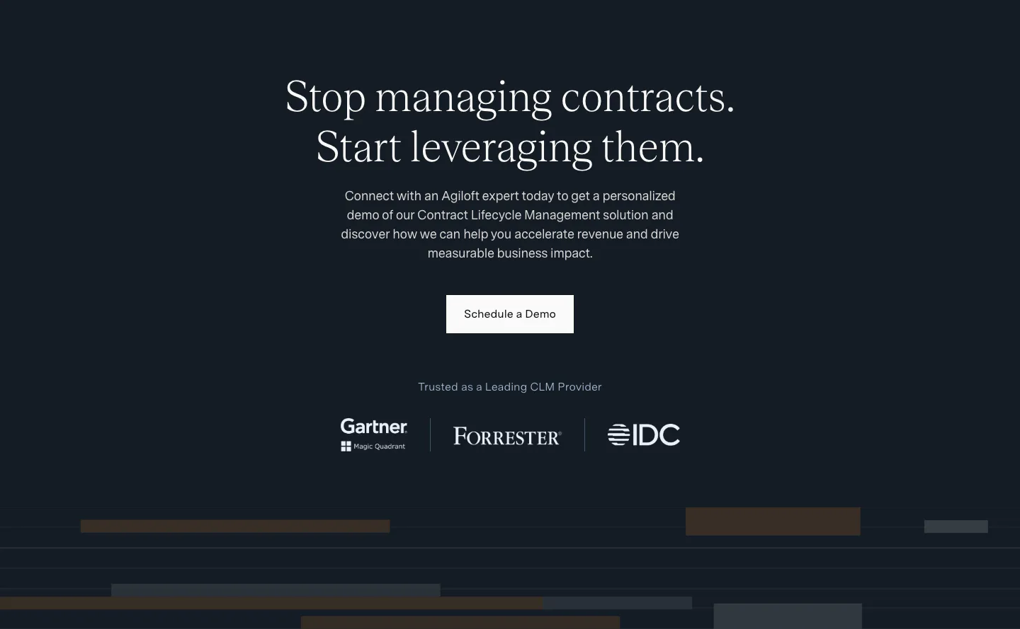
  434. Agiloft call-to-action section: centered serif headline and Schedule a Demo button on dark navy above Gartner, Forrester and IDC logos
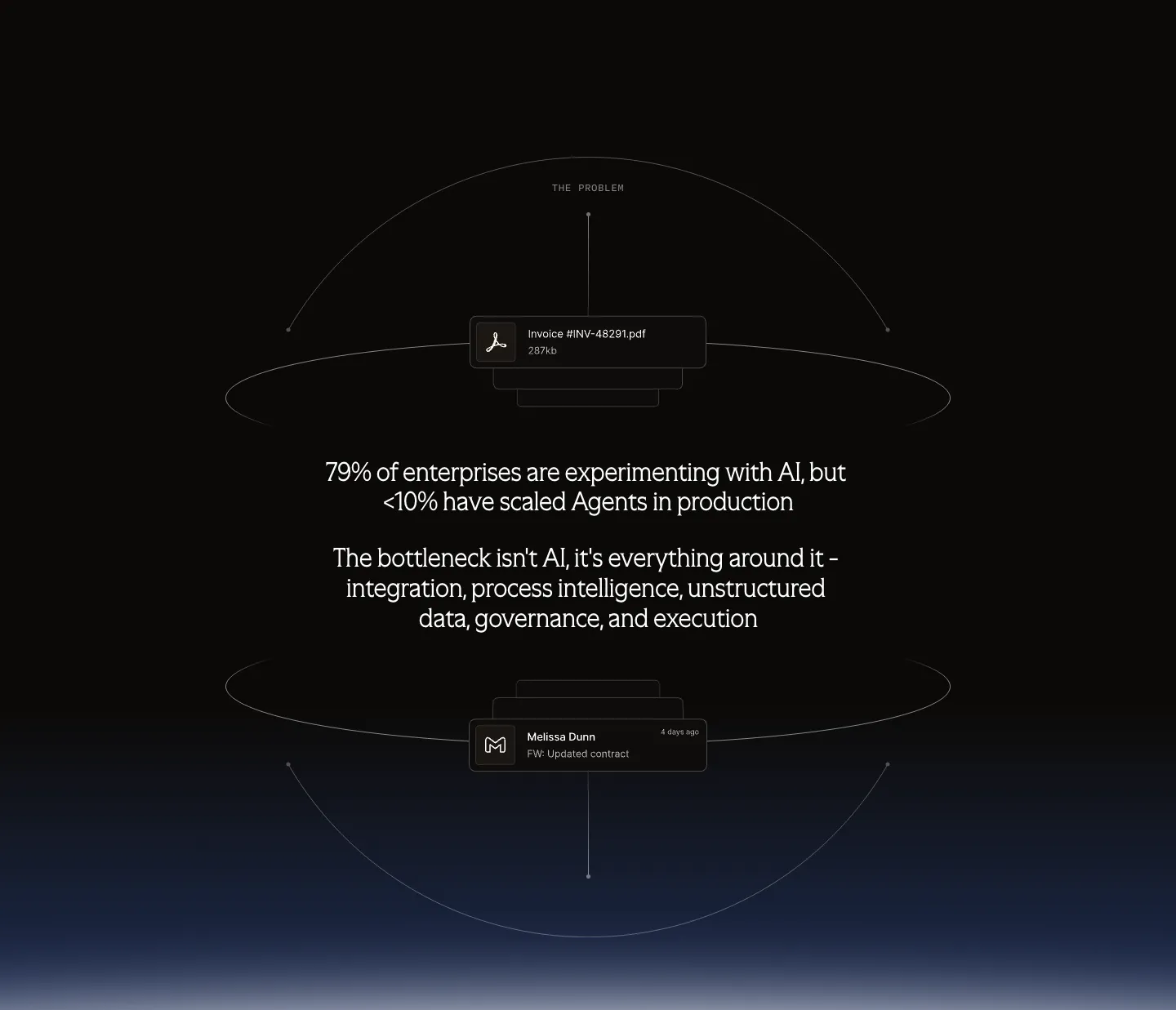
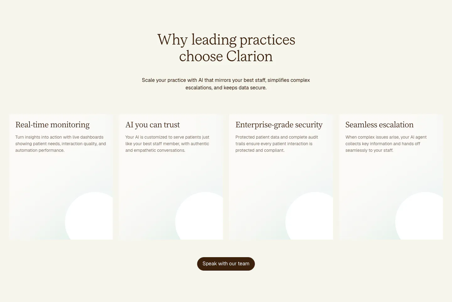
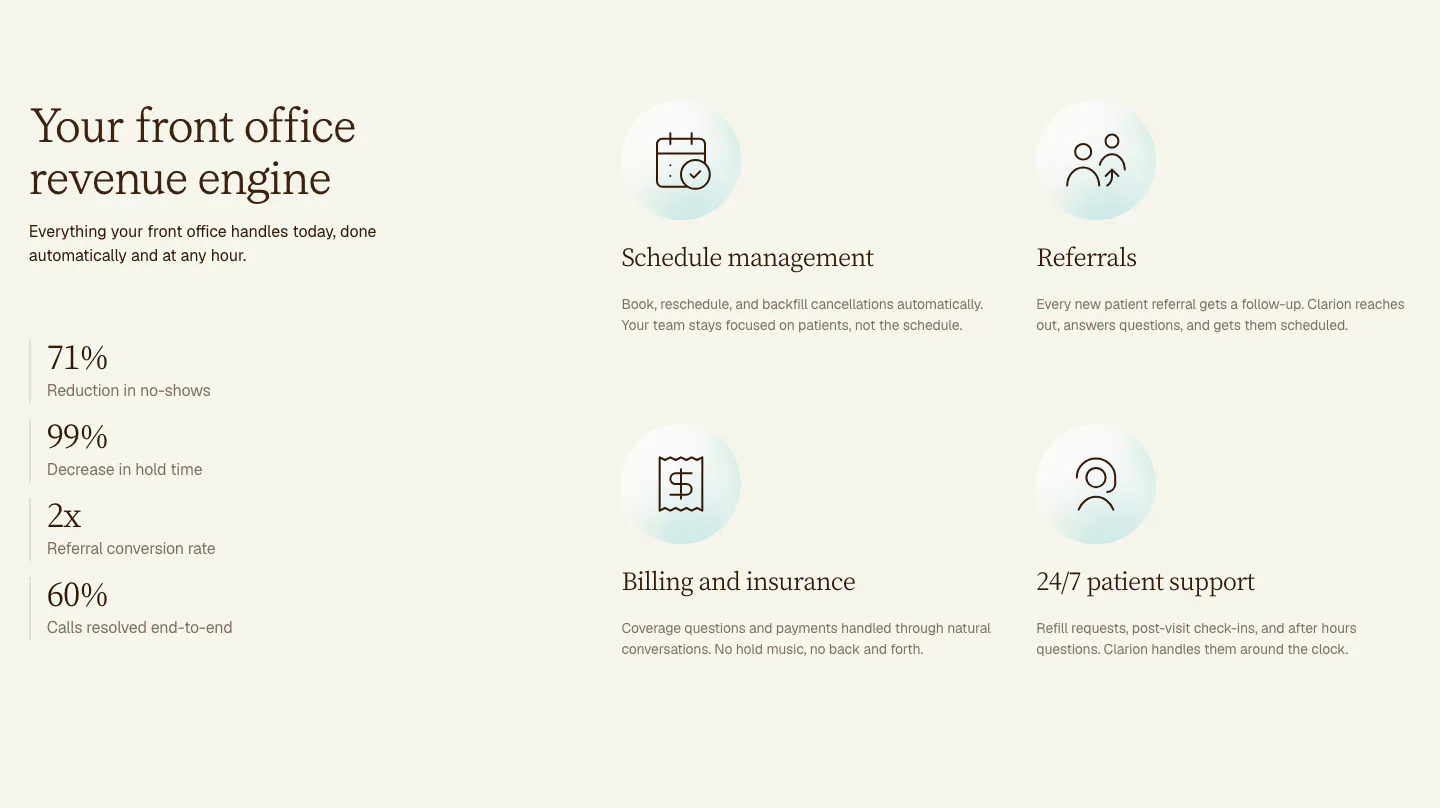
  435. Arrakis value proposition section: dark centered problem statement inside wireframe orbit lines with floating file and email cards
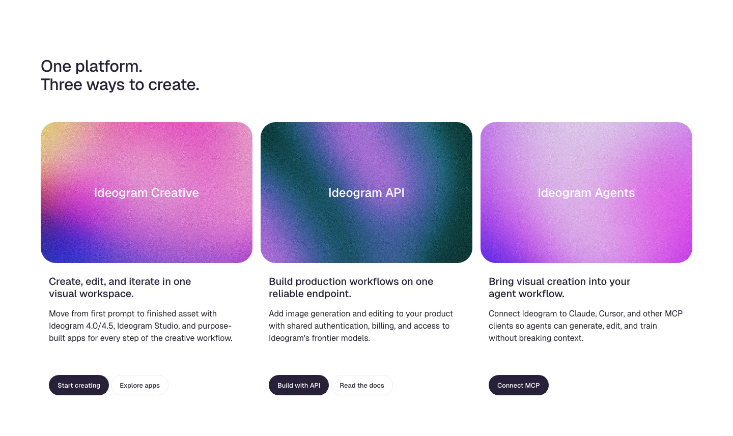
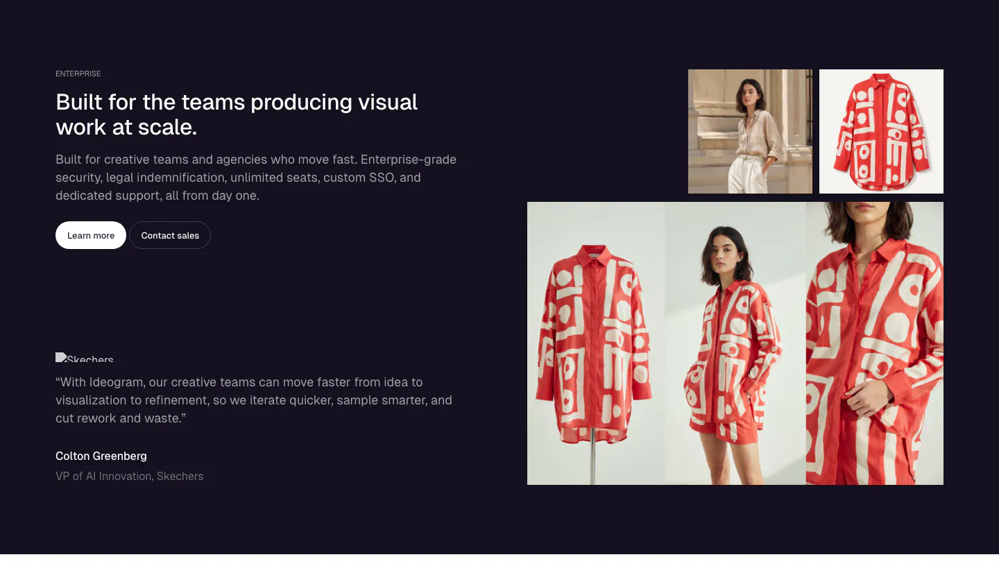
  436. Ideogram features section: two-line headline above three product cards with grainy pink and purple gradient panels, copy and buttons
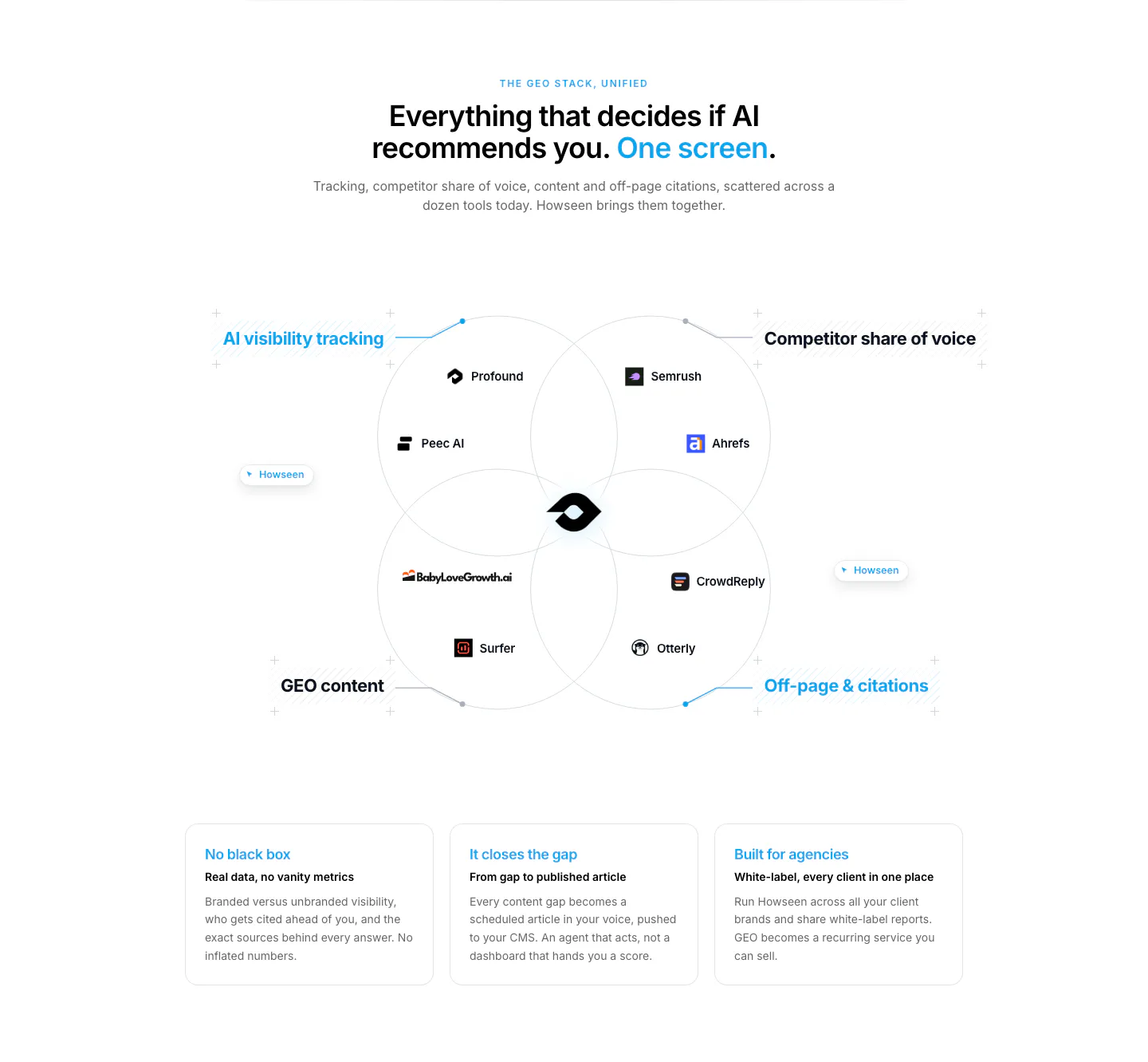
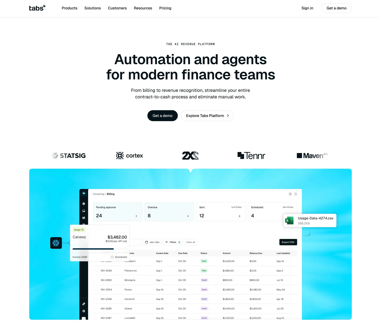
  437. Howseen AI value proposition section: centered headline over a Venn diagram of competing GEO tools above three benefit cards
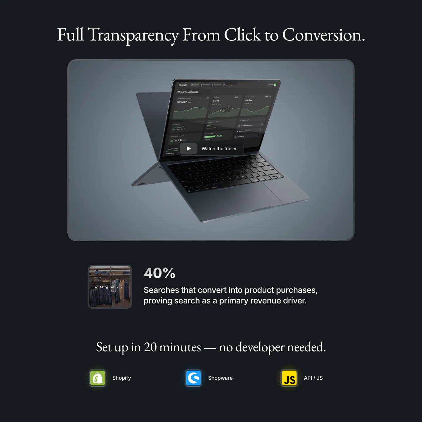
  438. Bayshore footer section: single row with copyright left, small logo mark centered and text links right on warm off-white
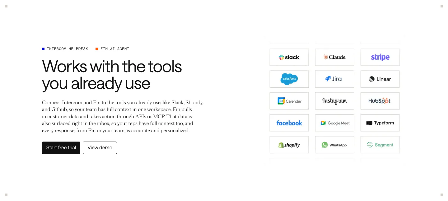
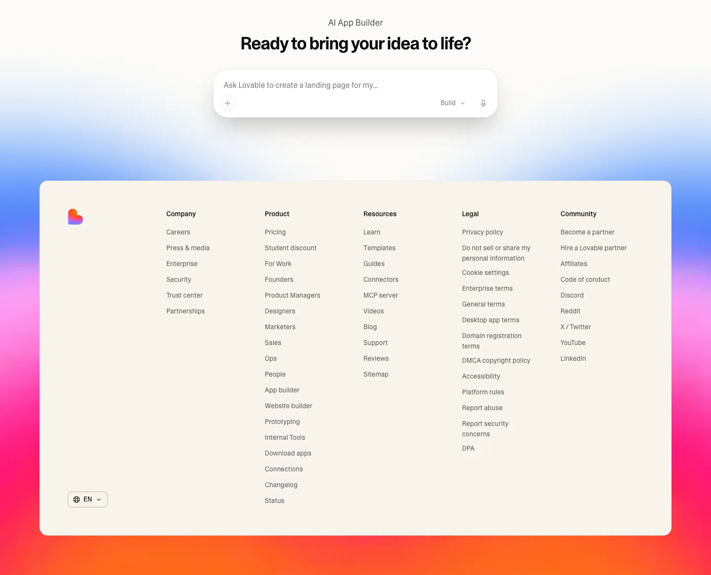
  439. Intercom integrations section: headline, copy and CTAs on the left, grid of bordered app logo tiles like Slack, Stripe and Shopify on the right
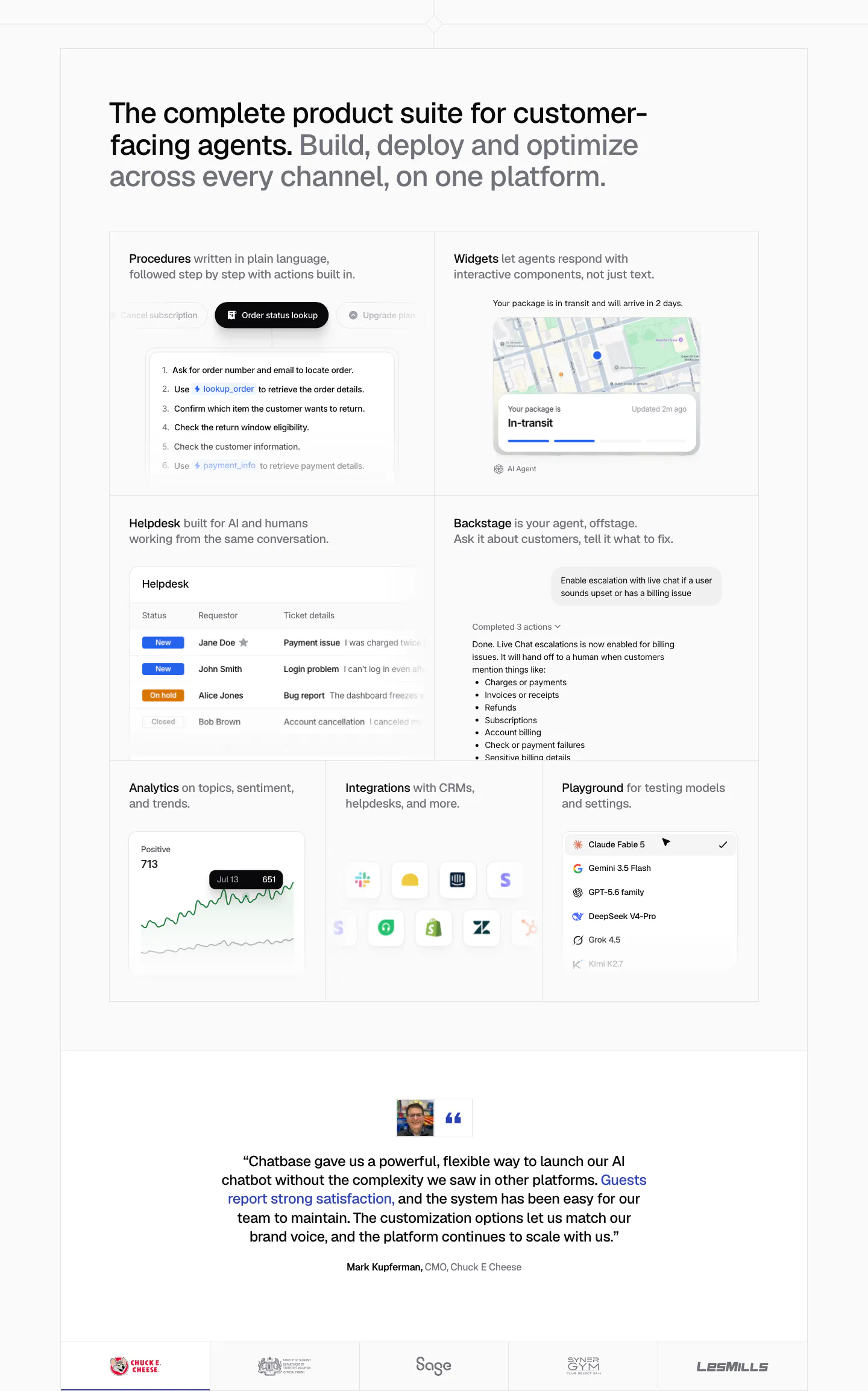
  440. Chatbase features section: bento grid of product UI tiles for procedures, widgets, helpdesk and analytics, a centered quote and logo row
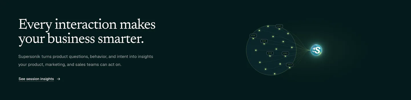
  441. Supersonik features section: serif headline and link at left, glowing sphere of chat bubbles linked to a logo at right on dark teal
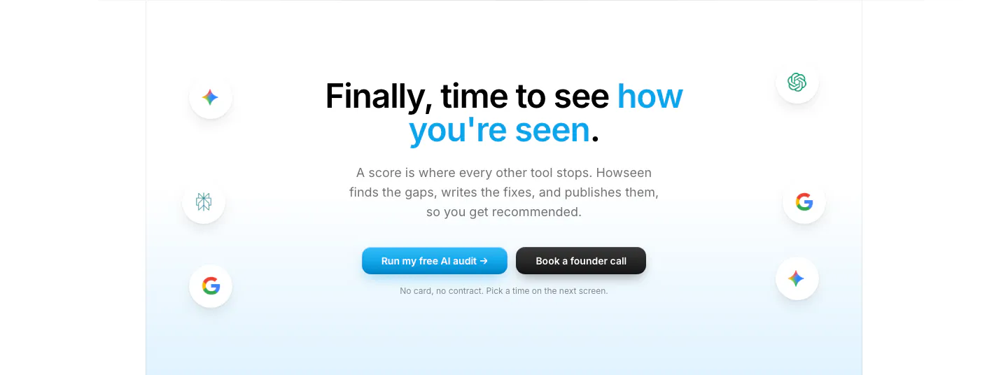
  442. Howseen AI call-to-action section: centered headline and two buttons flanked by floating AI engine icons on a pale blue fade
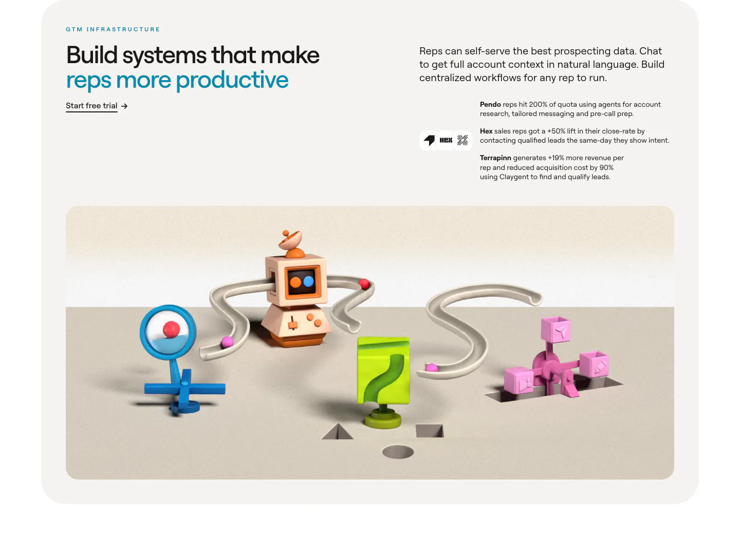
  443. Clay value proposition section: headline and customer outcomes above a wide 3D render of connected clay GTM objects in a rounded card
  444. Clarion value proposition section: centered serif headline above four tall cream cards with soft circle shapes and a brown button
  445. Relume logo cloud section: small caption on the left of a single rounded strip of black customer logos on a light gray background
  446. Tabs hero section: centered headline with two buttons, customer logo row and a billing dashboard screenshot on a bright cyan panel
  447. VisionAI features section: serif headline over a laptop dashboard with trailer button, a 40% stat and platform icons on navy
  448. Lovable footer section: centered prompt input CTA above a cream footer card with five link columns, set on a blue, pink and orange gradient
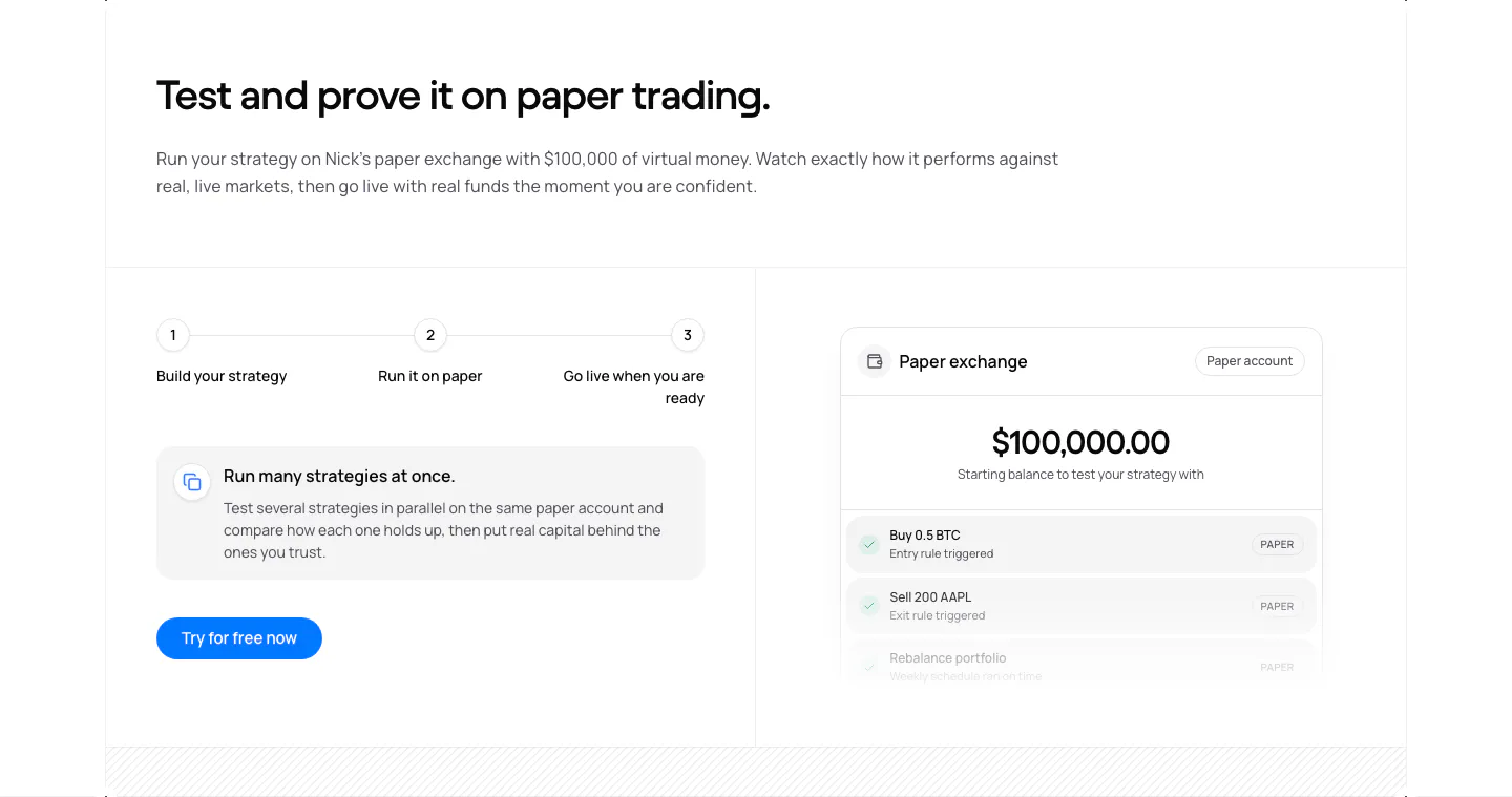
  449. NickAI features section: three-step progress row, info card and button on the left, paper exchange balance UI on the right
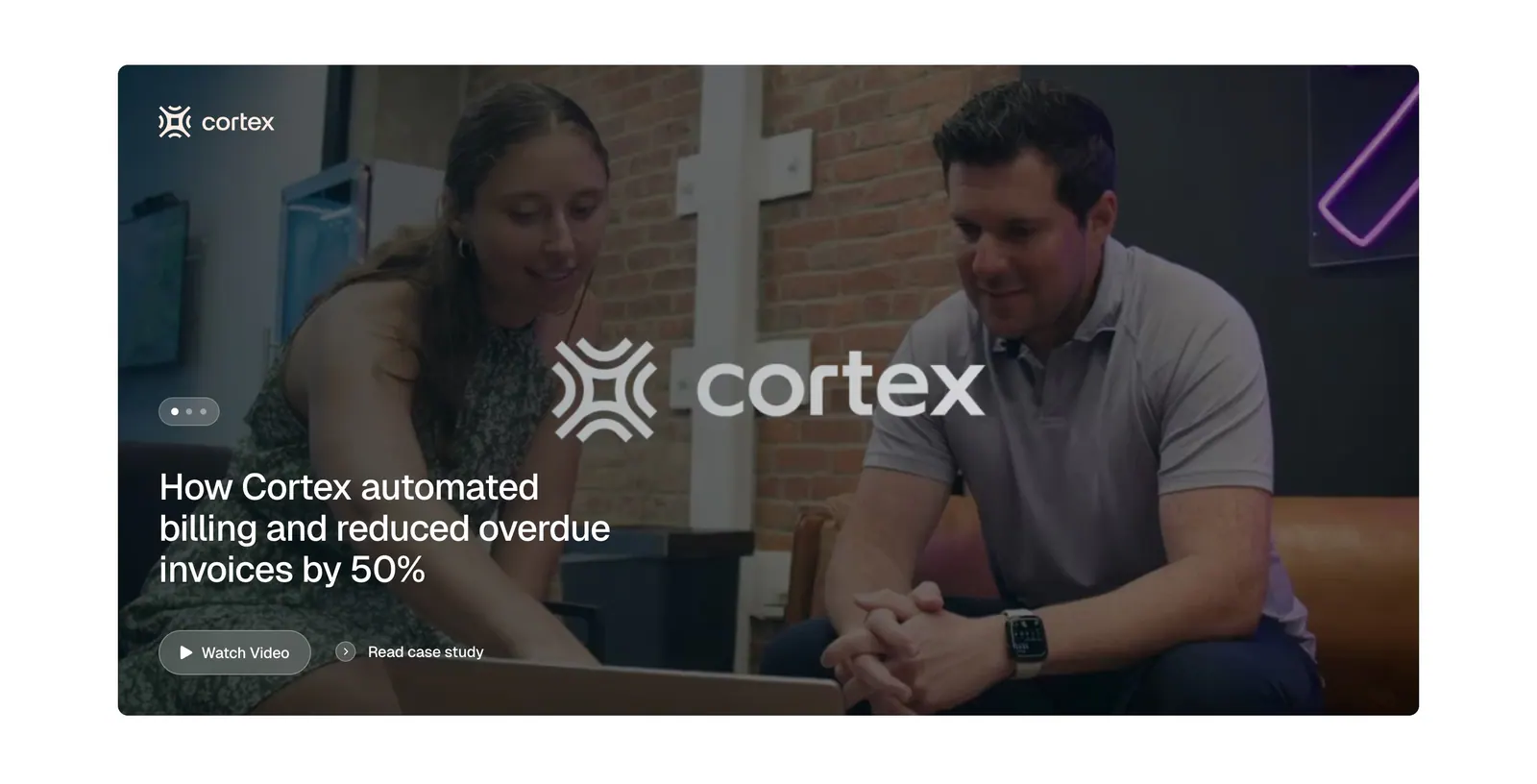
  450. Tabs testimonials section: full-width case study card with an office photo of two people, Cortex logo, headline and watch video button
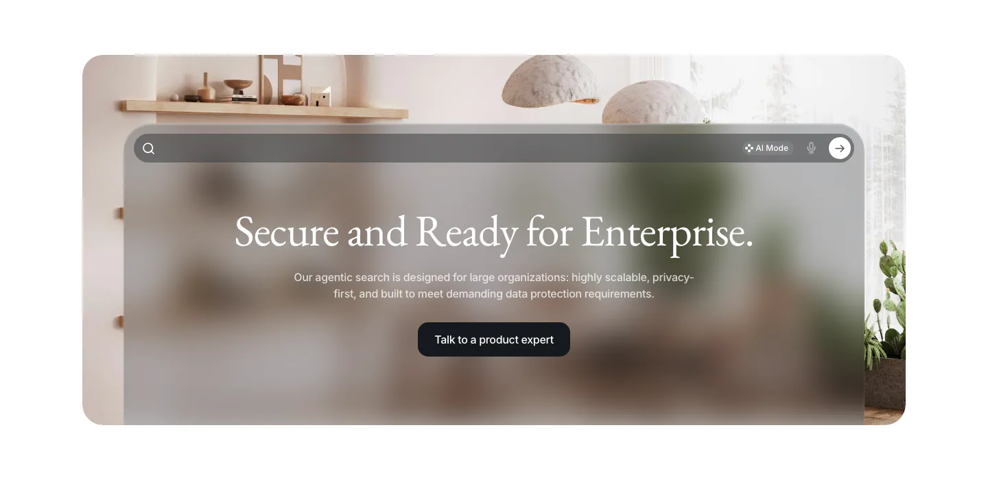
  451. VisionAI call-to-action section: centered serif headline and button on a frosted glass search panel over an interior photo
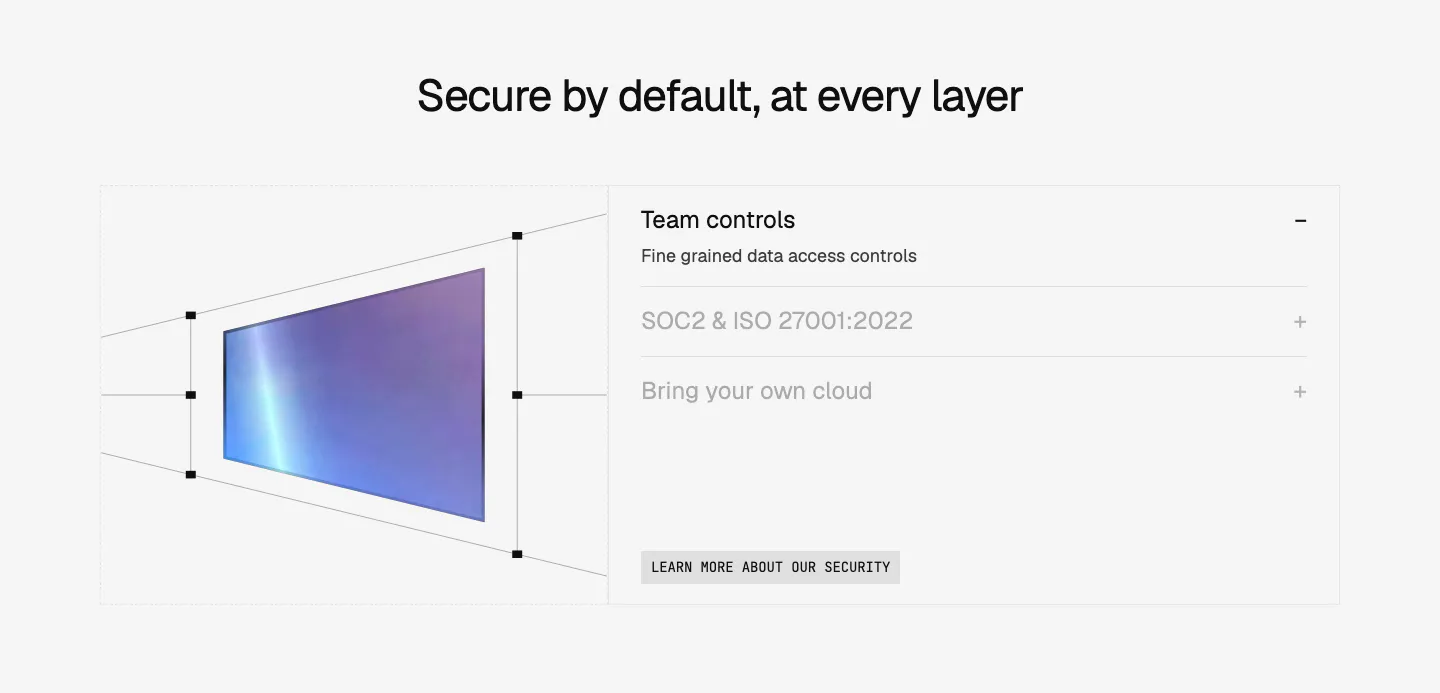
  452. Composio security section: perspective wireframe of a gradient panel at left and an accordion of security topics at right on light gray
  453. Dovetail features section: left-aligned headline and orange button above an orange panel with a video insights UI and three tabbed benefits
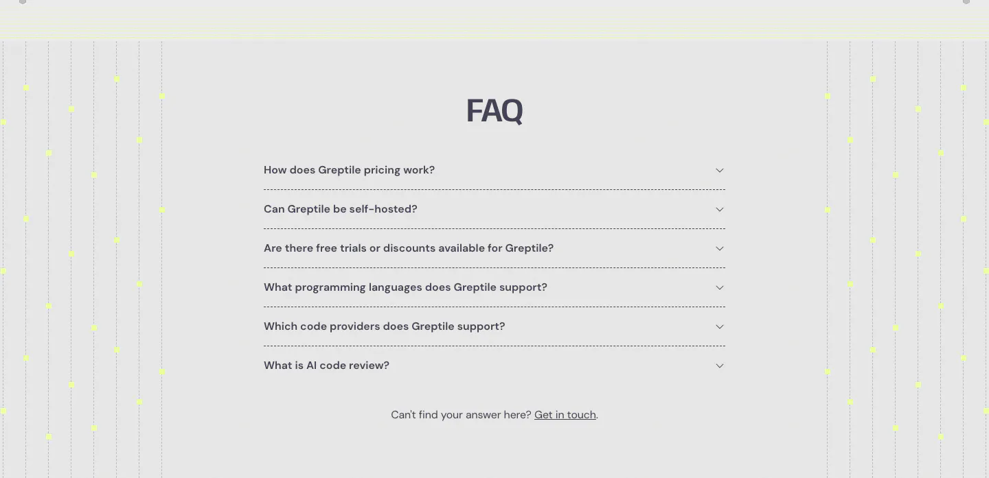
  454. Greptile FAQ section: centered accordion list of six questions flanked by vertical dotted lines with yellow dots on light gray
  455. Sendr features section: left-aligned headline above a 2x2 grid of feature cells with small purple icons and dotted accents
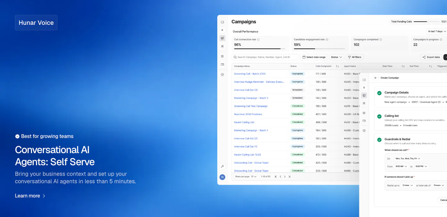
  456. Hunar features section: blue gradient background with text bottom-left and a campaign dashboard screenshot on the right
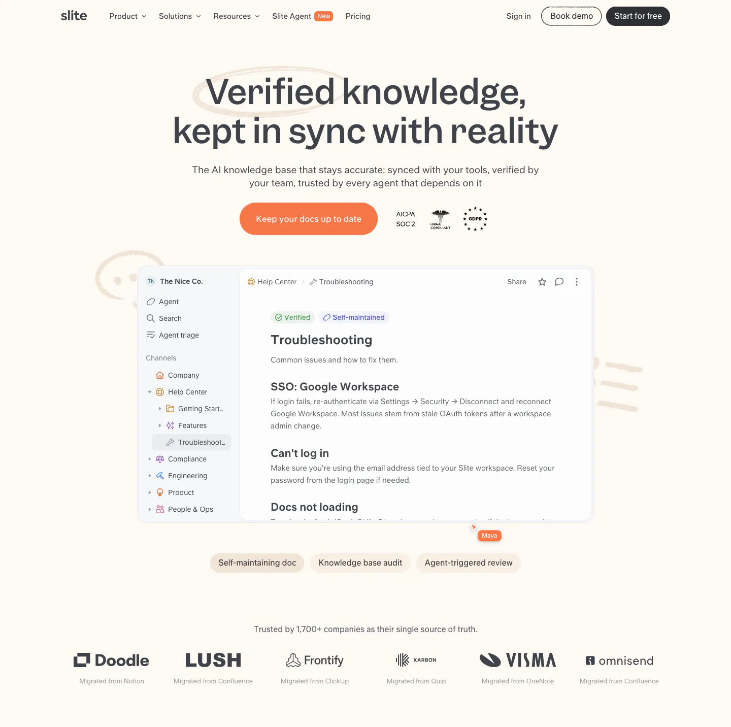
  457. Slite hero section: centered headline, orange CTA and compliance badges above a knowledge base doc screenshot and customer logo row on cream
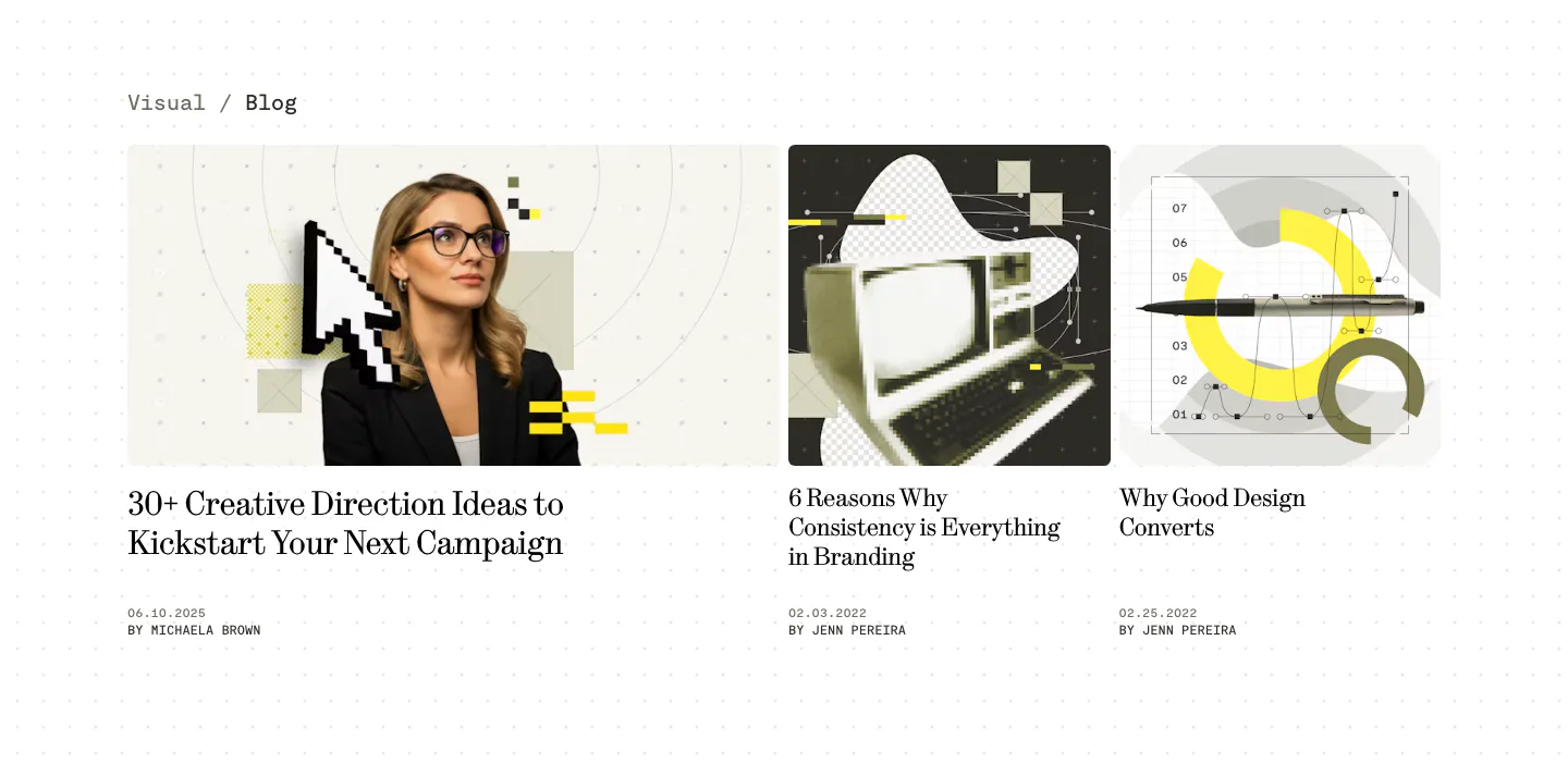
  458. Visual blog & resources section: one wide and two narrow article cards with collage cover images, serif titles and authors on a dotted white page
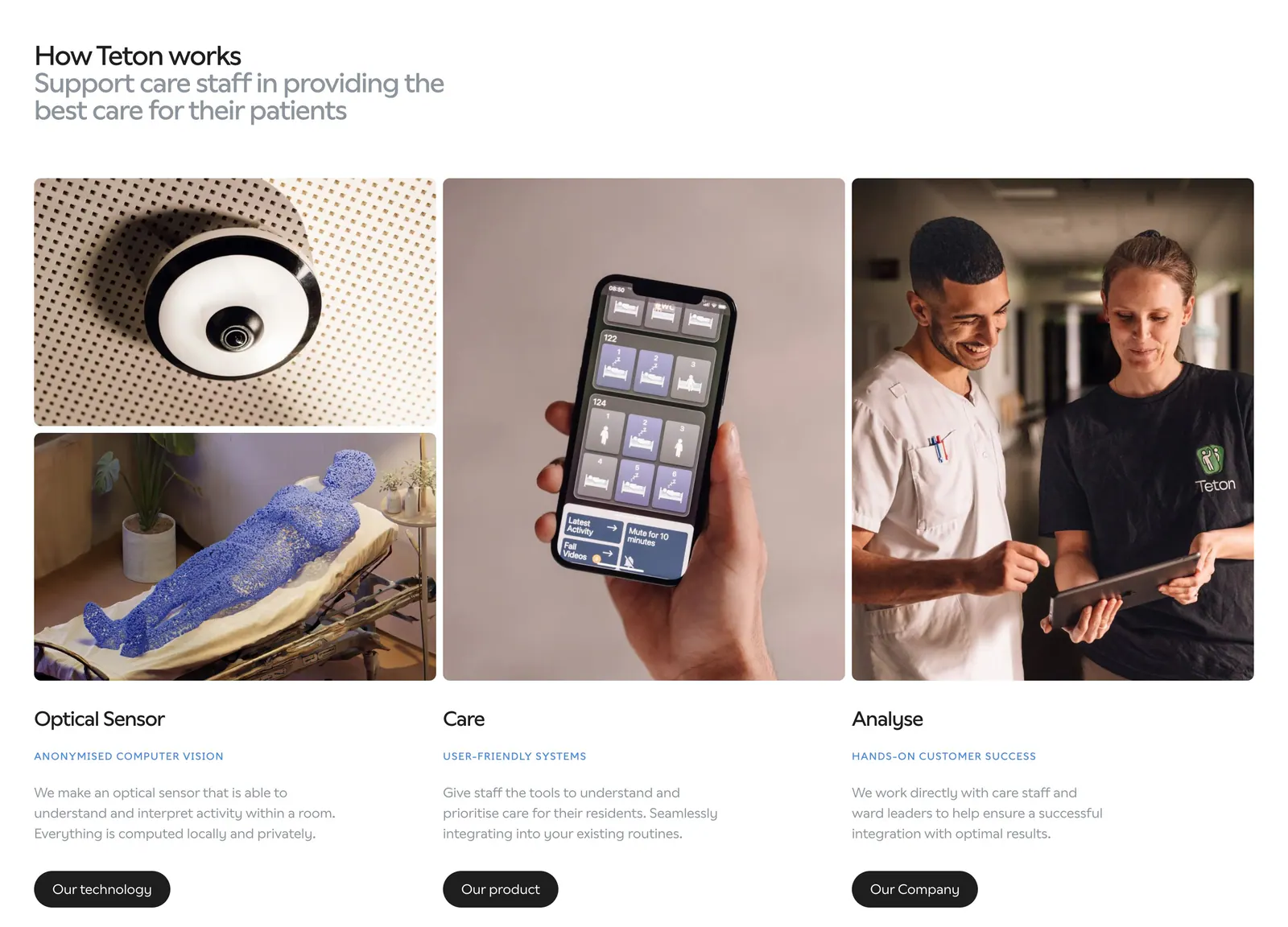
  459. Teton how it works section: headline above three columns of photos (sensor, phone app, care staff) with titles, descriptions and buttons
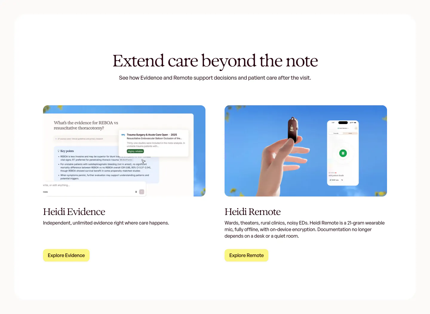
  460. Hunar footer section: light grid footer with tagline, social links, company address and link columns beside the Hunar wordmark
  461. Concourse FAQ section: heading left, accordion of questions right with the first item expanded on white
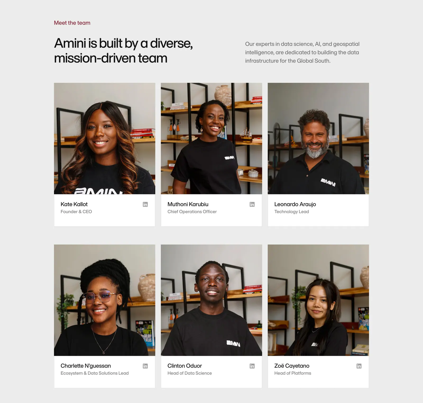
  462. Secoda features section: centered headline above four capability cards and an accordion beside an AI analytics screenshot
  463. Aside call-to-action section: centered two-line headline and download button on a soft blue gradient card
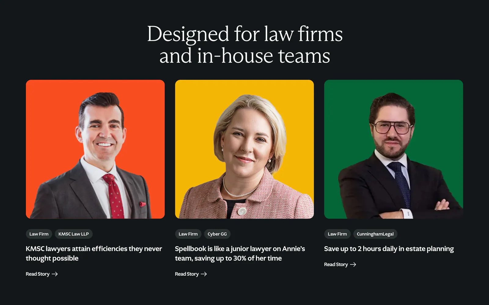
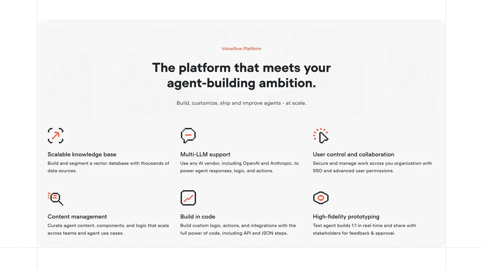
  464. Spellbook testimonials section: serif headline above three customer story cards with lawyer portraits on orange, yellow and green backdrops
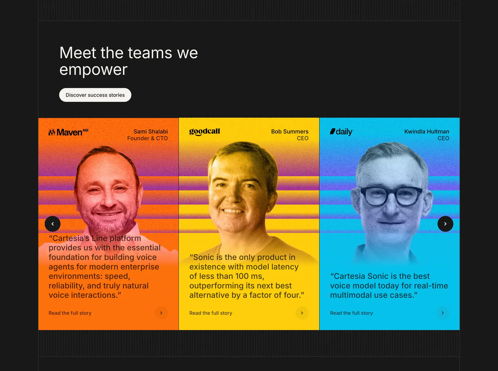
  465. Cartesia testimonials section: carousel of three bright orange, yellow and blue cards with tinted portraits and quotes on a dark background
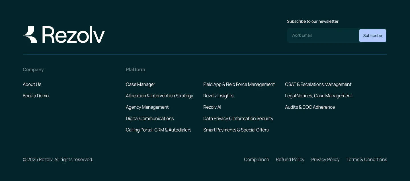
  466. Rezolv footer section: wordmark and newsletter email field above company and platform link columns on a dark teal background
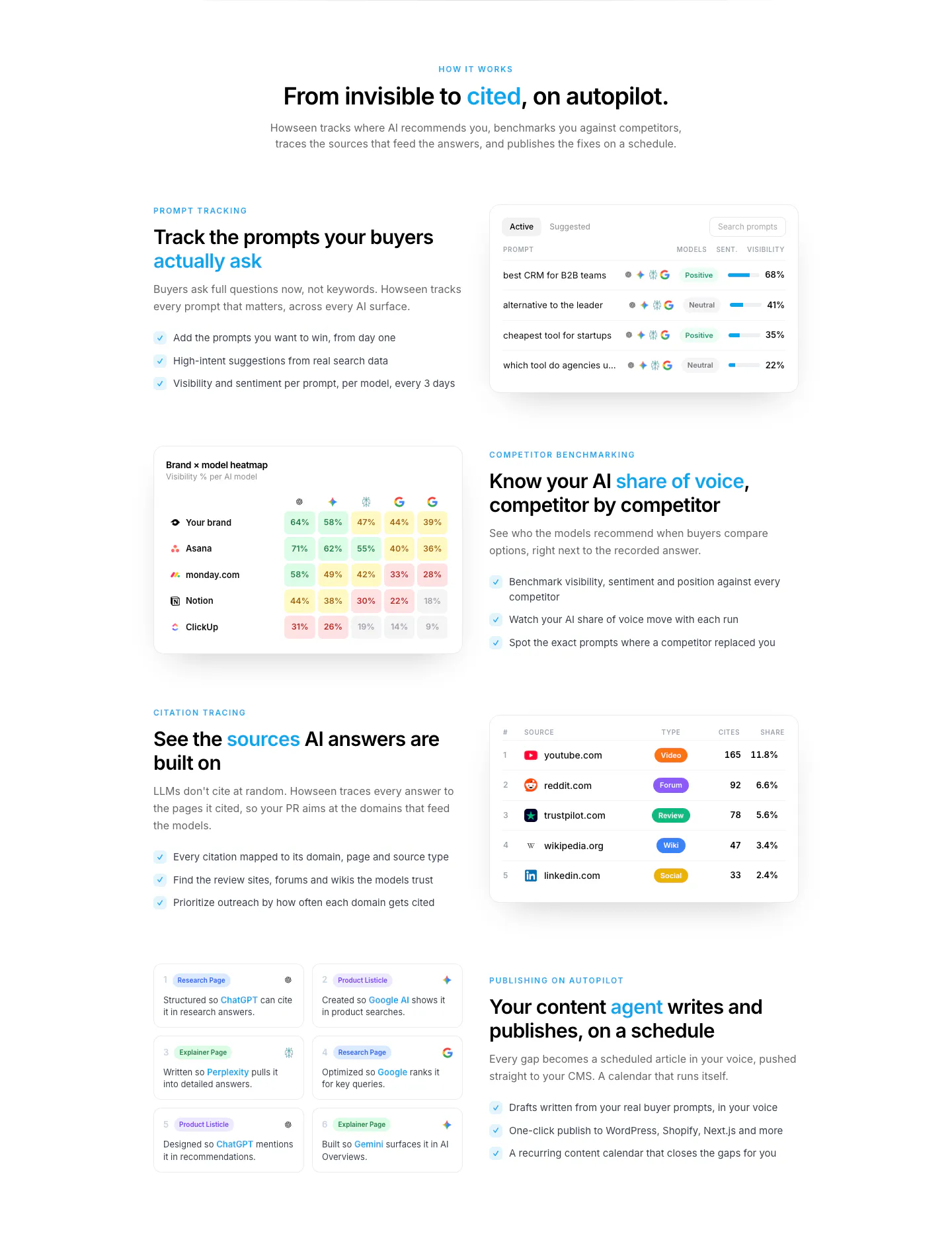
  467. Howseen AI features section: centered intro above alternating rows of copy and prompt, heatmap and citation table UI cards
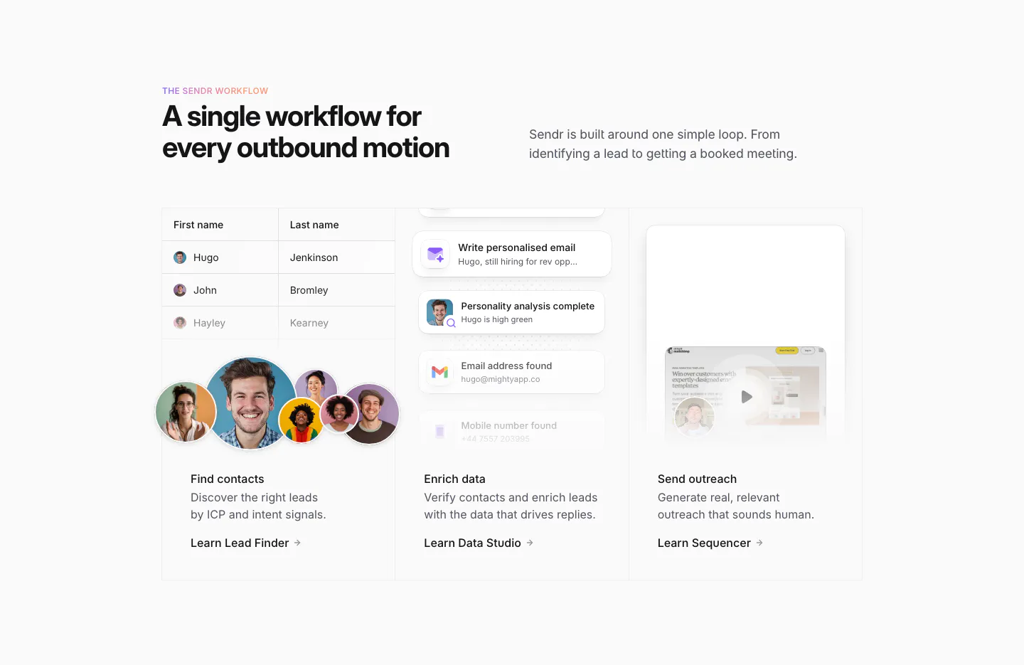
  468. Sendr how it works section: headline above three columns for Find contacts, Enrich data and Send outreach with UI snippets
  469. Heidi features section: centered serif headline and button above three photo cards of the clip-on mic in clinical settings
  470. Concourse footer section: newsletter email field and social icons left, link columns right, cut-off Concourse wordmark below on dark
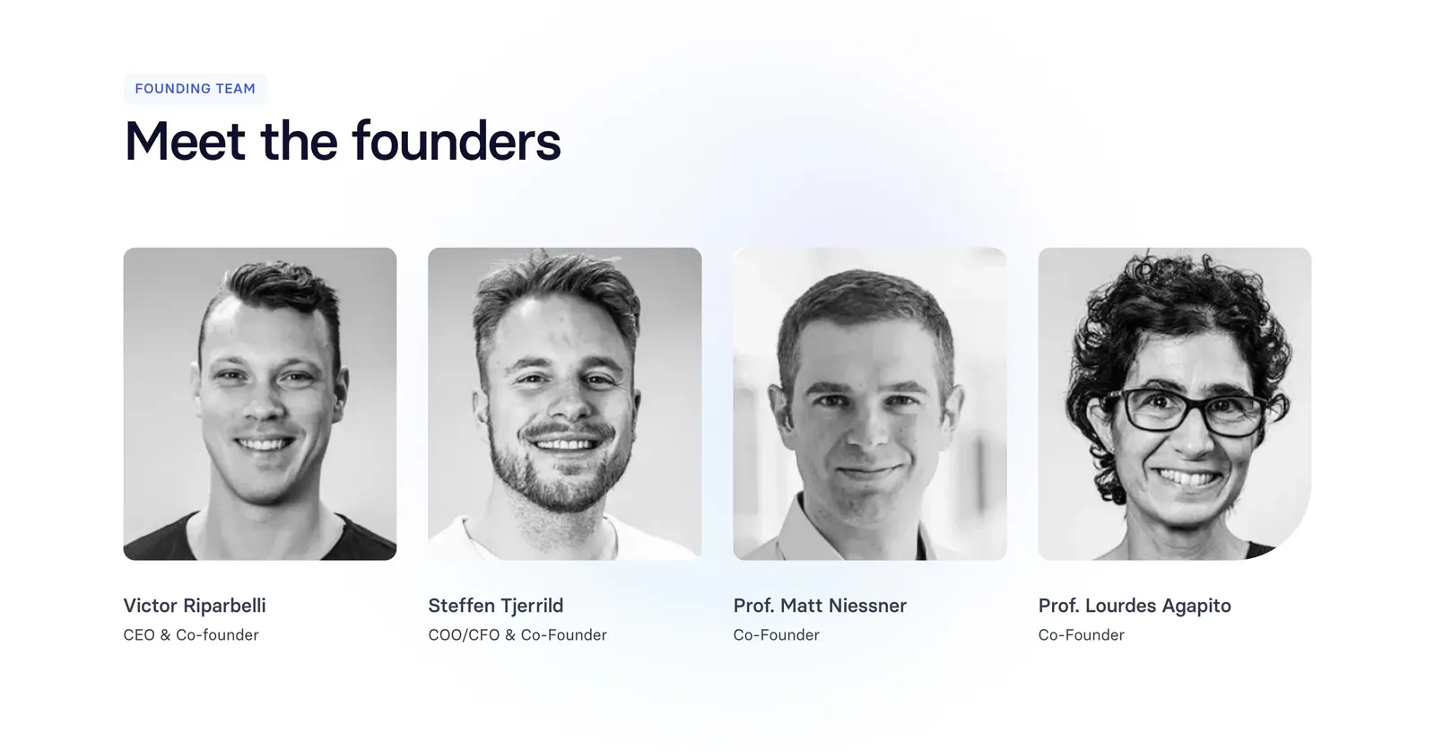
  471. Synthesia team section: left-aligned headline above four black-and-white founder headshot cards with names and titles on white
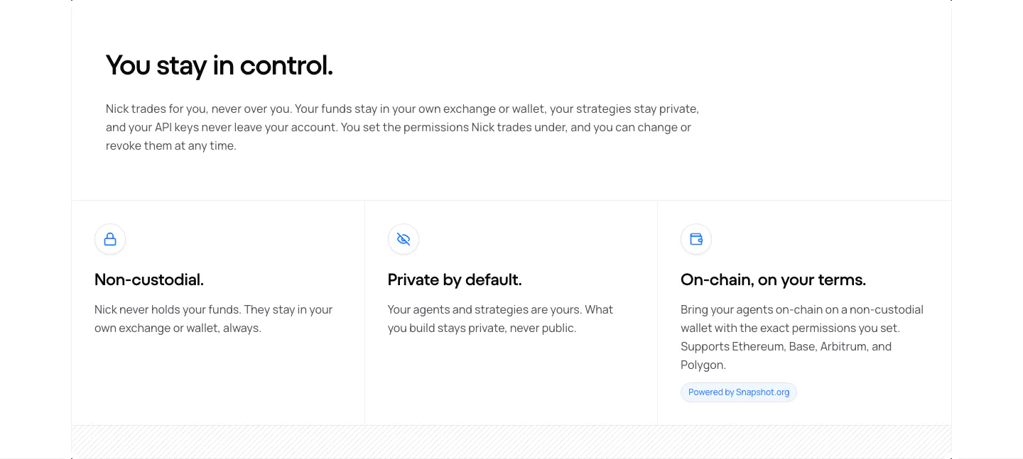
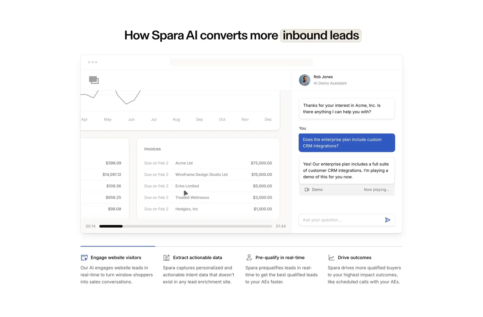
  472. NickAI security section: left heading and copy above three bordered cells with icons for non-custodial, private and on-chain
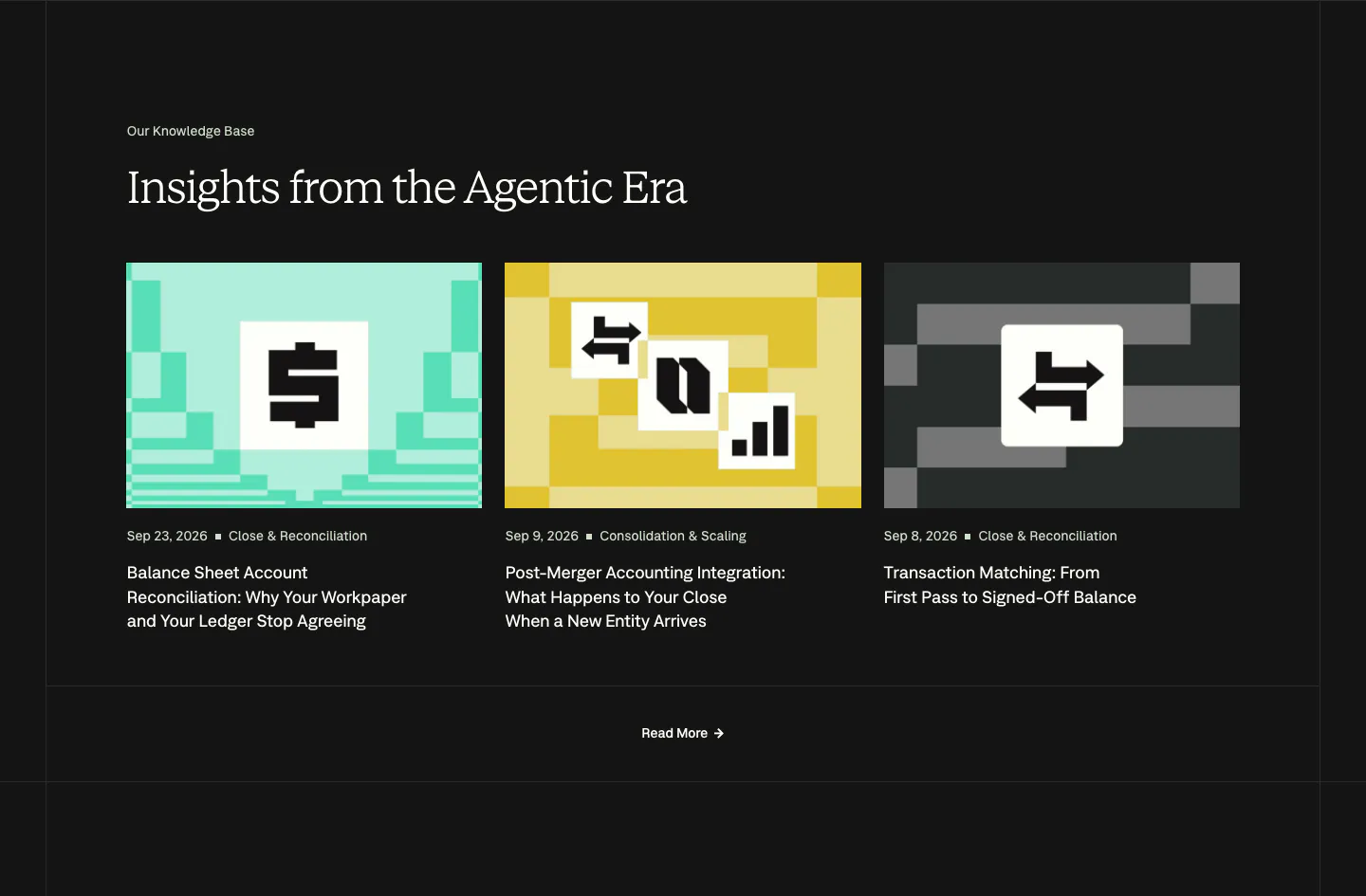
  473. Voiceflow features section: centered headline above a six-item grid of features with orange pixel-style icons on a light gray panel
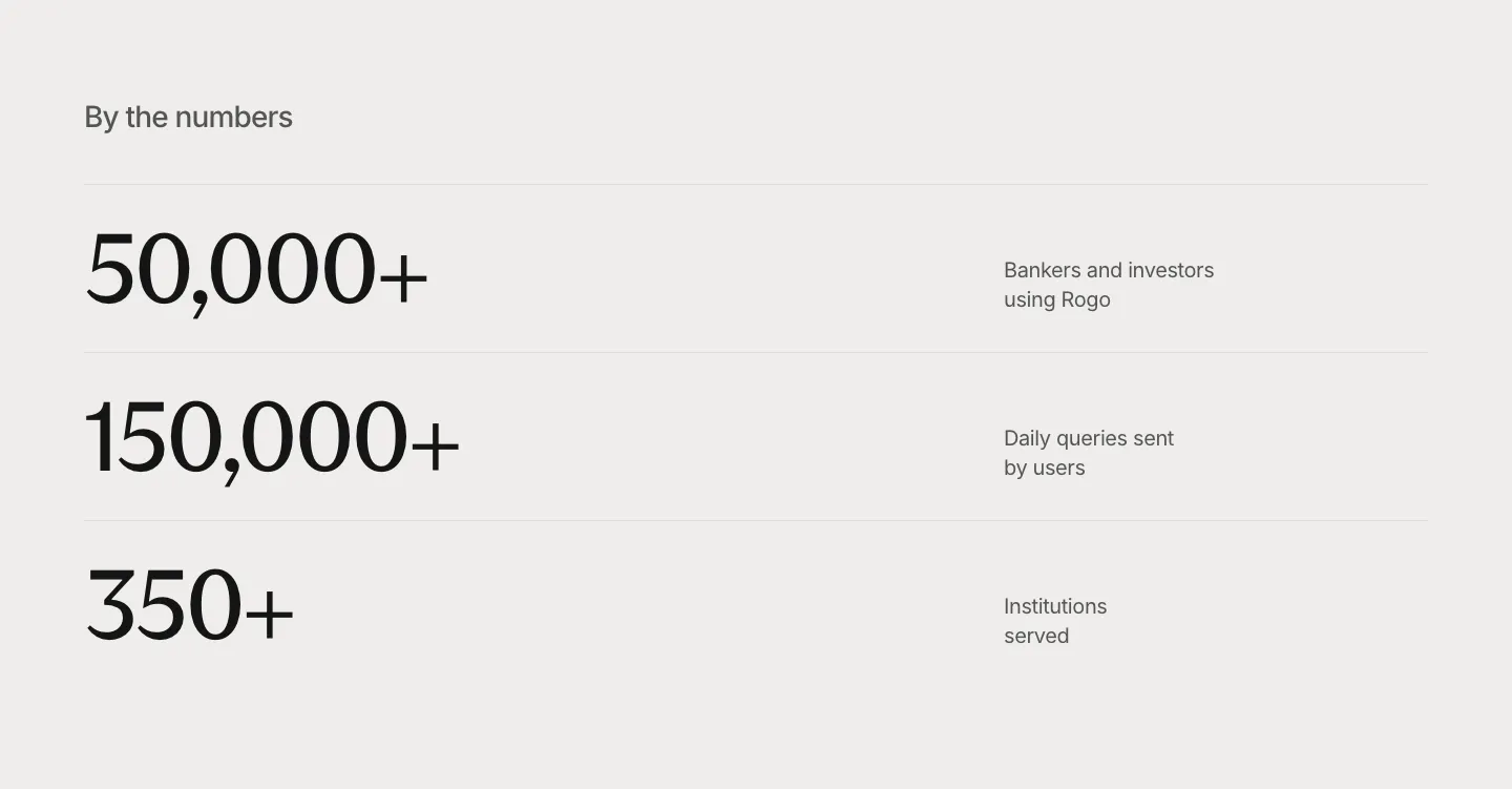
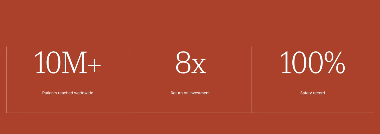
  474. Profound logo cloud section: small centered heading above a bordered 4x3 grid of white customer logos on black
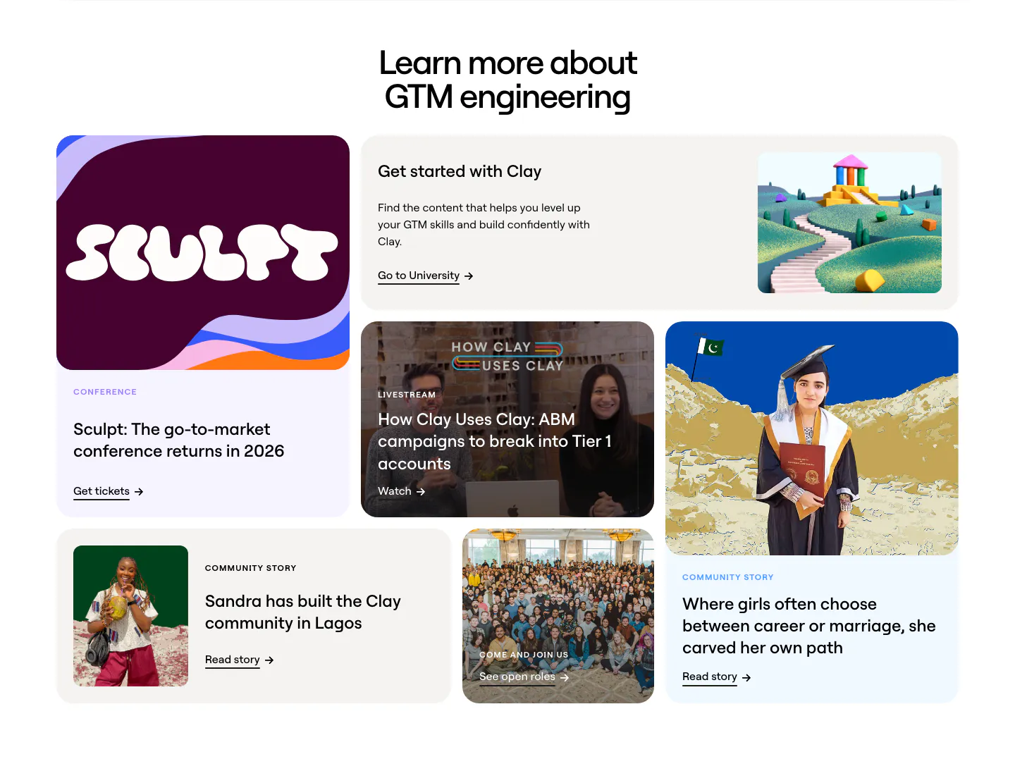
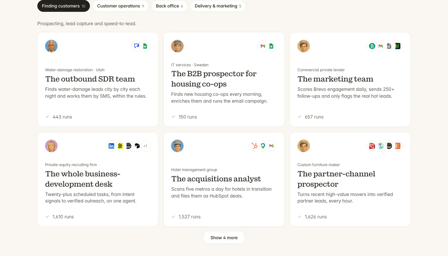
  475. Clay blog & resources section: centered headline above a bento grid of conference, livestream, community story and careers cards
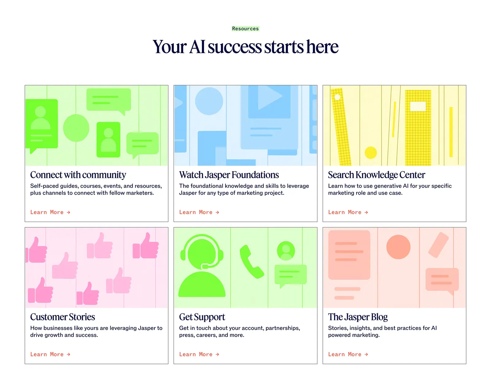
  476. Jasper blog & resources section: centered serif headline above six cards with colorful flat illustrations and Learn More links
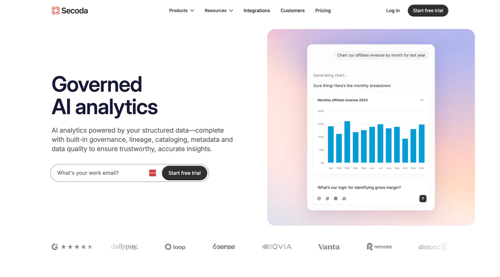
  477. Secoda hero section: headline and work email form on the left, AI chart chat mockup on a pastel gradient panel right, logos below
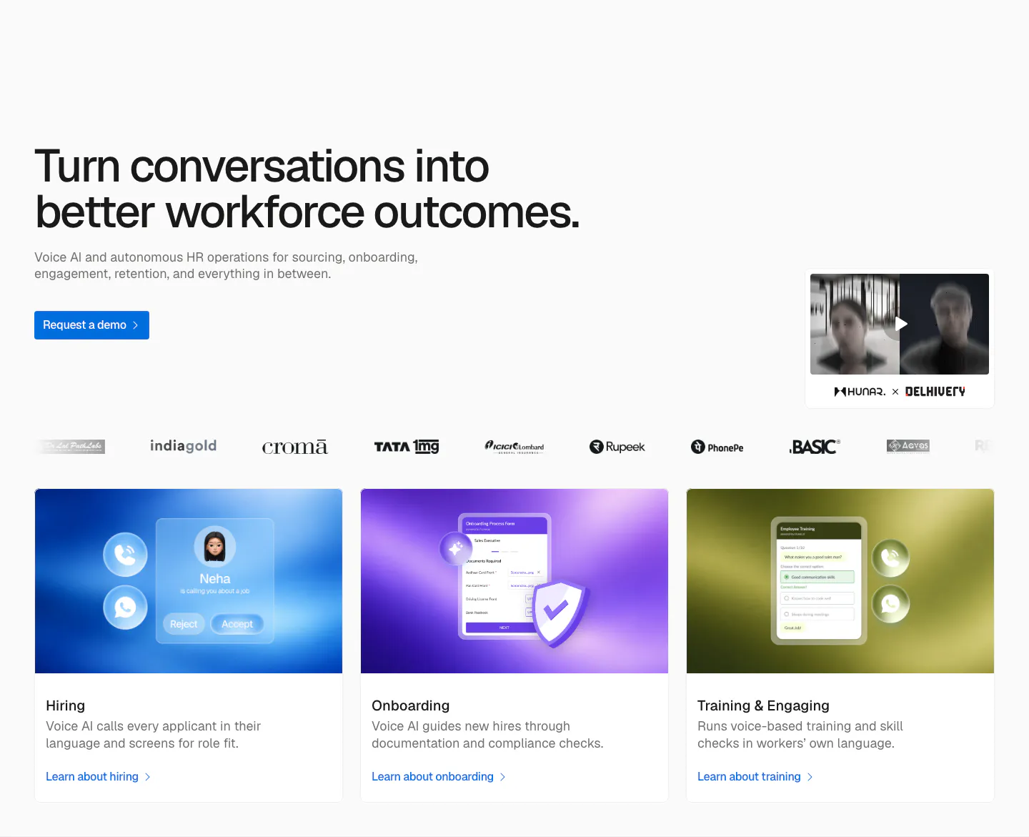
  478. Hunar hero section: left-aligned headline with demo button, video thumbnail, customer logo row and three gradient product cards below
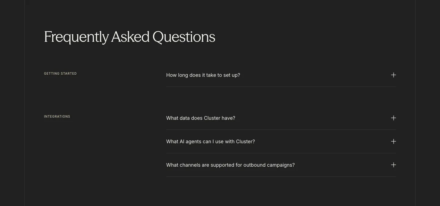
  479. Cluster FAQ section: serif headline above category-labelled accordion questions with plus icons on a charcoal background
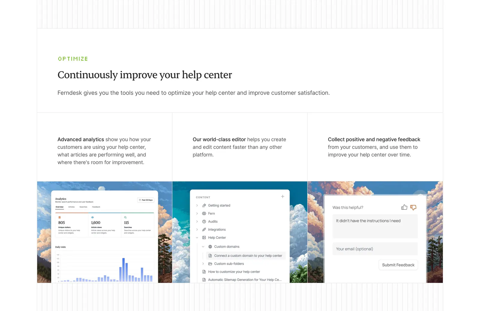
  480. Ferndesk features section: serif headline above three columns with analytics, editor and feedback UI over pixel-art landscapes
  481. Spara how it works section: centered headline above a demo video player with AI chat panel and four step tabs below
  482. Nominal blog & resources section: serif headline over three article cards with pixel-art thumbnails on a near-black background
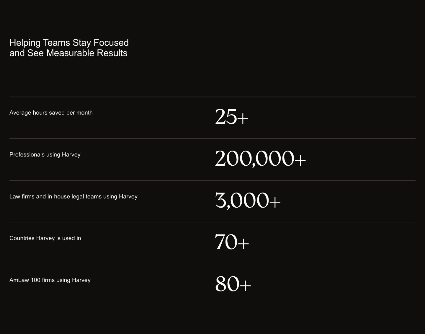
  483. Rogo stats section: three large serif numbers in divided rows with short labels on the right, light gray background
  484. Twin use cases section: tab bar of categories above a three-column grid of agent cards with avatars, app icons and run counts
  485. Attio testimonials section: headline above a customer logo tab bar and a Granola case study with stat headline beside a street photo
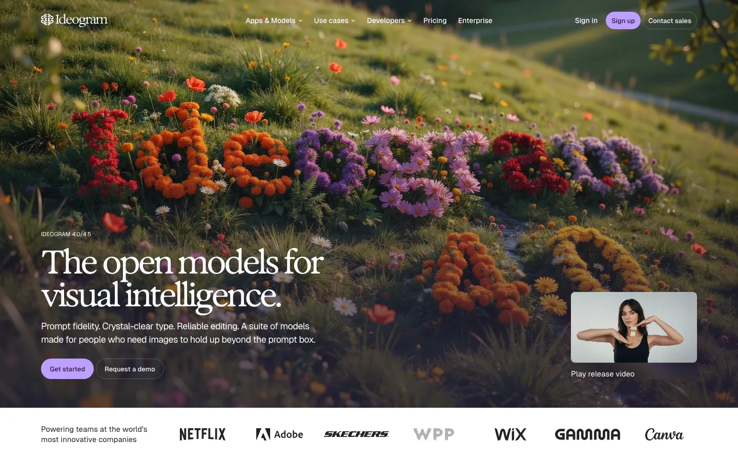
  486. Ideogram hero section: serif headline and buttons over a full-bleed hillside of flowers, release video thumbnail, logo strip below
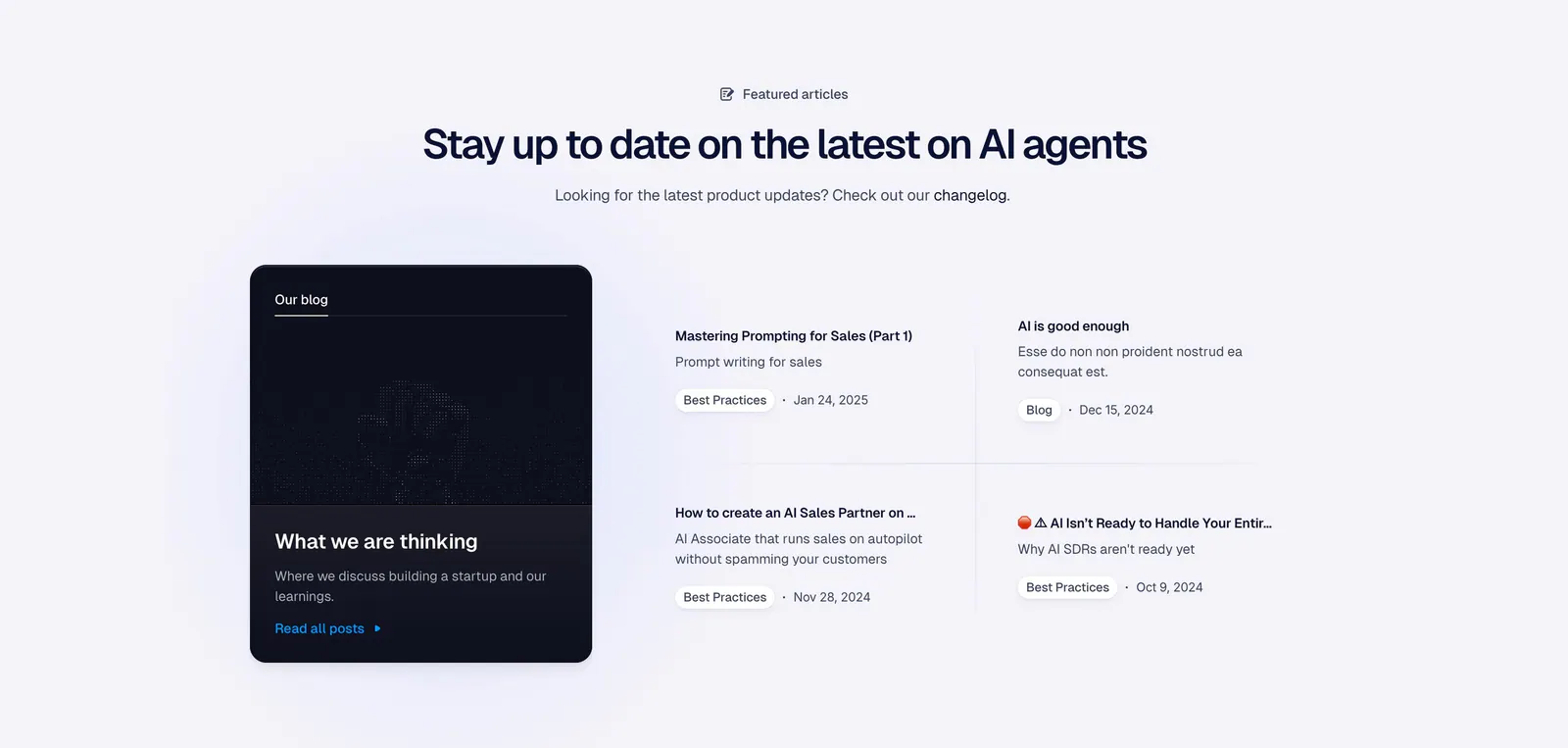
  487. Godmode blog & resources section: centered heading above a dark blog card on the left and a two-by-two list of article links
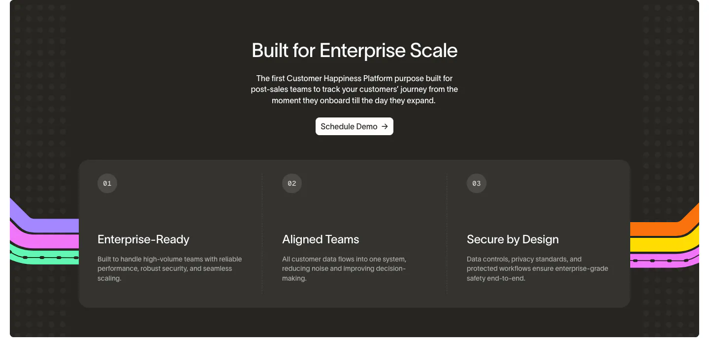
  488. Wavelength value proposition section: centered headline and Schedule Demo button above three numbered benefit columns on a charcoal panel
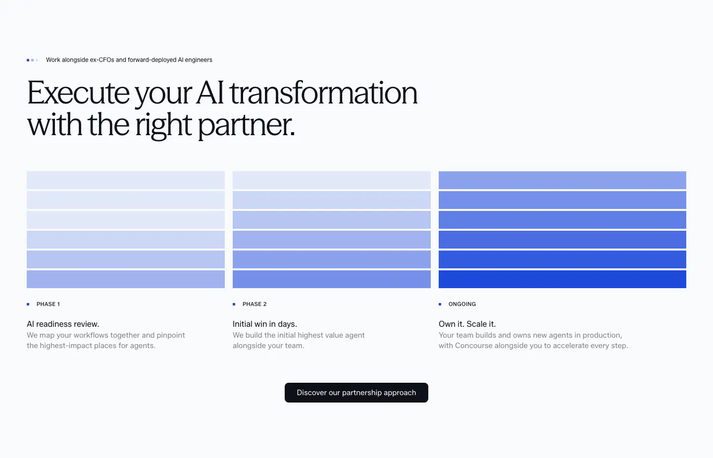
  489. Concourse how it works section: headline above three phase columns of stacked blue bars with step labels, descriptions and a button
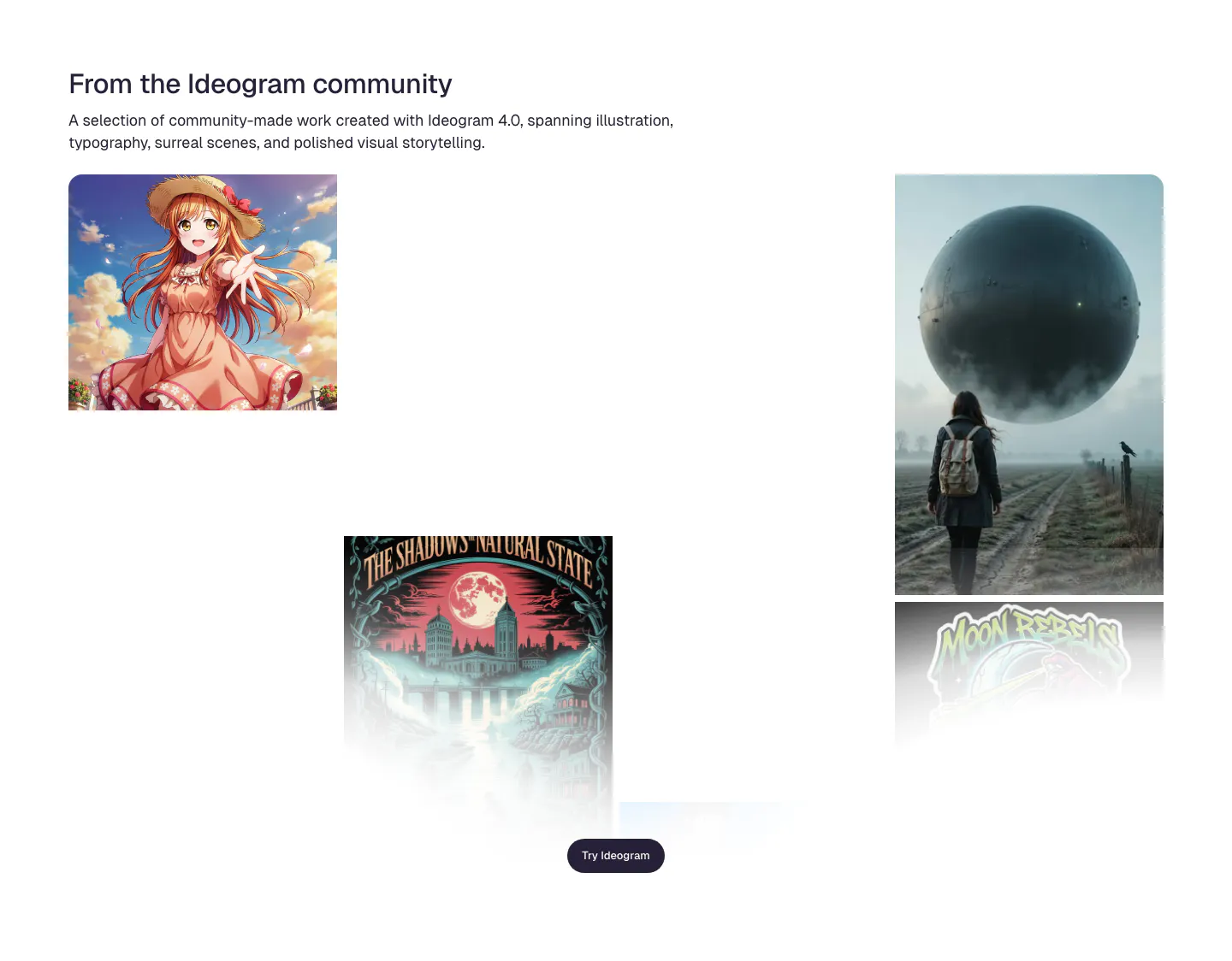
  490. Ideogram features section: headline and intro above a scattered gallery of community images incl. anime art, a poster and a surreal sphere
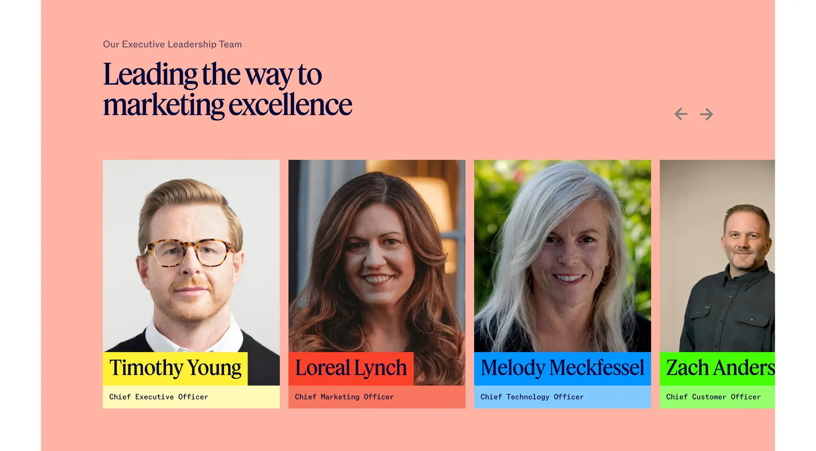
  491. Jasper team section: serif headline and arrows above executive portrait cards with colored name labels on a salmon background
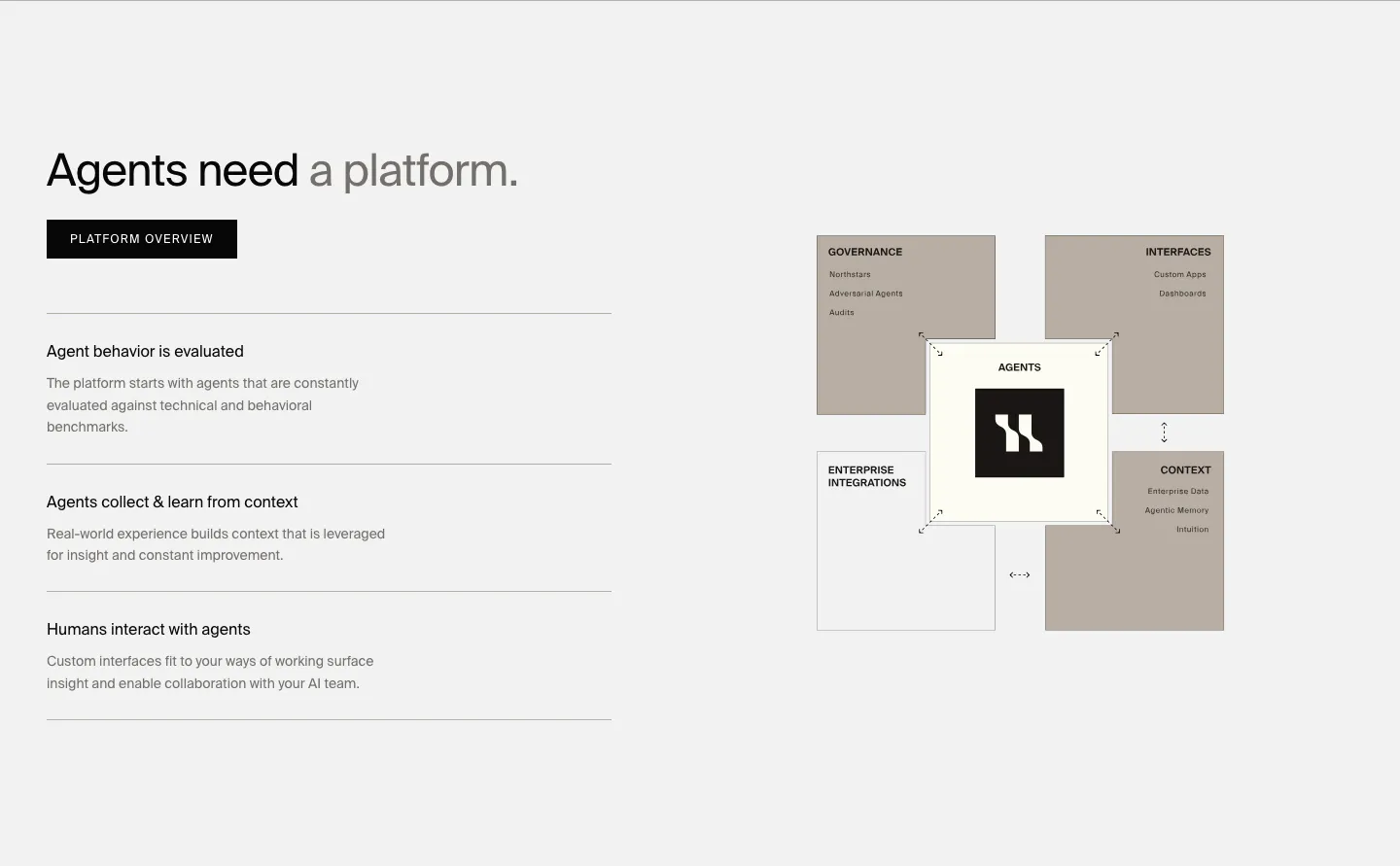
  492. HappyRobot features section: headline, button and three capability rows on the left, taupe block diagram of the agent platform on the right
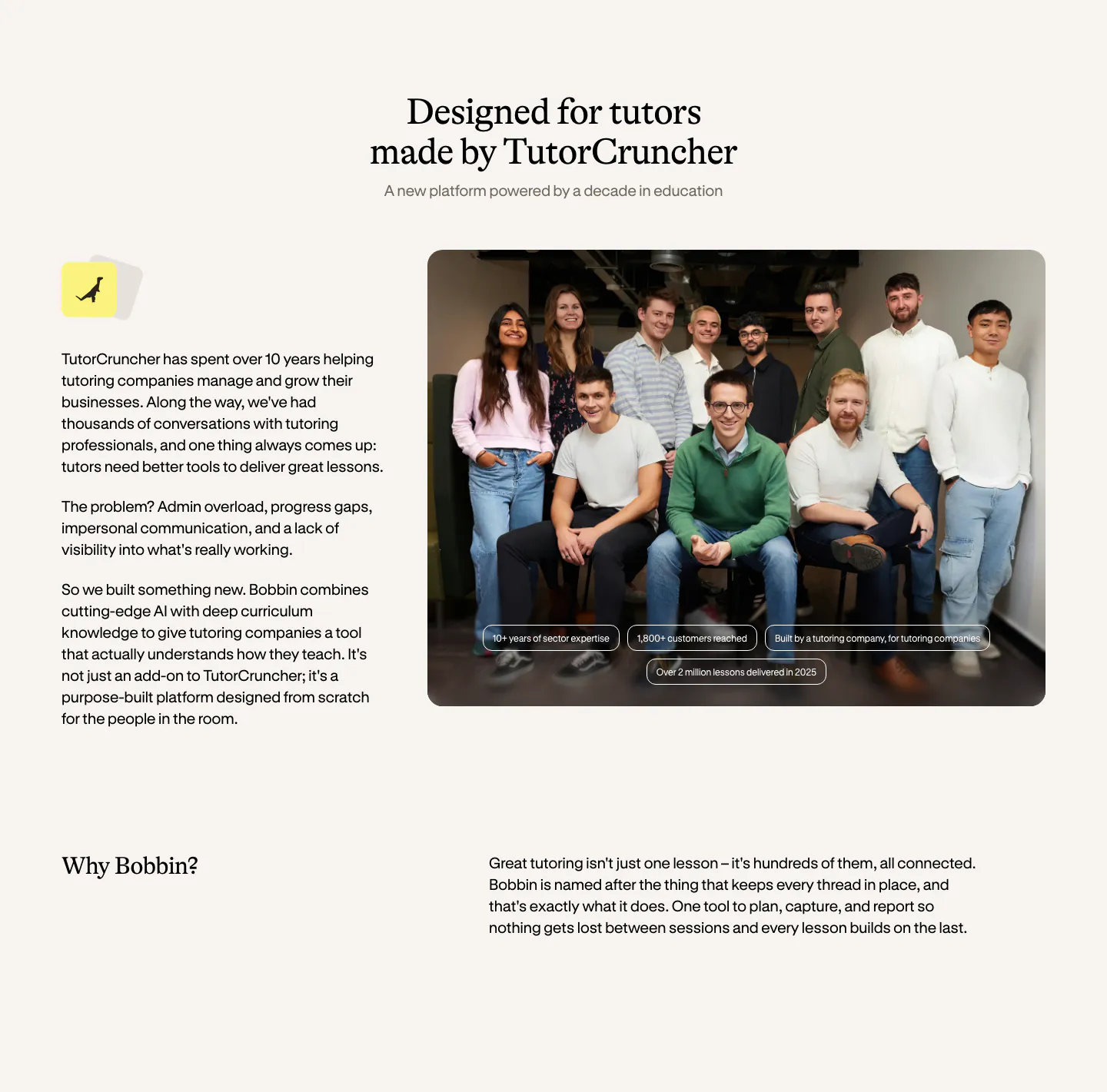
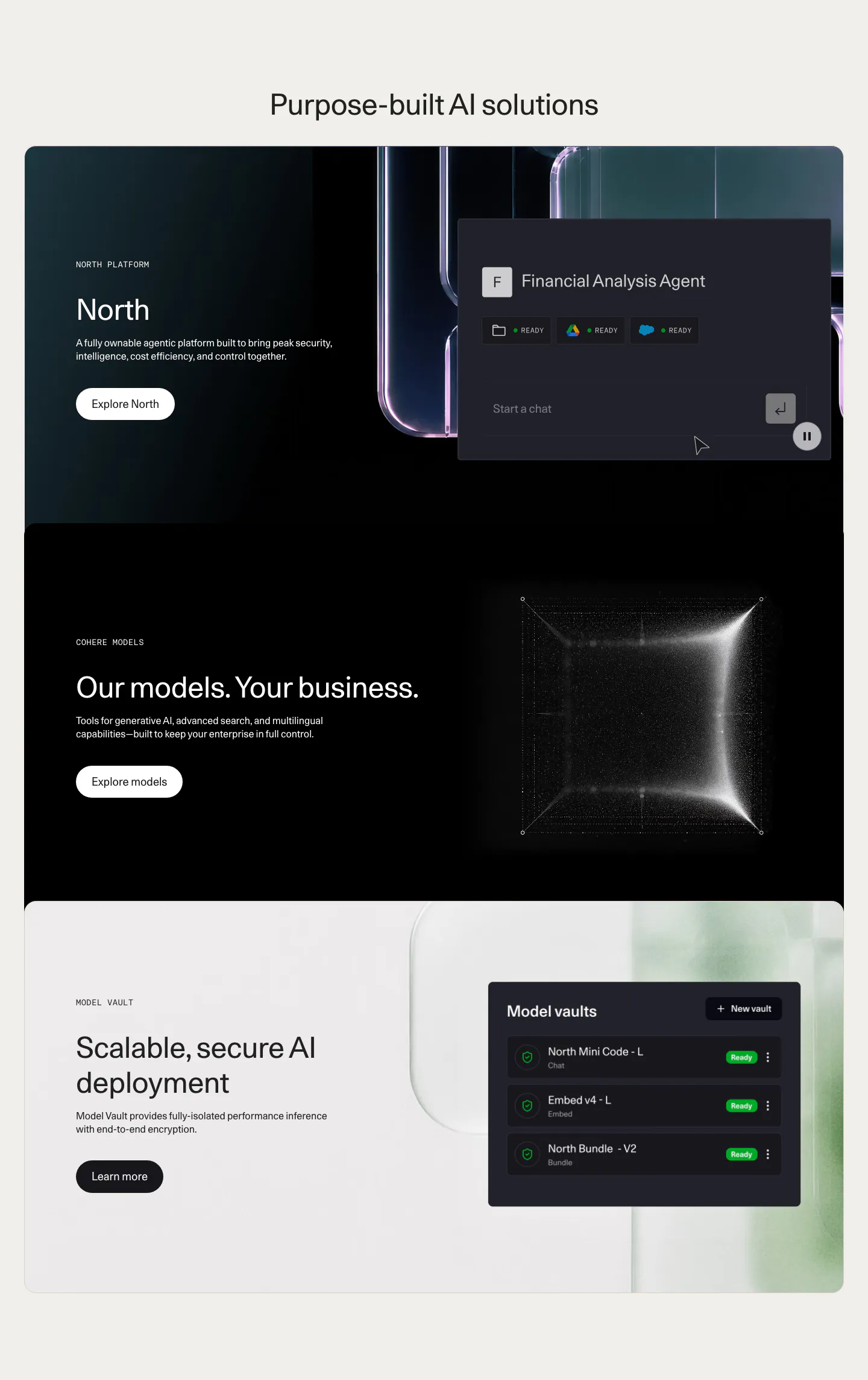
  493. Bobbin about & mission section: serif heading, company story text left and a team group photo right, with a Why Bobbin row below
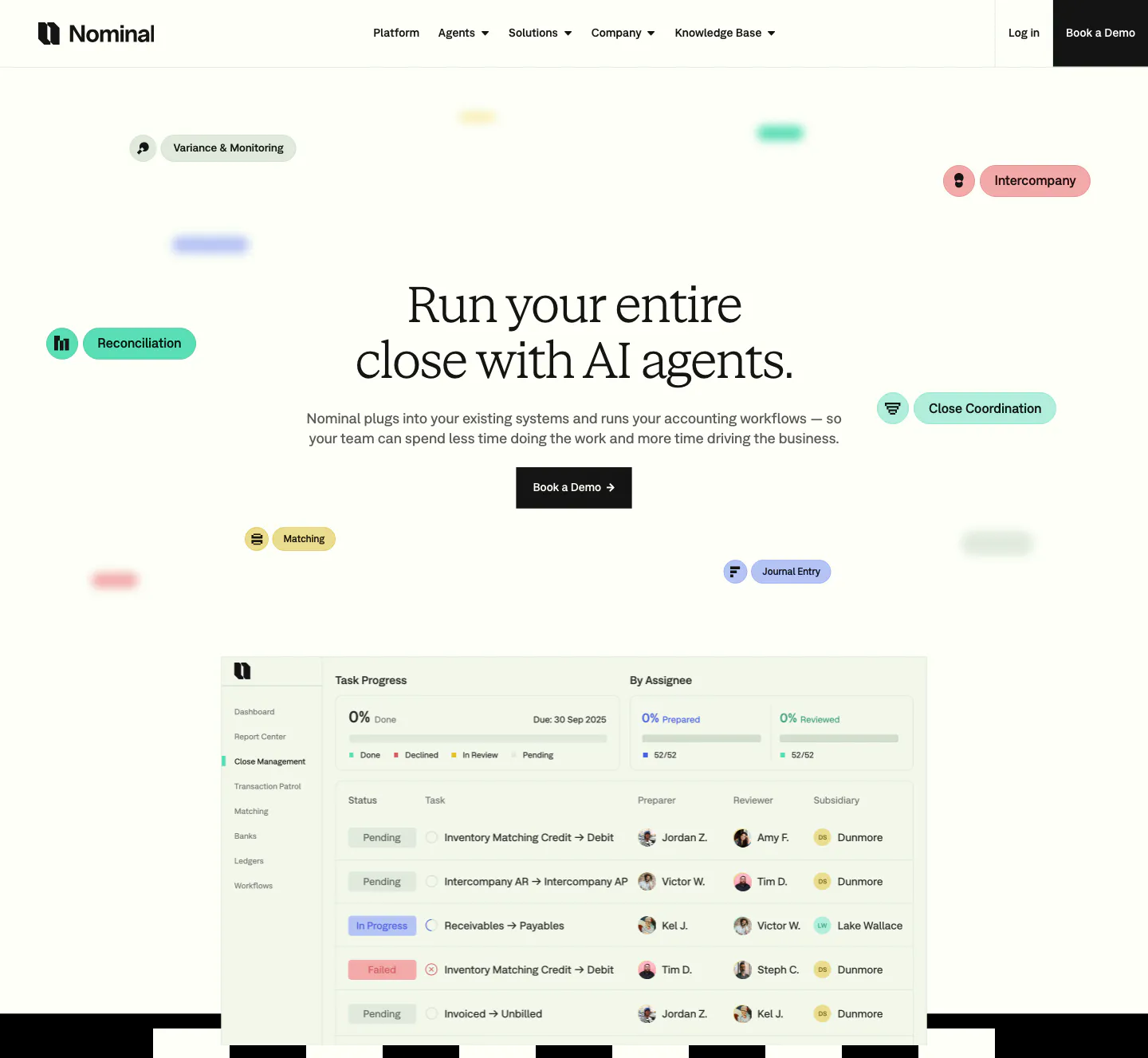
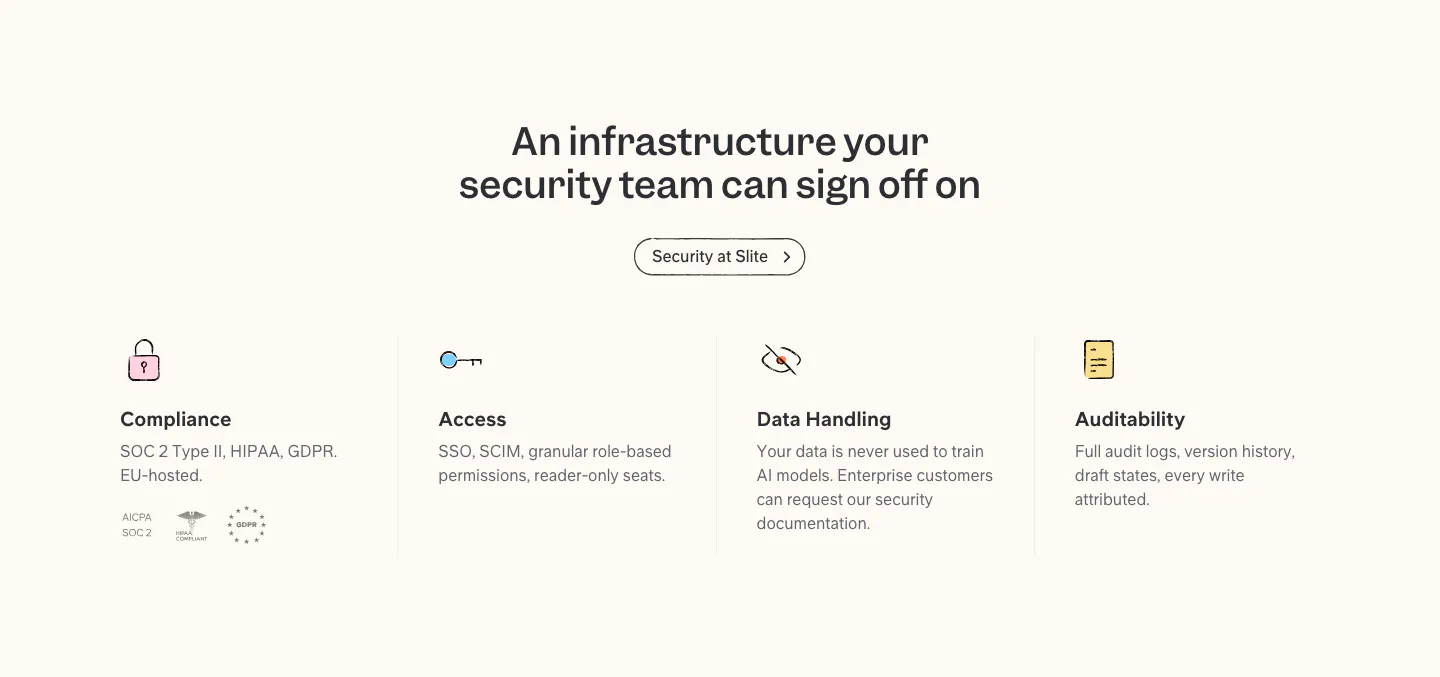
  494. Nominal hero section: centered serif headline with floating colored workflow pills above a close-management task table screenshot
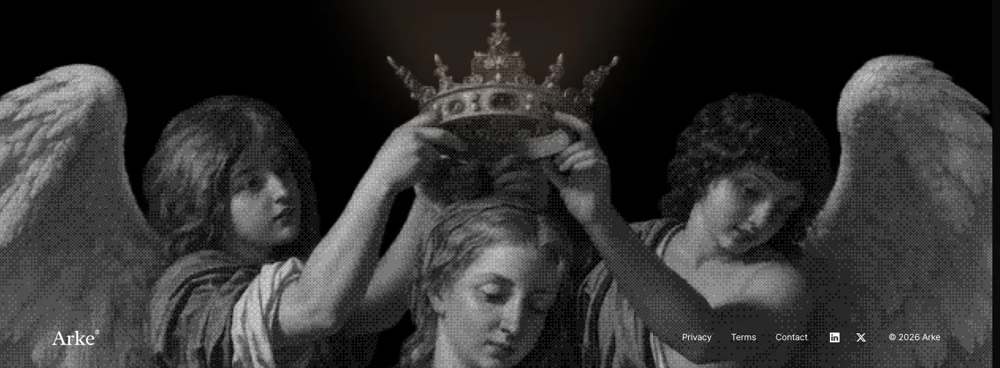
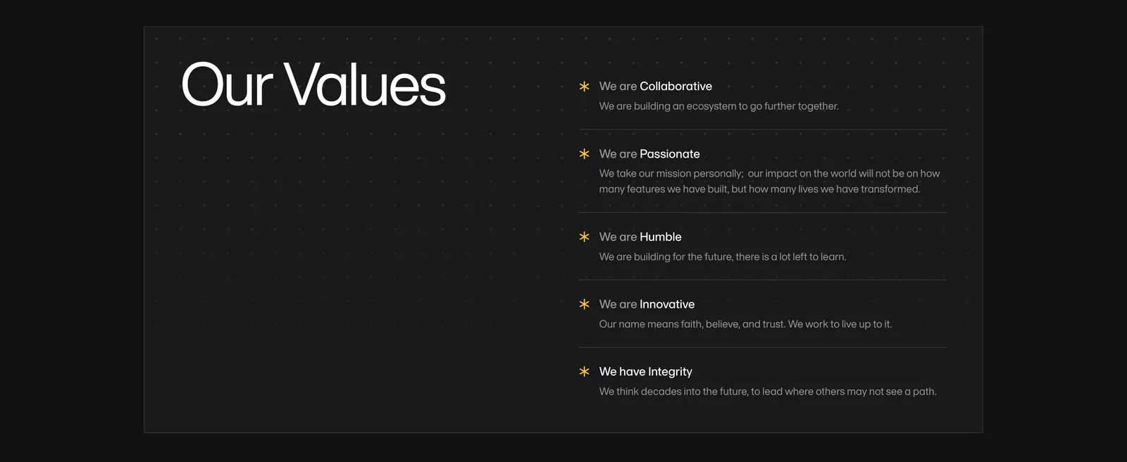
  495. Arke footer section: full-width grayscale halftone painting of angels crowning a figure with the wordmark and small legal links along the bottom
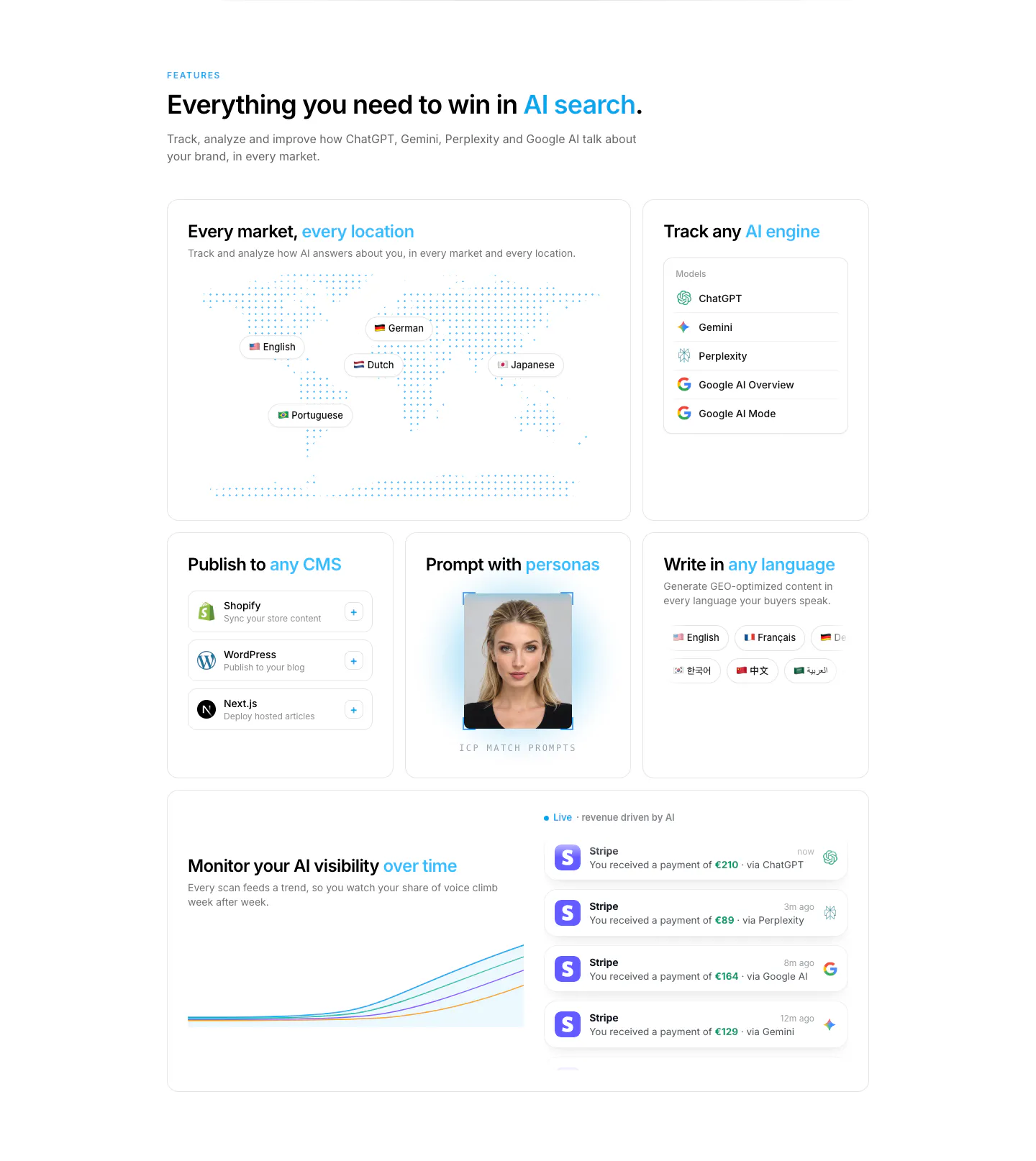
  496. Howseen AI features section: bento grid with dotted world map, AI engine list, CMS cards, persona photo and revenue chart
  497. Conduit features section: serif headline above a 3x2 card grid of agent UI mockups on dithered gradient tiles
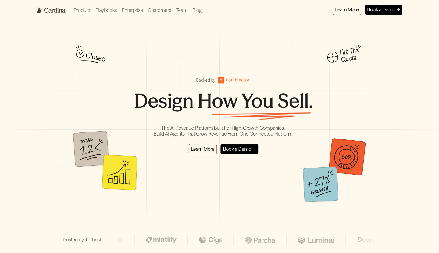
  498. Cardinal hero section: centered serif headline with two buttons, hand-drawn sticky-note doodles on a faint grid and a logo strip on cream
    Cardinal Hero
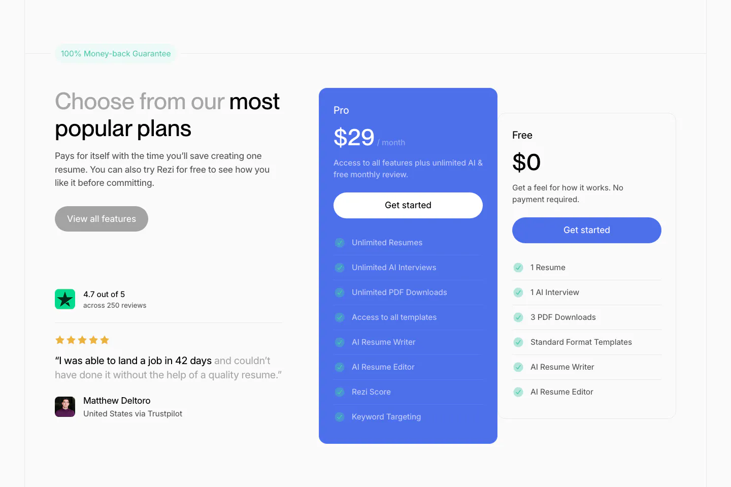
  499. Rezi pricing section: headline and Trustpilot quote on the left, blue Pro plan card and white Free plan card with checklists at right
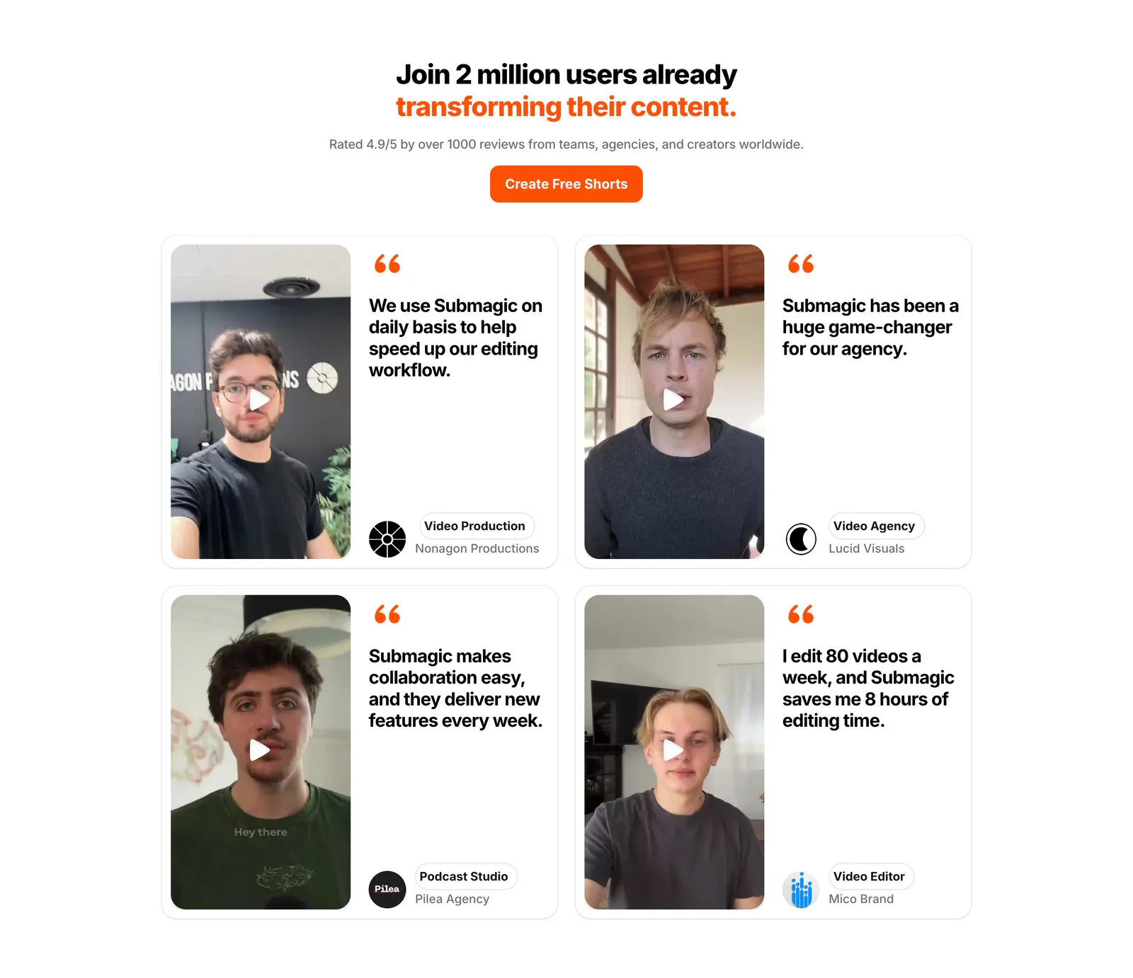
  500. Submagic testimonials section: centered headline and orange button above a 2x2 grid of quote cards with creator video thumbnails
  501. NickAI features section: left heading above a product screenshot pairing an agent chat log with a workflow node canvas
  502. Cohere features section: centered headline above three stacked cards with text left and agent UI, particle cube and vault UI right
  503. Slite security section: centered headline and button above four columns for compliance, access, data handling and audit, with badges
  504. Amini value proposition section: large Our Values heading on a dark dotted panel beside a list of five values with yellow asterisks
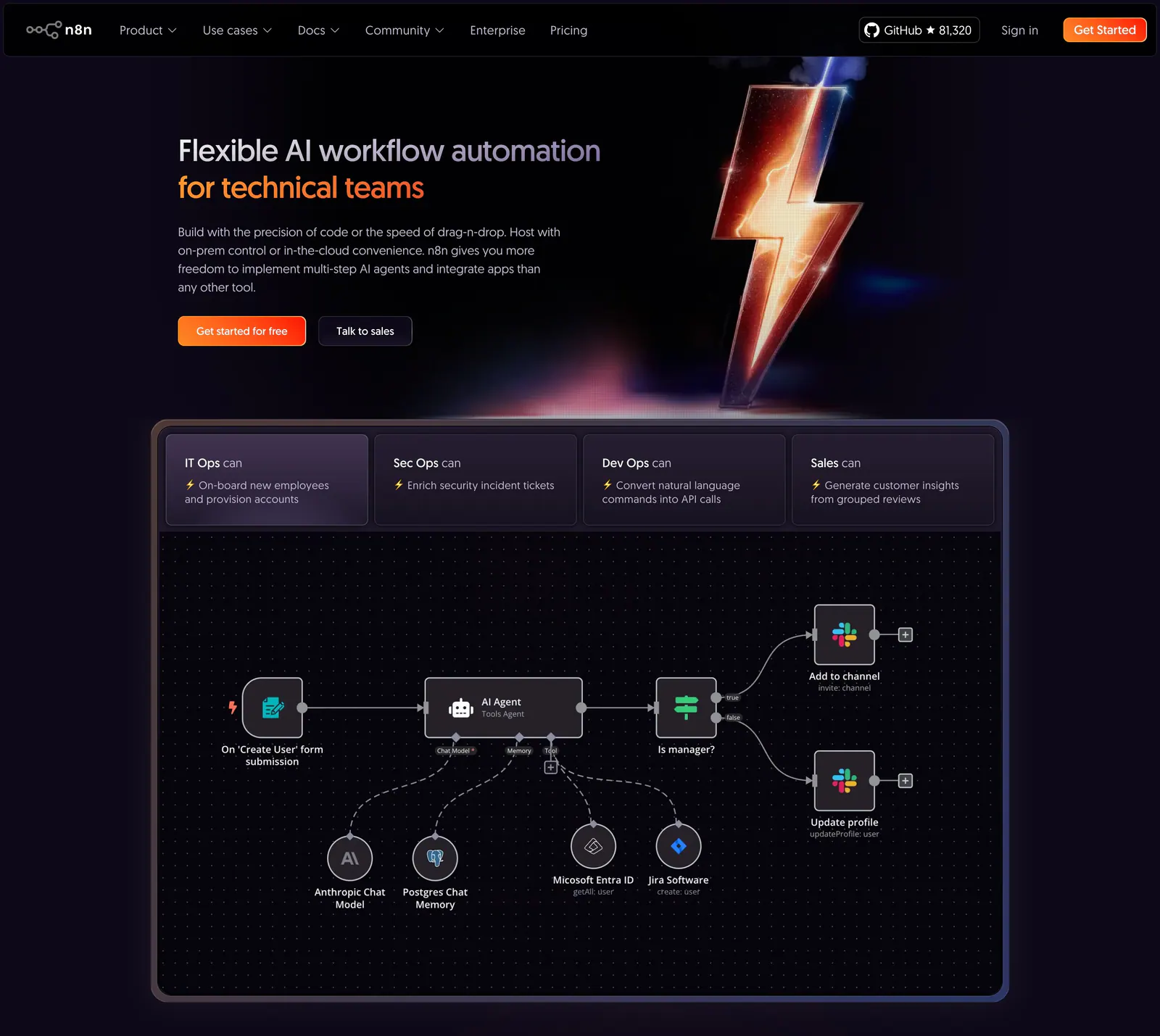
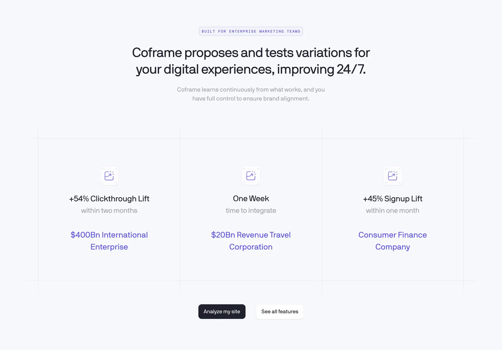
  505. n8n hero section: dark hero with headline and CTAs beside a 3D lightning bolt, above a tabbed AI agent workflow canvas
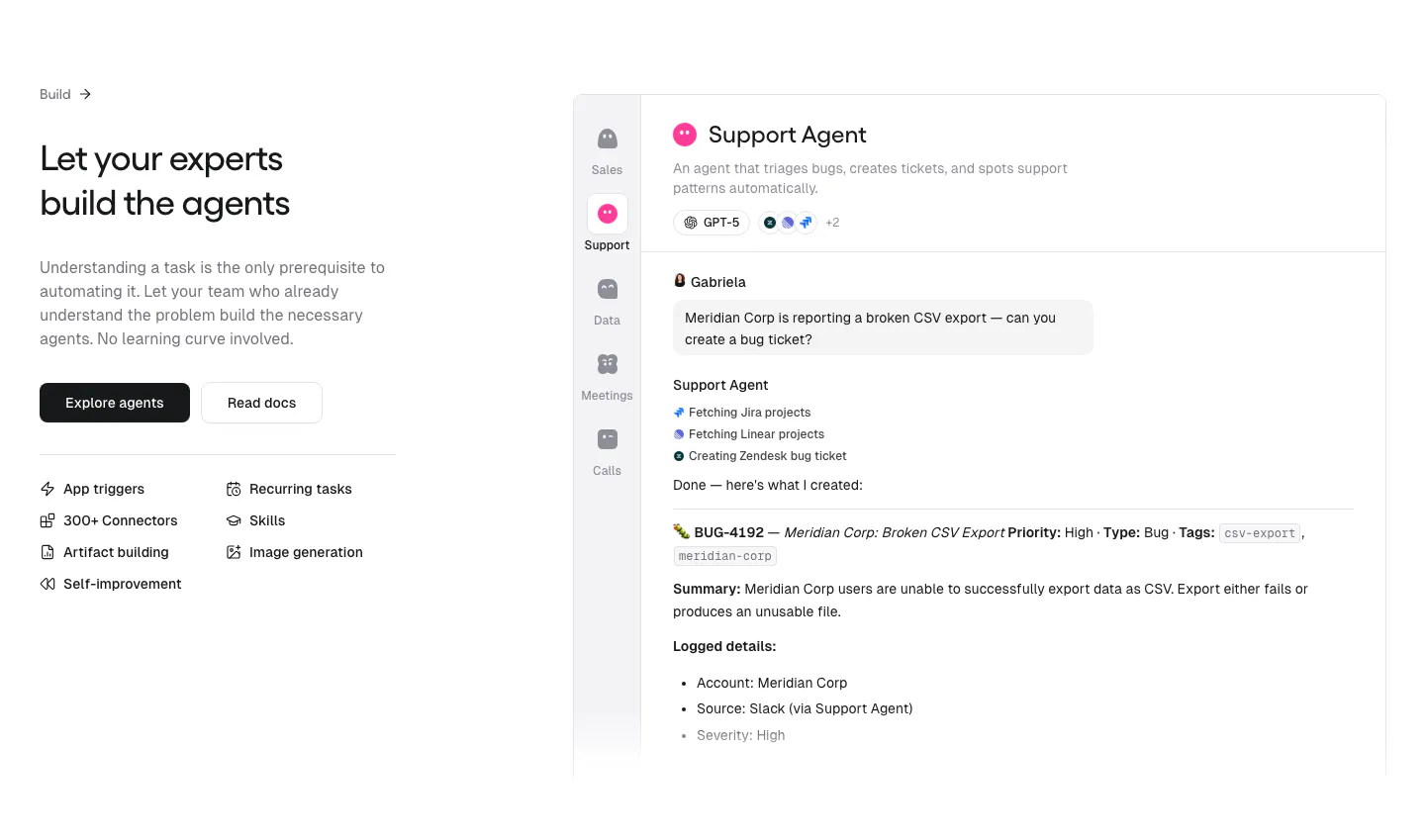
  506. Teton logo cloud section: two-tone headline above a scrolling row of gray tiles with black healthcare and municipality logos
  507. Endex footer section: serif CTA headline with two buttons, teal pixel-grid strip, link rows and a huge faded Endex wordmark on dark green
  508. Nominal integrations section: centered serif headline above a bordered grid of ERP logo tiles with Explore links on an off-white background
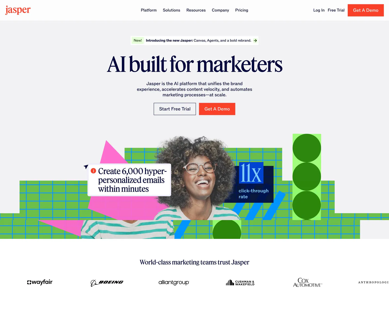
  509. Jasper hero section: nav and centered serif headline over a photo of a smiling woman with green grid shapes, customer logo row below
  510. n8n call-to-action section: centered headline and orange button in a translucent panel over a dark purple glow with sparks
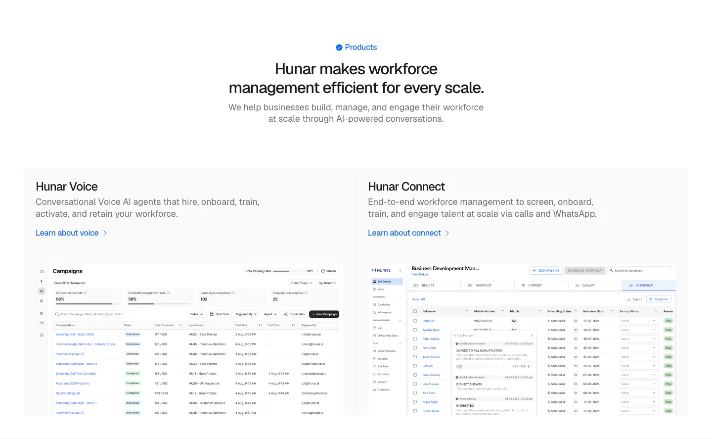
  511. Hunar features section: centered heading above two product cards with campaign and candidate table screenshots on a light background
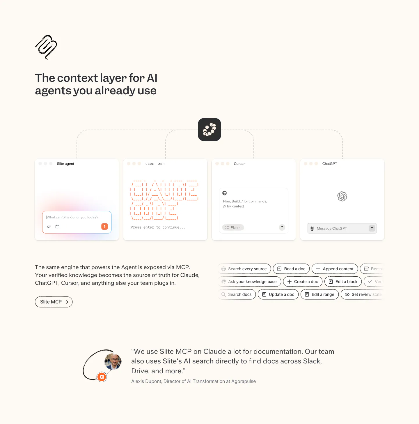
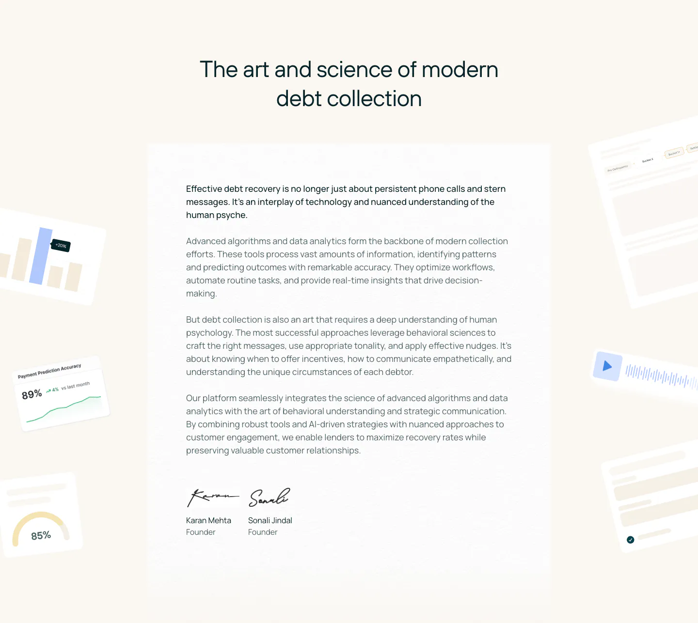
  512. Slite integrations section: MCP diagram linking Slite to agent, terminal, Cursor and ChatGPT windows, tool chips and a customer quote
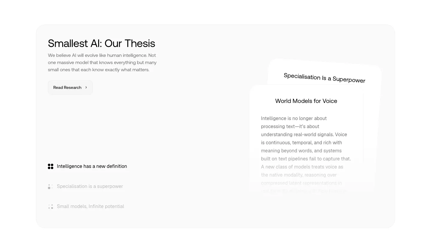
  513. Smallest.ai about & mission section: thesis headline, research button and topic list on the left beside stacked text cards in a gray panel
  514. Voiceflow testimonials section: centered serif headline above a row of logo and quote cards cut off at the right edge
  515. Coframe value proposition section: centered headline above three result columns with lift metrics on a light grid background
  516. Gumloop features section: headline, buttons and capability list on the left, support agent chat UI on the right
  517. Conduit footer section: dark brown footer with newsletter field, G2 rating and dense multi-column link lists
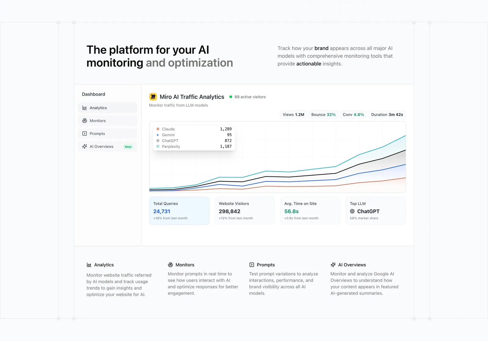
  518. Promptwatch features section: headline with side copy above an AI traffic analytics dashboard screenshot and a four-column feature row
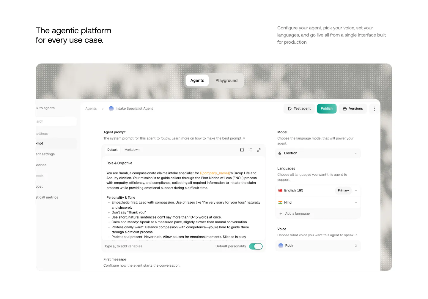
  519. Smallest.ai features section: headline and copy above a large agent configuration UI screenshot with Agents/Playground tabs
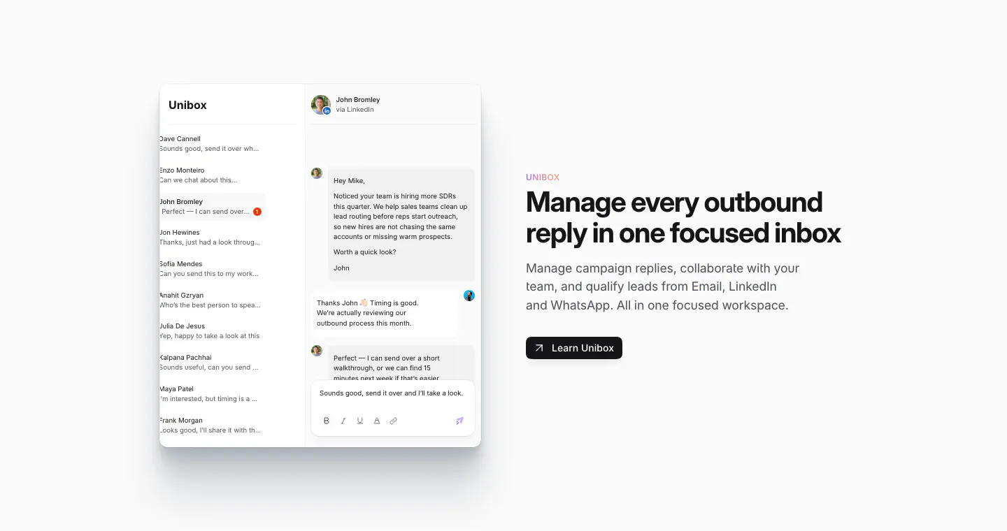
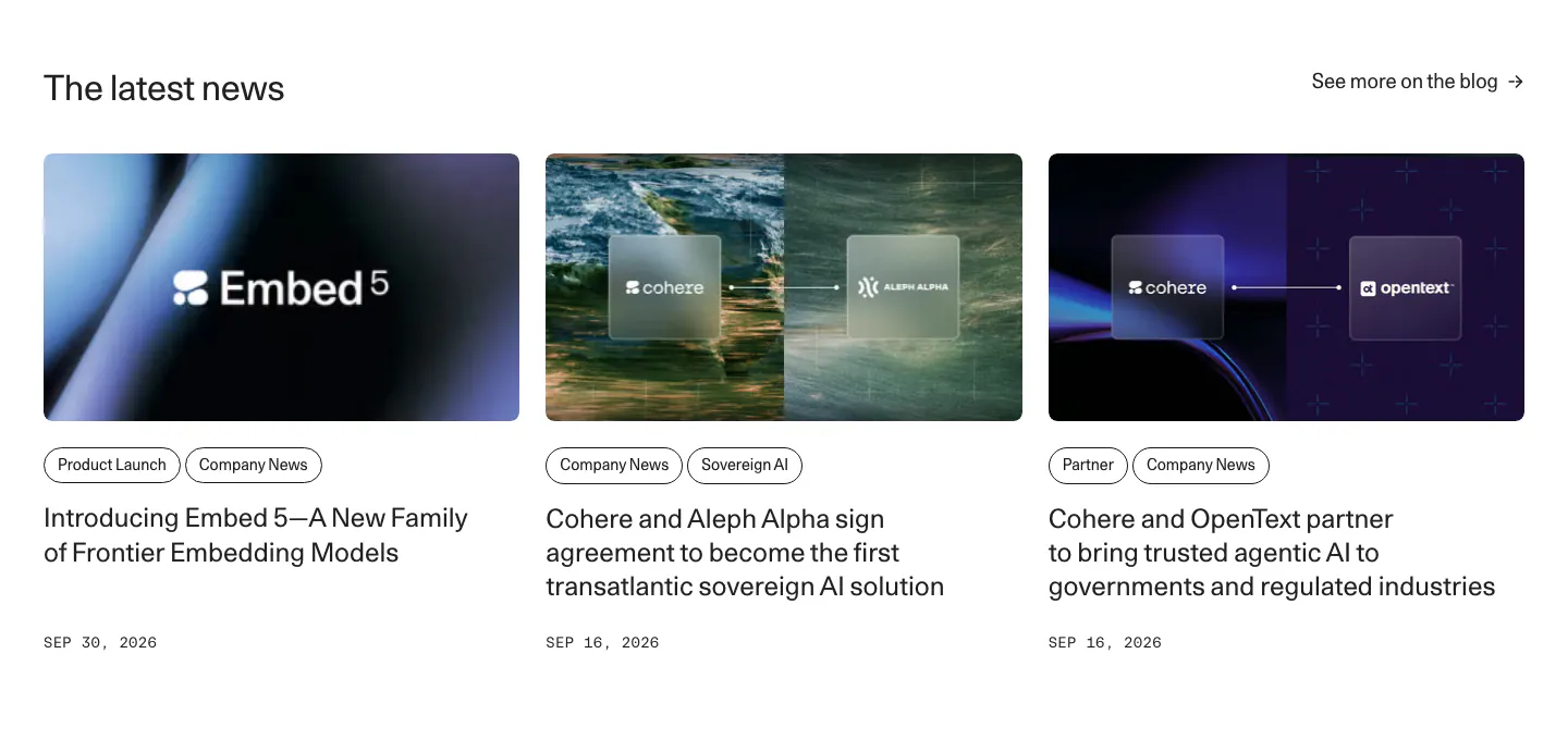
  520. Sendr features section: Unibox inbox UI with a conversation thread on the left, headline, copy and Learn Unibox button on the right
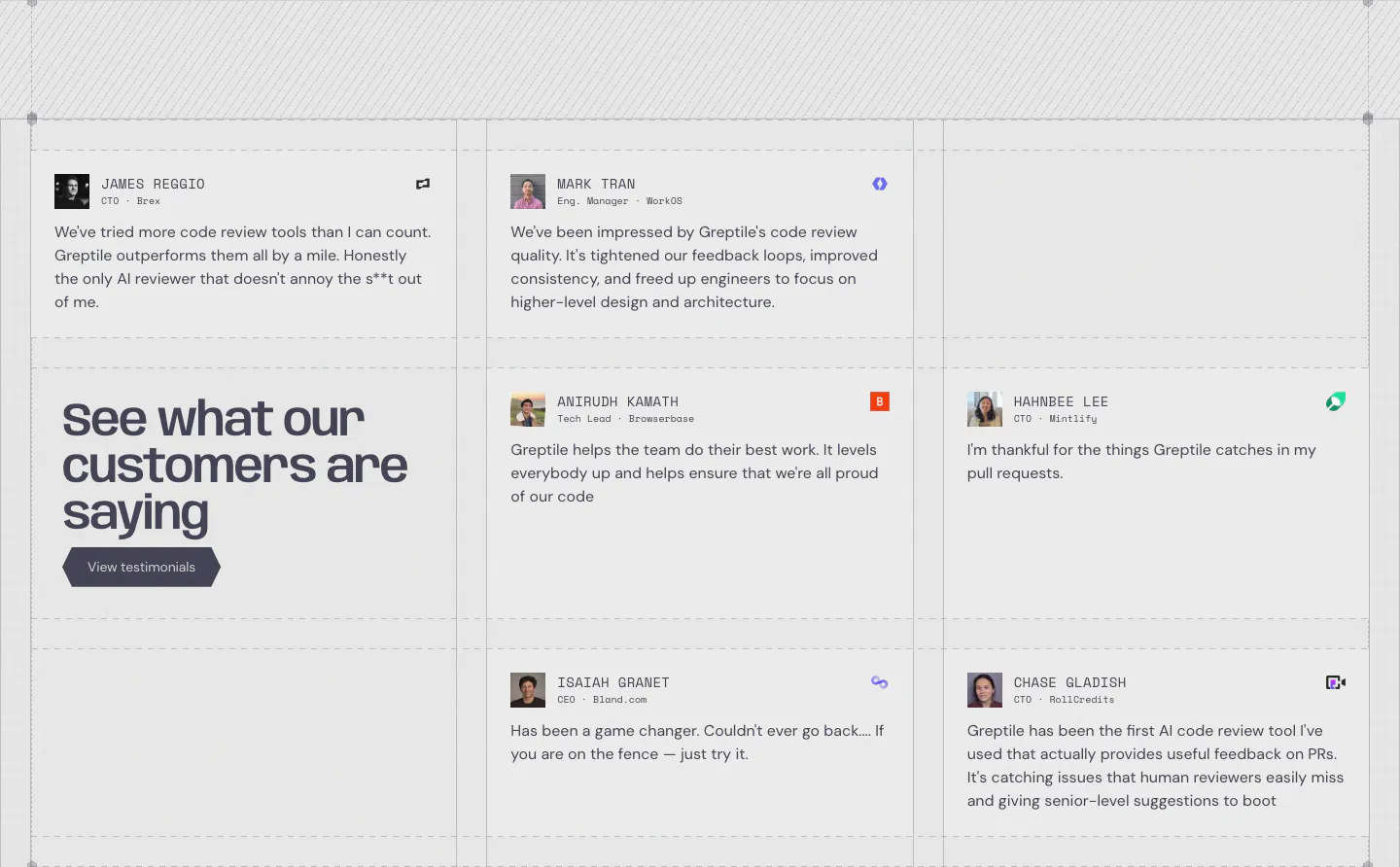
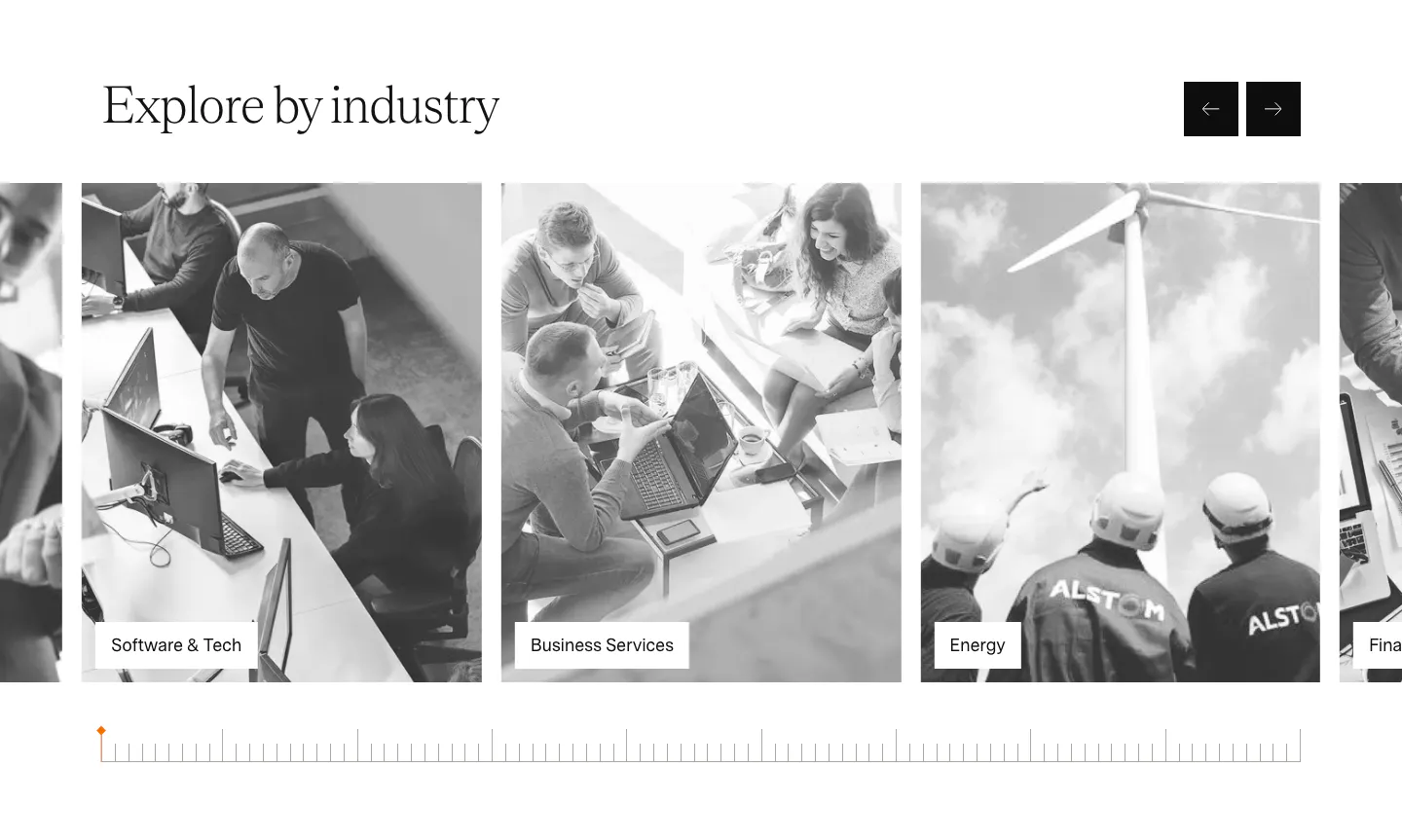
  521. Greptile testimonials section: grid of quote cards with avatars and company logos around a large headline cell with a button
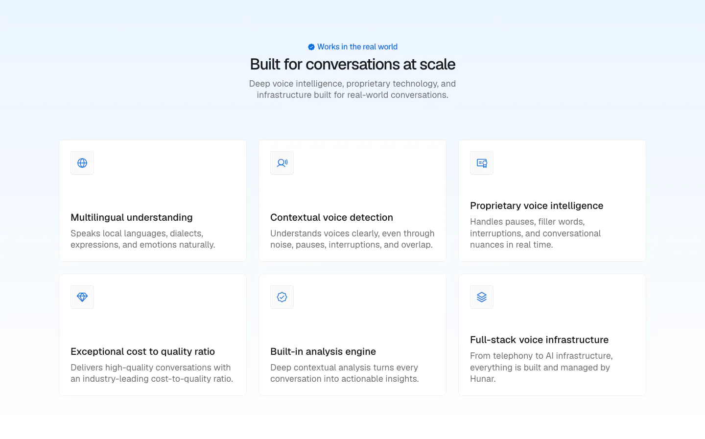
  522. Rezolv about & mission section: centered headline above a founders letter with signatures, flanked by faded UI fragments on cream
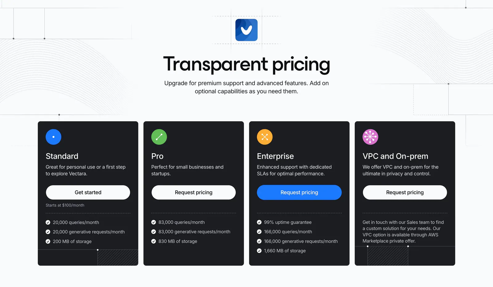
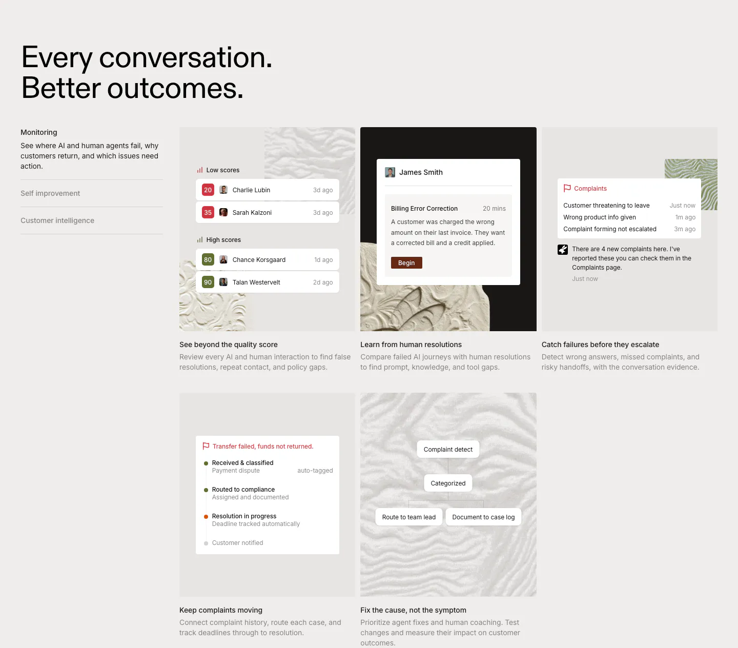
  523. Vectara pricing section: centered headline above four dark plan cards with icons and buttons, on light gray with line-pattern accents
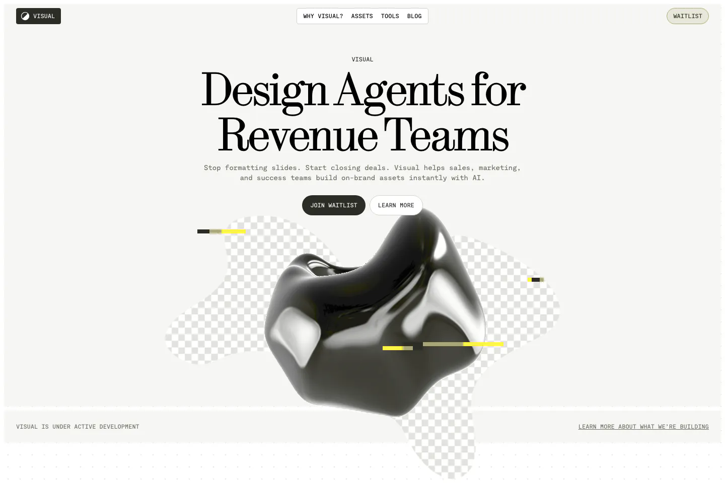
  524. Visual hero section: nav bar and centered serif headline with two buttons above a glossy black 3D blob on checkerboard shapes
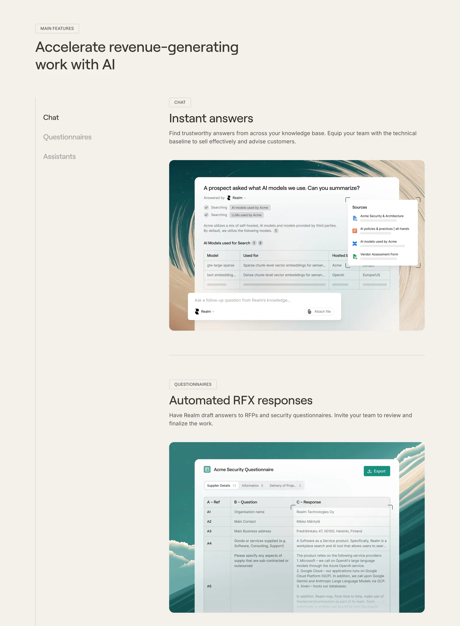
  525. Realm features section: headline with side menu and stacked feature blocks showing UI screenshots on painted backdrops, beige page
  526. Clay testimonials section: left heading with arrow controls above a slider of lime, orange and blue quote cards with logos and headshots
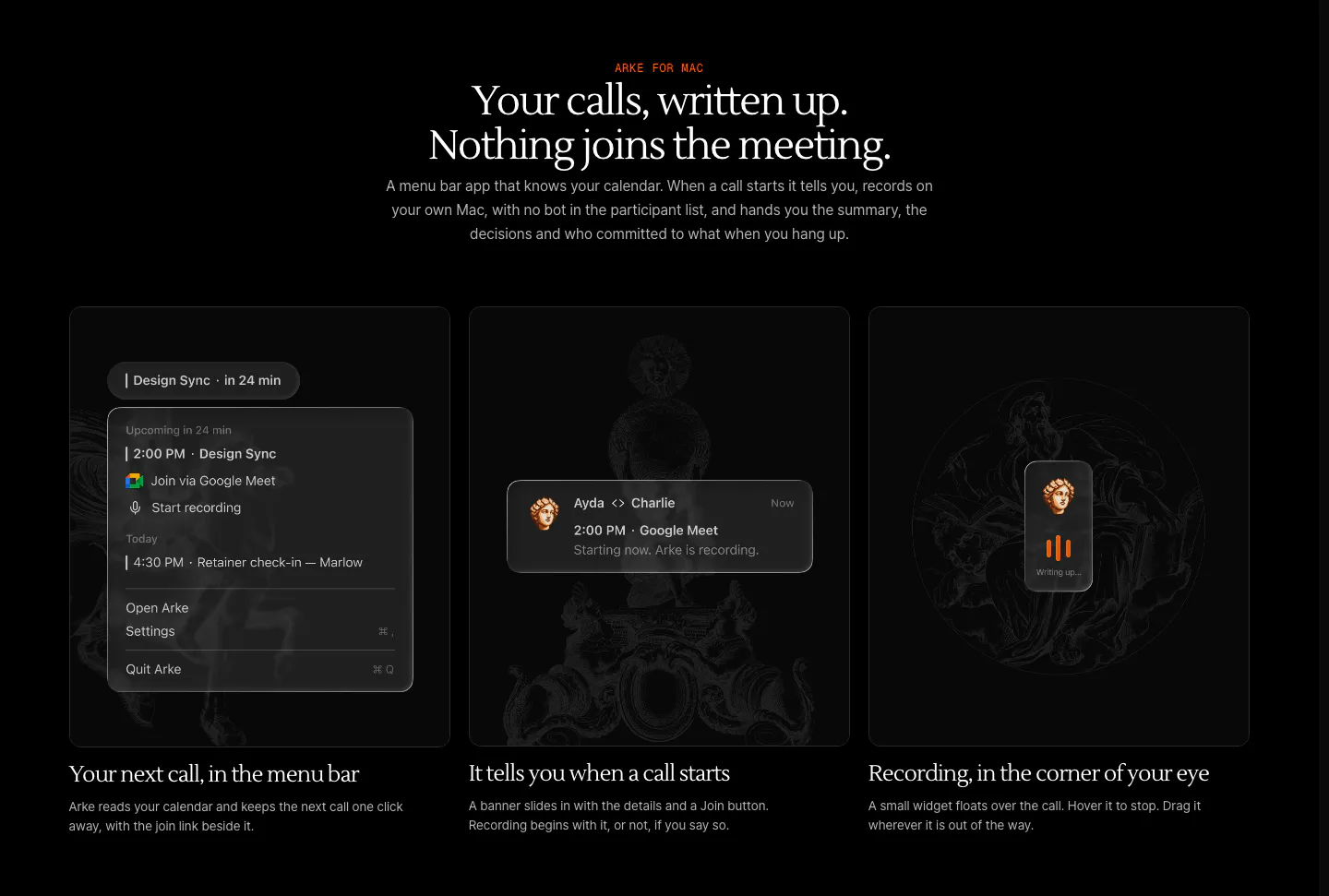
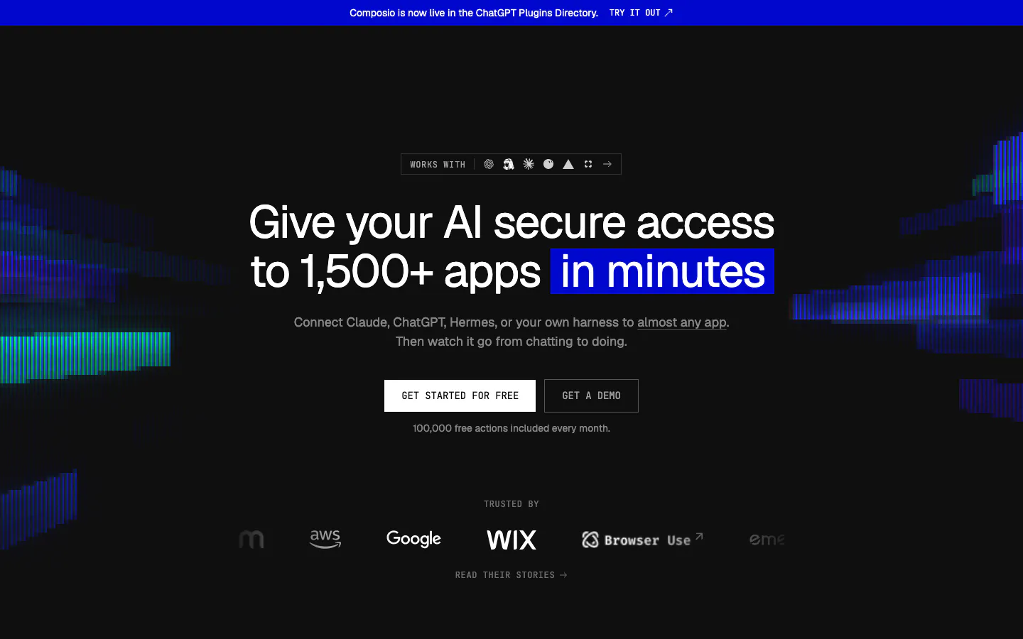
  527. Arke features section: centered serif headline above three dark cards showing a menu bar call reminder, notification and recording widget
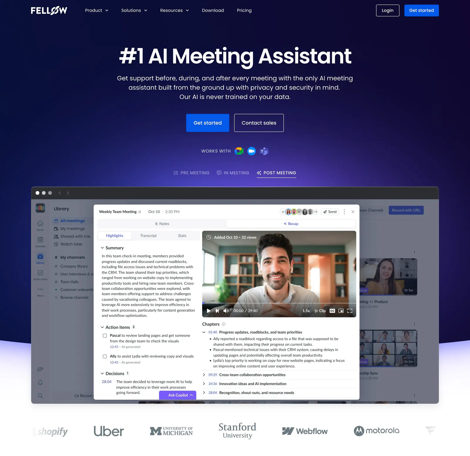
  528. Fellow hero section: centered headline and CTAs on deep navy above a meeting recap app screenshot with tabs and a customer logo row
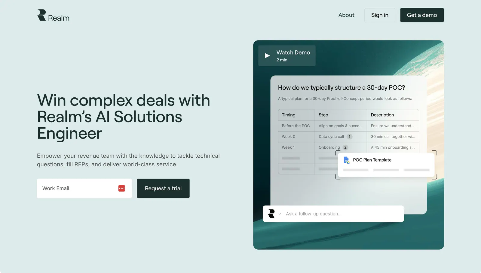
  529. Realm hero section: headline and email signup on the left, chat answer UI over a teal planet image with Watch Demo on the right
  530. Cohere blog & resources section: headline with blog link above three news cards with images, pill tags and dates
  531. Agiloft use cases section: serif heading with arrow buttons above a carousel of grayscale industry photo cards
  532. Hunar features section: centered heading above a two-row grid of six icon cards on a pale blue background
  533. Rulebase features section: left-aligned headline, vertical tab list and a grid of five cards with scoring and complaint UI on textured tiles
  534. Amplemarket hero section: centered headline and email field above a product screenshot with play button, rocket doodle and color blurs
  535. Voiceflow logo cloud section: centered line of text above three rows of grayscale customer logos on a charcoal background
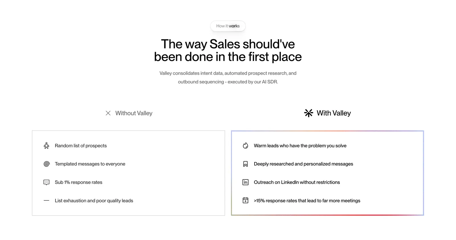
  536. Valley comparison section: centered headline above side-by-side Without Valley and With Valley lists in outlined cards on white
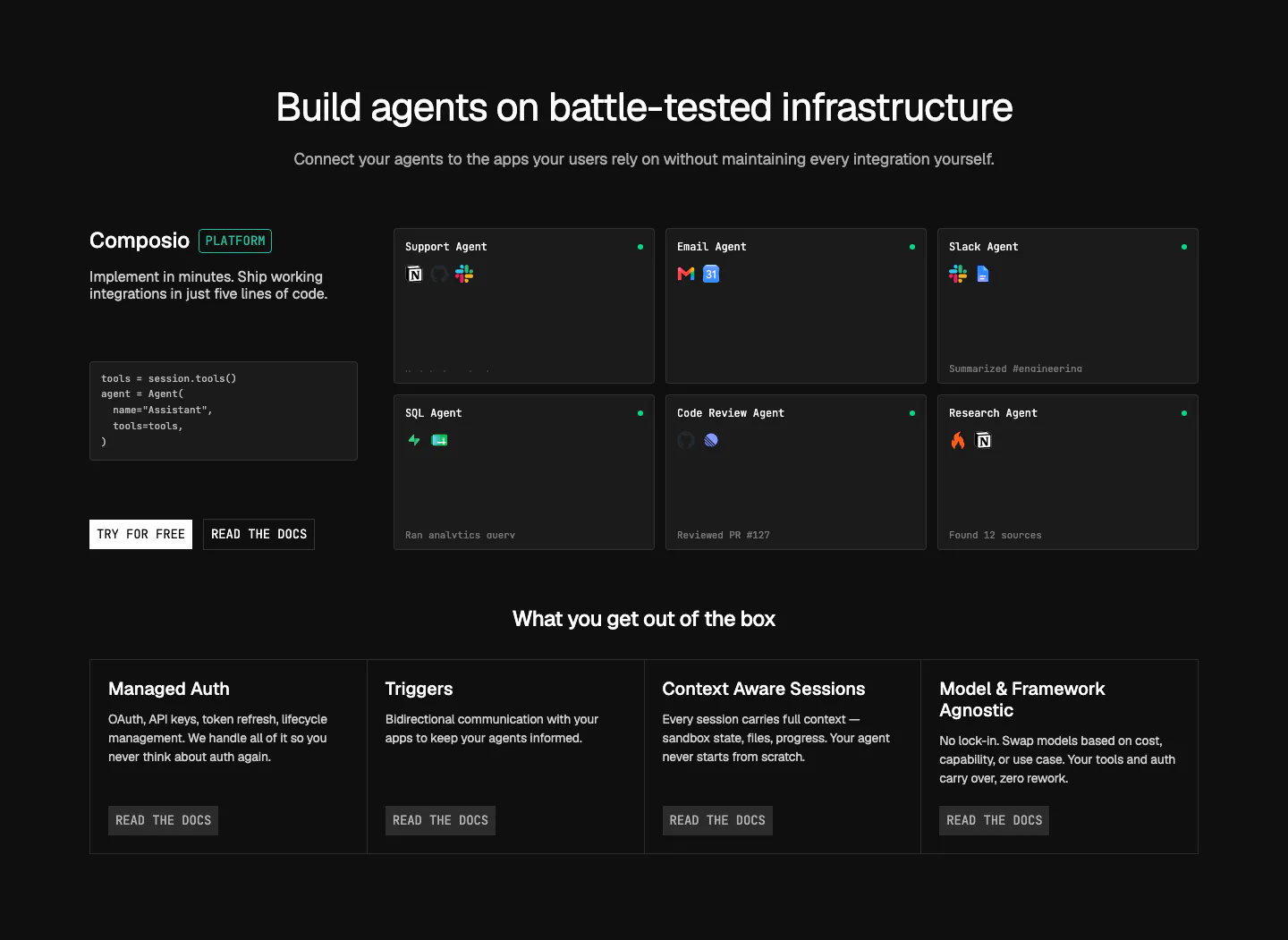
  537. Composio features section: code snippet and CTAs beside a grid of agent cards, then four platform feature columns on near-black
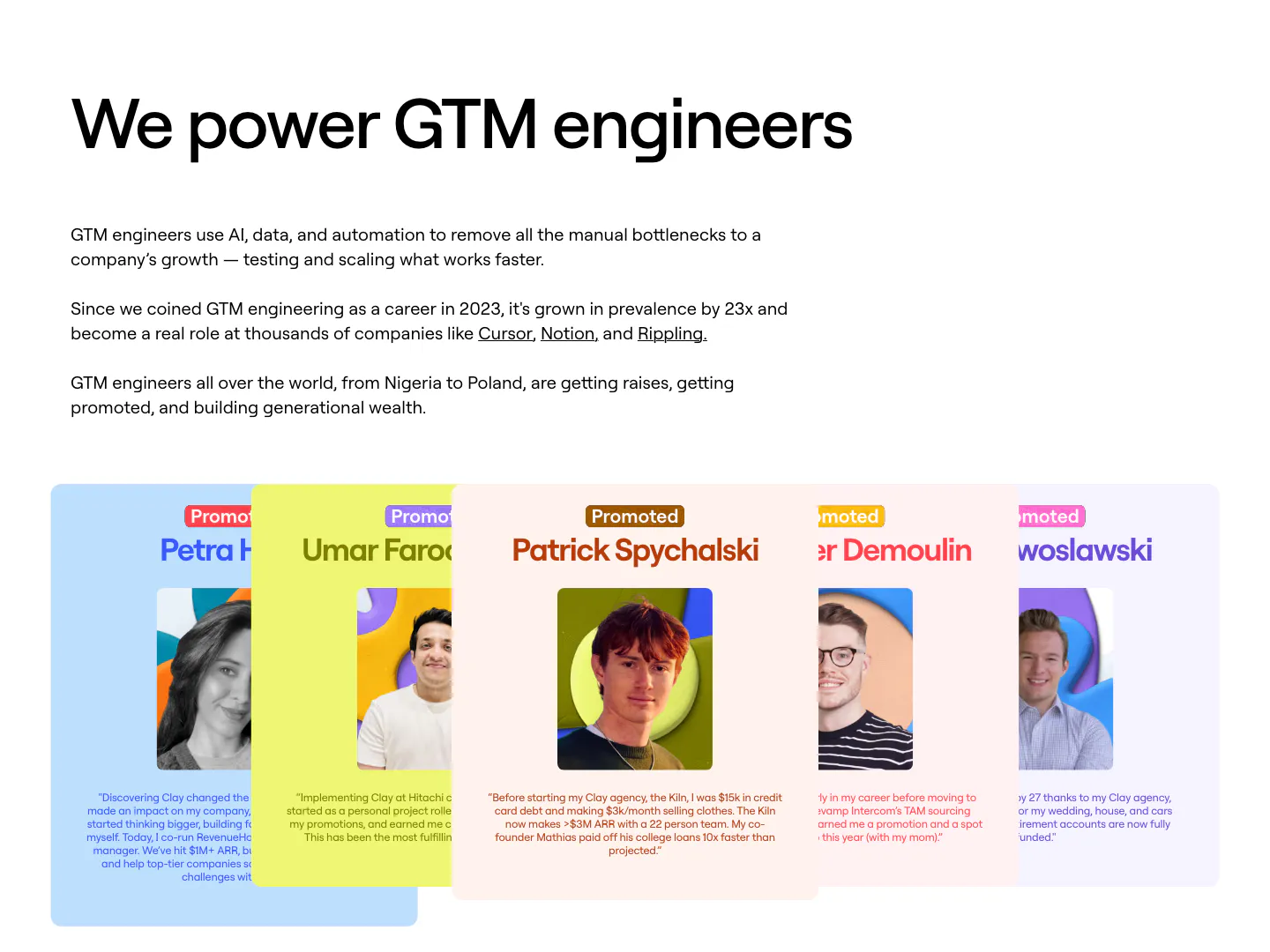
  538. Clay testimonials section: left-aligned heading and copy above a fanned stack of colored cards with portrait photos and promotion quotes
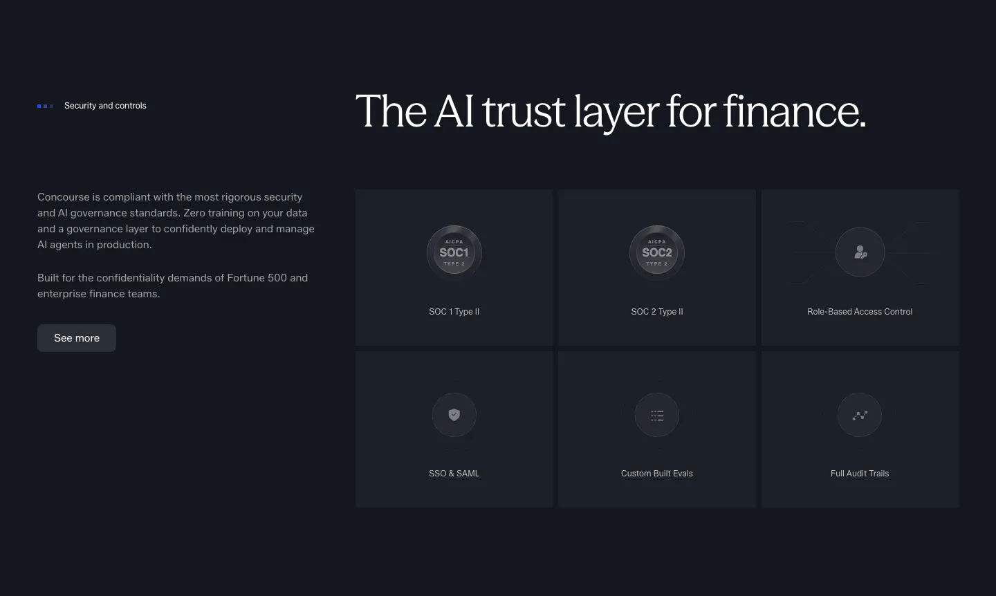
  539. Concourse security section: copy and button left, six dark tiles for SOC 1, SOC 2, RBAC, SSO, evals and audit trails right
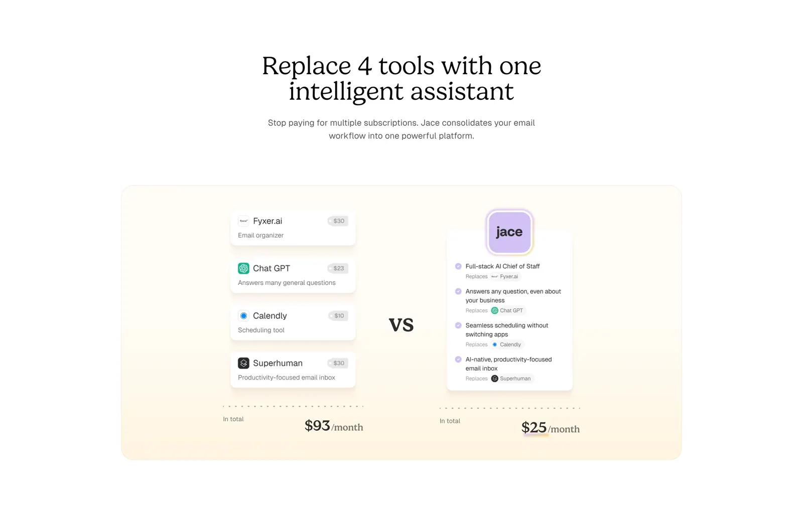
  540. Jace comparison section: serif centered headline above a cream panel comparing four tool cards and prices vs one Jace card
    Jace Comparison
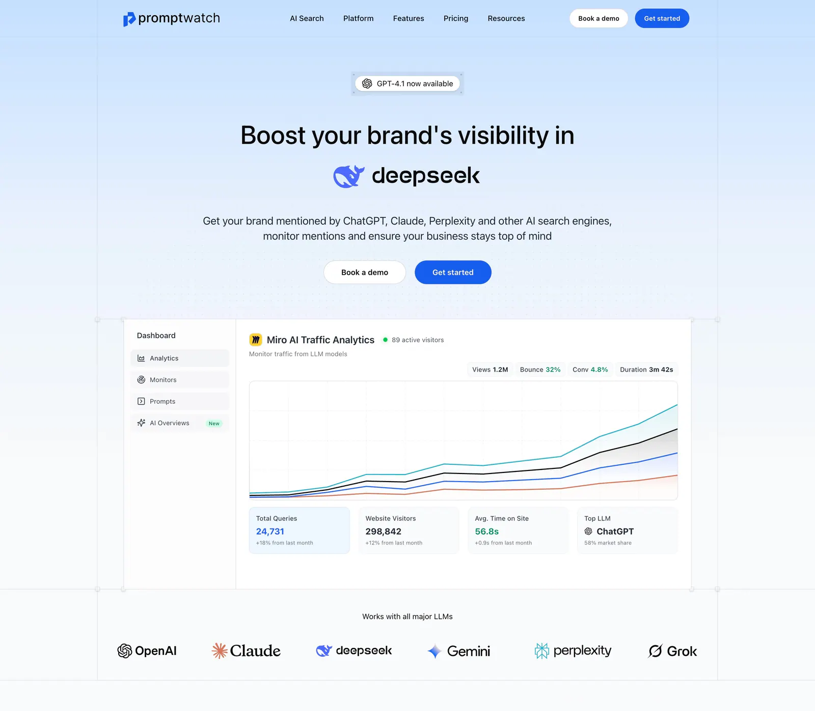
  541. Promptwatch hero section: centered headline with DeepSeek logo, two buttons, analytics dashboard screenshot and LLM logo row
  542. Smallest.ai footer section: centered CTA headline and Contact sales button above logo, address, link column groups and a status bar
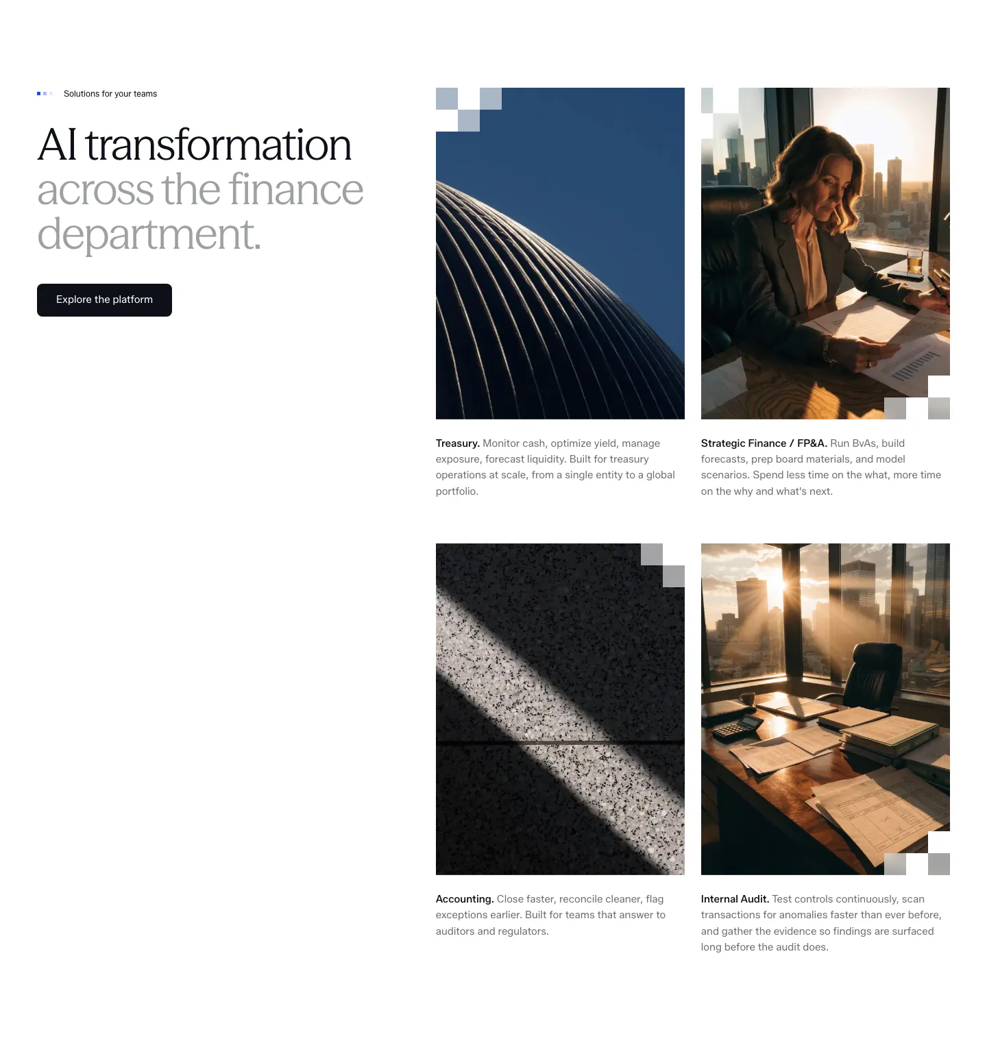
  543. Concourse use cases section: headline and button left, 2x2 grid of photo cards for Treasury, FP&A, Accounting and Internal Audit right
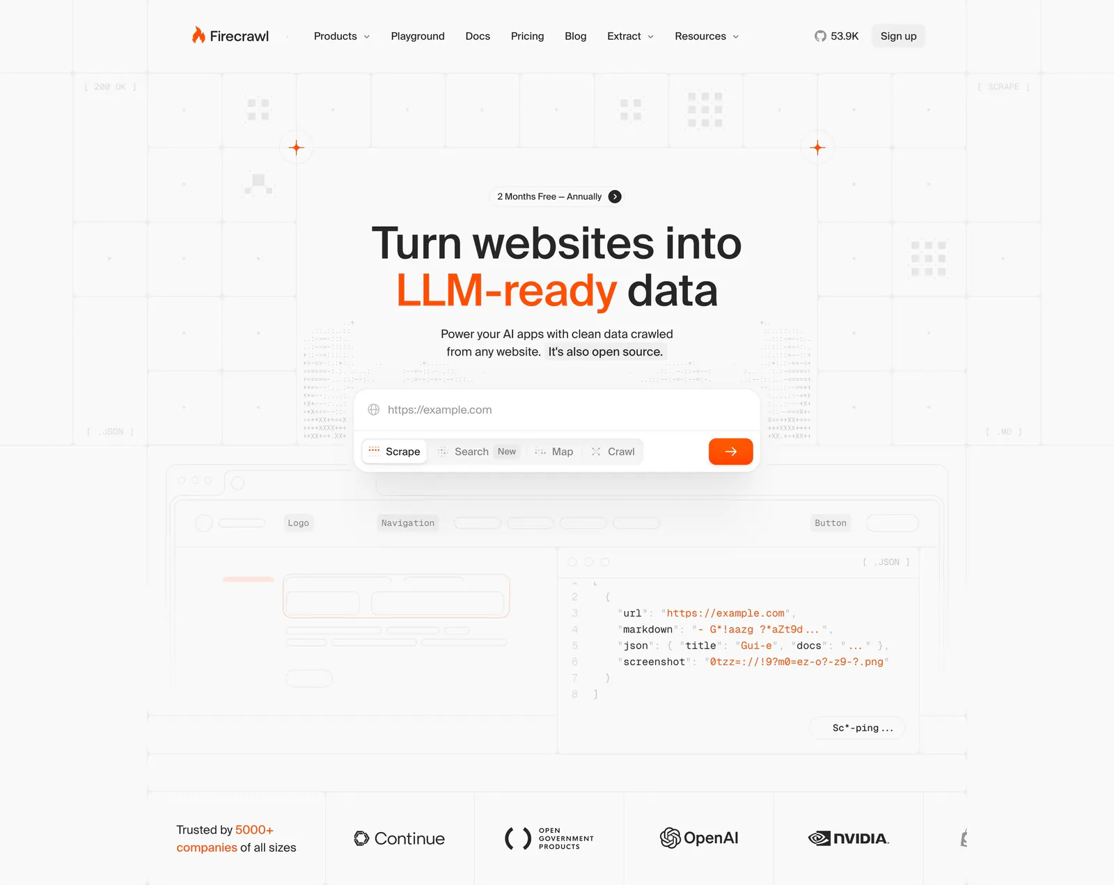
  544. Firecrawl hero section: centered headline with URL input and mode tabs over a grid background, JSON code preview and customer logo row below
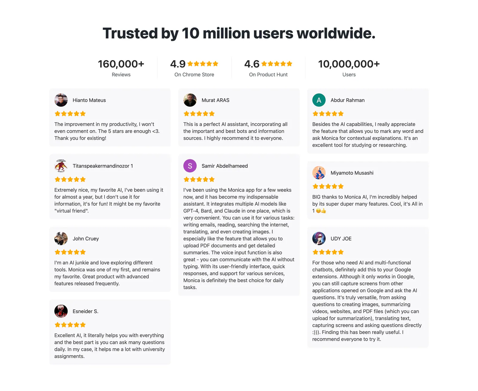
  545. Monica testimonials section: centered headline and four rating stats above a masonry grid of star-rated user review cards
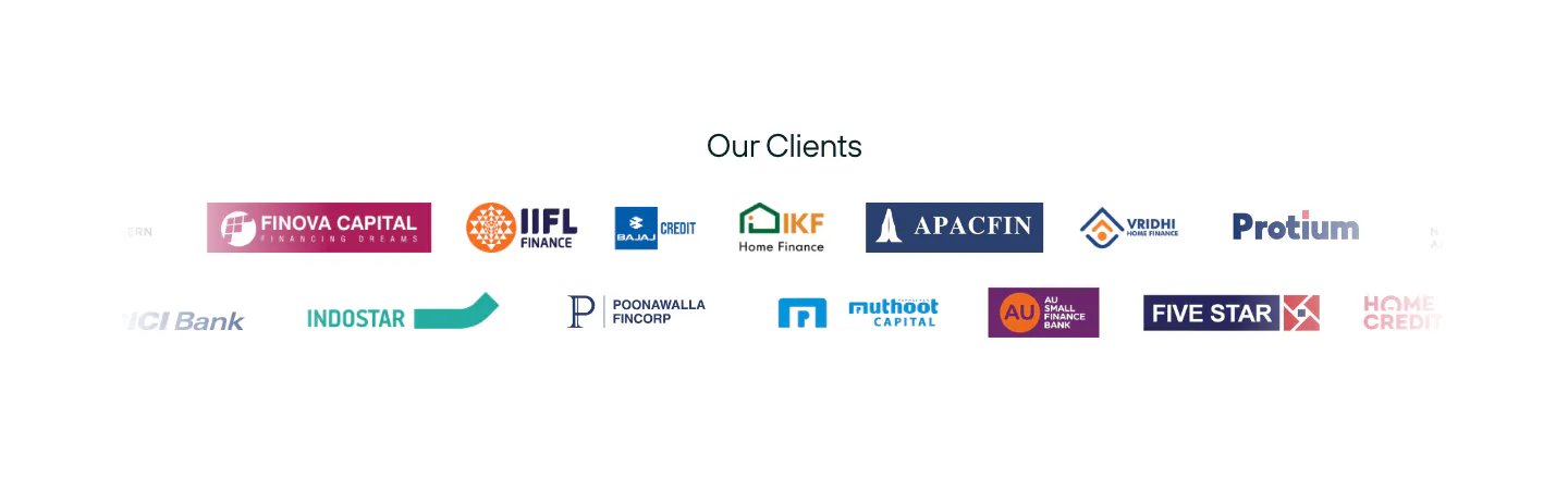
  546. Rezolv logo cloud section: centered Our Clients label above two scrolling rows of lender logos on white
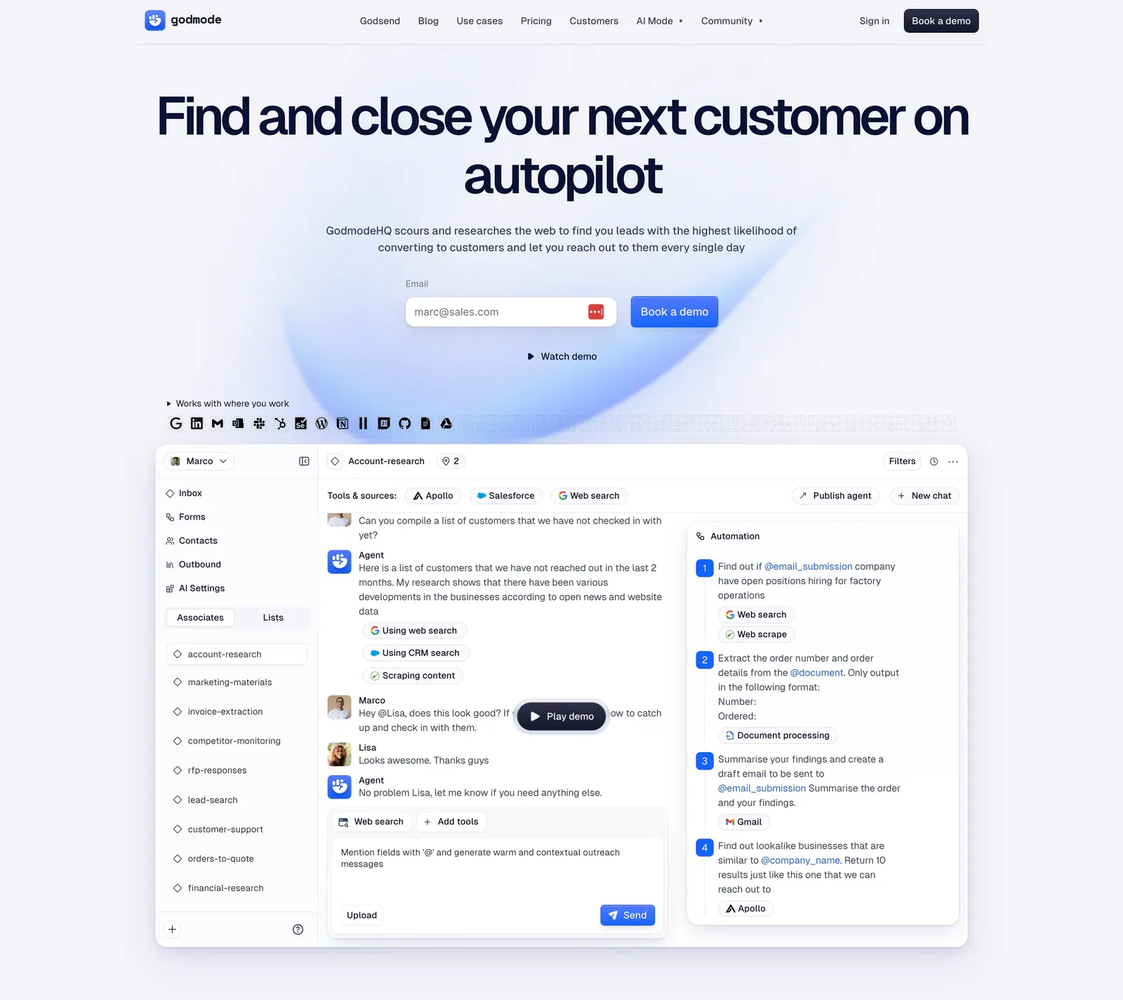
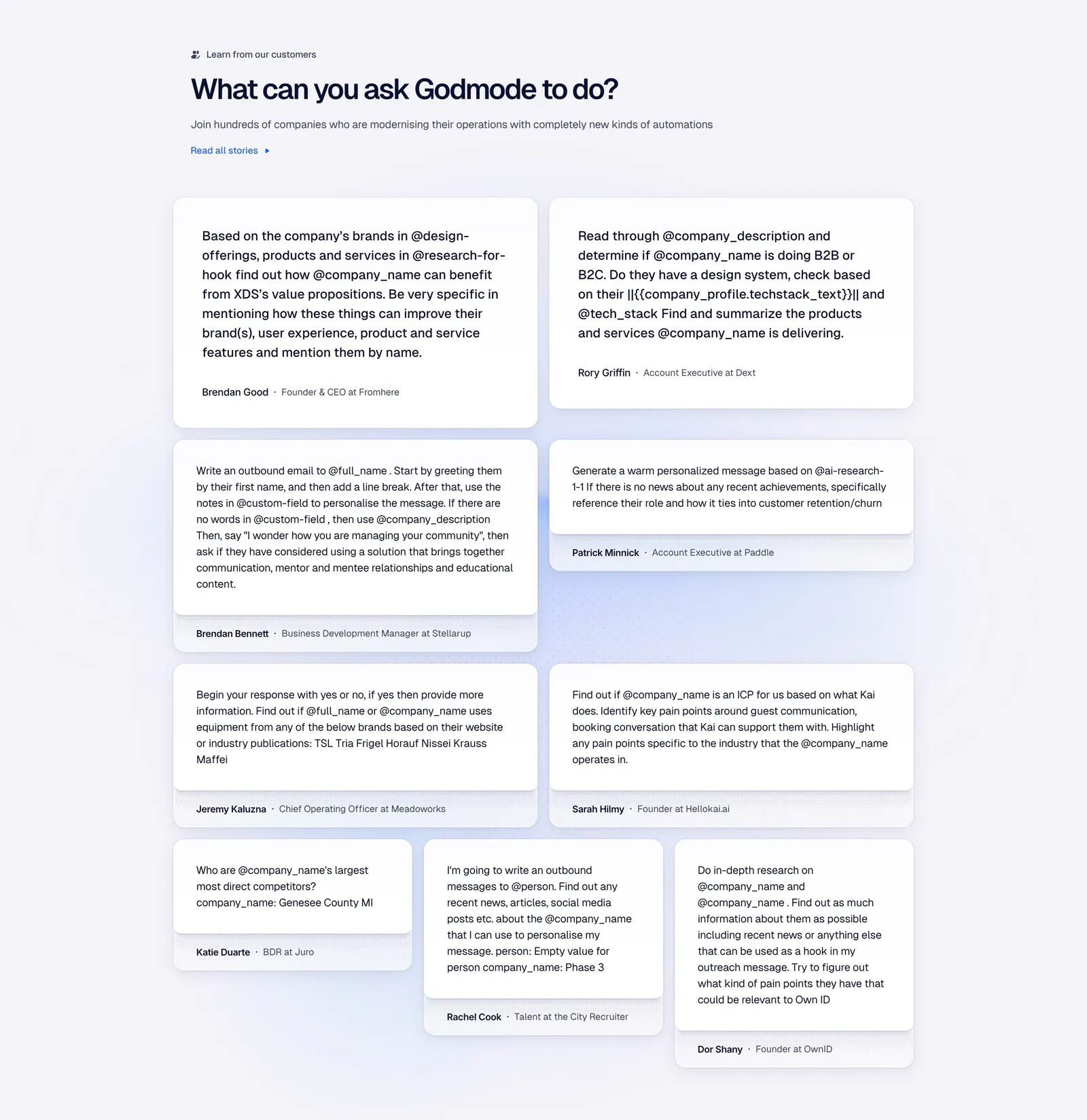
  547. Godmode hero section: centered headline with email field and demo button above a large AI agent workspace screenshot
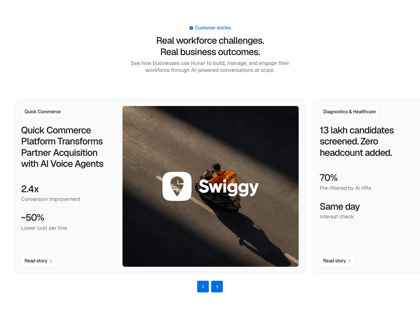
  548. Hunar testimonials section: centered heading above a case-study carousel card with metrics, a Swiggy delivery photo and arrow controls
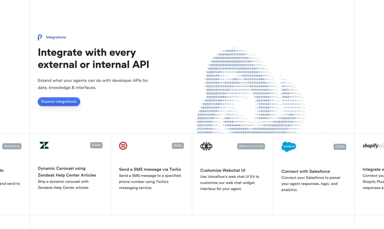
  549. Voiceflow integrations section: headline left and ASCII-art cloud right above a scrolling row of integration cards like Zendesk and Twilio
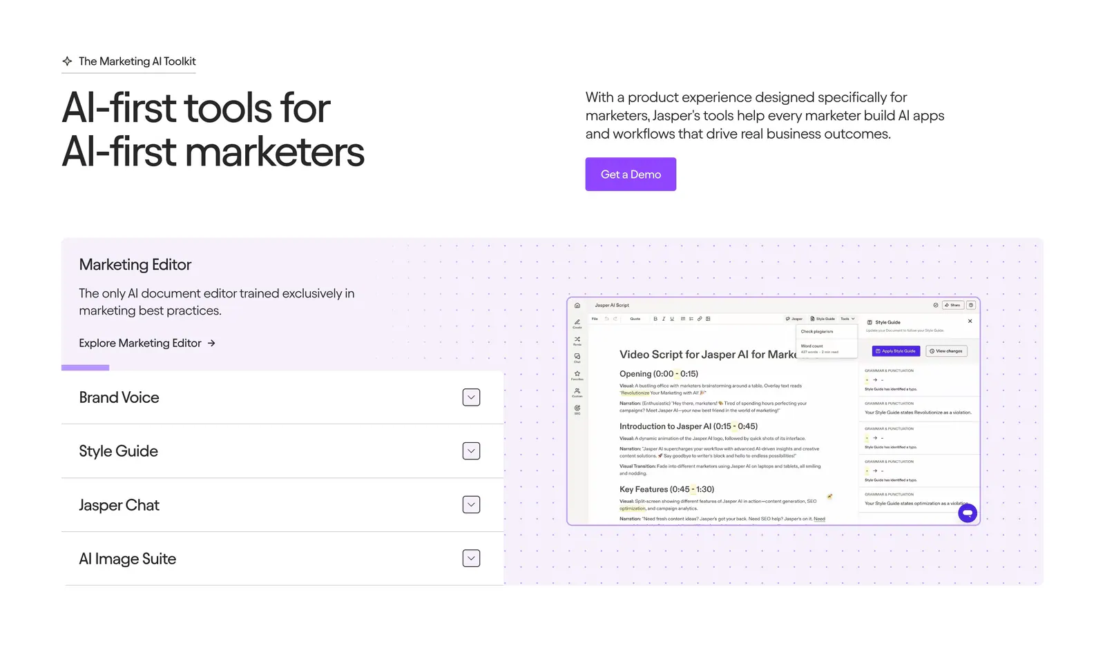
  550. Jasper features section: headline and copy row above an accordion list beside an editor screenshot on a dotted lavender panel
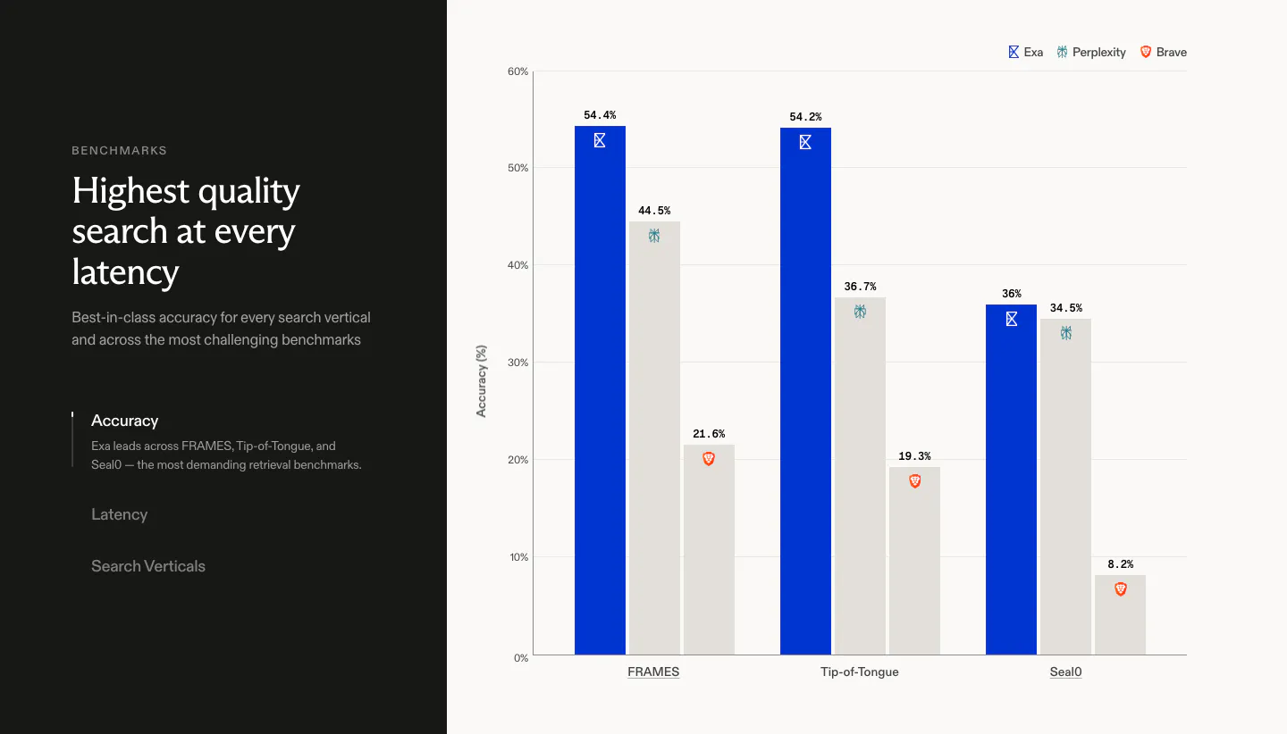
  551. Exa comparison section: dark left panel with headline and vertical tabs beside a bar chart of accuracy scores against Perplexity and Brave
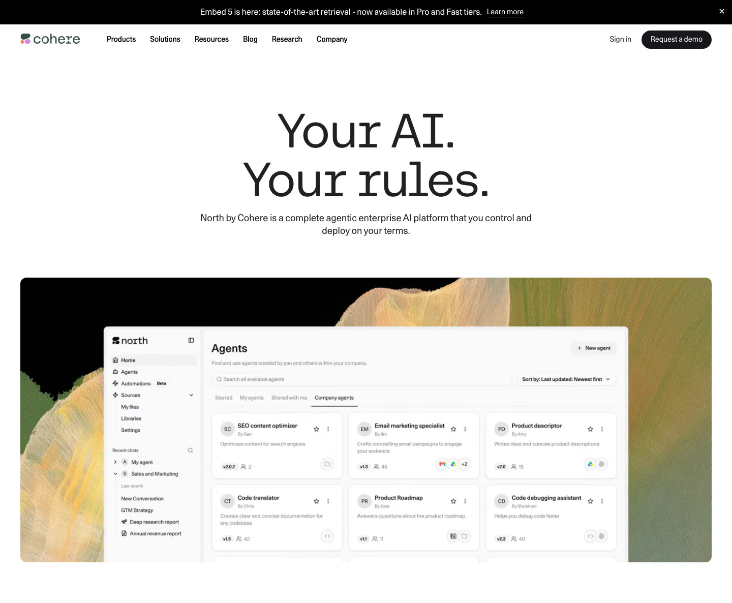
  552. Cohere hero section: centered headline and subcopy above an agents dashboard screenshot on an abstract painted backdrop
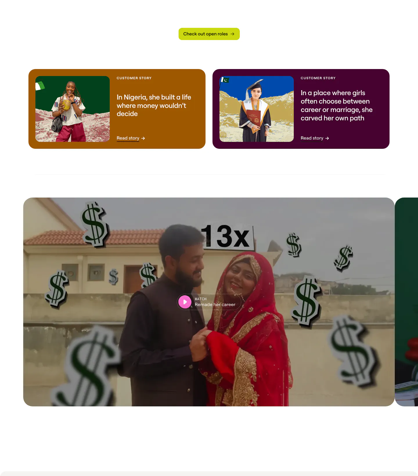
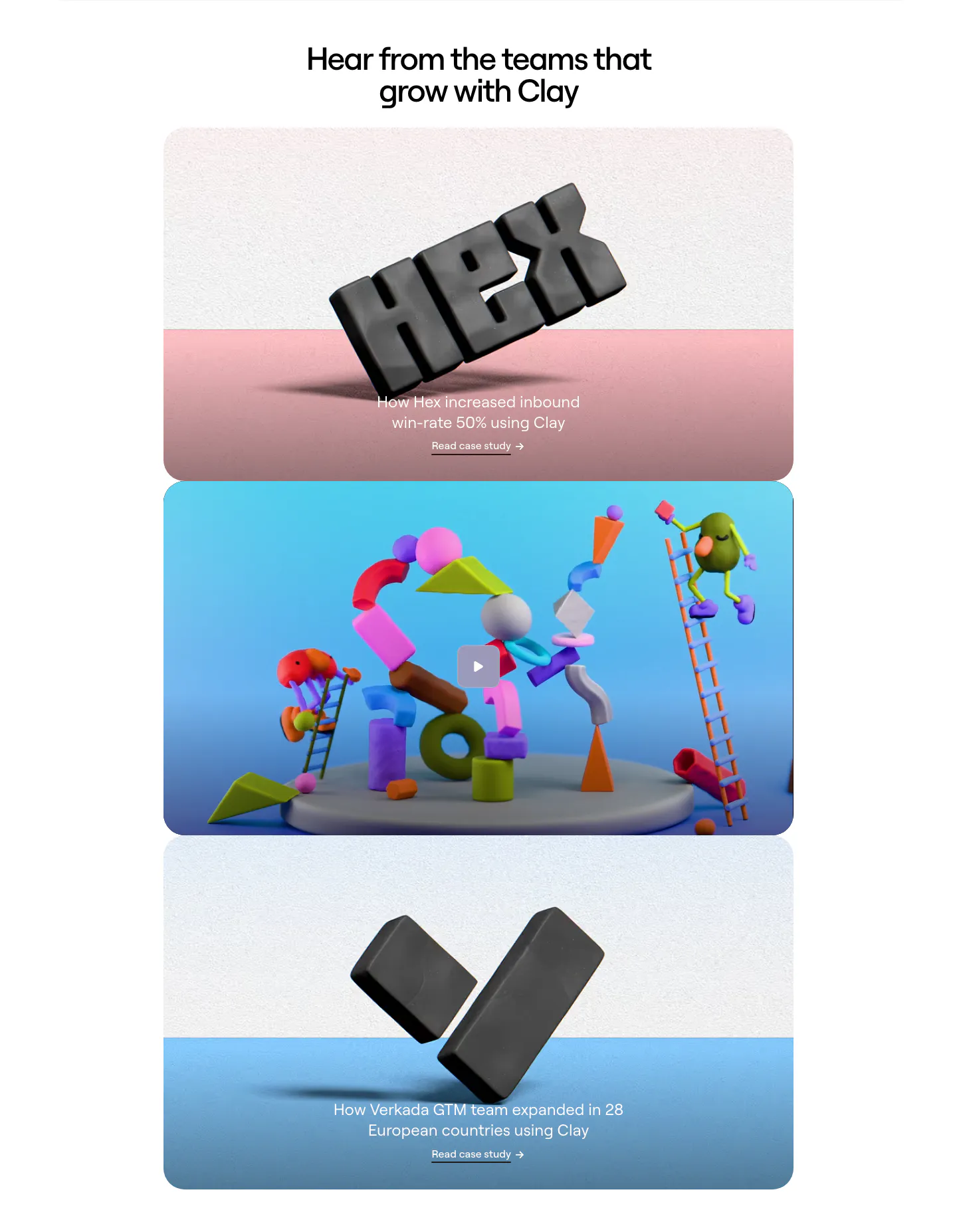
  553. Clay testimonials section: two colored customer story cards with photos above a large video thumbnail with play button, cut off at the right
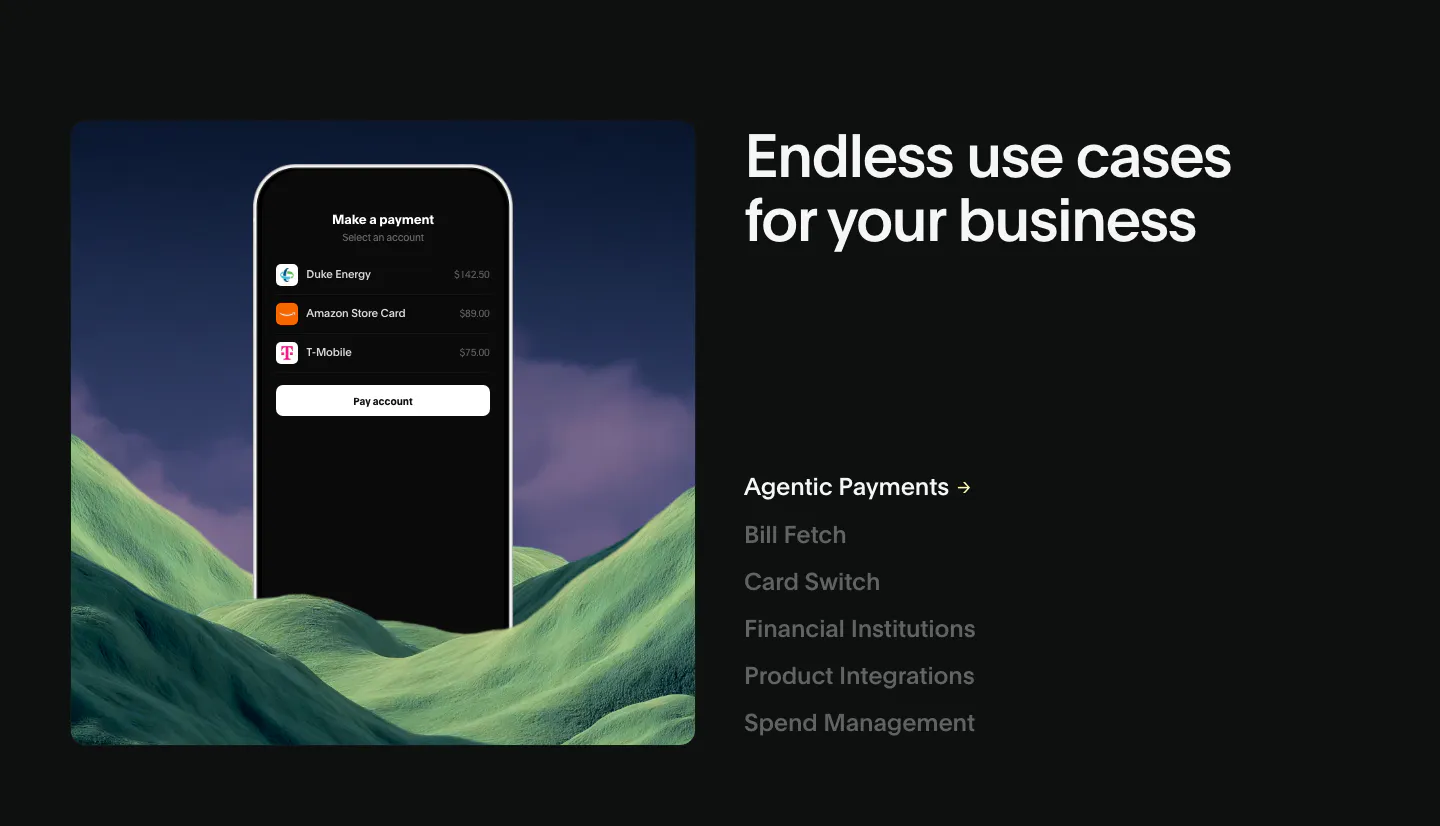
  554. Deck use cases section: phone payment mockup over green hills at left, headline and vertical list of use case links at right, dark
  555. Clarion footer section: light footer with logo at left, company links and social icons at right, and a copyright line
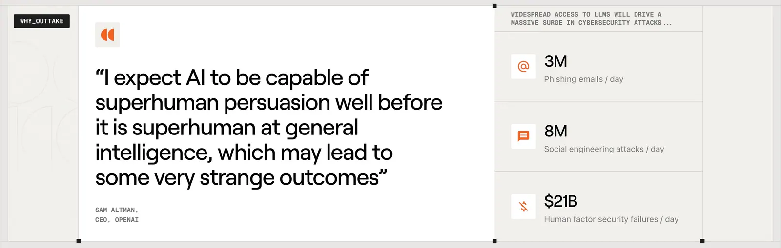
  556. Outtake testimonials section: large Sam Altman quote card beside a column of three threat statistics with orange icons on beige
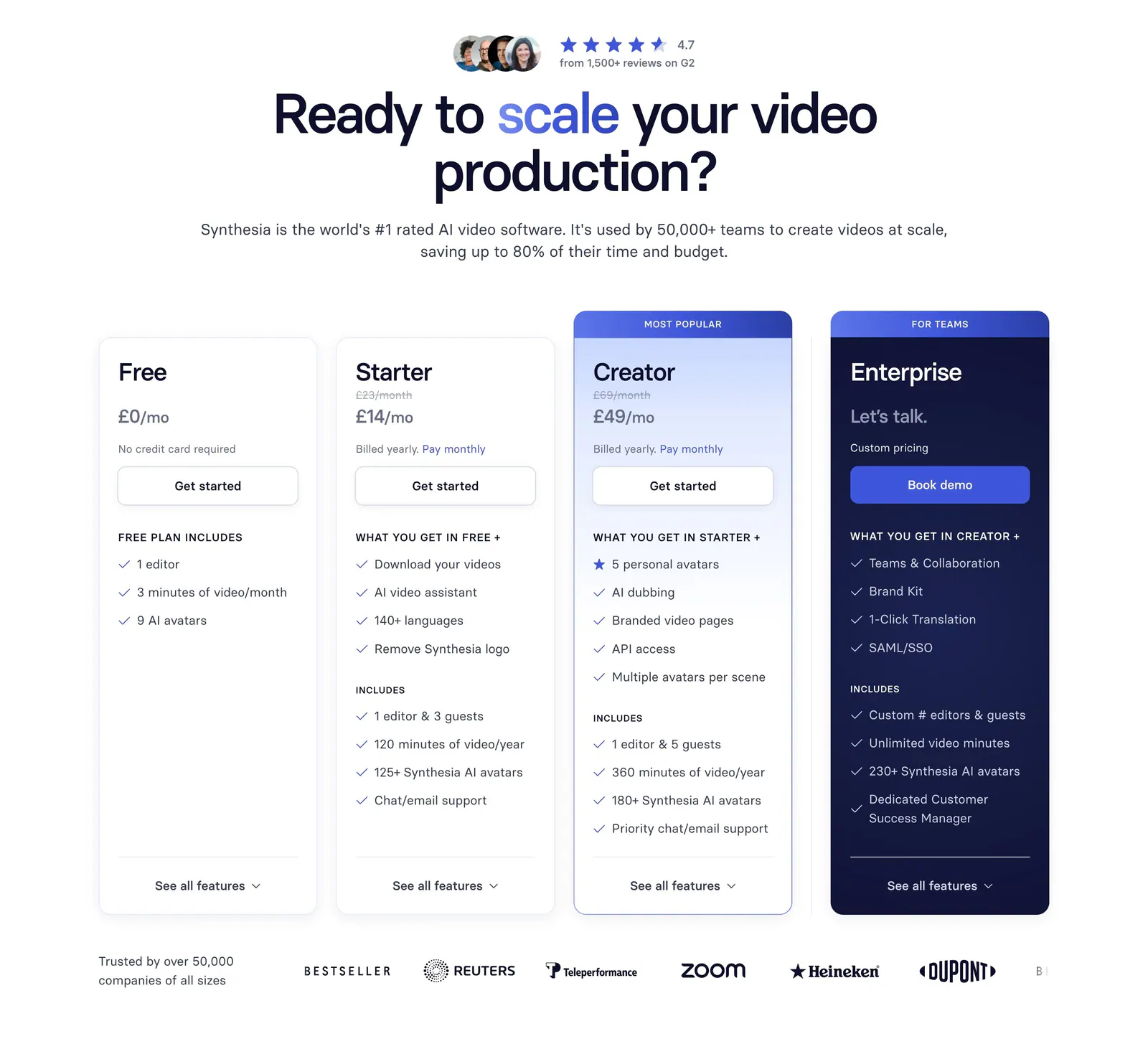
  557. Synthesia pricing section: centered headline with G2 rating above four plan cards, a navy enterprise card and a customer logo row
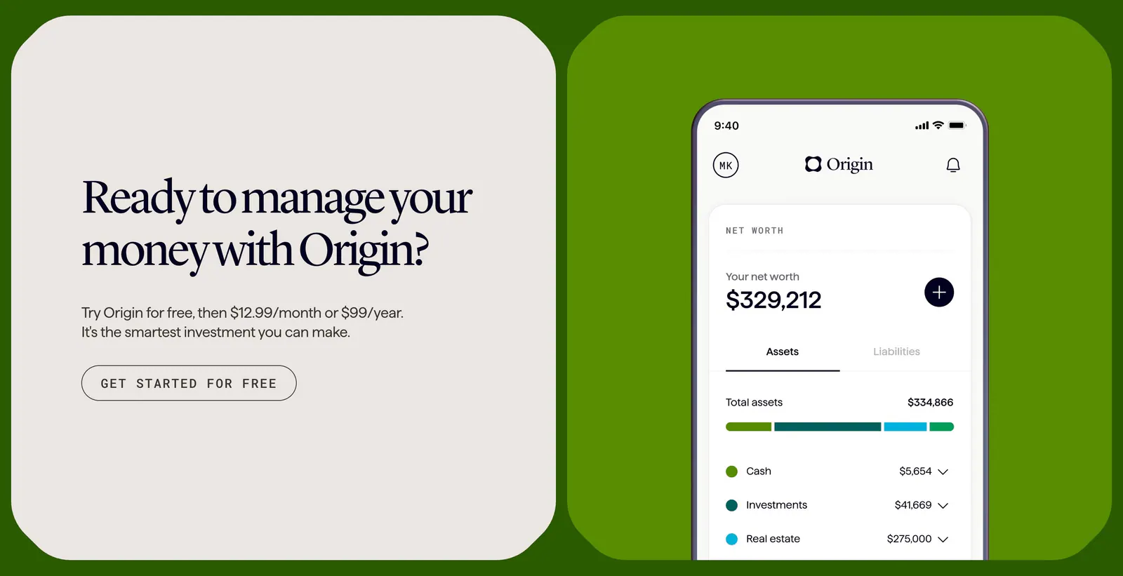
  558. Coframe call-to-action section: serif headline card beside a phone app screenshot on a bright green background, branded as Origin
  559. Schematik testimonials section: headline above a carousel of user post cards with project photos on a beige background
  560. Lovable features section: left-aligned headline above three equal cards with prompt box, editor preview and settings menu UI mockups
  561. Greptile testimonials section: centered single customer quote with company logo, avatar, name, title and a case study button
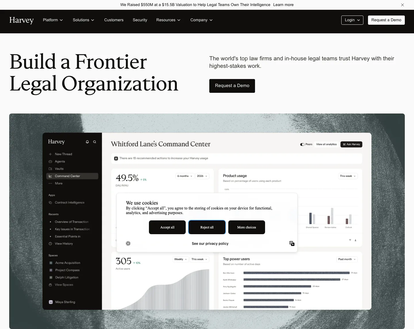
  562. Harvey hero section: serif headline left, copy and demo button right, above a dashboard screenshot on a textured backdrop
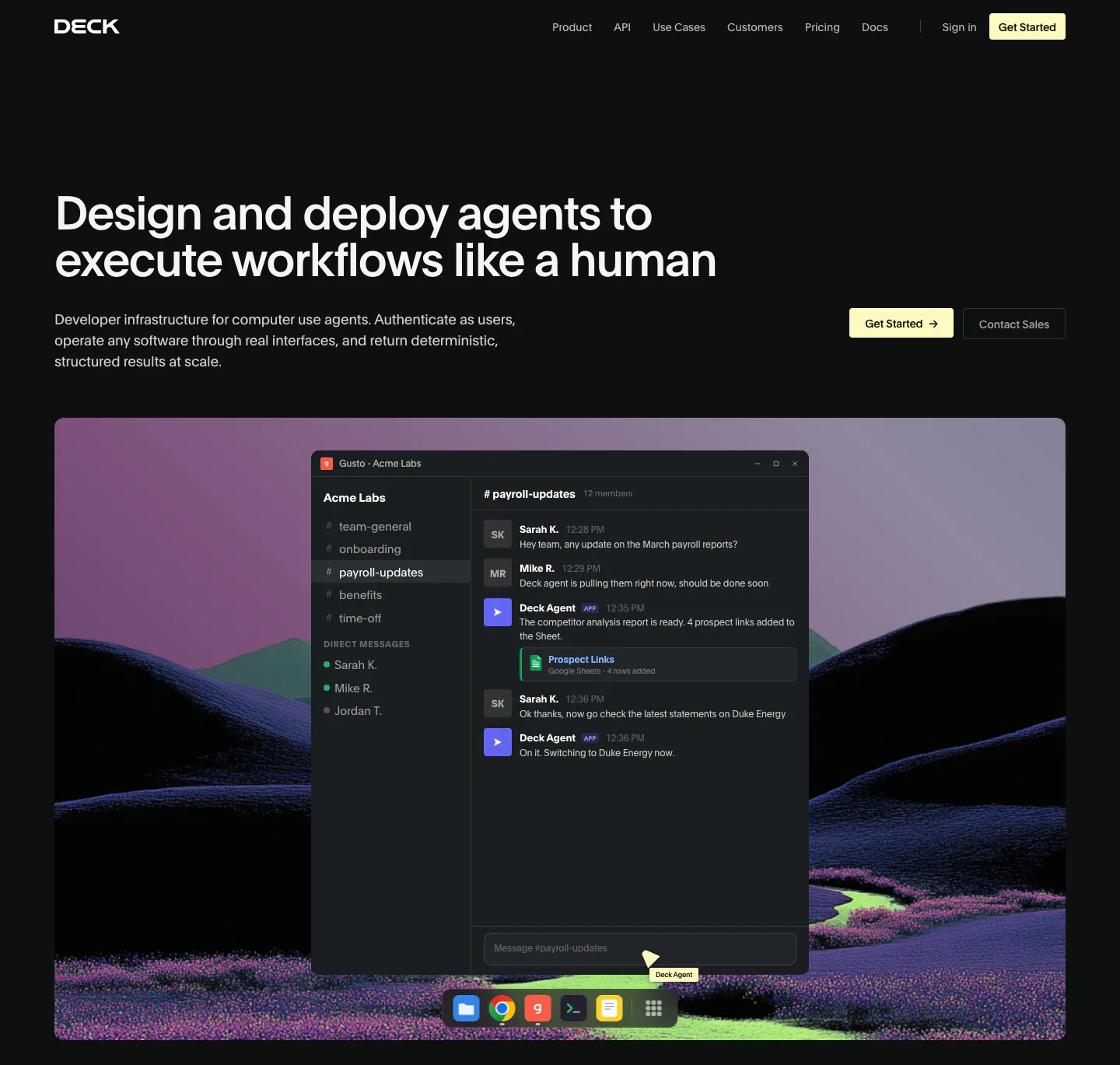
  563. Deck hero section: dark page with headline left and buttons right above a chat app window over a rendered purple hill landscape
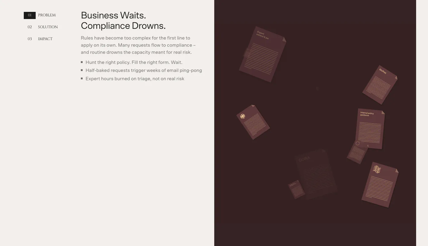
  564. Bayshore value proposition section: numbered Problem/Solution/Impact tabs and bullet copy left, dark maroon panel of floating documents right
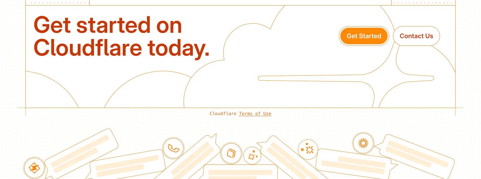
  565. Cloudflare Agents footer section: orange headline and buttons over line-drawn clouds, a terms link and chat bubble illustrations
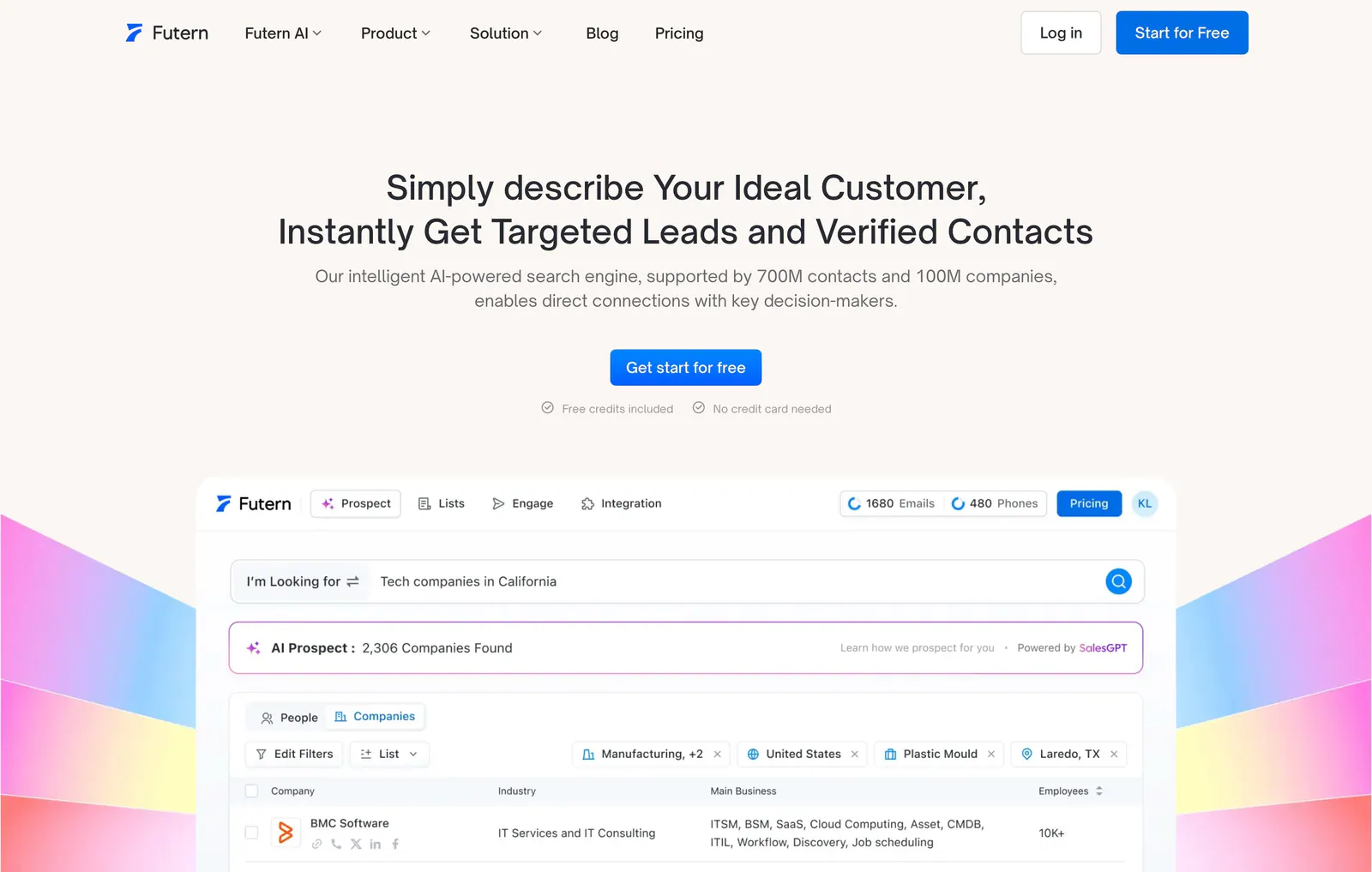
  566. Futern hero section: centered headline and CTA above a lead-search product UI framed by rainbow gradient shapes on warm off-white
    Futern Hero
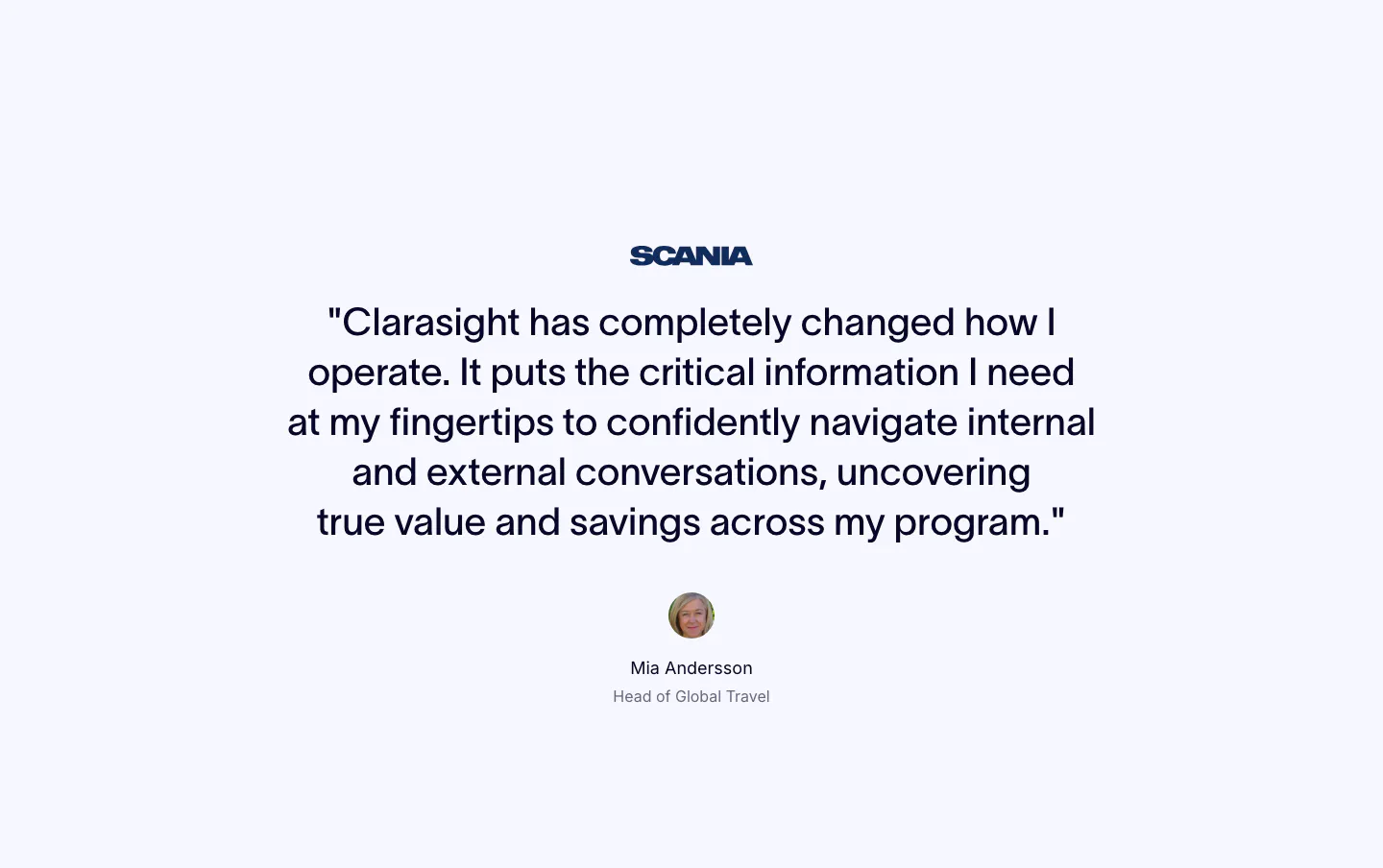
  567. Clarasight testimonials section: centered quote under a Scania logo with a round headshot, name and title below on a pale background
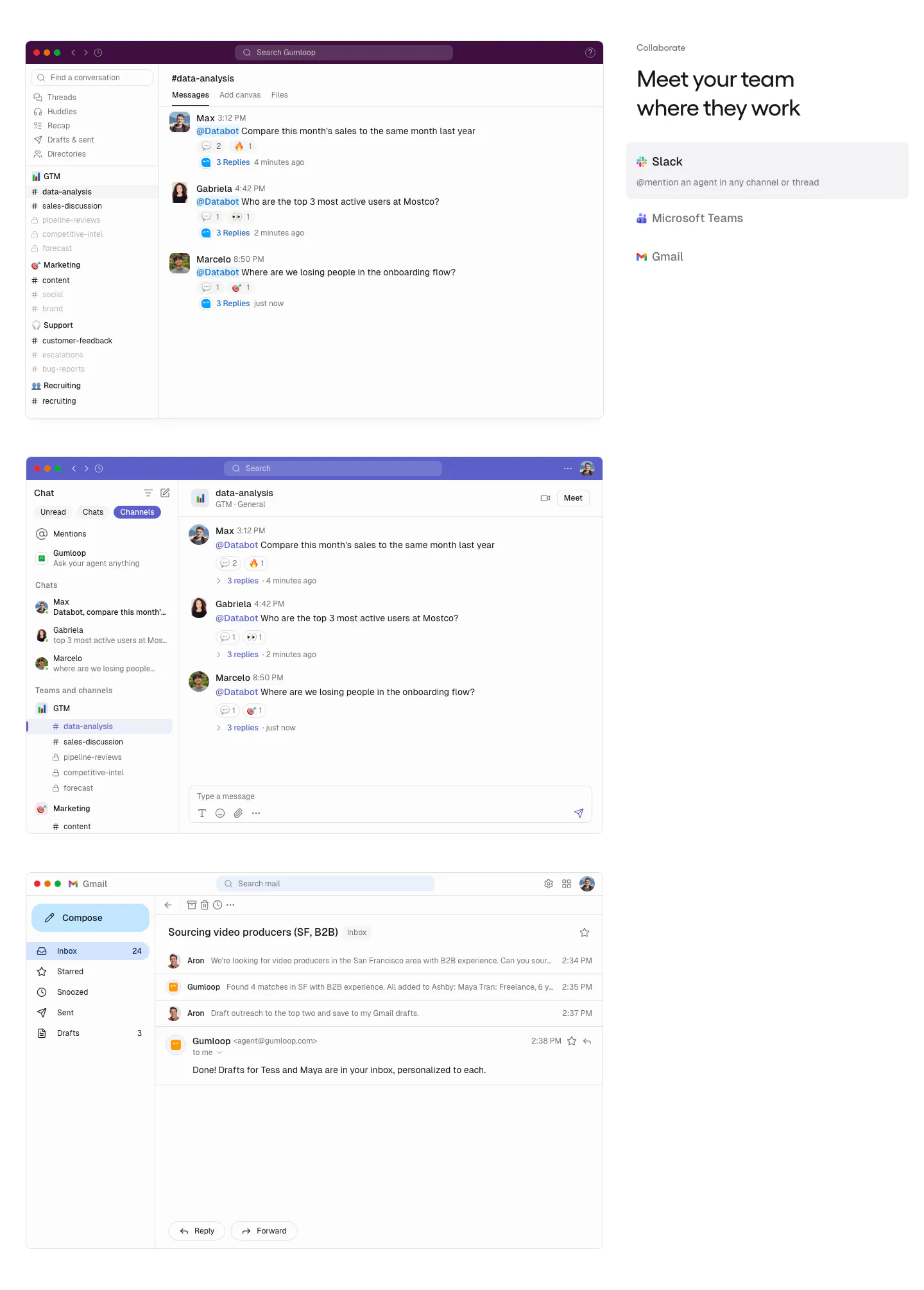
  568. Gumloop features section: stacked Slack, Teams and Gmail screenshots on the left, headline and app tab list on the right
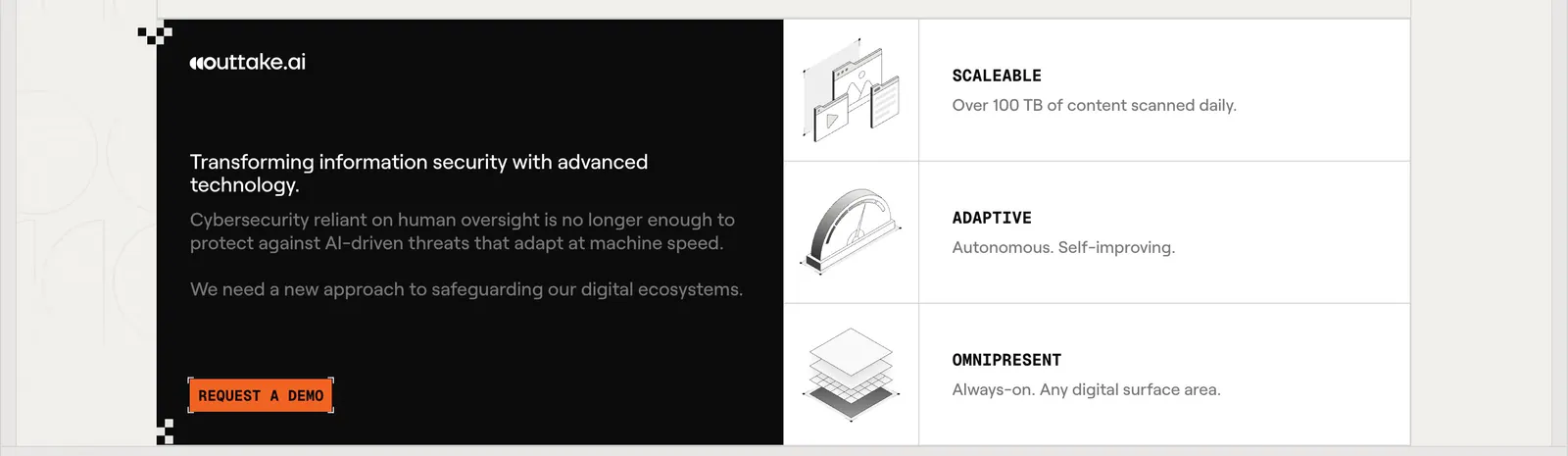
  569. Outtake call to action section: black text panel with orange demo button beside three rows of isometric line illustrations on a beige page
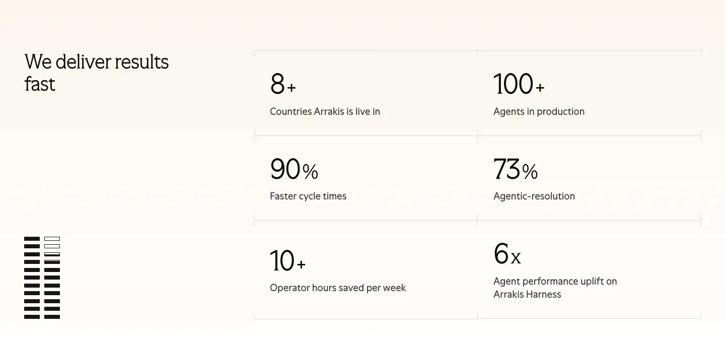
  570. Arrakis stats section: headline at left beside a 2x3 bordered grid of large metrics on a light background, with a striped graphic
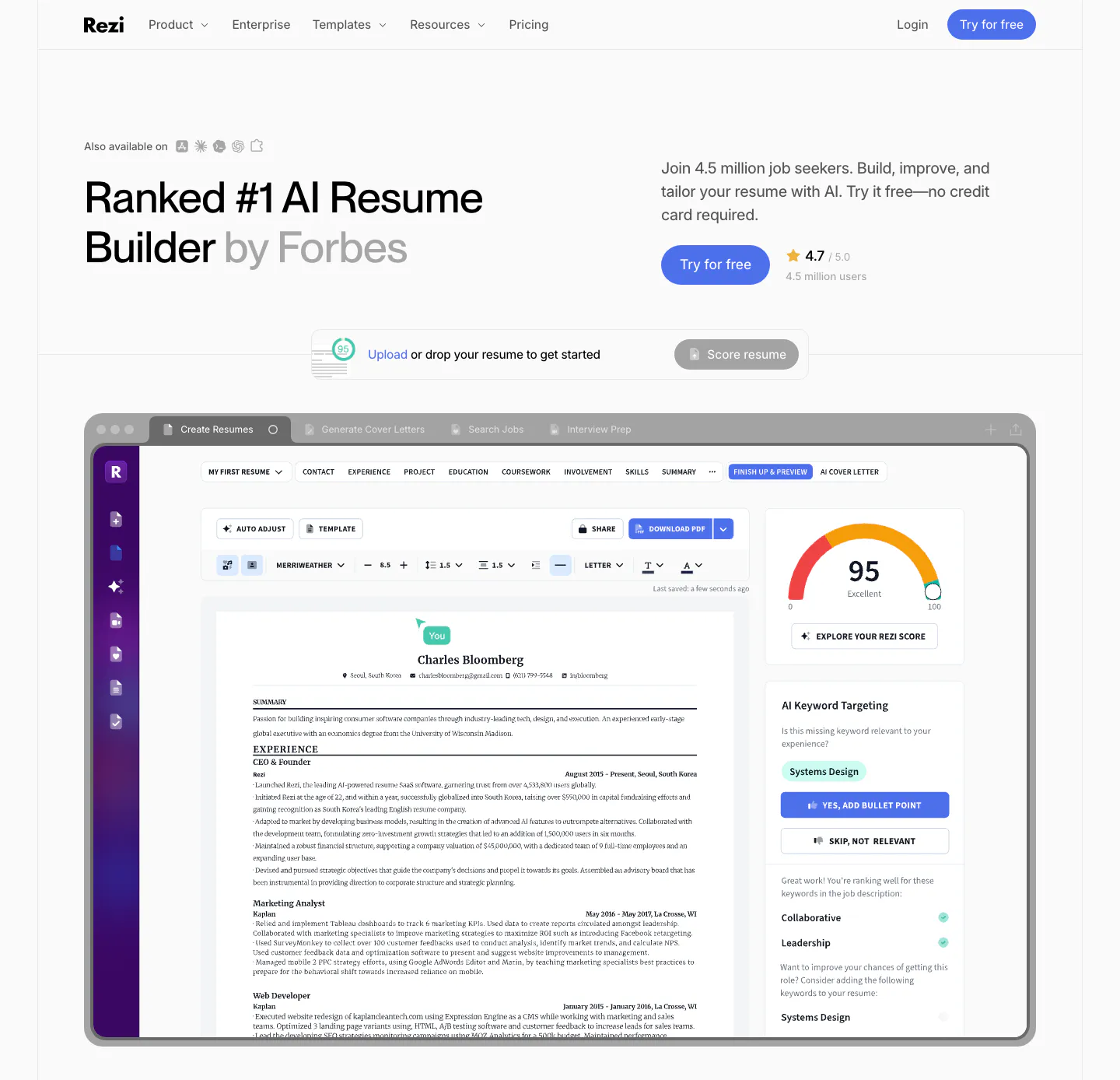
  571. Rezi hero section: left headline with copy and CTA at right, resume upload bar, and a large resume editor screenshot below
  572. Cotool hero section: centered headline with highlighted serif words on a saturated blue background above a pixel-dot wave artwork
  573. Clay security section: centered heading above a row of five 3D clay flower badges for SOC 2, GDPR, CCPA and ISO certifications
  574. Supersonik footer section: large serif question with two CTA buttons above a wordmark, three link columns and copyright on dark teal
  575. Heidi use cases section: centered serif headline and Get Remote button above three cream cards for hospital, allied and rural care
  576. Delphi features section: centered serif headline above a bento of four trust cards around a tall portrait card with an encryption text effect
  577. Chatbase testimonials section: centered heading above a bento grid of quote cards and two stat cards with watercolor images
  578. Interfere footer section: centered closing headline with buttons, four link columns and a large faded pixel wordmark
  579. Concurrence hero section: serif headline and rust Book a Demo button beside a blurred dark portrait image, healthcare logo row below
  580. Amplemarket footer section: dark centered headline with gradient text and email field above link columns, socials and legal row
  581. heyclicky pricing section: three plan cards with monthly/yearly toggle over a blue cloudy sky photo, dark student discount bar below
  582. HappyRobot careers section: Join us eyebrow, headline and two buttons on the left, photo of a team in a timber-roofed office on the right
  583. Hunar security section: centered heading above six light icon cards and an integrations band with app icon tiles
  584. Schematik hero section: nav, colored block headline and prompt input box on a beige grid background with arrow graphics
  585. Cohere logo cloud section: small centered caption above a single row of black enterprise logos on white
  586. Synthesia value proposition section: centered headline above three pale blue cards with company logos, large ROI metrics and case study links
  587. Unsiloed comparison section: centered headline above a multicolor bar chart ranking Unsiloed Parser against other OCR models and VLMs
  588. HappyRobot footer section: large black logo mark, three link columns, tagline and policy links, compliance badge row and copyright on light gray
  589. Visual features section: centered serif headline above a bento grid of presentation template previews in olive, cream, brown and charcoal
  590. Rezolv features section: two light blue cards, one with a voice waveform and one with a segment dashboard UI with charts
  591. Voiceflow footer section: dark rounded panel with serif headline and email field on the left, three link columns and social icons
  592. Figr FAQ section: serif heading, intro and Reach Out button on the left with a seven-question accordion on the right
  593. Cohere use cases section: agent chat screenshot on a lavender grid panel left and an industry accordion right
  594. Rulebase testimonials section: centered serif customer quote with a small avatar, name and title on a light gray background
  595. DevRev hero section: large left-aligned headline with two buttons beside an angled laptop showing a dark product interface on black
  596. Coframe features section: centered headline above three enterprise columns for safety, SOC 2 security and scalability on a dark navy panel
  597. Strawberry hero section: centered headline and buttons, cartoon characters perched on a browser screenshot showing an AI agent task
  598. Visual call to action section: dark square panel with centered serif headline, a tokens pill and outline button over a checkerboard background
  599. Profound hero section: centered headline with Perplexity logo above a dark brand visibility dashboard screenshot on black
  600. Jasper testimonials section: headline and button row above a bento grid of pastel metric tiles and quote cards with portraits
  601. Strawberry features section: centered headline above a browser screenshot of a LinkedIn profile with an AI research chat panel
  602. Ideogram features section: centered NEW badge, headline, copy and button above a wide video frame of a woman holding a perfume bottle
  603. Conduit logo cloud section: two rows of gray hospitality brand logos separated by thin dividers on white
  604. Greptile security section: headline with learn more button above three numbered cards for self-hosting, SOC 2 and enterprise features
  605. Legora features section: left headline and intro above four equal product cards with glass render and app screenshots
  606. DevRev testimonials section: centered large customer quote with name and title above three pagination bars on a plain white background
  607. Linearity comparison section: centered headline above a flat image mockup versus an editable ad design with a layers panel, on black
  608. Tabs footer section: centered headline and email demo field on a dot grid, link columns, demo video card and huge faded tabs wordmark
  609. Composio features section: numbered side nav beside four rows of dark UI and code panels on colorful pixel art, each with text
  610. Visual features section: two side-by-side panels, a light one with four brand-lock tiles and a dark one with stacked API endpoint cards
  611. Modulify footer section: white rounded card with logo, five link columns and language picker over grainy orange edges
  612. Heidi features section: serif headline over rounded cards pairing text with a clinical notes UI, a clip-on mic photo and a chat answer
  613. Lindy testimonials section: Wall of Love heading above a four-column grid of video testimonial thumbnails with play buttons and quotes on cream
  614. Twin footer section: logo and link columns beside a dithered palm tree and beach chair illustration on a dark brown background
  615. Greptile footer section: large green logo beside four link columns, above a pile of gray isometric logo blocks on light gray
  616. Beside features section: left-aligned headline above three cards, each with a short description and an approval UI snippet
  617. Submagic pricing section: centered headline, monthly/yearly toggle and three plan cards with a highlighted orange Professional tier on white
  618. Ada footer section: deep green background with link columns, newsletter email field and a huge pink ada wordmark and logo
  619. Synthesia call-to-action section: headline with two buttons on the left and a video editor UI screenshot on a lavender-blue gradient right
  620. Beside hero section: centered headline with a business name search field above a tilted app dashboard screenshot on white
  621. Noxus features section: accordion of feature titles on the left beside a light blue workflow diagram panel on a white background
  622. Attio call-to-action section: centered headline and two buttons below a grayscale mosaic of customer logo tiles on white
  623. Synthesia about & mission section: black-and-white founders photo on the left with mission label, headline and paragraphs on the right
  624. Beside features section: headline and intro above a three-column list of twelve capabilities with line icons and short descriptions
  625. Clarion features section: serif headline and four stacked metrics on the left, a 2x2 grid of icon features on the right, cream background
  626. Steel hero section: headline and yellow buttons on the left, cyan dithered artwork with code and chat UI windows on the right, dark theme
  627. Sendr use cases section: headline and Explore button above expanding photo cards, the Marketing card open showing a whiteboard
  628. Outtake integrations section: isometric diagram linking external surfaces to the Outtake logo and internal tools, with two feature cards below
  629. Ploy features section: condensed headline on a pink gradient panel above three white metric cards with sparklines for Web, Grow and Ads
  630. Zamp hero section: giant zamp wordmark under a dithered pixel-art figure on a laptop, chat-style intro box and grayscale logo row on light gray
  631. Plumb logo cloud section: italic serif heading above investor logos fading at the edges and four pastel angel investor cards with headshots
  632. Vapi hero section: centered headline and Talk to Vapi pill button over a colorful equalizer bar graphic, with a logo strip on black
  633. Hunar use cases section: dark background with split header and a carousel of agent cards showing worker photos and listen-call buttons
  634. Figr testimonials section: centered serif headline and button surrounded by scattered quote cards and isometric logo cubes
  635. Howseen AI about & mission section: centered founder quote below a circular portrait on a plain white background
  636. Vapi careers section: left-aligned headline and See open roles button over a dithered team photo on a cream dot-grid background
  637. Clarasight security section: dark navy card with headline, checklist and button on the left and a 2x2 grid of ISO, SOC 2 and GDPR badges
  638. Concurrence stats section: three large serif metrics with small labels split by thin dividers on a solid rust-red background
  639. Rezolv value proposition section: centered problem headline above scrolling rows of beige pain-point chips with icons on cream
  640. Delphi pricing section: centered serif headline, monthly/annual toggle and four plan cards with feature lists below on a cream background
  641. DevRev call-to-action section: headline and blue button over a full-bleed dark photo, with demo and live chat link cards on the right
  642. Weav features section: intro text on pink above a white card with an expandable feature list on the left and stacked sync and chat UI cards
  643. Hunar features section: dark background with four numbered capability rows, each pairing text with a line-art illustration on color
  644. Clay testimonials section: centered headline above three stacked case-study cards with 3D clay renders, one with a play button
  645. Godmode logo cloud section: centered heading above a masonry grid of white logo tiles in mixed sizes with a case studies button
  646. Heidi features section: centered serif headline above two product cards, an Evidence answer UI and a hand holding the Remote mic
  647. Conduit hero section: centered serif headline and demo button above an inbox app screenshot on a painterly landscape backdrop
  648. Clay testimonials section: customer tab bar above a split case study card with a 3D Mistral logo render and a quote with case study button
  649. Strawberry FAQ section: headline and contact button on the left, questions as chat bubbles with one dark answer and a character
  650. Vizcom FAQ section: headline, copy and contact button on the left beside an accordion of questions on a dark charcoal background
  651. Slite footer section: logo, tagline and review ratings beside five link columns, legal links, language list and copyright on cream
  652. Zamp security section: bento of textured color cards with encryption and SOX claims above a list of SOC, ISO, GDPR and HIPAA compliance rows
  653. WorkOS features section: Slack chat thread mockup with carousel arrows on the left, headline and copy on the right
  654. Chatbase how it works section: four numbered lifecycle steps beside a magenta panel of agent config cards, customer story strip below
  655. Cartesia hero section: centered headline and buttons above a voice demo widget, colorful bar artwork and customer logo row on a dark background
  656. Modulify features section: orange gradient panel of stacked use-case pills beside a headline and dark dashboard mockups
  657. Spellbook footer section: trial signup form, link columns, newsletter field and a huge faded Spellbook wordmark with logo on dark charcoal
  658. Chatbase footer section: white link-column panel on a blue background above a giant serif Chatbase wordmark with compliance stickers
  659. Unsiloed contact section: headline and customer quote at left beside a numbered demo request form with text fields, selects and file upload
  660. Clay features section: centered heading above three lavender cards with data source, natural-language search and CRM sync UI mockups
  661. Cartesia pricing section: headline with stepped color bars above five dark pricing cards from Free to Enterprise with feature checklists
  662. Composio hero section: centered headline with blue highlight, two CTAs and a trusted-by logo row on black with glitchy color bars
  663. Greptile features section: centered product launch headline and button above a blue line-wave landscape illustration
  664. Bobbin value proposition section: serif heading above three photo cards of tutors with yellow stat pills on a cream background
  665. Visual features section: charcoal split layout with serif headline and numbered accordion left, floating AI editing UI cards and portrait right
  666. Flank call-to-action section: left-aligned headline and demo button on a lavender panel with rendered orange flowers on the right
  667. Intercom features section: headline with an ink drawing of running figures, then a Fin chat widget panel beside a three-item feature selector
  668. NickAI call-to-action section: centered heading and copy above a chat prompt input with suggestion chips, framed by blue ribbon art
  669. Bayshore security section: heading left on charcoal, stacked cards for ISO 27001, EU hosting, on-premise and GDPR right
  670. Sendr call to action section: dark rounded card with warm glow, headline left, prefilled AI prompt with Ask ChatGPT, Claude, Perplexity buttons
  671. Agiloft value proposition section: centered serif headline, copy and button above an orange isometric line drawing of cubes on white
  672. Chatbase security section: dark centered headline over three cards with GDPR, SOC 2 and HIPAA diamond badges and a row of trust points
  673. Attio features section: headline with See more button and an expandable list at left, white wireframe funnel line art at right, dark
  674. Concourse features section: headline and button above three cards showing an integration icon ring, notification list and AI answer UI
  675. Interfere features section: numbered text block with capability list on the left and an issue inbox board screenshot on the right
  676. Sendr features section: Chrome Extension headline and install button above a LinkedIn profile mockup with a video recording toolbar
  677. Attio hero section: announcement bar and nav over a centered headline with two buttons, above an app window with sidebar and AI chat
  678. Godmode features section: three zig-zag rows pairing agent chat, automation steps and outreach message UI mockups with short copy
  679. Hunar features section: dark background with a phone onboarding form mockup on the left, accordion list on the right, three cards below
  680. Clay logo cloud section: centered heading and funding note above a row of six investor logo tiles with names on white
  681. Chatbase features section: blue patterned panel with a chat app mockup on the left, headline and Chat, Email, Voice selector on the right
  682. Godmode call-to-action section: blue rounded card with headline and button on the left and an AI agent chat screenshot on the right
  683. Wavelength integrations section: headline and Explore Integrations button at left beside a colorful transit-map graphic linking app icons
  684. Concourse use cases section: vertical list of agent tabs left, building photo with three metric tiles right on a light background
  685. Spellbook call-to-action section: centered serif headline above an email field and select dropdown with a white button on a dark background
  686. Arke features section: centered serif headline above a halftone marble statue holding a phone showing a WhatsApp chat with Arke
  687. Voiceflow hero section: centered headline and buttons on a charcoal dotted background above a workflow builder canvas screenshot
  688. Amplemarket FAQ section: headline on the left and an accordion of five questions with plus icons on the right, on off-white
  689. Interfere blog & resources section: changelog heading above three dated release notes in columns on a white background
  690. AgentID how it works section: dark row of four staggered step cards with orange icons, from Get AgentID to Stay connected
  691. Lindy about & mission section: large left-aligned mission statement with the first line faded to gray, on a warm off-white background
  692. Lovable testimonials section: centered heading above a case study carousel with a quote, three metrics, founder avatar and arrow controls
  693. Interfere how it works section: multi-line headline above three numbered columns with faded UI and code vignettes on white
  694. NickAI features section: left heading above a two-column grid of chat prompts with chart, portfolio and order widget screenshots
  695. Strawberry testimonials section: centered headline over a 3x2 grid of rounded quote cards with avatars on a cream background
  696. Linearity hero section: centered headline with inline avatar and tag chips above a dark prompt box, two buttons and a logo strip on black
  697. Rulebase hero section: split layout with headline and orange demo button on a dark panel beside a carved plaster texture with an issue-alert UI card
  698. AgentID integrations section: dark six-card grid of partner apps like Firecrawl and Turso with icons, category labels and view links
  699. Exa logo cloud section: left-aligned headline and customer stories button above a bordered six-by-two grid of customer logos
  700. Dovetail call-to-action section: large white headline and two buttons on a bright indigo panel with a walking megaphone illustration
  701. Rezolv call-to-action section: light blue rounded banner with left-aligned headline and Get in touch button and curved line art
  702. Conduit features section: dark brown panel with numbered feature list flanking a central resolved-ticket UI card
  703. Vectara pricing section: plan comparison table with check and cross marks for Standard, Pro and Enterprise and a See more button
  704. Modulify features section: centered headline above a four-card bento of product UI mockups on an orange gradient band
  705. Slite features section: centered headline over three peach cards for capture, accuracy and search, each with a product UI snippet
  706. Atomic Tessellator hero section: centered serif headline and Start a conversation button above a green wireframe crystal graphic on near-black
    Atomic Tessellator Hero
  707. Vectara features section: grid of feature cells in mixed sizes with line-art diagrams, a gauge and a security badge graphic on light gray
  708. Jasper hero section: breadcrumb, headline and two buttons on the left, photo of a man at a laptop on the right above green grid lines
  709. Semaloop call to action section: sage green card with headline, short copy and an email field with demo button, thin circle outline at right
  710. Greptile how it works section: three step cards with wireframe graphics on a dark slate background below a mint headline
  711. Unsiloed how it works section: three-step list at left beside stacked visuals of isometric documents, a parser layer diagram and a JSON window
  712. Pace comparison section: serif headline on the left beside a two-column Traditional BPO vs Pace Agents table with checkmarks on light gray
    Pace Comparison
  713. Attio hero section: centered headline, two buttons and a tab bar above a large CRM companies table screenshot on white
  714. 11x hero section: oversized white headline over a full-bleed rocky desert photo with a customer logo strip along the bottom
  715. Plumb hero section: centered serif headline under a soft gradient orb with lime Request Access button above a workflow builder screenshot
  716. Voiceflow call-to-action section: bright blue rounded banner with left headline and buttons beside ASCII-art logo on a dot grid
  717. Amini features section: headline on light gray above a dark panel with text and an isometric 3D data platform render, three engine columns
  718. AgentID features section: dark developer panel with headline, prompt code block and orange wireframe globe above a row of auth provider logos
  719. heyclicky hero section: centered wordmark headline with download buttons, scattered mac video windows and stickers around a large video player
  720. Steel value proposition section: three metrics in a bordered row showing tokens scraped, browser hours and session start time on dark gray
  721. Wavelength hero section: centered headline and Schedule Demo button above an accounts table screenshot, flanked by colorful transit lines on charcoal
  722. Heidi call to action section: short serif customer quote above a rounded panel with blurred sky photo, serif headline and two buttons
  723. Bayshore hero section: centered headline and Book a call button over a blue-to-sand gradient with a 3D marble column render
  724. Godmode pricing section: left-aligned headline and blue button above three plan cards, one dark, with checklists below each
  725. Rogo security section: serif headline on dark green beside a grid of six compliance badges such as SOC 2, ISO and GDPR
  726. Slite features section: tabbed AI search chat mockup, app icon row, three capability cards with UI snippets and a short customer quote
  727. Exante hero section: centered headline with blue gradient text and two CTAs above an office photo and a contract data extraction mockup
  728. Bobbin pricing section: serif heading, plan and currency toggles, and four white pricing cards on a cream-to-yellow background
  729. Conduit call-to-action section: centered serif headline and button on an orange and teal gradient panel with dot texture
  730. Gumloop features section: left-aligned heading above three equal gray cards with cost, self-improving and evals visuals
  731. Strawberry call to action section: centered headline and dark download button above a faded customer logo strip
  732. Arke hero section: centered serif headline with email waitlist field, orbiting app icons and three step cards on a dark textured background
  733. Unsiloed features section: left headline above three bordered columns numbered 01 to 03 describing model architecture components on white
  734. Steel footer section: dithered photo CTA banner above a logo, copyright, link columns and status indicator on a dark grid background
  735. Spellbook hero section: centered serif headline, orange demo button, customer logo row and a contract review UI screenshot on dark background
  736. Composio how it works section: two phone mockups linked through a Composio step list, example tabs and a row of AI tool chips
  737. Agiloft features section: product UI frame left, serif headline, button and feature tabs right on a dark navy background
  738. Headroom footer section: centered call-to-action above a line-art sunset that meets a bright blue footer with logo and social links
  739. Synthesia testimonials section: centered headline, G2 rating and button above three white G2 review cards with avatars
  740. Amini team section: headline and intro above a three-column grid of team member photo cards with names and roles
  741. Rezolv features section: centered headline above a large collections dashboard screenshot showing a borrower timeline on cream
  742. Coframe contact section: centered headline, book-a-call card with outline logo artwork and three social link cards on a grid background
  743. DevRev logo cloud section: centered gray caption above a single row of six monochrome customer logos on white
  744. VisionAI features section: centered serif headline above a two-column grid of eight gray cards with search UI mockups
  745. Hunar features section: dark header with heading and Learn more button above a large candidate table screenshot on a blue glow
  746. Modulify hero section: centered headline above a large AI prompt box with template chips, flanked by orange gradient blobs
  747. Deck integrations section: dark background with a wide headline above a grid of app task cards with running status, fading at the edges
  748. Figr logo cloud section: centered serif heading above a single fading row of customer logos like Airtable and monday.com
  749. Rogo value proposition section: serif headline on the left, five stacked benefit rows with icons and descriptions on the right
  750. Voiceflow features section: serif headline above three cards pairing nature photos with integration, model picker and log UI overlays
  751. Clay features section: three alternating rows pairing headlines with purple and peach panels showing lookalike, scoring and workflow UI
  752. Intercom footer section: five columns of grouped links under monospace labels with a row of legal links on white
  753. Valley pricing section: centered headline and annual/quarterly toggle above three plan cards, the top tier in black, with feature checklists
  754. Exa testimonials section: bento with a cofounder video still, Cognition quote card, 2.7M stat tile and a HubSpot case study card
  755. Bobbin call to action section: centered serif heading above a lesson prompt input field with a soft yellow glow on cream
  756. AgentID features section: dark problem and solution rows pairing chat UI mockups with headlines, beside radiating lines of green @ symbols
  757. Howseen AI footer section: black footer with link columns and Ask AI buttons above a watercolor Paris skyline illustration
  758. Greptile features section: centered eyebrow label, headline and one-line subtitle on a light gray band with a striped top edge
  759. DevRev features section: headline over a bento of one wide Airdrop diagram card and three product UI cards for analytics, workflows and search
  760. Lemni pricing section: centered headline above a single per-interaction price card with toggle features, framed by colorful 3D app icons
    Lemni Pricing
  761. Outtake hero section: left-aligned headline with typing cursor and orange demo button beside an isometric scanner and laptop illustration on beige
  762. Flank footer section: mint-green card with headline, demo button, link columns and a rendered flower above a giant faint wordmark on black
  763. Gumloop security section: dark bento of usage chart, audit log and VPC cards above a grid of small control tiles
  764. Heidi hero section: Scribe badge and centered serif headline above a transcription box with a Stop transcribing control
  765. Vectara features section: three dark cards with thin line-diagram graphics, titles and links on a near-black background
  766. Fourmula features section: large headline above a gray card showing a jacket product image turned into a dashboard grid of AI model photos
  767. Jasper testimonials section: centered serif headline above a bento grid of pastel stat tiles and customer quote cards with portraits
  768. AgentID features section: dark panel with three light cards listing the sign-in identity, data apps receive and data they never receive
  769. Profound pricing section: enterprise pricing headline and Contact us button on the left, long grouped feature checklist on the right on charcoal
  770. Synthio Labs hero section: split layout with headline, demo button and news card on lavender beside a 3D render of twisting blue cables
    Synthio Labs Hero
  771. Ideogram testimonials section: dark navy split with headline, buttons and a Skechers quote left, photo grid of a red patterned shirt right
  772. Concourse features section: headline and Discover more button left, two-column list of agent names with icons and descriptions right
  773. Attio integrations section: centered headline and button above a row of dark rounded app icons fading at both edges, striped dark
  774. Interfere testimonials section: centered serif quote fading in over a soft pastel gradient card with author avatar below
  775. Rogo testimonials section: centered serif headline above one expanded quote card and two collapsed cards with company logos
  776. Clay testimonials section: centered heading on a blue gradient with 3D clouds above three case study cards with metrics and 3D brand logos
  777. Bayshore about & mission section: Our Manifesto heading left, manifesto paragraphs and Read manifesto button right on warm off-white
  778. Tribe AI footer section: dark navy footer with serif tagline, two buttons, security badges, link columns and a giant faded TRIBE AI wordmark
  779. Amplemarket hero section: headline, email field and rating on the left beside a hand-drawn caped figure illustration on off-white
  780. Melius use cases section: stacked card with a golf apparel photo and serif Agencies copy, floating labeled thumbnails, persona tab bar
  781. Clarasight stats section: dark navy card with headline, copy and case study button above three large metrics, faint dotted globe at right
  782. Vapi call-to-action section: huge centered headline above a workflow diagram of API request nodes linked by colorful dashes on black
  783. Teton testimonials section: two-tone headline over a carousel of quote cards with staff photos and pastel cards on a dark background
  784. Legora call-to-action section: dark green card with headline and demo button left and a black-and-white cartoon right
  785. Rulebase security section: left-aligned headline and Read more button above four dark cards for SOC 2, GDPR, PCI DSS and encryption
  786. Sendr value proposition section: dark card linking Apollo, Clay, Zapier and other tool chips to a glass Sendr icon, four stats below
  787. Vestris hero section: nav and centered serif headline with button above an app screenshot framed by painted trees and sky
  788. Jasper pricing section: headline and billing toggle above three white plan cards with checklists on a bright purple background
  789. Twin comparison section: centered serif headline above a check and cross table versus ChatGPT, Claude Cowork and Zapier on dark
  790. Strawberry use cases section: three use case cards with mini browser mockups, characters and tool icons, with slider arrows
  791. WorkOS features section: headline and copy on the left, white 3D robot with memory chips on the right, on white
  792. Jasper call-to-action section: serif headline and two buttons in an editor window over a sky-blue grid with pixel shapes and cursors
  793. Godmode testimonials section: left-aligned heading above a masonry grid of white cards with customer prompts and names
  794. Supersonik features section: UI mockup with call controls at left, serif headline, copy and link at right on dark teal
  795. Conduit features section: serif headline above three agent cards with chat, voice and analytics UI on colorful blurred tiles
  796. Jasper features section: headline and copy row above four white cards with icons and arrow links on a light background
  797. Agiloft blog & resources section: serif heading and See All Articles button left, list of three tagged article entries right
  798. Harvey stats section: headline above five divided rows pairing labels with large serif numbers on a black background
  799. Zamp footer section: centered question CTA over pixel-art mountains above a bright blue panel with link columns and a giant dotted zamp wordmark
  800. Greptile features section: two cards side by side, one with a custom rules form UI, one with a blue wireframe torus graphic
  801. Agiloft integrations section: centered serif headline on black above a row of app icons around the Agiloft logo and four feature columns
  802. Rezolv security section: centered headline above SOC 2 and ISO 27001 rows, each with text left and a photo or ISO badge right
  803. Valley call-to-action section: white headline and two buttons over a full-bleed blurred orange, peach and teal abstract image
  804. Chatbase call-to-action section: centered headline and dark button framed by magenta and red watercolor arcs on white
  805. CodeRabbit logo cloud section: dark bordered grid of customer logos above stat tiles for customers and repositories and an NVIDIA quote
  806. Aside features section: heading and two feature notes at left beside a dark panel with a password field and autofill UI
  807. Fin hero section: nav bar, centered serif headline, ranking labels and CTAs over a dark aurora glow with a customer logo row
  808. Unsiloed features section: centered headline above two panels showing a PDF parsing mockup and a JSON extraction view, labeled Parse and Extract
  809. Phidata call to action section: centered headline with two buttons on a black background with dot-matrix lettering in the corners
  810. Concourse hero section: centered headline and button above a large video thumbnail of two founders with a Watch the video button
  811. HappyRobot hero section: announcement bar and nav over a left headline with email field and logo row, line-drawn grid of boxes on the right
  812. Amini careers section: headline and contact prompt on the left, two black job opening cards with tags and Apply now links on the right
  813. Tribe AI blog & resources section: serif headline above three insight cards with cover images, tag pills, dates and authors on off-white
  814. Submagic call-to-action section: centered headline and orange button in a dark rounded panel above a row of vertical creator video thumbnails
  815. Synthesia FAQ section: headline on the left with an accordion of pale blue question rows on the right, white background
  816. Heidi footer section: five link columns on a blue sky and hills backdrop with a large yellow logo and white Heidi wordmark
  817. Ploy call-to-action section: huge condensed centered headline above an email signup field with a black Start Free button on light gray
  818. Supersonik about & mission section: serif headline, lab description and investor logos at left, three research areas listed at right
  819. Fourmula hero section: ring of rounded fashion model photos around an upload box, with a large two-tone headline at bottom left on white
  820. Rogo footer section: five link columns on white above a huge faint gray serif ROGO wordmark
  821. Visual use cases section: three cards for sales, marketing and success with mono titles, short copy and black pixel-art icons on light gray
  822. CodeRabbit hero section: dark page with left headline, copy and CTA at right, and a tabbed product panel showing a PR review comment
  823. Vizcom footer section: blue footer with logo, link columns, newsletter email field and a huge white 'Make it real' wordmark at the bottom
  824. Cotool features section: centered serif heading over three dark cards with product UI screenshots on a charcoal panel with pixel-dot accents
  825. Visual features section: centered serif headline above a sales deck agent chat UI and three cards for QBRs, proposals and presentations
  826. CodeRabbit stats section: dark row of four customer outcome cards with logos, large percentages and case study links
  827. Interfere features section: numbered text block with enterprise feature list left and an activity timeline with code diff right
  828. Strawberry footer section: logo and copyright on the left, four link columns on the right, legal links row on a cream background
  829. Harvey use cases section: centered serif headline above two dark textured cards for law firms and in-house teams with product UI
  830. Exa hero section: centered headline and API button above a search playground with query field, filter chips and results panel
  831. Valley contact section: centered headline above a two-step meeting booking widget with a black calendar panel and time picker on light gray
  832. Fellow features section: centered privacy headline with SOC2 and HIPAA badges above alternating rows of text and app screenshots
  833. Godmode FAQ section: left-aligned heading above a three-column grid of question and answer pairs on a pale gray background
  834. Hunar how it works section: left heading and intro copy above a carousel of step cards with product screenshots on gradient panels
  835. Headroom hero section: huge black uppercase headline over a blue line-art runner, two buttons and a prompt text box below
  836. NickAI hero section: nav, left headline with green button, blue ribbon artwork, use-case chips and a large agent workflow screenshot
  837. Agiloft testimonials section: customer logo tabs above a case study card, large orange retention stats and a quote with headshot
  838. AgentID blog & resources section: dark three-card row of partner story posts with co-branded logo thumbnails and excerpts
  839. Solidroad hero section: serif headline and lime button over a mountain landscape photo beside a training dashboard UI, logo row below
  840. Bobbin call to action section: centered serif heading and black button over a pattern of yellow pill shapes on cream
  841. Agiloft features section: serif headline and button above numbered tabs and a pie chart UI mockup on an orange panel
  842. Aside footer section: five link columns, copyright line and small social icons on white
  843. Rulebase footer section: logo, tagline and compliance badges beside four link columns, with copyright and Y Combinator note on light gray
  844. Composio footer section: newsletter heading with email field and blue subscribe button above six monospace link columns on black
  845. Sendr features section: Personalised Pages copy and button left, stacked browser mockups of a personalised video landing page right
  846. Weav features section: blue headline and checklist on pink above a white panel with an AI reasoning chat flow and a blue panel with a sourced reply
  847. NickAI footer section: closing CTA with contact and trial buttons above link columns, social icons, logo row and legal disclaimers
  848. Vectara hero section: headline left, colorful 3D coral-like render with a play button on grid lines right, logo strip below on black
  849. Unsiloed stats section: left headline above three bordered cells with large figures 80%, 6+ months and <10% plus a closing paragraph on white
  850. Clay features section: split card with an orange panel of Salesforce, HubSpot and Clay table UI beside a headline and demo button
  851. Cartesia blog & resources section: left-aligned headline above four research publication cards with grainy striped color thumbnails on dark
  852. Realm integrations section: centered headline above a single row of app icon tiles fading at the edges on white
  853. Cotool testimonials section: large serif customer quote with EliseAI logo, avatar and name on an off-white card
  854. Bobbin comparison section: serif heading above a check-versus-cross table with a highlighted yellow Bobbin column on cream

AI companies

126 companies in this collection

All companies

Common styles in AI websites

How to design an AI website

  1. Show a real input and output

    Pair an actual prompt, file, or call recording with the result the product returned. Keep it unedited and readable at laptop width. A believable example of typical output does more than a cherry-picked one, because buyers will test the product themselves within minutes of signing up.

  2. Name the job, not the model

    Buyers rarely care which model sits underneath until they trust the outcome. Lead with the task the product handles, such as drafting replies or reviewing contracts. Move model names, context limits, and benchmarks into a technical section for the people who ask.

  3. Answer data questions before they come up

    Say where data is processed, whether it trains any model, and how long it is kept. Put a short summary near the signup button and link to the full policy. Enterprise buyers stop at this question, and a clear answer saves a sales call.

  4. Translate usage pricing into real work

    Credits, tokens, and minutes mean little on their own. Show how many documents, calls, or images a plan actually covers. Add a simple calculator or a worked example so buyers can estimate a monthly bill without contacting sales or running a trial first.
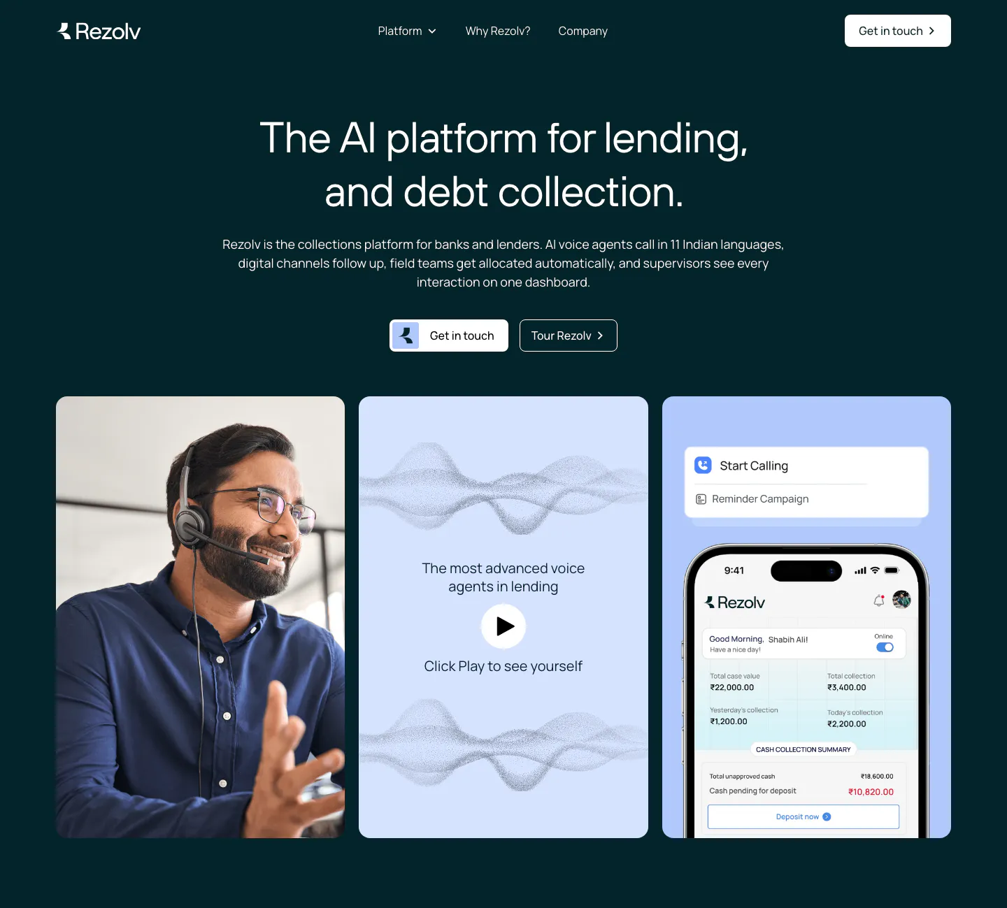
All industries
    ↑↓ Navigate ↵ Open

    Section preview

    Website section