Rulebase website design

Every section we captured from the Rulebase website, in page order, from the hero section down to the footer. Open any thumbnail to see it full size.

Sections 8

In page order, top to bottom

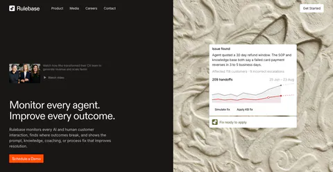
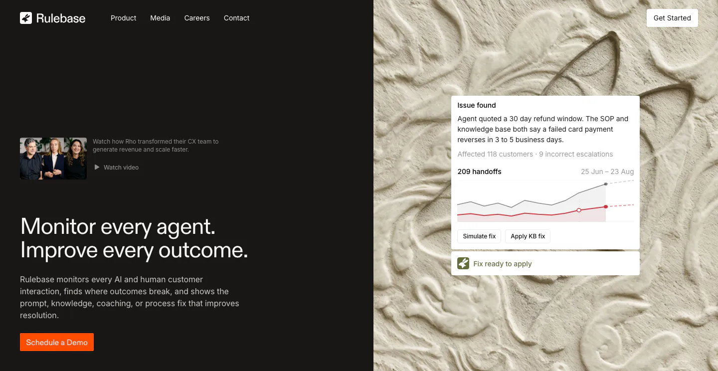
  1. Rulebase hero section: split layout with headline and orange demo button on a dark panel beside a carved plaster texture with an issue-alert UI card
    01 Hero

    Monitor every agent. Improve every outcome.

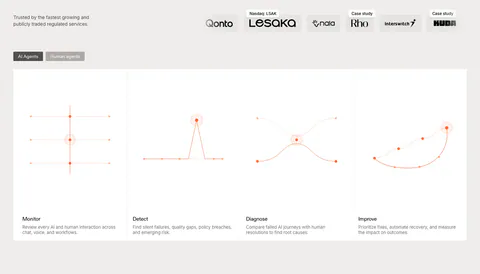
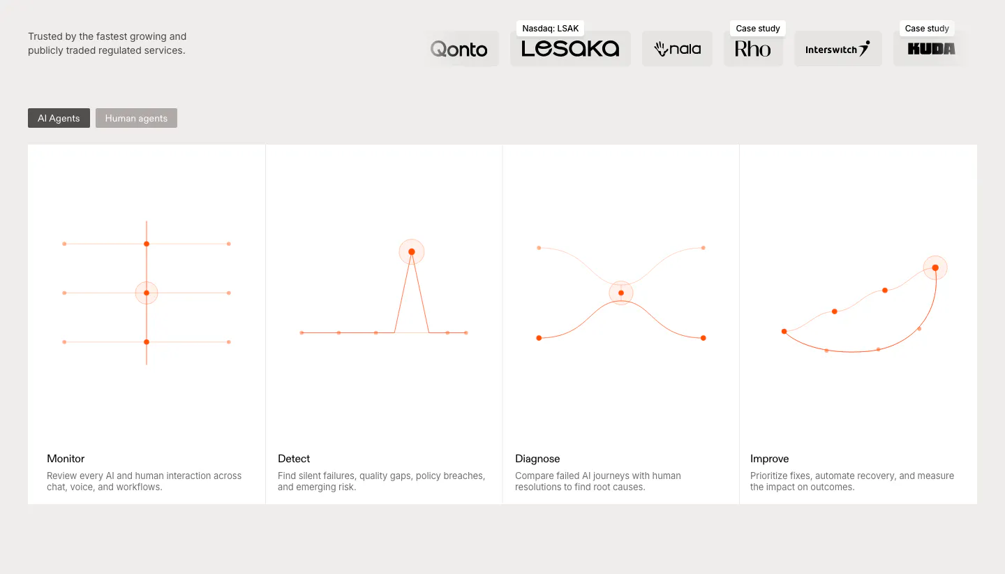
  2. Rulebase features section: customer logo row above an AI/human agents toggle and four equal cards with orange line diagrams
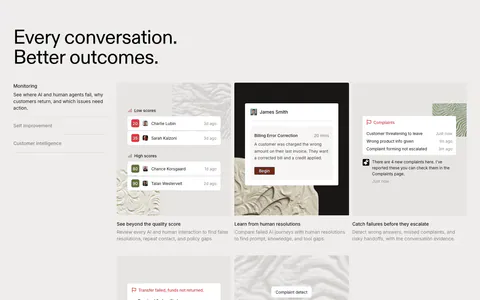
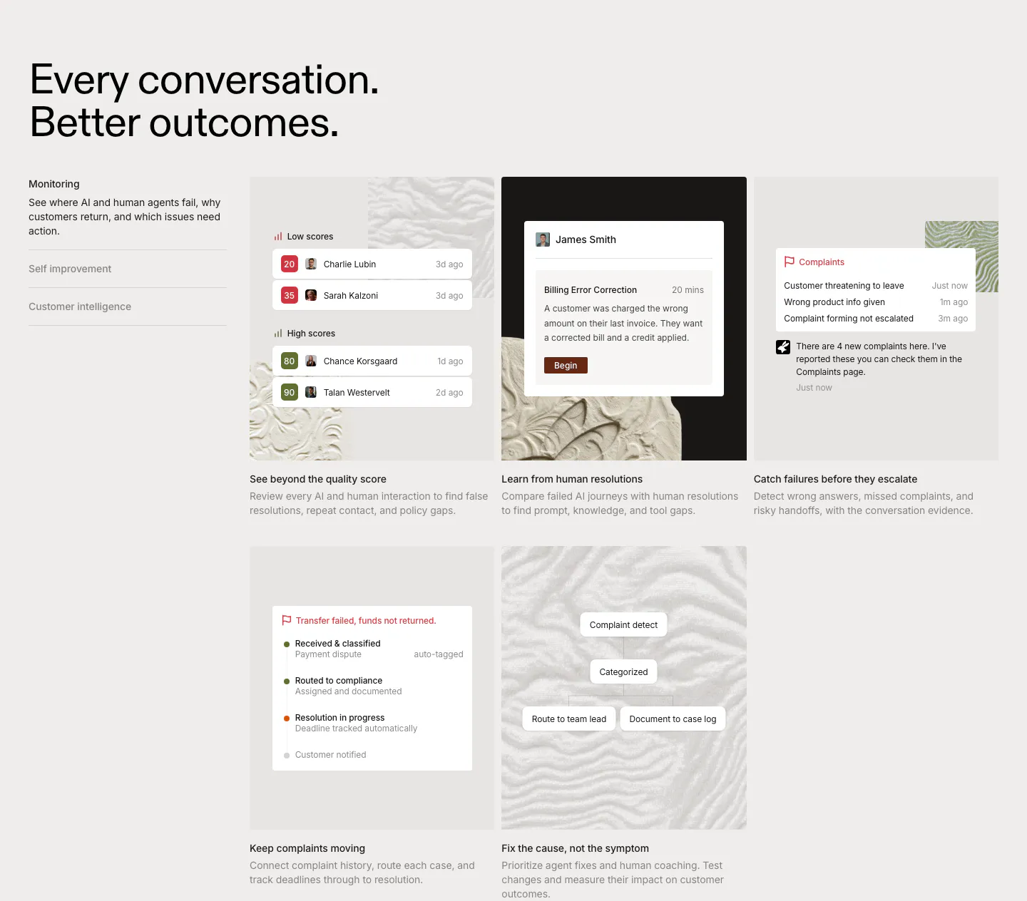
  3. Rulebase features section: left-aligned headline, vertical tab list and a grid of five cards with scoring and complaint UI on textured tiles

    Every conversation. Better outcomes.

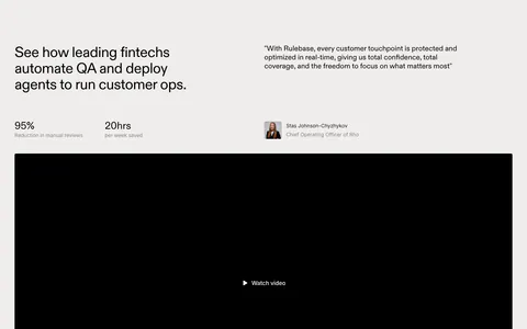
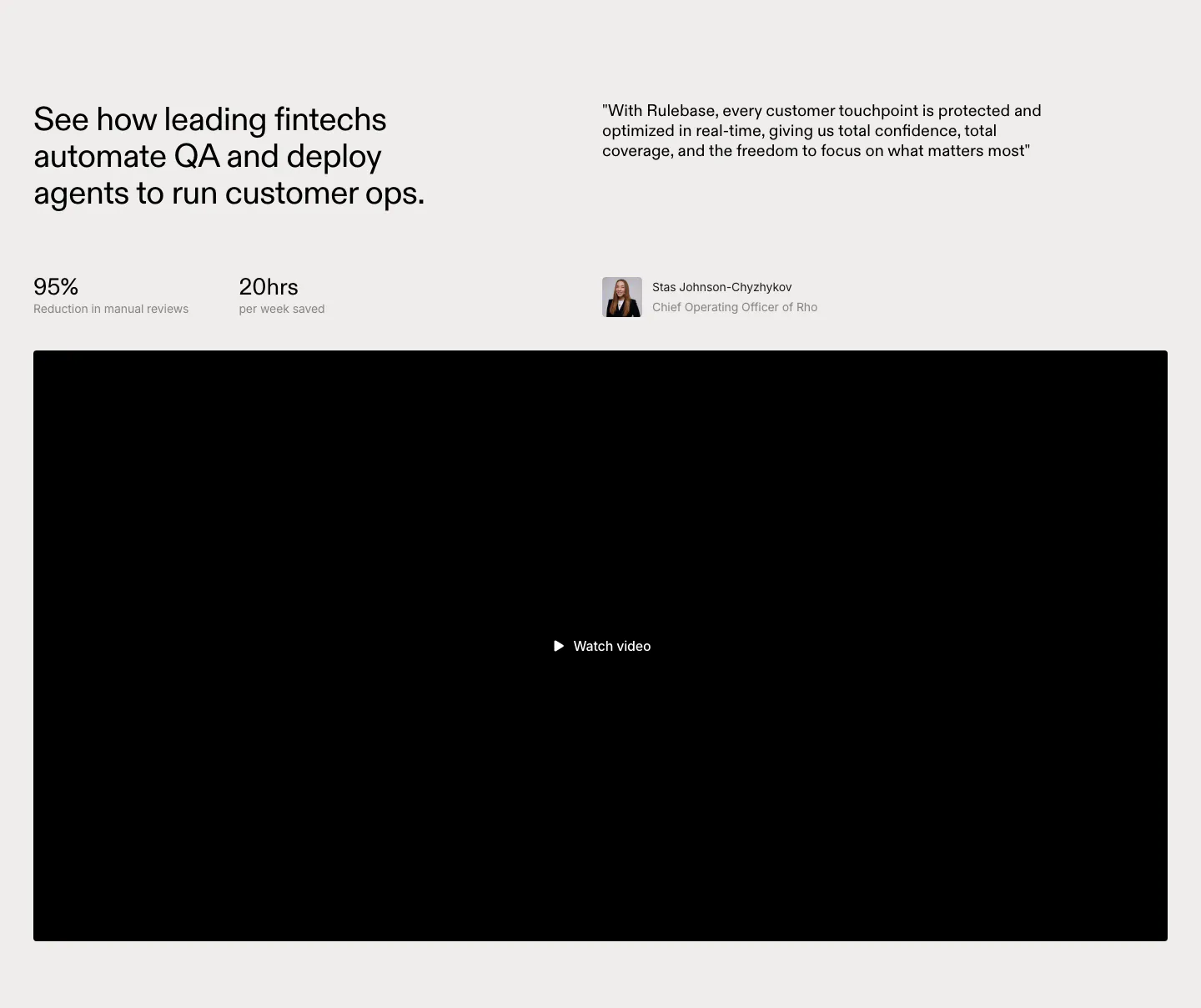
  4. Rulebase testimonials section: headline with two stats beside a customer quote and avatar, above a large black video player

    See how leading fintechs automate QA and deploy agents to run customer ops.

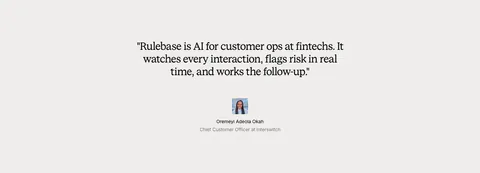
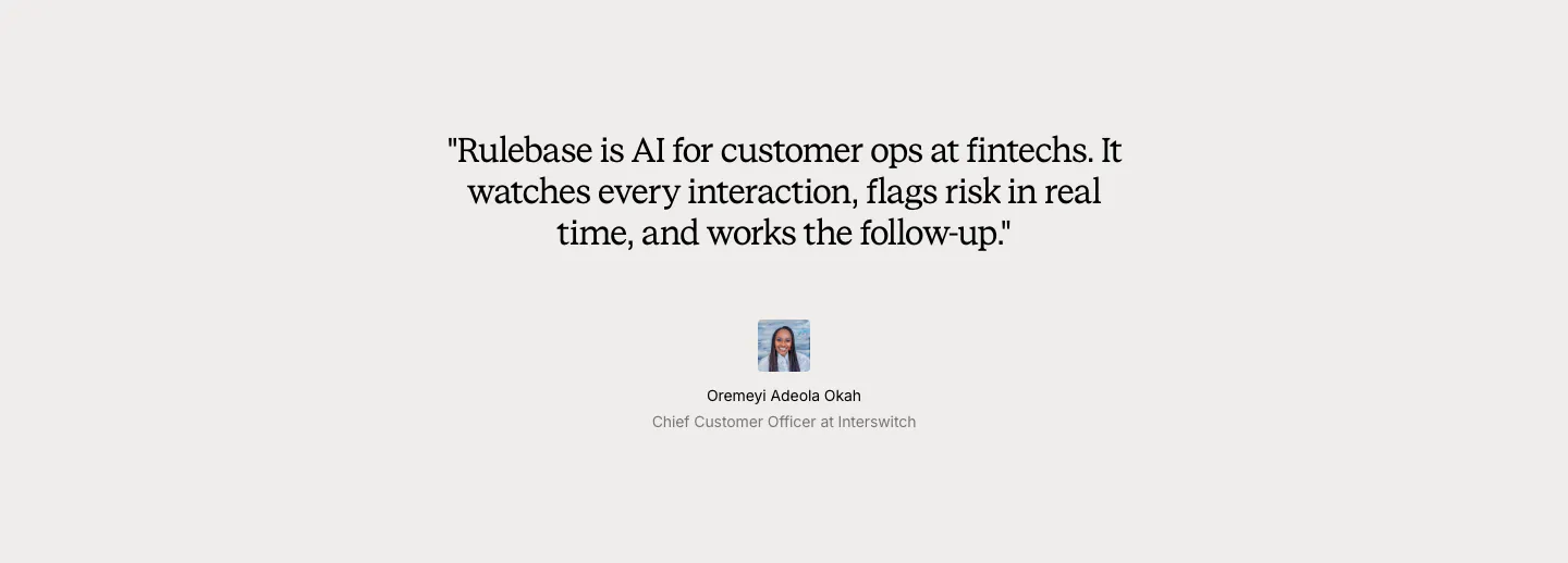
  5. Rulebase testimonials section: centered serif customer quote with a small avatar, name and title on a light gray background

    "Rulebase is AI for customer ops at fintechs. It watches every interaction, flags risk in real time, and works the follow-up."

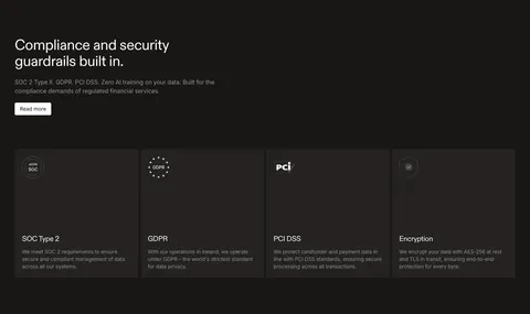
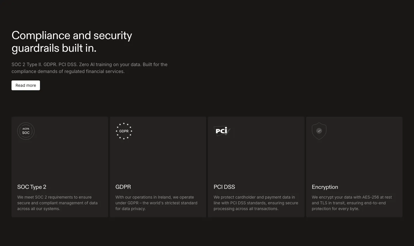
  6. Rulebase security section: left-aligned headline and Read more button above four dark cards for SOC 2, GDPR, PCI DSS and encryption

    Compliance and security guardrails built in.

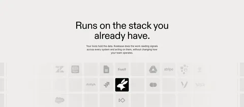
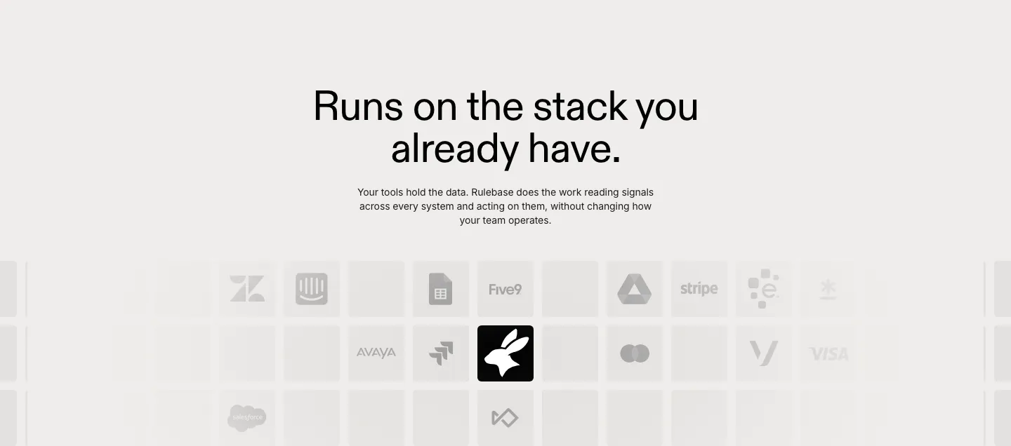
  7. Rulebase integrations section: centered headline and copy above a fading grid of grayscale app logo tiles like Zendesk, Stripe and Visa

    Runs on the stack you already have.

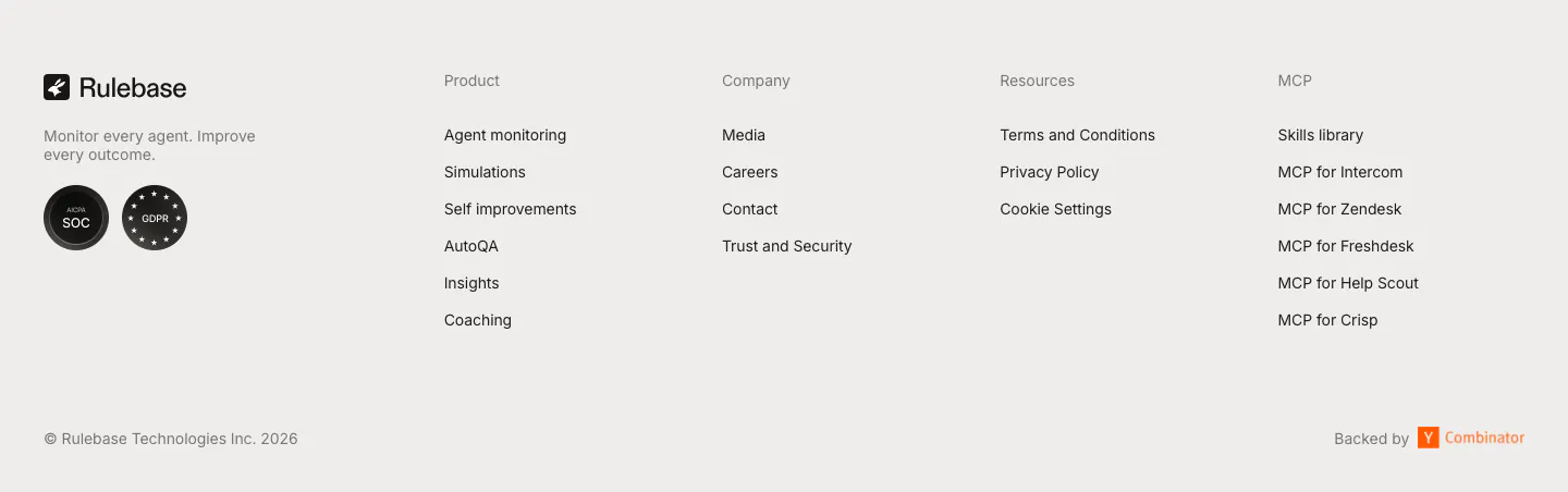
  8. Rulebase footer section: logo, tagline and compliance badges beside four link columns, with copyright and Y Combinator note on light gray
    08 Footer

Similar companies

All companies
    ↑↓ Navigate ↵ Open

    Section preview

    Website section