Productivity Website Design Examples

Productivity tools compete with habits as much as with other products. People already have a way to take notes, plan work, or run meetings, so the page has to show why switching is worth the effort. Good productivity website design places the product inside a realistic workday, keeps the interface front and center, and makes moving over from old tools sound easy rather than risky.
209 sections

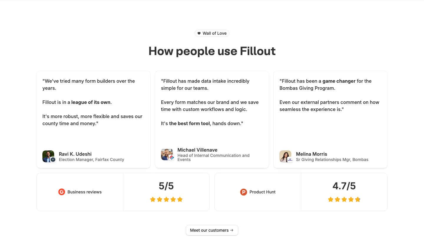
  1. Fillout testimonials section: centered heading above three quote cards with avatars and two rating cards for G2 and Product Hunt
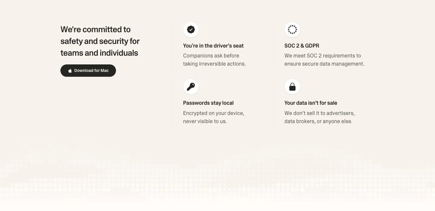
  2. Strawberry security section: headline and download button on the left, 2x2 grid of icon trust points on the right, pixel fade below
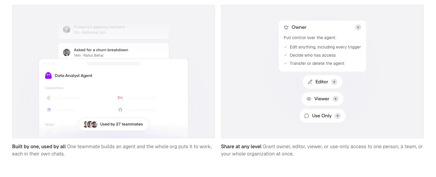
  3. Gumloop features section: two gray cards with agent sharing and permission UI mockups above short captions
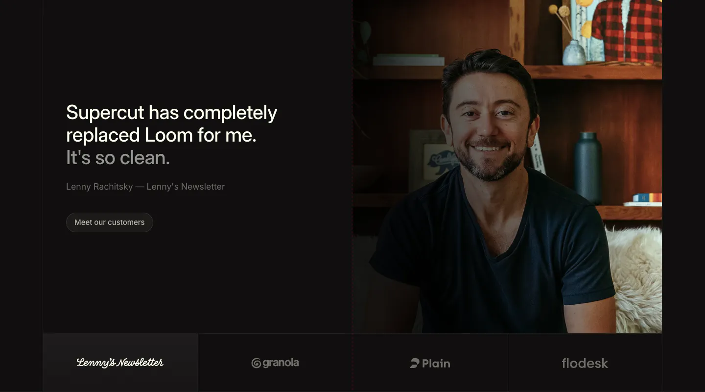
  4. Supercut testimonials section: large quote and Meet our customers button at left, portrait photo at right, four logo tiles below
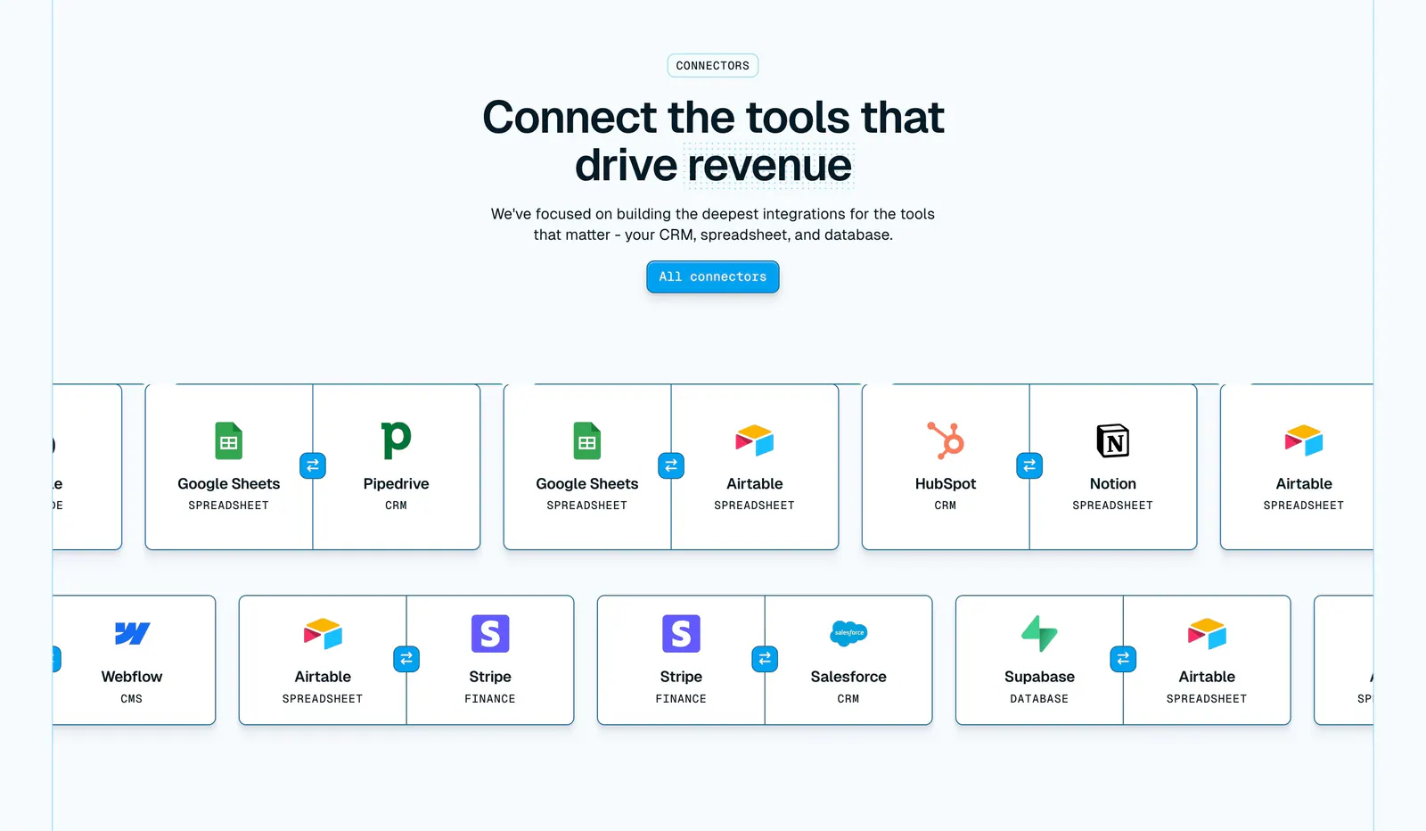
  5. Whalesync integrations section: centered headline above two scrolling rows of paired connector cards like Google Sheets and Pipedrive
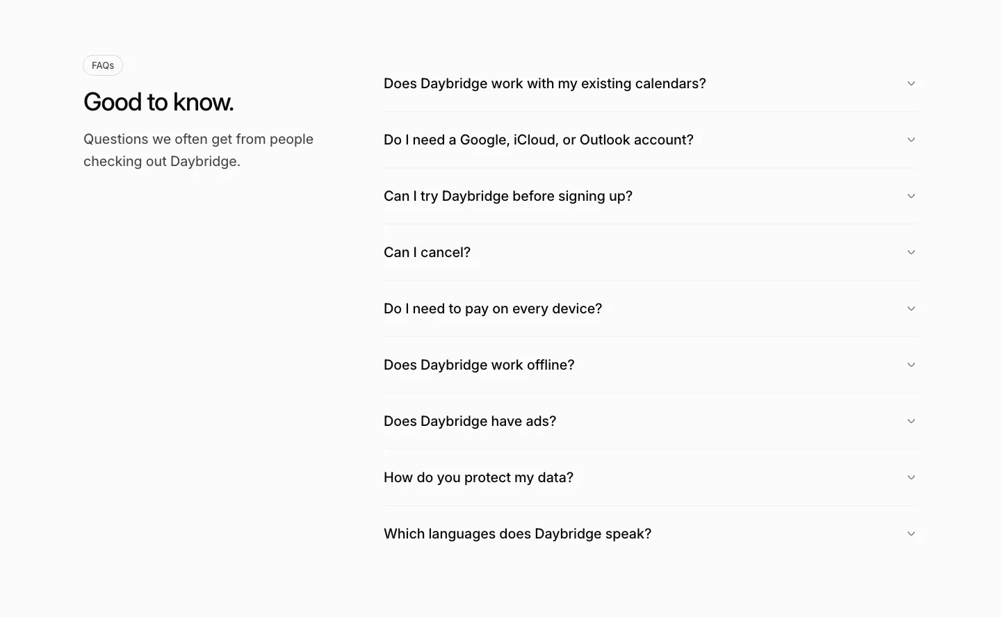
  6. Daybridge FAQ section: heading and short intro on the left with a gray accordion list of questions on the right
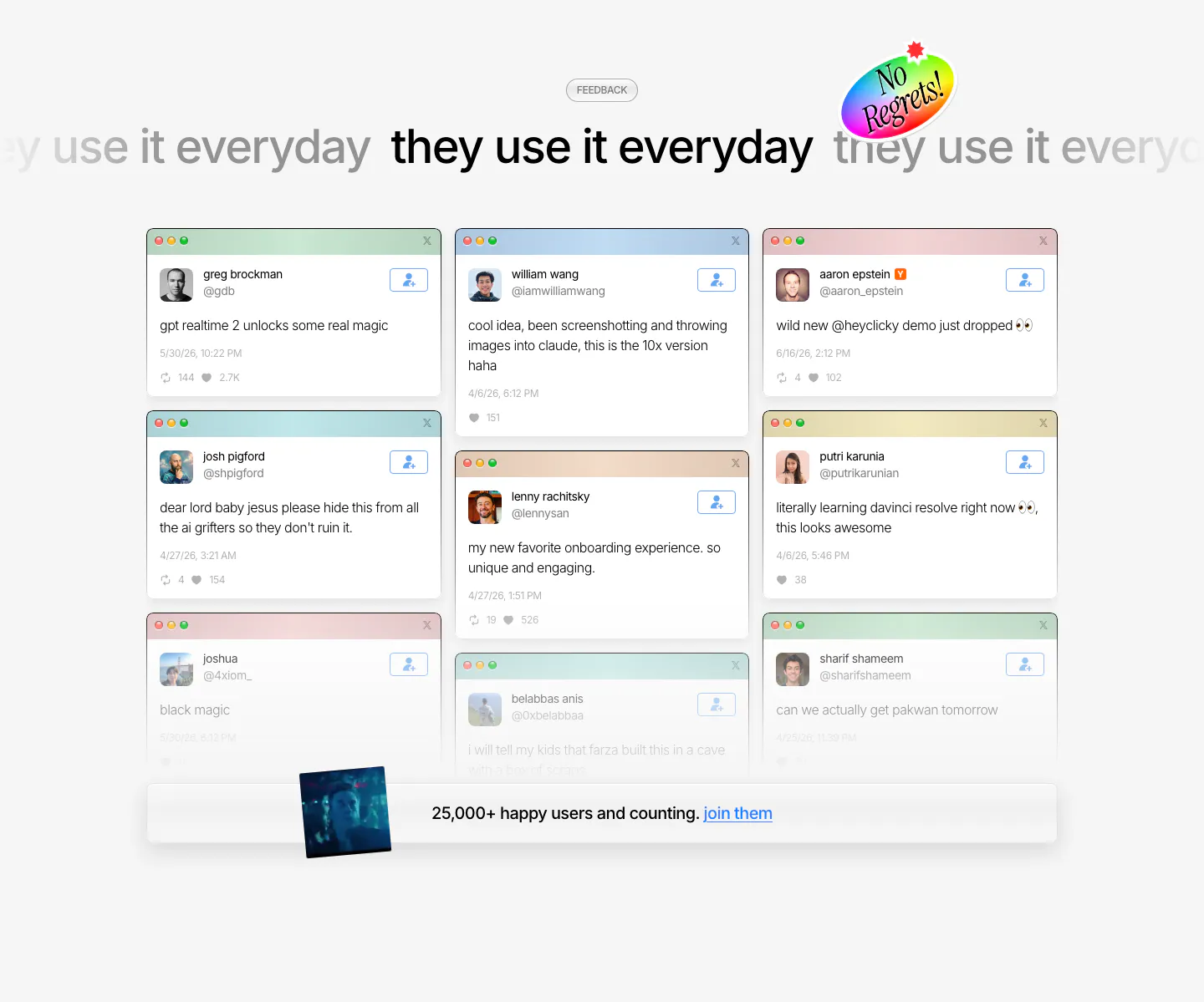
  7. heyclicky testimonials section: marquee headline above a three-column wall of tweet cards in mac windows, user count bar at bottom
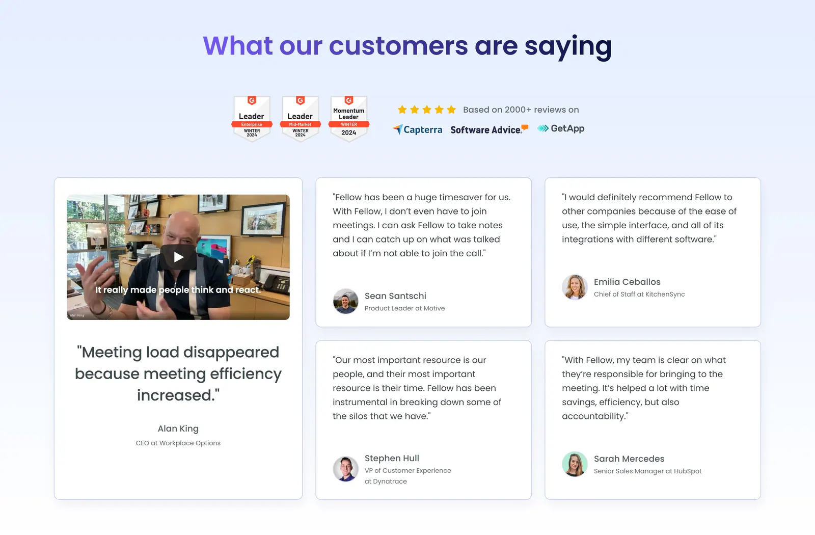
  8. Fellow testimonials section: centered heading with G2 badges above a large video testimonial card and four quote cards
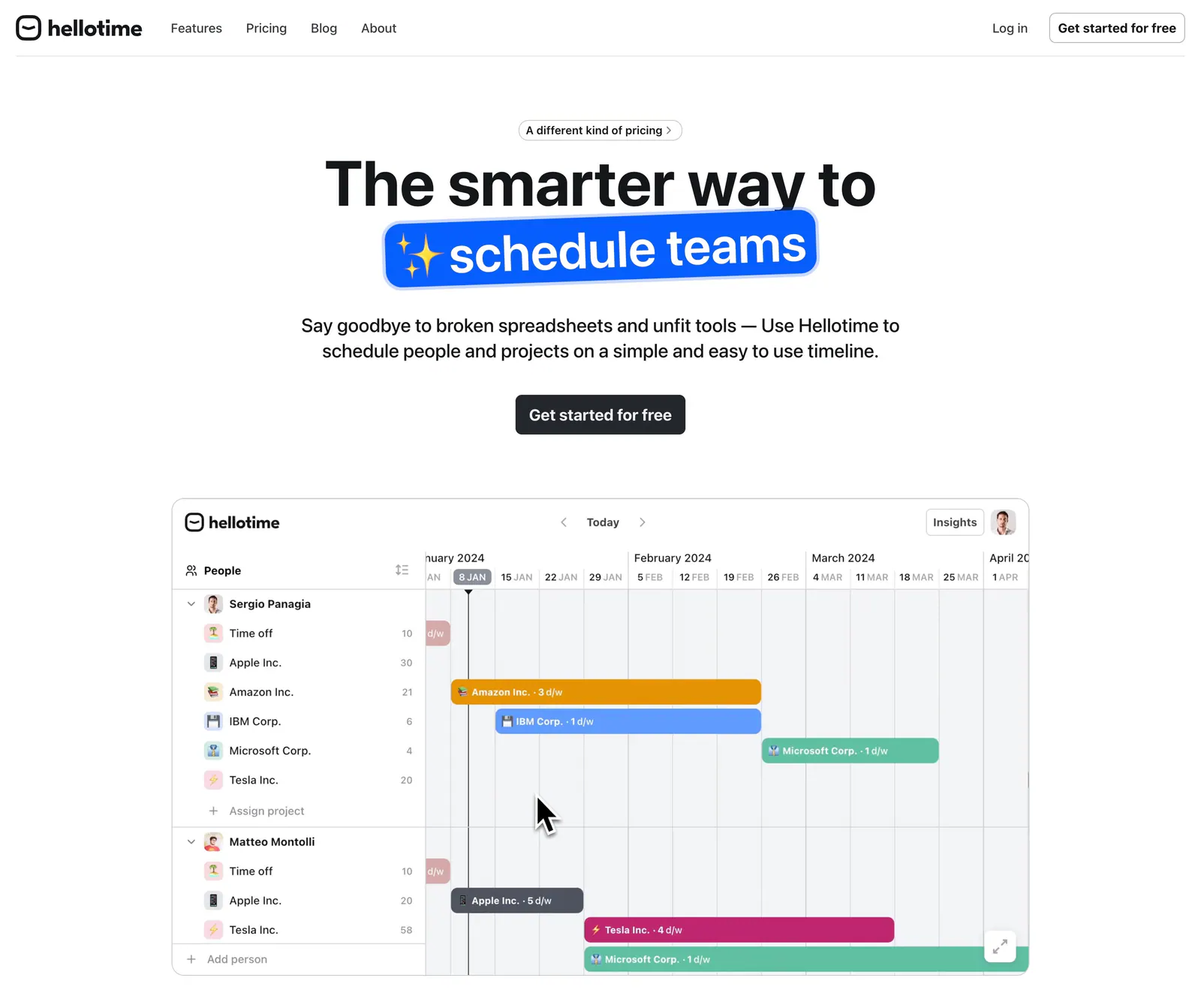
  9. Hellotime hero section: centered headline with a blue highlight pill and button above a team scheduling timeline screenshot
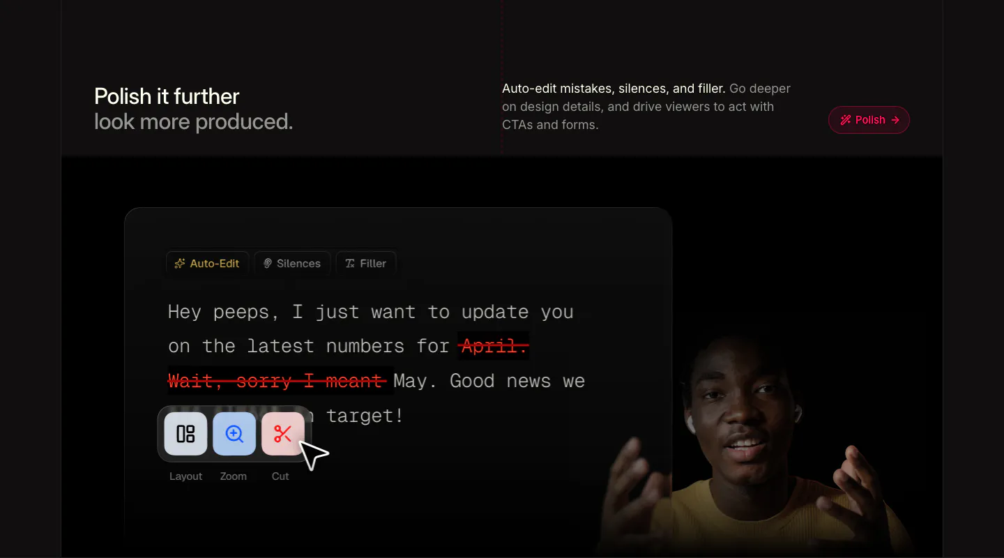
  10. Supercut features section: headline row above a transcript editor with struck-out filler words, Layout, Zoom, Cut tools and a presenter
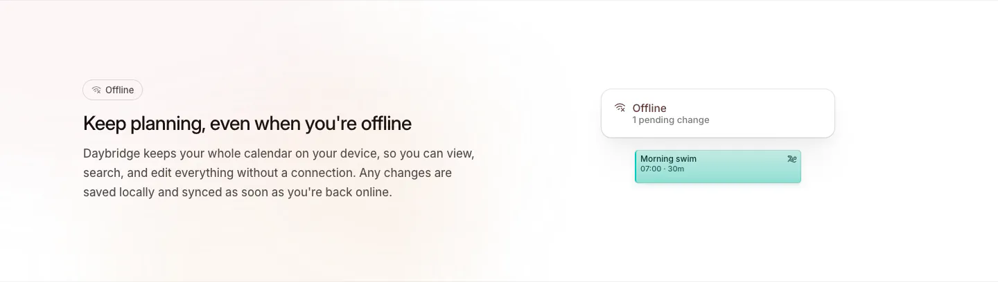
  11. Daybridge features section: offline headline and copy on the left with a small offline status card and event chip on the right
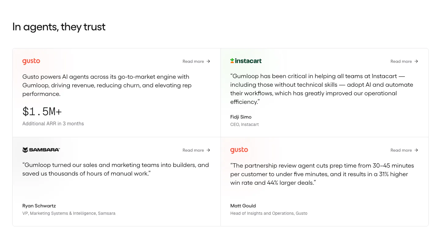
  12. Gumloop testimonials section: heading above a 2x2 grid of customer quote cards with brand logos on white
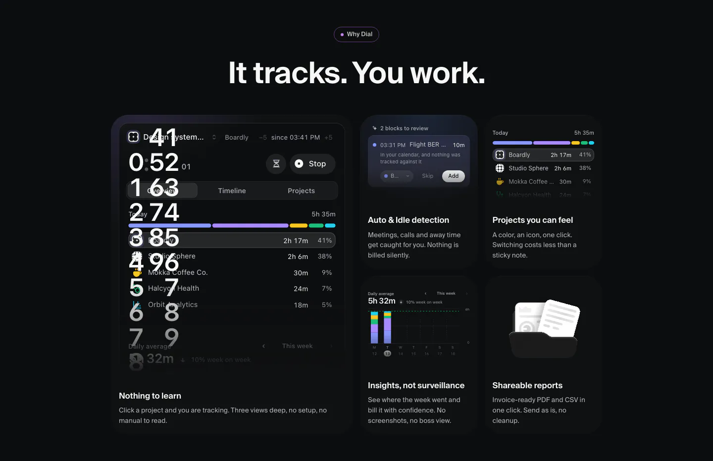
  13. Dial features section: dark bento grid of time-tracking UI tiles, a large timer panel plus cards for idle detection, projects, insights and reports
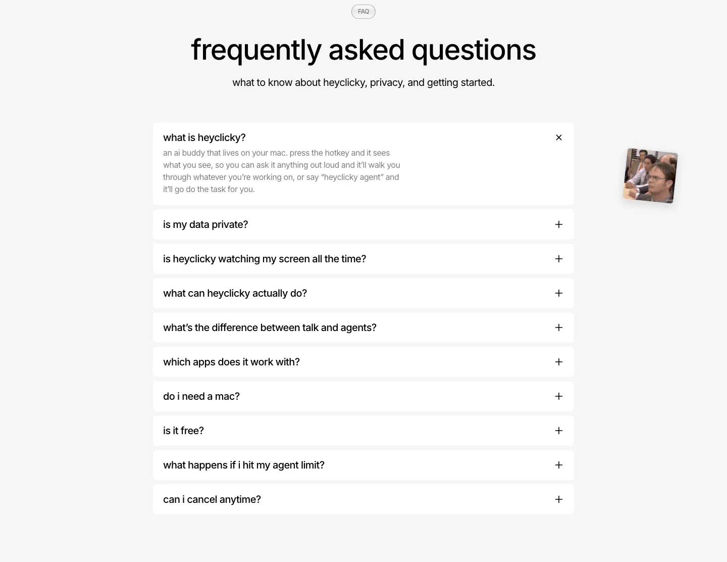
  14. heyclicky FAQ section: centered headline over a single-column accordion of white question rows, first one expanded, on light gray
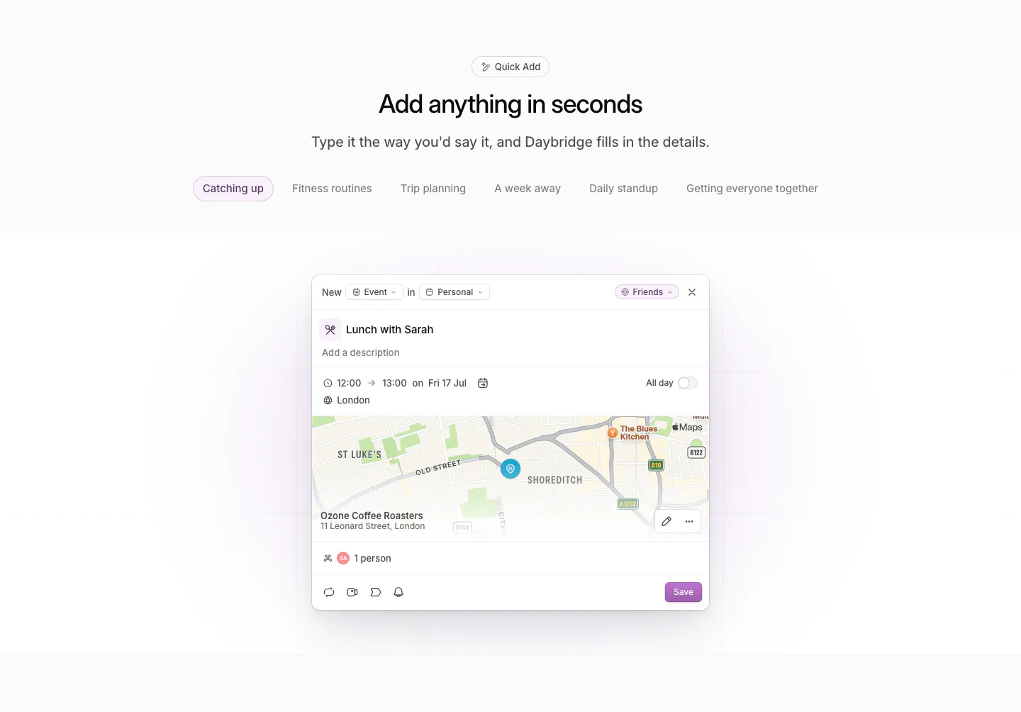
  15. Daybridge features section: centered headline and example tab pills above a quick-add event dialog with a map preview
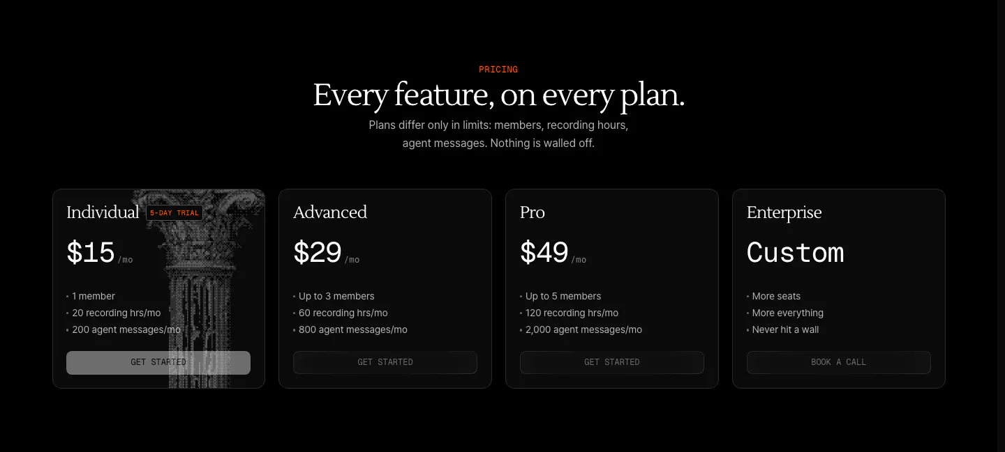
  16. Arke pricing section: centered serif headline above four dark plan cards from $15 Individual to Custom Enterprise, one with a halftone column
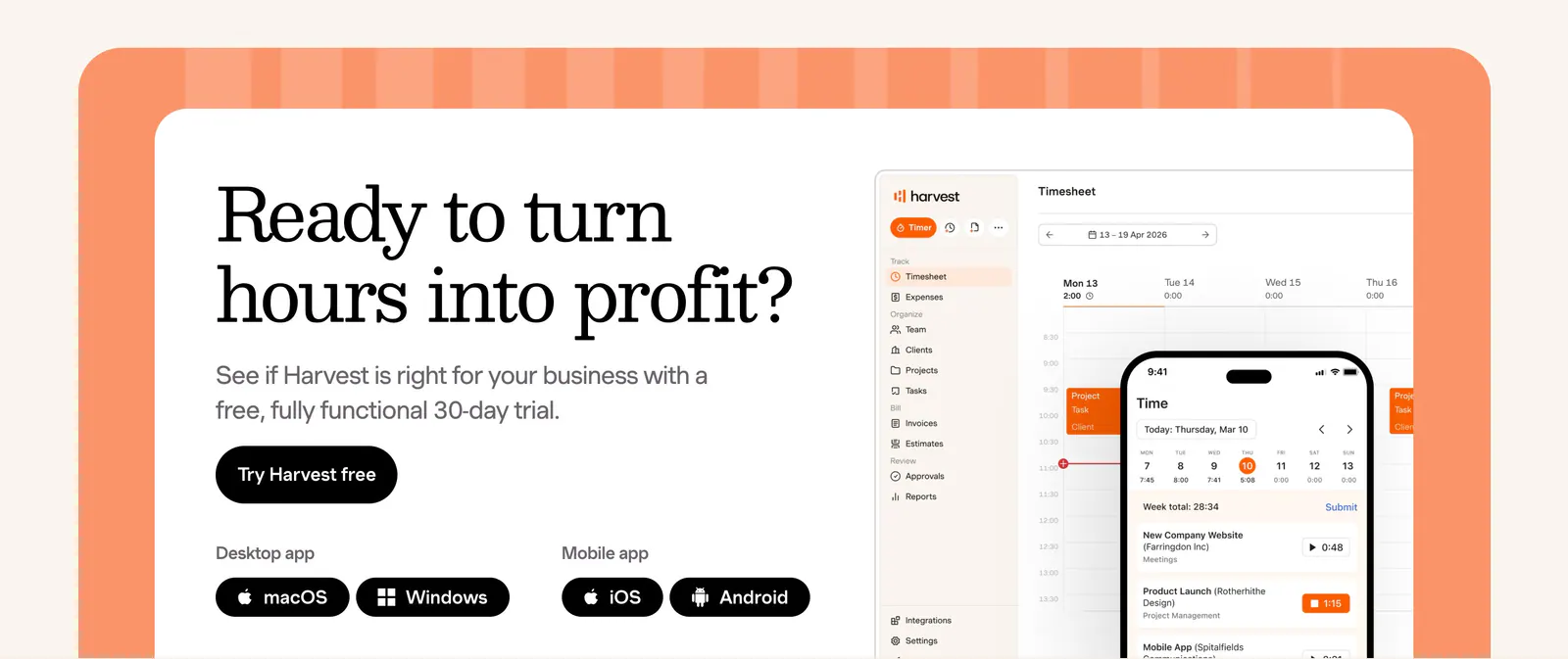
  17. Harvest call-to-action section: serif headline, trial button and app badges beside desktop and mobile timesheet UI in an orange-framed card
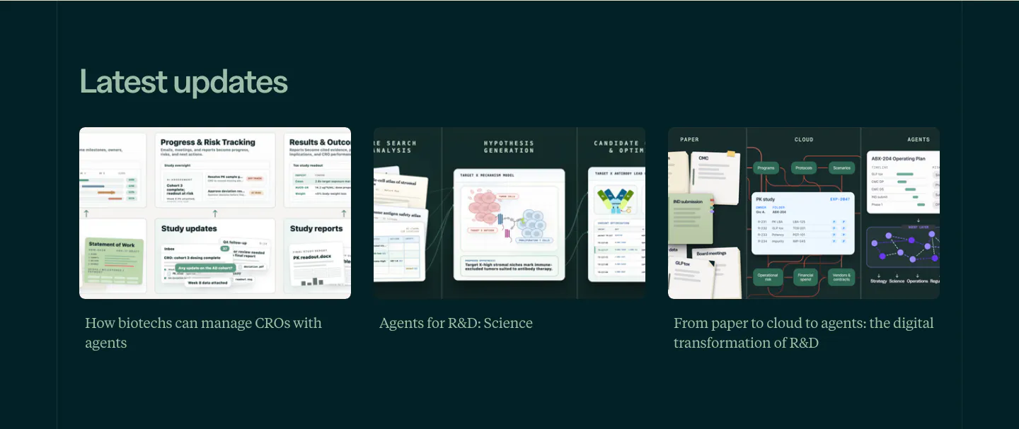
  18. Orchestra Bio blog & resources section: Latest updates heading over three article cards with illustrated thumbnails on dark teal
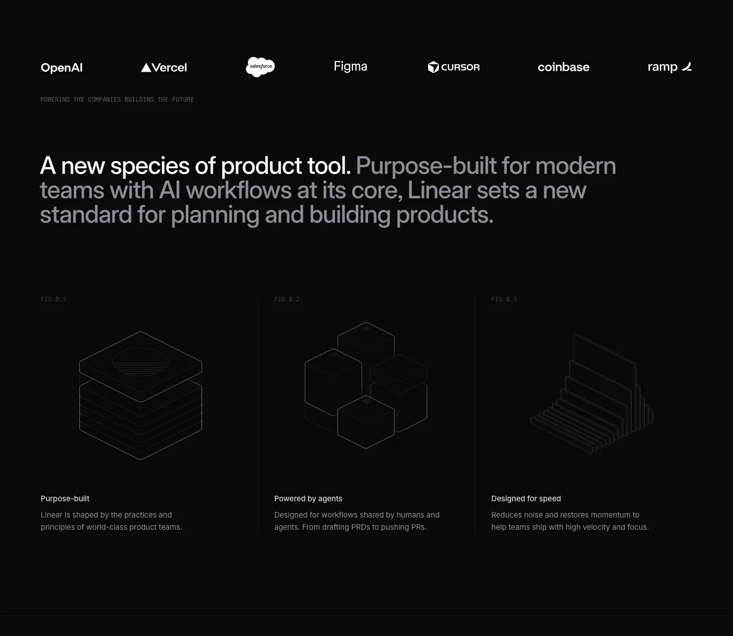
  19. Linear value proposition section: dark logo strip, two-tone statement and three columns with isometric line drawings and short benefits
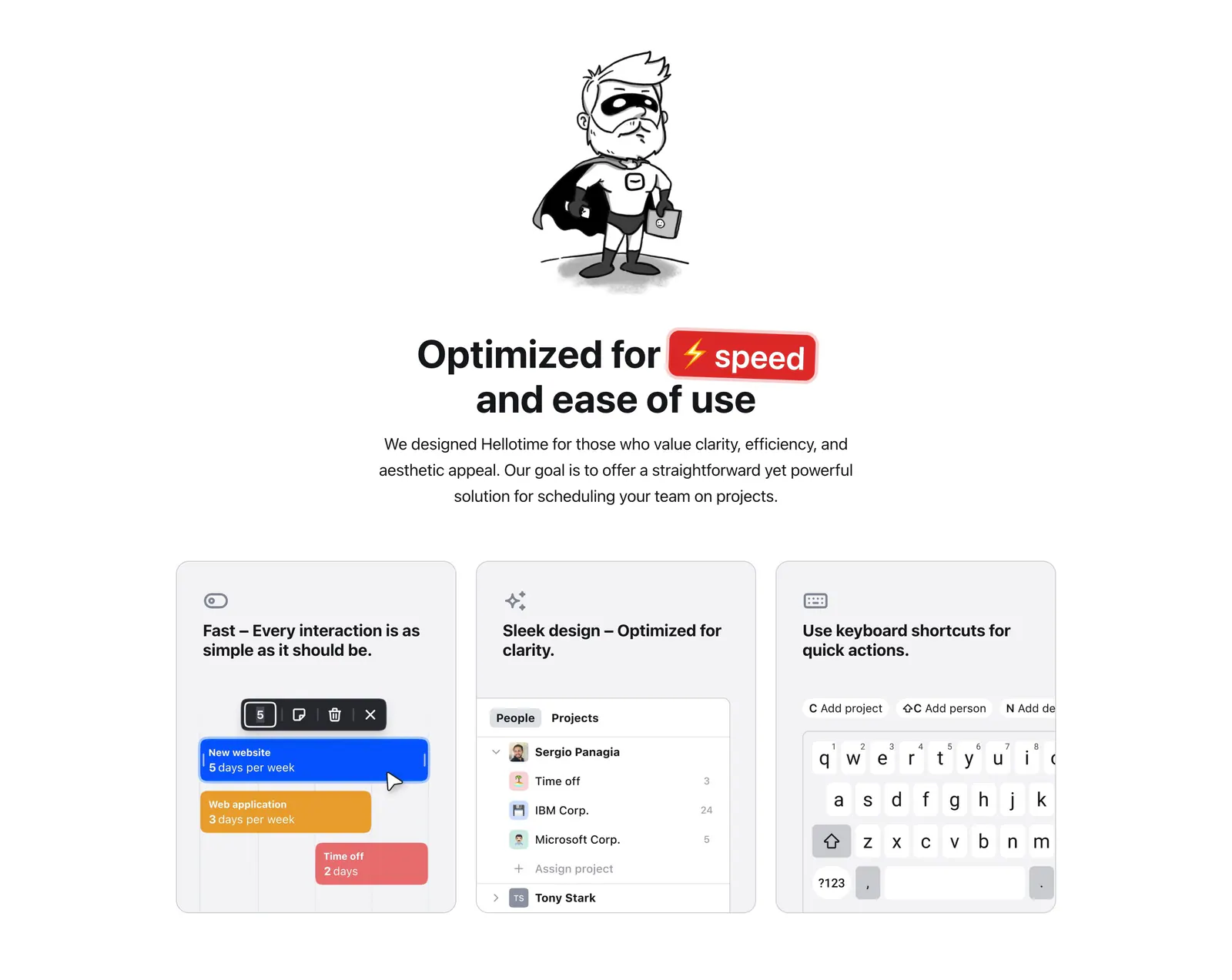
  20. Hellotime features section: superhero drawing and centered headline above three gray cards with scheduling UI and keyboard mockups
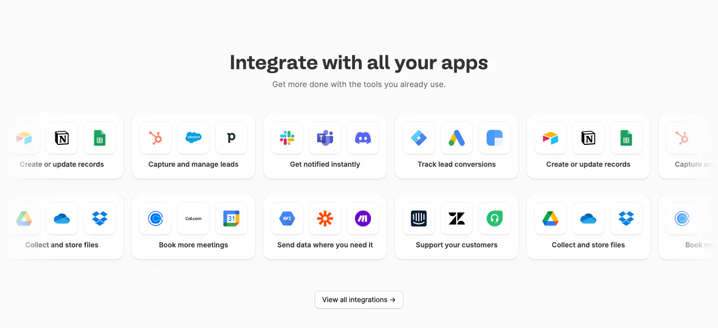
  21. Fillout integrations section: centered heading above two rows of cards grouping app icons by task, cut off at the edges, and a view-all button
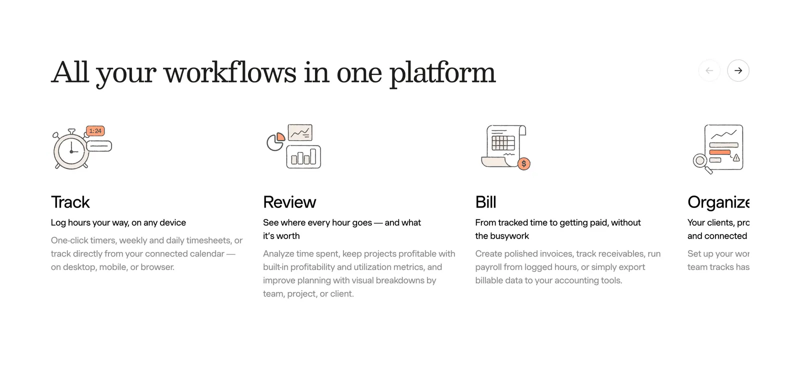
  22. Harvest features section: serif heading with arrow controls above a sliding row of track, review, bill and organize columns with line drawings
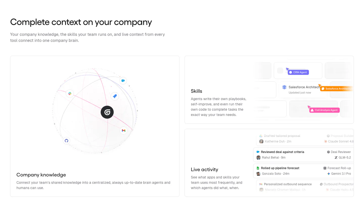
  23. Gumloop features section: headline above a large knowledge globe card and two stacked UI cards for skills and activity
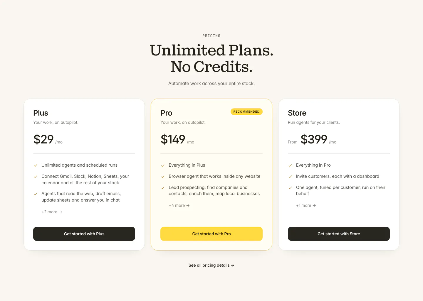
  24. Twin pricing section: centered serif headline above three plan cards with the middle Pro plan highlighted in yellow on cream
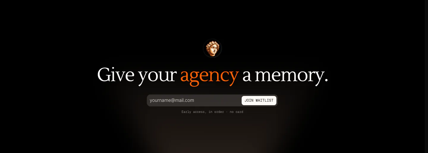
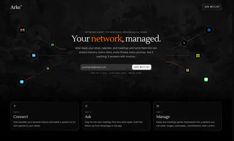
  25. Arke call to action section: centered serif headline with an orange accent word above an email waitlist field and a small statue icon on black
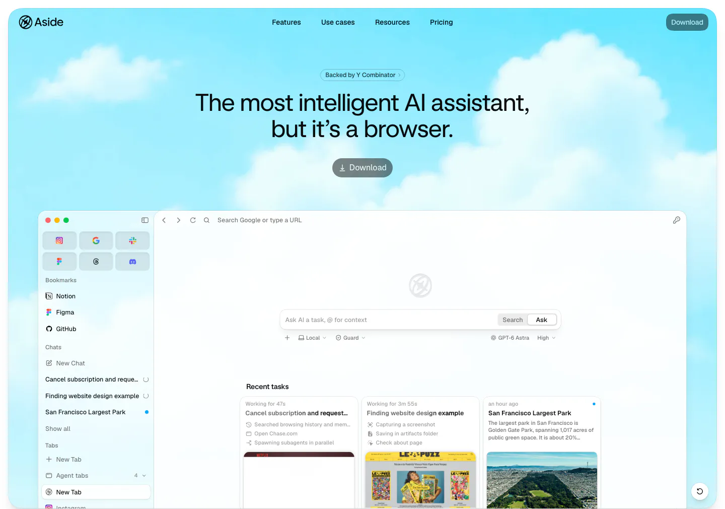
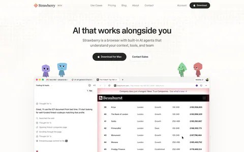
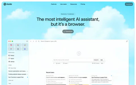
  26. Aside hero section: centered headline, YC badge and download button over a cloudy sky, above a browser app screenshot
  27. Daybridge footer section: logo, London tagline and flags on the left, four link columns right, trademark line and social icons
  28. heyclicky footer section: four link columns above a giant wordmark built from blue folder icons, copyright line on light gray
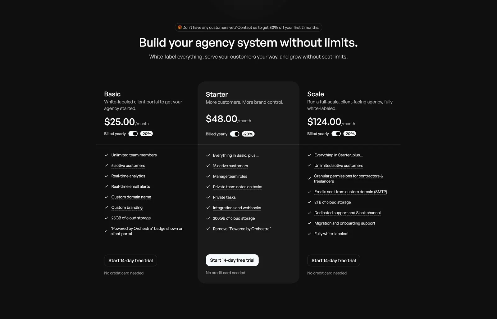
  29. Orchestra pricing section: centered headline above three plan columns with billed-yearly toggles and feature checklists on dark background
  30. Whalesync logo cloud section: small monospace caption above two centered rows of black customer logos on a pale background
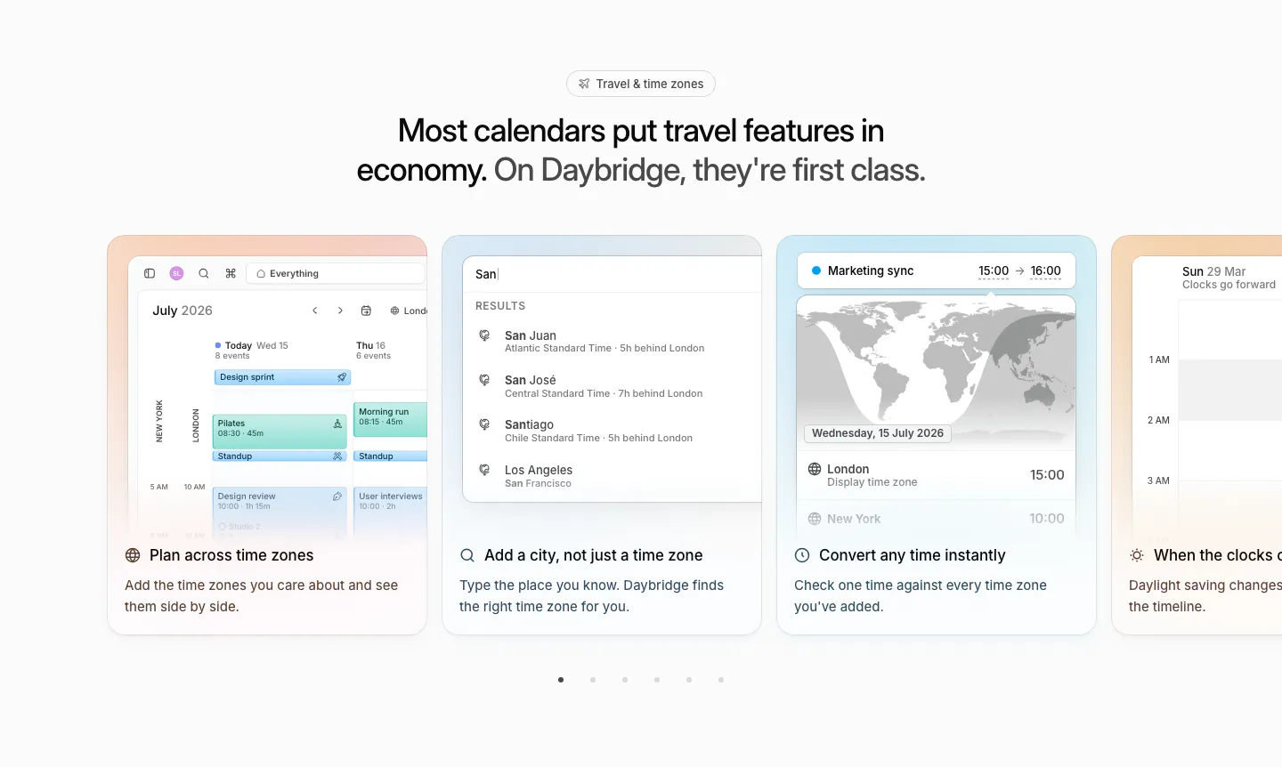
  31. Daybridge features section: centered headline above a carousel of pastel cards showing time zone UI, with pagination dots
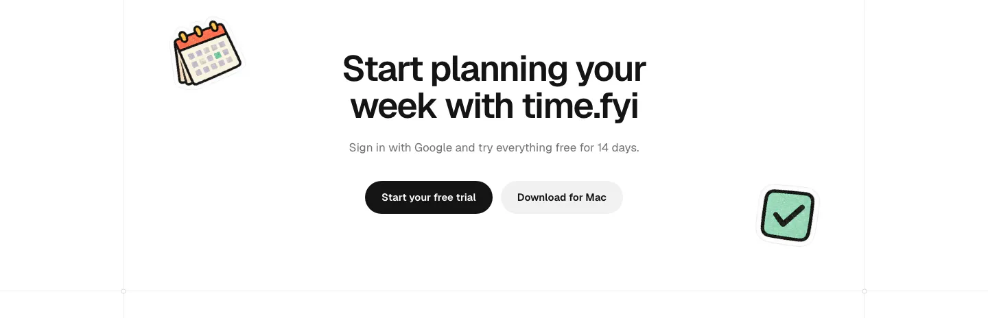
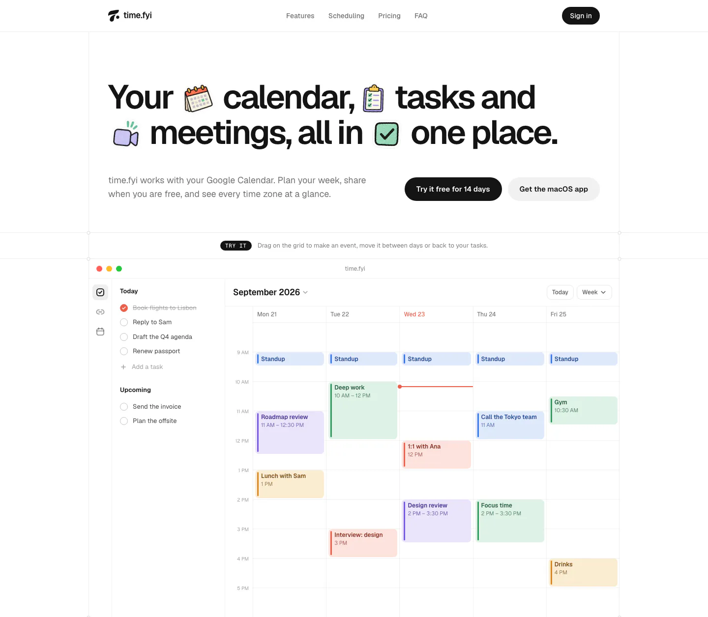
  32. time.fyi call-to-action section: centered headline with trial and Mac download buttons flanked by calendar and checkbox stickers
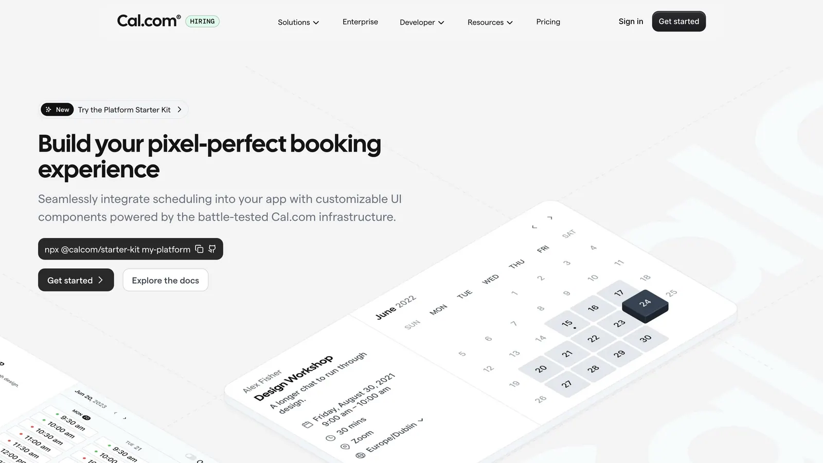
  33. Cal.com hero section: headline, npx command and buttons left beside tilted isometric calendar booking UI cards on light gray
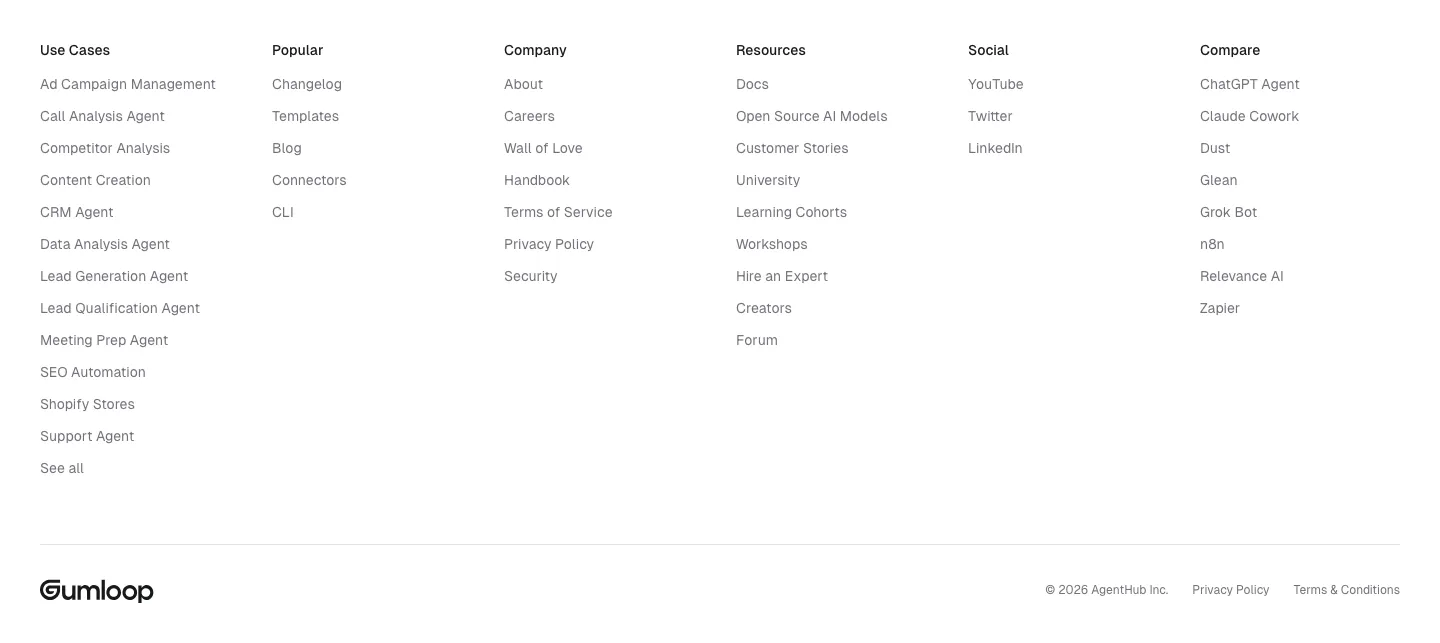
  34. Gumloop footer section: six link columns above a wordmark and copyright row on white
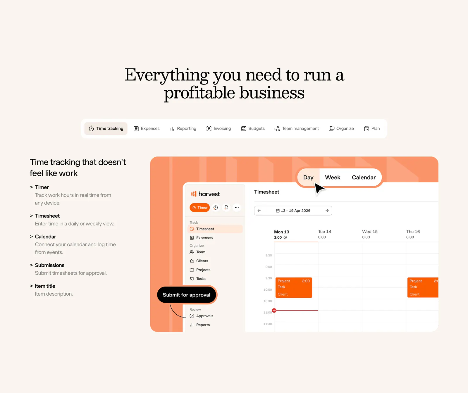
  35. Harvest features section: centered serif heading and feature tabs above a feature list beside a timesheet UI on an orange panel, cream background
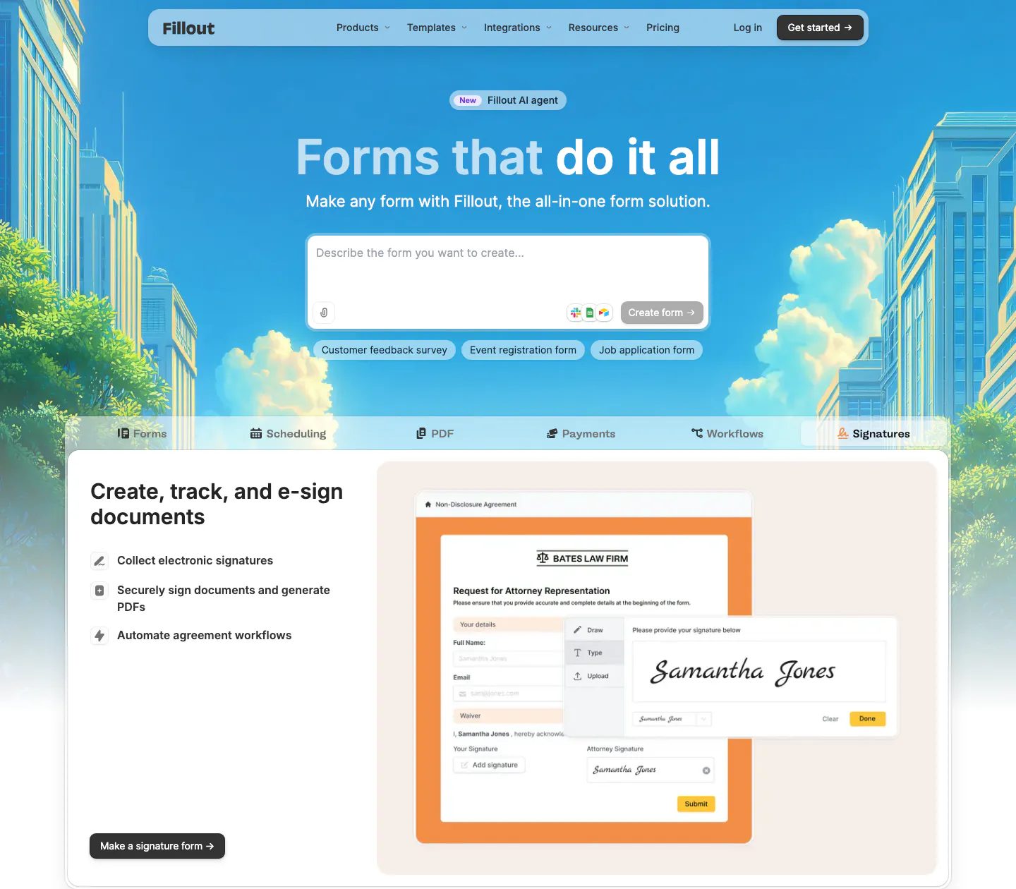
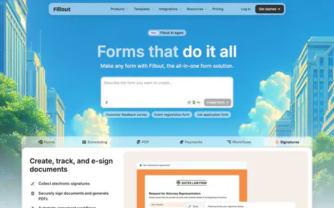
  36. Fillout hero section: centered headline and AI prompt box over an illustrated city skyline, above product tabs and an e-signature form mockup
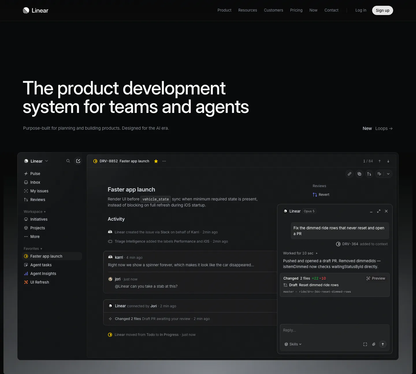
  37. Linear hero section: dark page with a large left-aligned headline and a full-width issue tracker screenshot with an agent chat panel
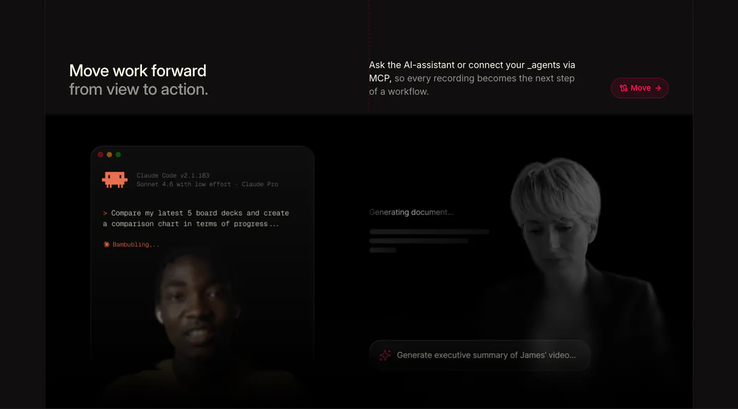
  38. Supercut features section: headline row above a Claude Code terminal prompt and a generating-document panel over faded presenters
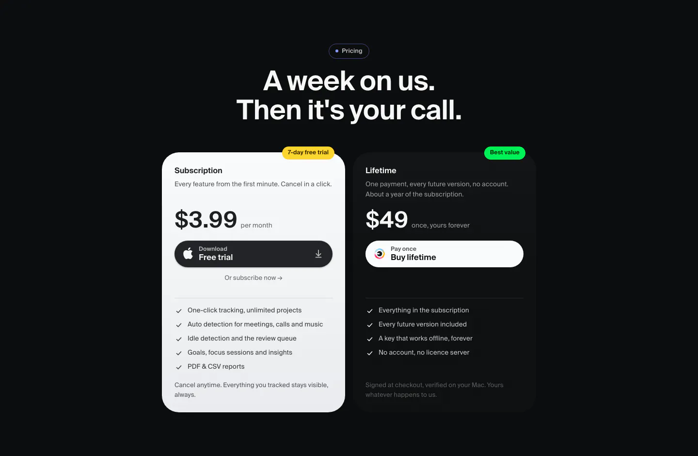
  39. Dial pricing section: dark centered headline above two plan cards, a light $3.99 monthly subscription and a dark $49 lifetime option
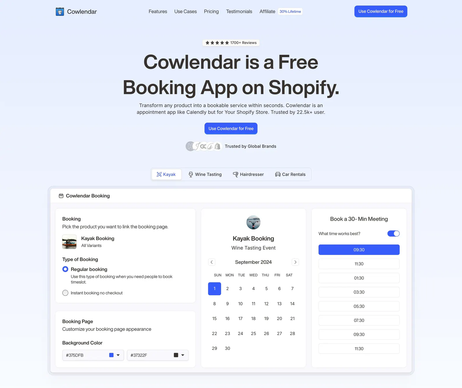
  40. Cowlendar hero section: centered headline and CTA above use-case tabs and a booking calendar product screenshot
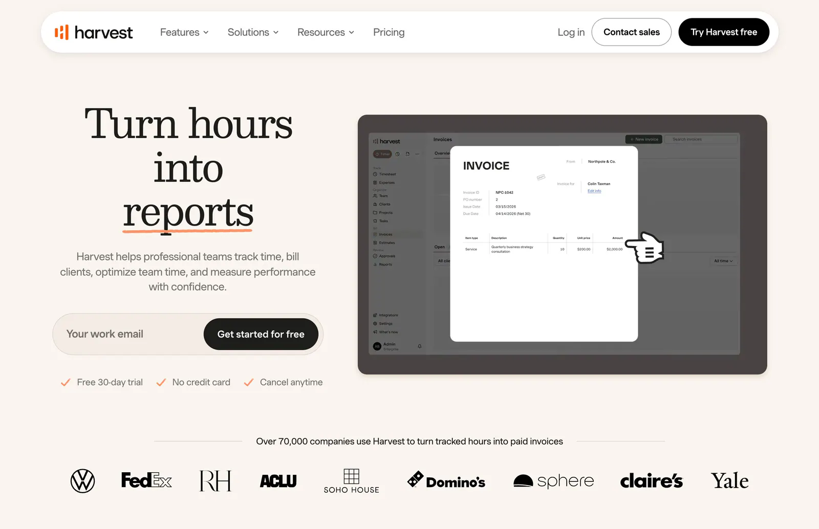
  41. Harvest hero section: serif headline with email signup field beside an invoice UI screenshot, customer logo row below on warm cream
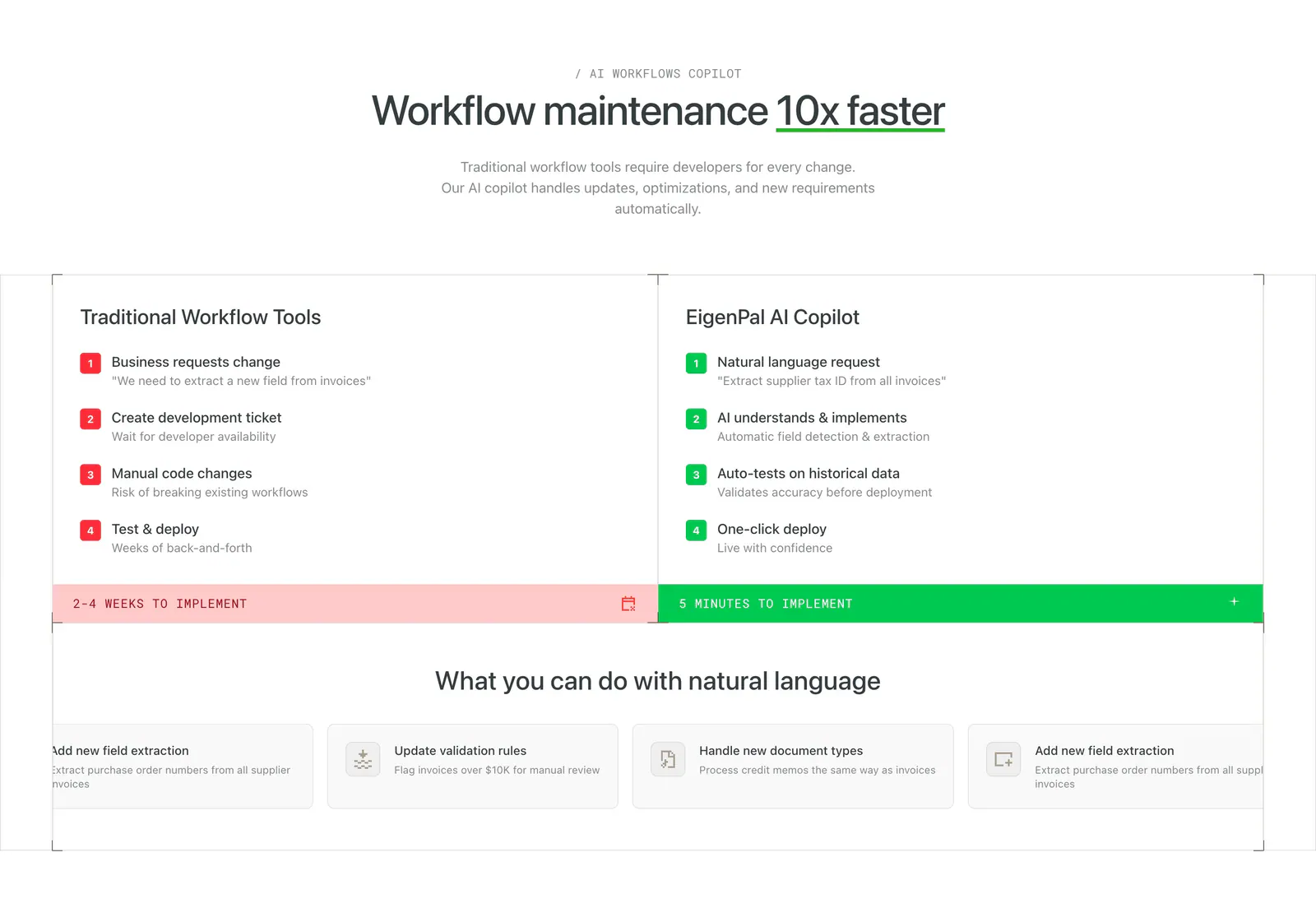
  42. EigenPal comparison section: centered headline above two columns contrasting traditional workflow steps in red with AI copilot steps in green
    EigenPal Comparison
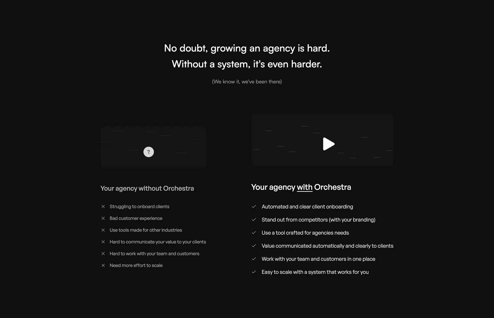
  43. Orchestra comparison section: centered headline above two columns contrasting pains without Orchestra and checked benefits with it, dark
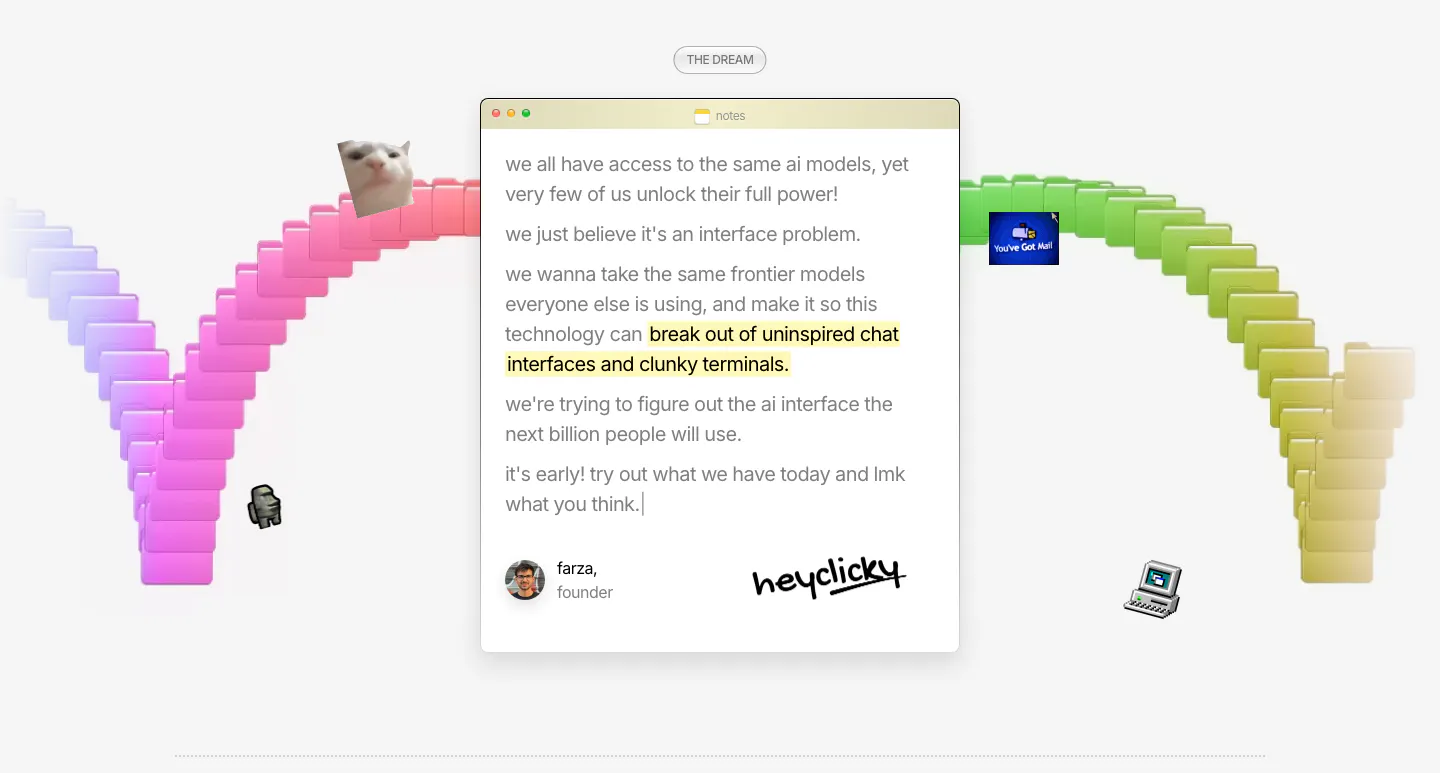
  44. heyclicky about & mission section: founder note in a mac notes window with signature, framed by a rainbow arc of 3D folders
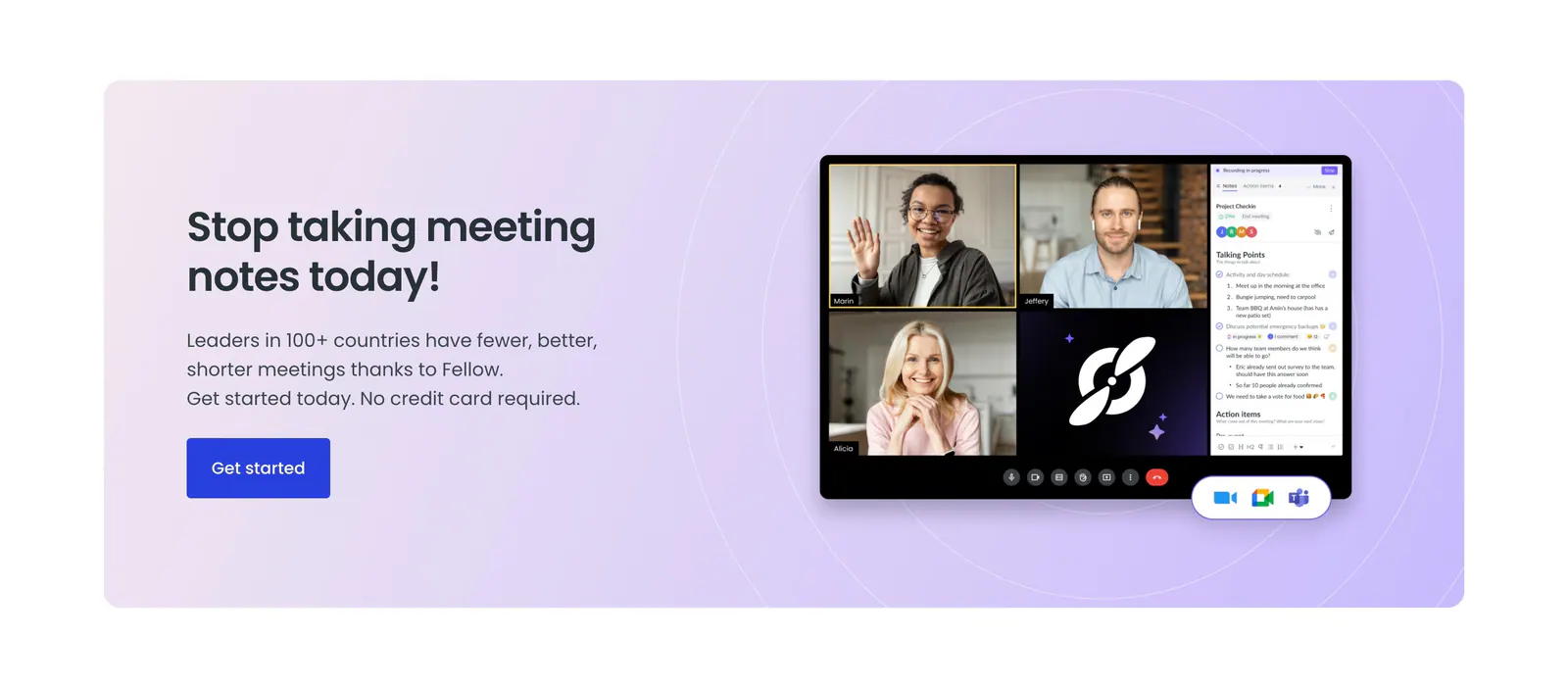
  45. Fellow call-to-action section: lavender panel with headline and blue button beside a video meeting app screenshot with notes sidebar
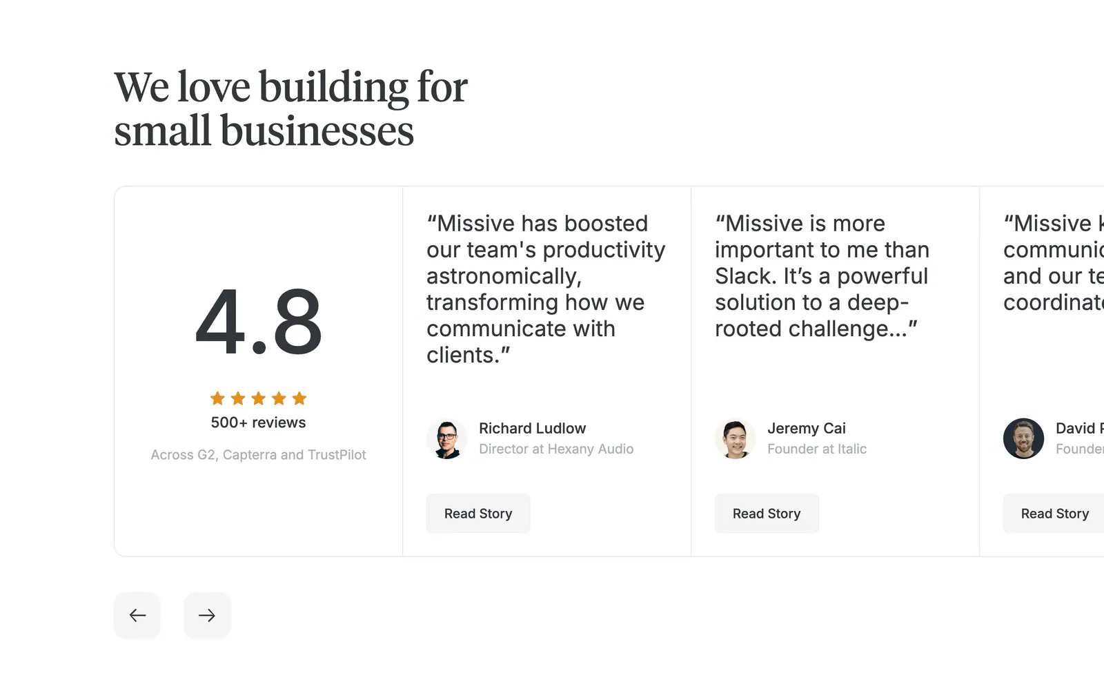
  46. Missive testimonials section: serif headline above a 4.8 rating card and edge-cropped quote cards with arrows on white
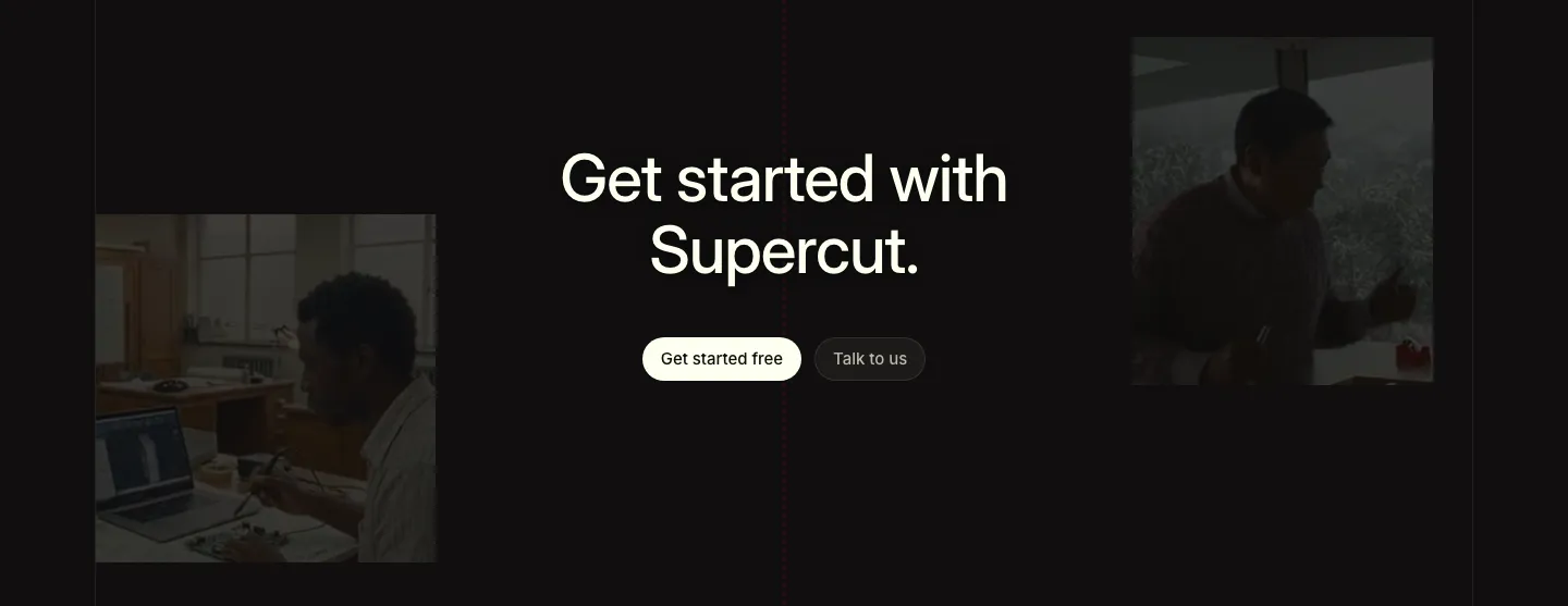
  47. Supercut call to action section: centered headline with two buttons between dimmed photos of people working, near-black background
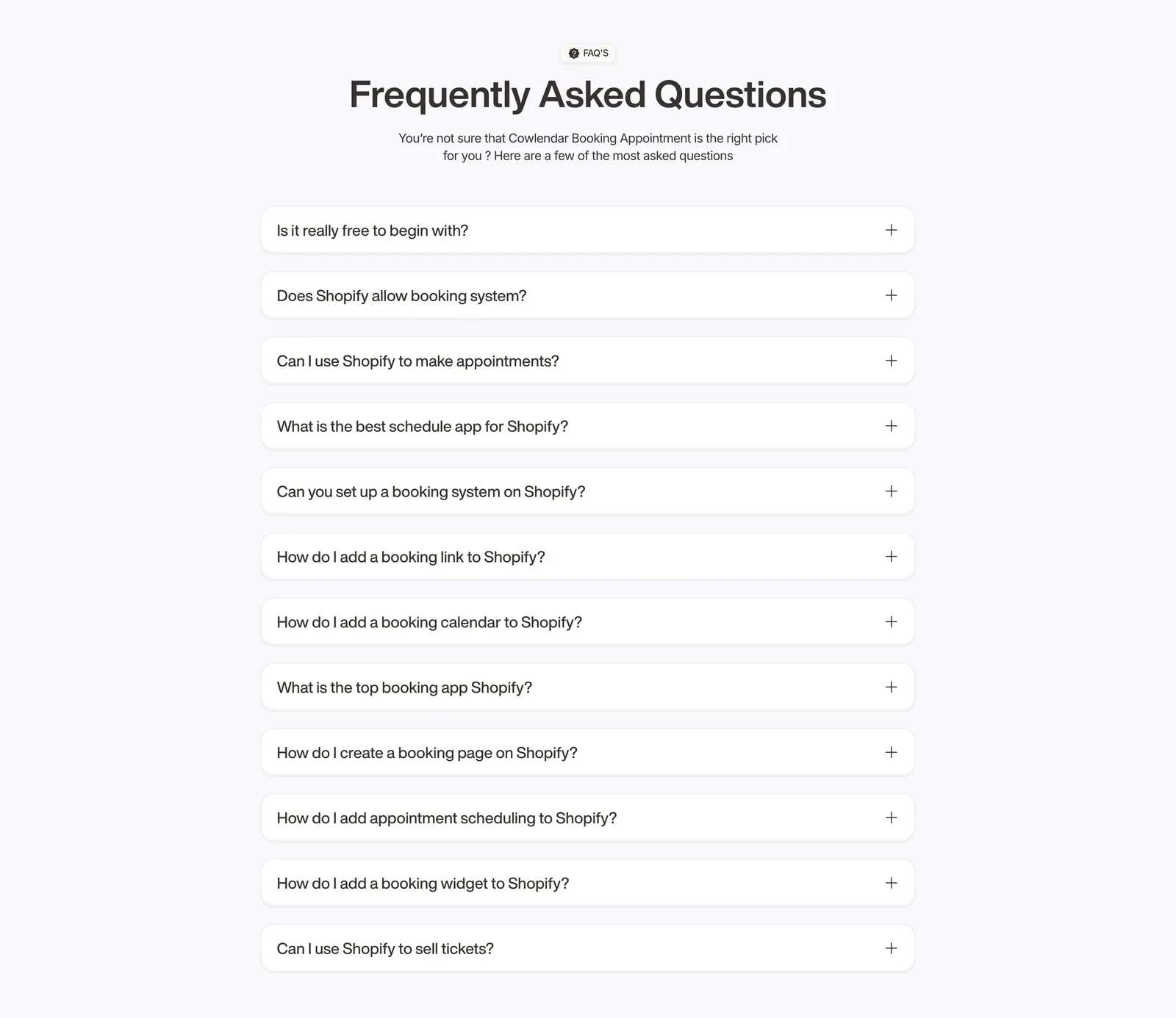
  48. Cowlendar FAQ section: centered heading above a single column of twelve collapsed question accordions on light gray
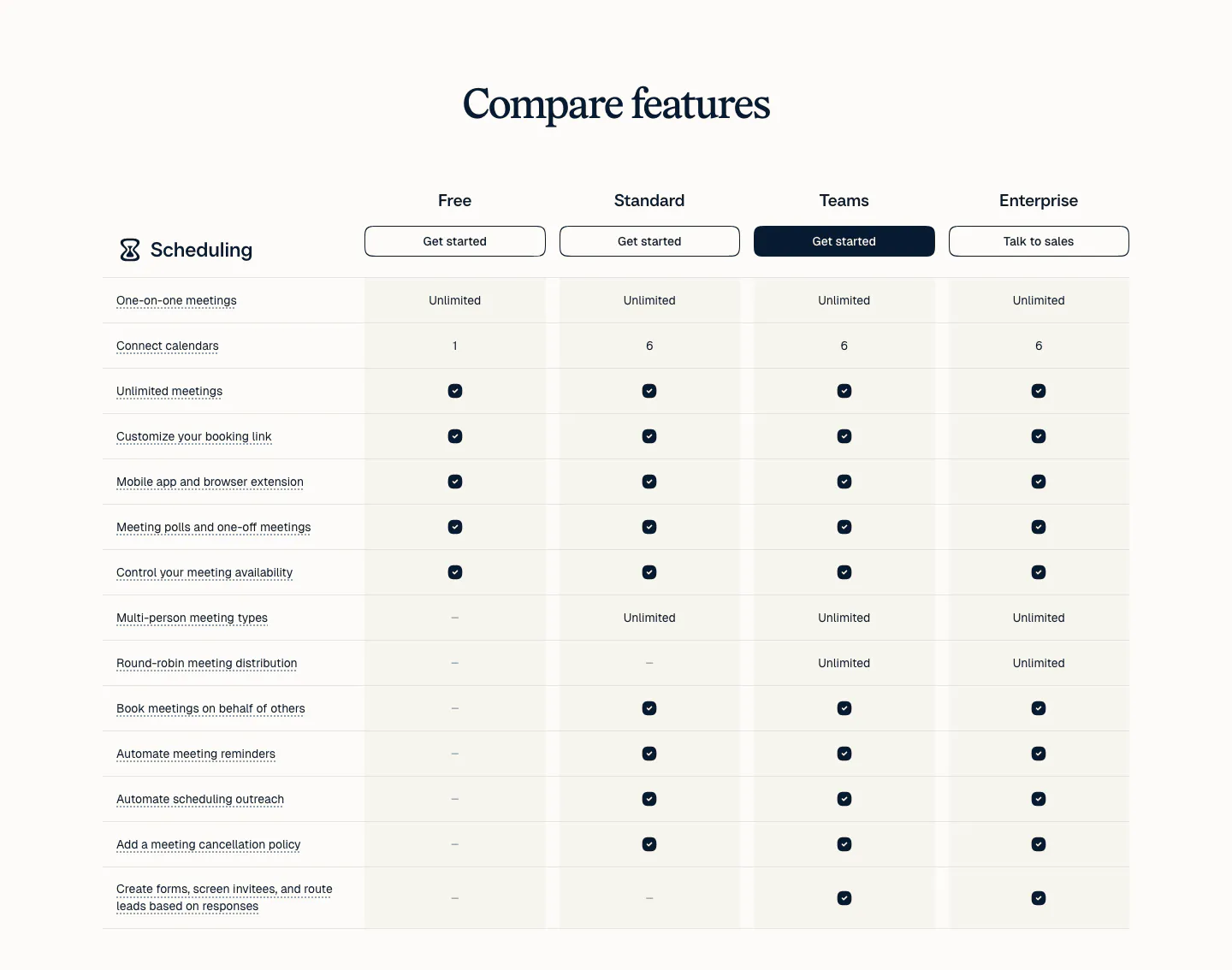
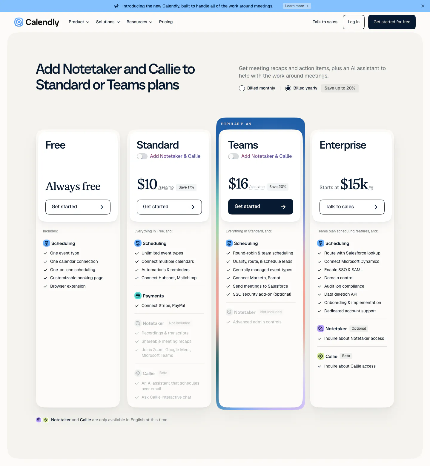
  49. Calendly pricing section: serif heading above a plan comparison table with four plan columns, buttons and check marks on a light background
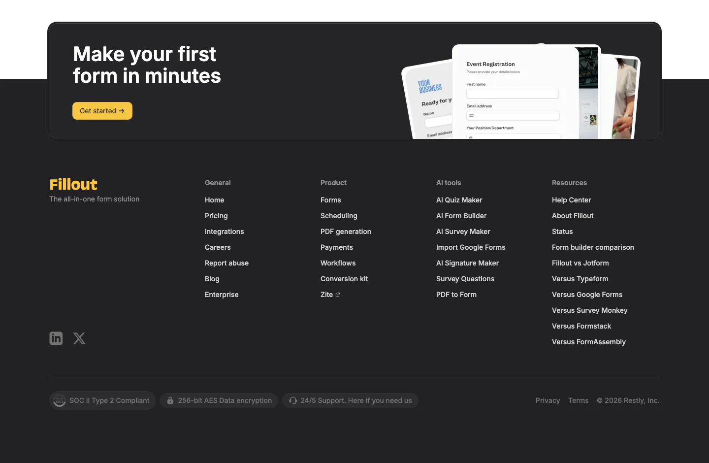
  50. Fillout footer section: dark CTA card with yellow button and form mockups above a charcoal footer with link columns and compliance badges
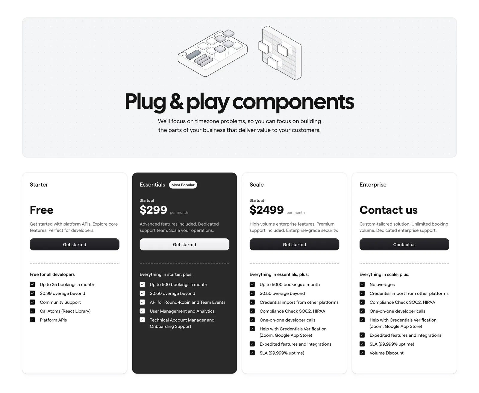
  51. Cal.com pricing section: centered headline with isometric line art on a dotted panel above four plan cards, one dark highlighted
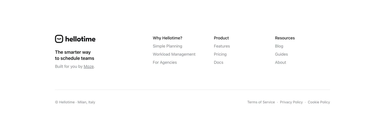
  52. Hellotime footer section: logo and tagline on the left, three link columns on the right, copyright and legal links below on white
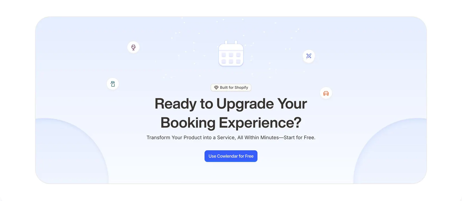
  53. Cowlendar call-to-action section: centered headline and blue button with calendar icon in a pale blue rounded panel
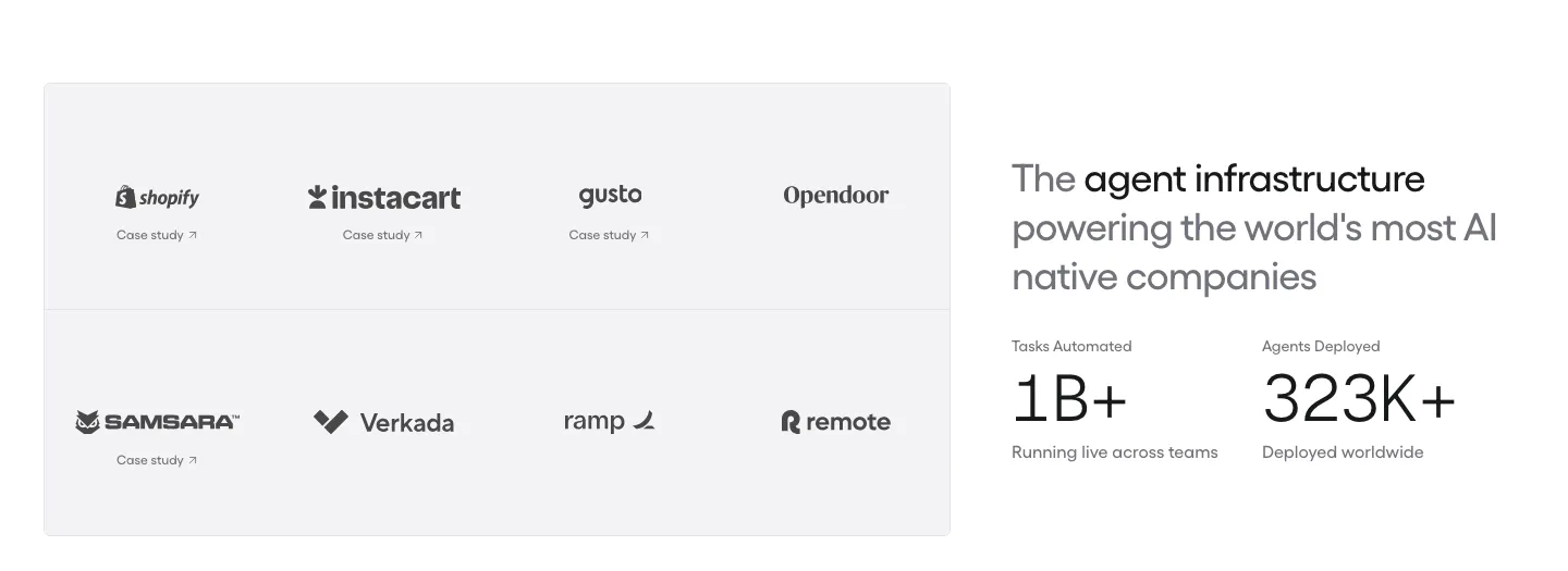
  54. Gumloop logo cloud section: grid of customer logos with case study links beside a headline and two large stats
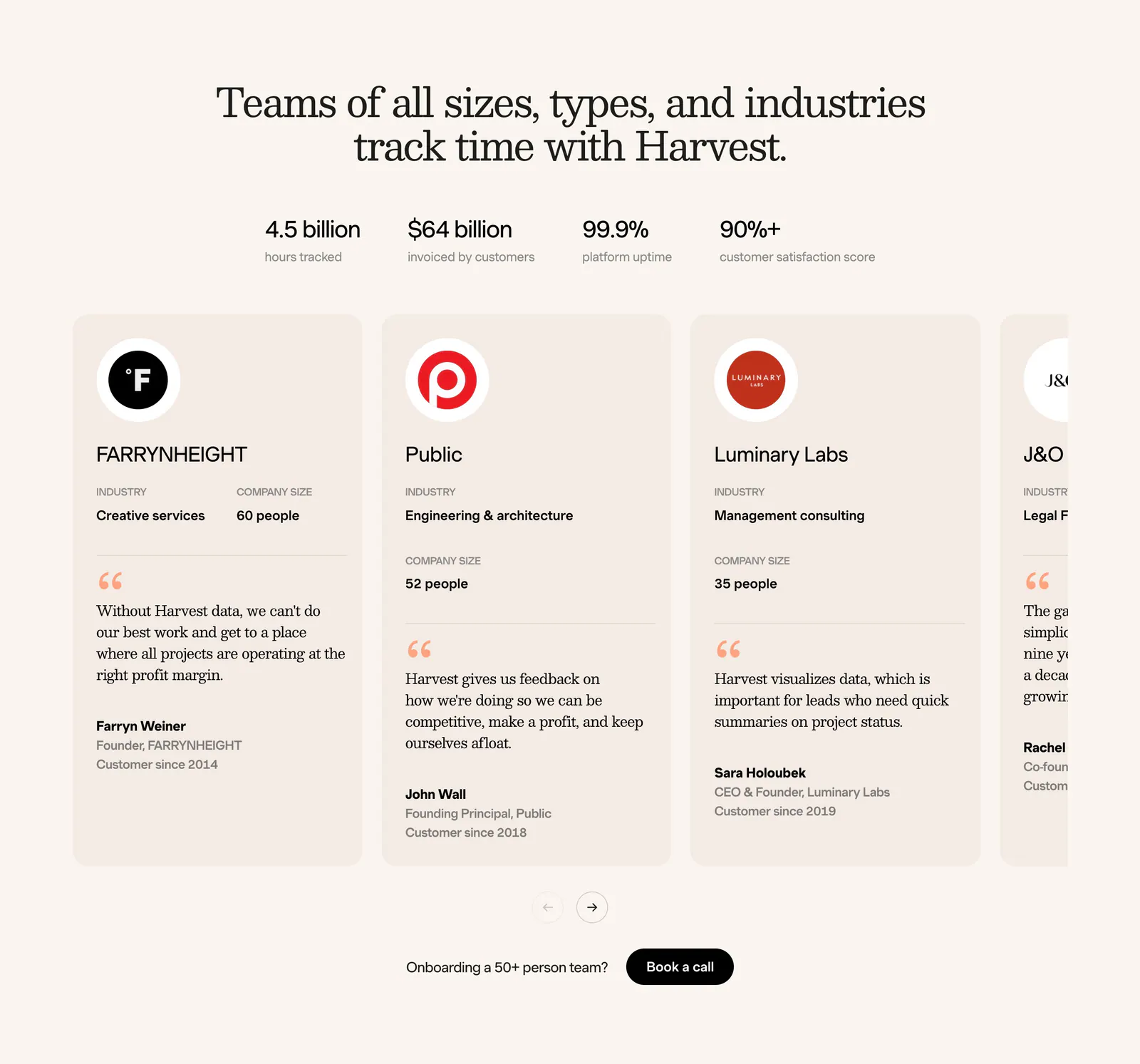
  55. Harvest footer section: serif headline, four stats and a carousel of customer testimonial cards with logos on a cream background
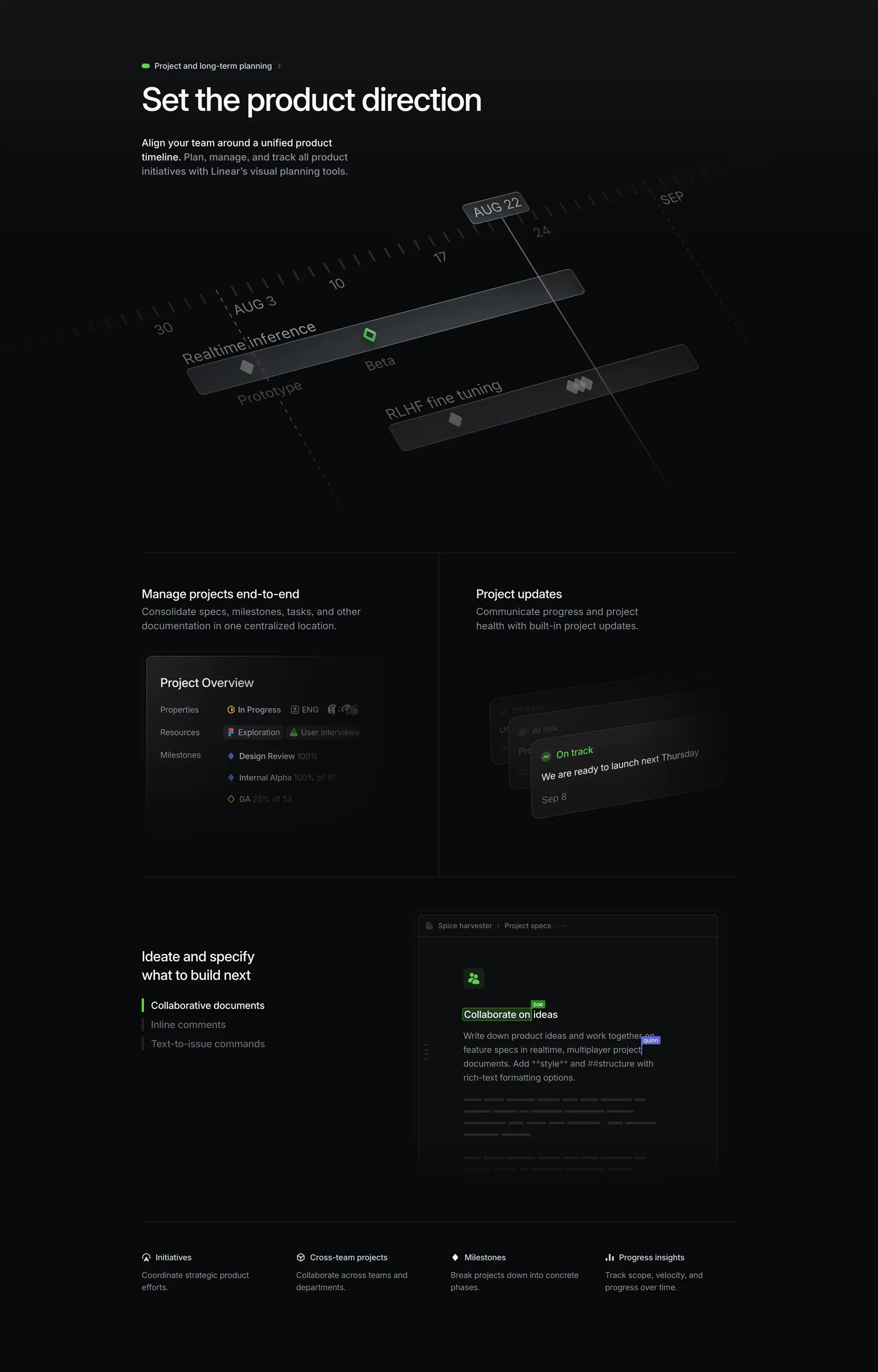
  56. Linear features section: dark section with a tilted project timeline graphic, project overview and update panels, and a collaborative doc mockup
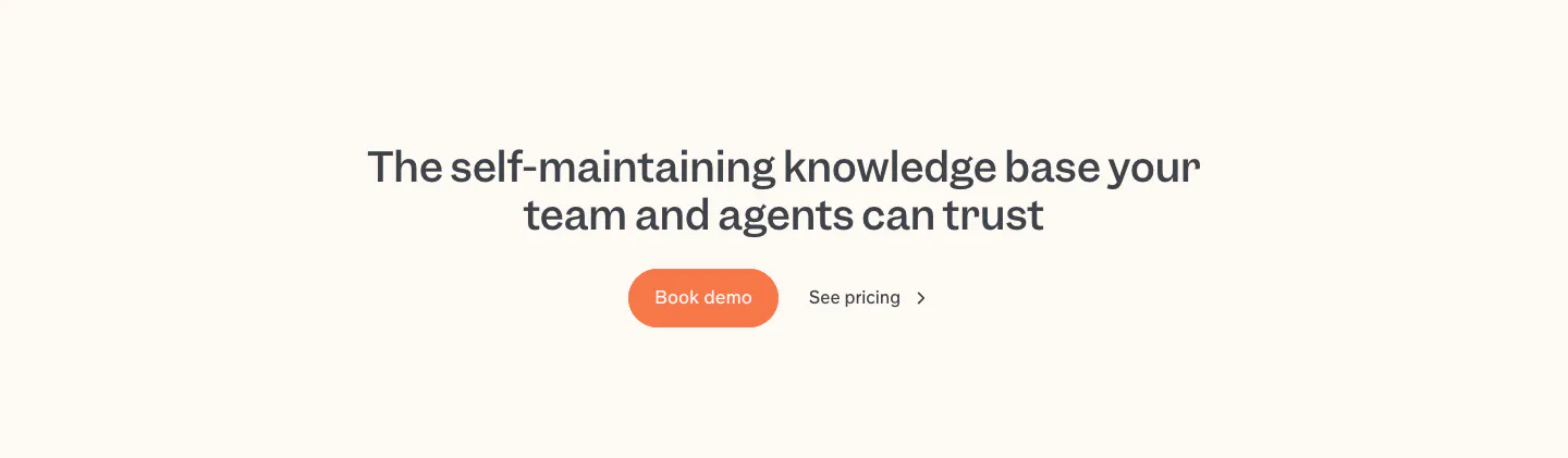
  57. Slite call to action section: centered two-line headline with an orange Book demo button and a See pricing link on a cream band
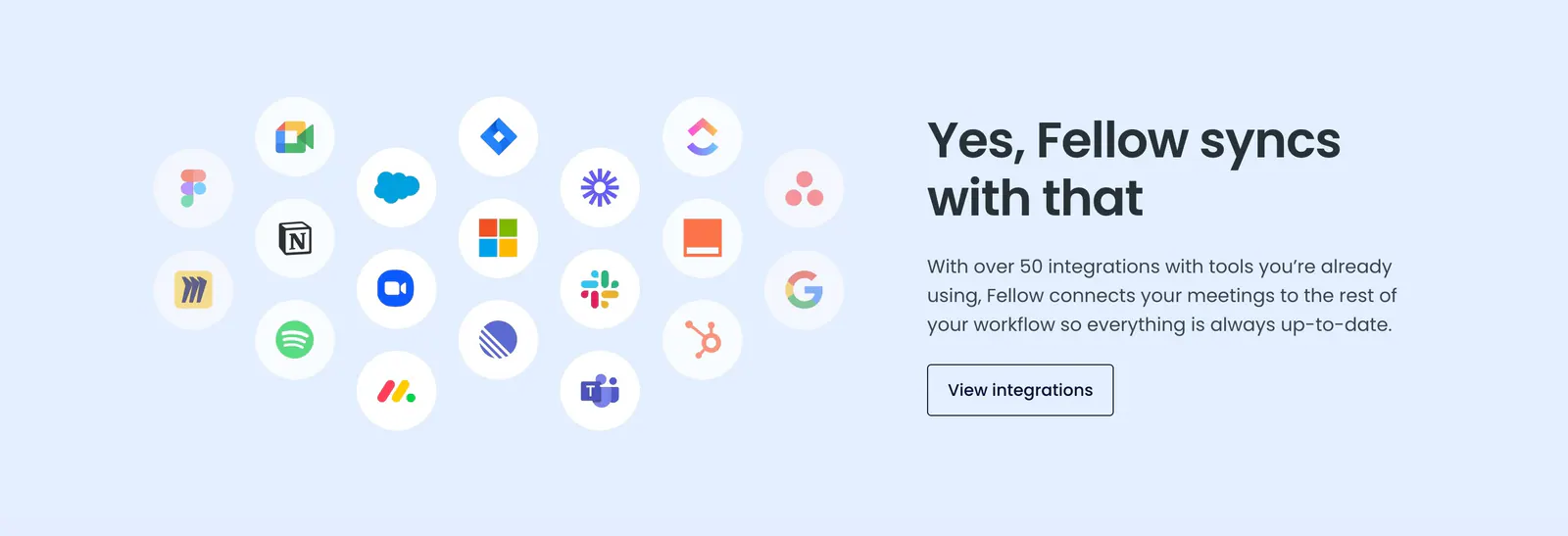
  58. Fellow integrations section: cluster of circular app icons on the left beside headline and button on a pale blue background
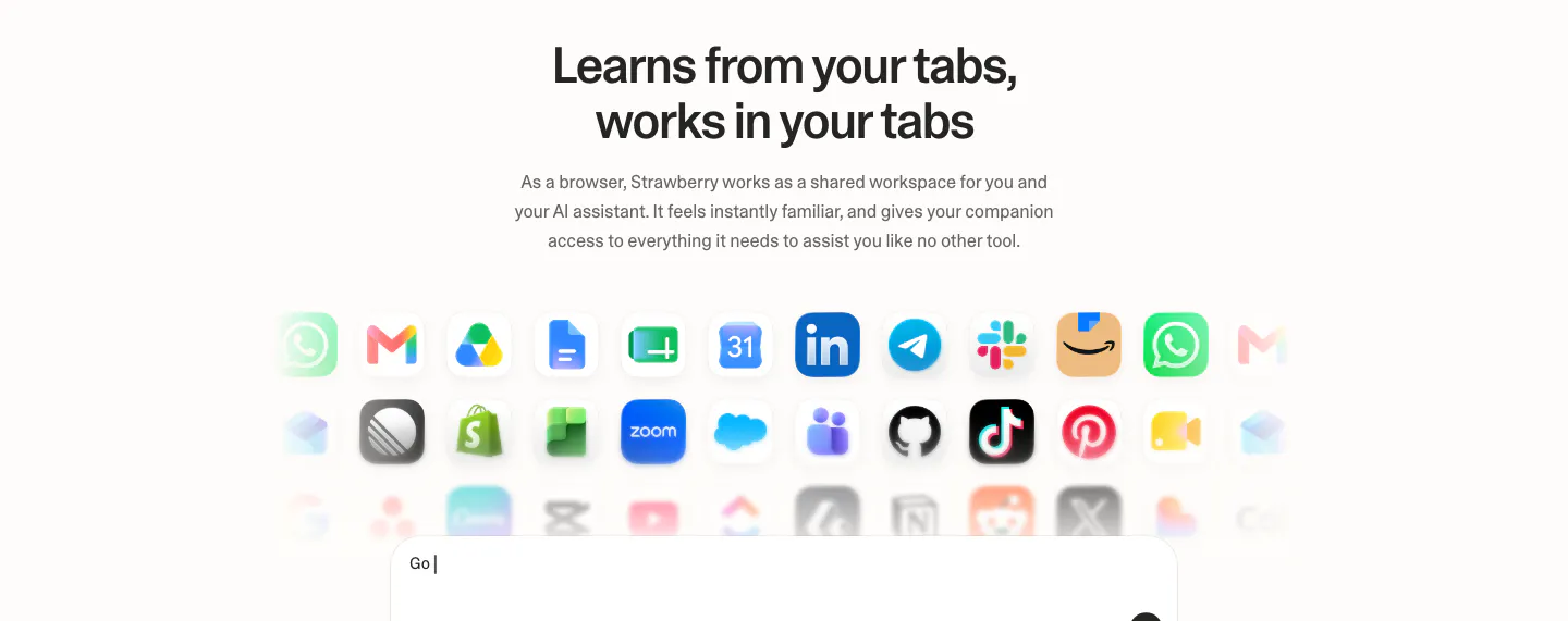
  59. Strawberry integrations section: centered headline and copy above rows of fading app icons and the top of a prompt input box
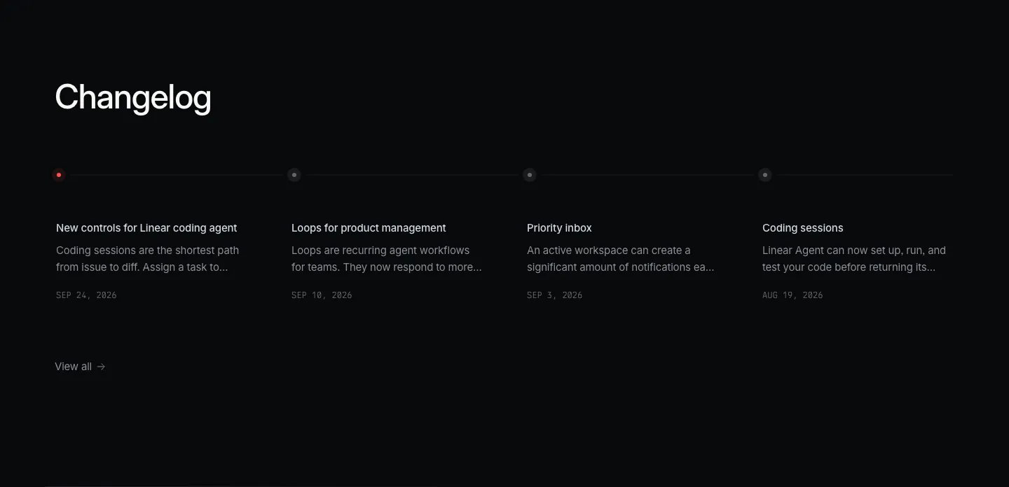
  60. Linear blog & resources section: dark changelog with four dated entries along a horizontal timeline and a view-all link
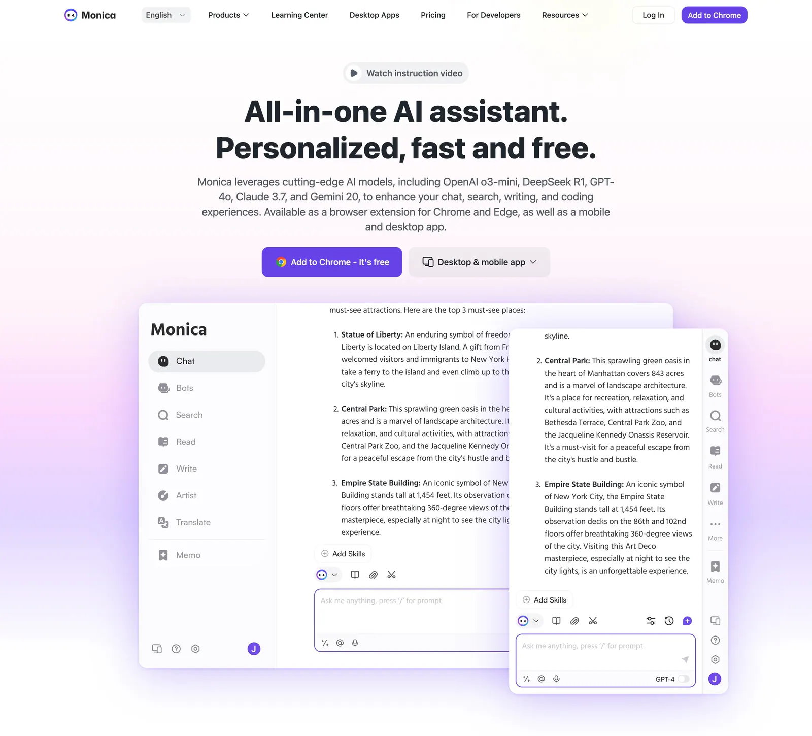
  61. Monica hero section: centered headline with video pill and two CTAs above overlapping chat app screenshots on a lavender glow
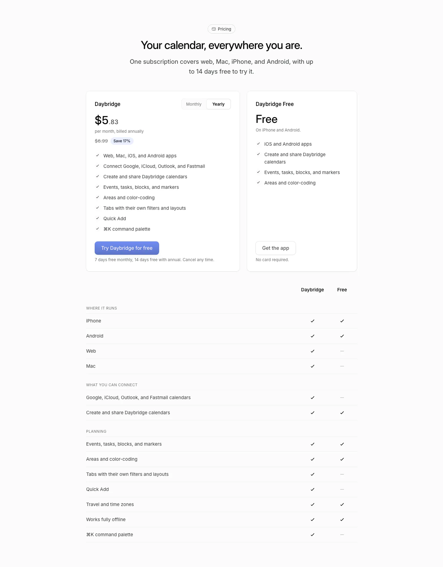
  62. Daybridge pricing section: centered headline above two plan cards with a monthly/yearly toggle and a plan comparison checkmark table
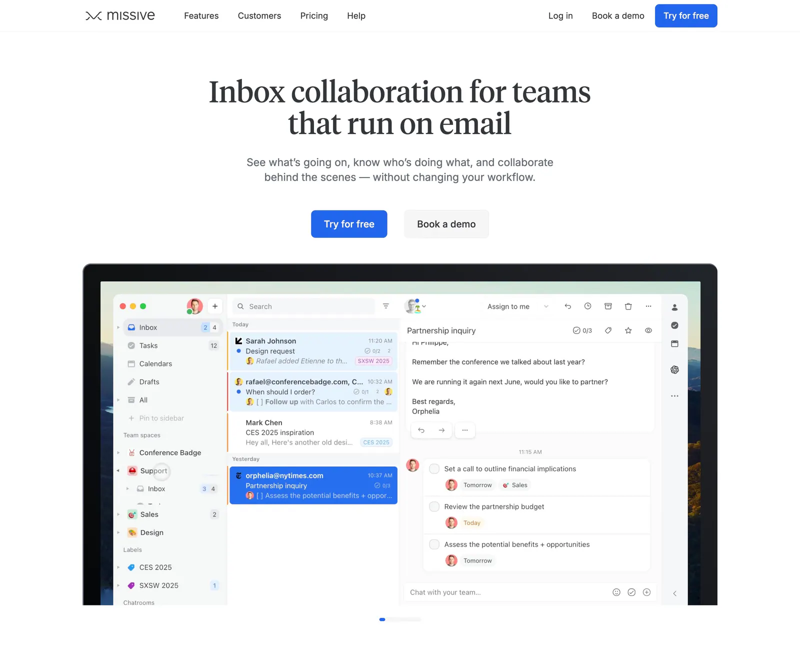
  63. Missive hero section: centered serif headline and two CTAs above a laptop-framed shared inbox app screenshot on white
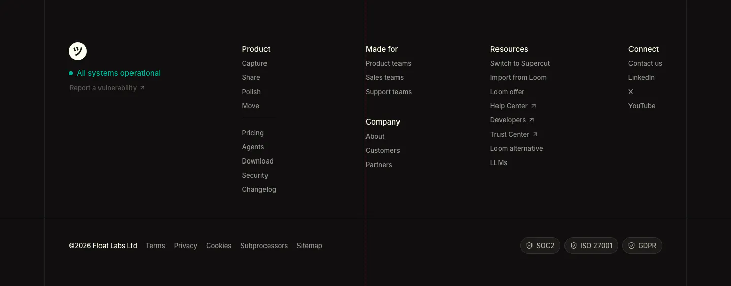
  64. Supercut footer section: logo with status indicator, four link columns, legal links and SOC2, ISO 27001, GDPR badges on dark
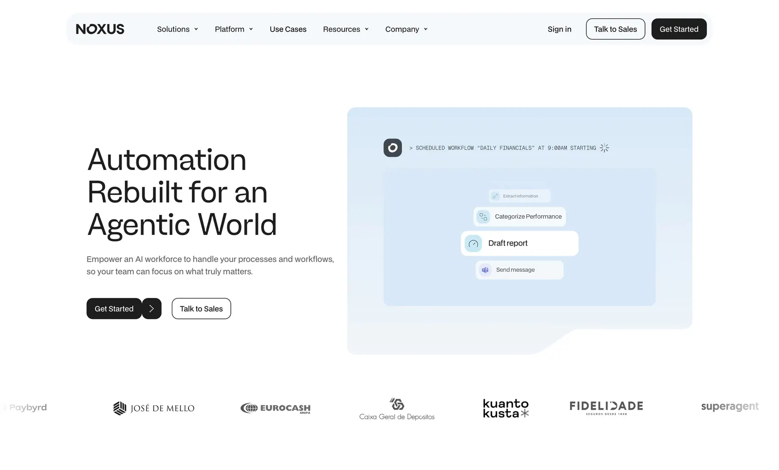
  65. Noxus hero section: left-aligned headline and two buttons beside a pale blue scheduled-workflow UI card, customer logo row below
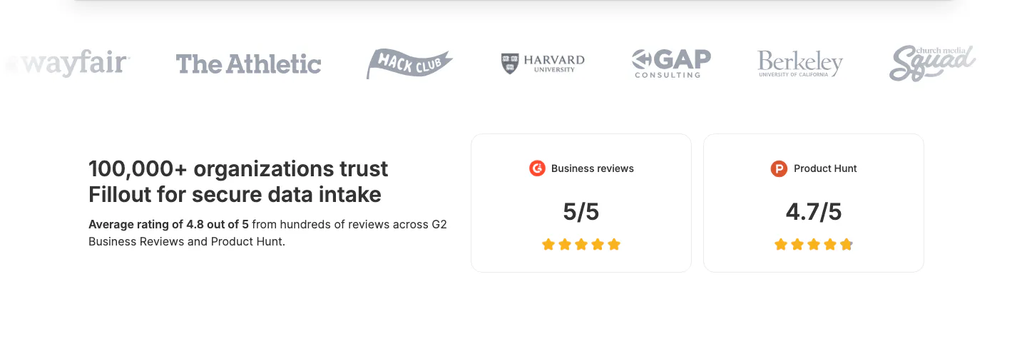
  66. Fillout logo cloud section: grayscale customer logo row above a trust statement and two rating cards for G2 and Product Hunt
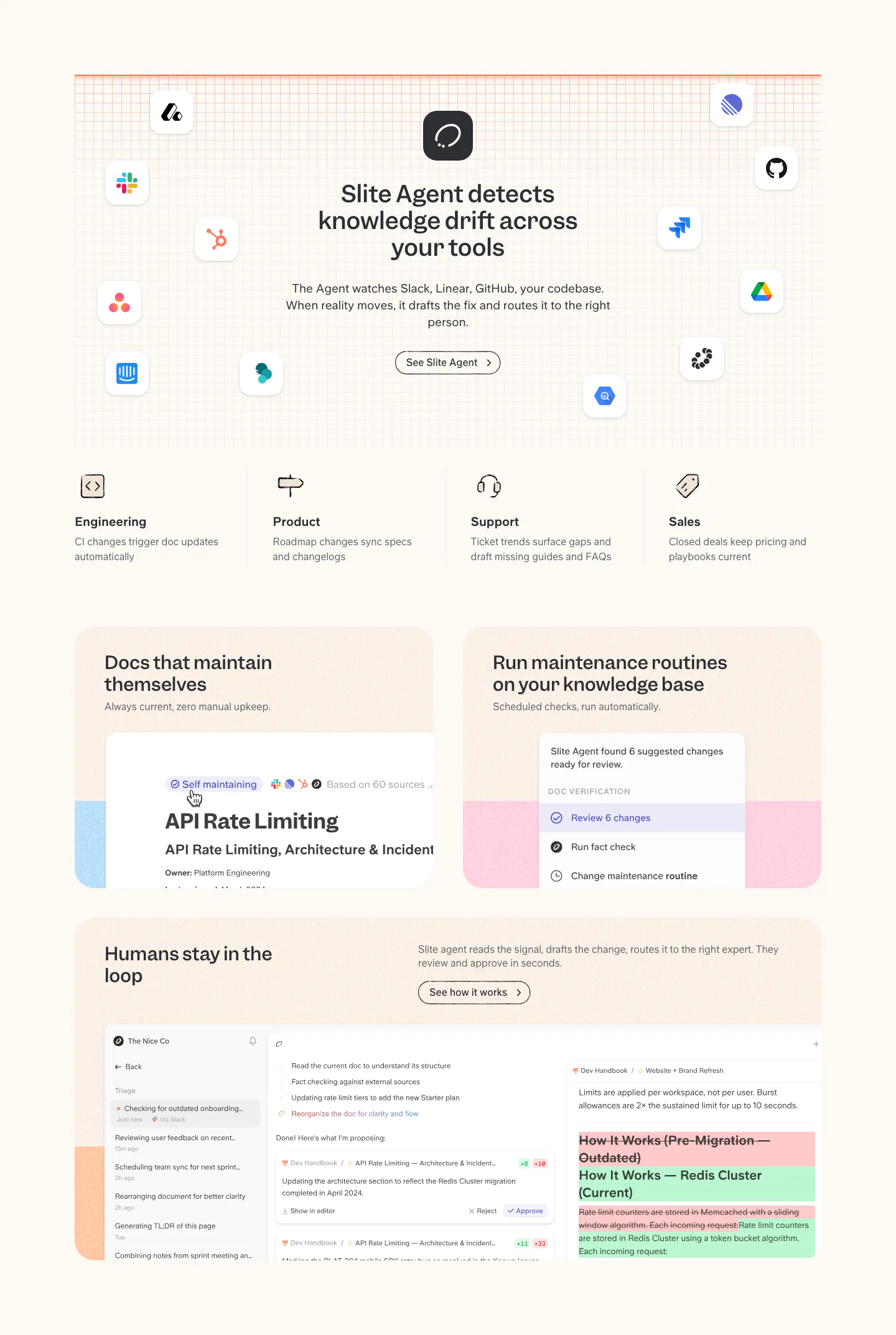
  67. Slite features section: headline ringed by app icons on a grid, four team columns, then cards with doc maintenance and review UI on cream
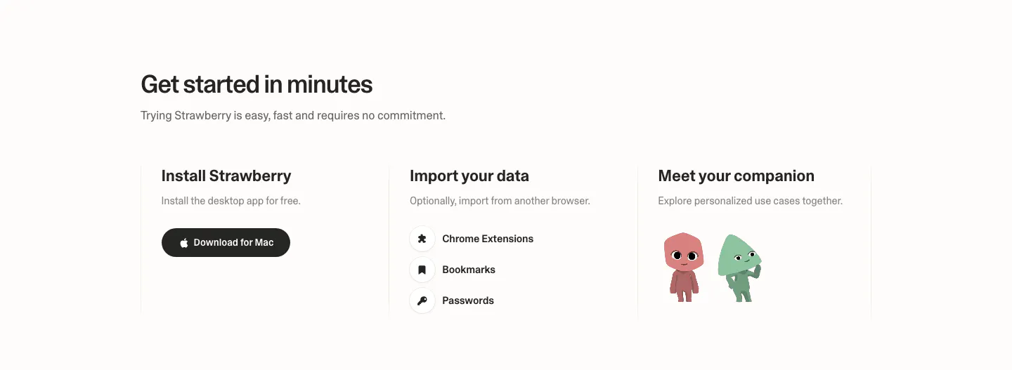
  68. Strawberry how it works section: three columns for install, import data and meet your companion, with a download button and characters
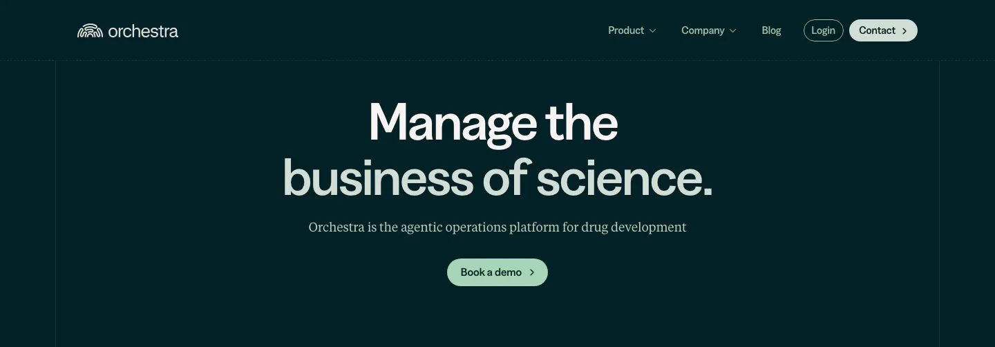
  69. Orchestra Bio hero section: nav above a centered two-tone headline, serif subtitle and pale green demo button on dark teal
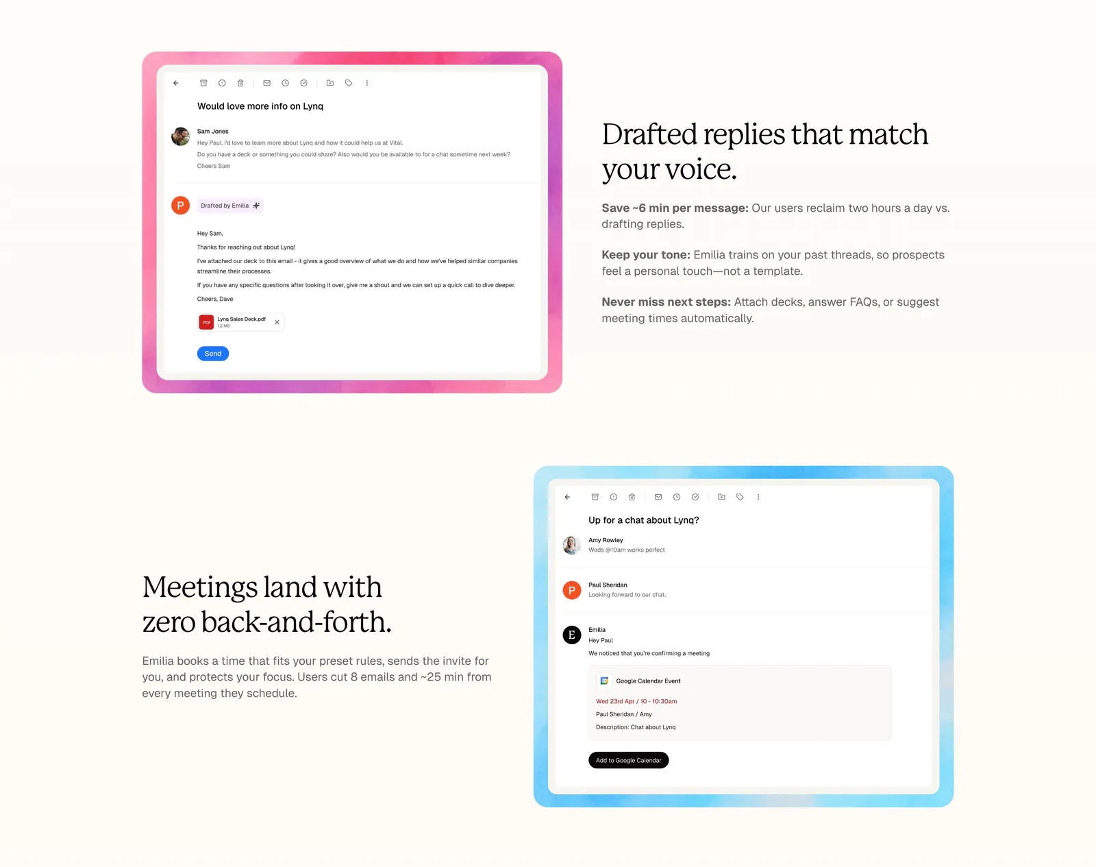
  70. Lynq features section: alternating rows of serif headlines and email UI screenshots in watercolor frames on a cream background
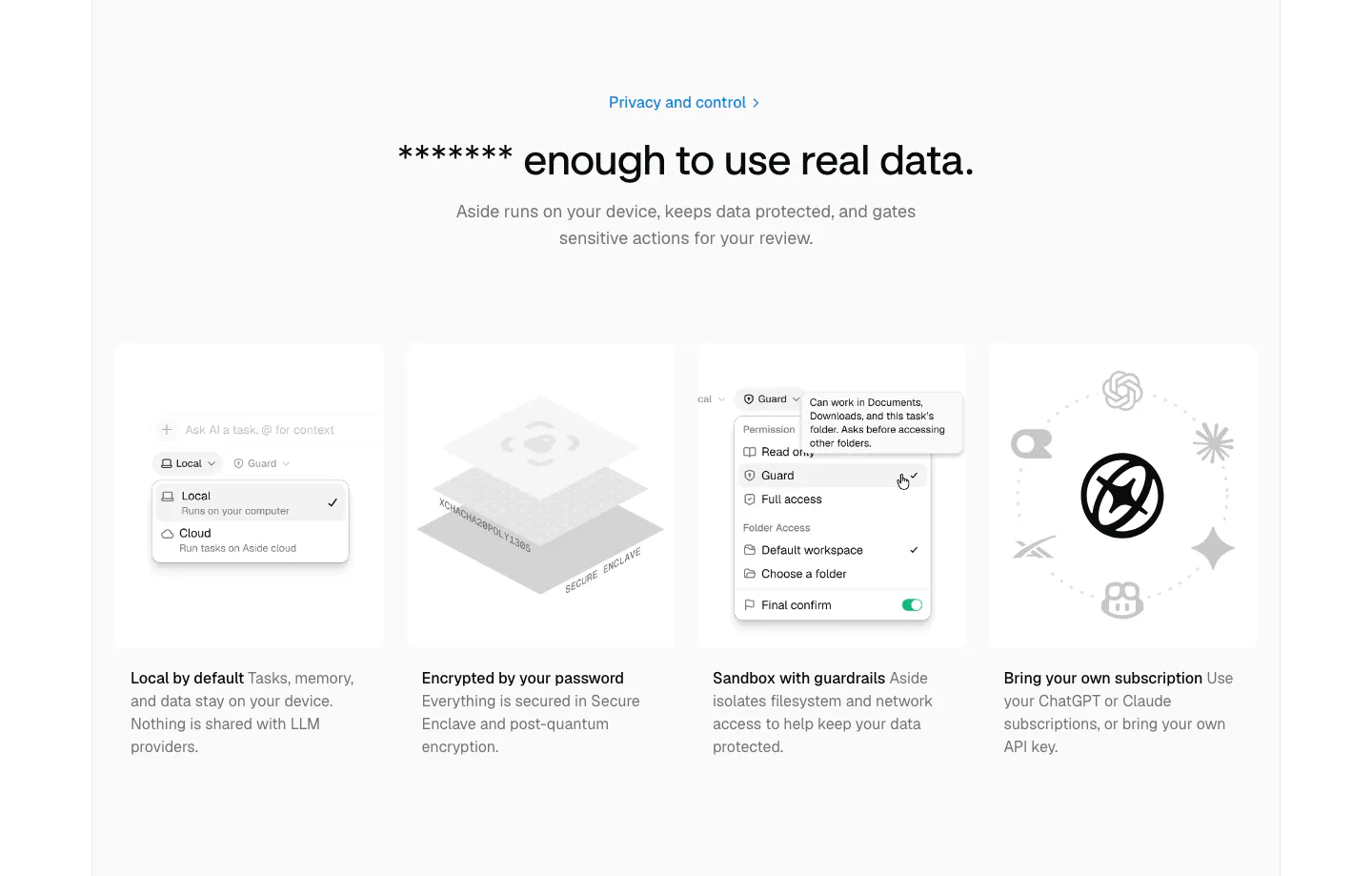
  71. Aside security section: centered headline above four gray cards with permission menu, encryption and AI model visuals
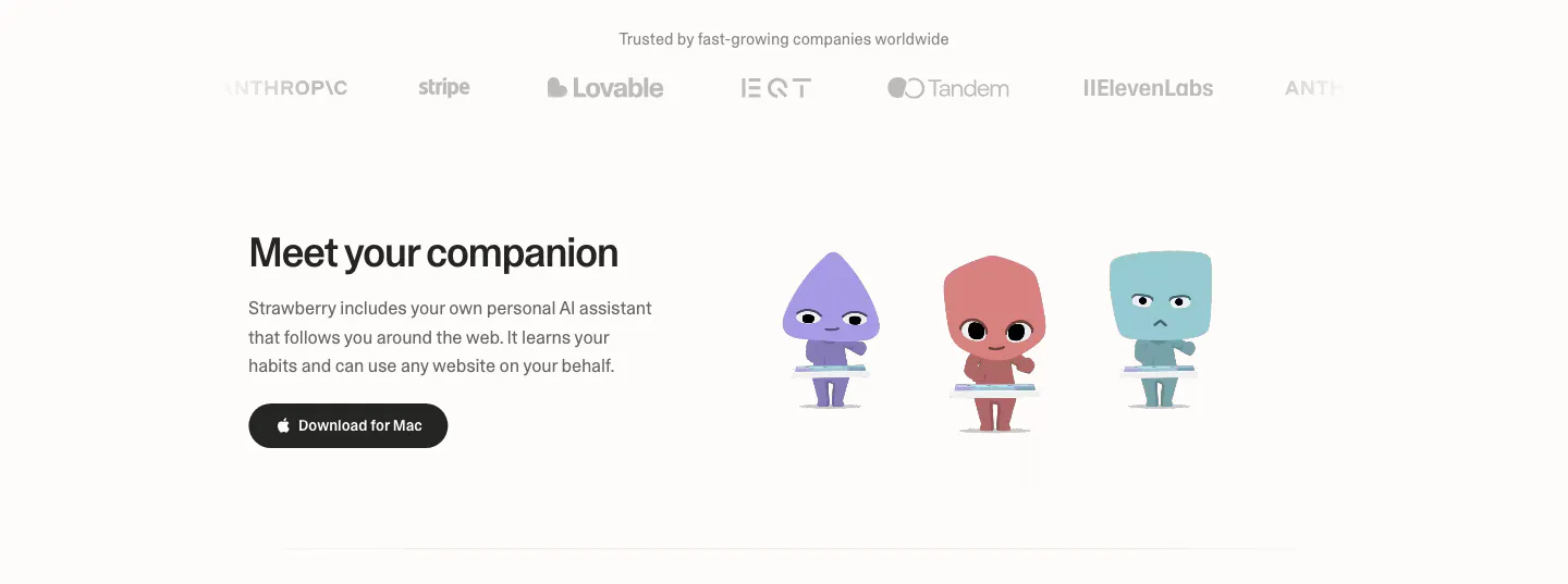
  72. Strawberry features section: logo strip on top, then headline and download button beside three cartoon companion characters
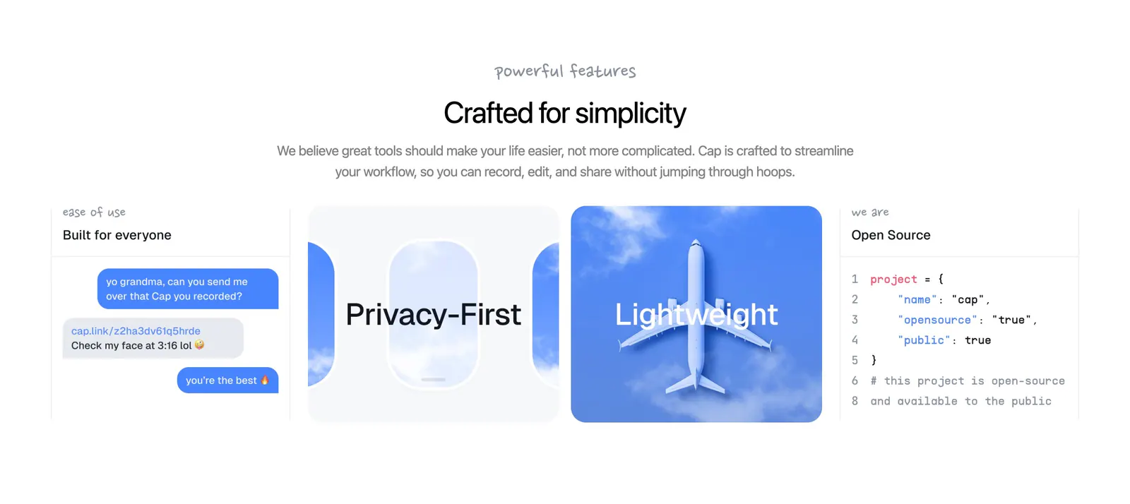
  73. Cap features section: centered headline above four cards with a chat mockup, airplane window art, sky photo and code snippet
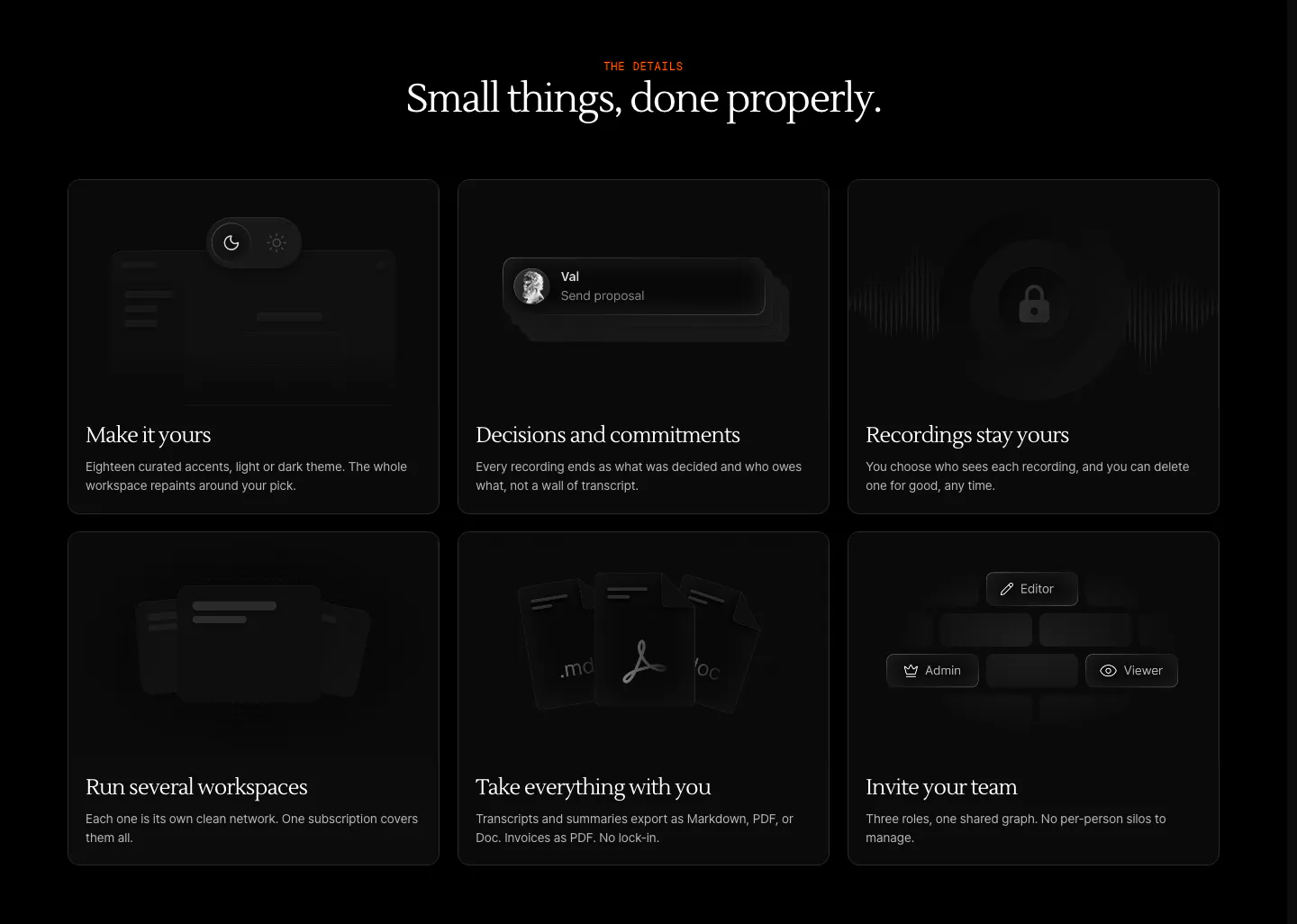
  74. Arke features section: centered serif headline above a three-by-two grid of dark cards with subtle UI vignettes and short descriptions
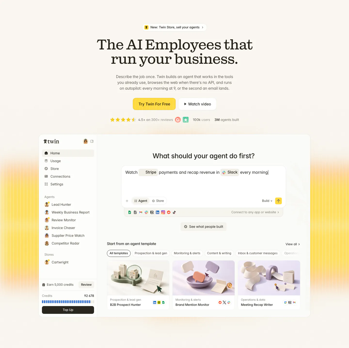
  75. Twin hero section: centered serif headline with yellow CTA and ratings above an agent builder app screenshot on cream with yellow glow
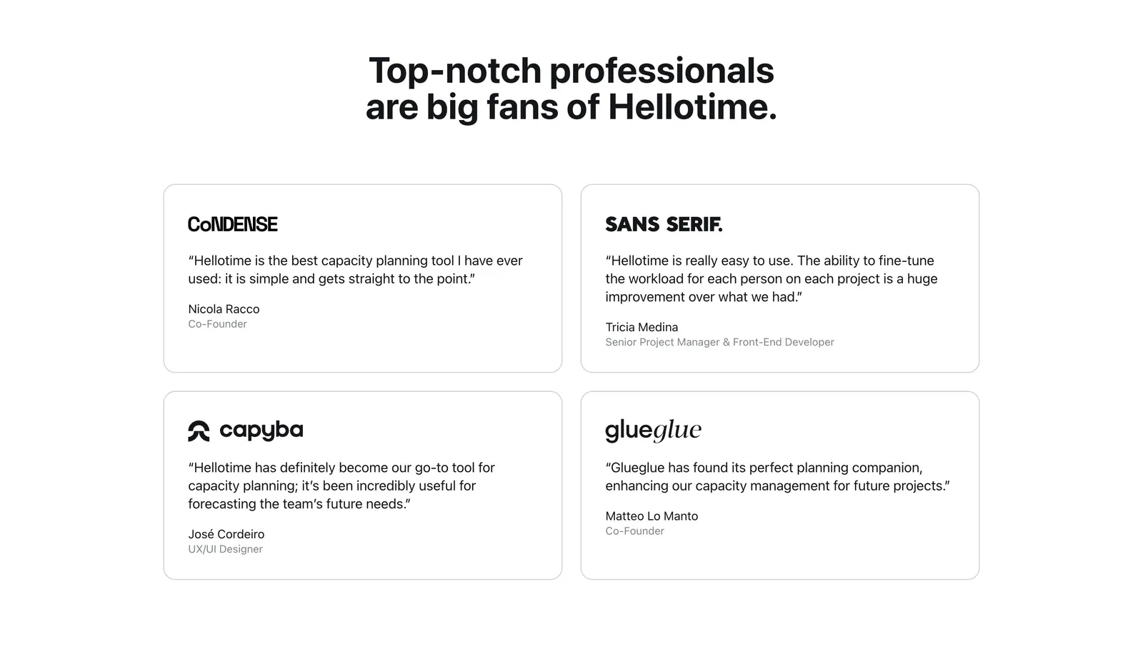
  76. Hellotime testimonials section: centered heading above a two-by-two grid of outlined quote cards with company logos and names
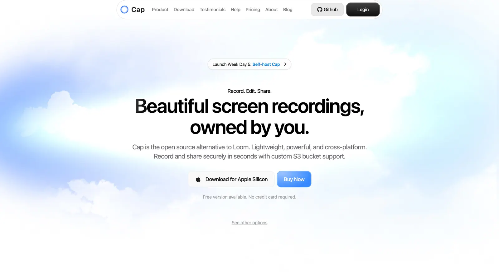
  77. Cap hero section: centered headline with download and buy buttons over a soft blue sky and cloud background
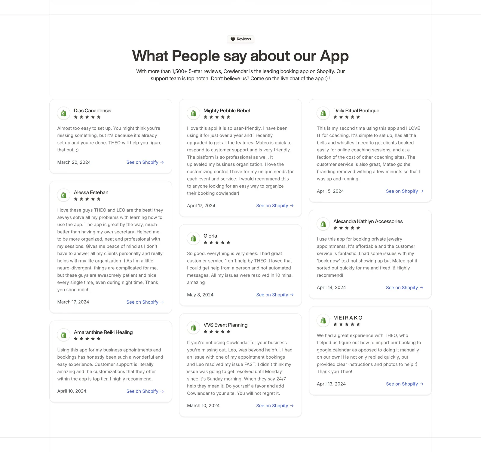
  78. Cowlendar testimonials section: centered heading above a three-column masonry grid of Shopify review cards with stars
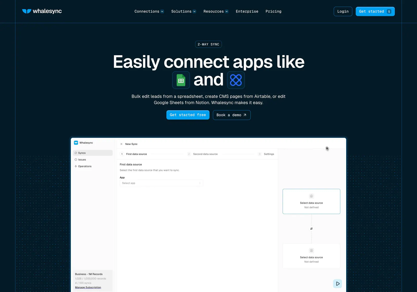
  79. Whalesync hero section: centered headline with inline app icons and buttons above a new-sync product screenshot on dark navy dot grids
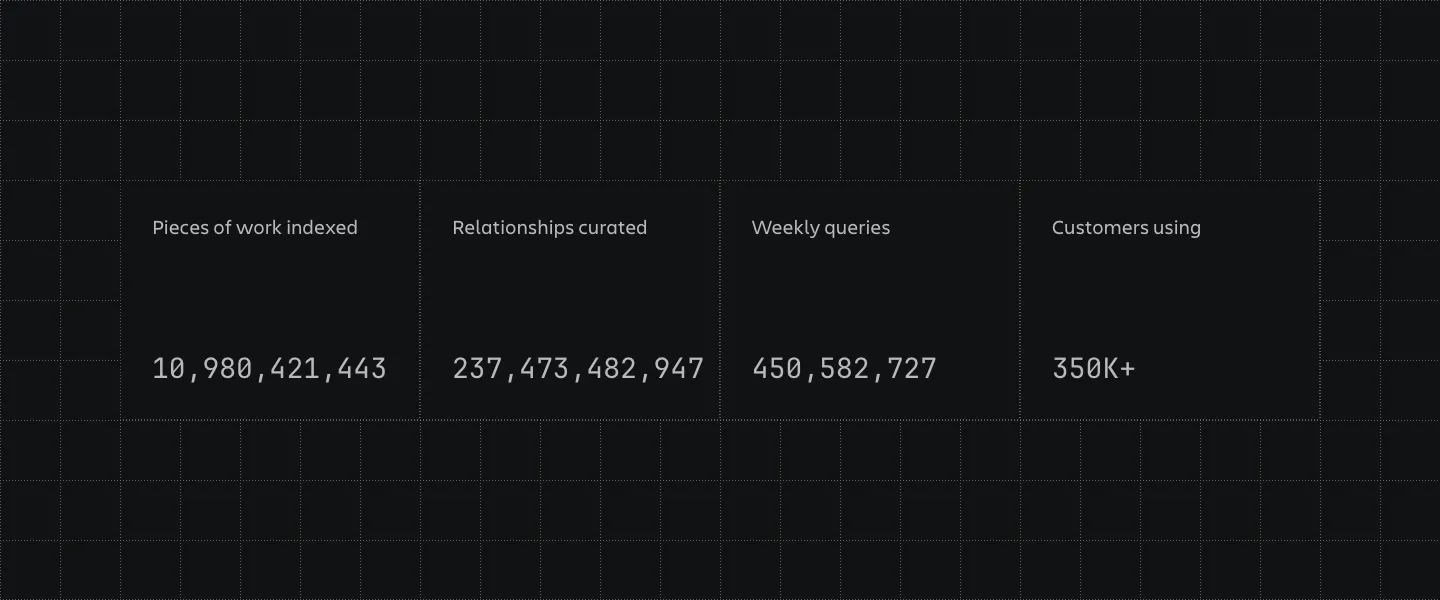
  80. Atlassian stats section: four bordered cells with large monospaced counters and labels on a dark grid-line background
  81. Linear logo cloud section: centered two-line intro above a three-by-two grid of white customer logos such as Ramp, Vercel and Cash App on black
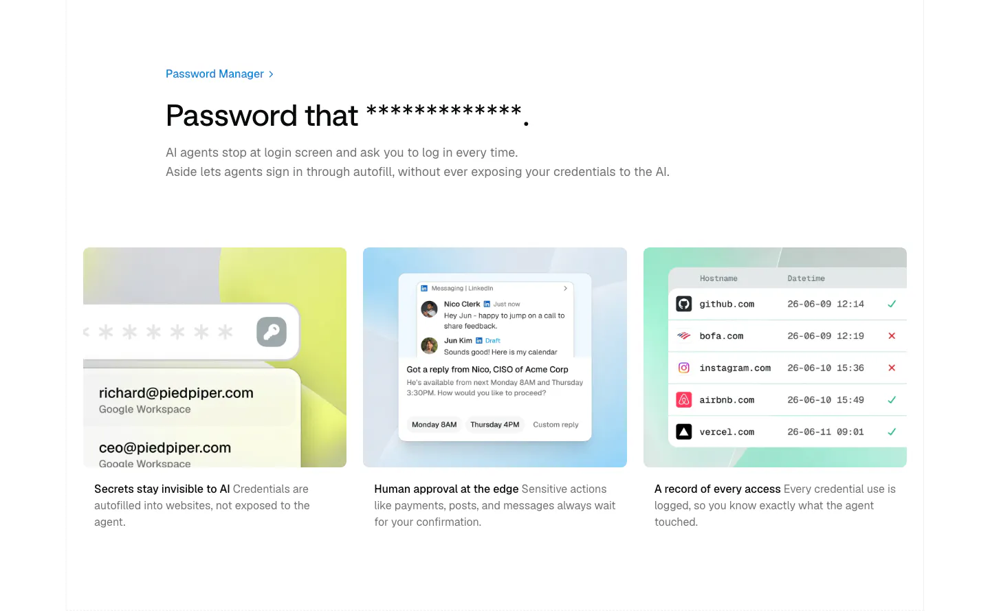
  82. Aside features section: left-aligned headline above three pastel cards with credential, approval and access log mockups
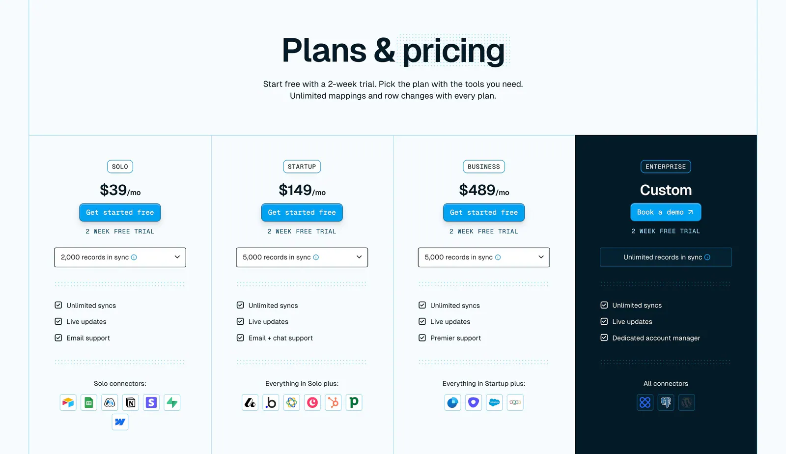
  83. Whalesync pricing section: centered headline above four plan columns with prices, record dropdowns and connector icons, Enterprise in navy
  84. Gumloop call-to-action section: centered headline, copy and button inside a light gray rounded panel
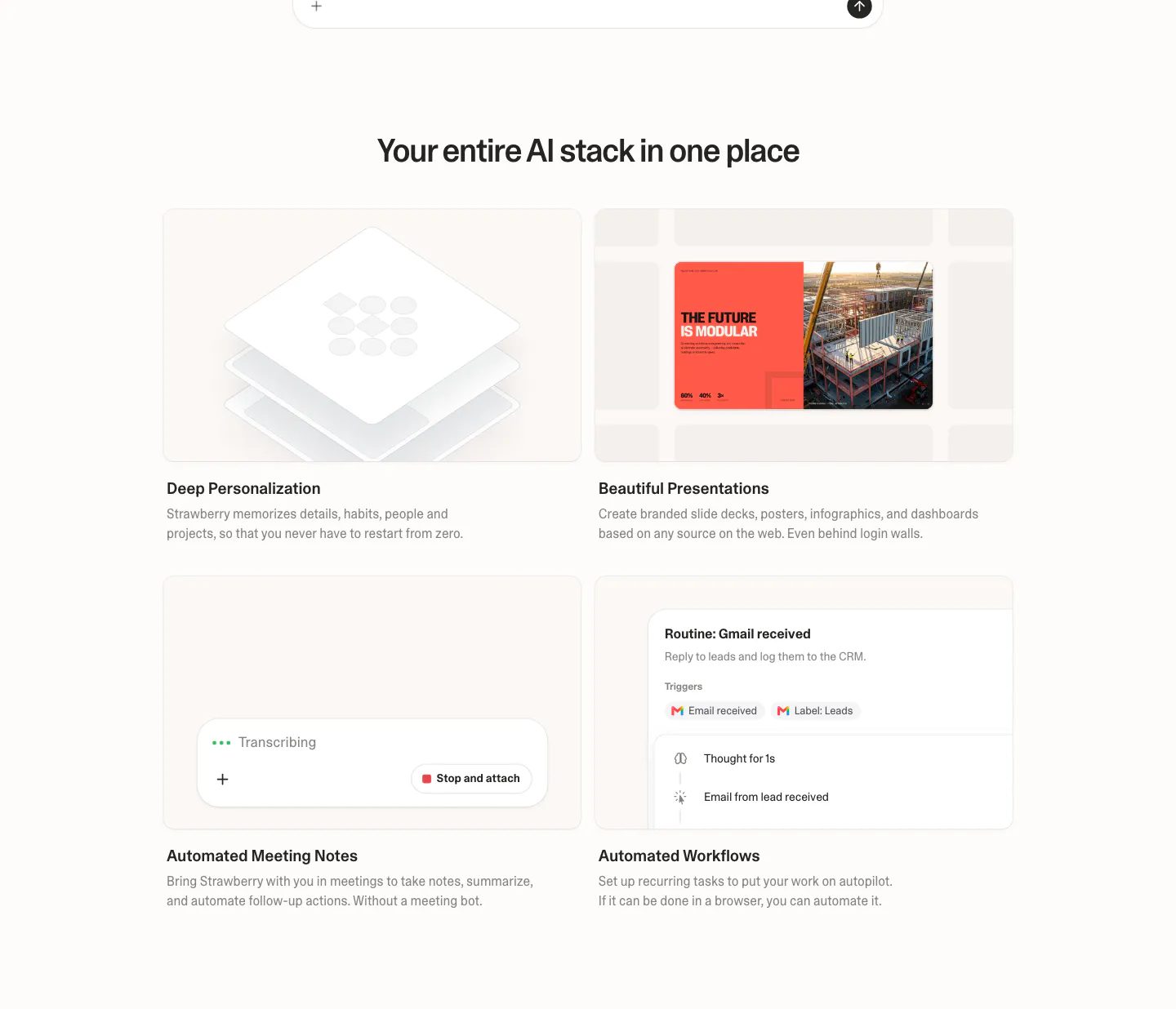
  85. Strawberry features section: centered headline over a 2x2 grid of cards with UI snippets for personalization, slides, notes and workflows
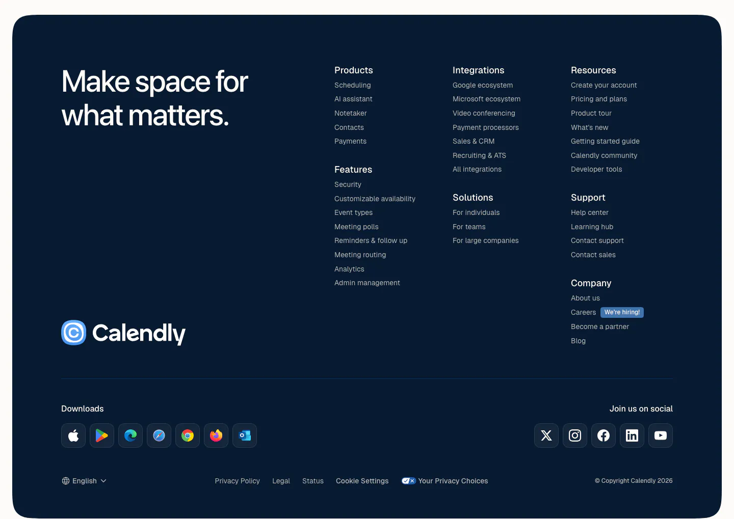
  86. Calendly footer section: rounded dark navy panel with a large tagline, logo, link columns, app download icons and social buttons
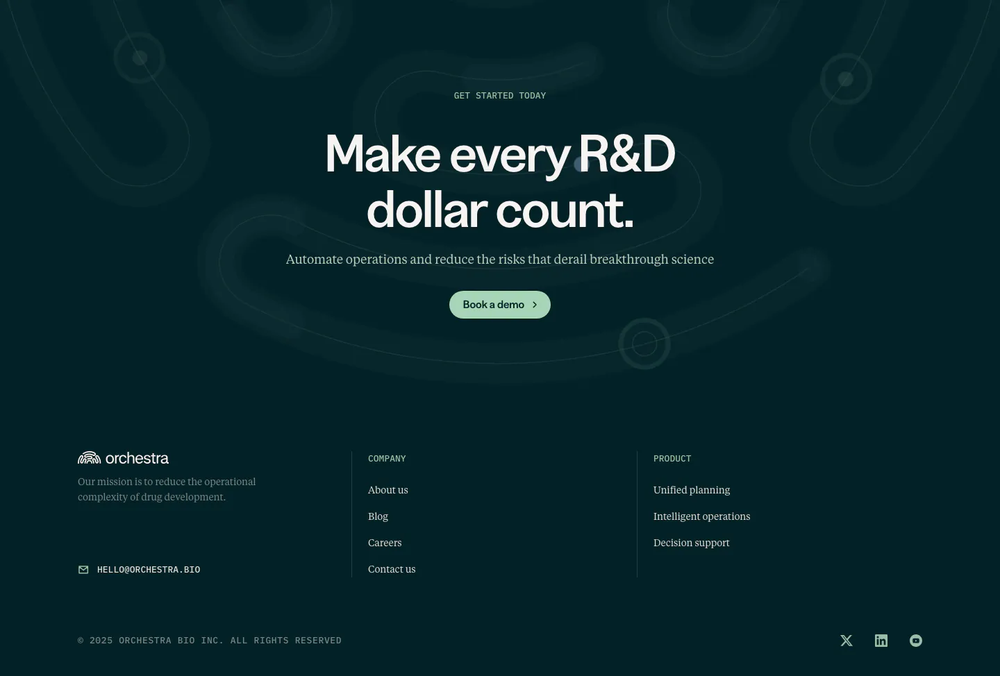
  87. Orchestra Bio call to action section: centered headline and demo button on dark teal with faint loop shapes, above a footer
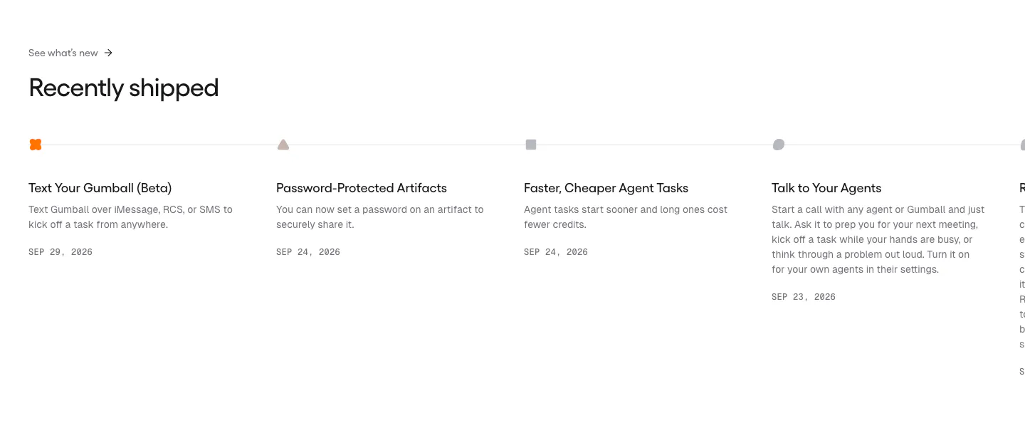
  88. Gumloop blog & resources section: changelog timeline of dated release entries running off the right edge
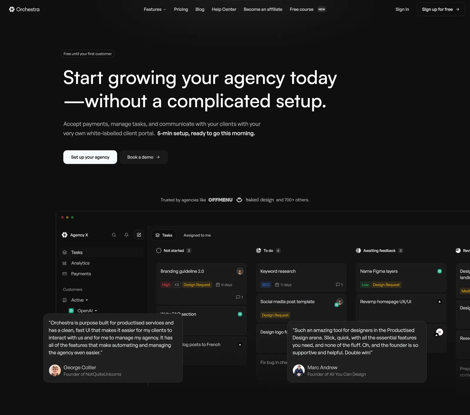
  89. Orchestra hero section: left-aligned headline and two buttons above a dark task-board app screenshot with overlaid testimonial cards
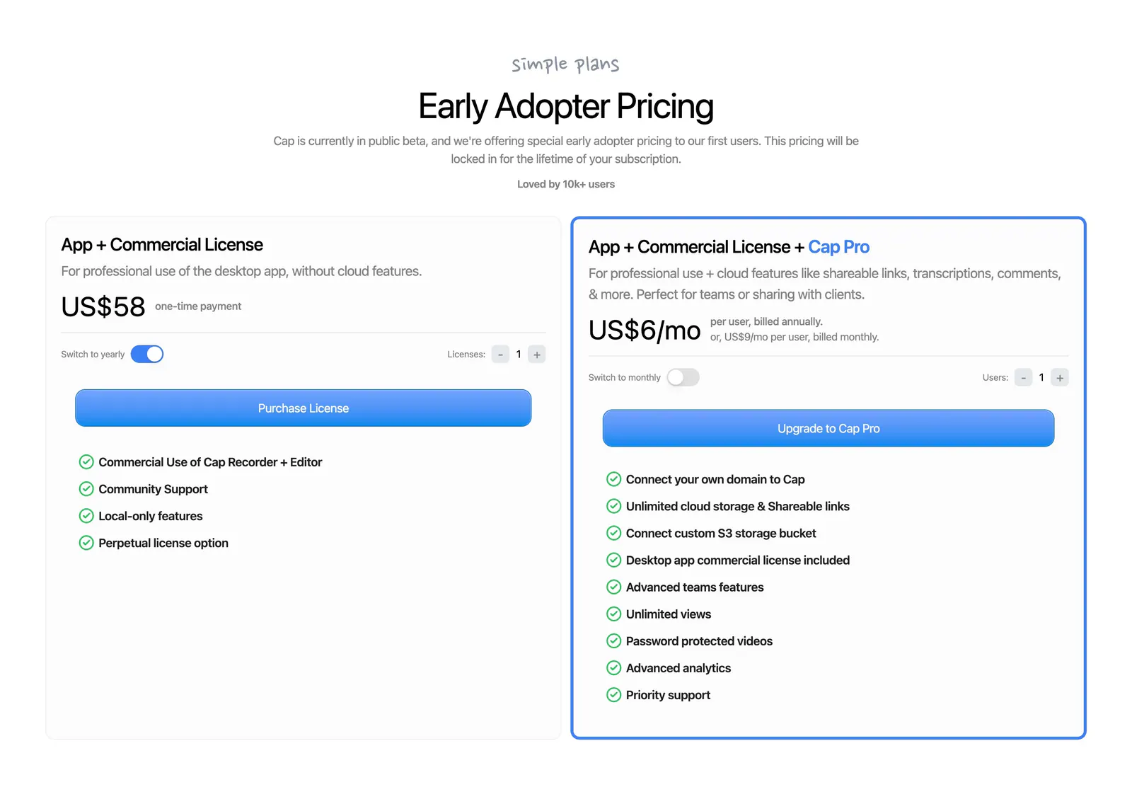
  90. Cap pricing section: centered headline above two license cards with billing toggles, blue buttons and green-check feature lists
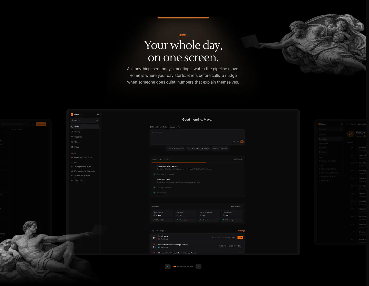
  91. Arke features section: centered serif headline above a dark dashboard screenshot carousel framed by halftone Renaissance figures
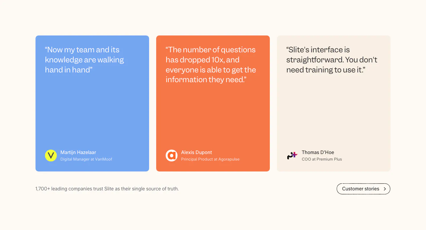
  92. Slite testimonials section: three quote cards in blue, orange and beige with author avatars, plus a customer stories button on cream
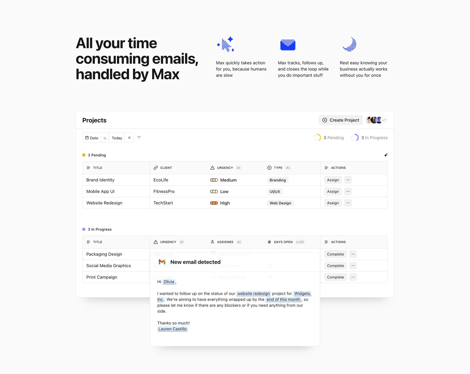
  93. Headroom features section: headline beside three icon benefits above a projects table screenshot overlaid with an email card
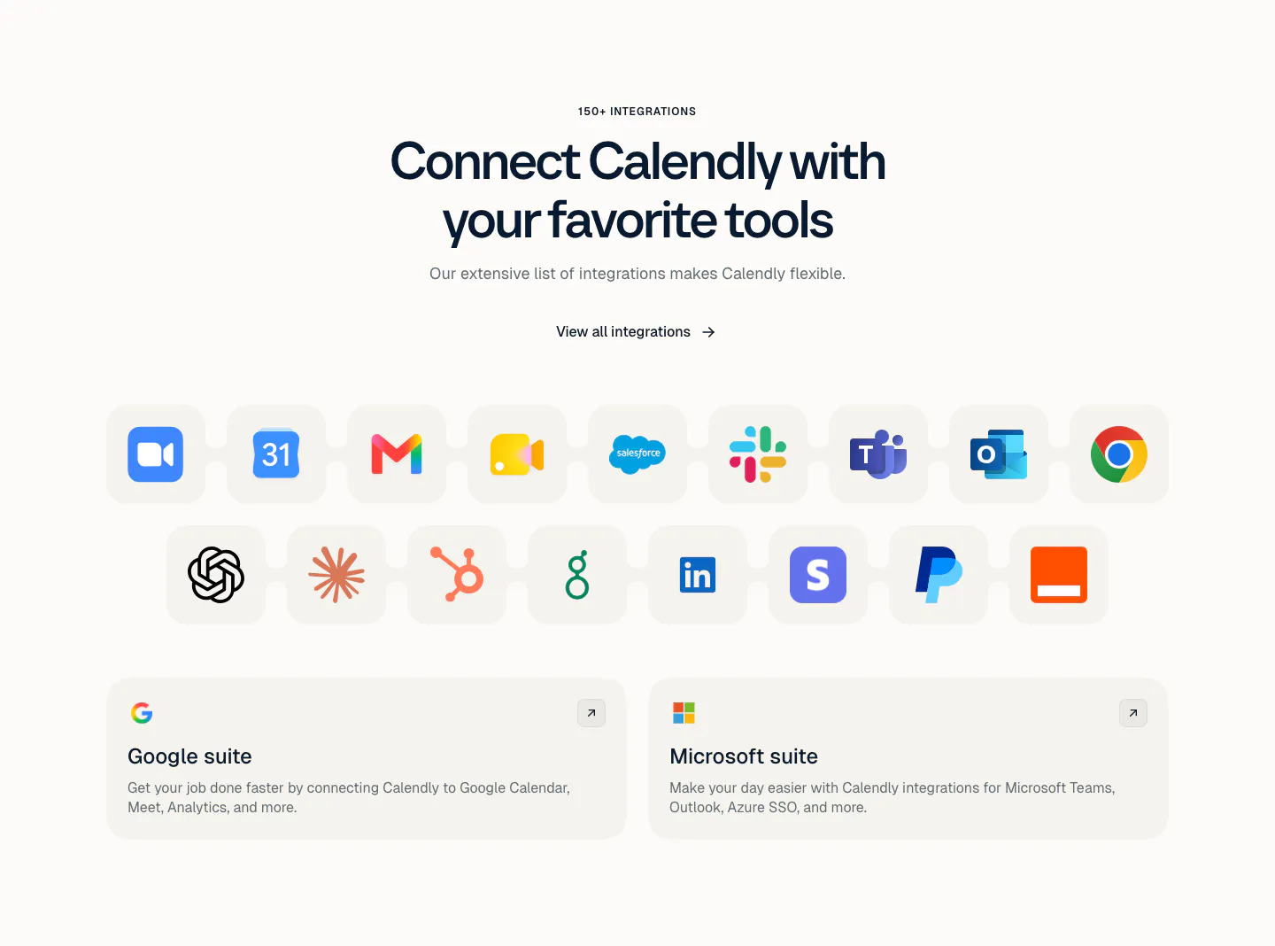
  94. Calendly integrations section: centered headline above a grid of app icon tiles and two cards for Google and Microsoft suites on a light background
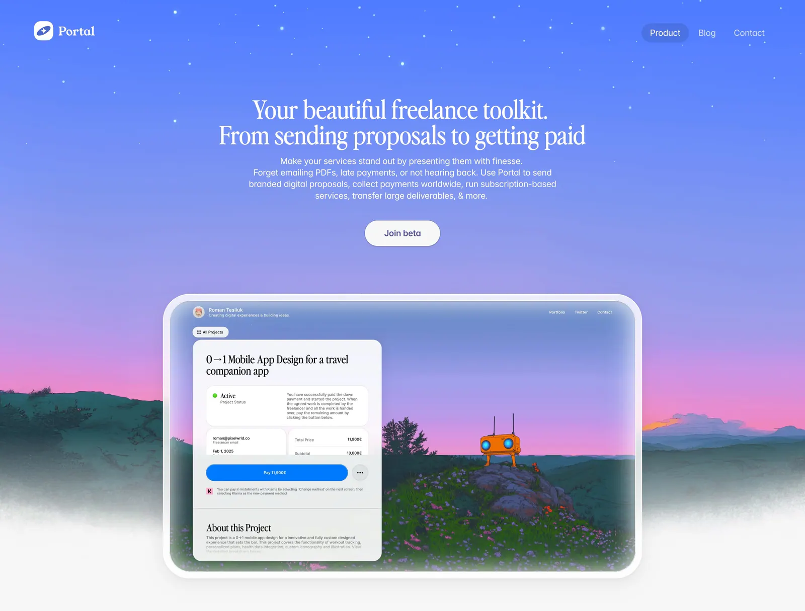
  95. Portal hero section: centered serif headline on a blue-to-purple sky gradient above a proposal UI framed in a painted landscape
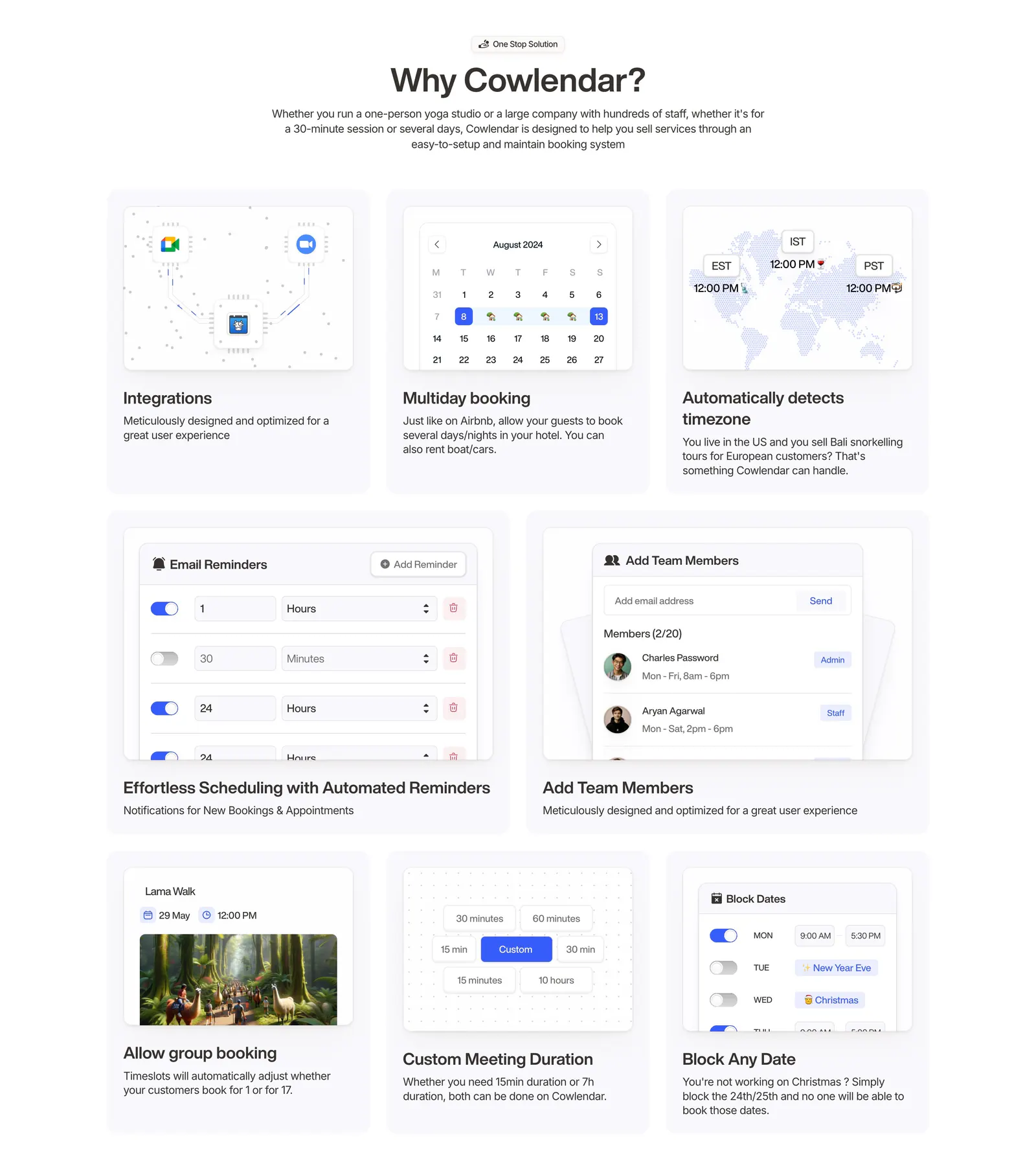
  96. Cowlendar features section: centered heading above a bento grid of eight booking feature cards with UI snippets
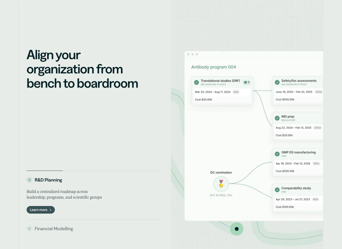
  97. Orchestra Bio features section: headline and R&D planning accordion at left, program timeline product UI on a faint grid at right
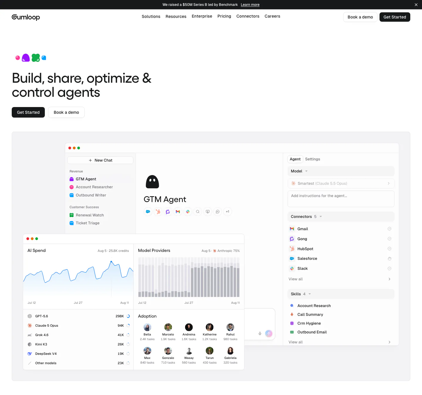
  98. Gumloop hero section: left-aligned headline and buttons above an agent builder and AI spend dashboard screenshot
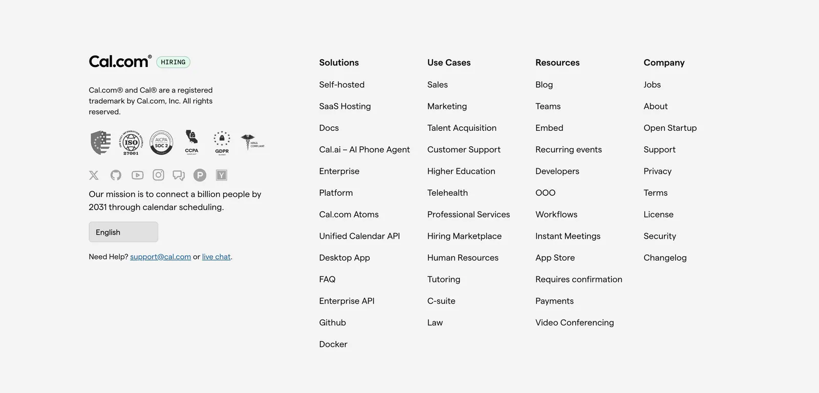
  99. Cal.com footer section: logo, compliance badges, social icons and language selector beside four link columns on light gray
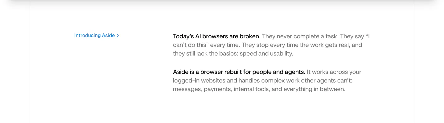
  100. Aside value proposition section: small blue Introducing Aside link at left beside two short intro paragraphs on white
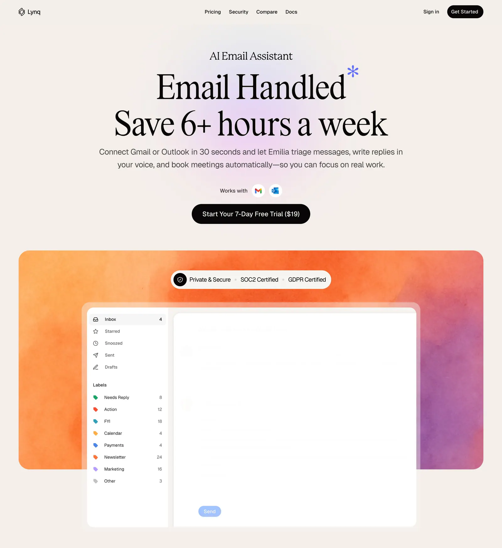
  101. Lynq hero section: centered serif headline and CTA on cream above an inbox UI mockup on an orange-purple watercolor panel
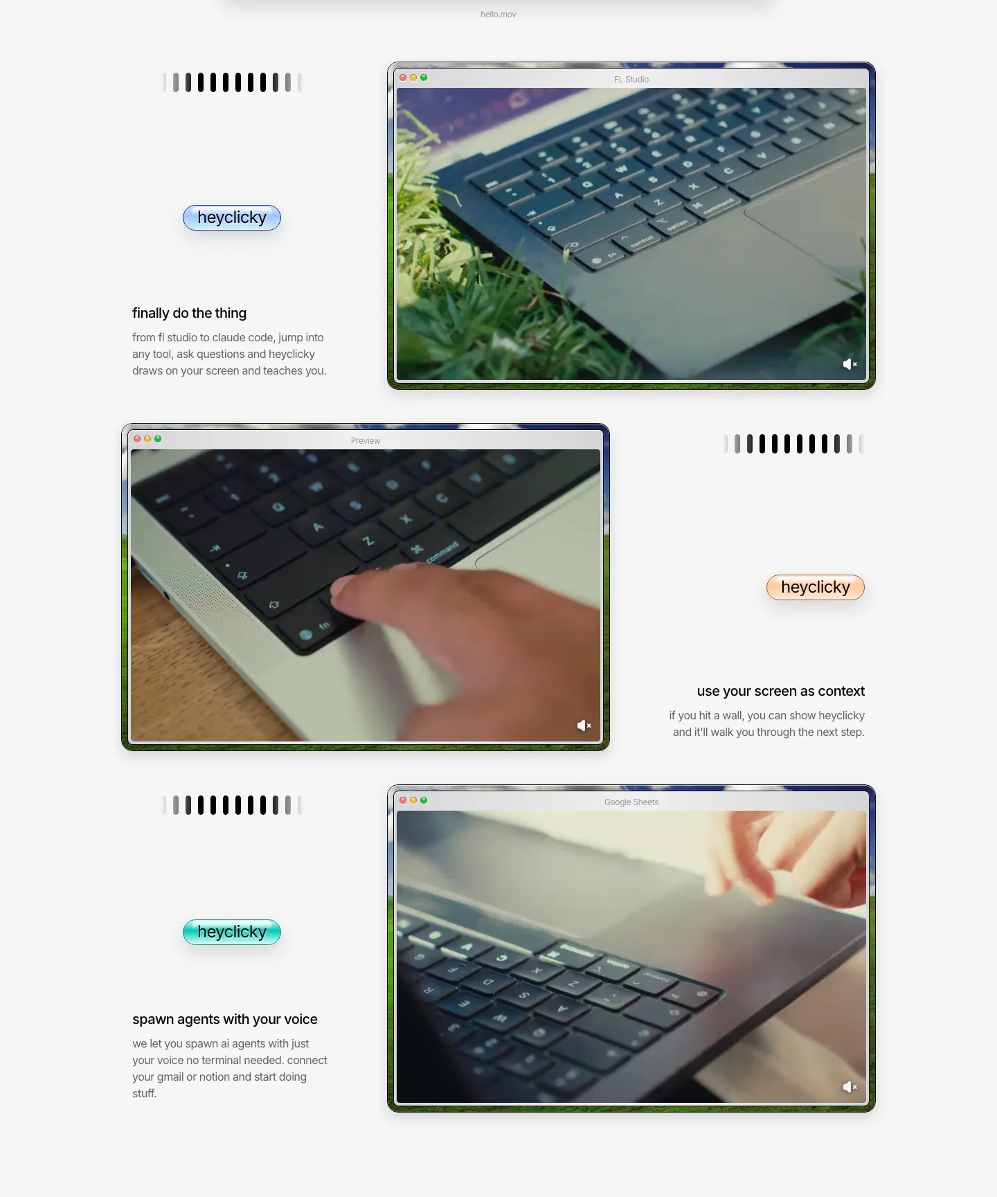
  102. heyclicky features section: three zig-zag rows pairing short captions and colored heyclicky pills with mac-window videos of laptops
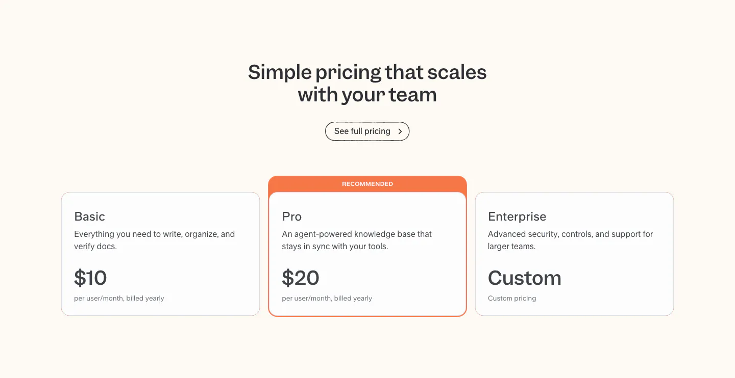
  103. Slite pricing section: centered headline above Basic, Pro and Enterprise plan cards, with the Pro card highlighted as recommended
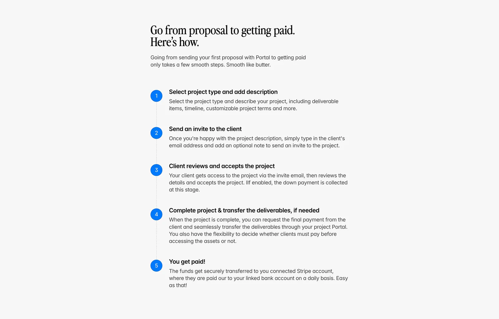
  104. Portal how it works section: serif headline above a vertical five-step list with blue numbered circles on a light gray background
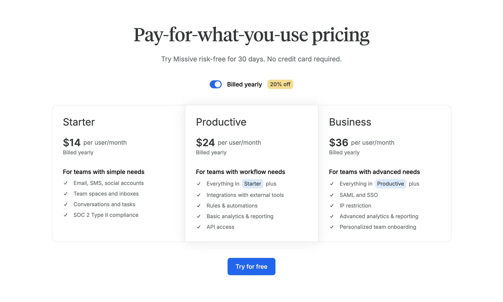
  105. Missive pricing section: centered serif headline with billing toggle above three plan columns and a Try for free button
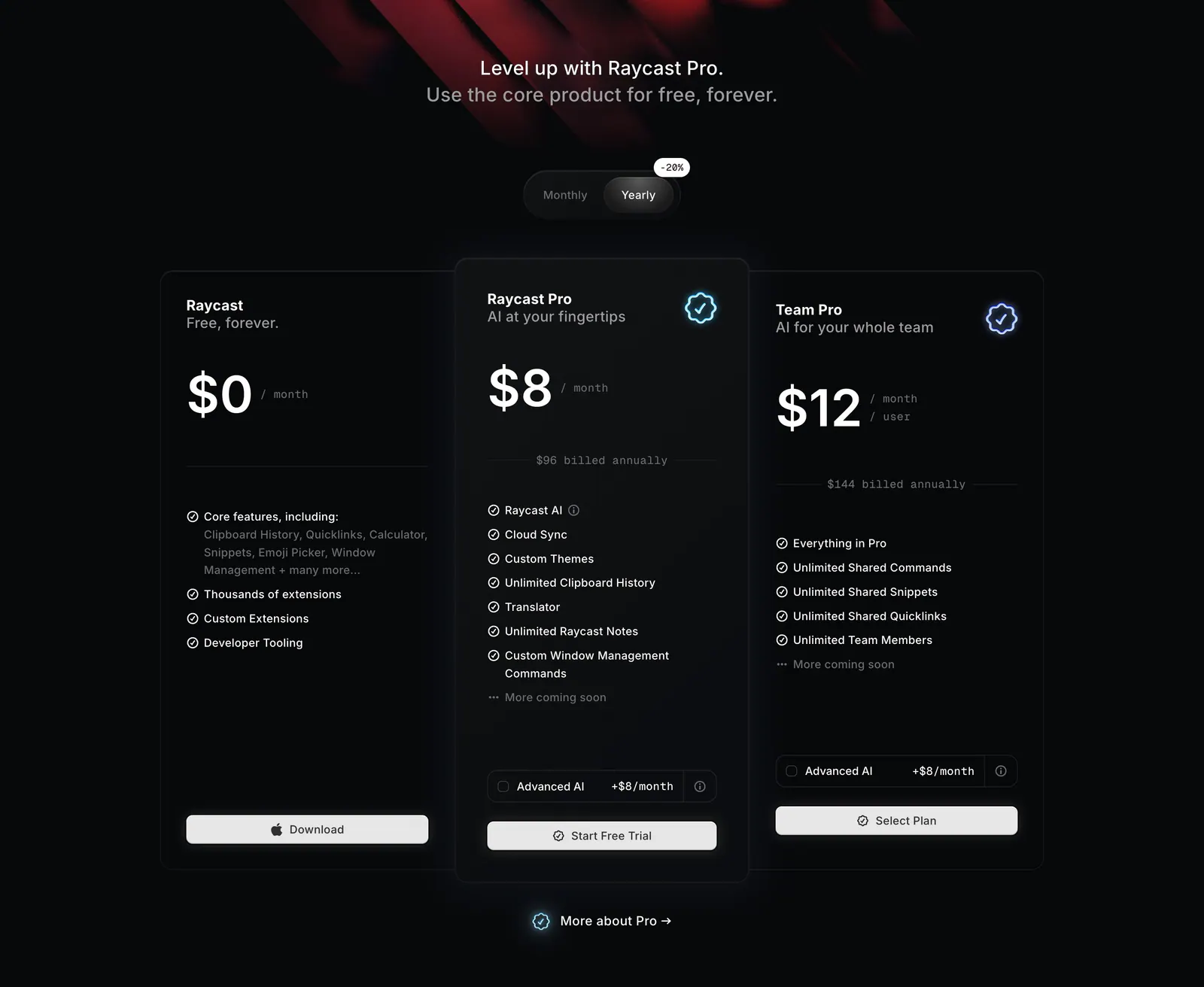
  106. Raycast pricing section: centered headline and monthly/yearly toggle above three dark plan cards with prices and feature lists
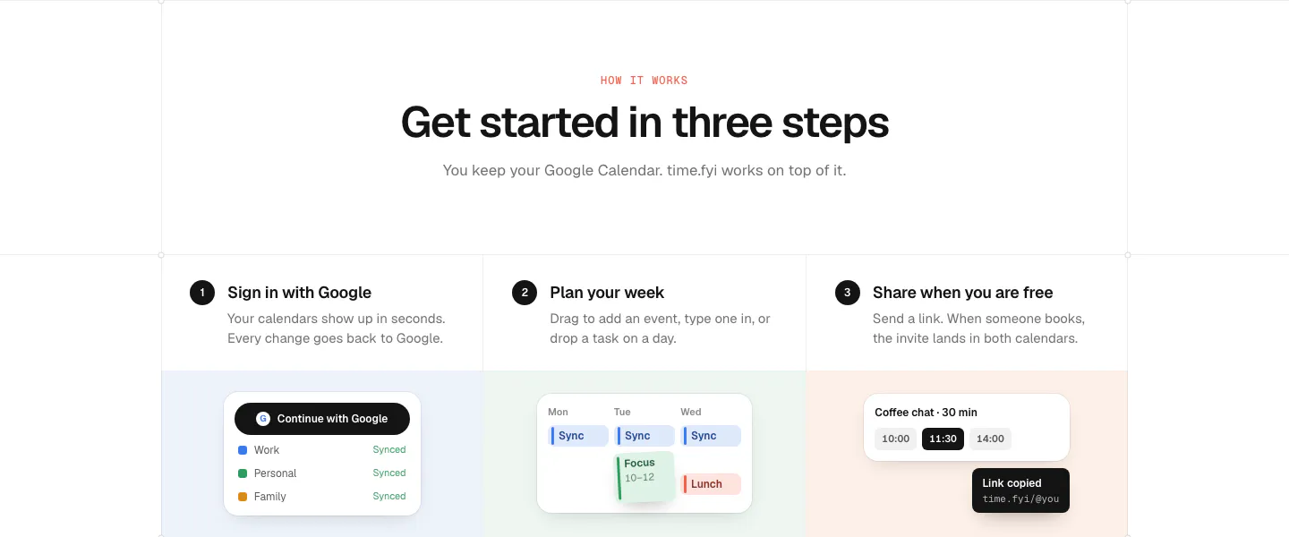
  107. time.fyi how it works section: centered header above three numbered step columns with small UI snippets on pastel panels
  108. Linear call to action section: centered two-line headline with light and dark pill buttons on a black background
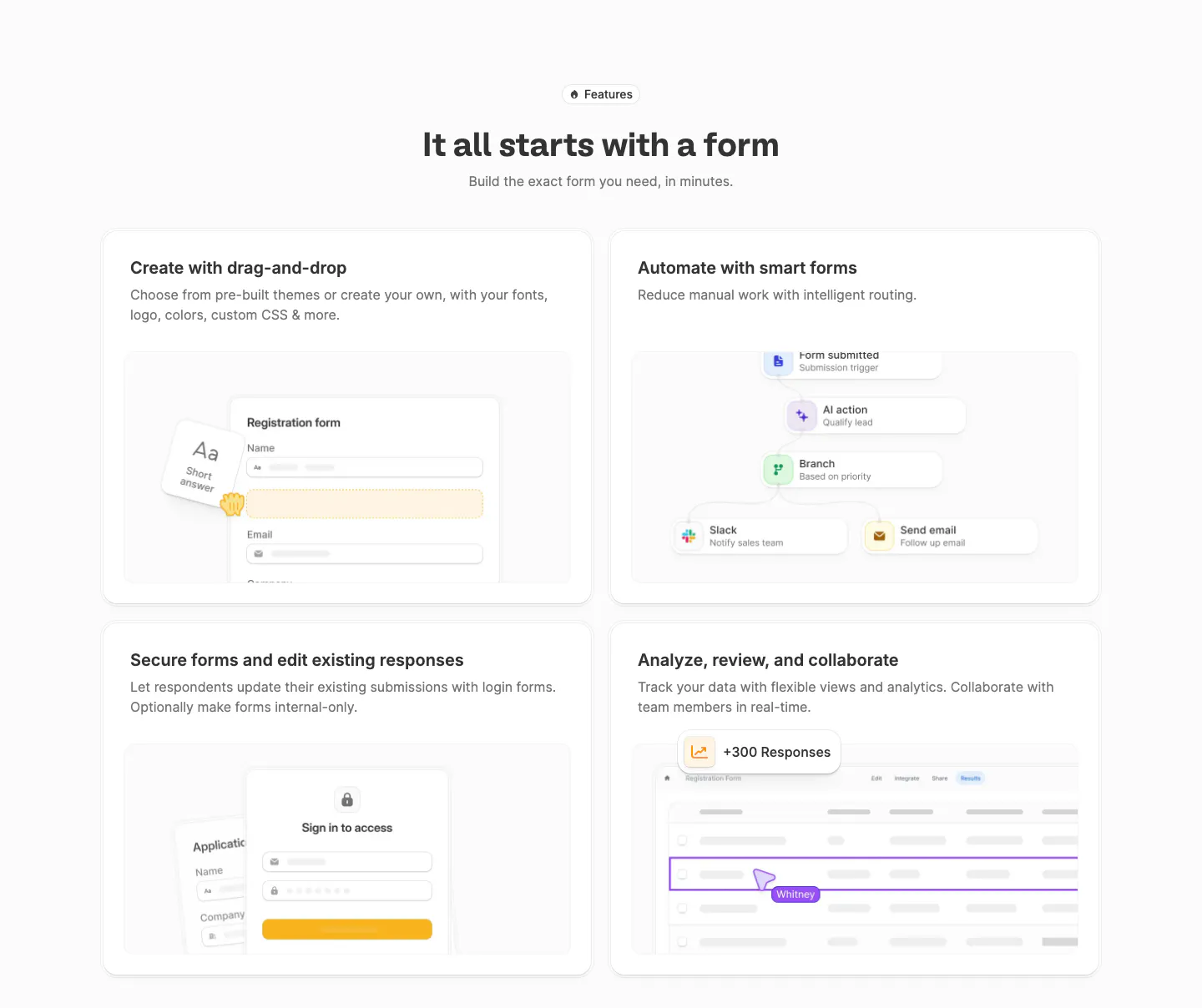
  109. Fillout features section: centered heading above a 2x2 grid of cards with form builder, workflow, login form and responses table mockups
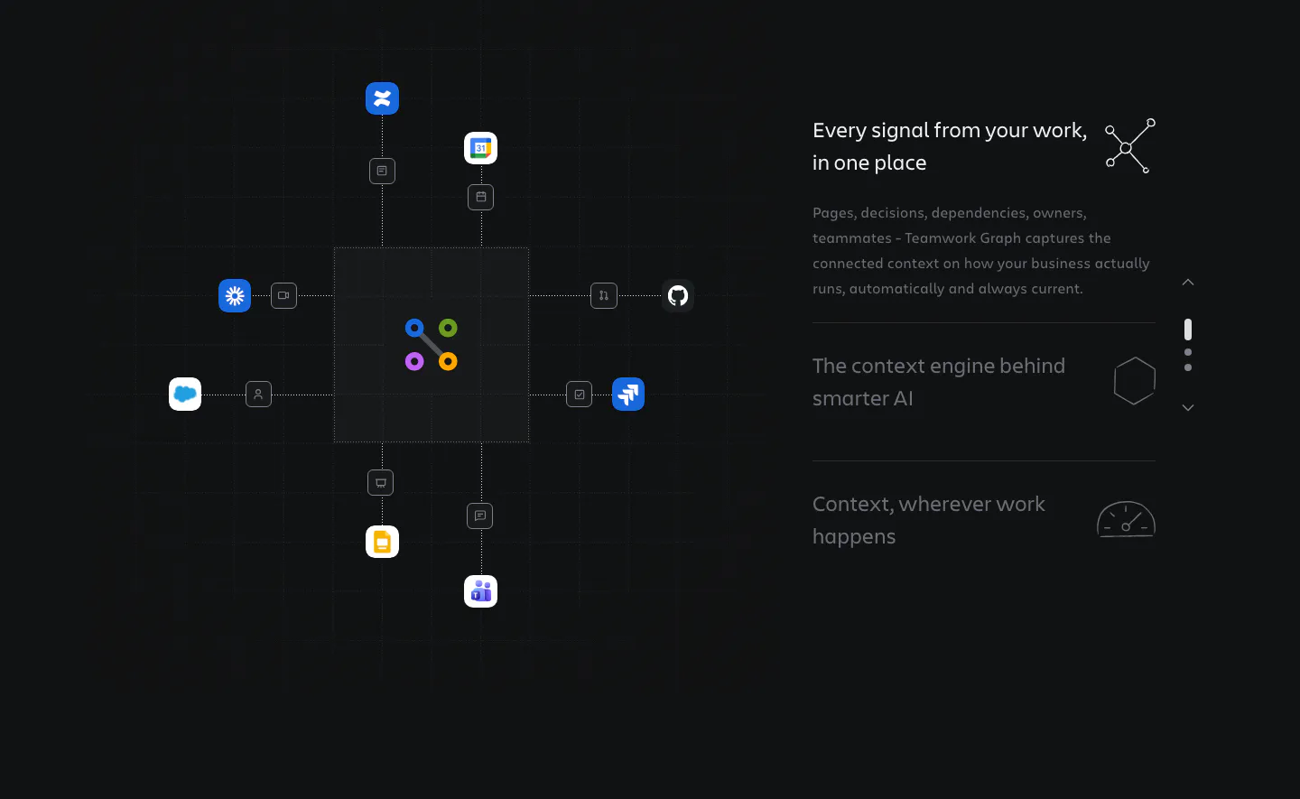
  110. Atlassian features section: hub diagram linking app icons to a central graph on the left, stepped feature list on the right, dark grid
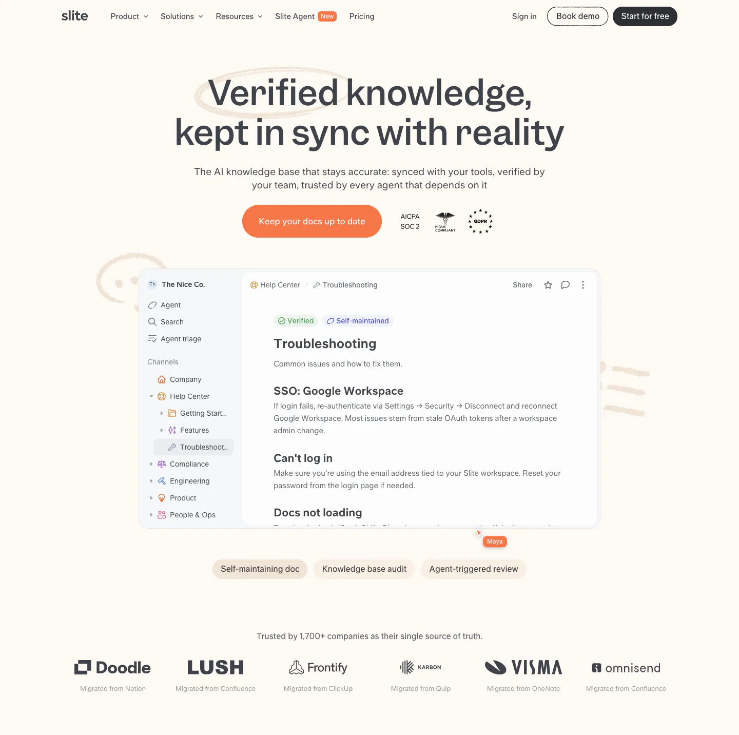
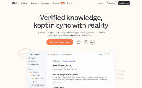
  111. Slite hero section: centered headline, orange CTA and compliance badges above a knowledge base doc screenshot and customer logo row on cream
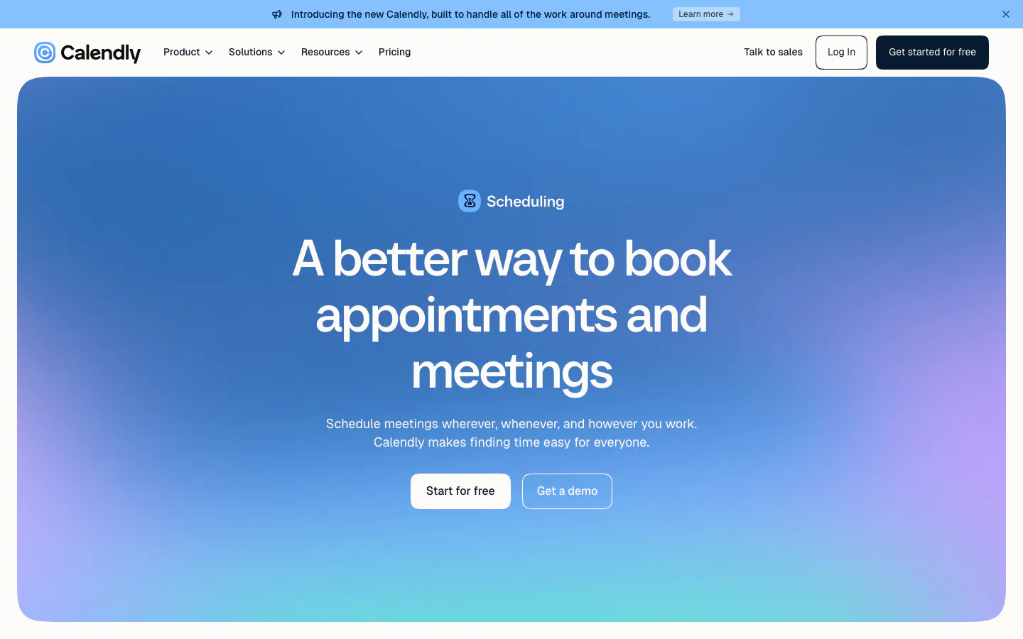
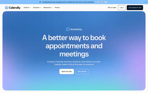
  112. Calendly hero section: centered headline and two buttons inside a rounded blue-to-purple gradient panel below the nav and announcement bar
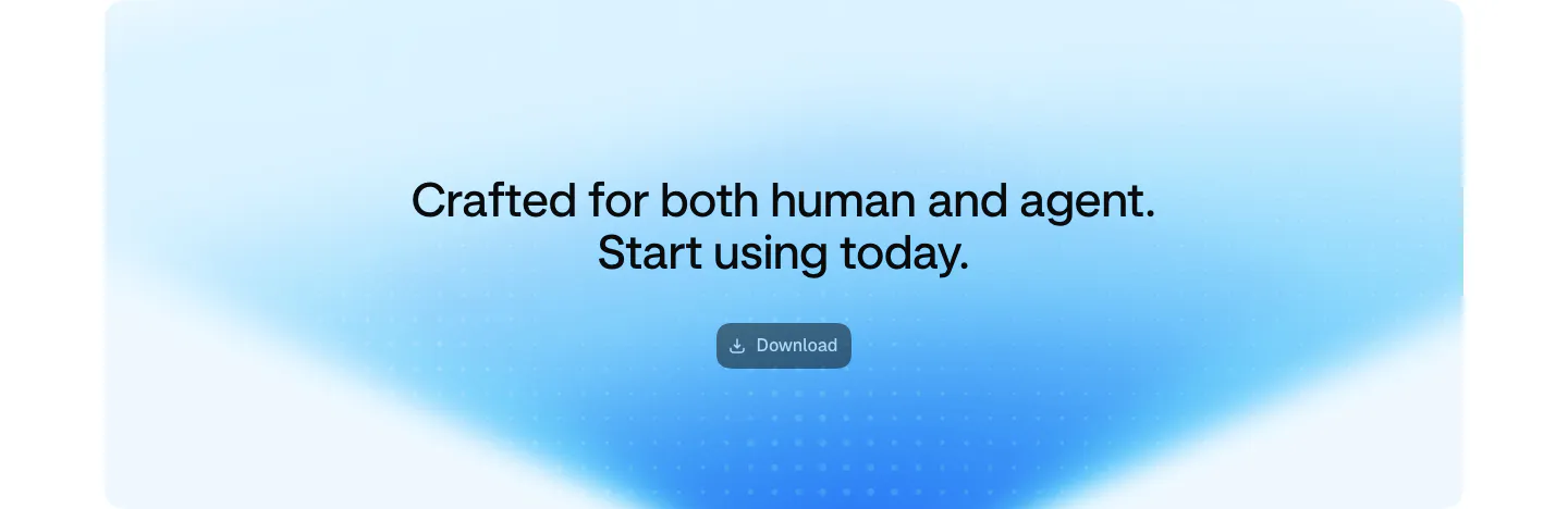
  113. Aside call-to-action section: centered two-line headline and download button on a soft blue gradient card
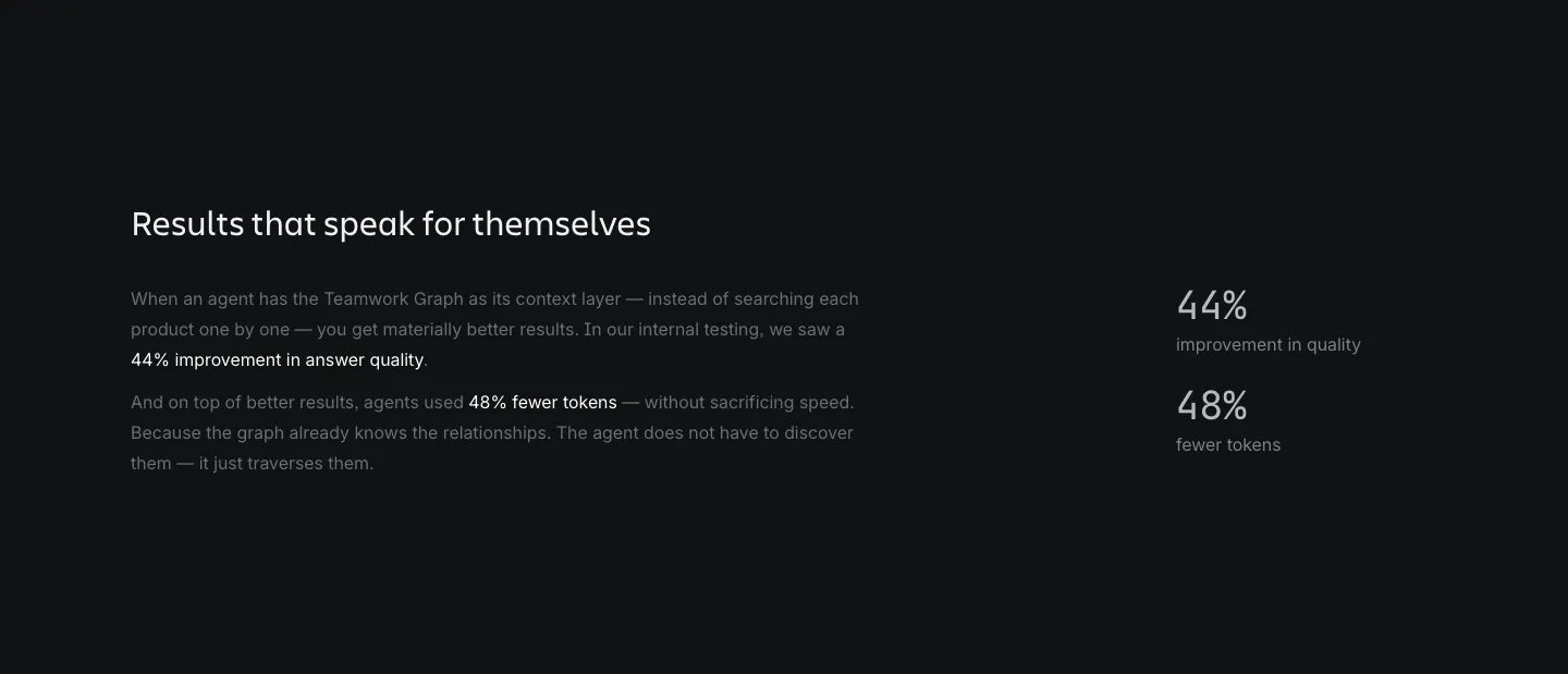
  114. Atlassian stats section: heading and explanatory copy on the left with two percentage metrics on the right on a dark background
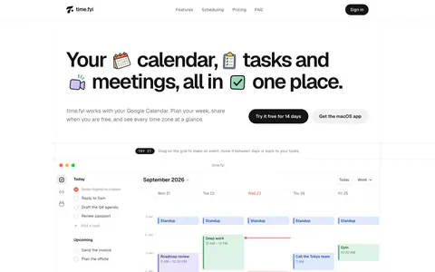
  115. time.fyi hero section: large headline with inline sticker icons and two CTA buttons above an interactive weekly calendar app screenshot
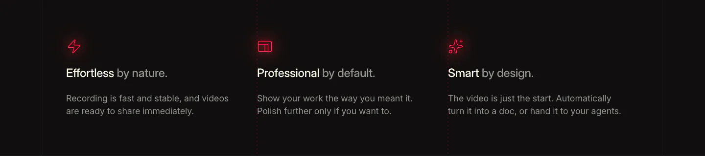
  116. Supercut value proposition section: three columns with red glowing icons, short benefit headings and copy on a dark background
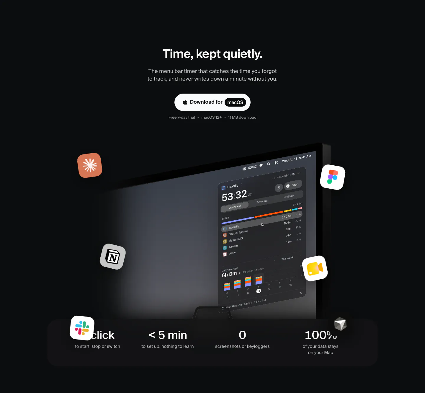
  117. Dial hero section: centered headline and Download for macOS button above a tilted Mac screen with timer UI, floating app icons and a stats bar
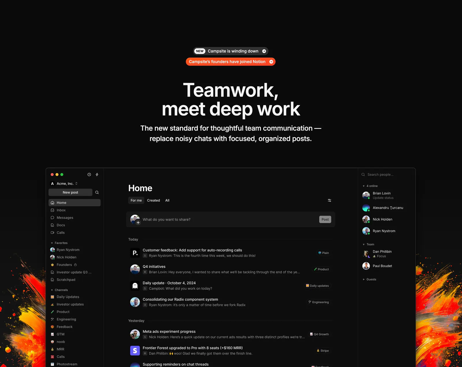
  118. Campsite hero section: centered headline with announcement pills above a dark app screenshot flanked by fiery paint splashes on black
    Campsite Hero
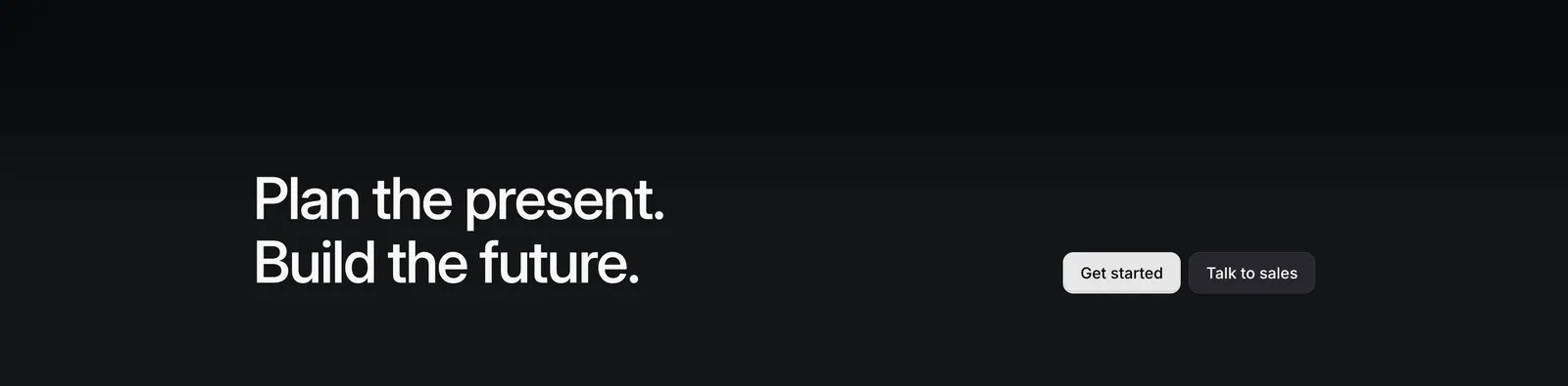
  119. Linear call-to-action section: two-line headline on the left with Get started and Talk to sales buttons on the right, on a near-black gradient
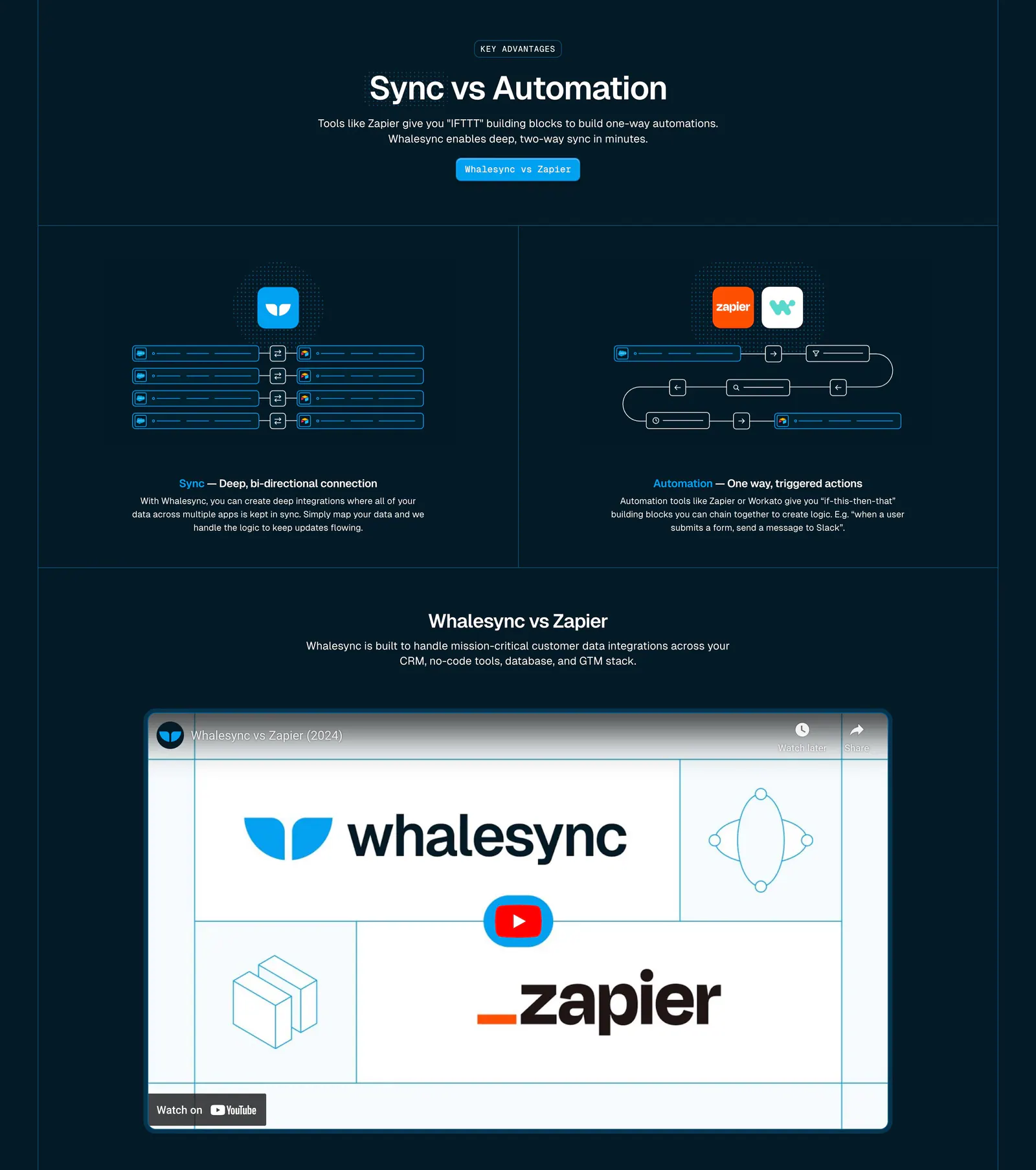
  120. Whalesync comparison section: Sync vs Automation diagrams in two columns above a Whalesync vs Zapier YouTube video on dark navy
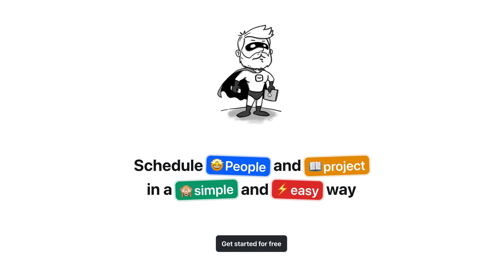
  121. Hellotime call-to-action section: hand-drawn superhero character above a centered headline with colored emoji pills and a button
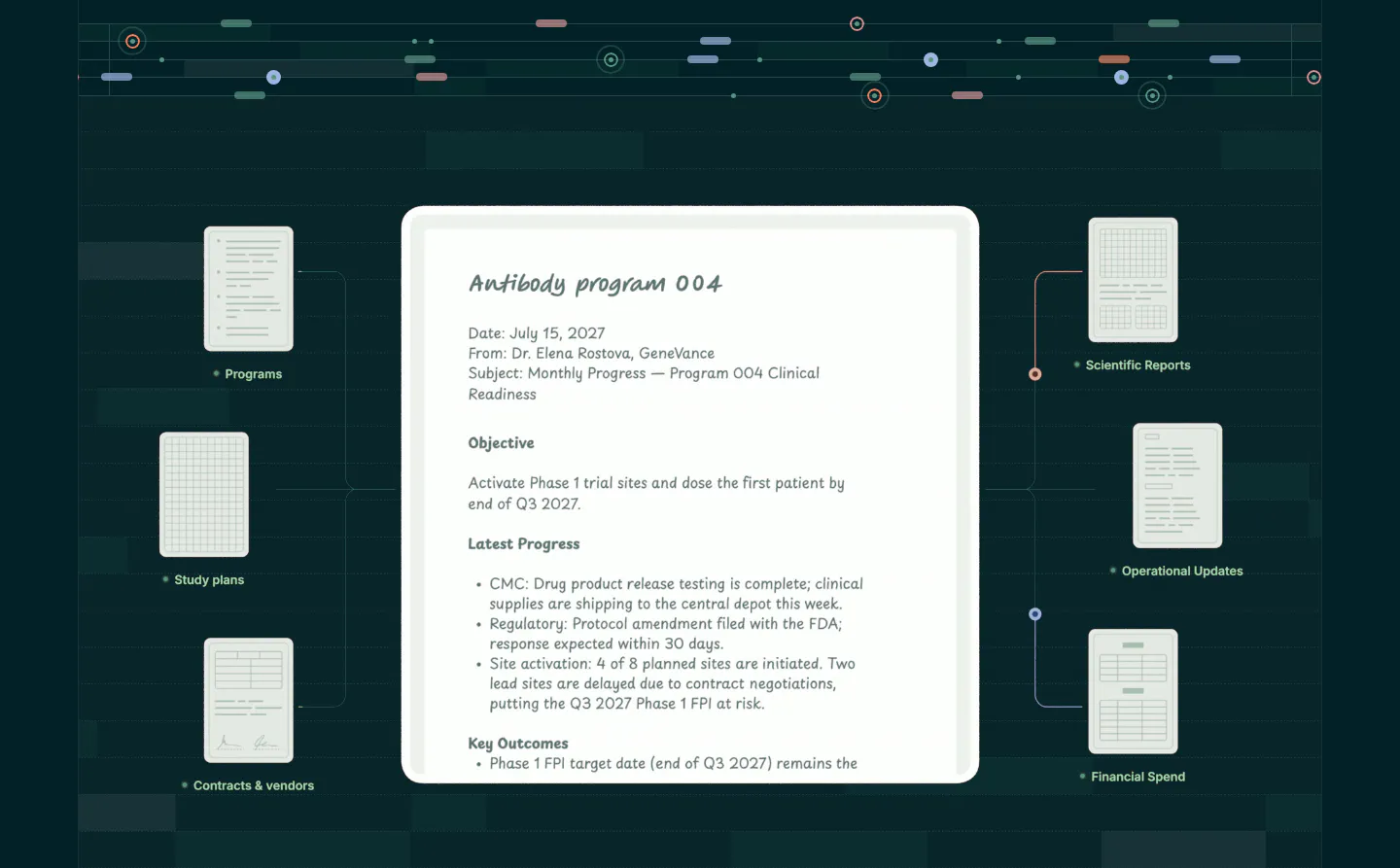
  122. Orchestra Bio features section: central program report document linked to smaller document cards on a dark teal grid background
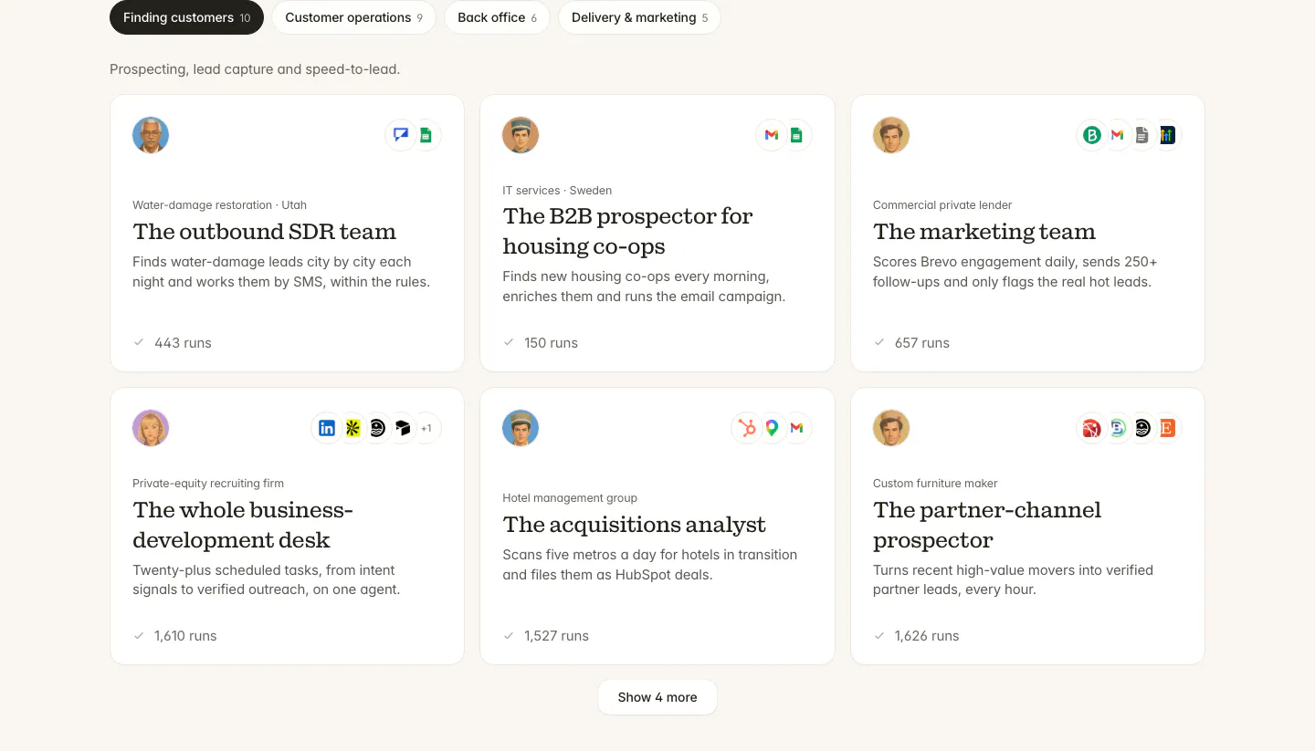
  123. Twin use cases section: tab bar of categories above a three-column grid of agent cards with avatars, app icons and run counts
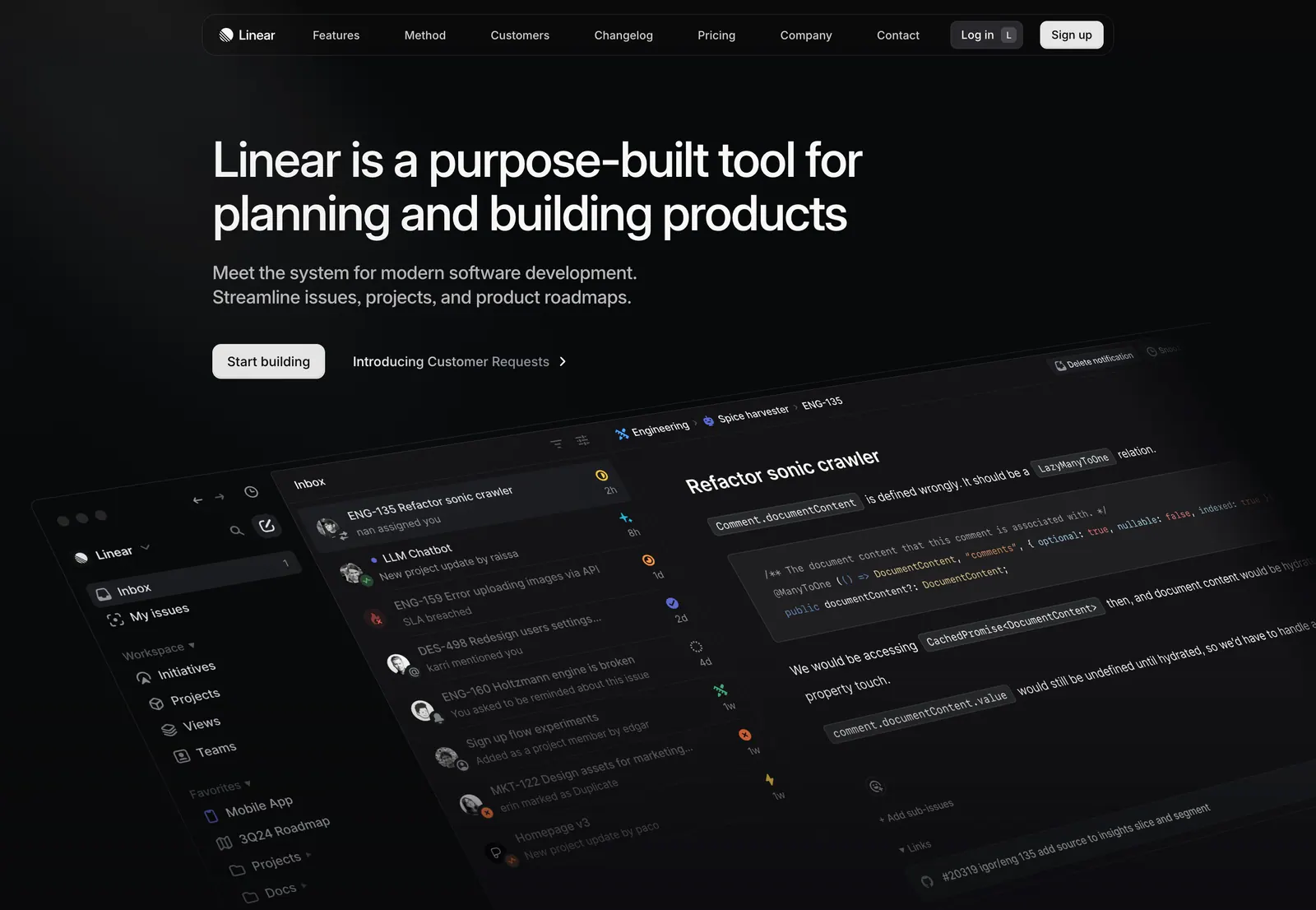
  124. Linear hero section: nav bar, left-aligned headline, subcopy and two CTAs above a tilted dark app screenshot showing inbox and an issue view
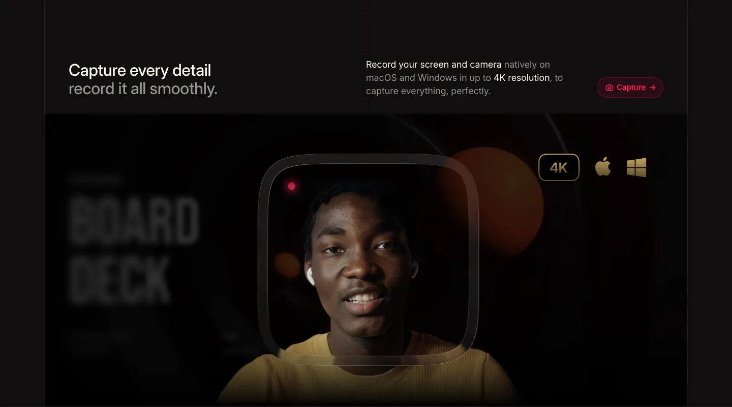
  125. Supercut features section: headline row with Capture button above a webcam recording frame of a smiling presenter with 4K badge
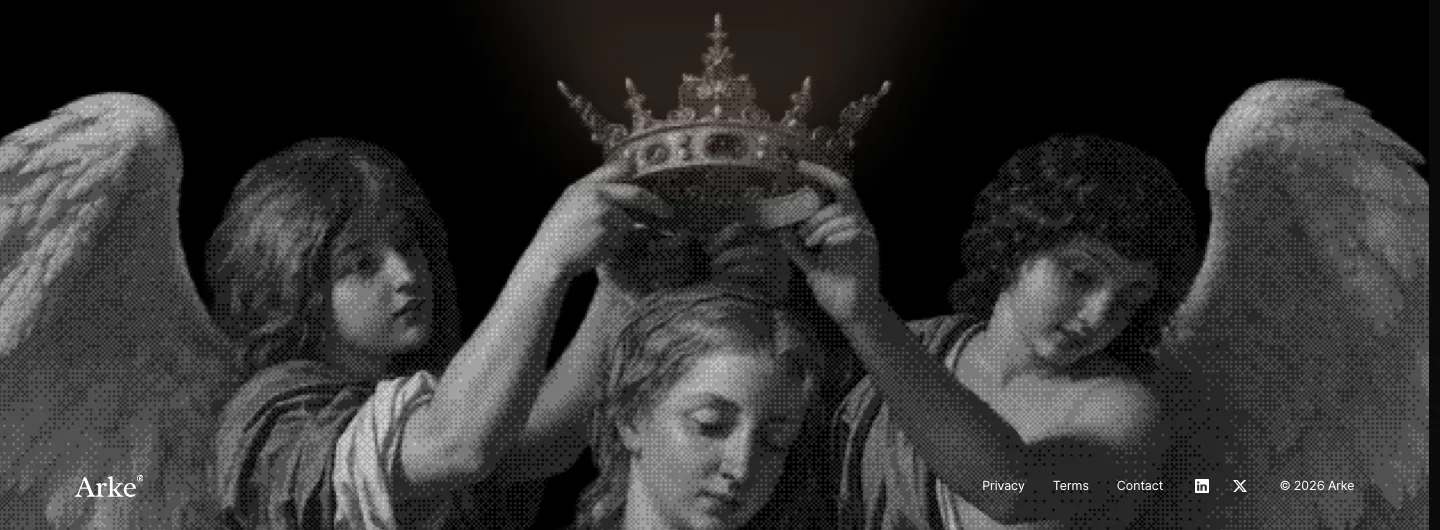
  126. Arke footer section: full-width grayscale halftone painting of angels crowning a figure with the wordmark and small legal links along the bottom
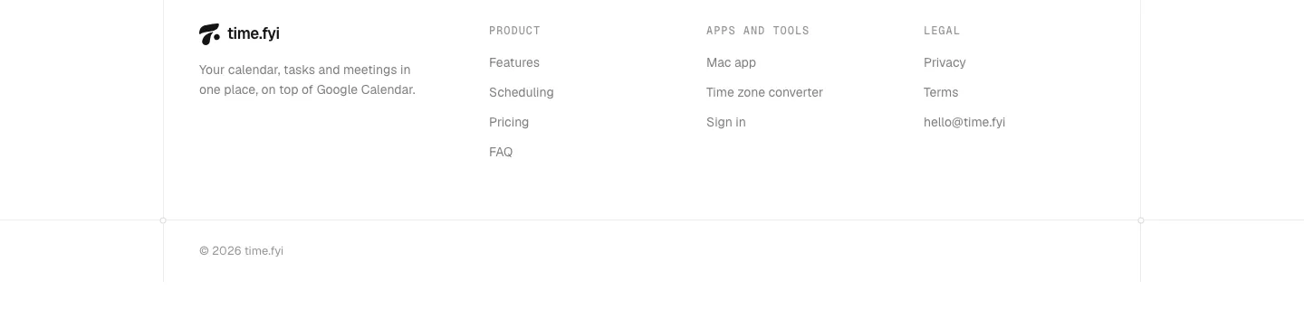
  127. time.fyi footer section: logo and tagline beside Product, Apps and tools, and Legal link columns with a copyright line on white
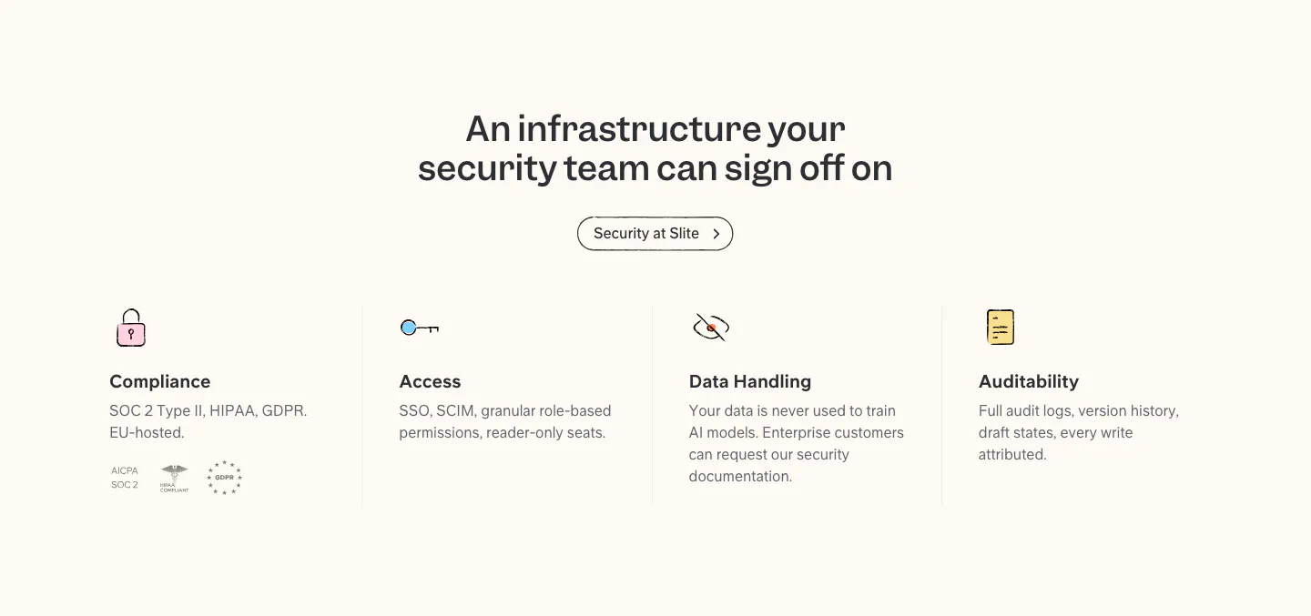
  128. Slite security section: centered headline and button above four columns for compliance, access, data handling and audit, with badges
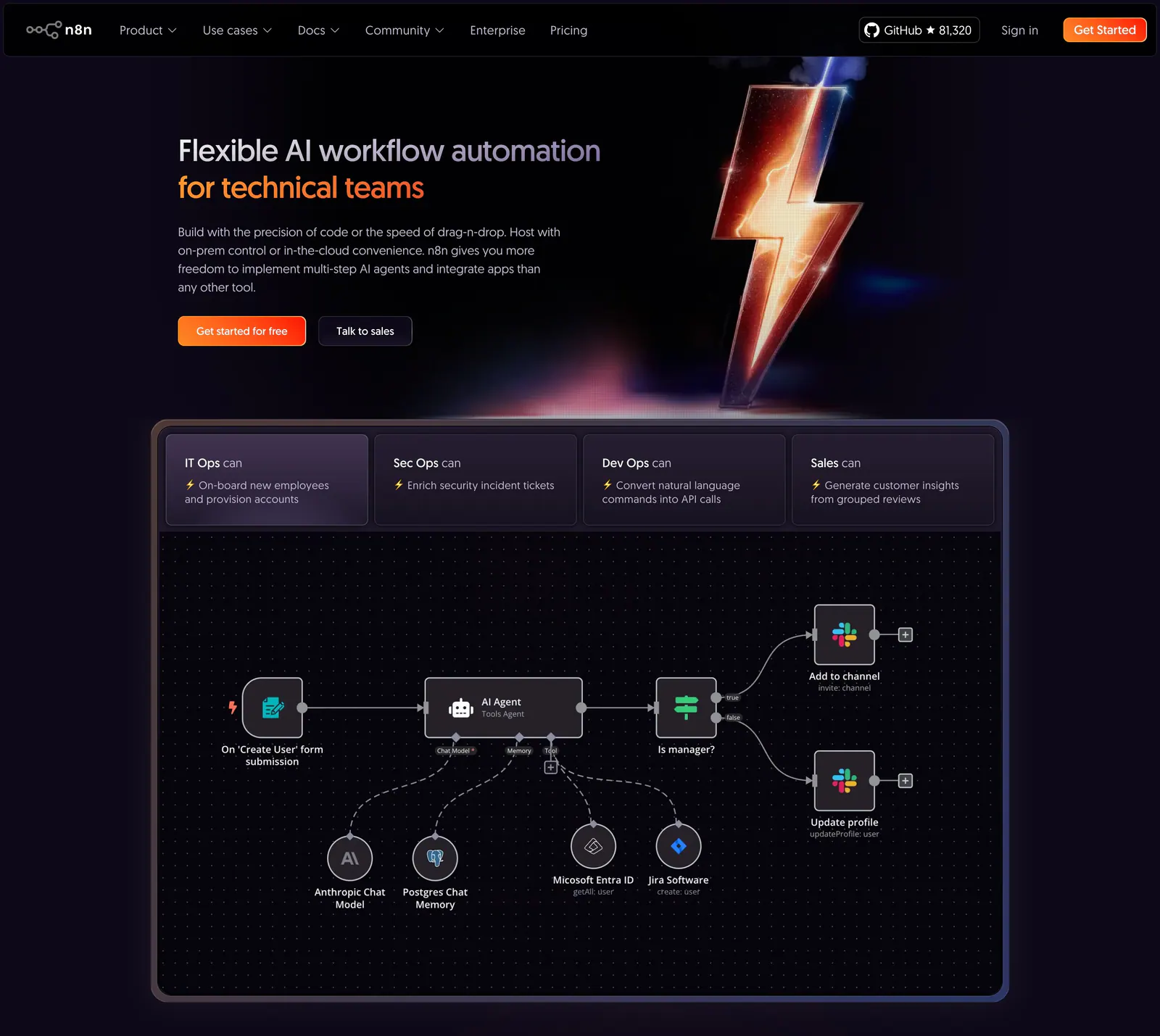
  129. n8n hero section: dark hero with headline and CTAs beside a 3D lightning bolt, above a tabbed AI agent workflow canvas
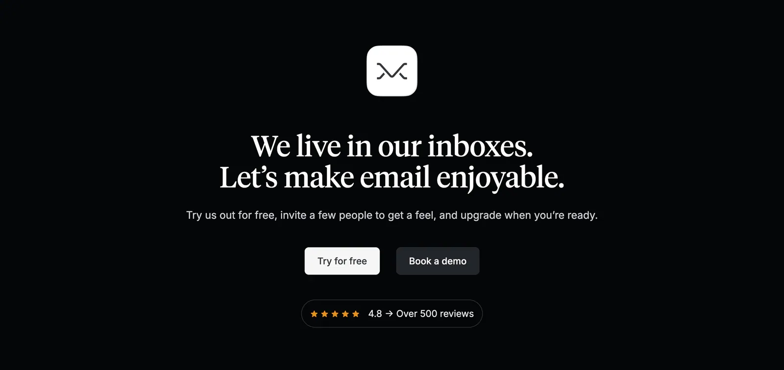
  130. Missive call-to-action section: centered app icon and serif headline with two buttons and a review rating badge on black
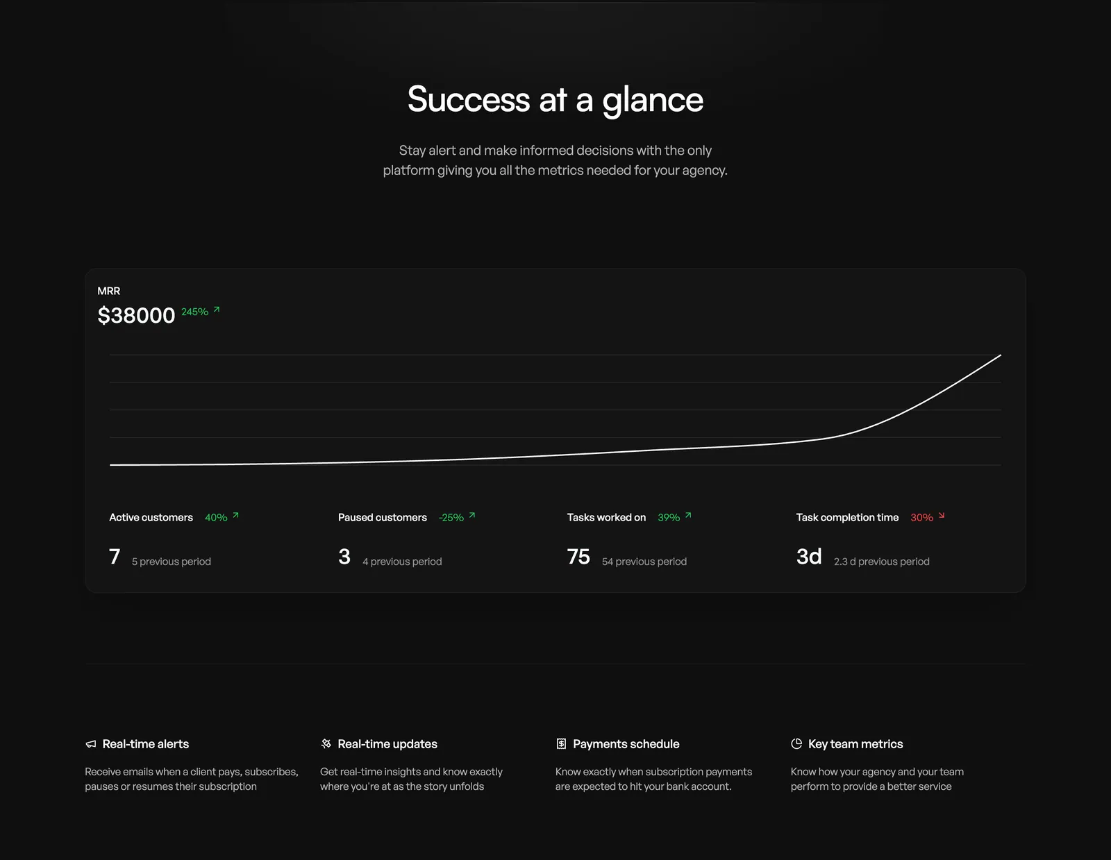
  131. Orchestra value proposition section: centered headline above an MRR line chart dashboard card and a four-column feature list, dark
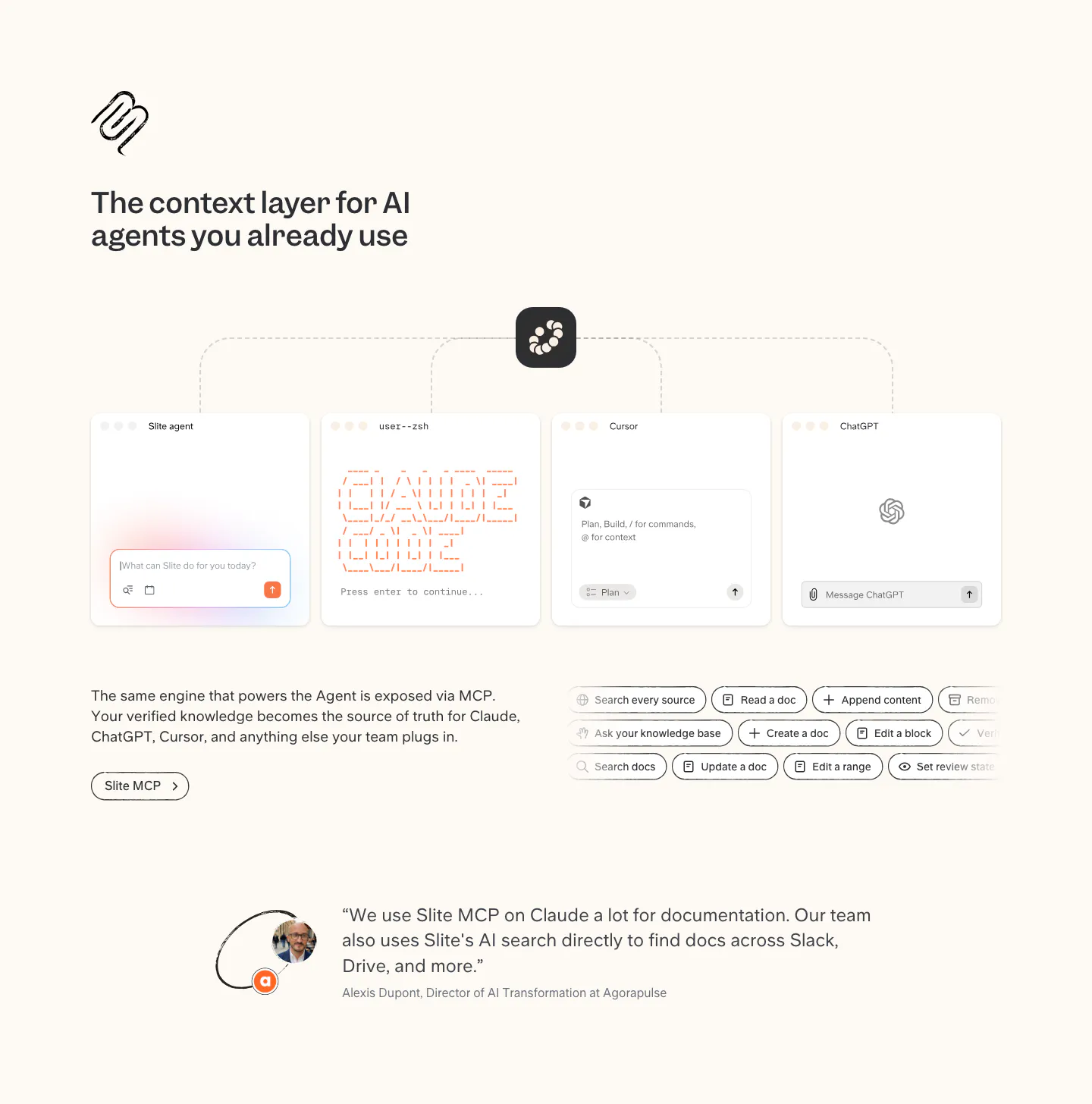
  132. Slite integrations section: MCP diagram linking Slite to agent, terminal, Cursor and ChatGPT windows, tool chips and a customer quote
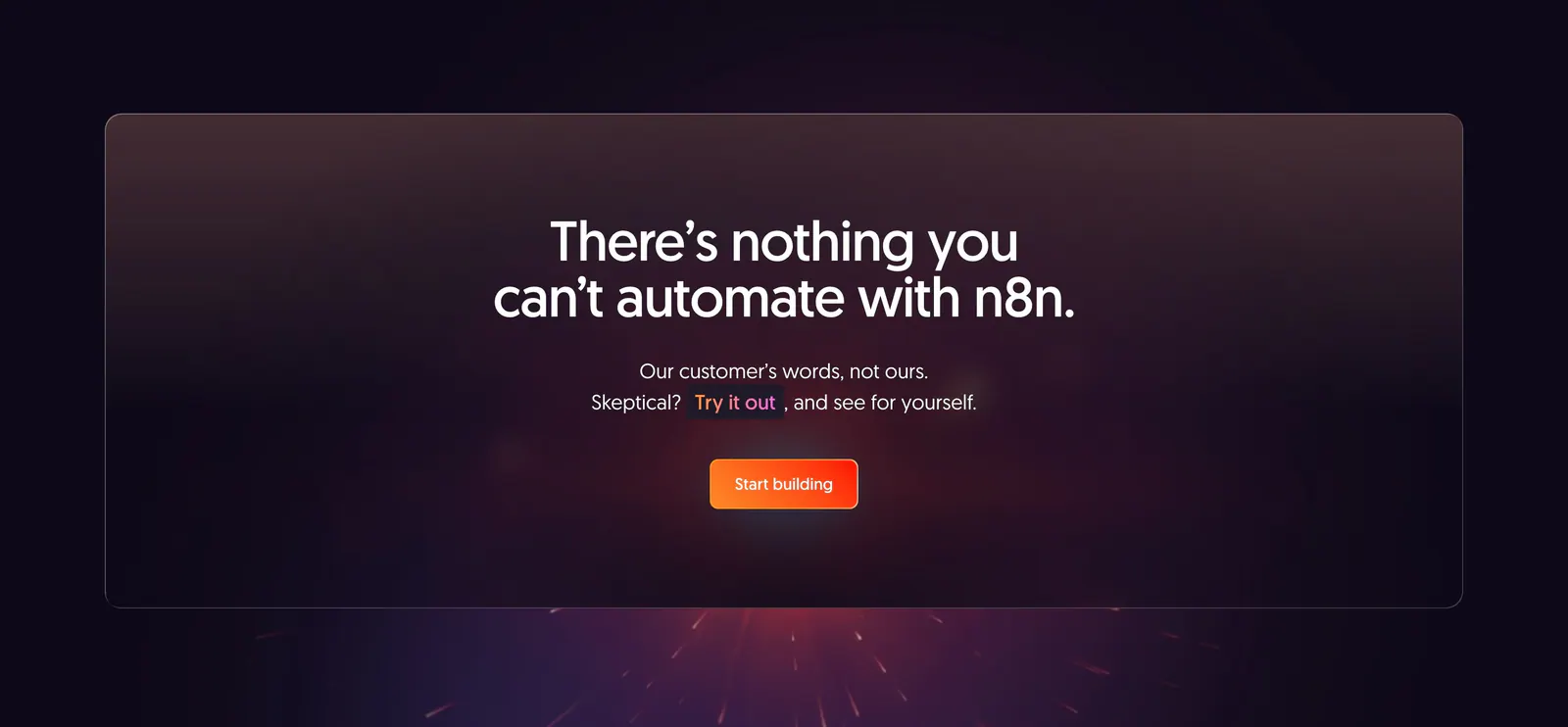
  133. n8n call-to-action section: centered headline and orange button in a translucent panel over a dark purple glow with sparks
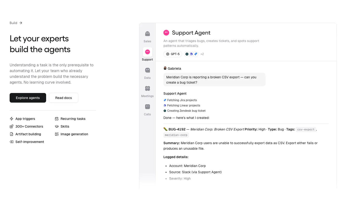
  134. Gumloop features section: headline, buttons and capability list on the left, support agent chat UI on the right
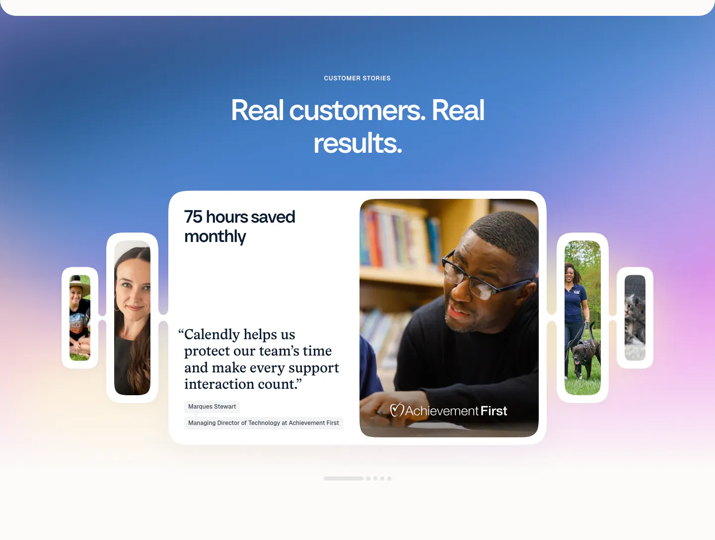
  135. Calendly testimonials section: centered headline on a blue-purple gradient above a quote card carousel with customer photos and pagination dots
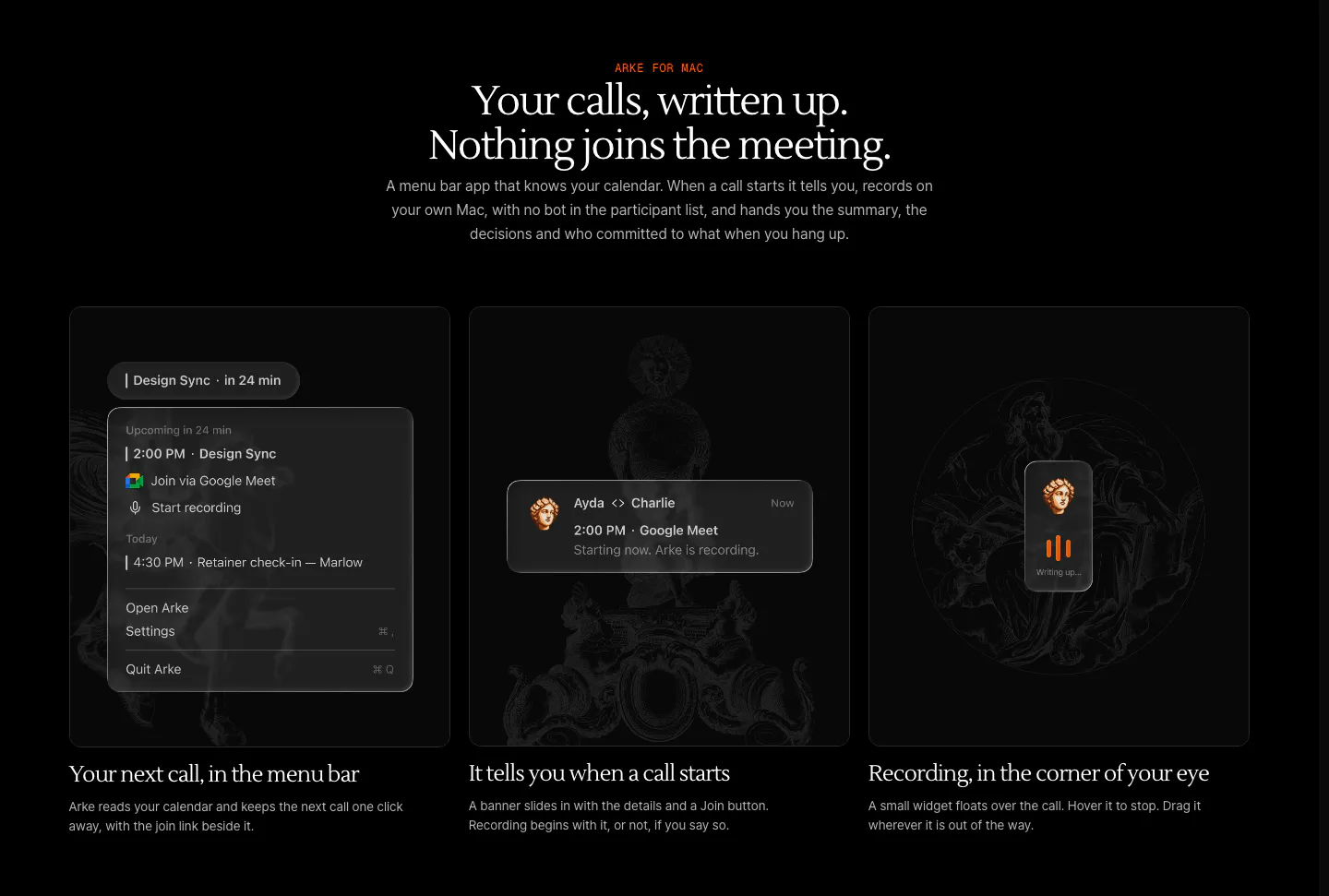
  136. Arke features section: centered serif headline above three dark cards showing a menu bar call reminder, notification and recording widget
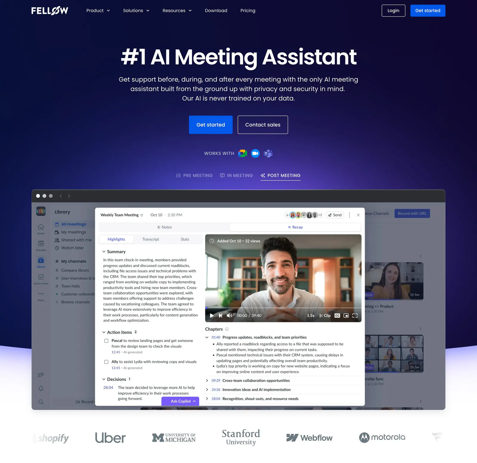
  137. Fellow hero section: centered headline and CTAs on deep navy above a meeting recap app screenshot with tabs and a customer logo row
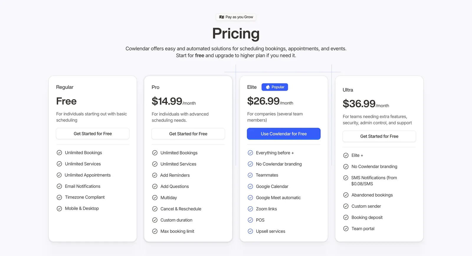
  138. Cowlendar pricing section: centered heading above four plan cards with checklists and a highlighted blue Elite plan
  139. Calendly pricing section: four plan cards with a highlighted Teams plan, monthly/yearly billing toggle and feature checklists below the nav
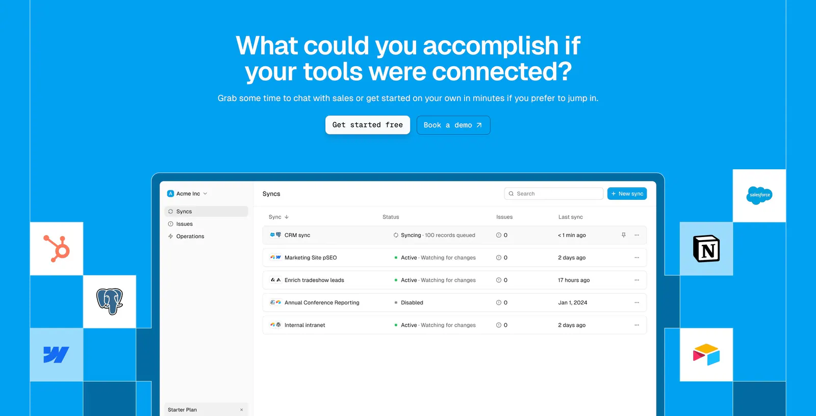
  140. Whalesync call-to-action section: centered headline and buttons above a syncs dashboard screenshot flanked by app icon tiles on bright blue
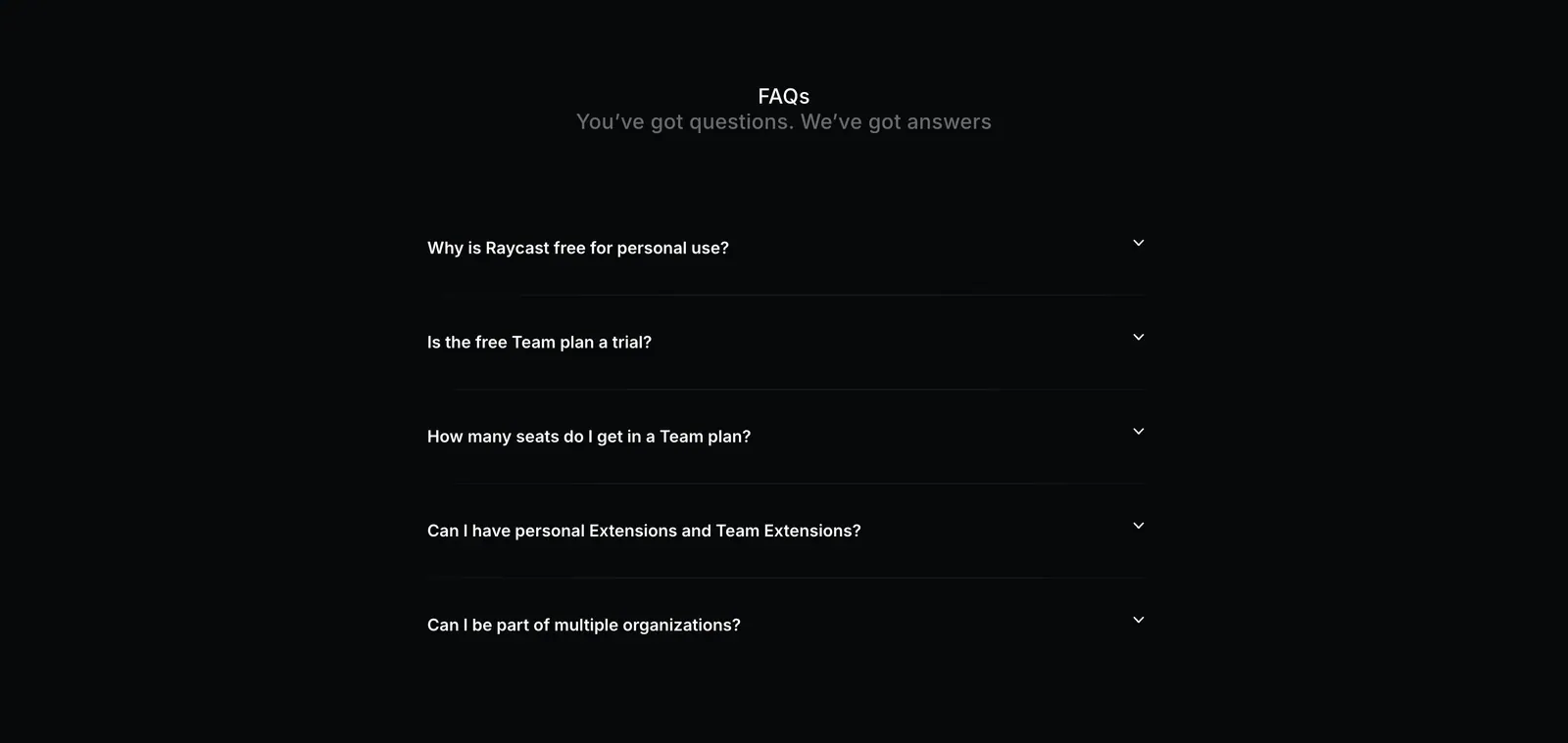
  141. Raycast FAQ section: centered FAQs heading above a five-question collapsed accordion on a near-black background
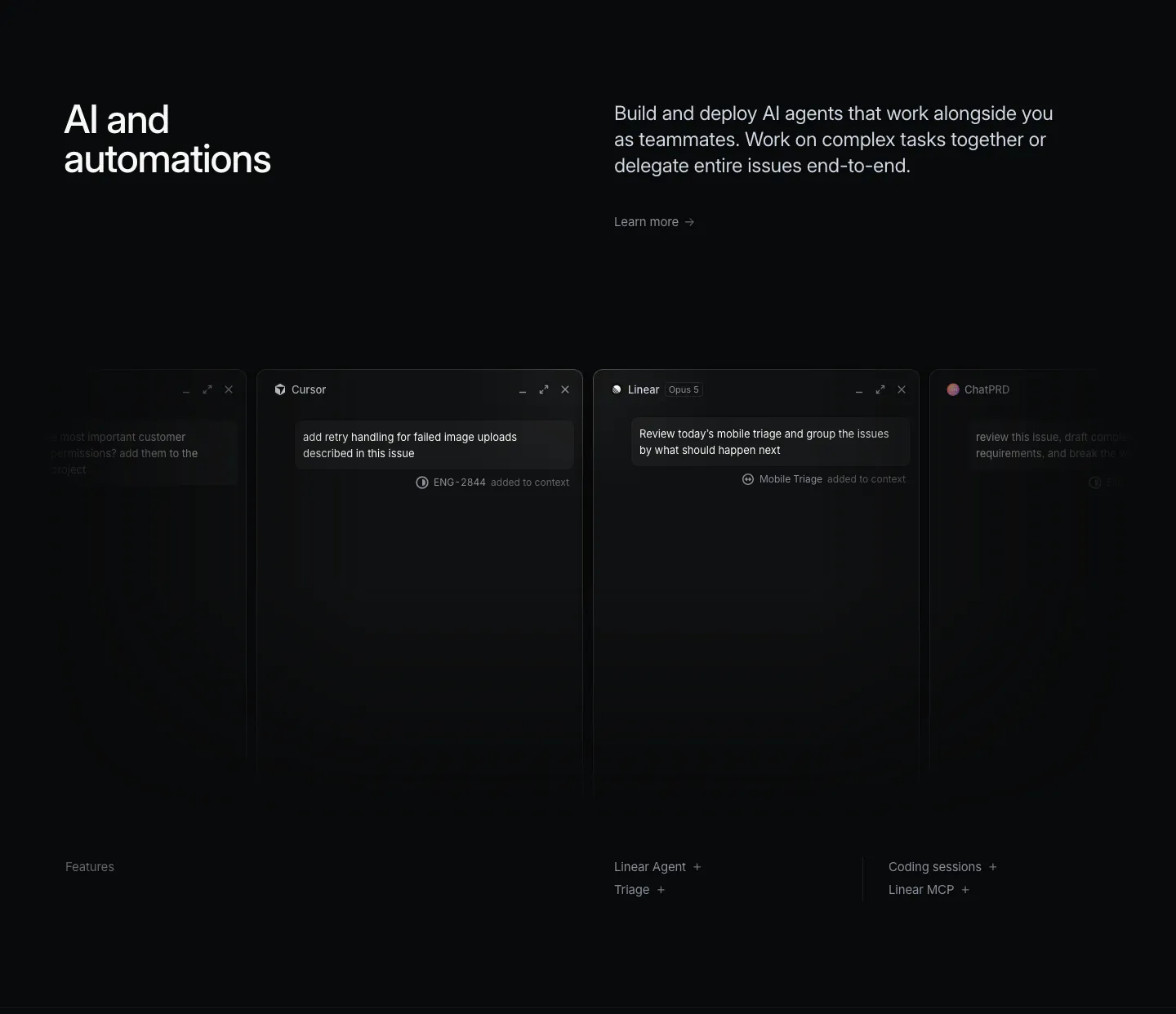
  142. Linear features section: dark headline and copy above a row of agent chat windows fading off both edges, feature links below
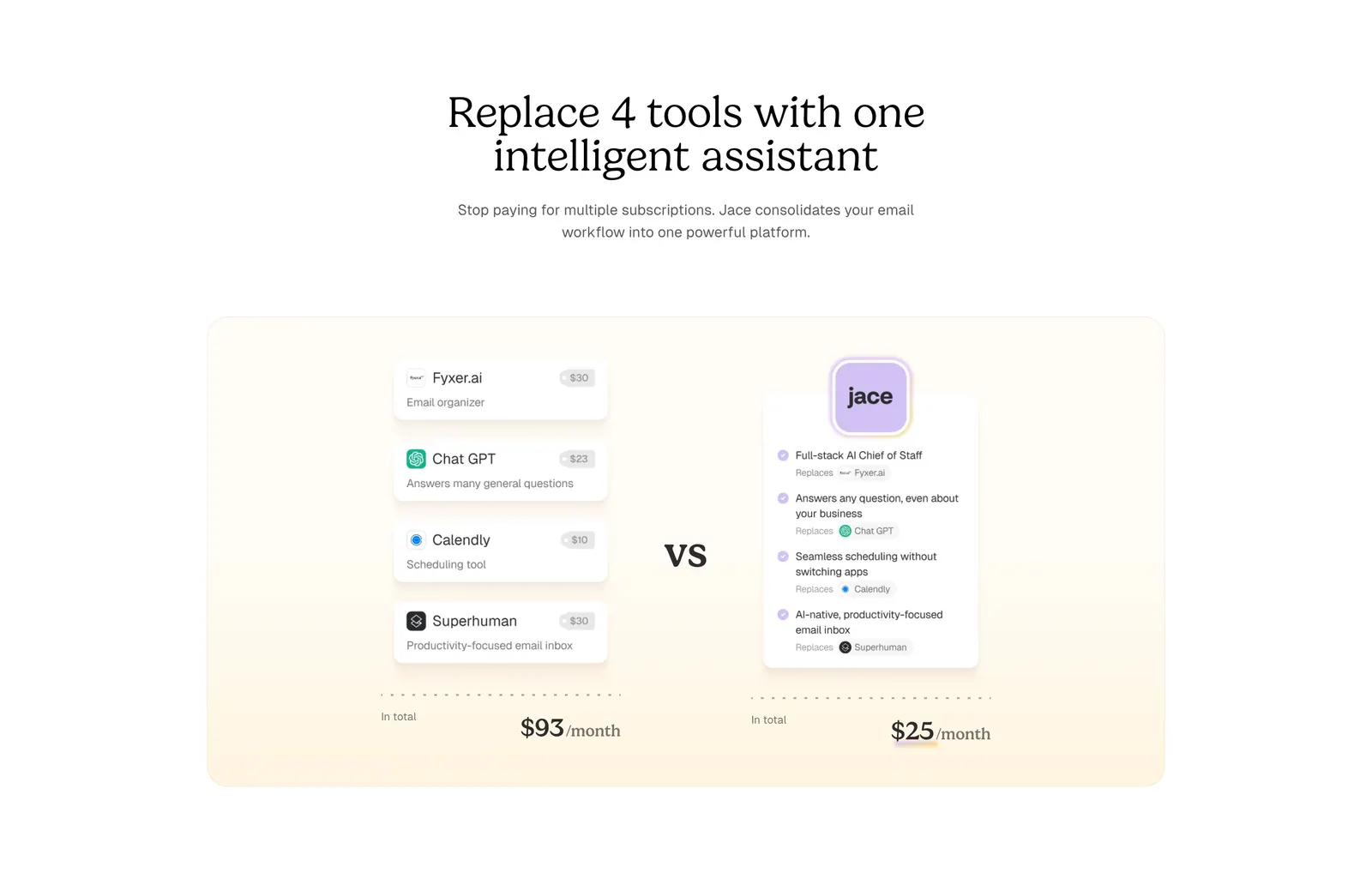
  143. Jace comparison section: serif centered headline above a cream panel comparing four tool cards and prices vs one Jace card
    Jace Comparison
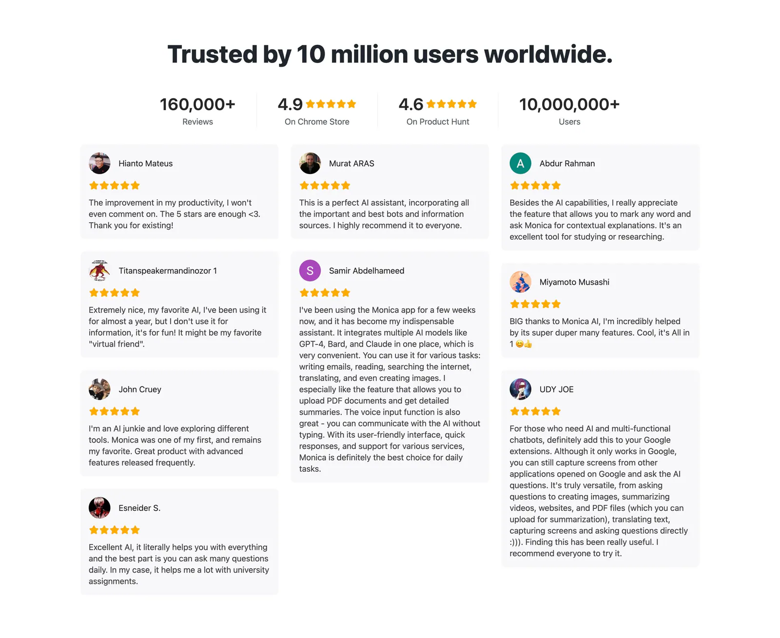
  144. Monica testimonials section: centered headline and four rating stats above a masonry grid of star-rated user review cards
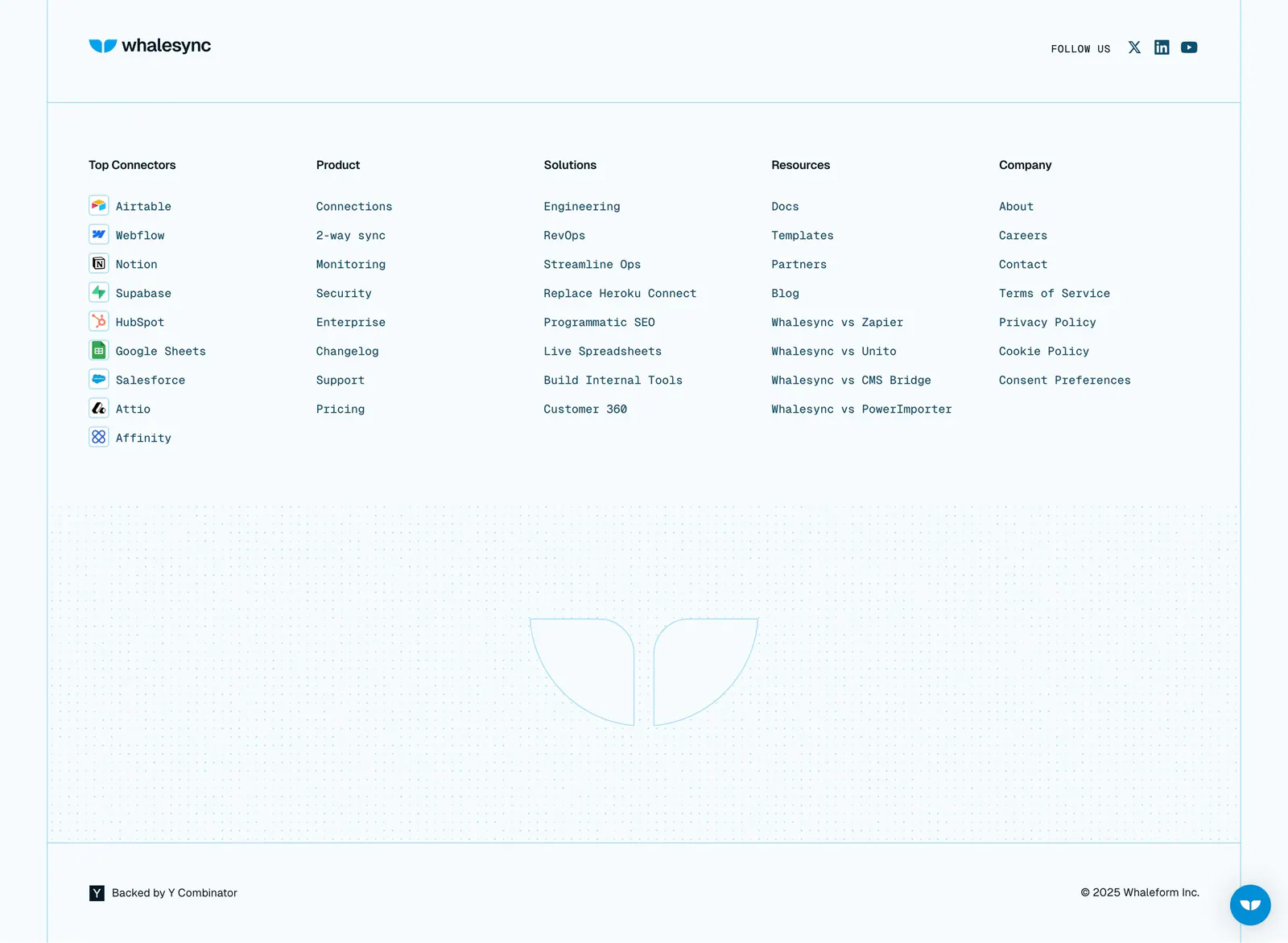
  145. Whalesync footer section: logo and five monospace link columns with connector icons above a dot-grid outlined logo on pale blue
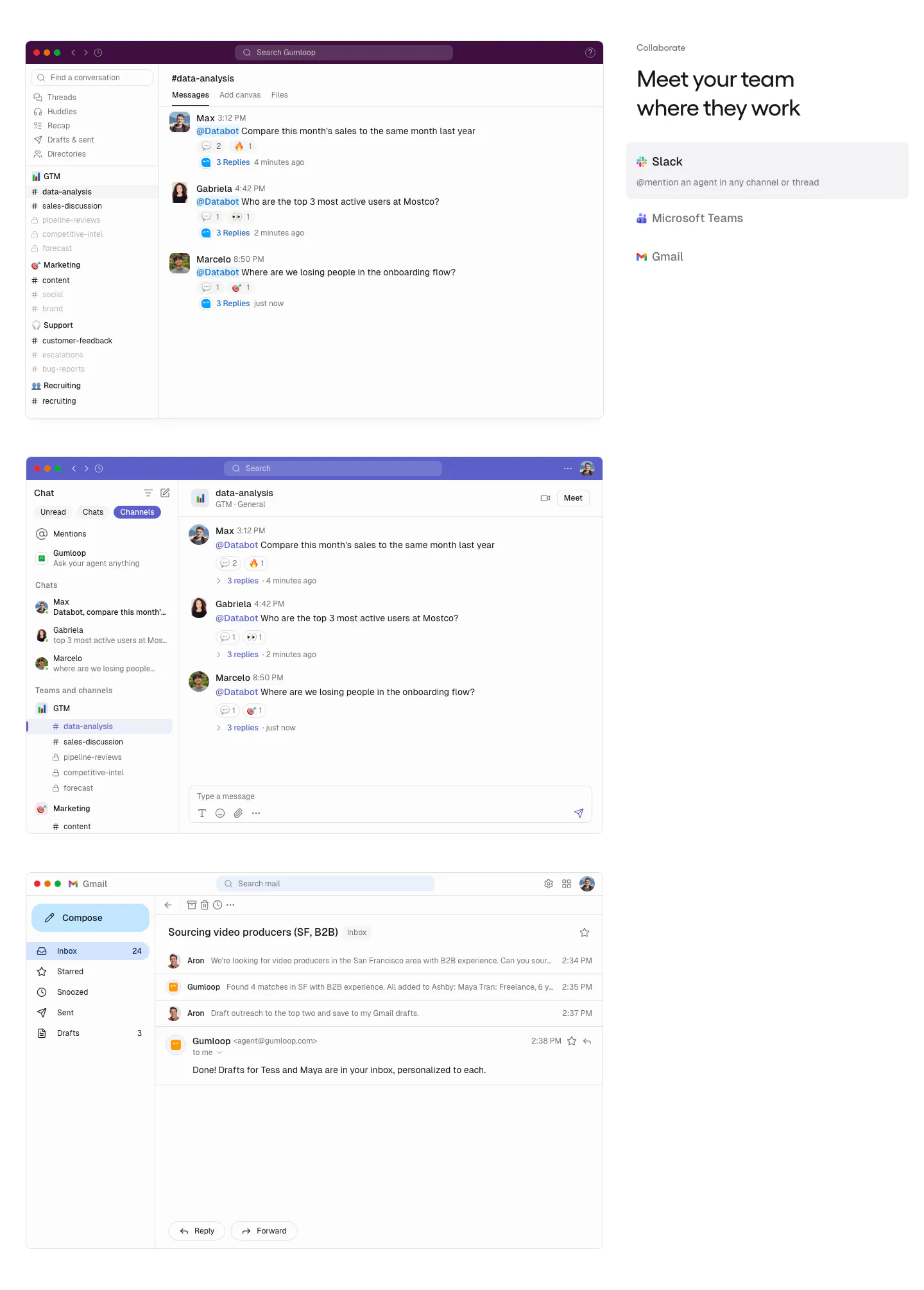
  146. Gumloop features section: stacked Slack, Teams and Gmail screenshots on the left, headline and app tab list on the right
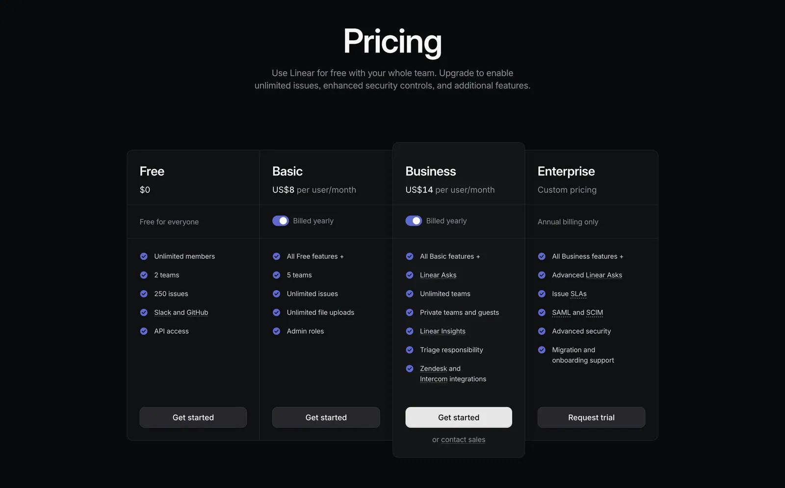
  147. Linear pricing section: centered heading above four dark plan columns, Free, Basic, Business and Enterprise, with billing toggles and checklists
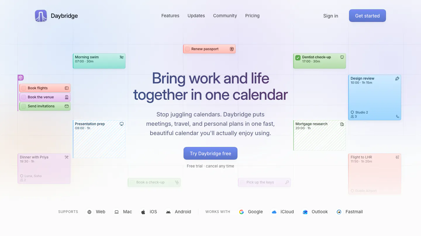
  148. Daybridge hero section: centered headline and button surrounded by floating calendar event cards, with platform and integration row
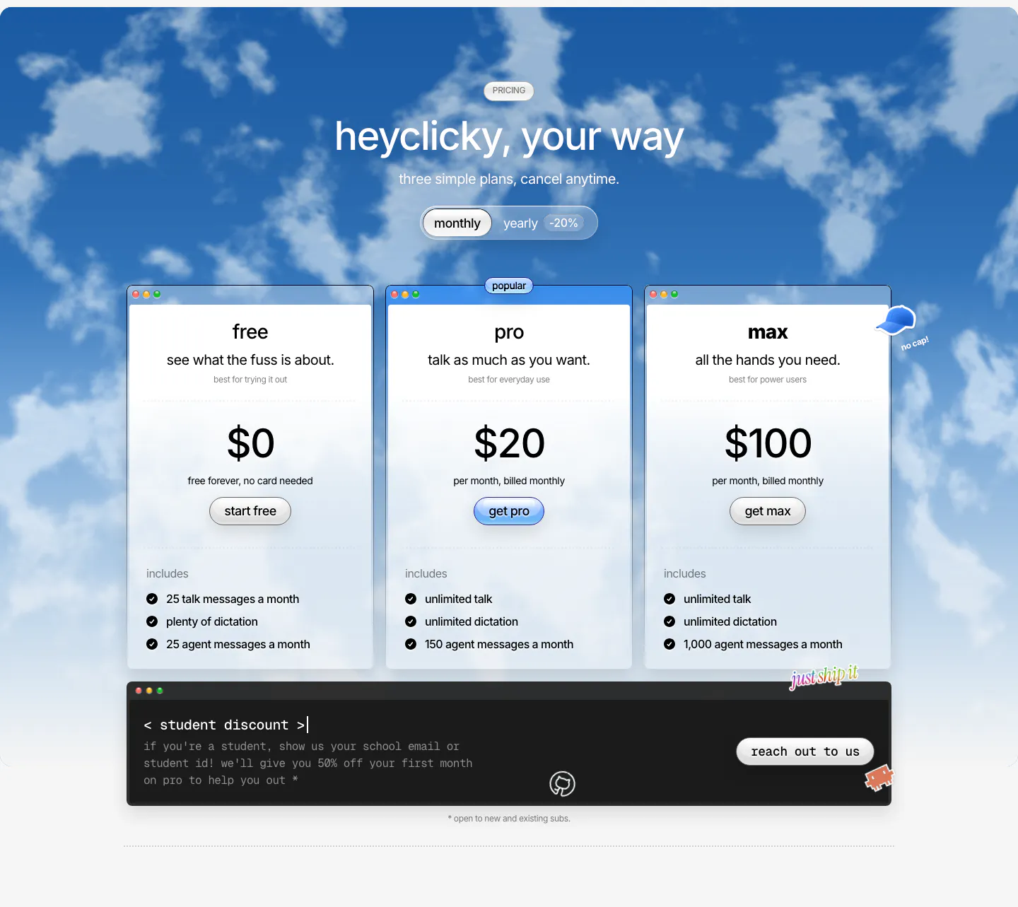
  149. heyclicky pricing section: three plan cards with monthly/yearly toggle over a blue cloudy sky photo, dark student discount bar below
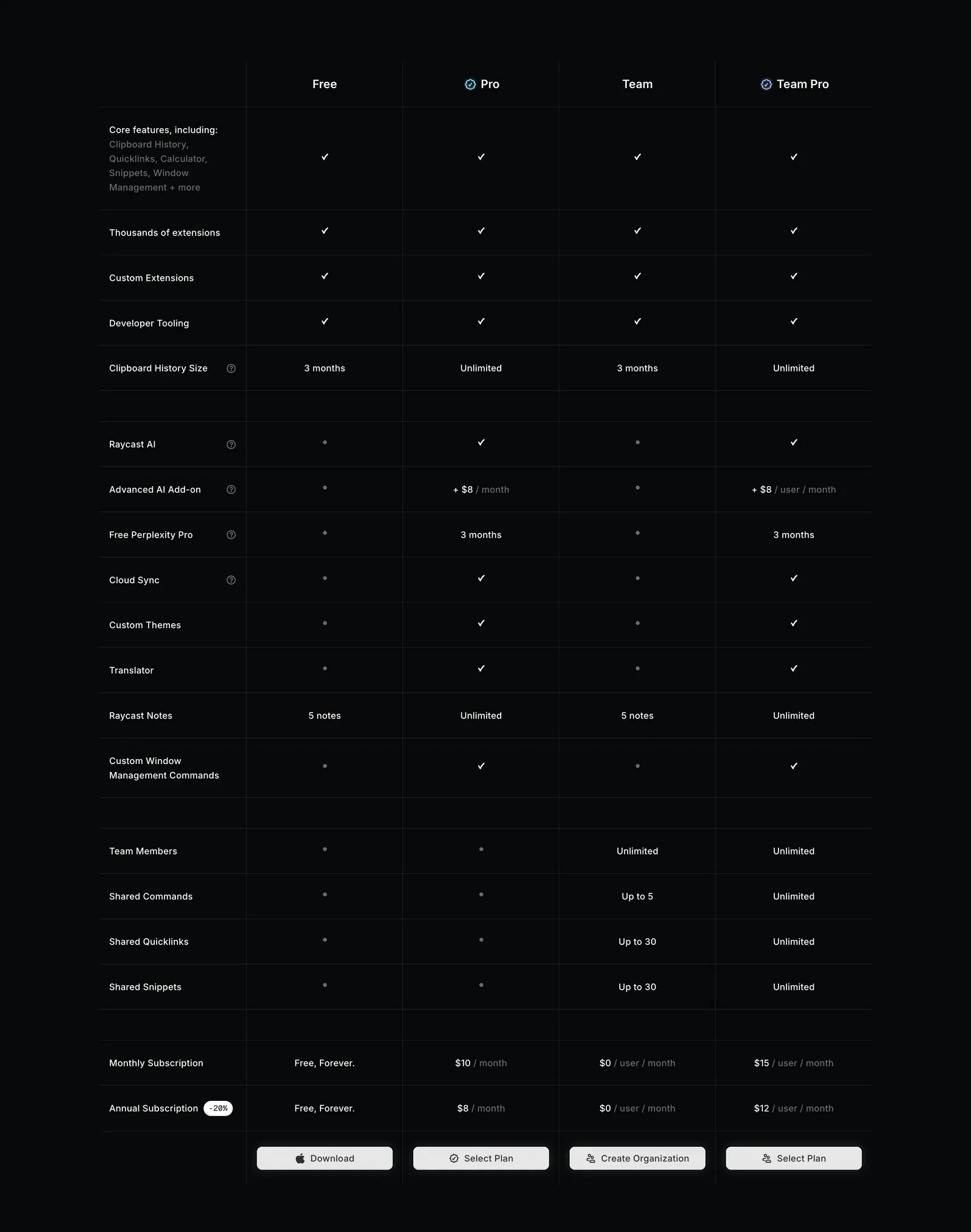
  150. Raycast pricing section: four-plan feature comparison table with checkmarks, limits and select buttons on a near-black background
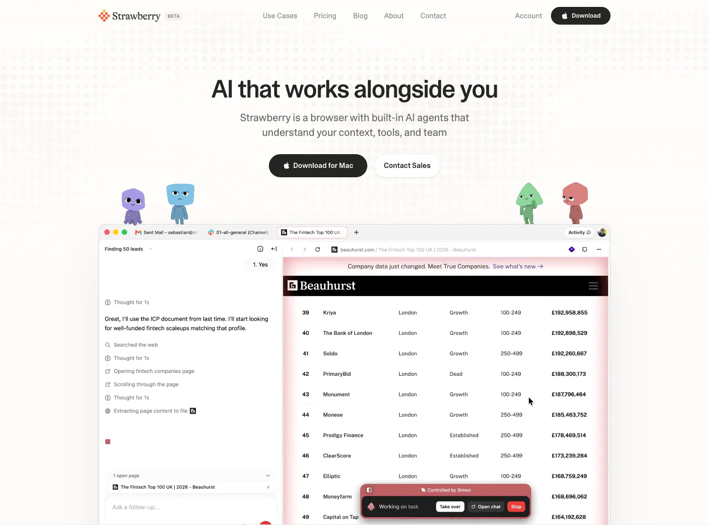
  151. Strawberry hero section: centered headline and buttons, cartoon characters perched on a browser screenshot showing an AI agent task
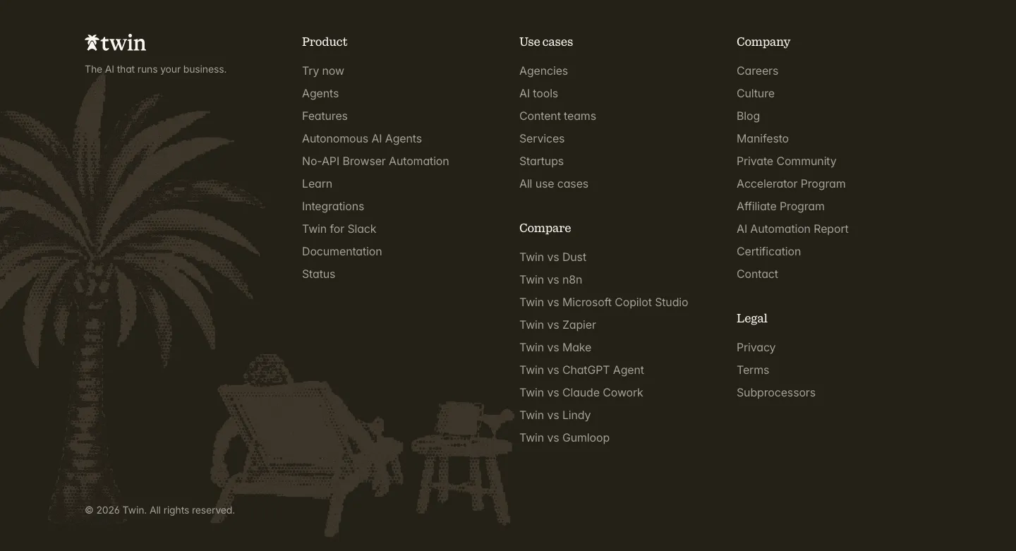
  152. Twin footer section: logo and link columns beside a dithered palm tree and beach chair illustration on a dark brown background
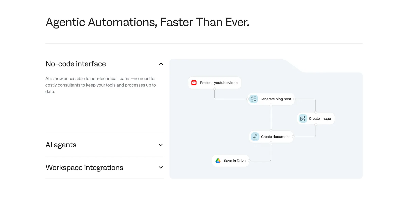
  153. Noxus features section: accordion of feature titles on the left beside a light blue workflow diagram panel on a white background
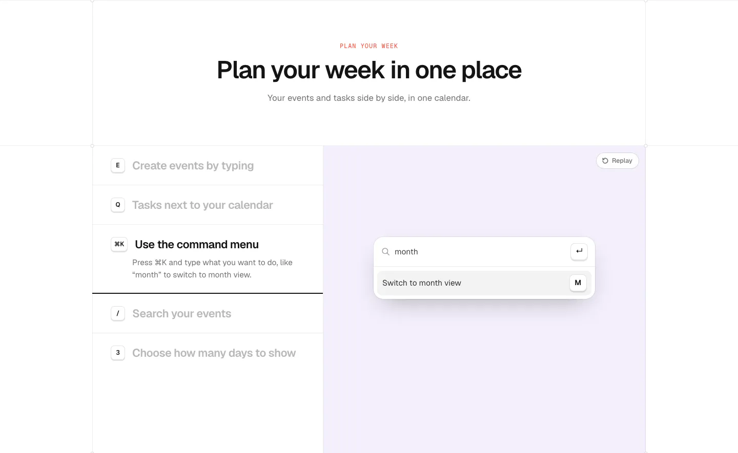
  154. time.fyi features section: centered header above a shortcut feature list on the left and a lavender panel with a command menu UI
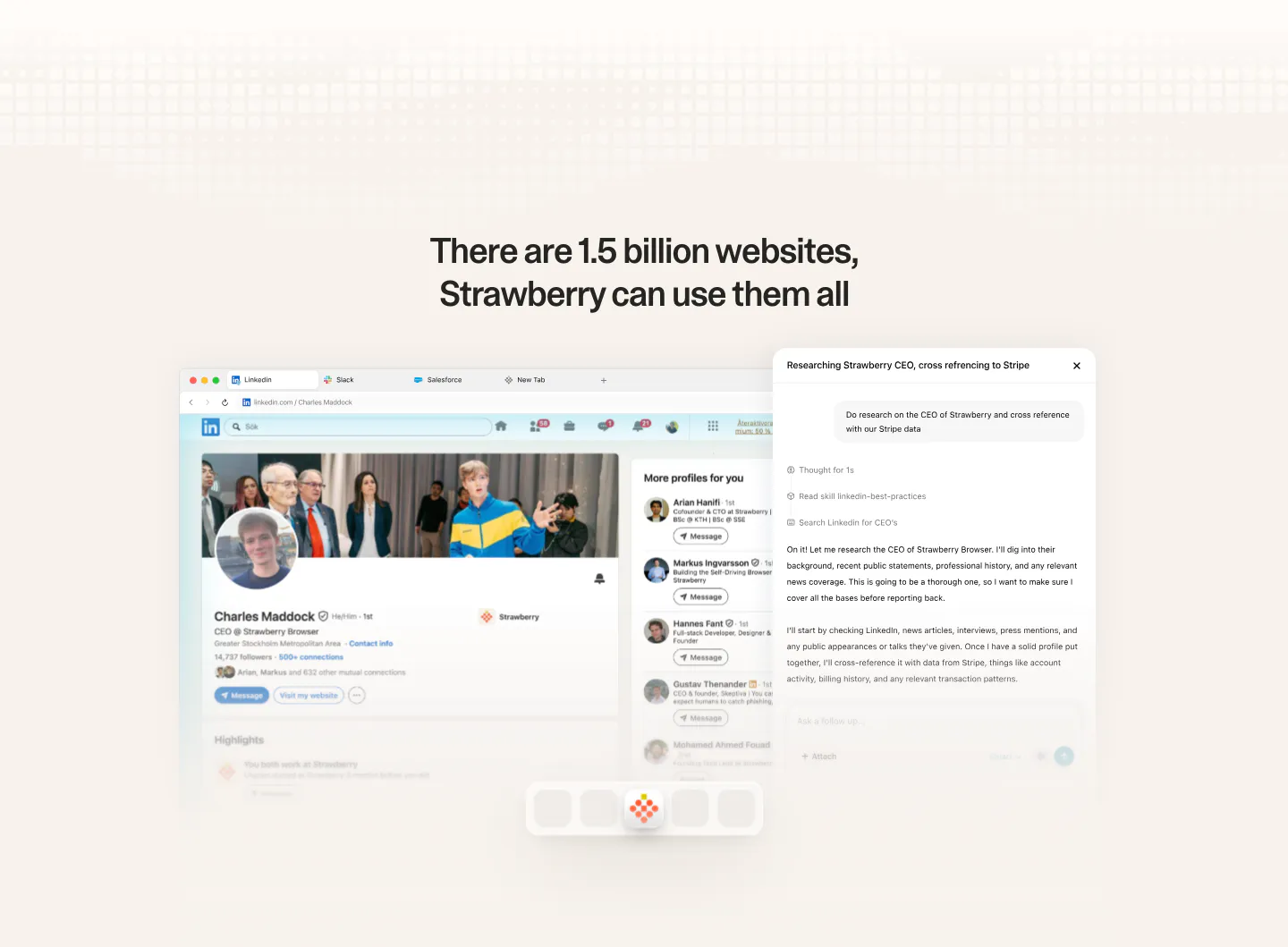
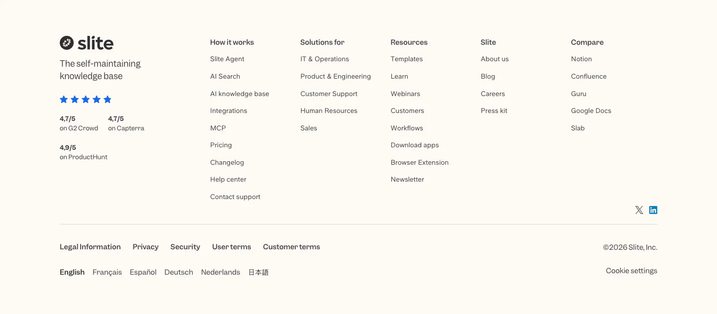
  155. Strawberry features section: centered headline above a browser screenshot of a LinkedIn profile with an AI research chat panel
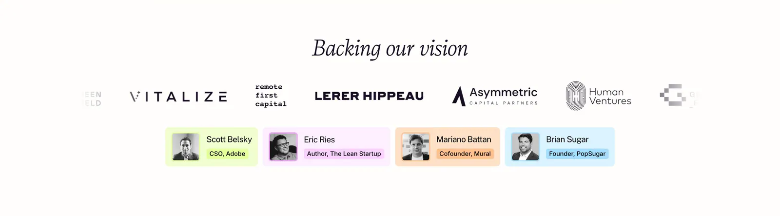
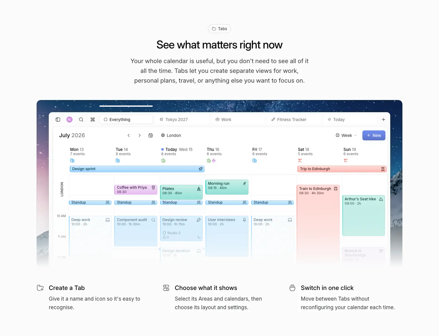
  156. Plumb logo cloud section: italic serif heading above investor logos fading at the edges and four pastel angel investor cards with headshots
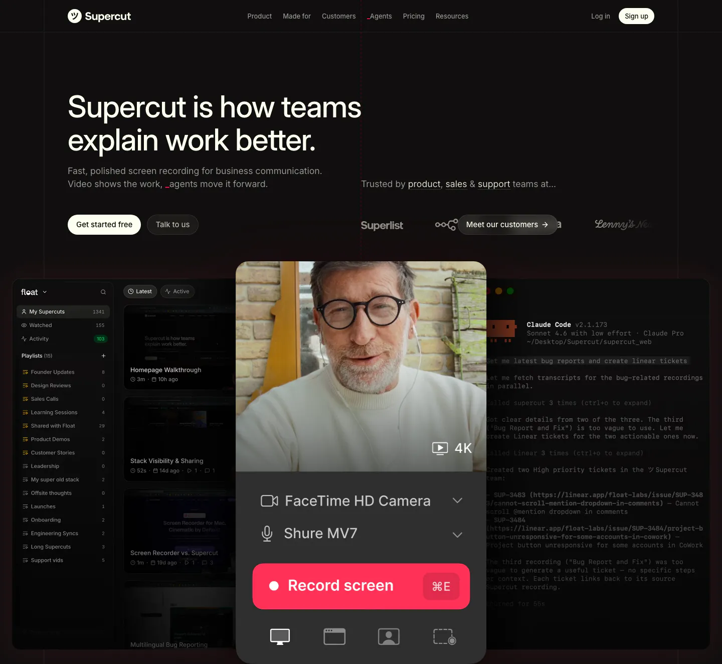
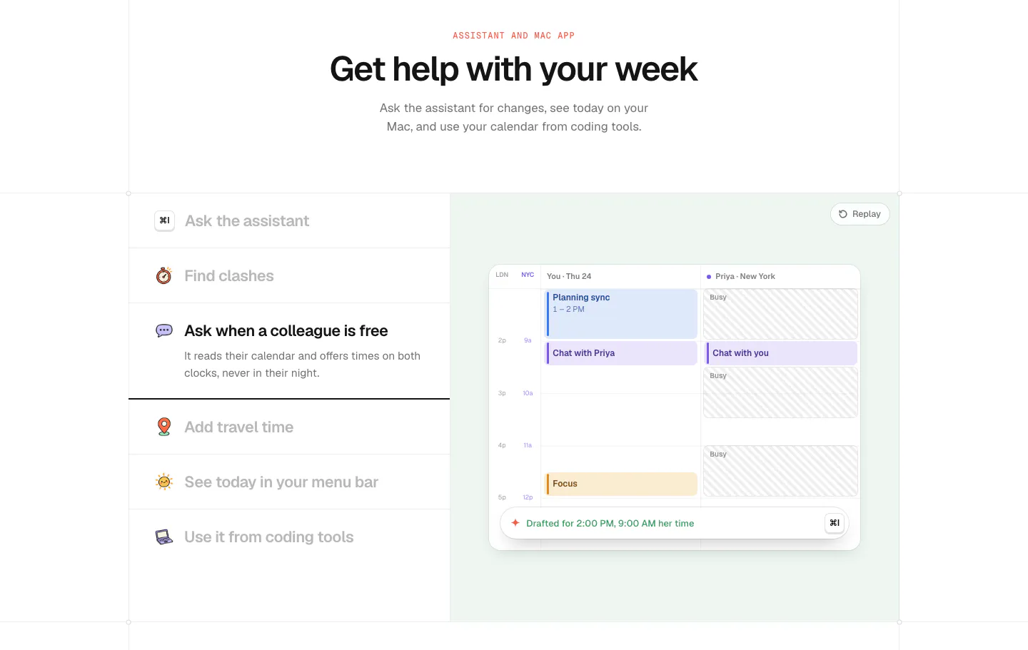
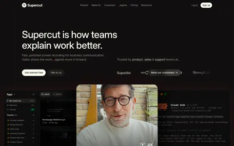
  157. Supercut hero section: left-aligned headline with two buttons and customer logos above a recorder panel with webcam video over app UI
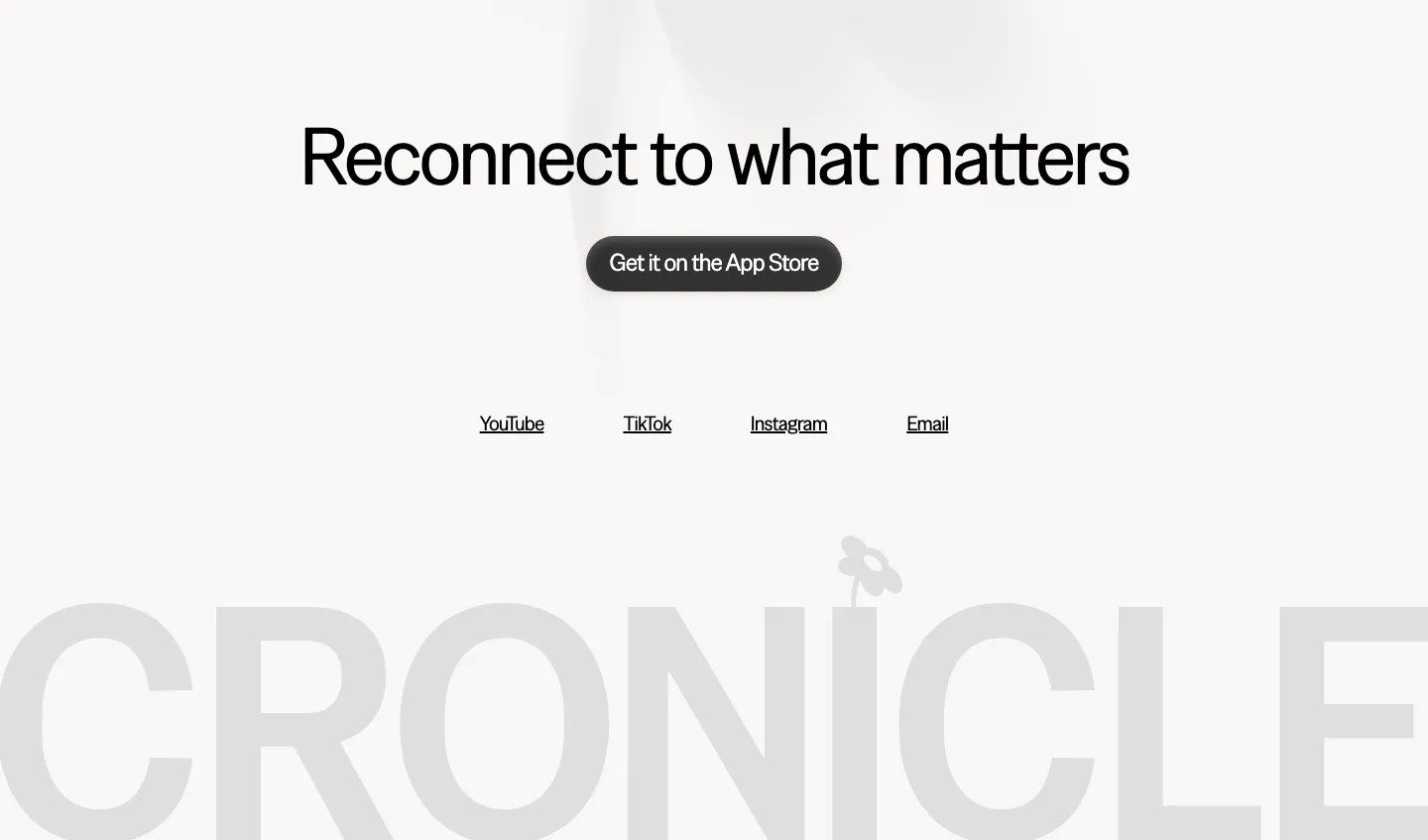
  158. Cronicle footer section: centered headline with an App Store button and social links above a giant faded gray CRONICLE wordmark
    Cronicle Footer
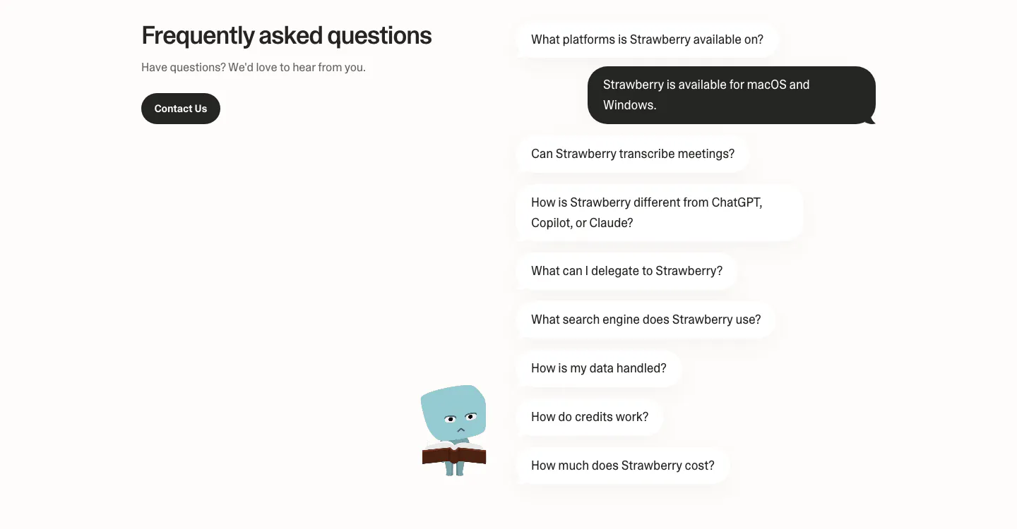
  159. Strawberry FAQ section: headline and contact button on the left, questions as chat bubbles with one dark answer and a character
  160. Slite footer section: logo, tagline and review ratings beside five link columns, legal links, language list and copyright on cream
  161. Daybridge features section: centered headline above a week-view calendar screenshot on a night sky image and three feature columns
  162. time.fyi features section: centered header above an assistant feature list on the left and a mint panel with a shared calendar UI
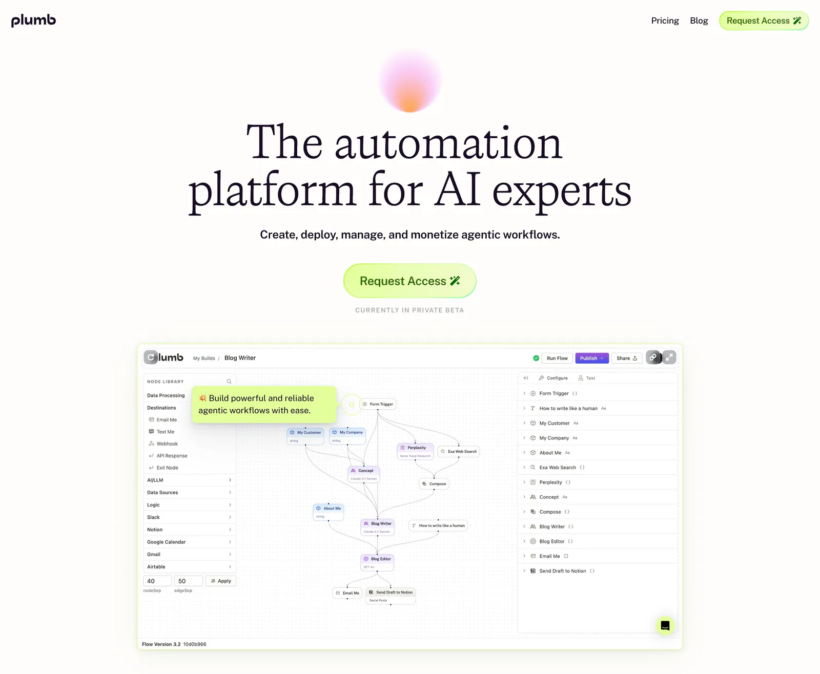
  163. Hellotime logo cloud section: centered caption above a single row of four black agency logos on a white background
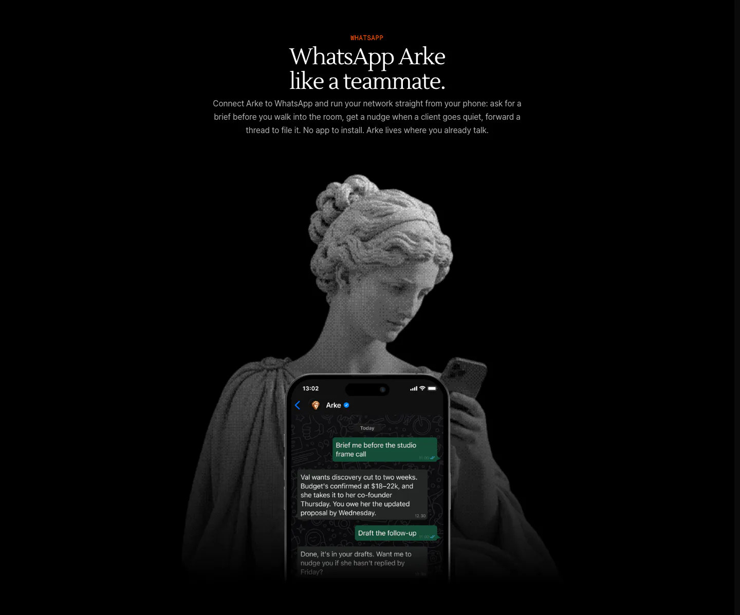
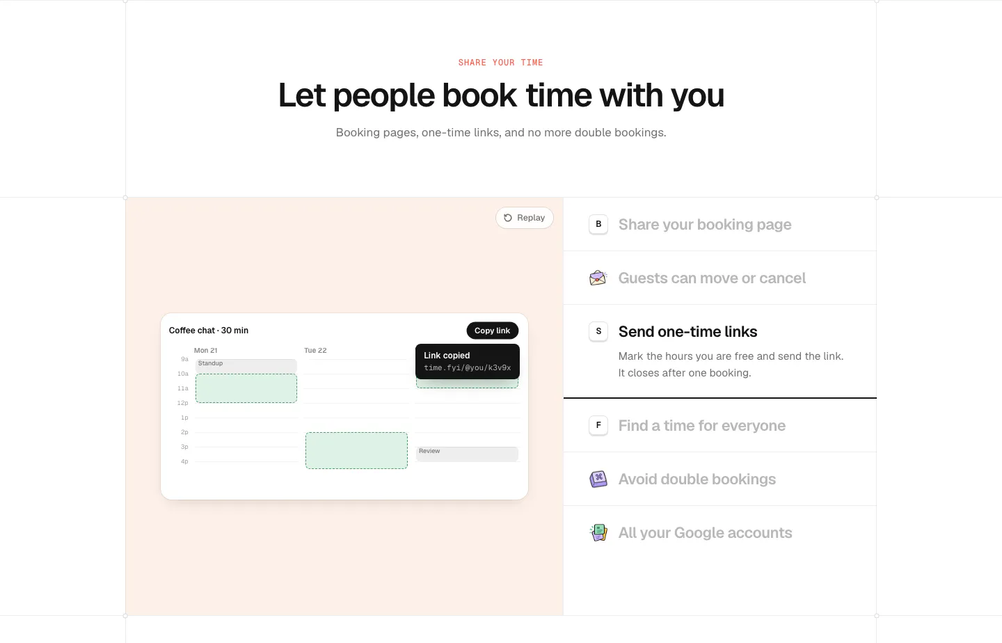
  164. Arke features section: centered serif headline above a halftone marble statue holding a phone showing a WhatsApp chat with Arke
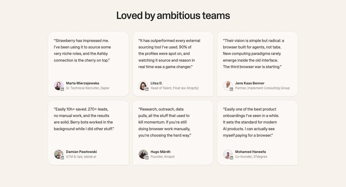
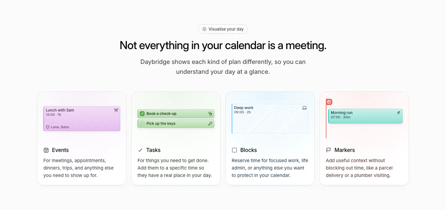
  165. Strawberry testimonials section: centered headline over a 3x2 grid of rounded quote cards with avatars on a cream background
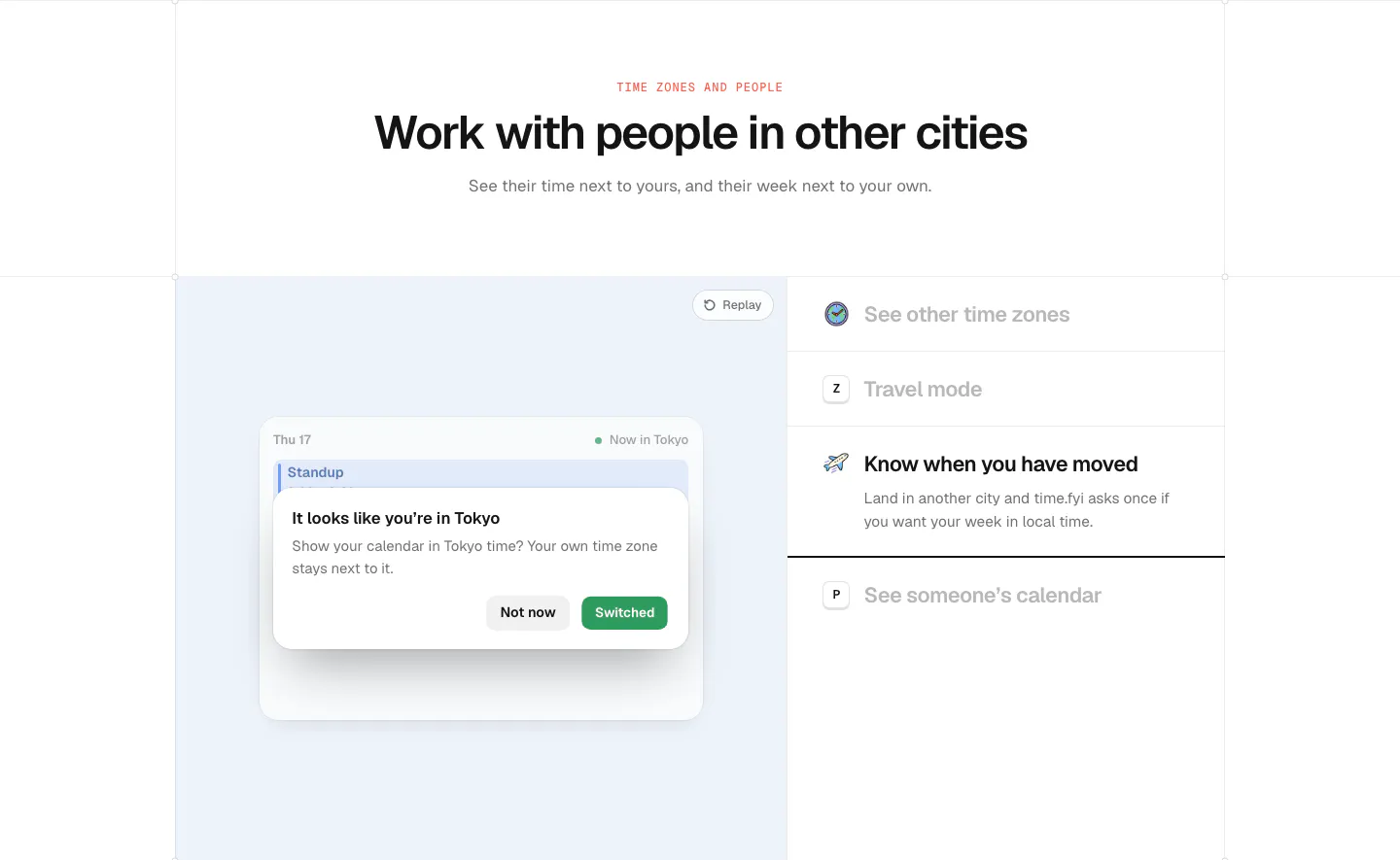
  166. time.fyi features section: centered header above a light blue panel with a time zone prompt UI and a feature list on the right
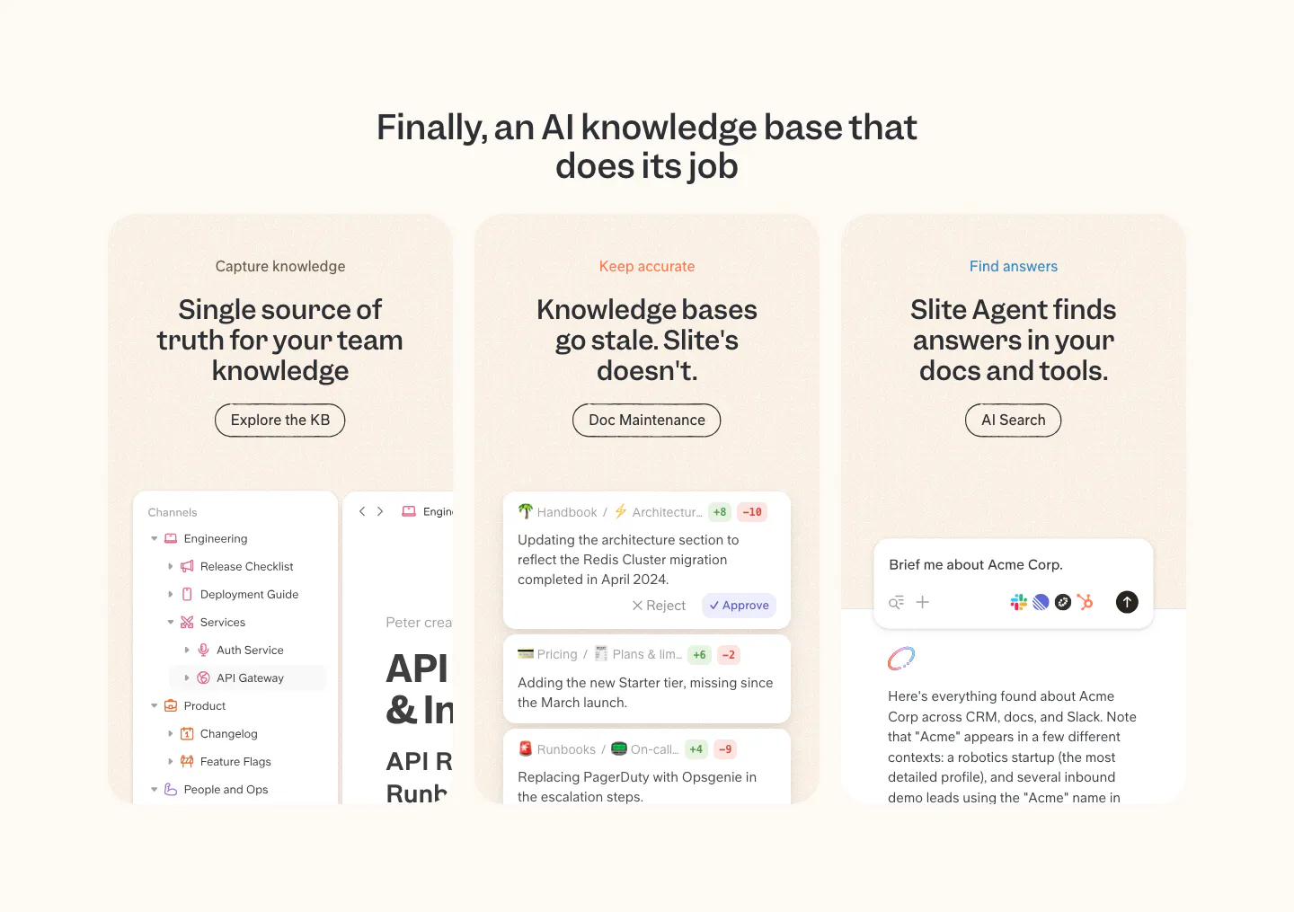
  167. Slite features section: centered headline over three peach cards for capture, accuracy and search, each with a product UI snippet
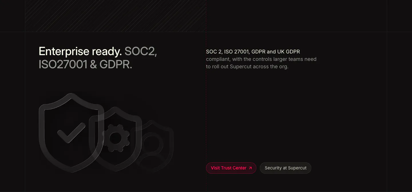
  168. Supercut security section: two-tone headline at left, compliance copy at right, outlined shield icons and Trust Center buttons
  169. Plumb hero section: centered serif headline under a soft gradient orb with lime Request Access button above a workflow builder screenshot
  170. time.fyi features section: centered header above a peach panel with a booking calendar UI and a feature list on the right
  171. Daybridge features section: centered headline above four equal cards for events, tasks, blocks and markers with UI snippets
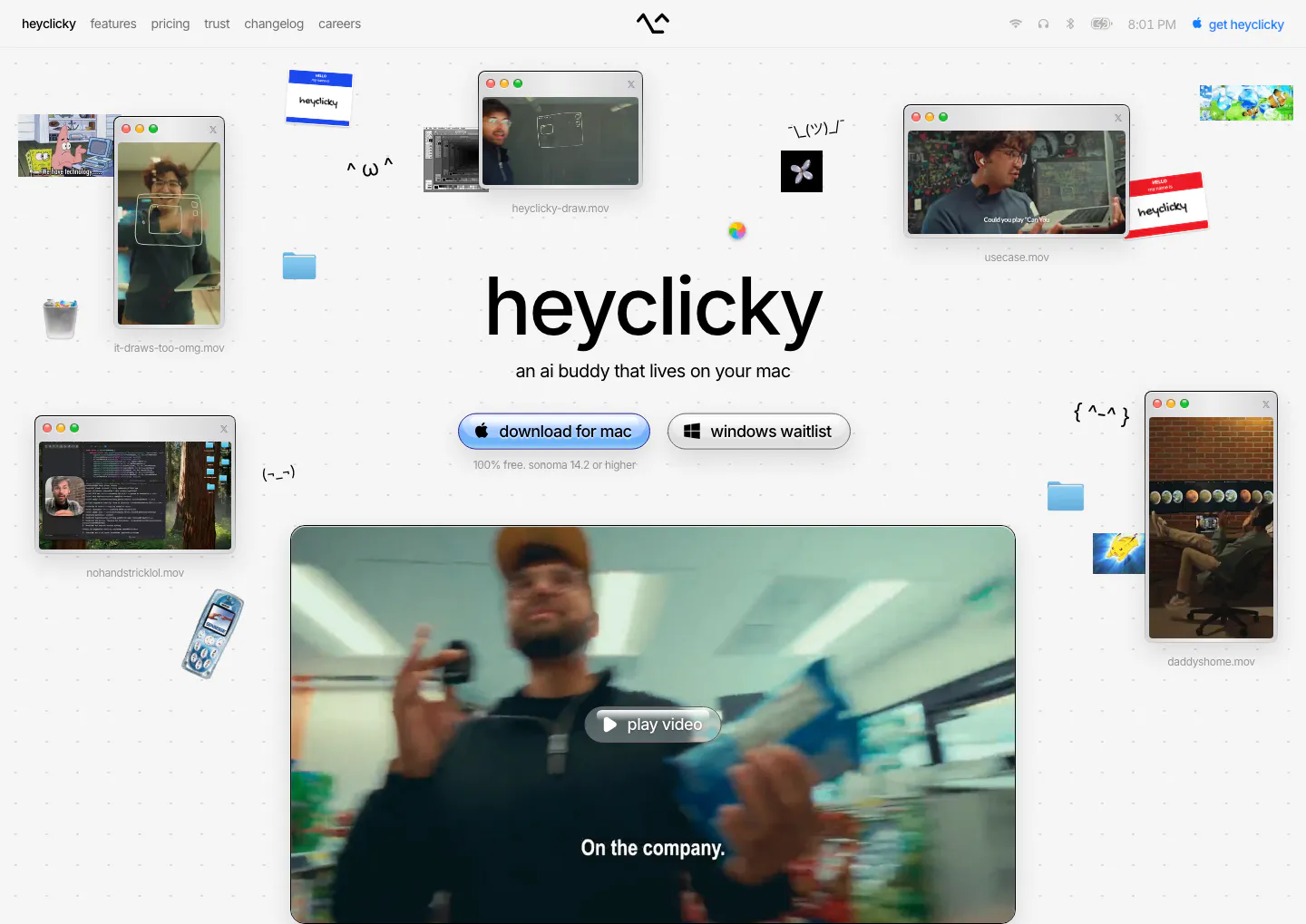
  172. heyclicky hero section: centered wordmark headline with download buttons, scattered mac video windows and stickers around a large video player
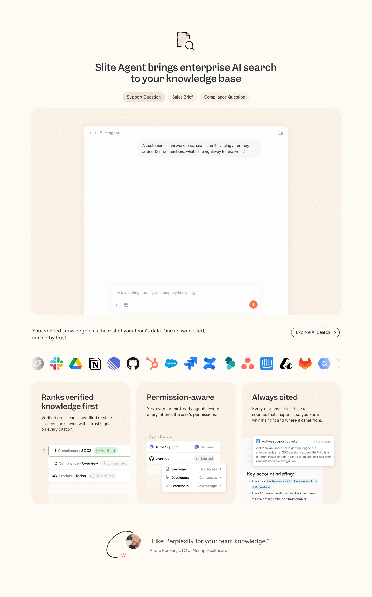
  173. Slite features section: tabbed AI search chat mockup, app icon row, three capability cards with UI snippets and a short customer quote
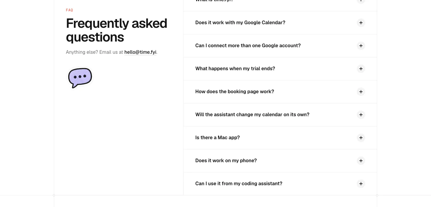
  174. time.fyi FAQ section: left headline with email contact and chat bubble icon beside a right-hand accordion of collapsed questions
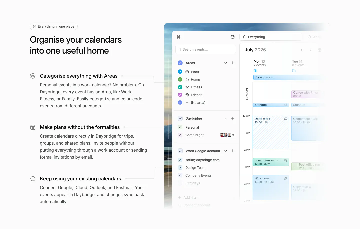
  175. Daybridge features section: headline and three icon-led feature points on the left, calendar app screenshot with areas sidebar right
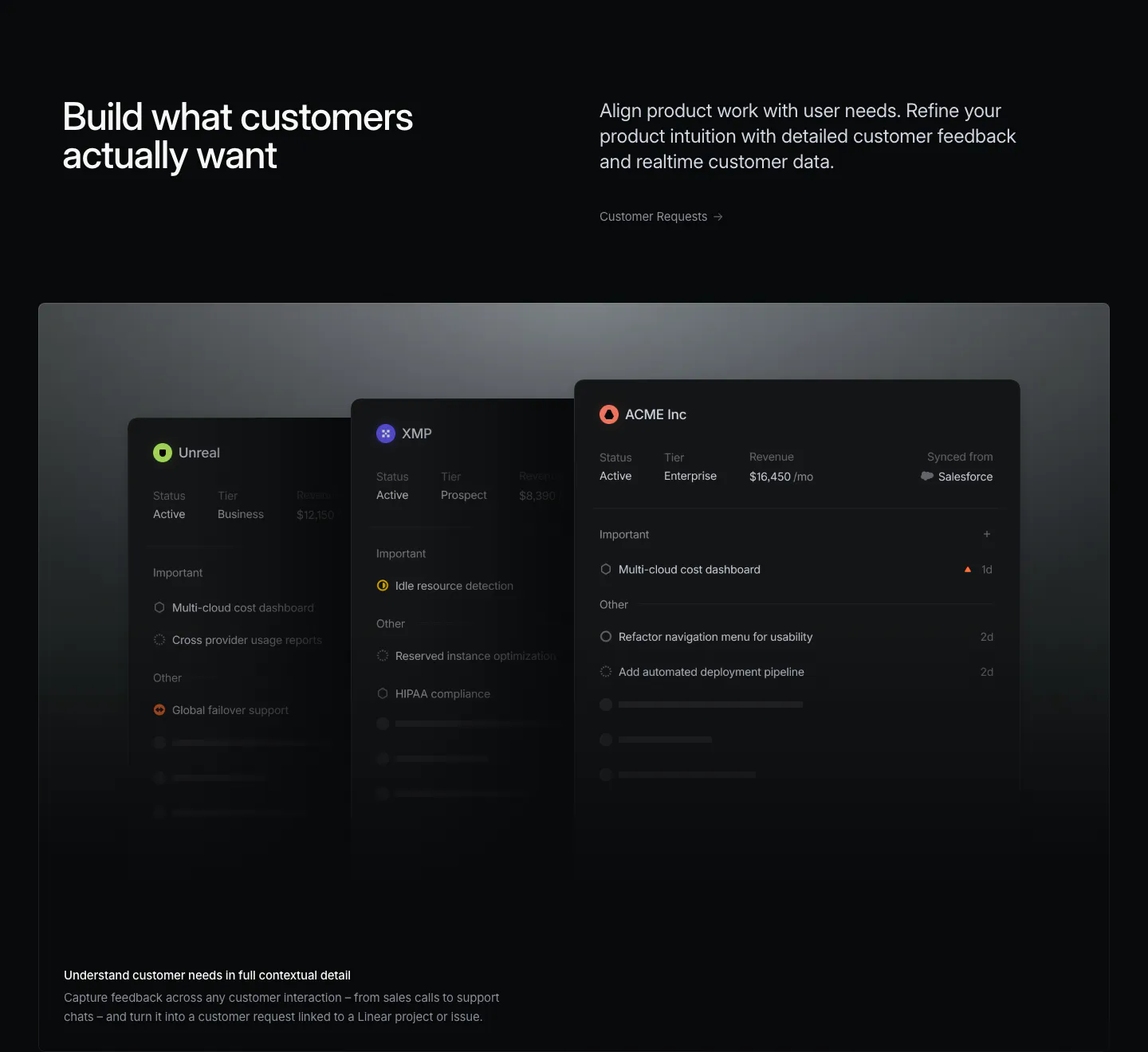
  176. Linear features section: headline left, short copy and link right, above a wide panel of stacked dark customer request cards on near-black
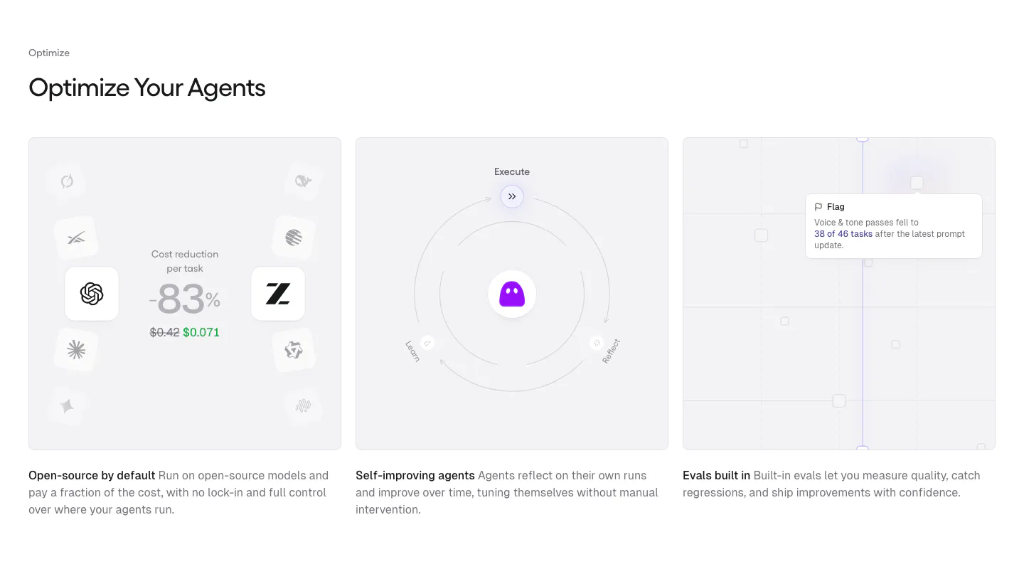
  177. Gumloop features section: left-aligned heading above three equal gray cards with cost, self-improving and evals visuals
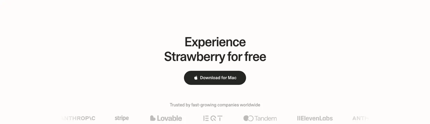
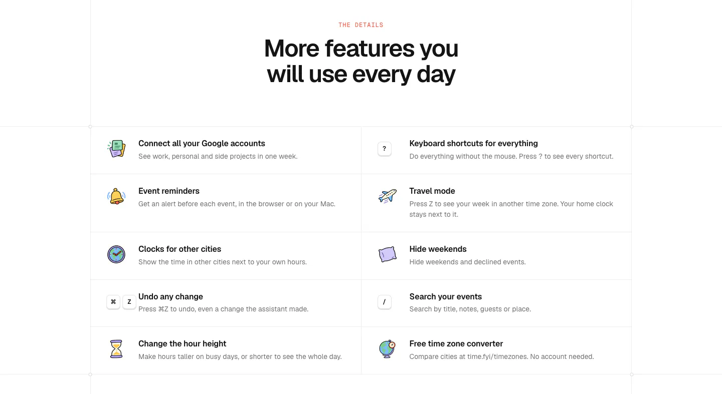
  178. Strawberry call to action section: centered headline and dark download button above a faded customer logo strip
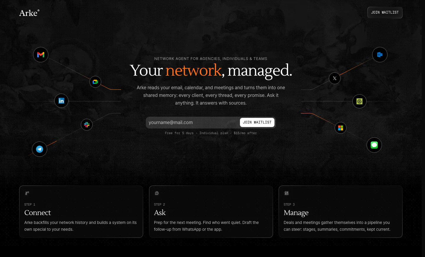
  179. Arke hero section: centered serif headline with email waitlist field, orbiting app icons and three step cards on a dark textured background
  180. Linear footer section: dark footer with a logo mark, five link columns and a row of legal links
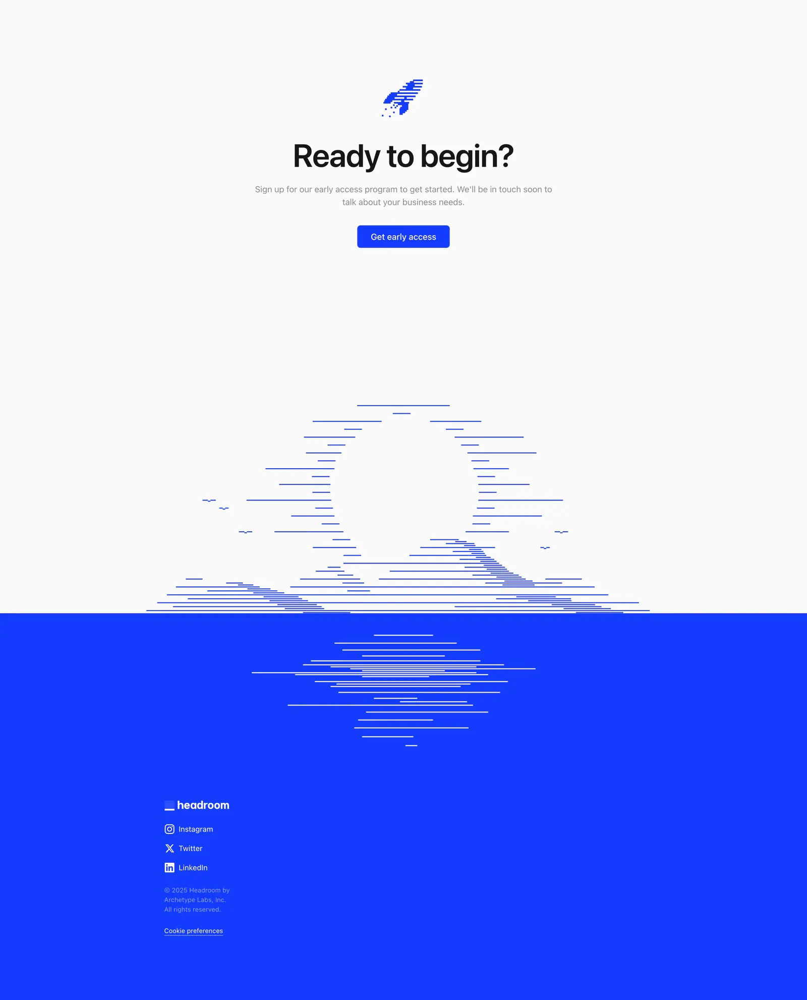
  181. Headroom footer section: centered call-to-action above a line-art sunset that meets a bright blue footer with logo and social links
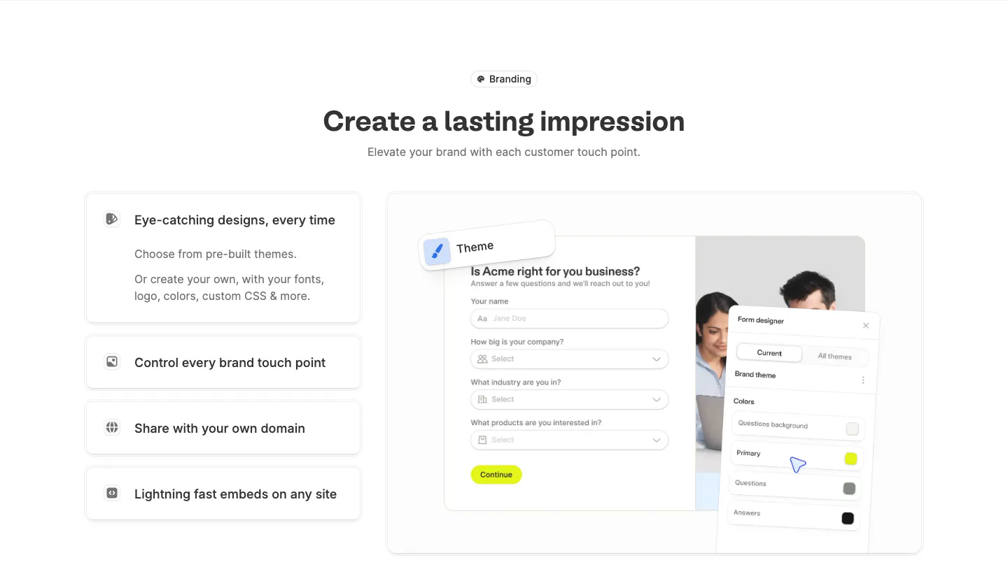
  182. Fillout features section: centered heading above stacked feature cards on the left and a branded form with a theme designer panel on the right
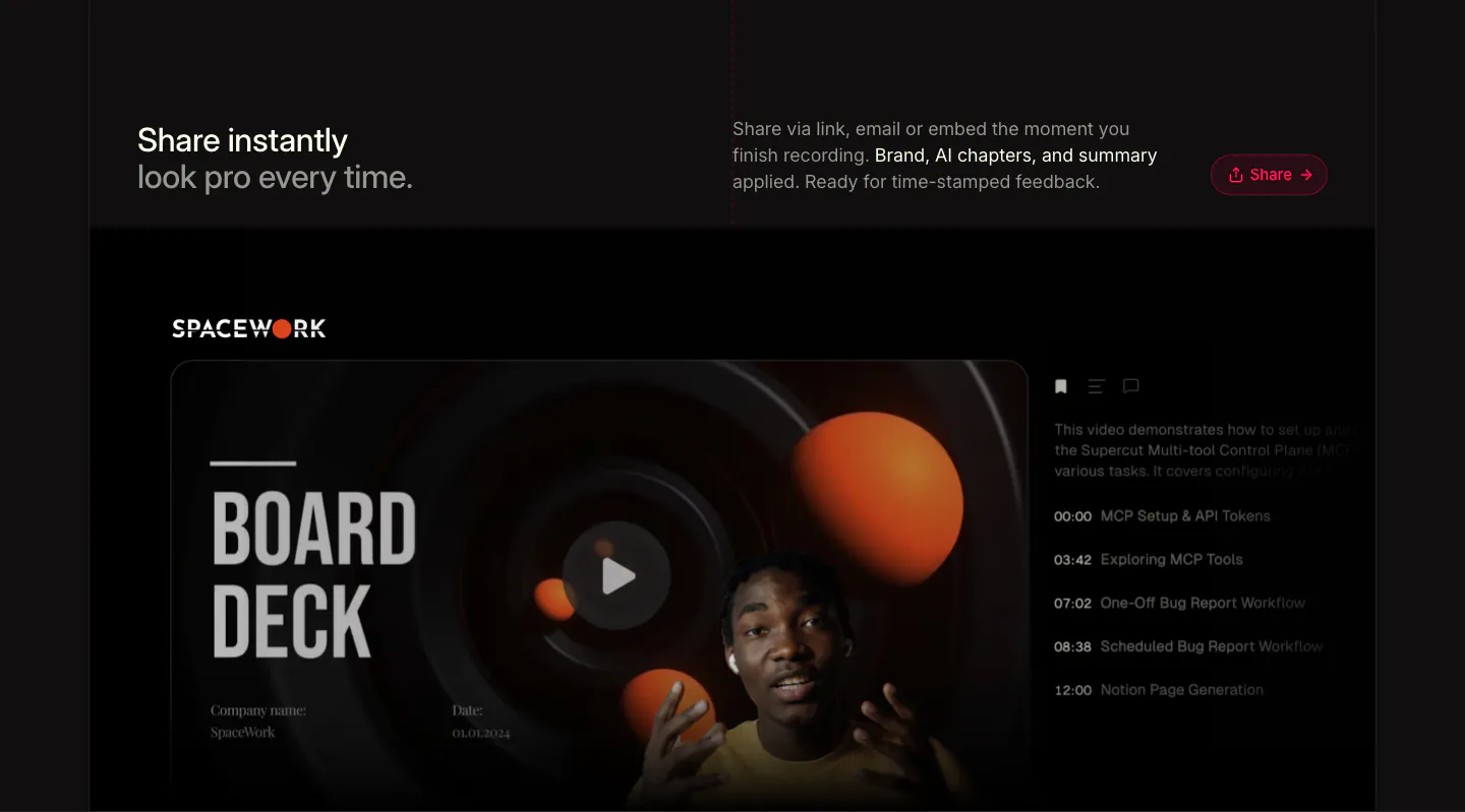
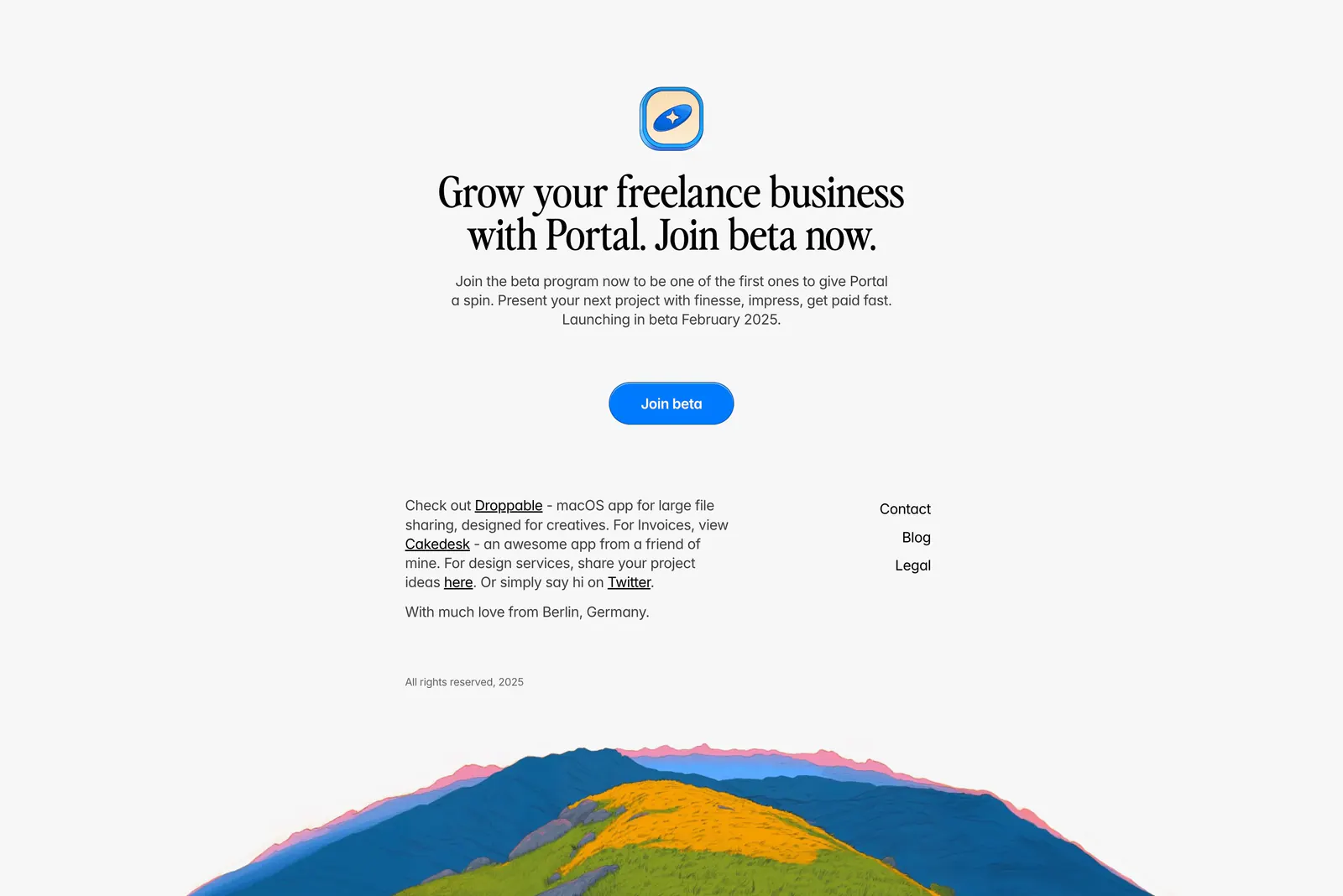
  183. Supercut features section: headline row with Share button above a branded video player showing a Board Deck slide and chapter list
  184. time.fyi features section: centered headline above a two-column grid of ten features with colorful hand-drawn icons
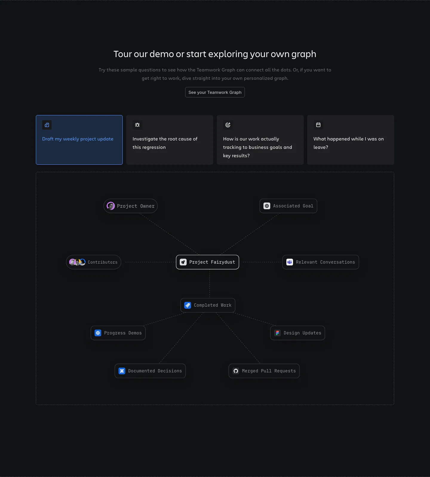
  185. Atlassian features section: centered heading, four selectable prompt cards and a project node graph in a dashed frame on dark
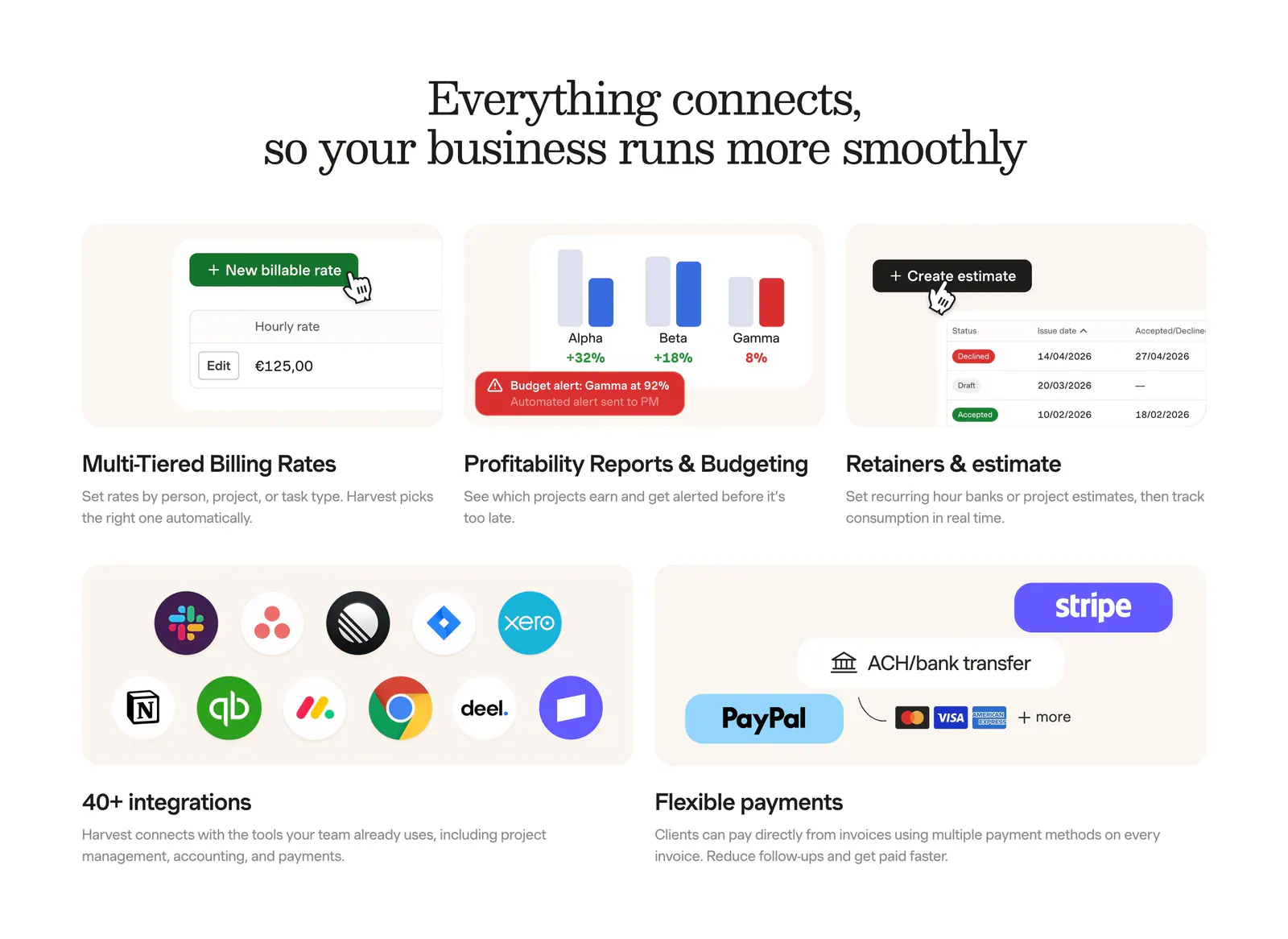
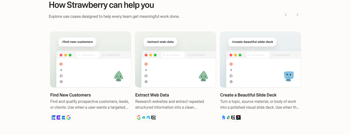
  186. Harvest integrations section: serif headline above a bento grid of billing, reporting and estimate UI tiles plus app-icon and payment tiles
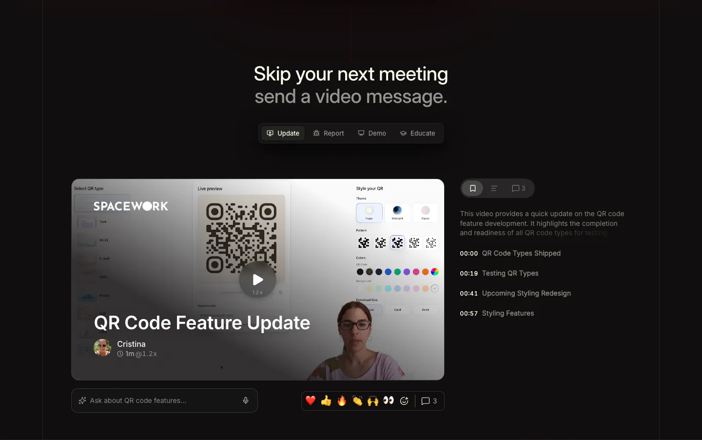
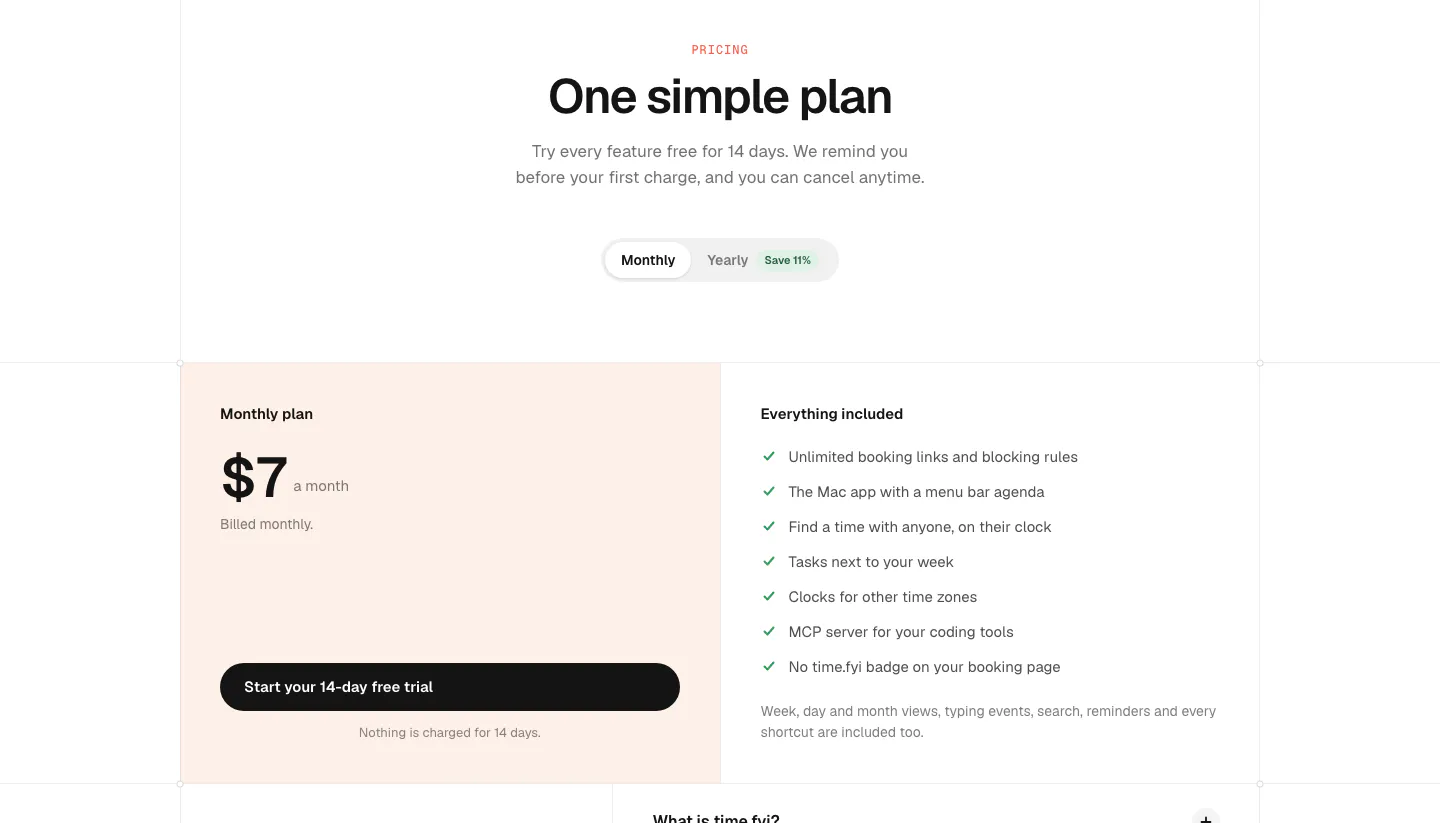
  187. Supercut use cases section: centered headline with Update, Report, Demo, Educate tabs above a video message player with chapter list
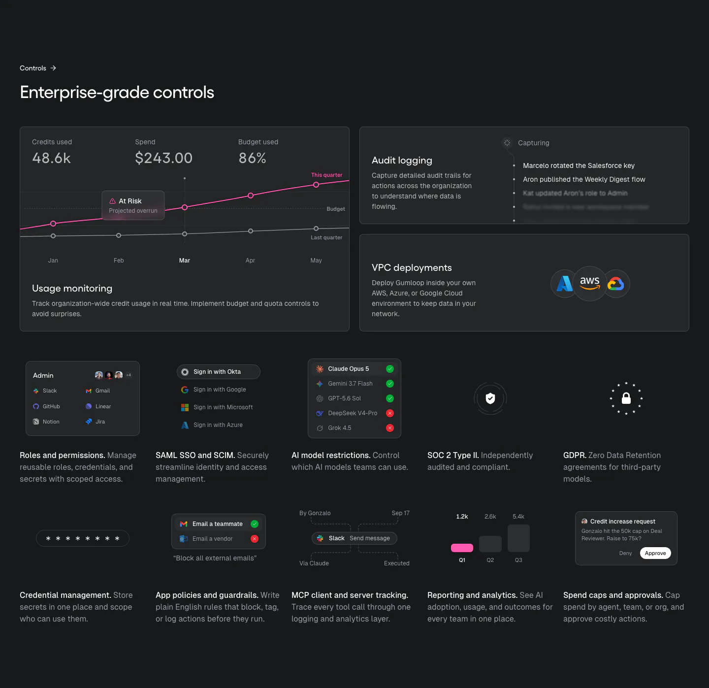
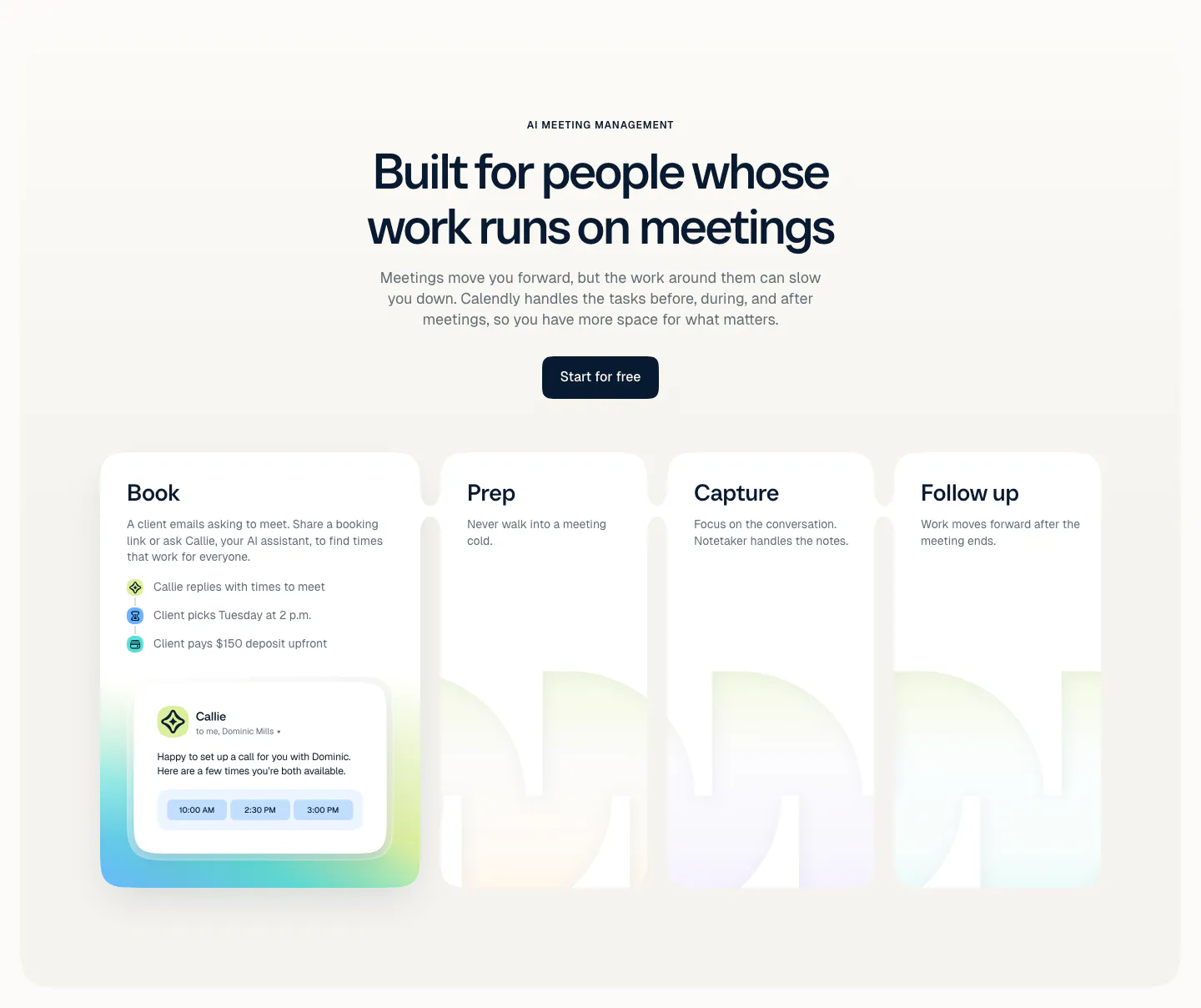
  188. Gumloop security section: dark bento of usage chart, audit log and VPC cards above a grid of small control tiles
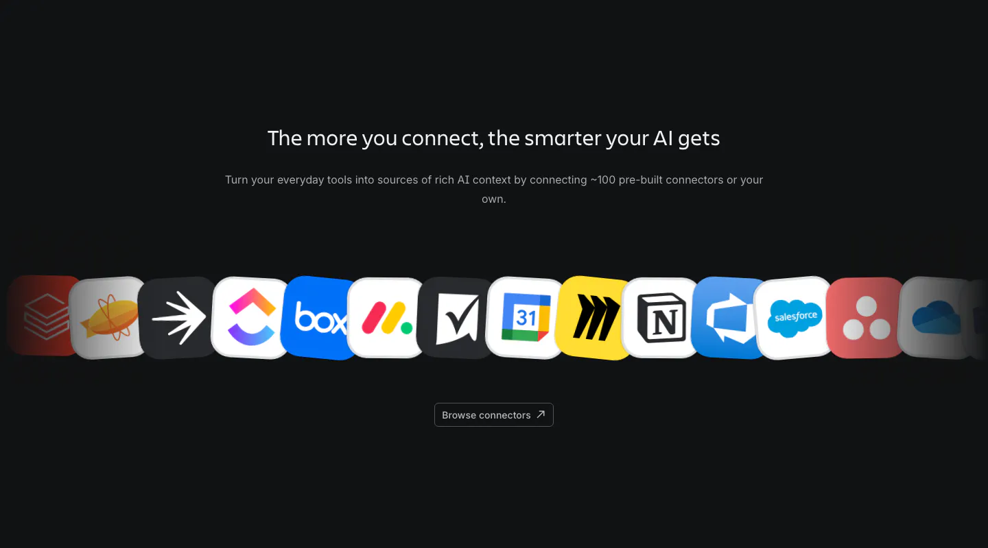
  189. Portal footer section: centered serif join-beta headline and blue button above small link columns and a painted hillside illustration
  190. Daybridge call-to-action section: centered one-line headline with primary and secondary buttons over faint grid lines
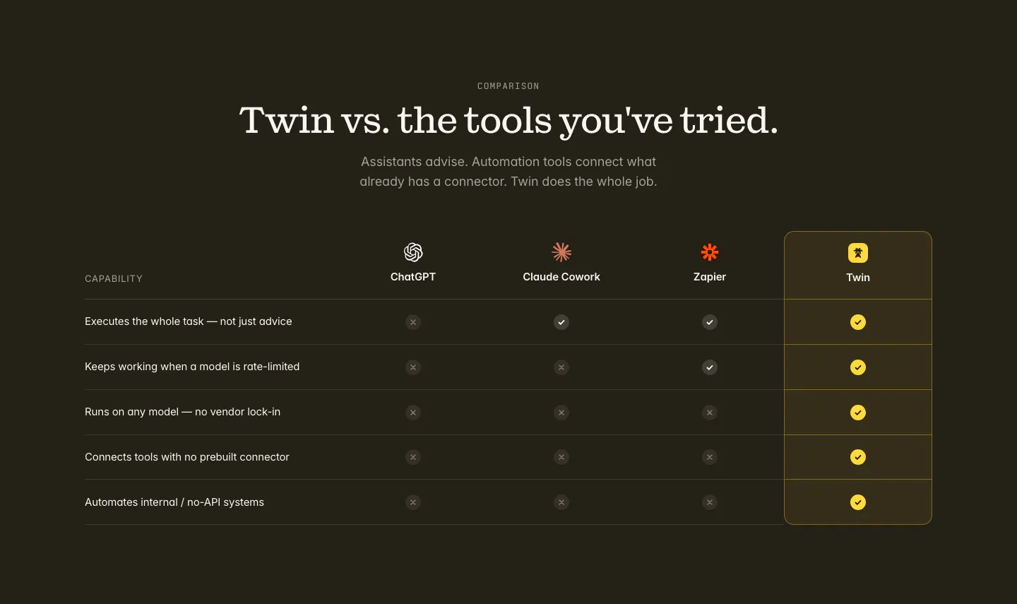
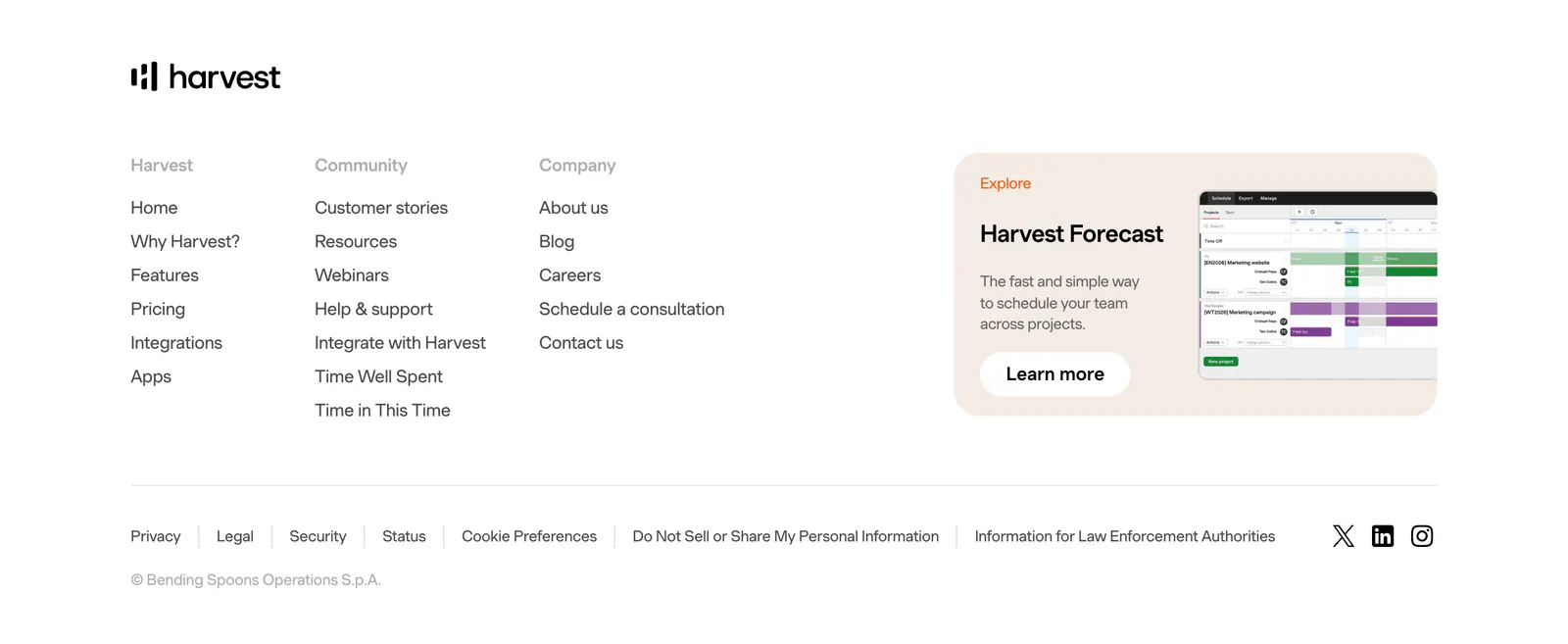
  191. Twin comparison section: centered serif headline above a check and cross table versus ChatGPT, Claude Cowork and Zapier on dark
  192. Strawberry use cases section: three use case cards with mini browser mockups, characters and tool icons, with slider arrows
  193. time.fyi pricing section: centered header with monthly/yearly toggle above a single $7 plan card on peach and an included-features list
  194. Calendly features section: centered headline and button above four cards for Book, Prep, Capture and Follow up with a scheduling UI card
  195. Atlassian integrations section: centered heading and copy above a curved row of connector app icons and a browse button on dark
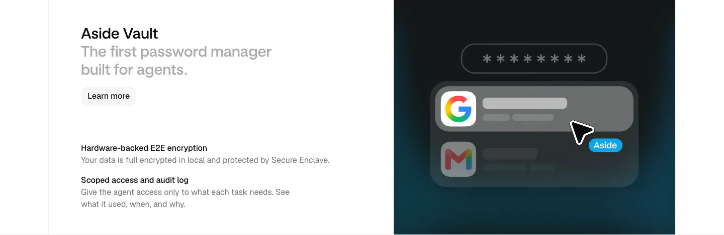
  196. Aside features section: heading and two feature notes at left beside a dark panel with a password field and autofill UI
  197. Harvest footer section: logo above three link columns beside a Harvest Forecast promo card with screenshot, legal links and social icons
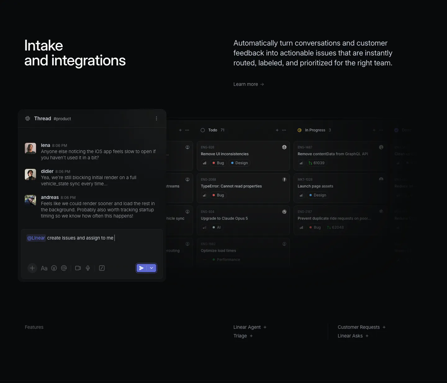
  198. Linear features section: dark headline and copy above a Slack thread overlapping a kanban board screenshot, feature links below
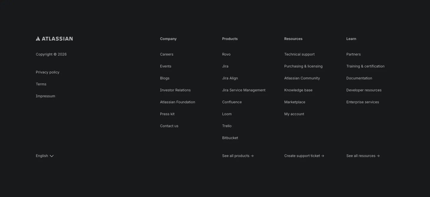
  199. Atlassian footer section: Atlassian logo, legal links and four link columns with a language selector on a dark background
  200. Strawberry footer section: logo and copyright on the left, four link columns on the right, legal links row on a cream background
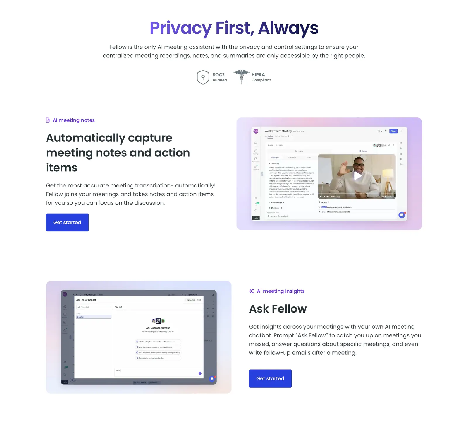
  201. Fellow features section: centered privacy headline with SOC2 and HIPAA badges above alternating rows of text and app screenshots
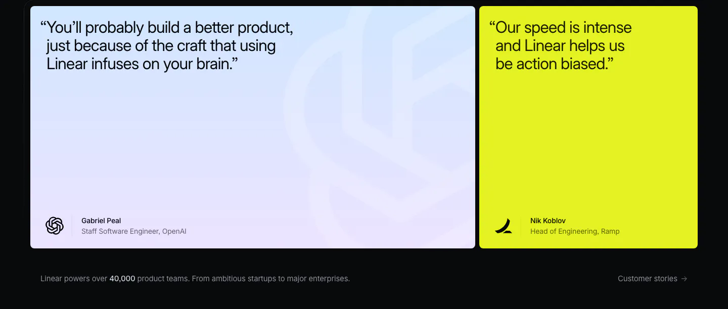
  202. Linear testimonials section: dark background with a large blue-lavender gradient quote card and a lime quote card, caption below
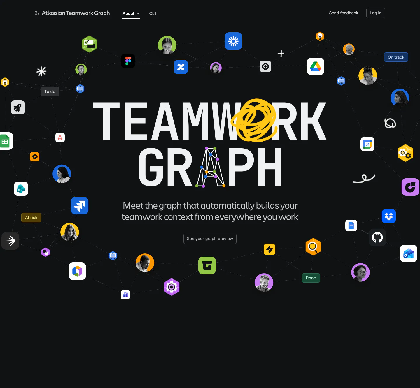
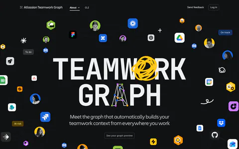
  203. Atlassian hero section: huge centered TEAMWORK GRAPH headline with doodles, ringed by app icons and avatars linked by graph lines on dark
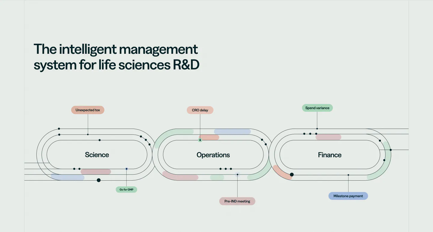
  204. Orchestra Bio features section: headline above a line diagram of three linked loops for science, operations and finance with labels
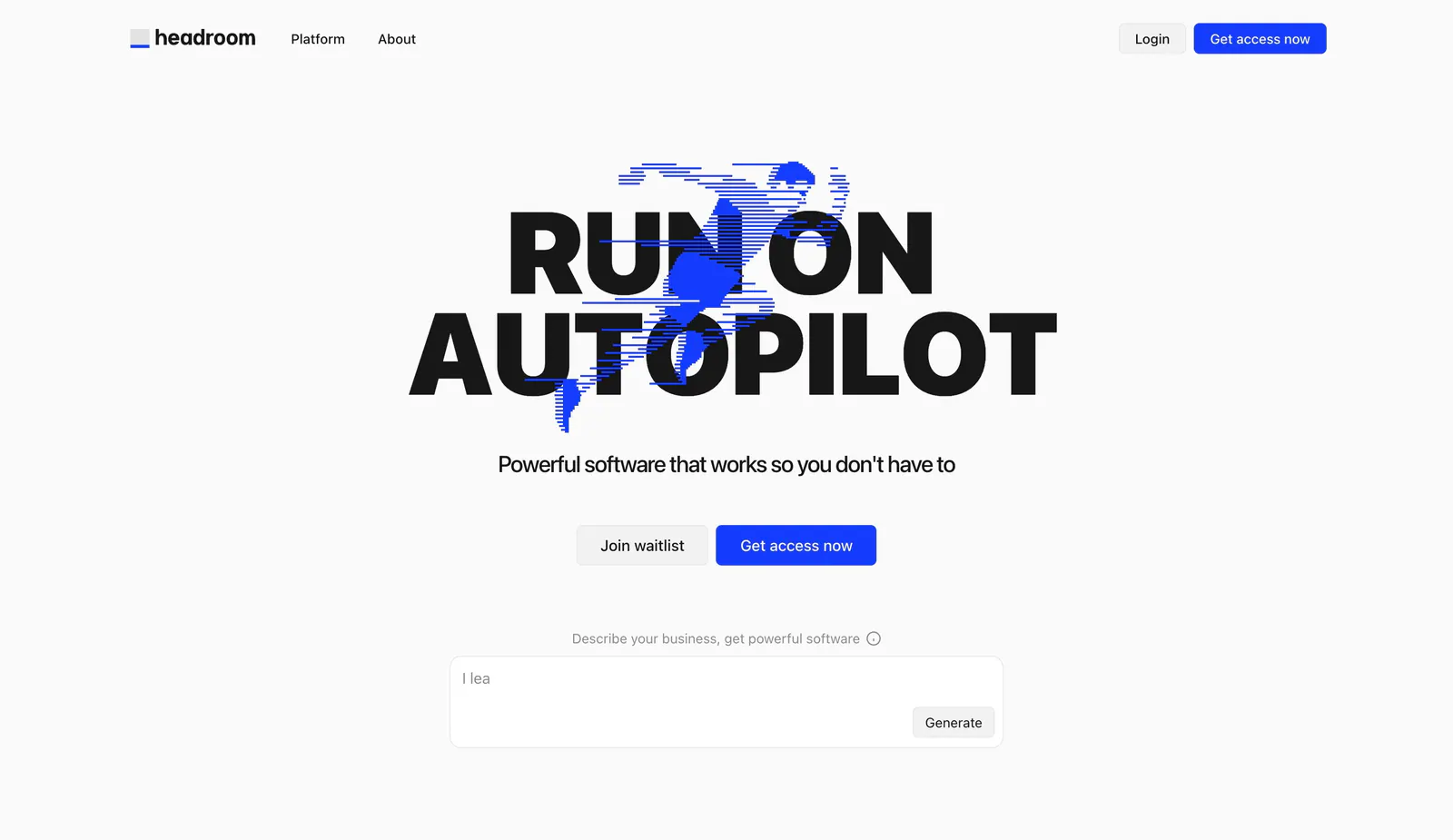
  205. Headroom hero section: huge black uppercase headline over a blue line-art runner, two buttons and a prompt text box below
  206. Aside footer section: five link columns, copyright line and small social icons on white
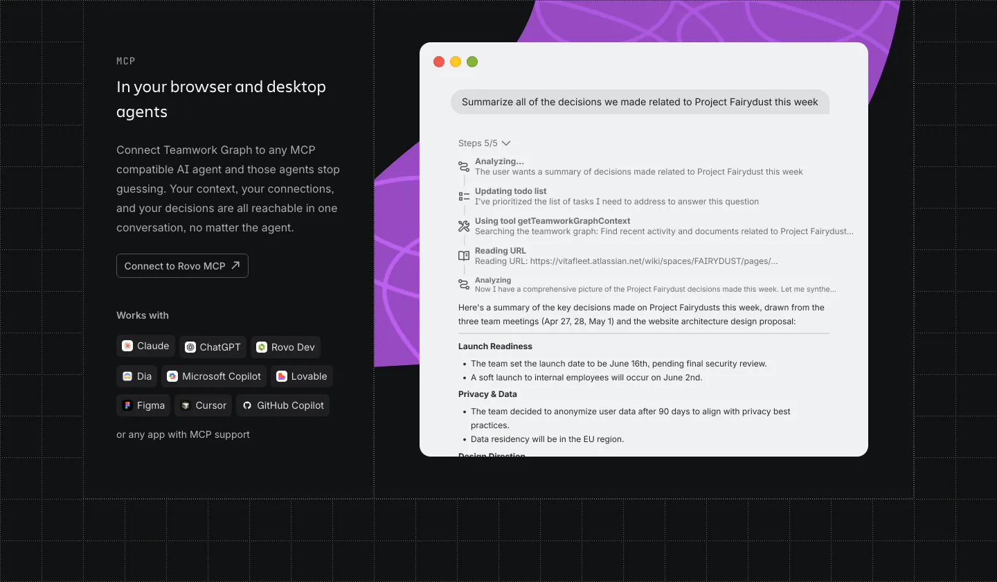
  207. Atlassian features section: MCP copy, button and agent chips on the left, chat UI window over a purple shape on the right, dark grid
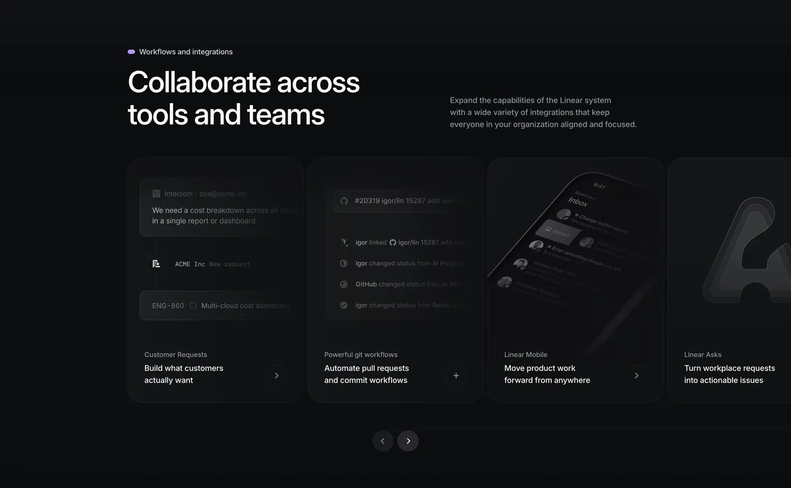
  208. Linear integrations section: heading with side copy above a carousel of dark cards for requests, git workflows, mobile and Asks, with arrows
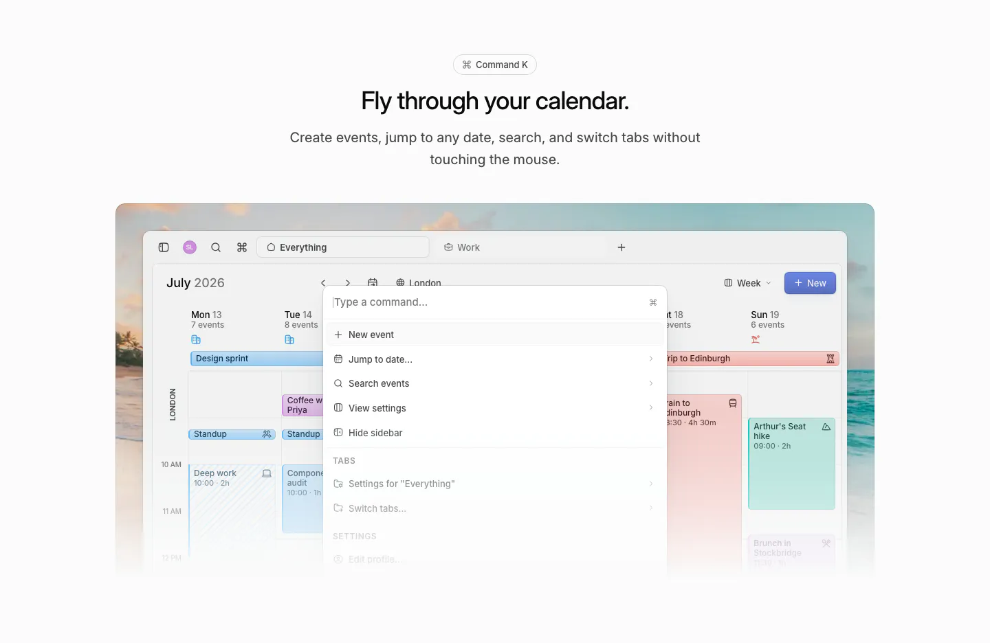
  209. Daybridge features section: centered headline above a calendar screenshot with a command palette open, on a beach photo

Productivity companies
37 companies in this collection

All companies

Common styles in productivity websites

How to design a productivity website

  1. Fill screenshots with a believable workday

    Use tasks, meetings, and documents that match your target team. A calendar with a standup, a lunch, and a Friday deadline is more relatable than placeholder text or a perfectly empty week. Readers should recognize their own work inside the product.

  2. Make switching feel low risk

    Explain how to import from the tools people already use, what transfers and what doesn't, and how long it takes. Offer templates for common setups. Switching cost is often the real objection, and a clear migration path answers it before anyone has to ask.

  3. Show speed instead of claiming it

    Speed is hard to describe and easy to show. Short loops of keyboard shortcuts, quick capture, or instant search convey responsiveness better than any adjective. Keep them brief, show real keystrokes on screen, and let them loop quietly without sound.

  4. Explain what changes when a team joins

    Many productivity tools spread from one person to a whole team. Show what the product does for a single user, then what a team adds: shared spaces, permissions, and admin controls. This serves both the early adopter and the person who approves the rollout.

All industries
    ↑↓ Navigate ↵ Open

    Section preview

    Website section