Comparison Section Examples
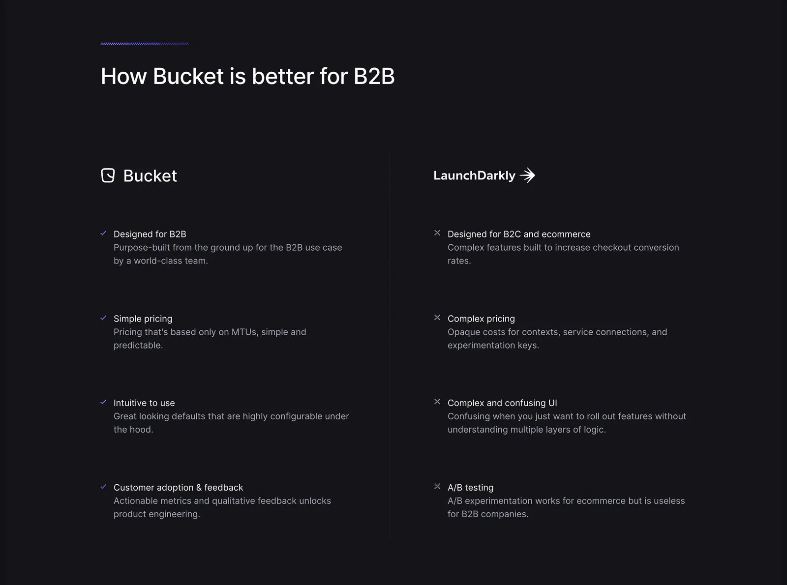
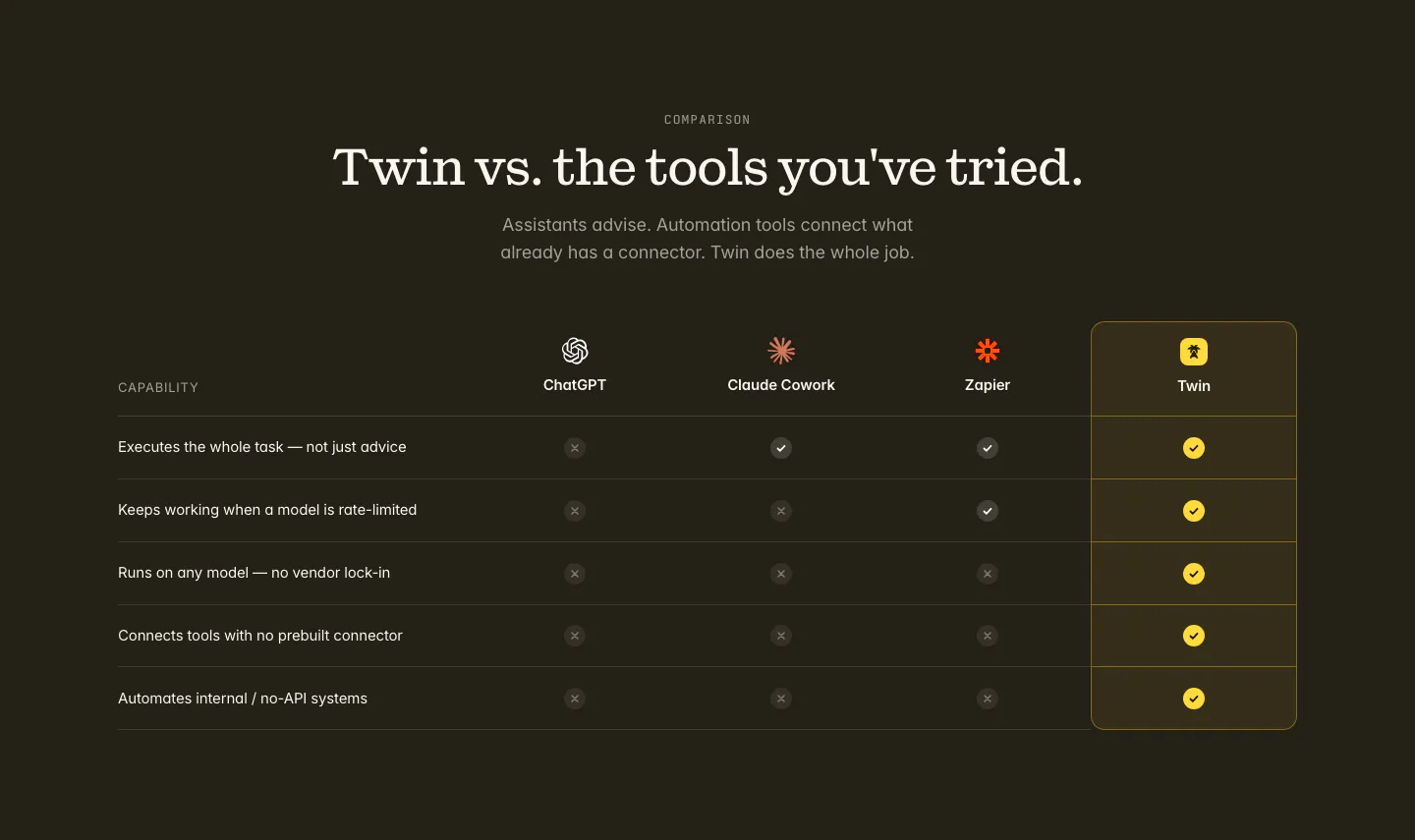
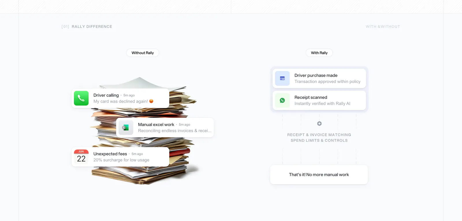
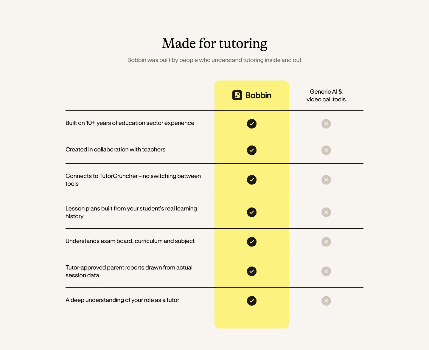
Someone already weighing options wants a direct answer. A comparison section puts the product beside a competitor, a category of tools, or the old manual way of working, and shows the differences at a glance. Fairness is what makes it persuasive. Stack the deck too obviously and readers stop trusting every row. Explore these comparison section examples, from us-versus-them tables to before-and-after splits and check-and-cross grids.






Common patterns in comparison sections
- Centered
- Minimal
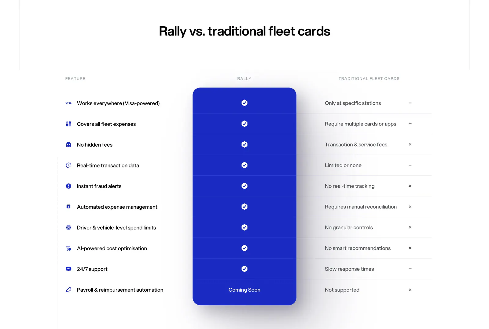
- Table
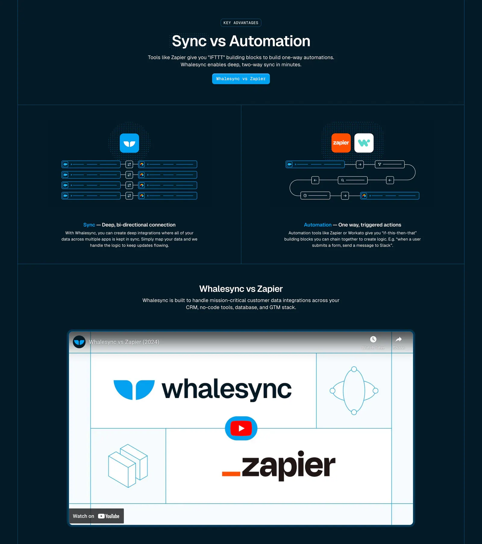
- Dark mode
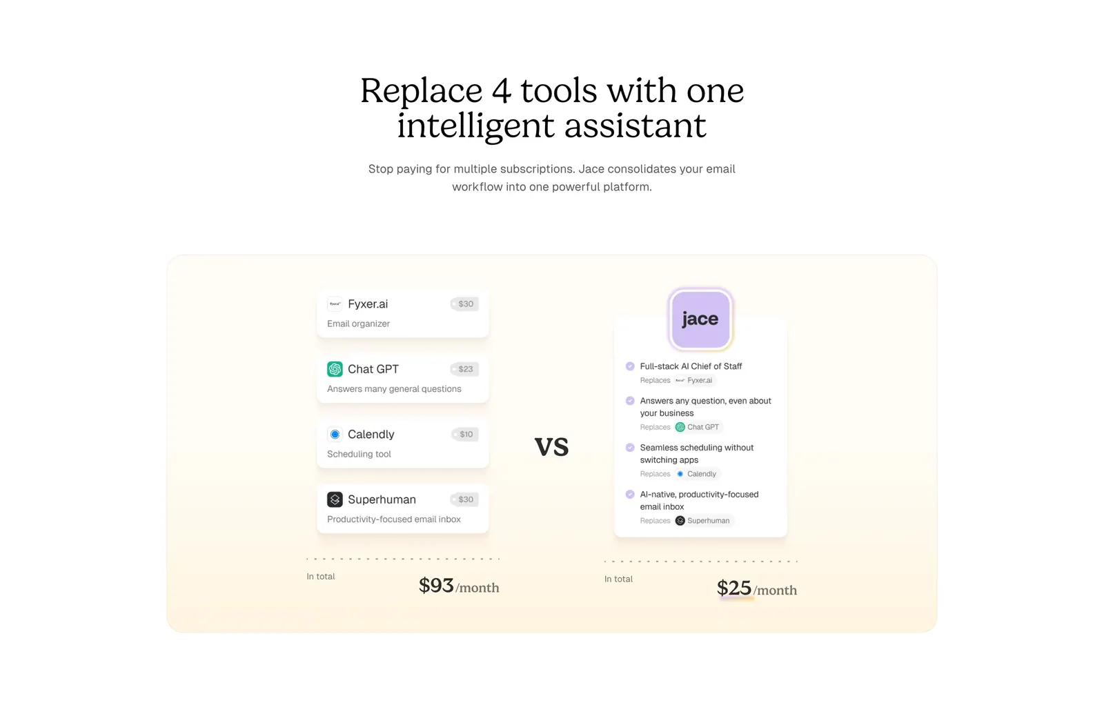
- Split layout
- Monochrome
- Serif type
How to build a fair comparison section
-
Compare on real decision criteria
Choose rows that reflect what buyers actually weigh, such as setup time, pricing model, and support, rather than features only you offer. Fewer, sharper rows keep the comparison readable and make each advantage feel earned instead of padded.
-
Highlight your column without hiding others
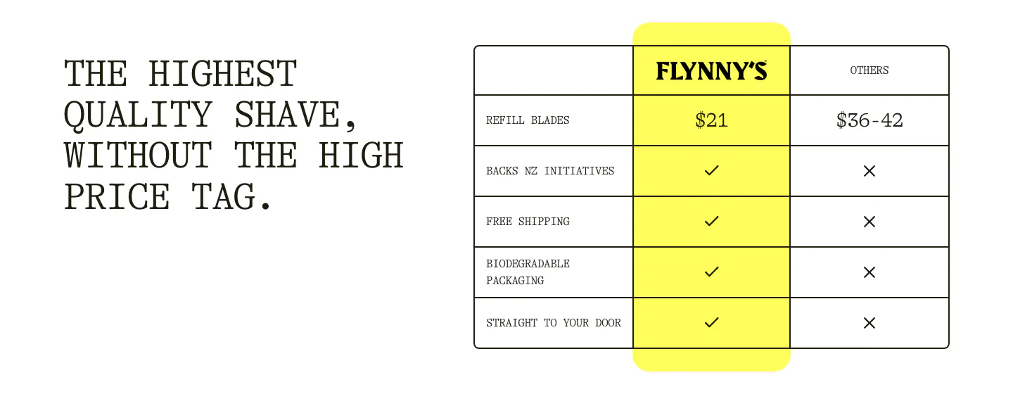
Tint your product's column or add a header badge, but keep competitor columns fully legible. Use the same type size and contrast in every column so the comparison reads as honest rather than rigged.
-
Allow for partial answers
Real comparisons are rarely all checks and crosses. Use short notes such as "Add-on," "Limited," or "Via API" where the honest answer is partial, and give every icon a text equivalent so color-blind readers and screen reader users get the same verdict.
-
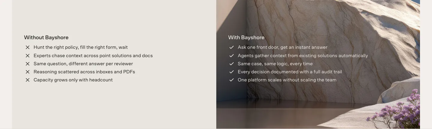
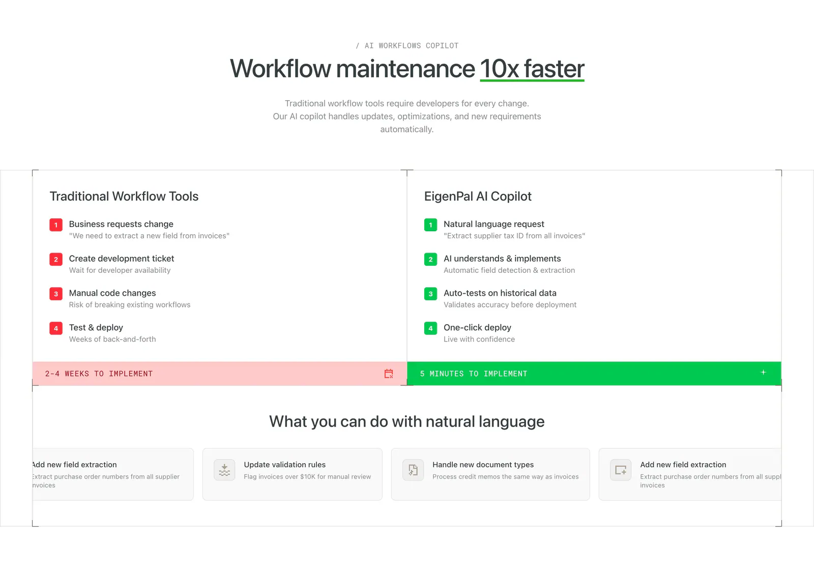
Try a before-and-after layout
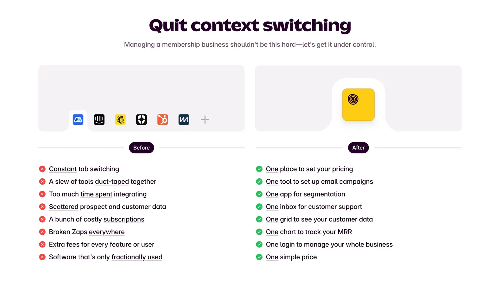
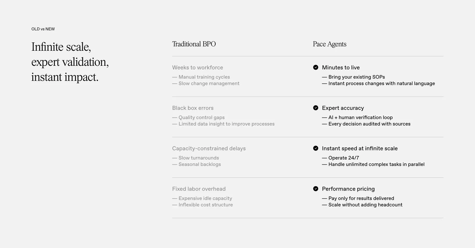
If buyers compare you to spreadsheets or manual work rather than a rival, a before-and-after split often lands better than a grid. Show the old process and the new one side by side with matching structure so the differences stand out.