Table Website Design Examples

Some content only makes sense in rows and columns. A table lines up data, specs, prices, or check and cross marks so readers can compare across a row or down a column. Beyond plan pages, tables show up in website design as feature matrices, spec sheets, API references, and usage limits. They fail when every row looks the same and the grid breaks on a phone.

24 sections

  1. EchoFi other section: headline beside short copy above a dark tokenomics allocation table with an orange glow
    EchoFi Other
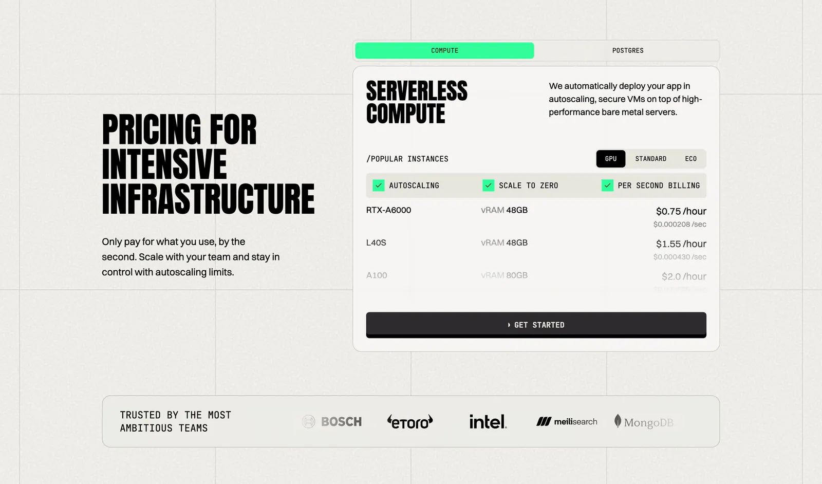
  2. Koyeb pricing section: condensed headline on the left, tabbed GPU instance price card on the right, logo strip below
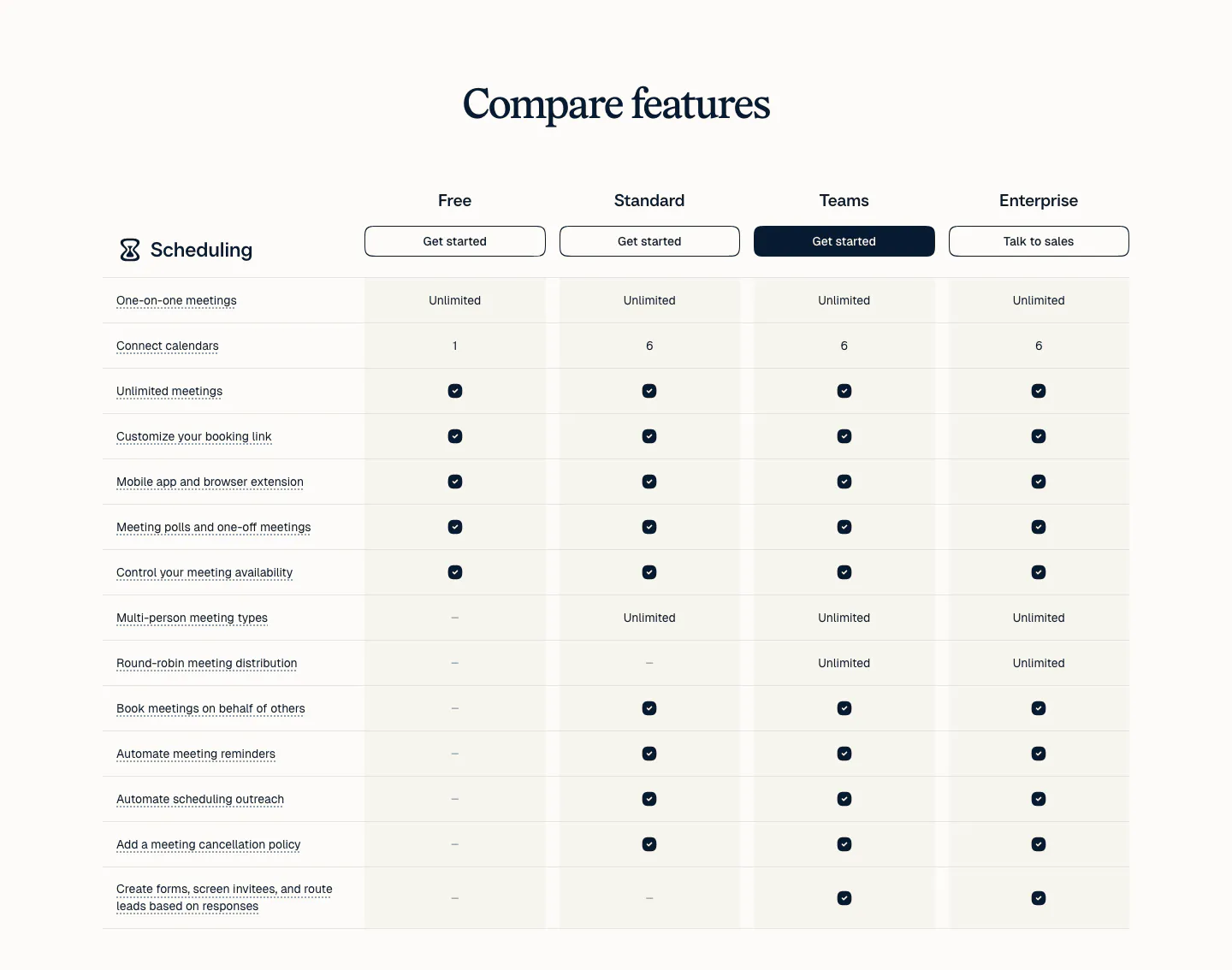
  3. Calendly pricing section: serif heading above a plan comparison table with four plan columns, buttons and check marks on a light background
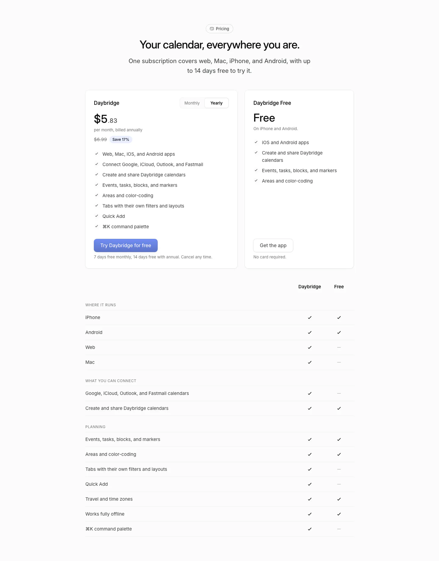
  4. Daybridge pricing section: centered headline above two plan cards with a monthly/yearly toggle and a plan comparison checkmark table
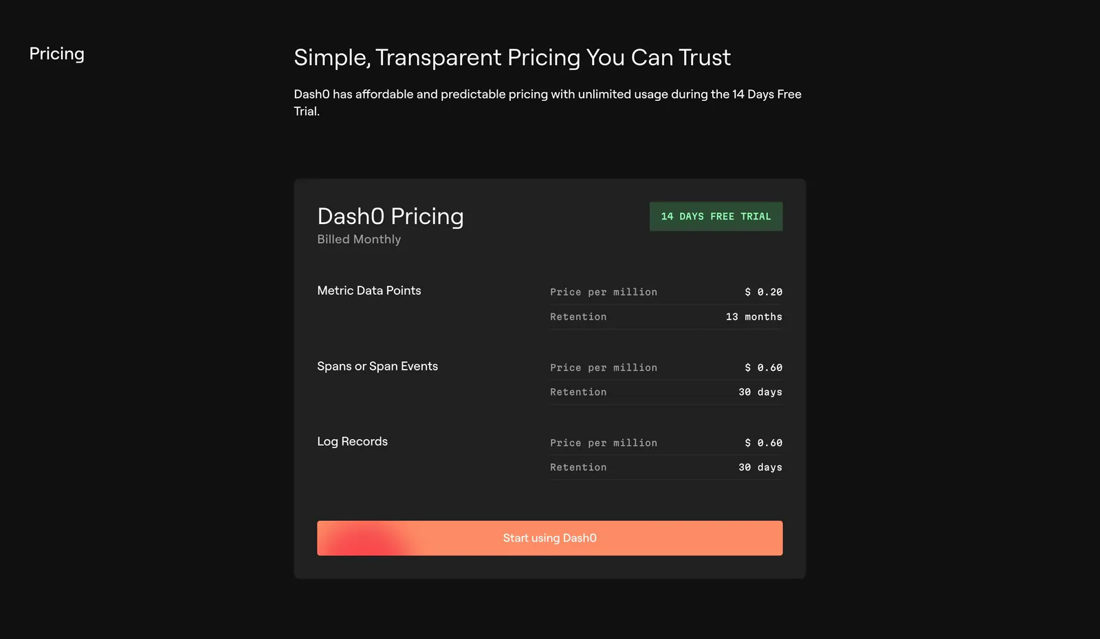
  5. Dash0 pricing section: single dark pricing card listing per-million prices and retention for metrics, spans and logs with an orange CTA
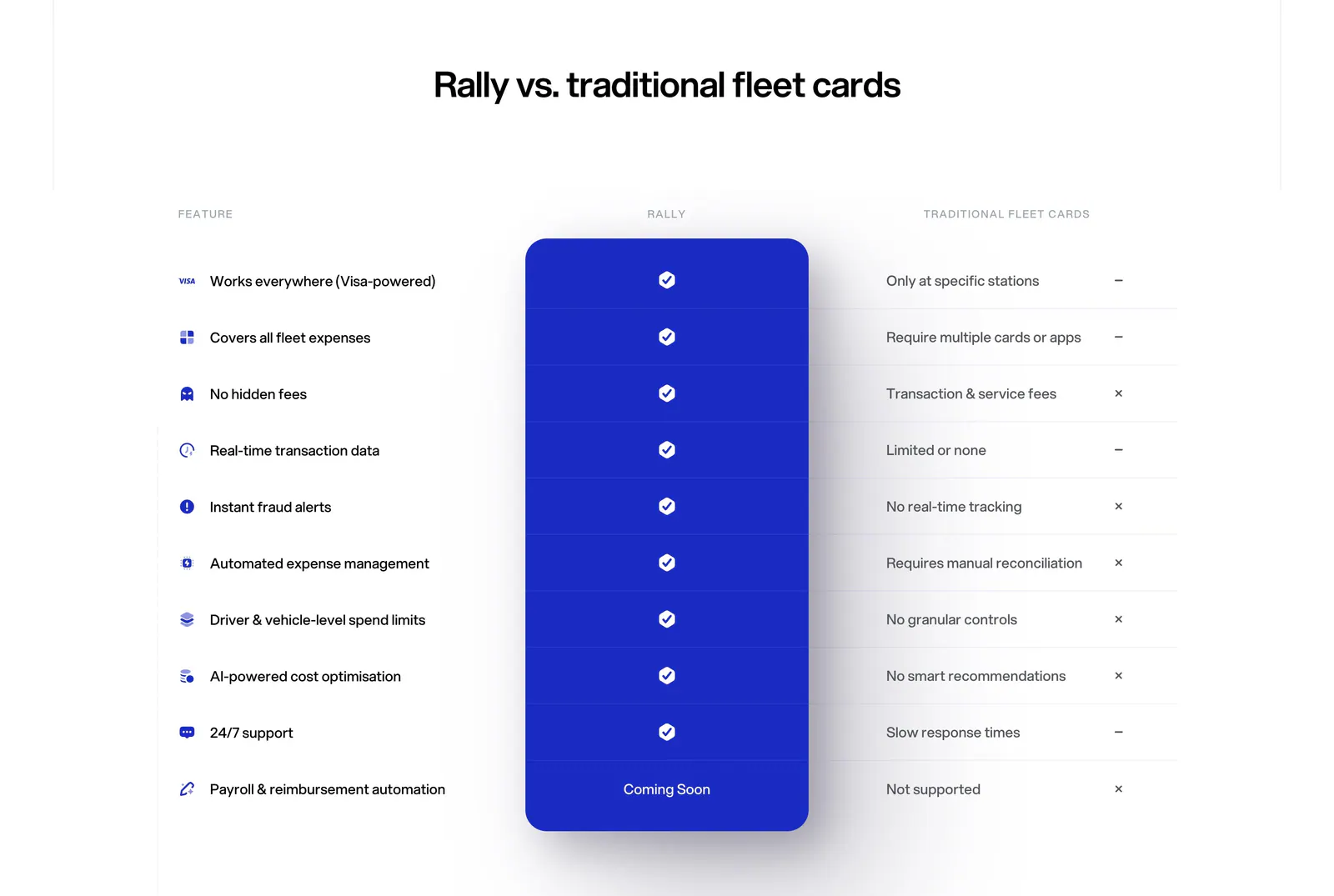
  6. Rally comparison section: centered headline above a feature comparison table with a highlighted blue Rally column of checkmarks
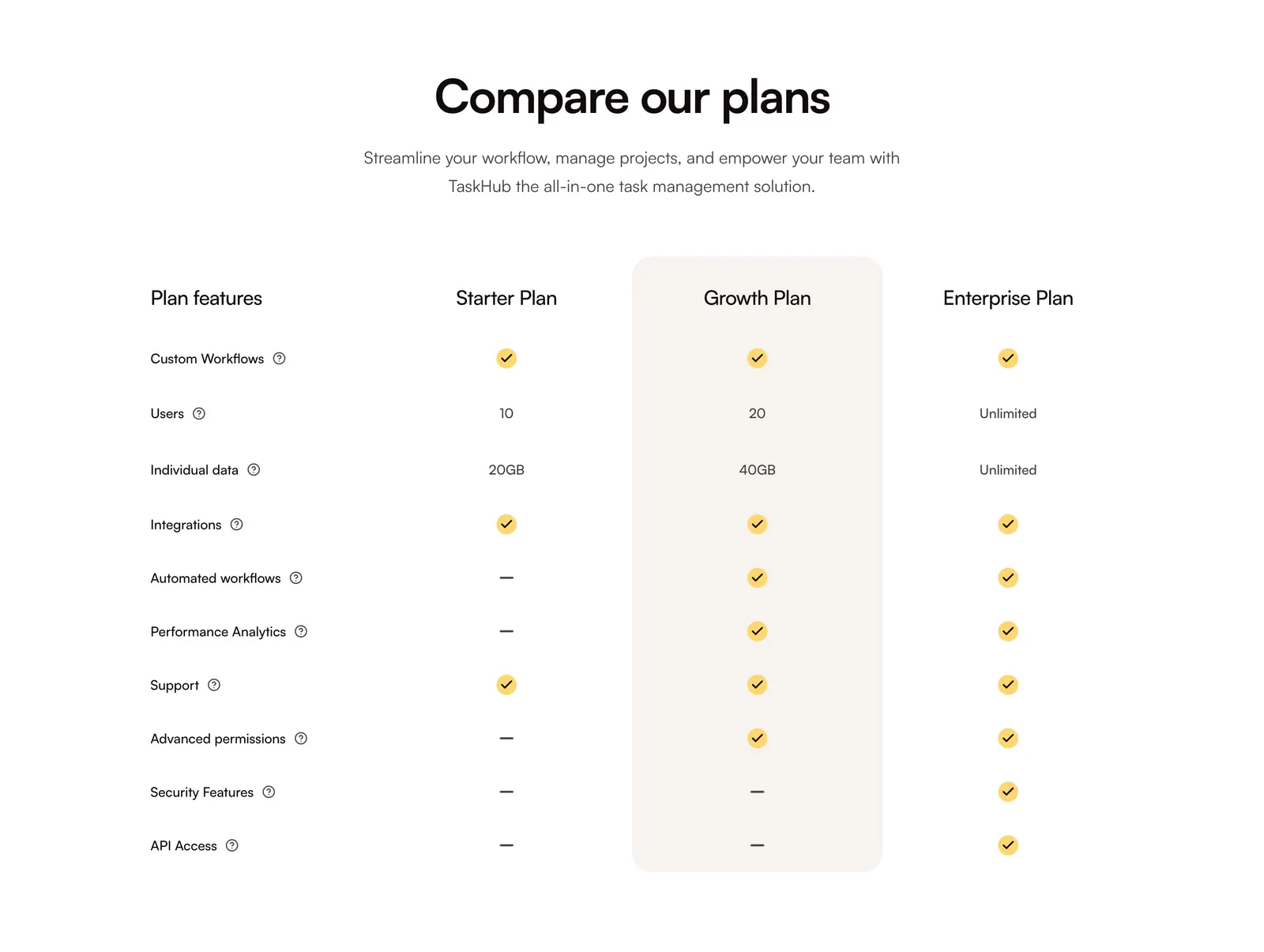
  7. QuickLnk pricing section: centered headline above a plan comparison table with yellow checkmarks and a highlighted Growth column
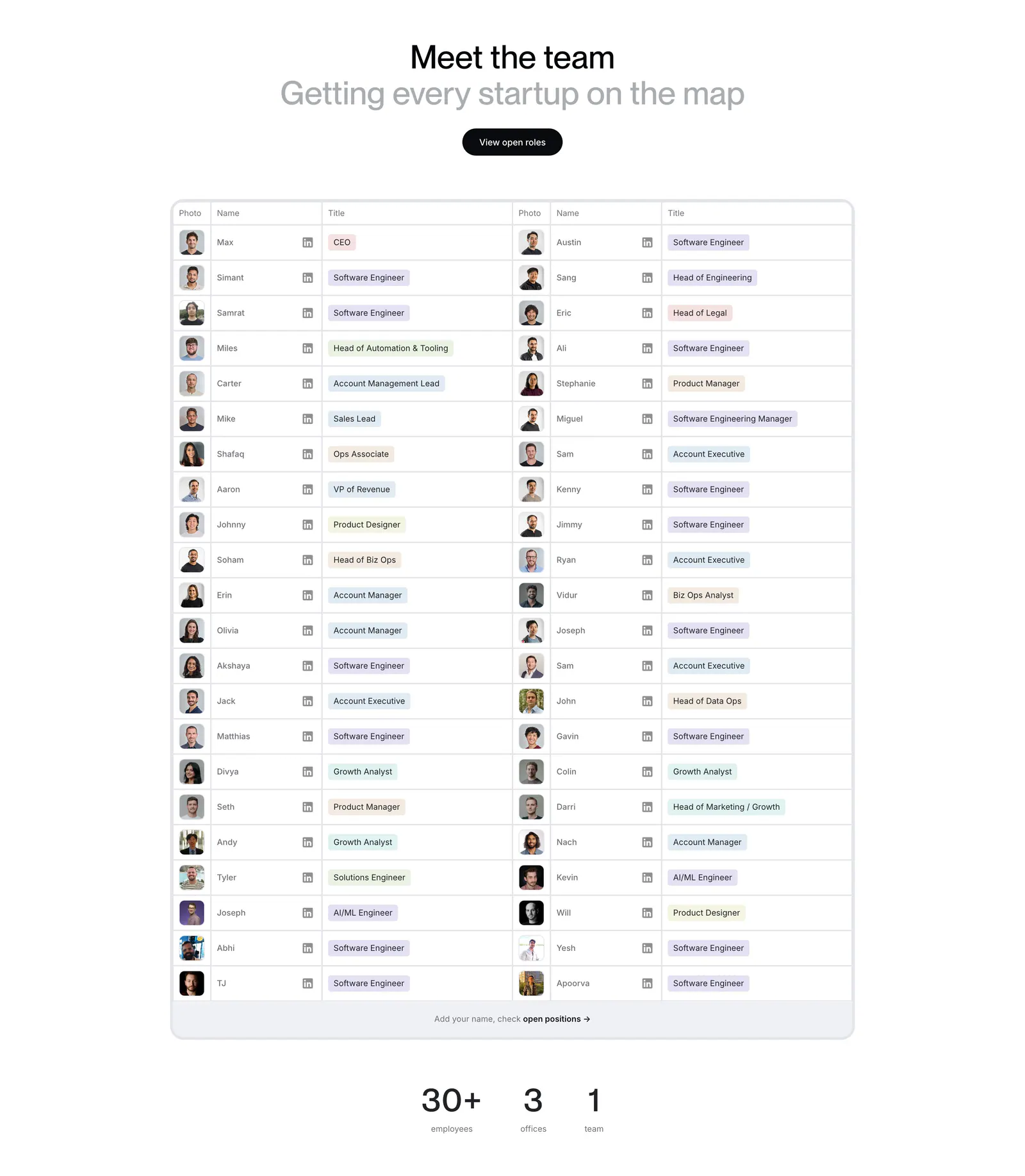
  8. Harmonic team section: centered heading above a two-column table of team member photos, names and role tags with stats below
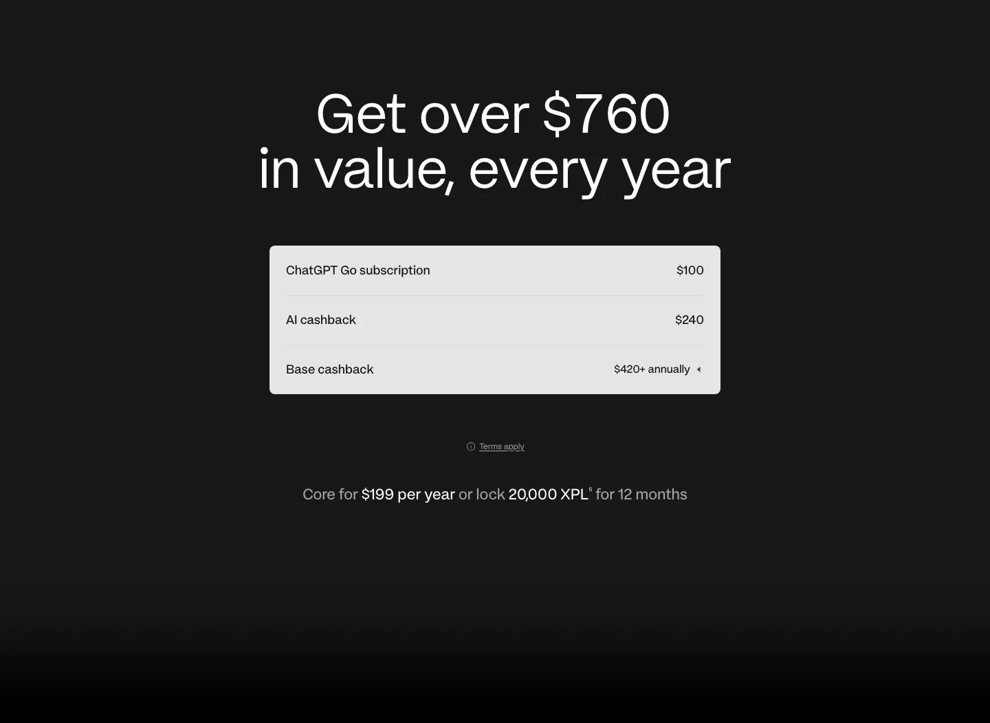
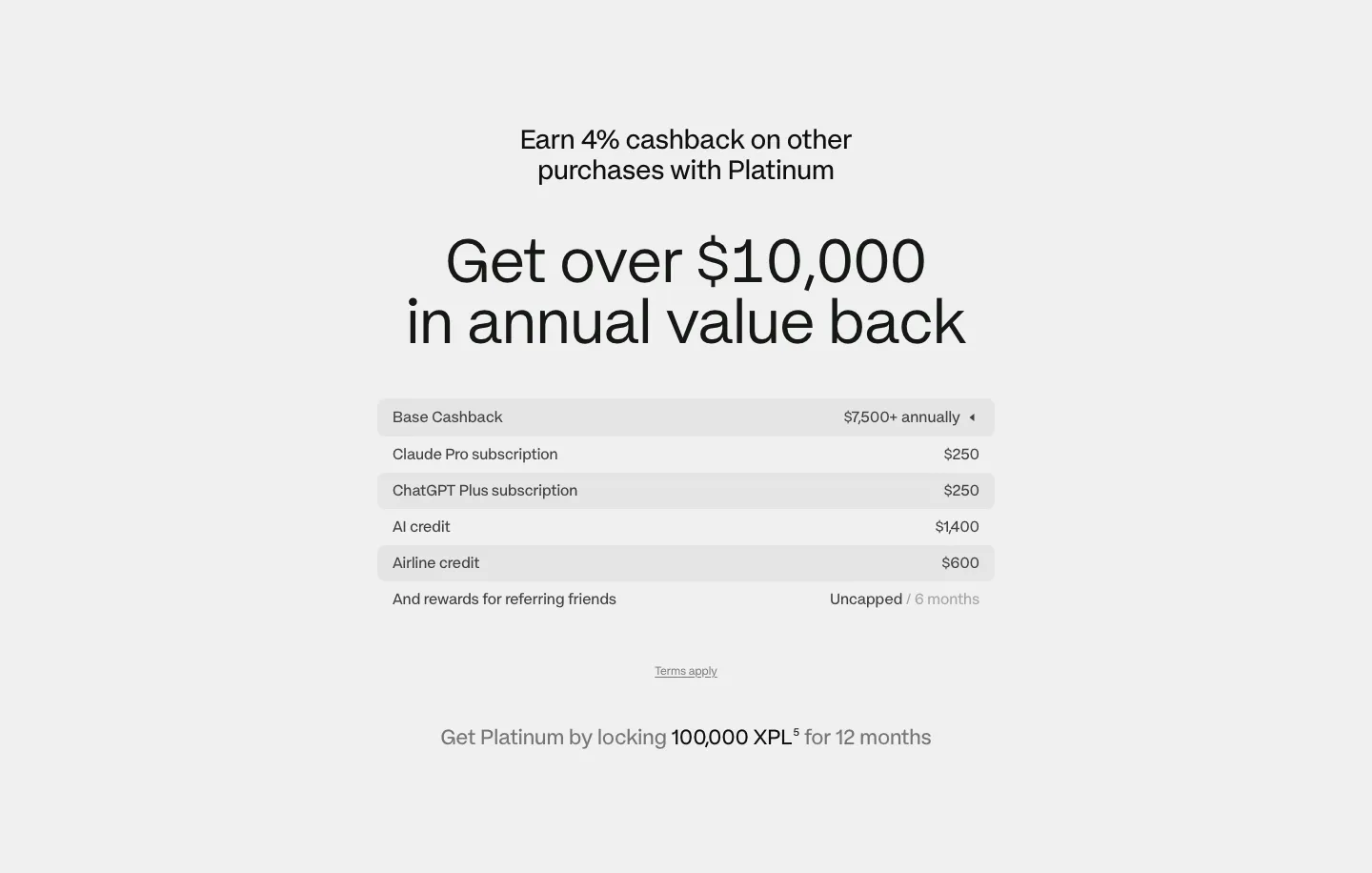
  9. Plasma pricing section: centered headline above a light value breakdown table with annual price line on a dark background
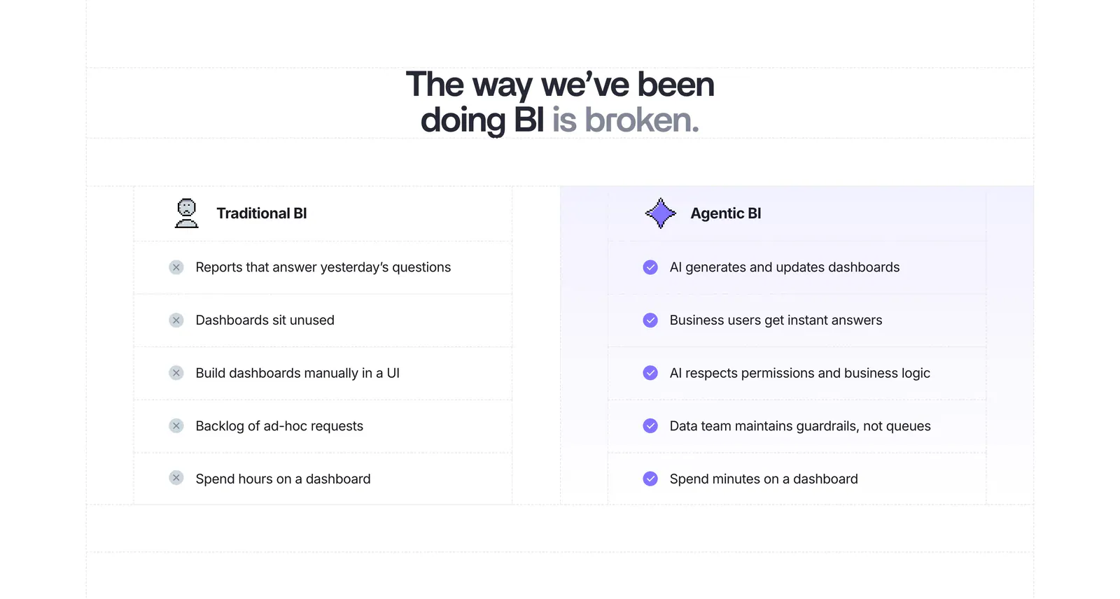
  10. Lightdash comparison section: centered headline above a two-column Traditional BI vs Agentic BI list with cross and check marks on white
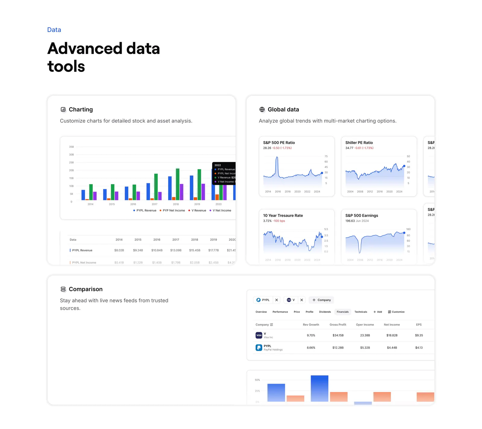
  11. Finsepa features section: left headline above three cards showing charting, global market charts and a company comparison table
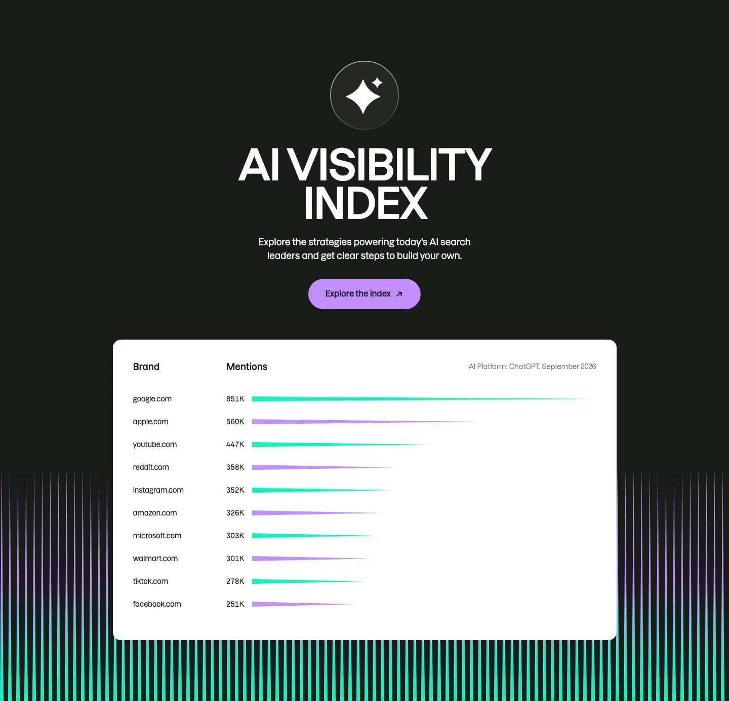
  12. Semrush features section: centered AI Visibility Index heading and button on dark above a white bar-chart table of brand mentions
  13. Plasma pricing section: centered headline above a striped value breakdown table and lock requirement note on light gray
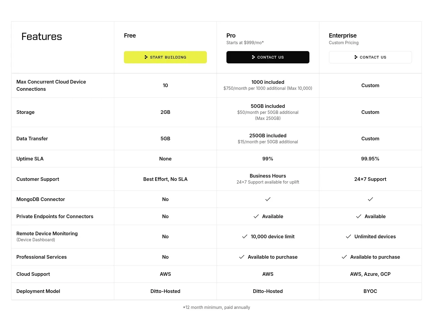
  14. Ditto pricing section: plan comparison table with Free, Pro and Enterprise columns, CTA buttons in the header and rows of limits and checkmarks
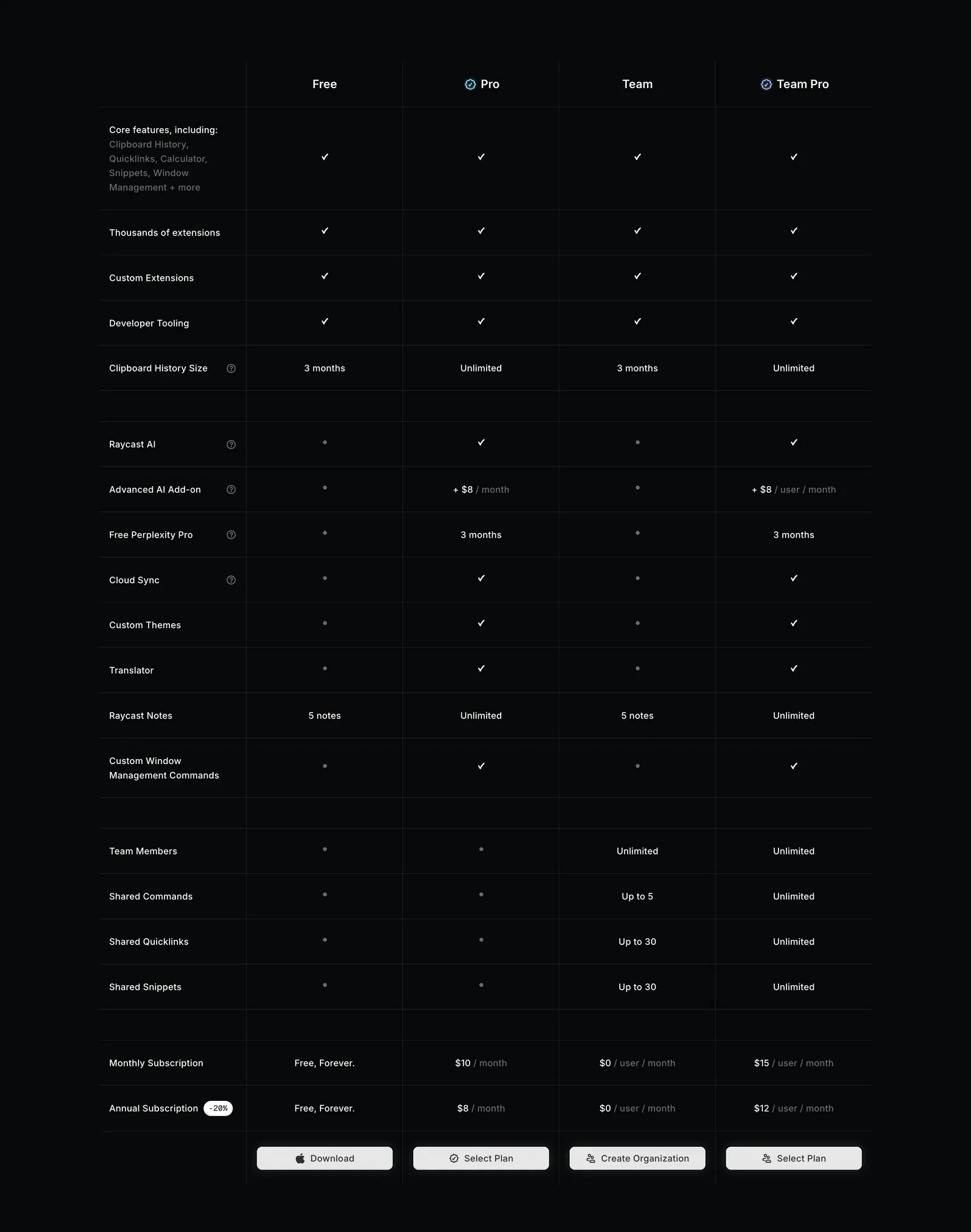
  15. Raycast pricing section: four-plan feature comparison table with checkmarks, limits and select buttons on a near-black background
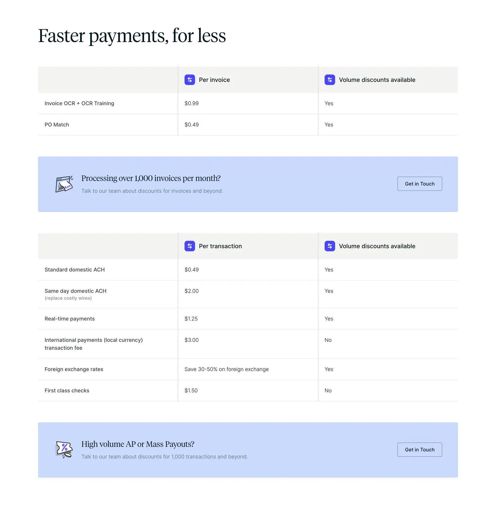
  16. Routable pricing section: serif headline above per-invoice and per-transaction fee tables with light blue contact banners on white
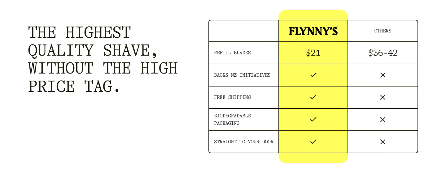
  17. Flynny's comparison section: typewriter headline left, table right comparing a yellow Flynny's column against others with prices and checks
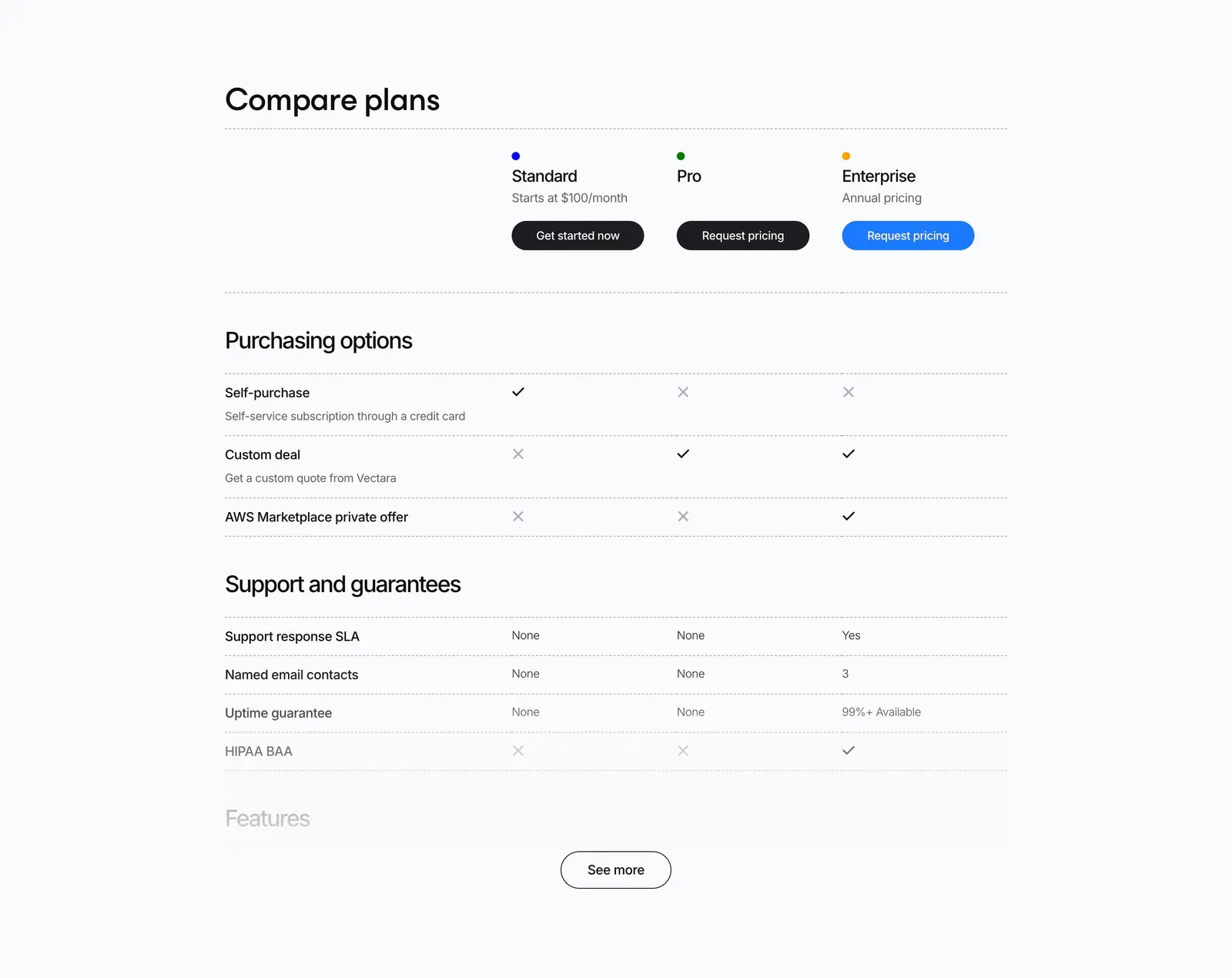
  18. Vectara pricing section: plan comparison table with check and cross marks for Standard, Pro and Enterprise and a See more button
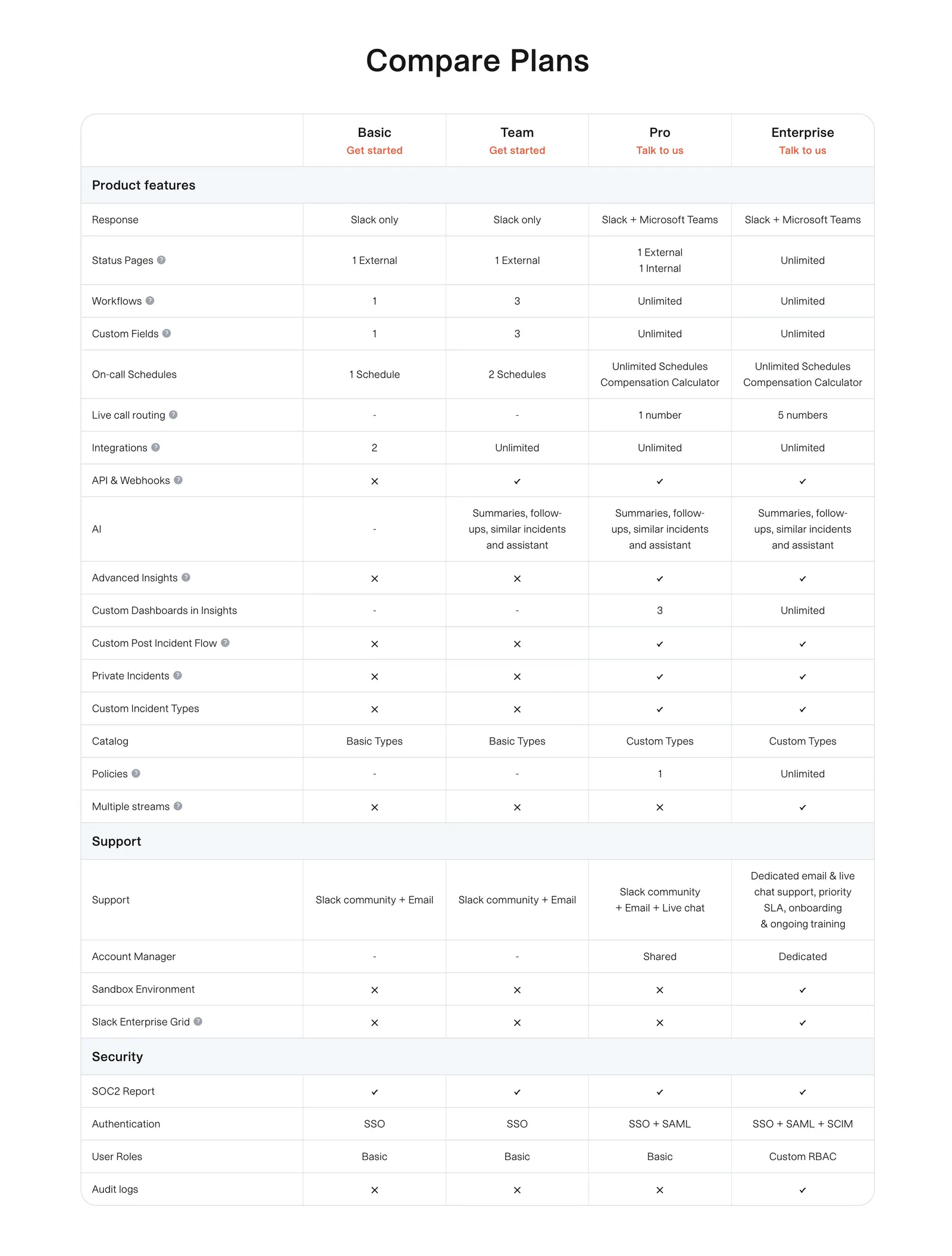
  19. incident.io pricing section: plan comparison table with grouped feature rows and check and cross marks on white
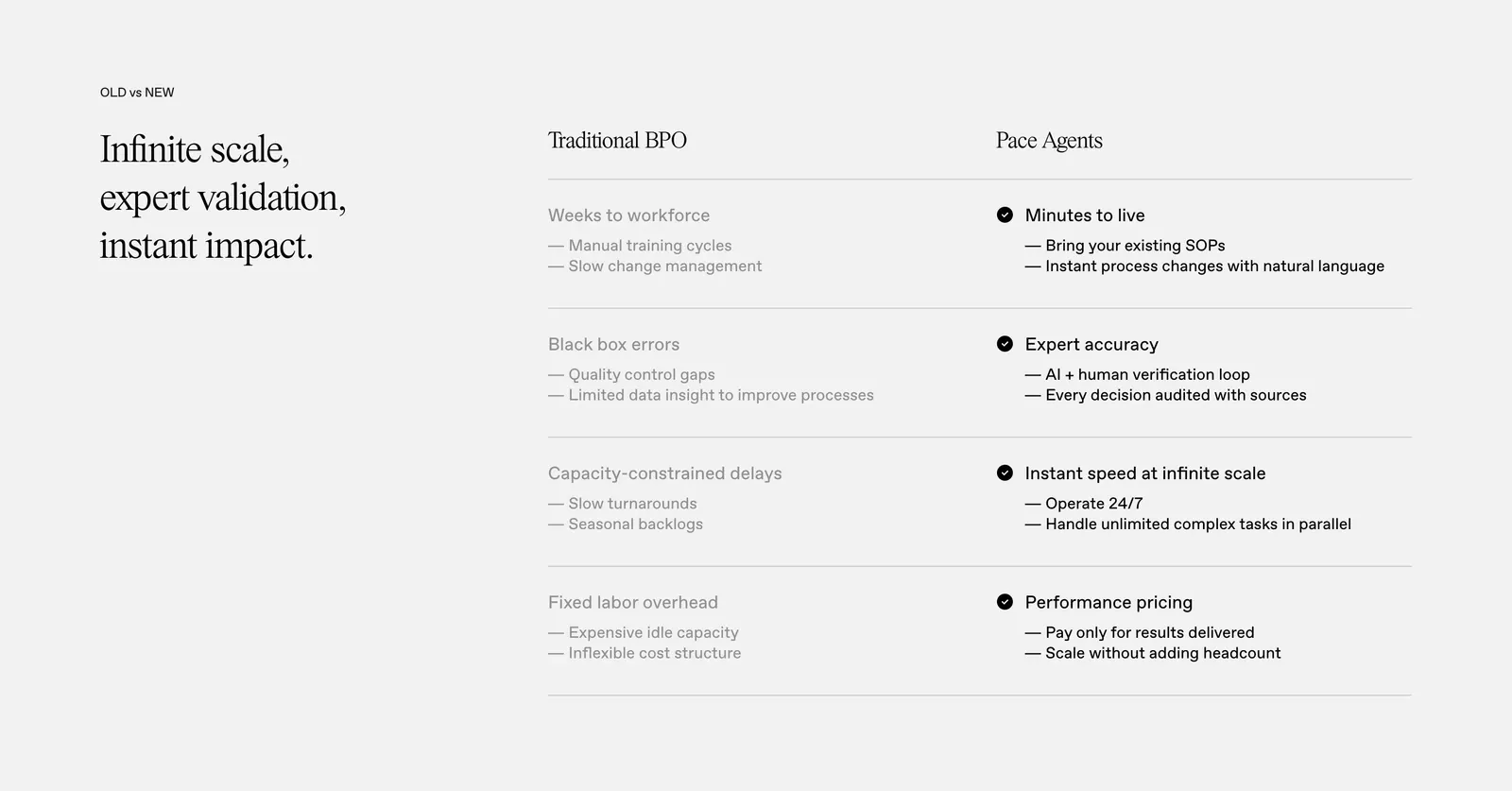
  20. Pace comparison section: serif headline on the left beside a two-column Traditional BPO vs Pace Agents table with checkmarks on light gray
    Pace Comparison
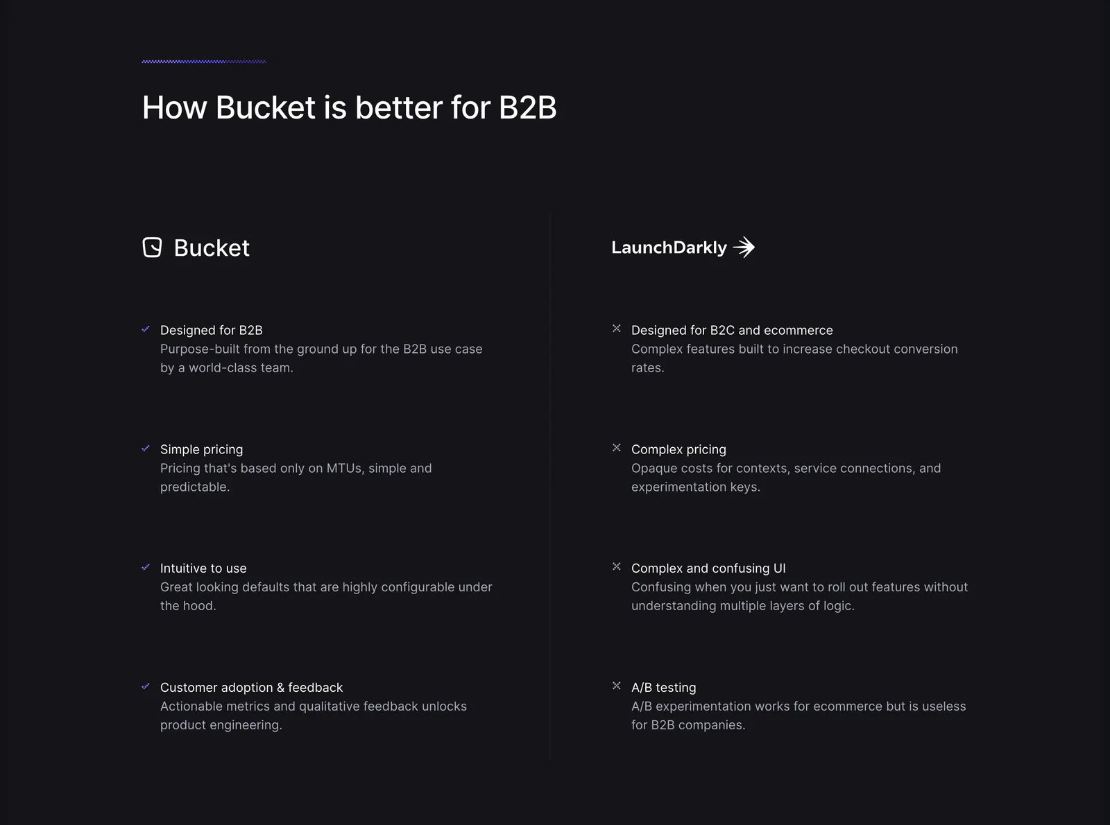
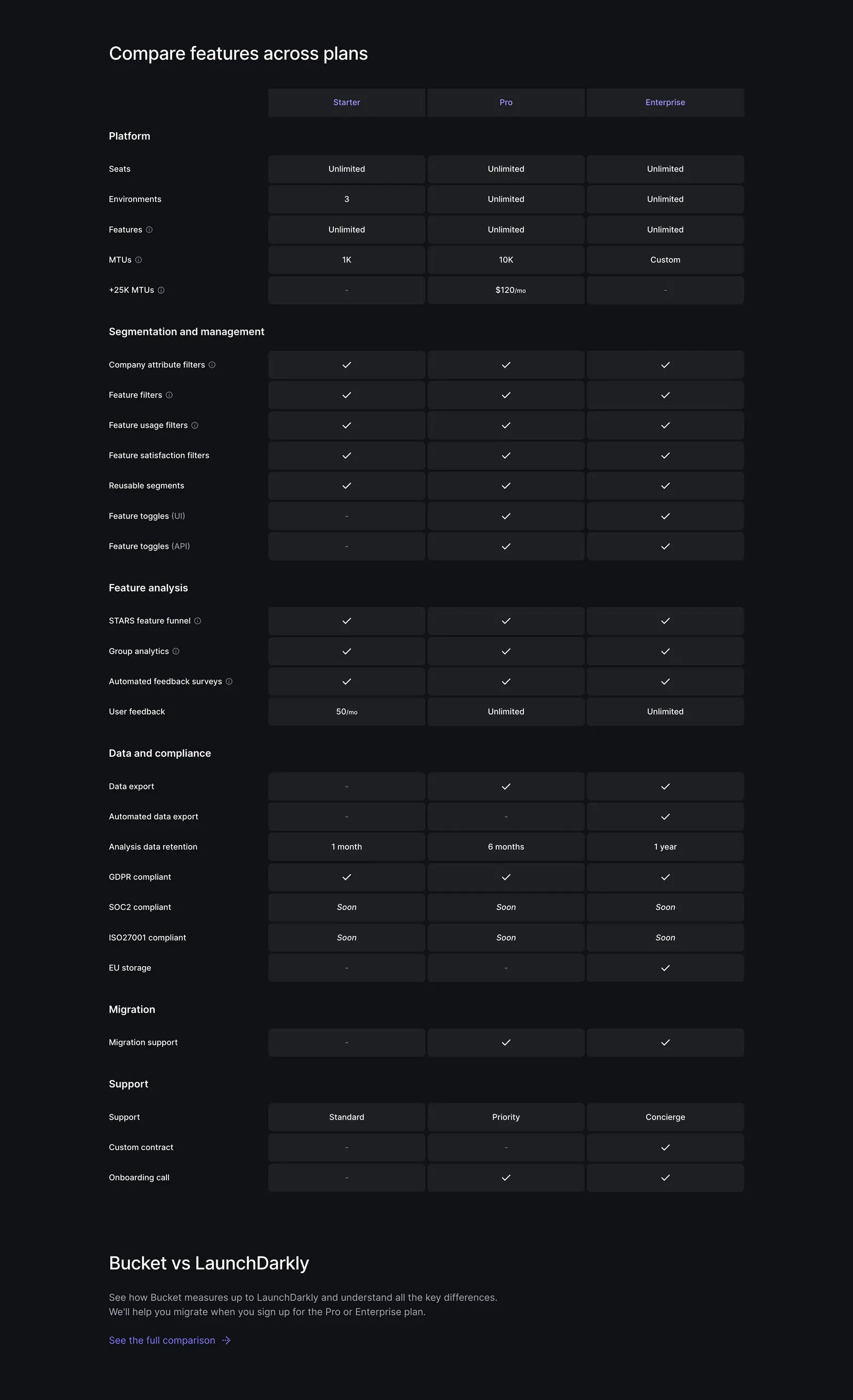
  21. Bucket comparison section: headline above two columns contrasting Bucket checkmarks with LaunchDarkly crosses on a dark background
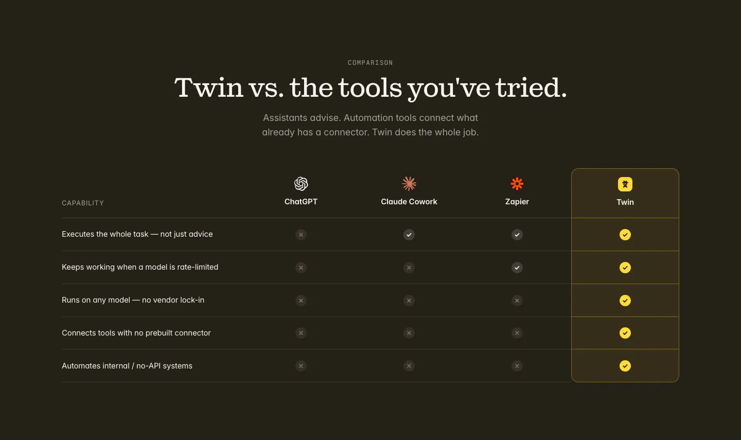
  22. Twin comparison section: centered serif headline above a check and cross table versus ChatGPT, Claude Cowork and Zapier on dark
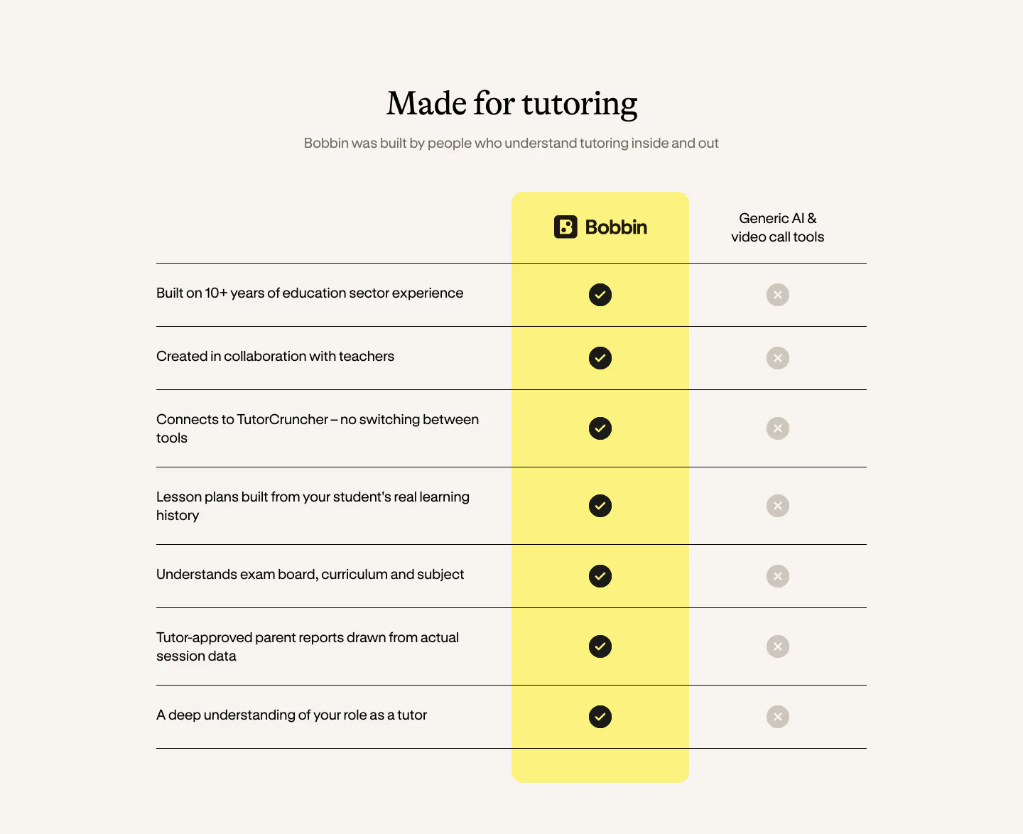
  23. Bobbin comparison section: serif heading above a check-versus-cross table with a highlighted yellow Bobbin column on cream
  24. Bucket pricing section: plan comparison table with Starter, Pro and Enterprise columns of checkmarks and limits on a dark background

Where table shows up

Often paired with

Share of table sections that also use each style

How to design readable tables

  1. Align columns by data type

    Left-align text, right-align numbers, and center icons such as checks and crosses. Use tabular figures so digits line up down a column, and put units in the header instead of repeating them in every cell. Readers can then compare values without hunting.

  2. Break long tables into labeled groups

    Split long tables with short heading rows, such as limits, permissions, or performance. Readers can skip to what they need, and you can collapse less important groups by default. Put the rows where values actually differ ahead of the rows where every column matches.

  3. Pin headers and the first column

    On long tables, make the header row sticky so readers never lose track of which column is which. On narrow screens, pin the first column and let the rest scroll sideways, or turn each row into a stacked card when there are only a few columns.

  4. Build with semantic table markup

    Use table, th, and scope attributes rather than a grid of divs, so screen readers can announce the headers for each cell. Give icons a text equivalent such as "Included," add a caption, and keep row lines or zebra striping light enough to guide without adding noise.
Companies using table

All styles
    ↑↓ Navigate ↵ Open

    Section preview

    Website section