Pattern Background Website Design Examples

A faint repeating texture behind the content can make a plain section feel engineered or handmade. Pattern background website design uses grid lines, dot grids, stripes, dither fields, noise, or grain to add depth without imagery, and the technical versions are especially common on developer and infrastructure sites. The texture has to stay quiet, since a dense or high-contrast pattern competes with the text and makes the section feel busy.
172 sections

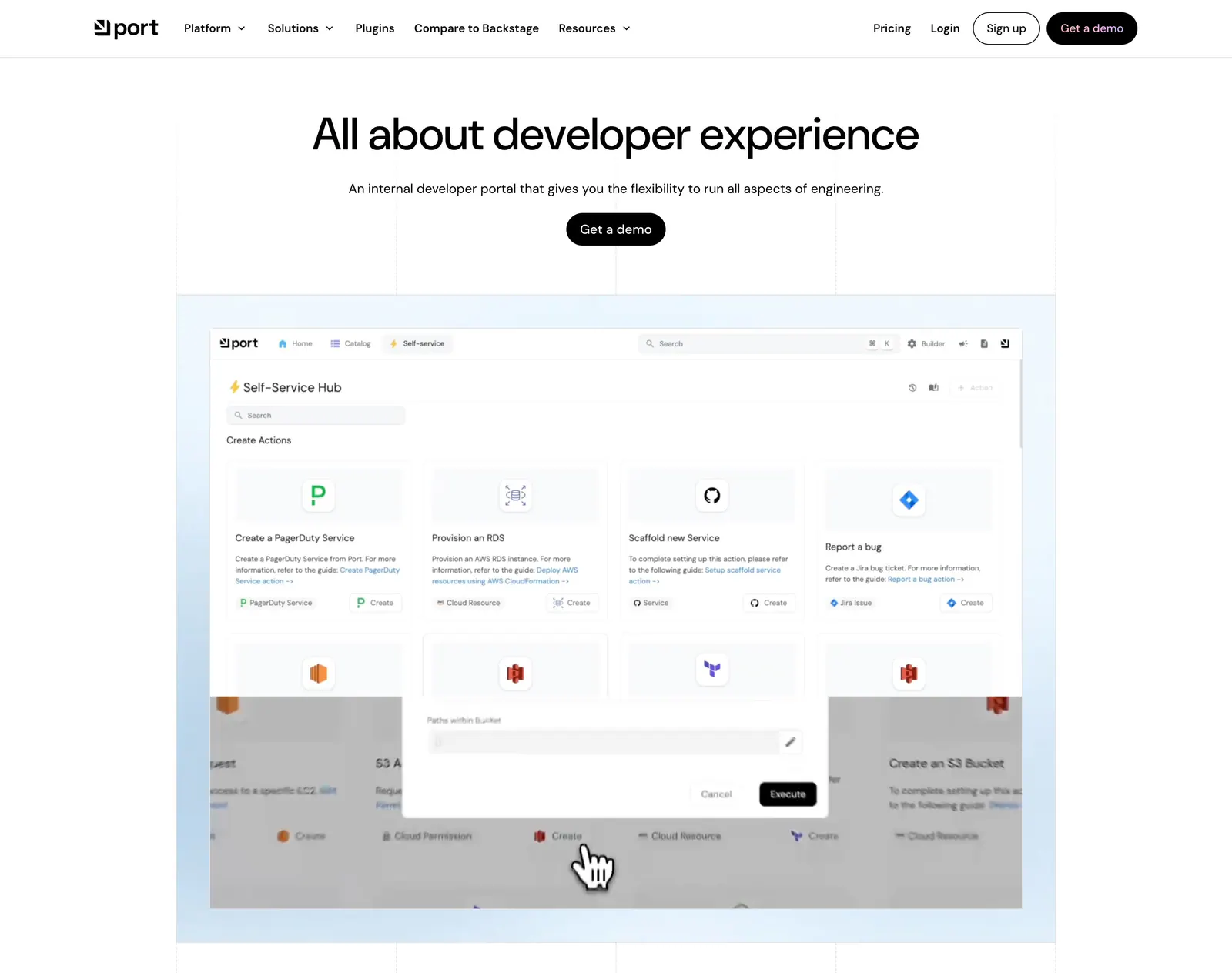
  1. Port hero section: centered headline with Get a demo button above a self-service hub product screenshot on a light blue grid-lined backdrop
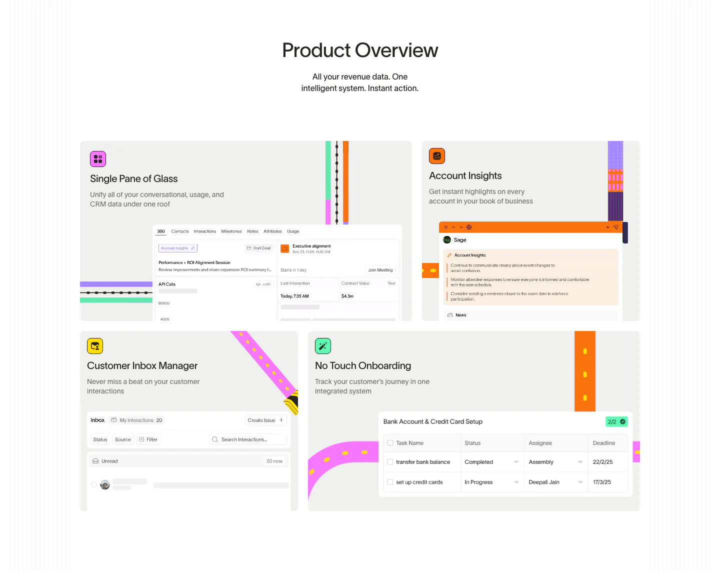
  2. Wavelength features section: centered Product Overview headline above a four-tile bento of UI snippets with colorful transit-line accents
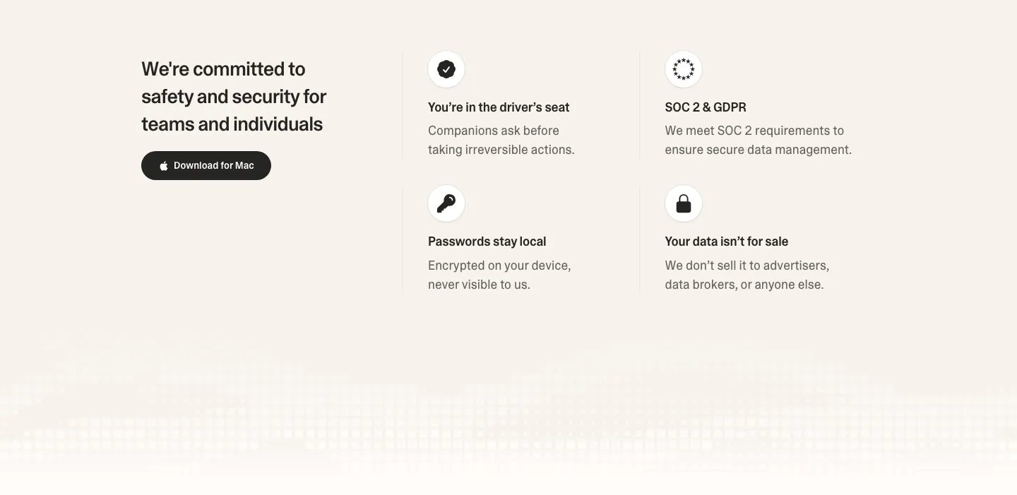
  3. Strawberry security section: headline and download button on the left, 2x2 grid of icon trust points on the right, pixel fade below
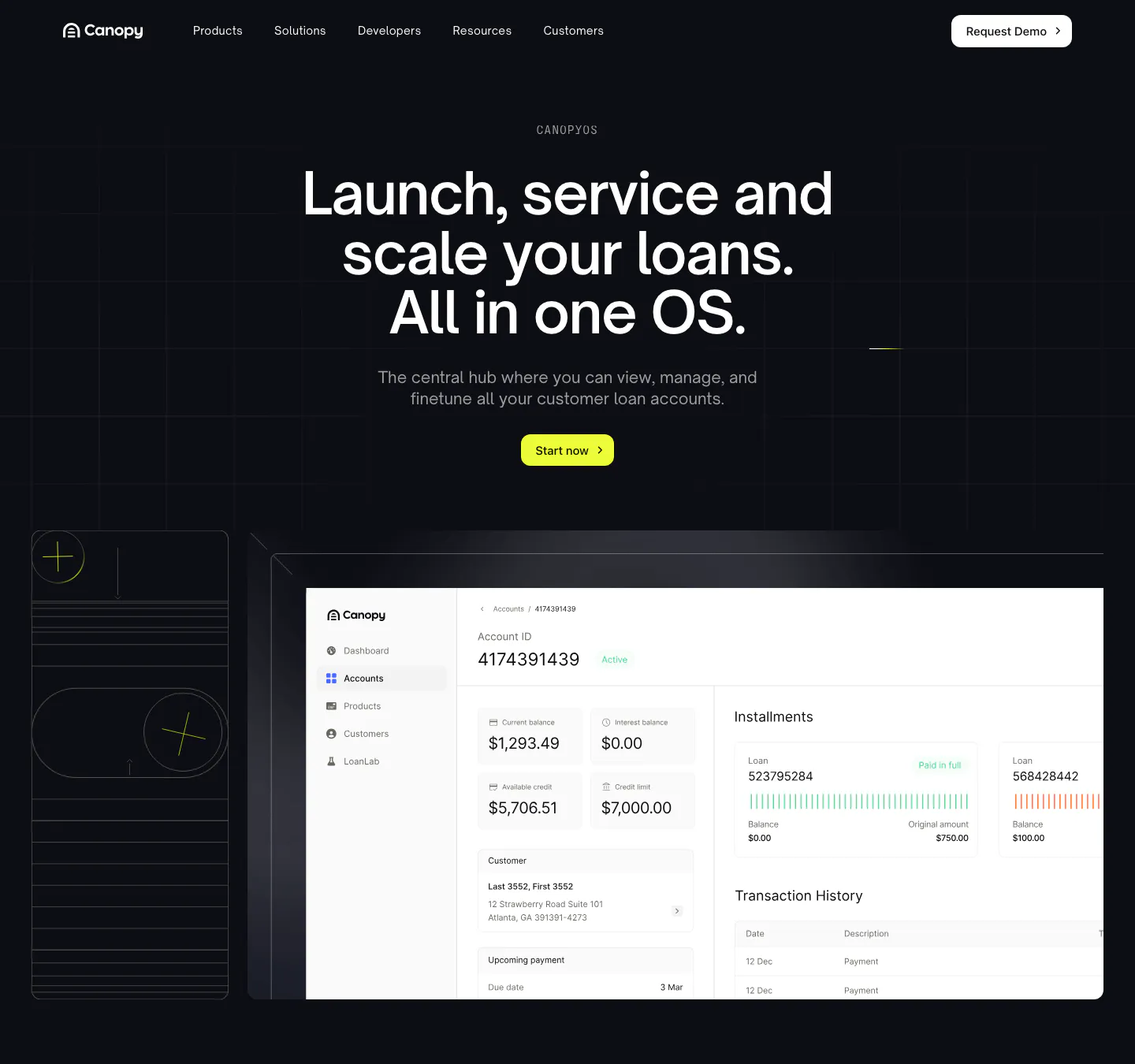
  4. Canopy hero section: dark centered headline and lime button above a loan account dashboard screenshot and line-art tile
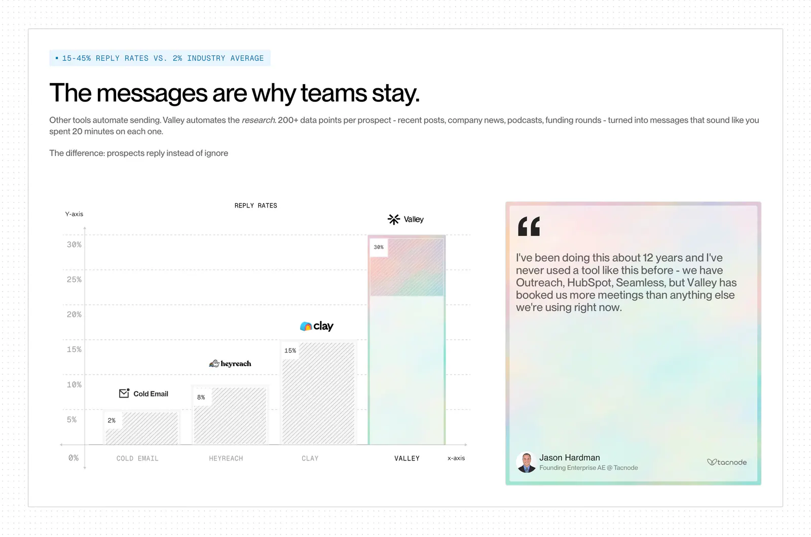
  5. Valley comparison section: reply-rate bar chart versus Cold Email, HeyReach and Clay beside a pastel quote card on a dot-grid background
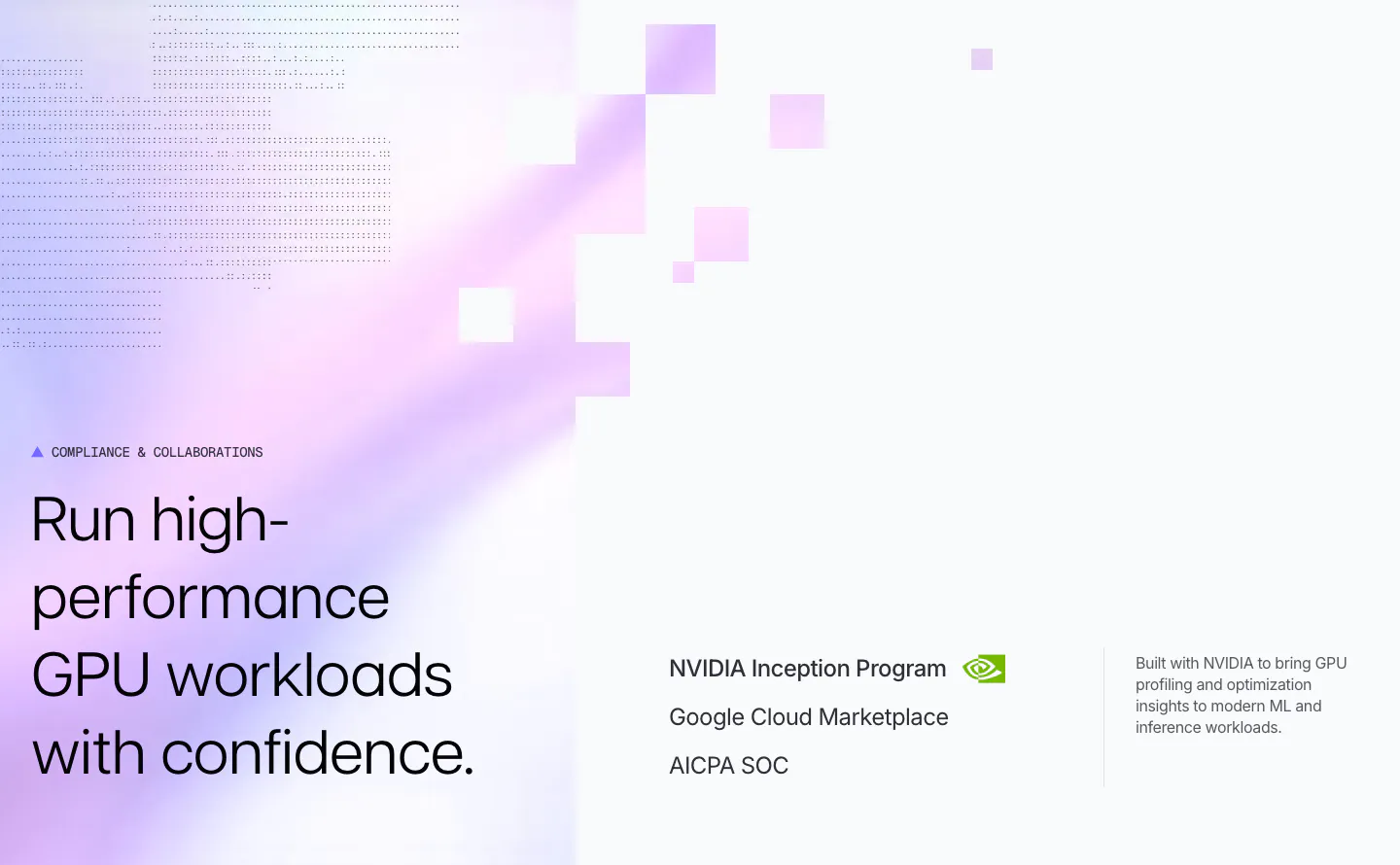
  6. Polar Signals security section: headline on a lavender gradient with pixel squares and dot texture, beside NVIDIA, Google Cloud and SOC credentials
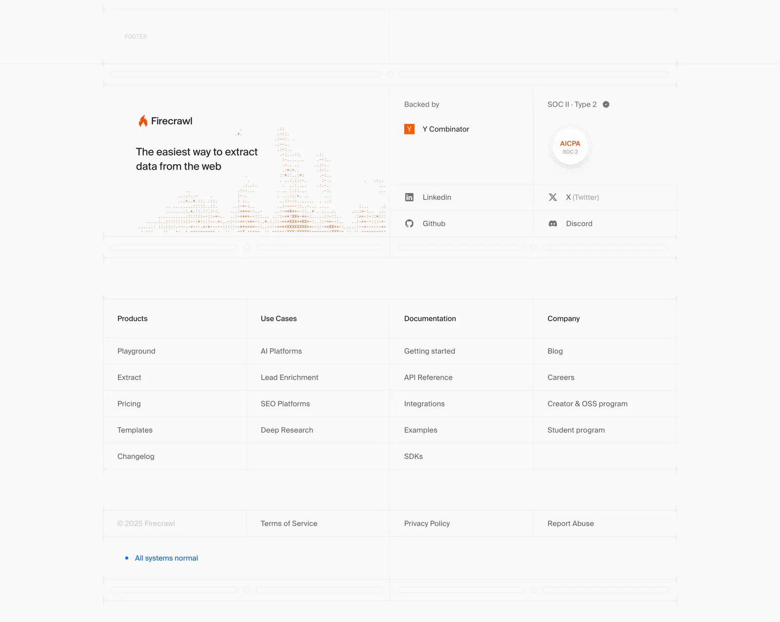
  7. Firecrawl footer section: logo, tagline and dithered chart art, backer and SOC 2 badges, four link columns in a gridded light layout
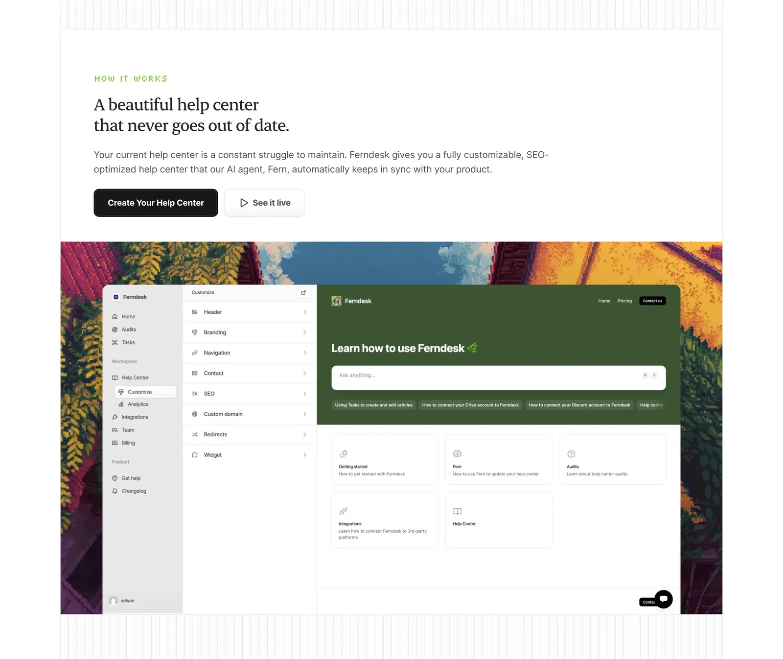
  8. Ferndesk how it works section: serif headline and two buttons above a help center editor screenshot framed by pixel-art scenery
  9. Wavelength logo cloud section: small centered caption above a row of grayscale logos including Pave, Render and Mintlify on a light gray band
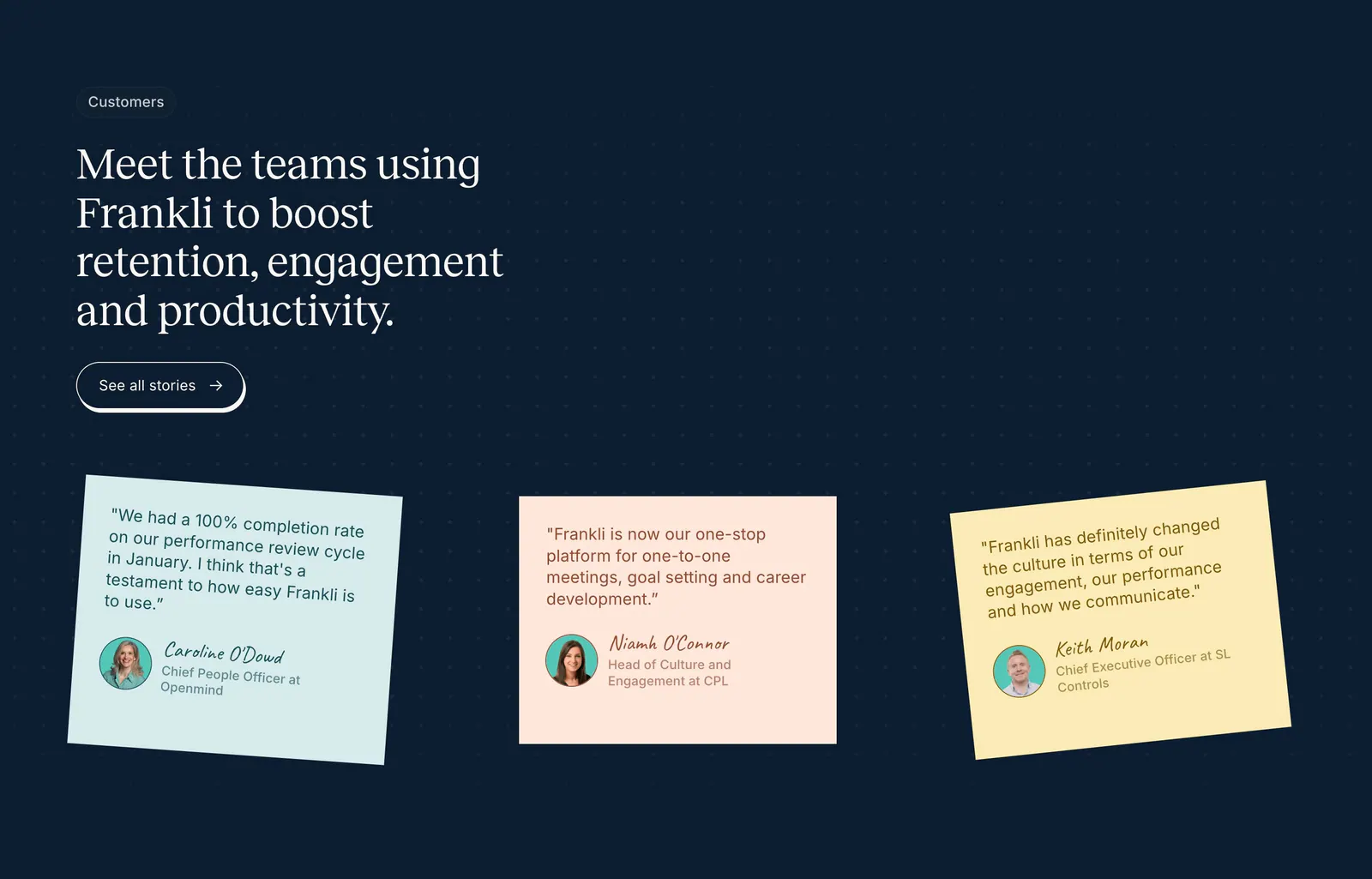
  10. Frankli testimonials section: serif headline with stories button above three tilted pastel sticky-note quote cards on a navy dot grid
  11. Invertase call-to-action section: centered headline below a glowing logo tile with two buttons on a dark background with faint hexagons
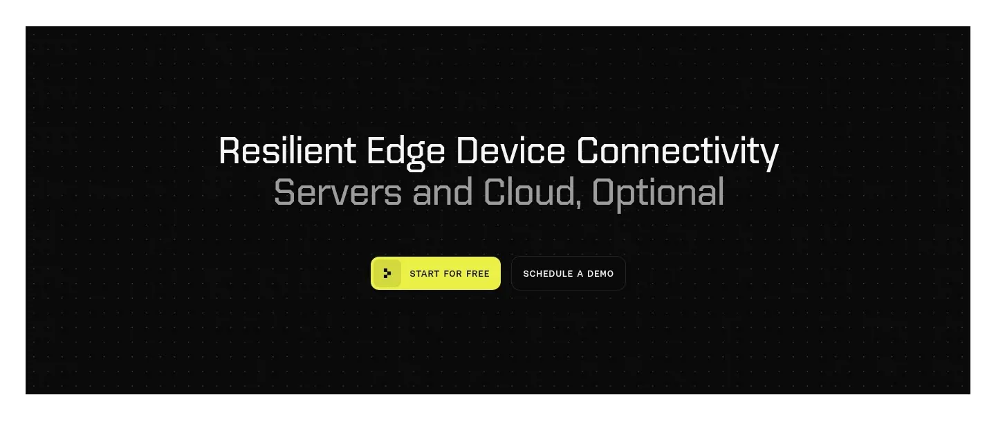
  12. Ditto call-to-action section: centered two-tone headline with yellow and outline buttons inside a black dotted panel
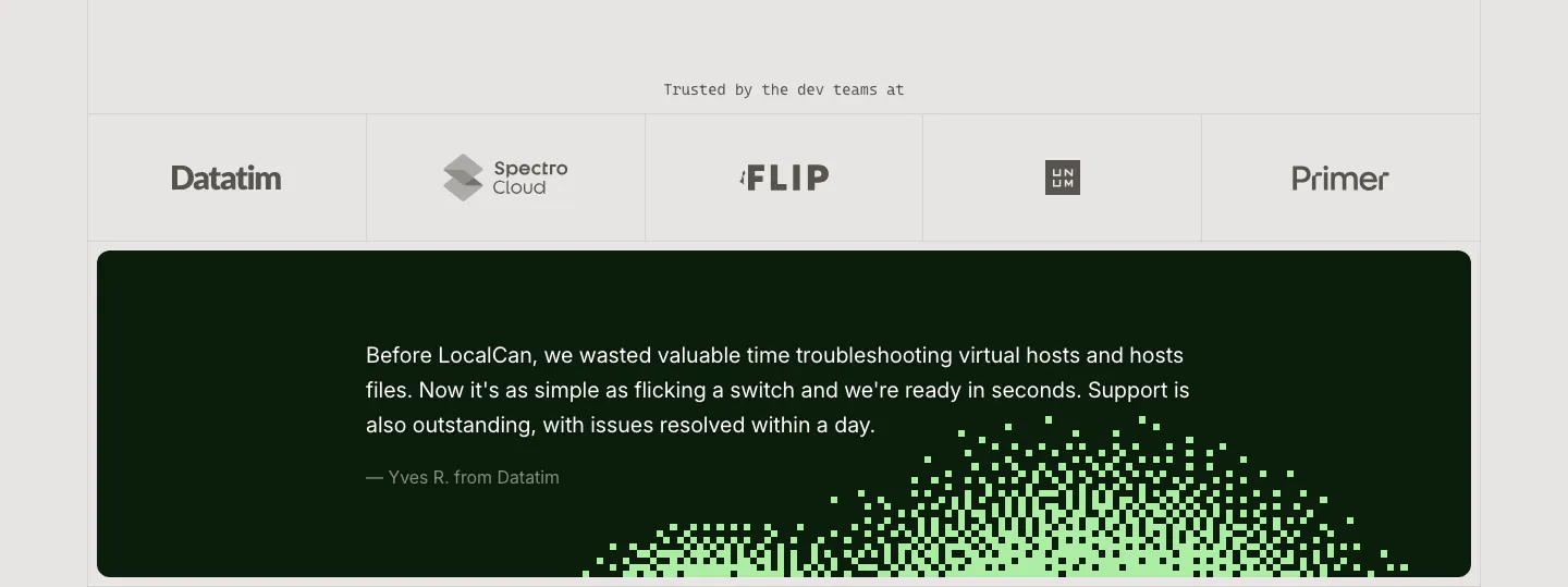
  13. LocalCan testimonial section: row of grayscale customer logos above a dark green quote card with a green pixel dither pattern
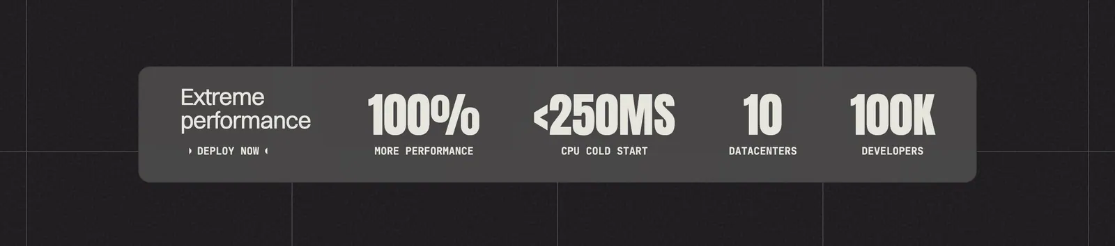
  14. Koyeb value proposition section: gray band with four large condensed metrics on a dark grid background
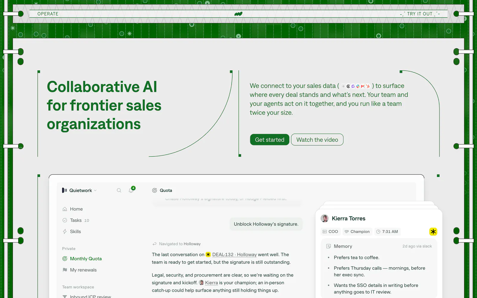
  15. Operate hero section: headline left and copy with buttons right in a green patterned frame, above a sales app screenshot
    Operate Hero
  16. Concourse call-to-action section: centered headline and dark button over a white-to-lavender dot-grid background
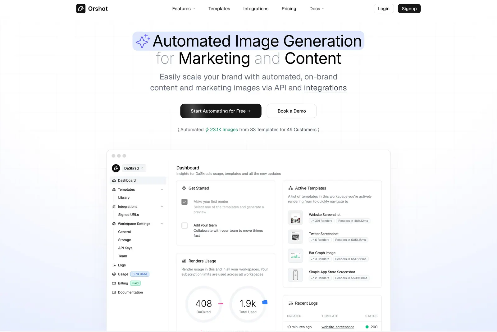
  17. Orshot hero section: centered headline with highlighted phrase, two buttons and a stat line above a dashboard screenshot on faint grid
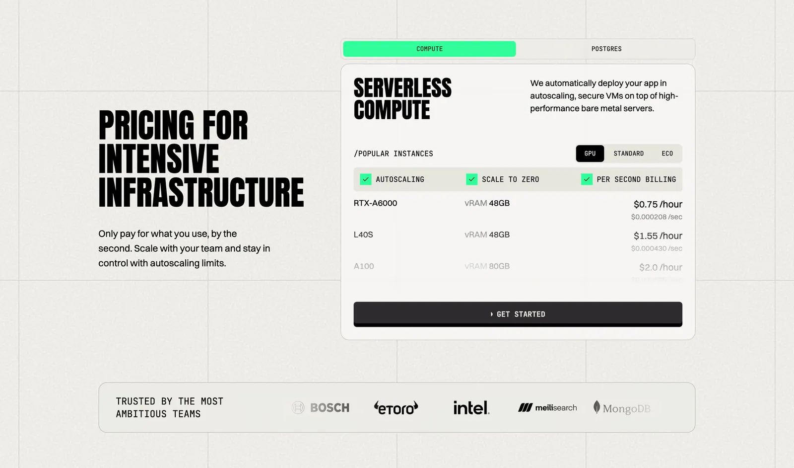
  18. Koyeb pricing section: condensed headline on the left, tabbed GPU instance price card on the right, logo strip below
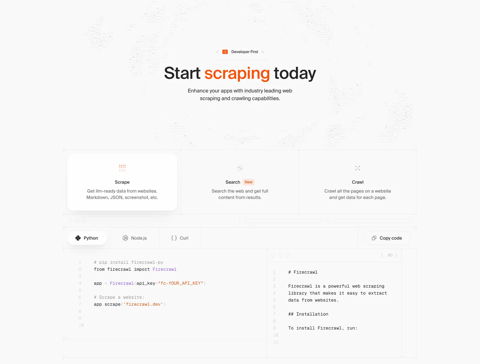
  19. Firecrawl features section: centered headline, three capability cards and a tabbed Python/Node.js/Curl code sample with markdown output
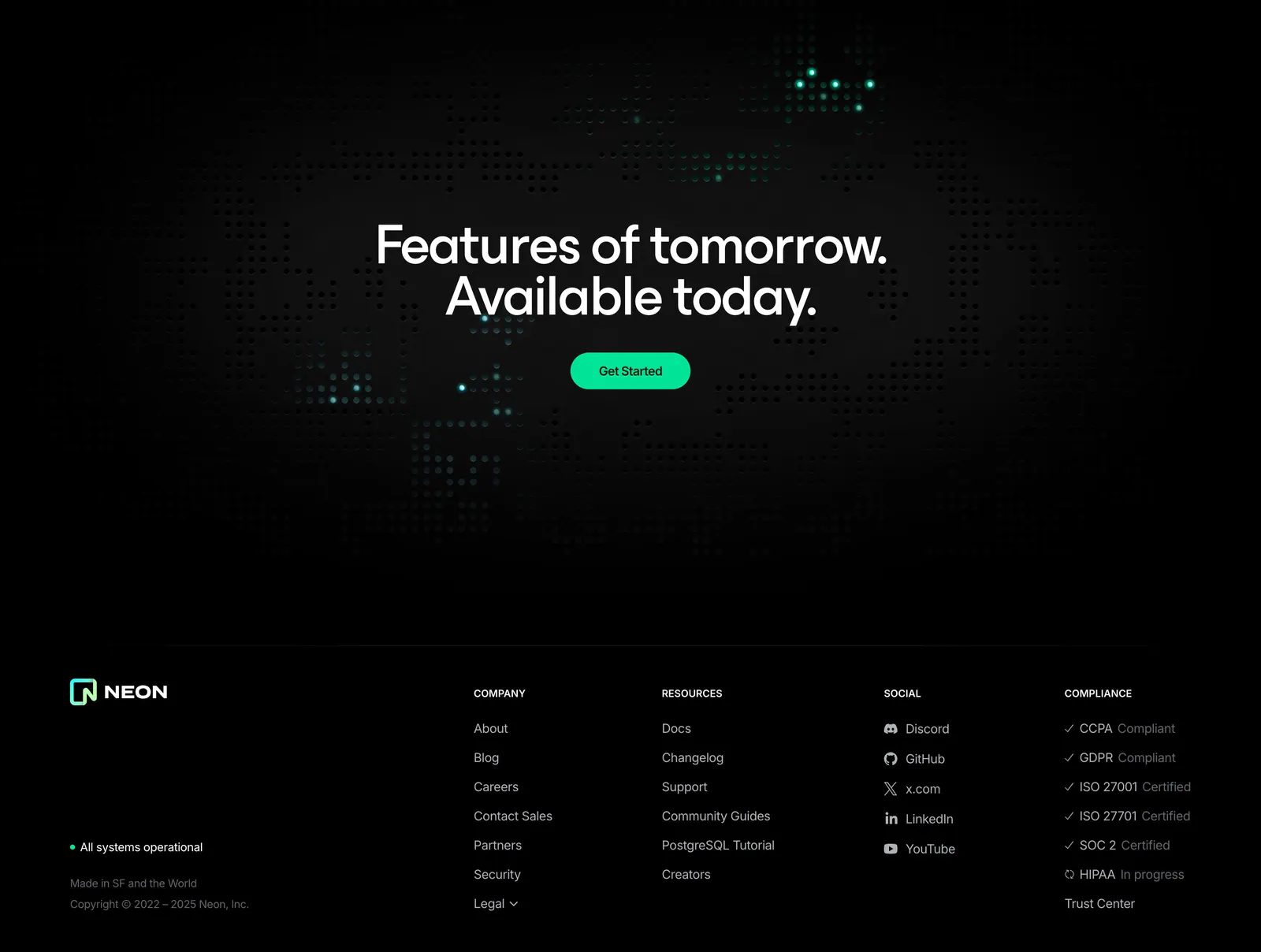
  20. Neon footer section: dark dot-grid CTA band above a footer with logo, company, resources, social and compliance link columns
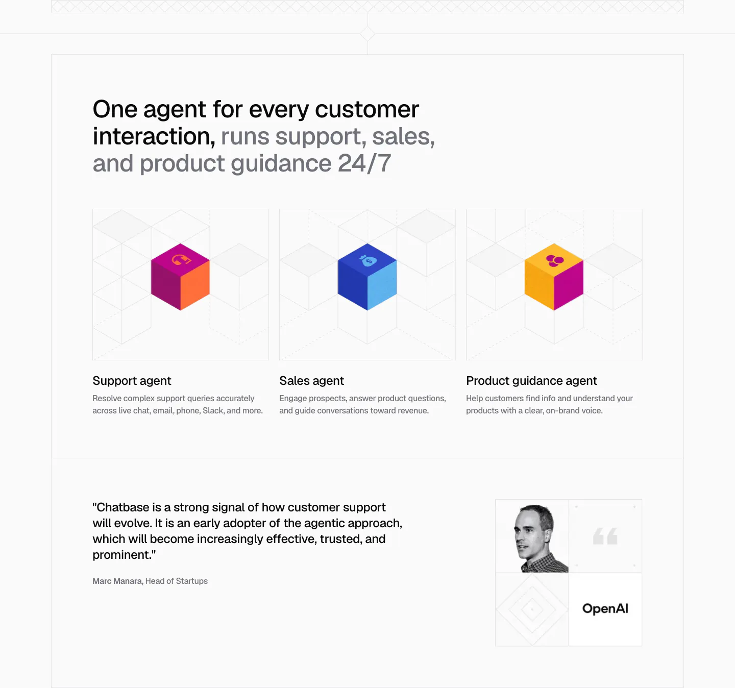
  21. Chatbase use cases section: three agent cards with colorful isometric cubes on line grids, plus an OpenAI quote with portrait below
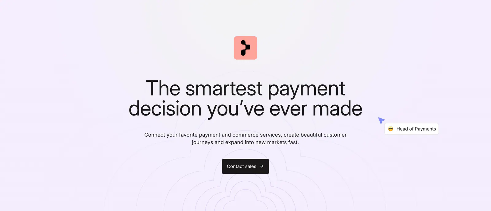
  22. Primer call-to-action section: centered headline, subcopy and dark Contact sales button over a faint concentric line pattern
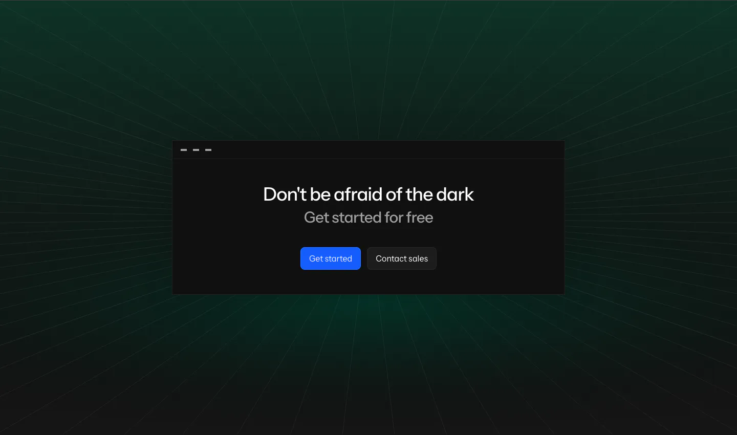
  23. Laravel Nightwatch call-to-action section: centered headline and buttons in a dark window card over a green-tinted perspective grid
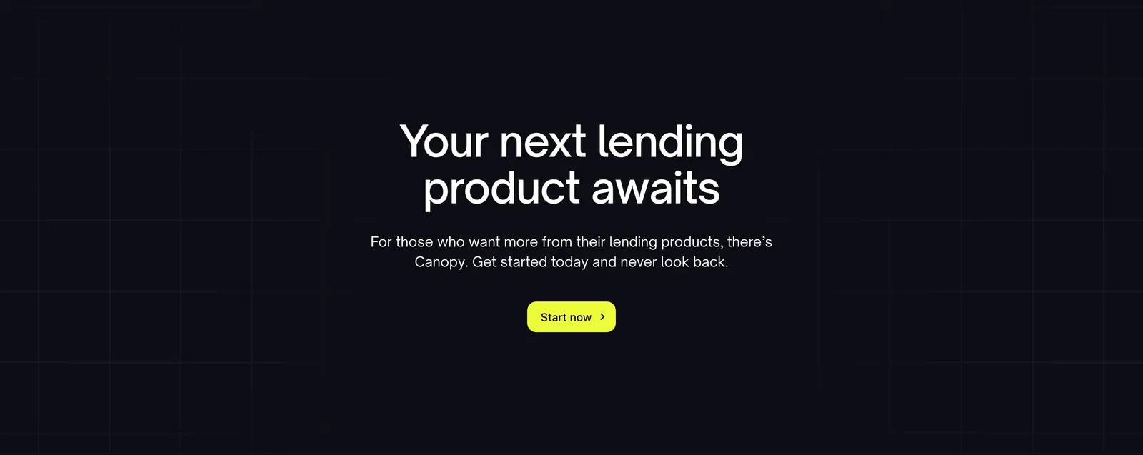
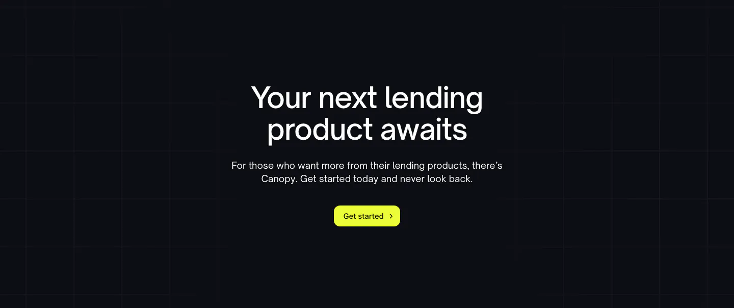
  24. Canopy call-to-action section: centered headline, short copy and lime button on a dark background with faint grid lines
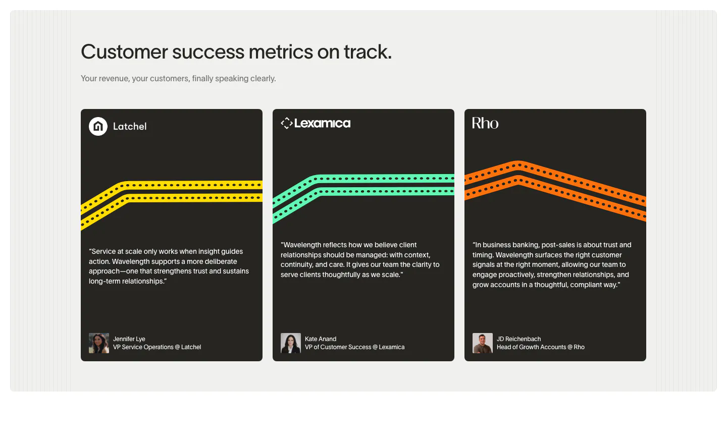
  25. Wavelength testimonials section: left headline above three dark quote cards from Latchel, Lexamica and Rho with colored track lines and avatars
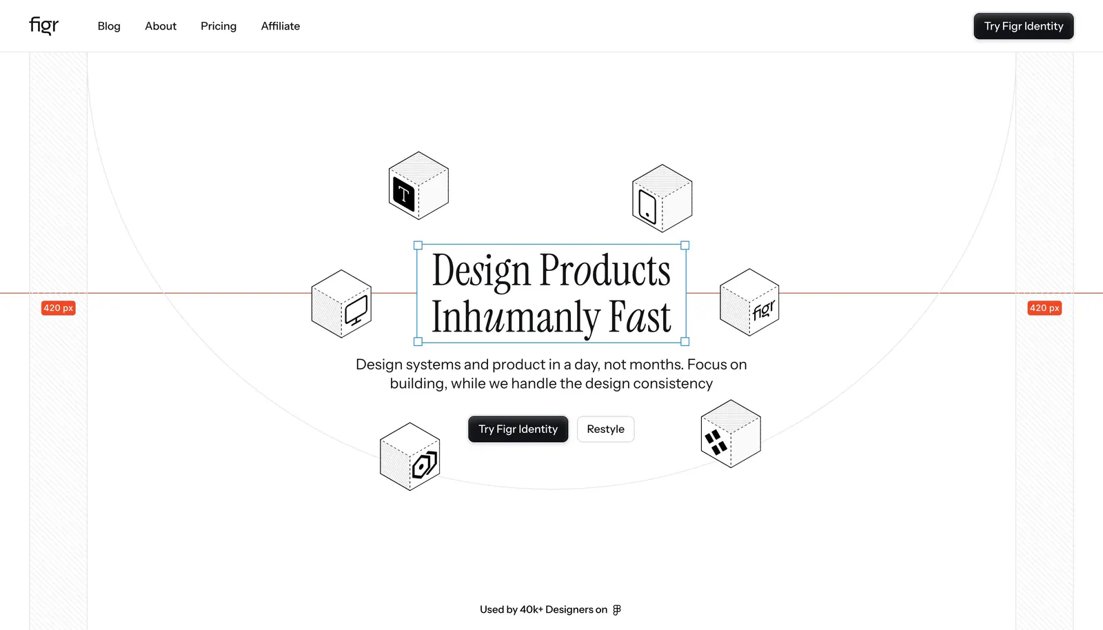
  26. Figr hero section: centered serif headline in a selection box ringed by isometric line-drawn cubes with measurement guides
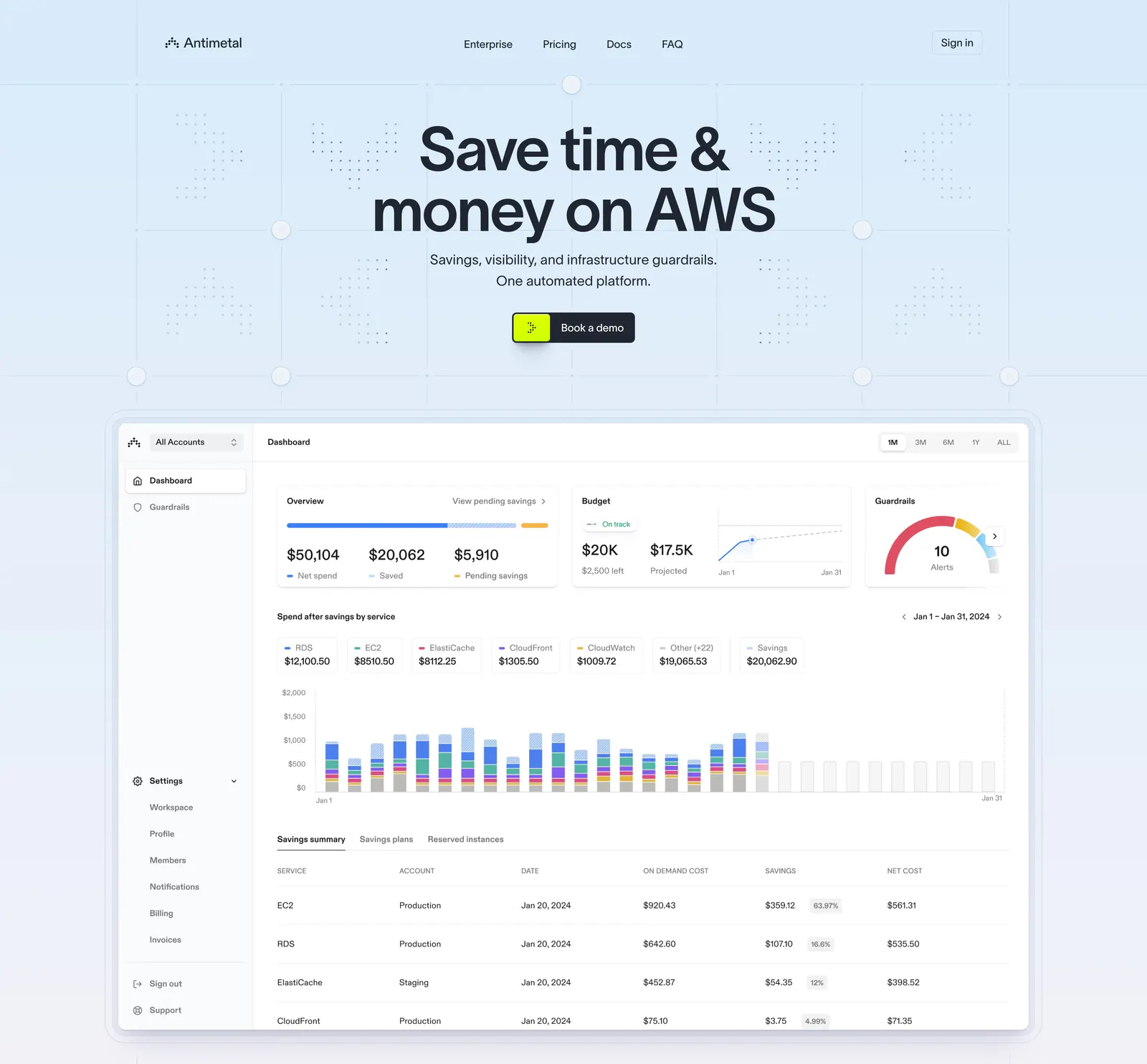
  27. Antimetal hero section: centered headline and button on a light blue grid pattern above a large AWS cost dashboard screenshot
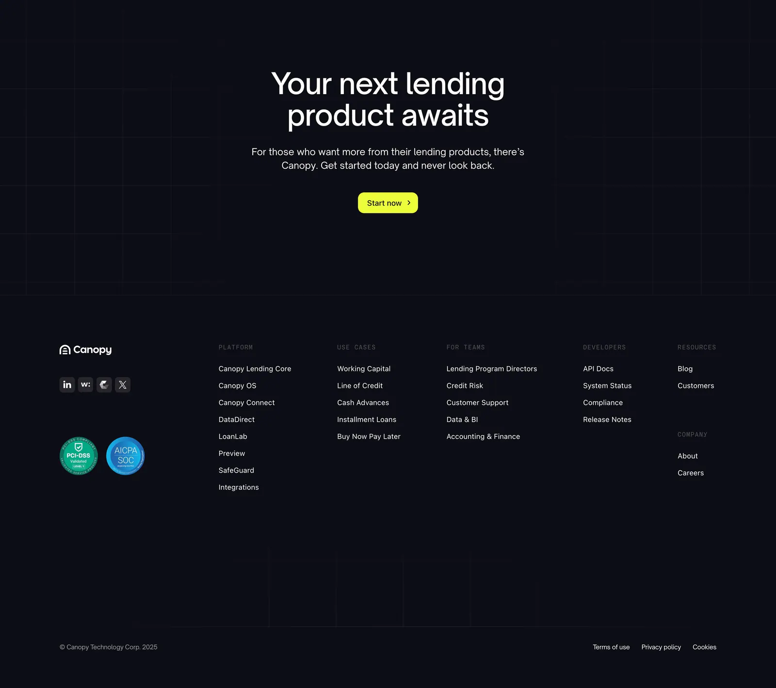
  28. Canopy footer section: centered call-to-action with lime button above a dark footer with logo, compliance badges and link columns
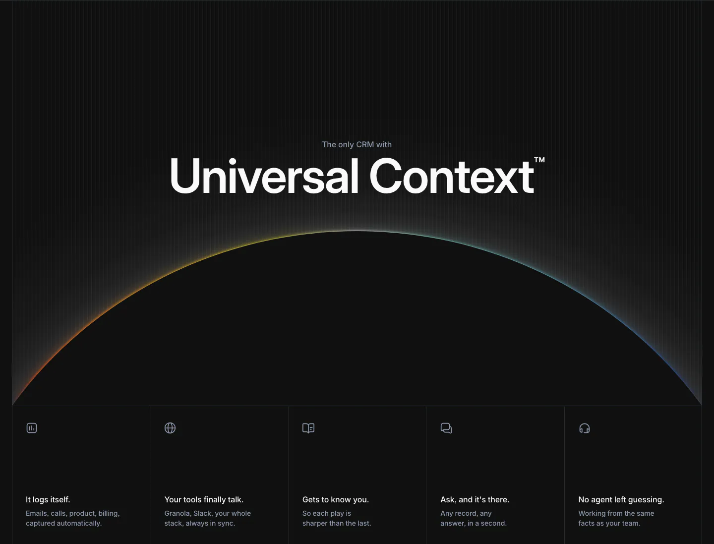
  29. Attio features section: large centered headline over a glowing horizon arc, five equal feature cells with icons below, dark background
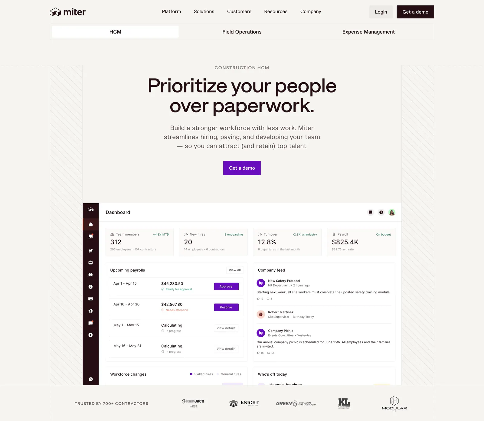
  30. Miter hero section: centered headline and CTA on warm off-white above an HR dashboard screenshot and a contractor logo row
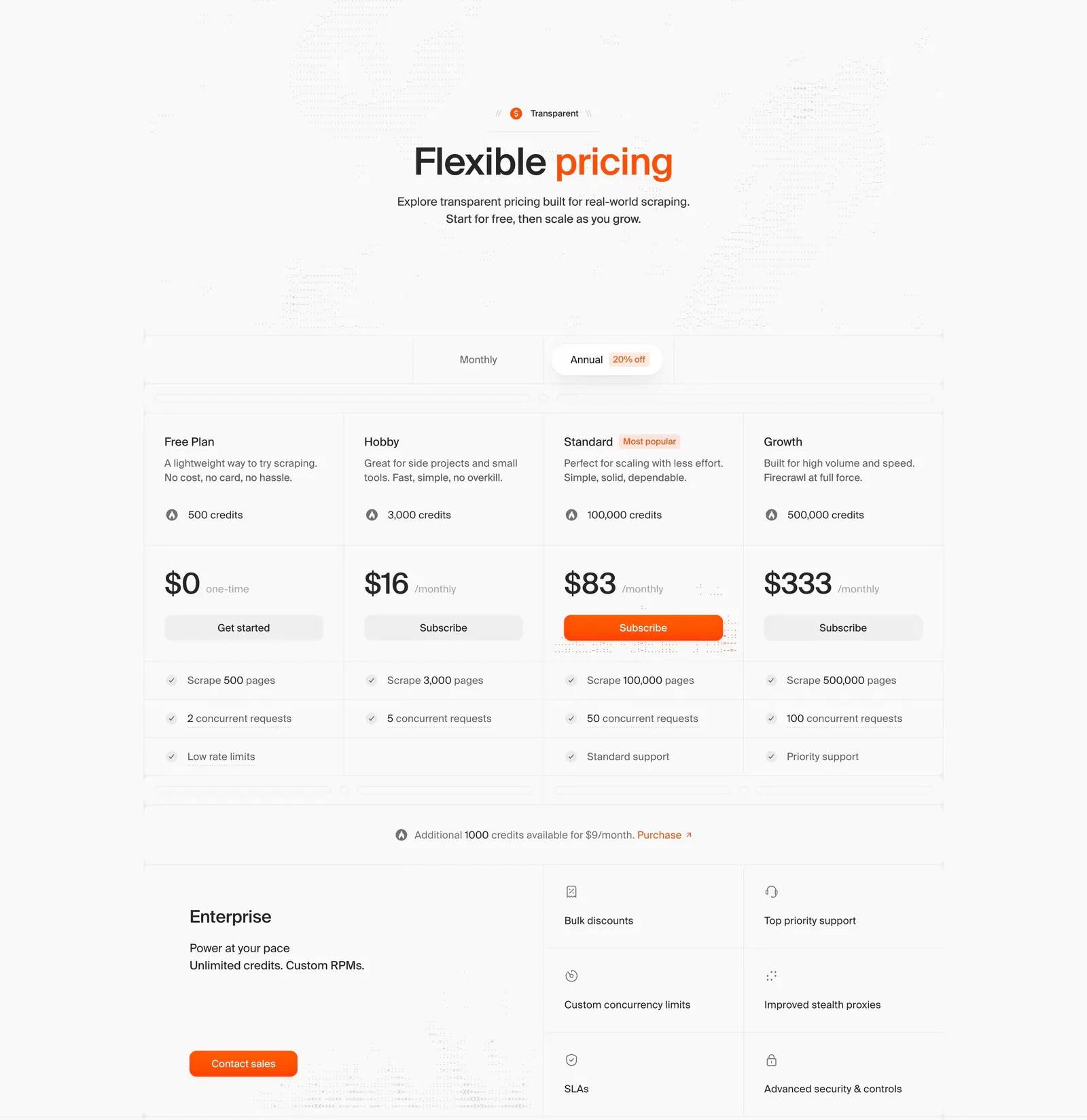
  31. Firecrawl pricing section: centered headline, monthly/annual toggle, four plan columns with prices and an enterprise block on light gray
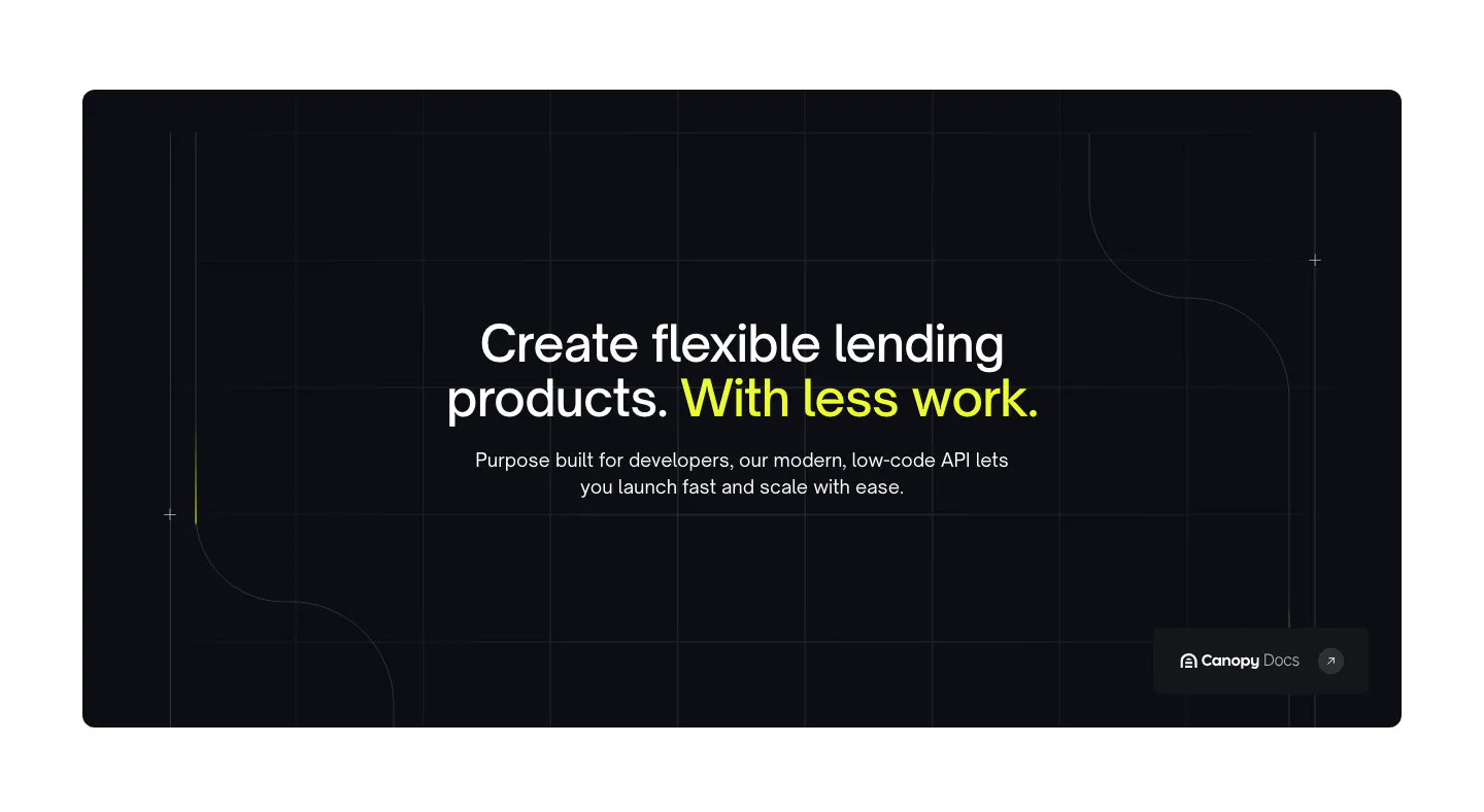
  32. Canopy value proposition section: centered headline with lime highlight in a dark rounded panel with grid lines and a docs link
  33. Daniel Sun footer section: collaboration email pill and social icon buttons above a strip of illustrated sunflowers
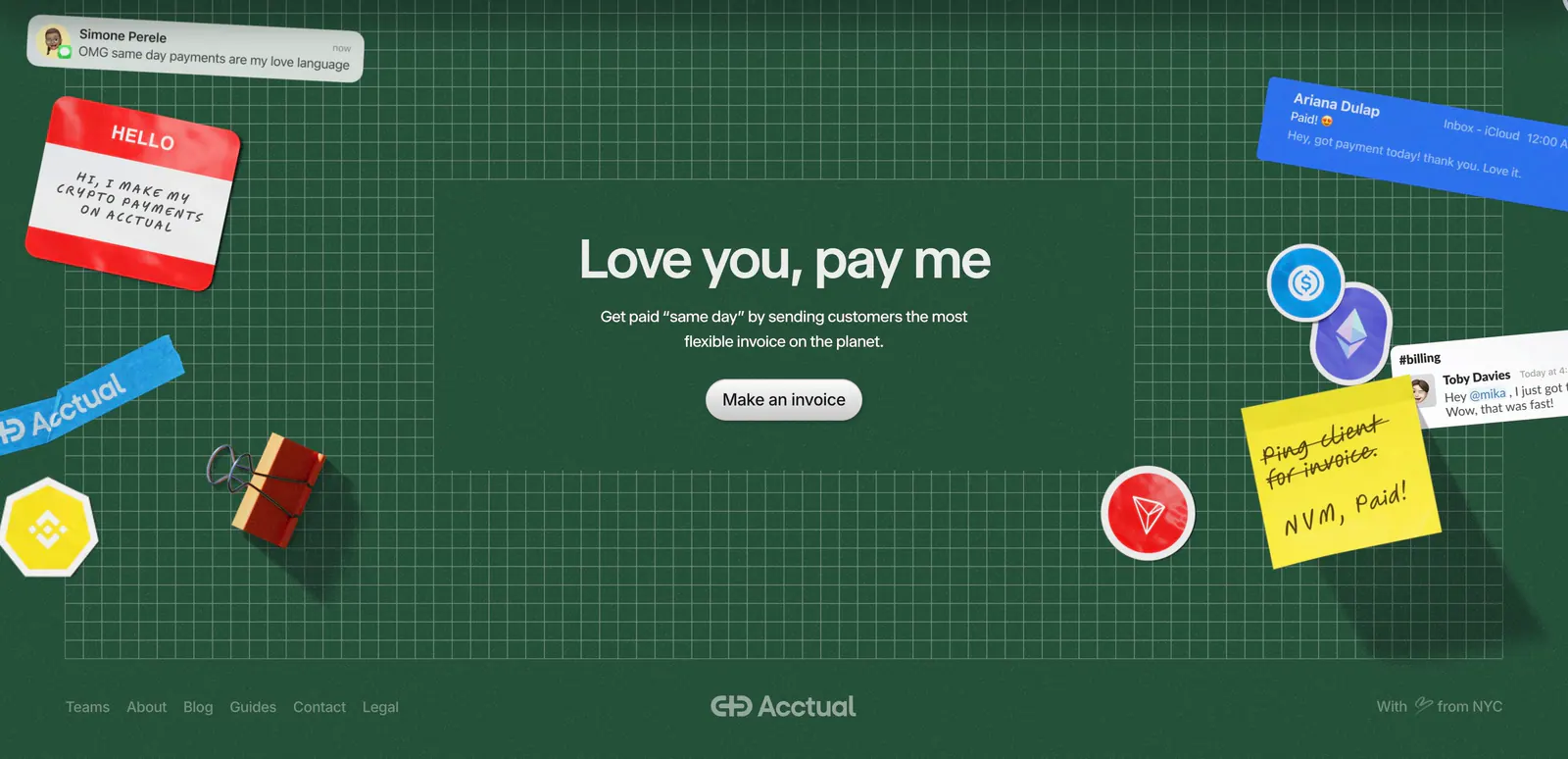
  34. Acctual footer section: centered closing headline on a dark green grid with 3D stickers and notes, plus a link row and wordmark
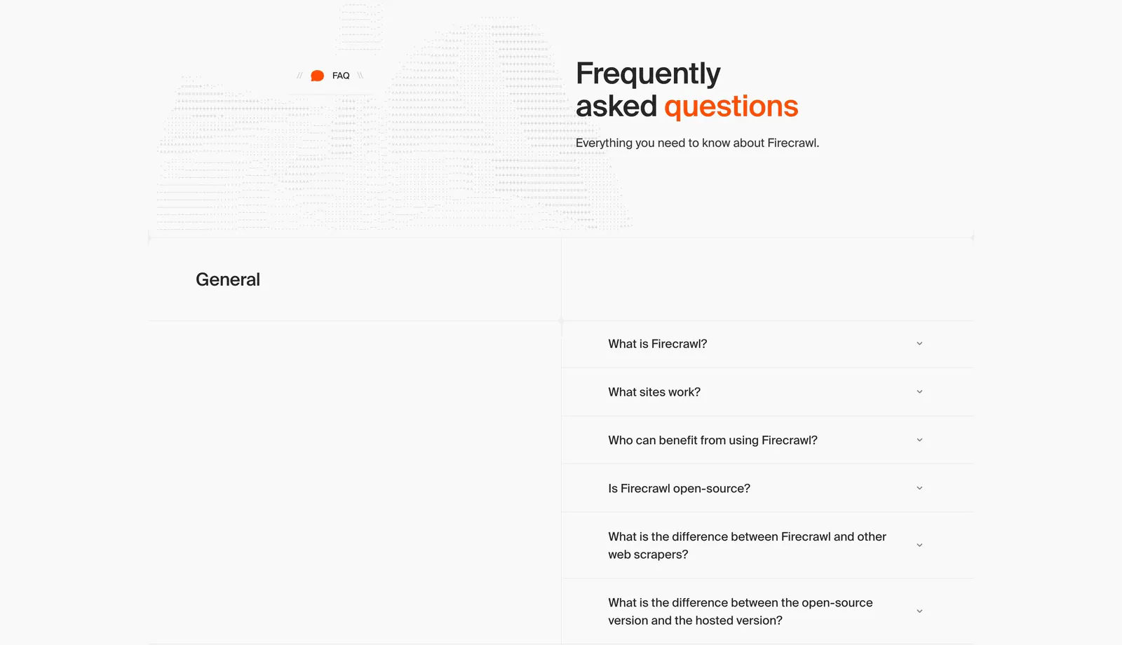
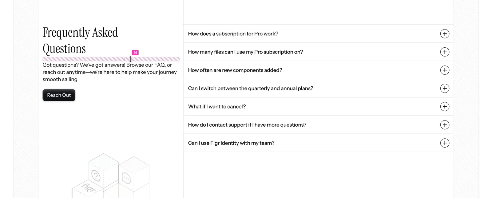
  35. Firecrawl FAQ section: headline beside dithered artwork above a two-column accordion of questions on a light gray grid layout
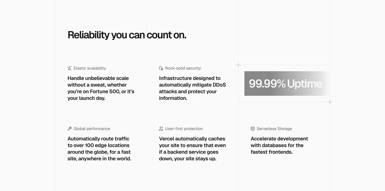
  36. Vercel features section: headline above a six-item grid of feature blurbs with icons and a gray gradient 99.99% Uptime badge
  37. Gradient Labs call-to-action section: centered serif headline and pill email field on a bright orange background with thin curved lines
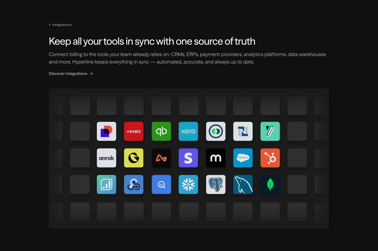
  38. Hyperline integrations section: left-aligned headline above a grid of colorful app icon tiles fading into empty dark tiles
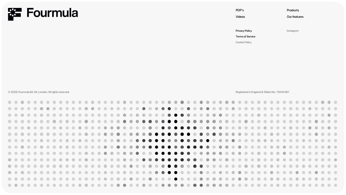
  39. Fourmula footer section: wordmark, small link columns and legal text above a gray dot-matrix field forming a halftone shape
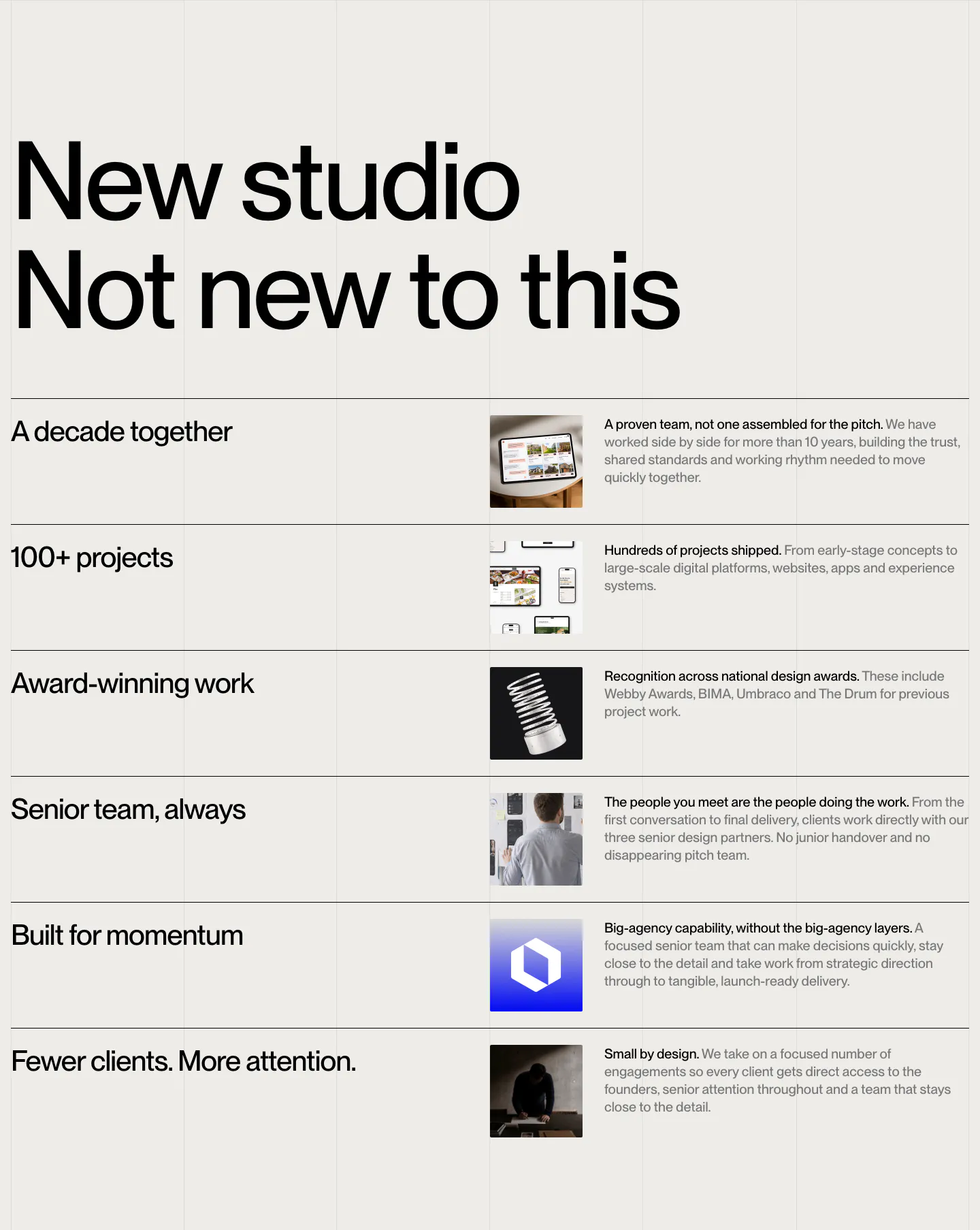
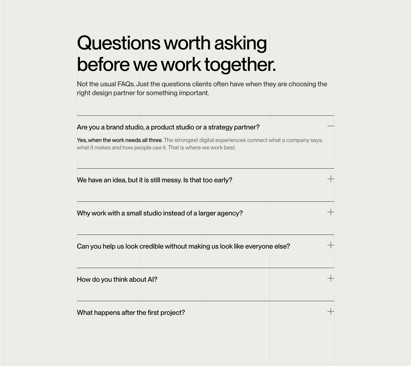
  40. Brikken+Co value proposition section: oversized two-line headline above ruled rows of claims, thumbnails and short copy
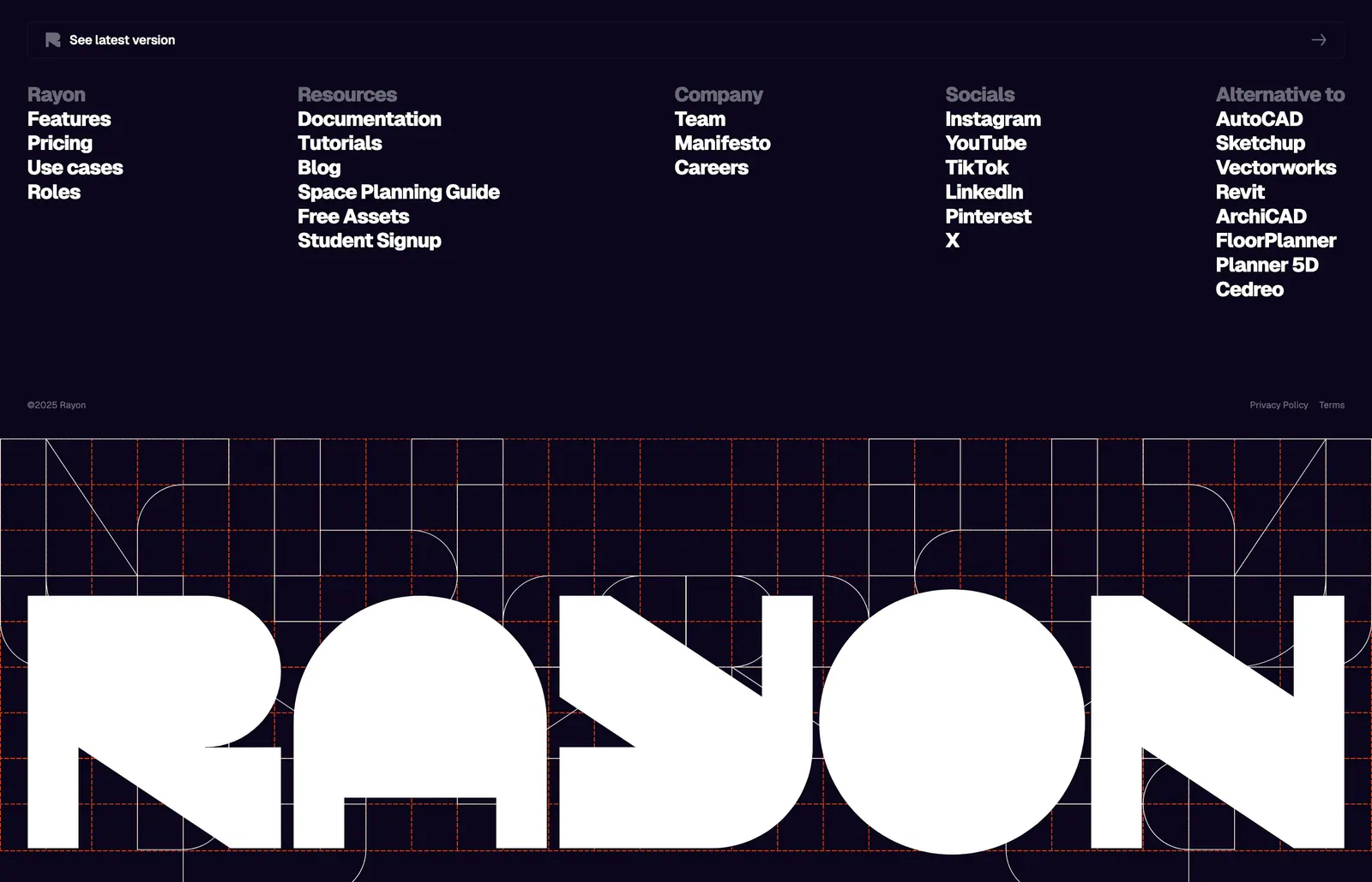
  41. Rayon footer section: five link columns on deep navy above a giant white Rayon wordmark set over an orange construction grid
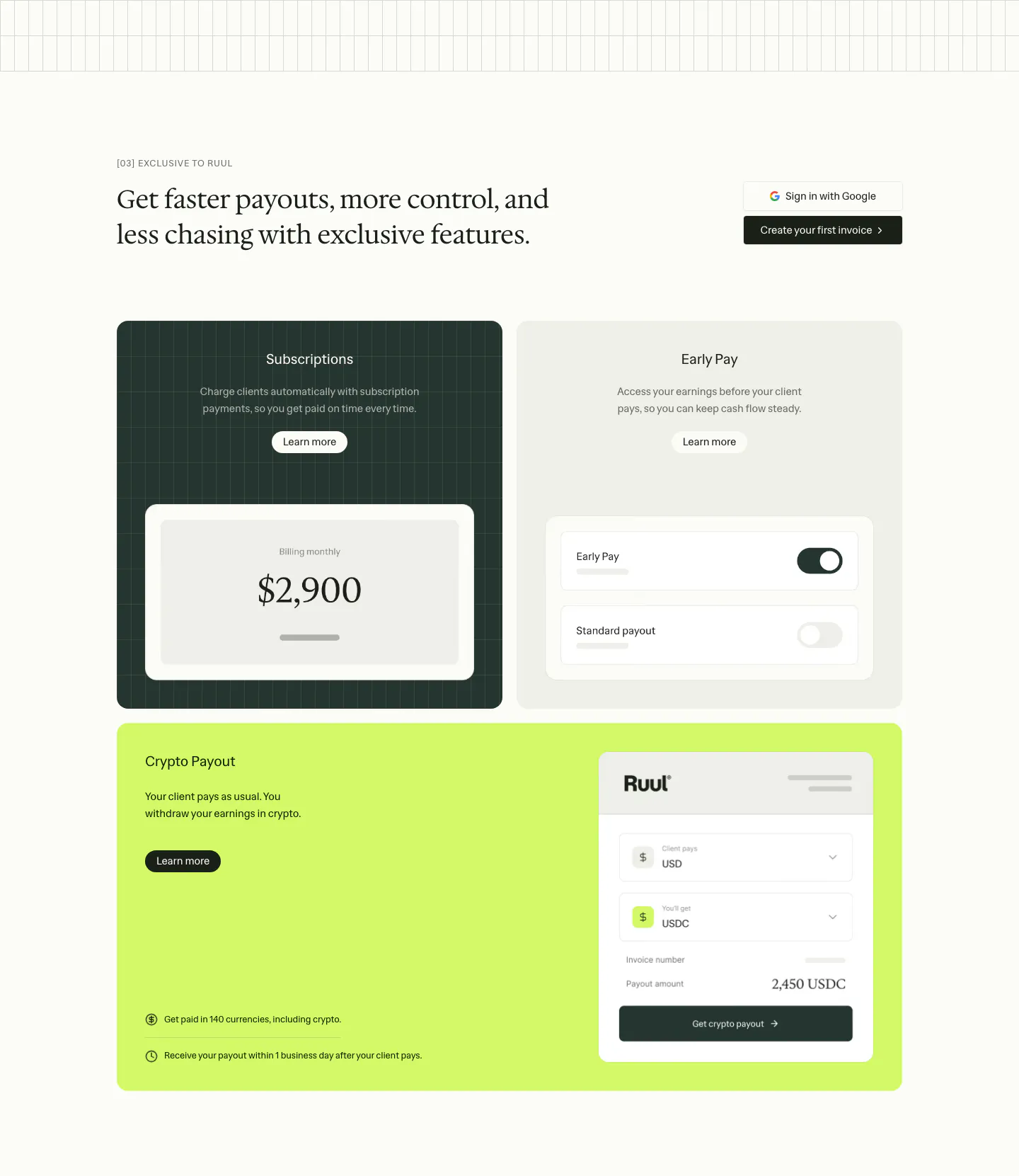
  42. Ruul features section: serif headline above three feature cards in dark green, gray and lime with payout and toggle UI mockups
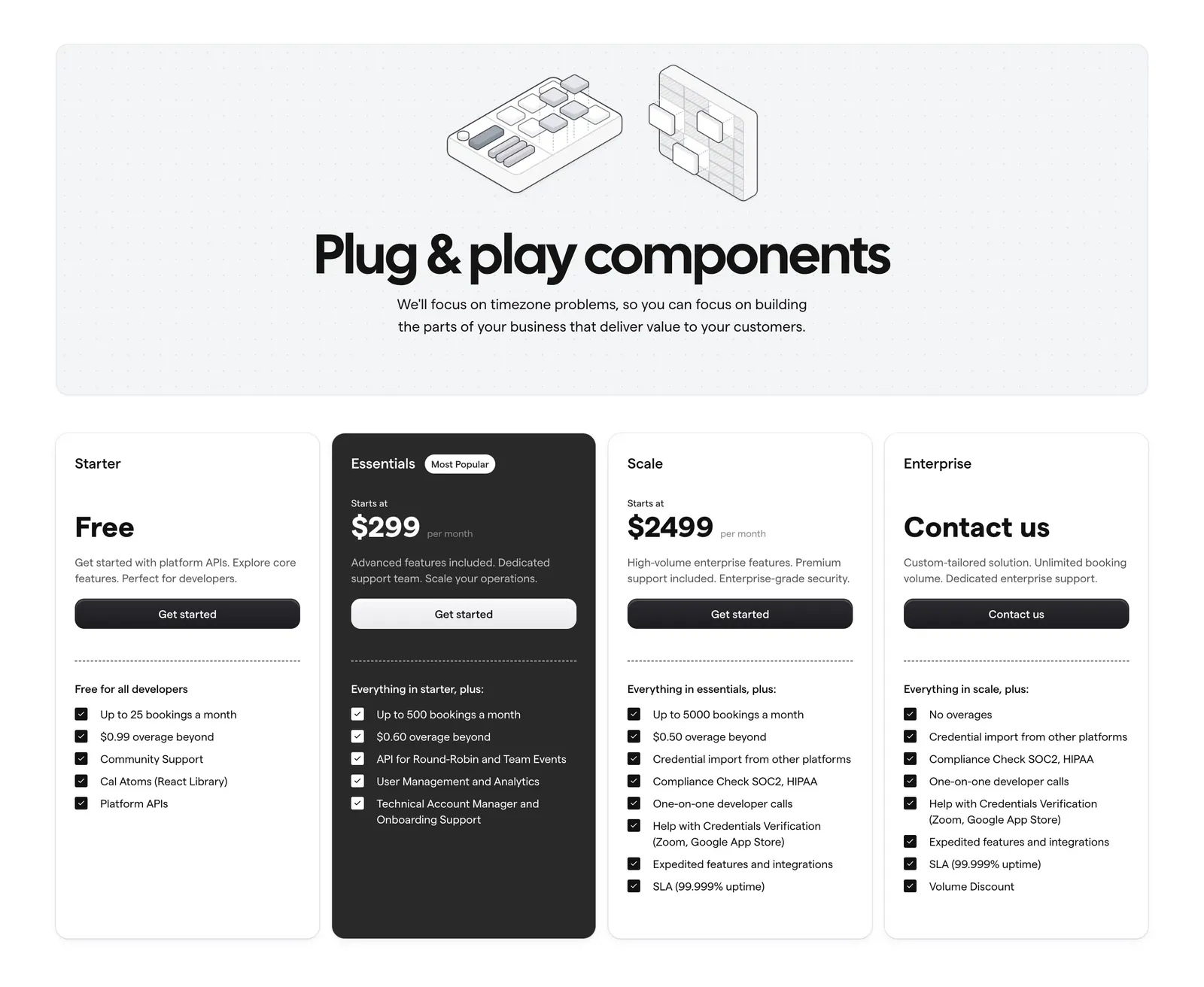
  43. Cal.com pricing section: centered headline with isometric line art on a dotted panel above four plan cards, one dark highlighted
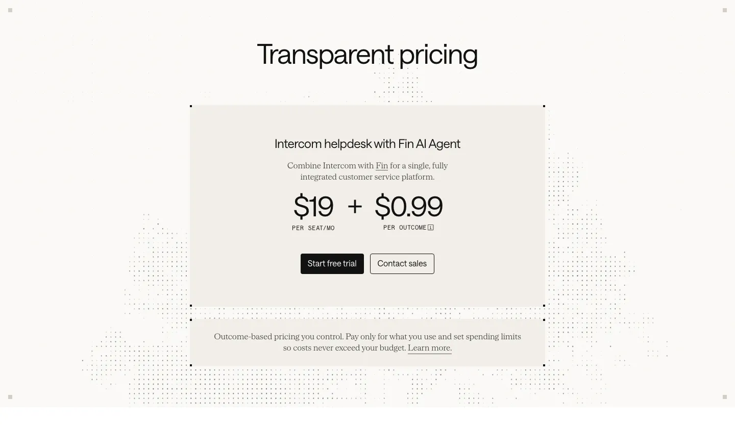
  44. Intercom pricing section: centered beige card with $19 per seat plus $0.99 per outcome pricing and two buttons over a faint dot pattern
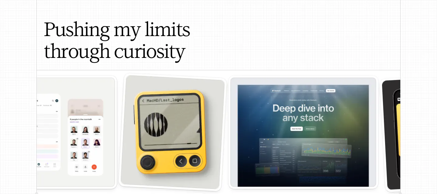
  45. Daniel Sun other section: left serif headline above a horizontal carousel of exploration cards showing app and device mockups
    Daniel Sun Other
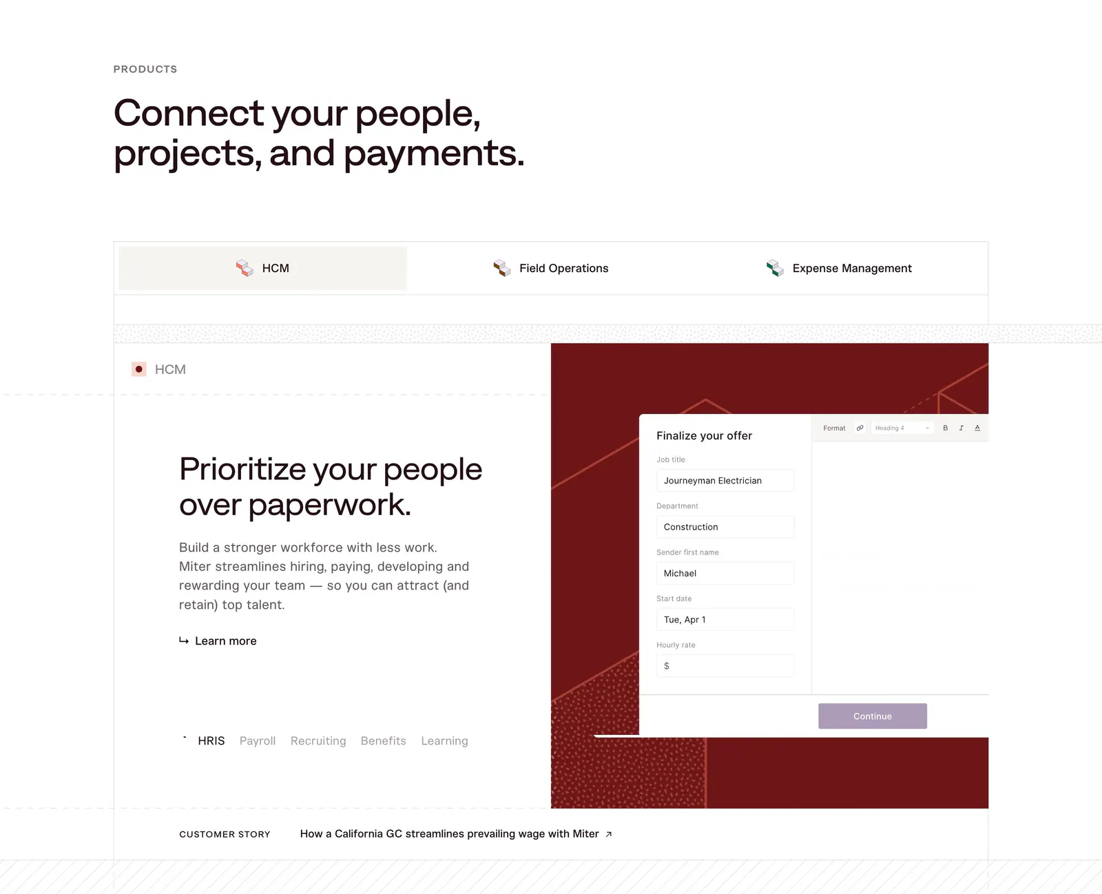
  46. Miter features section: headline above product tabs and a split panel with HCM copy beside an offer form UI on dark red
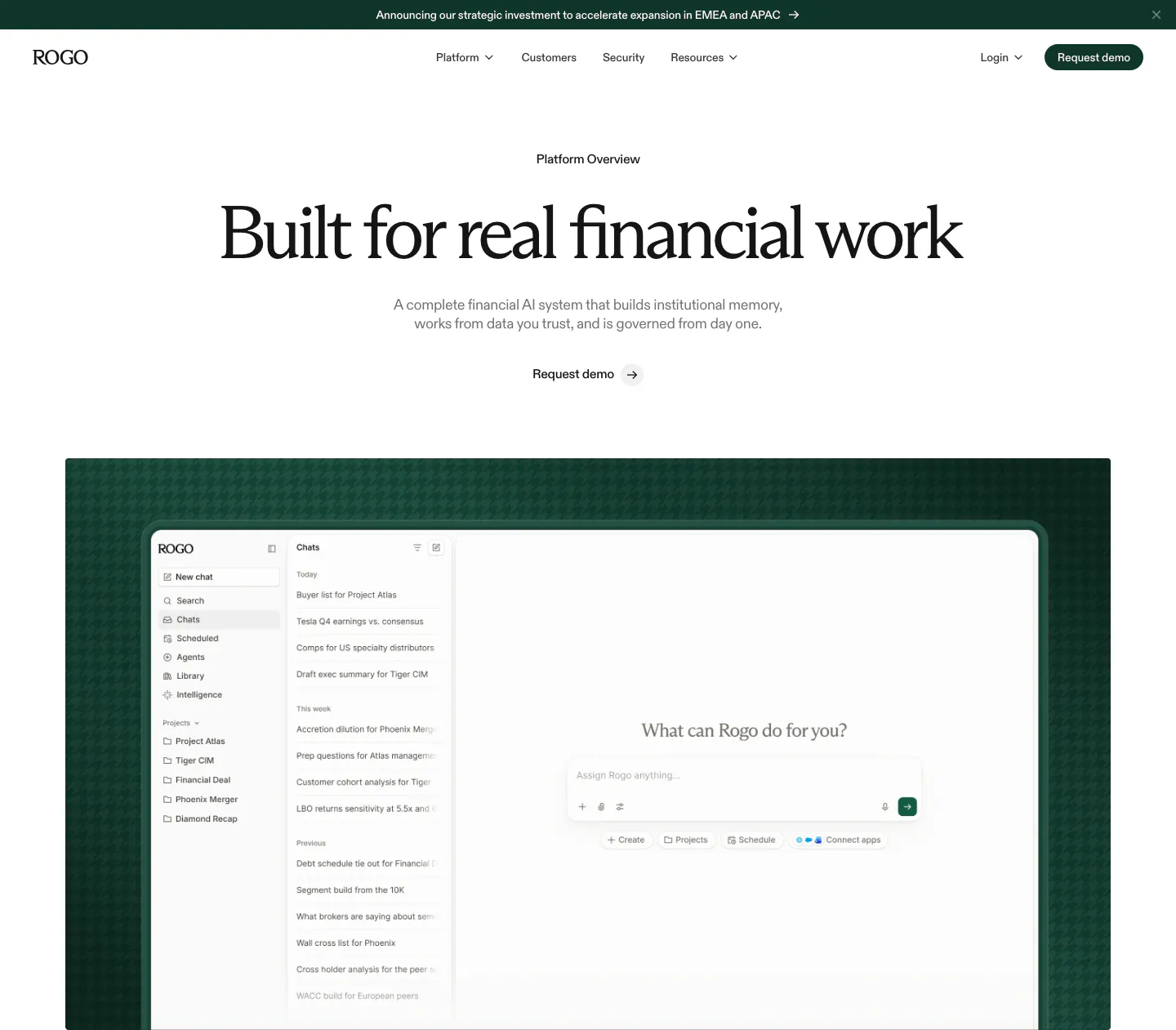
  47. Rogo hero section: announcement bar, nav, centered serif headline and demo link above a chat app screenshot on dark green
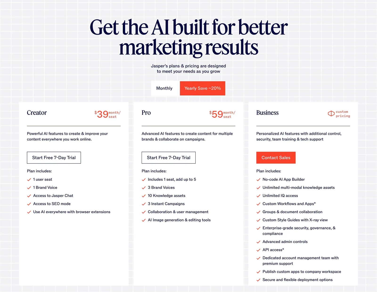
  48. Jasper pricing section: centered serif headline and monthly/yearly toggle above three white plan cards on a light grid background
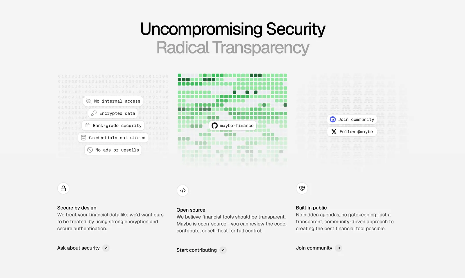
  49. Maybe features section: centered two-tone headline above three columns on security, open source and community with textured visuals
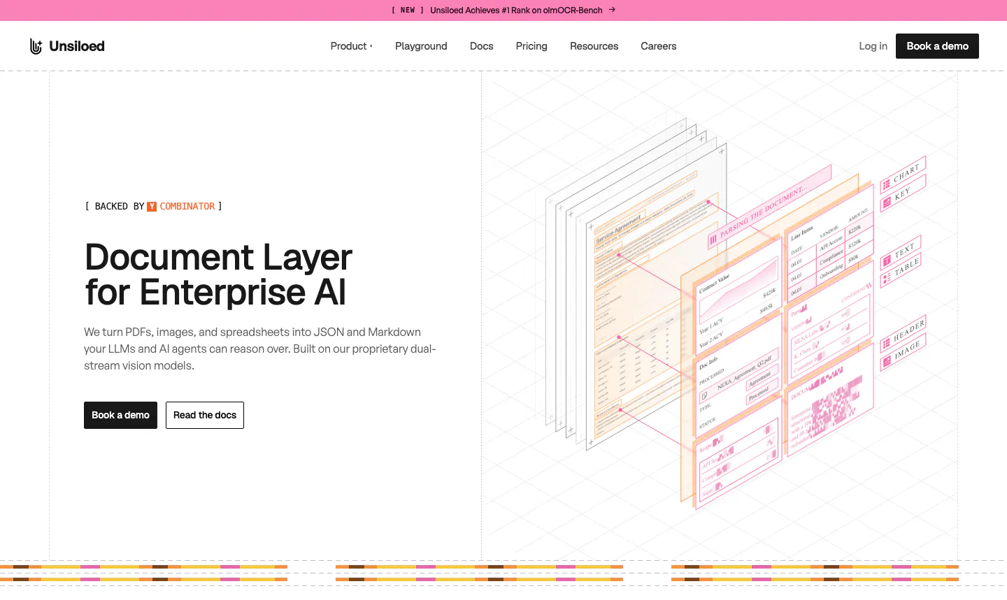
  50. Unsiloed hero section: left headline with Book a demo and Read the docs buttons beside an isometric illustration of layered parsed documents
  51. Exante call-to-action section: centered headline with sign up and learn more buttons over a faint grid on a near-black background
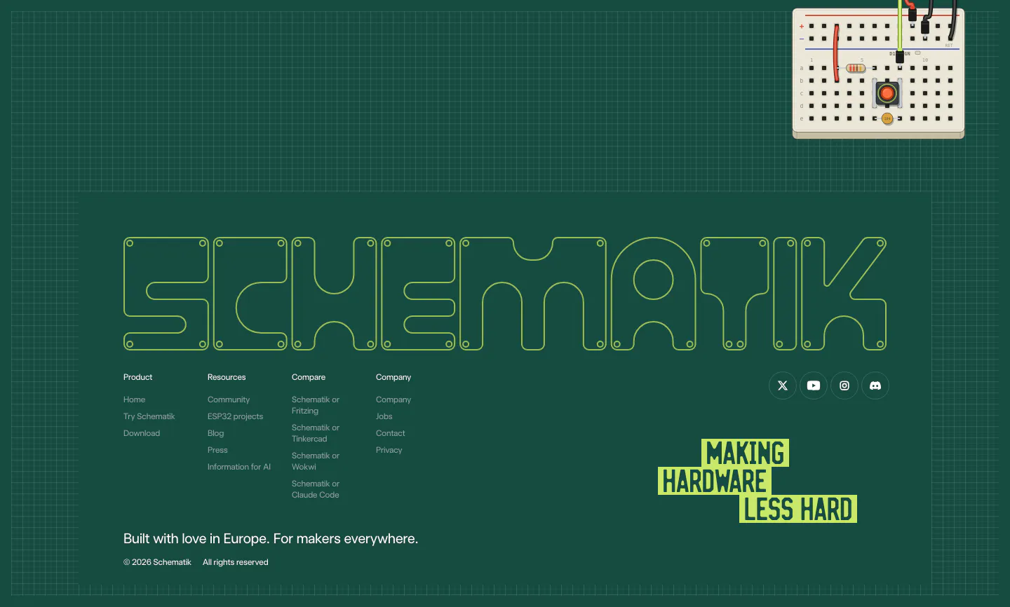
  52. Schematik footer section: outlined SCHEMATIK wordmark, link columns and lime tagline on a dark green grid with a breadboard
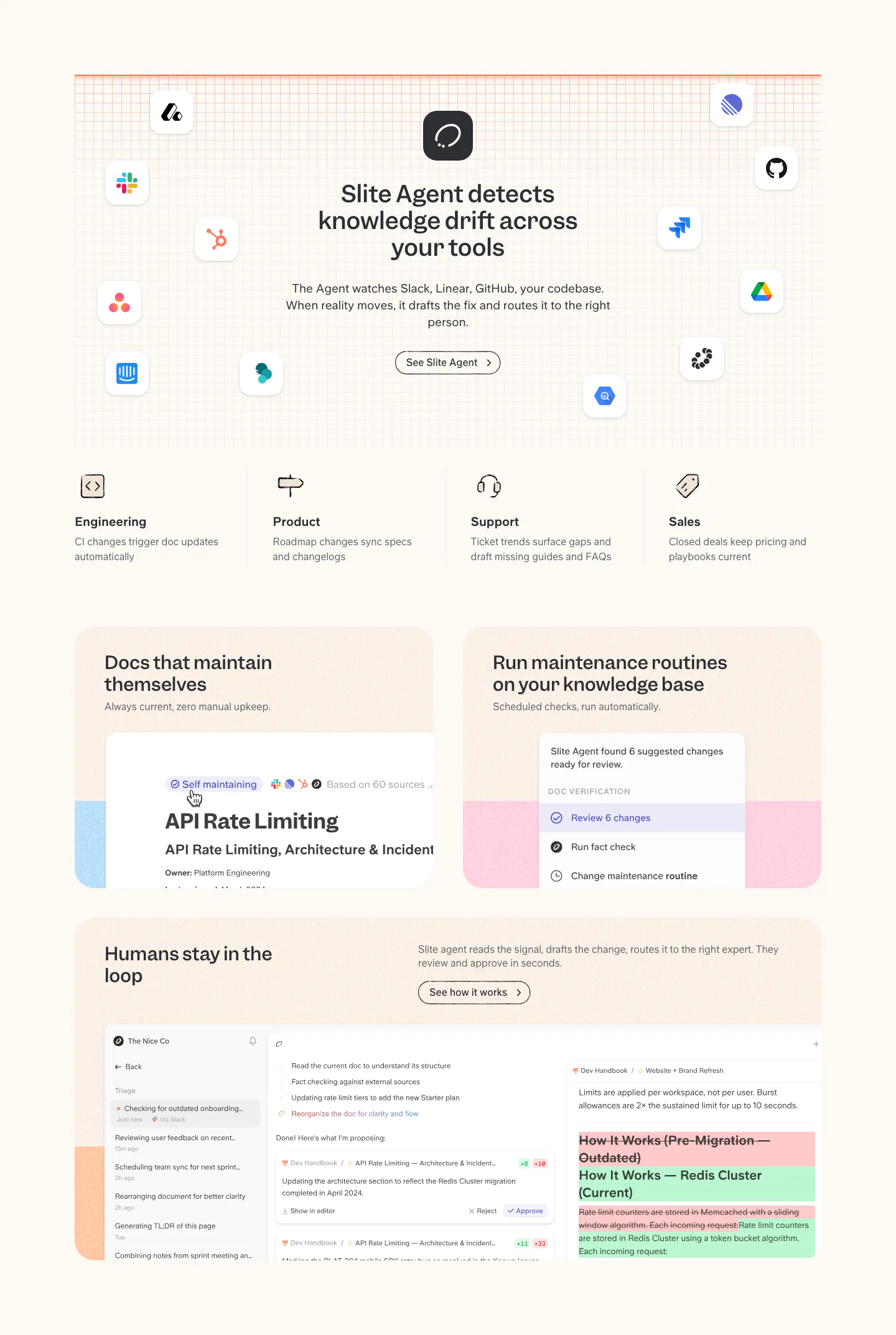
  53. Slite features section: headline ringed by app icons on a grid, four team columns, then cards with doc maintenance and review UI on cream
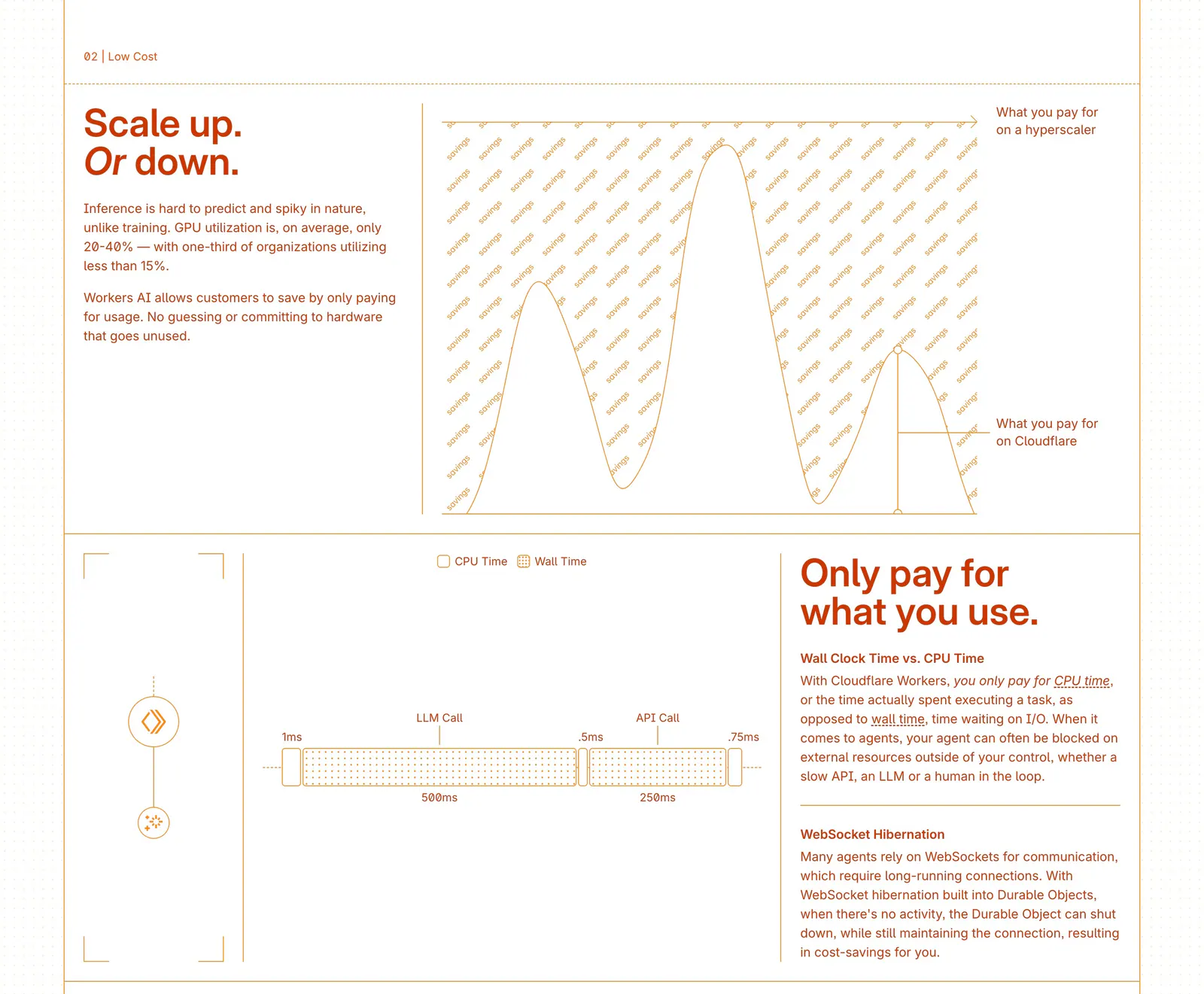
  54. Cloudflare Agents features section: zig-zag rows of orange text beside line-drawn cost charts and a timing diagram on white
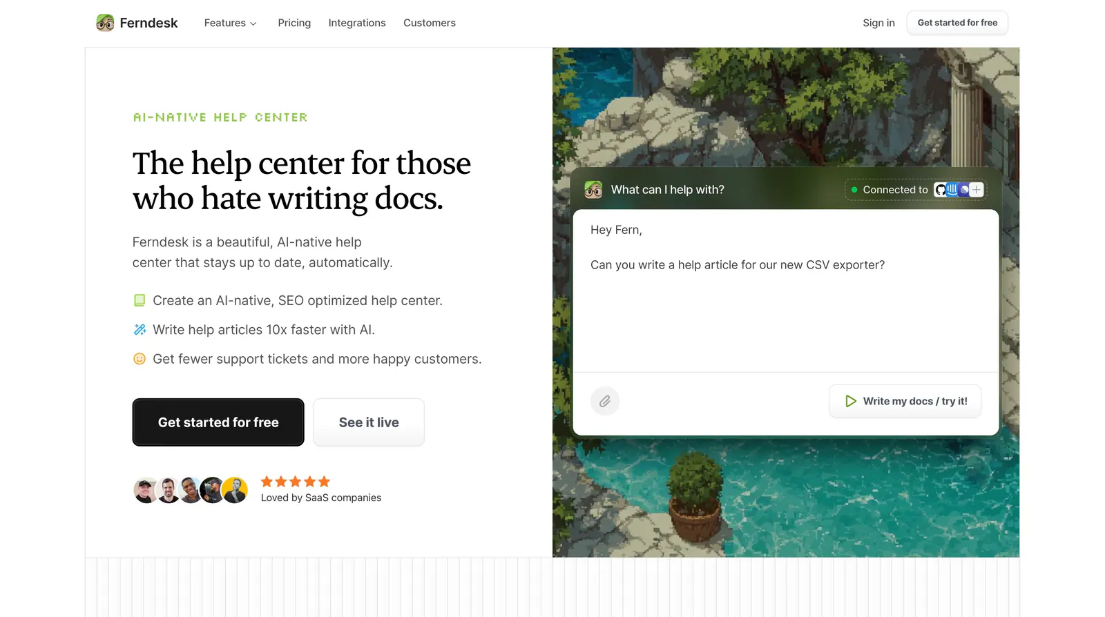
  55. Ferndesk hero section: serif headline, checklist and CTAs on the left beside an AI chat prompt over a pixel-art garden scene
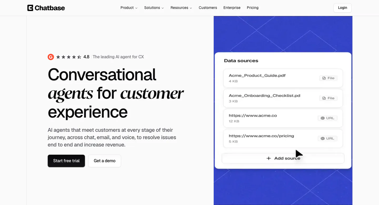
  56. Chatbase hero section: left headline with italic serif words and CTAs, right blue patterned panel with a data sources UI card
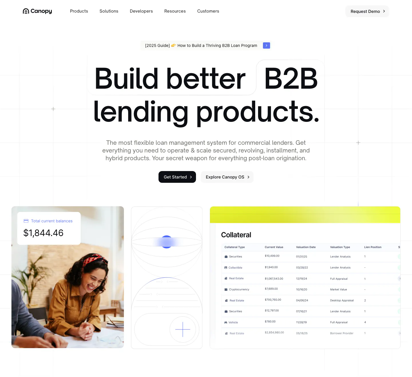
  57. Canopy hero section: centered bold headline and two buttons above a photo, abstract tile and collateral table UI on a white grid
  58. Invertase hero section: left headline with logo strip and buttons beside a dark 3D rock render in a glowing ring, services row below
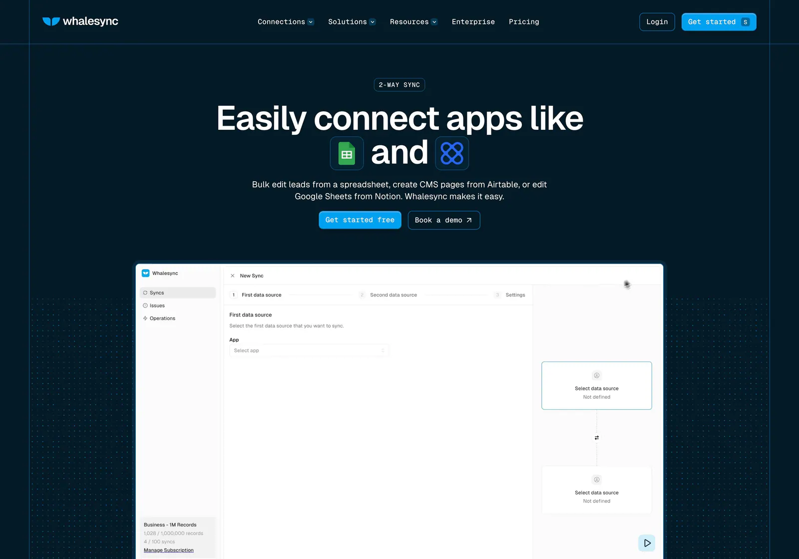
  59. Whalesync hero section: centered headline with inline app icons and buttons above a new-sync product screenshot on dark navy dot grids
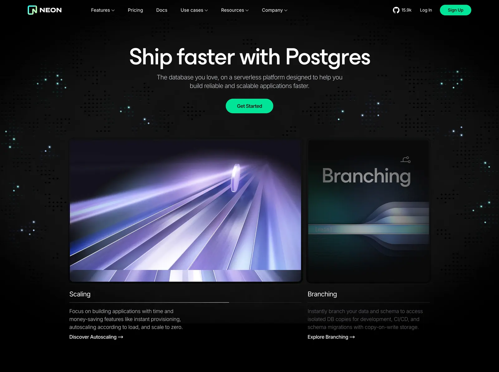
  60. Neon hero section: centered headline and green CTA above two rendered feature cards for Scaling and Branching on a dark dot-grid background
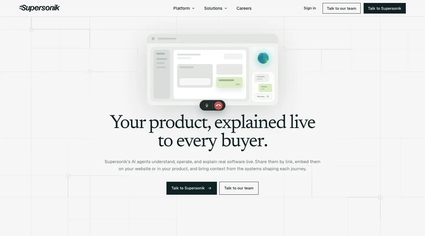
  61. Supersonik hero section: centered serif headline and two CTAs below a soft UI mockup with call controls on a light grid background
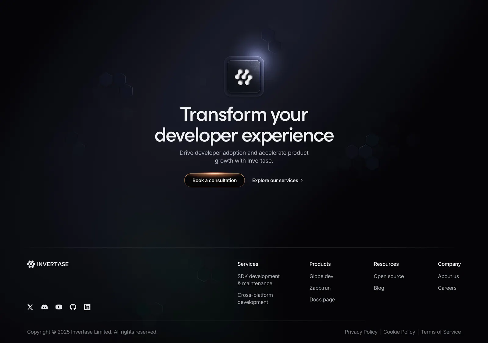
  62. Invertase footer section: centered CTA with glowing logo tile above link columns, social icons and copyright on a dark background
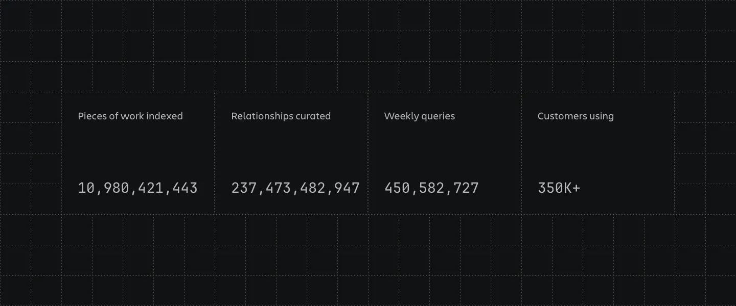
  63. Atlassian stats section: four bordered cells with large monospaced counters and labels on a dark grid-line background
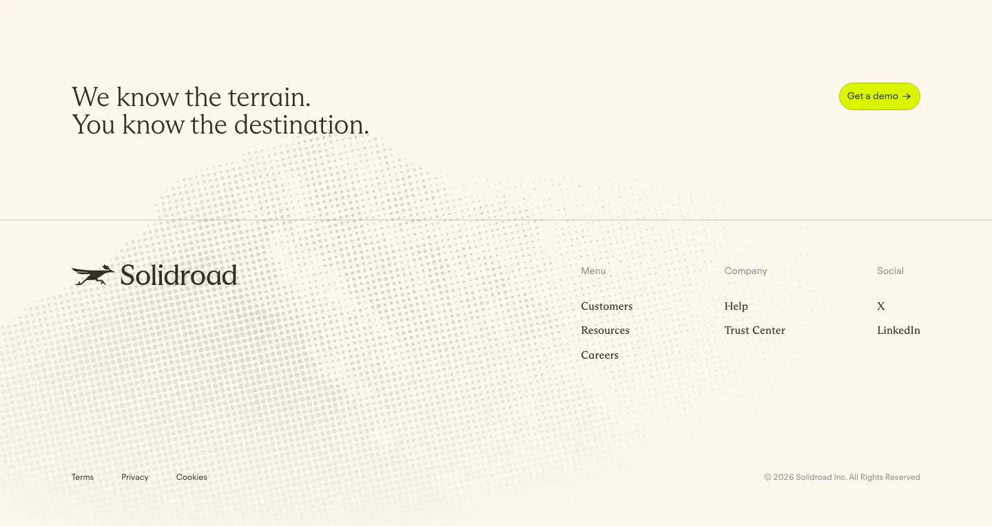
  64. Solidroad footer section: serif CTA headline and lime button above logo and link columns on cream with a faint halftone dot texture
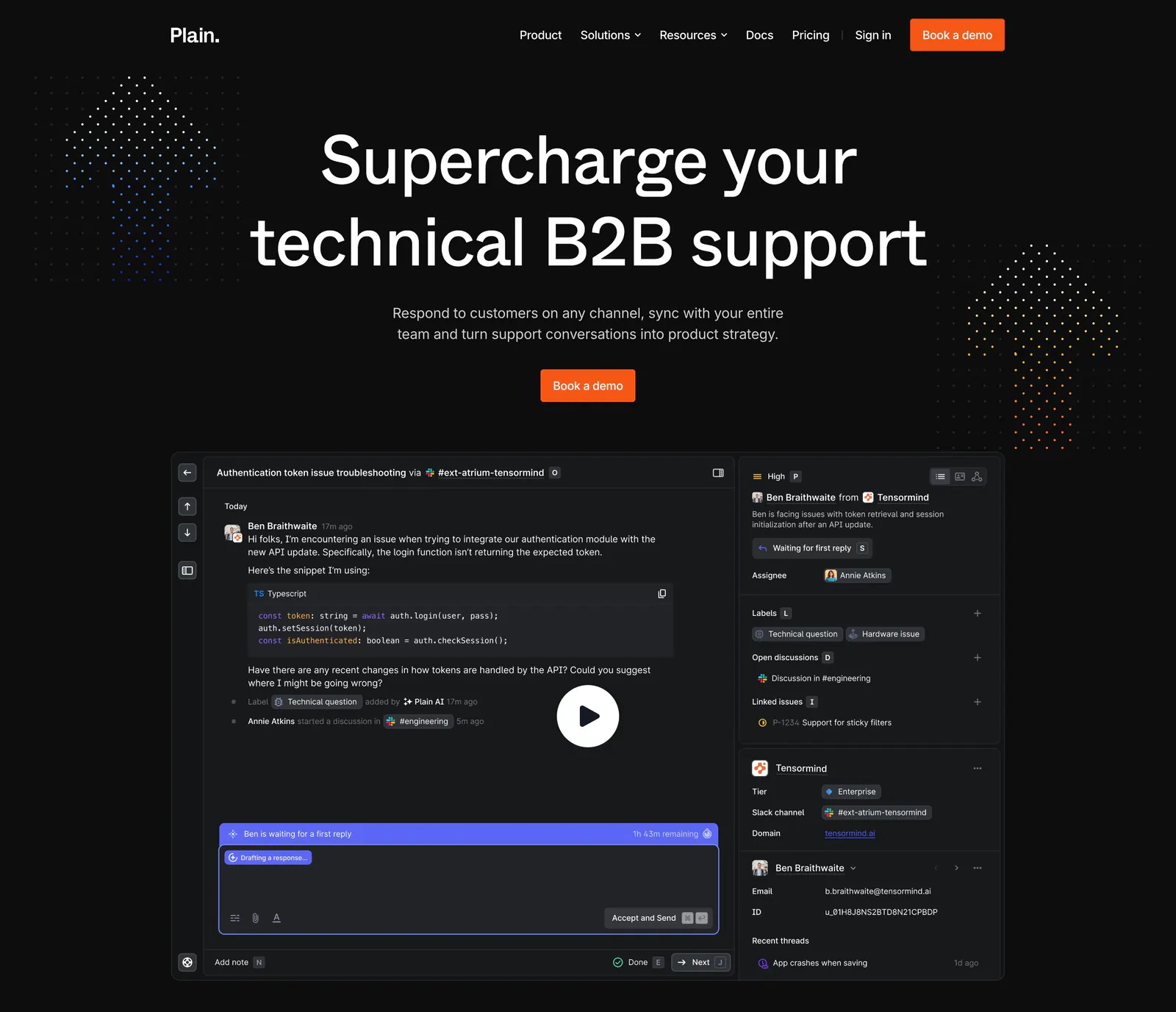
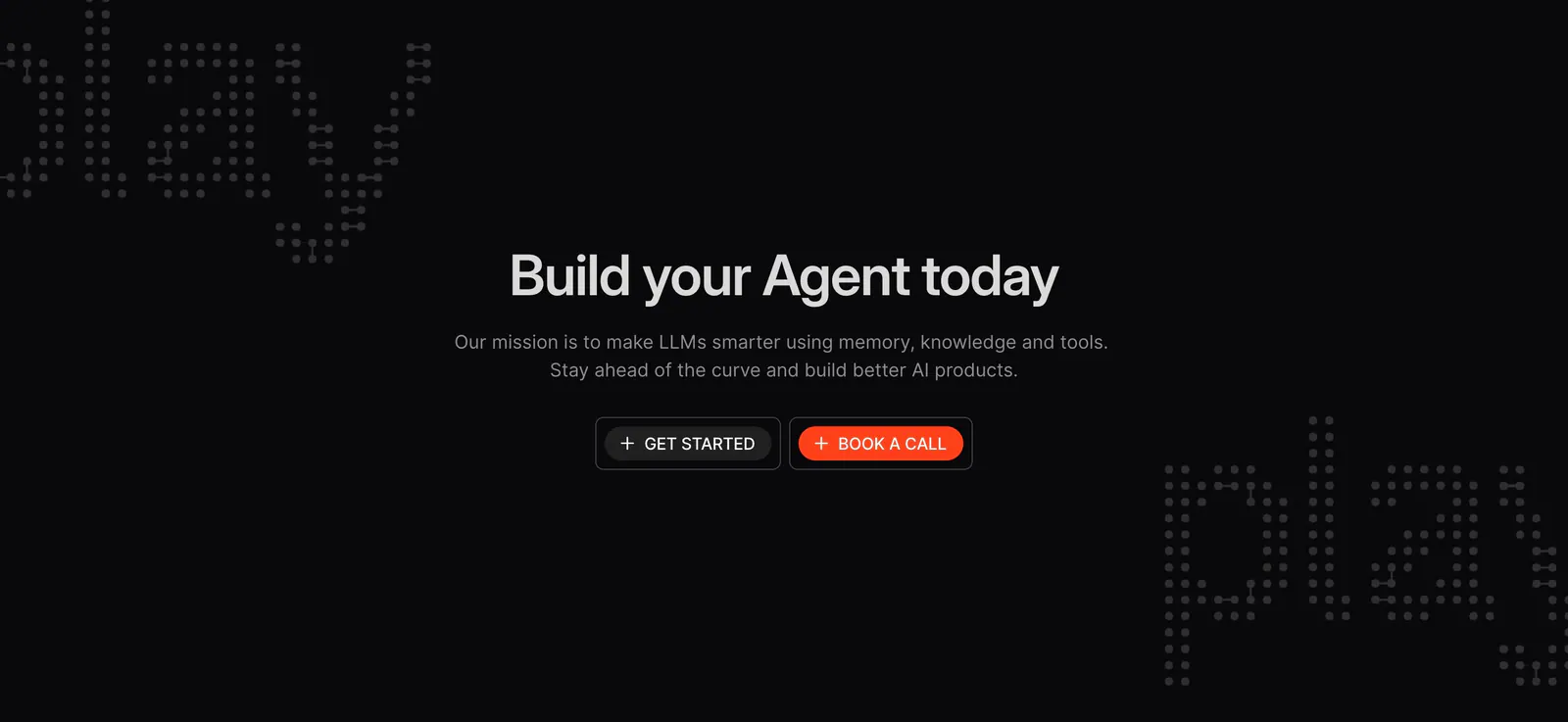
  65. Plain hero section: dark centered headline and orange demo button above a support thread UI with a play button, flanked by dot clusters
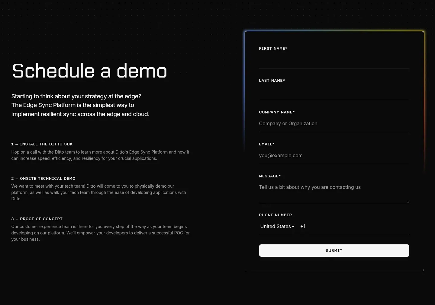
  66. Ditto contact section: headline and three numbered demo steps on the left beside a dark form with a glowing border on a dotted black background
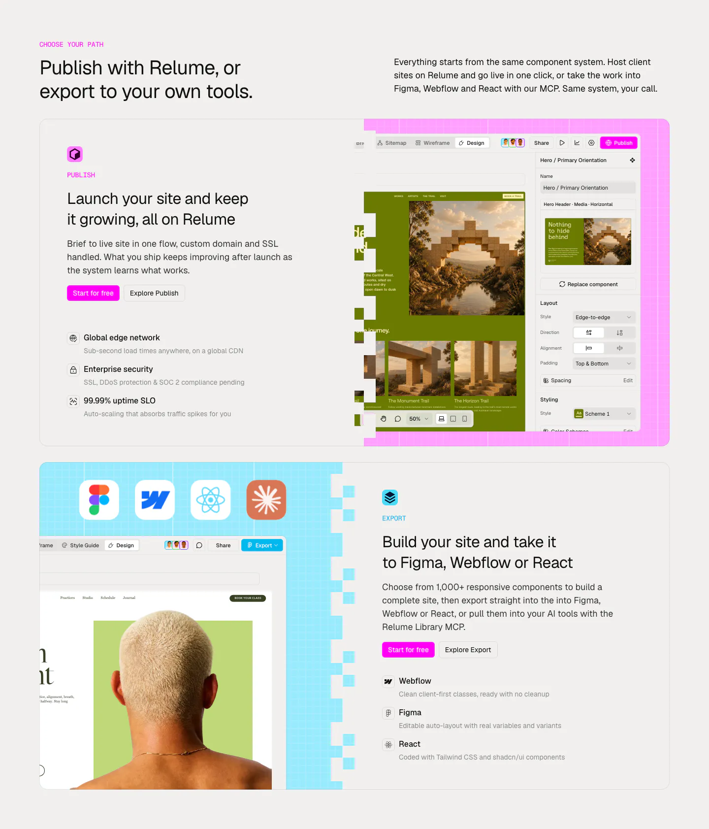
  67. Relume features section: headline above two large cards alternating text and editor screenshots for Publish and Export on pink and blue grids
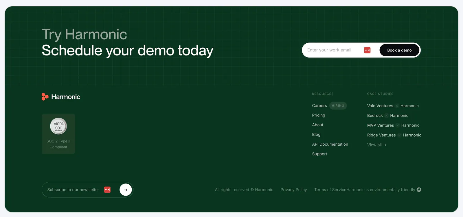
  68. Harmonic footer section: dark green panel with demo email signup over a grid texture, logo, SOC 2 badge, link columns and newsletter field
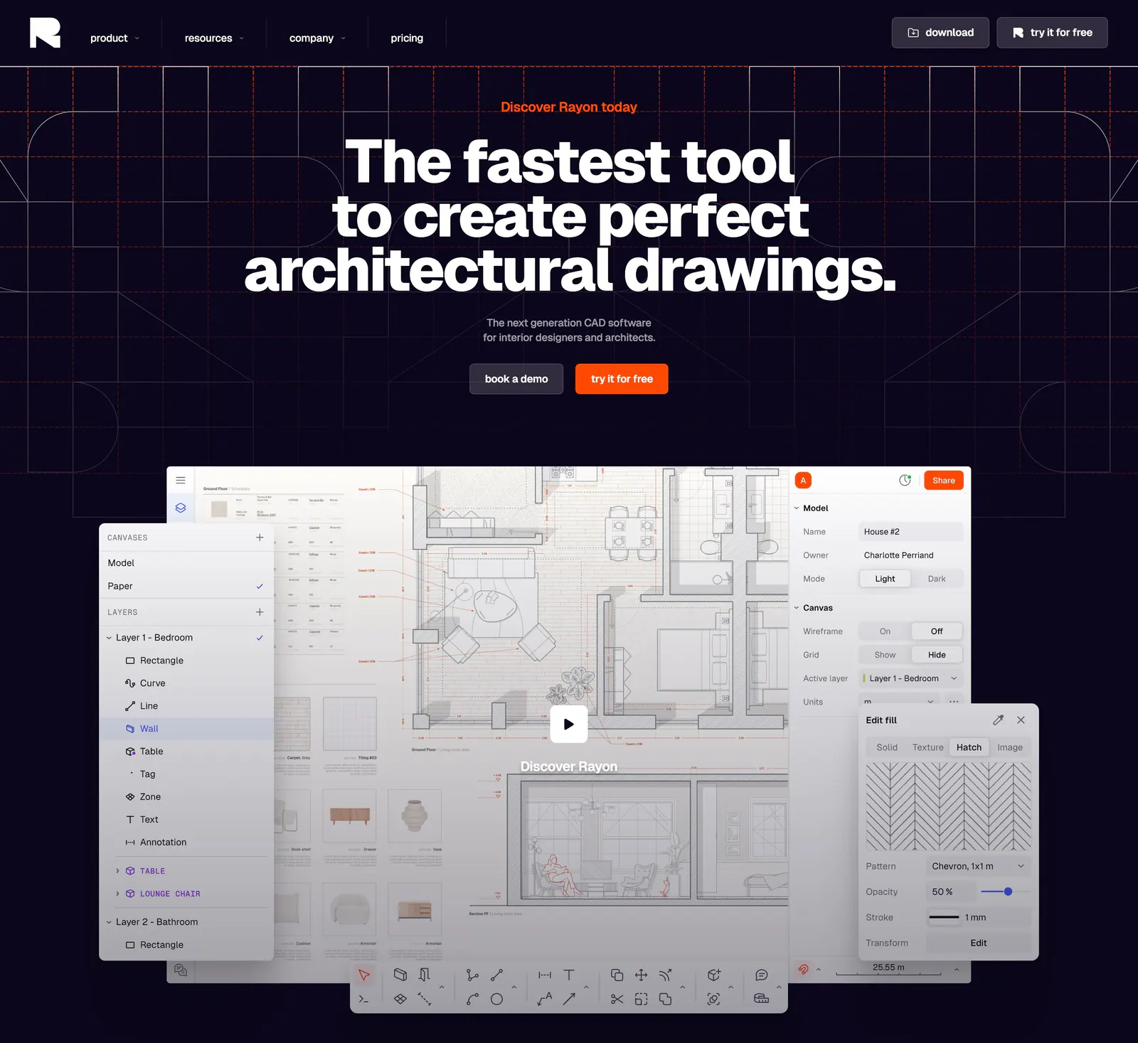
  69. Rayon hero section: centered bold headline and two buttons on a dark navy grid above a CAD floor plan editor screenshot with play button
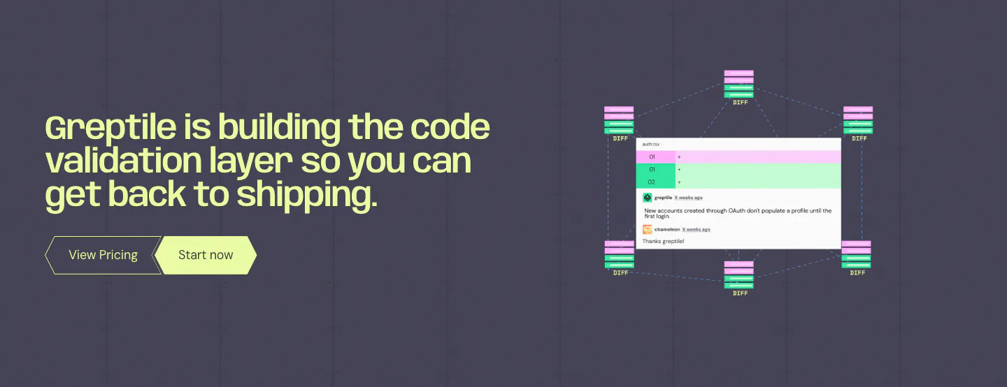
  70. Greptile call to action section: lime headline and two buttons on the left, code review comment UI with diff nodes on the right
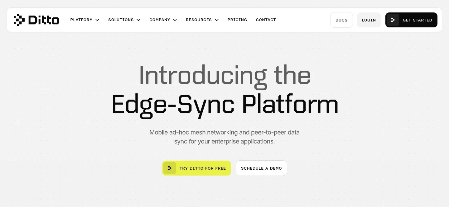
  71. Ditto hero section: rounded nav bar above a centered two-tone headline and yellow and outline buttons on a dotted light gray background
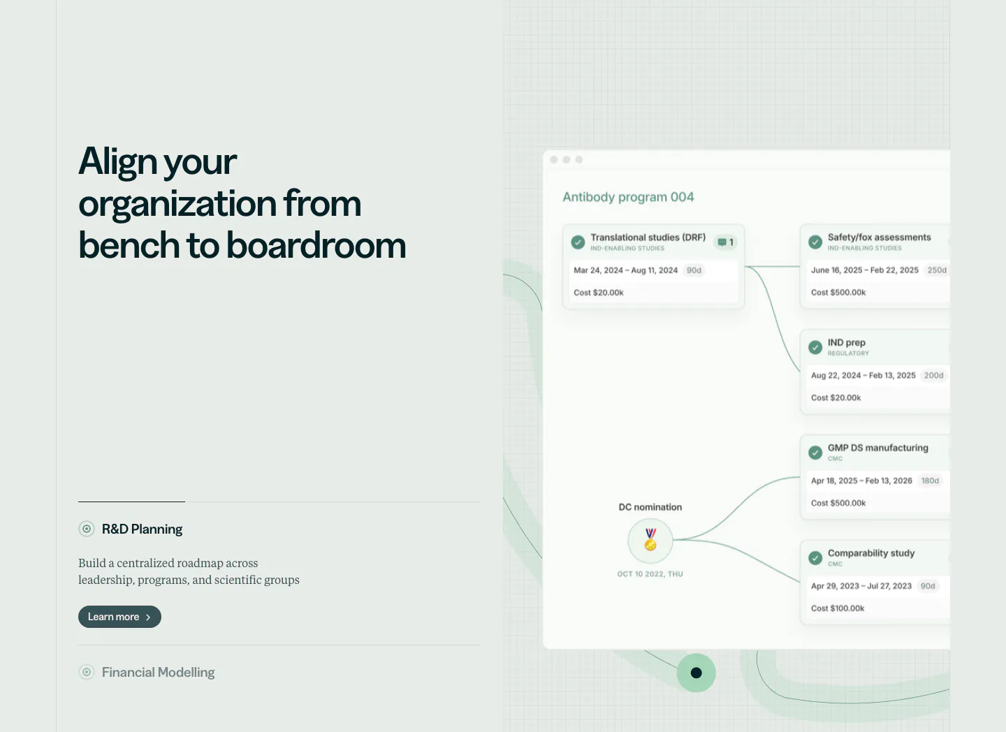
  72. Orchestra Bio features section: headline and R&D planning accordion at left, program timeline product UI on a faint grid at right
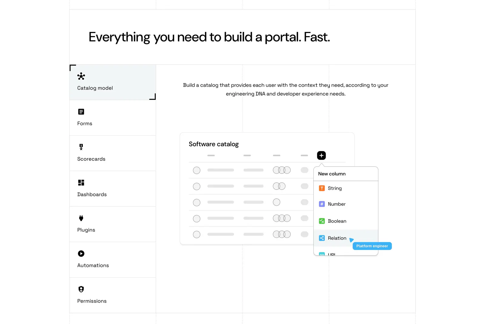
  73. Port features section: headline above a vertical tab list of capabilities beside a software catalog UI mockup on a grid-lined white page
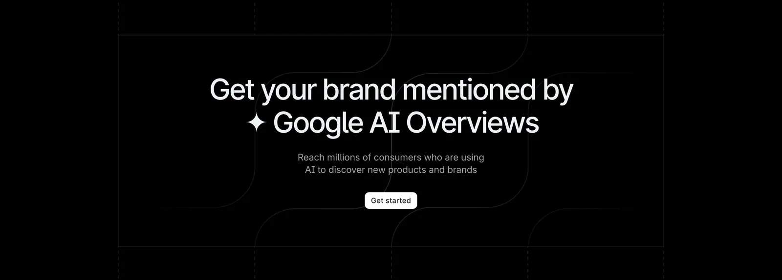
  74. Profound call-to-action section: centered headline and white Get started button on black with faint grid and curved line pattern
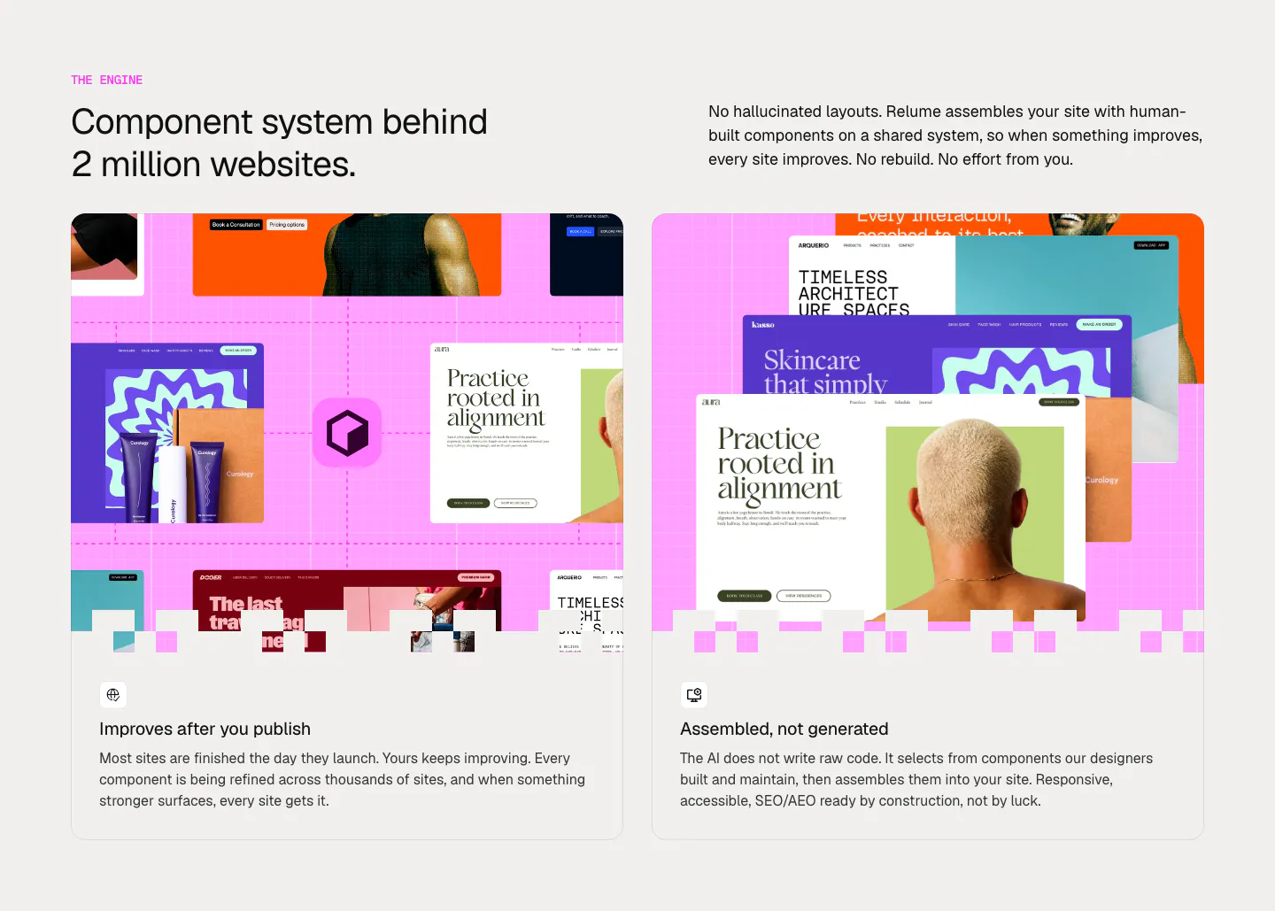
  75. Relume features section: headline and intro copy above two cards with collages of website template mockups on a pink grid
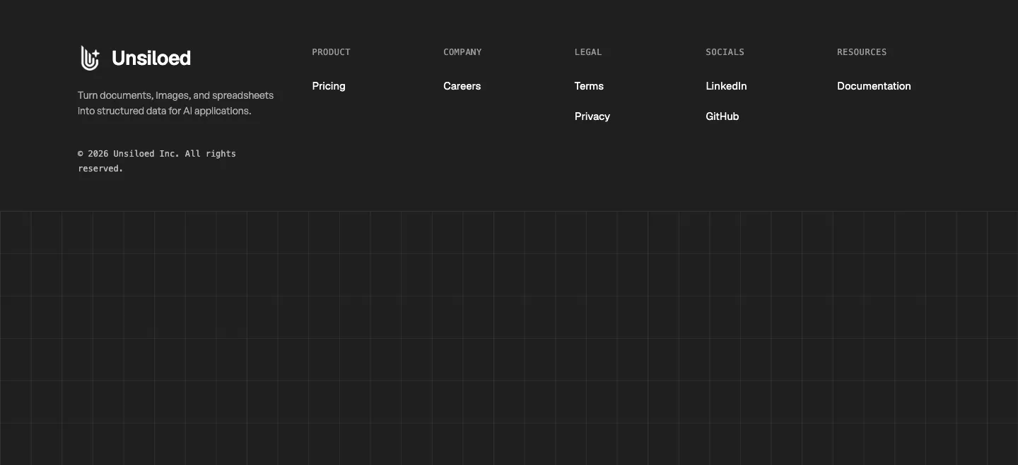
  76. Unsiloed footer section: logo and tagline with Product, Company, Legal, Socials and Resources columns above a grid-line pattern on charcoal
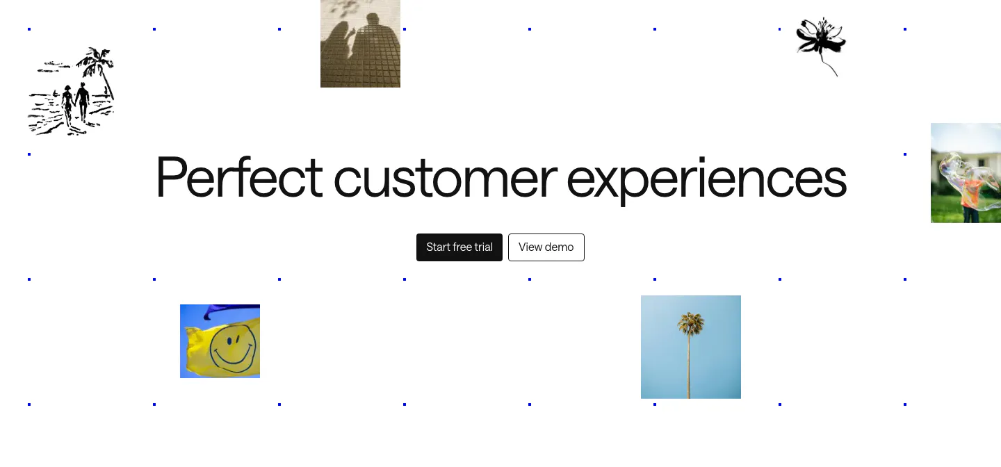
  77. Intercom call to action section: large centered headline and two buttons amid scattered photo tiles, ink sketches and a blue dot grid
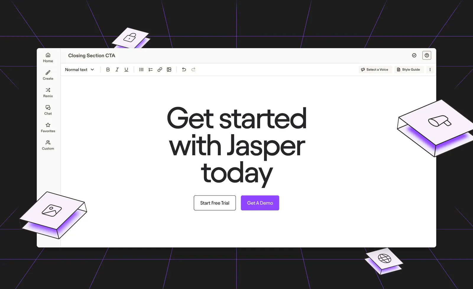
  78. Jasper call-to-action section: centered headline and buttons inside an editor mockup on a dark background with purple lines and isometric tiles
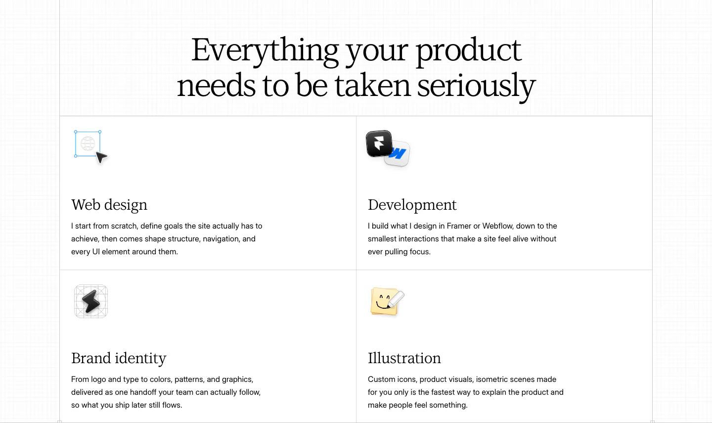
  79. Daniel Sun features section: centered serif headline above a bordered 2x2 grid of services with small icons on white
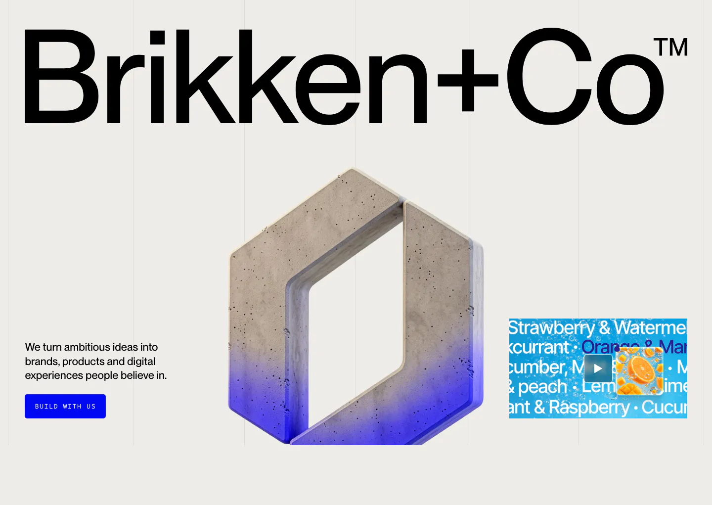
  80. Brikken+Co hero section: giant wordmark above a 3D concrete hexagon logo, short copy with blue button and video thumbnail
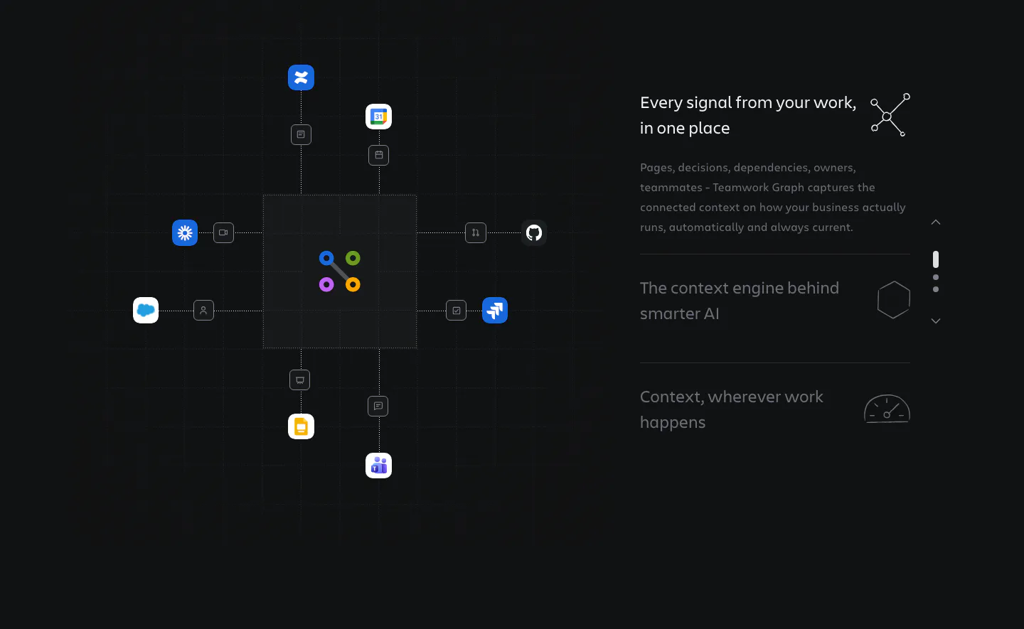
  81. Atlassian features section: hub diagram linking app icons to a central graph on the left, stepped feature list on the right, dark grid
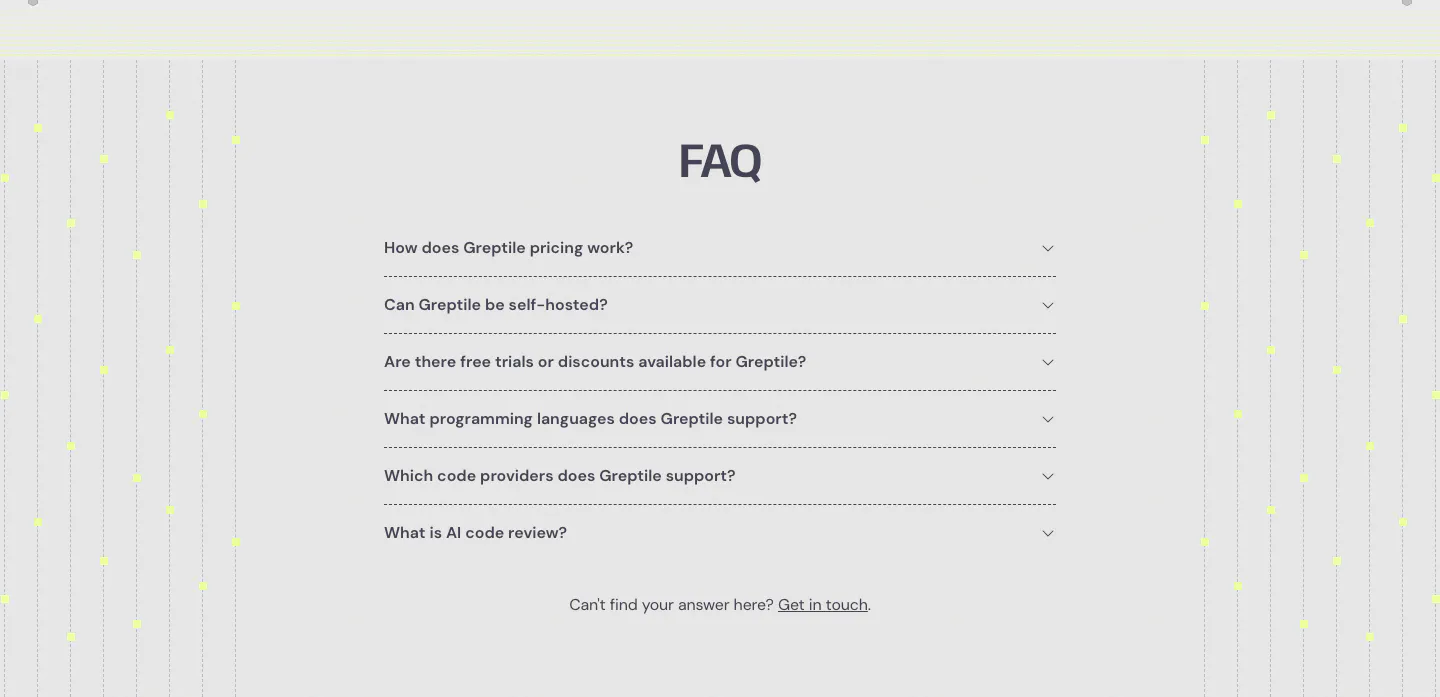
  82. Greptile FAQ section: centered accordion list of six questions flanked by vertical dotted lines with yellow dots on light gray
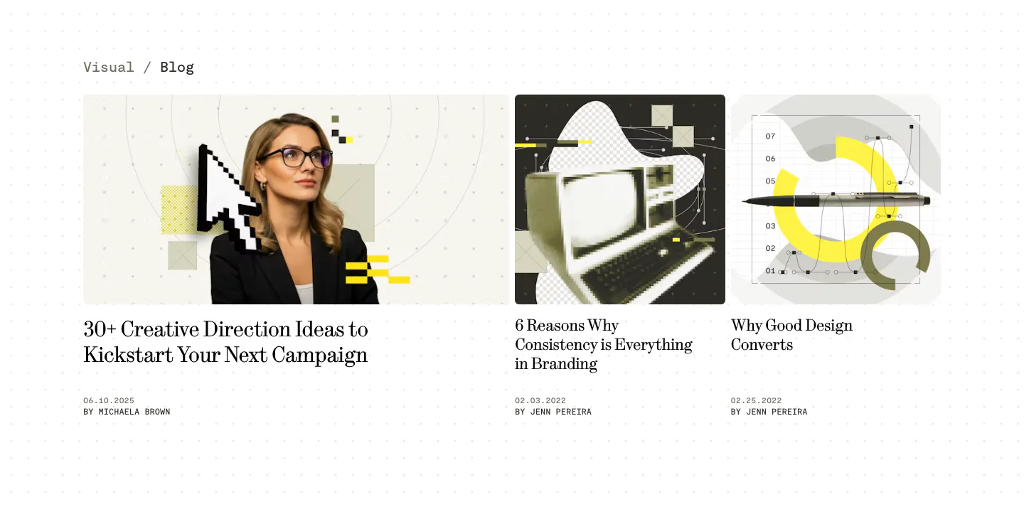
  83. Visual blog & resources section: one wide and two narrow article cards with collage cover images, serif titles and authors on a dotted white page
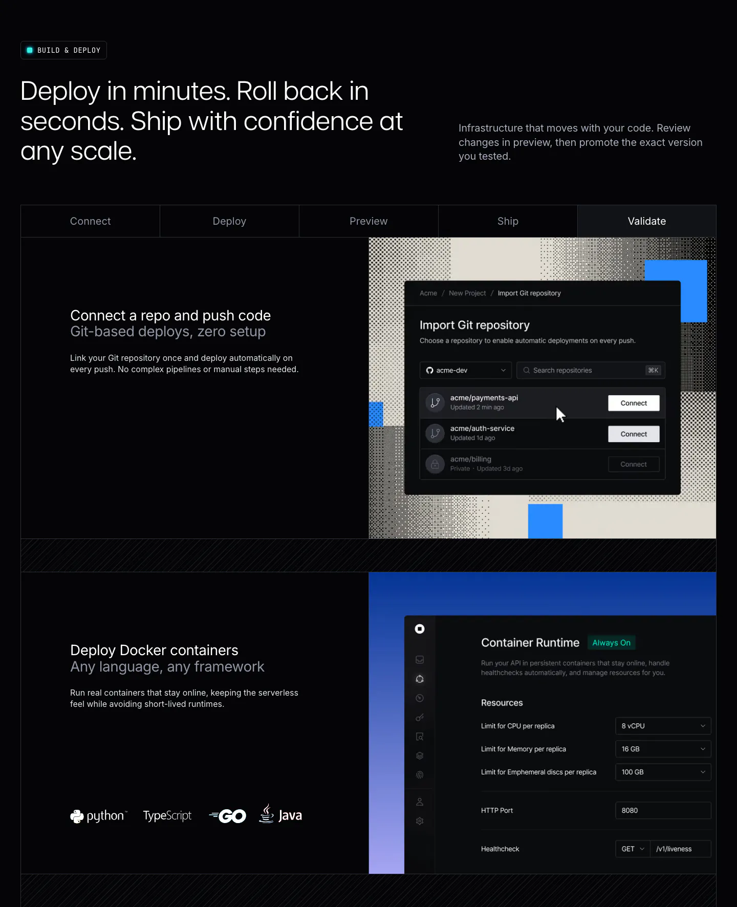
  84. Unknown features section: dark layout with a five-step tab bar and rows pairing deploy copy with Git import and container runtime UI
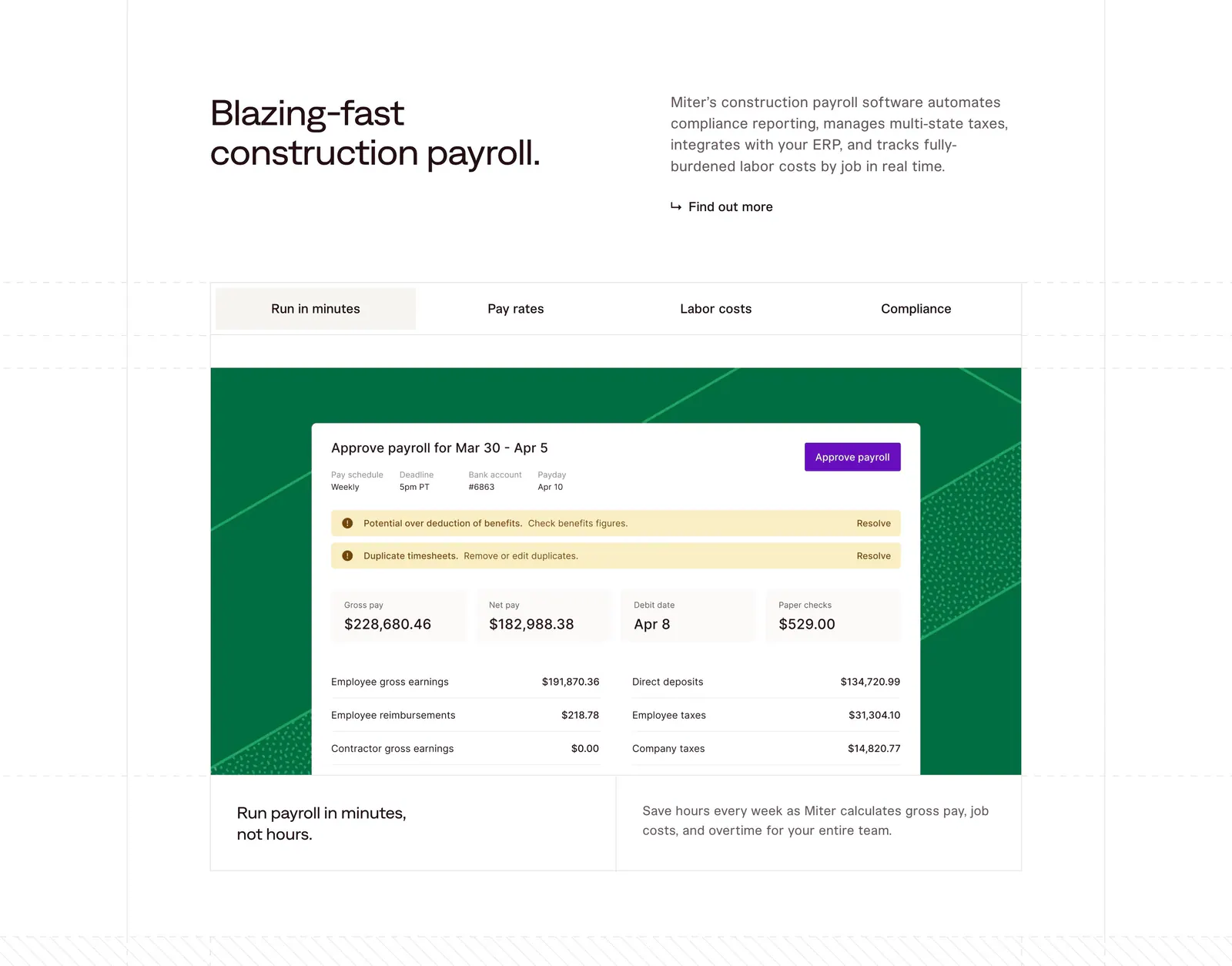
  85. Miter features section: headline beside intro copy above a four-tab panel showing a payroll approval UI on a green patterned card
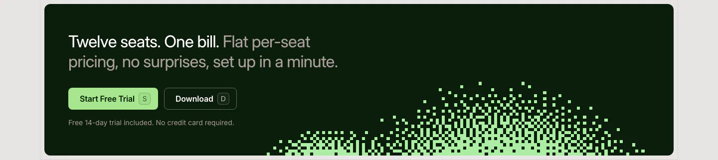
  86. LocalCan call-to-action section: two-tone headline with Start Free Trial and Download buttons on a dark green band with a pixel dither pattern
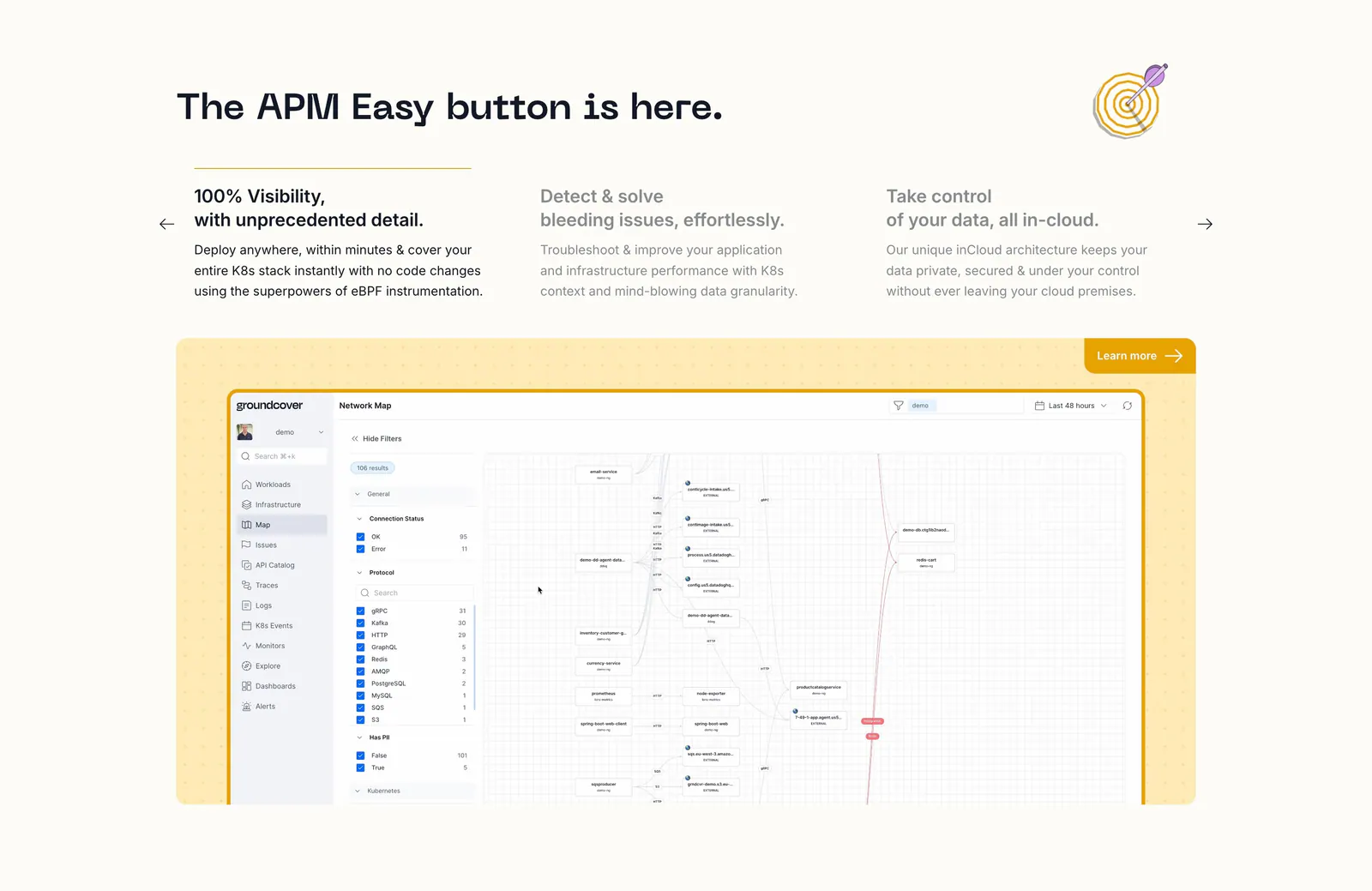
  87. groundcover features section: headline over three feature columns with arrows above a network map screenshot in a yellow dotted panel
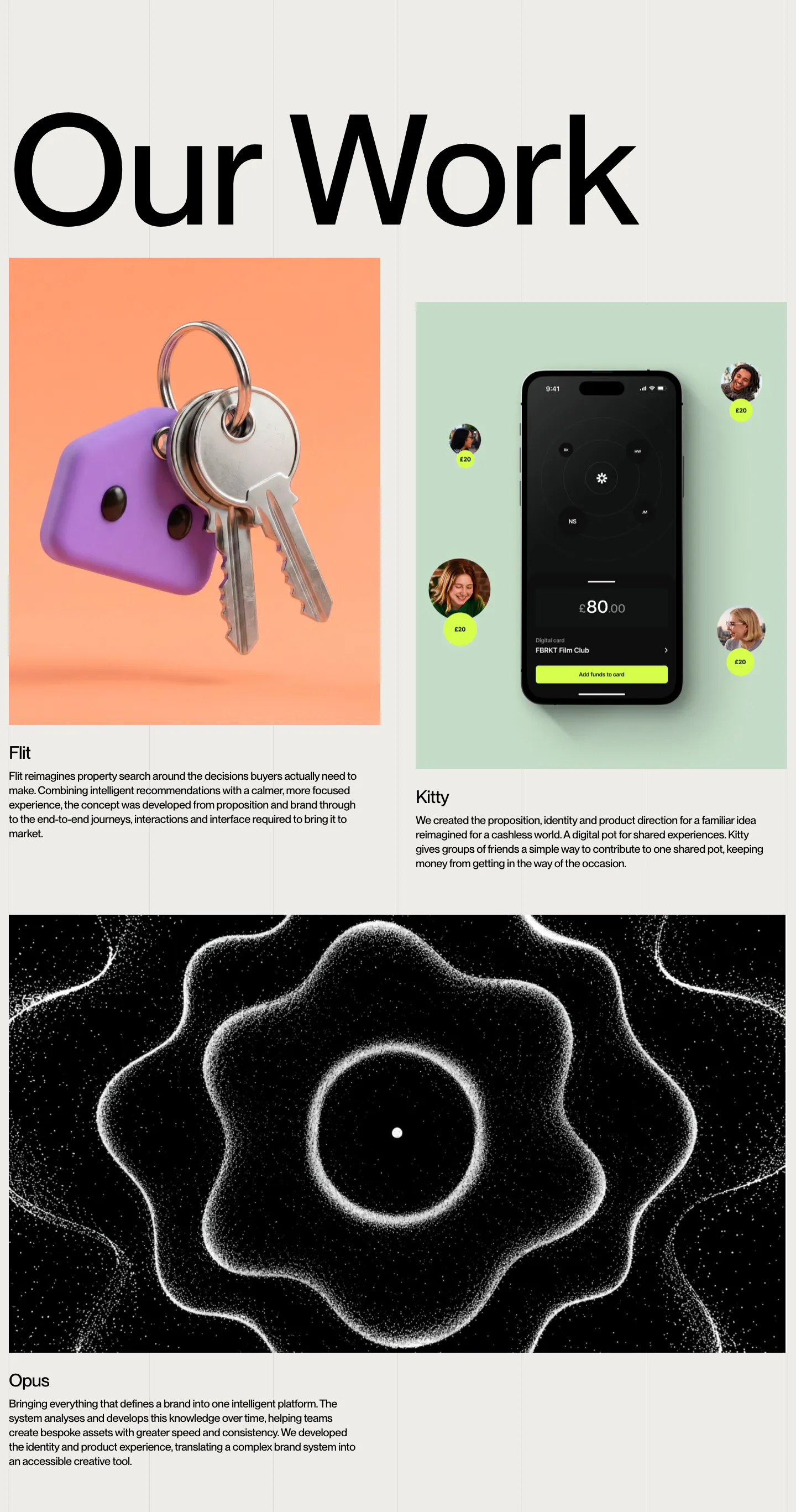
  88. Brikken+Co other section: oversized Our Work heading above project cards with 3D keys, a phone app and particle artwork
    Brikken+Co Other
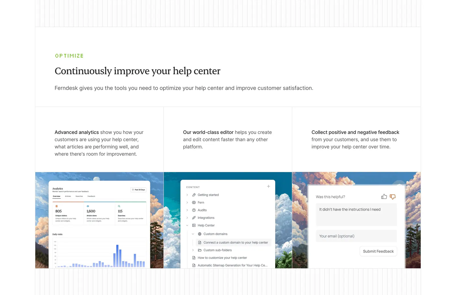
  89. Ferndesk features section: serif headline above three columns with analytics, editor and feedback UI over pixel-art landscapes
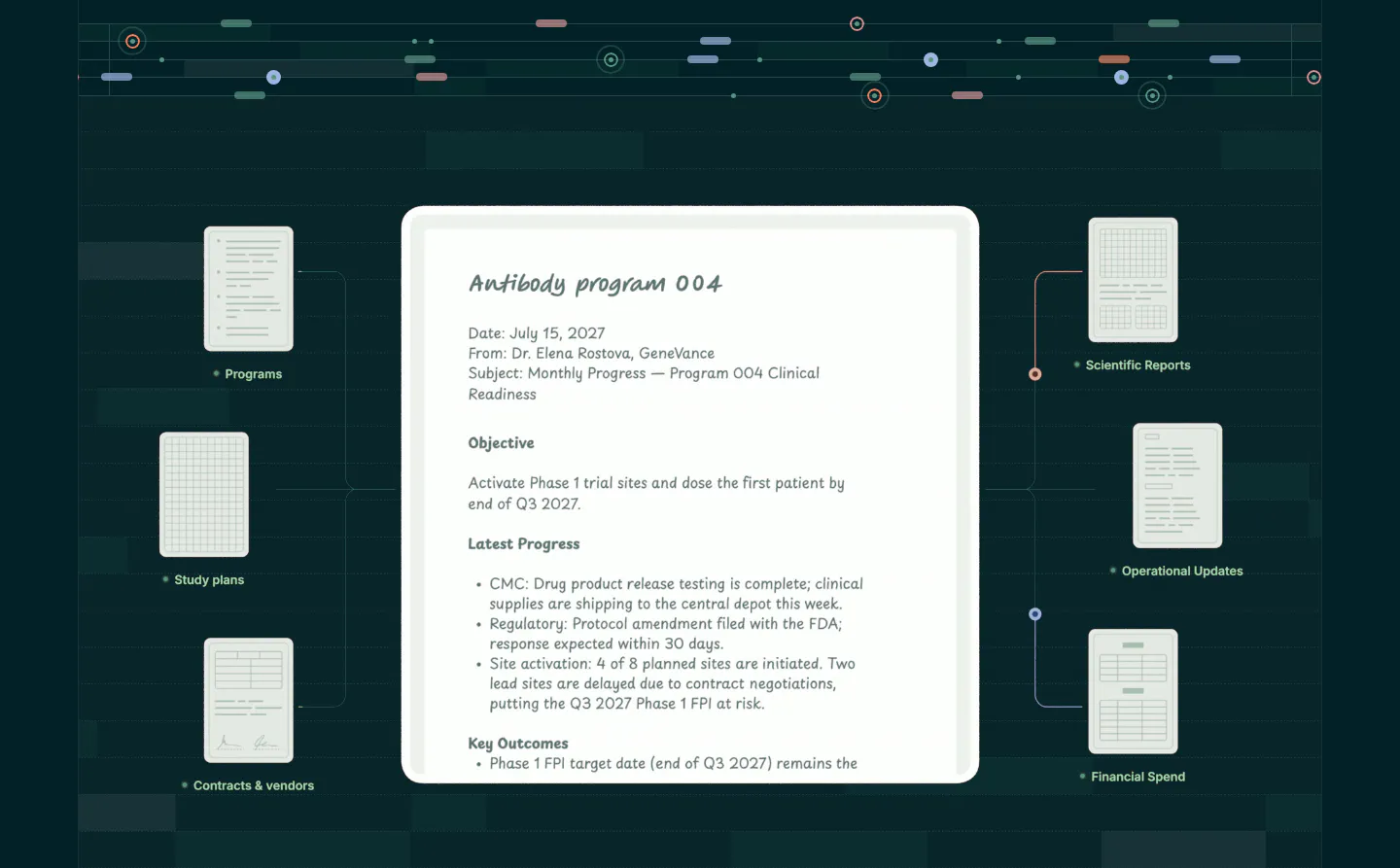
  90. Orchestra Bio features section: central program report document linked to smaller document cards on a dark teal grid background
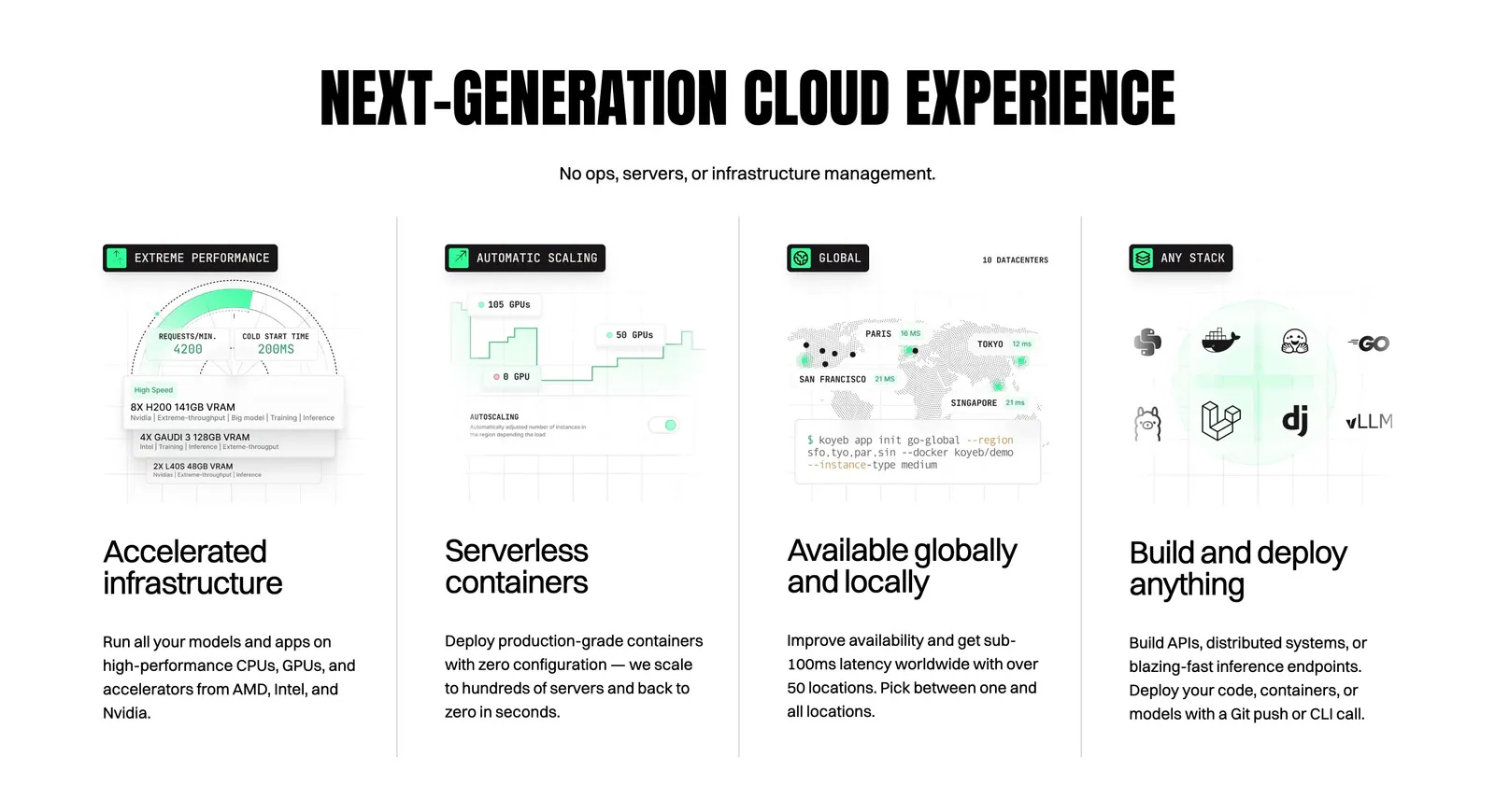
  91. Koyeb features section: condensed uppercase headline above four columns with UI mockups, a world map and a CLI snippet
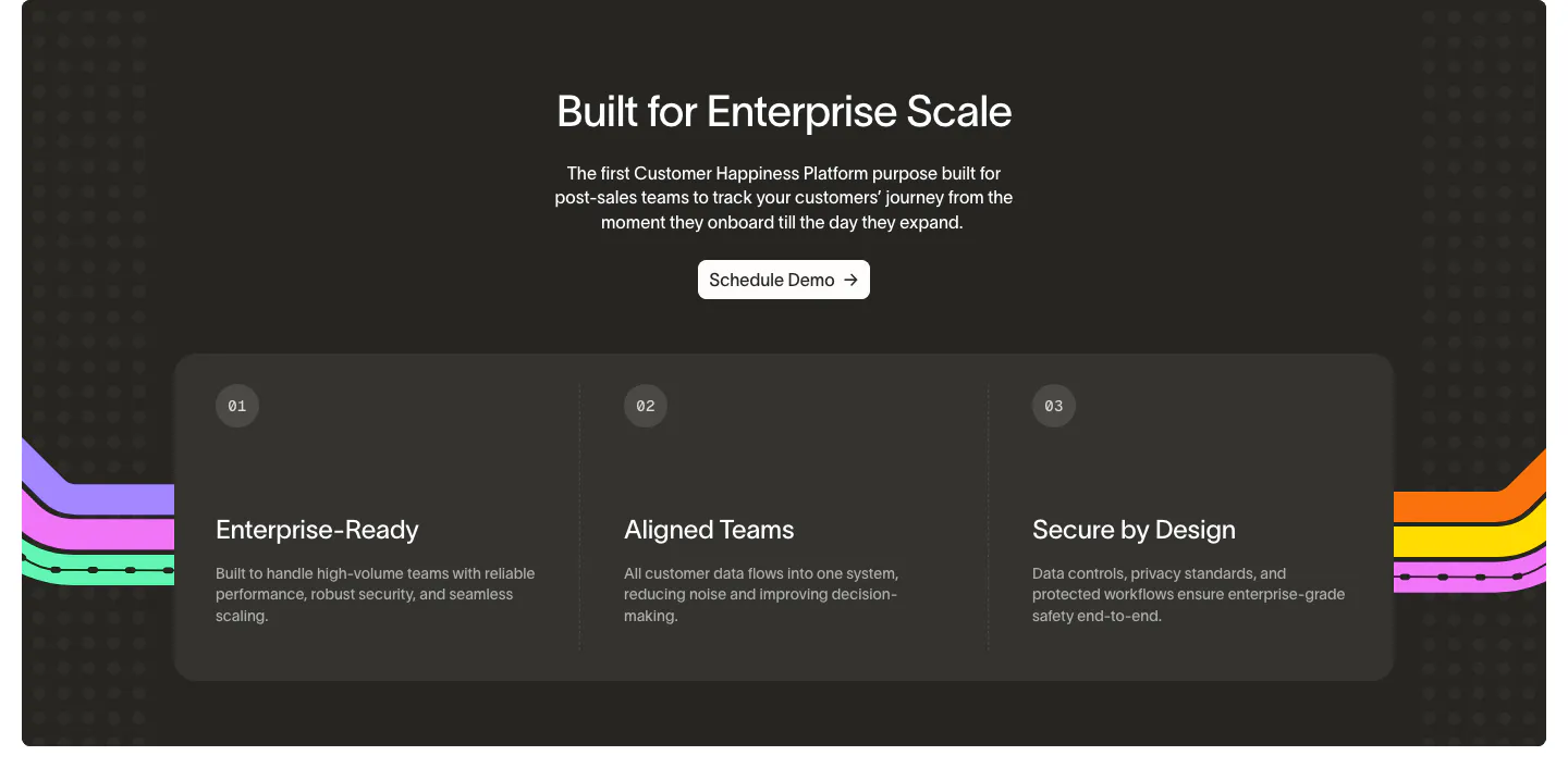
  92. Wavelength value proposition section: centered headline and Schedule Demo button above three numbered benefit columns on a charcoal panel
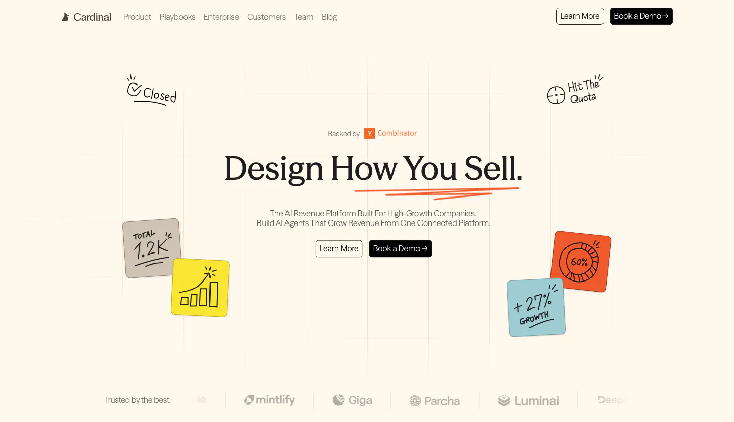
  93. Cardinal hero section: centered serif headline with two buttons, hand-drawn sticky-note doodles on a faint grid and a logo strip on cream
    Cardinal Hero
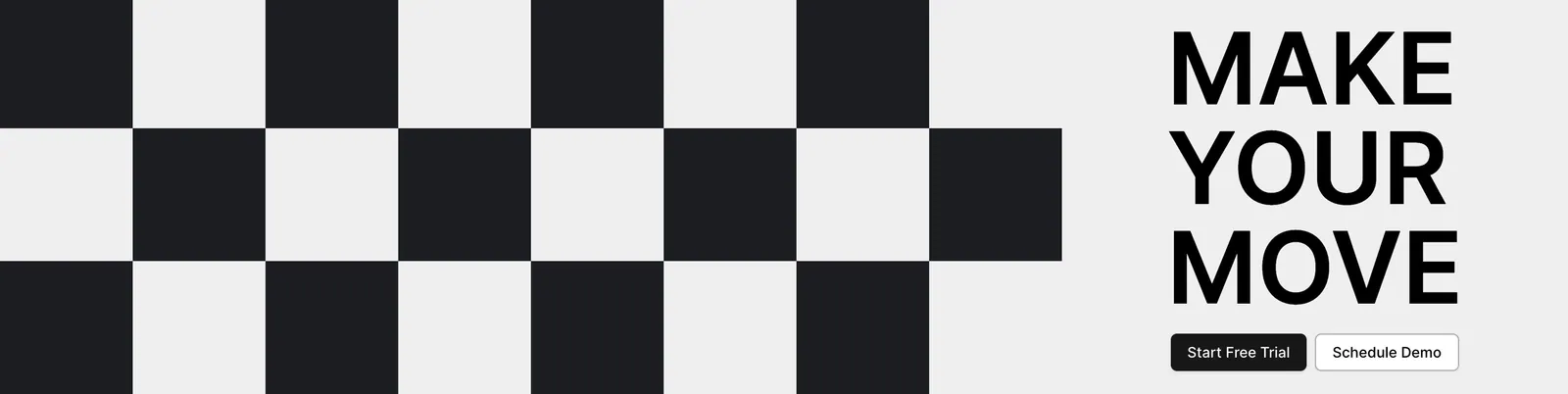
  94. Airbook call-to-action section: black and white checkerboard pattern on the left beside a bold MAKE YOUR MOVE headline and two buttons
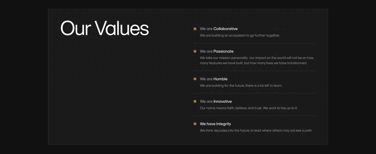
  95. Amini value proposition section: large Our Values heading on a dark dotted panel beside a list of five values with yellow asterisks
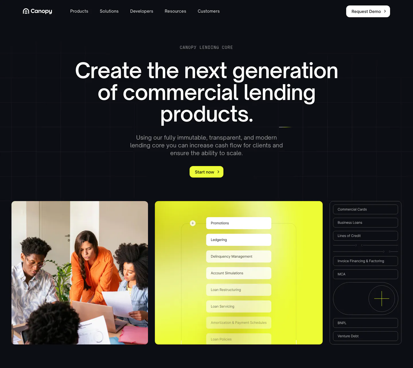
  96. Canopy hero section: dark centered headline and lime button above a team photo, lime UI panel and product list tiles
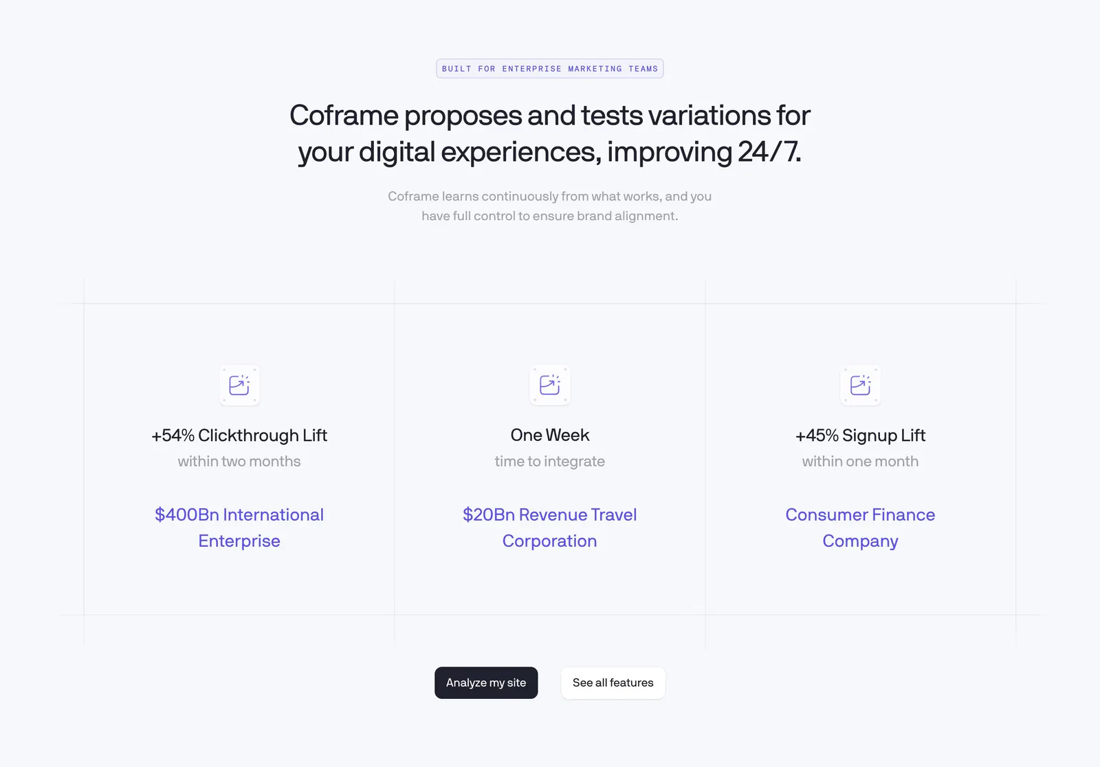
  97. Coframe value proposition section: centered headline above three result columns with lift metrics on a light grid background
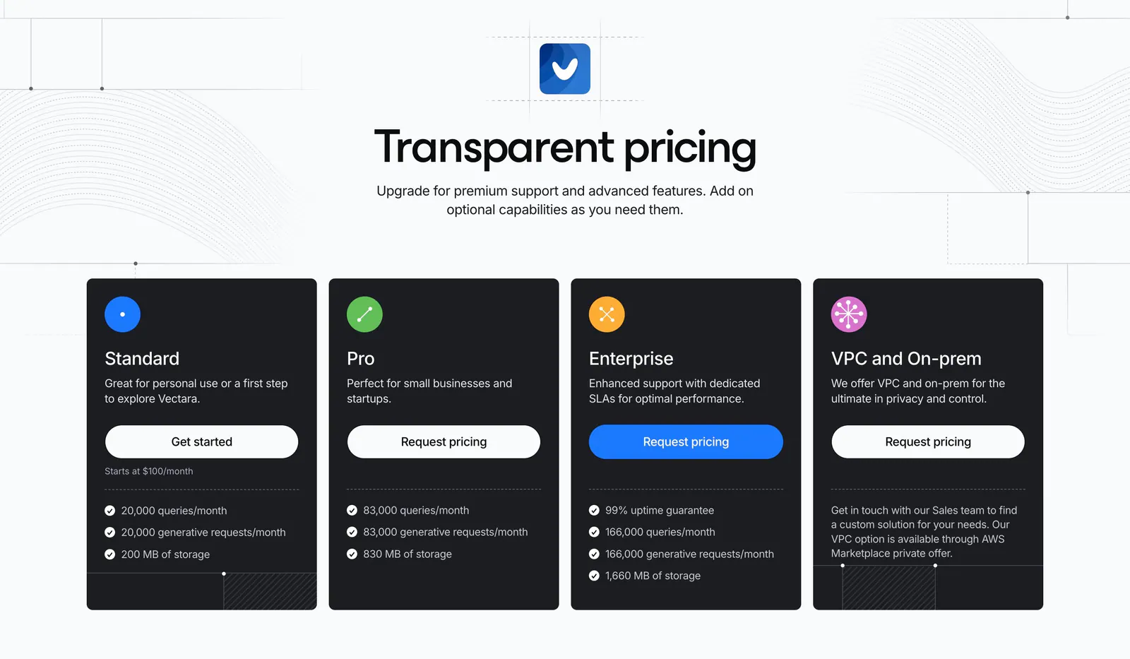
  98. Vectara pricing section: centered headline above four dark plan cards with icons and buttons, on light gray with line-pattern accents
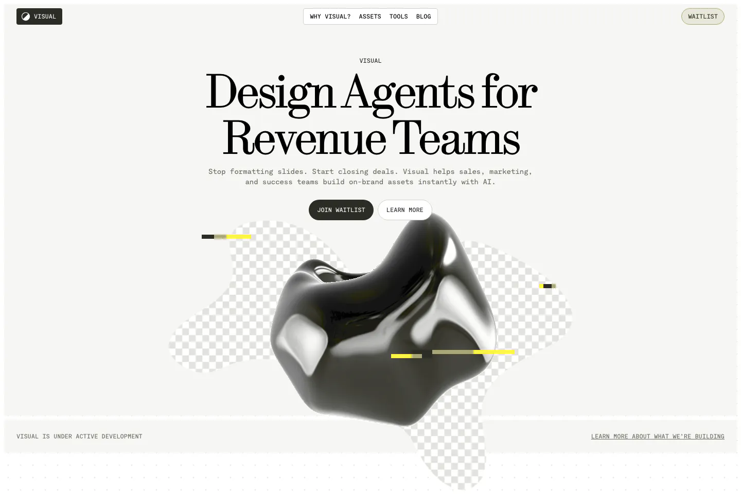
  99. Visual hero section: nav bar and centered serif headline with two buttons above a glossy black 3D blob on checkerboard shapes
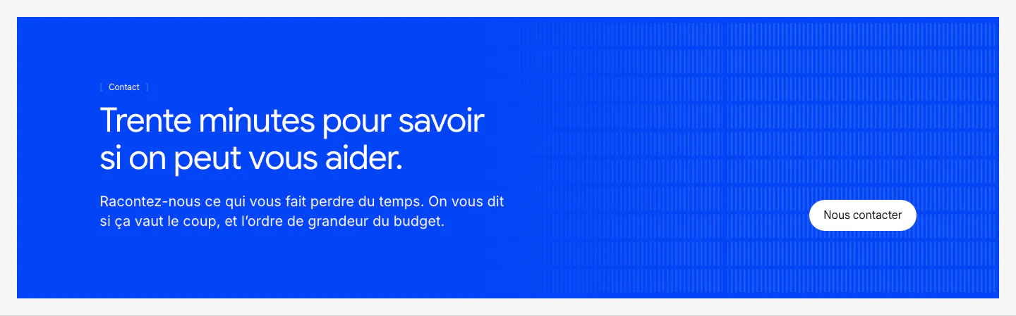
  100. Raneo call-to-action section: blue banner with left-aligned headline and copy, a white contact button and vertical line texture
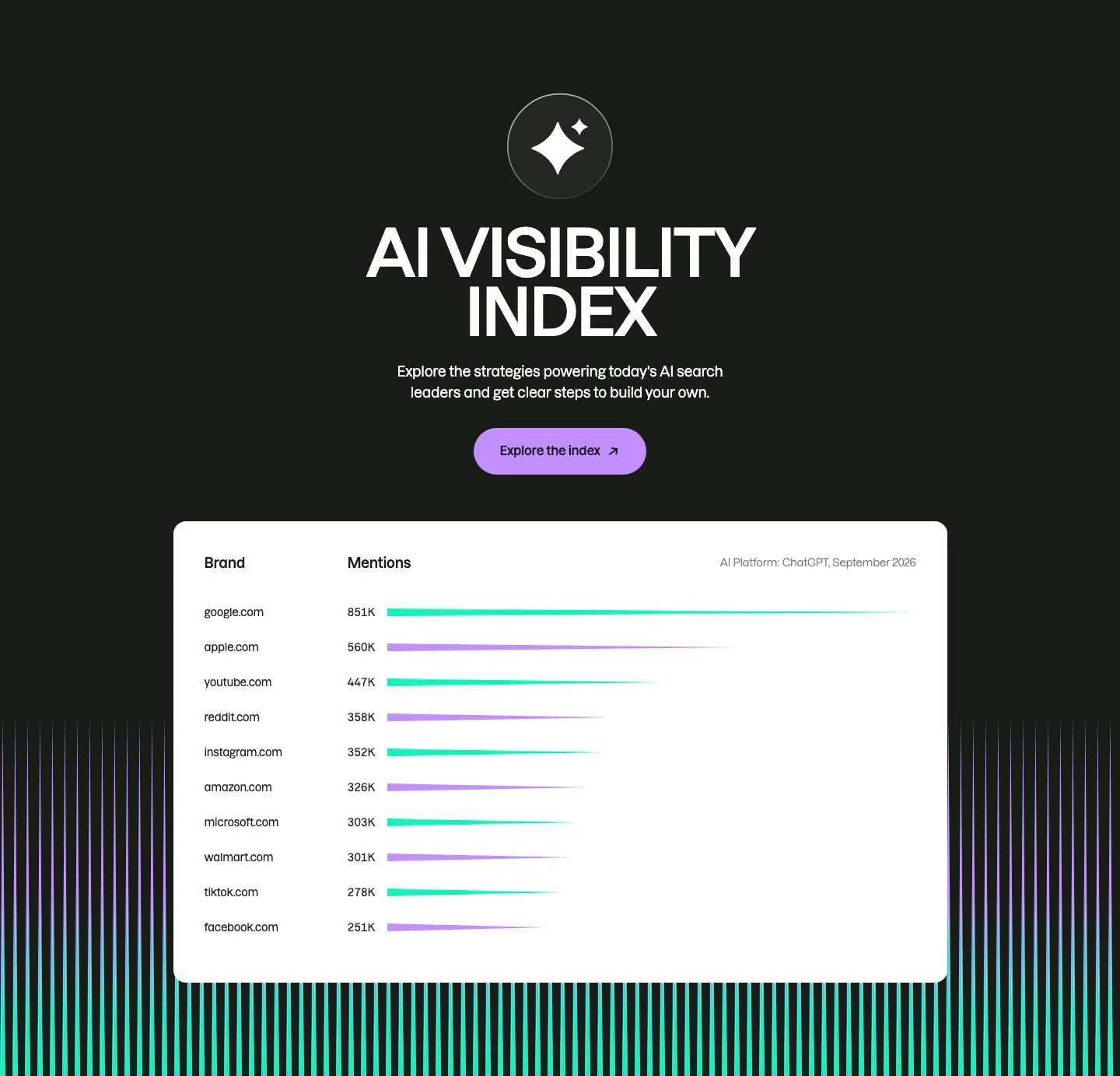
  101. Semrush features section: centered AI Visibility Index heading and button on dark above a white bar-chart table of brand mentions
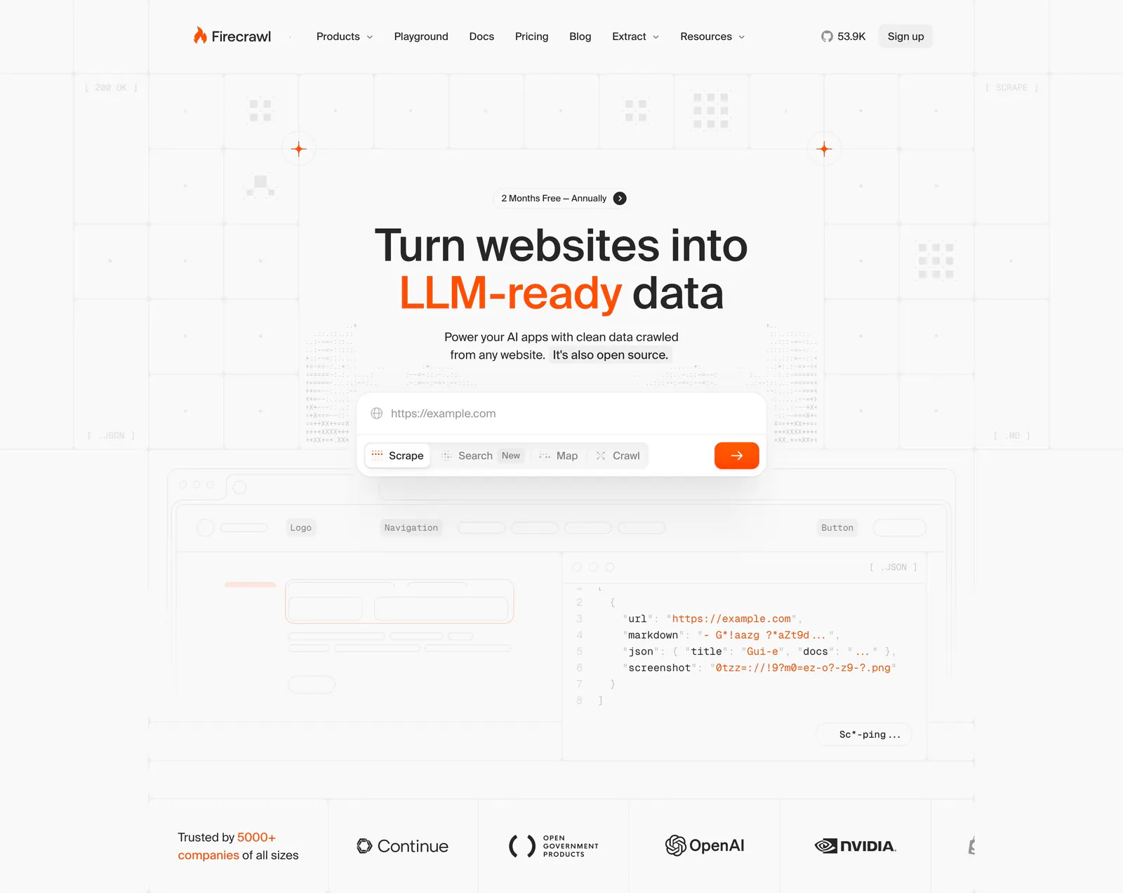
  102. Firecrawl hero section: centered headline with URL input and mode tabs over a grid background, JSON code preview and customer logo row below
  103. Laravel Cloud call-to-action section: left-aligned headline and two buttons on a bright blue pixel mosaic background
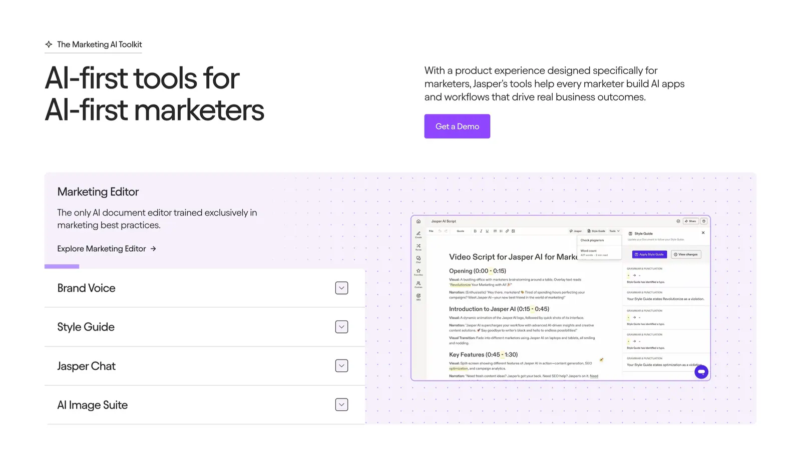
  104. Jasper features section: headline and copy row above an accordion list beside an editor screenshot on a dotted lavender panel
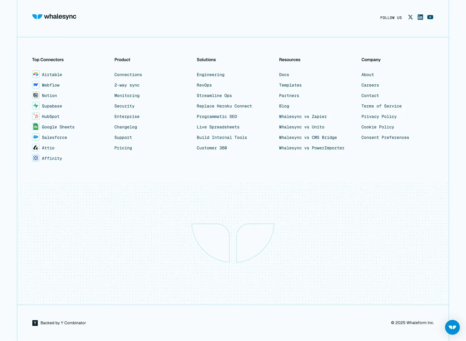
  105. Whalesync footer section: logo and five monospace link columns with connector icons above a dot-grid outlined logo on pale blue
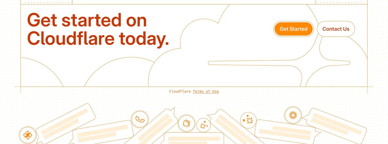
  106. Cloudflare Agents footer section: orange headline and buttons over line-drawn clouds, a terms link and chat bubble illustrations
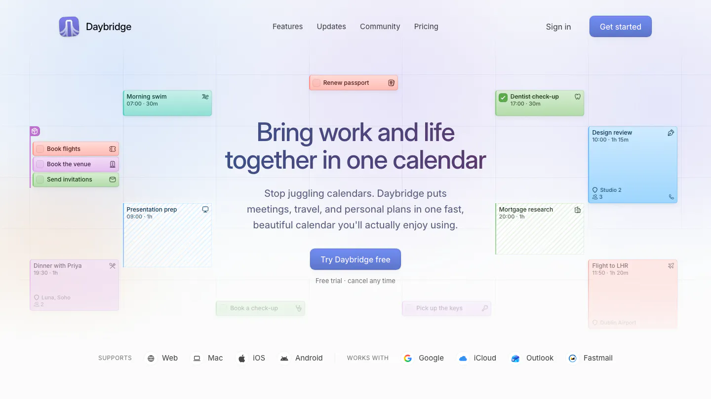
  107. Daybridge hero section: centered headline and button surrounded by floating calendar event cards, with platform and integration row
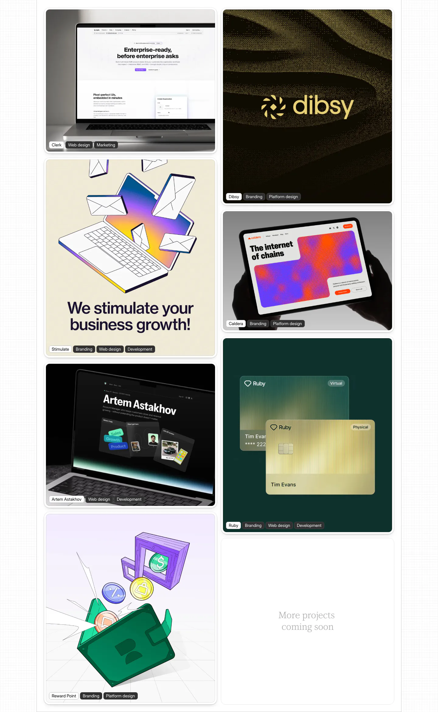
  108. Daniel Sun other section: two-column masonry of portfolio project cards with device mockups and illustrations, each labeled with tags
    Daniel Sun Other
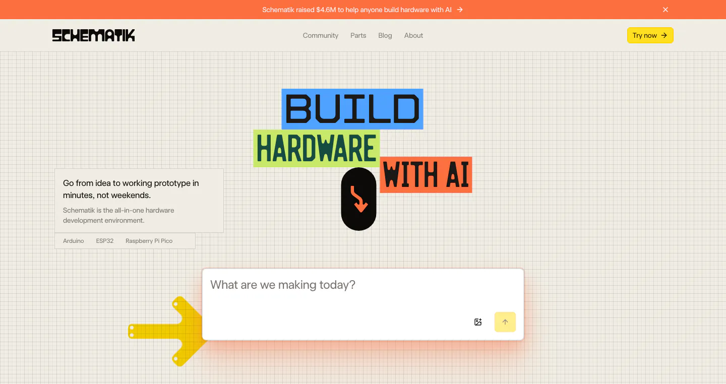
  109. Schematik hero section: nav, colored block headline and prompt input box on a beige grid background with arrow graphics
  110. Neon call-to-action section: centered two-line headline and green Get Started button over a dark dot-grid map with glowing teal dots
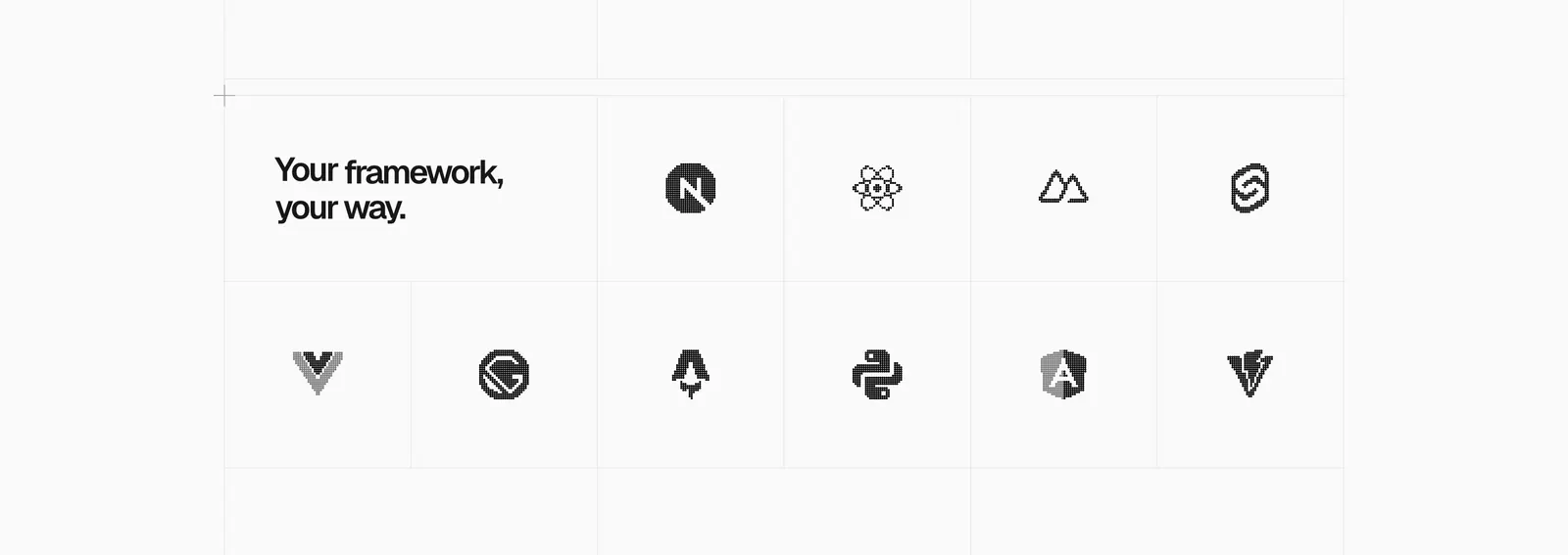
  111. Vercel logo cloud section: headline tile in a bordered grid of grayscale framework logos like Next.js, React, Svelte and Angular
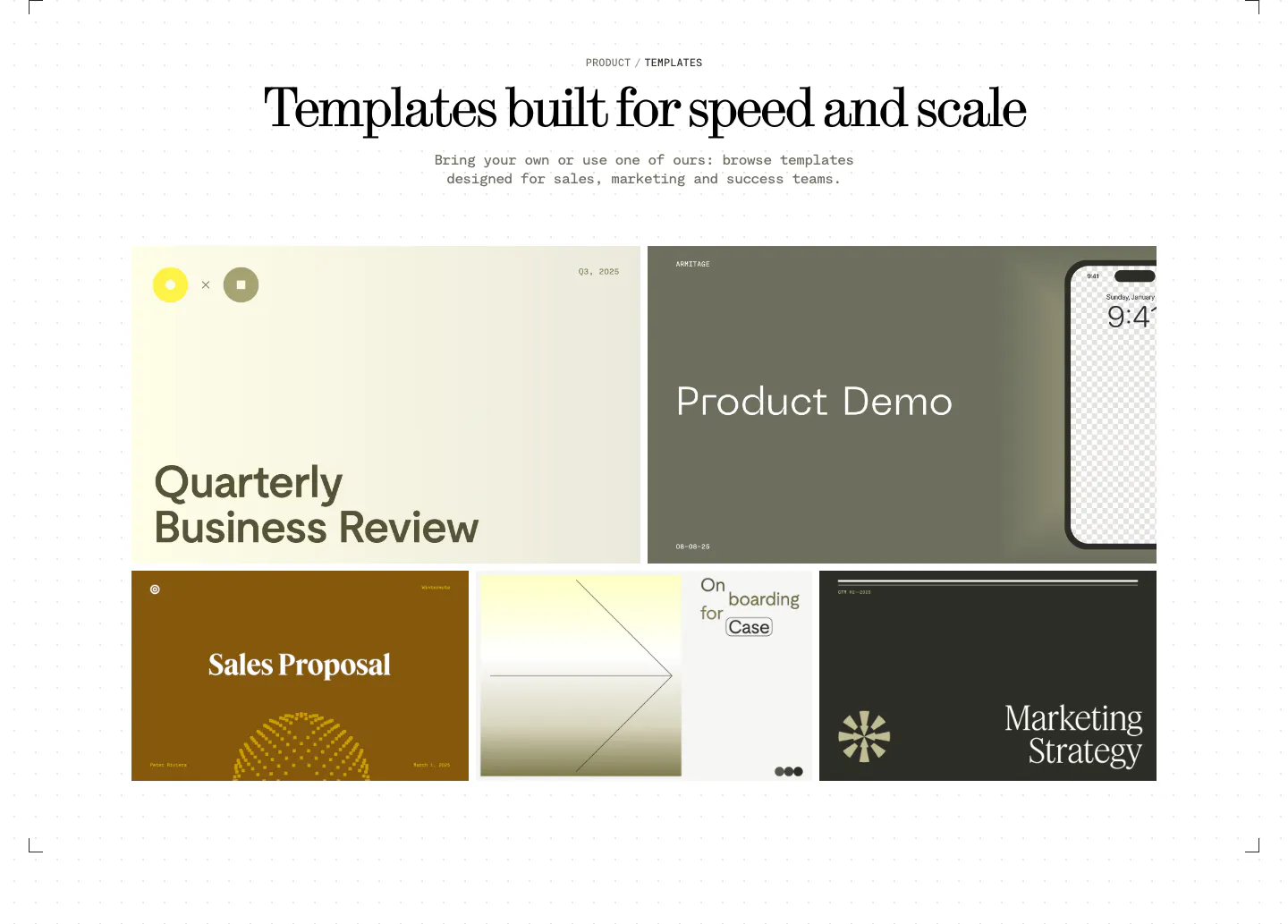
  112. Visual features section: centered serif headline above a bento grid of presentation template previews in olive, cream, brown and charcoal
  113. Figr FAQ section: serif heading, intro and Reach Out button on the left with a seven-question accordion on the right
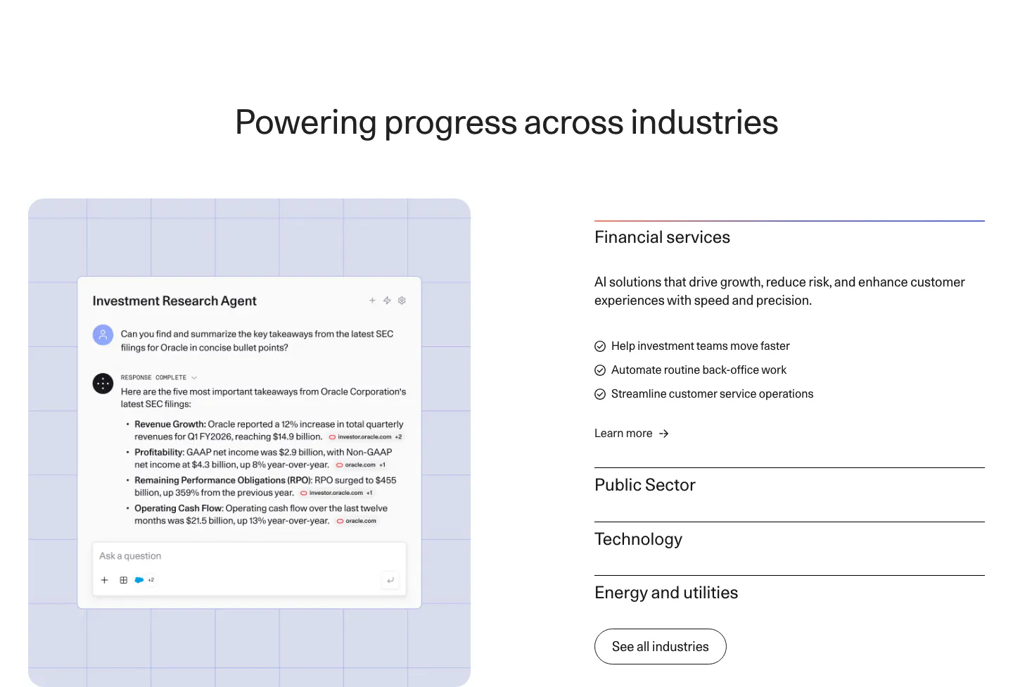
  114. Cohere use cases section: agent chat screenshot on a lavender grid panel left and an industry accordion right
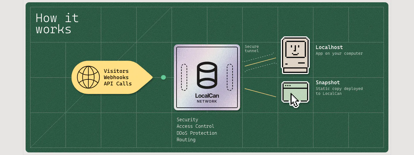
  115. LocalCan how it works section: flow diagram from visitor traffic through a LocalCan network chip to pixel-art localhost and snapshot icons
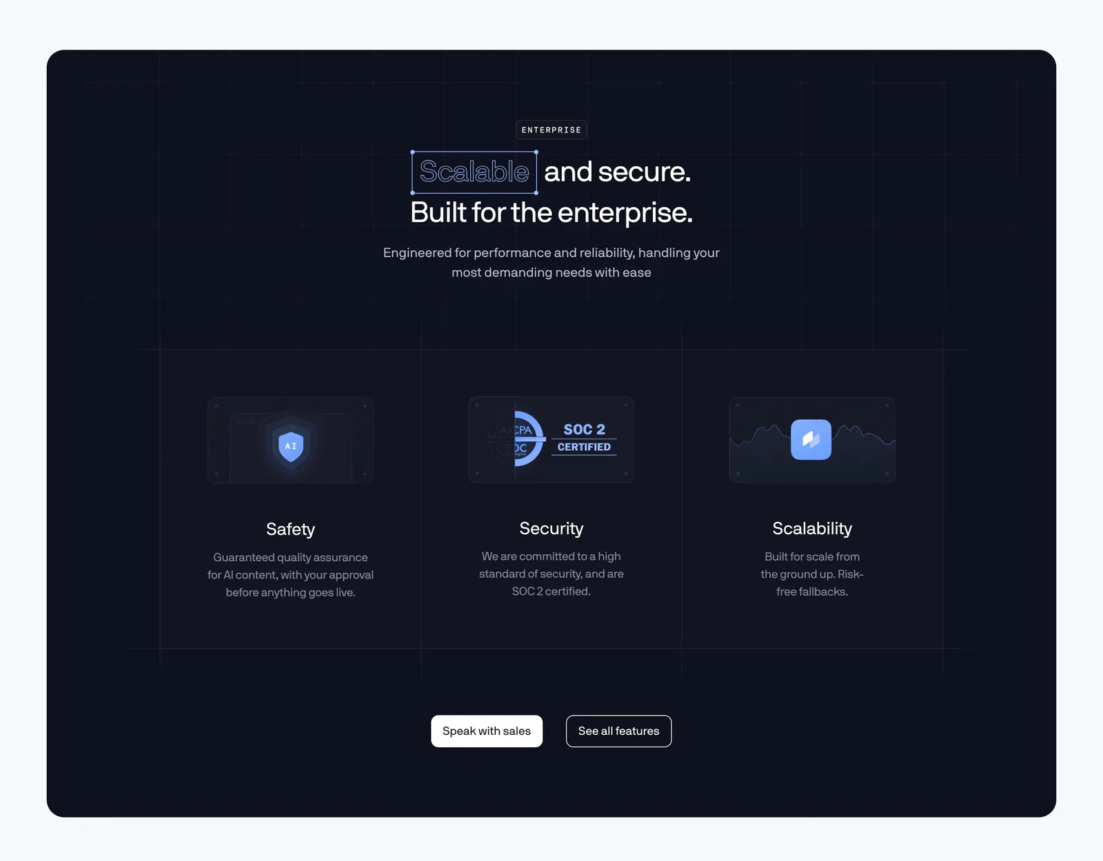
  116. Coframe features section: centered headline above three enterprise columns for safety, SOC 2 security and scalability on a dark navy panel
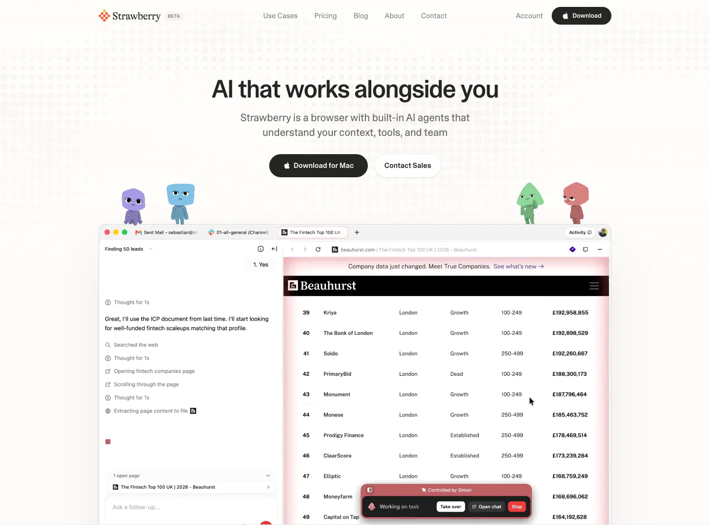
  117. Strawberry hero section: centered headline and buttons, cartoon characters perched on a browser screenshot showing an AI agent task
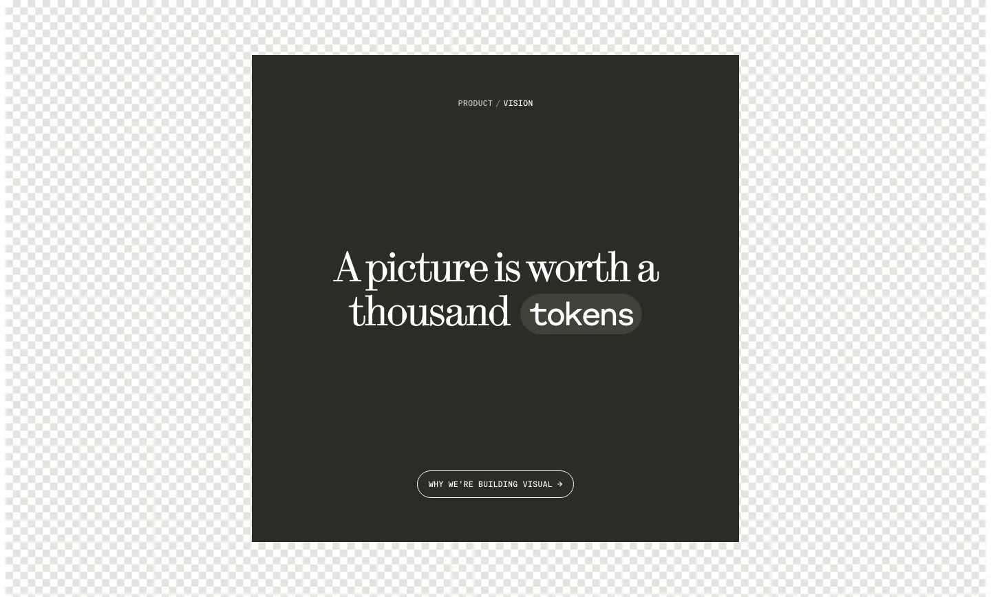
  118. Visual call to action section: dark square panel with centered serif headline, a tokens pill and outline button over a checkerboard background
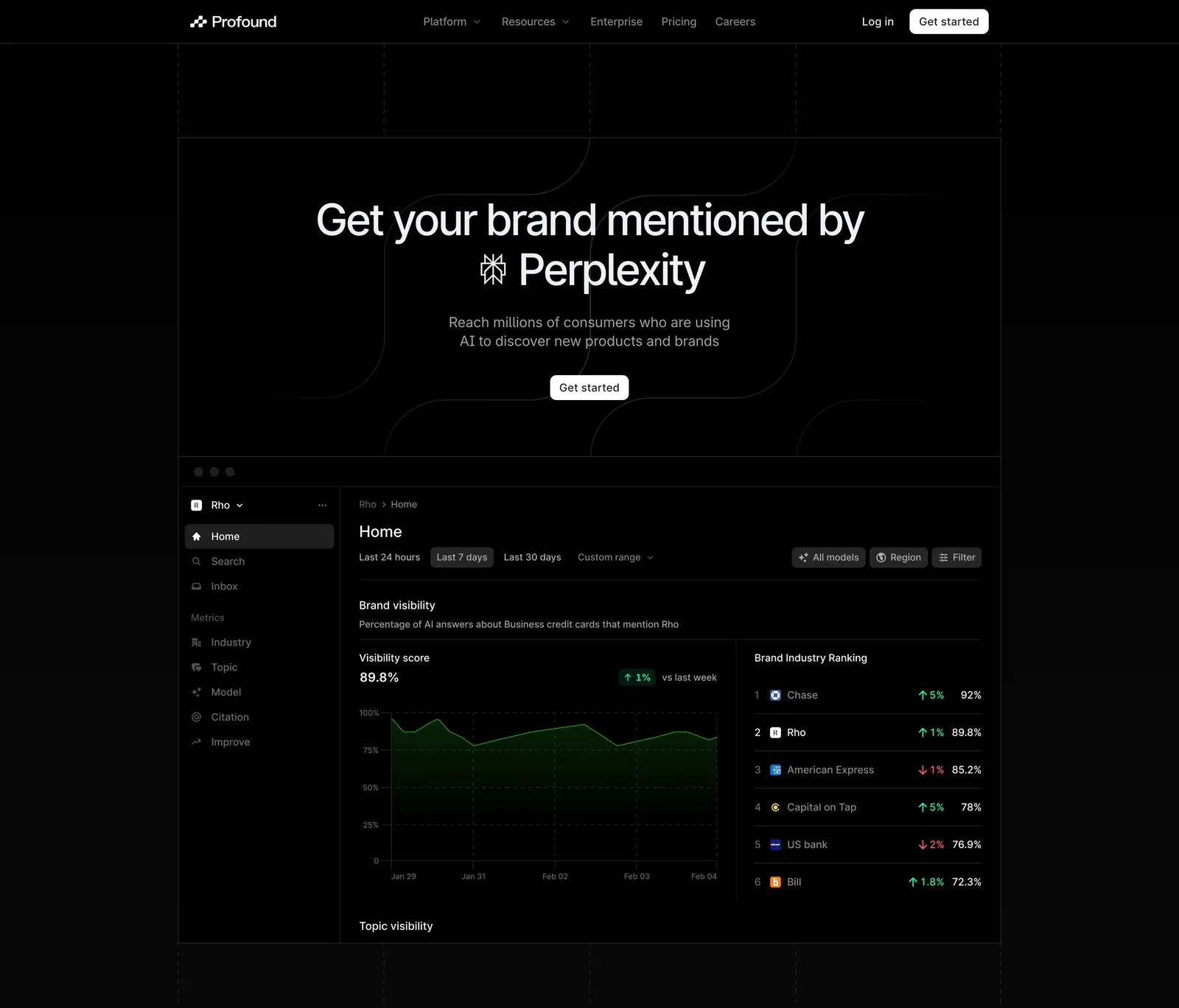
  119. Profound hero section: centered headline with Perplexity logo above a dark brand visibility dashboard screenshot on black
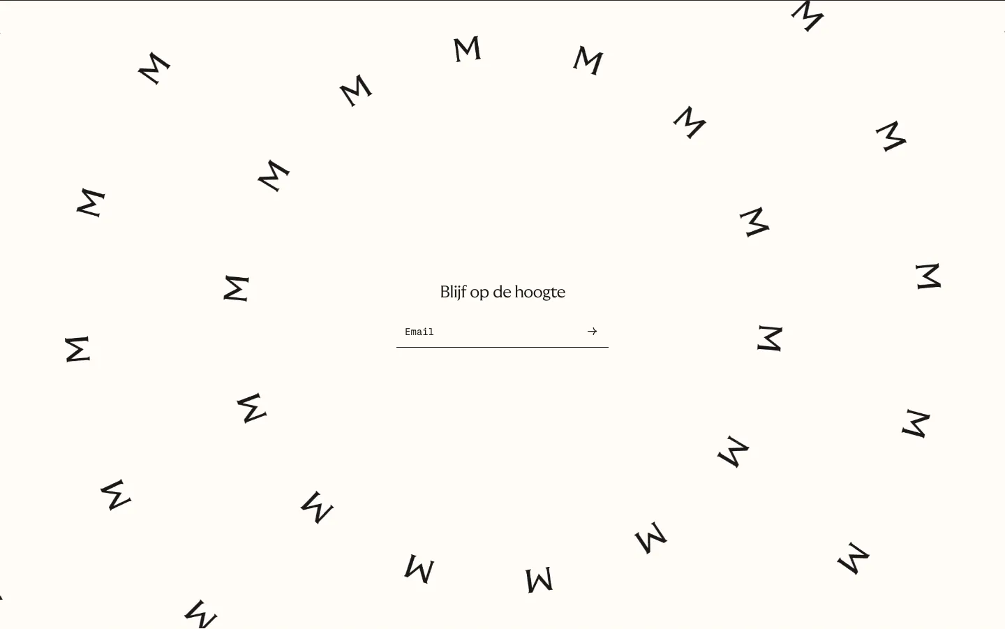
  120. Menkind newsletter section: centered email field surrounded by a swirl of scattered rotated M letters on cream
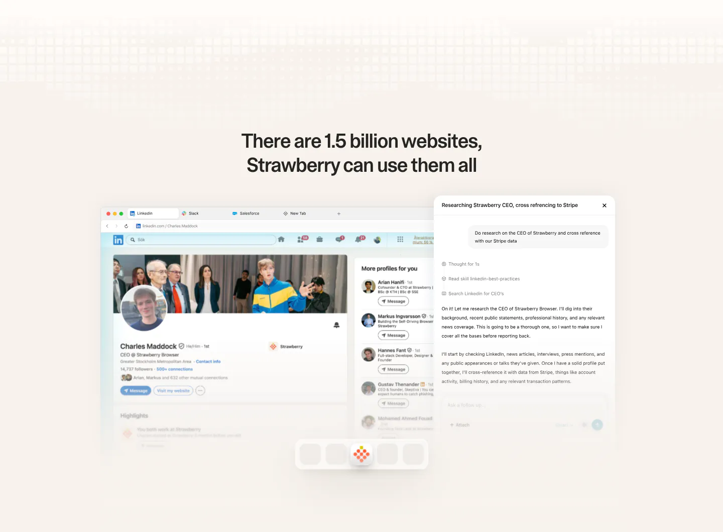
  121. Strawberry features section: centered headline above a browser screenshot of a LinkedIn profile with an AI research chat panel
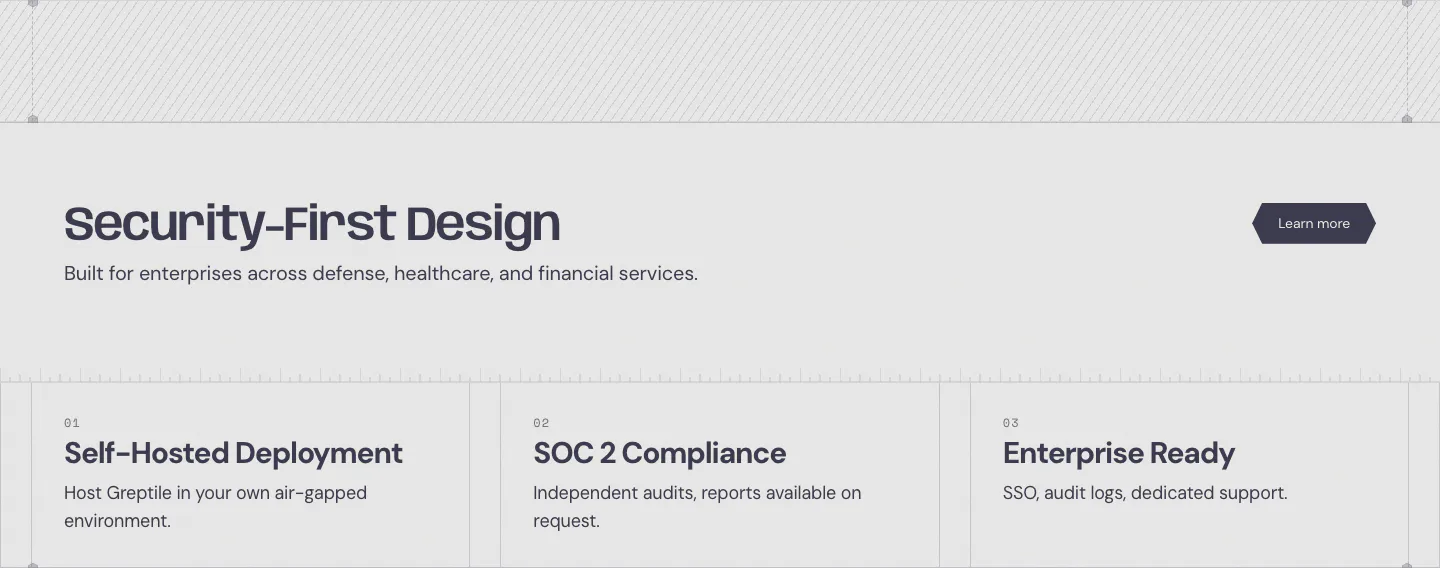
  122. Greptile security section: headline with learn more button above three numbered cards for self-hosting, SOC 2 and enterprise features
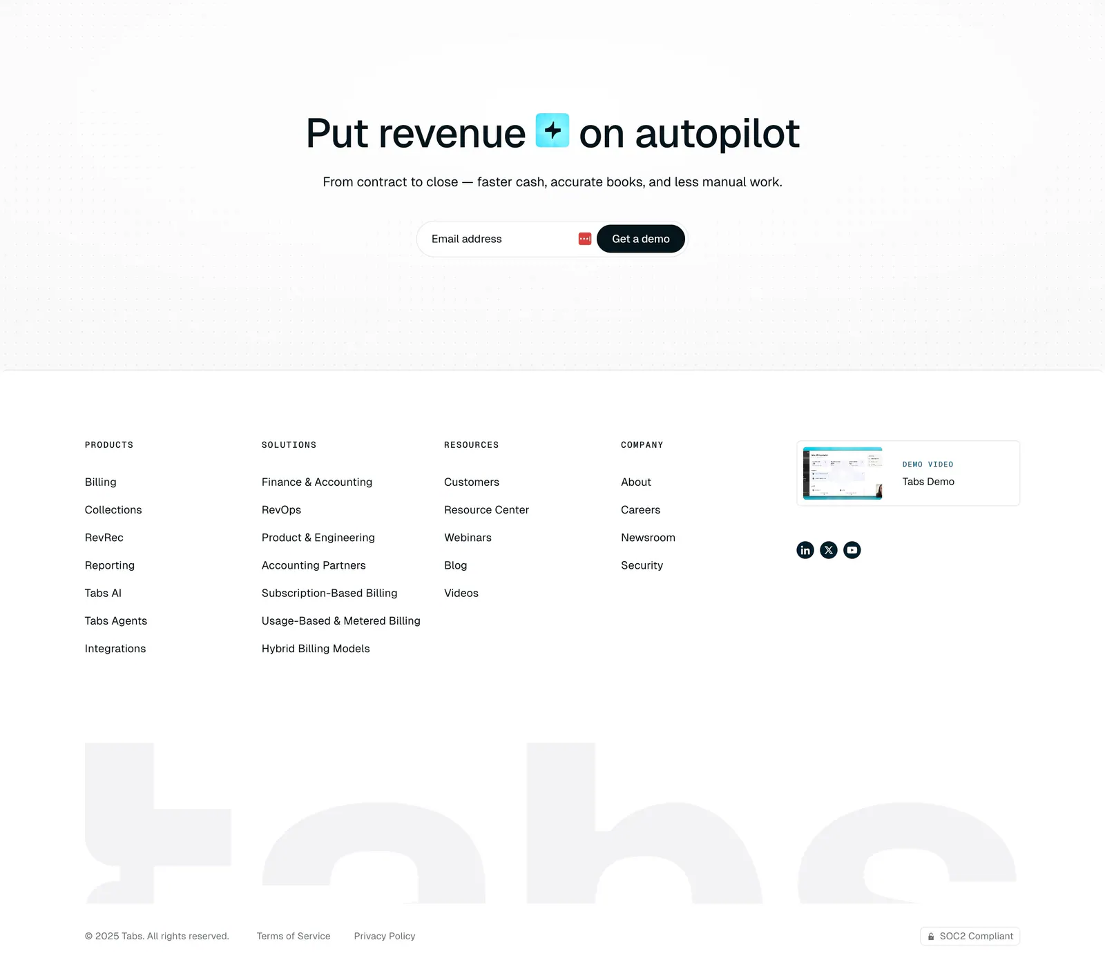
  123. Tabs footer section: centered headline and email demo field on a dot grid, link columns, demo video card and huge faded tabs wordmark
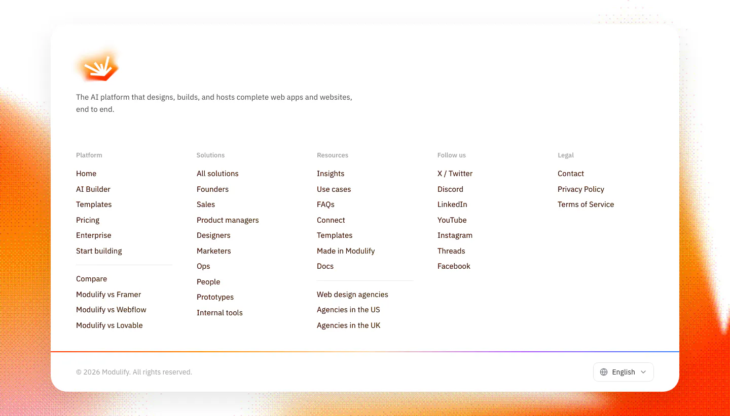
  124. Modulify footer section: white rounded card with logo, five link columns and language picker over grainy orange edges
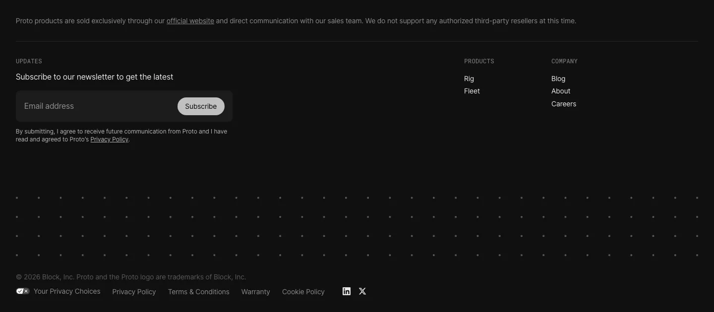
  125. Proto footer section: newsletter email field with Subscribe button, Products and Company link columns, a dot pattern band and legal links on black
    Proto Footer
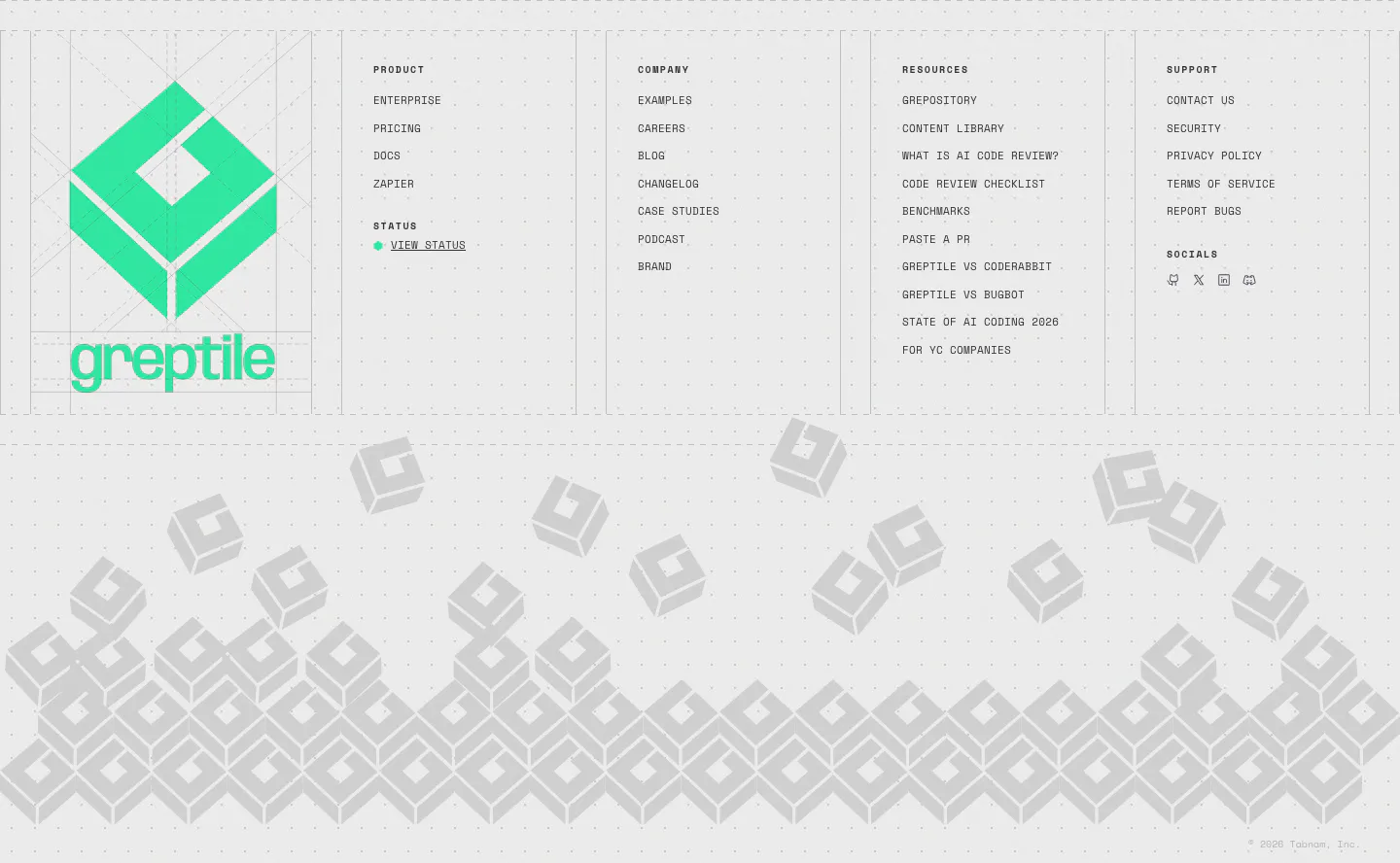
  126. Greptile footer section: large green logo beside four link columns, above a pile of gray isometric logo blocks on light gray
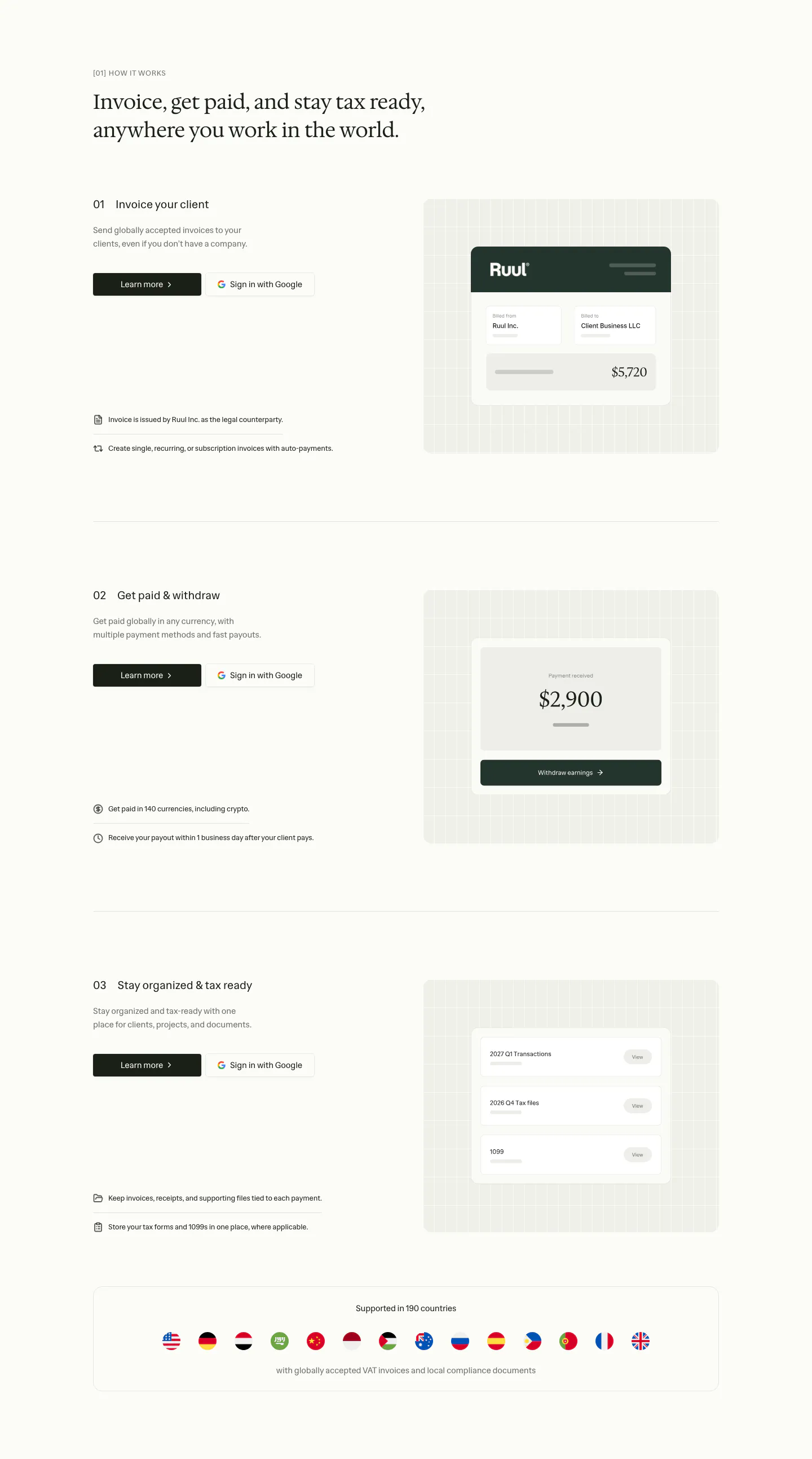
  127. Ruul how it works section: serif headline above three numbered rows with text left and UI cards on grid panels right, plus a flags strip
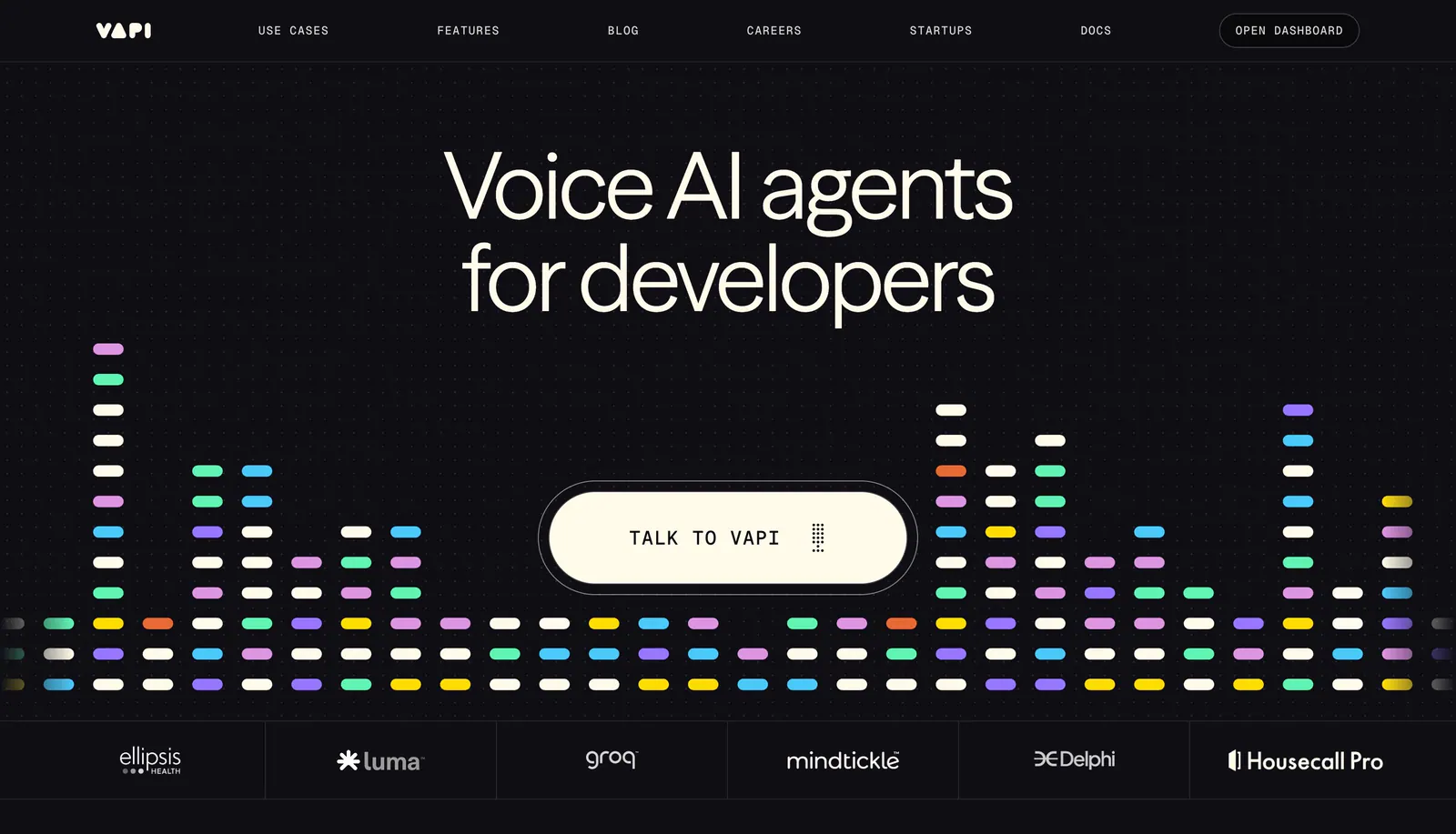
  128. Vapi hero section: centered headline and Talk to Vapi pill button over a colorful equalizer bar graphic, with a logo strip on black
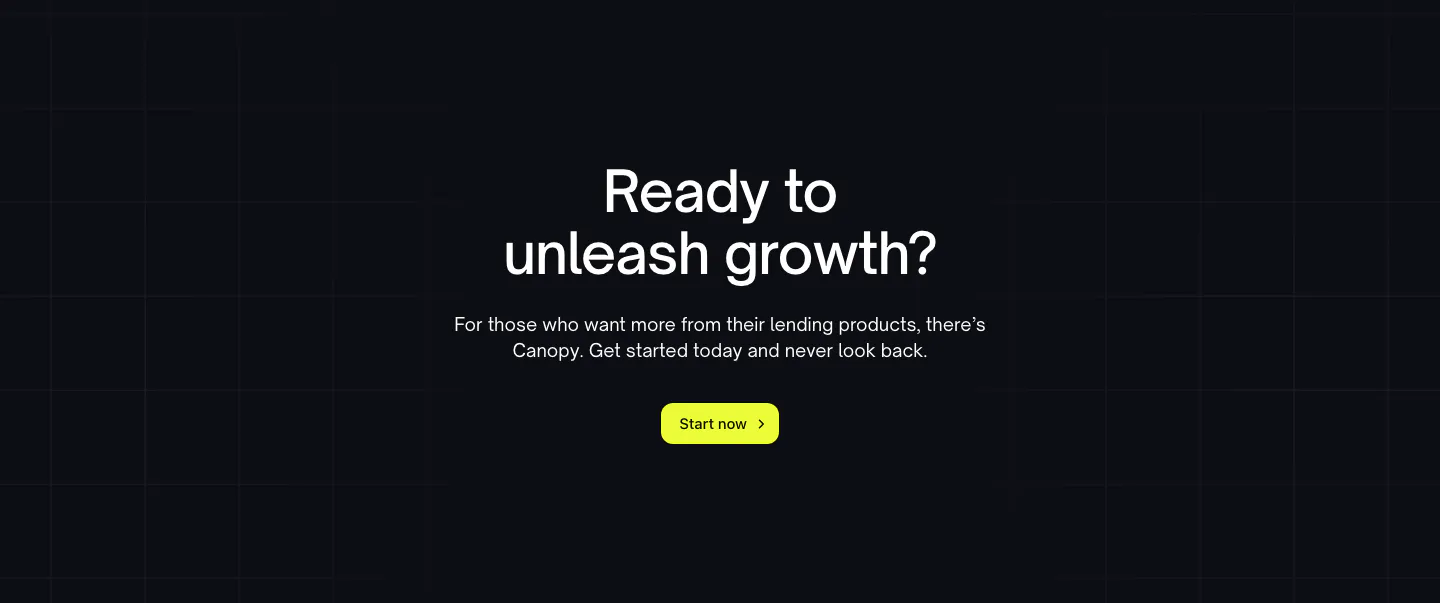
  129. Canopy call-to-action section: centered question headline, copy and lime Start now button on a dark grid background
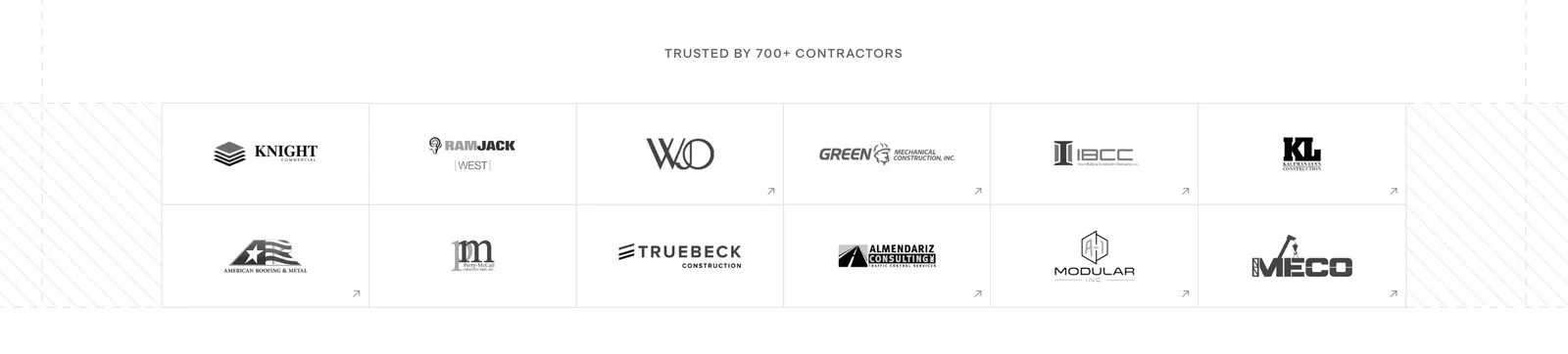
  130. Miter logo cloud section: small centered label above a two-row bordered grid of grayscale contractor logos
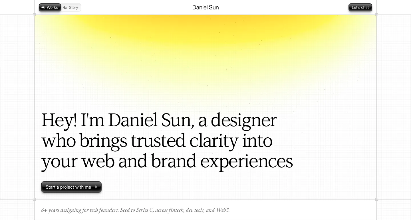
  131. Daniel Sun hero section: left-aligned serif headline and dark pill button under a yellow glow on a faint grid-line background
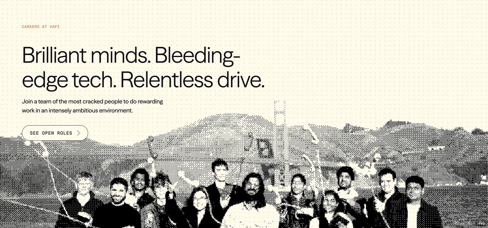
  132. Vapi careers section: left-aligned headline and See open roles button over a dithered team photo on a cream dot-grid background
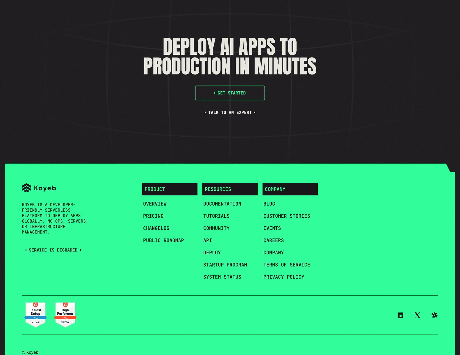
  133. Koyeb footer section: dark CTA band with condensed headline above a bright green footer with link columns and G2 badges
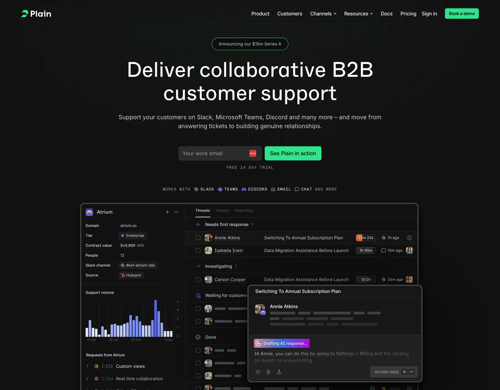
  134. Plain hero section: dark centered headline with email field and green button above a support inbox screenshot on a dot grid
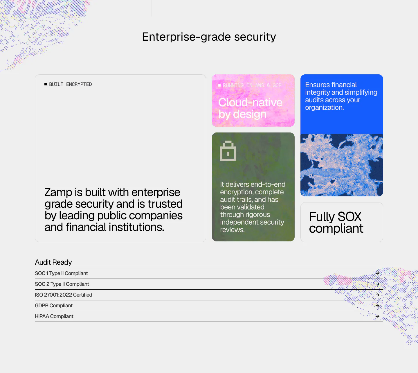
  135. Zamp security section: bento of textured color cards with encryption and SOX claims above a list of SOC, ISO, GDPR and HIPAA compliance rows
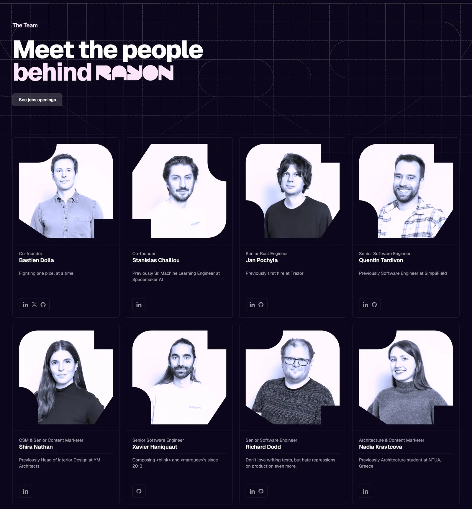
  136. Rayon team section: headline on a dark navy grid above two rows of four team member cards with tinted portrait photos
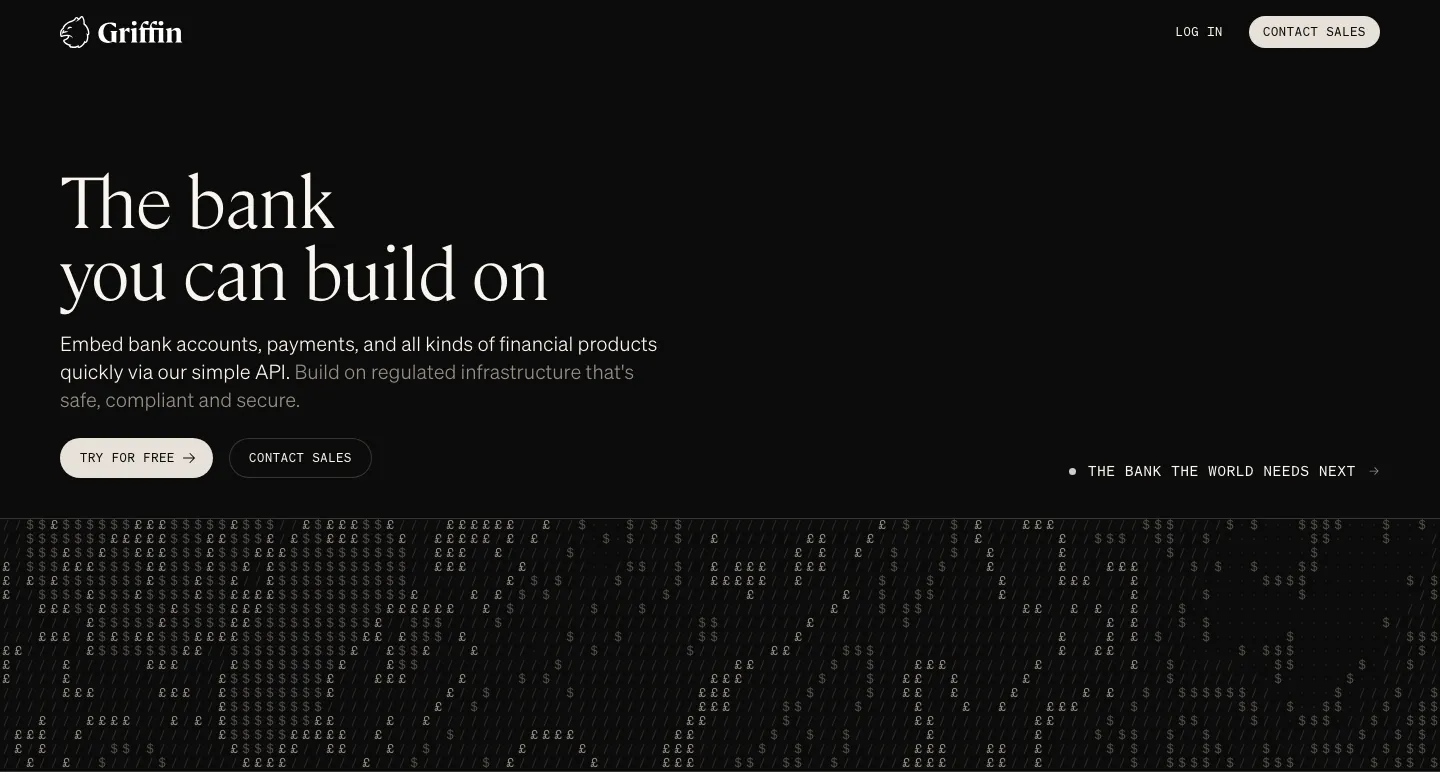
  137. Griffin hero section: large serif headline, copy and two buttons on black above a field of £ and $ characters
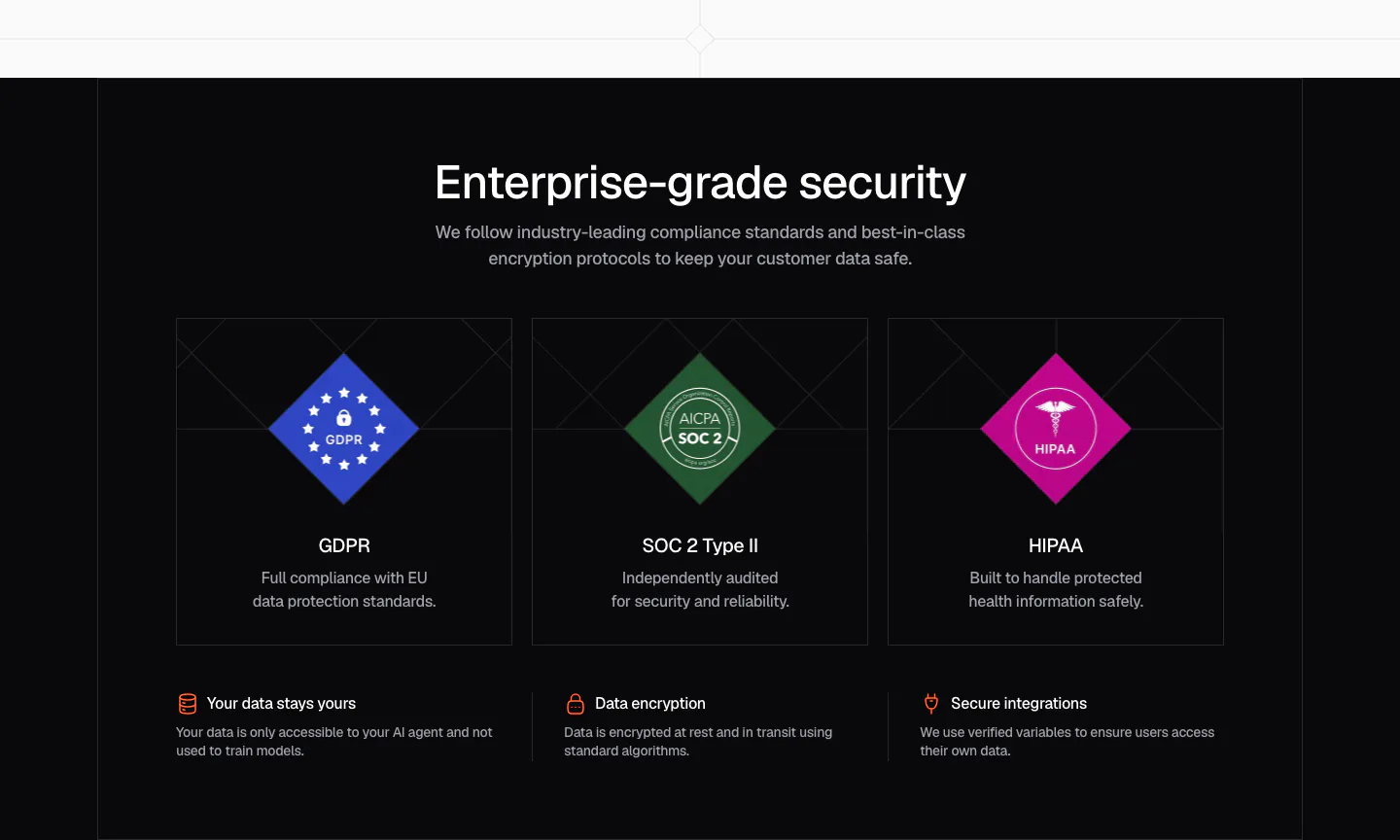
  138. Chatbase security section: dark centered headline over three cards with GDPR, SOC 2 and HIPAA diamond badges and a row of trust points
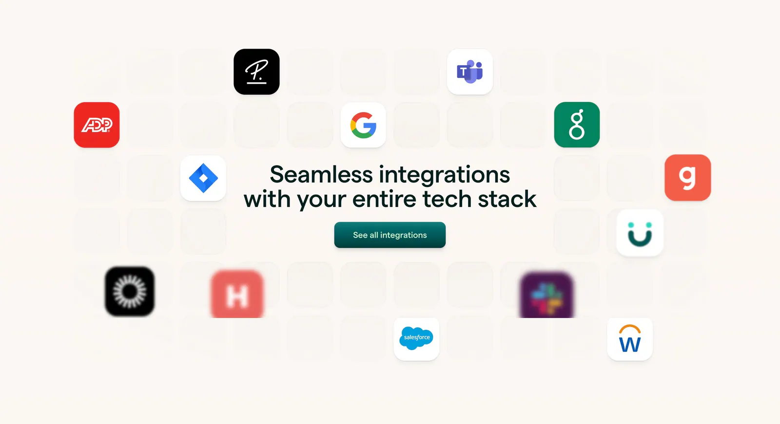
  139. Lattice integrations section: centered headline and button surrounded by scattered app icons on a faint tile grid over warm beige
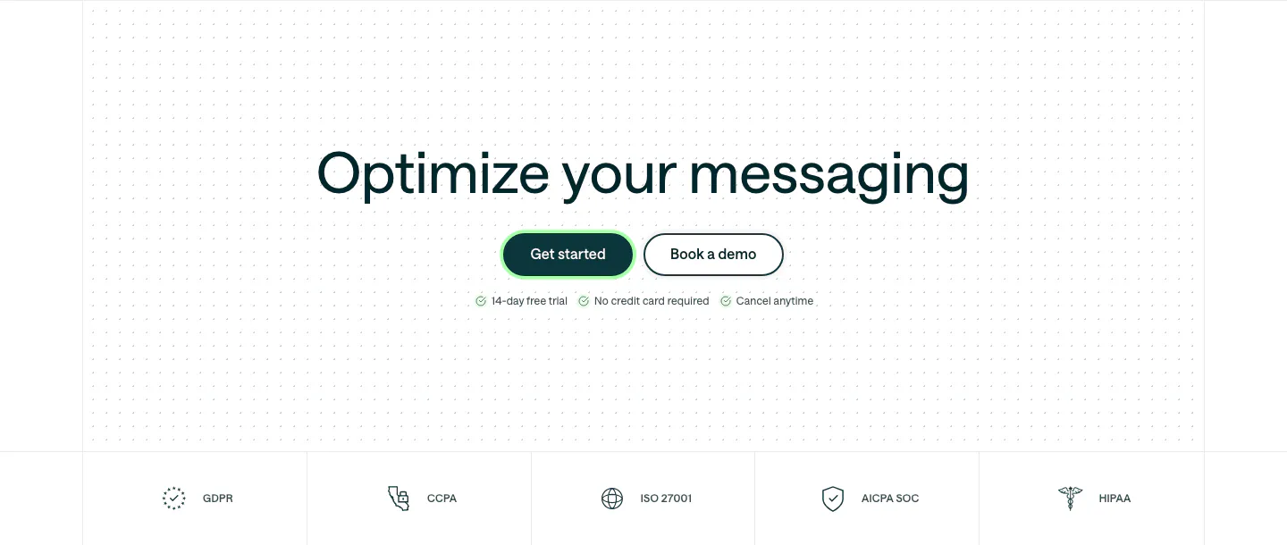
  140. Customer.io call to action section: centered headline and two buttons on a dot grid, above a row of compliance badges
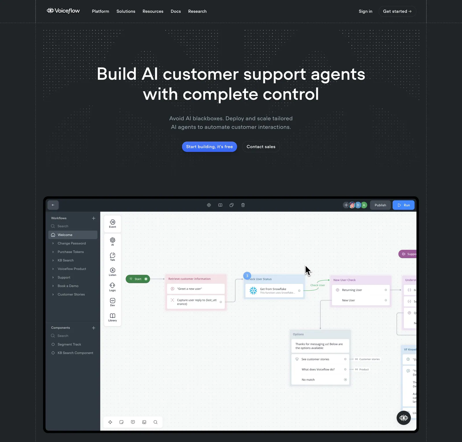
  141. Voiceflow hero section: centered headline and buttons on a charcoal dotted background above a workflow builder canvas screenshot
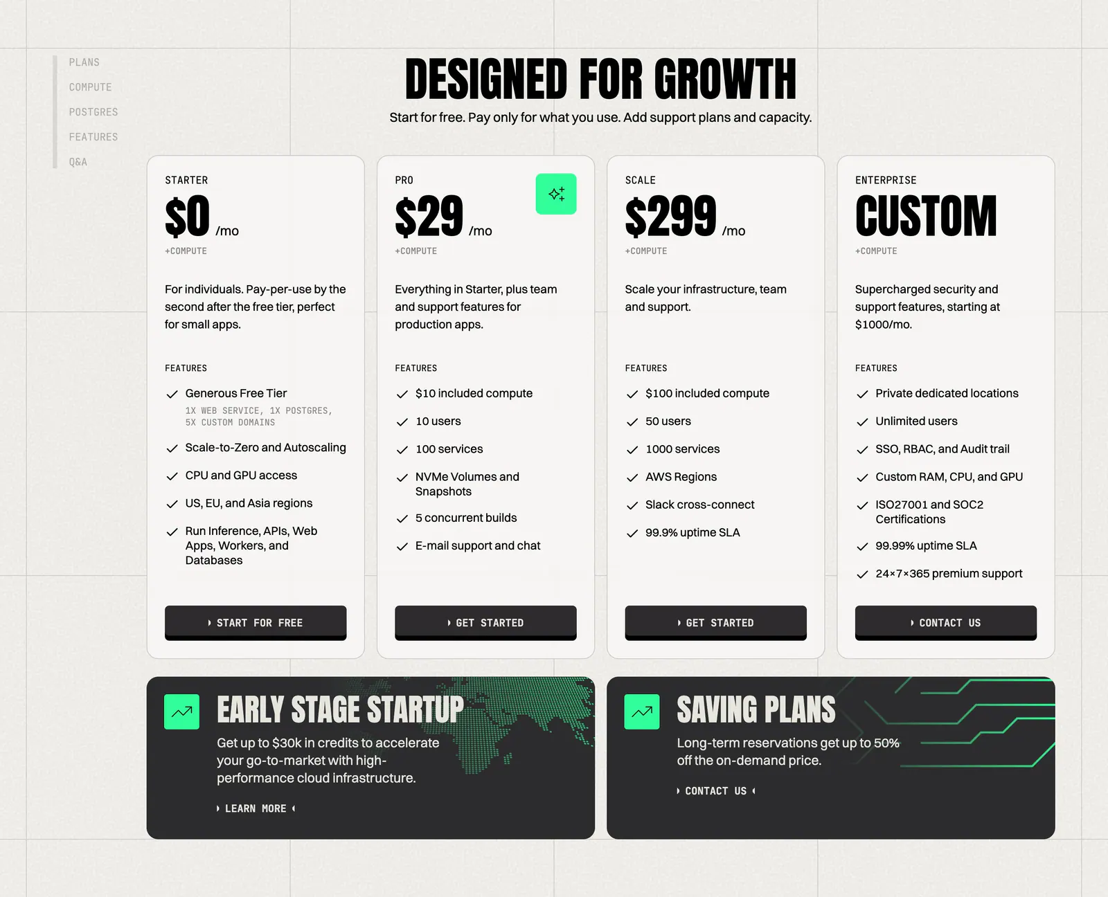
  142. Koyeb pricing section: condensed headline above four plan cards and two dark promo banners on a warm gray grid background
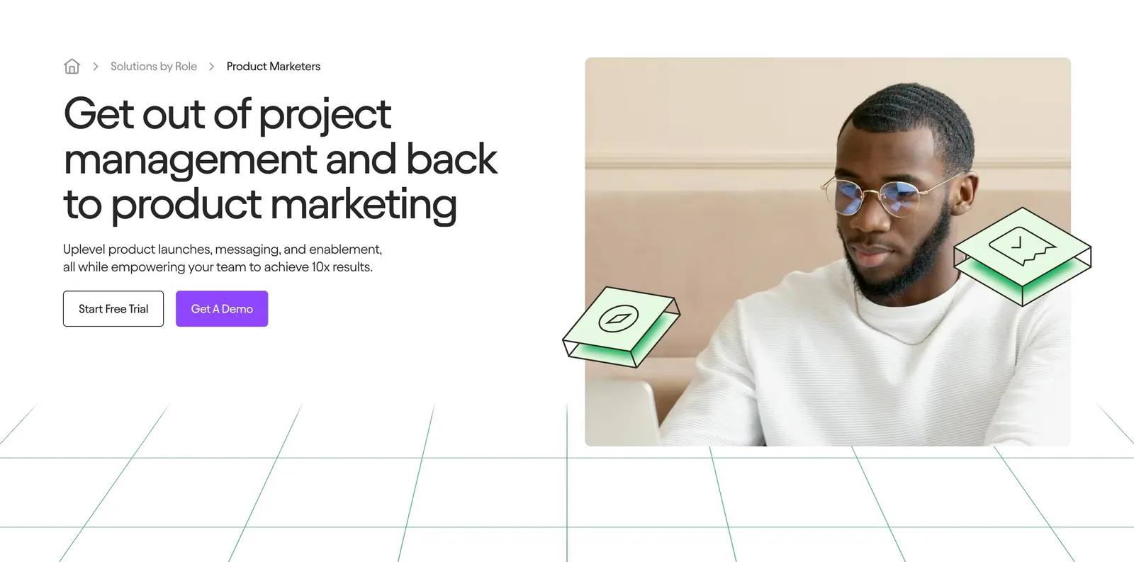
  143. Jasper hero section: breadcrumb, headline and two buttons on the left, photo of a man at a laptop on the right above green grid lines
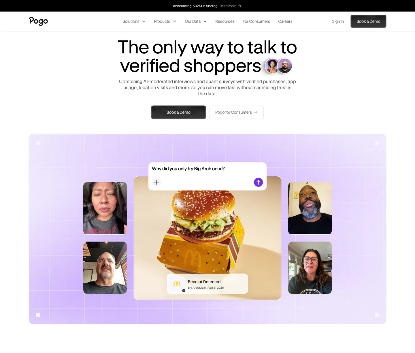
  144. Pogo hero section: centered headline and demo buttons above a lavender grid panel of video interview tiles around a burger photo
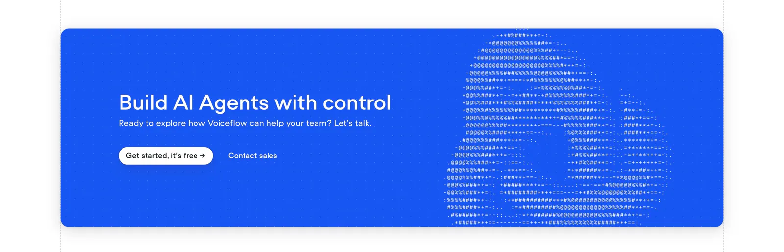
  145. Voiceflow call-to-action section: bright blue rounded banner with left headline and buttons beside ASCII-art logo on a dot grid
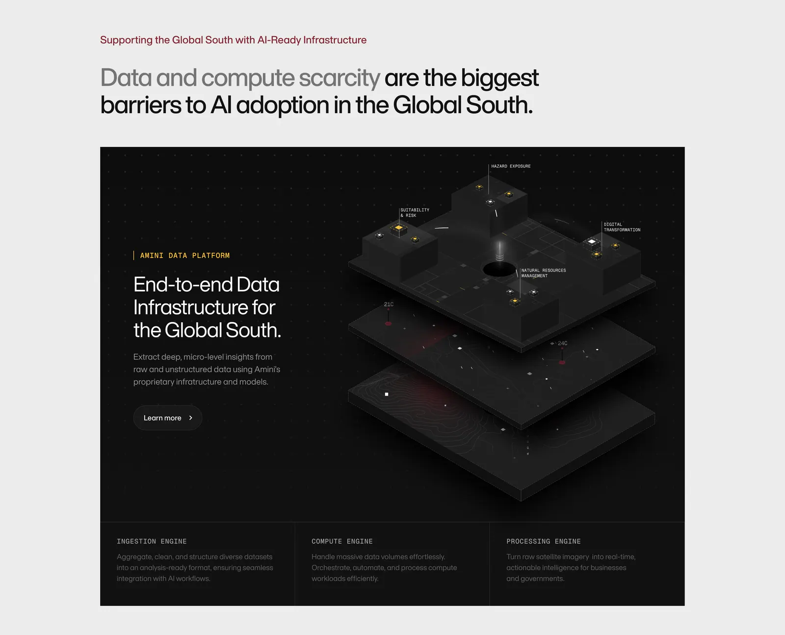
  146. Amini features section: headline on light gray above a dark panel with text and an isometric 3D data platform render, three engine columns
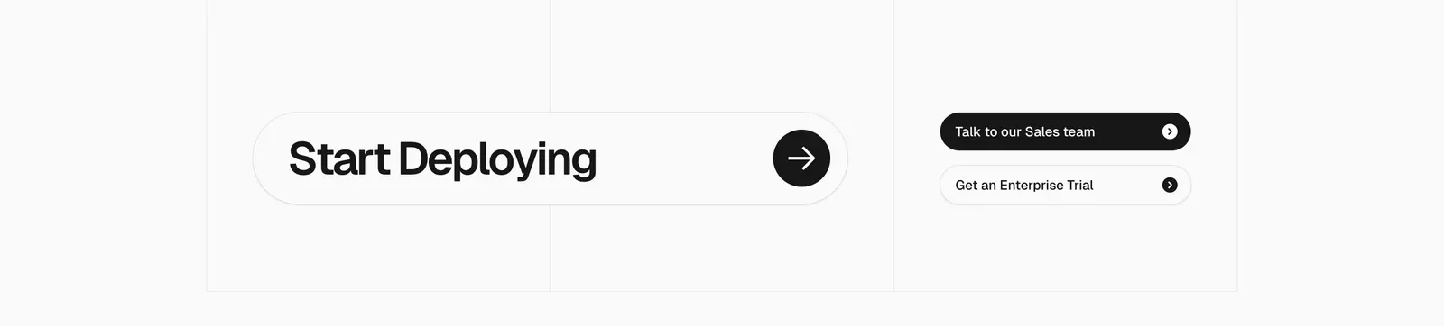
  147. Vercel call-to-action section: large Start Deploying pill with arrow button beside two sales and trial buttons on a gray grid
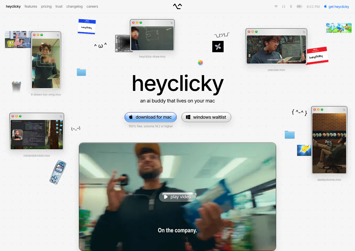
  148. heyclicky hero section: centered wordmark headline with download buttons, scattered mac video windows and stickers around a large video player
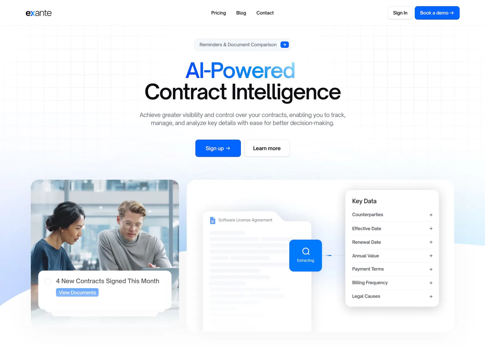
  149. Exante hero section: centered headline with blue gradient text and two CTAs above an office photo and a contract data extraction mockup
  150. Conduit call-to-action section: centered serif headline and button on an orange and teal gradient panel with dot texture
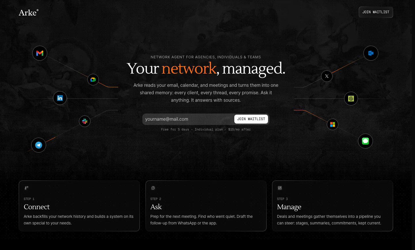
  151. Arke hero section: centered serif headline with email waitlist field, orbiting app icons and three step cards on a dark textured background
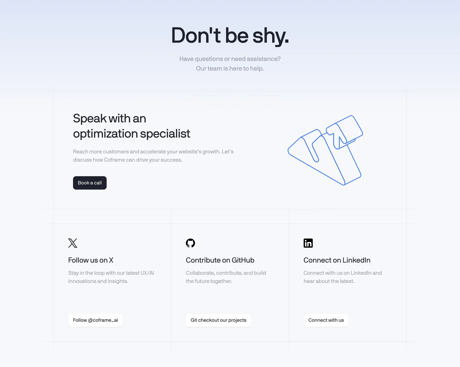
  152. Coframe contact section: centered headline, book-a-call card with outline logo artwork and three social link cards on a grid background
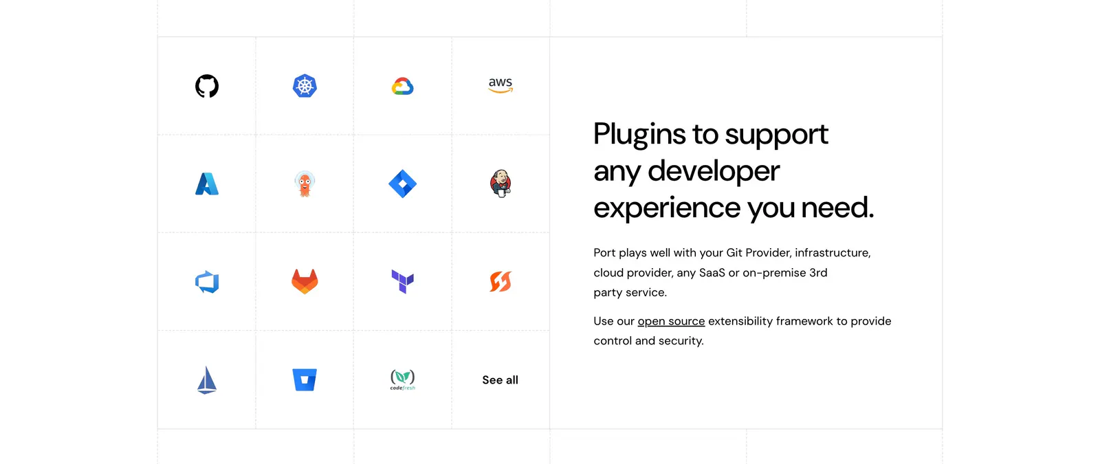
  153. Port integrations section: grid of developer tool icons on the left beside a headline and short copy on the right, white background
  154. Canopy call-to-action section: centered headline, short copy and lime Get started button on a dark grid background
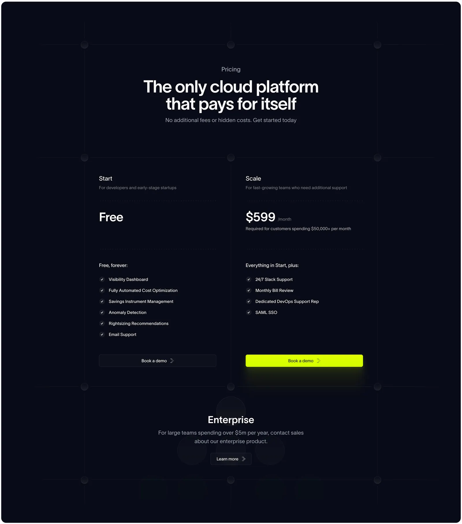
  155. Antimetal pricing section: centered headline on dark navy grid lines above two plan columns and an enterprise row
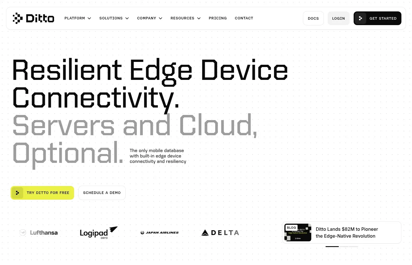
  156. Ditto hero section: oversized two-tone left-aligned headline with yellow CTA, airline logo strip and a news card on a dotted white background
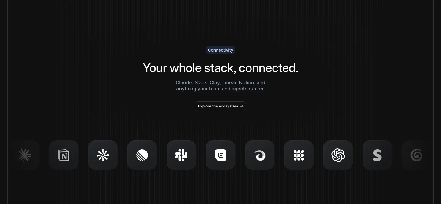
  157. Attio integrations section: centered headline and button above a row of dark rounded app icons fading at both edges, striped dark
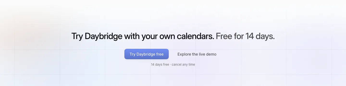
  158. Daybridge call-to-action section: centered one-line headline with primary and secondary buttons over faint grid lines
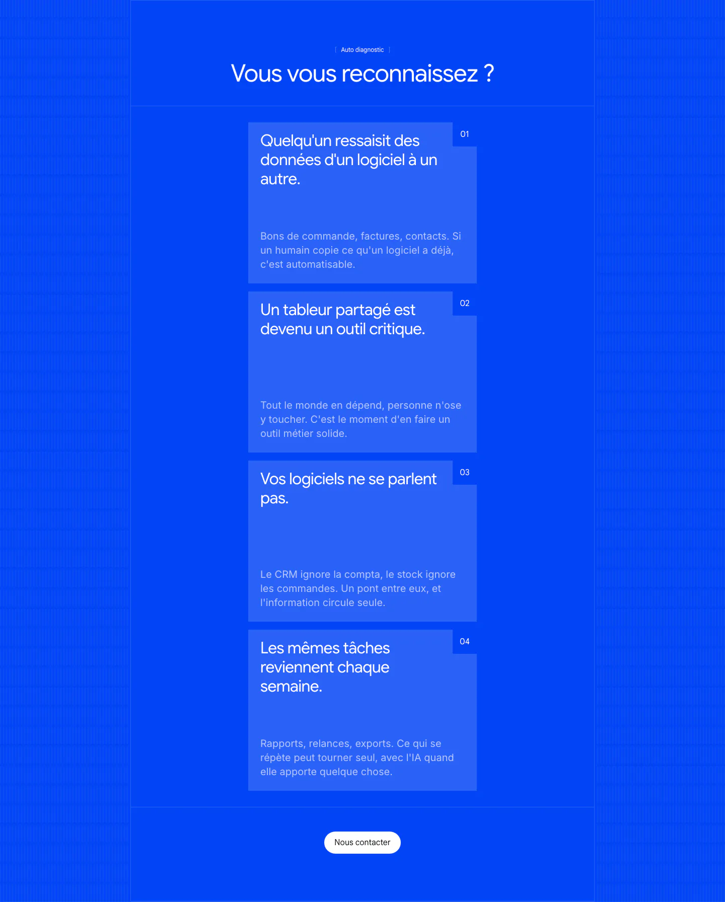
  159. Raneo value proposition section: centered headline above four stacked numbered pain-point cards and a contact button on saturated blue
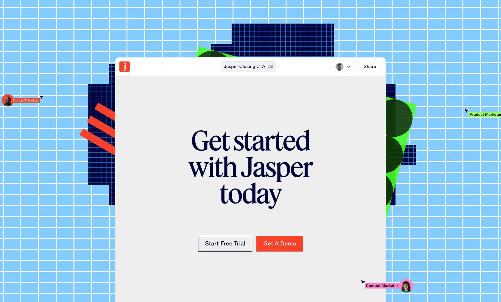
  160. Jasper call-to-action section: serif headline and two buttons in an editor window over a sky-blue grid with pixel shapes and cursors
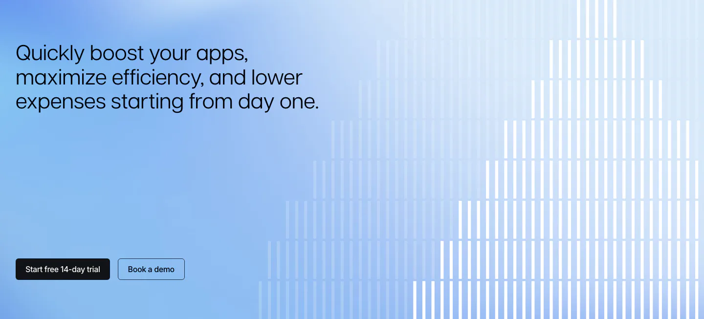
  161. Polar Signals call to action section: left headline and two buttons on a blue gradient with white vertical bars rising like a bar chart
  162. Phidata call to action section: centered headline with two buttons on a black background with dot-matrix lettering in the corners
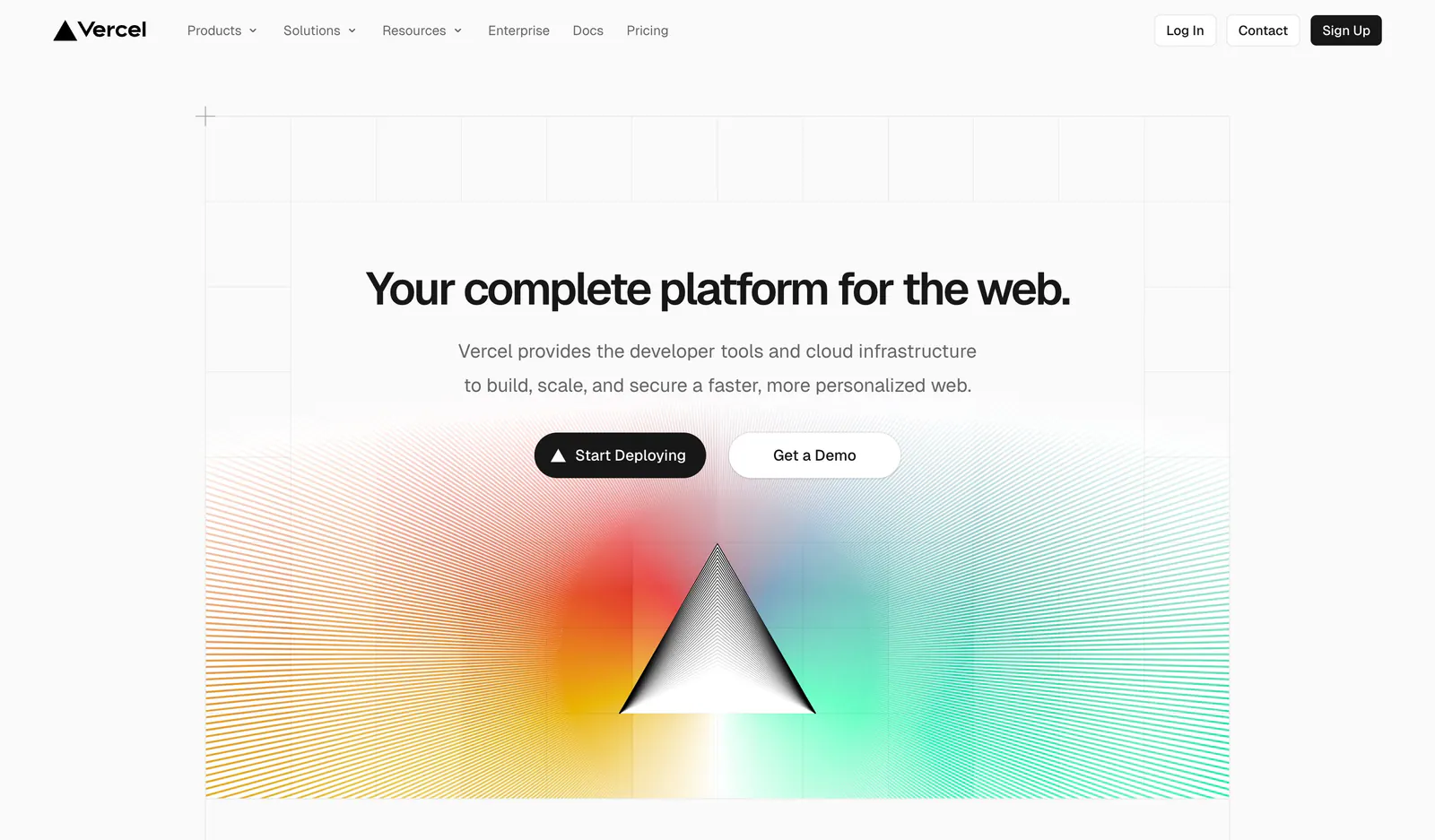
  163. Vercel hero section: centered headline and two buttons on a grid background above a black prism radiating rainbow gradient line rays
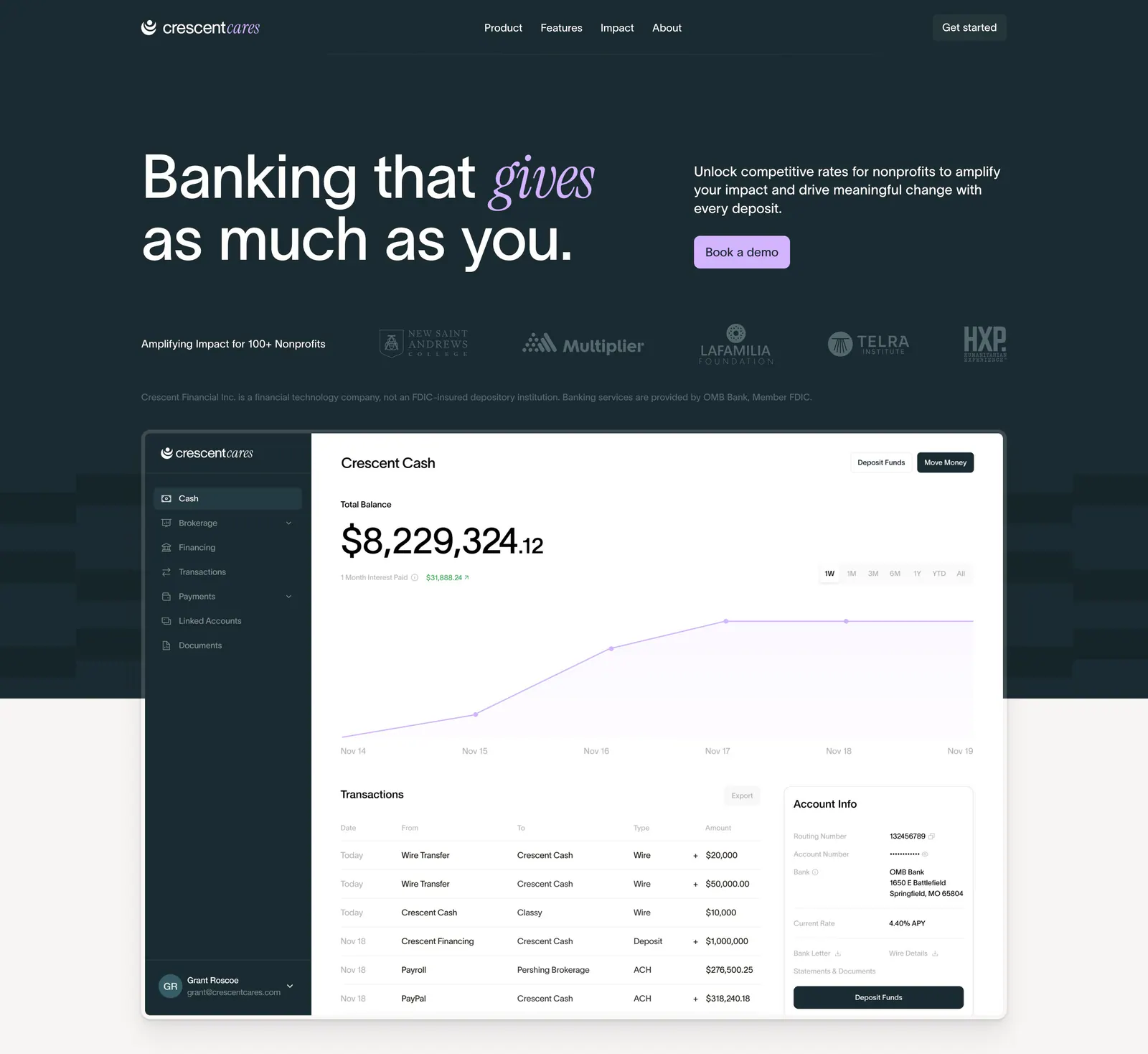
  164. Crescent Cares hero section: headline with italic serif accent, copy and button, nonprofit logo row and banking dashboard screenshot
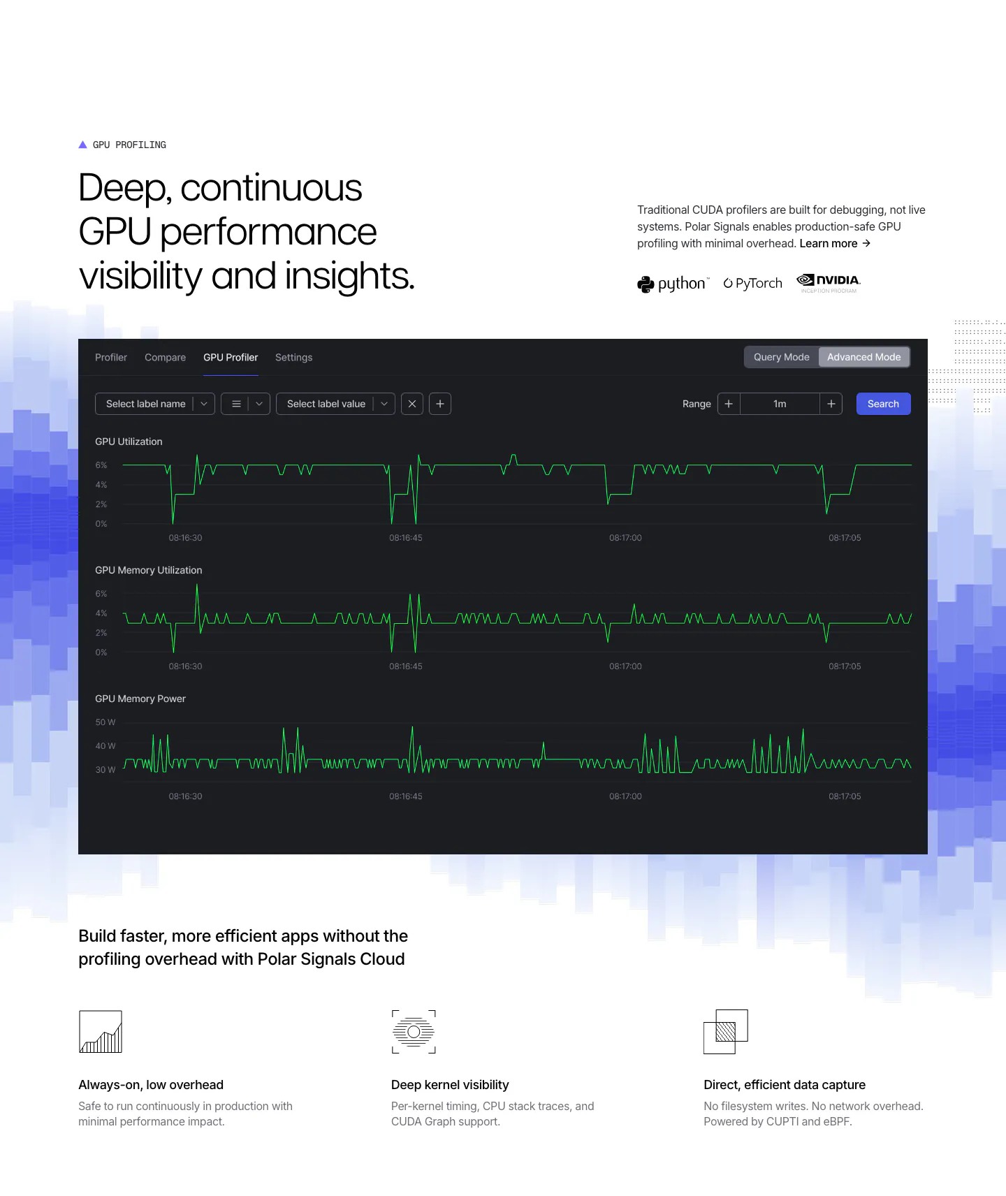
  165. Polar Signals features section: headline above a dark GPU profiler dashboard on blue pixel bars, with three icon feature points below
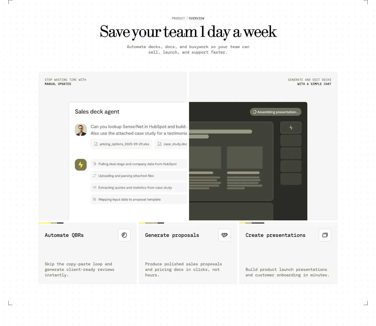
  166. Visual features section: centered serif headline above a sales deck agent chat UI and three cards for QBRs, proposals and presentations
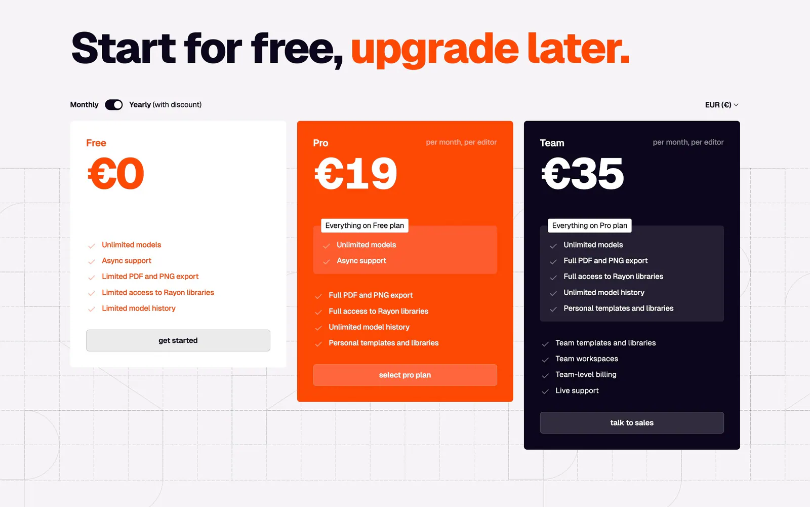
  167. Rayon pricing section: large headline with orange accent, monthly/yearly toggle and white, orange and navy plan cards on a grid
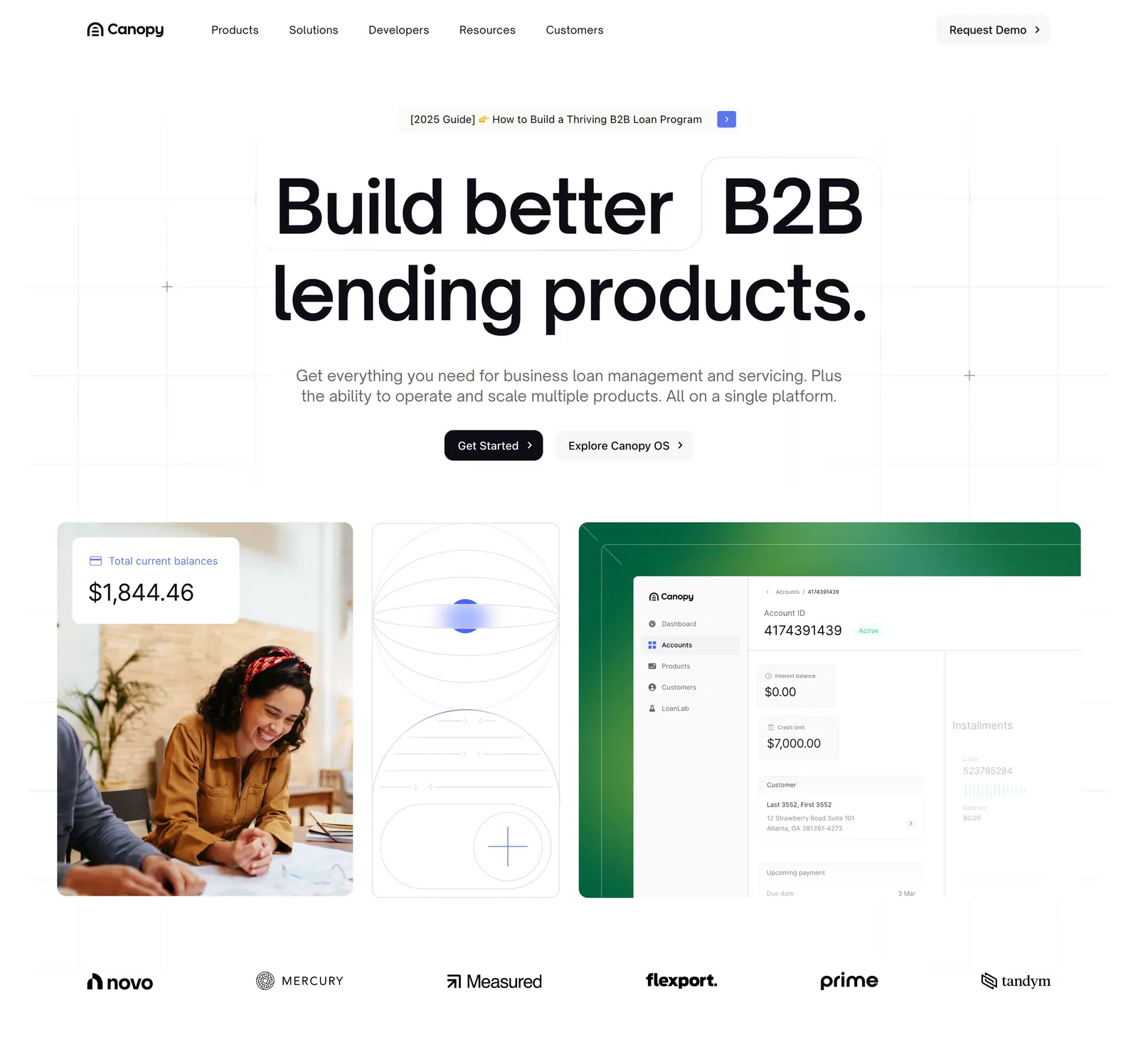
  168. Canopy hero section: centered headline and two buttons above cards with a customer photo, line art and a loan dashboard, logos below
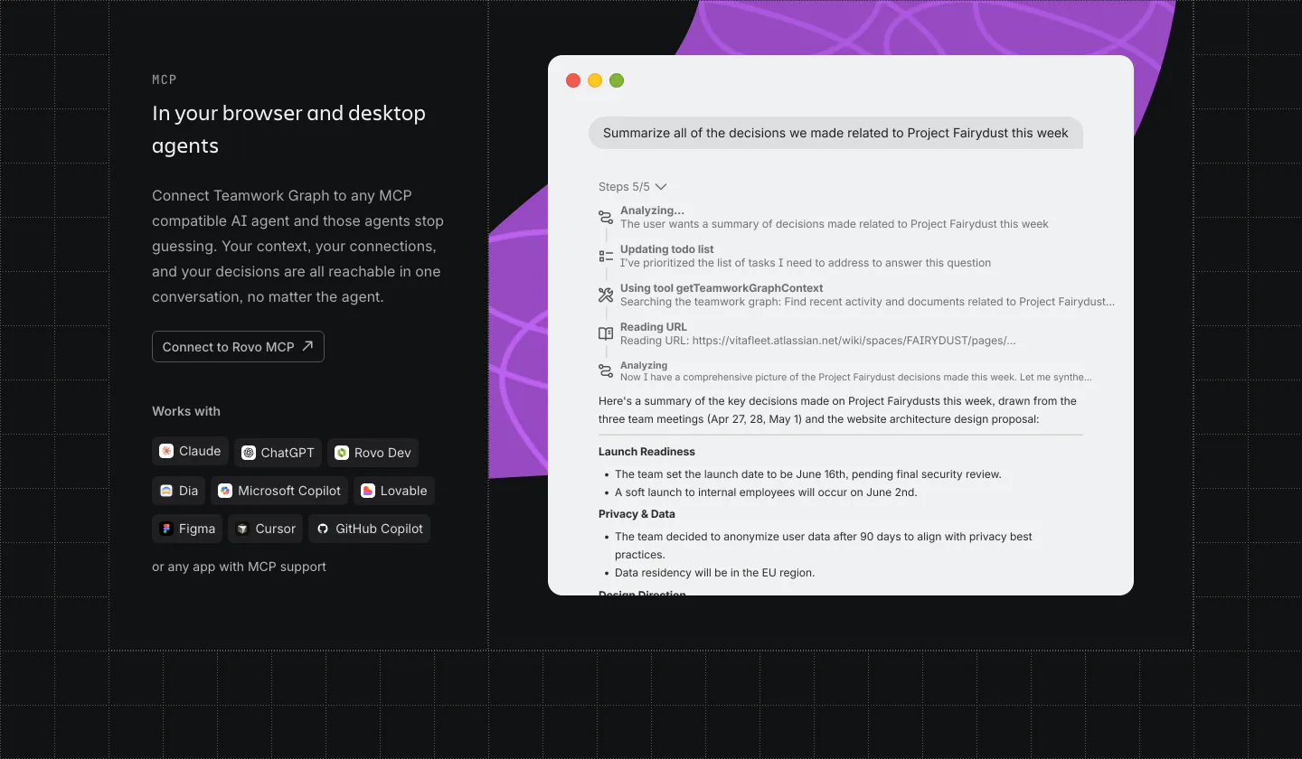
  169. Atlassian features section: MCP copy, button and agent chips on the left, chat UI window over a purple shape on the right, dark grid
  170. Brikken+Co FAQ section: large headline and intro above a ruled accordion with plus icons on warm gray with grid lines
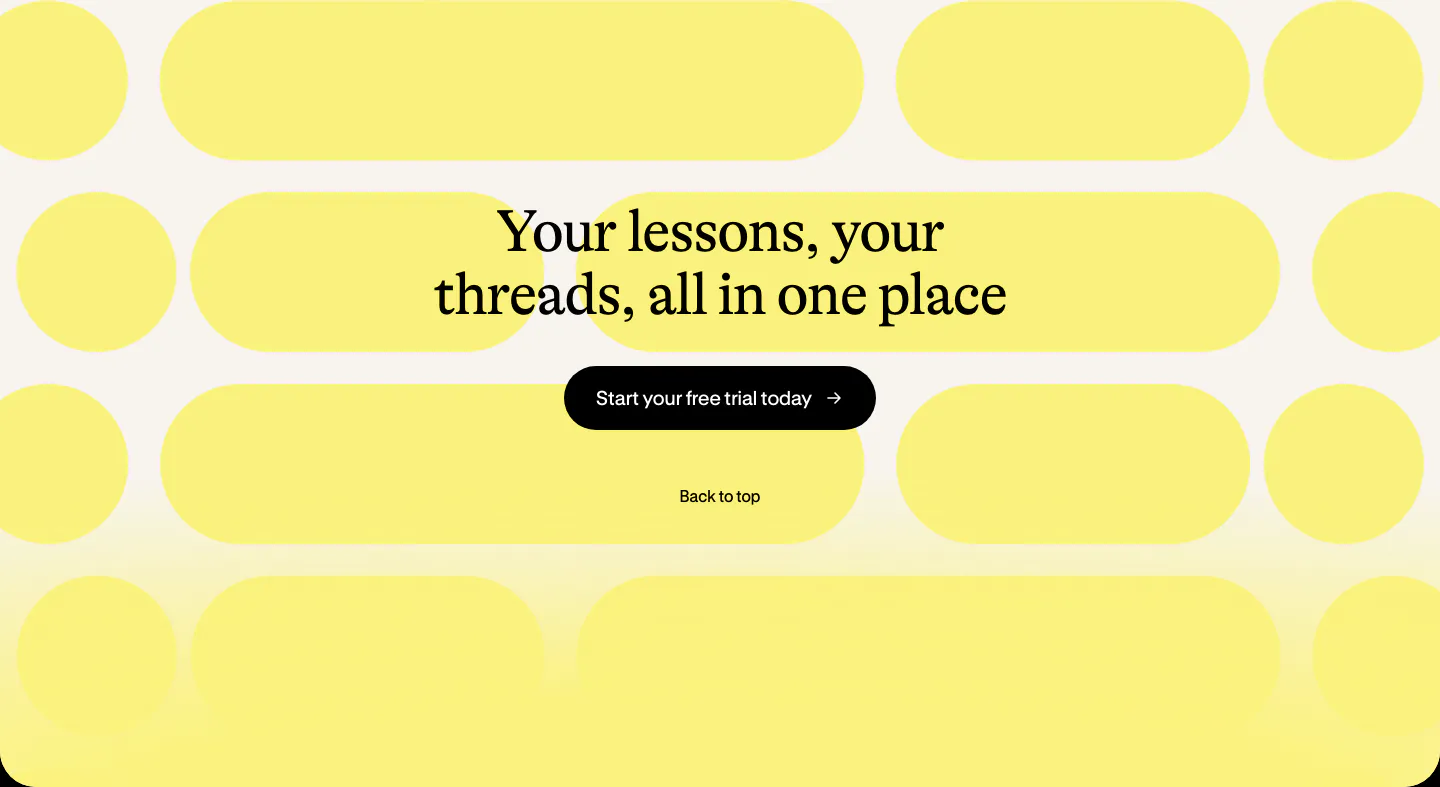
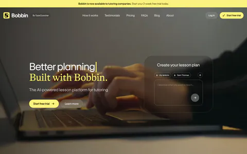
  171. Bobbin call to action section: centered serif heading and black button over a pattern of yellow pill shapes on cream
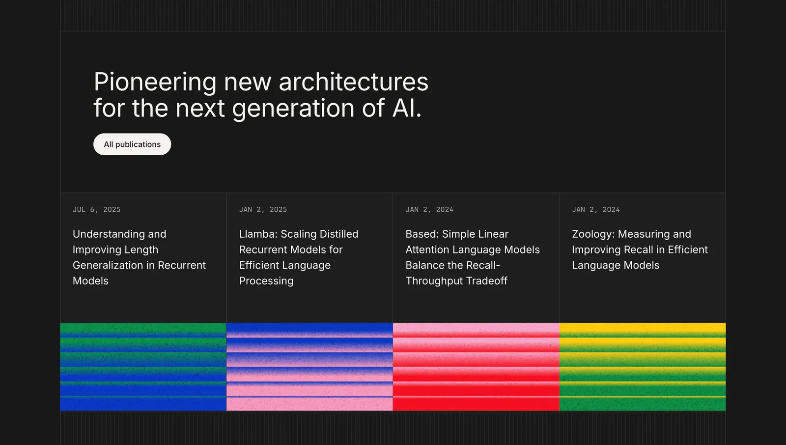
  172. Cartesia blog & resources section: left-aligned headline above four research publication cards with grainy striped color thumbnails on dark

Where pattern background shows up

Often paired with

Share of pattern background sections that also use each style

How to design subtle pattern backgrounds

  1. Keep pattern contrast very low

    A background pattern should be felt more than seen. Start with lines or dots at three to eight percent opacity against the background, then adjust on real screens. If you notice the pattern before the headline, it is too strong and needs to come down.

  2. Fade the pattern behind content

    Use a radial or linear mask so the pattern fades out where text sits and stays visible toward the edges. This keeps copy clean while the texture frames the section. CSS mask-image with a gradient handles this without any extra assets.

  3. Snap grid cells to the layout

    If you use a grid-line pattern, set its cell size to your layout columns or spacing scale. When cards and text line up with the pattern, the section feels engineered. Misaligned grids look accidental and draw attention to small offsets.

  4. Draw patterns in CSS or SVG

    Repeating gradients and small tiled SVGs scale cleanly to any screen and weigh almost nothing. Avoid large raster textures that blur on high-density displays. For grain, use a small noise tile at low opacity rather than a full-screen image.
Companies using pattern background

All styles
    ↑↓ Navigate ↵ Open

    Section preview

    Website section