Whalesync website design

Every section we captured from the Whalesync website, in page order, from the hero section down to the footer. Open any thumbnail to see it full size.

Sections 7

In page order, top to bottom

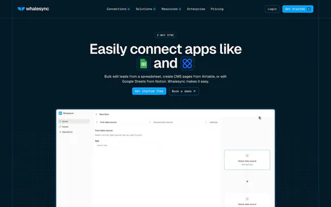
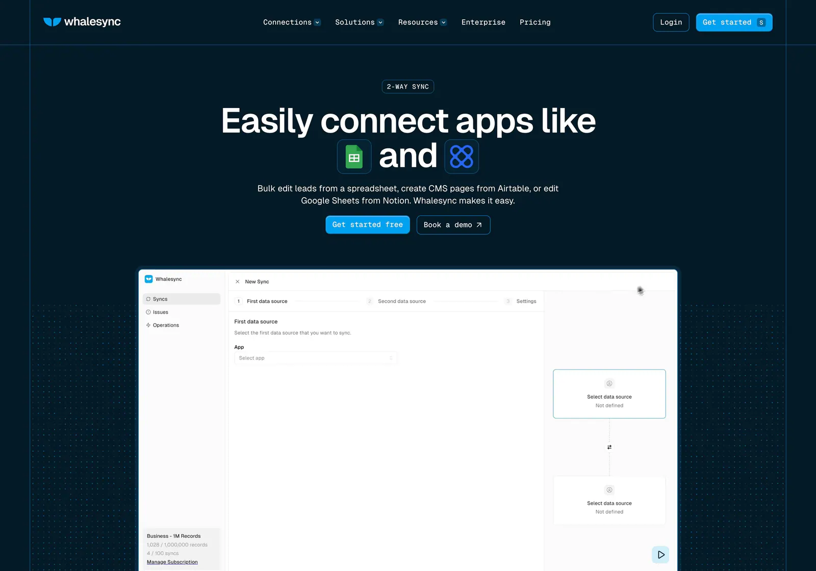
  1. Whalesync hero section: centered headline with inline app icons and buttons above a new-sync product screenshot on dark navy dot grids
    01 Hero

    Easily connect apps like and

  2. Whalesync logo cloud section: small monospace caption above two centered rows of black customer logos on a pale background

    EMPOWERING TOP OPERATORS — FROM STARTUPS TO ENTERPRISES

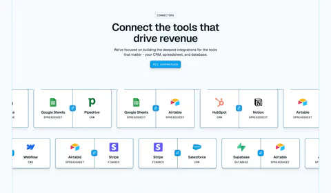
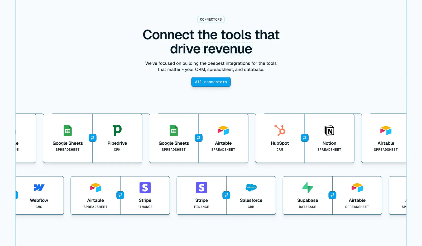
  3. Whalesync integrations section: centered headline above two scrolling rows of paired connector cards like Google Sheets and Pipedrive

    Connect the tools that drive revenue

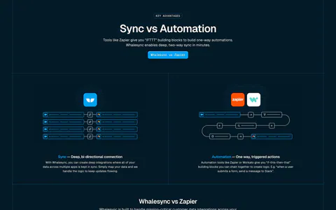
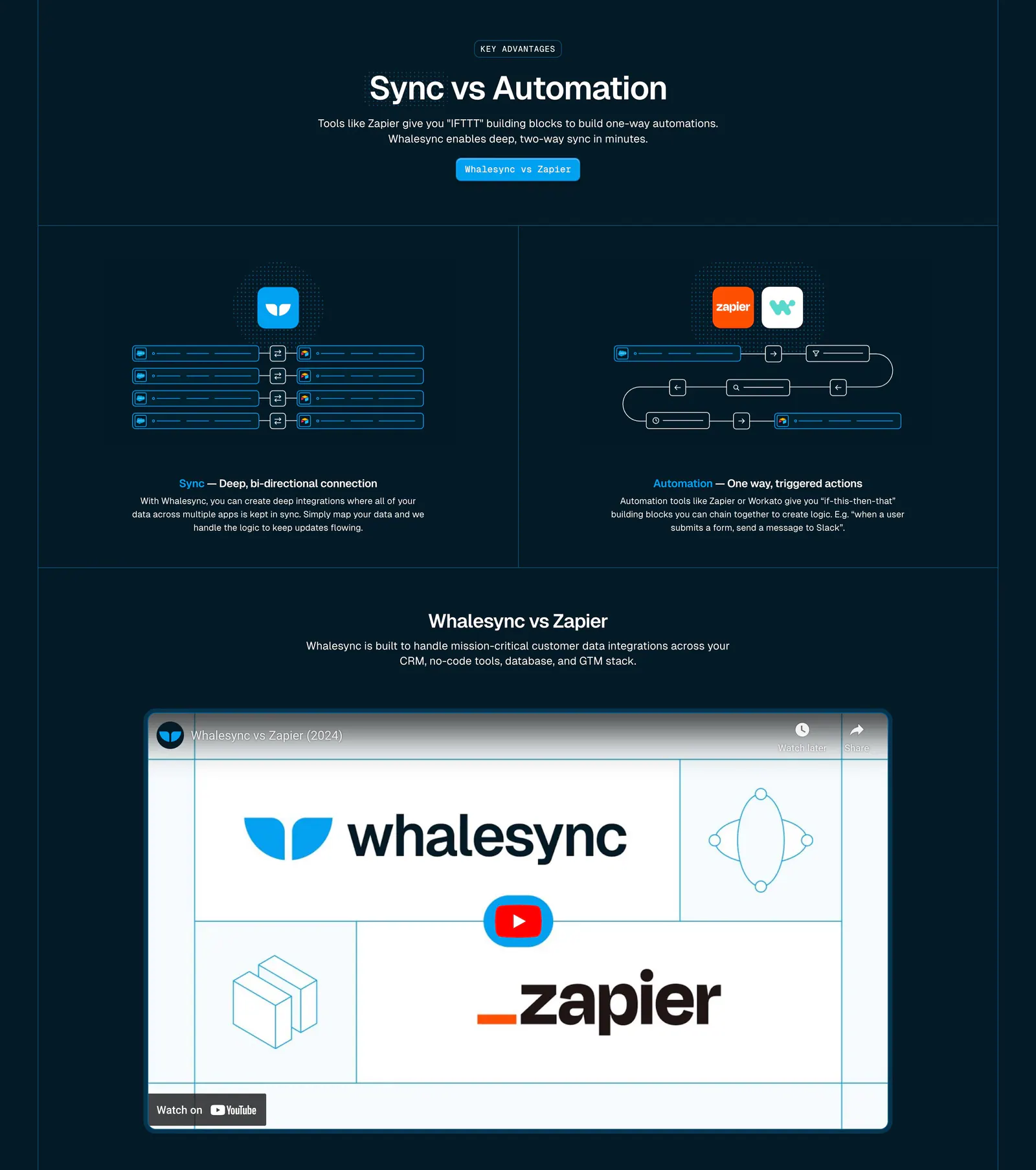
  4. Whalesync comparison section: Sync vs Automation diagrams in two columns above a Whalesync vs Zapier YouTube video on dark navy

    Sync vs Automation

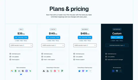
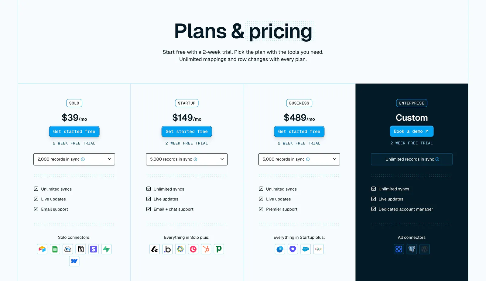
  5. Whalesync pricing section: centered headline above four plan columns with prices, record dropdowns and connector icons, Enterprise in navy
    05 Pricing

    Plans & pricing

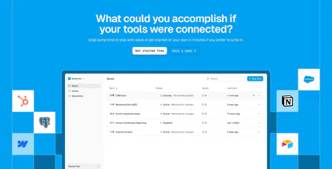
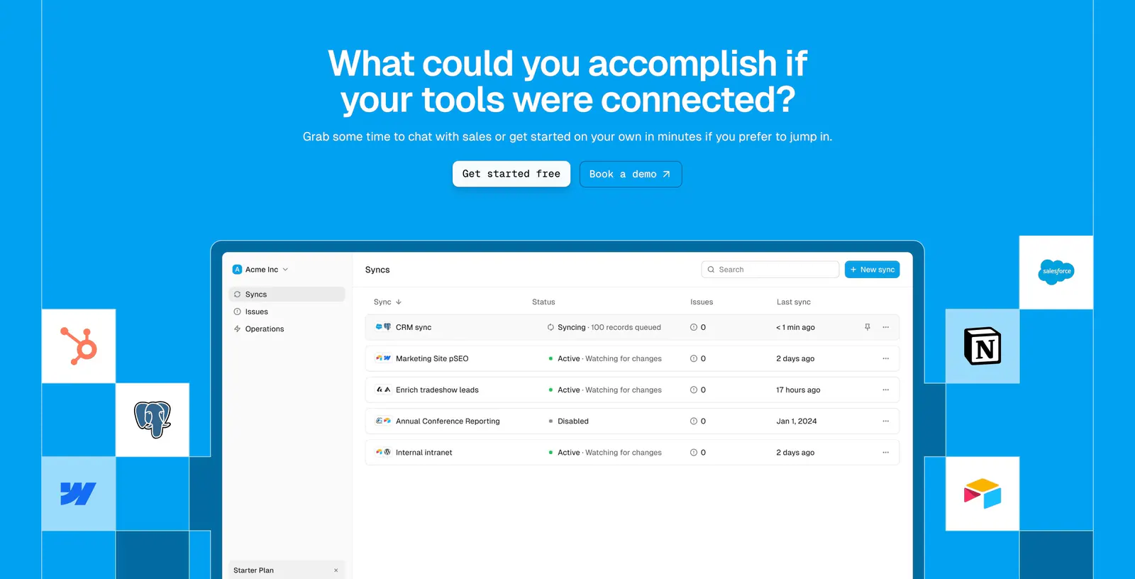
  6. Whalesync call-to-action section: centered headline and buttons above a syncs dashboard screenshot flanked by app icon tiles on bright blue

    What could you accomplish if your tools were connected?

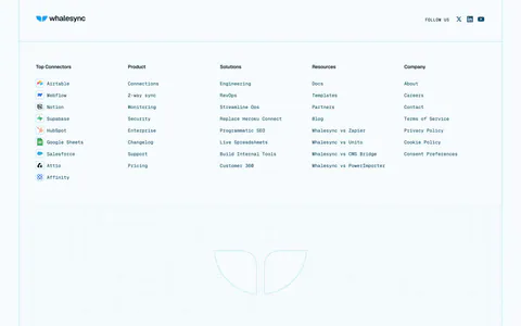
  7. Whalesync footer section: logo and five monospace link columns with connector icons above a dot-grid outlined logo on pale blue
    07 Footer

Similar companies

All companies
    ↑↓ Navigate ↵ Open

    Section preview

    Website section