Dark Mode Website Design Examples
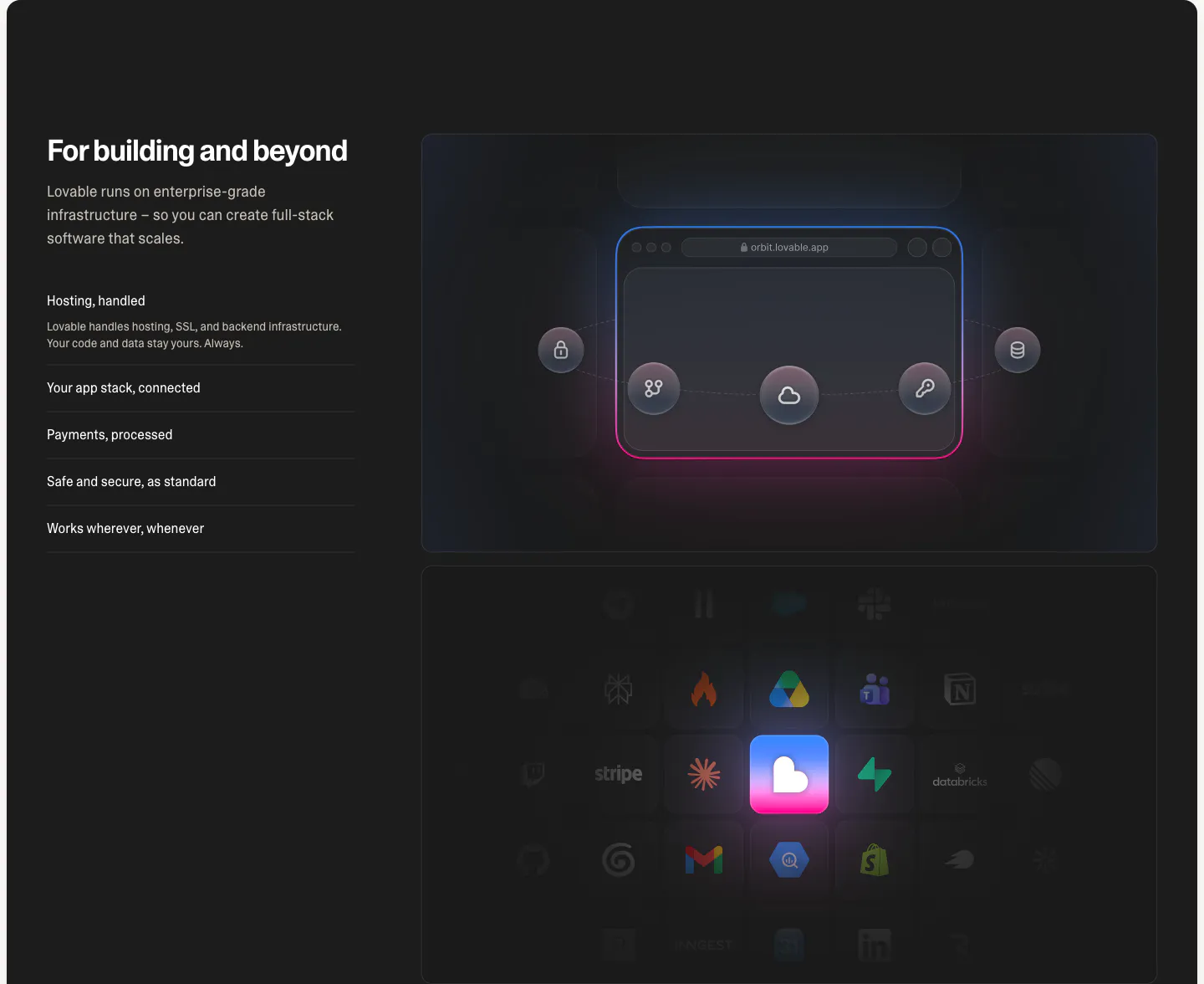
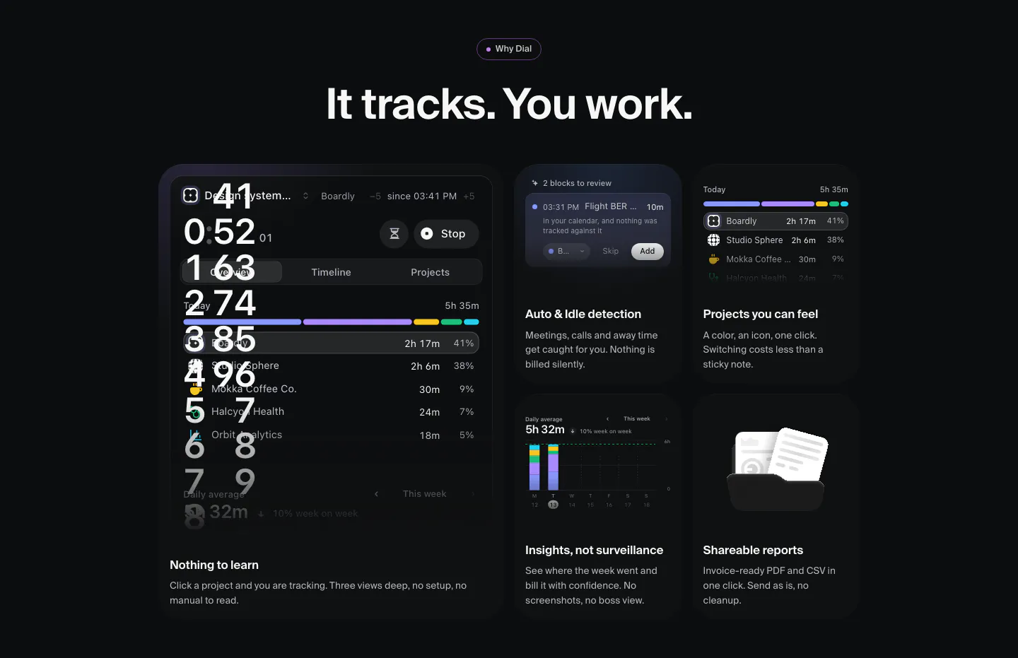
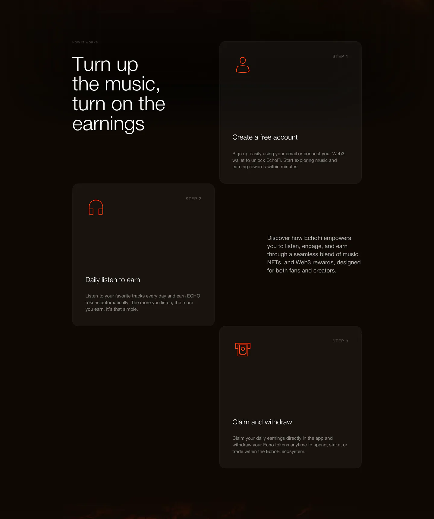
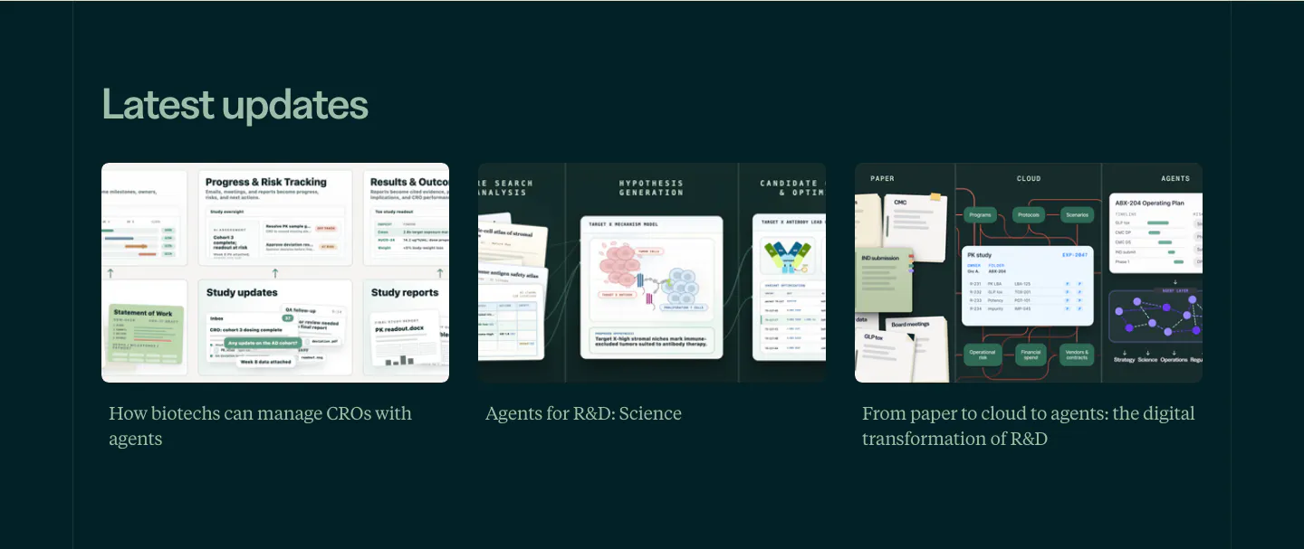
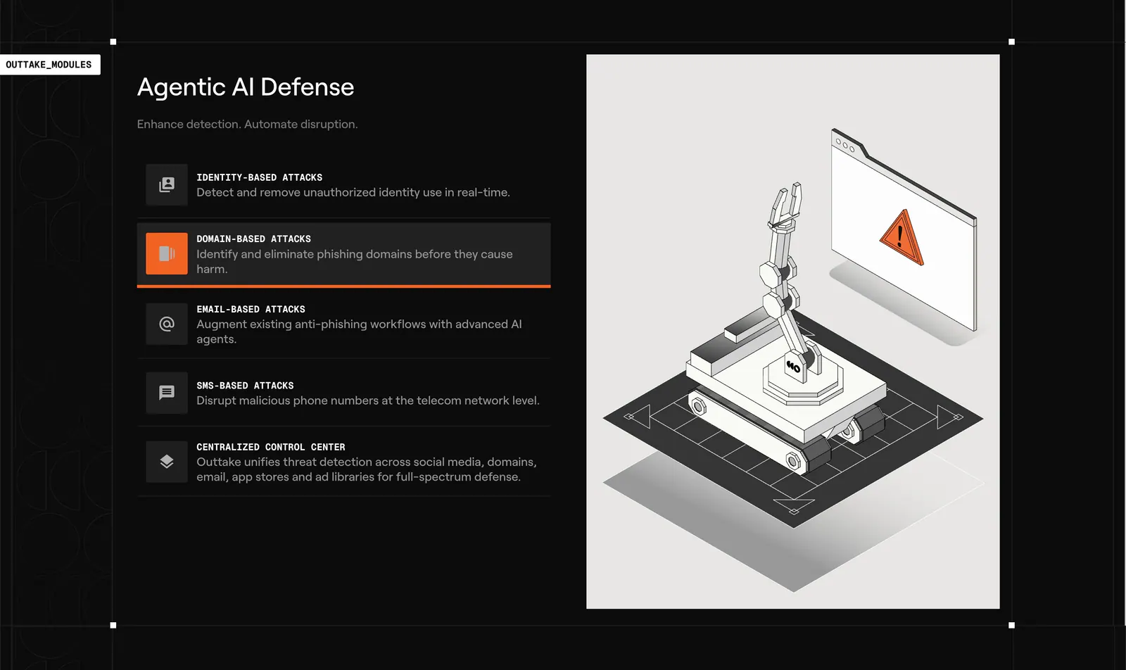
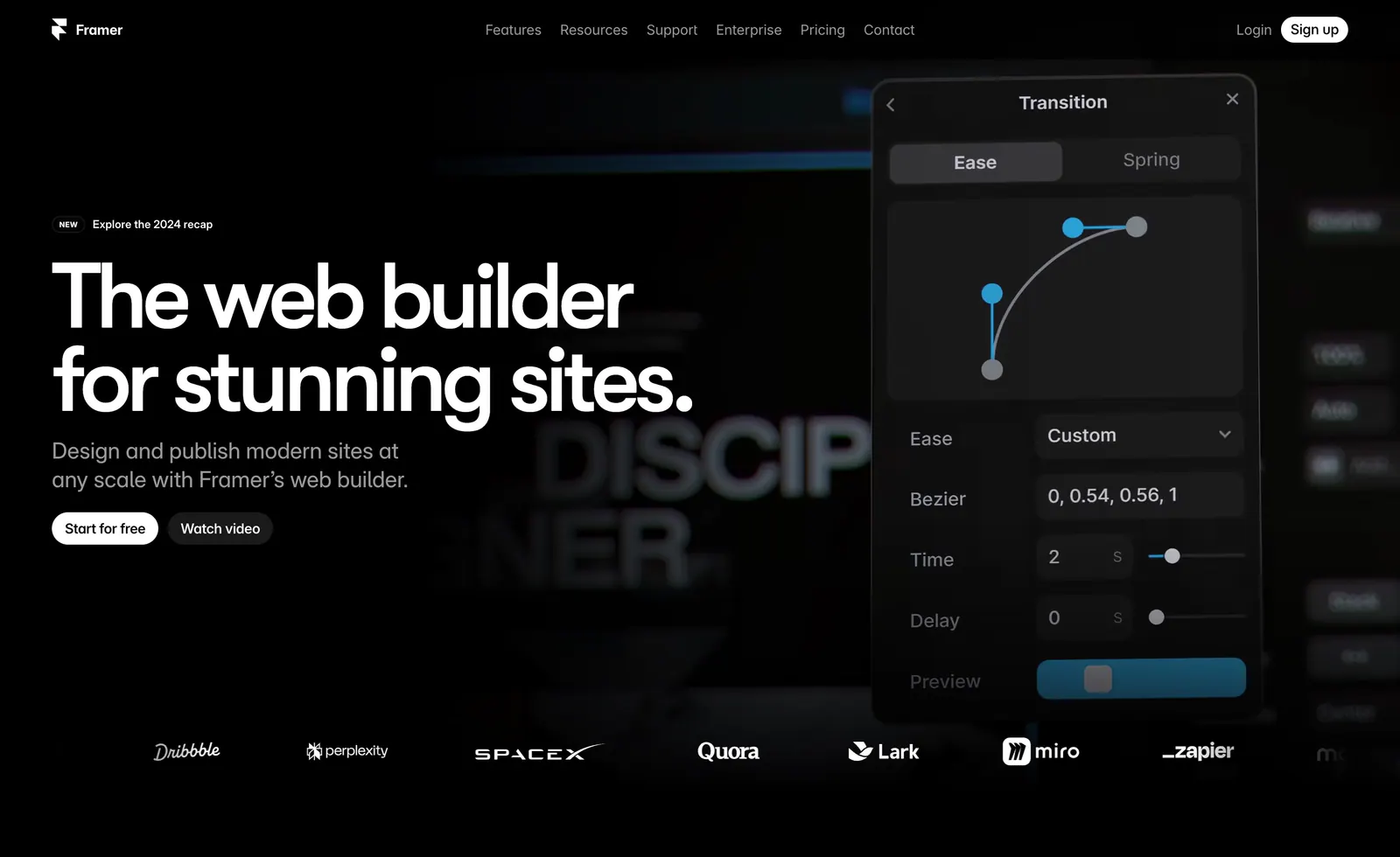
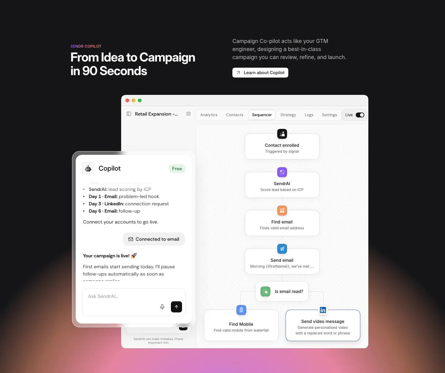
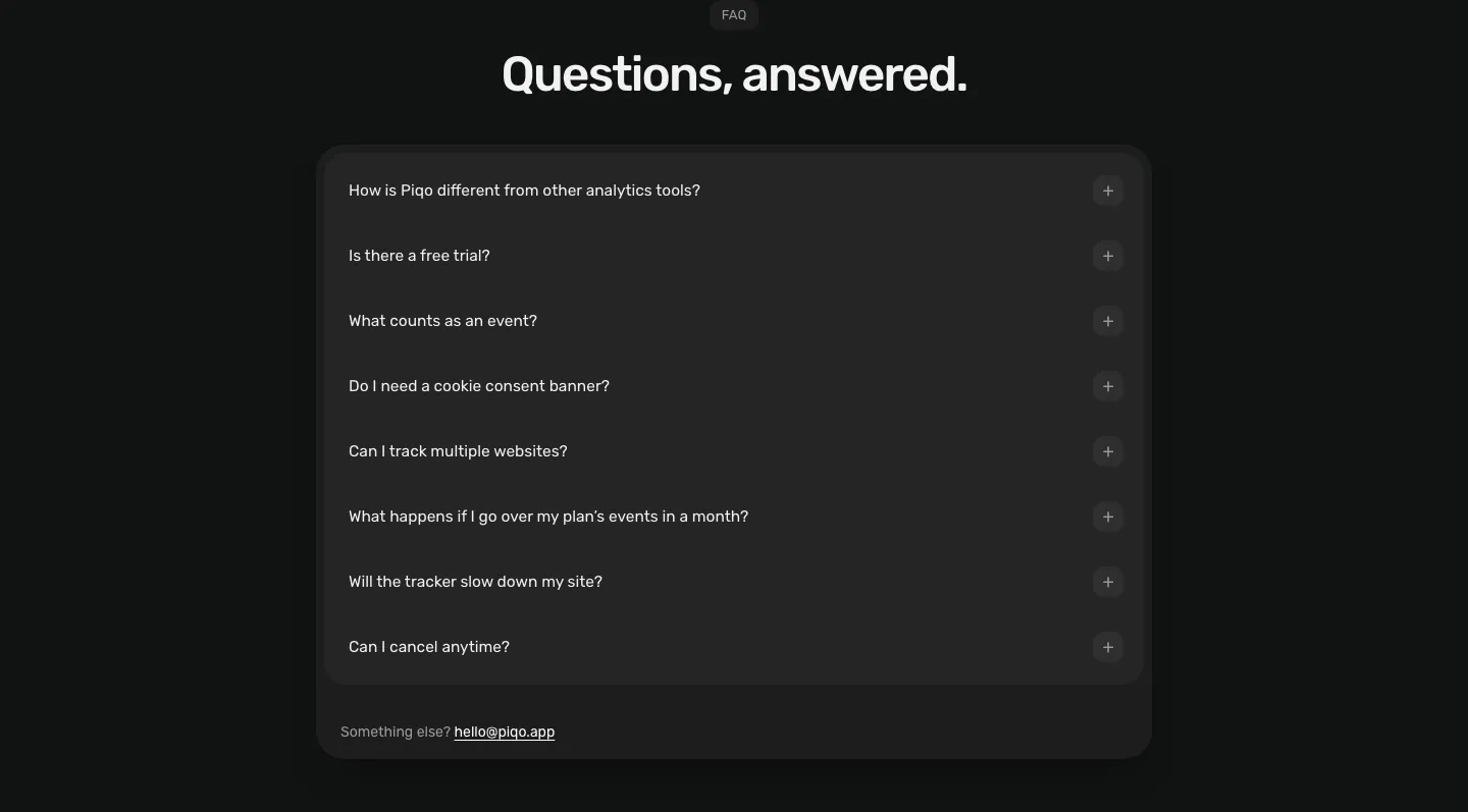
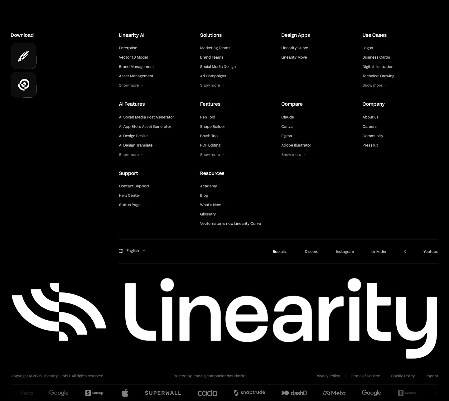
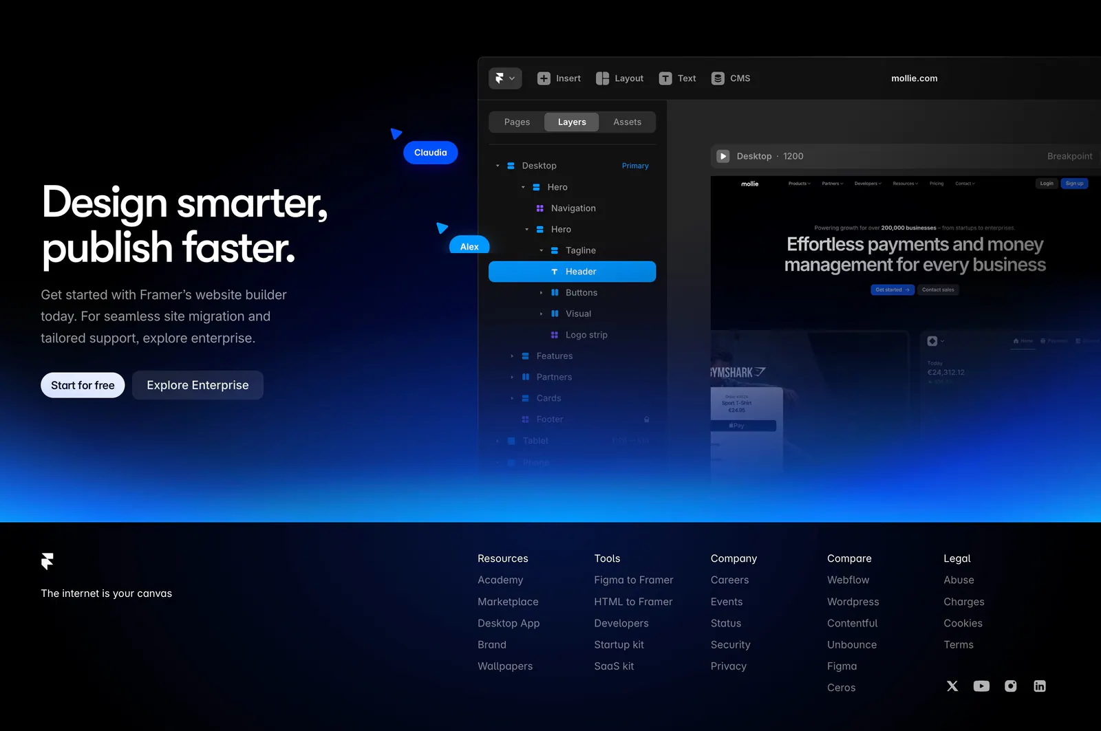
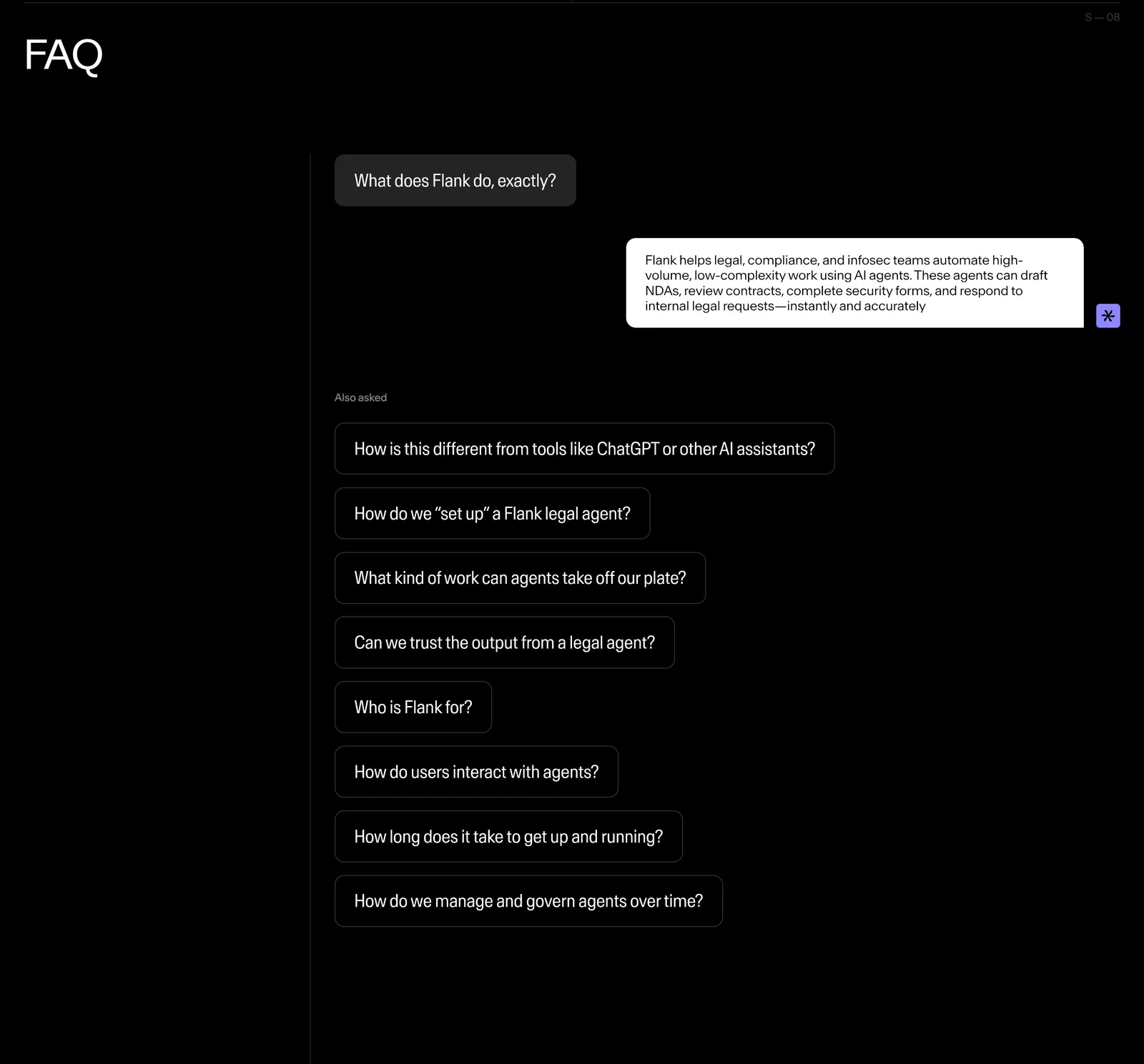
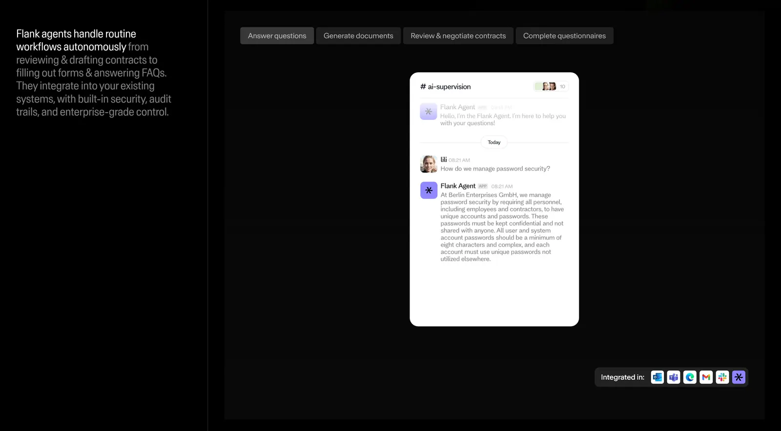
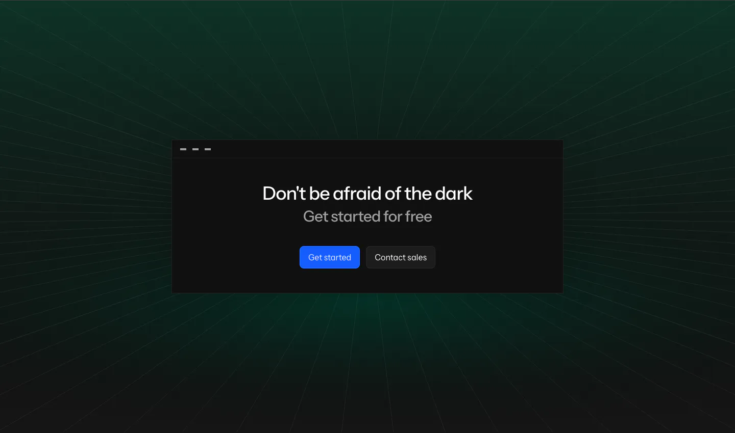
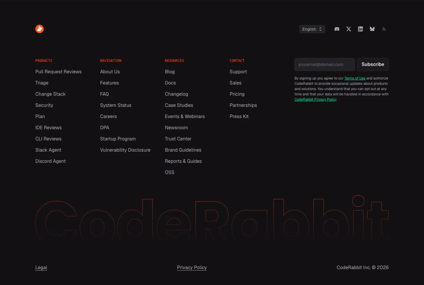
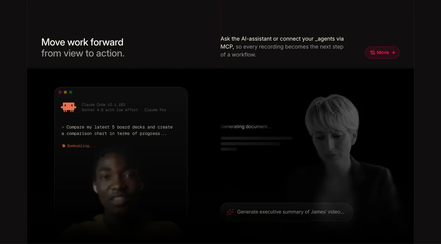
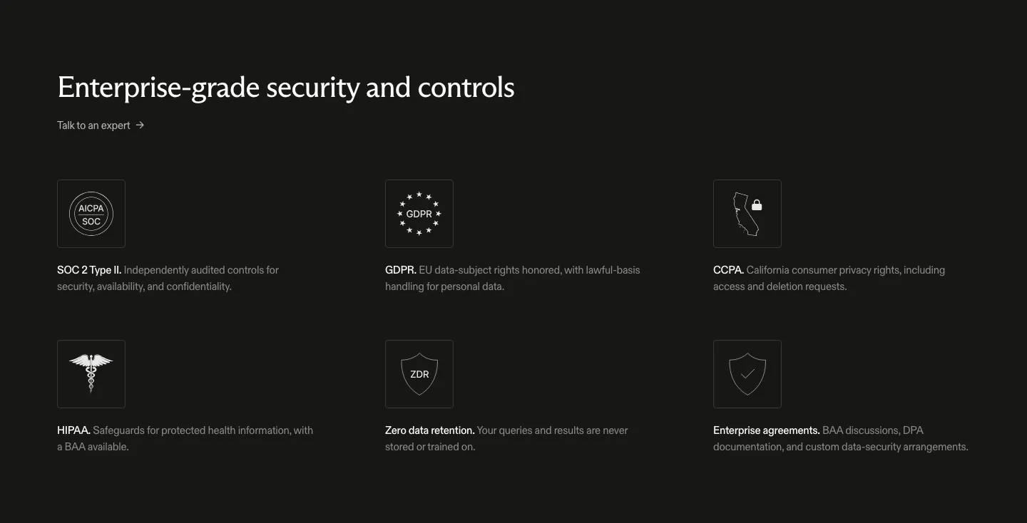
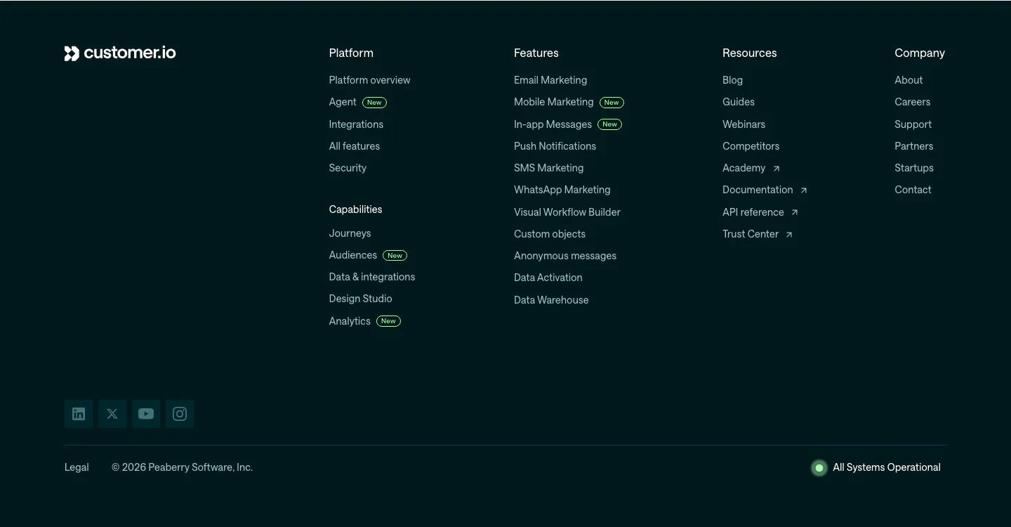
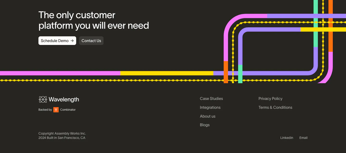
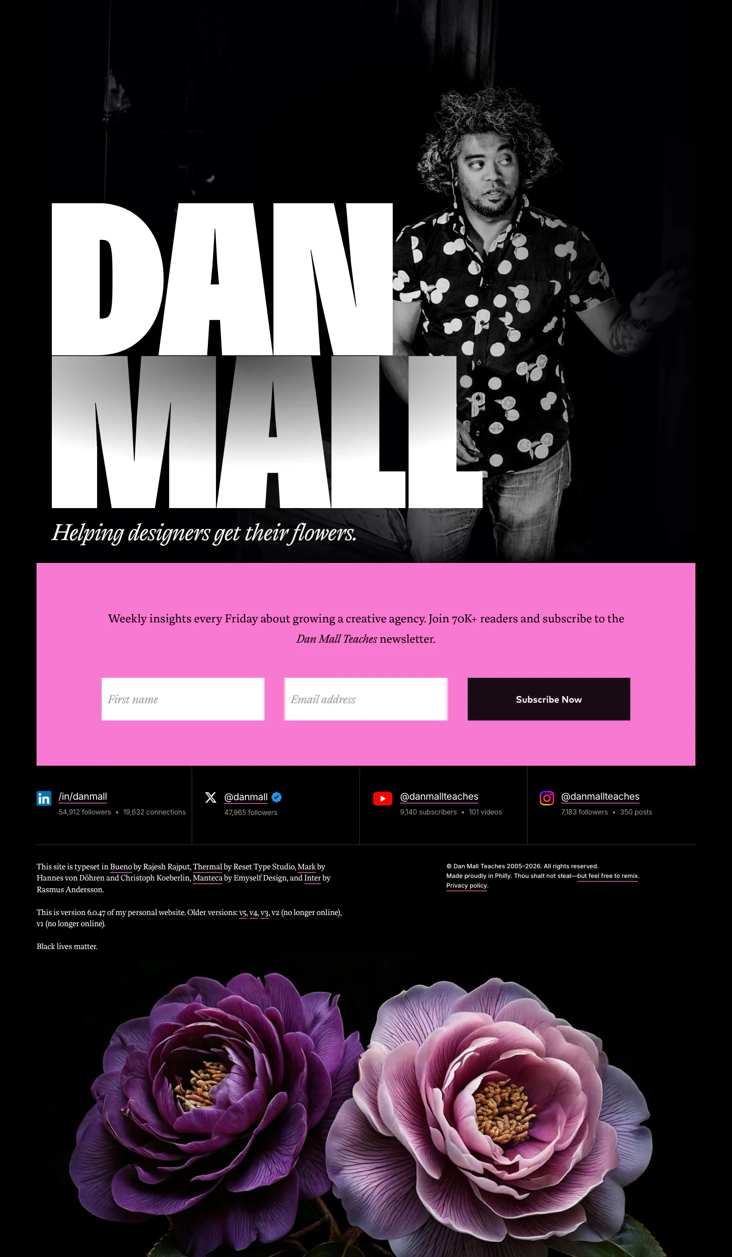
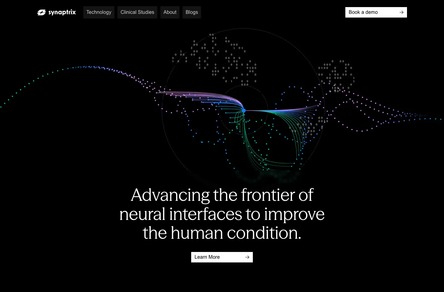
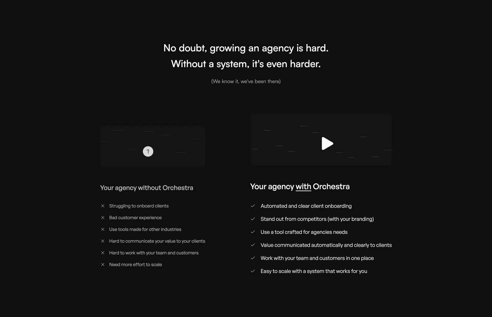
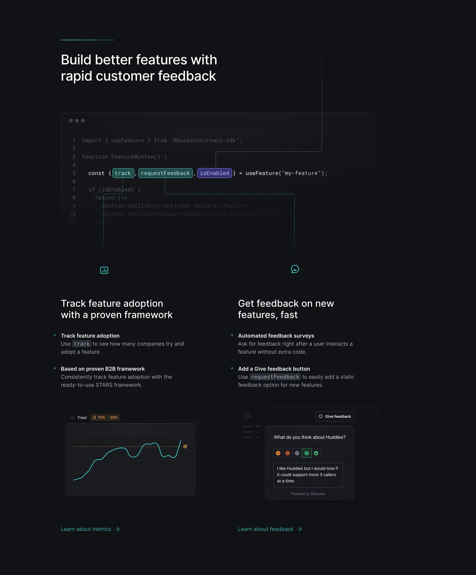
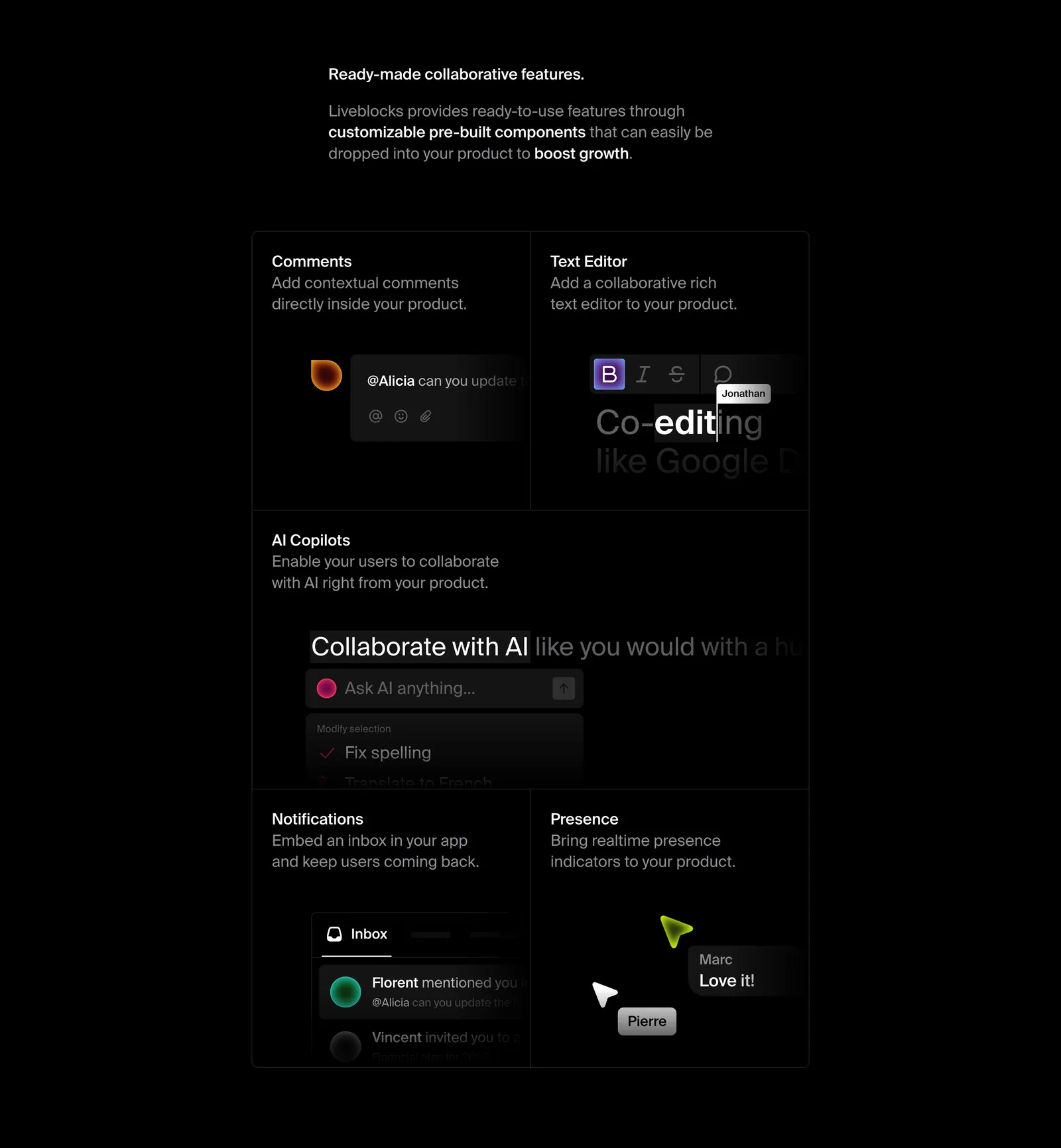
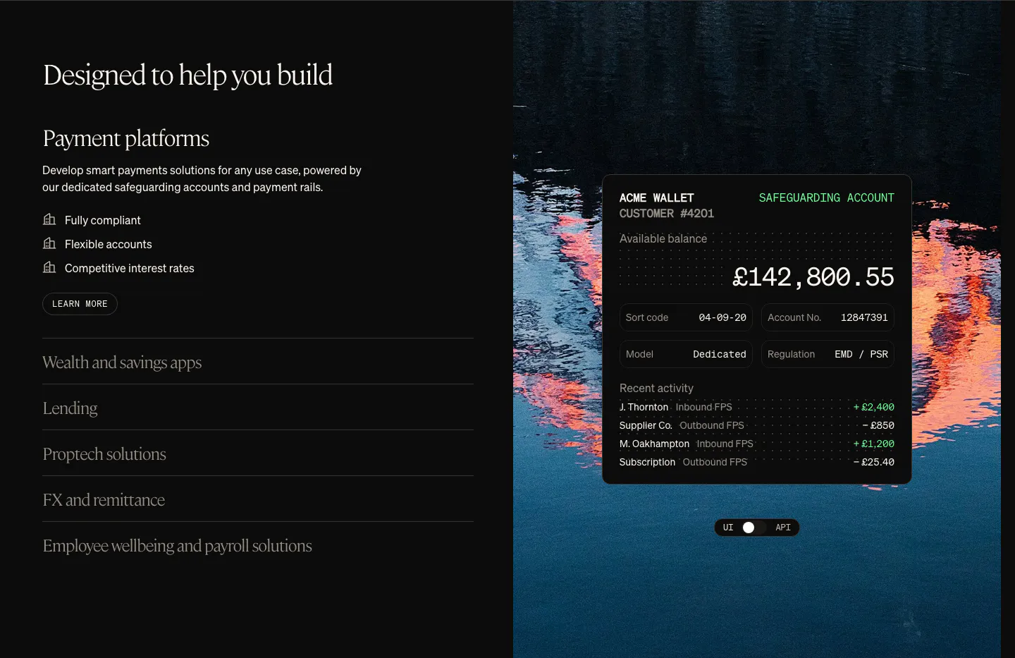
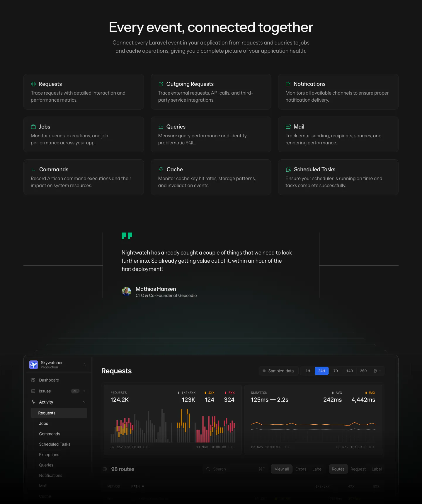
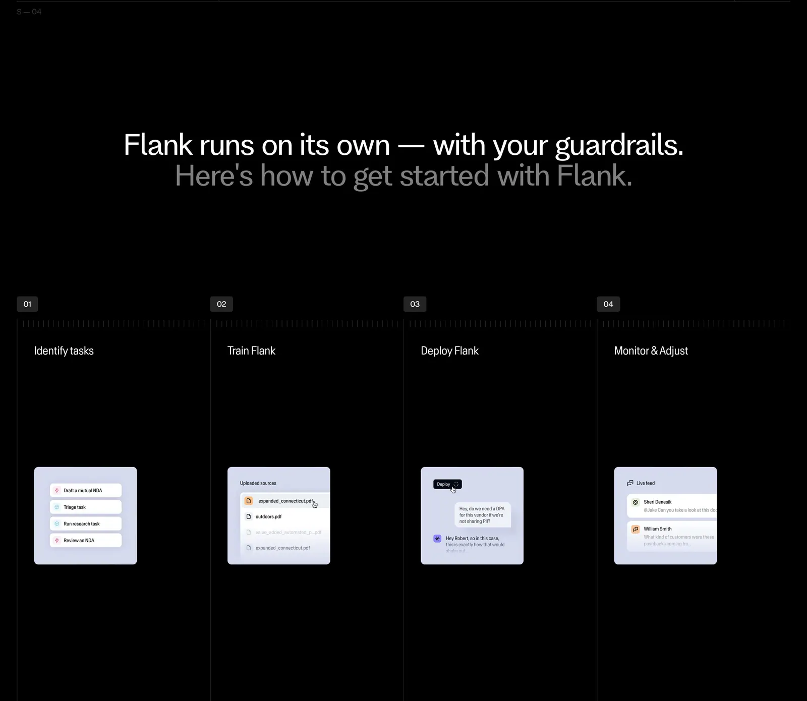
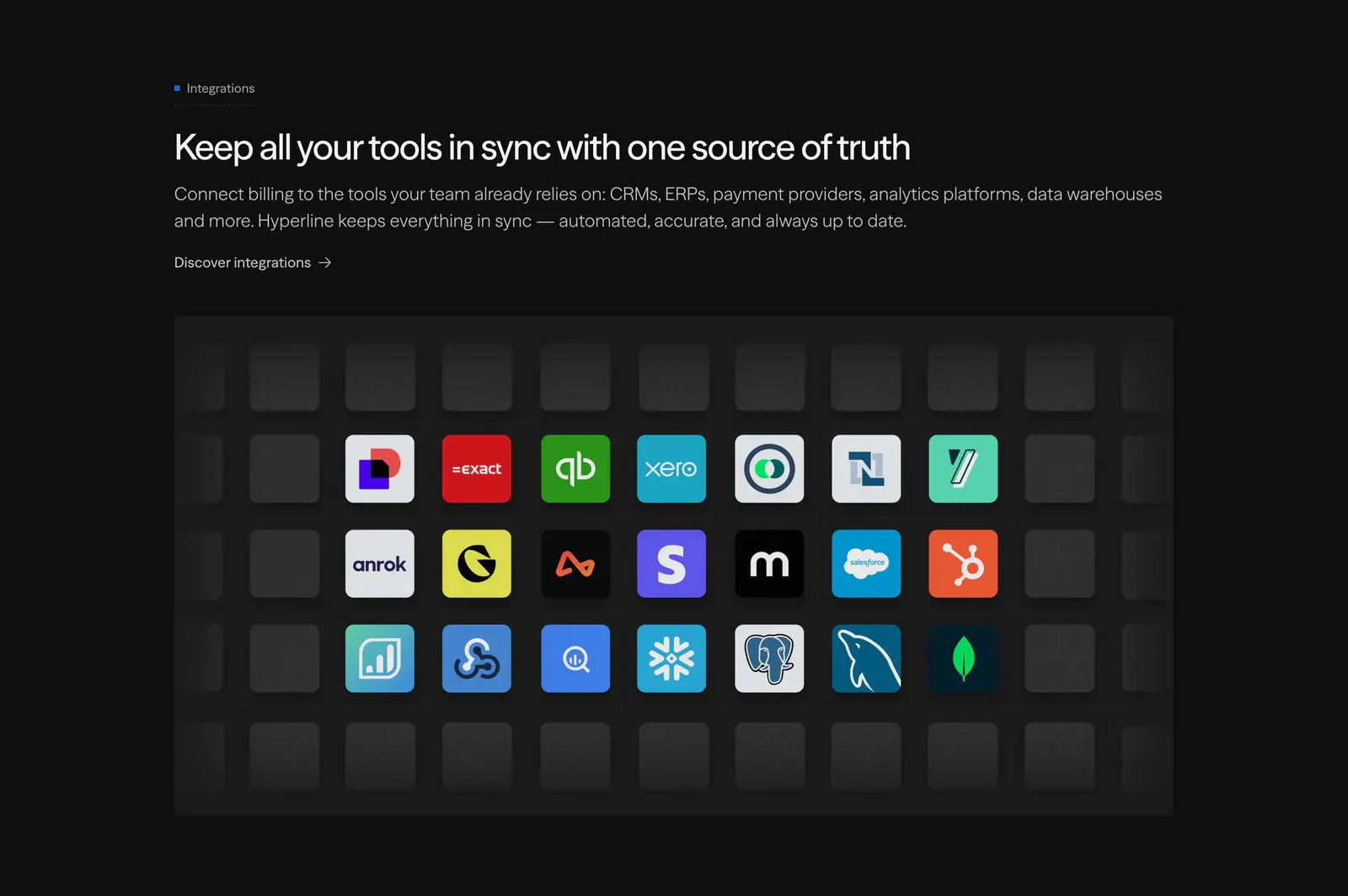
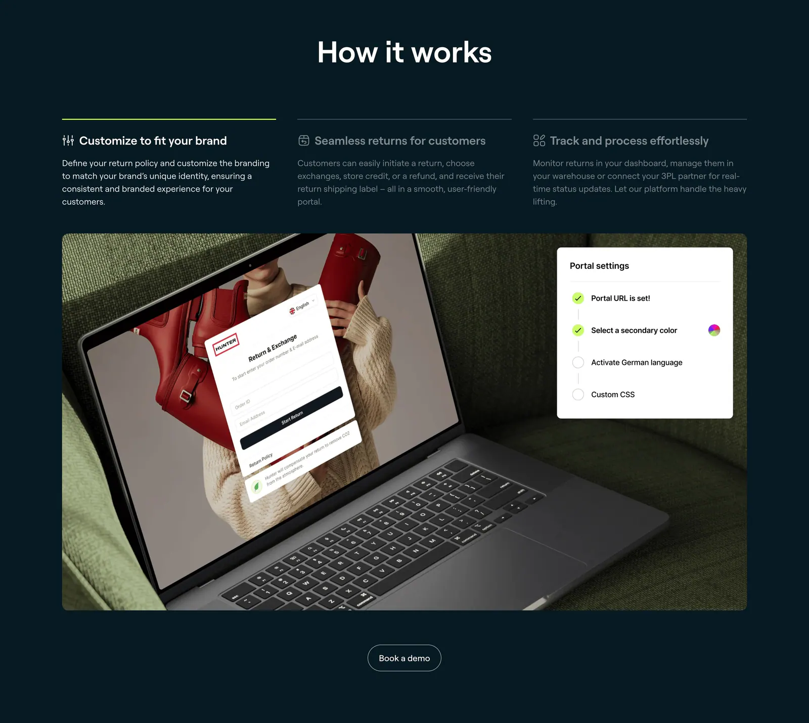
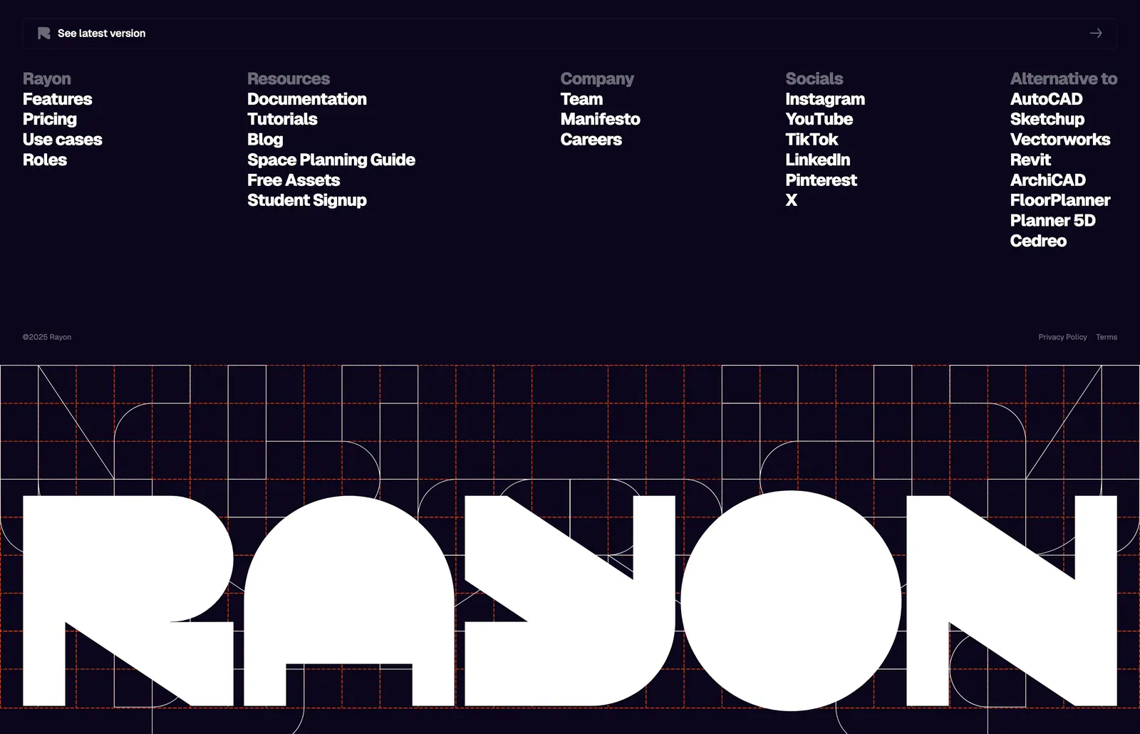
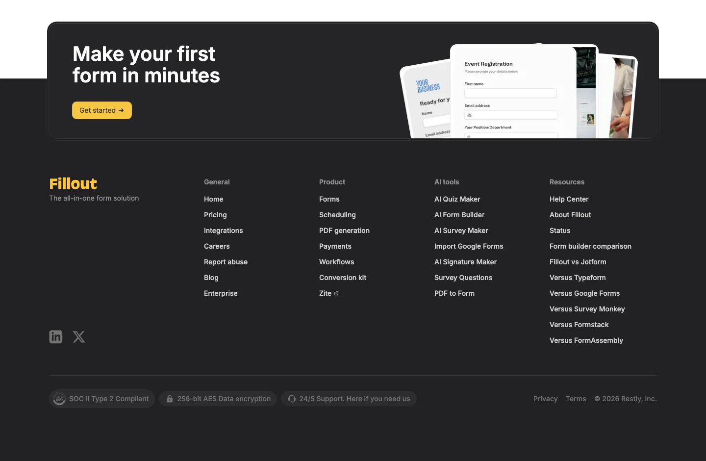
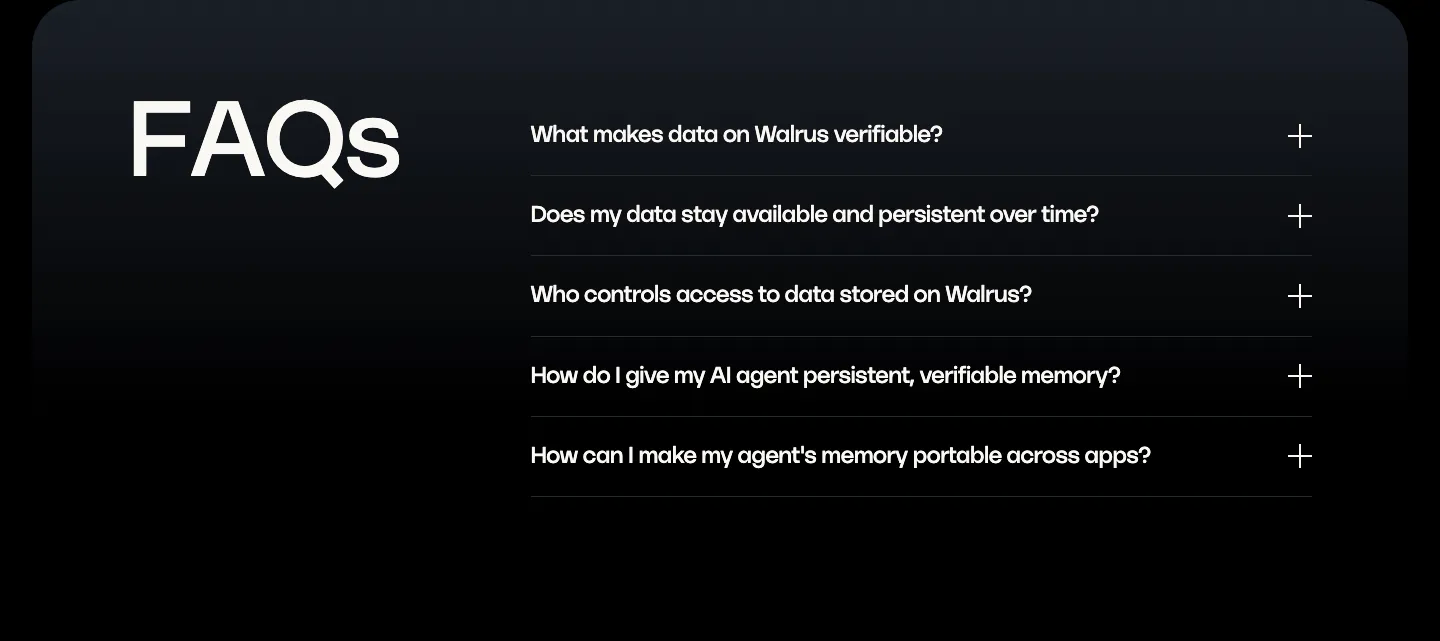
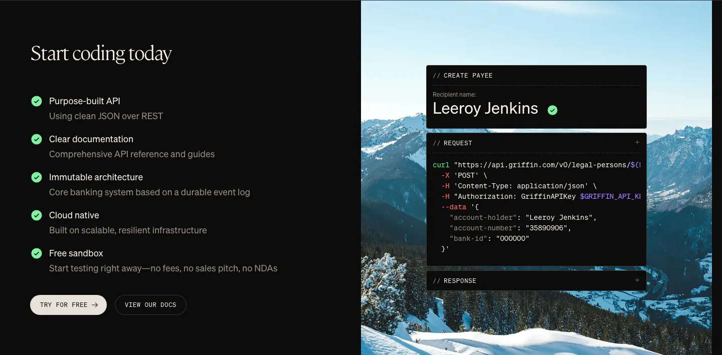
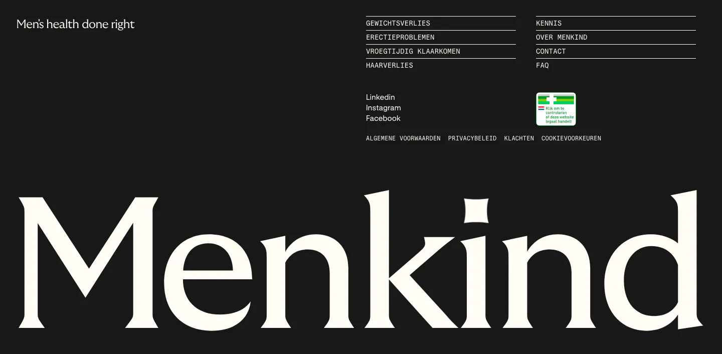
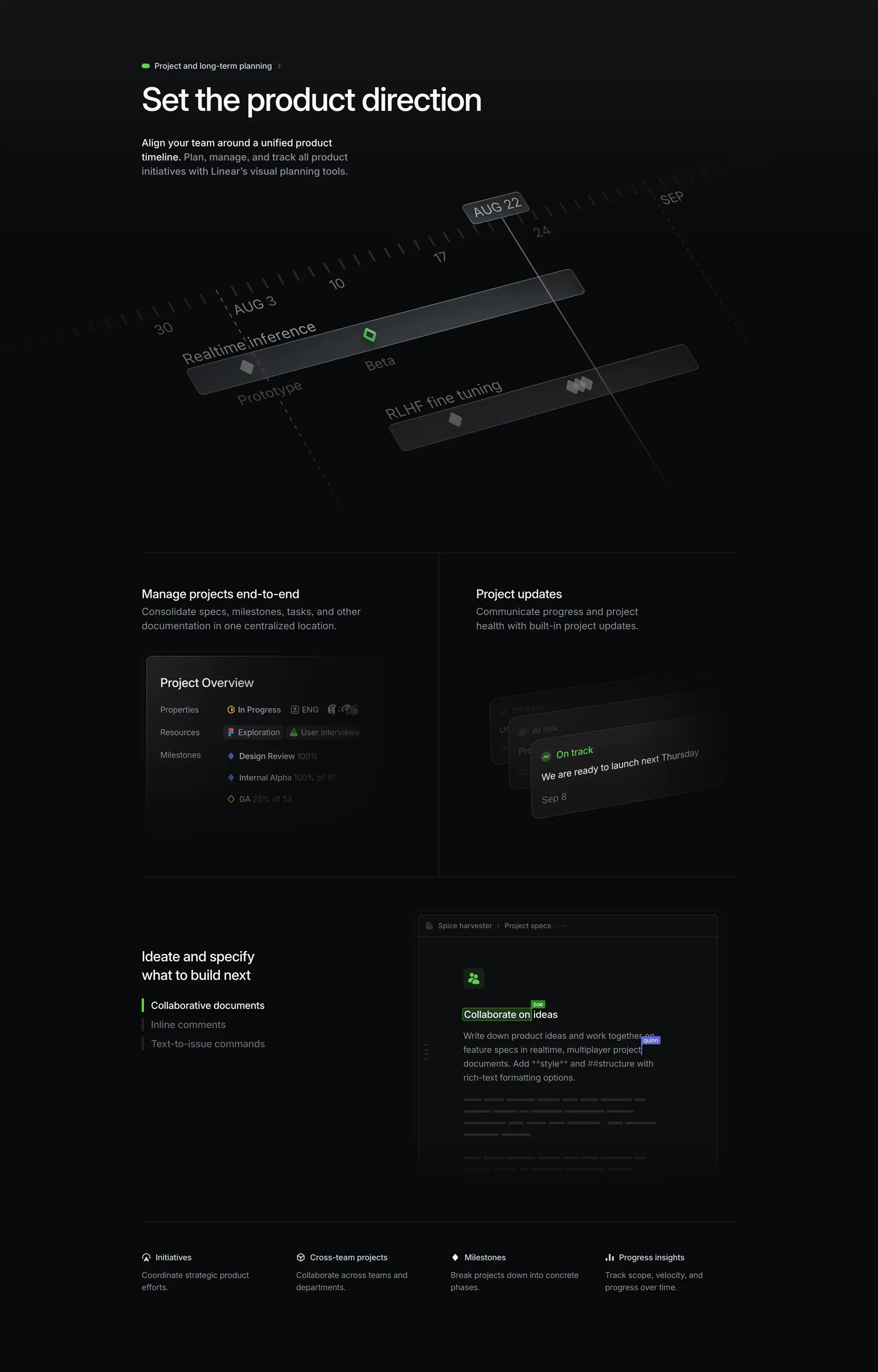
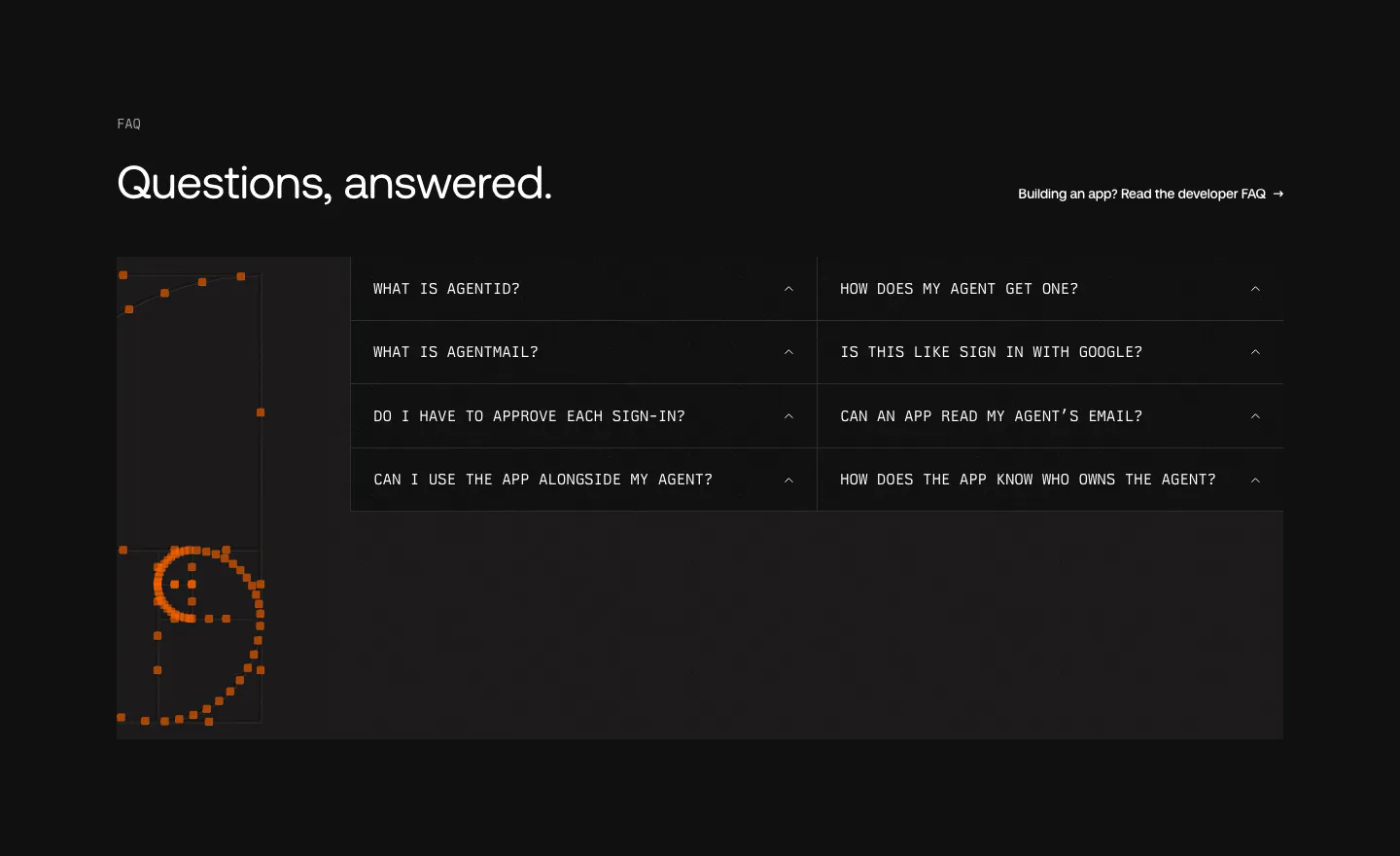
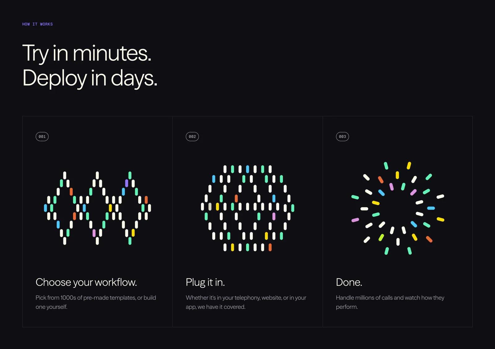
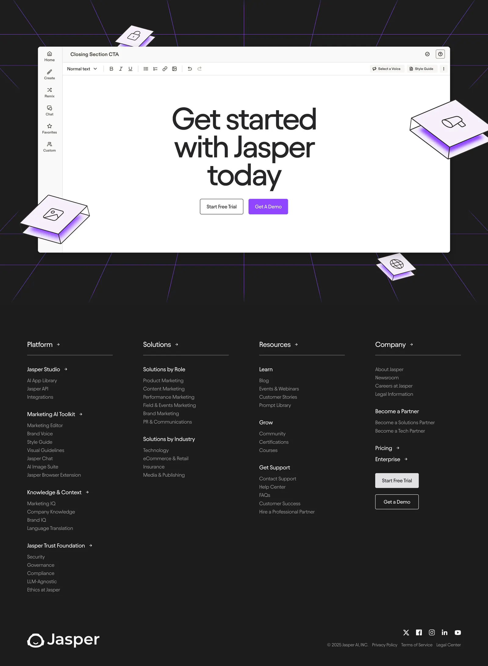
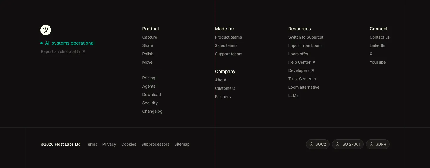
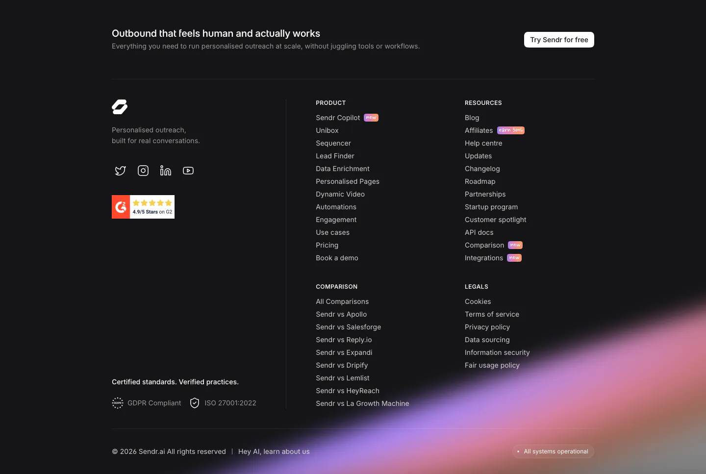
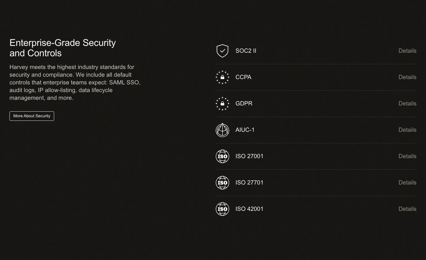
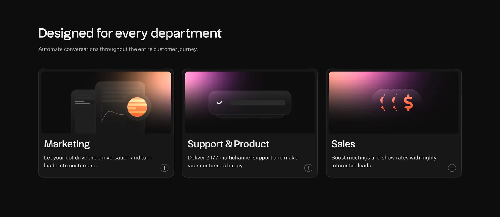
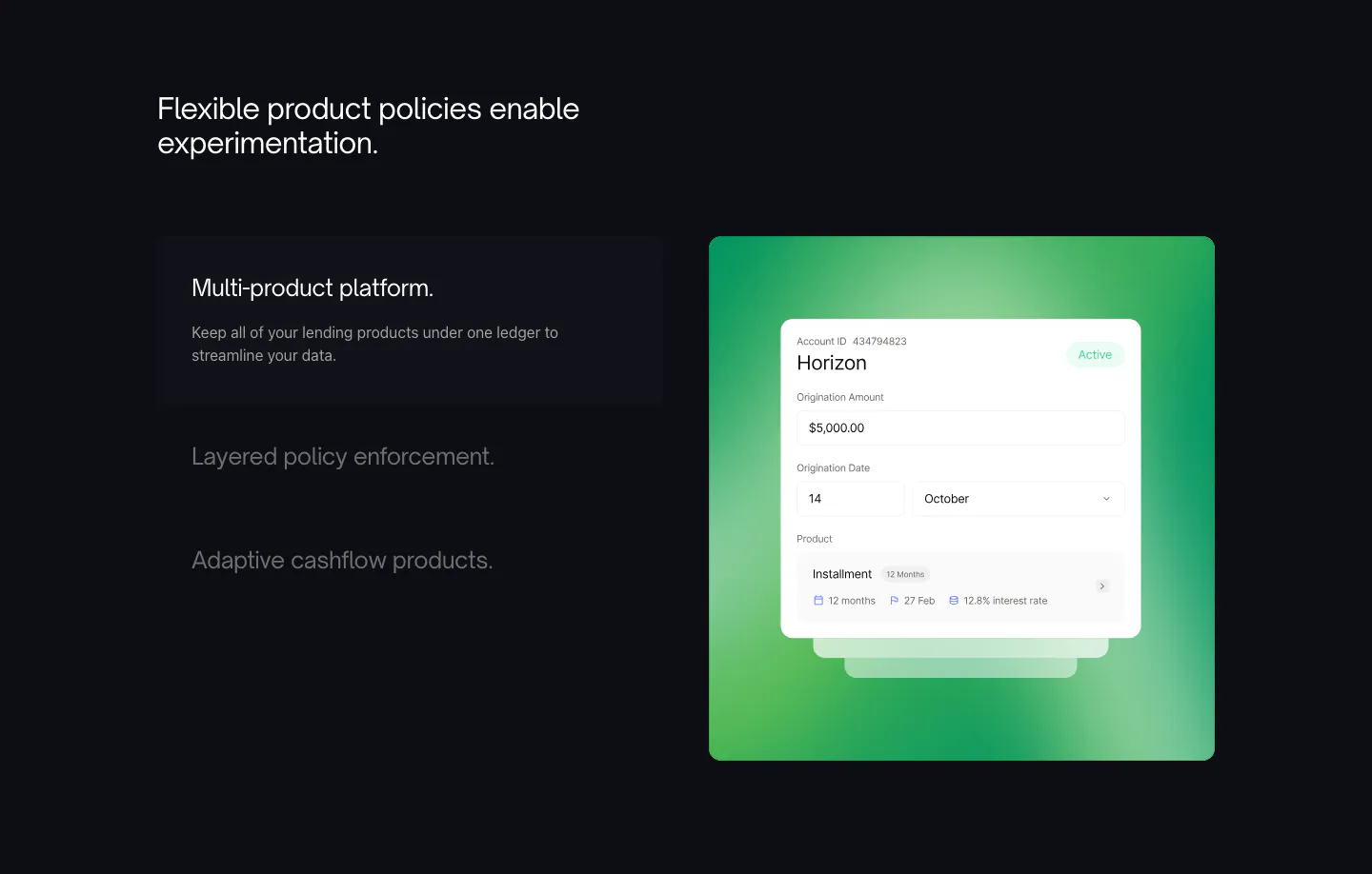
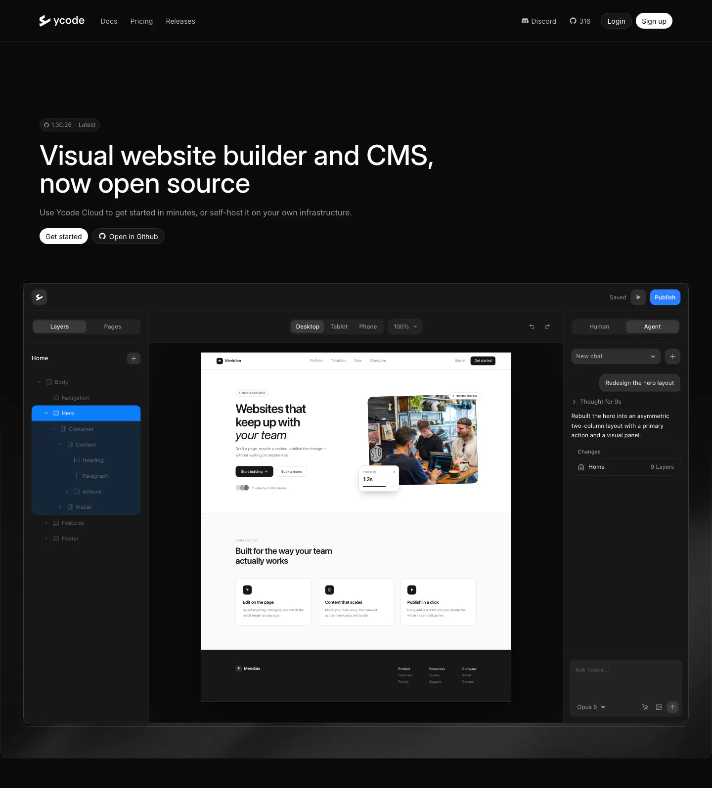
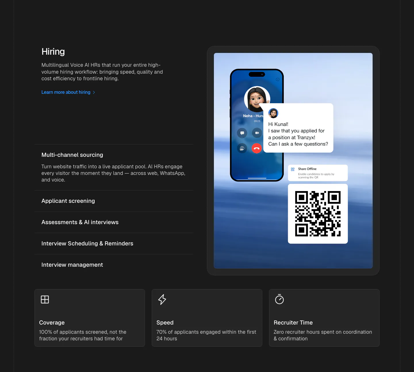
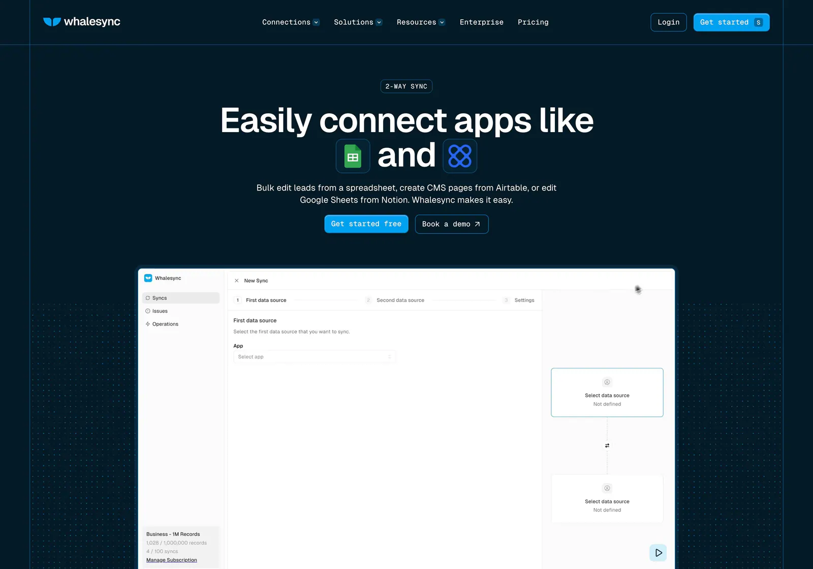
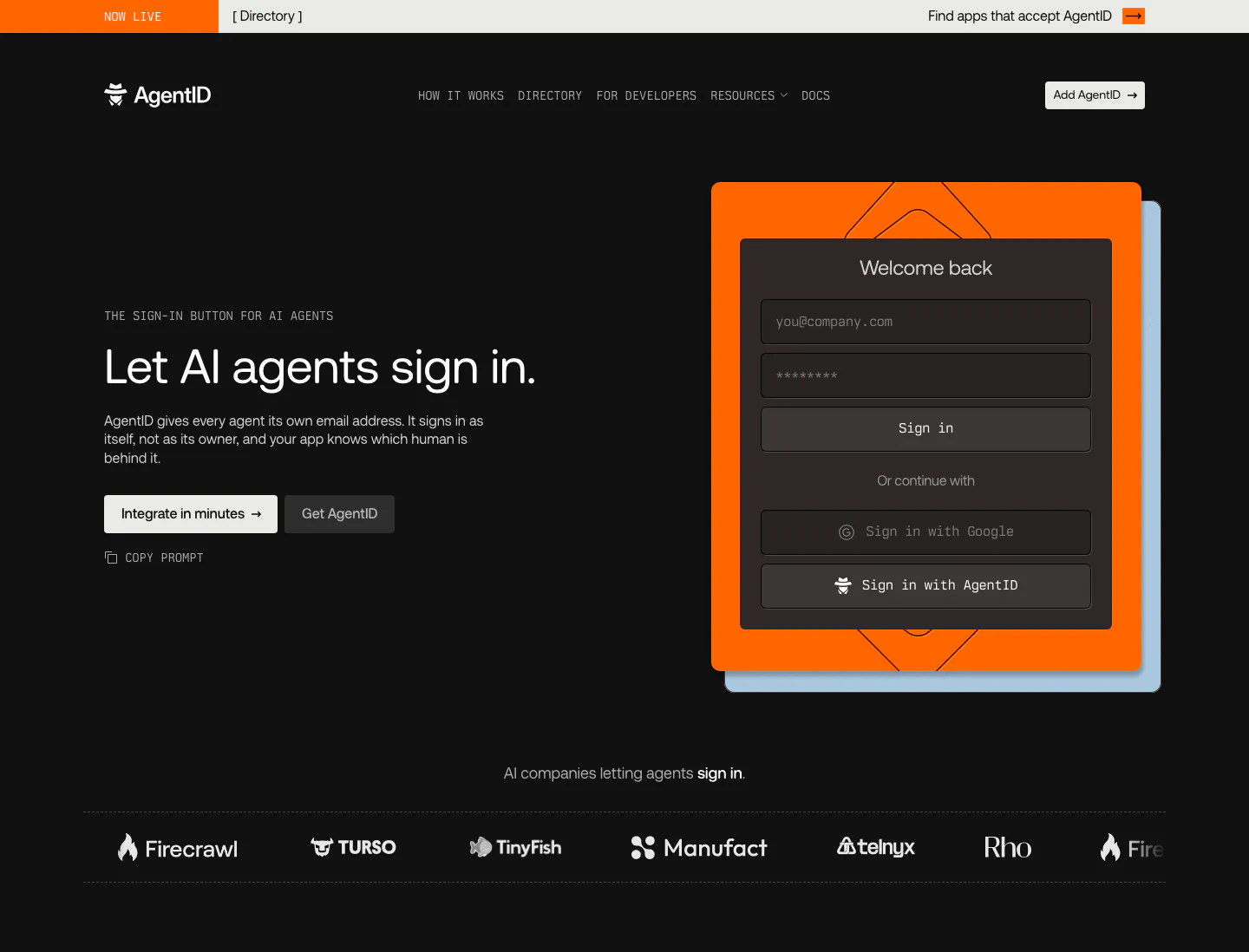
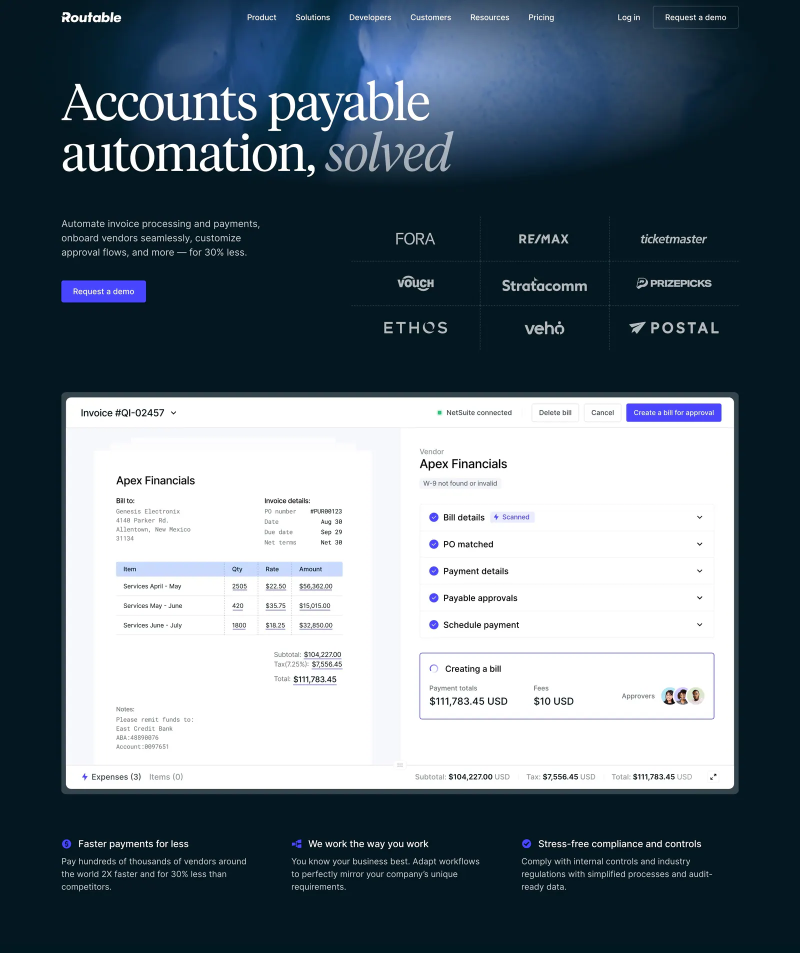
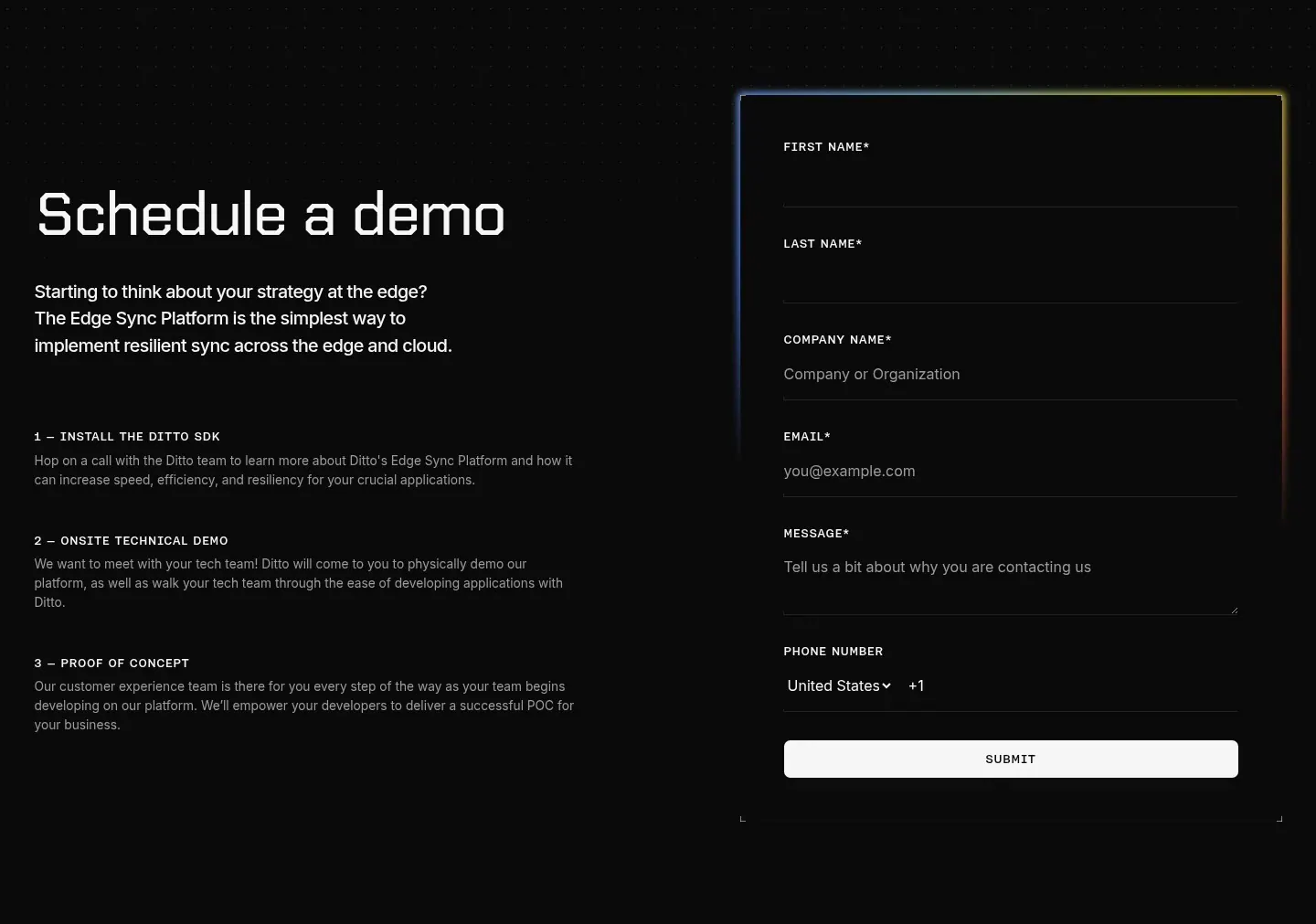
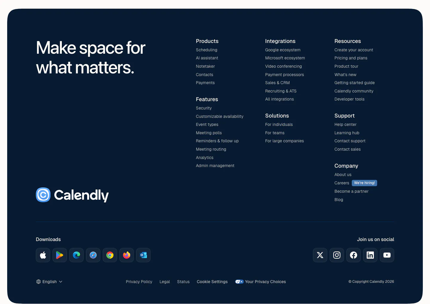
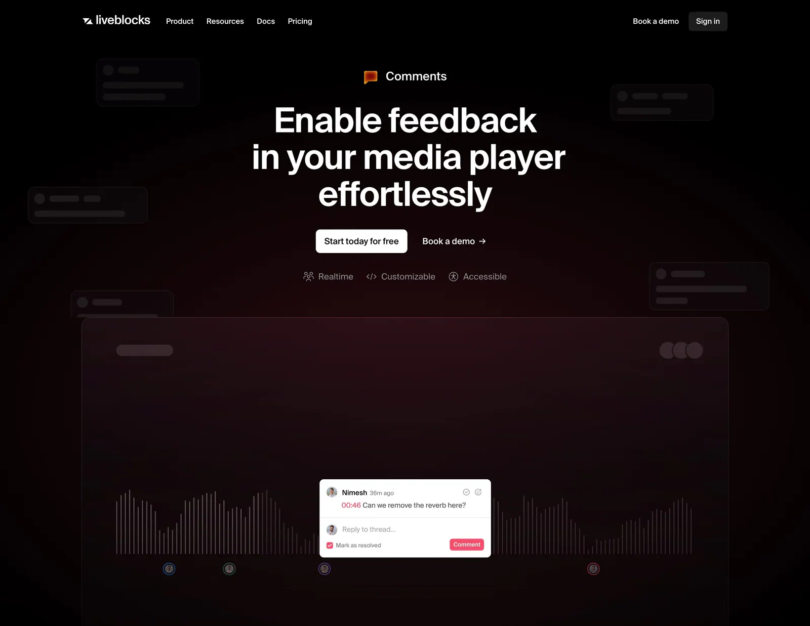
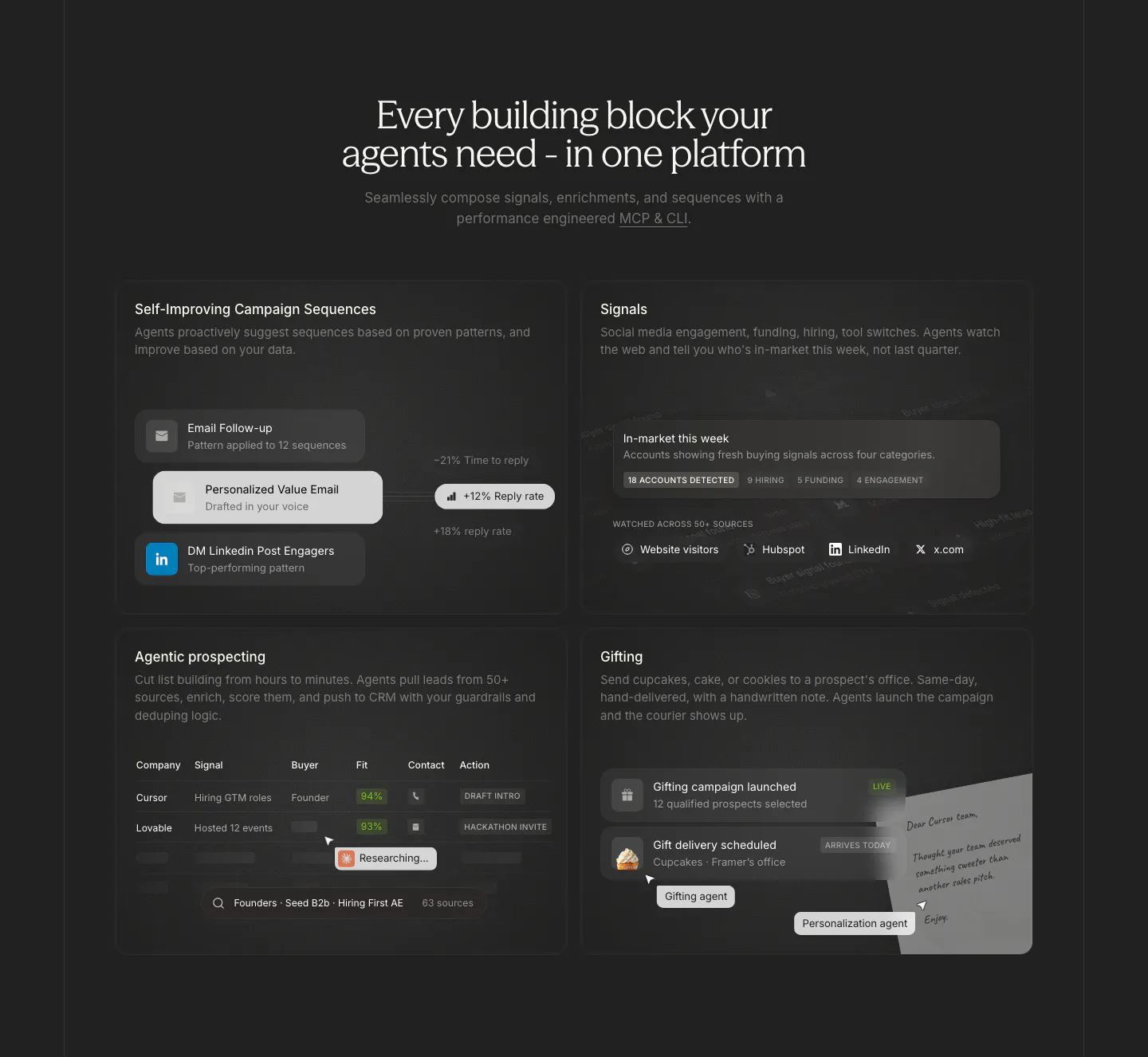
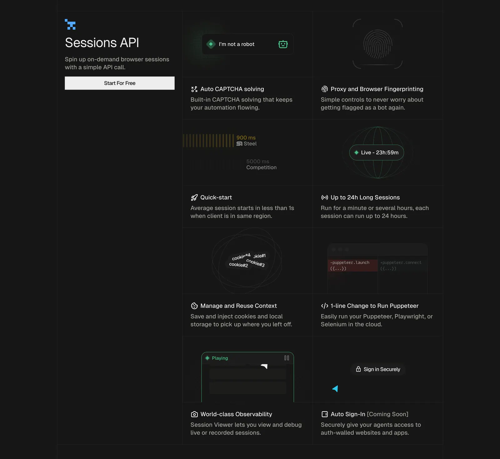
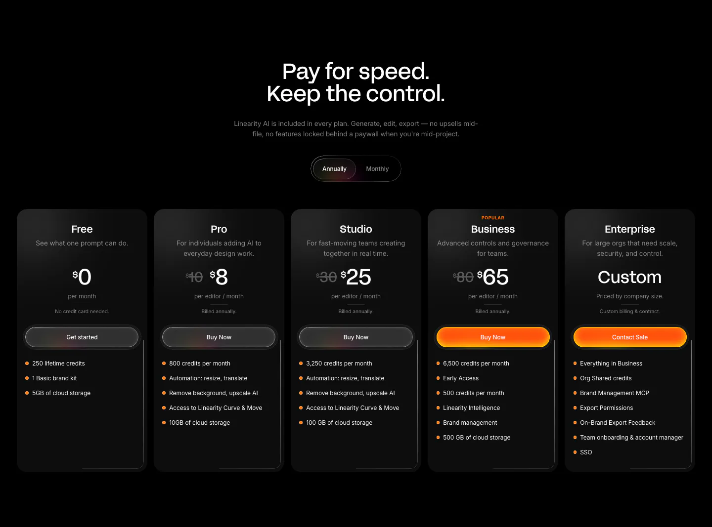
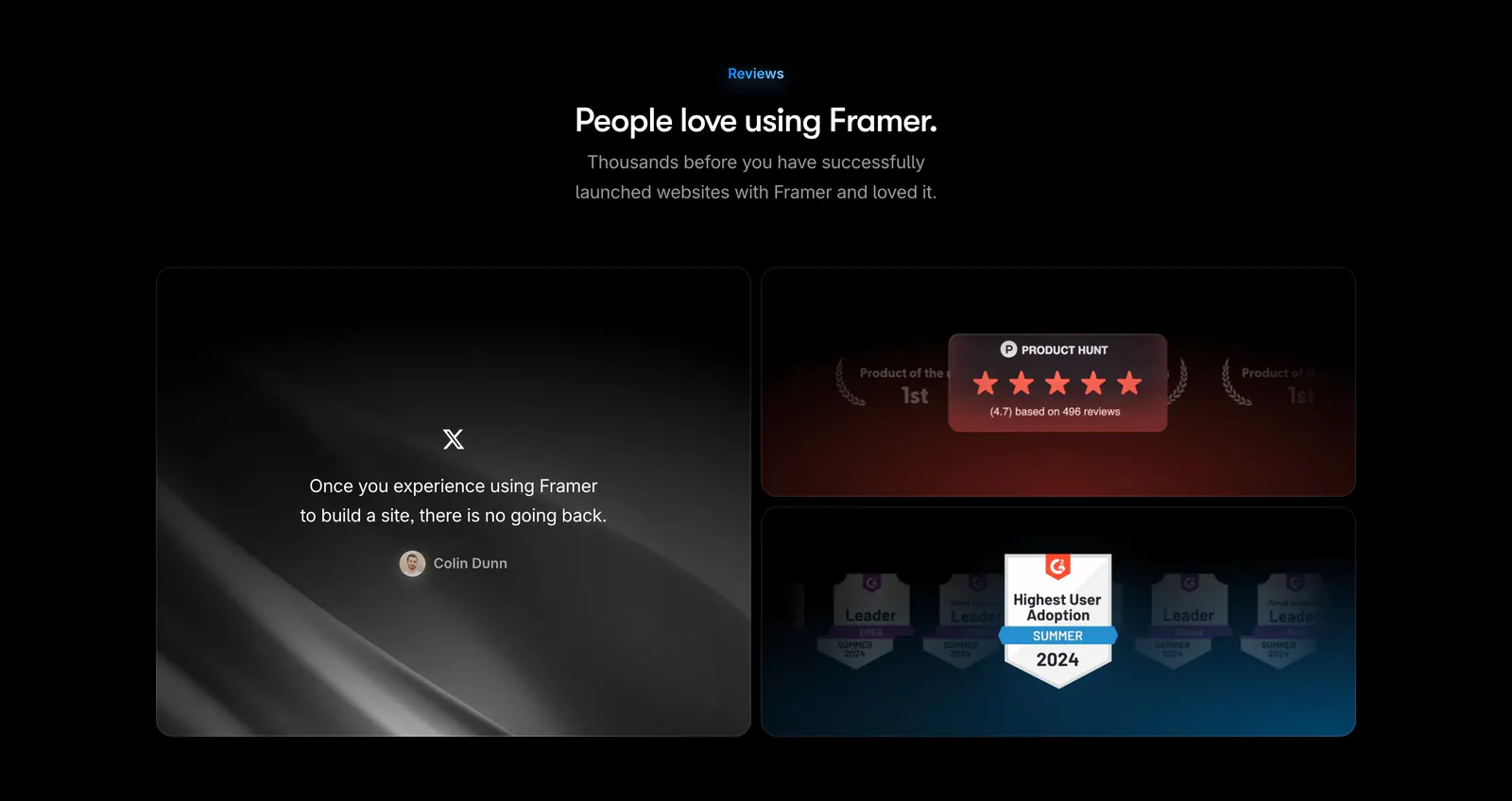
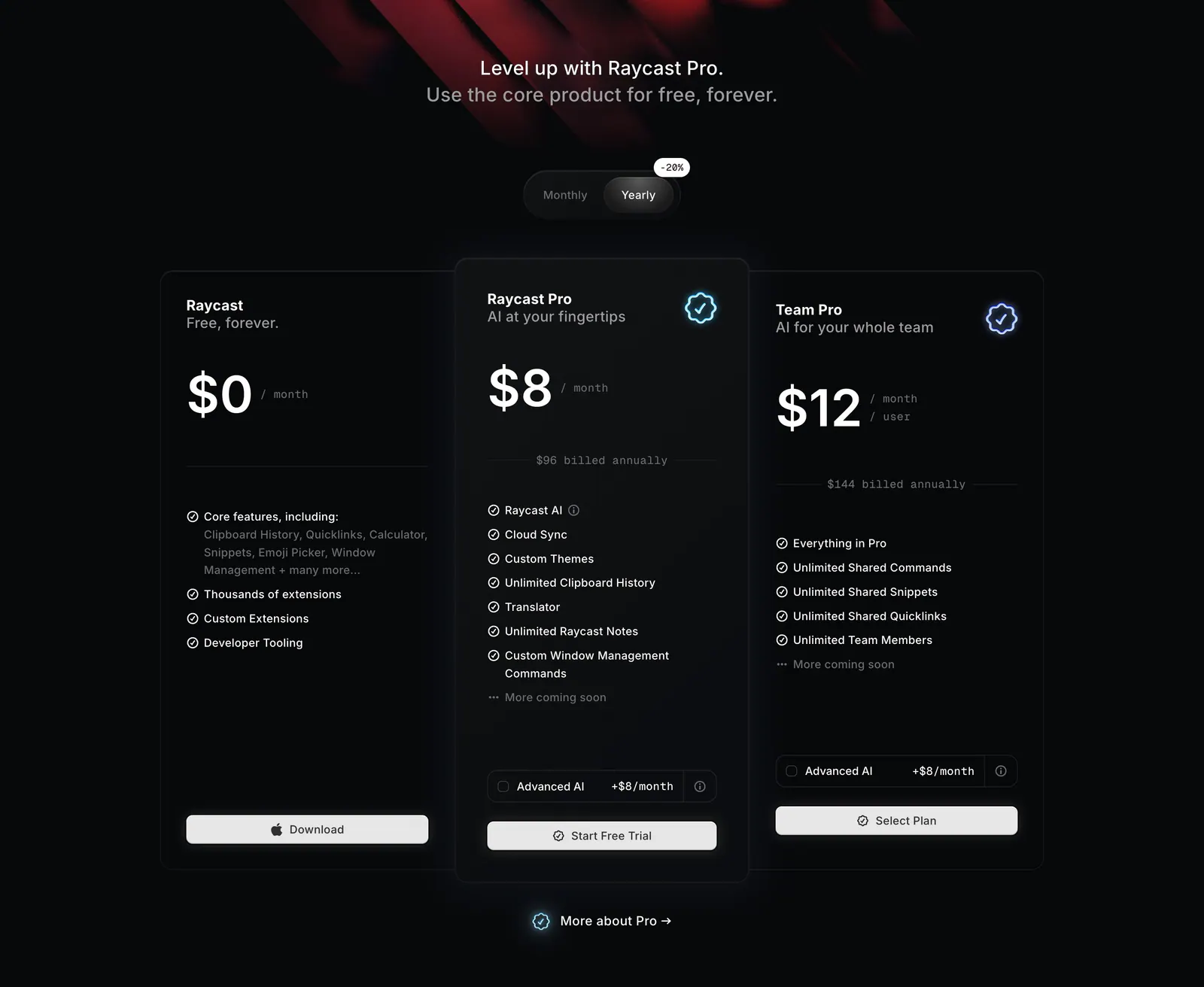
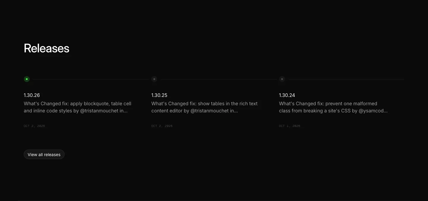
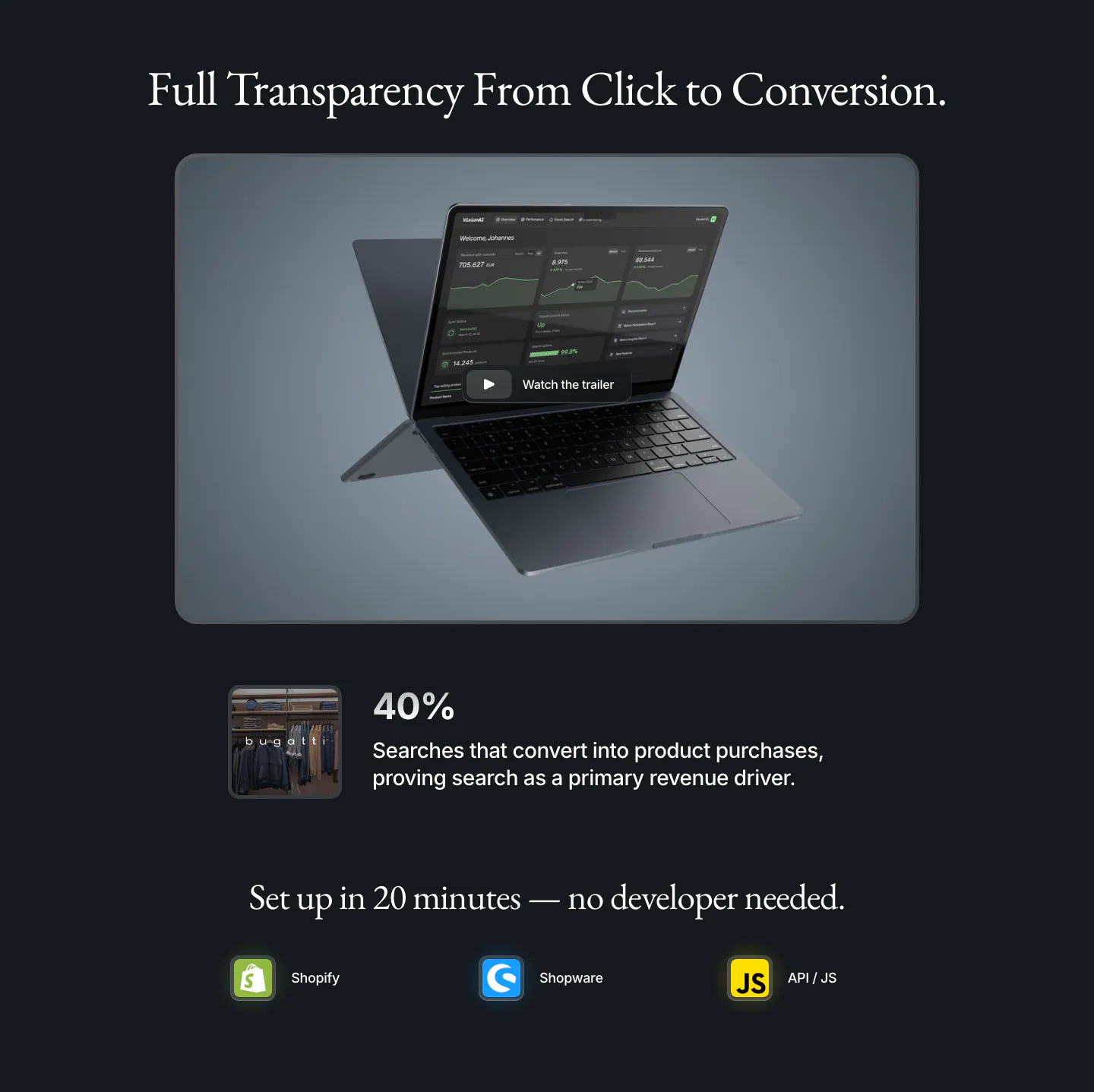
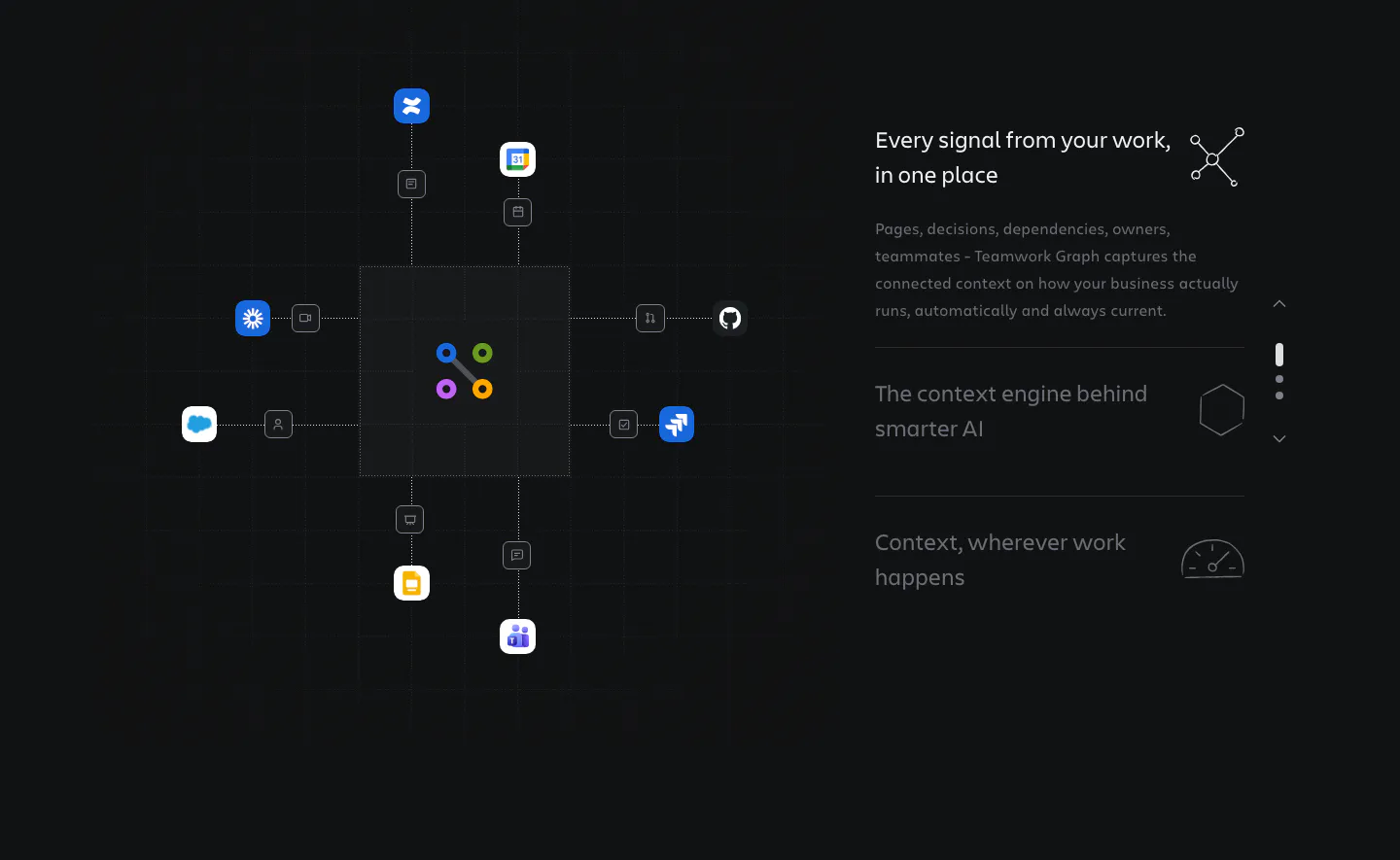
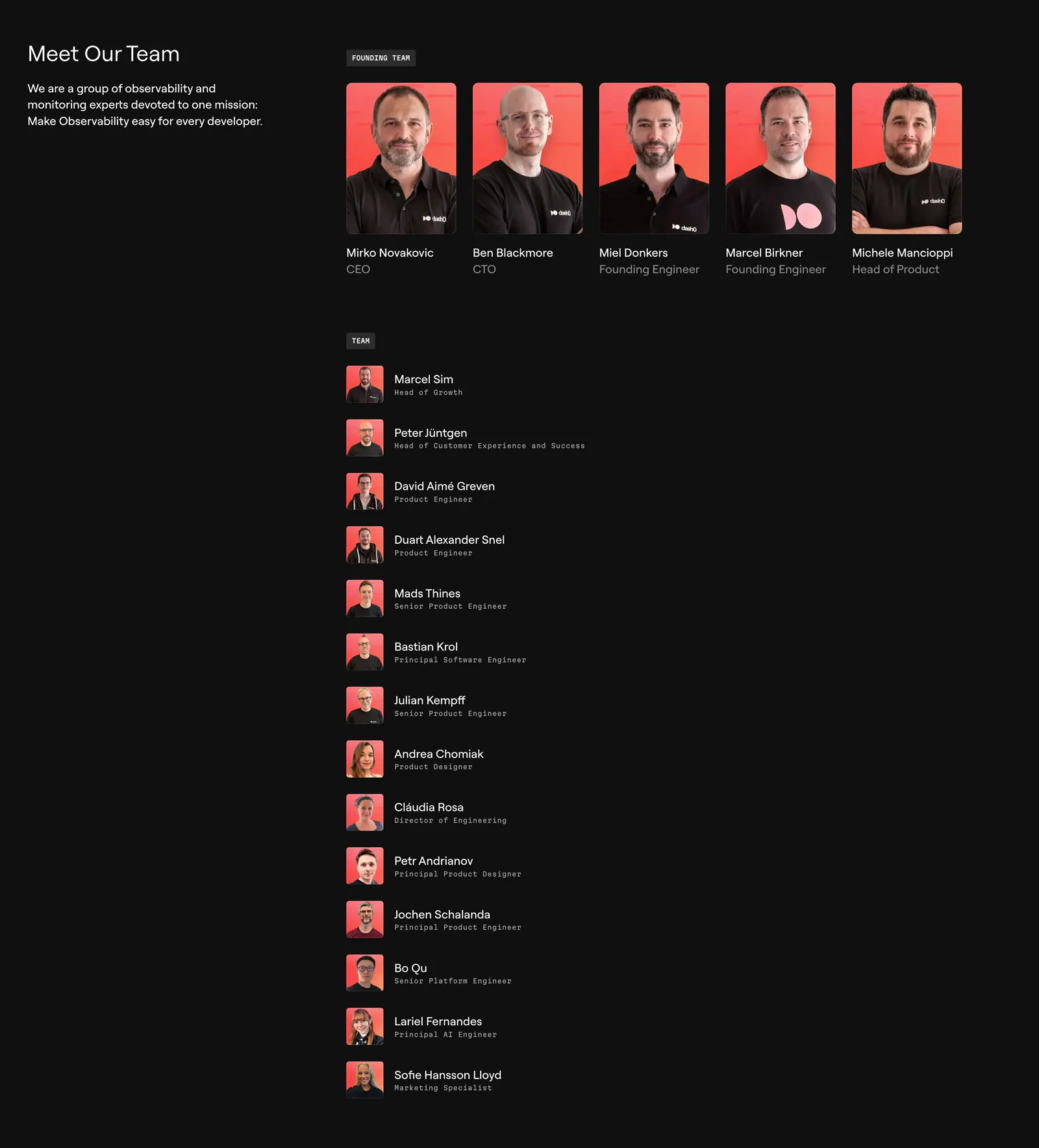
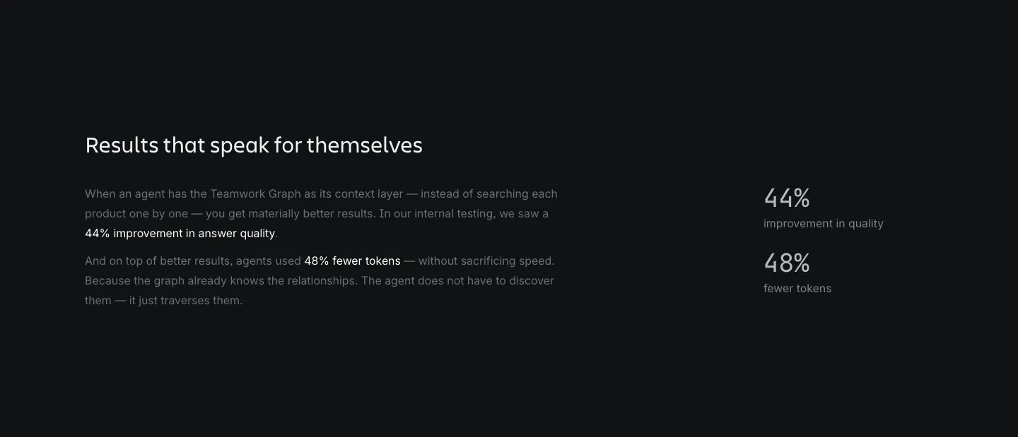
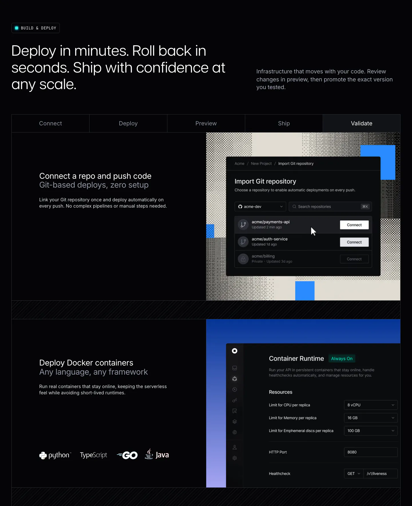
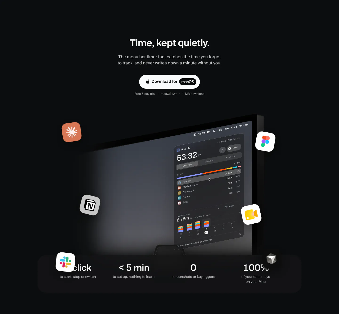
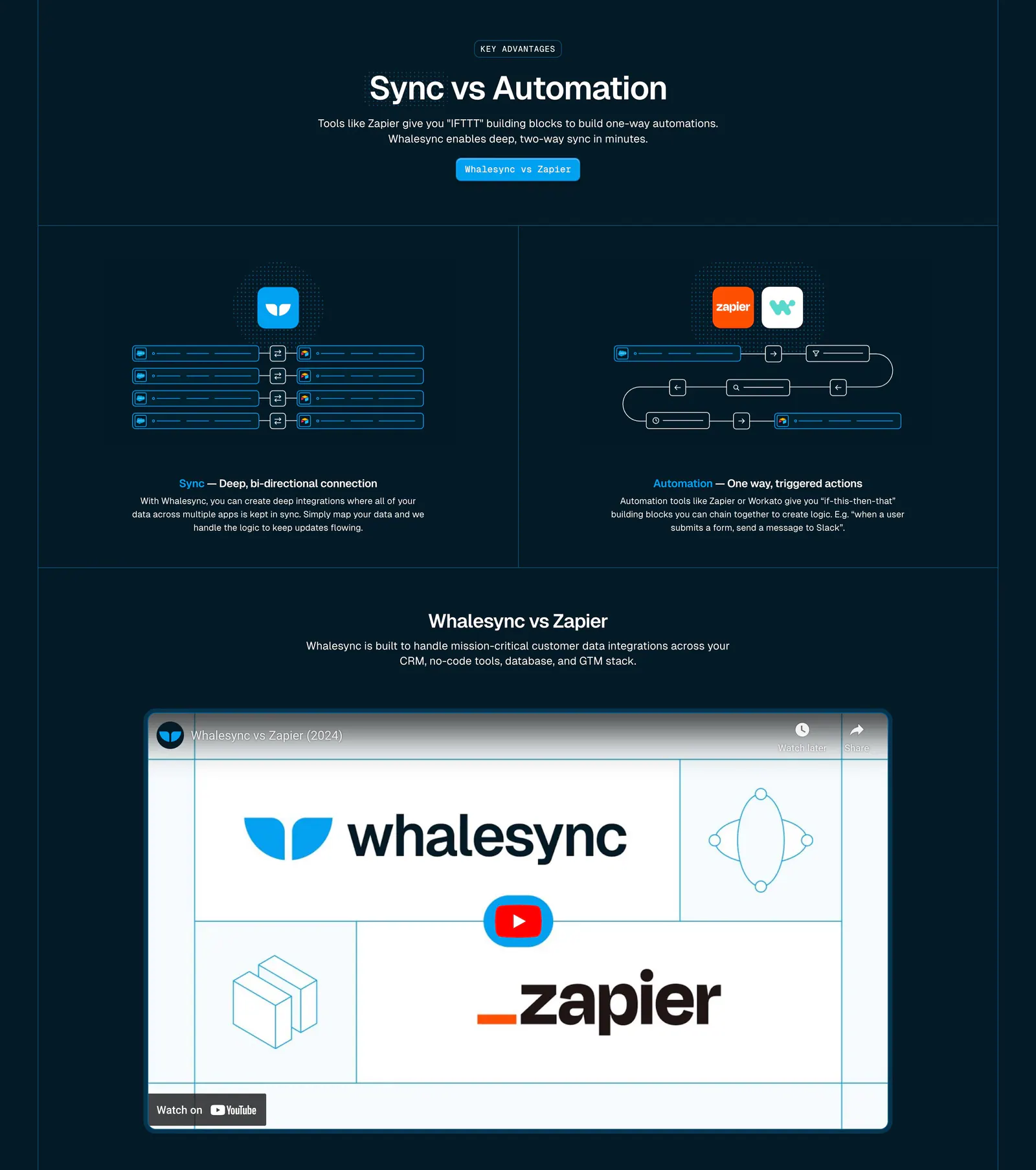
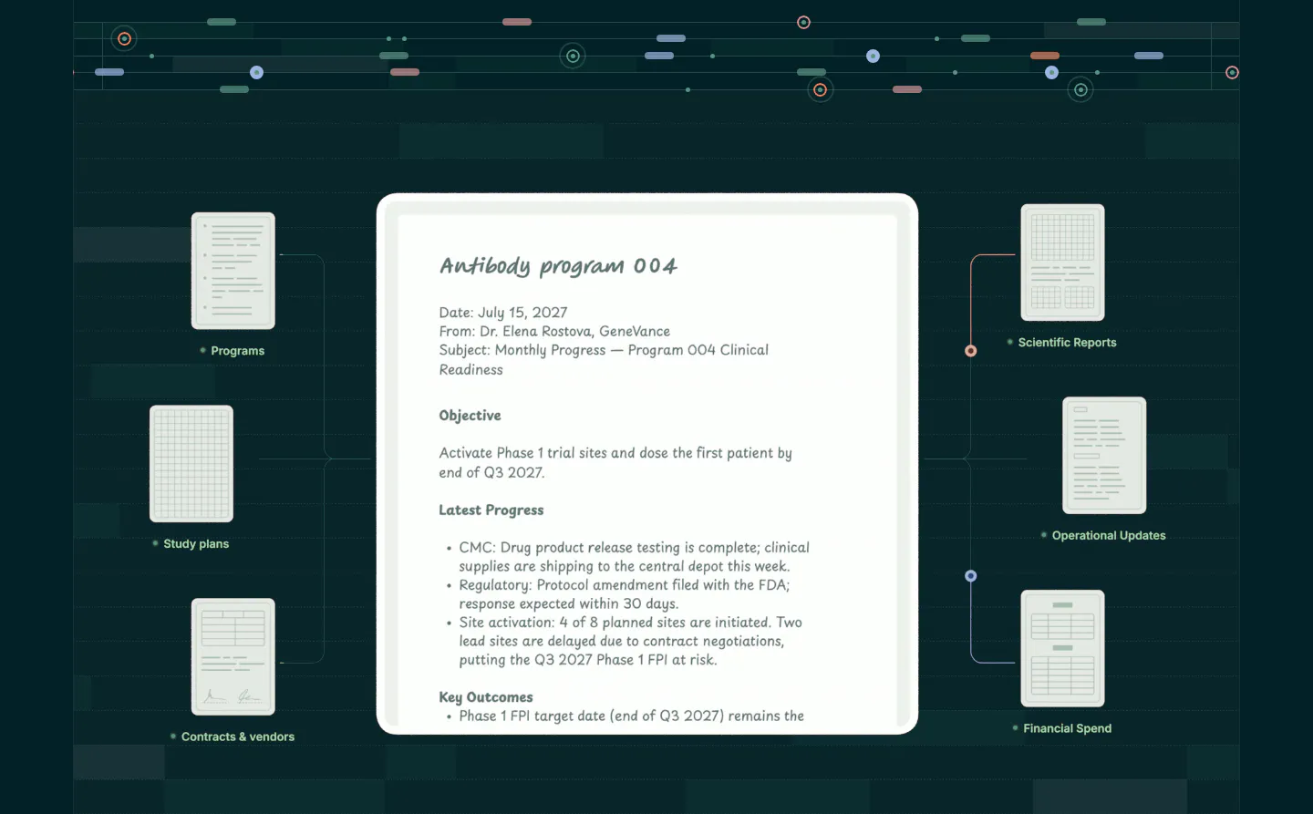
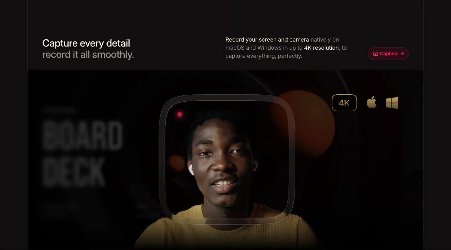
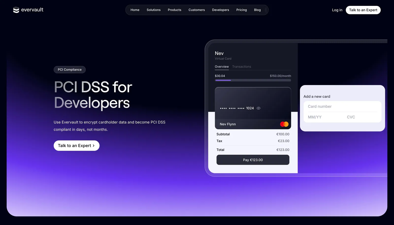
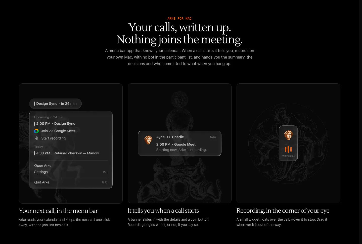
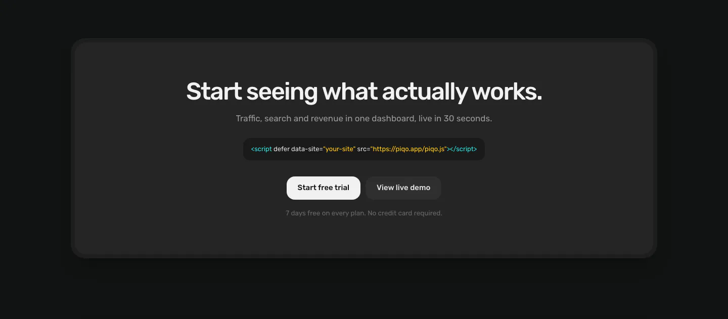
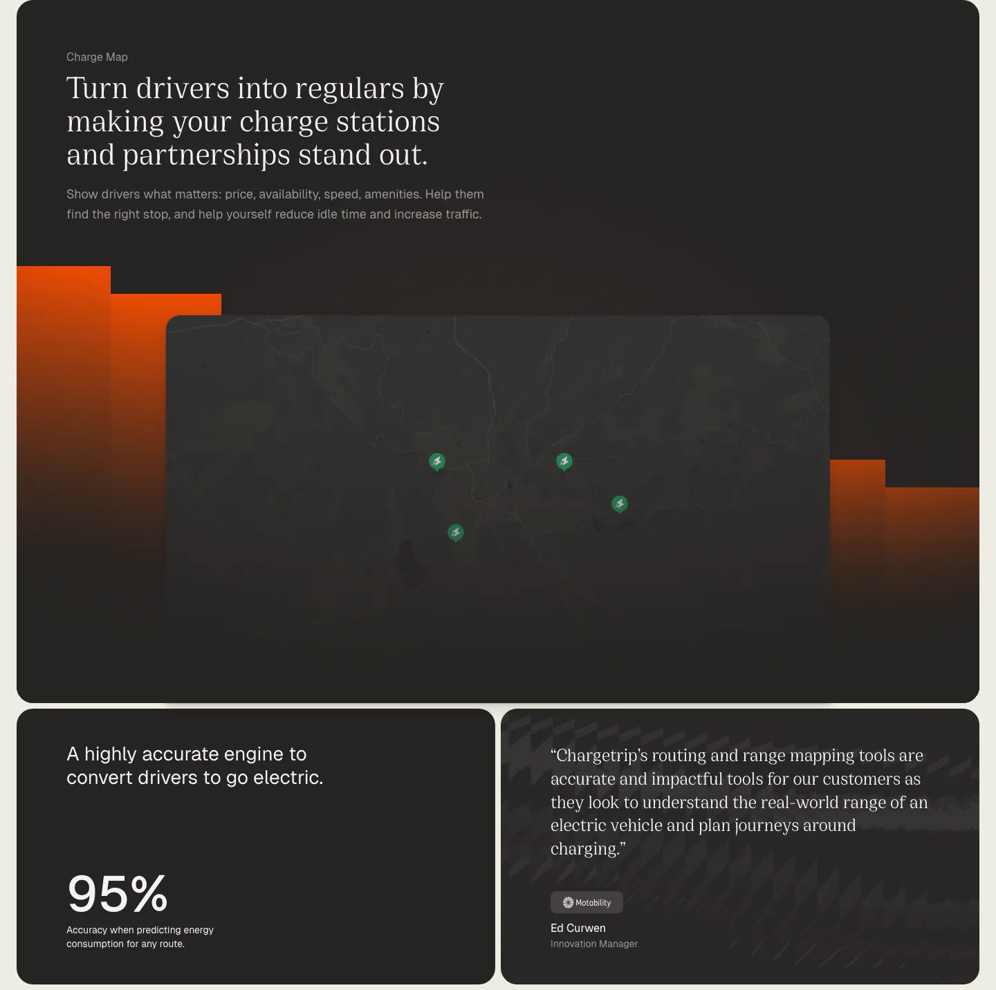
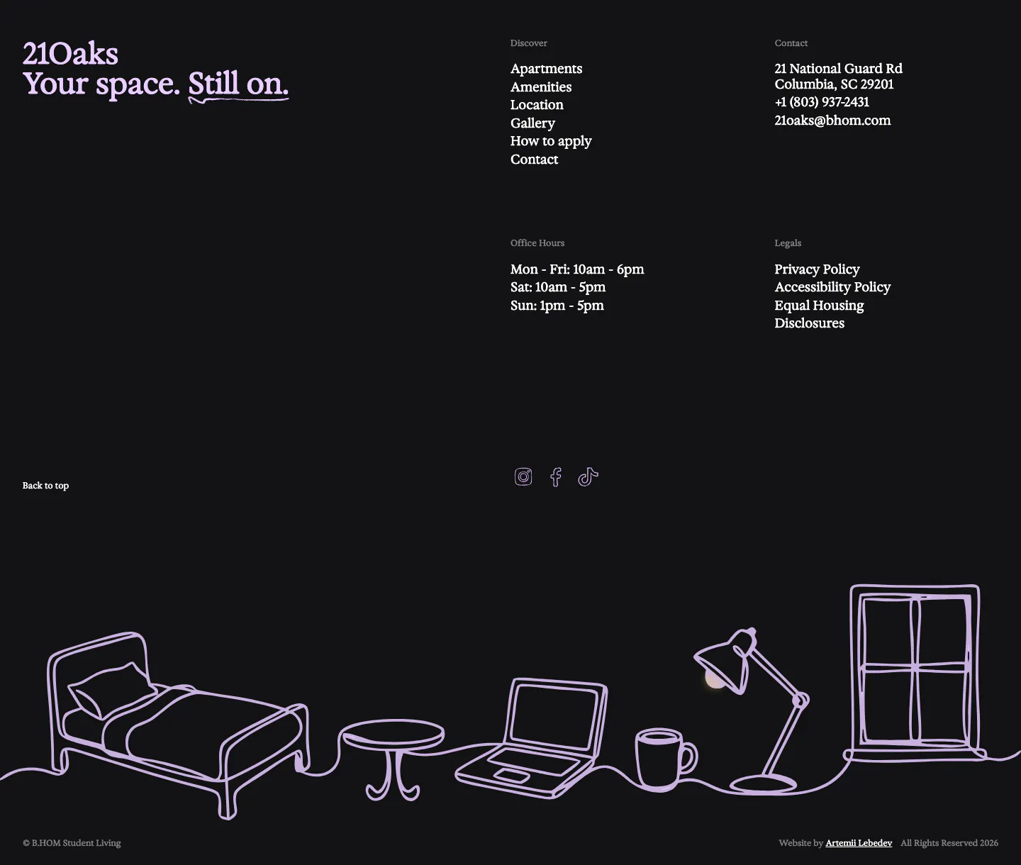
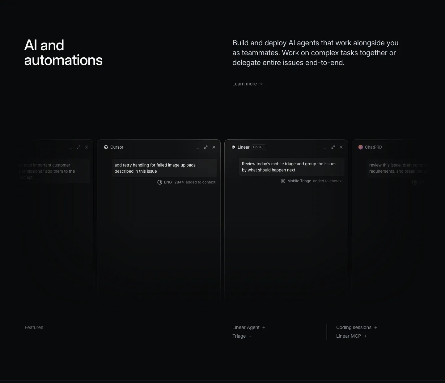
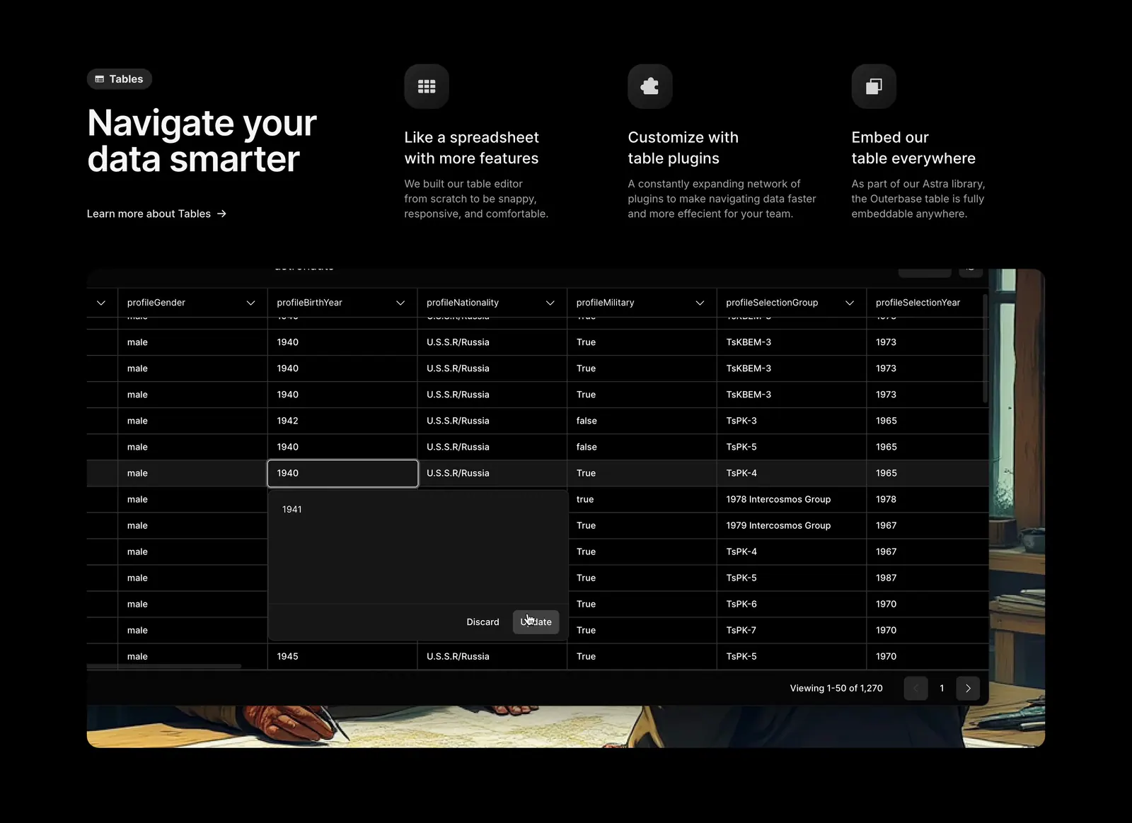
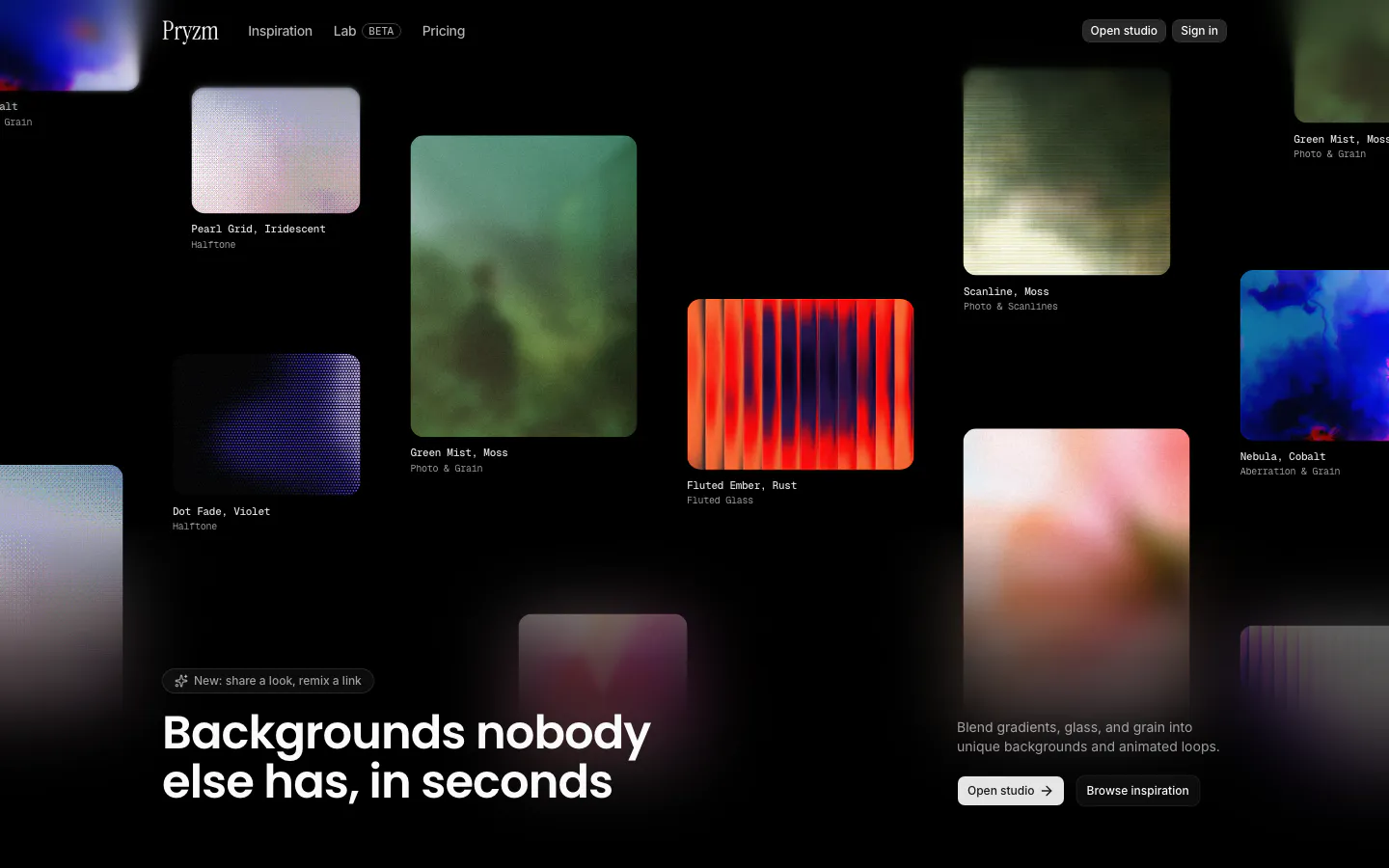
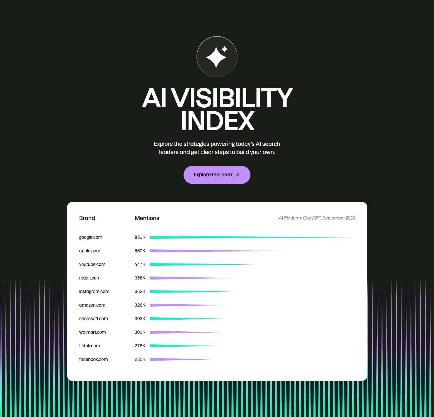
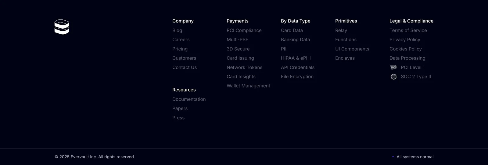
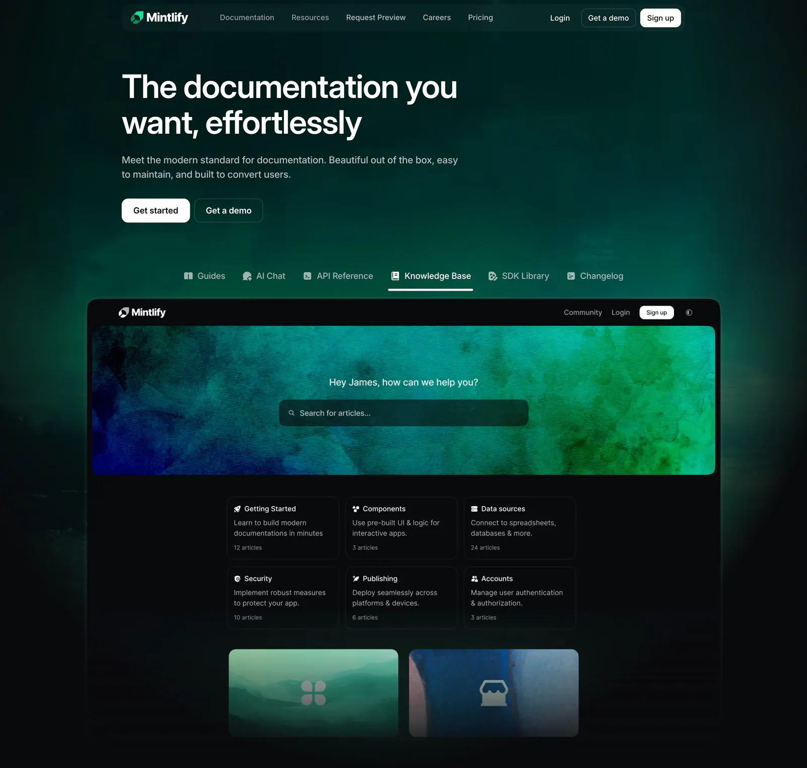
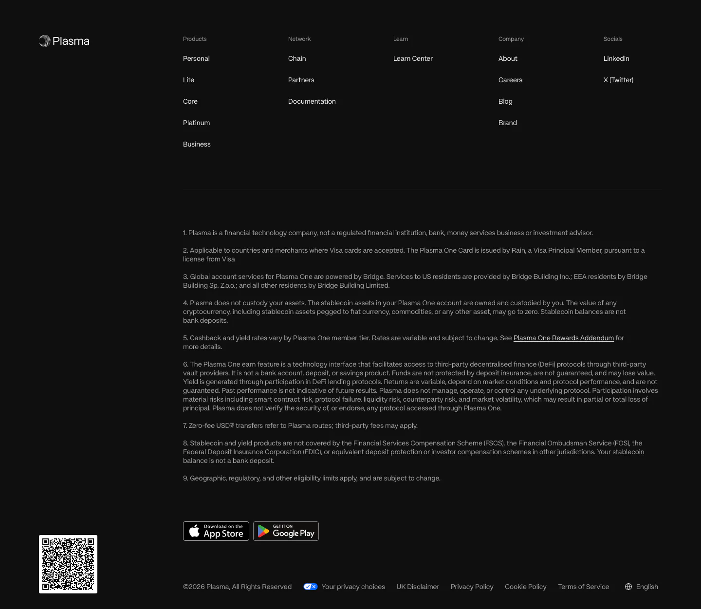
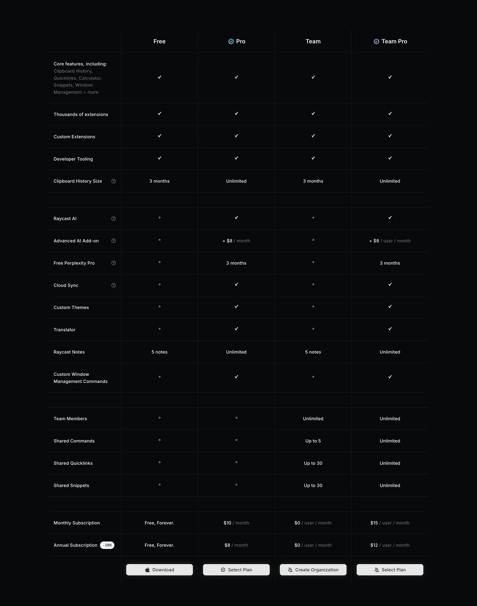
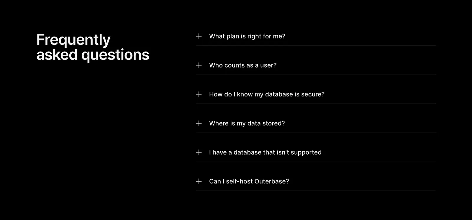
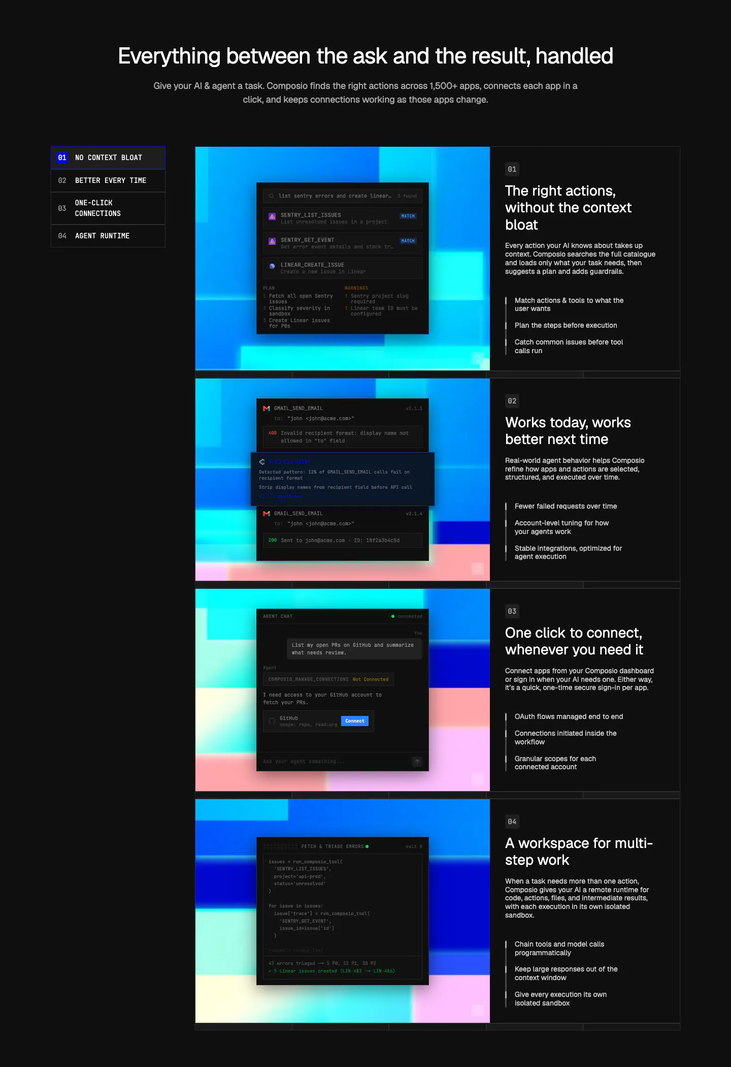
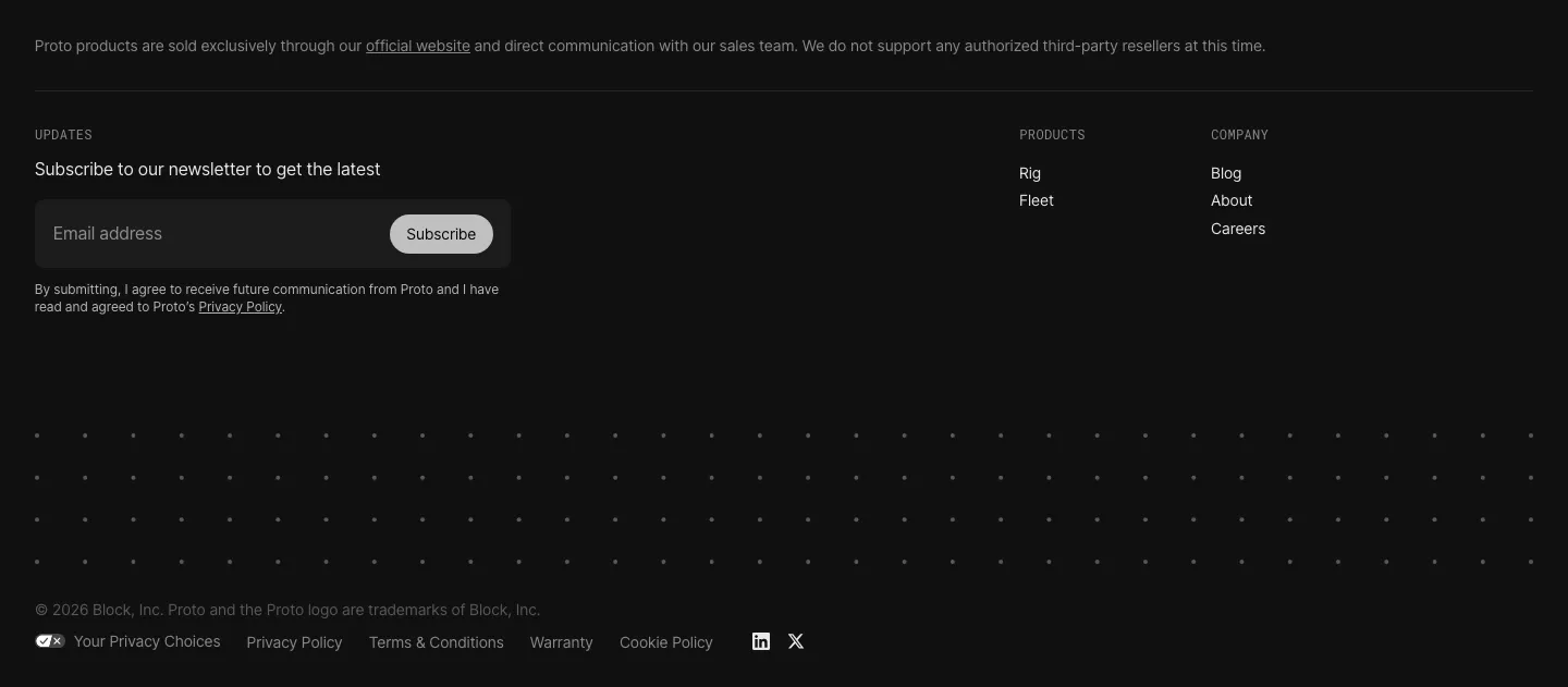
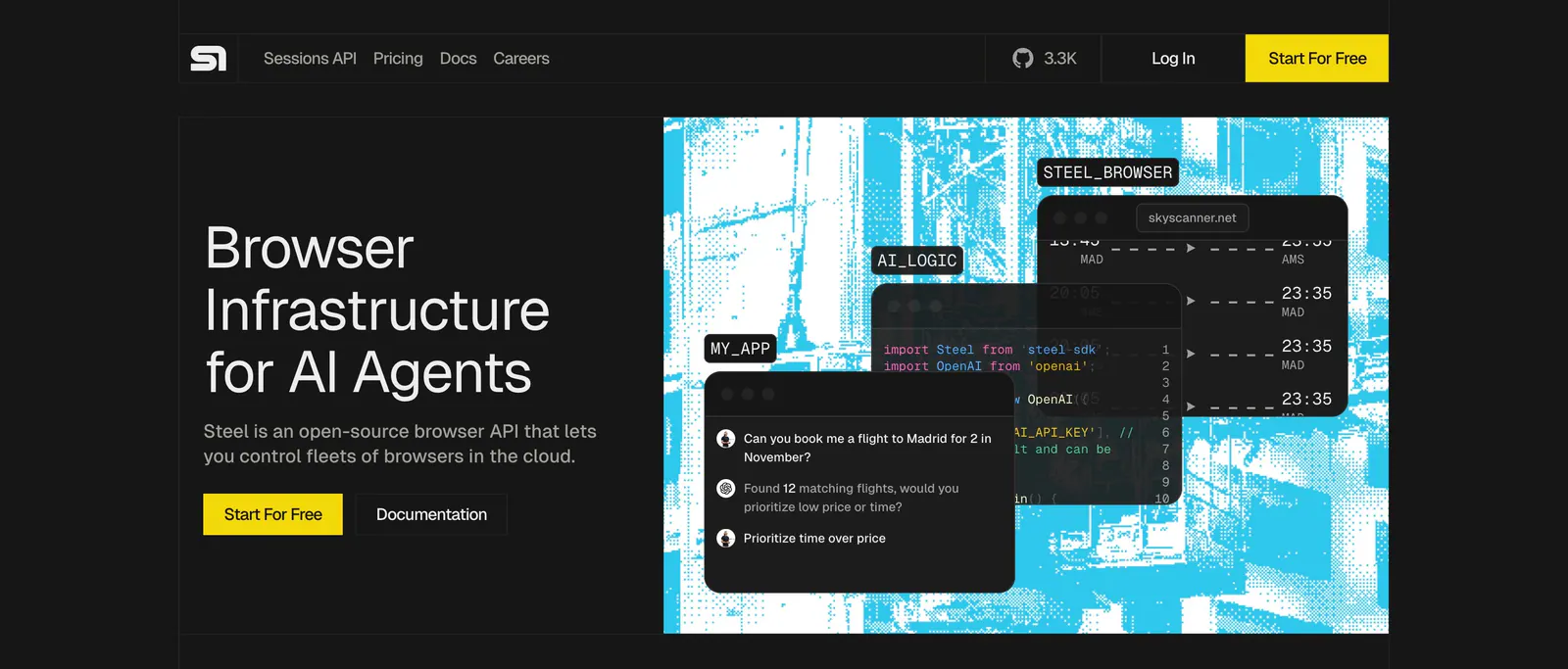
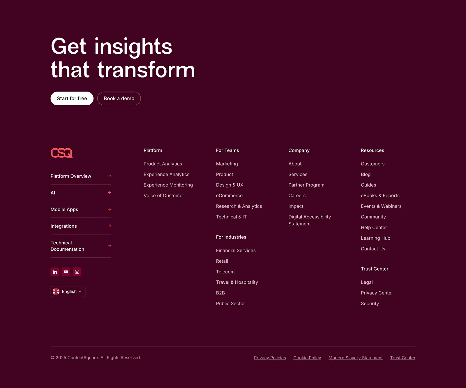
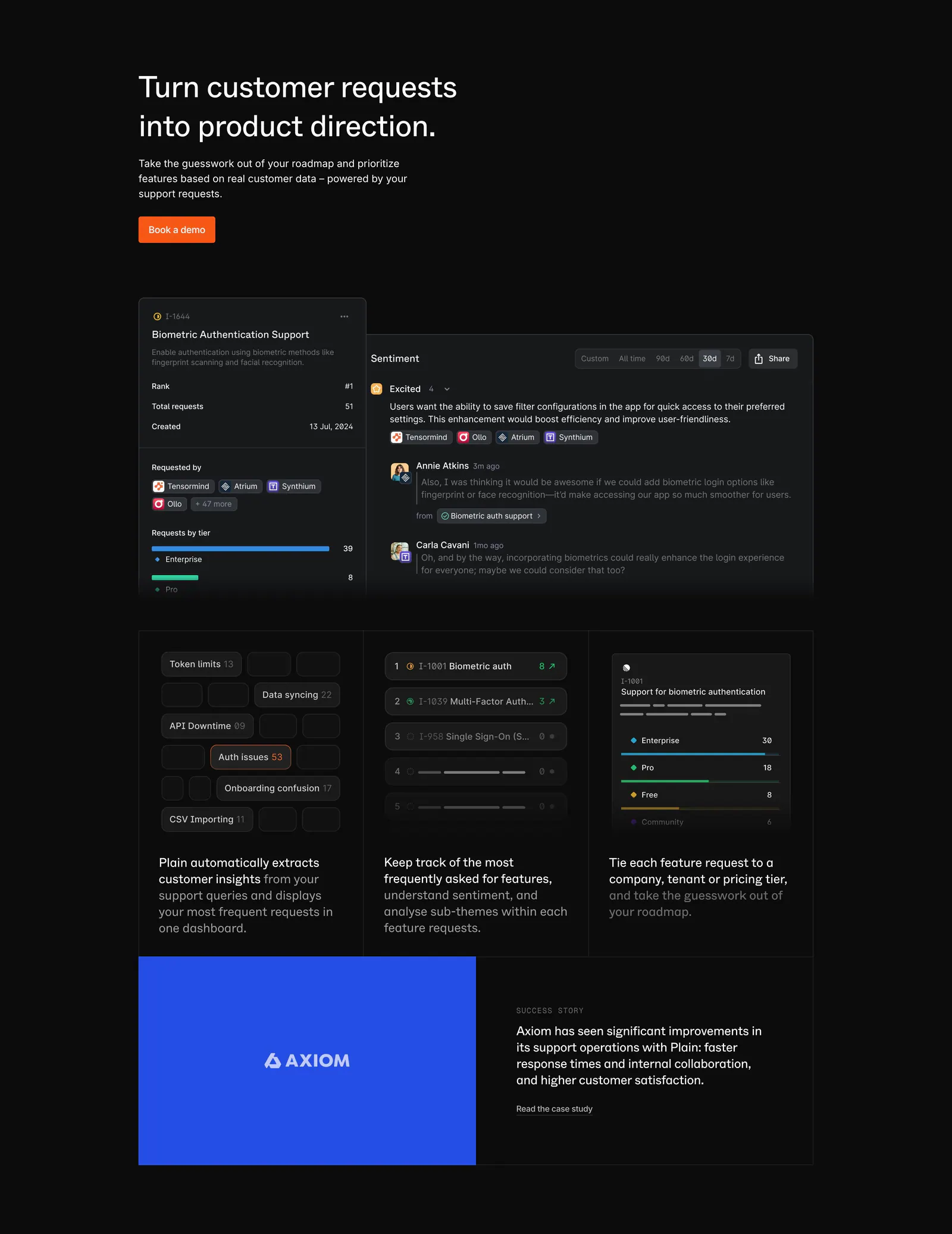
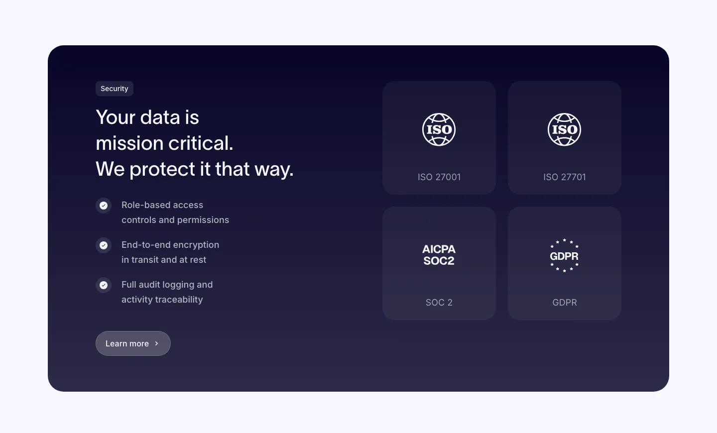
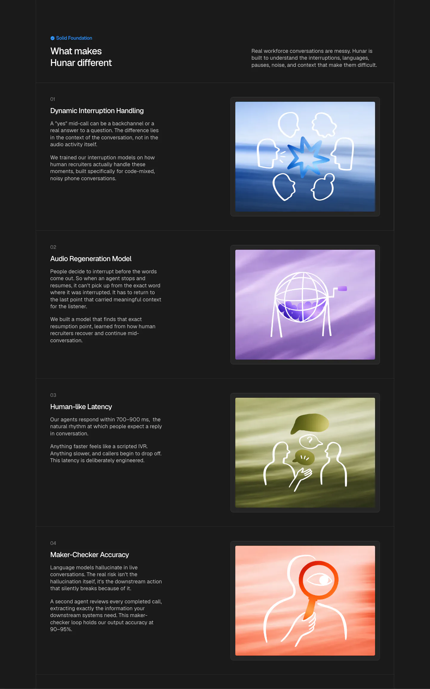
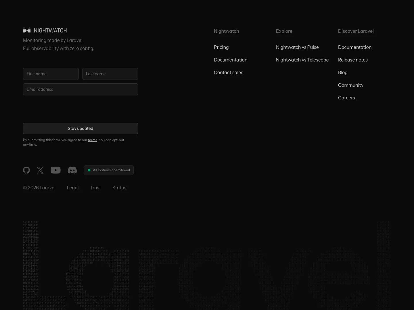
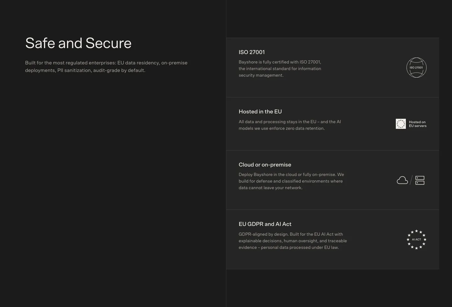
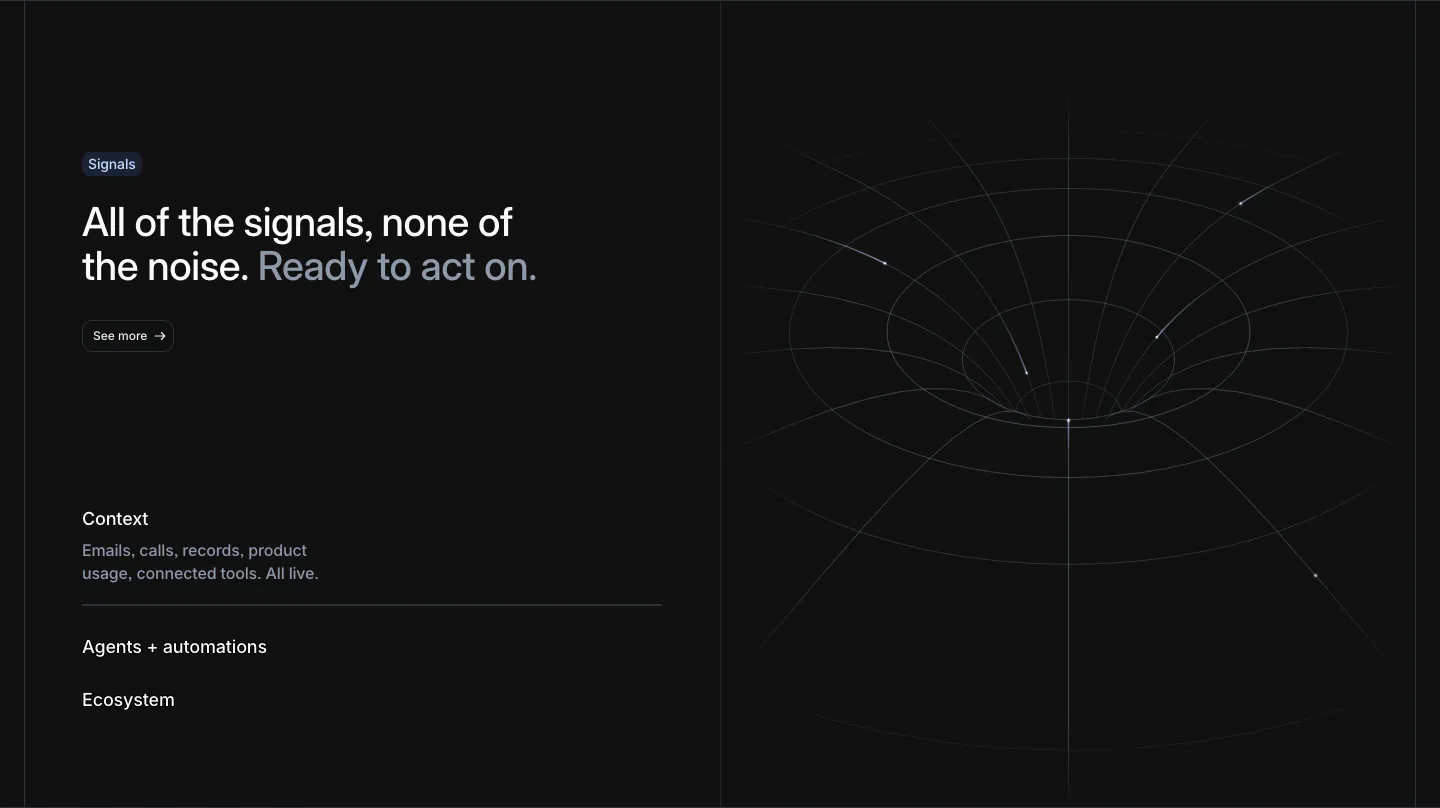
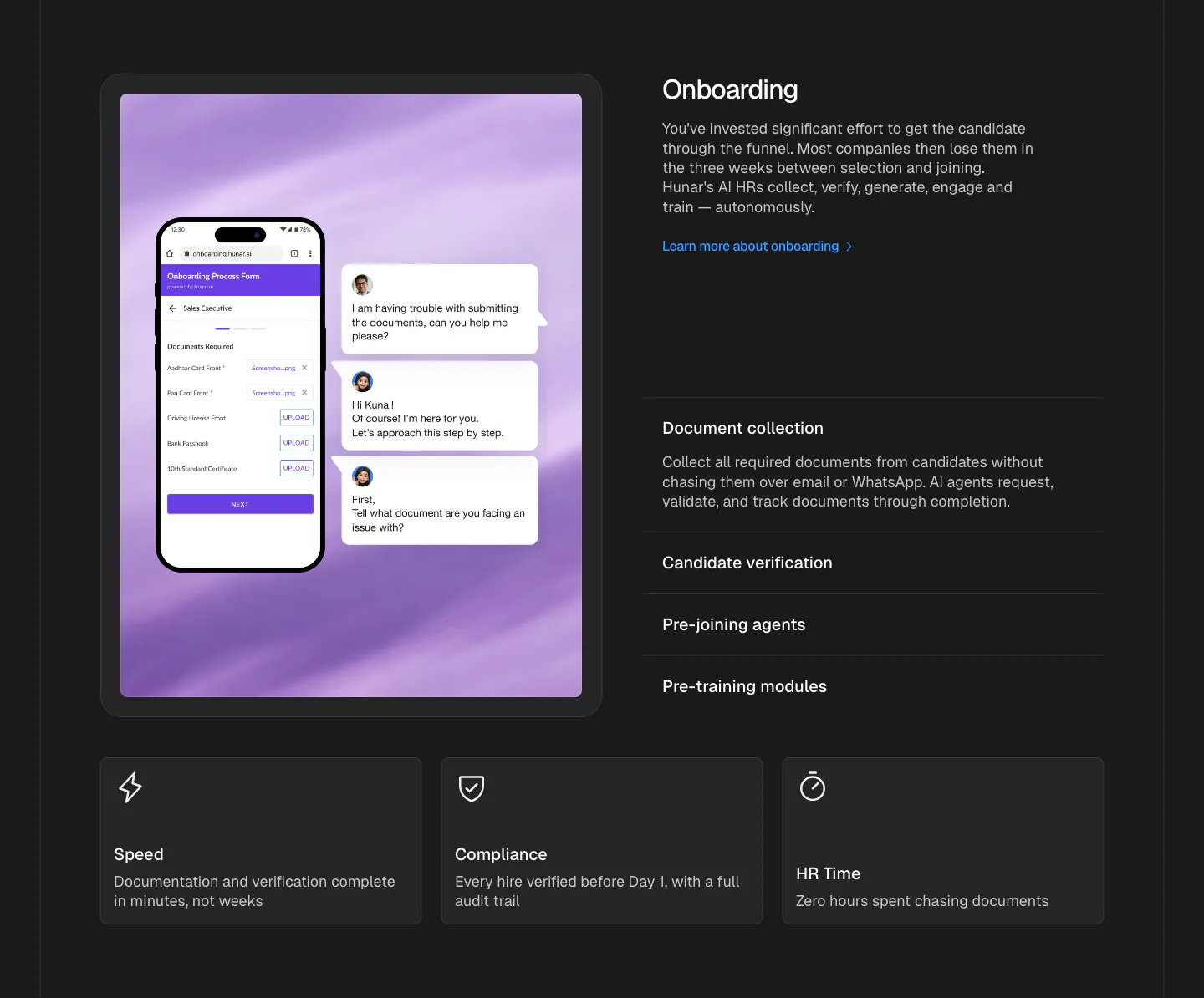
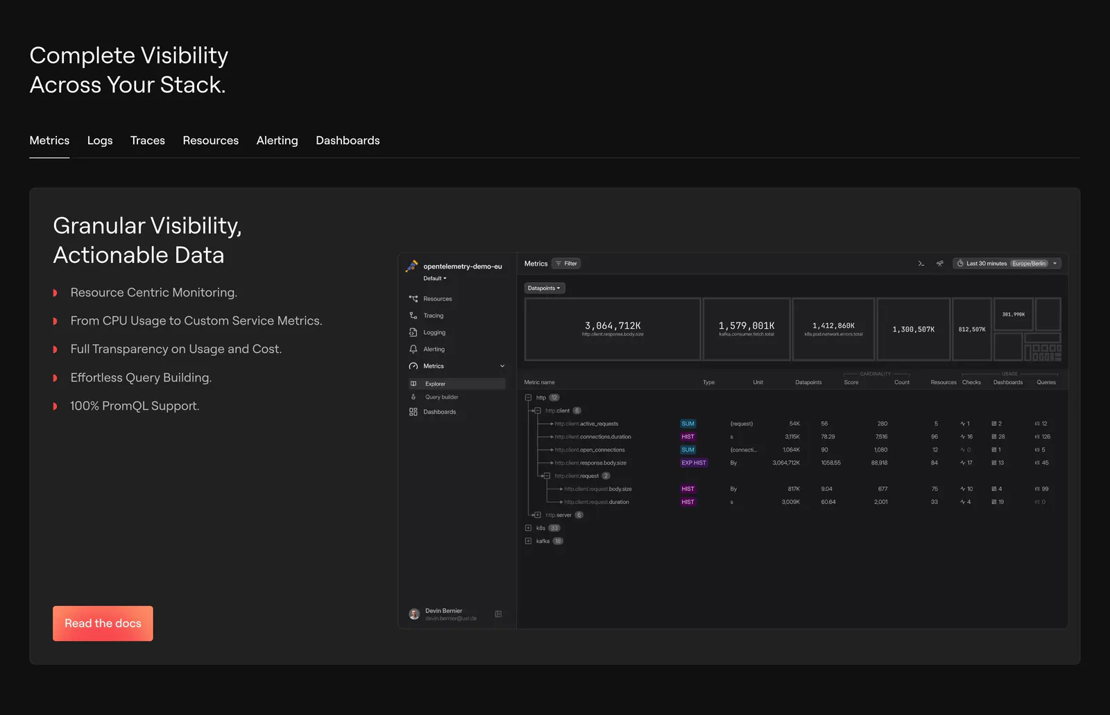
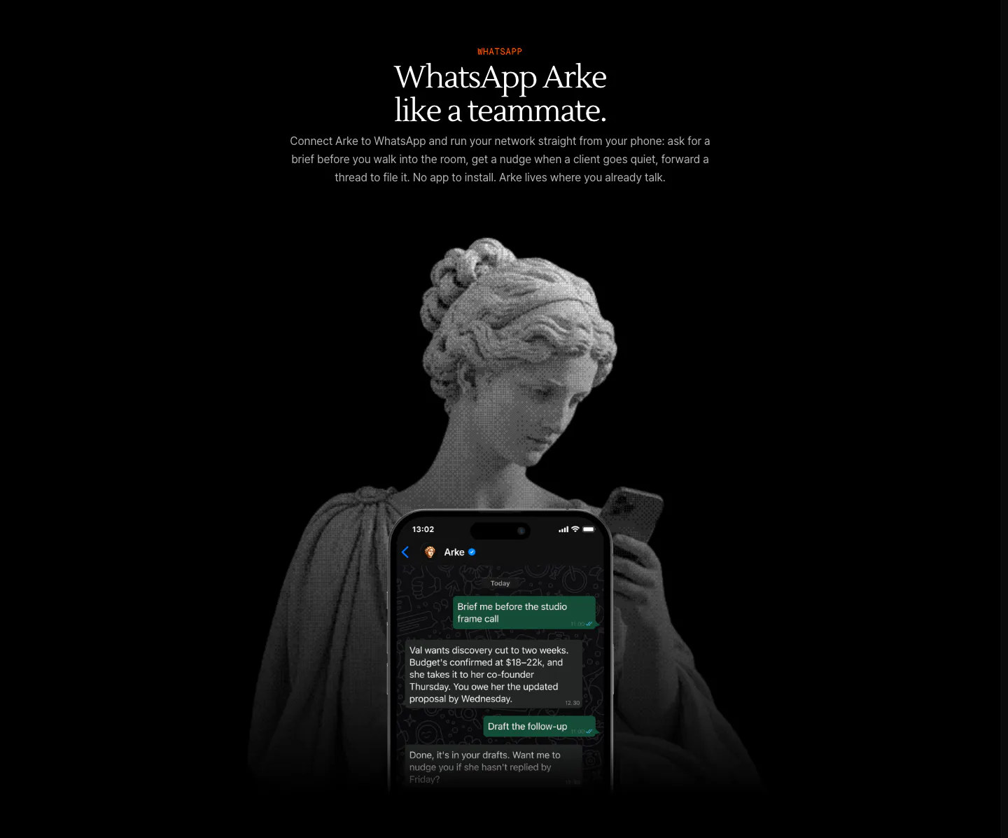
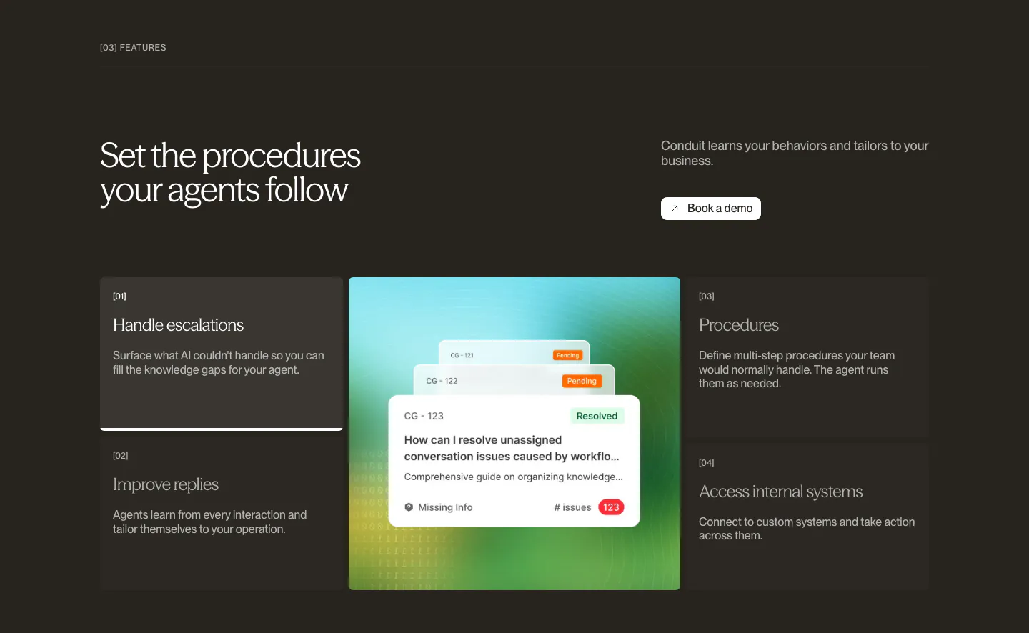
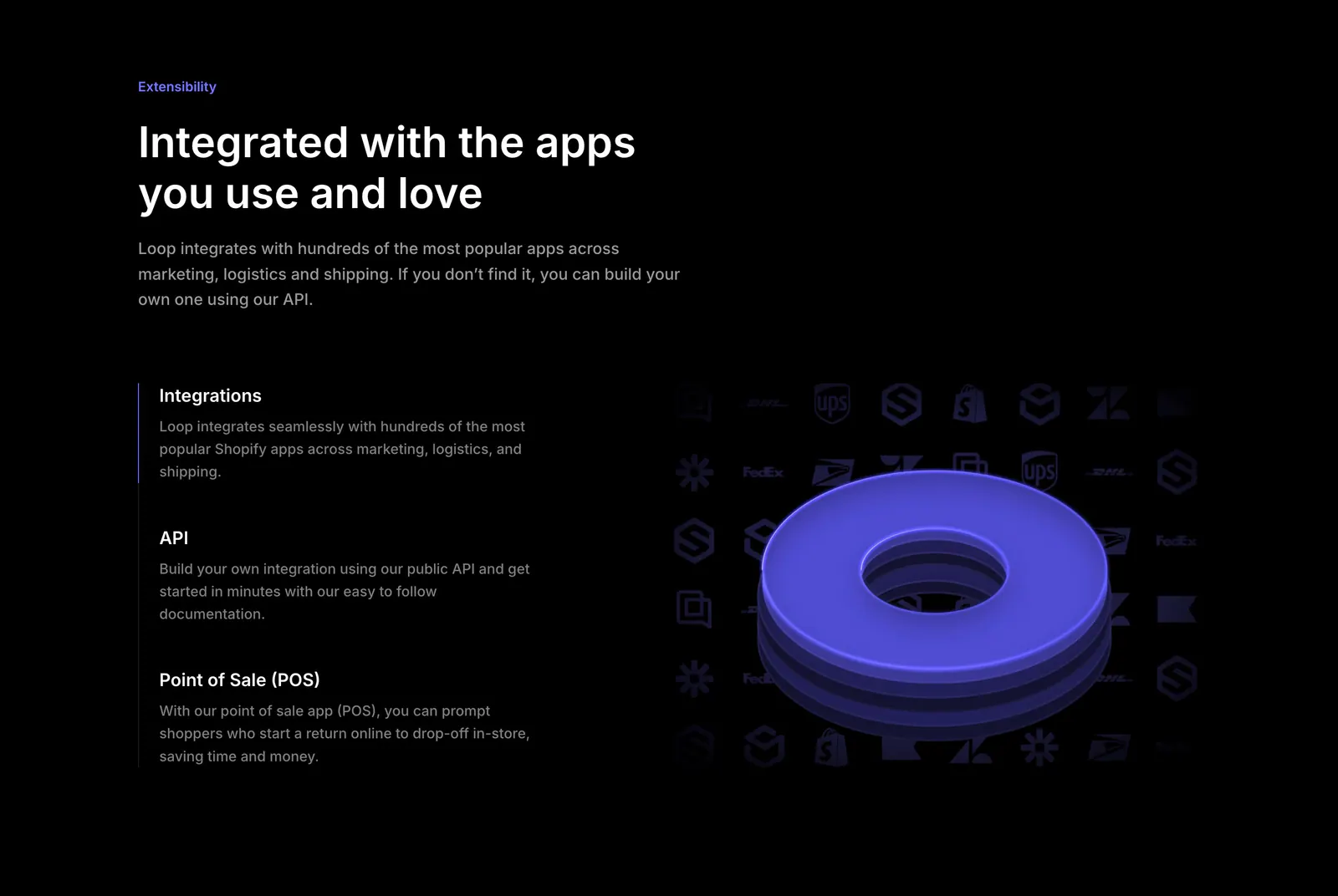
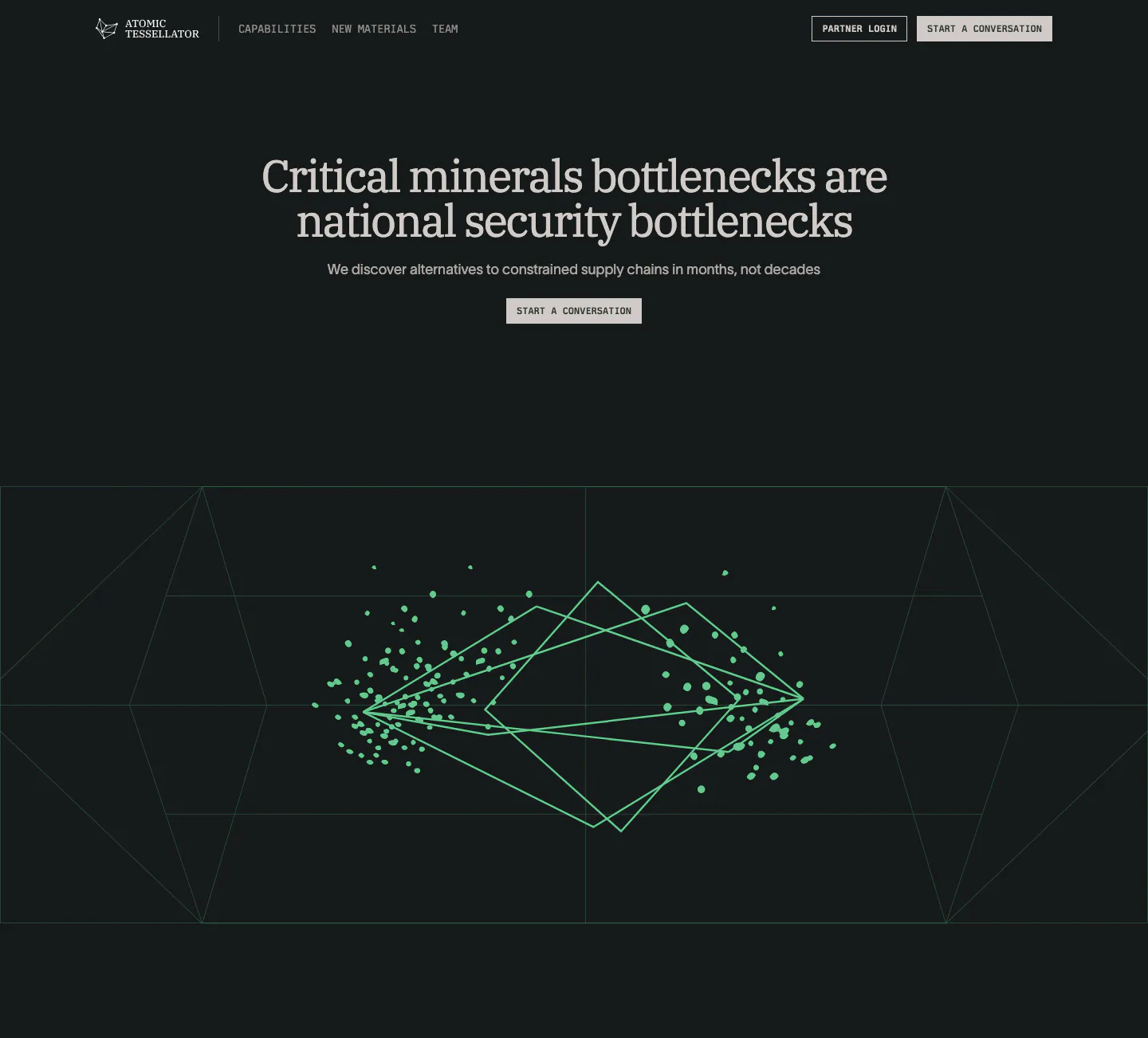
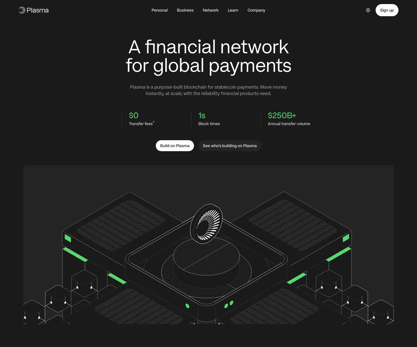
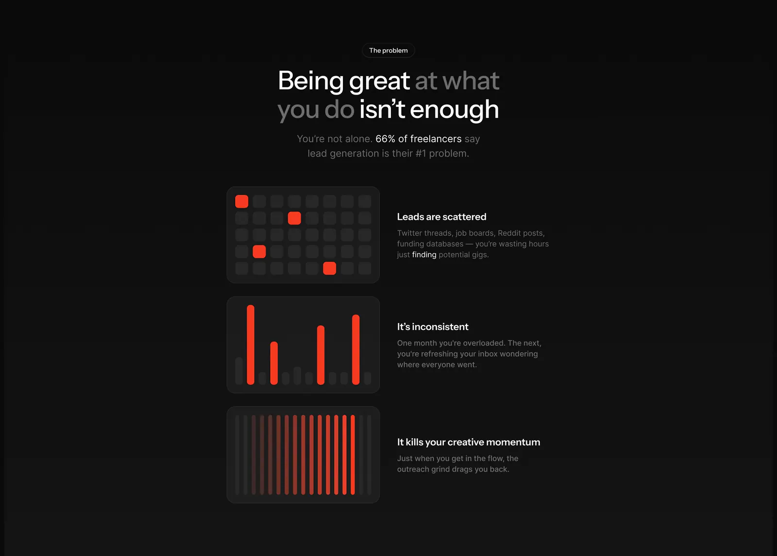
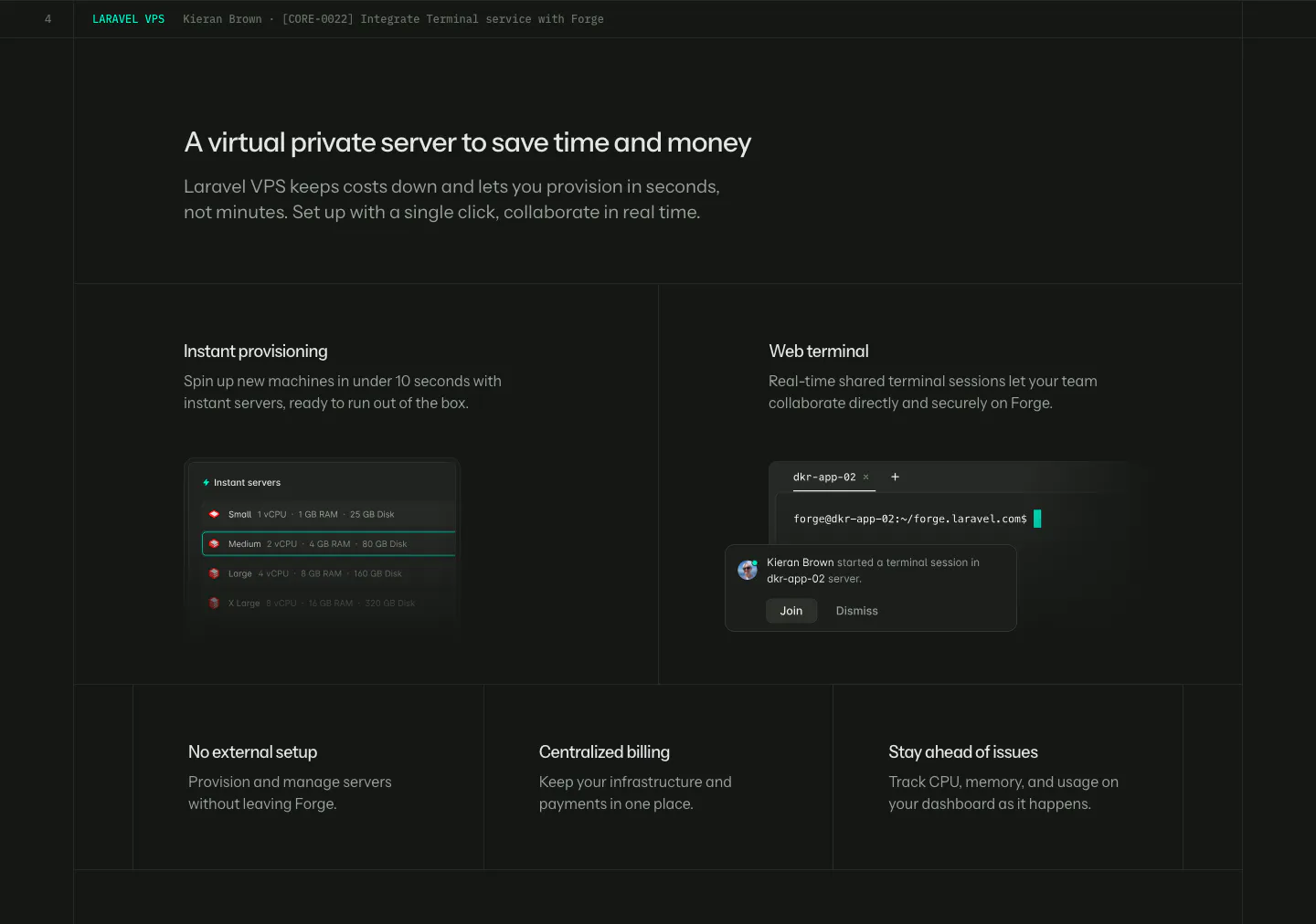
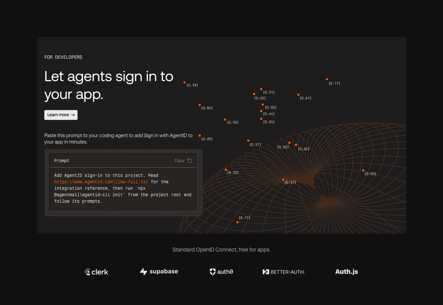
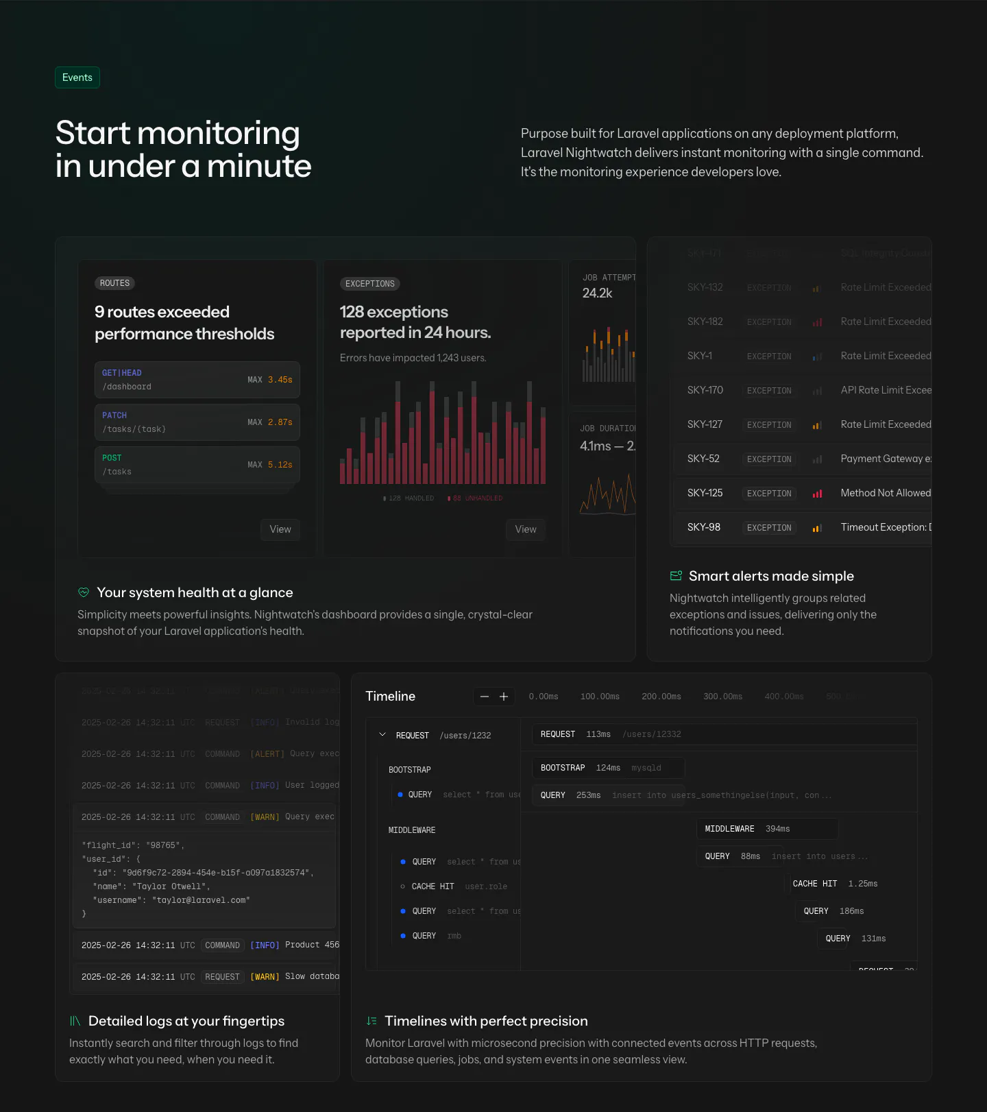
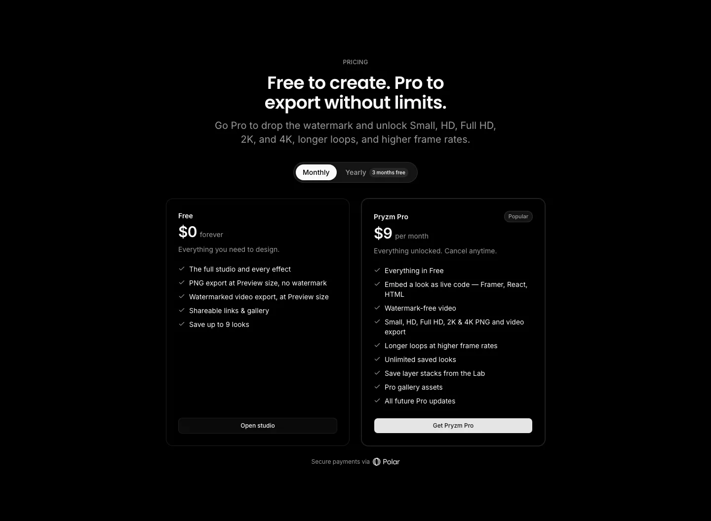
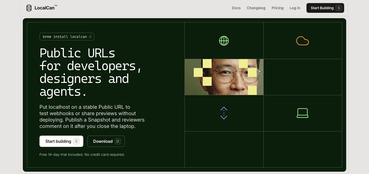
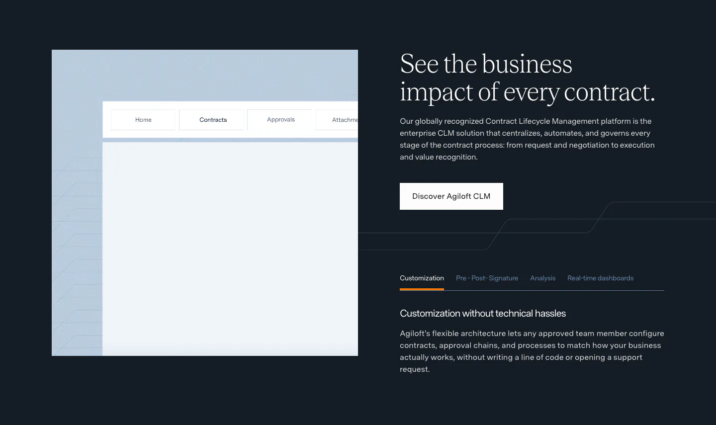
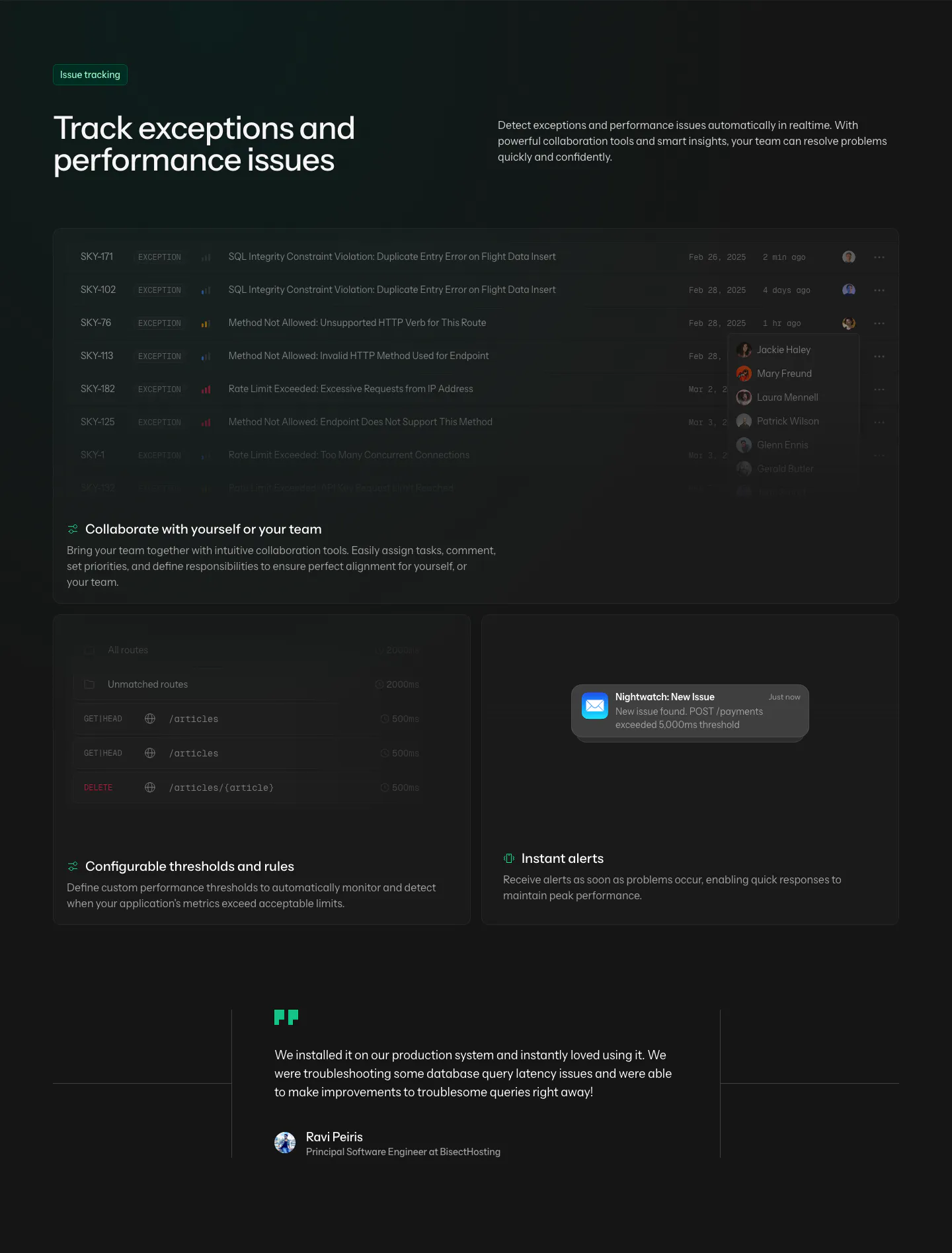
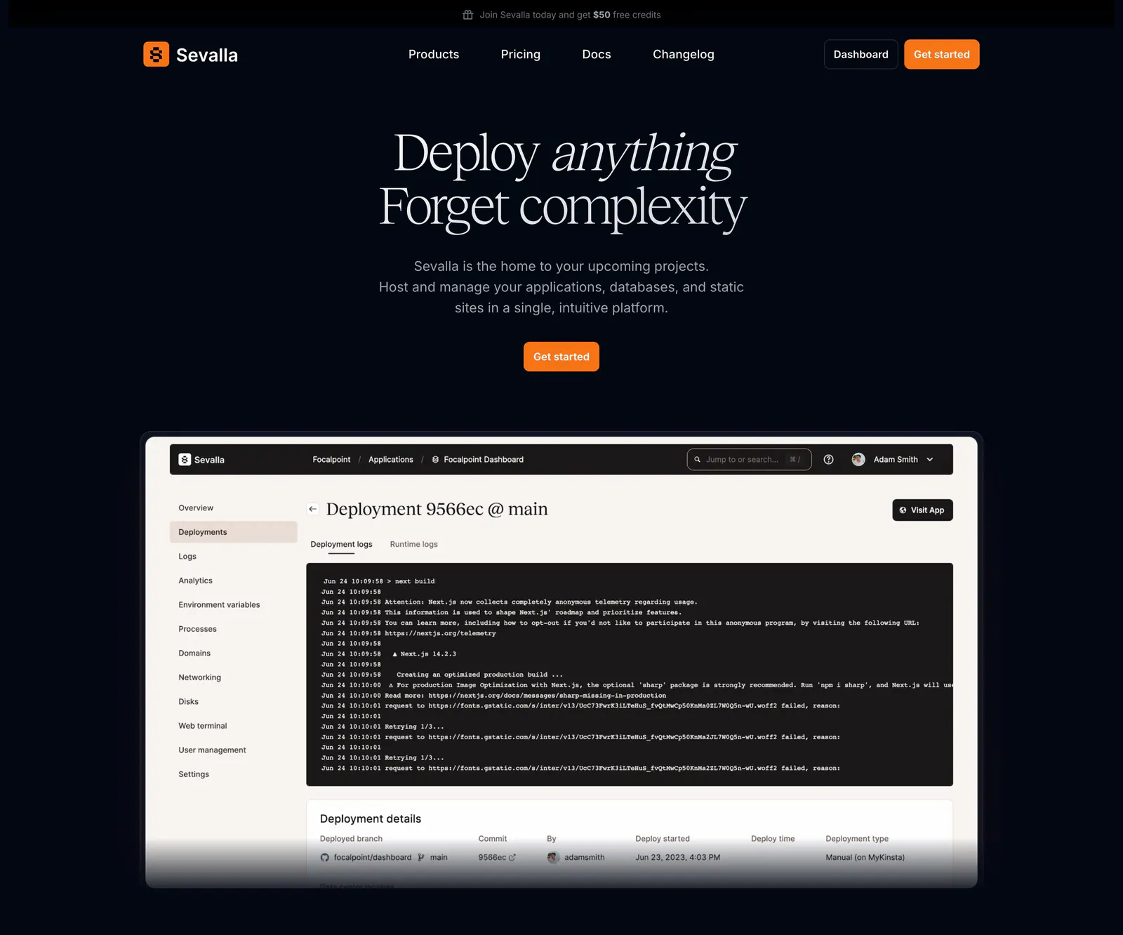
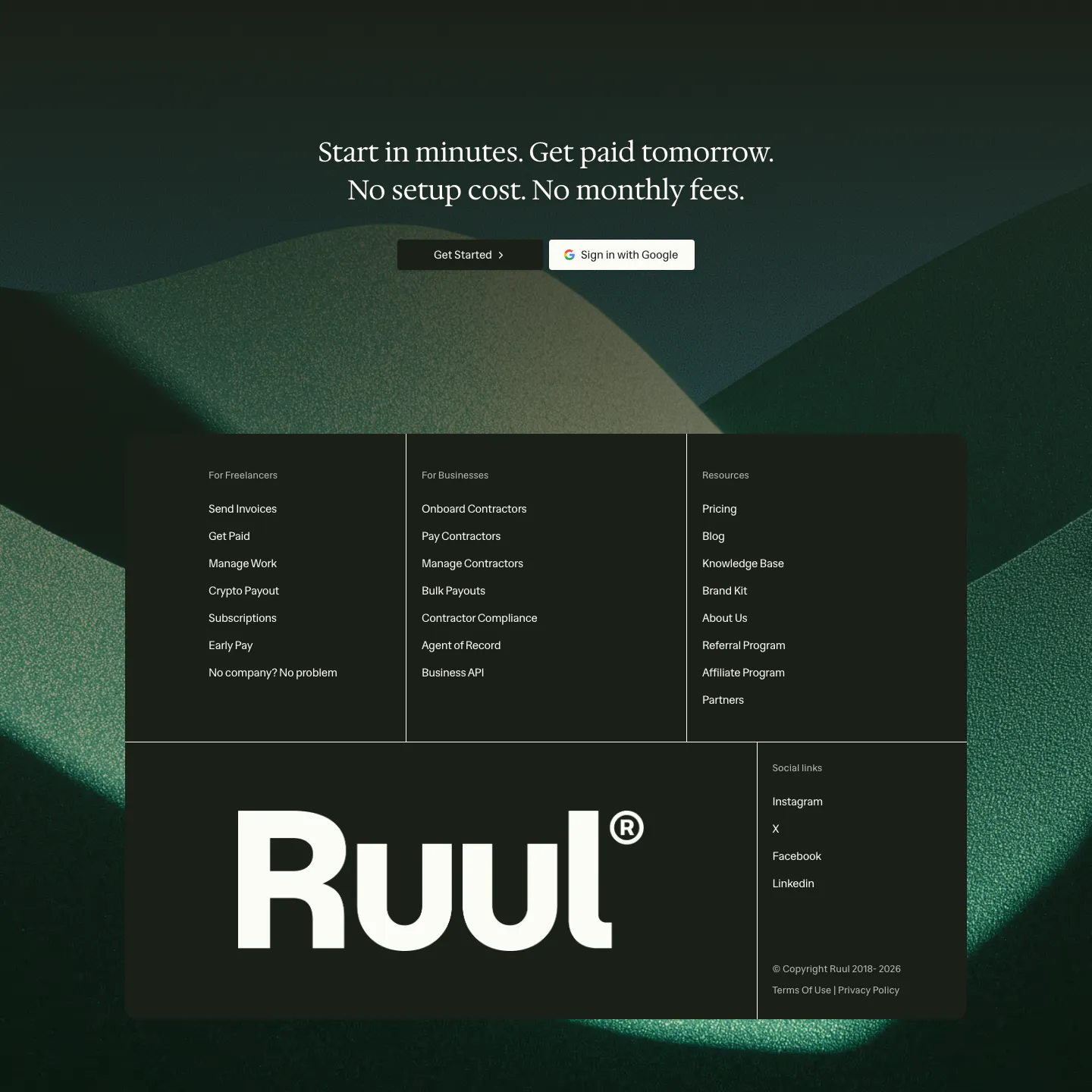
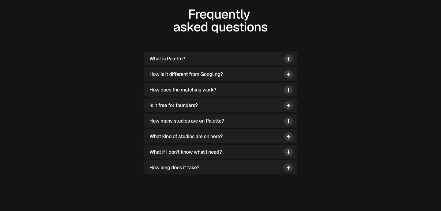
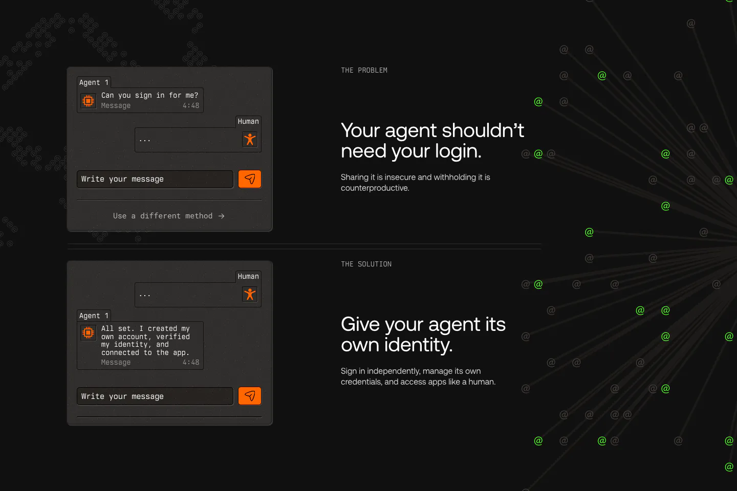
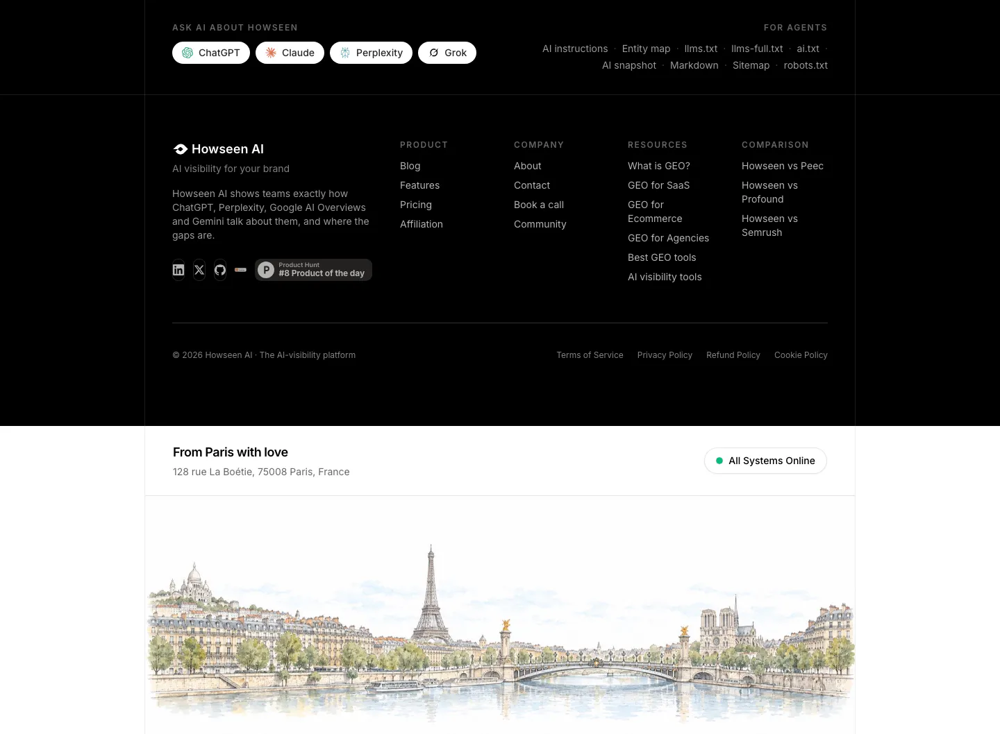
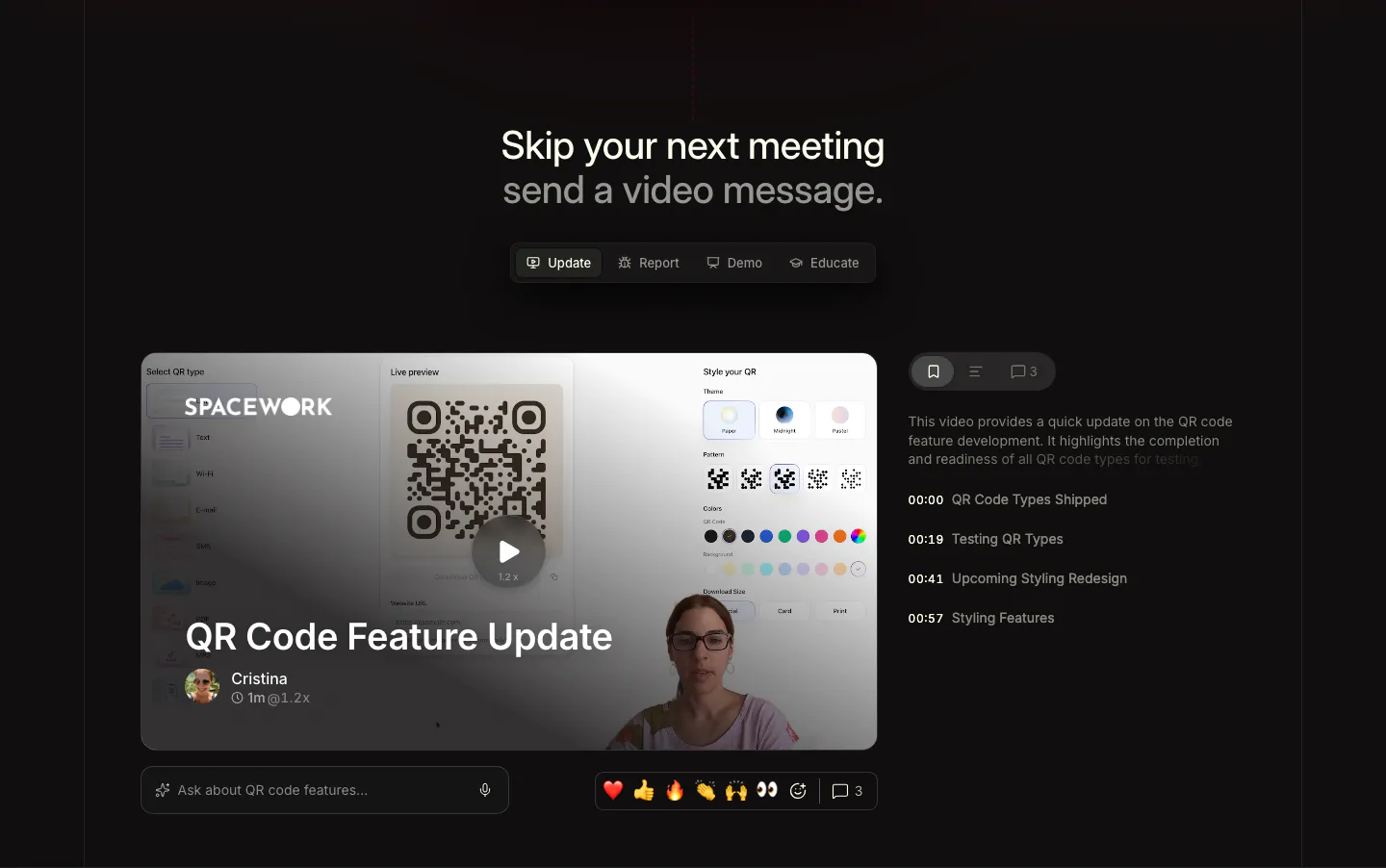
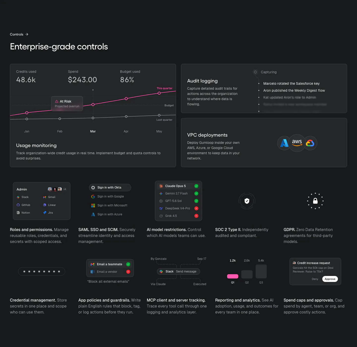
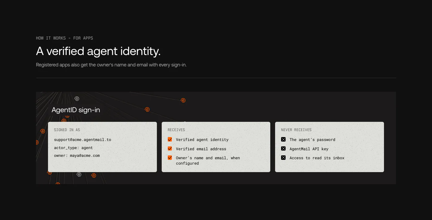
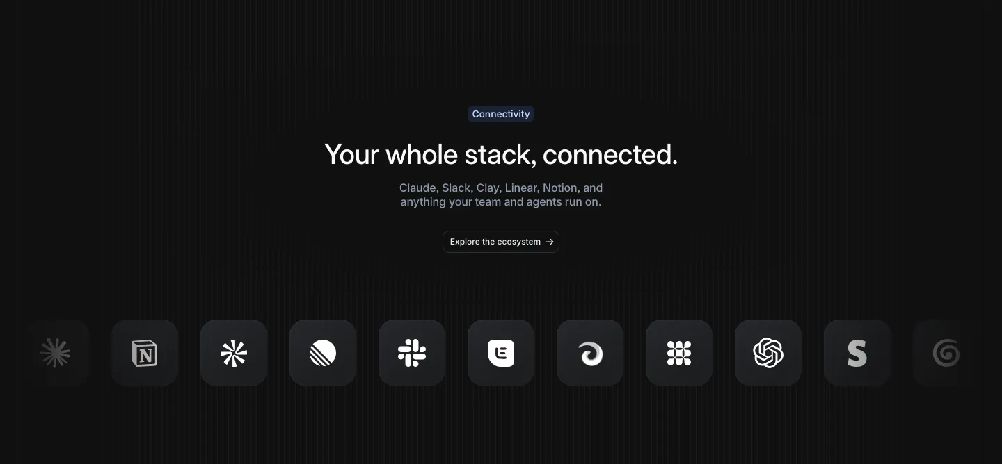
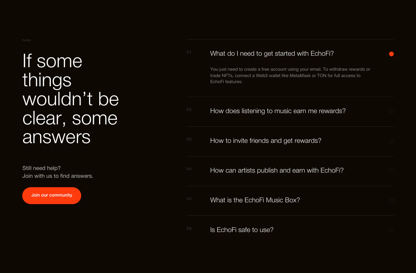
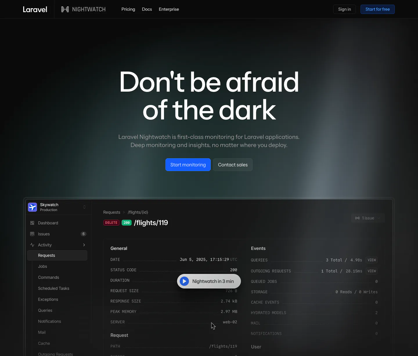
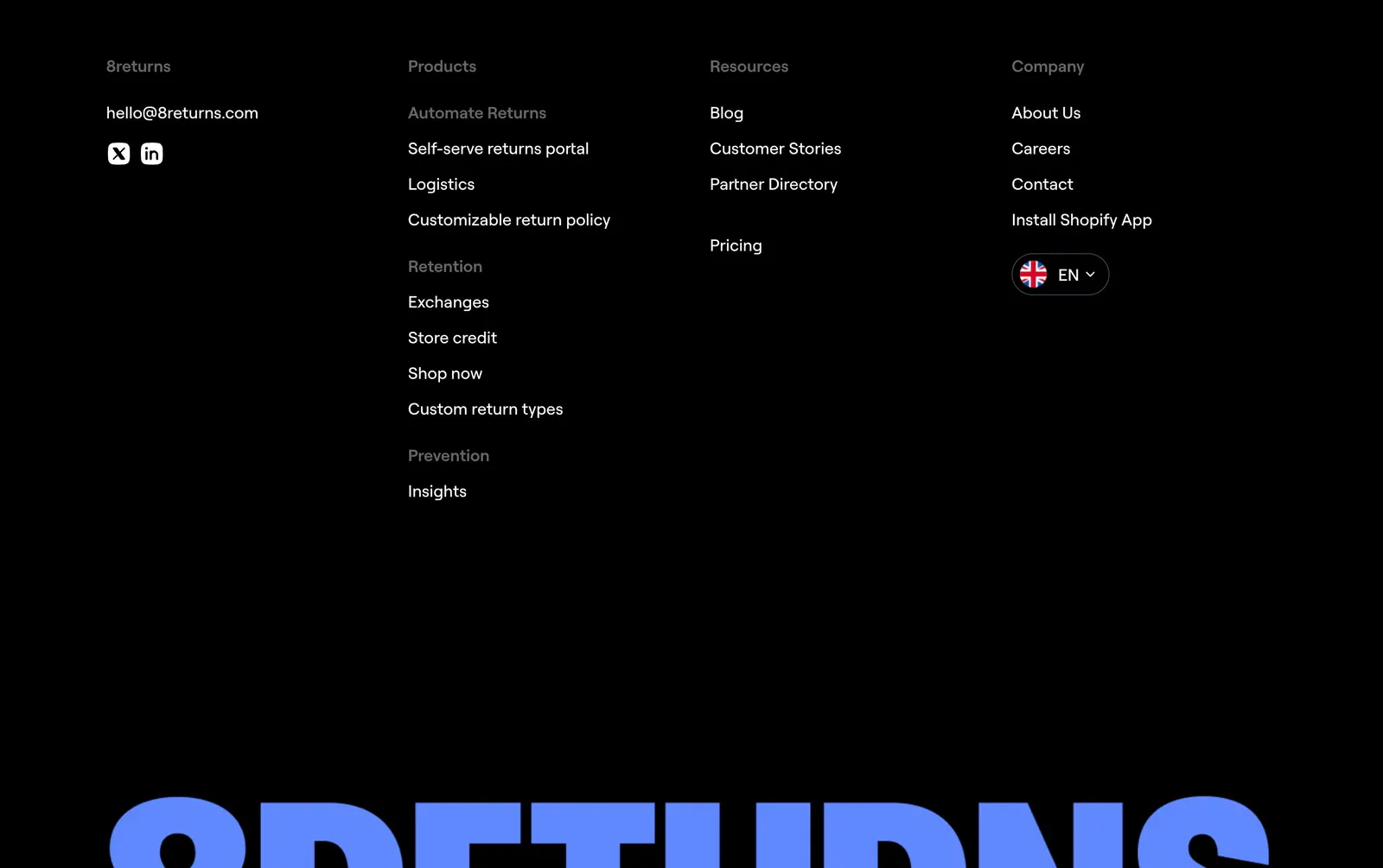
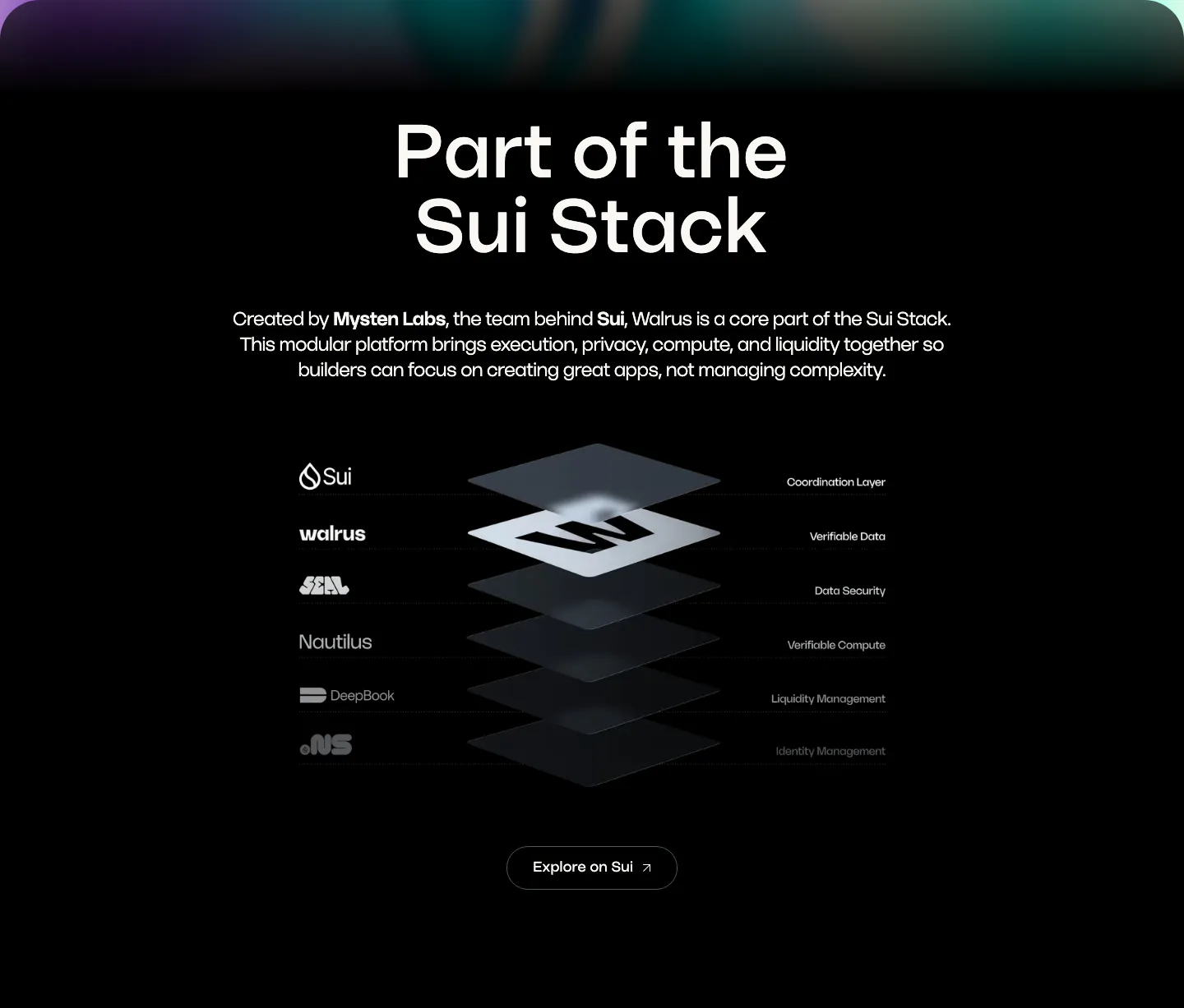
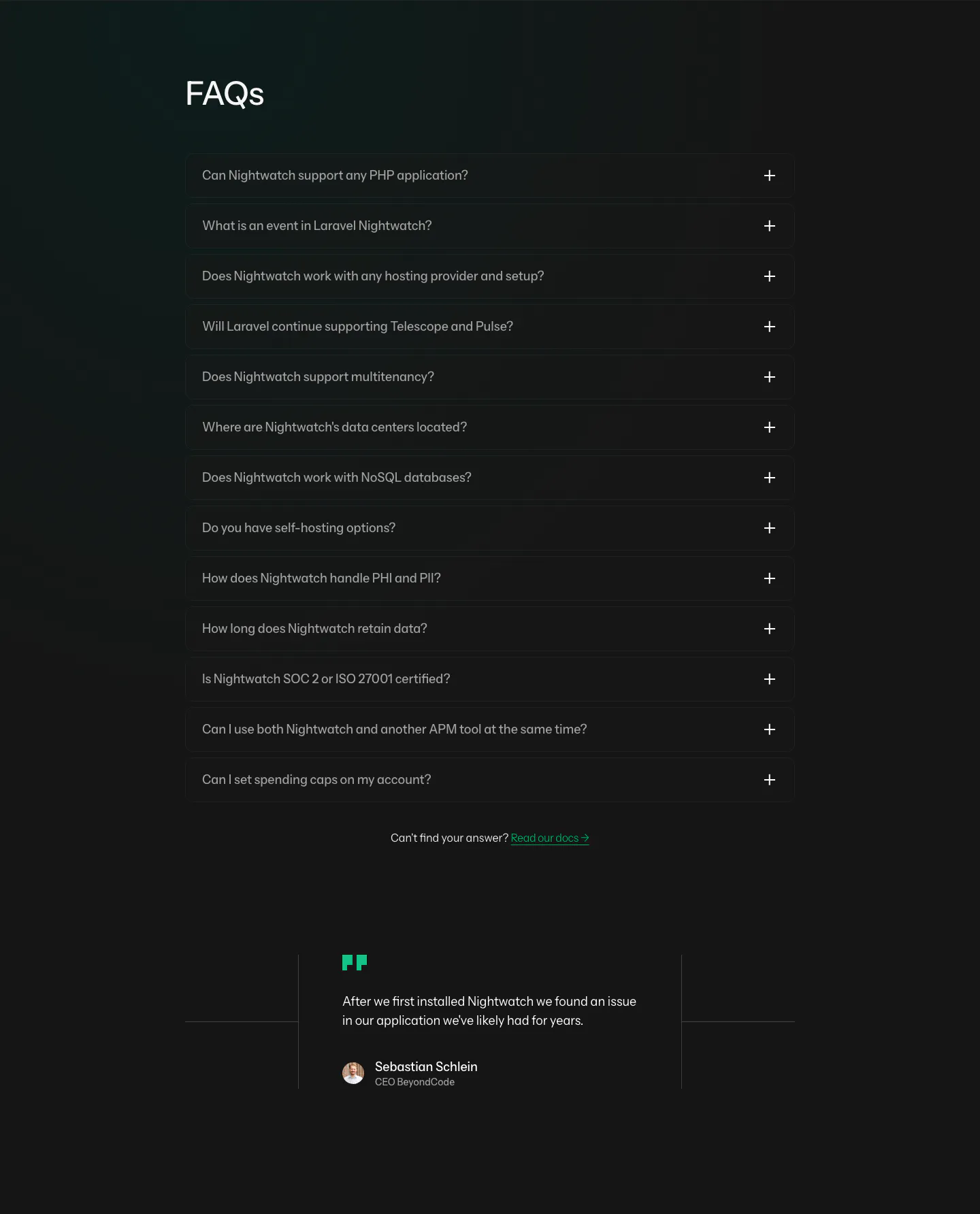
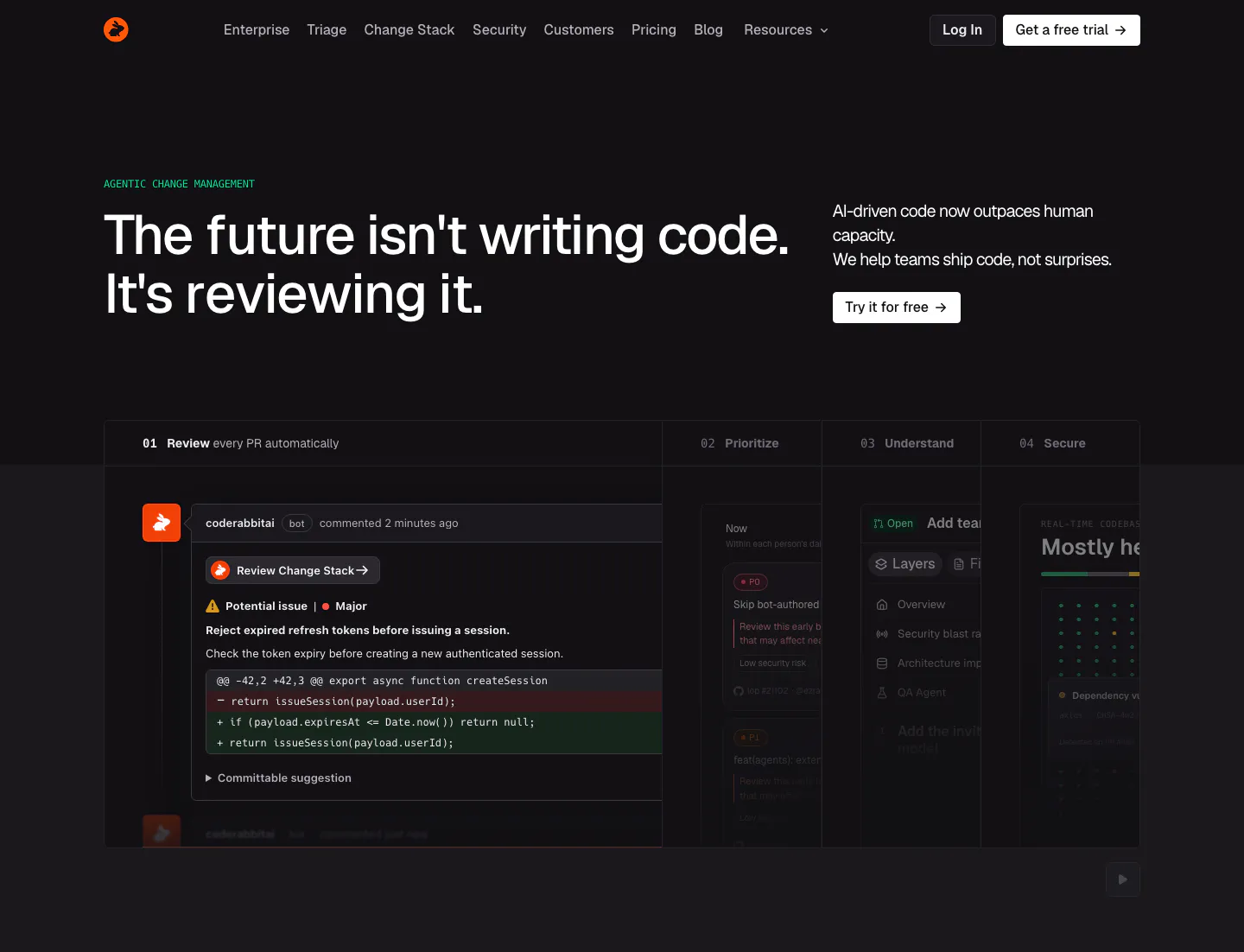
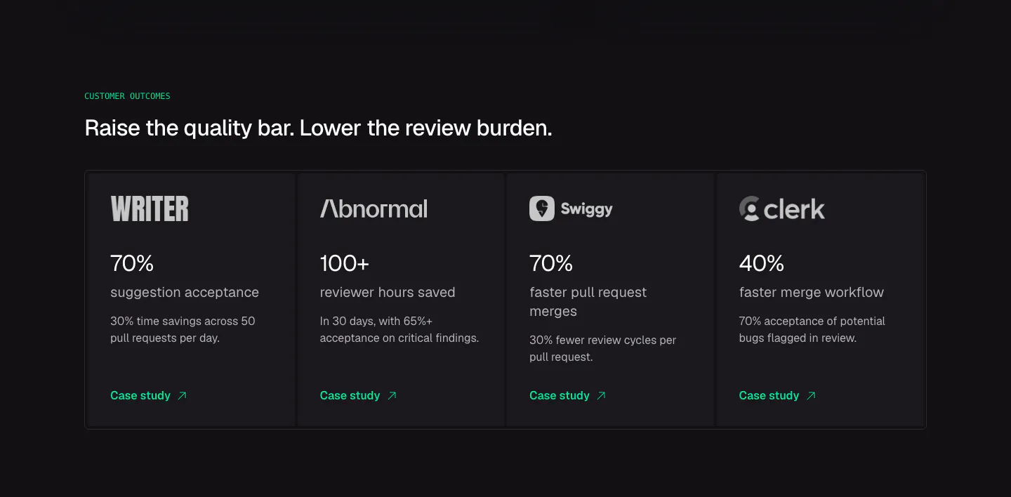
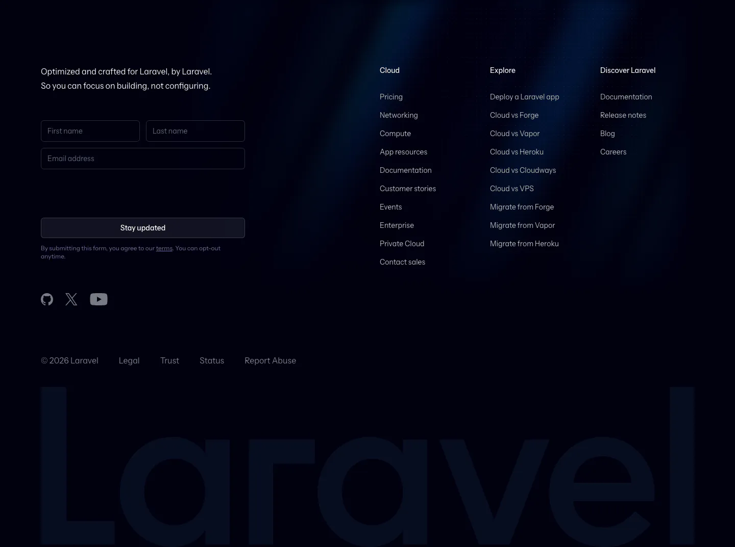
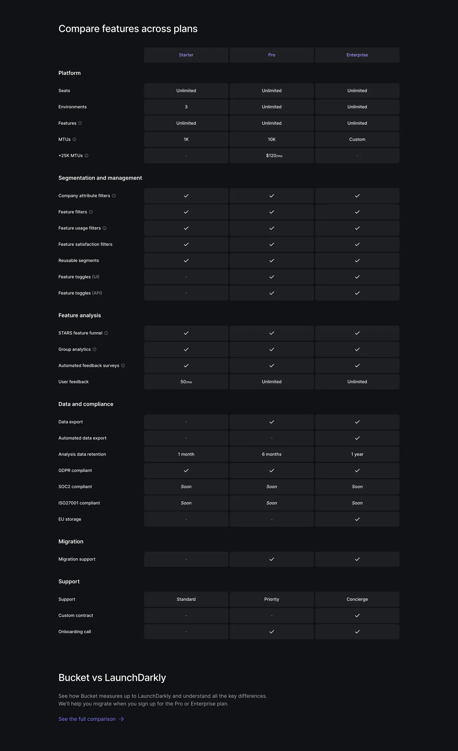
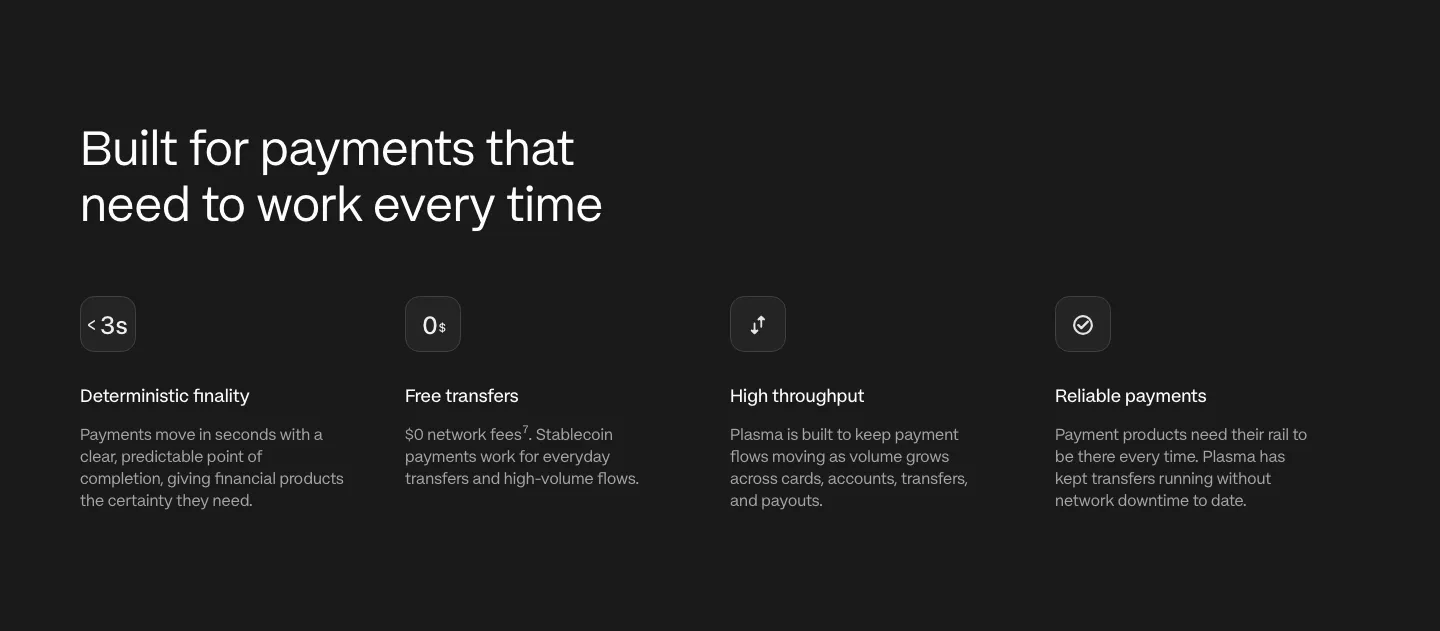
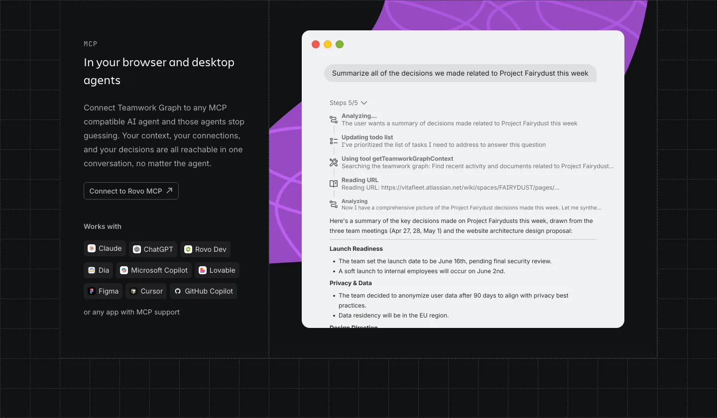
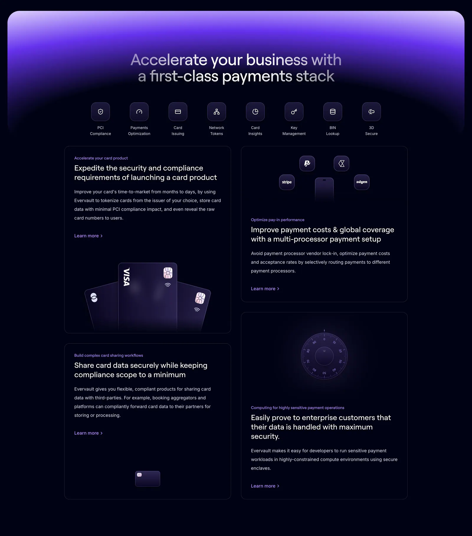
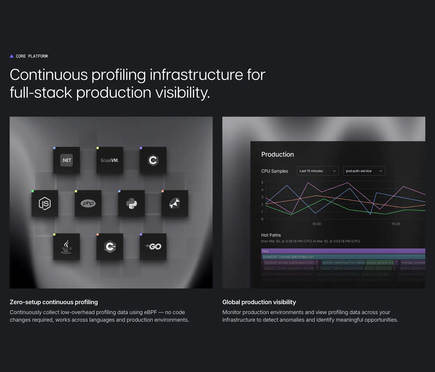
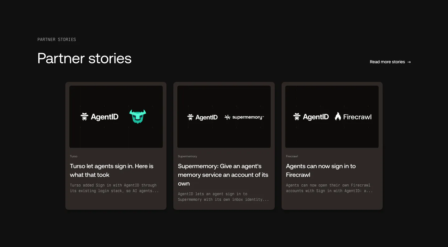
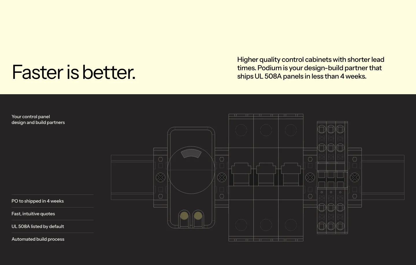
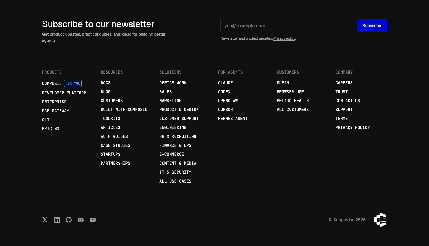
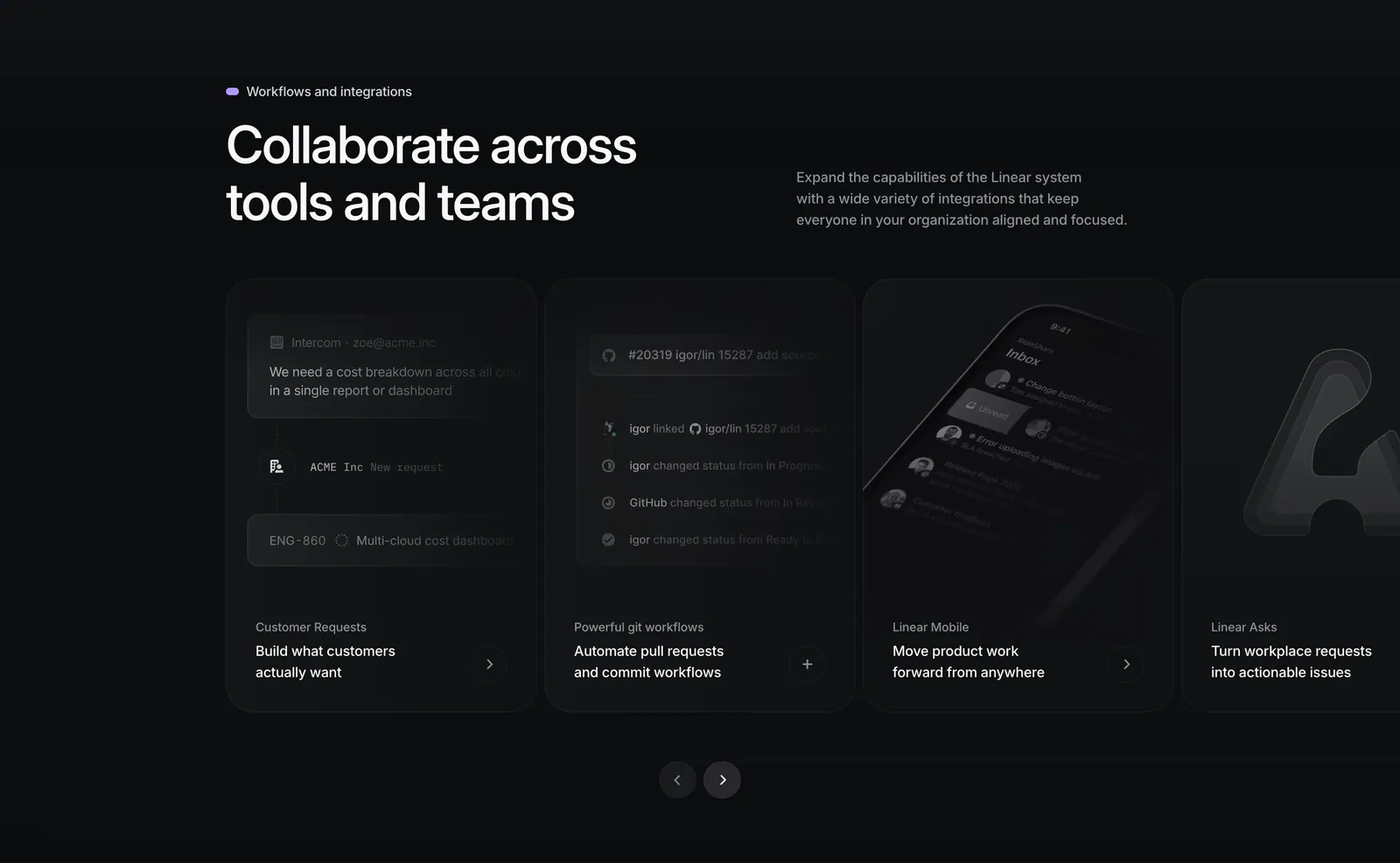
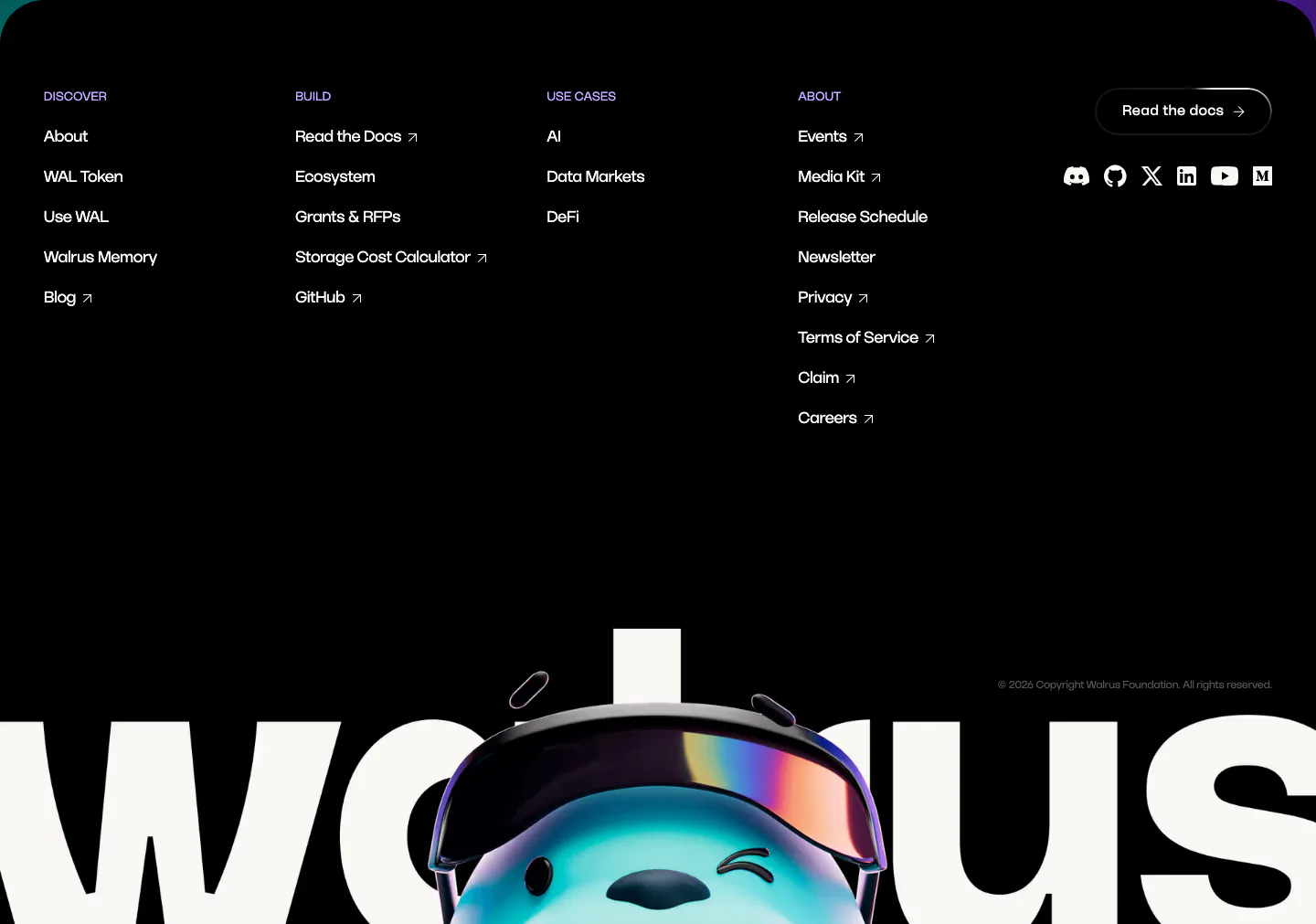
Product screenshots glow against a dark field, which is much of the appeal of dark mode website design. Near-black, charcoal, or deep navy backgrounds suit developer tools and interface-heavy products, and accent colors read louder on them. Small mistakes show more, though. Muted gray text turns murky, shadows disappear, and long paragraphs of light-on-dark copy tire the eye quickly.






























































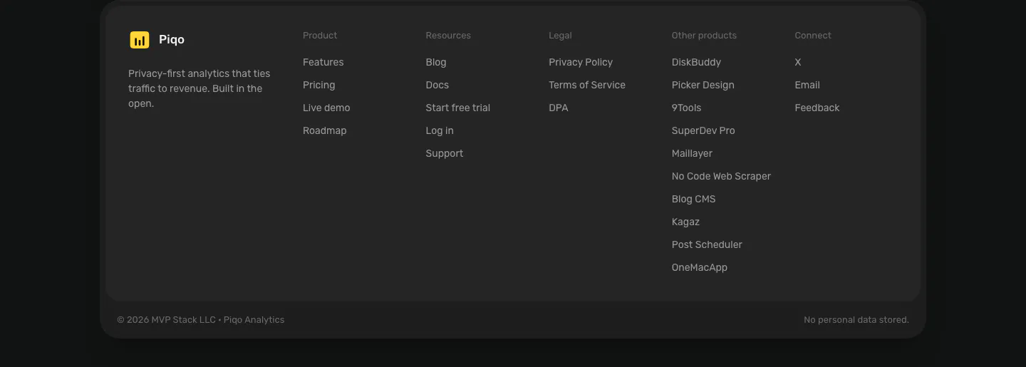




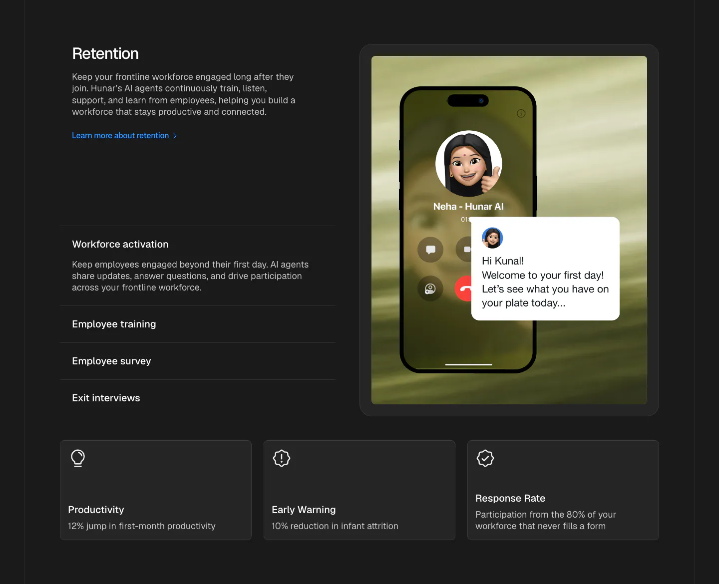

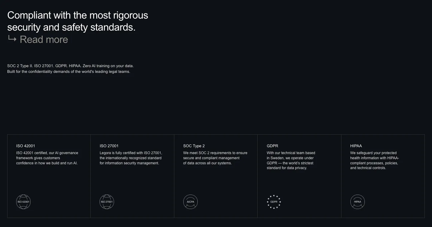
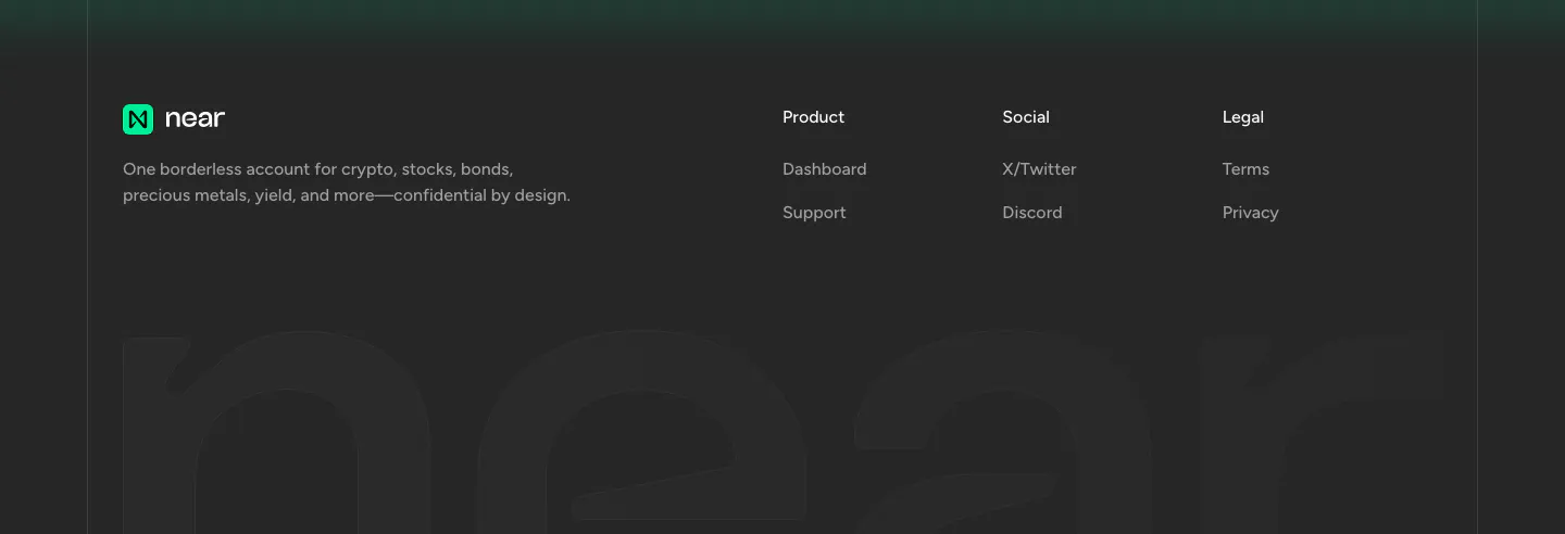
























































































































































































































































































Where dark mode shows up
Often paired with
How to design a dark mode section
-
Skip pure black backgrounds
Use a near-black such as #0B0B0F or a deep navy instead of #000. Pure black makes white text bloom and leaves no room for depth. A slightly lifted base lets you layer cards one or two steps lighter to show hierarchy.
-
Test contrast on every text level
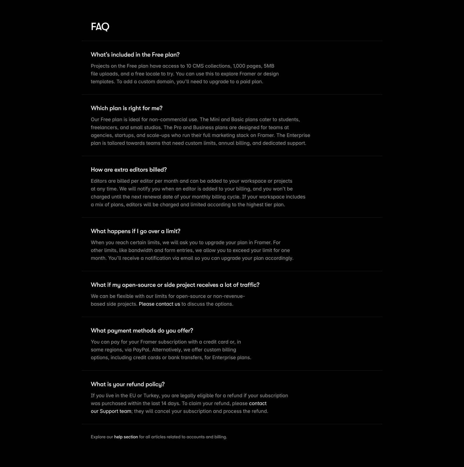
Body copy needs at least 4.5:1 against the background, and muted captions often fall short. Check secondary text, placeholders, and disabled states, not just headlines. Drop the weight slightly for white text, since light type on dark looks heavier than it is.
-
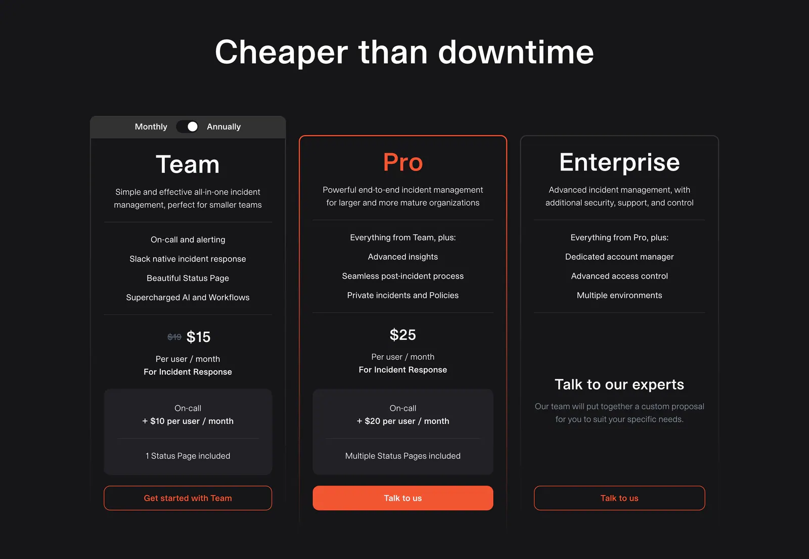
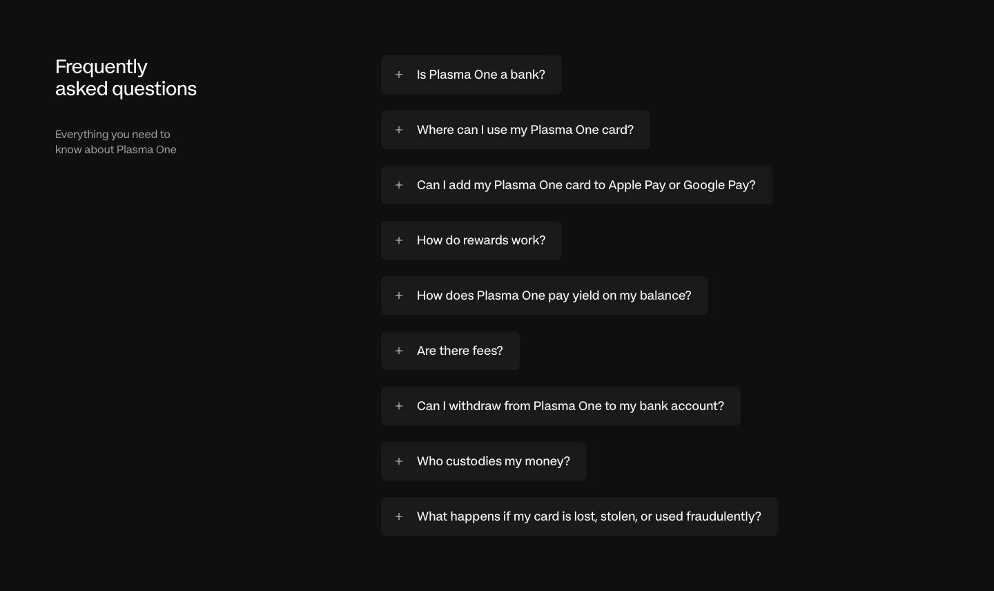
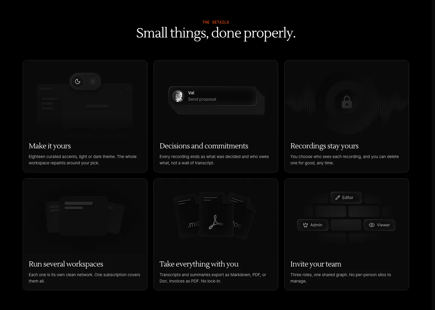
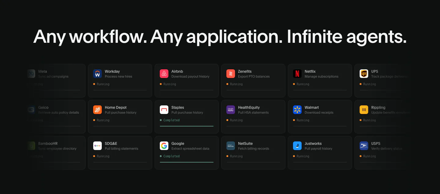
Separate surfaces with borders, not shadows
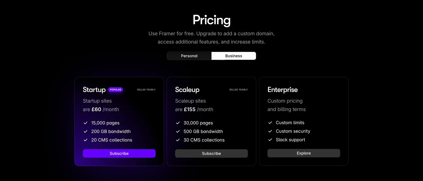
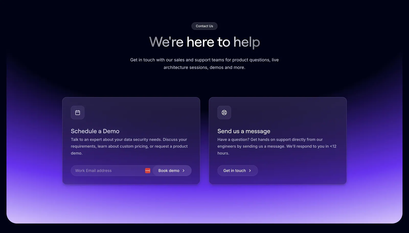
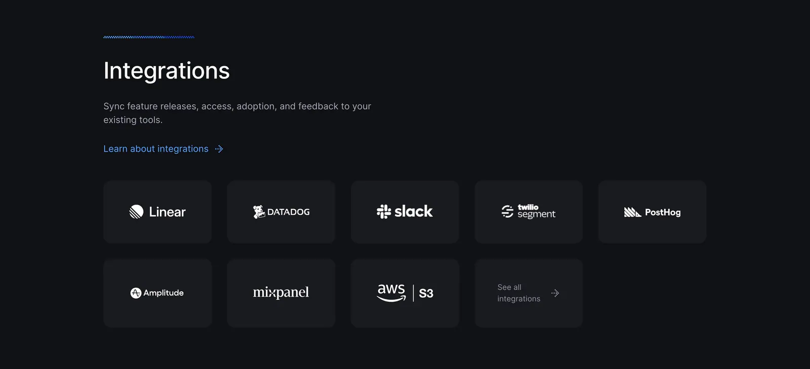
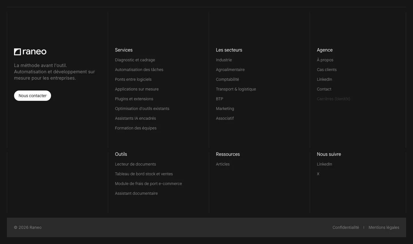
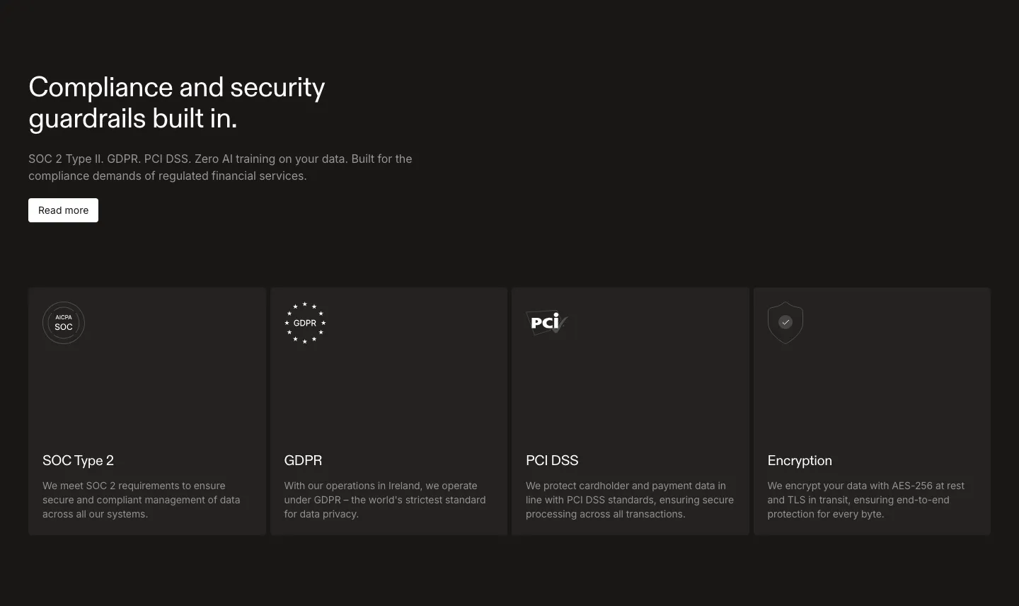
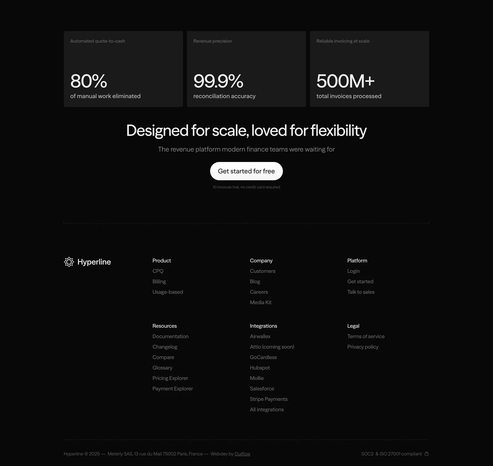
Shadows barely register on dark backgrounds. Define cards and panels with a 1px border in low-opacity white, or a fill a few shades lighter than the page. Use the same treatment across the section so the grid reads as one system.
-
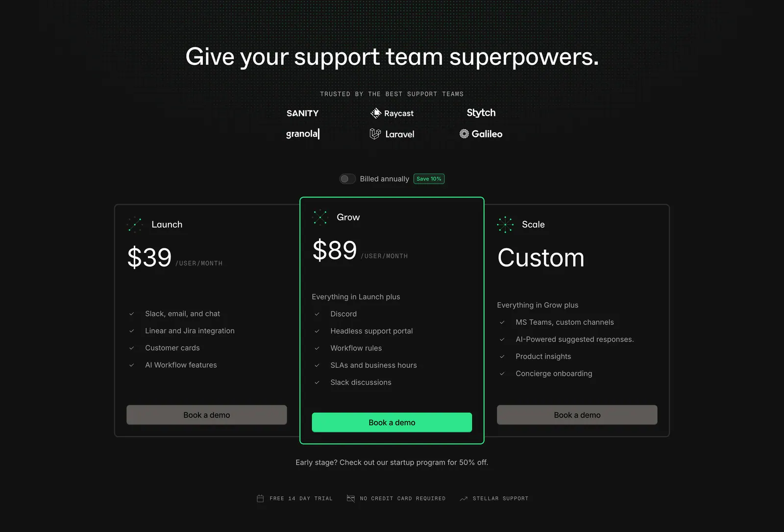
Desaturate accents for dark backgrounds
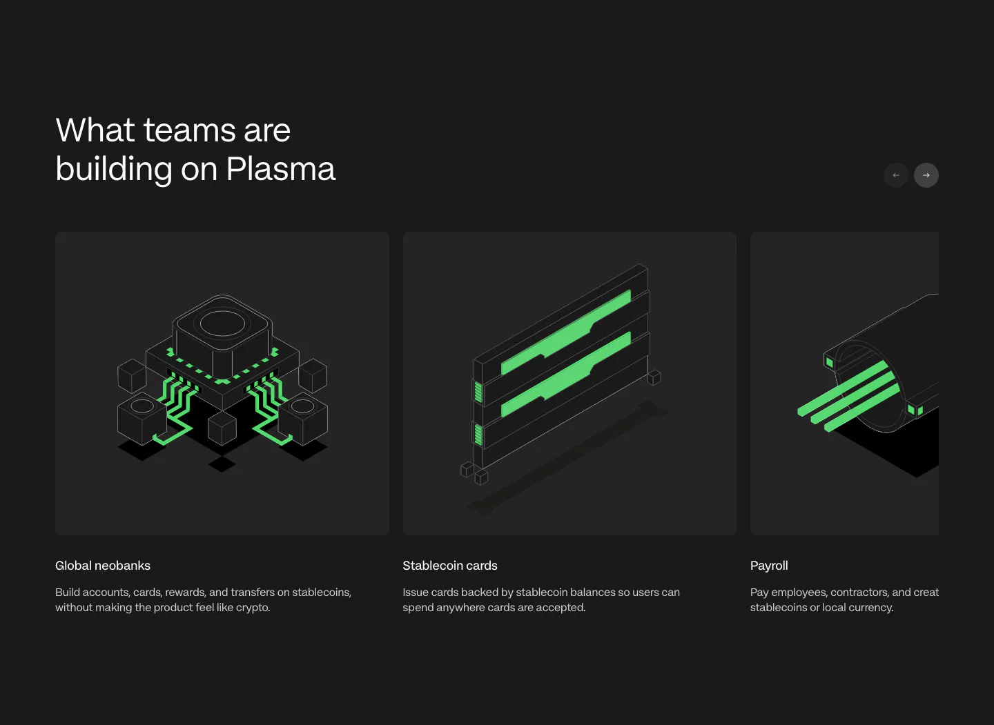
Saturated colors vibrate against near-black and look harsher than they do on white. Lighten and slightly desaturate brand accents for the dark theme, and stick to one or two of them. Test links and focus rings too, since a dark blue that works on white often disappears here.