Warm Neutral Website Design Examples

Pure white reads as a screen. Cream, beige, sand, or a warm off-white reads more like paper, and that shift gives warm neutral website design its softer, editorial feel. It fits brands that want to seem thoughtful and human rather than technical. The catch is the rest of the palette. Cool gray text and borders look dirty on a warm background, so every neutral needs a warm tint.
186 sections

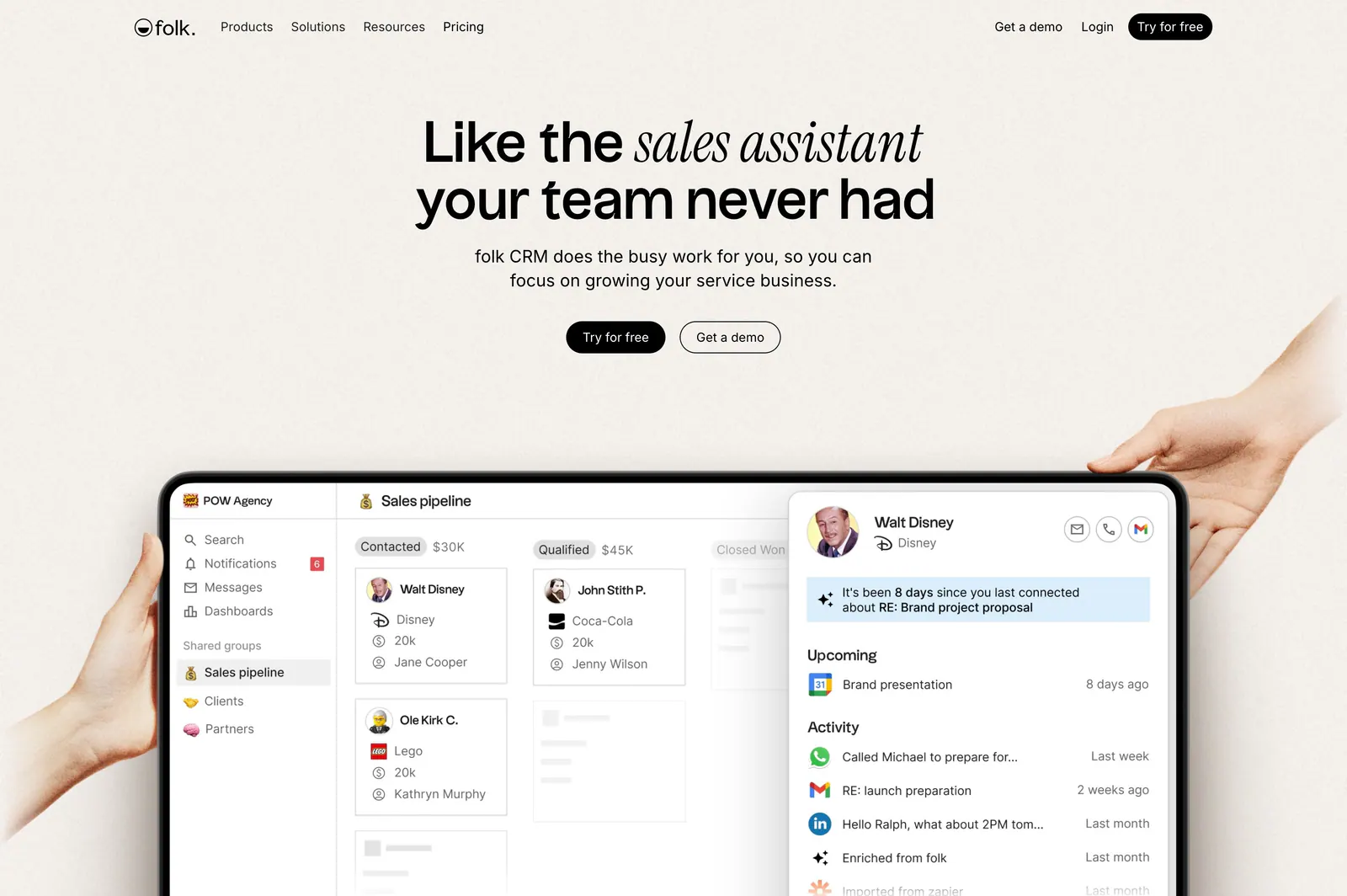
  1. folk hero section: centered headline with two buttons above hands holding a tablet showing a CRM pipeline UI on a warm beige background
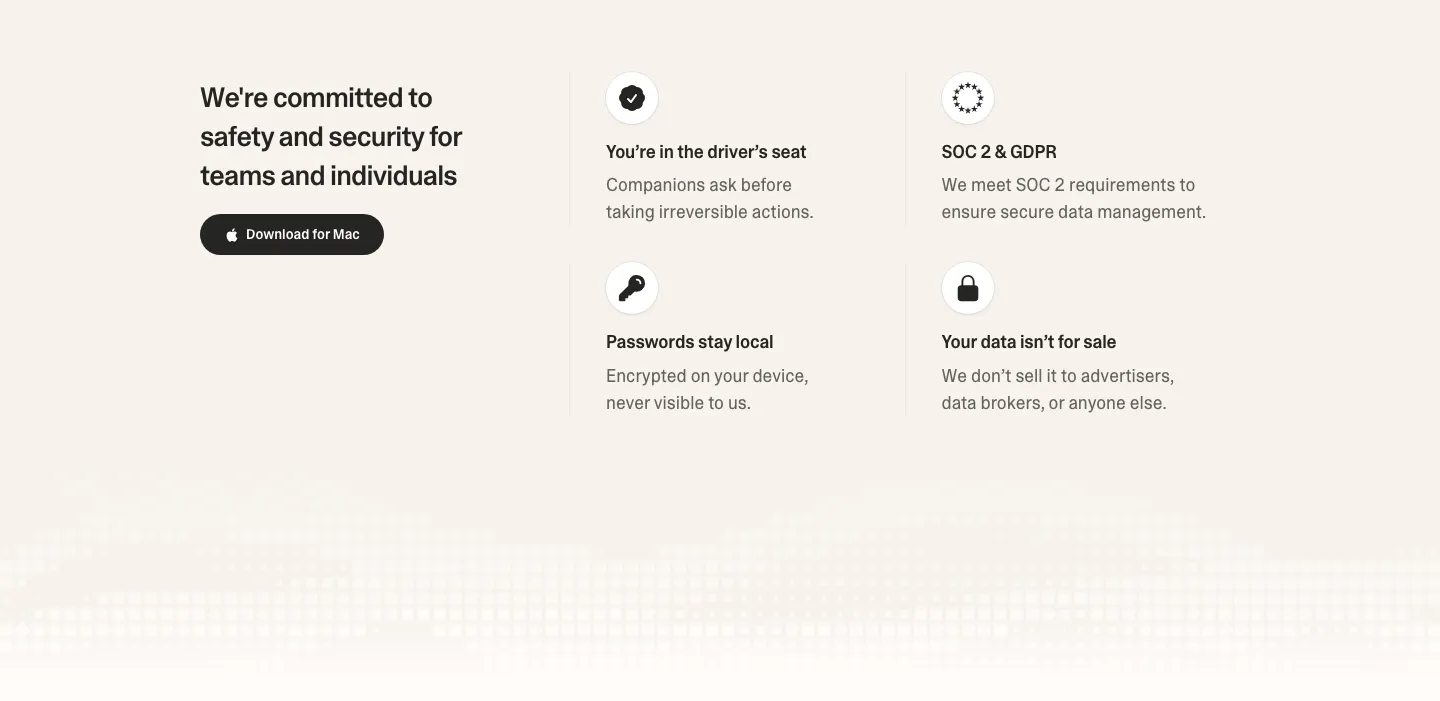
  2. Strawberry security section: headline and download button on the left, 2x2 grid of icon trust points on the right, pixel fade below
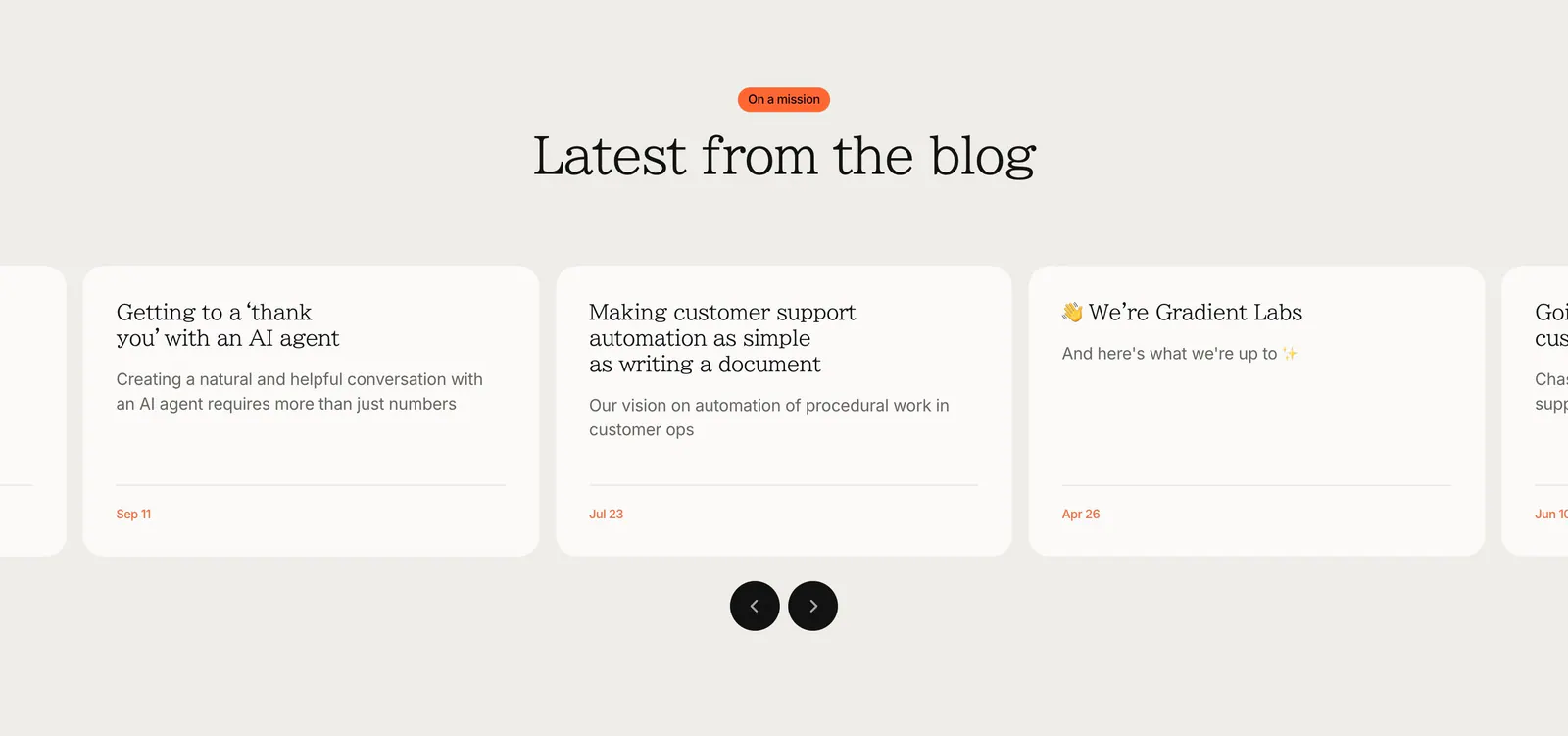
  3. Gradient Labs blog & resources section: centered serif heading above a carousel of off-white article cards with round arrow buttons
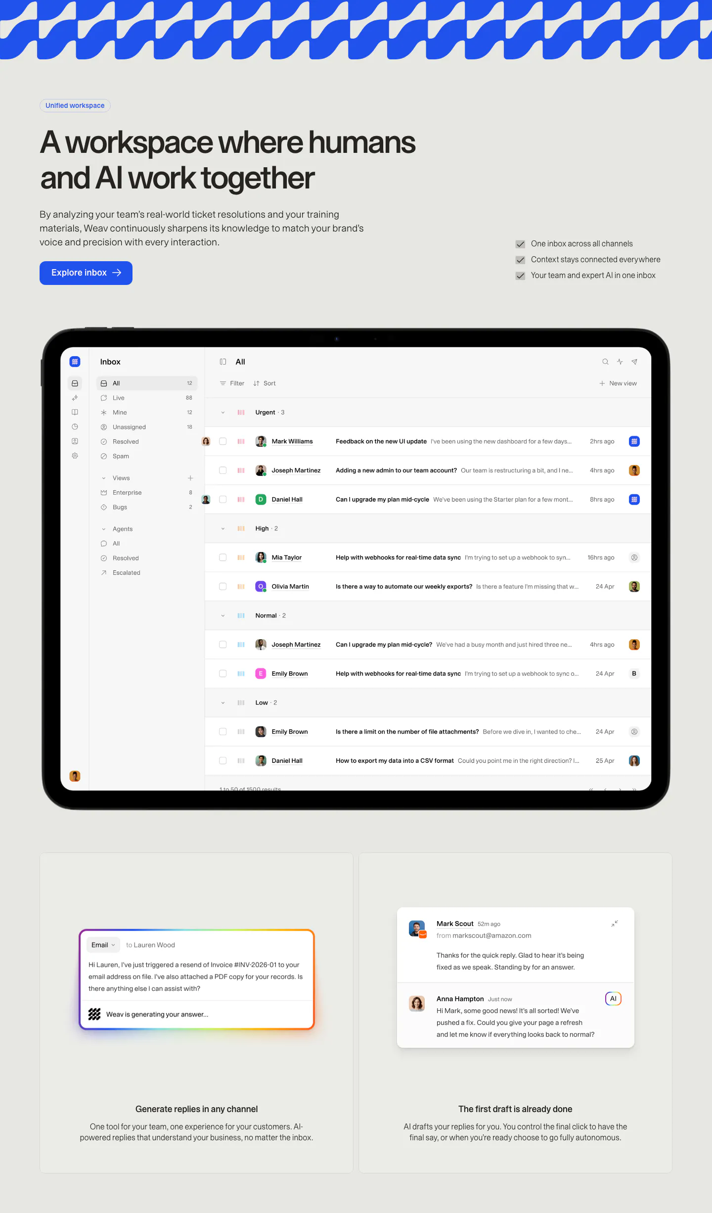
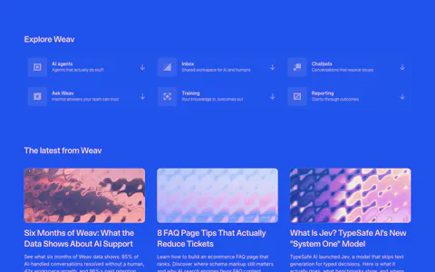
  4. Weav features section: headline, button and checklist above a tablet showing a support inbox, with two cards for AI drafted replies below
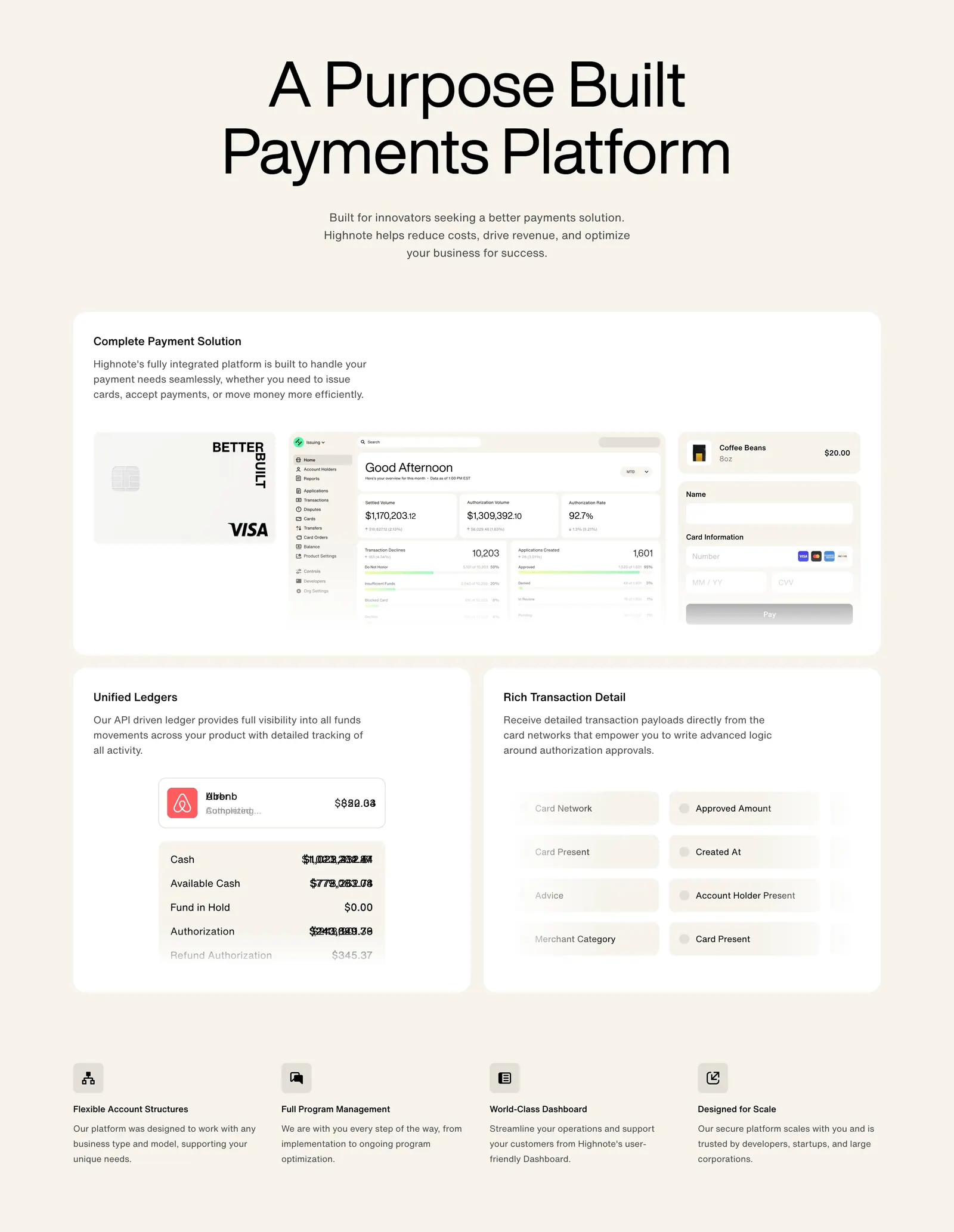
  5. Highnote features section: centered headline above large cards with card, dashboard and ledger UI, then a four-column feature list
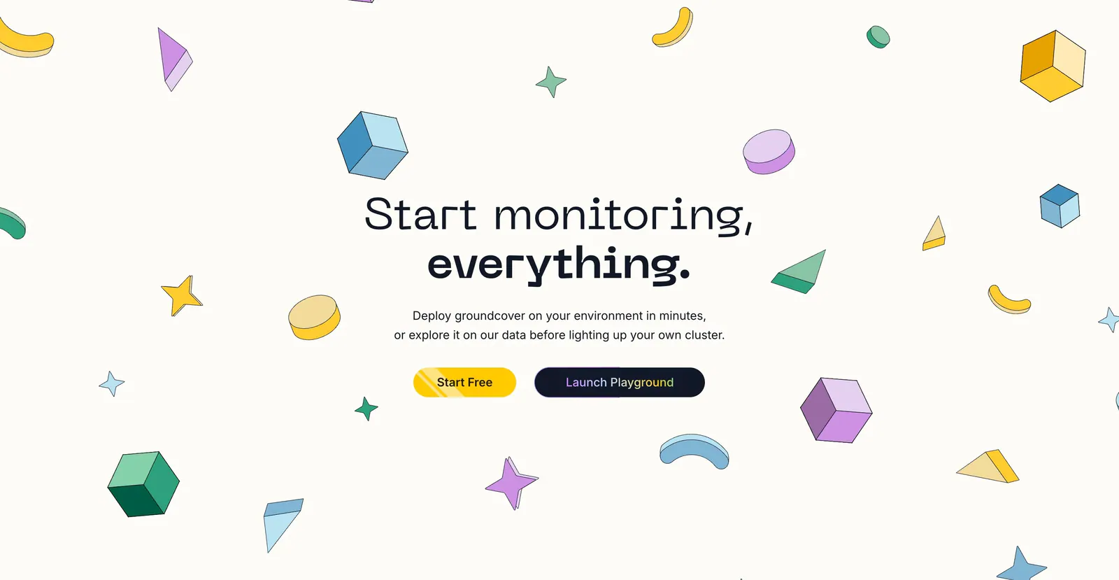
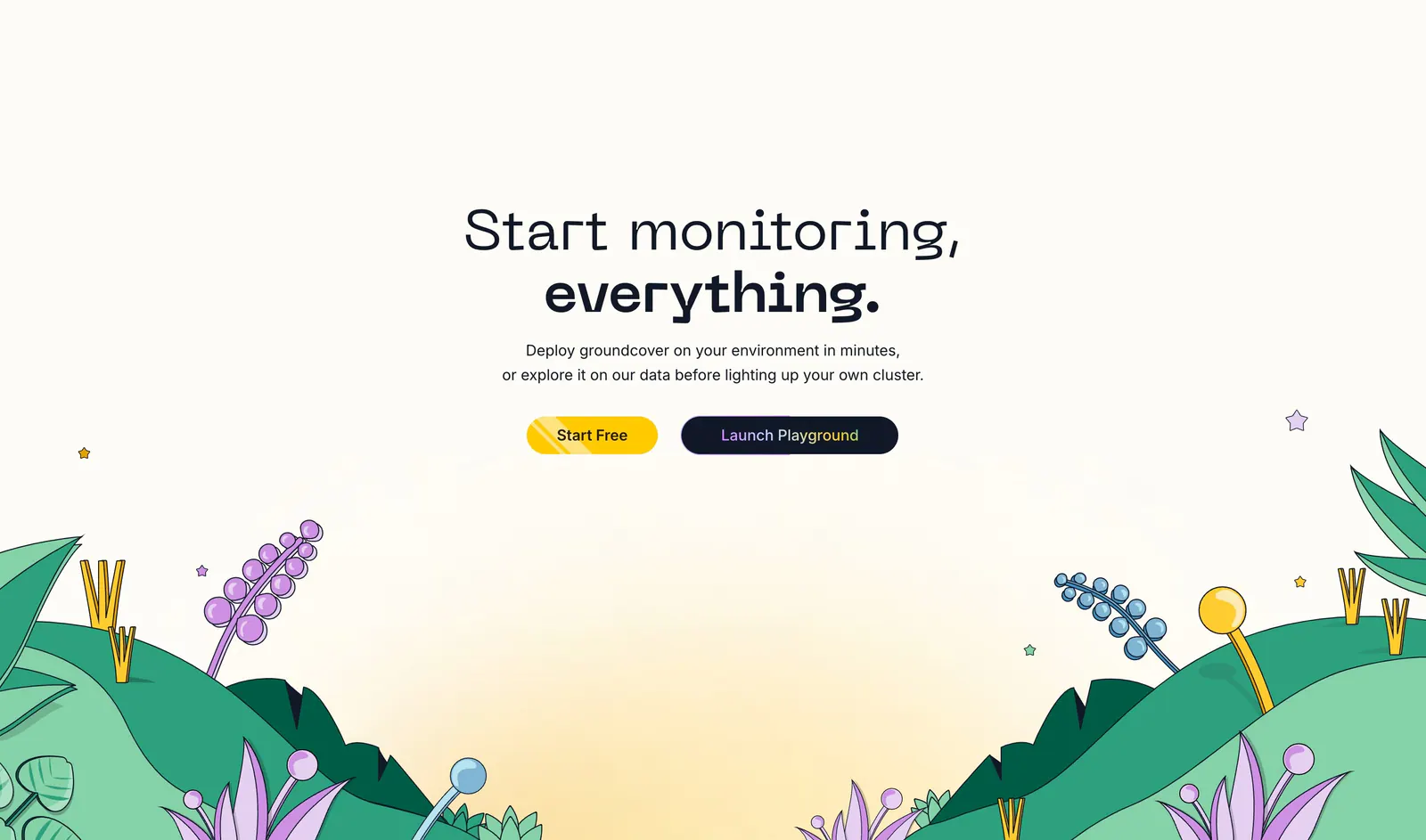
  6. groundcover call-to-action section: centered headline with yellow and dark buttons surrounded by scattered isometric shapes on cream
  7. Antimetal footer section: five corner-bracketed boxes with serif link lists, status badge, tagline and dotted logo mark on warm gray
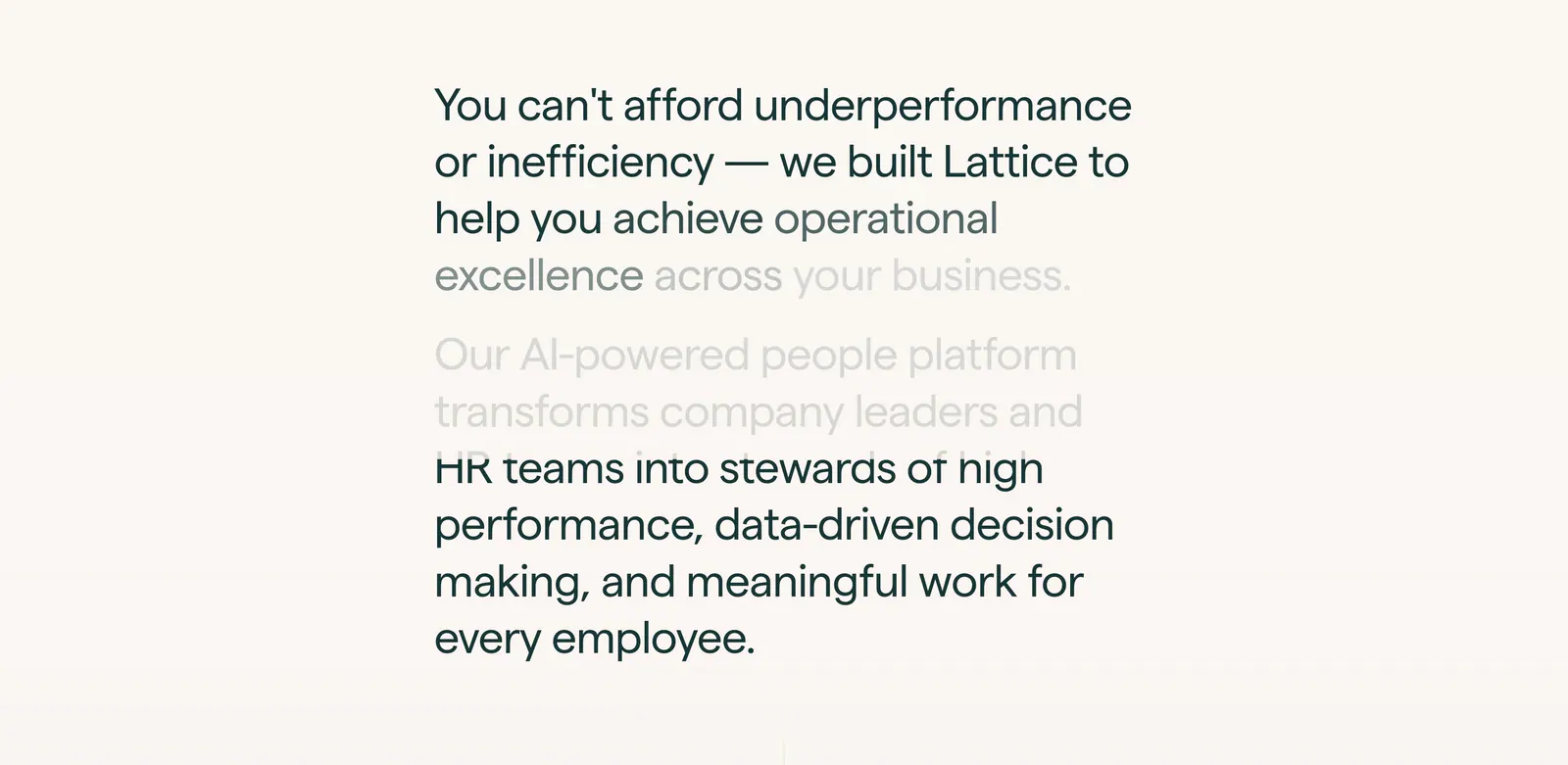
  8. Lattice about & mission section: large two-paragraph mission statement with scroll-fade text in a narrow column on warm off-white
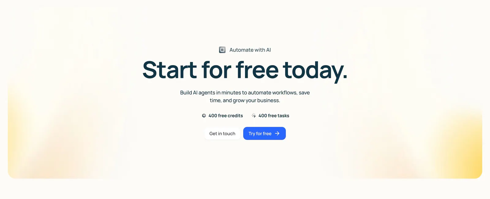
  9. Lindy call-to-action section: centered headline with free credit badges and two buttons inside a cream panel with soft yellow corner glows
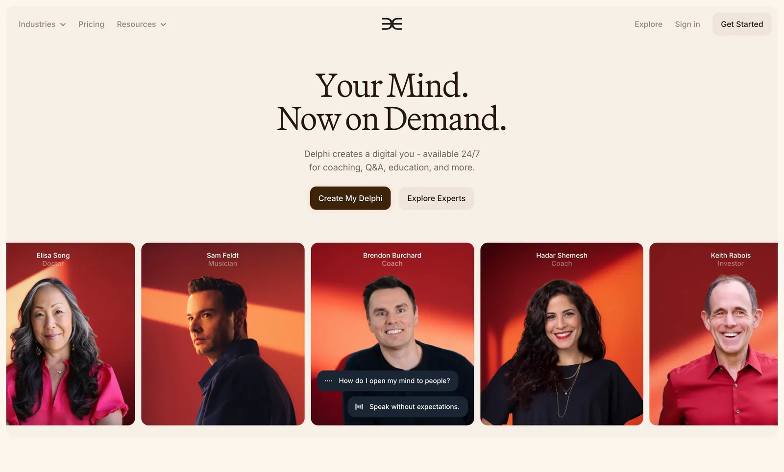
  10. Delphi hero section: centered serif headline with two buttons above a row of expert portrait cards on red backgrounds, on a cream page
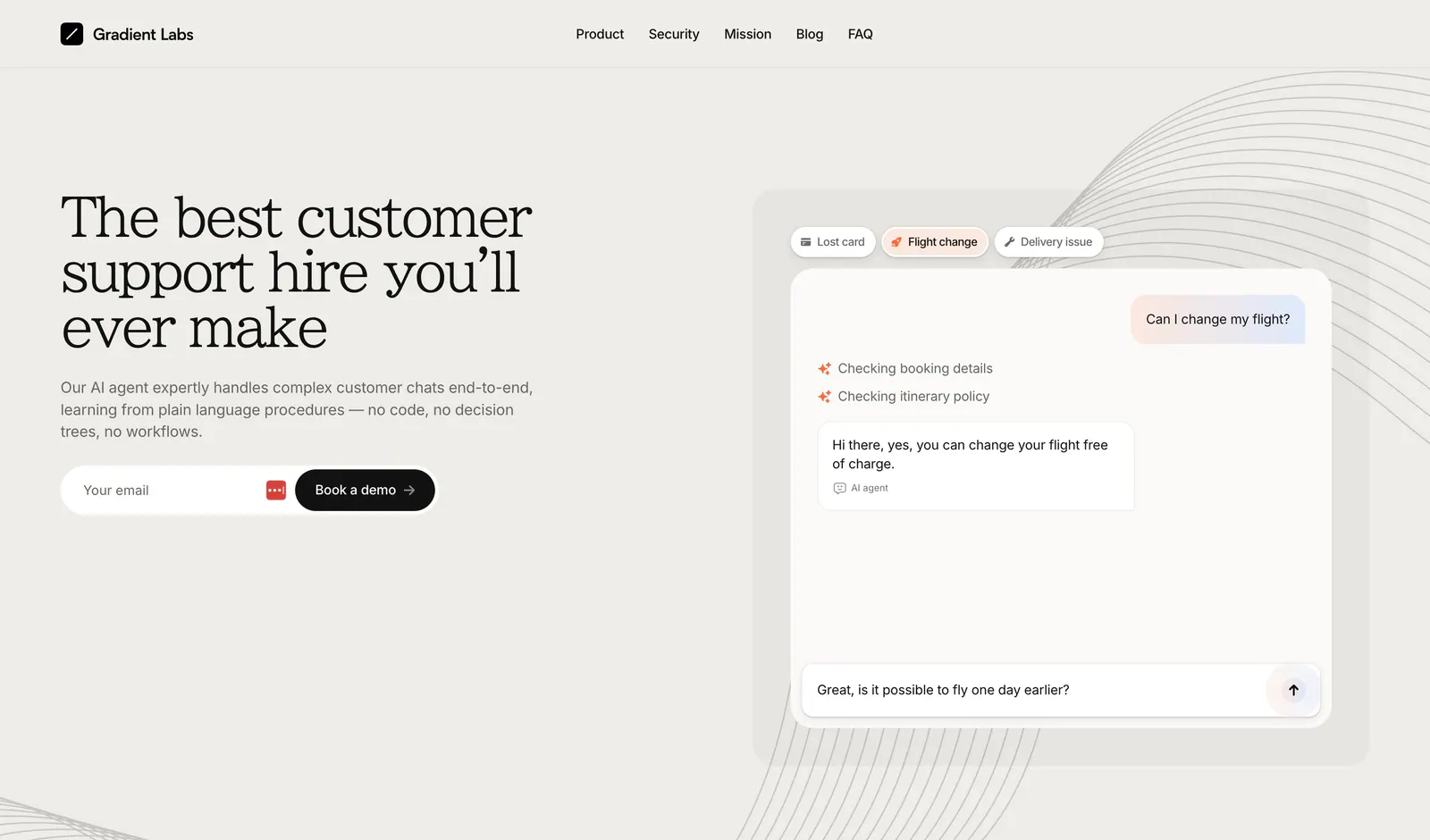
  11. Gradient Labs hero section: serif headline, copy and email field on the left with a support chat mockup on the right on beige
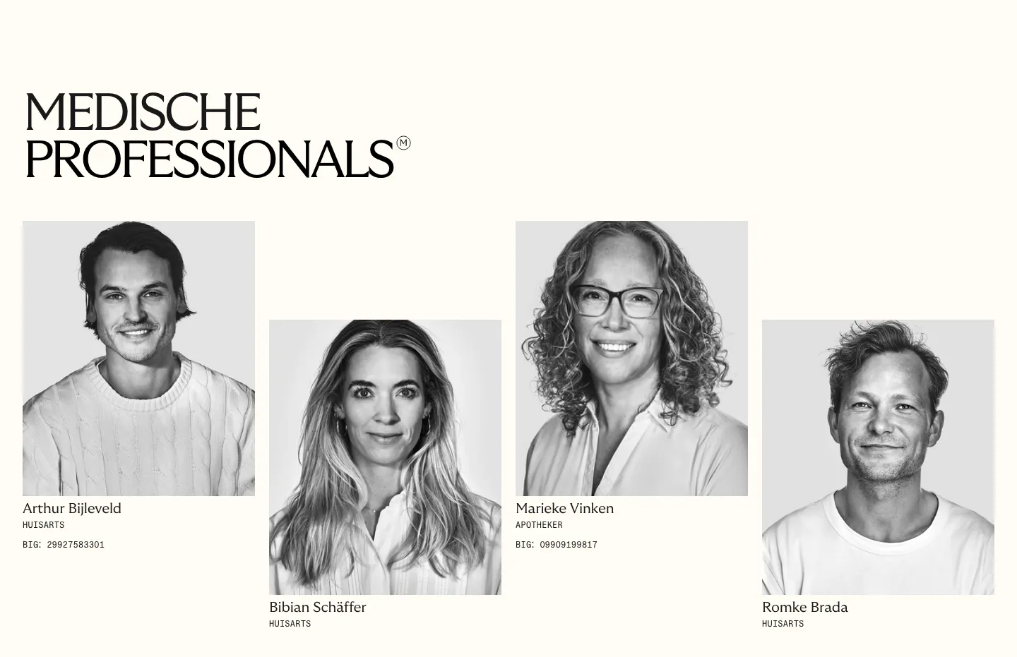
  12. Menkind team section: serif headline above four staggered black-and-white portraits of medical professionals with roles on cream
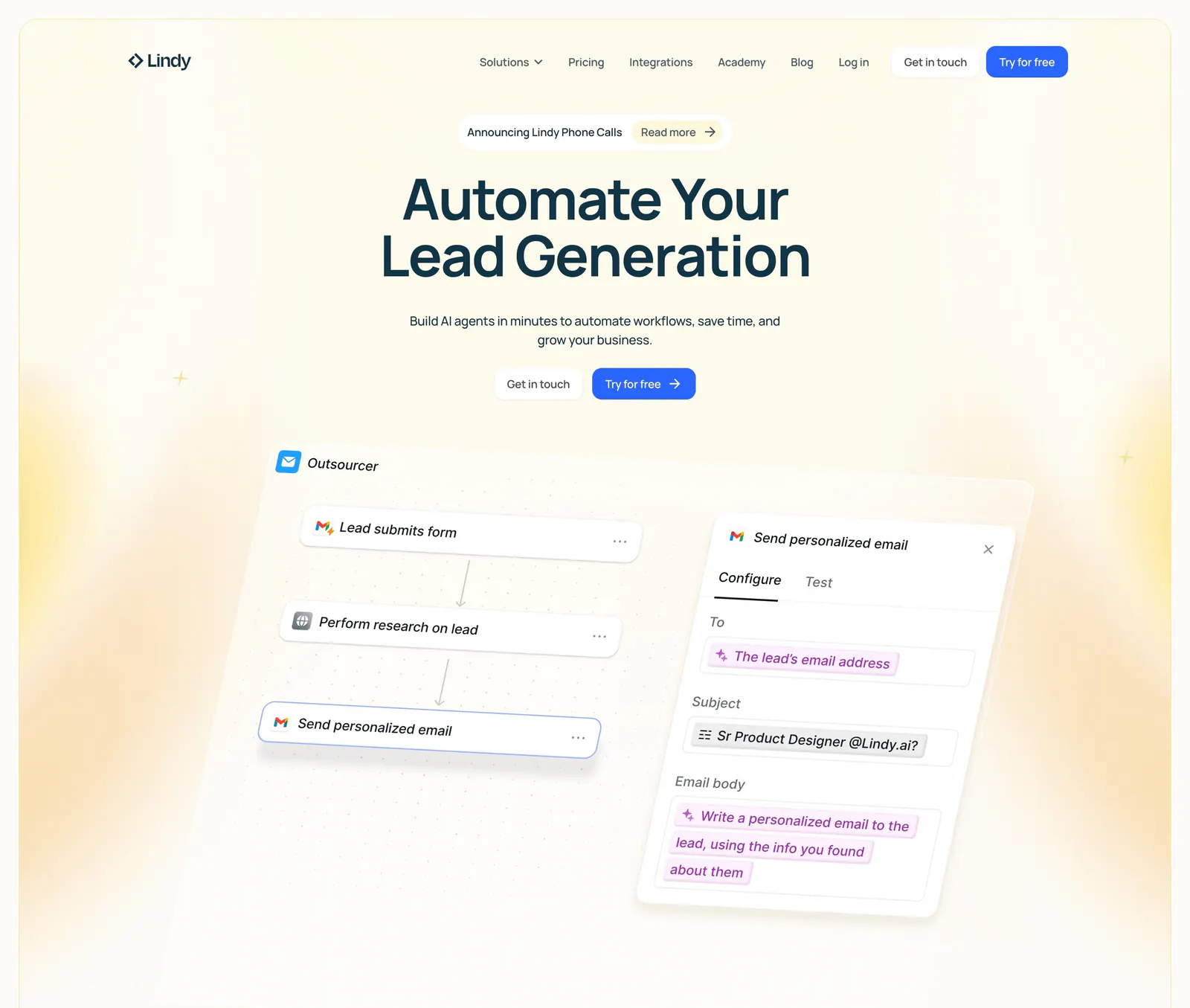
  13. Lindy hero section: nav bar, centered headline and two CTAs above a tilted workflow builder UI with an email step panel, framed by yellow glows
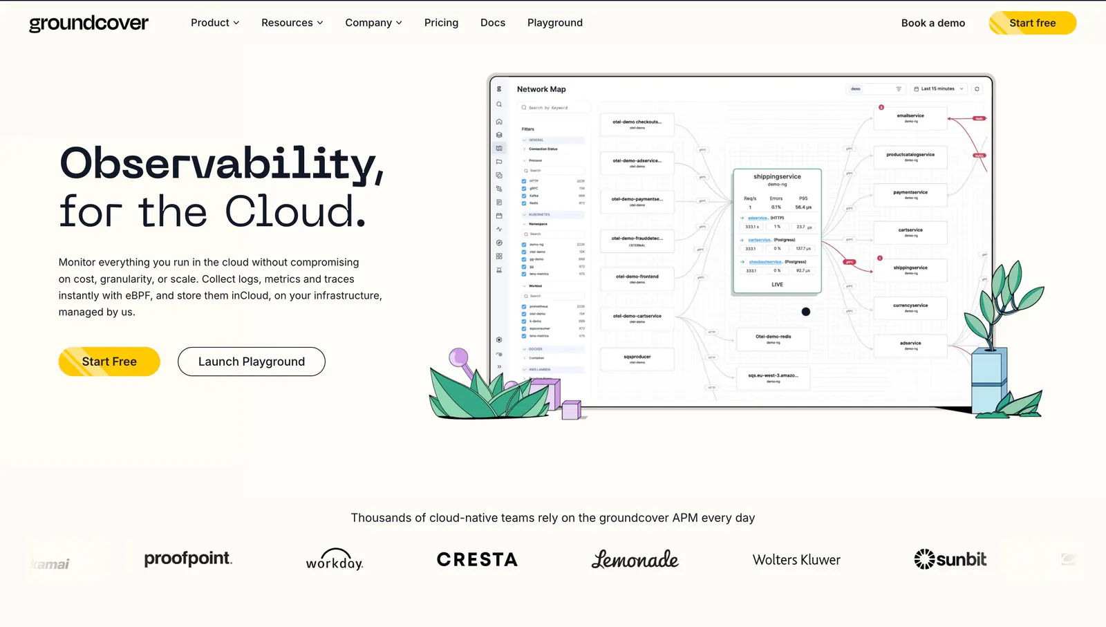
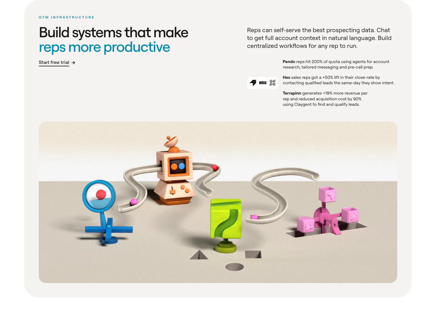
  14. groundcover hero section: headline, copy and buttons on the left, network map screenshot with plant drawings on the right, logo row below
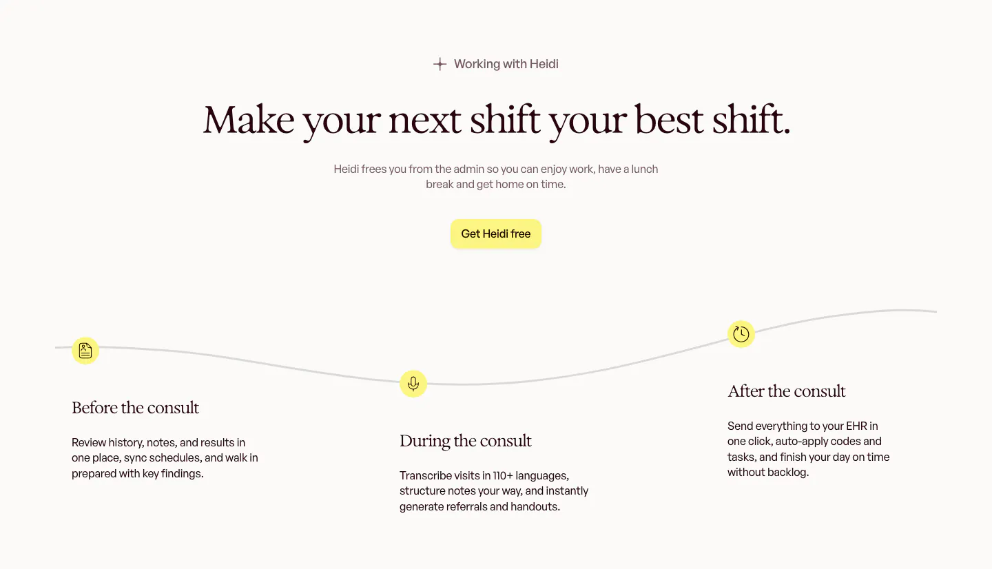
  15. Heidi how it works section: centered serif headline above a wavy timeline with before, during and after the consult steps
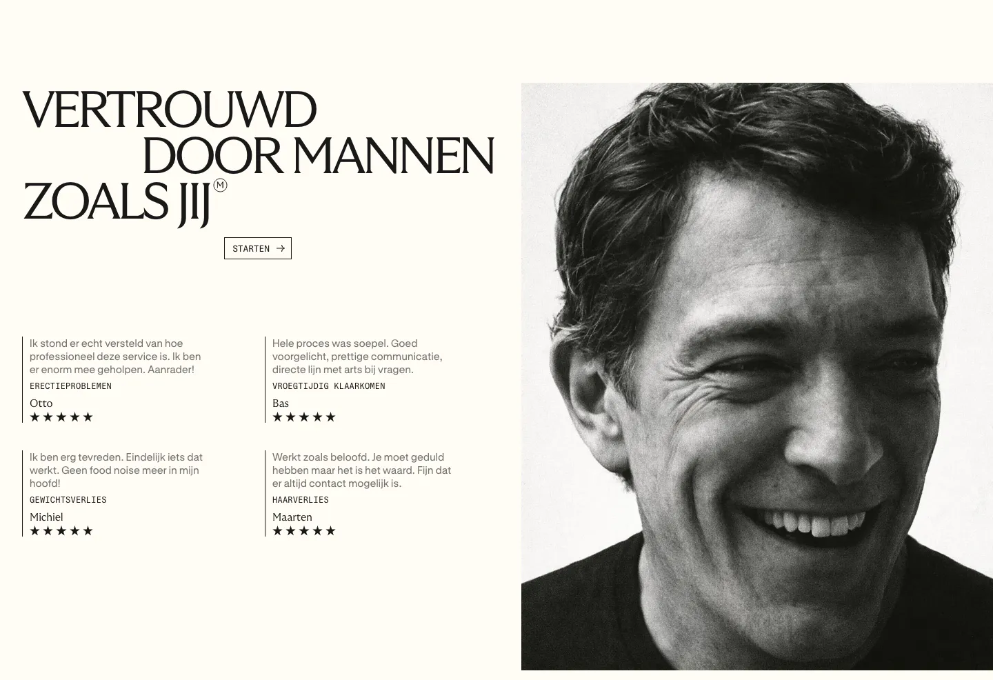
  16. Menkind testimonials section: serif headline and four starred review quotes beside a large black-and-white portrait on cream
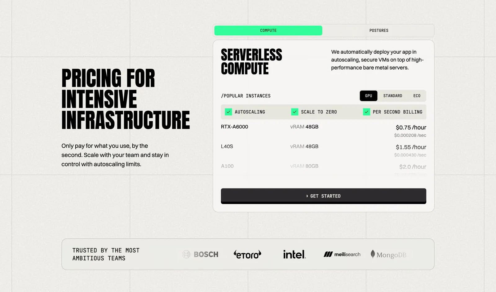
  17. Koyeb pricing section: condensed headline on the left, tabbed GPU instance price card on the right, logo strip below
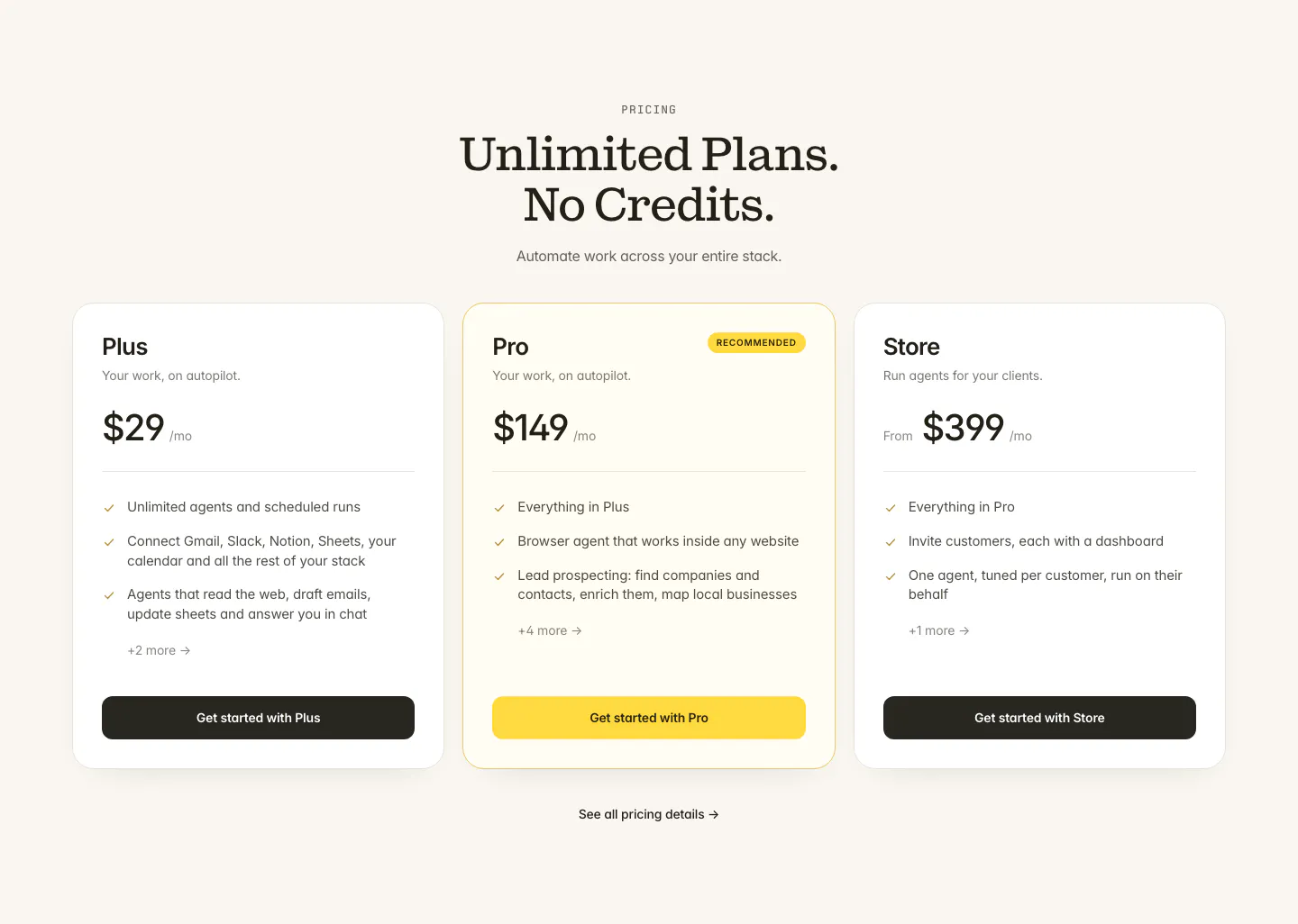
  18. Twin pricing section: centered serif headline above three plan cards with the middle Pro plan highlighted in yellow on cream
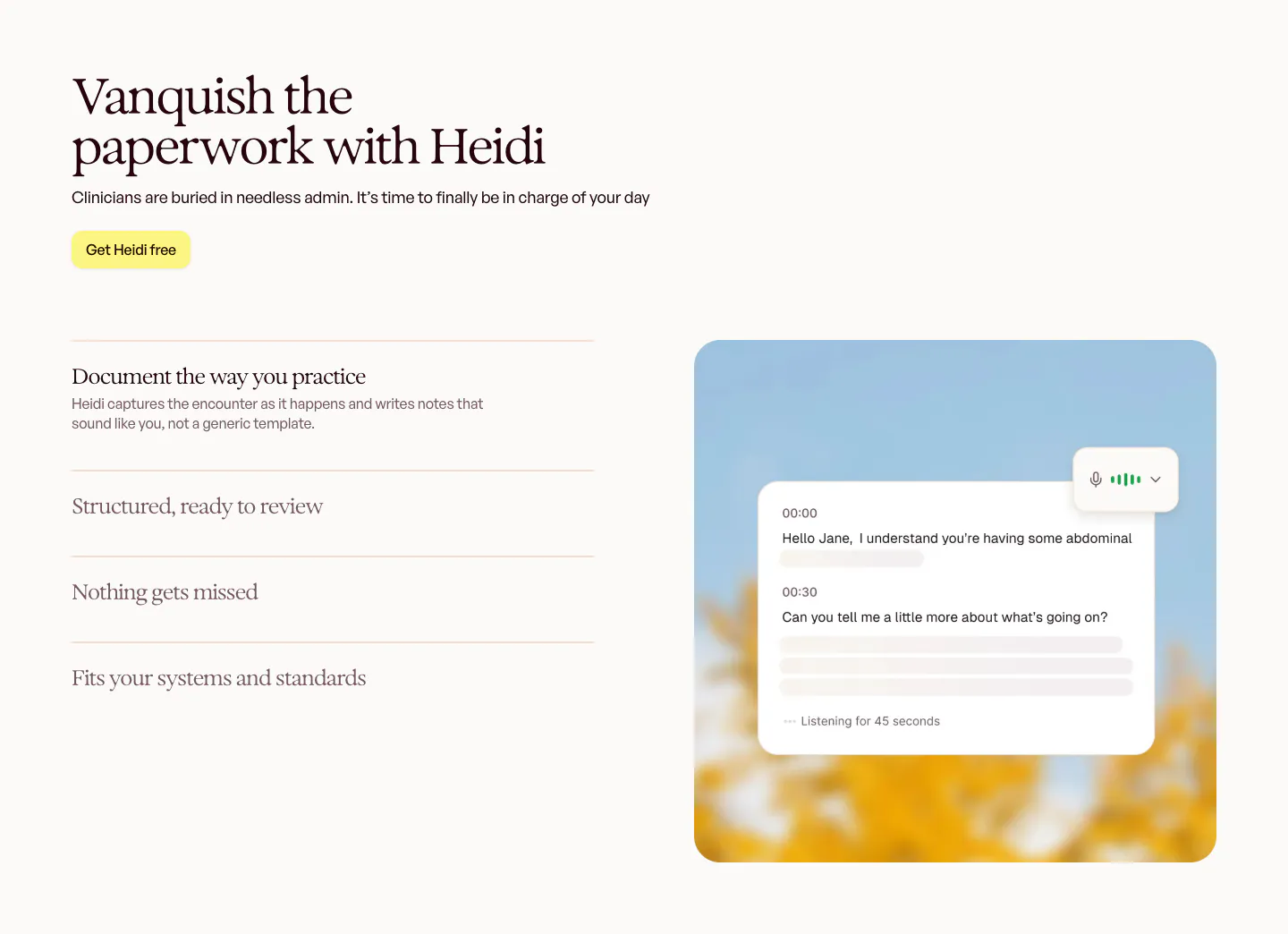
  19. Heidi features section: serif headline and accordion feature list on the left, live transcript card over a blurred sky photo on the right
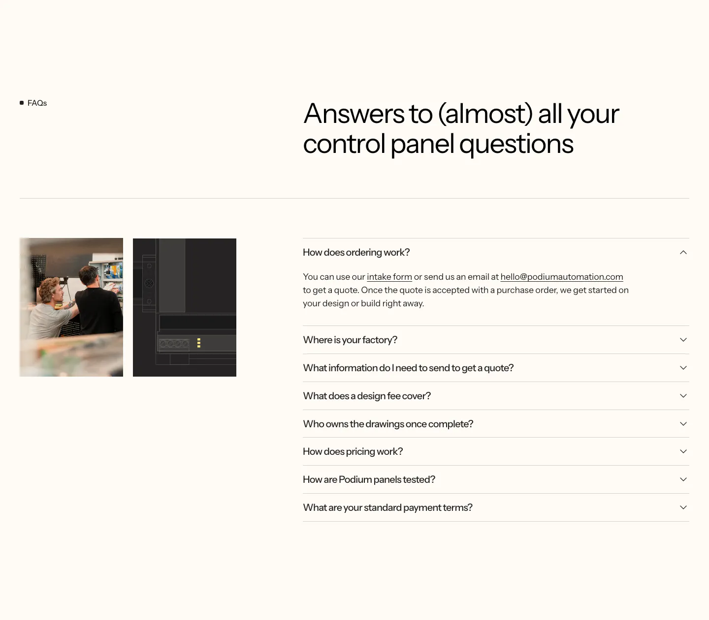
  20. Podium Automation FAQ section: two small photos on the left, headline and accordion of questions on the right, cream background
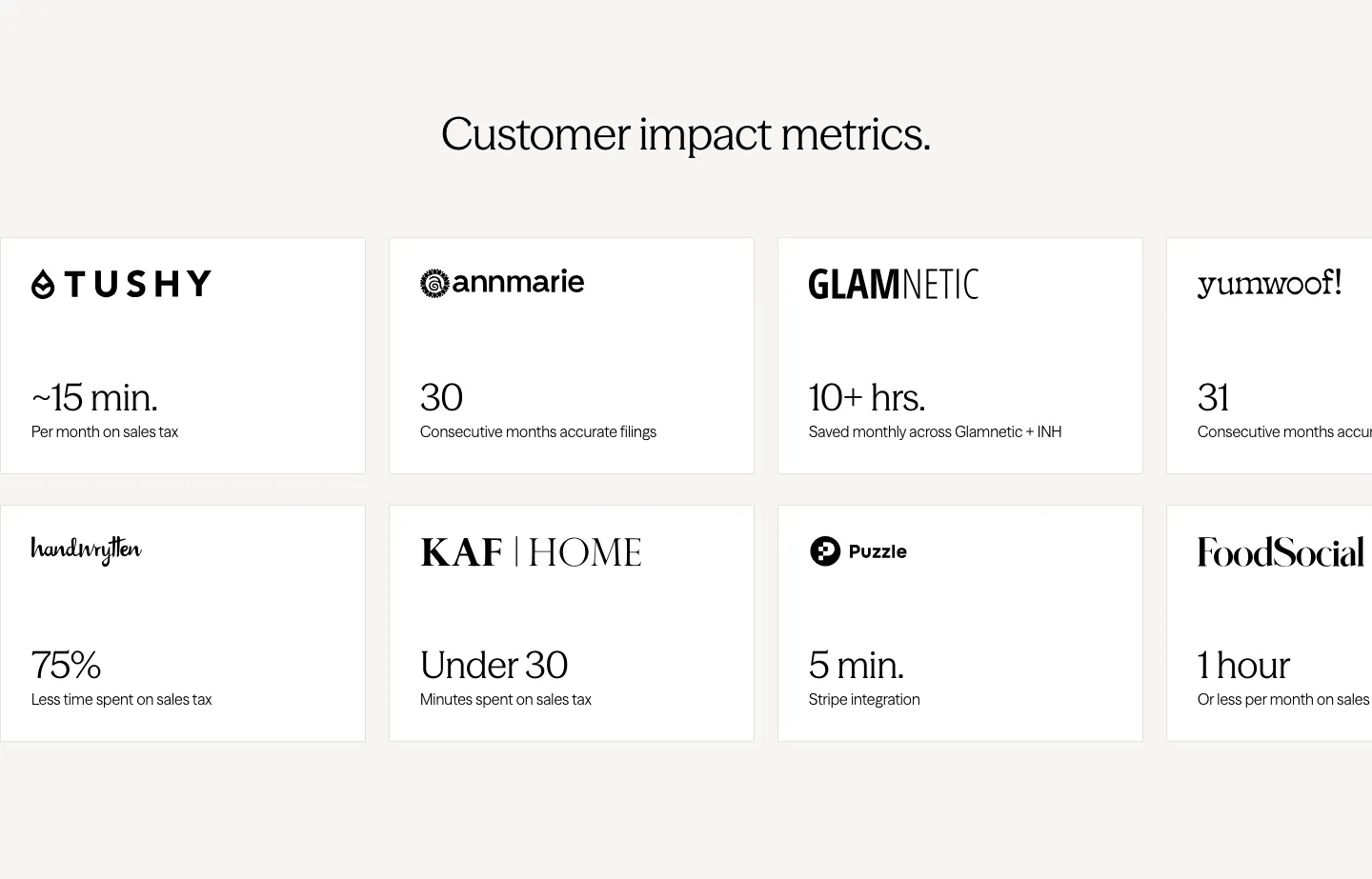
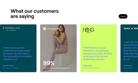
  21. Zamp stats section: centered heading above two rows of white cards pairing customer logos with time-saved figures, cut off at the right edge
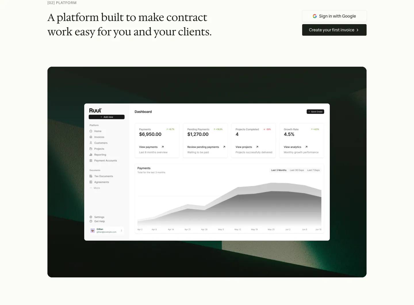
  22. Ruul features section: serif headline with two buttons above a dashboard screenshot on a dark green textured panel
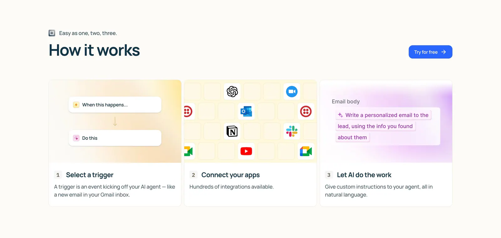
  23. Lindy how it works section: left-aligned heading and button above three numbered step cards with trigger, app icon grid and AI prompt visuals
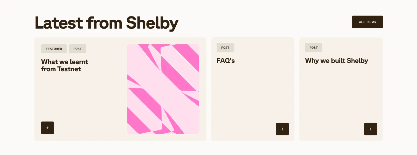
  24. Shelby blog & resources section: headline with All news button above a wide featured post card with pink abstract art and two post cards
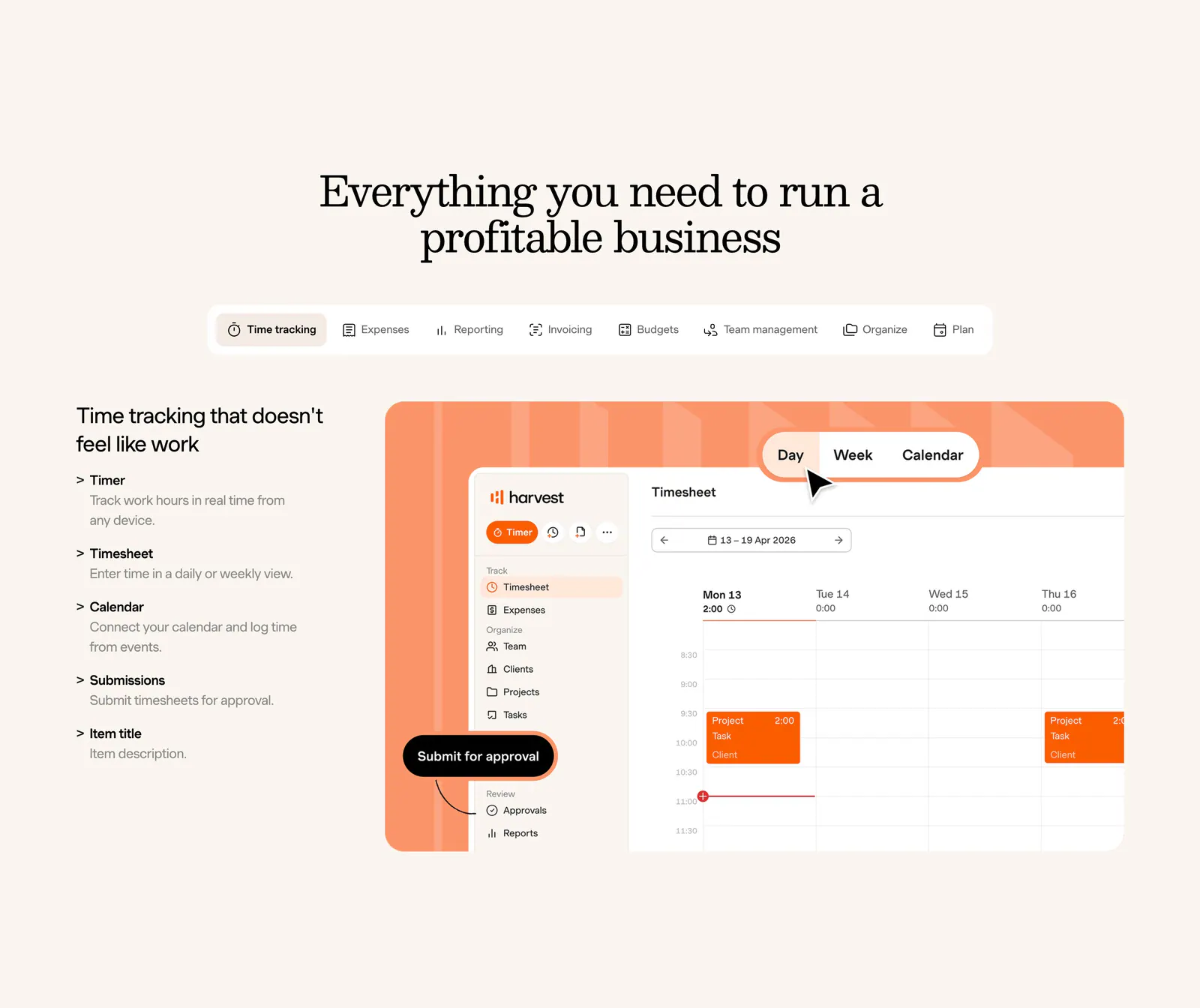
  25. Harvest features section: centered serif heading and feature tabs above a feature list beside a timesheet UI on an orange panel, cream background
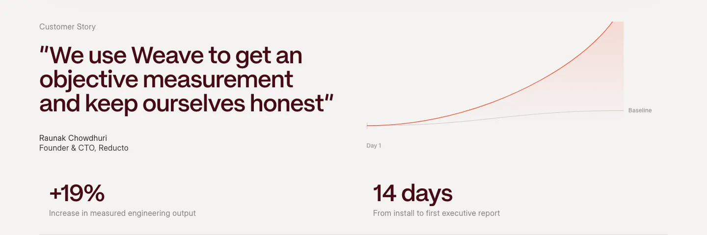
  26. Weave testimonials section: large quote with attribution beside a growth line chart, above two outcome metrics on a warm light background
  27. Nory logo cloud section: centered headline above a row of restaurant brand logos in white cards on a cream background
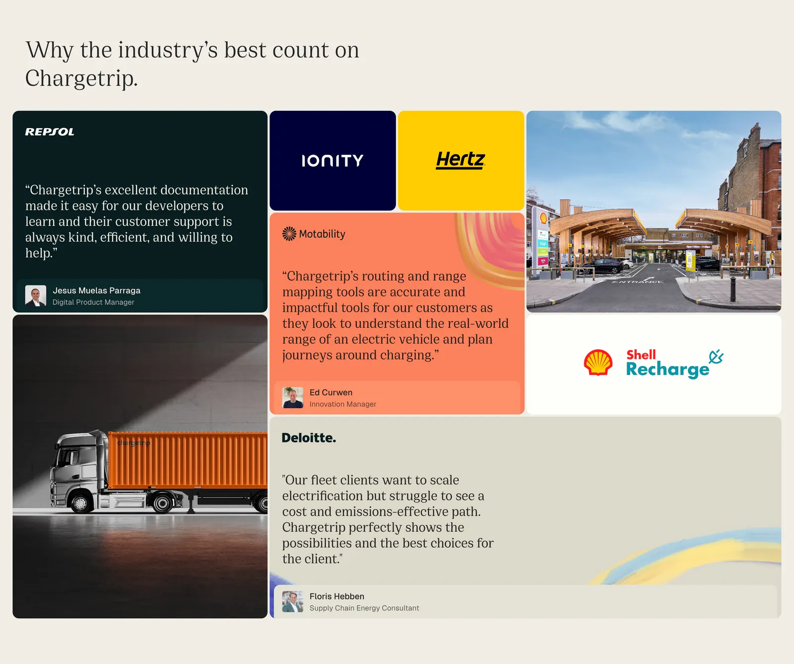
  28. Chargetrip testimonials section: bento grid of quote cards, partner logo tiles and photos of a truck and charging station on beige
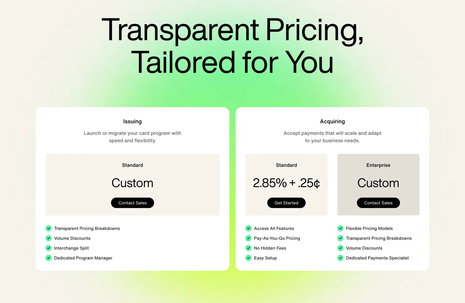
  29. Highnote pricing section: large centered headline above two white plan cards with price boxes and checklists on a green glow
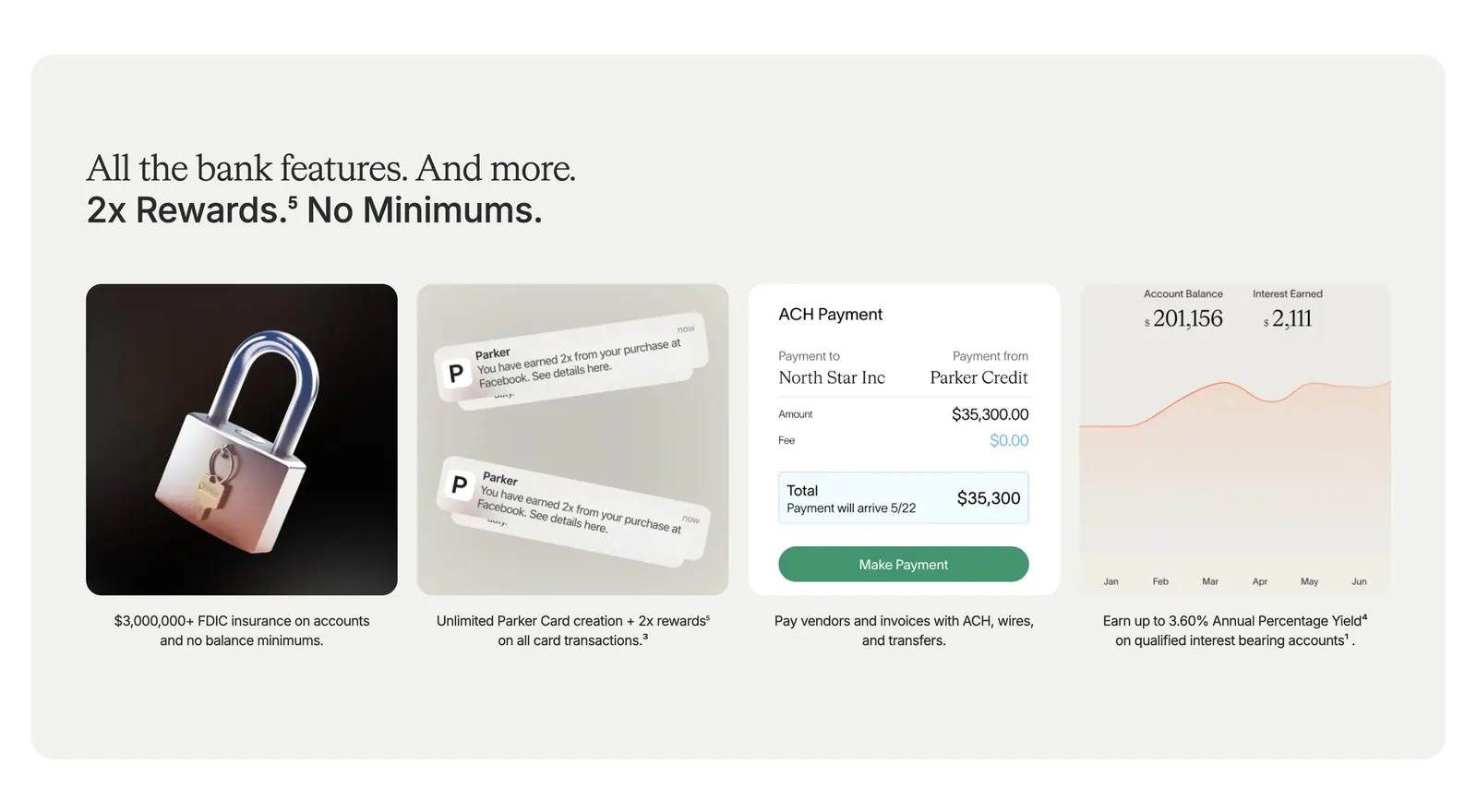
  30. Parker value proposition section: beige panel with headline above four cards showing a 3D padlock, notifications, payment UI and a yield chart
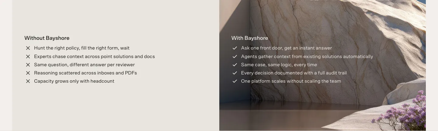
  31. Bayshore comparison section: Without Bayshore cross list on beige beside a With Bayshore check list over a sandstone landscape photo
  32. Rezolv logo cloud section: small In the News label above a single row of divided press publication logos on cream
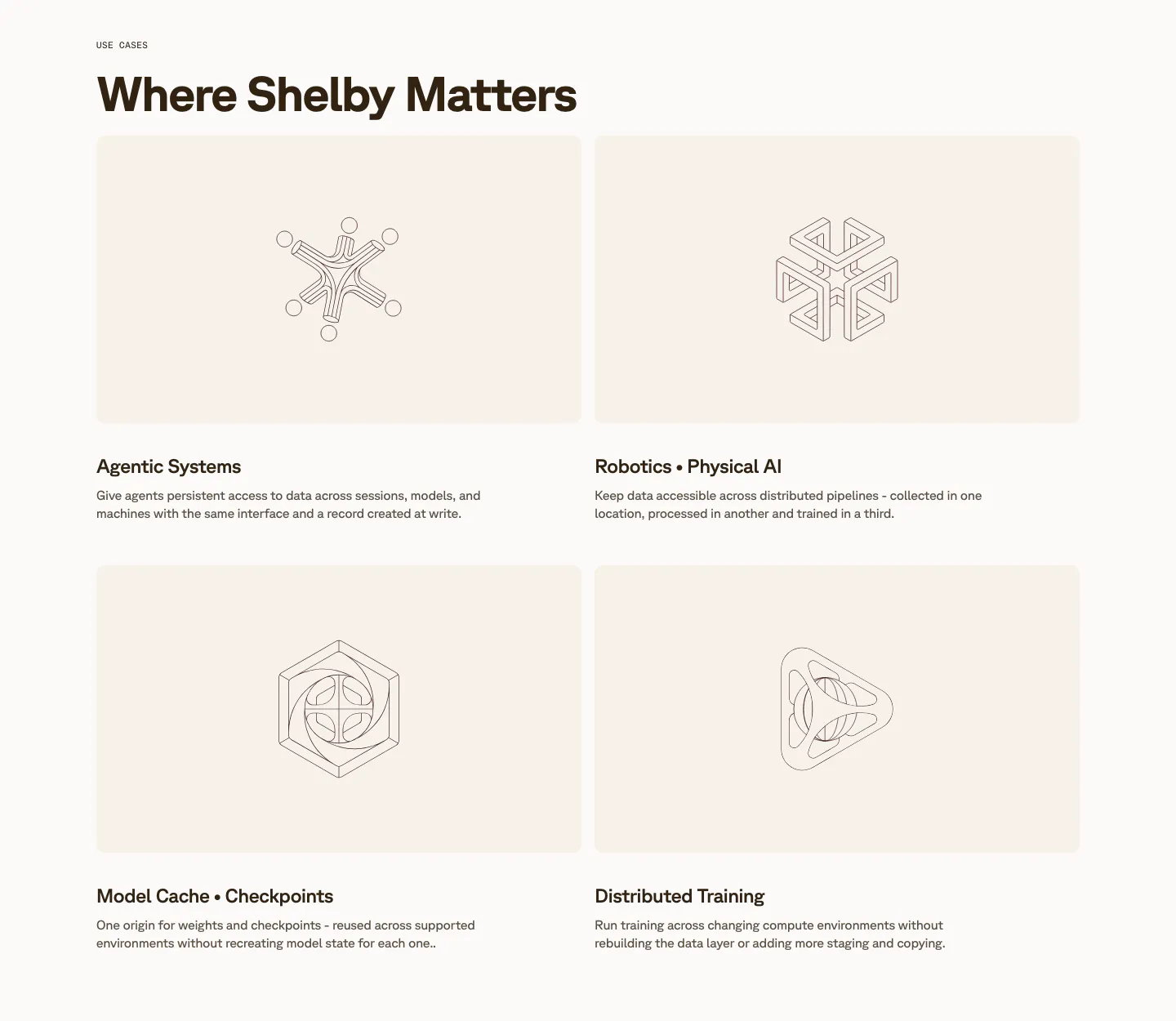
  33. Shelby use cases section: two-by-two grid of cream cards with line-drawn geometric artworks above titles like Agentic Systems
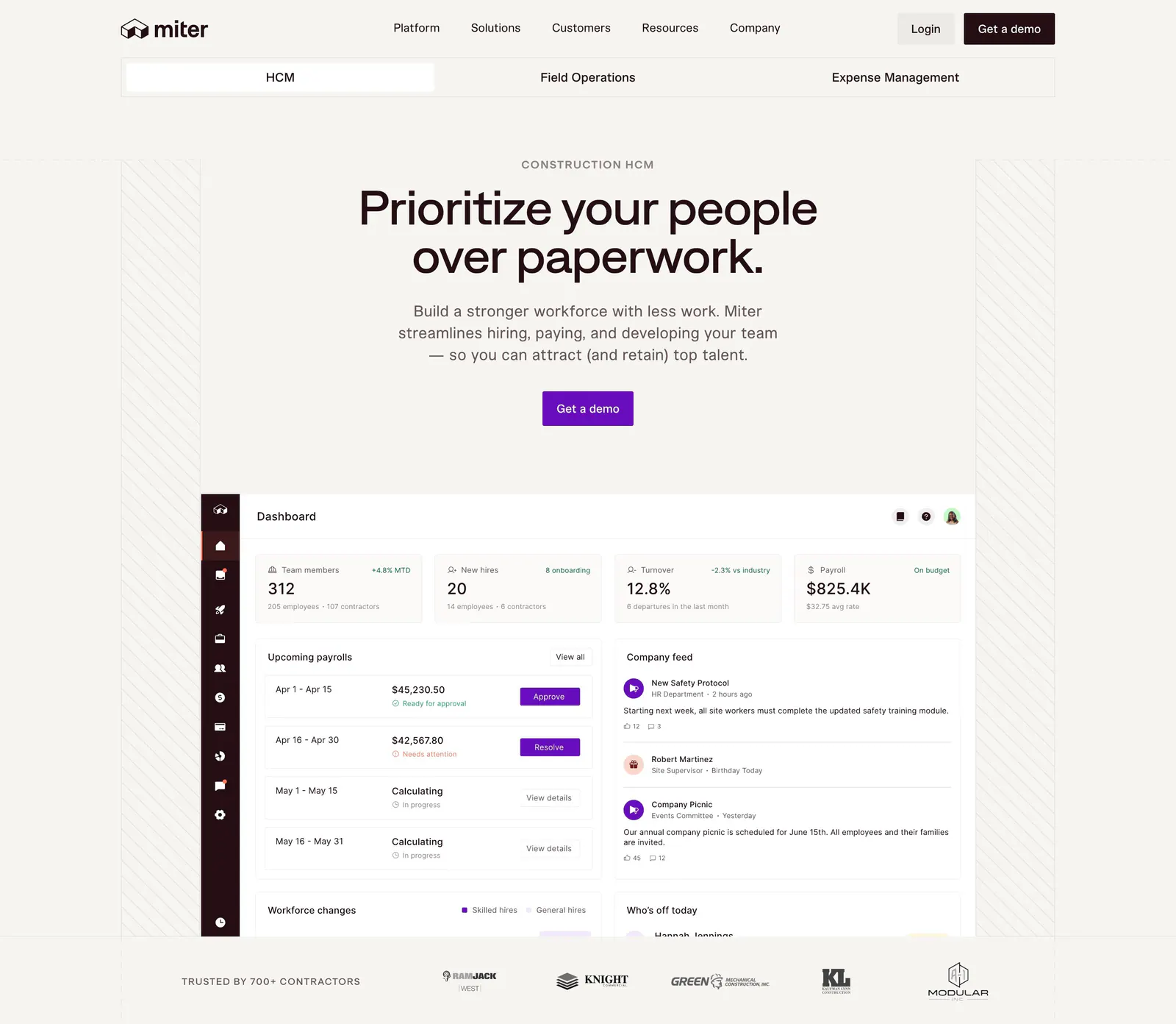
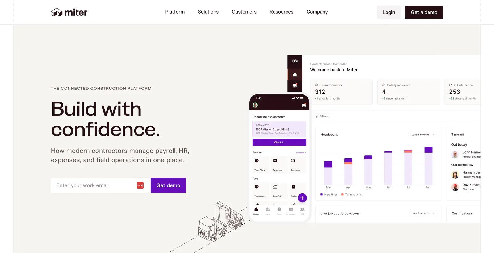
  34. Miter hero section: centered headline and CTA on warm off-white above an HR dashboard screenshot and a contractor logo row
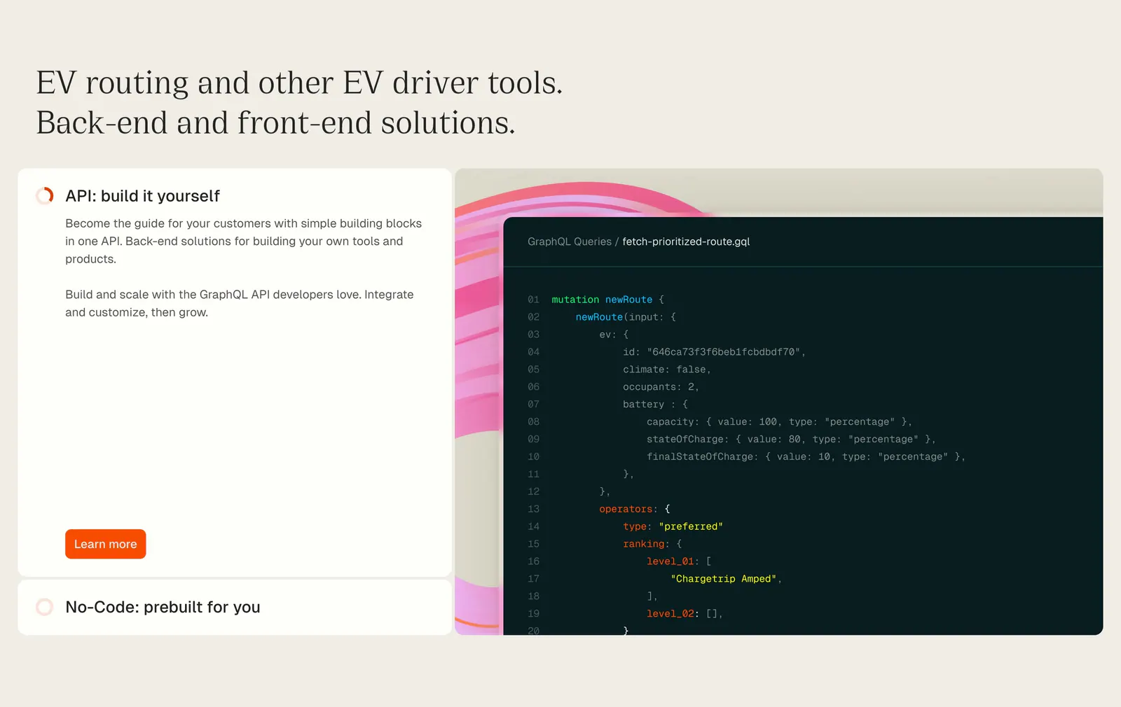
  35. Chargetrip features section: serif headline above an expandable option list beside a GraphQL code snippet on a beige background
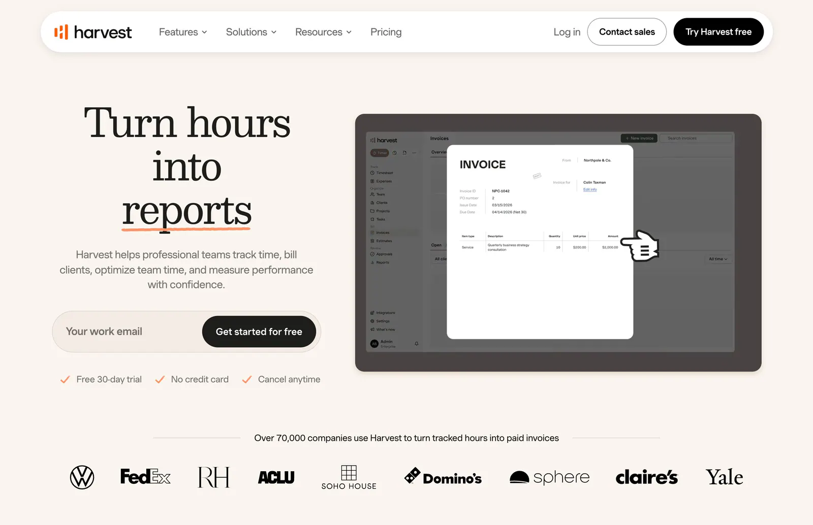
  36. Harvest hero section: serif headline with email signup field beside an invoice UI screenshot, customer logo row below on warm cream
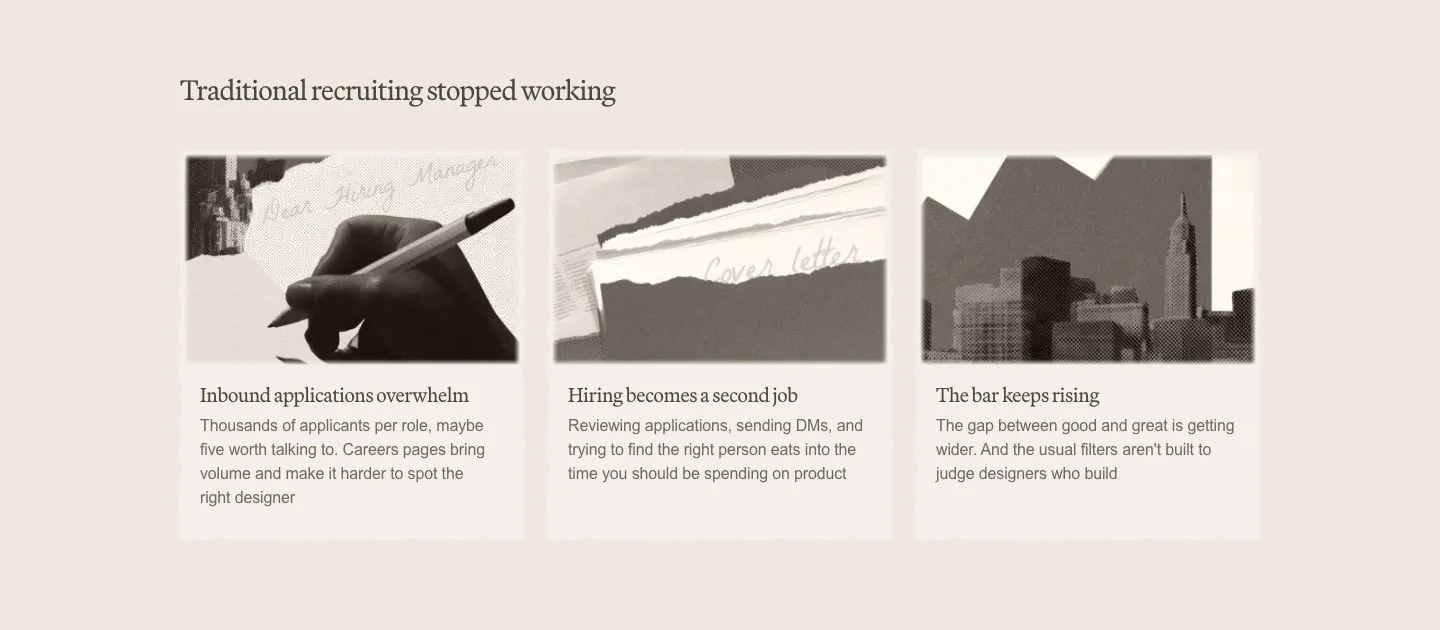
  37. Decimals value proposition section: serif heading above three cards with sepia photo collages and short problem descriptions on beige
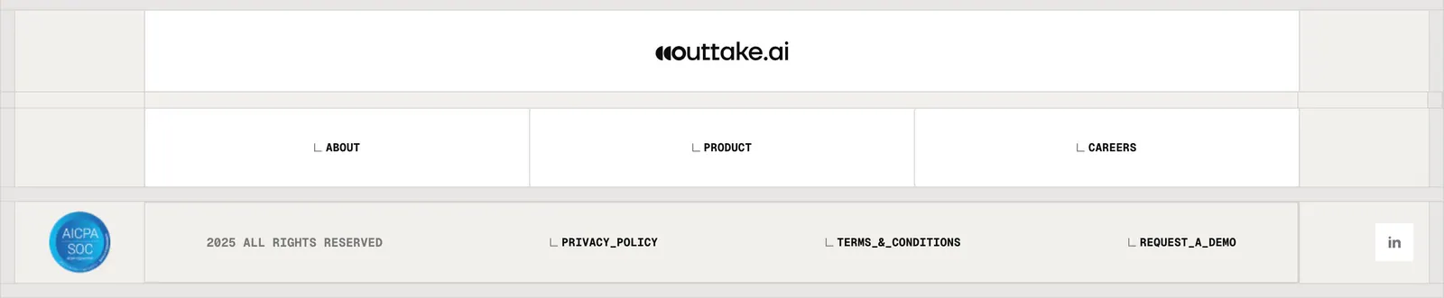
  38. Outtake footer section: centered wordmark above boxed link cells, SOC badge, copyright and legal links on a beige grid
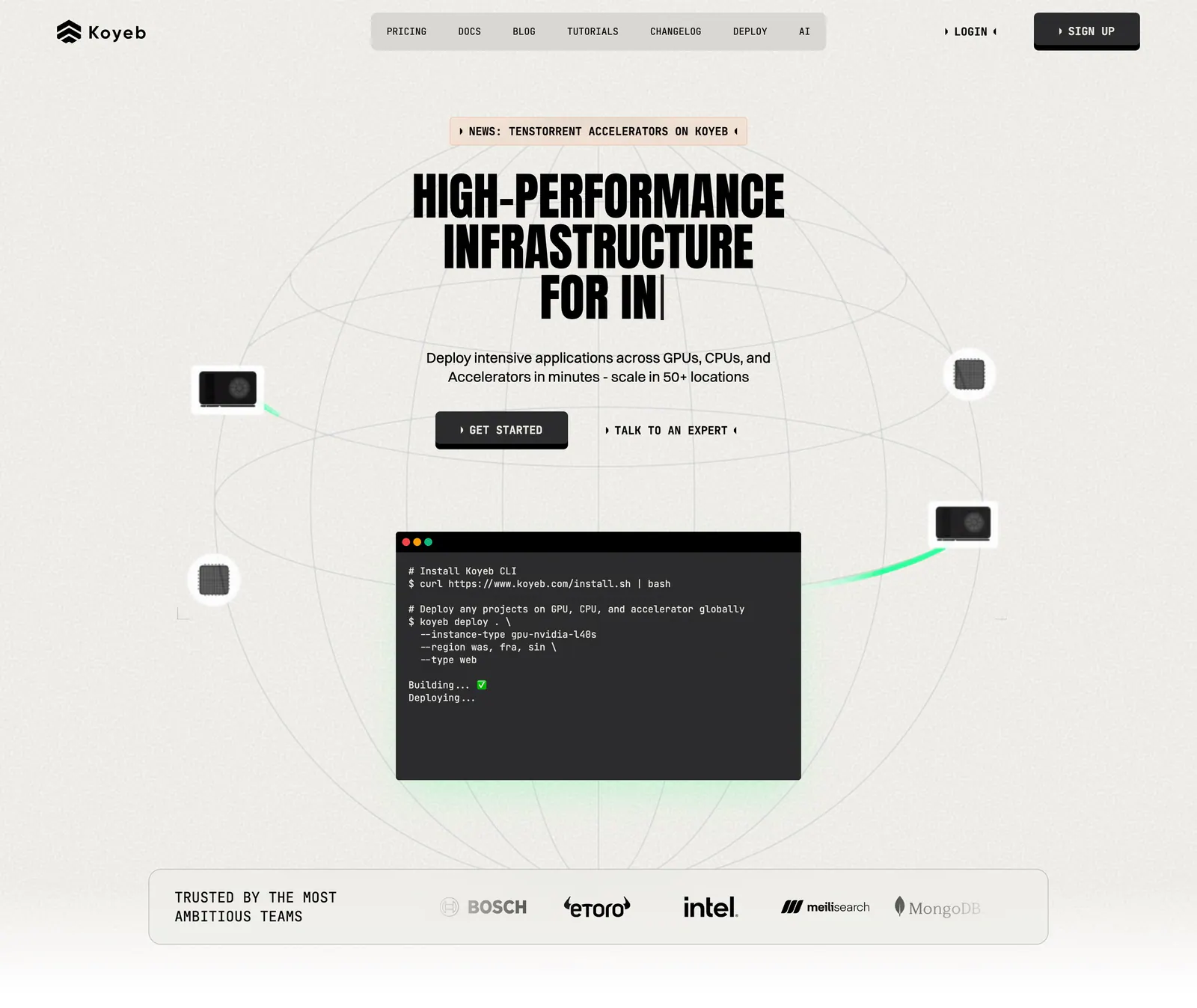
  39. Koyeb hero section: centered condensed headline and buttons over a wireframe globe with a terminal window and a logo strip
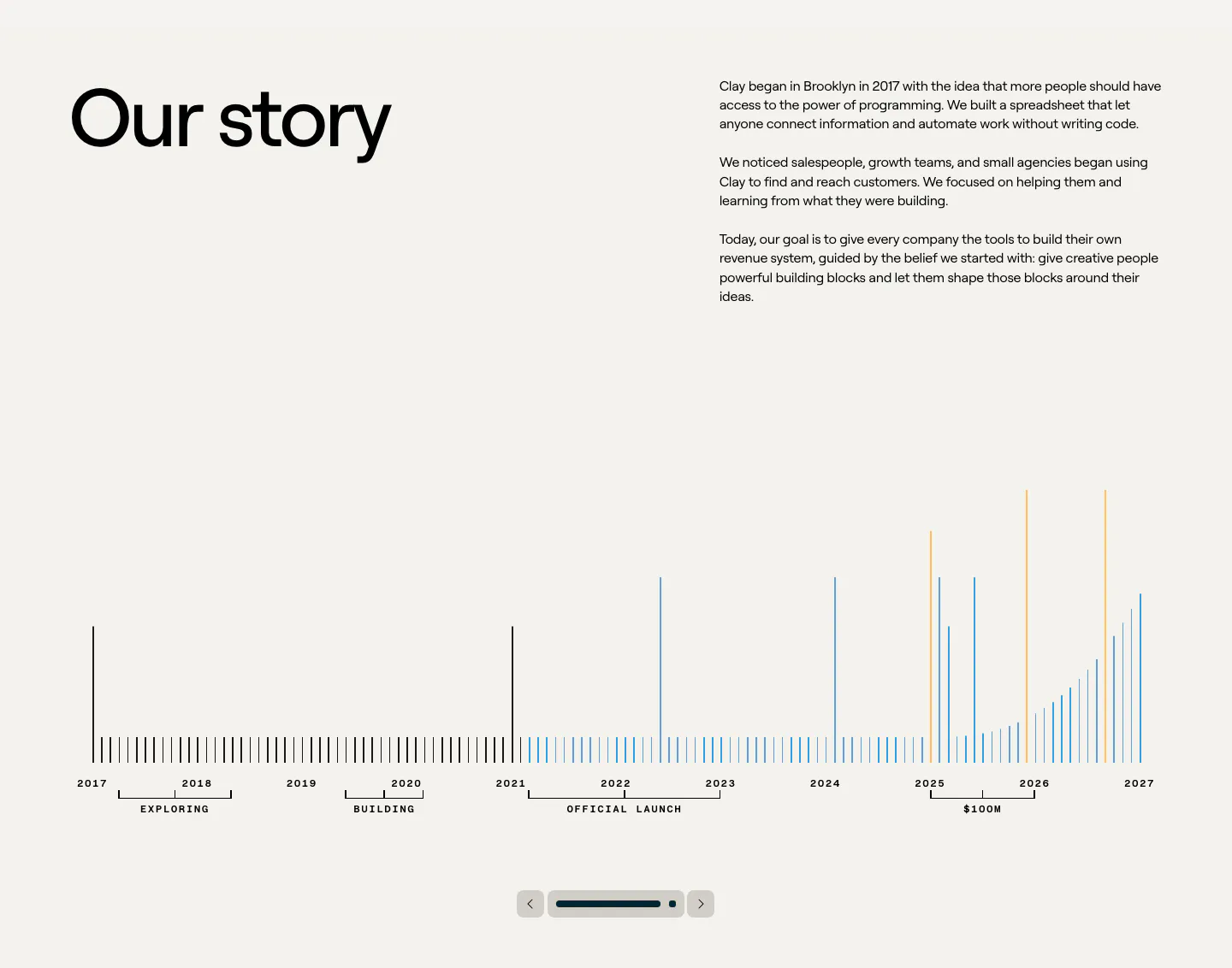
  40. Clay about & mission section: large heading beside story copy above a 2017-2027 bar timeline with slider controls on beige
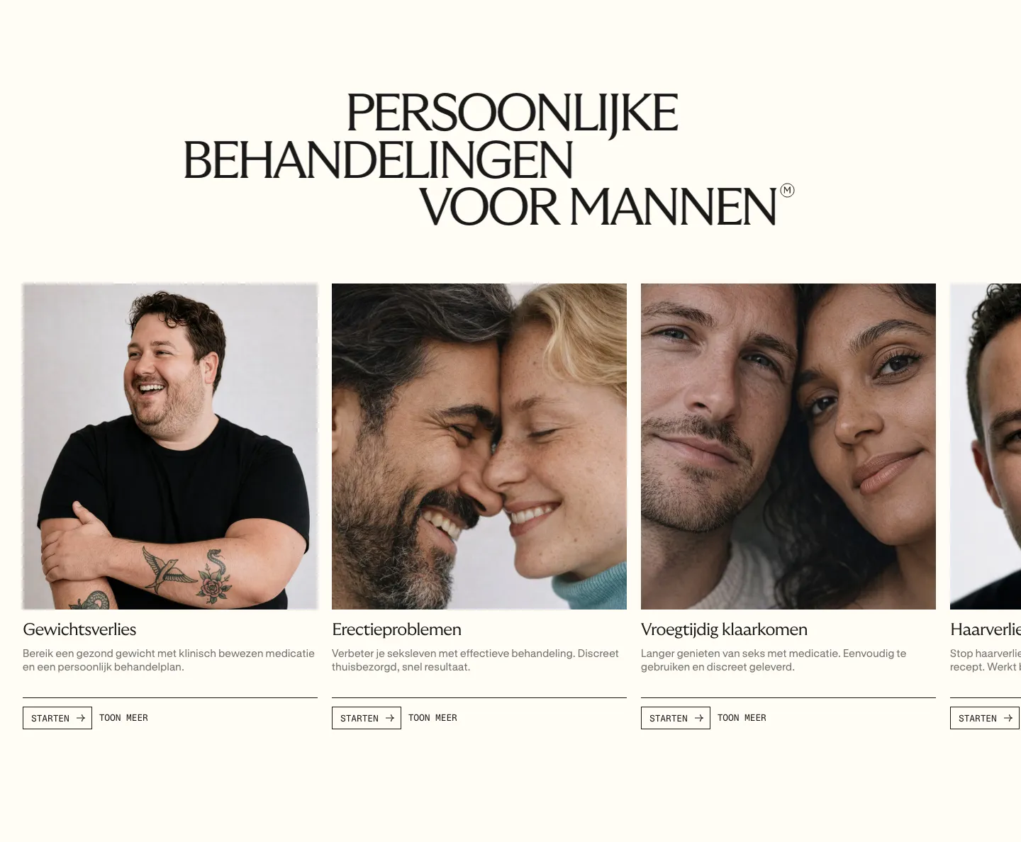
  41. Menkind features section: serif uppercase headline above a carousel of treatment cards with portrait photos and start buttons on cream
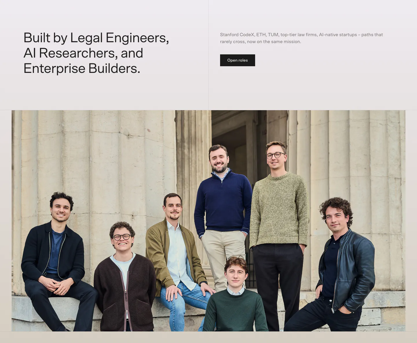
  42. Bayshore team section: headline and Open roles button above a wide group photo of the team in front of stone columns
  43. Heidi call to action section: cream rounded band with centered serif headline, Get Remote button and faint curved line decorations
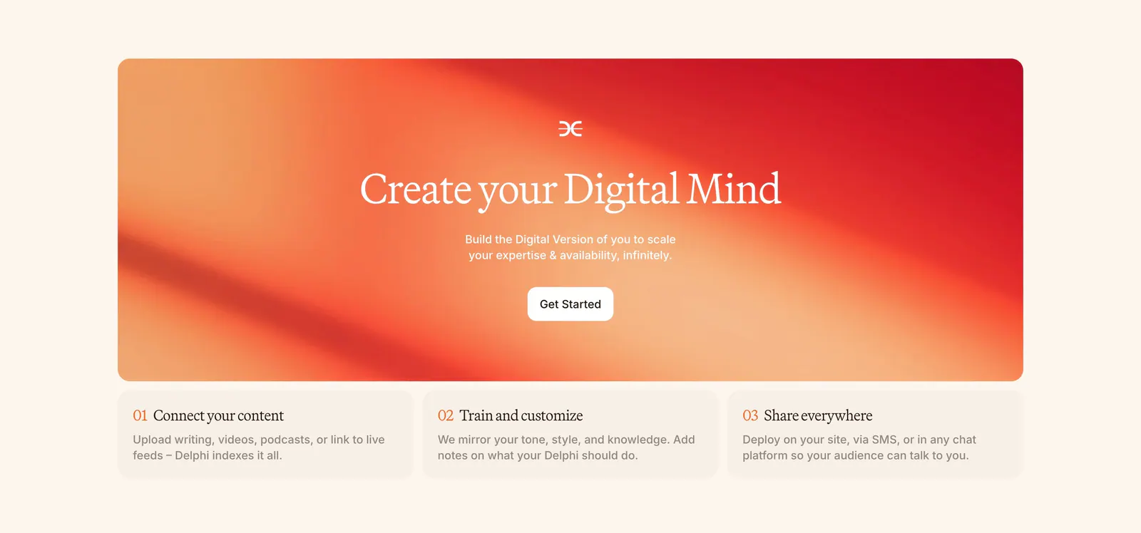
  44. Delphi call-to-action section: centered serif headline and Get Started button on an orange-red gradient card above three numbered step cards
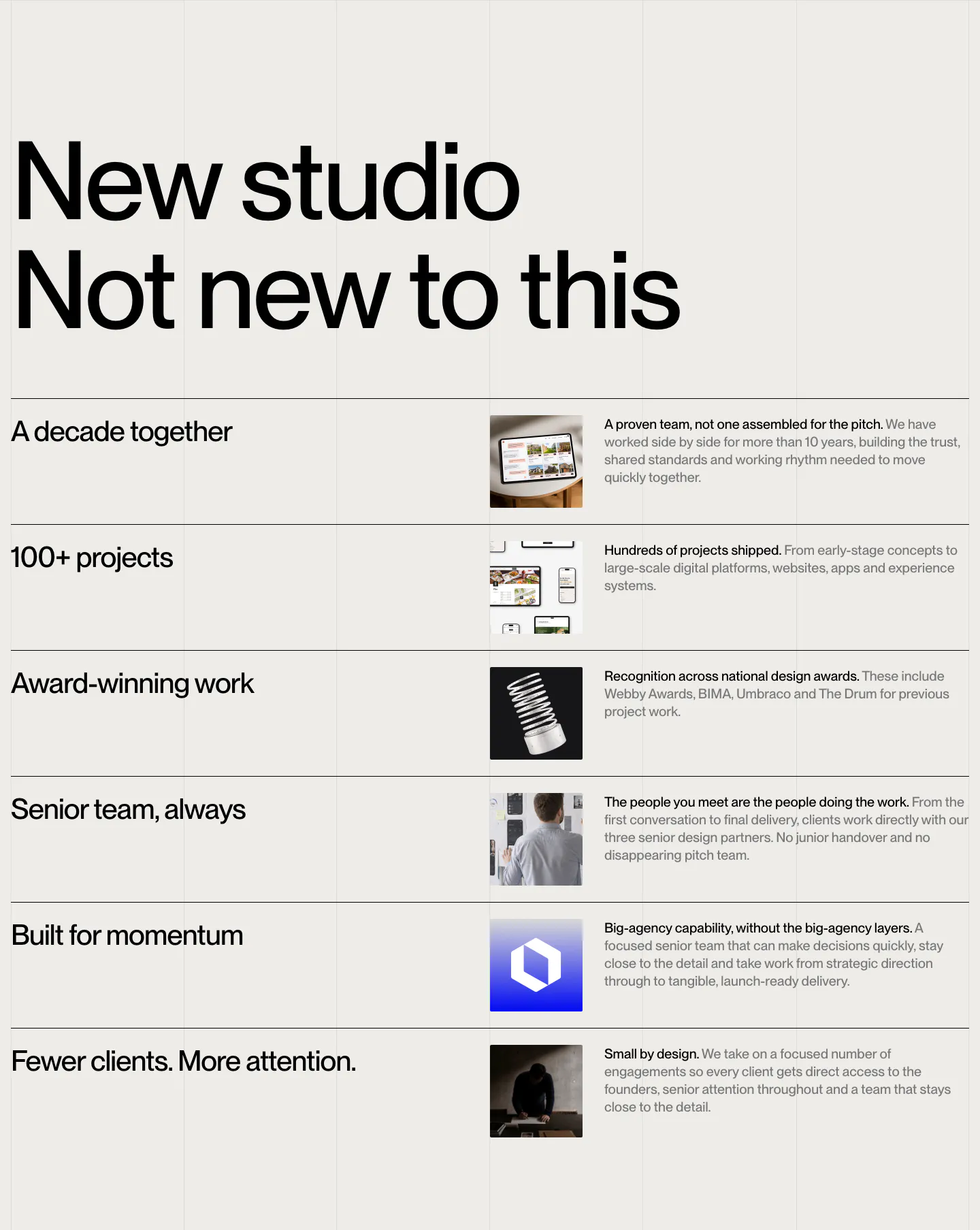
  45. Brikken+Co value proposition section: oversized two-line headline above ruled rows of claims, thumbnails and short copy
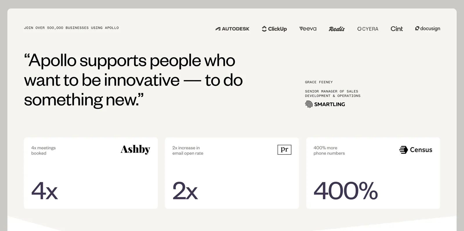
  46. Apollo value proposition section: logo row above a large customer quote and three stat cards (4x, 2x, 400%) on a warm off-white background
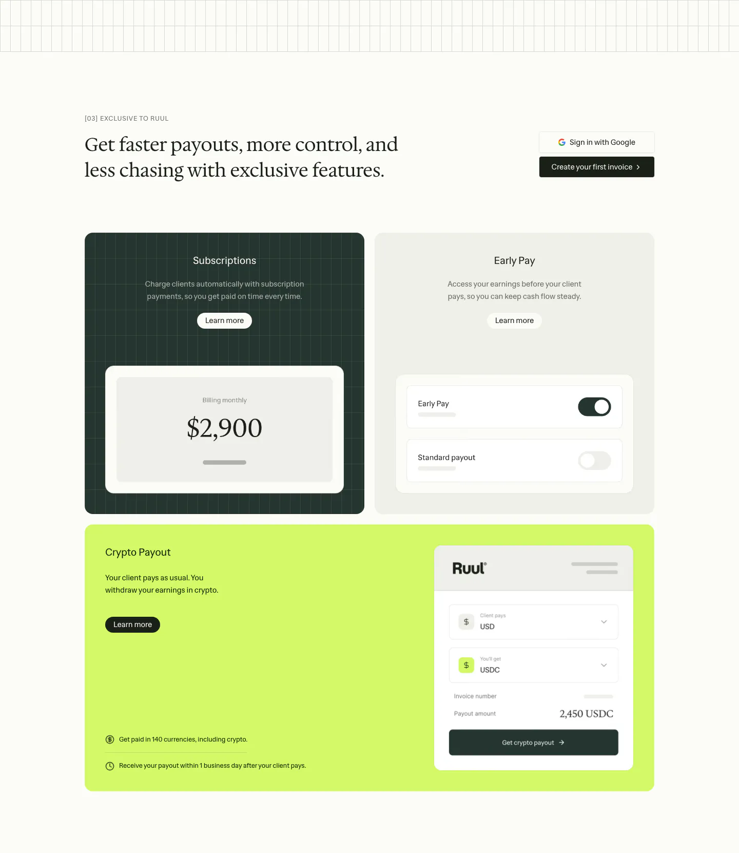
  47. Ruul features section: serif headline above three feature cards in dark green, gray and lime with payout and toggle UI mockups
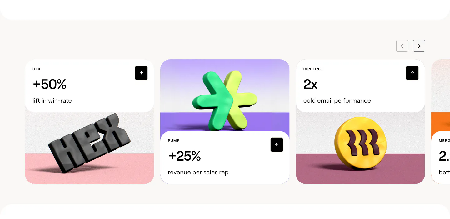
  48. Clay stats section: slider of customer result cards with large percentages above 3D rendered brand logos on colored stages
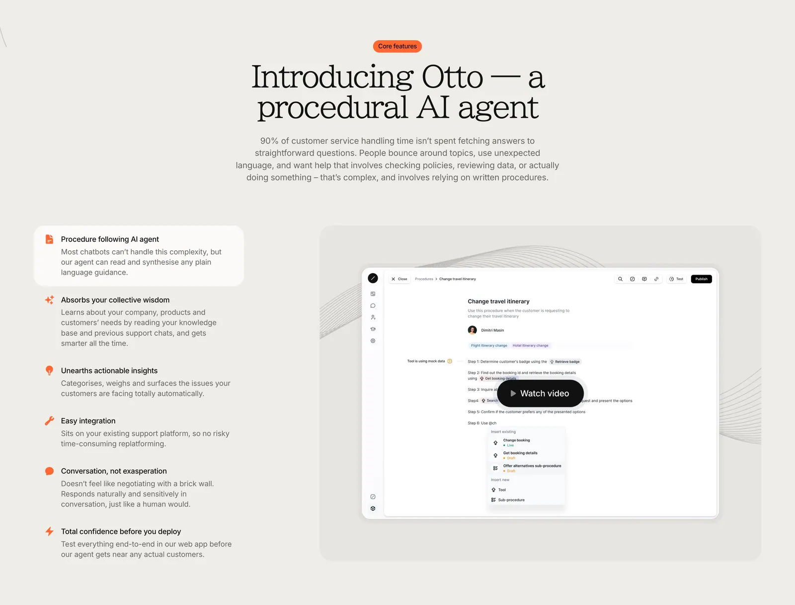
  49. Gradient Labs features section: centered serif headline above a feature list on the left and a product screenshot with video button
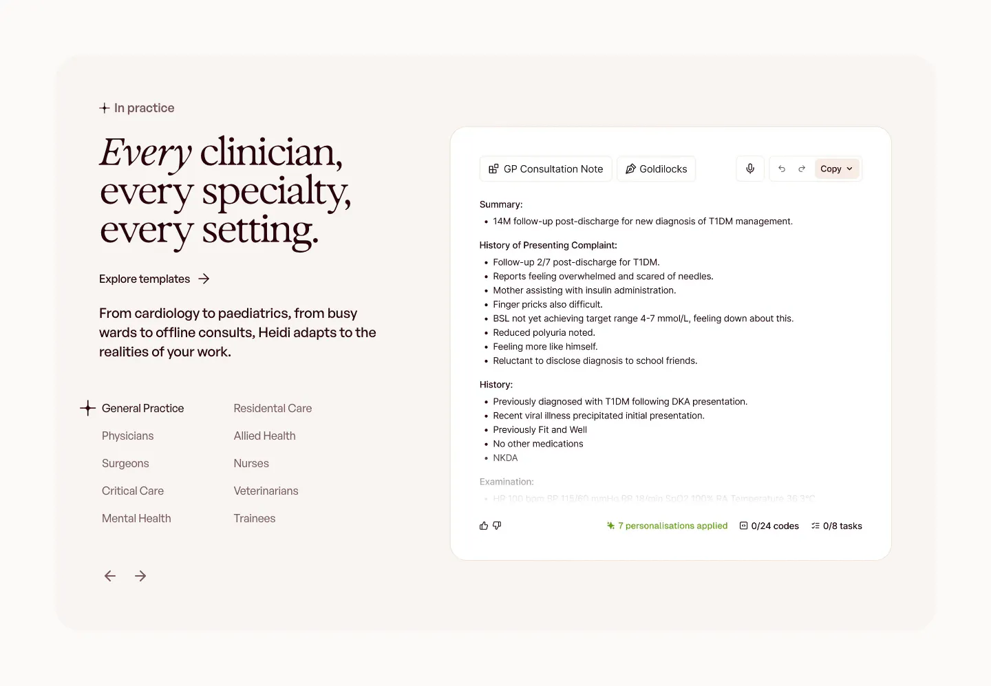
  50. Heidi use cases section: serif headline with a specialty list and arrows on the left, GP consultation note UI on the right
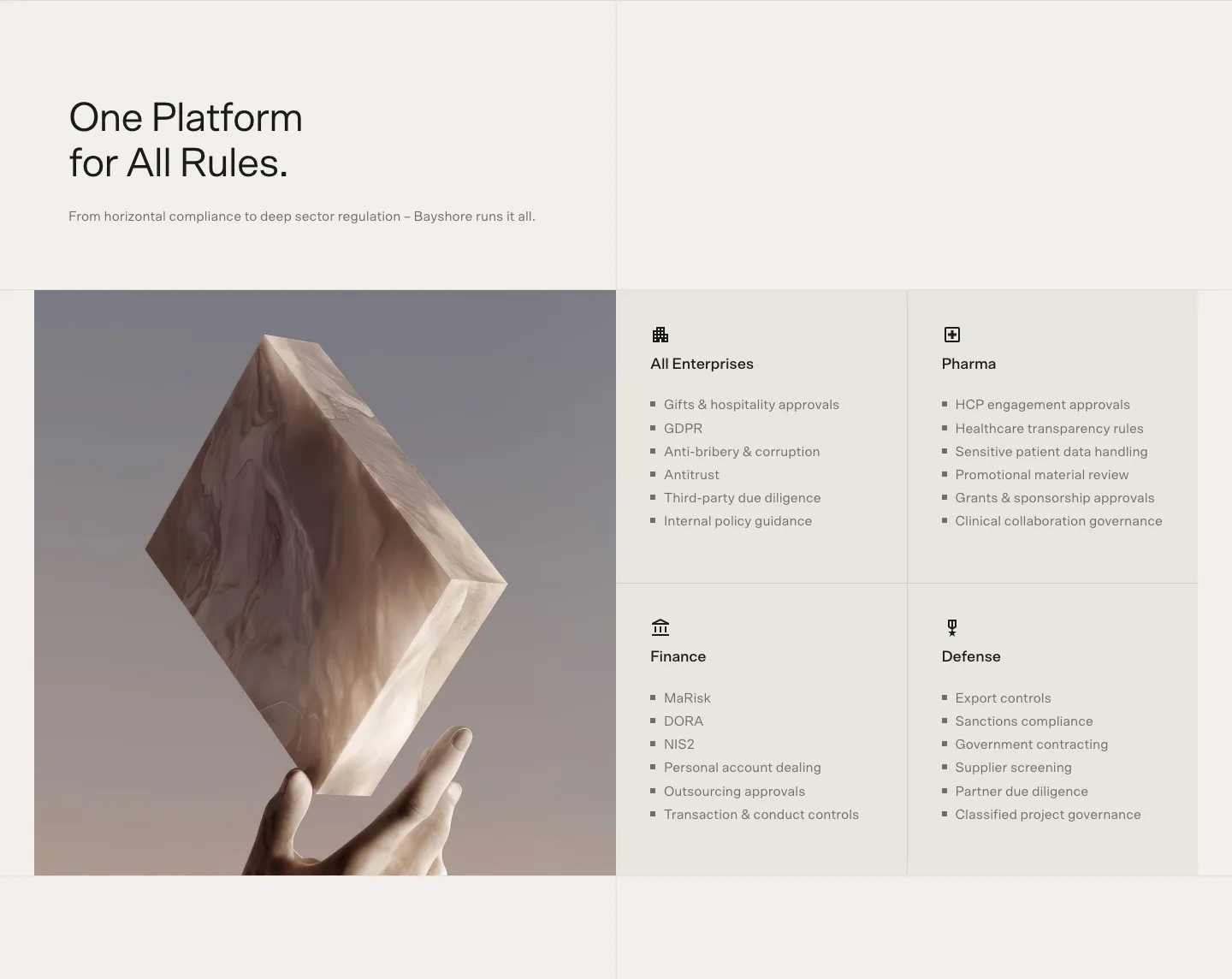
  51. Bayshore use cases section: headline above a 3D marble block held by a hand beside a 2x2 grid of industry cards with bullet lists
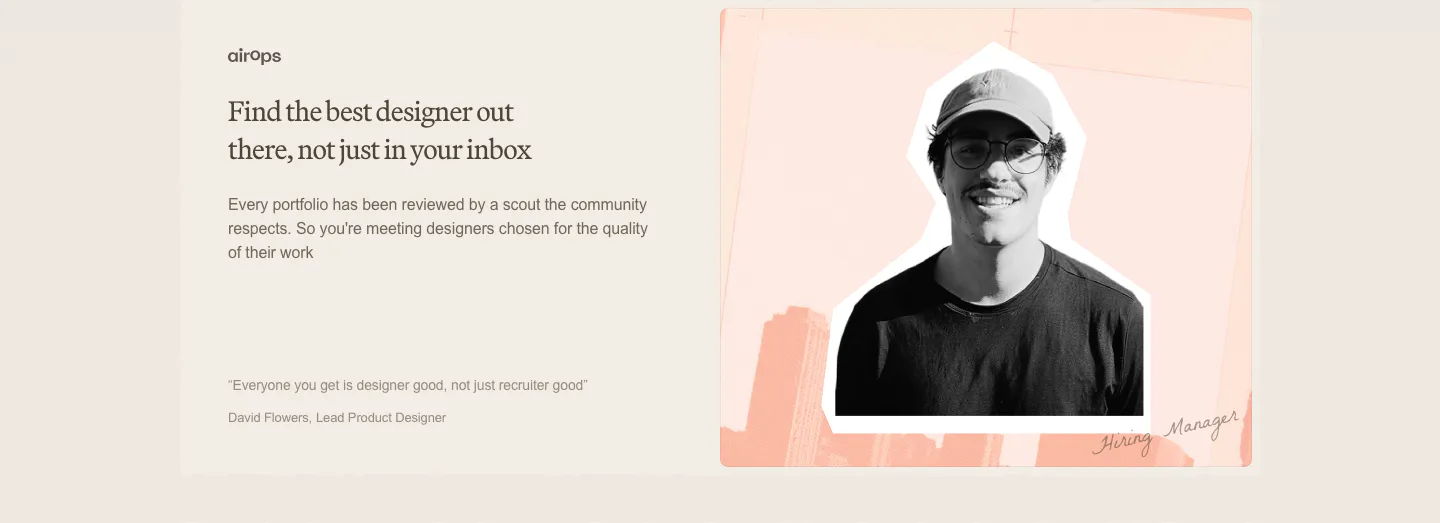
  52. Decimals testimonials section: serif headline, copy and short quote on the left beside a cutout photo of a hiring manager on a peach collage
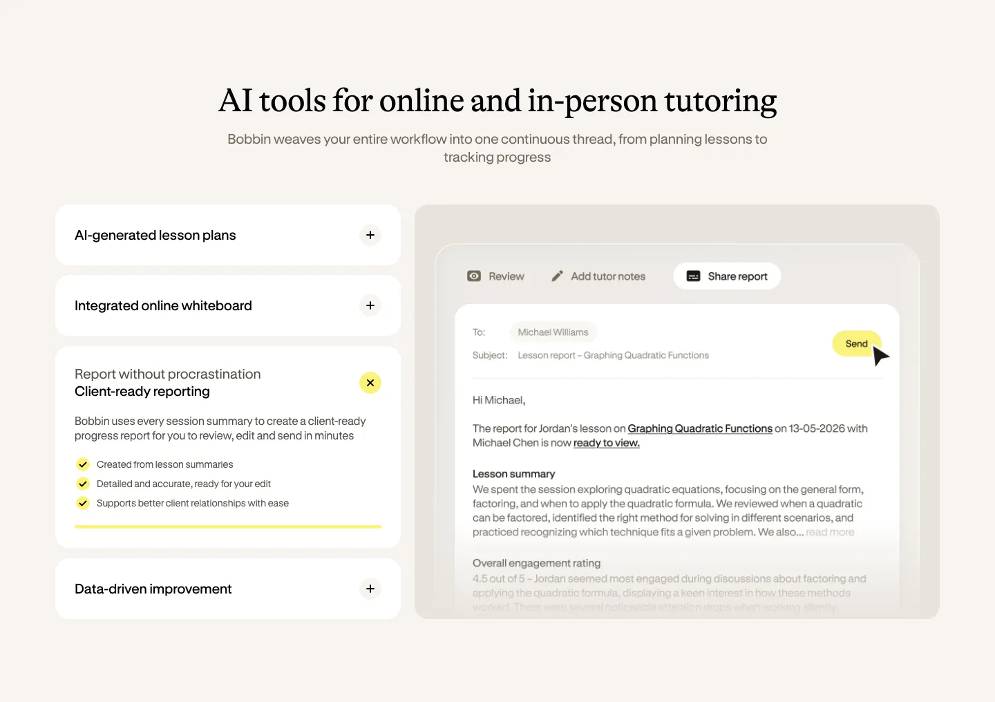
  53. Bobbin features section: serif heading over an accordion of features on the left and a lesson report email UI on the right, cream background
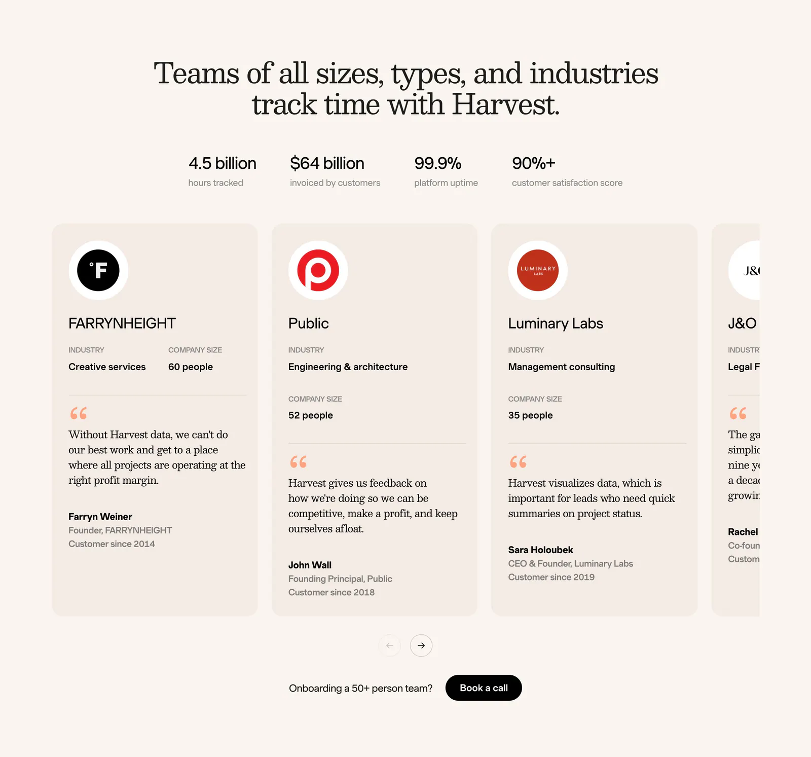
  54. Harvest footer section: serif headline, four stats and a carousel of customer testimonial cards with logos on a cream background
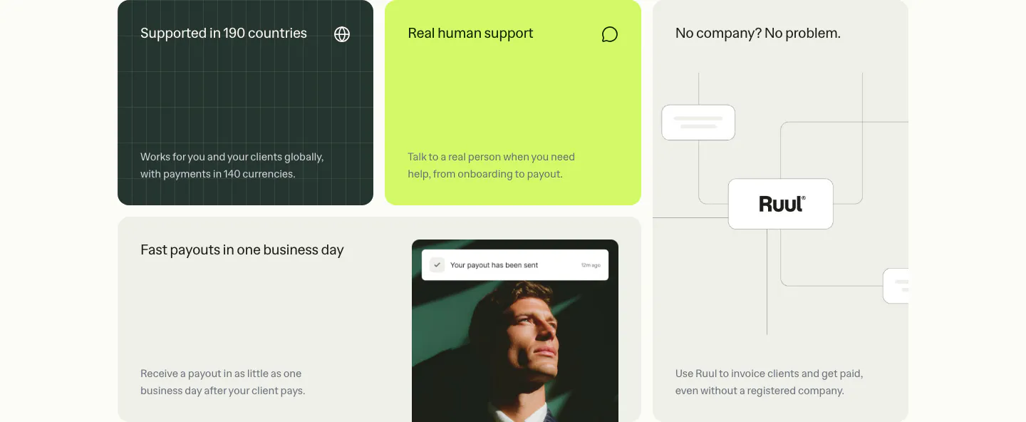
  55. Ruul features section: bento grid of benefit tiles in dark green, lime and warm gray, with a portrait photo and a node diagram
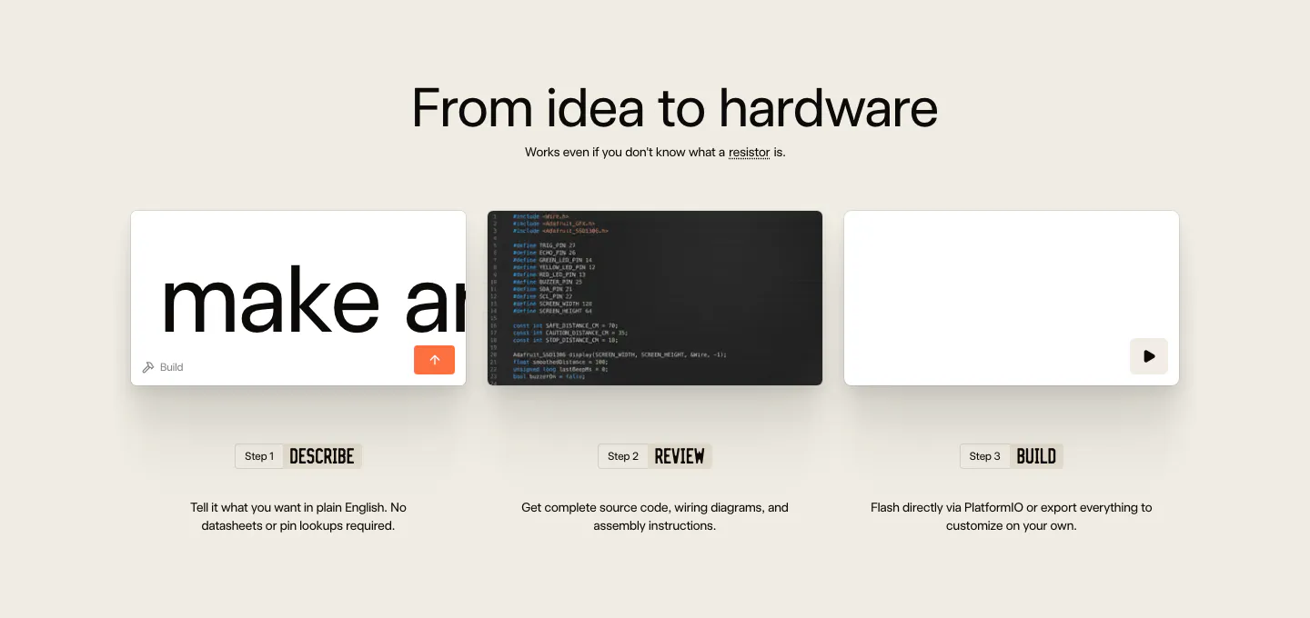
  56. Schematik how it works section: centered headline above three step cards for describe, review and build on beige
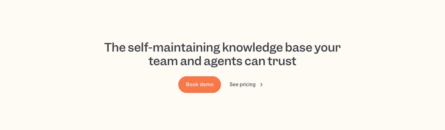
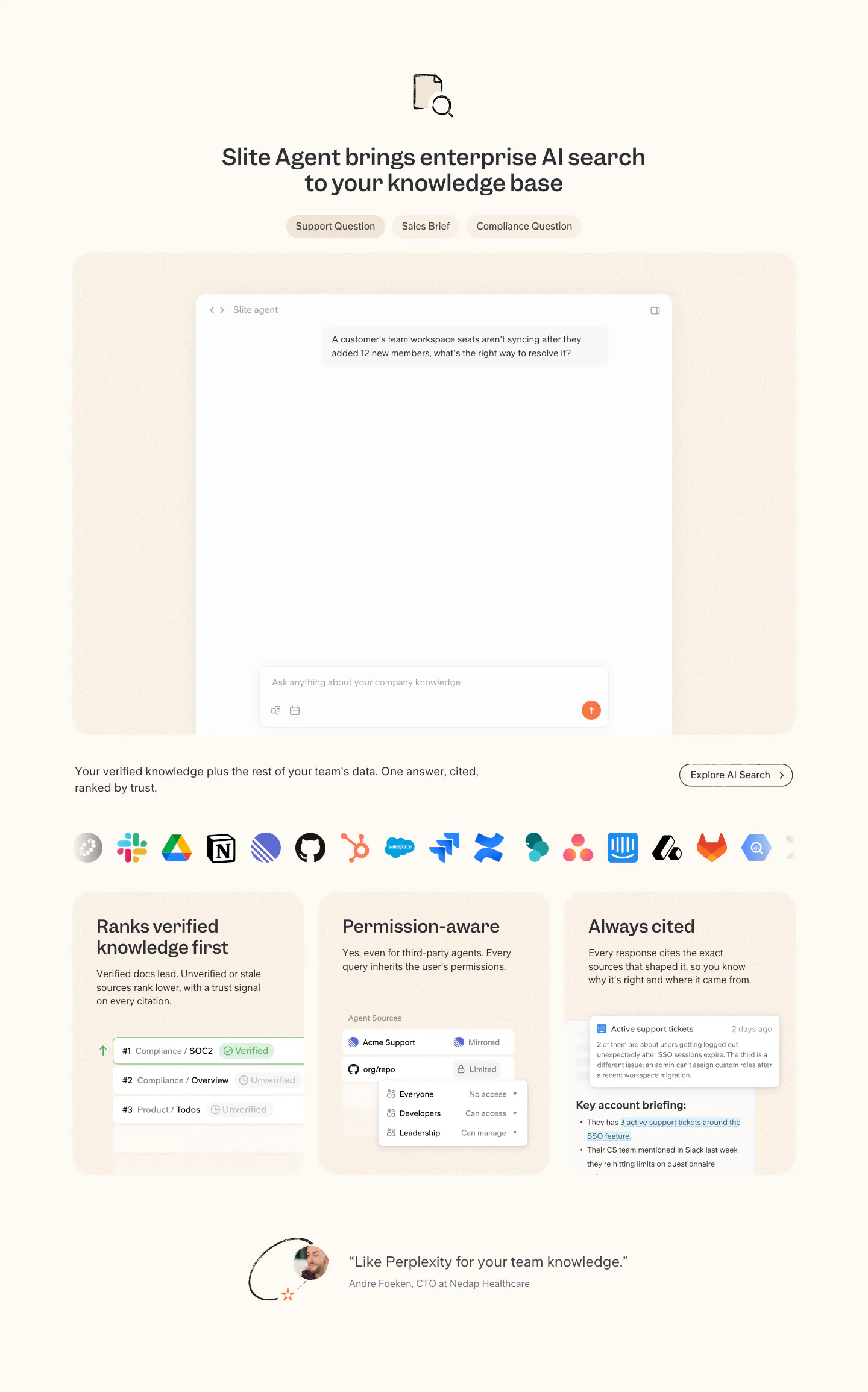
  57. Slite call to action section: centered two-line headline with an orange Book demo button and a See pricing link on a cream band
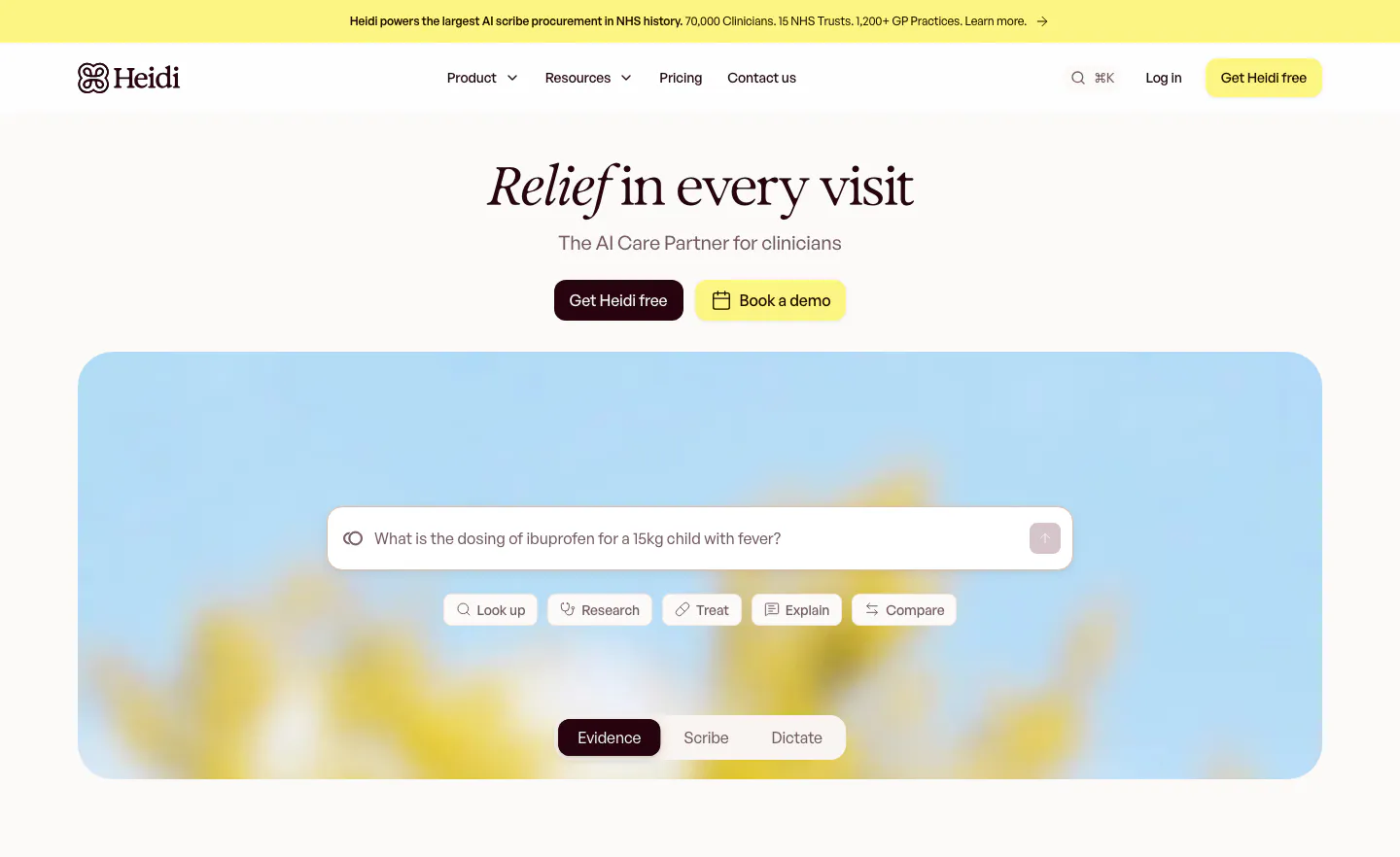
  58. Heidi hero section: centered serif headline with two buttons above a search prompt box and mode tabs on a blurred flower photo
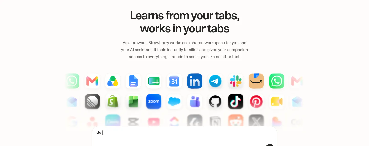
  59. Strawberry integrations section: centered headline and copy above rows of fading app icons and the top of a prompt input box
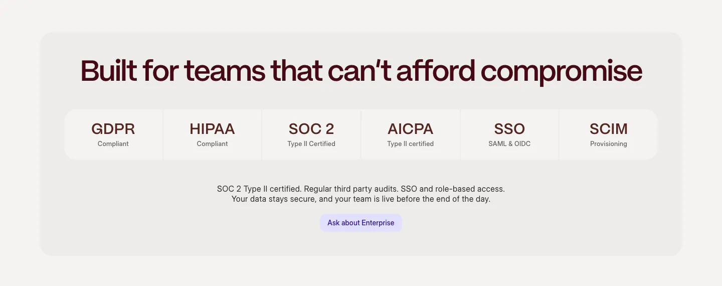
  60. Weave security section: centered headline above a row of compliance tiles (GDPR, HIPAA, SOC 2, SSO) and an enterprise button in a gray panel
  61. Cluster footer section: logo and copyright left, link columns right over a giant faded serif Cluster wordmark on beige
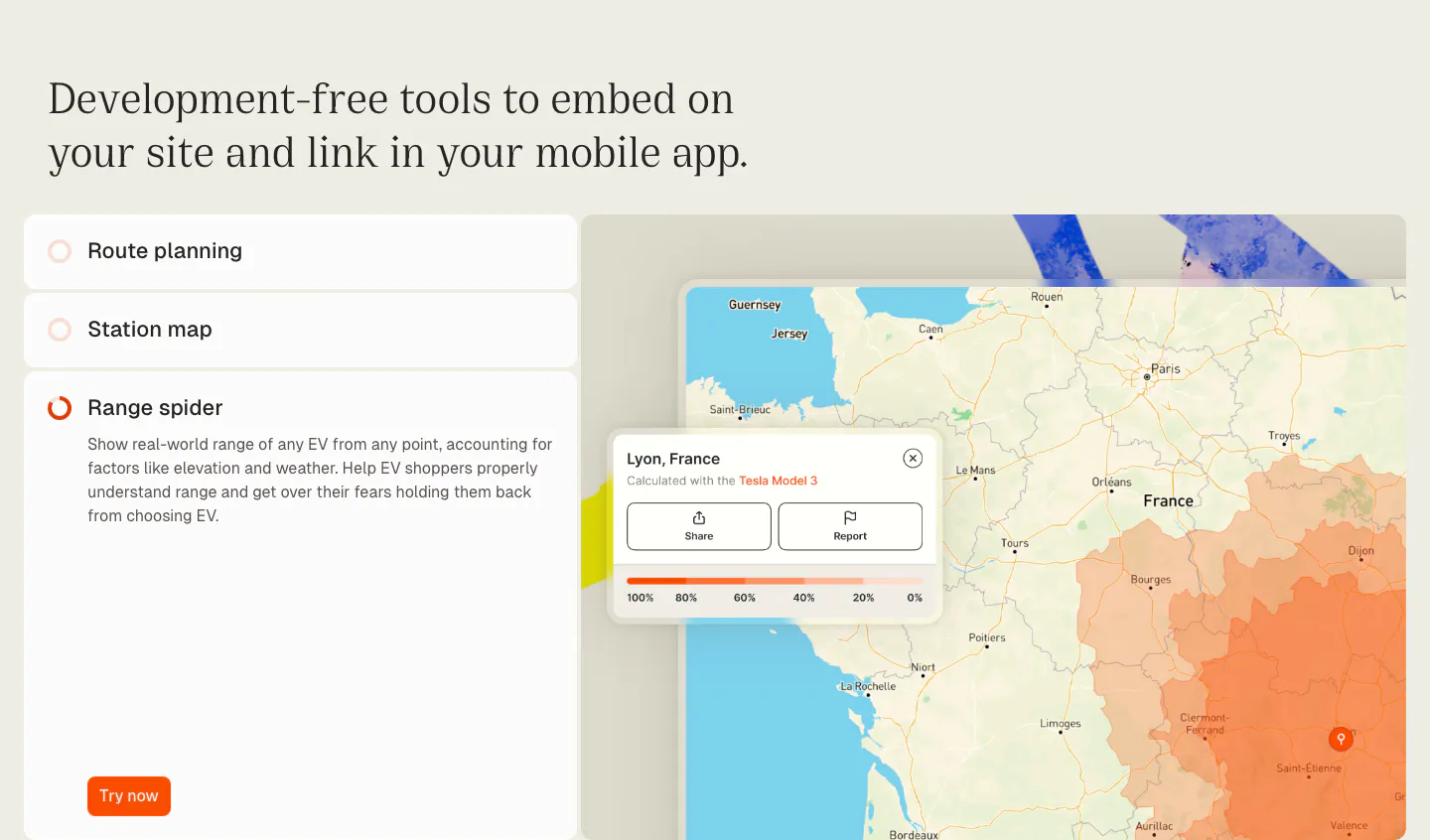
  62. Chargetrip features section: serif headline over an accordion list of embeddable tools beside a France map with an EV range overlay
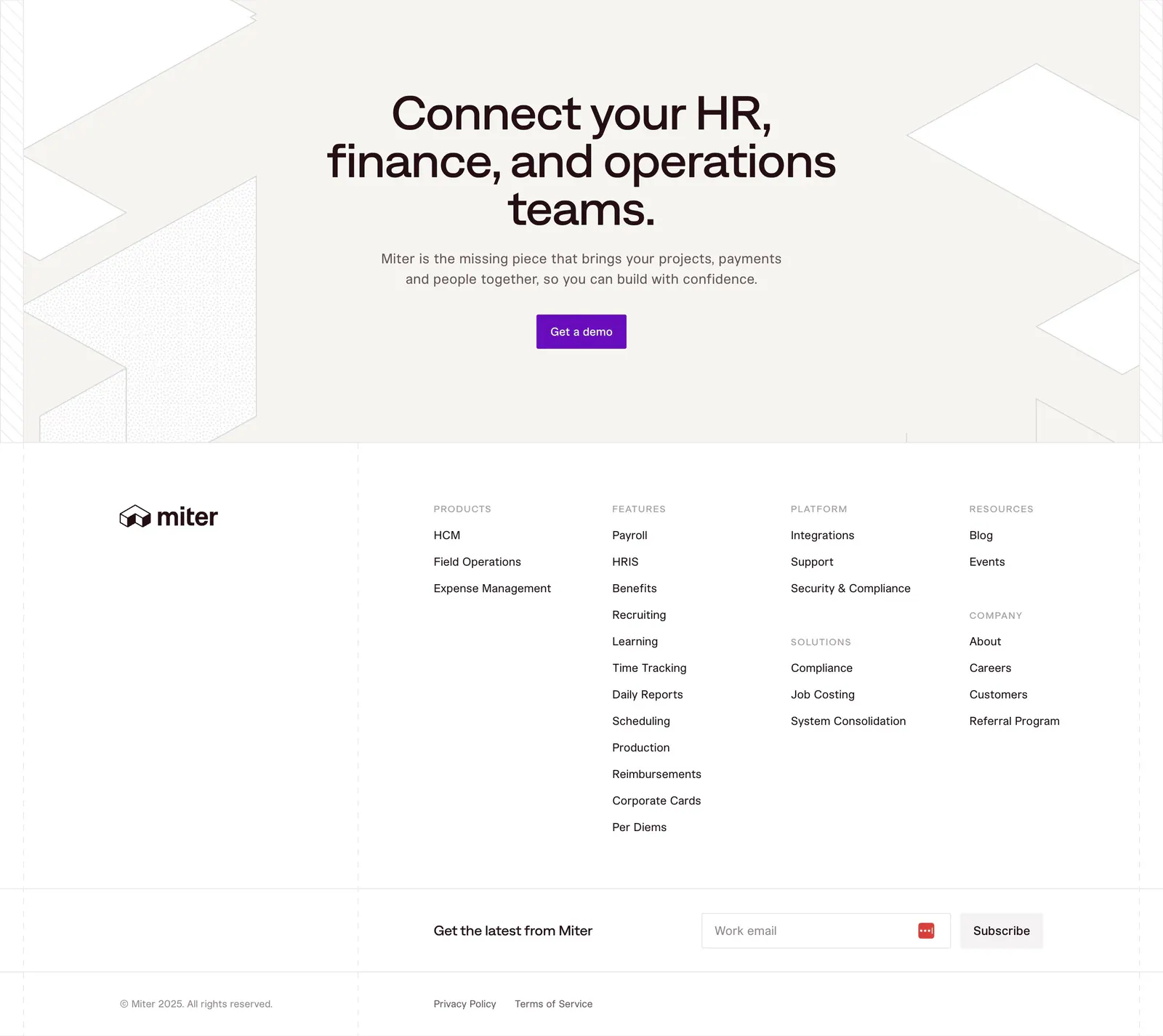
  63. Miter footer section: centered CTA on beige with geometric line shapes, then link columns, email signup and legal row
  64. Heidi logo cloud section: single row of dark NHS trust and healthcare provider logos on a cream background
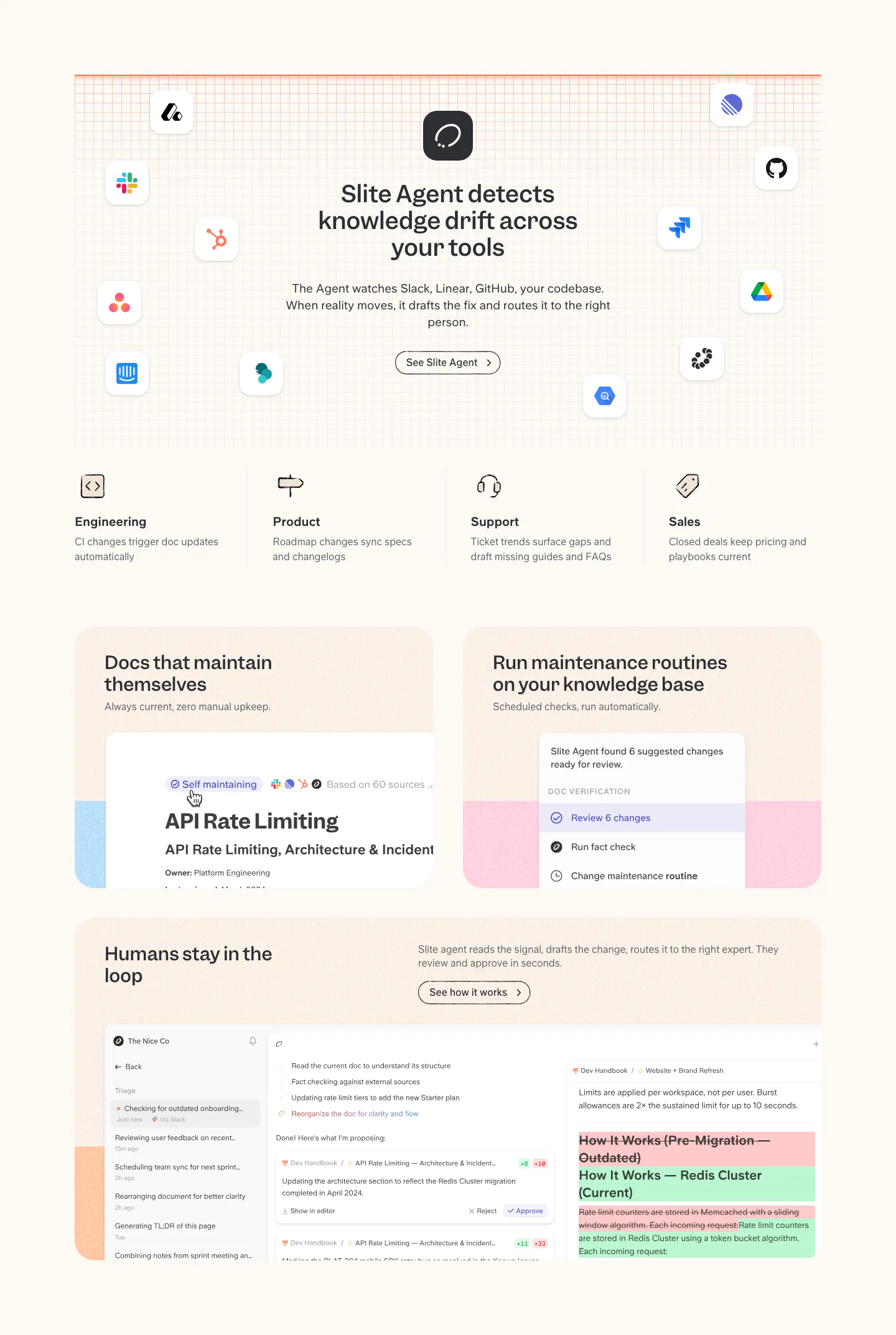
  65. Slite features section: headline ringed by app icons on a grid, four team columns, then cards with doc maintenance and review UI on cream
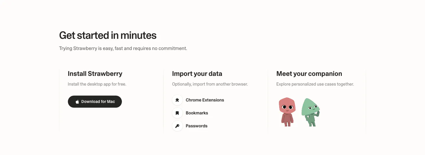
  66. Strawberry how it works section: three columns for install, import data and meet your companion, with a download button and characters
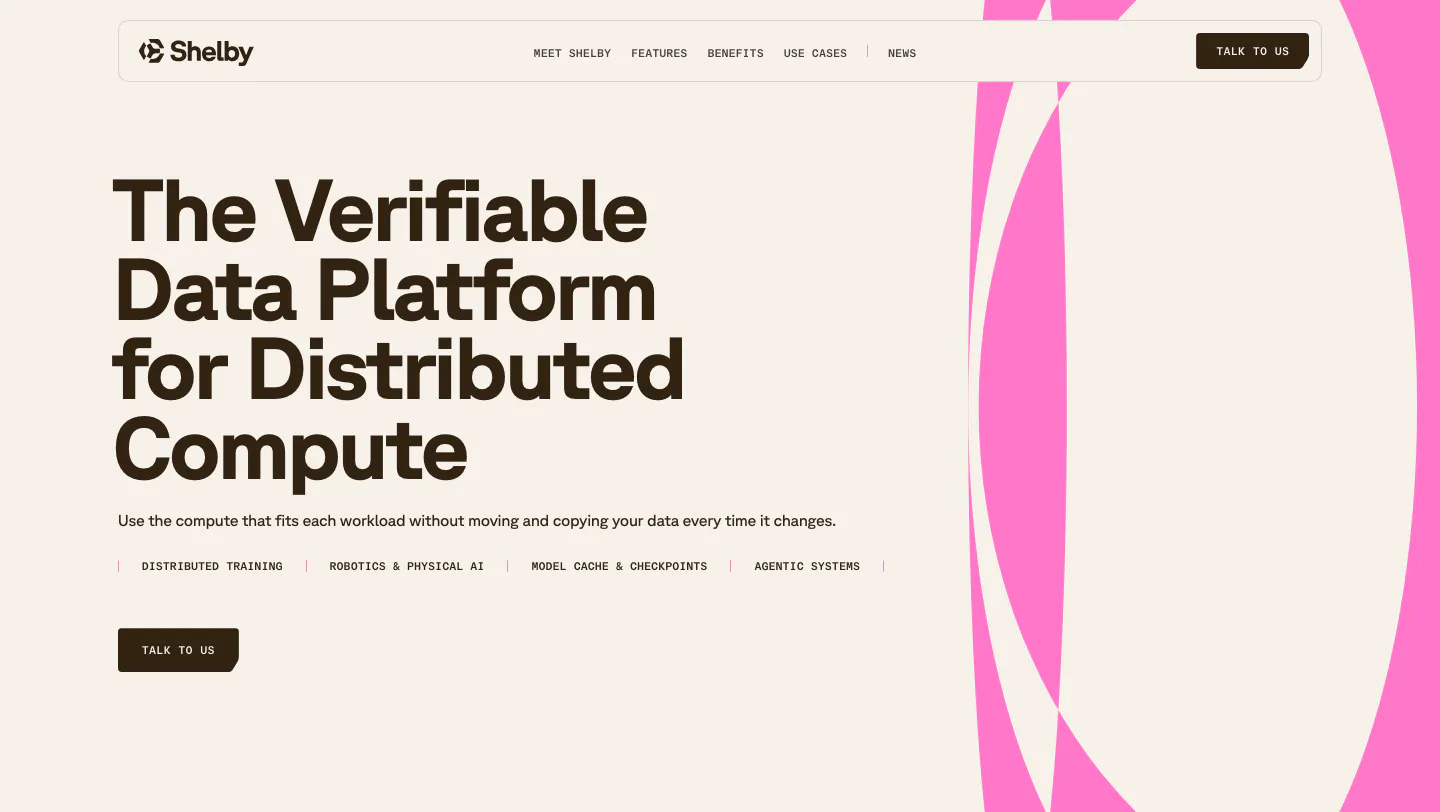
  67. Shelby hero section: left-aligned headline, use-case labels and Talk to us button beside large pink abstract curves on a cream background
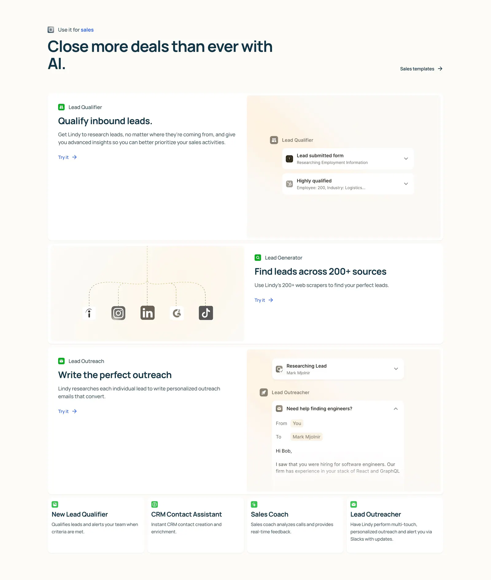
  68. Lindy features section: left-aligned heading above three alternating rows of copy and agent UI mockups, then four small template cards on cream
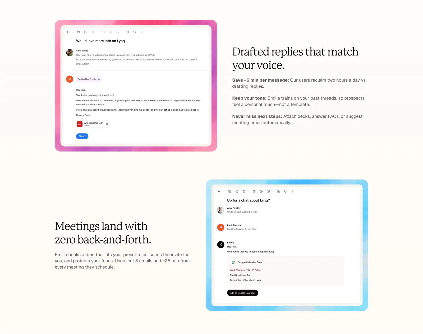
  69. Lynq features section: alternating rows of serif headlines and email UI screenshots in watercolor frames on a cream background
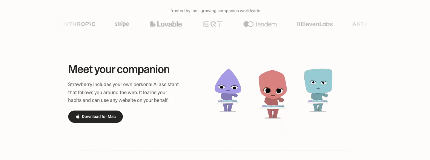
  70. Strawberry features section: logo strip on top, then headline and download button beside three cartoon companion characters
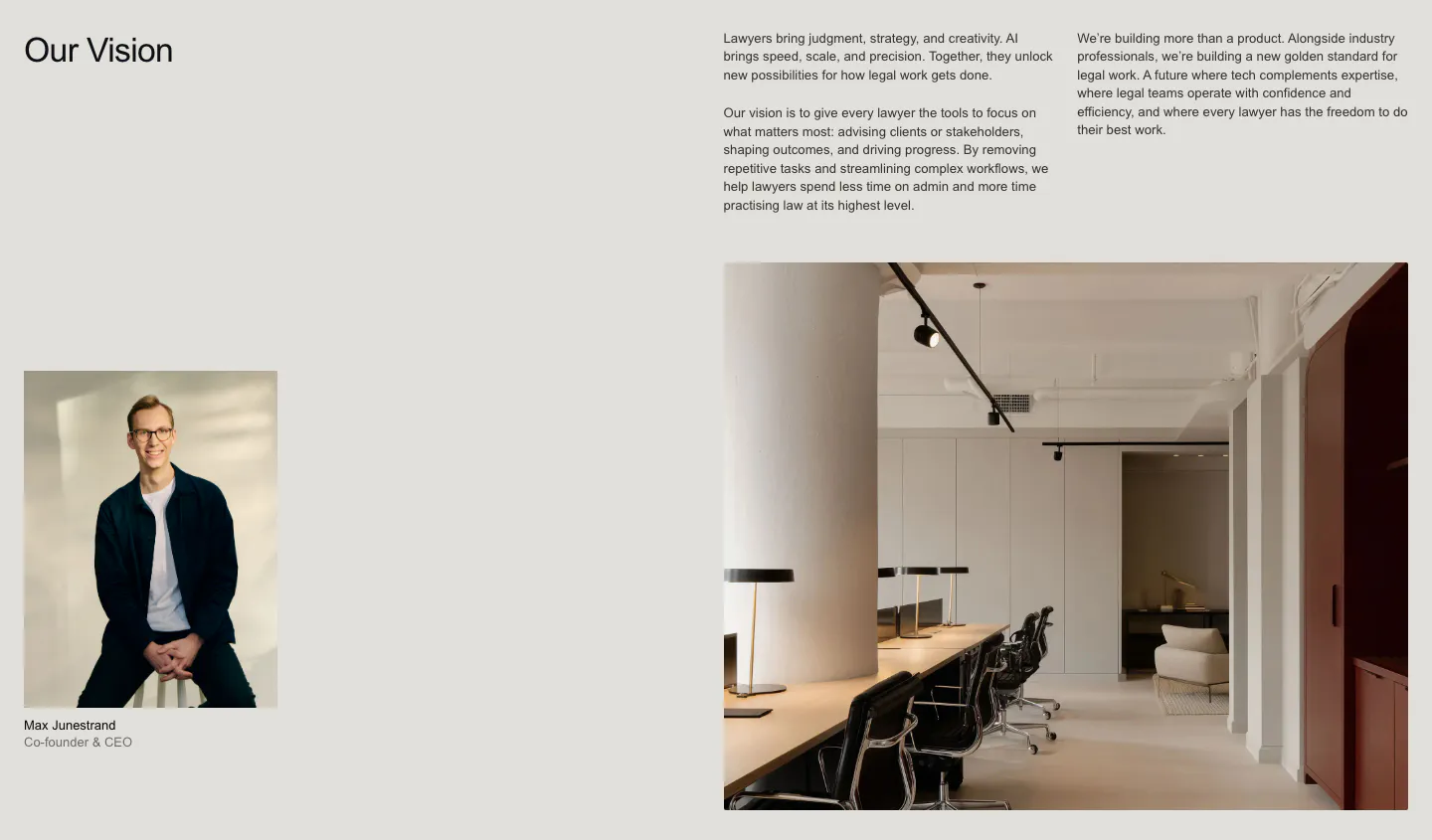
  71. Legora about & mission section: Our Vision heading with text columns, a CEO portrait and a large office interior photo
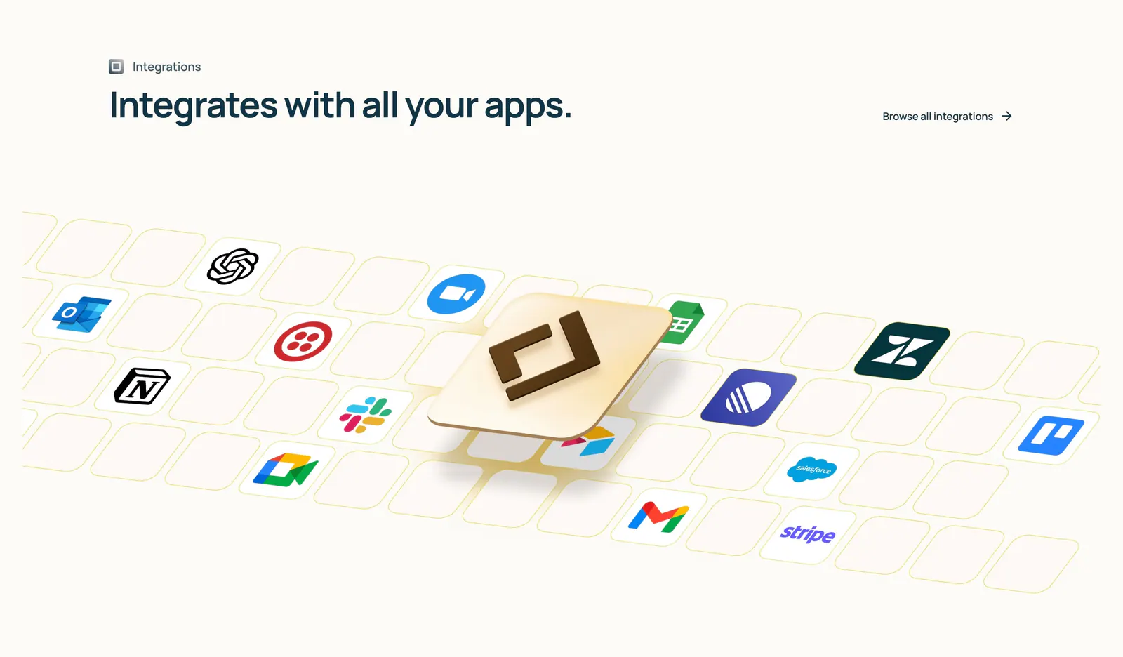
  72. Lindy integrations section: left-aligned heading above an isometric tile grid of app icons with a raised 3D Lindy logo tile on cream
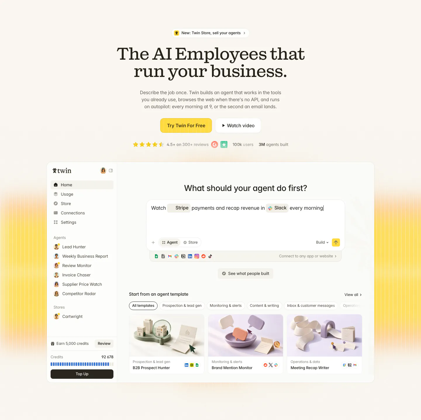
  73. Twin hero section: centered serif headline with yellow CTA and ratings above an agent builder app screenshot on cream with yellow glow
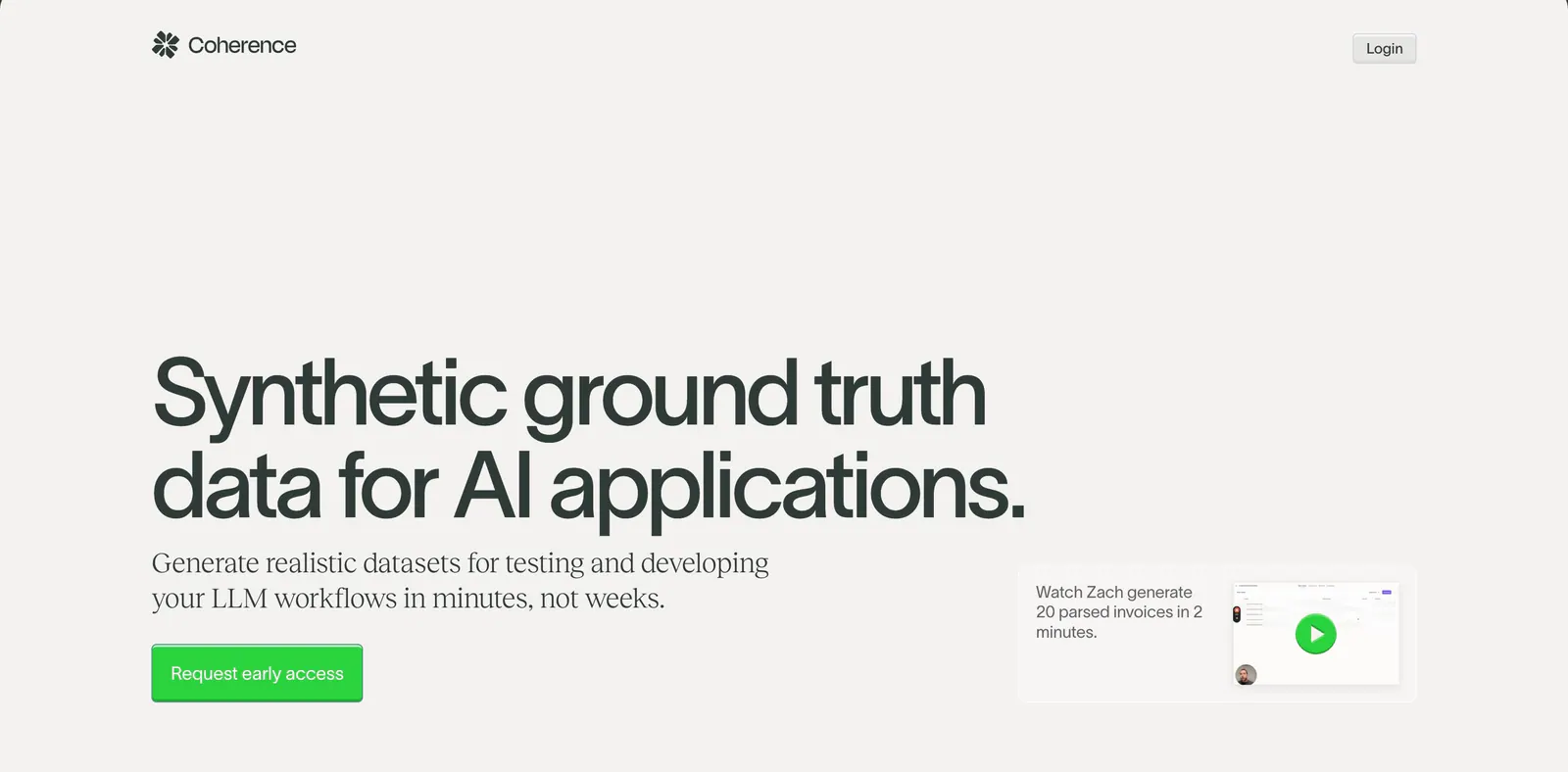
  74. Coherence hero section: oversized left-aligned headline with green CTA and a small video demo card on a warm light gray background
    Coherence Hero
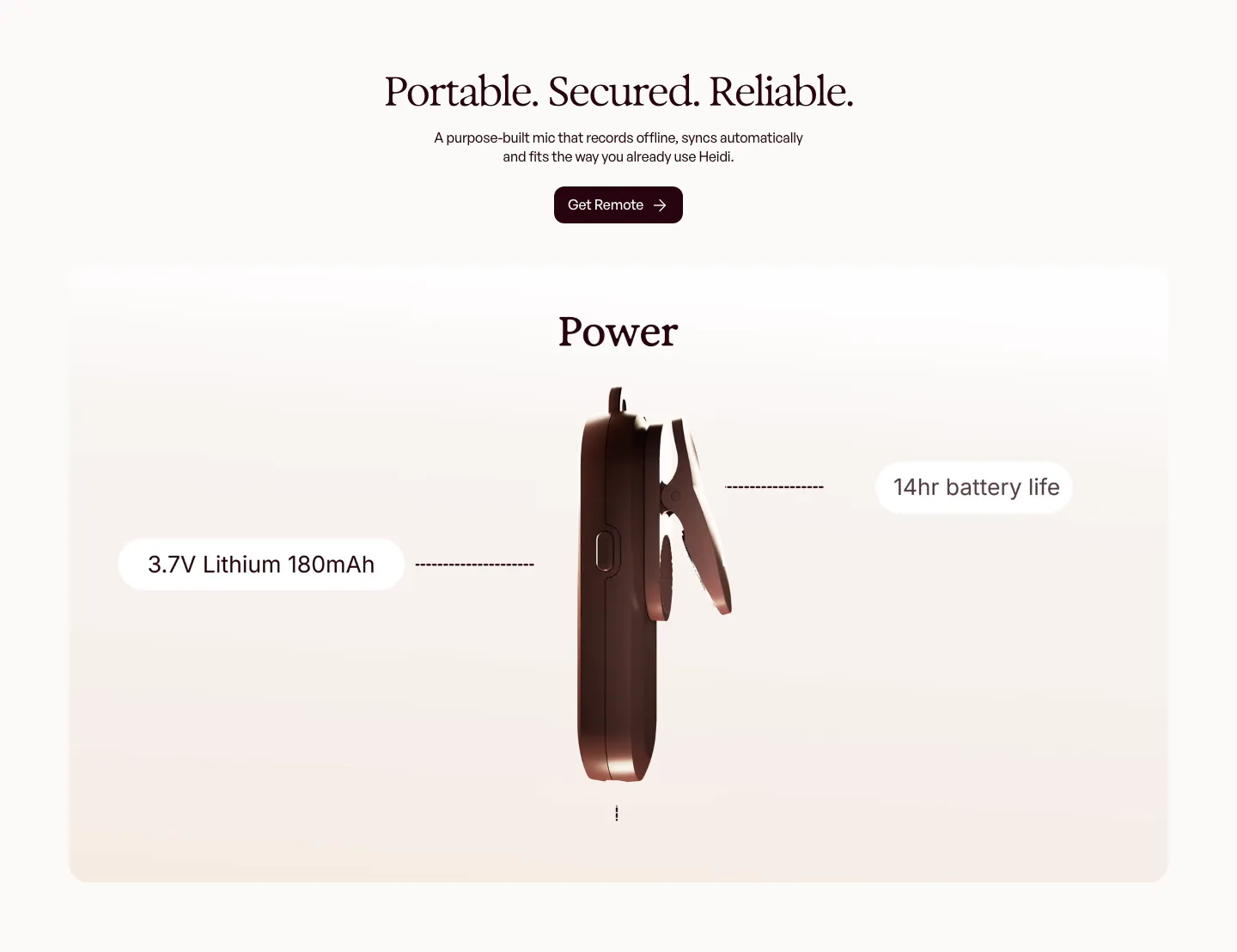
  75. Heidi features section: centered serif headline above a rendered side view of the clip-on mic with battery spec callouts
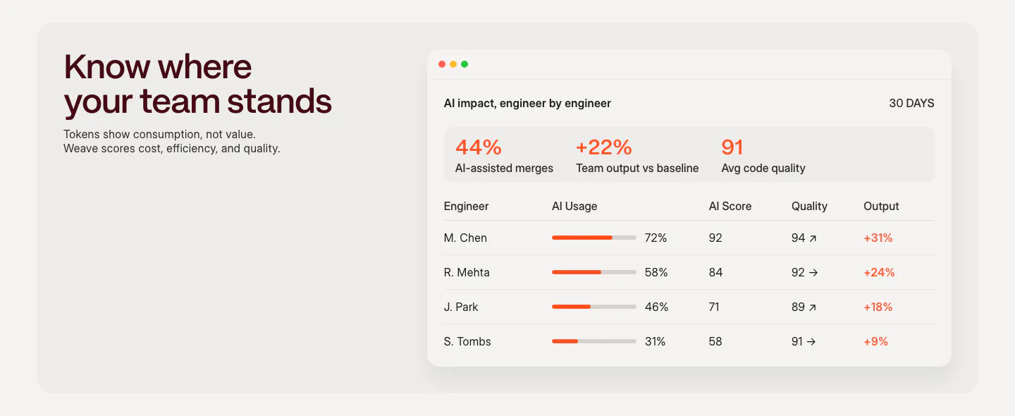
  76. Weave features section: headline and short copy on the left beside an AI impact dashboard table with usage bars and scores
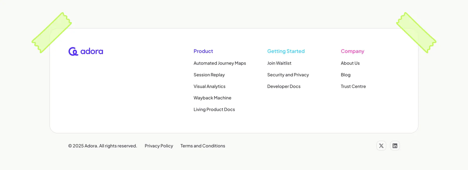
  77. Adora footer section: rounded white card with logo and three link columns, taped corners, copyright row on off-white
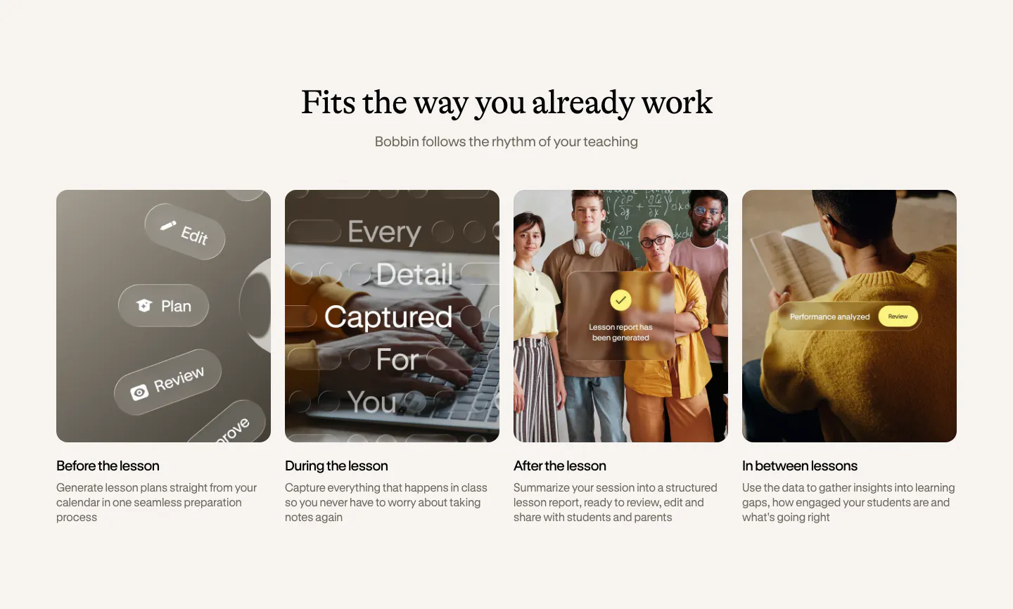
  78. Bobbin how it works section: serif heading above four equal photo cards for before, during, after and between lessons
  79. Solidroad footer section: serif CTA headline and lime button above logo and link columns on cream with a faint halftone dot texture
  80. Cluster call-to-action section: centered serif headline and dark pill button on a beige panel framed by dark edges
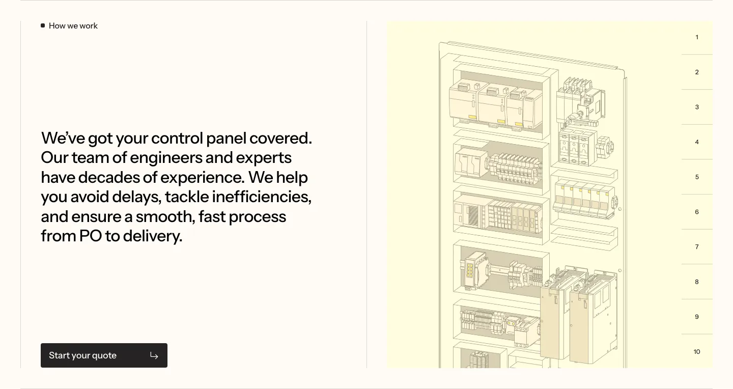
  81. Podium Automation value proposition section: large text block left and a numbered control cabinet illustration on the right
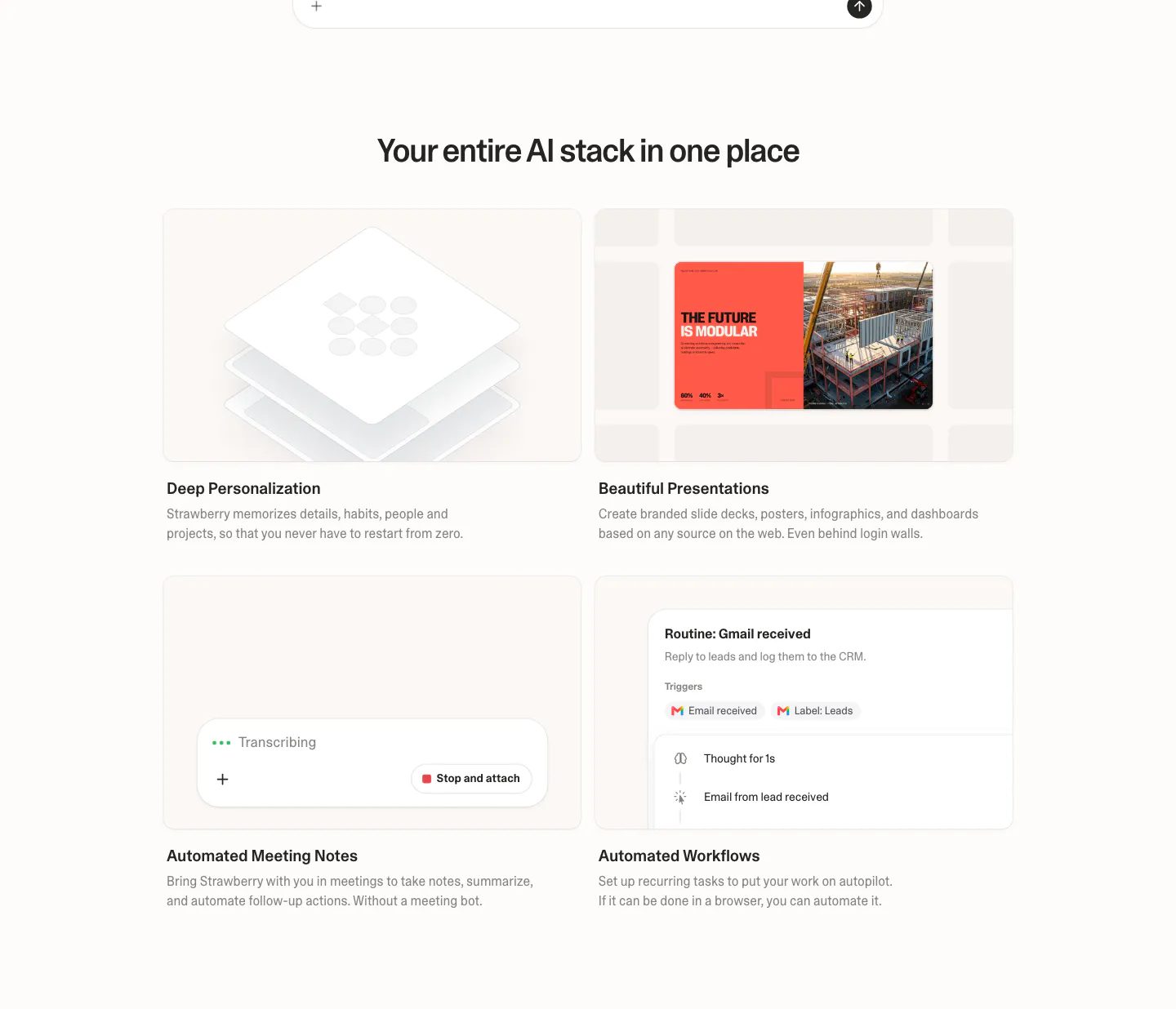
  82. Strawberry features section: centered headline over a 2x2 grid of cards with UI snippets for personalization, slides, notes and workflows
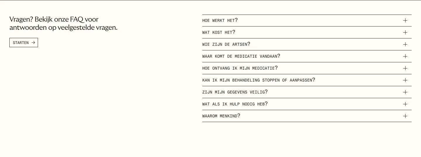
  83. Menkind FAQ section: short intro with start button on the left and a monospace question accordion on the right on cream
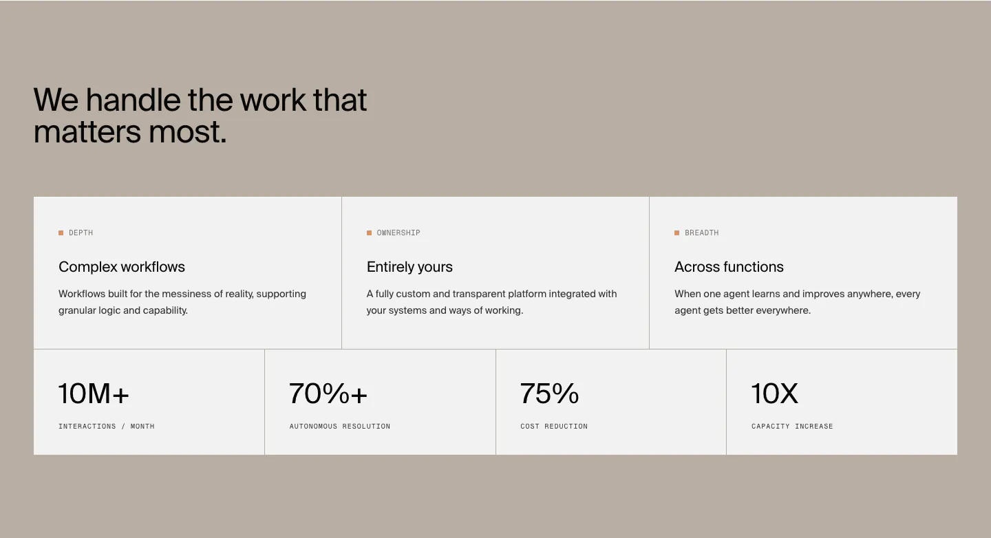
  84. HappyRobot value proposition section: headline on a taupe background above three benefit cards and a row of four large metrics
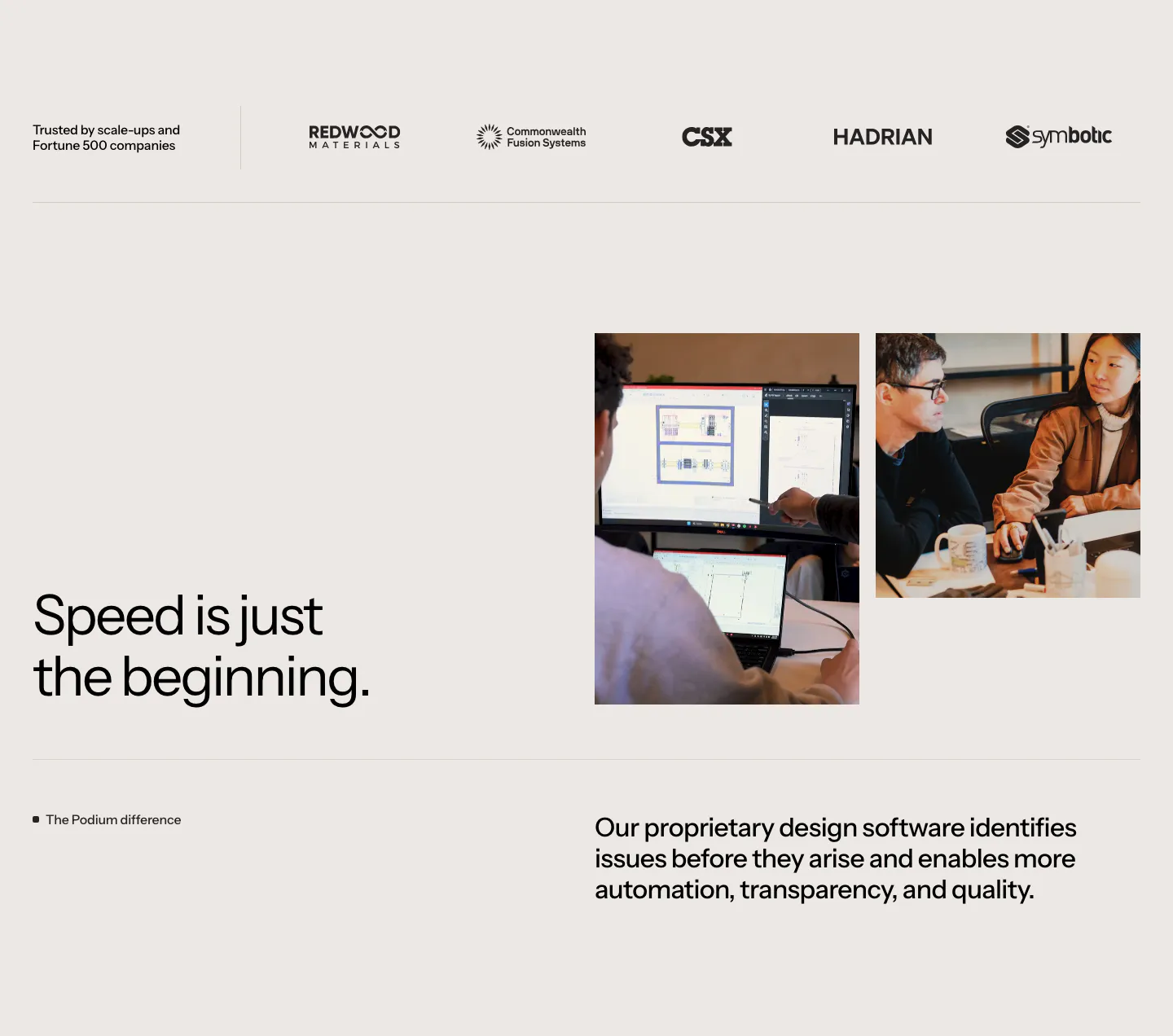
  85. Podium Automation value proposition section: customer logo row above a headline beside two team photos on a warm gray background
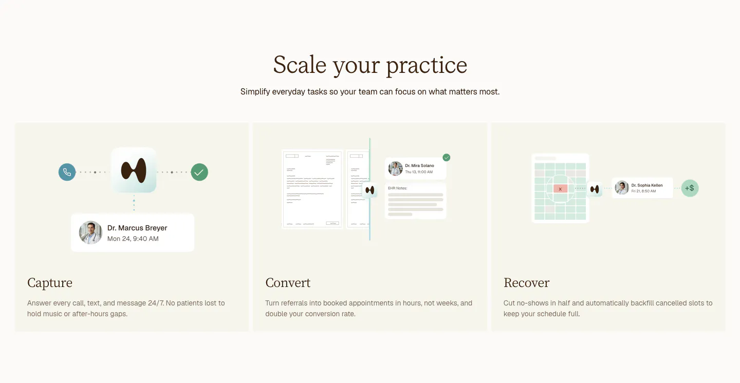
  86. Clarion features section: centered serif headline above three cream cards for Capture, Convert and Recover with light UI mockups
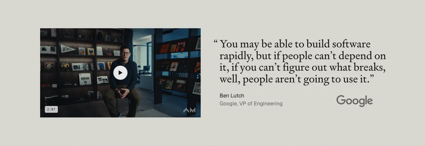
  87. Antimetal testimonials section: video thumbnail of a speaker at left, large serif quote from a Google VP with Google logo at right
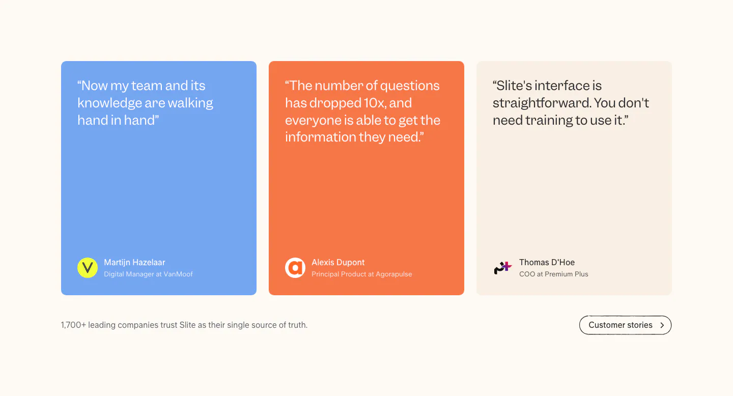
  88. Slite testimonials section: three quote cards in blue, orange and beige with author avatars, plus a customer stories button on cream
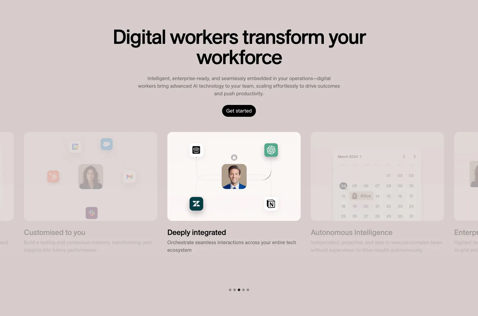
  89. 11x features section: centered headline and button above a card carousel with integration and calendar visuals and dot pagination on taupe
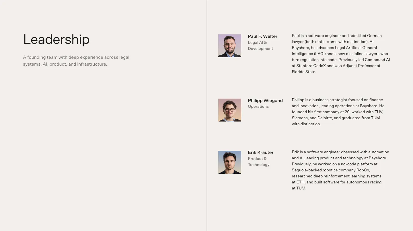
  90. Bayshore team section: Leadership heading left, three founder rows with headshots, roles and bios right on warm off-white
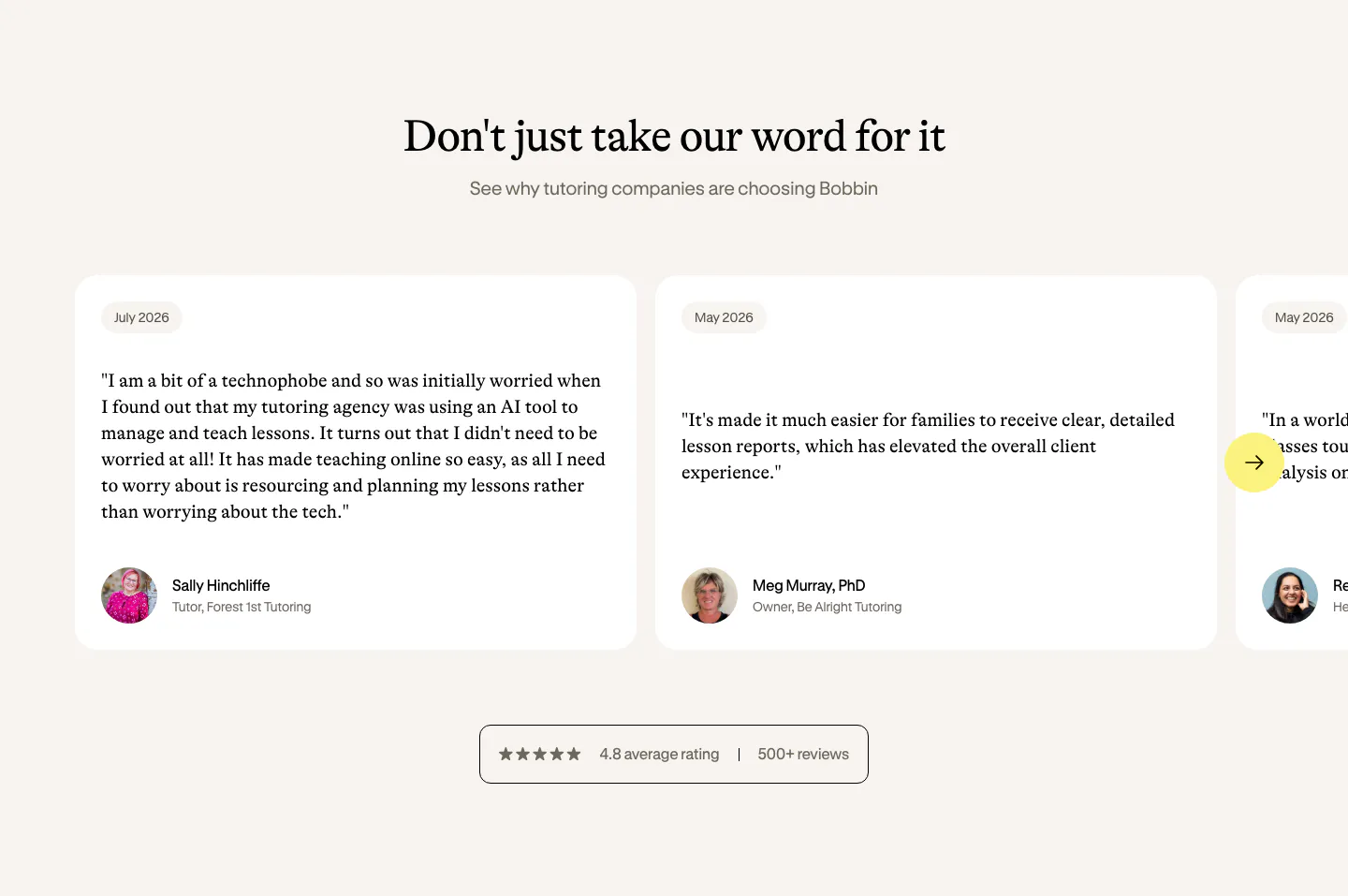
  91. Bobbin testimonials section: serif heading above a carousel of white quote cards with avatars and a rating badge on cream
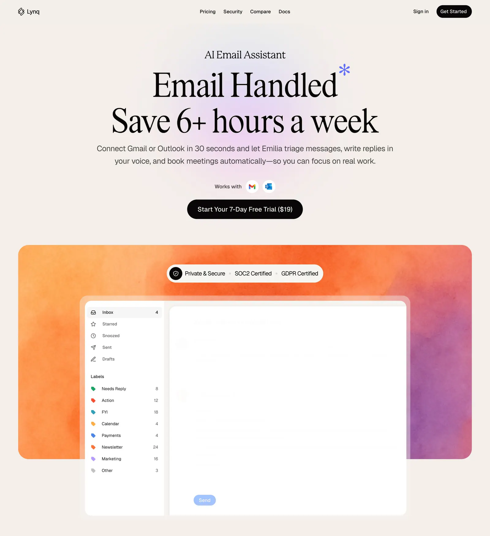
  92. Lynq hero section: centered serif headline and CTA on cream above an inbox UI mockup on an orange-purple watercolor panel
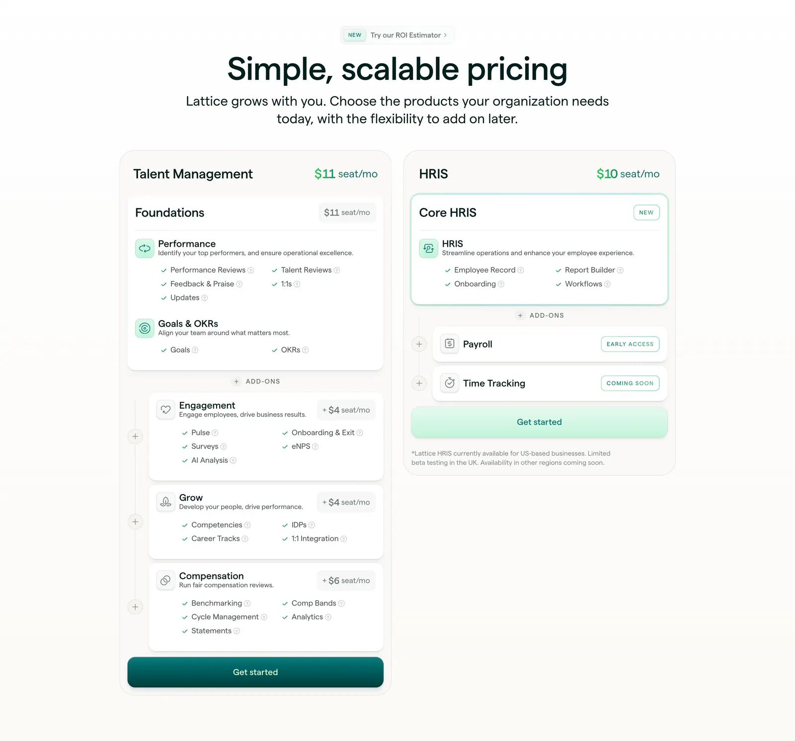
  93. Lattice pricing section: centered heading above two plan cards, Talent Management with stacked add-ons and HRIS, with seat prices and checklists
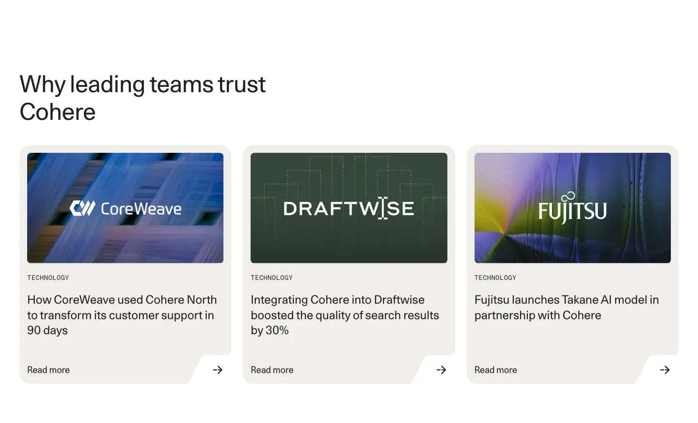
  94. Cohere testimonials section: left-aligned headline above three customer story cards with logo images and read more links
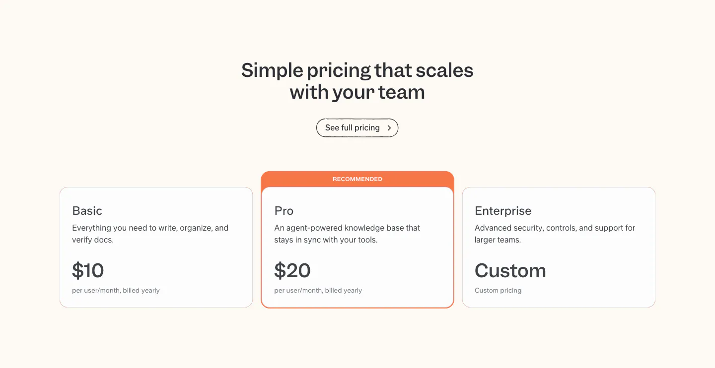
  95. Slite pricing section: centered headline above Basic, Pro and Enterprise plan cards, with the Pro card highlighted as recommended
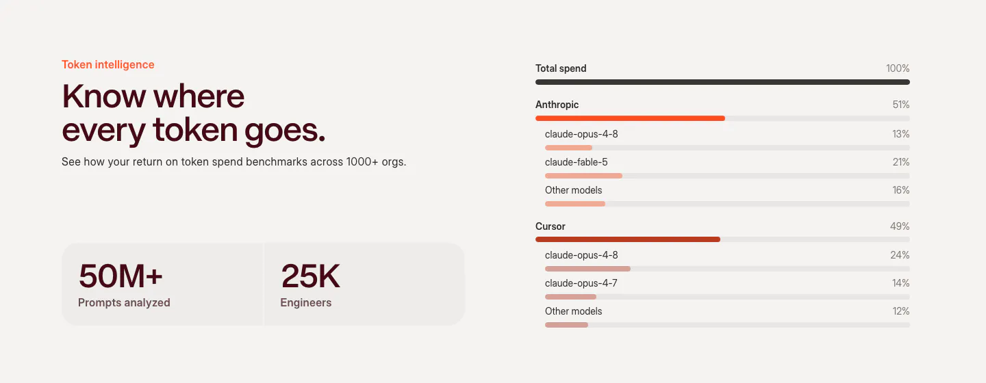
  96. Weave features section: headline and two stat tiles on the left beside a token spend breakdown chart with horizontal bars by model
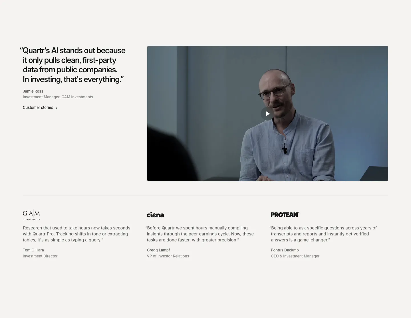
  97. Quartr testimonials section: large quote beside a customer video with play button, above three logo-headed quotes in columns
  98. Bayshore footer section: single row with copyright left, small logo mark centered and text links right on warm off-white
  99. Ruul integrations section: small caption above a row of grayscale bank and wallet logos on an off-white background
  100. Clay value proposition section: headline and customer outcomes above a wide 3D render of connected clay GTM objects in a rounded card
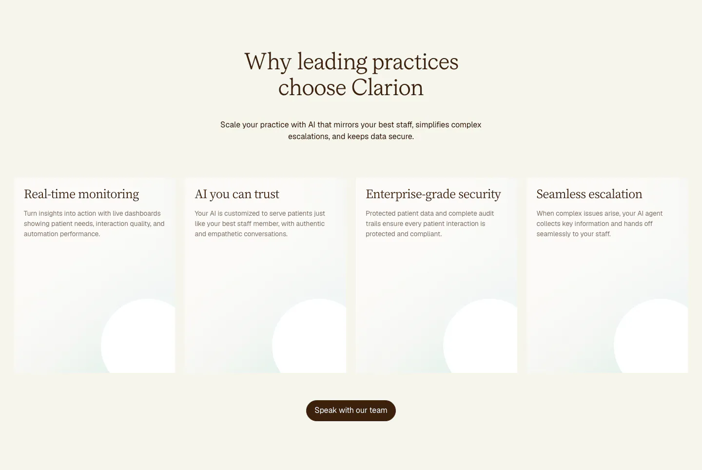
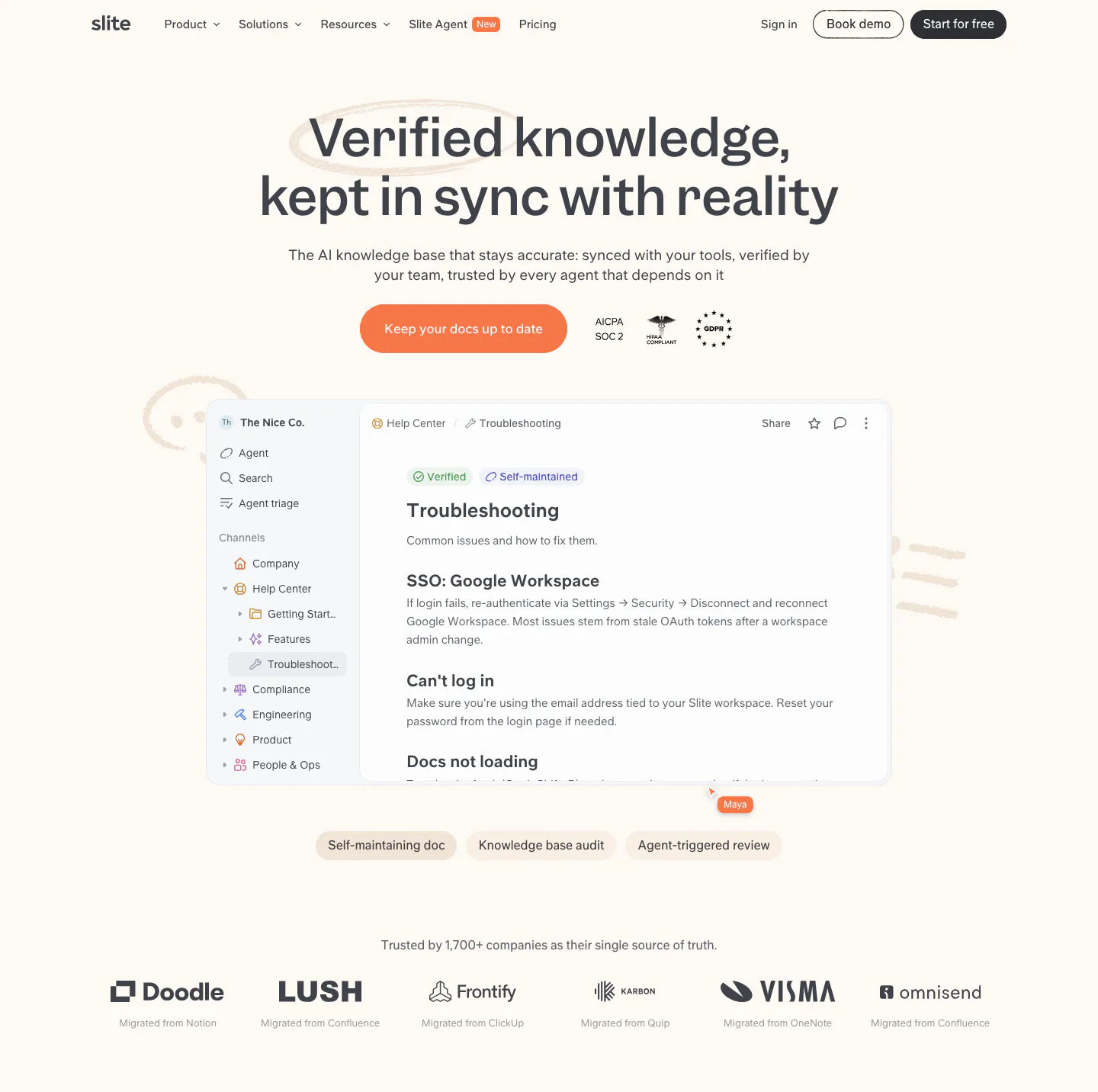
  101. Clarion value proposition section: centered serif headline above four tall cream cards with soft circle shapes and a brown button
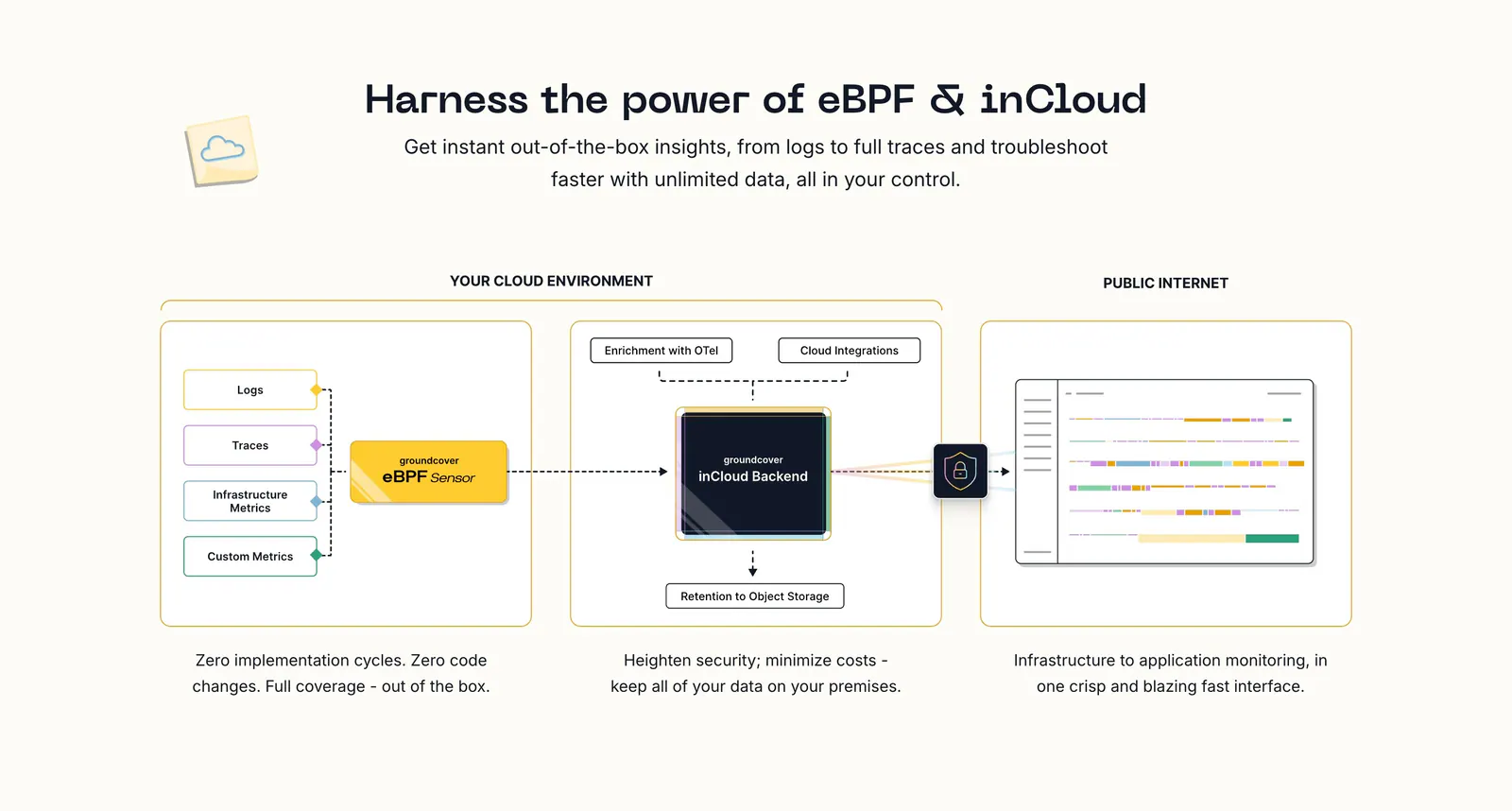
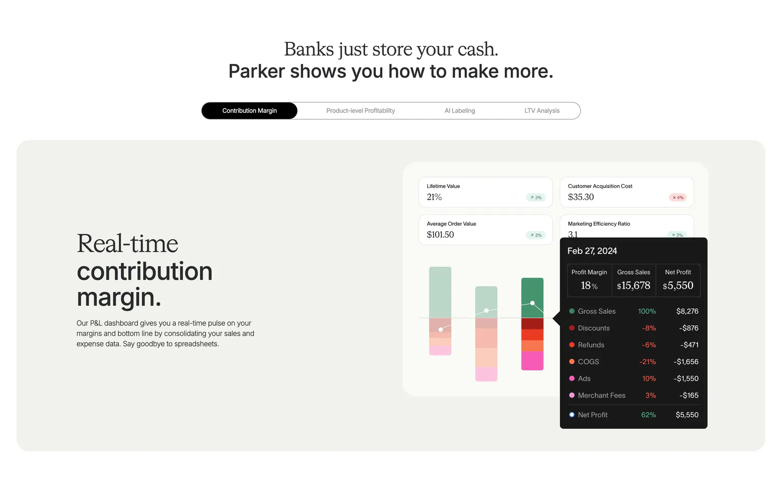
  102. groundcover how it works section: centered headline above an architecture diagram flowing from sensor to backend to UI with captions
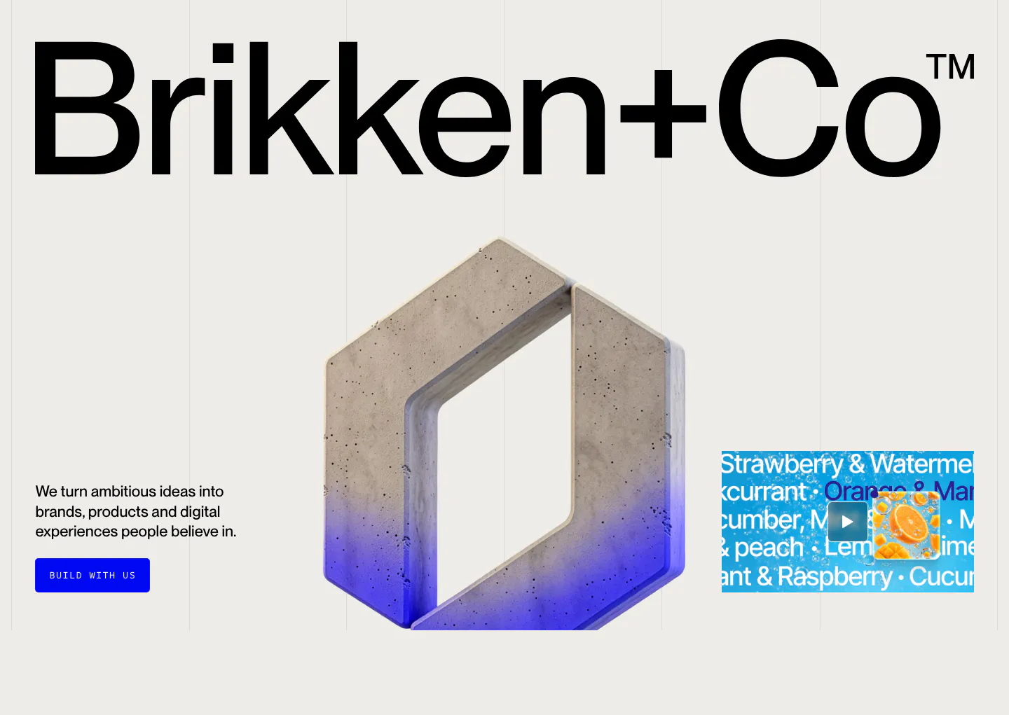
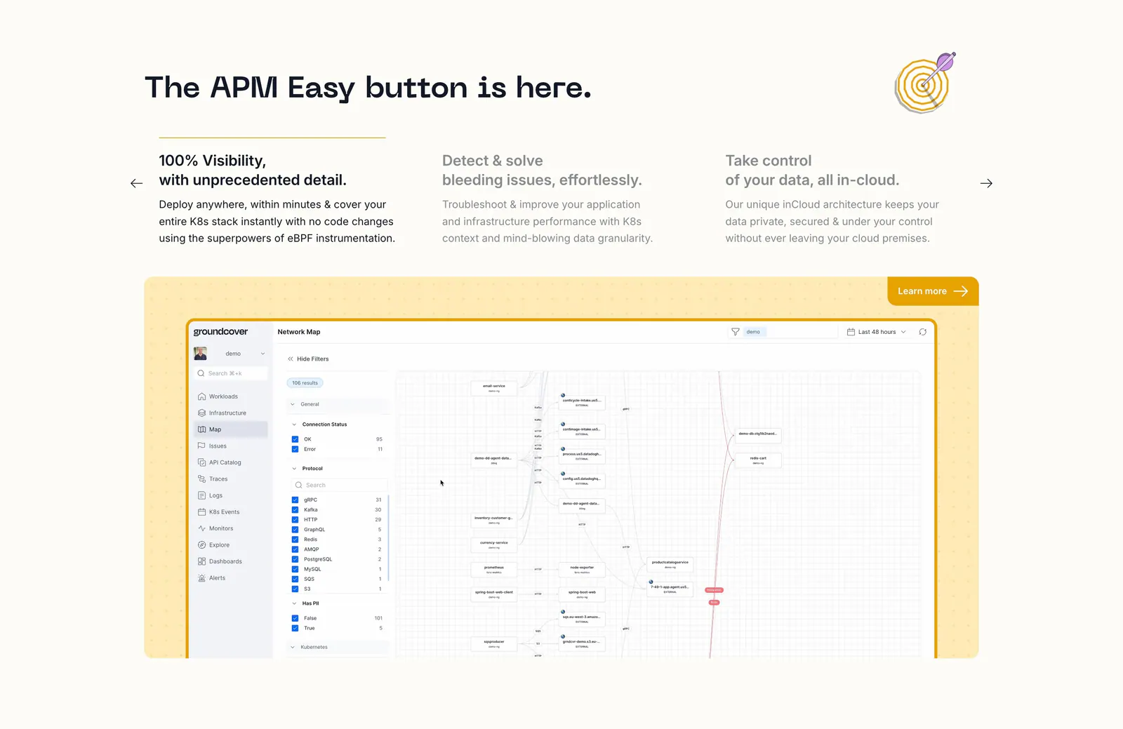
  103. Brikken+Co hero section: giant wordmark above a 3D concrete hexagon logo, short copy with blue button and video thumbnail
  104. Slite hero section: centered headline, orange CTA and compliance badges above a knowledge base doc screenshot and customer logo row on cream
  105. Parker features section: centered headline over a pill tab bar and beige panel with text beside a contribution margin dashboard UI
  106. groundcover features section: headline over three feature columns with arrows above a network map screenshot in a yellow dotted panel
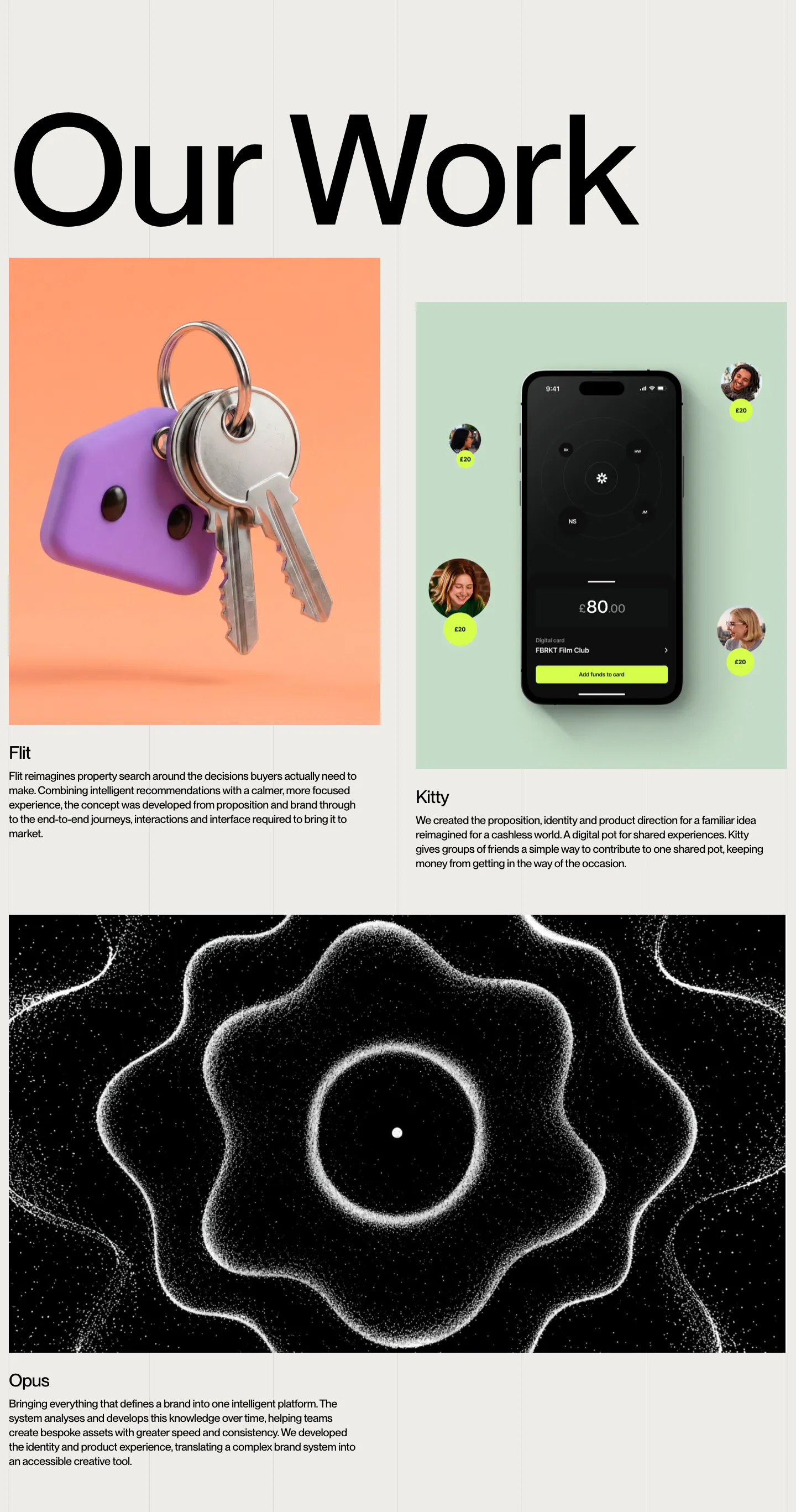
  107. Brikken+Co other section: oversized Our Work heading above project cards with 3D keys, a phone app and particle artwork
    Brikken+Co Other
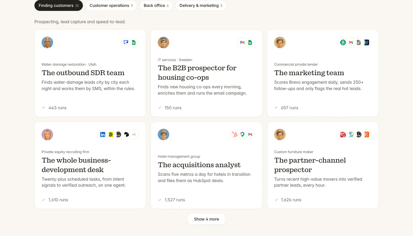
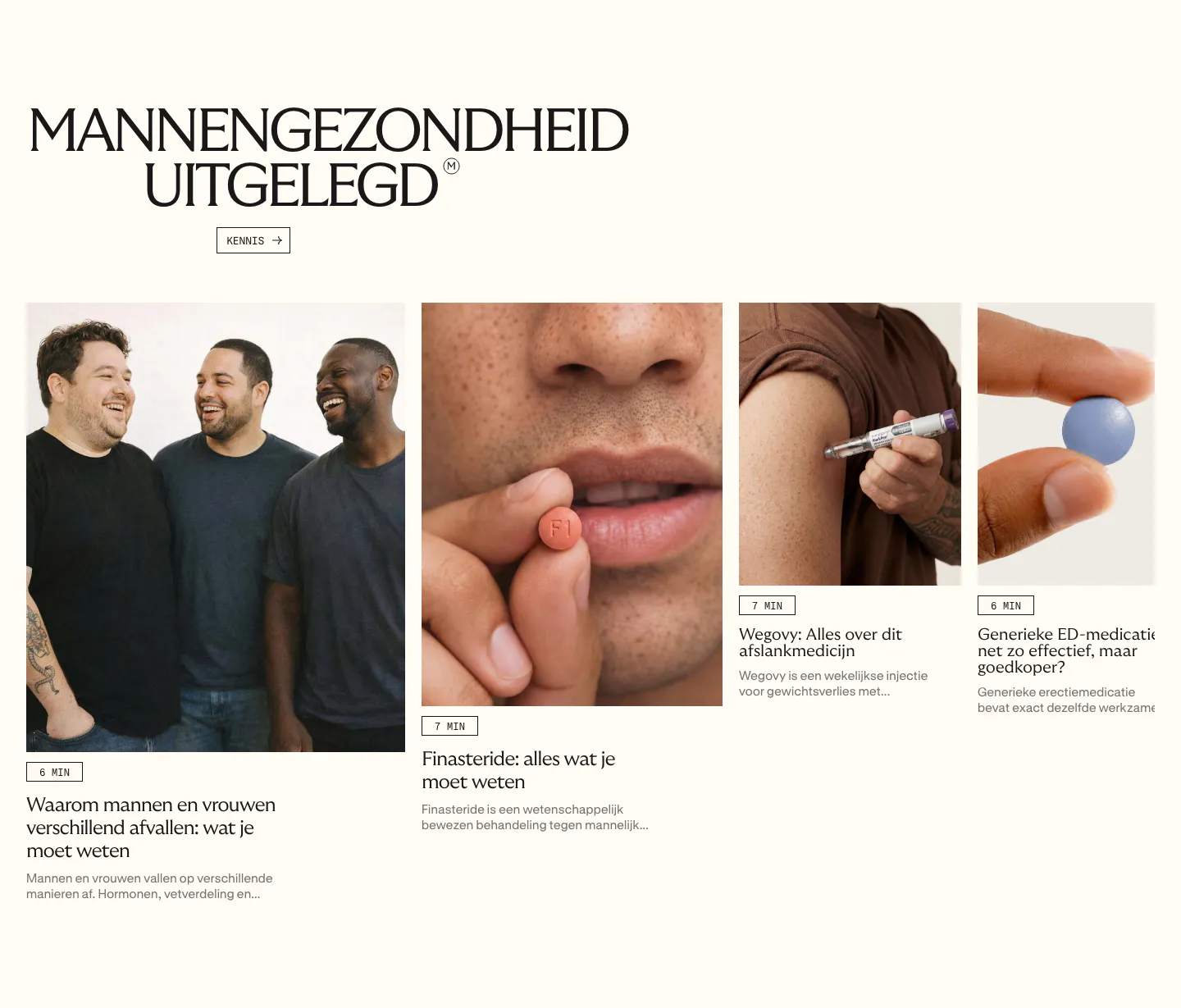
  108. Twin use cases section: tab bar of categories above a three-column grid of agent cards with avatars, app icons and run counts
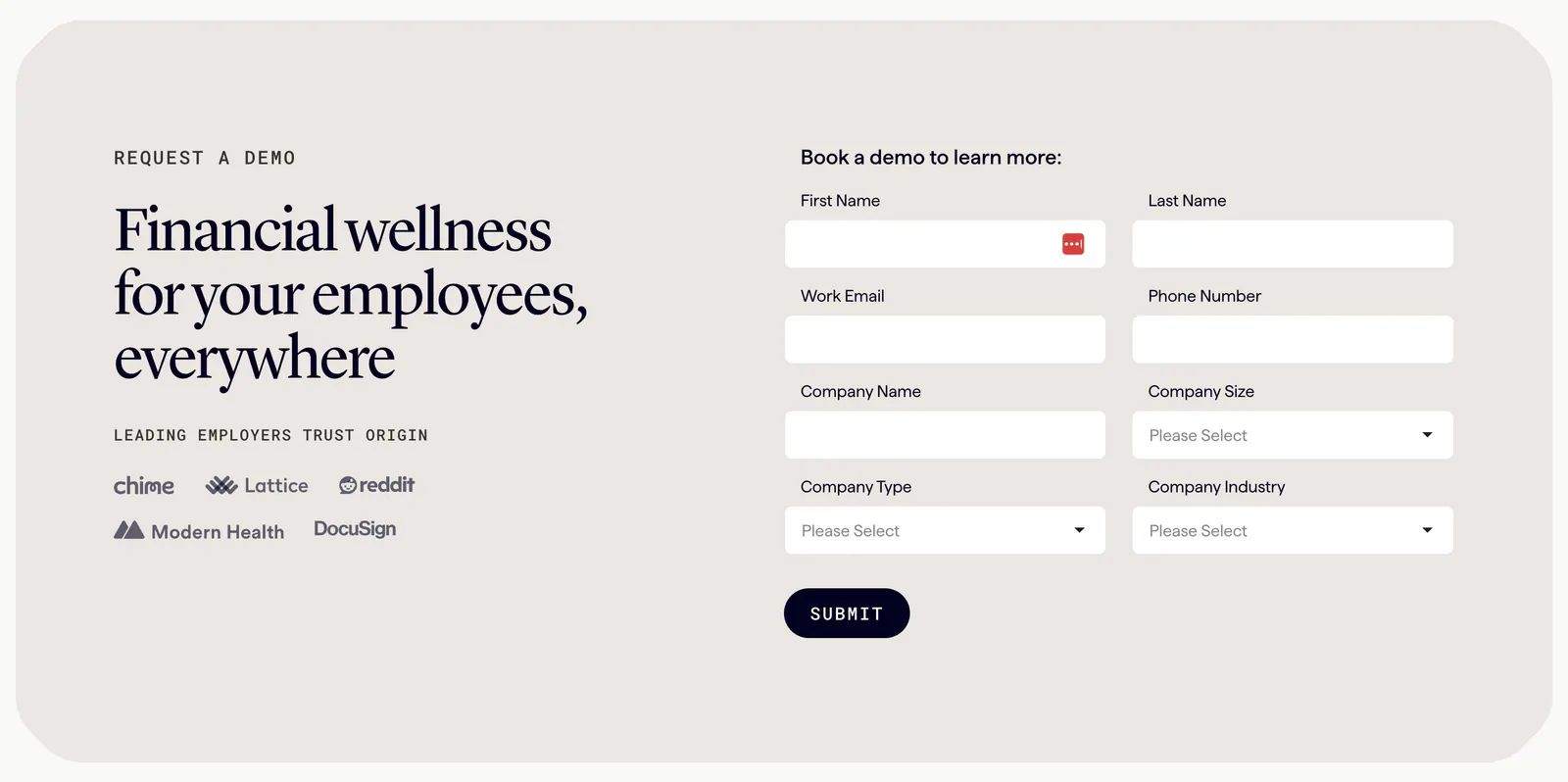
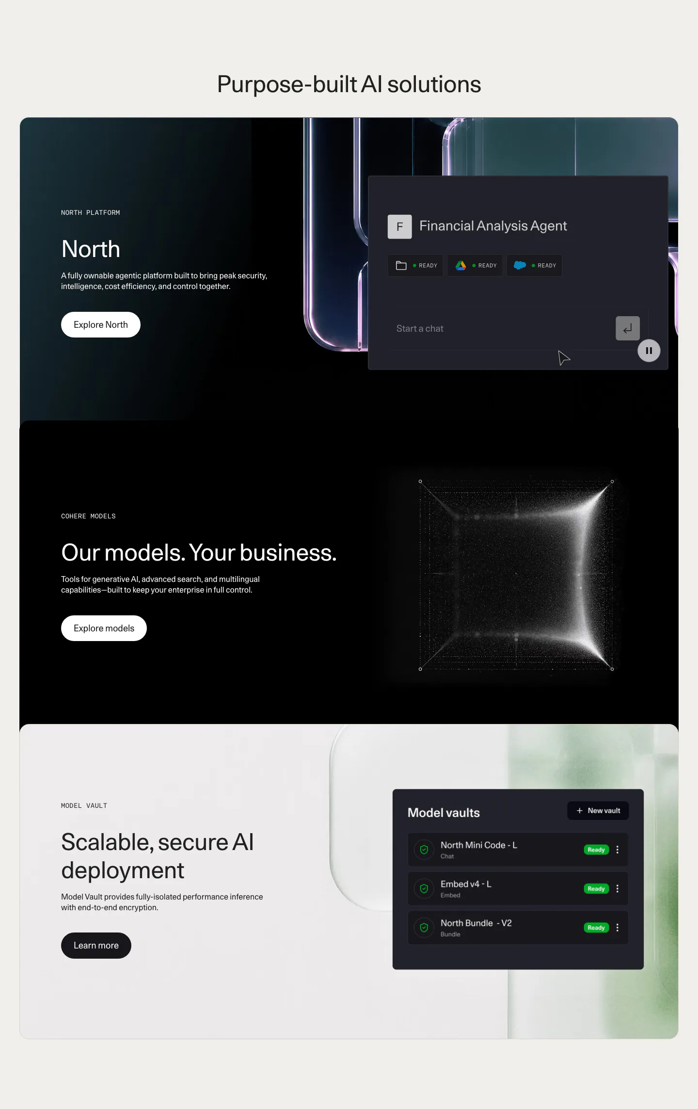
  109. Origin contact section: serif headline and employer logos on the left beside a two-column demo request form in a beige rounded panel
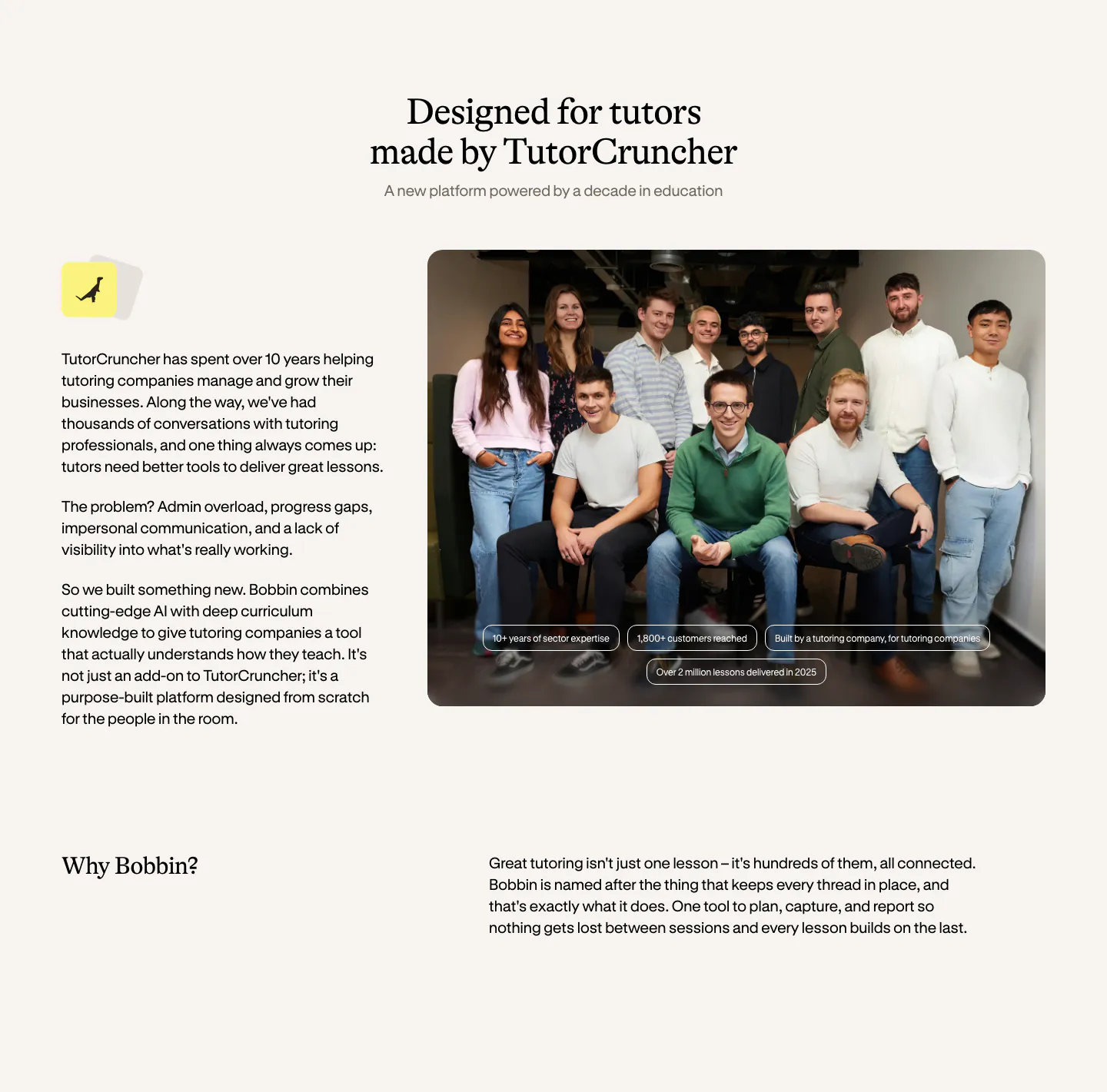
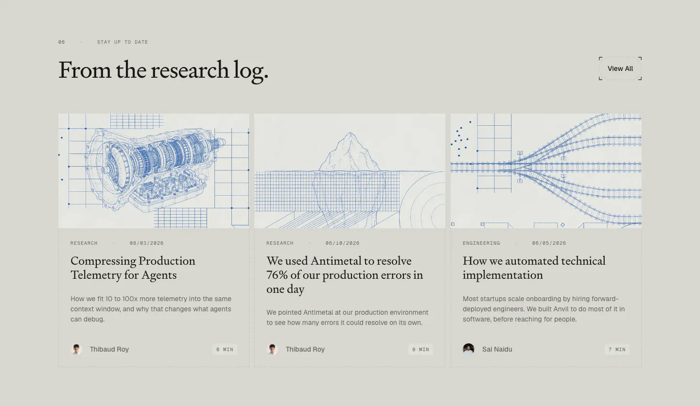
  110. Bobbin about & mission section: serif heading, company story text left and a team group photo right, with a Why Bobbin row below
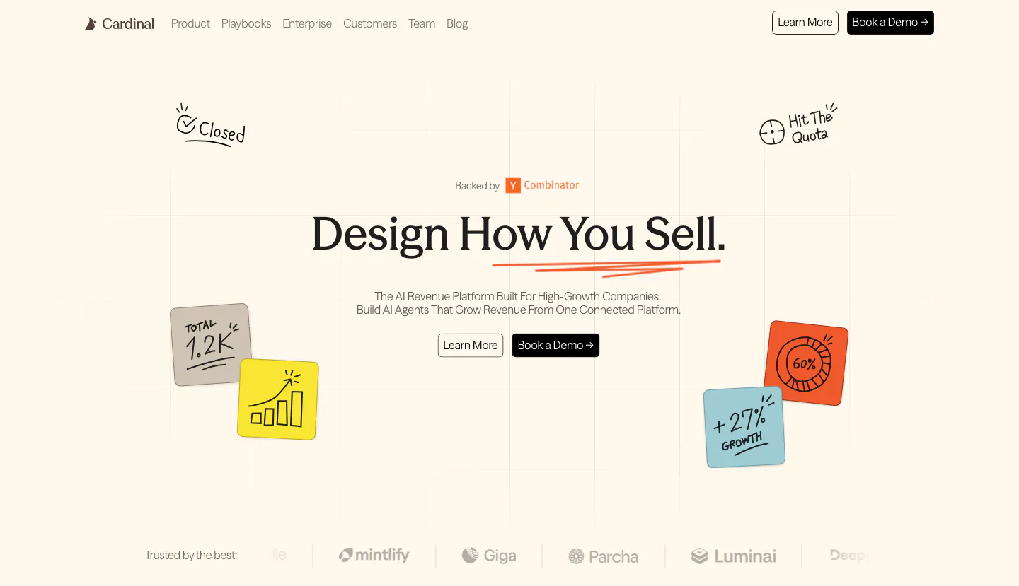
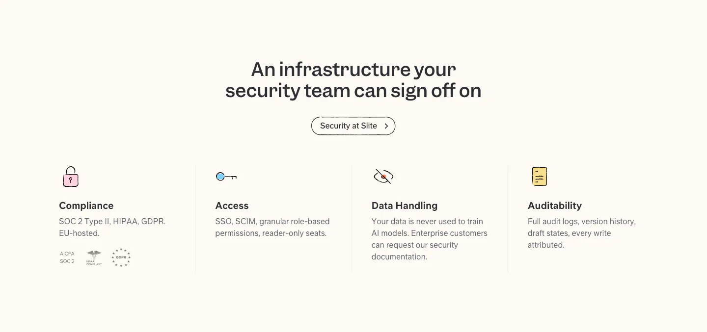
  111. Cardinal hero section: centered serif headline with two buttons, hand-drawn sticky-note doodles on a faint grid and a logo strip on cream
    Cardinal Hero
  112. Menkind blog & resources section: serif headline above a row of article cards with photos and read times, cut off at the edge
  113. Cohere features section: centered headline above three stacked cards with text left and agent UI, particle cube and vault UI right
  114. Antimetal blog & resources section: serif headline with View All button over three article cards with blue blueprint line drawings
  115. Slite security section: centered headline and button above four columns for compliance, access, data handling and audit, with badges
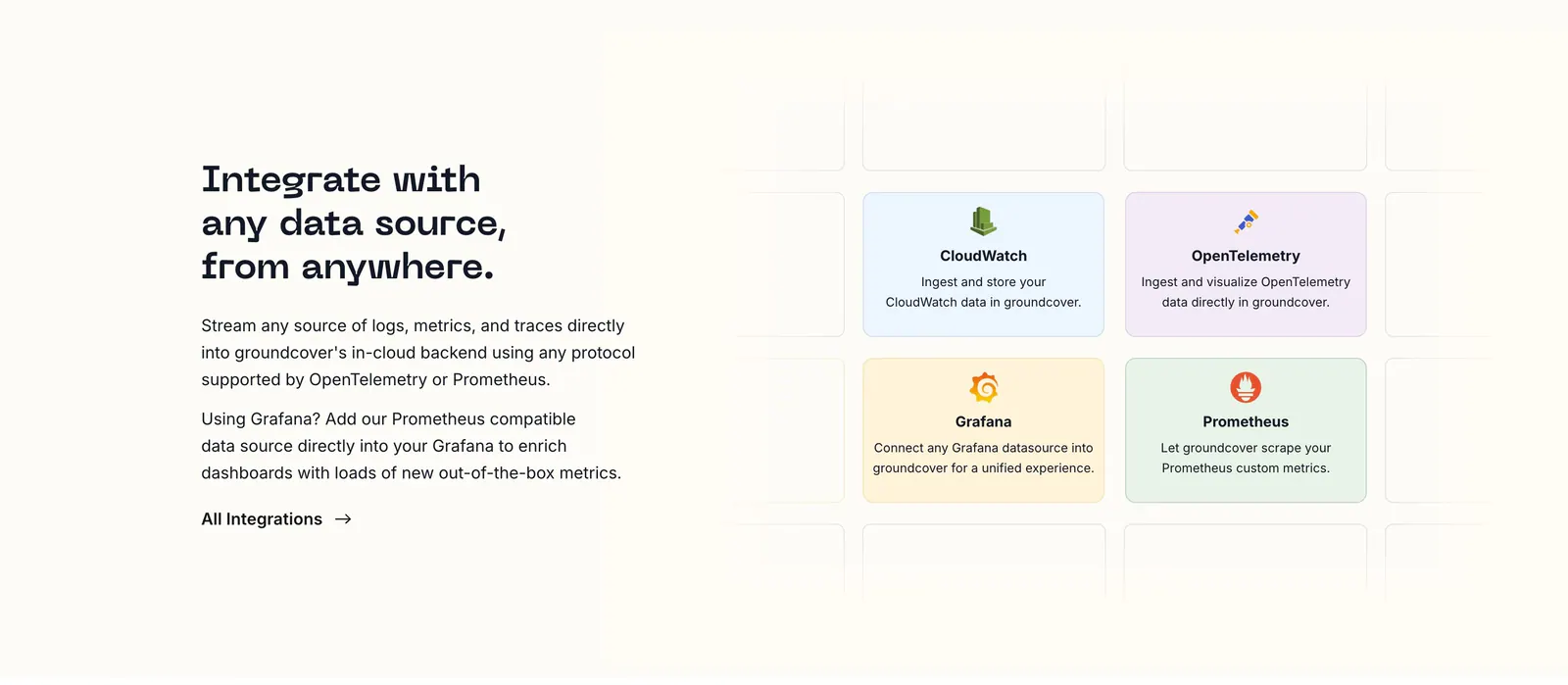
  116. groundcover integrations section: headline, copy and link on the left beside a grid of pastel integration cards on a cream background
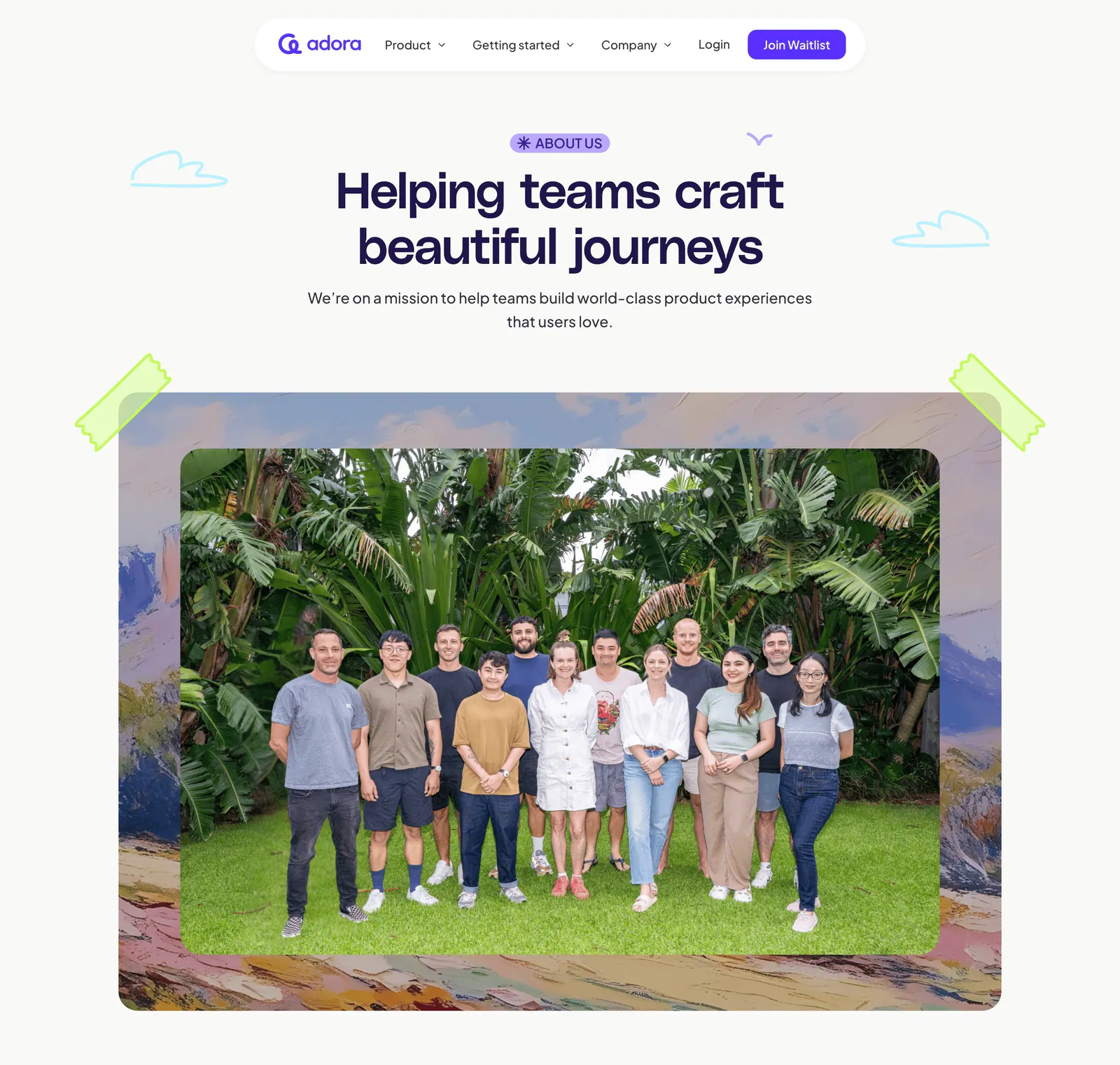
  117. Adora hero section: floating nav, centered About us headline and a large team photo framed by painted artwork and tape
  118. Ruul logo cloud section: small caption above a single row of grayscale organisation logos on an off-white background
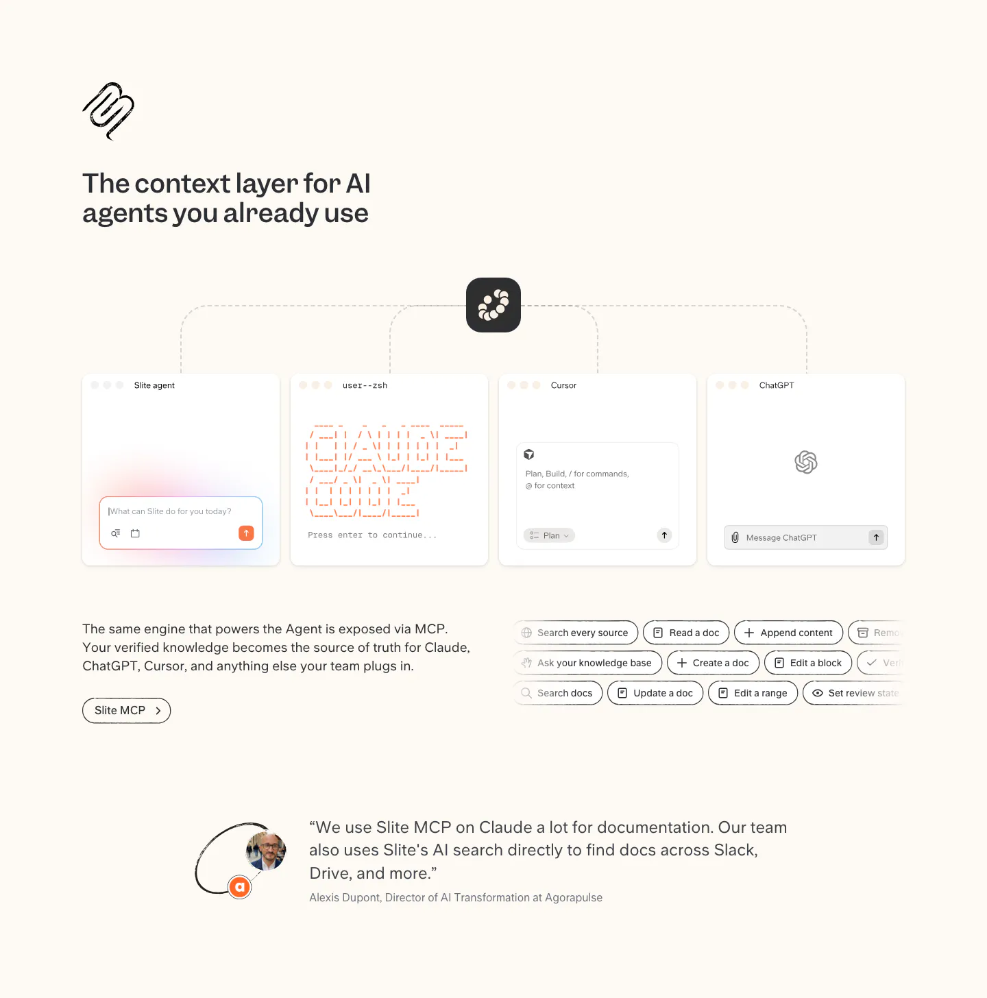
  119. Slite integrations section: MCP diagram linking Slite to agent, terminal, Cursor and ChatGPT windows, tool chips and a customer quote
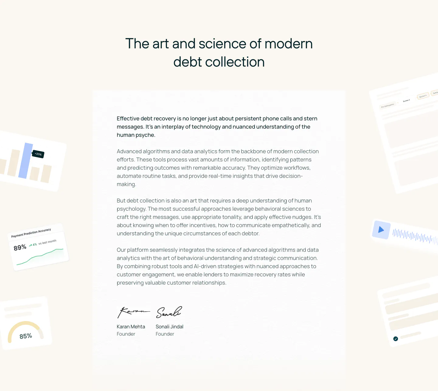
  120. Rezolv about & mission section: centered headline above a founders letter with signatures, flanked by faded UI fragments on cream
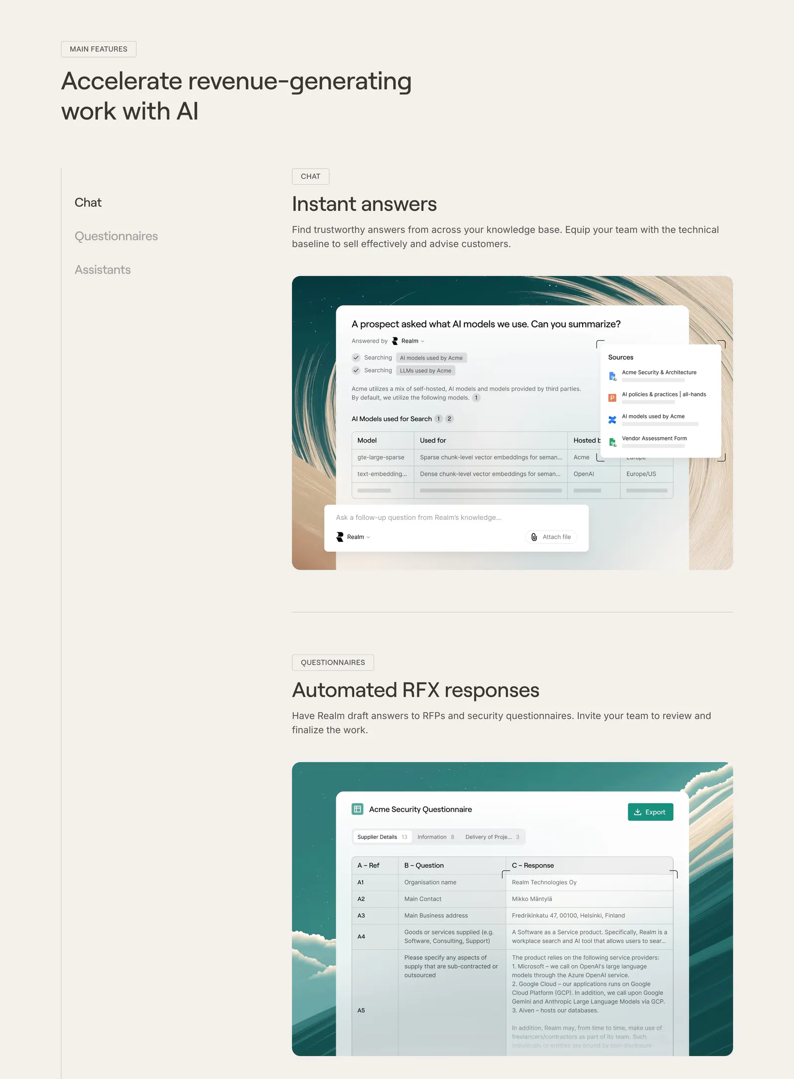
  121. Realm features section: headline with side menu and stacked feature blocks showing UI screenshots on painted backdrops, beige page
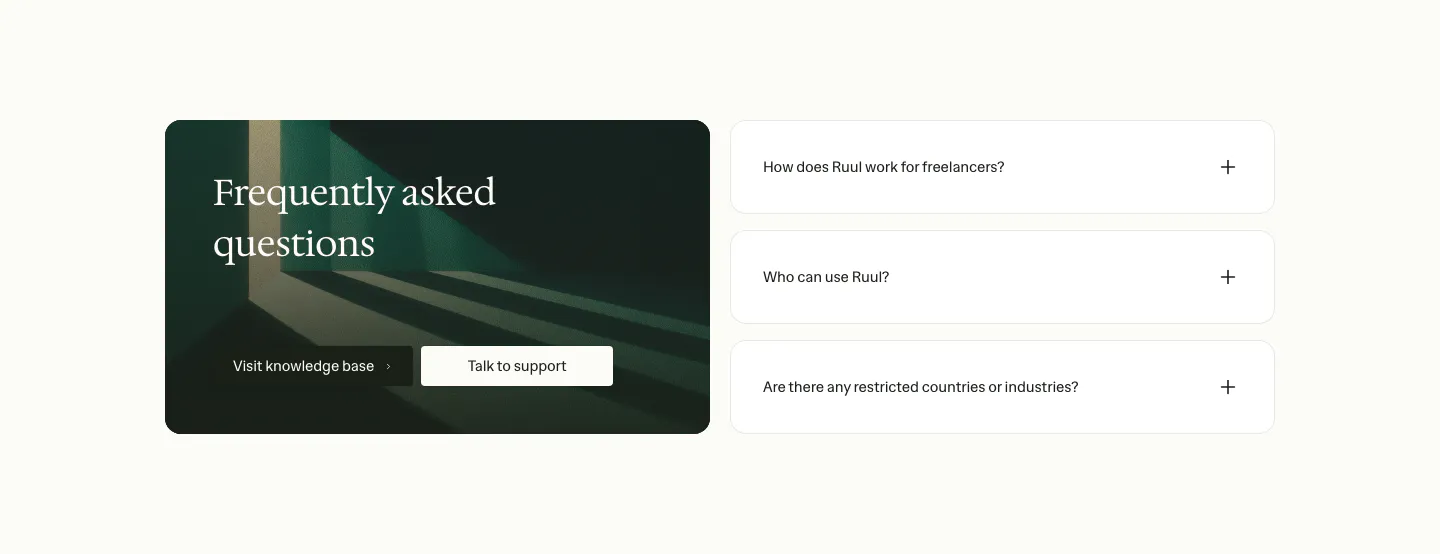
  122. Ruul FAQ section: dark green image card with serif headline and buttons on the left, three collapsed question rows on the right
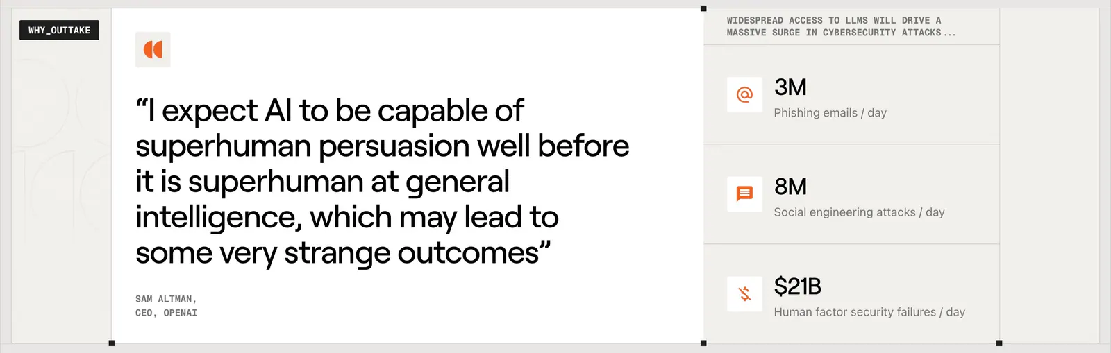
  123. Outtake testimonials section: large Sam Altman quote card beside a column of three threat statistics with orange icons on beige
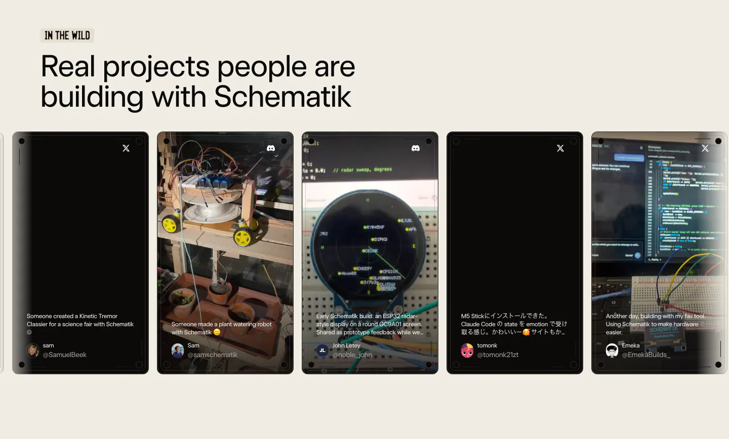
  124. Schematik testimonials section: headline above a carousel of user post cards with project photos on a beige background
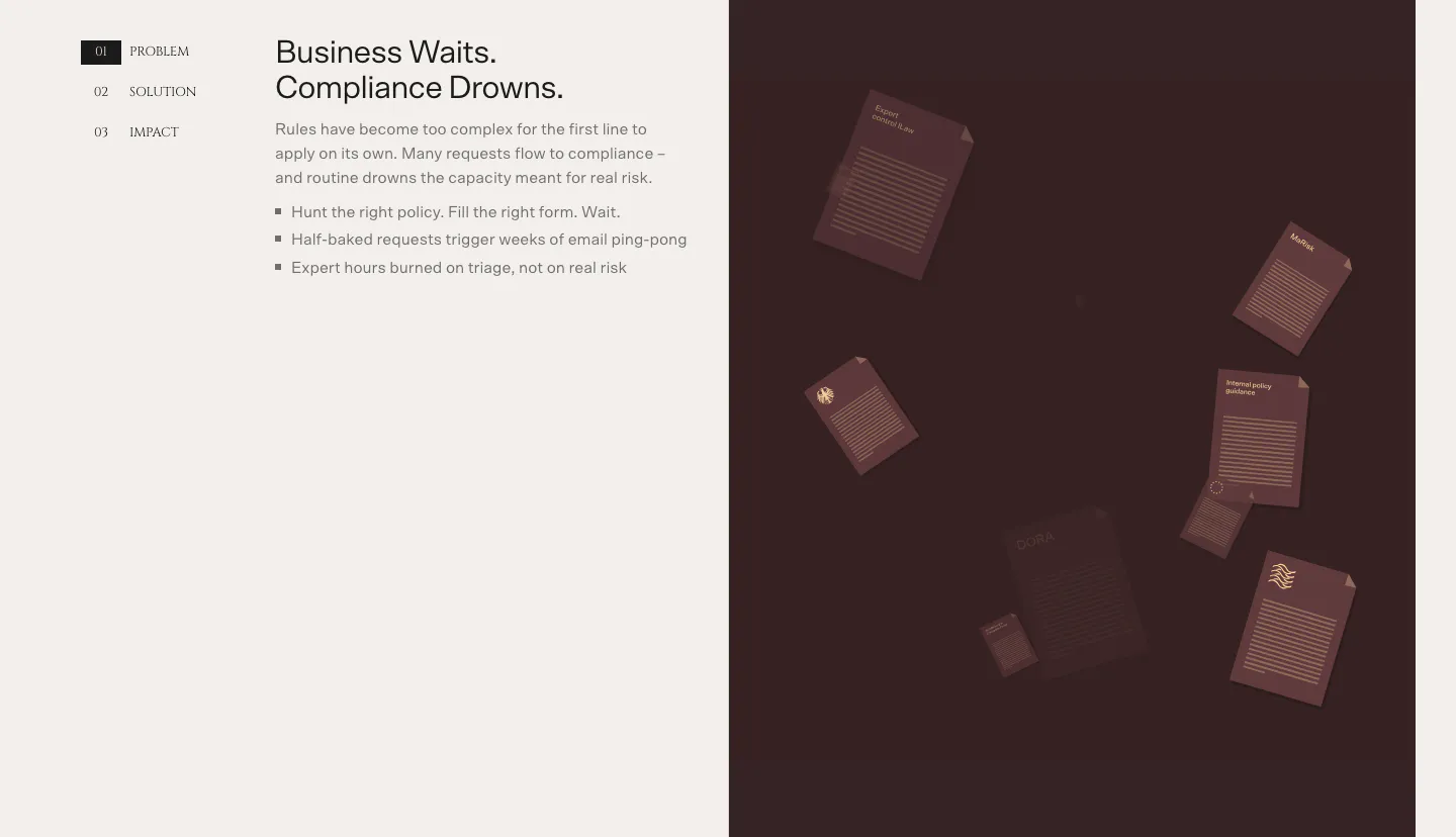
  125. Bayshore value proposition section: numbered Problem/Solution/Impact tabs and bullet copy left, dark maroon panel of floating documents right
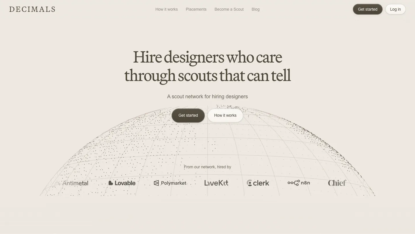
  126. Decimals hero section: centered serif headline and buttons over a dotted wireframe globe with a customer logo row on a beige background
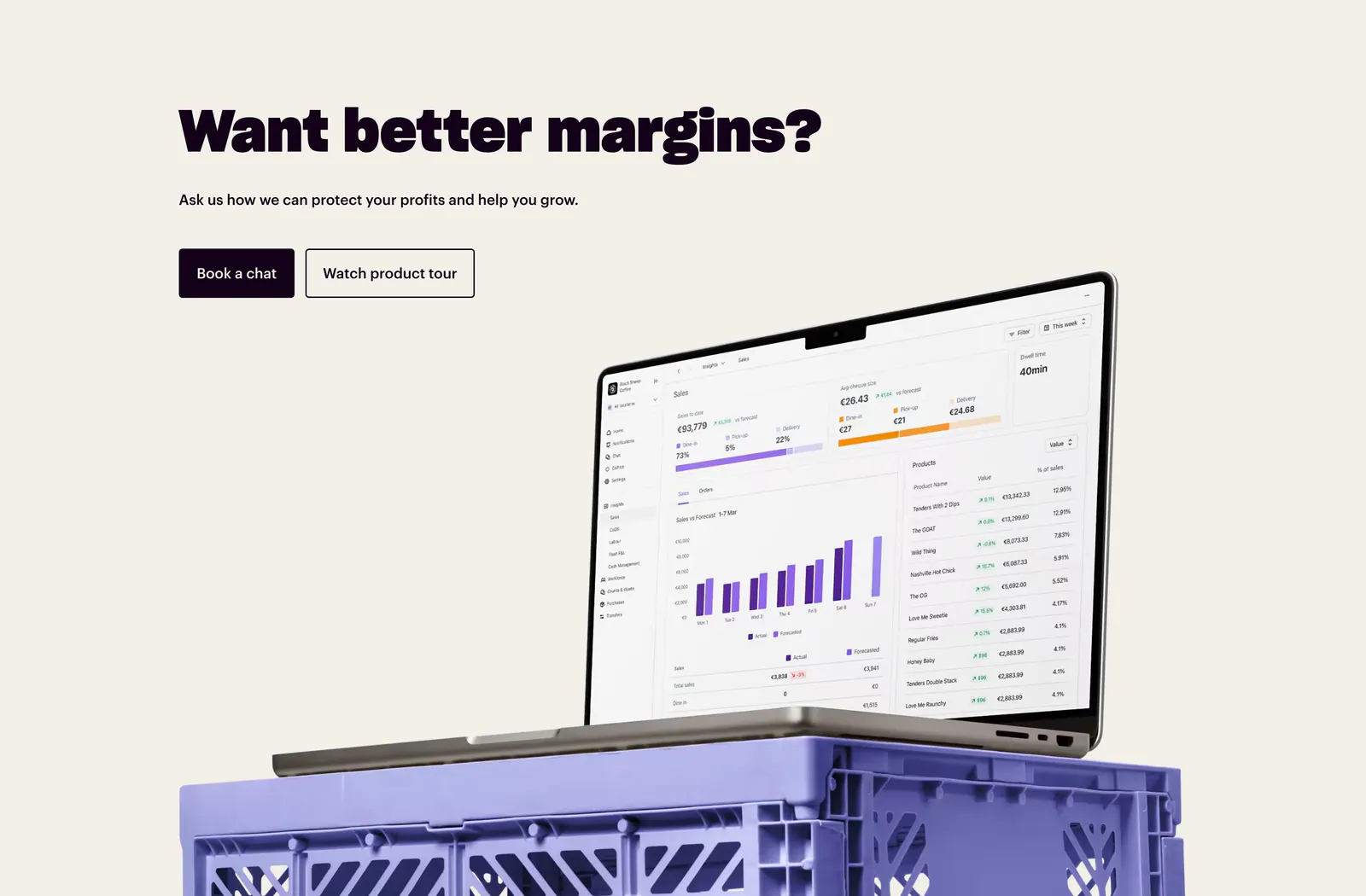
  127. Nory call-to-action section: bold headline with two buttons above a laptop showing a sales dashboard on a purple crate, cream background
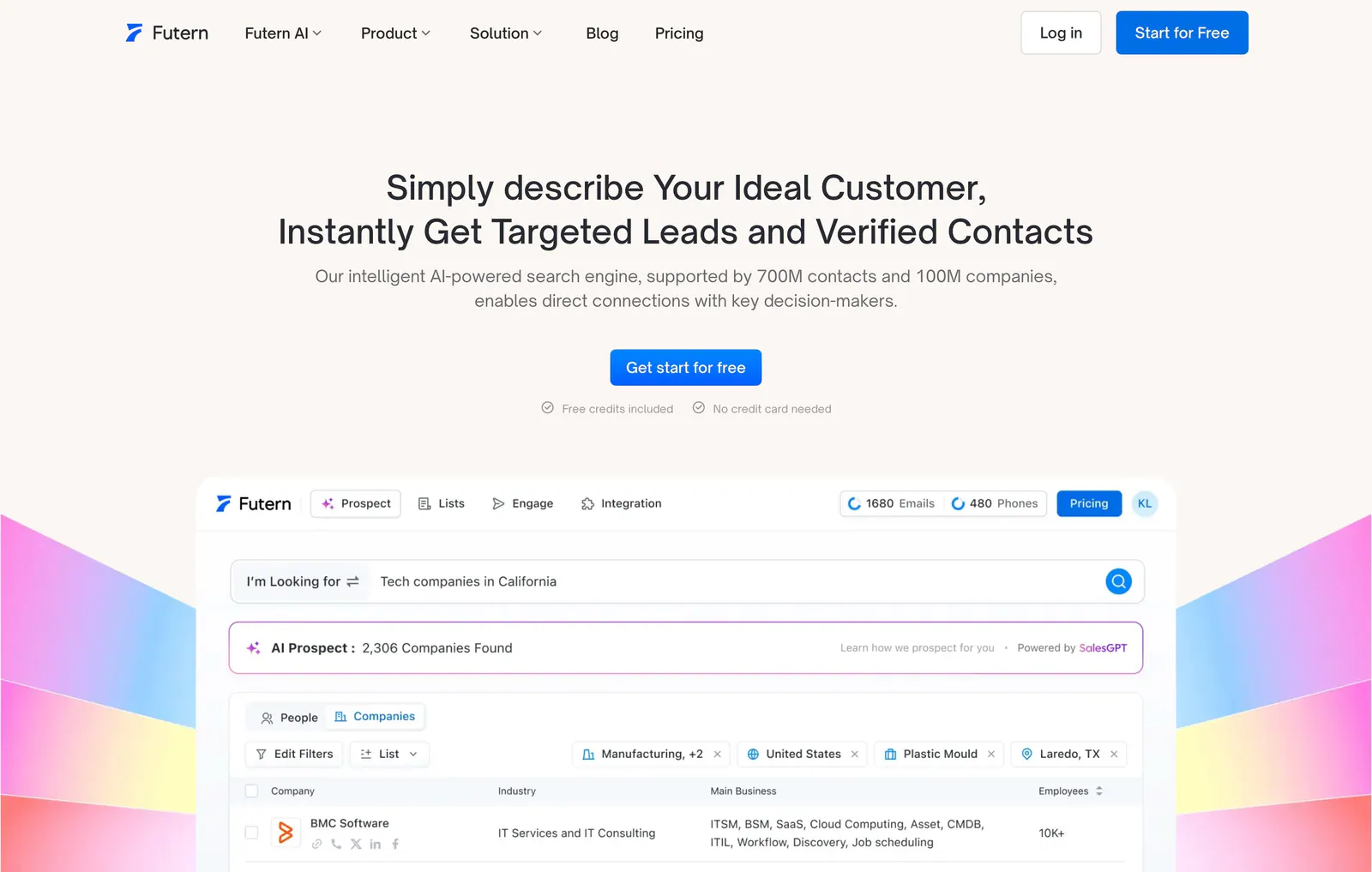
  128. Futern hero section: centered headline and CTA above a lead-search product UI framed by rainbow gradient shapes on warm off-white
    Futern Hero
  129. groundcover call-to-action section: centered headline and two buttons above an illustrated landscape of hills and plants on cream
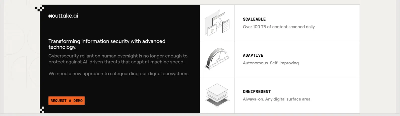
  130. Outtake call to action section: black text panel with orange demo button beside three rows of isometric line illustrations on a beige page
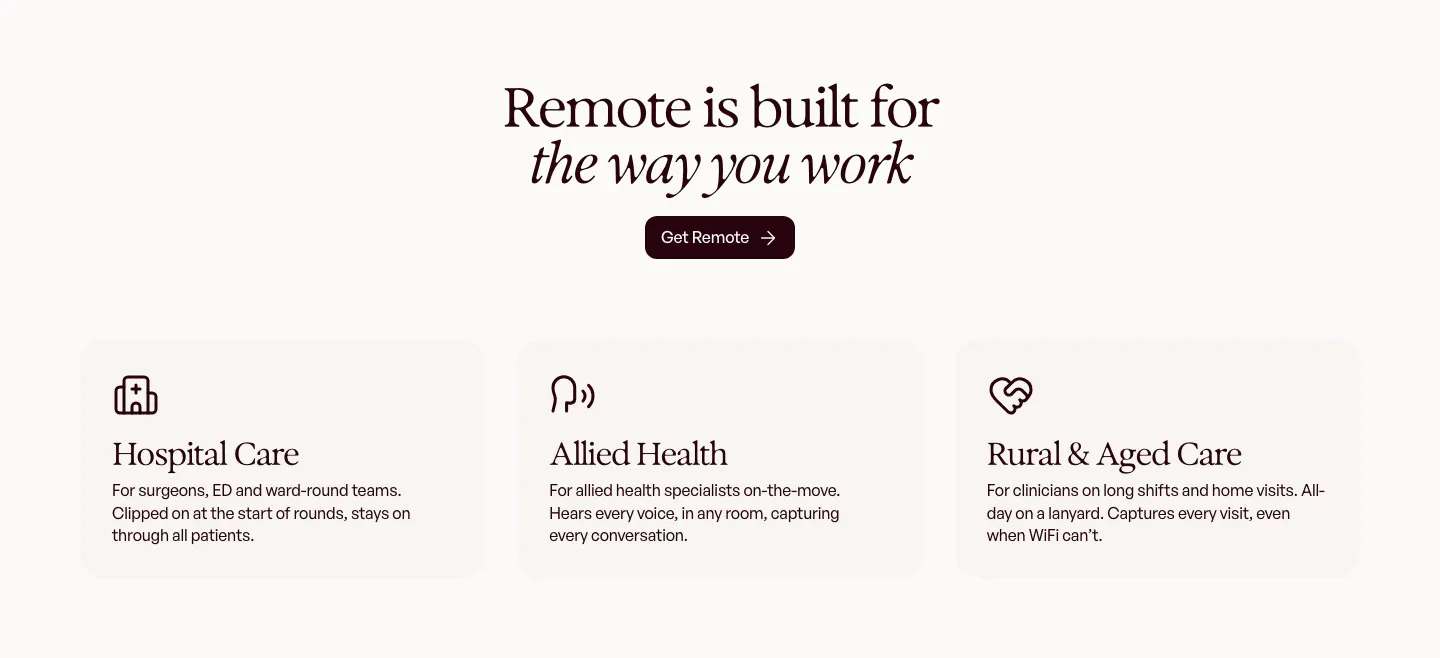
  131. Heidi use cases section: centered serif headline and Get Remote button above three cream cards for hospital, allied and rural care
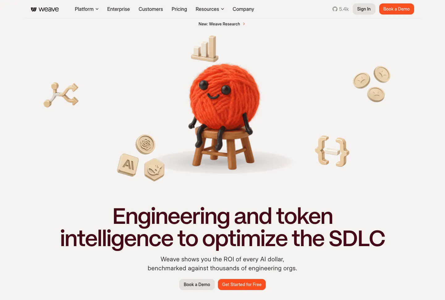
  132. Weave hero section: 3D yarn ball character and floating icons above a centered headline and two buttons on a warm light background
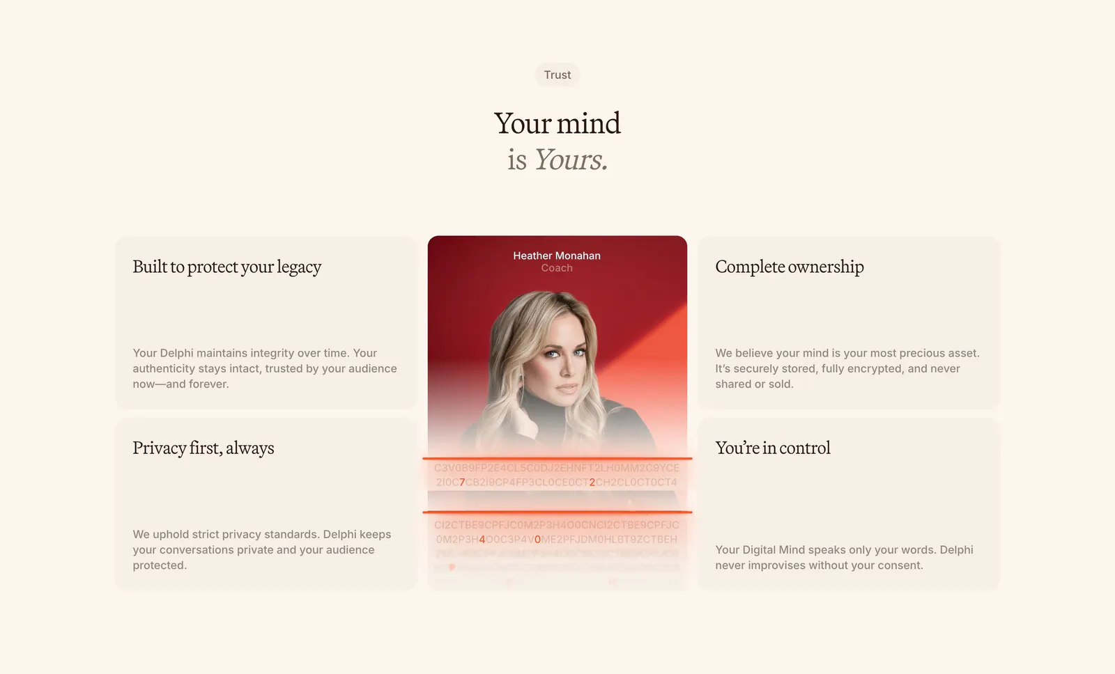
  133. Delphi features section: centered serif headline above a bento of four trust cards around a tall portrait card with an encryption text effect
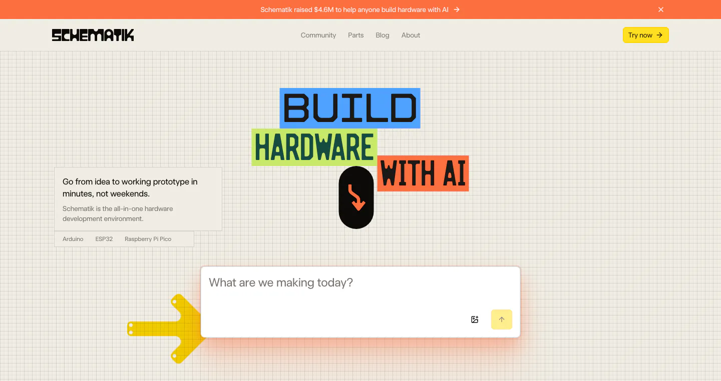
  134. Schematik hero section: nav, colored block headline and prompt input box on a beige grid background with arrow graphics
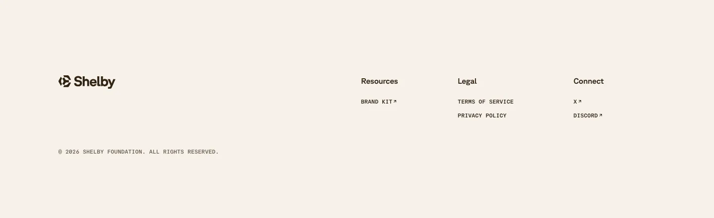
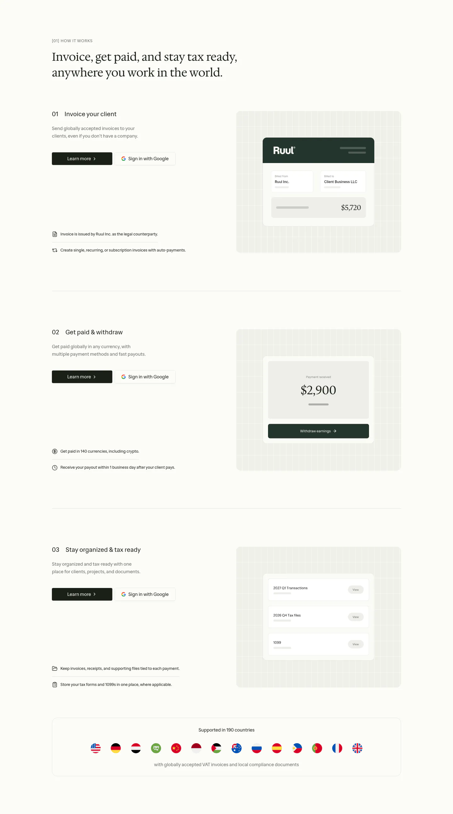
  135. Shelby footer section: logo at left with Resources, Legal and Connect link columns and a copyright line on a cream background
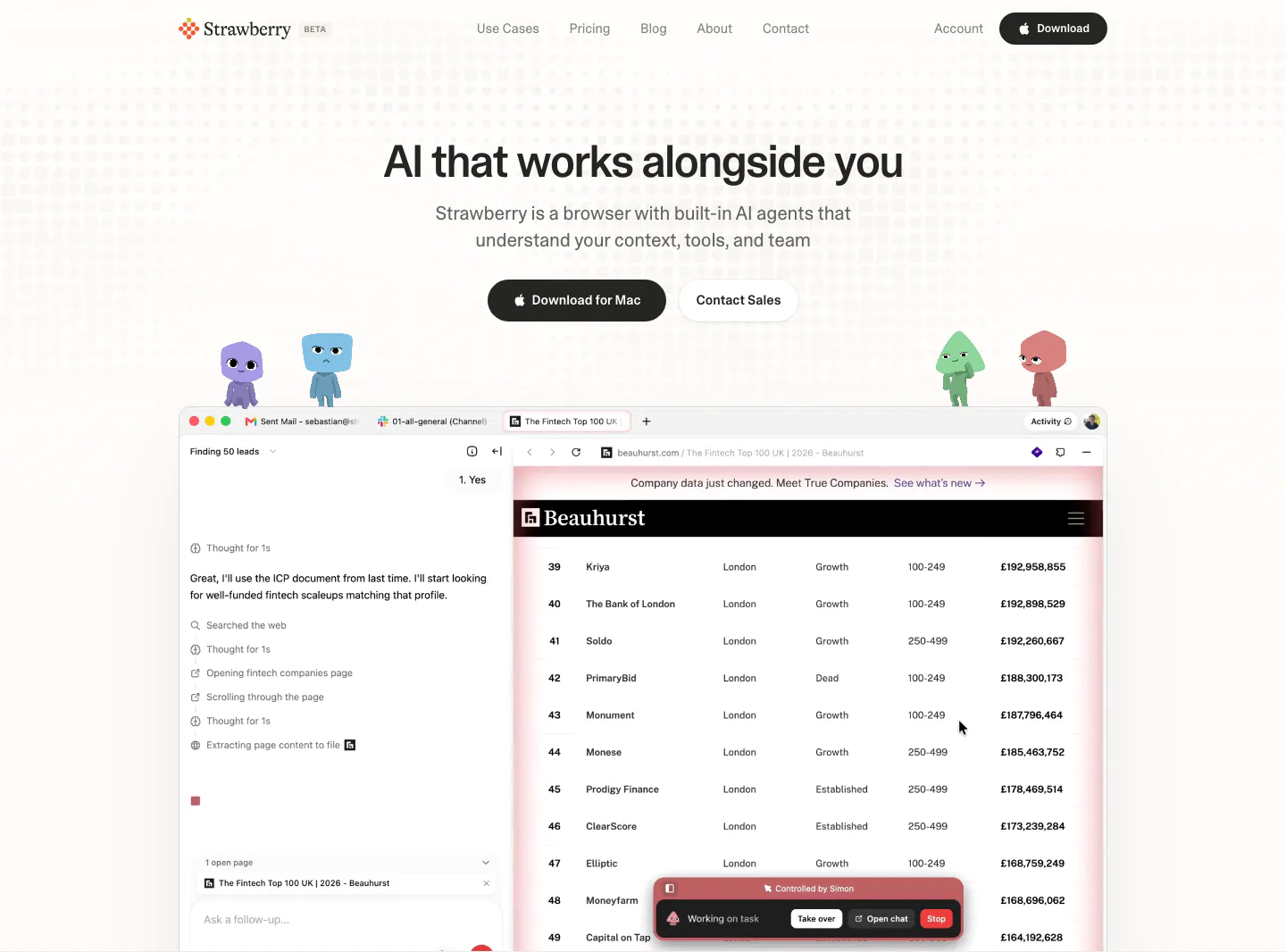
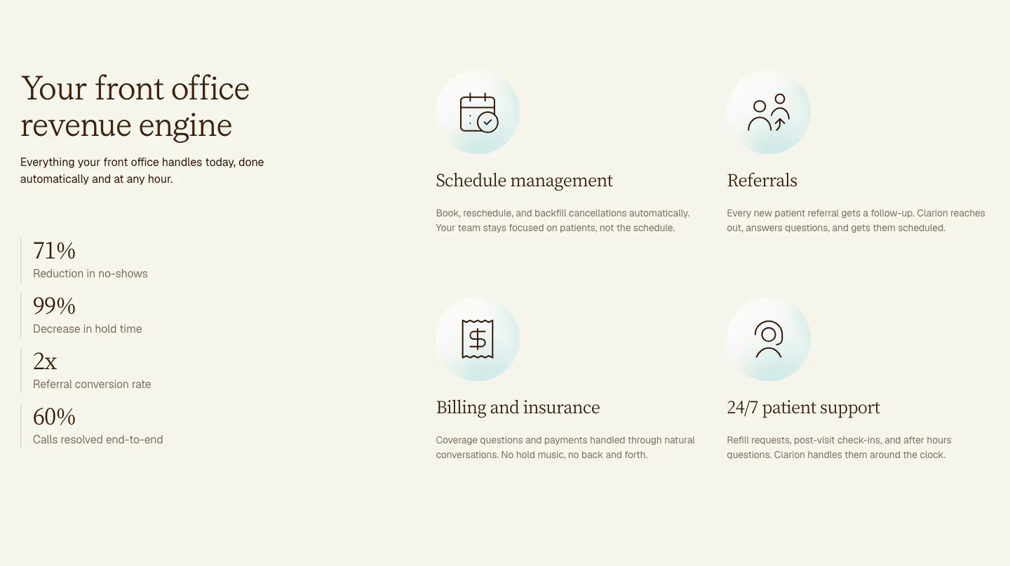
  136. Strawberry hero section: centered headline and buttons, cartoon characters perched on a browser screenshot showing an AI agent task
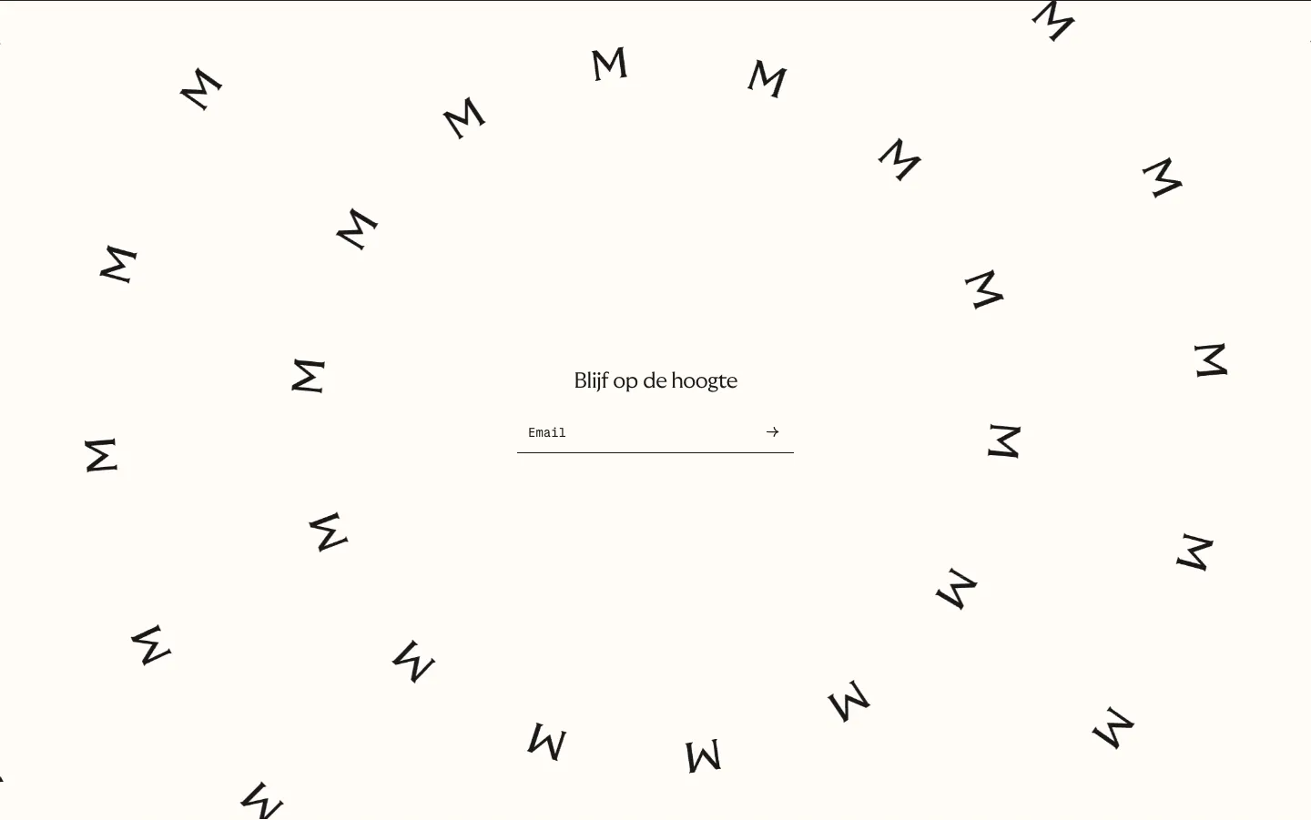
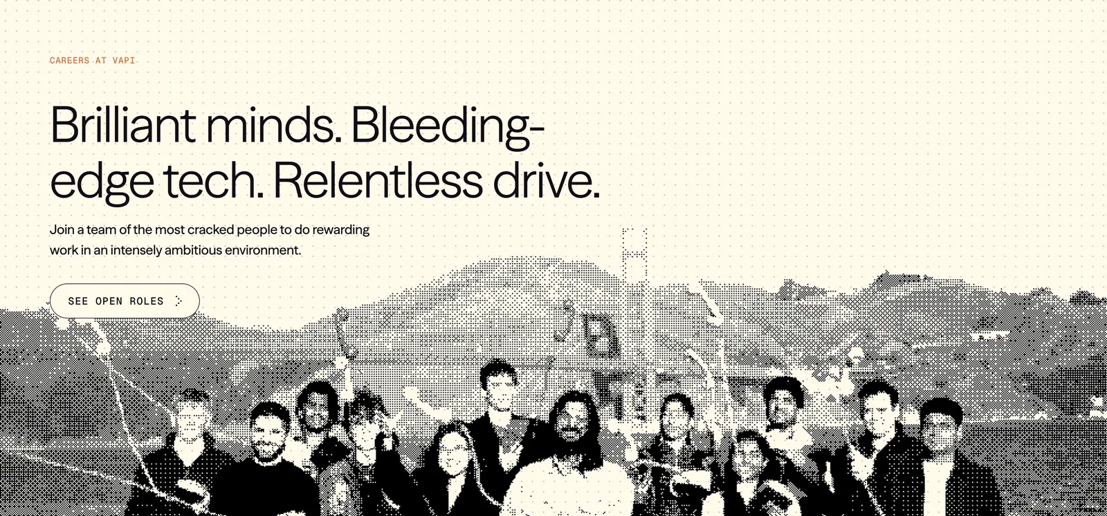
  137. Menkind newsletter section: centered email field surrounded by a swirl of scattered rotated M letters on cream
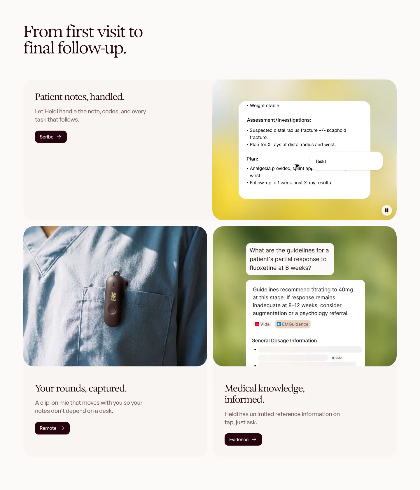
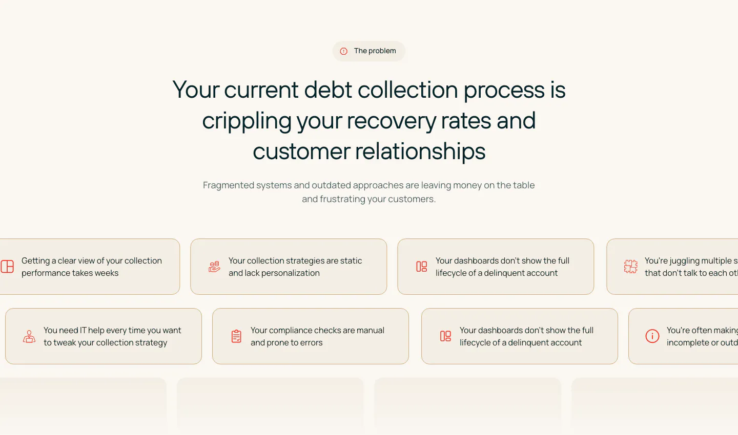
  138. Heidi features section: serif headline over rounded cards pairing text with a clinical notes UI, a clip-on mic photo and a chat answer
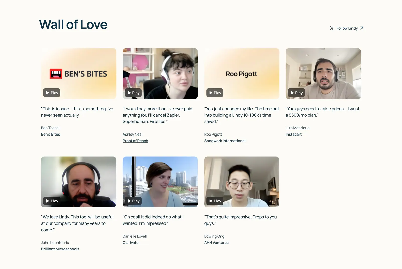
  139. Lindy testimonials section: Wall of Love heading above a four-column grid of video testimonial thumbnails with play buttons and quotes on cream
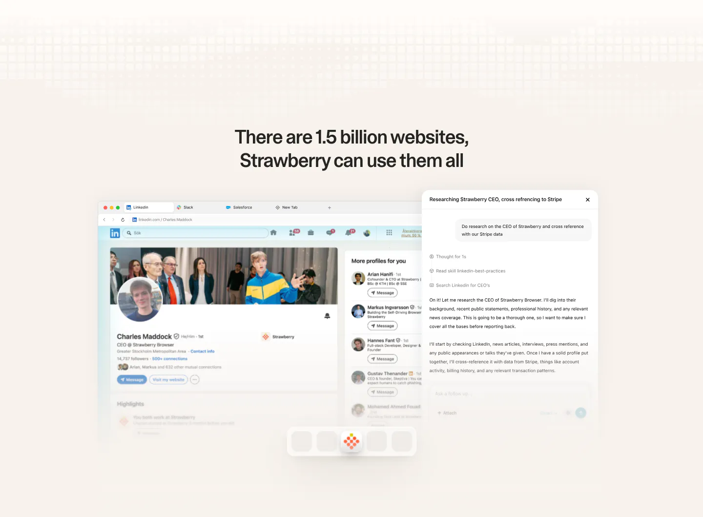
  140. Strawberry features section: centered headline above a browser screenshot of a LinkedIn profile with an AI research chat panel
  141. Ruul how it works section: serif headline above three numbered rows with text left and UI cards on grid panels right, plus a flags strip
  142. Clarion features section: serif headline and four stacked metrics on the left, a 2x2 grid of icon features on the right, cream background
  143. Vapi careers section: left-aligned headline and See open roles button over a dithered team photo on a cream dot-grid background
  144. Rezolv value proposition section: centered problem headline above scrolling rows of beige pain-point chips with icons on cream
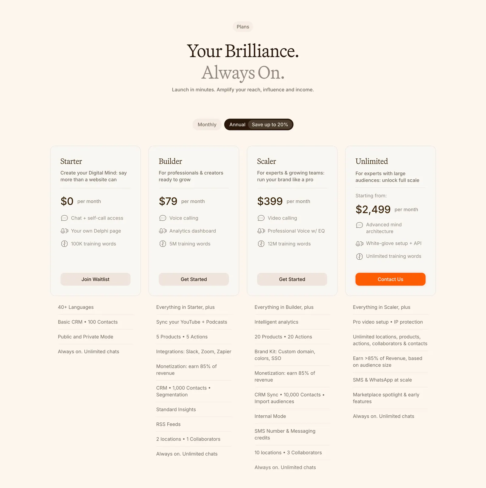
  145. Delphi pricing section: centered serif headline, monthly/annual toggle and four plan cards with feature lists below on a cream background
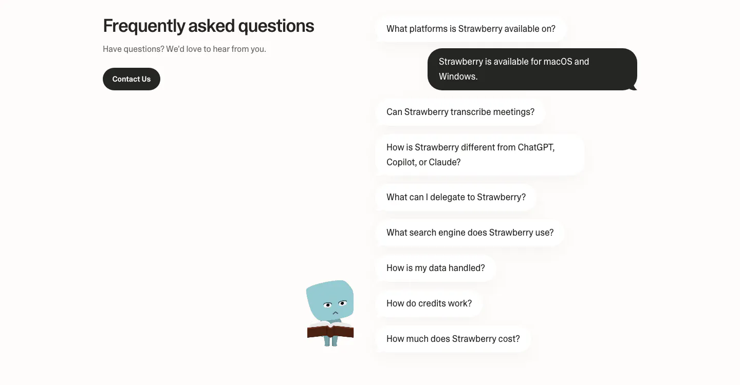
  146. Strawberry FAQ section: headline and contact button on the left, questions as chat bubbles with one dark answer and a character
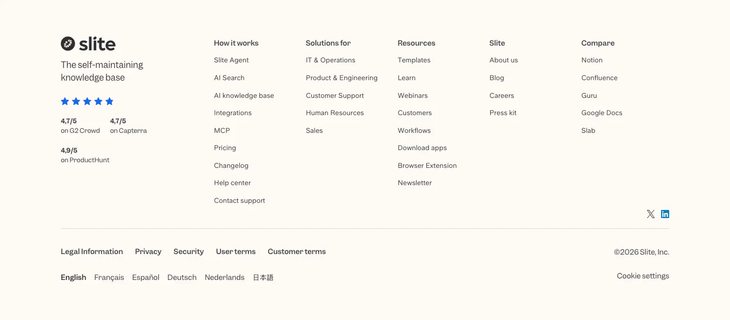
  147. Slite footer section: logo, tagline and review ratings beside five link columns, legal links, language list and copyright on cream
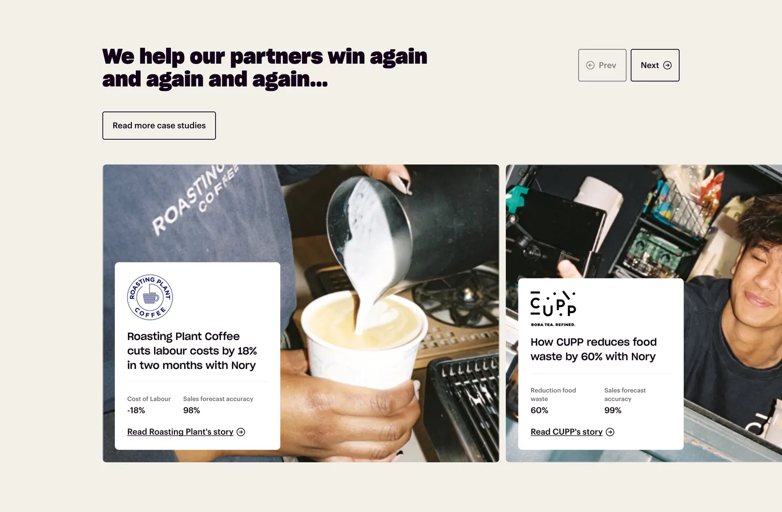
  148. Nory testimonials section: headline with prev/next buttons above case-study cards overlaid on cafe photos, cream background
  149. Miter hero section: split layout on beige with headline and email demo form left, dashboard and mobile app UI right
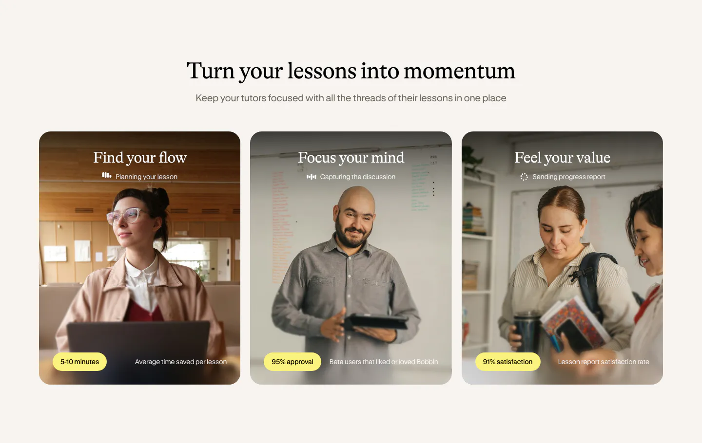
  150. Bobbin value proposition section: serif heading above three photo cards of tutors with yellow stat pills on a cream background
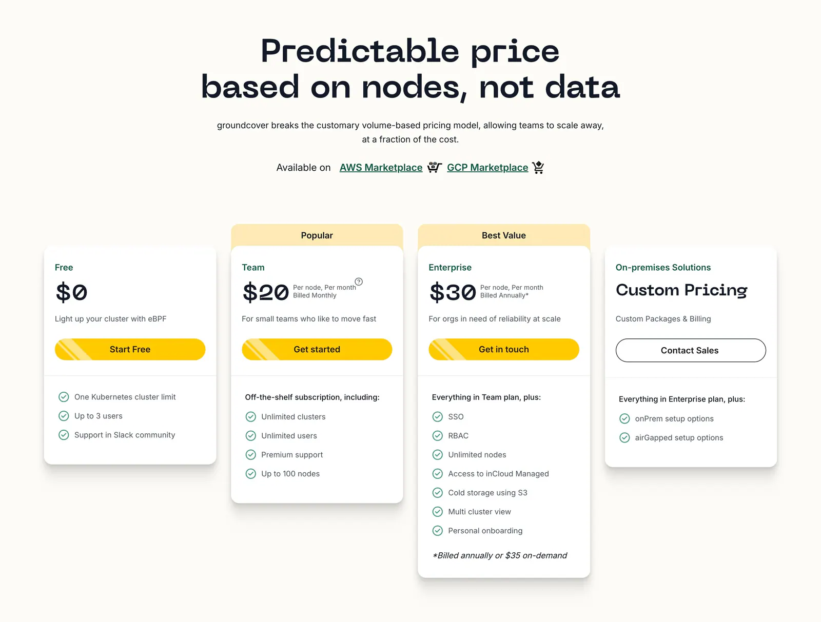
  151. groundcover pricing section: centered headline above four plan cards with yellow buttons and checklists on a cream background
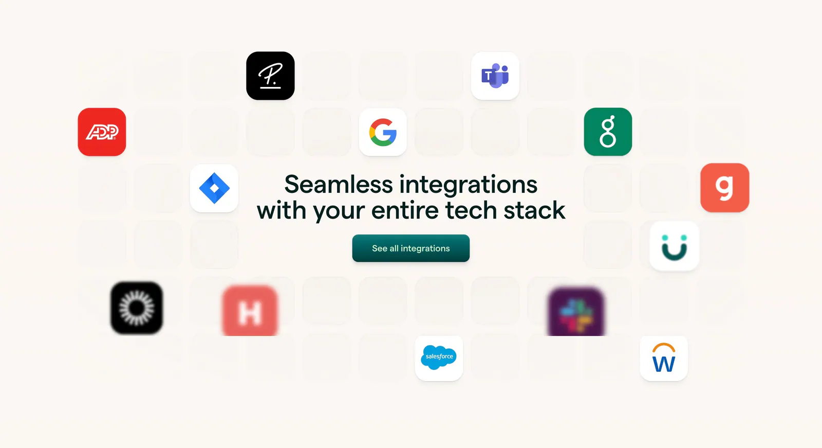
  152. Lattice integrations section: centered headline and button surrounded by scattered app icons on a faint tile grid over warm beige
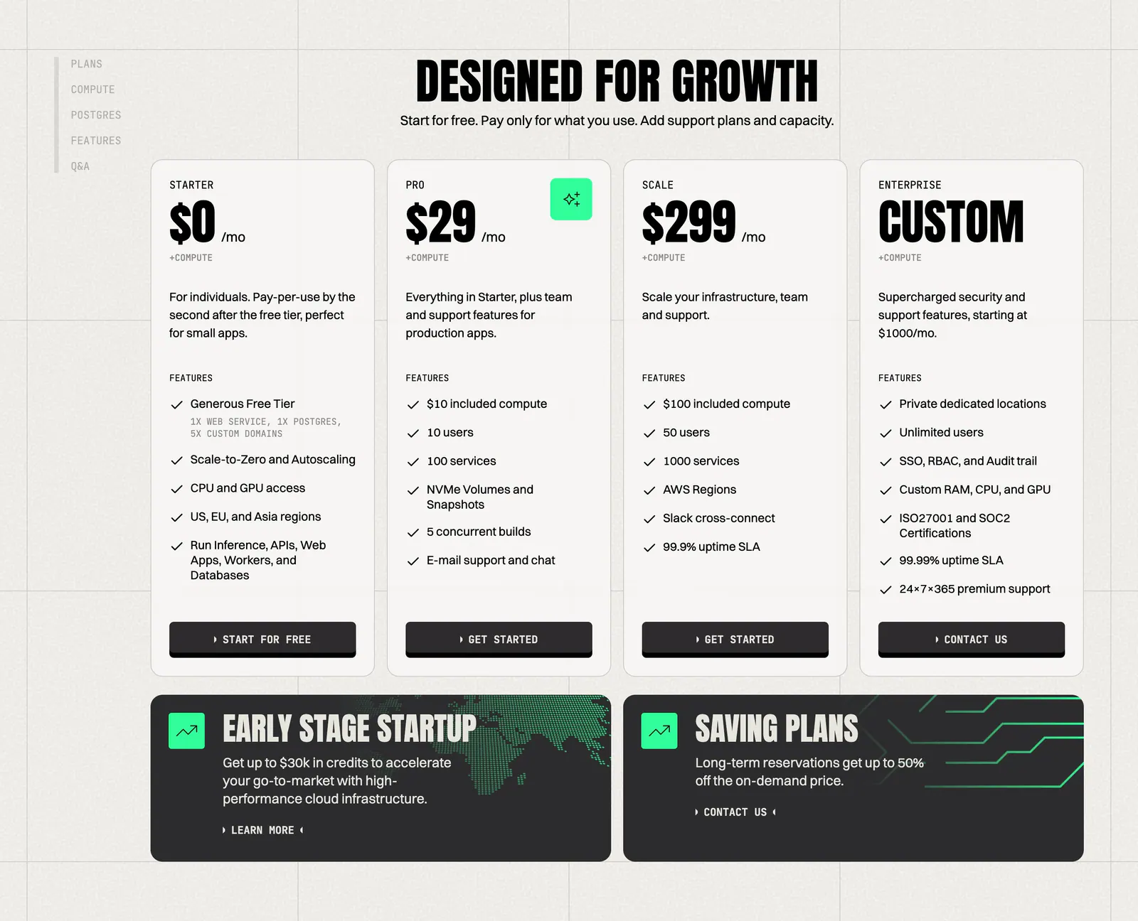
  153. Koyeb pricing section: condensed headline above four plan cards and two dark promo banners on a warm gray grid background
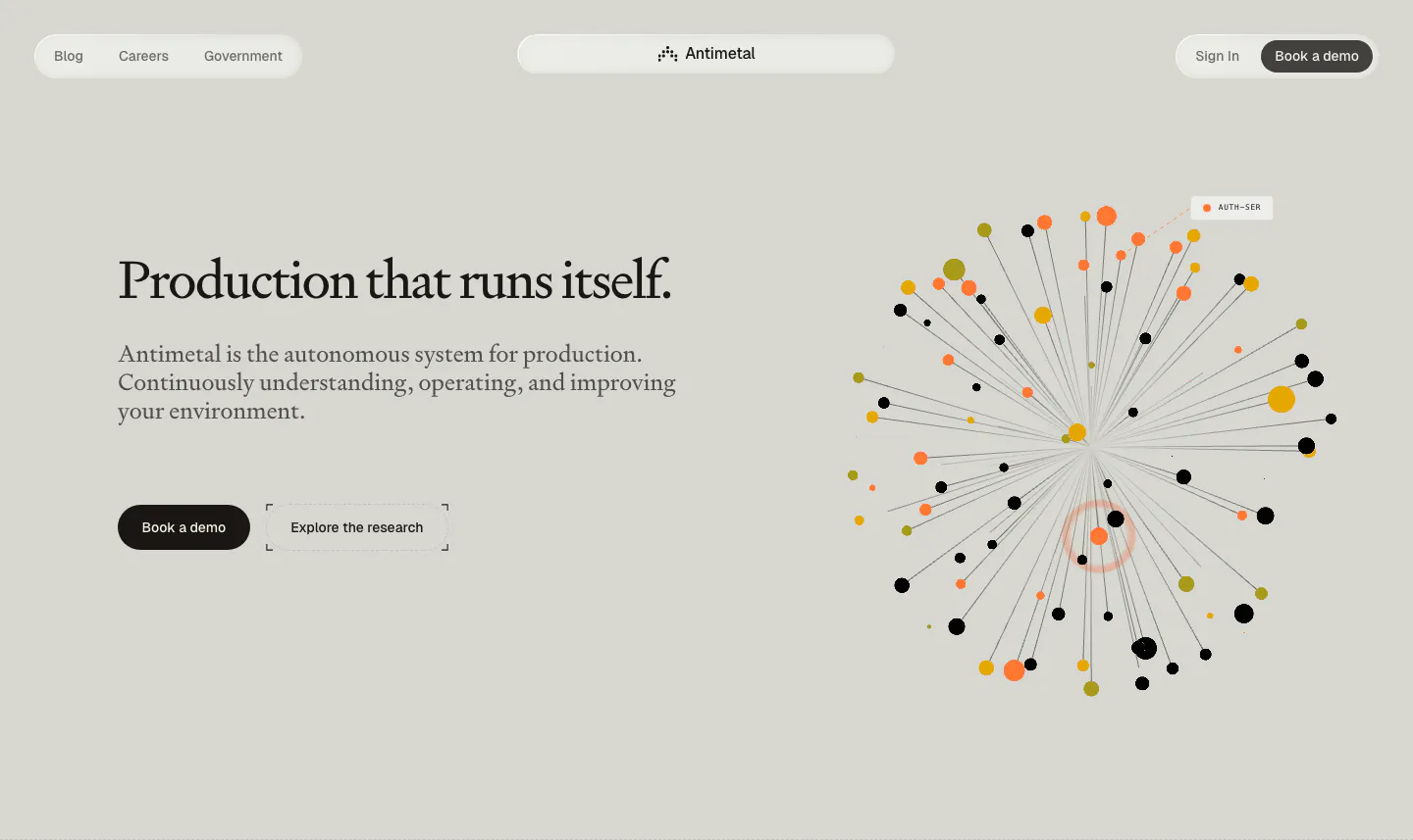
  154. Antimetal hero section: pill nav, serif headline with two buttons at left, radial burst of orange, yellow and black dots at right
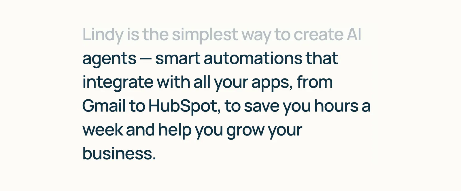
  155. Lindy about & mission section: large left-aligned mission statement with the first line faded to gray, on a warm off-white background
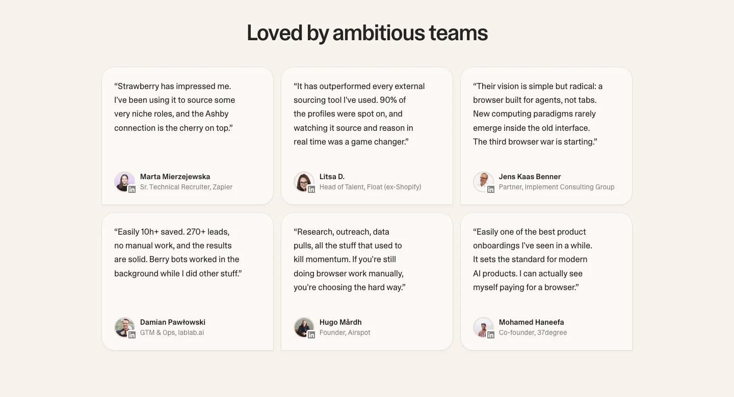
  156. Strawberry testimonials section: centered headline over a 3x2 grid of rounded quote cards with avatars on a cream background
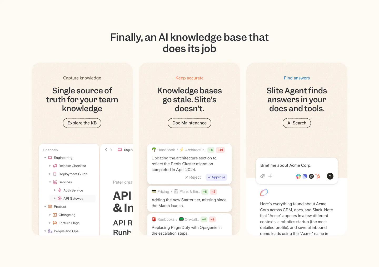
  157. Slite features section: centered headline over three peach cards for capture, accuracy and search, each with a product UI snippet
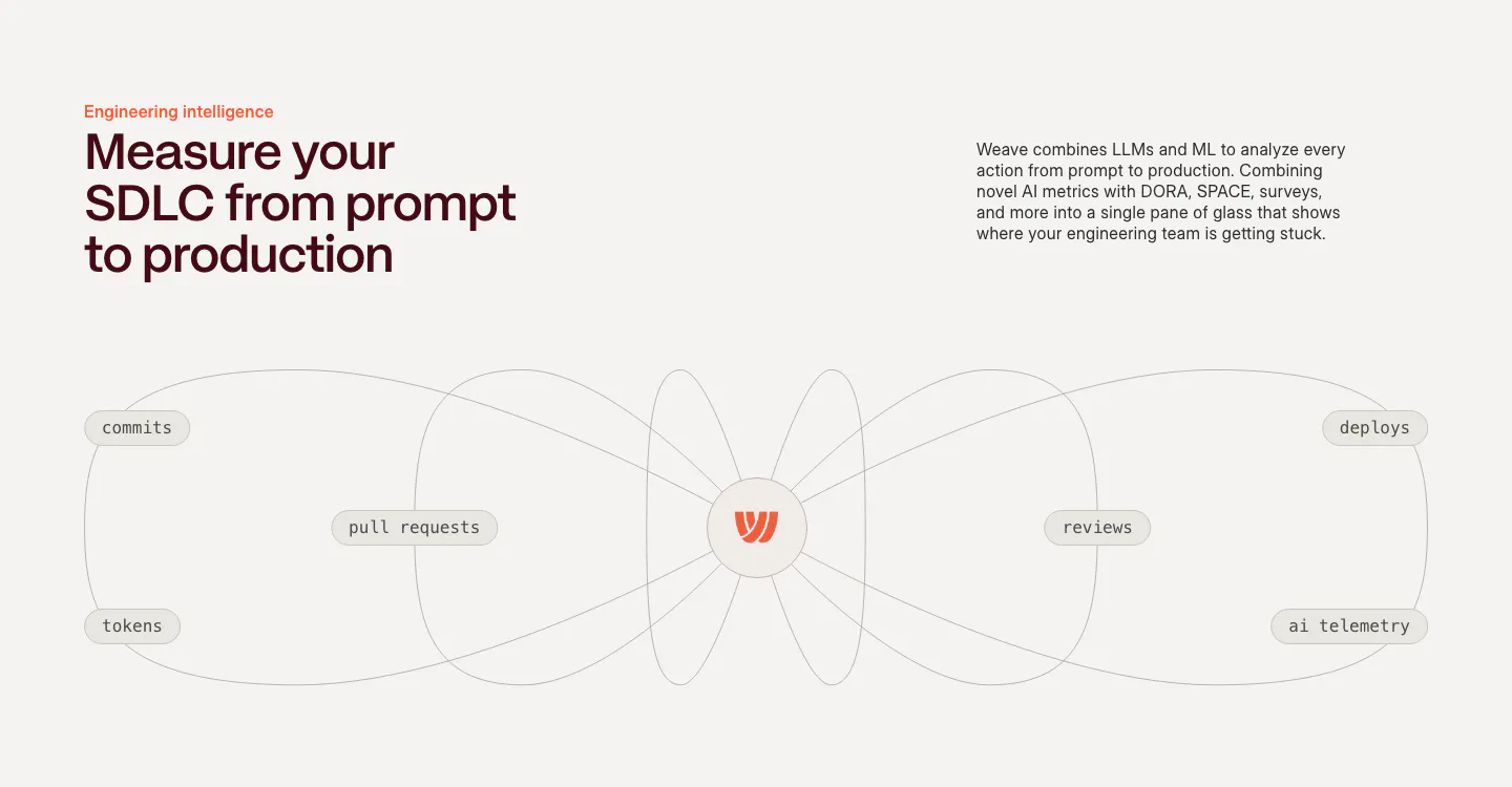
  158. Weave features section: headline and copy above a line diagram connecting commits, PRs, tokens, reviews and deploys to a central logo
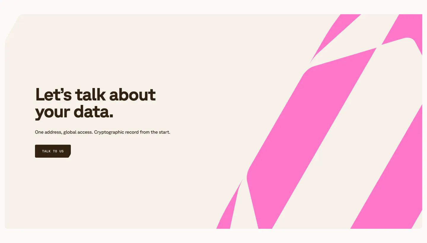
  159. Shelby call to action section: left headline, one-line copy and Talk to us button beside bold pink diagonal stripes on a cream panel
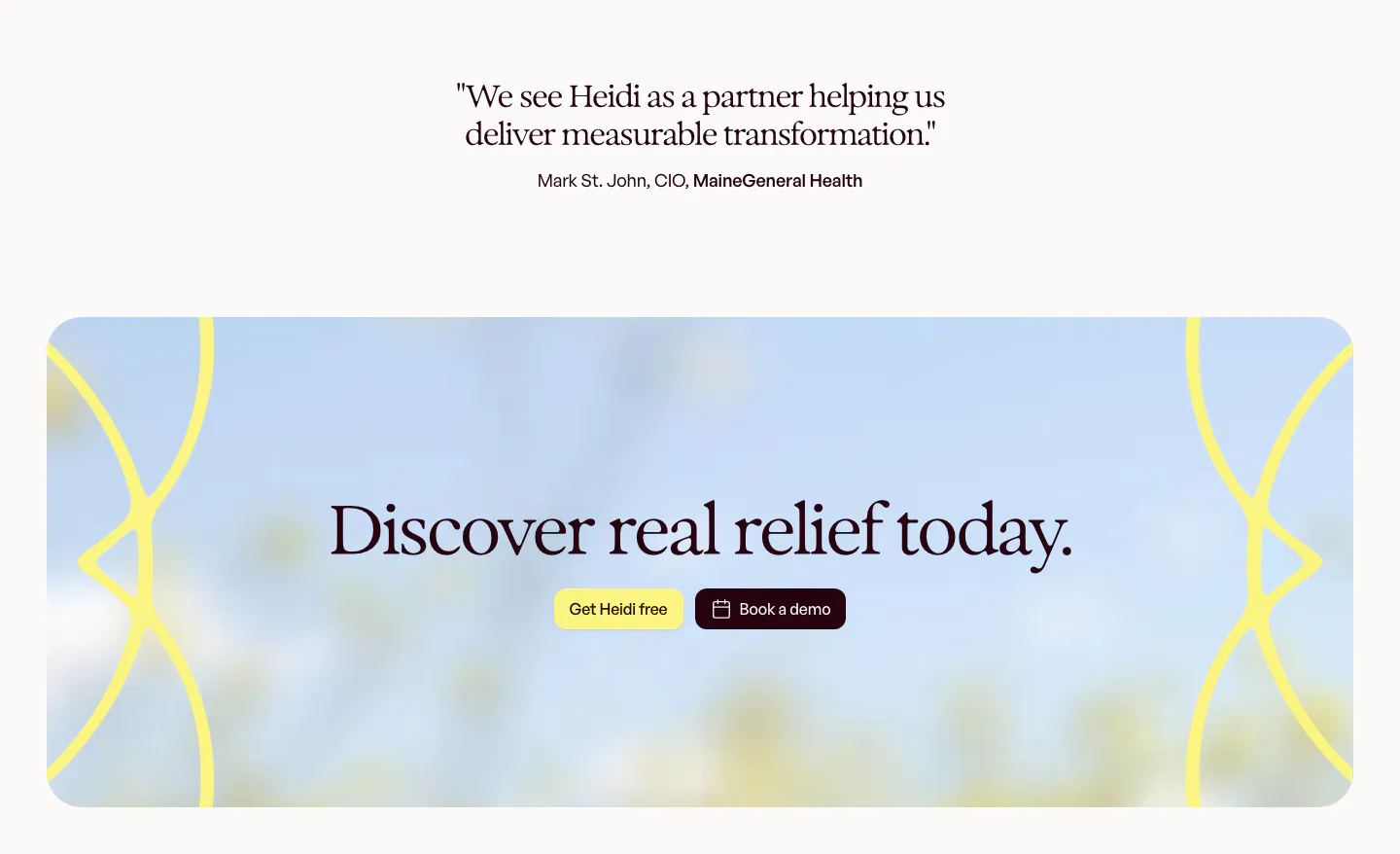
  160. Heidi call to action section: short serif customer quote above a rounded panel with blurred sky photo, serif headline and two buttons
  161. Slite features section: tabbed AI search chat mockup, app icon row, three capability cards with UI snippets and a short customer quote
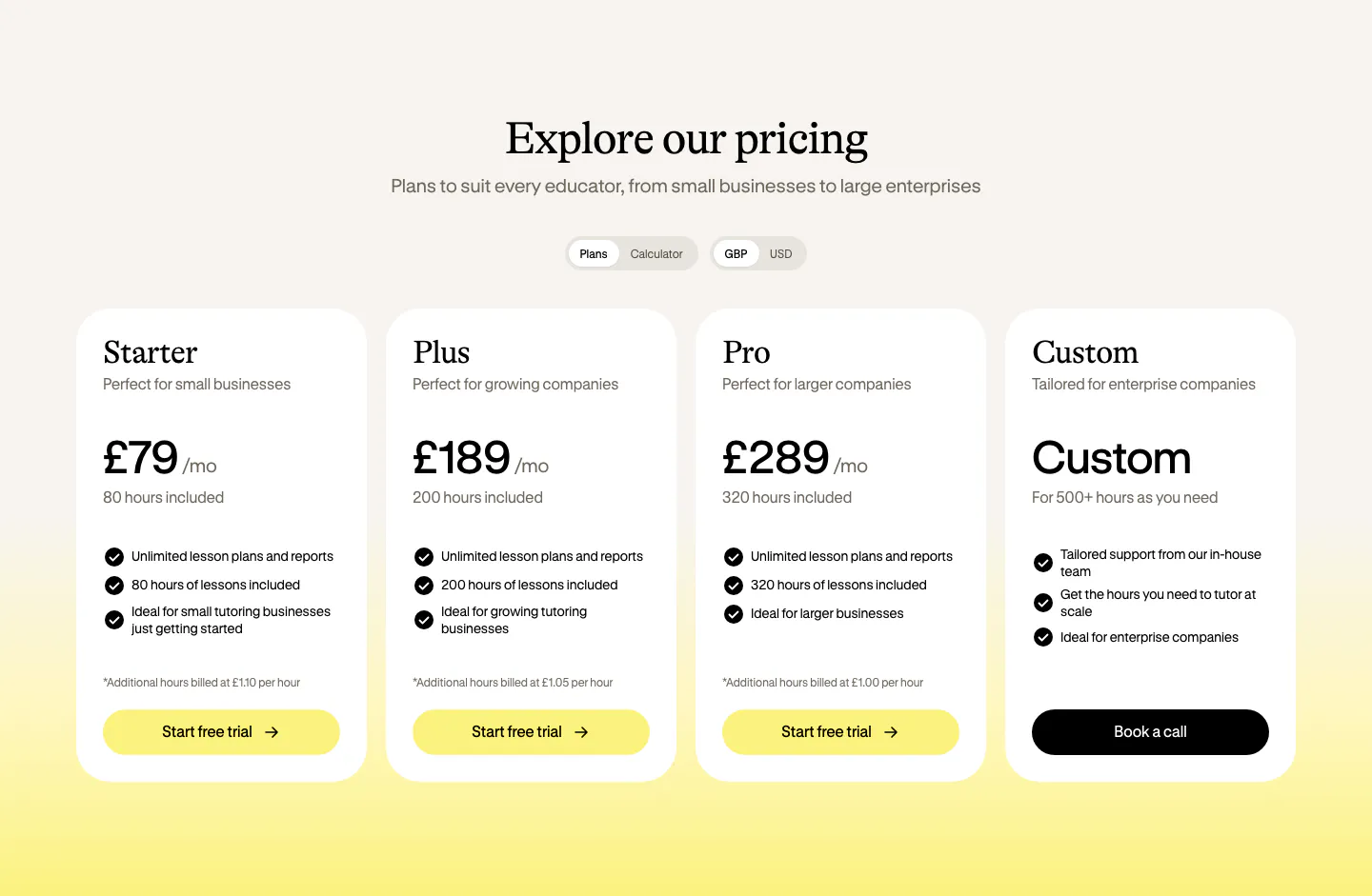
  162. Bobbin pricing section: serif heading, plan and currency toggles, and four white pricing cards on a cream-to-yellow background
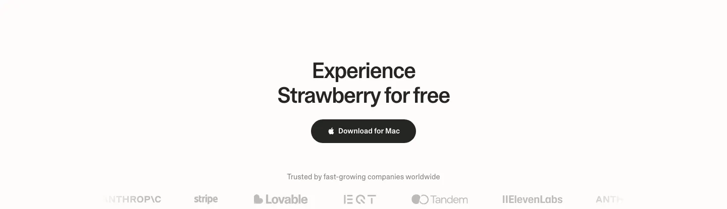
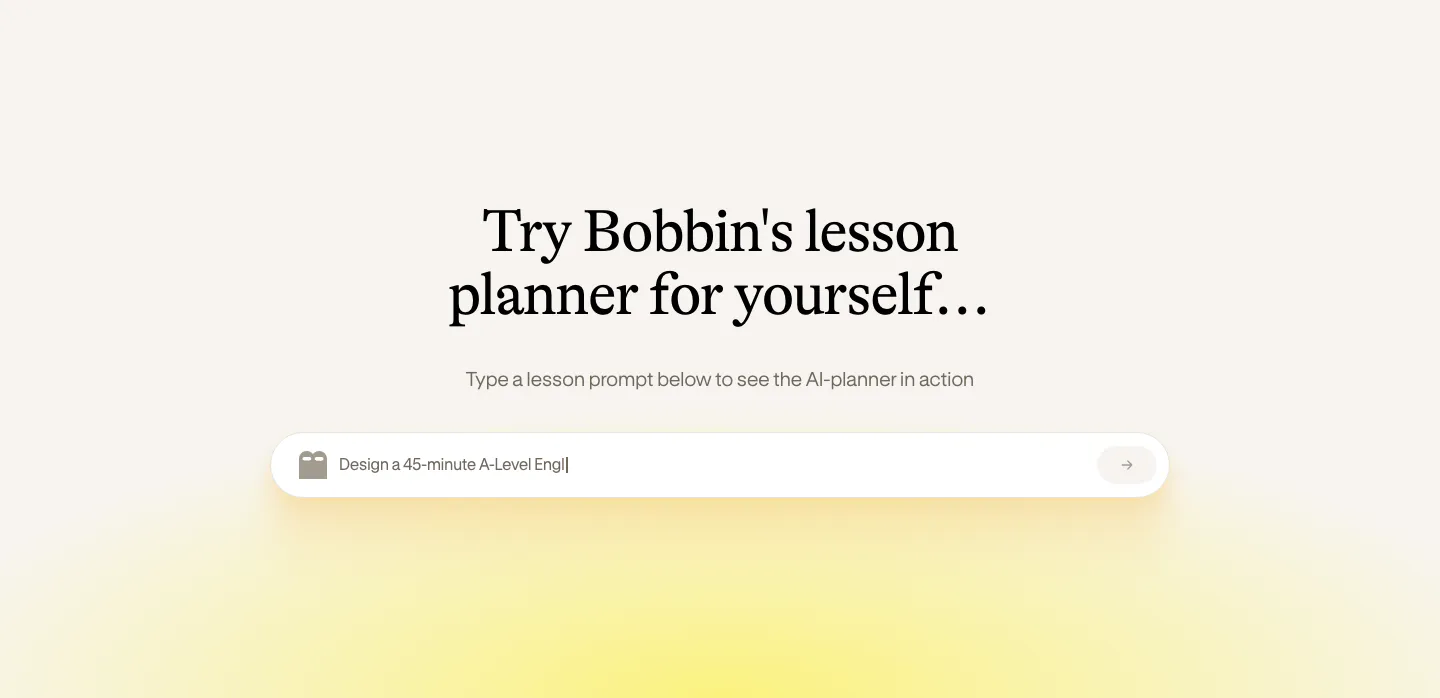
  163. Strawberry call to action section: centered headline and dark download button above a faded customer logo strip
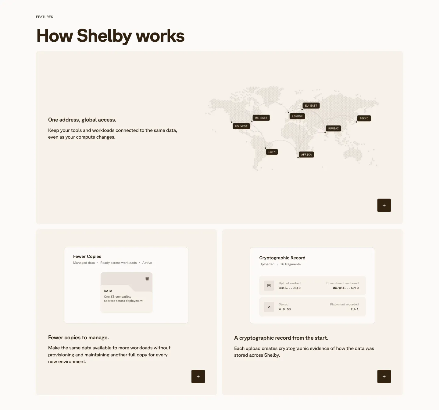
  164. Shelby features section: wide card with a dotted world map of data regions above two cards with small UI mockups on cream panels
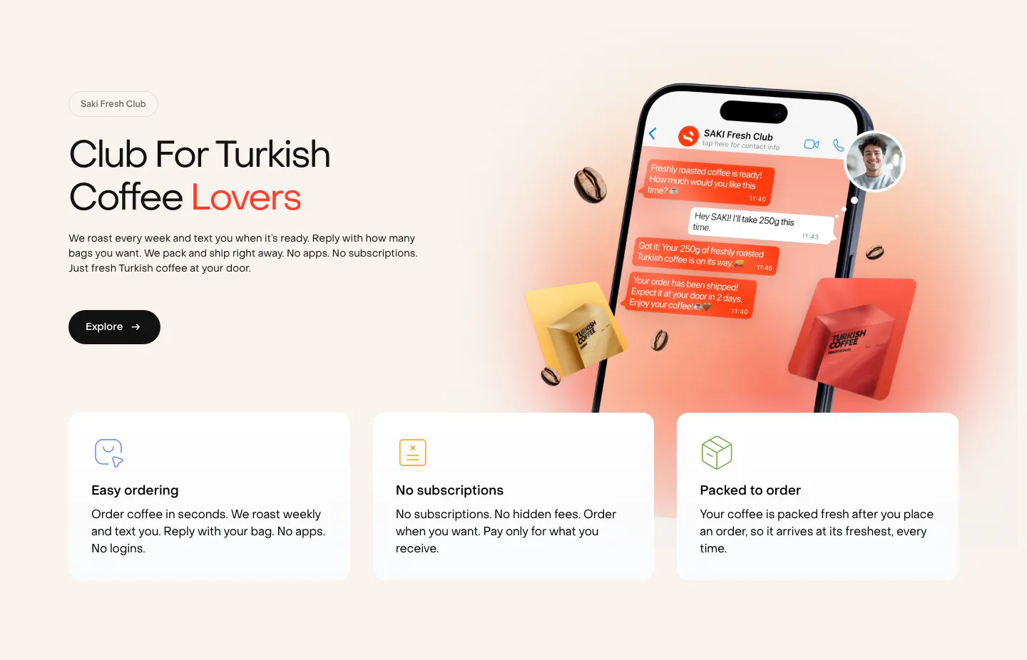
  165. Saki features section: headline and copy left of a phone chat mockup with coffee bags, above three benefit cards on a warm cream background
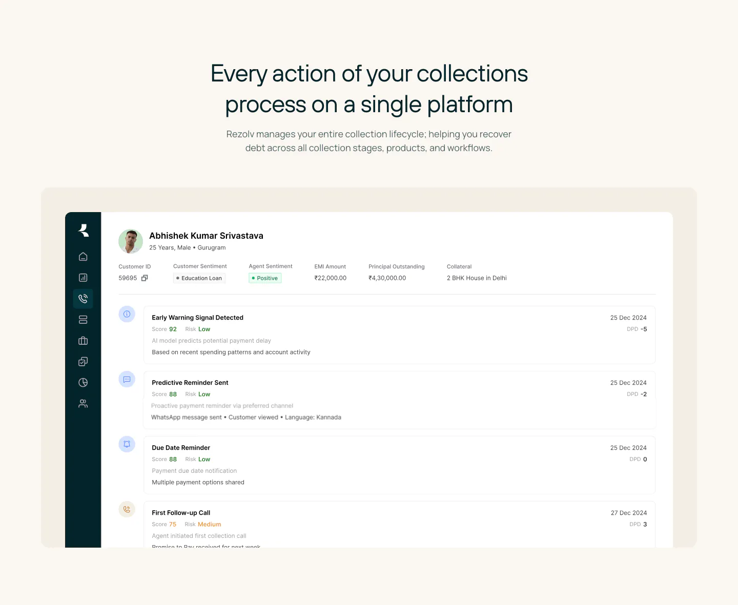
  166. Rezolv features section: centered headline above a large collections dashboard screenshot showing a borrower timeline on cream
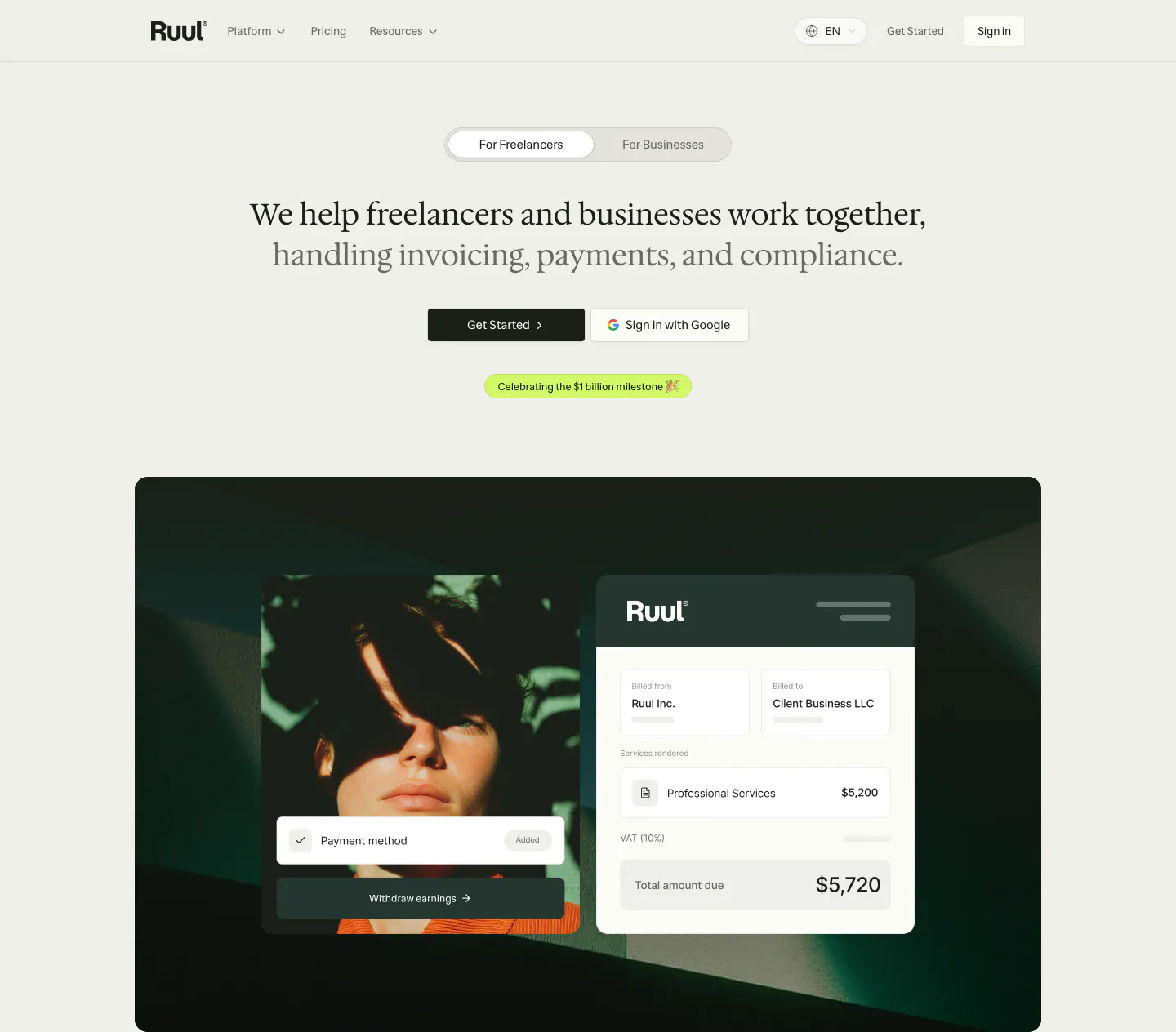
  167. Ruul hero section: audience toggle and centered serif headline above a dark green panel with a portrait photo and invoice UI card
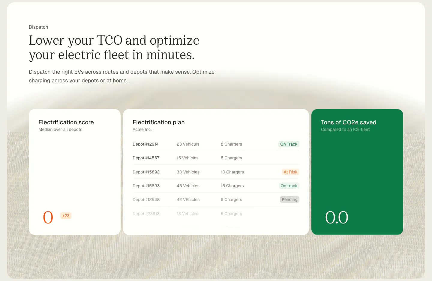
  168. Chargetrip features section: serif headline above electrification score, depot plan and CO2 savings UI cards on a cream textured background
  169. Bobbin call to action section: centered serif heading above a lesson prompt input field with a soft yellow glow on cream
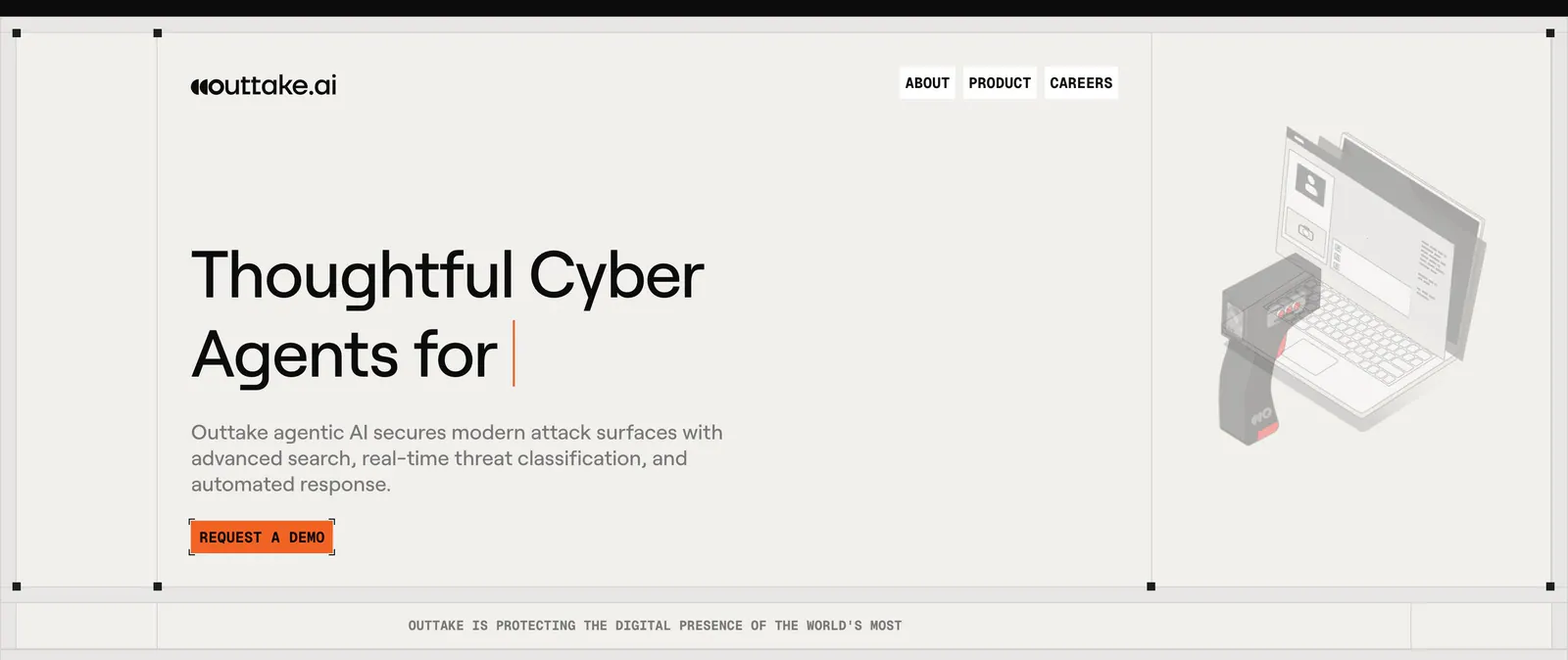
  170. Outtake hero section: left-aligned headline with typing cursor and orange demo button beside an isometric scanner and laptop illustration on beige
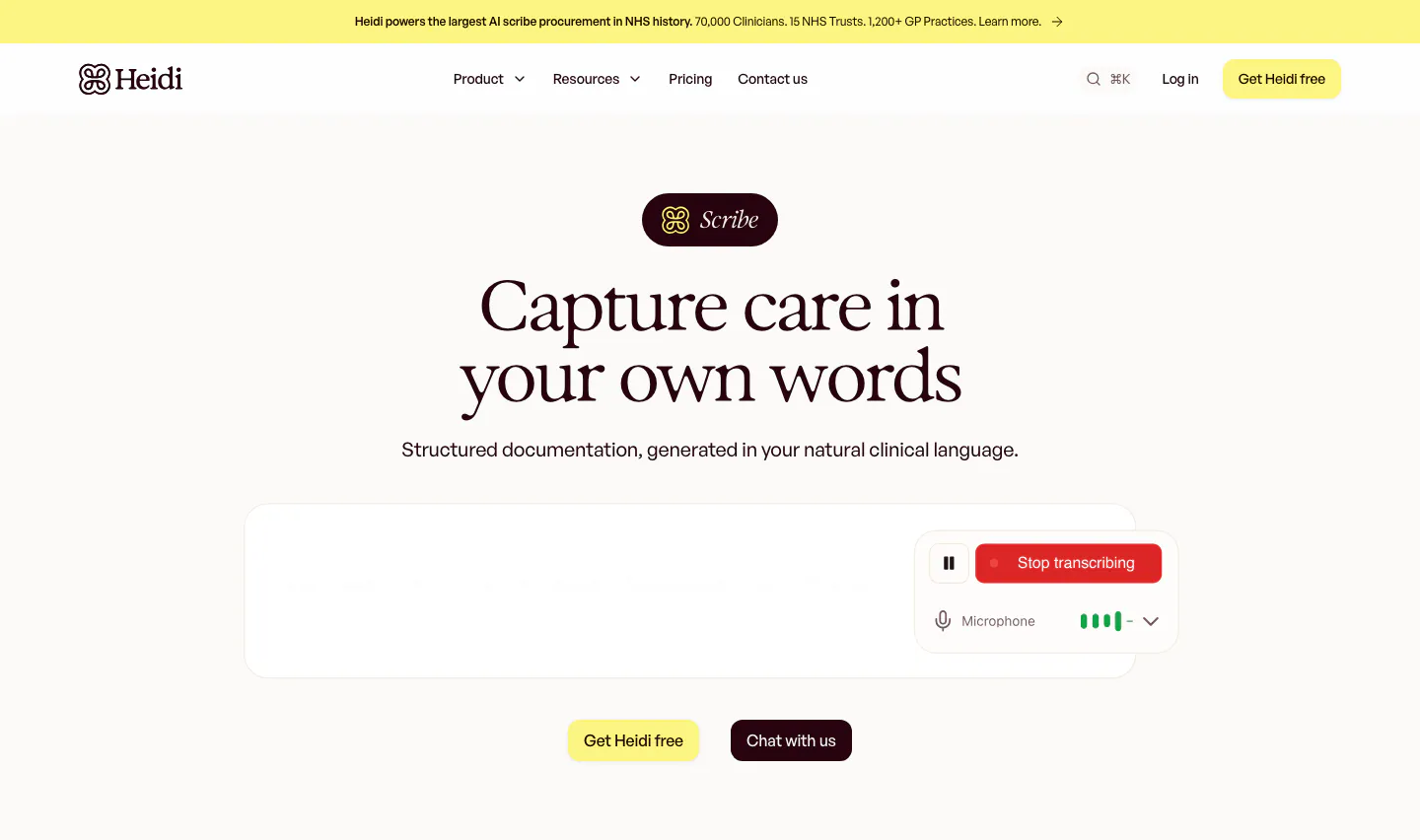
  171. Heidi hero section: Scribe badge and centered serif headline above a transcription box with a Stop transcribing control
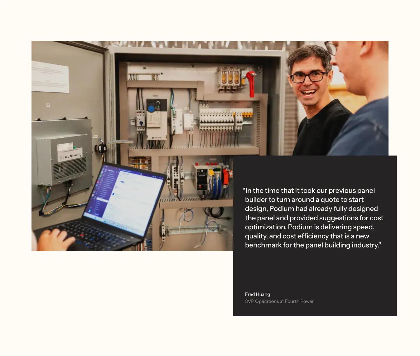
  172. Podium Automation testimonials section: photo of engineers at a control panel overlapped by a dark quote card on a cream background
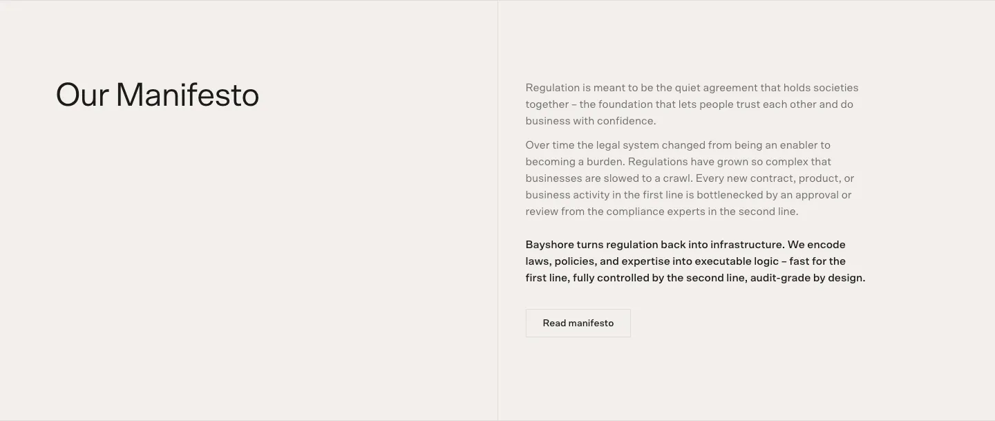
  173. Bayshore about & mission section: Our Manifesto heading left, manifesto paragraphs and Read manifesto button right on warm off-white
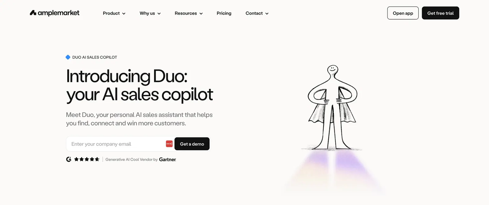
  174. Amplemarket hero section: headline, email field and rating on the left beside a hand-drawn caped figure illustration on off-white
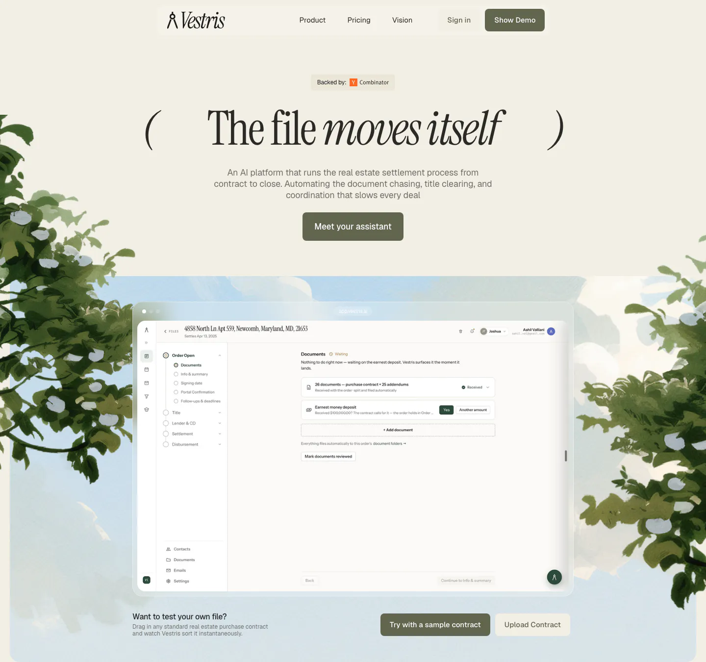
  175. Vestris hero section: nav and centered serif headline with button above an app screenshot framed by painted trees and sky
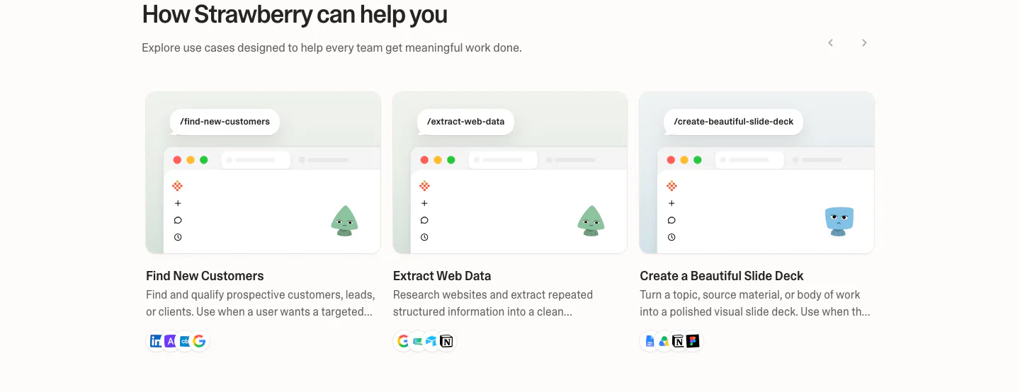
  176. Strawberry use cases section: three use case cards with mini browser mockups, characters and tool icons, with slider arrows
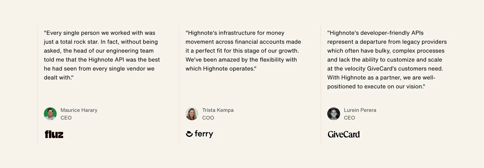
  177. Highnote testimonials section: three quote columns separated by thin lines with avatars, titles and company logos on beige
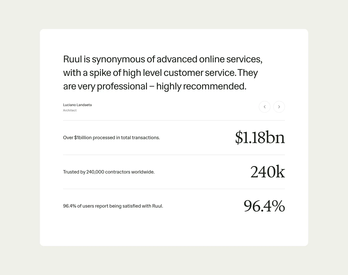
  178. Ruul testimonials section: white card with a large quote and arrow controls above three rows of large serif stats on beige
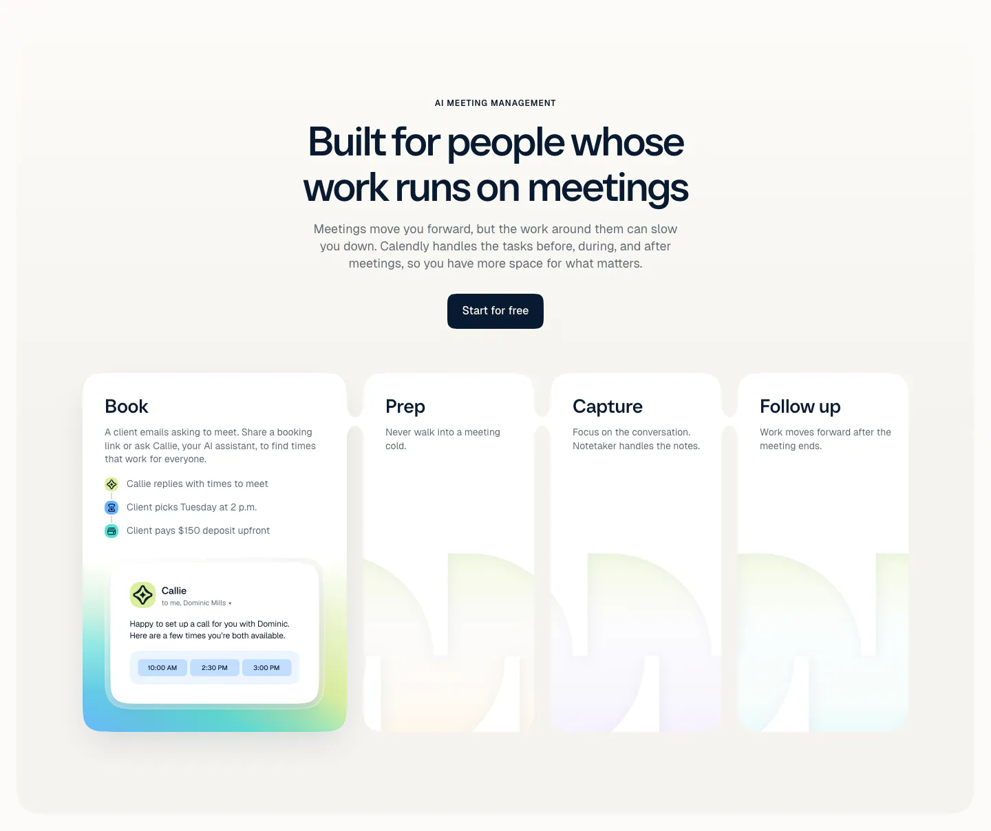
  179. Calendly features section: centered headline and button above four cards for Book, Prep, Capture and Follow up with a scheduling UI card
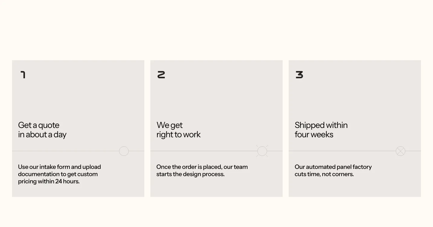
  180. Podium Automation how it works section: three numbered gray step cards with short titles and descriptions on a cream background
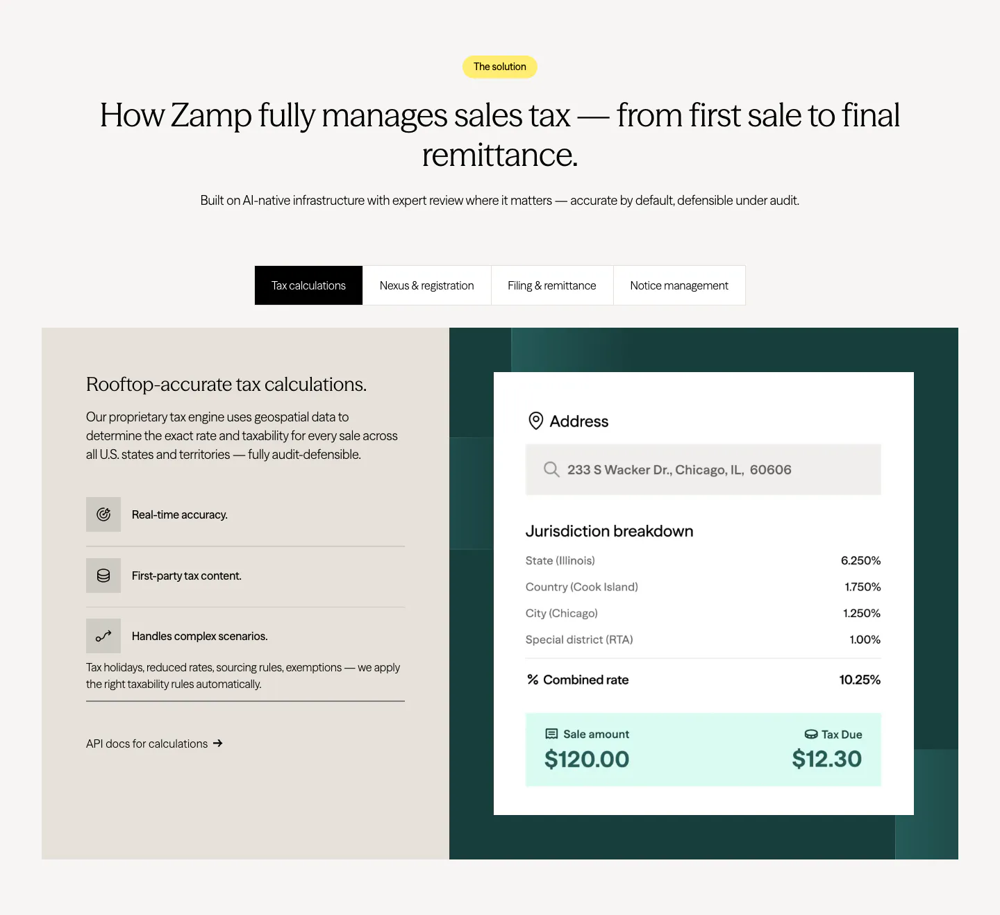
  181. Zamp features section: centered heading over a tab bar and split panel with feature list on beige and a tax calculation card on dark green
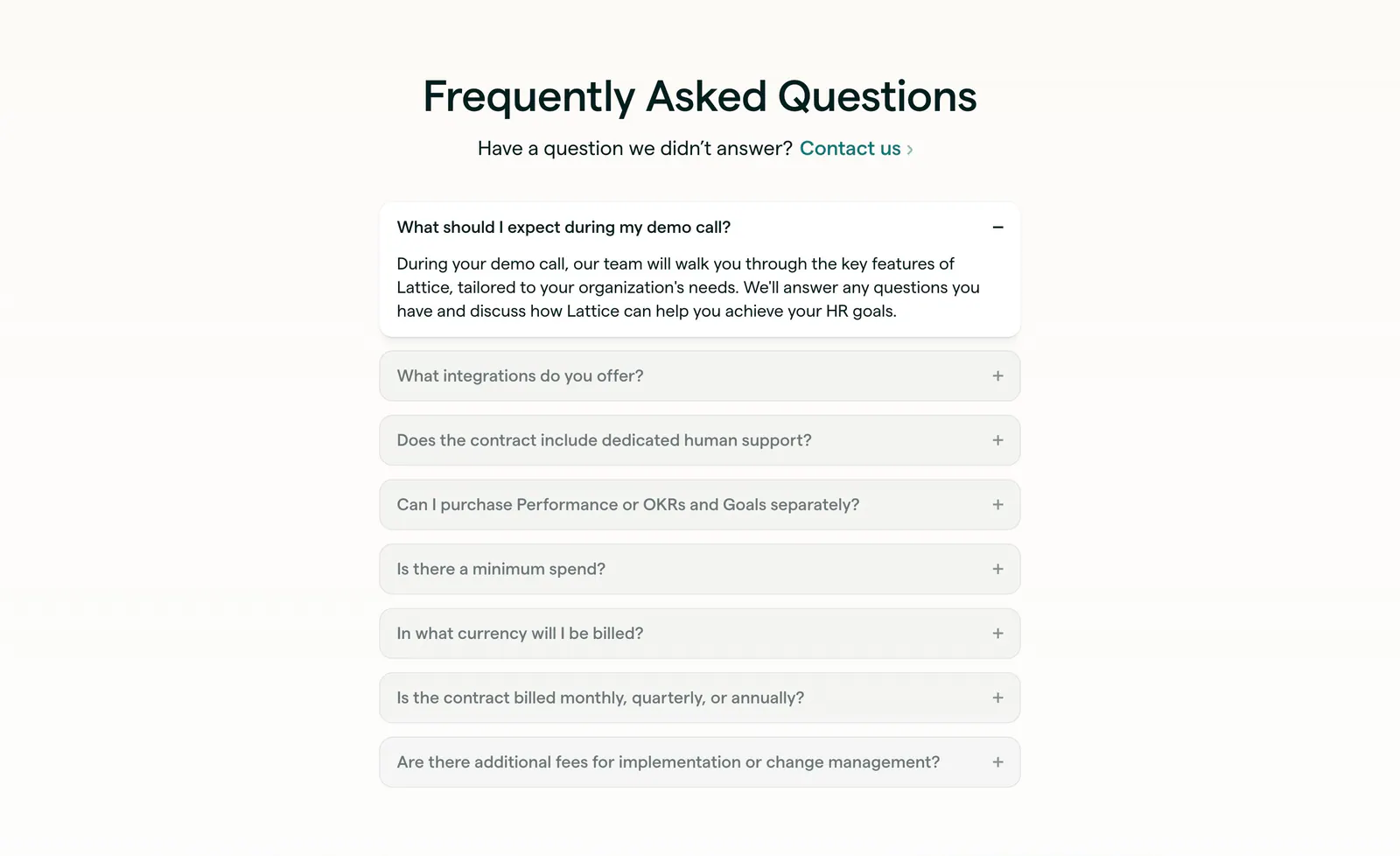
  182. Lattice FAQ section: centered heading and contact link above a single-column accordion with the first question open, on warm off-white
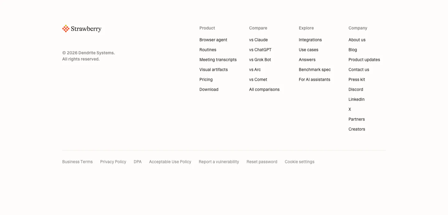
  183. Strawberry footer section: logo and copyright on the left, four link columns on the right, legal links row on a cream background
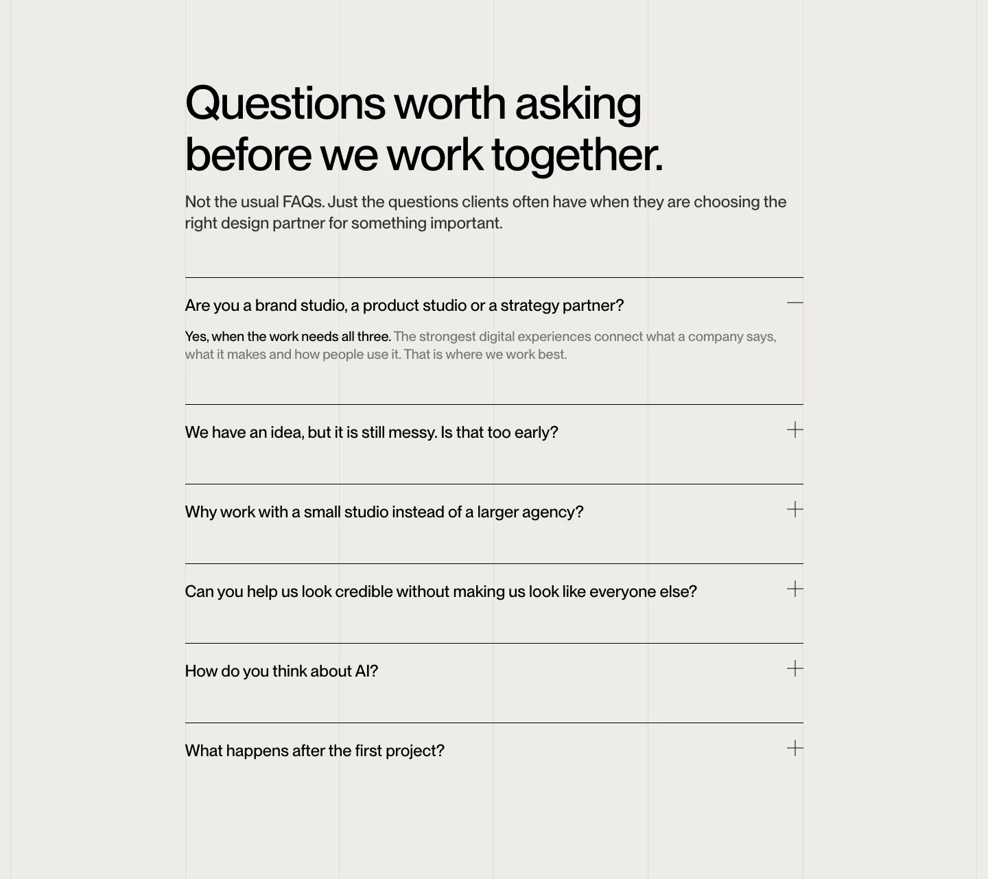
  184. Brikken+Co FAQ section: large headline and intro above a ruled accordion with plus icons on warm gray with grid lines
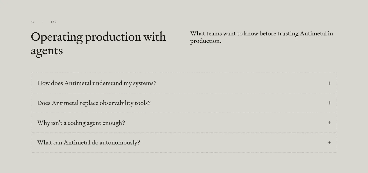
  185. Antimetal FAQ section: serif headline and intro side by side above a bordered accordion of four serif questions on warm gray
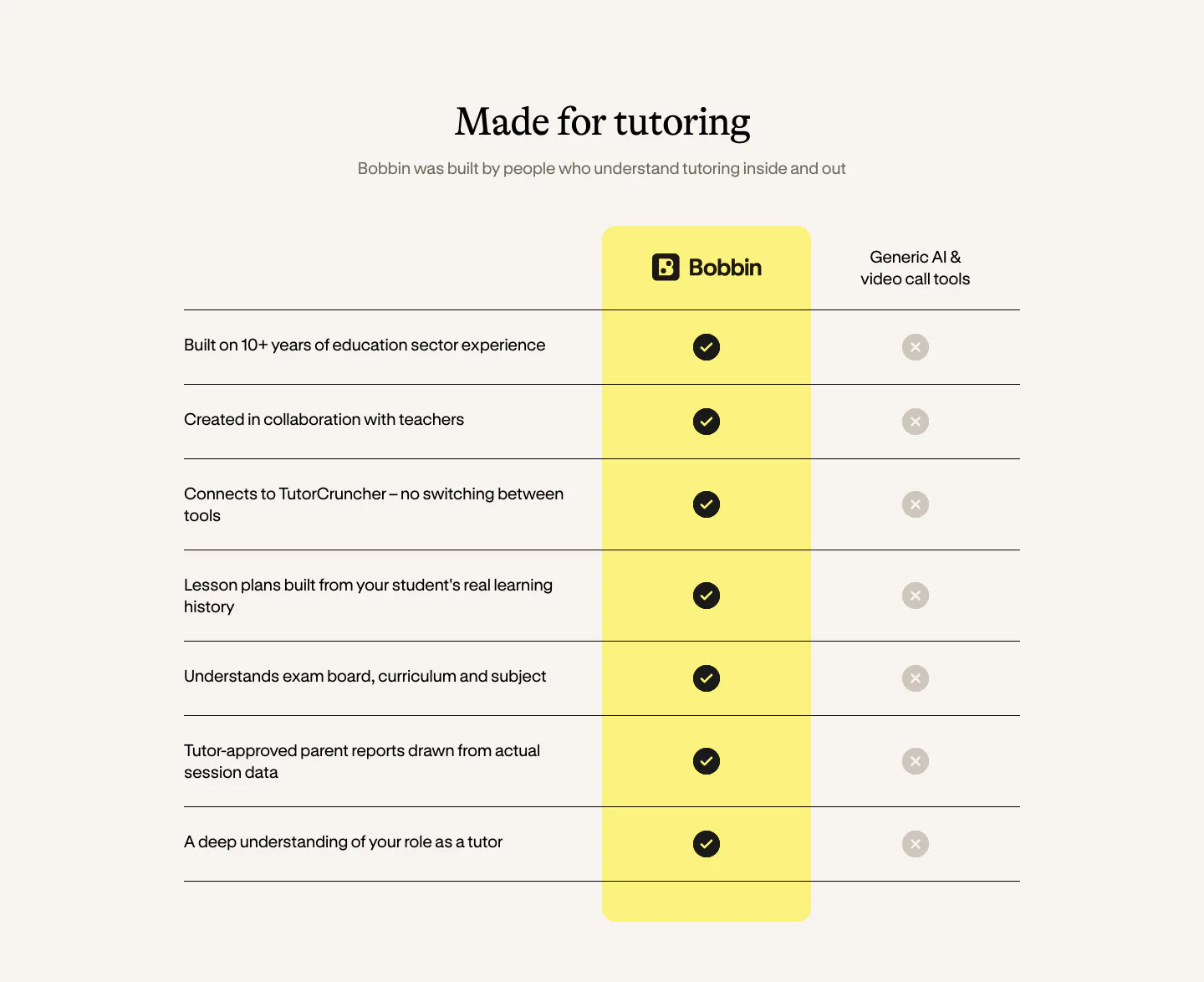
  186. Bobbin comparison section: serif heading above a check-versus-cross table with a highlighted yellow Bobbin column on cream

Where warm neutral shows up

Often paired with

Share of warm neutral sections that also use each style

How to design with warm neutral backgrounds

  1. Warm up every gray in the palette

    Shift text, borders, and dividers toward brown or olive so they sit naturally on cream. A cool blue-gray on beige reads as a mistake. Build a full neutral scale from the background hue, from the lightest card fill to the darkest heading color.

  2. Use off-black for headlines

    Pure black on cream feels harsh. A warm off-black, such as a deep brown-charcoal, keeps contrast high while matching the paper tone. Recheck body copy against 4.5:1, since a tinted background is slightly darker than white and mid-gray text can slip below the threshold.

  3. Frame screenshots against the background

    UI screenshots usually have white or cool-gray backgrounds that look stark on cream. Place them in a card with a subtle border and soft shadow, or pad them with a slightly lighter warm tone, so the screenshot sits on the page instead of fighting it.
  4. Pick earthy accent colors
    Terracotta, olive, deep green, and muted orange pair well with sand and cream, while neon blues and purples can feel disconnected. Choose one accent and test it against the background at button size to confirm it still stands out.

Companies using warm neutral

All styles
    ↑↓ Navigate ↵ Open

    Section preview

    Website section