Sales & Marketing Website Design Examples

Marketers and sales leaders spot weak copy faster than most buyers, because writing it is part of their job. The page has to prove that the product moves a number they already report on: pipeline, reply rates, conversion, or cost per lead. Effective sales & marketing website design leads with outcomes, shows the workflow inside the tools the team already uses, and makes integrations easy to scan.
293 sections

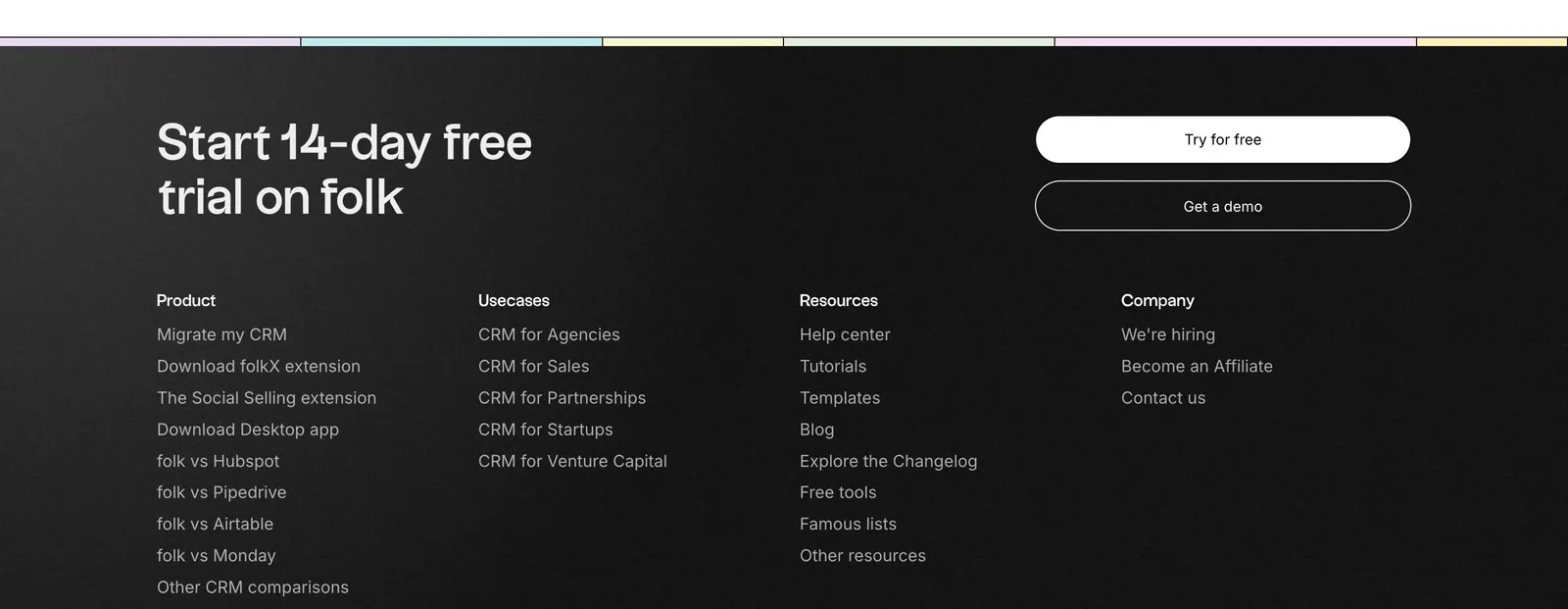
  1. folk footer section: trial headline with two buttons above four link columns on a near-black background, pastel color strip at top
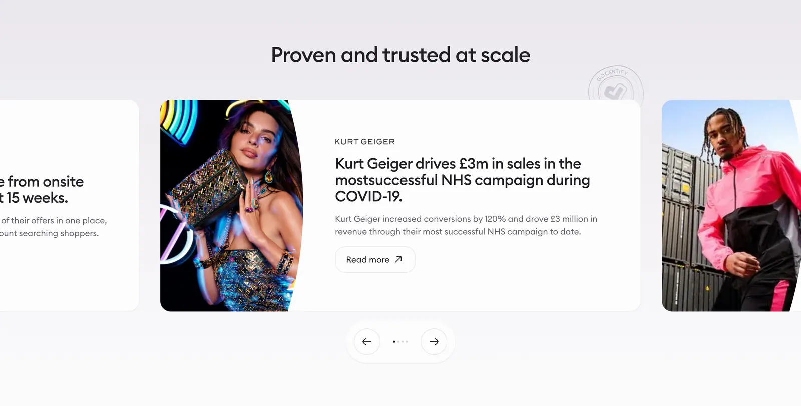
  2. Gocertify testimonials section: centered heading above a case-study carousel with fashion photography, cut-off side cards and arrows
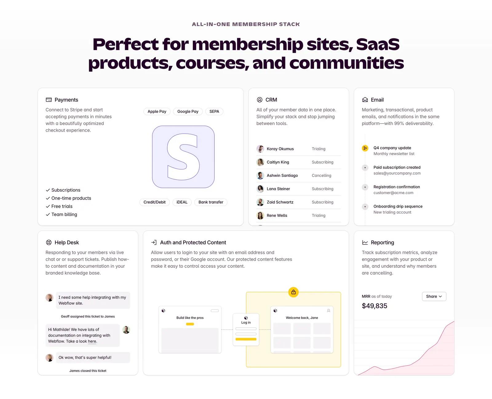
  3. Outseta features section: centered headline above a bento grid of cards for payments, CRM, email, help desk, auth and reporting
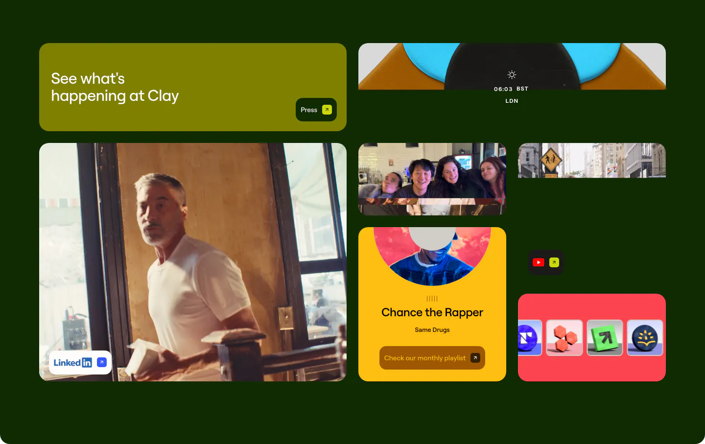
  4. Clay other section: bento grid of photo, playlist and social link tiles on a very dark green background
    Clay Other
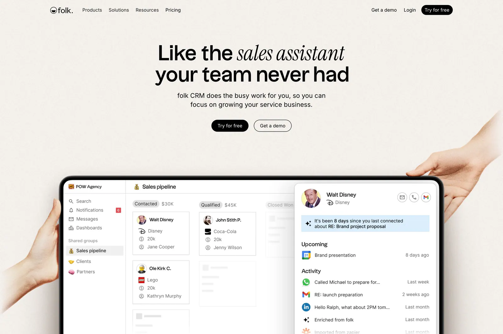
  5. folk hero section: centered headline with two buttons above hands holding a tablet showing a CRM pipeline UI on a warm beige background
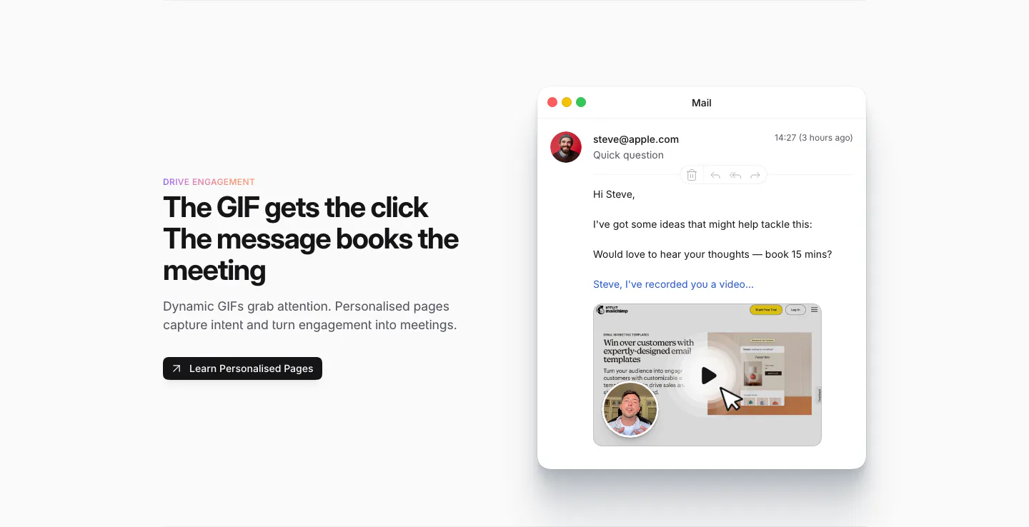
  6. Sendr features section: Drive Engagement copy and button left, Mail app mockup with a personalised video GIF preview right
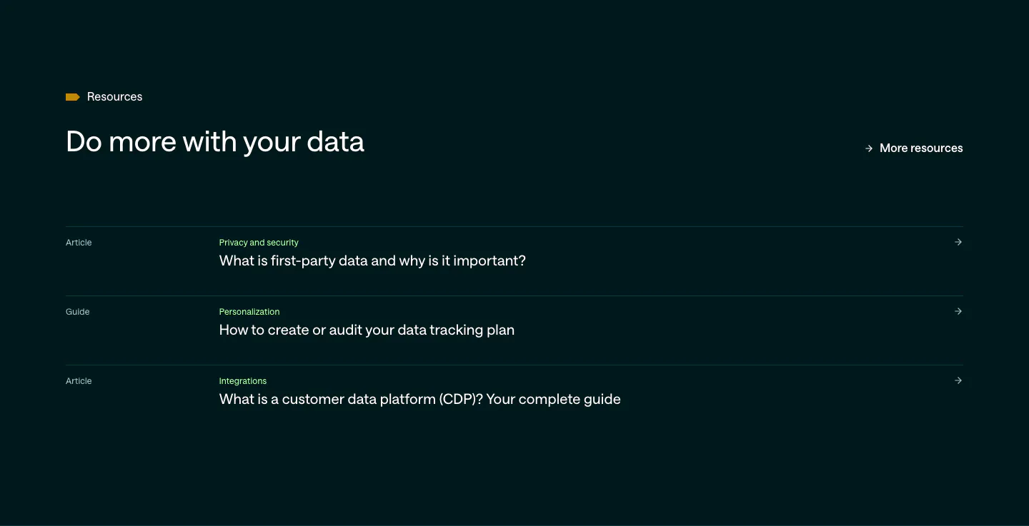
  7. Customer.io blog & resources section: dark teal list of three article and guide links with category labels and arrows
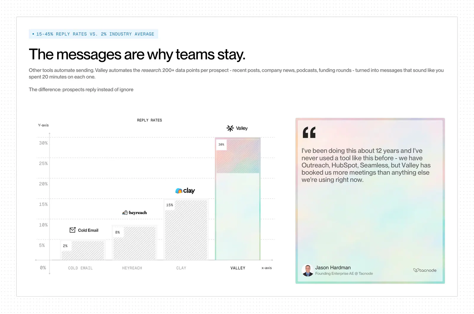
  8. Valley comparison section: reply-rate bar chart versus Cold Email, HeyReach and Clay beside a pastel quote card on a dot-grid background
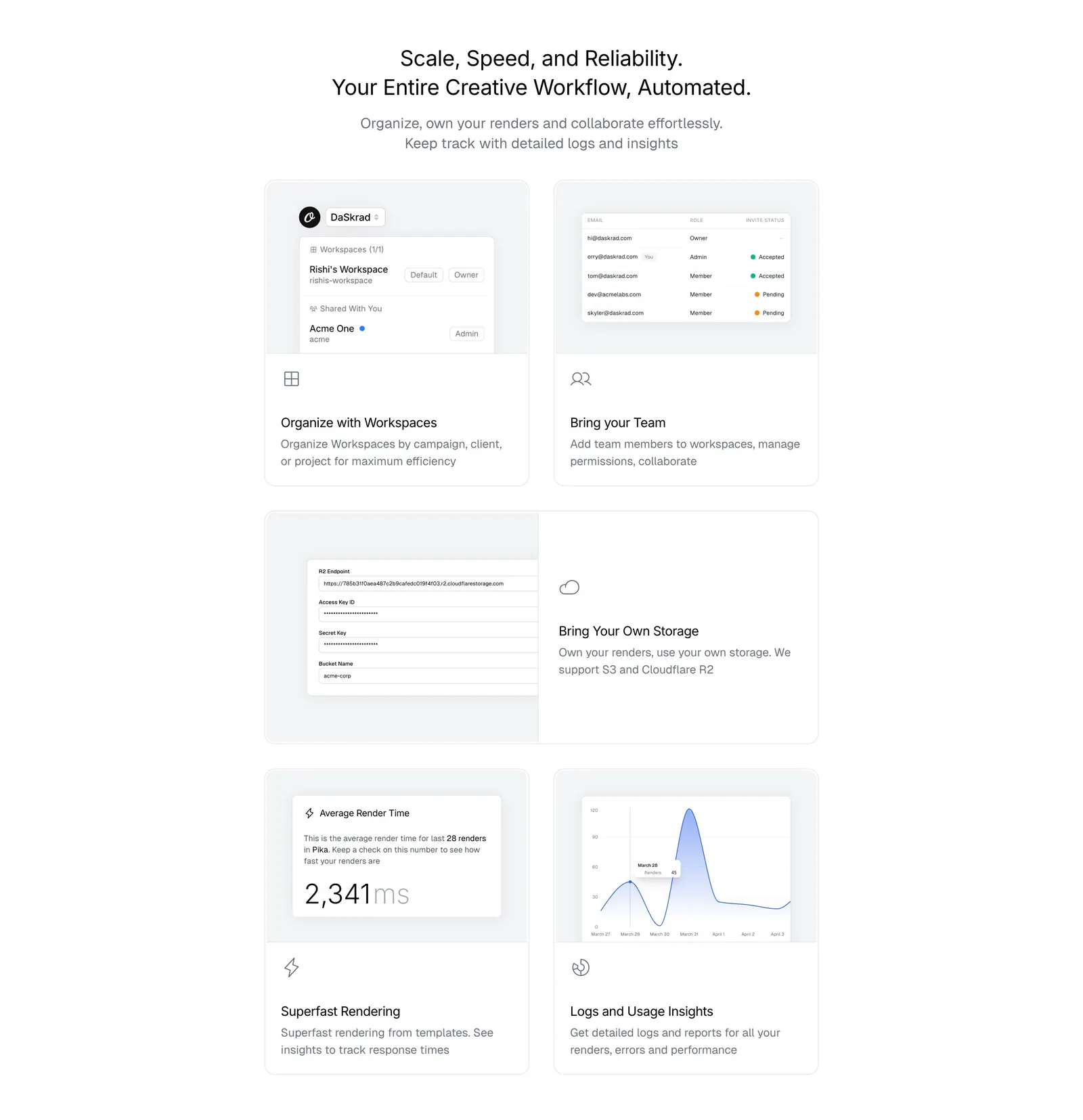
  9. Orshot features section: centered headline above a bento grid of light gray cards with workspace, team, storage and analytics UI
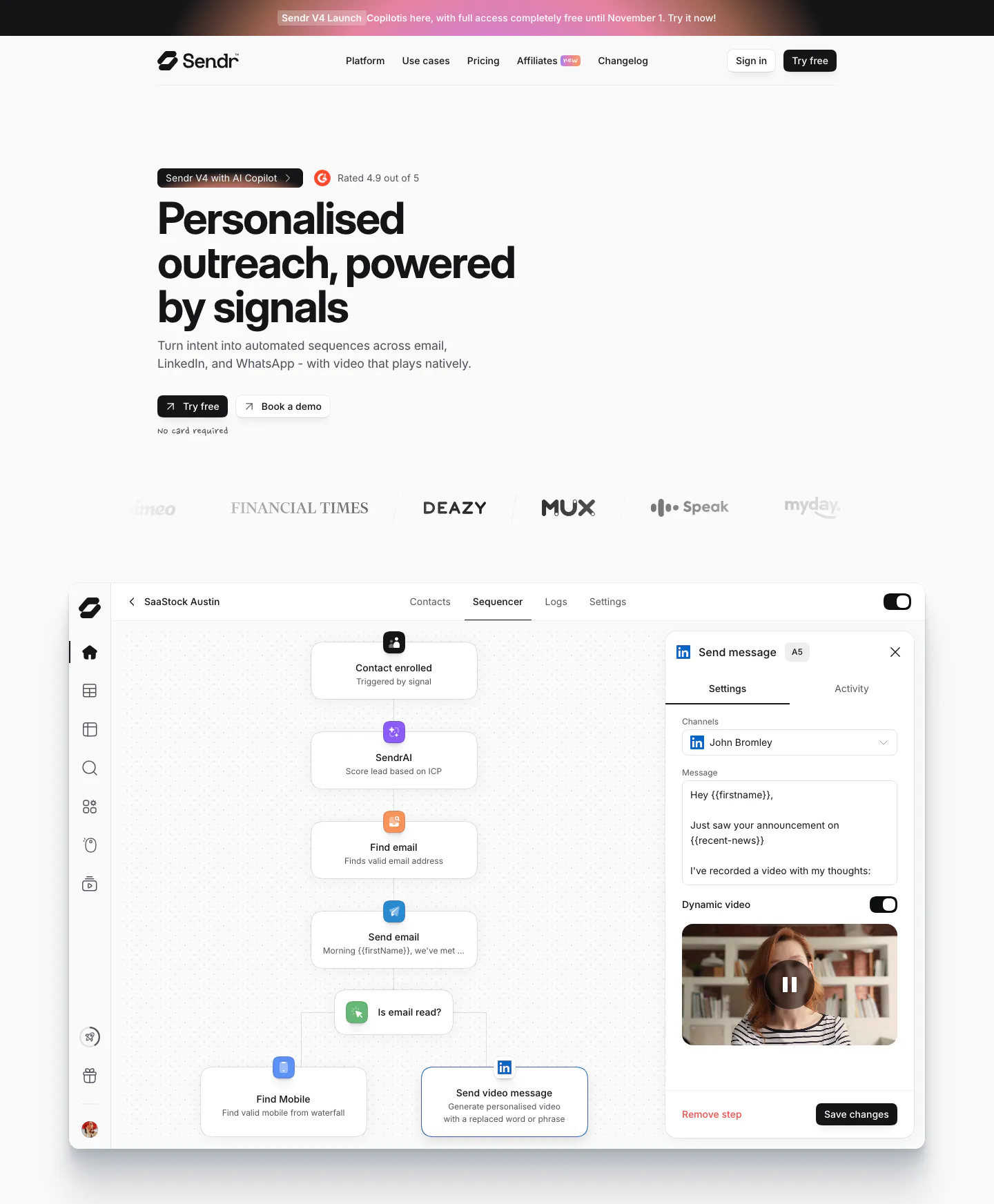
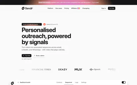
  10. Sendr hero section: nav, left-aligned headline with Try free and Book a demo buttons, logo row and a sequencer workflow UI
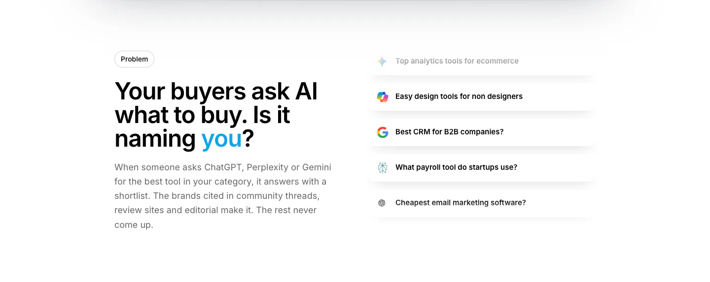
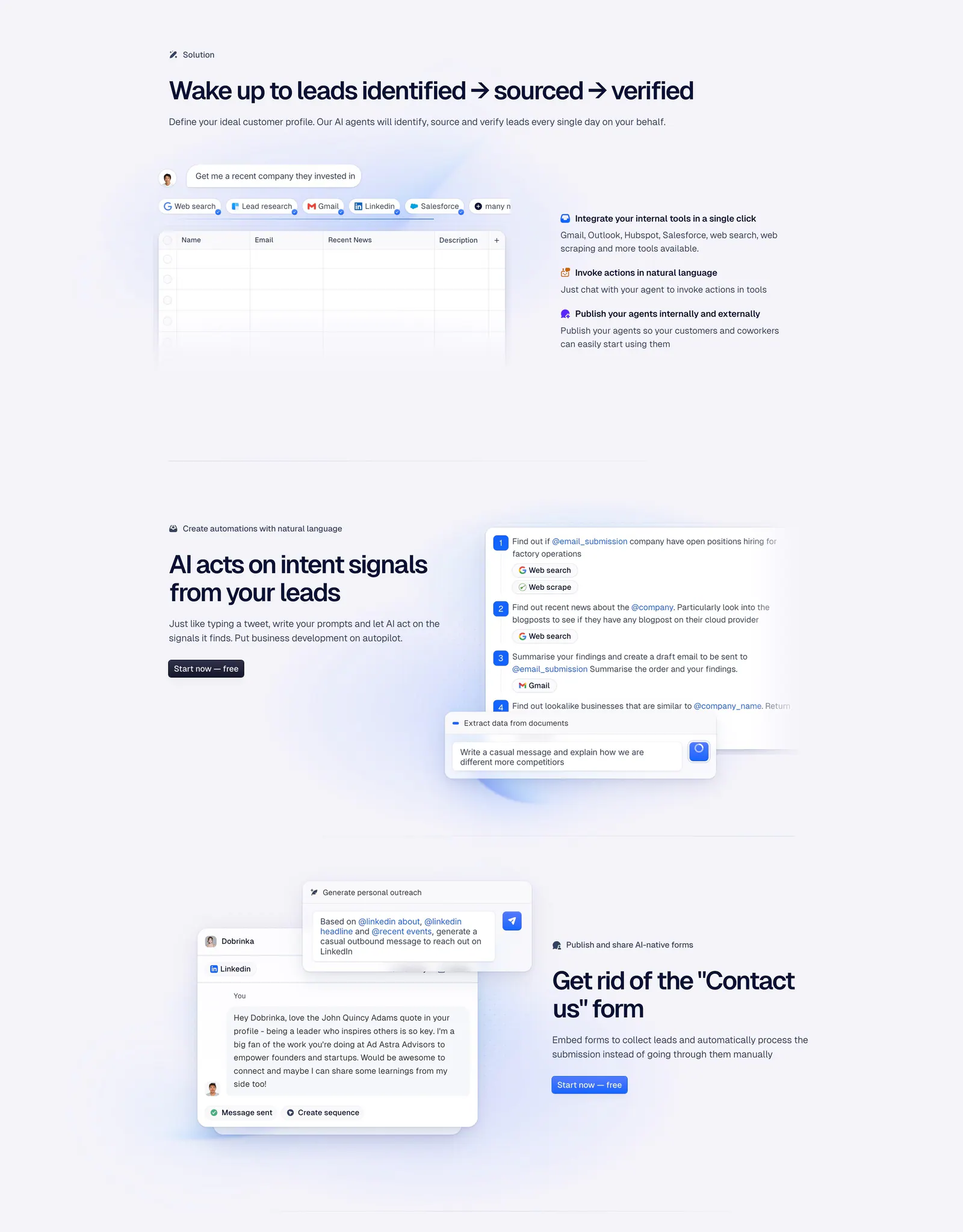
  11. Howseen AI value proposition section: problem headline on the left beside a stacked list of AI prompt query cards on white
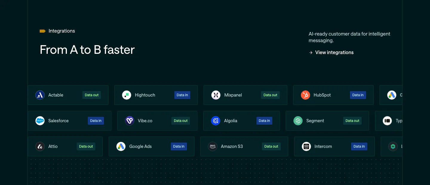
  12. Customer.io integrations section: dark teal band with headline and rows of integration pills tagged Data in or Data out
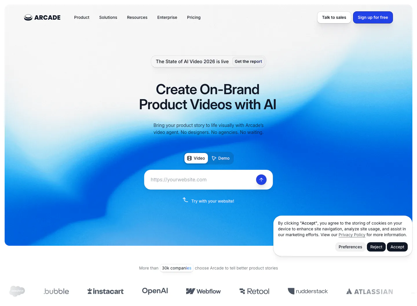
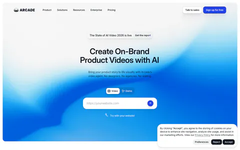
  13. Arcade hero section: centered headline with Video/Demo toggle and URL input on a blue gradient, customer logo row below
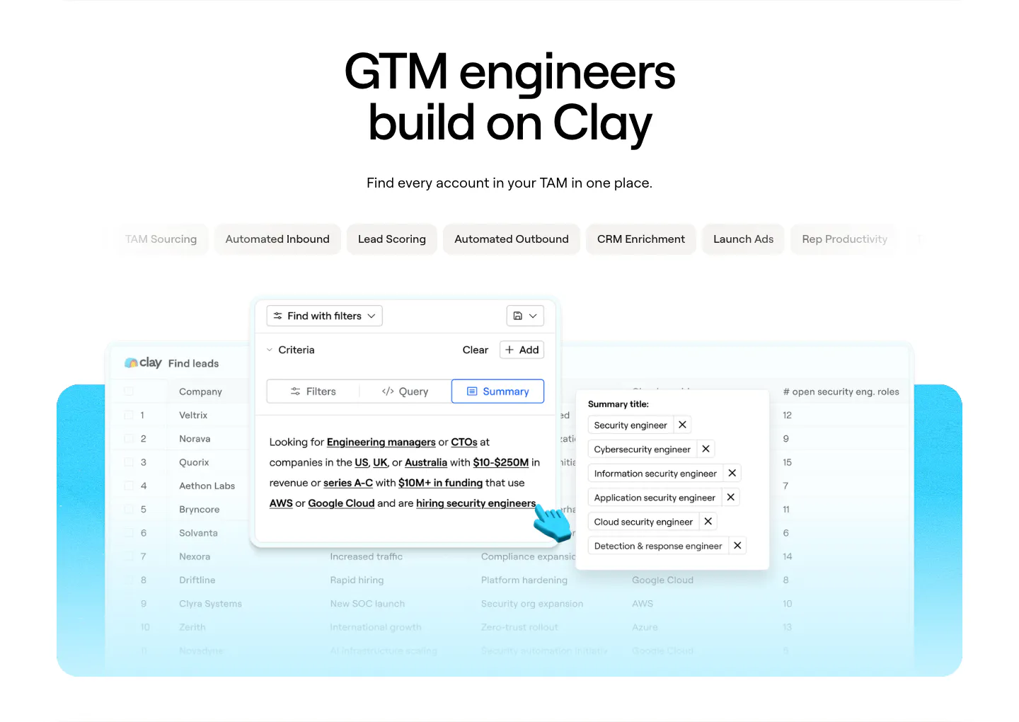
  14. Clay use cases section: centered headline above use-case tab pills and a lead-finding table product screenshot on a cyan panel
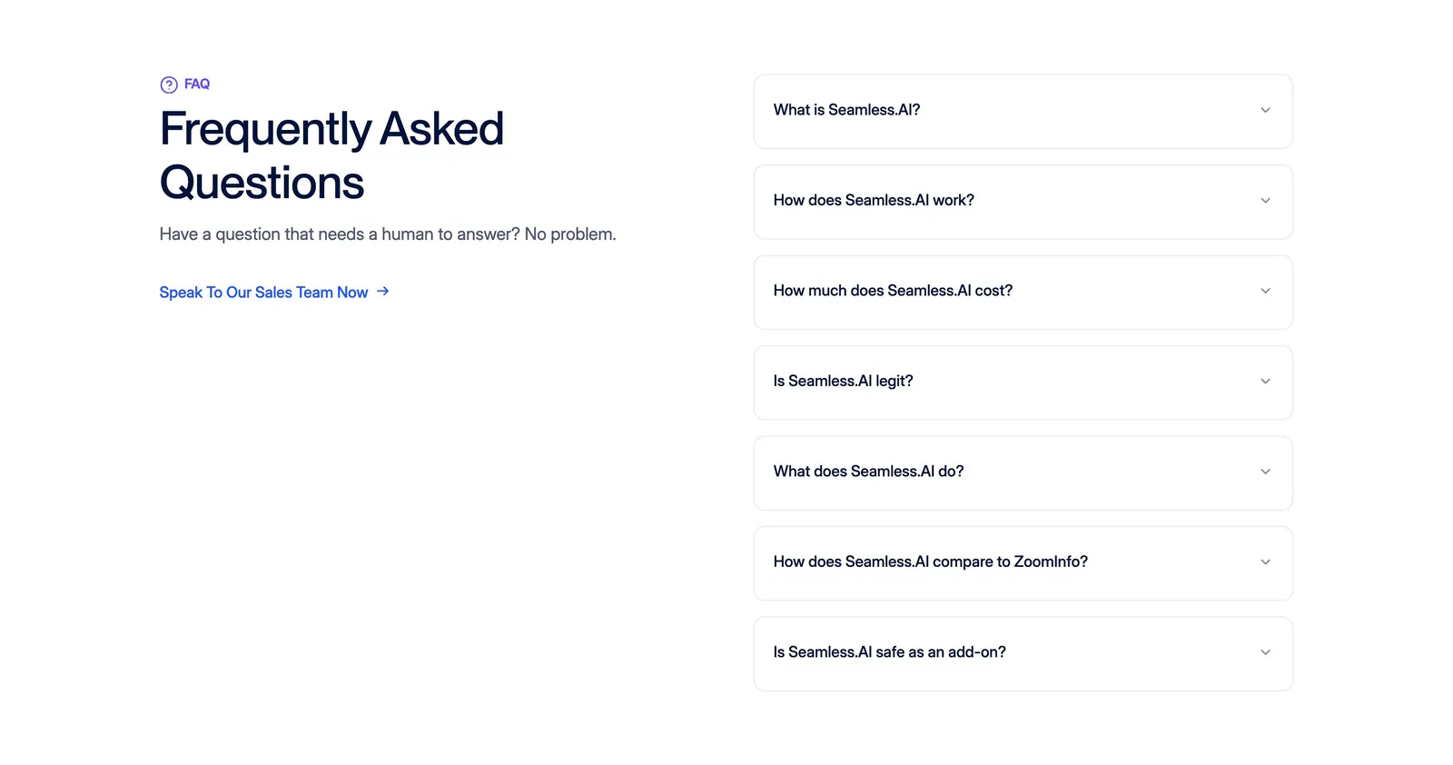
  15. Seamless.AI FAQ section: headline and sales link on the left, seven bordered accordion questions on the right on a white background
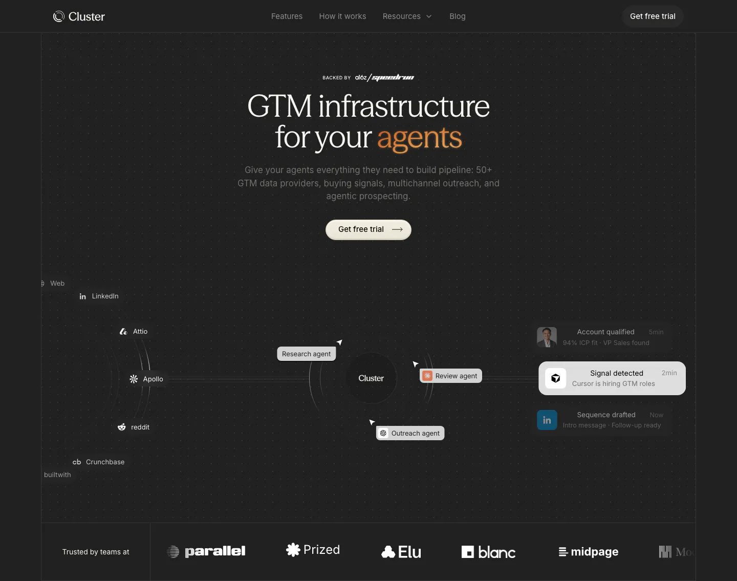
  16. Cluster hero section: centered serif headline with orange accent over an agent workflow diagram and a customer logo row on dark
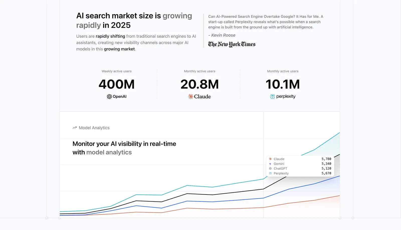
  17. Promptwatch value proposition section: headline beside a press quote, three large user-count stats and a model analytics chart
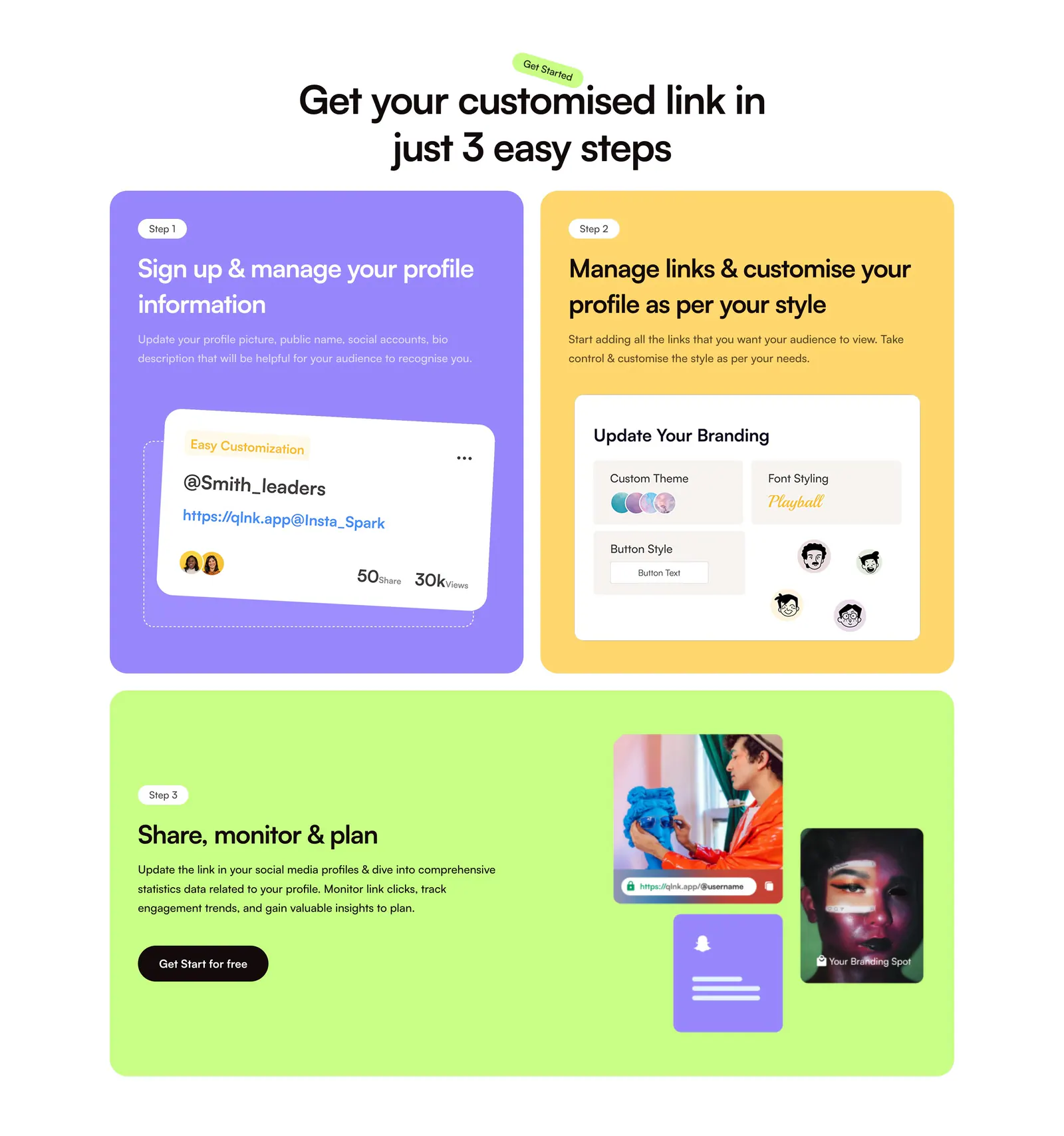
  18. QuickLnk how it works section: centered headline above three step cards in purple, yellow and lime with profile UI mockups and photos
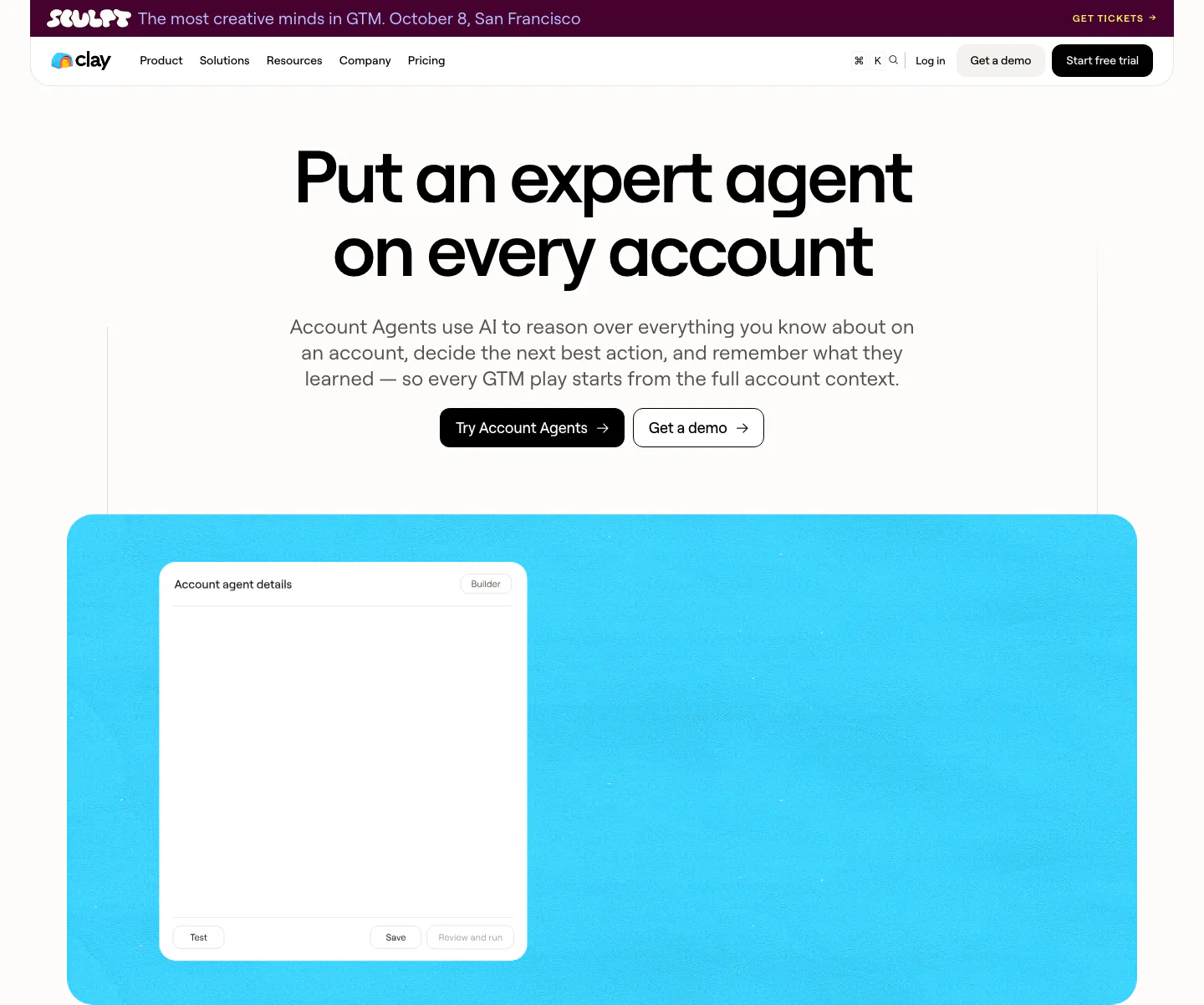
  19. Clay hero section: centered bold headline with two CTA buttons above a bright cyan panel holding an account agent details window
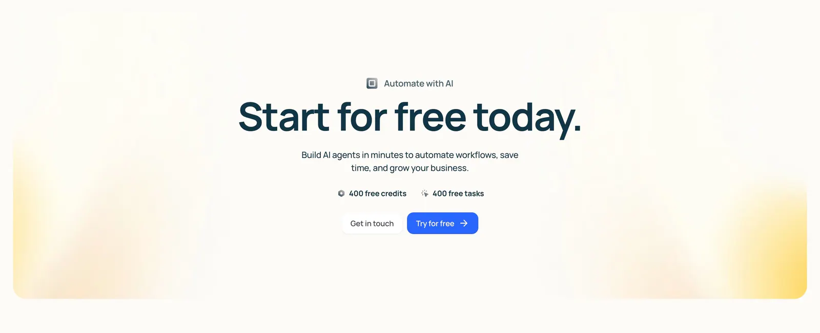
  20. Lindy call-to-action section: centered headline with free credit badges and two buttons inside a cream panel with soft yellow corner glows
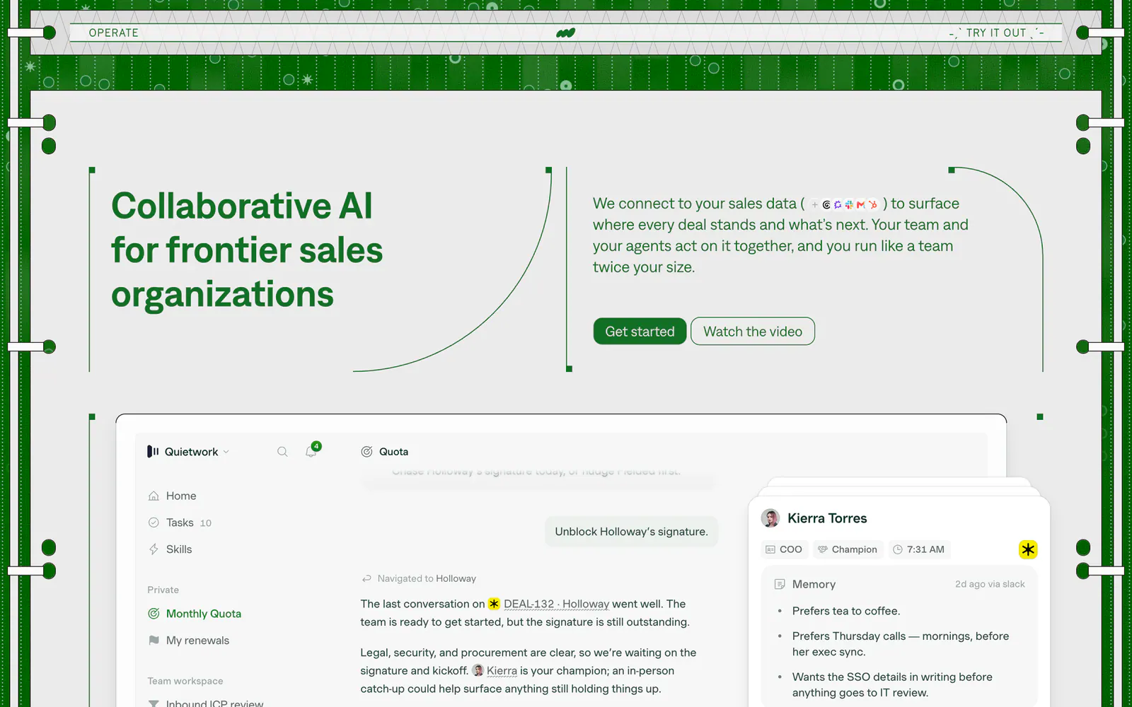
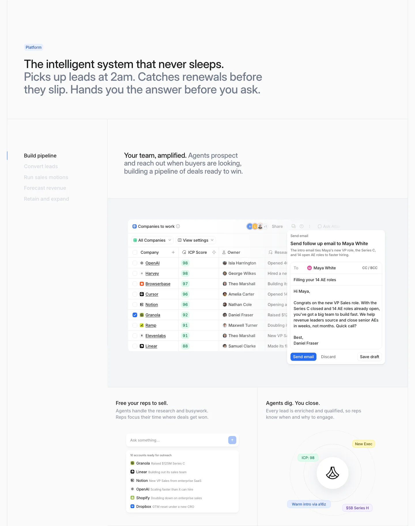
  21. Operate hero section: headline left and copy with buttons right in a green patterned frame, above a sales app screenshot
    Operate Hero
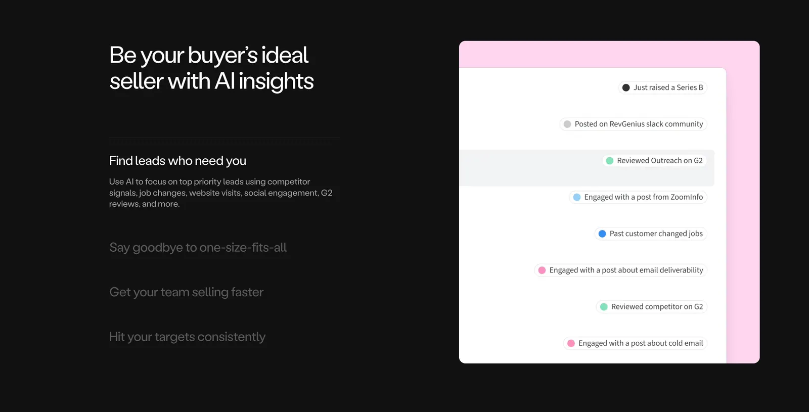
  22. Amplemarket features section: dark background with headline and accordion list on the left, lead signals UI on a pink panel at right
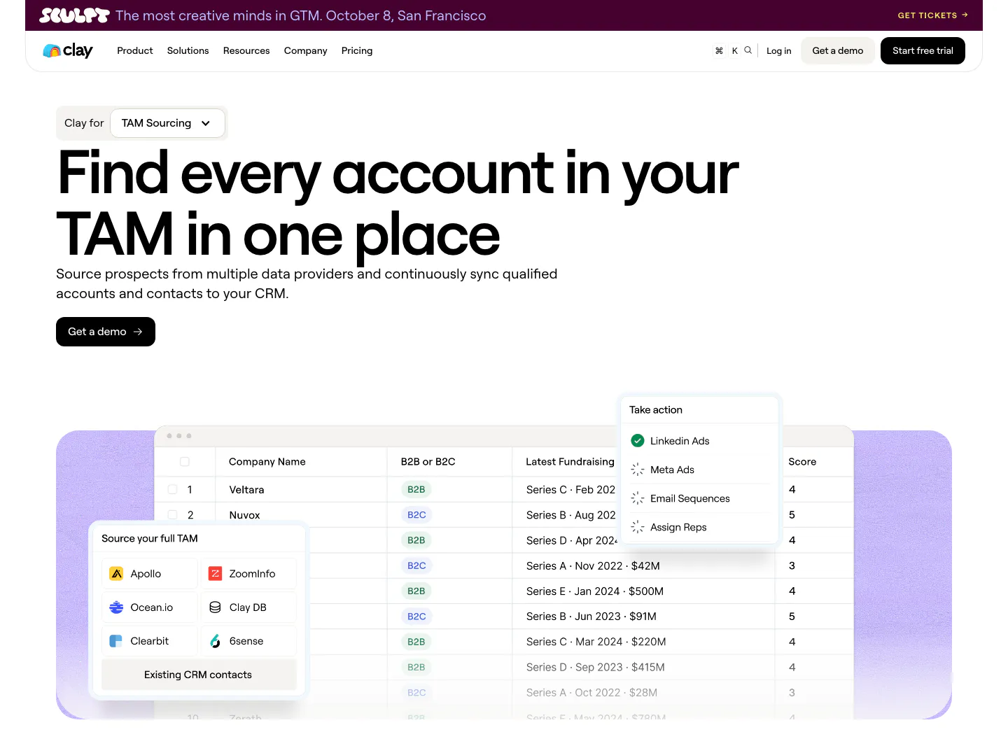
  23. Clay hero section: left-aligned headline with use-case dropdown and demo button above a company table UI with data source picker on lavender
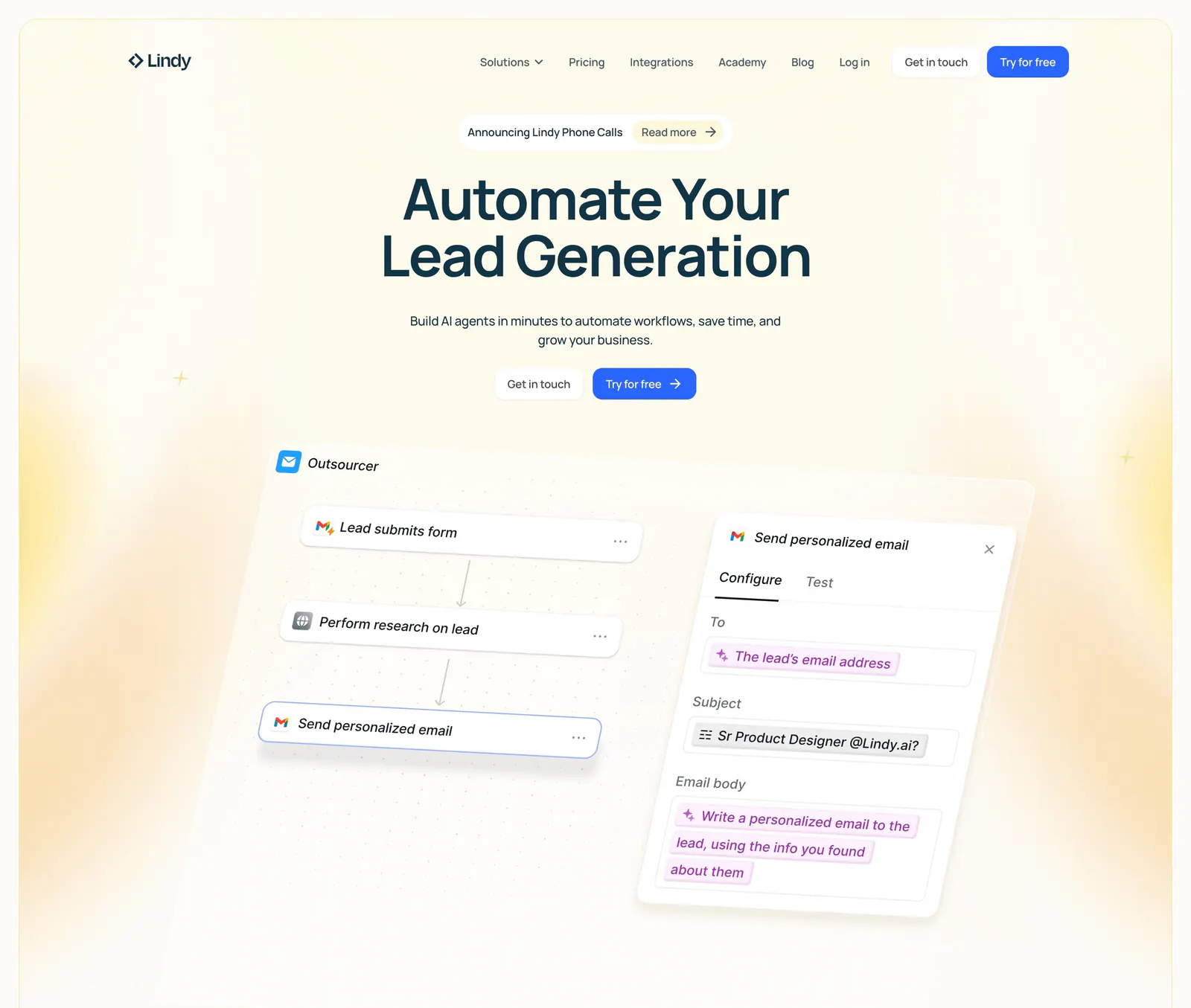
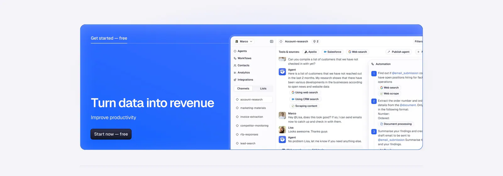
  24. Lindy hero section: nav bar, centered headline and two CTAs above a tilted workflow builder UI with an email step panel, framed by yellow glows
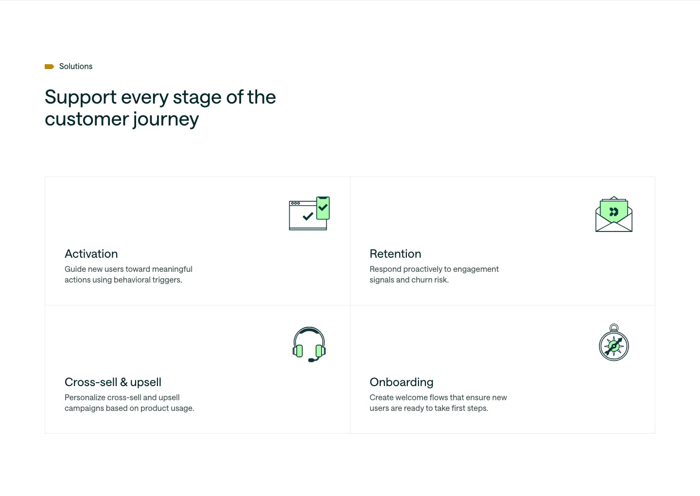
  25. Customer.io use cases section: headline above a 2x2 bordered grid of lifecycle stages, each with a green line icon and short copy
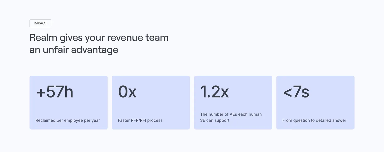
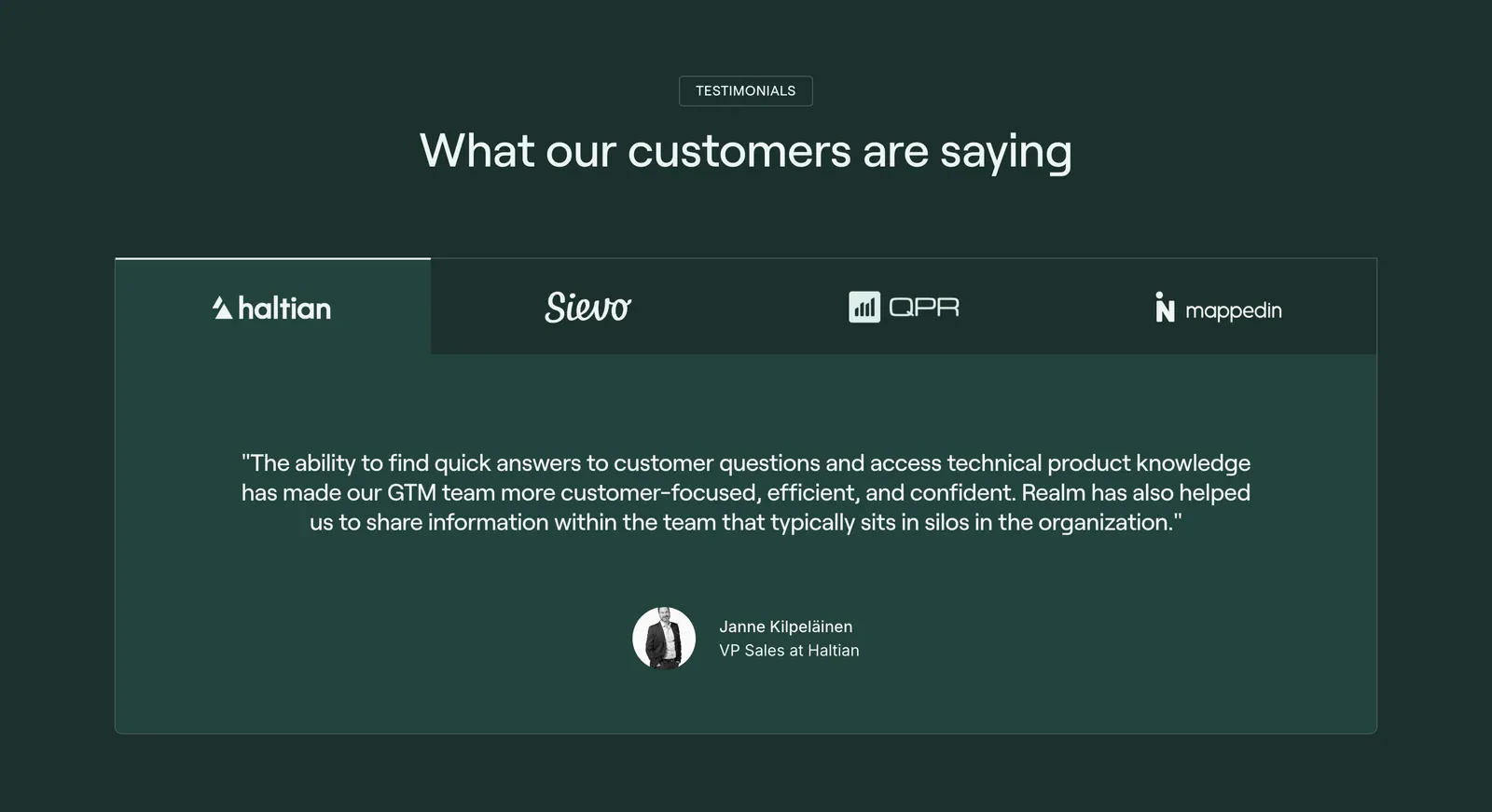
  26. Realm value proposition section: left-aligned headline above four lavender stat cards with large figures and labels
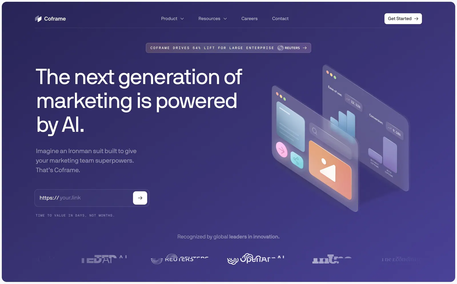
  27. Coframe hero section: left headline with URL input field beside isometric glass UI panels on purple, logo row below
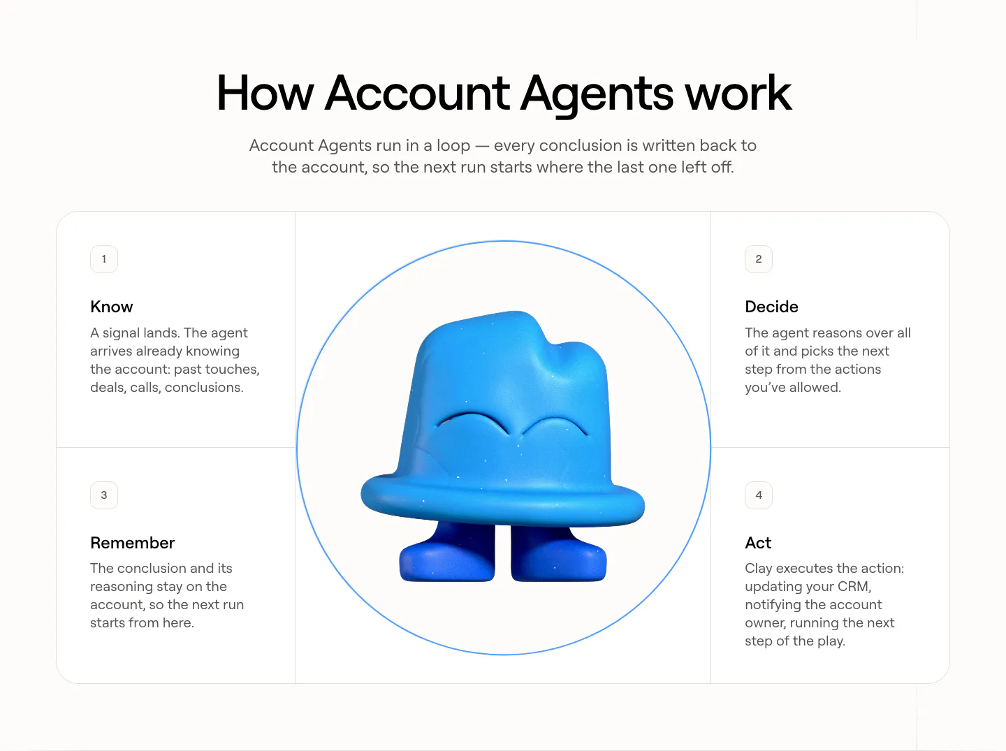
  28. Clay how it works section: centered heading over four numbered step cards arranged around a circle with a blue 3D clay mascot
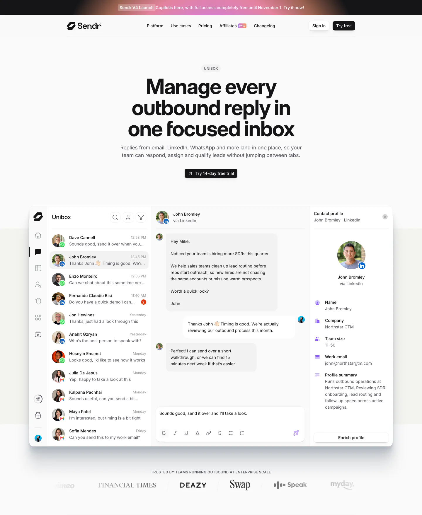
  29. Sendr hero section: nav, centered Unibox headline and trial button above a full inbox product UI and a customer logo row
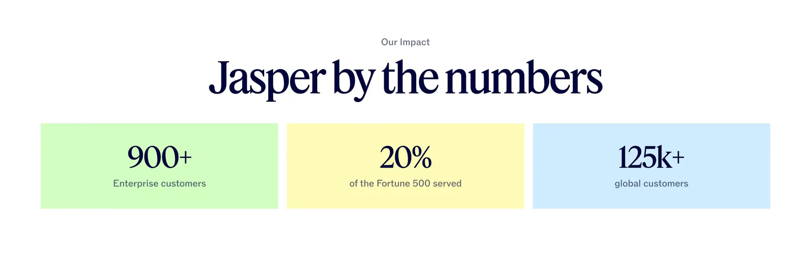
  30. Jasper value proposition section: centered serif headline above three pastel tiles with large customer metrics
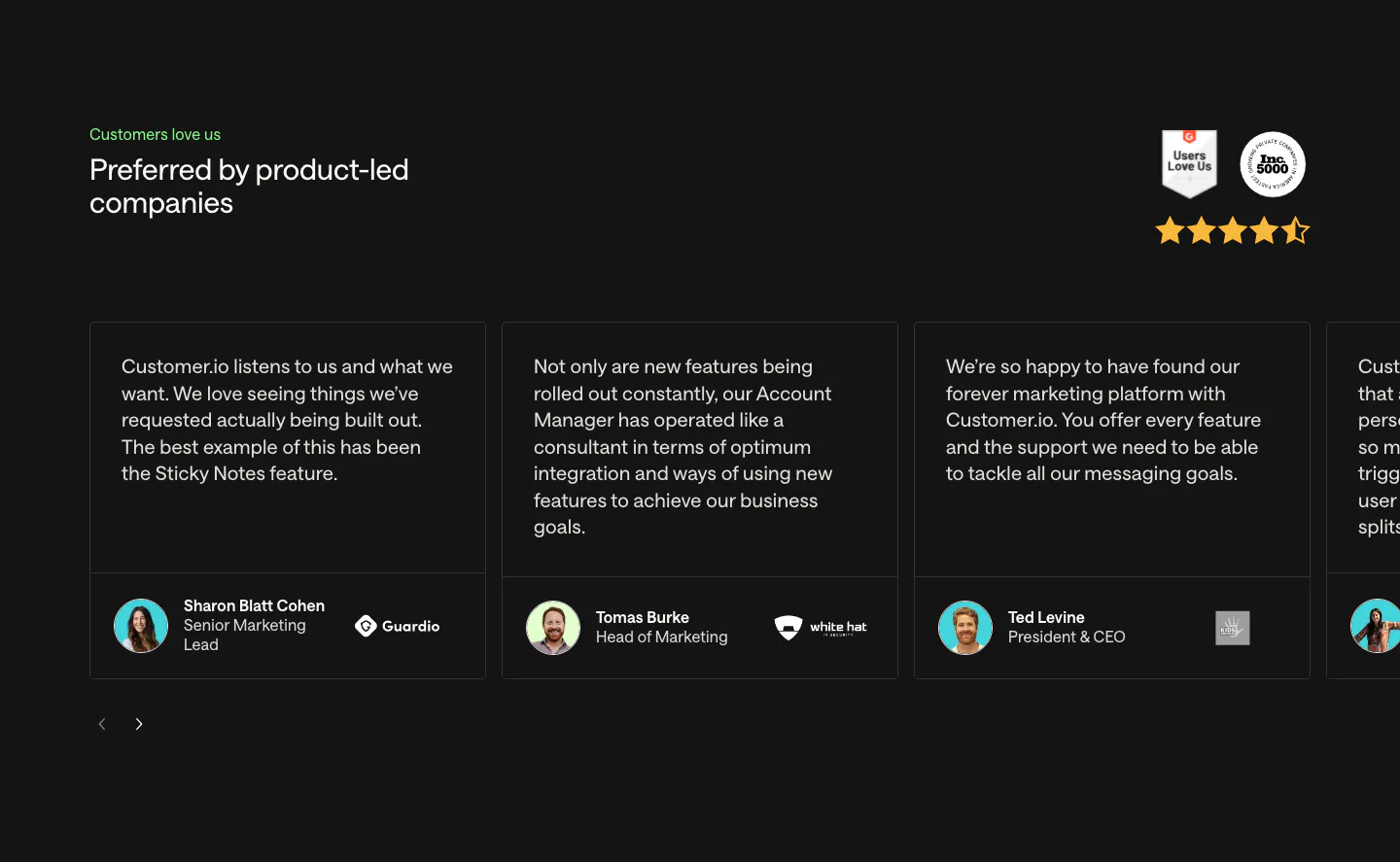
  31. Customer.io testimonials section: charcoal carousel of quote cards with avatars and company logos, plus G2 and Inc. 5000 badges and stars
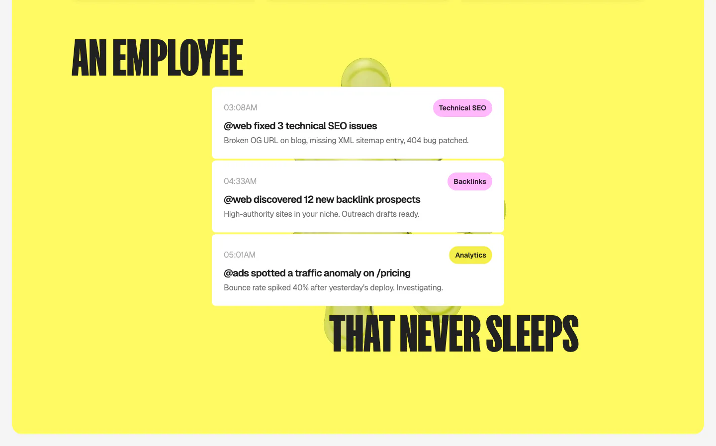
  32. Ploy features section: split condensed headline wrapped around a stack of white agent activity notification cards on a bright yellow panel
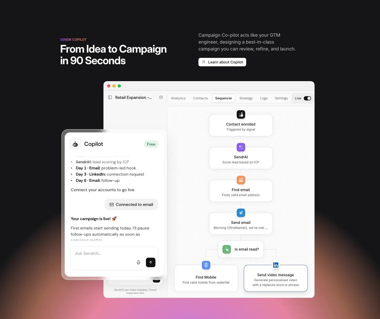
  33. Sendr features section: dark section with headline above a Copilot chat panel overlapping a sequencer workflow UI, warm glow below
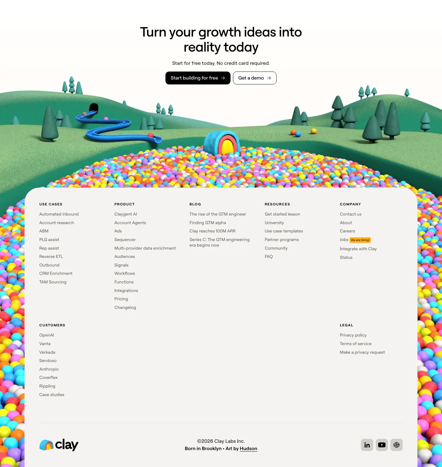
  34. Clay footer section: centered CTA over a 3D landscape of hills and colorful ball pit framing a light footer panel with link columns
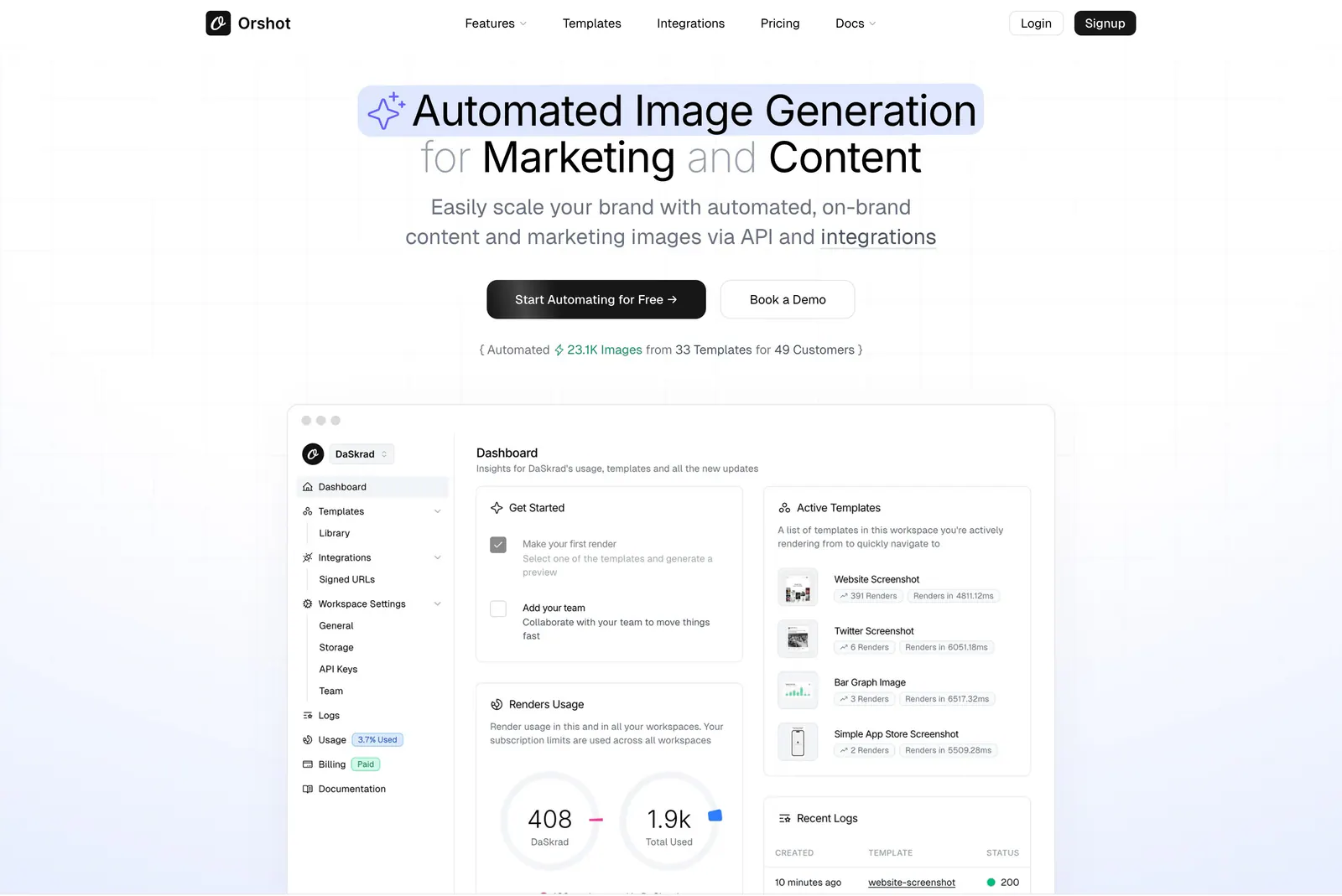
  35. Orshot hero section: centered headline with highlighted phrase, two buttons and a stat line above a dashboard screenshot on faint grid
  36. Attio logo cloud section: two rows of five customer logos in bordered grid cells, including granola, Modal, Railway and taskrabbit
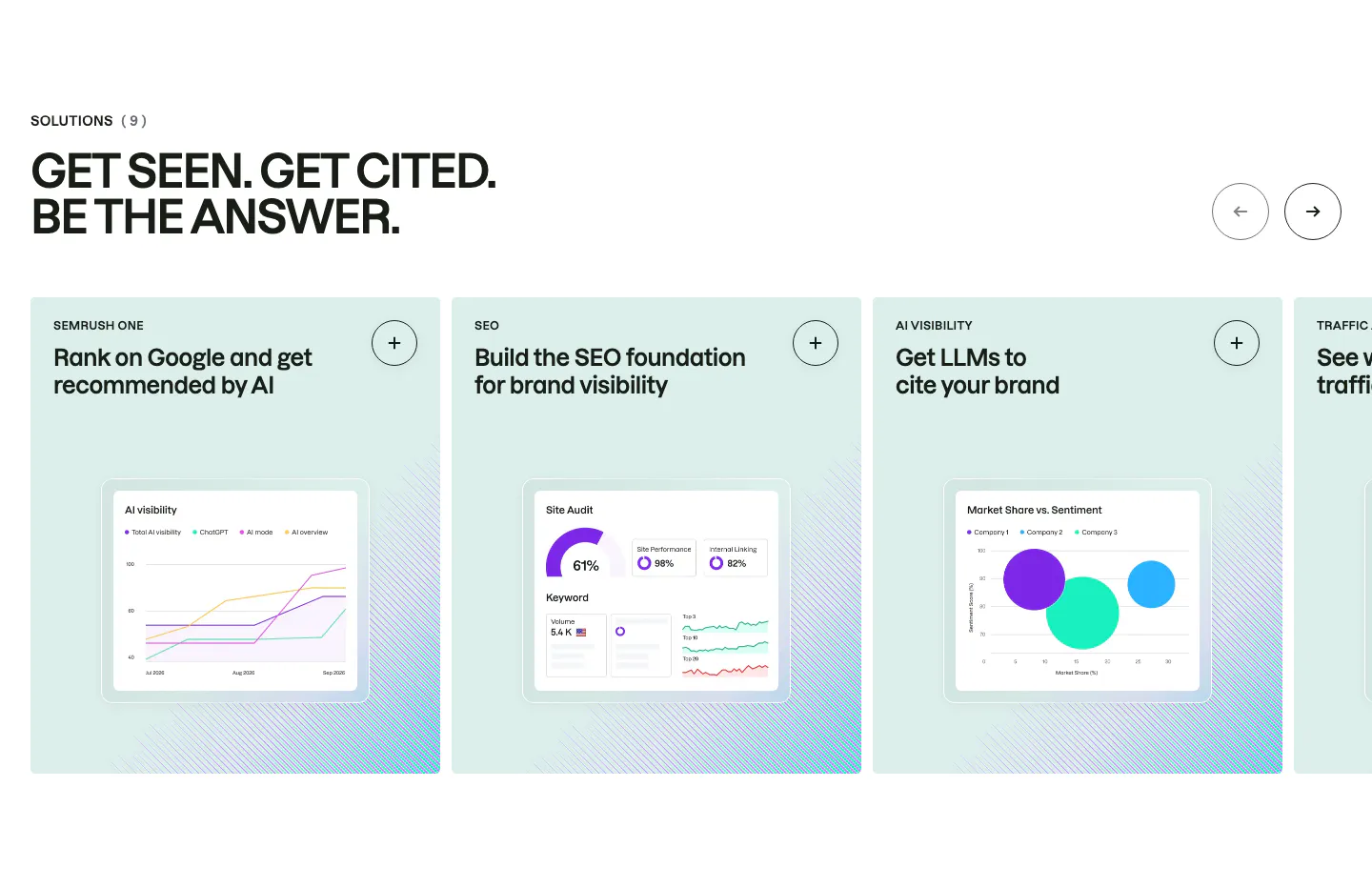
  37. Semrush features section: uppercase headline above a carousel of mint solution cards, each with a chart-based product UI mockup
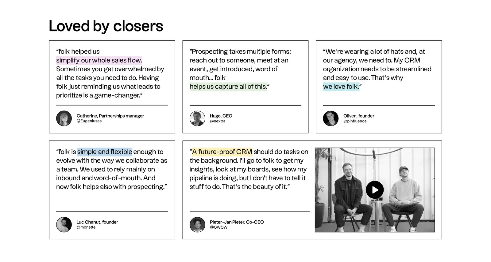
  38. folk testimonials section: bento grid of outlined quote cards with highlighted phrases and a wide card holding a video thumbnail
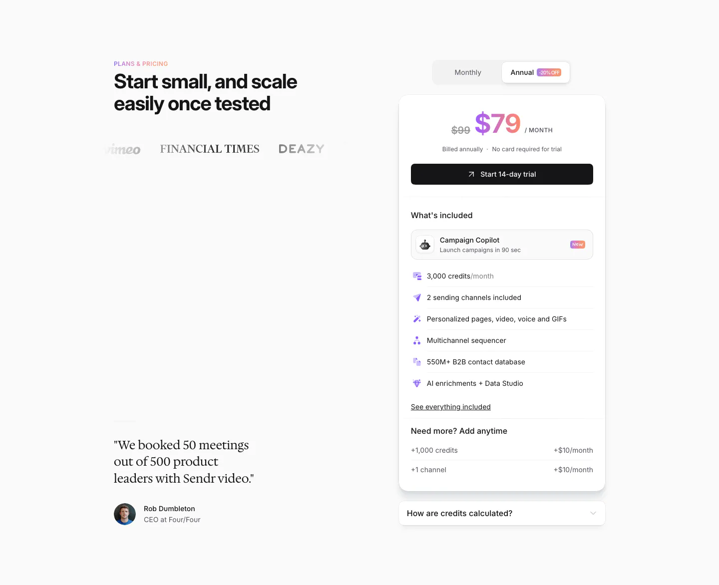
  39. Sendr pricing section: headline, logos and serif customer quote left, single $79 plan card with monthly/annual toggle right
  40. Godmode logo cloud section: single thin row with a trusted-by label beside fading grayscale customer logos on a pale background
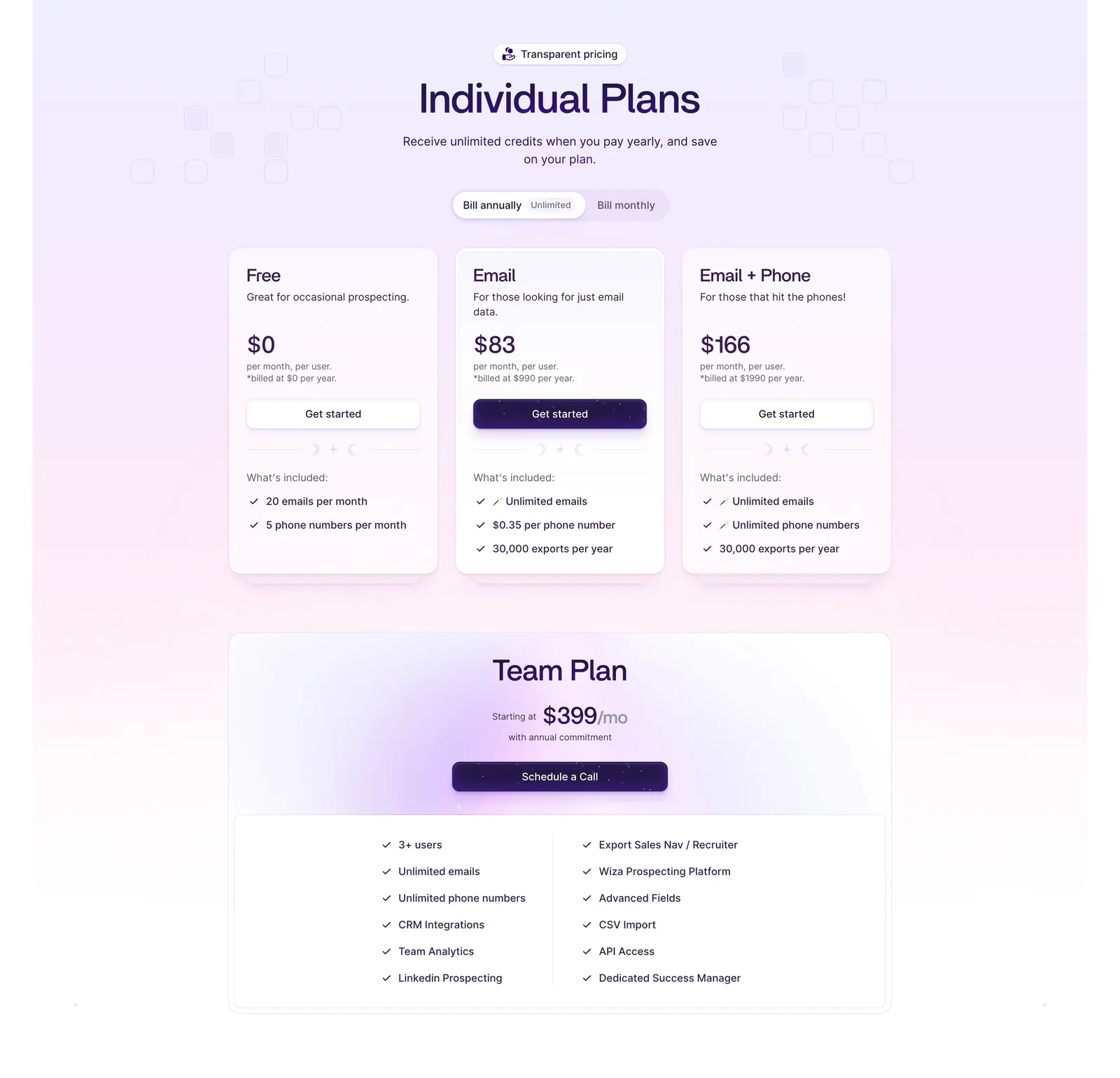
  41. Wiza pricing section: billing toggle above three plan cards and a wide Team Plan card with feature checklist on a lavender gradient
  42. Attio call to action section: centered two-line headline with Talk to sales and Start for free buttons on a dark striped background
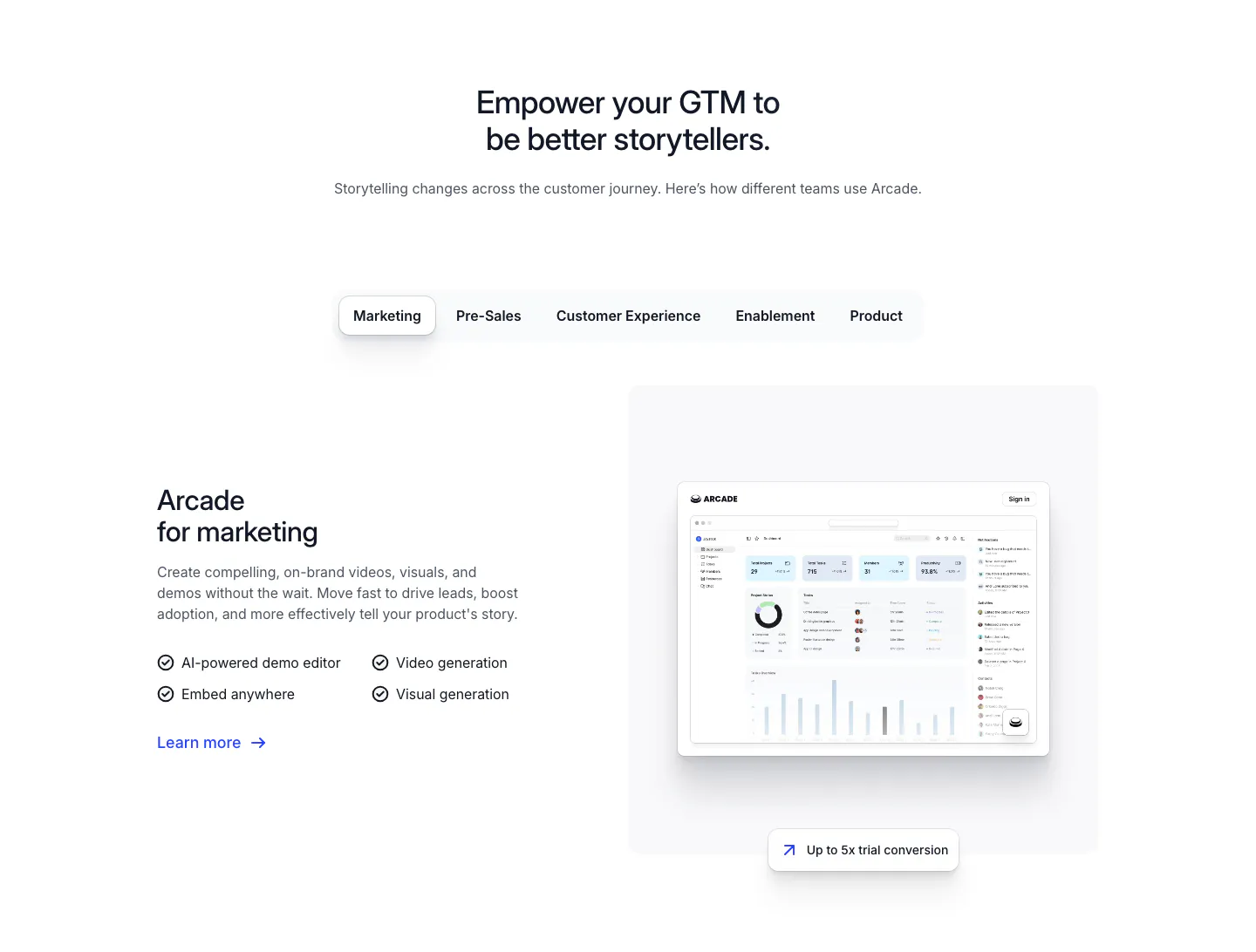
  43. Arcade use cases section: centered headline over team tabs, with marketing copy and checklist beside a dashboard screenshot
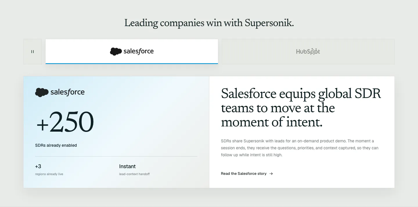
  44. Supersonik testimonials section: customer logo tabs above a Salesforce case study card with a large +250 metric and serif story headline
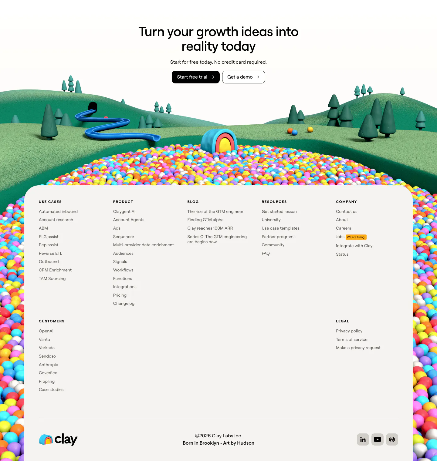
  45. Clay footer section: centered closing CTA over a 3D clay landscape and ball pit, with a light card of link columns and wordmark
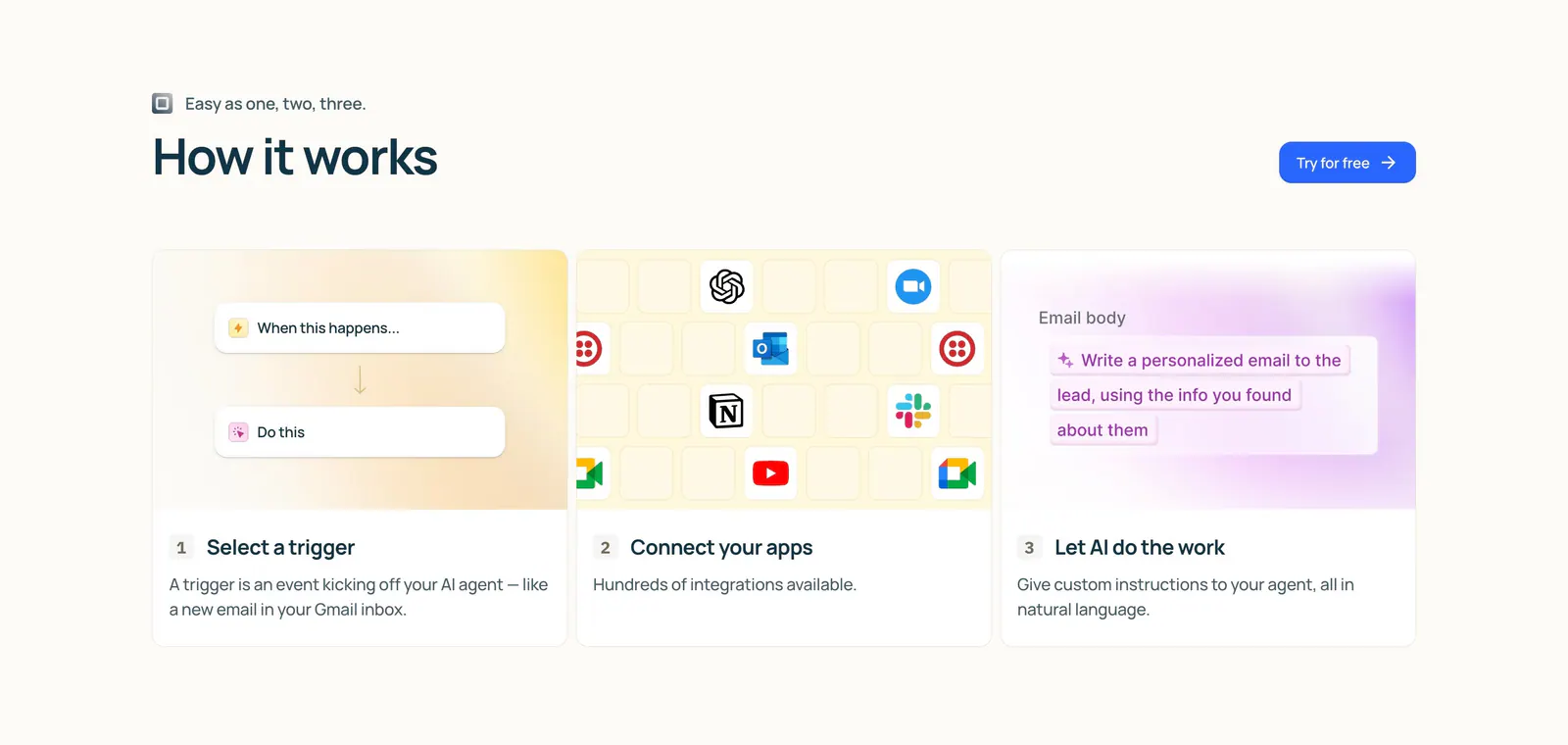
  46. Lindy how it works section: left-aligned heading and button above three numbered step cards with trigger, app icon grid and AI prompt visuals
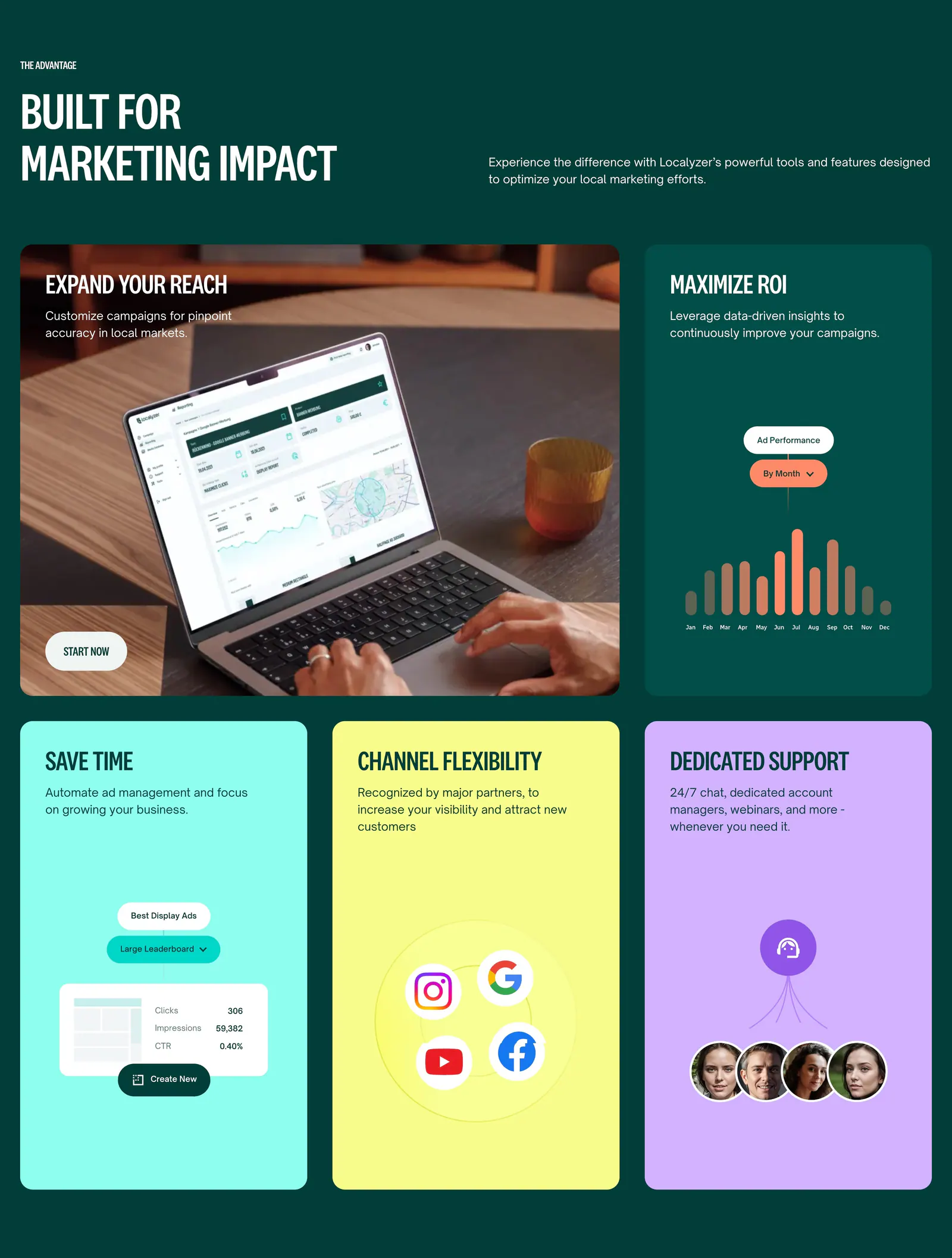
  47. Localyzer features section: bento grid on dark green with a laptop photo tile, ad chart tile and bright colored benefit cards
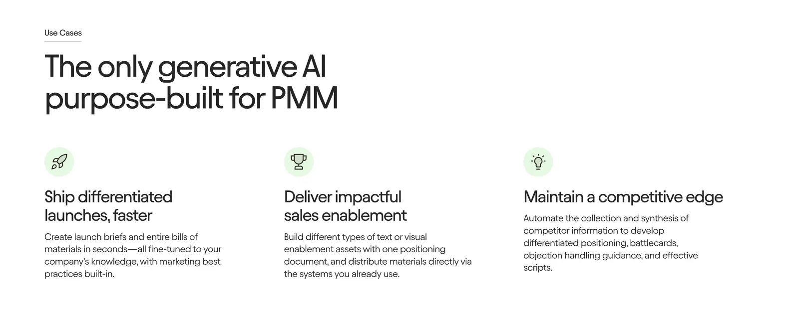
  48. Jasper features section: large left-aligned headline above three icon columns with short benefit descriptions on a white background
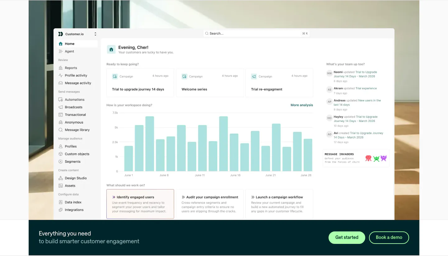
  49. Customer.io features section: large home dashboard screenshot over an office photo, with a dark teal CTA bar and two buttons below
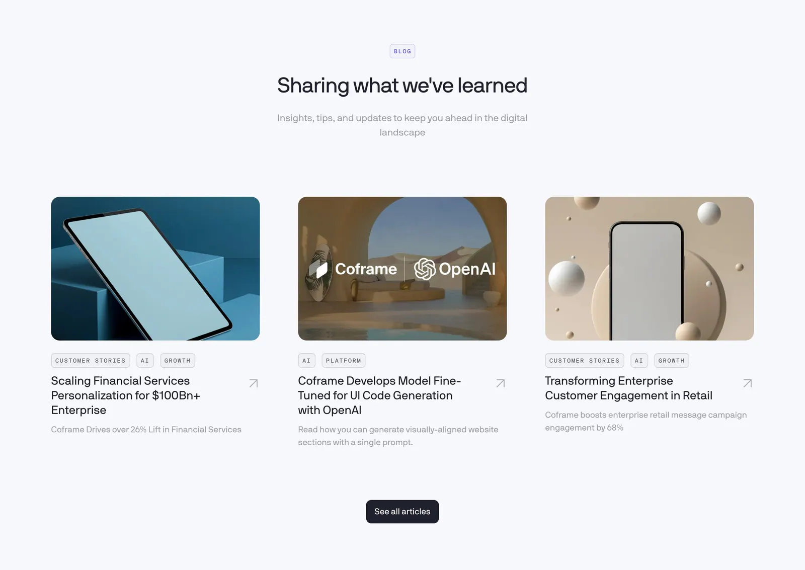
  50. Coframe blog & resources section: centered heading above three article cards with rendered device thumbnails and tags
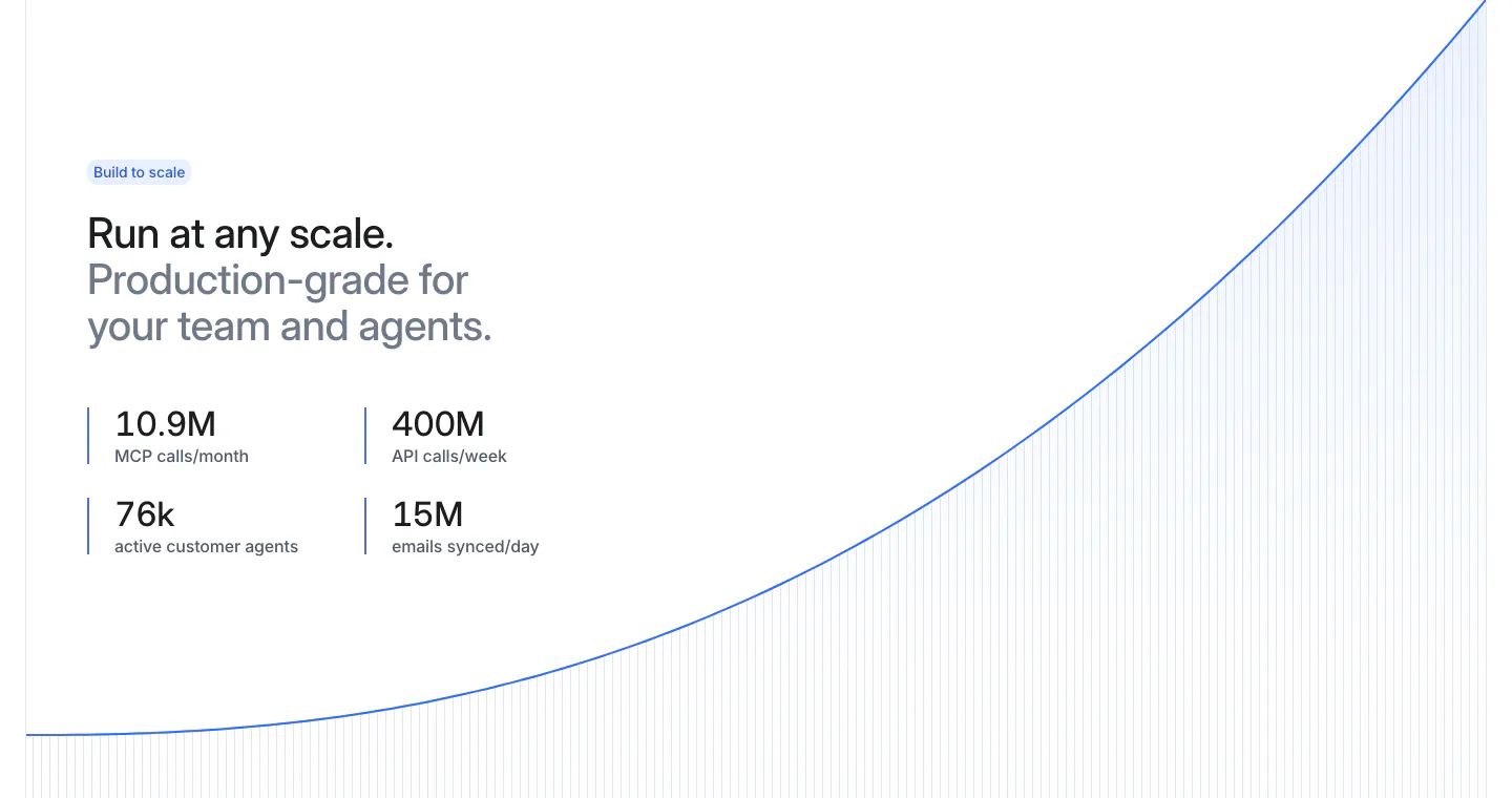
  51. Attio stats section: two-tone headline and four metrics at left beside a rising blue growth curve with vertical line fill on white
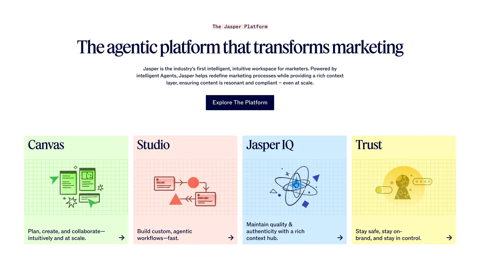
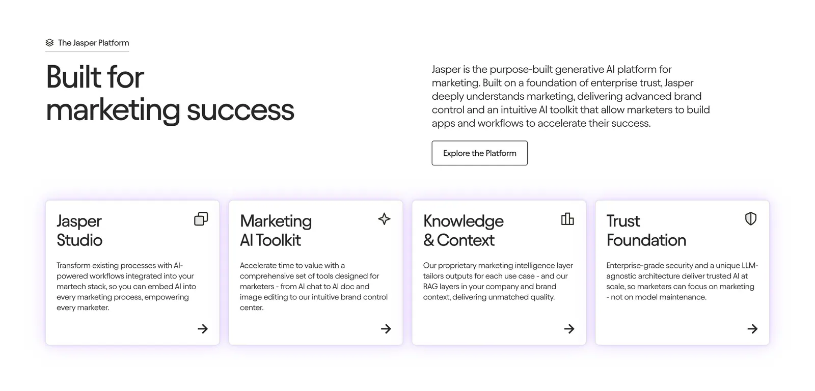
  52. Jasper features section: centered serif headline and button above four pastel cards with line illustrations on grid backgrounds
  53. Customer.io footer section: dark teal footer with logo, link columns with New badges, social icons, copyright and system status
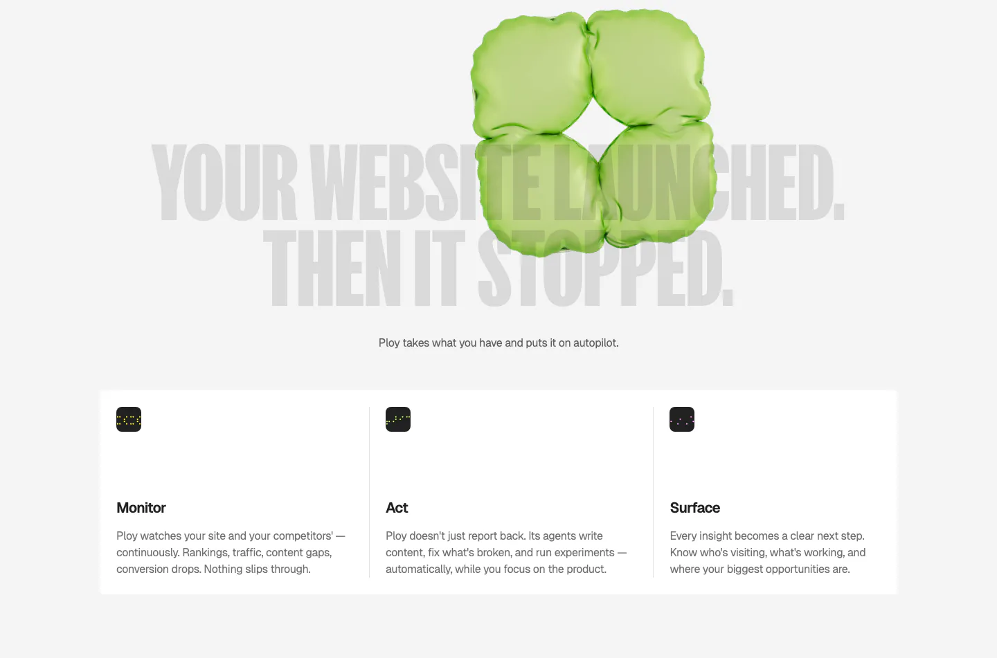
  54. Ploy features section: huge gray condensed headline behind a green 3D inflatable shape, above three columns for Monitor, Act and Surface
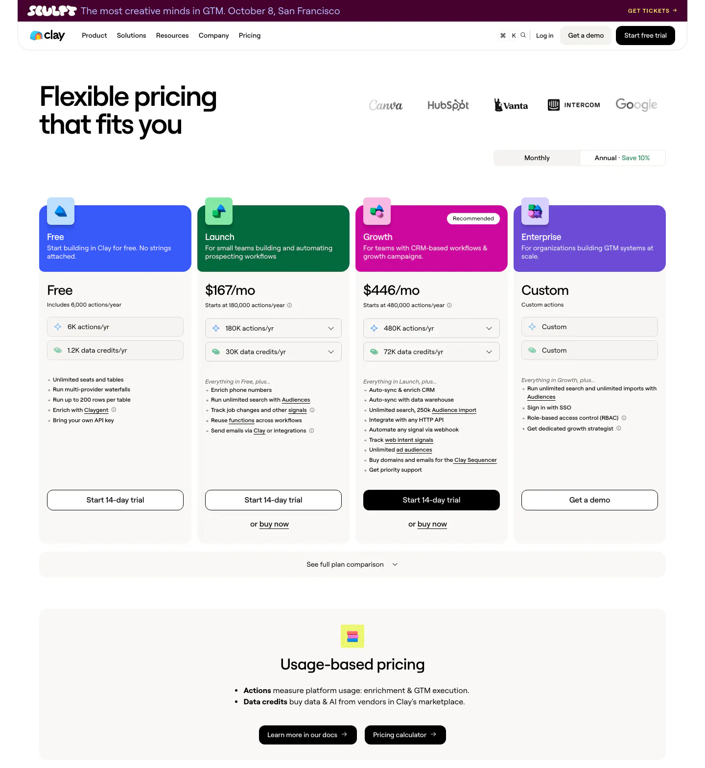
  55. Clay pricing section: headline and logo row above a monthly/annual toggle, four plan cards with colored headers and a usage-based pricing band
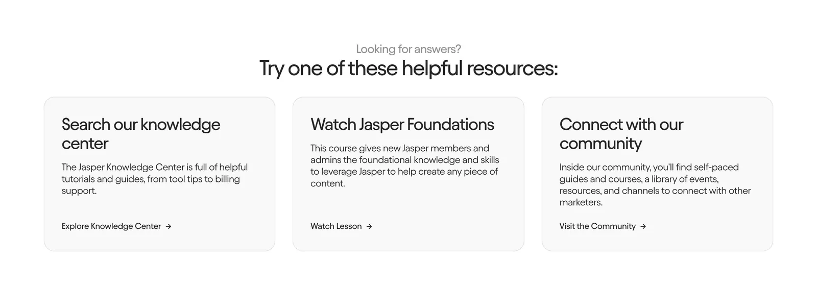
  56. Jasper contact section: centered heading above three light gray cards linking to the knowledge center, a course and the community
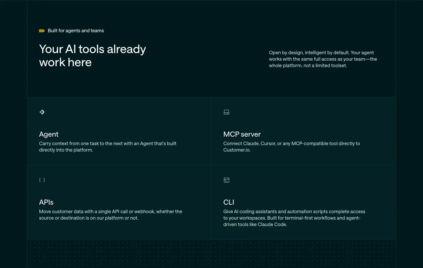
  57. Customer.io features section: dark teal header with headline and copy above a 2x2 grid of Agent, MCP server, APIs and CLI cells
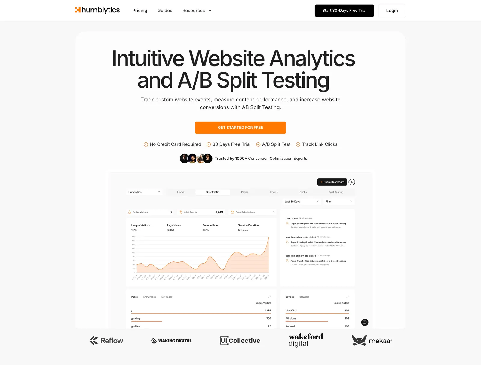
  58. Humblytics hero section: centered headline, orange CTA and analytics dashboard screenshot above a customer logo row on a light background
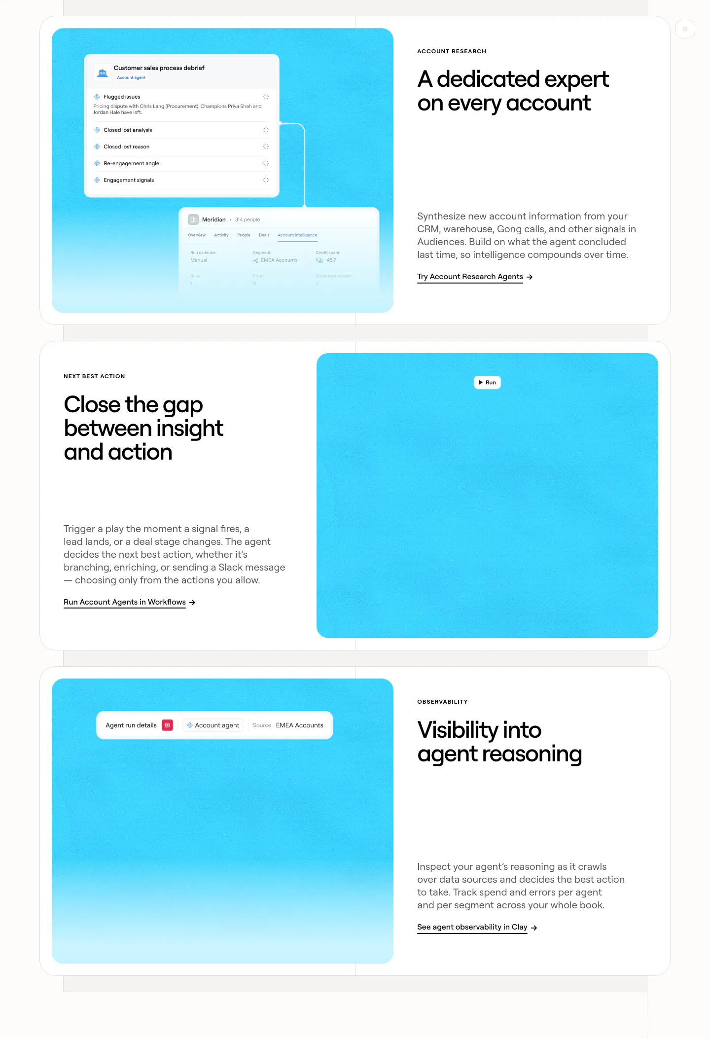
  59. Clay features section: three alternating rows of white cards pairing headlines and copy with bright cyan panels holding agent UI snippets
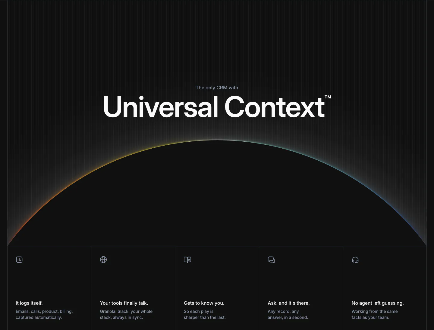
  60. Attio features section: large centered headline over a glowing horizon arc, five equal feature cells with icons below, dark background
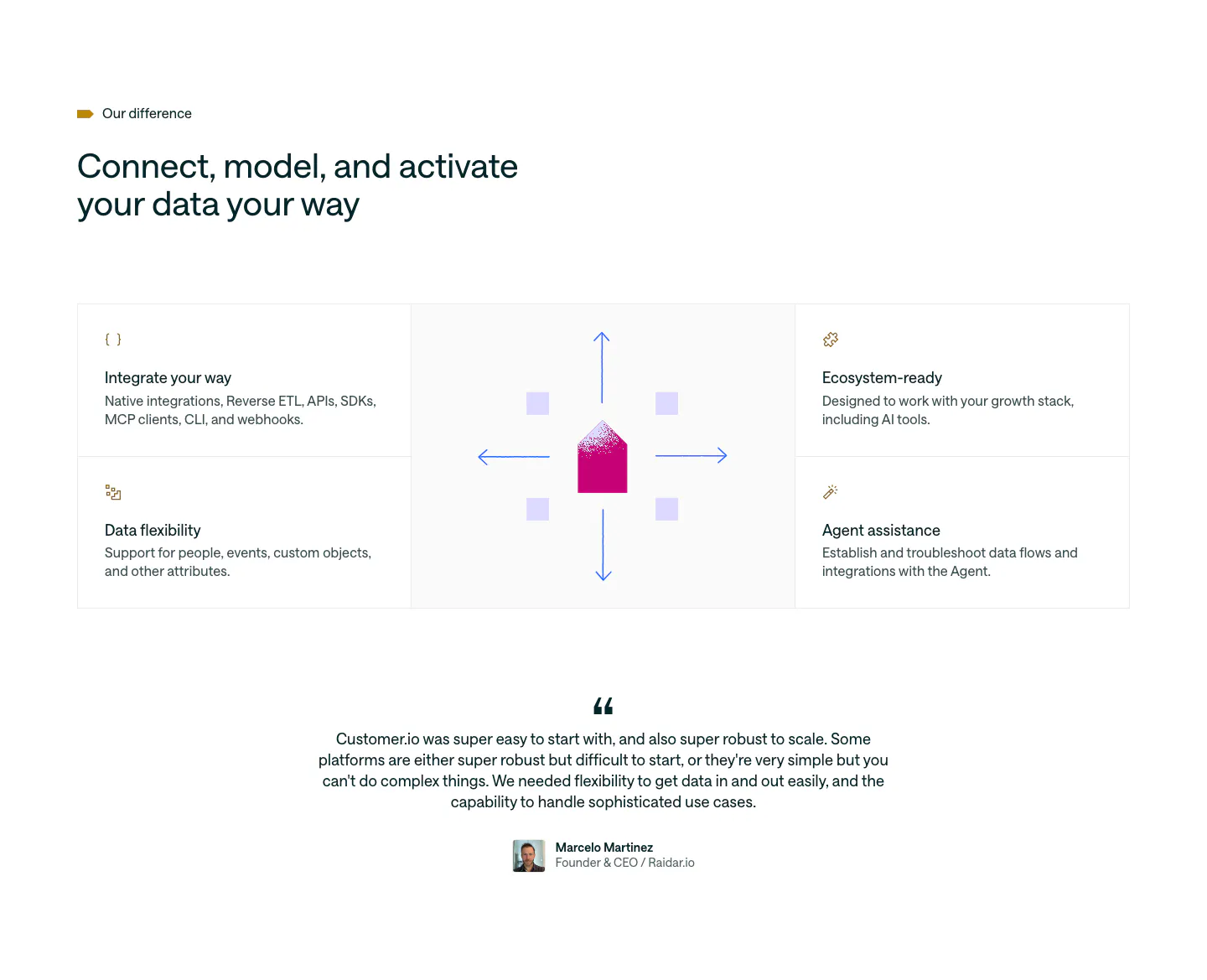
  61. Customer.io features section: four feature cells around a central envelope and arrows graphic, followed by a centered customer quote
  62. Ploy logo cloud section: small centered caption above a single row of grayscale customer logos fading at the edges on light gray
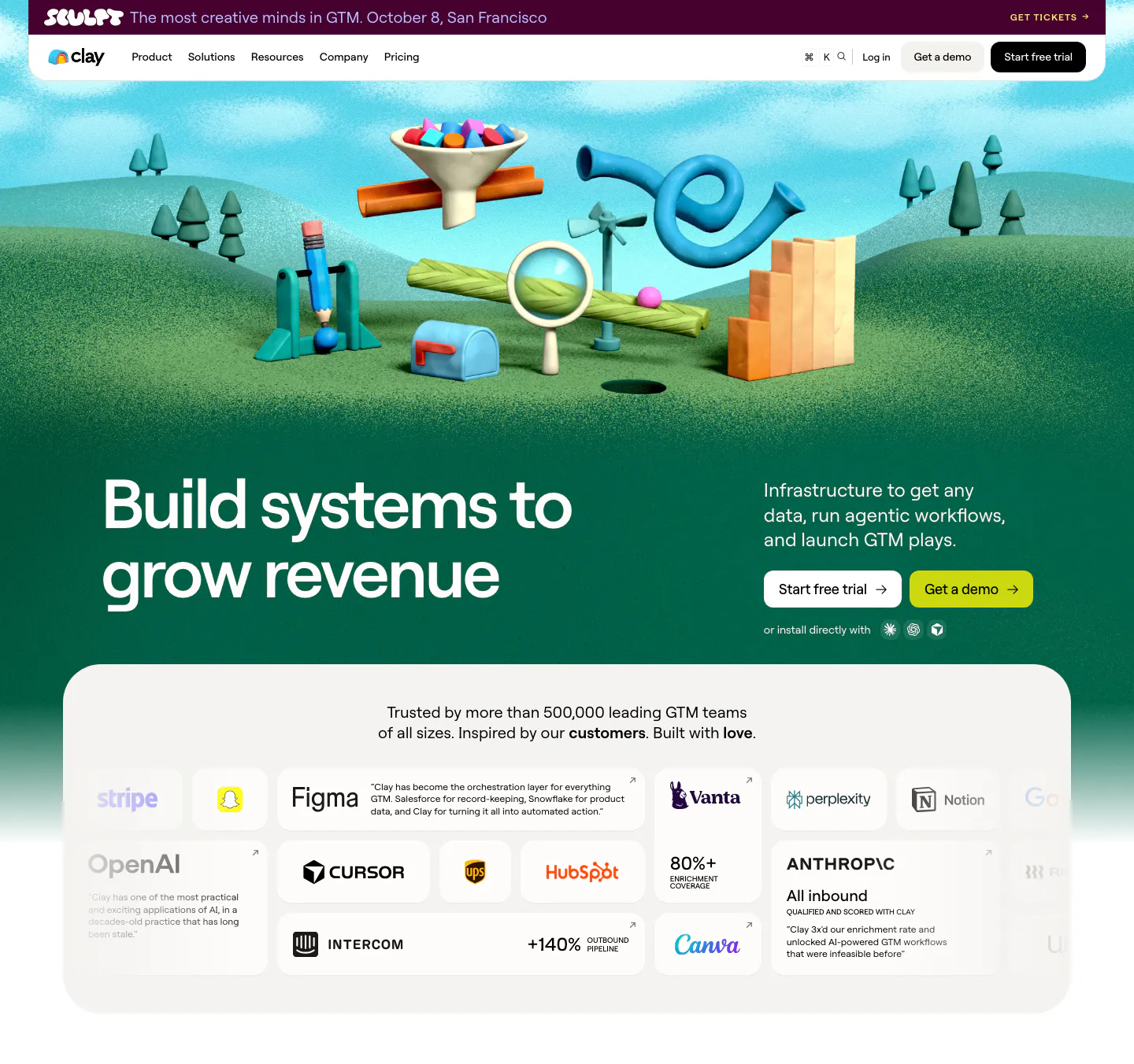
  63. Clay hero section: left headline on a green 3D clay landscape of GTM objects, above a rounded card grid of customer logos and quotes
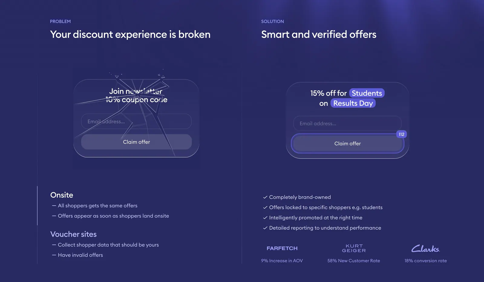
  64. Gocertify comparison section: problem vs solution columns with a cracked and a verified offer widget mockup and checklists on deep indigo
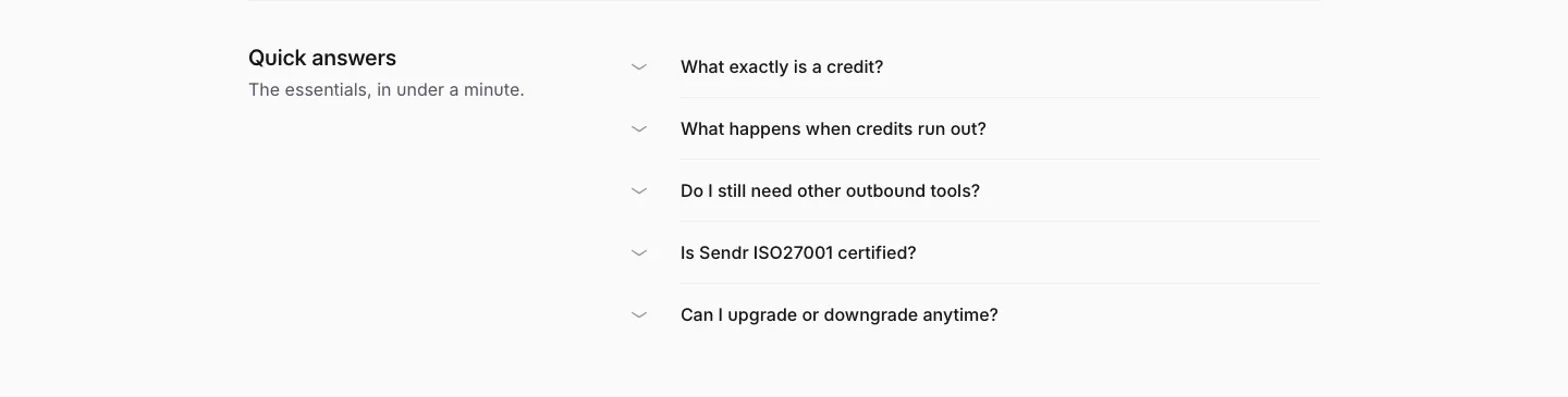
  65. Sendr FAQ section: Quick answers title on the left beside a five-question collapsed accordion list on light gray
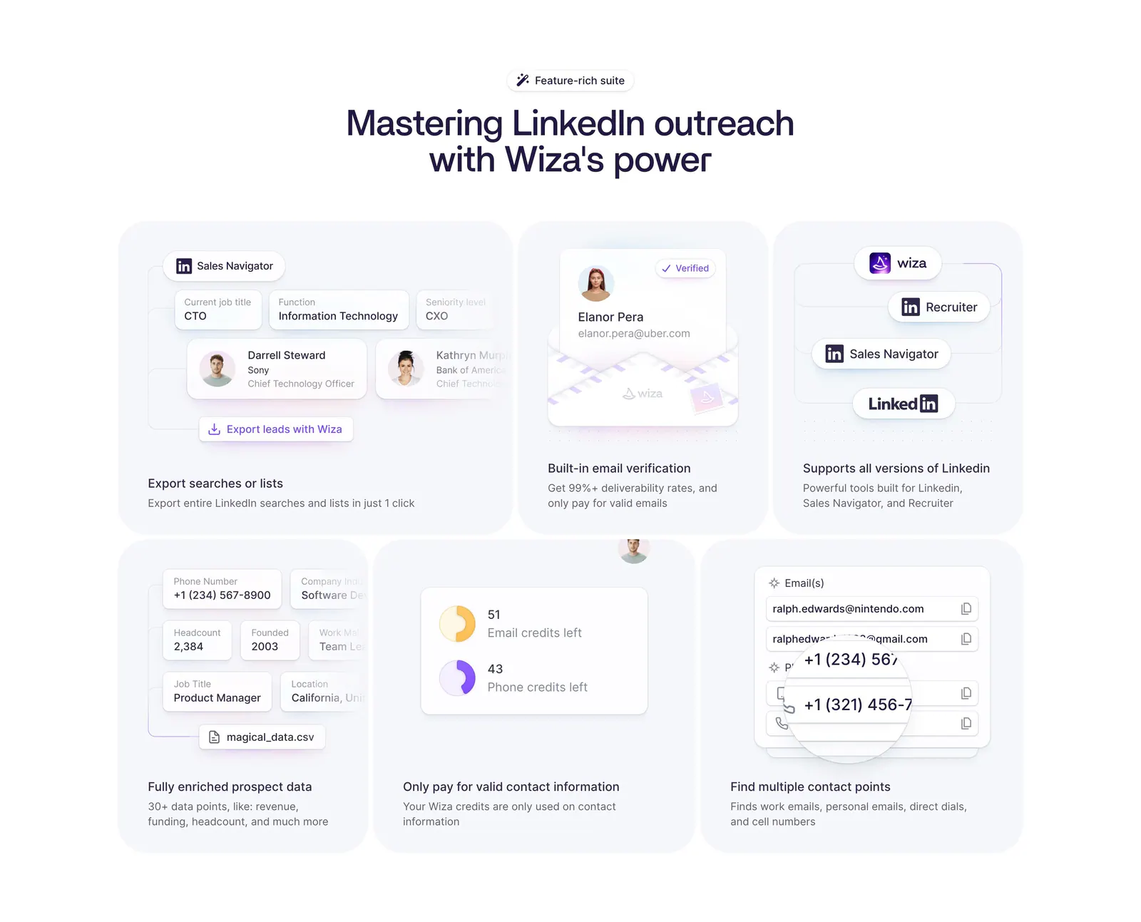
  66. Wiza features section: centered headline above a six-card bento grid of LinkedIn prospecting UI mockups on a white background
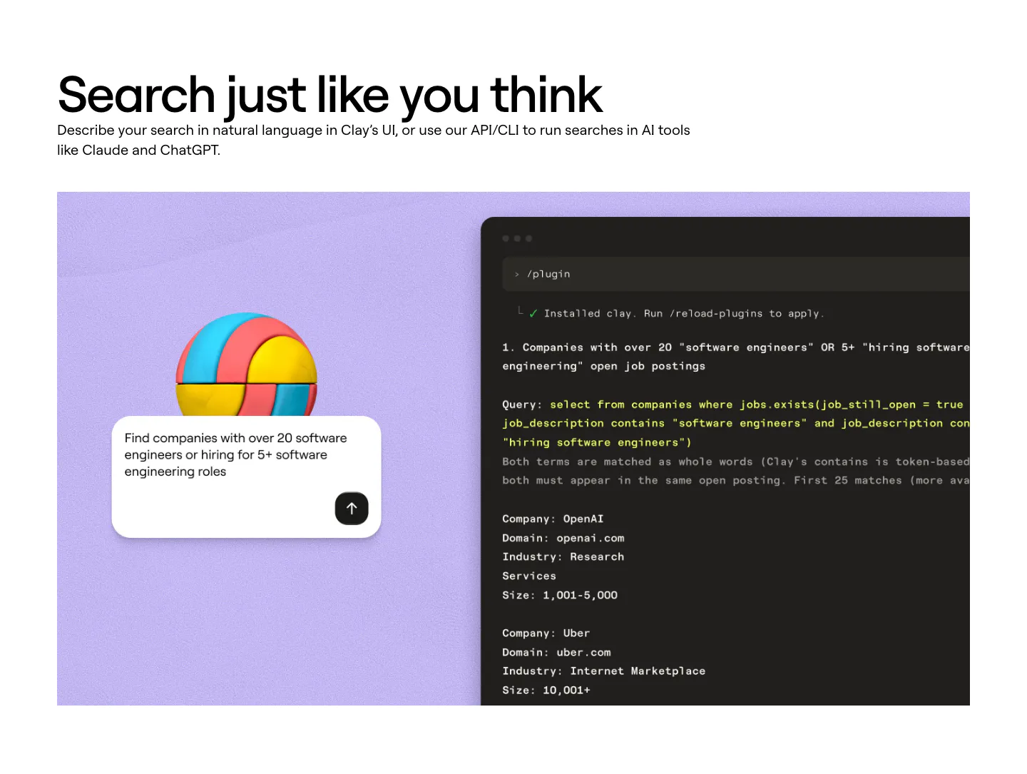
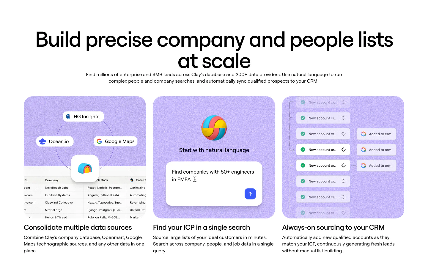
  67. Clay features section: left-aligned heading above a lavender panel with a 3D ball, a search prompt card and a dark terminal showing a query
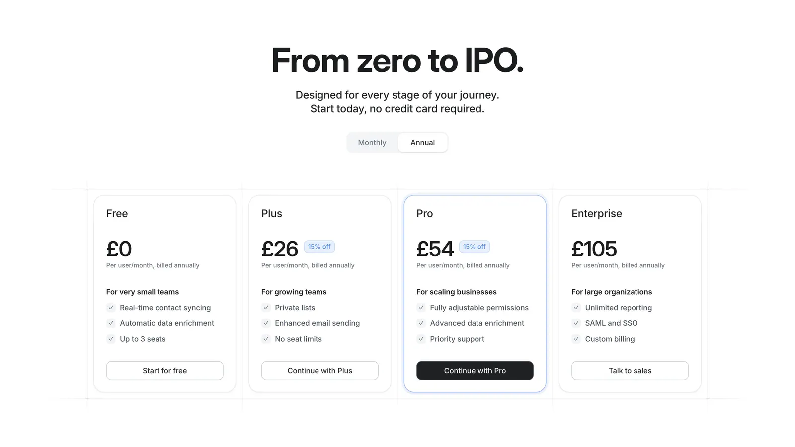
  68. Attio pricing section: centered headline with monthly/annual toggle above four plan cards with prices and checklists on white
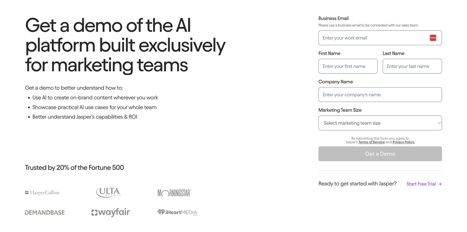
  69. Jasper contact section: headline and benefit bullets with customer logos on the left, demo request form on the right on a light background
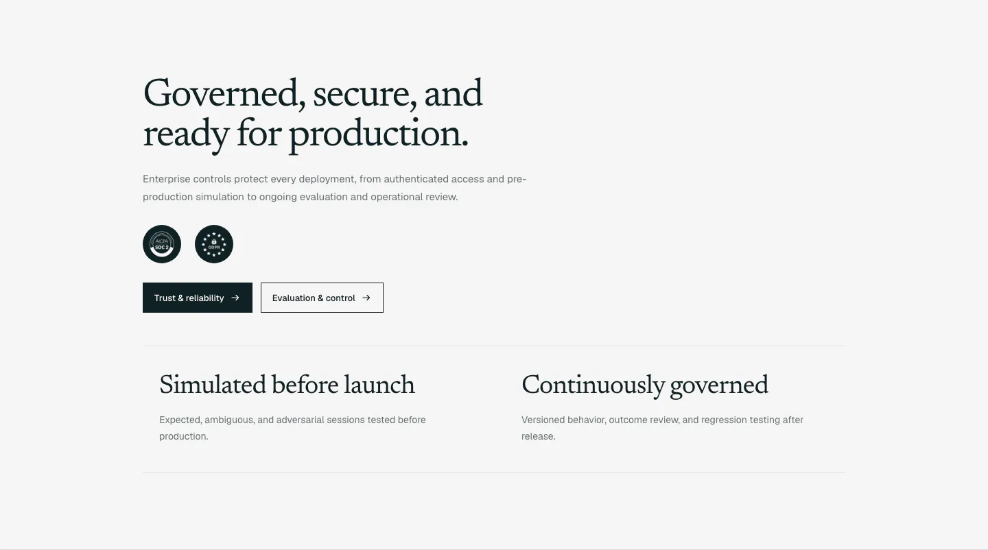
  70. Supersonik security section: serif headline, copy, SOC 2 and GDPR badges and two buttons above two governance points on light gray
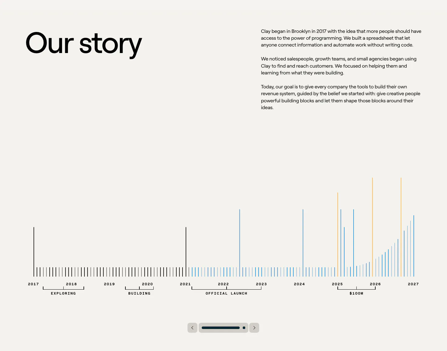
  71. Clay about & mission section: large heading beside story copy above a 2017-2027 bar timeline with slider controls on beige
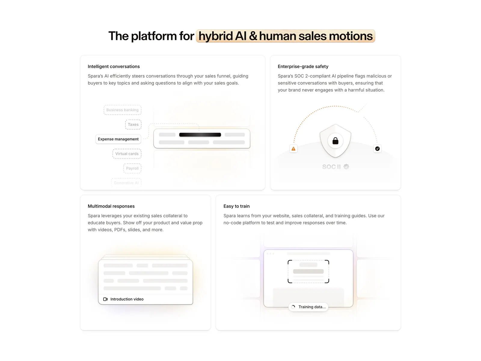
  72. Spara features section: centered headline with highlighted phrase above a four-tile bento grid of feature cards with abstract UI art
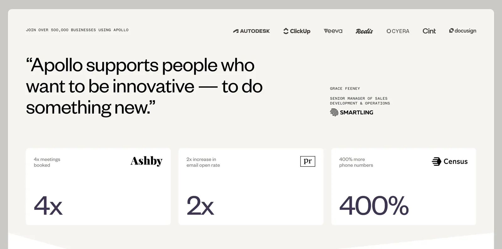
  73. Apollo value proposition section: logo row above a large customer quote and three stat cards (4x, 2x, 400%) on a warm off-white background
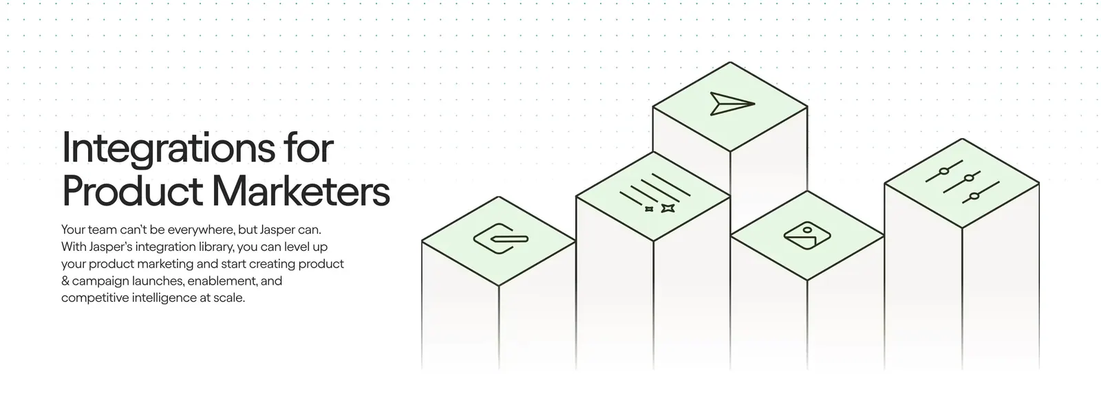
  74. Jasper integrations section: headline and copy on the left beside isometric pillars topped with green icon tiles on a light background
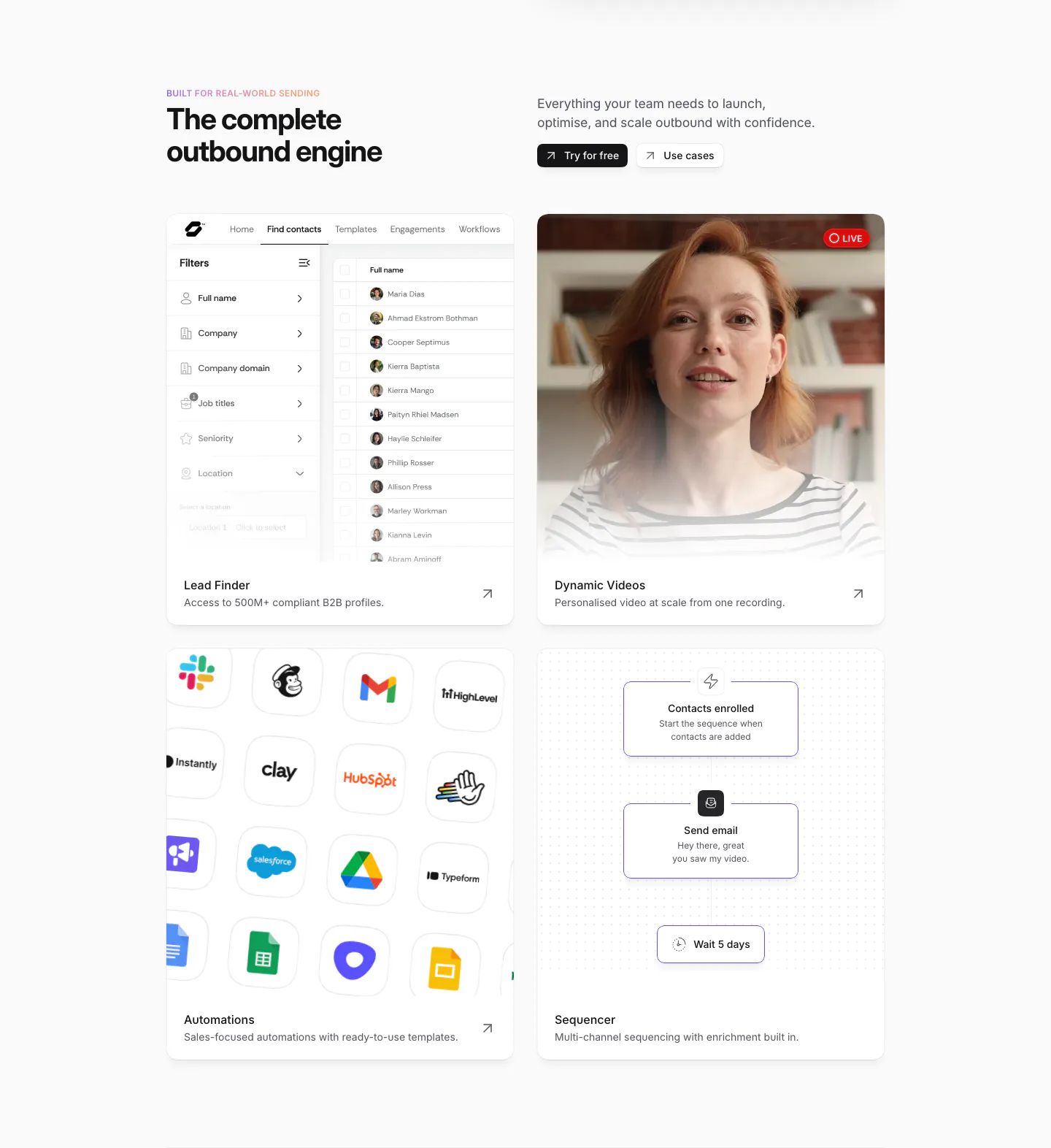
  75. Sendr features section: headline and buttons above a 2x2 card grid of lead finder UI, live video, app icon grid and sequencer flow
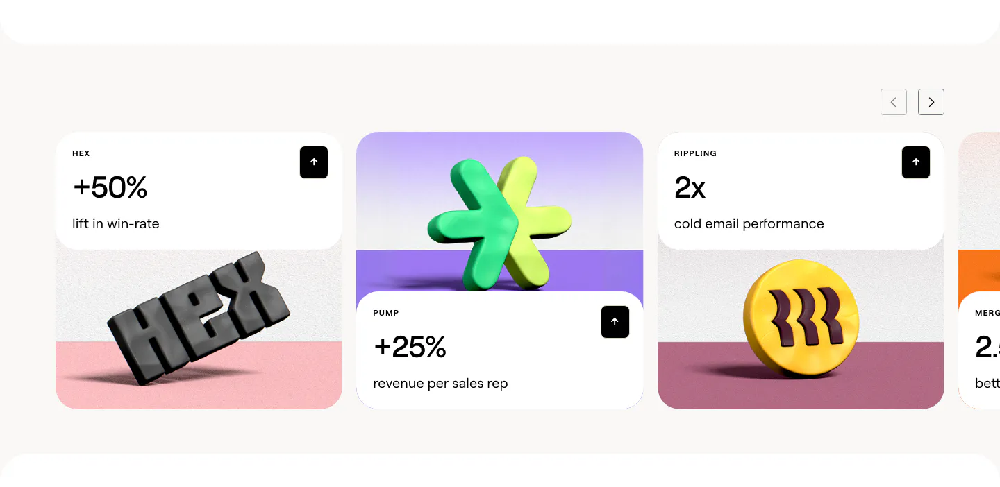
  76. Clay stats section: slider of customer result cards with large percentages above 3D rendered brand logos on colored stages
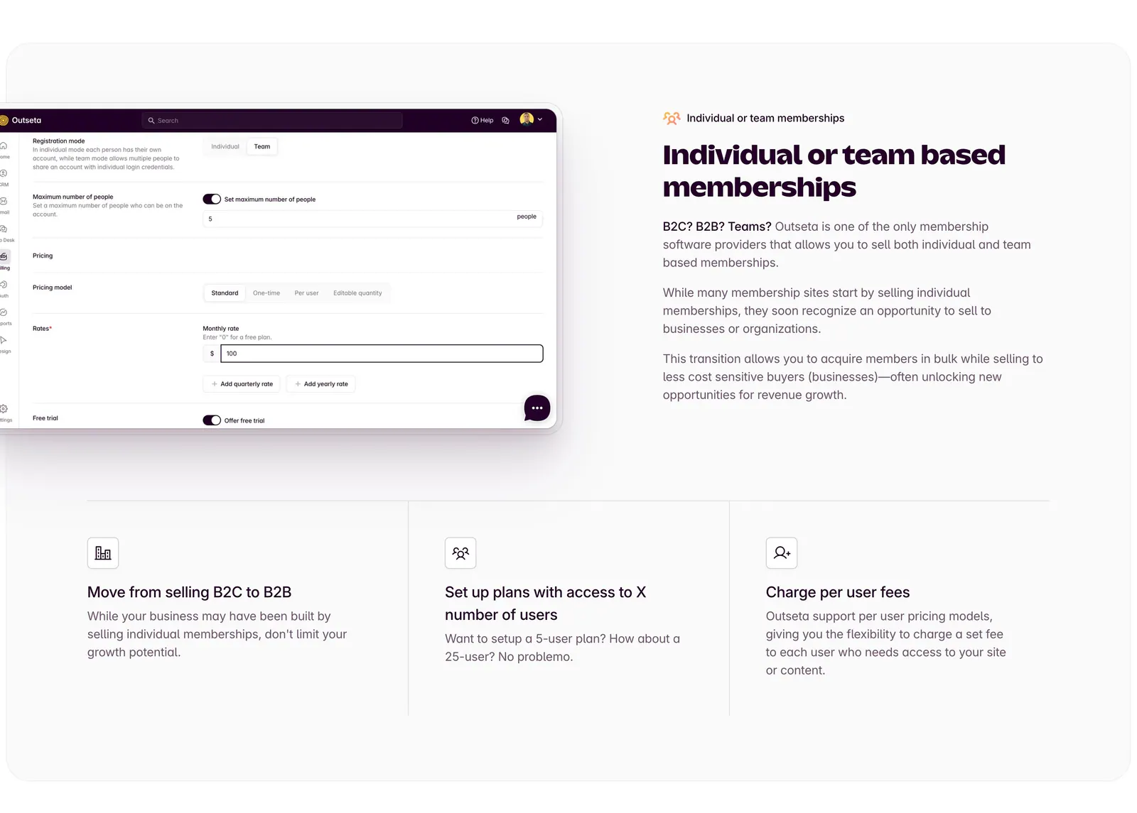
  77. Outseta features section: settings UI screenshot left of headline and copy, three icon feature columns below on a light gray panel
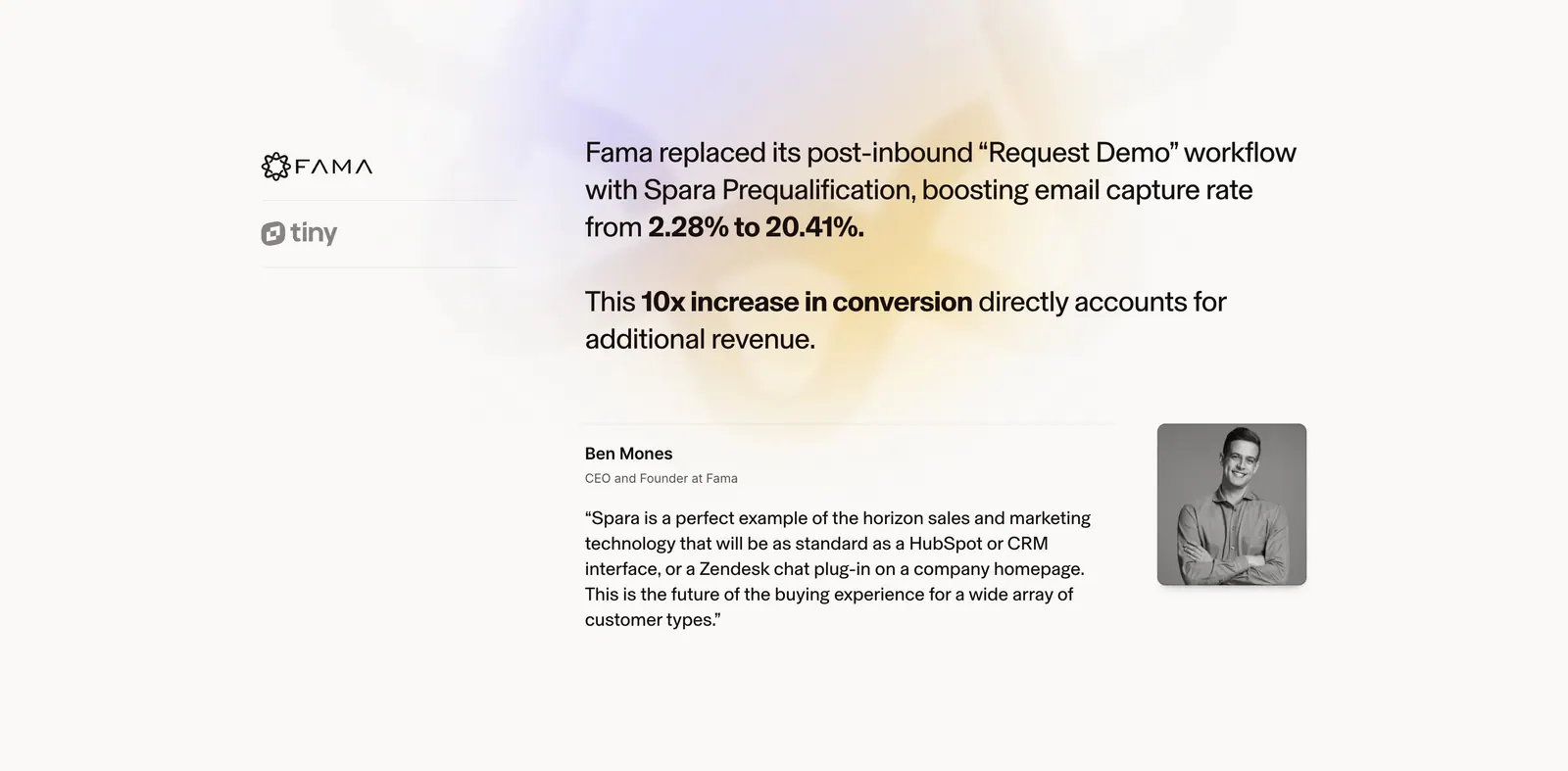
  78. Spara testimonials section: customer logo tabs on the left, case study result and quote with portrait on the right over a soft glow
  79. Attio features section: two-tone headline above a vertical tab list beside a companies table with email draft and two smaller UI cards
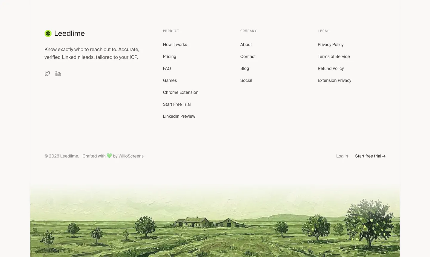
  80. Leedlime footer section: logo, tagline and three link columns above a painted green farmland landscape strip on off-white
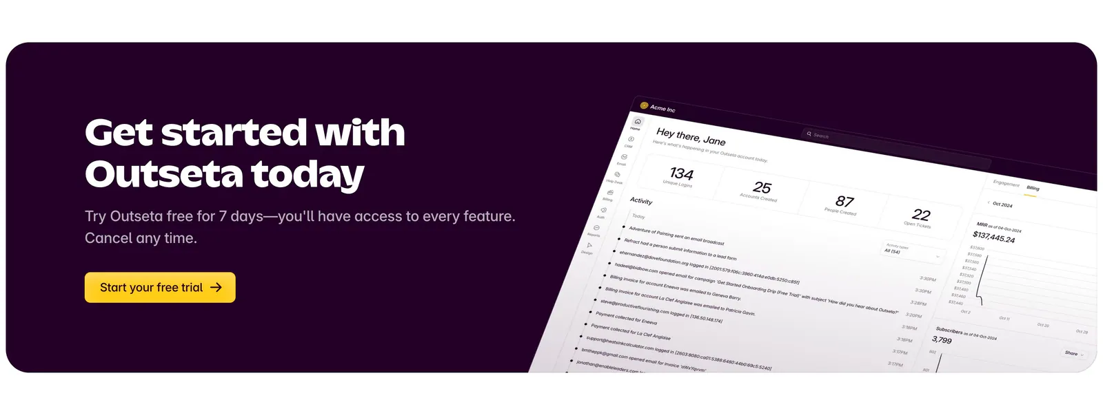
  81. Outseta call-to-action section: dark aubergine banner with headline, copy and yellow trial button beside a tilted dashboard screenshot
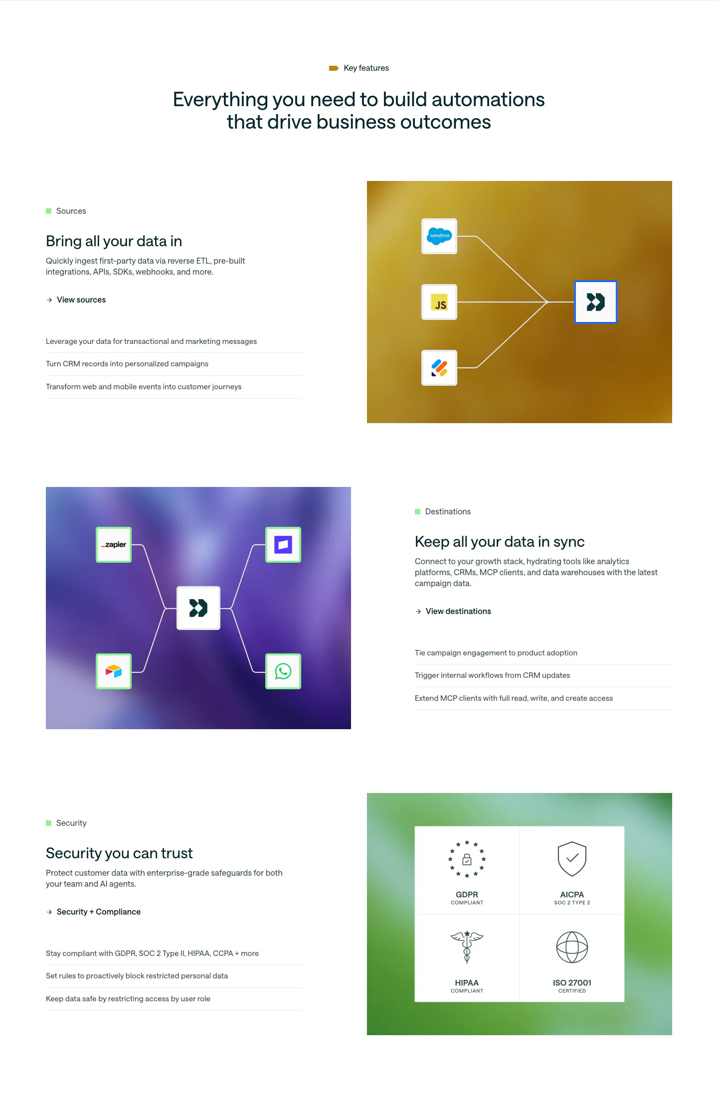
  82. Customer.io features section: centered headline above three alternating rows pairing copy with colorful gradient panels of connector diagrams
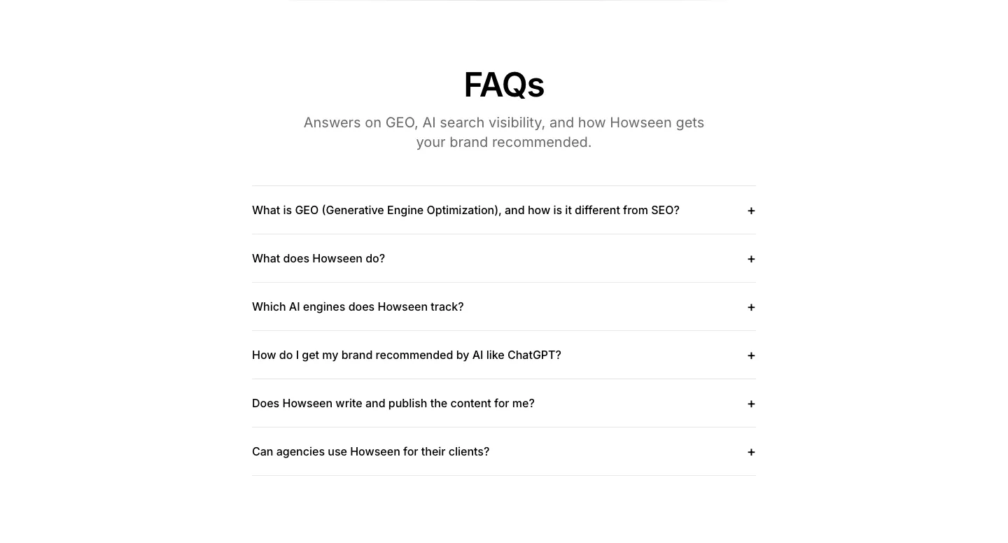
  83. Howseen AI FAQ section: centered heading above a six-question accordion list on a white background
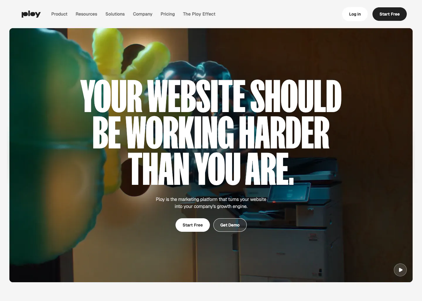
  84. Ploy hero section: centered condensed uppercase headline and two buttons over a full-bleed office video frame with inflatable shapes
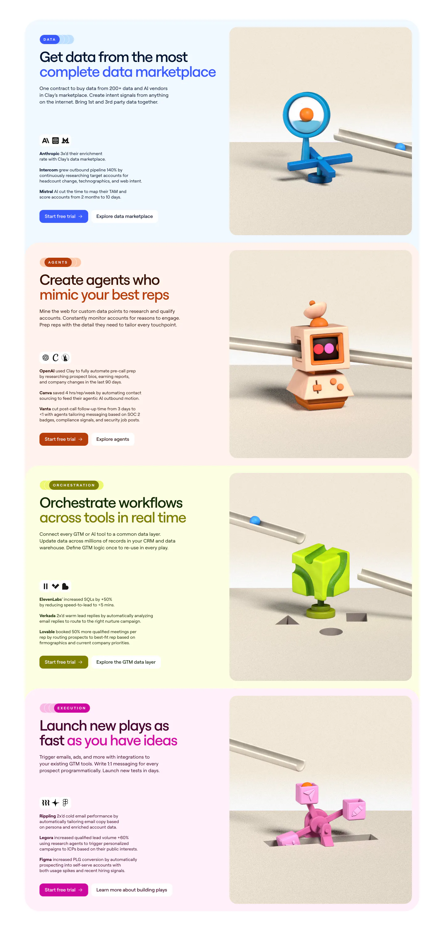
  85. Clay features section: stacked pastel cards, each with headline, customer results and buttons left and a 3D clay object render right
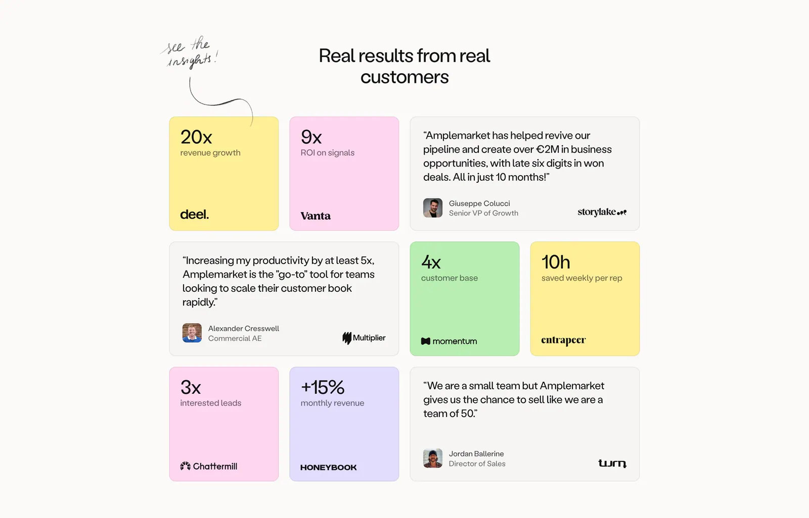
  86. Amplemarket testimonials section: centered headline above a bento grid of pastel metric tiles and gray quote cards with logos
  87. Realm features section: centered headline above three cards with tinted illustrated UI vignettes and short descriptions
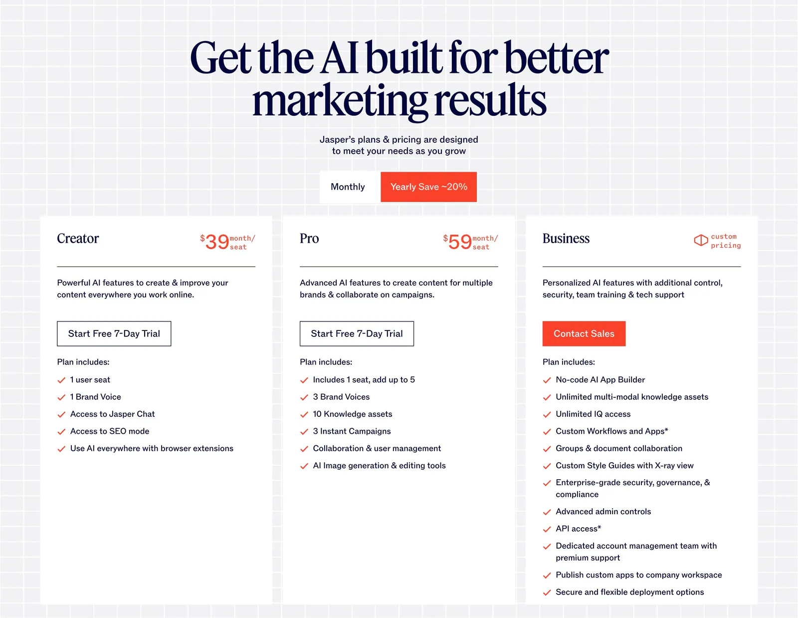
  88. Jasper pricing section: centered serif headline and monthly/yearly toggle above three white plan cards on a light grid background
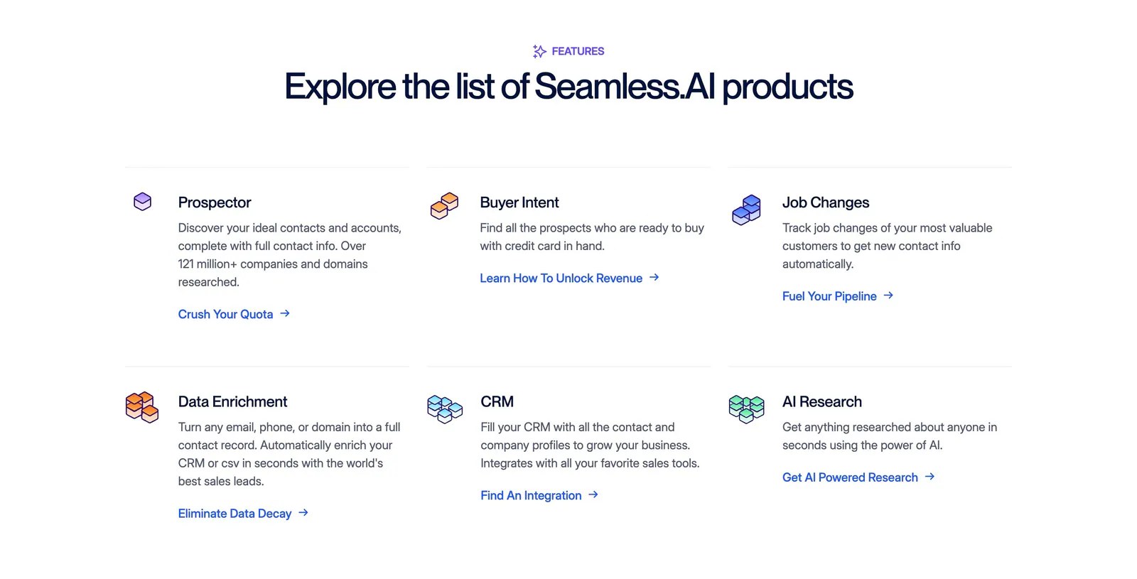
  89. Seamless.AI features section: centered headline above a three-by-two grid of product items with isometric icons and links on white
  90. Valley footer section: monospace link columns and newsletter email field above a giant outlined Valley logo and wordmark on white
  91. Cluster footer section: logo and copyright left, link columns right over a giant faded serif Cluster wordmark on beige
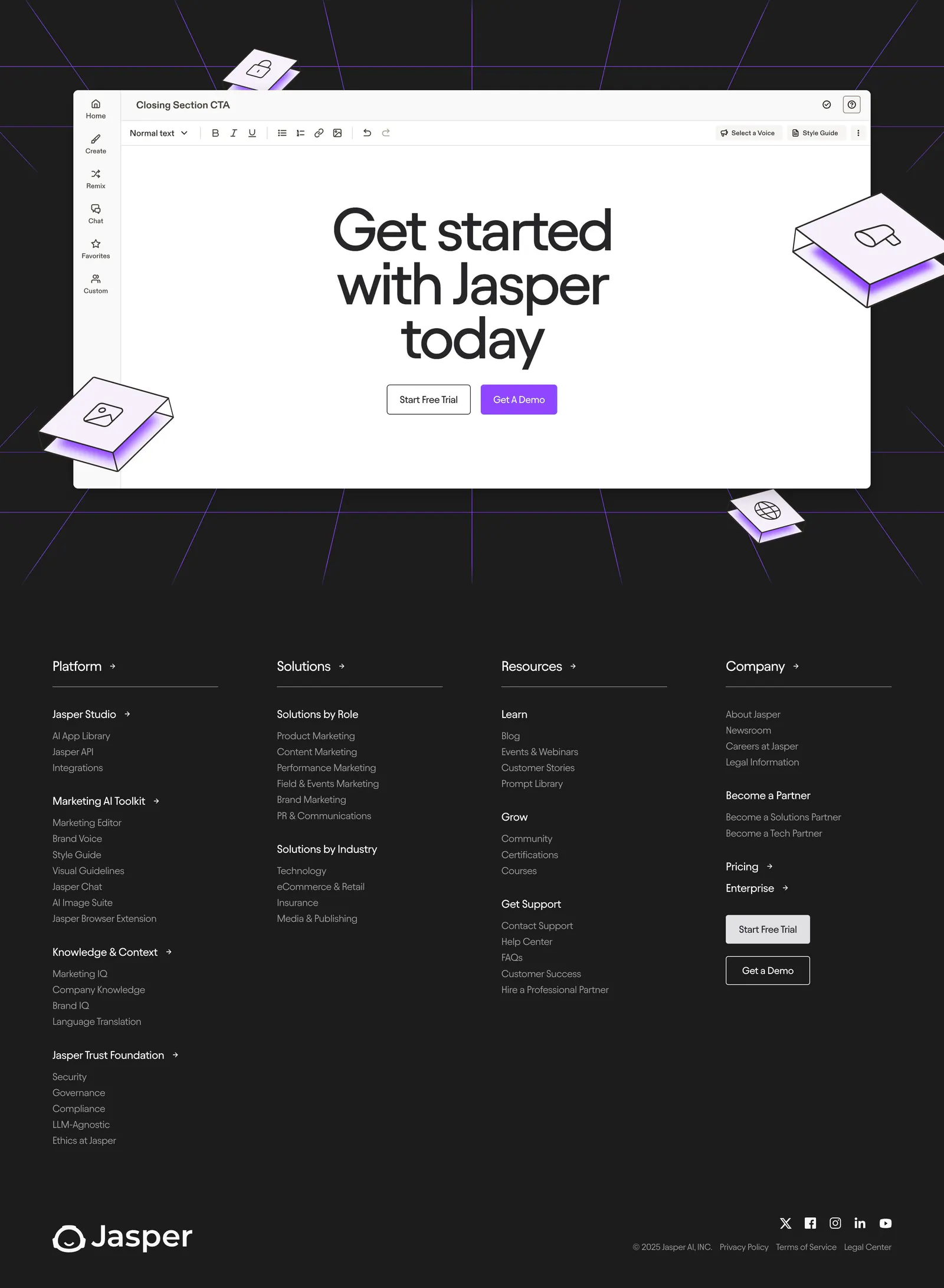
  92. Jasper footer section: editor-mockup CTA above four link columns, wordmark and social icons on a dark charcoal background
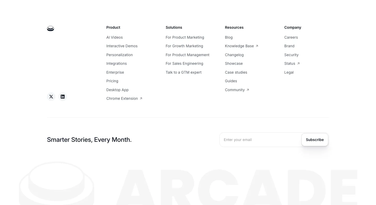
  93. Arcade footer section: four link columns and an email subscribe field above a faded oversized ARCADE wordmark and logo
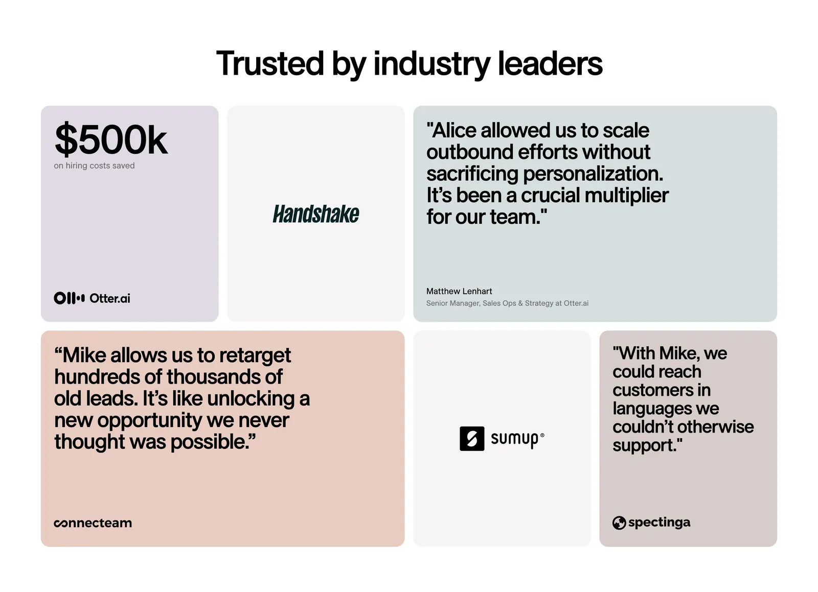
  94. 11x testimonials section: centered headline above a bento grid of pastel quote cards, a $500k metric tile and customer logo tiles
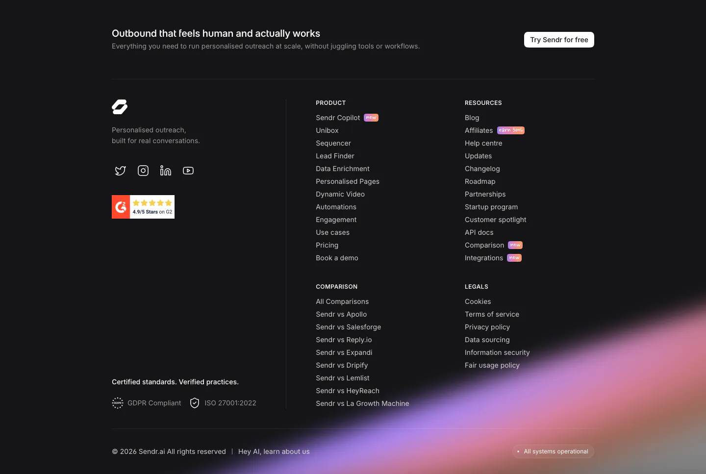
  95. Sendr footer section: dark footer with CTA strip, logo, G2 badge, product, resources, comparison and legal columns and a purple glow
  96. Realm testimonials section: centered headline above a logo tab bar and a single customer quote card on dark green
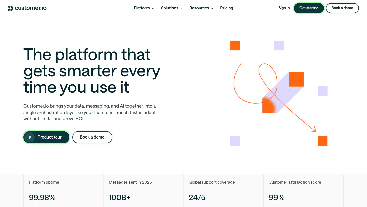
  97. Customer.io hero section: split layout with headline and buttons beside abstract orange and lavender square artwork, above a stats row
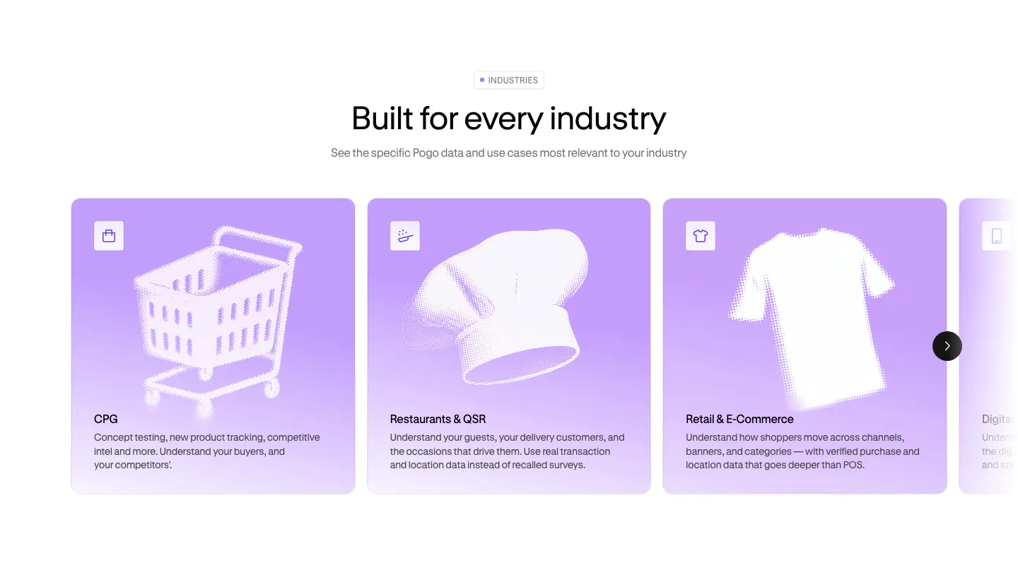
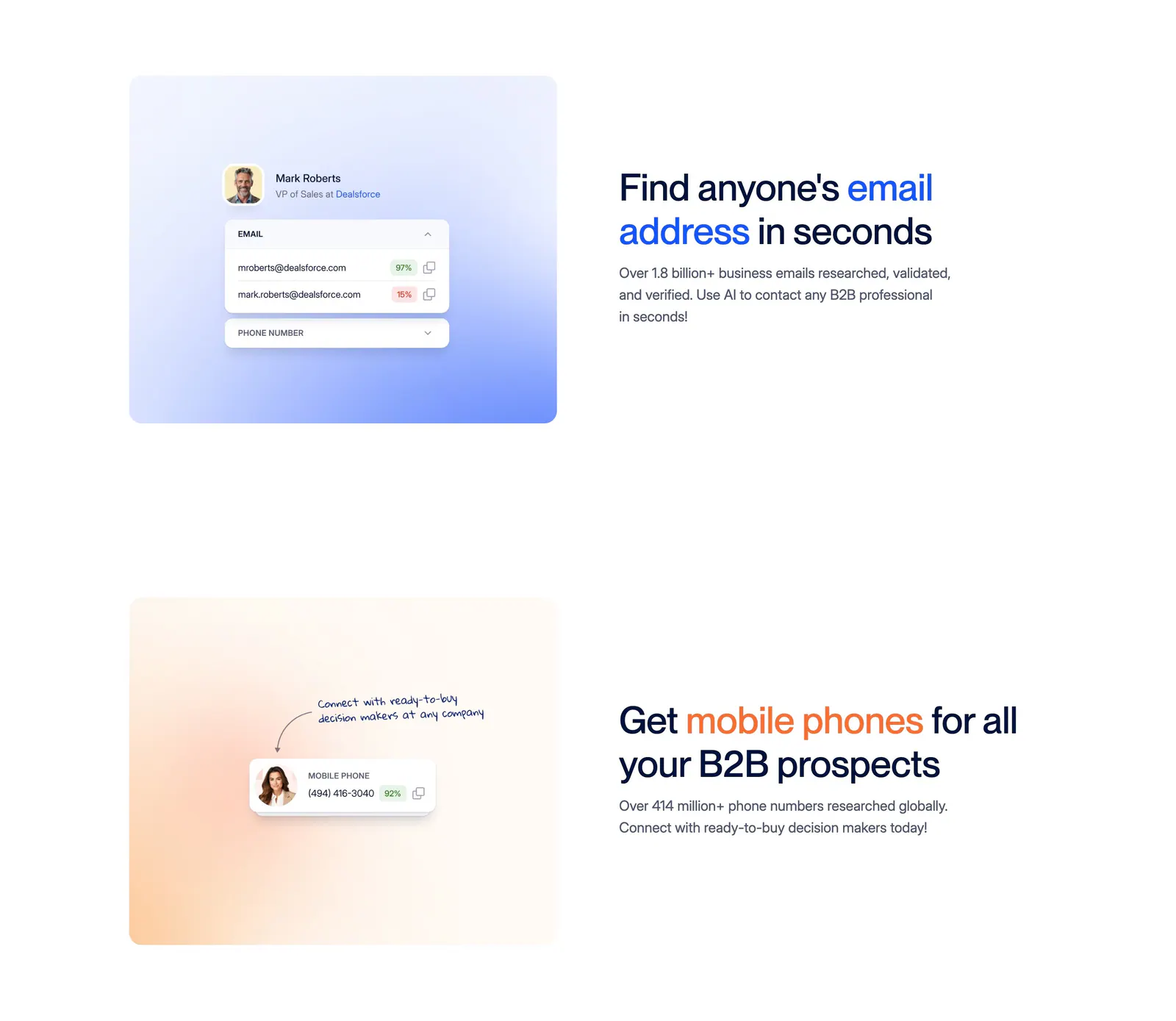
  98. Pogo use cases section: centered headline above a carousel of lavender industry cards with halftone object artwork
  99. Attio footer section: logo at left, link columns for platform, company, imports, apps and resources, social icons and legal row on dark
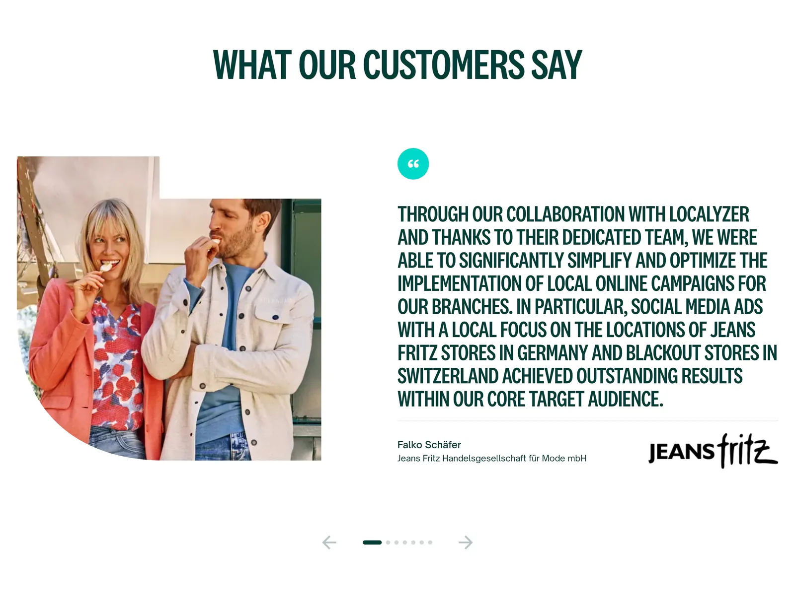
  100. Localyzer testimonials section: customer photo beside a large uppercase quote with client logo and carousel arrows on white
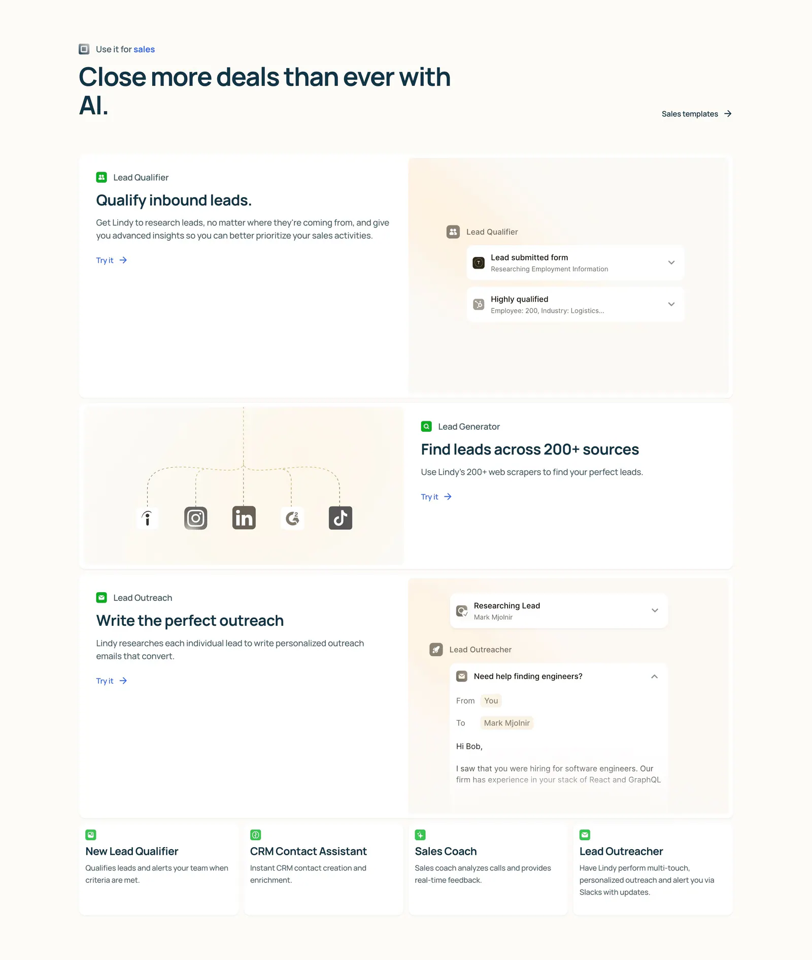
  101. Lindy features section: left-aligned heading above three alternating rows of copy and agent UI mockups, then four small template cards on cream
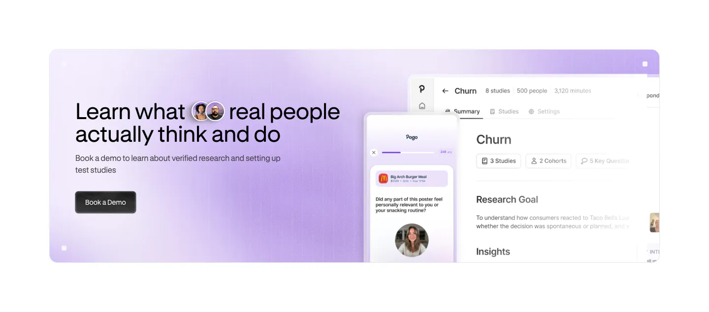
  102. Pogo call to action section: lavender gradient banner with headline and demo button left and app and phone UI screenshots right
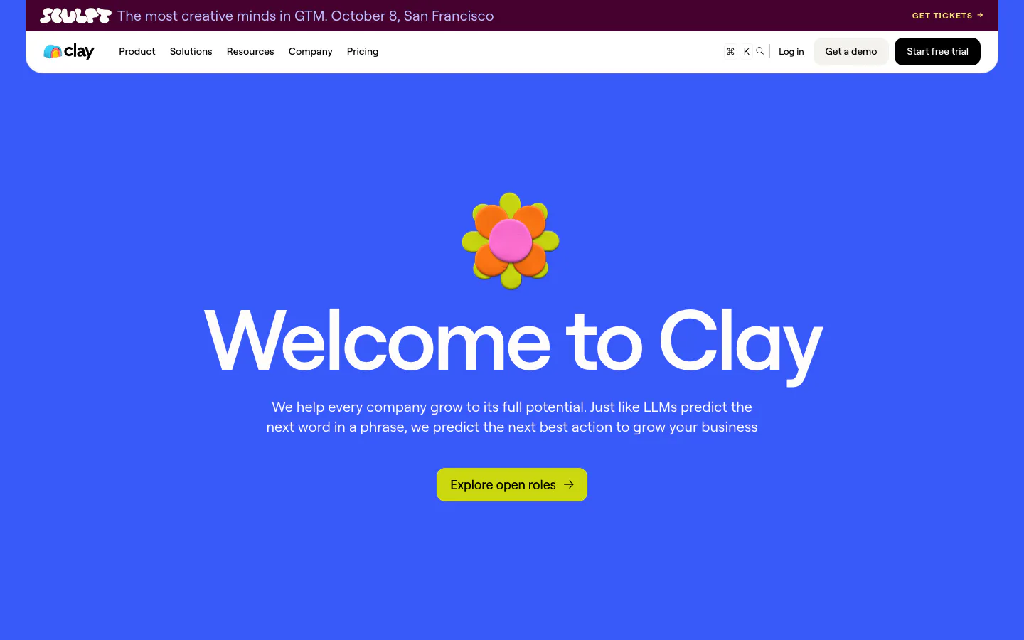
  103. Clay hero section: centered oversized headline under a 3D clay flower with lime careers button on a solid bright blue background
  104. Semrush logo cloud section: single row of black customer logos incl. Shopify, Samsung, FedEx and Amazon on a pale lavender band
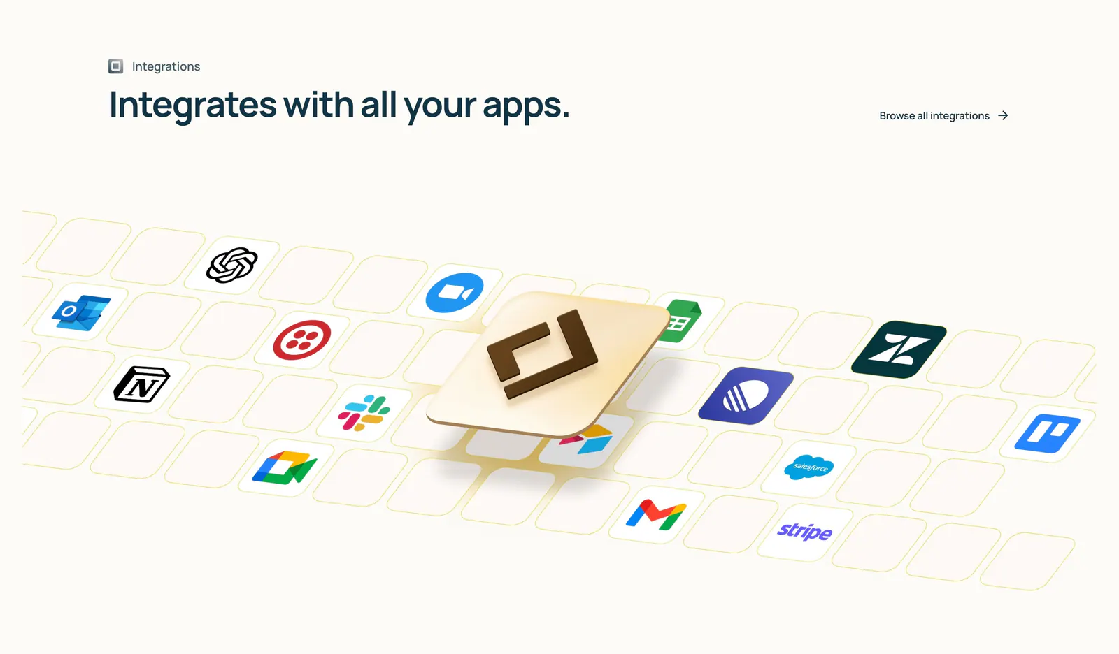
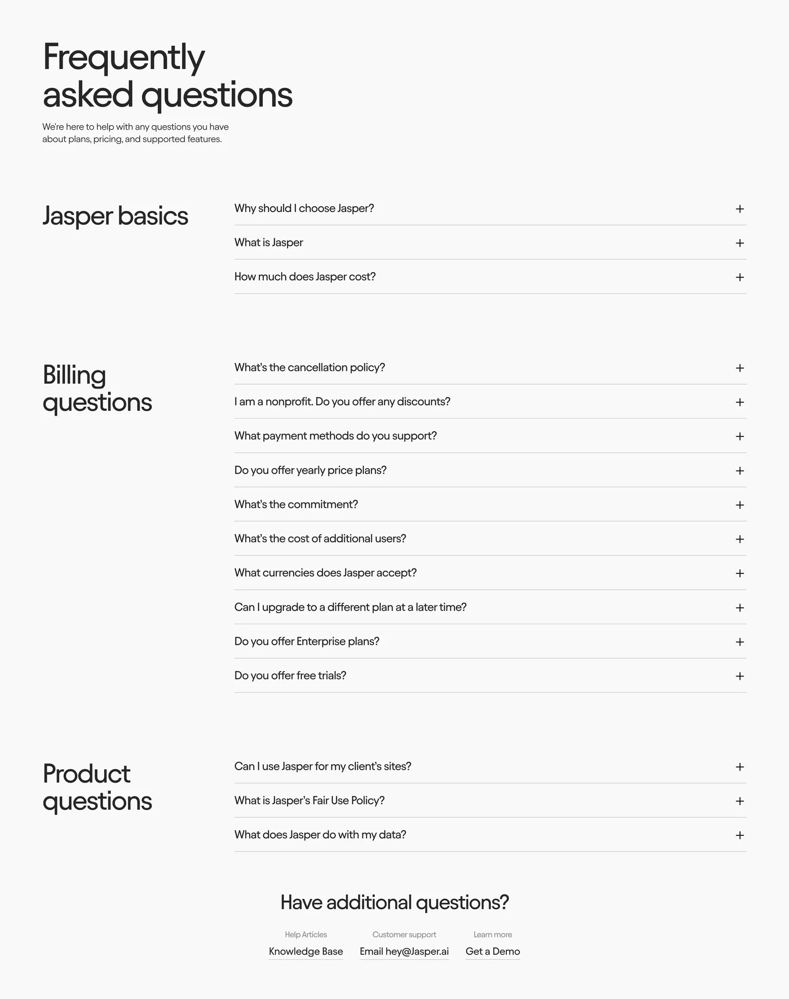
  105. Lindy integrations section: left-aligned heading above an isometric tile grid of app icons with a raised 3D Lindy logo tile on cream
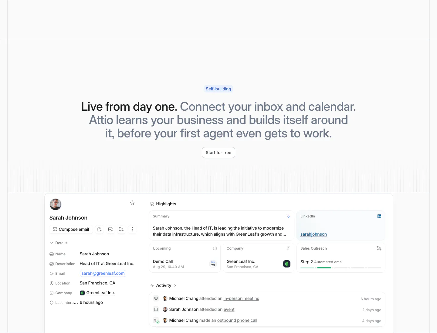
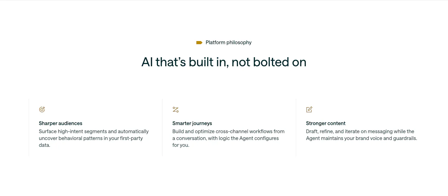
  106. Attio features section: centered two-tone headline with Start for free button above a contact record UI with highlights and activity
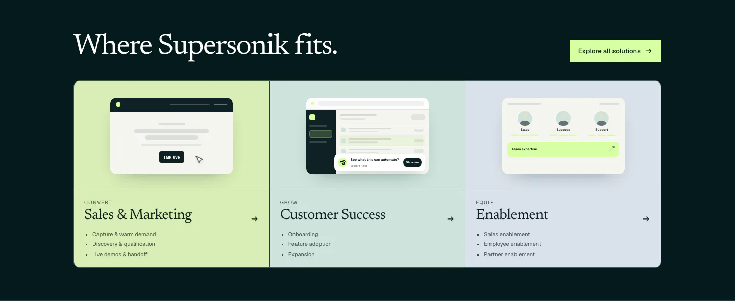
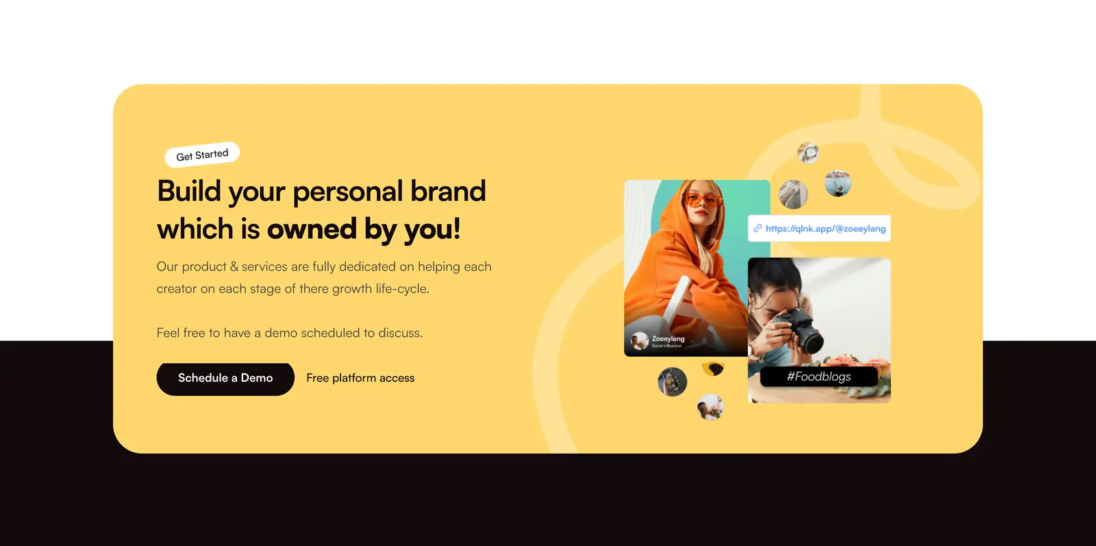
  107. Supersonik use cases section: serif headline over three pastel panels for sales, customer success and enablement with UI sketches
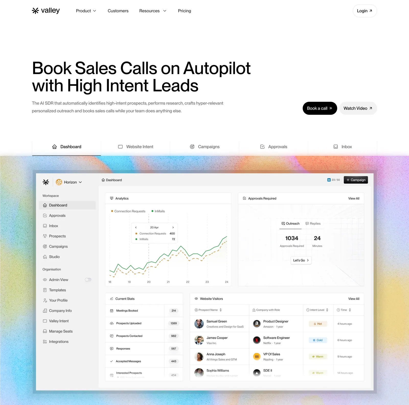
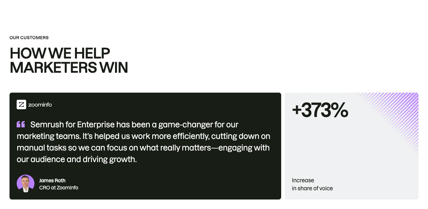
  108. Valley hero section: left-aligned headline with buttons, a tab bar and a sales dashboard screenshot on a grainy pastel gradient background
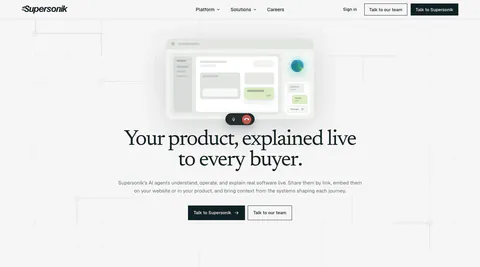
  109. Jasper FAQ section: large heading above grouped accordion questions with category titles in a left column on an off-white background
  110. Customer.io value proposition section: centered headline above three icon columns describing audiences, journeys and content
  111. QuickLnk call-to-action section: yellow rounded card with headline and demo button on the left, creator photo collage on the right
  112. Semrush testimonials section: uppercase headline above a dark ZoomInfo quote card with avatar beside a light +373% stat card
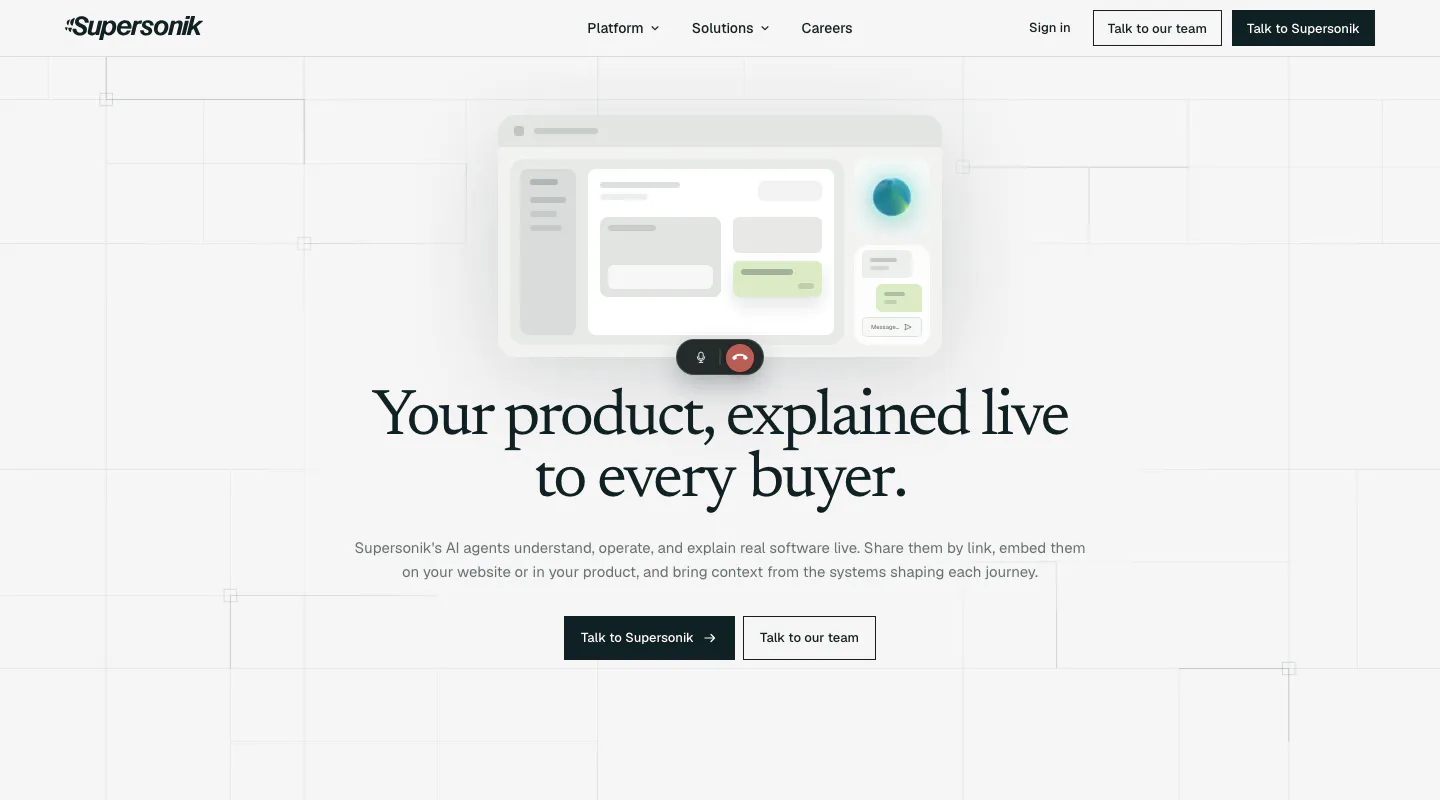
  113. Supersonik hero section: centered serif headline and two CTAs below a soft UI mockup with call controls on a light grid background
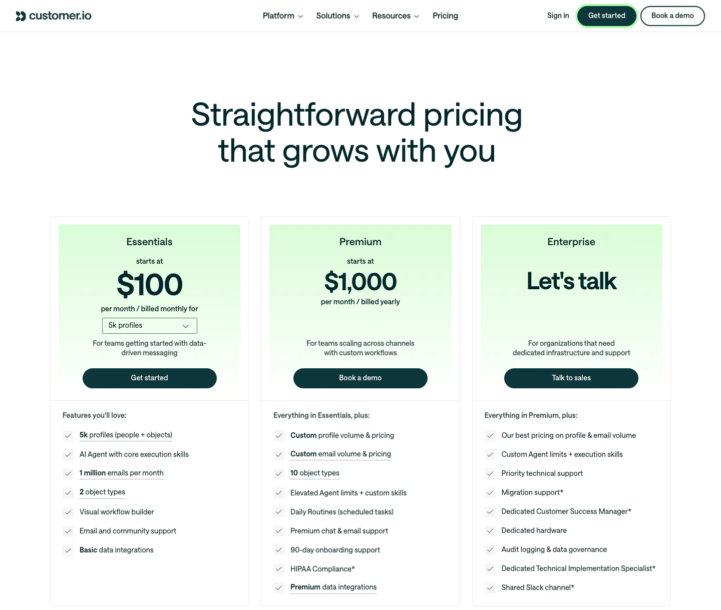
  114. Customer.io pricing section: nav and centered headline above three plan cards with mint-tinted headers, prices, buttons and checklists
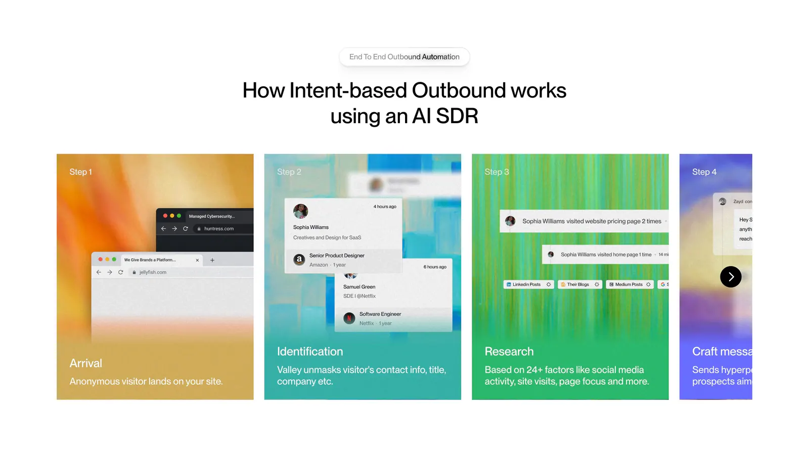
  115. Valley how it works section: centered headline above a carousel of numbered step cards with colorful textured backgrounds and UI snippets
  116. Cluster call-to-action section: centered serif headline and dark pill button on a beige panel framed by dark edges
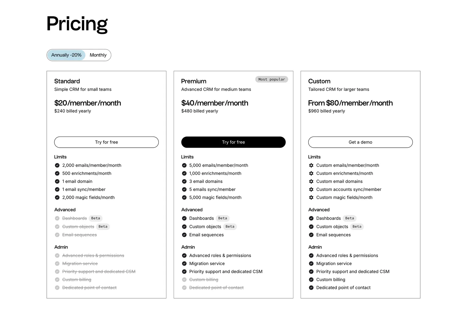
  117. folk pricing section: left-aligned heading, annual/monthly toggle and three outlined plan cards with feature checklists on white
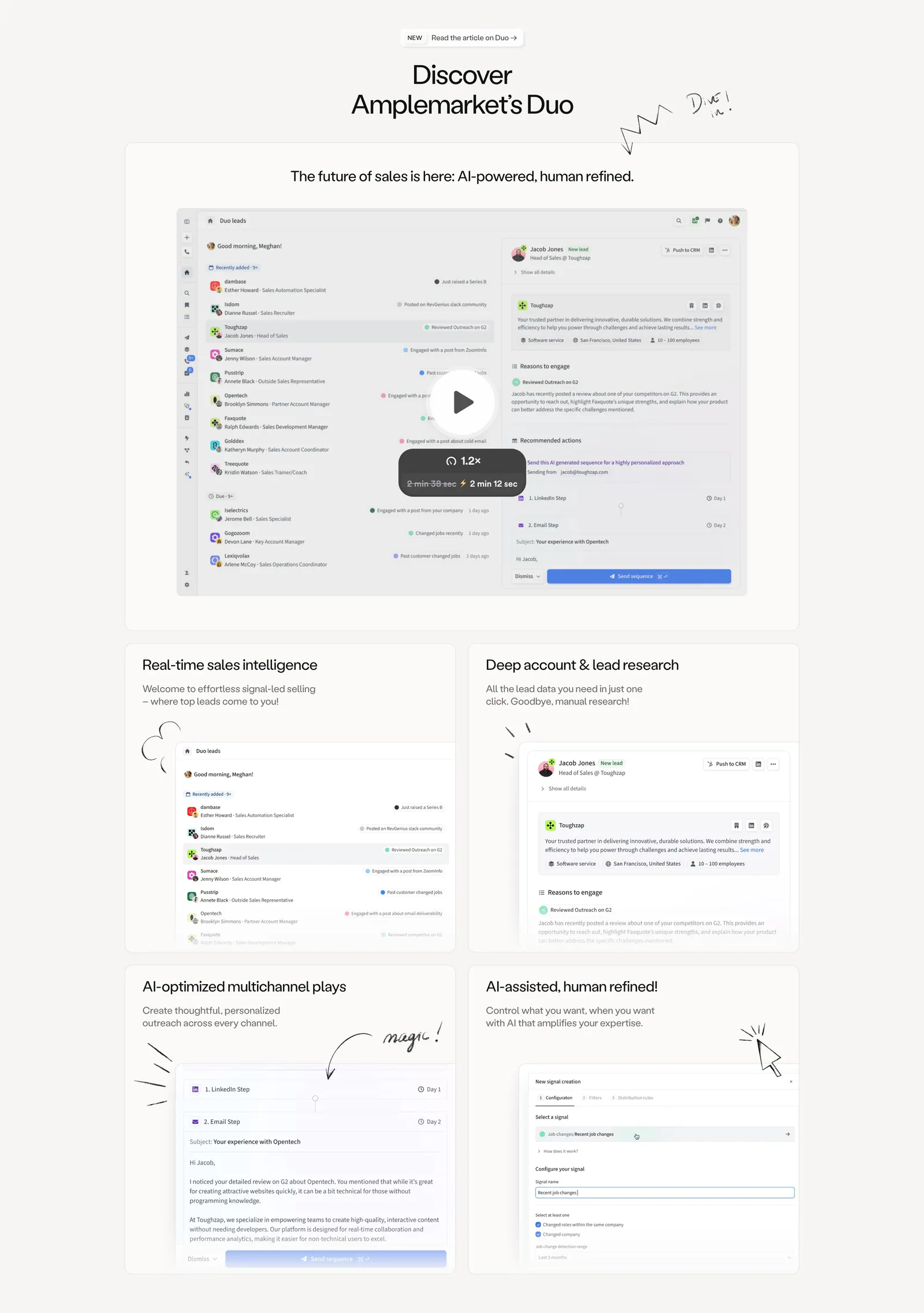
  118. Amplemarket features section: centered headline above a product video card and a 2x2 bento of UI cards with hand-drawn doodles
  119. Valley logo cloud section: bordered grid of customer logos around a central headline tile with a Book a call button on white
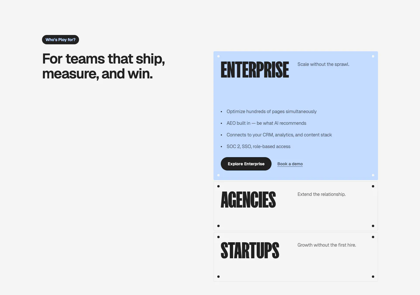
  120. Ploy use cases section: headline on the left with stacked accordion-style cards for Enterprise, Agencies and Startups on the right
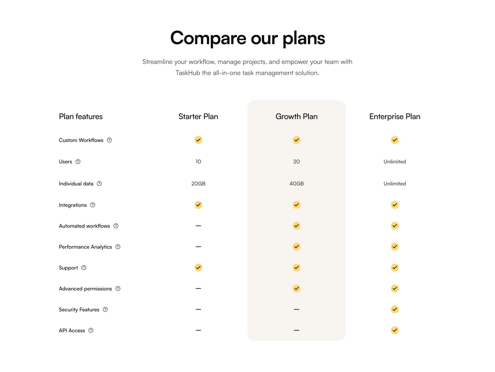
  121. QuickLnk pricing section: centered headline above a plan comparison table with yellow checkmarks and a highlighted Growth column
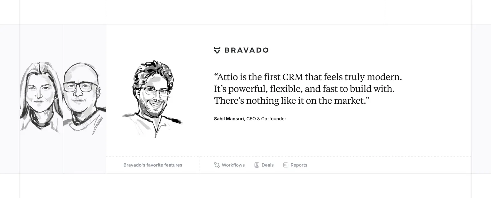
  122. Attio testimonials section: hand-drawn grayscale portrait sketches beside a serif customer quote with company logo and feature links
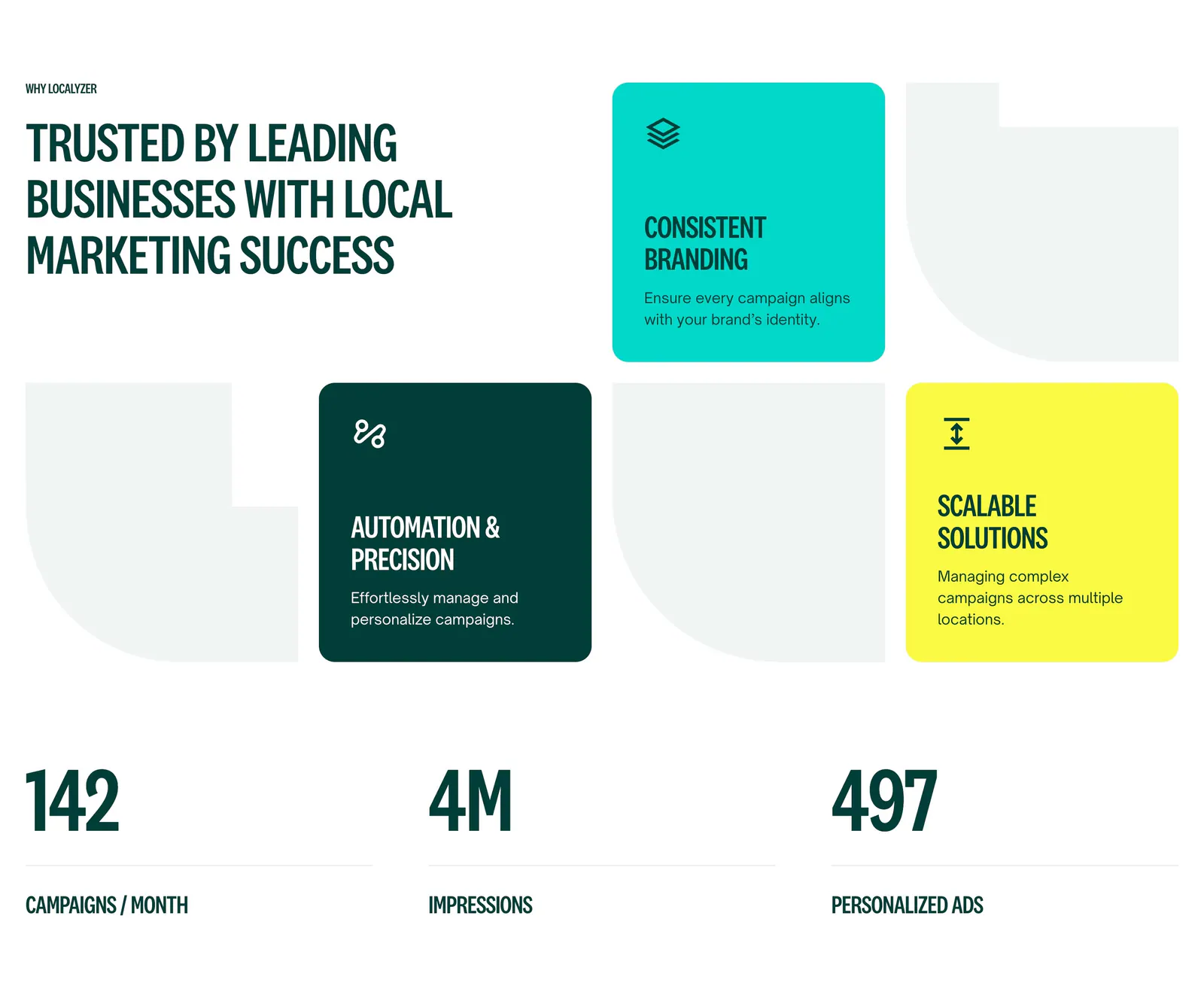
  123. Localyzer value proposition section: headline beside teal, dark green and yellow benefit tiles above three large stats
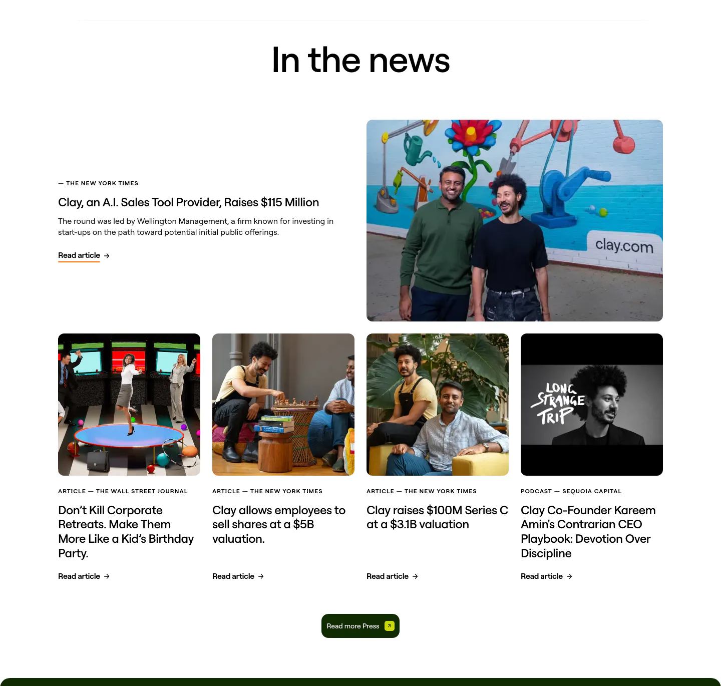
  124. Clay blog & resources section: centered heading over a featured press story with founder photo and a row of four photo article cards
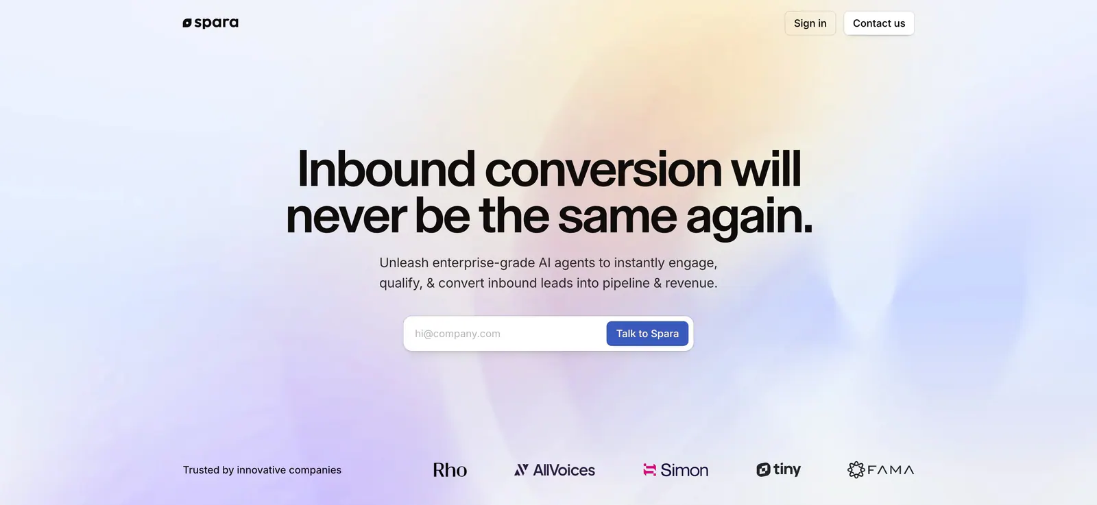
  125. Spara hero section: centered headline and email form over a soft pastel gradient, with a trusted-by logo row at the bottom
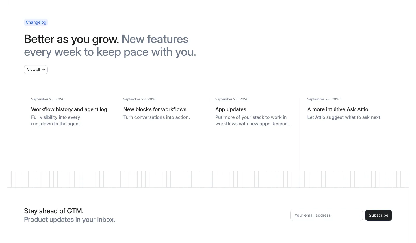
  126. Attio blog & resources section: changelog headline above four dated update columns, with an email subscribe row below
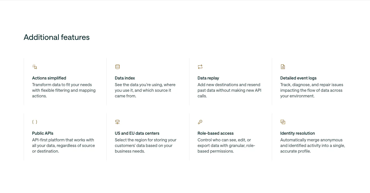
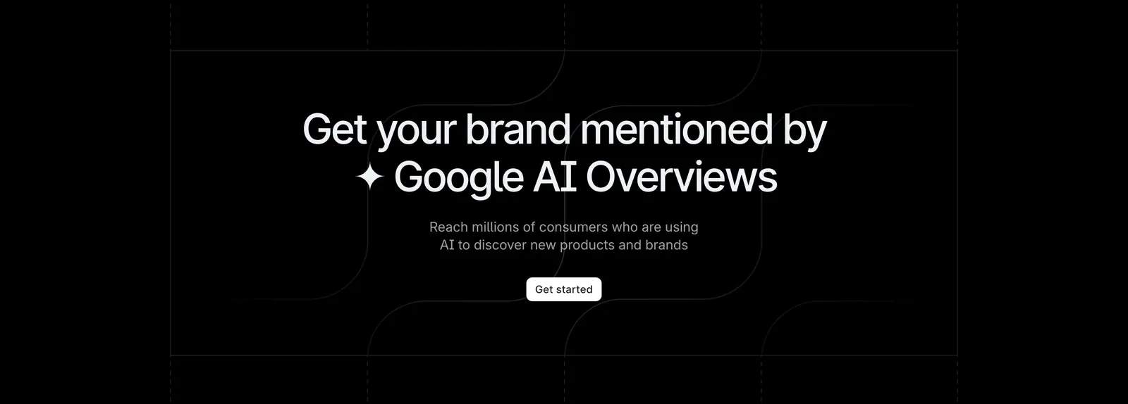
  127. Customer.io features section: left-aligned heading above a 4x2 grid of feature items with small gold icons, titles and descriptions
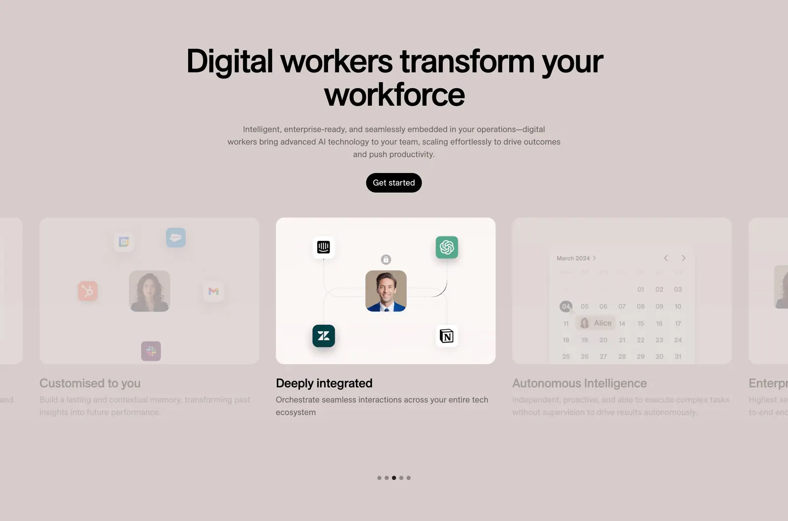
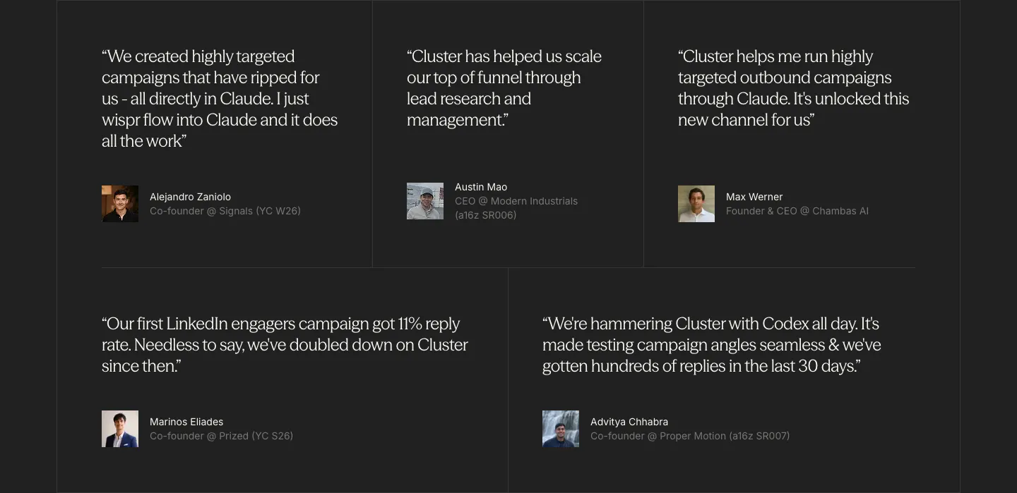
  128. 11x features section: centered headline and button above a card carousel with integration and calendar visuals and dot pagination on taupe
  129. Wiza footer section: logo and tagline above three link columns, email button and social icons on a white background
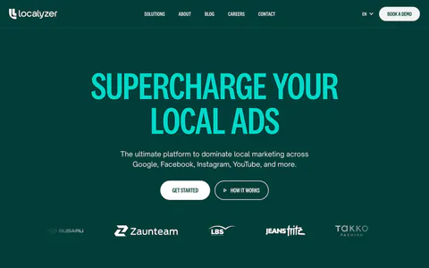
  130. Localyzer features section: centered heading over zig-zag rows pairing ad-format descriptions with colored ad mockup cards
  131. Profound call-to-action section: centered headline and white Get started button on black with faint grid and curved line pattern
  132. Cluster testimonials section: grid of five serif customer quotes with small avatar photos and titles on a charcoal background
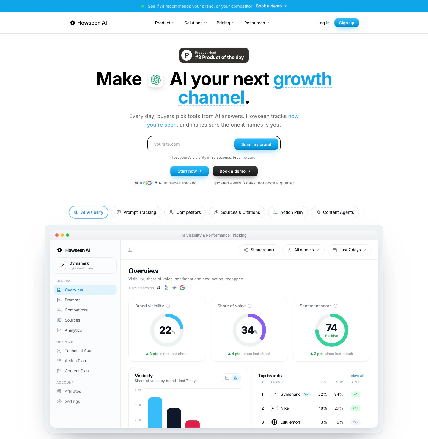
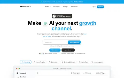
  133. Howseen AI hero section: centered headline with URL scan field and tabs above an AI visibility dashboard screenshot on white
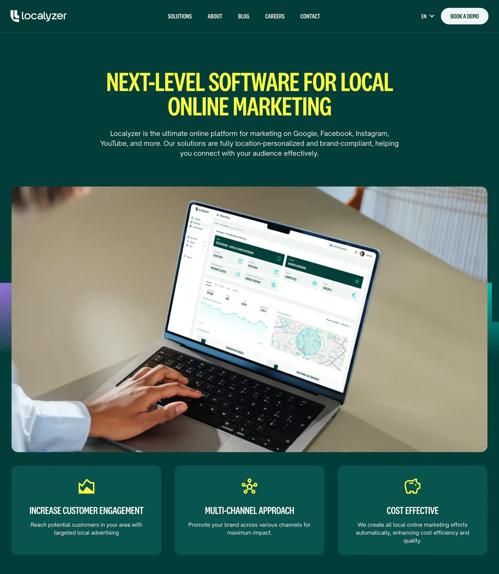
  134. Localyzer hero section: centered yellow headline on dark green above a laptop photo showing the dashboard and three benefit cards
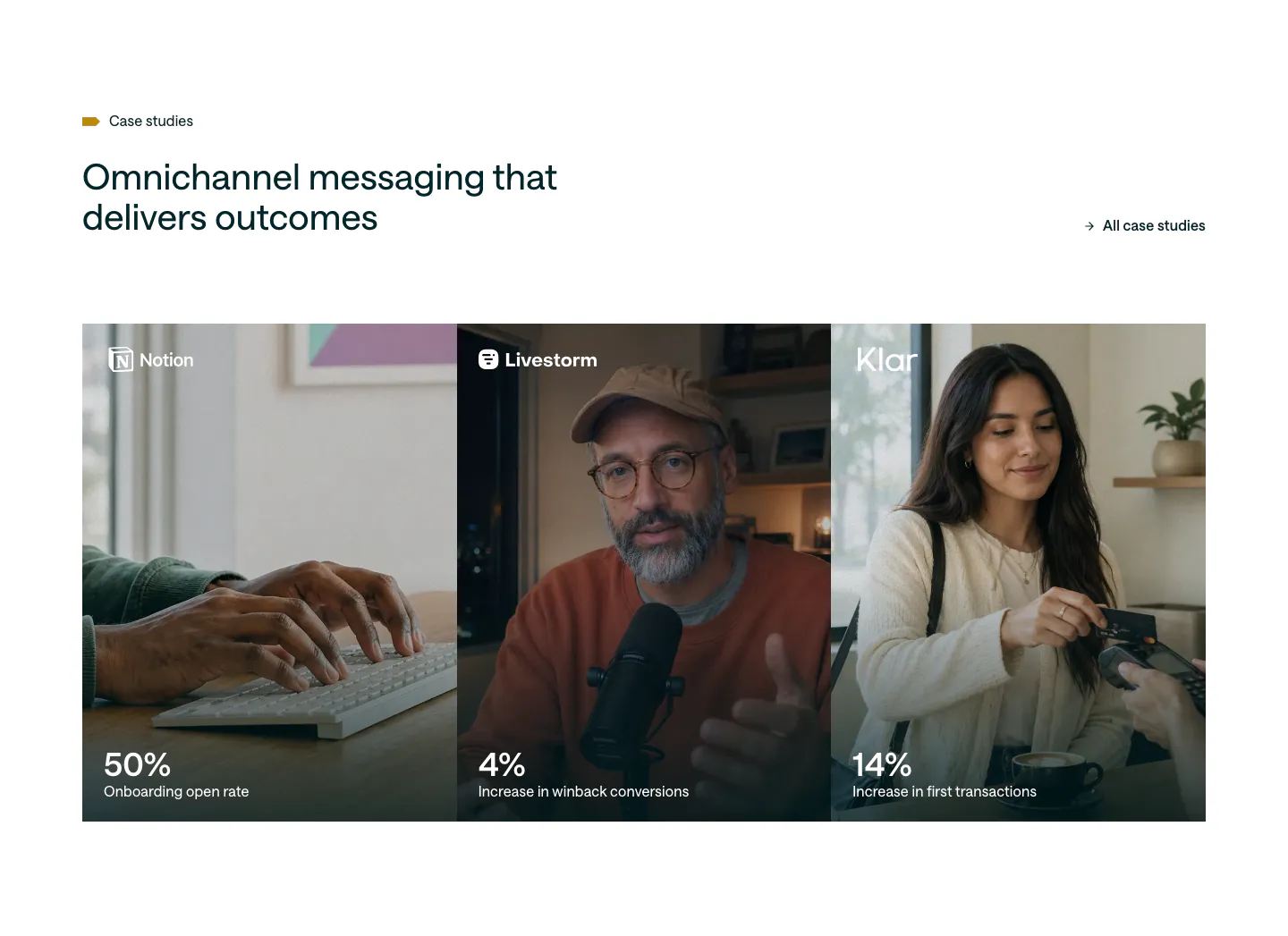
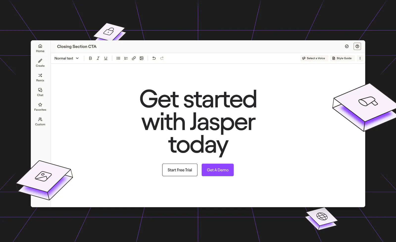
  135. Customer.io testimonials section: headline and case studies link above three photo panels for Notion, Livestorm and Klar with large stats
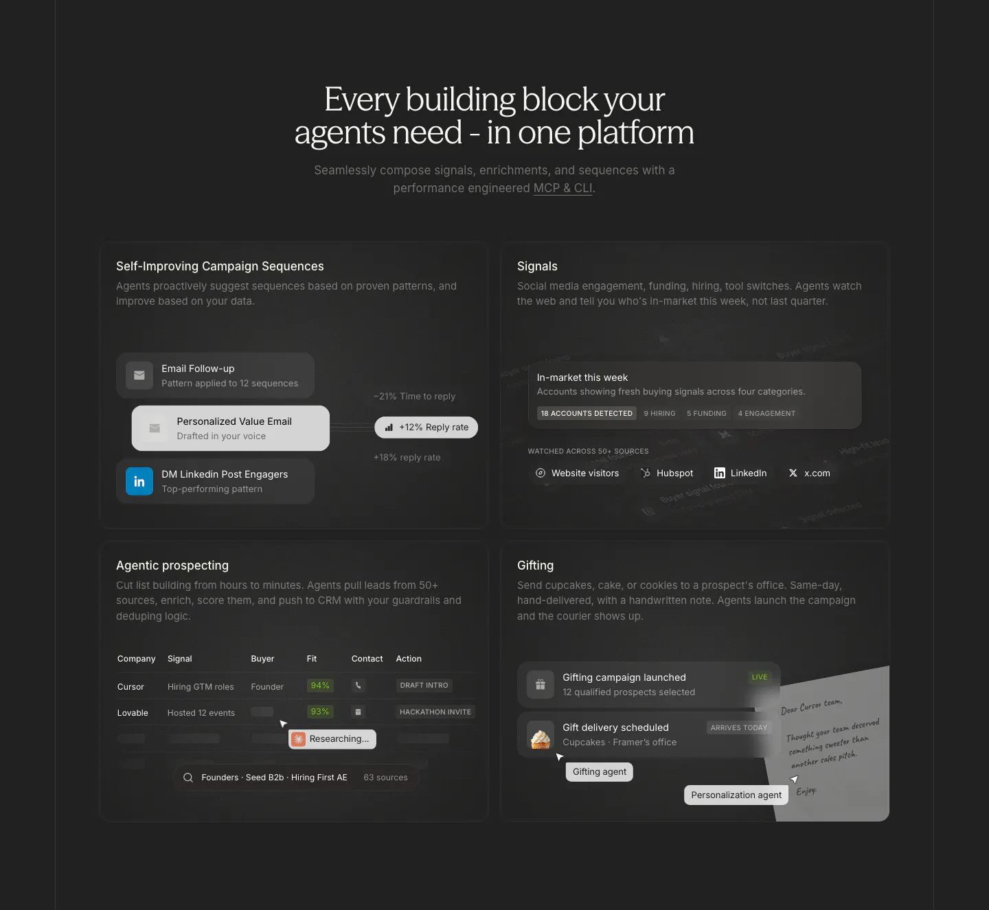
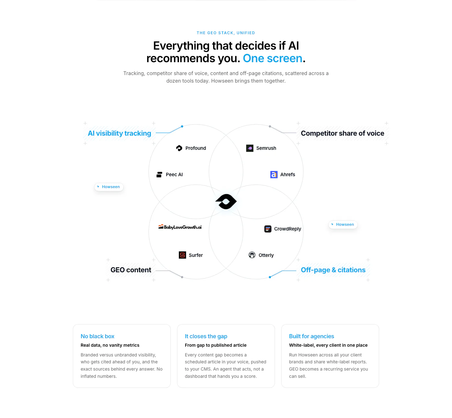
  136. Cluster features section: centered serif headline above a 2x2 grid of dark cards with sequence, signal, prospect table and gifting UI
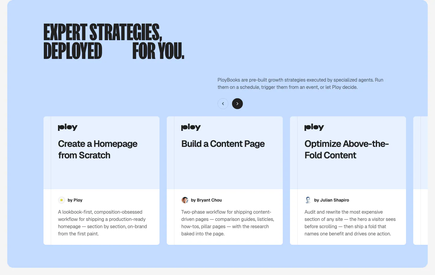
  137. Ploy features section: condensed headline and arrow controls above a carousel of PloyBooks strategy cards on a light blue panel
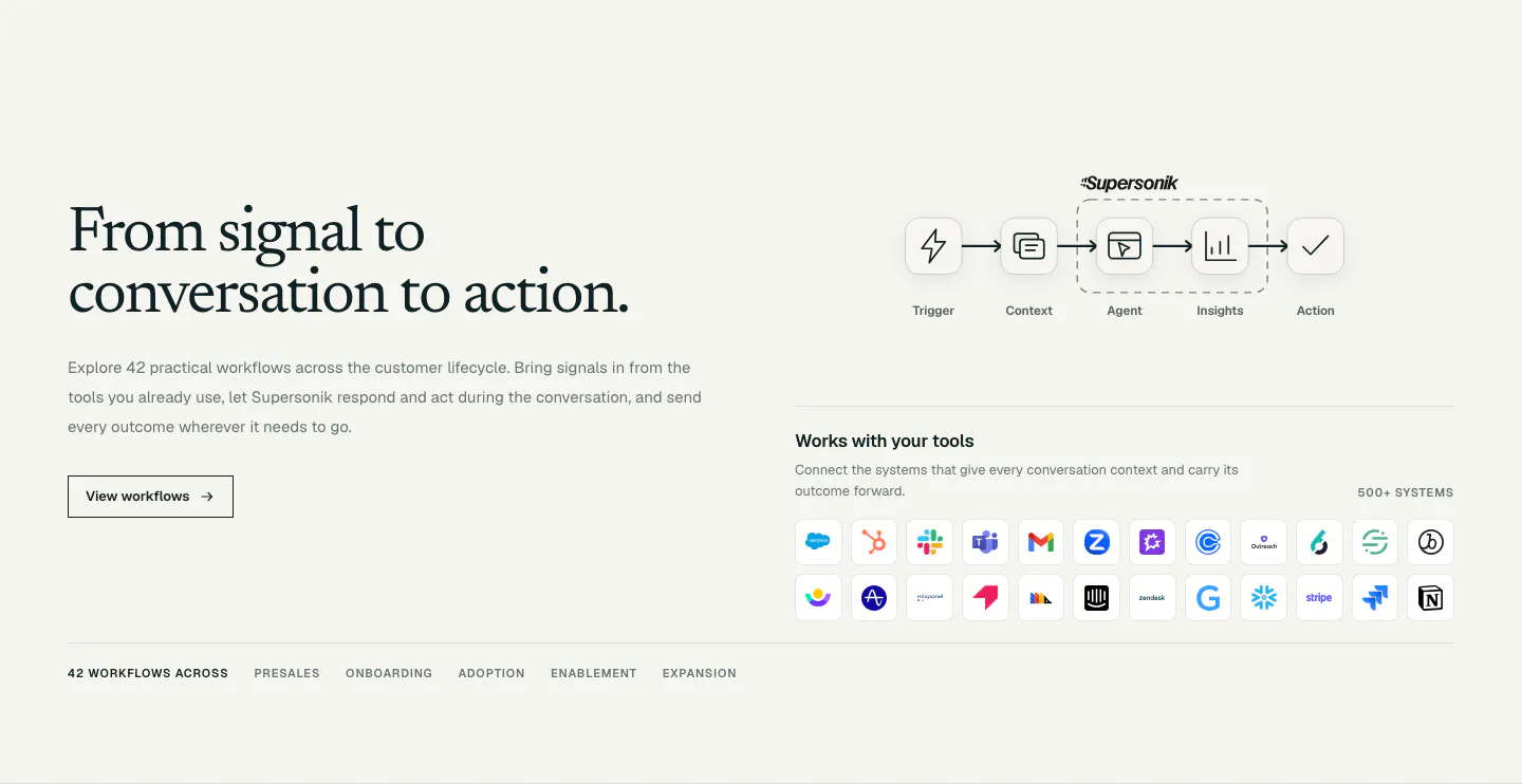
  138. Supersonik integrations section: serif headline and button at left, workflow step diagram and grid of app icons at right
  139. Jasper call-to-action section: centered headline and buttons inside an editor mockup on a dark background with purple lines and isometric tiles
  140. Howseen AI value proposition section: centered headline over a Venn diagram of competing GEO tools above three benefit cards
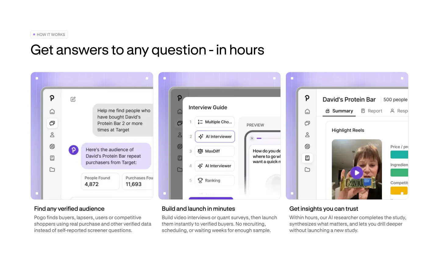
  141. Pogo how it works section: three cards with lavender-framed product screenshots and short step descriptions below a left-aligned headline
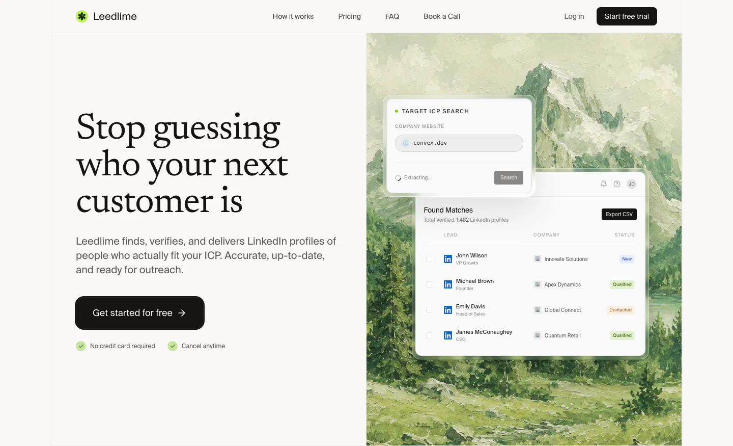
  142. Leedlime hero section: serif headline and Get started button at left, lead-search UI cards over a painted mountain landscape at right
  143. Supersonik features section: serif headline and link at left, glowing sphere of chat bubbles linked to a logo at right on dark teal
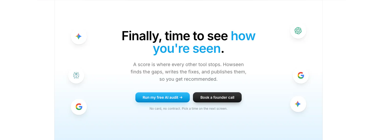
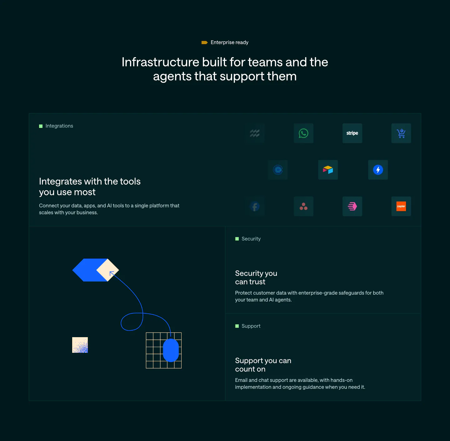
  144. Howseen AI call-to-action section: centered headline and two buttons flanked by floating AI engine icons on a pale blue fade
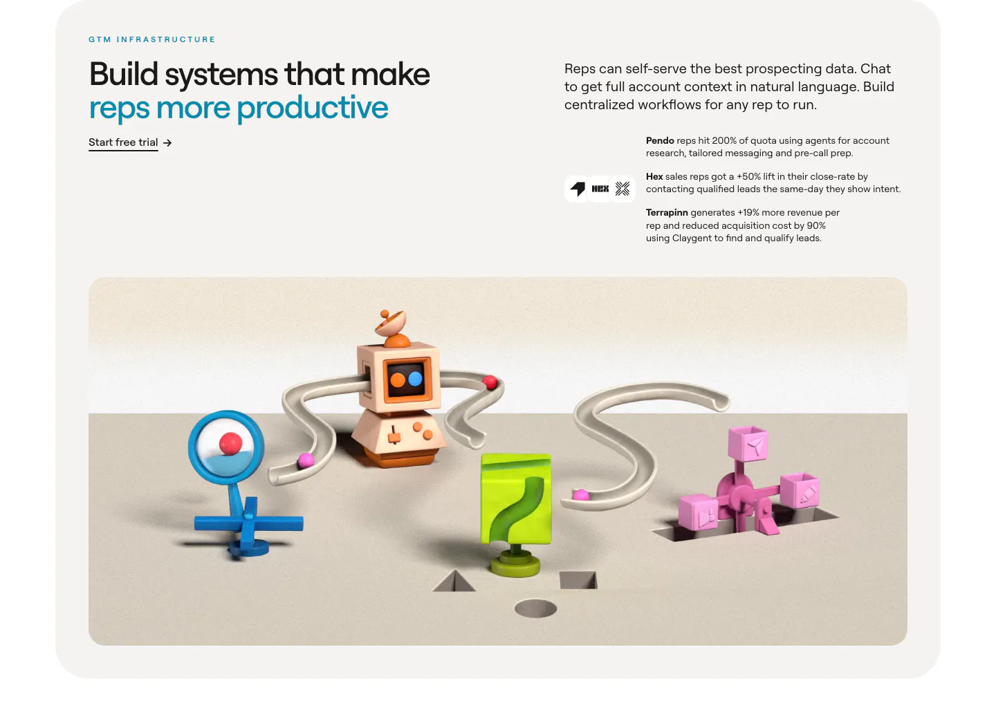
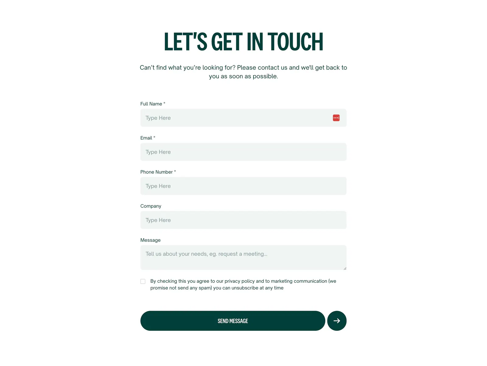
  145. Clay value proposition section: headline and customer outcomes above a wide 3D render of connected clay GTM objects in a rounded card
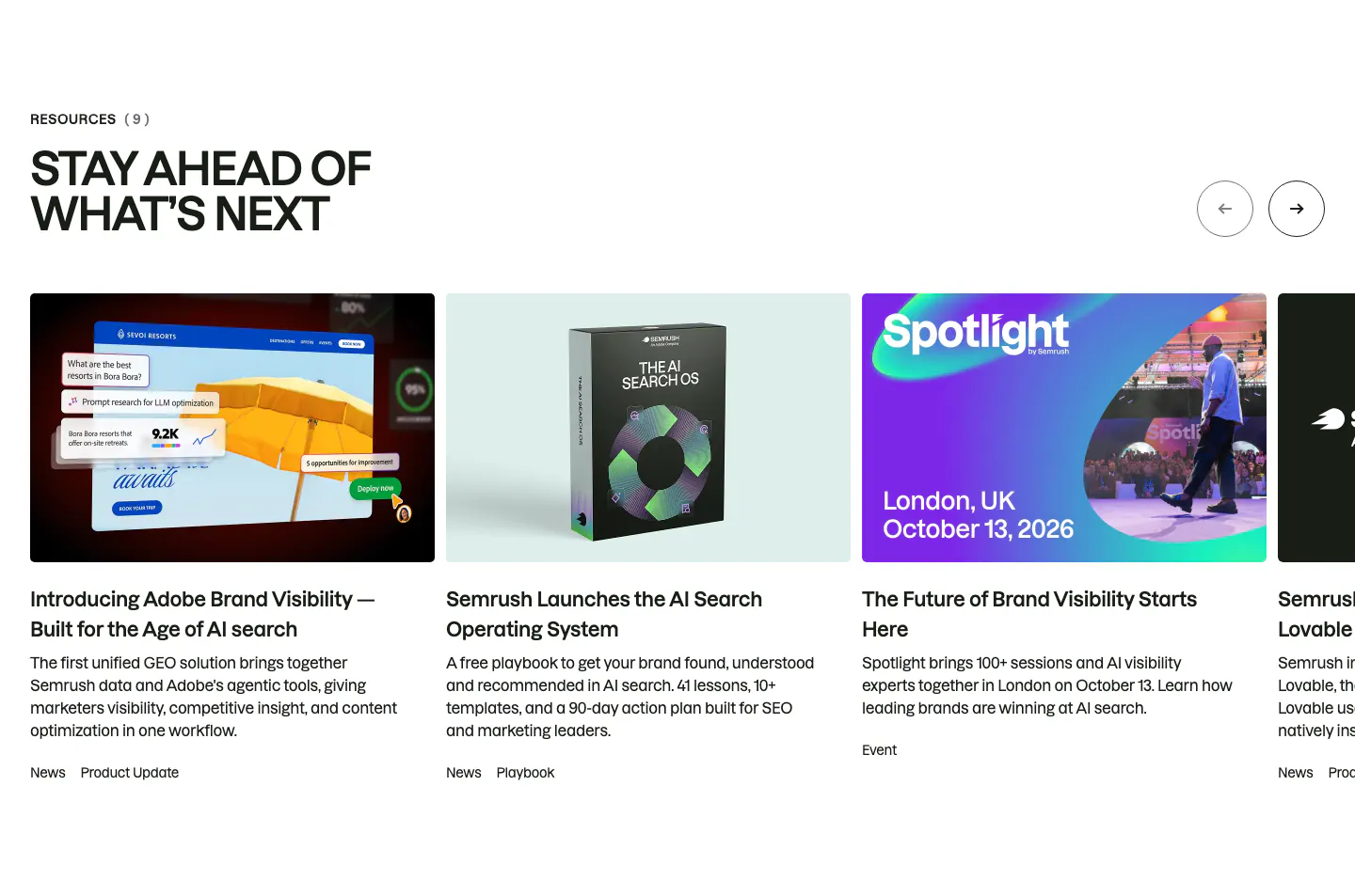
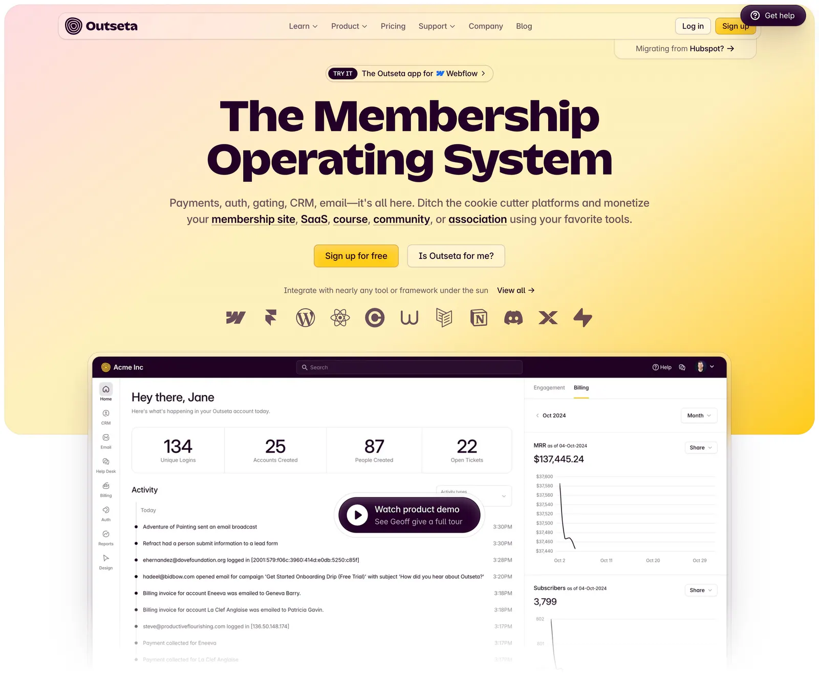
  146. Semrush blog & resources section: uppercase headline and arrow buttons above a carousel of news, playbook and event cards with thumbnails
  147. Sendr features section: left-aligned headline above a 2x2 grid of feature cells with small purple icons and dotted accents
  148. Customer.io features section: dark bento grid with an integration icon tile, abstract hexagon and grid artwork, and security and support tiles
  149. Localyzer contact section: centered headline above a stacked contact form with name, email, phone, company and message fields
  150. Outseta hero section: centered headline, two buttons and integration icons on a peach-to-yellow gradient above a dashboard with demo button
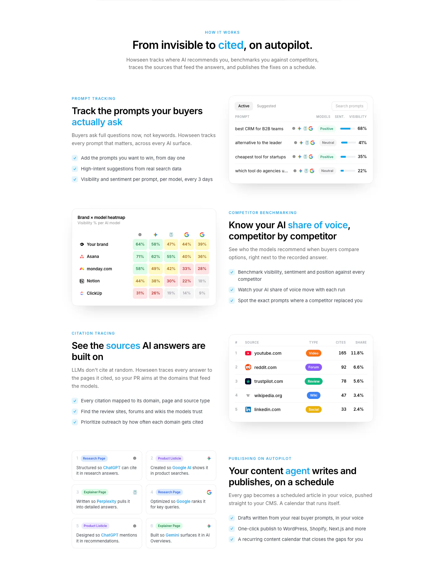
  151. Howseen AI features section: centered intro above alternating rows of copy and prompt, heatmap and citation table UI cards
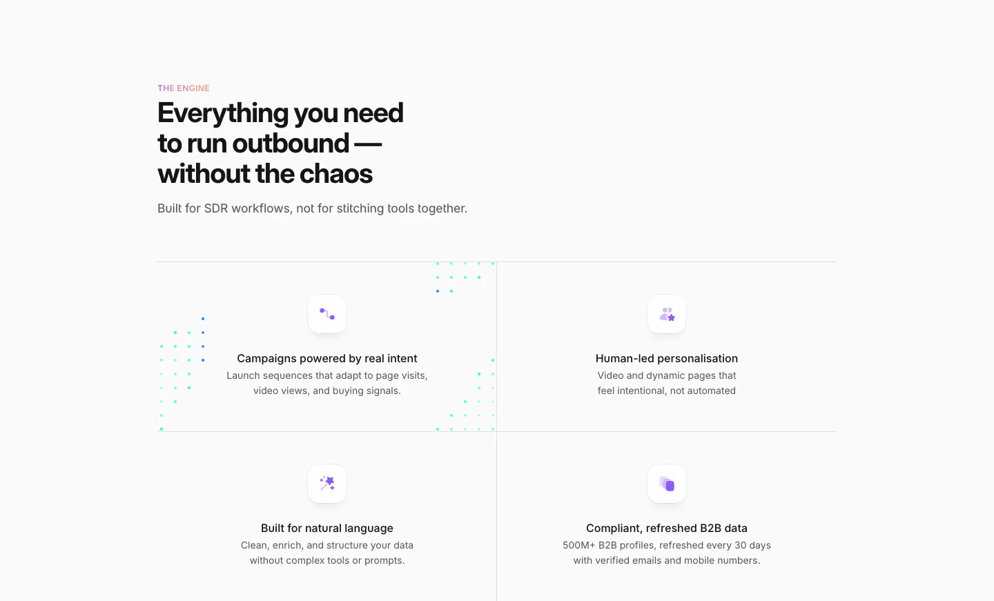
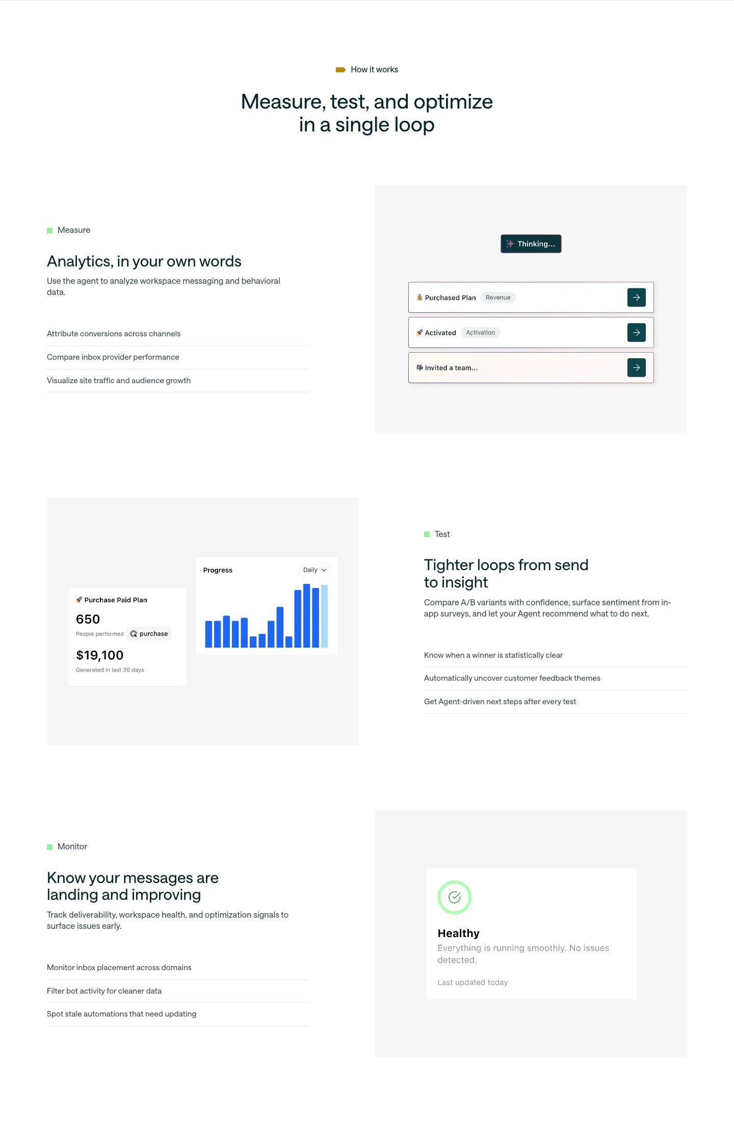
  152. Customer.io features section: centered headline above three alternating rows of Measure, Test and Monitor copy beside UI mockups
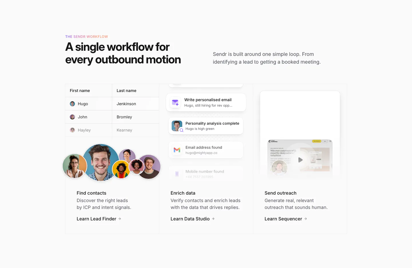
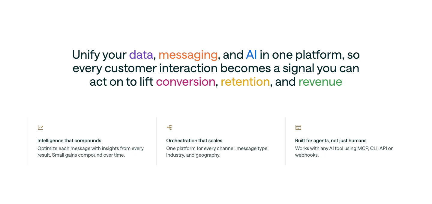
  153. Sendr how it works section: headline above three columns for Find contacts, Enrich data and Send outreach with UI snippets
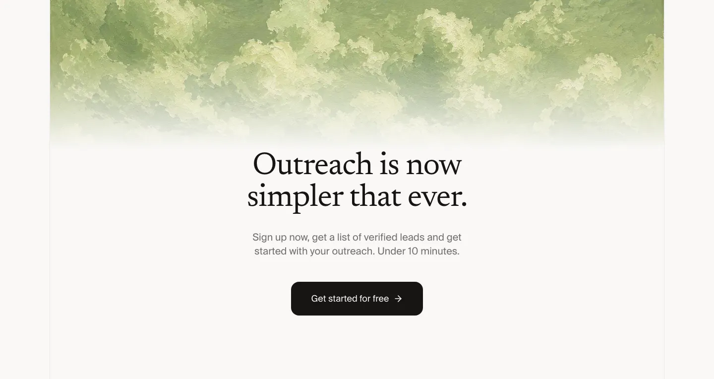
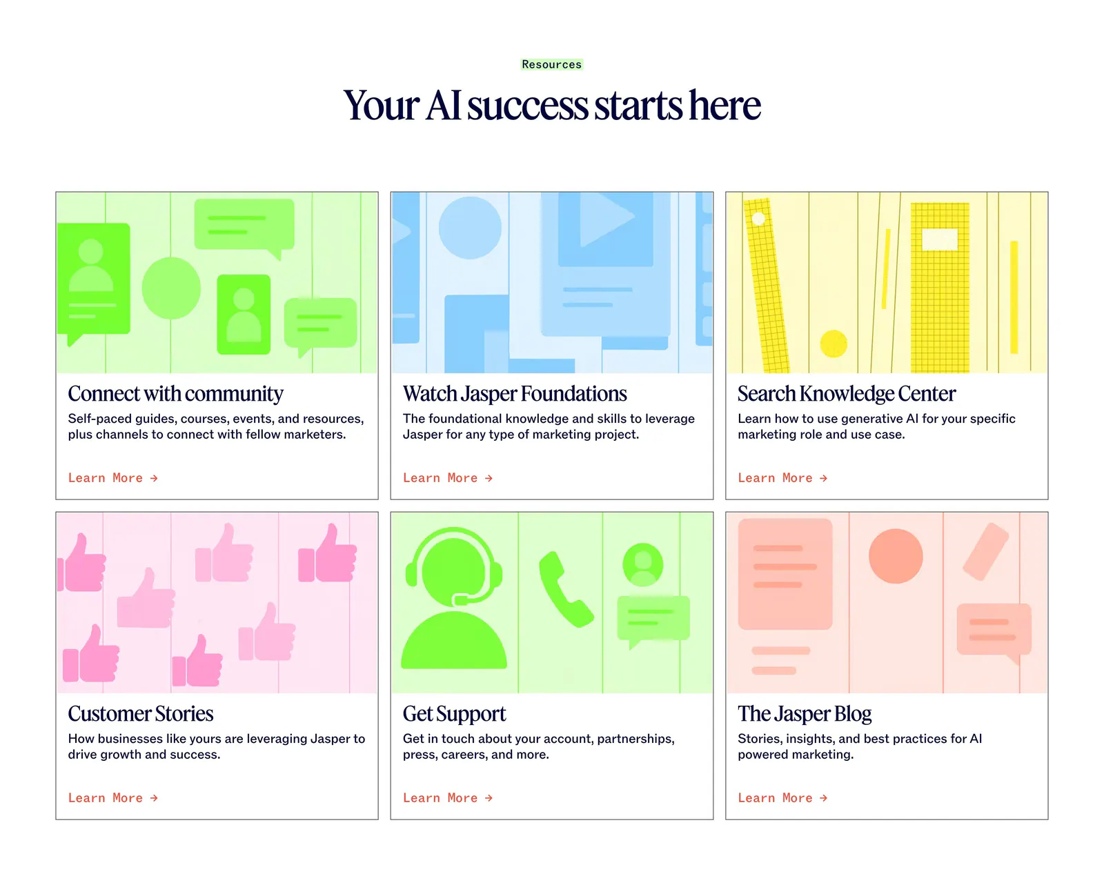
  154. Leedlime call to action section: centered serif headline and Get started button below a band of painted green clouds on off-white
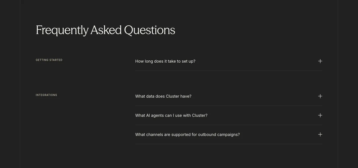
  155. Profound logo cloud section: small centered heading above a bordered 4x3 grid of white customer logos on black
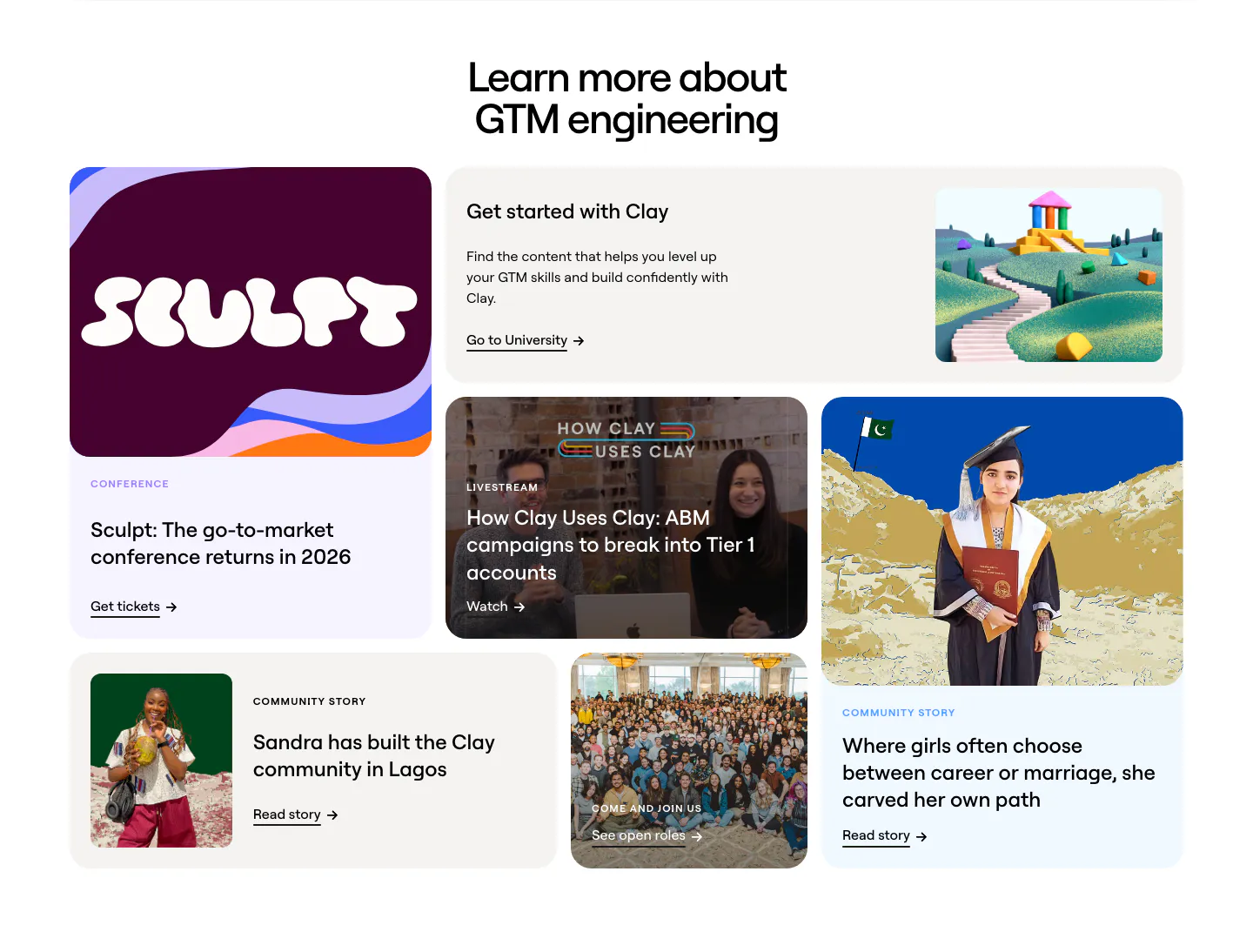
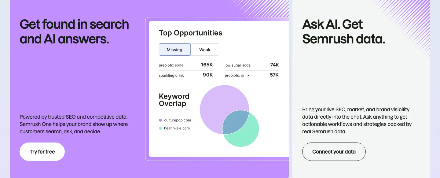
  156. Clay blog & resources section: centered headline above a bento grid of conference, livestream, community story and careers cards
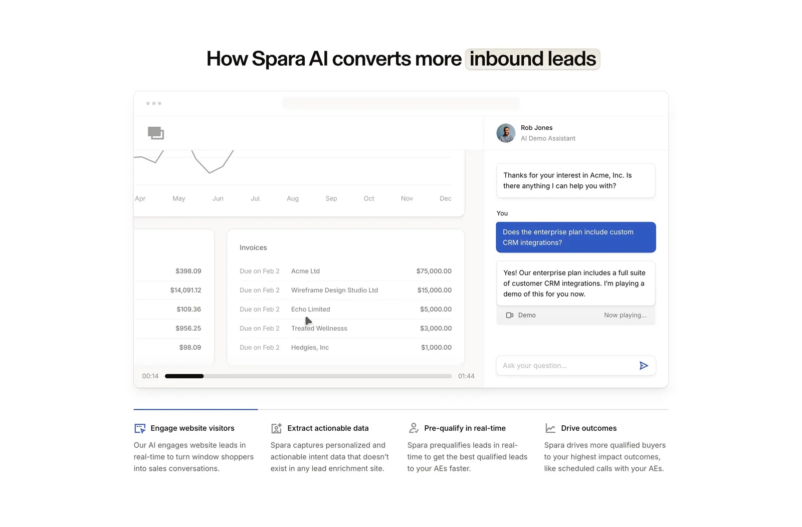
  157. Customer.io value proposition section: centered statement with multicolored keywords above three icon columns of benefits
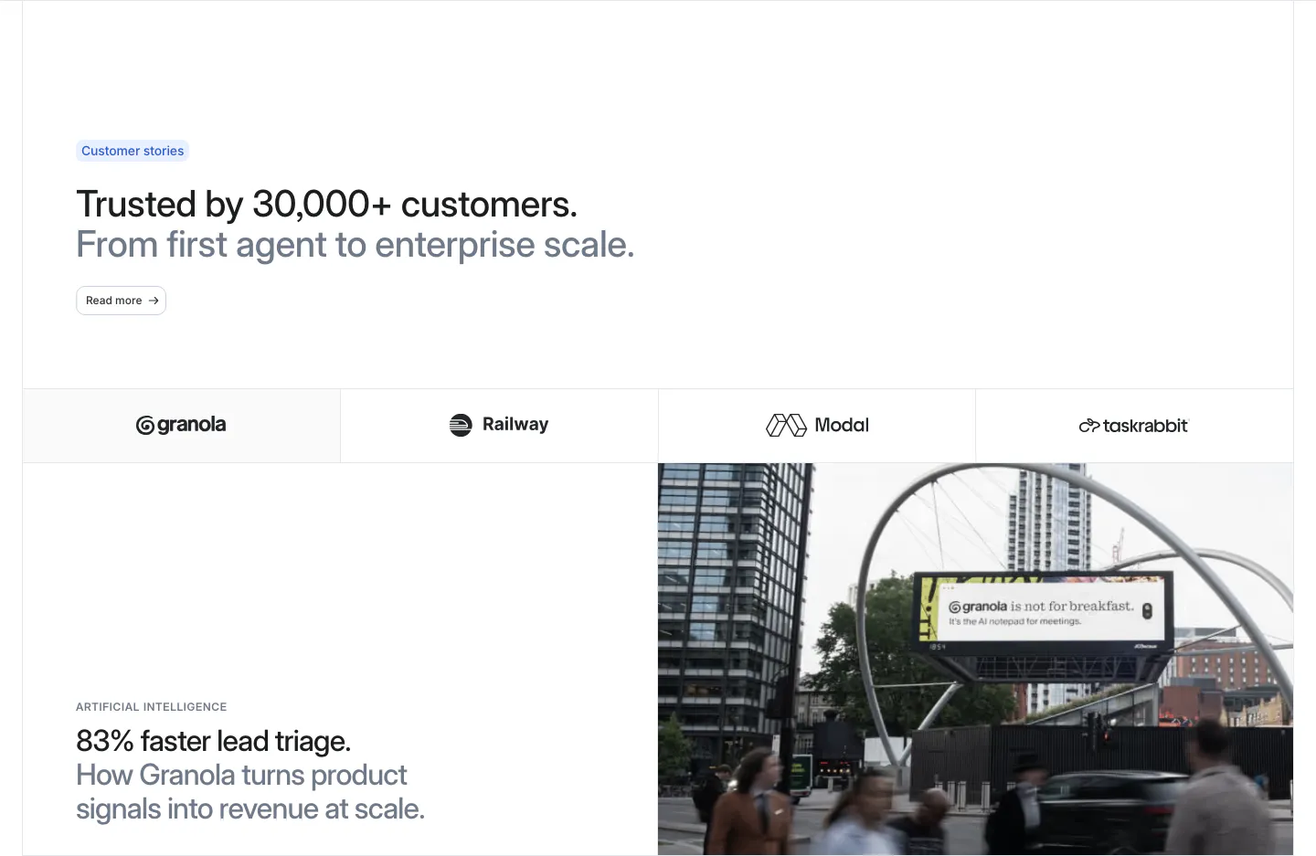
  158. Jasper blog & resources section: centered serif headline above six cards with colorful flat illustrations and Learn More links
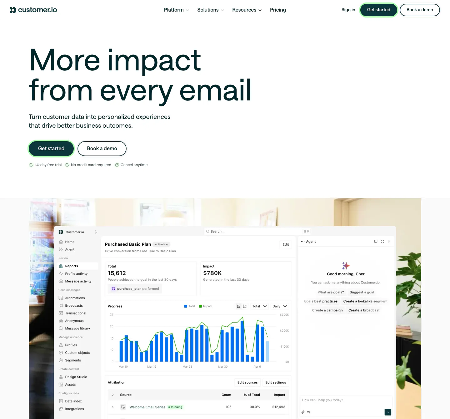
  159. Cluster FAQ section: serif headline above category-labelled accordion questions with plus icons on a charcoal background
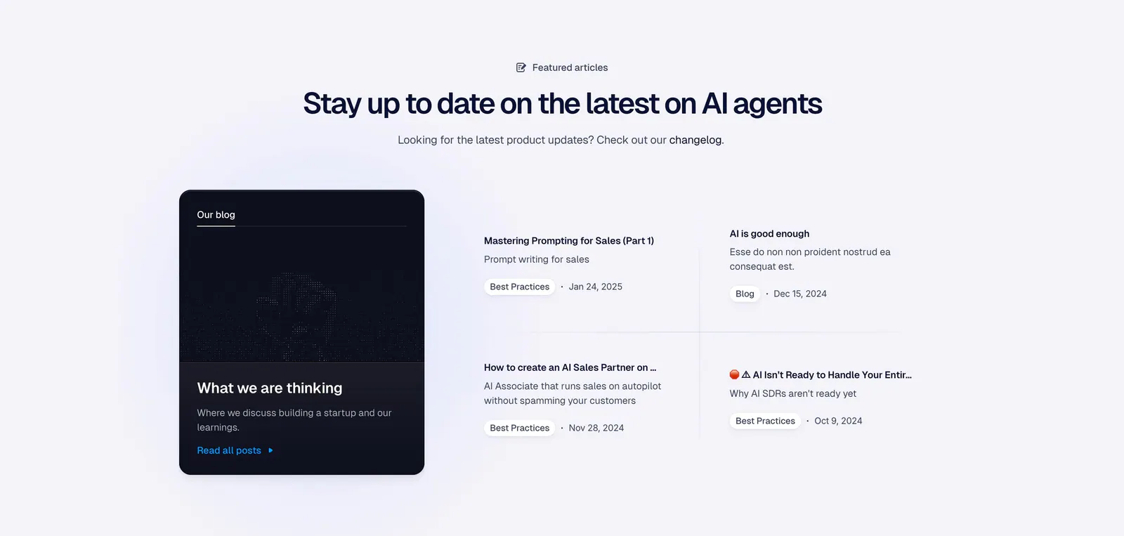
  160. Semrush features section: large purple card with a keyword overlap product UI beside a gray card about Semrush data in AI chat
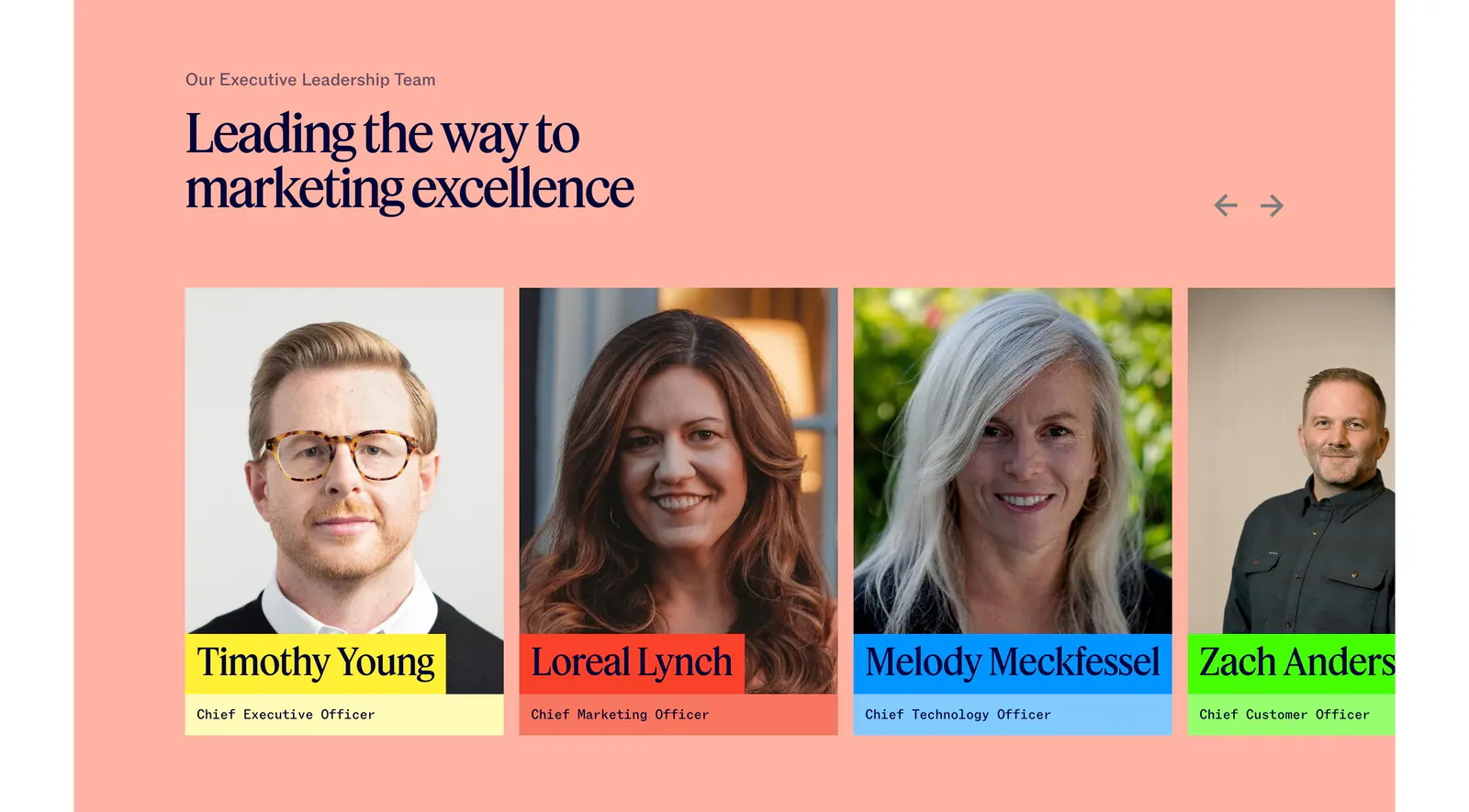
  161. Spara how it works section: centered headline above a demo video player with AI chat panel and four step tabs below
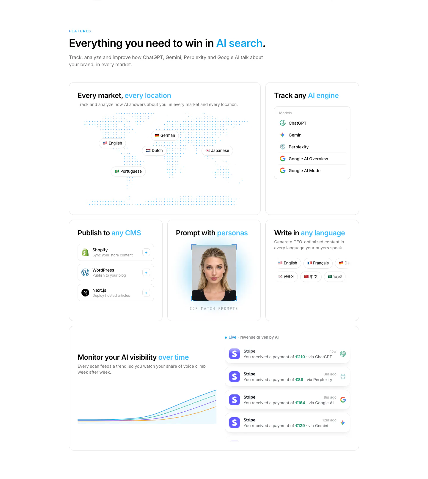
  162. Attio testimonials section: headline above a customer logo tab bar and a Granola case study with stat headline beside a street photo
  163. Customer.io hero section: large left-aligned headline with two buttons above a reports dashboard screenshot set over an office photo
  164. Godmode blog & resources section: centered heading above a dark blog card on the left and a two-by-two list of article links
  165. Jasper team section: serif headline and arrows above executive portrait cards with colored name labels on a salmon background
  166. Howseen AI features section: bento grid with dotted world map, AI engine list, CMS cards, persona photo and revenue chart
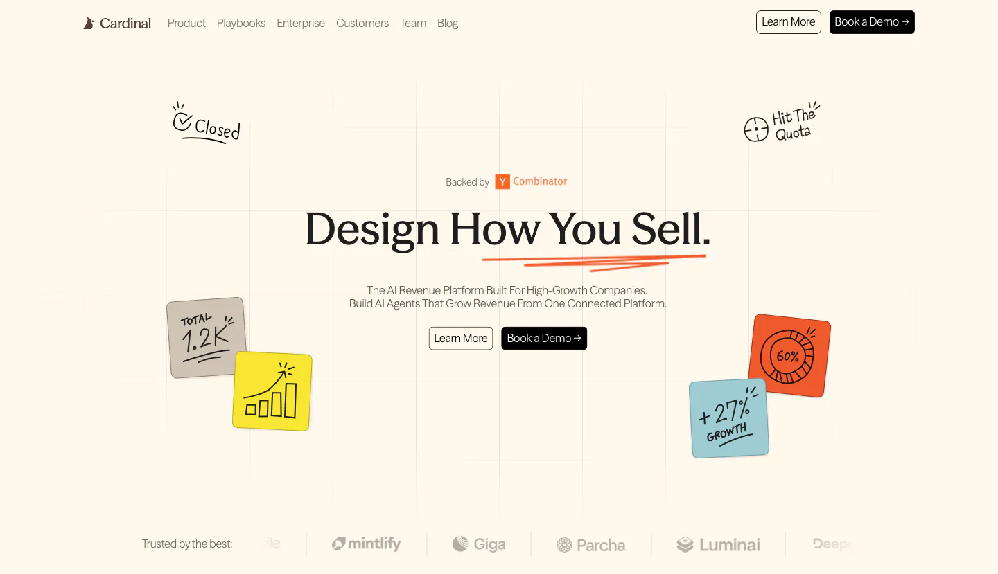
  167. Cardinal hero section: centered serif headline with two buttons, hand-drawn sticky-note doodles on a faint grid and a logo strip on cream
    Cardinal Hero
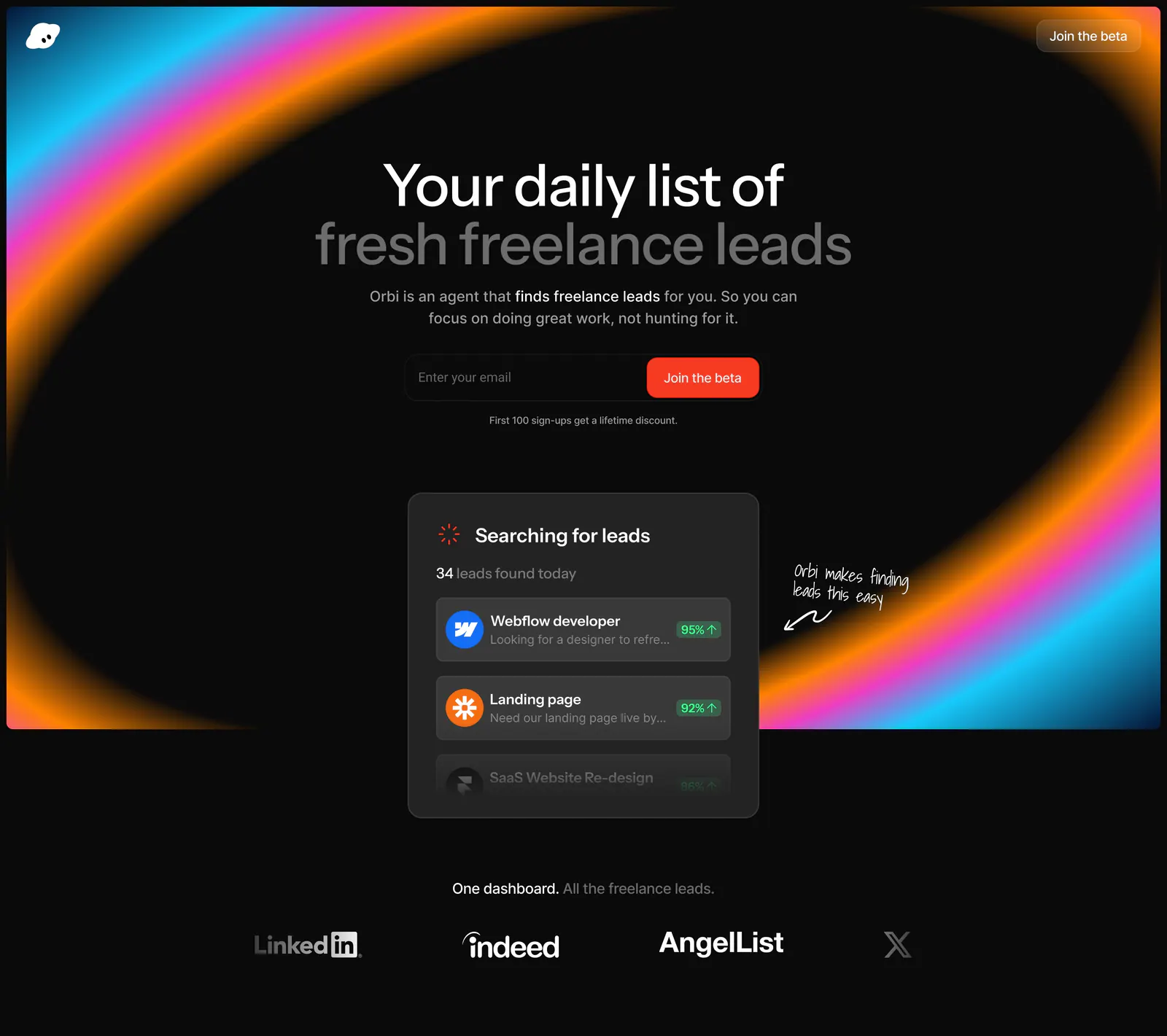
  168. Orbi hero section: centered headline and email signup inside a neon gradient ring on black, a leads UI card and job-board logos below
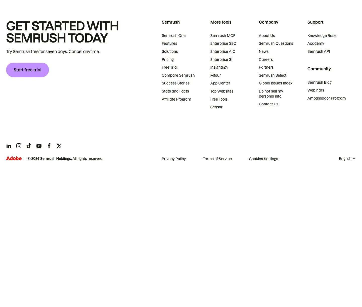
  169. Semrush footer section: uppercase signup headline with purple trial button beside four link columns, social icons and copyright row
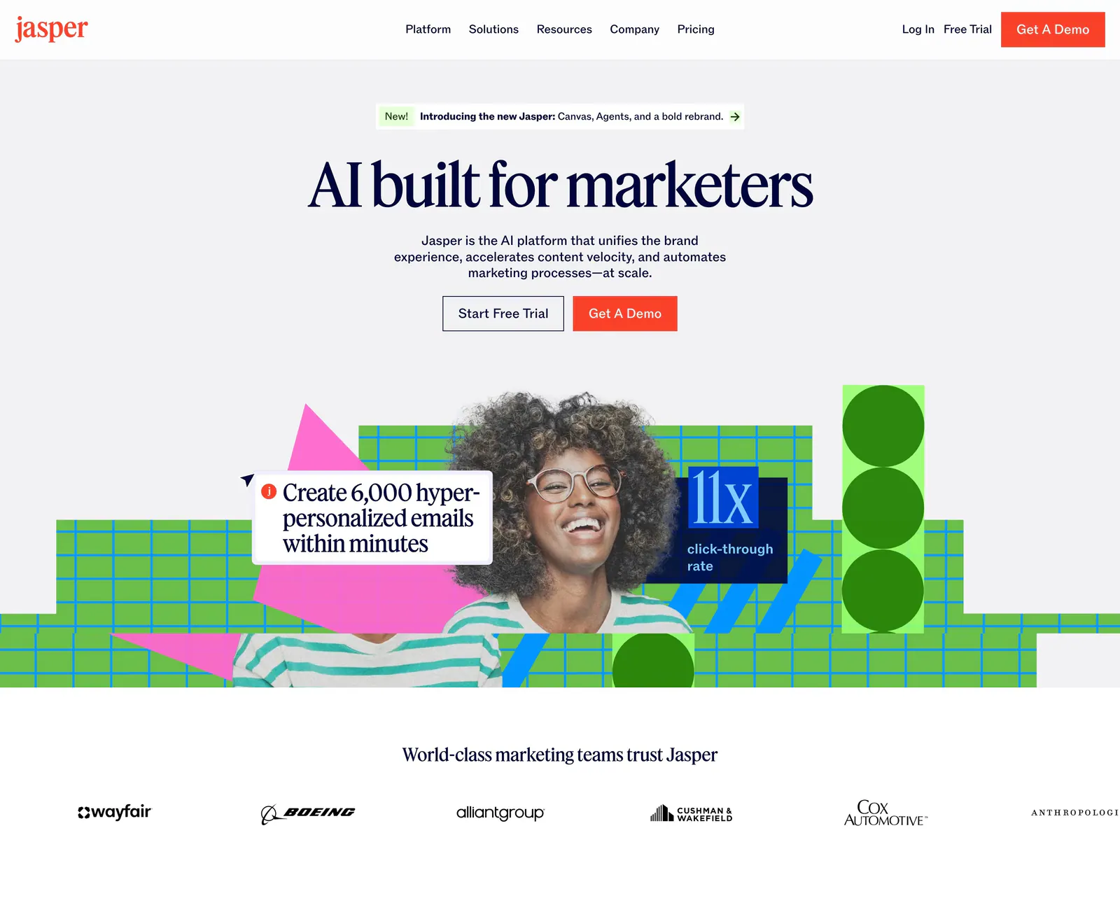
  170. Jasper hero section: nav and centered serif headline over a photo of a smiling woman with green grid shapes, customer logo row below
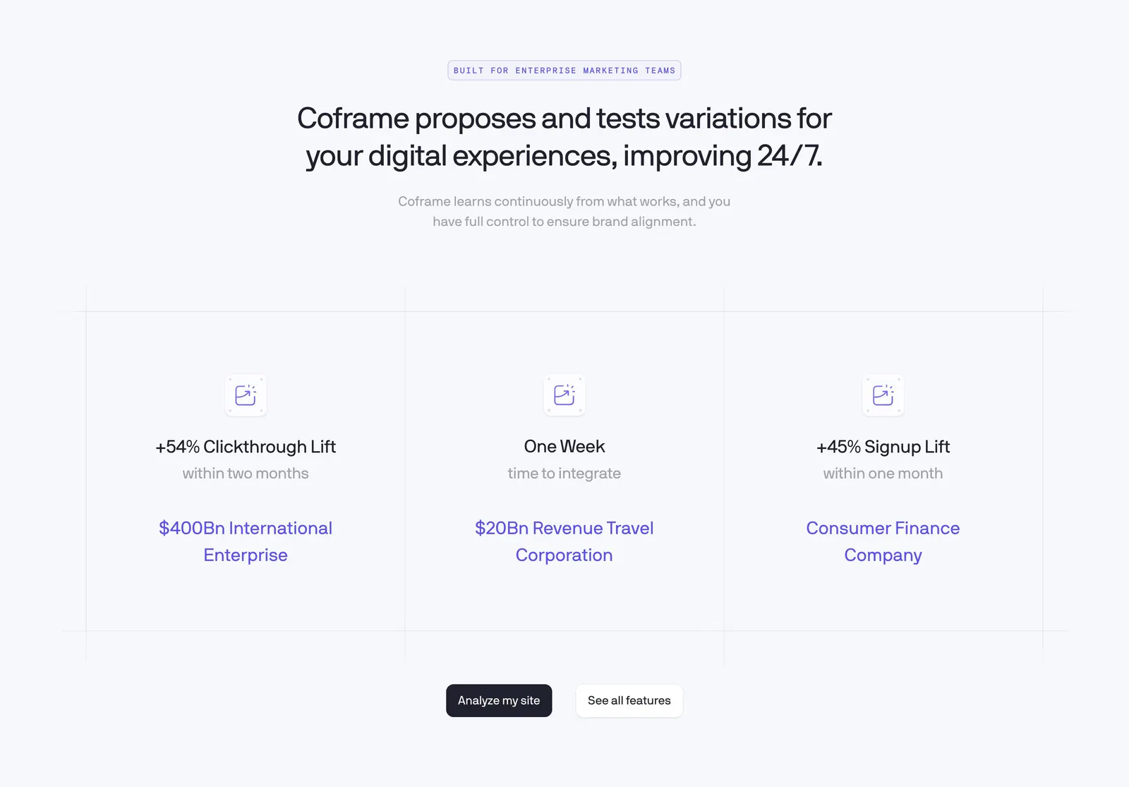
  171. Coframe value proposition section: centered headline above three result columns with lift metrics on a light grid background
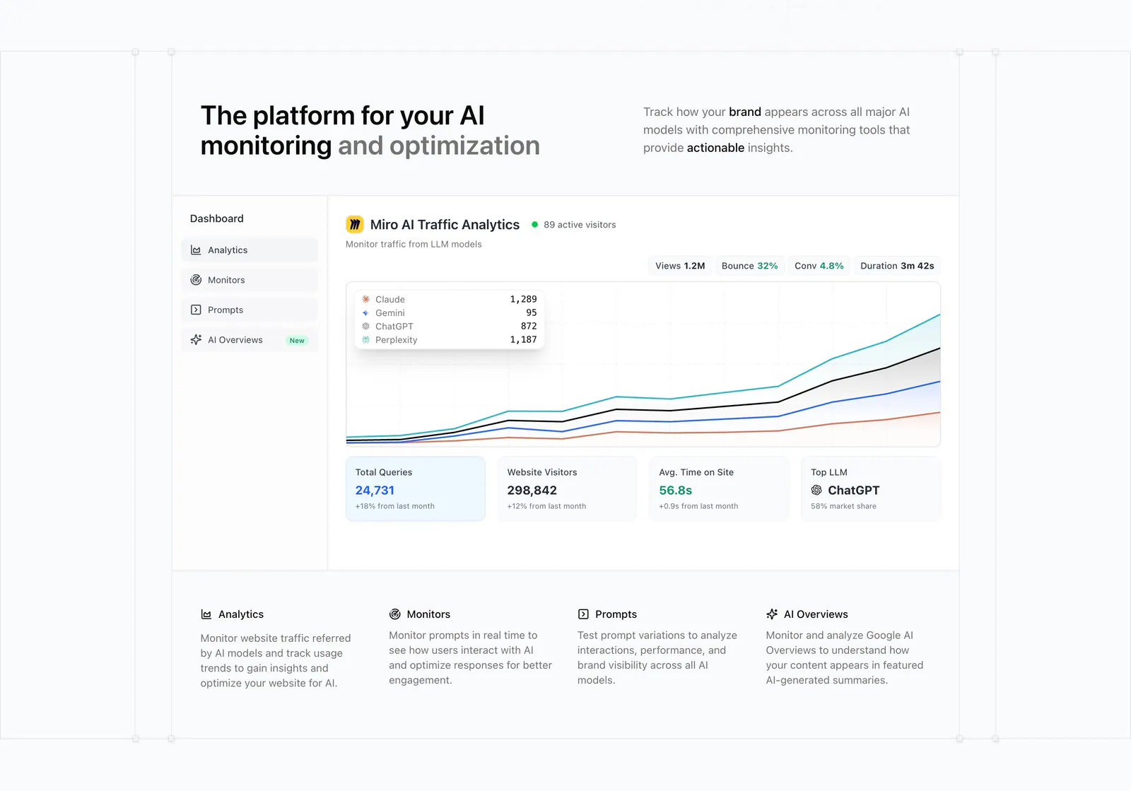
  172. Promptwatch features section: headline with side copy above an AI traffic analytics dashboard screenshot and a four-column feature row
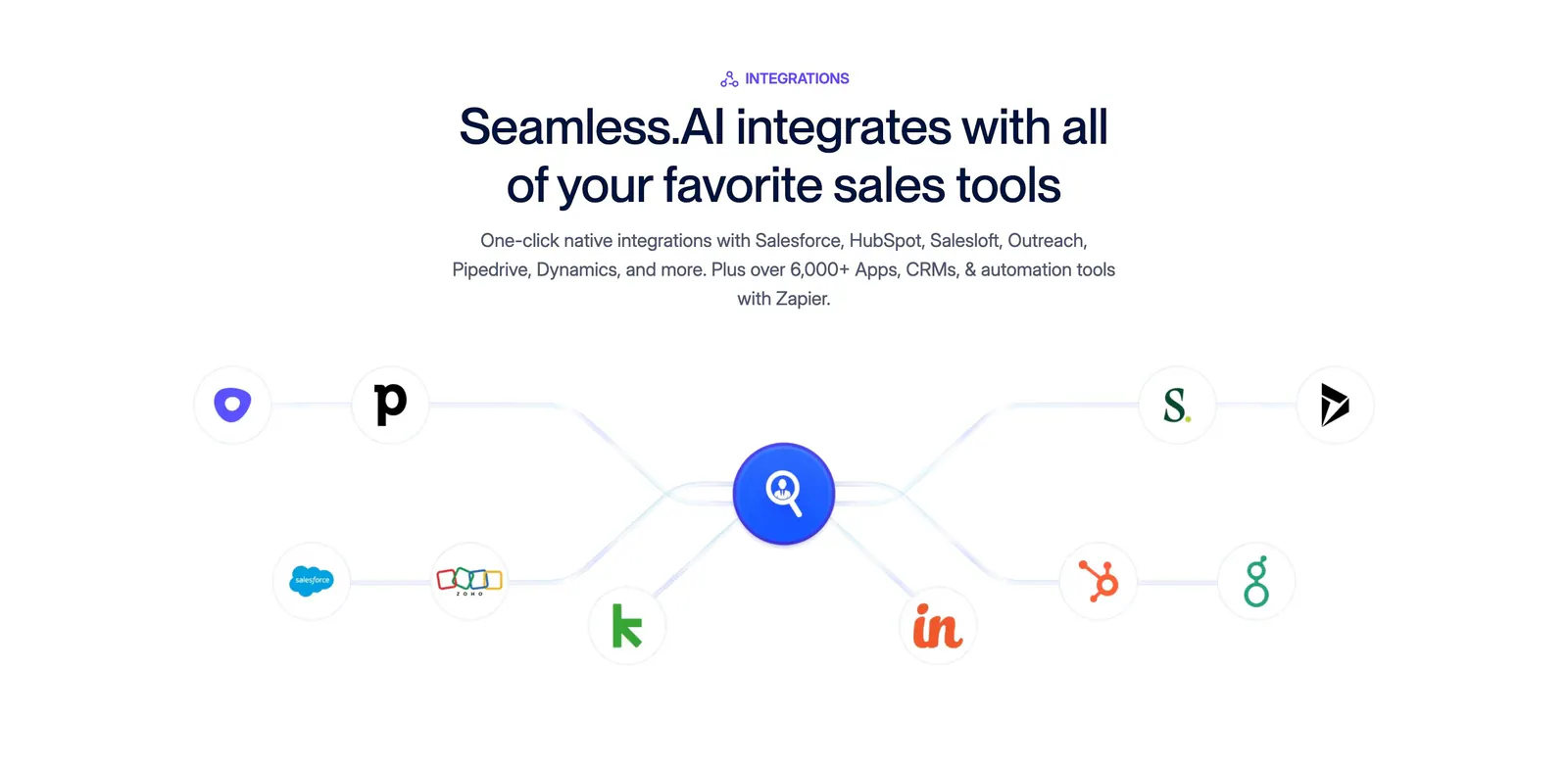
  173. Seamless.AI integrations section: centered headline above a connector diagram linking sales tool icons to a central logo on white
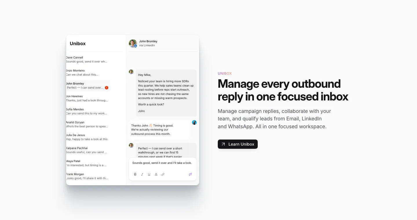
  174. Sendr features section: Unibox inbox UI with a conversation thread on the left, headline, copy and Learn Unibox button on the right
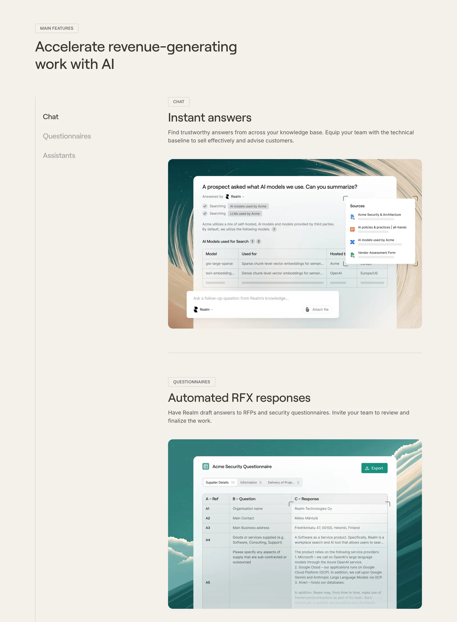
  175. Realm features section: headline with side menu and stacked feature blocks showing UI screenshots on painted backdrops, beige page
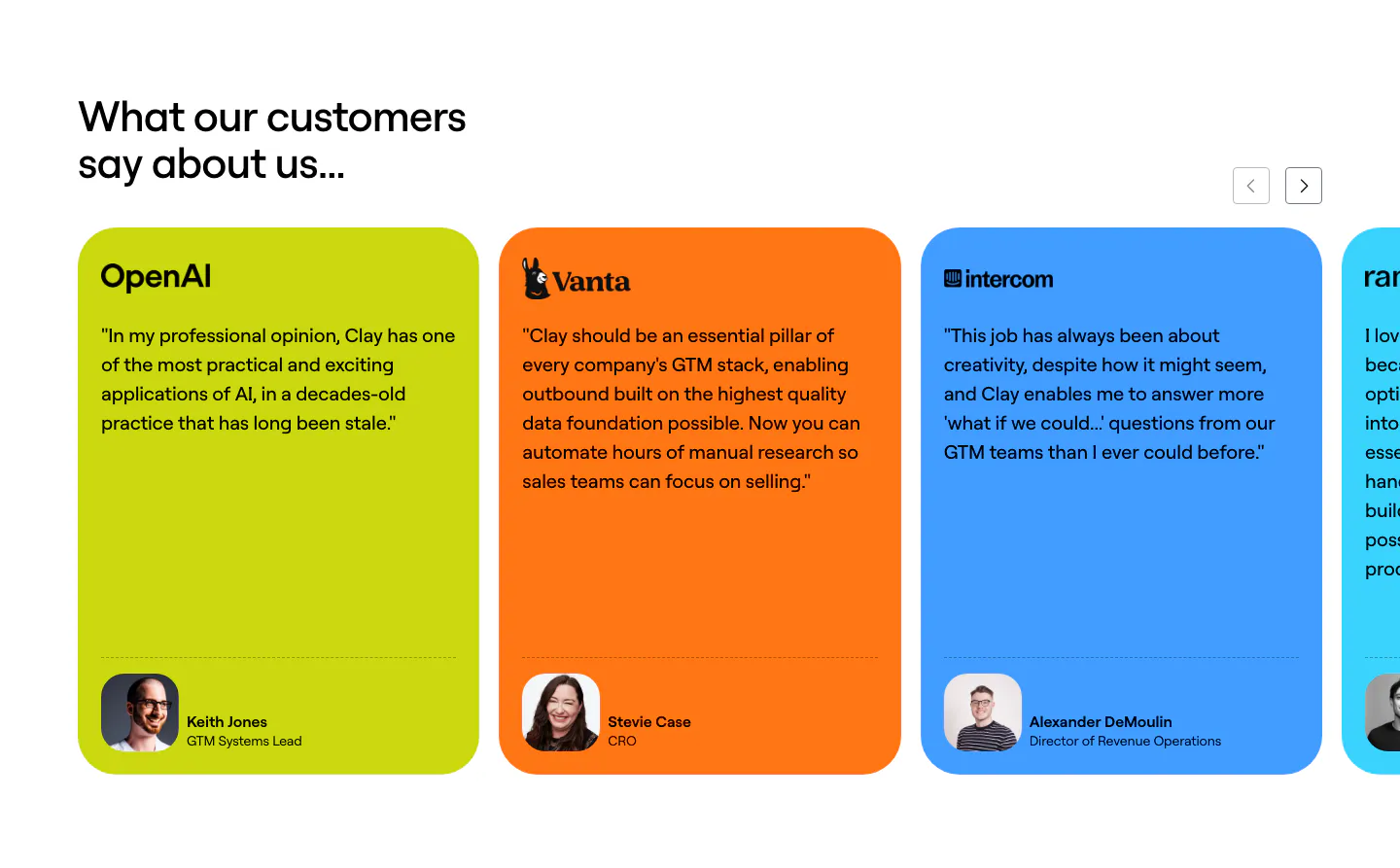
  176. Clay testimonials section: left heading with arrow controls above a slider of lime, orange and blue quote cards with logos and headshots
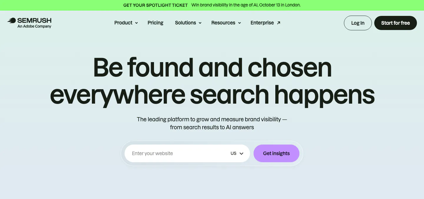
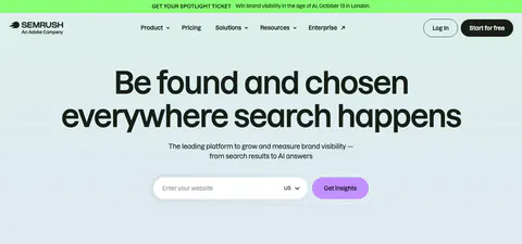
  177. Semrush hero section: nav with promo bar, centered headline and a website URL input with Get insights button on pale mint
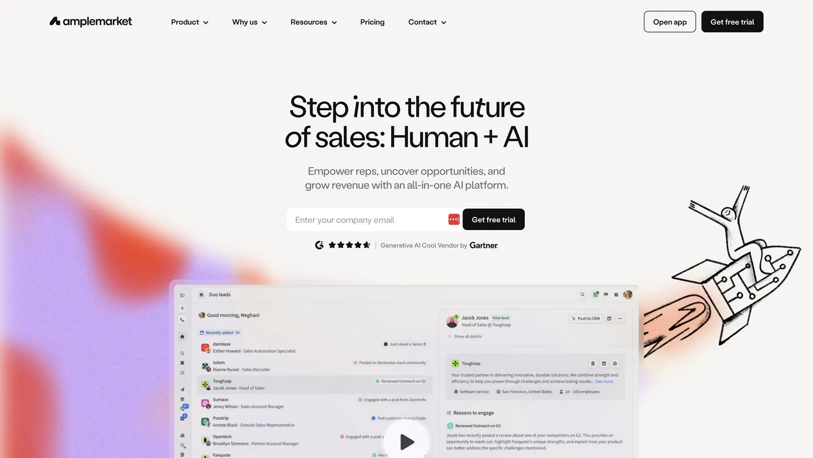
  178. Amplemarket hero section: centered headline and email field above a product screenshot with play button, rocket doodle and color blurs
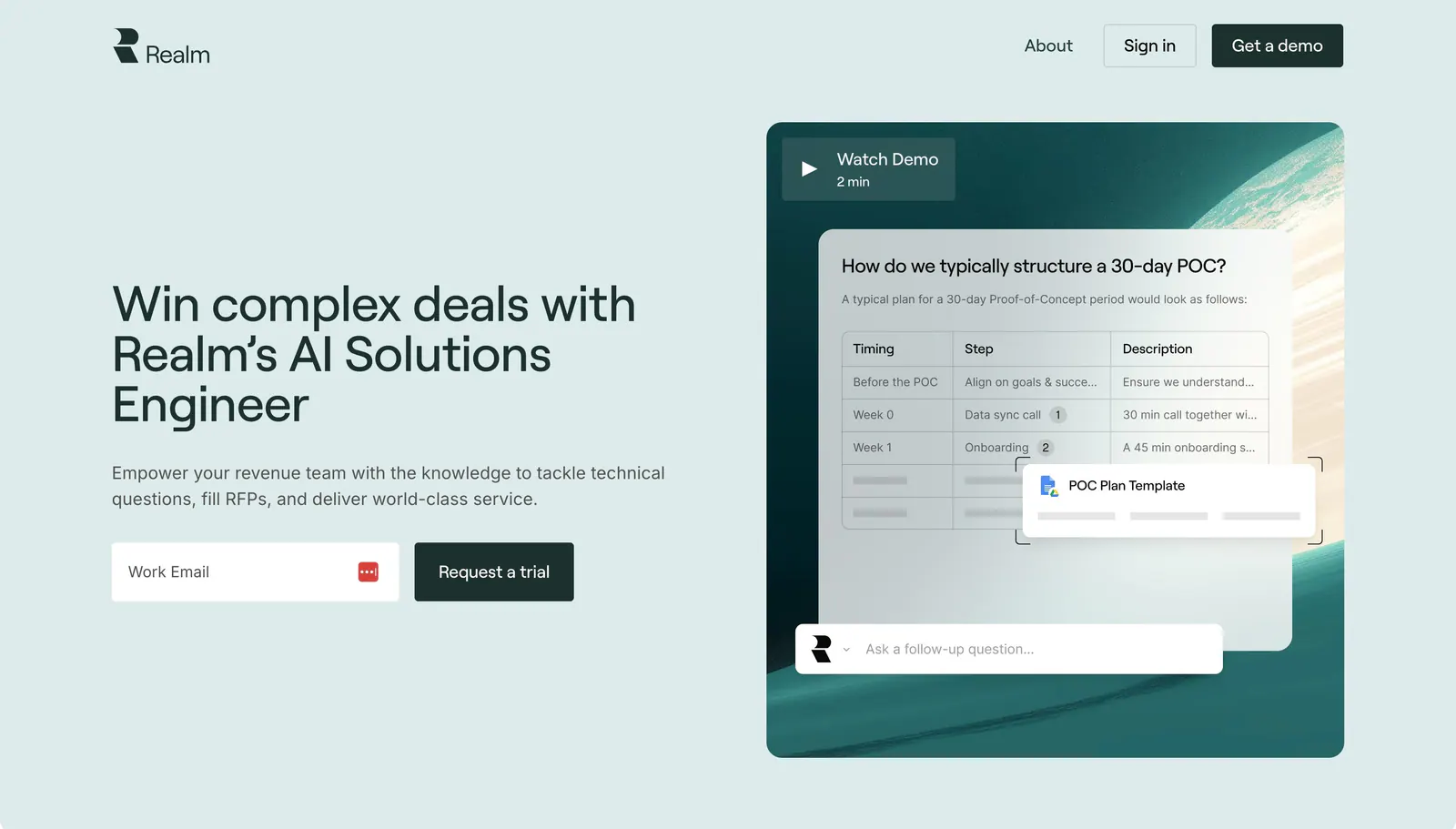
  179. Realm hero section: headline and email signup on the left, chat answer UI over a teal planet image with Watch Demo on the right
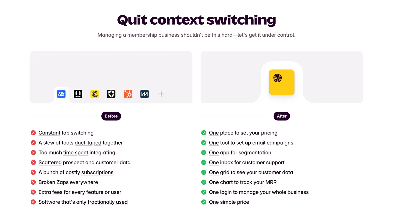
  180. Outseta comparison section: centered headline above Before and After columns contrasting tool clutter and red crosses with green checks
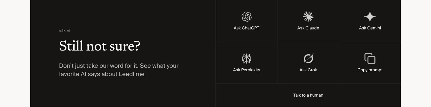
  181. Leedlime call to action section: serif Still not sure? headline at left beside a grid of Ask ChatGPT, Claude, Gemini and Grok buttons on black
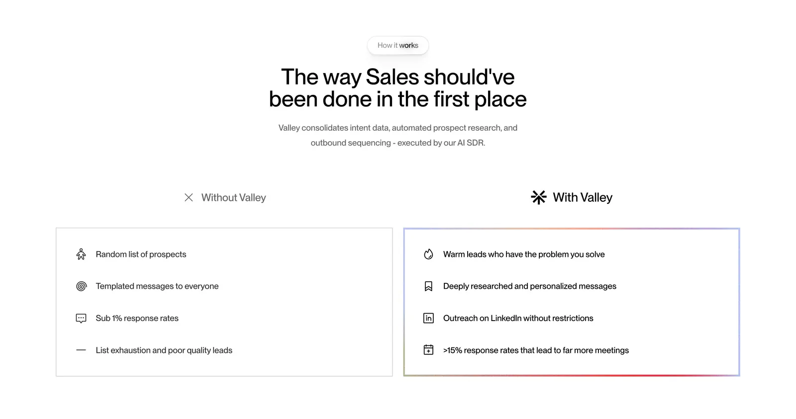
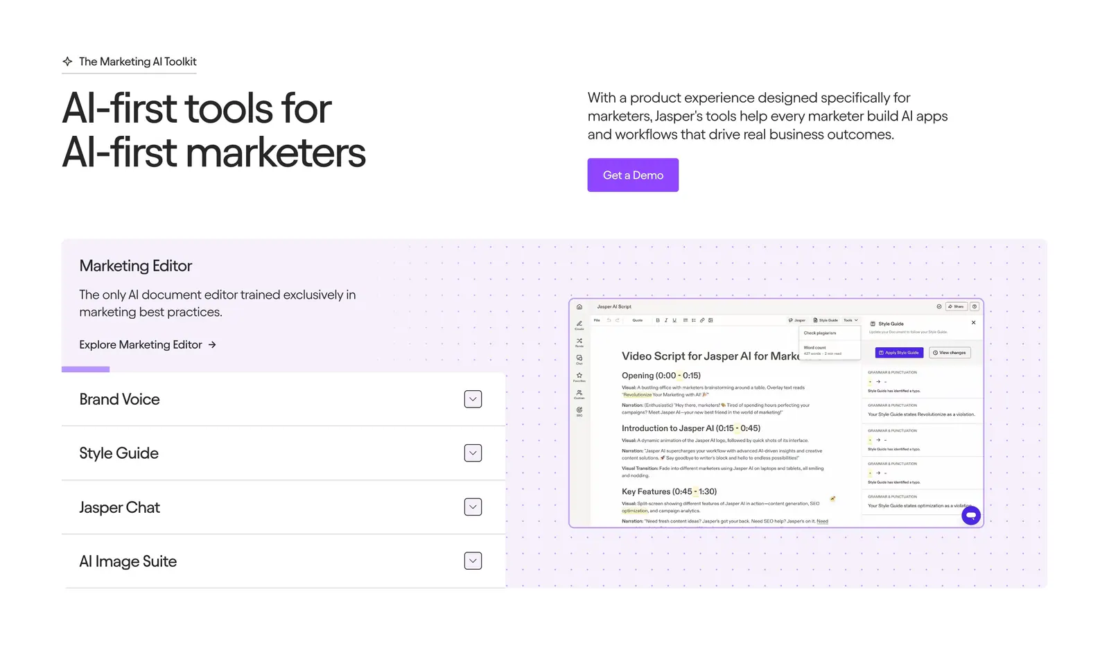
  182. Valley comparison section: centered headline above side-by-side Without Valley and With Valley lists in outlined cards on white
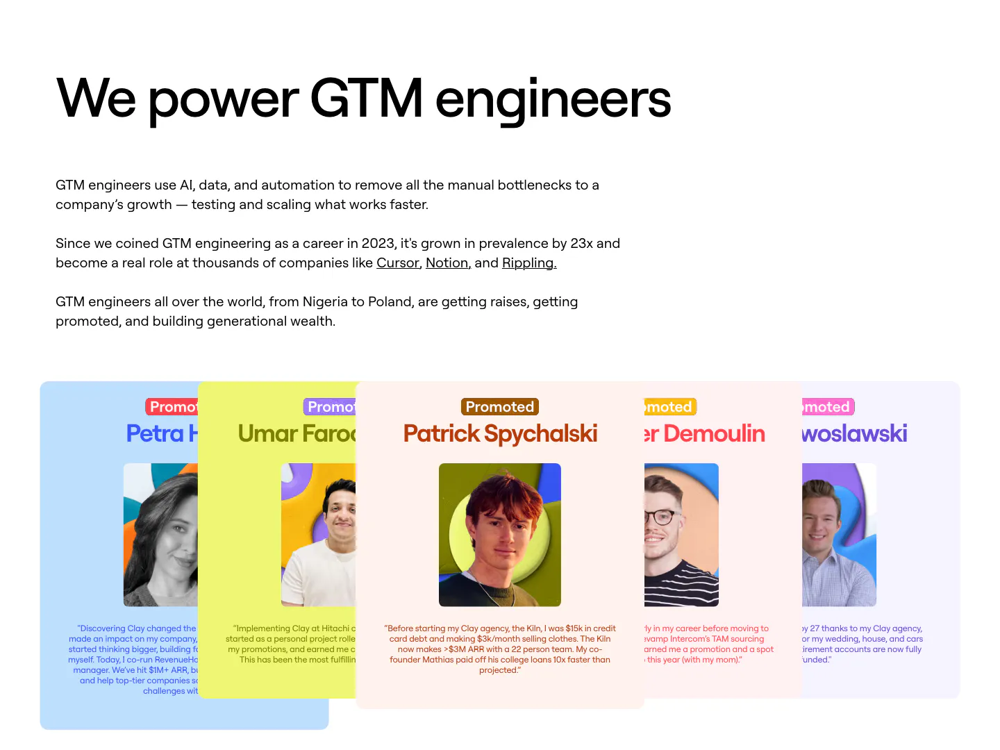
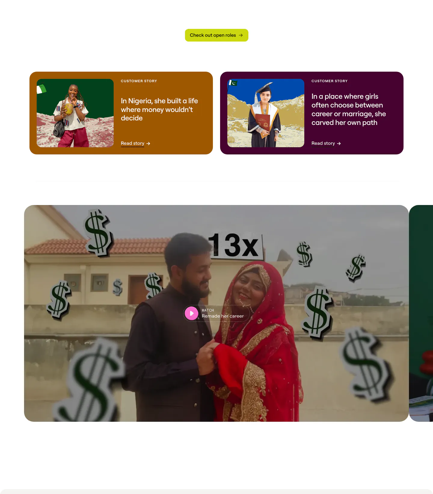
  183. Clay testimonials section: left-aligned heading and copy above a fanned stack of colored cards with portrait photos and promotion quotes
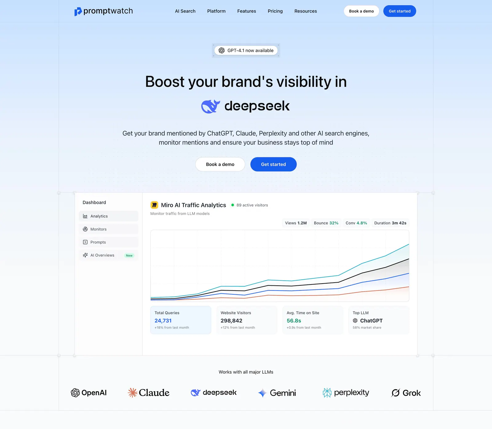
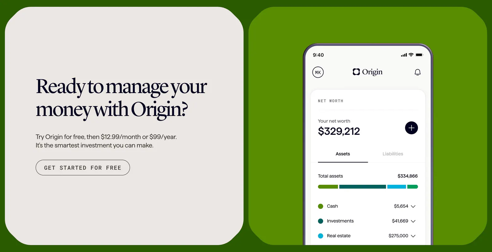
  184. Promptwatch hero section: centered headline with DeepSeek logo, two buttons, analytics dashboard screenshot and LLM logo row
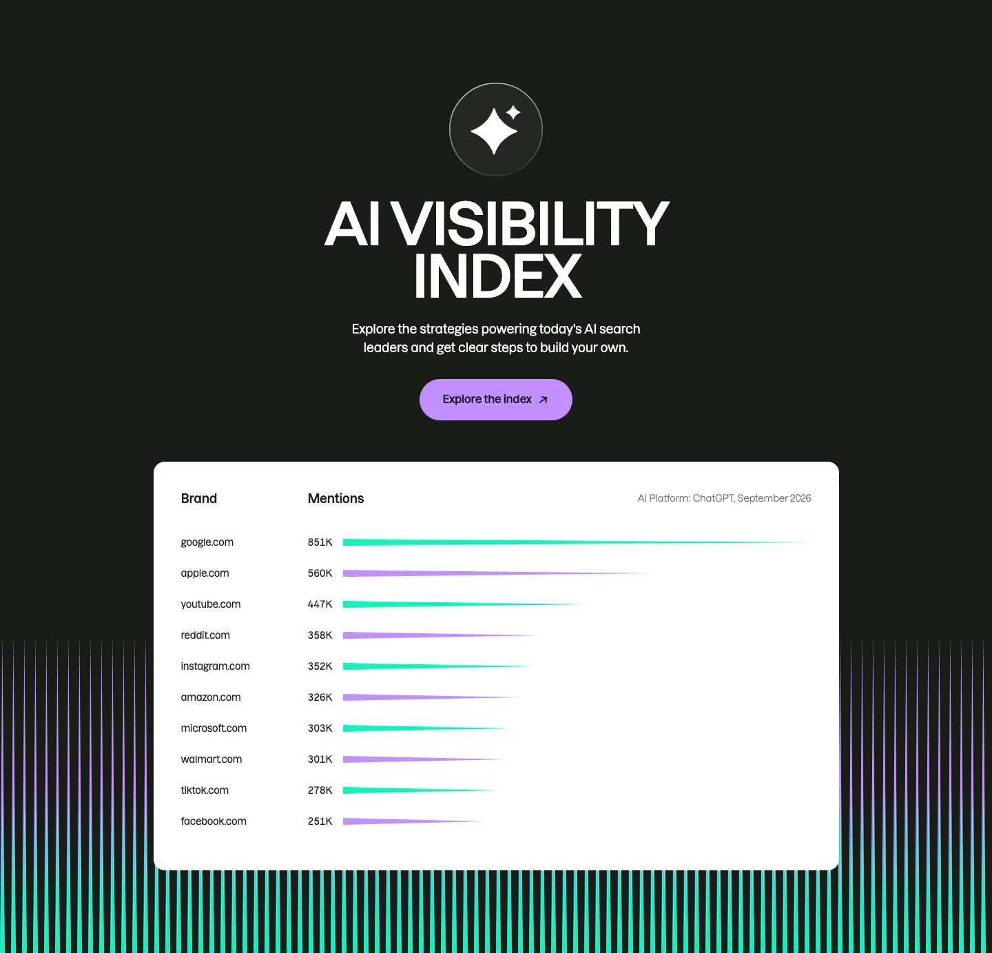
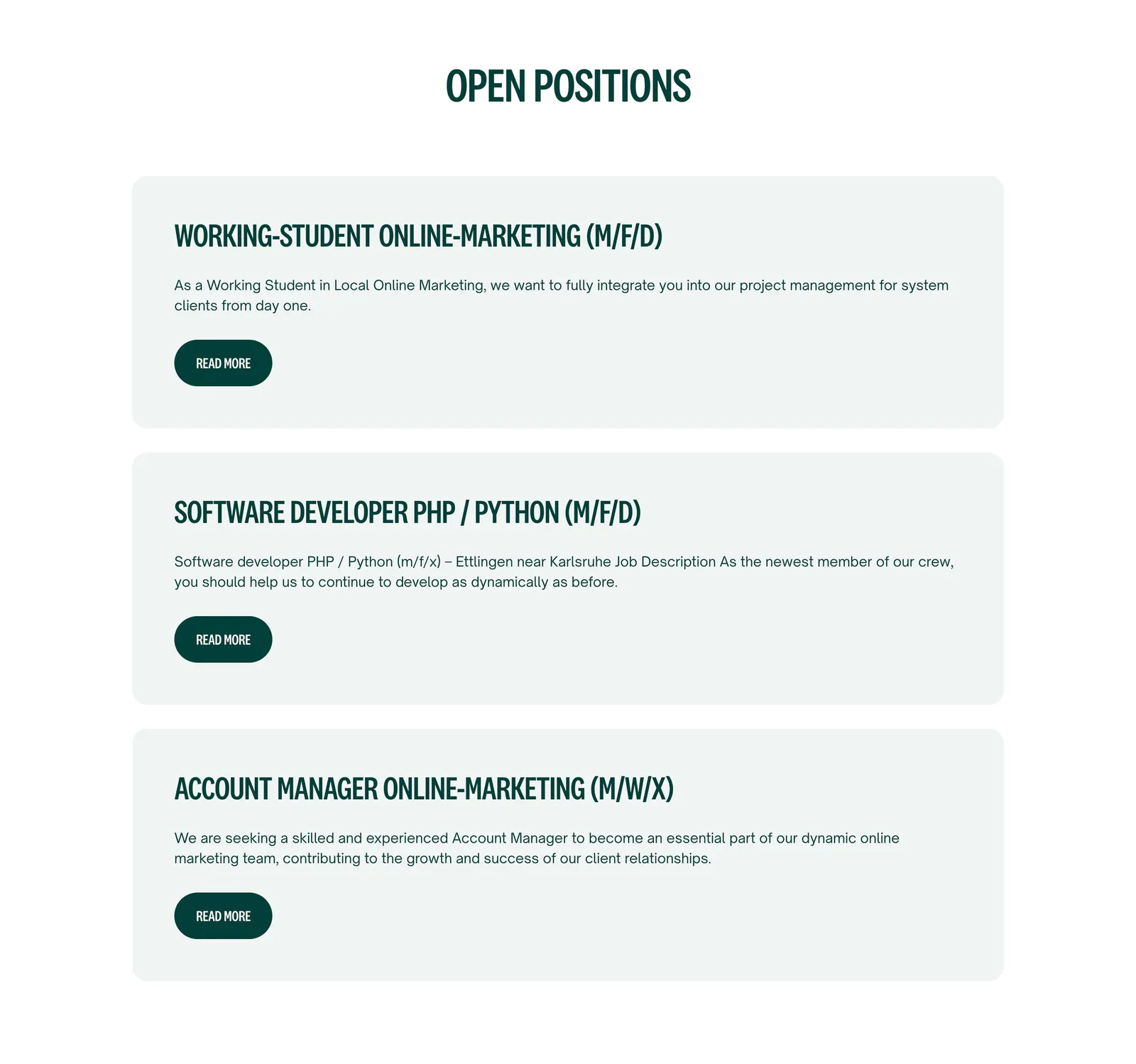
  185. Semrush features section: centered AI Visibility Index heading and button on dark above a white bar-chart table of brand mentions
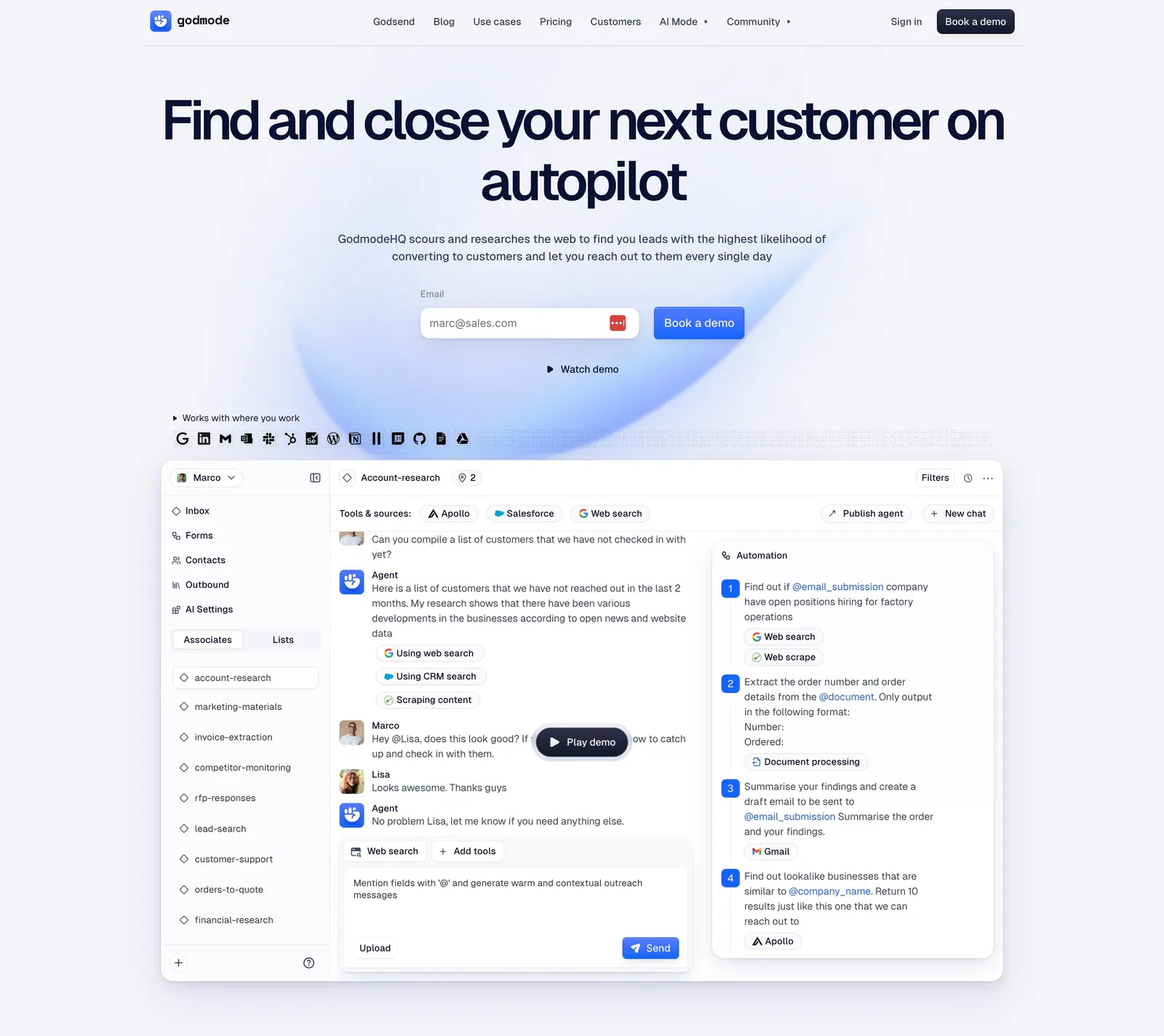
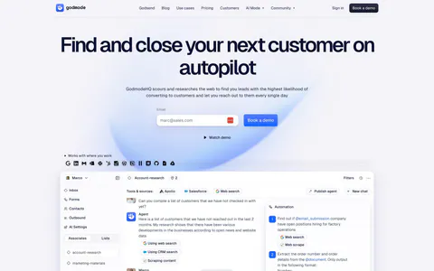
  186. Godmode hero section: centered headline with email field and demo button above a large AI agent workspace screenshot
  187. Jasper features section: headline and copy row above an accordion list beside an editor screenshot on a dotted lavender panel
  188. Clay testimonials section: two colored customer story cards with photos above a large video thumbnail with play button, cut off at the right
  189. Coframe call-to-action section: serif headline card beside a phone app screenshot on a bright green background, branded as Origin
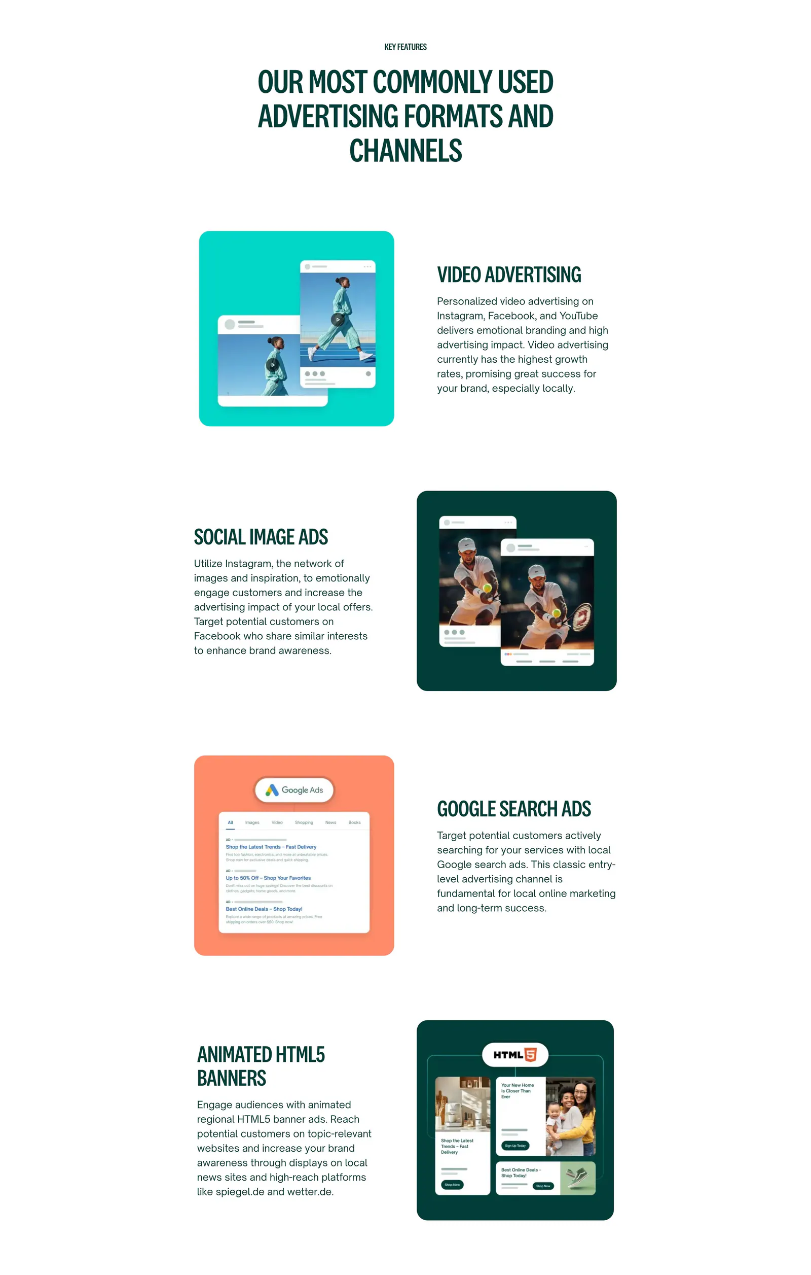
  190. Localyzer careers section: centered heading above three stacked job cards with read-more buttons on a white background
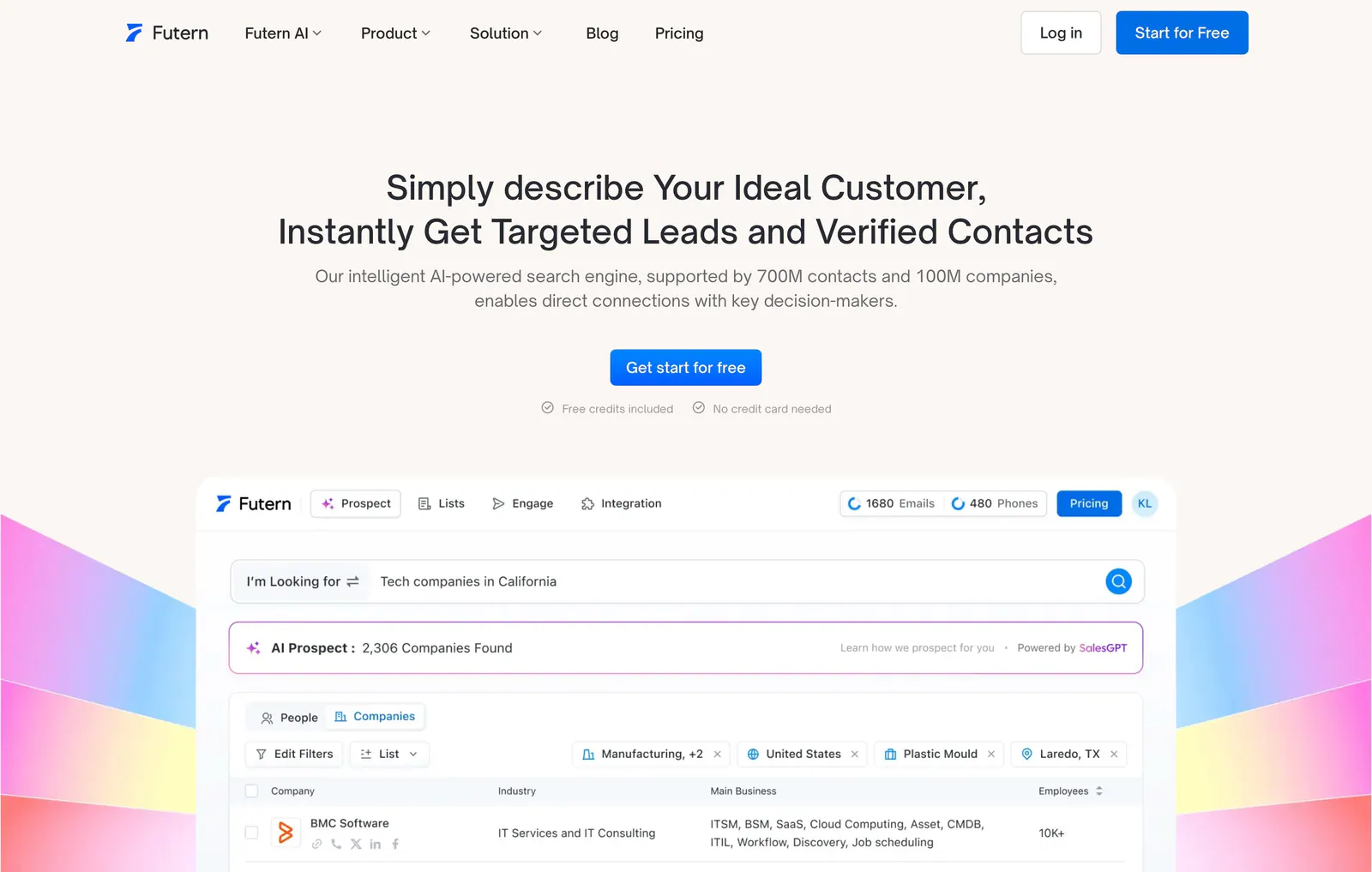
  191. Futern hero section: centered headline and CTA above a lead-search product UI framed by rainbow gradient shapes on warm off-white
    Futern Hero
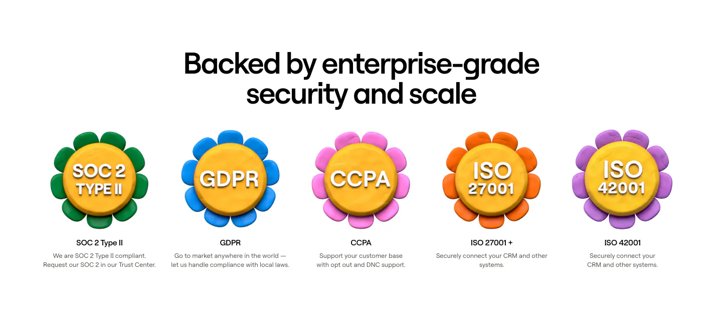
  192. Clay security section: centered heading above a row of five 3D clay flower badges for SOC 2, GDPR, CCPA and ISO certifications
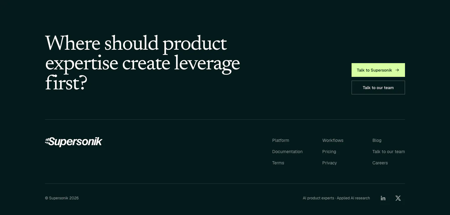
  193. Supersonik footer section: large serif question with two CTA buttons above a wordmark, three link columns and copyright on dark teal
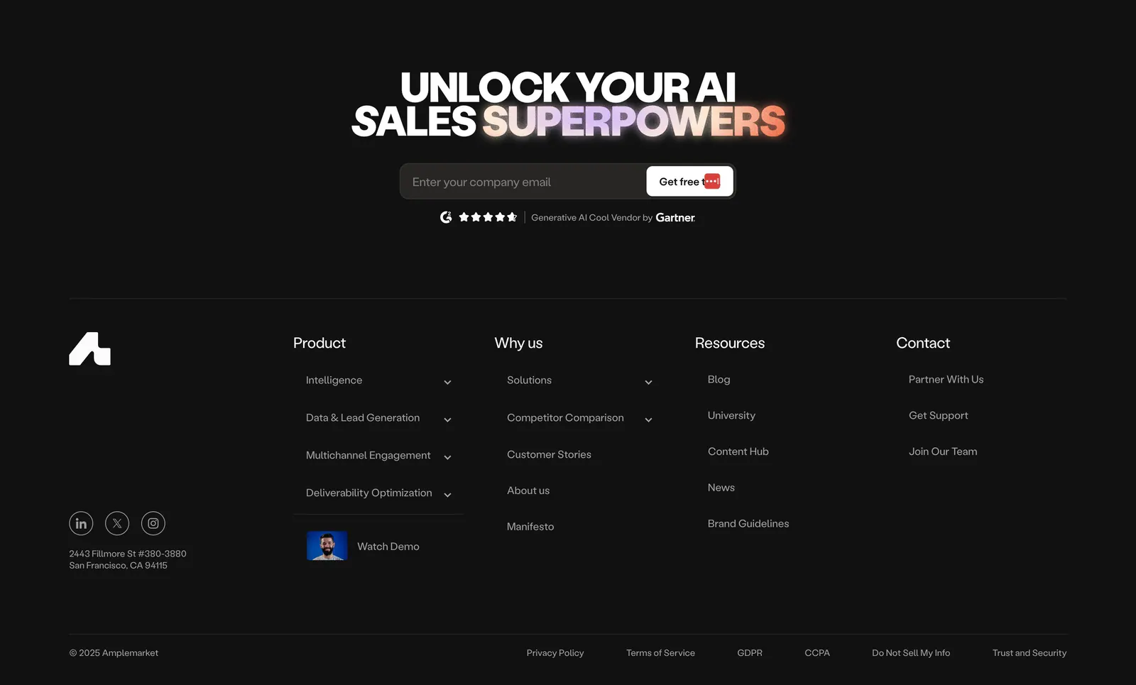
  194. Amplemarket footer section: dark centered headline with gradient text and email field above link columns, socials and legal row
  195. Seamless.AI features section: two rows with gradient panels showing contact UI cards on the left and headlines on the right
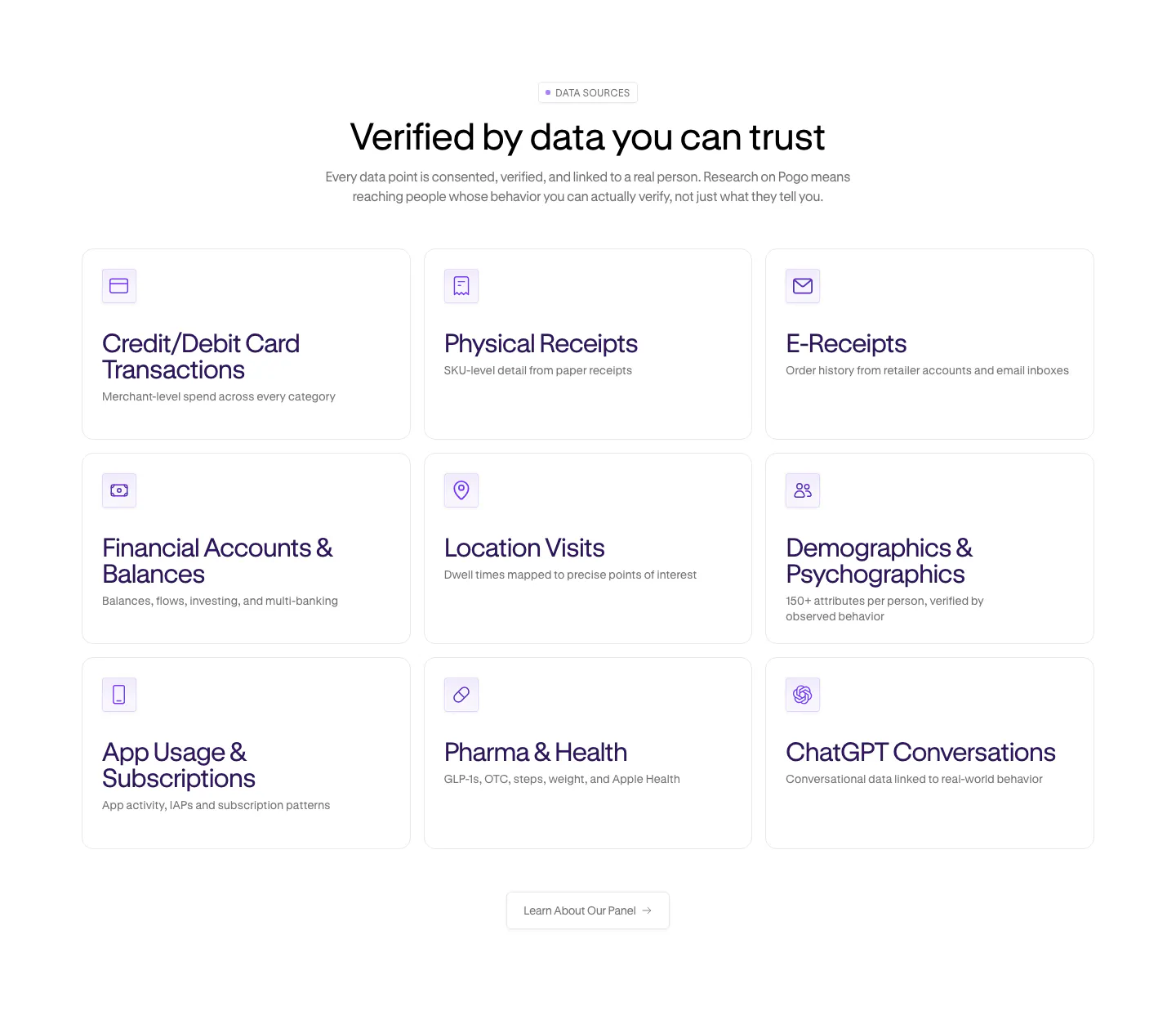
  196. Pogo features section: centered headline over a 3x3 grid of data source cards with purple line icons on white
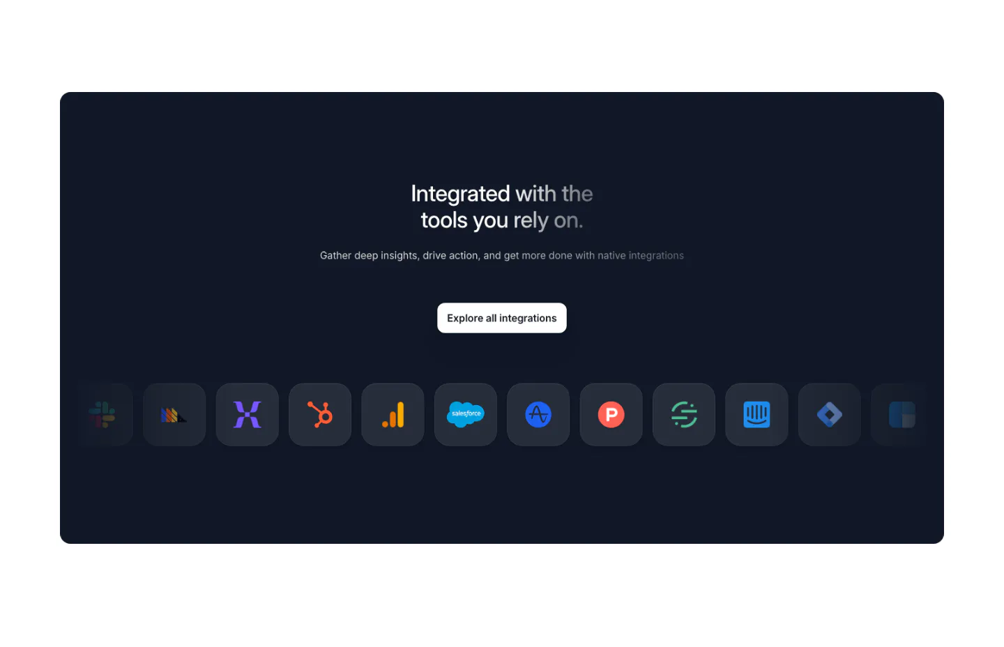
  197. Arcade integrations section: dark navy panel with centered headline, Explore button and a row of app icon tiles fading at the edges
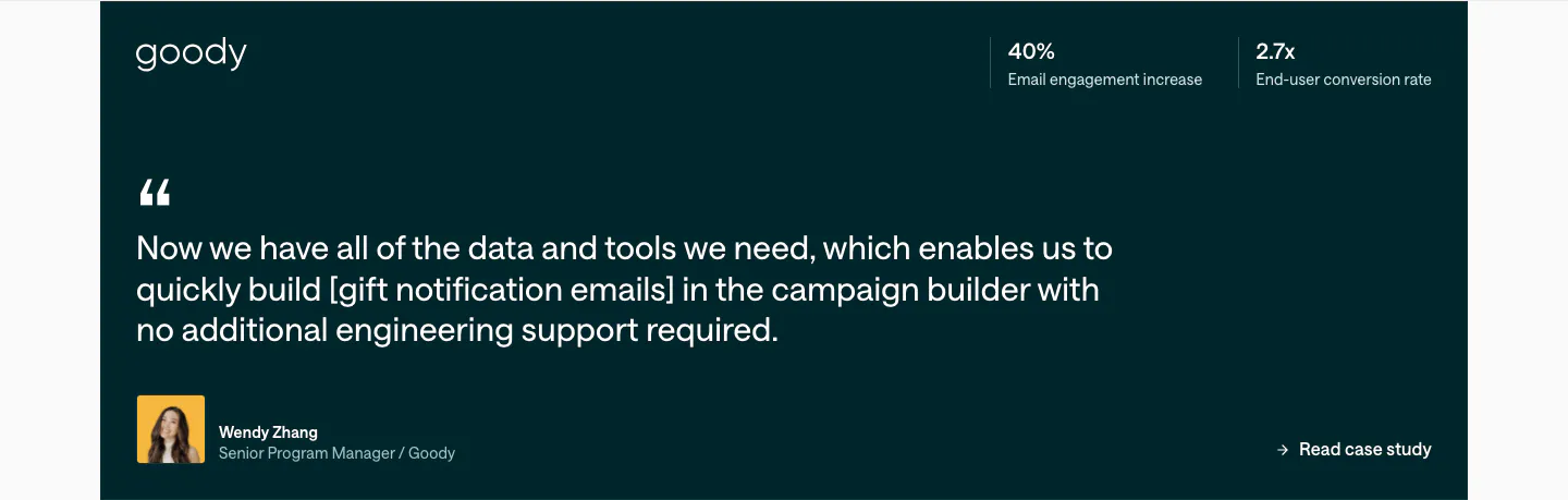
  198. Customer.io testimonials section: dark teal quote card with Goody logo, two stats at top right, large quote and author avatar
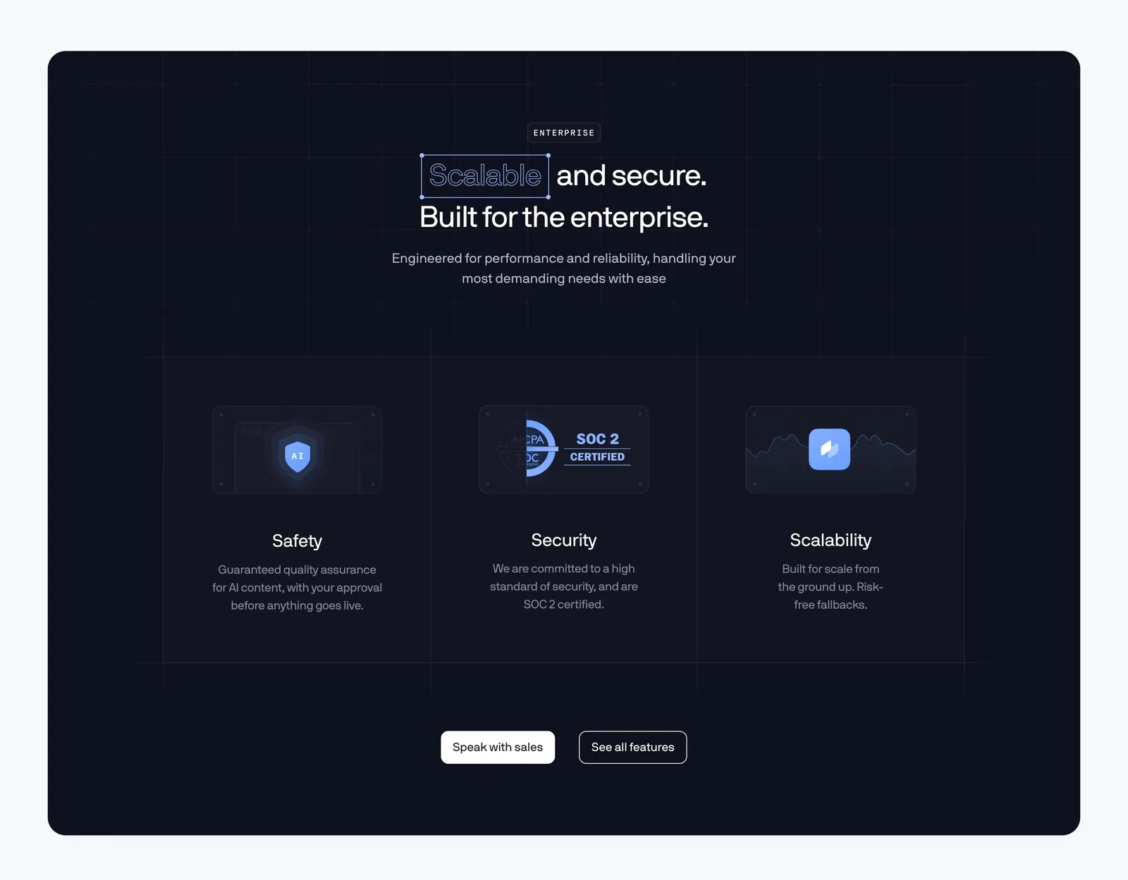
  199. Coframe features section: centered headline above three enterprise columns for safety, SOC 2 security and scalability on a dark navy panel
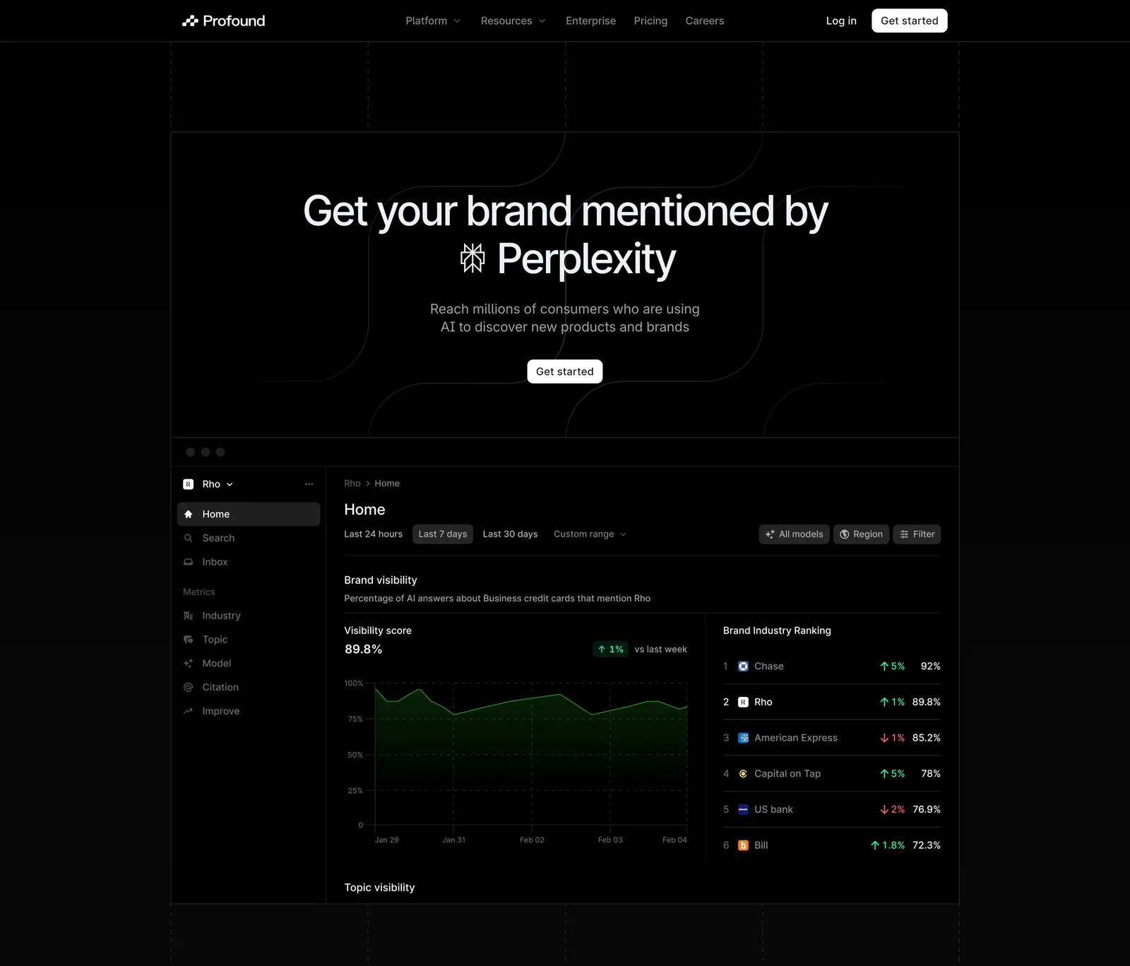
  200. Profound hero section: centered headline with Perplexity logo above a dark brand visibility dashboard screenshot on black
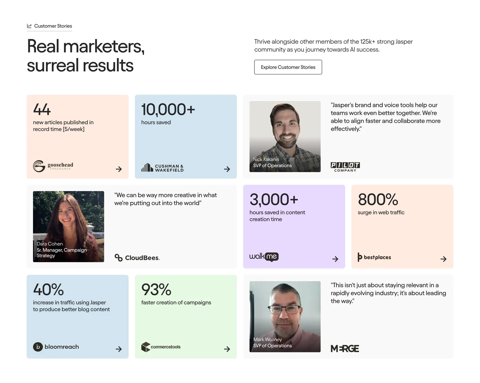
  201. Jasper testimonials section: headline and button row above a bento grid of pastel metric tiles and quote cards with portraits
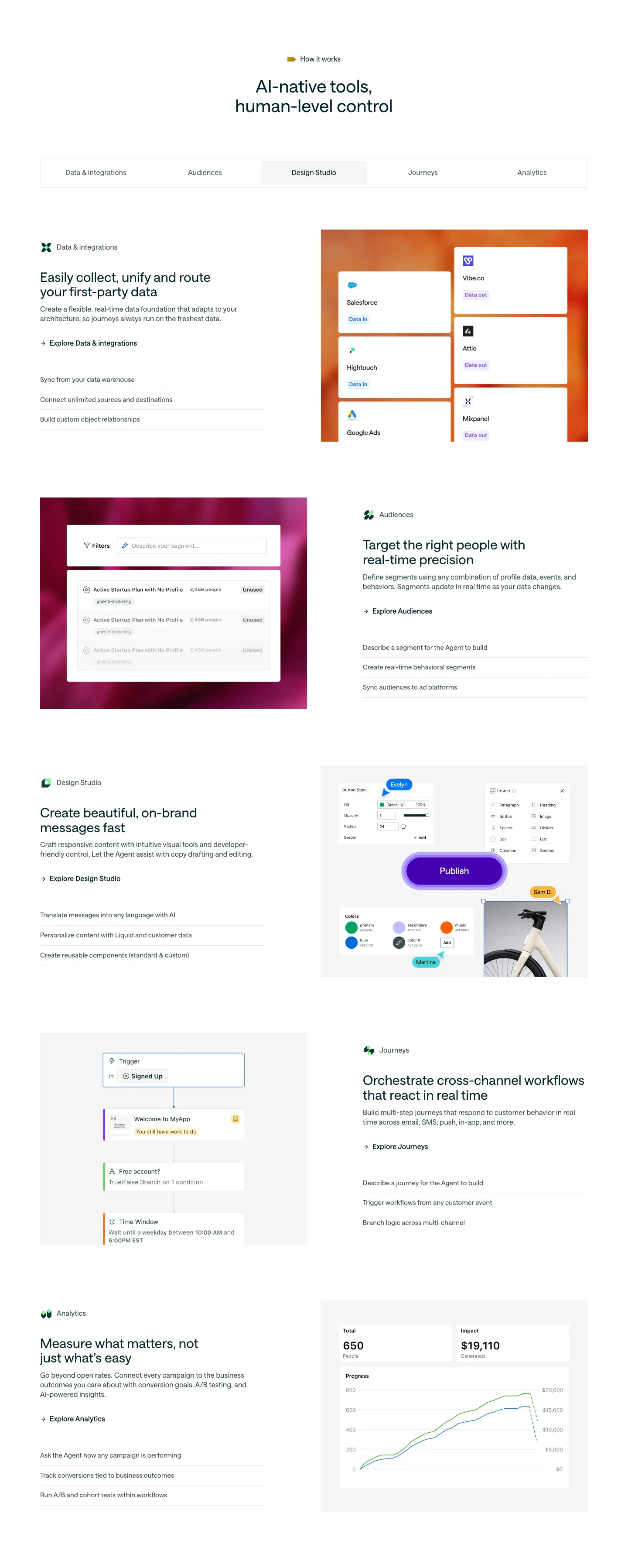
  202. Customer.io features section: centered headline, five-item tab bar and alternating rows of copy beside product UI on gradient panels
  203. Pogo logo cloud section: grayscale customer logos in rounded cards along a single row cut off at the edges on white
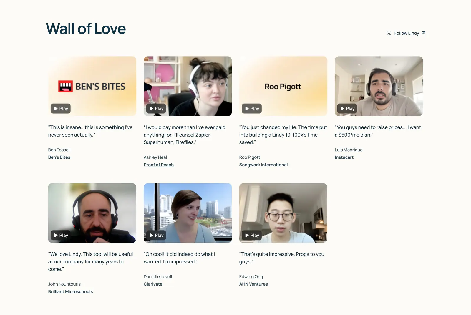
  204. Lindy testimonials section: Wall of Love heading above a four-column grid of video testimonial thumbnails with play buttons and quotes on cream
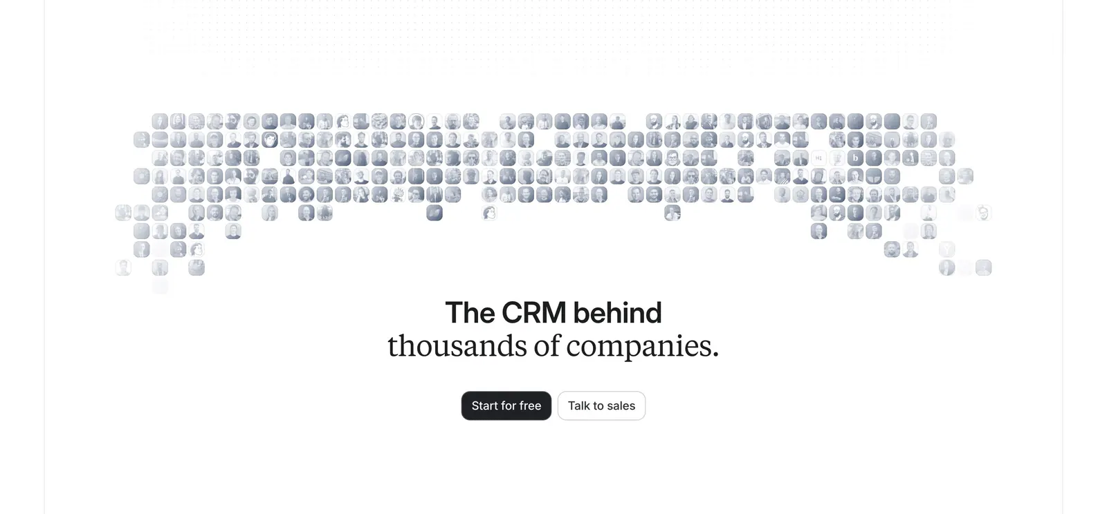
  205. Attio call-to-action section: centered headline and two buttons below a grayscale mosaic of customer logo tiles on white
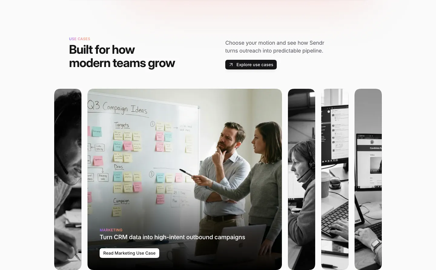
  206. Sendr use cases section: headline and Explore button above expanding photo cards, the Marketing card open showing a whiteboard
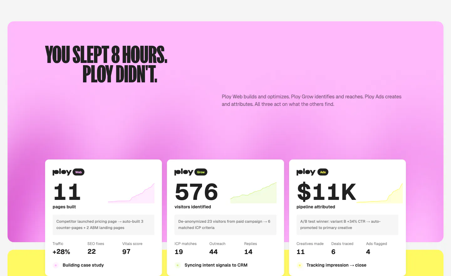
  207. Ploy features section: condensed headline on a pink gradient panel above three white metric cards with sparklines for Web, Grow and Ads
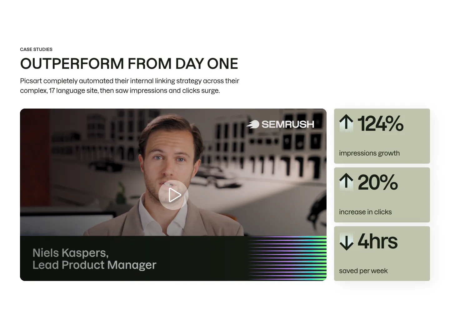
  208. Semrush testimonials section: case study video of a product manager with a play button beside three sage metric cards
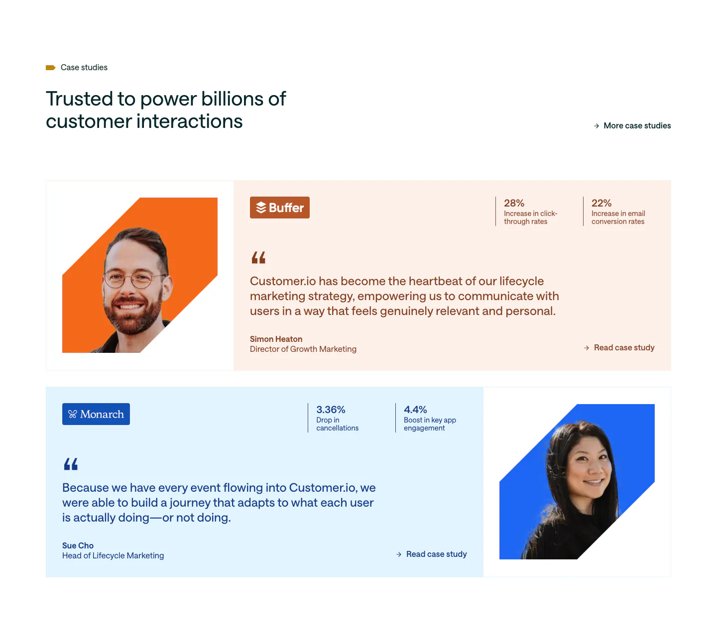
  209. Customer.io testimonials section: two case study rows on peach and pale blue cards with cut-out portraits, quotes and stat pairs
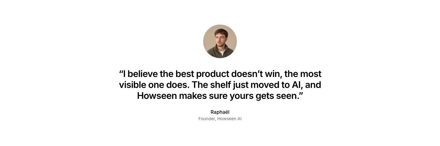
  210. Howseen AI about & mission section: centered founder quote below a circular portrait on a plain white background
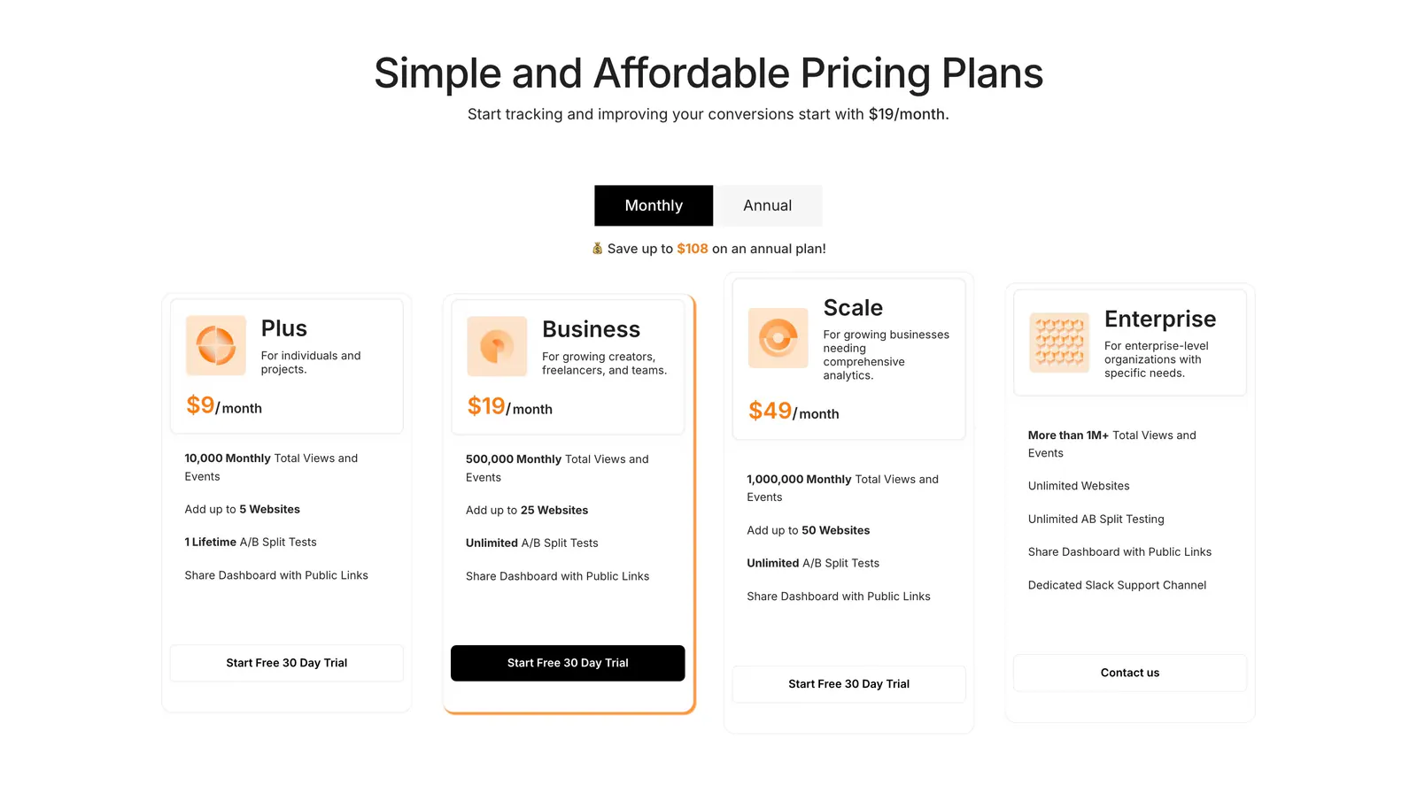
  211. Humblytics pricing section: monthly/annual toggle above four plan cards with orange prices and trial buttons on white
  212. Clay testimonials section: centered headline above three stacked case-study cards with 3D clay renders, one with a play button
  213. Godmode logo cloud section: centered heading above a masonry grid of white logo tiles in mixed sizes with a case studies button
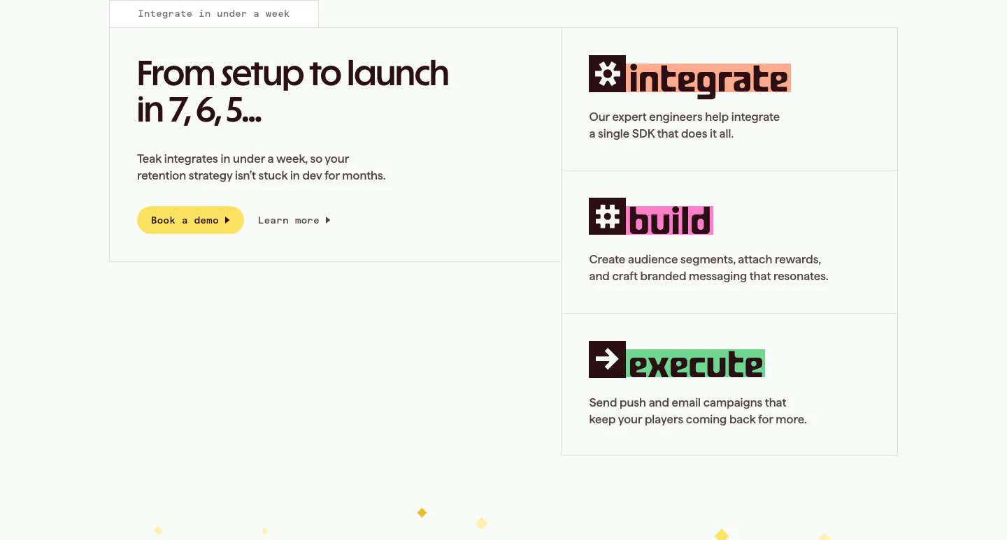
  214. Teak how it works section: headline and demo button in a bordered box at left, three stacked step cards for integrate, build, execute
  215. Arcade features section: centered headline above a tabbed video player window with a play button and soft blue glow
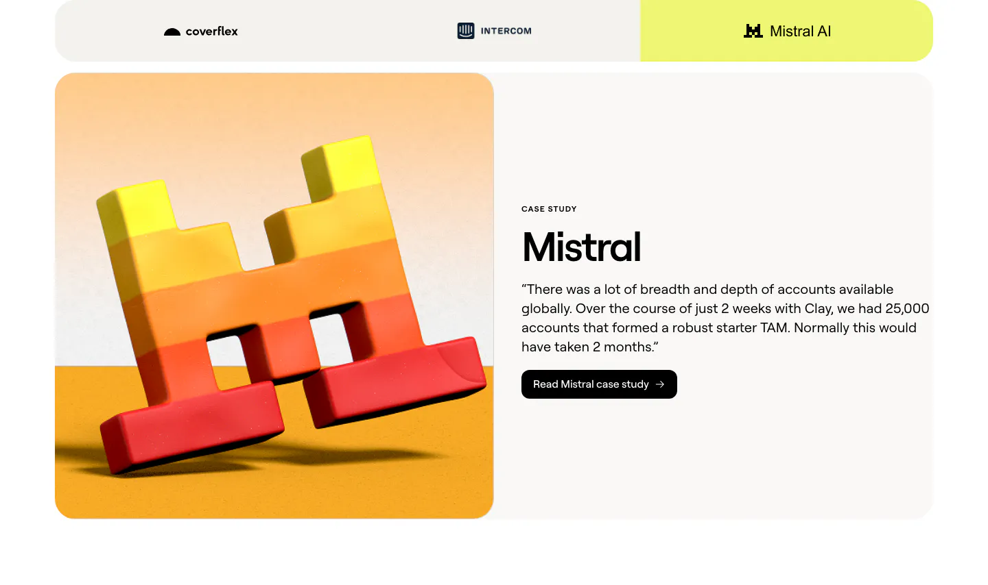
  216. Clay testimonials section: customer tab bar above a split case study card with a 3D Mistral logo render and a quote with case study button
  217. Customer.io features section: headline above a row of five tall photo panels with a dark teal overlay, each labeled with a capability
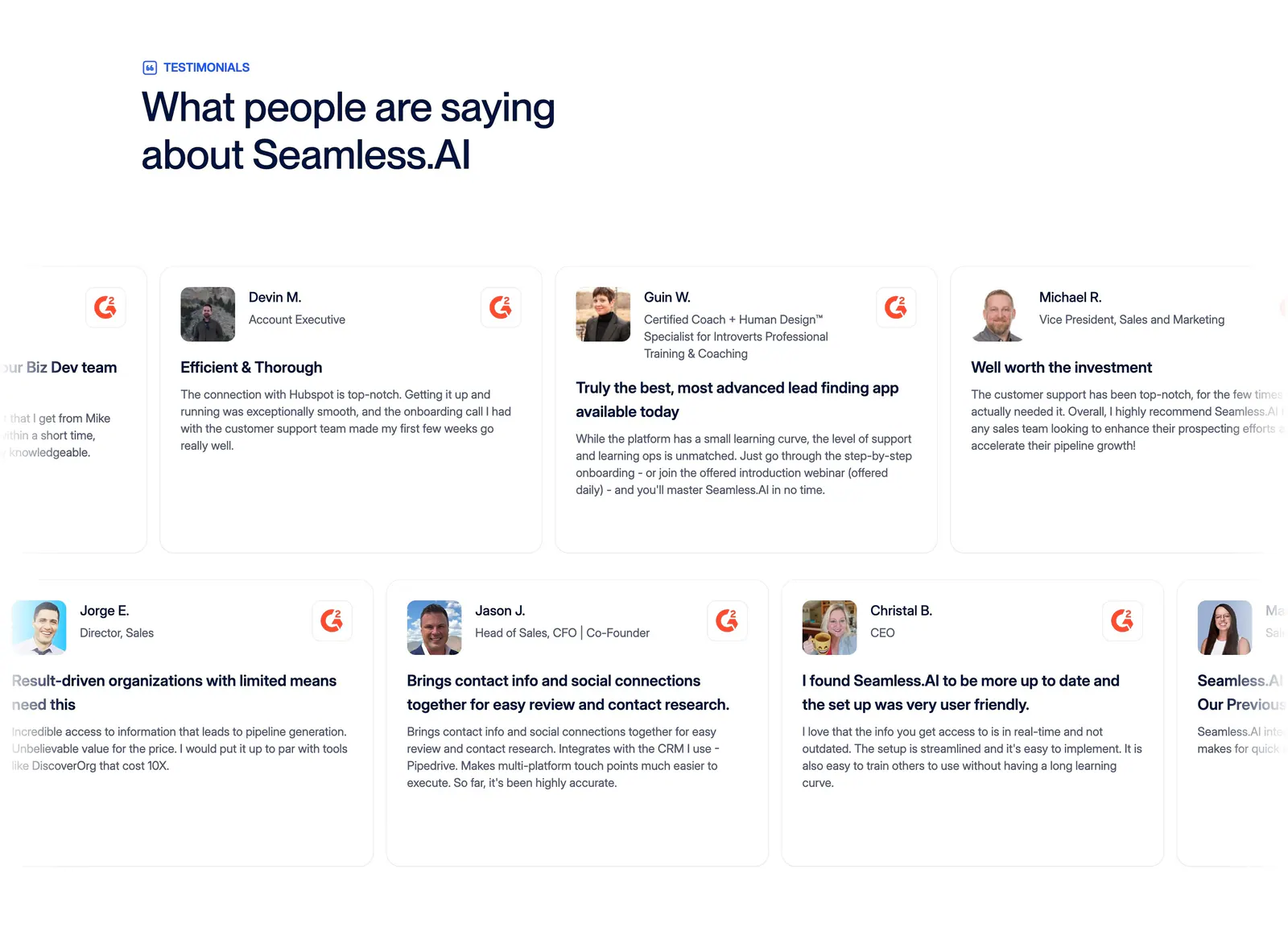
  218. Seamless.AI testimonials section: left headline above two rows of G2 review cards with headshots, cut off at both edges
  219. Arcade features section: two-line headline and copy above a lime video panel with play button and a Claude/Gemini/Arcade toggle
  220. Clay features section: centered heading above three lavender cards with data source, natural-language search and CRM sync UI mockups
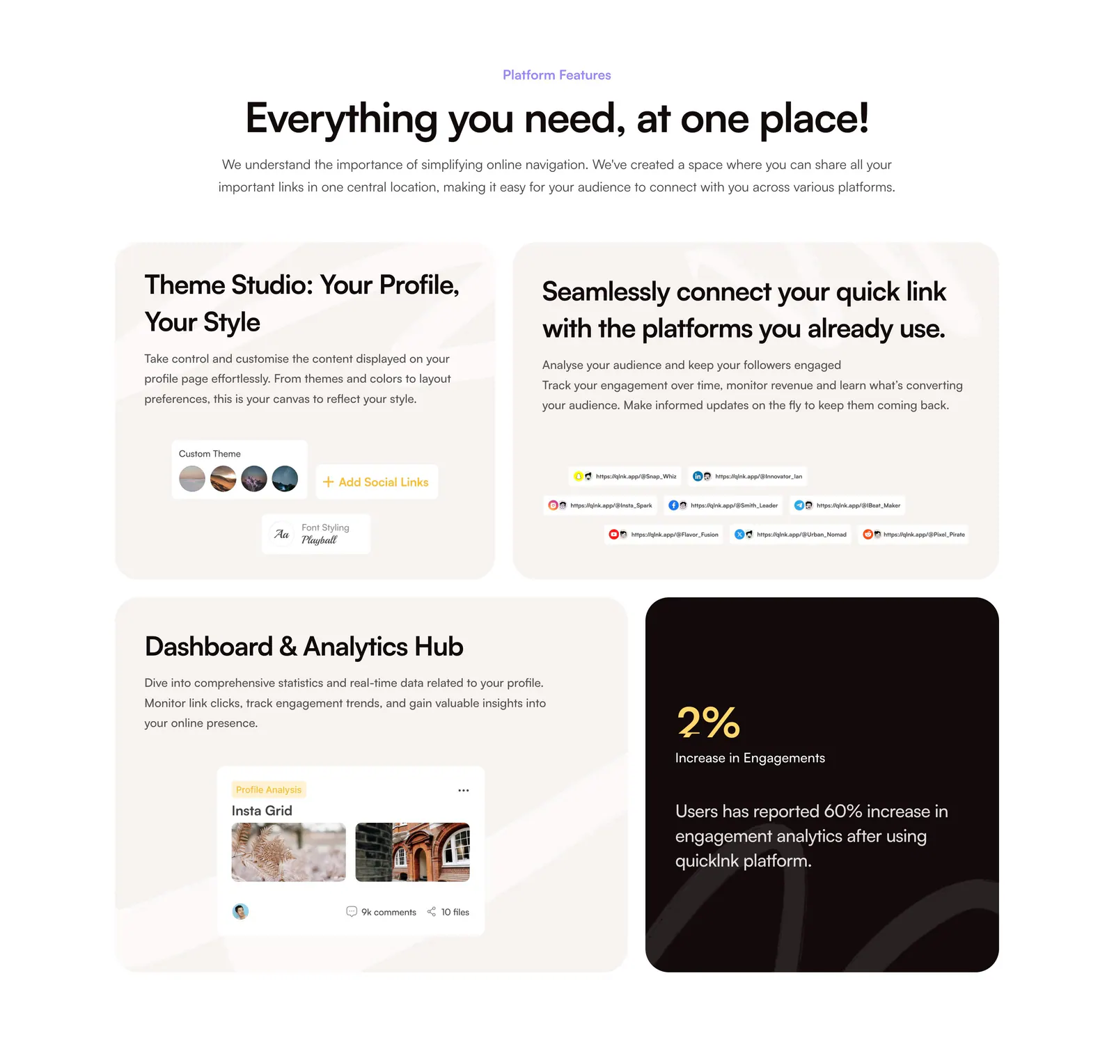
  221. QuickLnk features section: centered headline above a four-tile bento of beige cards with UI snippets and one dark stat card
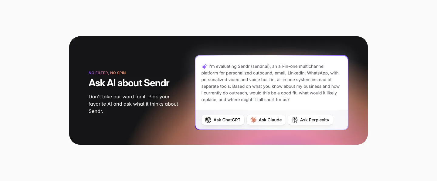
  222. Sendr call to action section: dark rounded card with warm glow, headline left, prefilled AI prompt with Ask ChatGPT, Claude, Perplexity buttons
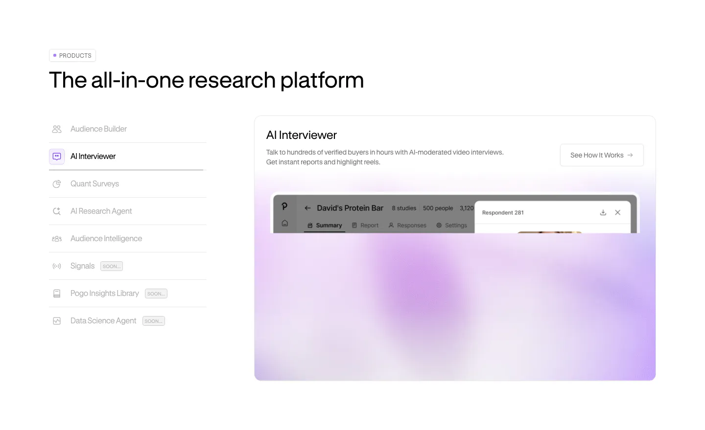
  223. Pogo features section: vertical product tab list on the left beside a panel with a blurred lavender product screenshot
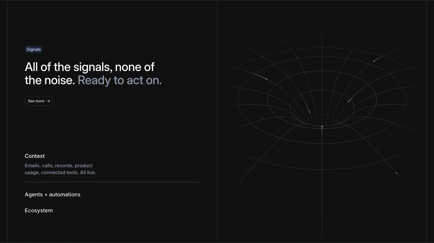
  224. Attio features section: headline with See more button and an expandable list at left, white wireframe funnel line art at right, dark
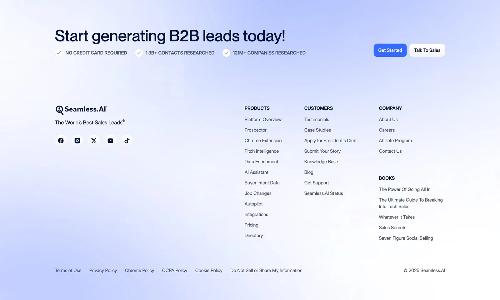
  225. Seamless.AI footer section: CTA headline with buttons above logo, social icons and link columns on a soft blue gradient background
  226. Customer.io logo cloud section: two rows of customer logos in bordered cells divided by a trusted-by-9,000+ brands caption
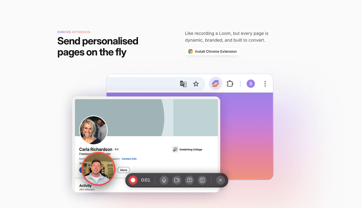
  227. Sendr features section: Chrome Extension headline and install button above a LinkedIn profile mockup with a video recording toolbar
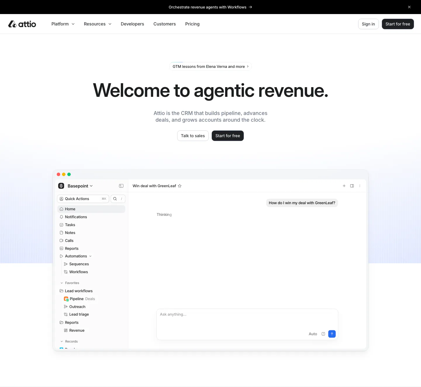
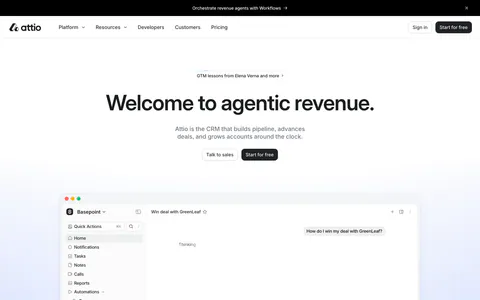
  228. Attio hero section: announcement bar and nav over a centered headline with two buttons, above an app window with sidebar and AI chat
  229. Godmode features section: three zig-zag rows pairing agent chat, automation steps and outreach message UI mockups with short copy
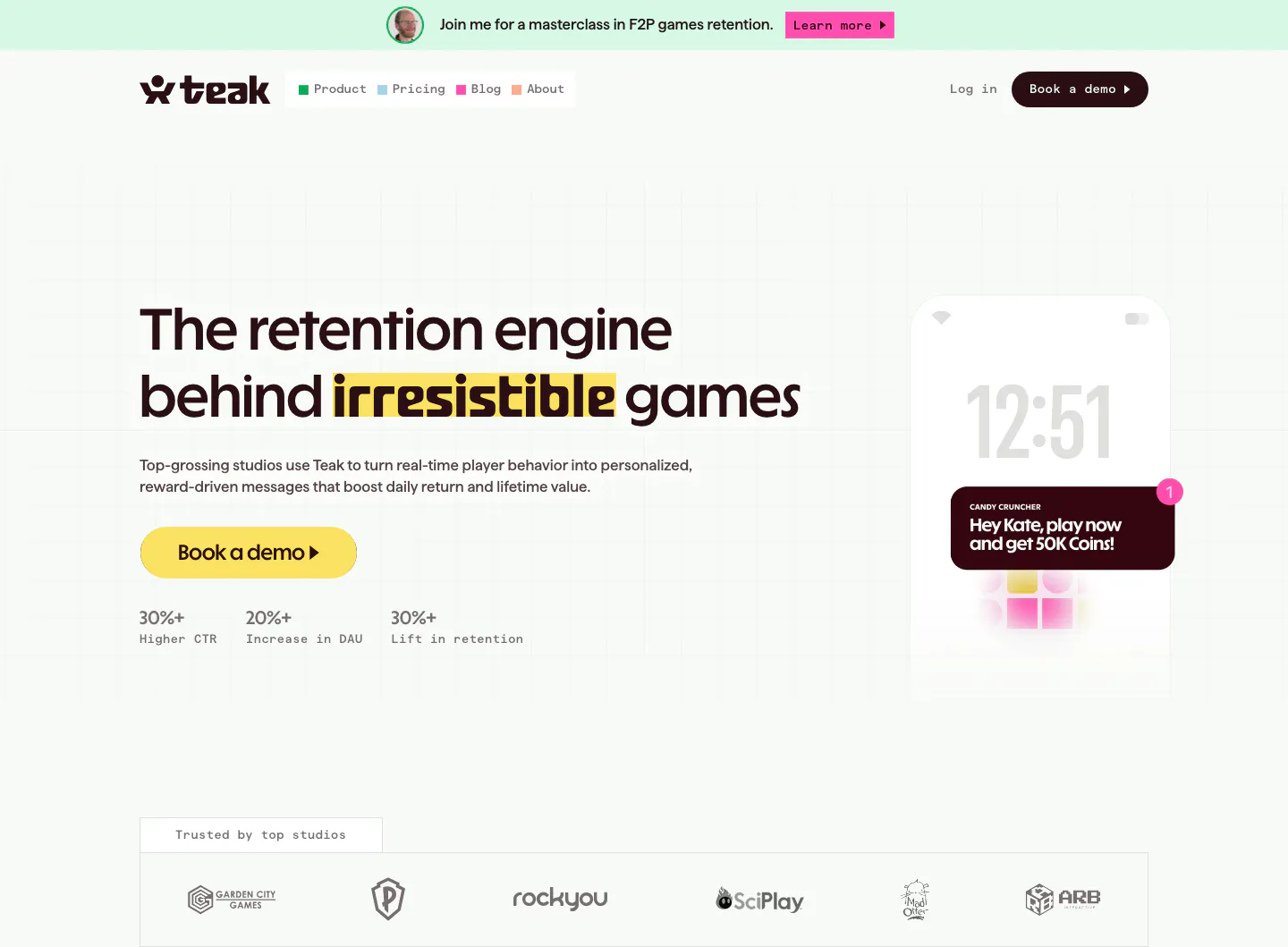
  230. Teak hero section: left-aligned headline with yellow CTA and stats, phone push notification mockup at right, studio logo row below
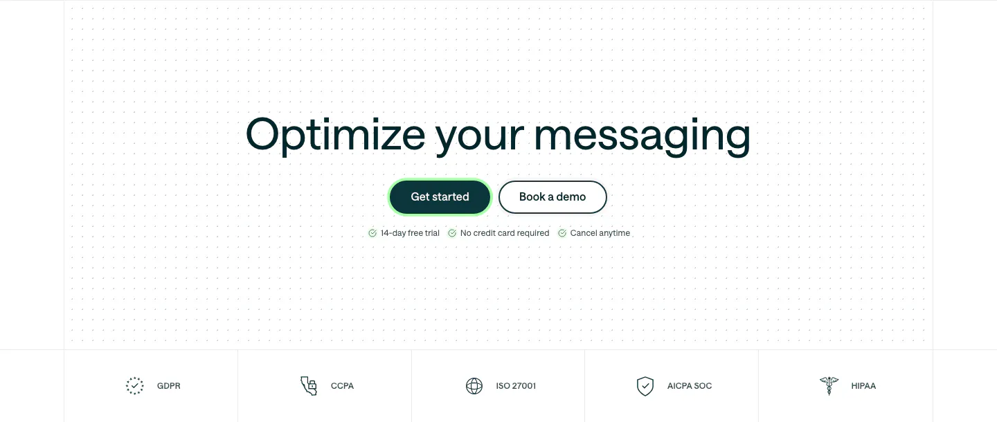
  231. Customer.io call to action section: centered headline and two buttons on a dot grid, above a row of compliance badges
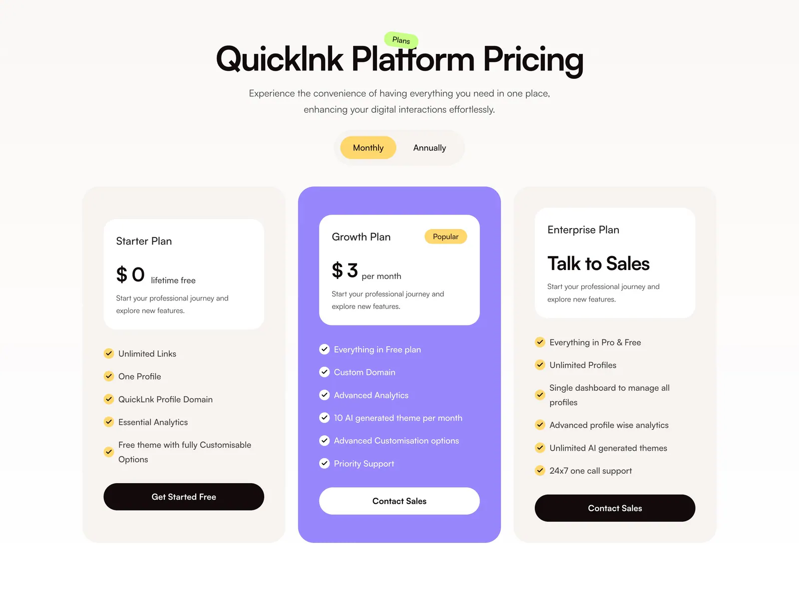
  232. QuickLnk pricing section: centered headline and monthly/annual toggle above three plan cards with a purple highlighted middle tier
  233. Godmode call-to-action section: blue rounded card with headline and button on the left and an AI agent chat screenshot on the right
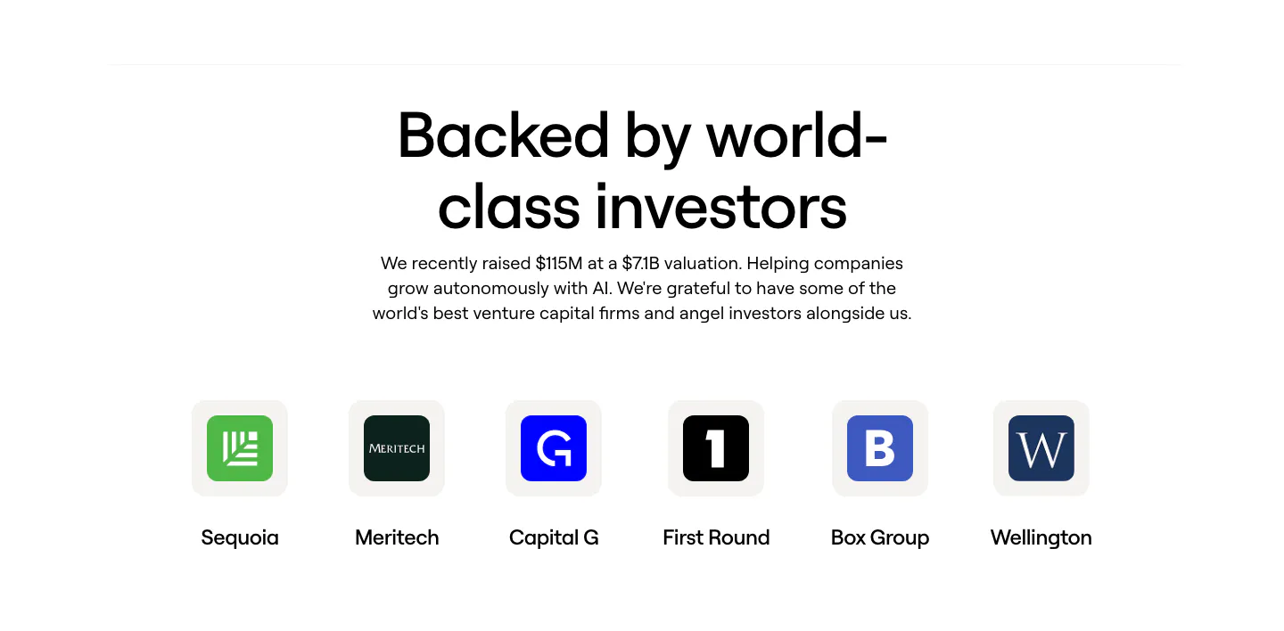
  234. Clay logo cloud section: centered heading and funding note above a row of six investor logo tiles with names on white
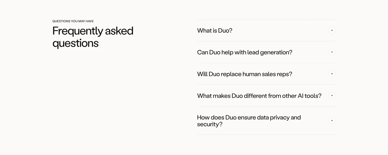
  235. Amplemarket FAQ section: headline on the left and an accordion of five questions with plus icons on the right, on off-white
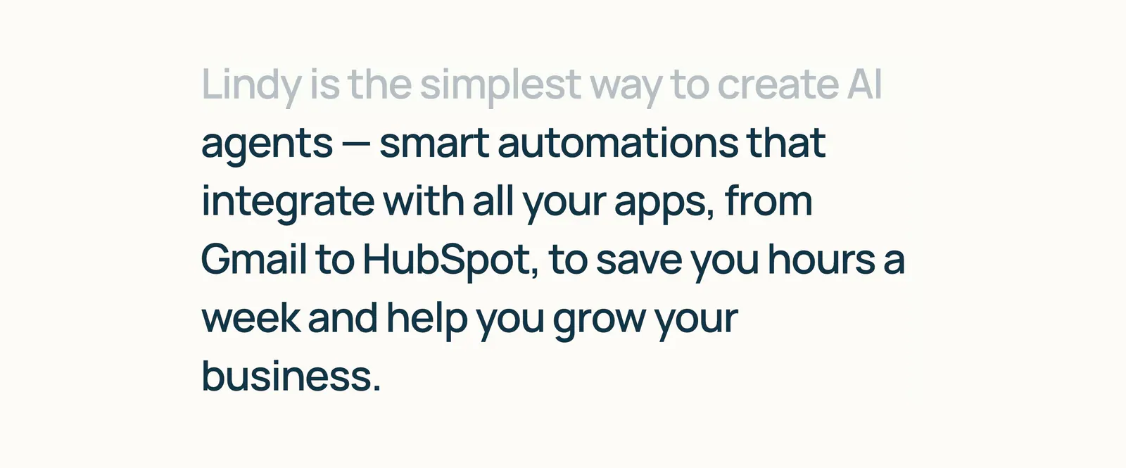
  236. Lindy about & mission section: large left-aligned mission statement with the first line faded to gray, on a warm off-white background
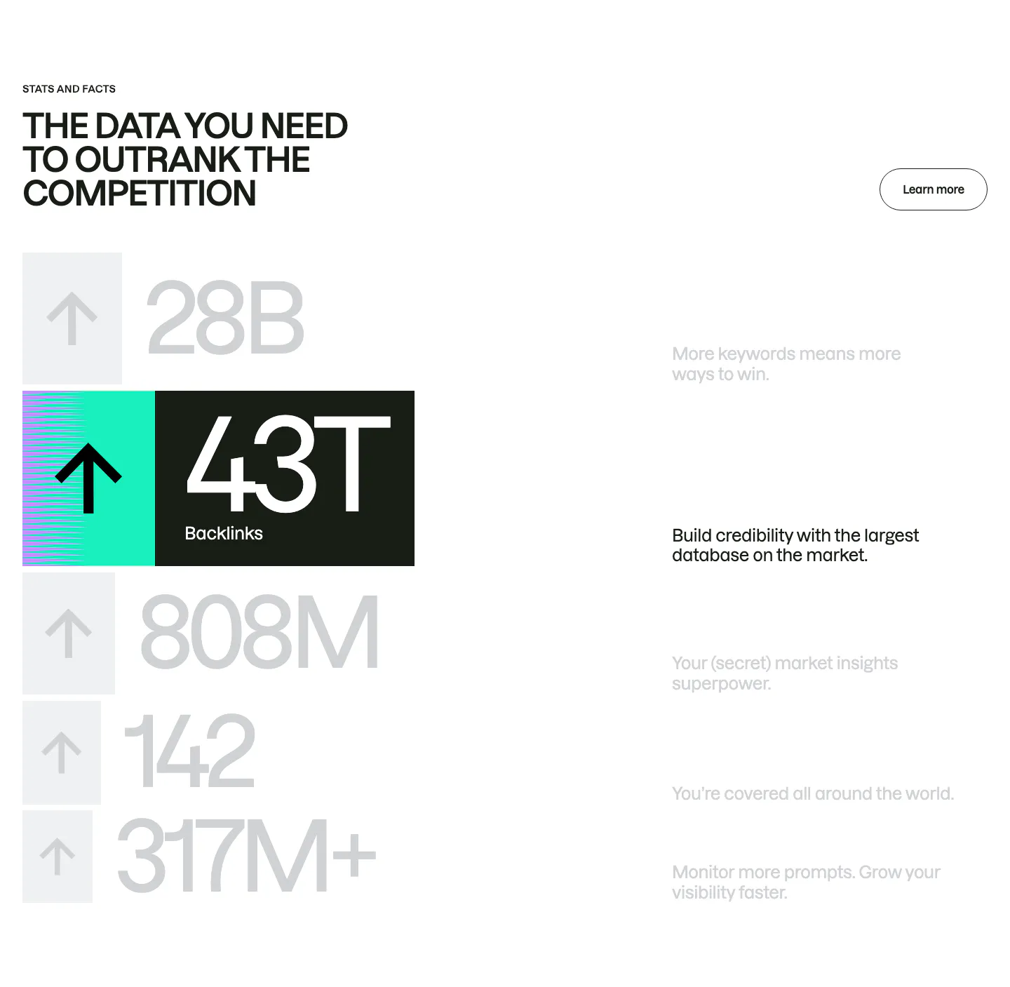
  237. Semrush stats section: uppercase headline above a stacked list of huge gray numbers with arrow tiles, one highlighted 43T backlinks row
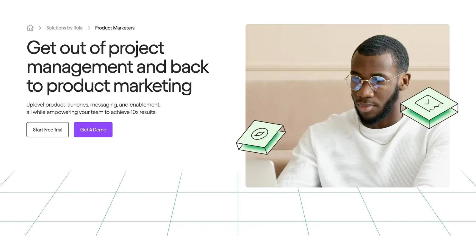
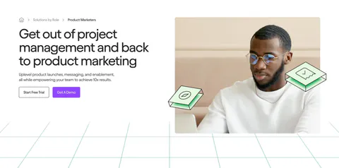
  238. Jasper hero section: breadcrumb, headline and two buttons on the left, photo of a man at a laptop on the right above green grid lines
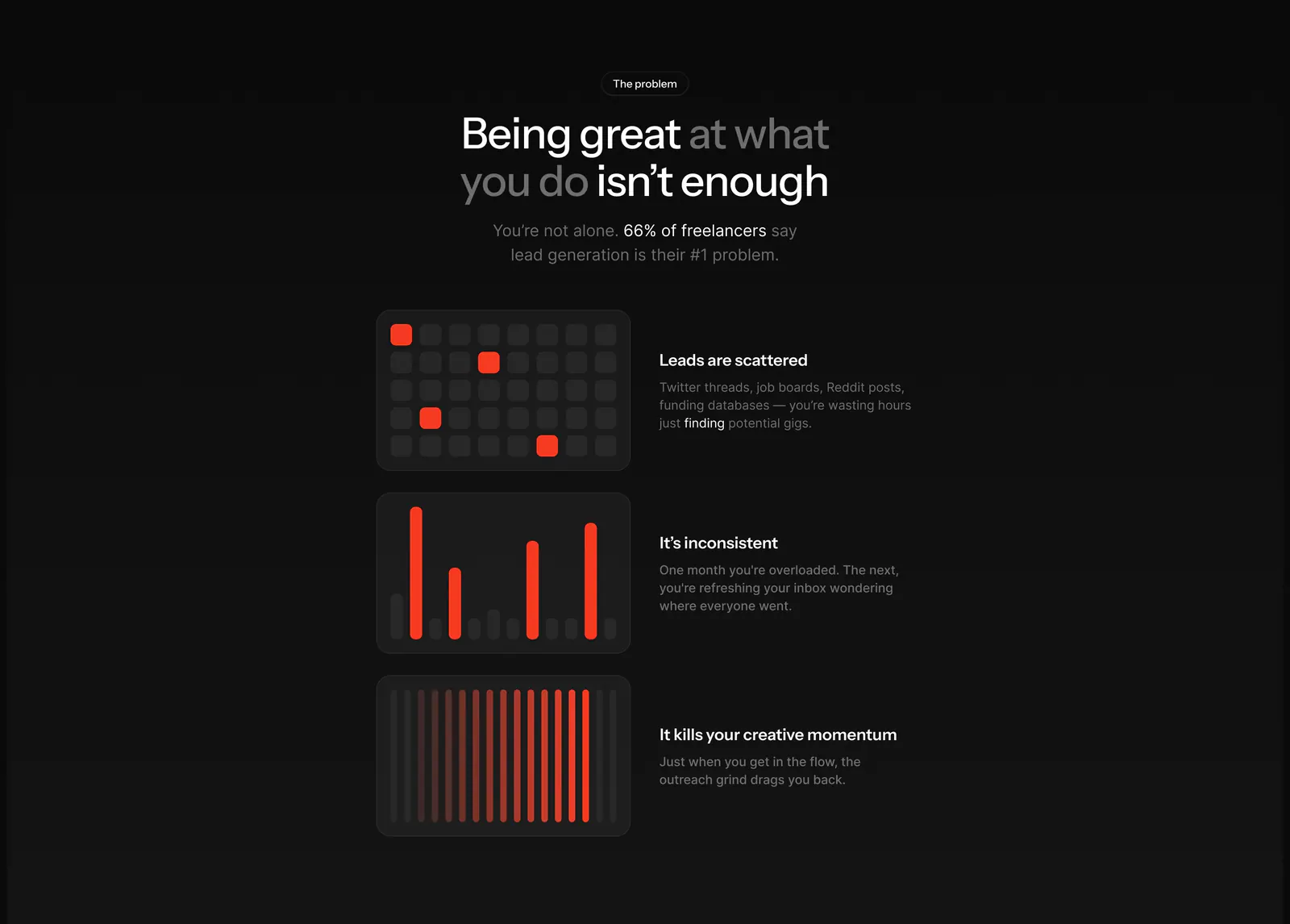
  239. Orbi value proposition section: centered problem headline above three rows pairing red-accent chart tiles with short text on dark gray
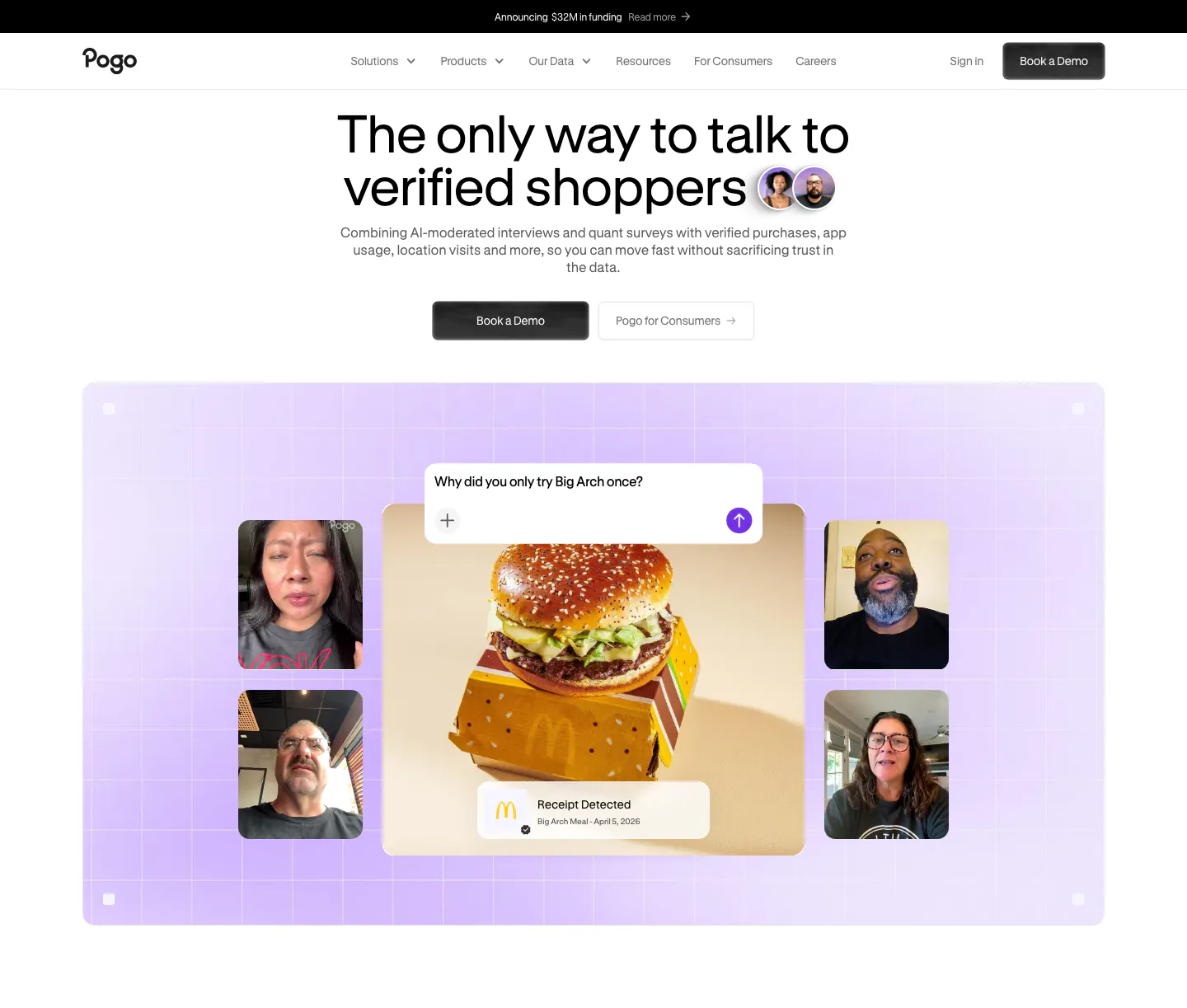
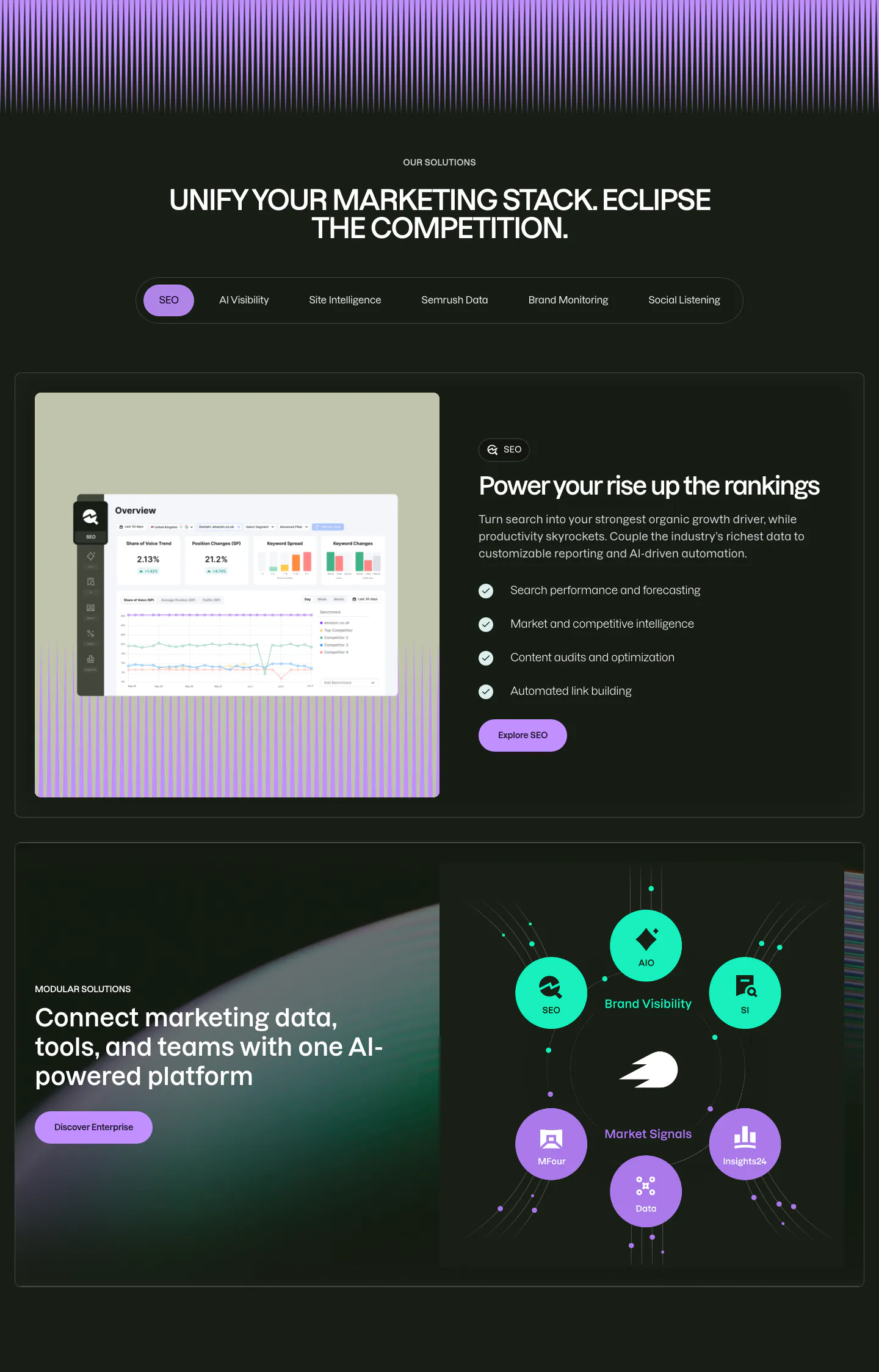
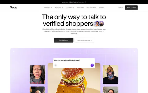
  240. Pogo hero section: centered headline and demo buttons above a lavender grid panel of video interview tiles around a burger photo
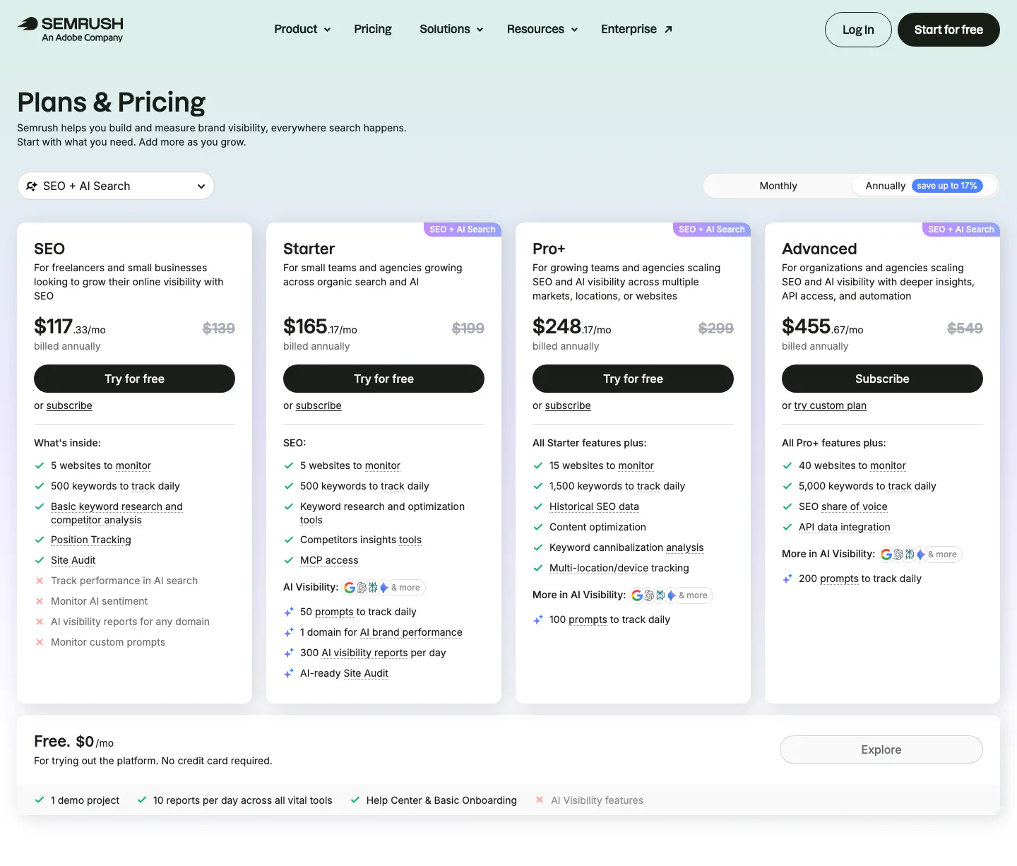
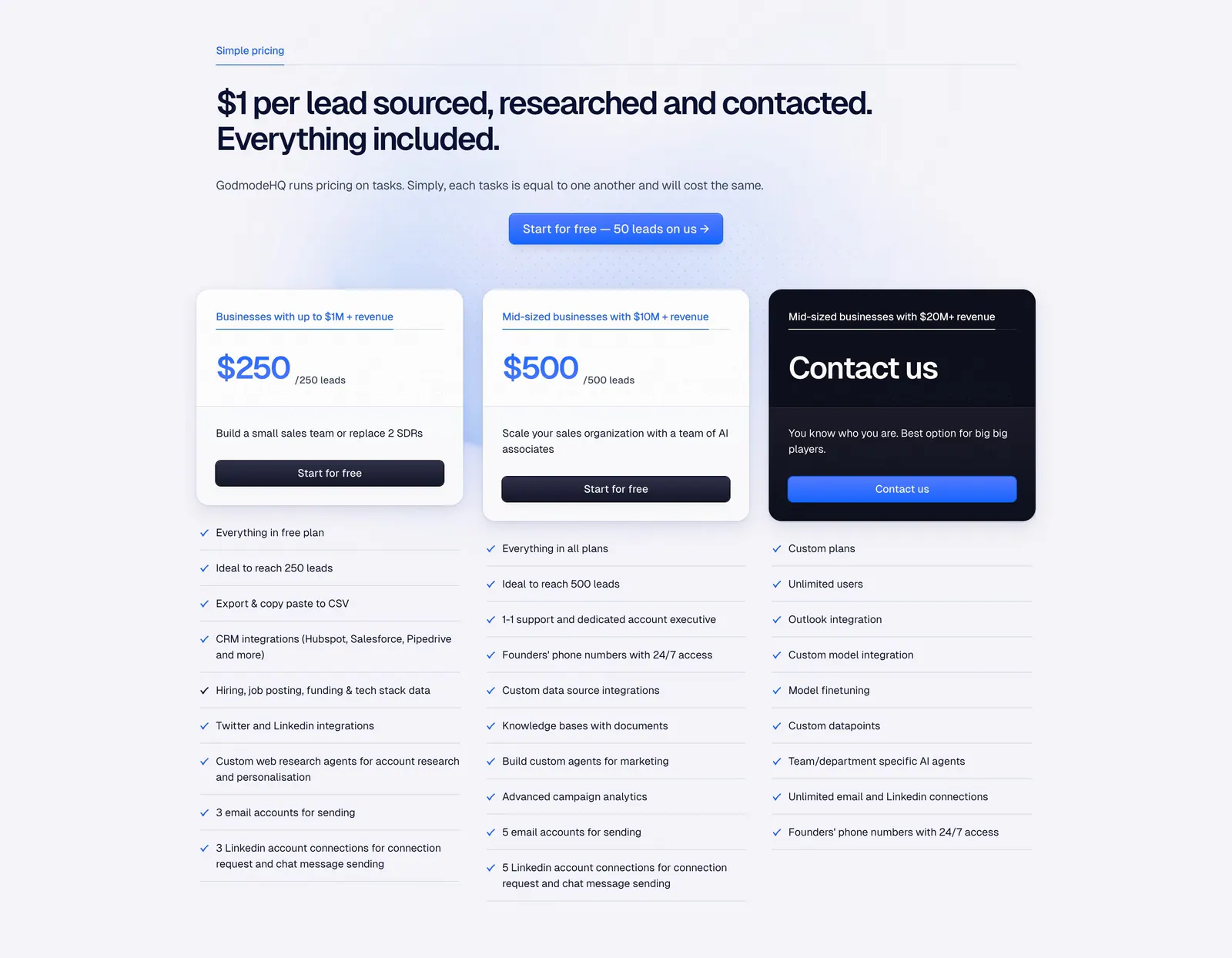
  241. Semrush pricing section: nav, Plans & Pricing title, monthly/annual toggle and four plan cards with checklists above a free plan bar
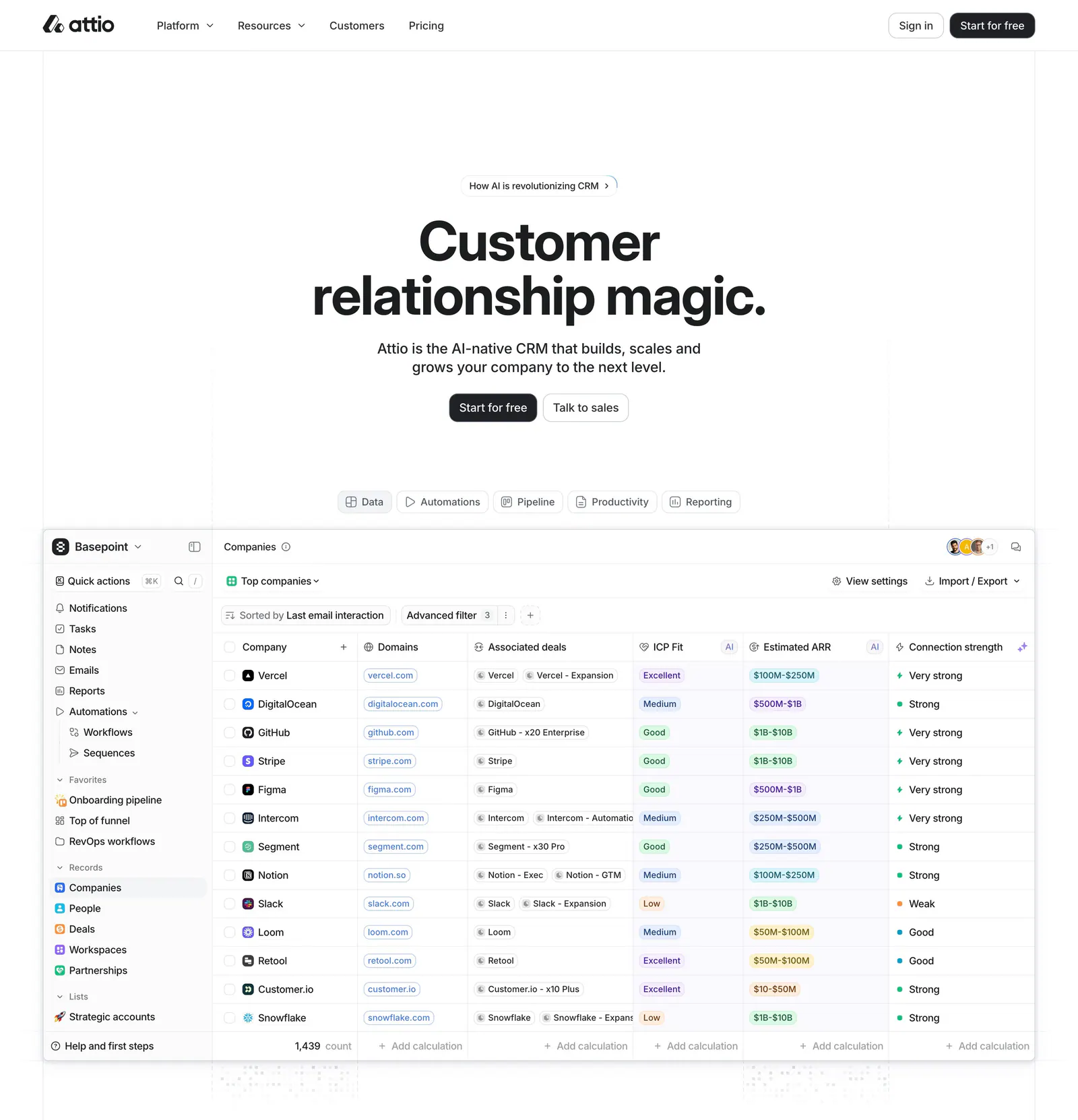
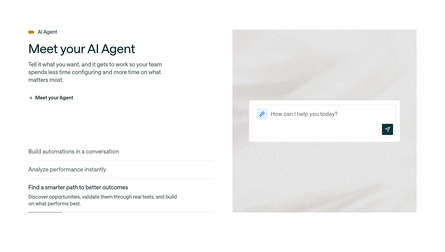
  242. Attio hero section: centered headline, two buttons and a tab bar above a large CRM companies table screenshot on white
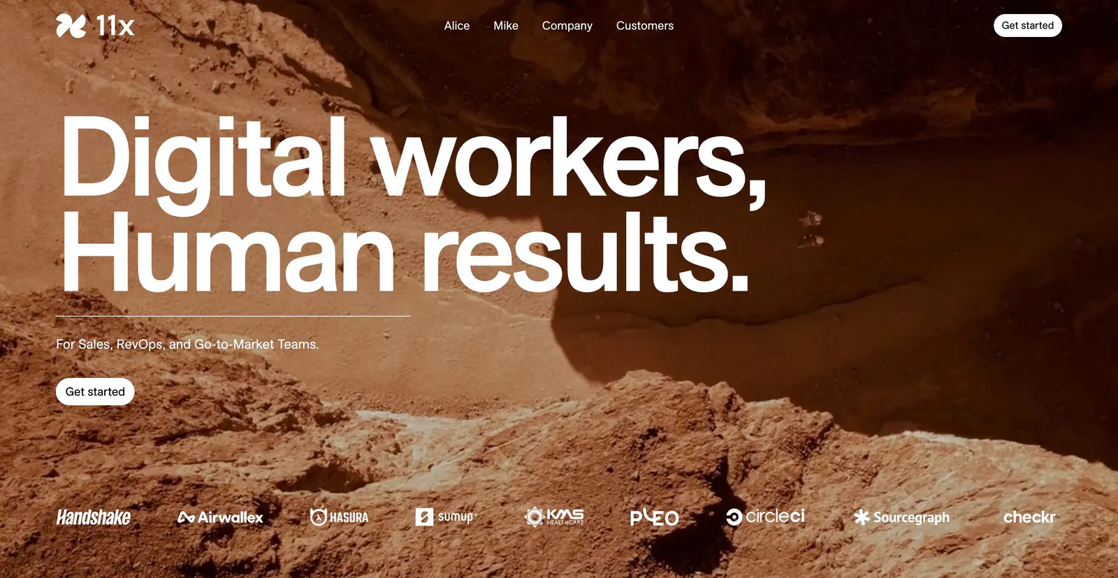
  243. 11x hero section: oversized white headline over a full-bleed rocky desert photo with a customer logo strip along the bottom
  244. Arcade testimonials section: centered quote under a G2 five-star rating with a handwritten signature and job title
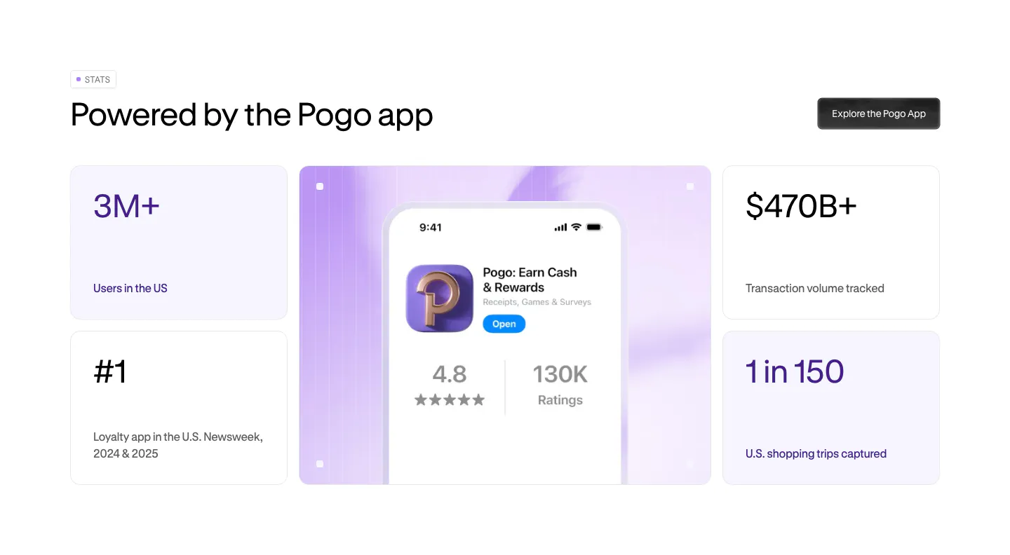
  245. Pogo stats section: bento grid of four metric cards around a lavender panel with a phone showing the Pogo app store listing
  246. Semrush features section: dark tabbed solutions block with a product screenshot beside a checklist, then a product module orbit diagram
  247. Godmode pricing section: left-aligned headline and blue button above three plan cards, one dark, with checklists below each
  248. Customer.io features section: split layout with headline and accordion list beside an AI agent chat input on a soft textured panel
  249. Pogo footer section: dark rounded panel with tagline, compliance badges, five link columns and a large faded Pogo wordmark
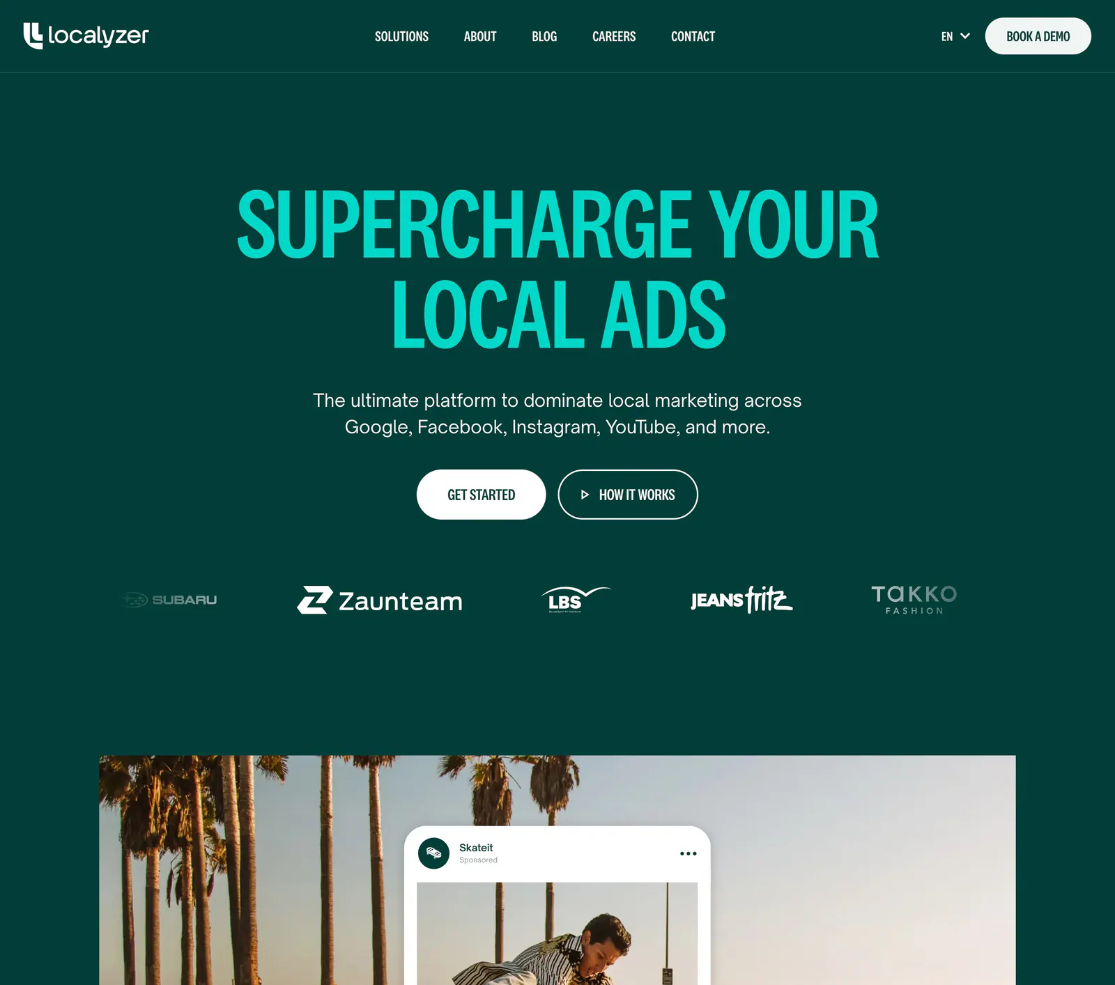
  250. Localyzer hero section: centered teal headline on dark green with two CTAs, a customer logo row and a palm-tree ad photo below
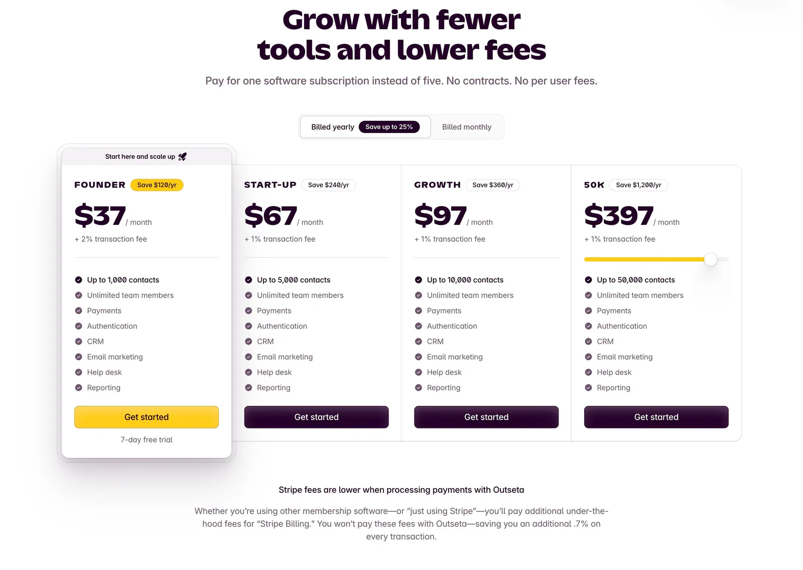
  251. Outseta pricing section: centered headline and billed yearly/monthly toggle above four plan cards with prices and feature checklists
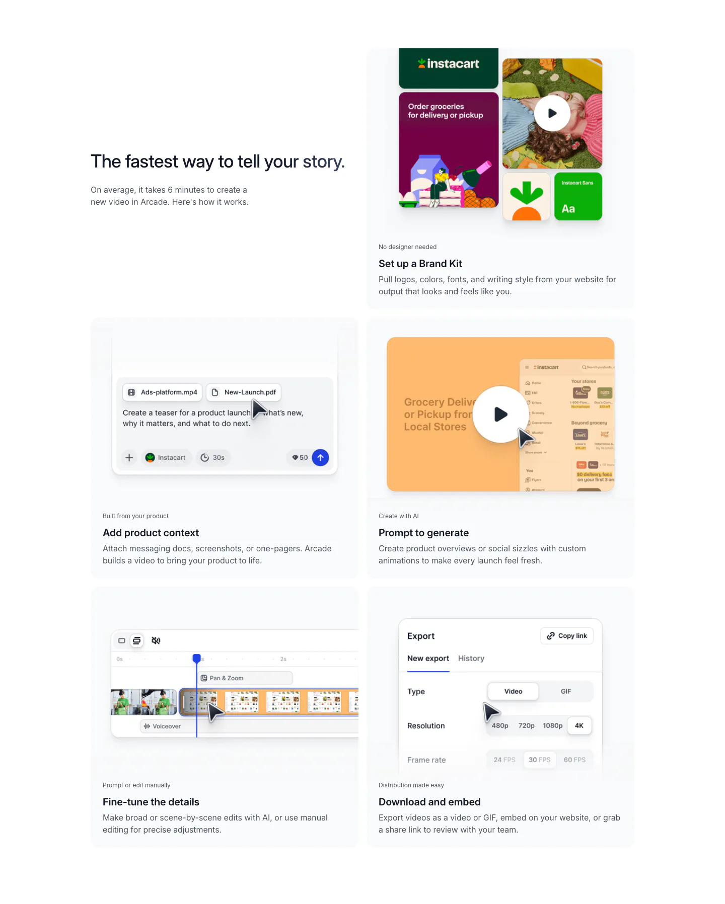
  252. Arcade how it works section: headline beside a two-column grid of five step cards showing brand kit, prompt, editor and export UI
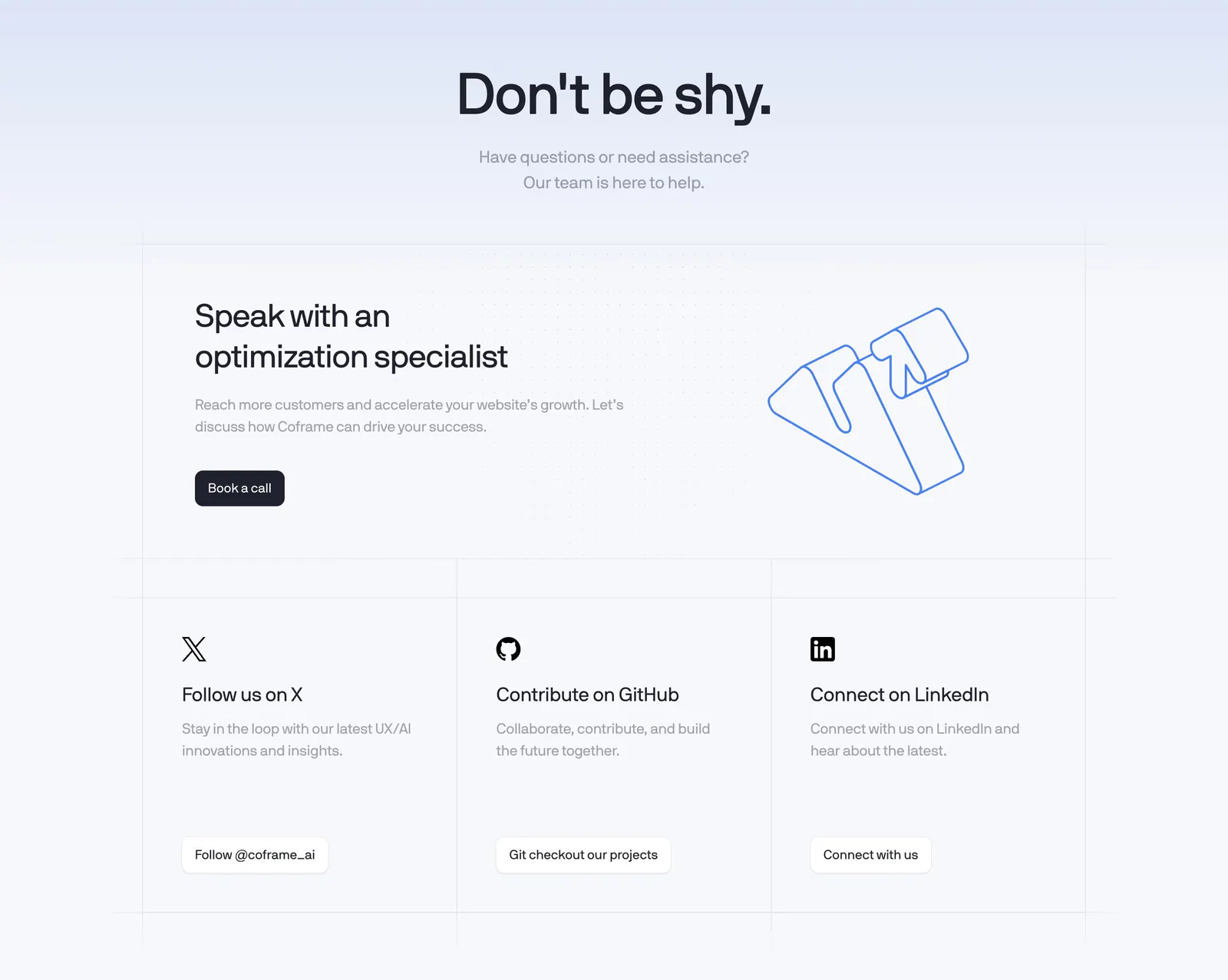
  253. Coframe contact section: centered headline, book-a-call card with outline logo artwork and three social link cards on a grid background
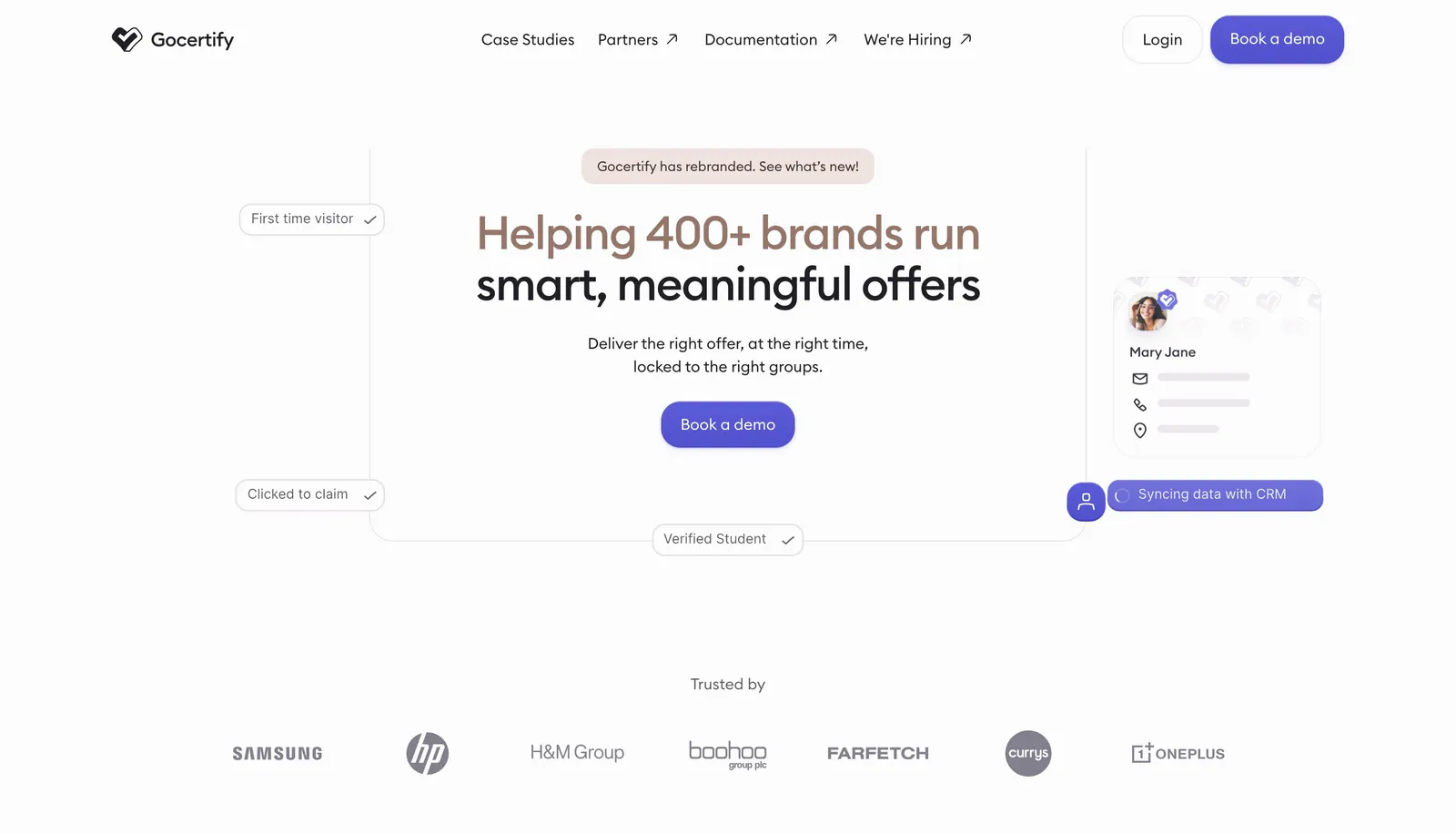
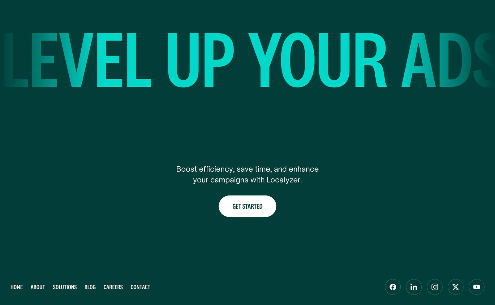
  254. Gocertify hero section: centered two-tone headline with demo button framed by floating verification chips and a profile card, logo row below
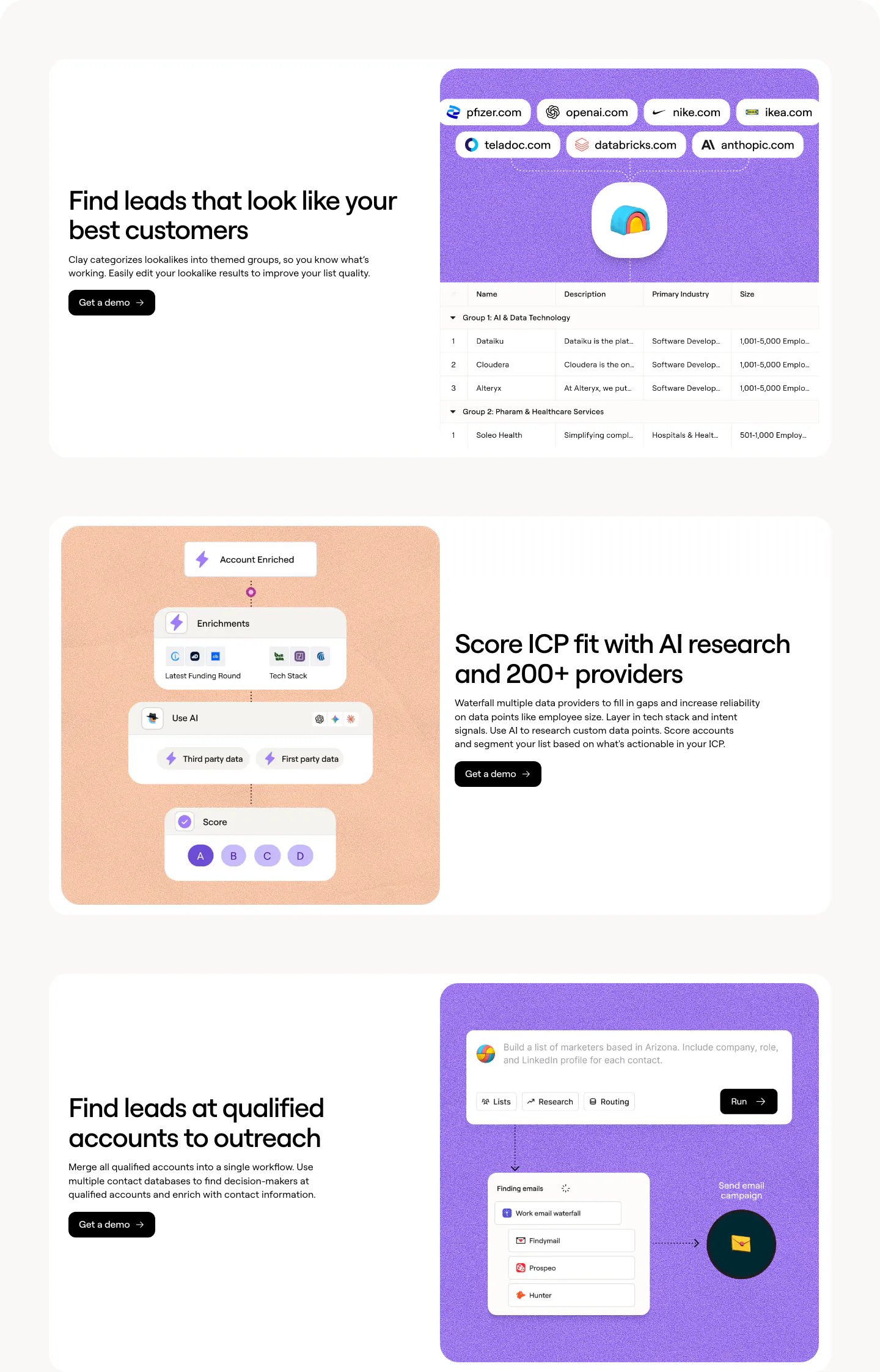
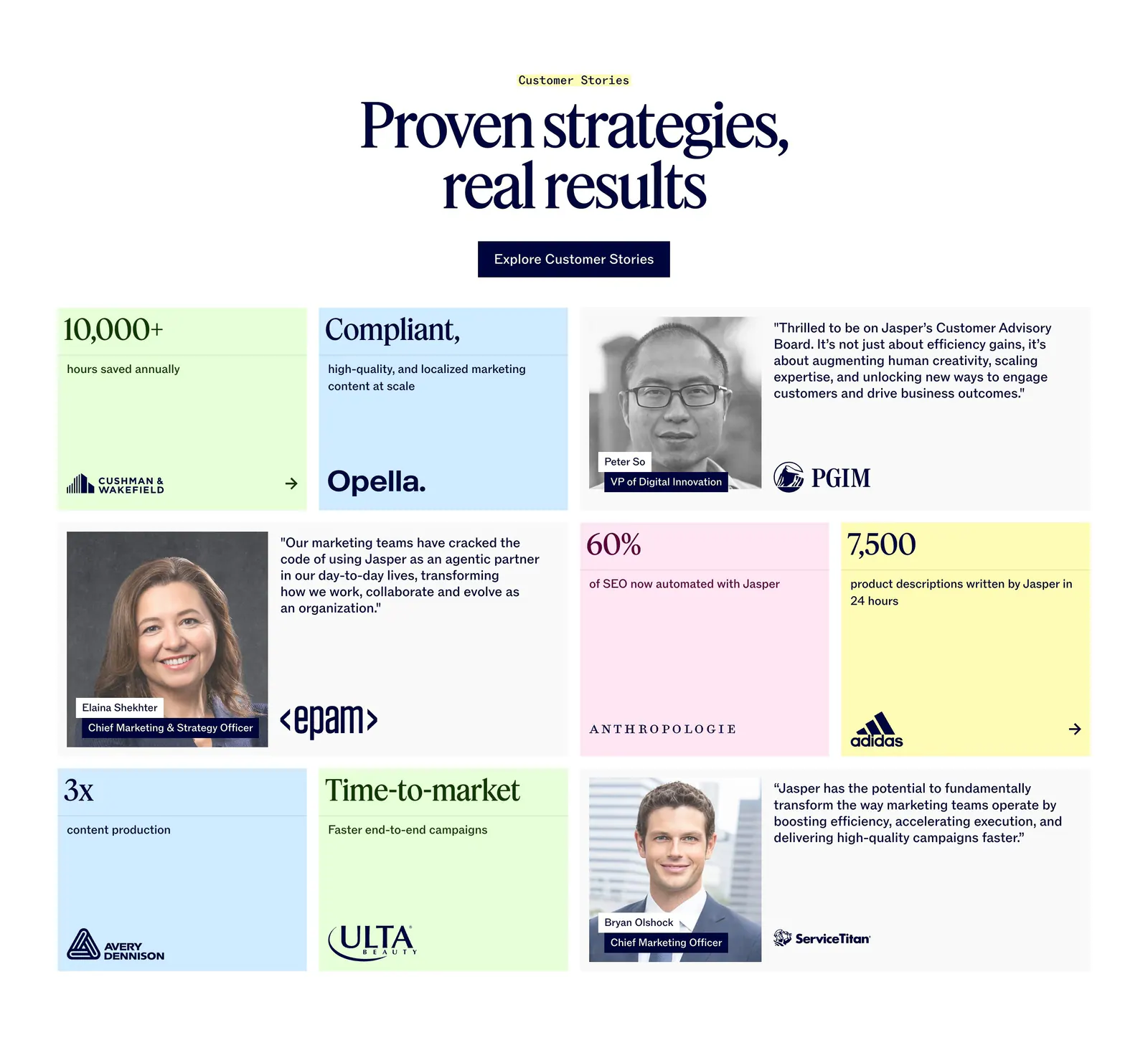
  255. Clay features section: three alternating rows pairing headlines with purple and peach panels showing lookalike, scoring and workflow UI
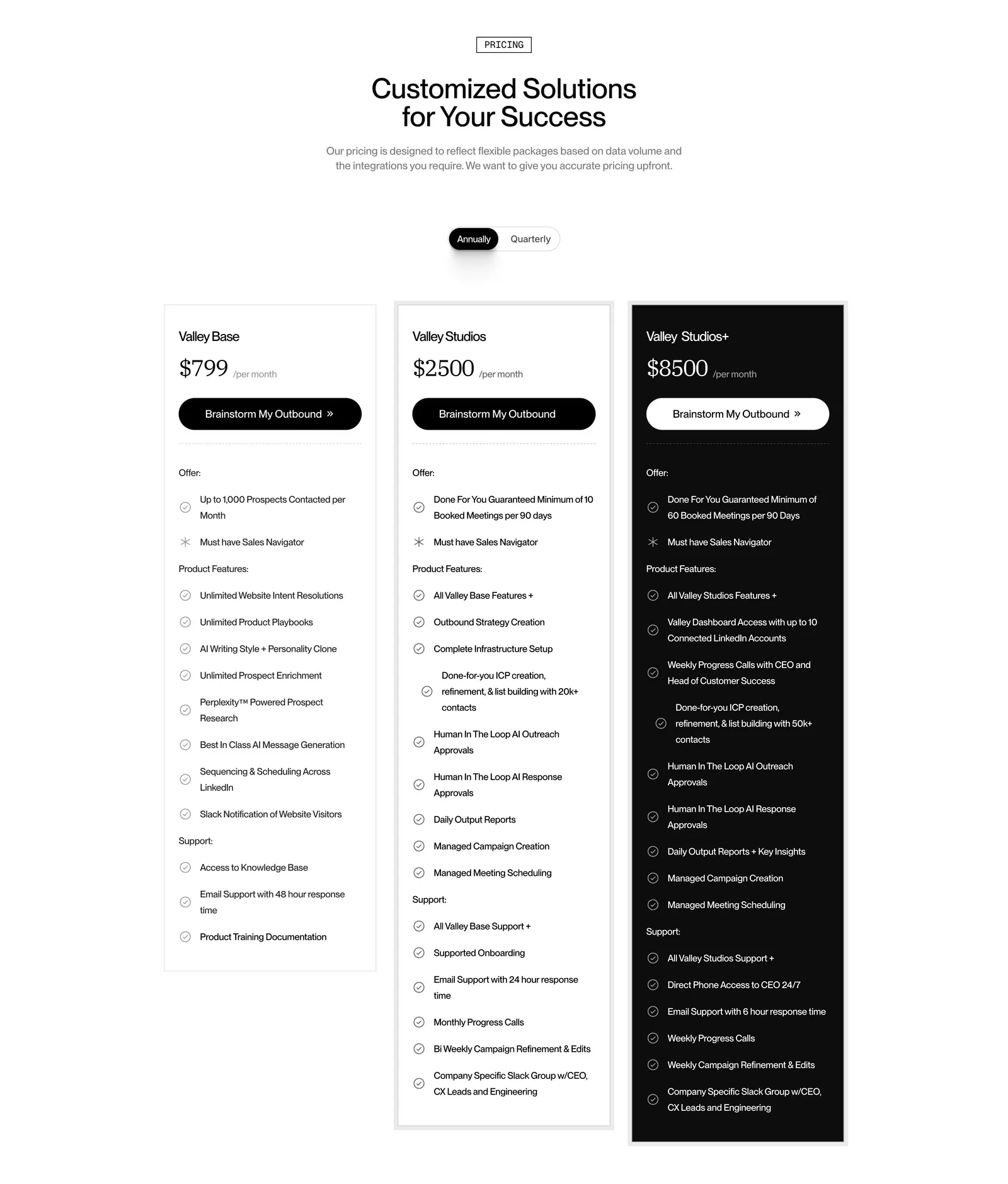
  256. Valley pricing section: centered headline and annual/quarterly toggle above three plan cards, the top tier in black, with feature checklists
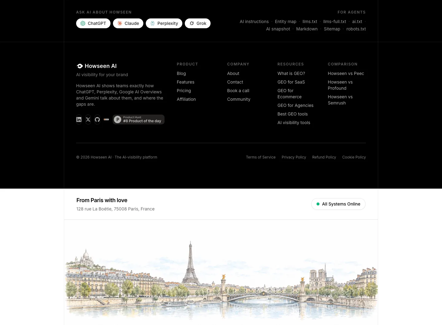
  257. Howseen AI footer section: black footer with link columns and Ask AI buttons above a watercolor Paris skyline illustration
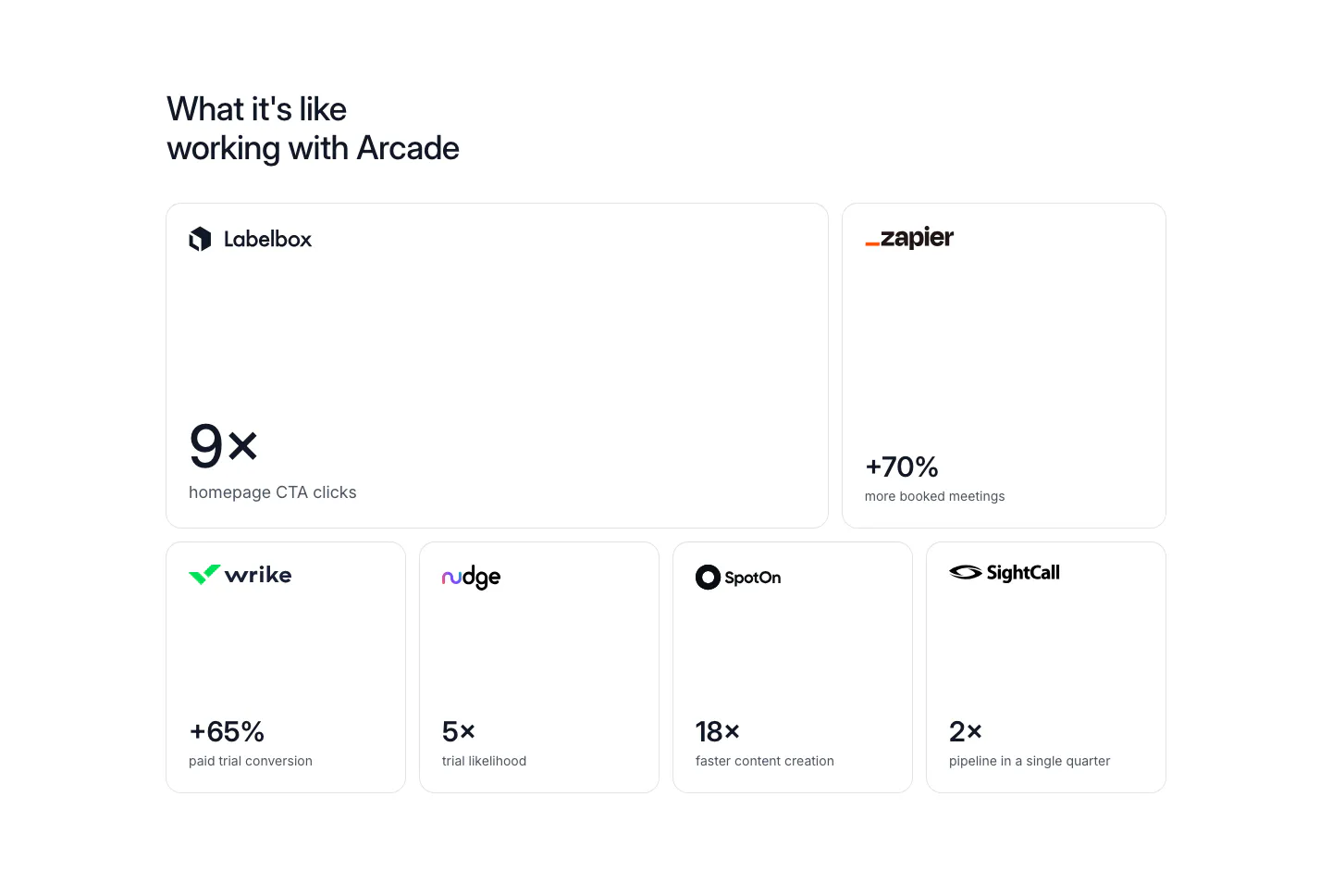
  258. Arcade stats section: bento grid of six bordered cards, each with a customer logo and a large result metric like 9x or +70%
  259. Wiza logo cloud section: single row of customer logos above G2 and Chrome Store rating badges on a white background
  260. Localyzer footer section: full-width teal display headline on dark green with centered CTA, nav links and social icons
  261. Jasper testimonials section: centered serif headline above a bento grid of pastel stat tiles and customer quote cards with portraits
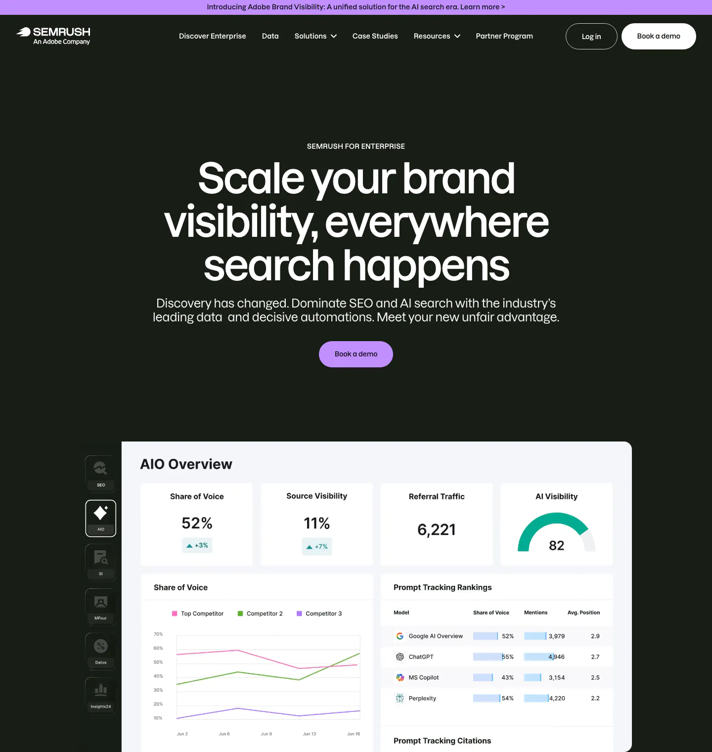
  262. Semrush hero section: dark enterprise page with nav, centered headline and Book a demo button above an AIO Overview dashboard
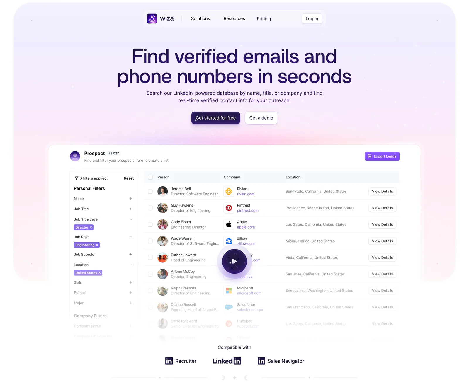
  263. Wiza hero section: centered headline and two buttons above a prospect table product screenshot with play button on a lavender glow
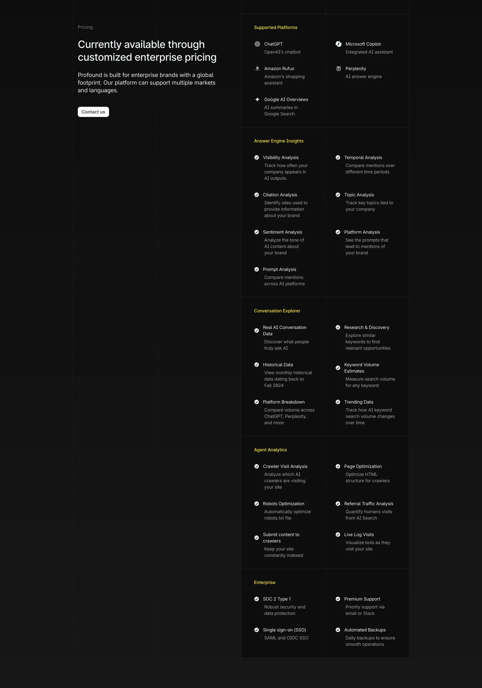
  264. Profound pricing section: enterprise pricing headline and Contact us button on the left, long grouped feature checklist on the right on charcoal
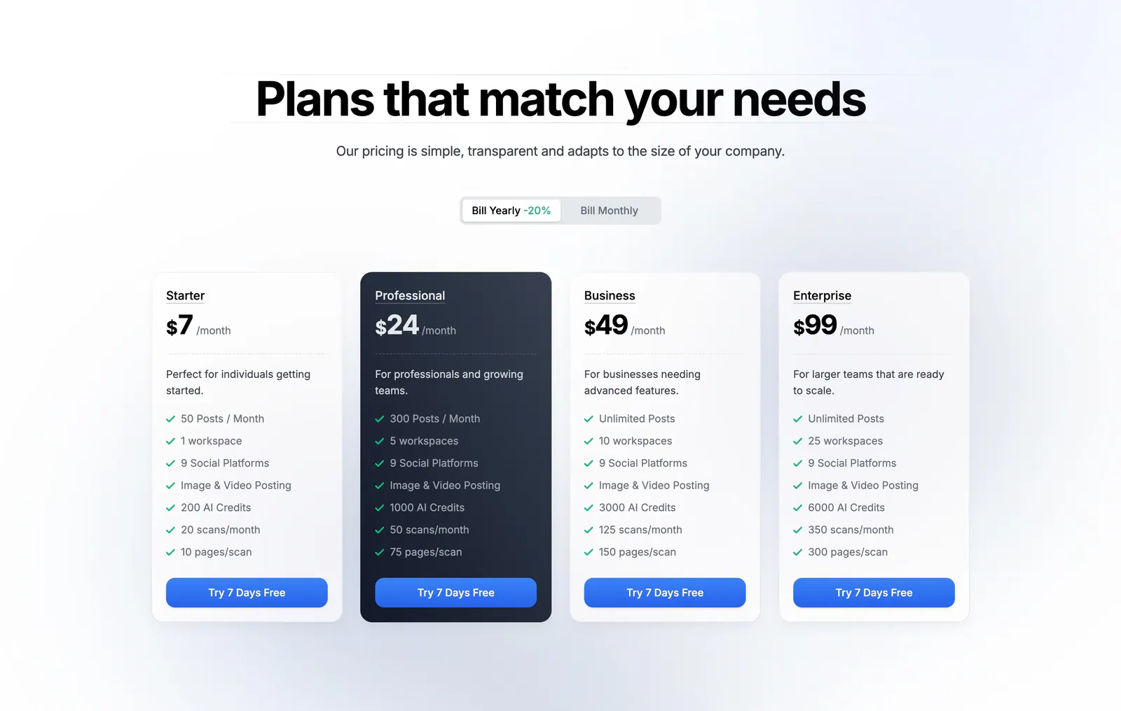
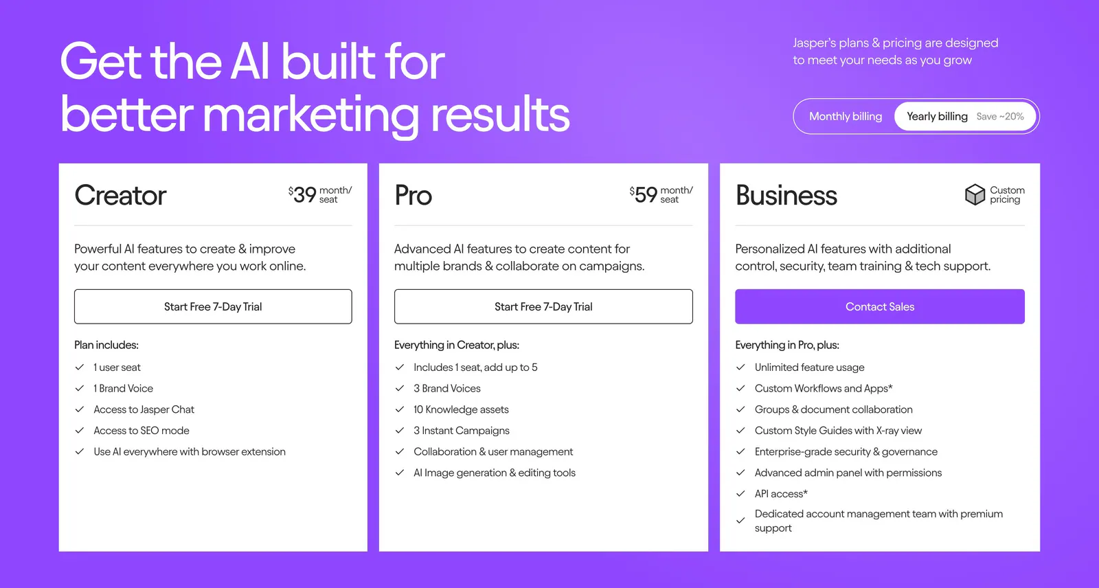
  265. Siterails pricing section: centered headline and yearly/monthly toggle above four plan cards with a dark highlighted tier on white
    Siterails Pricing
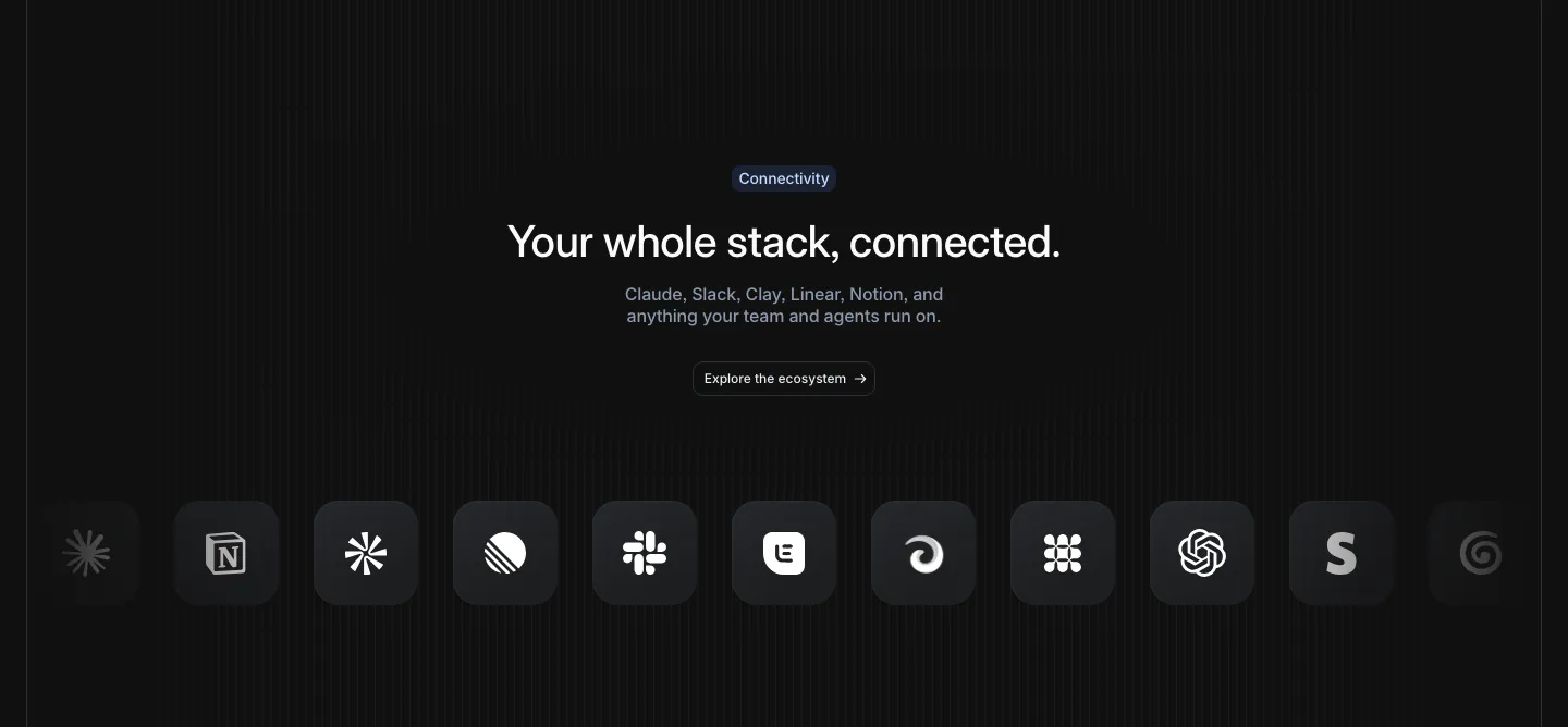
  266. Attio integrations section: centered headline and button above a row of dark rounded app icons fading at both edges, striped dark
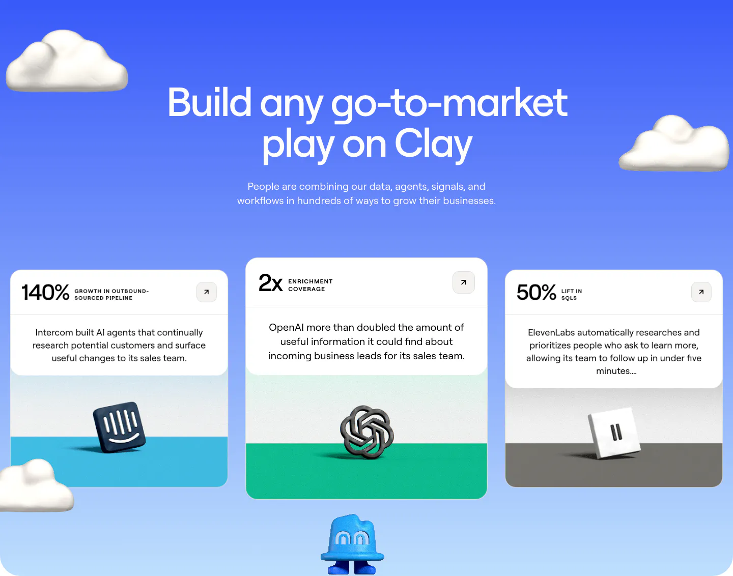
  267. Clay testimonials section: centered heading on a blue gradient with 3D clouds above three case study cards with metrics and 3D brand logos
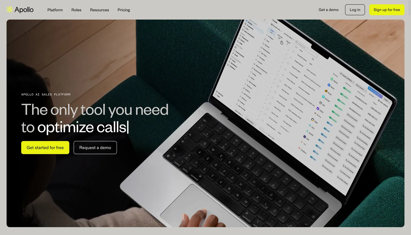
  268. Apollo hero section: nav bar above a headline and two buttons overlaid on a full-bleed photo of a laptop showing a sales app
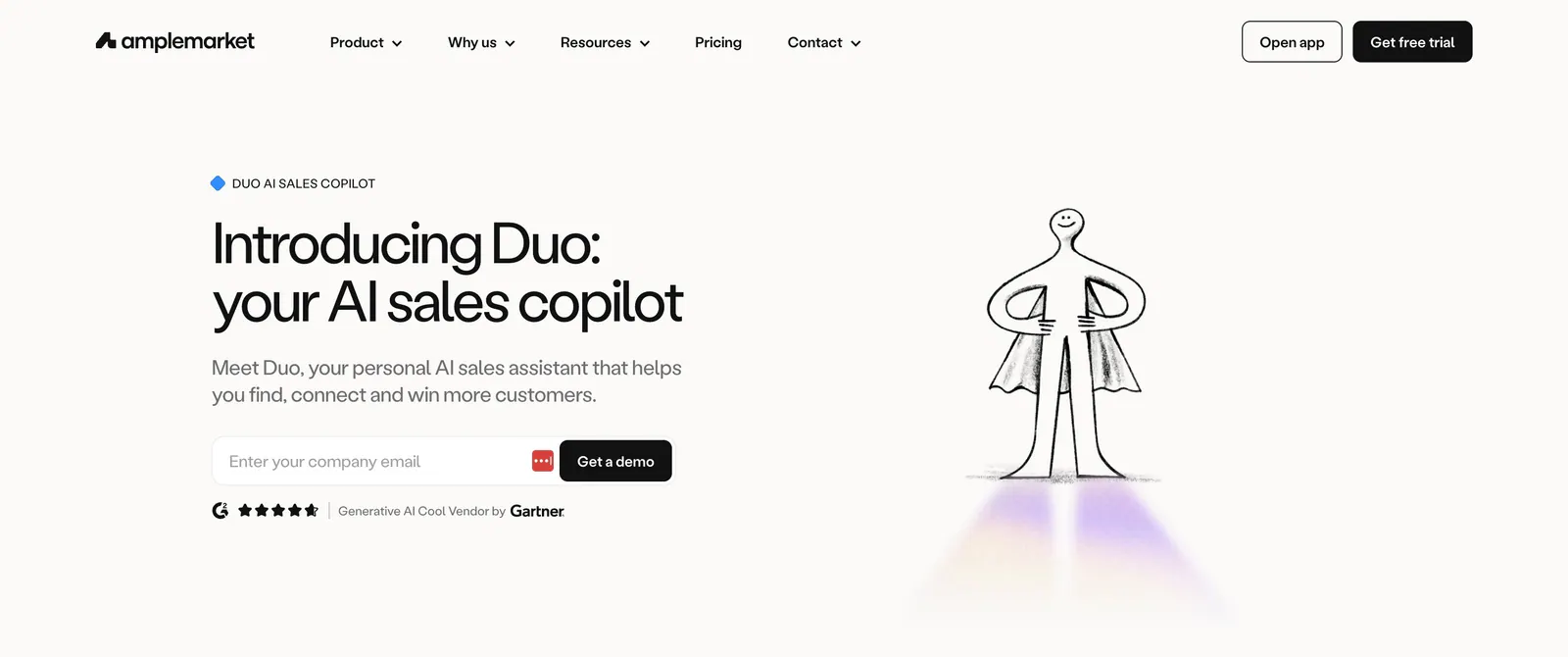
  269. Amplemarket hero section: headline, email field and rating on the left beside a hand-drawn caped figure illustration on off-white
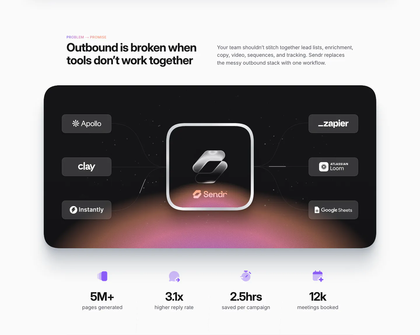
  270. Sendr value proposition section: dark card linking Apollo, Clay, Zapier and other tool chips to a glass Sendr icon, four stats below
  271. Jasper pricing section: headline and billing toggle above three white plan cards with checklists on a bright purple background
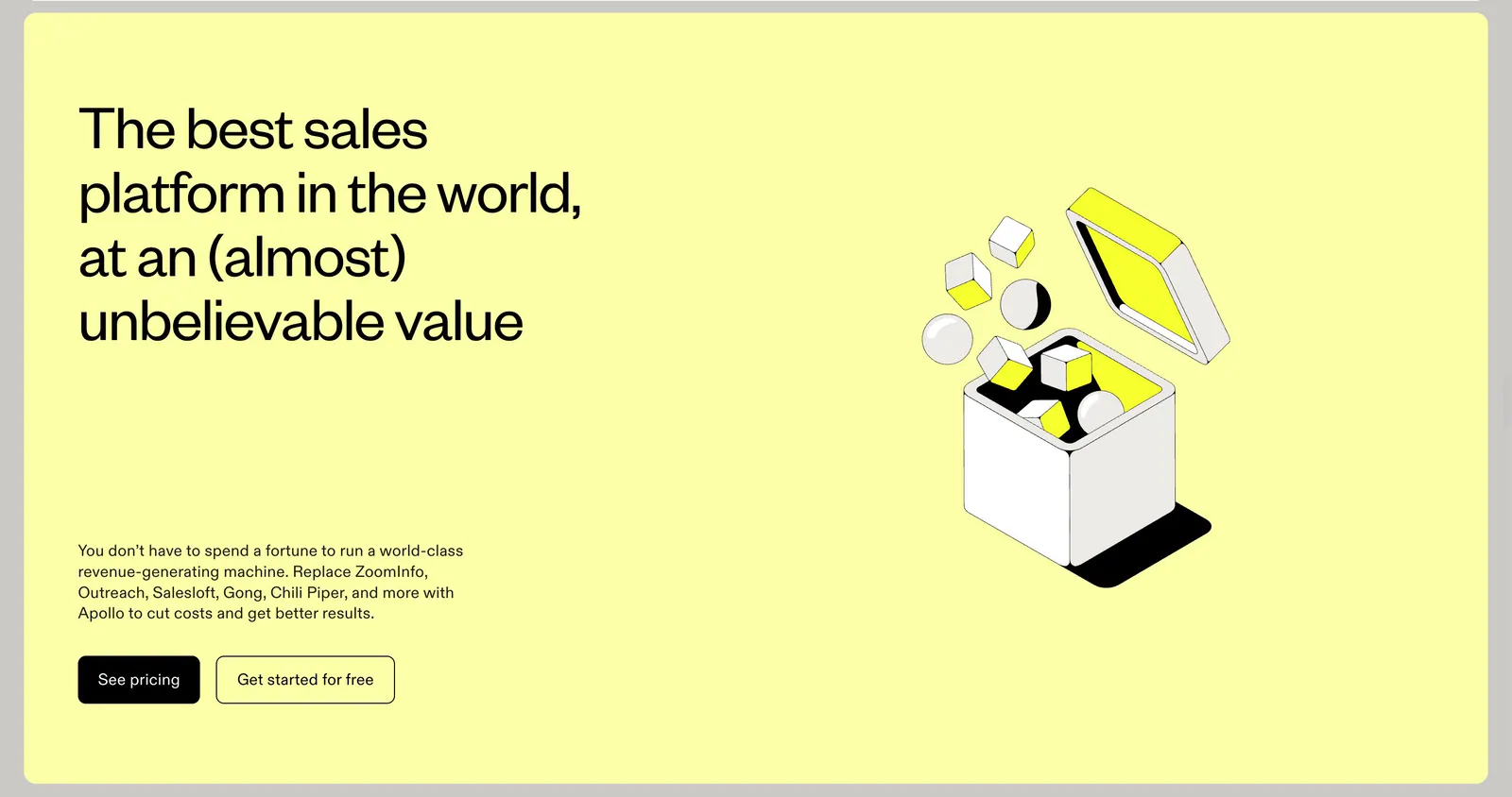
  272. Apollo call-to-action section: headline, copy and two buttons left with an isometric line-art box illustration right on a pale yellow panel
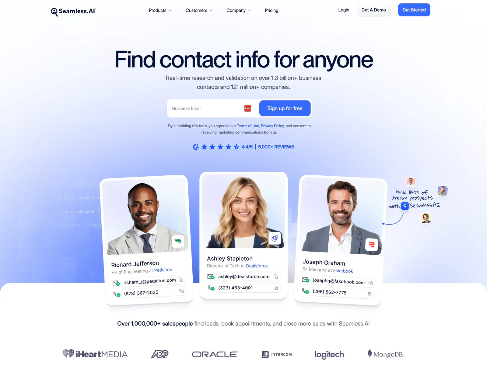
  273. Seamless.AI hero section: centered headline and email signup above contact cards with portrait photos and a customer logo row
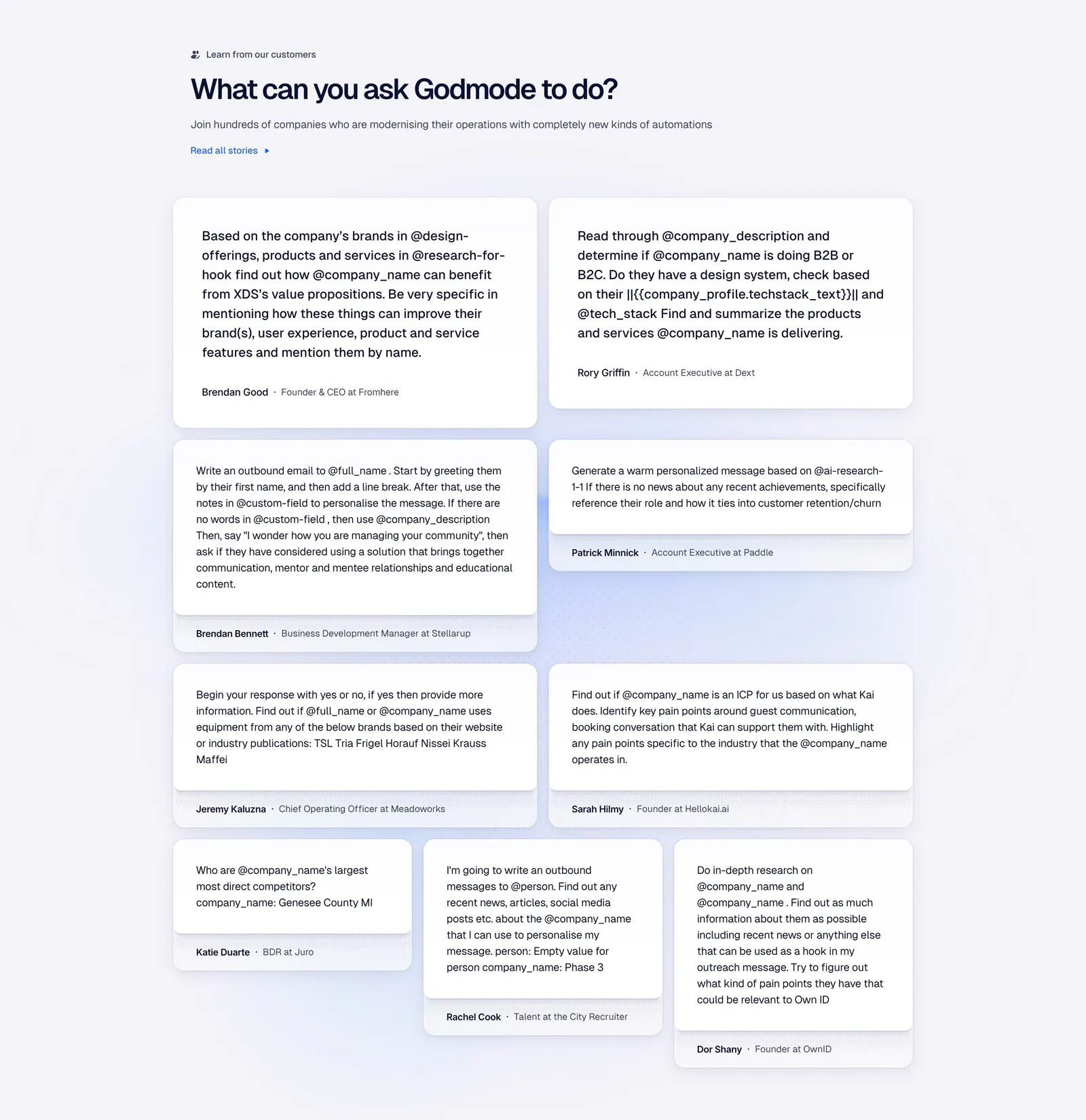
  274. Godmode testimonials section: left-aligned heading above a masonry grid of white cards with customer prompts and names
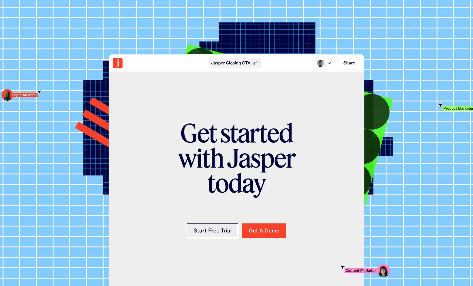
  275. Jasper call-to-action section: serif headline and two buttons in an editor window over a sky-blue grid with pixel shapes and cursors
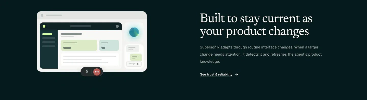
  276. Supersonik features section: UI mockup with call controls at left, serif headline, copy and link at right on dark teal
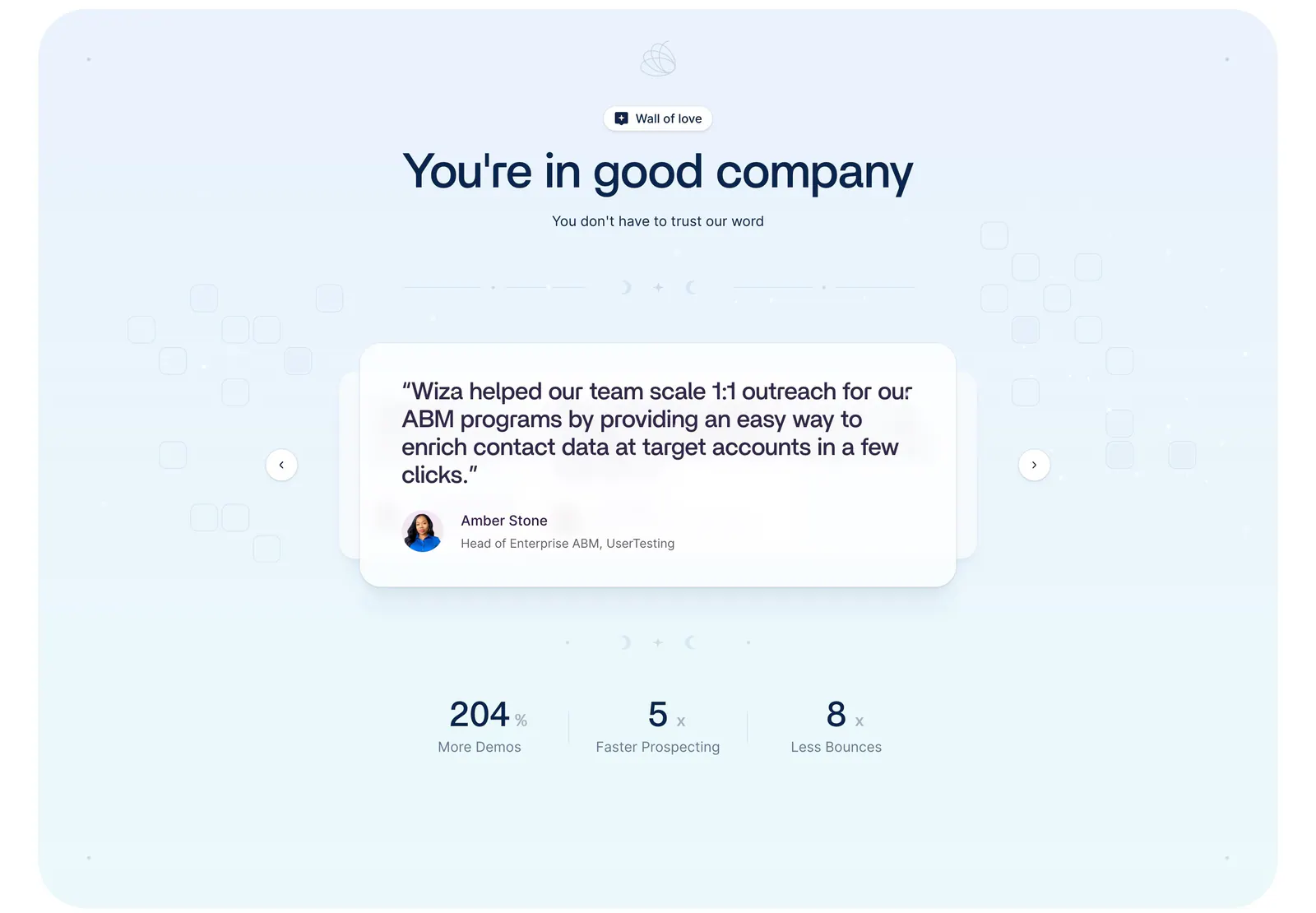
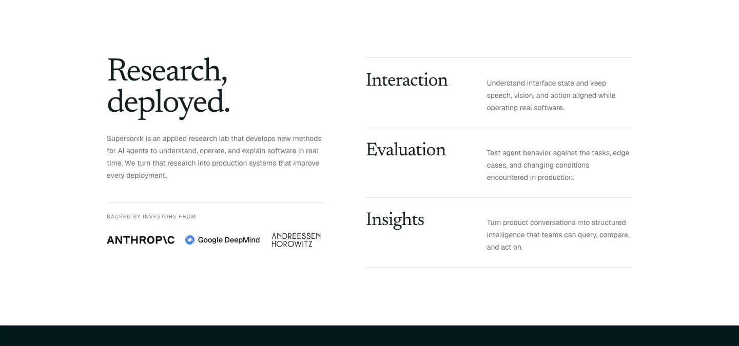
  277. Wiza testimonials section: centered headline above a quote card carousel with arrows and three metrics on a pale blue background
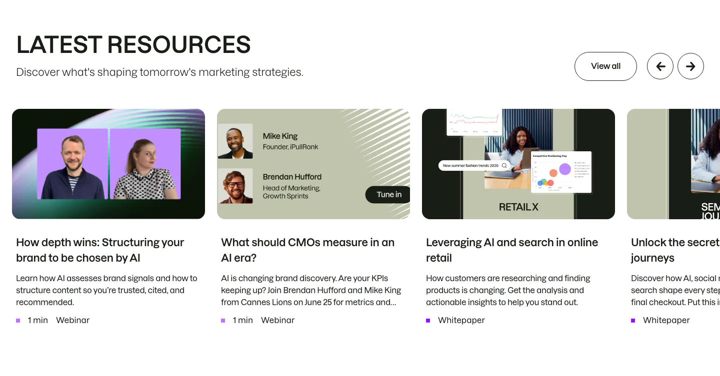
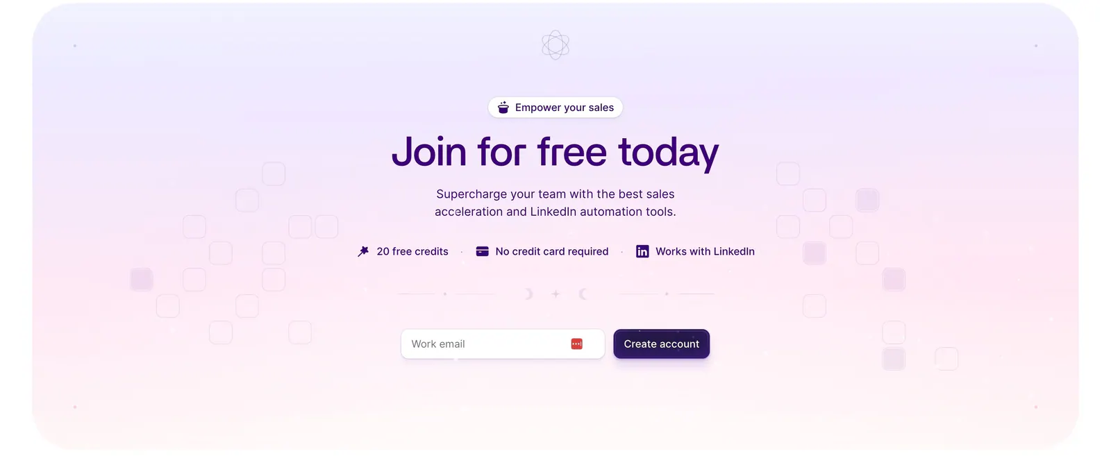
  278. Semrush blog & resources section: headline with View all and arrow buttons above a carousel of webinar and whitepaper cards
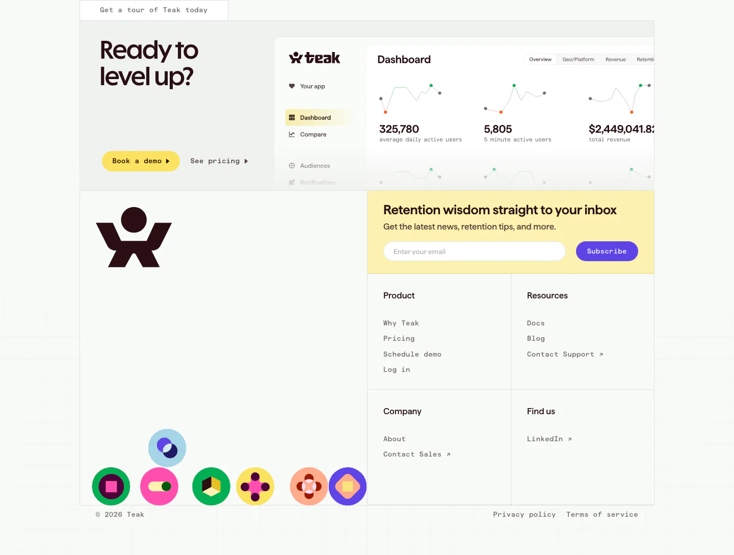
  279. Jasper features section: headline and copy row above four white cards with icons and arrow links on a light background
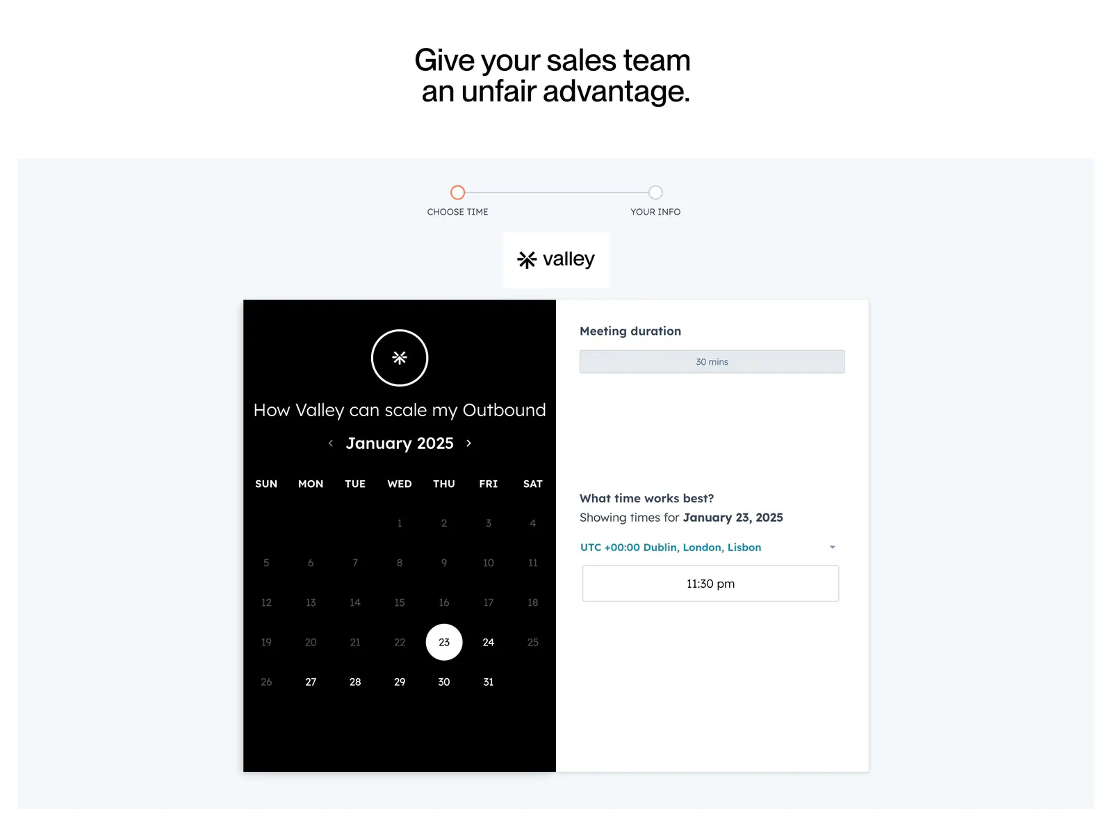
  280. Valley call-to-action section: white headline and two buttons over a full-bleed blurred orange, peach and teal abstract image
  281. Arcade call to action section: slim light gray band with a one-line headline and Sign up for free and Talk to a GTM expert buttons
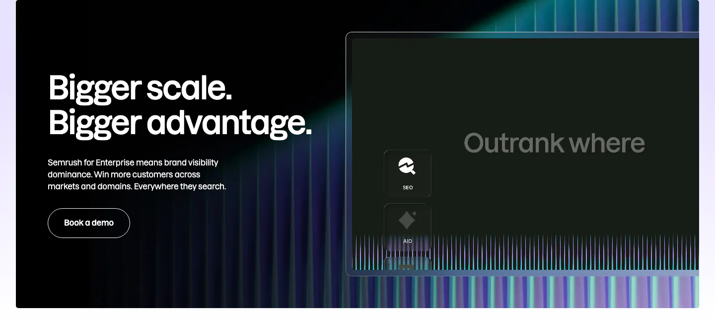
  282. Semrush features section: dark enterprise banner with headline and Book a demo button left, stylized product panel and neon stripes right
  283. Ploy call-to-action section: huge condensed centered headline above an email signup field with a black Start Free button on light gray
  284. Supersonik about & mission section: serif headline, lab description and investor logos at left, three research areas listed at right
  285. Wiza call-to-action section: centered headline, benefit badges and work-email signup field on a lavender-to-pink gradient card
  286. Teak call to action section: headline and buttons beside a dashboard screenshot, then email signup, link columns and round color icons
  287. Valley contact section: centered headline above a two-step meeting booking widget with a black calendar panel and time picker on light gray
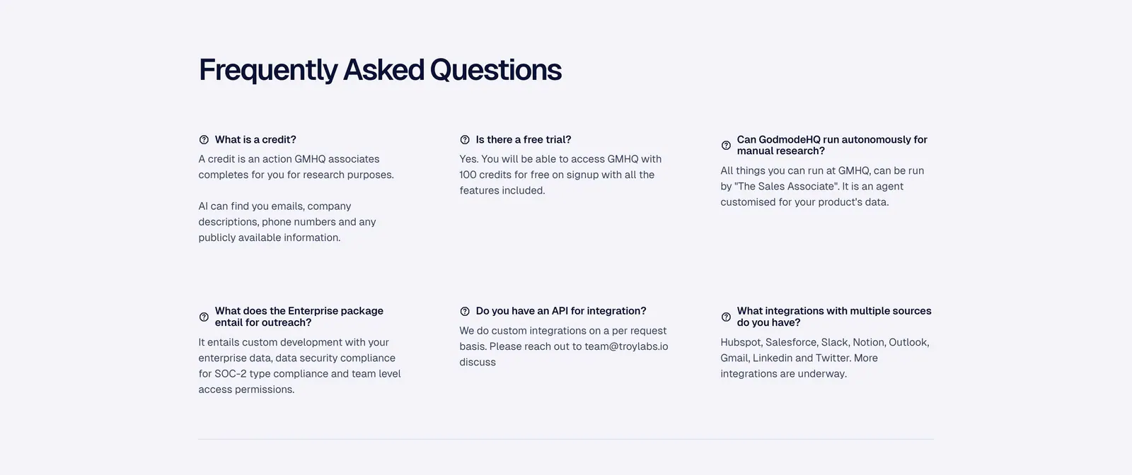
  288. Godmode FAQ section: left-aligned heading above a three-column grid of question and answer pairs on a pale gray background
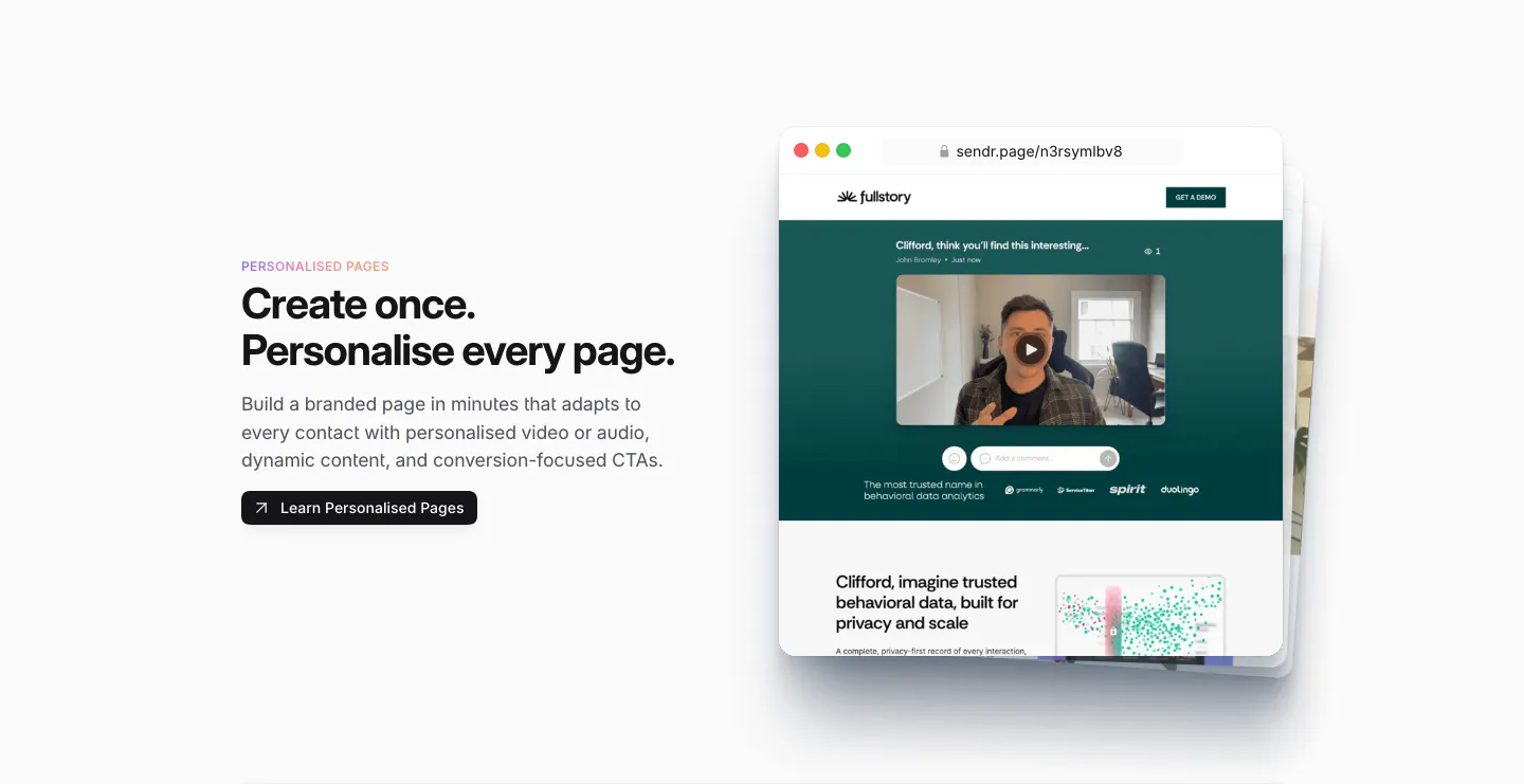
  289. Sendr features section: Personalised Pages copy and button left, stacked browser mockups of a personalised video landing page right
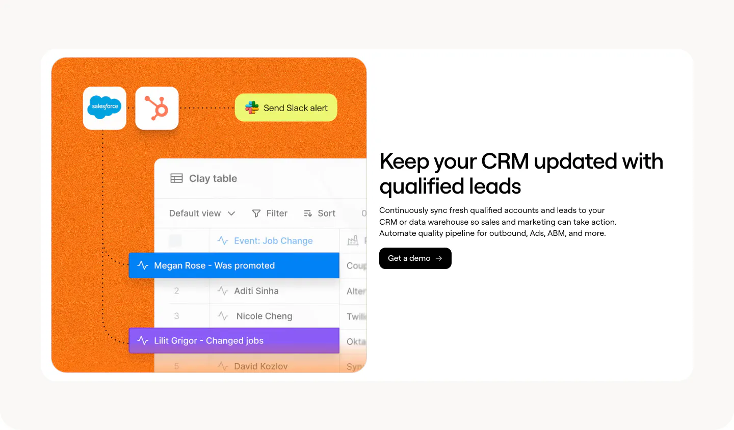
  290. Clay features section: split card with an orange panel of Salesforce, HubSpot and Clay table UI beside a headline and demo button
  291. Realm integrations section: centered headline above a single row of app icon tiles fading at the edges on white
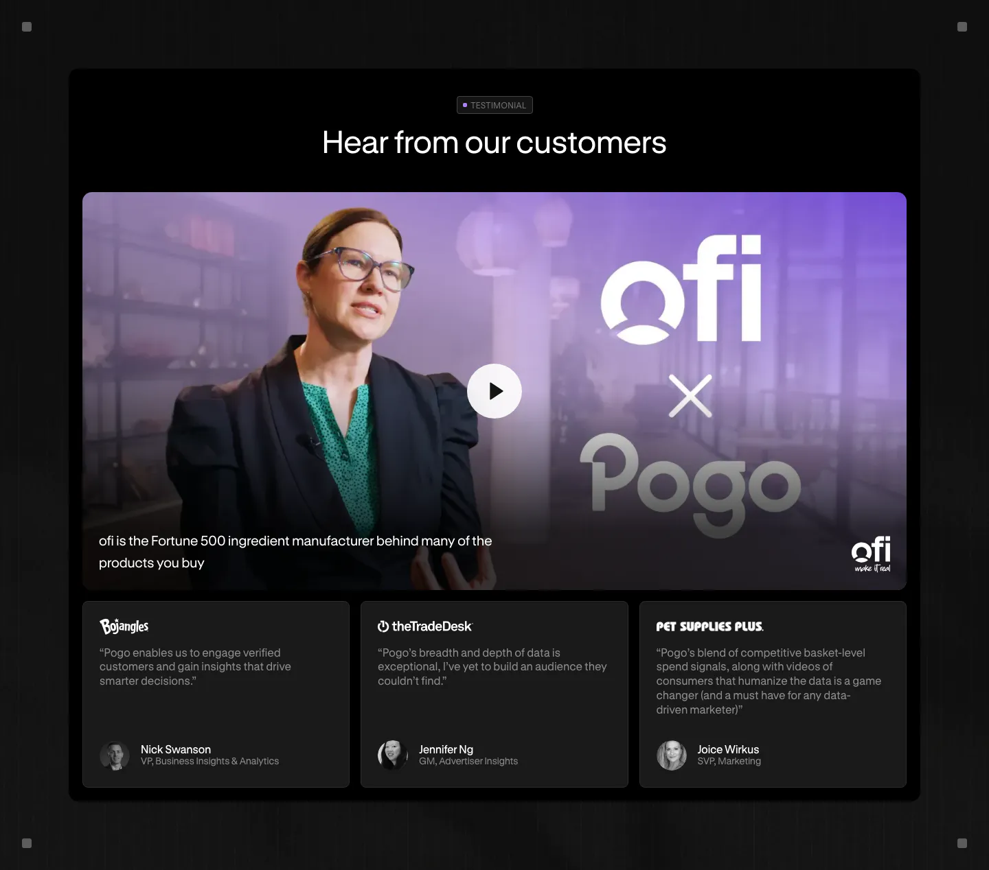
  292. Pogo testimonials section: dark panel with a video thumbnail and play button above three customer quote cards
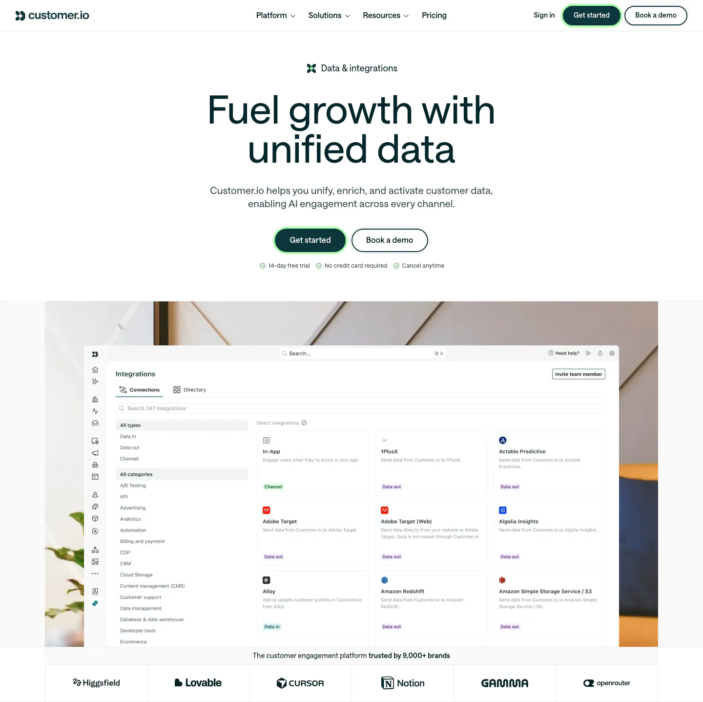
  293. Customer.io hero section: centered headline and buttons above an integrations directory screenshot on an office photo, with a logo row

Sales & marketing companies

39 companies in this collection

All companies

Common styles in sales & marketing websites

  • Product UI 29% · 85
  • Centered 29% · 84
  • Minimal 24% · 69
  • Card grid 21% · 62
  • Monochrome 20% · 59
  • Dark mode 16% · 46
  • Split layout 15% · 44

How to design a sales and marketing website

  1. Tie every claim to a metric

    Name the number the product changes, whether that is meetings booked, open rates, or cost per acquisition, and explain how it is measured. Customer results with a clear before and after convince more than percentages without context. Skip metrics your buyer doesn't track.

  2. Show the integrations buyers depend on

    Revenue teams live in their CRM, inbox, and ad platforms. Put the integrations that matter most near the top, with a link to the full directory. Say whether data syncs both ways, because a one-way sync is a dealbreaker for many ops teams.

  3. Write for the rep and the manager

    Reps want fewer clicks and better leads. Managers want visibility and accurate forecasts. Split the page by role, or use tabs, so each reader finds their argument quickly. A single generic message tends to satisfy neither of them.

  4. Follow the advice you sell

    Visitors will judge the product by your own page. If you sell form optimization, keep your demo form short. If you sell personalization, personalize something on the page. A site that ignores its own advice undercuts the pitch faster than any competitor can.

All industries
    ↑↓ Navigate ↵ Open

    Section preview

    Website section