Ploy website design

Every section we captured from the Ploy website, in page order, from the hero section down to the CTA section. Open any thumbnail to see it full size.

Sections 8

In page order, top to bottom

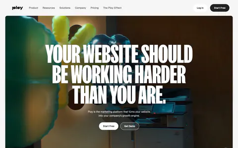
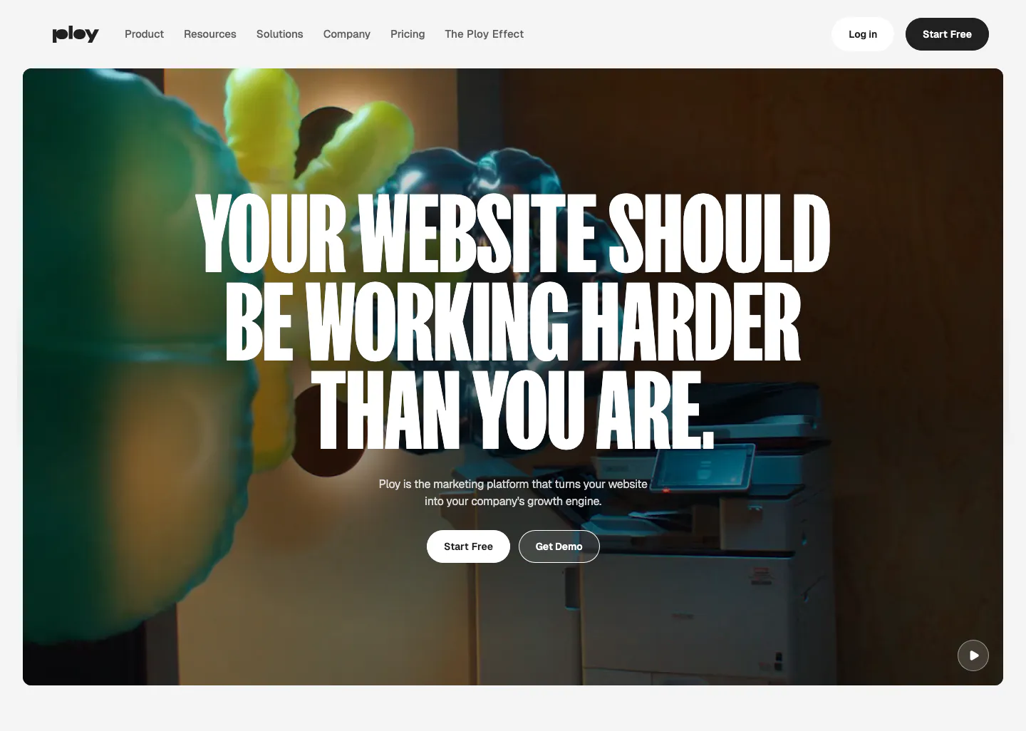
  1. Ploy hero section: centered condensed uppercase headline and two buttons over a full-bleed office video frame with inflatable shapes
    01 Hero

    YOUR WEBSITE SHOULD BE WORKING HARDER THAN YOU ARE.

  2. Ploy logo cloud section: small centered caption above a single row of grayscale customer logos fading at the edges on light gray

    Trusted by high-horsepower teams at

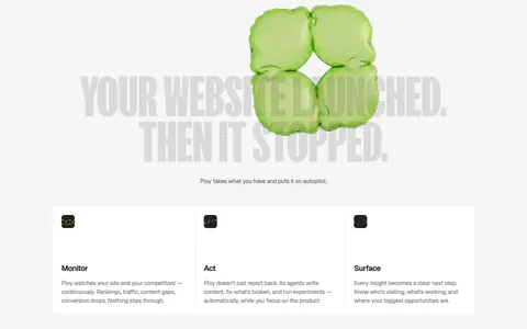
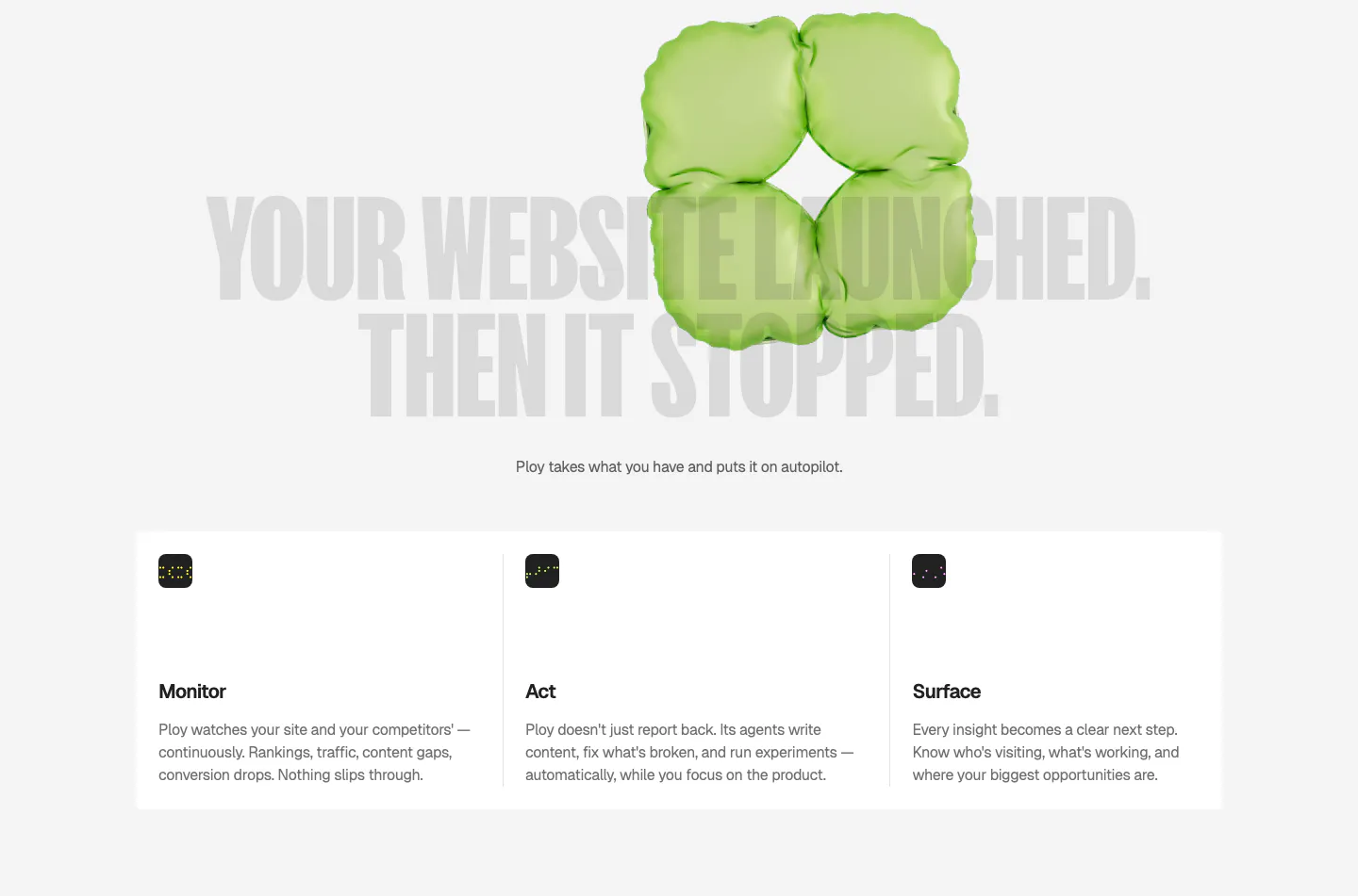
  3. Ploy features section: huge gray condensed headline behind a green 3D inflatable shape, above three columns for Monitor, Act and Surface

    YOUR WEBSITE LAUNCHED. THEN IT STOPPED.

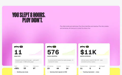
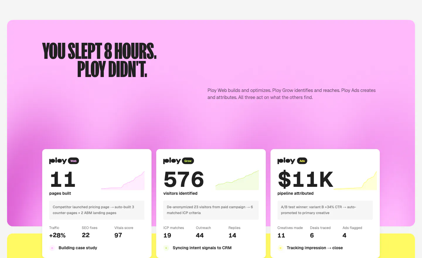
  4. Ploy features section: condensed headline on a pink gradient panel above three white metric cards with sparklines for Web, Grow and Ads

    YOU SLEPT 8 HOURS. PLOY DIDN'T.

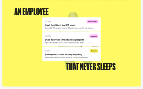
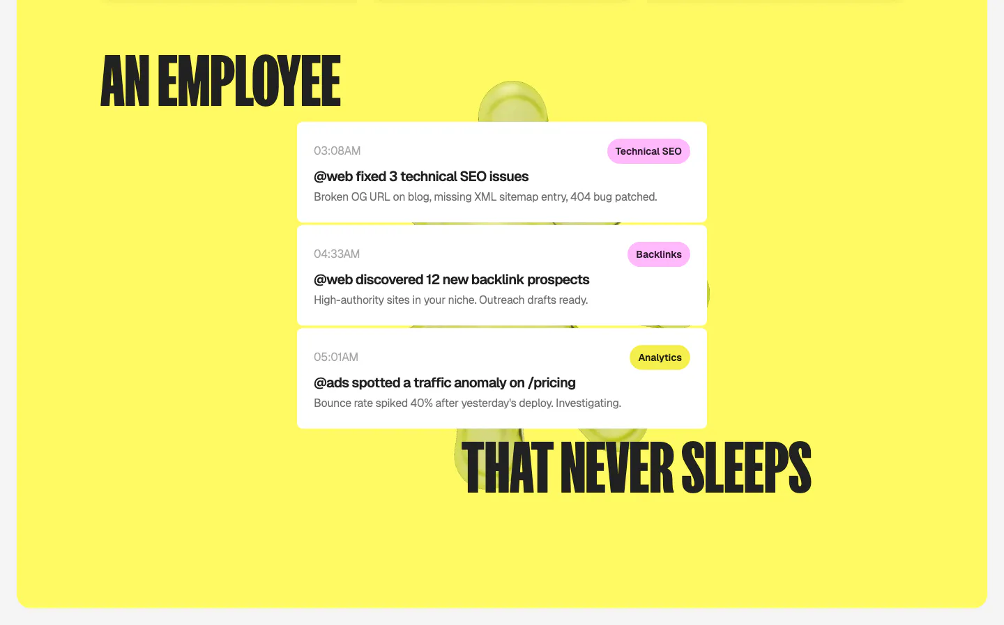
  5. Ploy features section: split condensed headline wrapped around a stack of white agent activity notification cards on a bright yellow panel

    AN EMPLOYEE THAT NEVER SLEEPS

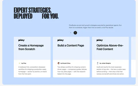
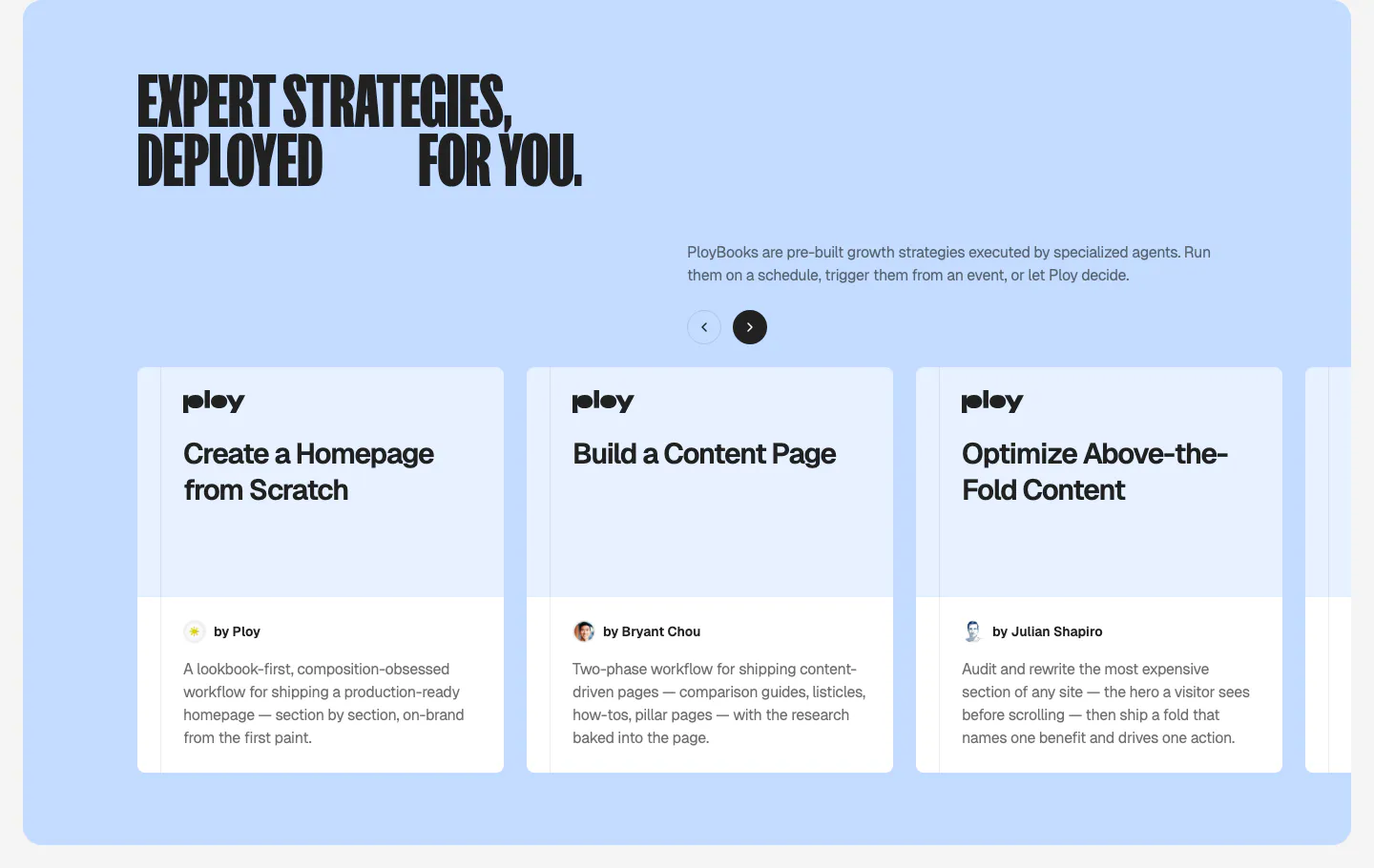
  6. Ploy features section: condensed headline and arrow controls above a carousel of PloyBooks strategy cards on a light blue panel

    EXPERT STRATEGIES, DEPLOYED FOR YOU.

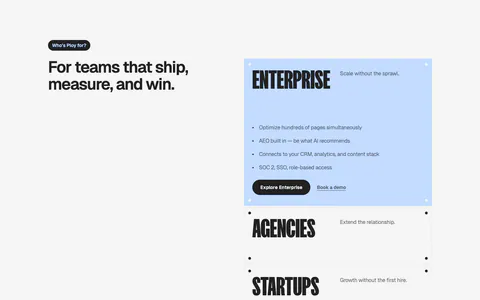
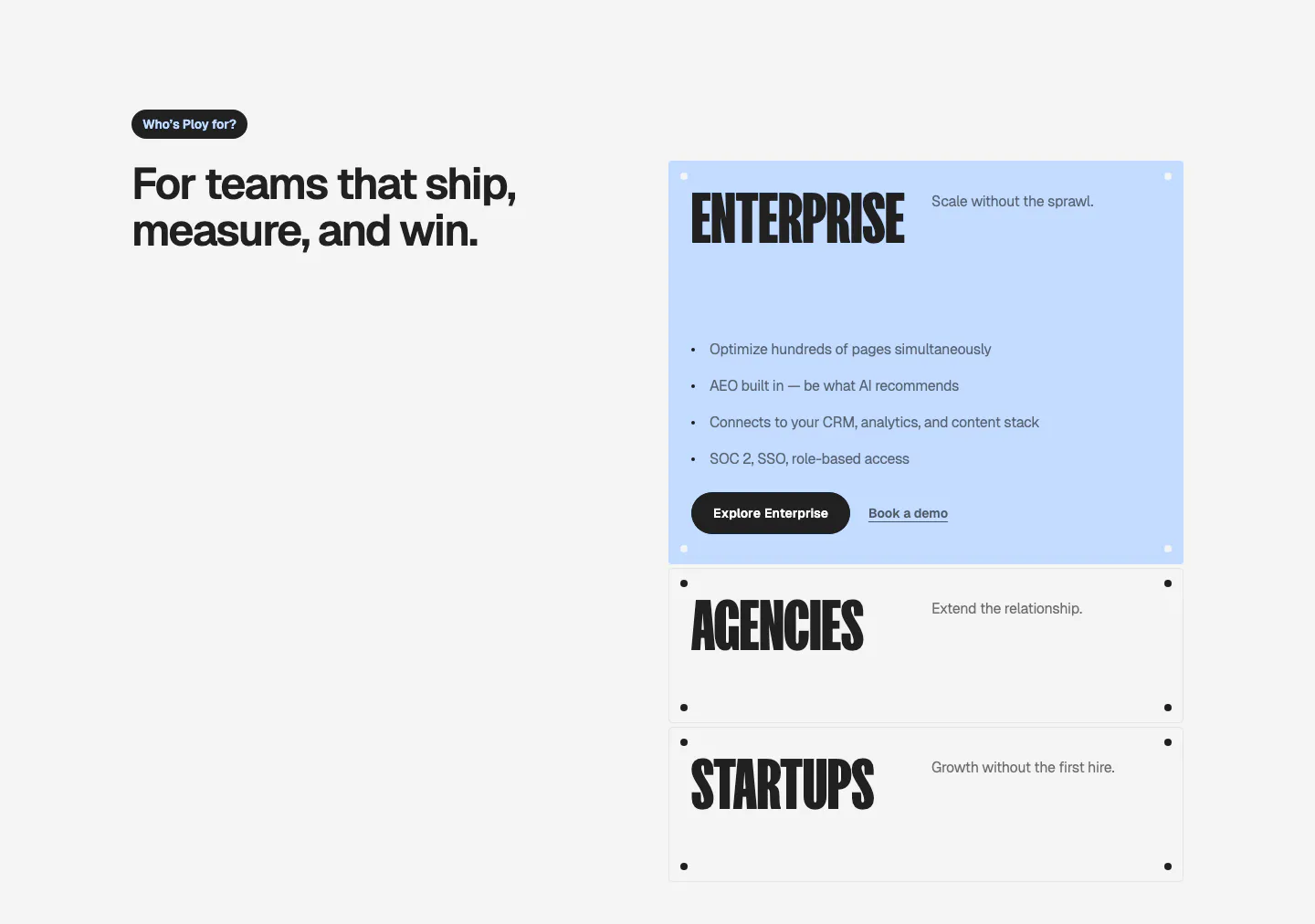
  7. Ploy use cases section: headline on the left with stacked accordion-style cards for Enterprise, Agencies and Startups on the right

    For teams that ship, measure, and win.

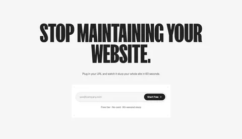
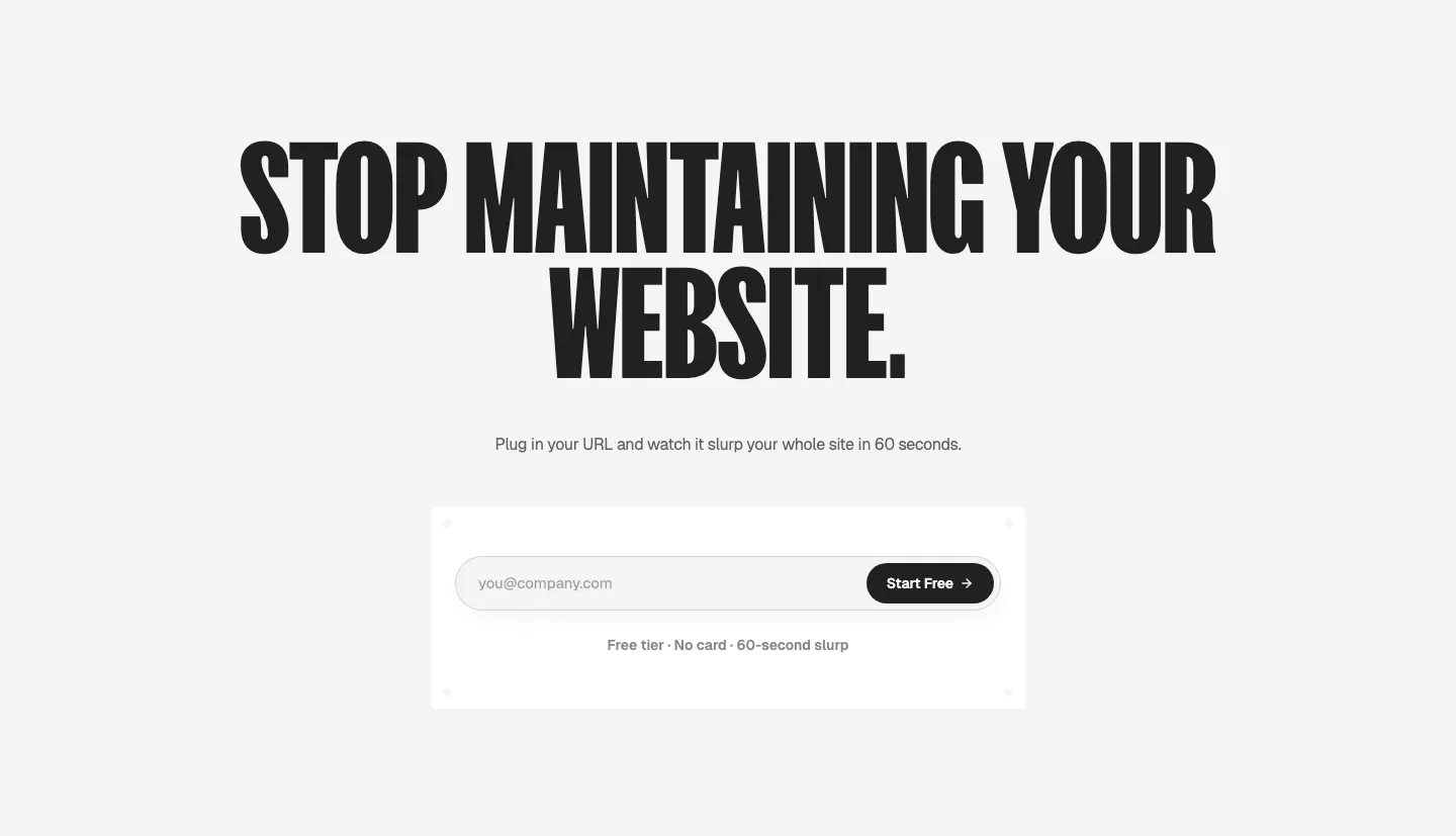
  8. Ploy call-to-action section: huge condensed centered headline above an email signup field with a black Start Free button on light gray

    STOP MAINTAINING YOUR WEBSITE.
Similar companies

All companies
    ↑↓ Navigate ↵ Open

    Section preview

    Website section