Pricing Section Examples

Pricing is where interest turns into a decision, so clarity beats cleverness. Visitors should see which plan fits, what it costs, and what changes between tiers without doing math. People stall when they have to hunt for the price, decode footnotes about limits, or choose between too many options. The pricing section examples below range from simple tier cards to monthly and yearly toggles and detailed plan comparison tables.
100 sections

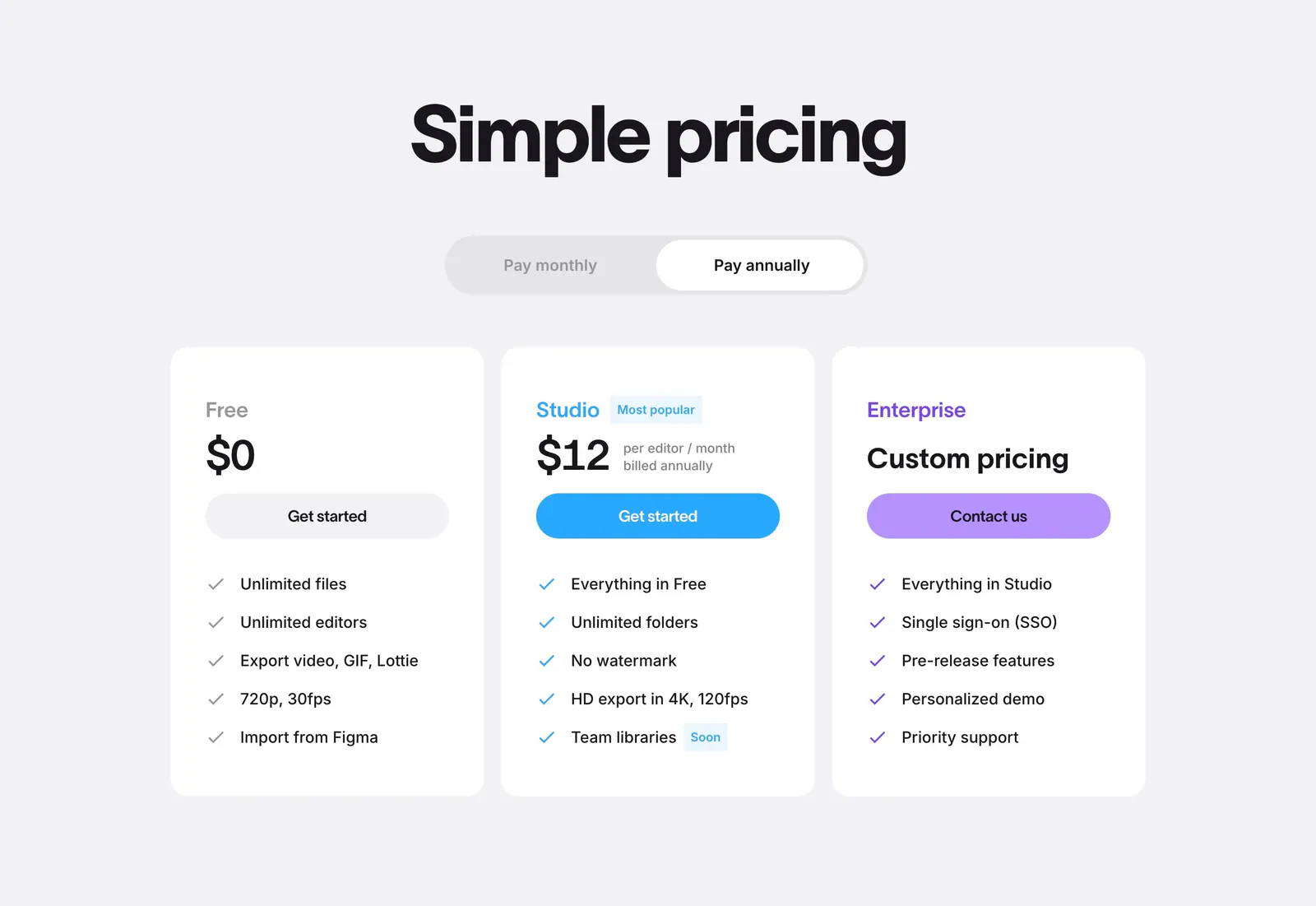
  1. Jitter pricing section: centered headline and billing toggle above three white plan cards with colored buttons on light gray
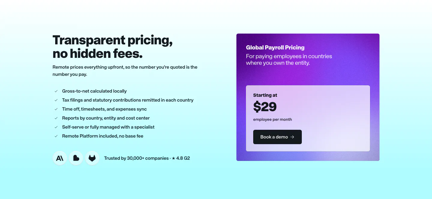
  2. Remote pricing section: headline and checklist on the left beside a purple gradient Global Payroll price card on cyan
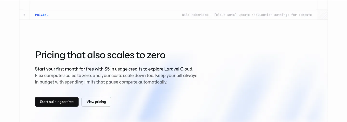
  3. Laravel Cloud call-to-action section: left-aligned pricing headline with free-credit copy and two buttons over a faint blue glow on white
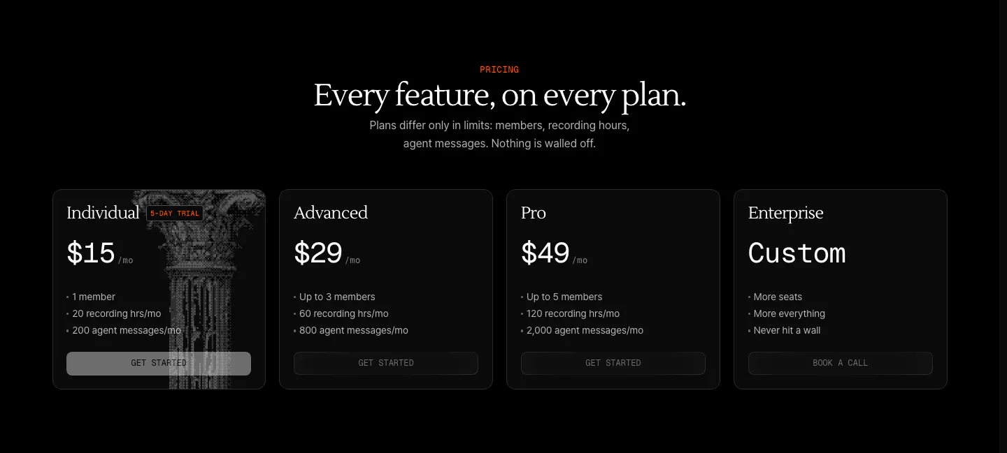
  4. Arke pricing section: centered serif headline above four dark plan cards from $15 Individual to Custom Enterprise, one with a halftone column
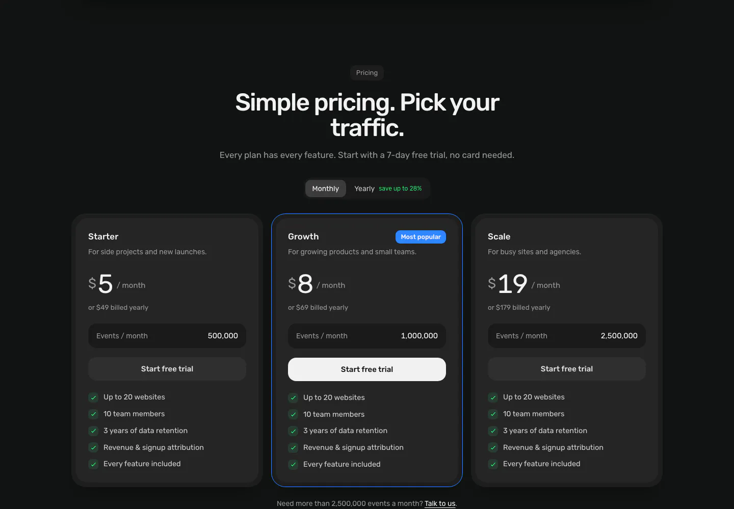
  5. Piqo pricing section: centered headline and monthly/yearly toggle above three dark plan cards, the middle one highlighted as Most popular
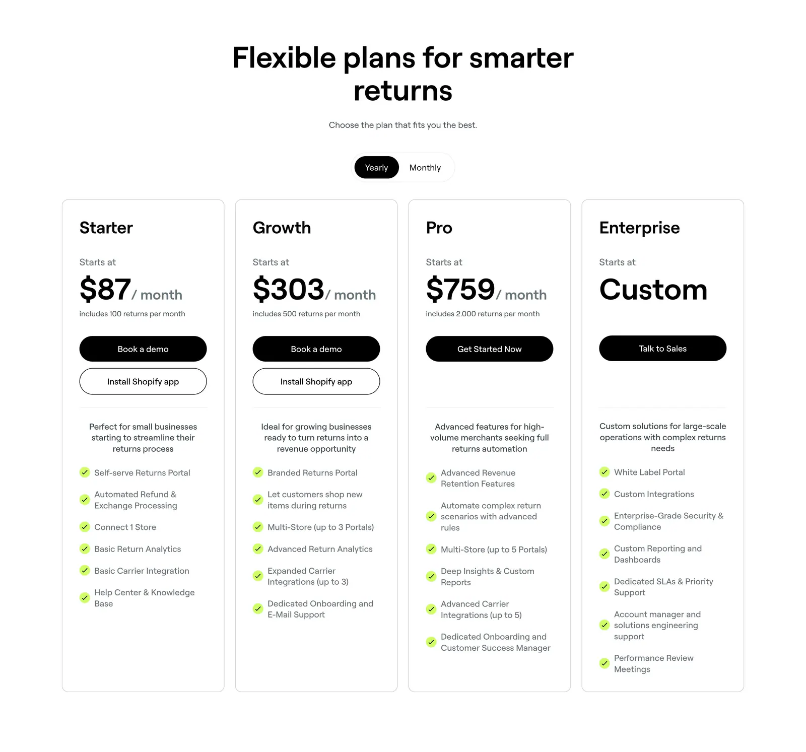
  6. 8returns pricing section: centered headline with yearly/monthly toggle above four white plan cards with prices and checklists
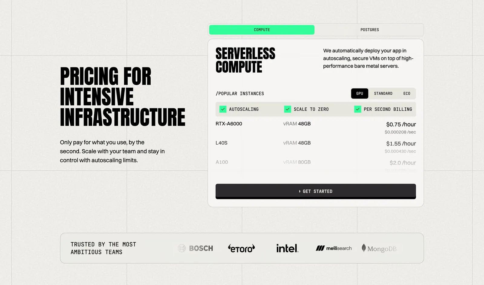
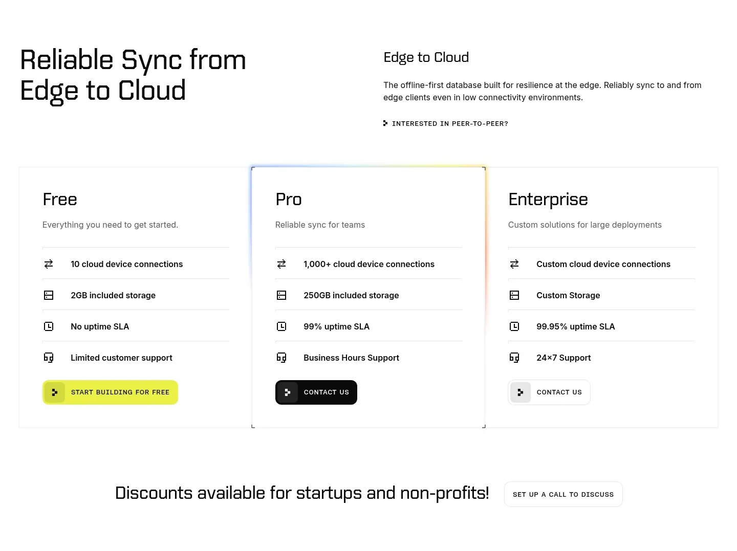
  7. Koyeb pricing section: condensed headline on the left, tabbed GPU instance price card on the right, logo strip below
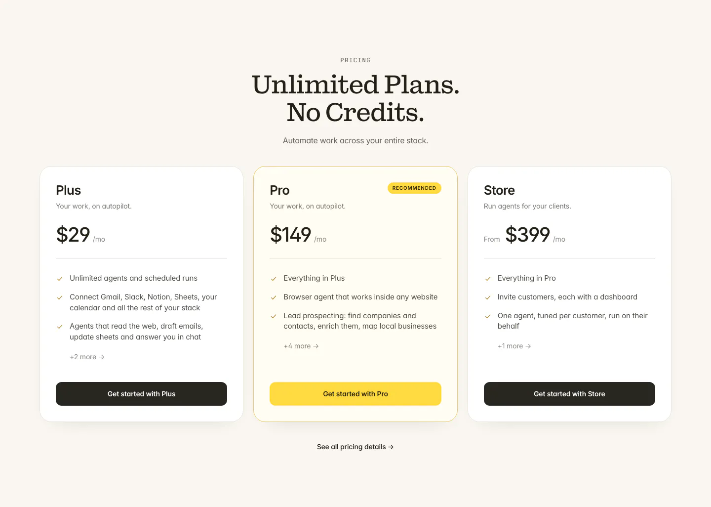
  8. Twin pricing section: centered serif headline above three plan cards with the middle Pro plan highlighted in yellow on cream
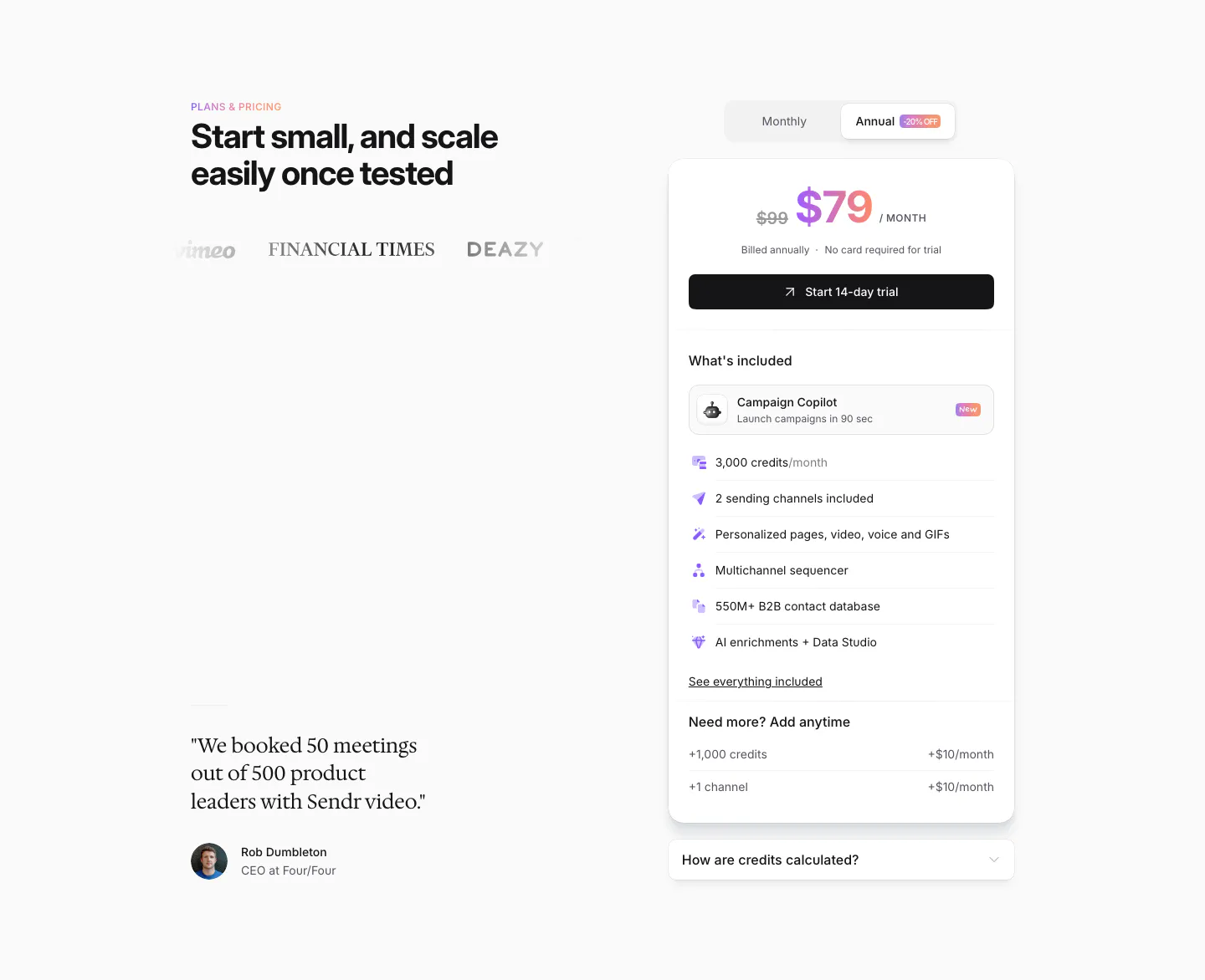
  9. Sendr pricing section: headline, logos and serif customer quote left, single $79 plan card with monthly/annual toggle right
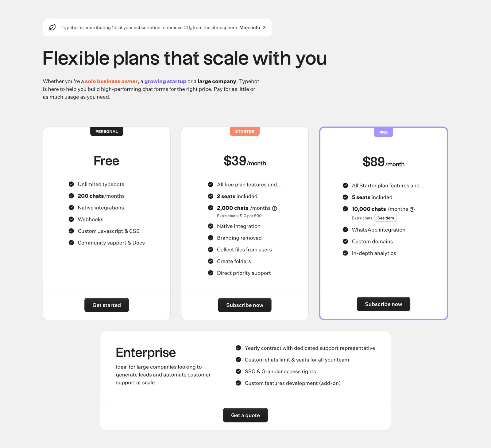
  10. Typebot pricing section: left-aligned headline above three plan cards with check lists and a wide enterprise card on light gray
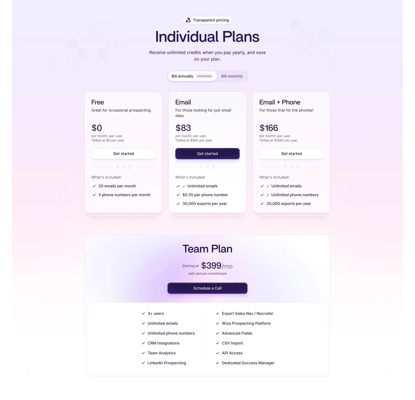
  11. Wiza pricing section: billing toggle above three plan cards and a wide Team Plan card with feature checklist on a lavender gradient
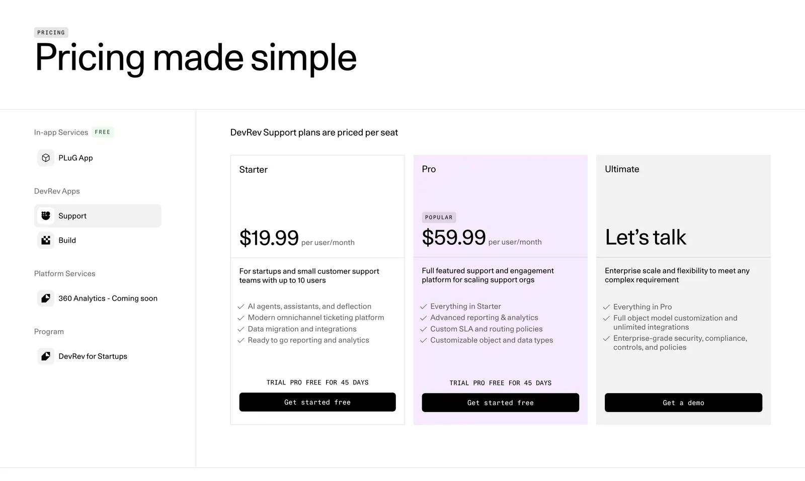
  12. DevRev pricing section: large headline, a left sidebar of product apps and three plan cards with the Pro tier highlighted in lavender
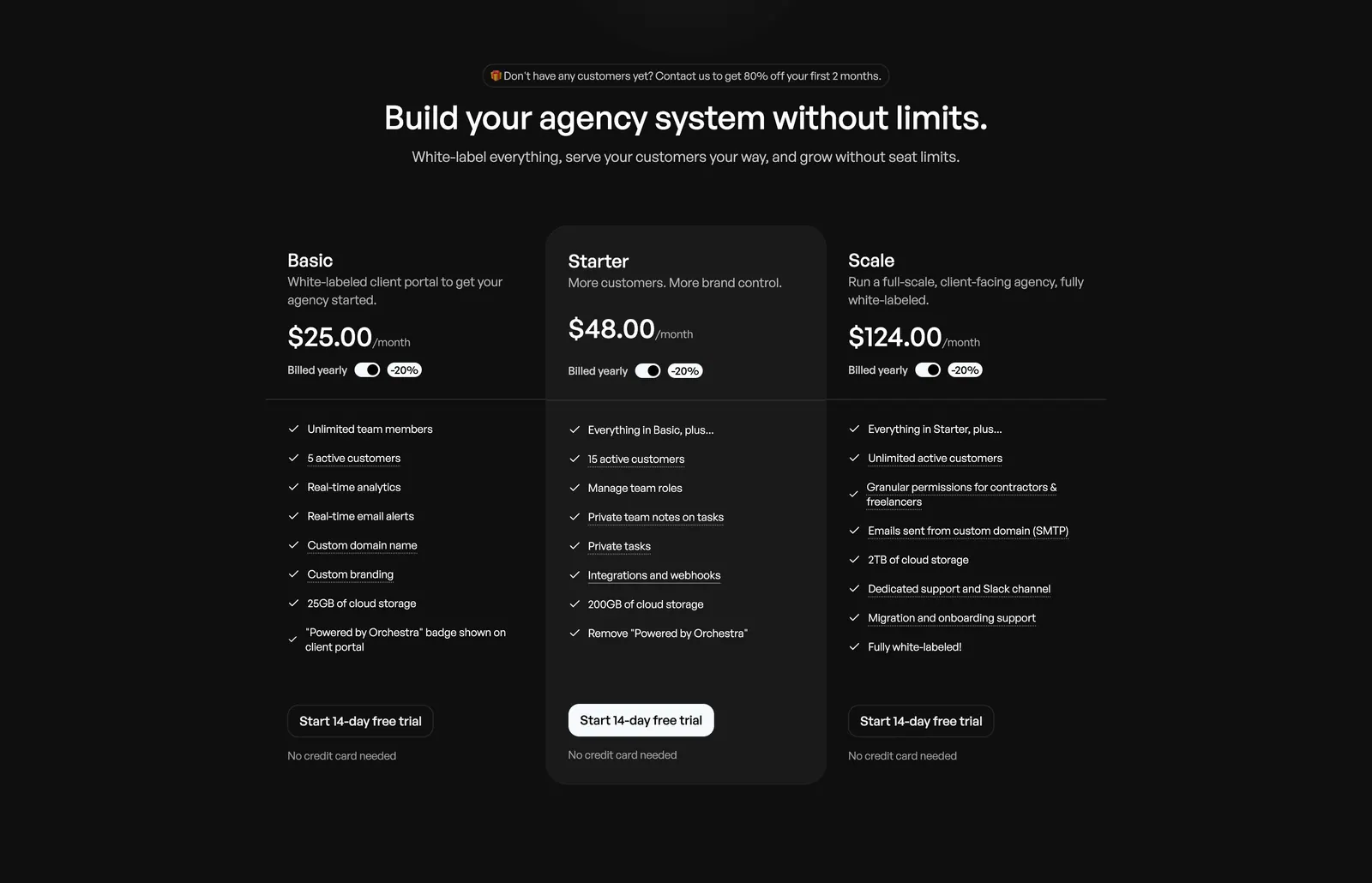
  13. Orchestra pricing section: centered headline above three plan columns with billed-yearly toggles and feature checklists on dark background
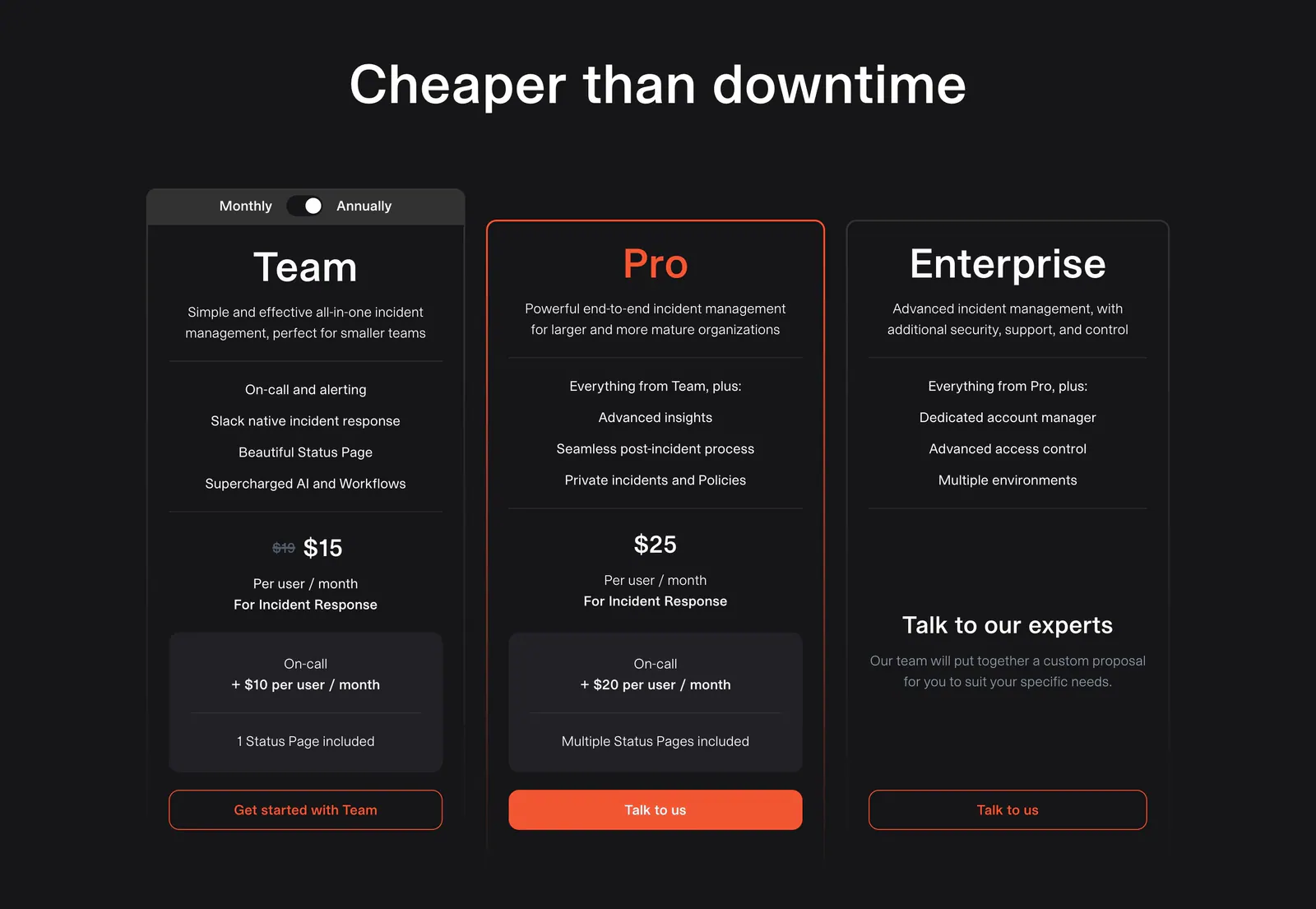
  14. incident.io pricing section: centered headline above three dark plan cards with a monthly/annual toggle and orange buttons
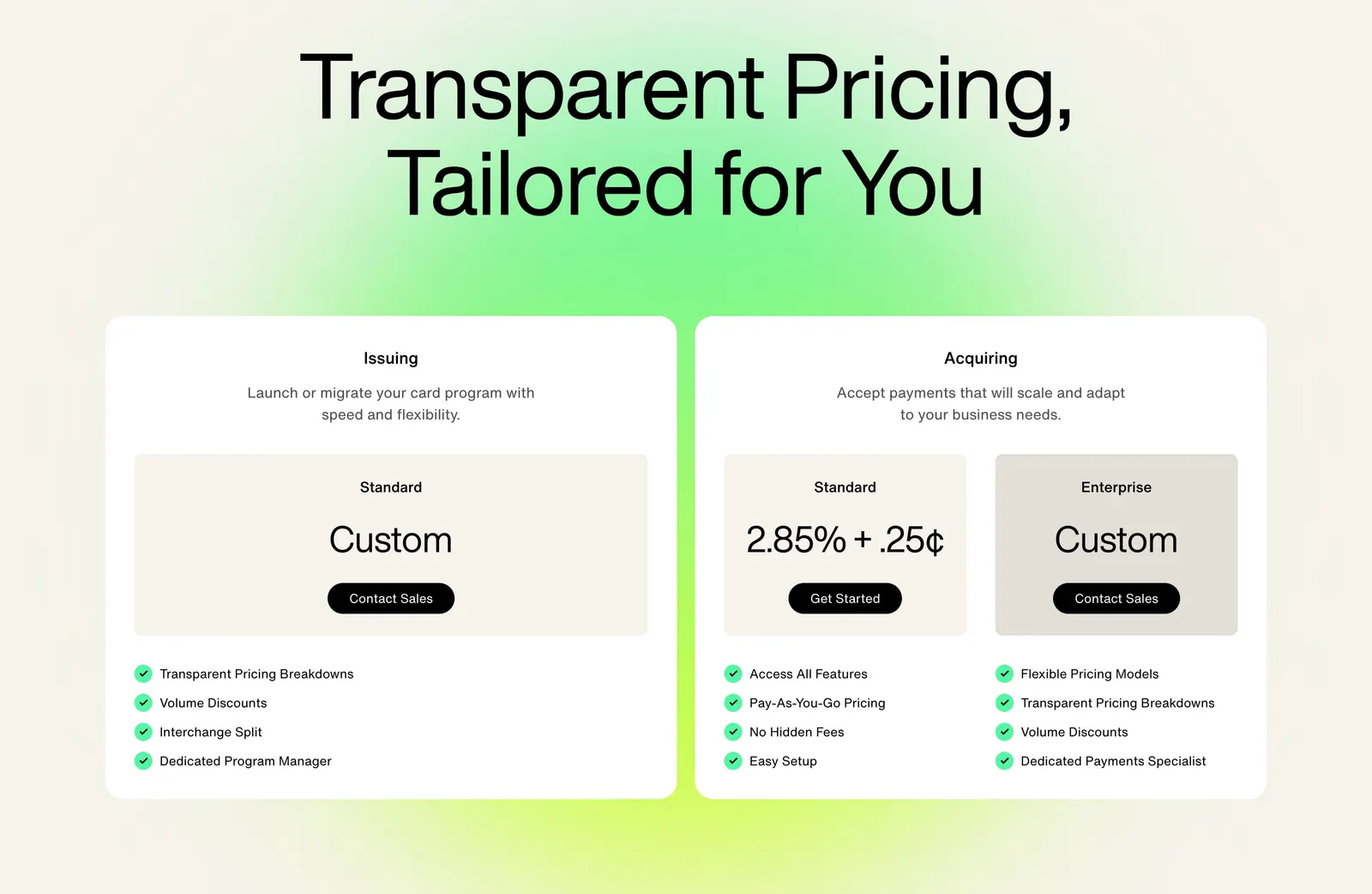
  15. Highnote pricing section: large centered headline above two white plan cards with price boxes and checklists on a green glow
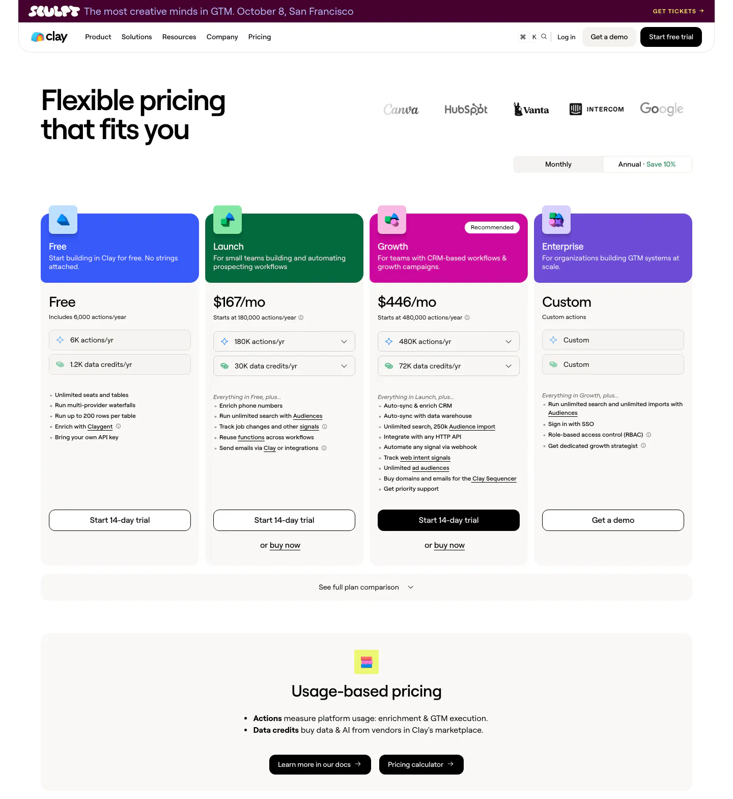
  16. Clay pricing section: headline and logo row above a monthly/annual toggle, four plan cards with colored headers and a usage-based pricing band
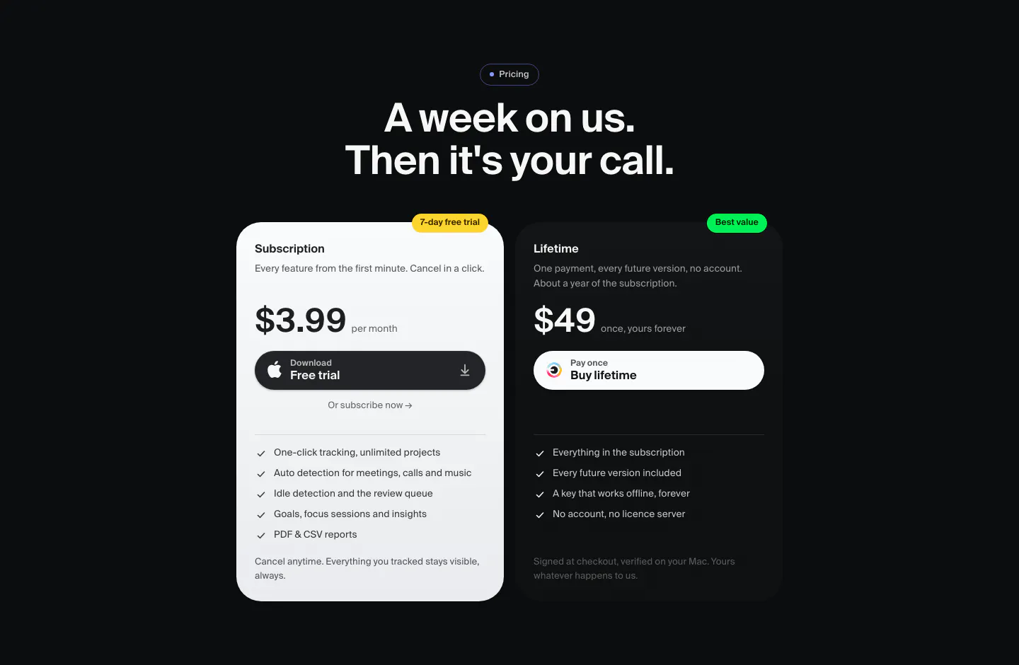
  17. Dial pricing section: dark centered headline above two plan cards, a light $3.99 monthly subscription and a dark $49 lifetime option
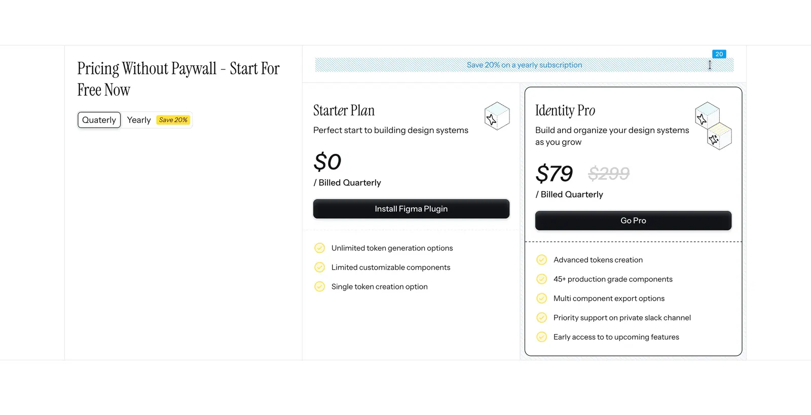
  18. Figr pricing section: serif heading with quarterly/yearly toggle on the left and Starter and Identity Pro plan cards on the right
  19. Ditto pricing section: headline and intro above three plan cards for Free, Pro and Enterprise with icon feature rows, Pro with a glowing border
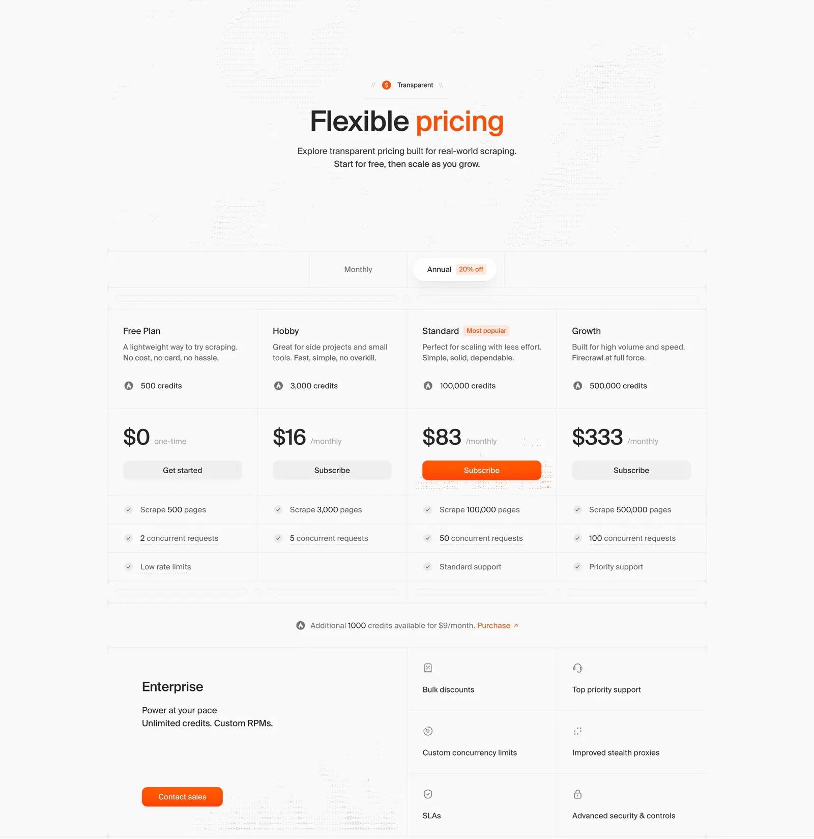
  20. Firecrawl pricing section: centered headline, monthly/annual toggle, four plan columns with prices and an enterprise block on light gray
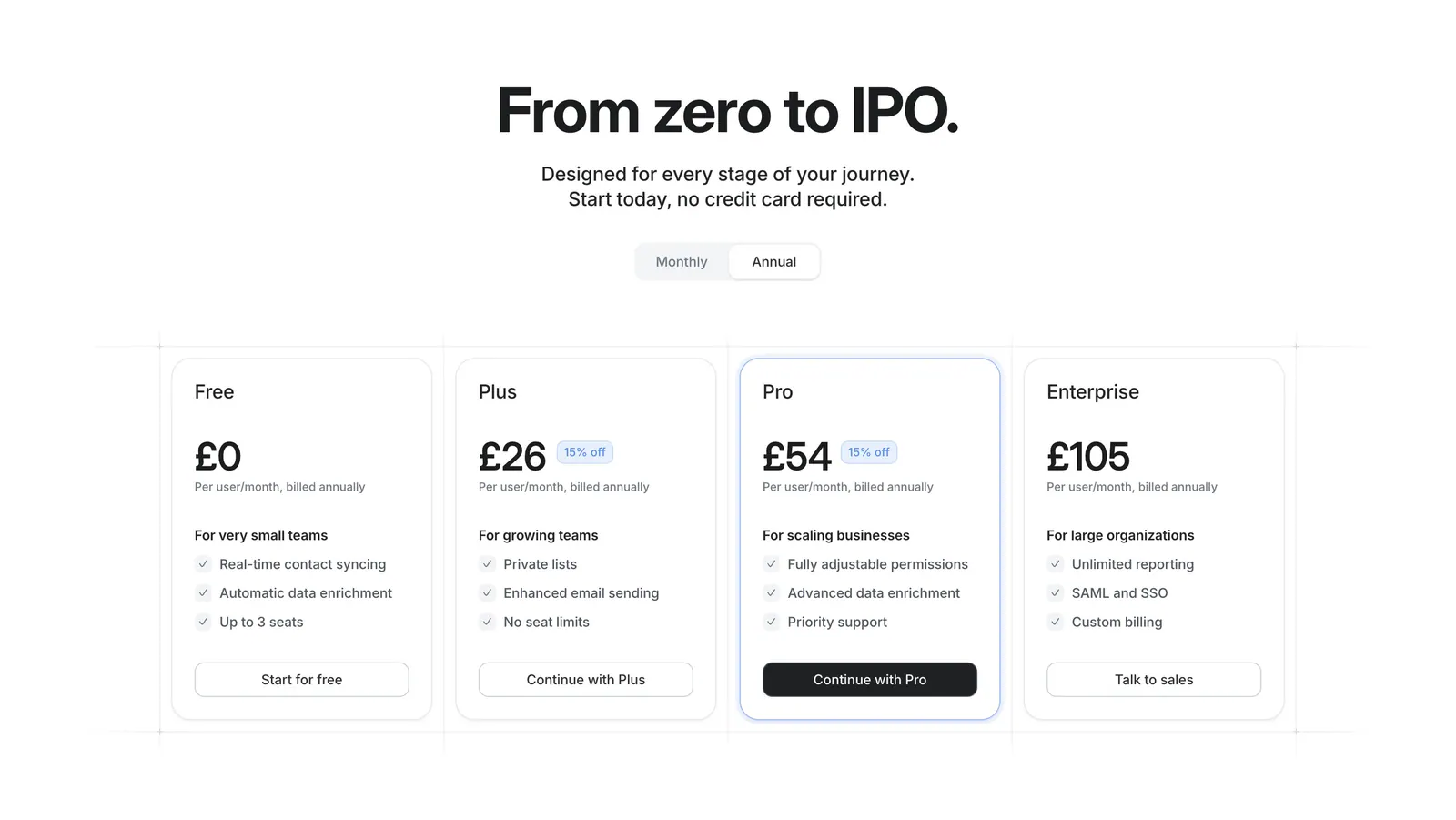
  21. Attio pricing section: centered headline with monthly/annual toggle above four plan cards with prices and checklists on white
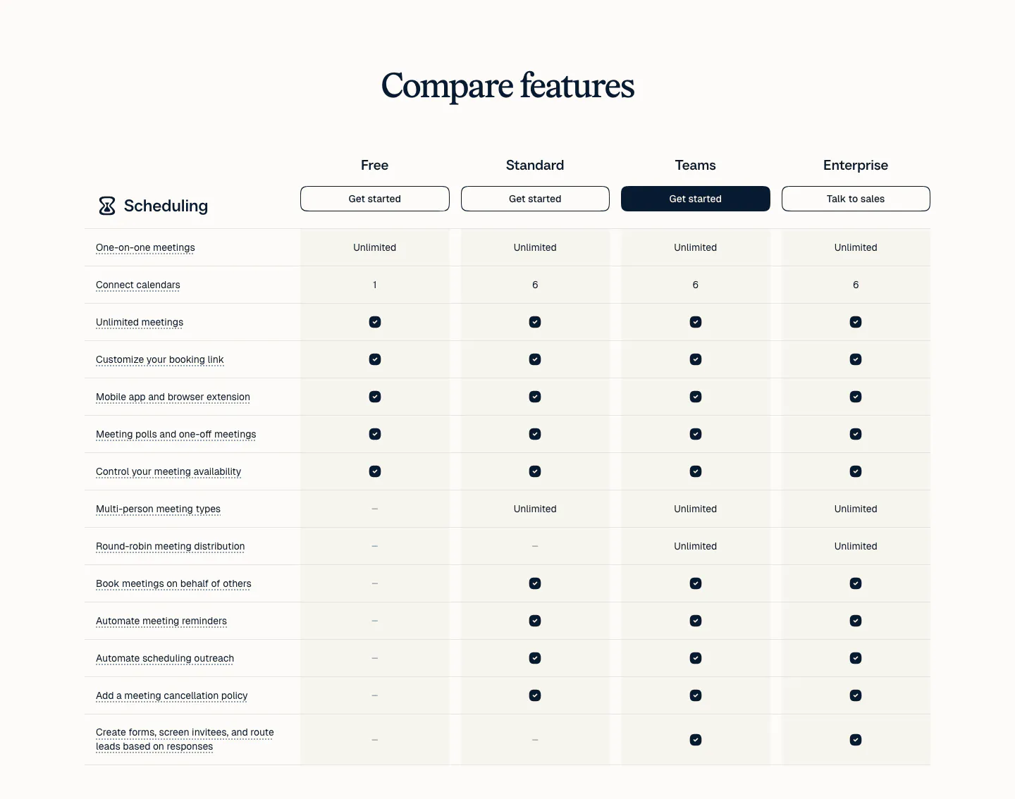
  22. Calendly pricing section: serif heading above a plan comparison table with four plan columns, buttons and check marks on a light background
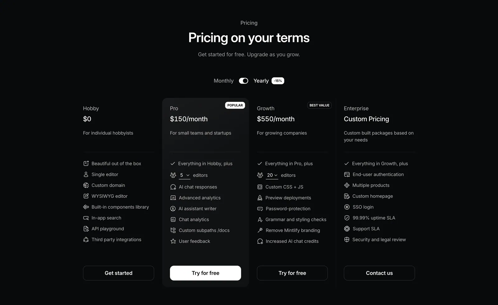
  23. Mintlify pricing section: centered heading with monthly/yearly toggle above four plan columns with icon feature lists on black
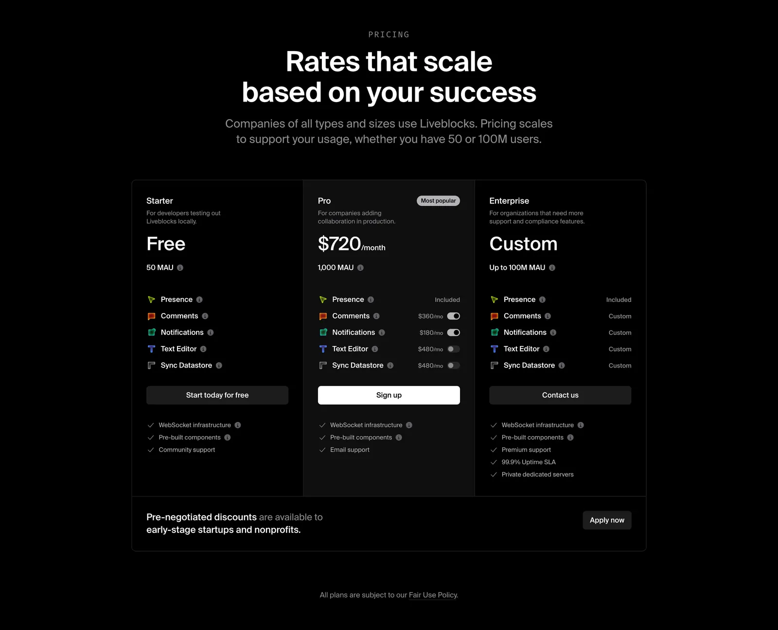
  24. Liveblocks pricing section: centered heading above three dark plan columns, Starter, Pro and Enterprise, with add-on toggles and a discount banner
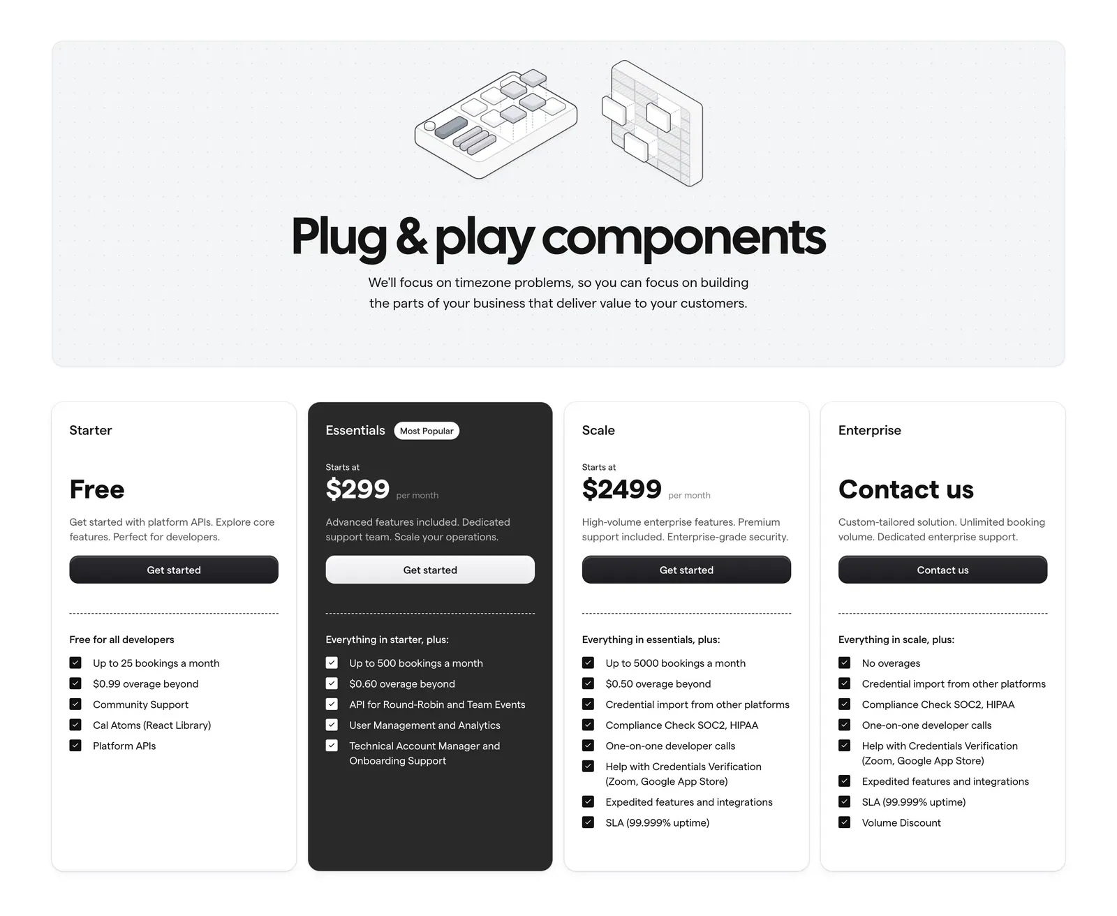
  25. Cal.com pricing section: centered headline with isometric line art on a dotted panel above four plan cards, one dark highlighted
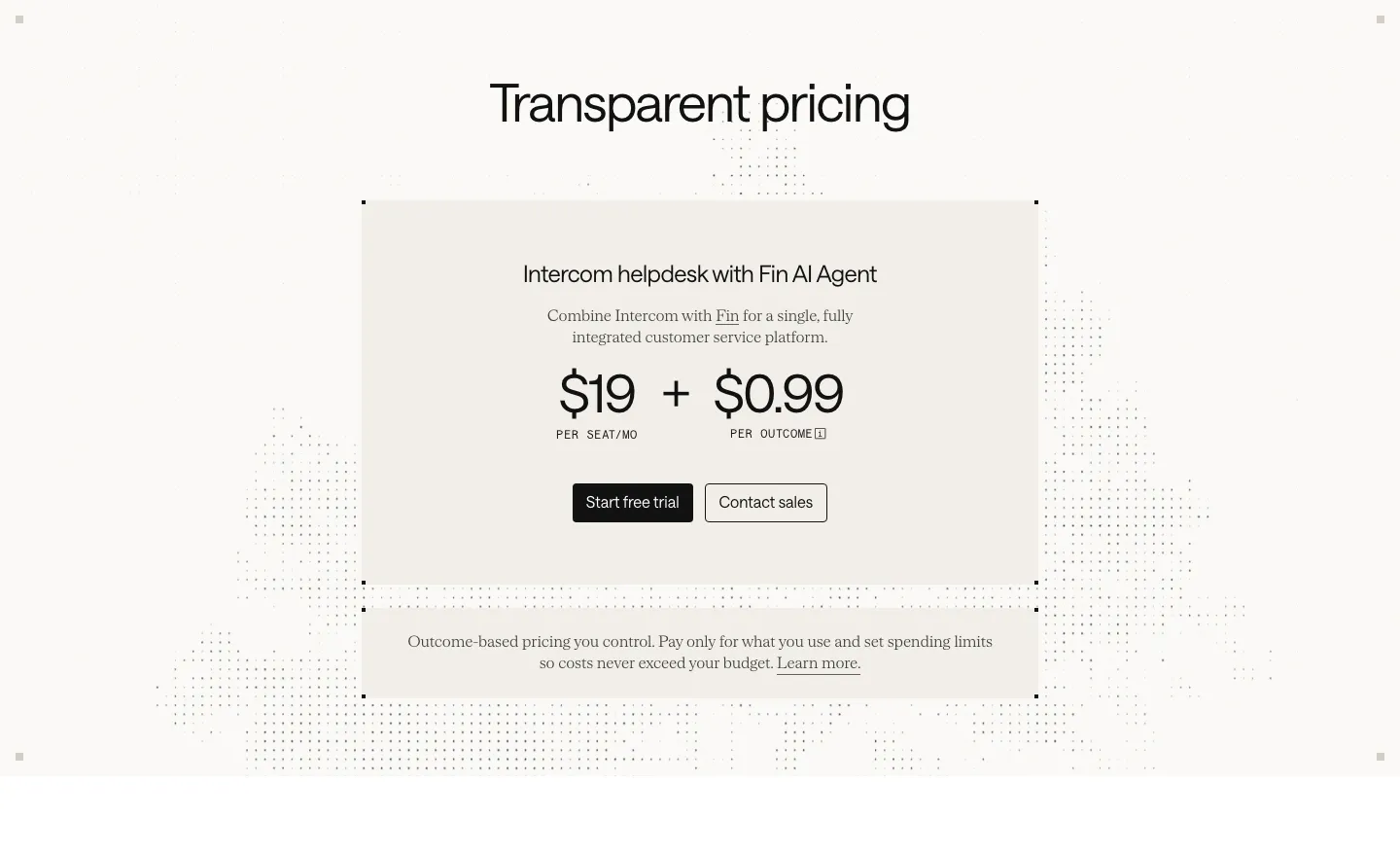
  26. Intercom pricing section: centered beige card with $19 per seat plus $0.99 per outcome pricing and two buttons over a faint dot pattern
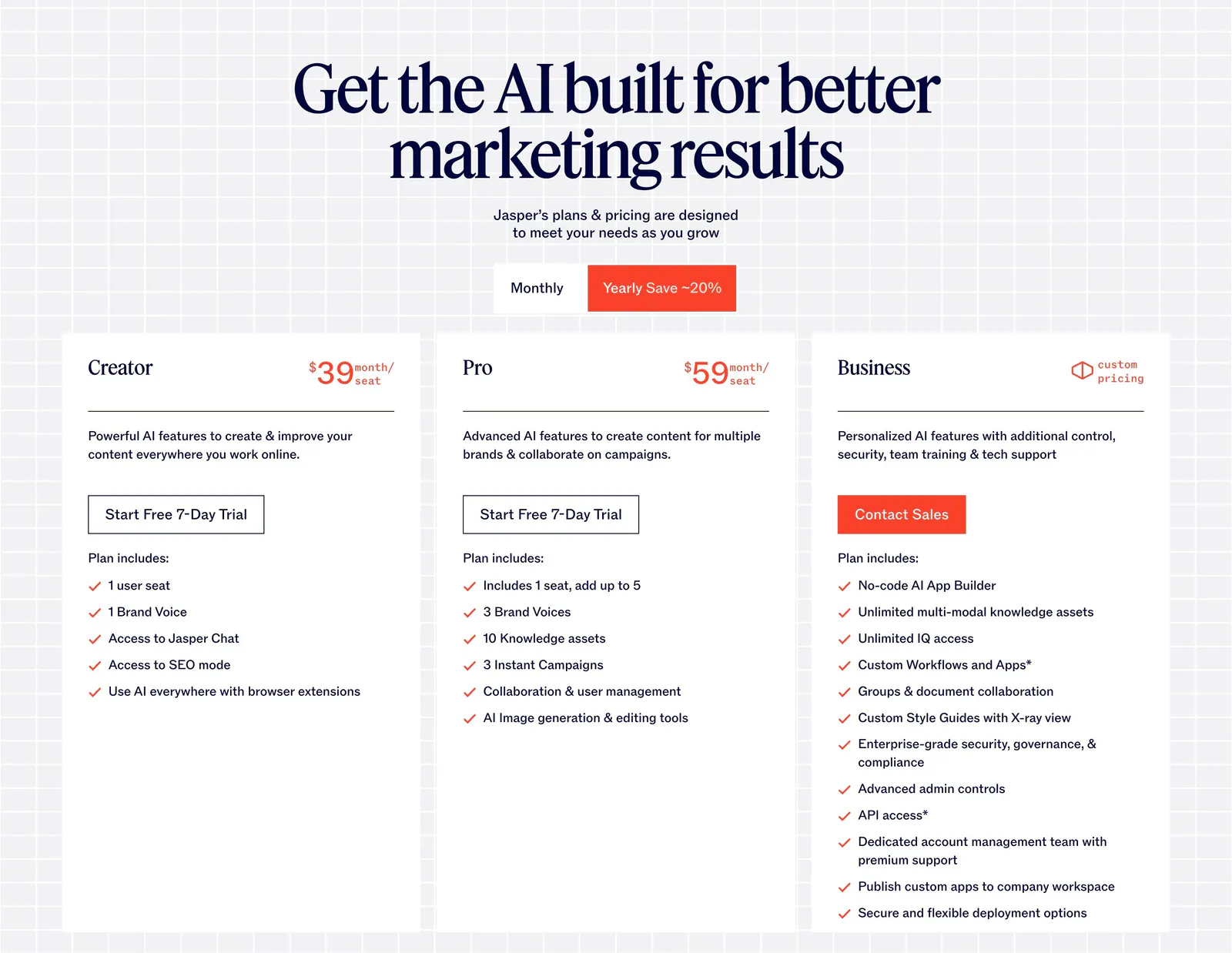
  27. Jasper pricing section: centered serif headline and monthly/yearly toggle above three white plan cards on a light grid background
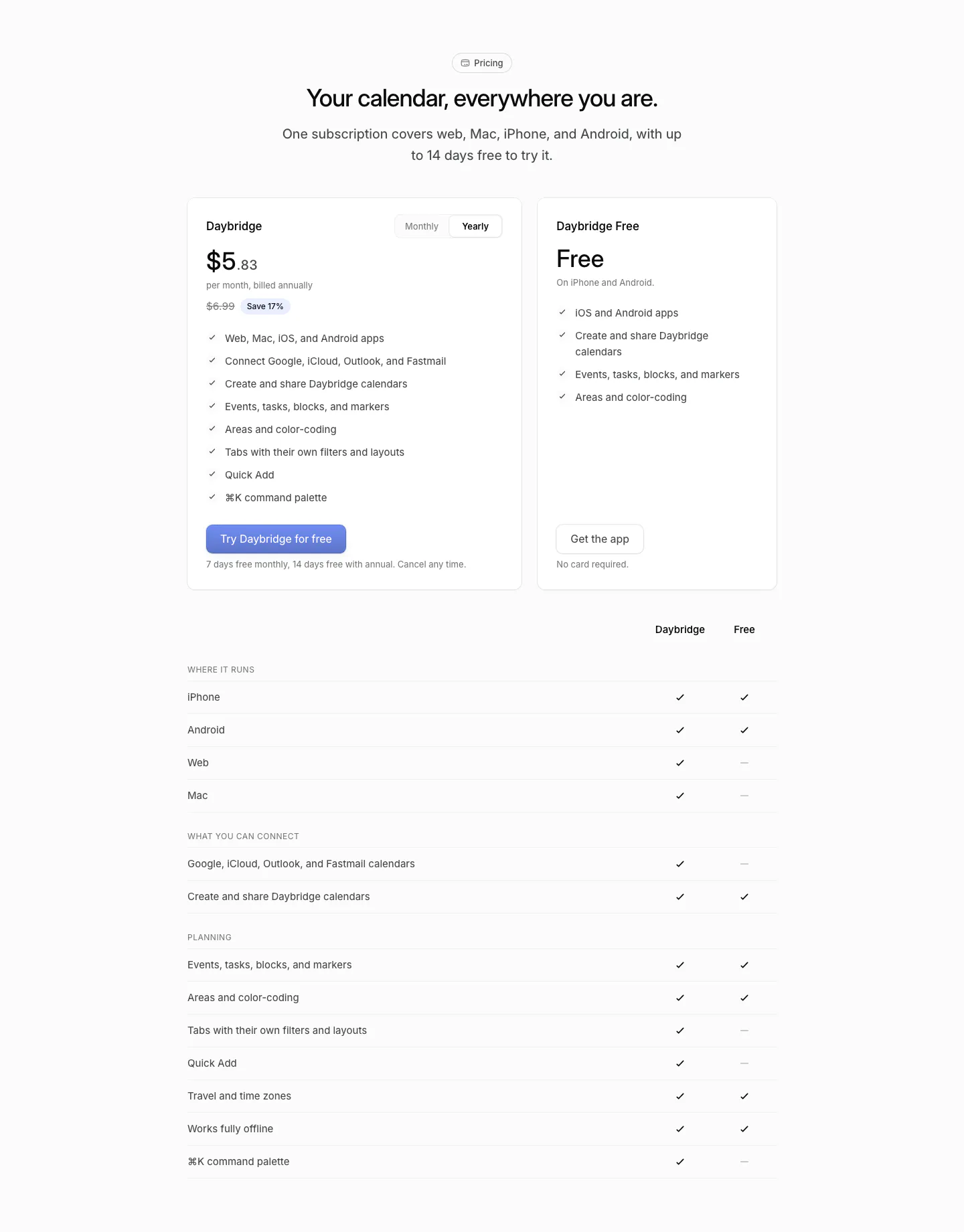
  28. Daybridge pricing section: centered headline above two plan cards with a monthly/yearly toggle and a plan comparison checkmark table
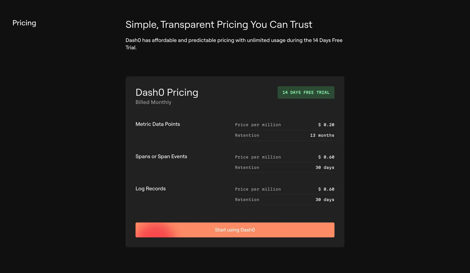
  29. Dash0 pricing section: single dark pricing card listing per-million prices and retention for metrics, spans and logs with an orange CTA
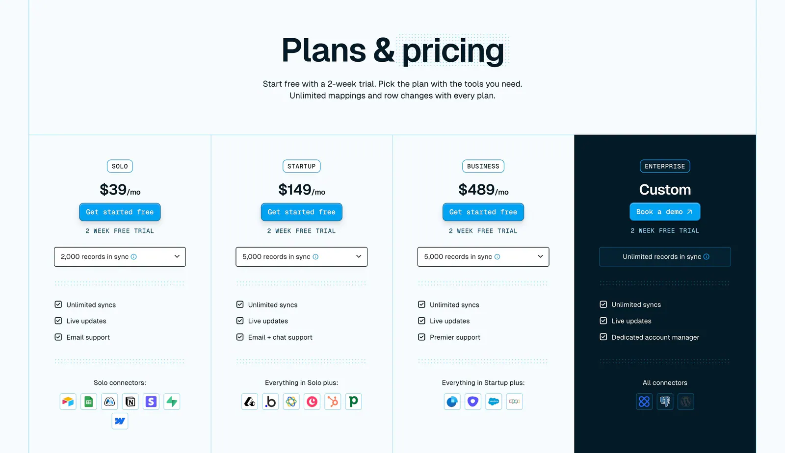
  30. Whalesync pricing section: centered headline above four plan columns with prices, record dropdowns and connector icons, Enterprise in navy
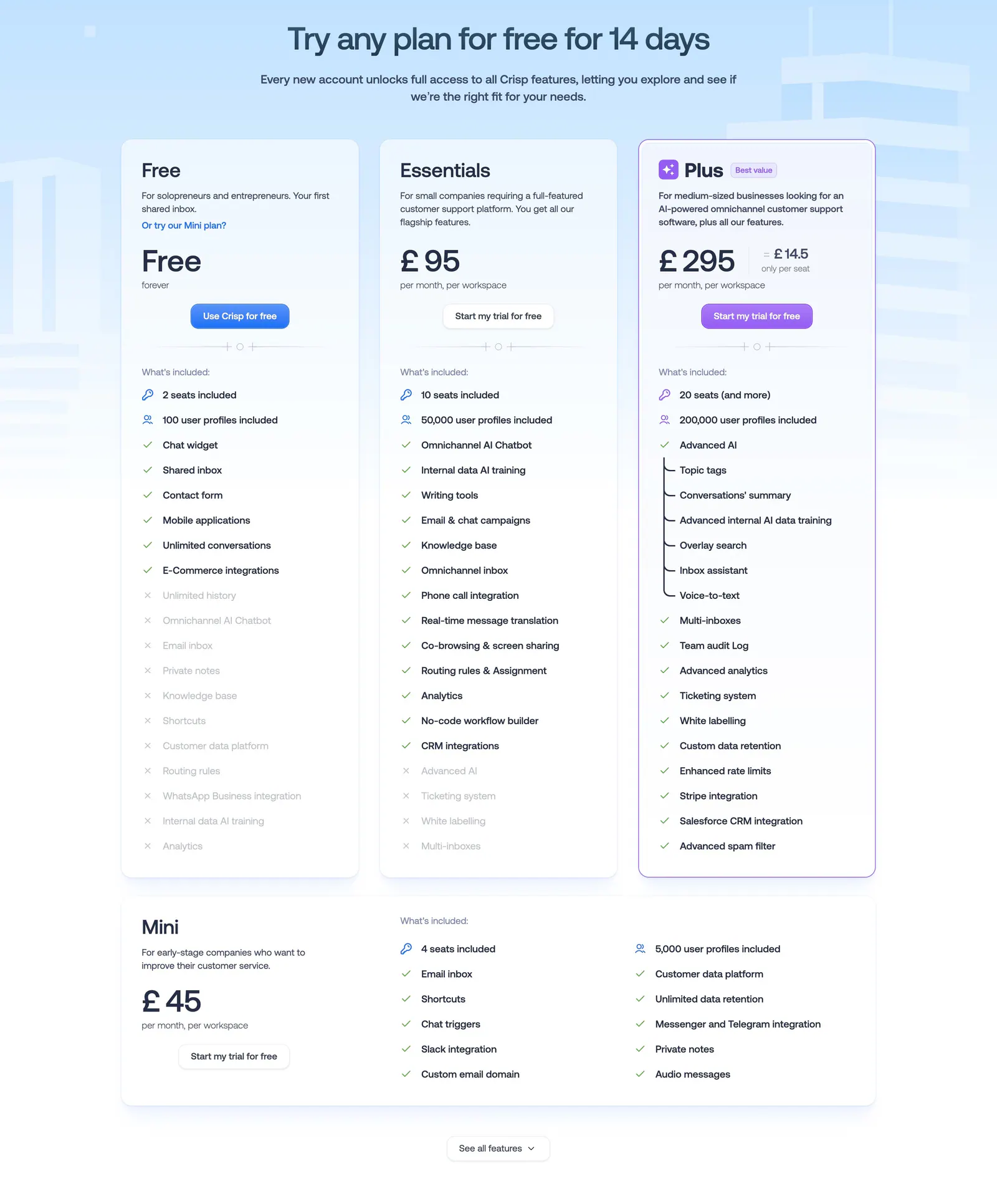
  31. Crisp pricing section: centered headline above three plan cards with checklists and a wide Mini plan card on pale blue
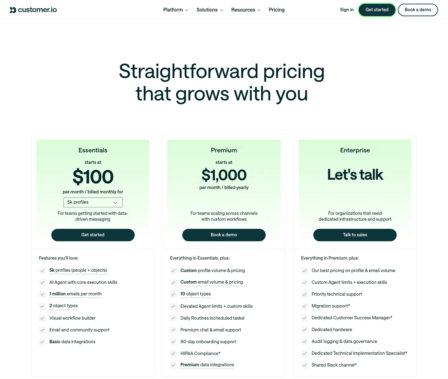
  32. Customer.io pricing section: nav and centered headline above three plan cards with mint-tinted headers, prices, buttons and checklists
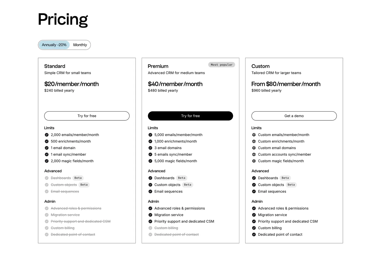
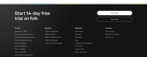
  33. folk pricing section: left-aligned heading, annual/monthly toggle and three outlined plan cards with feature checklists on white
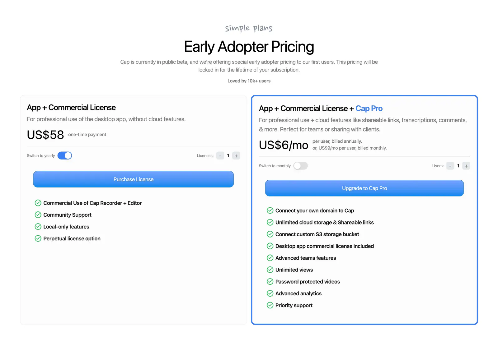
  34. Cap pricing section: centered headline above two license cards with billing toggles, blue buttons and green-check feature lists
    Cap
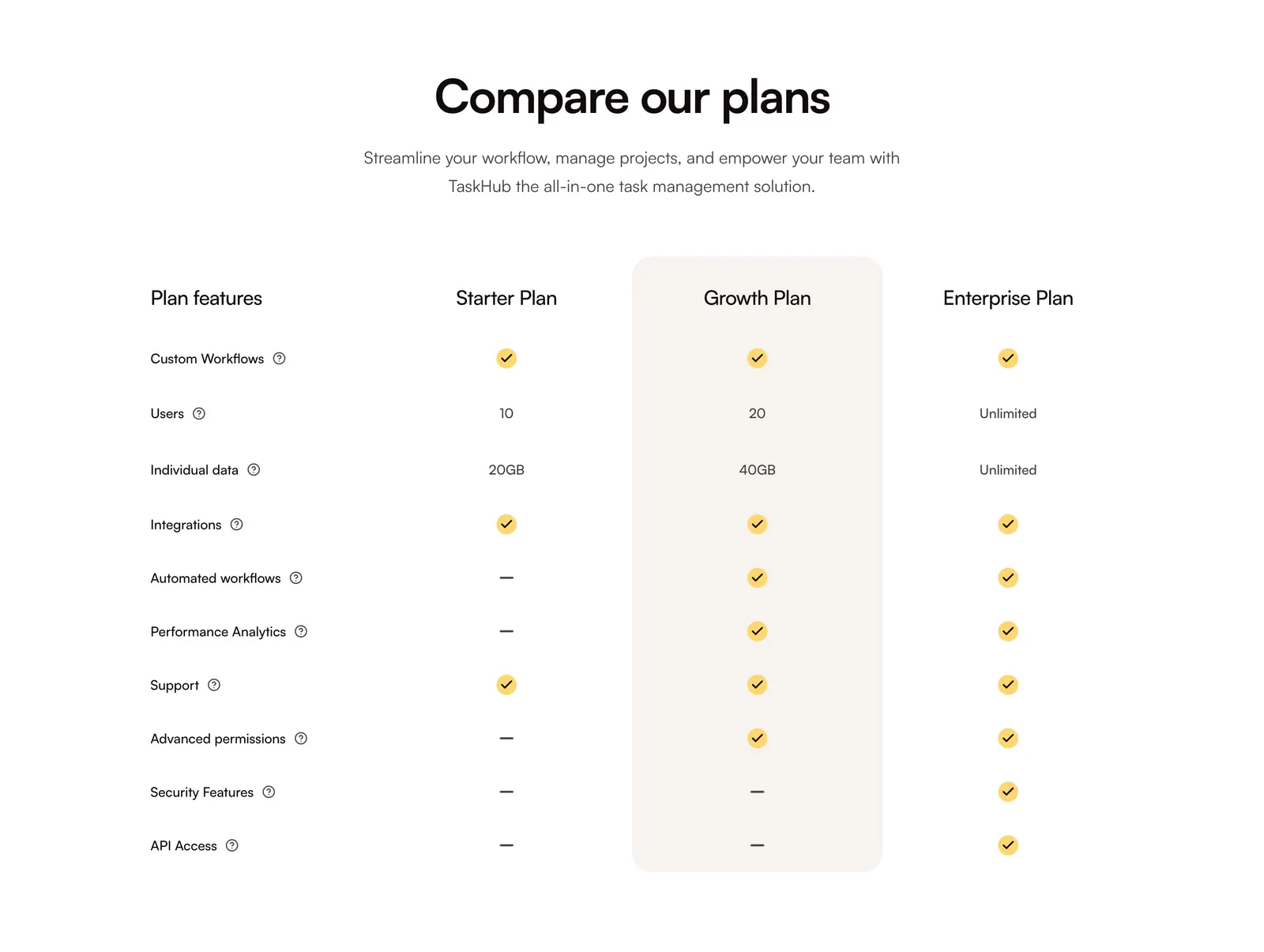
  35. QuickLnk pricing section: centered headline above a plan comparison table with yellow checkmarks and a highlighted Growth column
  36. NickAI pricing section: heading with monthly/annual toggle, three plan columns with blue highlighted Pro tier and enterprise band
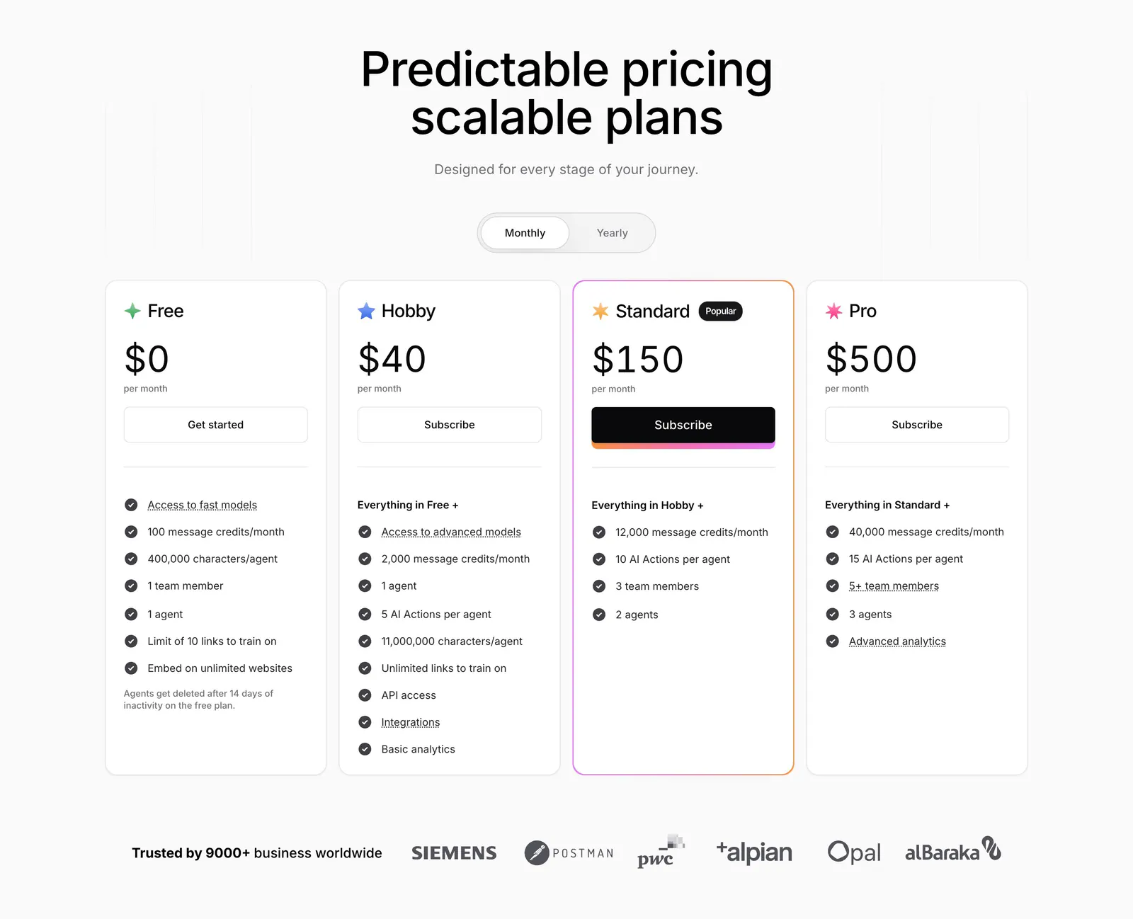
  37. Chatbase pricing section: centered headline and monthly/yearly toggle above four plan cards and a customer logo row
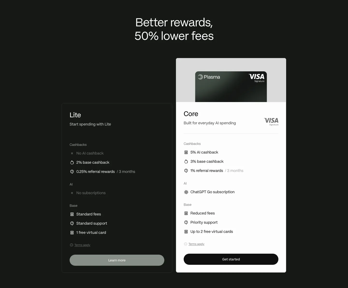
  38. Plasma pricing section: centered headline above dark Lite and white Core plan cards with feature lists on a dark background
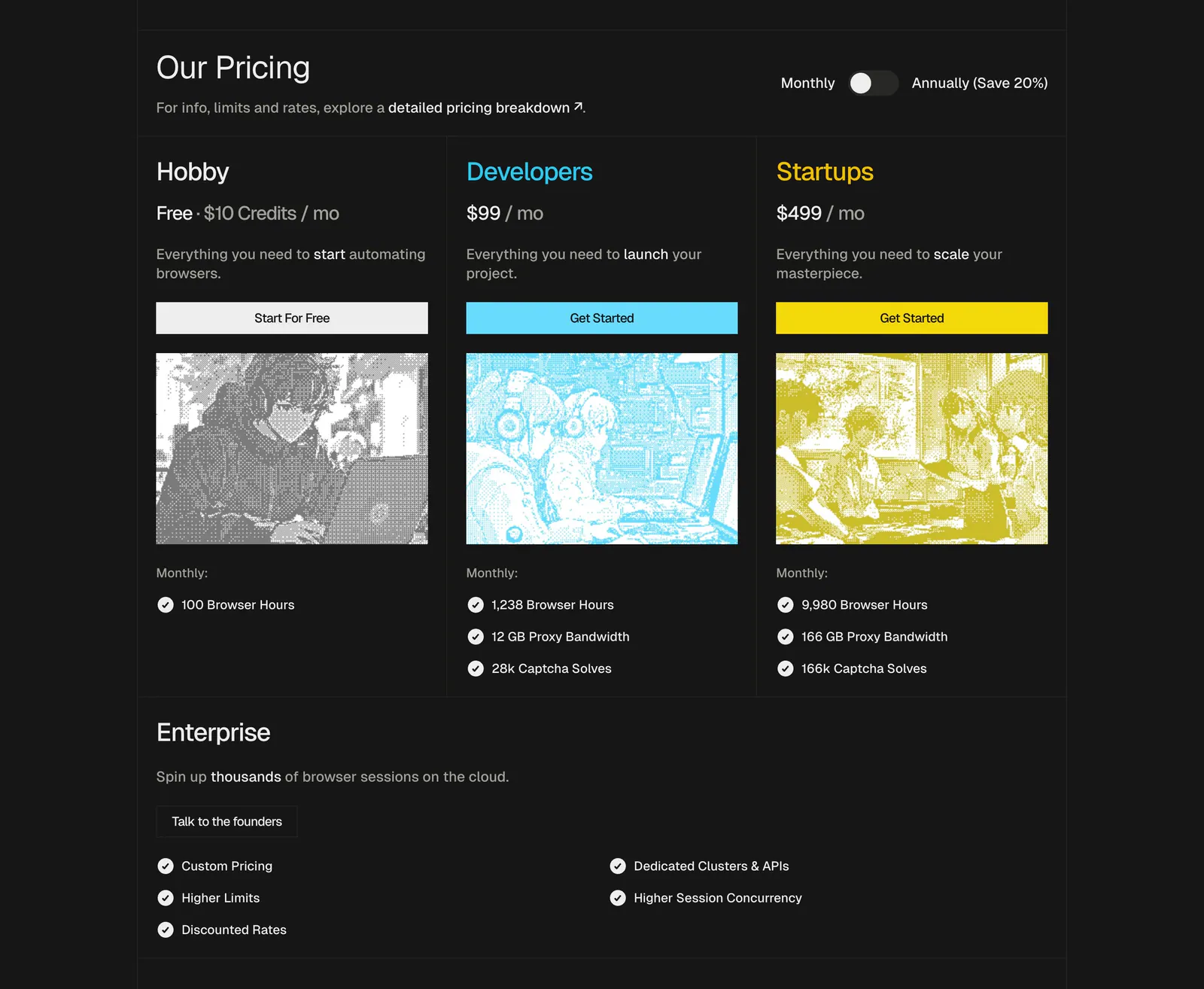
  39. Steel pricing section: three plan cards with dithered anime-style images, monthly/annual toggle and an enterprise row on a dark background
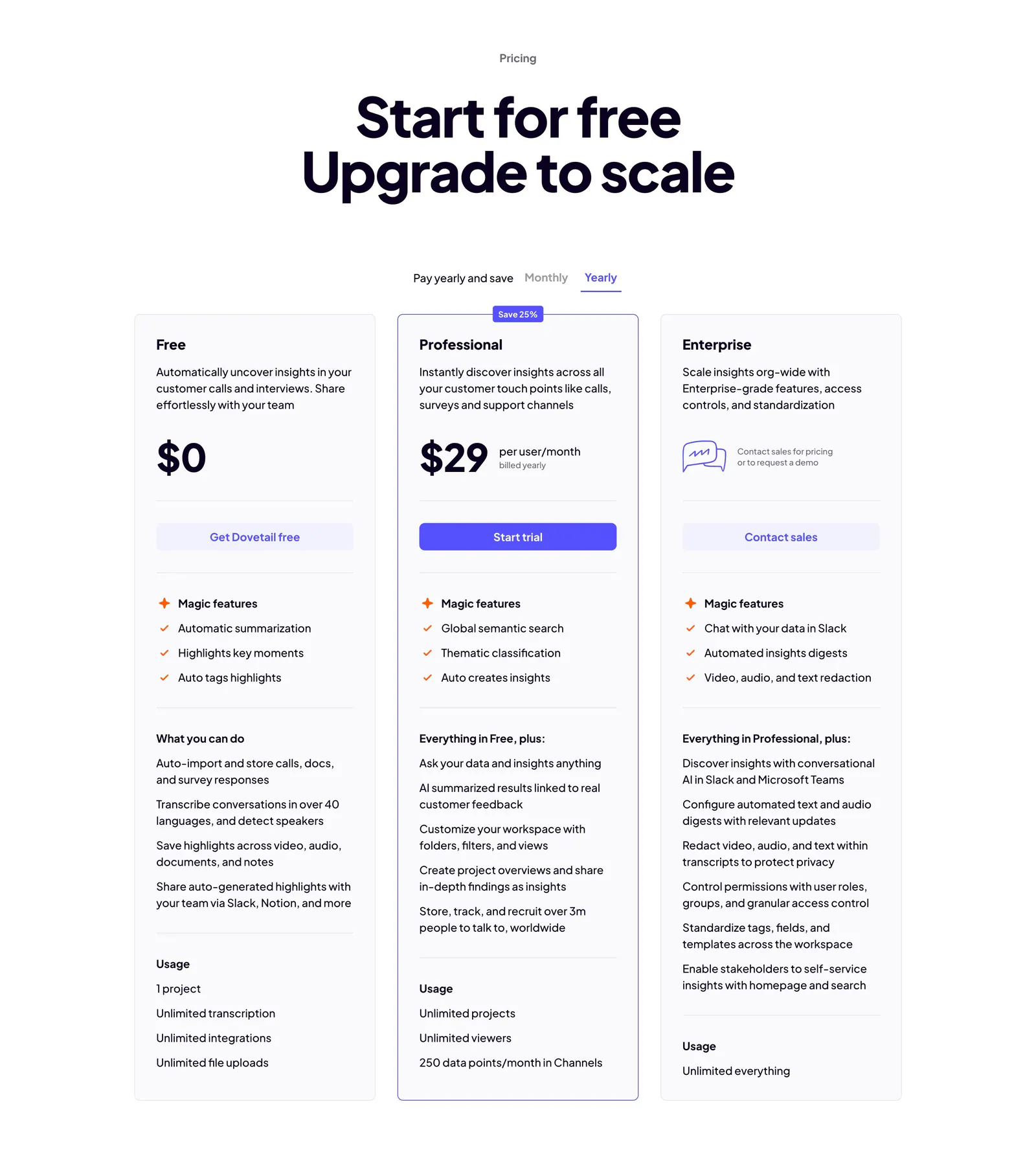
  40. Dovetail pricing section: centered headline, monthly/yearly toggle and three plan cards with the Professional tier outlined in indigo
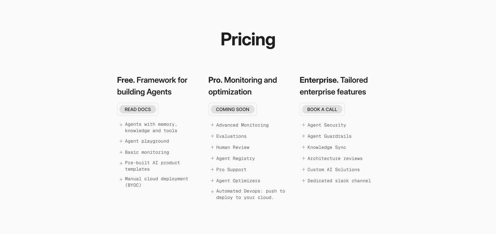
  41. Phidata pricing section: centered Pricing heading above three plain plan columns with buttons and monospace feature lists on light gray
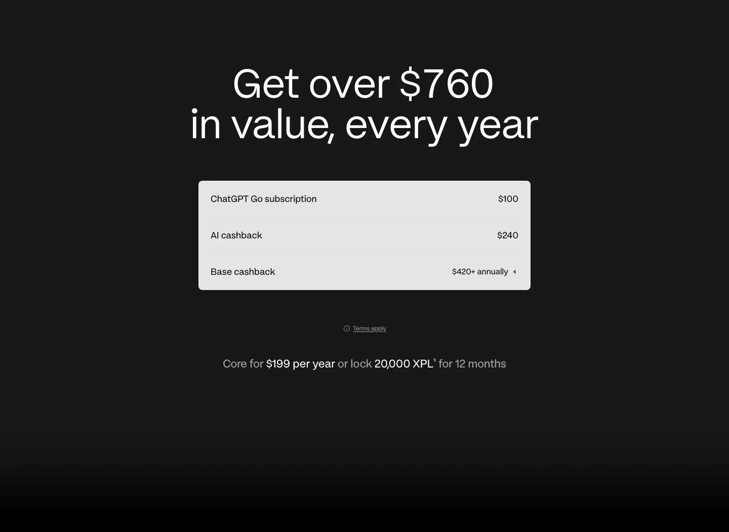
  42. Plasma pricing section: centered headline above a light value breakdown table with annual price line on a dark background
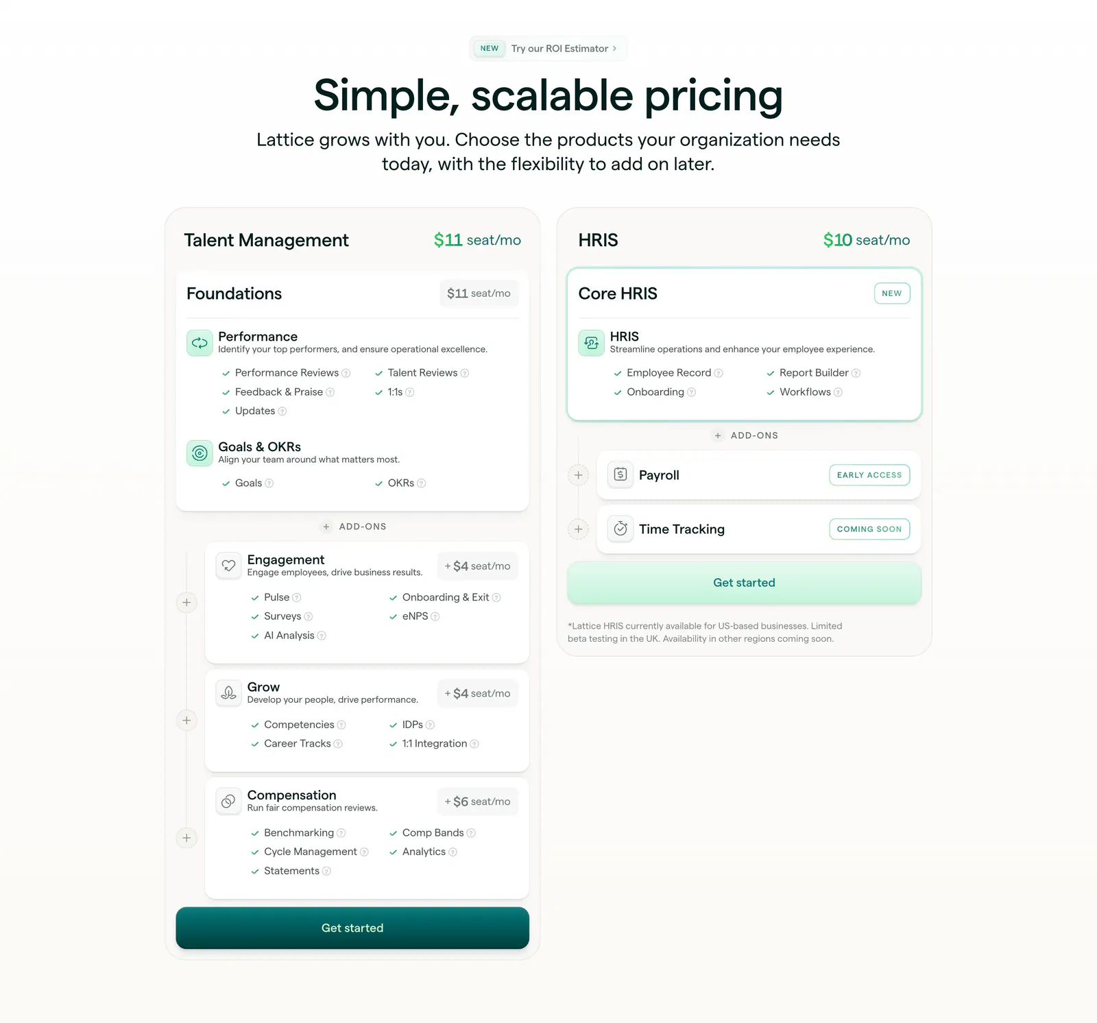
  43. Lattice pricing section: centered heading above two plan cards, Talent Management with stacked add-ons and HRIS, with seat prices and checklists
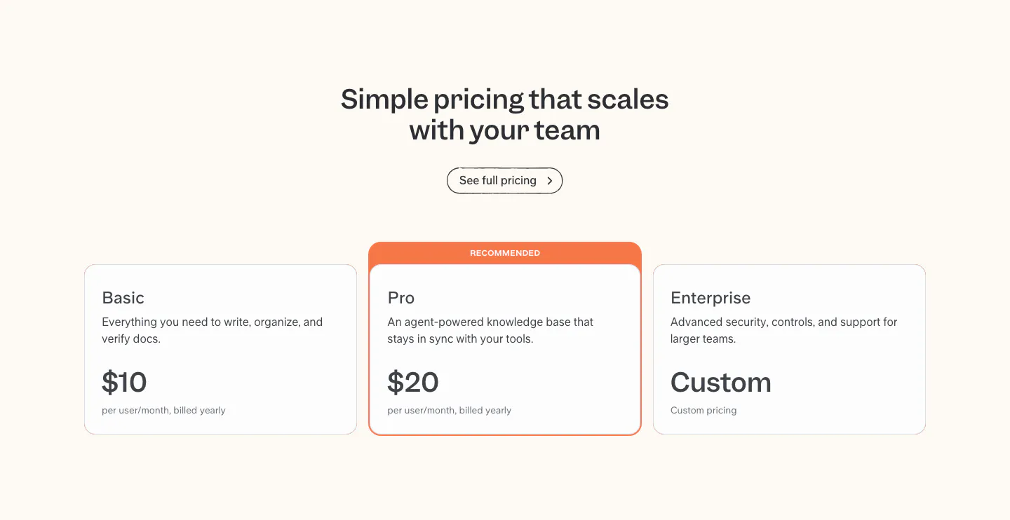
  44. Slite pricing section: centered headline above Basic, Pro and Enterprise plan cards, with the Pro card highlighted as recommended
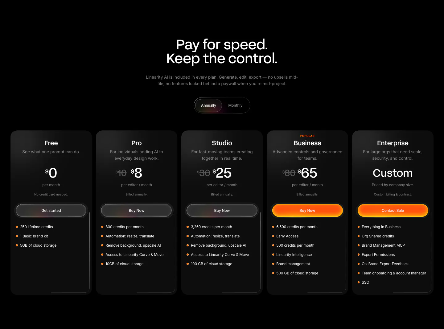
  45. Linearity pricing section: centered headline and annual/monthly toggle above five dark plan cards with orange accent buttons on black
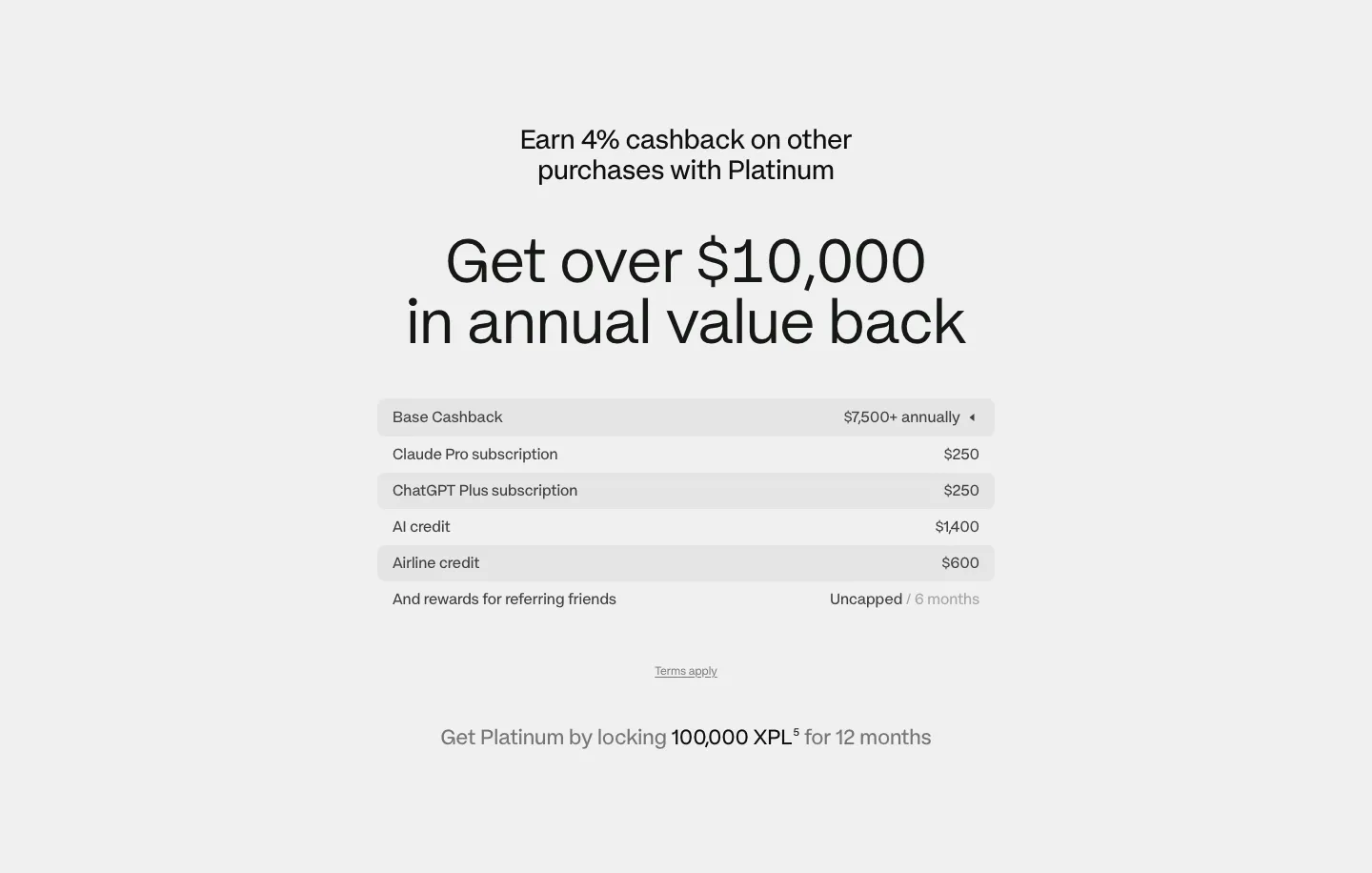
  46. Plasma pricing section: centered headline above a striped value breakdown table and lock requirement note on light gray
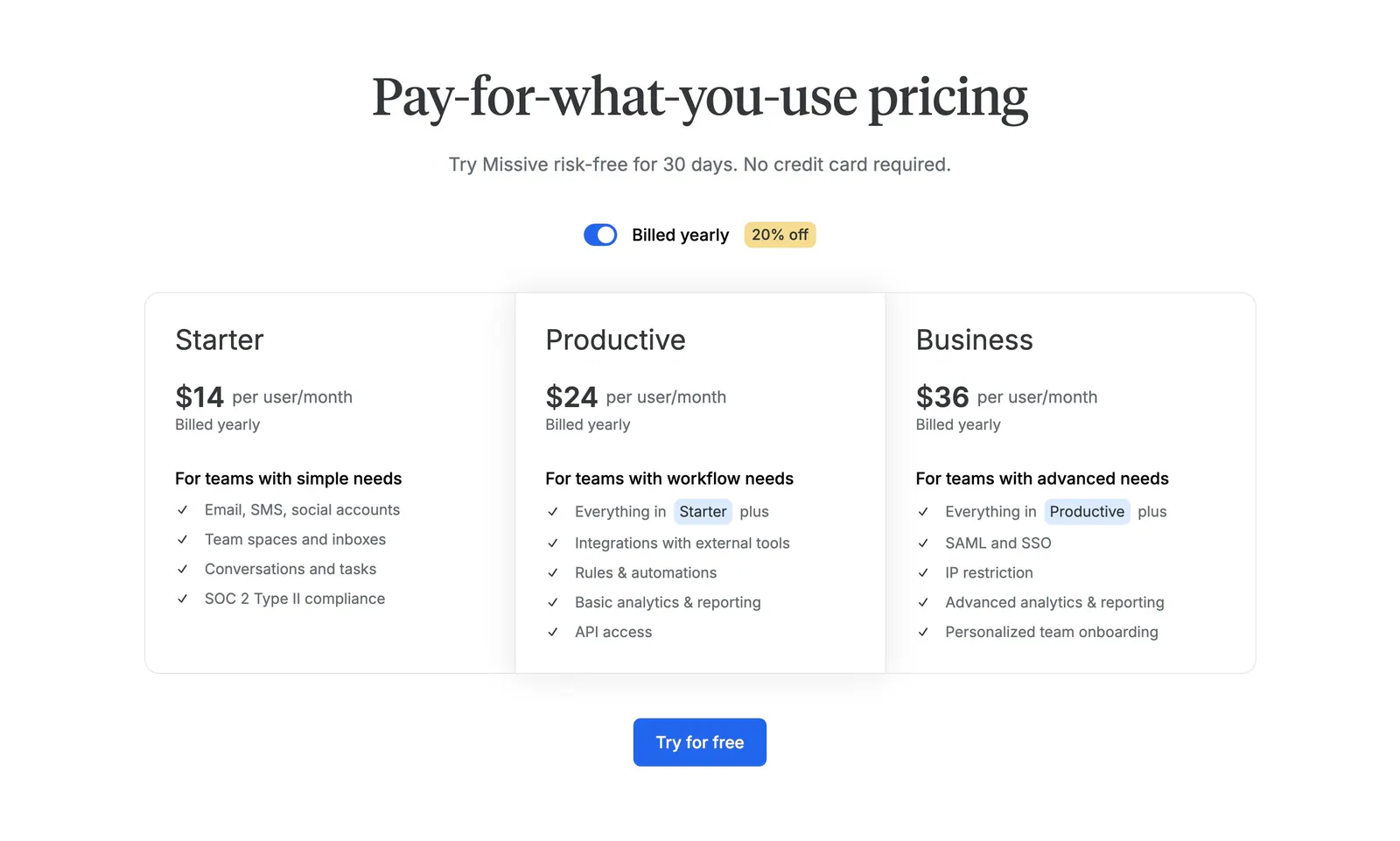
  47. Missive pricing section: centered serif headline with billing toggle above three plan columns and a Try for free button
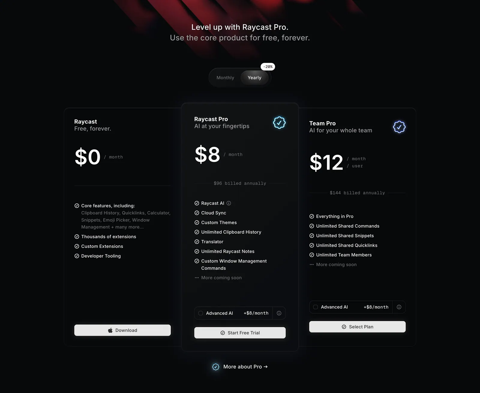
  48. Raycast pricing section: centered headline and monthly/yearly toggle above three dark plan cards with prices and feature lists
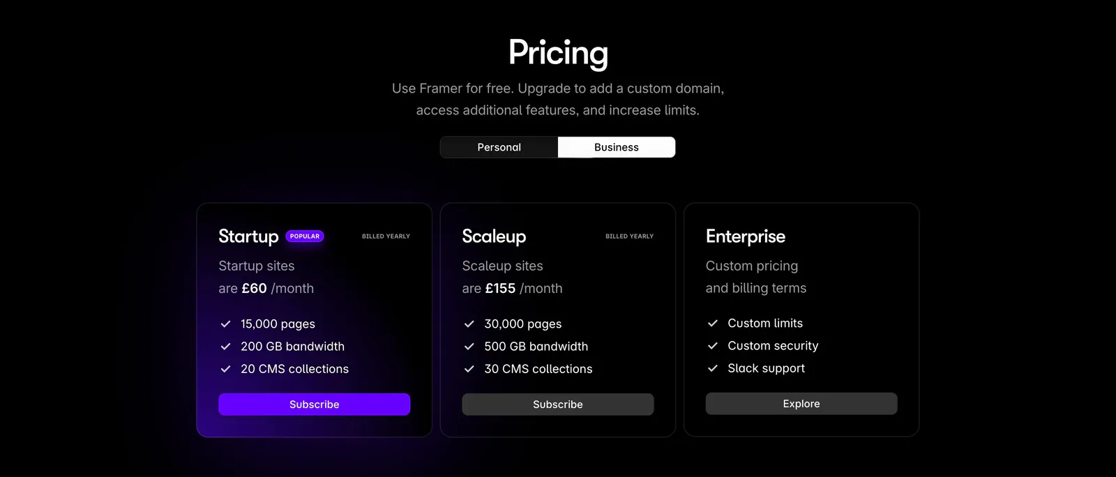
  49. Framer pricing section: centered heading with personal/business toggle above three dark plan cards, the popular one with a purple glow
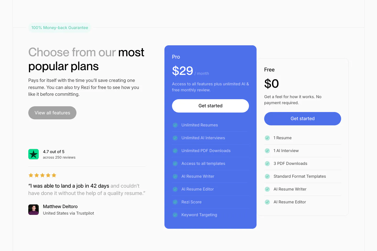
  50. Rezi pricing section: headline and Trustpilot quote on the left, blue Pro plan card and white Free plan card with checklists at right
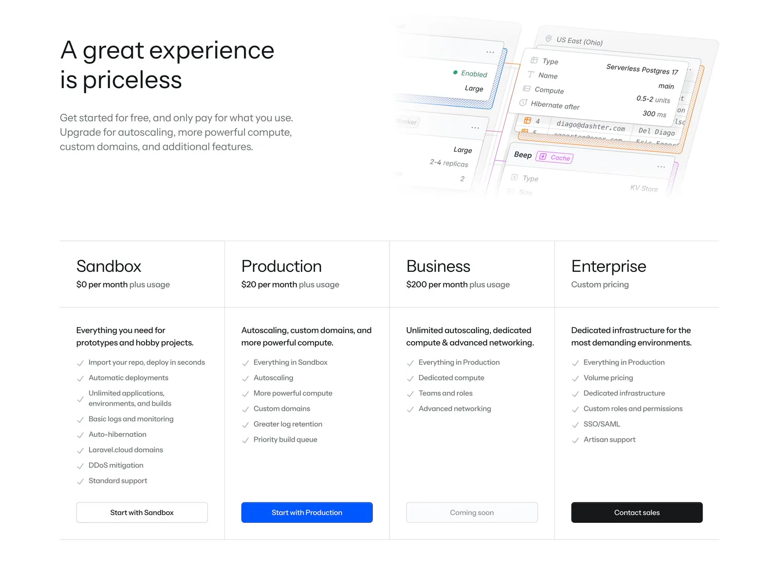
  51. Laravel Cloud pricing section: headline beside a faded UI mockup above four plan columns with checklists and buttons
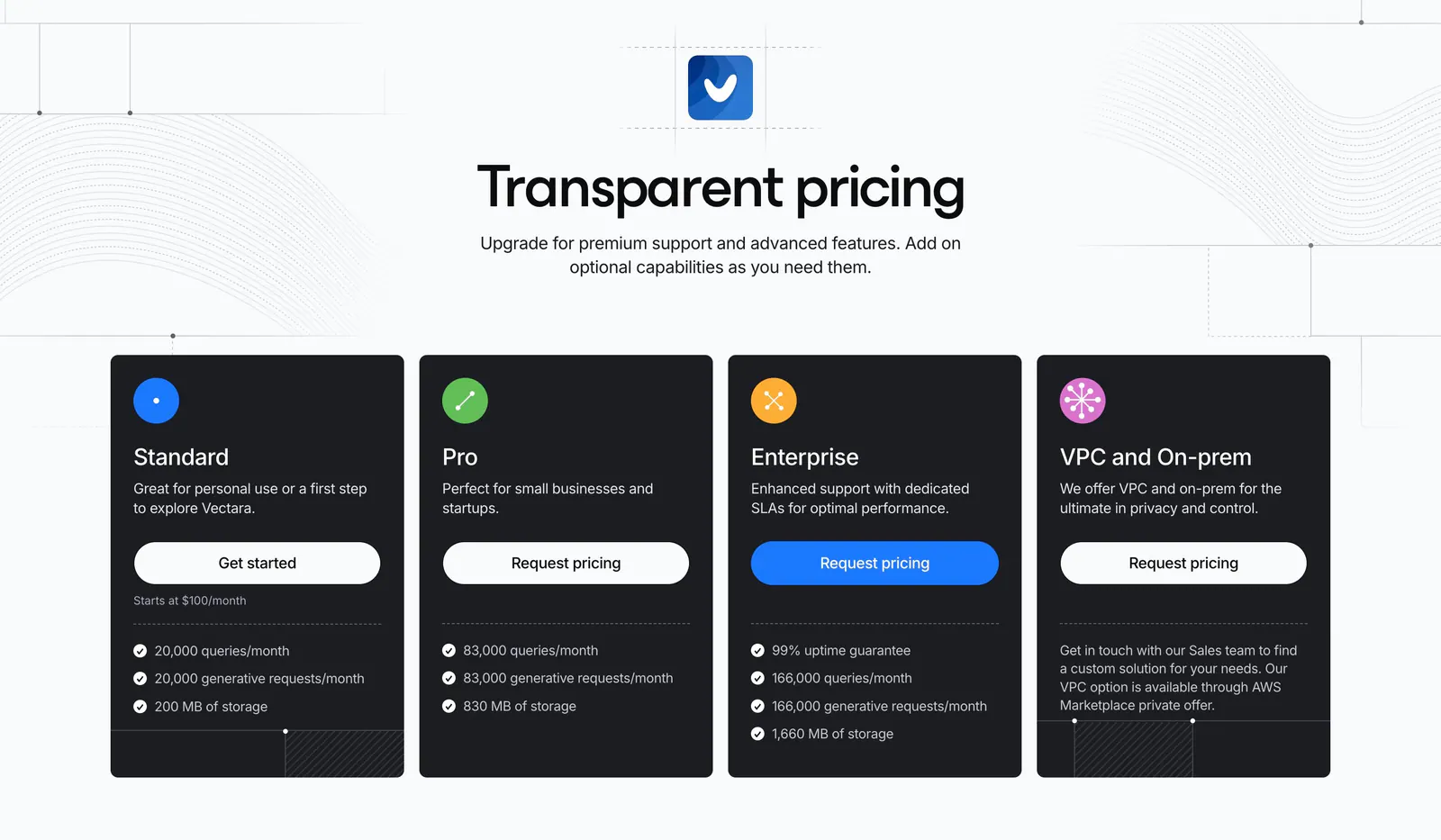
  52. Vectara pricing section: centered headline above four dark plan cards with icons and buttons, on light gray with line-pattern accents
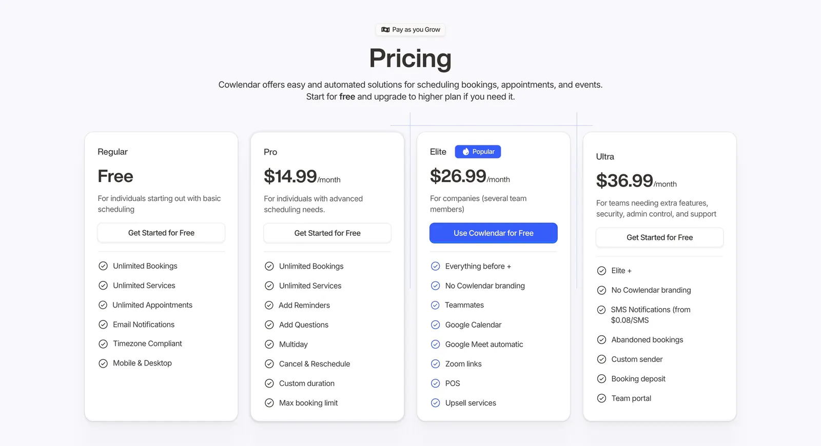
  53. Cowlendar pricing section: centered heading above four plan cards with checklists and a highlighted blue Elite plan
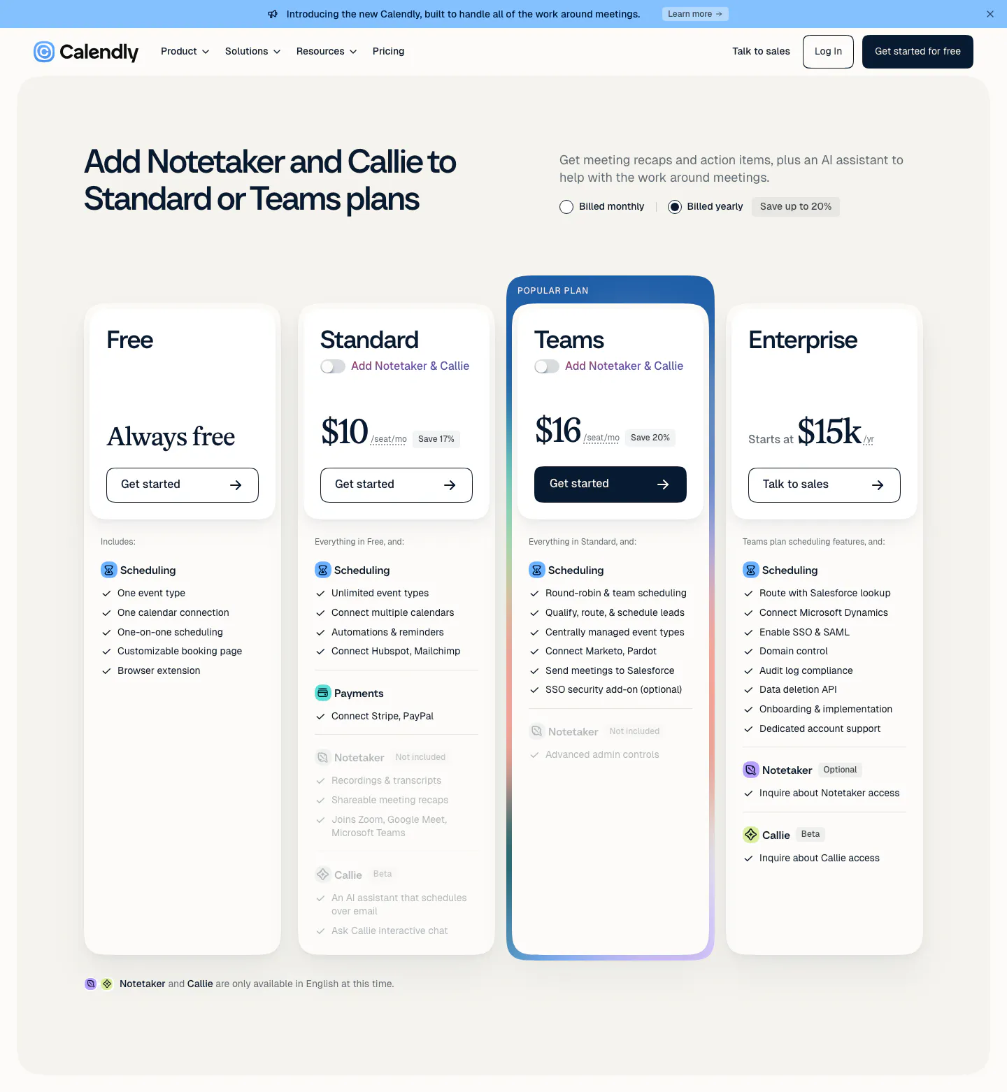
  54. Calendly pricing section: four plan cards with a highlighted Teams plan, monthly/yearly billing toggle and feature checklists below the nav
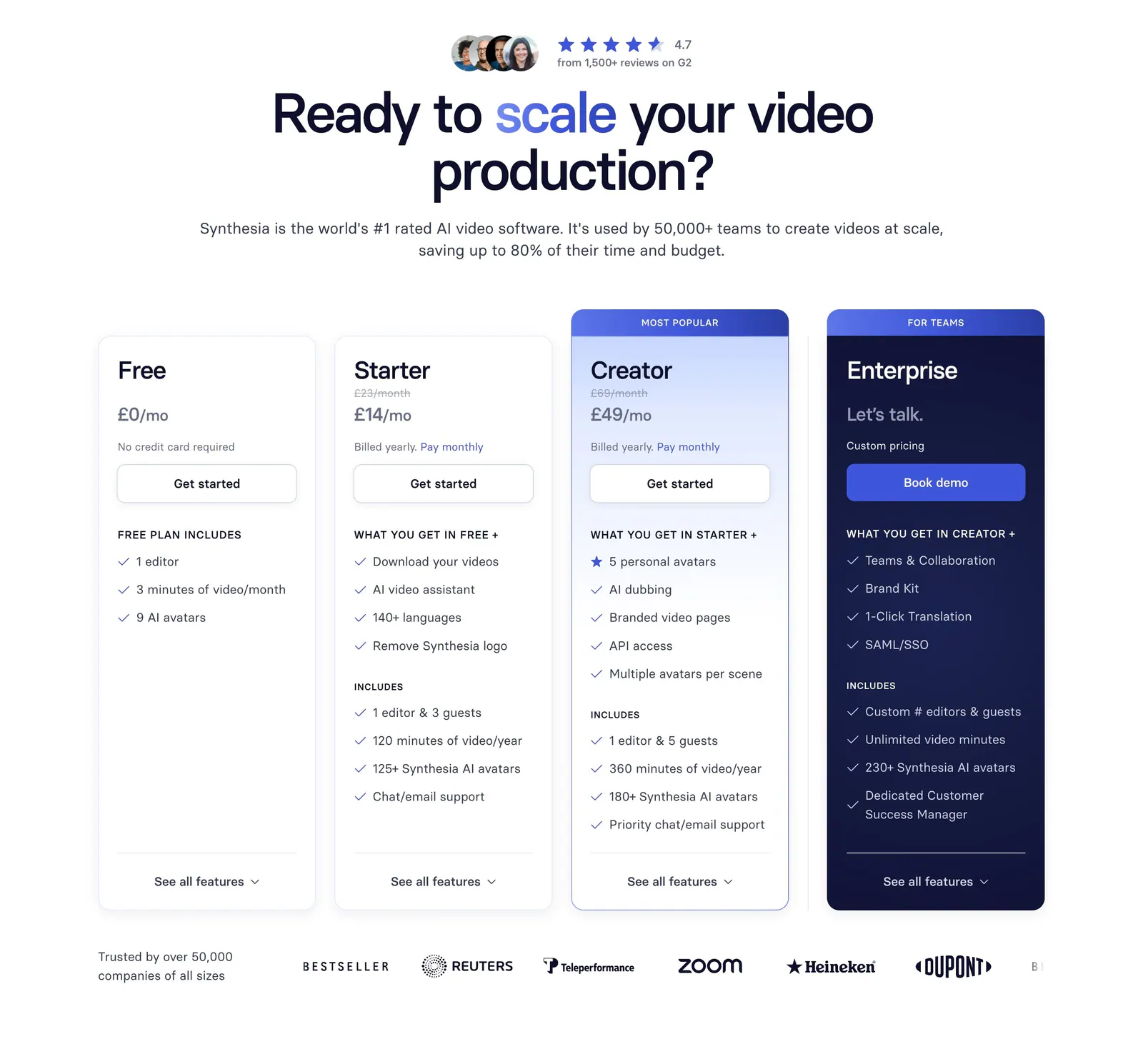
  55. Synthesia pricing section: centered headline with G2 rating above four plan cards, a navy enterprise card and a customer logo row
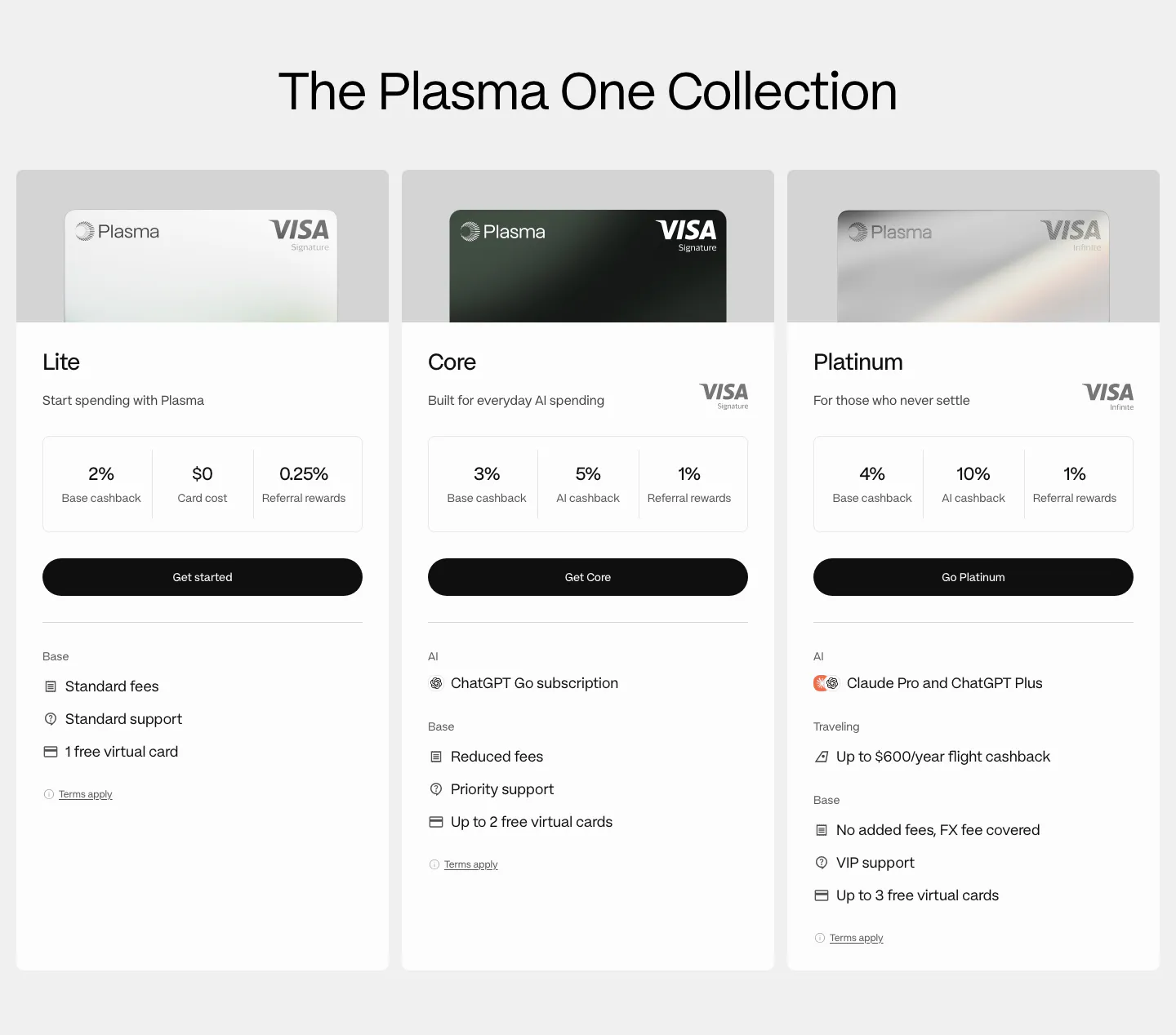
  56. Plasma pricing section: centered heading above three card tier columns with Visa card images, cashback figures and perks
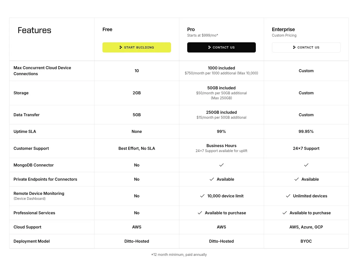
  57. Ditto pricing section: plan comparison table with Free, Pro and Enterprise columns, CTA buttons in the header and rows of limits and checkmarks
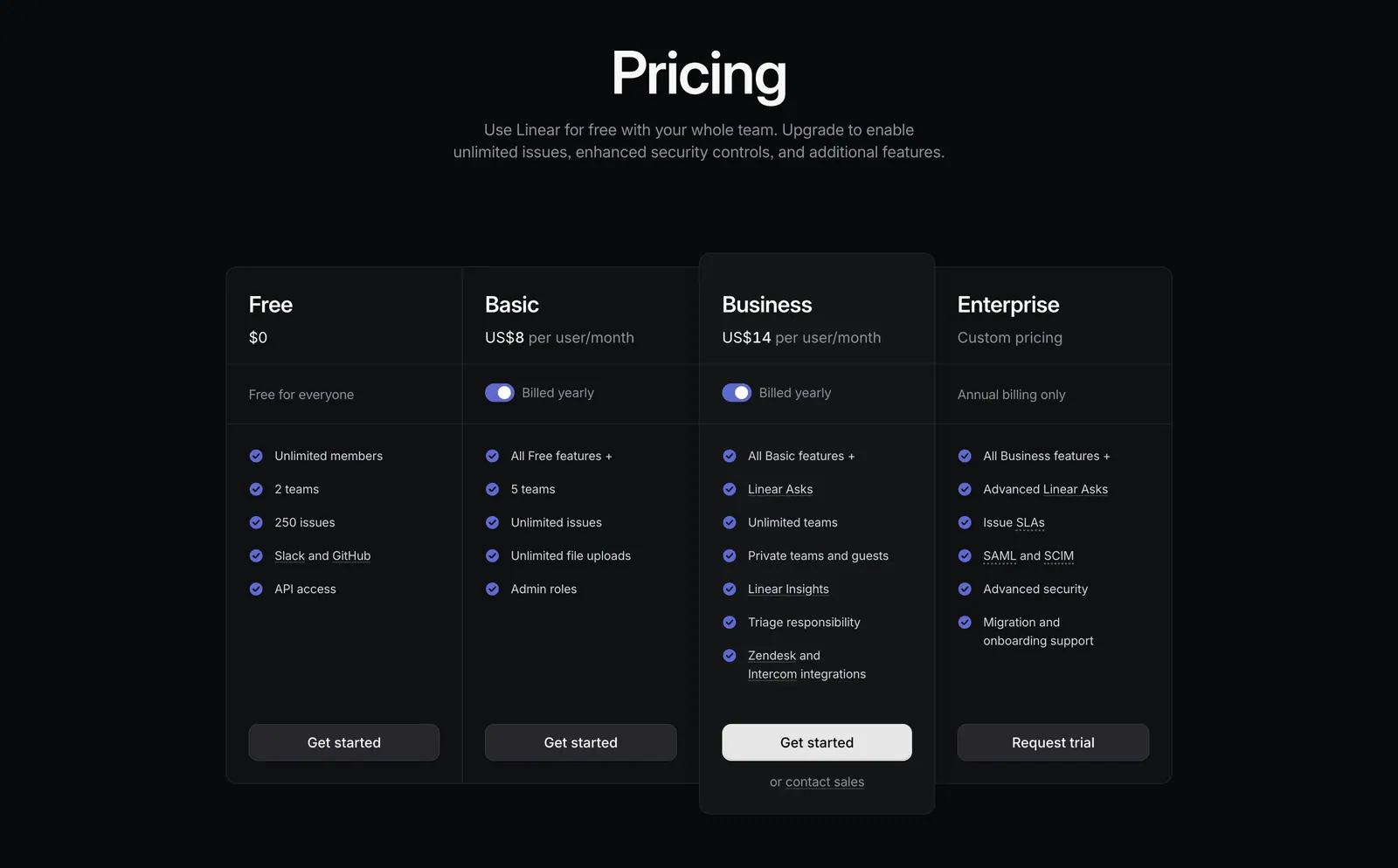
  58. Linear pricing section: centered heading above four dark plan columns, Free, Basic, Business and Enterprise, with billing toggles and checklists
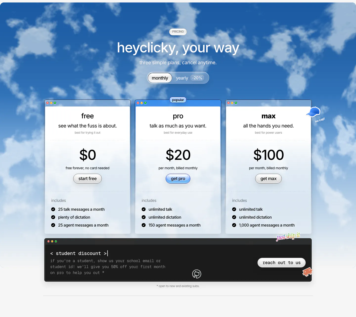
  59. heyclicky pricing section: three plan cards with monthly/yearly toggle over a blue cloudy sky photo, dark student discount bar below
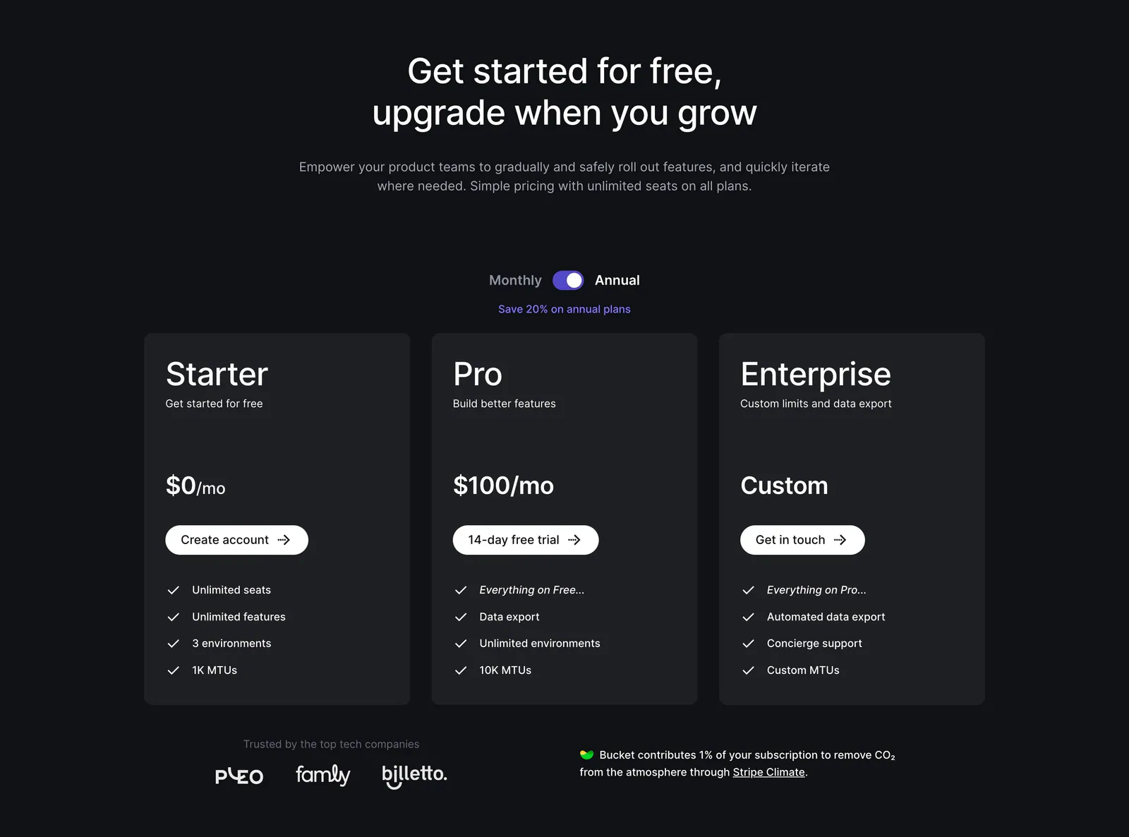
  60. Bucket pricing section: centered headline and monthly/annual toggle above three dark plan cards with checklists and a small logo row
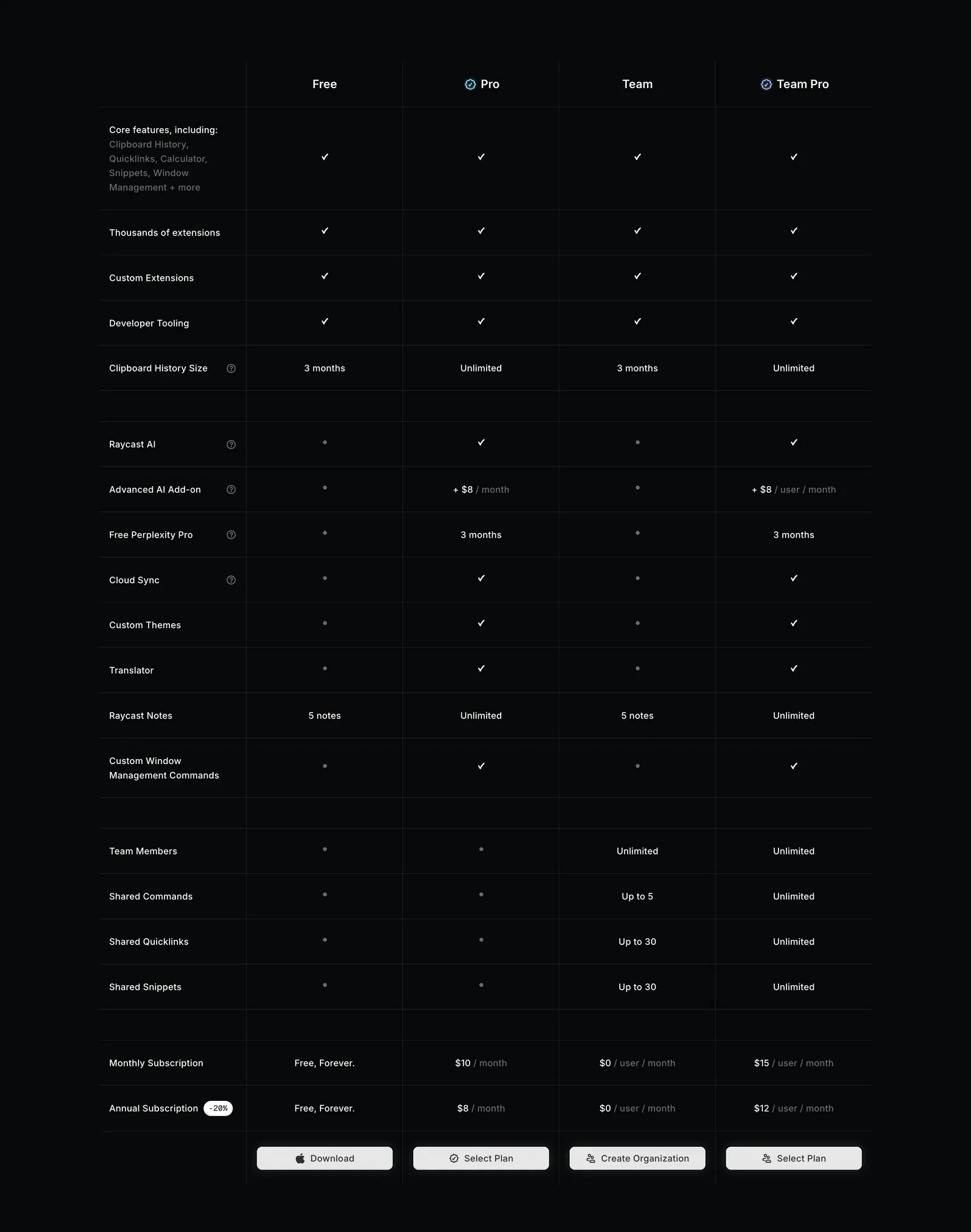
  61. Raycast pricing section: four-plan feature comparison table with checkmarks, limits and select buttons on a near-black background
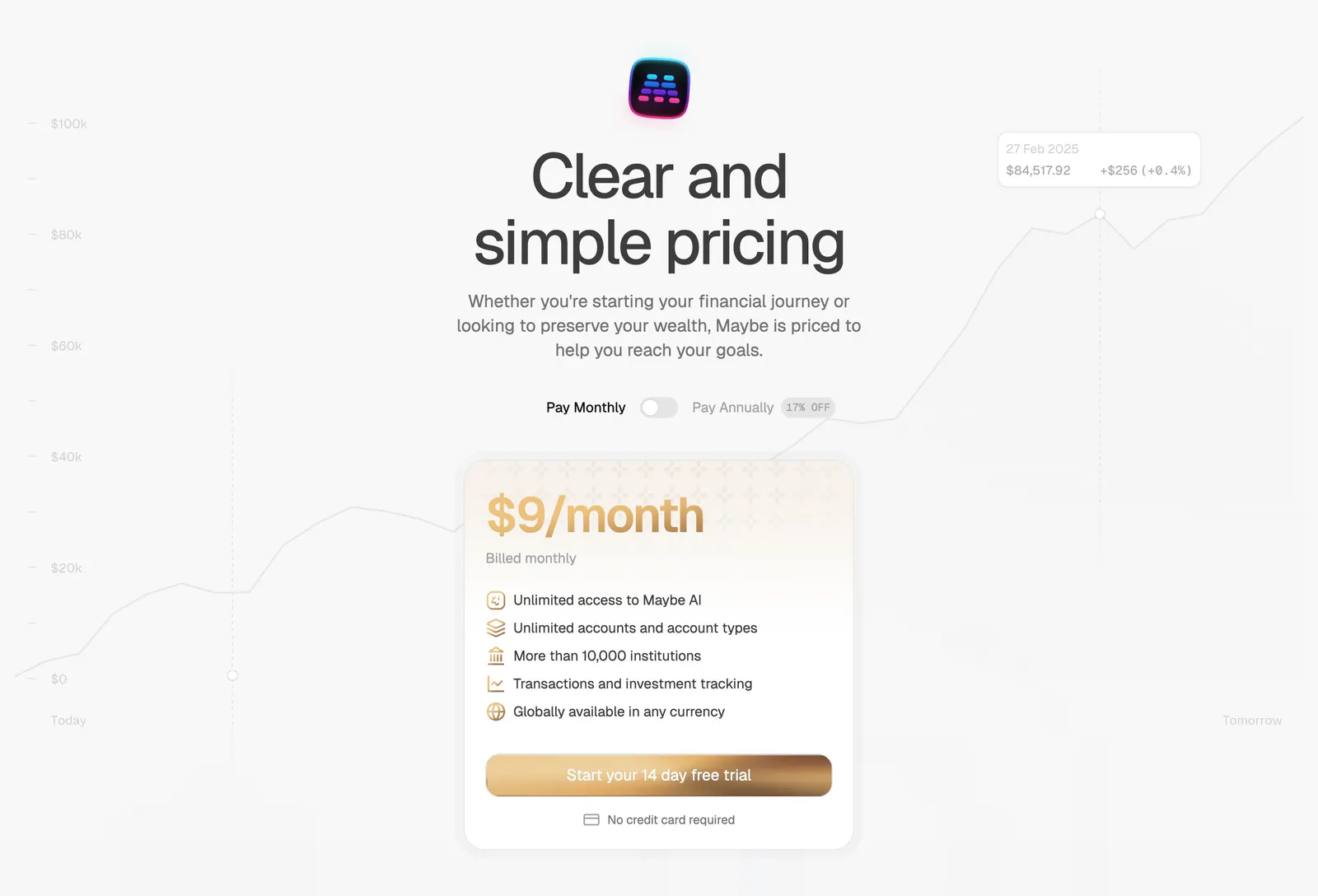
  62. Maybe pricing section: centered headline with monthly/annual toggle above a single gold-accented plan card on a faint chart
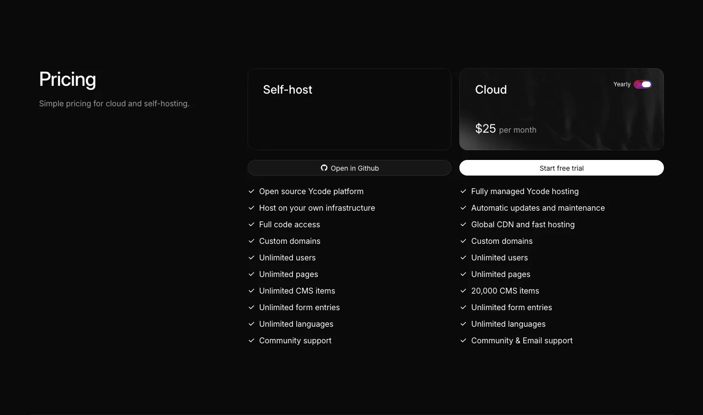
  63. Ycode pricing section: heading on the left, self-host and cloud plan cards with a yearly toggle and checkmark feature lists
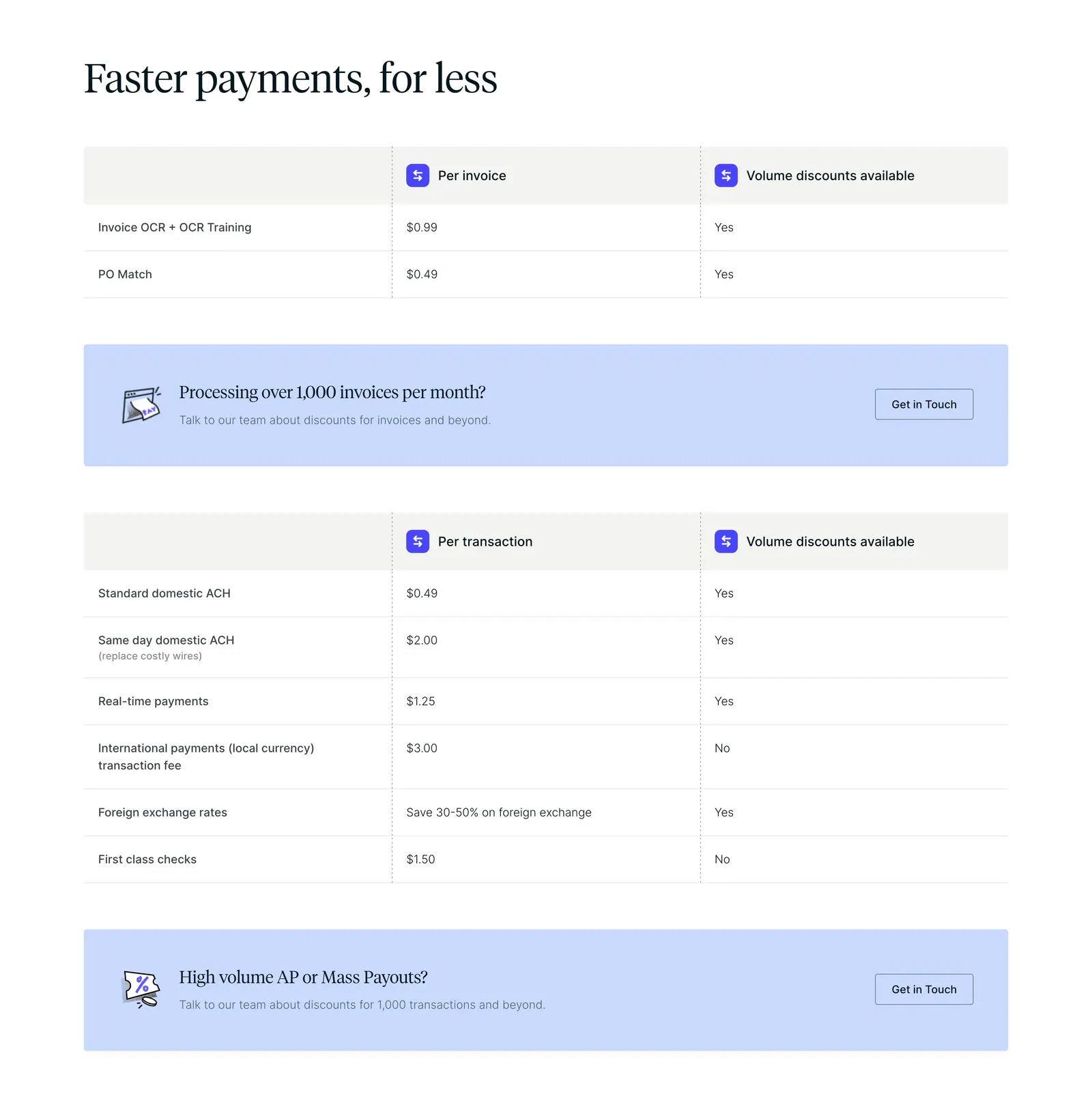
  64. Routable pricing section: serif headline above per-invoice and per-transaction fee tables with light blue contact banners on white
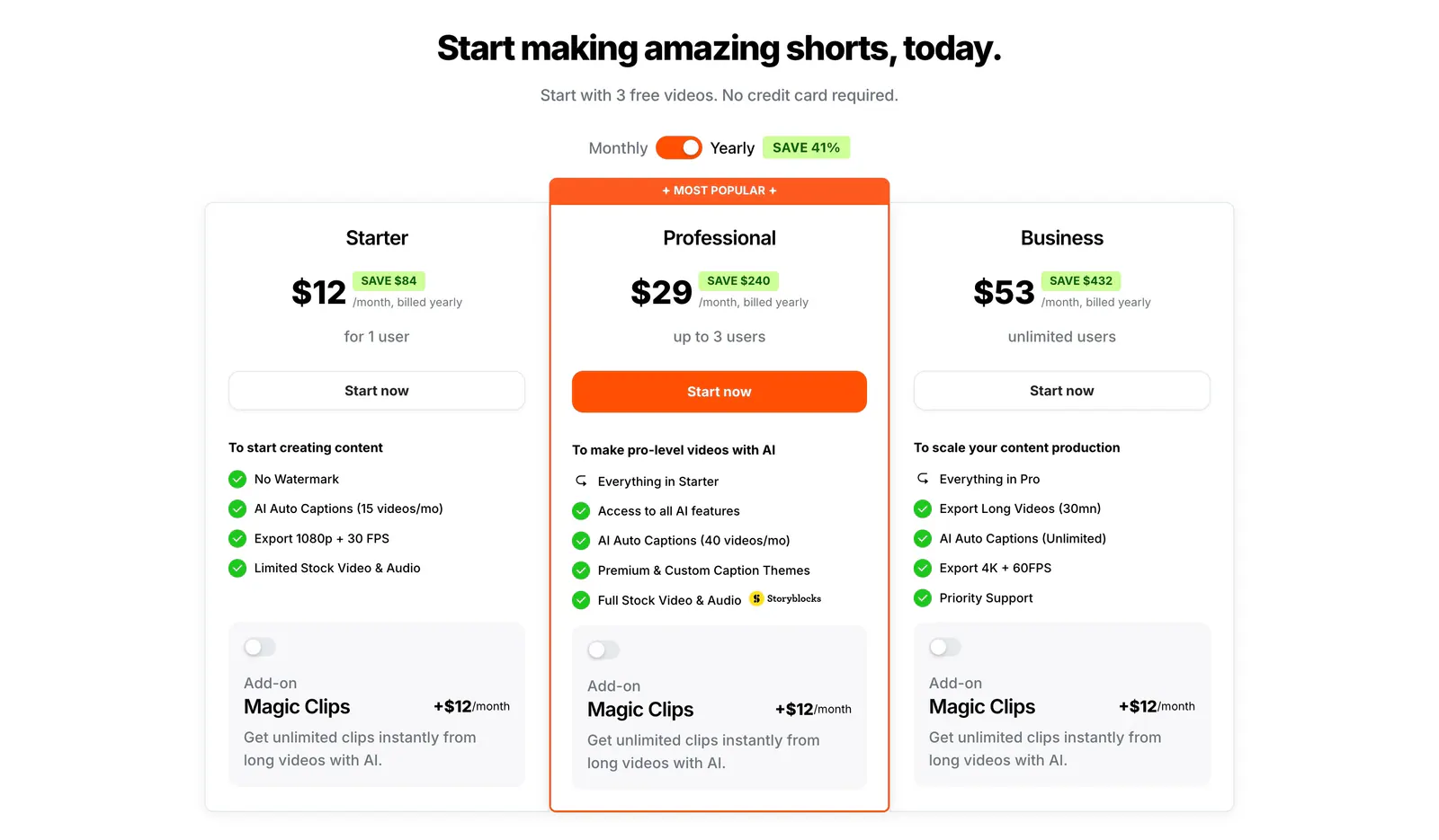
  65. Submagic pricing section: centered headline, monthly/yearly toggle and three plan cards with a highlighted orange Professional tier on white
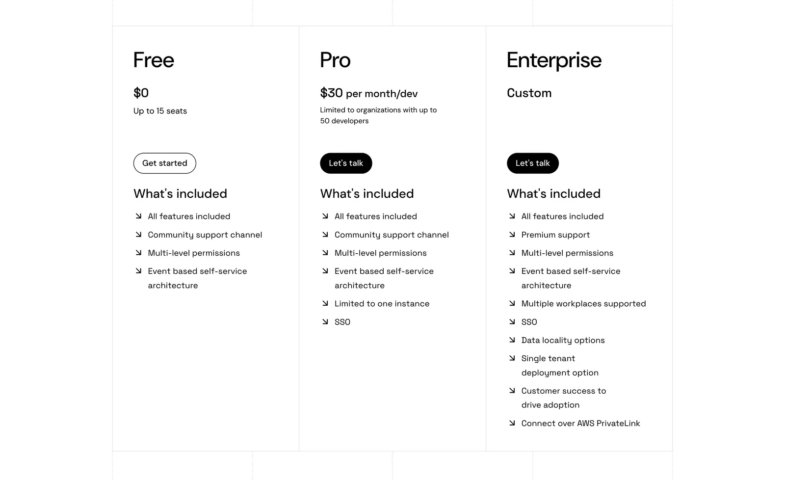
  66. Port pricing section: three bordered plan columns for Free, Pro and Enterprise with prices, buttons and arrow feature lists on white
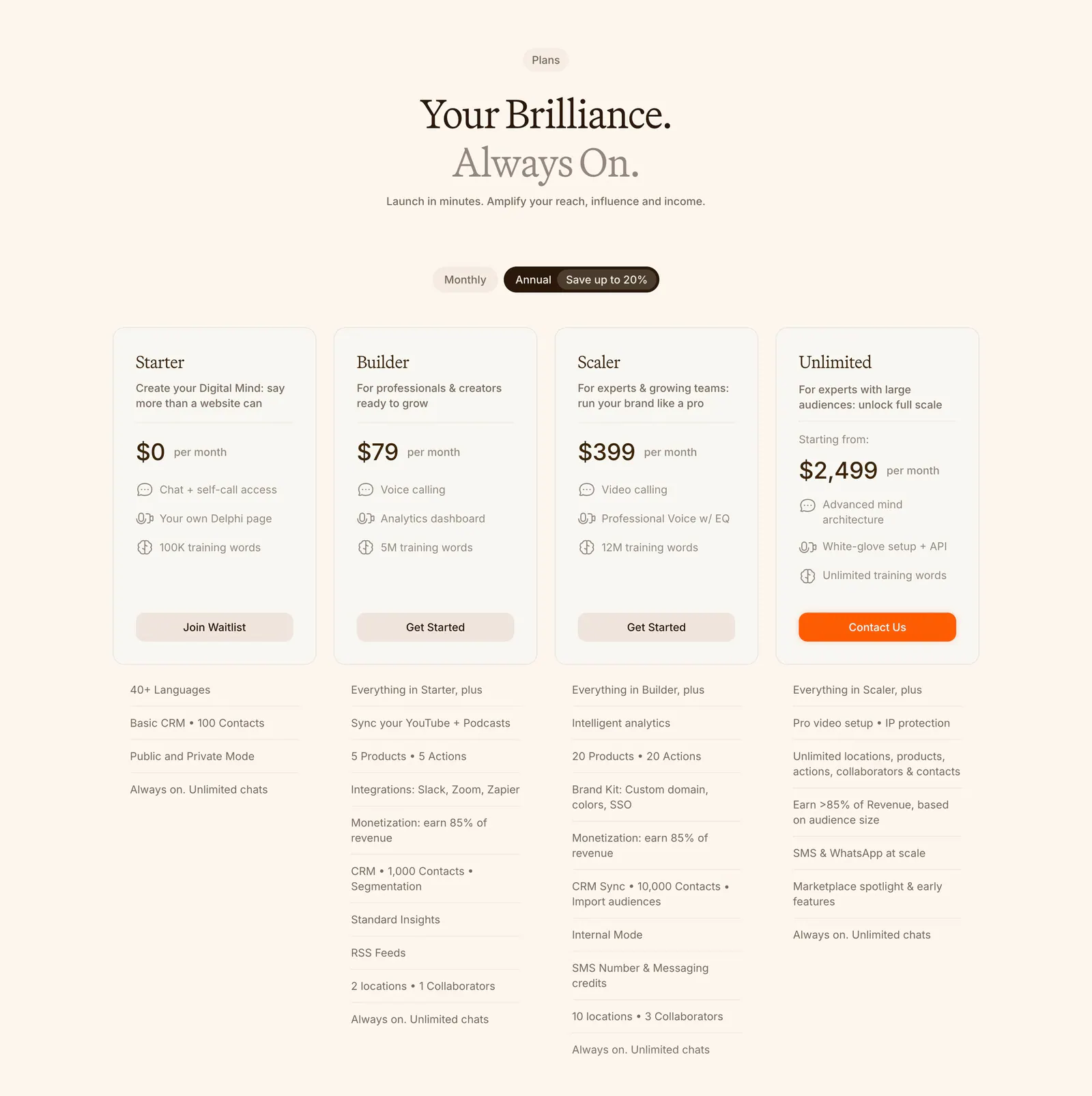
  67. Delphi pricing section: centered serif headline, monthly/annual toggle and four plan cards with feature lists below on a cream background
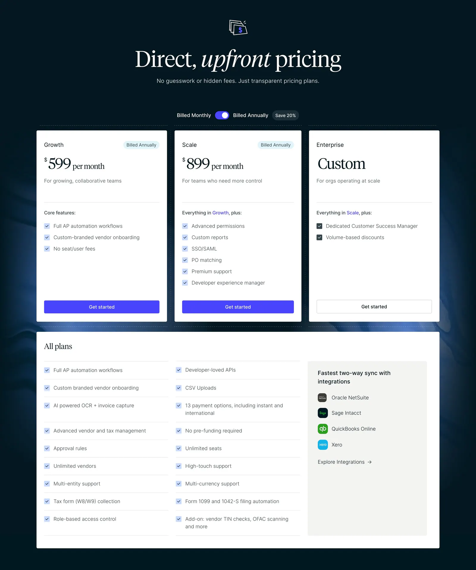
  68. Routable pricing section: serif headline and billing toggle above three plan cards and an all-plans checklist on a dark navy background
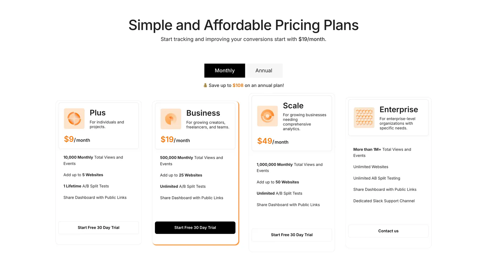
  69. Humblytics pricing section: monthly/annual toggle above four plan cards with orange prices and trial buttons on white
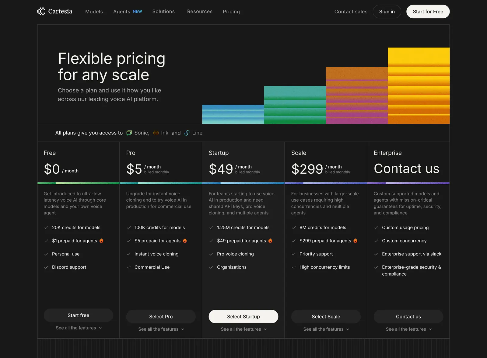
  70. Cartesia pricing section: headline with stepped color bars above five dark pricing cards from Free to Enterprise with feature checklists
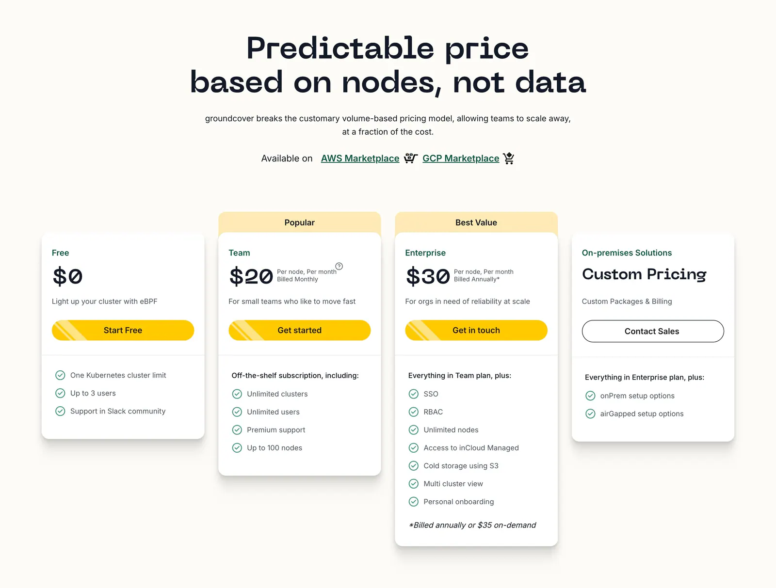
  71. groundcover pricing section: centered headline above four plan cards with yellow buttons and checklists on a cream background
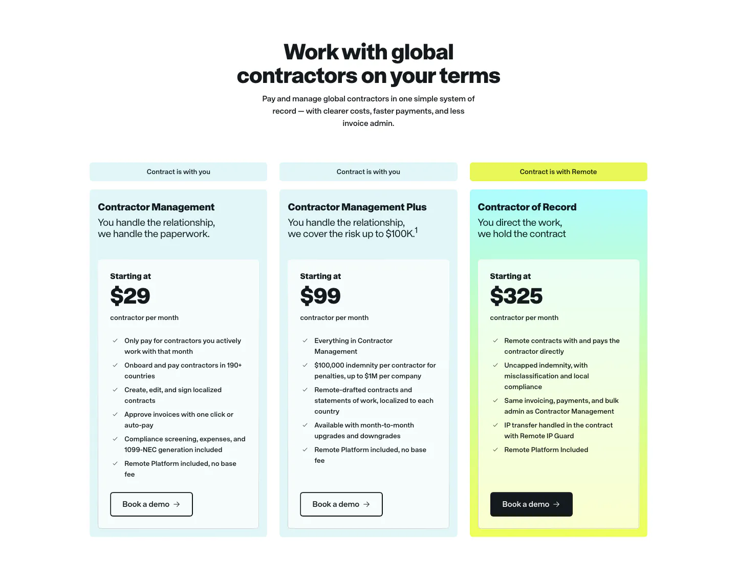
  72. Remote pricing section: centered headline above three contractor plan cards in light cyan with a yellow-tinted highlight
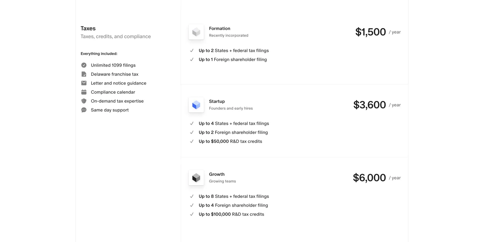
  73. Finta pricing section: Taxes label and included-features list beside three stacked yearly tax plans with prices on white
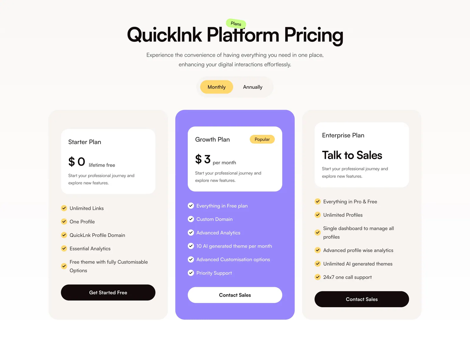
  74. QuickLnk pricing section: centered headline and monthly/annual toggle above three plan cards with a purple highlighted middle tier
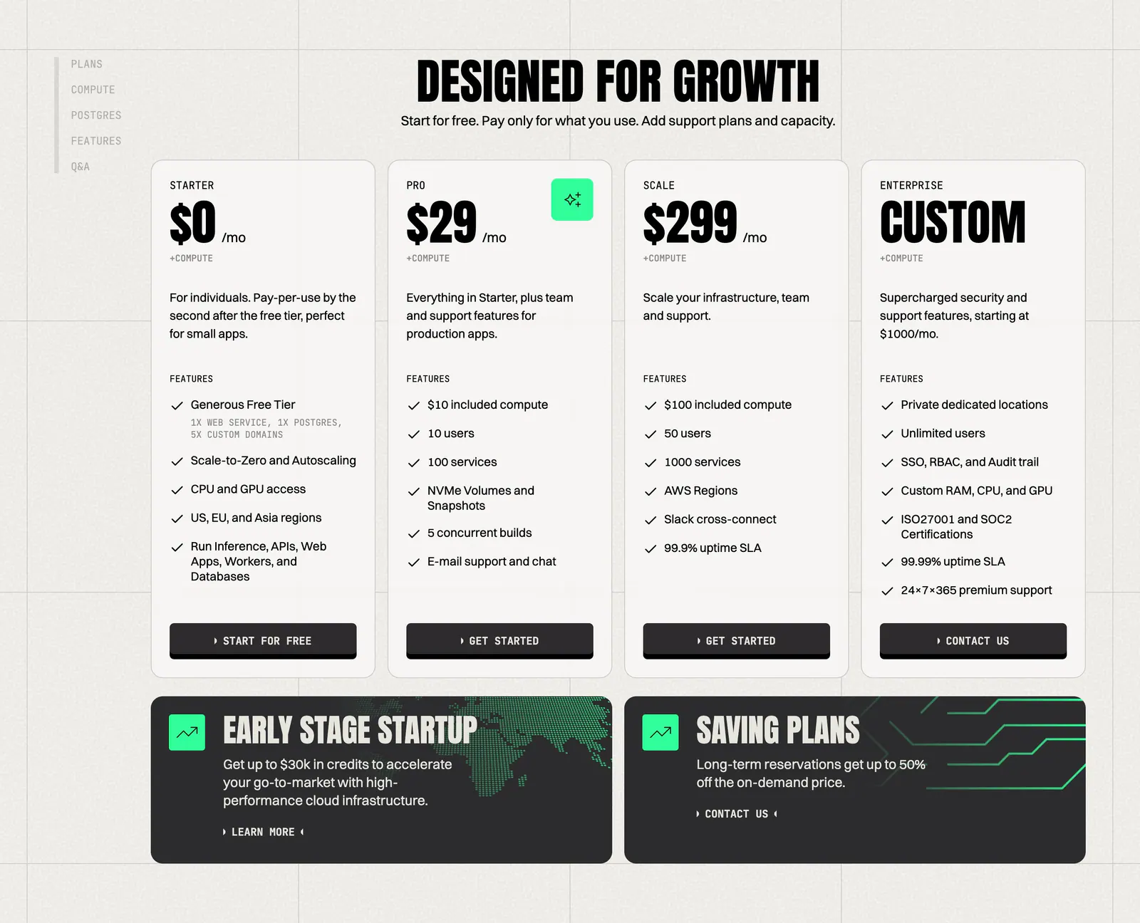
  75. Koyeb pricing section: condensed headline above four plan cards and two dark promo banners on a warm gray grid background
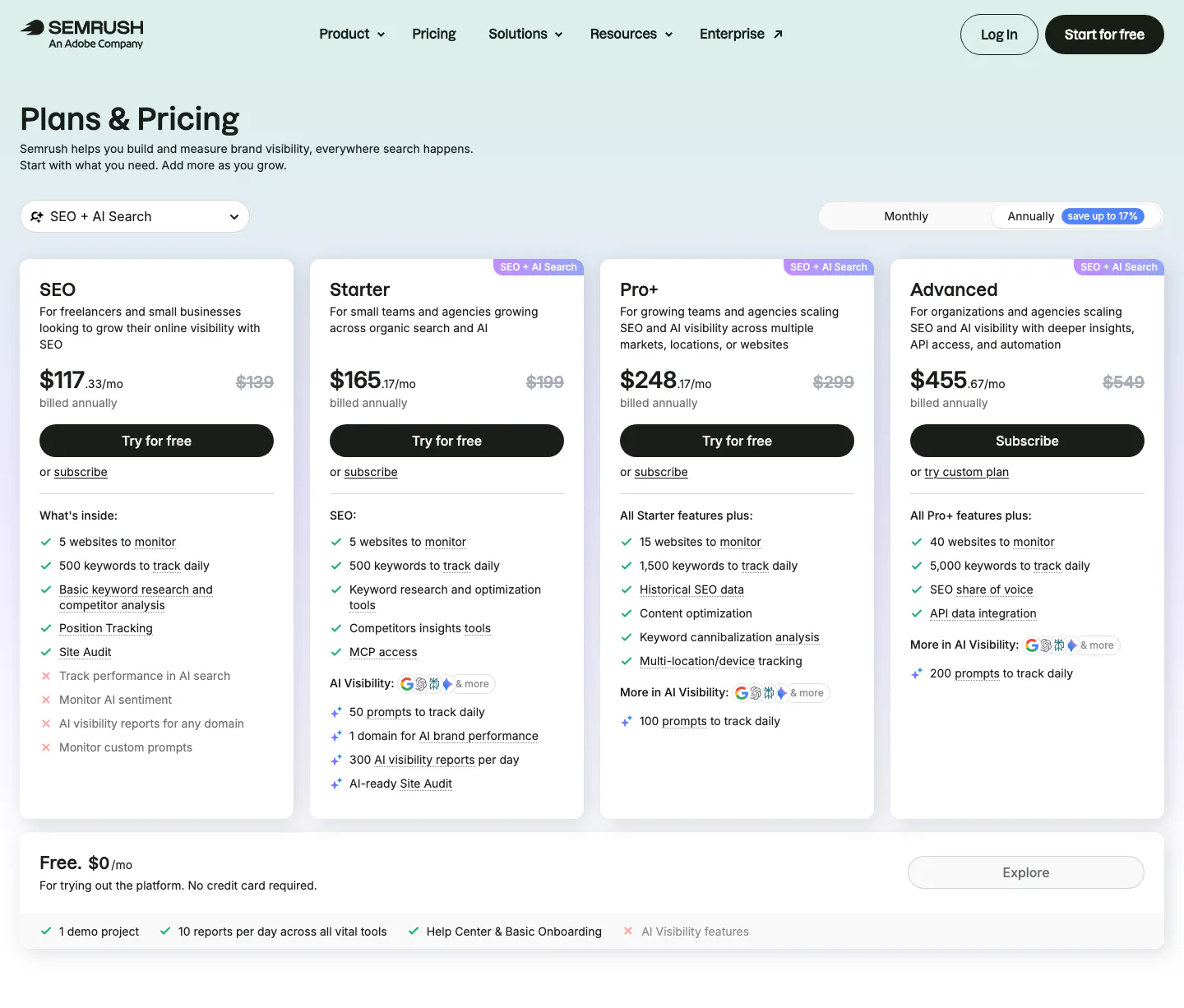
  76. Semrush pricing section: nav, Plans & Pricing title, monthly/annual toggle and four plan cards with checklists above a free plan bar
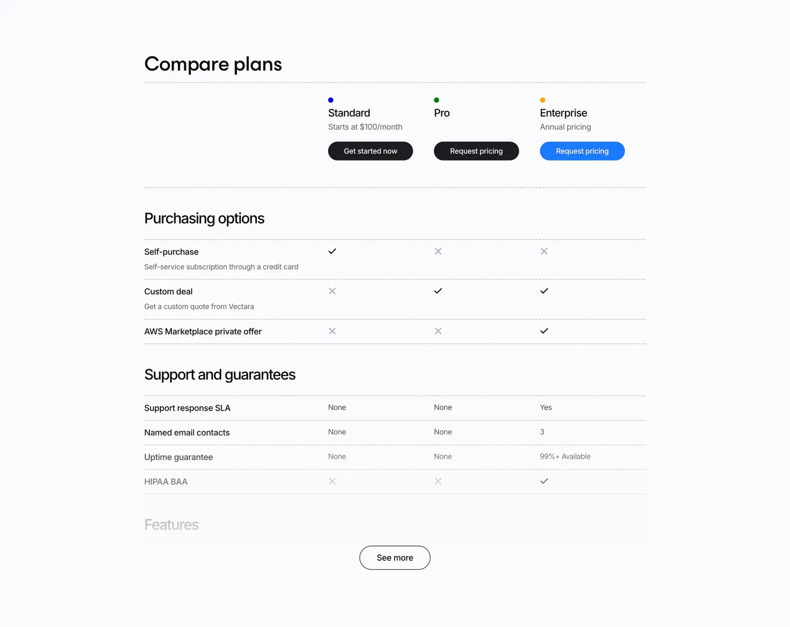
  77. Vectara pricing section: plan comparison table with check and cross marks for Standard, Pro and Enterprise and a See more button
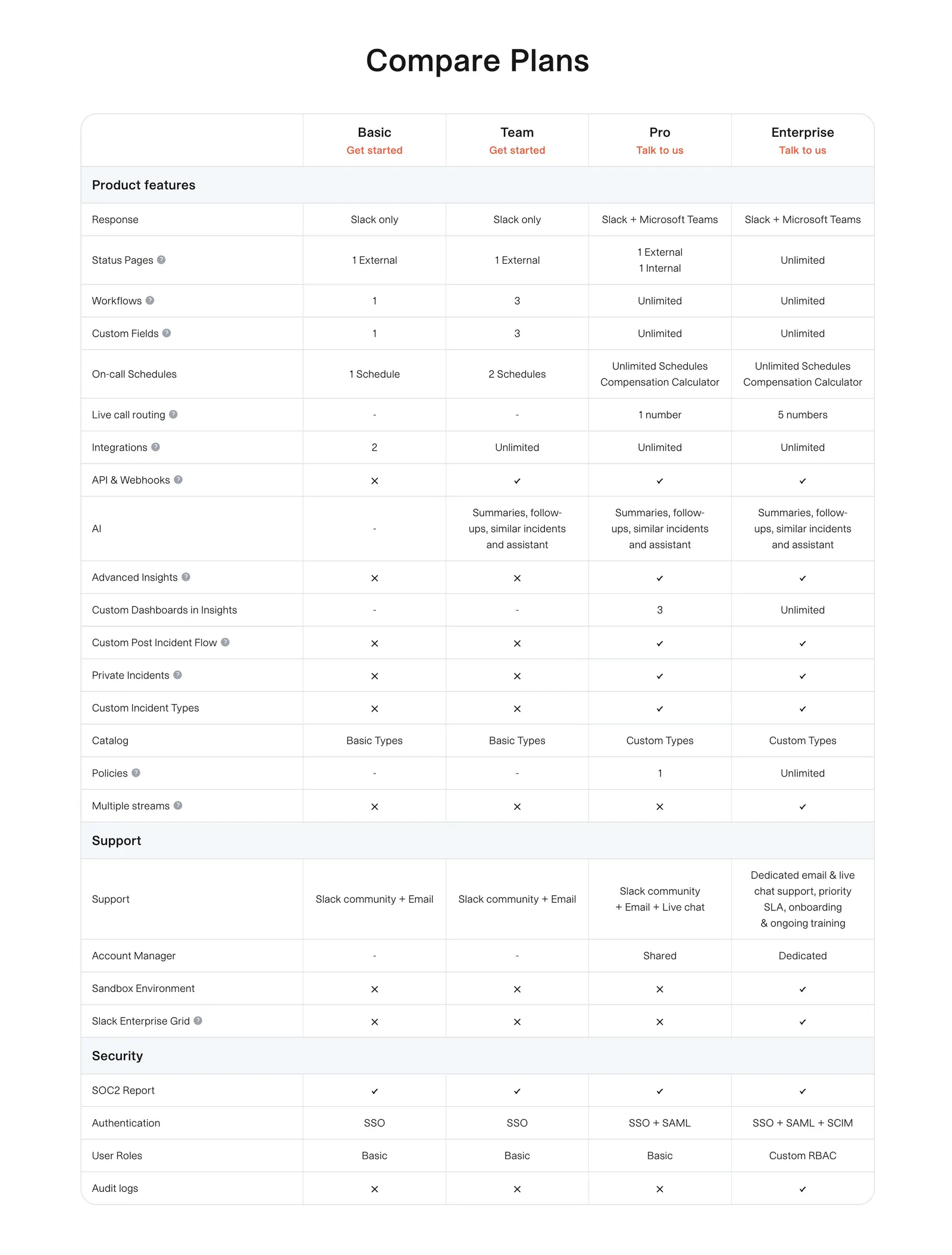
  78. incident.io pricing section: plan comparison table with grouped feature rows and check and cross marks on white
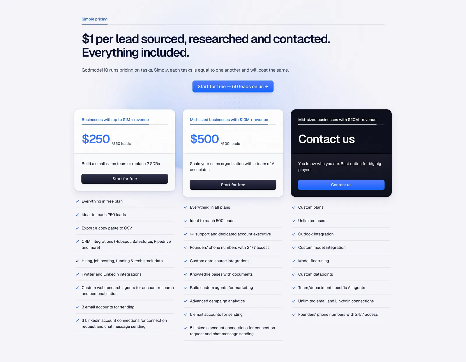
  79. Godmode pricing section: left-aligned headline and blue button above three plan cards, one dark, with checklists below each
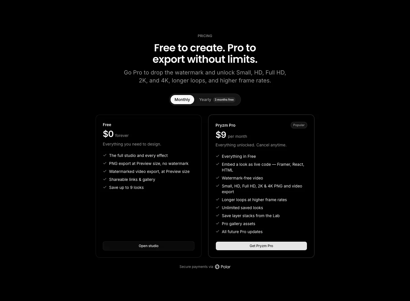
  80. Pryzm pricing section: black background with centered headline, monthly/yearly toggle and two plan cards with feature checklists
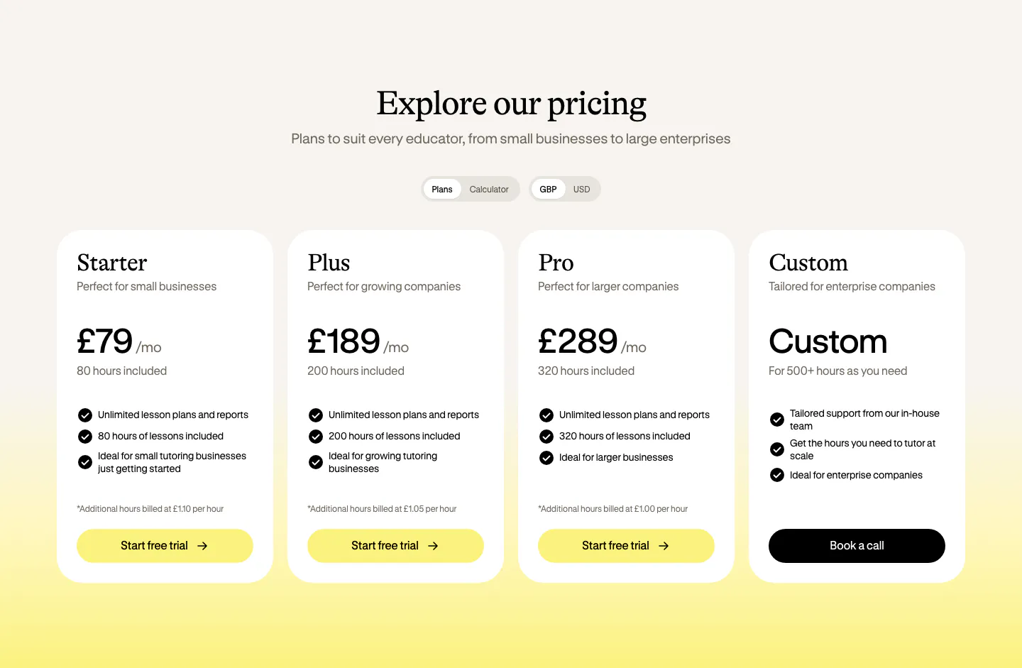
  81. Bobbin pricing section: serif heading, plan and currency toggles, and four white pricing cards on a cream-to-yellow background
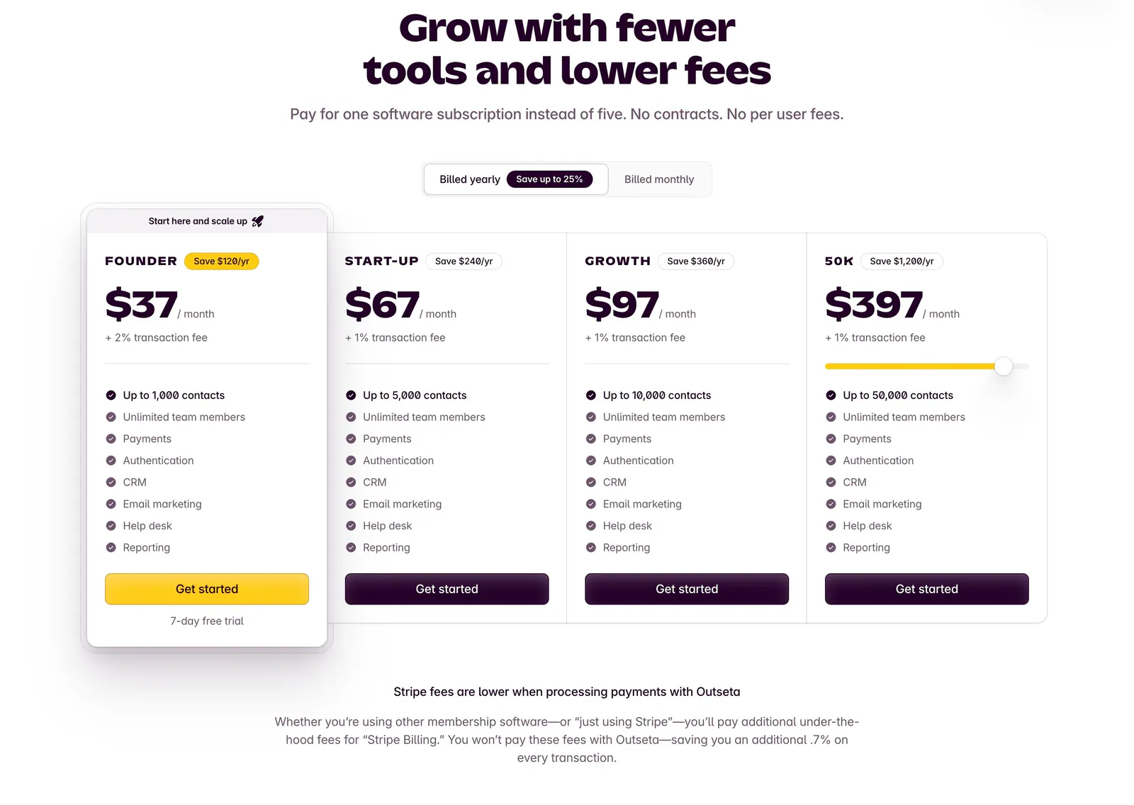
  82. Outseta pricing section: centered headline and billed yearly/monthly toggle above four plan cards with prices and feature checklists
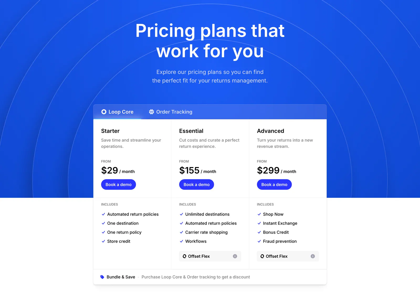
  83. Loop pricing section: centered headline on blue arc background above a tabbed three-tier pricing card with feature checklists
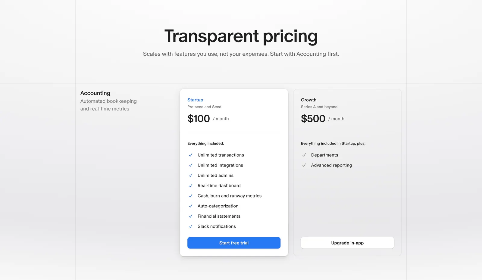
  84. Finta pricing section: centered heading above Startup and Growth monthly plan cards with checklists on a light gray background
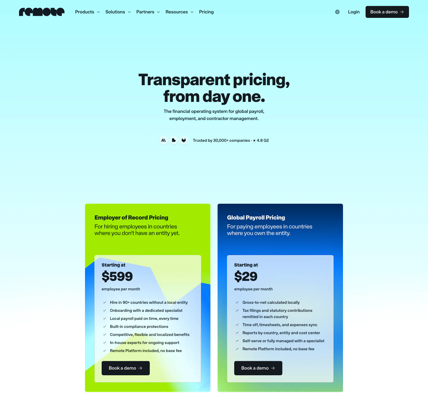
  85. Remote pricing section: nav and centered headline above two plan cards, lime EOR and blue Global Payroll, on cyan gradient
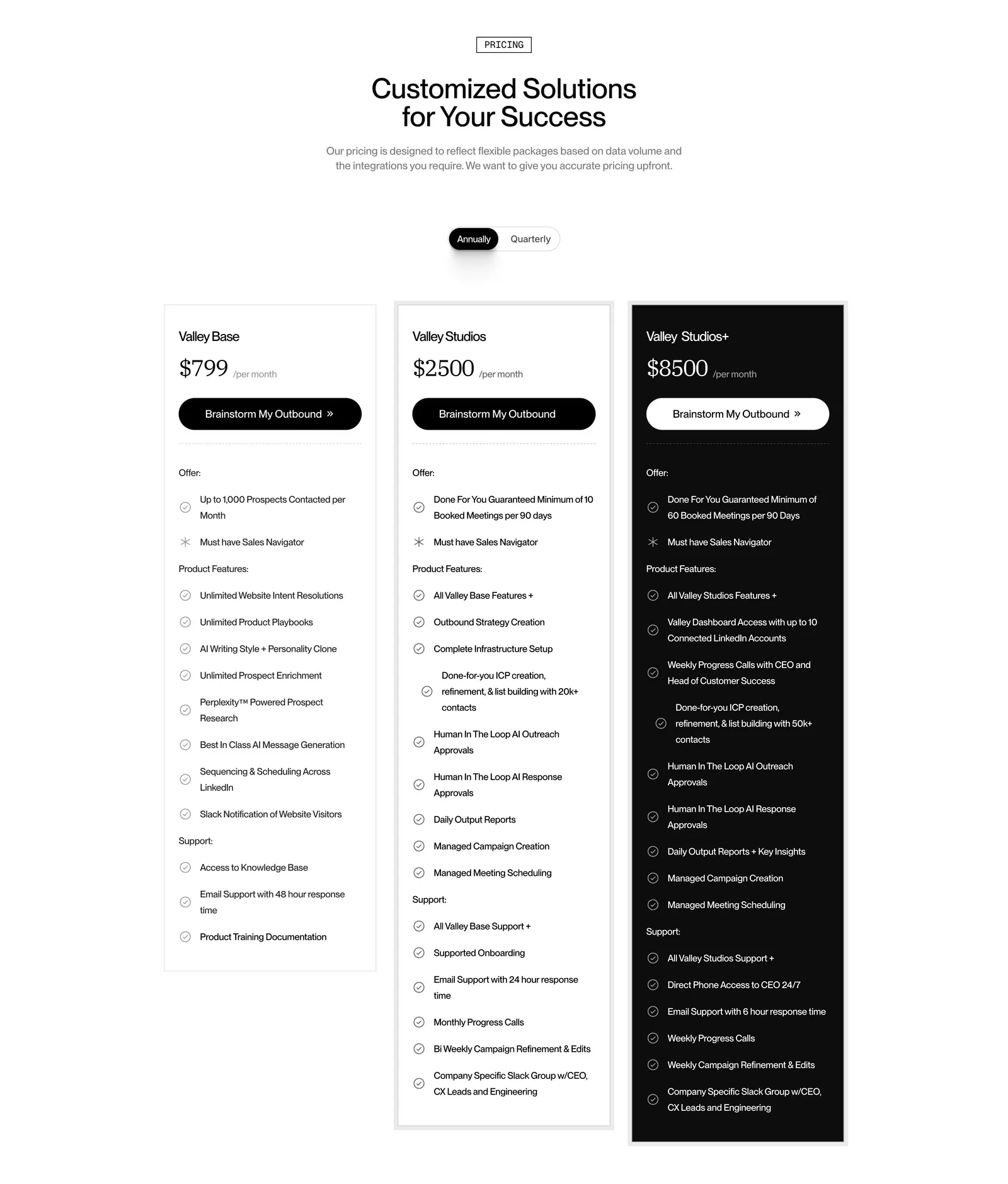
  86. Valley pricing section: centered headline and annual/quarterly toggle above three plan cards, the top tier in black, with feature checklists
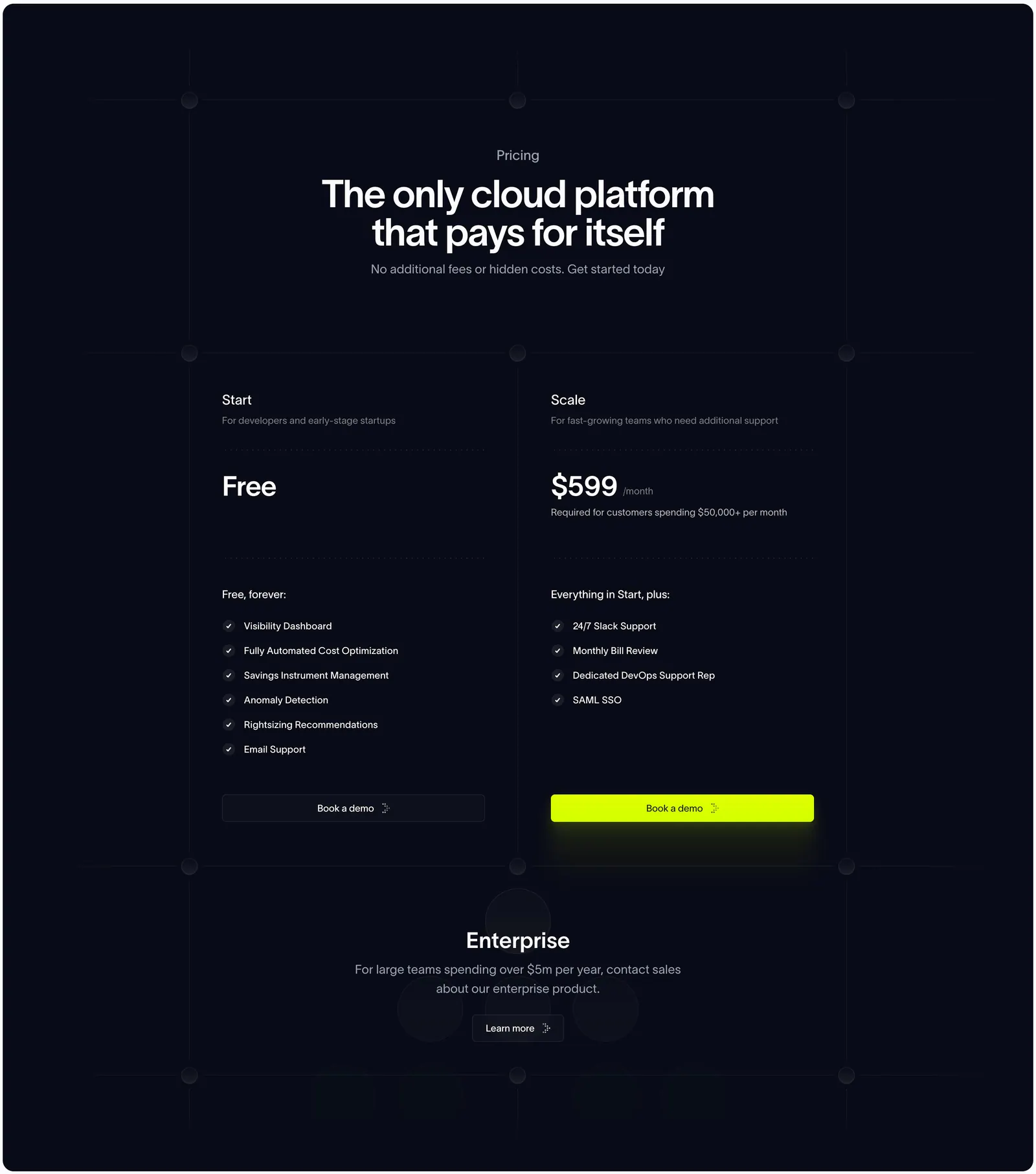
  87. Antimetal pricing section: centered headline on dark navy grid lines above two plan columns and an enterprise row
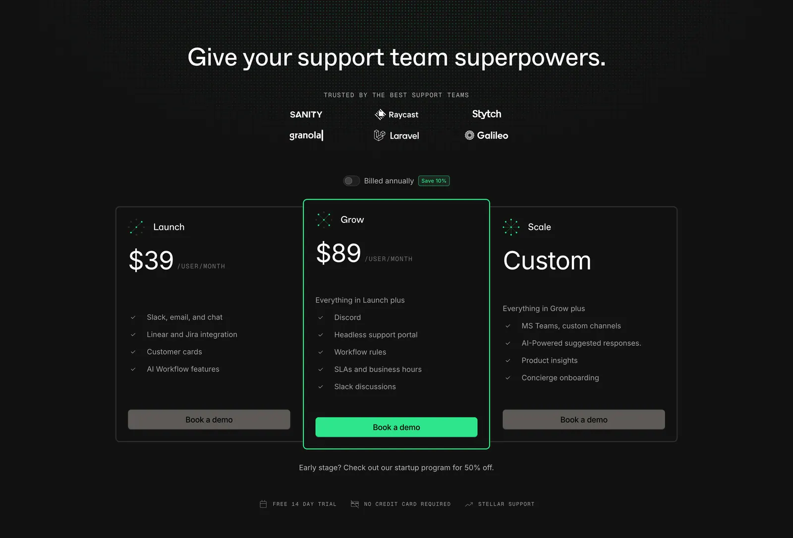
  88. Plain pricing section: dark centered headline with logo grid and billing toggle above three plan cards, the middle one highlighted green
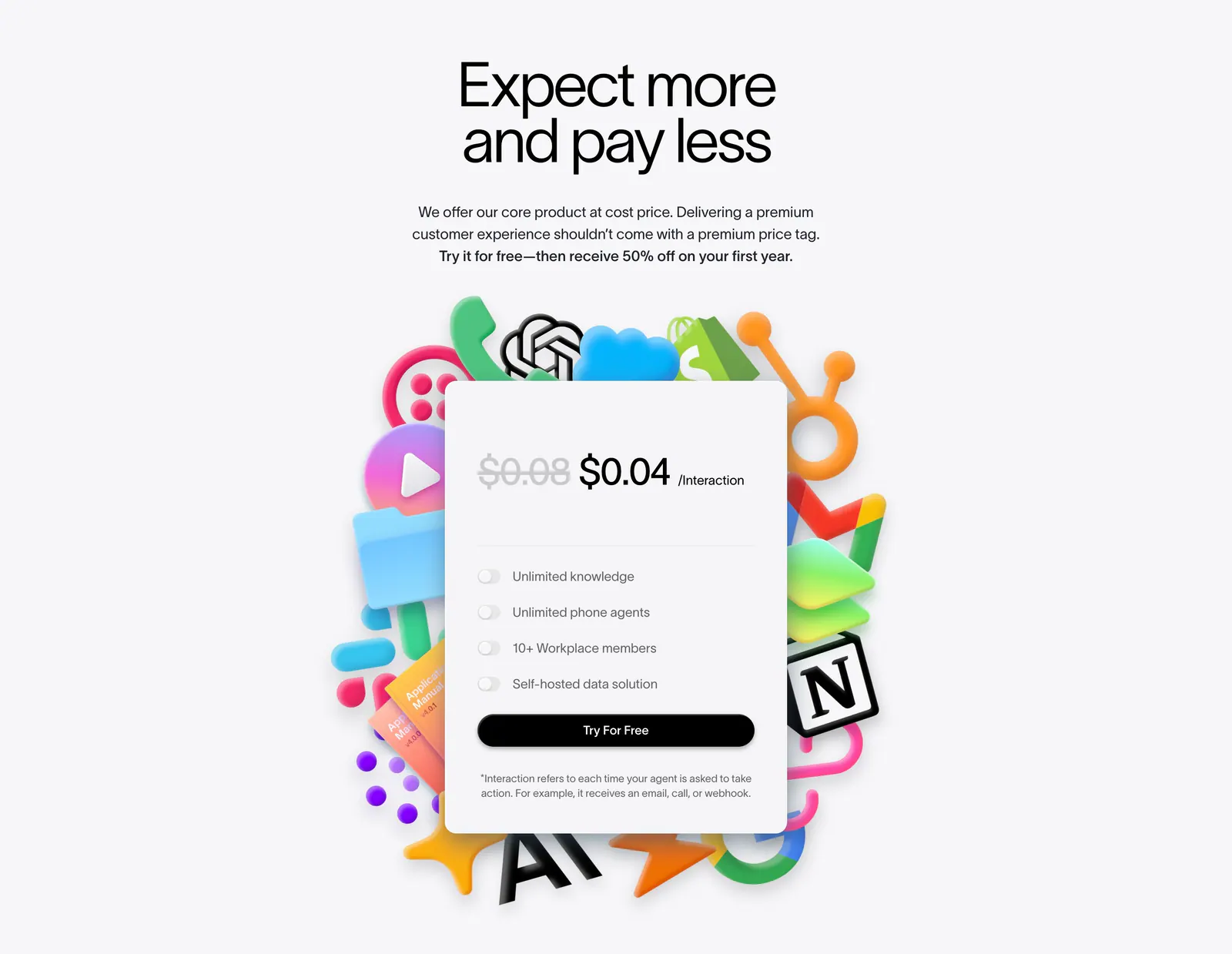
  89. Lemni pricing section: centered headline above a single per-interaction price card with toggle features, framed by colorful 3D app icons
    Lemni
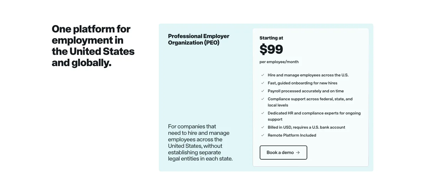
  90. Remote pricing section: headline on the left beside a light cyan PEO plan card with price and feature checklist
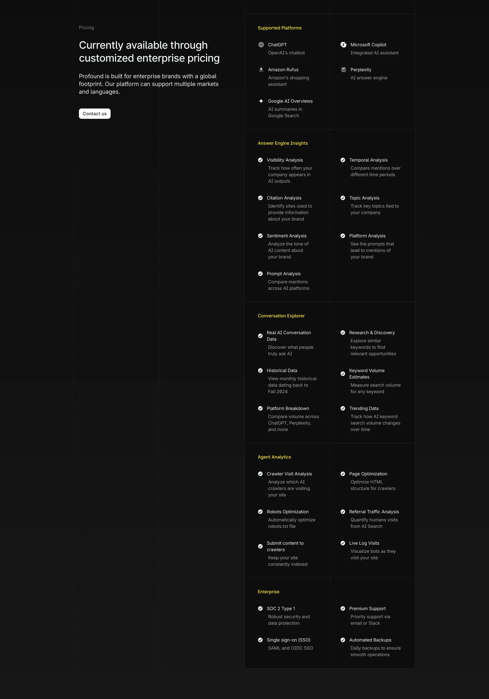
  91. Profound pricing section: enterprise pricing headline and Contact us button on the left, long grouped feature checklist on the right on charcoal
  92. Siterails pricing section: centered headline and yearly/monthly toggle above four plan cards with a dark highlighted tier on white
    Siterails
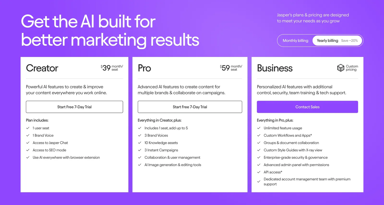
  93. Jasper pricing section: headline and billing toggle above three white plan cards with checklists on a bright purple background
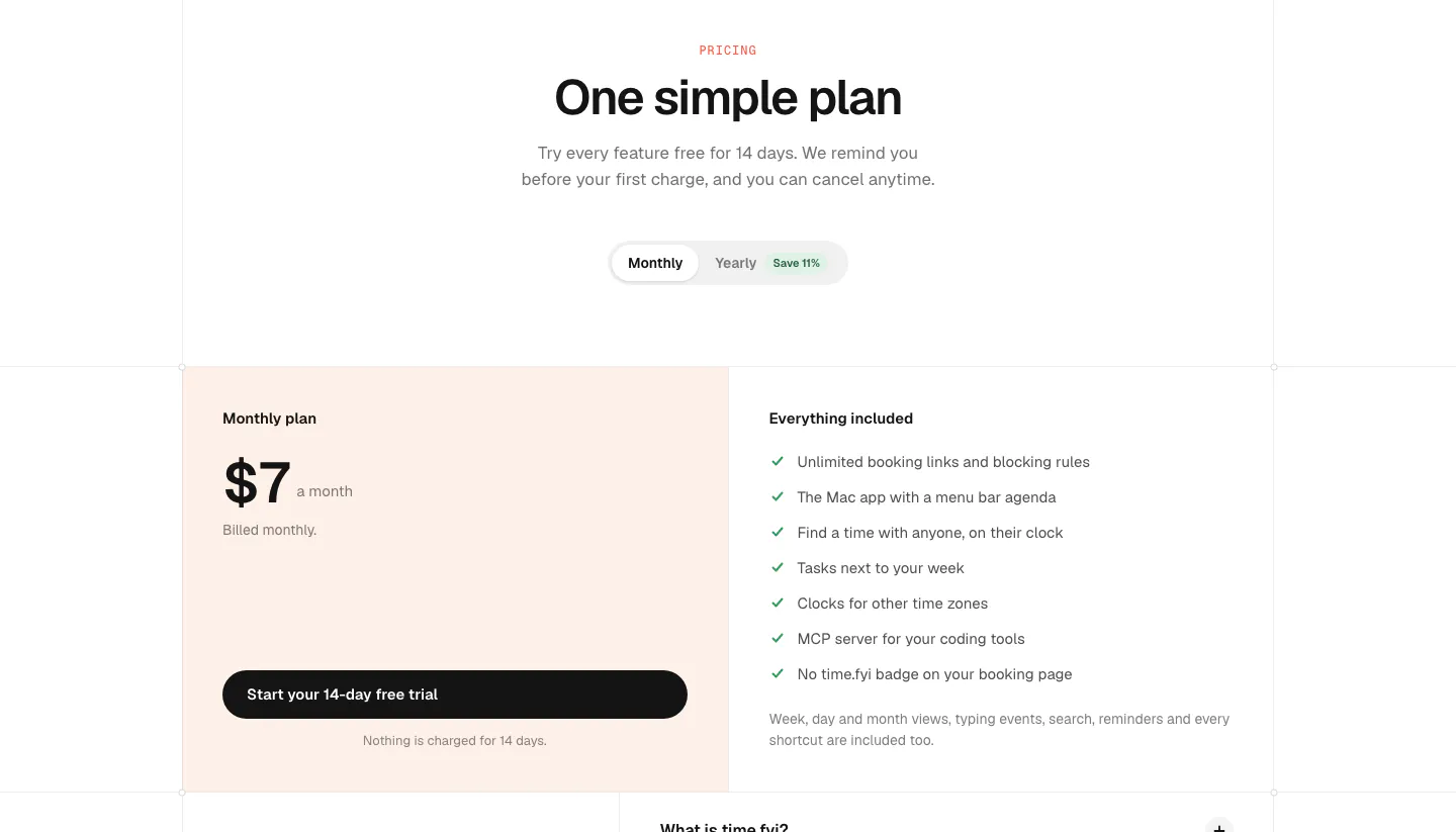
  94. time.fyi pricing section: centered header with monthly/yearly toggle above a single $7 plan card on peach and an included-features list
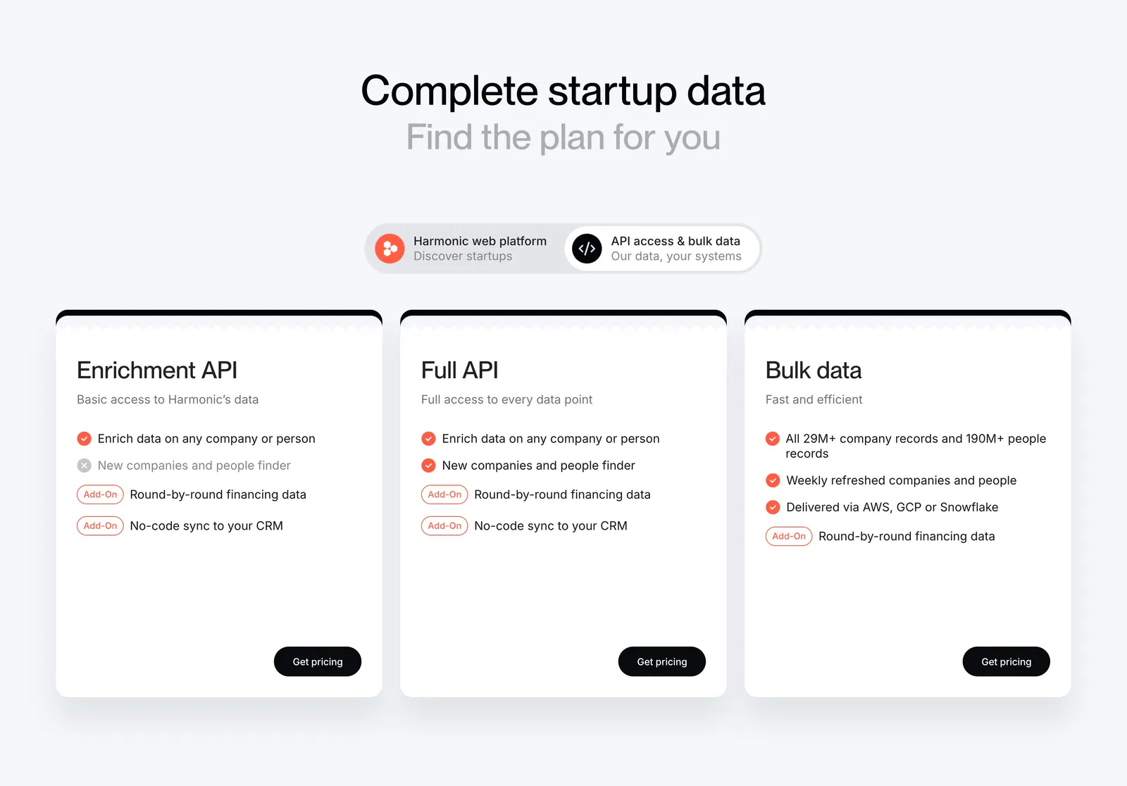
  95. Harmonic pricing section: centered headline and segmented toggle above three white plan cards with checklists and black buttons
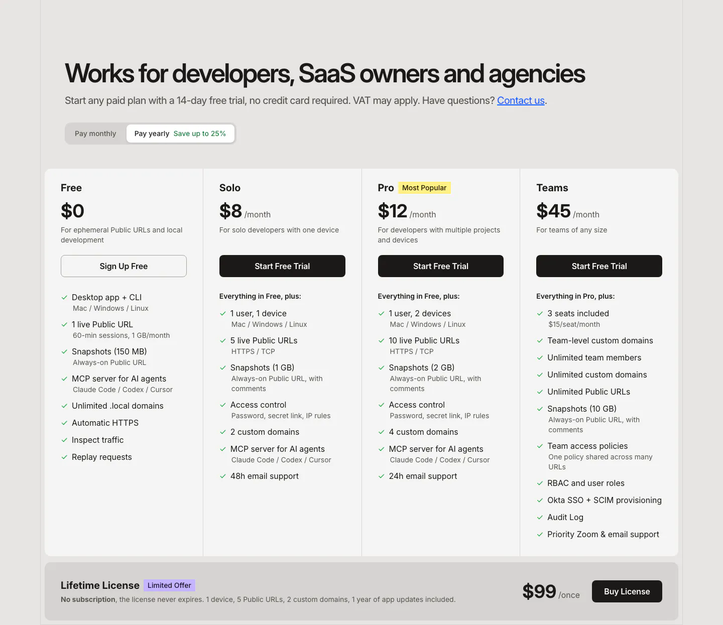
  96. LocalCan pricing section: headline and monthly/yearly toggle above four plan columns with feature checklists and a lifetime license band
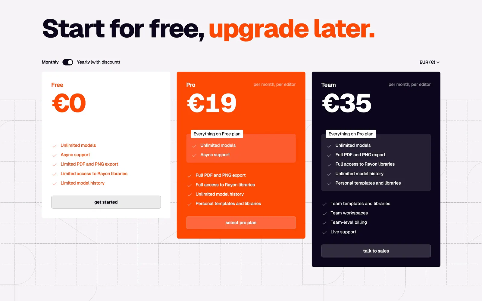
  97. Rayon pricing section: large headline with orange accent, monthly/yearly toggle and white, orange and navy plan cards on a grid
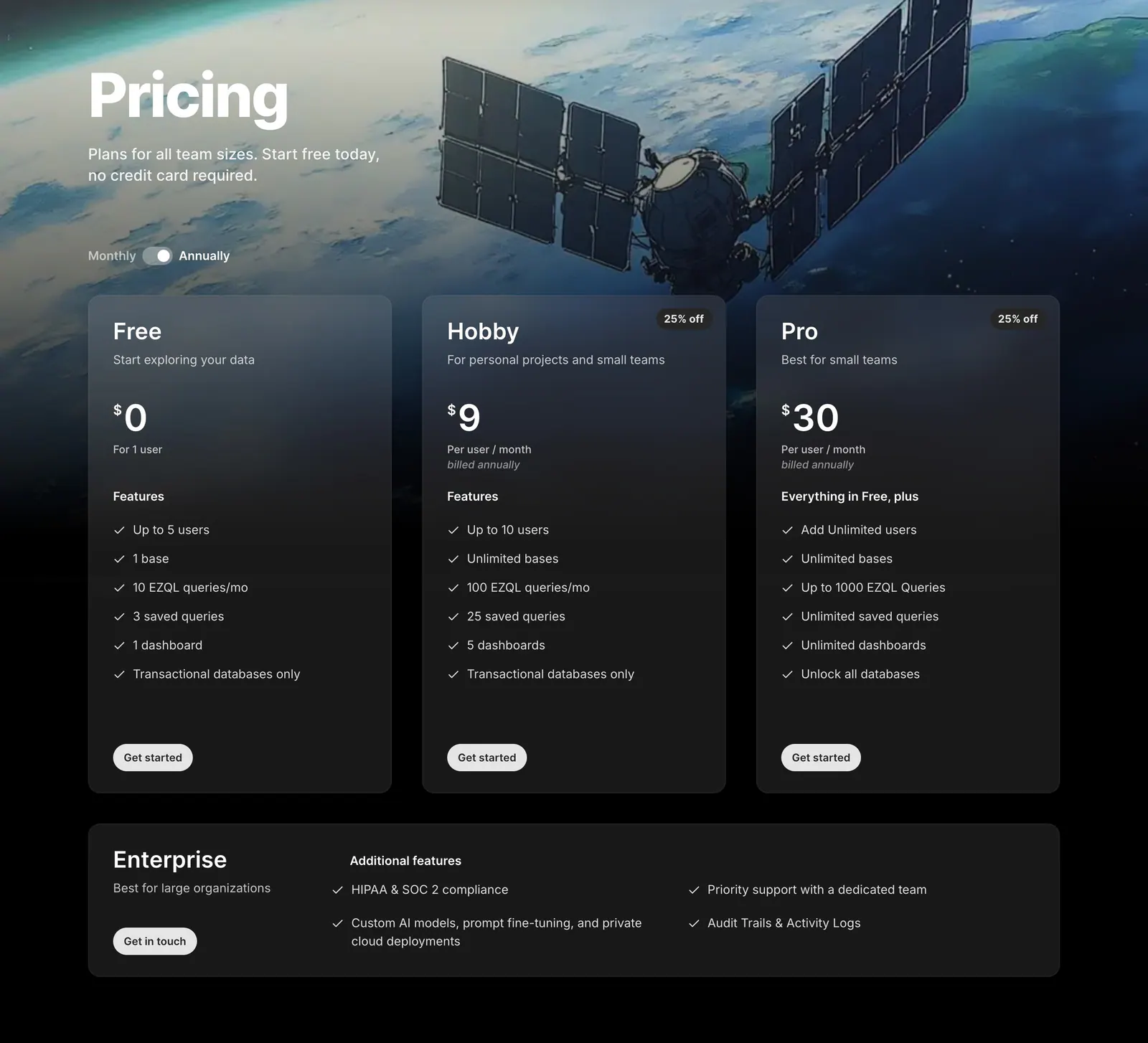
  98. Outerbase pricing section: headline and monthly/annual toggle over satellite artwork, three translucent plan cards and an Enterprise row
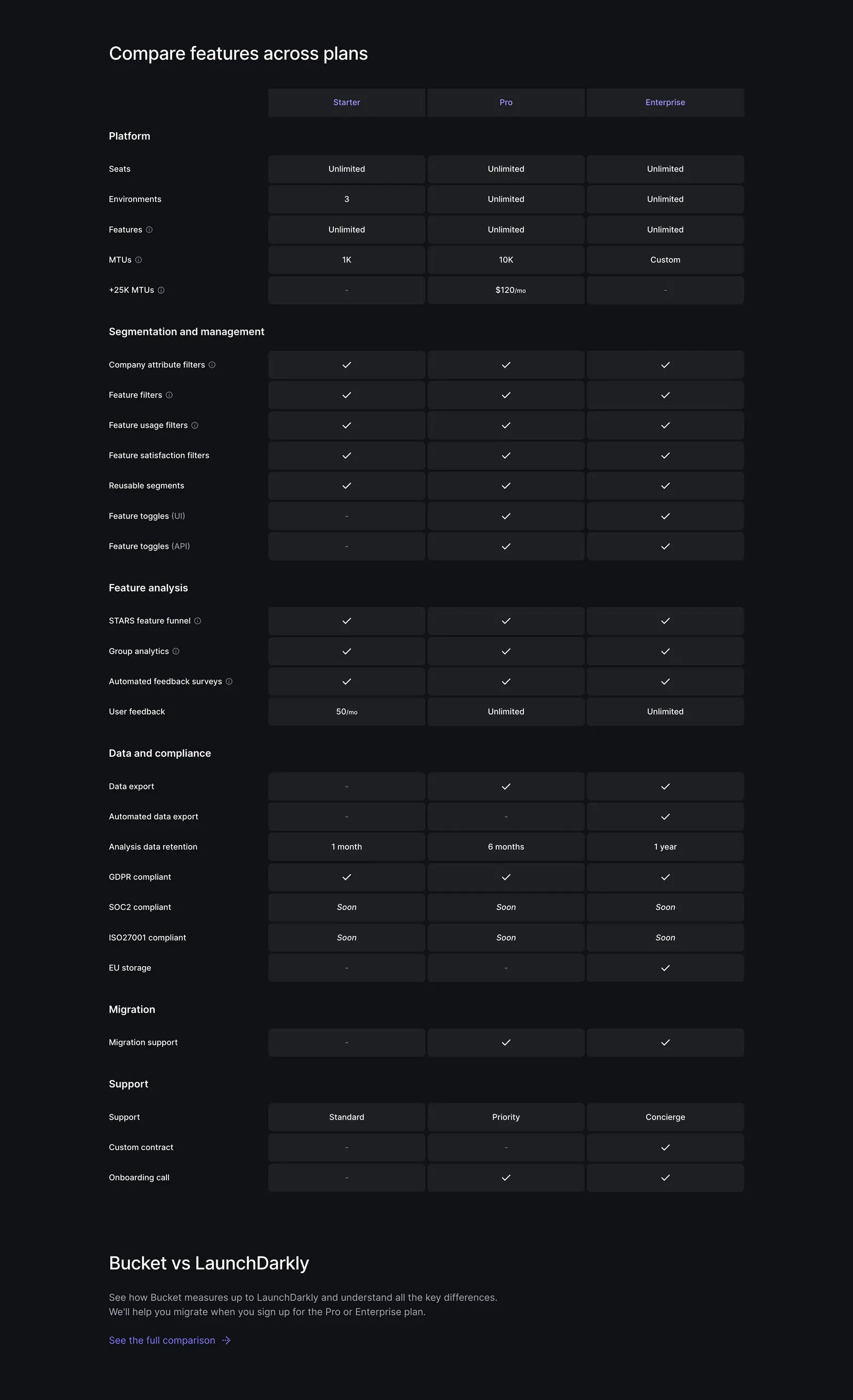
  99. Bucket pricing section: plan comparison table with Starter, Pro and Enterprise columns of checkmarks and limits on a dark background
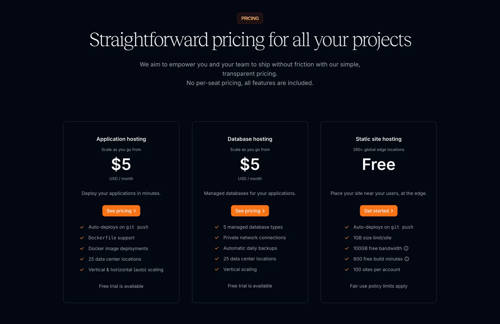
  100. Sevalla pricing section: centered serif headline above three outlined hosting plan cards with orange buttons on a near-black background

Common patterns in pricing sections

How to design a pricing section

  1. Highlight the plan most people need

    Give the recommended tier a subtle border, badge, or tinted background so it stands out without shouting. Place it in the middle on desktop. On mobile, list it first or make sure it is not buried below the other cards.
  2. Align prices for easy comparison
    Put price, billing period, and the main button at the same height across every card. Use one currency format and show units like "per user / month" right beside the number so visitors never have to calculate.

  3. List what each tier adds

    Start higher plans with "Everything in the previous plan, plus" and list only the additions. This keeps cards short and makes the upgrade path obvious. Move the exhaustive feature list into an expandable comparison table below the cards.
  4. State yearly savings plainly

    Default the monthly and yearly switch to the period most customers choose, and state the yearly saving as a clear amount or percentage. Show the billed total, not just the per-month equivalent, so the yearly price holds no surprise at checkout.
Companies in this collection

All section types
    ↑↓ Navigate ↵ Open

    Section preview

    Website section