Dovetail website design

Every section we captured from the Dovetail website, in page order, from the features section down to the CTA section. Open any thumbnail to see it full size.

Sections 7

In page order, top to bottom

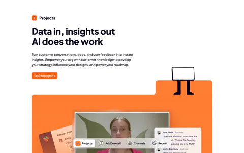
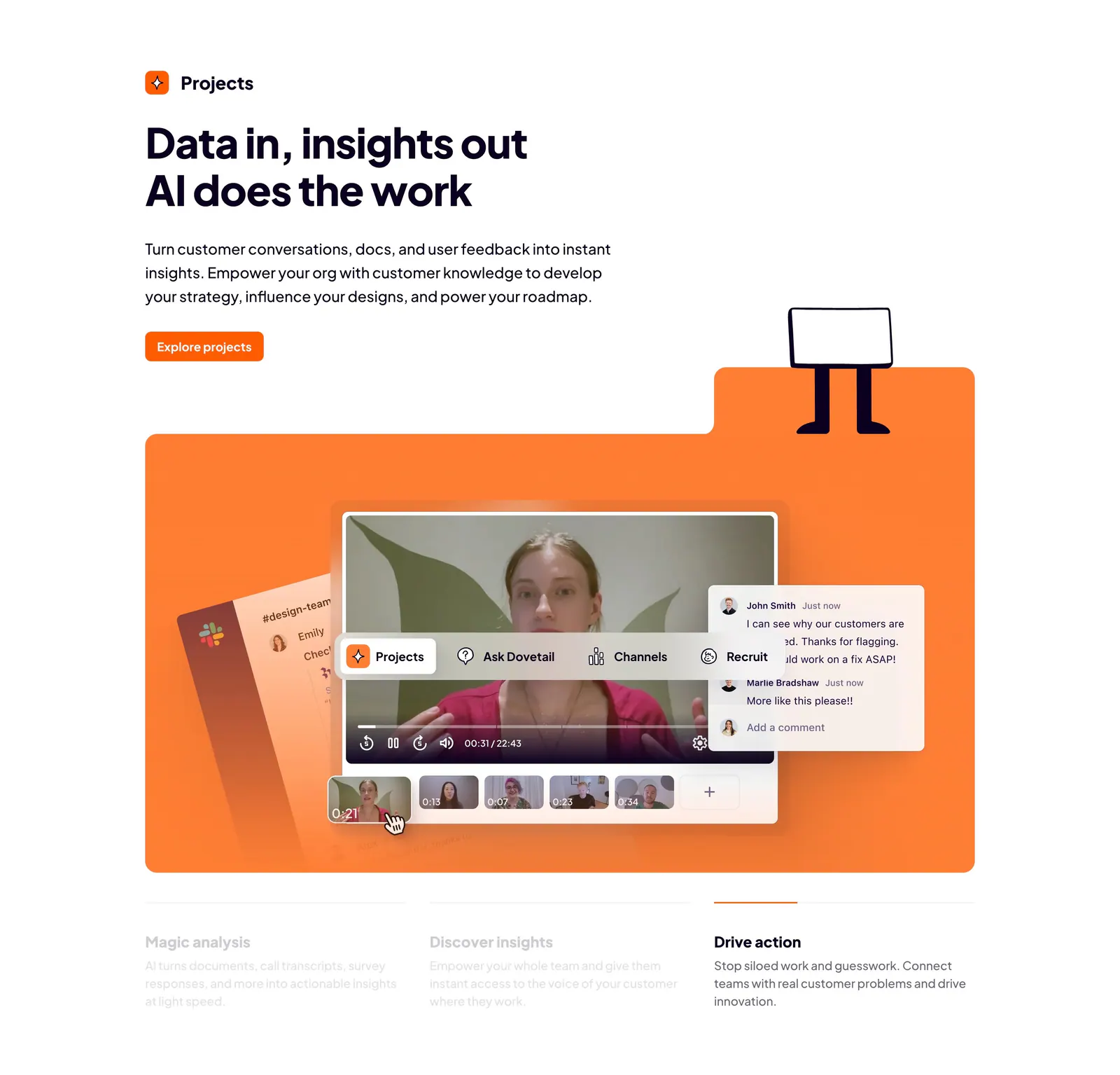
  1. Dovetail features section: left-aligned headline and orange button above an orange panel with a video insights UI and three tabbed benefits

    Data in, insights out AI does the work

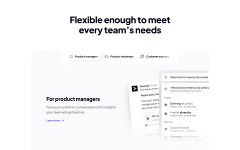
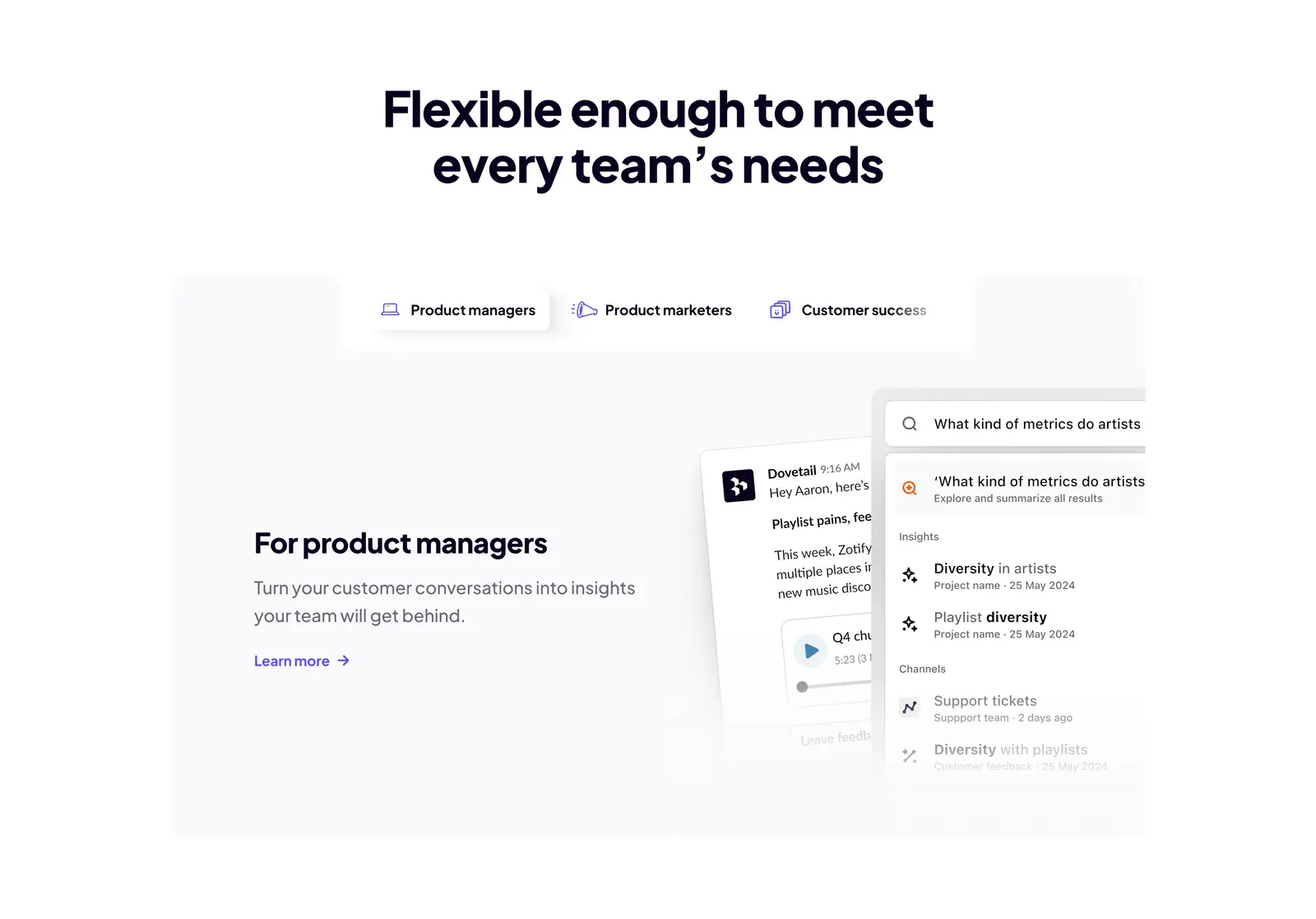
  2. Dovetail features section: centered headline above role tabs and a panel with product manager copy beside chat and search UI cards

    Flexible enough to meet every team’s needs

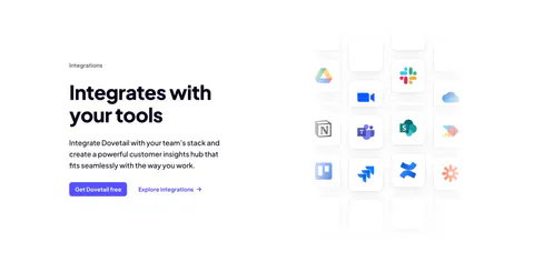
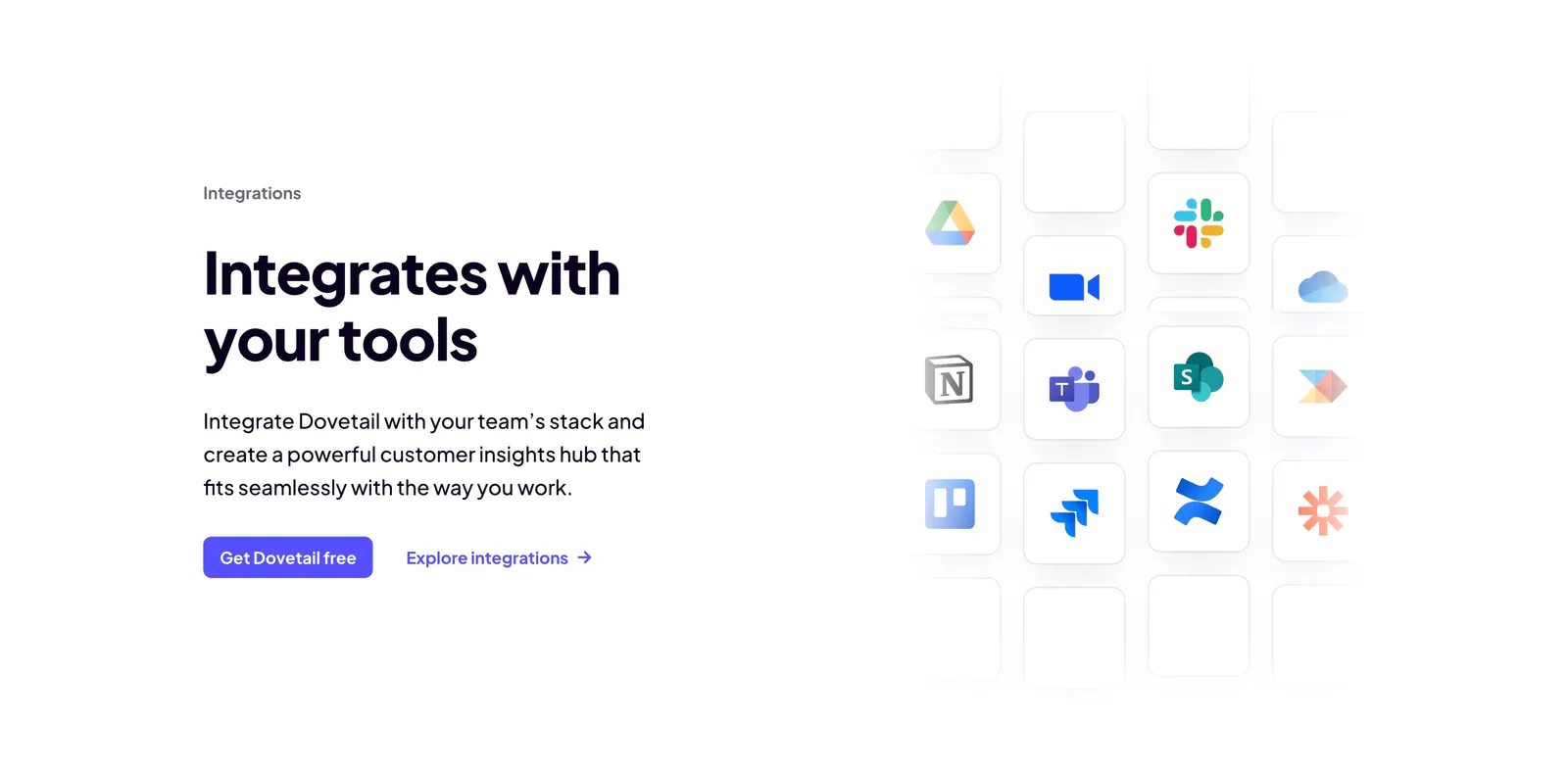
  3. Dovetail integrations section: headline, copy and two CTAs on the left beside a fading grid of app icon tiles like Slack, Notion and Jira

    Integrates with your tools

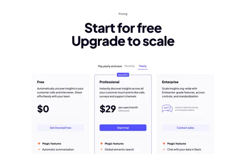
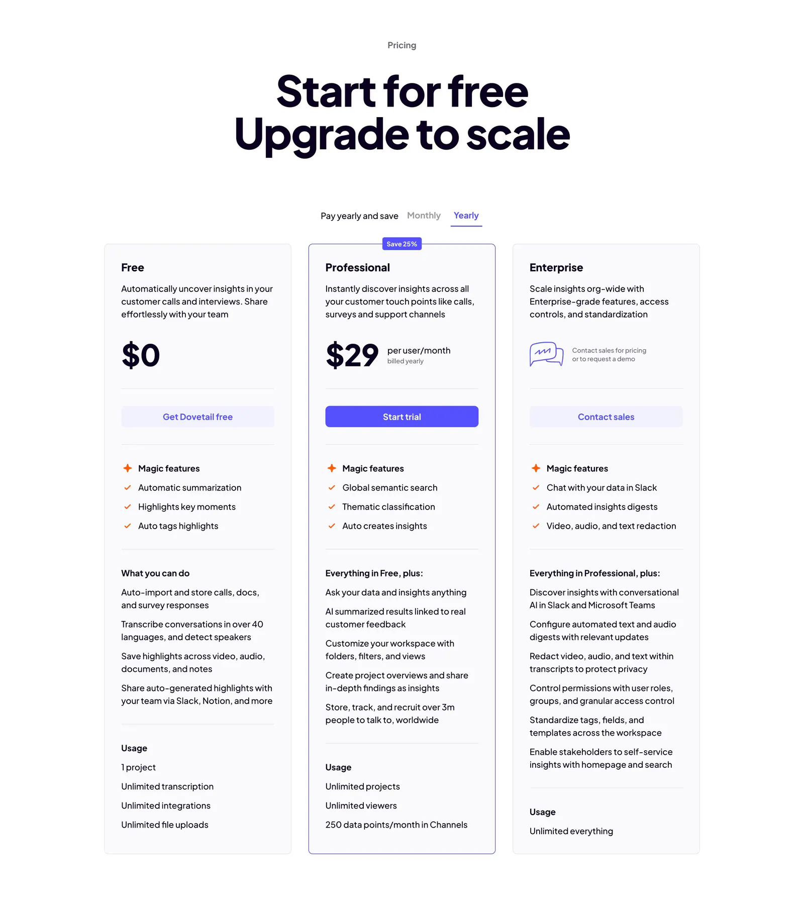
  4. Dovetail pricing section: centered headline, monthly/yearly toggle and three plan cards with the Professional tier outlined in indigo
    04 Pricing

    Start for free Upgrade to scale

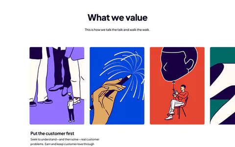
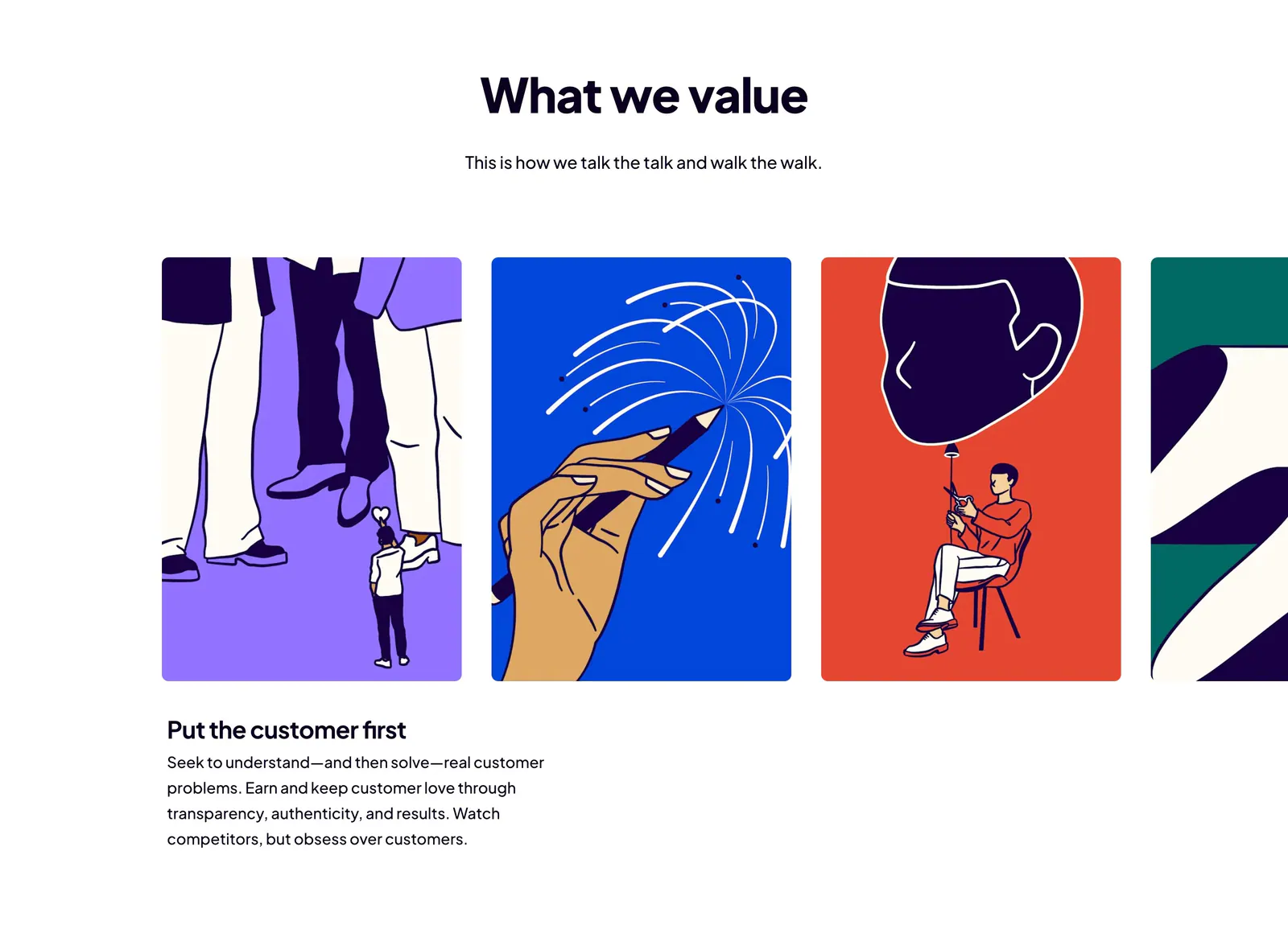
  5. Dovetail value proposition section: centered headline above a carousel of bold illustrated value cards with the first value's text below

    What we value

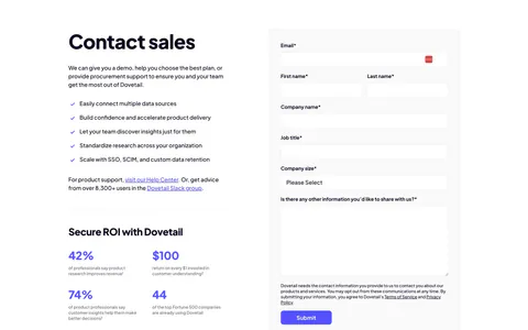
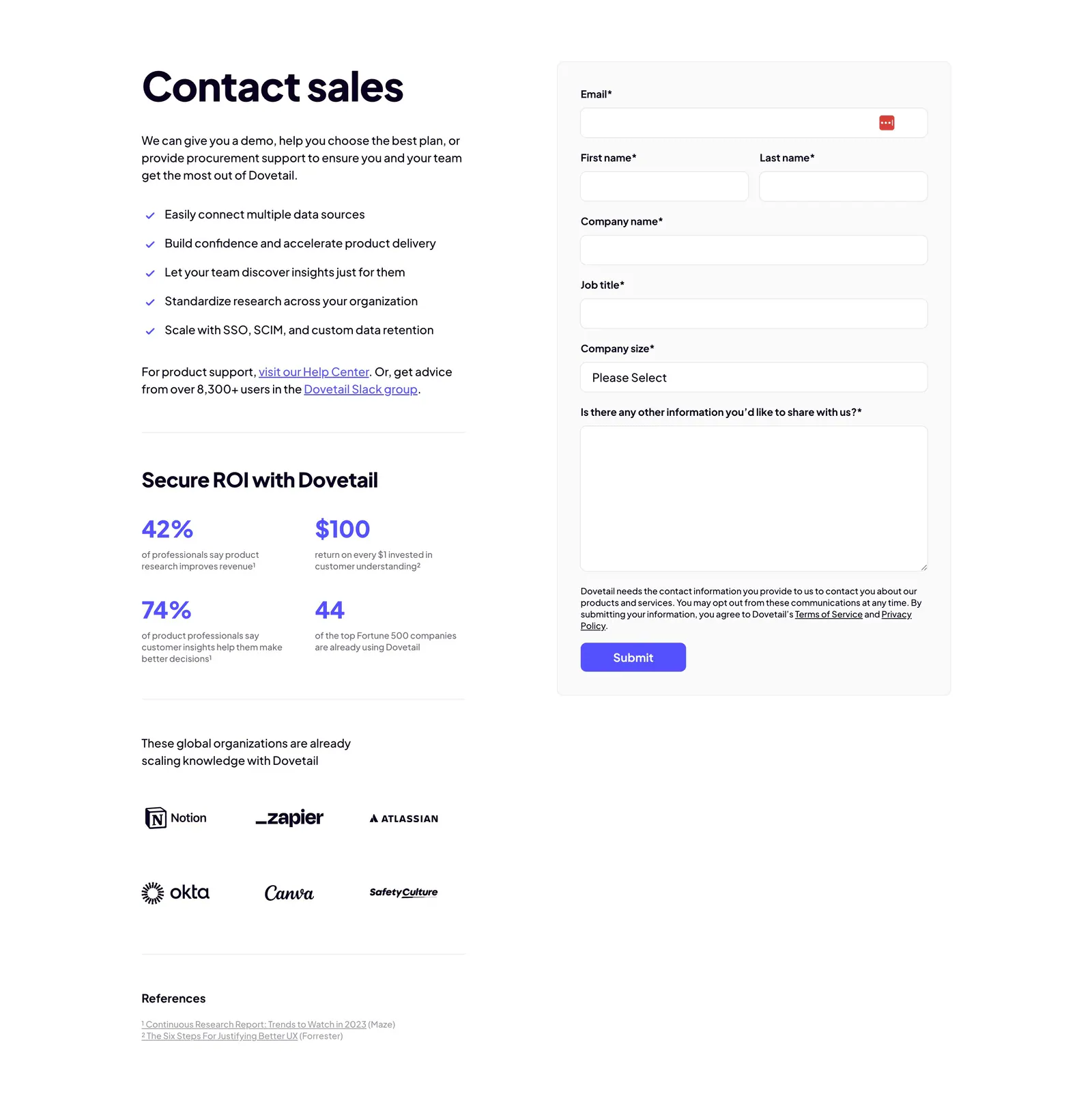
  6. Dovetail contact section: copy with checklist, ROI stats and customer logos on the left beside a gray contact sales form with purple submit
    06 Contact

    Contact sales

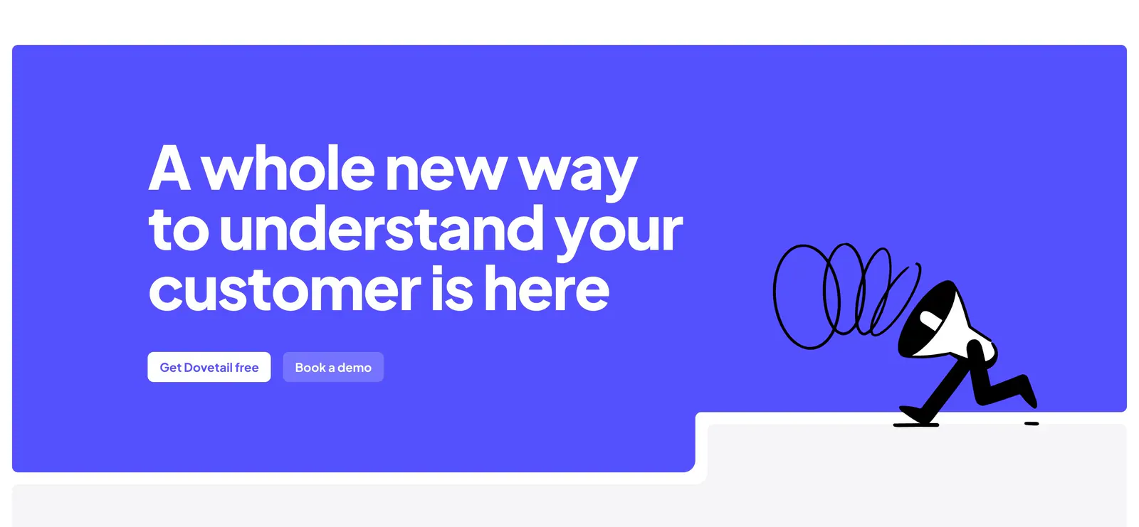
  7. Dovetail call-to-action section: large white headline and two buttons on a bright indigo panel with a walking megaphone illustration

    A whole new way to understand your customer is here
Similar companies

All companies
    ↑↓ Navigate ↵ Open

    Section preview

    Website section