Illustration Website Design Examples

Drawn artwork gives abstract products a concrete face. In website design, illustration means a distinct, one-off drawing as the focal visual: a character, an editorial scene, a hand-drawn sketch, or pixel art. It brings personality that stock imagery lacks and suits explainers and brands aiming for warmth. The usual trap is library art that could sit on any site and says nothing about the product.
119 sections

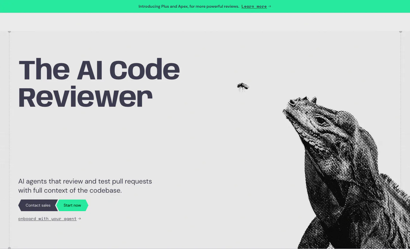
  1. Greptile hero section: bold headline and two CTAs on the left, halftone iguana artwork on the right, green announcement bar above
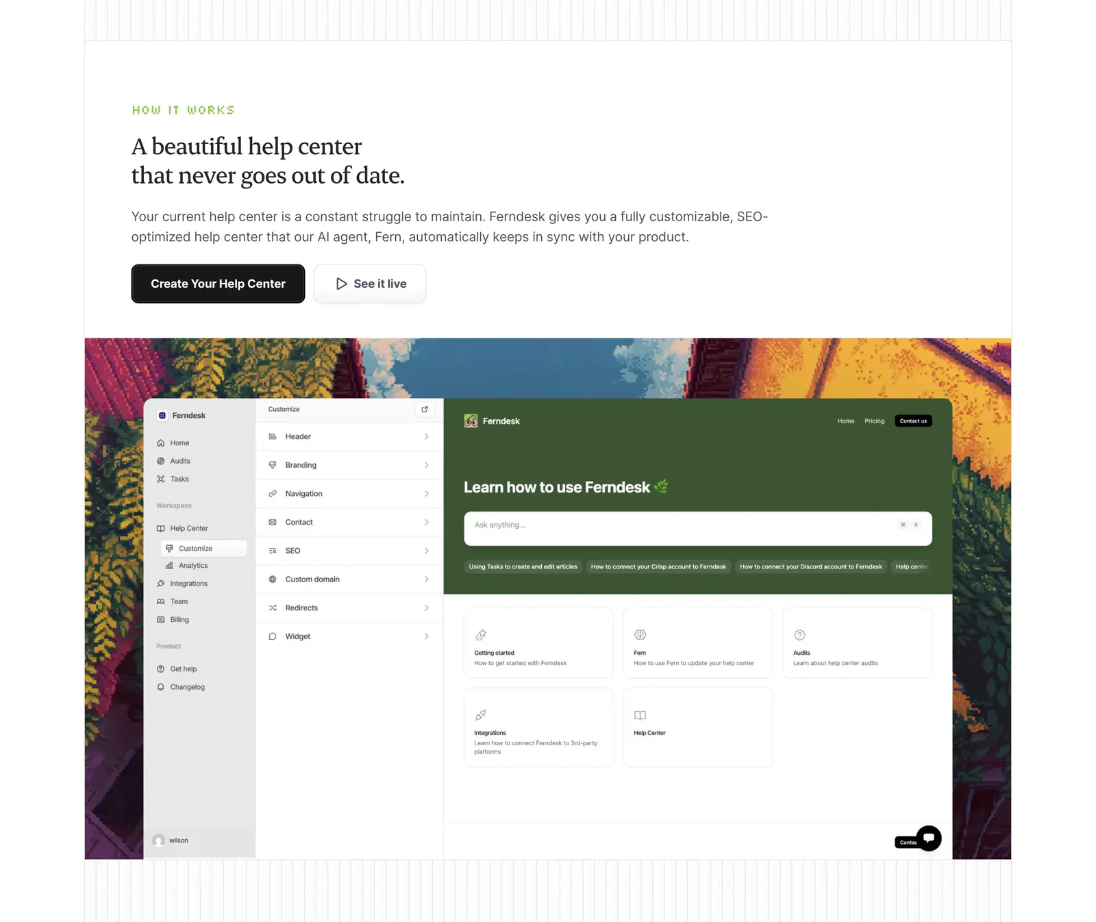
  2. Ferndesk how it works section: serif headline and two buttons above a help center editor screenshot framed by pixel-art scenery
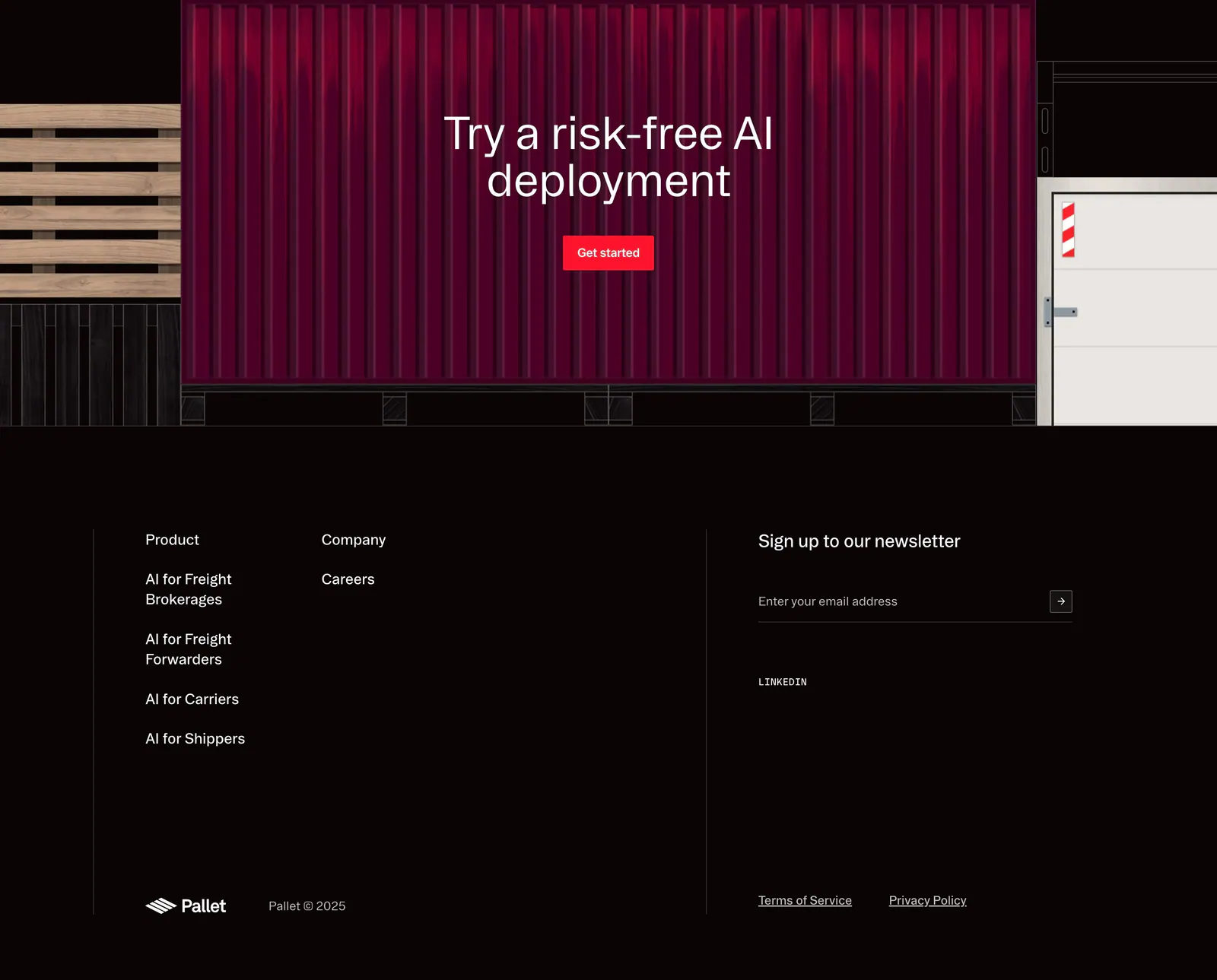
  3. Pallet footer section: CTA over a red shipping container illustration above dark link columns, newsletter email field and copyright
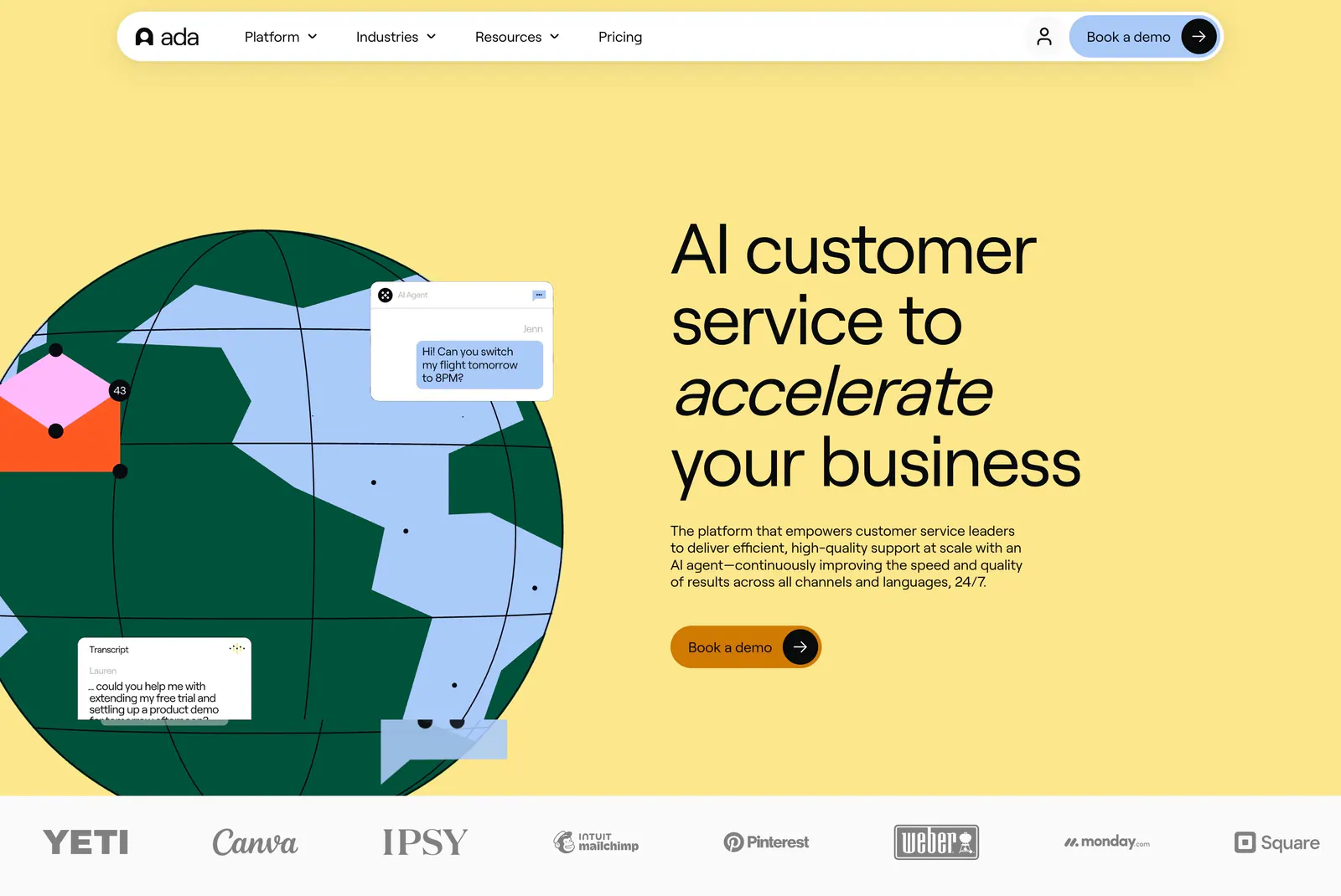
  4. Ada hero section: illustrated globe with chat bubbles beside a large headline on yellow, with a customer logo strip below
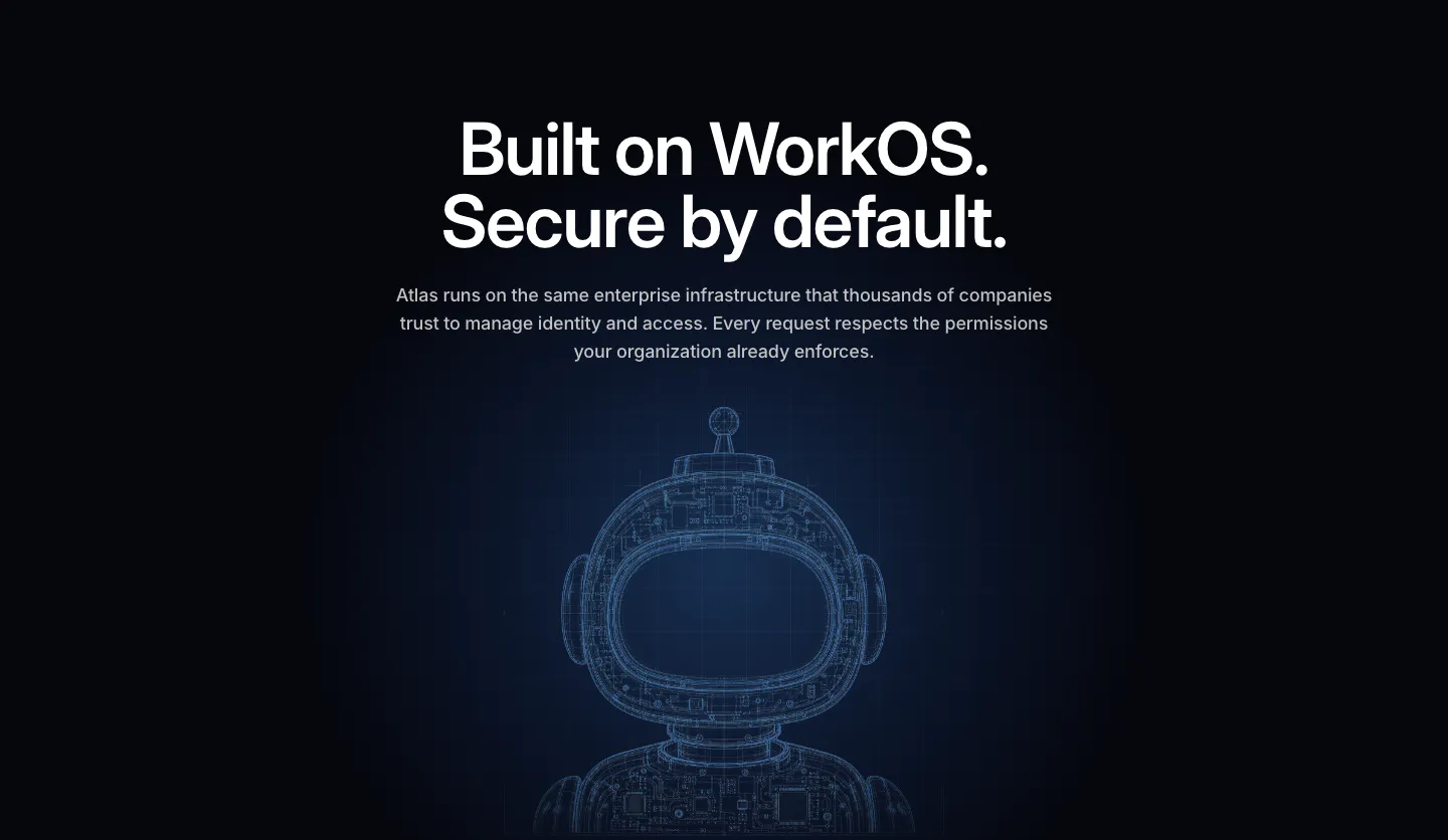
  5. WorkOS security section: centered headline above a glowing blue wireframe robot on a dark navy background
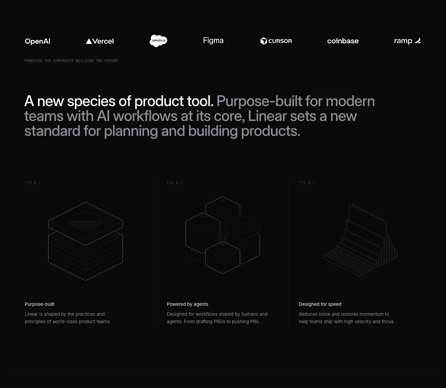
  6. Linear value proposition section: dark logo strip, two-tone statement and three columns with isometric line drawings and short benefits
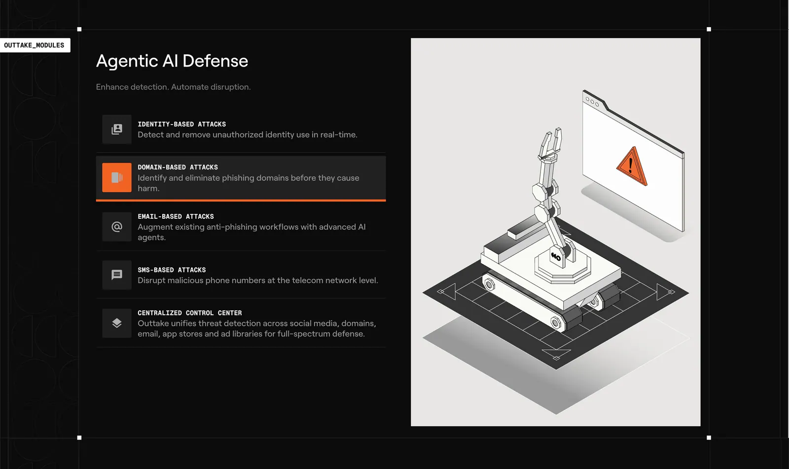
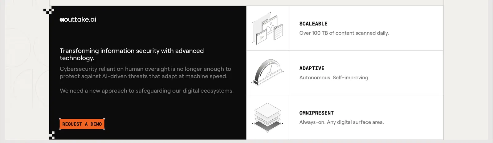
  7. Outtake features section: dark list of attack-type modules with an active highlight beside a light panel with an isometric robot arm illustration
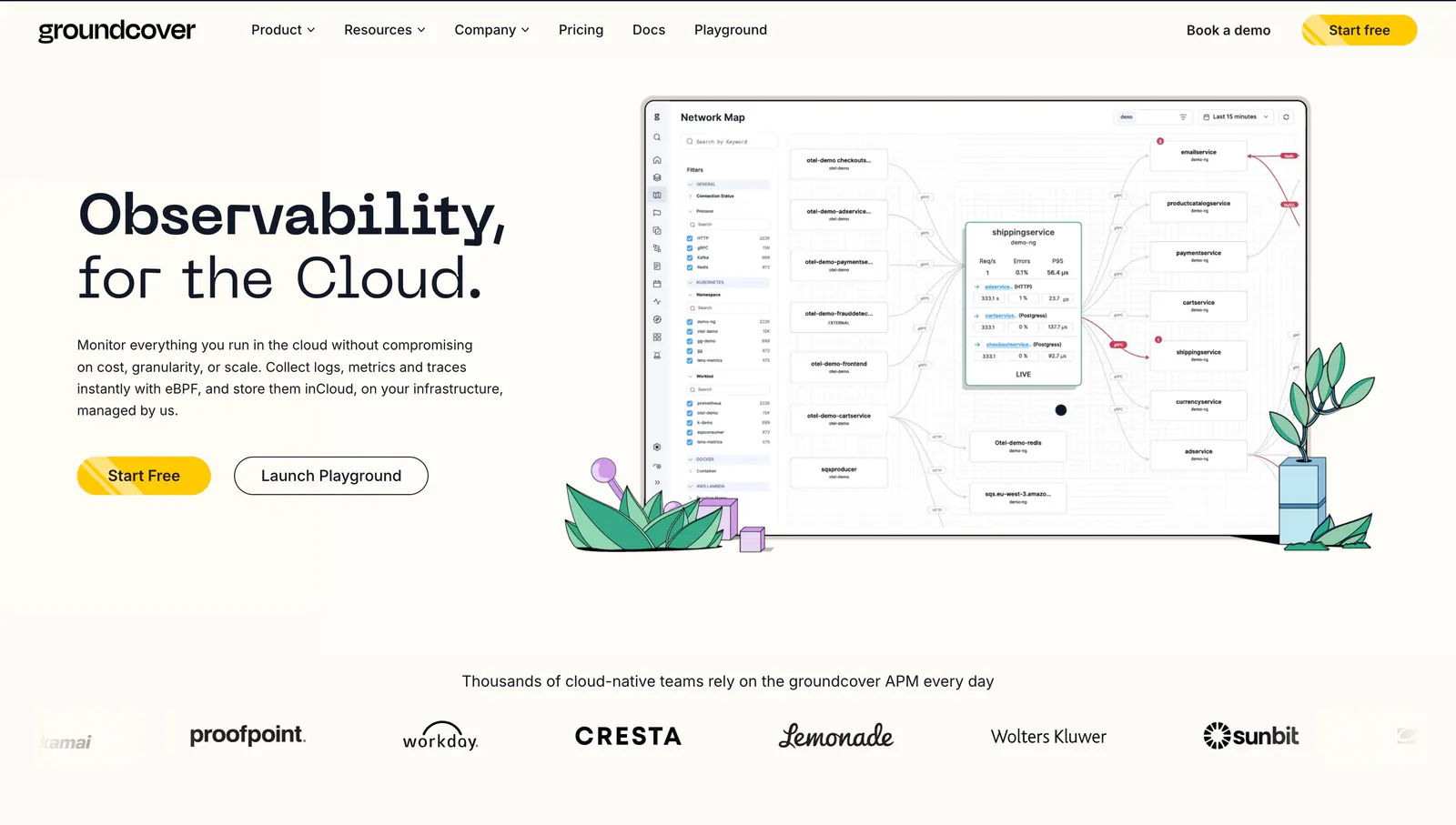
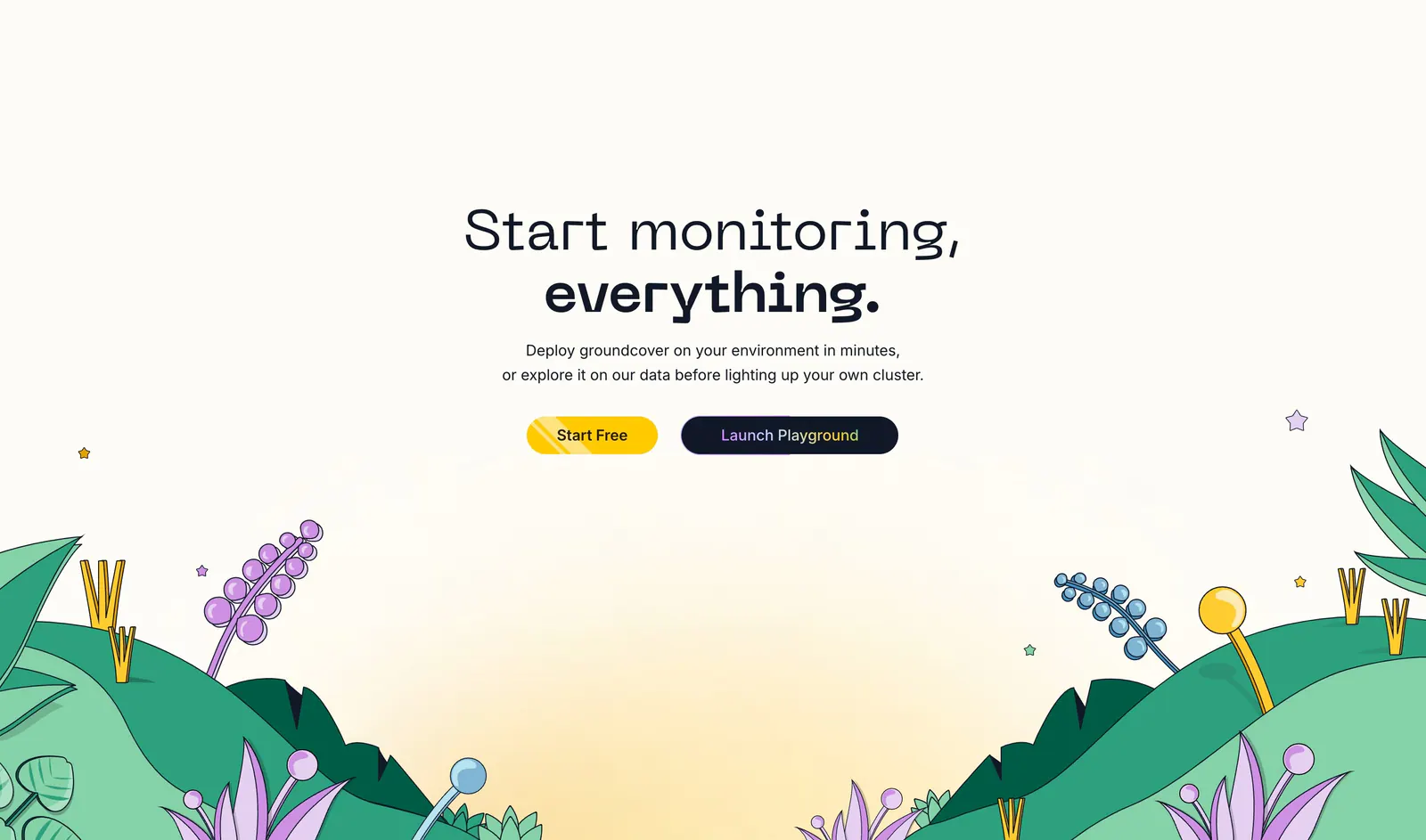
  8. groundcover hero section: headline, copy and buttons on the left, network map screenshot with plant drawings on the right, logo row below
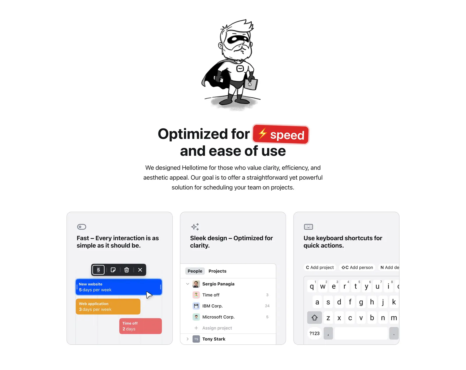
  9. Hellotime features section: superhero drawing and centered headline above three gray cards with scheduling UI and keyboard mockups
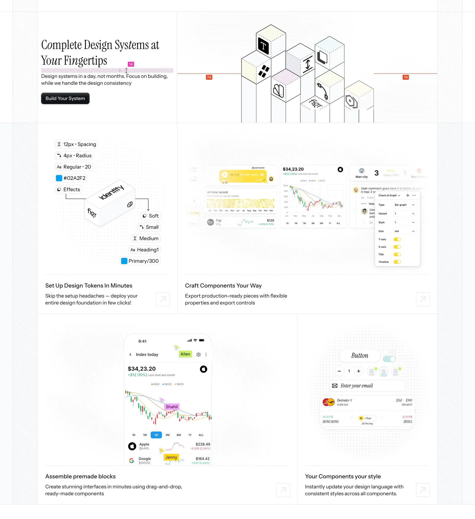
  10. Figr features section: serif headline beside an isometric cube drawing above a bento of design token, chart and mobile UI tiles
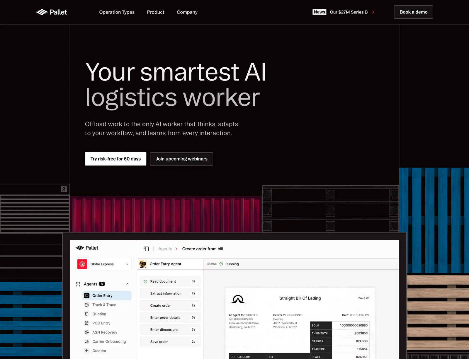
  11. Pallet hero section: dark left-aligned headline with two buttons above an agent product screenshot framed by container and pallet artwork
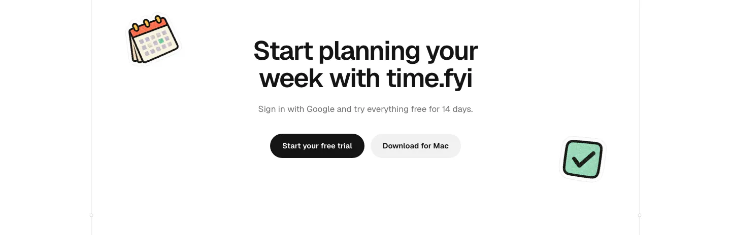
  12. time.fyi call-to-action section: centered headline with trial and Mac download buttons flanked by calendar and checkbox stickers
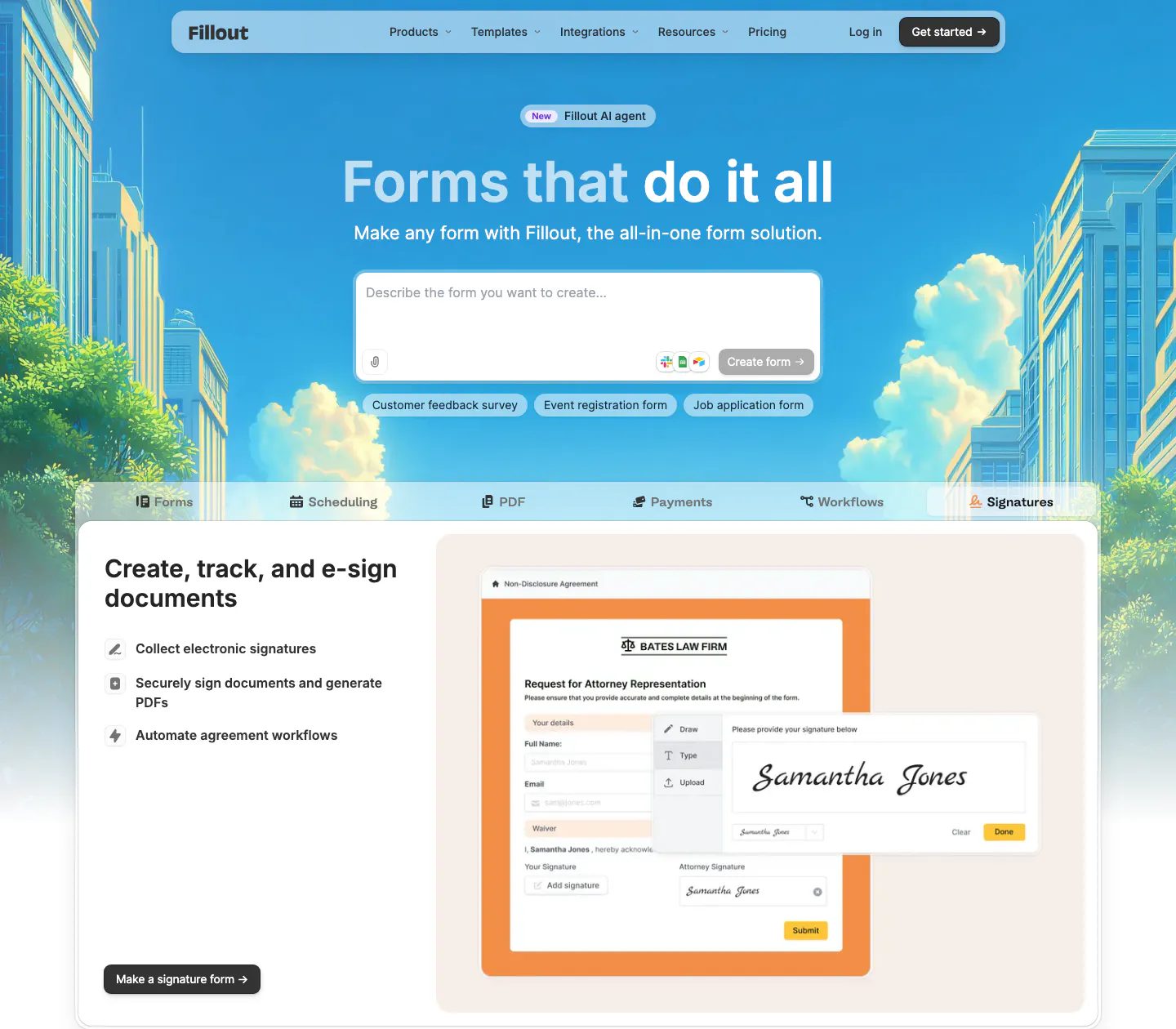
  13. Fillout hero section: centered headline and AI prompt box over an illustrated city skyline, above product tabs and an e-signature form mockup
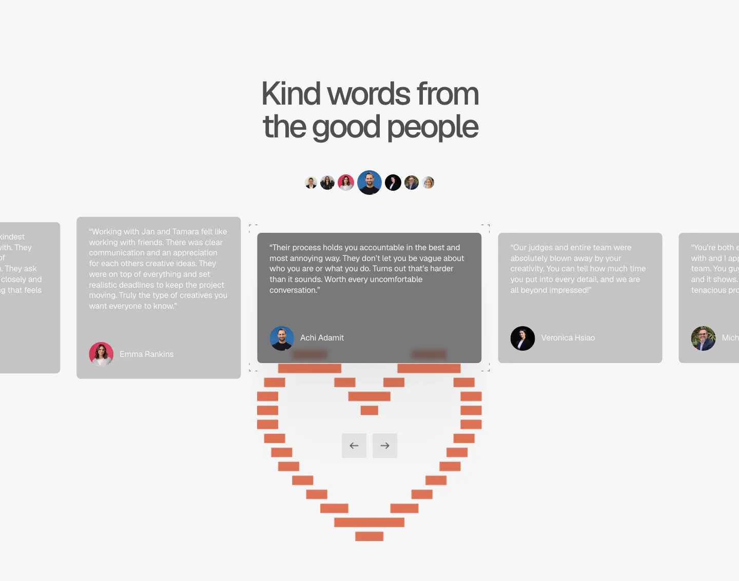
  14. A-LIGN testimonials section: centered headline, avatar row and a quote card carousel with arrows above a pixel-style orange heart
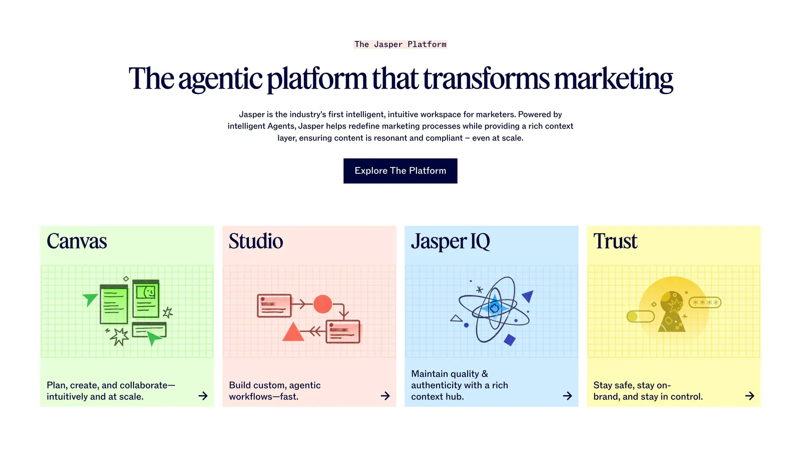
  15. Jasper features section: centered serif headline and button above four pastel cards with line illustrations on grid backgrounds
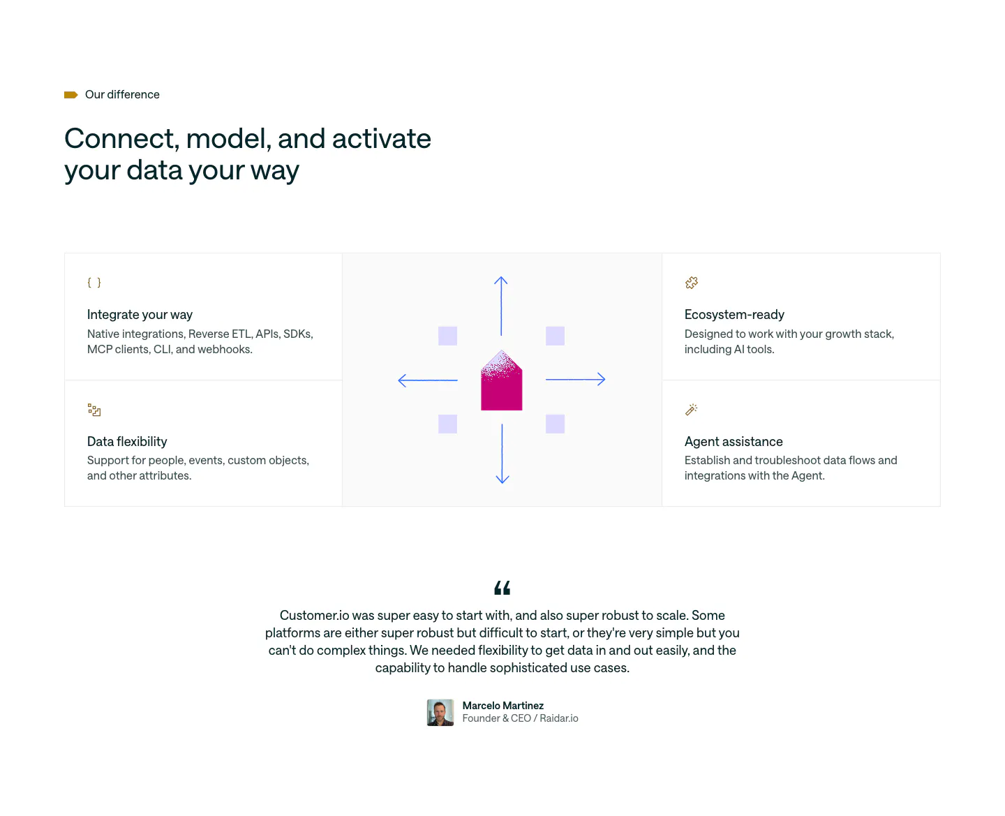
  16. Customer.io features section: four feature cells around a central envelope and arrows graphic, followed by a centered customer quote
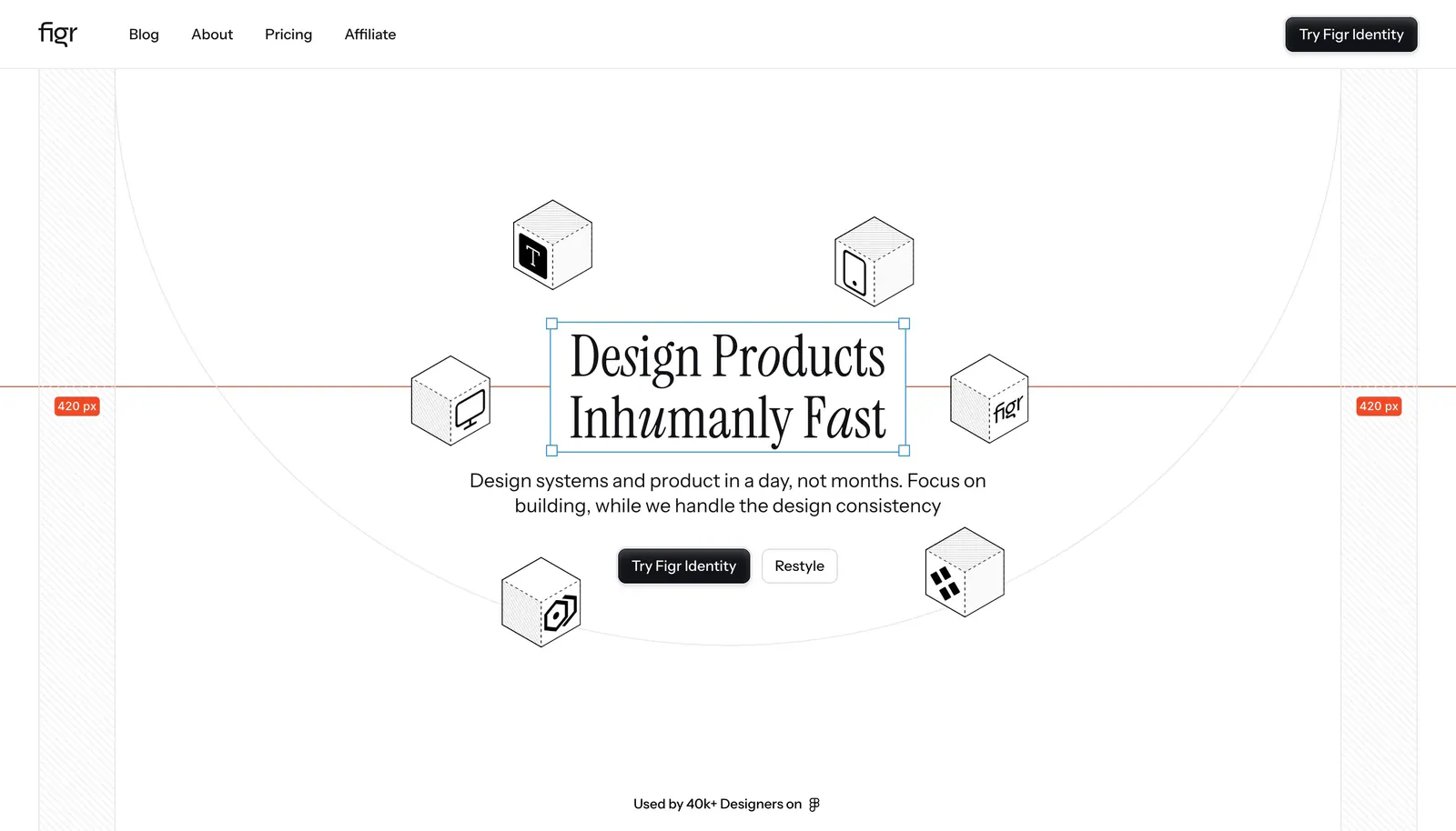
  17. Figr hero section: centered serif headline in a selection box ringed by isometric line-drawn cubes with measurement guides
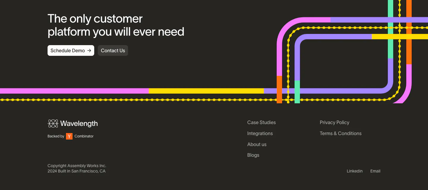
  18. Wavelength footer section: closing headline with two buttons over colorful transit lines, then logo, link columns and copyright on charcoal
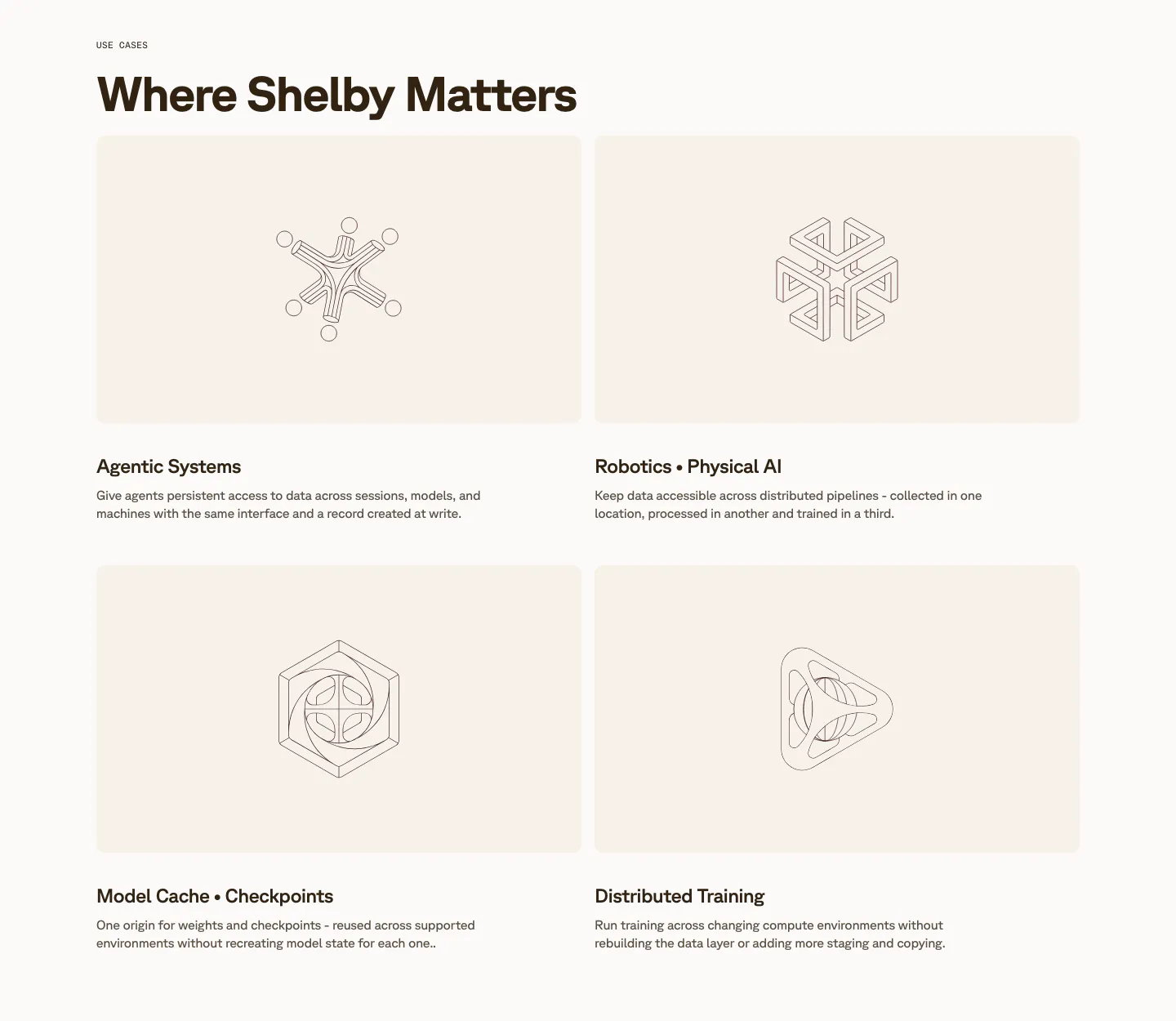
  19. Shelby use cases section: two-by-two grid of cream cards with line-drawn geometric artworks above titles like Agentic Systems
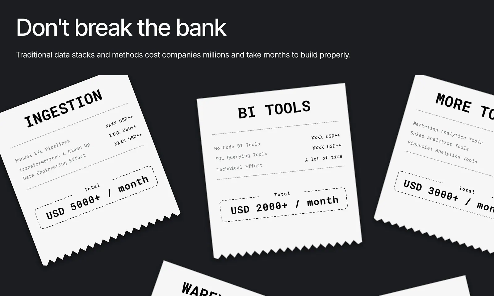
  20. Airbook value proposition section: headline on charcoal with scattered white receipt cards listing data tool costs per month
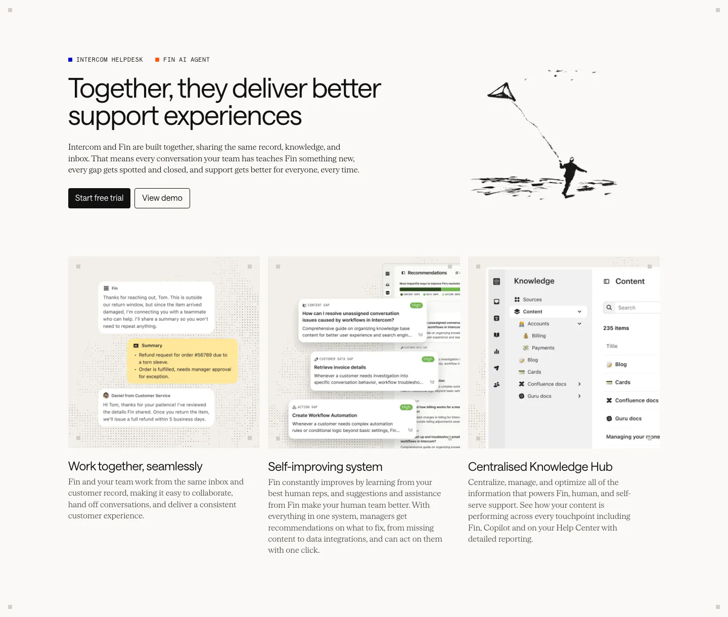
  21. Intercom features section: headline with an ink kite drawing above three equal cards showing chat, recommendations and knowledge hub UI
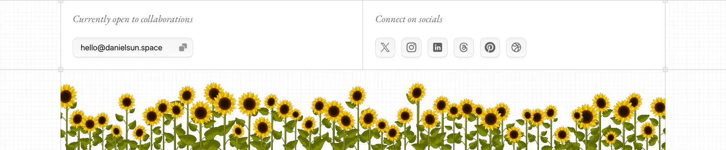
  22. Daniel Sun footer section: collaboration email pill and social icon buttons above a strip of illustrated sunflowers
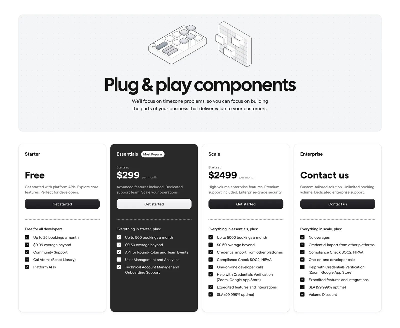
  23. Cal.com pricing section: centered headline with isometric line art on a dotted panel above four plan cards, one dark highlighted
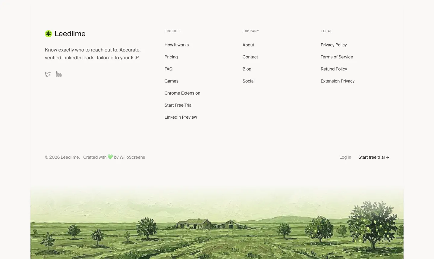
  24. Leedlime footer section: logo, tagline and three link columns above a painted green farmland landscape strip on off-white
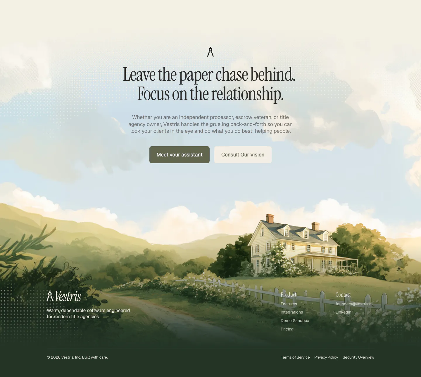
  25. Vestris call-to-action section: centered serif headline and two buttons over a painted countryside house scene that flows into the footer
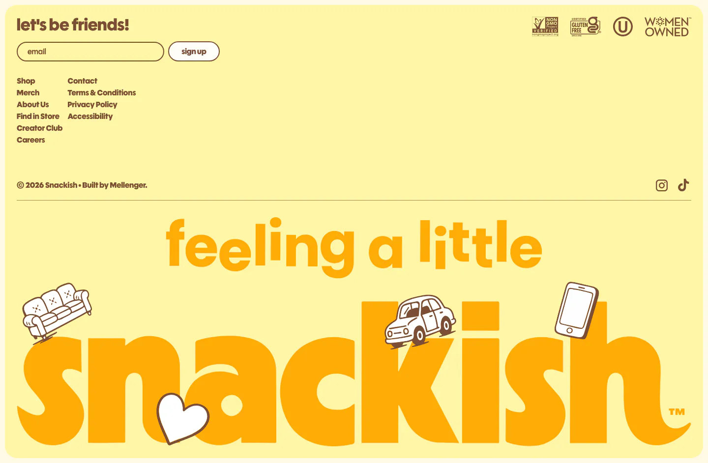
  26. Snackish footer section: pale yellow footer with email signup, link columns, certification badges and a giant illustrated snackish wordmark
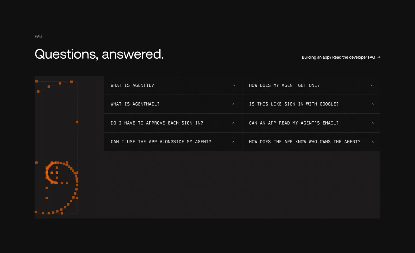
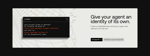
  27. AgentID FAQ section: dark two-column grid of monospace accordion questions beside an orange pixel-dot smiley artwork
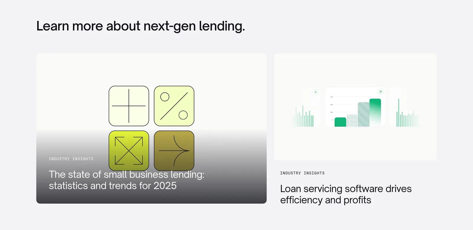
  28. Canopy blog & resources section: left-aligned heading above two article cards with abstract lending graphics on light gray
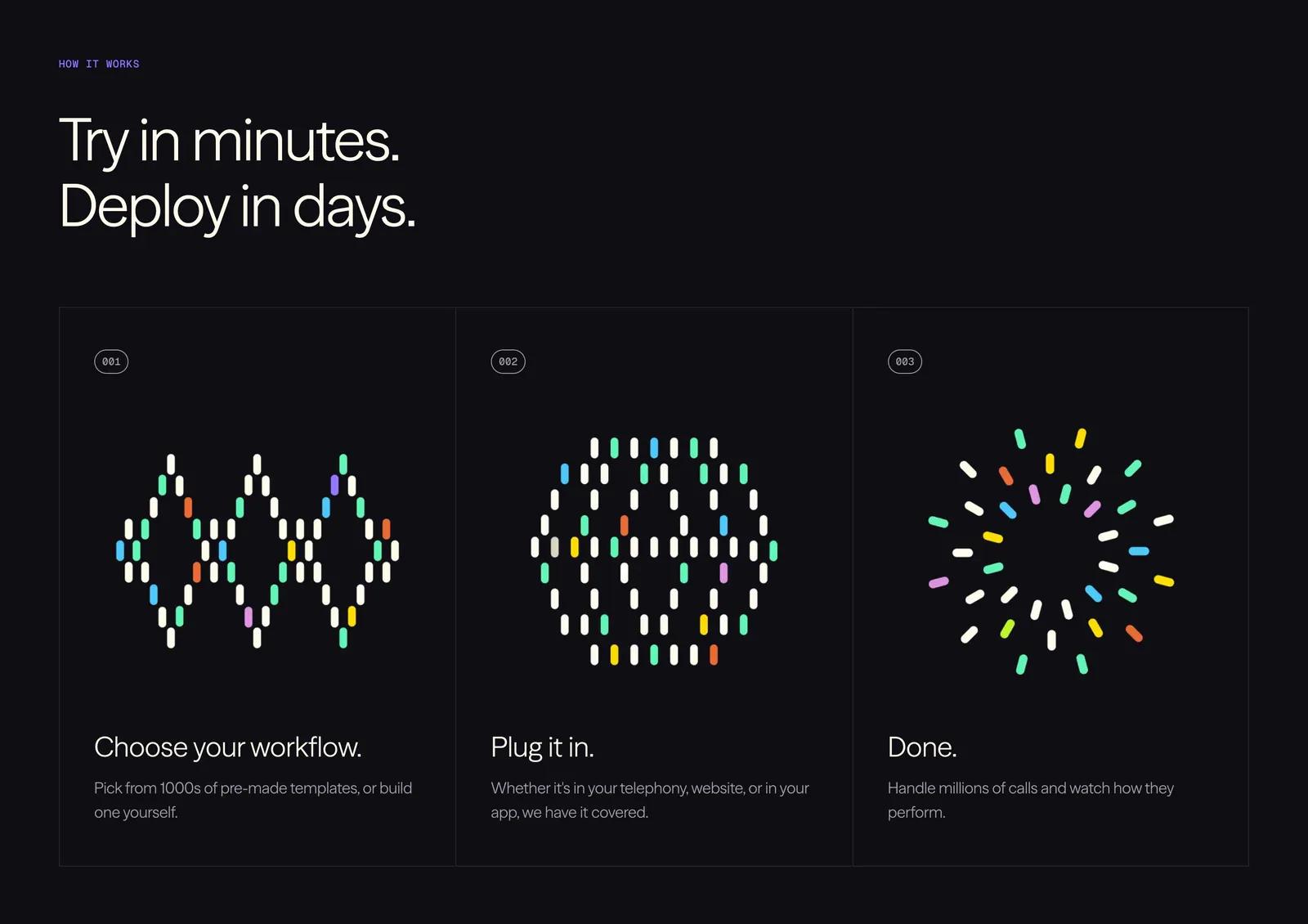
  29. Vapi how it works section: left-aligned headline above three numbered step cards with colorful dot-pill artworks on a black background
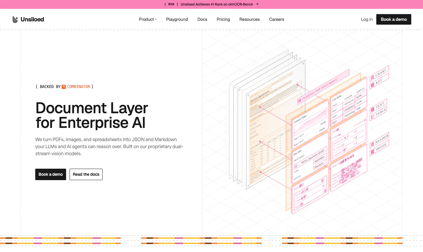
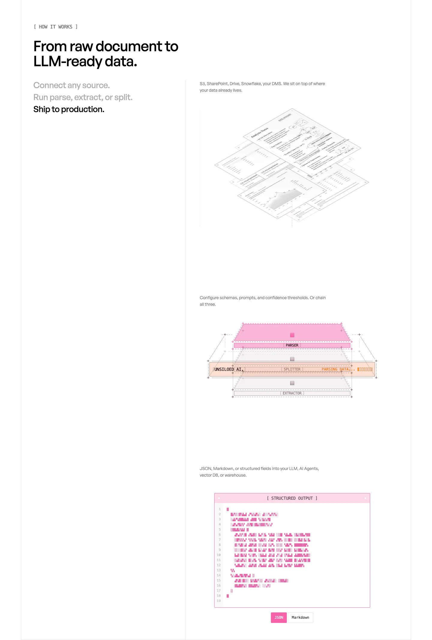
  30. Unsiloed hero section: left headline with Book a demo and Read the docs buttons beside an isometric illustration of layered parsed documents
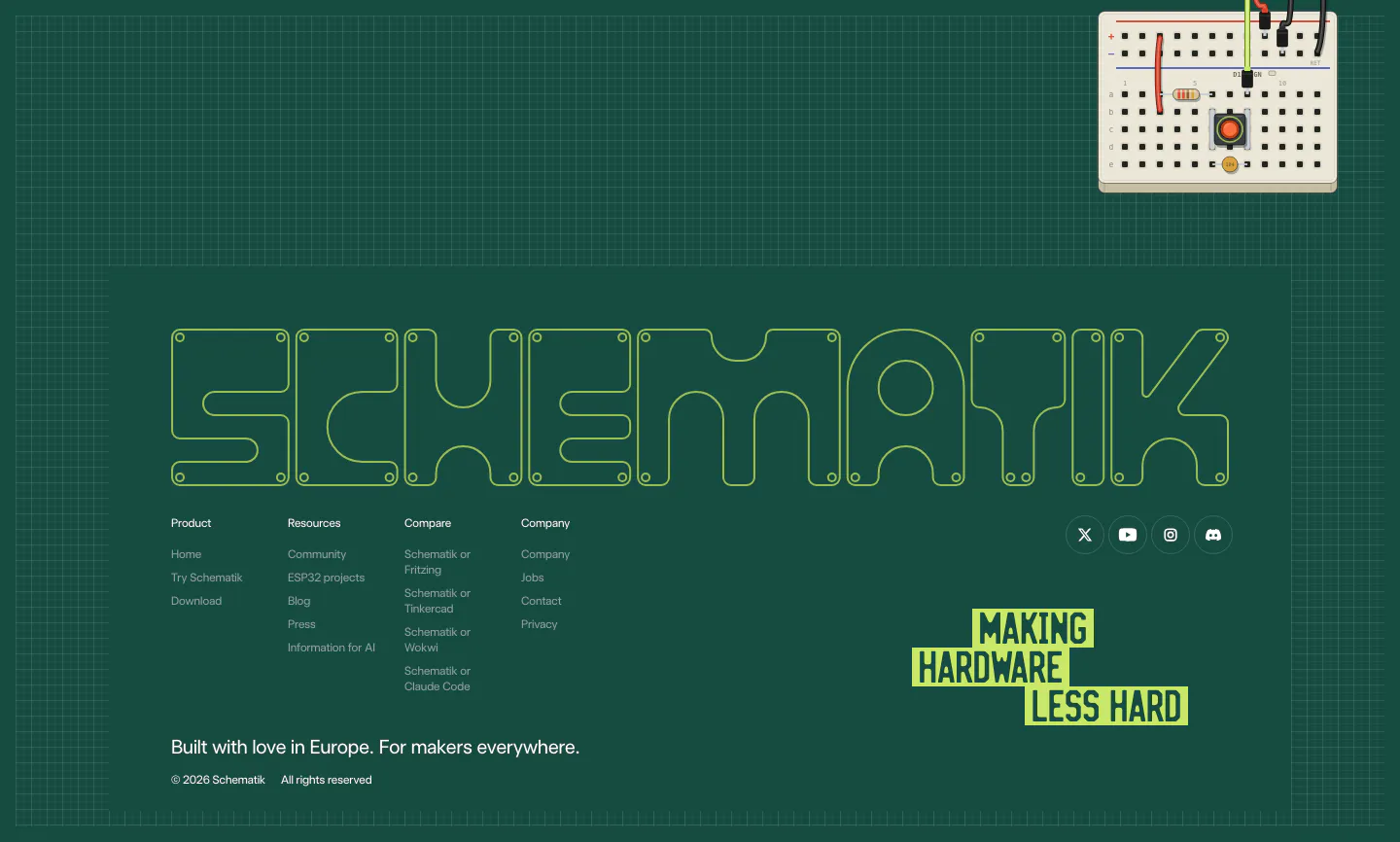
  31. Schematik footer section: outlined SCHEMATIK wordmark, link columns and lime tagline on a dark green grid with a breadboard
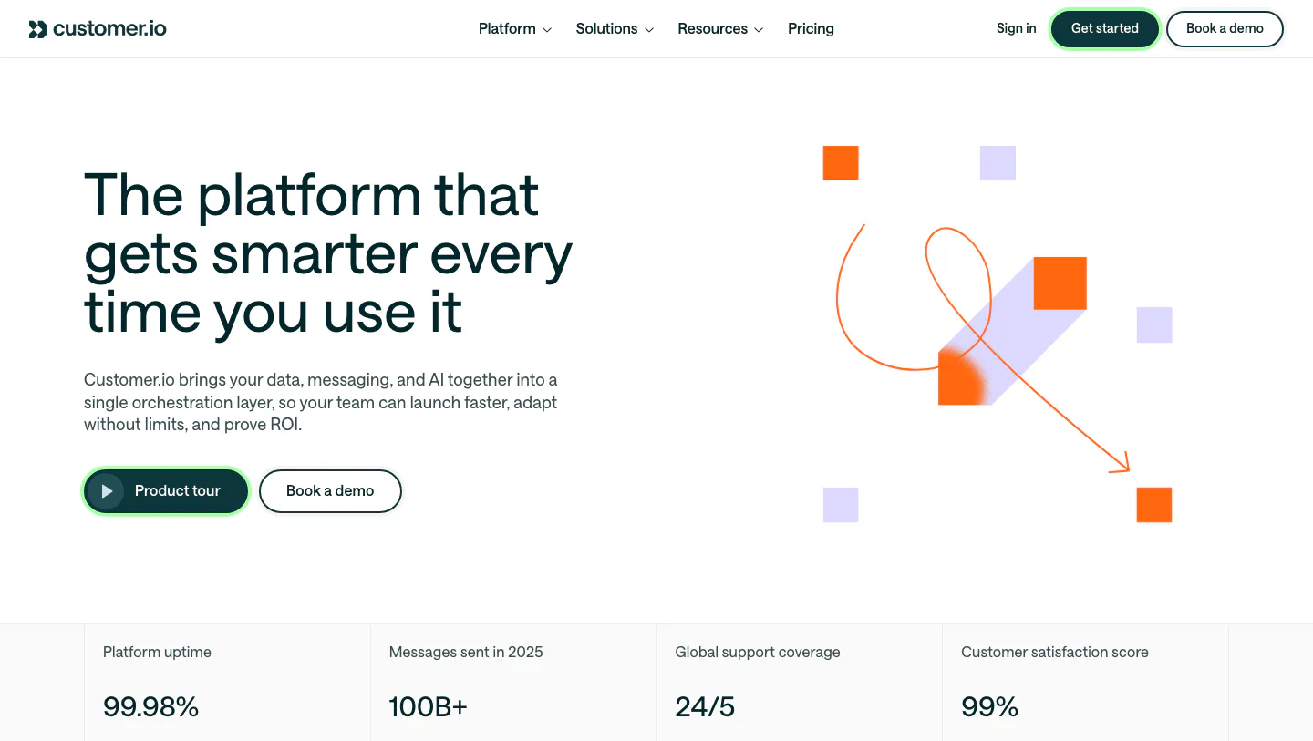
  32. Customer.io hero section: split layout with headline and buttons beside abstract orange and lavender square artwork, above a stats row
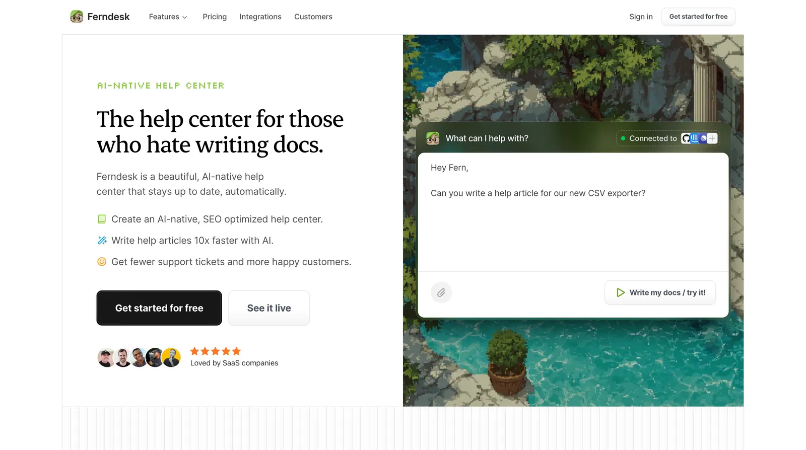
  33. Ferndesk hero section: serif headline, checklist and CTAs on the left beside an AI chat prompt over a pixel-art garden scene
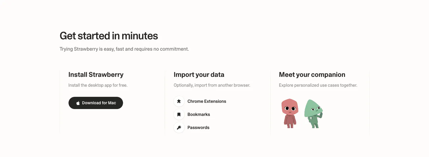
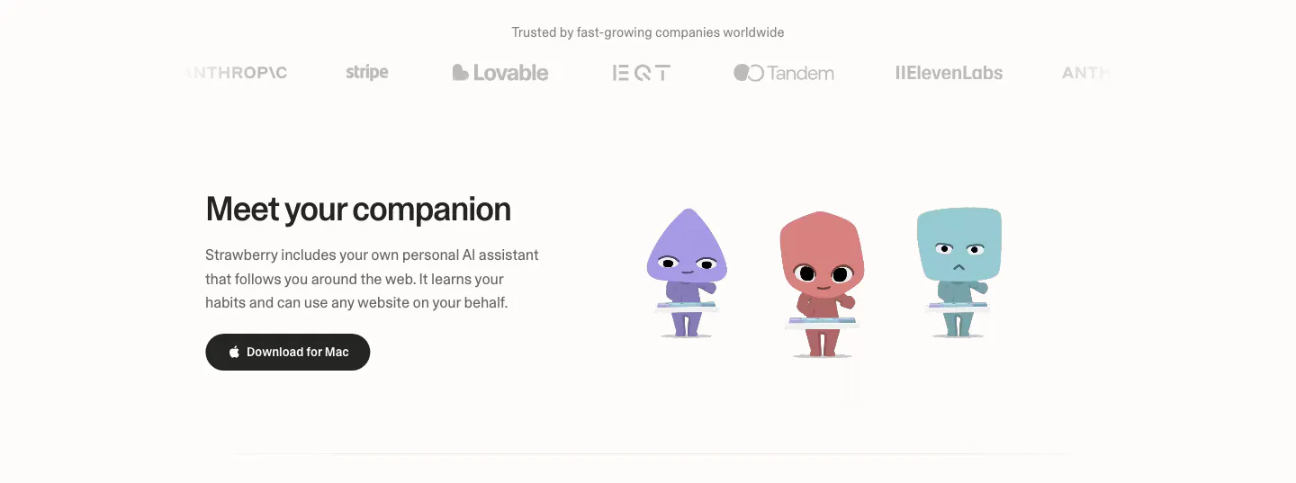
  34. Strawberry how it works section: three columns for install, import data and meet your companion, with a download button and characters
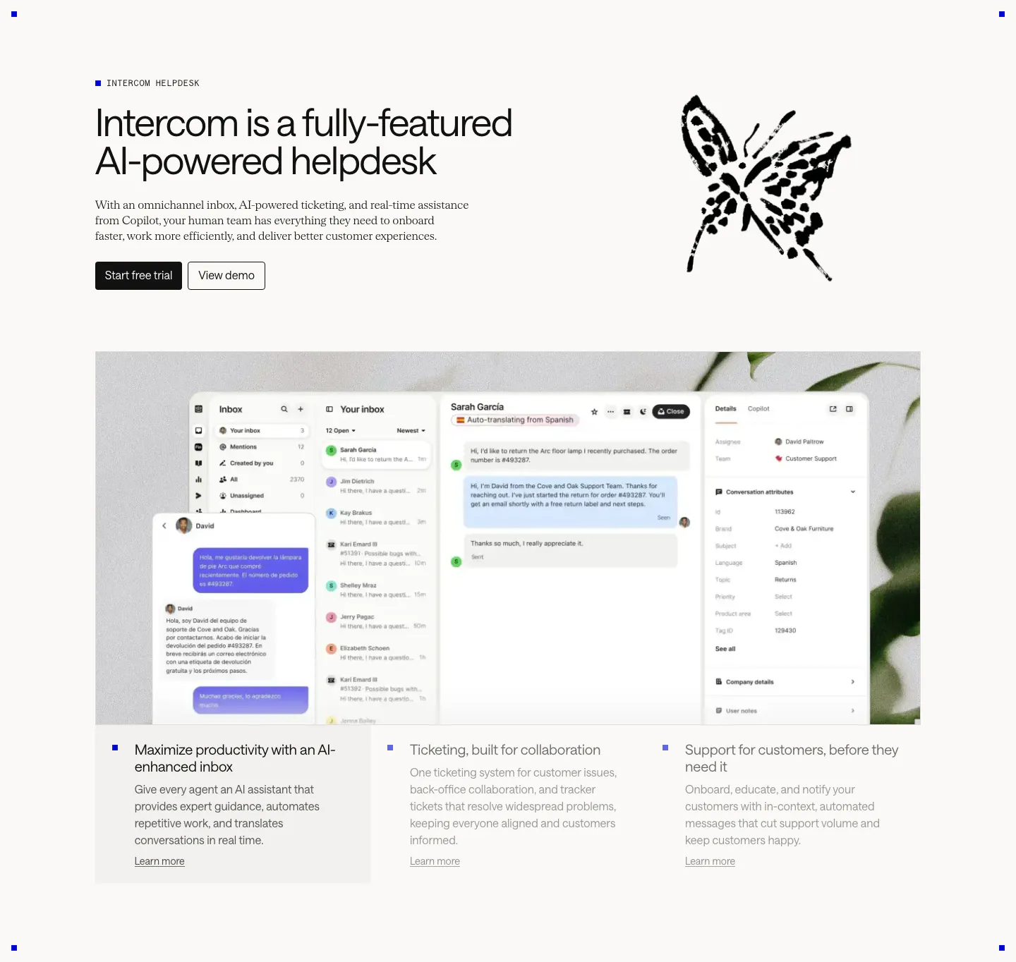
  35. Intercom features section: headline beside an ink butterfly drawing, large inbox screenshot over a plant photo, three selectable feature columns
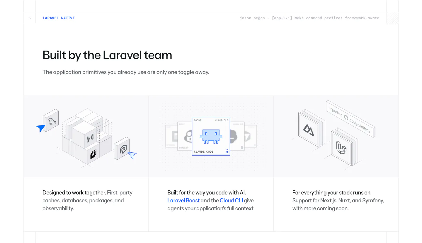
  36. Laravel Cloud features section: headline above three columns of isometric illustrations for first-party packages, AI tooling and frameworks
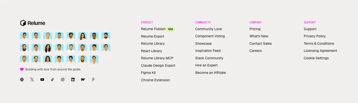
  37. Relume footer section: logo above a grid of illustrated team avatars and social icons, with four link columns under pink labels
  38. Strawberry features section: logo strip on top, then headline and download button beside three cartoon companion characters
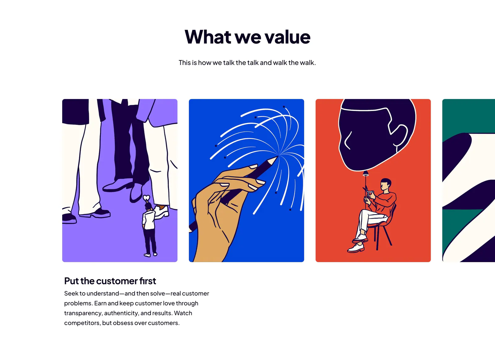
  39. Dovetail value proposition section: centered headline above a carousel of bold illustrated value cards with the first value's text below
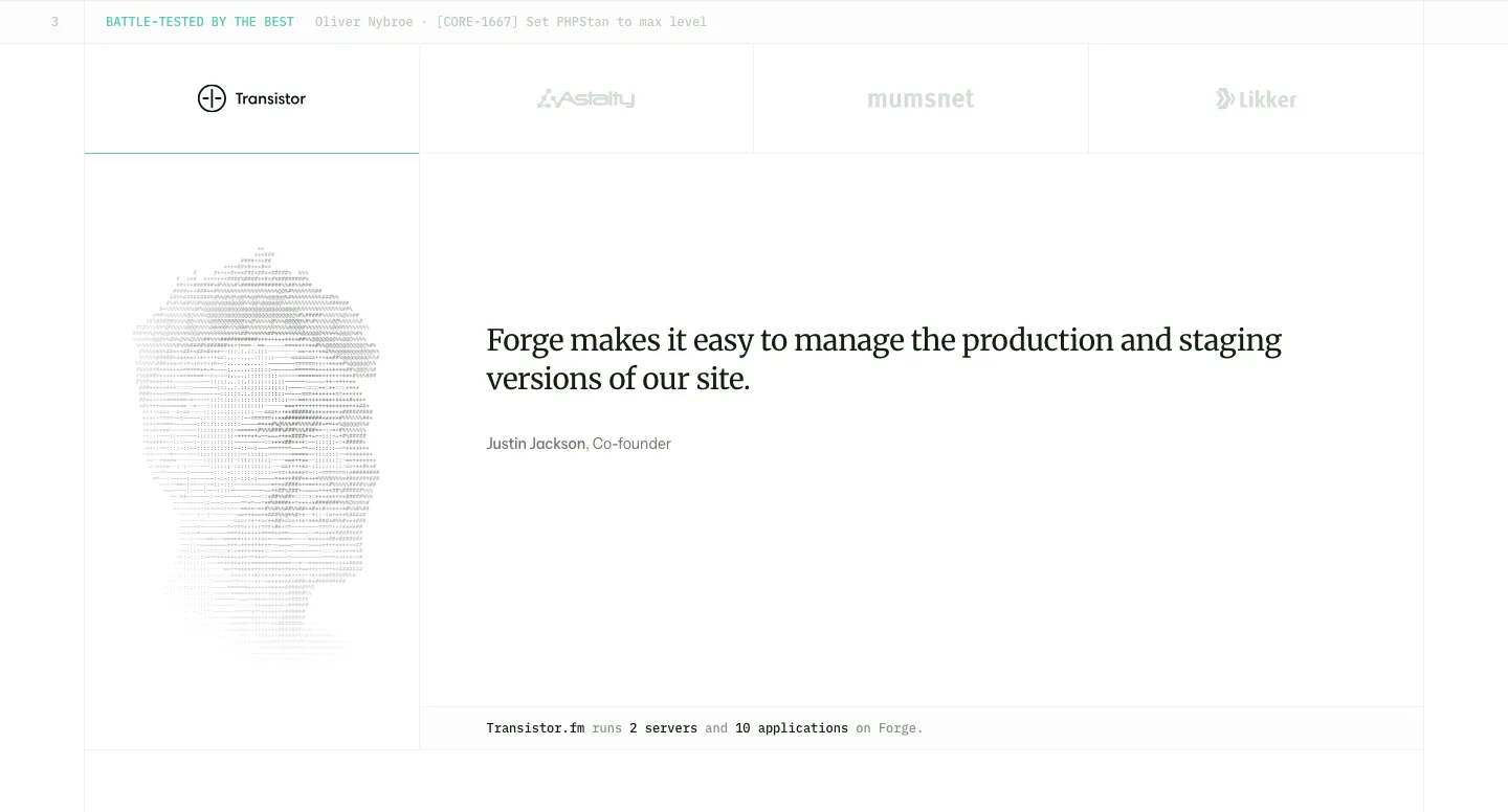
  40. Laravel Forge testimonials section: customer logo tabs above a serif quote with an ASCII-art portrait on the left
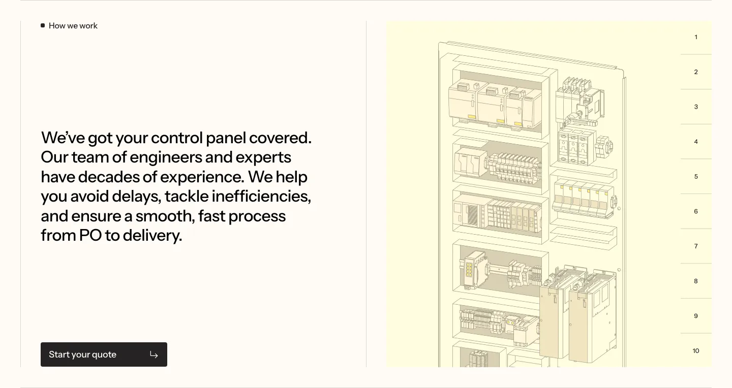
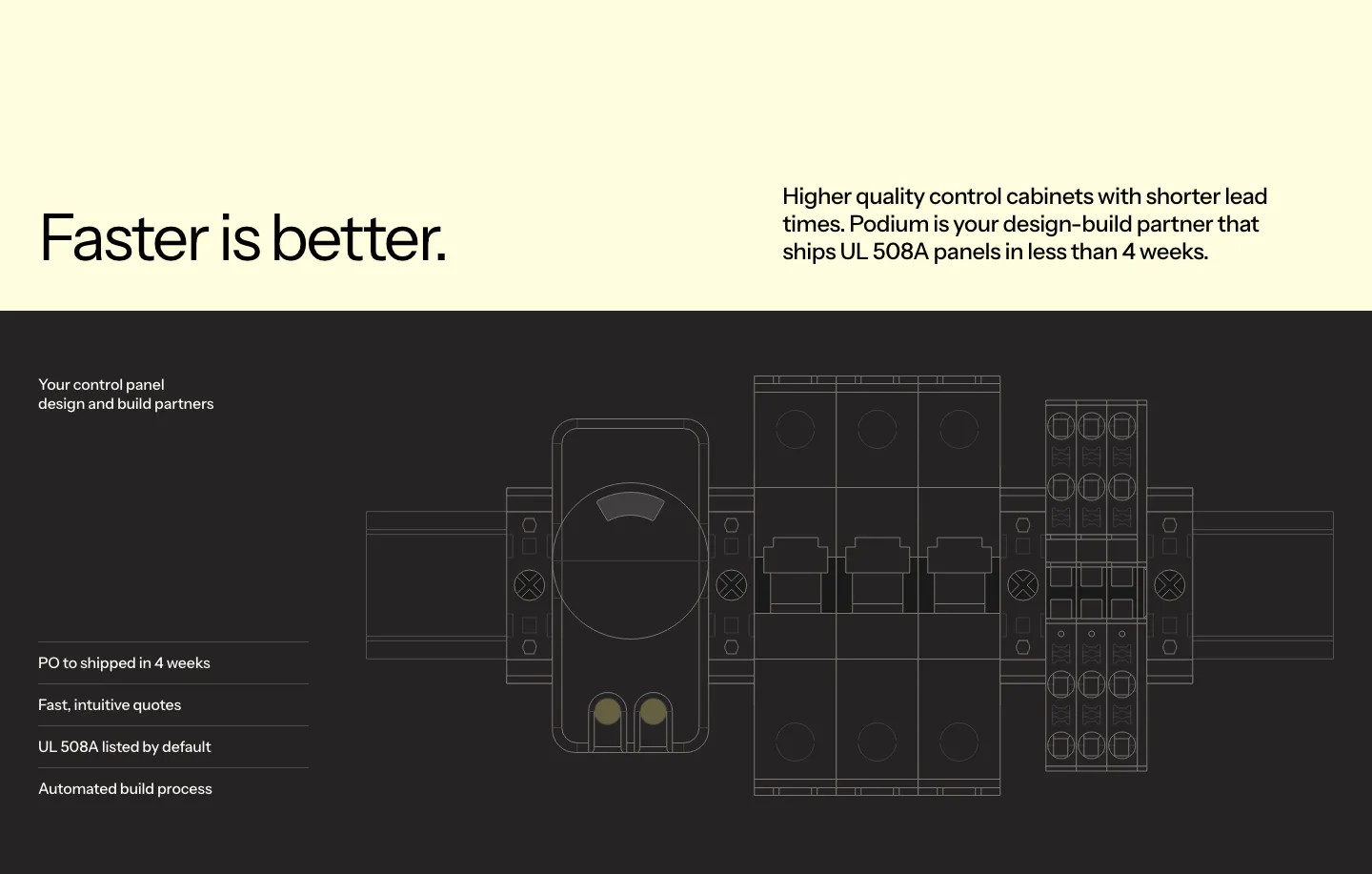
  41. Podium Automation value proposition section: large text block left and a numbered control cabinet illustration on the right
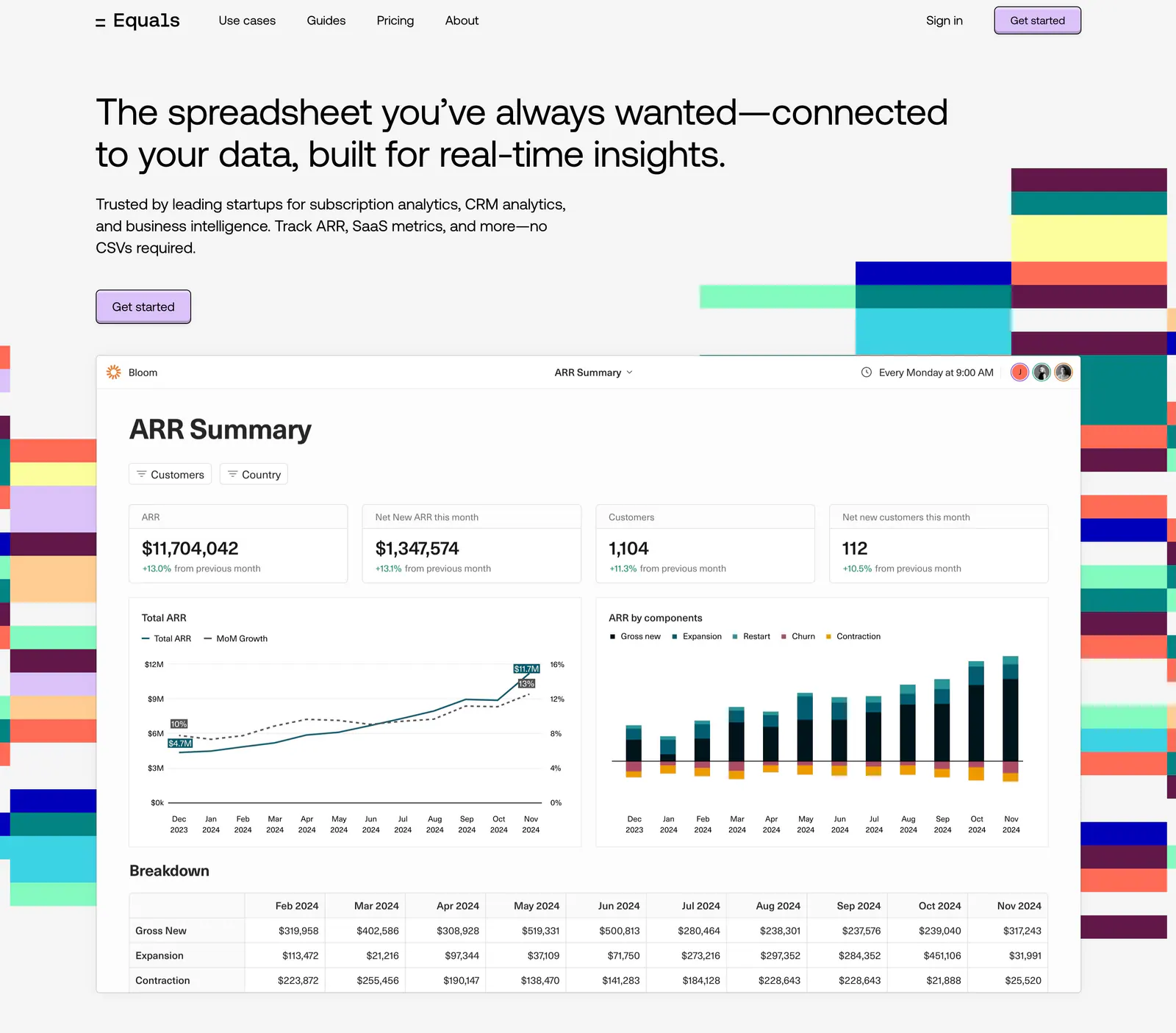
  42. Equals hero section: nav bar and left-aligned headline above an ARR dashboard screenshot flanked by colorful stepped block graphics
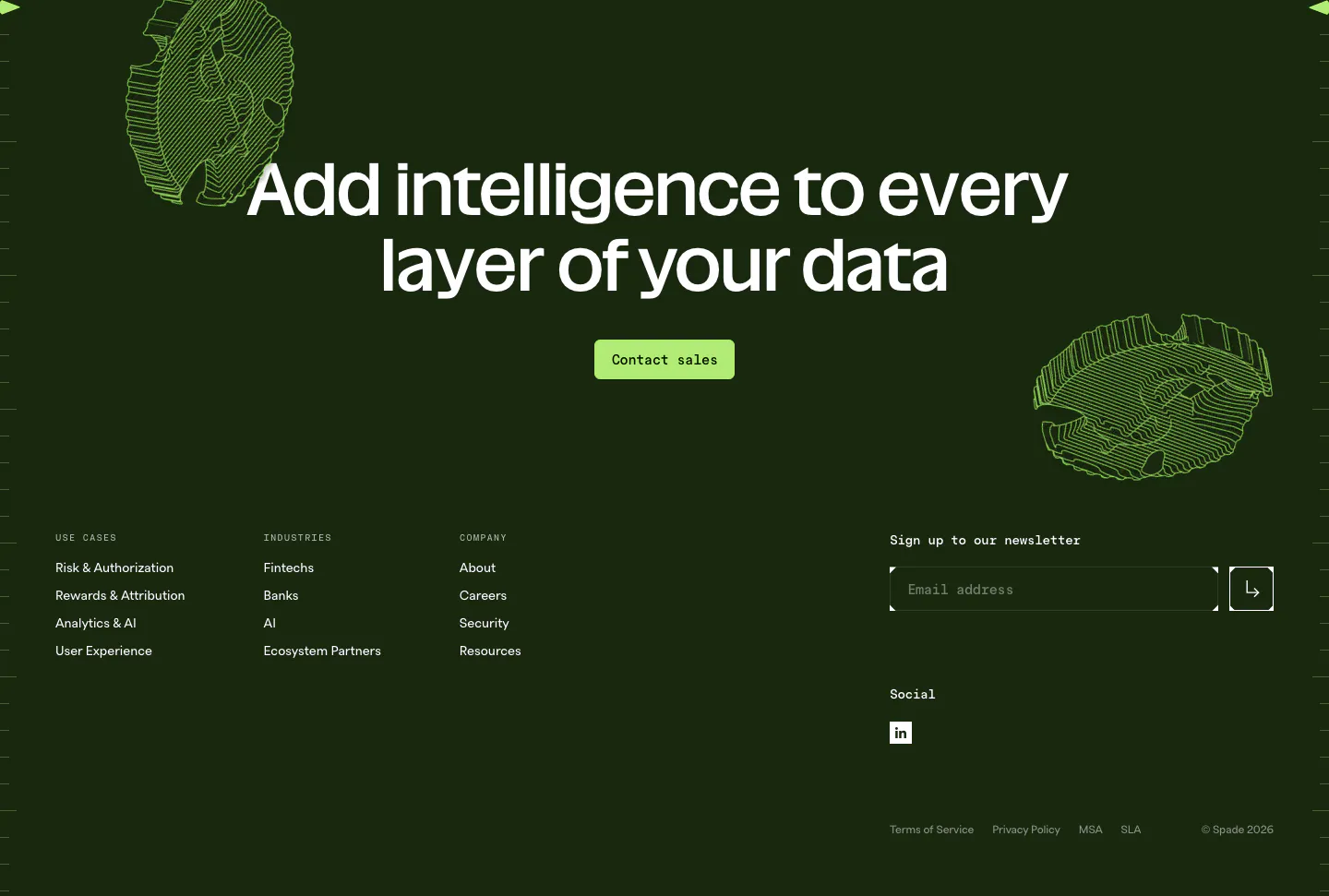
  43. Spade footer section: dark green CTA with centered headline, green button and line-art coins above link columns and a newsletter email field
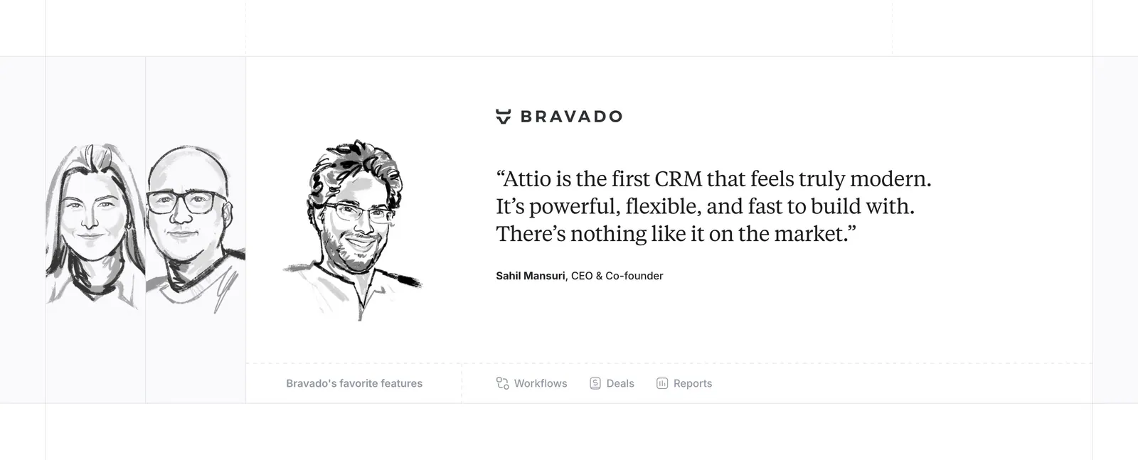
  44. Attio testimonials section: hand-drawn grayscale portrait sketches beside a serif customer quote with company logo and feature links
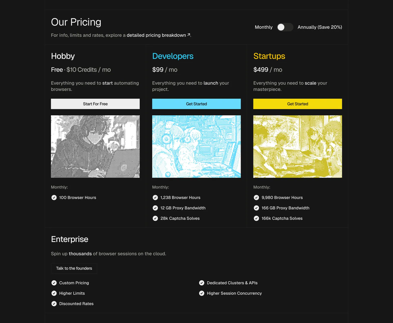
  45. Steel pricing section: three plan cards with dithered anime-style images, monthly/annual toggle and an enterprise row on a dark background
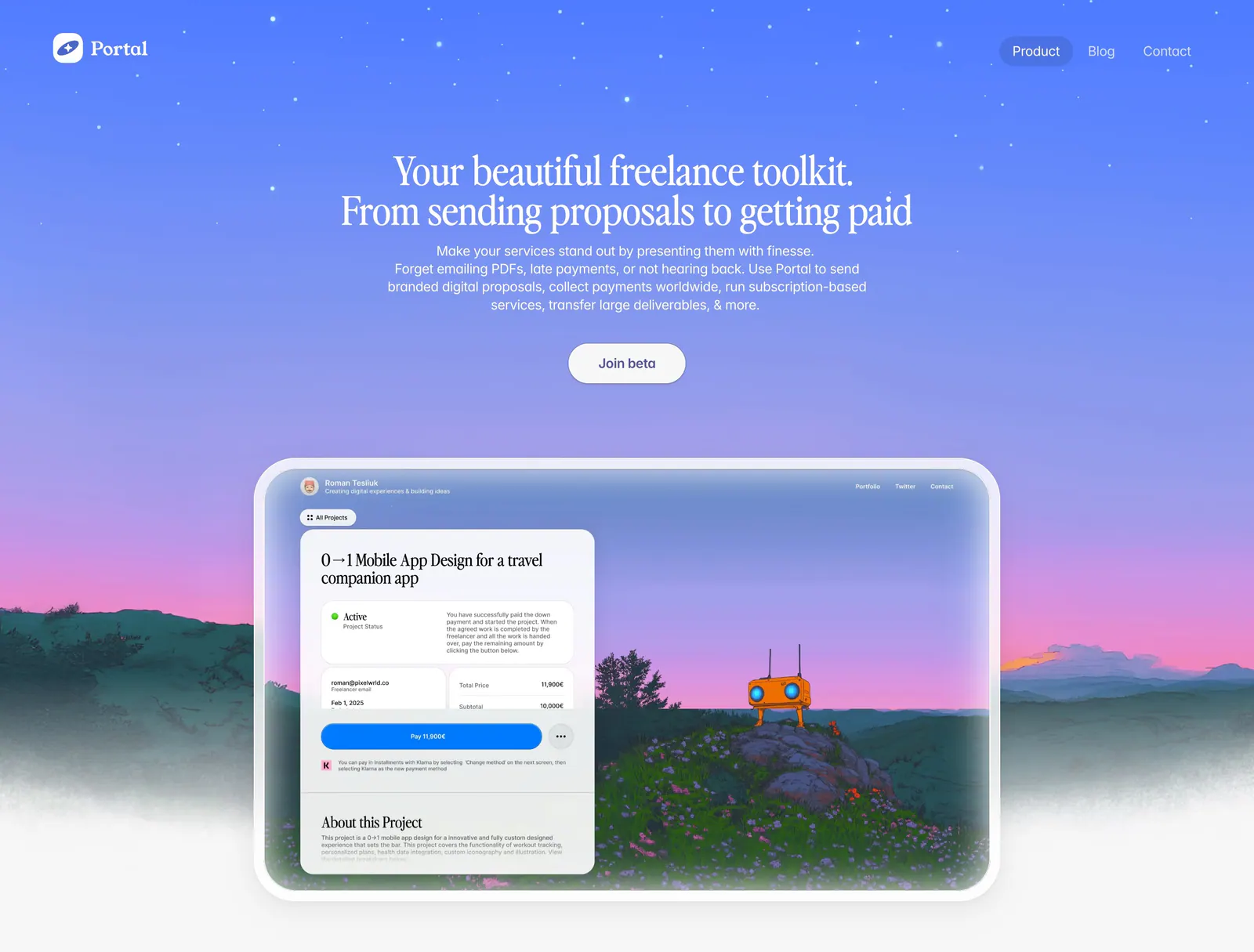
  46. Portal hero section: centered serif headline on a blue-to-purple sky gradient above a proposal UI framed in a painted landscape
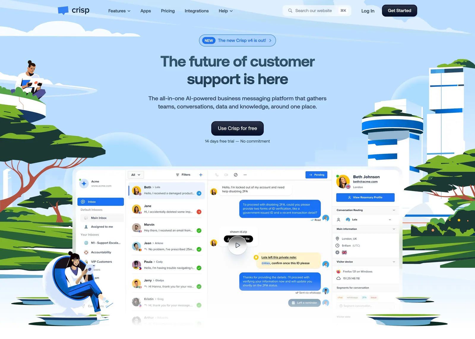
  47. Crisp hero section: centered headline and CTA above an inbox screenshot framed by illustrated people, trees and towers on sky blue
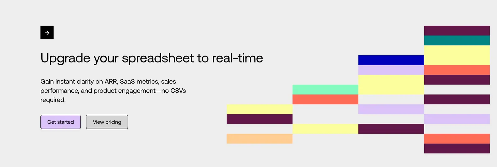
  48. Equals call-to-action section: left-aligned headline with two buttons beside a stepped grid of colorful blocks on a light gray background
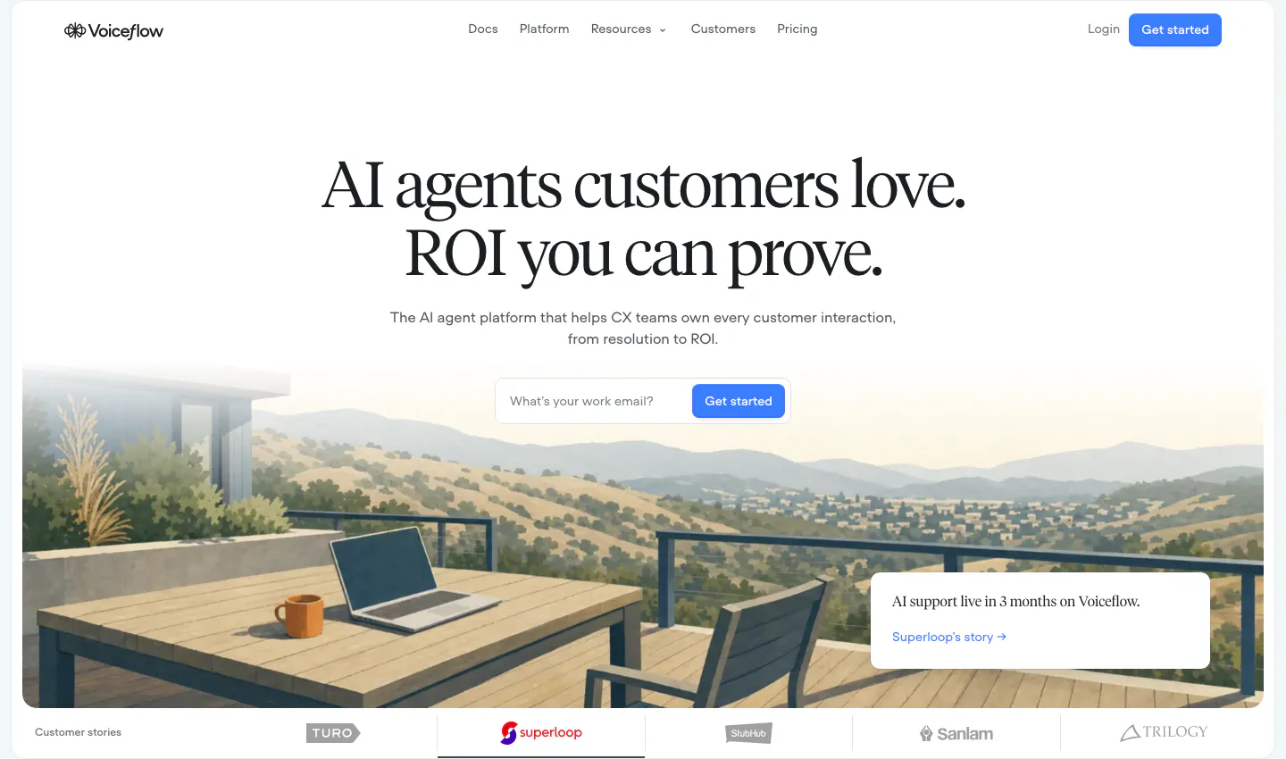
  49. Voiceflow hero section: centered serif headline and email signup field over a painted terrace landscape, customer logo tabs below
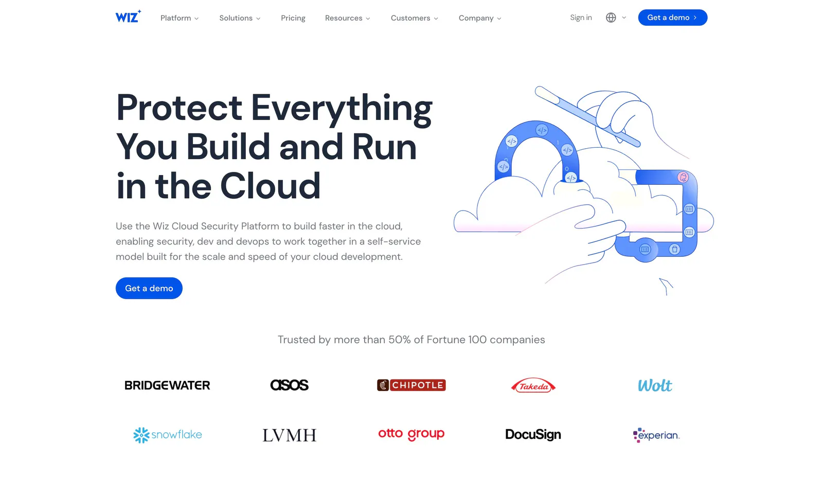
  50. Wiz hero section: headline and Get a demo button left, blue line illustration of hands, cloud and magnet right, logo strip below
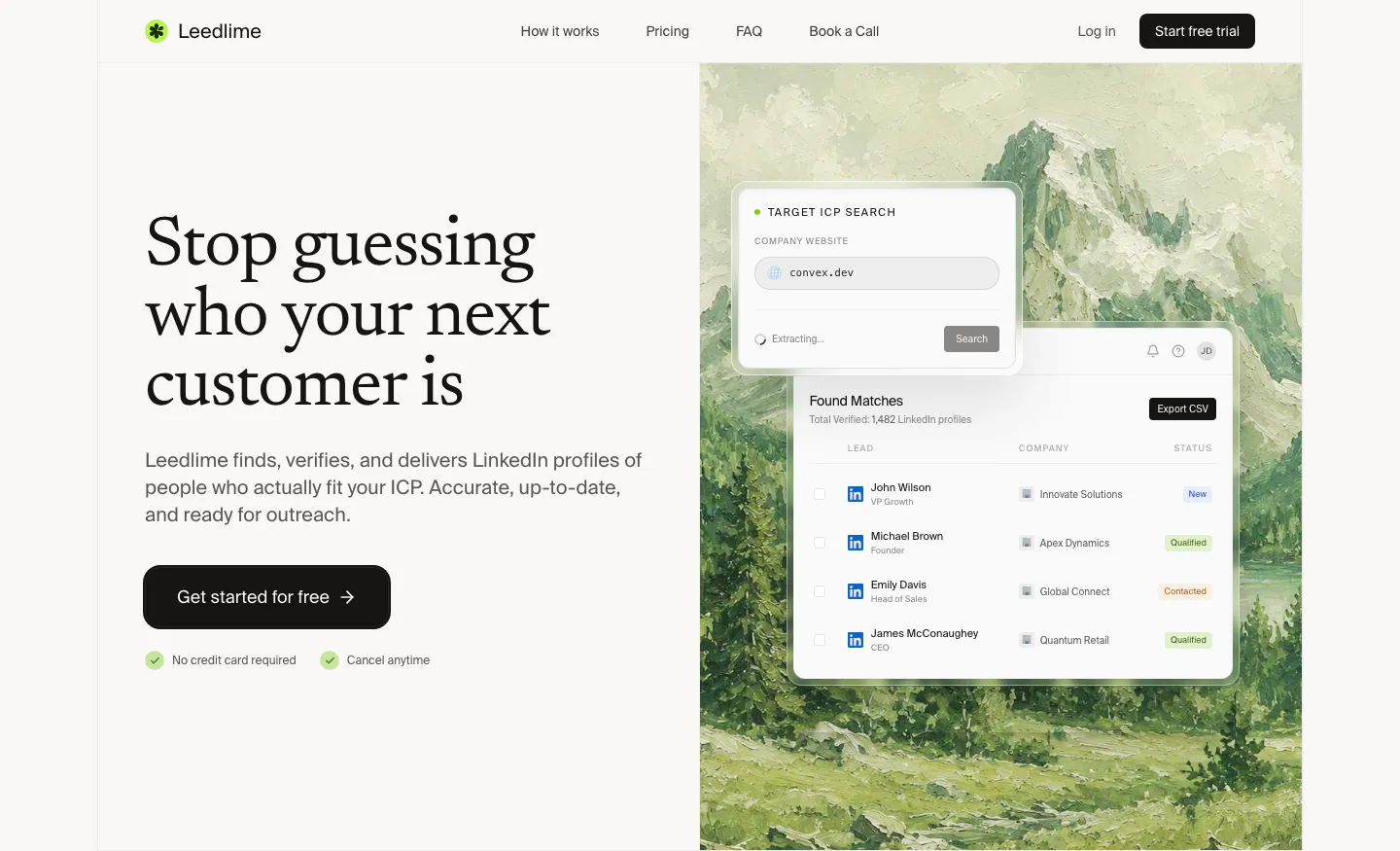
  51. Leedlime hero section: serif headline and Get started button at left, lead-search UI cards over a painted mountain landscape at right
  52. Supersonik features section: serif headline and link at left, glowing sphere of chat bubbles linked to a logo at right on dark teal
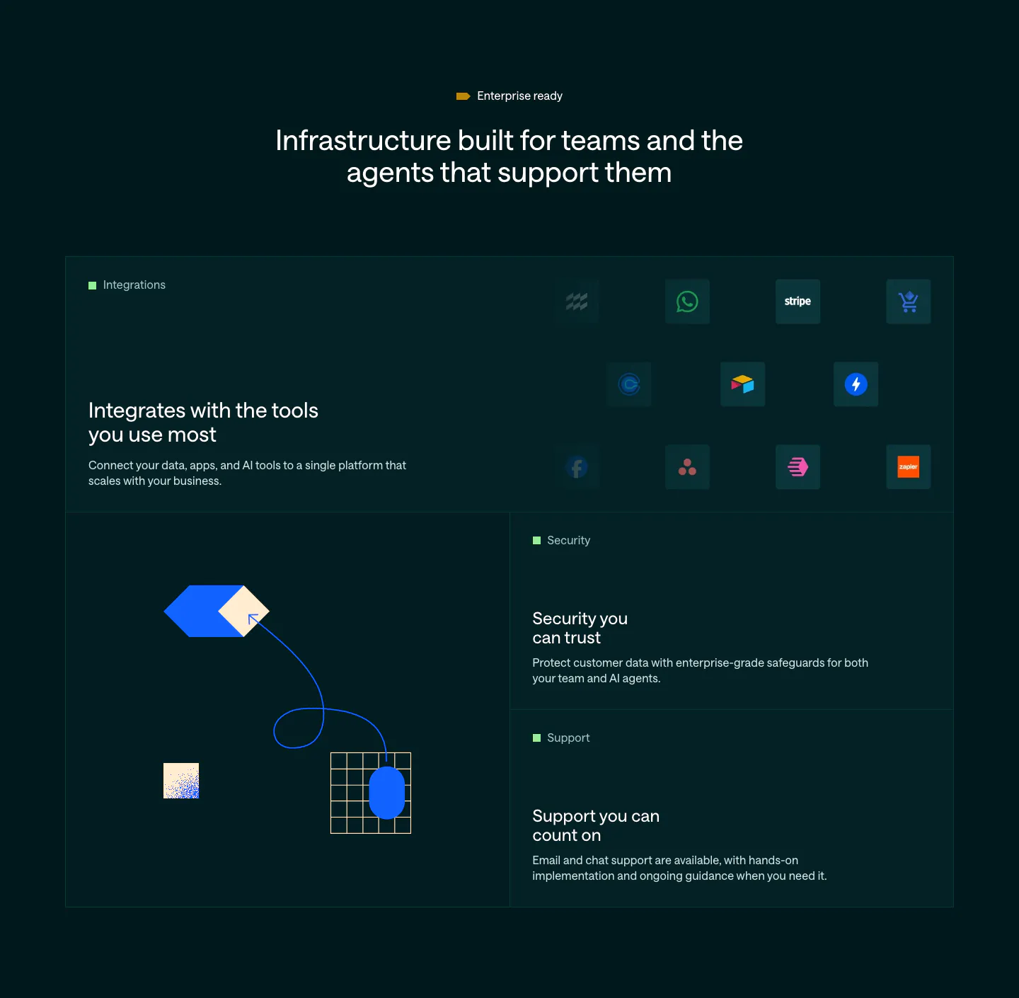
  53. Customer.io features section: dark bento grid with an integration icon tile, abstract hexagon and grid artwork, and security and support tiles
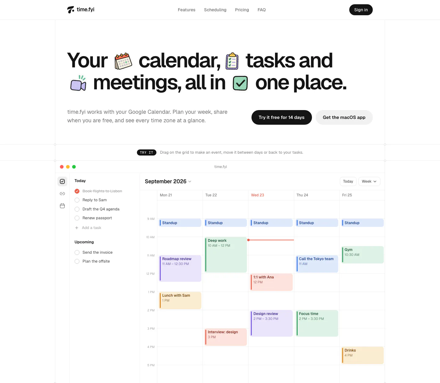
  54. time.fyi hero section: large headline with inline sticker icons and two CTA buttons above an interactive weekly calendar app screenshot
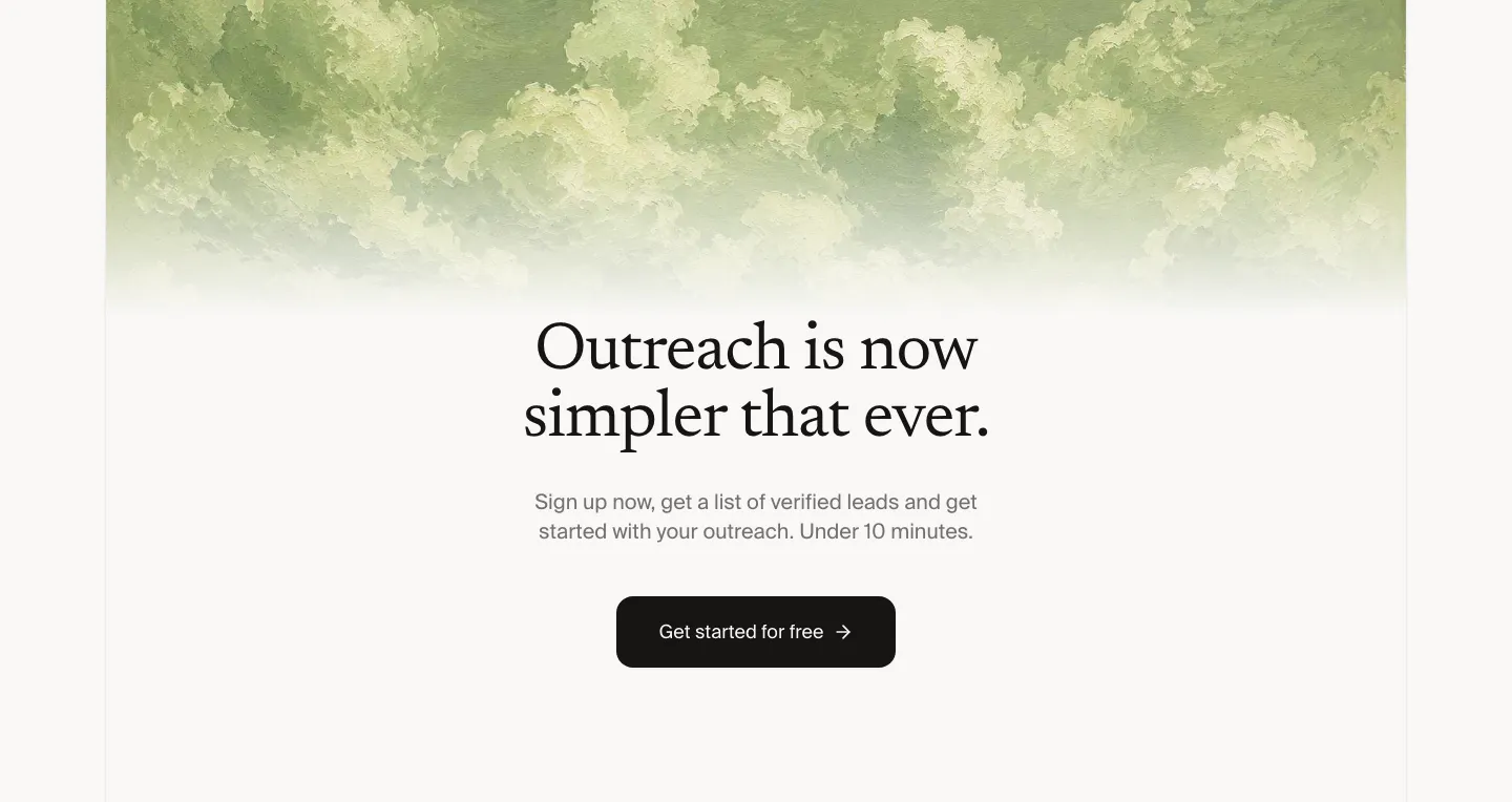
  55. Leedlime call to action section: centered serif headline and Get started button below a band of painted green clouds on off-white
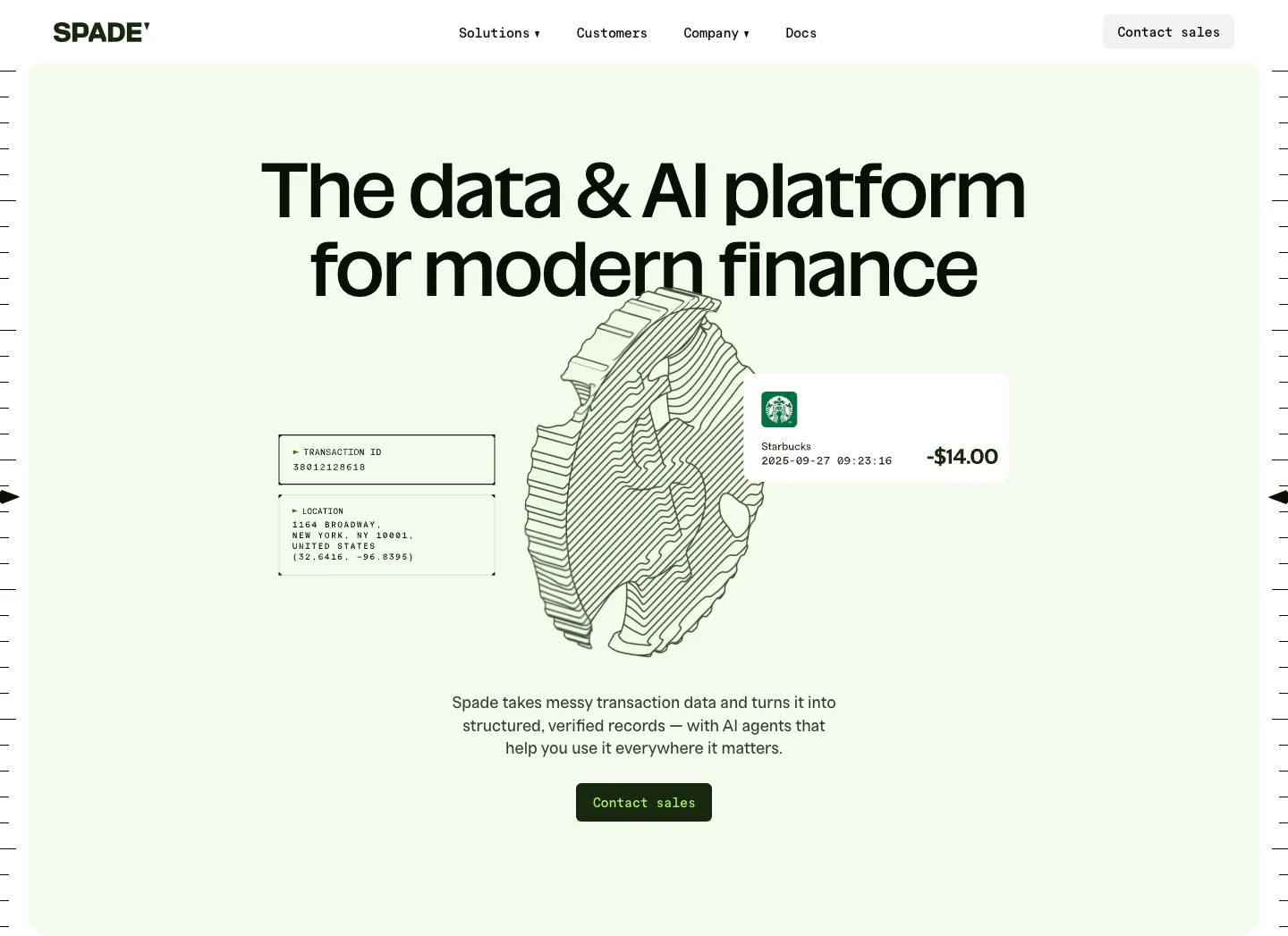
  56. Spade hero section: centered headline over a line-art coin drawing with transaction data cards on a mint green panel, button below
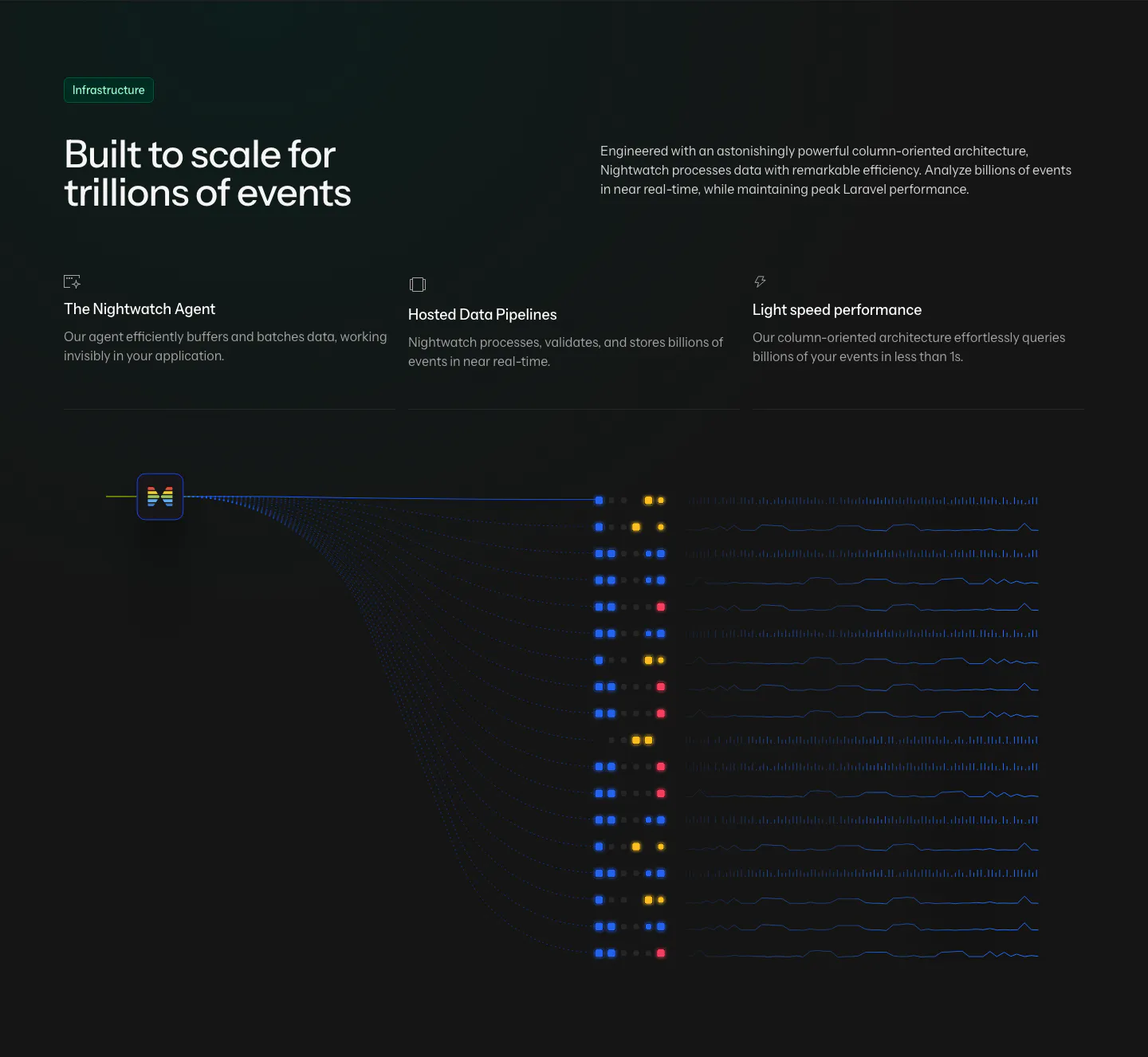
  57. Laravel Nightwatch features section: headline and three infrastructure points above a dark data pipeline graphic of event streams
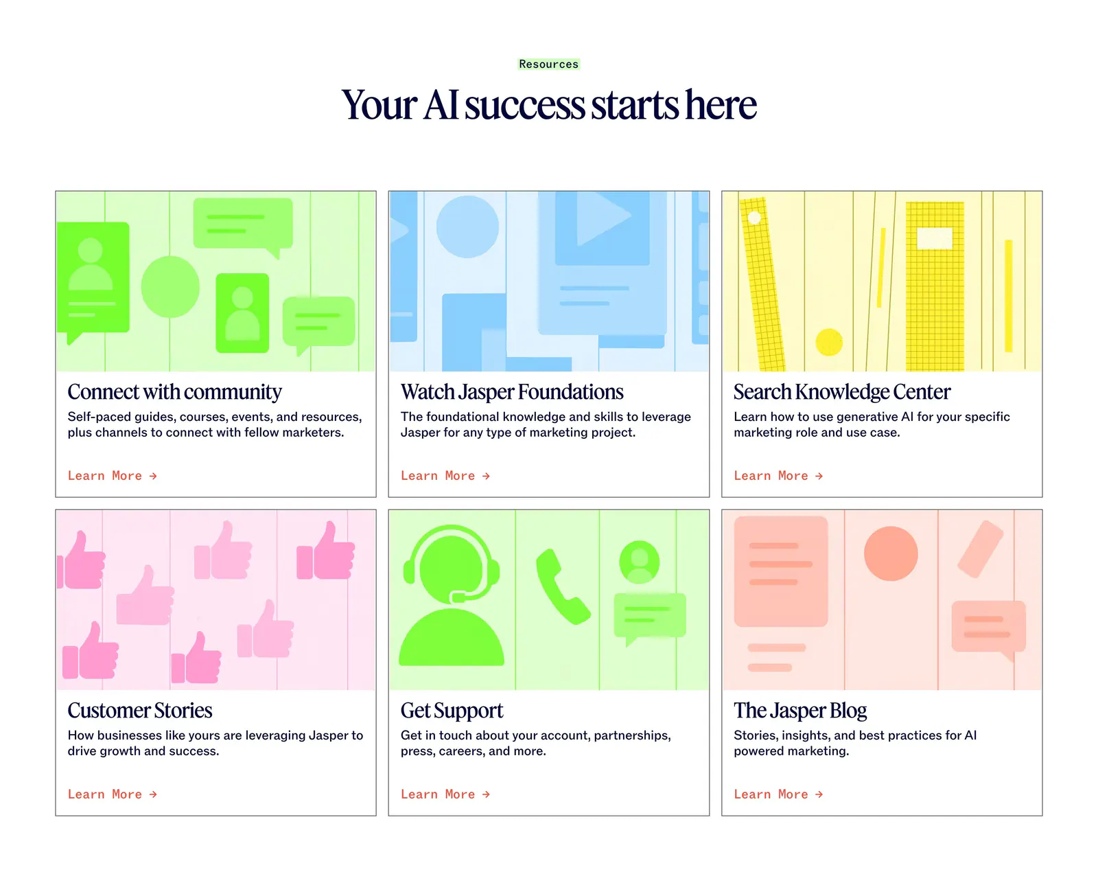
  58. Jasper blog & resources section: centered serif headline above six cards with colorful flat illustrations and Learn More links
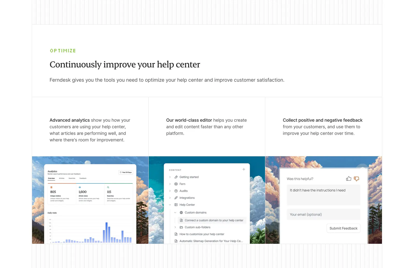
  59. Ferndesk features section: serif headline above three columns with analytics, editor and feedback UI over pixel-art landscapes
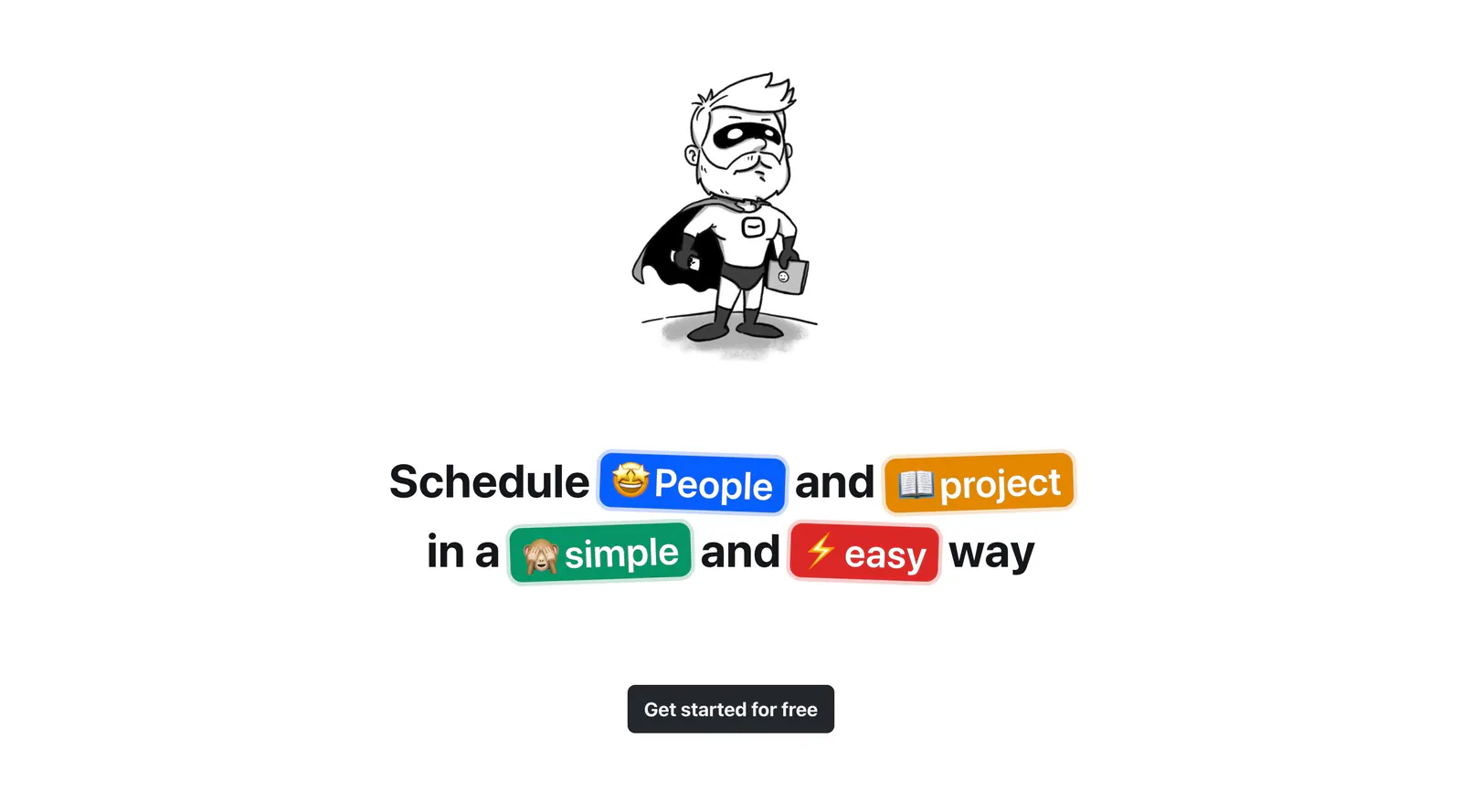
  60. Hellotime call-to-action section: hand-drawn superhero character above a centered headline with colored emoji pills and a button
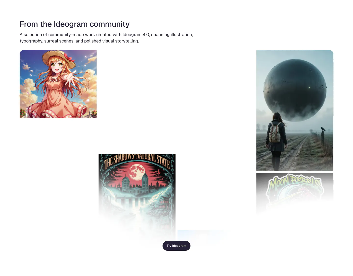
  61. Ideogram features section: headline and intro above a scattered gallery of community images incl. anime art, a poster and a surreal sphere
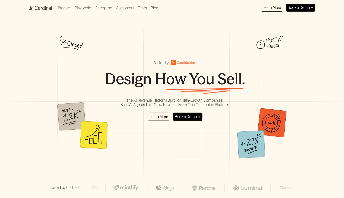
  62. Cardinal hero section: centered serif headline with two buttons, hand-drawn sticky-note doodles on a faint grid and a logo strip on cream
    Cardinal Hero
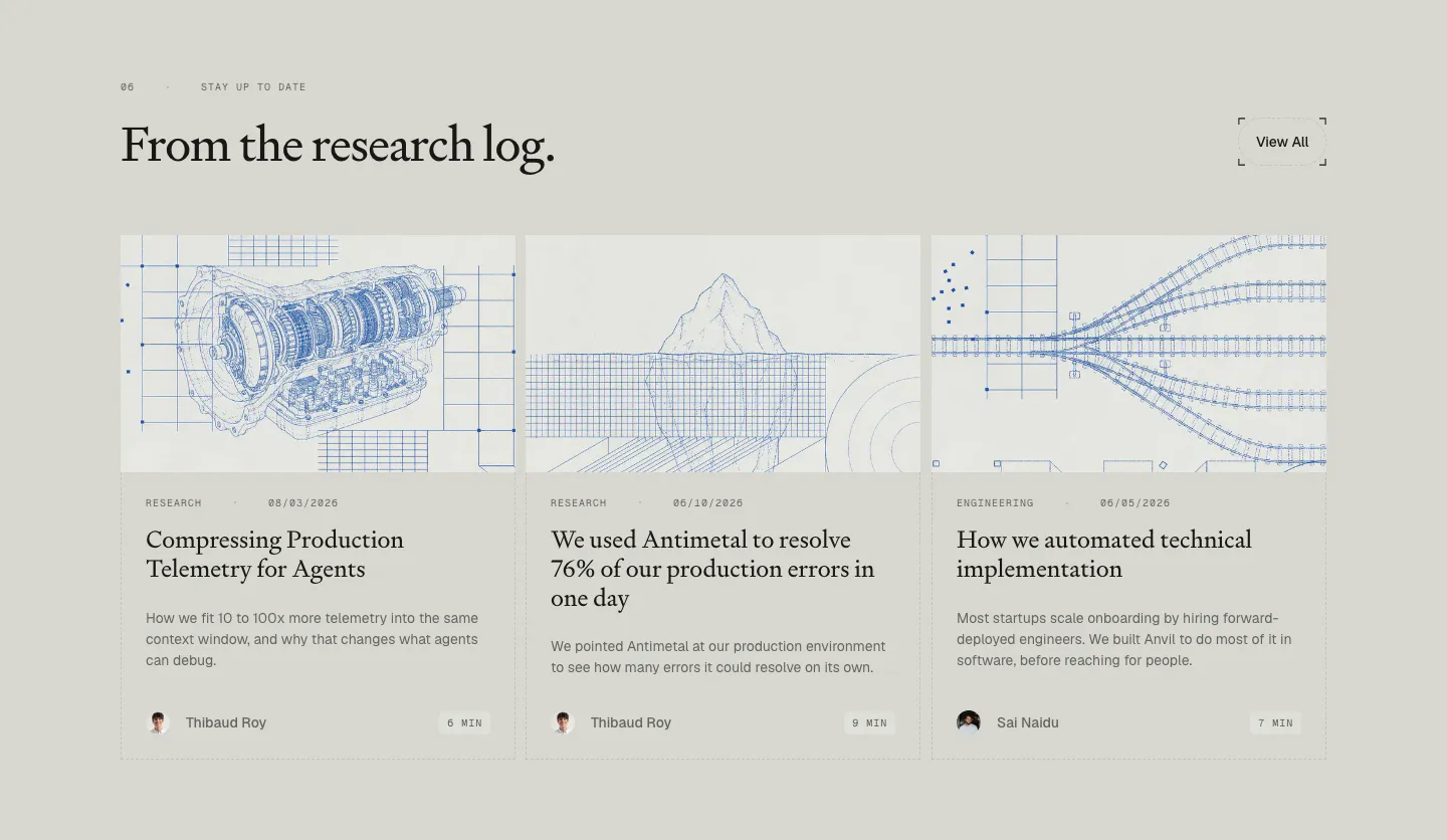
  63. Antimetal blog & resources section: serif headline with View All button over three article cards with blue blueprint line drawings
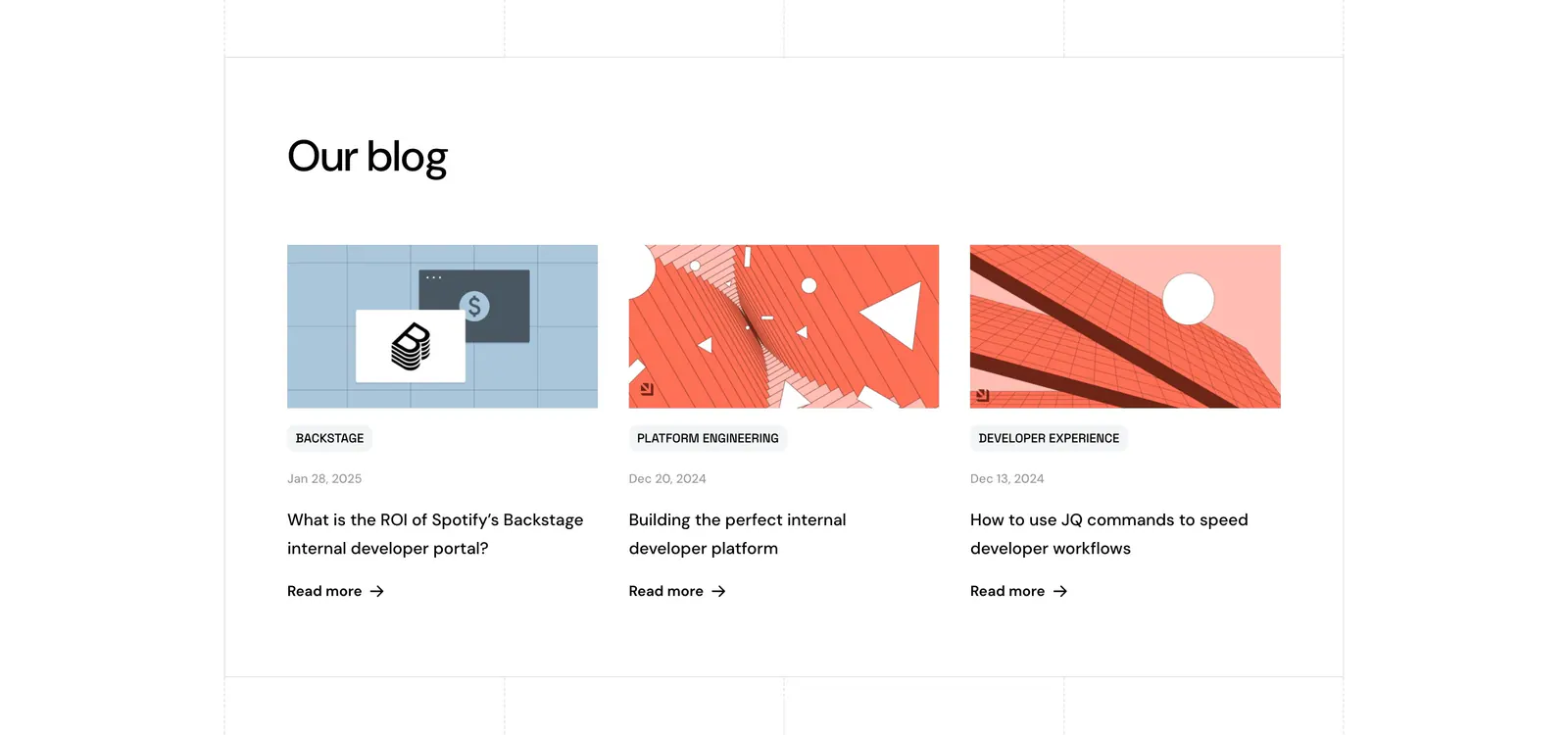
  64. Port blog & resources section: headline above three blog cards with abstract geometric artwork, category tags, dates and Read more links
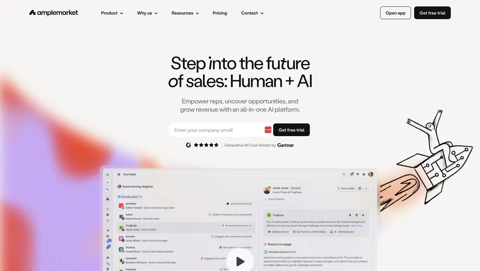
  65. Amplemarket hero section: centered headline and email field above a product screenshot with play button, rocket doodle and color blurs
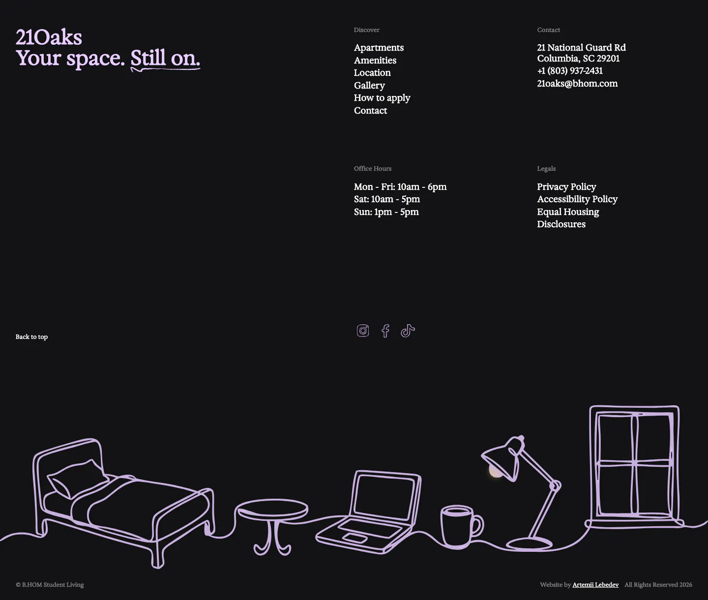
  66. 21Oaks footer section: dark background with serif wordmark, link and contact columns, and a lavender line drawing of a room
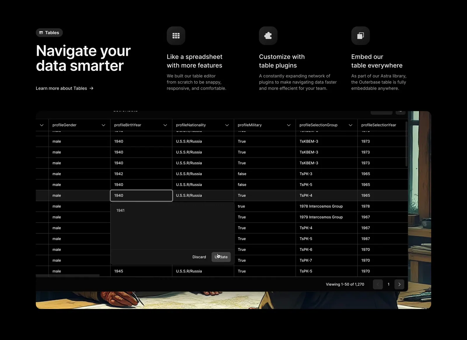
  67. Outerbase features section: headline beside three feature columns with icons above a dark data table screenshot on painted artwork
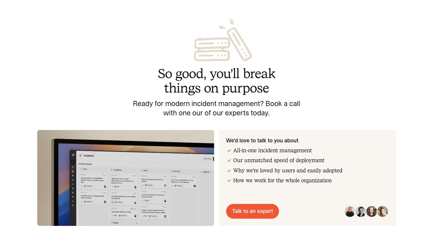
  68. incident.io call-to-action section: serif centered headline with line-art icon above a monitor screenshot and a talk-to-an-expert card
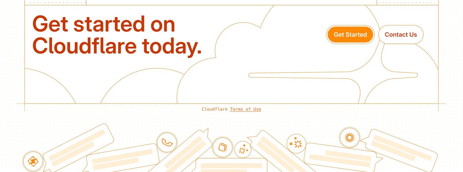
  69. Cloudflare Agents footer section: orange headline and buttons over line-drawn clouds, a terms link and chat bubble illustrations
  70. groundcover call-to-action section: centered headline and two buttons above an illustrated landscape of hills and plants on cream
  71. Outtake call to action section: black text panel with orange demo button beside three rows of isometric line illustrations on a beige page
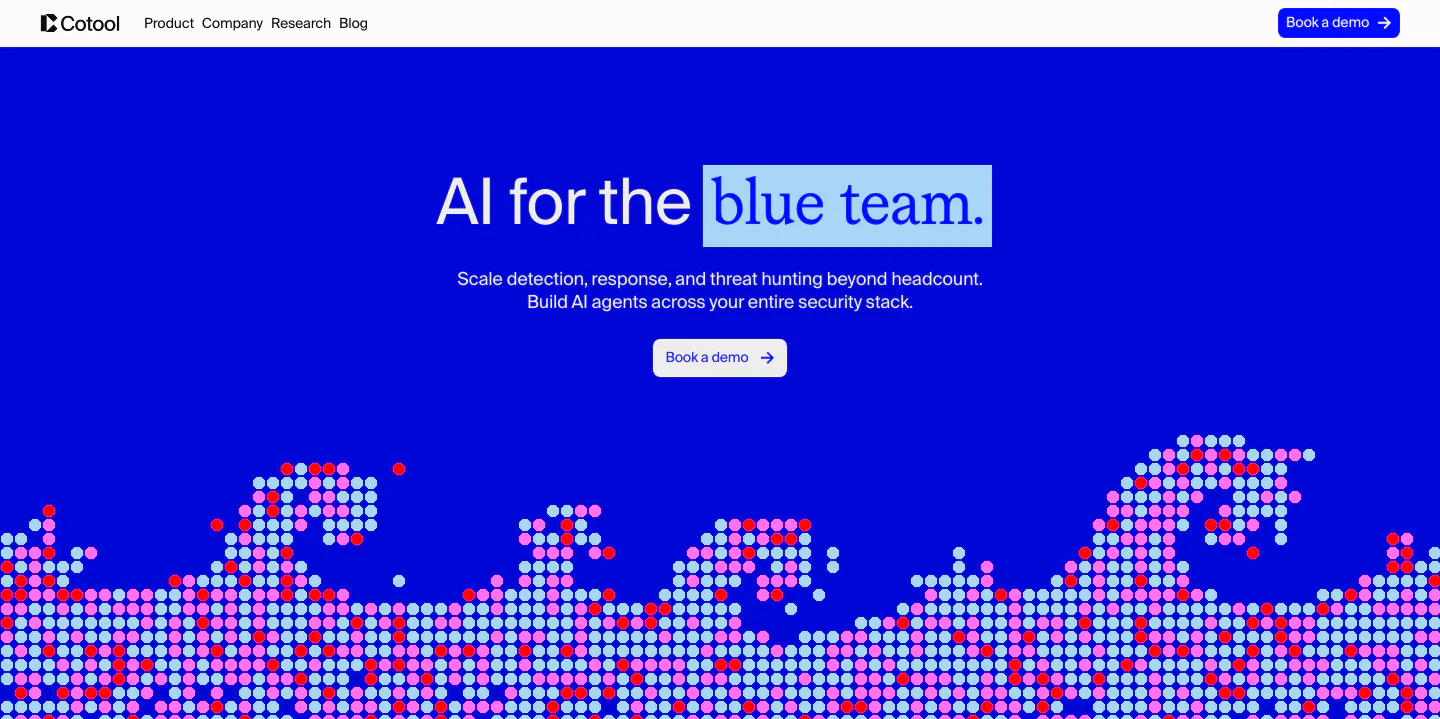
  72. Cotool hero section: centered headline with highlighted serif words on a saturated blue background above a pixel-dot wave artwork
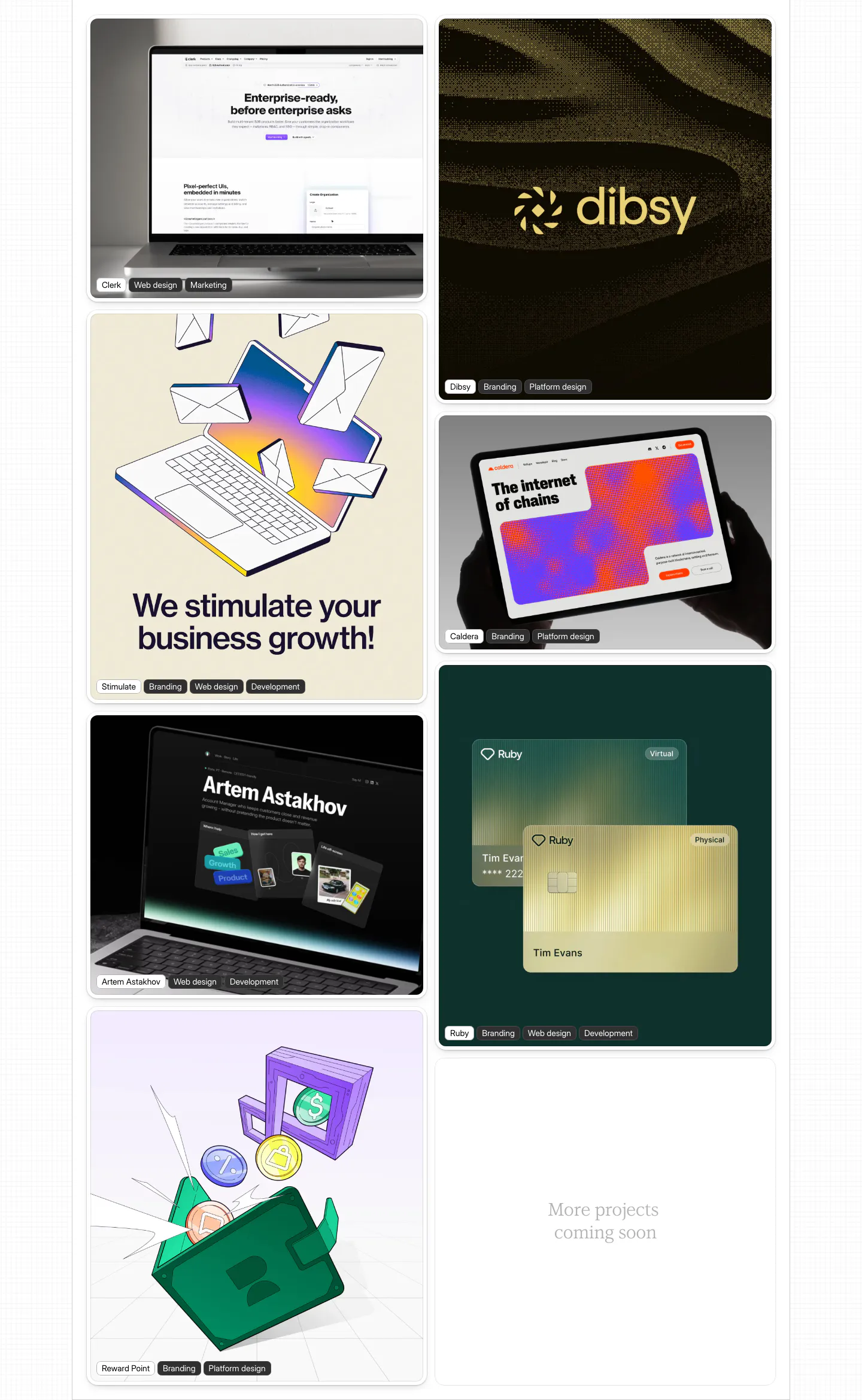
  73. Daniel Sun other section: two-column masonry of portfolio project cards with device mockups and illustrations, each labeled with tags
    Daniel Sun Other
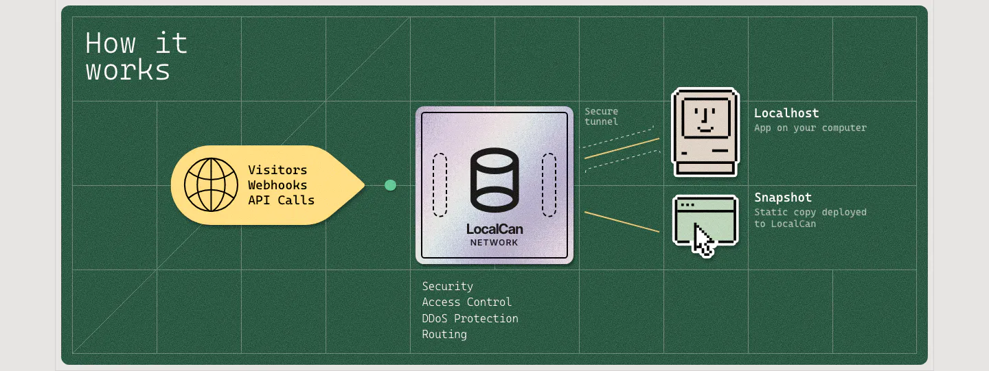
  74. LocalCan how it works section: flow diagram from visitor traffic through a LocalCan network chip to pixel-art localhost and snapshot icons
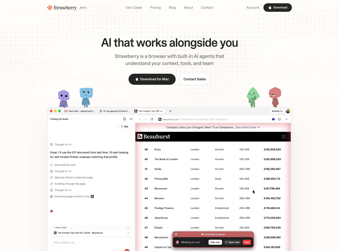
  75. Strawberry hero section: centered headline and buttons, cartoon characters perched on a browser screenshot showing an AI agent task
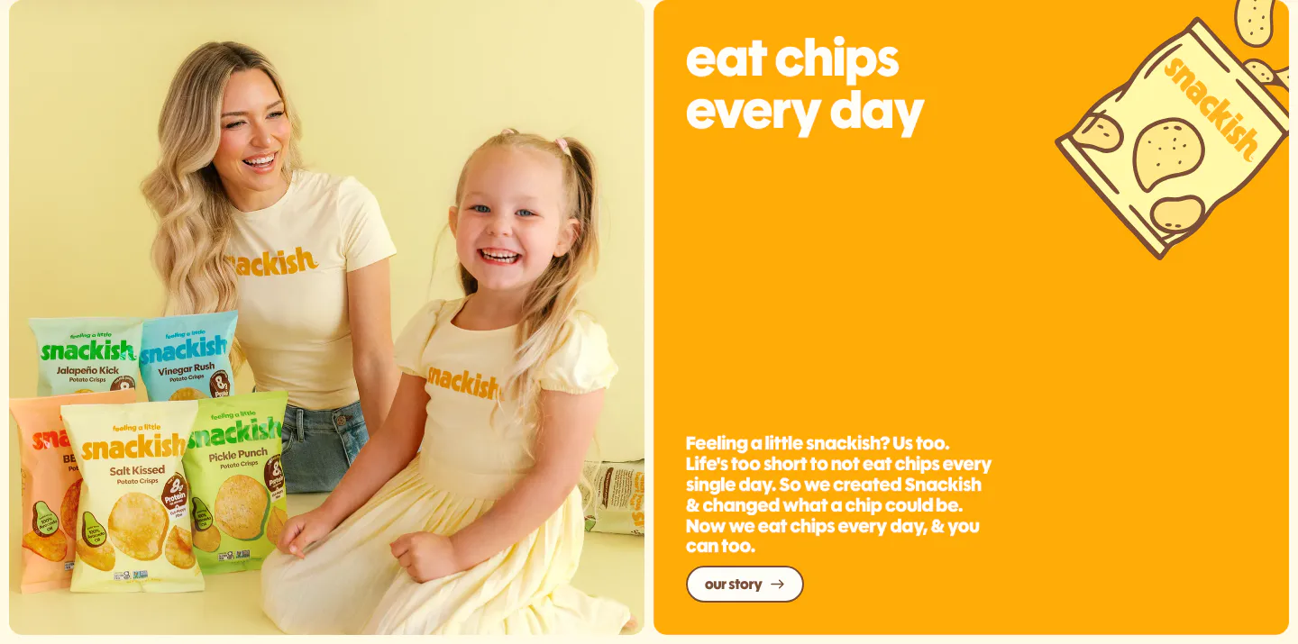
  76. Snackish about & mission section: photo of a woman and girl with chip bags beside an orange panel with headline, story copy and button
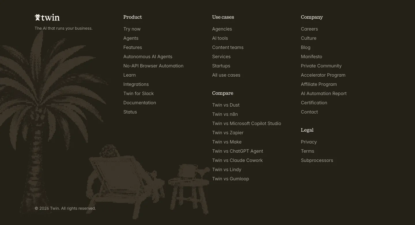
  77. Twin footer section: logo and link columns beside a dithered palm tree and beach chair illustration on a dark brown background
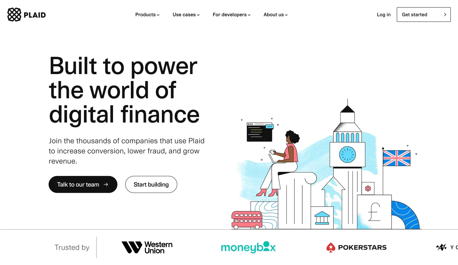
  78. Plaid hero section: large left headline with two buttons beside an illustration of a woman on London landmarks, logo strip below
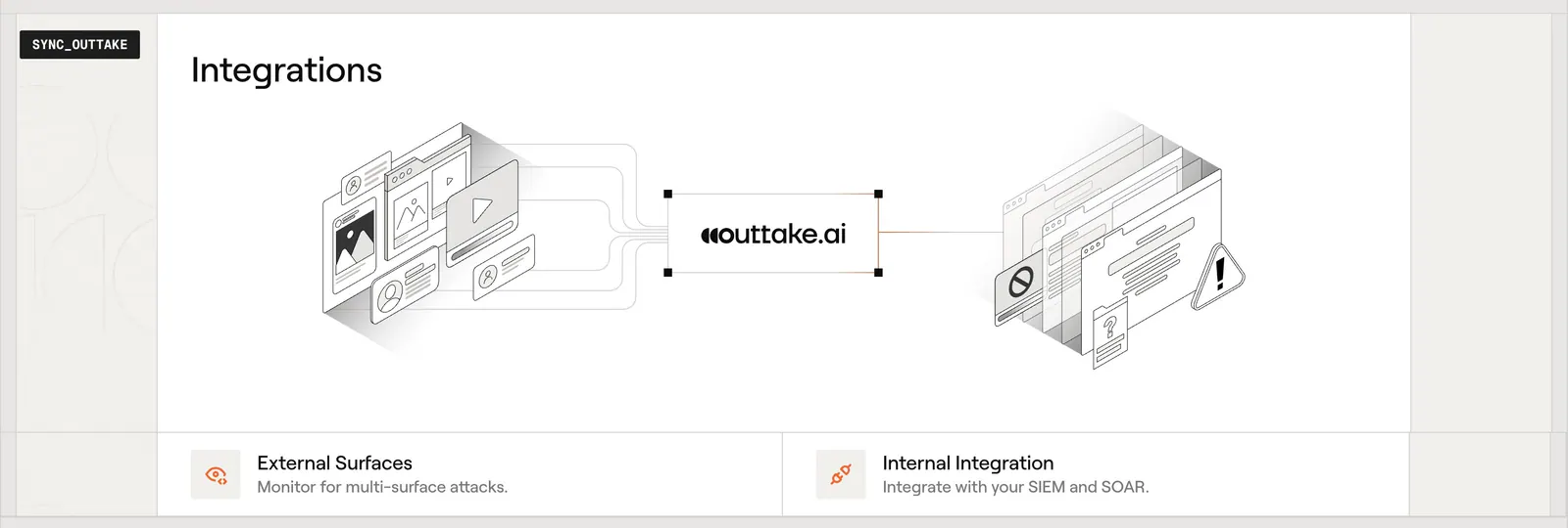
  79. Outtake integrations section: isometric diagram linking external surfaces to the Outtake logo and internal tools, with two feature cards below
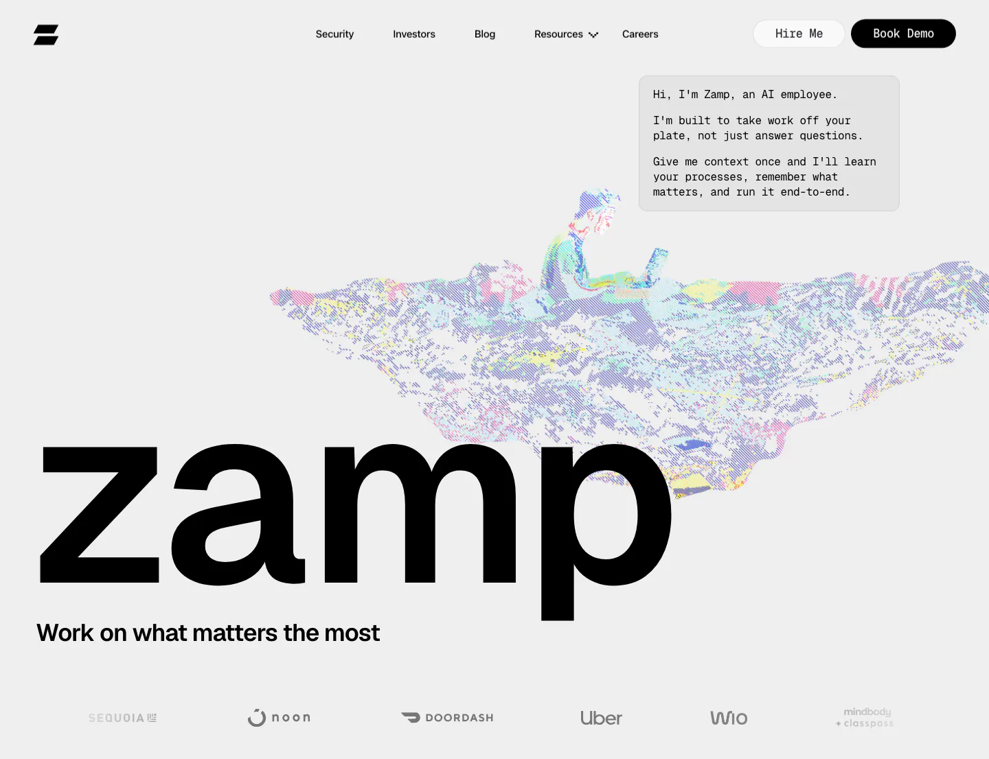
  80. Zamp hero section: giant zamp wordmark under a dithered pixel-art figure on a laptop, chat-style intro box and grayscale logo row on light gray
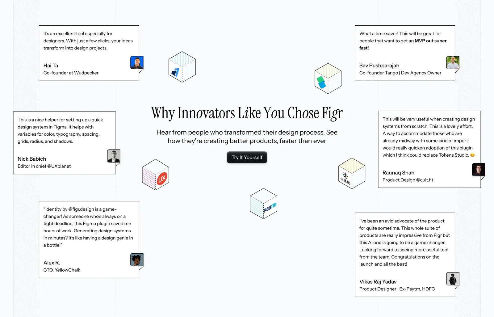
  81. Figr testimonials section: centered serif headline and button surrounded by scattered quote cards and isometric logo cubes
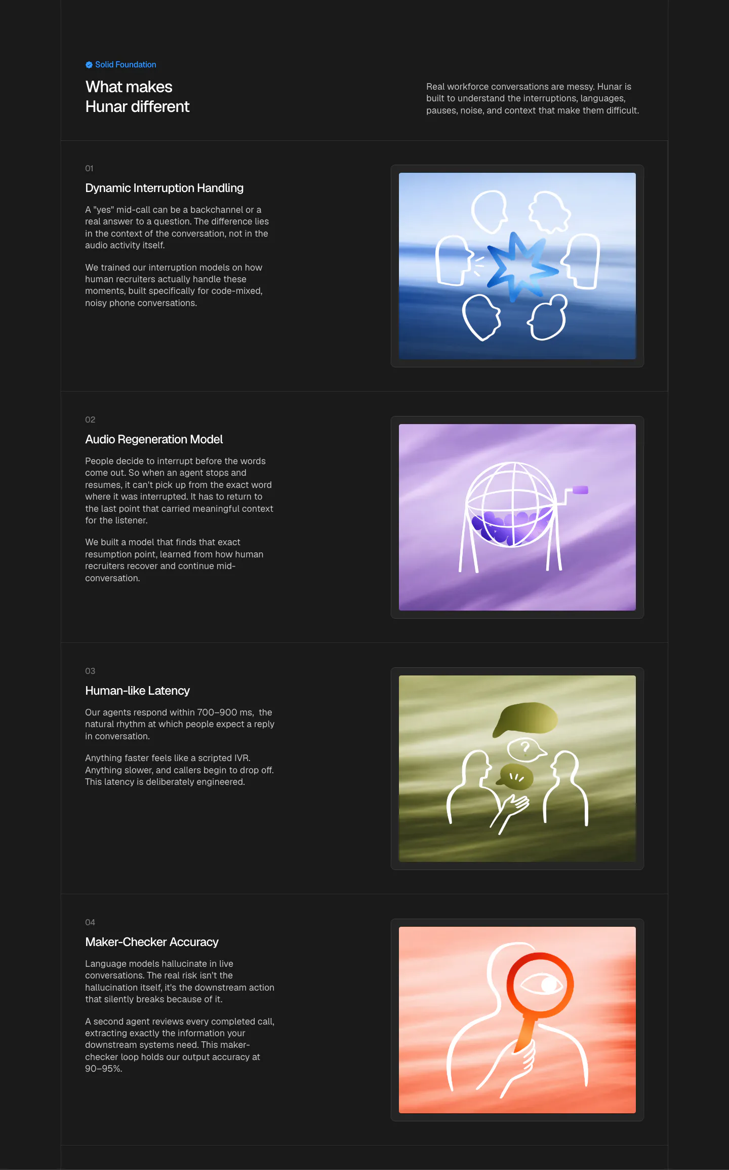
  82. Hunar features section: dark background with four numbered capability rows, each pairing text with a line-art illustration on color
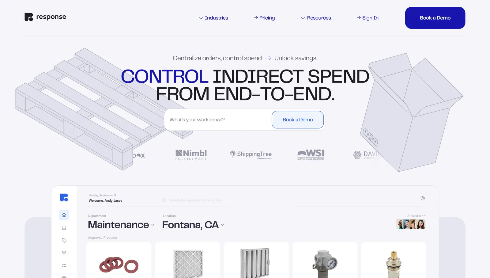
  83. Response hero section: centered uppercase headline with email field, logo row and isometric line drawings above a procurement app UI
  84. Greenhouse call-to-action section: white serif headline and blue button on the left with a fingerprint flower artwork on dark green
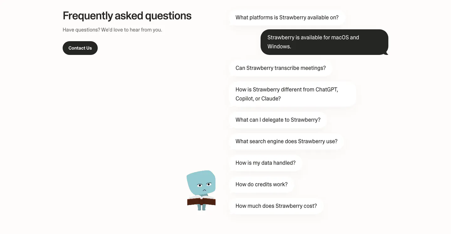
  85. Strawberry FAQ section: headline and contact button on the left, questions as chat bubbles with one dark answer and a character
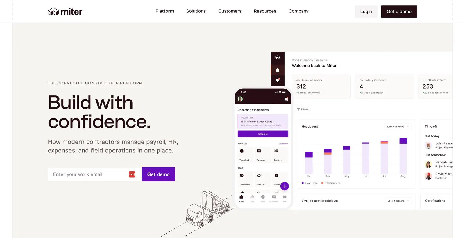
  86. Miter hero section: split layout on beige with headline and email demo form left, dashboard and mobile app UI right
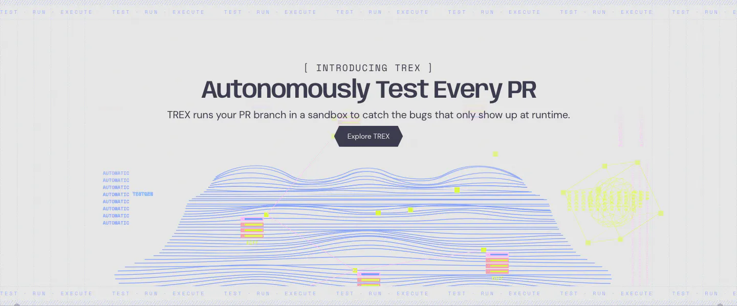
  87. Greptile features section: centered product launch headline and button above a blue line-wave landscape illustration
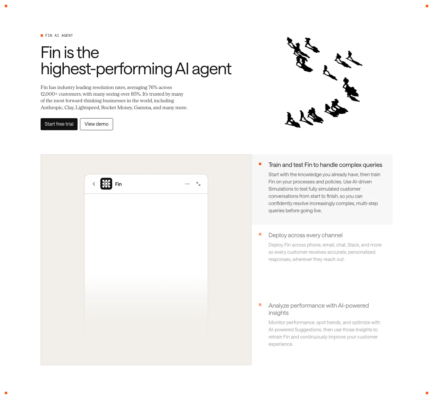
  88. Intercom features section: headline with an ink drawing of running figures, then a Fin chat widget panel beside a three-item feature selector
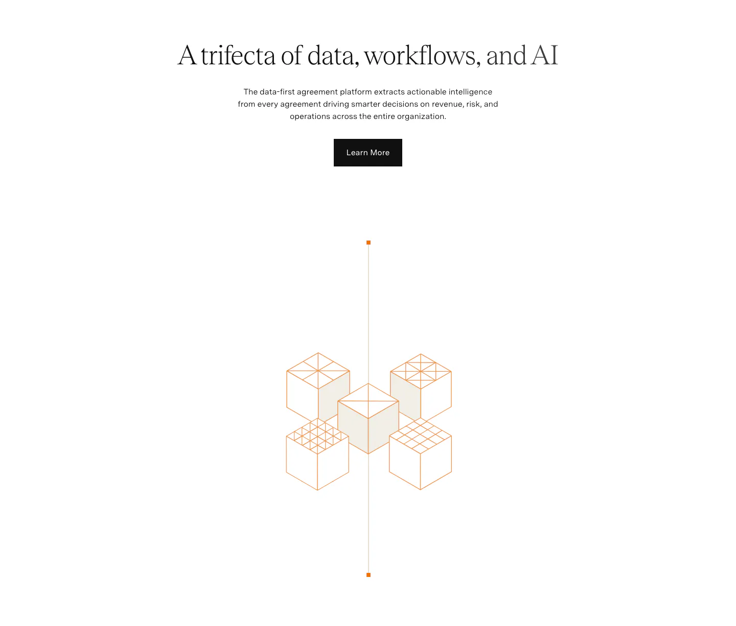
  89. Agiloft value proposition section: centered serif headline, copy and button above an orange isometric line drawing of cubes on white
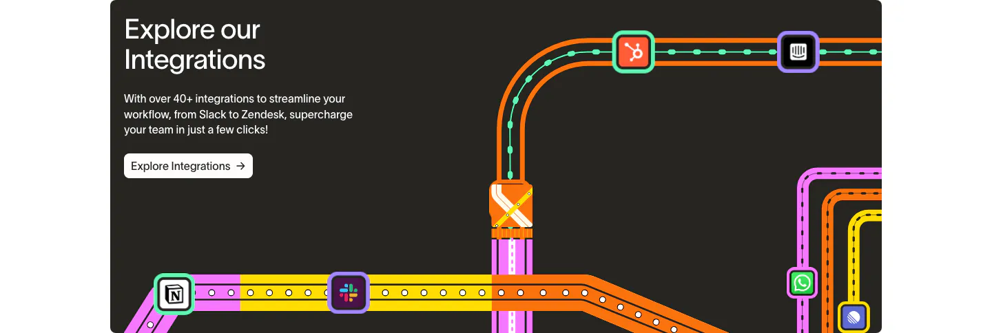
  90. Wavelength integrations section: headline and Explore Integrations button at left beside a colorful transit-map graphic linking app icons
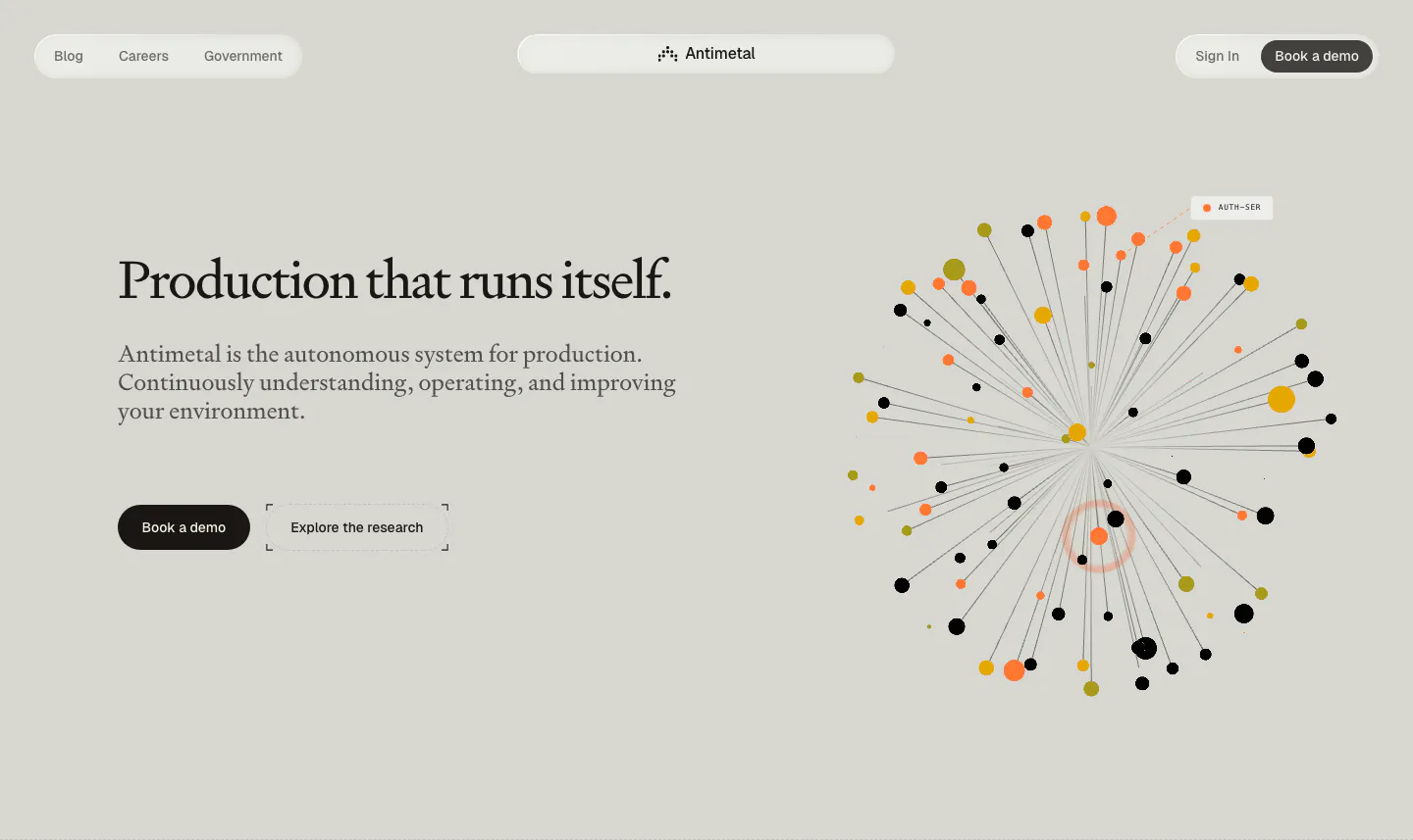
  91. Antimetal hero section: pill nav, serif headline with two buttons at left, radial burst of orange, yellow and black dots at right
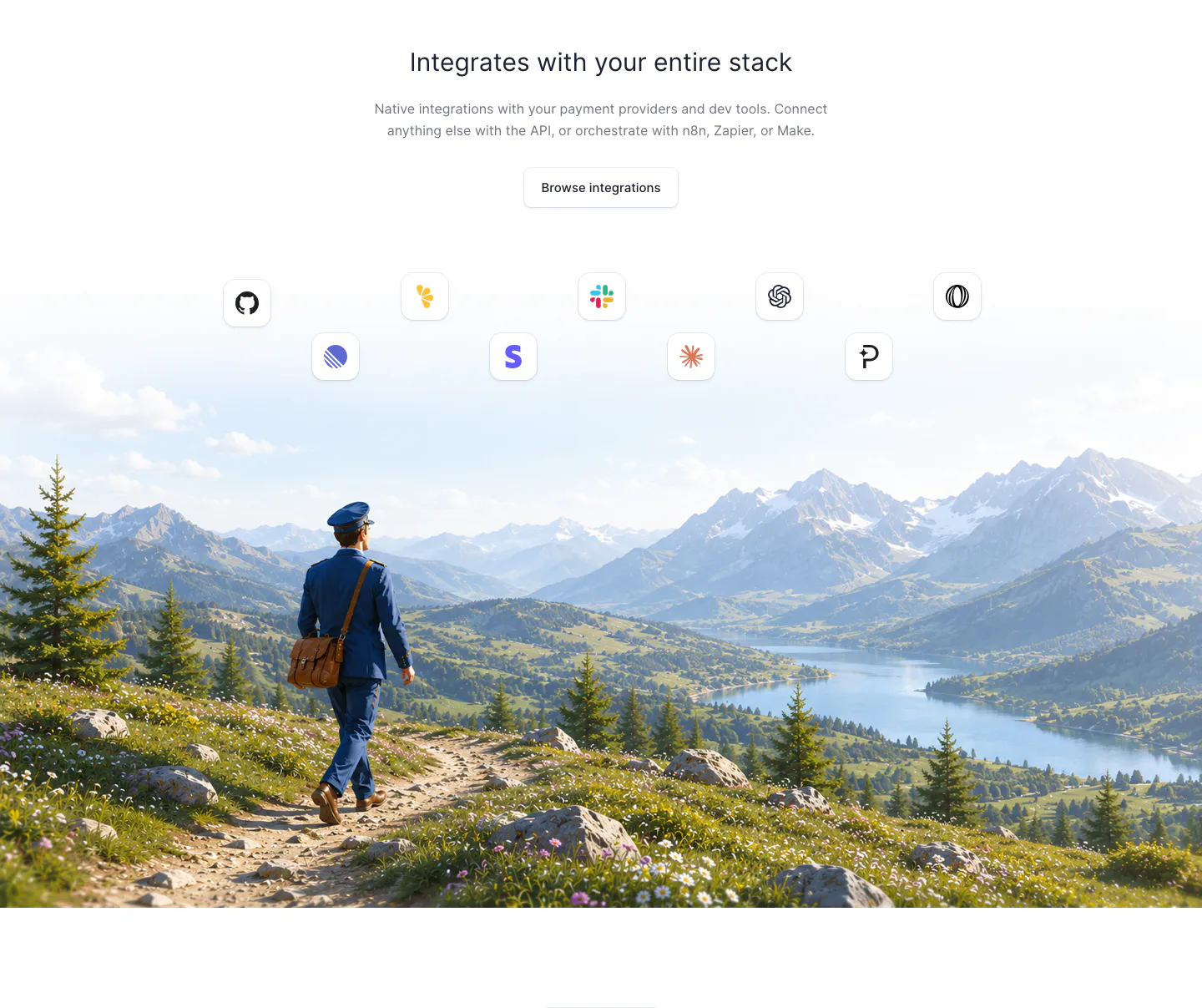
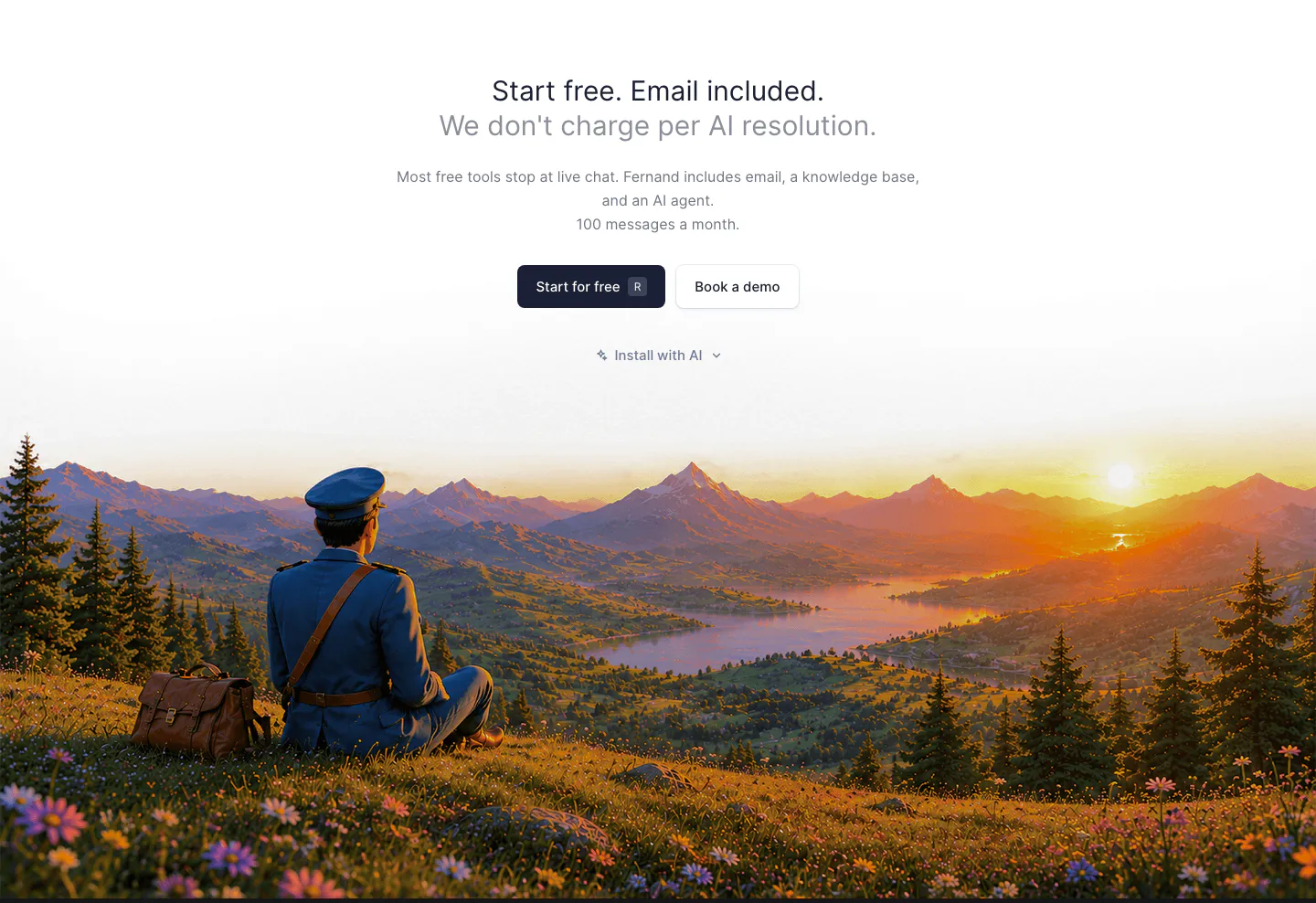
  92. Fernand integrations section: centered heading and button above app icons floating over a painted mountain landscape with a postman
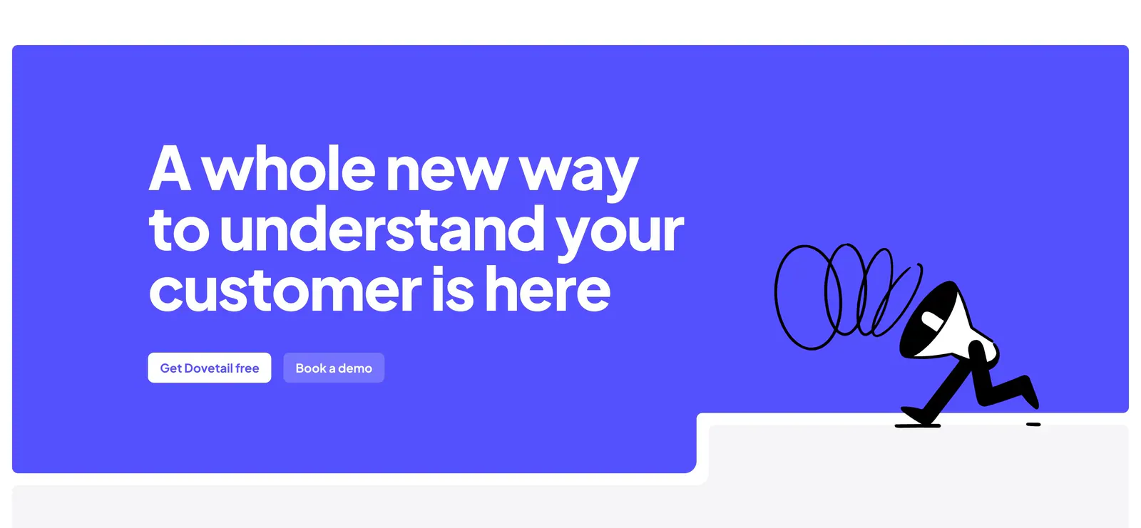
  93. Dovetail call-to-action section: large white headline and two buttons on a bright indigo panel with a walking megaphone illustration
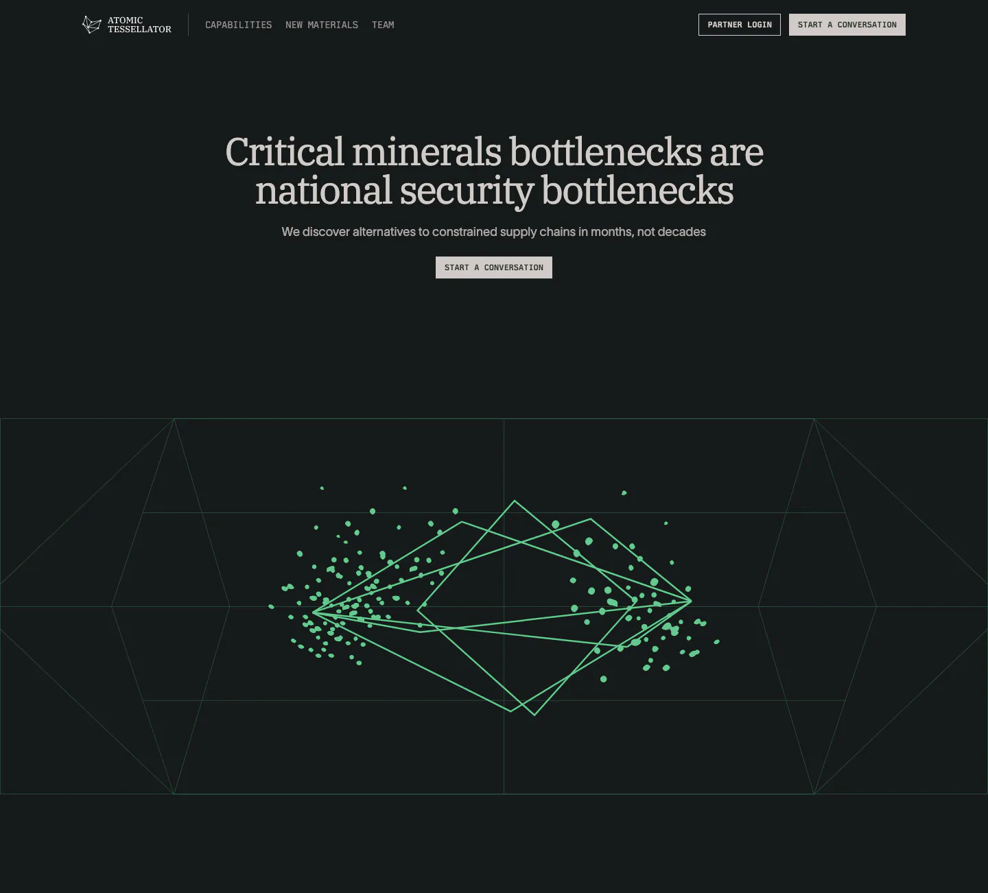
  94. Atomic Tessellator hero section: centered serif headline and Start a conversation button above a green wireframe crystal graphic on near-black
    Atomic Tessellator Hero
  95. Unsiloed how it works section: three-step list at left beside stacked visuals of isometric documents, a parser layer diagram and a JSON window
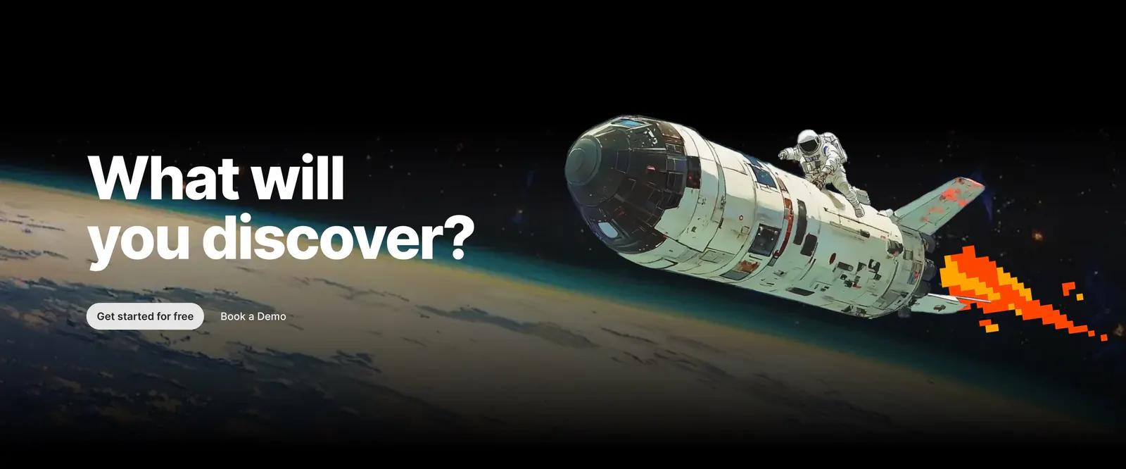
  96. Outerbase call-to-action section: bold headline and two buttons over painted artwork of an astronaut riding a shuttle above Earth
  97. Fernand call-to-action section: centered headline and buttons above a painted sunset landscape with a seated postman
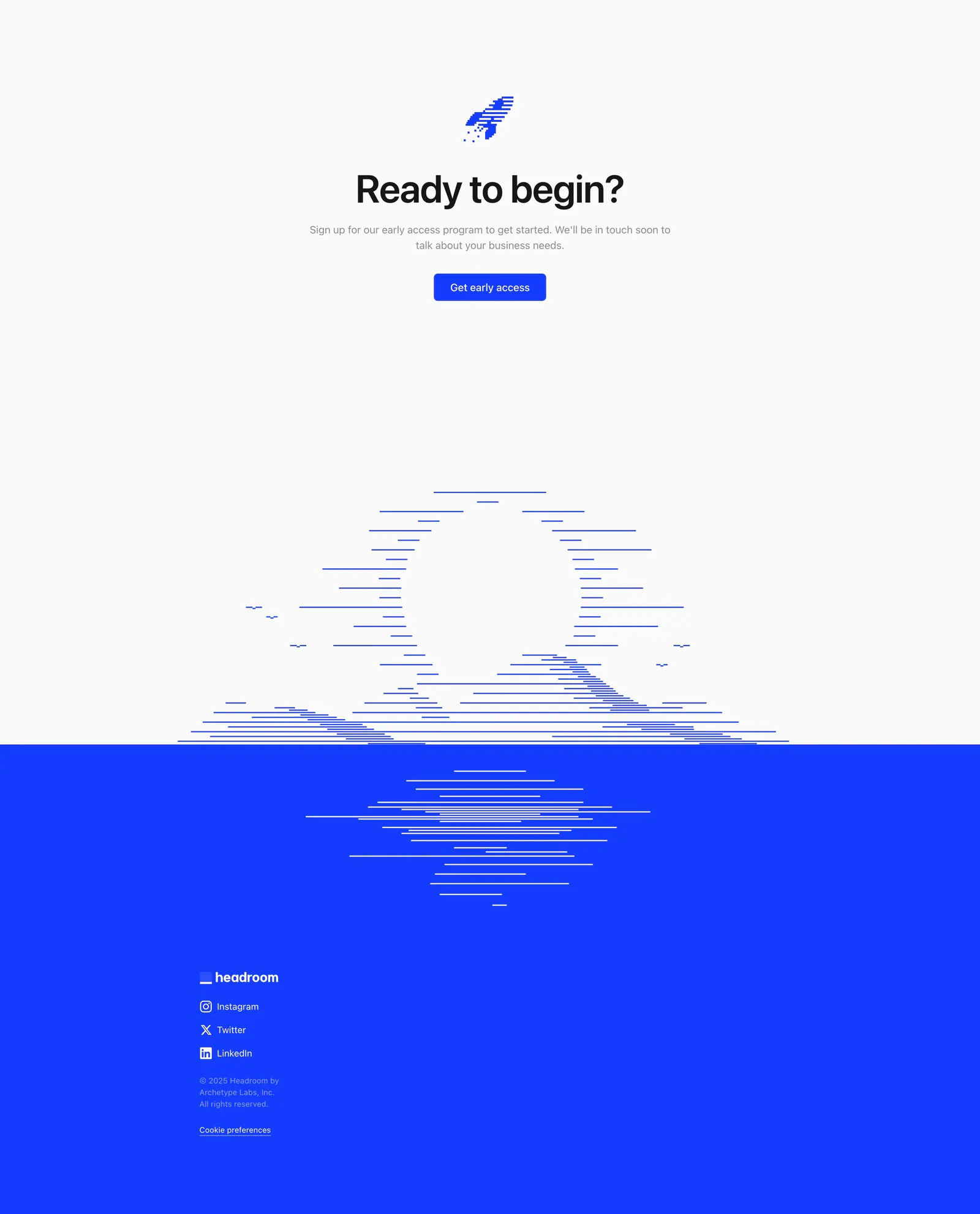
  98. Headroom footer section: centered call-to-action above a line-art sunset that meets a bright blue footer with logo and social links
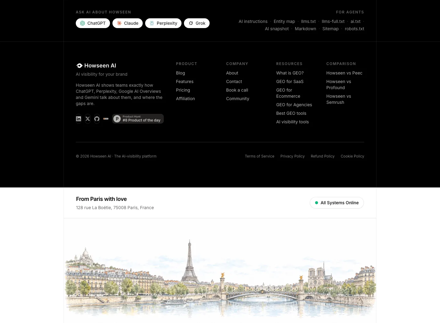
  99. Howseen AI footer section: black footer with link columns and Ask AI buttons above a watercolor Paris skyline illustration
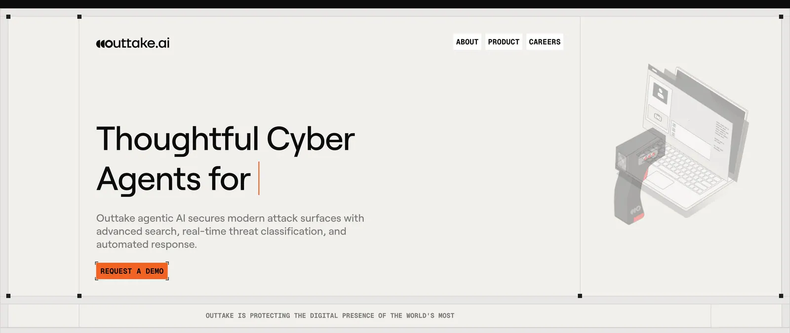
  100. Outtake hero section: left-aligned headline with typing cursor and orange demo button beside an isometric scanner and laptop illustration on beige
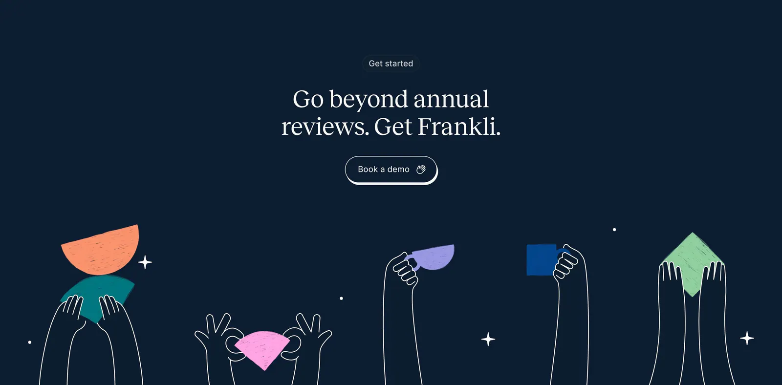
  101. Frankli call-to-action section: centered serif headline and demo button above hand-drawn hands holding colorful shapes on navy
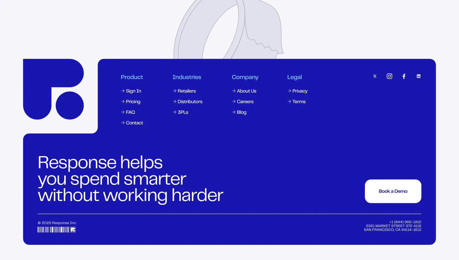
  102. Response footer section: royal blue panel with logo, link columns, large statement and Book a Demo button, tape line art above
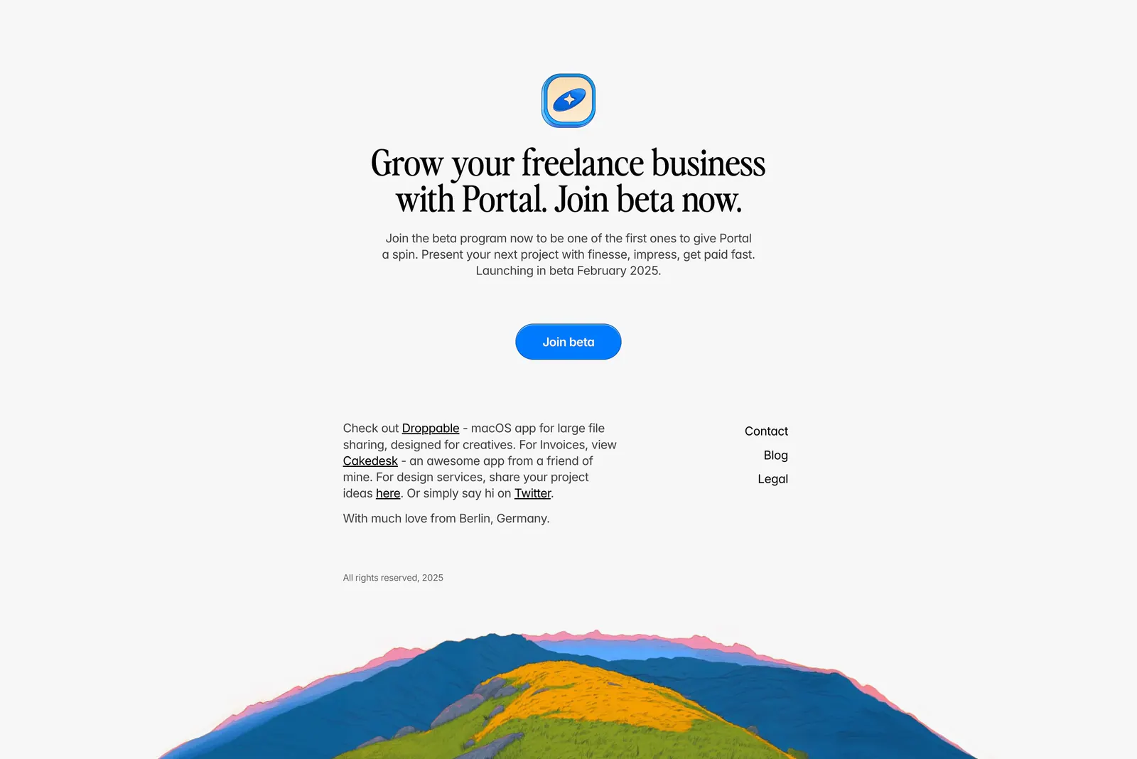
  103. Portal footer section: centered serif join-beta headline and blue button above small link columns and a painted hillside illustration
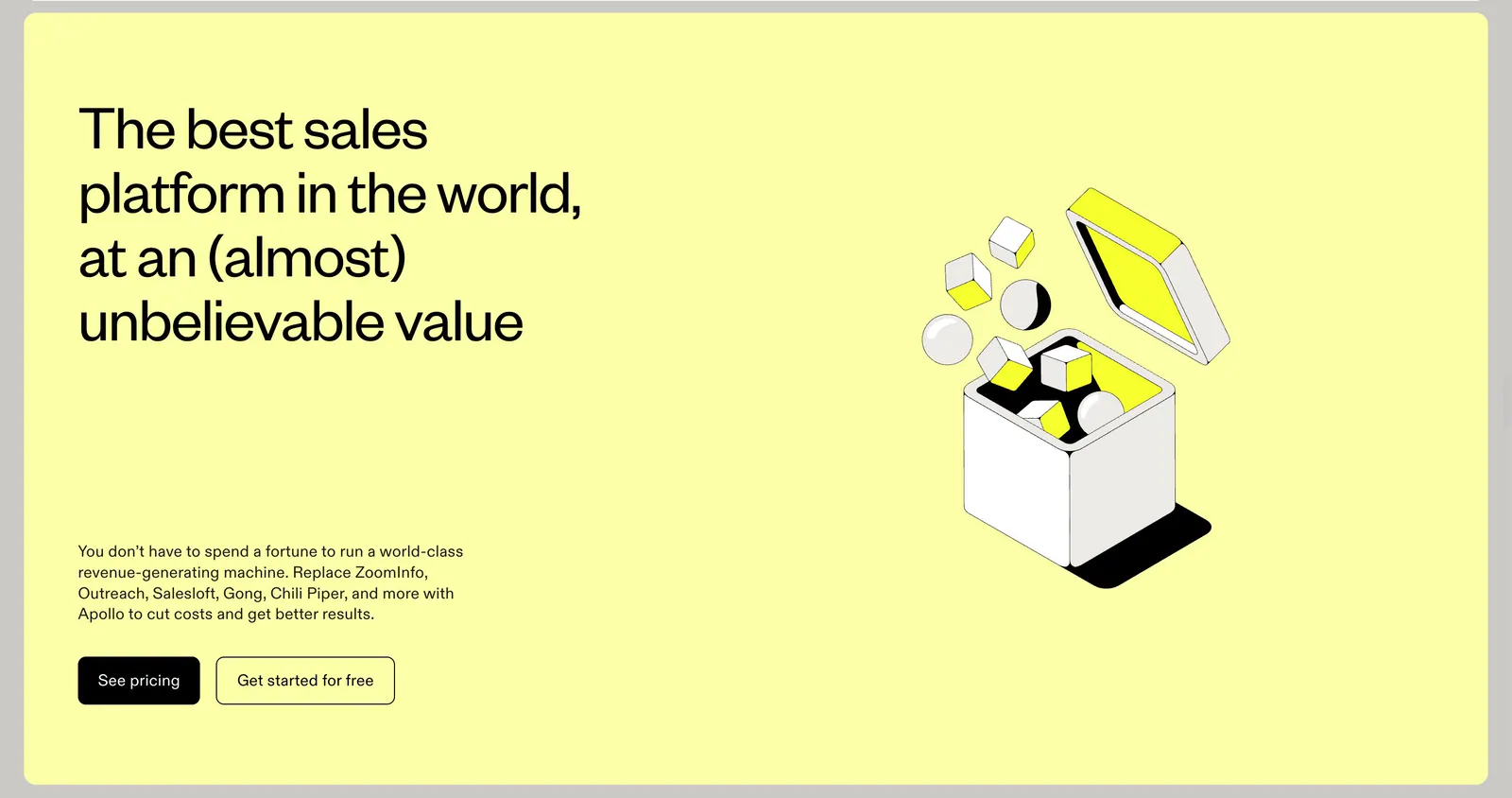
  104. Apollo call-to-action section: headline, copy and two buttons left with an isometric line-art box illustration right on a pale yellow panel
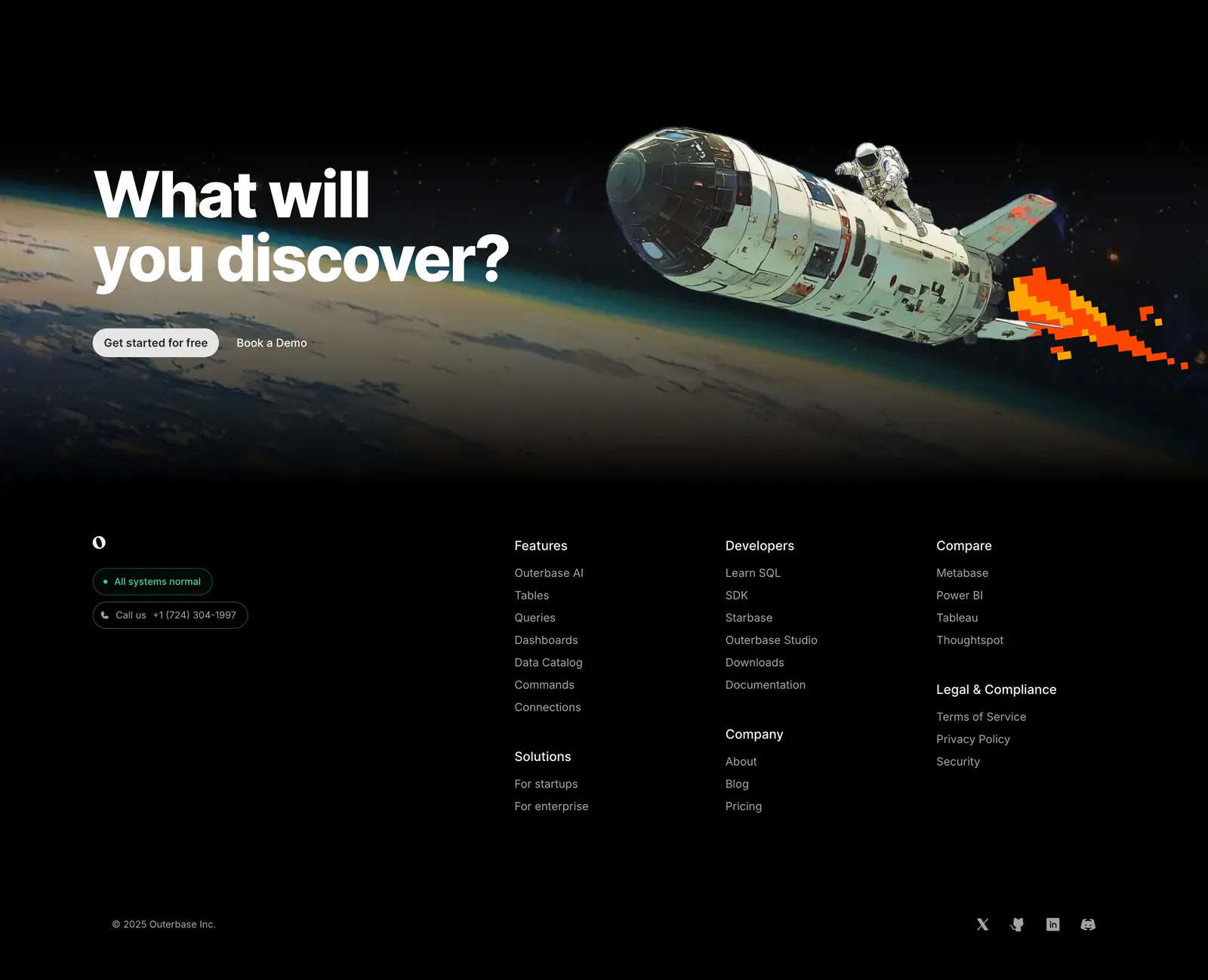
  105. Outerbase footer section: space-art CTA band above a black footer with logo, status badges, link columns and social icons
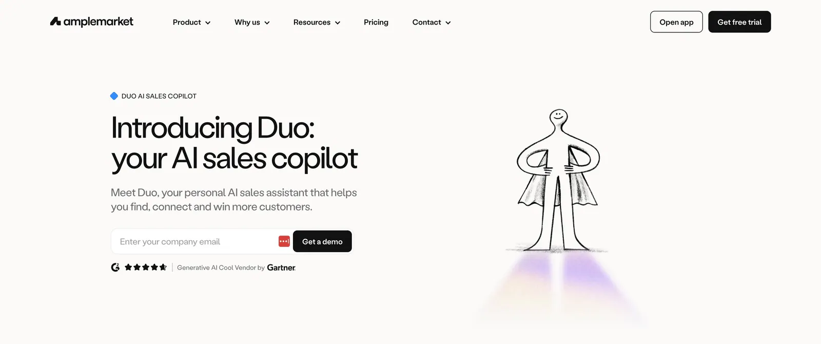
  106. Amplemarket hero section: headline, email field and rating on the left beside a hand-drawn caped figure illustration on off-white
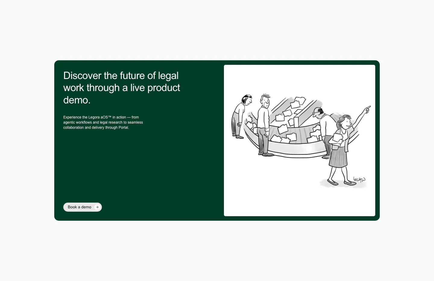
  107. Legora call-to-action section: dark green card with headline and demo button left and a black-and-white cartoon right
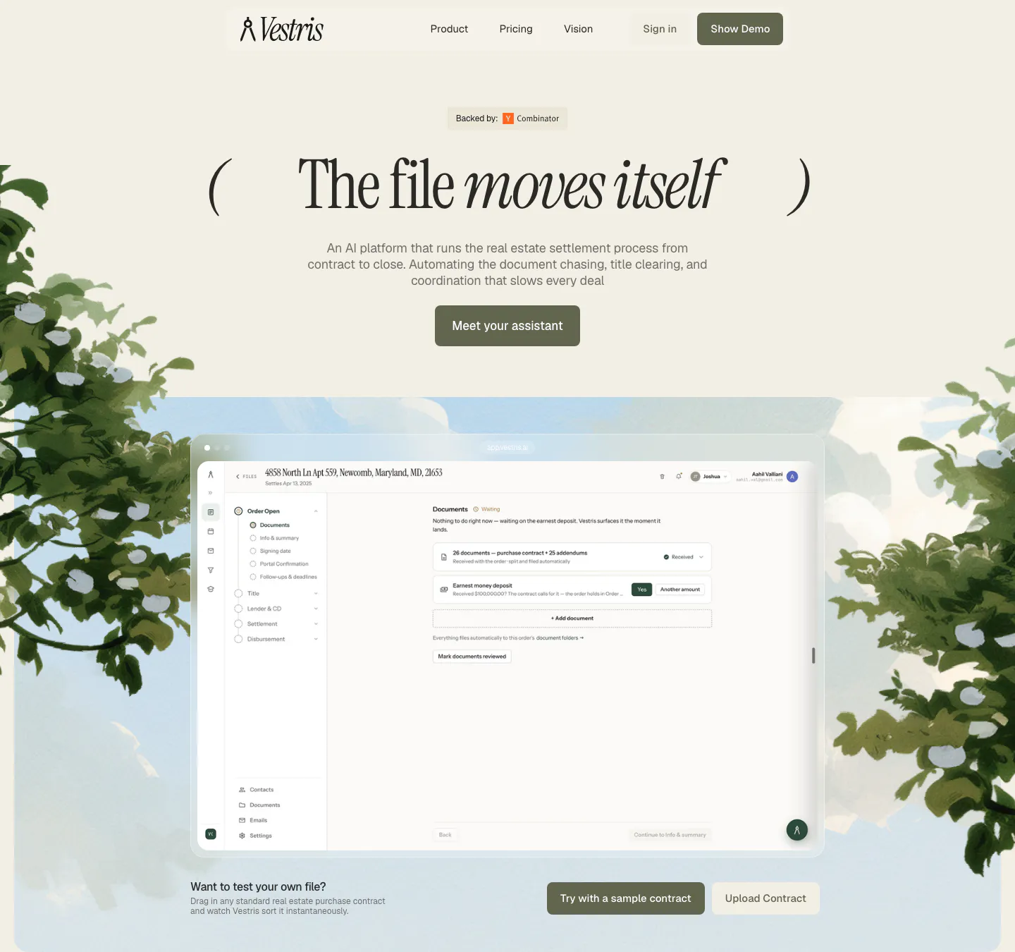
  108. Vestris hero section: nav and centered serif headline with button above an app screenshot framed by painted trees and sky
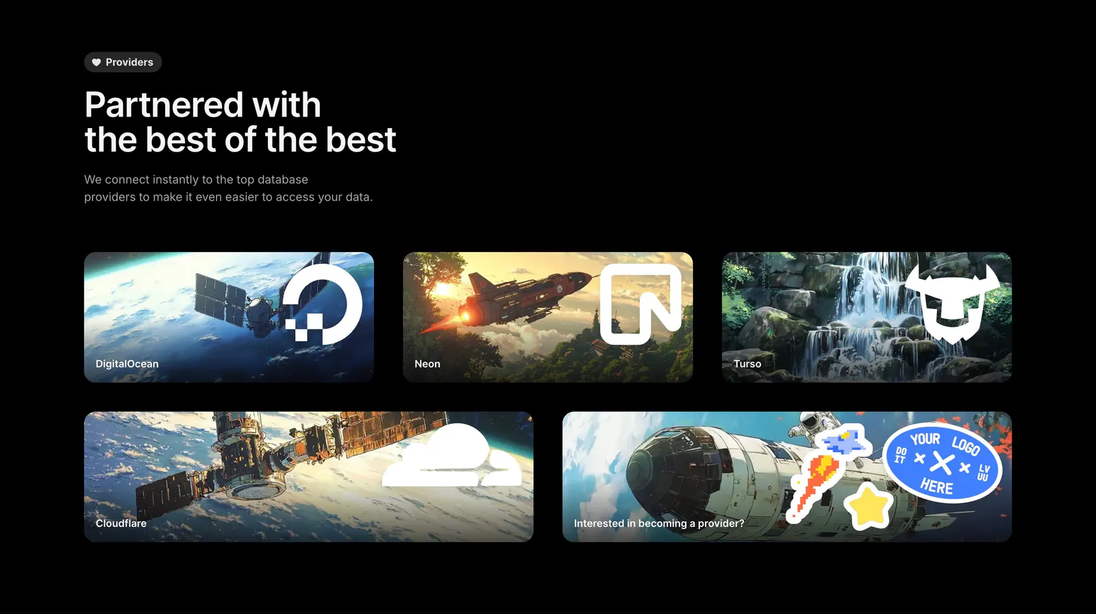
  109. Outerbase integrations section: headline above five artwork cards with provider logos for DigitalOcean, Neon, Turso and Cloudflare
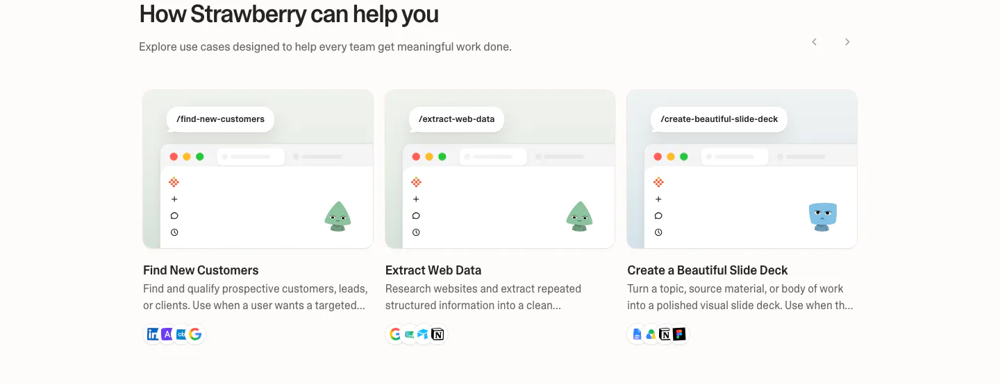
  110. Strawberry use cases section: three use case cards with mini browser mockups, characters and tool icons, with slider arrows
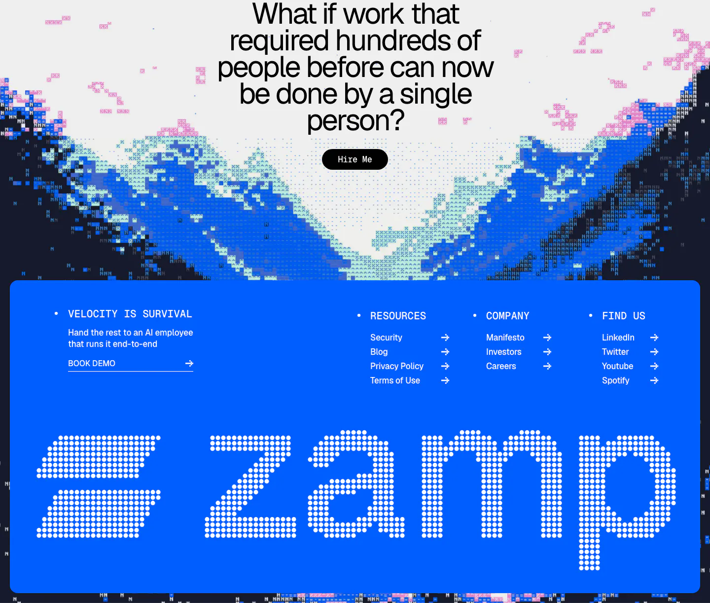
  111. Zamp footer section: centered question CTA over pixel-art mountains above a bright blue panel with link columns and a giant dotted zamp wordmark
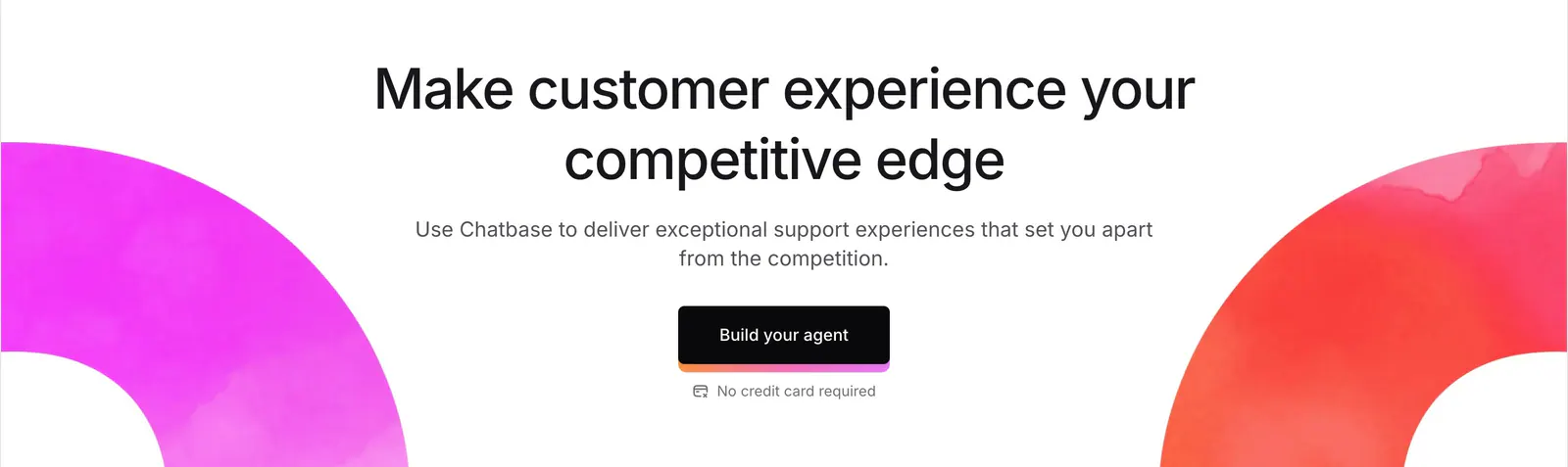
  112. Chatbase call-to-action section: centered headline and dark button framed by magenta and red watercolor arcs on white
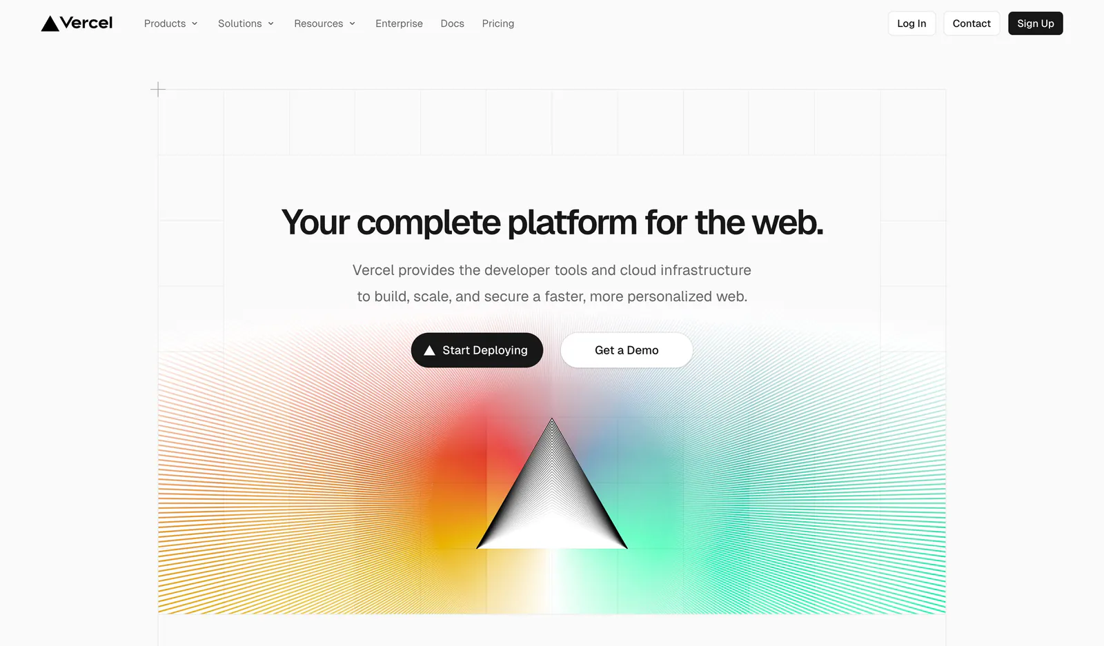
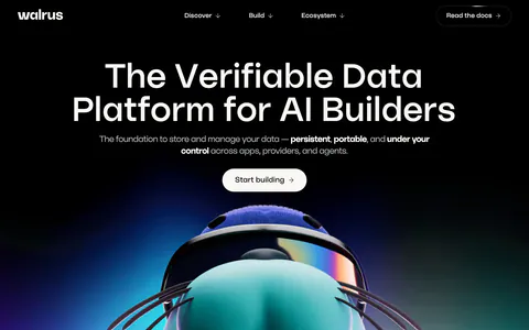
  113. Vercel hero section: centered headline and two buttons on a grid background above a black prism radiating rainbow gradient line rays
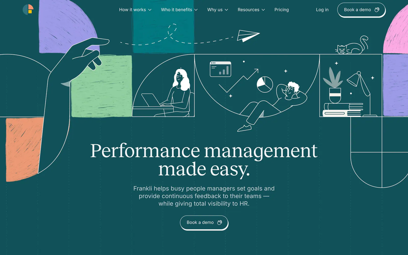
  114. Frankli hero section: centered serif headline and demo button below a band of line-drawn people and textured color blocks on deep teal
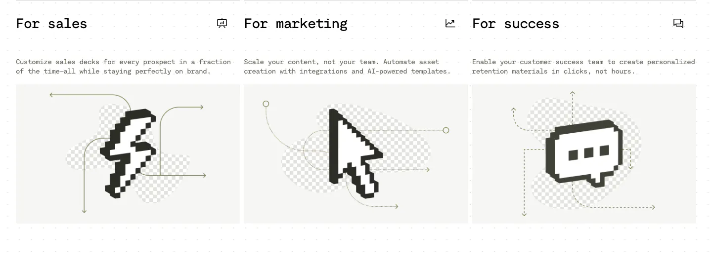
  115. Visual use cases section: three cards for sales, marketing and success with mono titles, short copy and black pixel-art icons on light gray
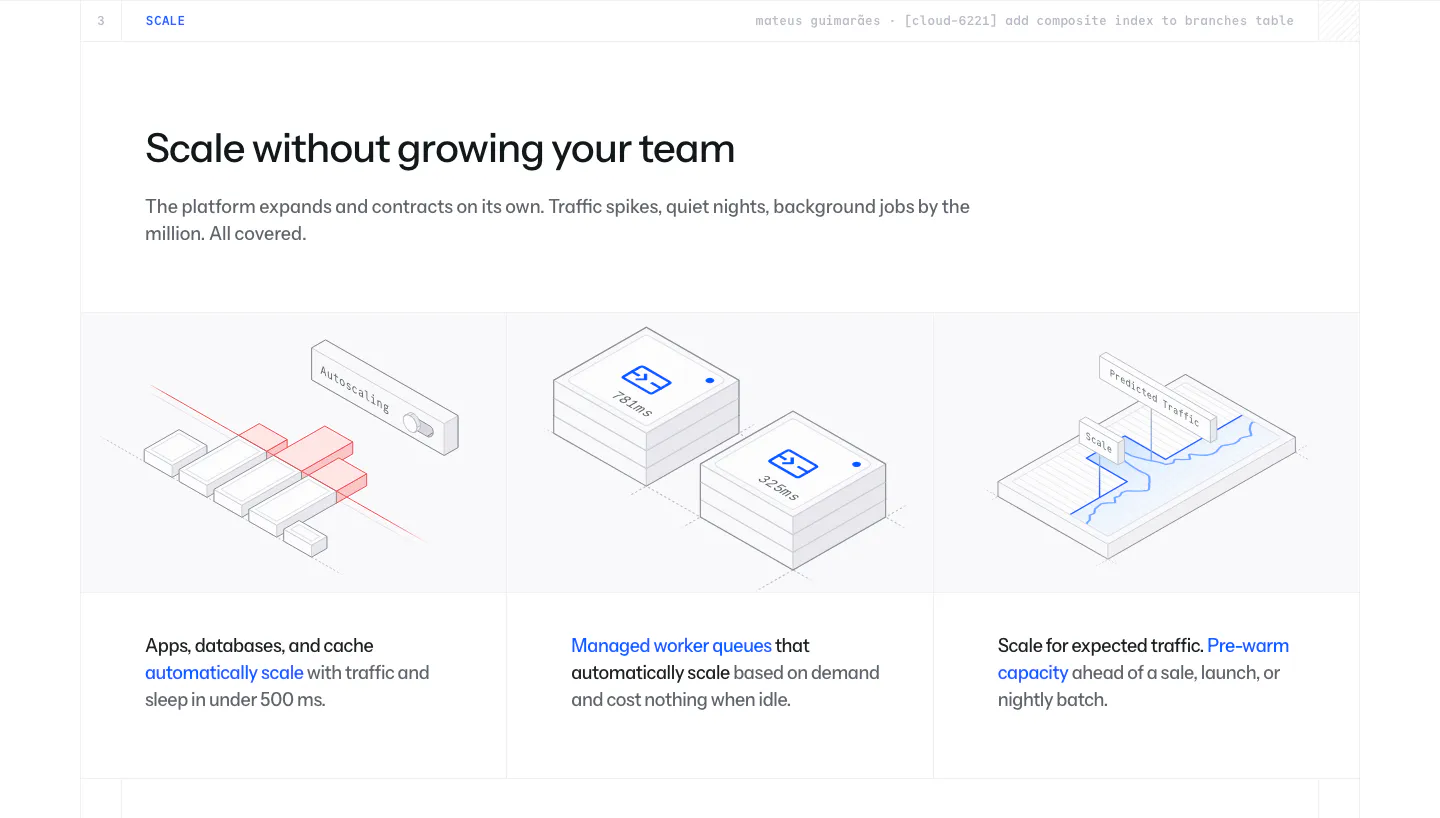
  116. Laravel Cloud features section: headline above three columns of isometric line illustrations for autoscaling, worker queues and pre-warming
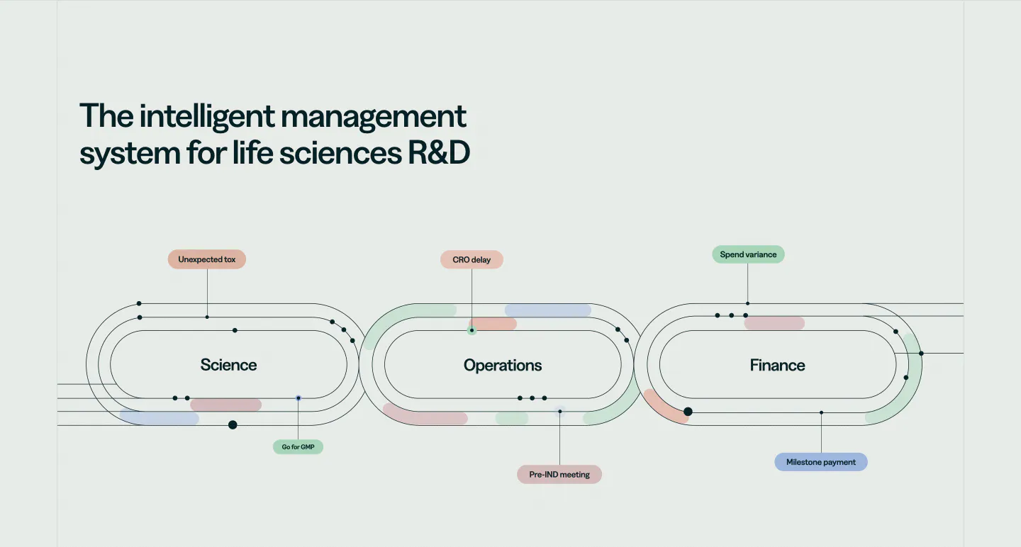
  117. Orchestra Bio features section: headline above a line diagram of three linked loops for science, operations and finance with labels
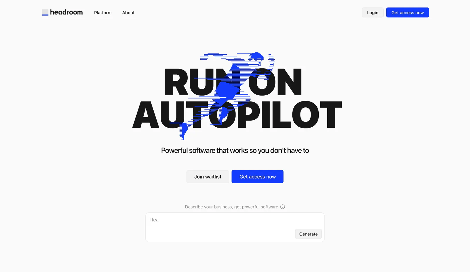
  118. Headroom hero section: huge black uppercase headline over a blue line-art runner, two buttons and a prompt text box below
  119. Podium Automation hero section: headline on a pale yellow band above a dark panel with a line drawing of control panel components

Where illustration shows up

Often paired with

Share of illustration sections that also use each style

How to use illustration well

  1. Commit to one illustration style

    Define line weight, color palette, shading, and character proportions before commissioning or drawing anything. Every illustration on the page should follow the same rules. Mixing flat vector art with textured sketches makes the brand feel assembled from different sources.

  2. Draw what words cannot explain

    The best illustrations show a concept, workflow, or outcome that would be hard to photograph. Before adding one, write down what it should communicate. If it is purely decorative, it competes with your copy for attention without adding meaning.

  3. Balance artwork against the headline

    Give the artwork enough space to read, but keep the headline as the first thing people see. In split layouts, illustrations often sit well at around half the width. Leave generous padding so detailed drawings do not feel cramped.

  4. Export as optimized SVG when possible

    Vector illustrations stay sharp at every screen density and are usually much smaller than PNGs. Simplify paths and remove hidden layers before export. For textured or painterly work, use compressed WebP or AVIF, and add descriptive alt text when the image carries meaning.

Companies using illustration

All styles
    ↑↓ Navigate ↵ Open

    Section preview

    Website section