Canopy website design

Every section we captured from the Canopy website, in page order, from the hero section down to the footer. Open any thumbnail to see it full size.

Sections 29

In page order, top to bottom

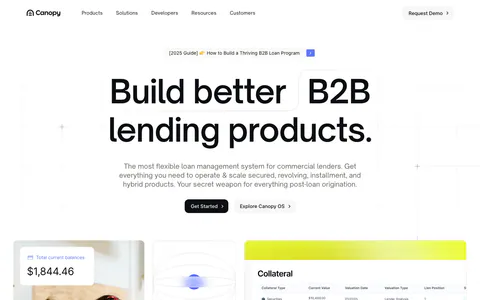
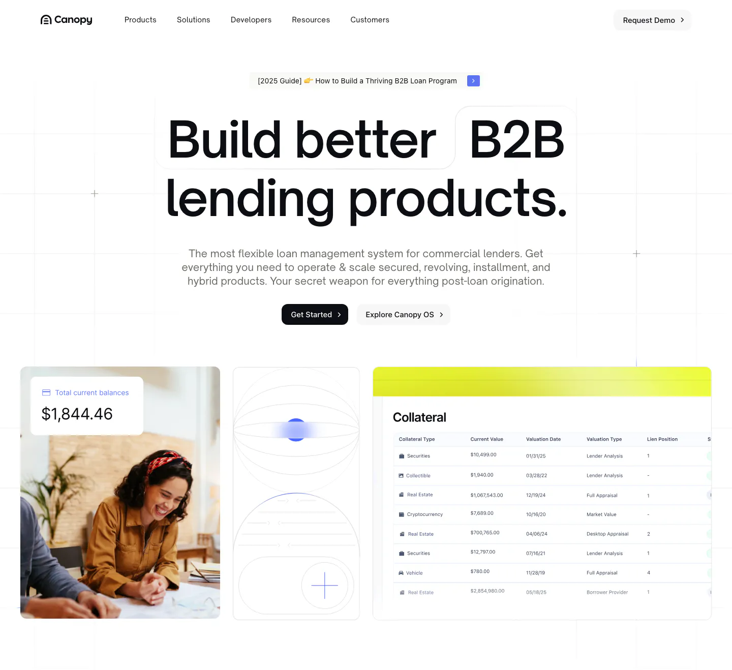
  1. Canopy hero section: centered bold headline and two buttons above a photo, abstract tile and collateral table UI on a white grid
    01 Hero

    Build better B2B lending products.

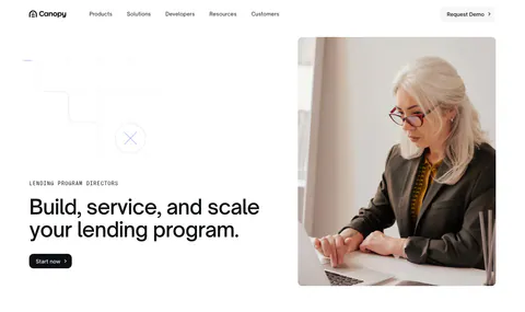
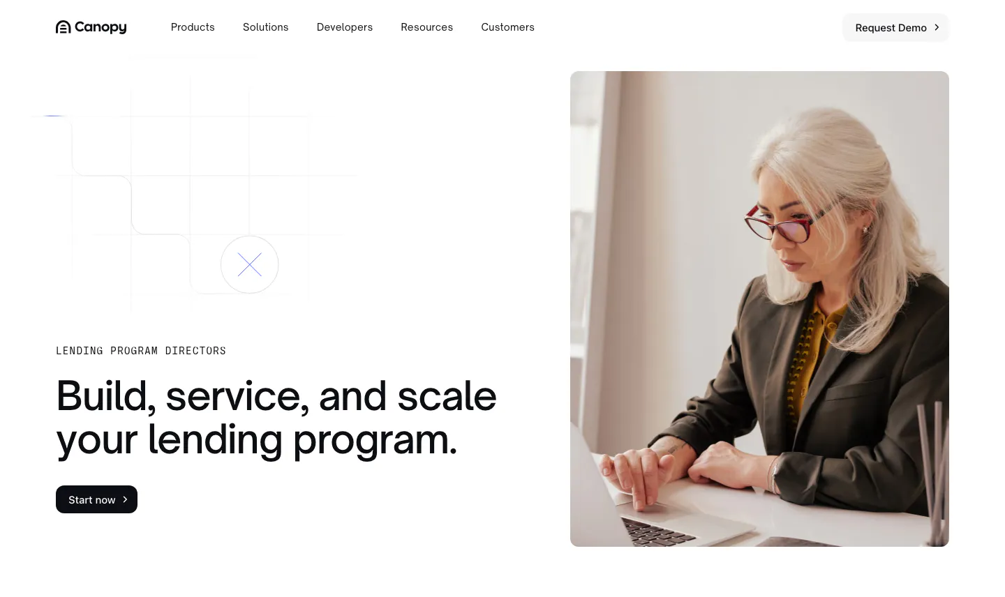
  2. Canopy hero section: left-aligned headline with eyebrow and button beside a photo of a woman working on a laptop
    02 Hero

    Build, service, and scale your lending program.

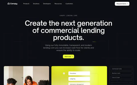
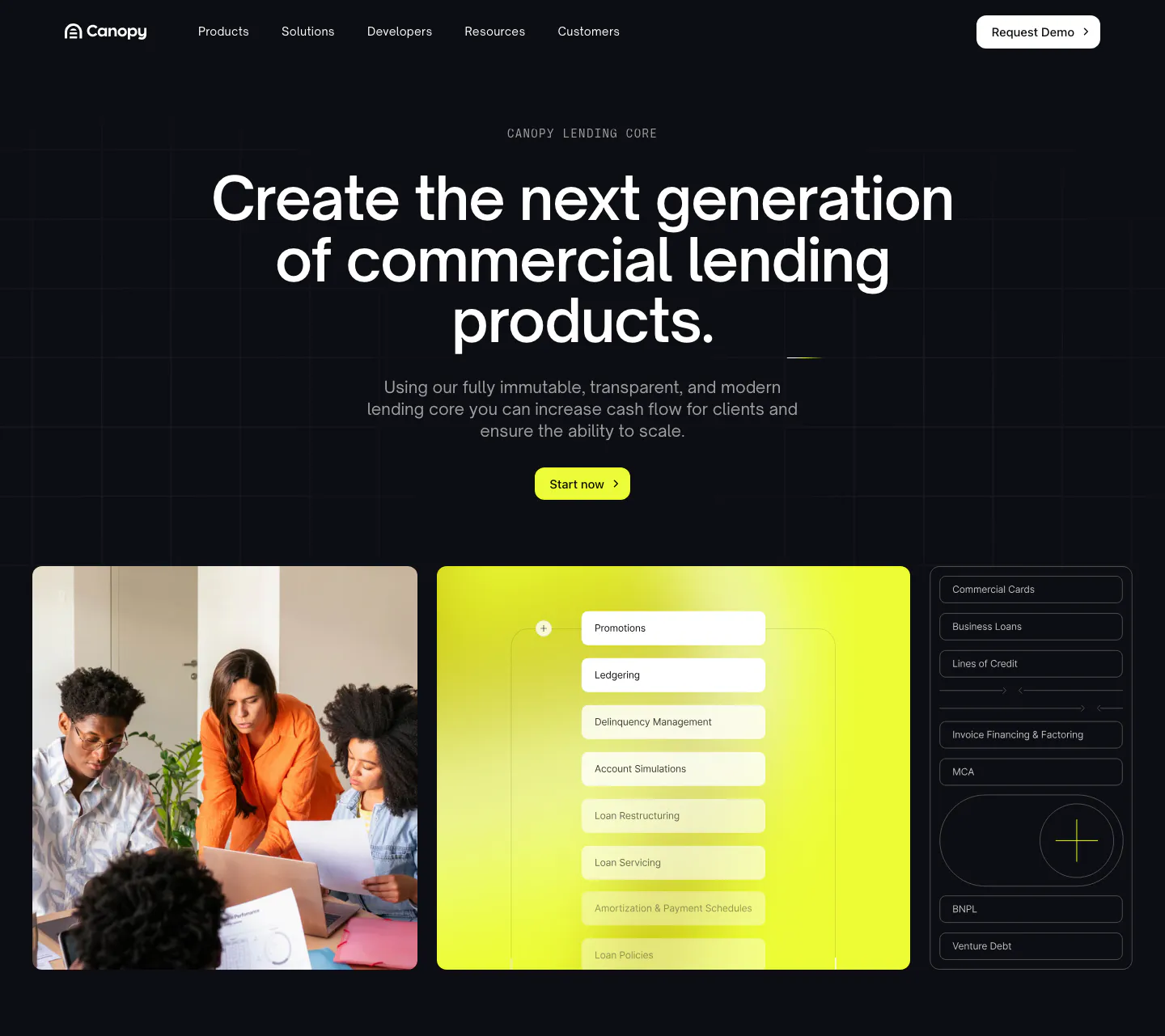
  3. Canopy hero section: dark centered headline and lime button above a team photo, lime UI panel and product list tiles
    03 Hero

    Create the next generation of commercial lending products.

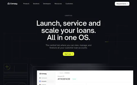
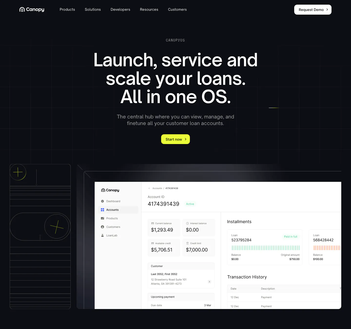
  4. Canopy hero section: dark centered headline and lime button above a loan account dashboard screenshot and line-art tile
    04 Hero

    Launch, service and scale your loans. All in one OS.

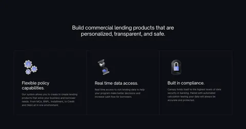
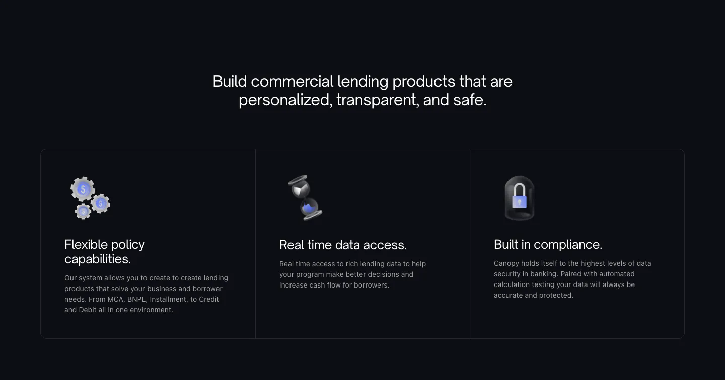
  5. Canopy features section: centered heading above three dark bordered cards with 3D icons on a near-black background

    Build commercial lending products that are personalized, transparent, and safe.

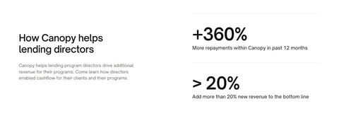
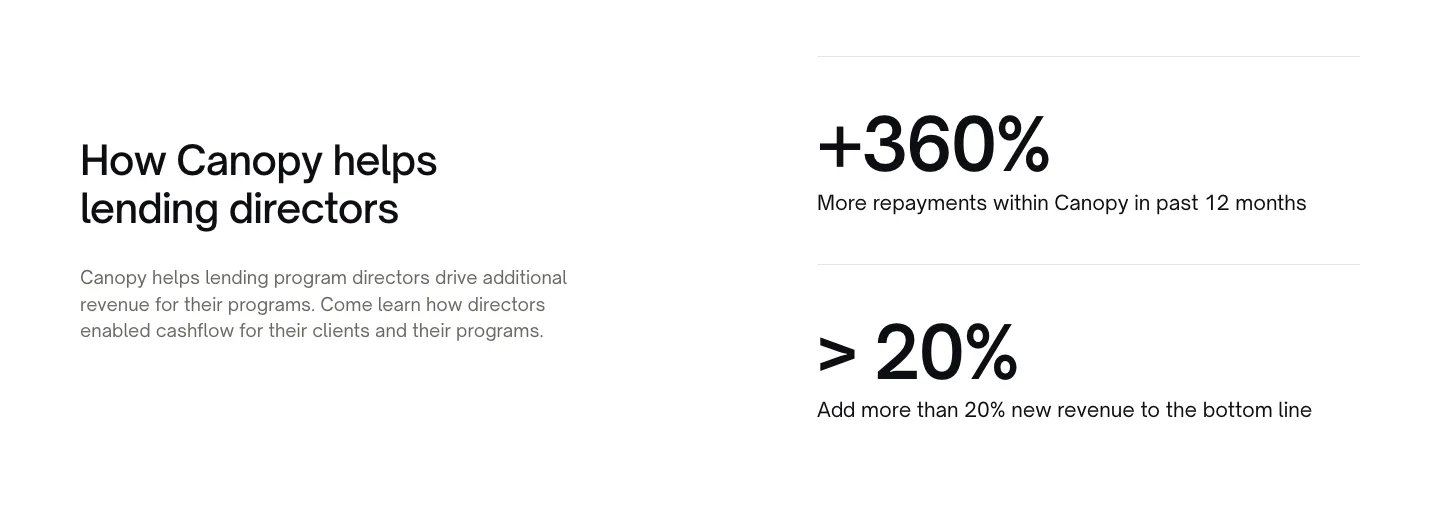
  6. Canopy stats section: heading and copy on the left, two large percentage metrics with labels on the right, white background
    06 Stats

    How Canopy helps lending directors

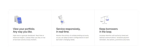
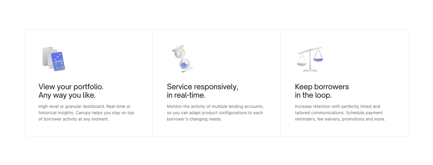
  7. Canopy features section: three bordered cards with small 3D object renders, titles and short descriptions on white
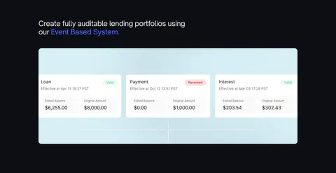
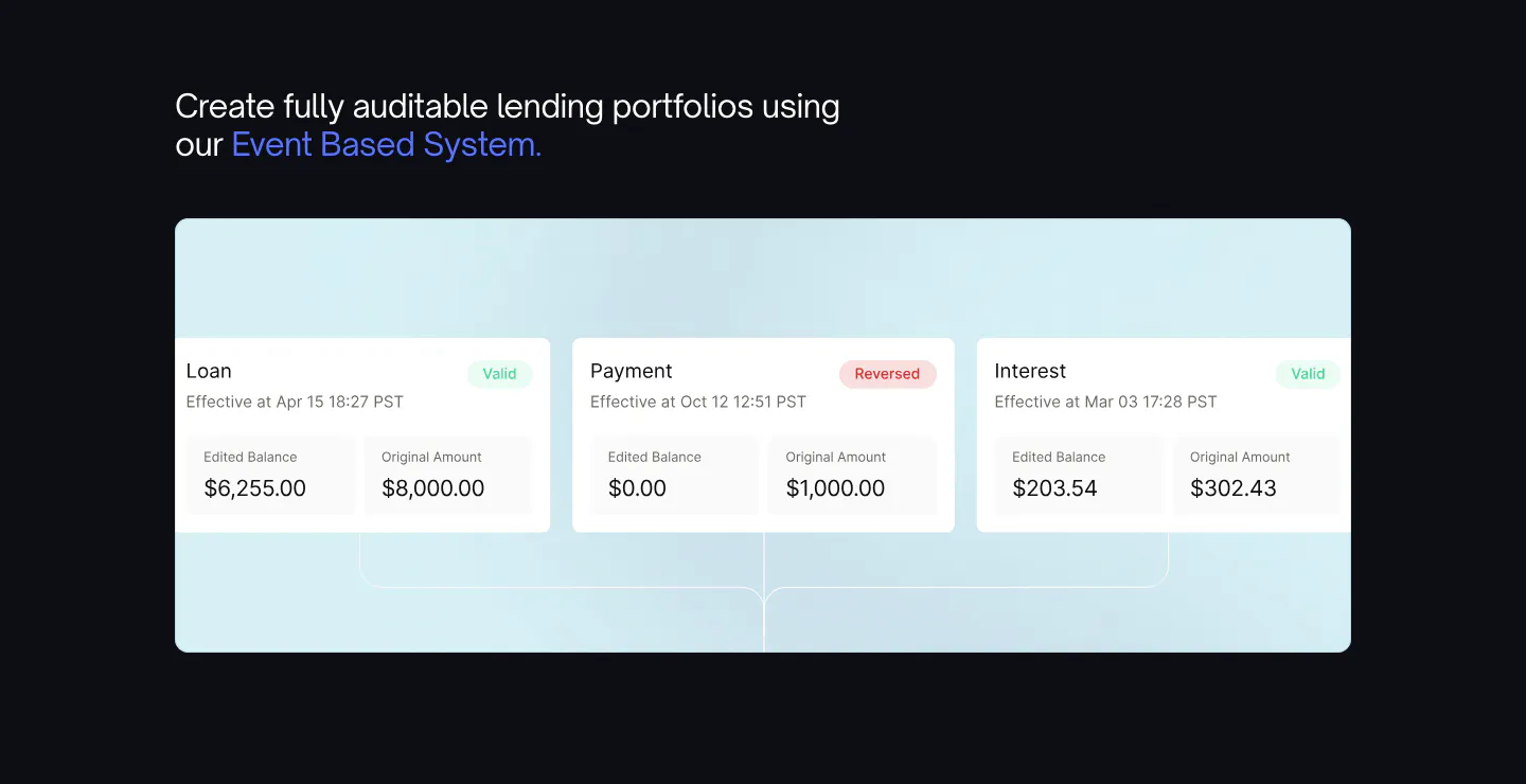
  8. Canopy features section: headline with blue highlight above a light blue panel of loan event UI cards on a dark background

    Create fully auditable lending portfolios using our Event Based System.

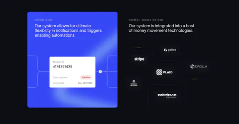
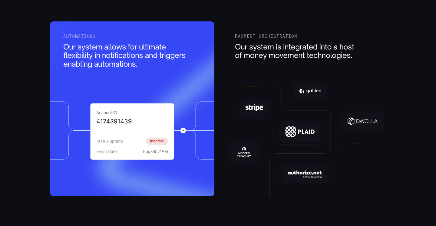
  9. Canopy features section: blue automation card with account UI beside payment partner logos on dark tiles

    Our system allows for ultimate flexibility in notifications and triggers enabling automations.

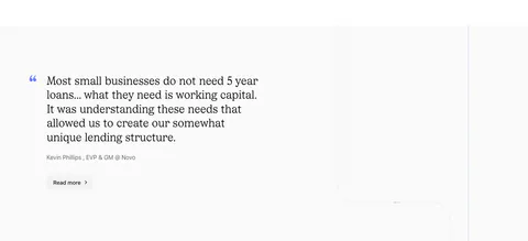
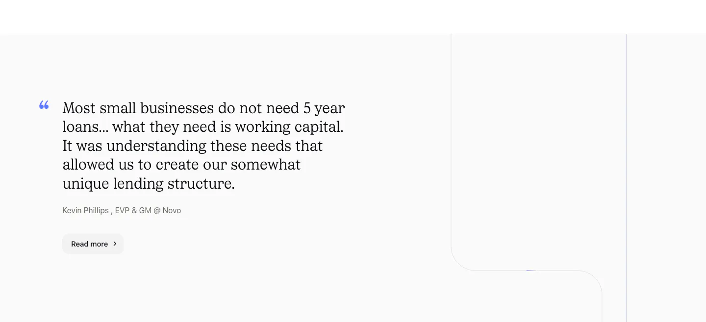
  10. Canopy testimonials section: large serif customer quote with attribution and Read more button on a light gray background

    Most small businesses do not need 5 year loans... what they need is working capital. It was understanding these needs that allowed us to create our somewhat unique lending structure.

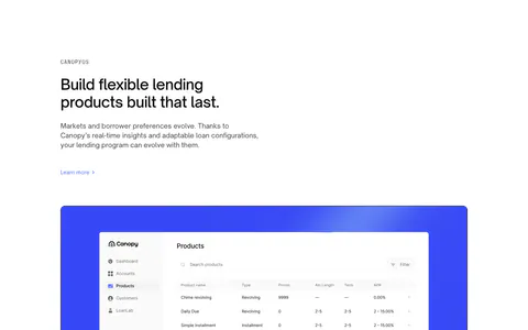
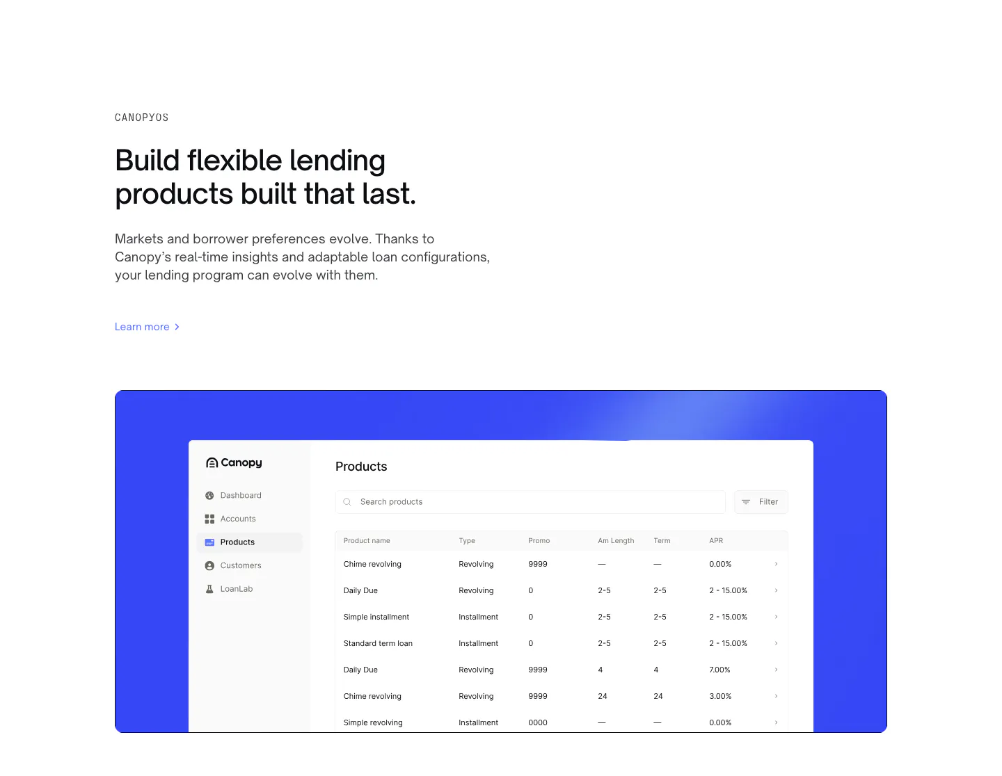
  11. Canopy features section: left-aligned eyebrow, headline and link above a products table screenshot on a bright blue panel

    Build flexible lending products built that last.

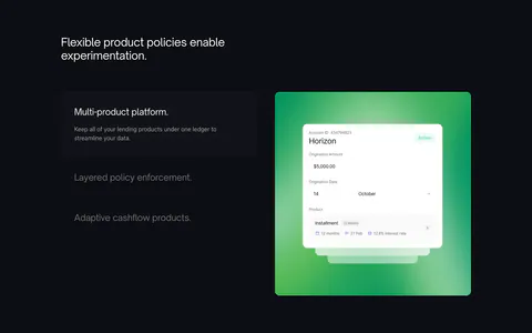
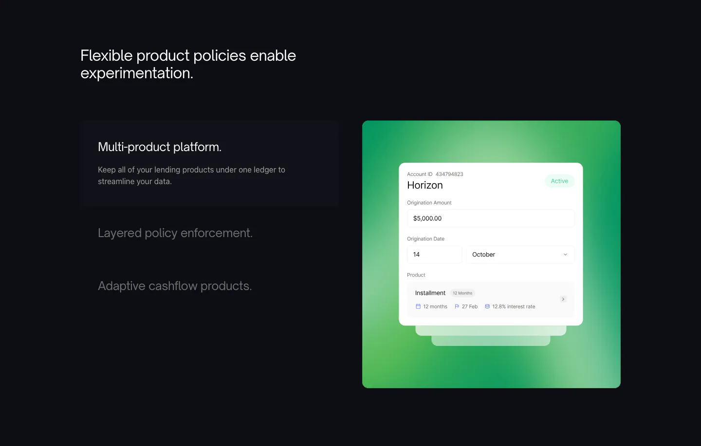
  12. Canopy features section: dark layout with a three-item feature list on the left and a UI card on a green gradient panel

    Flexible product policies enable experimentation.

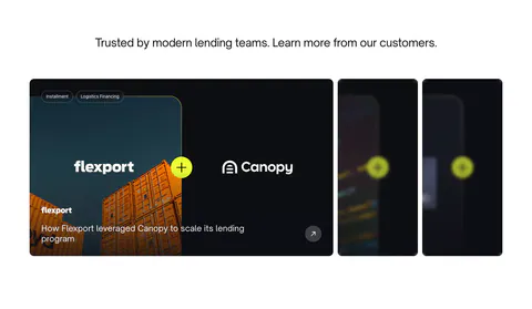
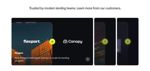
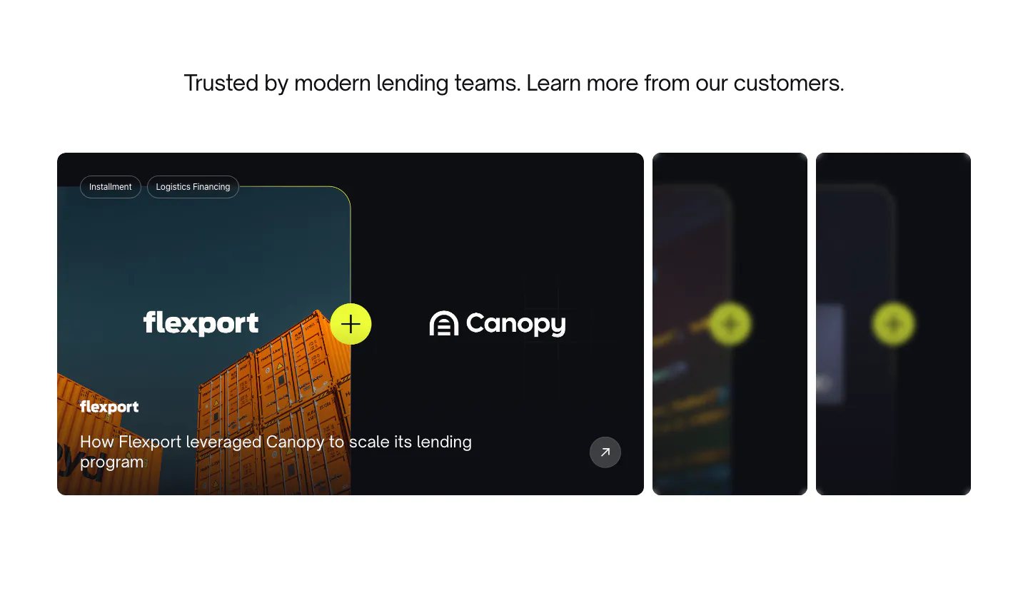
  13. Canopy testimonials section: centered heading above a case study carousel with a Flexport container photo card and blurred cards

    Trusted by modern lending teams. Learn more from our customers.

  14. Canopy value proposition section: centered headline with lime highlight in a dark rounded panel with grid lines and a docs link

    Create flexible lending products. With less work.

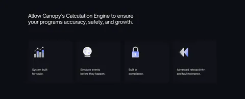
  15. Canopy features section: dark headline above four dark cards with 3D icons and short labels

    Allow Canopy’s Calculation Engine to ensure your programs accuracy, safety, and growth.

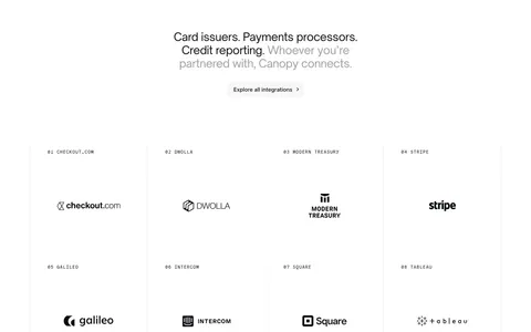
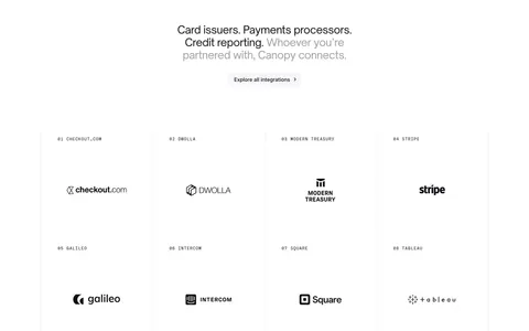
  16. Canopy integrations section: centered headline and button above a bordered 4x2 grid of numbered partner logos on white

    Card issuers. Payments processors. Credit reporting. Whoever you’re partnered with, Canopy connects.

  17. Canopy integrations section: centered headline and copy above a row of four numbered partner logos on a dark background

    Ready to connect to your lending program.

  18. Canopy call-to-action section: centered question headline, copy and lime Start now button on a dark grid background

    Ready to unleash growth?

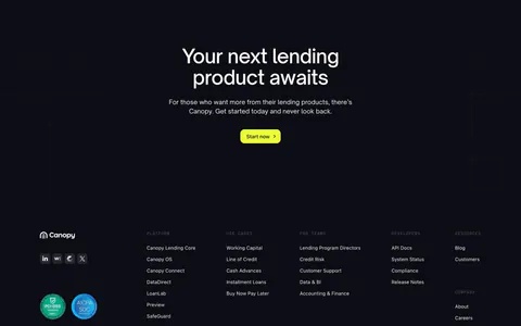
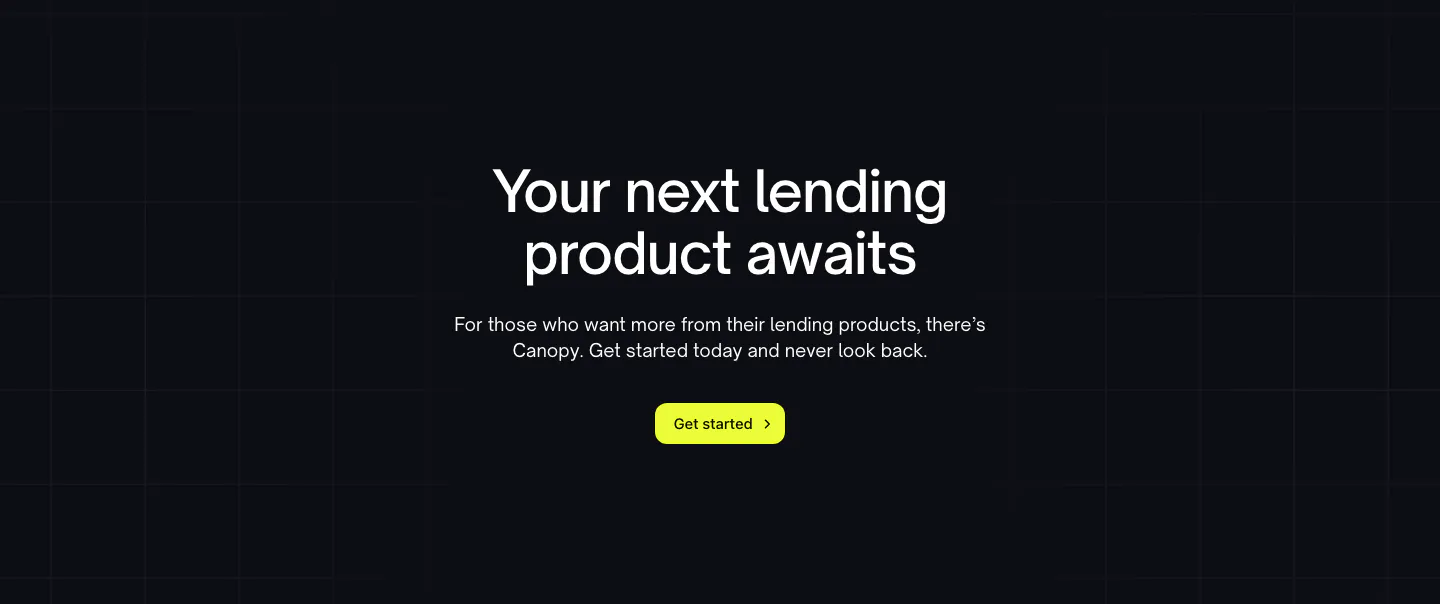
  19. Canopy call-to-action section: centered headline, short copy and lime Get started button on a dark grid background

    Your next lending product awaits
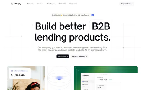
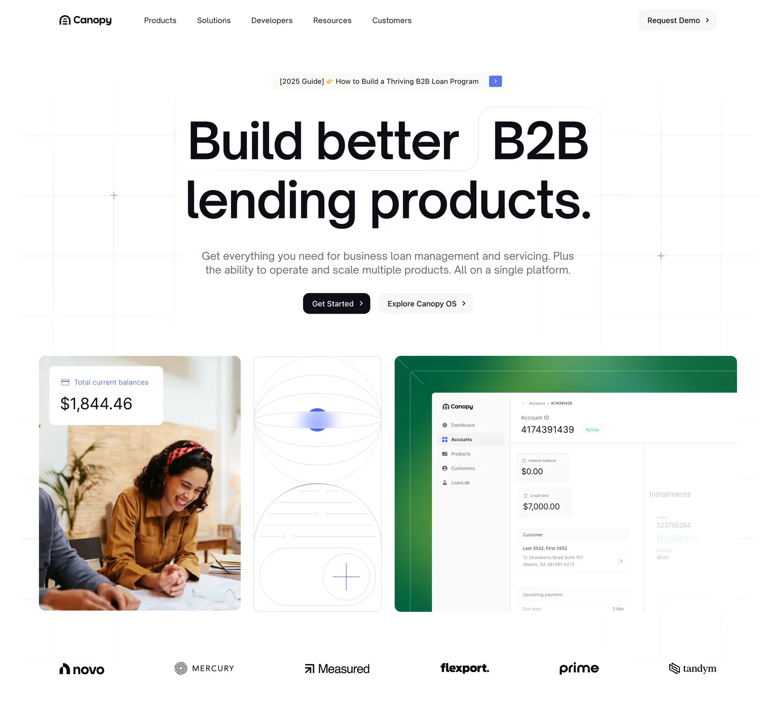
  20. Canopy hero section: centered headline and two buttons above cards with a customer photo, line art and a loan dashboard, logos below
    20 Hero

    Build better B2B lending products.

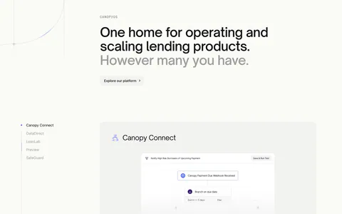
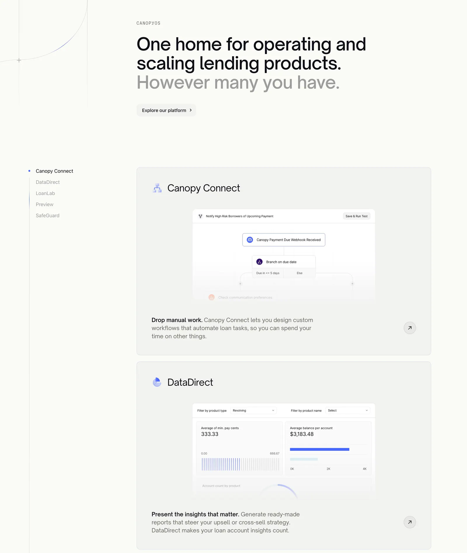
  21. Canopy features section: large headline above a sticky product list on the left and stacked cards with workflow and analytics UI

    One home for operating and scaling lending products. However many you have.

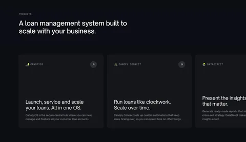
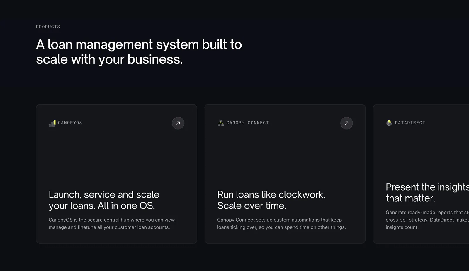
  22. Canopy features section: left-aligned headline above a horizontally scrolling row of dark product cards, the last cut off

    A loan management system built to scale with your business.

  23. Canopy integrations section: centered two-tone headline and button above a bordered grid of eight numbered partner logos on white

    Card issuers. Payments processors. Credit reporting. Whoever you’re partnered with, Canopy connects.

  24. Canopy testimonials section: centered headline above a Flexport case study card with container photo and two collapsed cards

    Trusted by modern lending teams. Learn more from our customers.

  25. Canopy team section: heading above a grid of arch-framed leadership headshot photos with names, titles and LinkedIn icons
    25 Team

    Meet our leadership team.

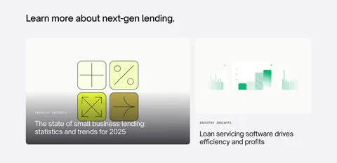
  26. Canopy blog & resources section: left-aligned heading above two article cards with abstract lending graphics on light gray

    Learn more about next-gen lending.

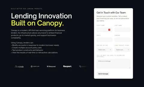
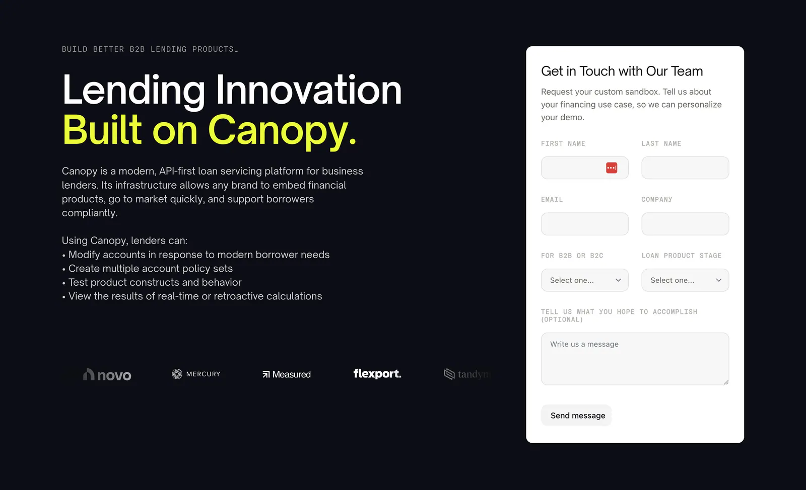
  27. Canopy contact section: headline, bullet list and customer logos left with a white demo request form right on a dark background
    27 Contact

    Lending Innovation Built on Canopy.

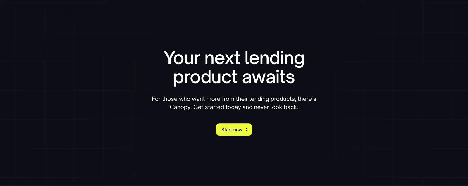
  28. Canopy call-to-action section: centered headline, short copy and lime button on a dark background with faint grid lines

    Your next lending product awaits
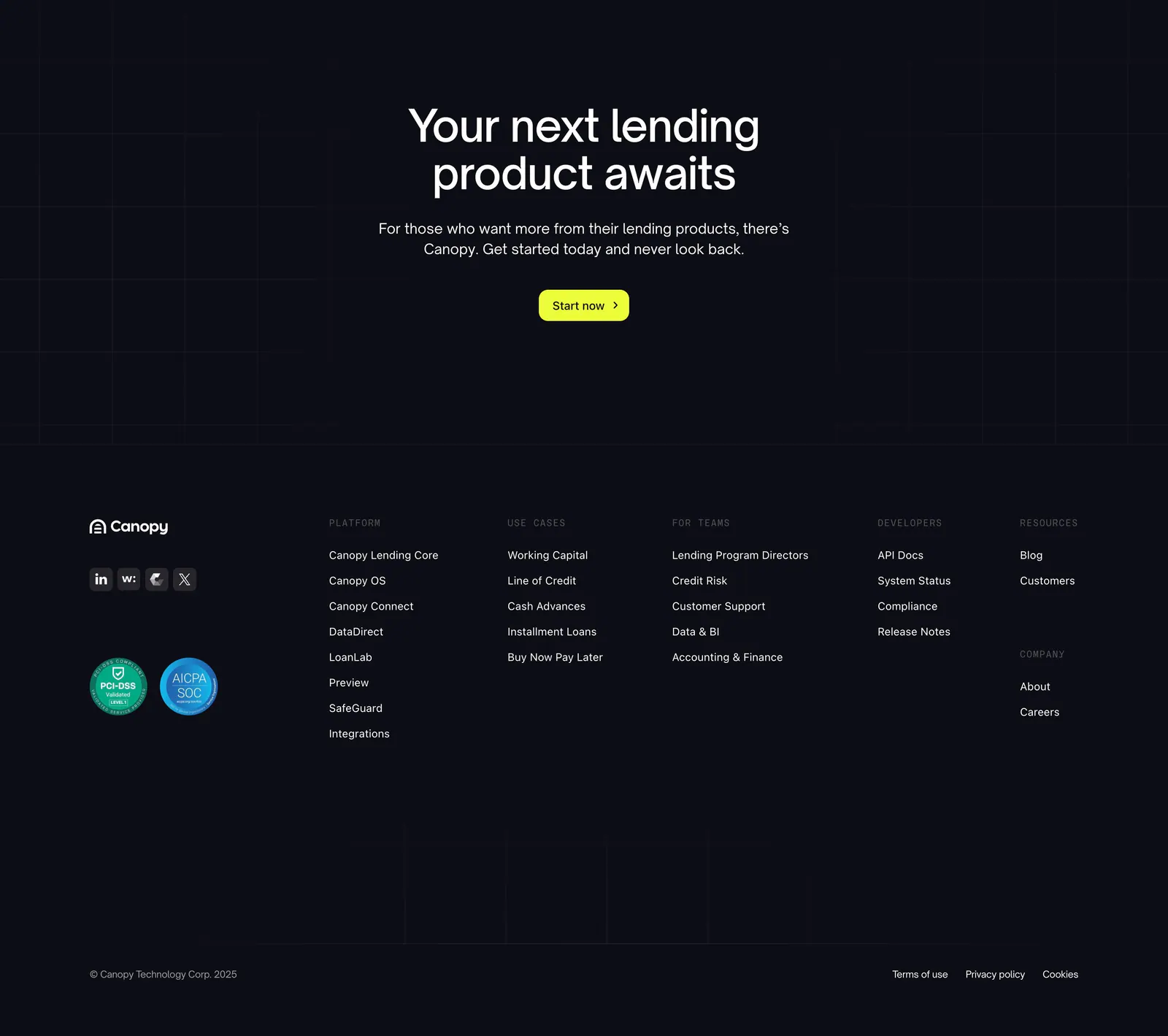
  29. Canopy footer section: centered call-to-action with lime button above a dark footer with logo, compliance badges and link columns
    29 Footer

    Your next lending product awaits
Similar companies

All companies
    ↑↓ Navigate ↵ Open

    Section preview

    Website section