Developer Tools Website Design Examples

Engineers judge a product by its docs, its code, and how fast they can try it. Marketing language gets skimmed, and anything that hides the API behind a sales form loses trust. Strong developer tools website design puts a working code sample near the top, shows the install command, and links to docs, pricing, and status without friction. It reads like it was written by someone who ships software.
330 sections

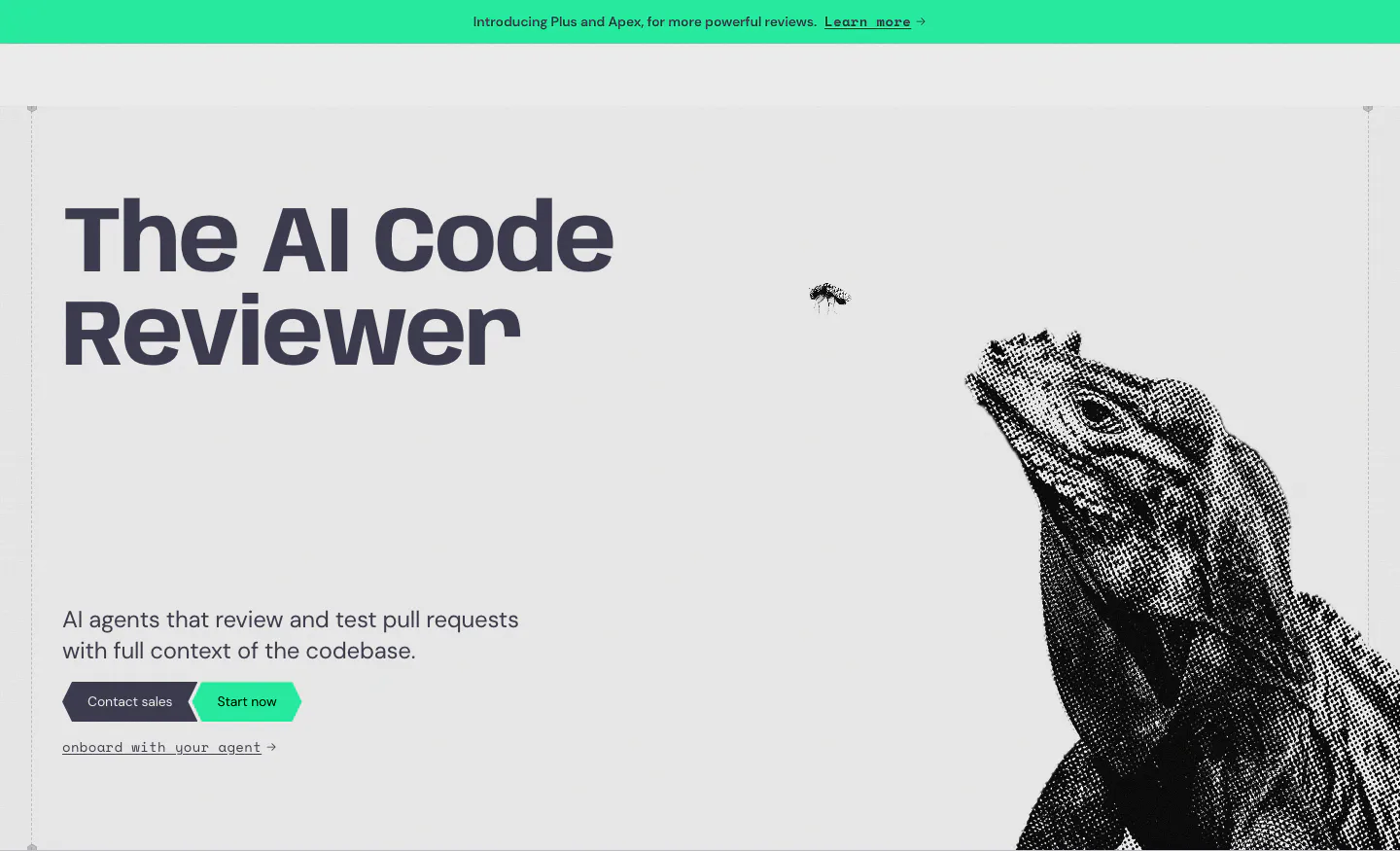
  1. Greptile hero section: bold headline and two CTAs on the left, halftone iguana artwork on the right, green announcement bar above
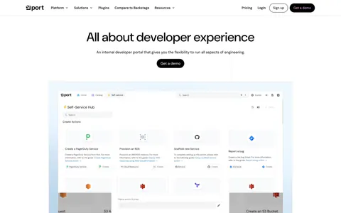
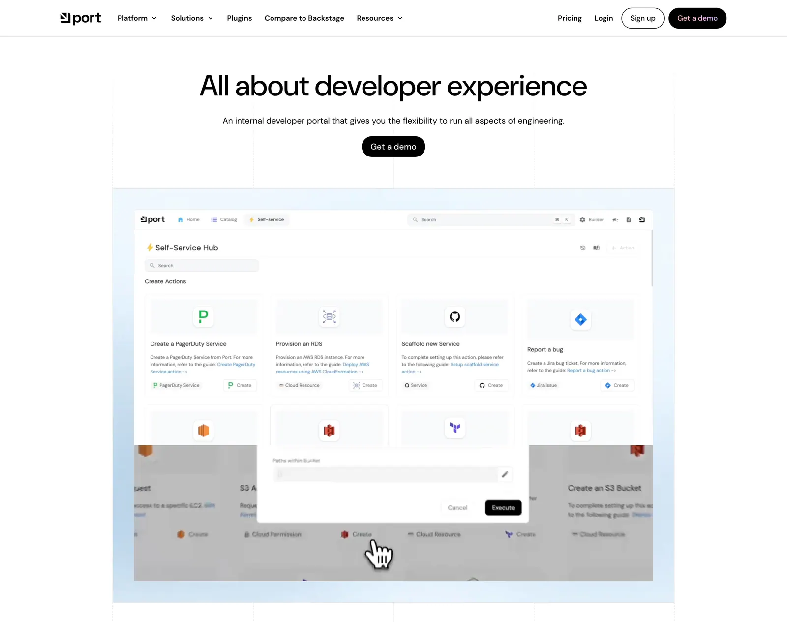
  2. Port hero section: centered headline with Get a demo button above a self-service hub product screenshot on a light blue grid-lined backdrop
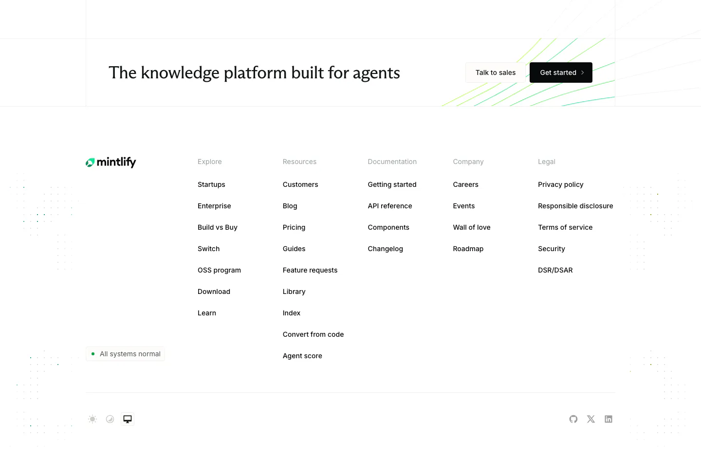
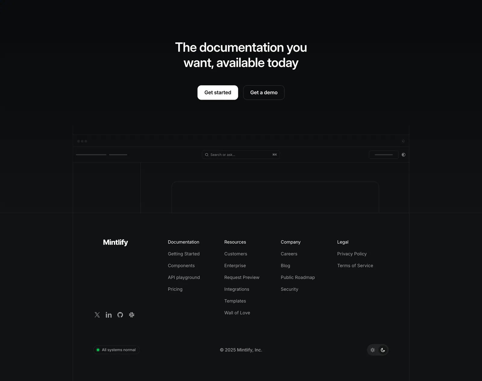
  3. Mintlify footer section: CTA strip with two buttons above logo, status badge and five link columns on a white background
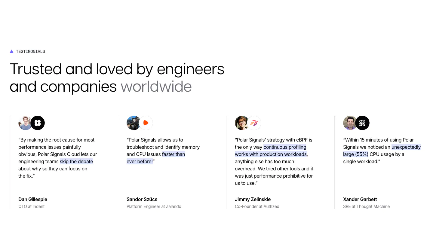
  4. Polar Signals testimonials section: headline above four divided columns of quotes with highlighted phrases, avatar and logo pairs and names
  5. Greptile logo cloud section: two rows of grayscale customer logos in bordered grid cells under a small mono caption
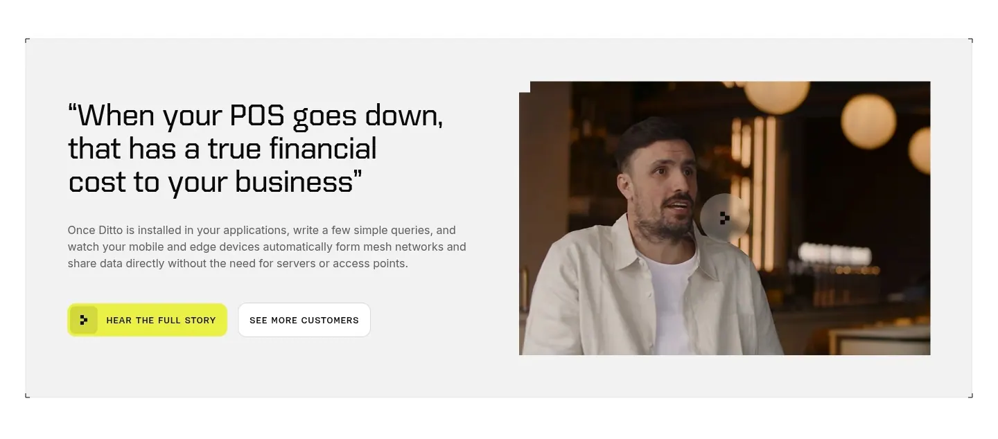
  6. Ditto testimonials section: large quote with copy and two buttons on the left beside a video frame of a customer speaking, in a gray panel
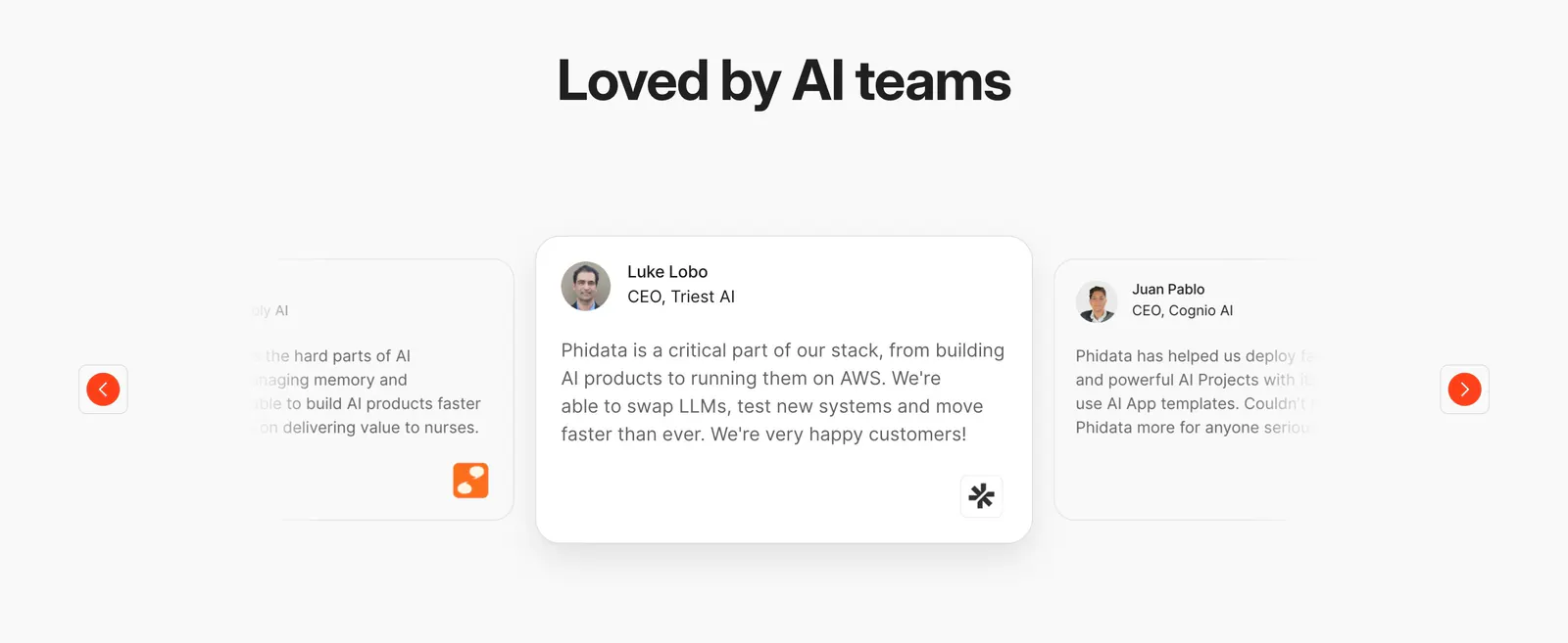
  7. Phidata testimonials section: centered heading above a quote card carousel with faded side cards and orange arrow buttons
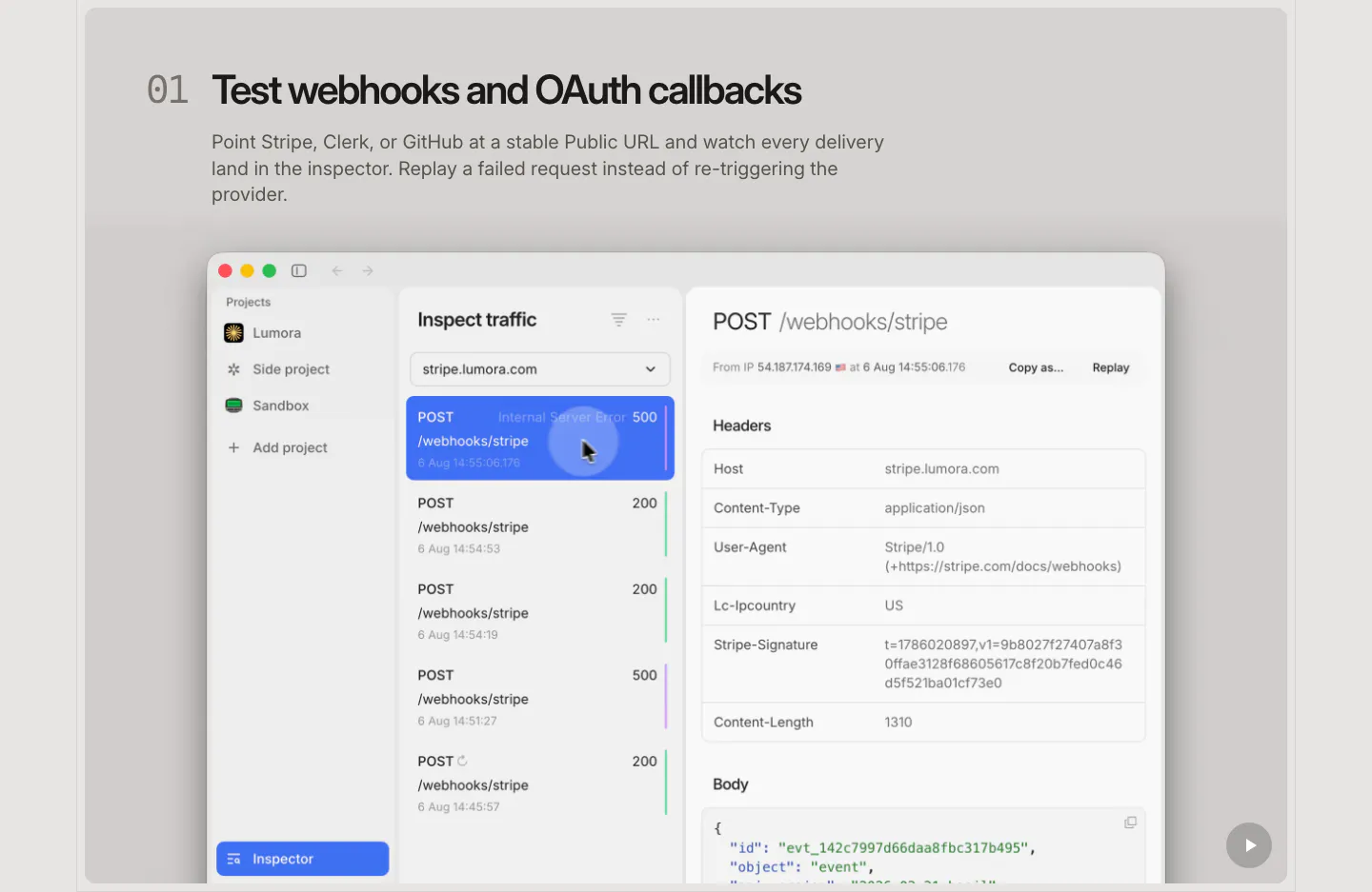
  8. LocalCan features section: numbered headline and description above a large macOS-style traffic inspector screenshot of webhook requests
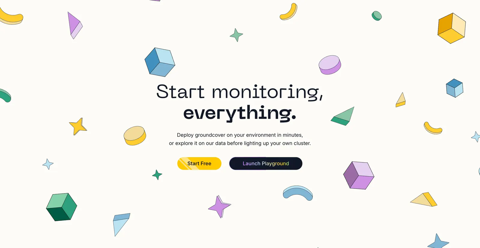
  9. groundcover call-to-action section: centered headline with yellow and dark buttons surrounded by scattered isometric shapes on cream
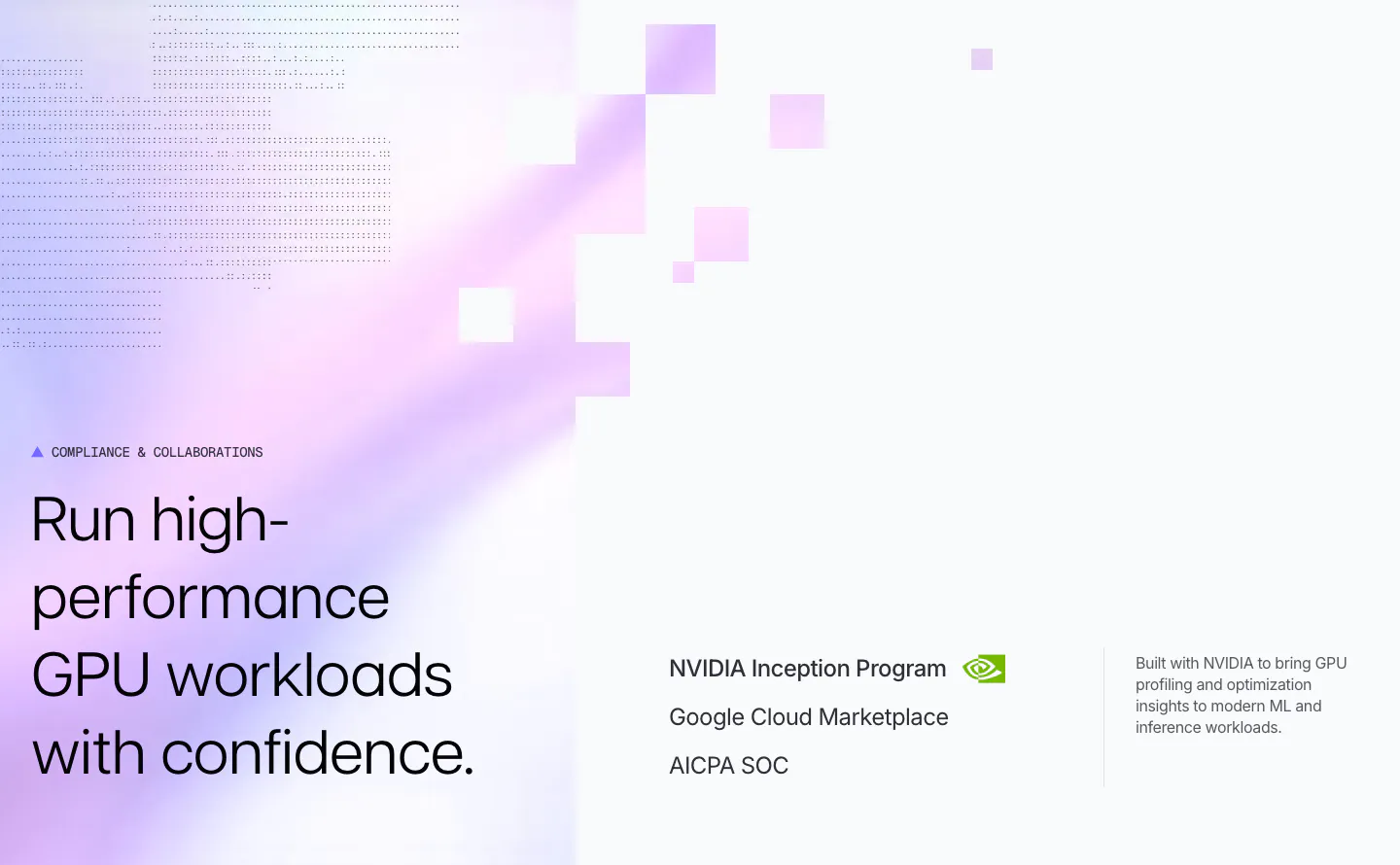
  10. Polar Signals security section: headline on a lavender gradient with pixel squares and dot texture, beside NVIDIA, Google Cloud and SOC credentials
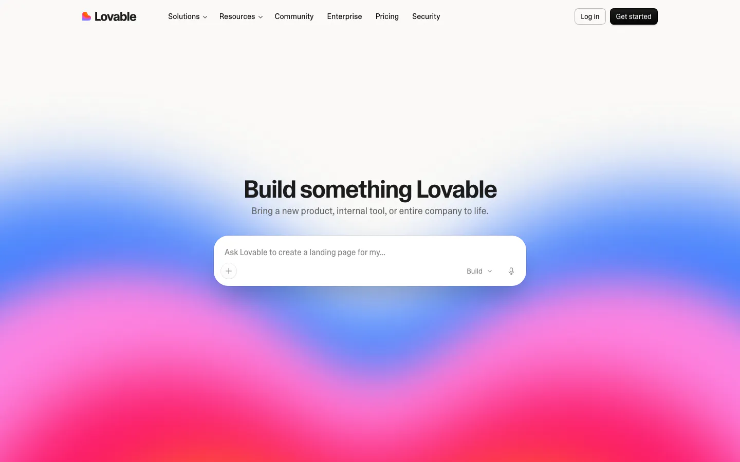
  11. Lovable hero section: centered headline and AI prompt input box over a vivid blue, pink and red gradient, with top navigation bar
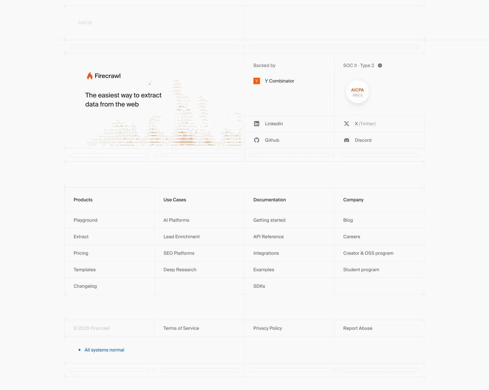
  12. Firecrawl footer section: logo, tagline and dithered chart art, backer and SOC 2 badges, four link columns in a gridded light layout
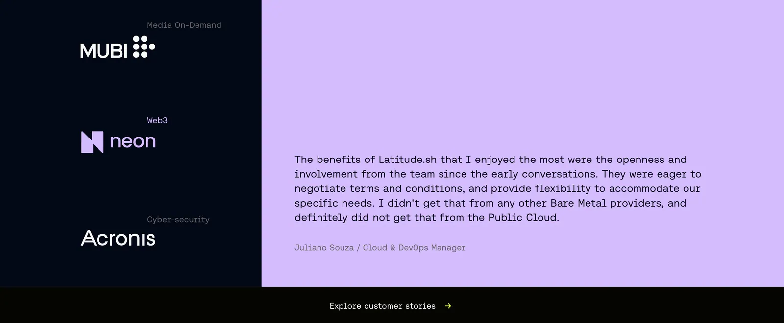
  13. Latitude.sh testimonials section: customer logos stacked on a dark navy left panel beside a monospace quote on lavender
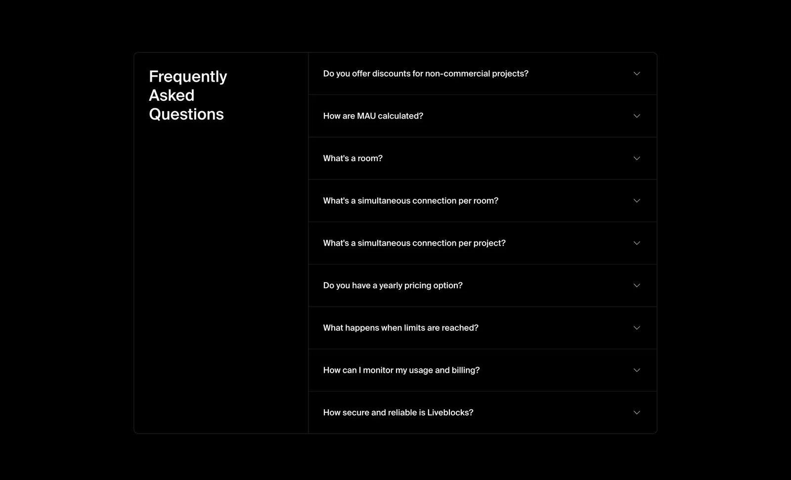
  14. Liveblocks FAQ section: bordered two-column panel with the heading on the left and a collapsed nine-question accordion on the right, on black
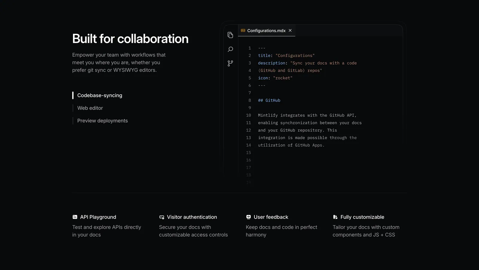
  15. Mintlify features section: dark split layout with tab list beside an MDX code editor, above a four-column feature row
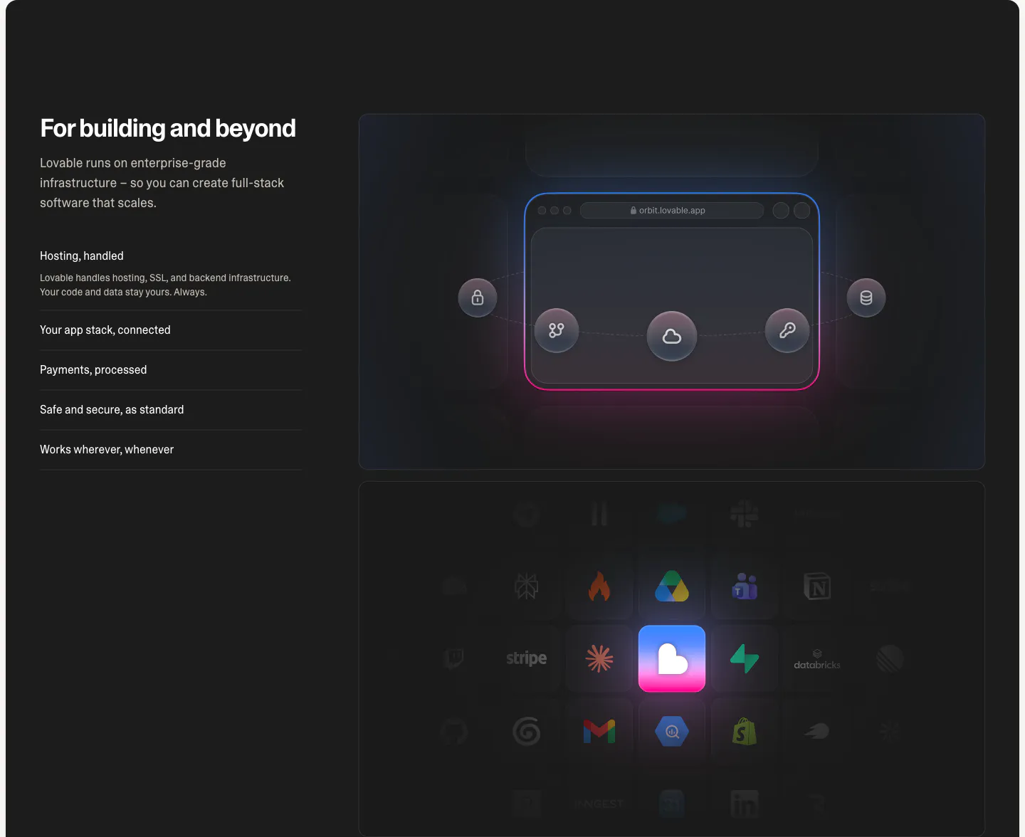
  16. Lovable features section: dark split layout with headline and capability list beside a glowing browser diagram and integration icon grid
  17. Laravel Cloud call-to-action section: left-aligned pricing headline with free-credit copy and two buttons over a faint blue glow on white
  18. Antimetal footer section: five corner-bracketed boxes with serif link lists, status badge, tagline and dotted logo mark on warm gray
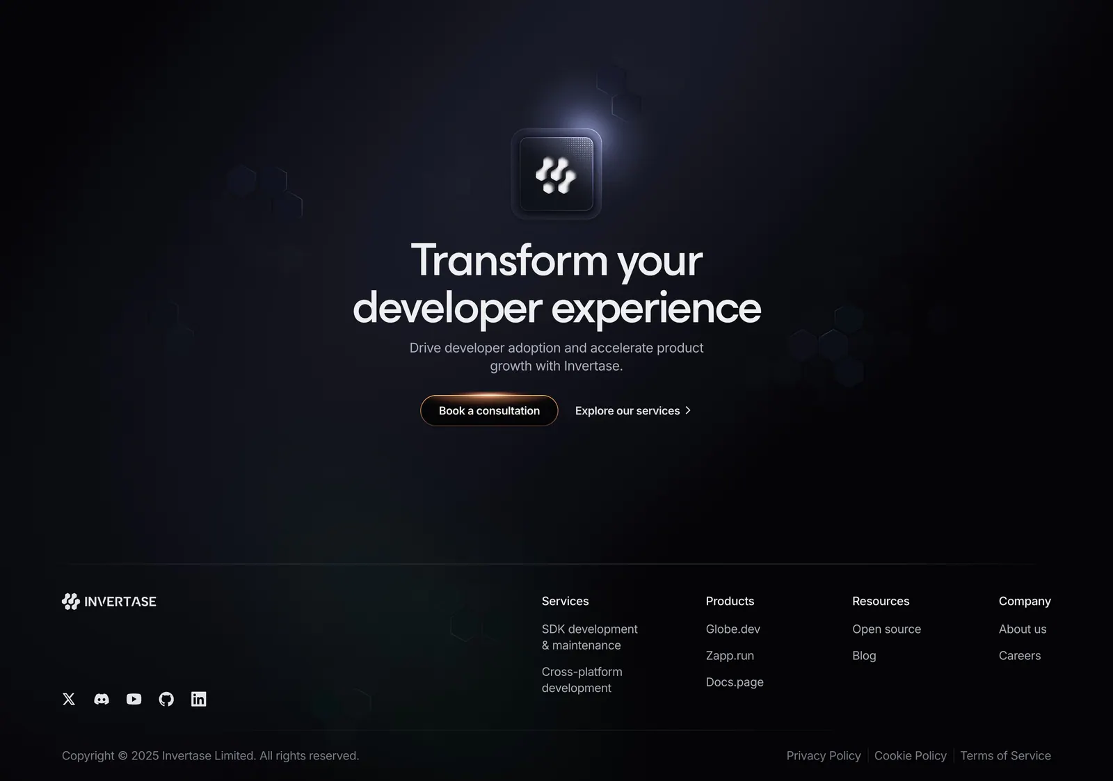
  19. Invertase call-to-action section: centered headline below a glowing logo tile with two buttons on a dark background with faint hexagons
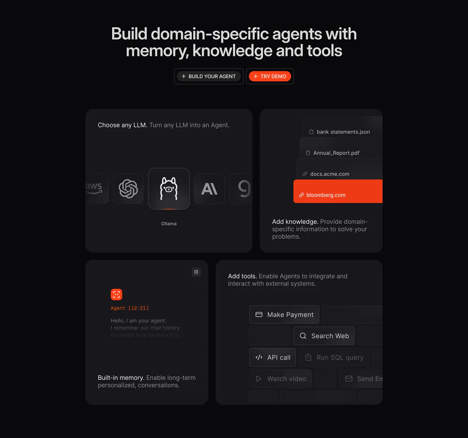
  20. Phidata features section: dark centered headline with two buttons above a four-tile bento of LLM picker, knowledge, memory and tools UI
  21. Ditto call-to-action section: centered two-tone headline with yellow and outline buttons inside a black dotted panel
  22. WorkOS security section: centered headline above a glowing blue wireframe robot on a dark navy background
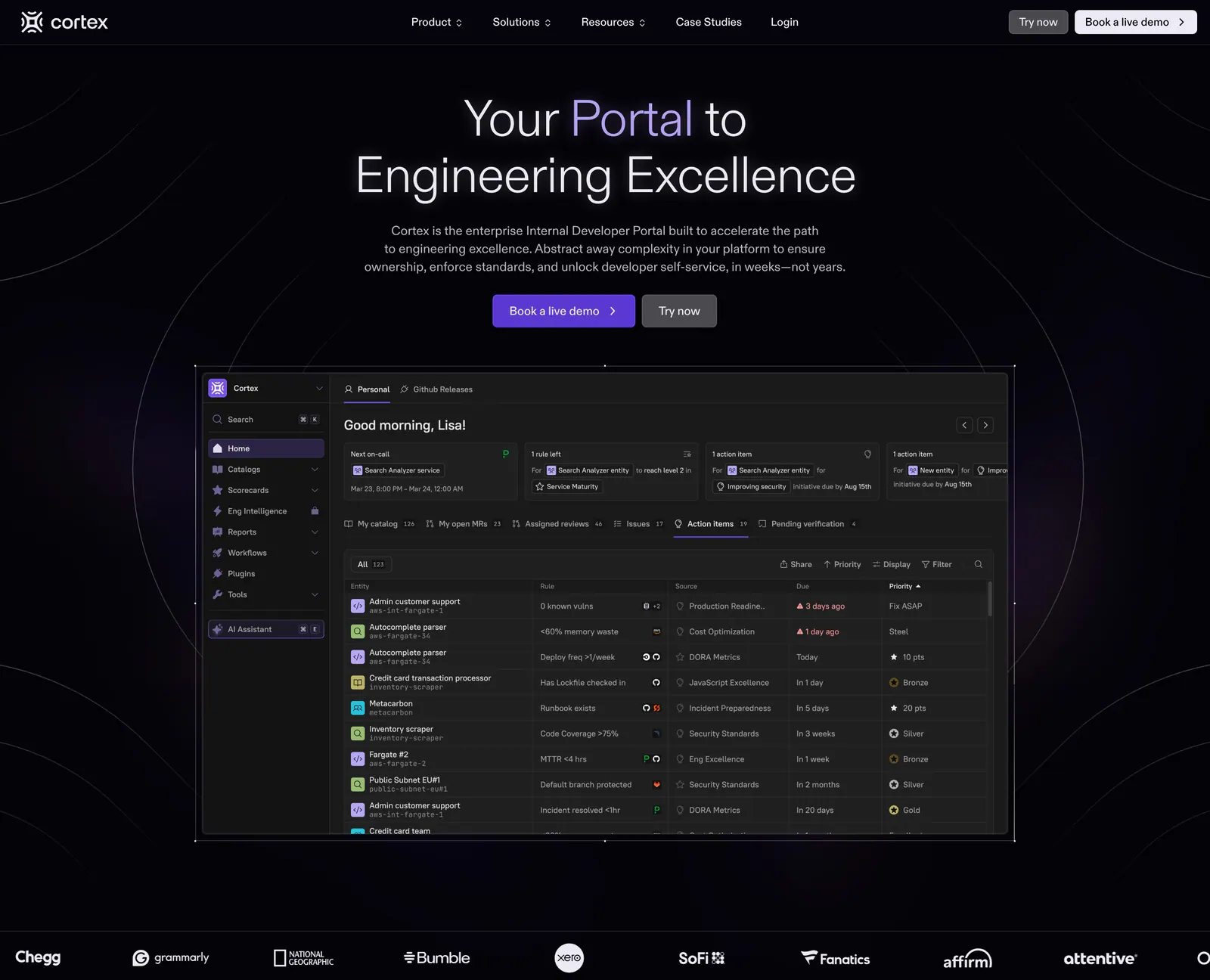
  23. Cortex hero section: centered headline and buttons above a dark developer portal dashboard screenshot and a customer logo row
  24. LocalCan testimonial section: row of grayscale customer logos above a dark green quote card with a green pixel dither pattern
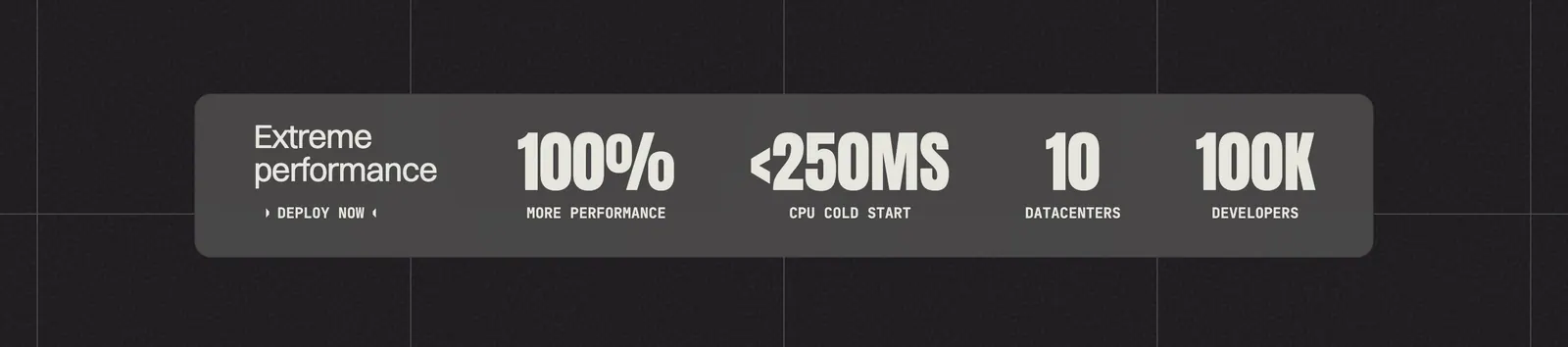
  25. Koyeb value proposition section: gray band with four large condensed metrics on a dark grid background
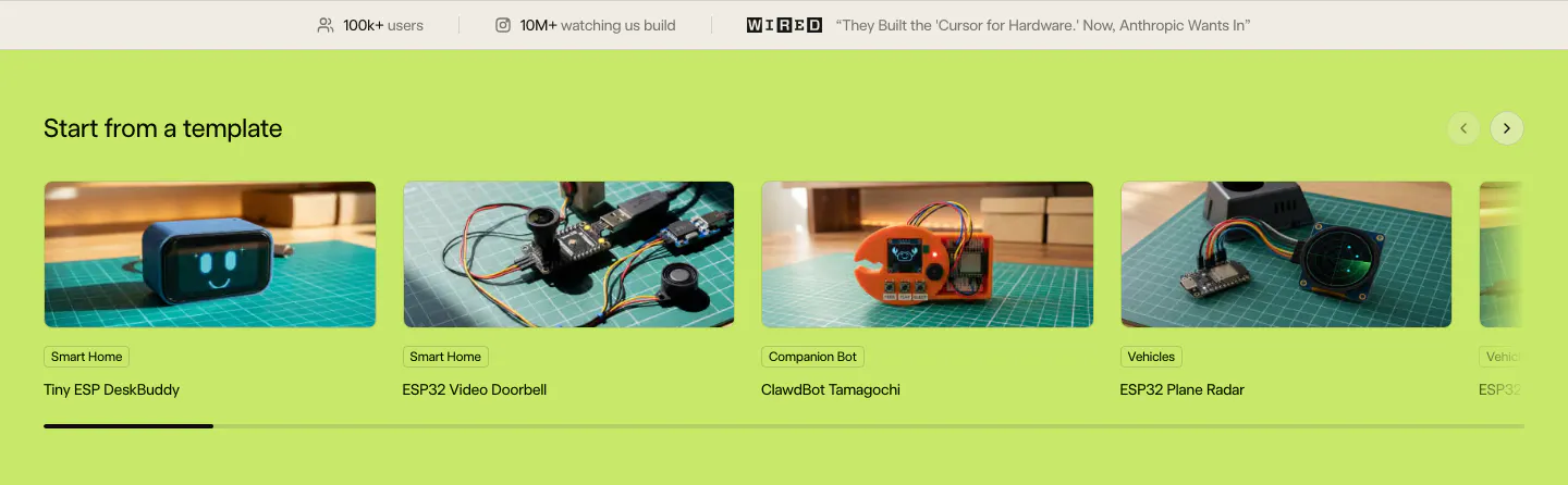
  26. Schematik features section: stats bar above a carousel of hardware template photo cards on a lime green background
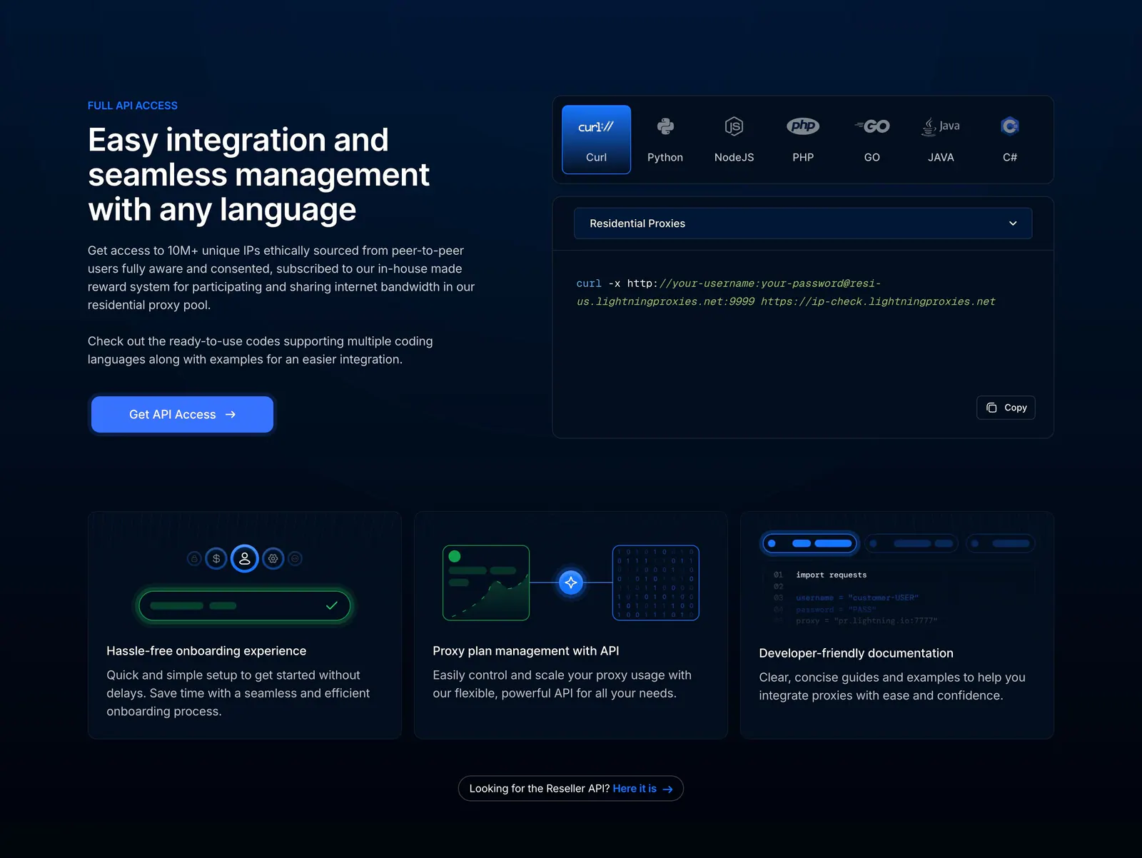
  27. Lightning Proxies features section: dark split layout with API copy beside a language-tabbed curl snippet, above three feature cards
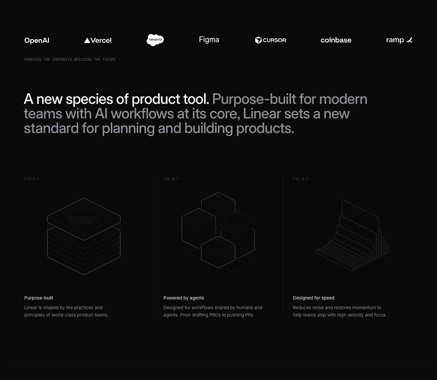
  28. Linear value proposition section: dark logo strip, two-tone statement and three columns with isometric line drawings and short benefits
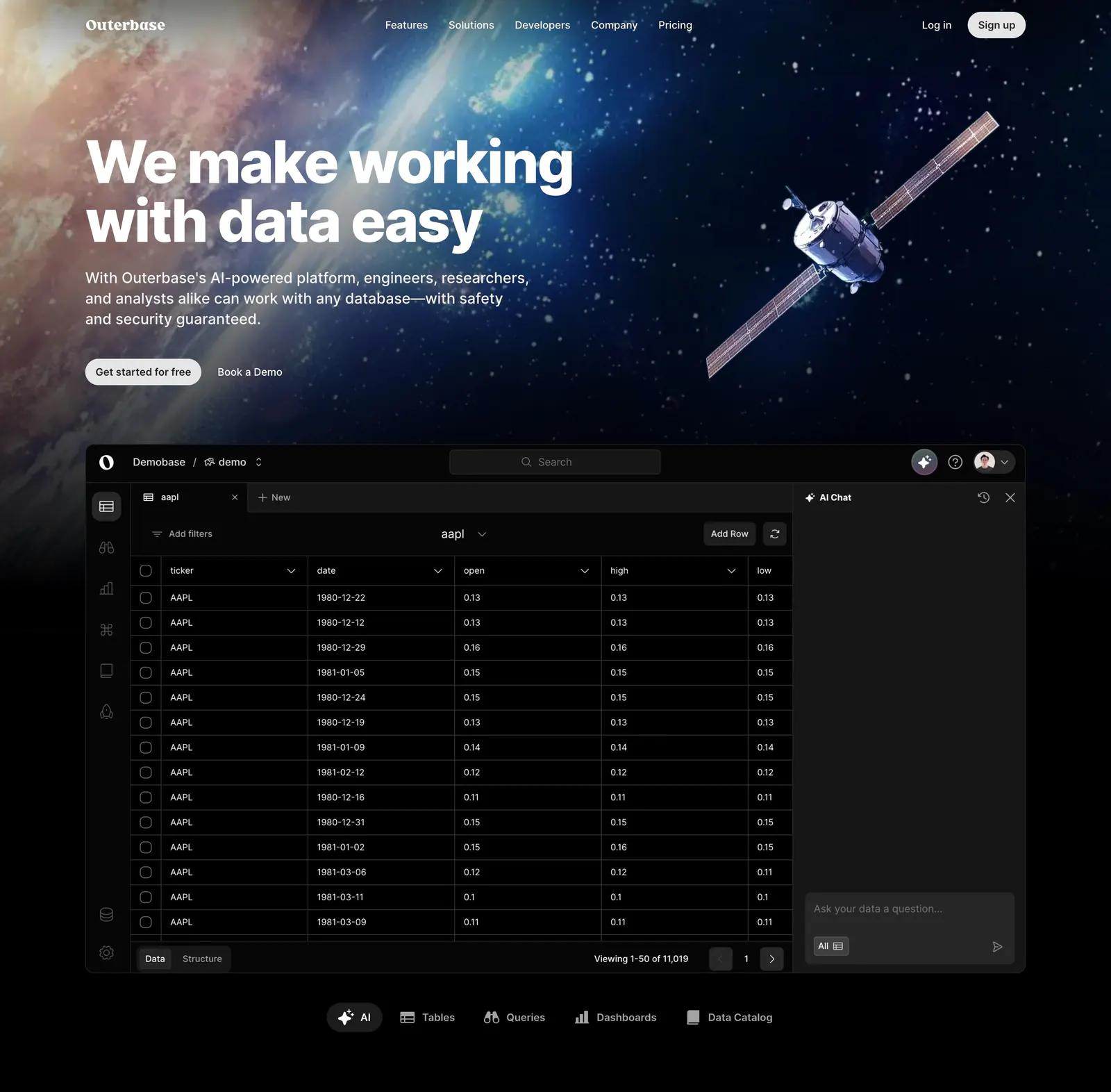
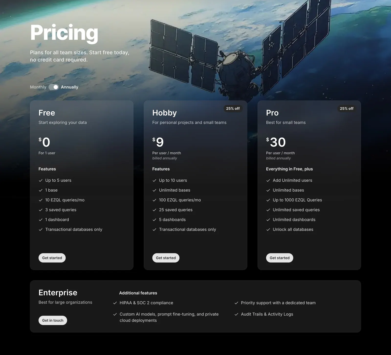
  29. Outerbase hero section: left-aligned headline over space artwork with a satellite, above a dark database table app screenshot and tabs
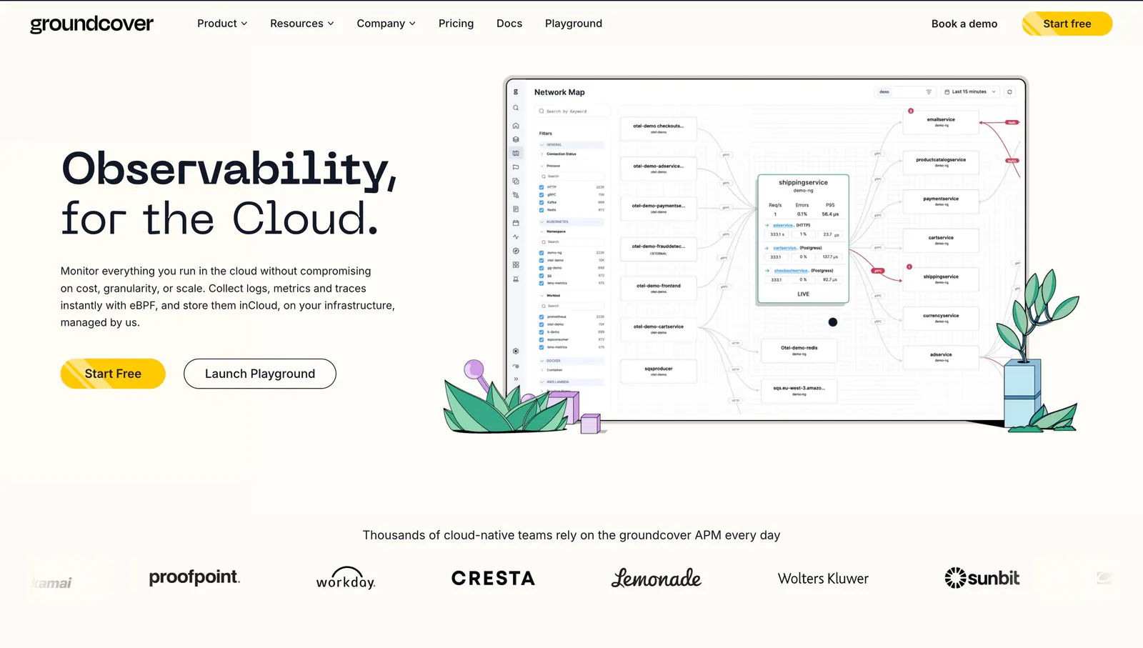
  30. groundcover hero section: headline, copy and buttons on the left, network map screenshot with plant drawings on the right, logo row below
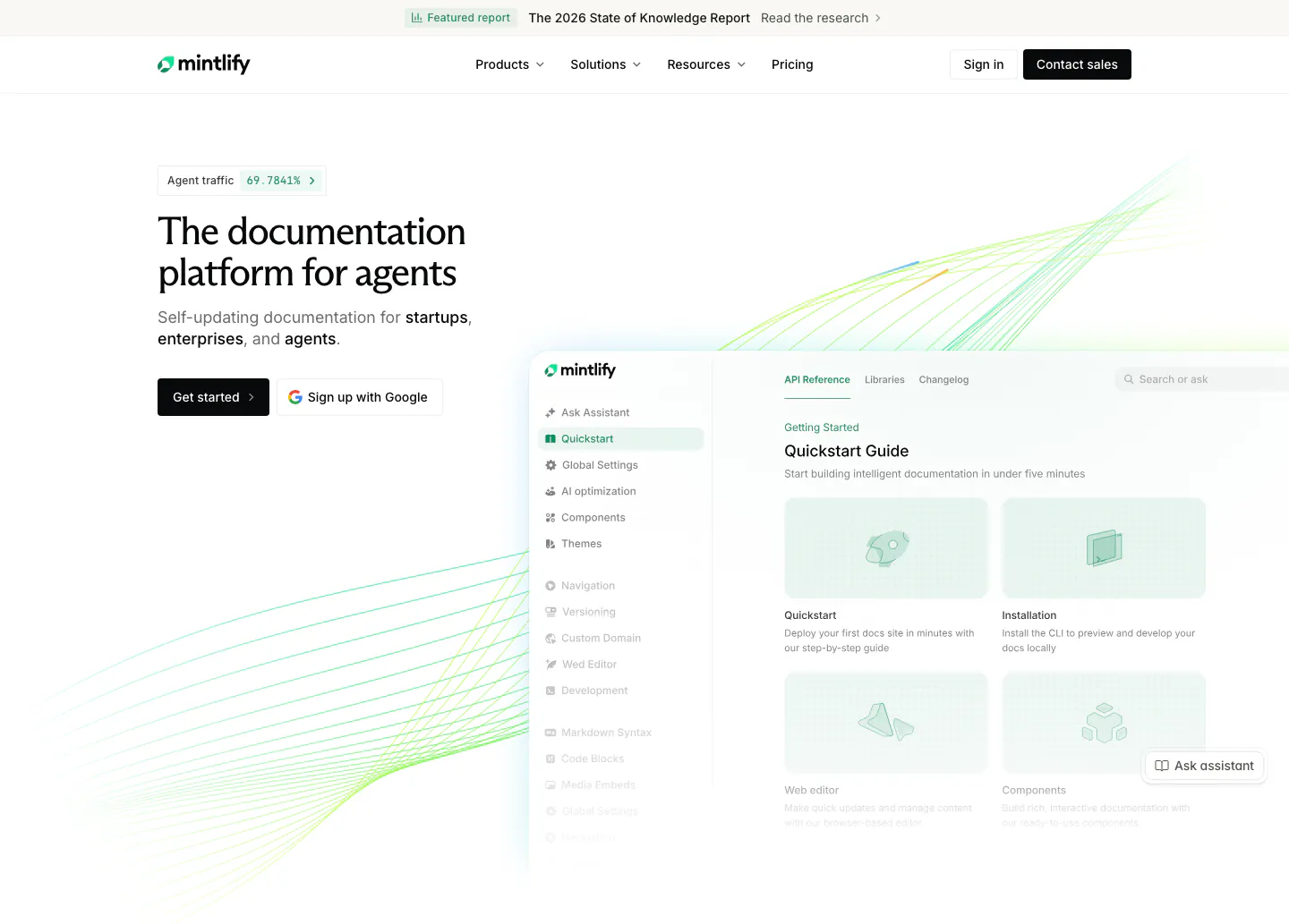
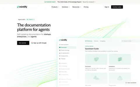
  31. Mintlify hero section: headline and two buttons on the left, documentation app screenshot on the right with green line waves
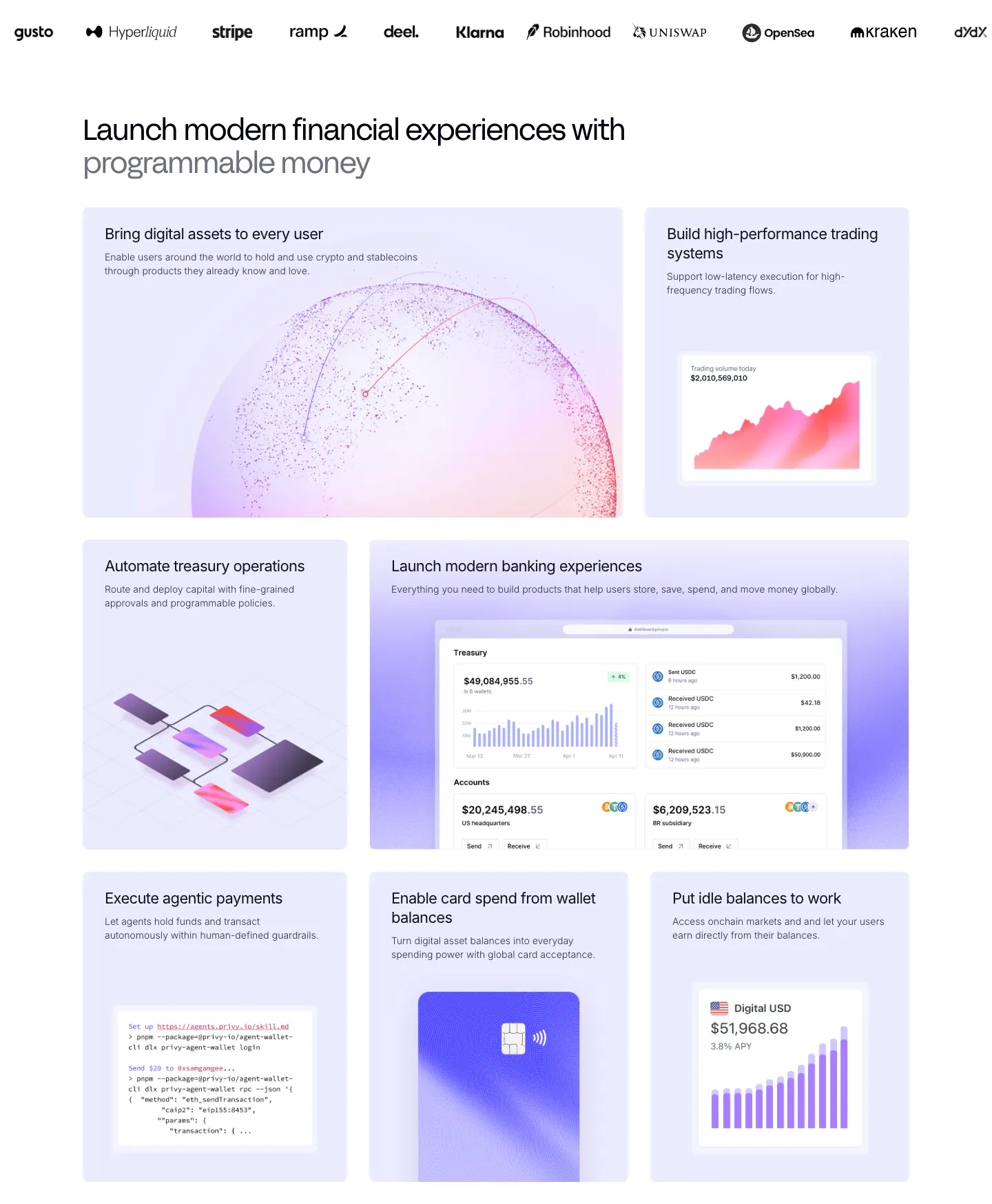
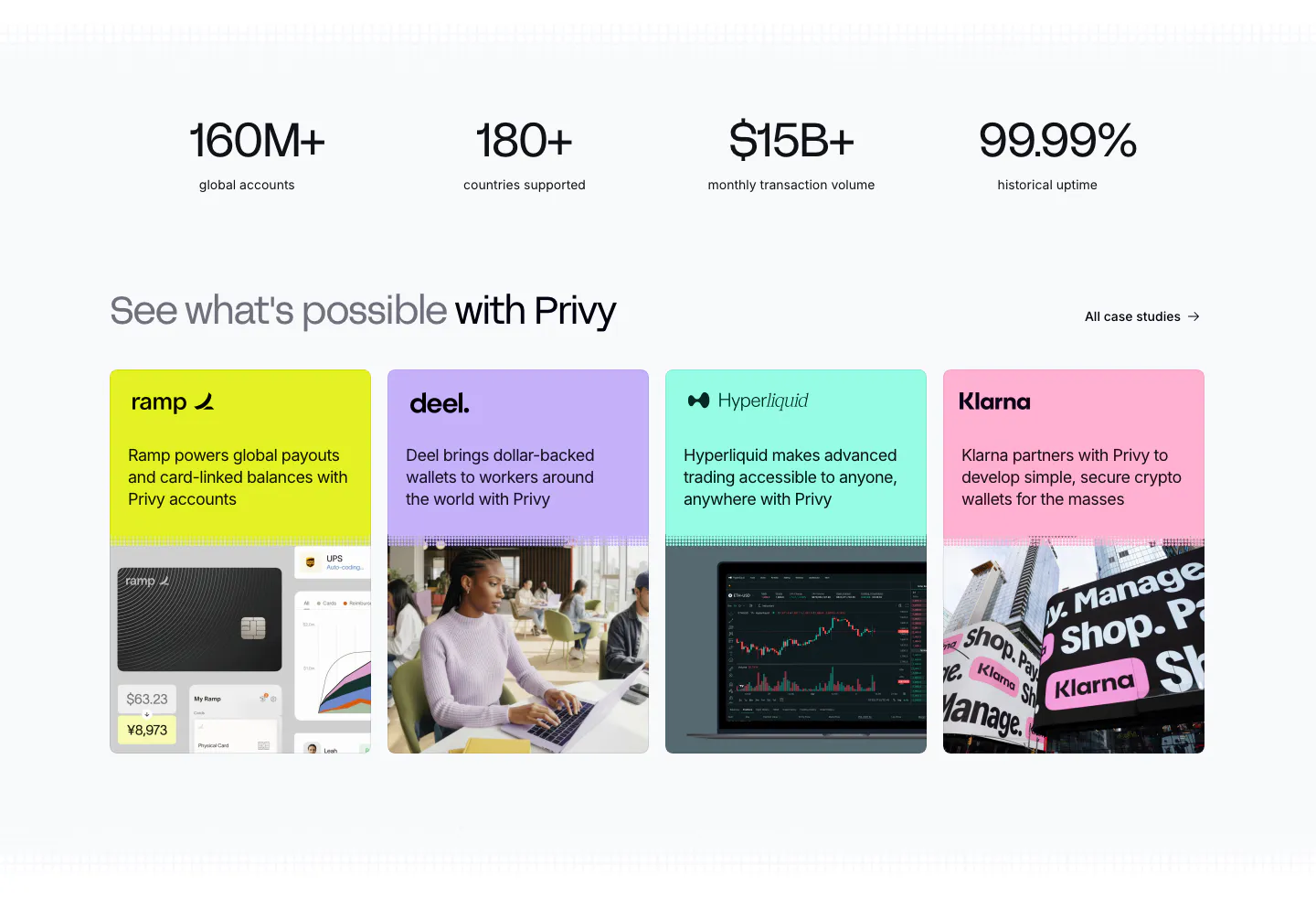
  32. Privy features section: customer logo strip above a bento grid of lavender tiles with dashboards, charts, a code snippet and a card visual
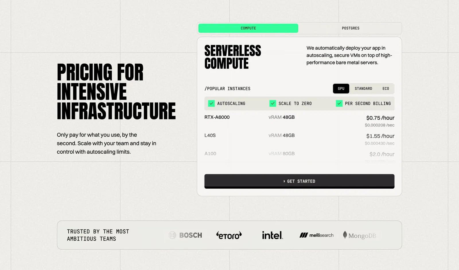
  33. Koyeb pricing section: condensed headline on the left, tabbed GPU instance price card on the right, logo strip below
  34. Neon logo cloud section: left-aligned headline beside a two-row grid of white customer logos on a black background
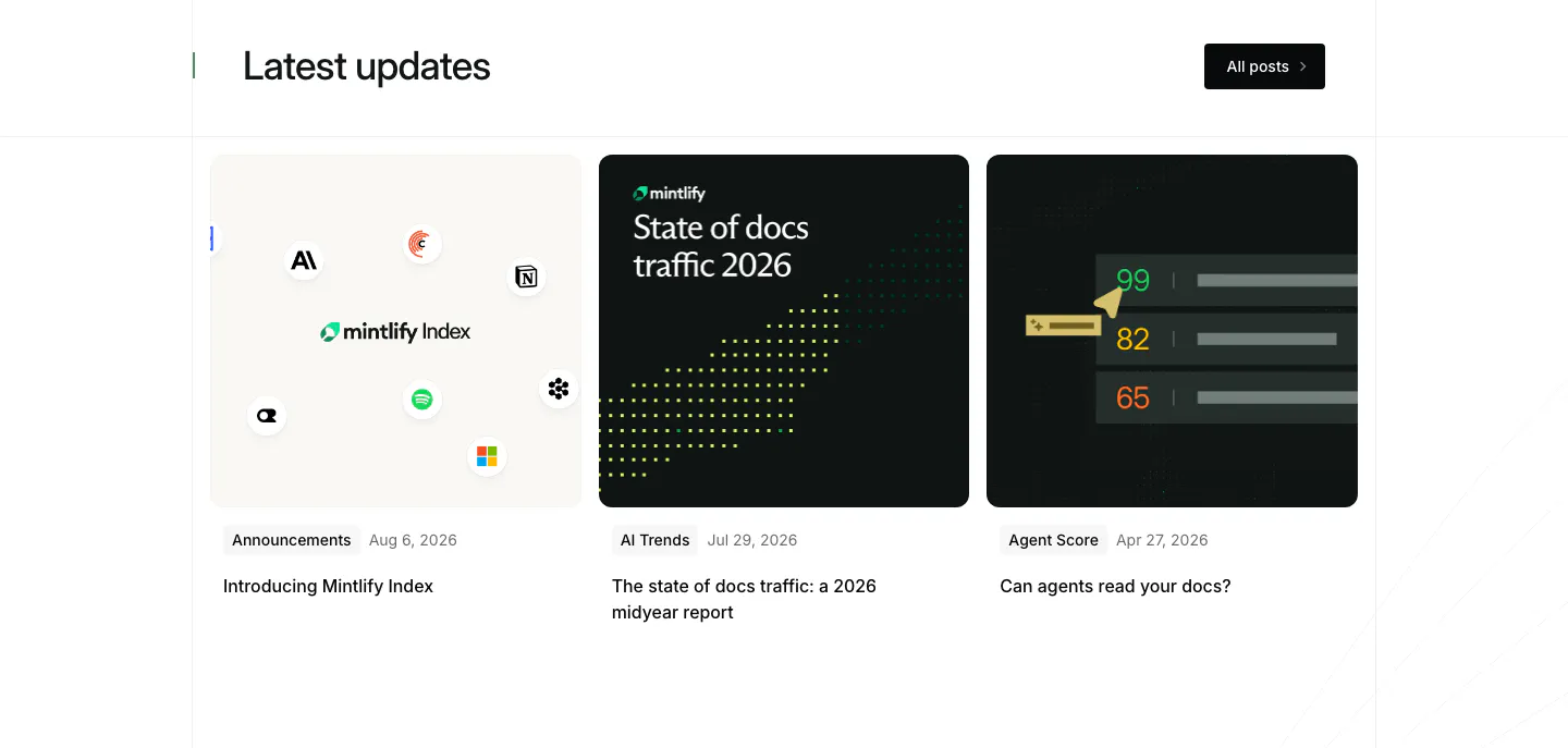
  35. Mintlify blog & resources section: headline with All posts button above three article cards with light and dark thumbnails
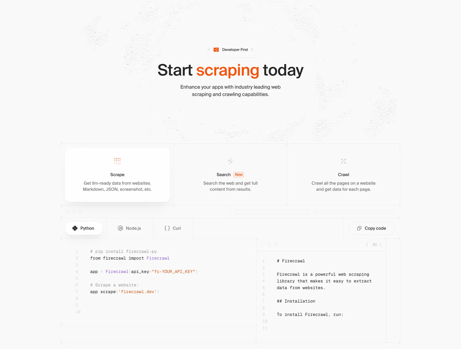
  36. Firecrawl features section: centered headline, three capability cards and a tabbed Python/Node.js/Curl code sample with markdown output
  37. Composio FAQ section: heading at left beside an accordion list of eleven questions with plus icons on near-black
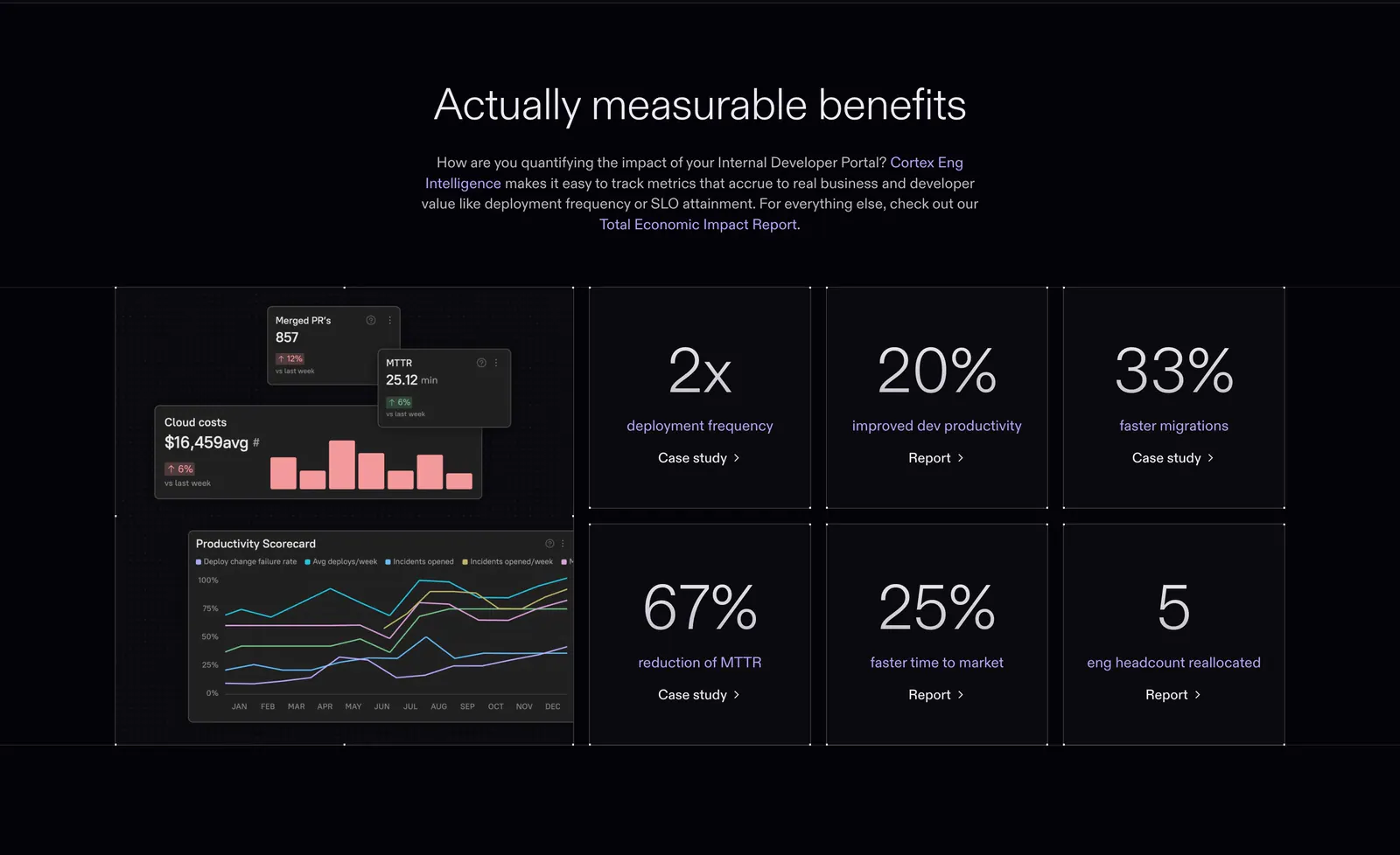
  38. Cortex value proposition section: centered headline above a dashboard chart tile and six large percentage stat tiles on dark
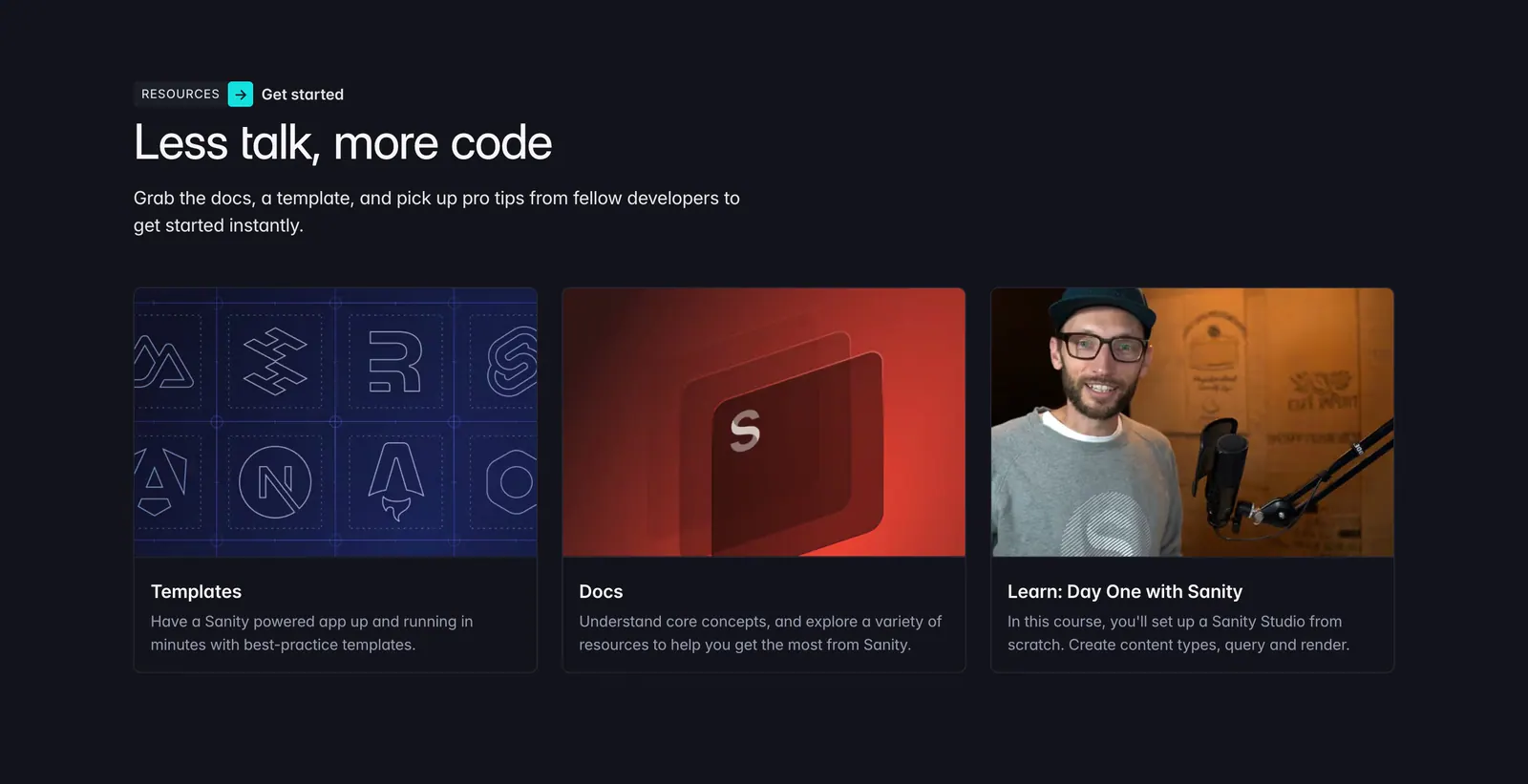
  39. Sanity blog & resources section: left-aligned headline above three resource cards for templates, docs and a course on a dark background
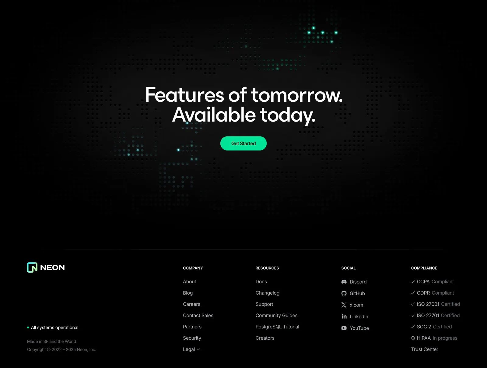
  40. Neon footer section: dark dot-grid CTA band above a footer with logo, company, resources, social and compliance link columns
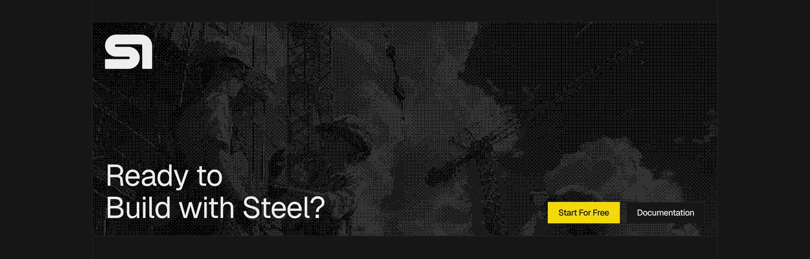
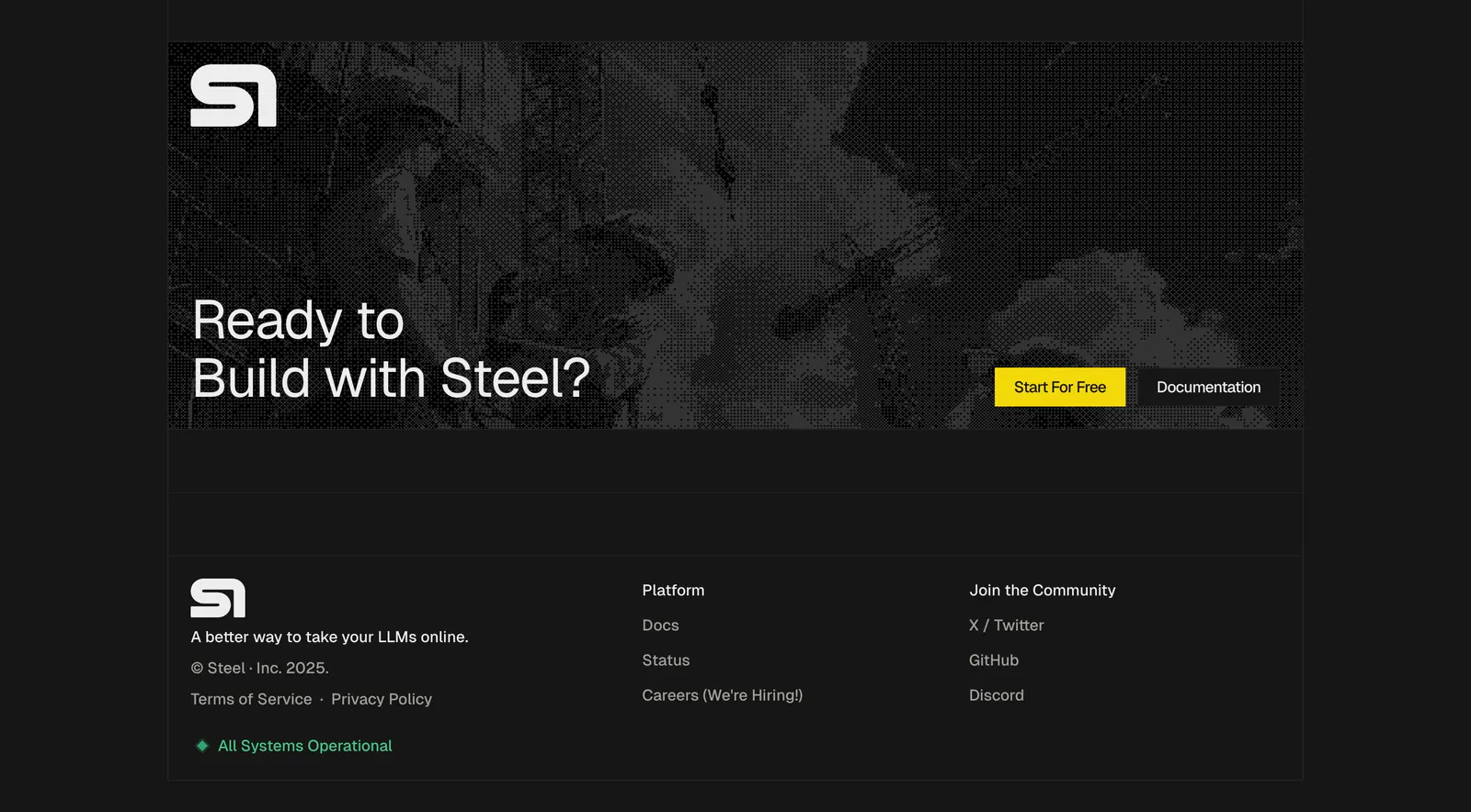
  41. Steel call-to-action section: dithered grayscale construction photo banner with logo, large headline and yellow button on a dark background
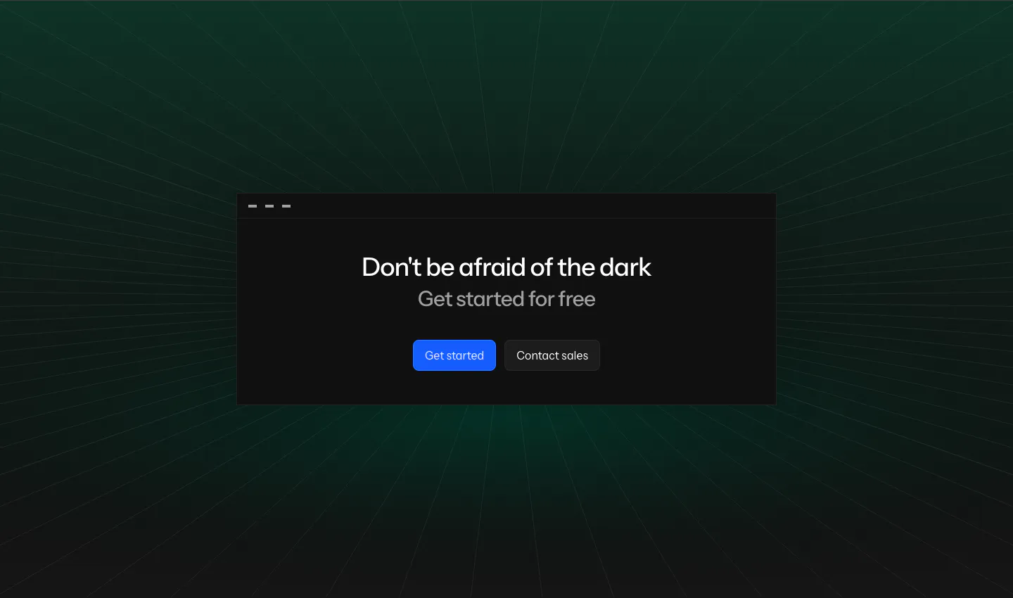
  42. Laravel Nightwatch call-to-action section: centered headline and buttons in a dark window card over a green-tinted perspective grid
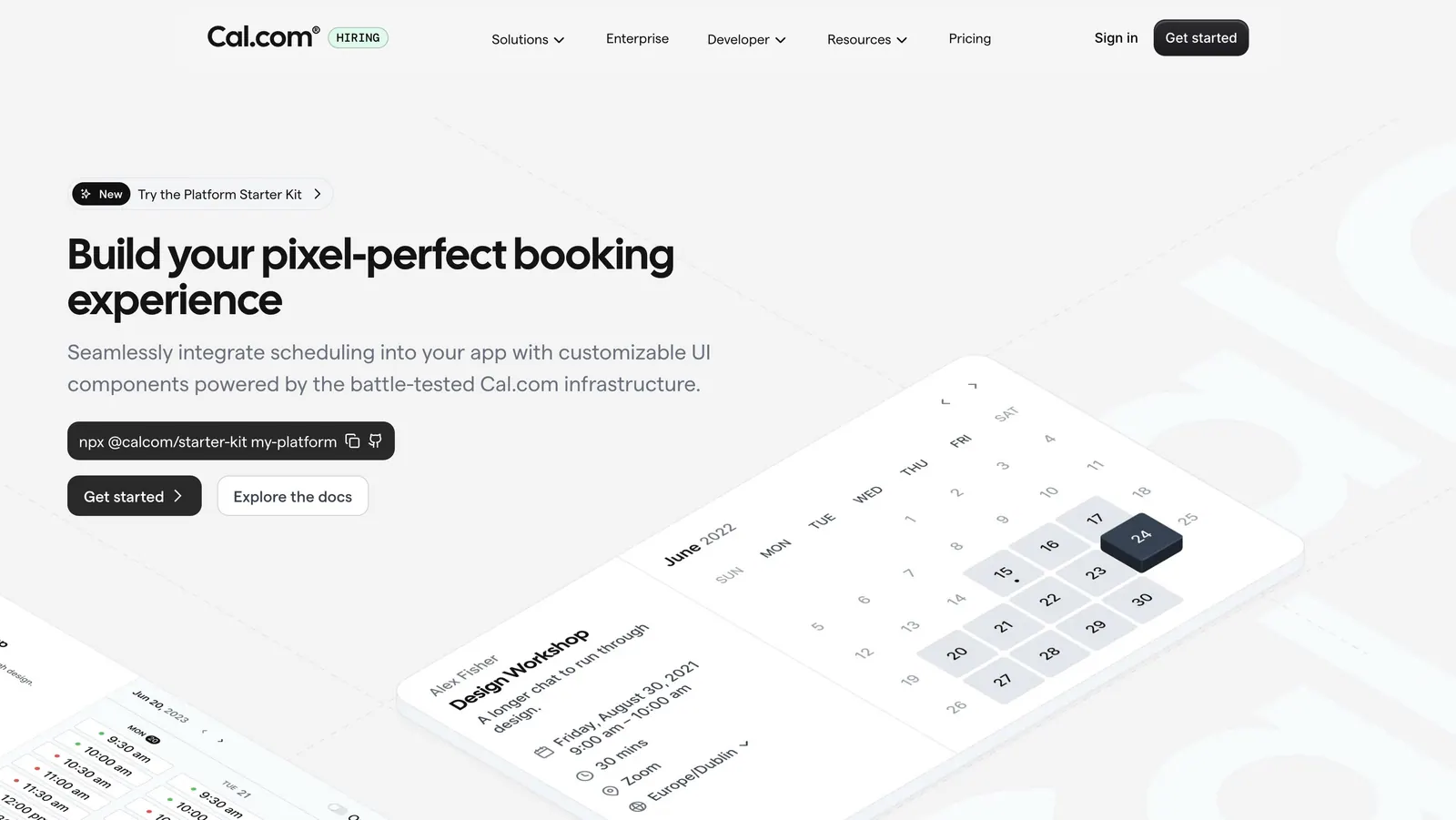
  43. Cal.com hero section: headline, npx command and buttons left beside tilted isometric calendar booking UI cards on light gray
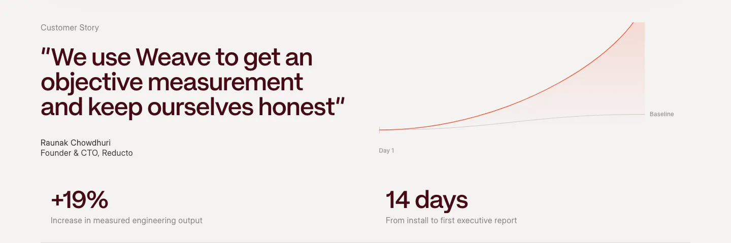
  44. Weave testimonials section: large quote with attribution beside a growth line chart, above two outcome metrics on a warm light background
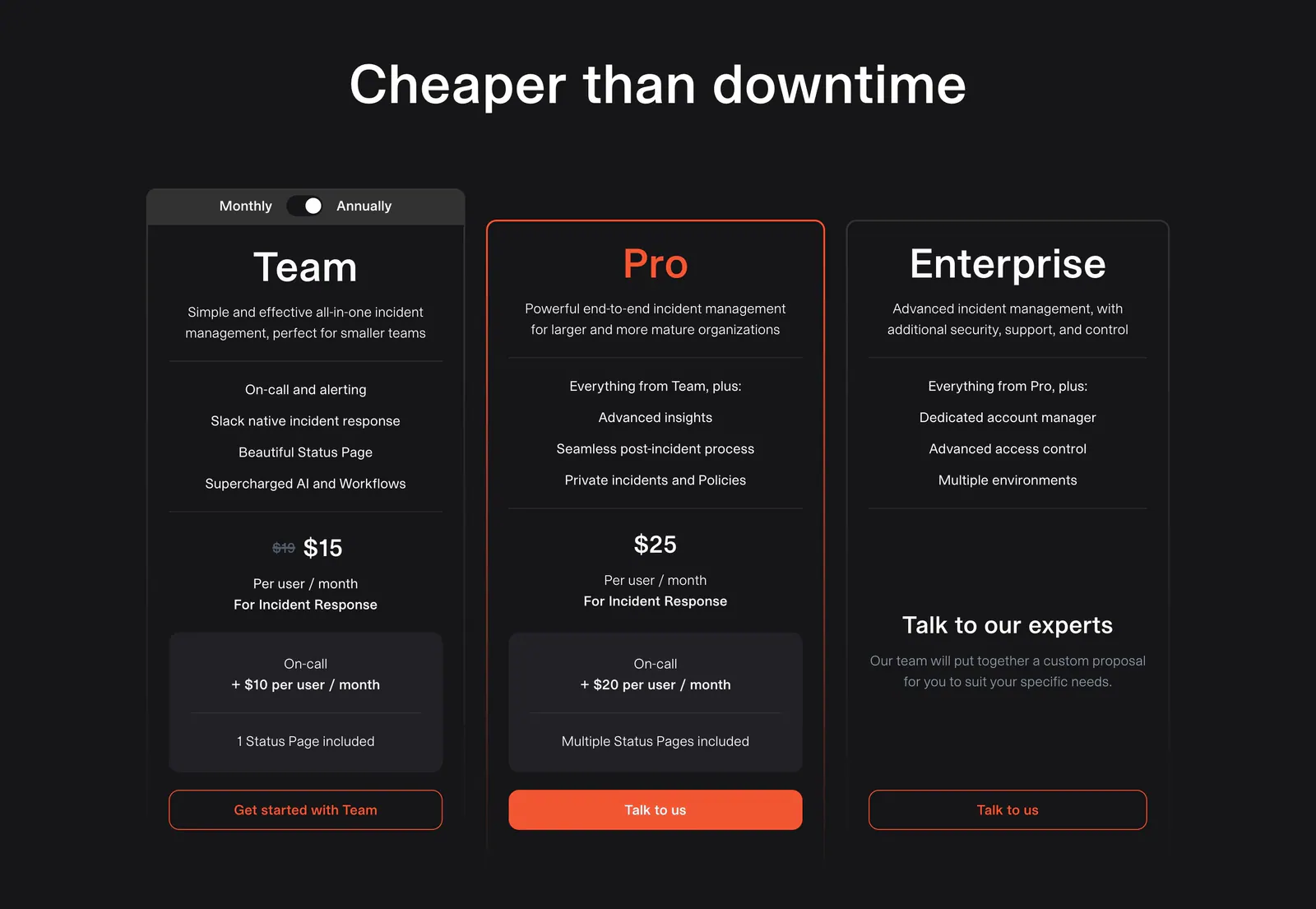
  45. incident.io pricing section: centered headline above three dark plan cards with a monthly/annual toggle and orange buttons
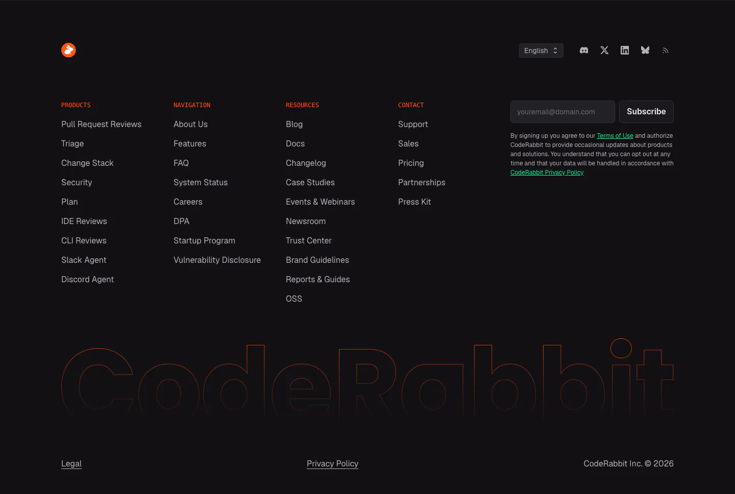
  46. CodeRabbit footer section: dark link columns with orange labels, email subscribe field and a huge outlined CodeRabbit wordmark
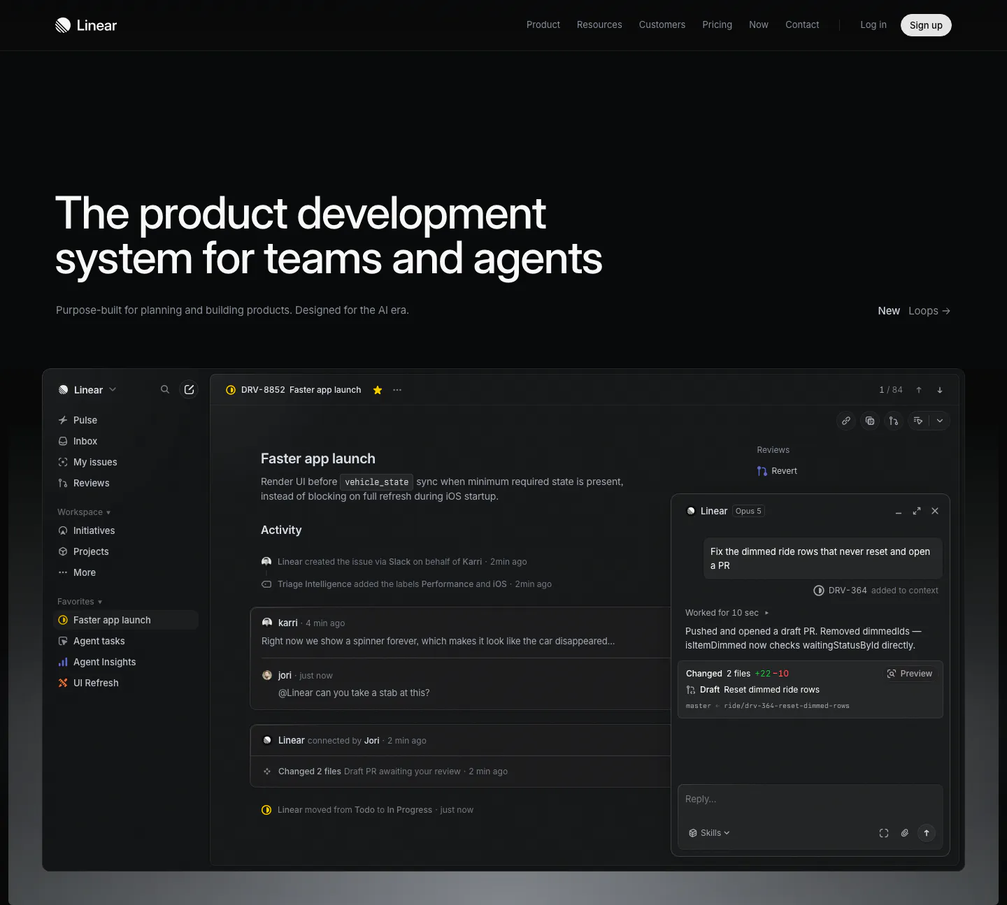
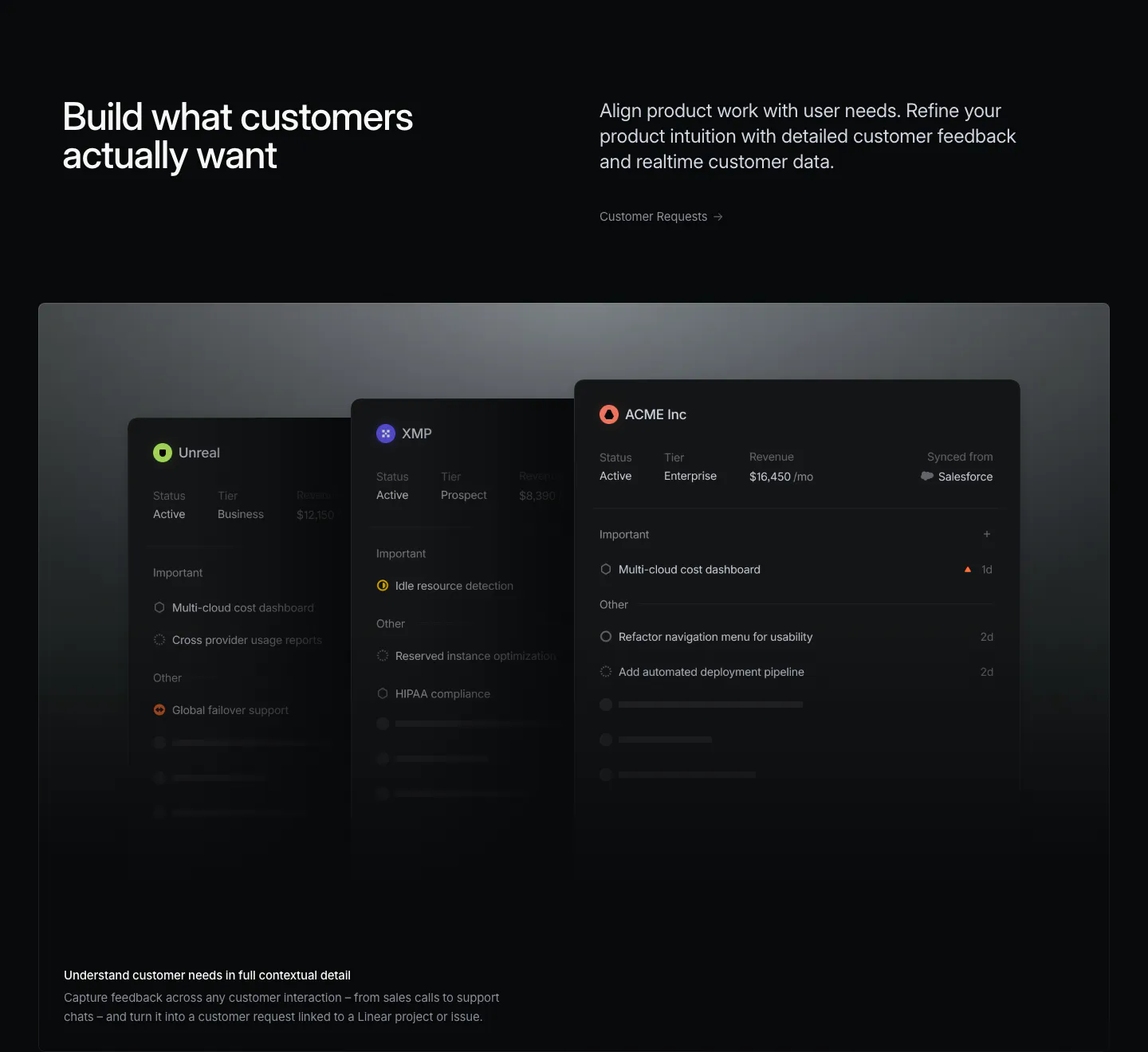
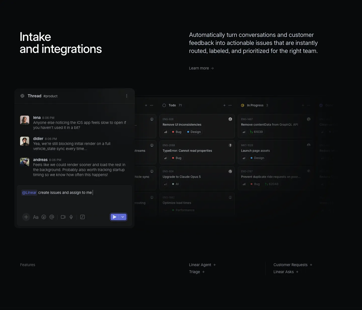
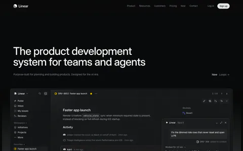
  47. Linear hero section: dark page with a large left-aligned headline and a full-width issue tracker screenshot with an agent chat panel
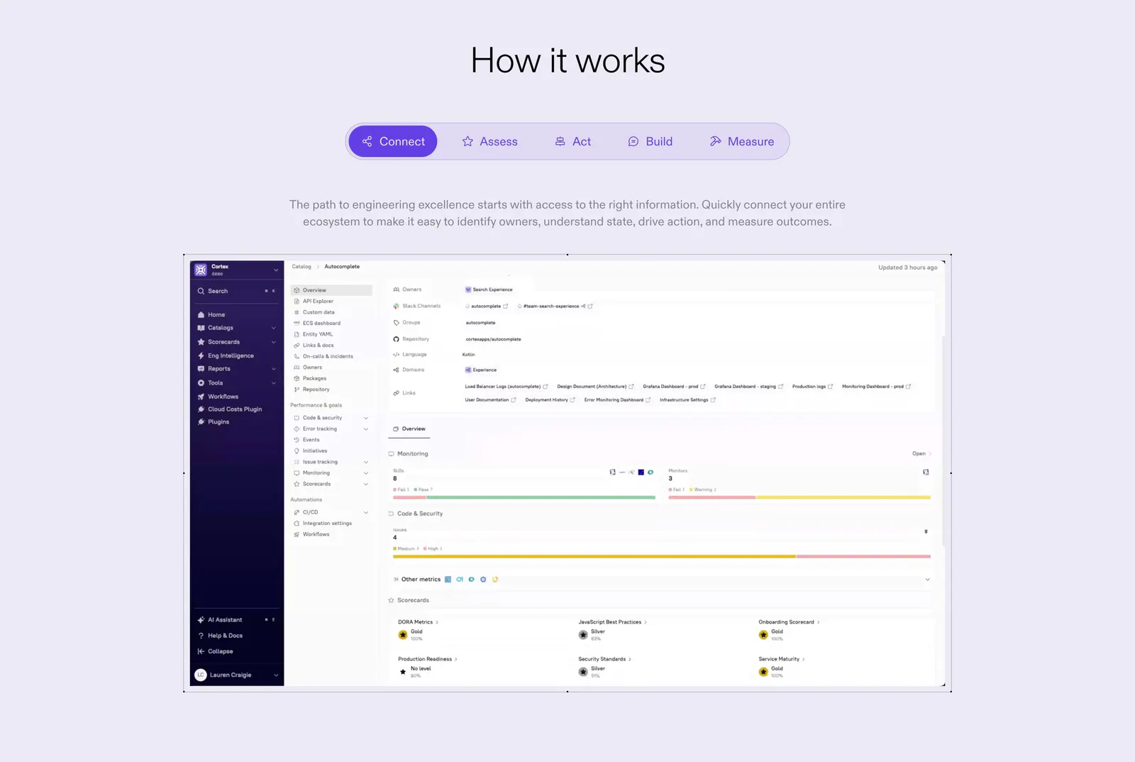
  48. Cortex how it works section: centered heading and five-step tab bar above a catalog dashboard screenshot on lavender
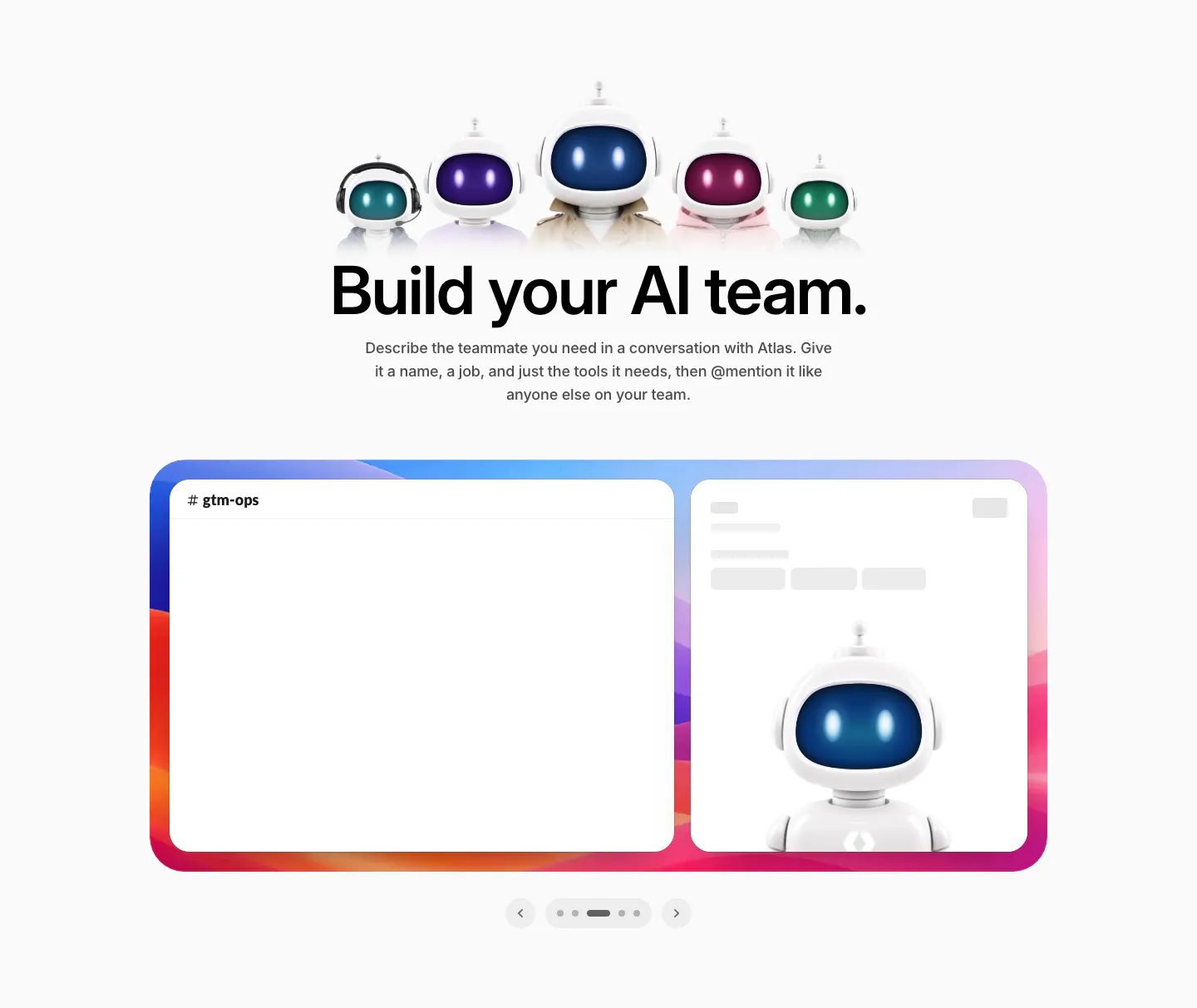
  49. WorkOS features section: row of 3D robot characters above a centered headline and a Slack mockup carousel
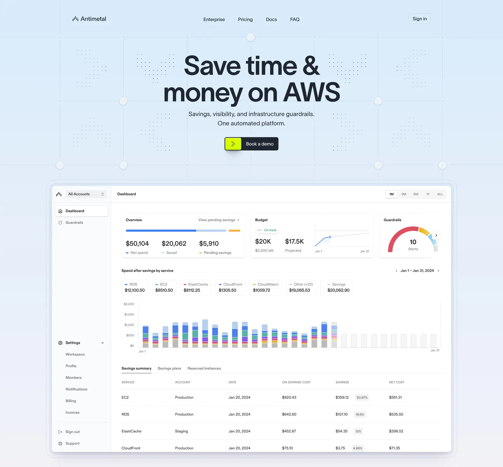
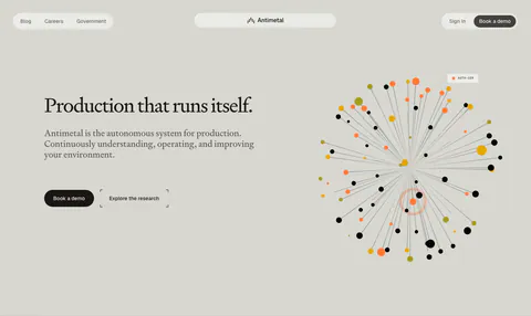
  50. Antimetal hero section: centered headline and button on a light blue grid pattern above a large AWS cost dashboard screenshot
  51. Inertia.js call-to-action section: centered headline with blue and outline buttons amid scattered dotted isometric 3D shapes on white
    Inertia.js Call to action
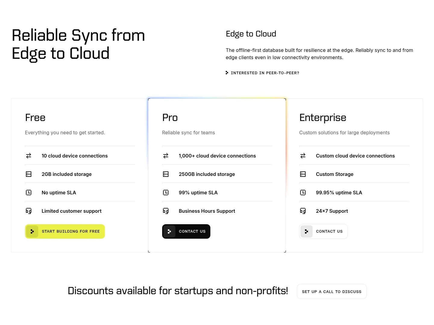
  52. Ditto pricing section: headline and intro above three plan cards for Free, Pro and Enterprise with icon feature rows, Pro with a glowing border
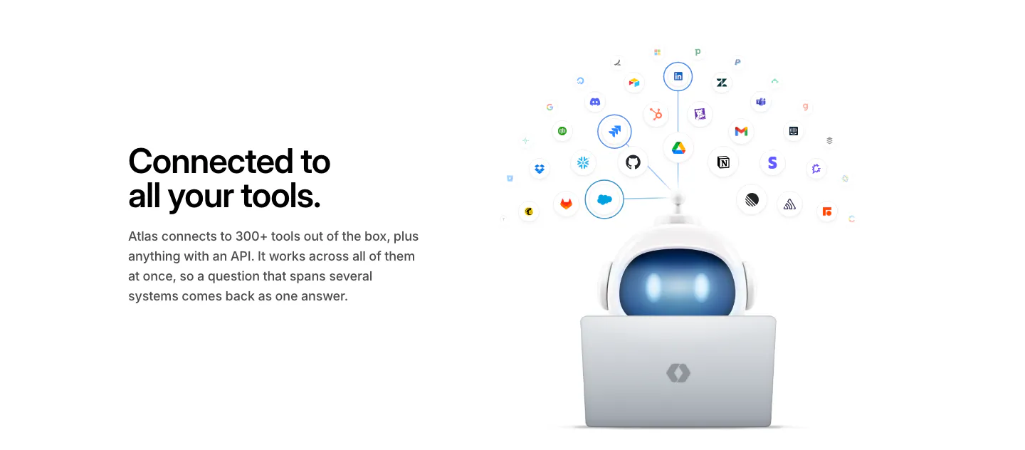
  53. WorkOS integrations section: headline on the left, 3D robot at a laptop under an arc of connected app icons on the right
  54. incident.io logo cloud section: small uppercase label above three rows of black customer logos on white
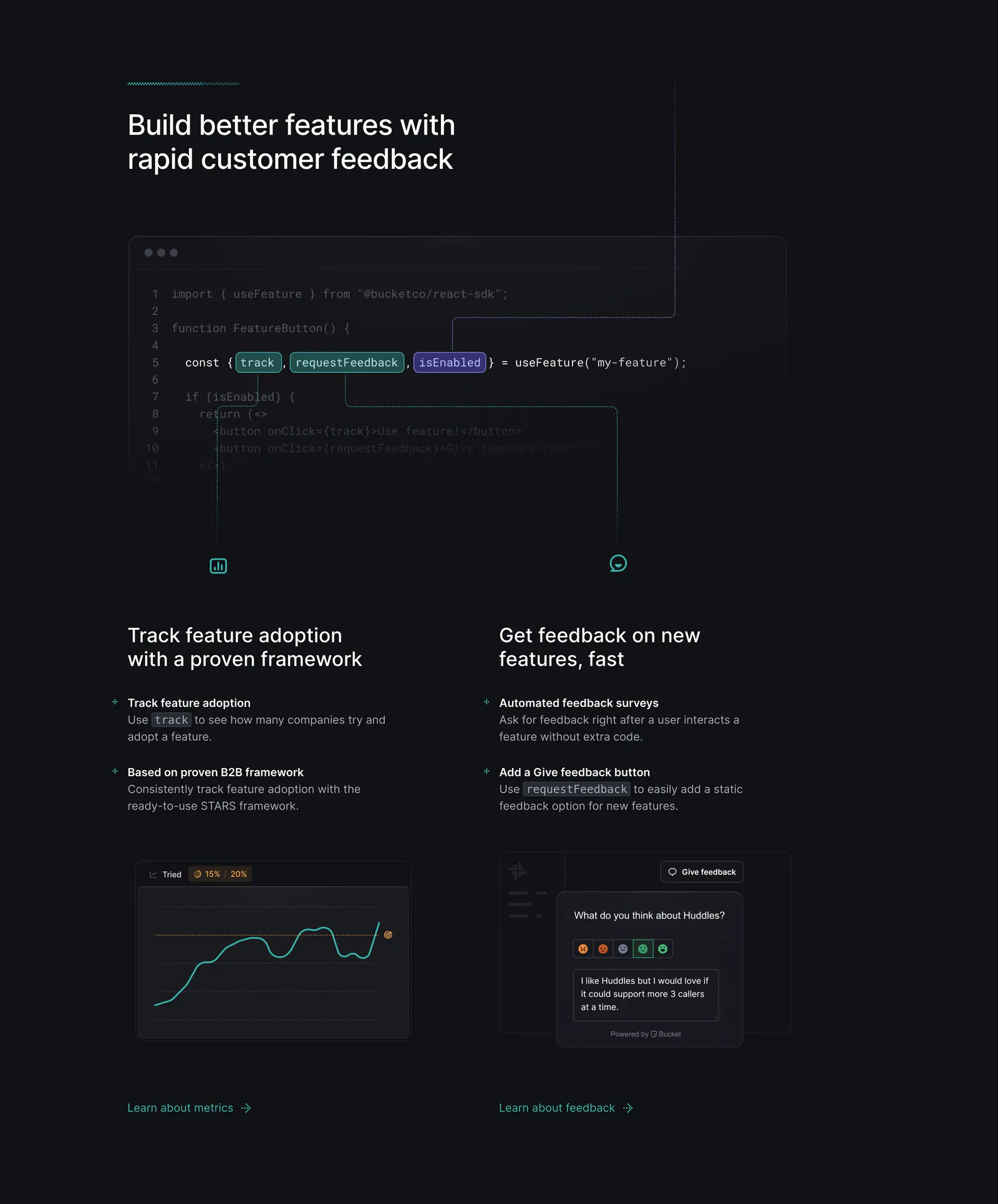
  55. Bucket features section: code snippet with highlighted hooks linked by lines to two feature columns with chart and feedback UI on dark
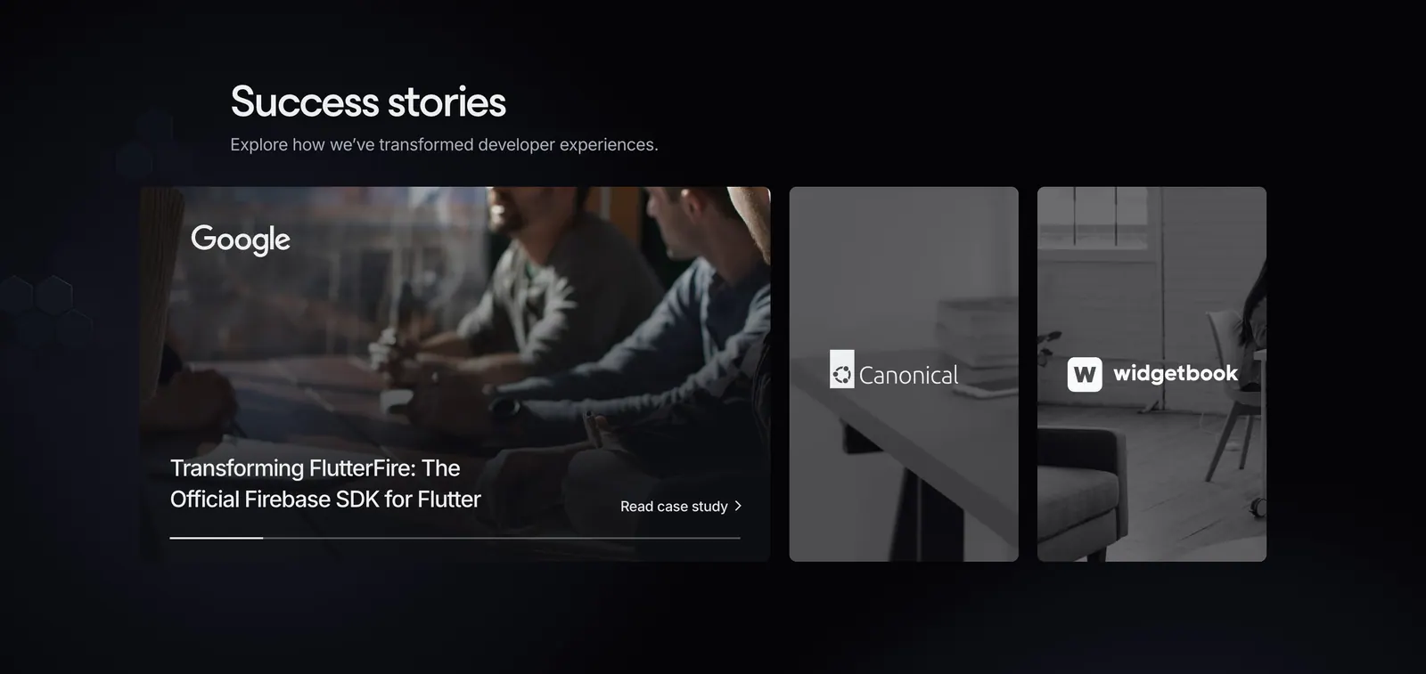
  56. Invertase testimonials section: headline above an expanded case-study card and two narrow photo cards with client logos on dark
  57. Mintlify logo cloud section: centered heading above two rows of grayscale customer logos and an Our customers button on black
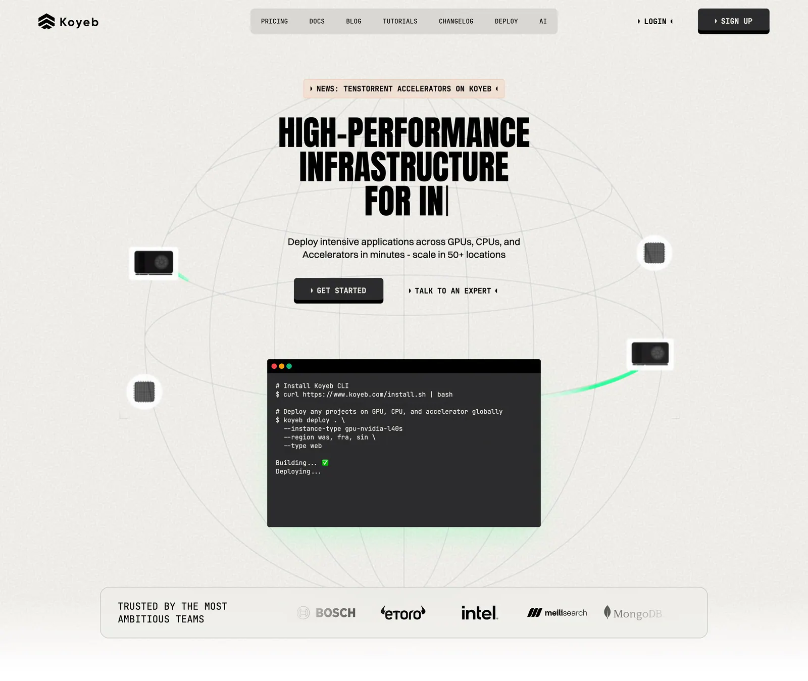
  58. Koyeb hero section: centered condensed headline and buttons over a wireframe globe with a terminal window and a logo strip
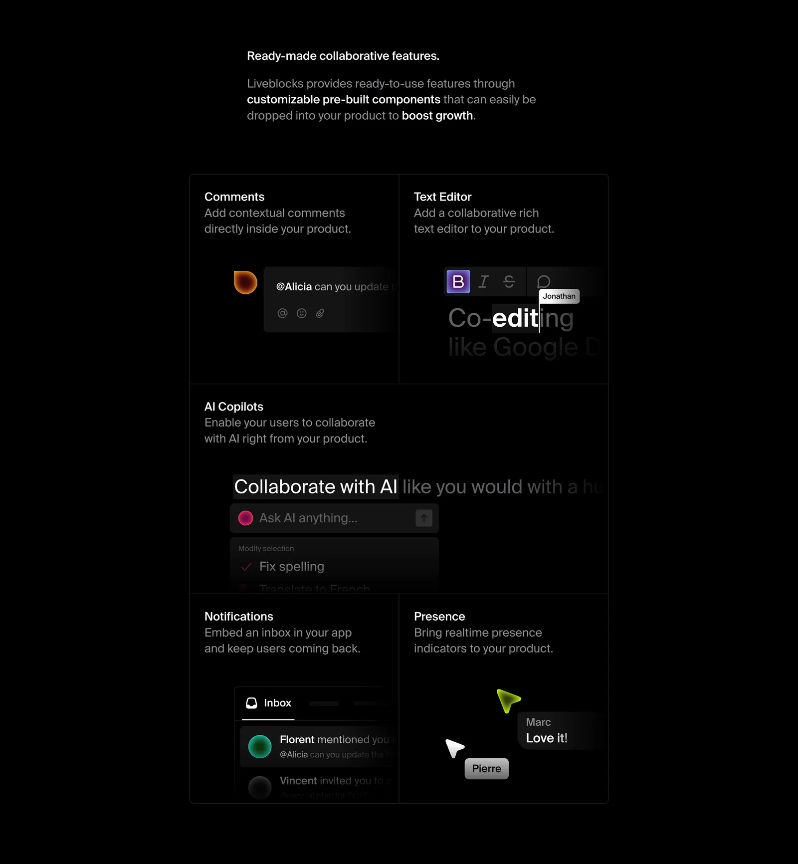
  59. Liveblocks features section: short intro copy above a dark bento grid of comments, text editor, AI copilot, notifications and presence UI tiles
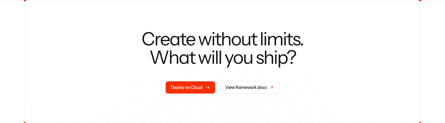
  60. Laravel call-to-action section: centered two-line headline with an orange Deploy on Cloud button and a framework docs button on white
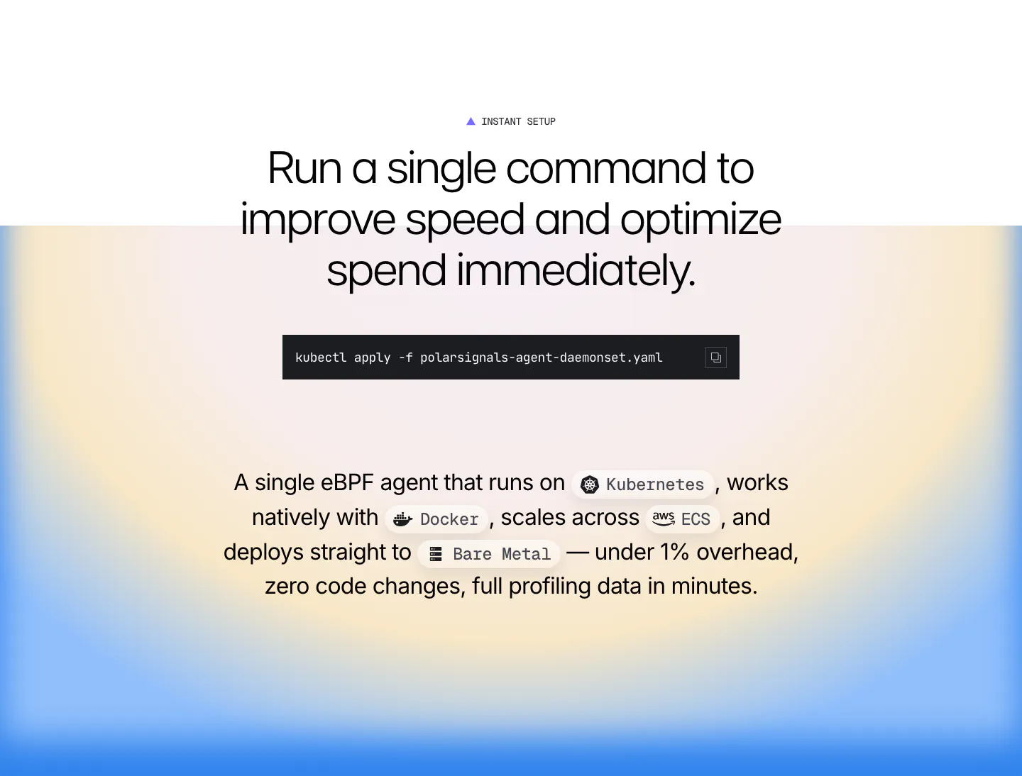
  61. Polar Signals features section: centered headline with a kubectl command block and inline platform chips over a blue and yellow radial gradient
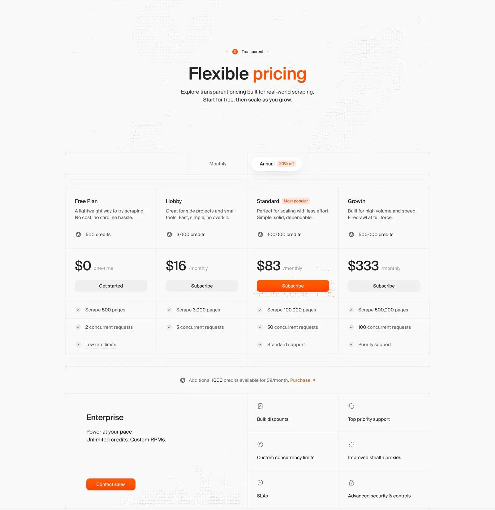
  62. Firecrawl pricing section: centered headline, monthly/annual toggle, four plan columns with prices and an enterprise block on light gray
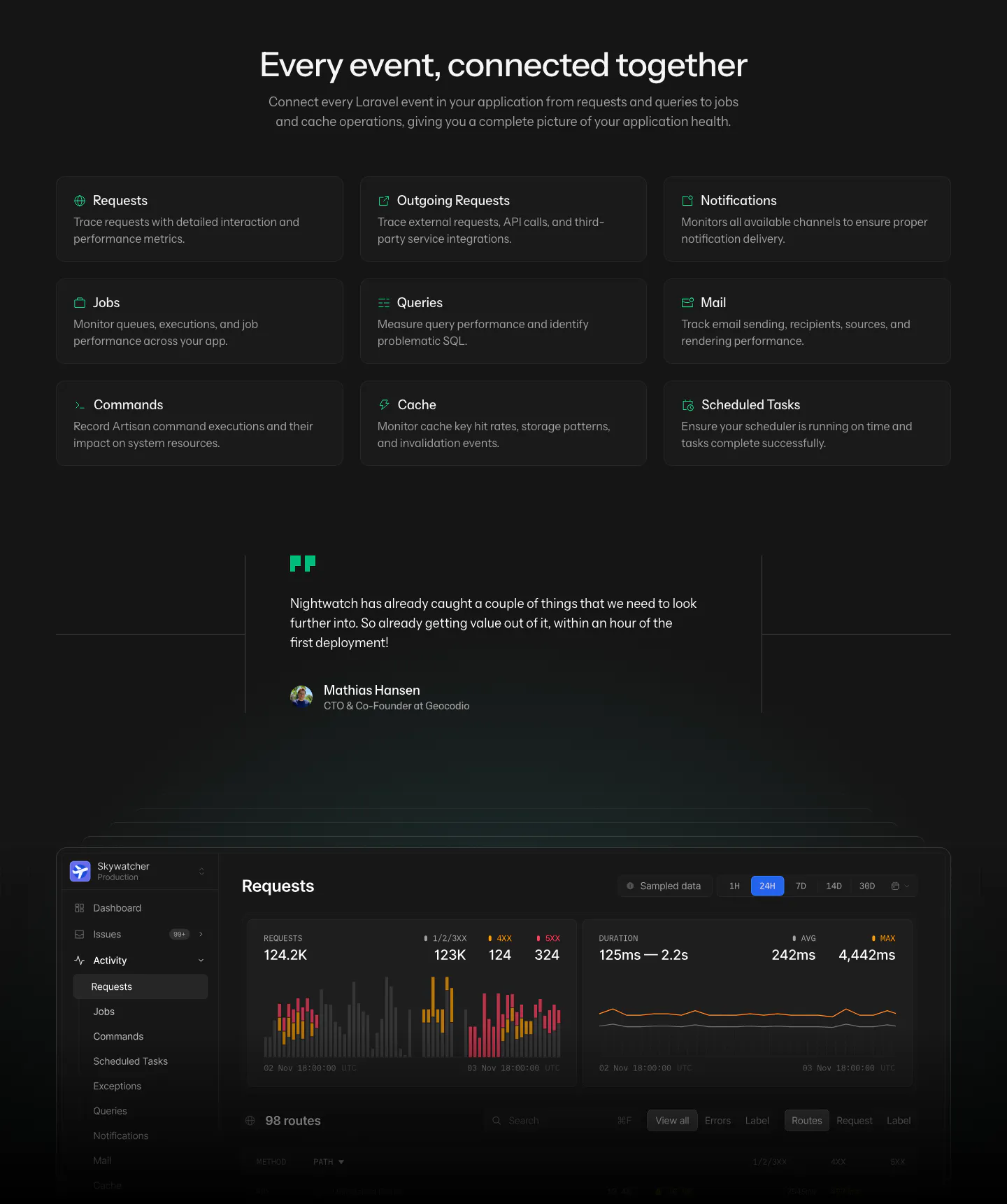
  63. Laravel Nightwatch features section: centered headline above a 3x3 grid of event type cards, a customer quote and a dark requests dashboard
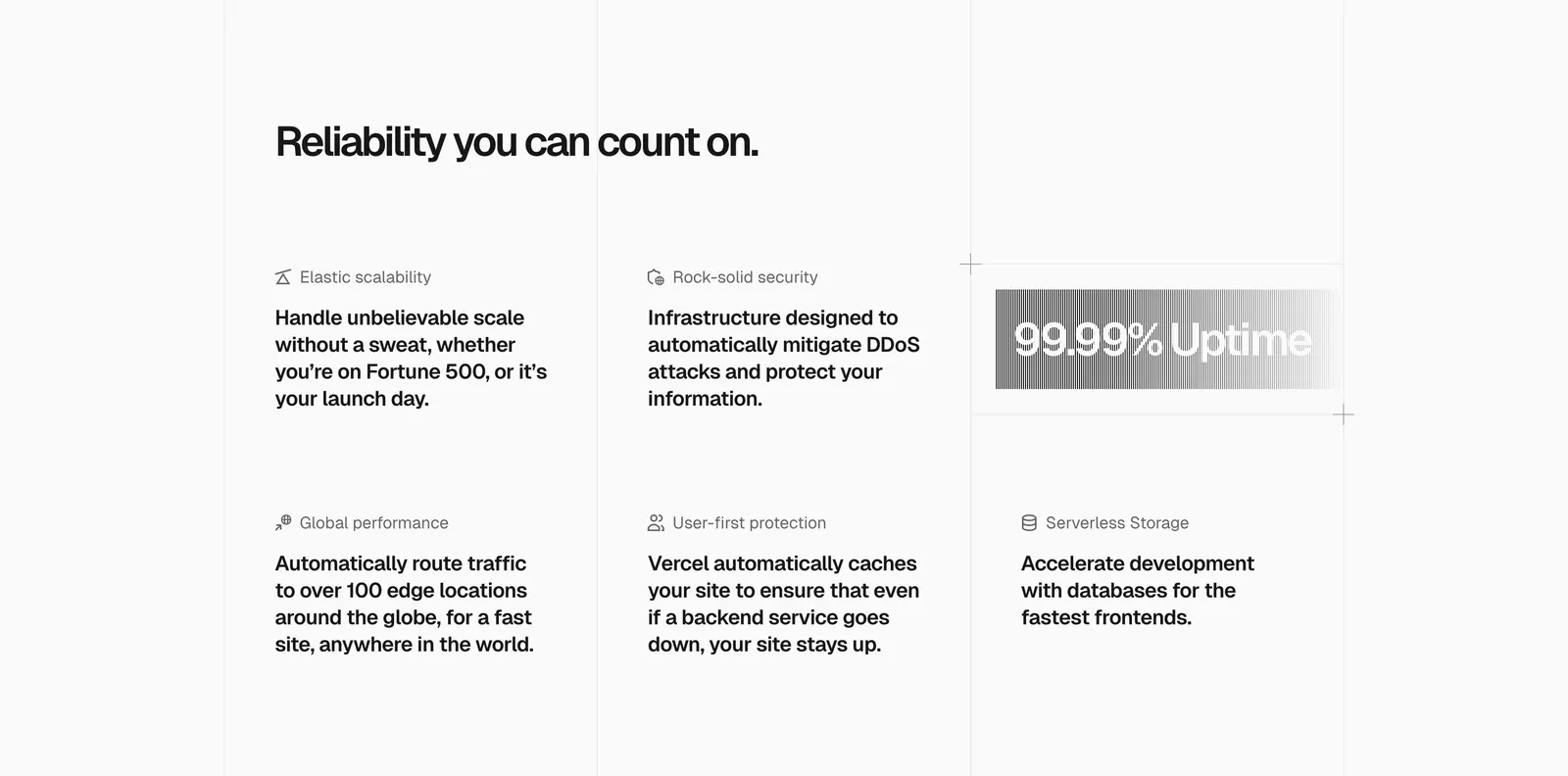
  64. Vercel features section: headline above a six-item grid of feature blurbs with icons and a gray gradient 99.99% Uptime badge
  65. Polar Signals footer section: logo, tagline and copyright at left with four link columns on a black background
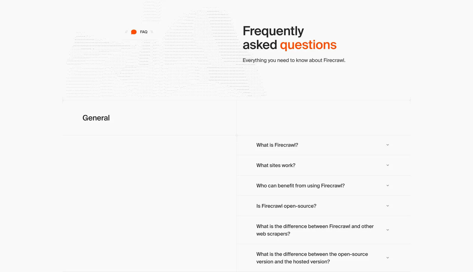
  66. Firecrawl FAQ section: headline beside dithered artwork above a two-column accordion of questions on a light gray grid layout
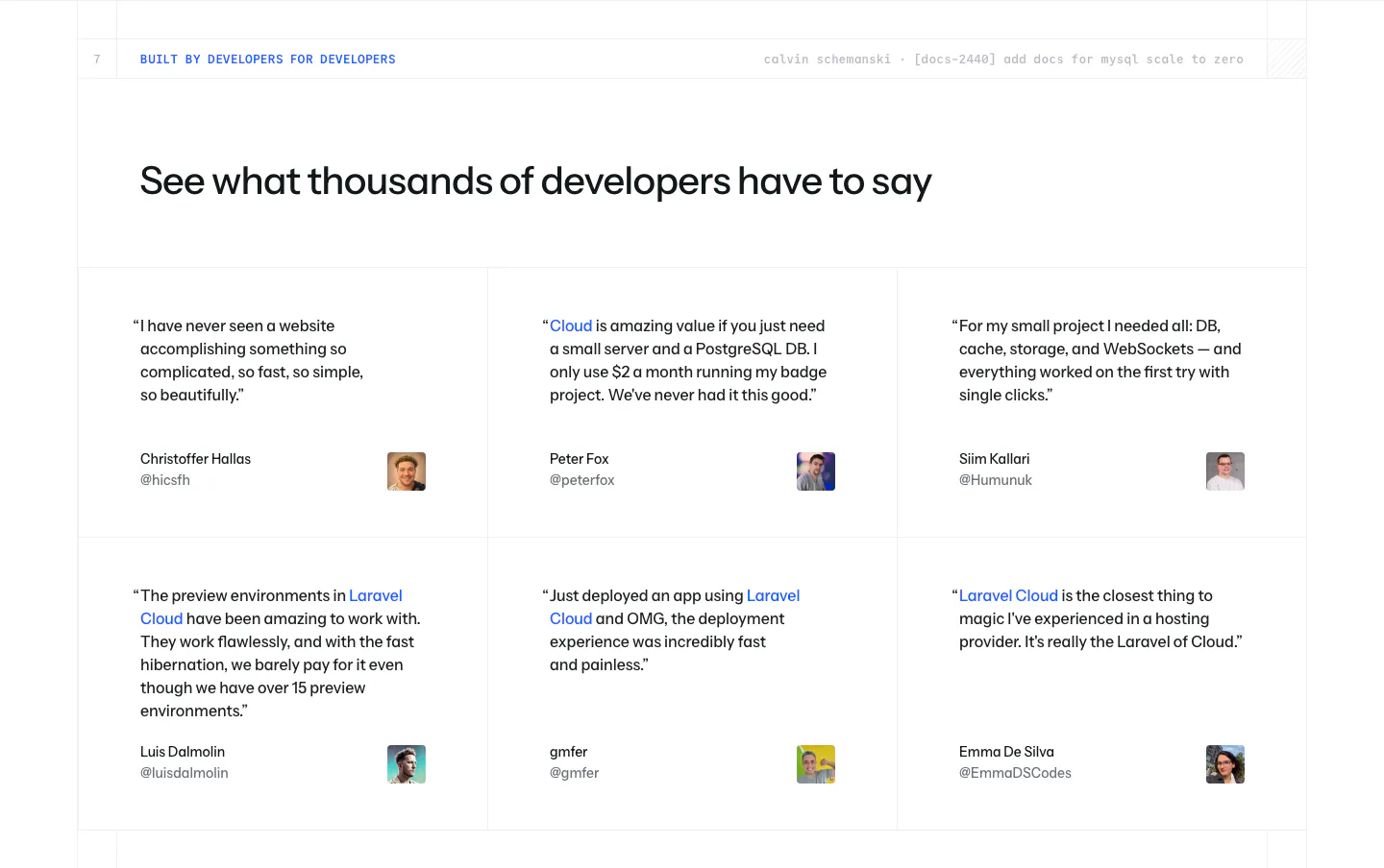
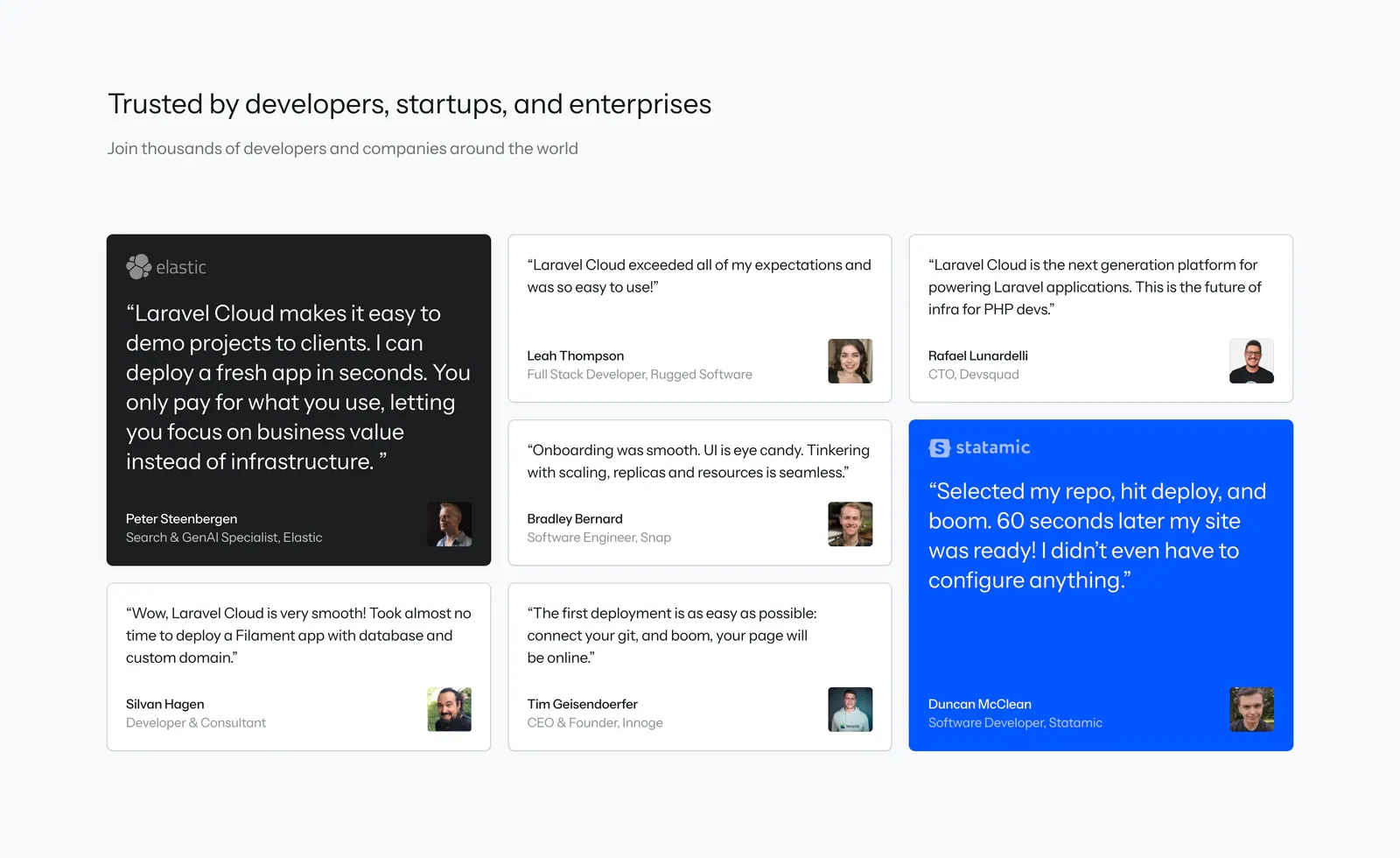
  67. Laravel Cloud testimonials section: left-aligned headline above a 3x2 grid of developer quotes with names, handles and avatar photos
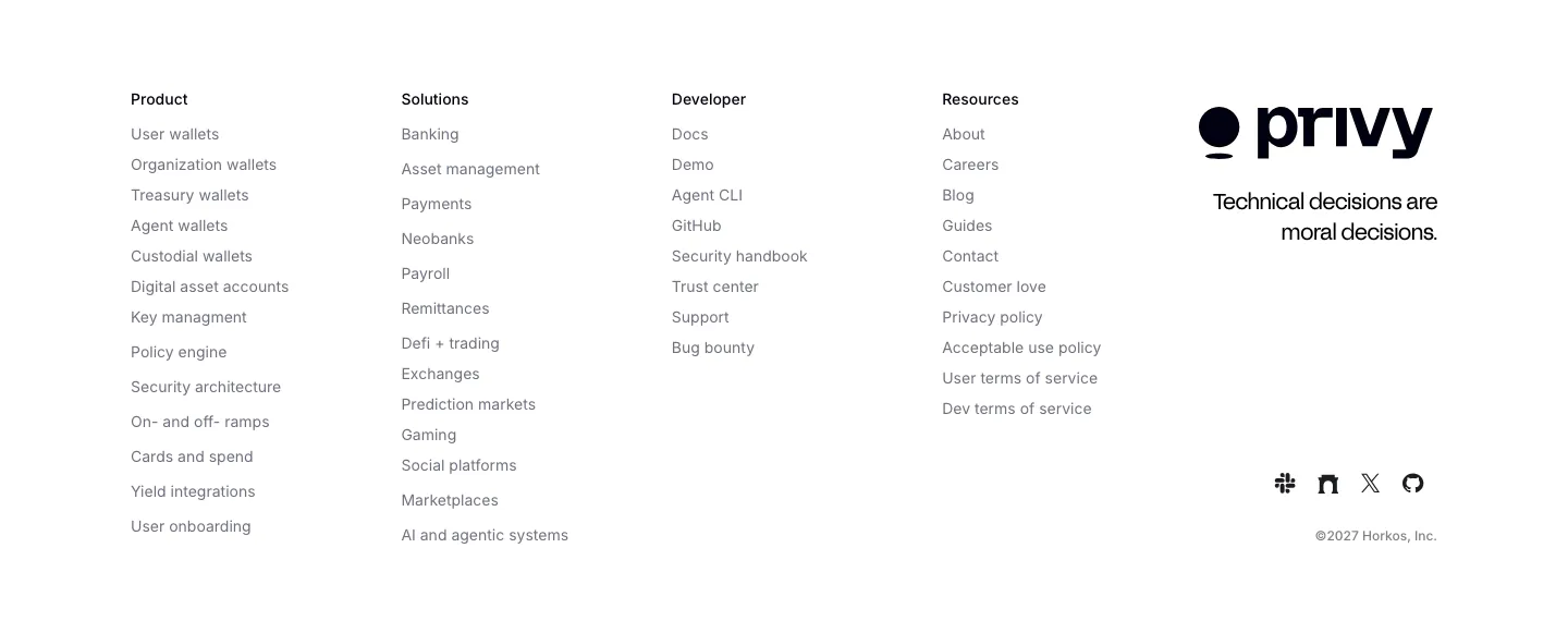
  68. Privy footer section: white footer with five link columns, Privy logo, tagline and social icons in a minimal grayscale layout
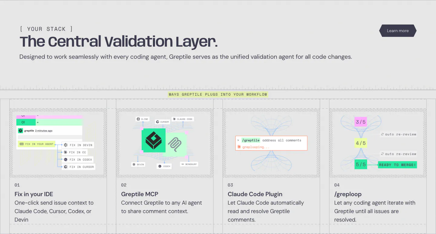
  69. Greptile integrations section: left-aligned headline above four numbered cards showing IDE, MCP, Claude Code plugin and loop workflows
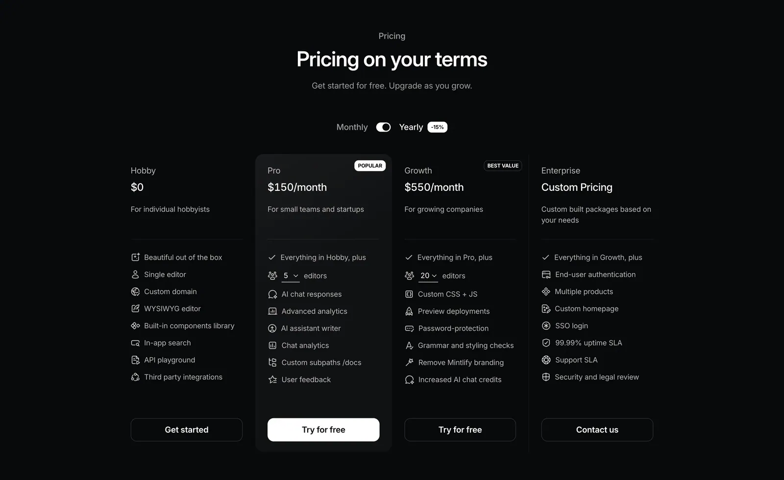
  70. Mintlify pricing section: centered heading with monthly/yearly toggle above four plan columns with icon feature lists on black
  71. Laravel Cloud call-to-action section: left-aligned headline with short copy, Get started and Contact sales buttons over a faint blue glow
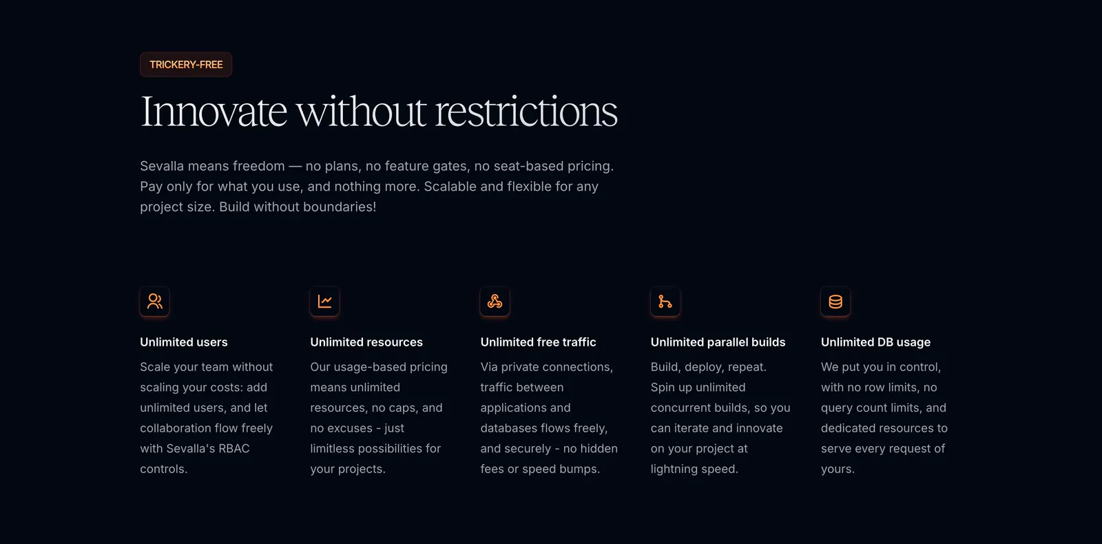
  72. Sevalla features section: serif headline and intro above five icon columns of unlimited usage benefits on a near-black background
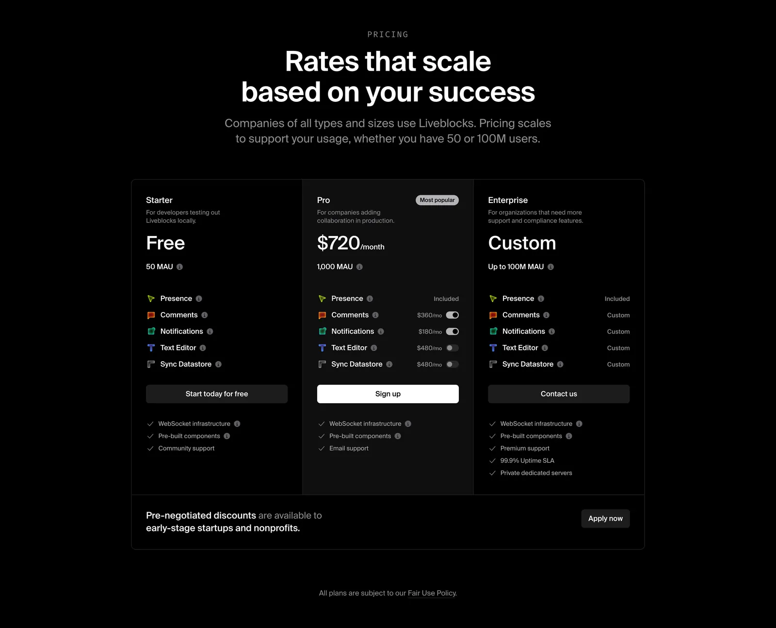
  73. Liveblocks pricing section: centered heading above three dark plan columns, Starter, Pro and Enterprise, with add-on toggles and a discount banner
  74. Laravel footer section: newsletter form and product, package, resource and partner link columns above a giant red Laravel wordmark on white
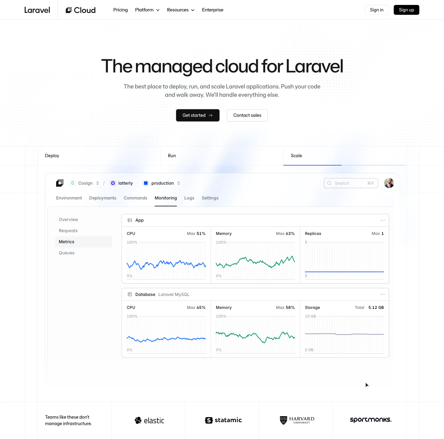
  75. Laravel Cloud hero section: centered headline and two buttons above Deploy/Run/Scale tabs, a monitoring dashboard screenshot and a logo strip
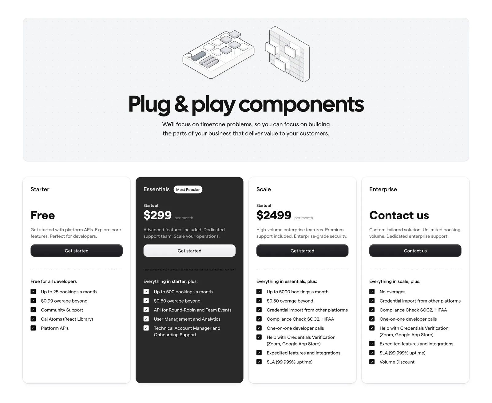
  76. Cal.com pricing section: centered headline with isometric line art on a dotted panel above four plan cards, one dark highlighted
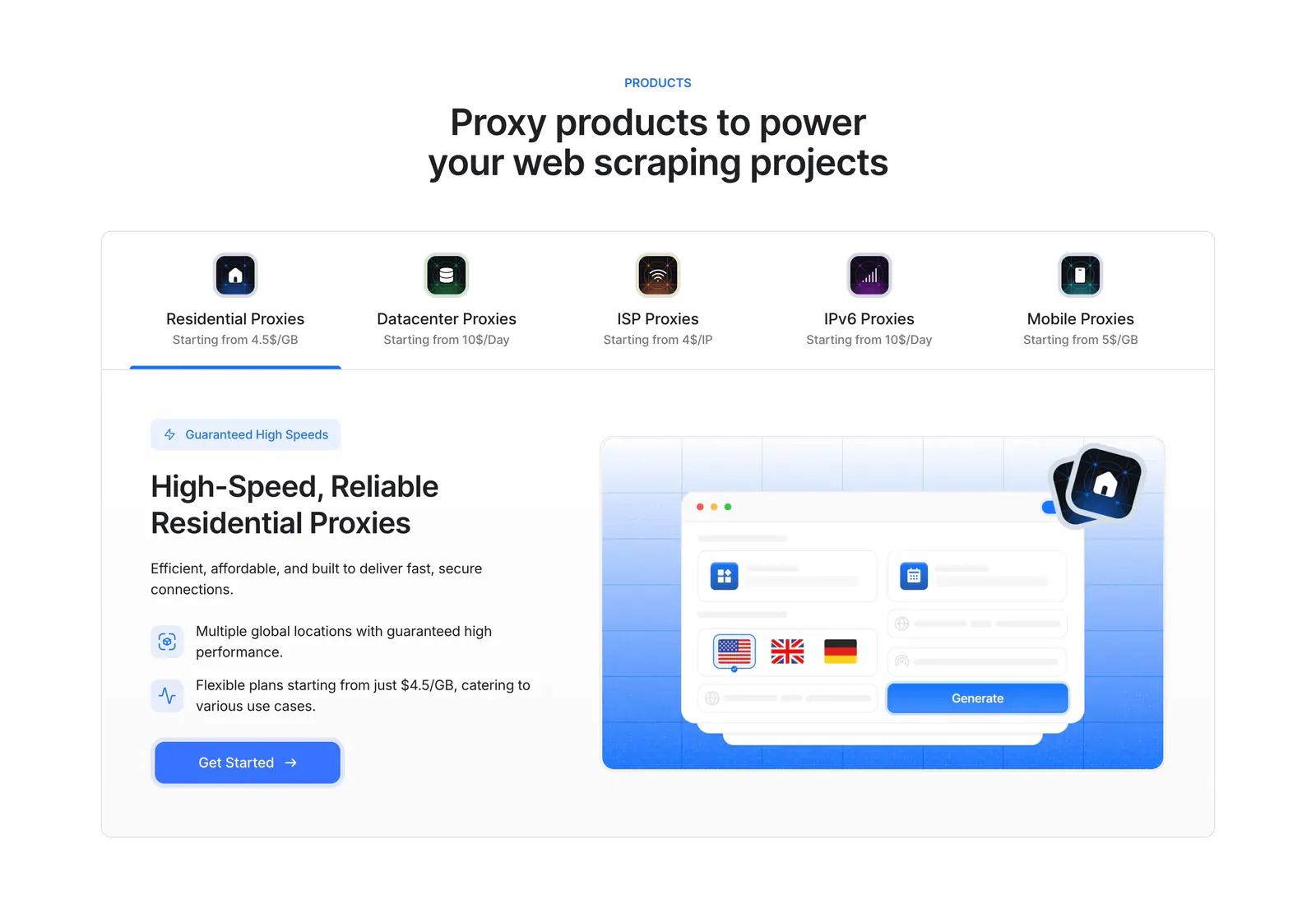
  77. Lightning Proxies features section: centered heading over a five-product tab bar and a split panel with proxy copy and a blue UI mockup
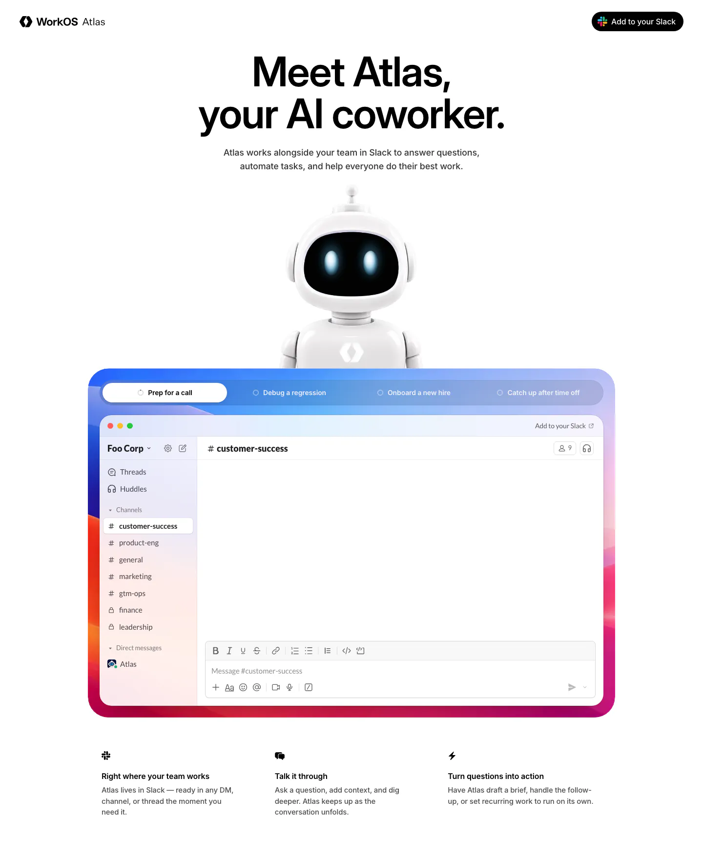
  78. WorkOS hero section: centered headline above a 3D robot mascot and a tabbed Slack app mockup in a colorful gradient frame
  79. Mintlify logo cloud section: centered two-line heading above a single faded-edge row of customer logos on black
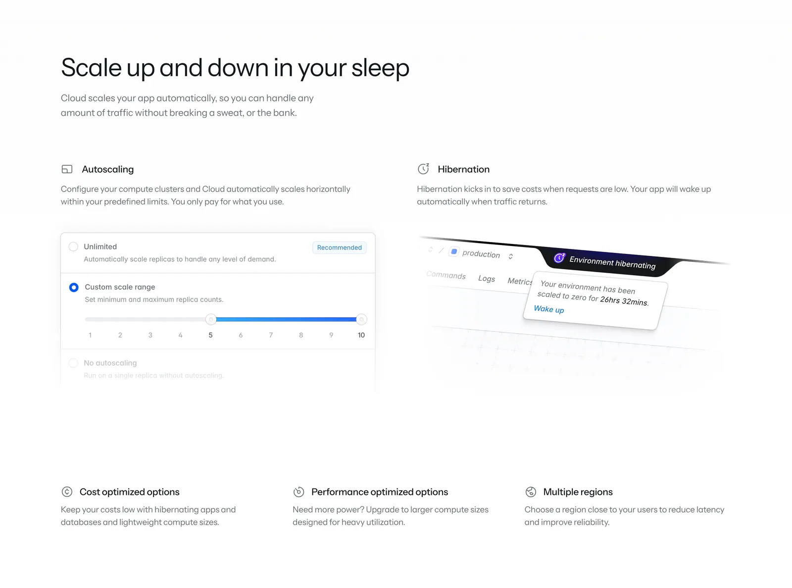
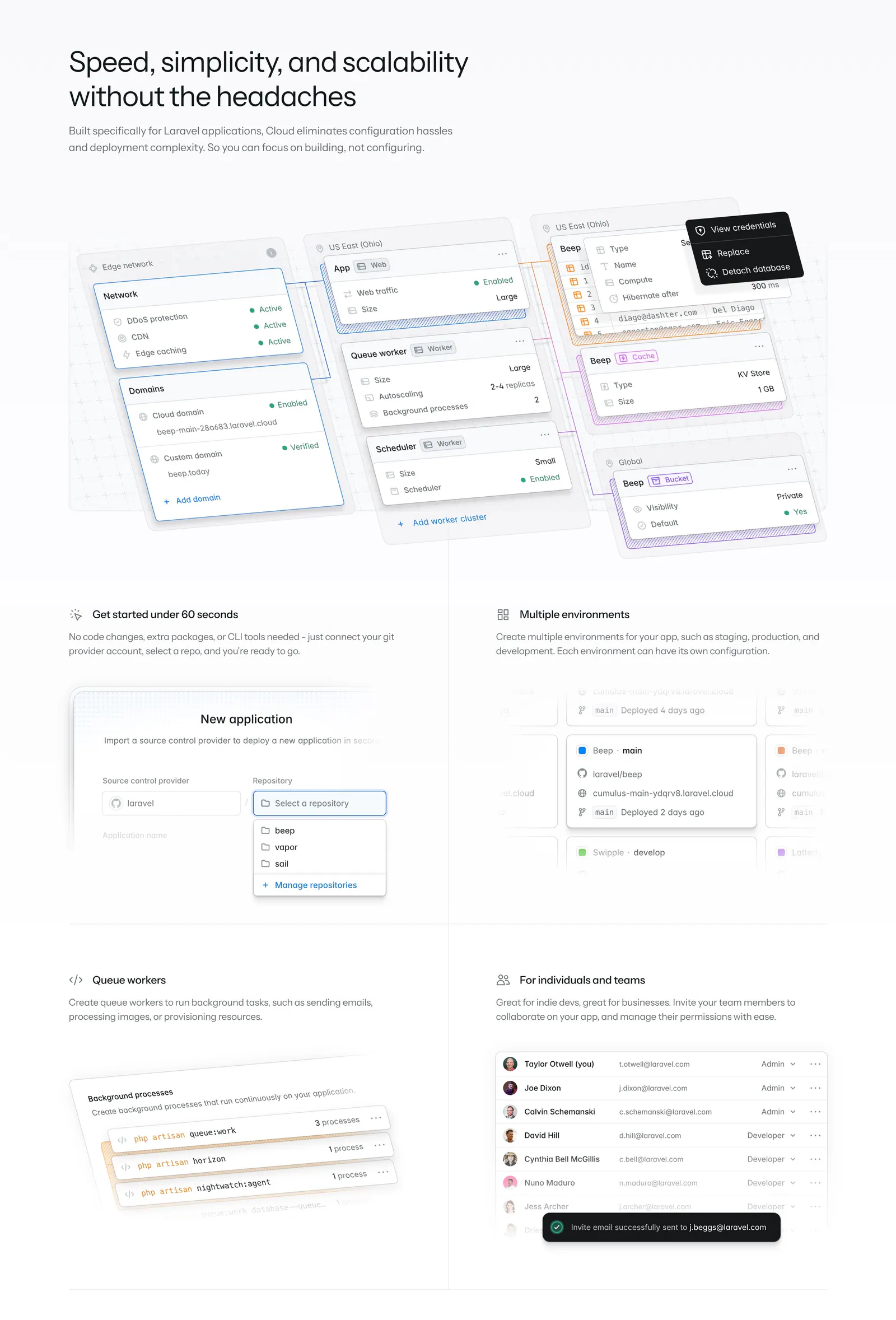
  80. Laravel Cloud features section: headline above two feature columns with autoscaling and hibernation UI snippets and three icon notes
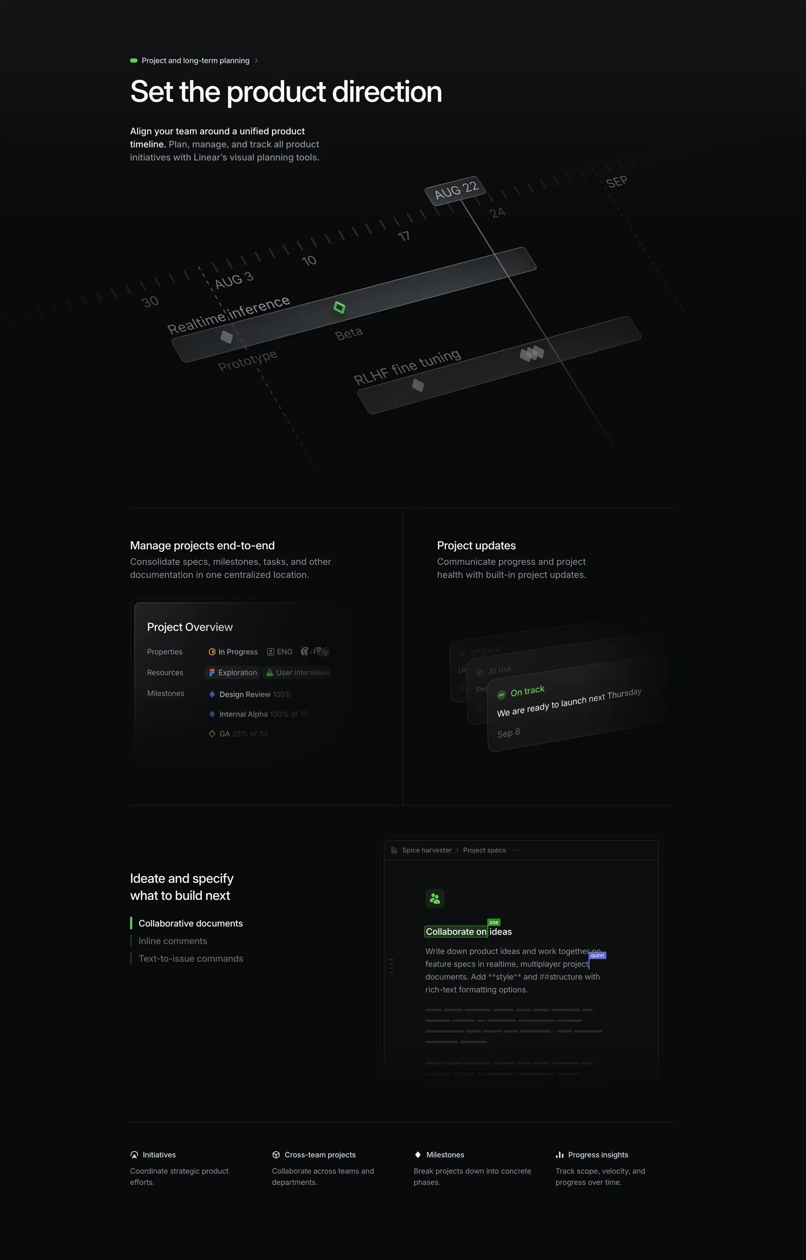
  81. Linear features section: dark section with a tilted project timeline graphic, project overview and update panels, and a collaborative doc mockup
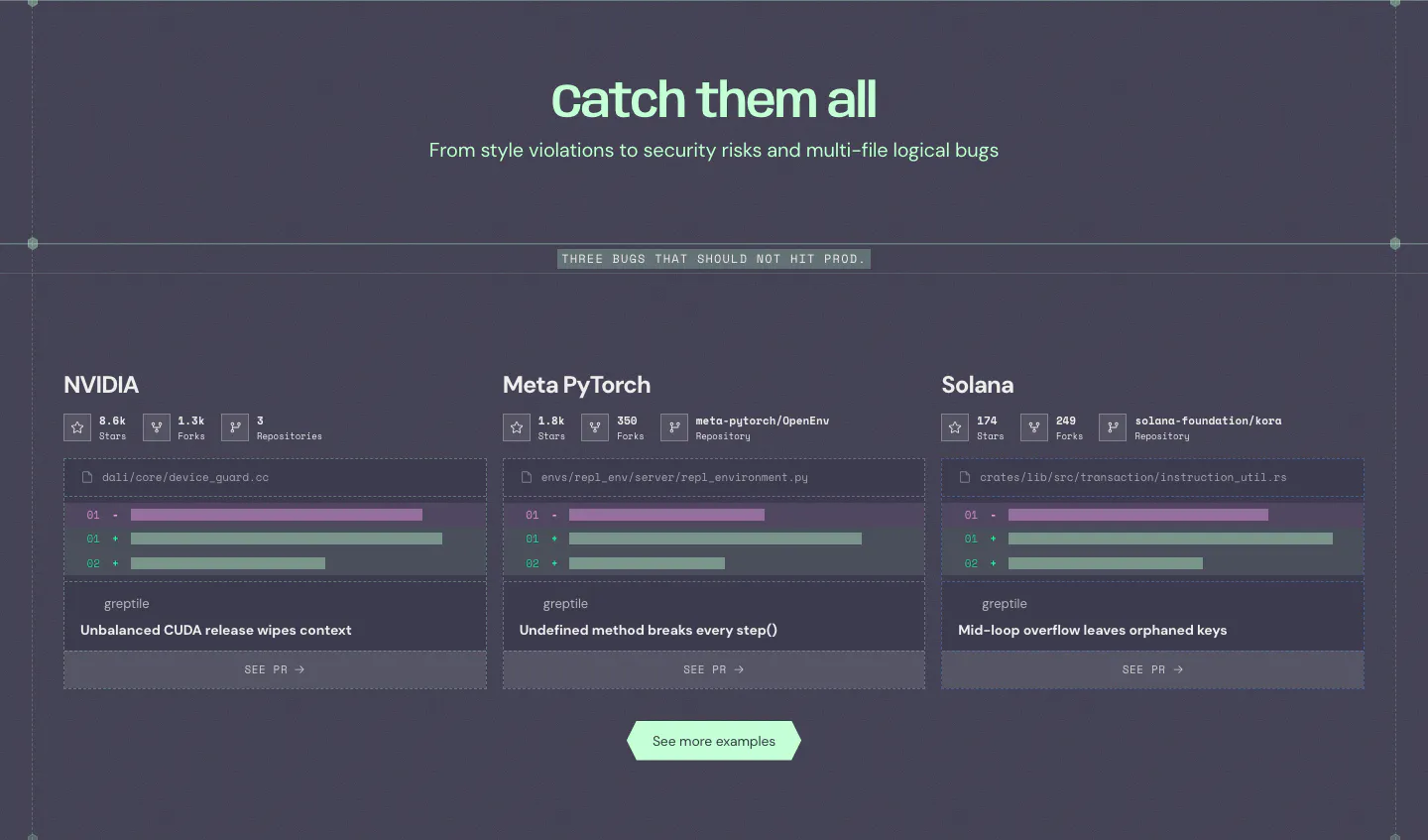
  82. Greptile features section: centered headline over three cards showing example bugs caught in open-source repos with diff snippets
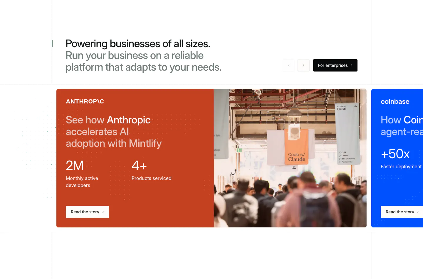
  83. Mintlify testimonials section: headline with arrows above a carousel of customer story cards, orange Anthropic card with stats and photo
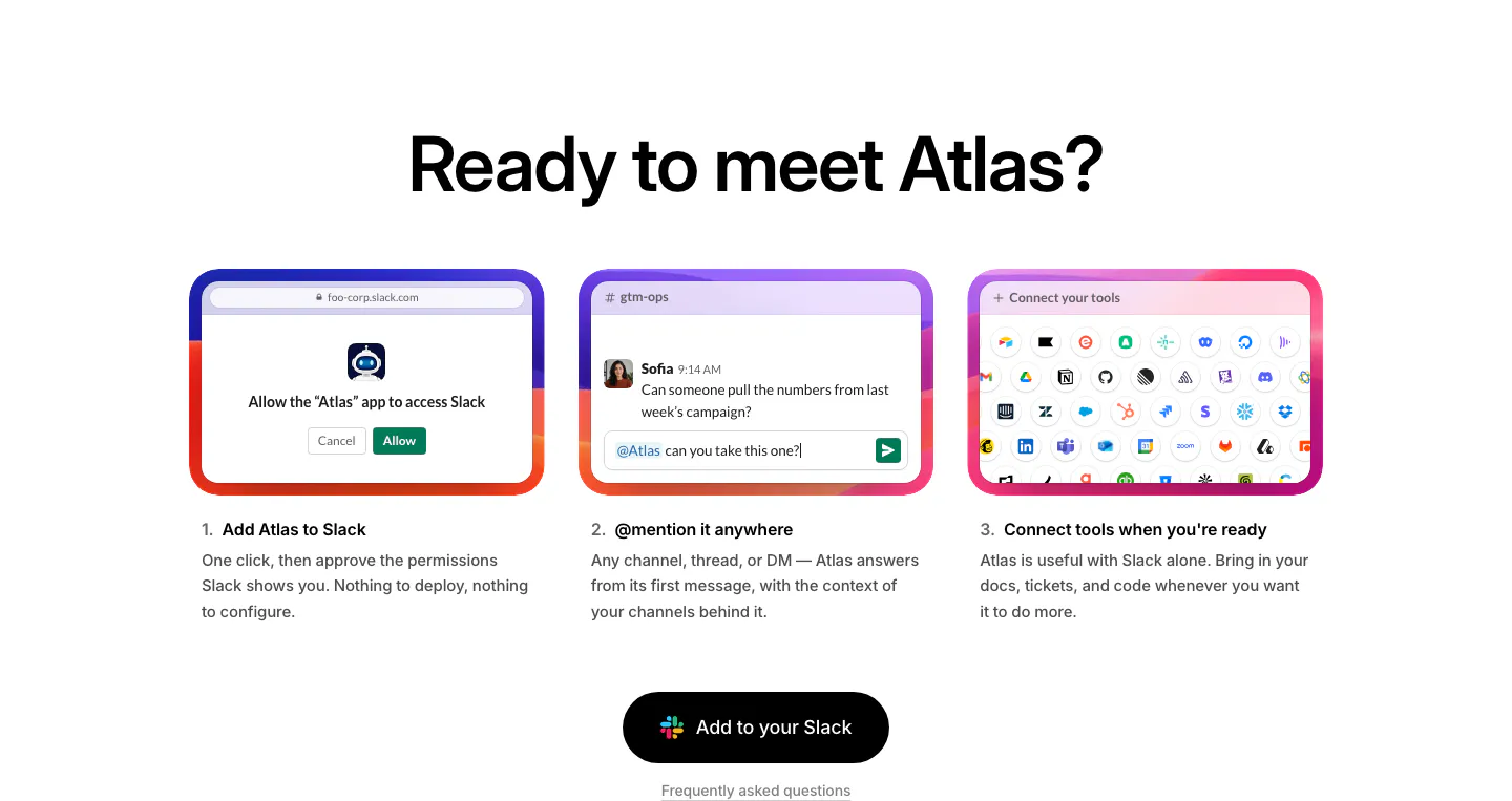
  84. WorkOS how it works section: centered headline above three numbered step cards with UI mockups and a Slack button
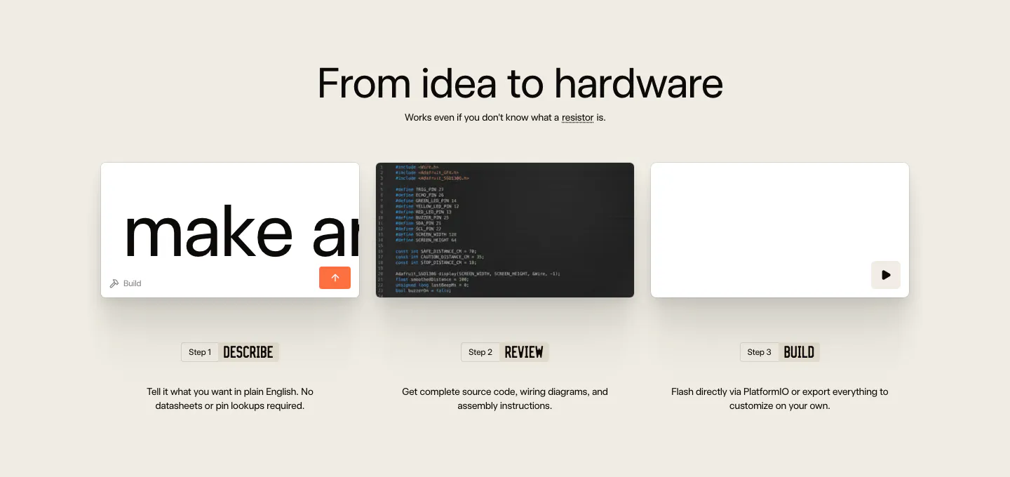
  85. Schematik how it works section: centered headline above three step cards for describe, review and build on beige
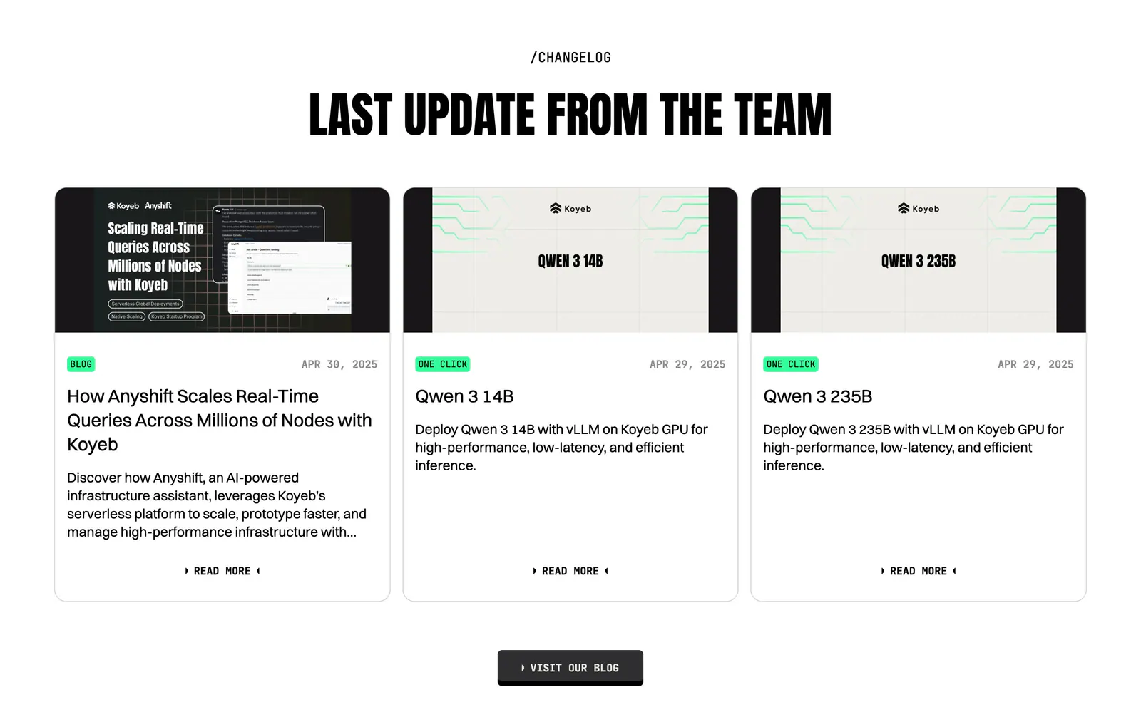
  86. Koyeb blog & resources section: centered condensed headline above three changelog cards with thumbnails, tags and dates
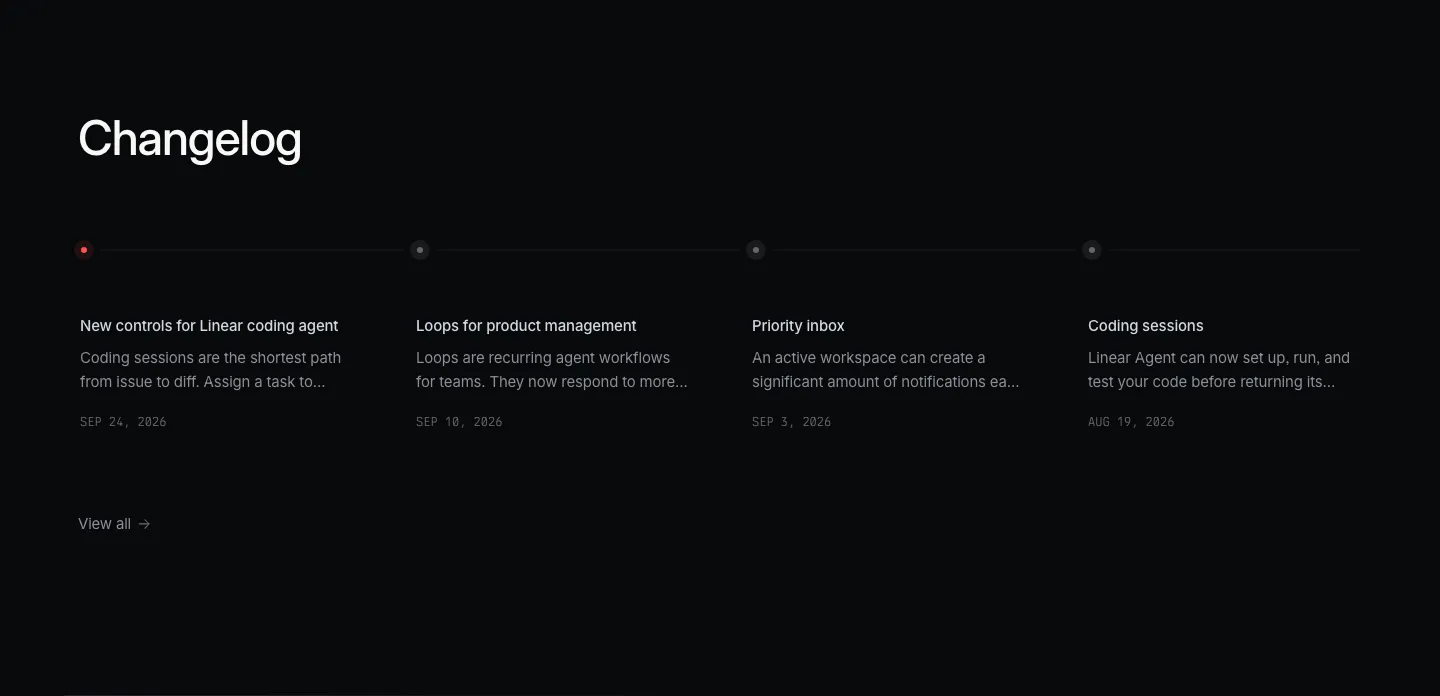
  87. Linear blog & resources section: dark changelog with four dated entries along a horizontal timeline and a view-all link
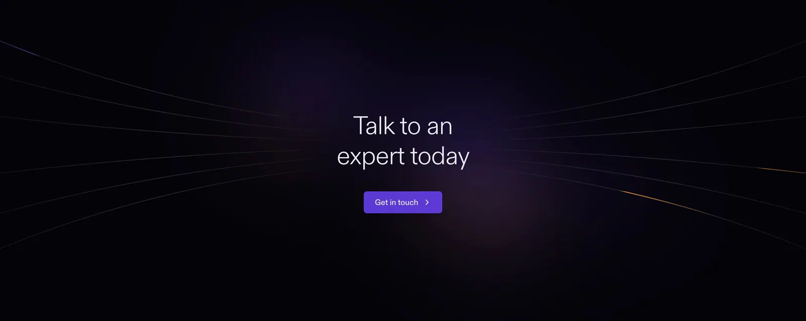
  88. Cortex call-to-action section: centered headline and purple button with radiating light lines on a near-black background
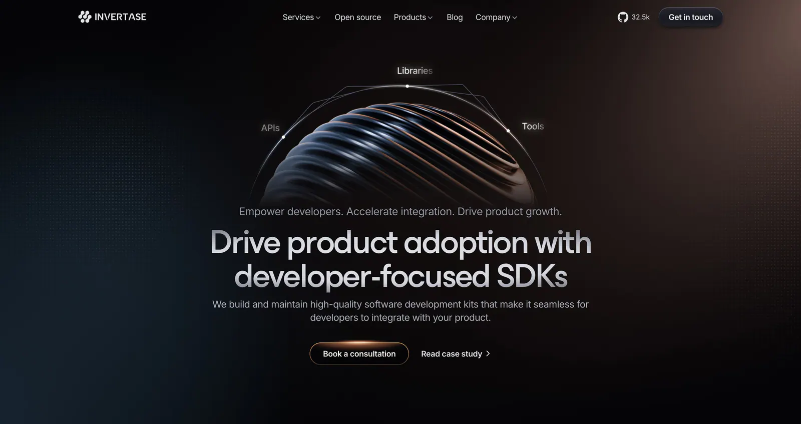
  89. Invertase hero section: centered headline below a ribbed 3D sphere with orbit labels on a dark background with a warm glow
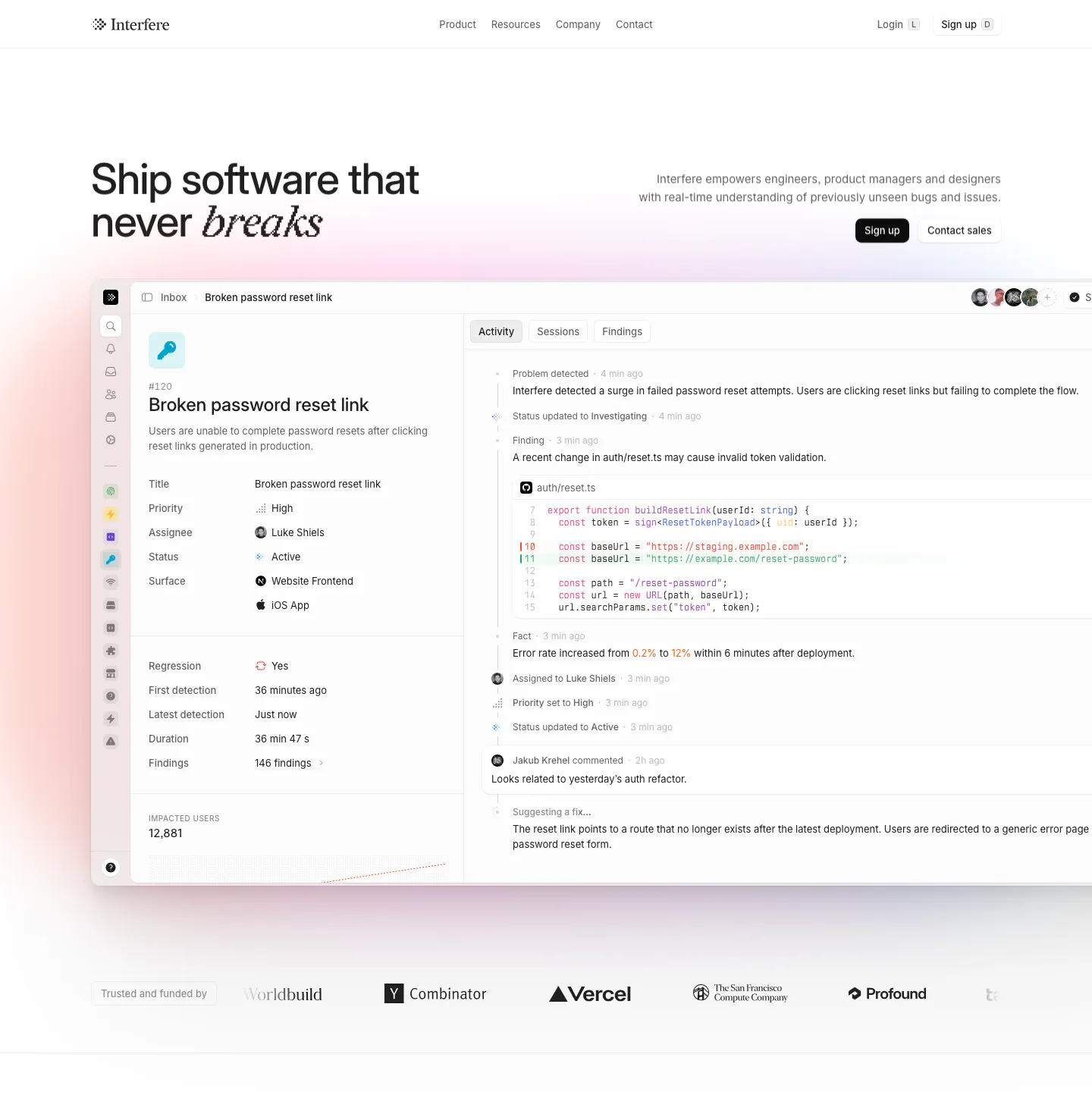
  90. Interfere hero section: headline left and copy with buttons right above a large issue-tracker product screenshot and a logo row
  91. Semaloop testimonials section: centered single quote under a company icon with an agent badge, name and title below on light gray
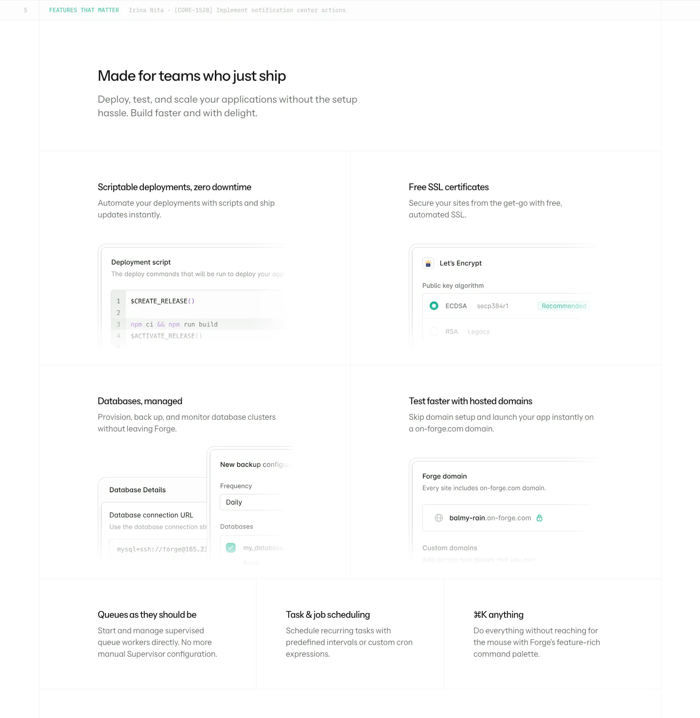
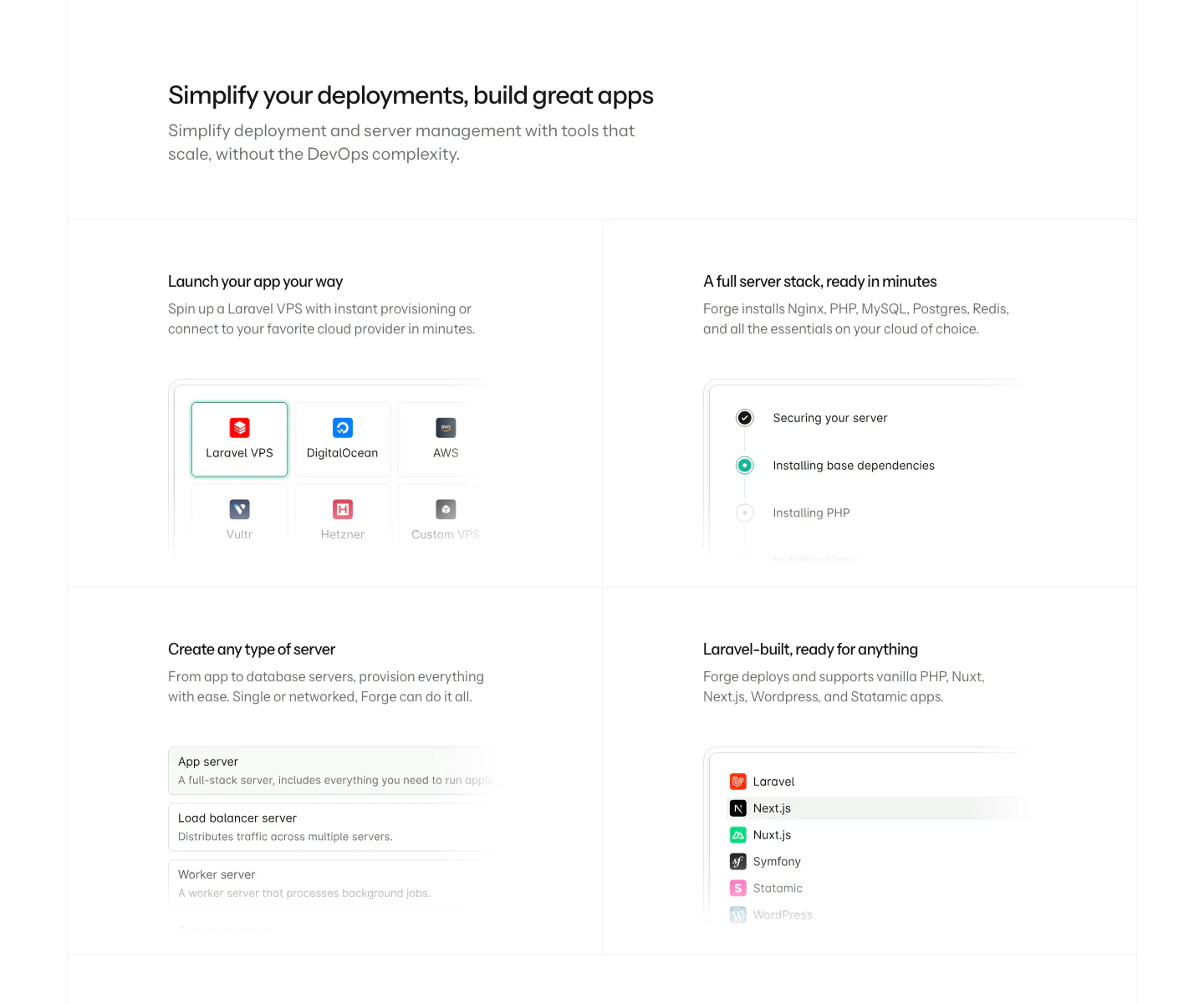
  92. Laravel Forge features section: four large tiles with UI mockups incl. a deploy script, plus three text-only tiles on white
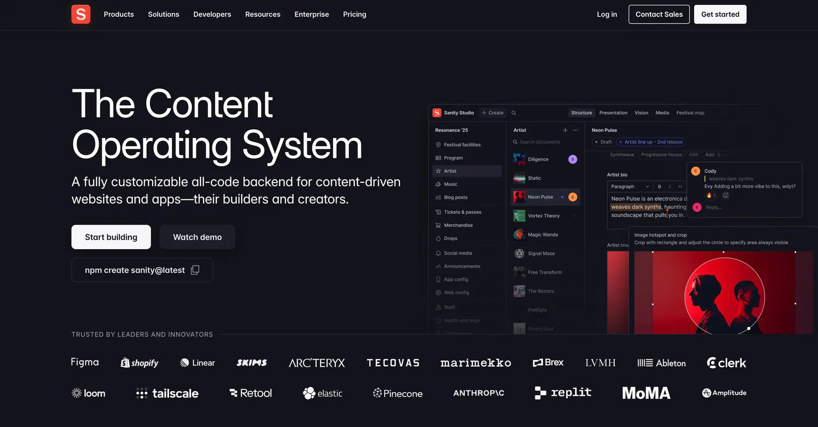
  93. Sanity hero section: headline, buttons and npm command left, Sanity Studio screenshot right, two rows of customer logos below on dark
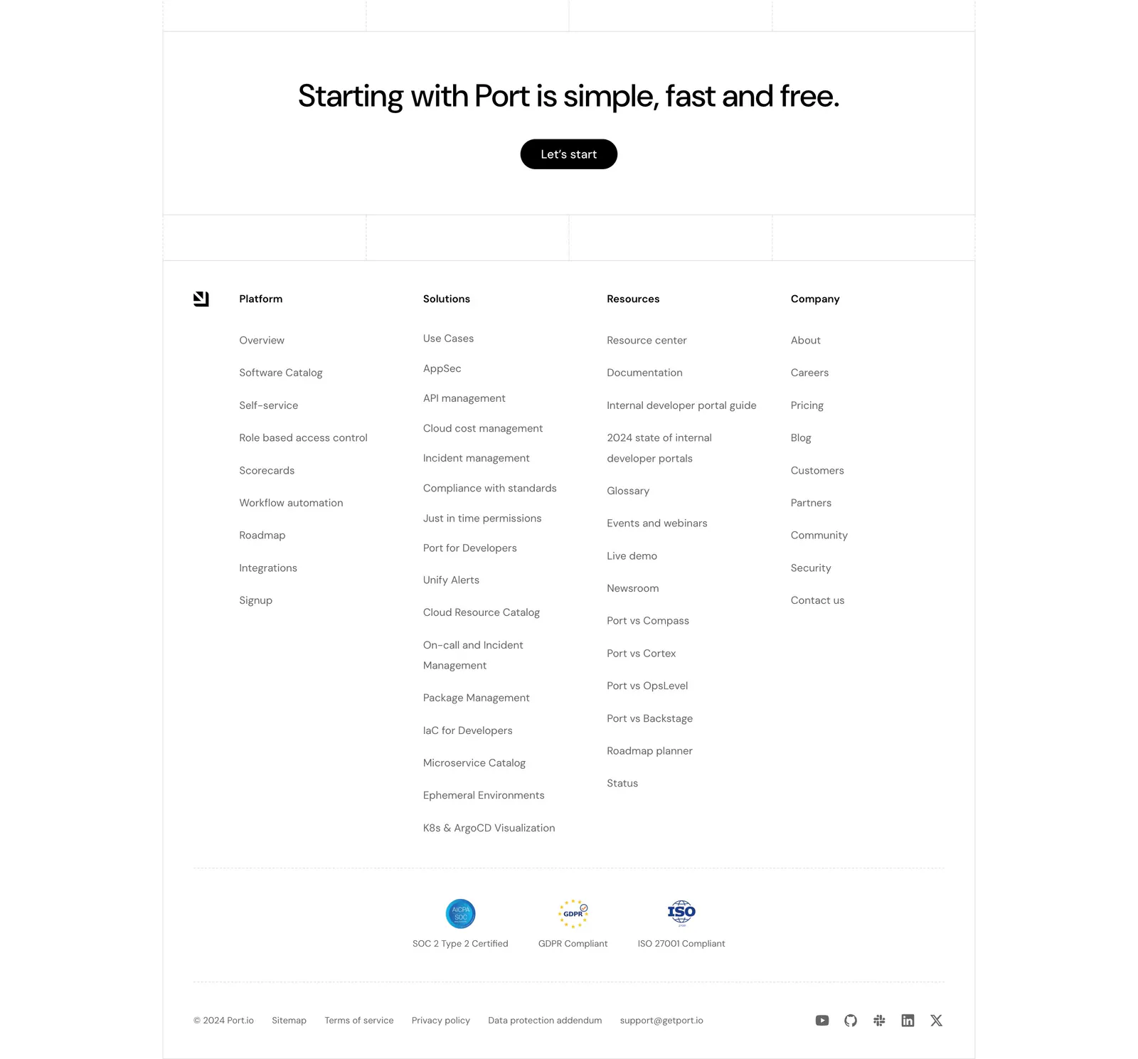
  94. Port footer section: centered CTA with Let's start button above four link columns, compliance badges, legal links and social icons
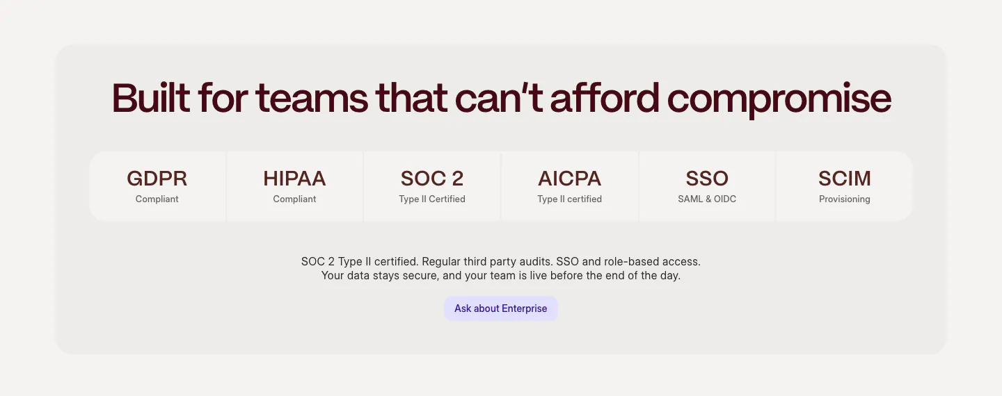
  95. Weave security section: centered headline above a row of compliance tiles (GDPR, HIPAA, SOC 2, SSO) and an enterprise button in a gray panel
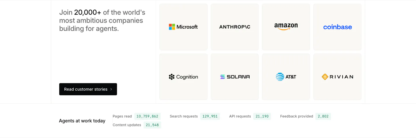
  96. Mintlify logo cloud section: headline and button beside a grid of eight customer logo tiles, live usage counters row below
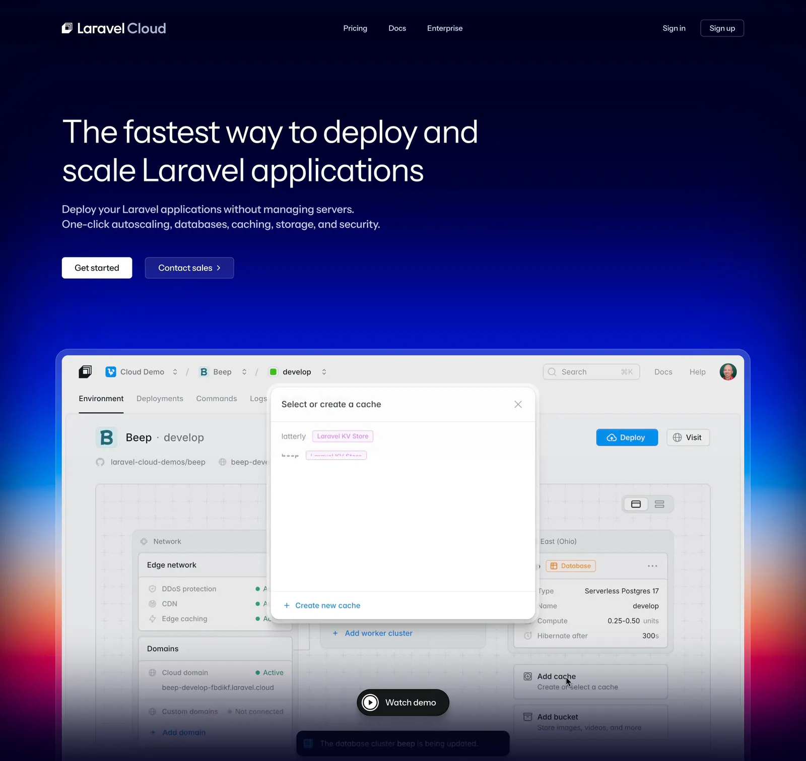
  97. Laravel Cloud hero section: nav and left-aligned headline on dark navy above a dashboard screenshot over a blue-to-red glow
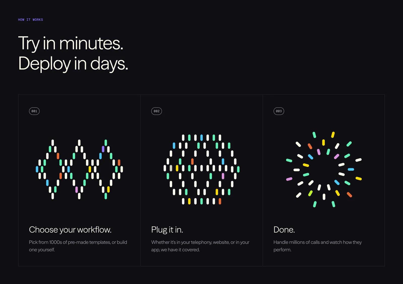
  98. Vapi how it works section: left-aligned headline above three numbered step cards with colorful dot-pill artworks on a black background
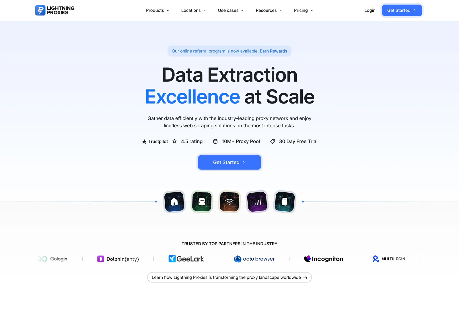
  99. Lightning Proxies hero section: nav bar, centered headline with blue accent word, rating badges, CTA, product icons and a partner logo row
  100. Schematik footer section: outlined SCHEMATIK wordmark, link columns and lime tagline on a dark green grid with a breadboard
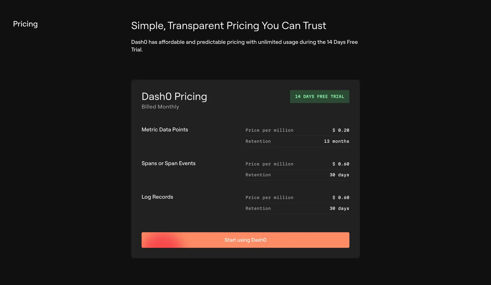
  101. Dash0 pricing section: single dark pricing card listing per-million prices and retention for metrics, spans and logs with an orange CTA
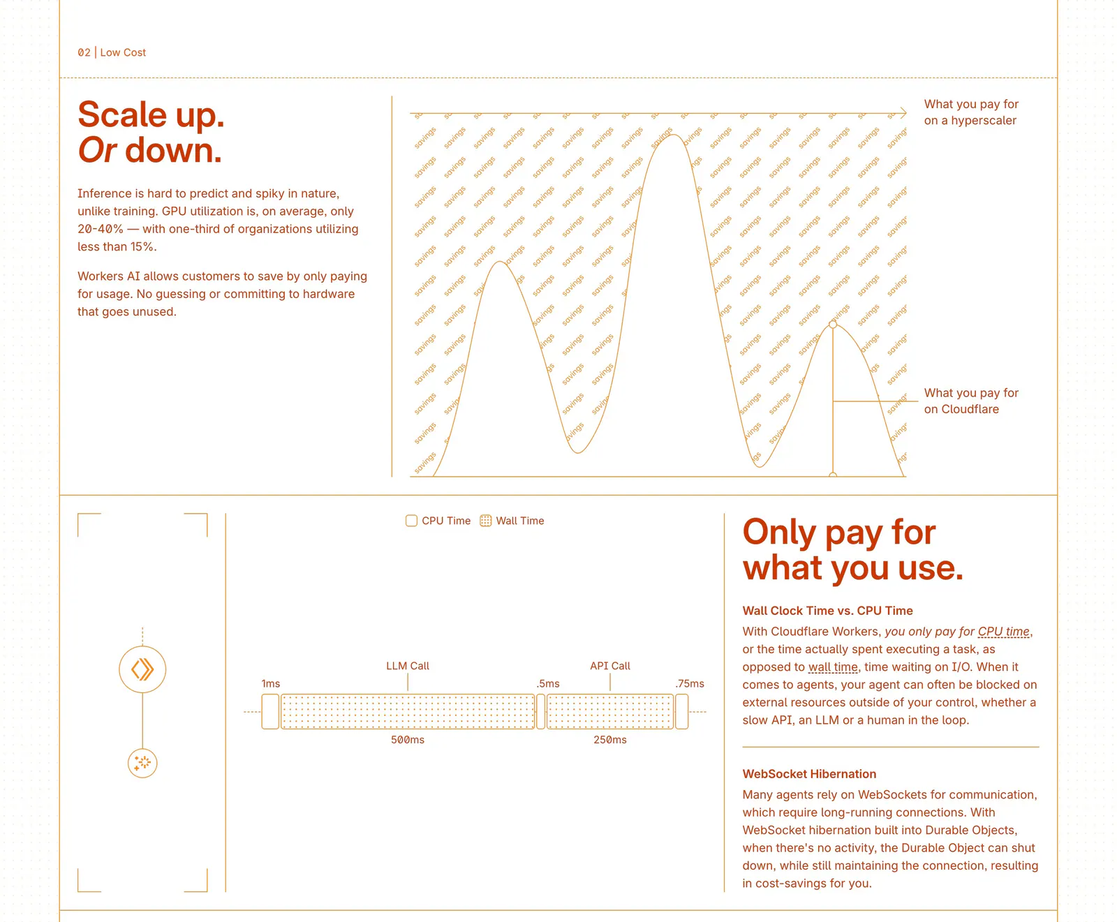
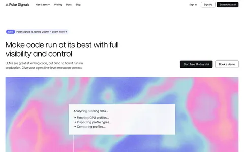
  102. Cloudflare Agents features section: zig-zag rows of orange text beside line-drawn cost charts and a timing diagram on white
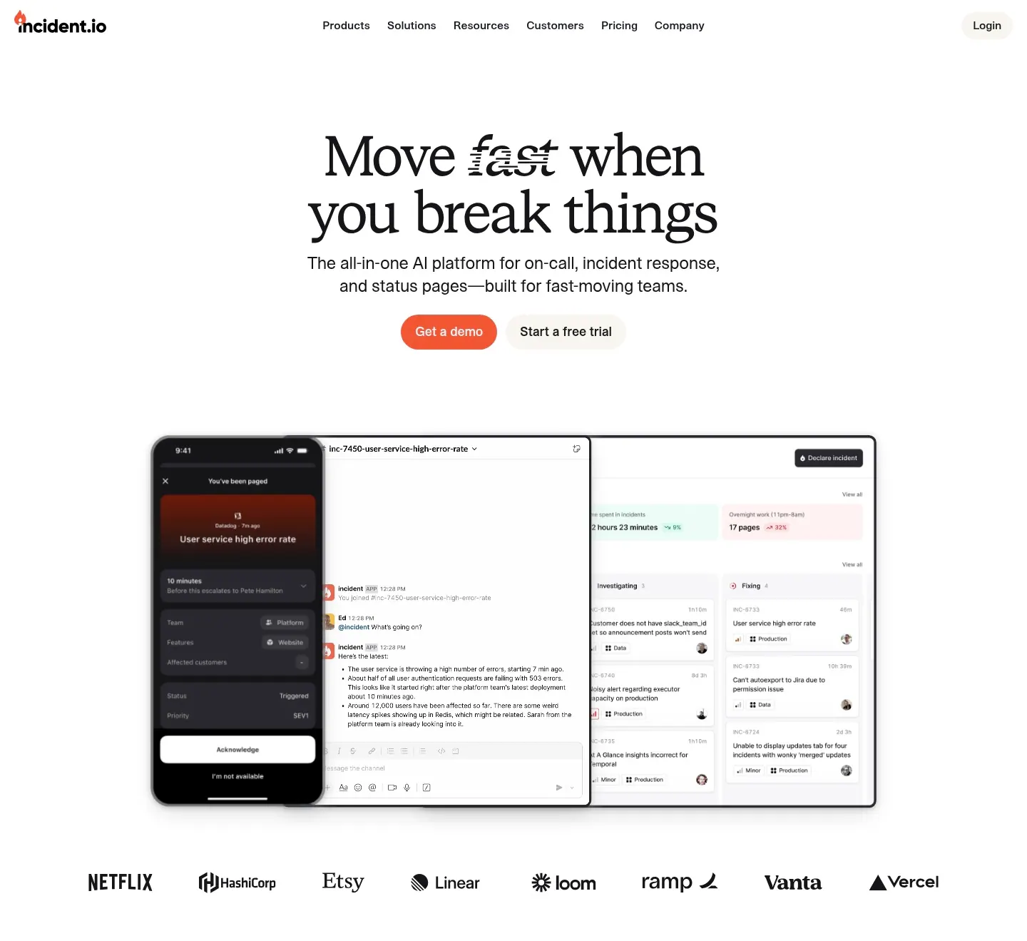
  103. incident.io hero section: serif centered headline and orange CTA above mobile and desktop app screenshots and a customer logo row
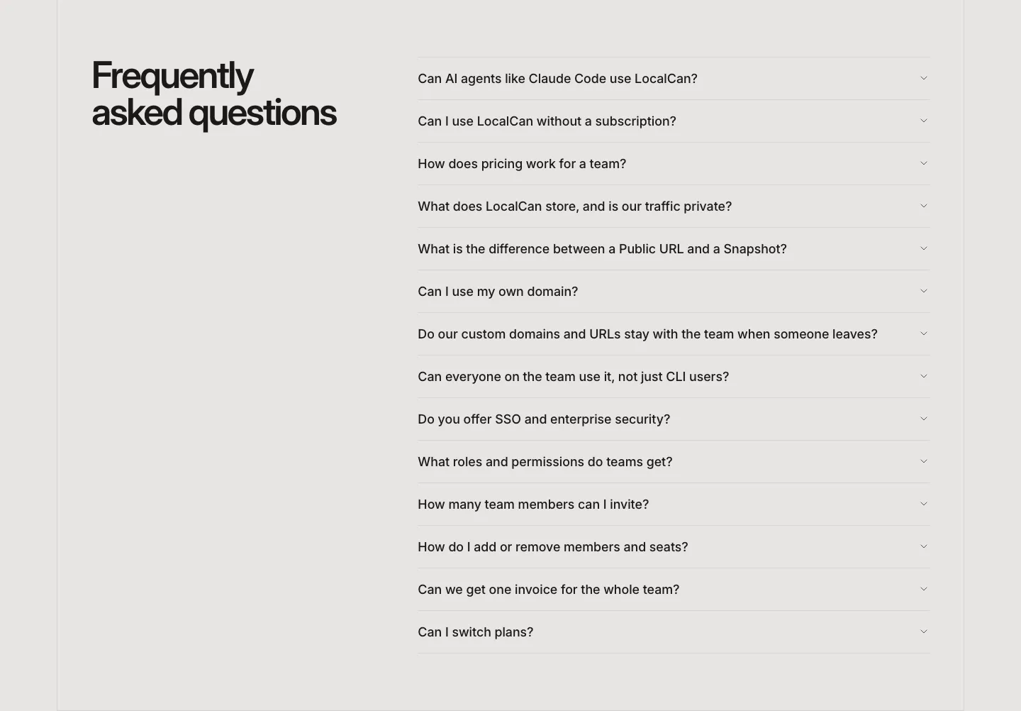
  104. LocalCan FAQ section: two-line headline on the left beside a long collapsed accordion of questions on a light gray background
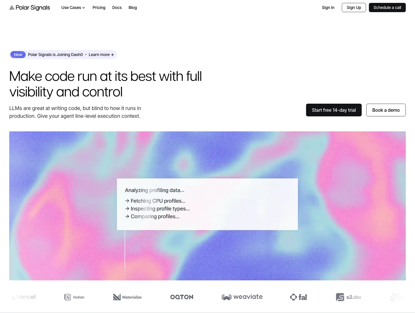
  105. Polar Signals hero section: left headline with CTAs at right above a wide pink and blue gradient panel with a status card, logo row below
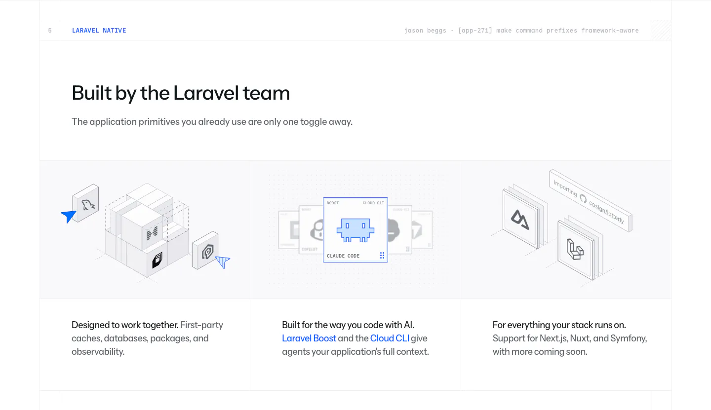
  106. Laravel Cloud features section: headline above three columns of isometric illustrations for first-party packages, AI tooling and frameworks
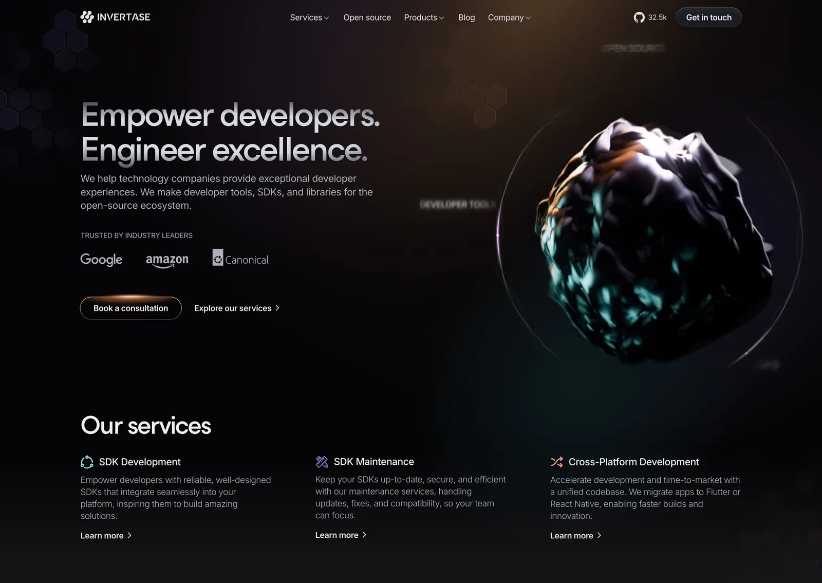
  107. Invertase hero section: left headline with logo strip and buttons beside a dark 3D rock render in a glowing ring, services row below
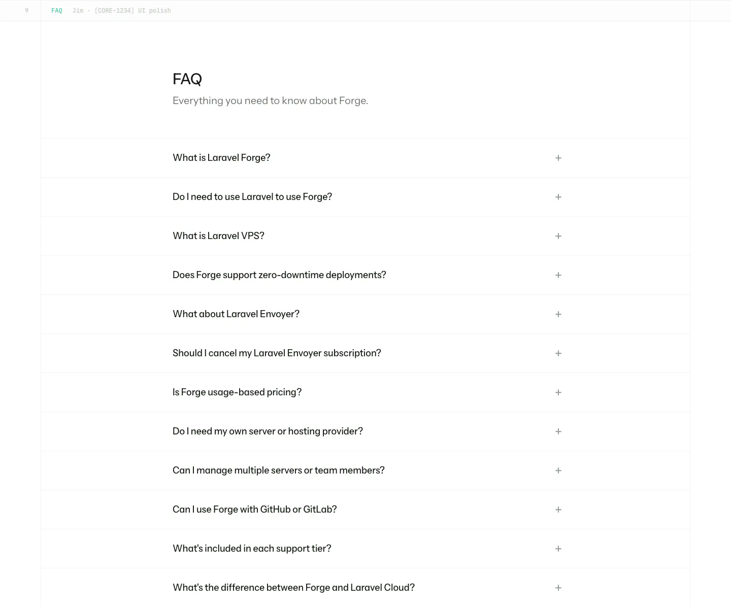
  108. Laravel Forge FAQ section: heading above a long accordion list of questions with plus icons on white
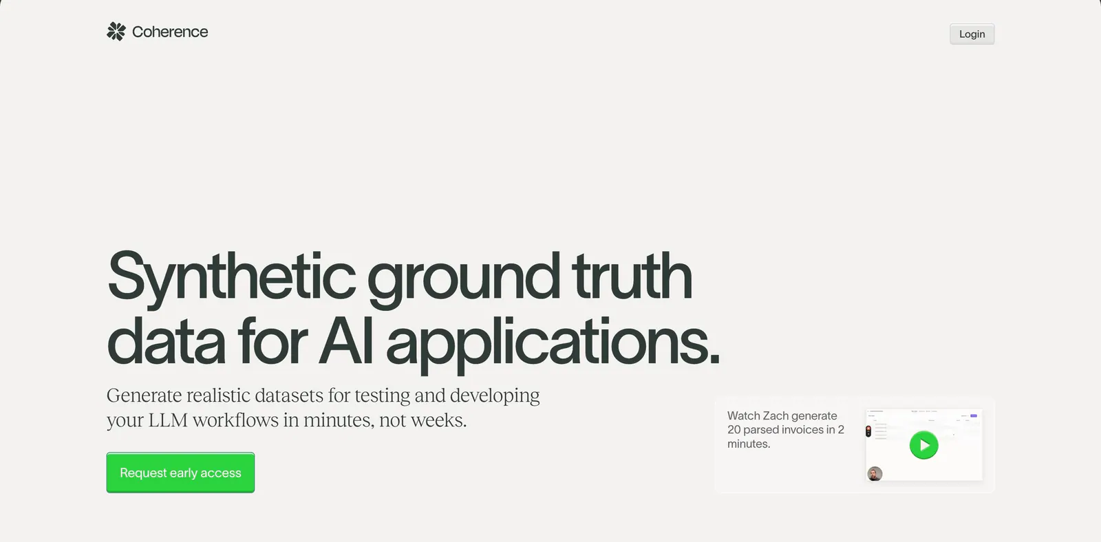
  109. Coherence hero section: oversized left-aligned headline with green CTA and a small video demo card on a warm light gray background
    Coherence Hero
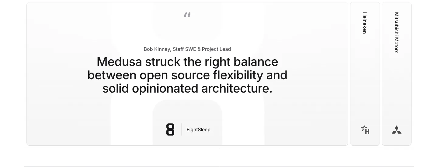
  110. Medusa testimonials section: large centered quote card with EightSleep logo beside collapsed Heineken and Mitsubishi Motors tabs
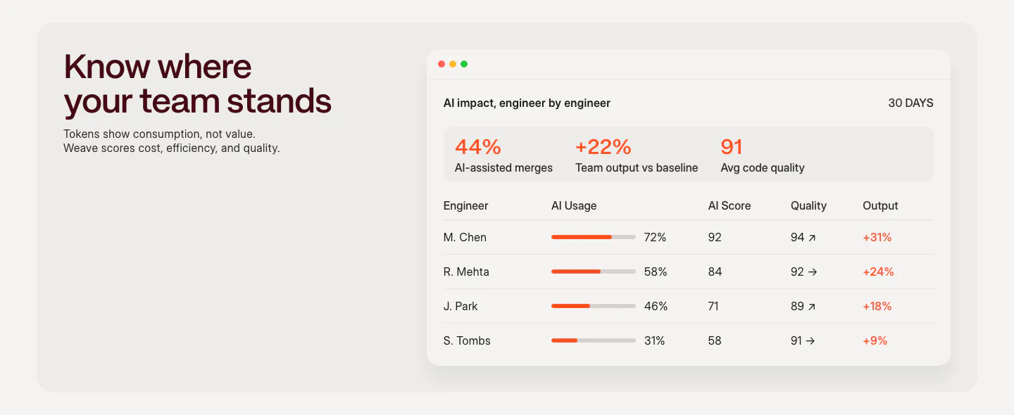
  111. Weave features section: headline and short copy on the left beside an AI impact dashboard table with usage bars and scores
  112. LocalCan integrations section: centered caption above a single row of grayscale framework logos including Next.js, Laravel, Nuxt and Node
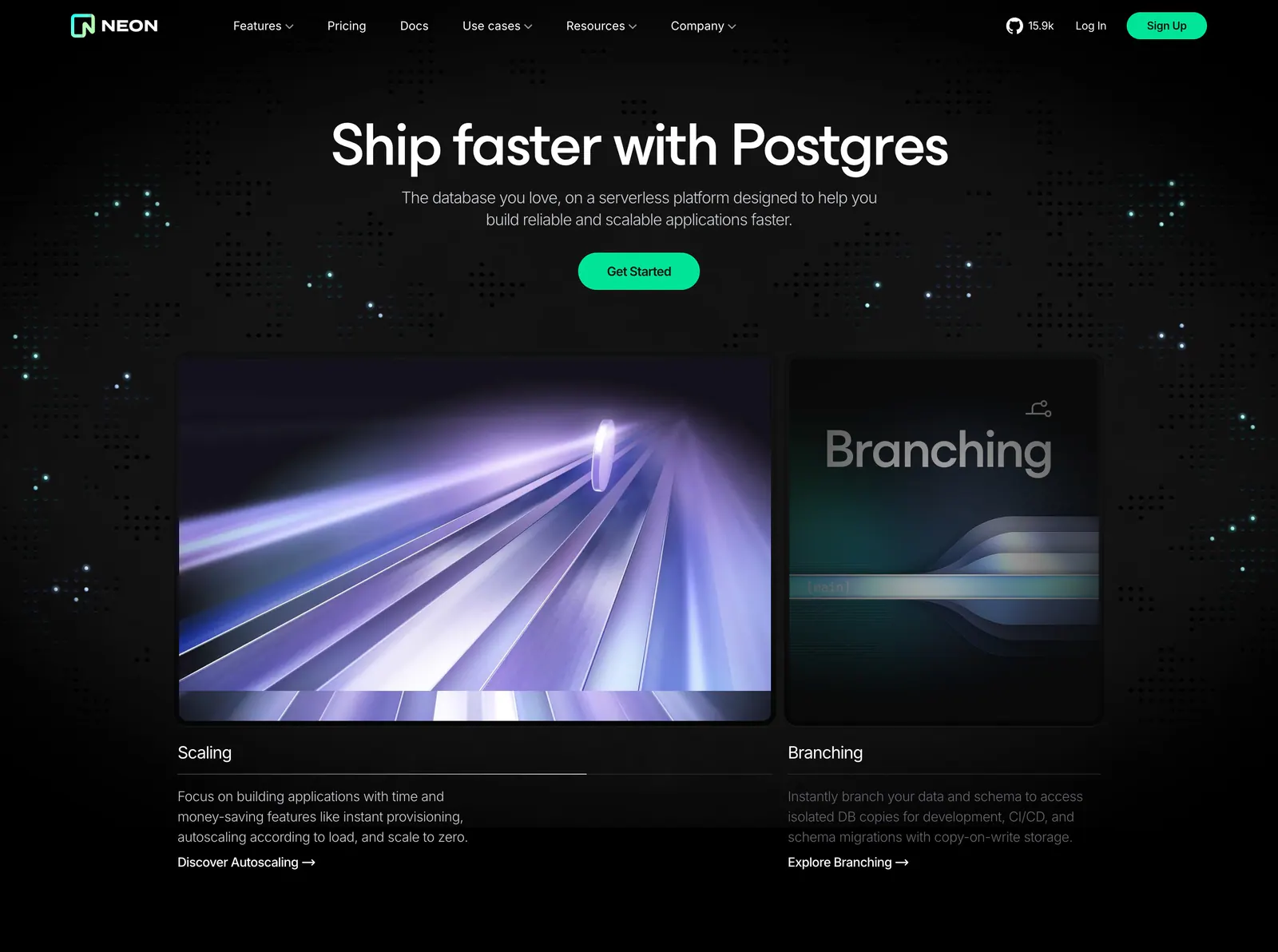
  113. Neon hero section: centered headline and green CTA above two rendered feature cards for Scaling and Branching on a dark dot-grid background
  114. Invertase footer section: centered CTA with glowing logo tile above link columns, social icons and copyright on a dark background
  115. Laravel logo cloud section: monospace caption beside a single row of OpenAI, Apple, Webflow, Nike and Zillow logos in bordered cells
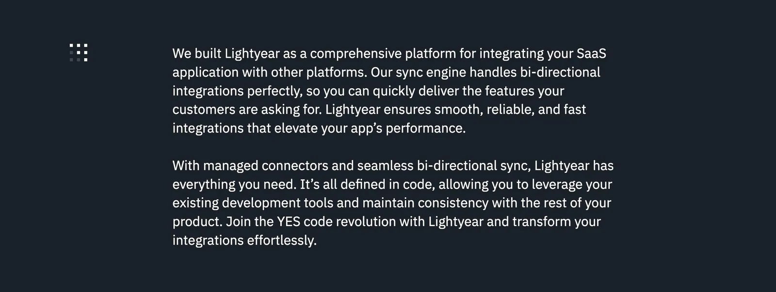
  116. Lightyear about & mission section: two paragraphs of white mission copy beside a small dot-grid icon on a dark charcoal background
    Lightyear About & mission
  117. Mintlify footer section: centered closing CTA above a faded docs wireframe, then four link columns and status badge on black
  118. Deck footer section: six link columns with Ask Claude and Ask ChatGPT buttons above a full-width white DECK wordmark on black
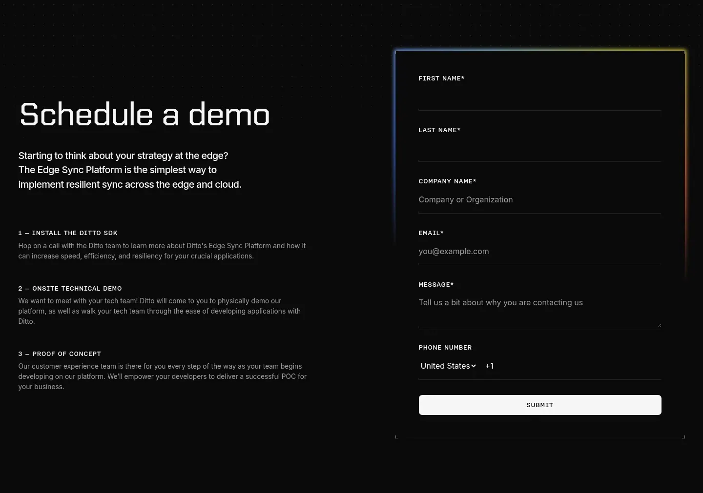
  119. Ditto contact section: headline and three numbered demo steps on the left beside a dark form with a glowing border on a dotted black background
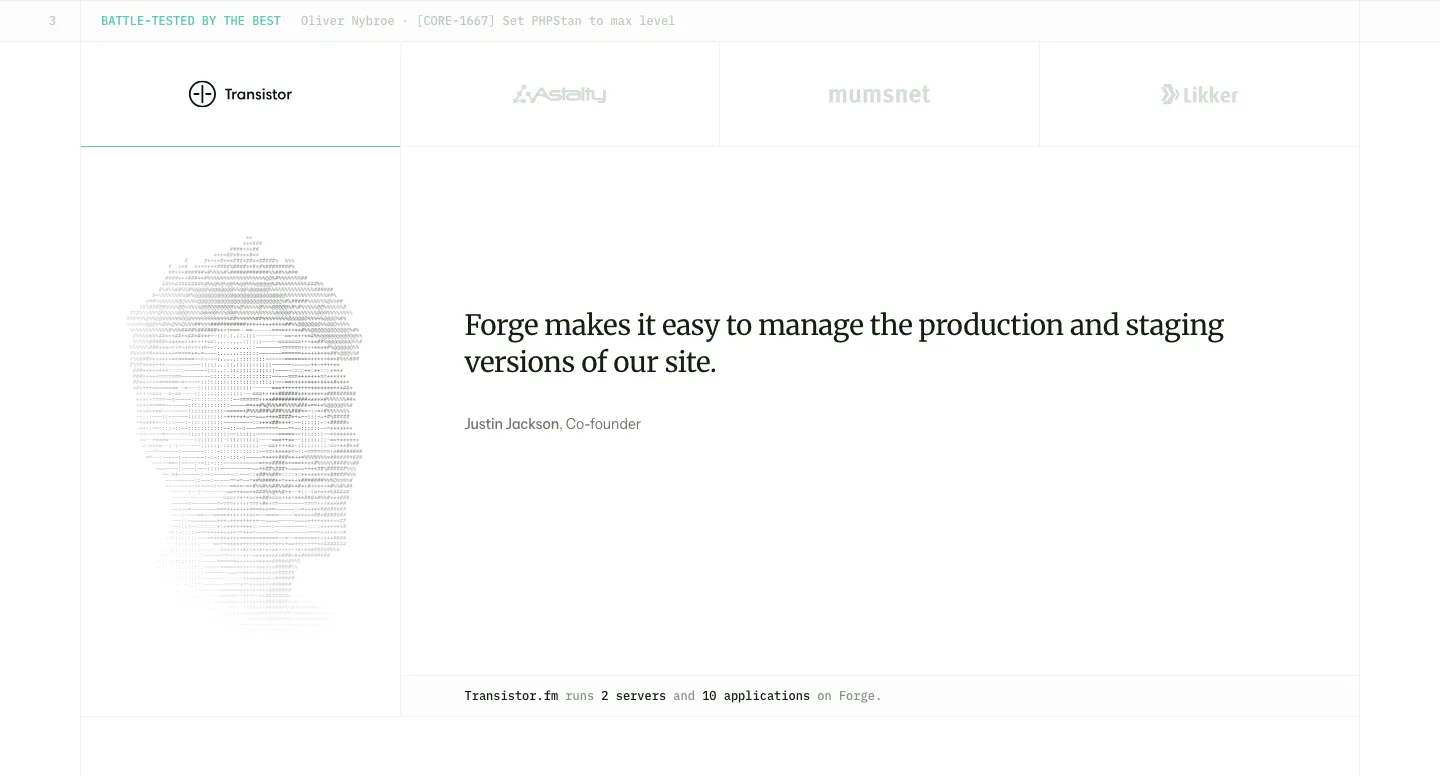
  120. Laravel Forge testimonials section: customer logo tabs above a serif quote with an ASCII-art portrait on the left
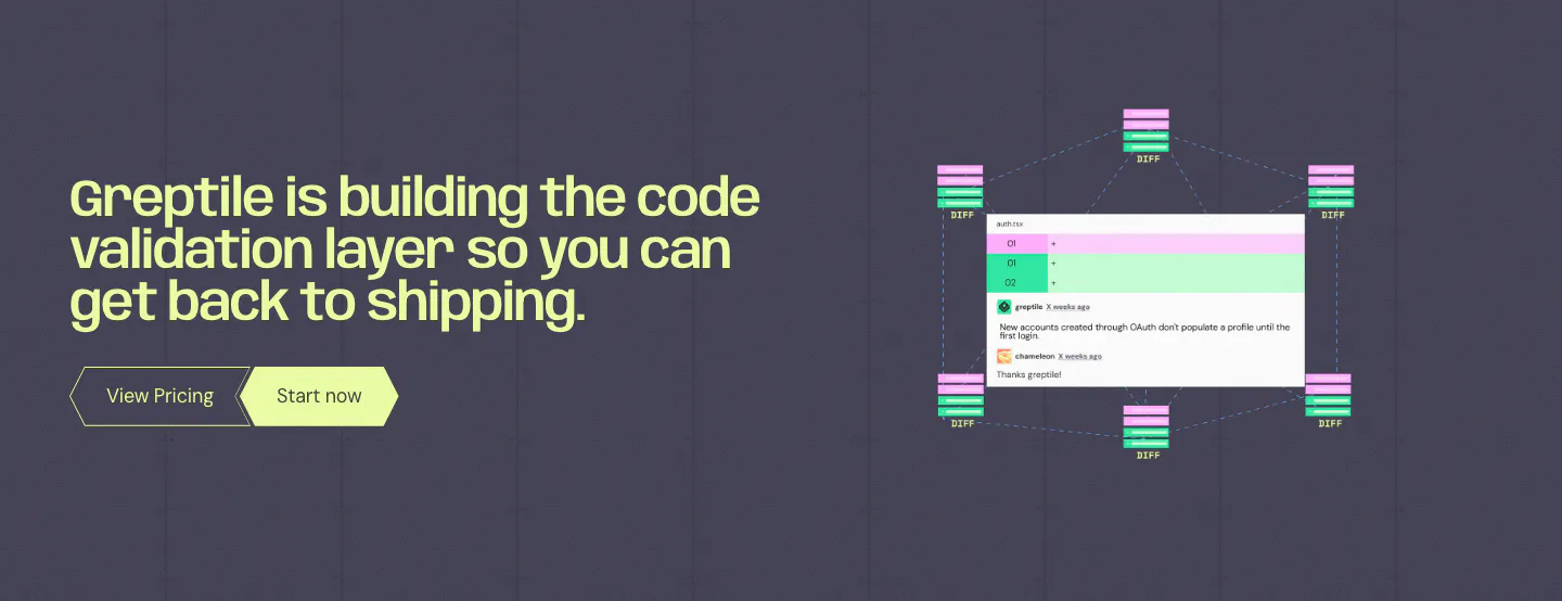
  121. Linear logo cloud section: centered two-line intro above a three-by-two grid of white customer logos such as Ramp, Vercel and Cash App on black
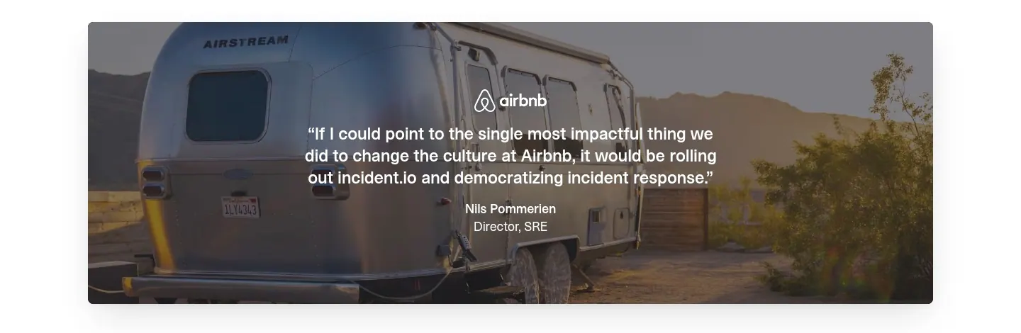
  122. incident.io testimonials section: centered Airbnb customer quote overlaid on a full-width photo of an Airstream trailer
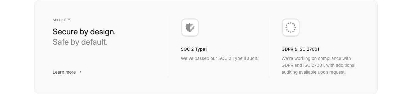
  123. Interfere security section: light gray card with headline left and SOC 2 and GDPR/ISO compliance columns with icons
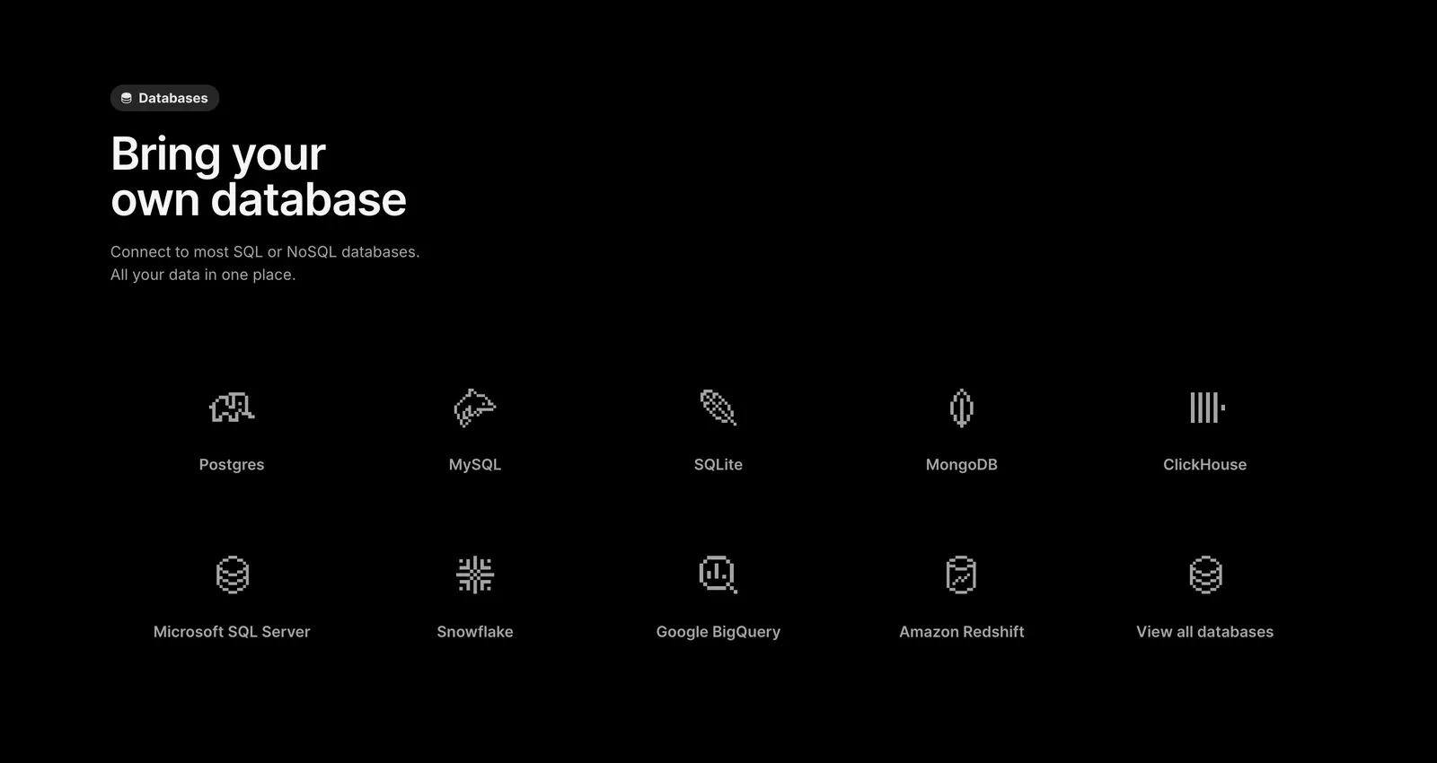
  124. Outerbase features section: left-aligned headline above a two-row grid of pixel-style database icons with names on black
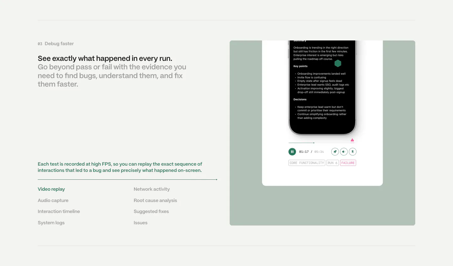
  125. Semaloop features section: numbered headline and feature list on the left beside a sage green panel with a phone test replay player
  126. Greptile call to action section: lime headline and two buttons on the left, code review comment UI with diff nodes on the right
  127. Laravel Forge features section: left-aligned heading above a 2x2 grid of feature cards with faded UI snippets on white
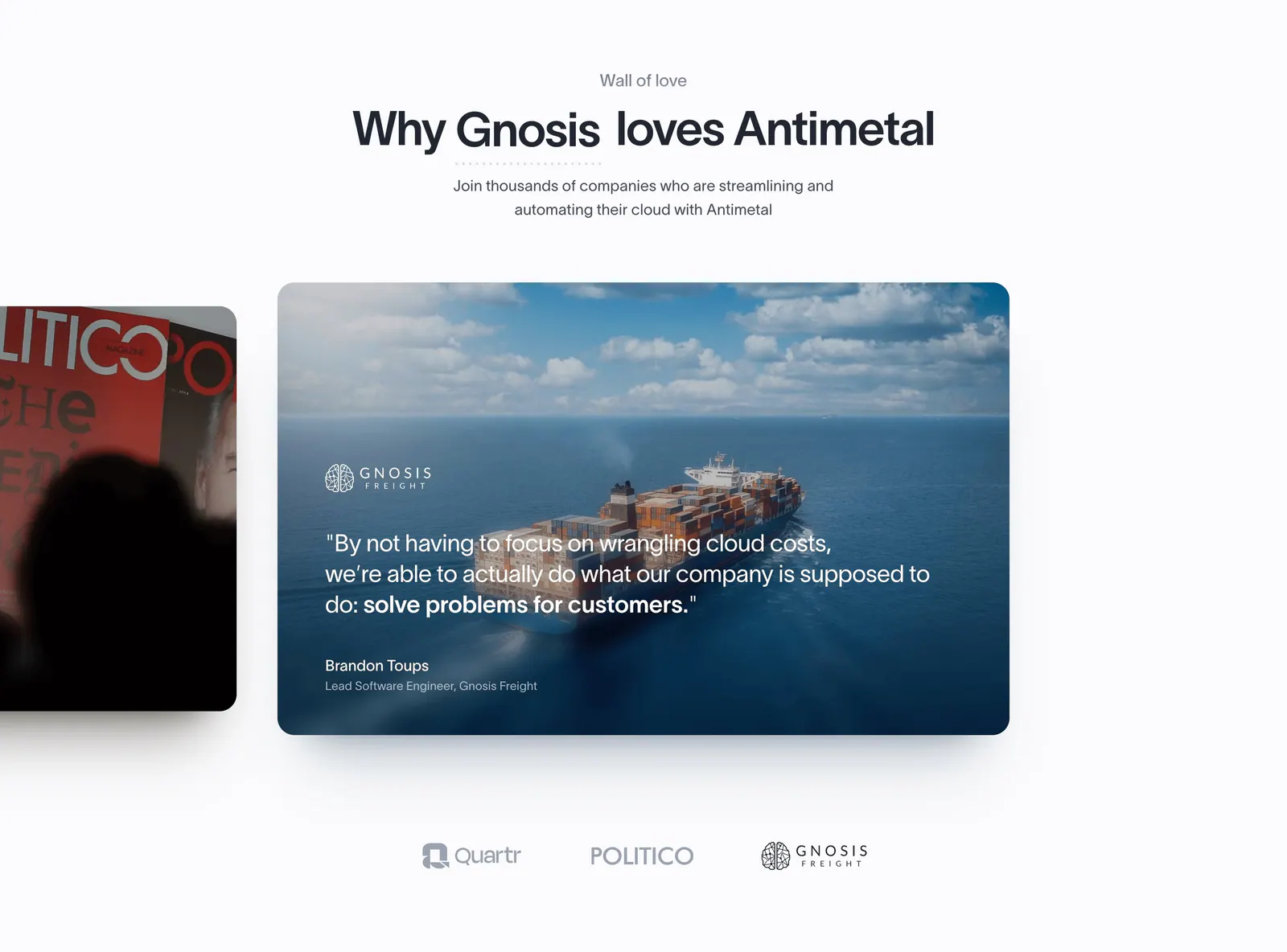
  128. Antimetal testimonials section: centered headline above a carousel of photo quote cards with a cargo ship image and logo selectors
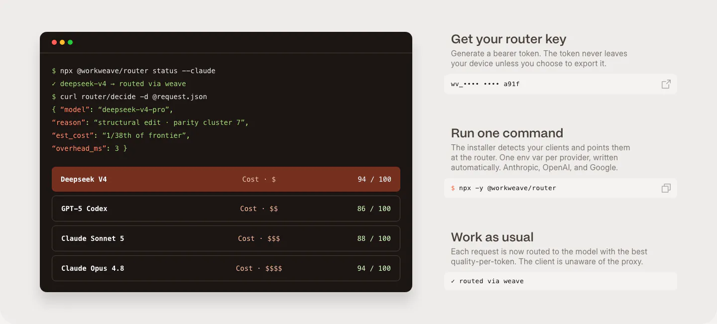
  129. Weave how it works section: dark terminal window with router commands and model scores beside three setup steps with copyable fields
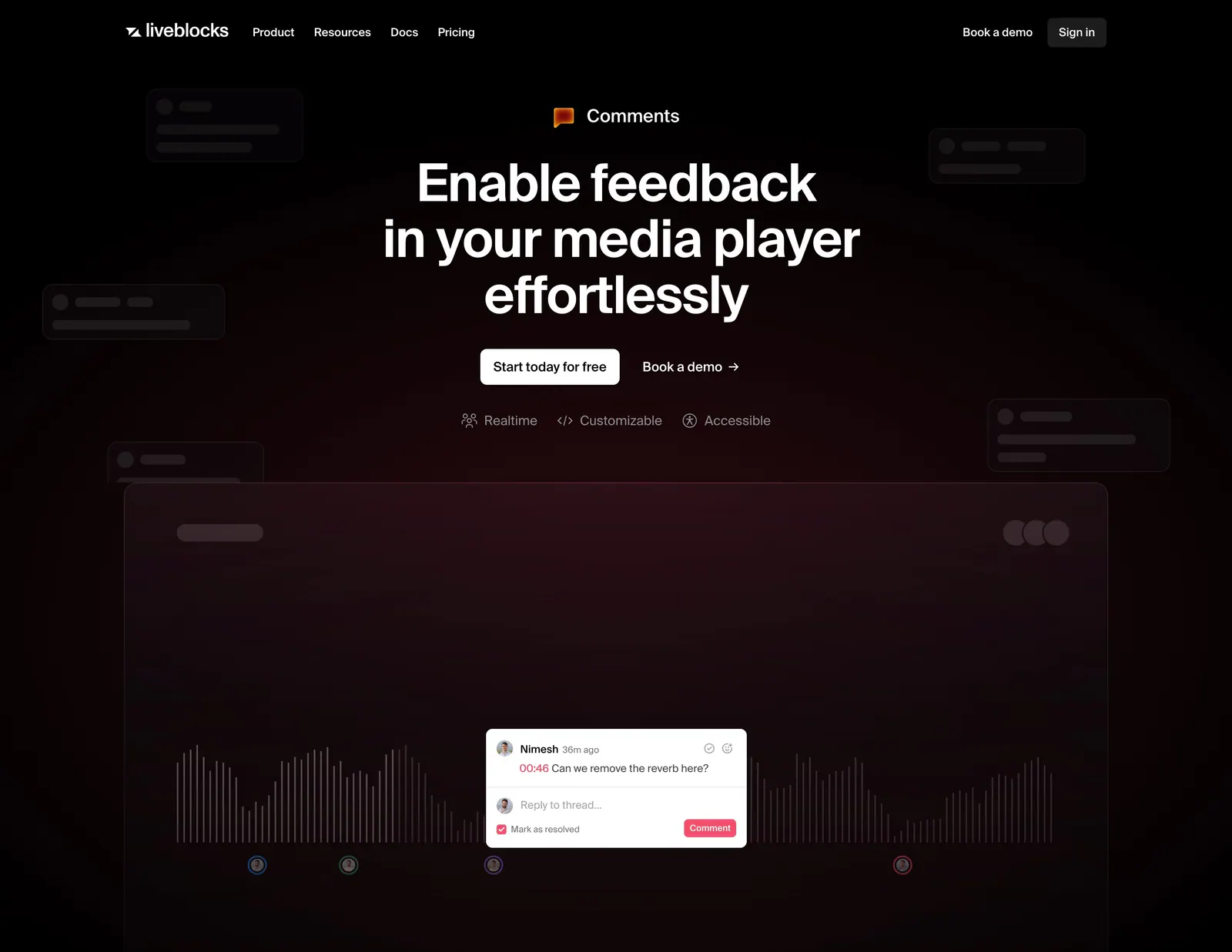
  130. Liveblocks hero section: nav bar, centered headline and two CTAs above a media player waveform mockup with a comment thread on a maroon glow
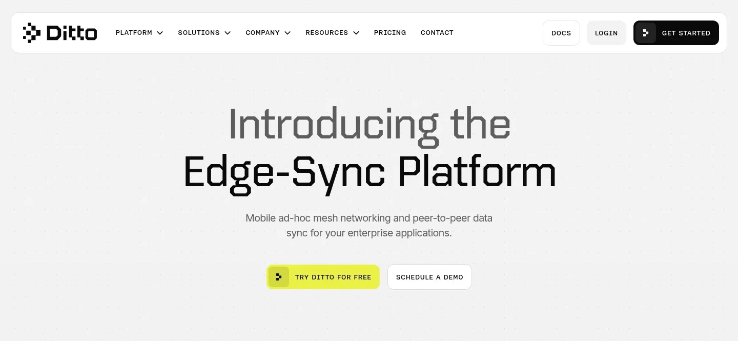
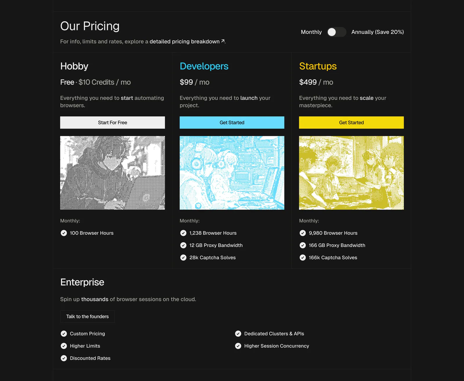
  131. Ditto hero section: rounded nav bar above a centered two-tone headline and yellow and outline buttons on a dotted light gray background
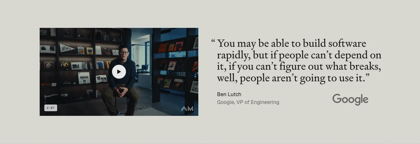
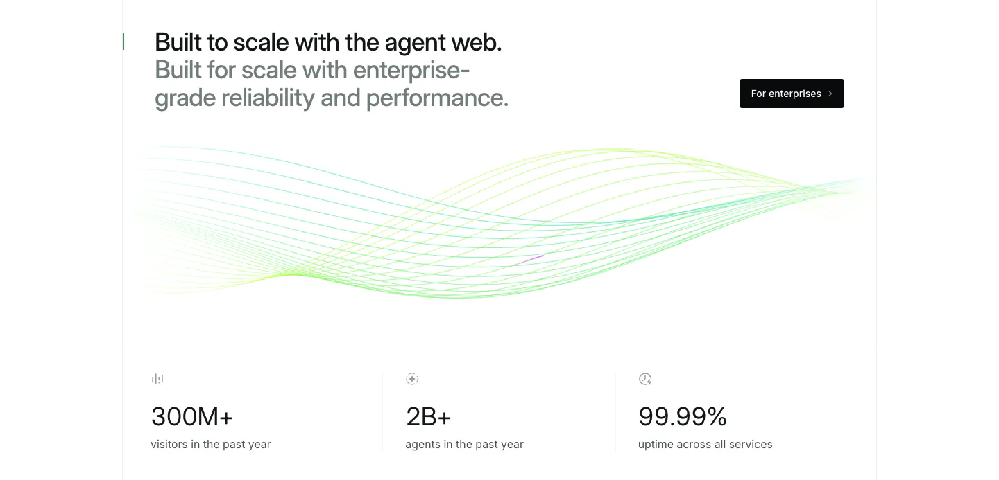
  132. Antimetal testimonials section: video thumbnail of a speaker at left, large serif quote from a Google VP with Google logo at right
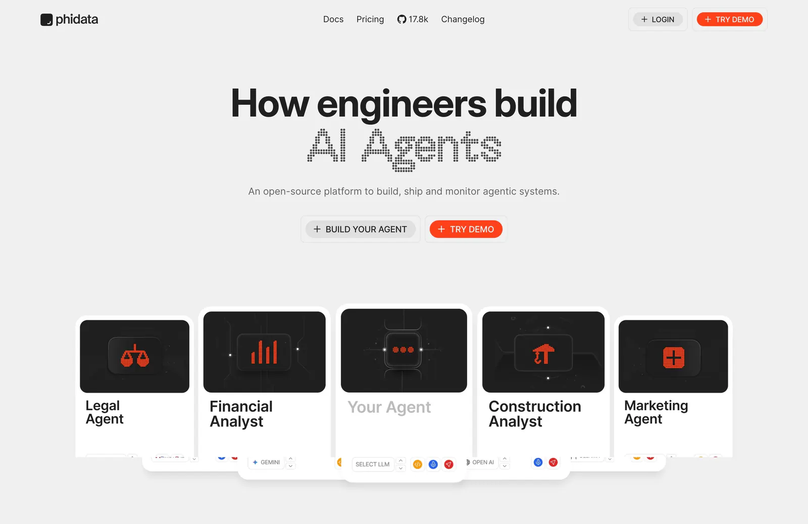
  133. Phidata hero section: centered headline with dot-matrix AI Agents text and two buttons above a row of agent cards on light gray
  134. Composio call to action section: single-line headline beside a black Try Composio now button in a slim light gray band
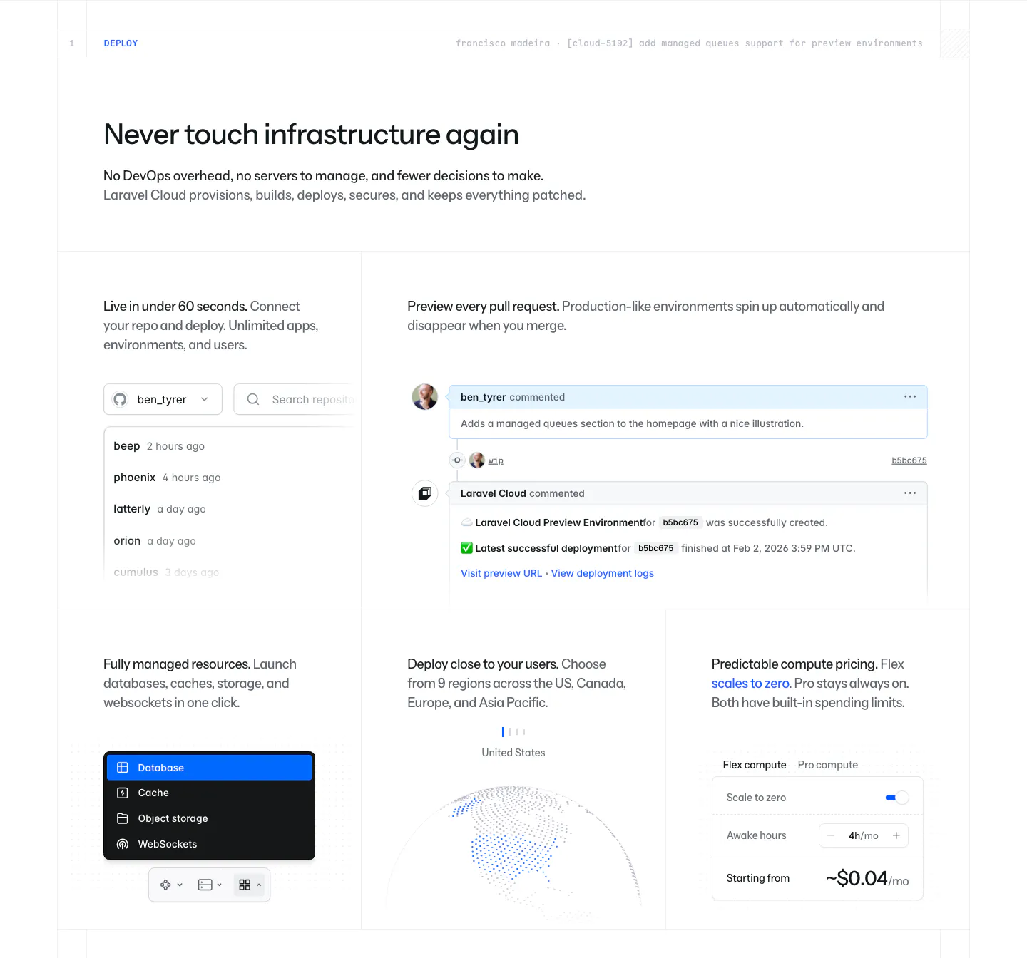
  135. Laravel Cloud features section: headline above a bento grid of UI snippets for repo deploys, PR previews, resources, regions and pricing
  136. Steel pricing section: three plan cards with dithered anime-style images, monthly/annual toggle and an enterprise row on a dark background
  137. Mintlify stats section: two-tone headline and button above green line waves and a row of three large usage metrics
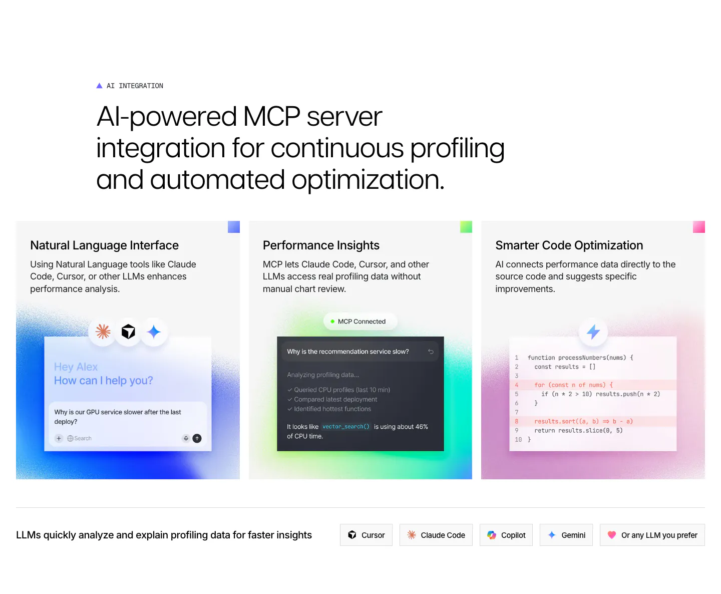
  138. Lovable logo cloud section: two-column grid of brand logos like adidas, NVIDIA and asana beside a heading, copy and Learn more button
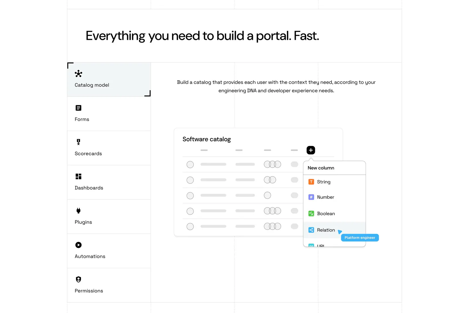
  139. Port features section: headline above a vertical tab list of capabilities beside a software catalog UI mockup on a grid-lined white page
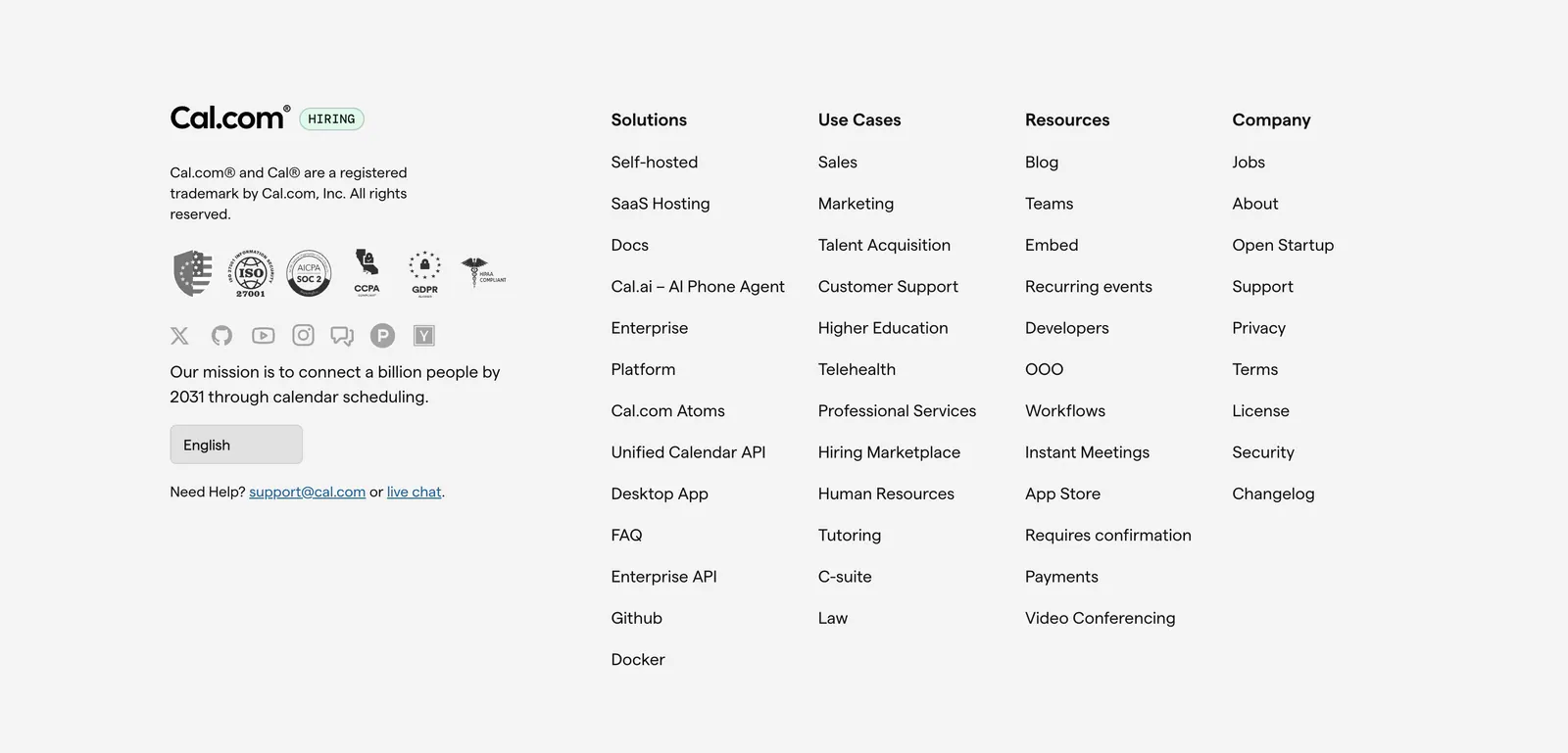
  140. Cal.com footer section: logo, compliance badges, social icons and language selector beside four link columns on light gray
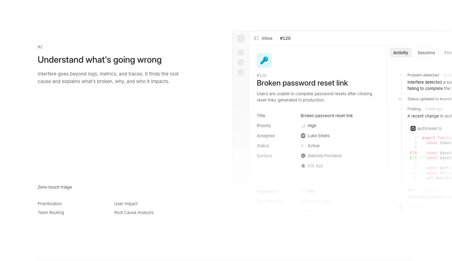
  141. Interfere features section: numbered text block with triage list on the left and an issue detail screenshot on the right
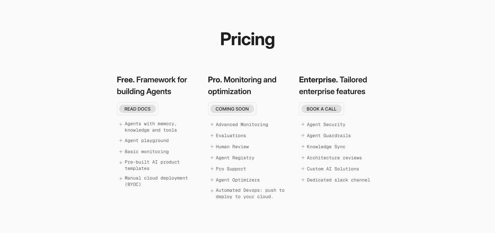
  142. Phidata pricing section: centered Pricing heading above three plain plan columns with buttons and monospace feature lists on light gray
  143. Polar Signals features section: large headline over three cards with glowing chat, MCP and code mockups, plus a row of LLM tool chips
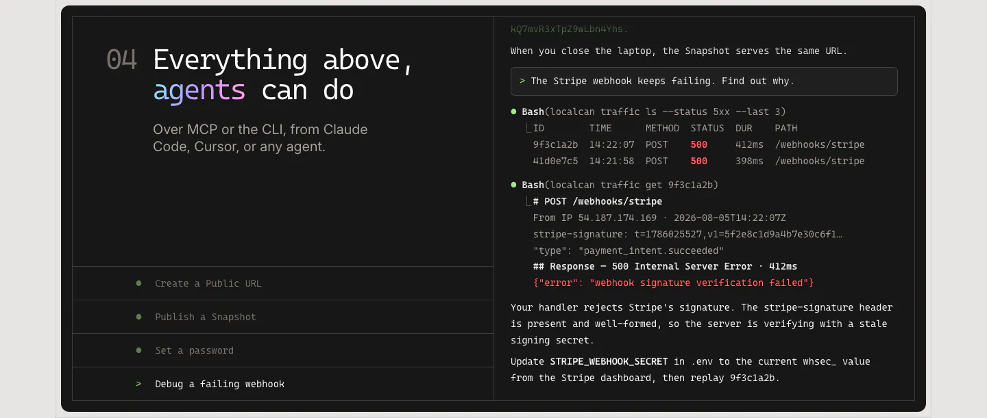
  144. LocalCan features section: monospace headline and agent task list on the left of a dark panel, terminal transcript debugging a webhook on the right
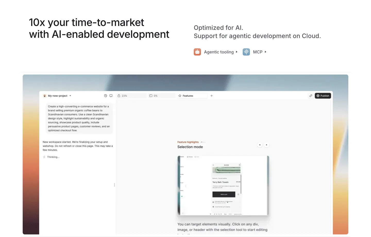
  145. Medusa features section: headline with agentic tooling and MCP links above an AI site builder UI on a warm sunset gradient
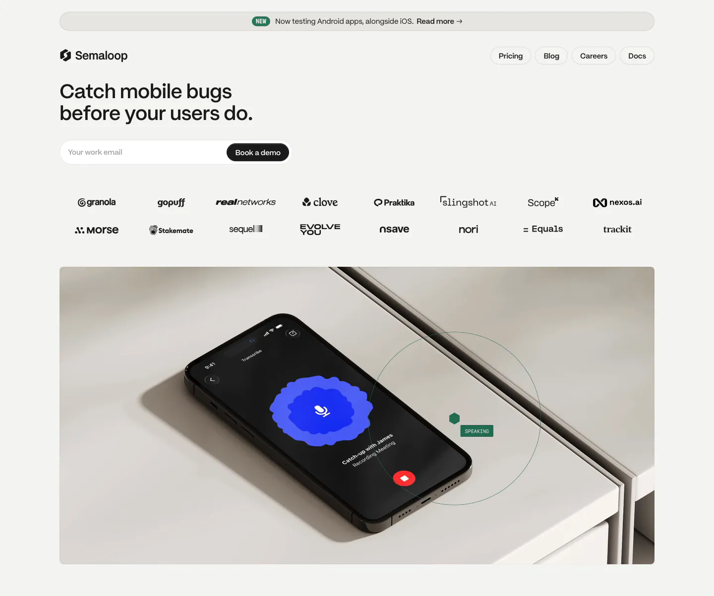
  146. Semaloop hero section: left-aligned headline and email field with demo button above two rows of logos and a photo of a phone on a shelf
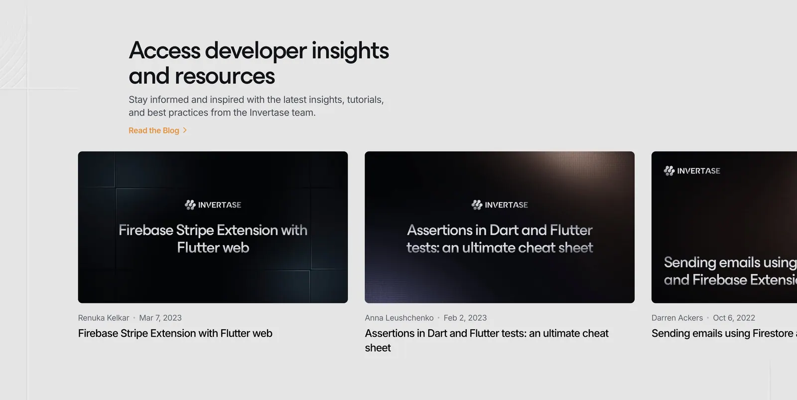
  147. Invertase blog & resources section: left headline above a row of dark article thumbnail cards cut off at the right edge on light gray
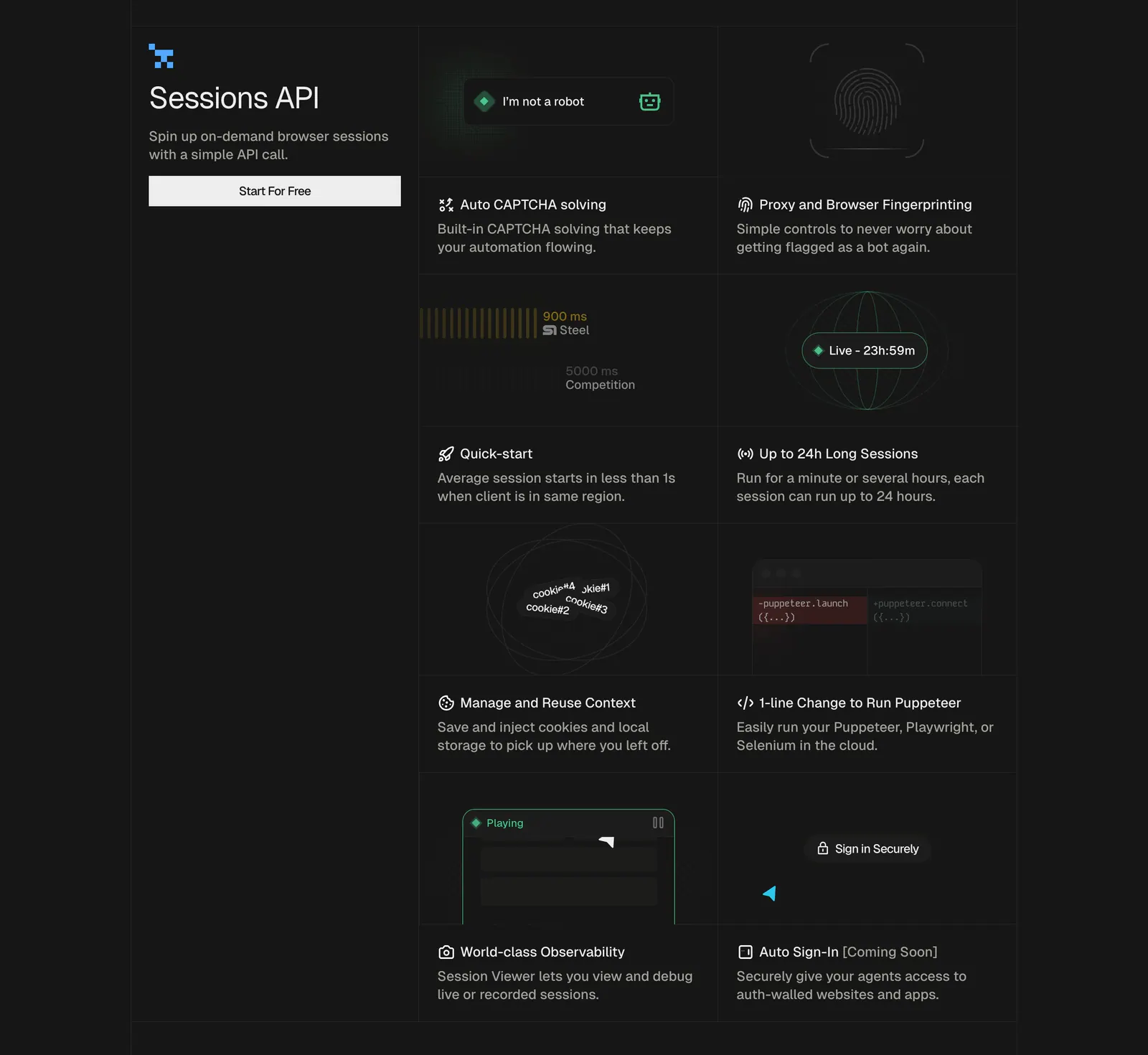
  148. Steel features section: left title block with button beside a two-column grid of feature cells with small UI graphics on a dark background
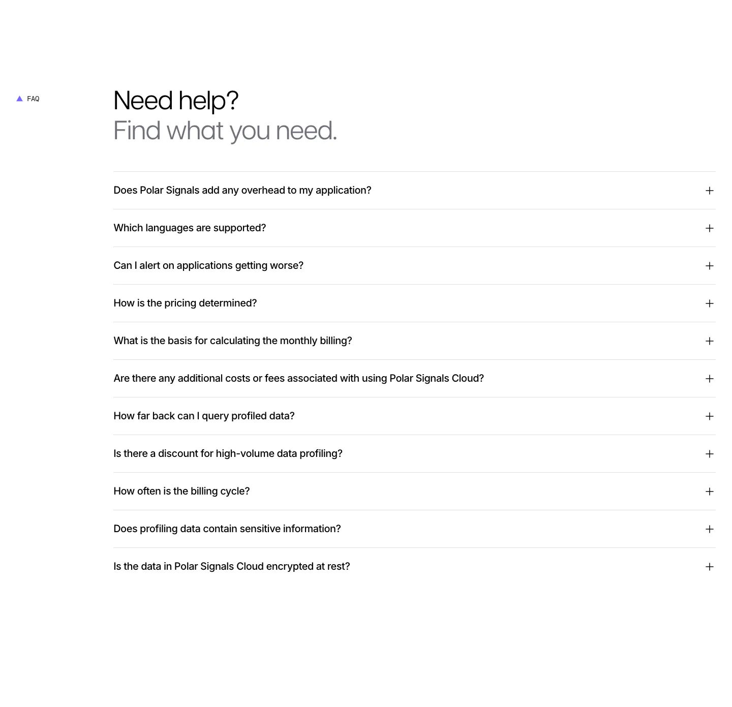
  149. Polar Signals FAQ section: two-tone headline above a full-width accordion list of eleven questions with plus icons on white
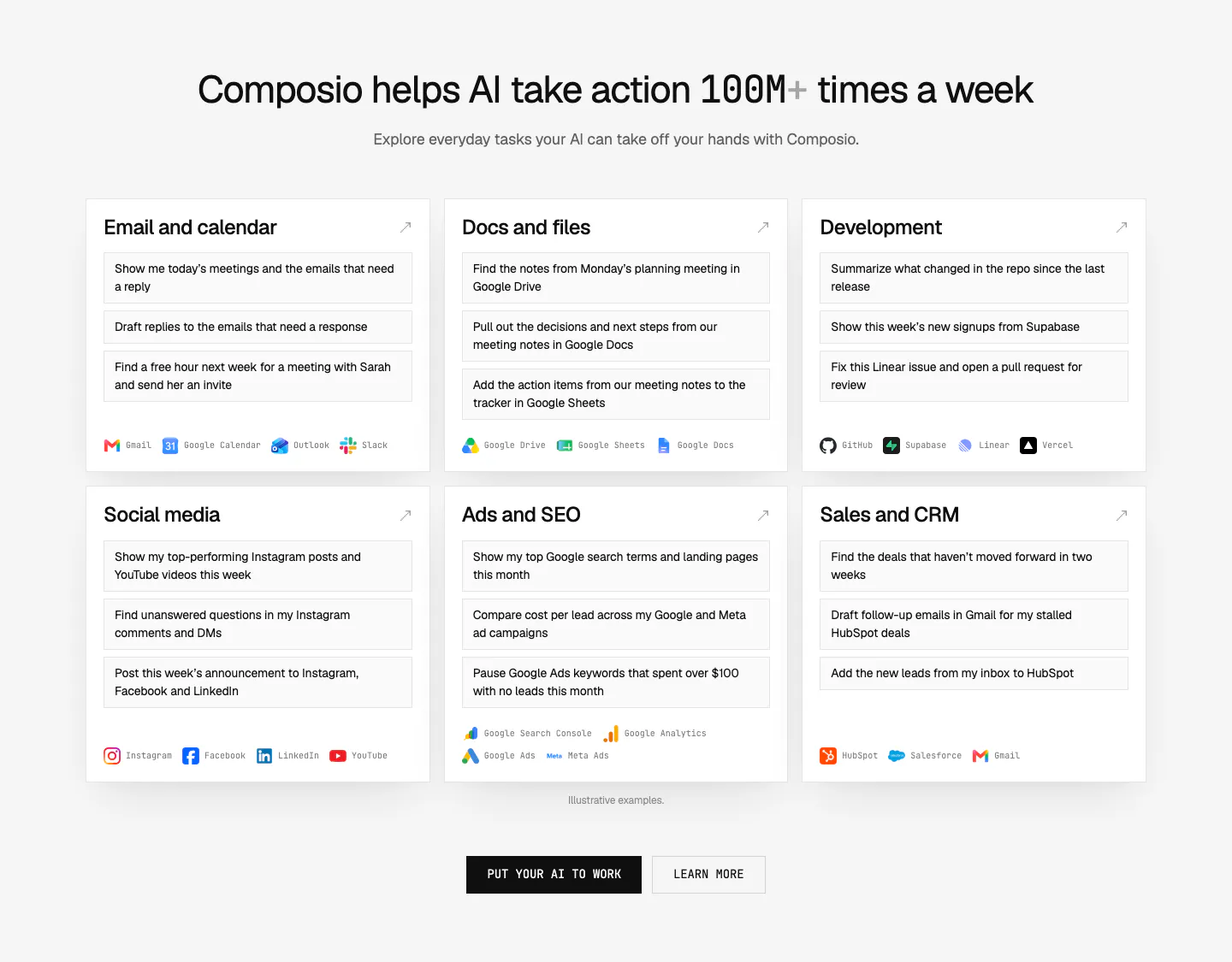
  150. Composio use cases section: centered headline above six white cards of example prompts by category with app names, plus two CTAs
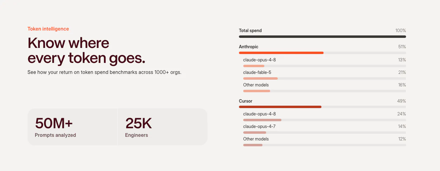
  151. Weave features section: headline and two stat tiles on the left beside a token spend breakdown chart with horizontal bars by model
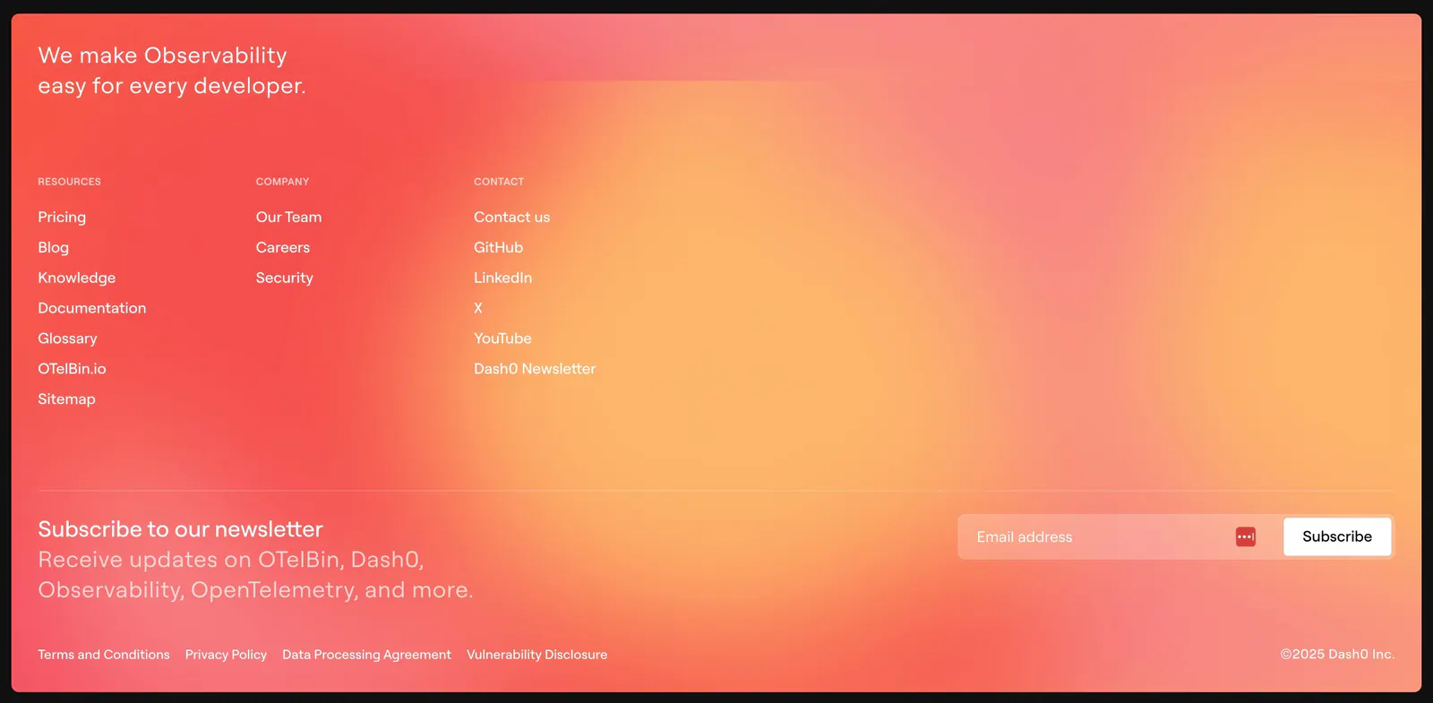
  152. Dash0 footer section: link columns and a newsletter email field over a warm coral-to-orange gradient background
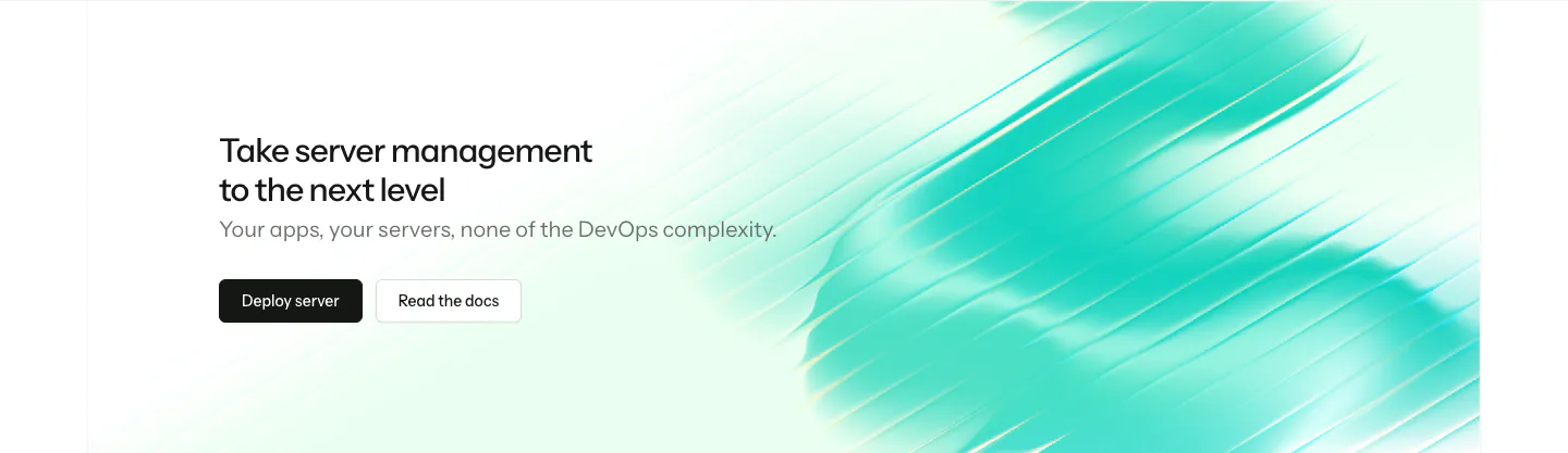
  153. Laravel Forge call-to-action section: left-aligned headline and two buttons beside a streaky teal gradient artwork
  154. Linear call to action section: centered two-line headline with light and dark pill buttons on a black background
  155. Lovable footer section: centered prompt input CTA above a cream footer card with five link columns, set on a blue, pink and orange gradient
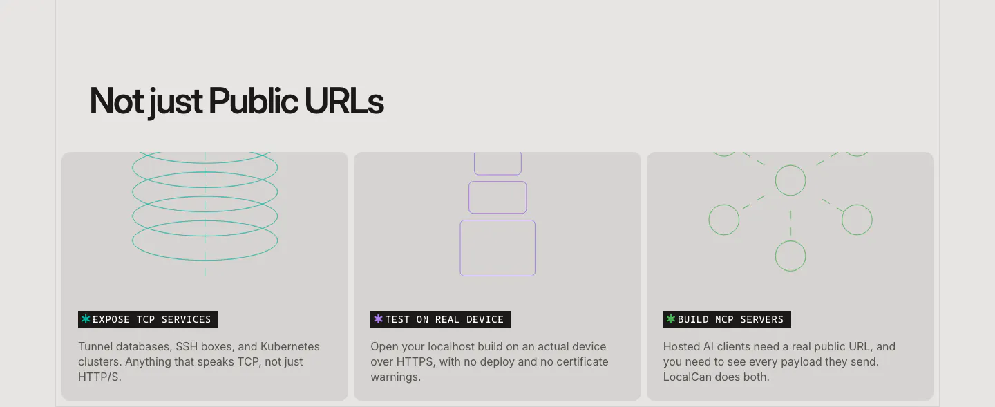
  156. LocalCan features section: left-aligned headline above three equal gray cards with thin line drawings for TCP, devices and MCP servers
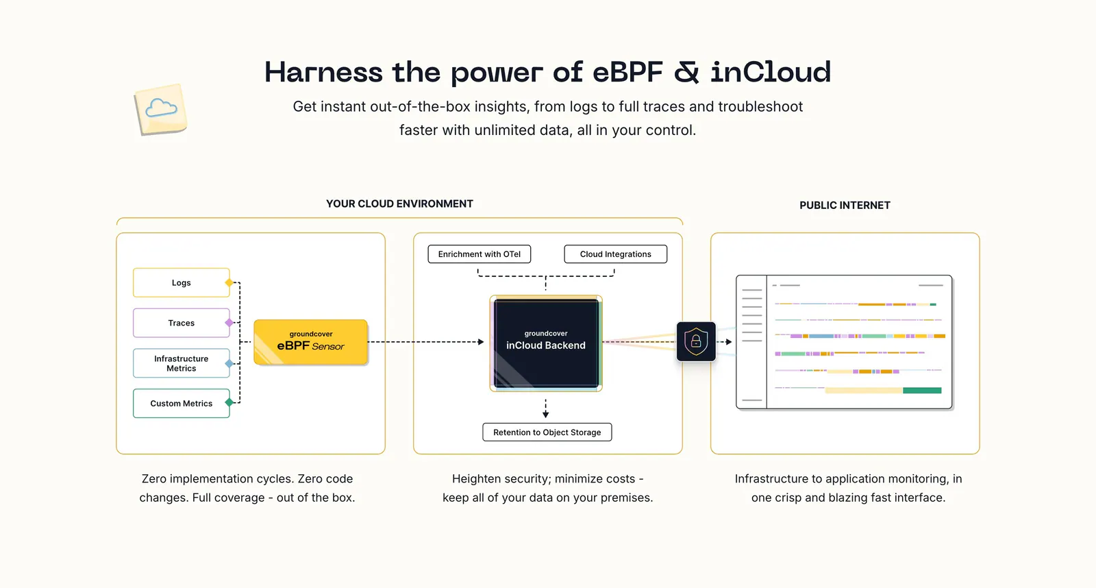
  157. groundcover how it works section: centered headline above an architecture diagram flowing from sensor to backend to UI with captions
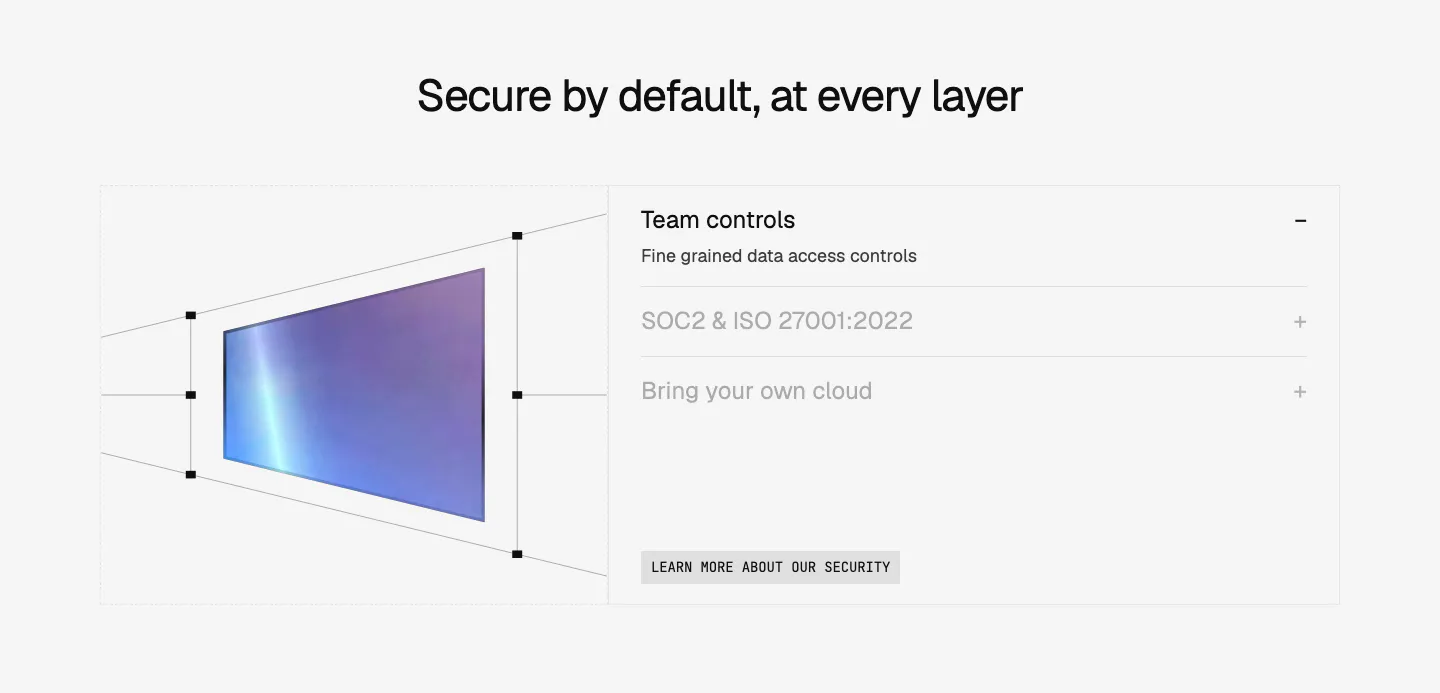
  158. Composio security section: perspective wireframe of a gradient panel at left and an accordion of security topics at right on light gray
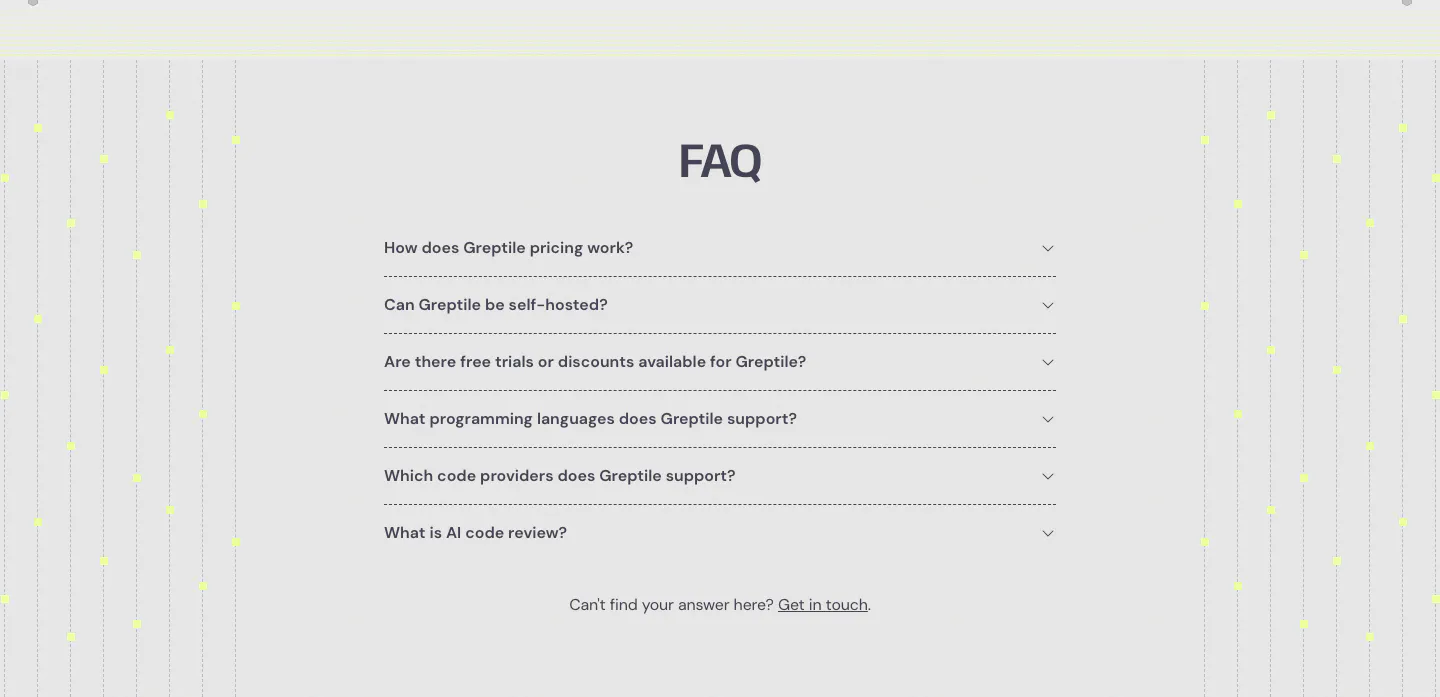
  159. Greptile FAQ section: centered accordion list of six questions flanked by vertical dotted lines with yellow dots on light gray
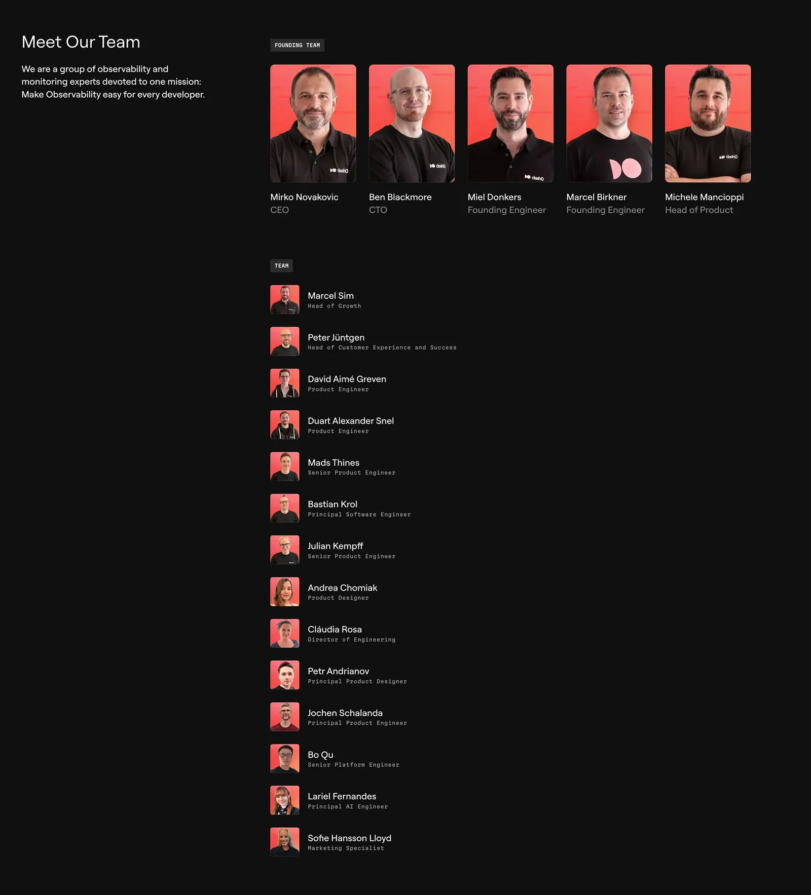
  160. Dash0 team section: intro text on the left, a row of five founder portraits on coral backgrounds and a list of team members on near-black
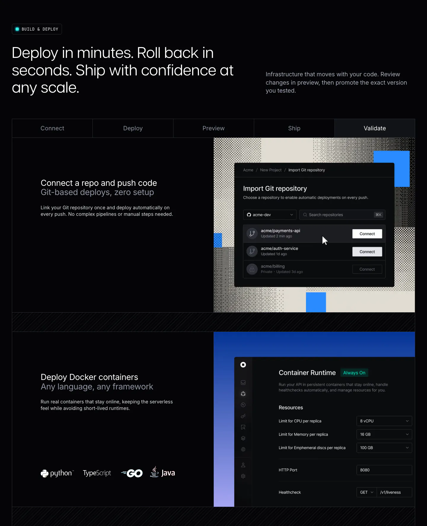
  161. Unknown features section: dark layout with a five-step tab bar and rows pairing deploy copy with Git import and container runtime UI
  162. Laravel Forge footer section: dark footer with email signup, link columns, social icons and a huge dithered Laravel wordmark
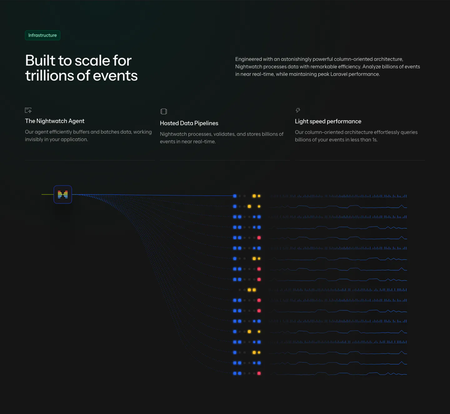
  163. Laravel Nightwatch features section: headline and three infrastructure points above a dark data pipeline graphic of event streams
  164. LocalCan call-to-action section: two-tone headline with Start Free Trial and Download buttons on a dark green band with a pixel dither pattern
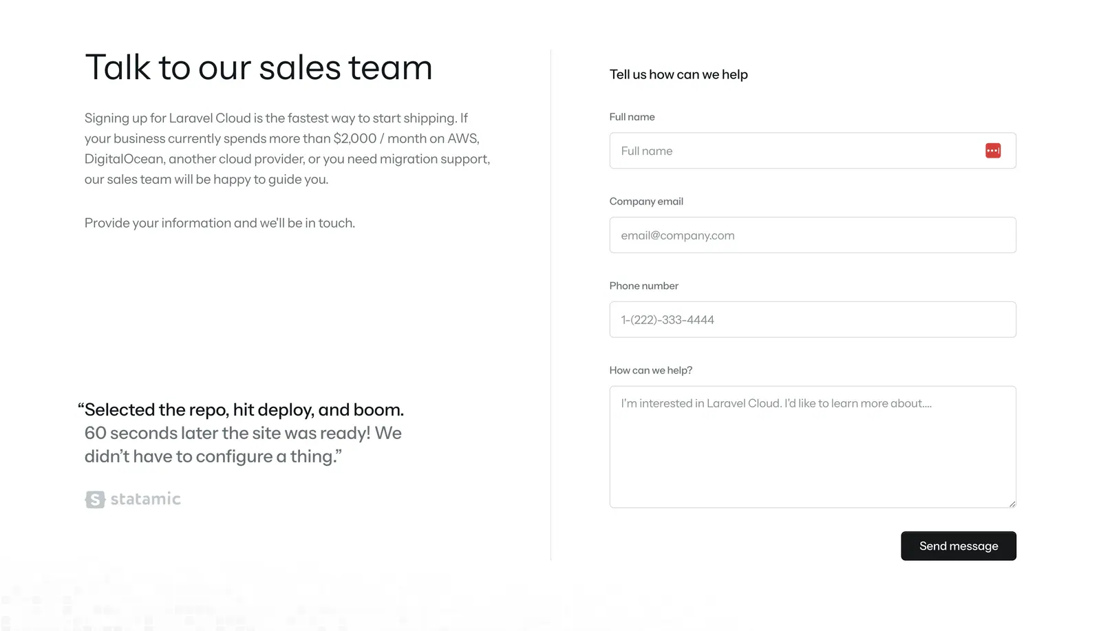
  165. Laravel Cloud contact section: headline, copy and customer quote on the left, sales contact form on the right on white
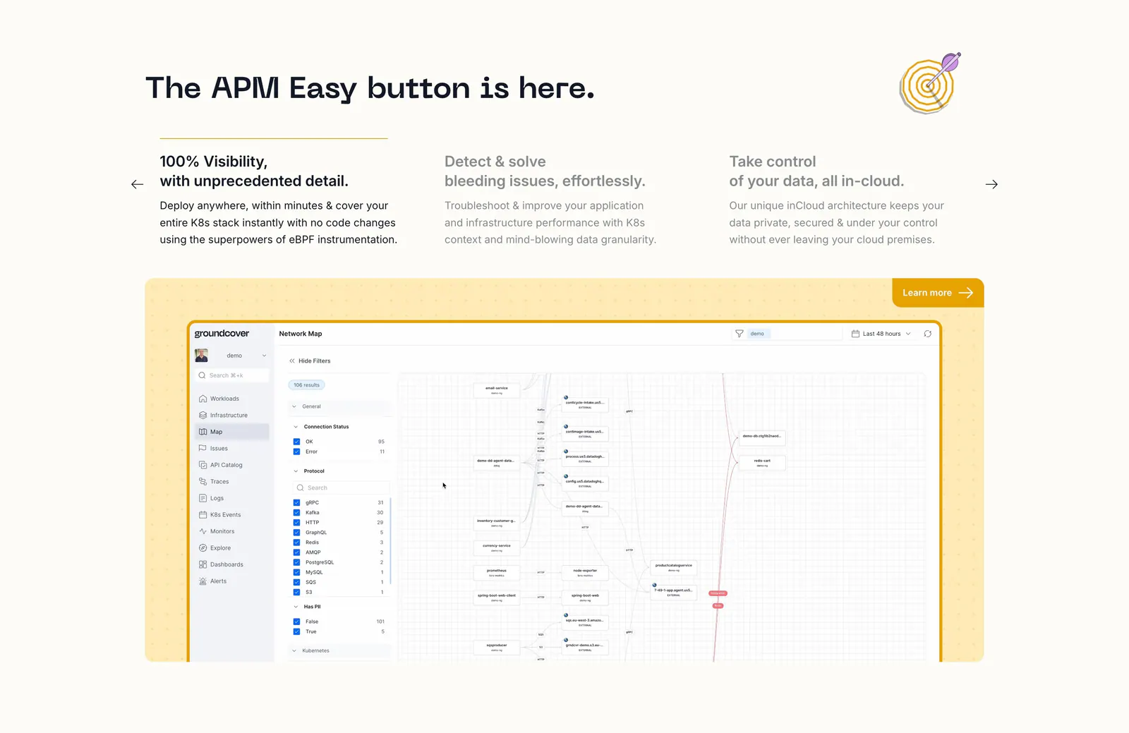
  166. groundcover features section: headline over three feature columns with arrows above a network map screenshot in a yellow dotted panel
  167. Linear call-to-action section: two-line headline on the left with Get started and Talk to sales buttons on the right, on a near-black gradient
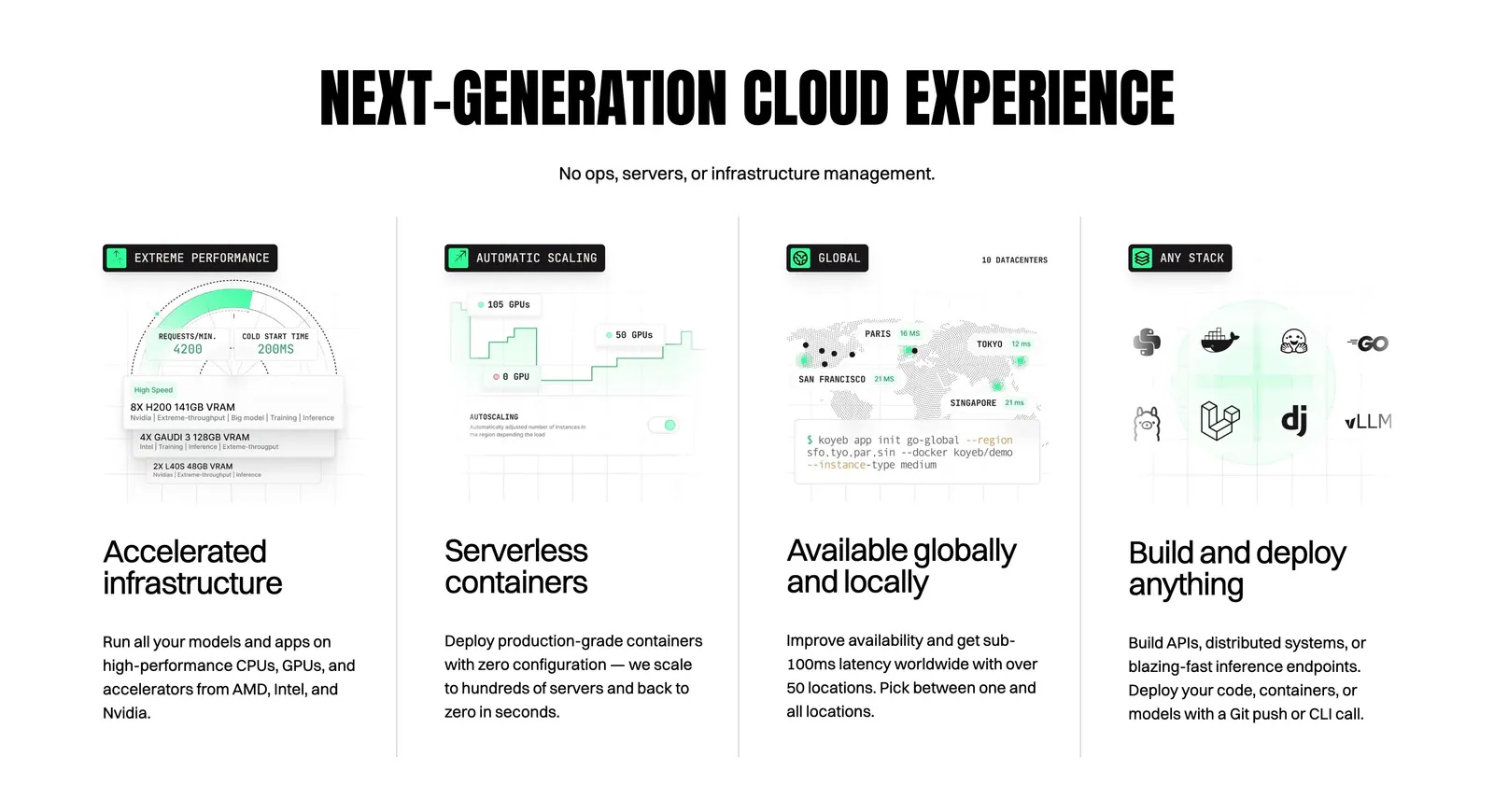
  168. Koyeb features section: condensed uppercase headline above four columns with UI mockups, a world map and a CLI snippet
  169. incident.io value proposition section: serif centered headline below floating chat bubbles on a large orange panel
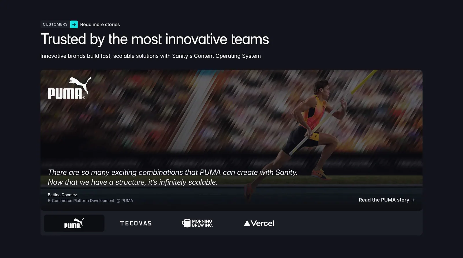
  170. Sanity testimonials section: headline above a PUMA athlete photo card with quote and a row of customer logo tabs on a dark background
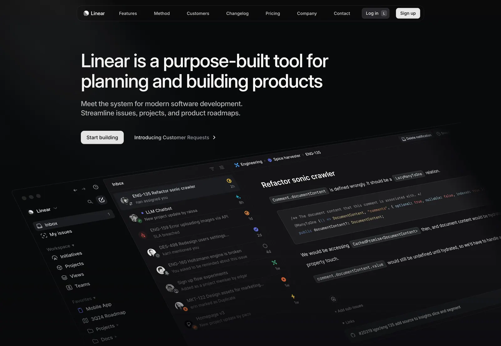
  171. Linear hero section: nav bar, left-aligned headline, subcopy and two CTAs above a tilted dark app screenshot showing inbox and an issue view
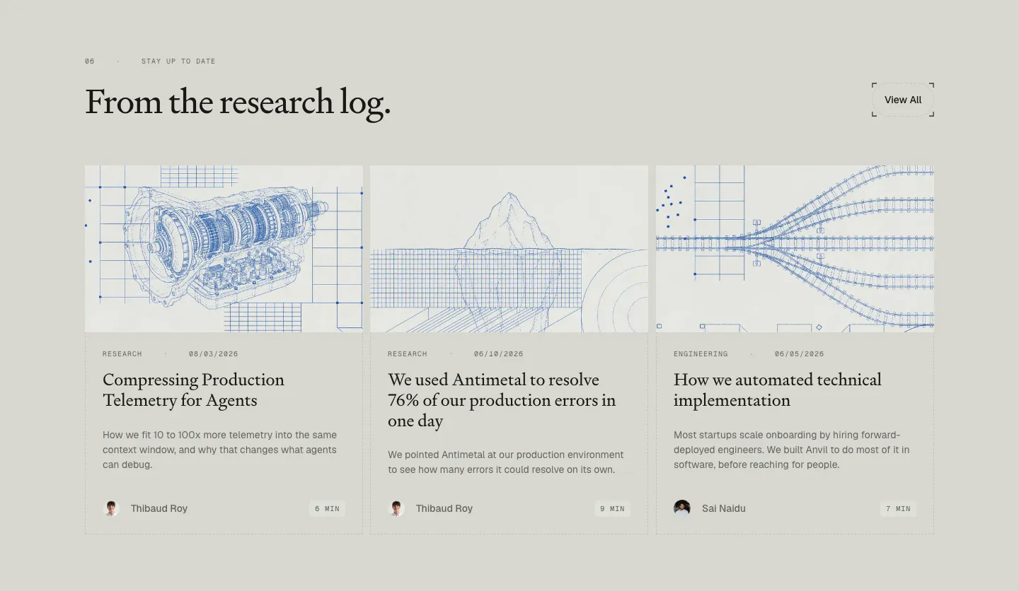
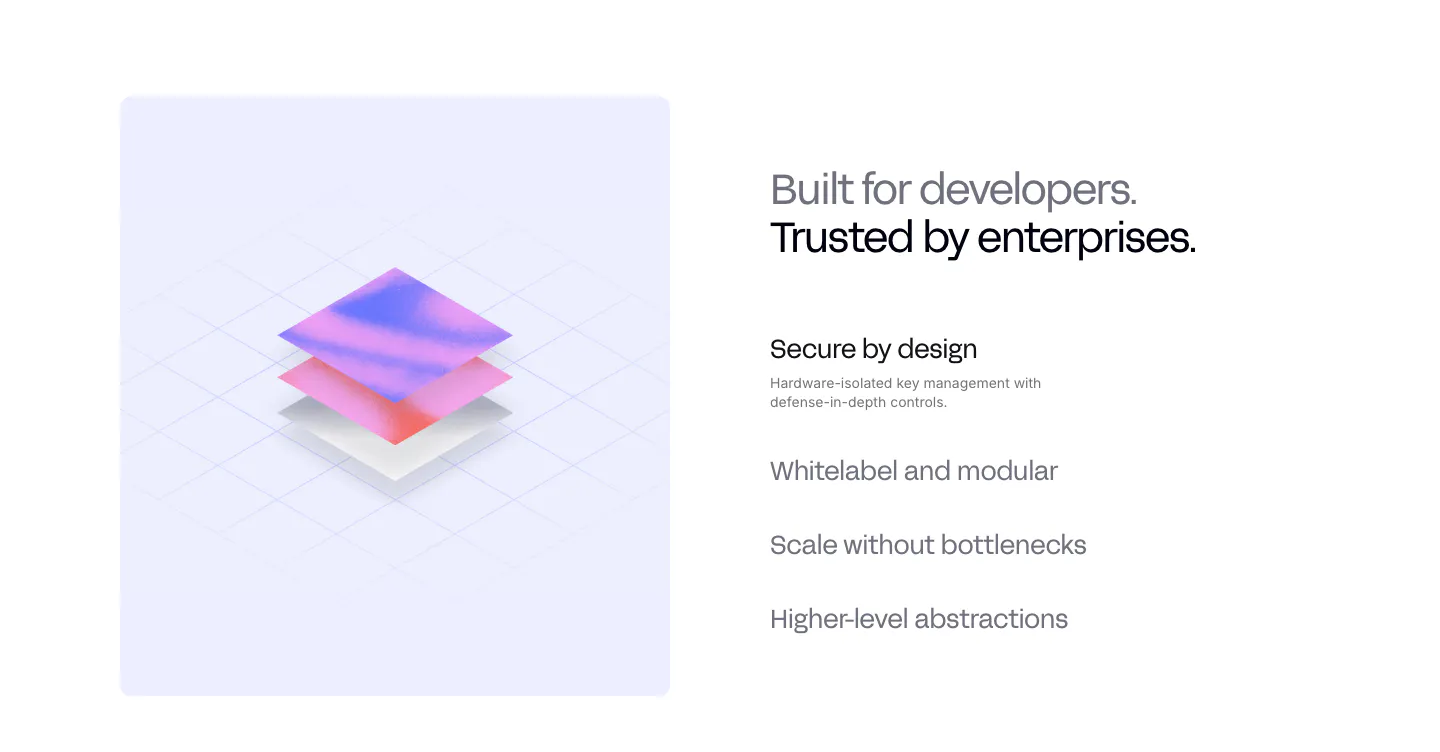
  172. Antimetal blog & resources section: serif headline with View All button over three article cards with blue blueprint line drawings
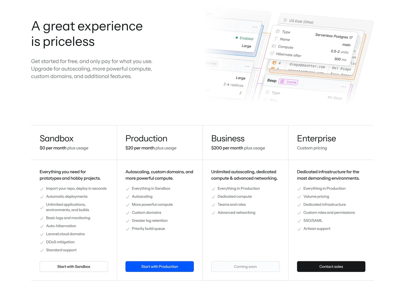
  173. Laravel Cloud pricing section: headline beside a faded UI mockup above four plan columns with checklists and buttons
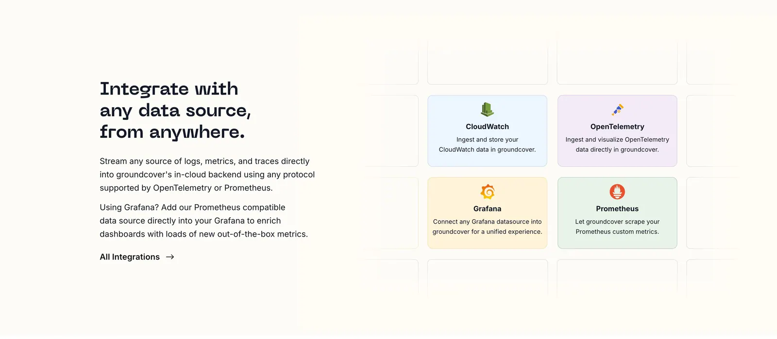
  174. groundcover integrations section: headline, copy and link on the left beside a grid of pastel integration cards on a cream background
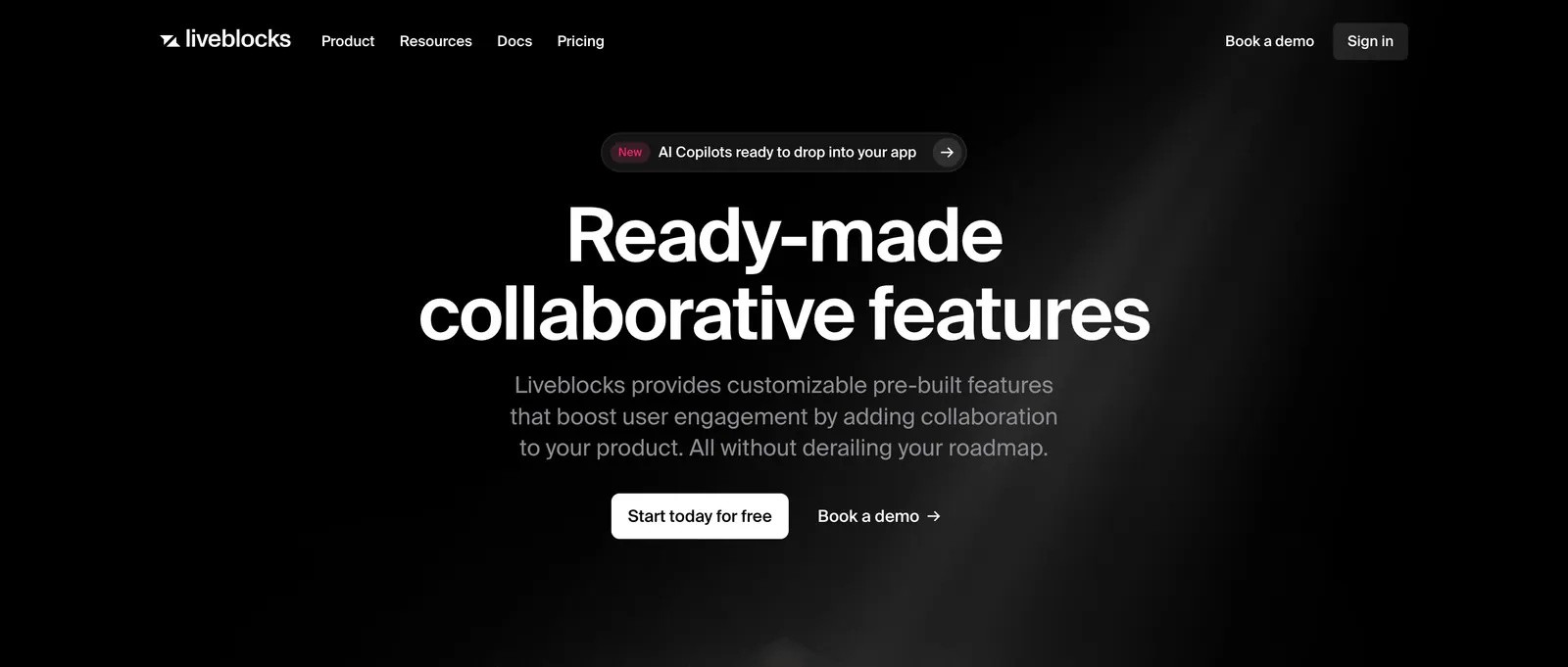
  175. Liveblocks hero section: nav bar, announcement pill, large centered white headline, subcopy and two CTAs on black with a faint light beam
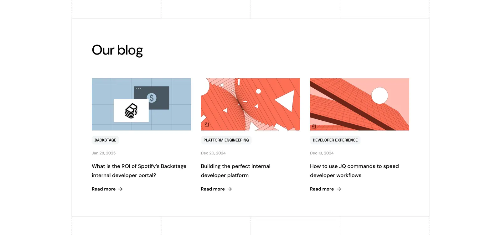
  176. Port blog & resources section: headline above three blog cards with abstract geometric artwork, category tags, dates and Read more links
  177. Privy value proposition section: isometric 3D layered render on a lavender panel beside a headline and a list of selectable benefit items
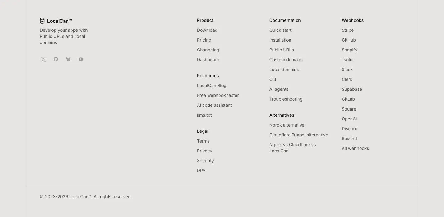
  178. LocalCan footer section: logo, tagline and social icons on the left, link columns for product, docs, alternatives and webhooks, copyright row
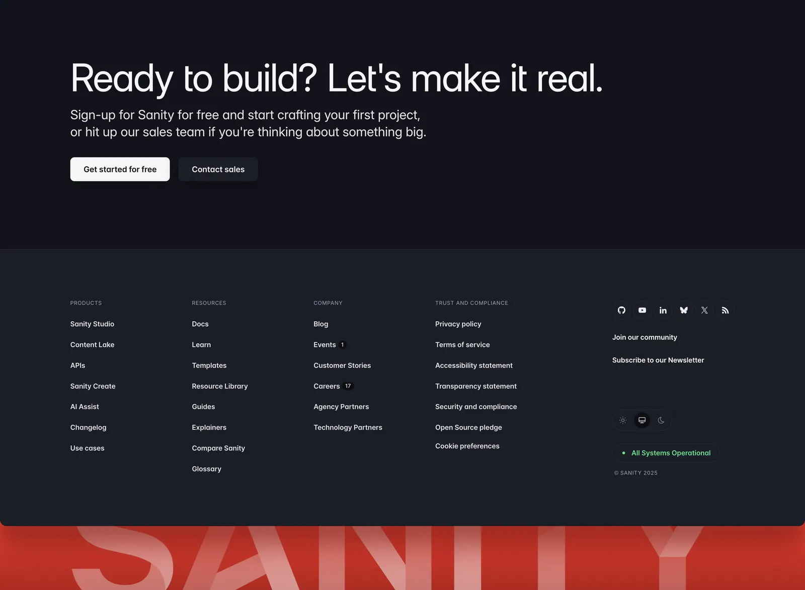
  179. Sanity footer section: CTA headline with two buttons above link columns and social icons on charcoal, with a giant red SANITY wordmark
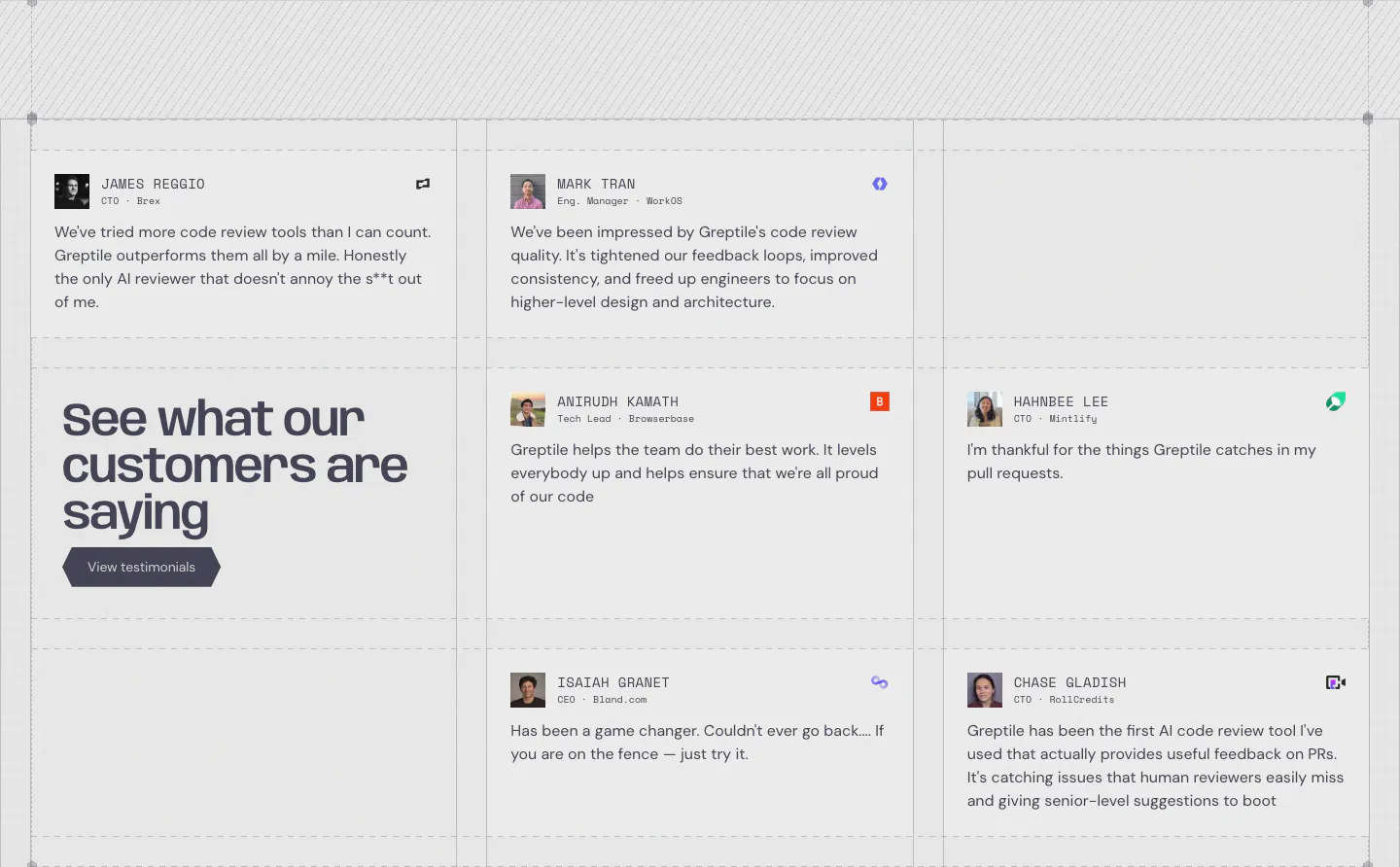
  180. Greptile testimonials section: grid of quote cards with avatars and company logos around a large headline cell with a button
  181. Privy testimonials section: four large metrics above a row of colorful customer case study cards with logos, short copy and photos
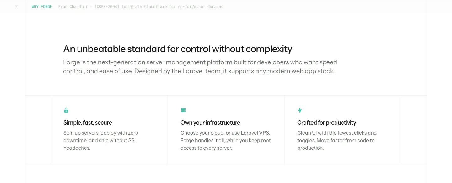
  182. Laravel Forge value proposition section: left-aligned heading and intro above three bordered benefit columns with small teal icons
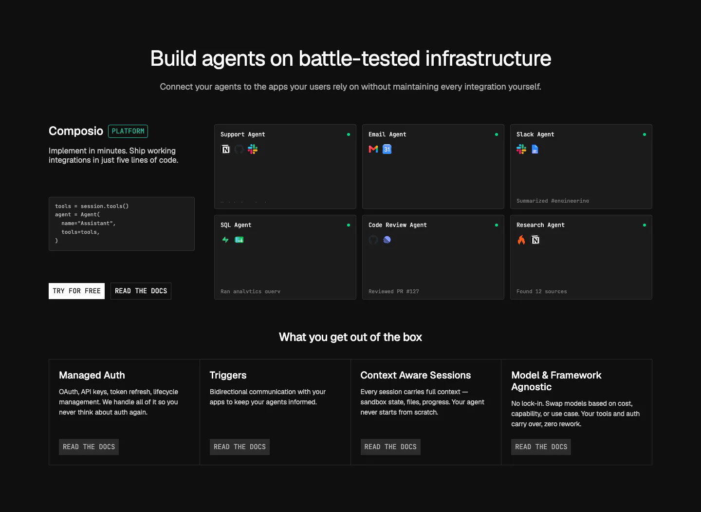
  183. Composio features section: code snippet and CTAs beside a grid of agent cards, then four platform feature columns on near-black
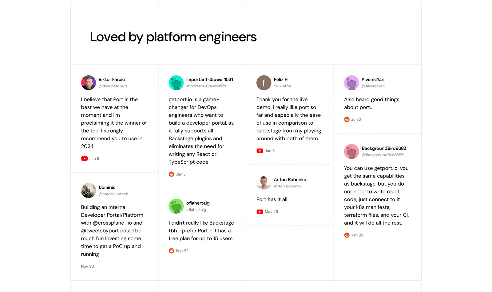
  184. Port testimonials section: headline above a four-column wall of social posts with avatars, handles and YouTube or Reddit source icons
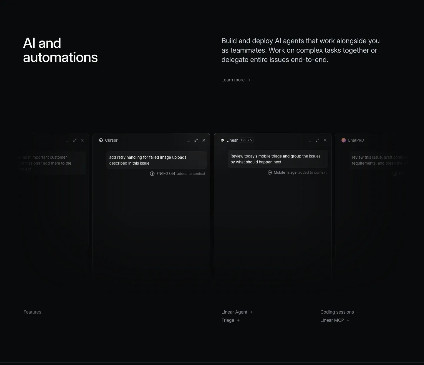
  185. Linear features section: dark headline and copy above a row of agent chat windows fading off both edges, feature links below
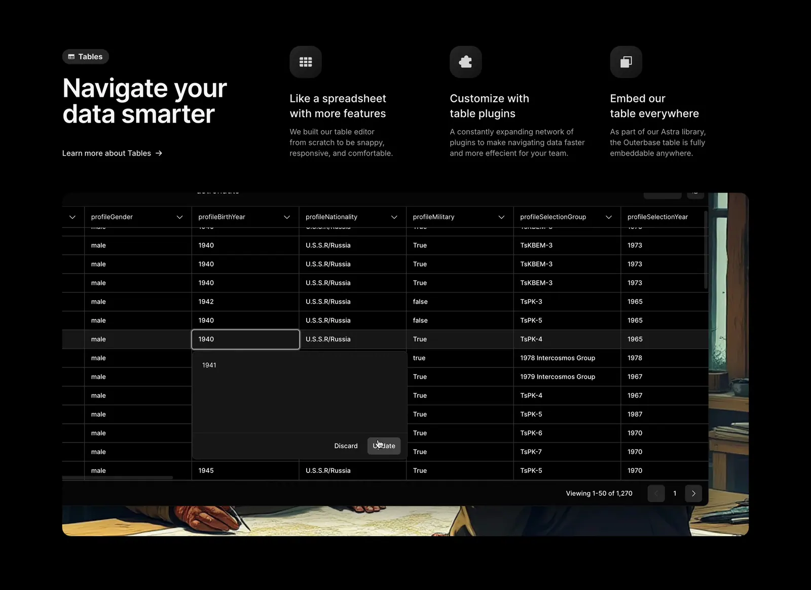
  186. Outerbase features section: headline beside three feature columns with icons above a dark data table screenshot on painted artwork
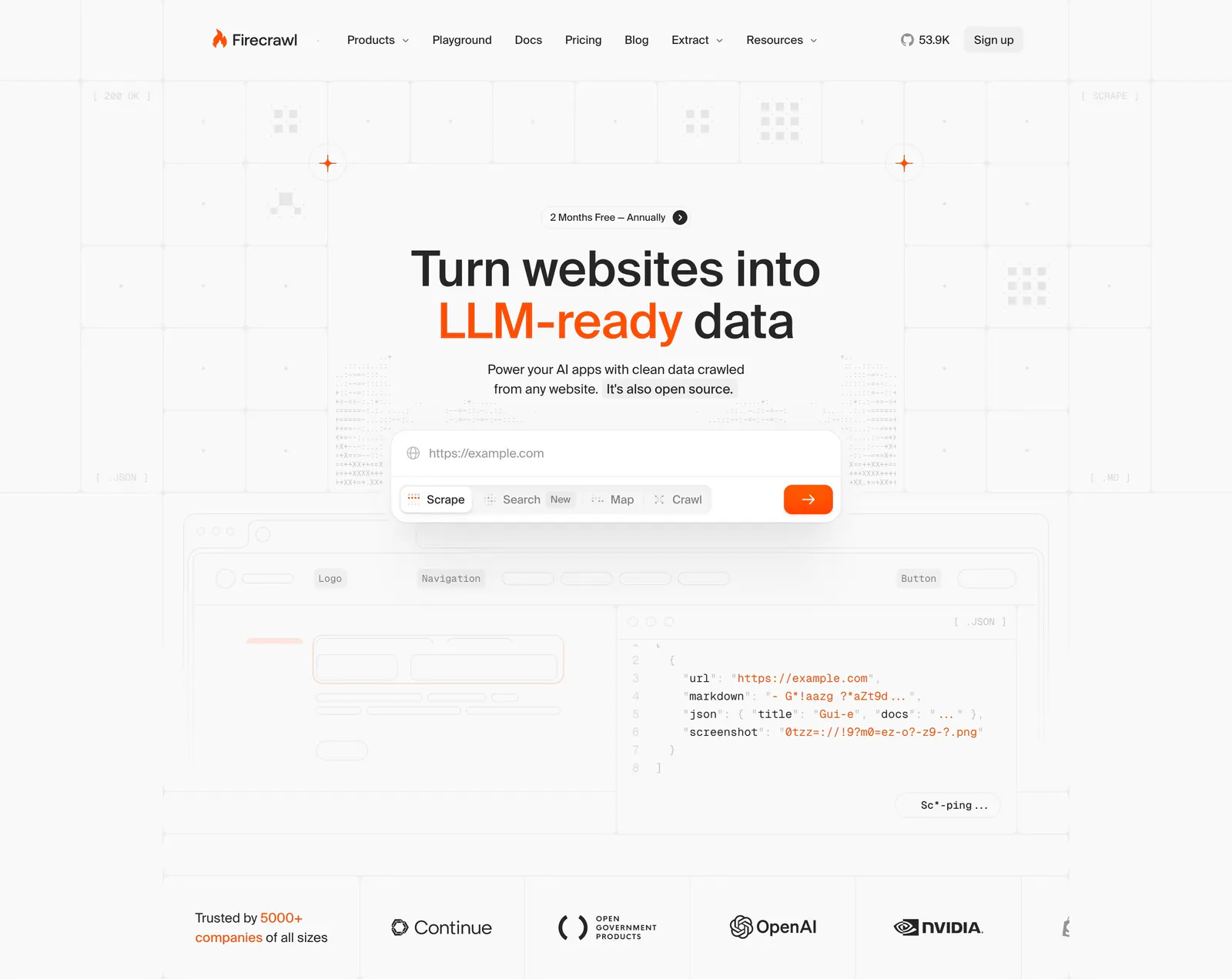
  187. Firecrawl hero section: centered headline with URL input and mode tabs over a grid background, JSON code preview and customer logo row below
  188. Port logo cloud section: two rows of five black customer logos centered on a white background with faint grid lines
  189. Laravel Cloud call-to-action section: left-aligned headline and two buttons on a bright blue pixel mosaic background
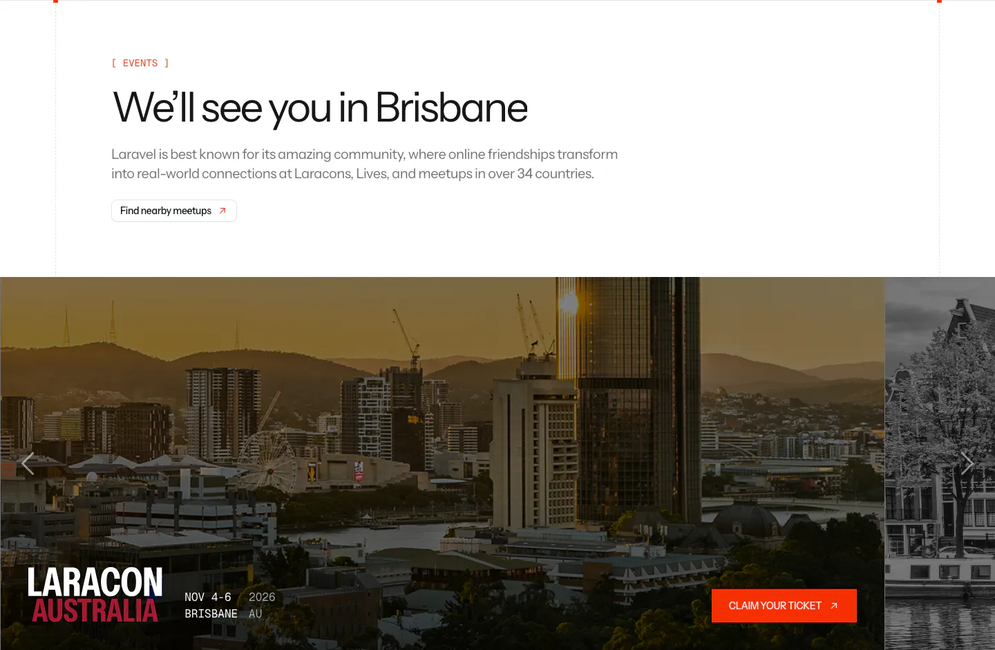
  190. Laravel blog & resources section: events headline above a photo carousel card for Laracon Australia in Brisbane with a ticket button
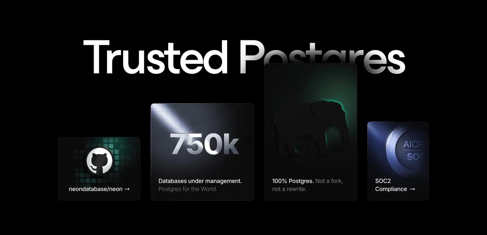
  191. Neon value proposition section: huge Trusted Postgres headline behind staggered dark cards for GitHub, 750k databases, Postgres and SOC2
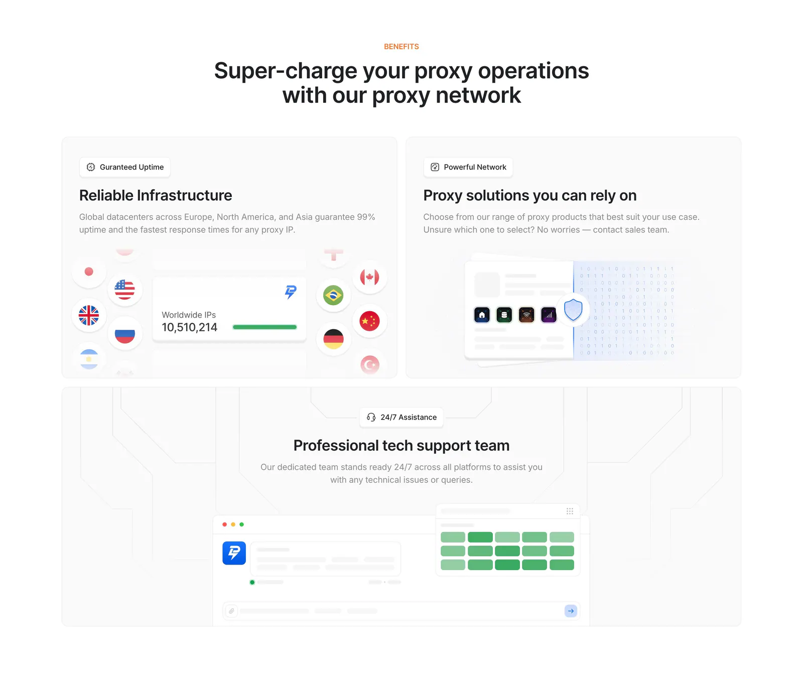
  192. Lightning Proxies features section: centered heading above three light gray tiles with an IP counter and flags, proxy cards and a support chat mockup
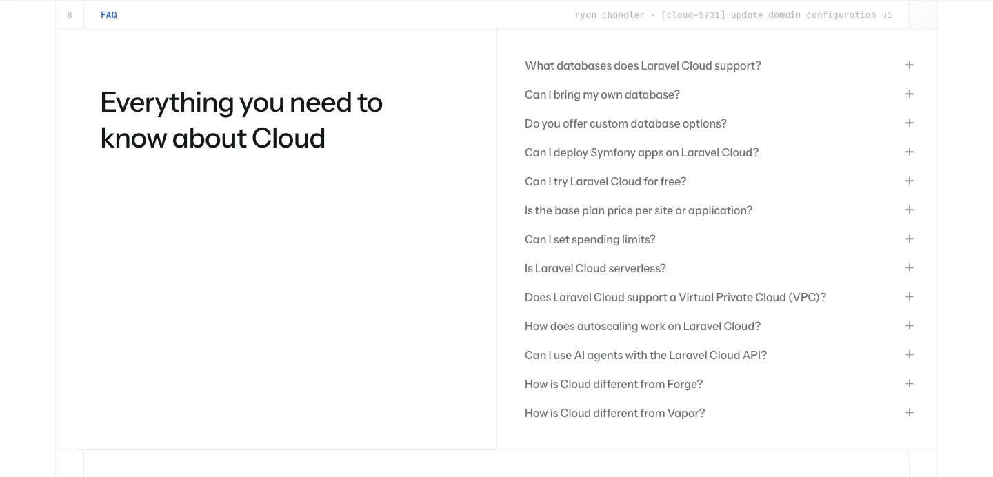
  193. Laravel Cloud FAQ section: headline on the left beside a long accordion of questions about databases, pricing and deployment on white
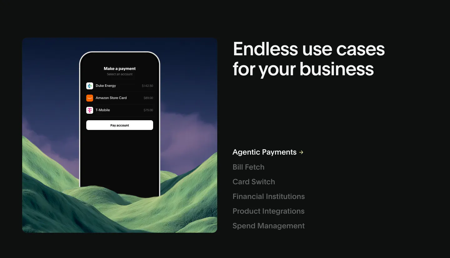
  194. Deck use cases section: phone payment mockup over green hills at left, headline and vertical list of use case links at right, dark
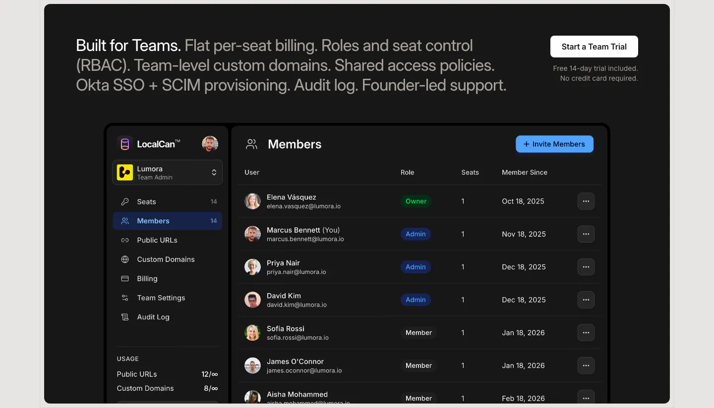
  195. LocalCan features section: two-tone teams headline with a trial button above a dark Members admin screenshot listing roles and seats
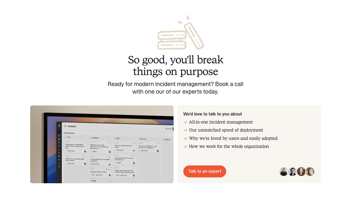
  196. incident.io call-to-action section: serif centered headline with line-art icon above a monitor screenshot and a talk-to-an-expert card
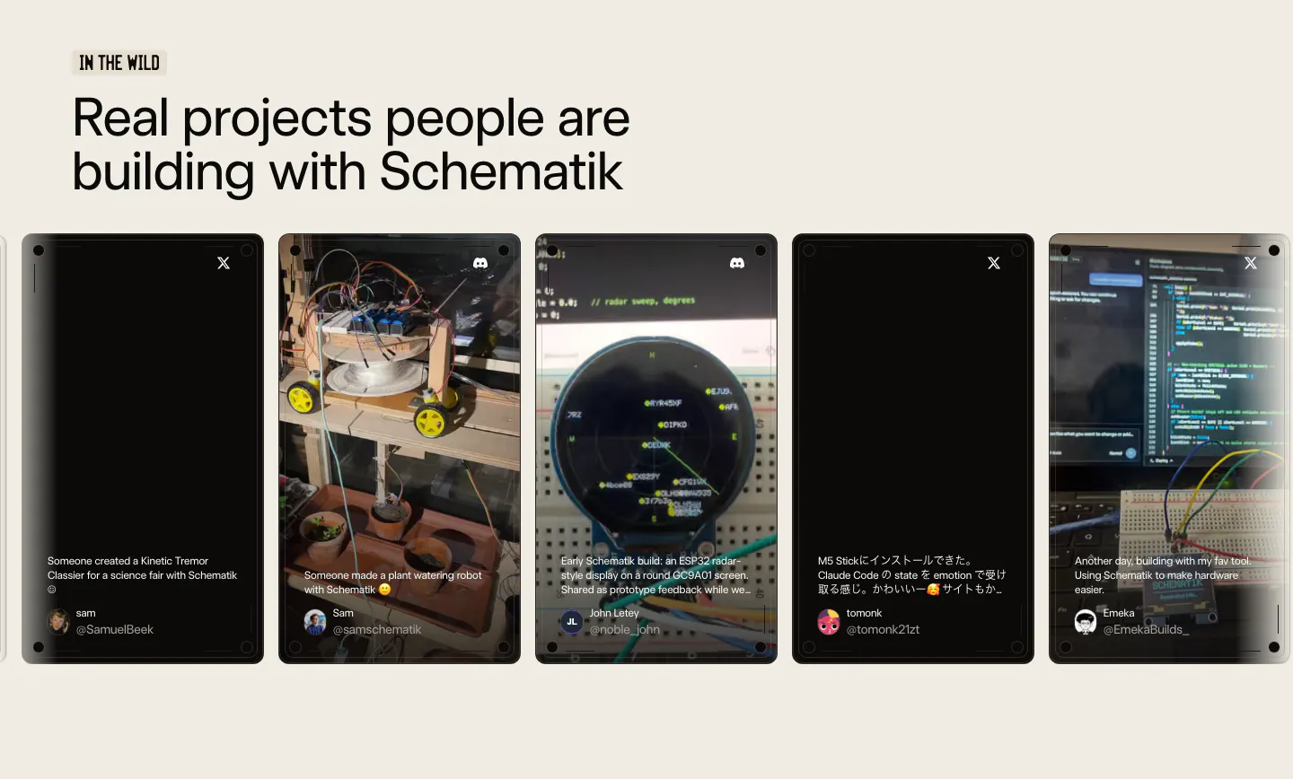
  197. Schematik testimonials section: headline above a carousel of user post cards with project photos on a beige background
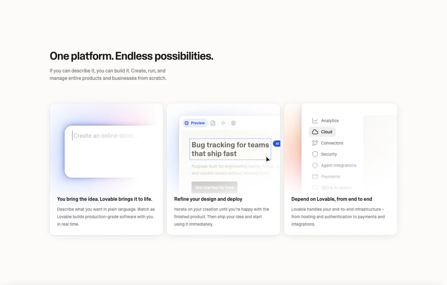
  198. Lovable features section: left-aligned headline above three equal cards with prompt box, editor preview and settings menu UI mockups
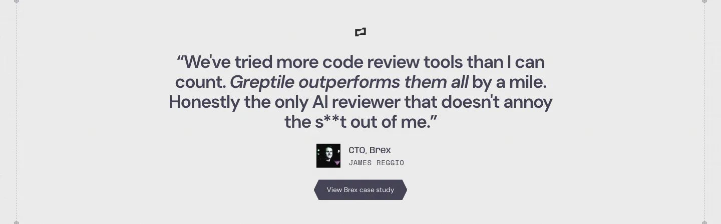
  199. Greptile testimonials section: centered single customer quote with company logo, avatar, name, title and a case study button
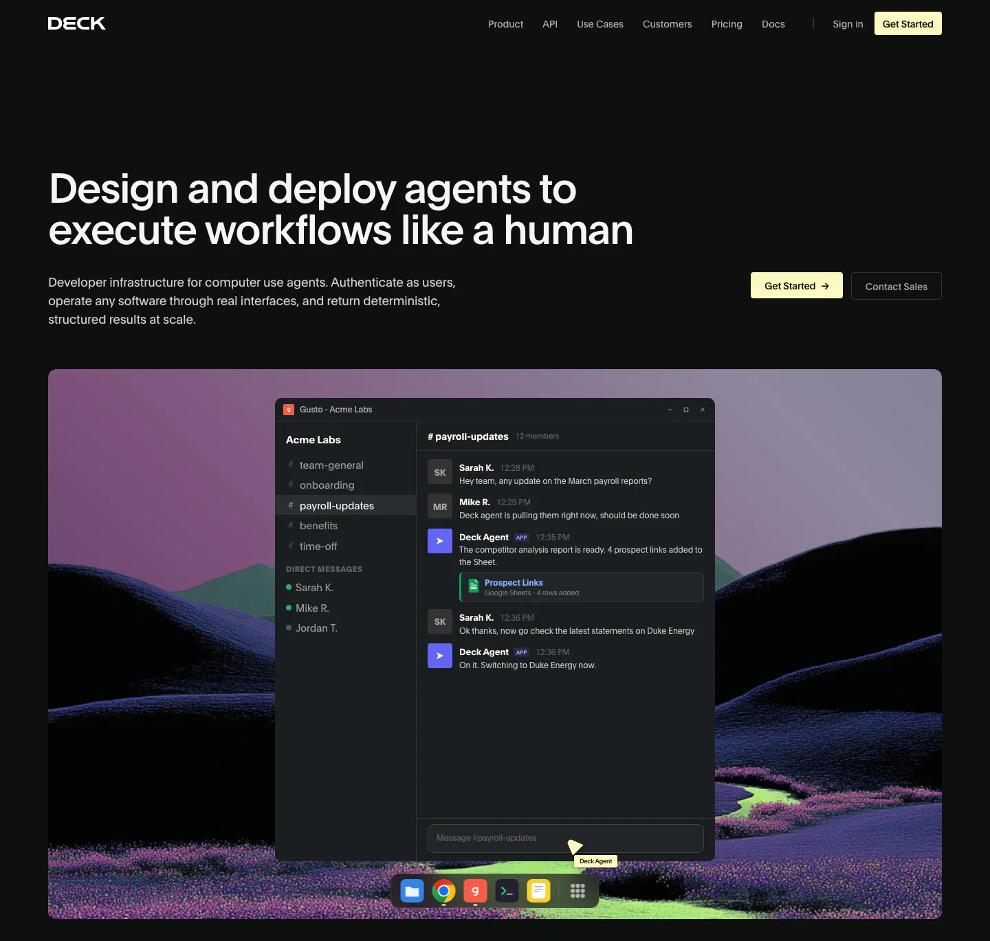
  200. Deck hero section: dark page with headline left and buttons right above a chat app window over a rendered purple hill landscape
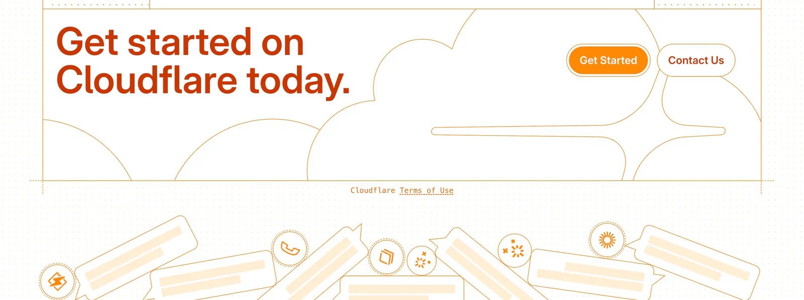
  201. Cloudflare Agents footer section: orange headline and buttons over line-drawn clouds, a terms link and chat bubble illustrations
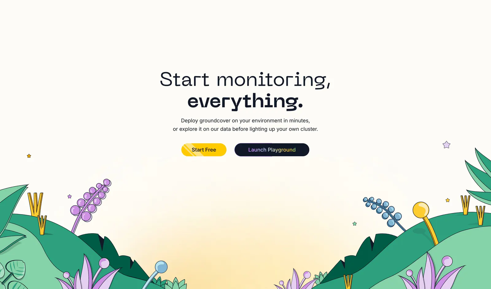
  202. groundcover call-to-action section: centered headline and two buttons above an illustrated landscape of hills and plants on cream
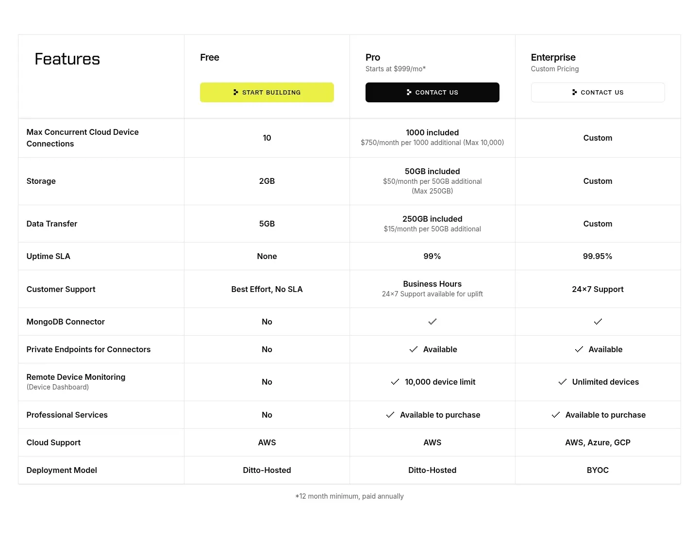
  203. Ditto pricing section: plan comparison table with Free, Pro and Enterprise columns, CTA buttons in the header and rows of limits and checkmarks
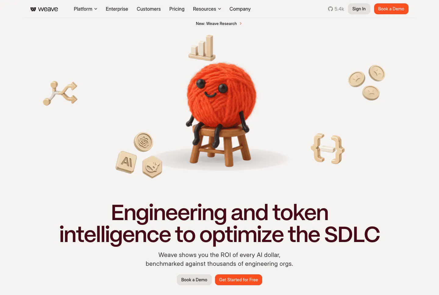
  204. Weave hero section: 3D yarn ball character and floating icons above a centered headline and two buttons on a warm light background
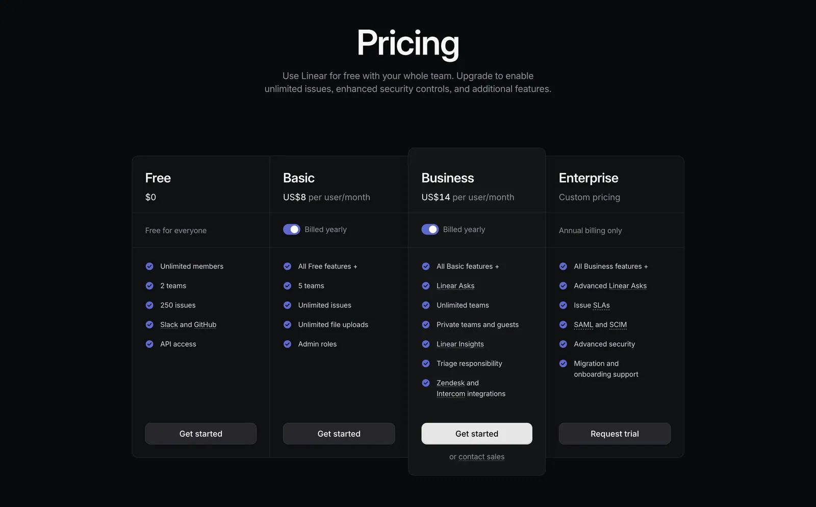
  205. Linear pricing section: centered heading above four dark plan columns, Free, Basic, Business and Enterprise, with billing toggles and checklists
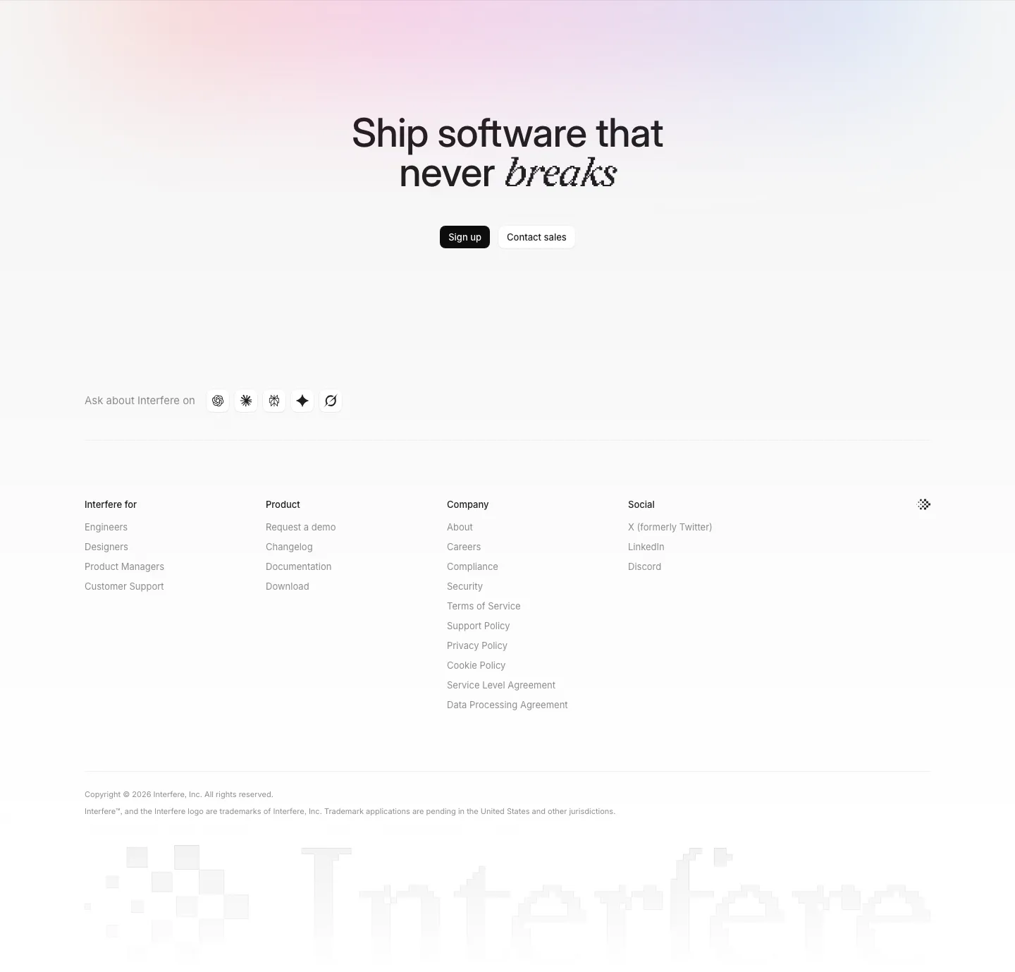
  206. Interfere footer section: centered closing headline with buttons, four link columns and a large faded pixel wordmark
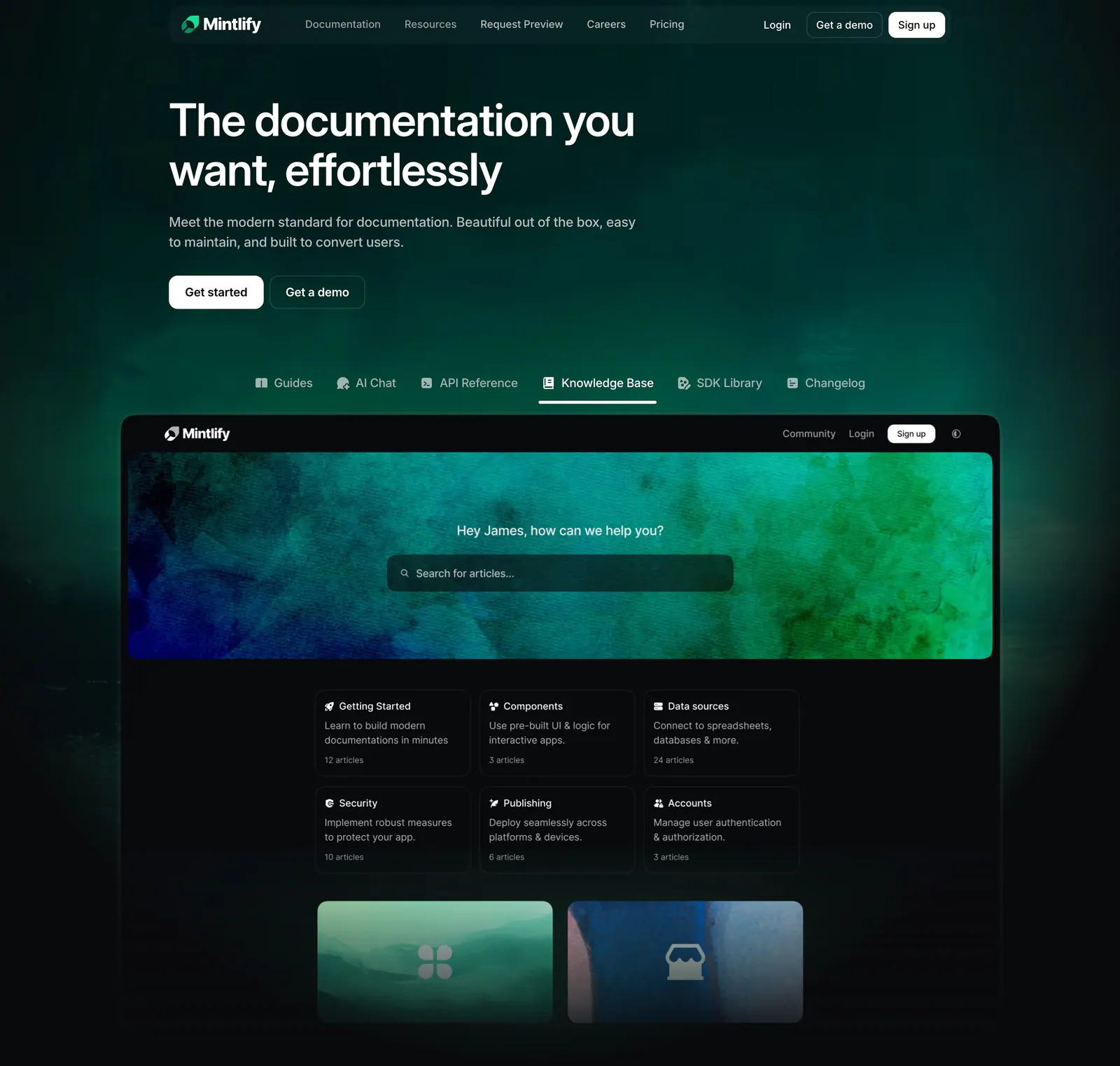
  207. Mintlify hero section: left-aligned headline on dark green glow above product tabs and a knowledge base docs screenshot
  208. Bucket integrations section: left-aligned heading above a grid of dark tiles with white logos for Linear, Datadog, Slack and more
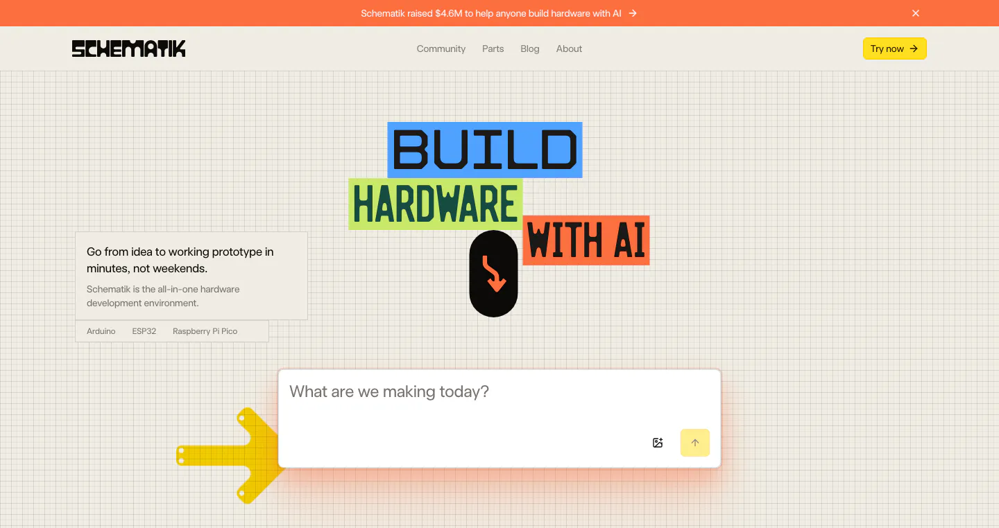
  209. Schematik hero section: nav, colored block headline and prompt input box on a beige grid background with arrow graphics
  210. Neon call-to-action section: centered two-line headline and green Get Started button over a dark dot-grid map with glowing teal dots
  211. Laravel Forge logo cloud section: "Trusted by 1000+ companies" label beside a row of six grayscale customer logos on white
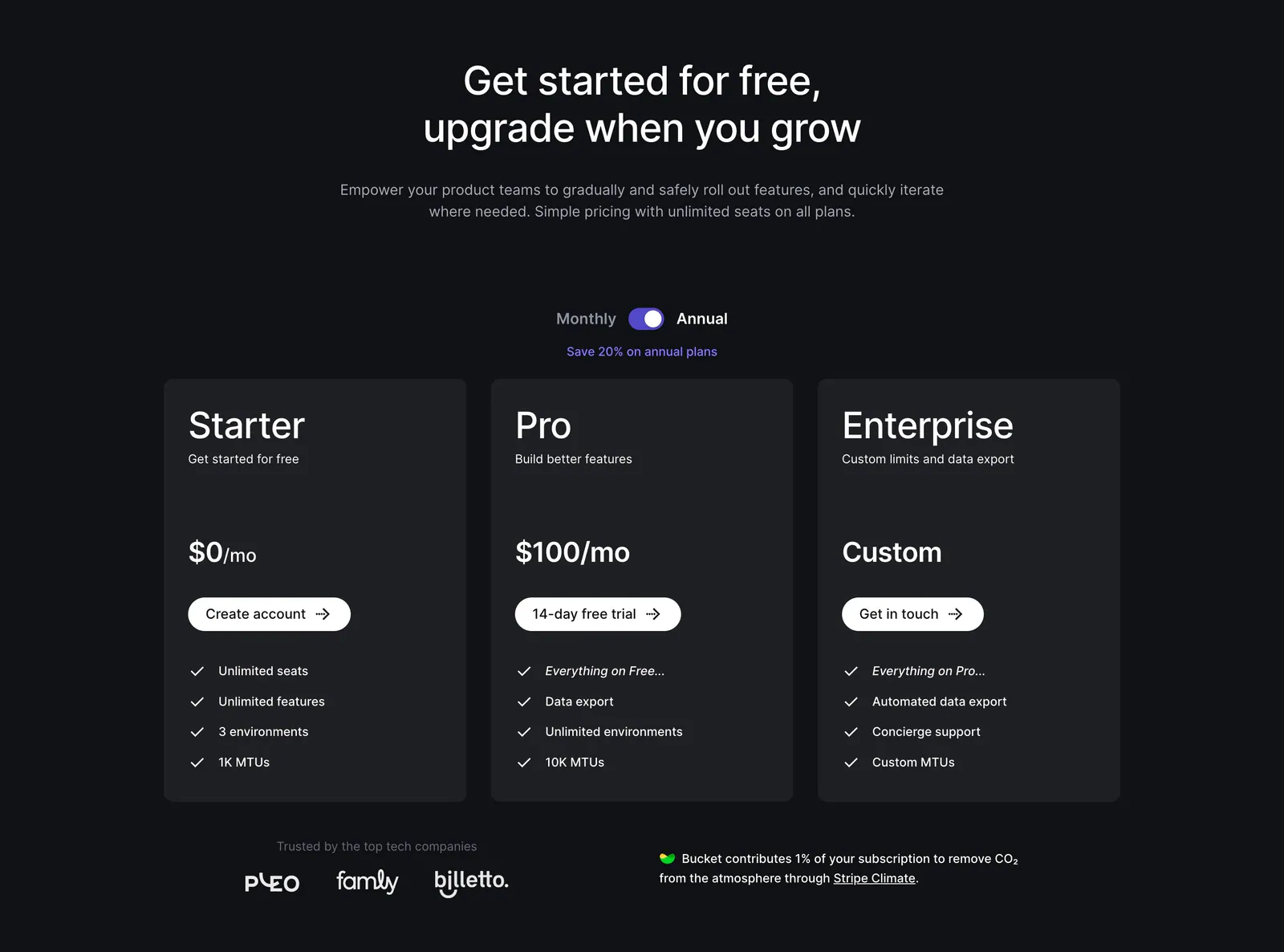
  212. Bucket pricing section: centered headline and monthly/annual toggle above three dark plan cards with checklists and a small logo row
  213. Vercel logo cloud section: headline tile in a bordered grid of grayscale framework logos like Next.js, React, Svelte and Angular
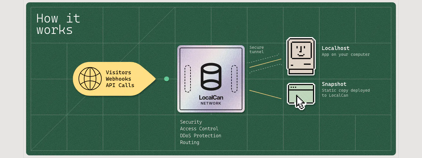
  214. LocalCan how it works section: flow diagram from visitor traffic through a LocalCan network chip to pixel-art localhost and snapshot icons
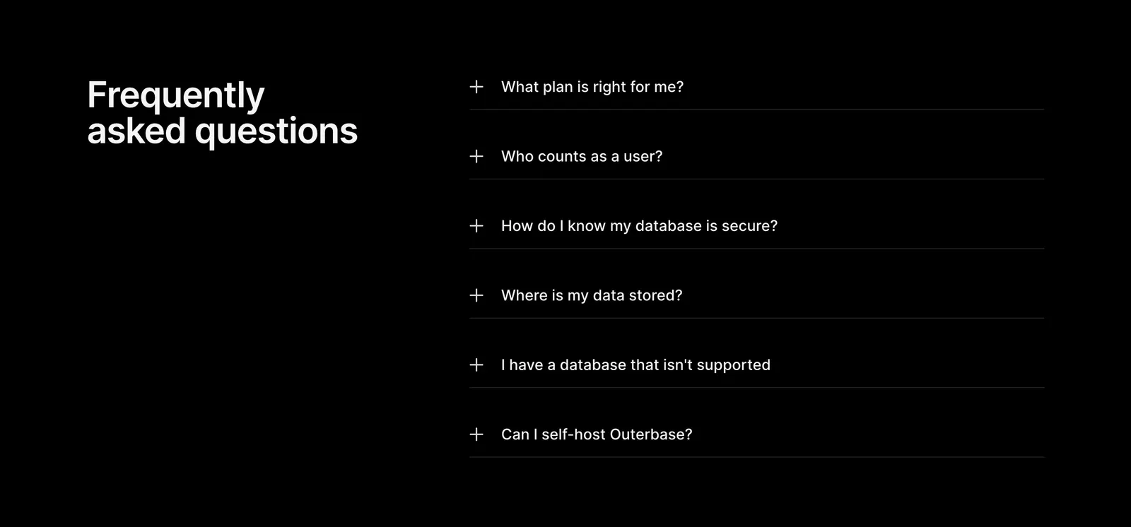
  215. Outerbase FAQ section: headline on the left beside a six-item plus-icon accordion of questions on a black background
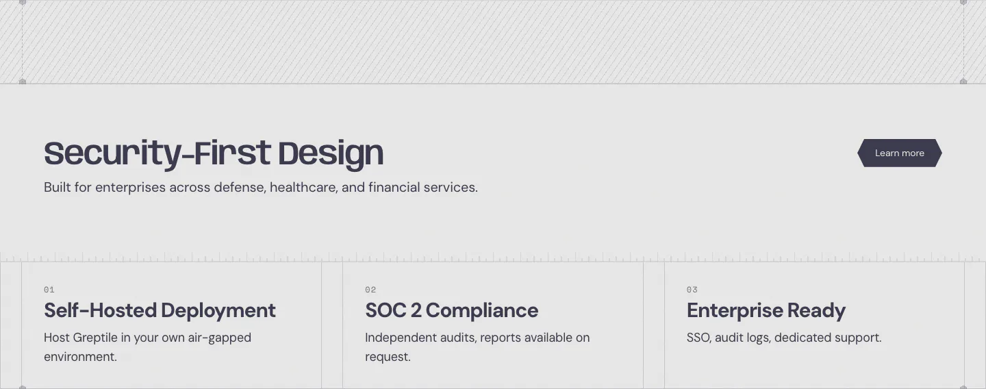
  216. Greptile security section: headline with learn more button above three numbered cards for self-hosting, SOC 2 and enterprise features
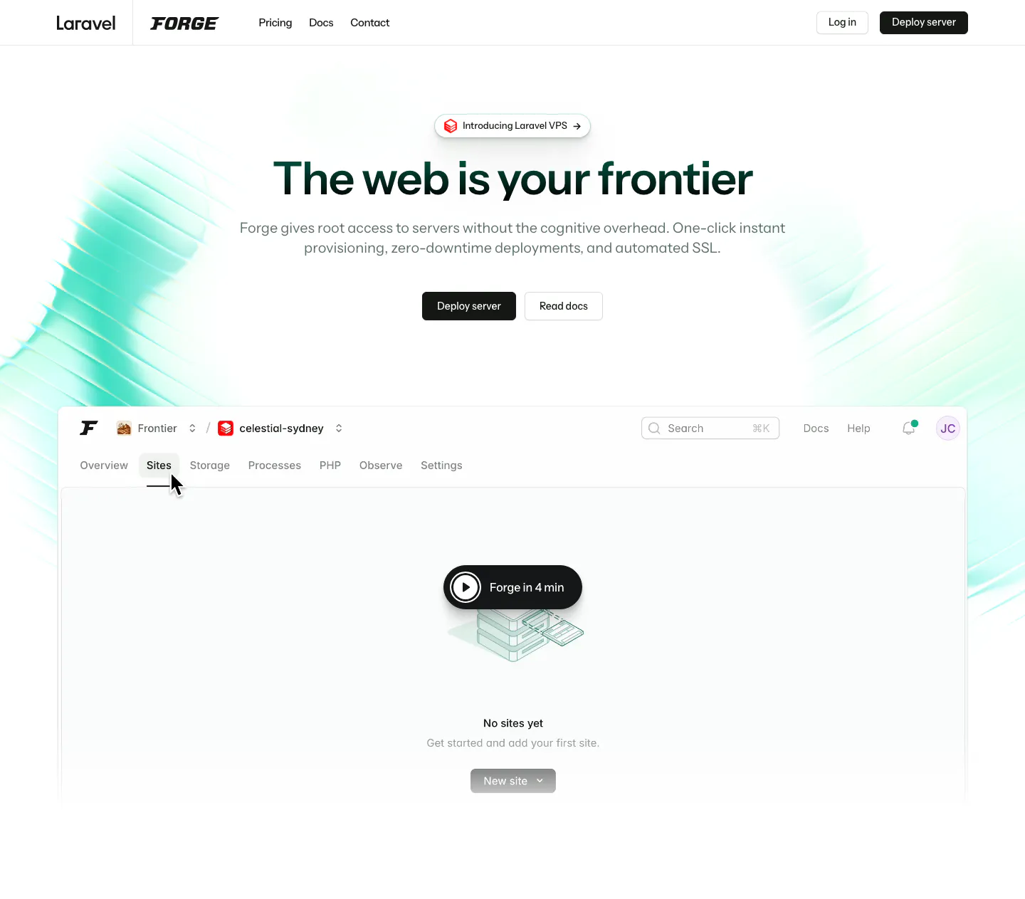
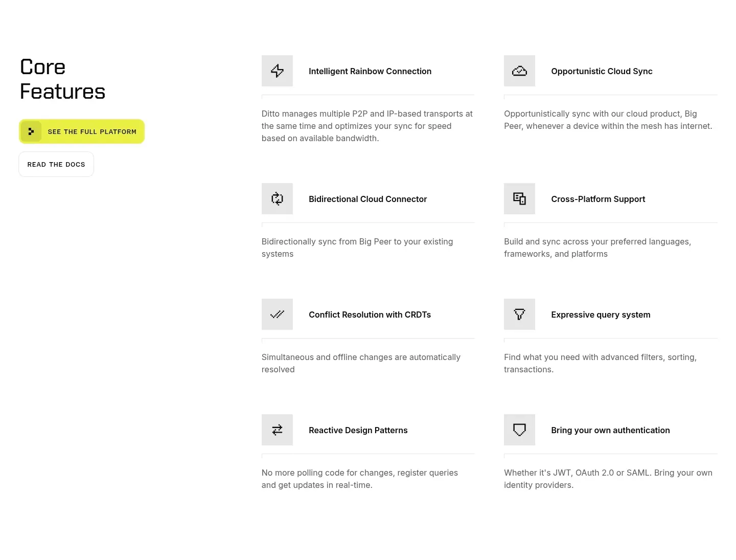
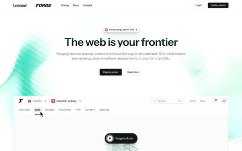
  217. Laravel Forge hero section: centered headline and two buttons above a Forge dashboard screenshot with a play button on white
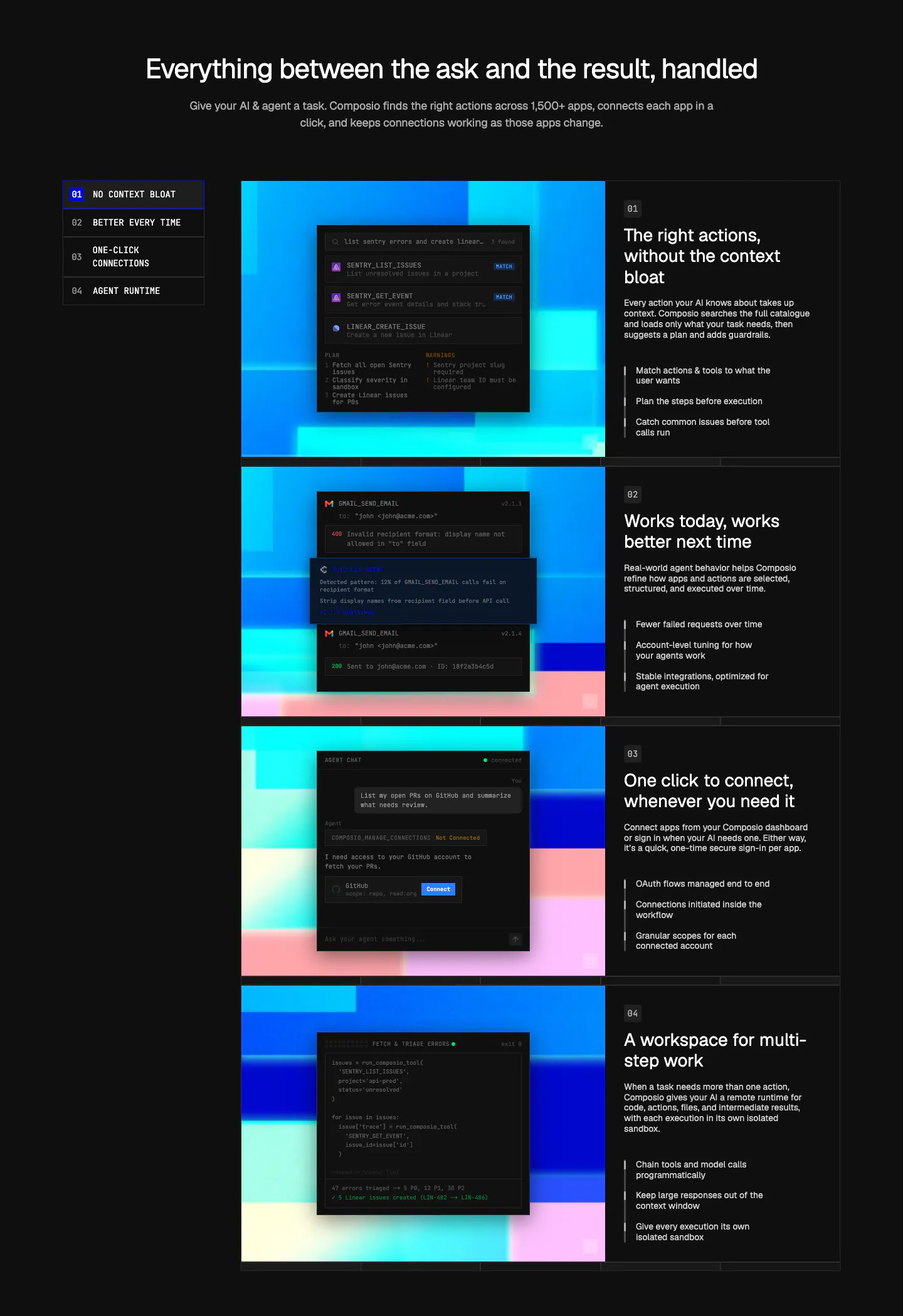
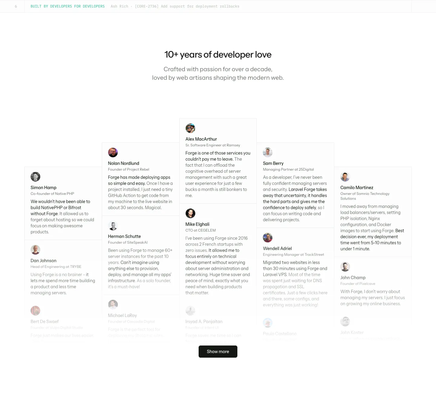
  218. Composio features section: numbered side nav beside four rows of dark UI and code panels on colorful pixel art, each with text
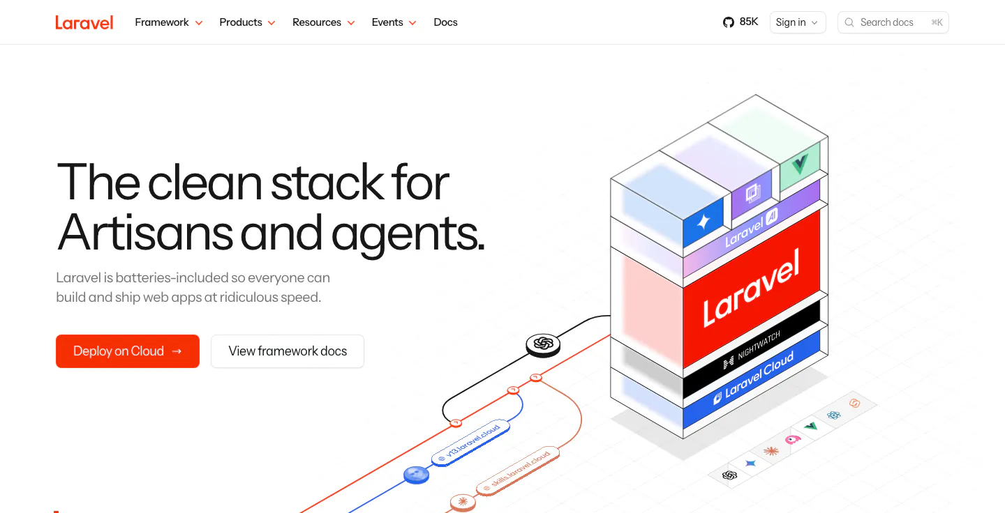
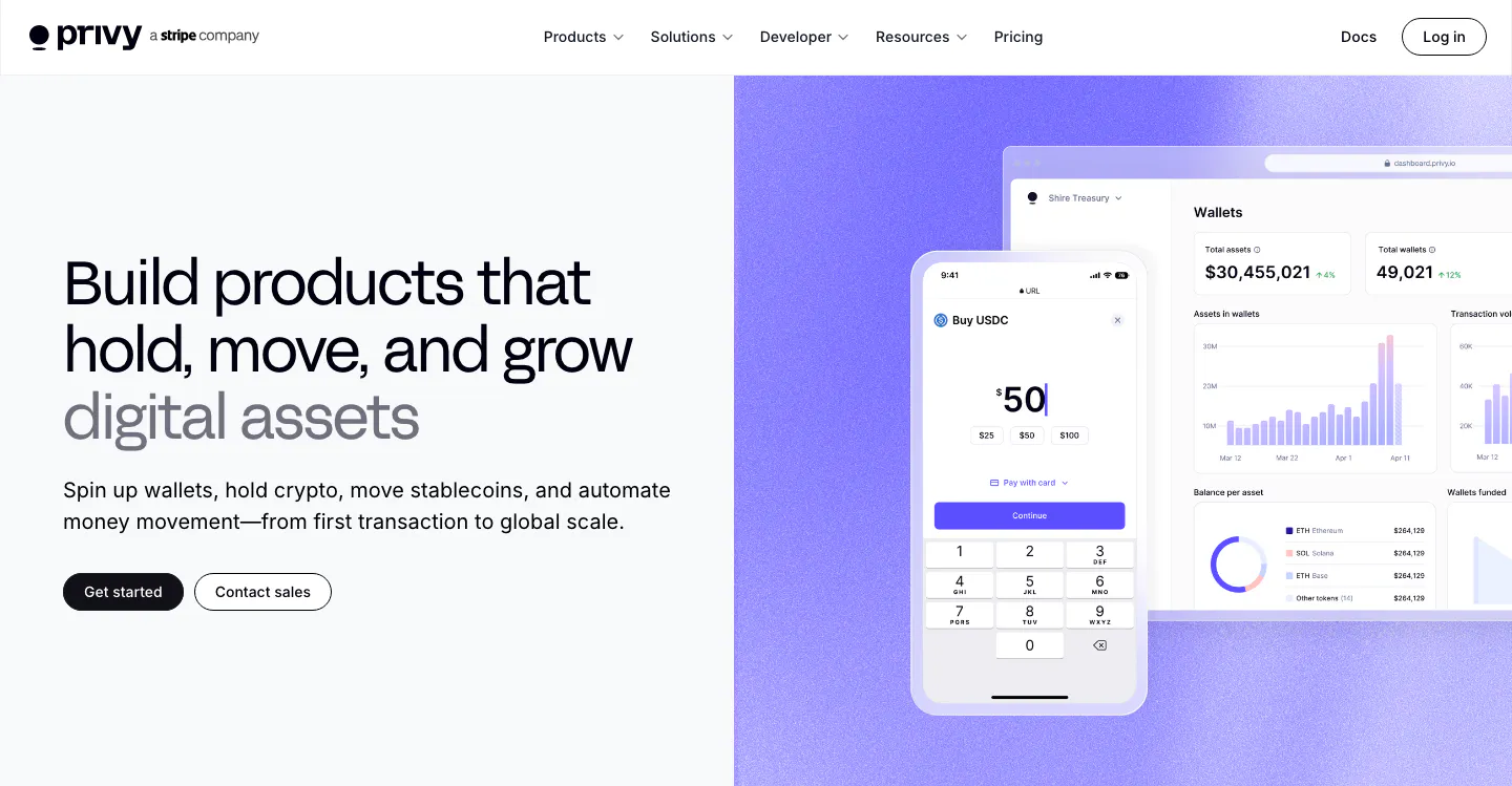
  219. Laravel hero section: left headline with an orange Deploy on Cloud button beside an isometric stack of Laravel, Nightwatch and Cloud layers
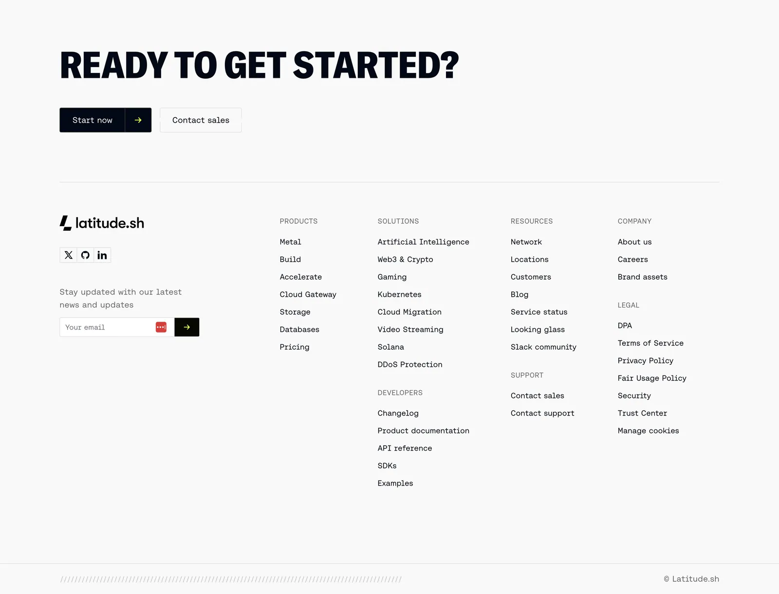
  220. Latitude.sh footer section: large uppercase CTA headline with buttons above logo, email field and link columns on light gray
  221. Greptile footer section: large green logo beside four link columns, above a pile of gray isometric logo blocks on light gray
  222. Ditto features section: left headline with yellow and outline buttons beside a two-column list of eight icon-led features on white
  223. Laravel Forge testimonials section: centered heading above a staggered wall of testimonial cards with avatars and a Show more button
  224. Privy hero section: headline, copy and two buttons on the left beside phone and dashboard wallet UI mockups on a purple panel
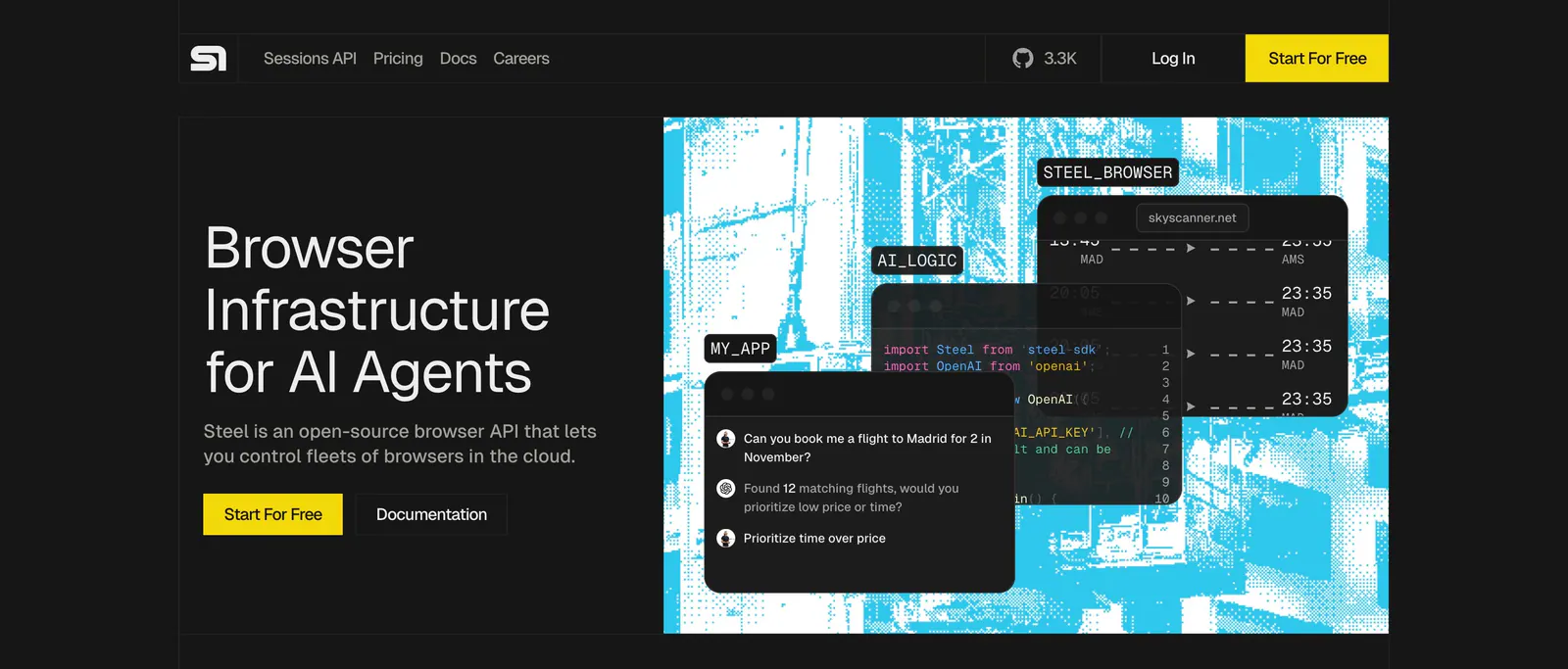
  225. Steel hero section: headline and yellow buttons on the left, cyan dithered artwork with code and chat UI windows on the right, dark theme
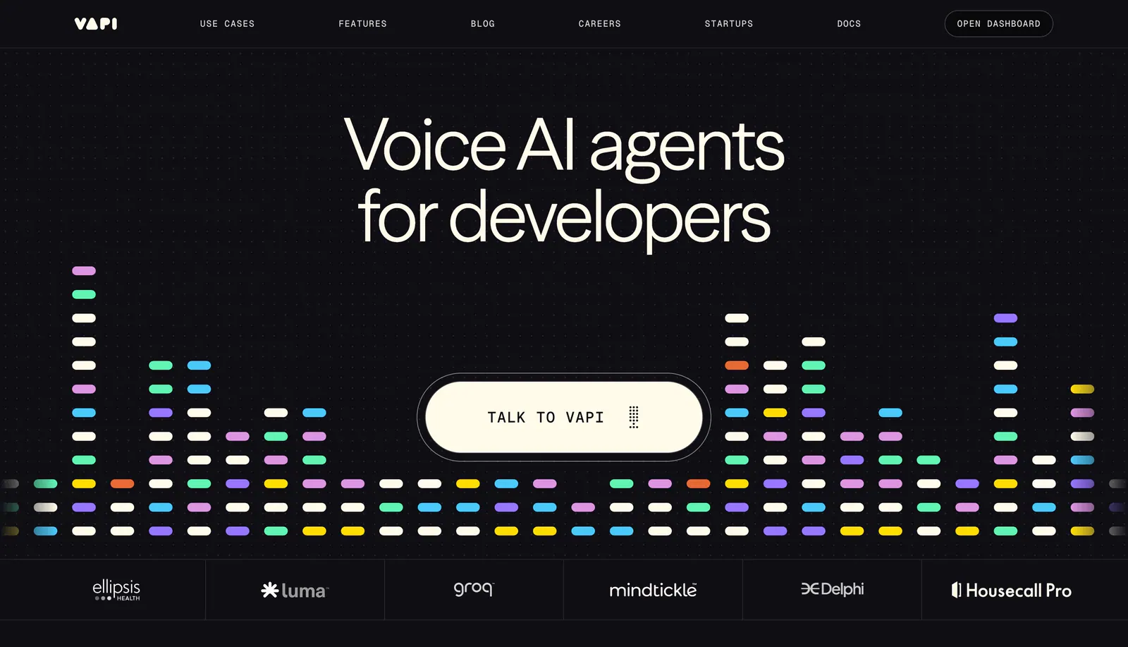
  226. Vapi hero section: centered headline and Talk to Vapi pill button over a colorful equalizer bar graphic, with a logo strip on black
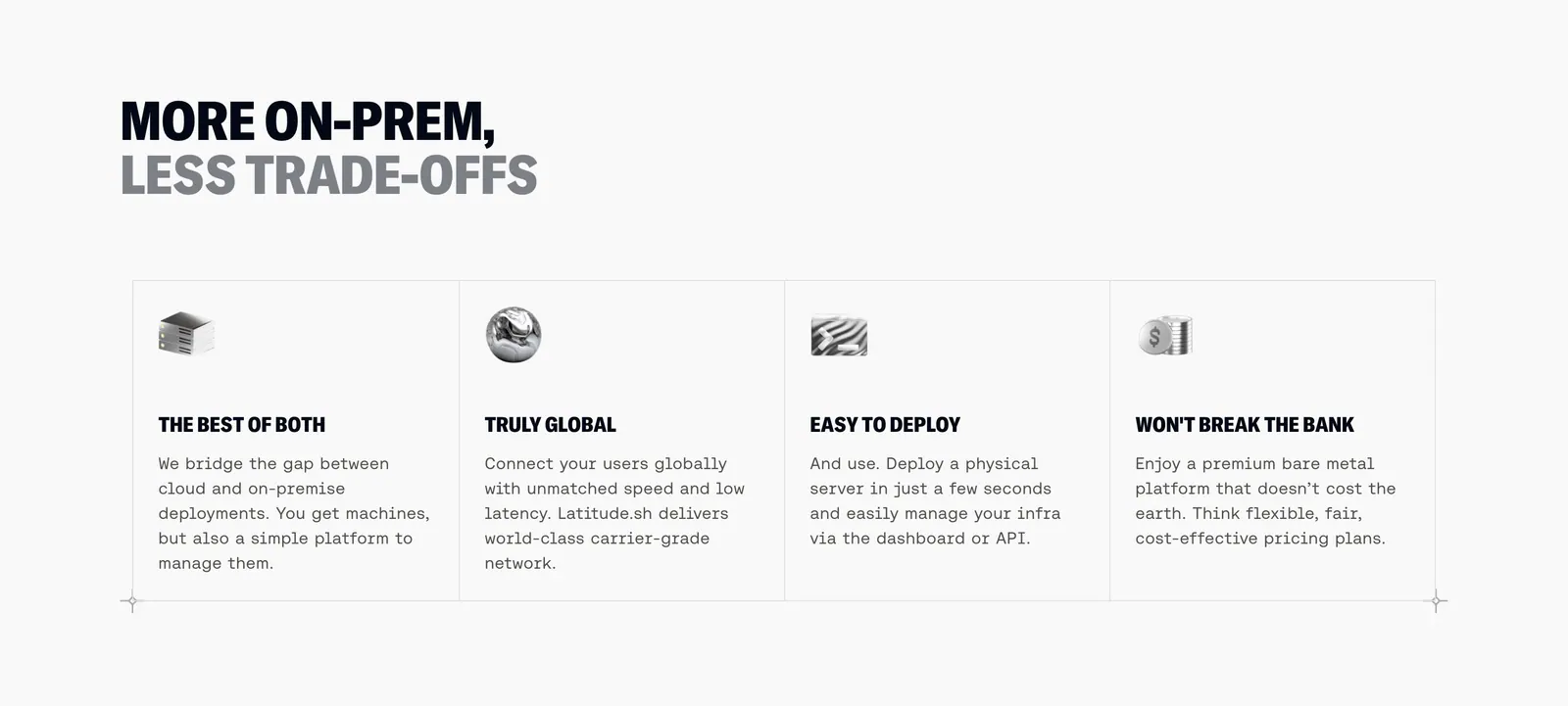
  227. Latitude.sh features section: two-tone uppercase headline above four bordered columns with small 3D icons and monospace copy
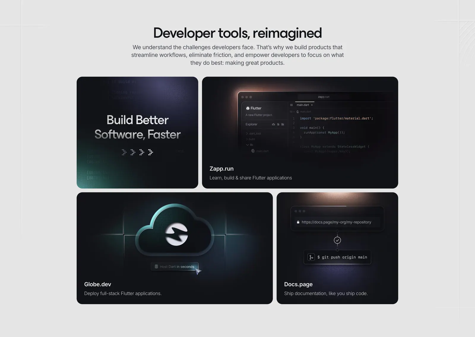
  228. Invertase features section: centered headline above a bento of four dark tiles showing a code editor, cloud icon and git push
  229. Liveblocks call-to-action section: centered white headline and two buttons beneath a glowing gray planet-like arc on a black background
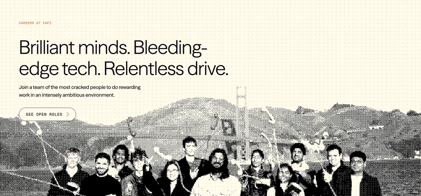
  230. Vapi careers section: left-aligned headline and See open roles button over a dithered team photo on a cream dot-grid background
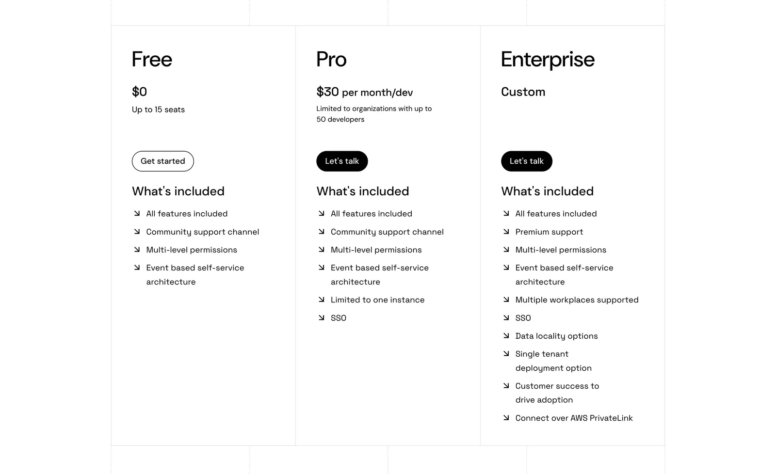
  231. Port pricing section: three bordered plan columns for Free, Pro and Enterprise with prices, buttons and arrow feature lists on white
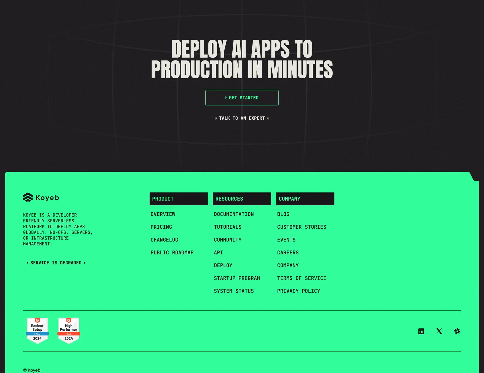
  232. Koyeb footer section: dark CTA band with condensed headline above a bright green footer with link columns and G2 badges
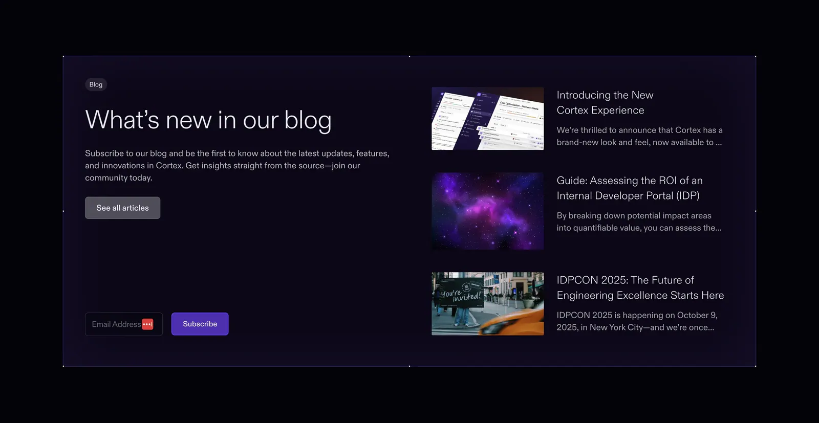
  233. Cortex blog & resources section: headline and email subscribe field on the left beside three article thumbnails in a dark panel
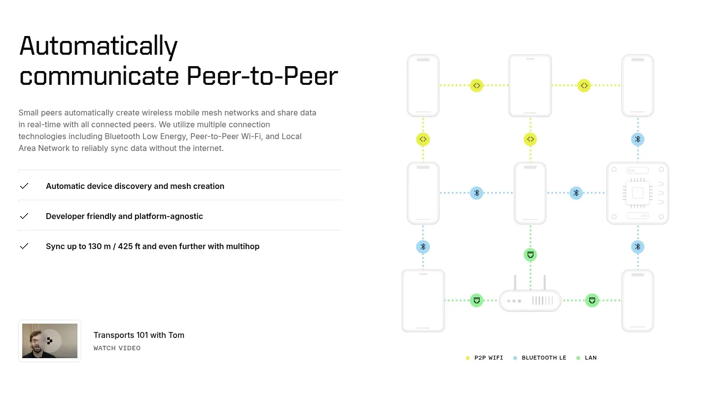
  234. Ditto features section: headline, copy and checklist on the left beside a dotted-line mesh network diagram of phones and devices
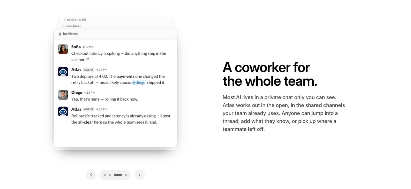
  235. WorkOS features section: Slack chat thread mockup with carousel arrows on the left, headline and copy on the right
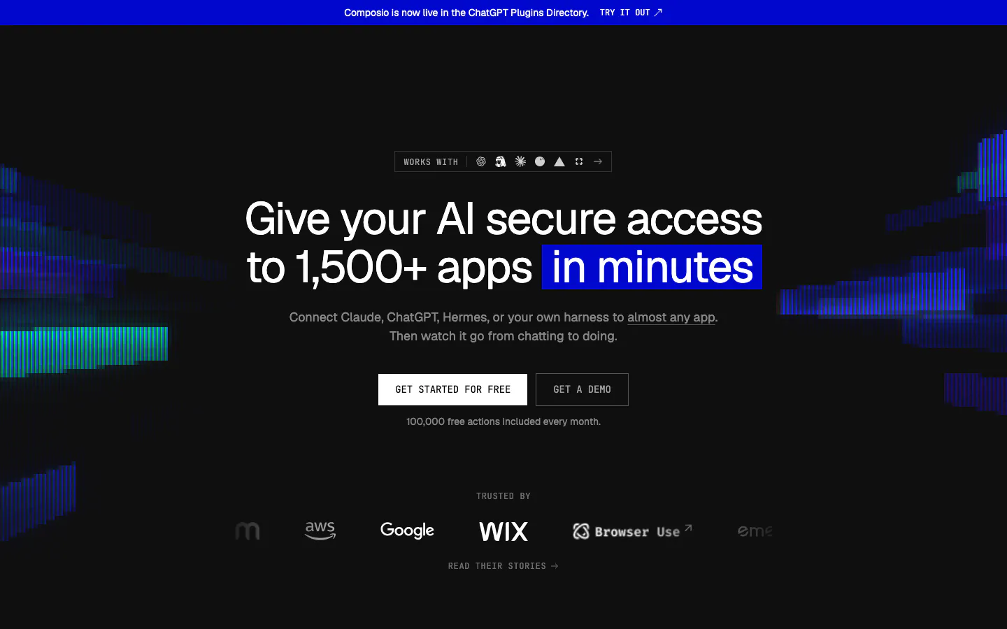
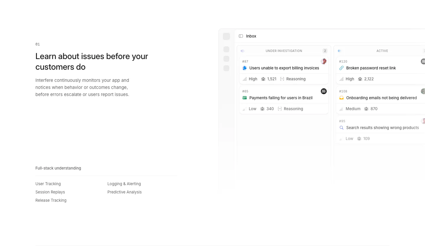
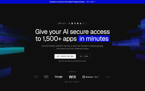
  236. Composio hero section: centered headline with blue highlight, two CTAs and a trusted-by logo row on black with glitchy color bars
  237. Greptile features section: centered product launch headline and button above a blue line-wave landscape illustration
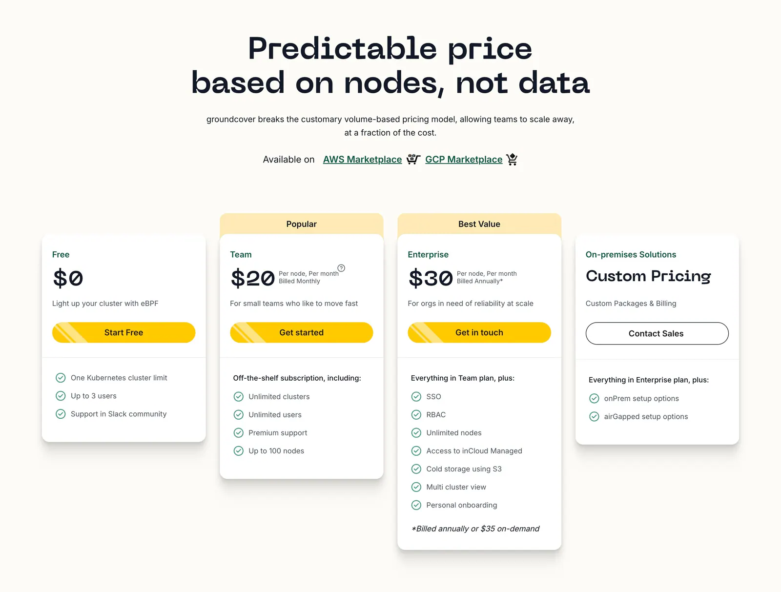
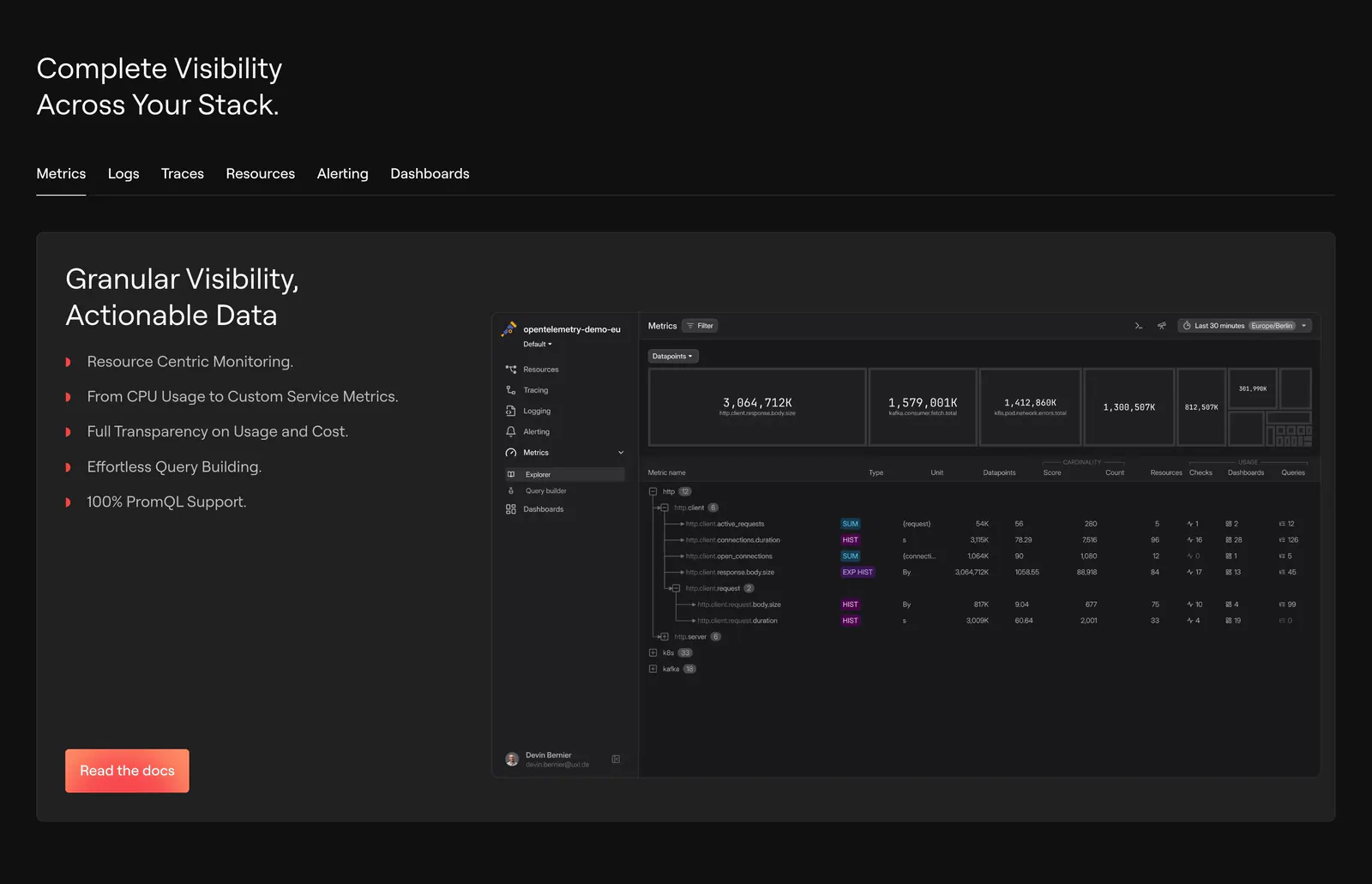
  238. groundcover pricing section: centered headline above four plan cards with yellow buttons and checklists on a cream background
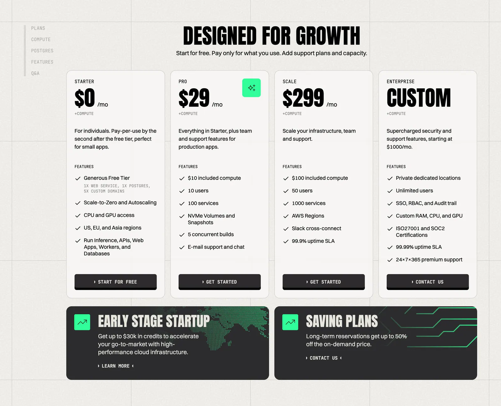
  239. Laravel Nightwatch footer section: newsletter form and link columns above a giant dim Laravel wordmark built from digits on black
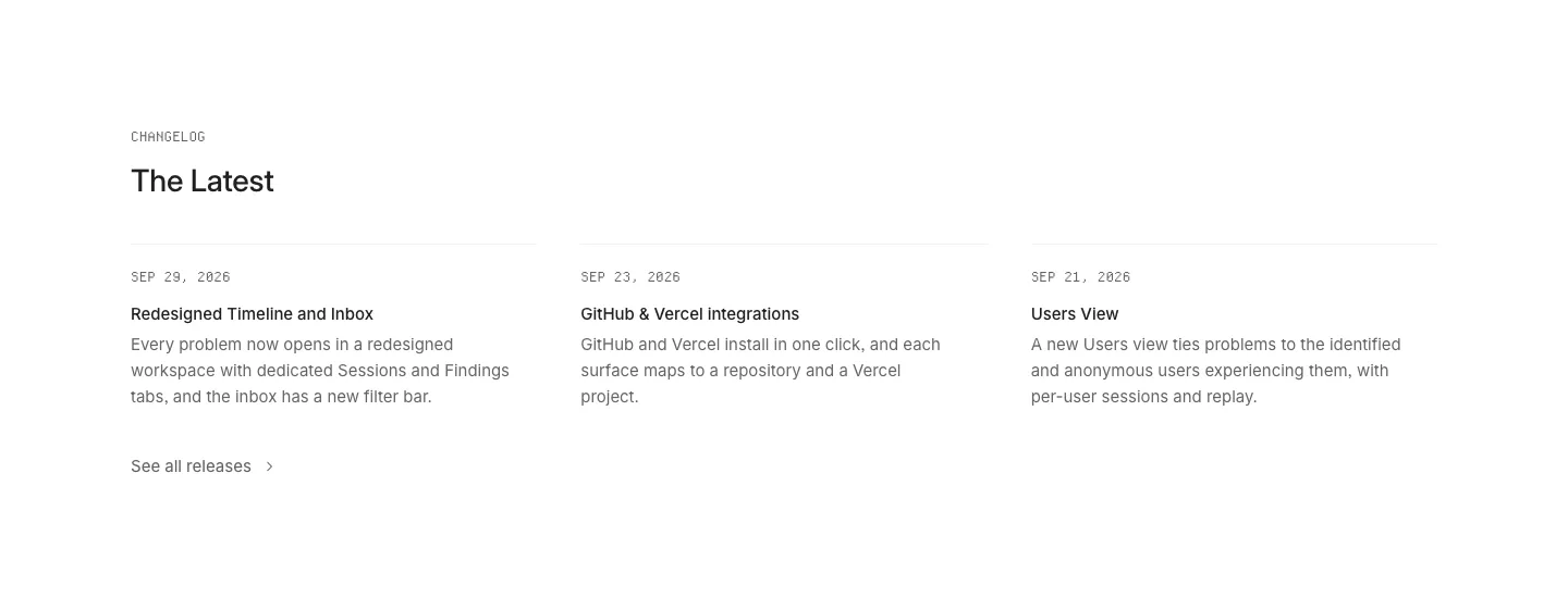
  240. Invertase features section: centered headline above four dark glowing cards in a 2x2 grid and six icon feature blurbs on light gray
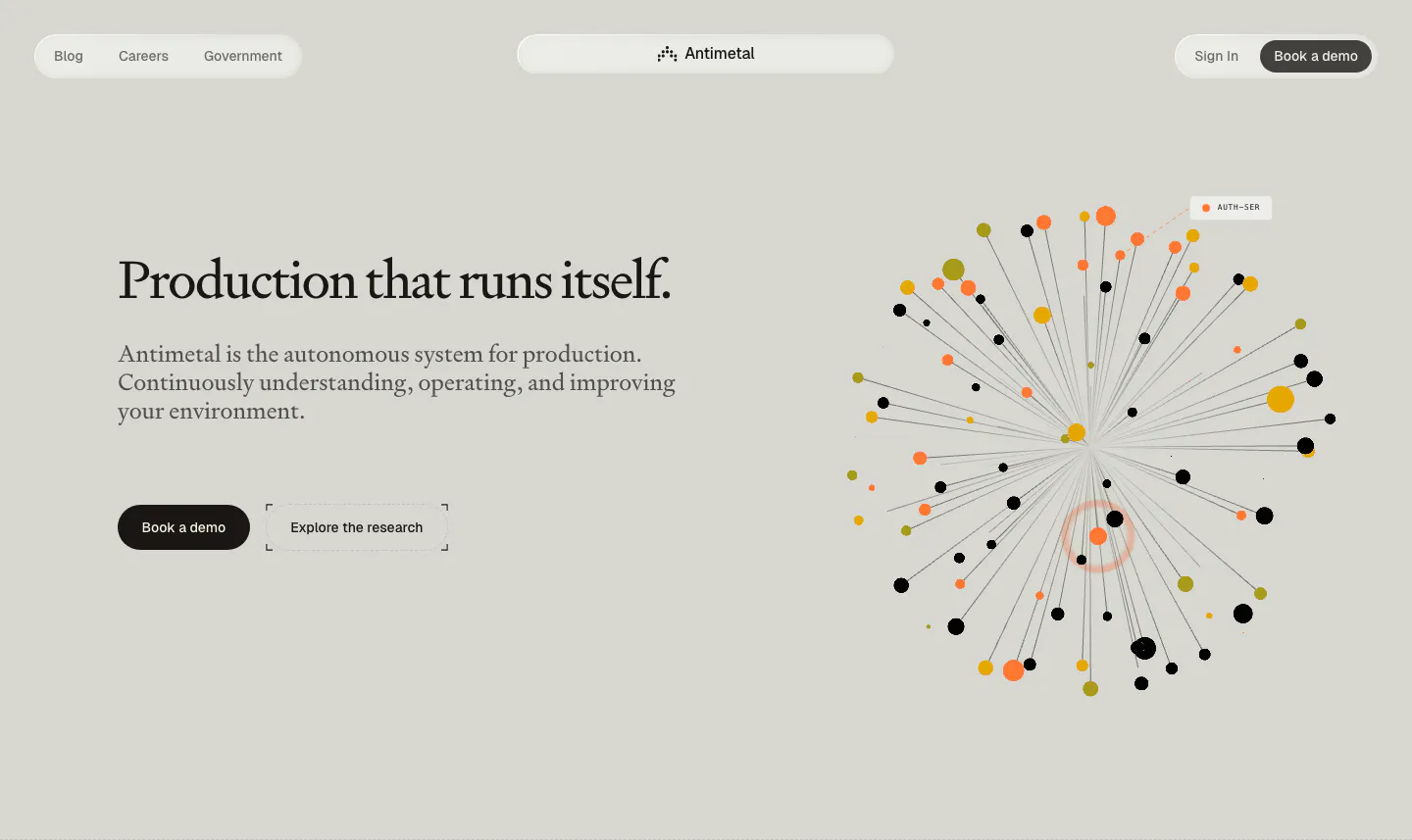
  241. Interfere features section: numbered text block with capability list on the left and an issue inbox board screenshot on the right
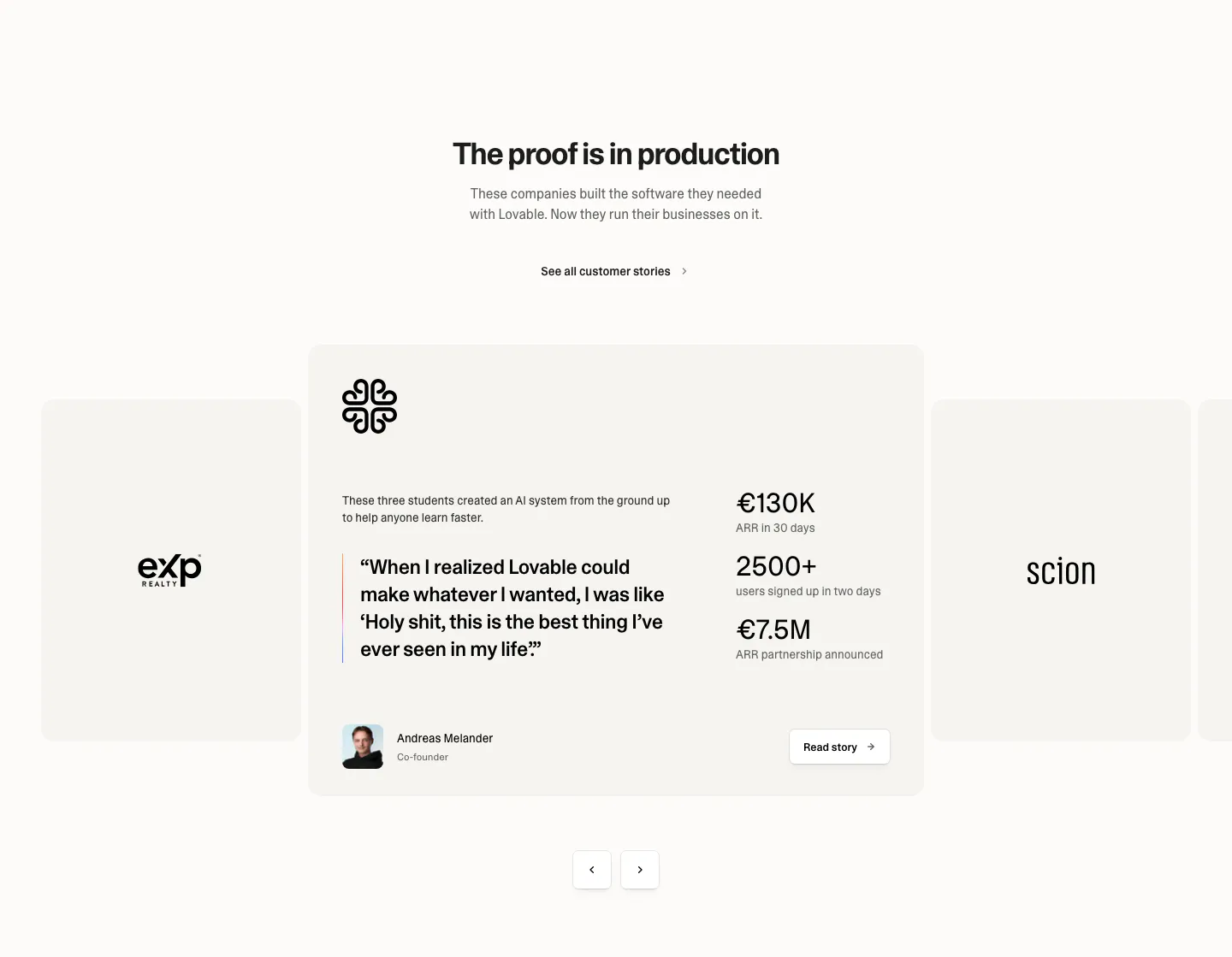
  242. Lightning Proxies call-to-action section: centered white headline and Get Started button on a bright blue background with thin circuit lines
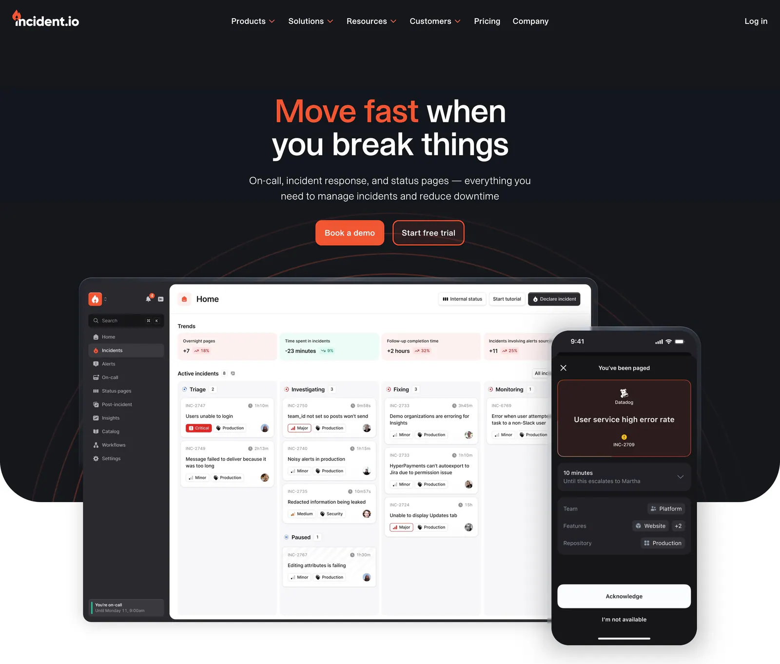
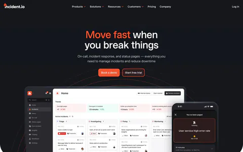
  243. Dash0 features section: tab bar above a card with a bullet list and a dark metrics explorer screenshot on a near-black background
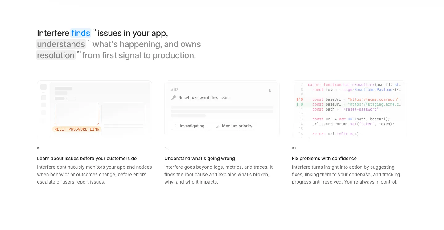
  244. Koyeb pricing section: condensed headline above four plan cards and two dark promo banners on a warm gray grid background
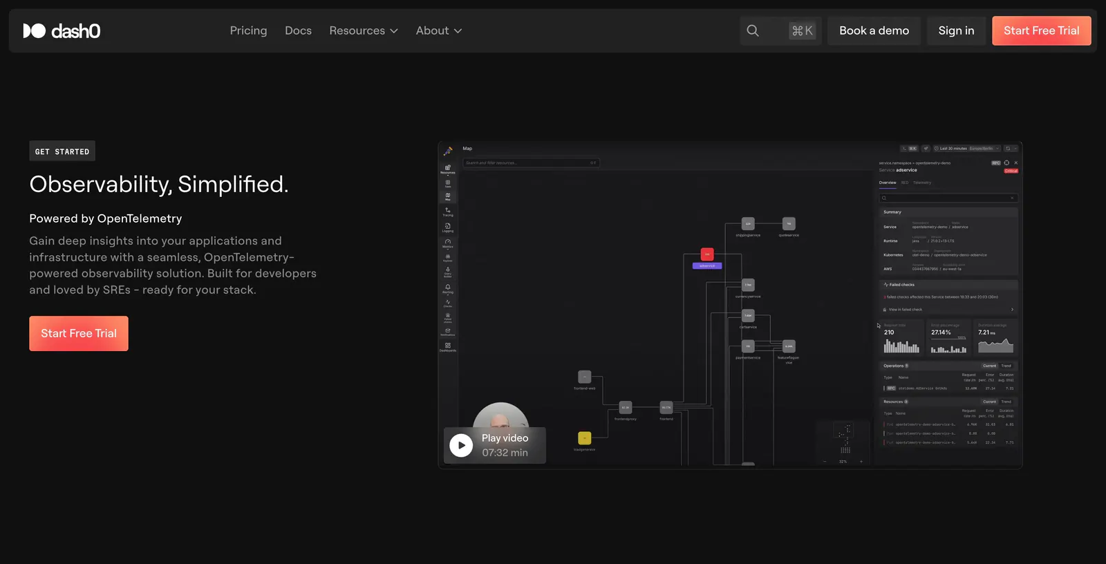
  245. Interfere blog & resources section: changelog heading above three dated release notes in columns on a white background
  246. Antimetal hero section: pill nav, serif headline with two buttons at left, radial burst of orange, yellow and black dots at right
  247. Lovable testimonials section: centered heading above a case study carousel with a quote, three metrics, founder avatar and arrow controls
  248. incident.io hero section: centered headline with orange accent on dark navy above a desktop dashboard and mobile paging screenshot
  249. Interfere how it works section: multi-line headline above three numbered columns with faded UI and code vignettes on white
  250. Dash0 hero section: left-aligned headline and Start Free Trial button beside a dark service map screenshot with a play video overlay
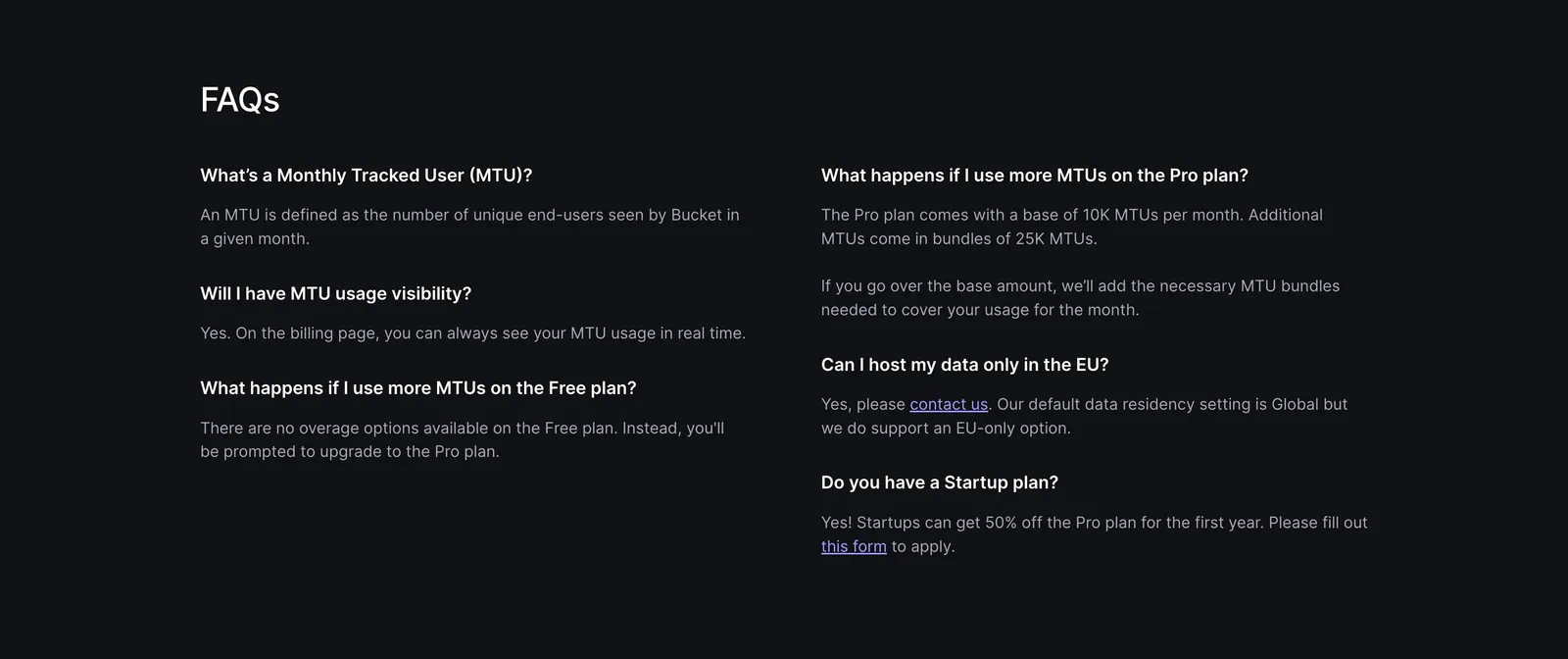
  251. Bucket FAQ section: FAQs heading above a two-column list of questions and answers on a dark background
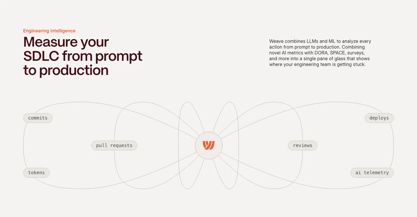
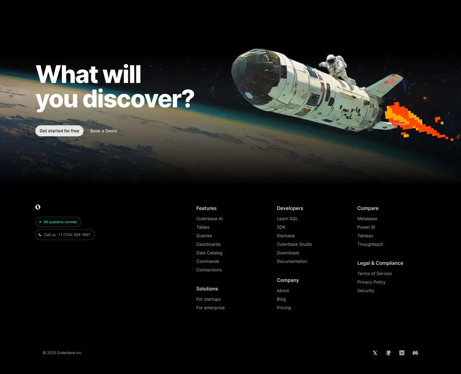
  252. Weave features section: headline and copy above a line diagram connecting commits, PRs, tokens, reviews and deploys to a central logo
  253. Antimetal logo cloud section: centered caption above three rows of grayscale customer logos on a light background
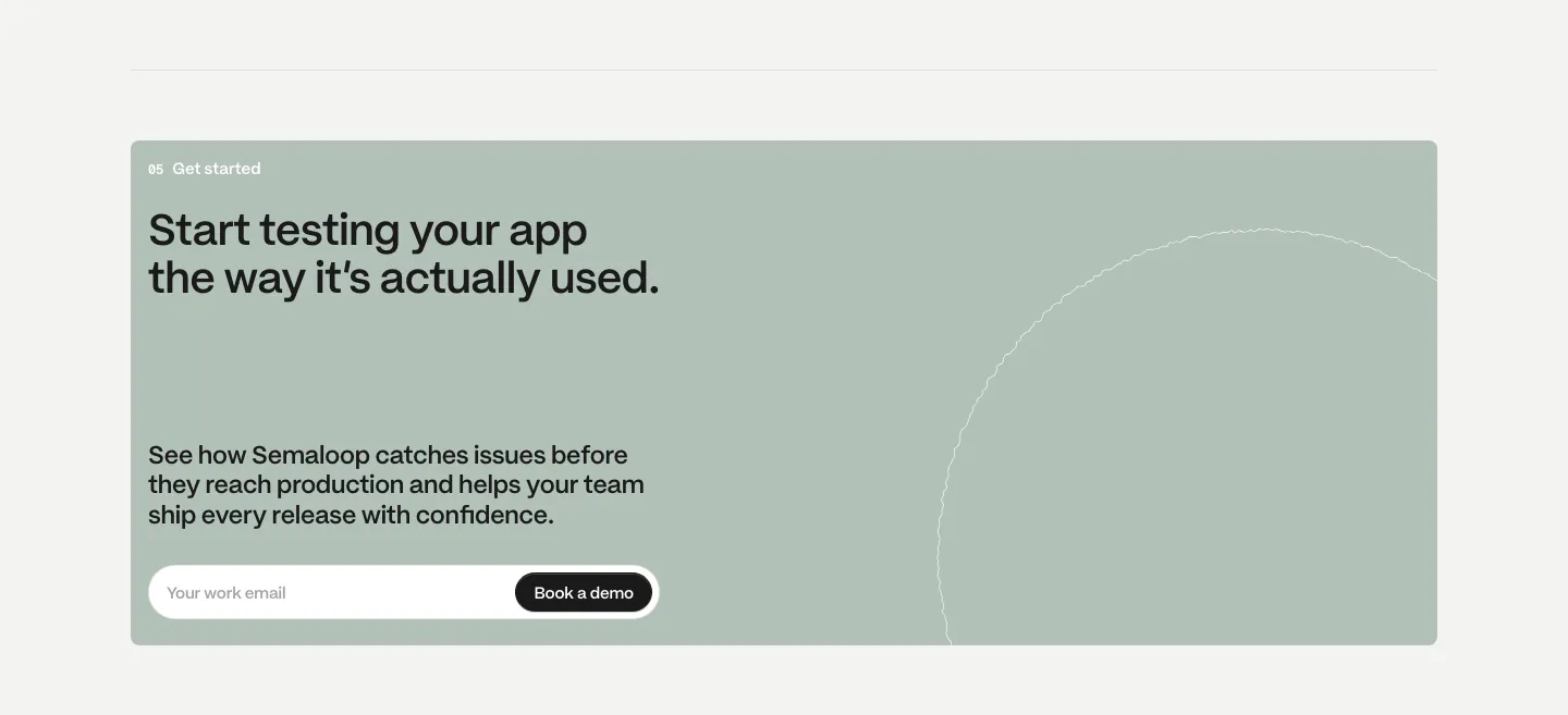
  254. Semaloop call to action section: sage green card with headline, short copy and an email field with demo button, thin circle outline at right
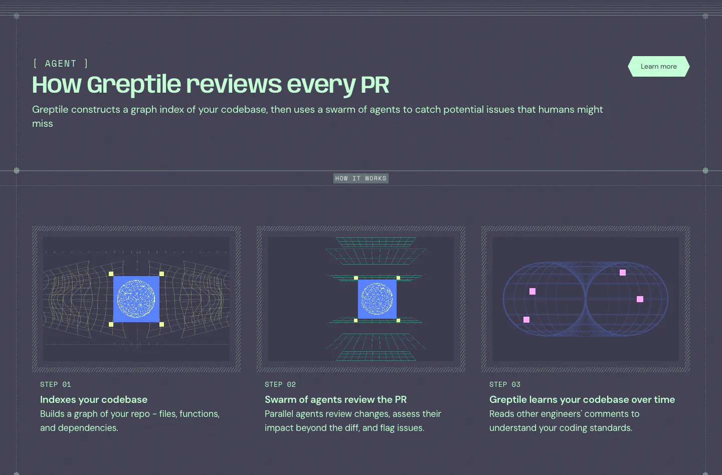
  255. Greptile how it works section: three step cards with wireframe graphics on a dark slate background below a mint headline
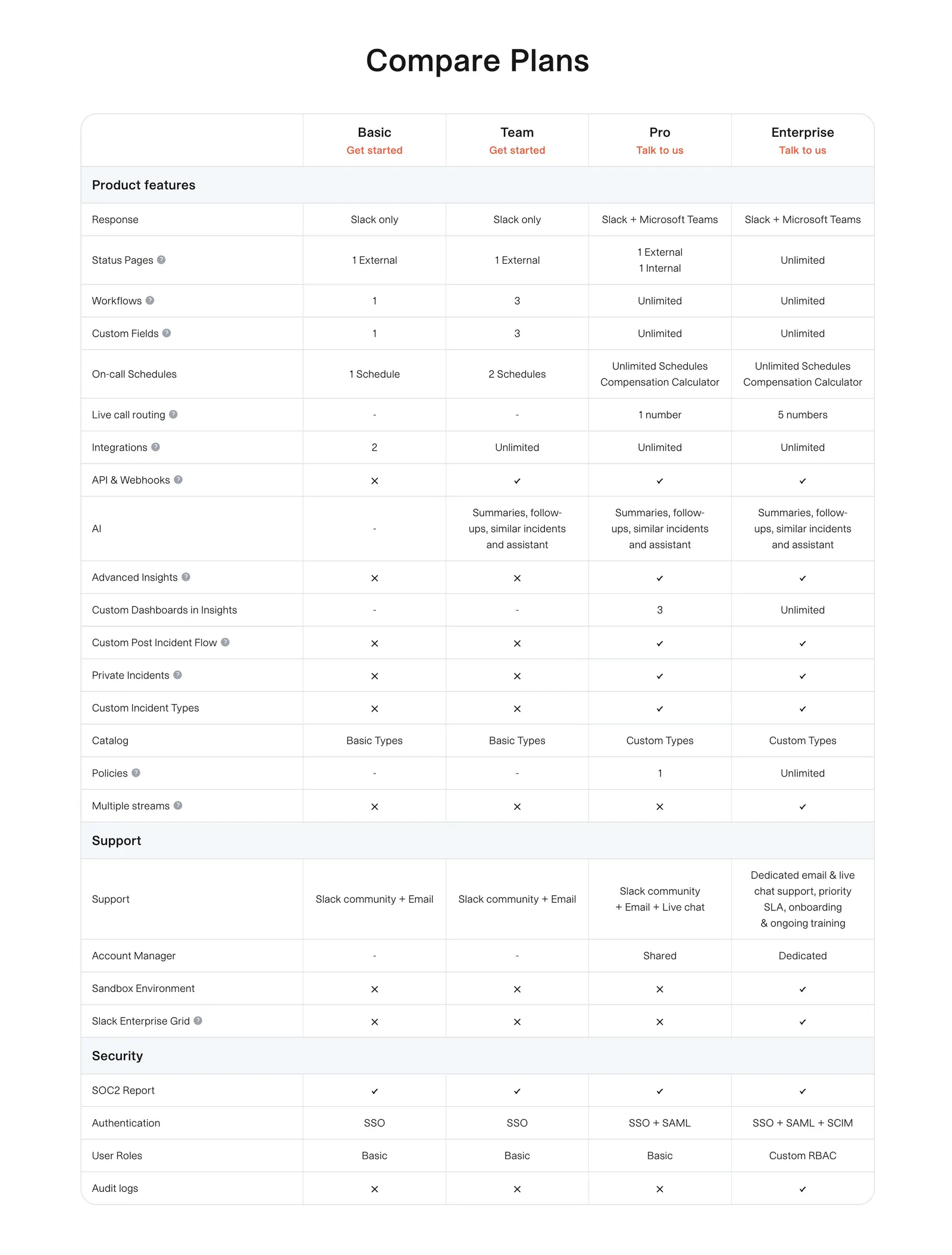
  256. incident.io pricing section: plan comparison table with grouped feature rows and check and cross marks on white
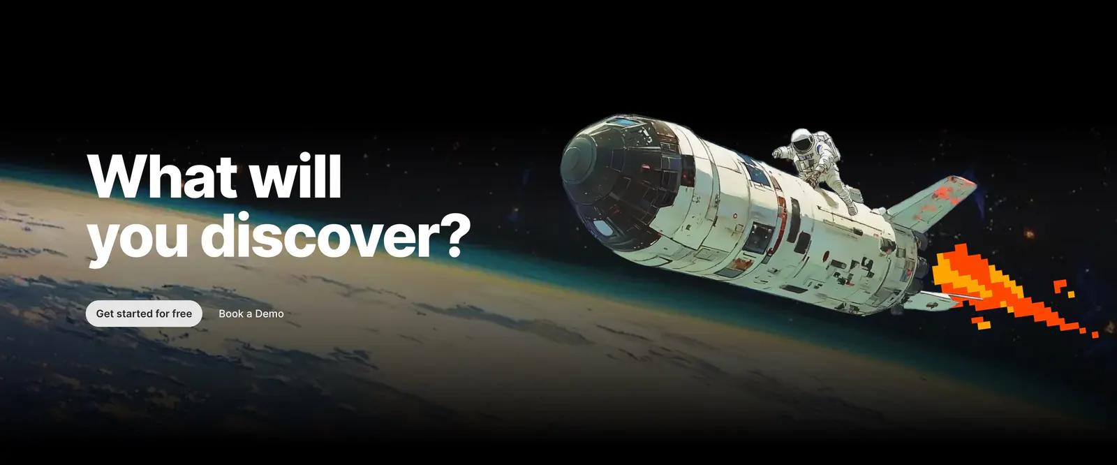
  257. Outerbase call-to-action section: bold headline and two buttons over painted artwork of an astronaut riding a shuttle above Earth
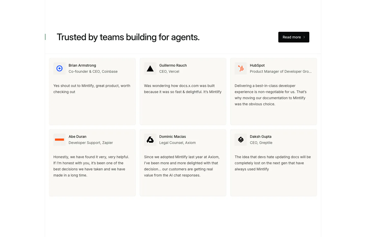
  258. Mintlify testimonials section: headline with Read more button above a two-row grid of six quote cards with names and logos
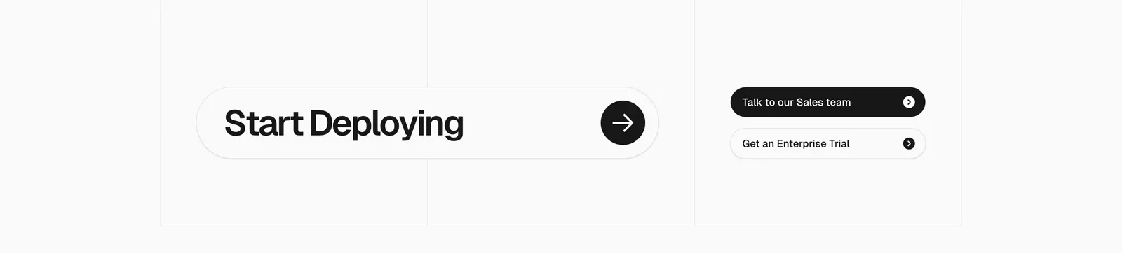
  259. Vercel call-to-action section: large Start Deploying pill with arrow button beside two sales and trial buttons on a gray grid
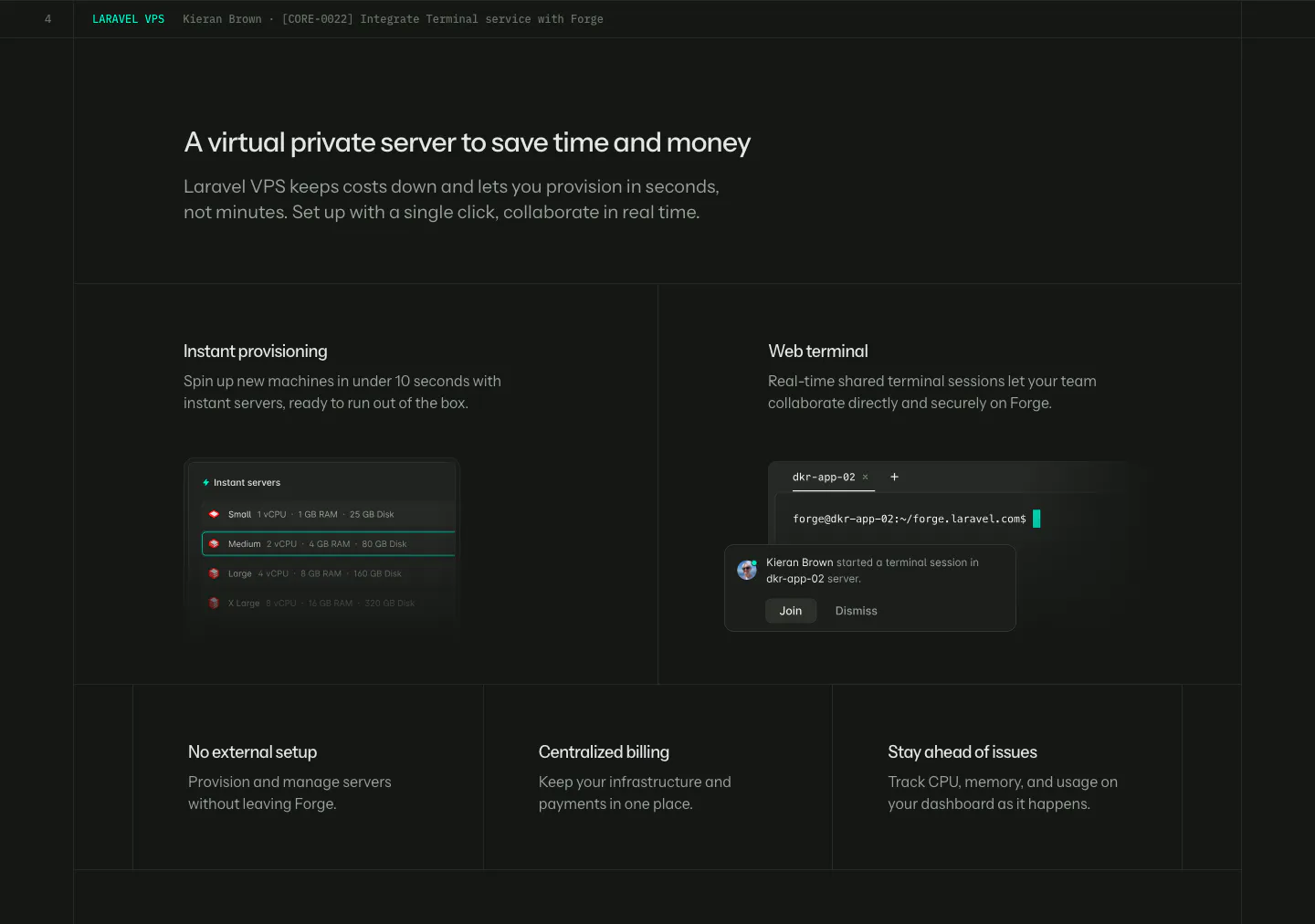
  260. Laravel Forge features section: dark grid with two UI tiles (server list, web terminal) above three smaller feature tiles
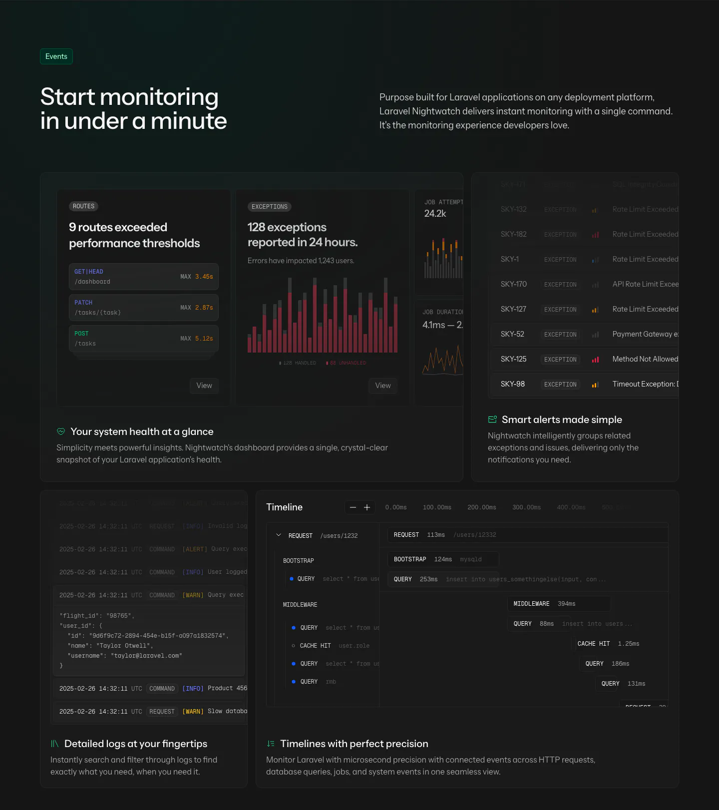
  261. Laravel Nightwatch features section: headline and intro above a dark bento grid of route, exception, alert, log and timeline UI cards
  262. Mintlify features section: headline with button above a bento grid of light cards with abstract UI mockups and green line art
  263. Steel value proposition section: three metrics in a bordered row showing tokens scraped, browser hours and session start time on dark gray
  264. Linear features section: headline left, short copy and link right, above a wide panel of stacked dark customer request cards on near-black
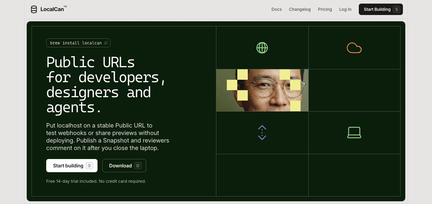
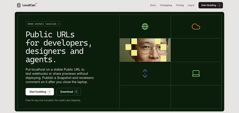
  265. LocalCan hero section: monospace headline and two buttons on a dark green panel, with a grid of icons and a pixelated portrait on the right
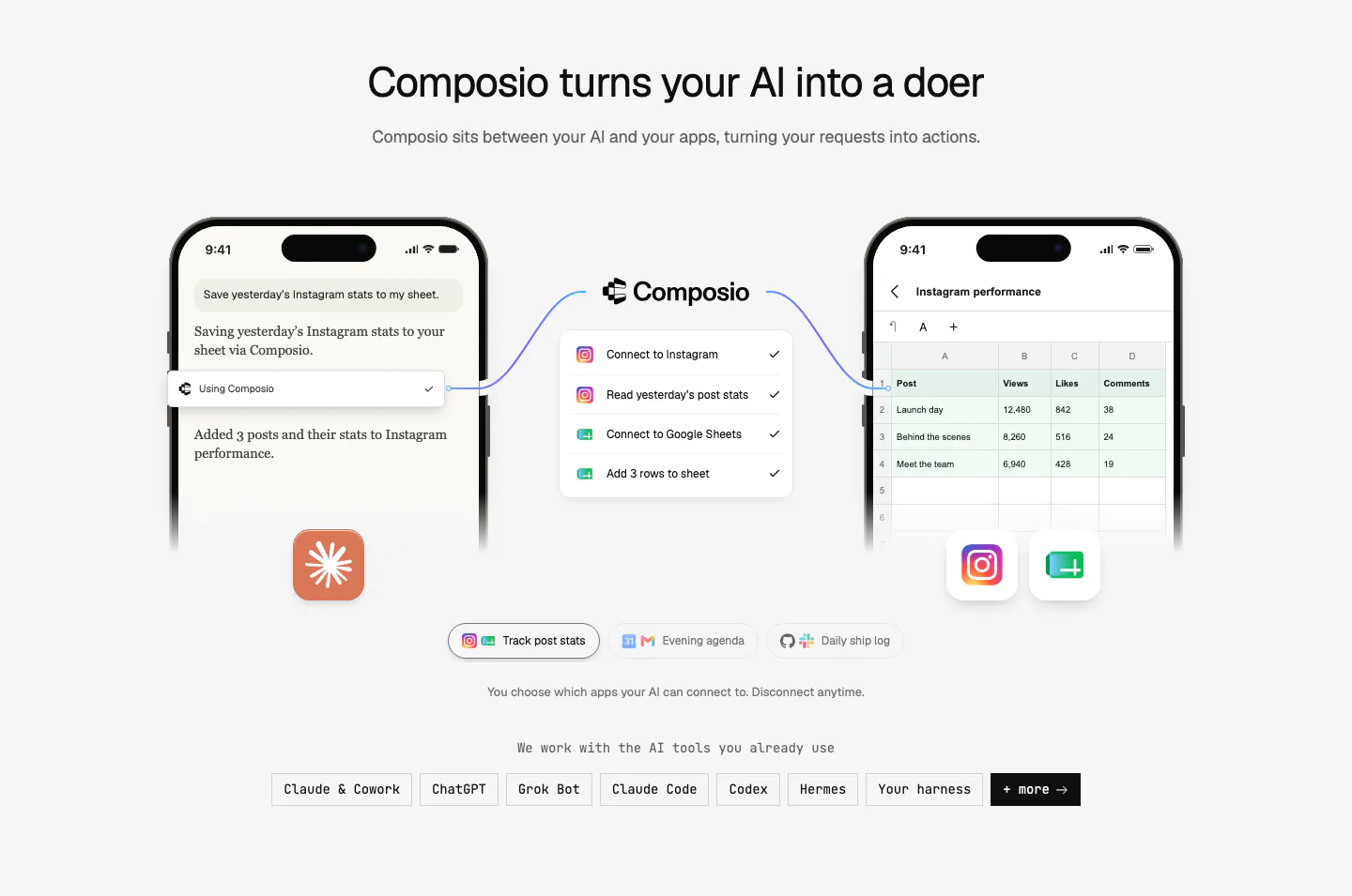
  266. Composio how it works section: two phone mockups linked through a Composio step list, example tabs and a row of AI tool chips
  267. Steel footer section: dithered photo CTA banner above a logo, copyright, link columns and status indicator on a dark grid background
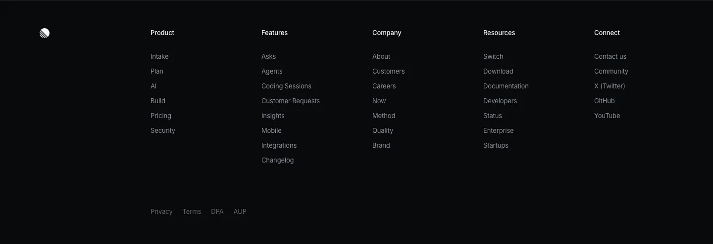
  268. Linear footer section: dark footer with a logo mark, five link columns and a row of legal links
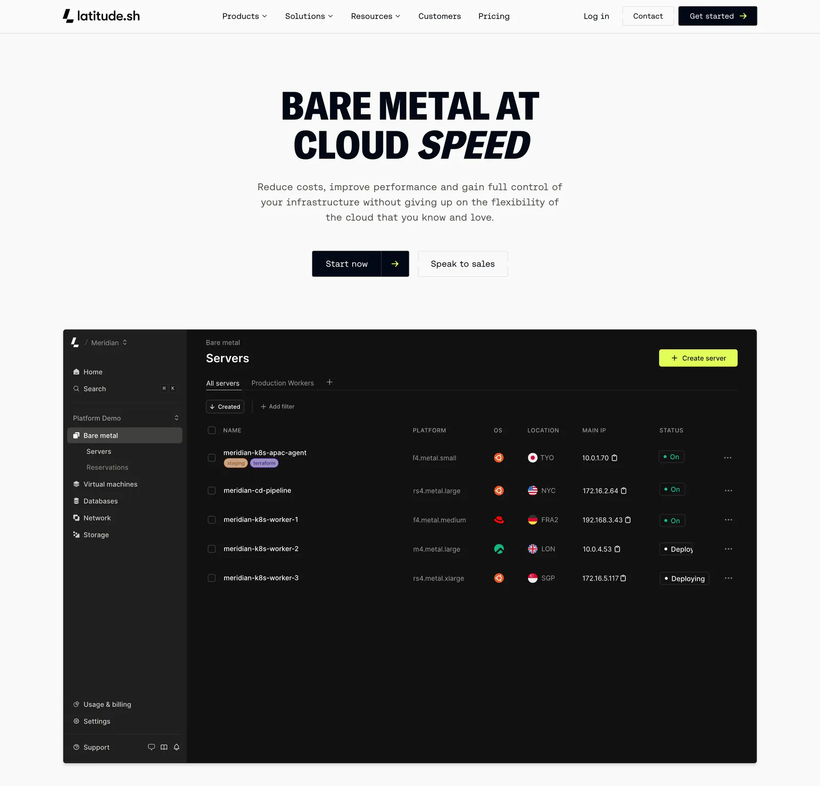
  269. Latitude.sh hero section: nav and centered uppercase headline with buttons above a dark servers dashboard screenshot
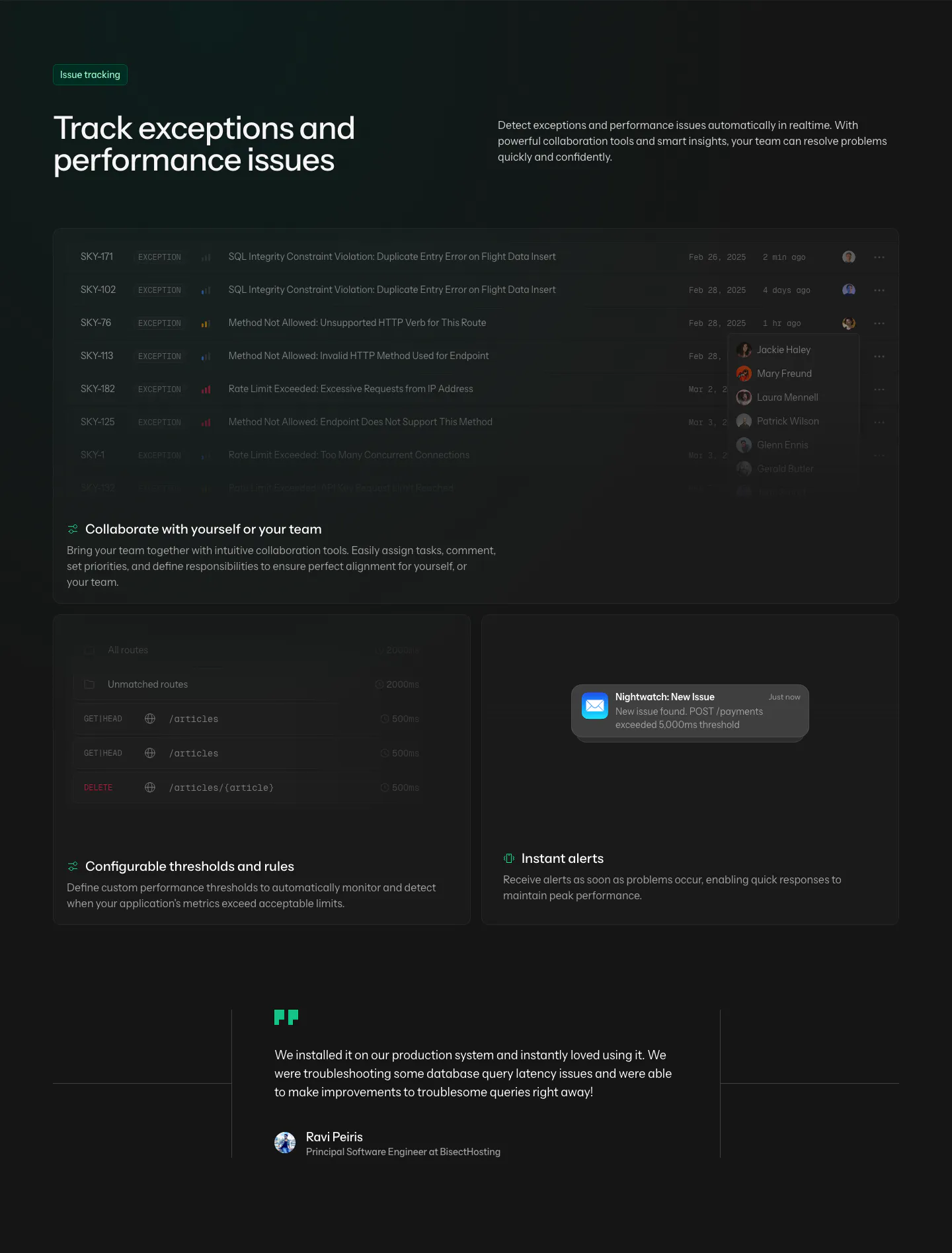
  270. Laravel Nightwatch features section: headline above dark cards showing an exception list, threshold rules and an alert, plus a quote
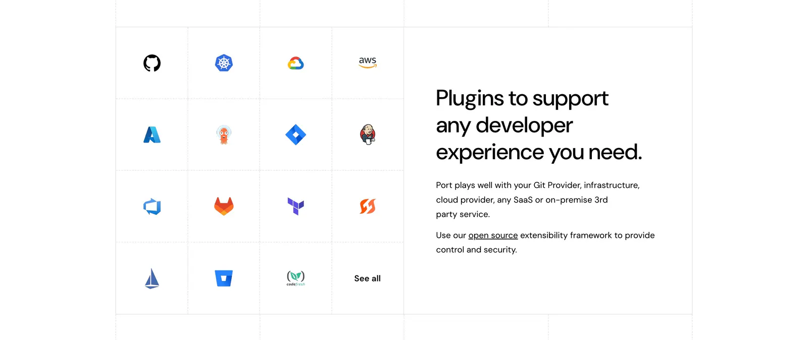
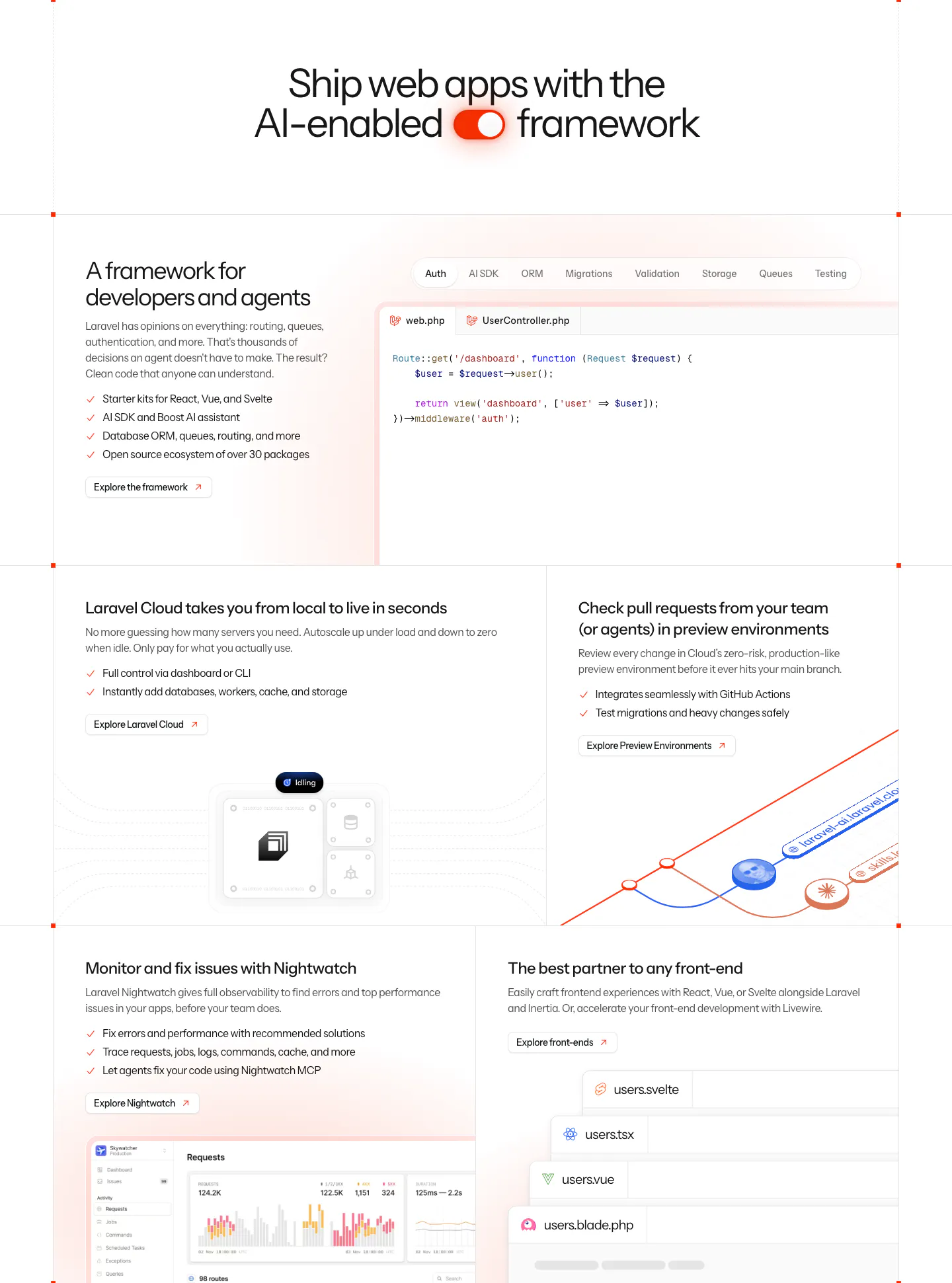
  271. Port integrations section: grid of developer tool icons on the left beside a headline and short copy on the right, white background
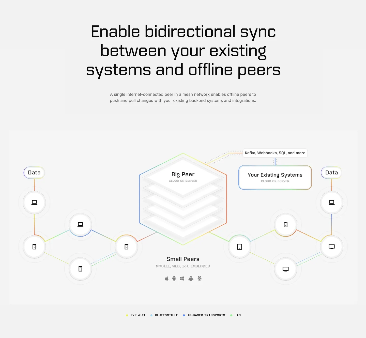
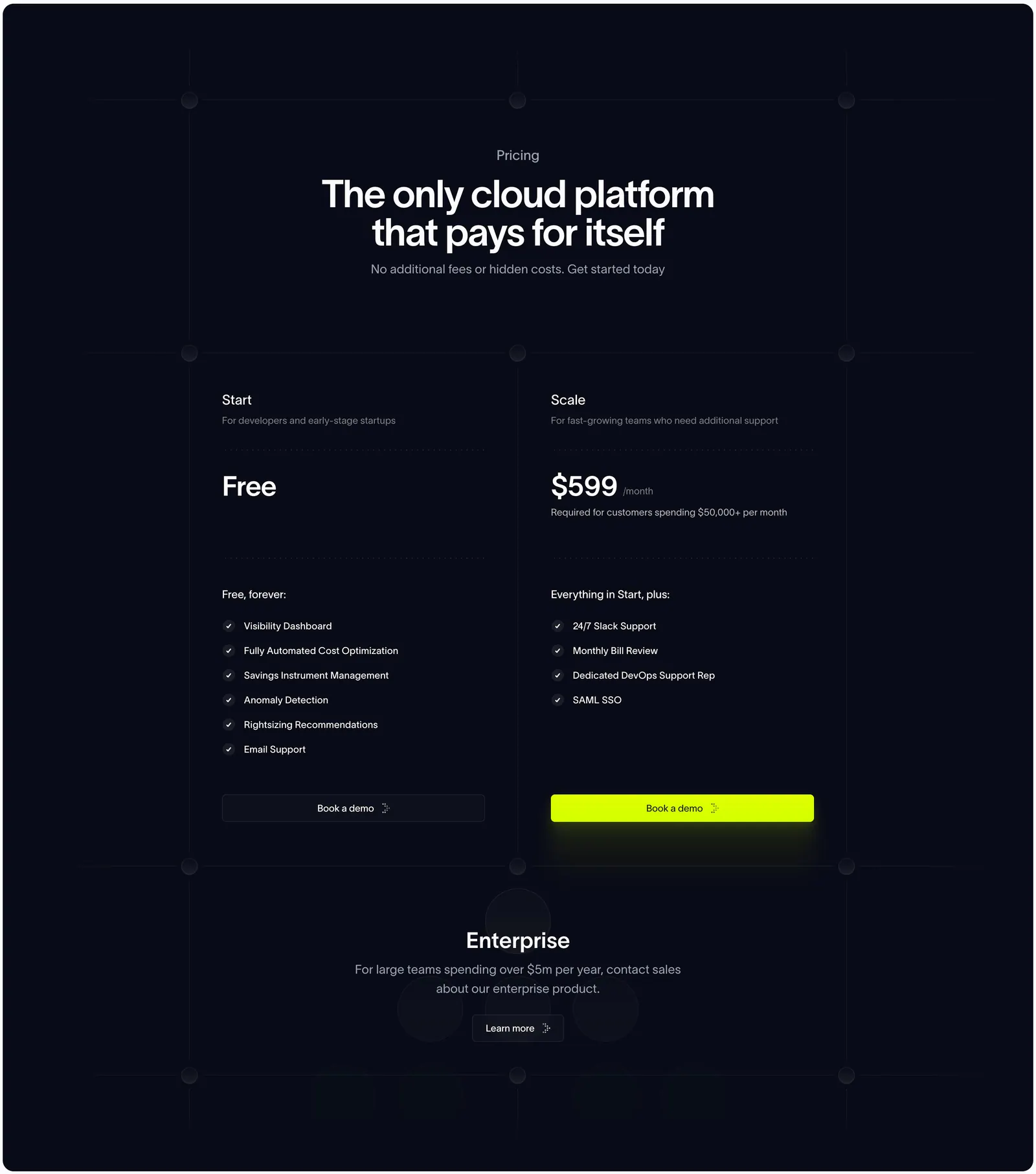
  272. Ditto features section: centered large headline above a hexagonal Big Peer diagram linked to small peer device nodes on light gray
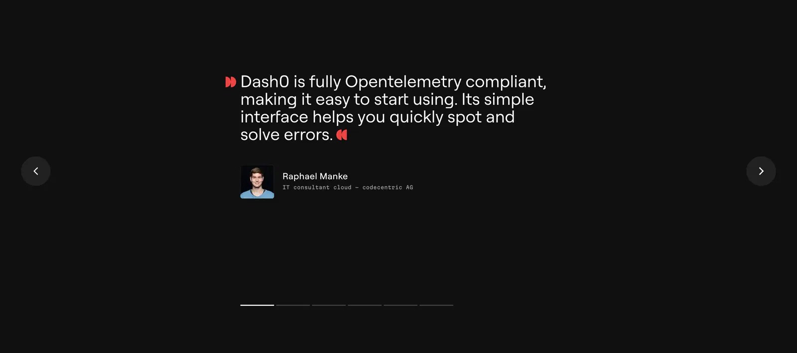
  273. Dash0 testimonials section: single customer quote with avatar between prev/next arrows and pagination bars on a near-black background
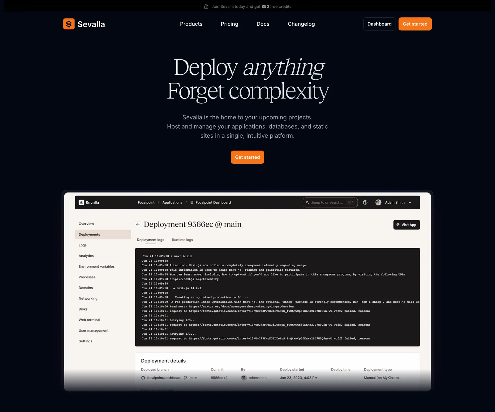
  274. Sevalla hero section: centered serif headline and orange button above a deployment logs dashboard screenshot on a near-black background
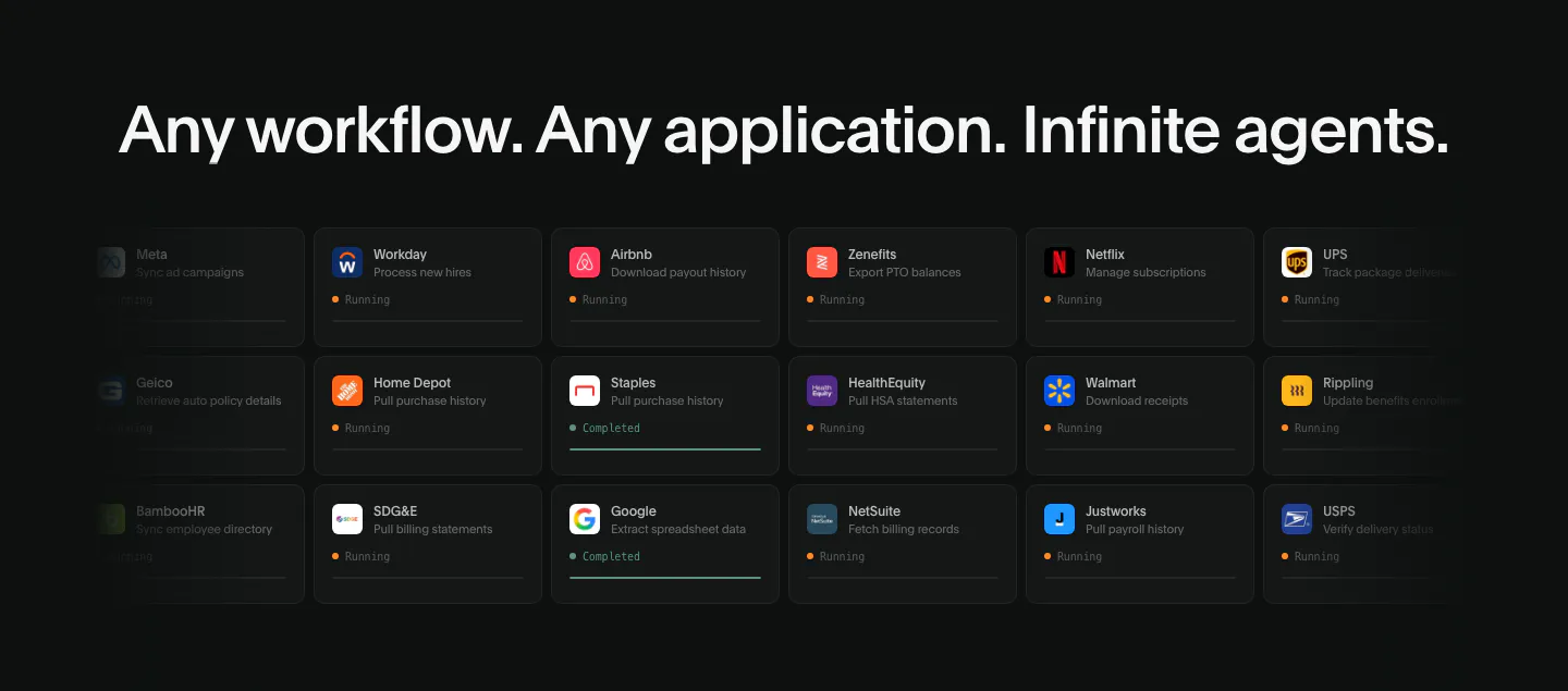
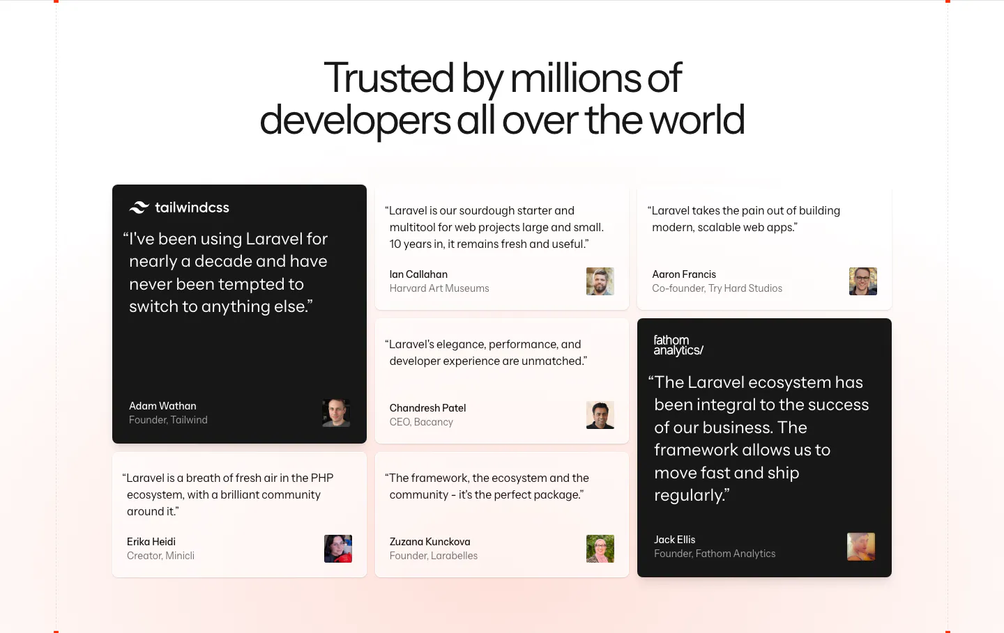
  275. Deck integrations section: dark background with a wide headline above a grid of app task cards with running status, fading at the edges
  276. Laravel features section: centered headline with a toggle icon above a bento grid of code tabs, cloud, preview environment and monitoring panels
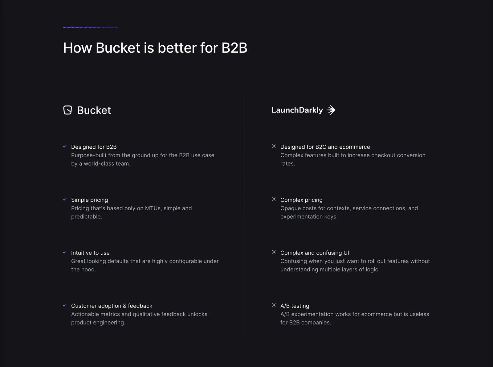
  277. Antimetal pricing section: centered headline on dark navy grid lines above two plan columns and an enterprise row
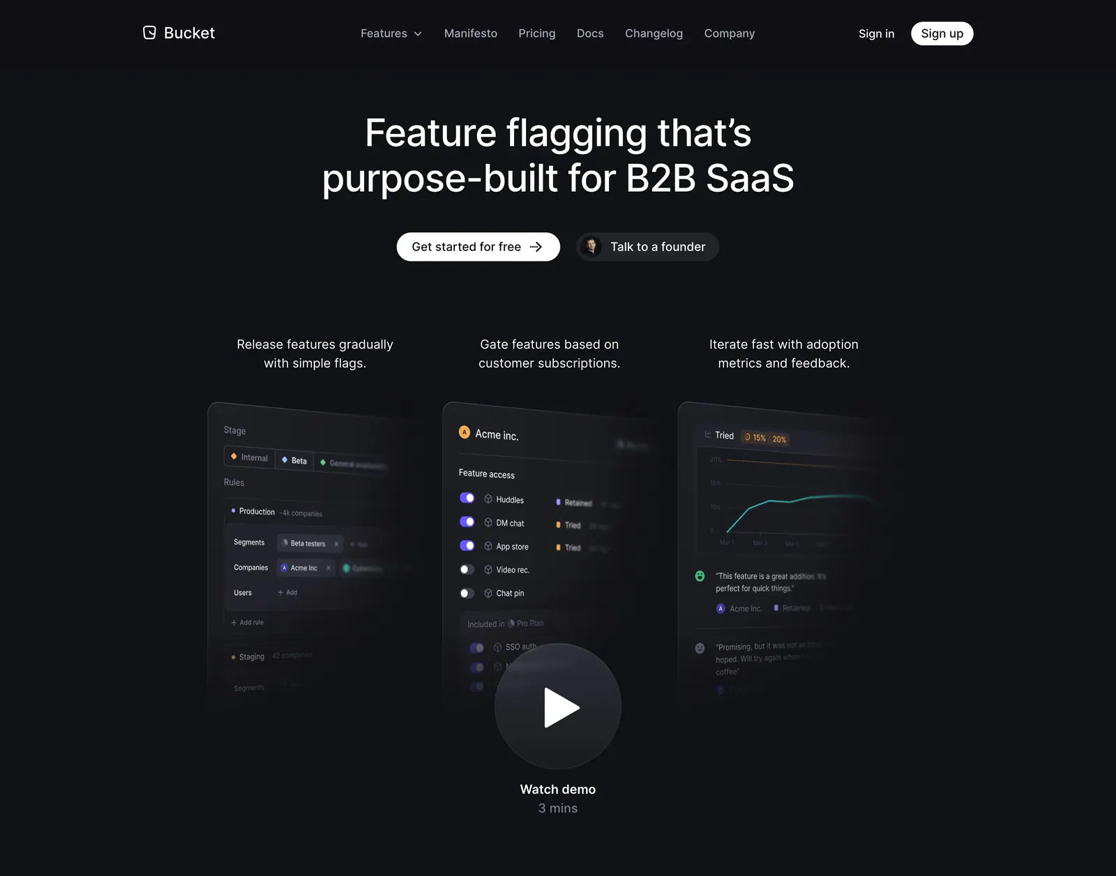
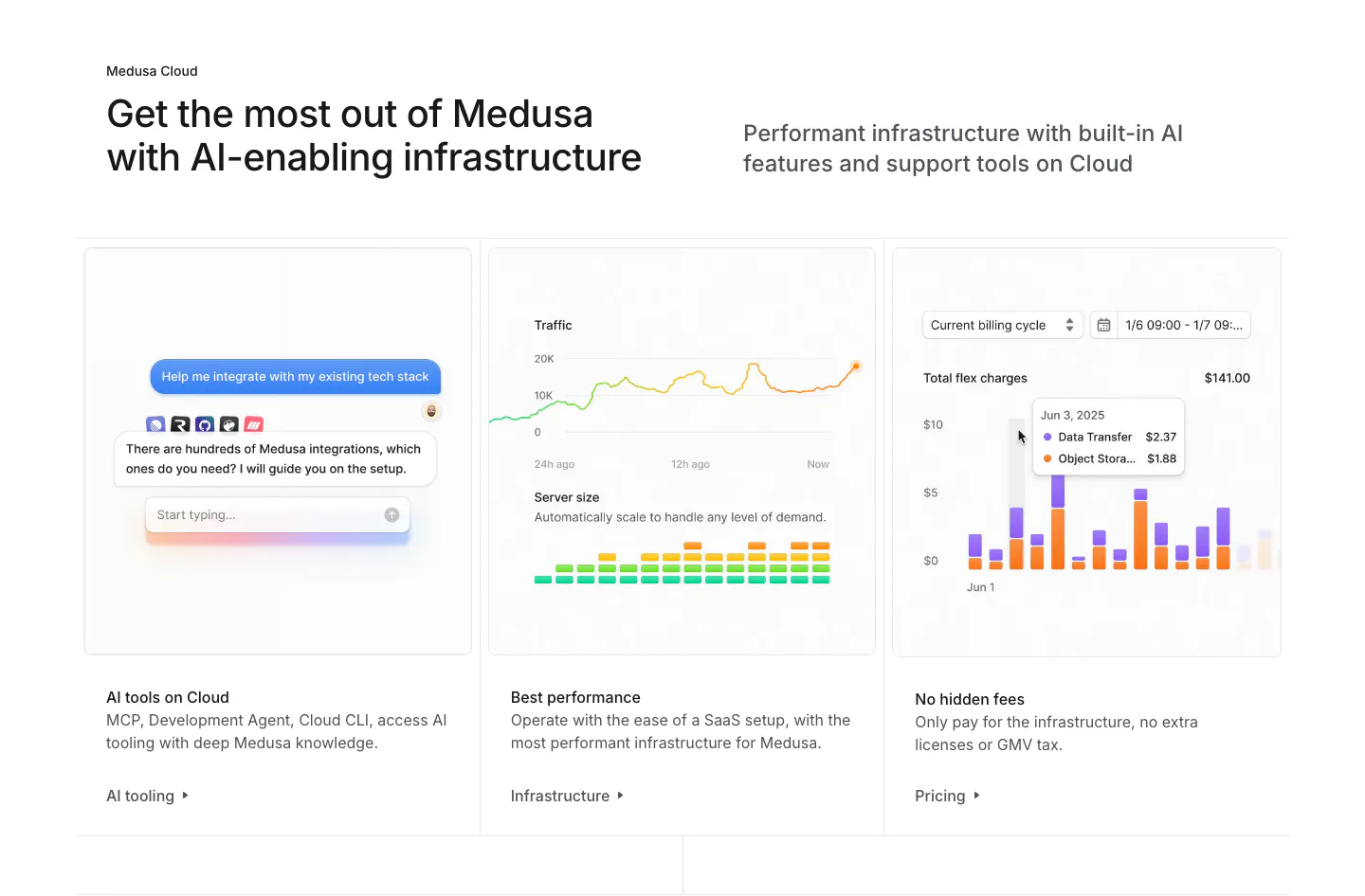
  278. Bucket hero section: centered headline and two buttons above three tilted product UI panels and a watch demo play button on dark
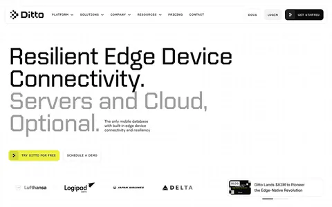
  279. Mintlify testimonials section: headline with buttons above three dark case-study cards showing customer logos and carousel arrows
  280. Laravel testimonials section: centered headline above a masonry grid of developer quote cards, two highlighted in black, on a soft pink fade
  281. Greptile features section: centered eyebrow label, headline and one-line subtitle on a light gray band with a striped top edge
  282. Bucket comparison section: headline above two columns contrasting Bucket checkmarks with LaunchDarkly crosses on a dark background
  283. Medusa features section: headline above three cards showing an AI chat, traffic and server charts, and a billing bar chart
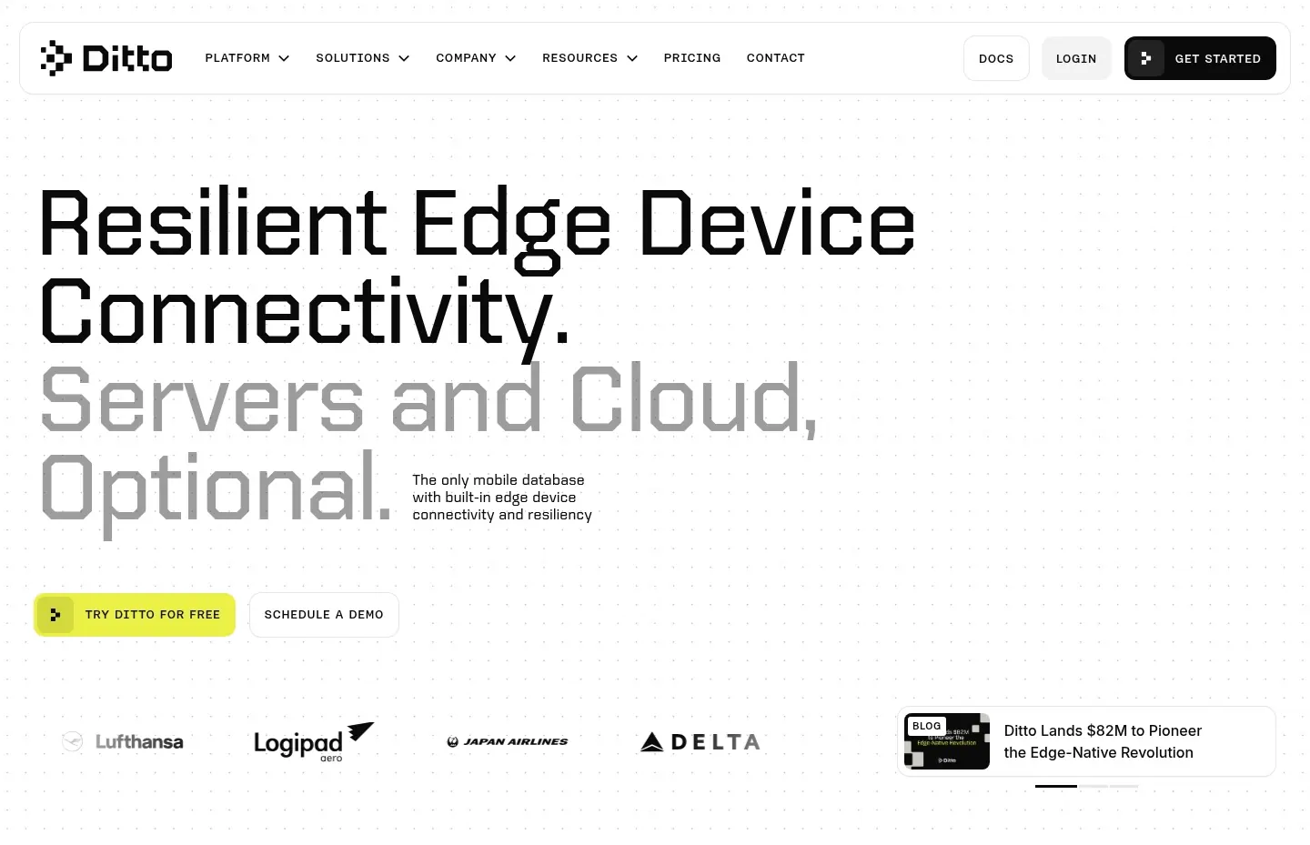
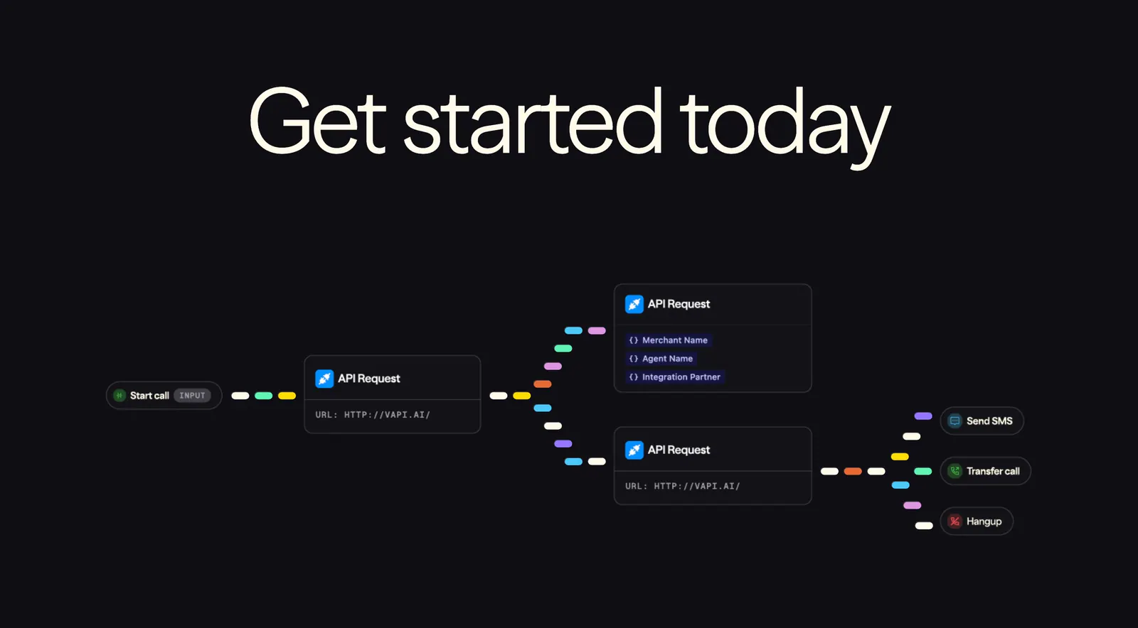
  284. Ditto hero section: oversized two-tone left-aligned headline with yellow CTA, airline logo strip and a news card on a dotted white background
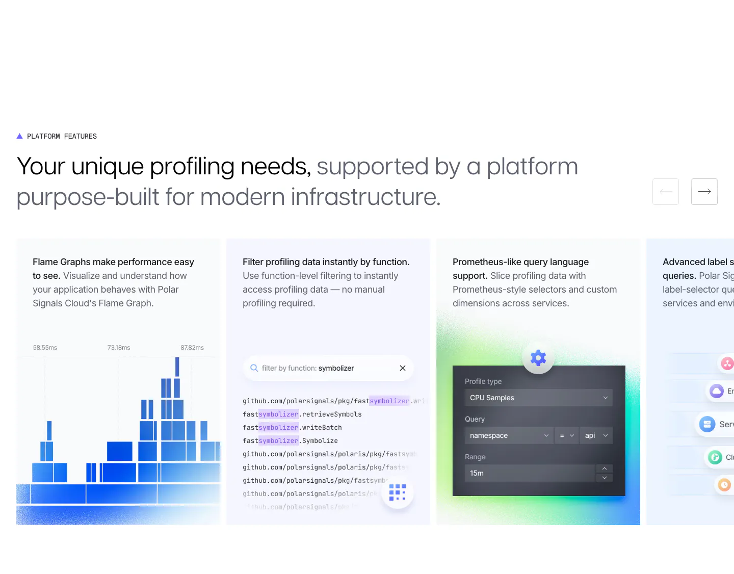
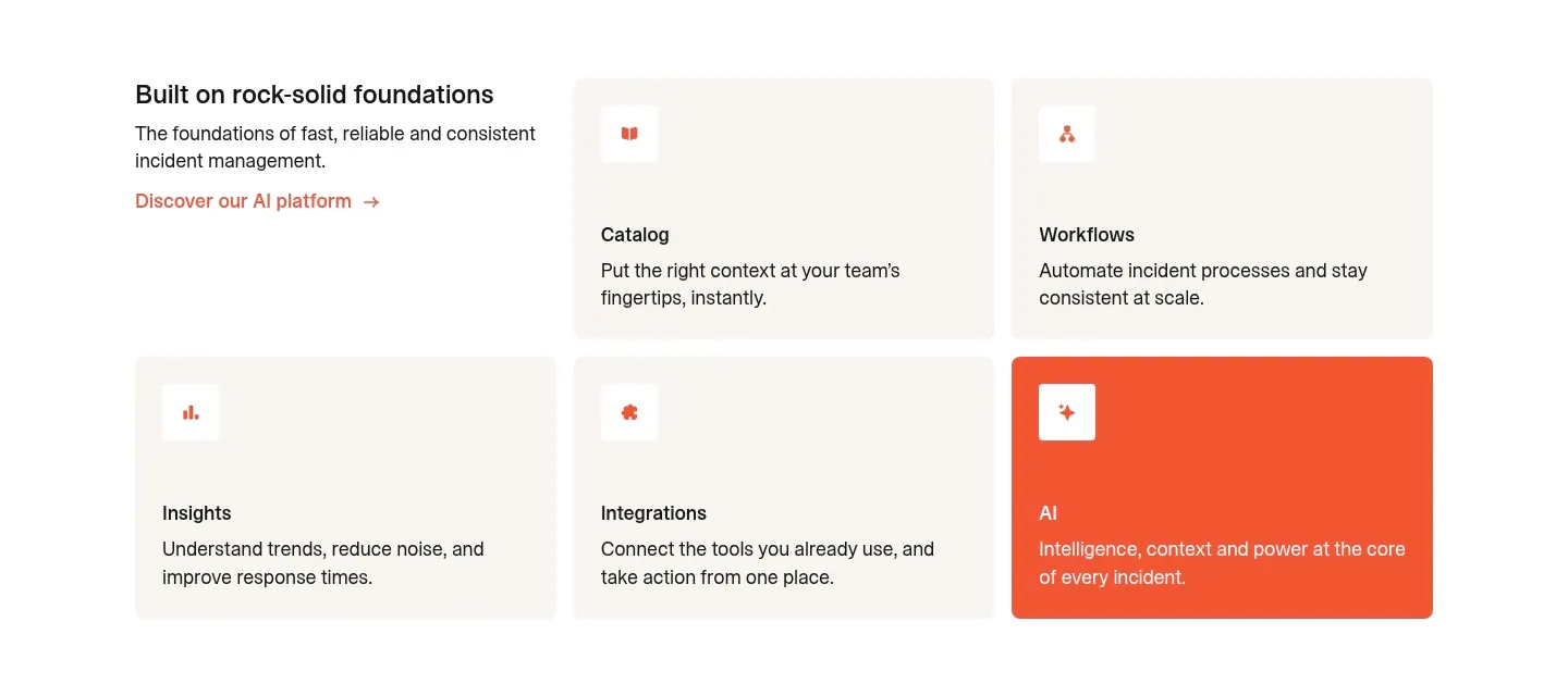
  285. Polar Signals features section: two-tone headline with arrow buttons above a sliding row of cards with flame graph, code filter and query UI
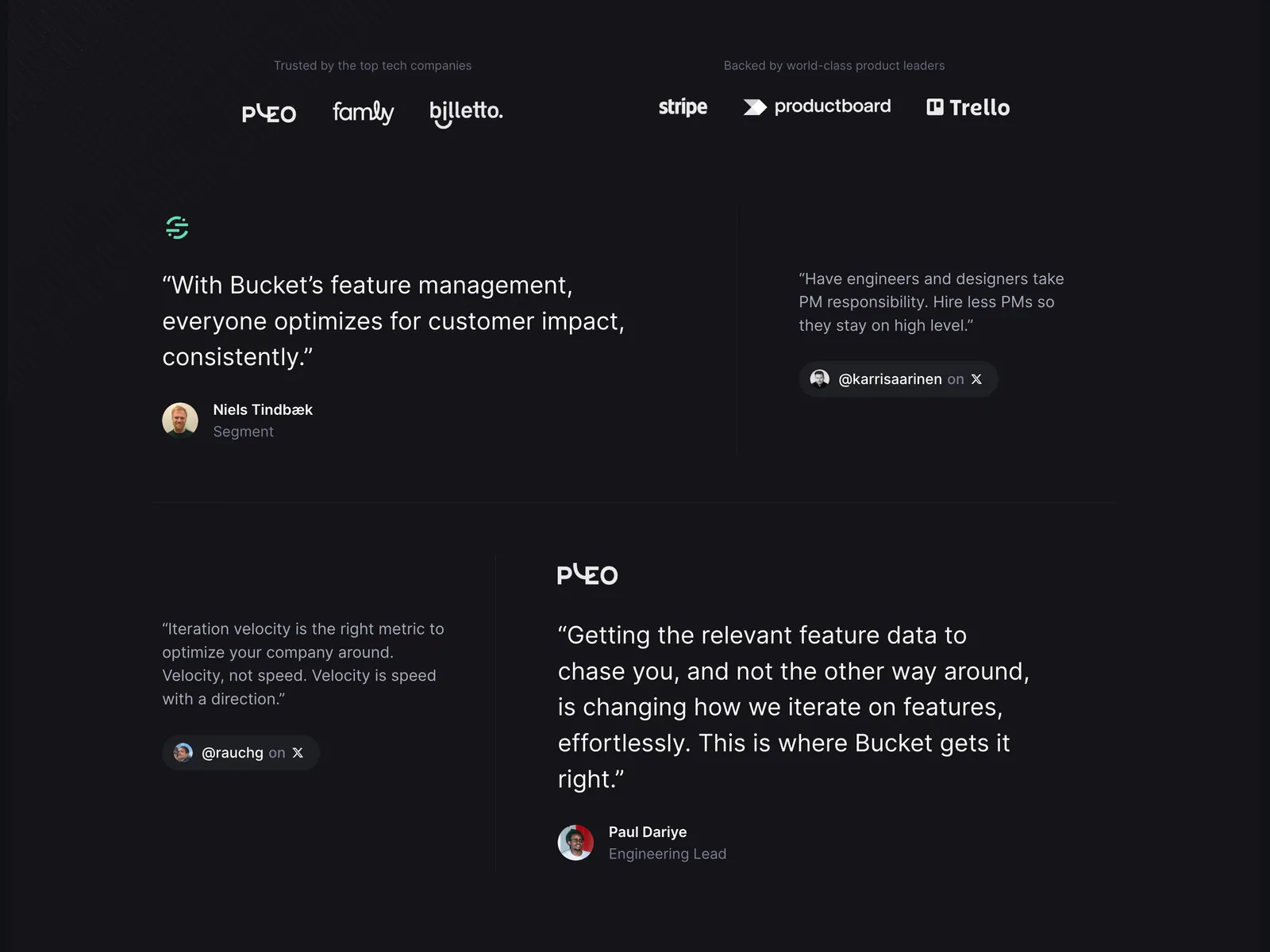
  286. Bucket testimonials section: customer and investor logo rows above a staggered layout of large and small quotes on a dark background
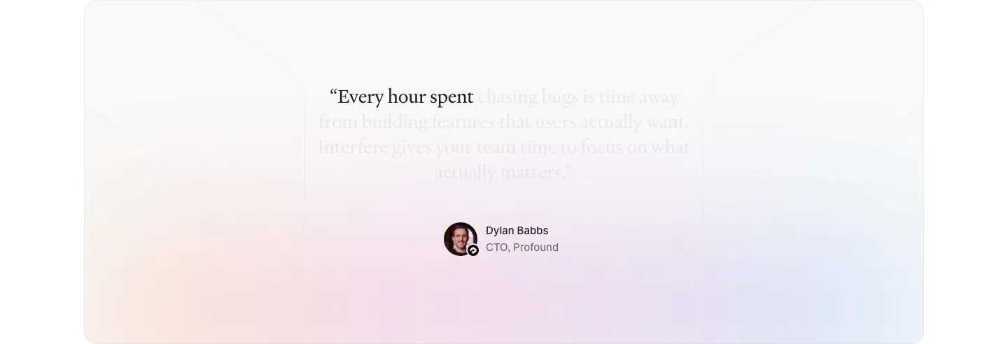
  287. Interfere testimonials section: centered serif quote fading in over a soft pastel gradient card with author avatar below
  288. Outerbase footer section: space-art CTA band above a black footer with logo, status badges, link columns and social icons
  289. Vapi call-to-action section: huge centered headline above a workflow diagram of API request nodes linked by colorful dashes on black
  290. incident.io features section: intro text beside a grid of five beige feature cards with one orange AI card on white
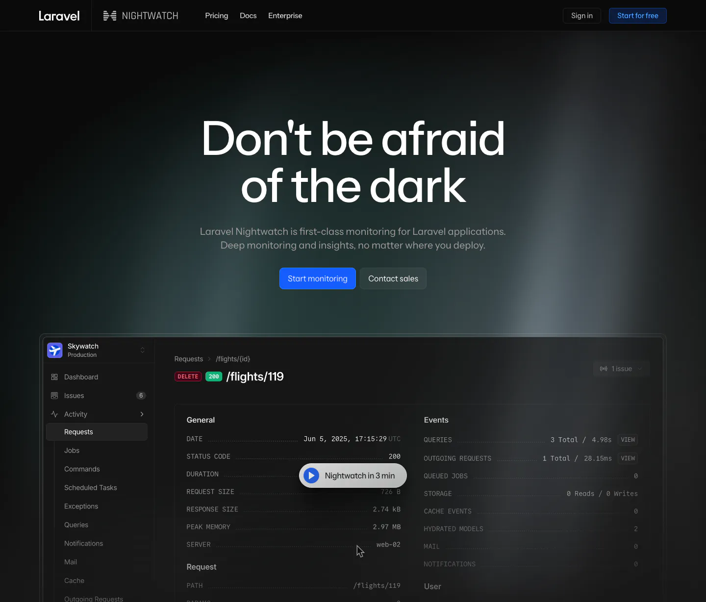
  291. Laravel Nightwatch hero section: centered headline with blue and gray buttons above a dark request monitoring dashboard with a video pill
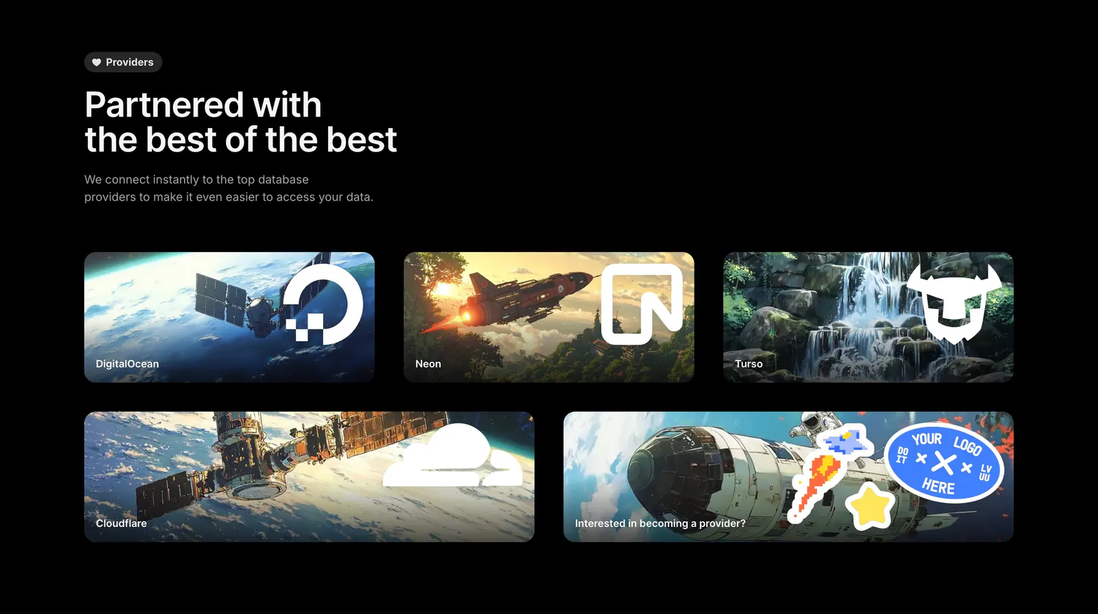
  292. Outerbase integrations section: headline above five artwork cards with provider logos for DigitalOcean, Neon, Turso and Cloudflare
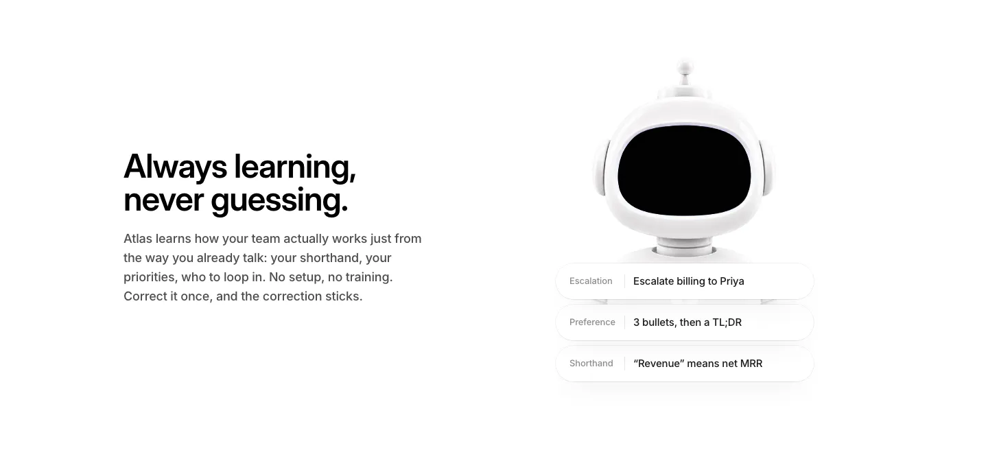
  293. WorkOS features section: headline and copy on the left, white 3D robot with memory chips on the right, on white
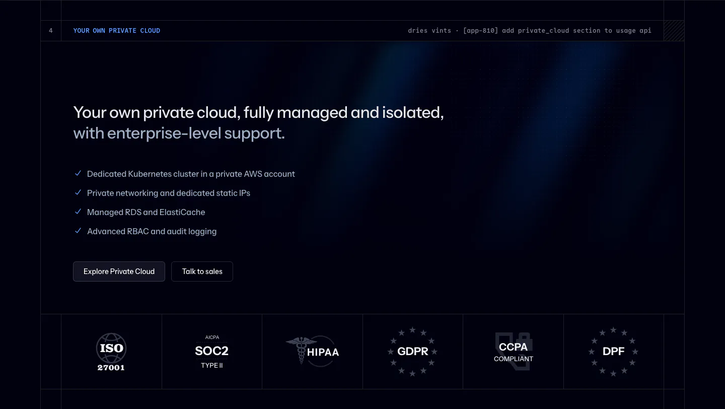
  294. Laravel Cloud security section: headline, private cloud checklist and buttons above a row of ISO, SOC 2, HIPAA and GDPR badges on dark navy
  295. Polar Signals call to action section: left headline and two buttons on a blue gradient with white vertical bars rising like a bar chart
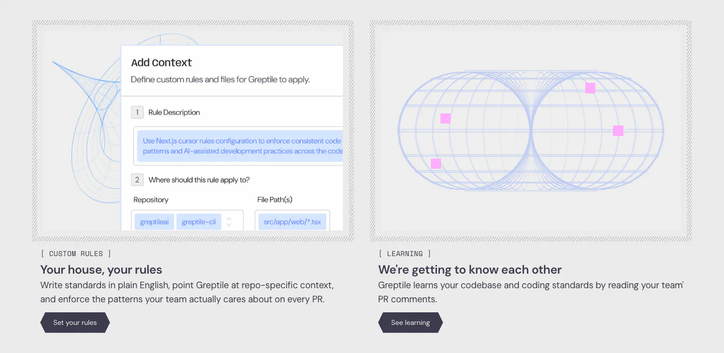
  296. Greptile features section: two cards side by side, one with a custom rules form UI, one with a blue wireframe torus graphic
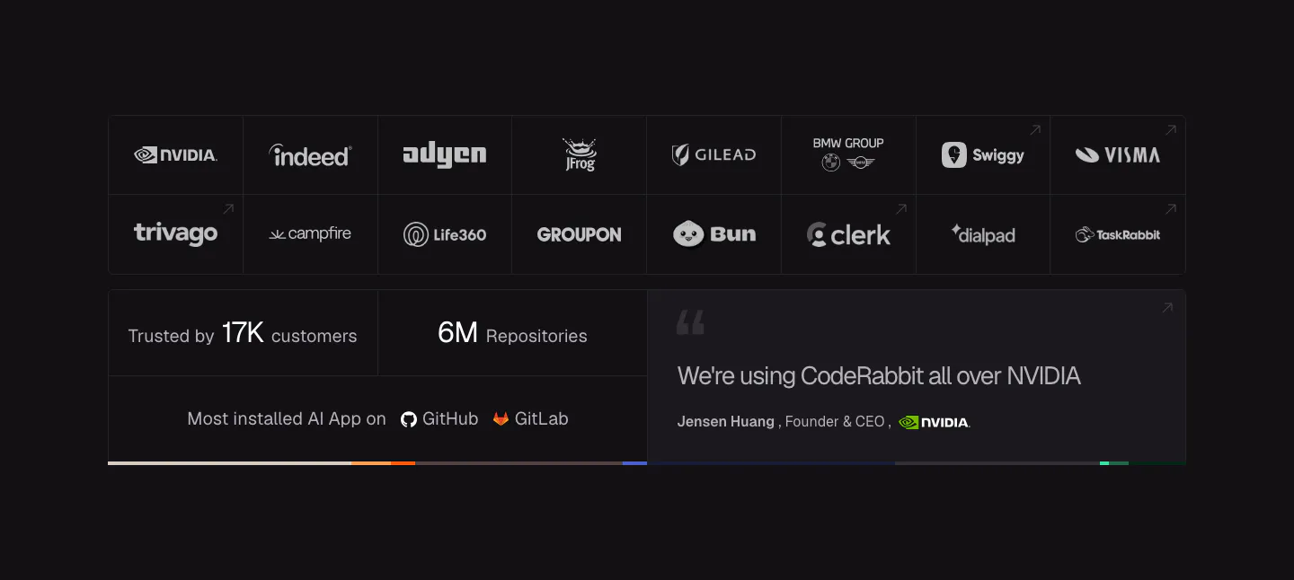
  297. CodeRabbit logo cloud section: dark bordered grid of customer logos above stat tiles for customers and repositories and an NVIDIA quote
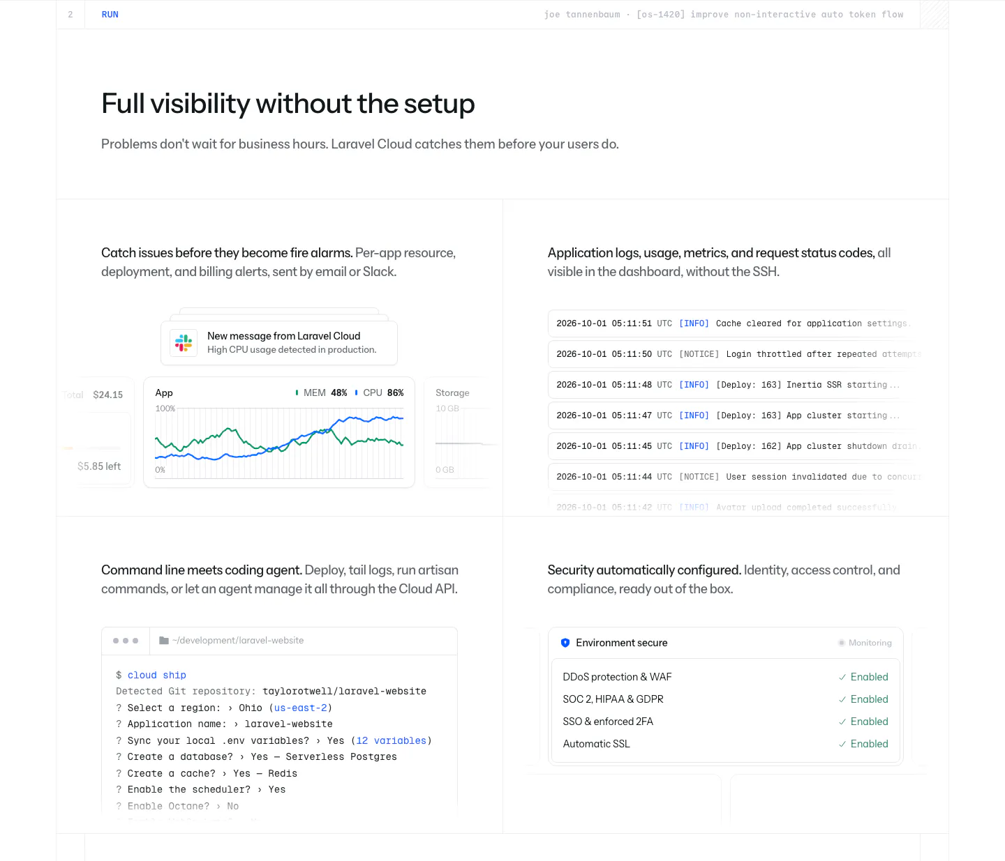
  298. Laravel Cloud features section: headline above a 2x2 grid showing usage alerts, a log stream, a CLI terminal session and a security checklist
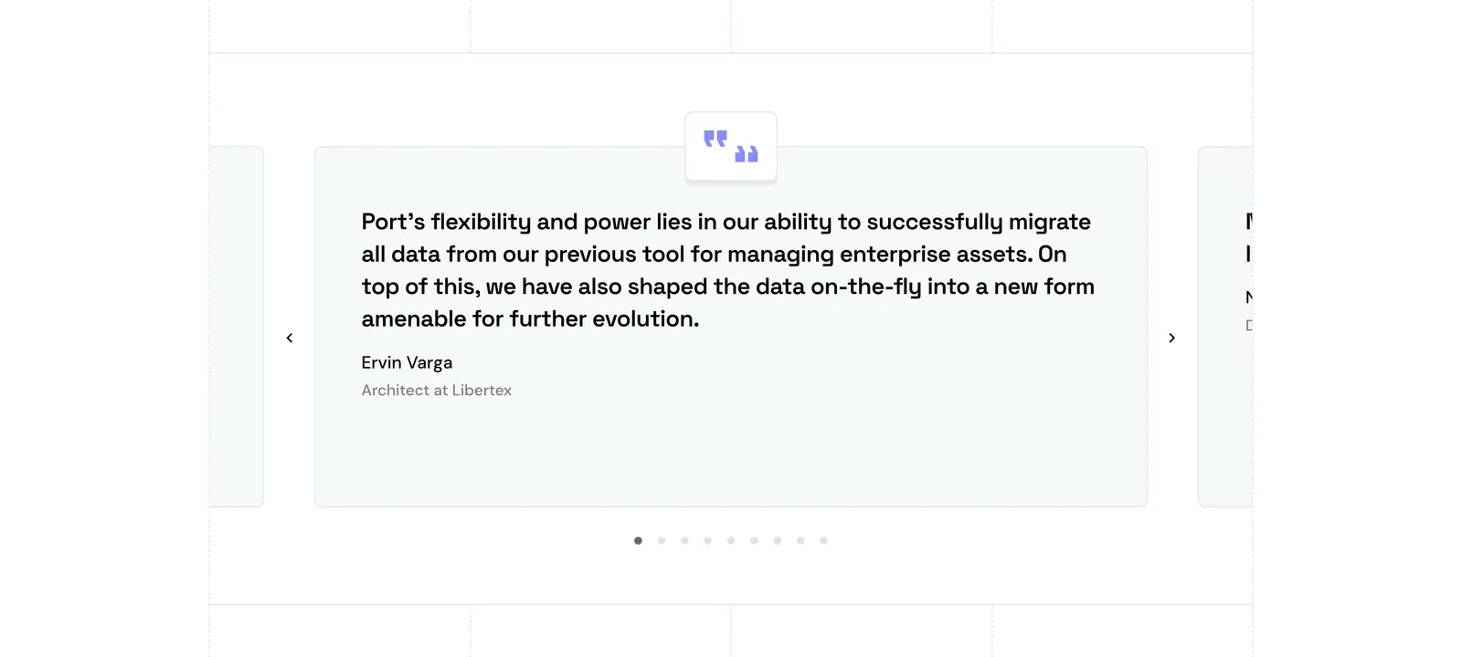
  299. Port testimonials section: single quote card carousel with quote icon, arrows and pagination dots, side cards cut off at the edges
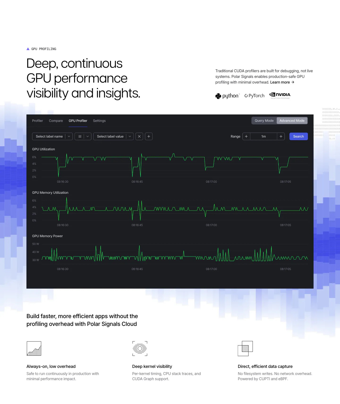
  300. Polar Signals features section: headline above a dark GPU profiler dashboard on blue pixel bars, with three icon feature points below
  301. Phidata call to action section: centered headline with two buttons on a black background with dot-matrix lettering in the corners
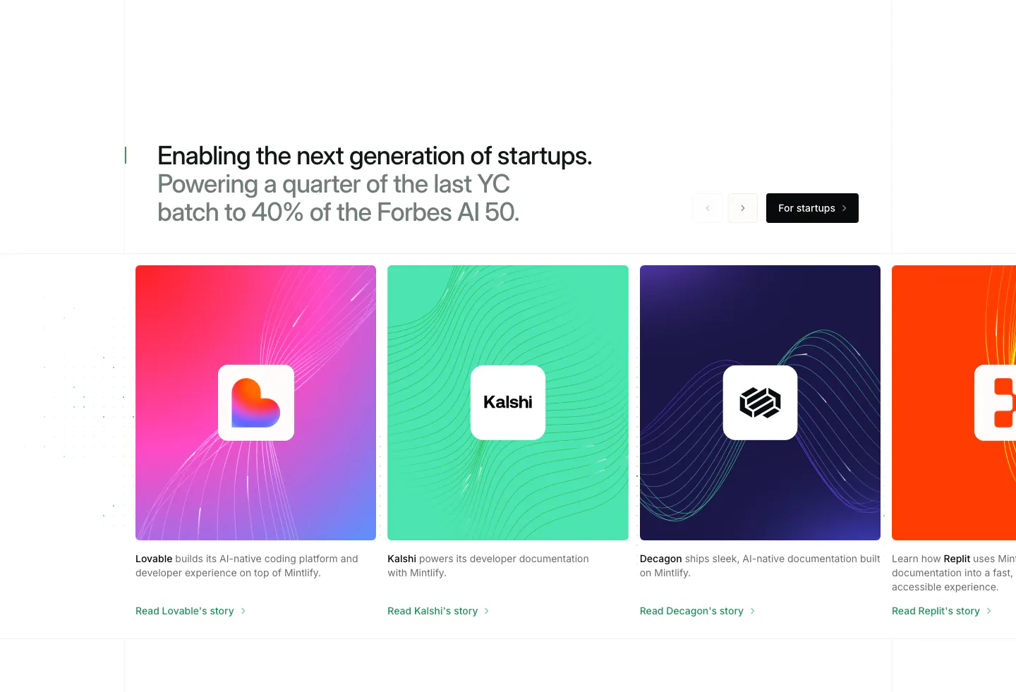
  302. Mintlify testimonials section: two-tone headline with arrows above a carousel of colorful startup story cards with logos
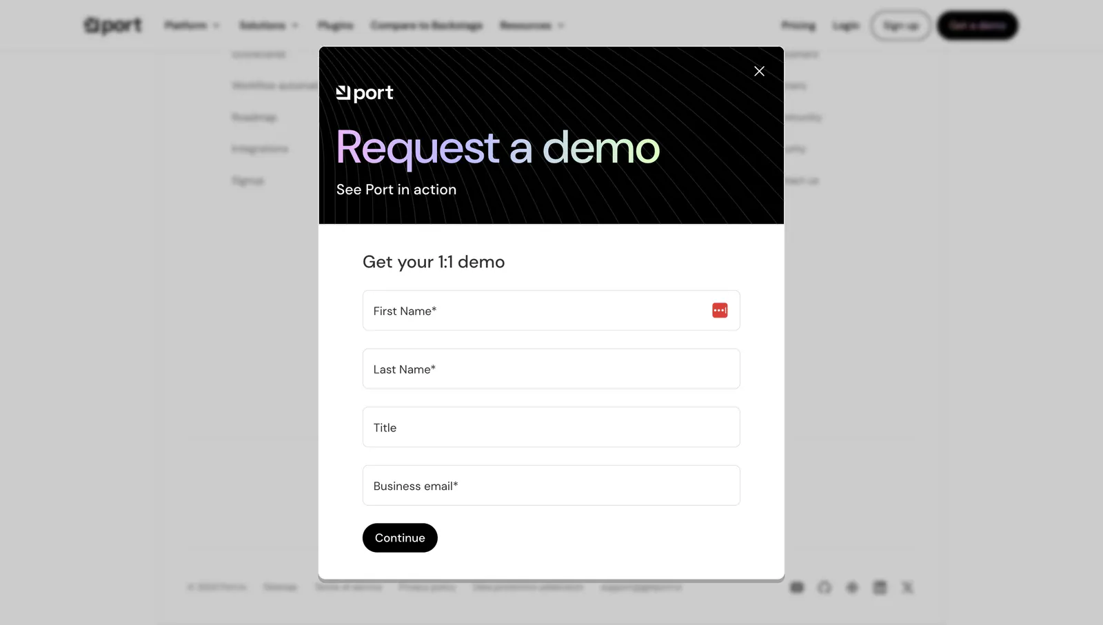
  303. Port contact section: modal over a dimmed page with dark header, gradient Request a demo text and a four-field form with Continue button
  304. Laravel Cloud testimonials section: heading above a masonry grid of quote cards with avatars, one dark and one bright blue highlight card
  305. Linear features section: dark headline and copy above a Slack thread overlapping a kanban board screenshot, feature links below
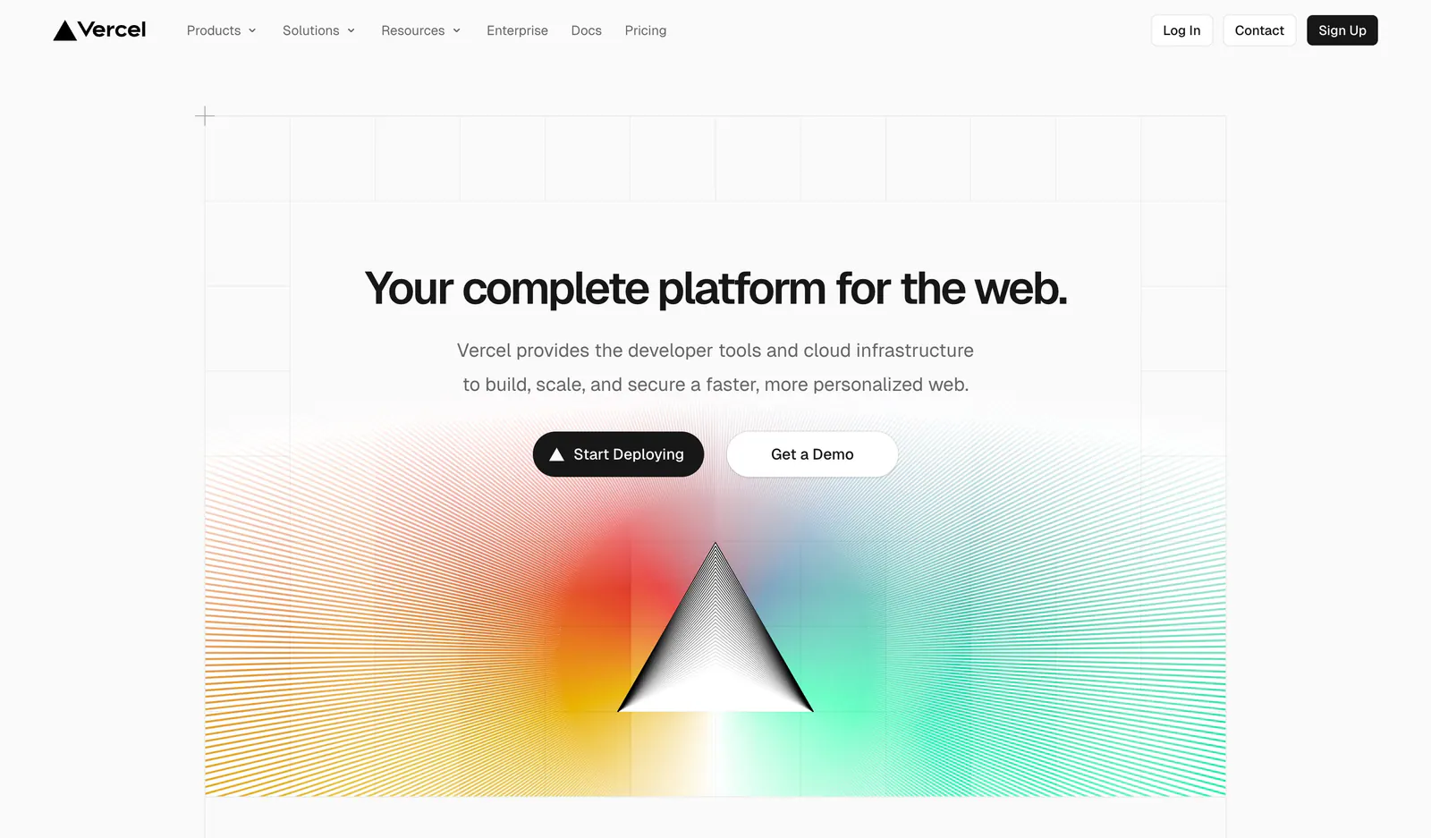
  306. Vercel hero section: centered headline and two buttons on a grid background above a black prism radiating rainbow gradient line rays
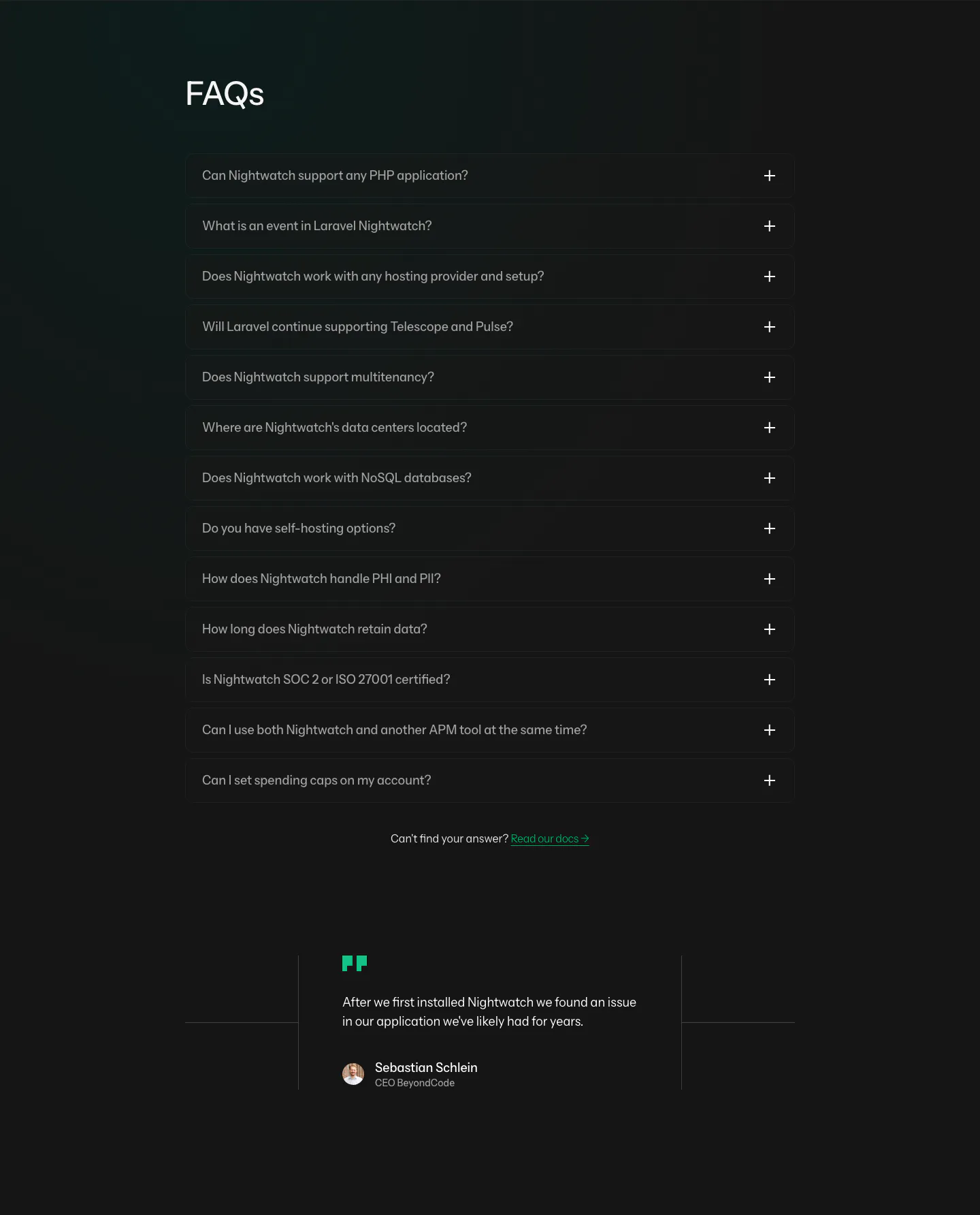
  307. Laravel Nightwatch FAQ section: left-aligned FAQs heading above a dark accordion of 13 questions and a short customer quote below
  308. Laravel Cloud features section: headline above a large infrastructure canvas mockup and four feature cells with UI snippets
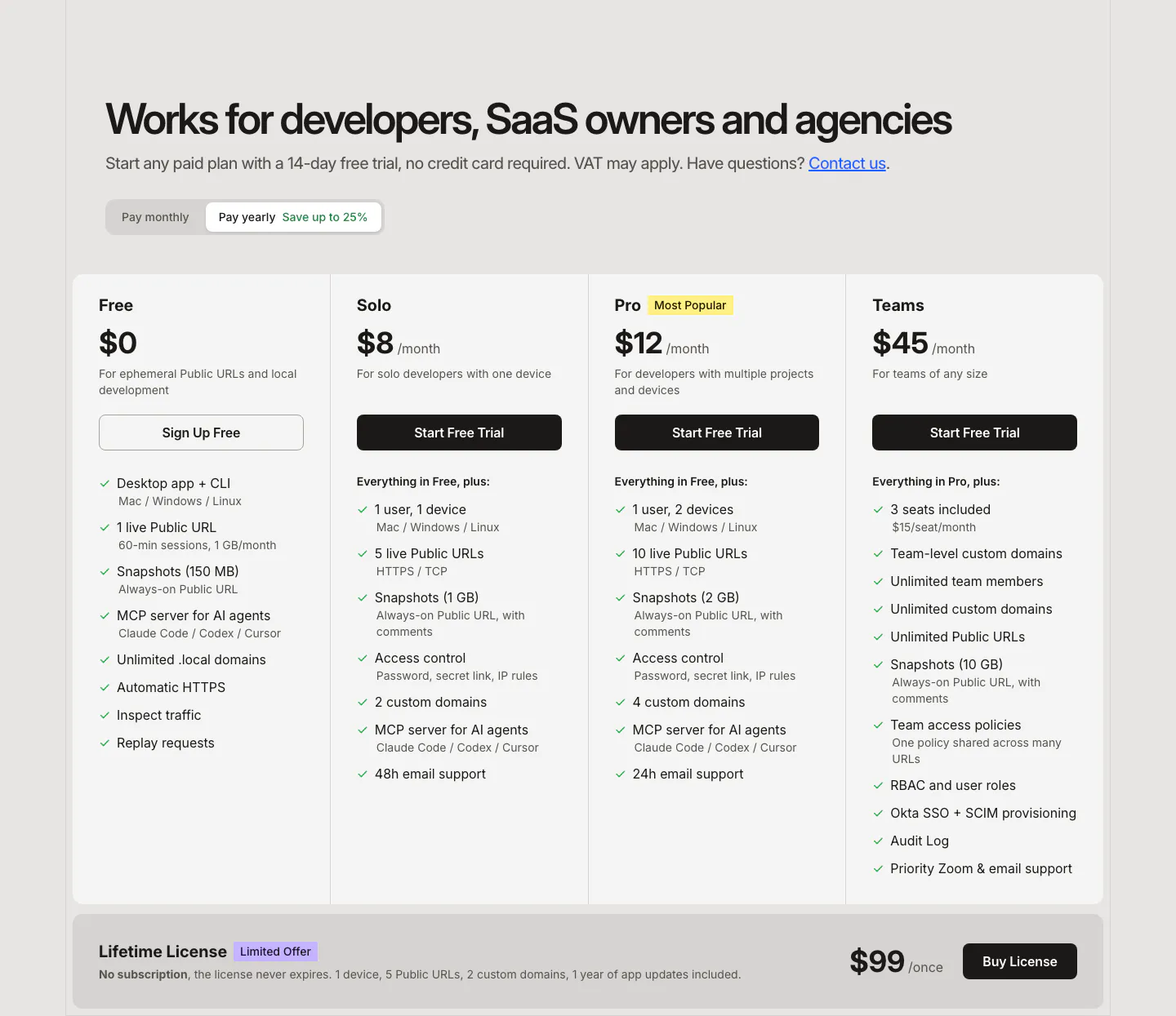
  309. LocalCan pricing section: headline and monthly/yearly toggle above four plan columns with feature checklists and a lifetime license band
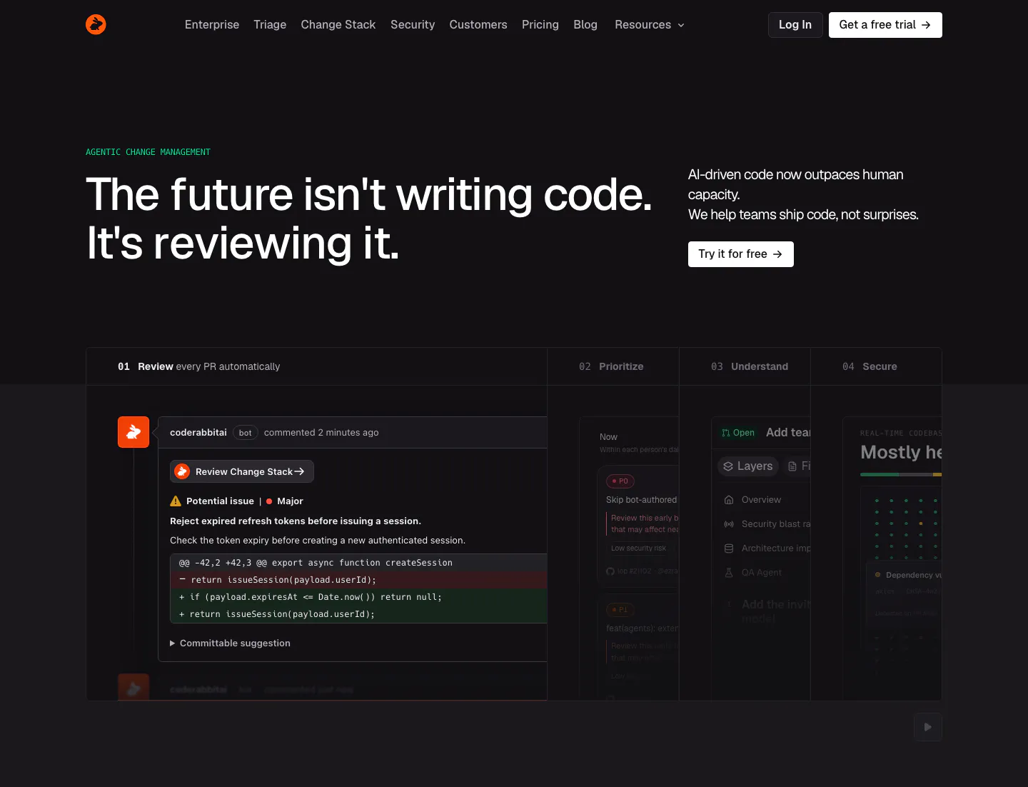
  310. CodeRabbit hero section: dark page with left headline, copy and CTA at right, and a tabbed product panel showing a PR review comment
  311. Outerbase pricing section: headline and monthly/annual toggle over satellite artwork, three translucent plan cards and an Enterprise row
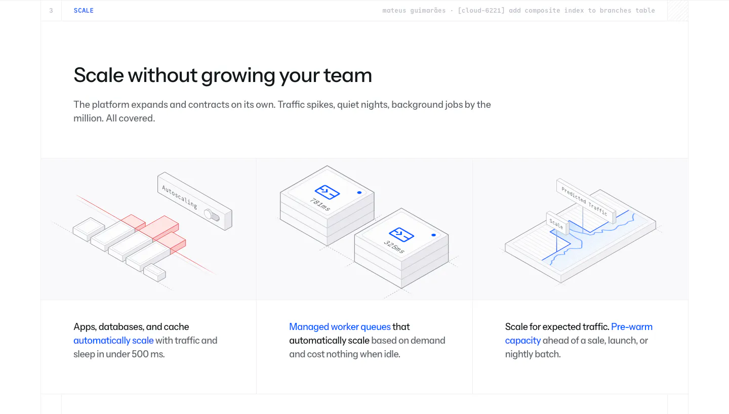
  312. Laravel Cloud features section: headline above three columns of isometric line illustrations for autoscaling, worker queues and pre-warming
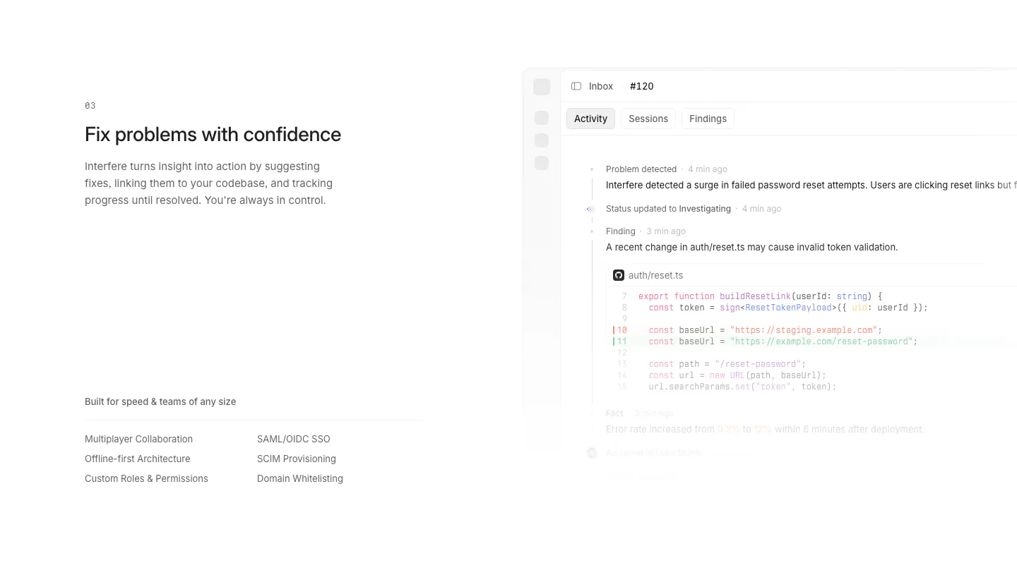
  313. Interfere features section: numbered text block with enterprise feature list left and an activity timeline with code diff right
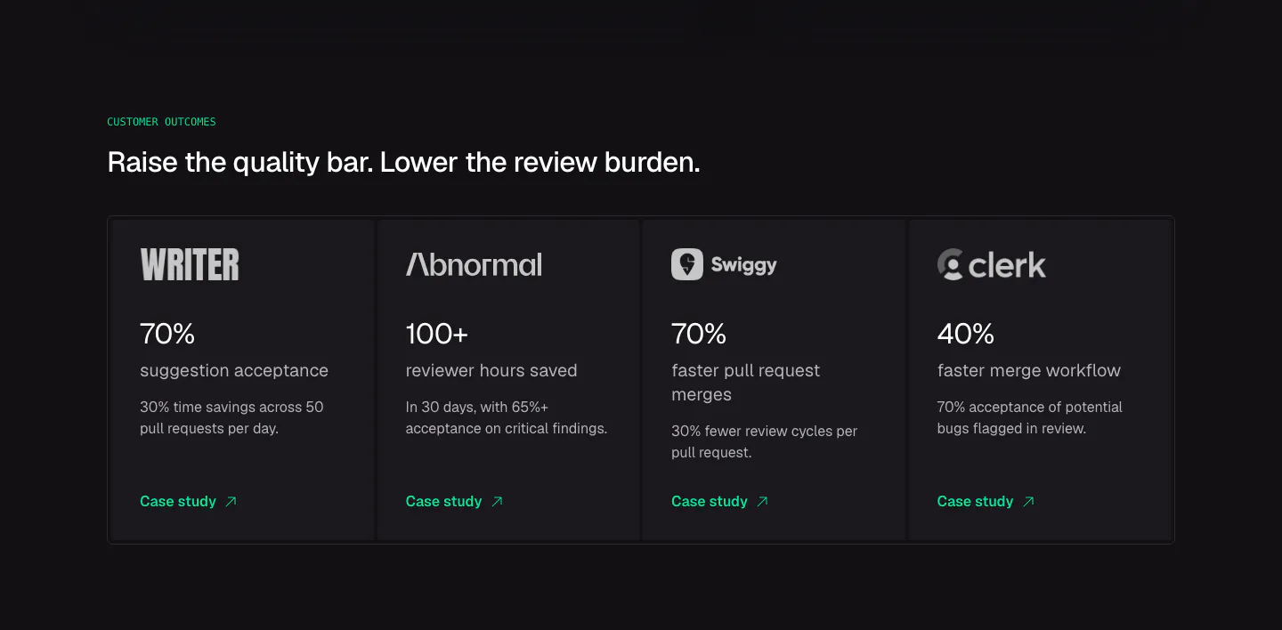
  314. CodeRabbit stats section: dark row of four customer outcome cards with logos, large percentages and case study links
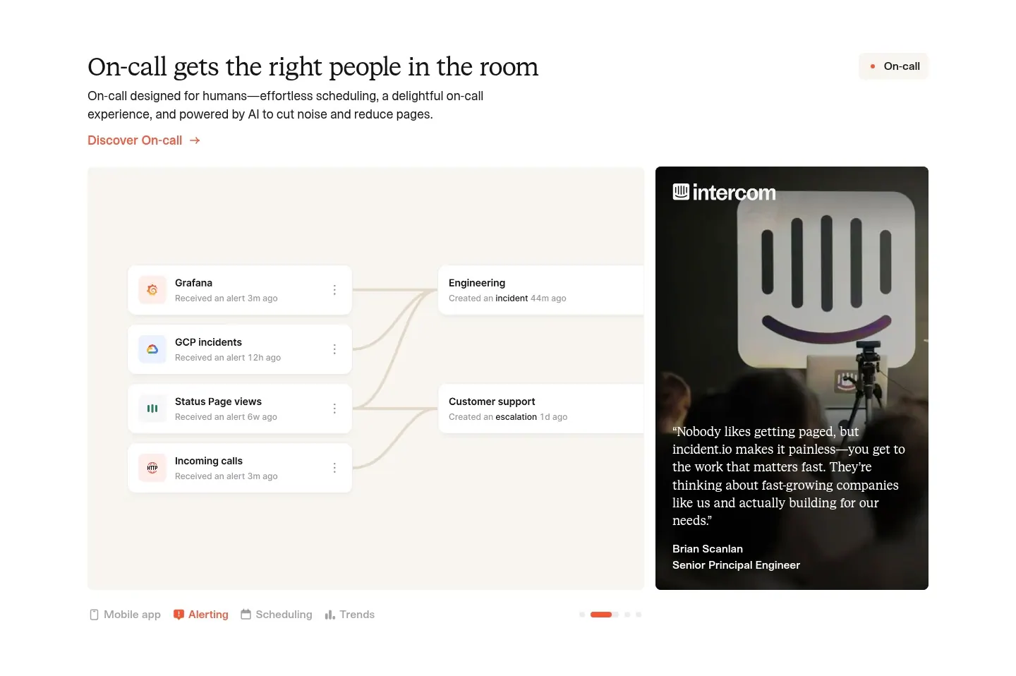
  315. incident.io features section: serif headline above an alert-routing UI panel beside a customer quote photo card, with tabs below
  316. Laravel Cloud footer section: newsletter form and link columns above a giant faint Laravel wordmark on a dark navy background
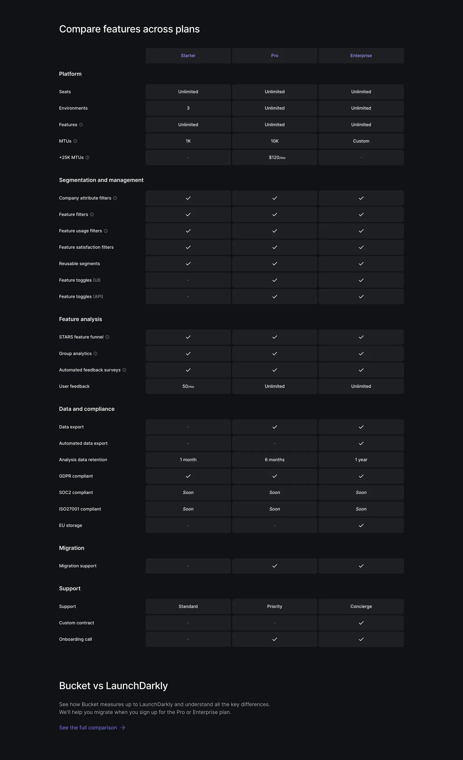
  317. Bucket pricing section: plan comparison table with Starter, Pro and Enterprise columns of checkmarks and limits on a dark background
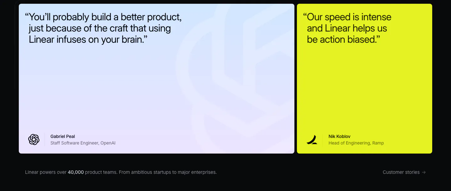
  318. Linear testimonials section: dark background with a large blue-lavender gradient quote card and a lime quote card, caption below
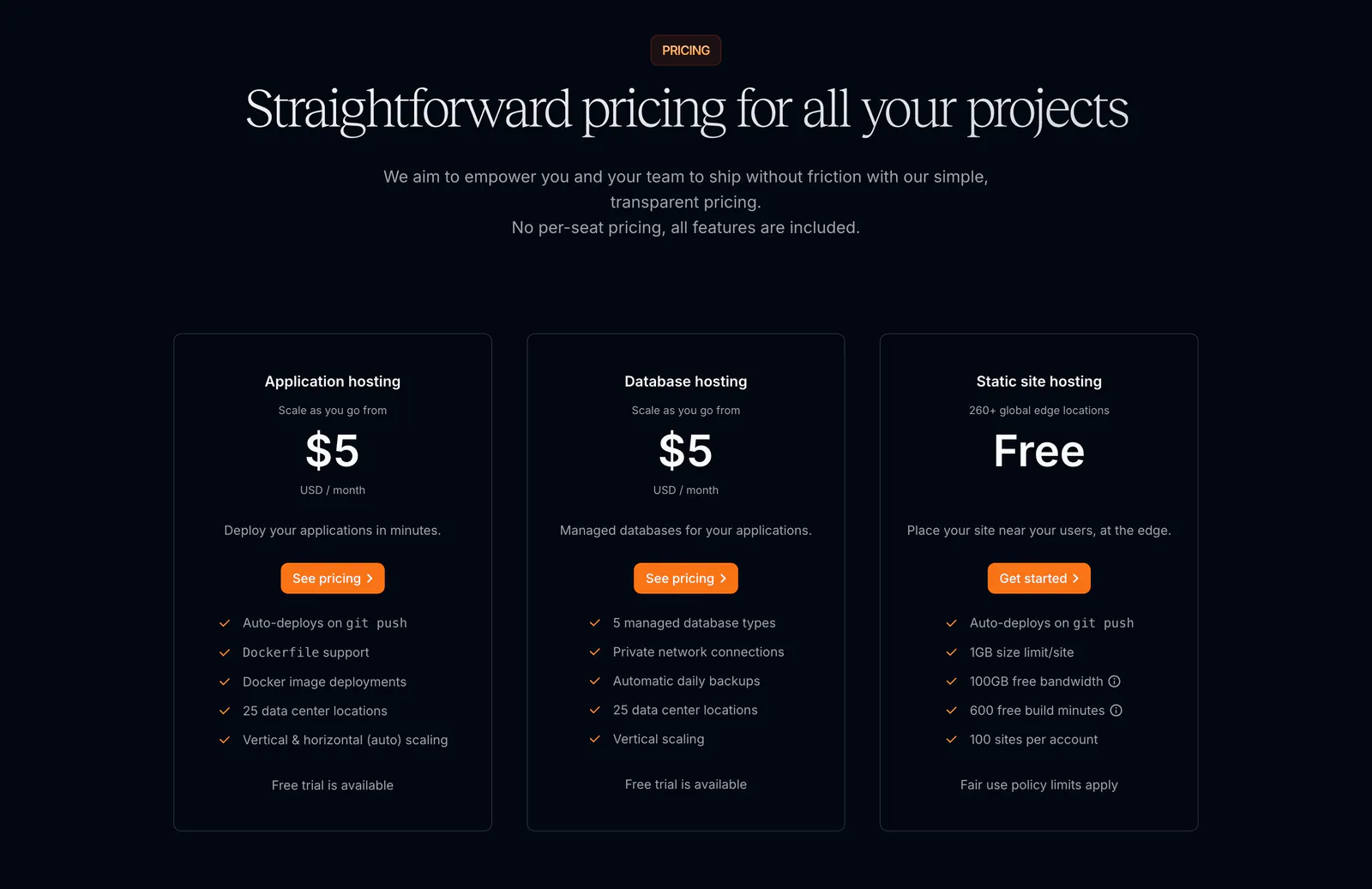
  319. Sevalla pricing section: centered serif headline above three outlined hosting plan cards with orange buttons on a near-black background
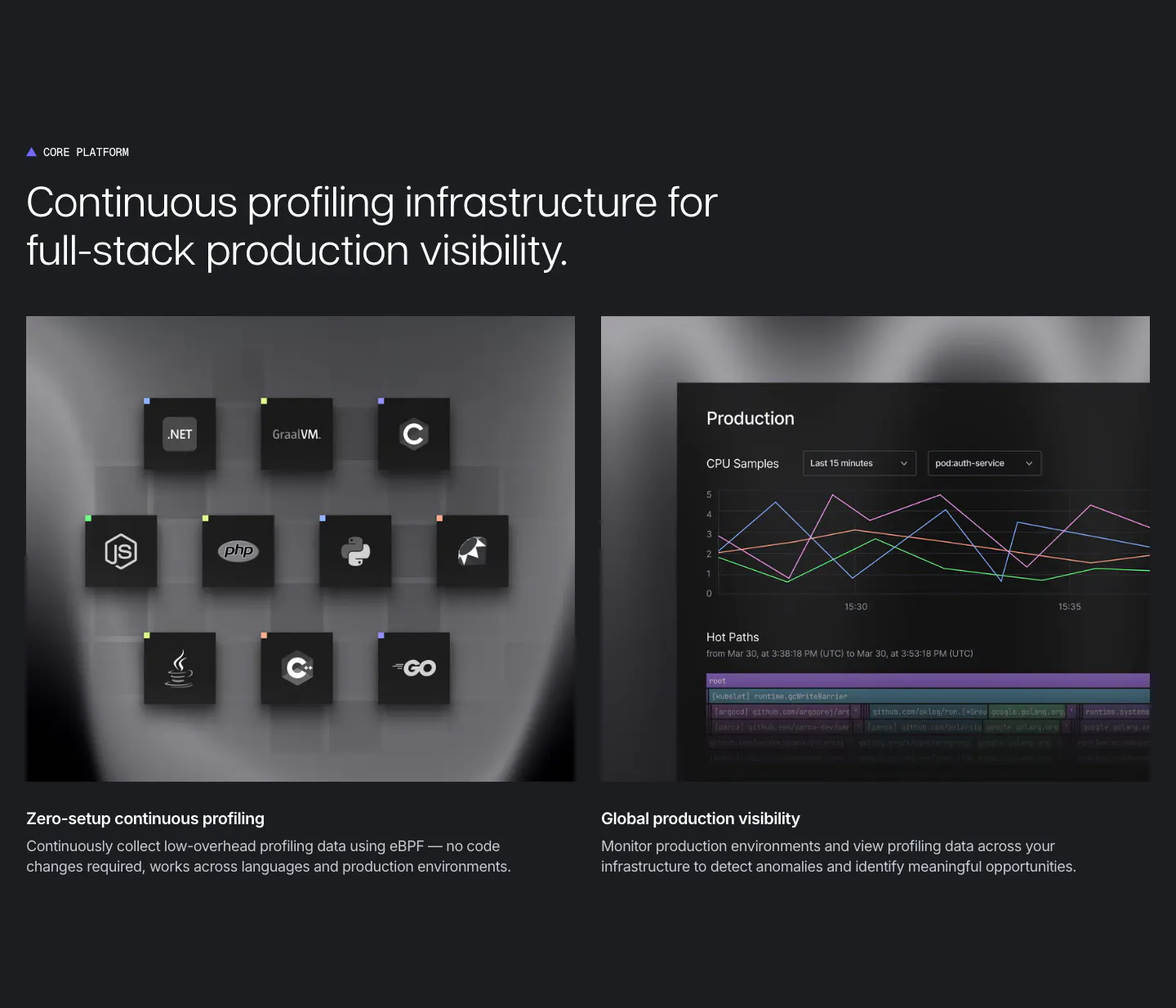
  320. Polar Signals features section: dark charcoal layout with two panels, a grid of language icon tiles and a production CPU chart UI
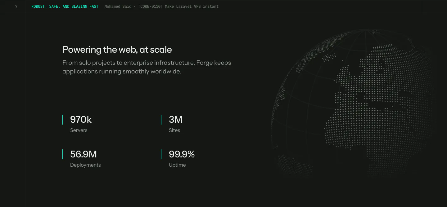
  321. Laravel Forge stats section: four large metrics under a heading on the left with a dotted globe on the right, dark background
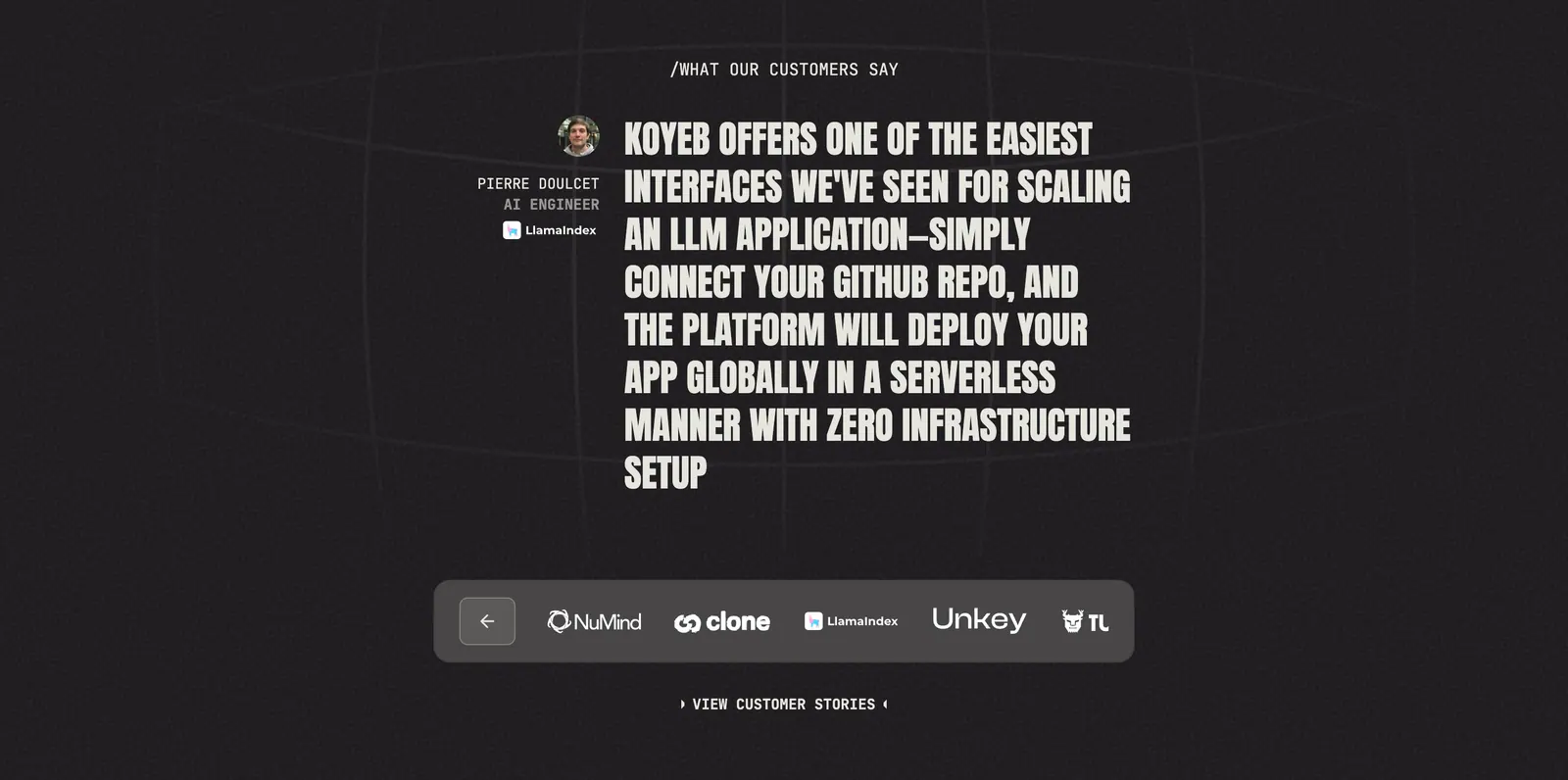
  322. Koyeb testimonials section: large uppercase quote with author avatar above a customer logo selector bar on a dark grainy background
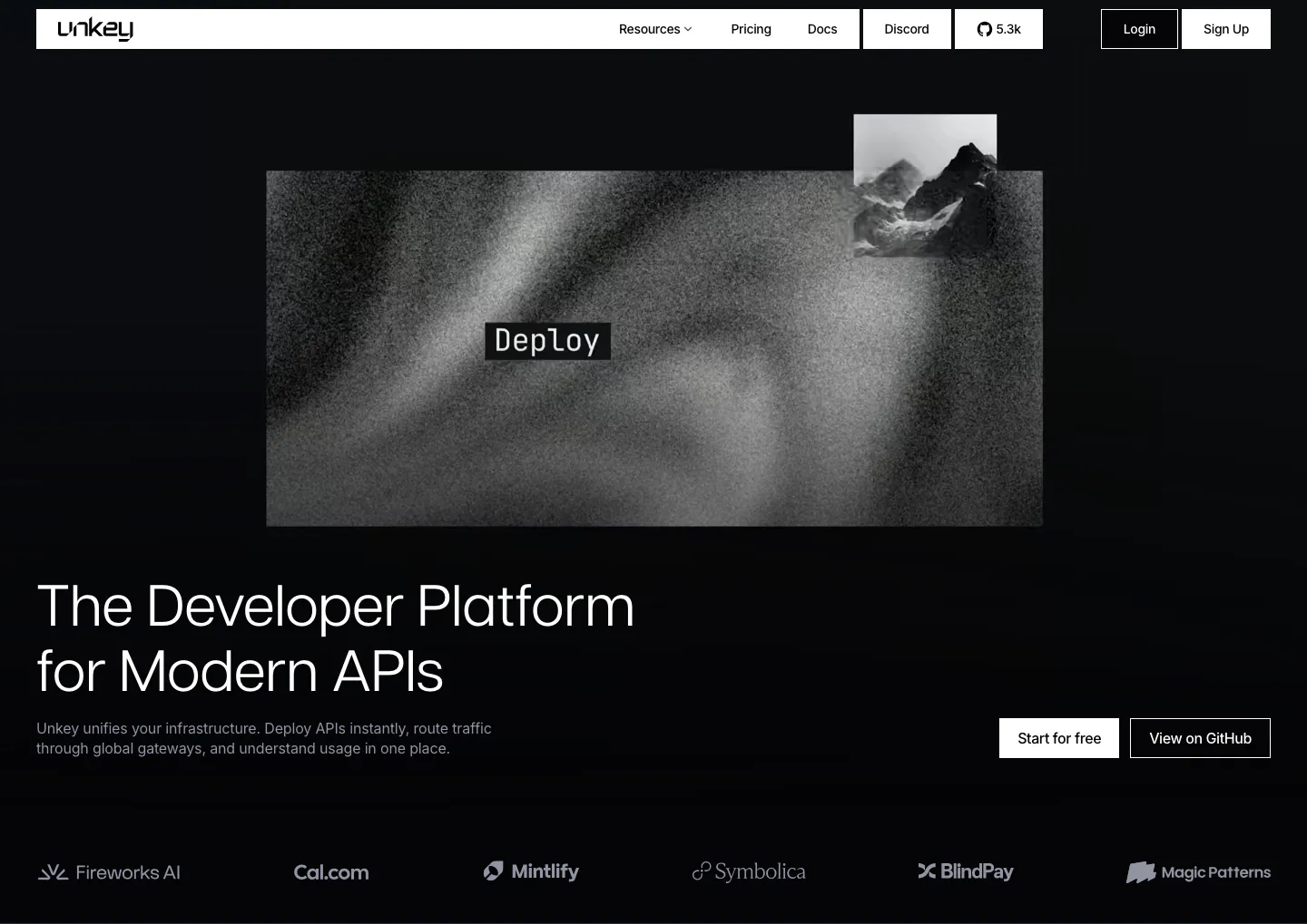
  323. Unkey hero section: grainy grayscale artwork with a Deploy label above a left-aligned headline, CTAs at right and a logo row on black
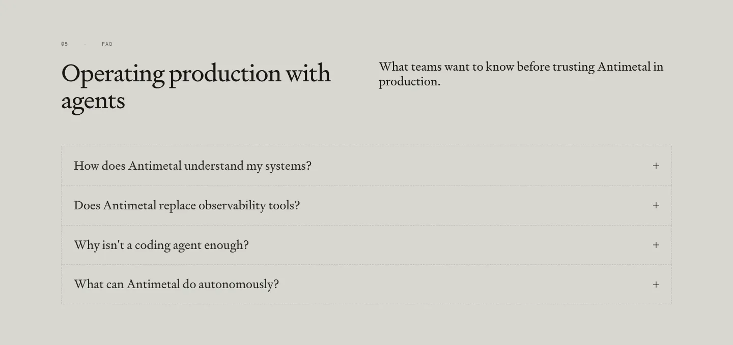
  324. Antimetal FAQ section: serif headline and intro side by side above a bordered accordion of four serif questions on warm gray
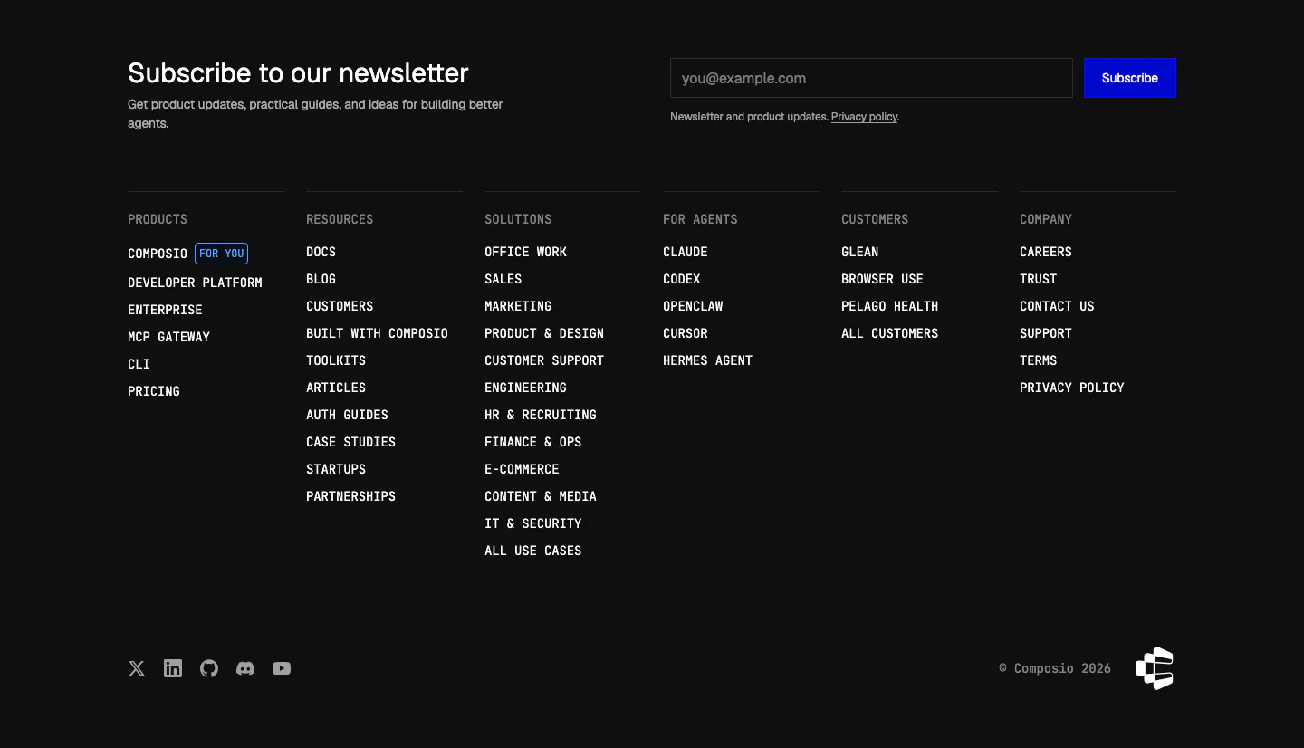
  325. Composio footer section: newsletter heading with email field and blue subscribe button above six monospace link columns on black
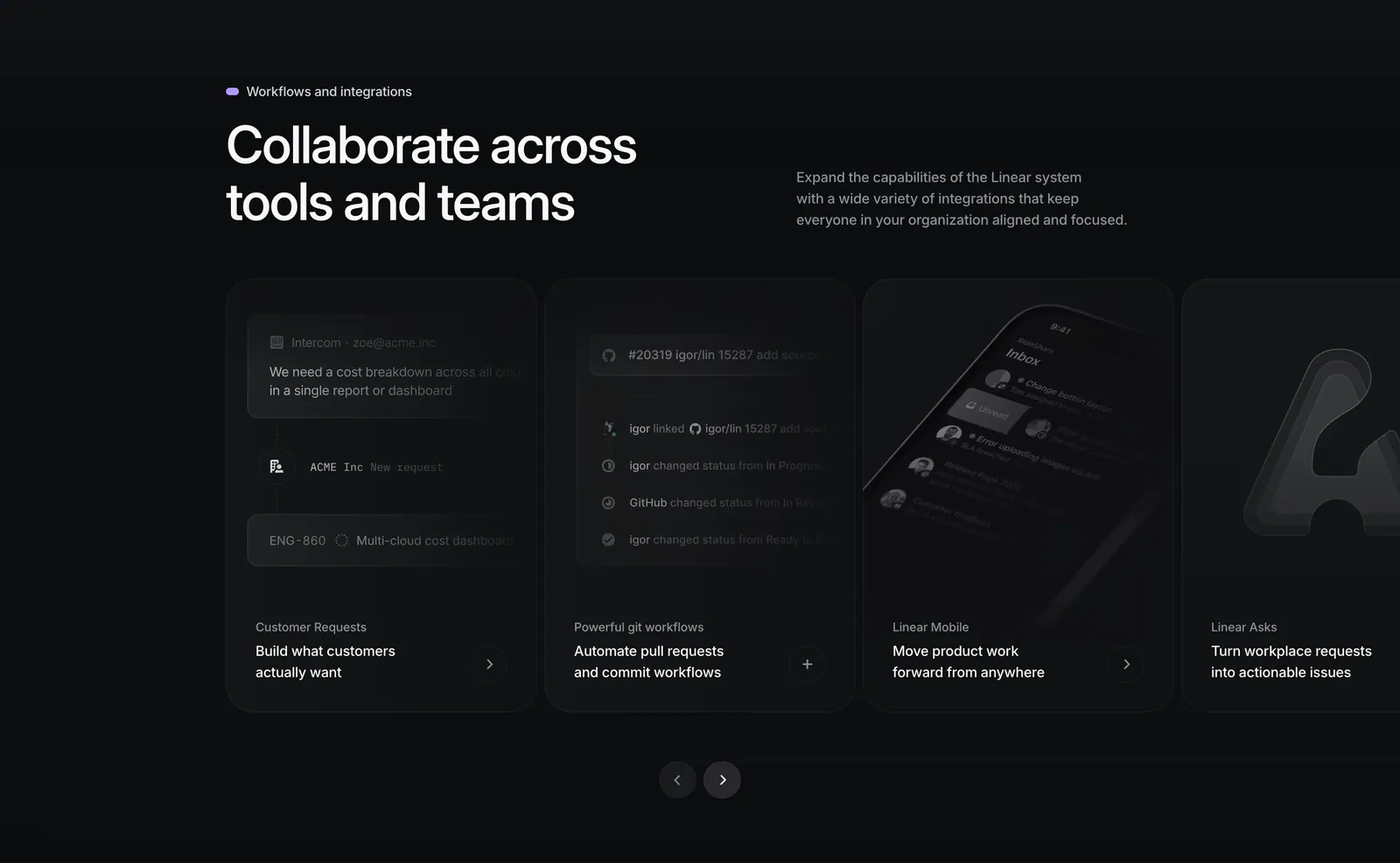
  326. Linear integrations section: heading with side copy above a carousel of dark cards for requests, git workflows, mobile and Asks, with arrows
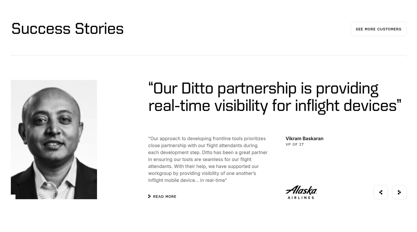
  327. Ditto testimonials section: black-and-white portrait beside a large quote, customer name, Alaska Airlines logo and prev/next arrows
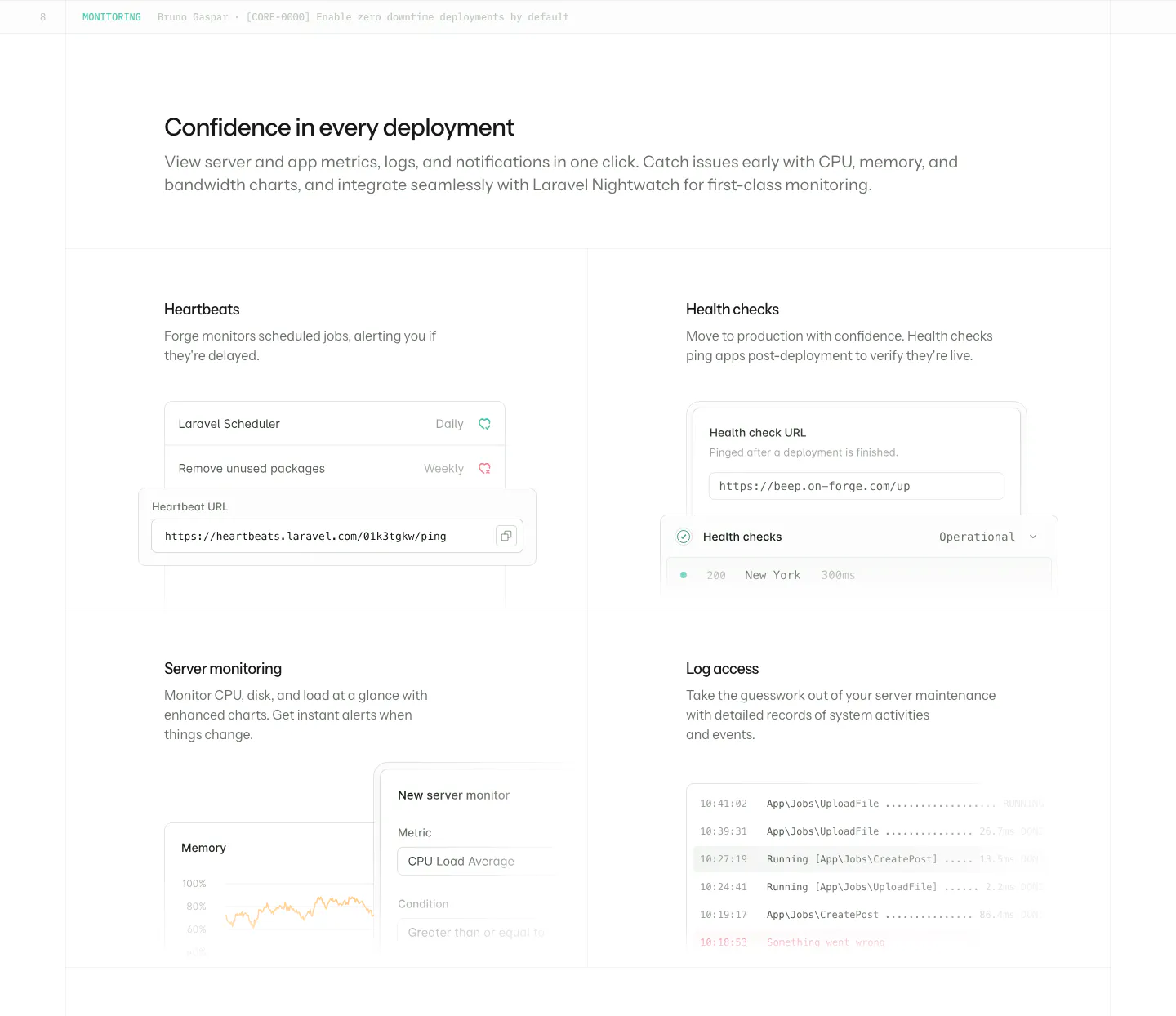
  328. Laravel Forge features section: heading above a 2x2 grid of monitoring cards with heartbeat, health check, chart and log UI
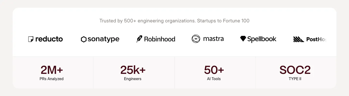
  329. Weave logo cloud section: row of customer logos above four stat tiles in a white rounded card on a warm gray background
  330. Weave footer section: near-black footer with link columns and a huge faint weave wordmark spanning the full width

Developer tools companies

48 companies in this collection

All companies

Common styles in developer tools websites

  • Dark mode 38% · 127
  • Monochrome 33% · 110
  • Minimal 30% · 99
  • Product UI 28% · 91
  • Centered 22% · 71
  • Card grid 18% · 59
  • Split layout 15% · 51

How to design a developer tools website

  1. Put working code near the top

    Show a short, copyable snippet in the language most of your users write, with tabs for the others. Use real method names and realistic values, not foo and bar. Make sure it actually runs, because developers will paste it into a terminal before reading anything else.
  2. Link to docs from everywhere
    For engineers, the docs are the real product page. Keep a docs link in the main navigation, beside each feature block, and in the footer. Deep-link to the exact guide a section describes, so a reader can go from a claim to the implementation in one click.
  3. Publish limits, uptime, and regions

    Engineers plan around constraints. List rate limits, supported regions, SLAs, and a link to a public status page. Numbers they can bring to an architecture review build more confidence than any adjective, and leaving them out makes buyers assume the worst.

  4. Let people start without a sales call

    Offer a free tier, a sandbox, or a CLI install that works in minutes. If enterprise deals need a conversation, keep that path separate from self-serve signup. A developer who can't try the product today will go evaluate a competitor who lets them.
All industries
    ↑↓ Navigate ↵ Open

    Section preview

    Website section