Footer Examples

People scroll to the footer when they cannot find something elsewhere, so it has to work as a map. It holds the full sitemap, legal links, social profiles, and often a final signup field. Clear columns with short labels make it useful, while one undivided block of links or tiny gray text makes it a chore. Minimal single rows sit alongside multi-column sitemaps and oversized wordmarks in these footer examples.
175 sections

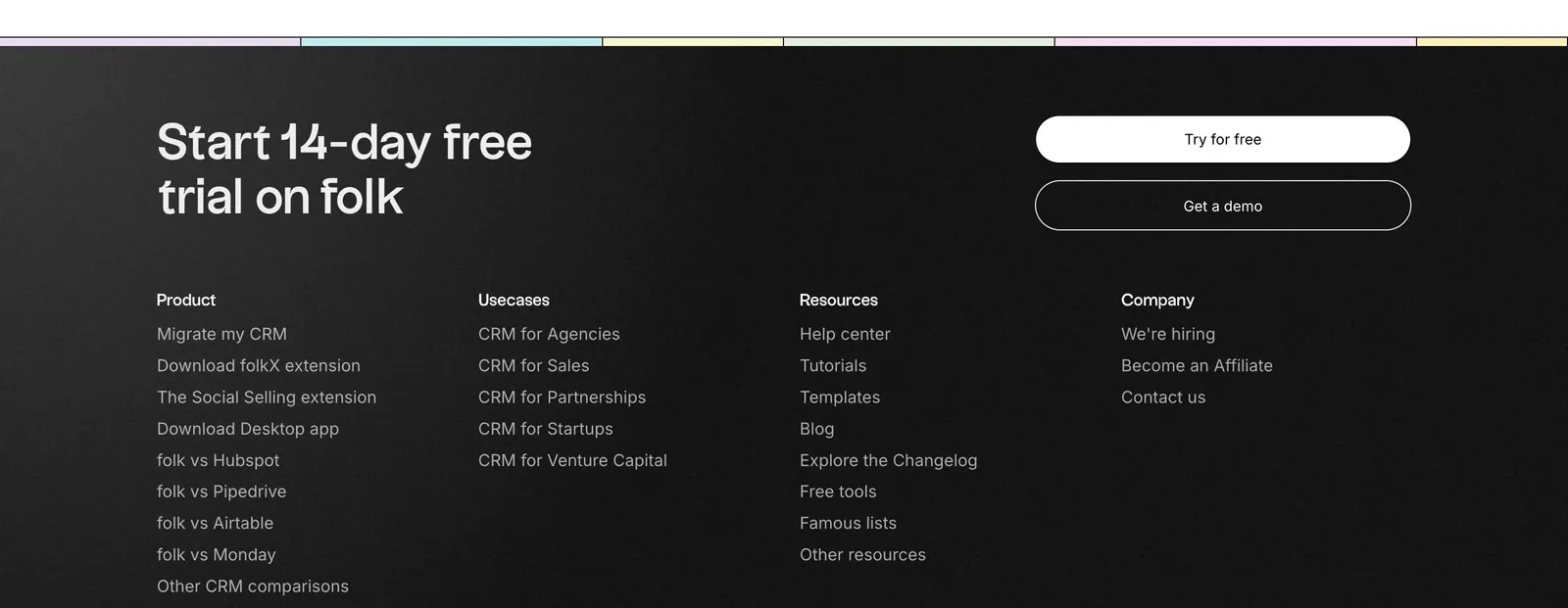
  1. folk footer section: trial headline with two buttons above four link columns on a near-black background, pastel color strip at top
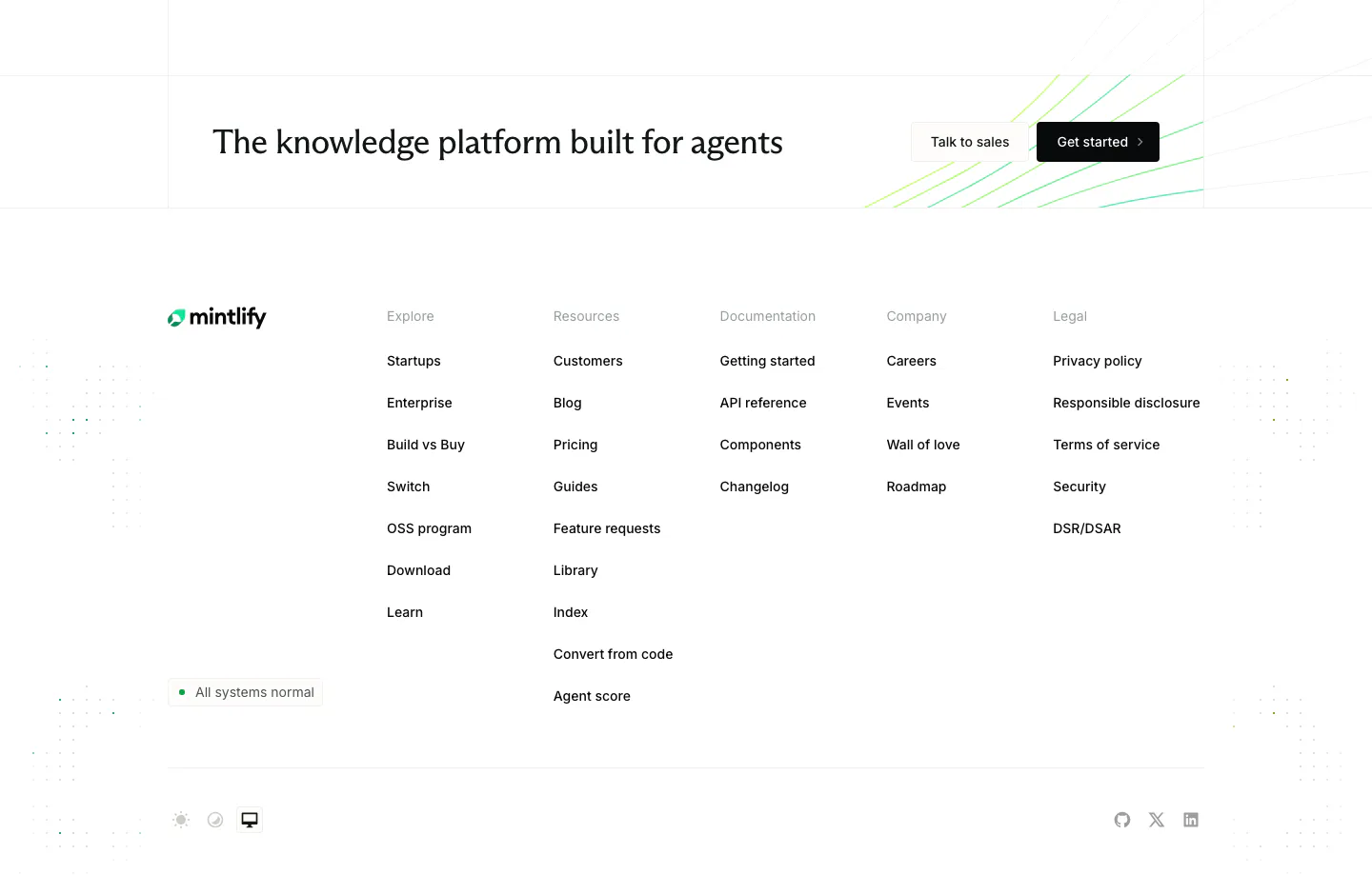
  2. Mintlify footer section: CTA strip with two buttons above logo, status badge and five link columns on a white background
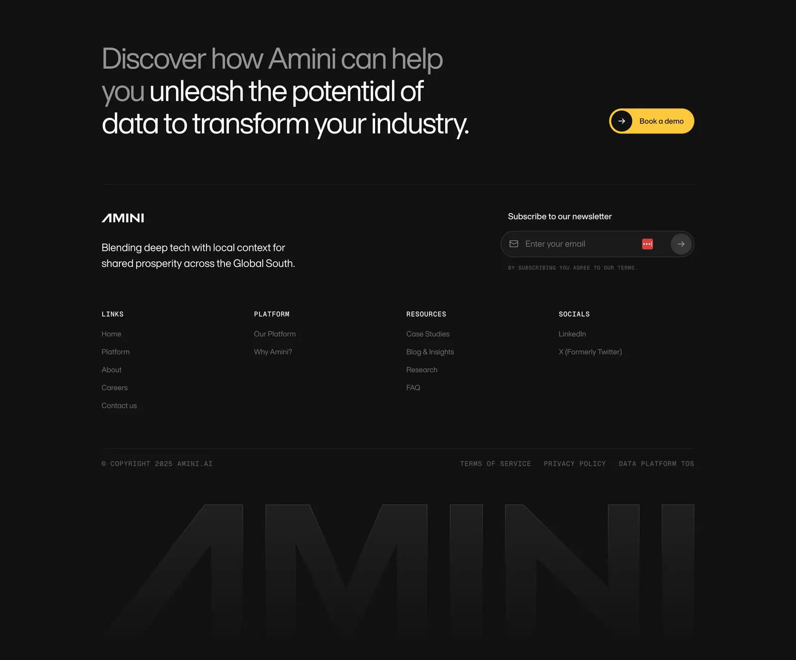
  3. Amini footer section: dark closing headline with yellow button, newsletter field, link columns and a faded giant AMINI wordmark
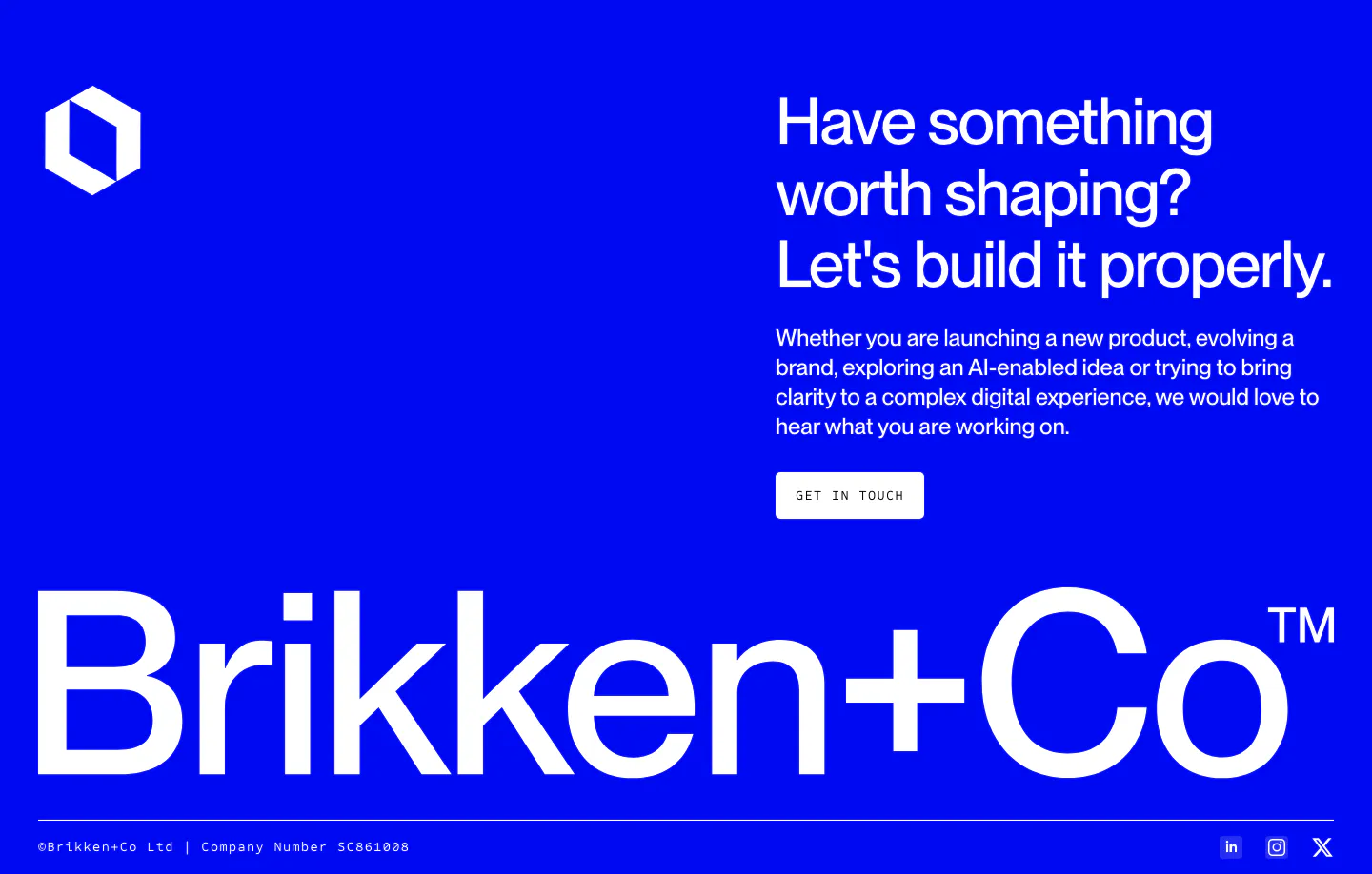
  4. Brikken+Co footer section: white headline and Get in touch button on bright blue with a giant wordmark and legal row
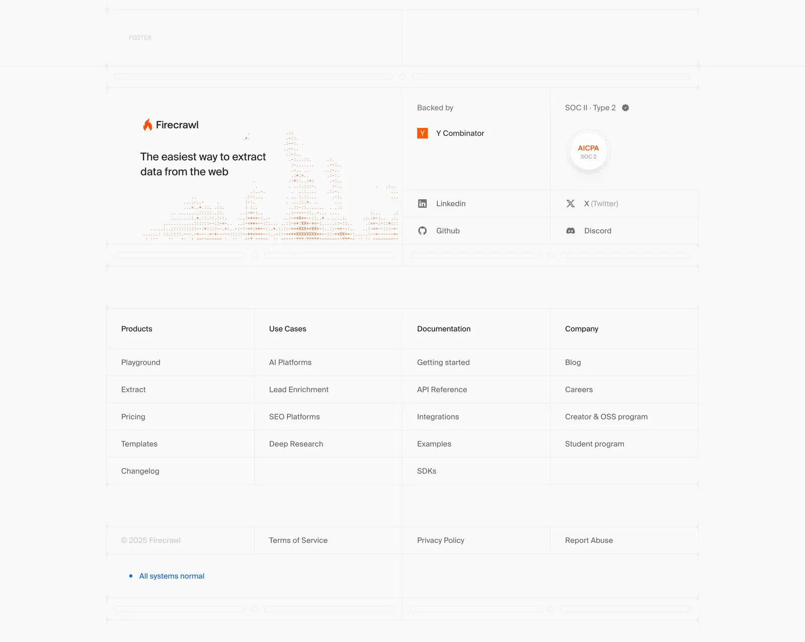
  5. Firecrawl footer section: logo, tagline and dithered chart art, backer and SOC 2 badges, four link columns in a gridded light layout
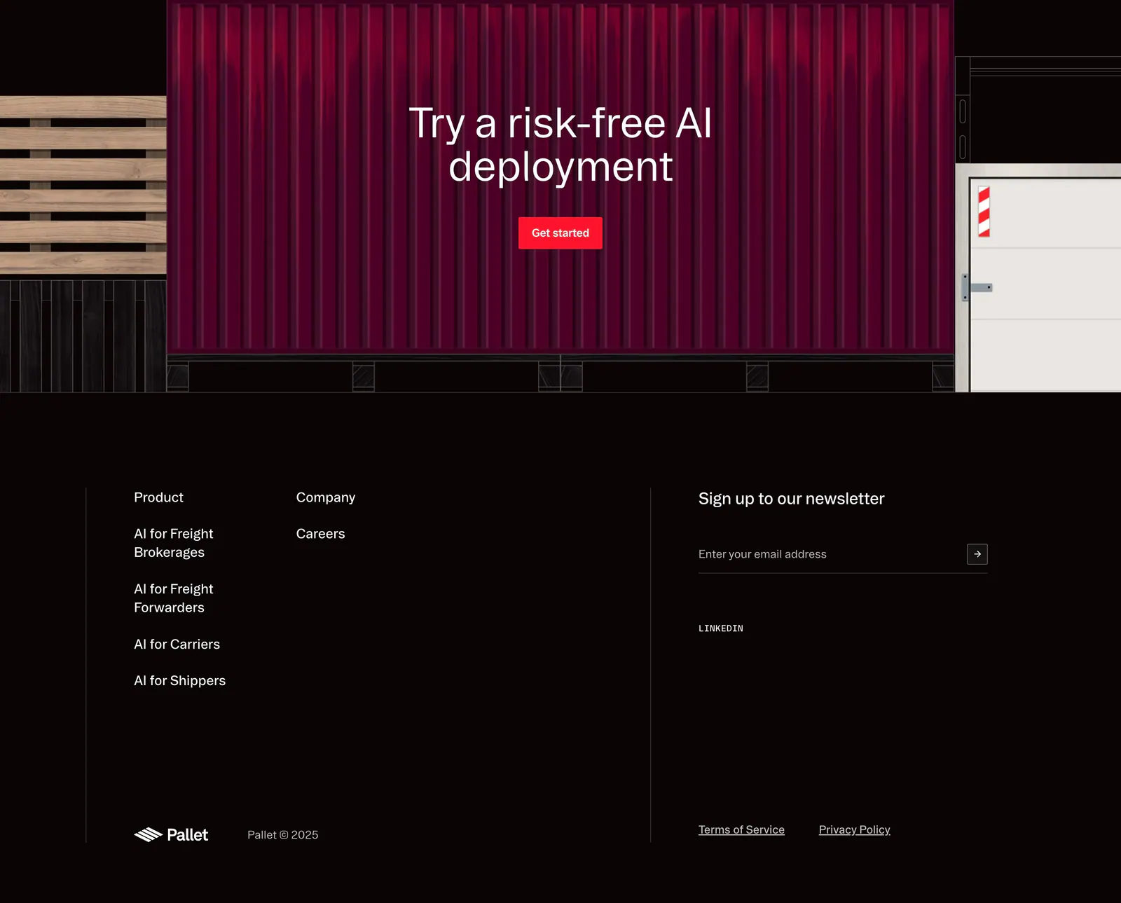
  6. Pallet footer section: CTA over a red shipping container illustration above dark link columns, newsletter email field and copyright
  7. Antimetal footer section: five corner-bracketed boxes with serif link lists, status badge, tagline and dotted logo mark on warm gray
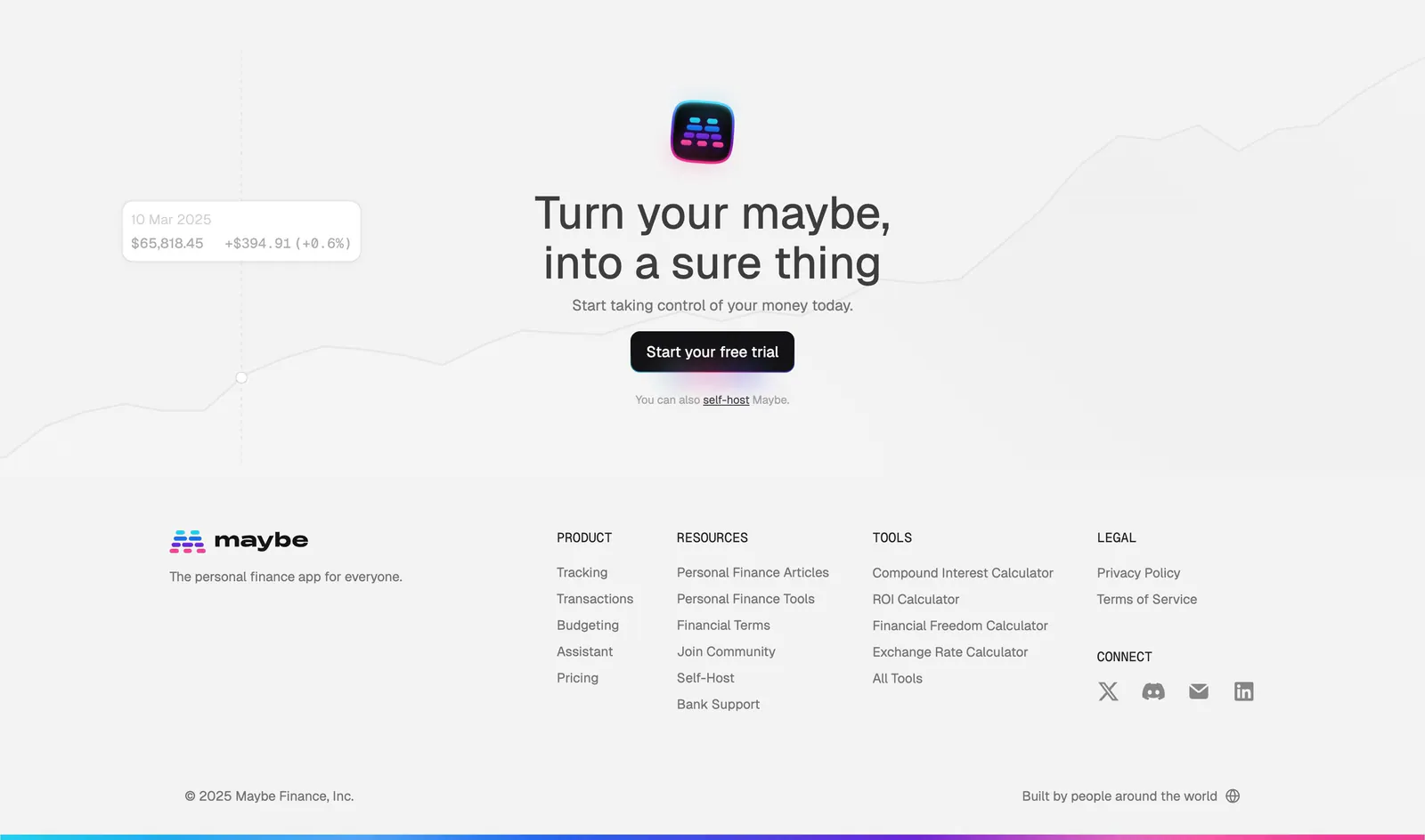
  8. Maybe footer section: centered closing CTA over a faint line chart, then logo and four link columns on light gray
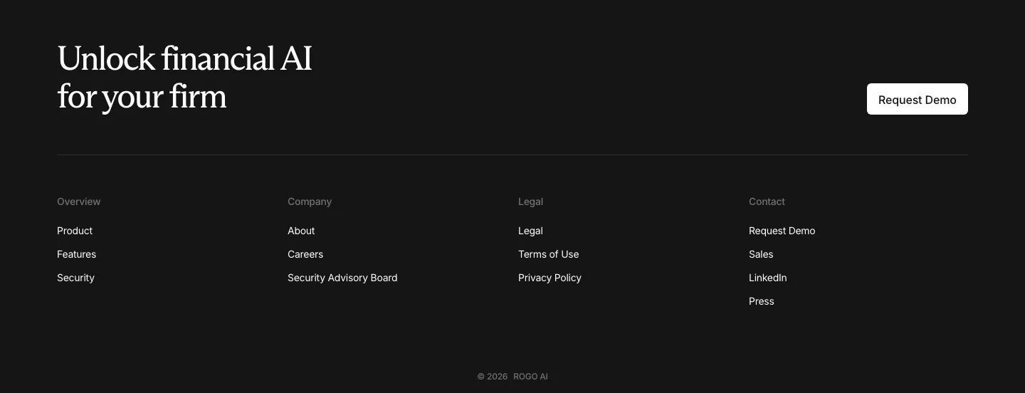
  9. Rogo footer section: serif CTA headline with demo button above four link columns and a copyright line on a dark background
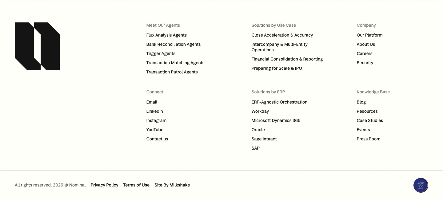
  10. Nominal footer section: large black logo mark on the left, six link columns and a copyright row on an off-white background
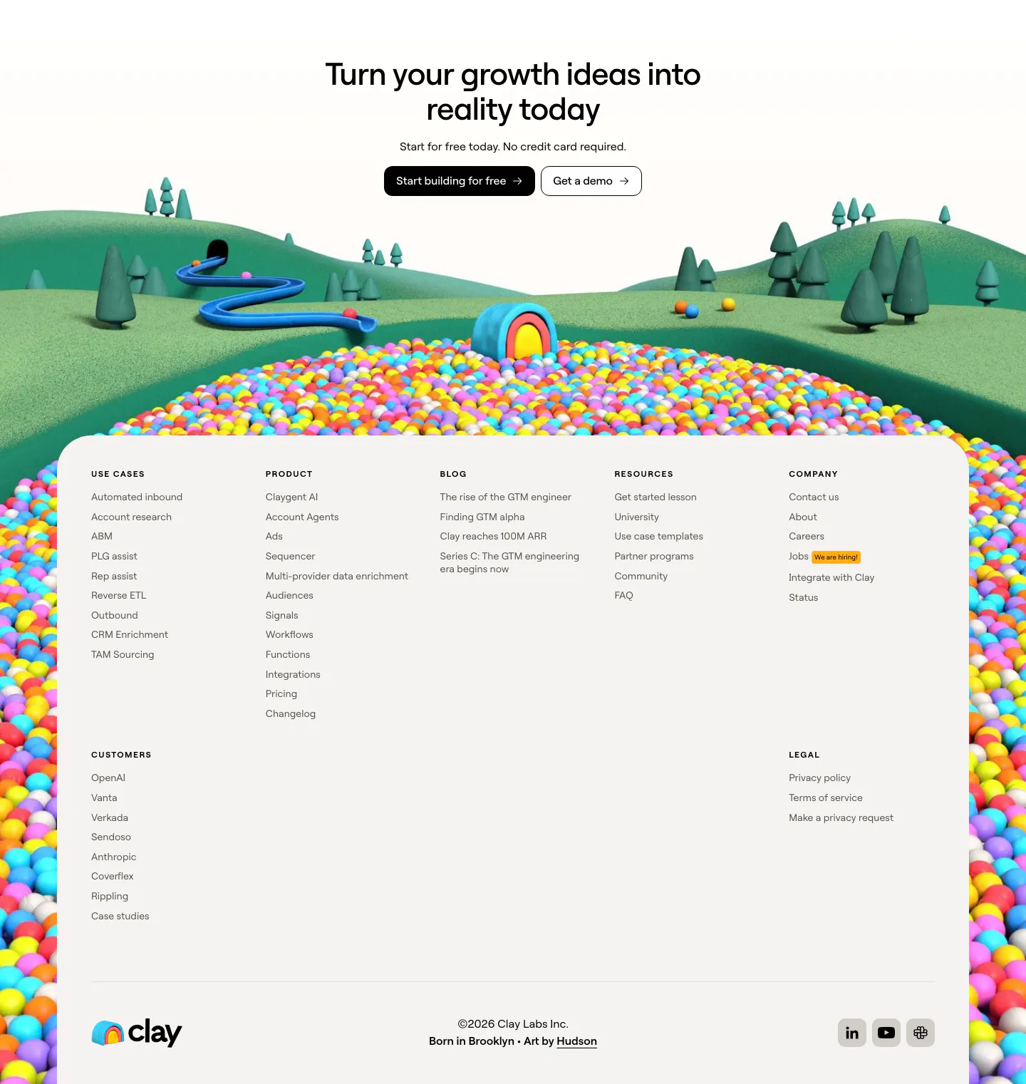
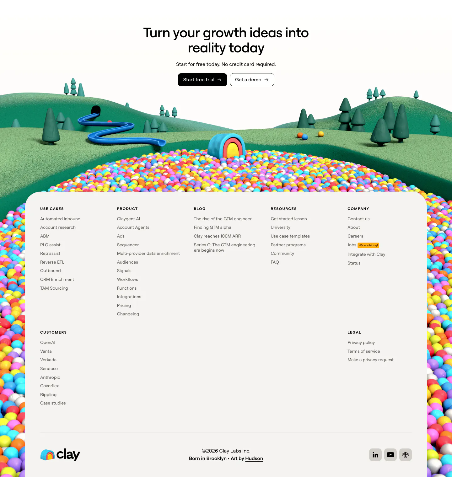
  11. Clay footer section: centered CTA over a 3D landscape of hills and colorful ball pit framing a light footer panel with link columns
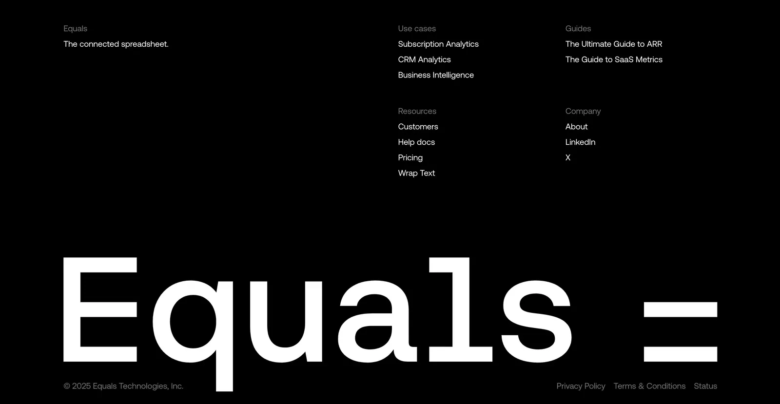
  12. Equals footer section: link columns above a giant monospace Equals wordmark and copyright line on a black background
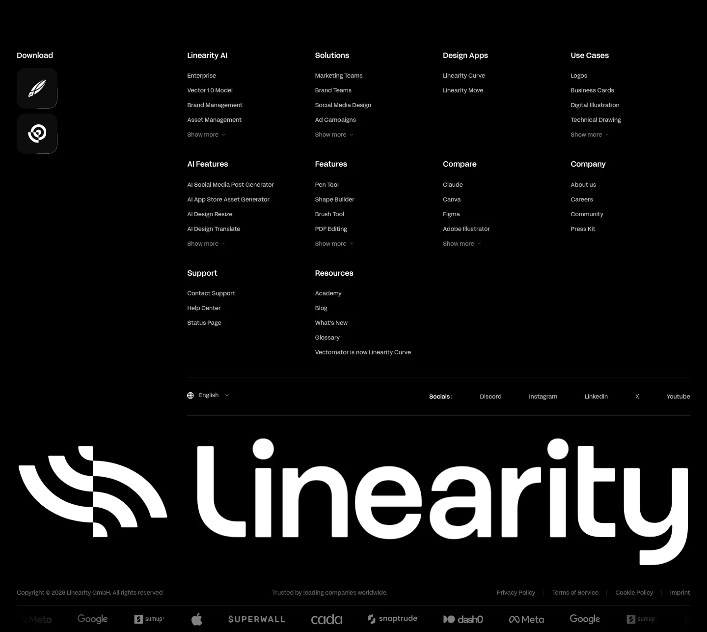
  13. Linearity footer section: dense link columns with app download icons, a giant white Linearity wordmark and a customer logo strip on black
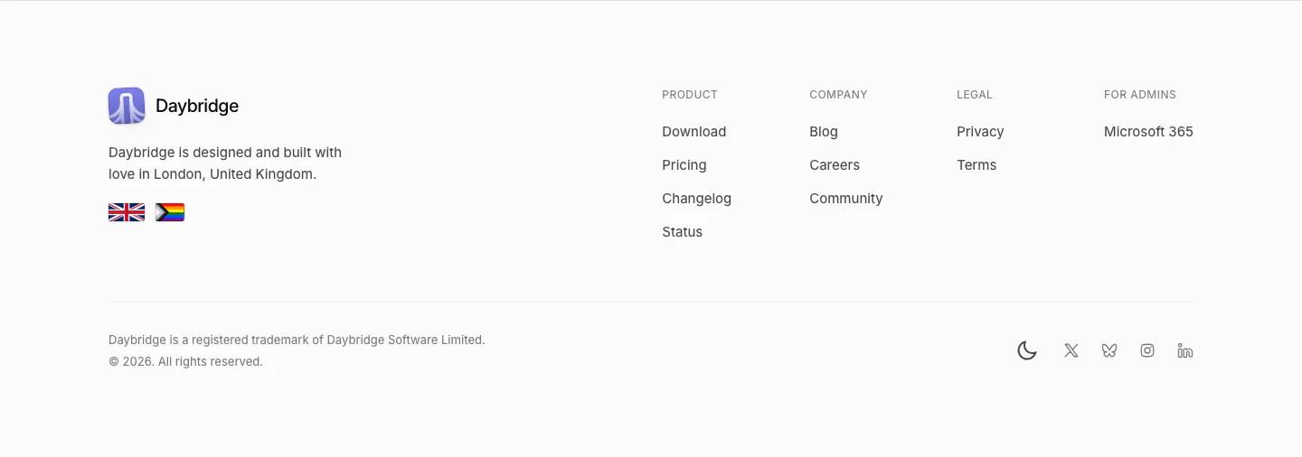
  14. Daybridge footer section: logo, London tagline and flags on the left, four link columns right, trademark line and social icons
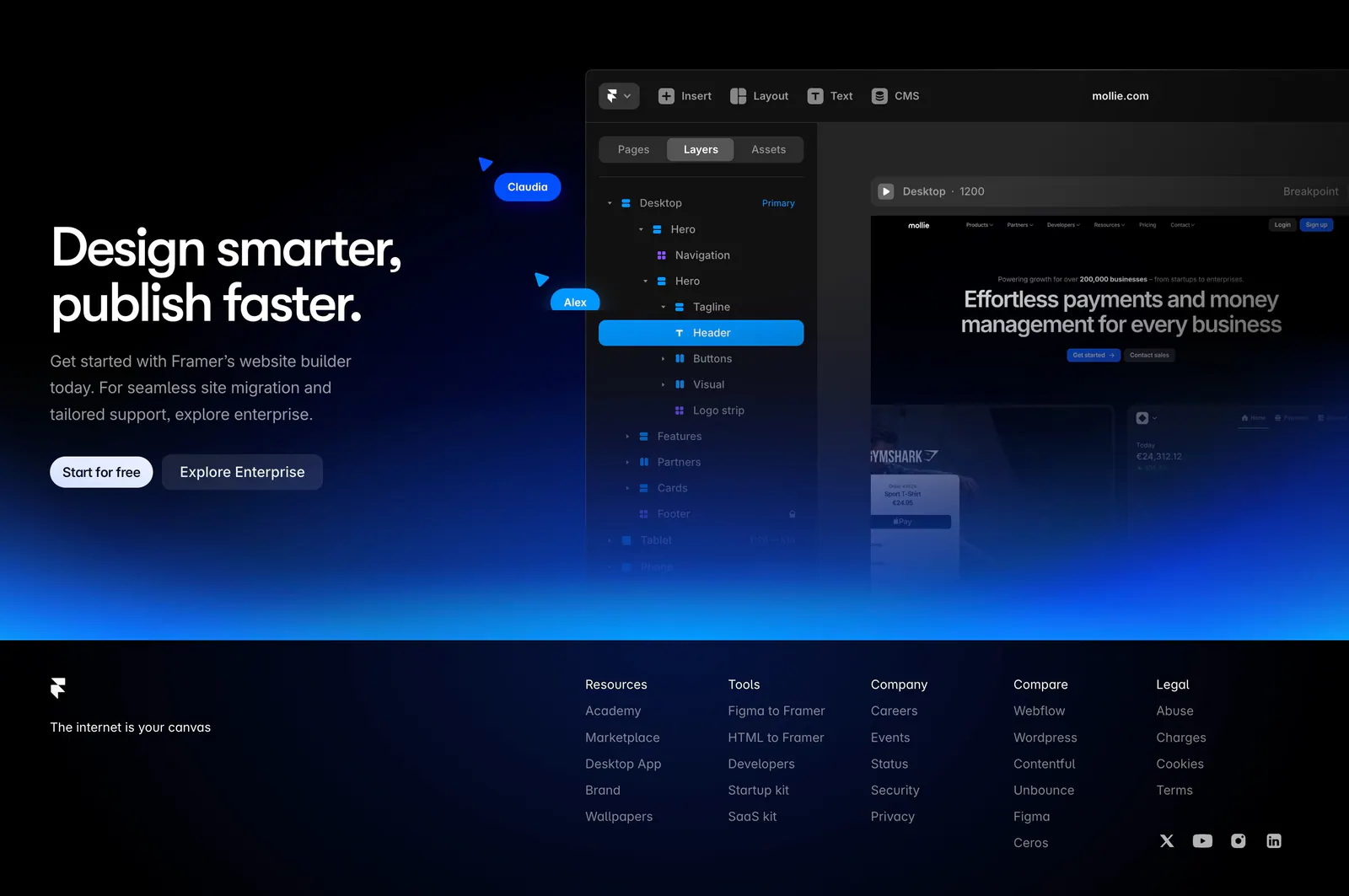
  15. Framer footer section: CTA with editor UI and blue glow above a black footer with logo, tagline, five link columns and social icons
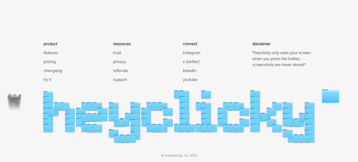
  16. heyclicky footer section: four link columns above a giant wordmark built from blue folder icons, copyright line on light gray
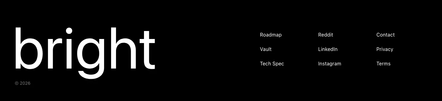
  17. Bright footer section: huge white bright wordmark on black beside three short columns of links, with a © 2026 line
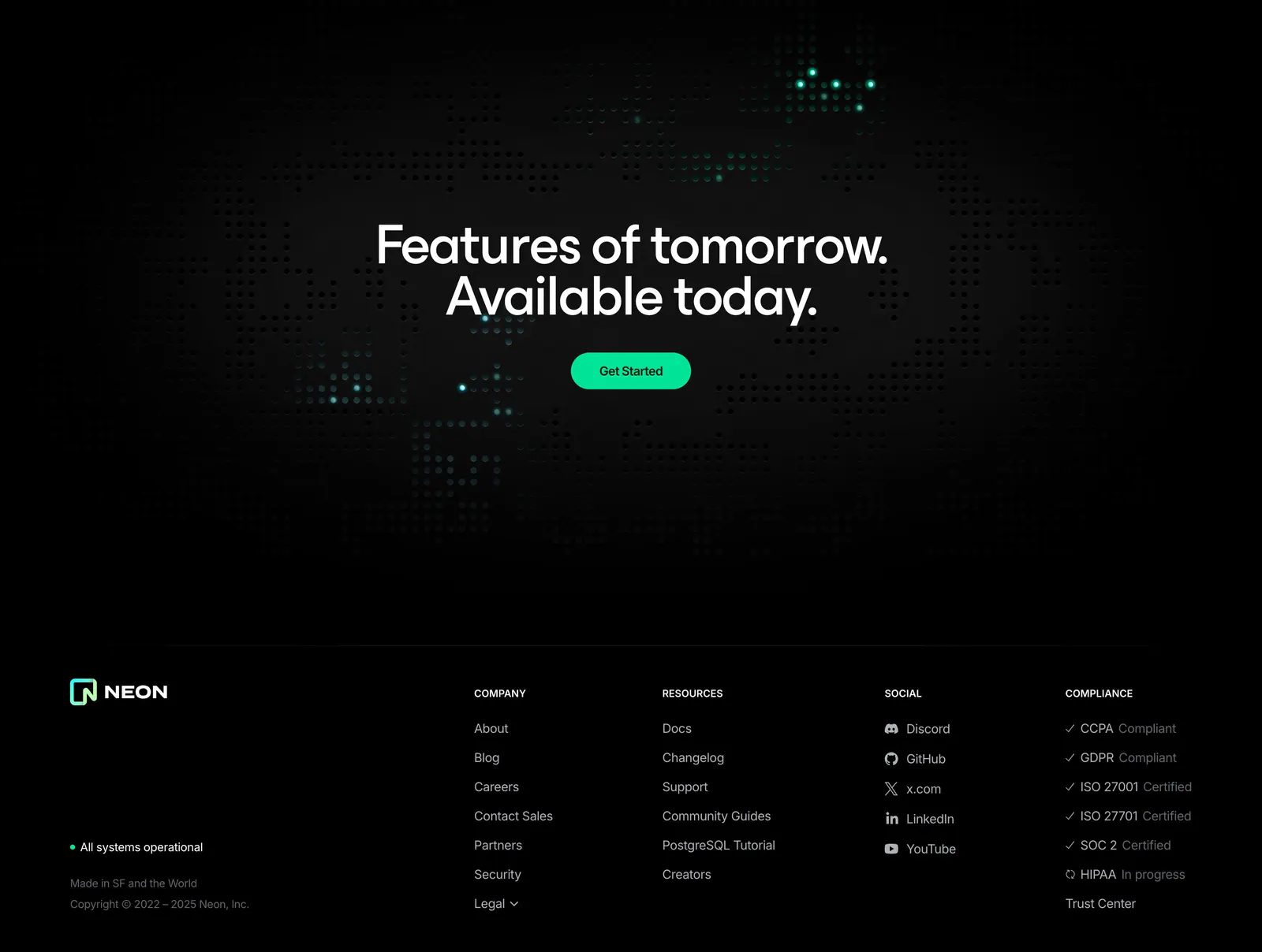
  18. Neon footer section: dark dot-grid CTA band above a footer with logo, company, resources, social and compliance link columns
  19. Clay footer section: centered closing CTA over a 3D clay landscape and ball pit, with a light card of link columns and wordmark
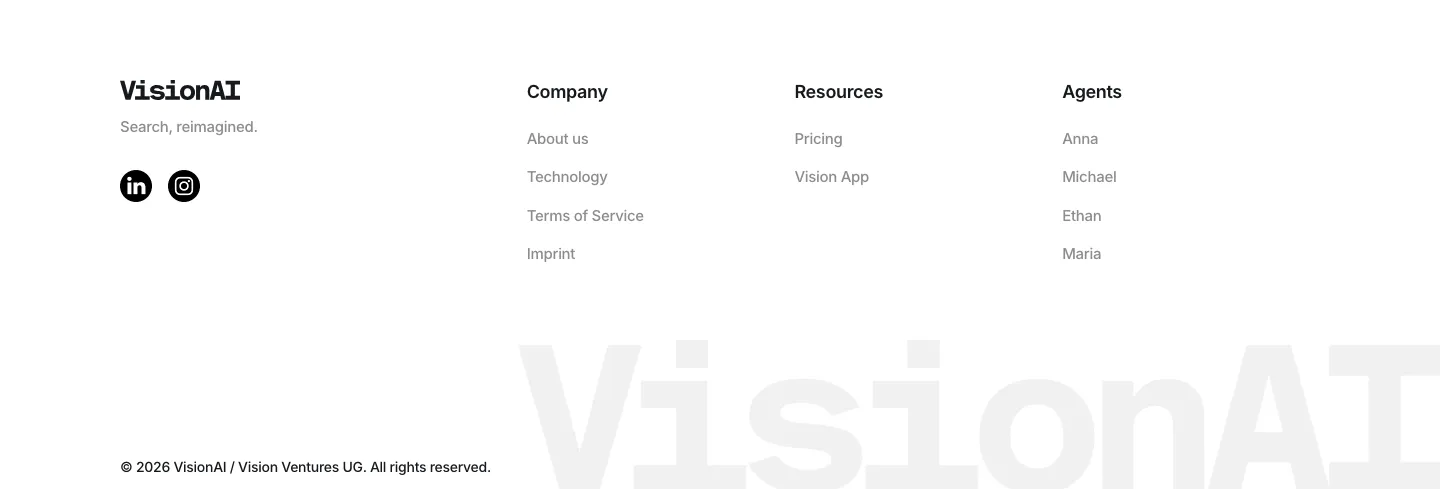
  20. VisionAI footer section: logo, social icons and three link columns above a large faint wordmark on white
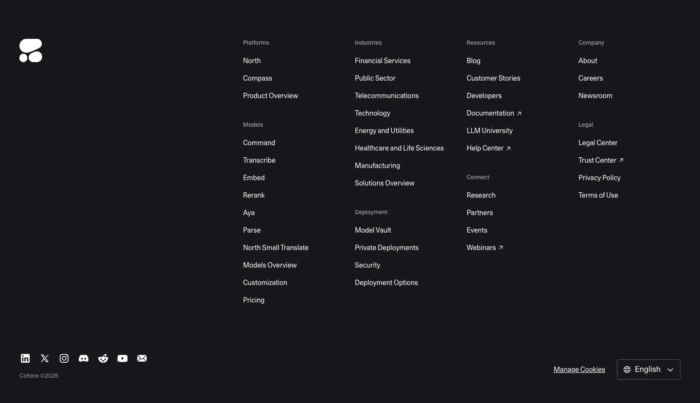
  21. Cohere footer section: dark background with logo, multi-group link columns, social icons and language selector
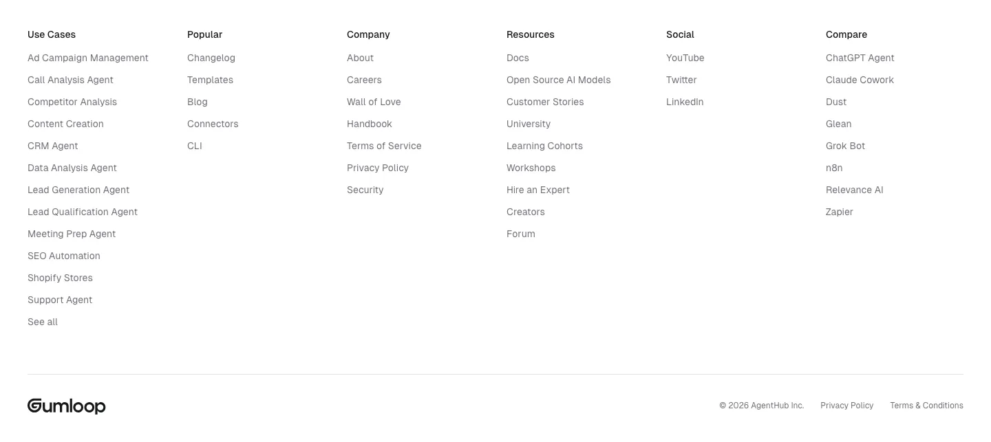
  22. Gumloop footer section: six link columns above a wordmark and copyright row on white
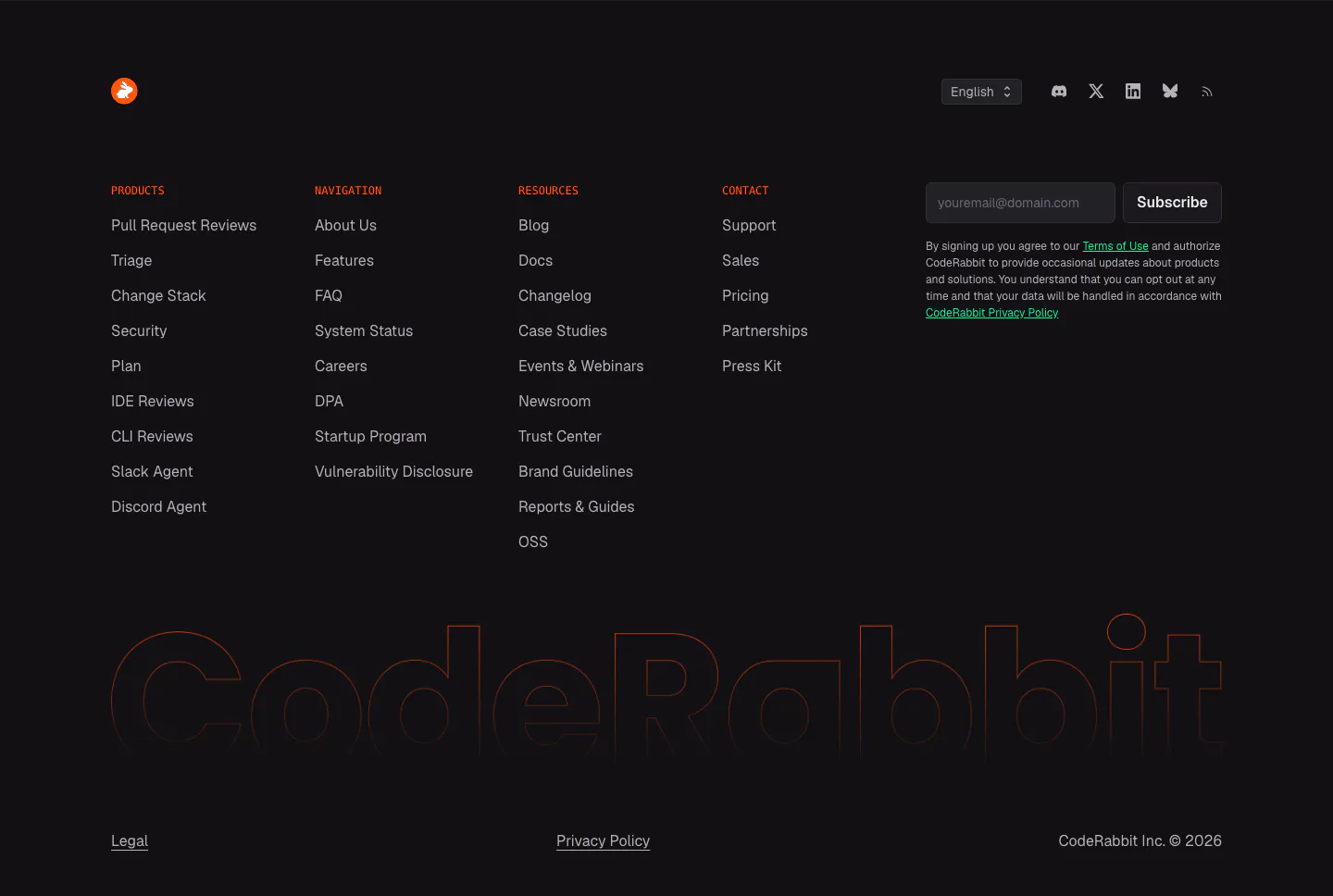
  23. CodeRabbit footer section: dark link columns with orange labels, email subscribe field and a huge outlined CodeRabbit wordmark
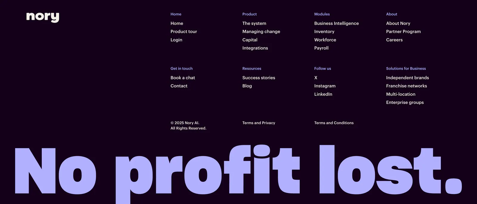
  24. Nory footer section: dark purple footer with wordmark, link columns and copyright above a giant lavender No profit lost. slogan
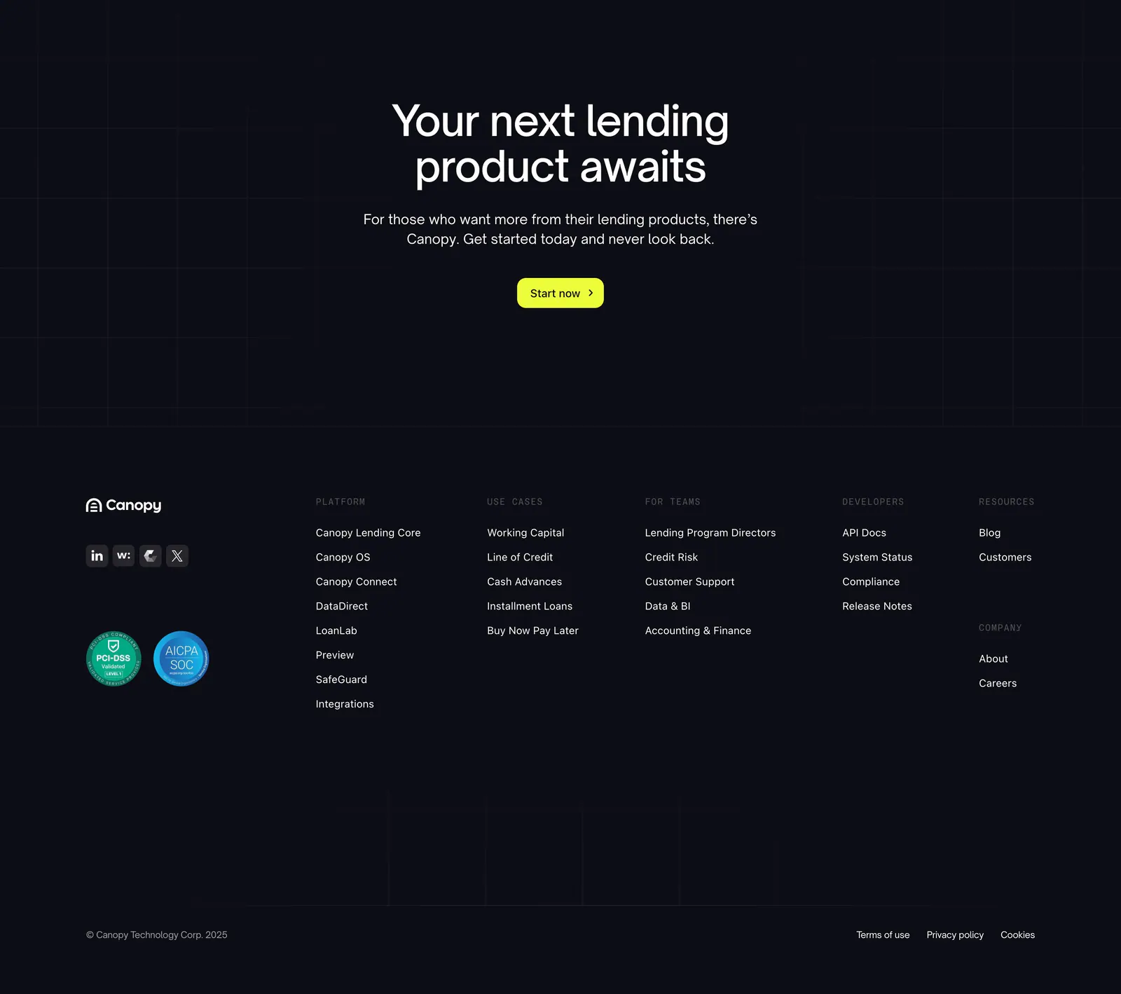
  25. Canopy footer section: centered call-to-action with lime button above a dark footer with logo, compliance badges and link columns
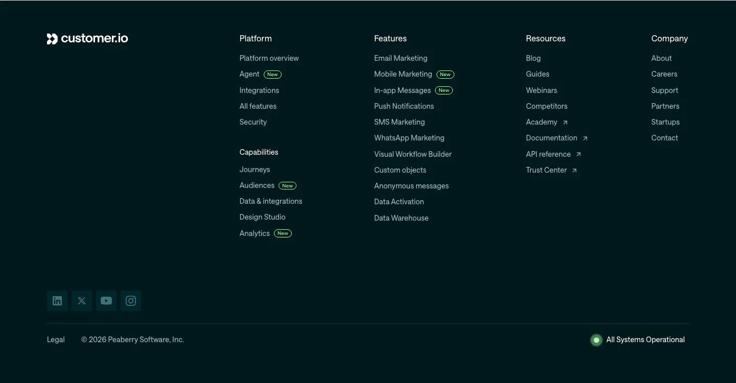
  26. Customer.io footer section: dark teal footer with logo, link columns with New badges, social icons, copyright and system status
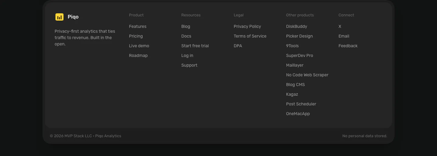
  27. Piqo footer section: rounded dark card with yellow logo and tagline, five link columns including other products, copyright row
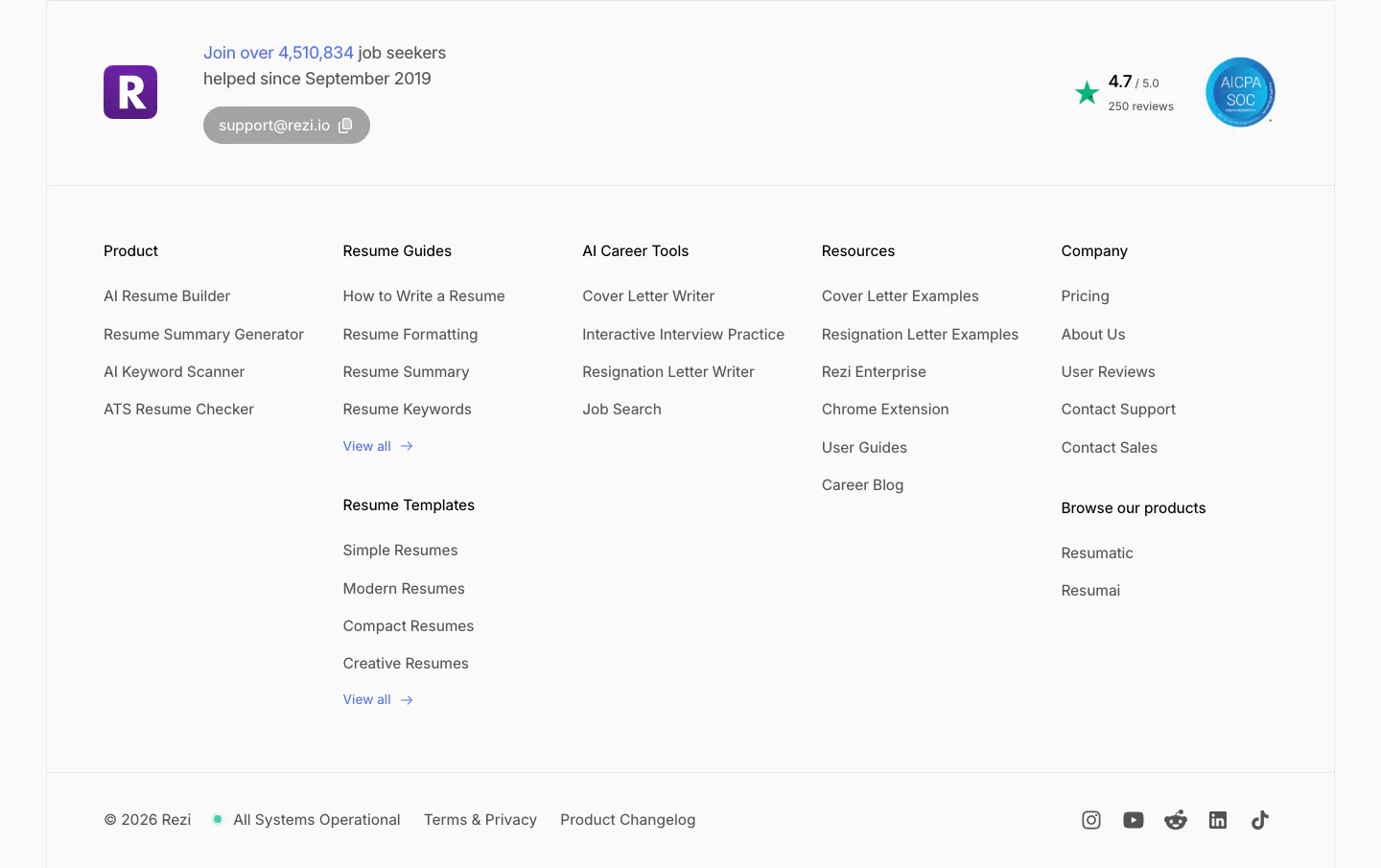
  28. Rezi footer section: logo with user count and support email, five link columns, rating and SOC badge, copyright and social icons
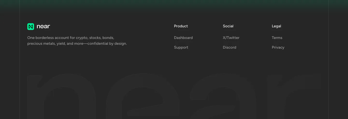
  29. NEAR footer section: logo, tagline and three link columns above a giant faded near wordmark on a charcoal background
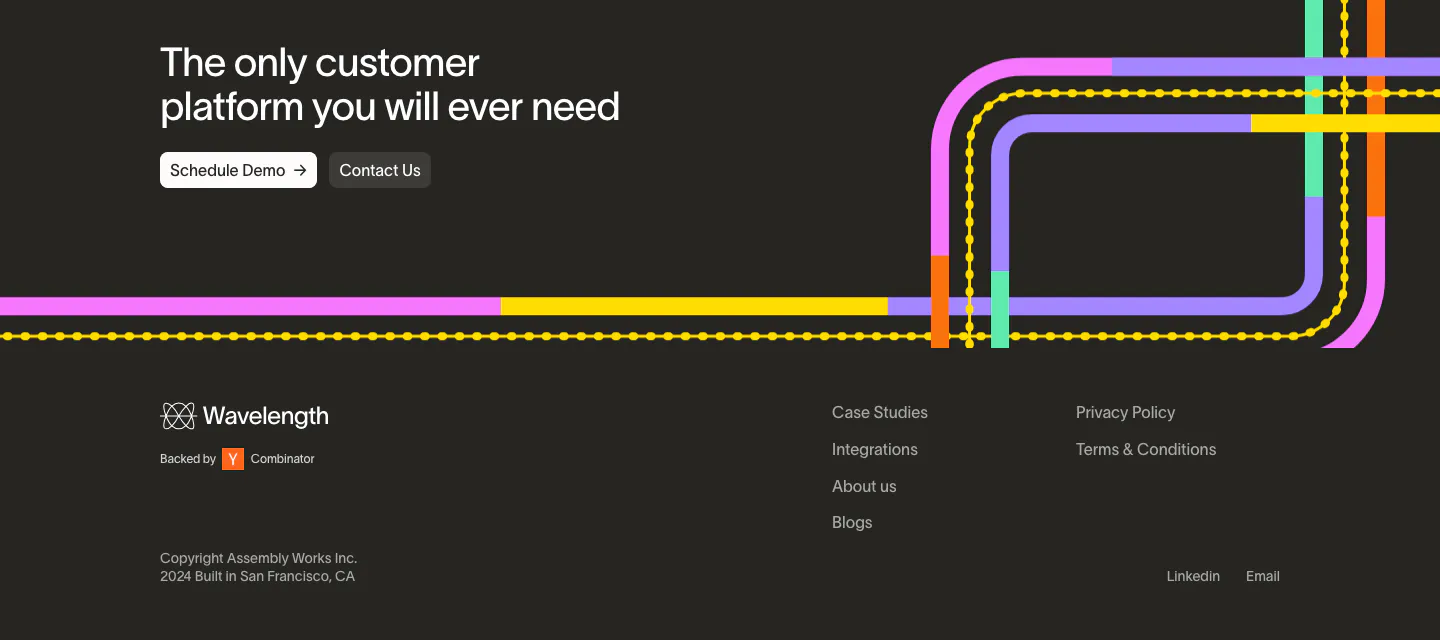
  30. Wavelength footer section: closing headline with two buttons over colorful transit lines, then logo, link columns and copyright on charcoal
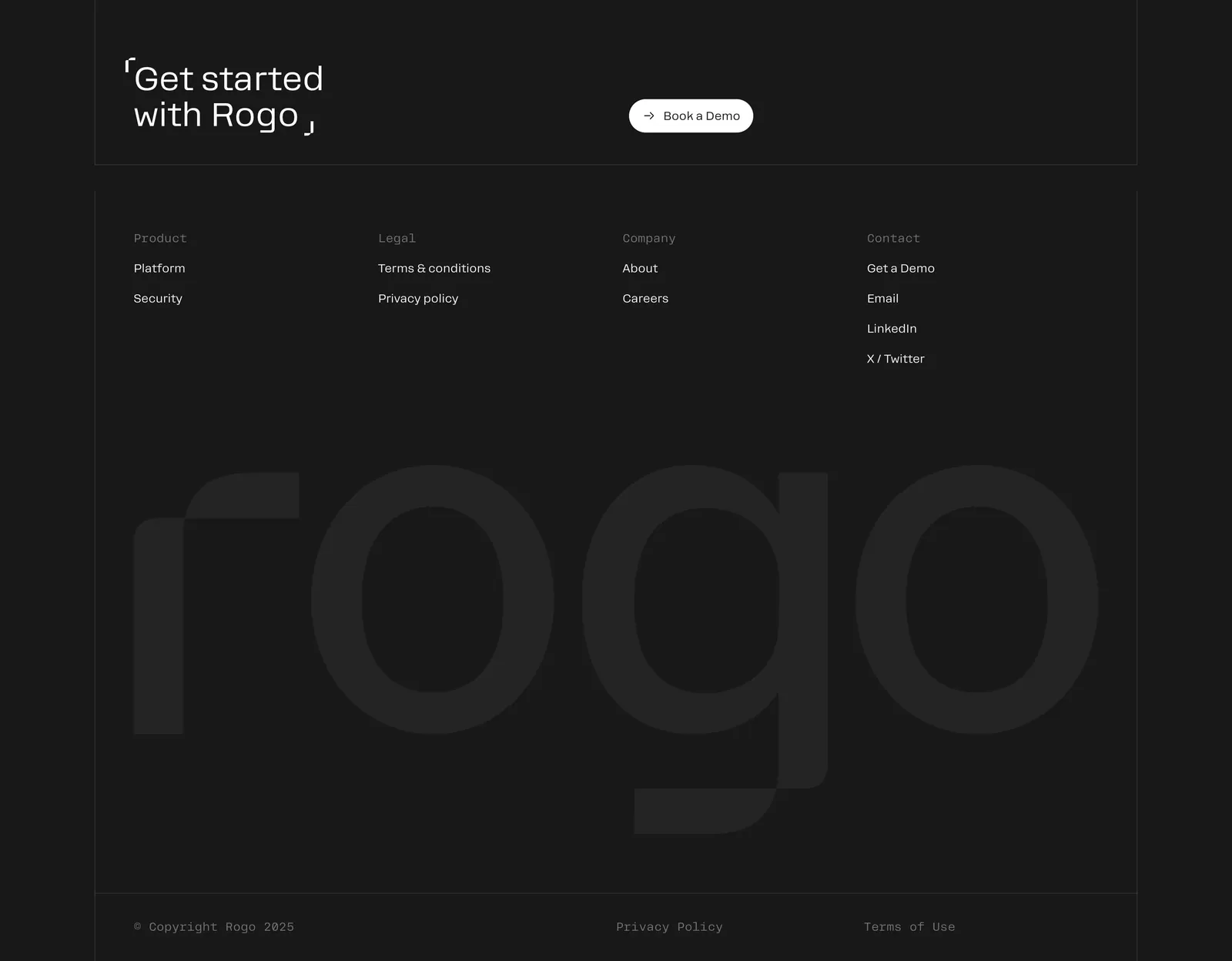
  31. Rogo footer section: Get started CTA with demo button, four link columns and a huge faint Rogo wordmark on charcoal
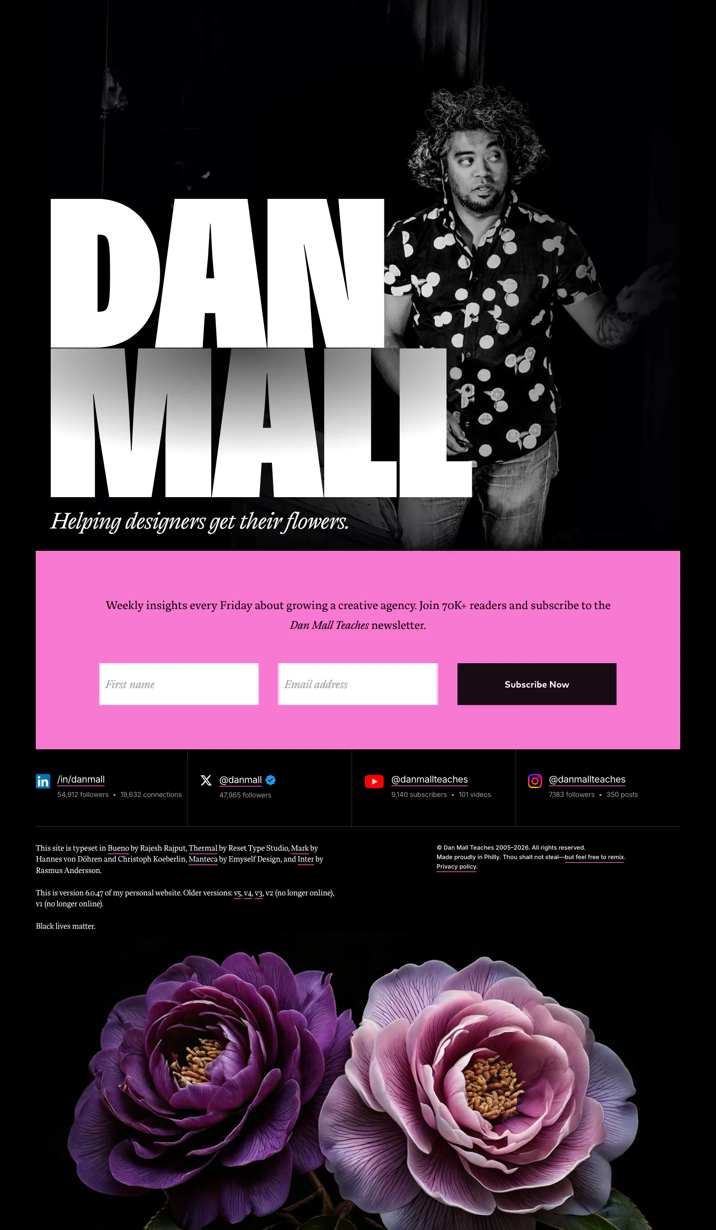
  32. Dan Mall footer section: huge name beside a portrait photo, pink newsletter form band, social stats and flowers on black
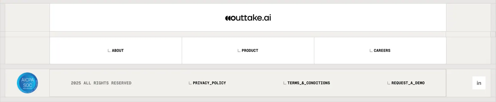
  33. Outtake footer section: centered wordmark above boxed link cells, SOC badge, copyright and legal links on a beige grid
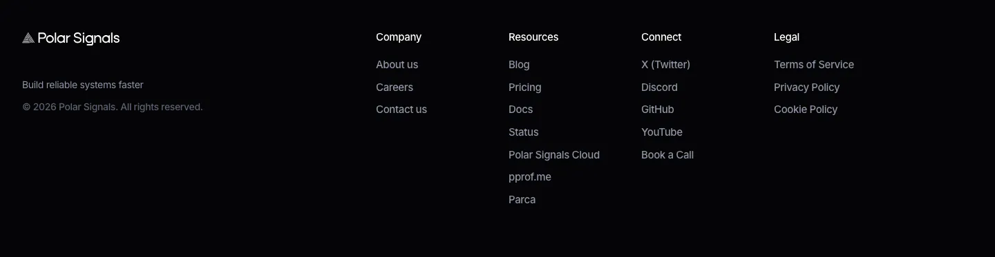
  34. Polar Signals footer section: logo, tagline and copyright at left with four link columns on a black background
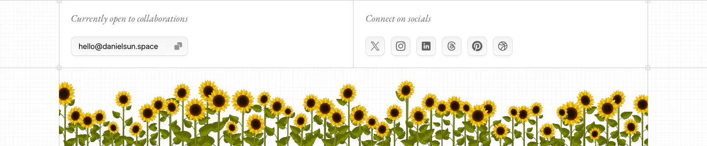
  35. Daniel Sun footer section: collaboration email pill and social icon buttons above a strip of illustrated sunflowers
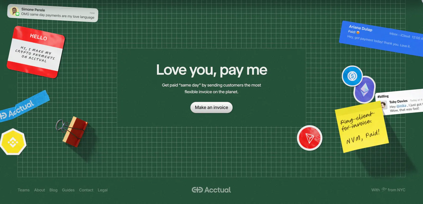
  36. Acctual footer section: centered closing headline on a dark green grid with 3D stickers and notes, plus a link row and wordmark
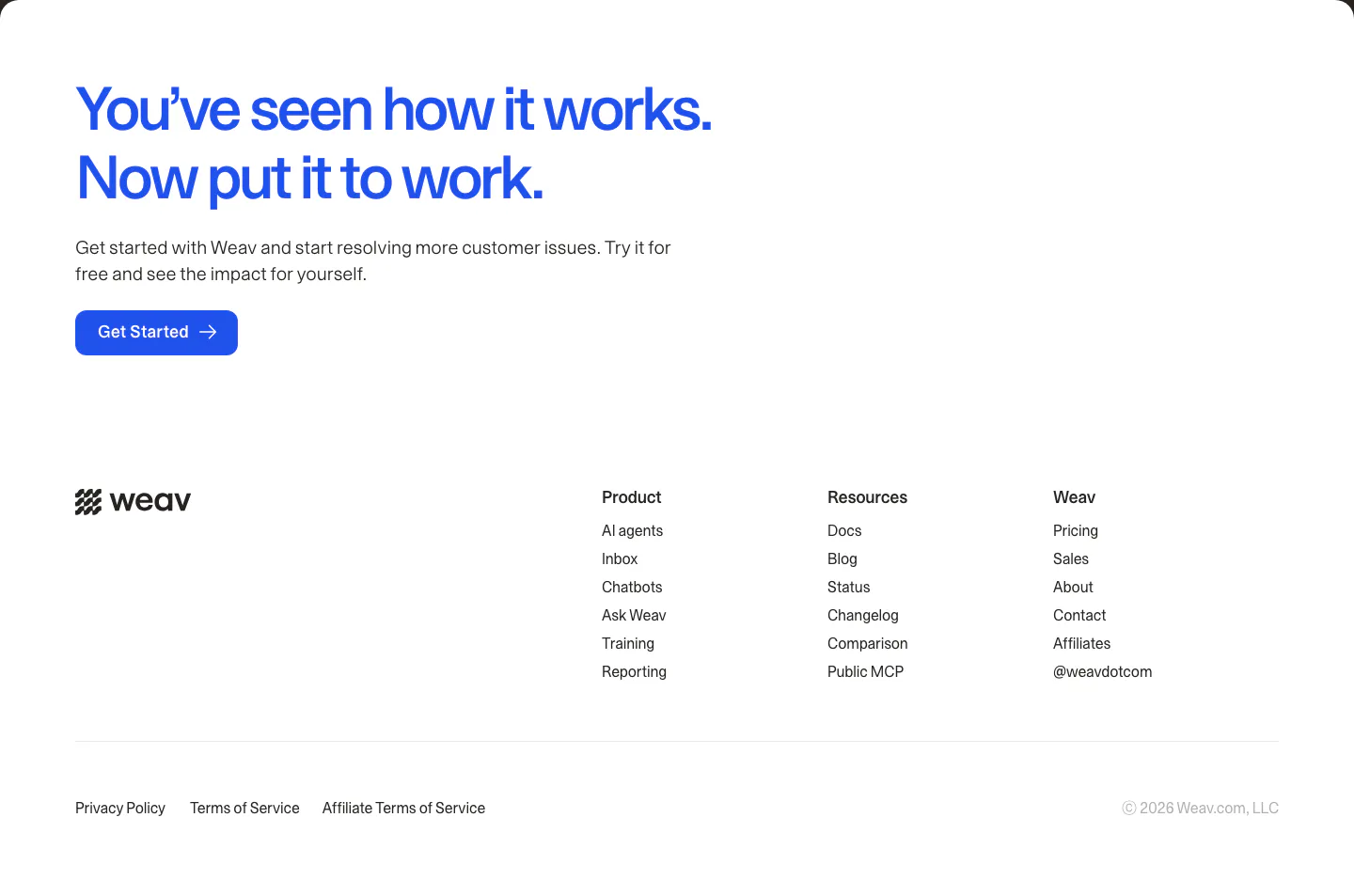
  37. Weav footer section: large blue CTA headline and button above a white footer with wordmark, three link columns and legal links
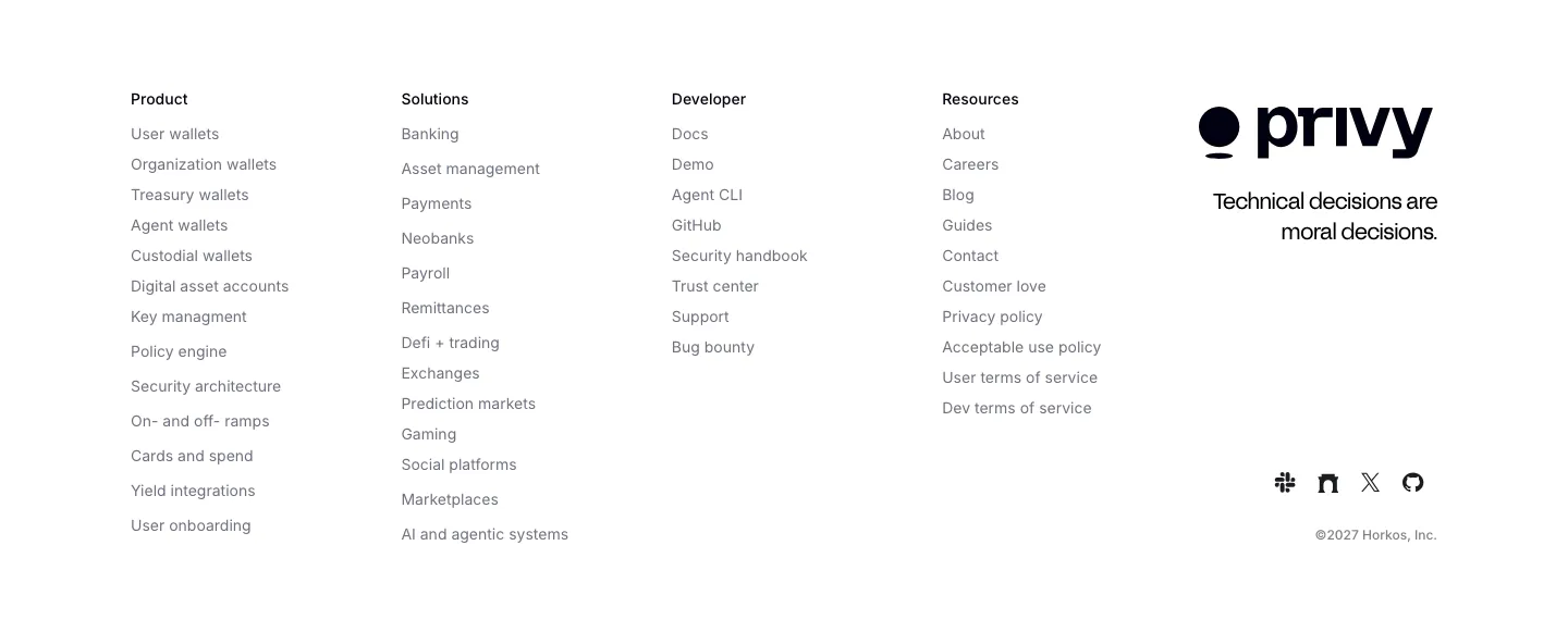
  38. Privy footer section: white footer with five link columns, Privy logo, tagline and social icons in a minimal grayscale layout
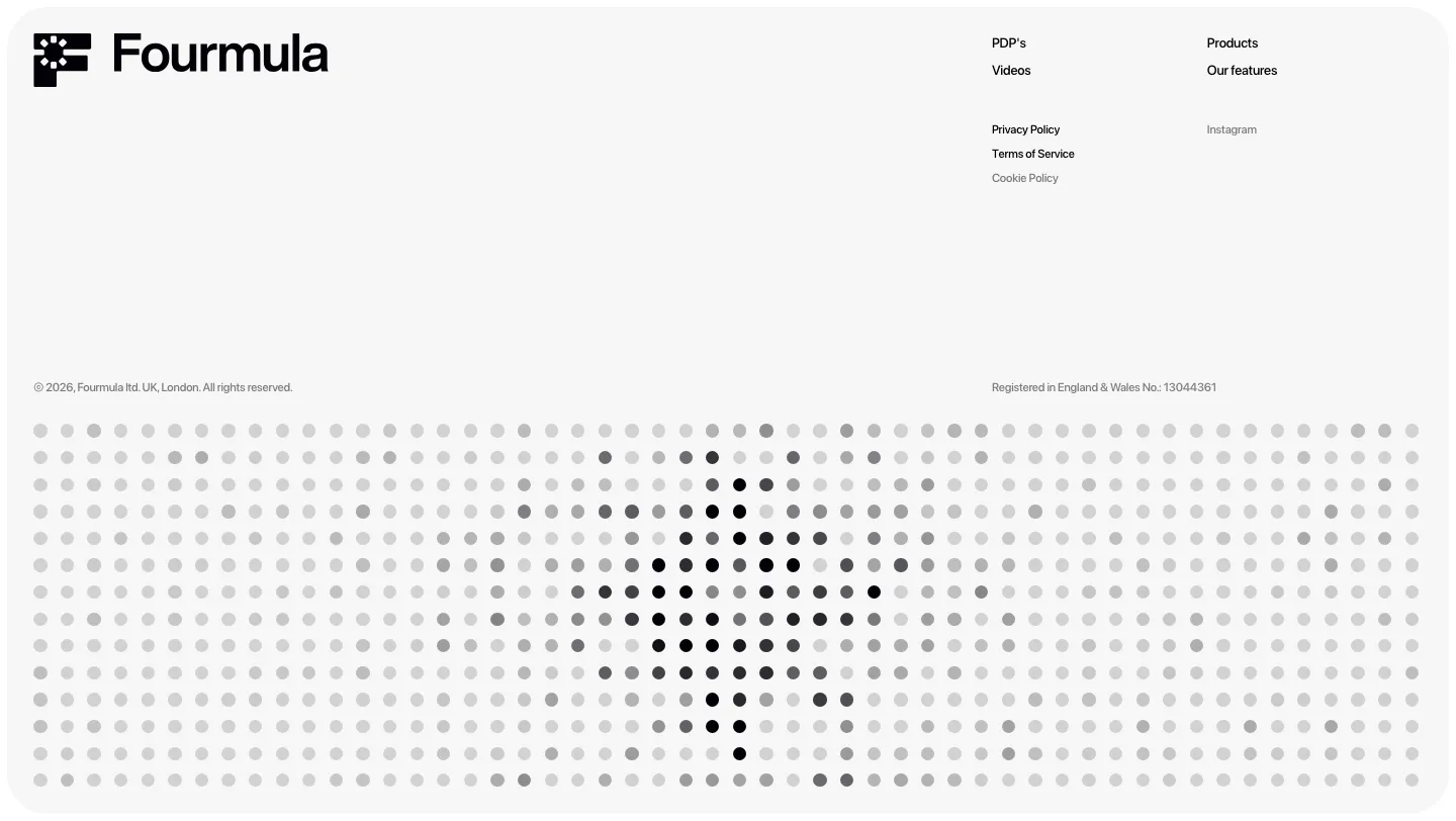
  39. Fourmula footer section: wordmark, small link columns and legal text above a gray dot-matrix field forming a halftone shape
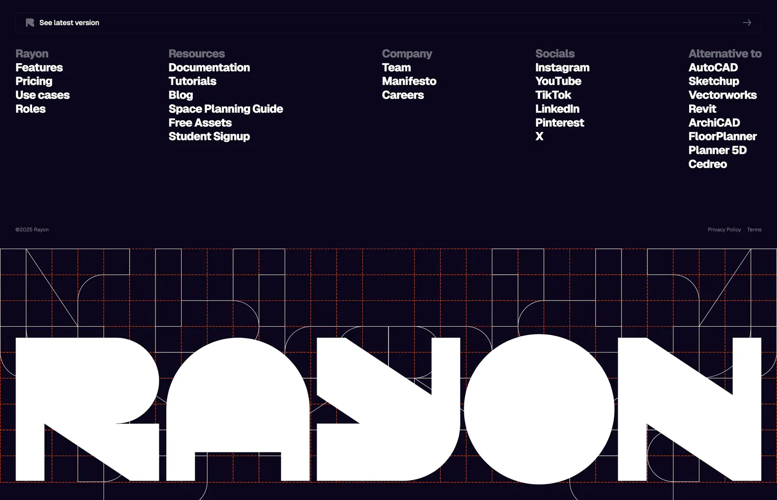
  40. Rayon footer section: five link columns on deep navy above a giant white Rayon wordmark set over an orange construction grid
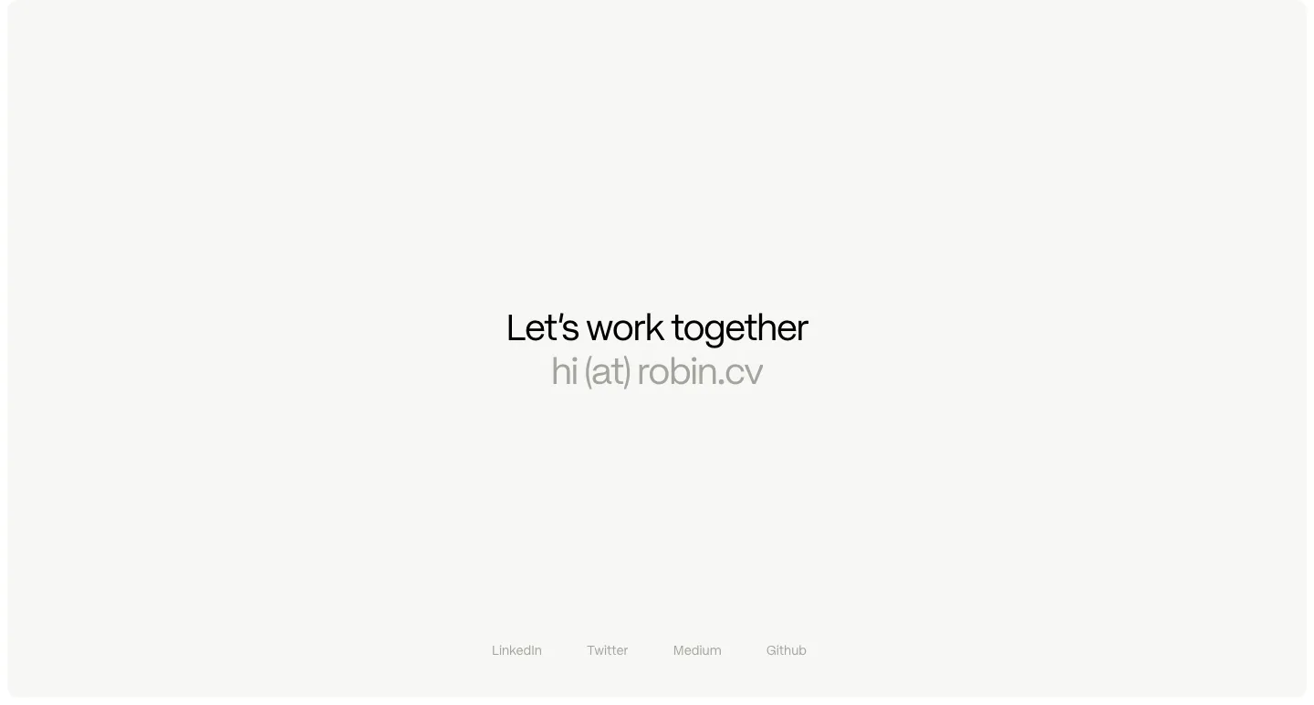
  41. Robin Humphreys footer section: centered Let's work together line with an email address and a row of social links on an off-white card
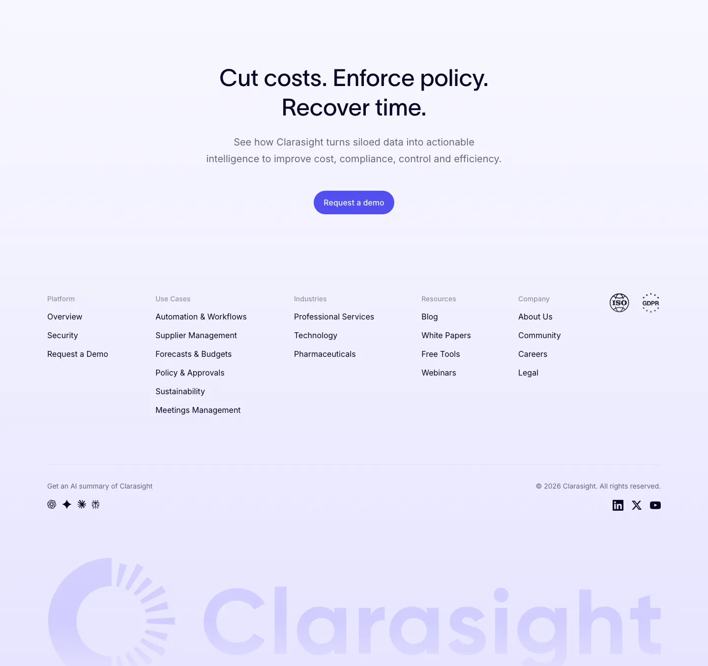
  42. Clarasight footer section: centered CTA headline and button above link columns, compliance badges and a huge faint lavender wordmark
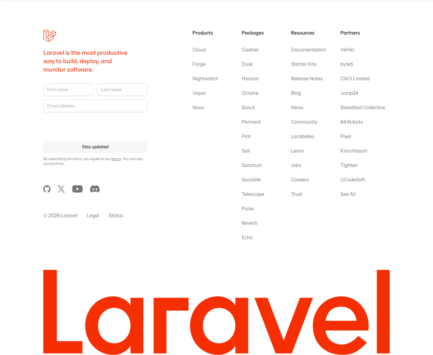
  43. Laravel footer section: newsletter form and product, package, resource and partner link columns above a giant red Laravel wordmark on white
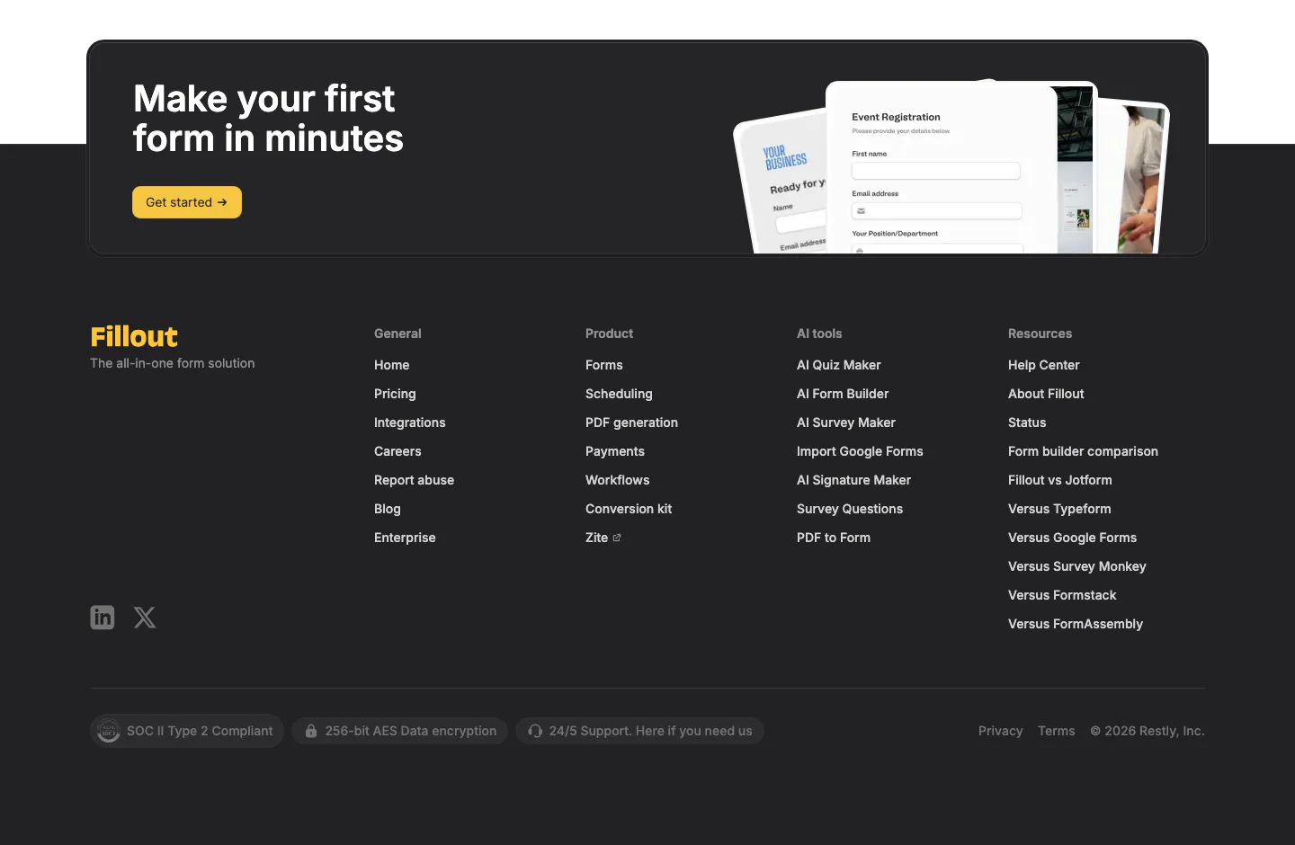
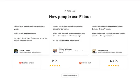
  44. Fillout footer section: dark CTA card with yellow button and form mockups above a charcoal footer with link columns and compliance badges
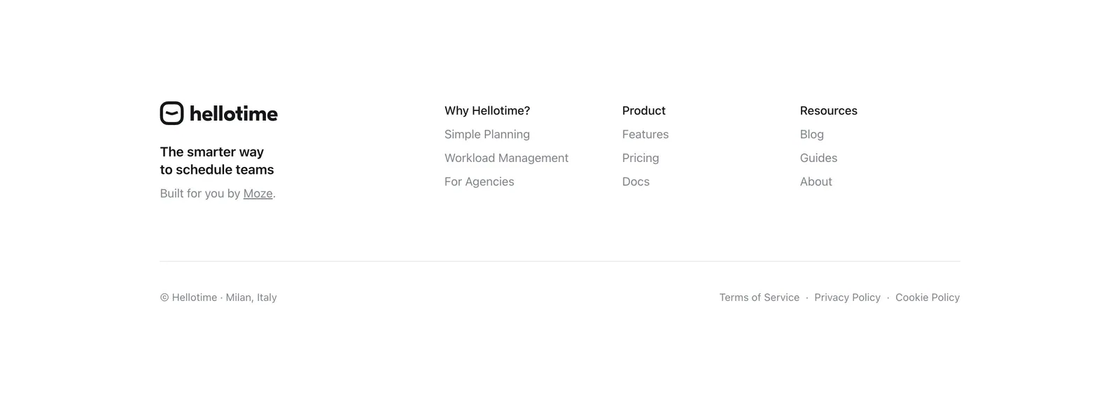
  45. Hellotime footer section: logo and tagline on the left, three link columns on the right, copyright and legal links below on white
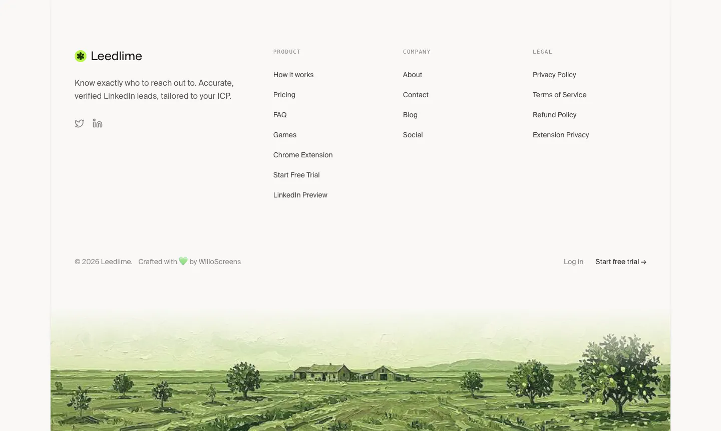
  46. Leedlime footer section: logo, tagline and three link columns above a painted green farmland landscape strip on off-white
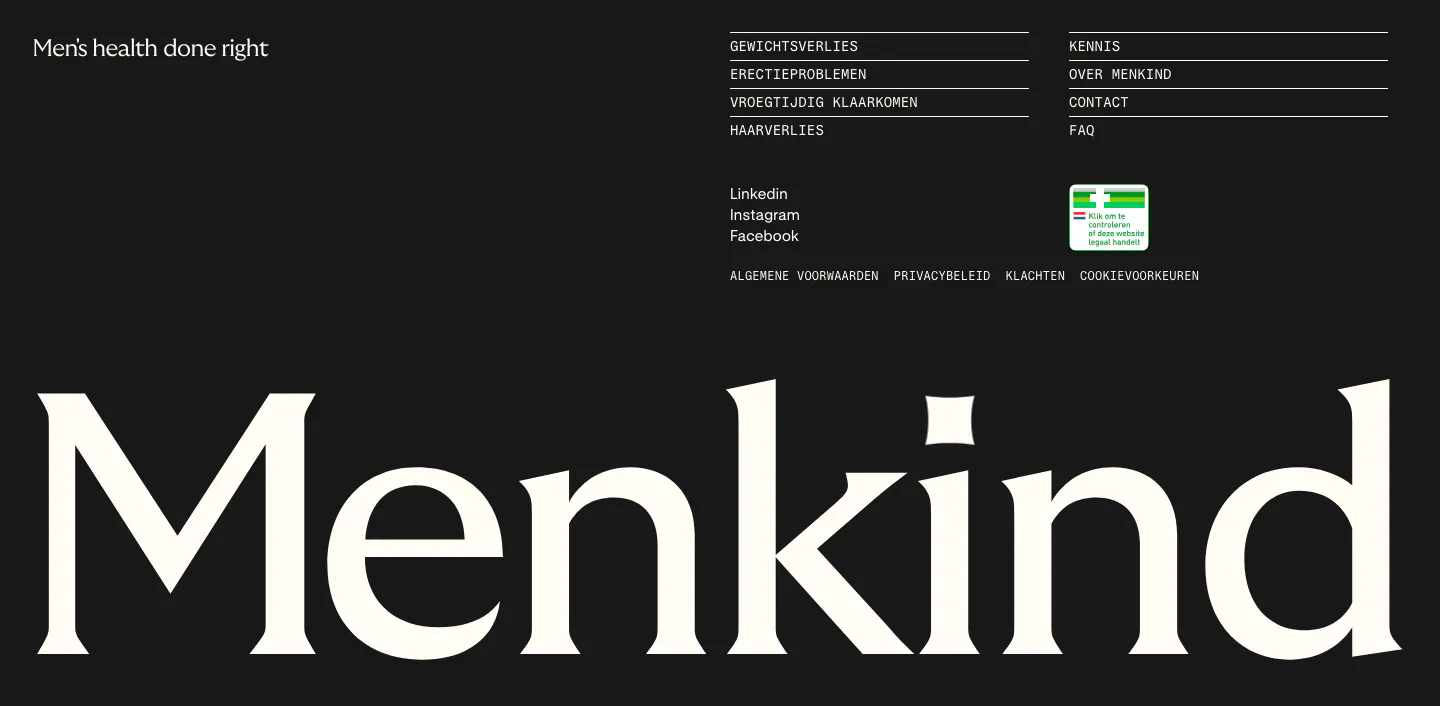
  47. Menkind footer section: tagline and monospace link columns above a giant serif Menkind wordmark on a black background
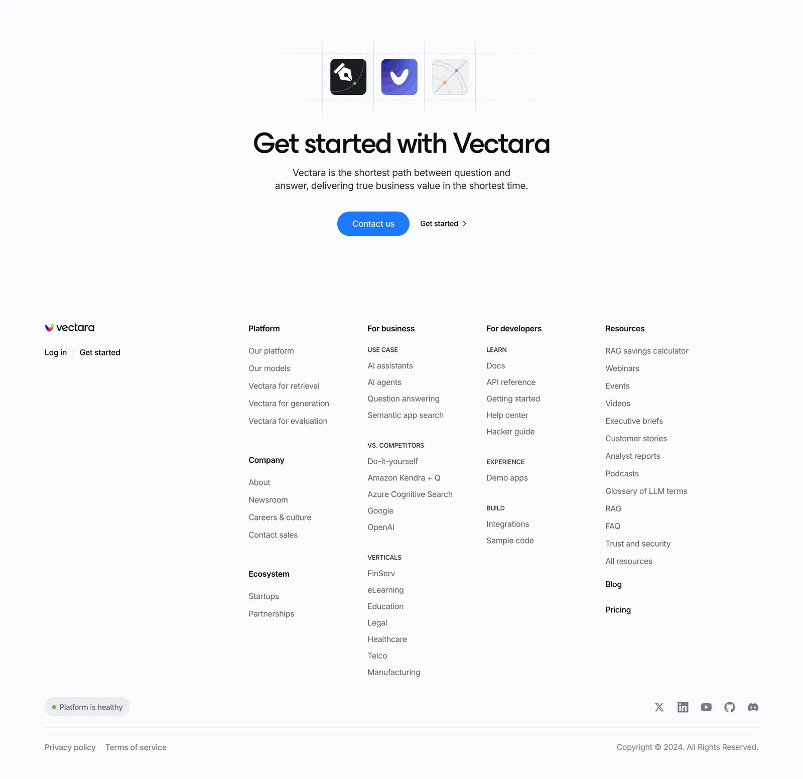
  48. Vectara footer section: centered CTA with app icons above a logo and five link columns, status pill, social icons and copyright on light gray
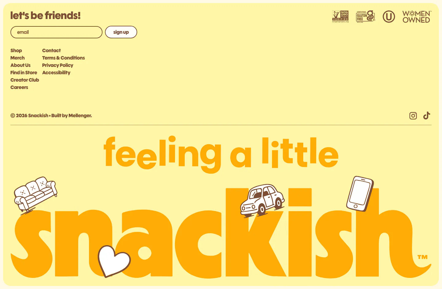
  49. Snackish footer section: pale yellow footer with email signup, link columns, certification badges and a giant illustrated snackish wordmark
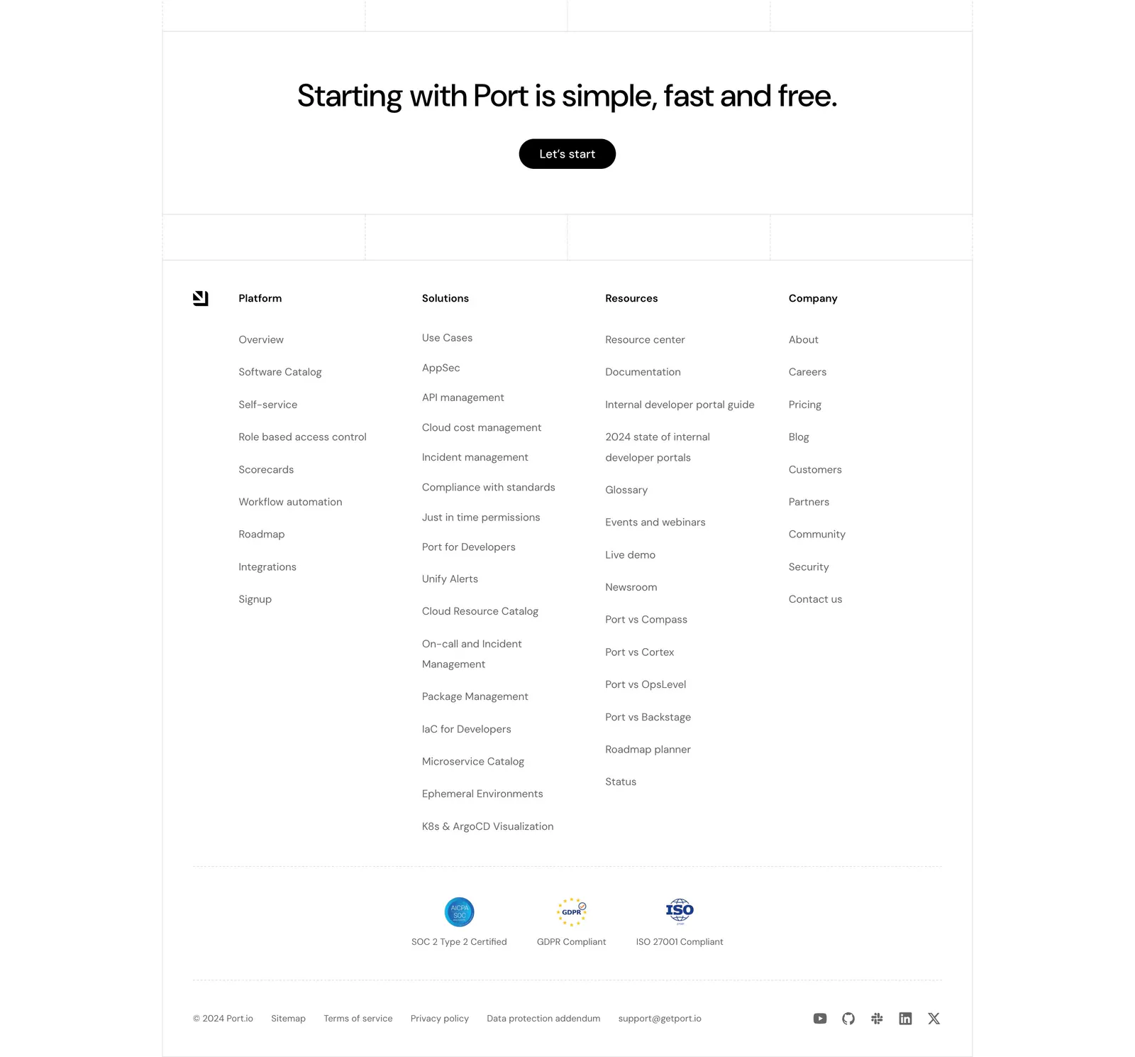
  50. Port footer section: centered CTA with Let's start button above four link columns, compliance badges, legal links and social icons
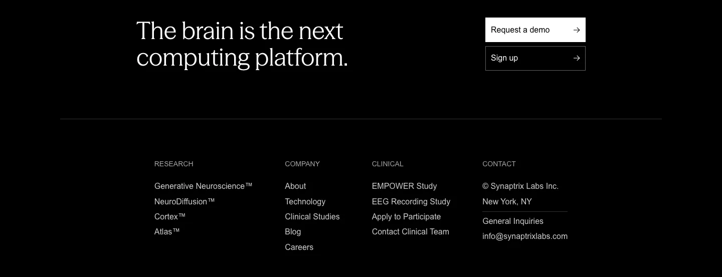
  51. Synaptrix footer section: closing headline with demo and sign-up buttons above four link columns on a black background
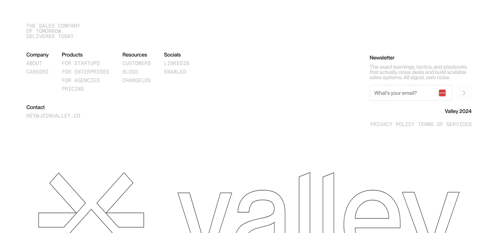
  52. Valley footer section: monospace link columns and newsletter email field above a giant outlined Valley logo and wordmark on white
  53. Cluster footer section: logo and copyright left, link columns right over a giant faded serif Cluster wordmark on beige
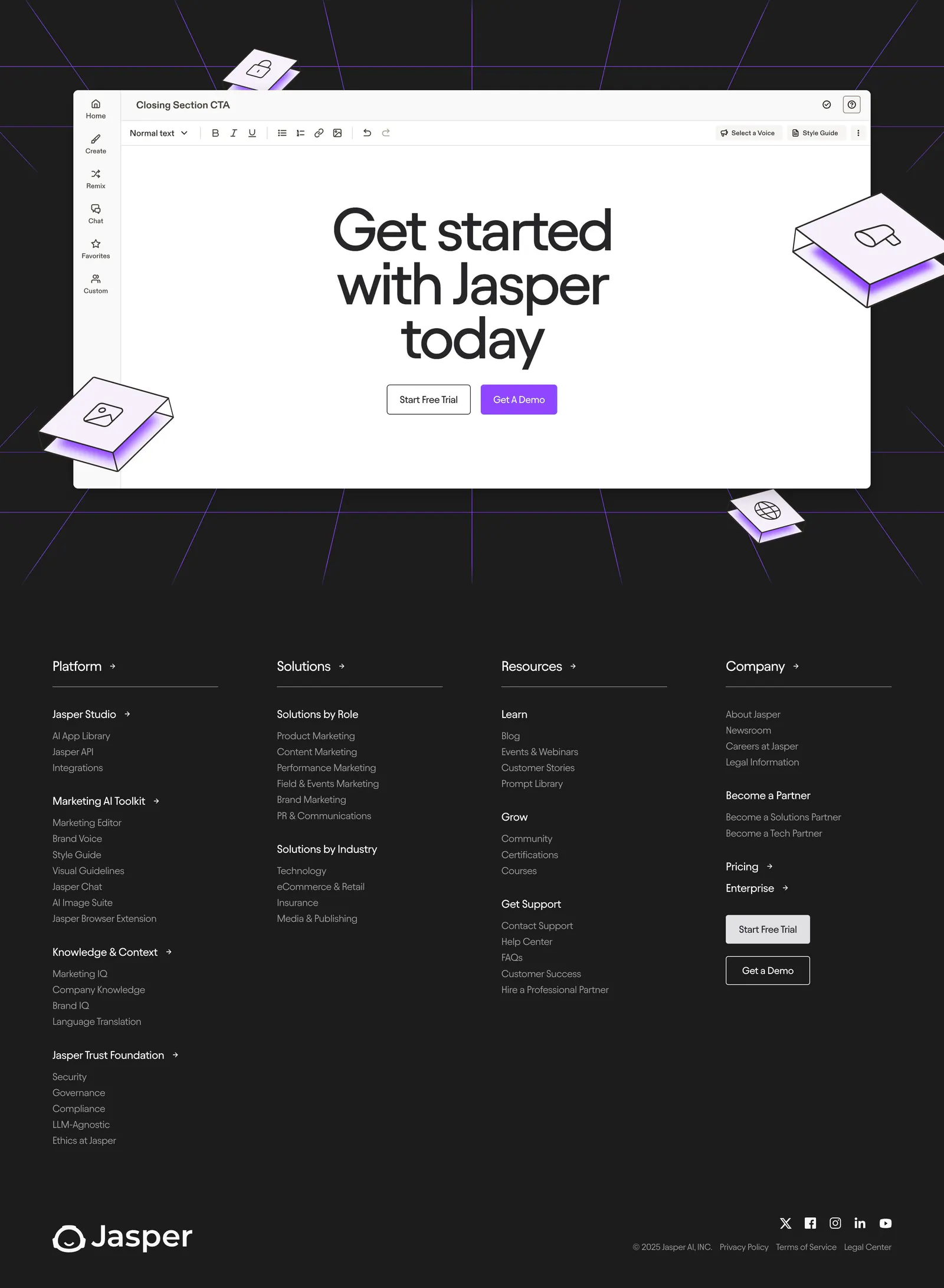
  54. Jasper footer section: editor-mockup CTA above four link columns, wordmark and social icons on a dark charcoal background
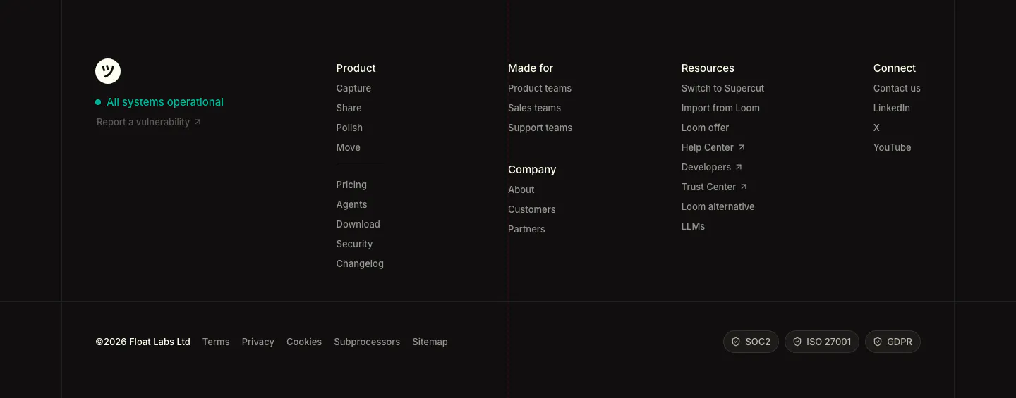
  55. Supercut footer section: logo with status indicator, four link columns, legal links and SOC2, ISO 27001, GDPR badges on dark
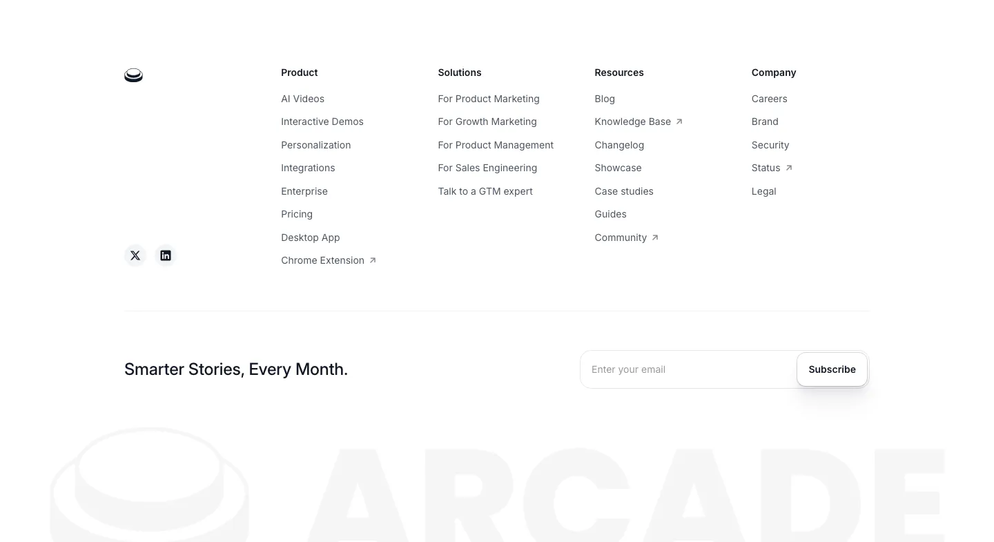
  56. Arcade footer section: four link columns and an email subscribe field above a faded oversized ARCADE wordmark and logo
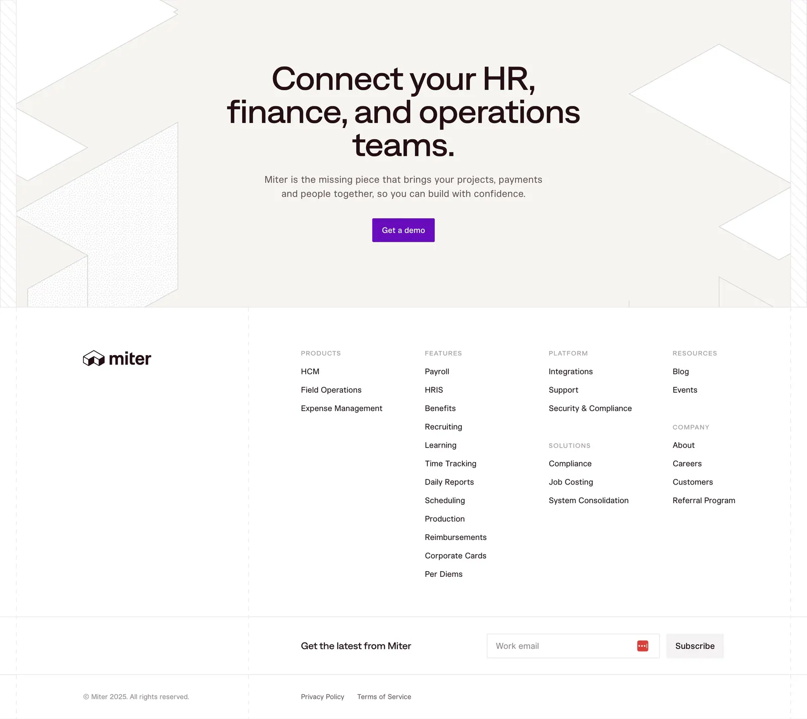
  57. Miter footer section: centered CTA on beige with geometric line shapes, then link columns, email signup and legal row
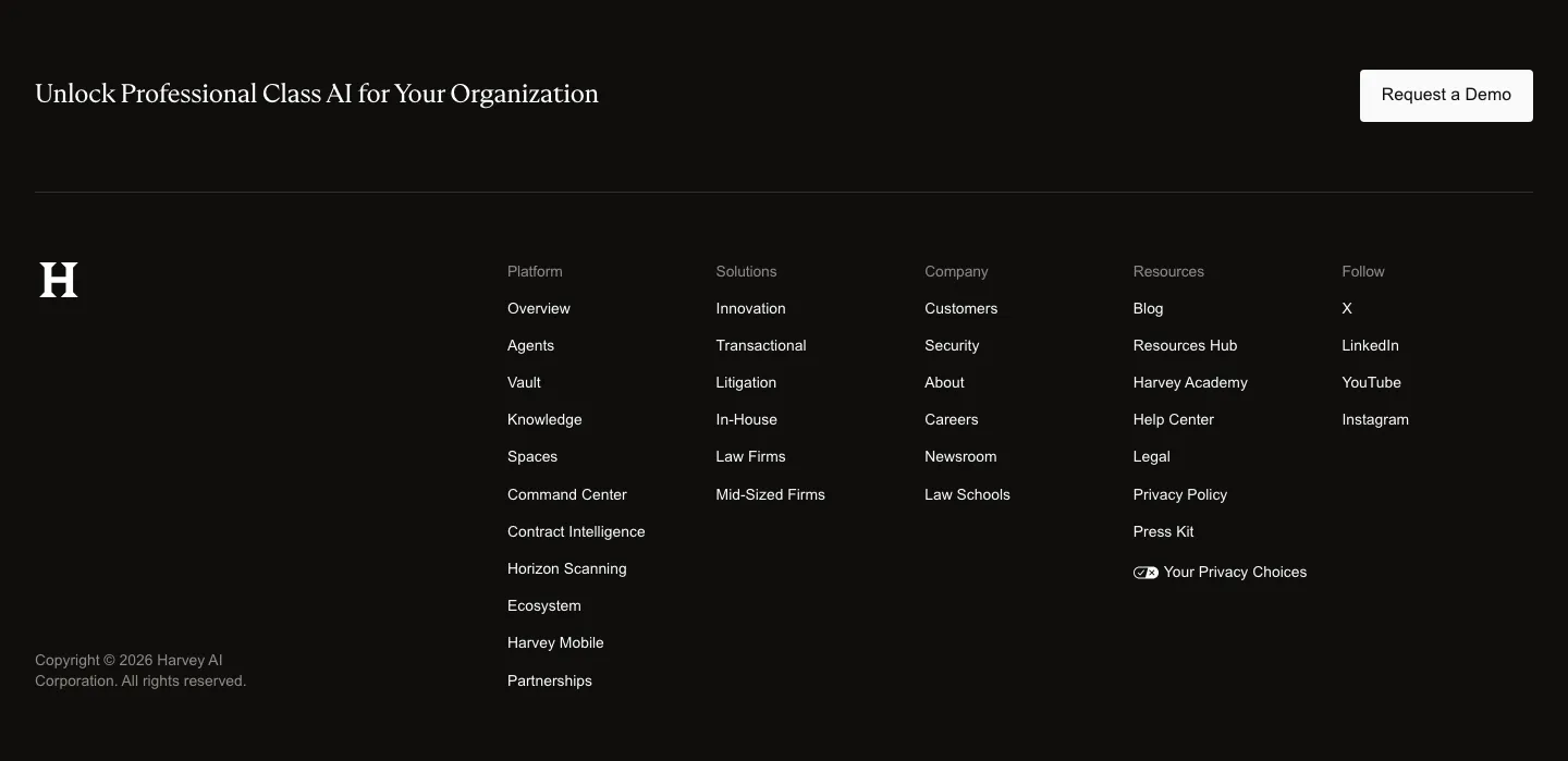
  58. Harvey footer section: dark band with serif closing line and demo button above an H logo and five link columns
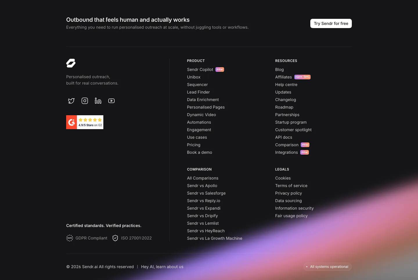
  59. Sendr footer section: dark footer with CTA strip, logo, G2 badge, product, resources, comparison and legal columns and a purple glow
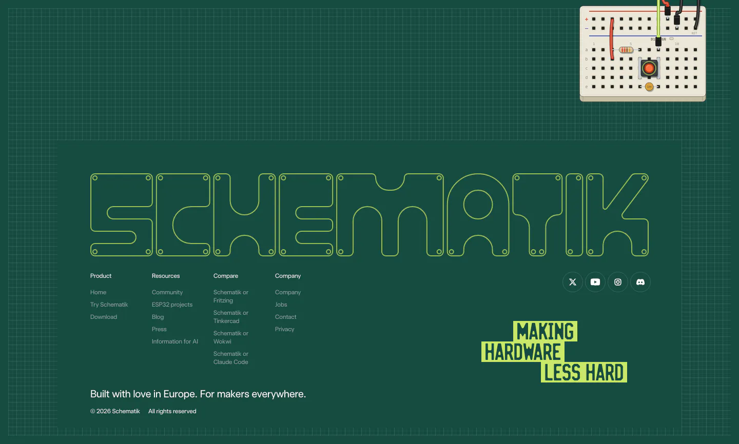
  60. Schematik footer section: outlined SCHEMATIK wordmark, link columns and lime tagline on a dark green grid with a breadboard
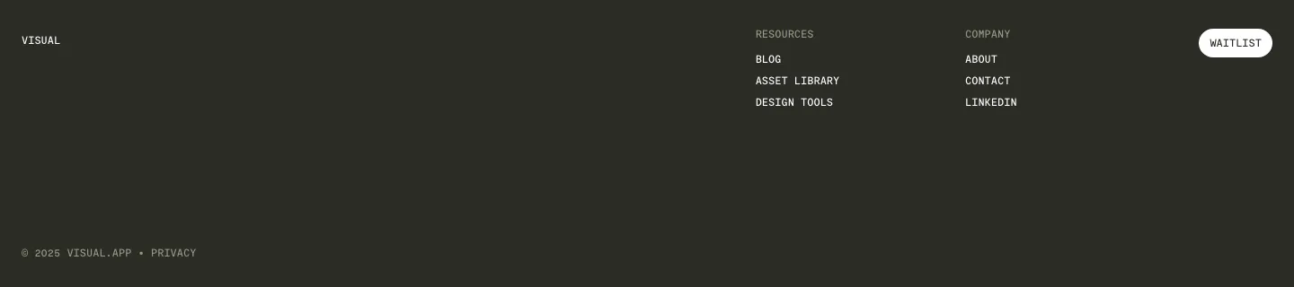
  61. Visual footer section: dark charcoal footer with small wordmark, resources and company link columns, a white waitlist button and copyright
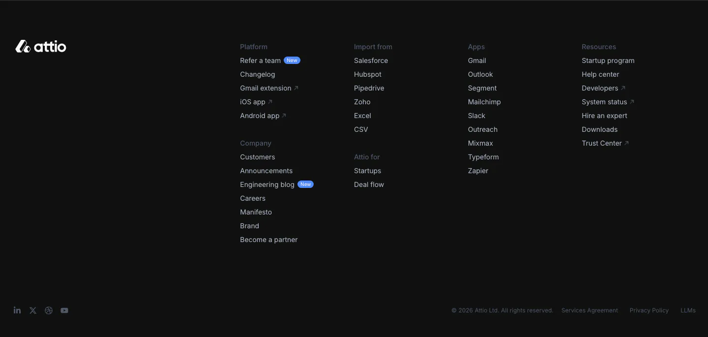
  62. Attio footer section: logo at left, link columns for platform, company, imports, apps and resources, social icons and legal row on dark
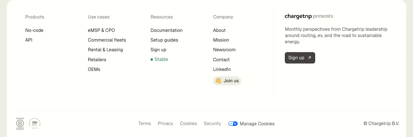
  63. Chargetrip footer section: four link columns beside a newsletter sign-up blurb, with legal links and certification badges on a white panel
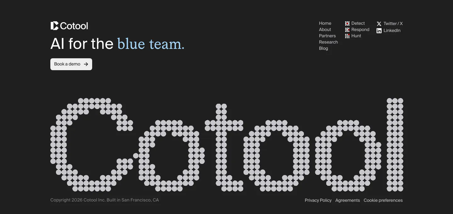
  64. Cotool footer section: tagline, demo button and link columns above a giant dot-matrix Cotool wordmark on a charcoal background
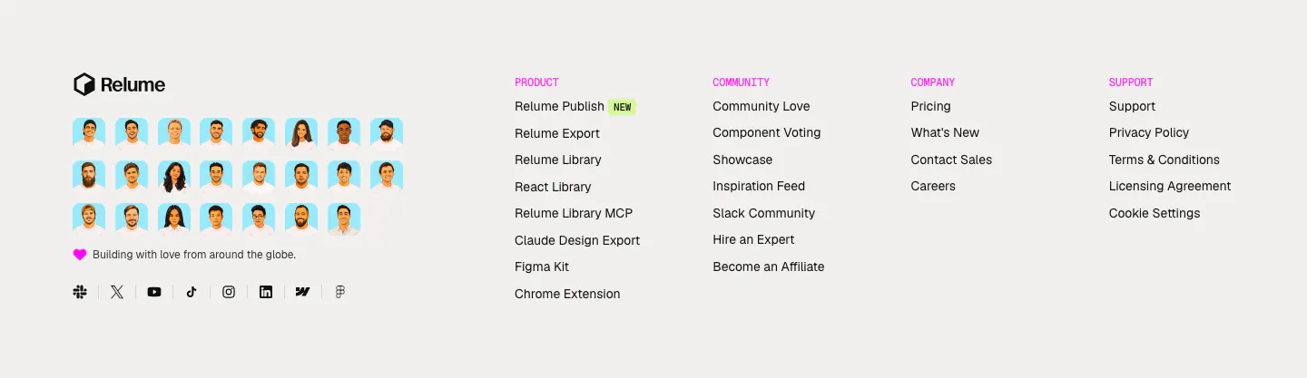
  65. Relume footer section: logo above a grid of illustrated team avatars and social icons, with four link columns under pink labels
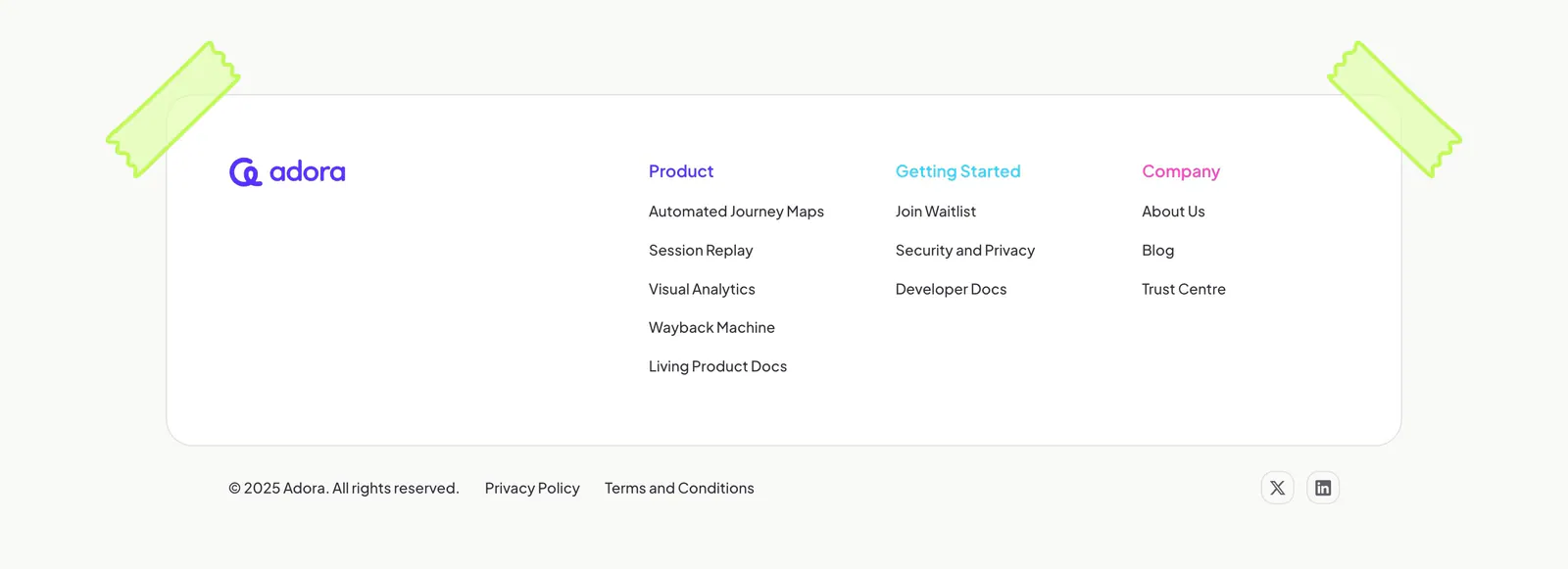
  66. Adora footer section: rounded white card with logo and three link columns, taped corners, copyright row on off-white
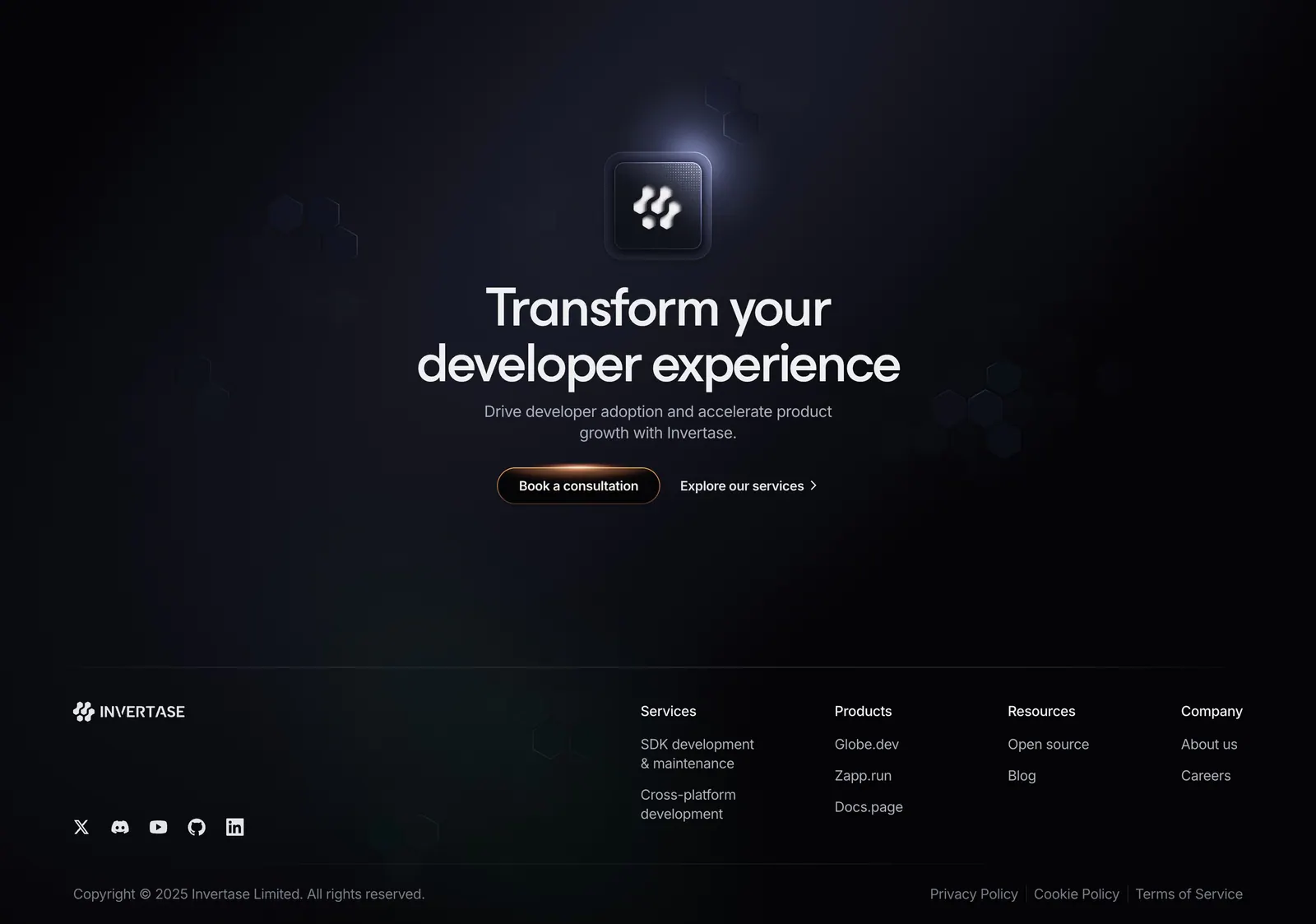
  67. Invertase footer section: centered CTA with glowing logo tile above link columns, social icons and copyright on a dark background
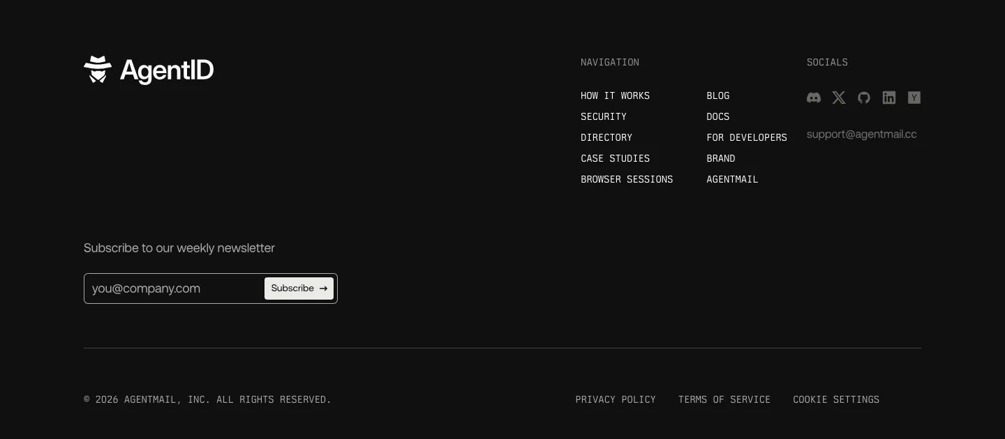
  68. AgentID footer section: dark layout with logo, newsletter email field, monospace navigation columns, social icons and legal row
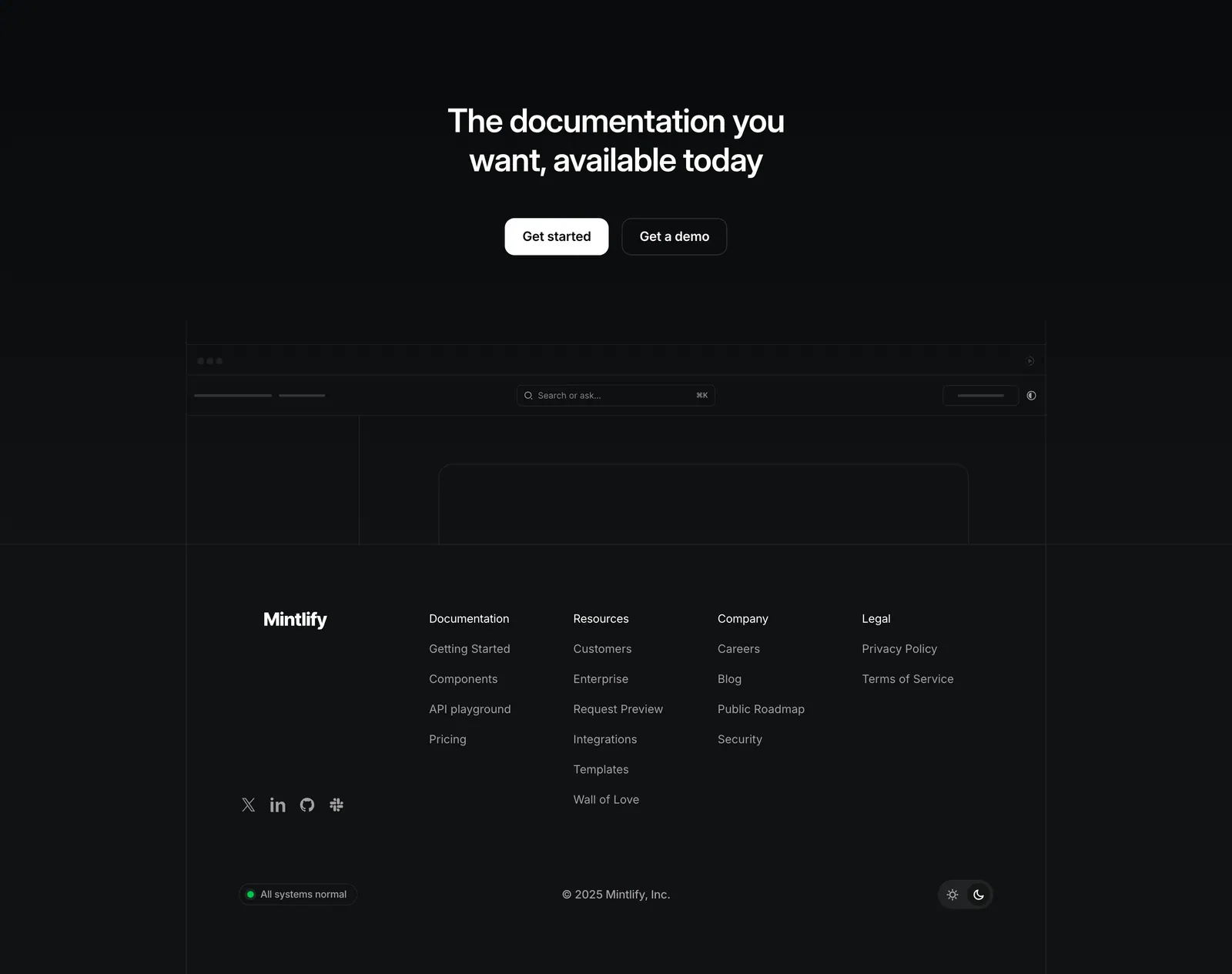
  69. Mintlify footer section: centered closing CTA above a faded docs wireframe, then four link columns and status badge on black
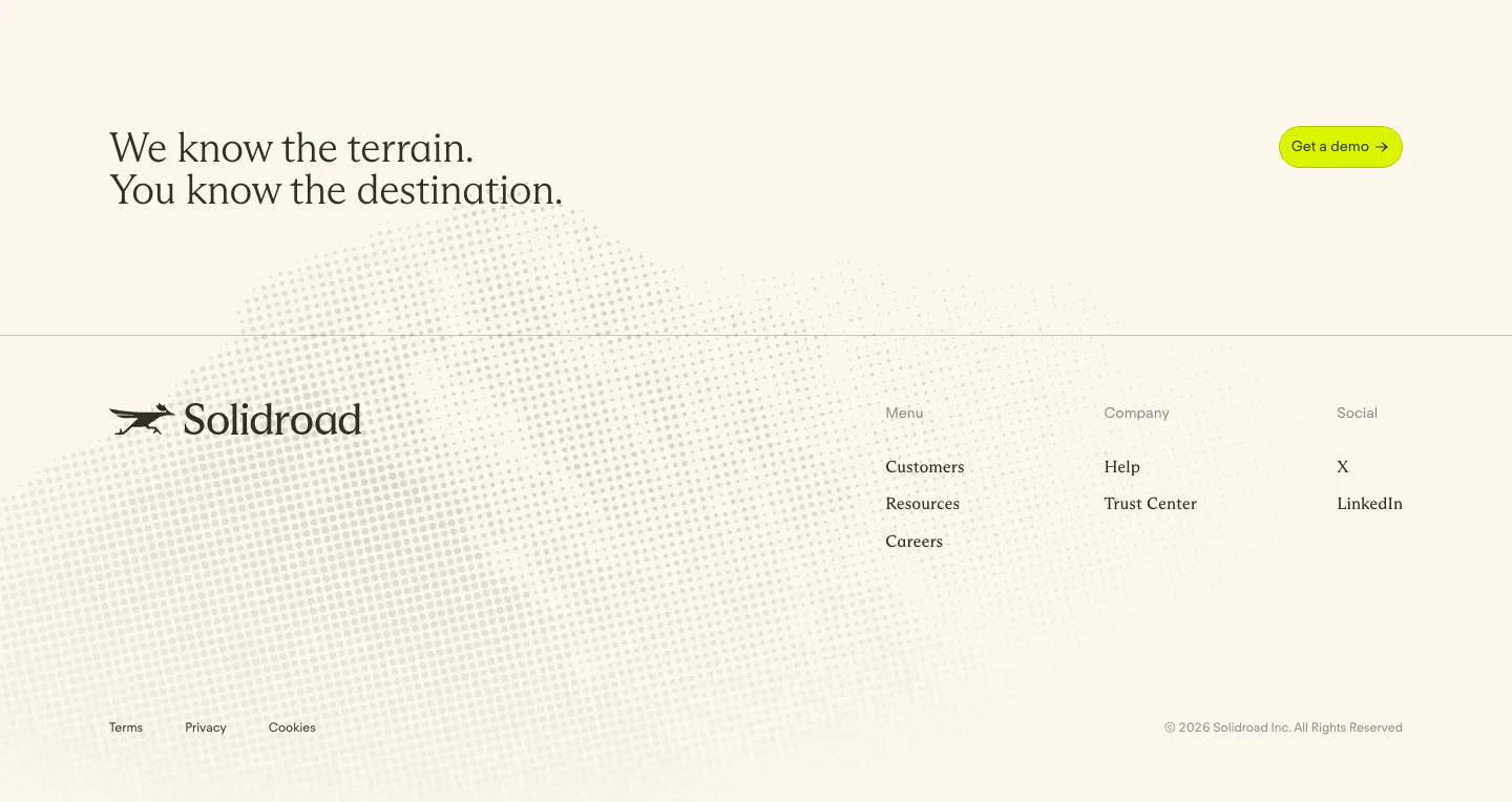
  70. Solidroad footer section: serif CTA headline and lime button above logo and link columns on cream with a faint halftone dot texture
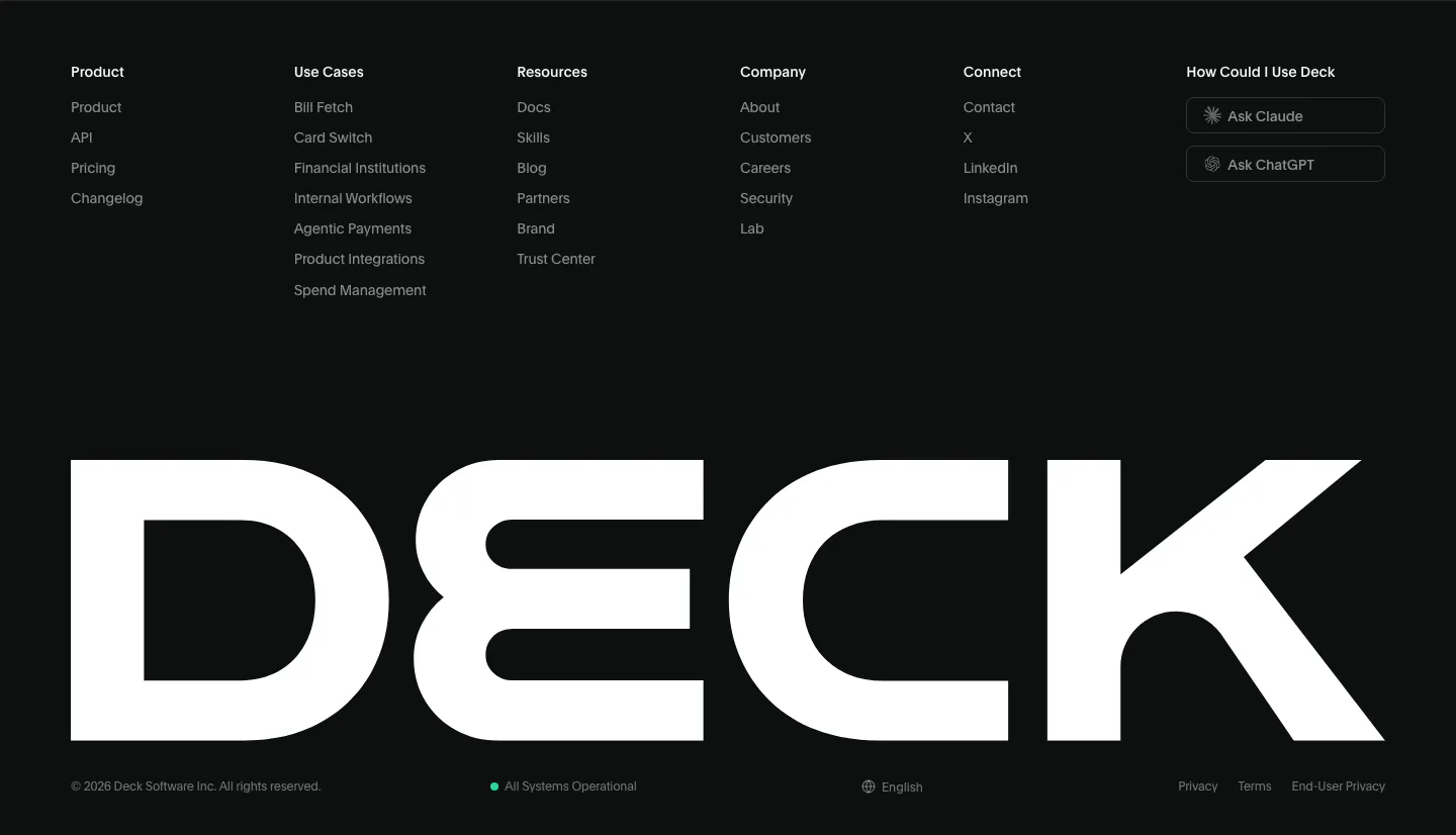
  71. Deck footer section: six link columns with Ask Claude and Ask ChatGPT buttons above a full-width white DECK wordmark on black
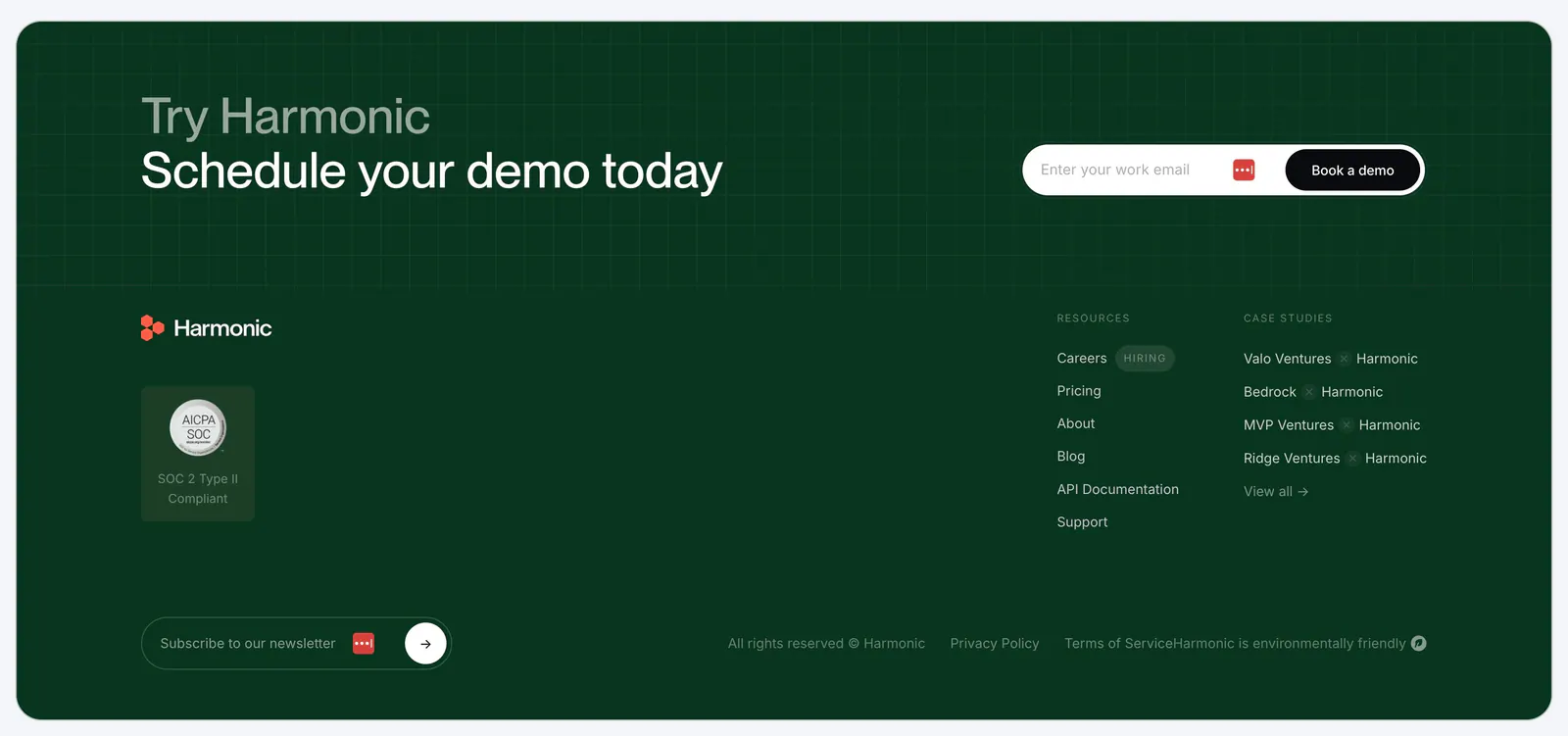
  72. Harmonic footer section: dark green panel with demo email signup over a grid texture, logo, SOC 2 badge, link columns and newsletter field
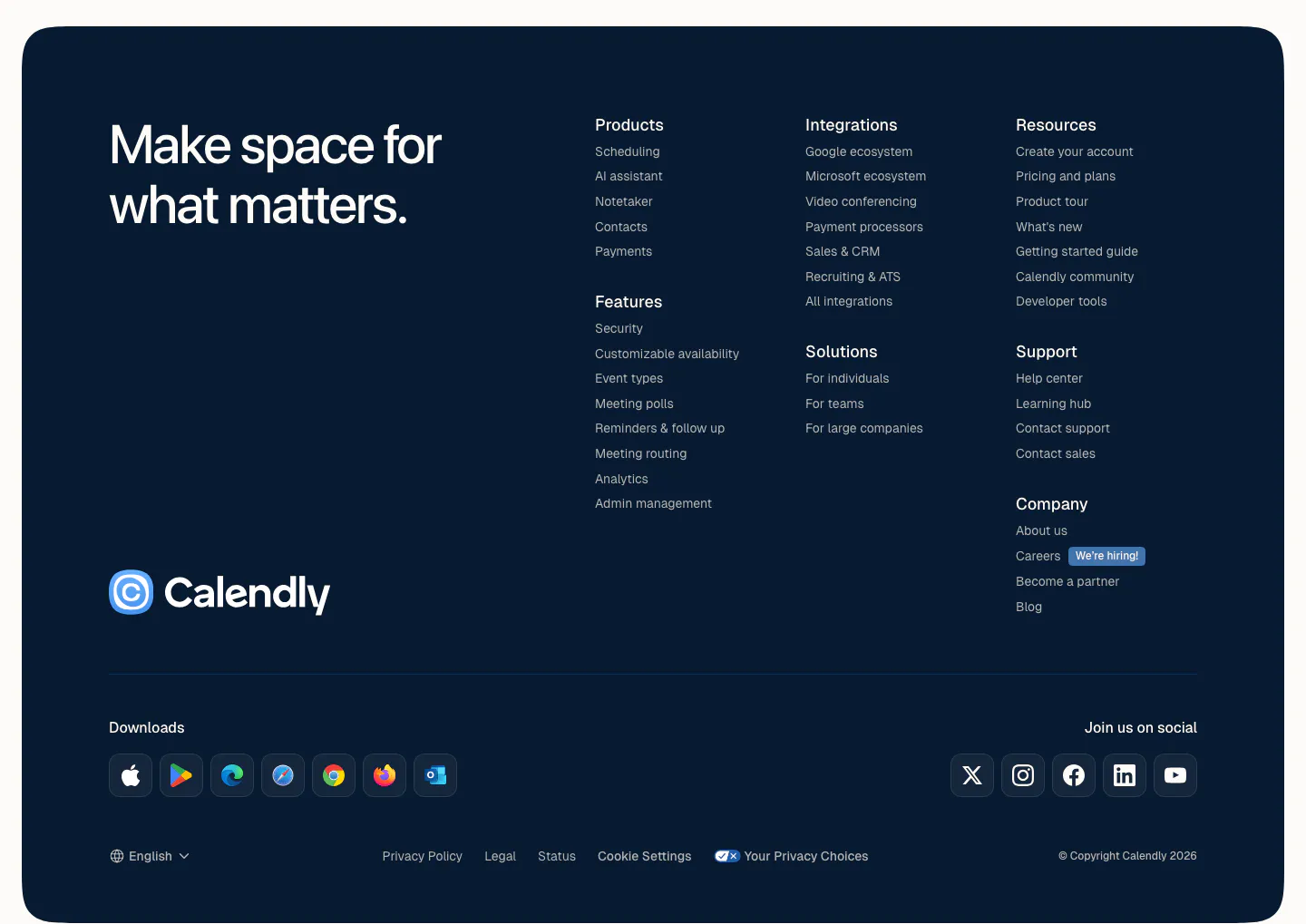
  73. Calendly footer section: rounded dark navy panel with a large tagline, logo, link columns, app download icons and social buttons
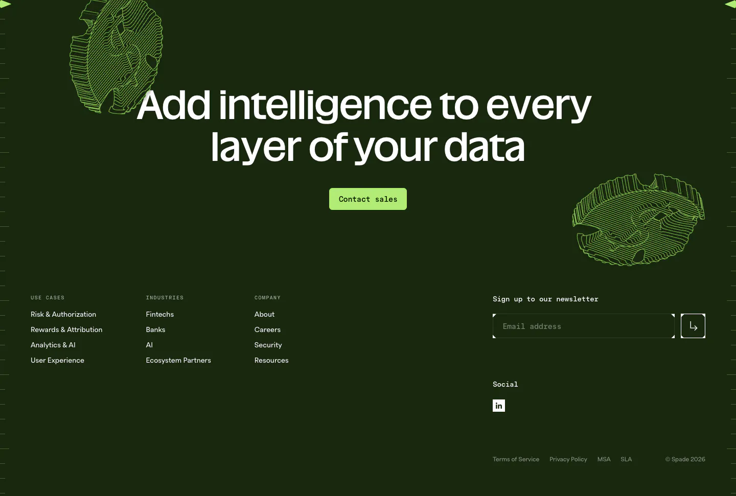
  74. Spade footer section: dark green CTA with centered headline, green button and line-art coins above link columns and a newsletter email field
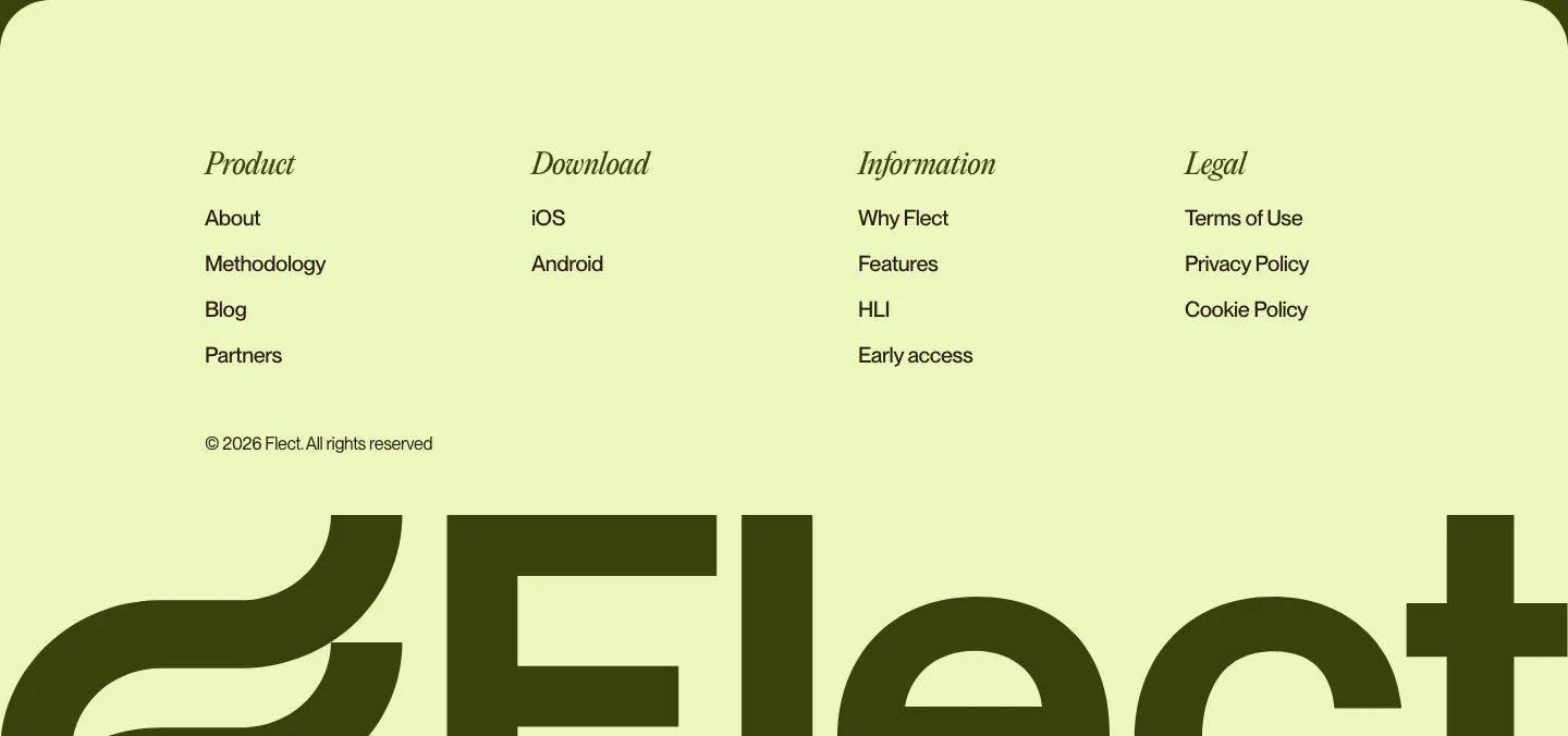
  75. Flect footer section: italic serif column headings and links above a giant cropped Flect wordmark on a pale lime background
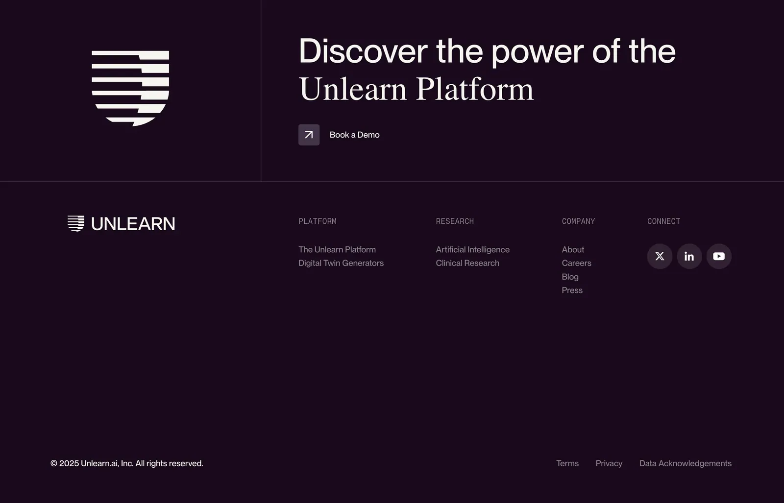
  76. Unlearn footer section: logo mark and mixed sans/serif CTA headline with demo link above link columns and social icons on dark plum
    Unlearn
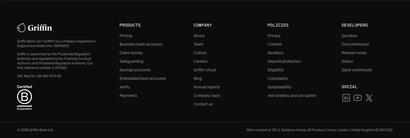
  77. Griffin footer section: dark footer with logo, legal text, B Corp badge, four link columns and social icons
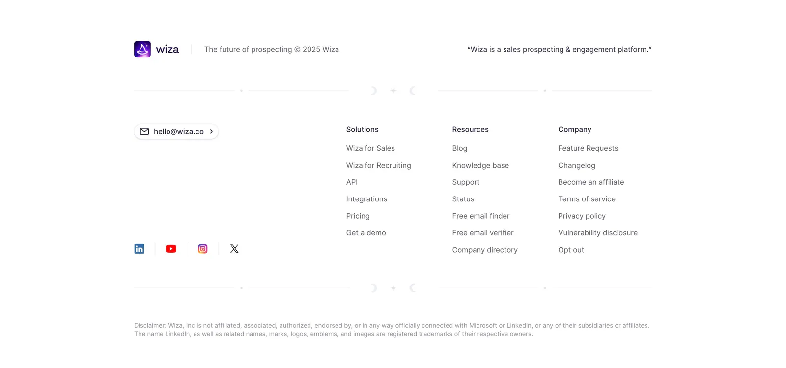
  78. Wiza footer section: logo and tagline above three link columns, email button and social icons on a white background
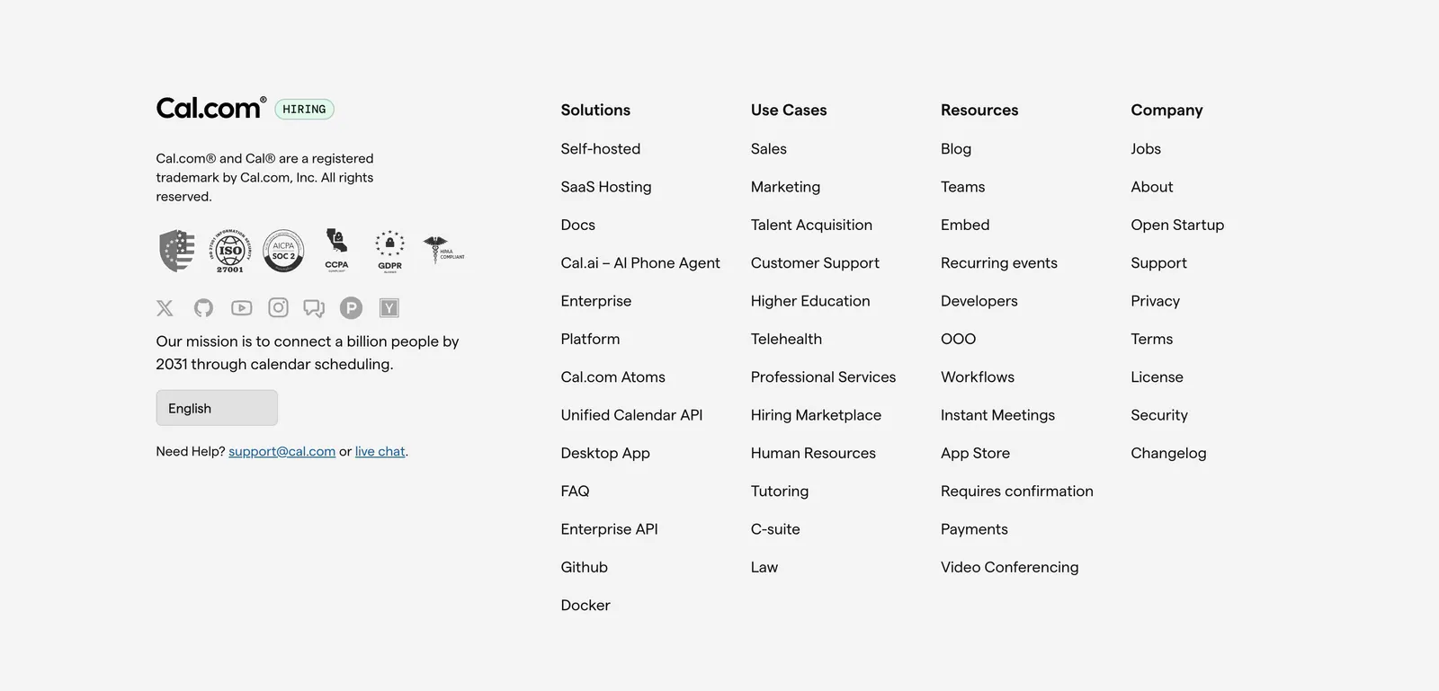
  79. Cal.com footer section: logo, compliance badges, social icons and language selector beside four link columns on light gray
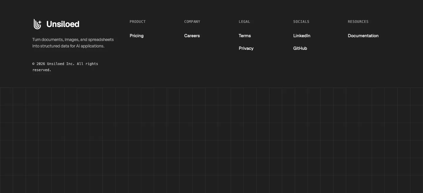
  80. Unsiloed footer section: logo and tagline with Product, Company, Legal, Socials and Resources columns above a grid-line pattern on charcoal
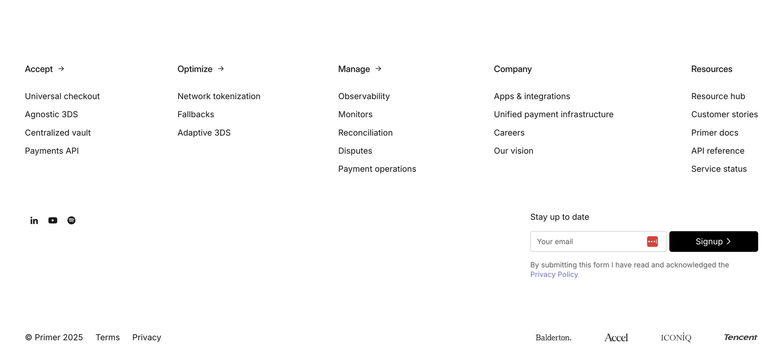
  81. Primer footer section: five link columns, social icons, email signup field and investor logos on a plain white background
  82. Palette footer section: logo, tagline and copyright on the left with Product, Company and Socials link columns on a near-black background
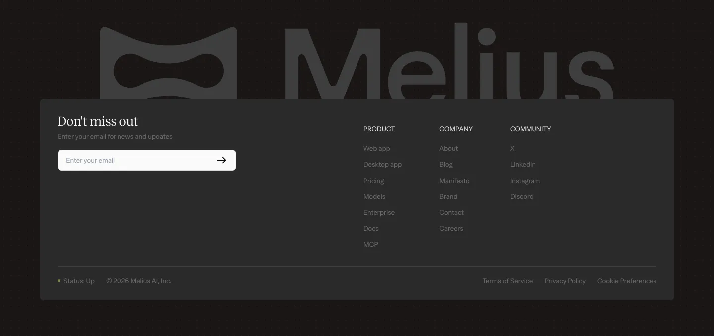
  83. Melius footer section: large gray Melius wordmark behind a dark card with email signup field, three link columns and legal row
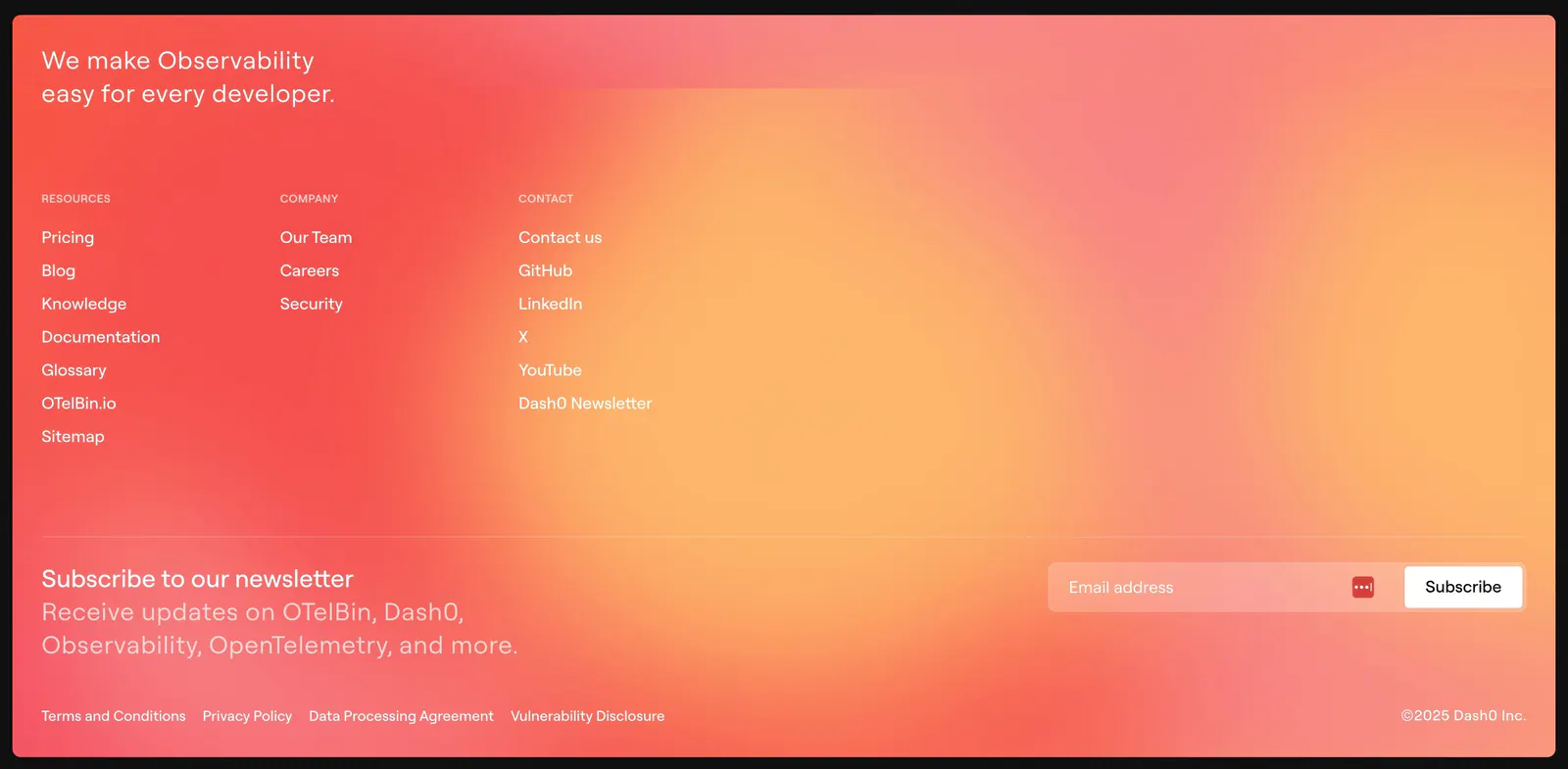
  84. Dash0 footer section: link columns and a newsletter email field over a warm coral-to-orange gradient background
  85. Bayshore footer section: single row with copyright left, small logo mark centered and text links right on warm off-white
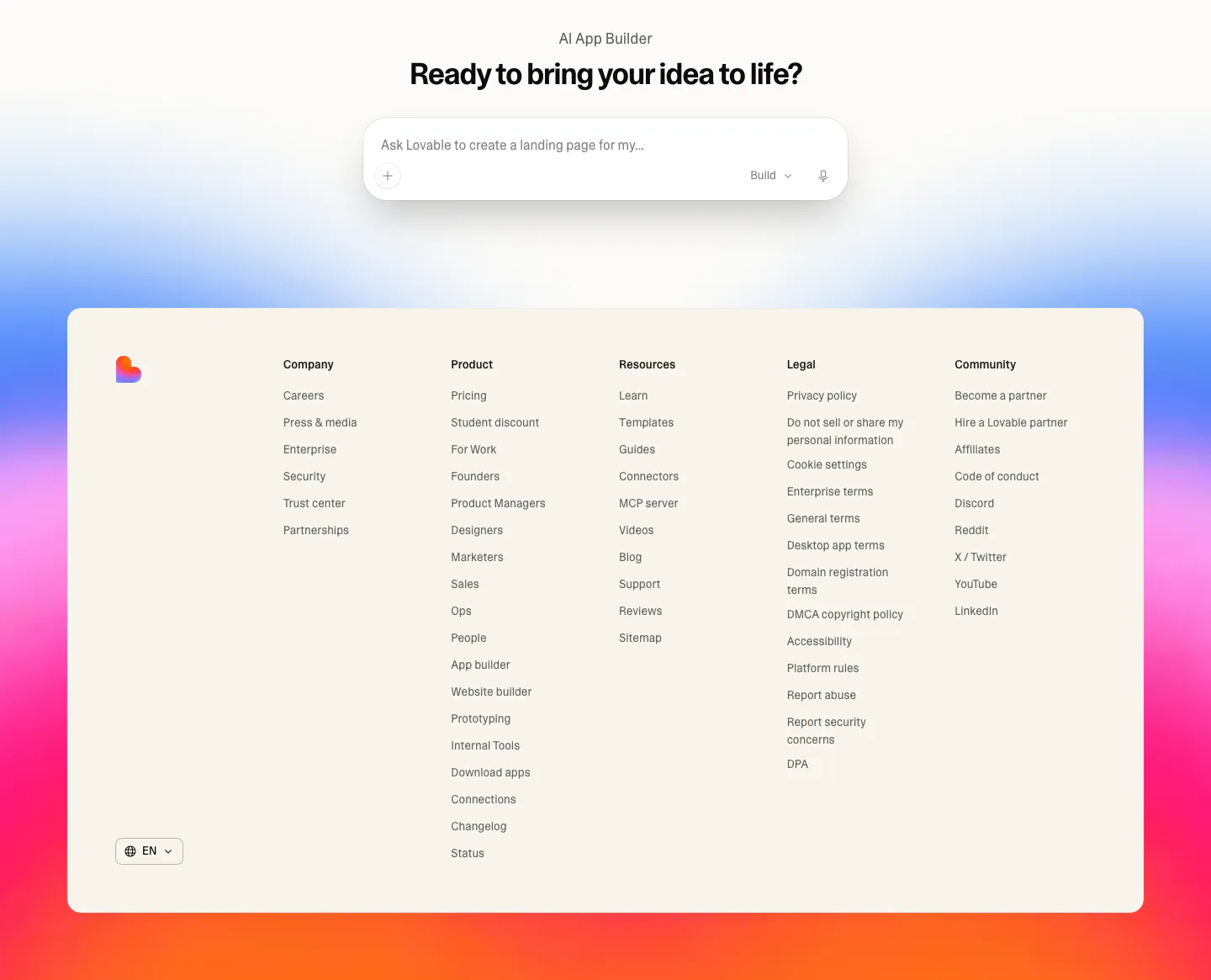
  86. Lovable footer section: centered prompt input CTA above a cream footer card with five link columns, set on a blue, pink and orange gradient
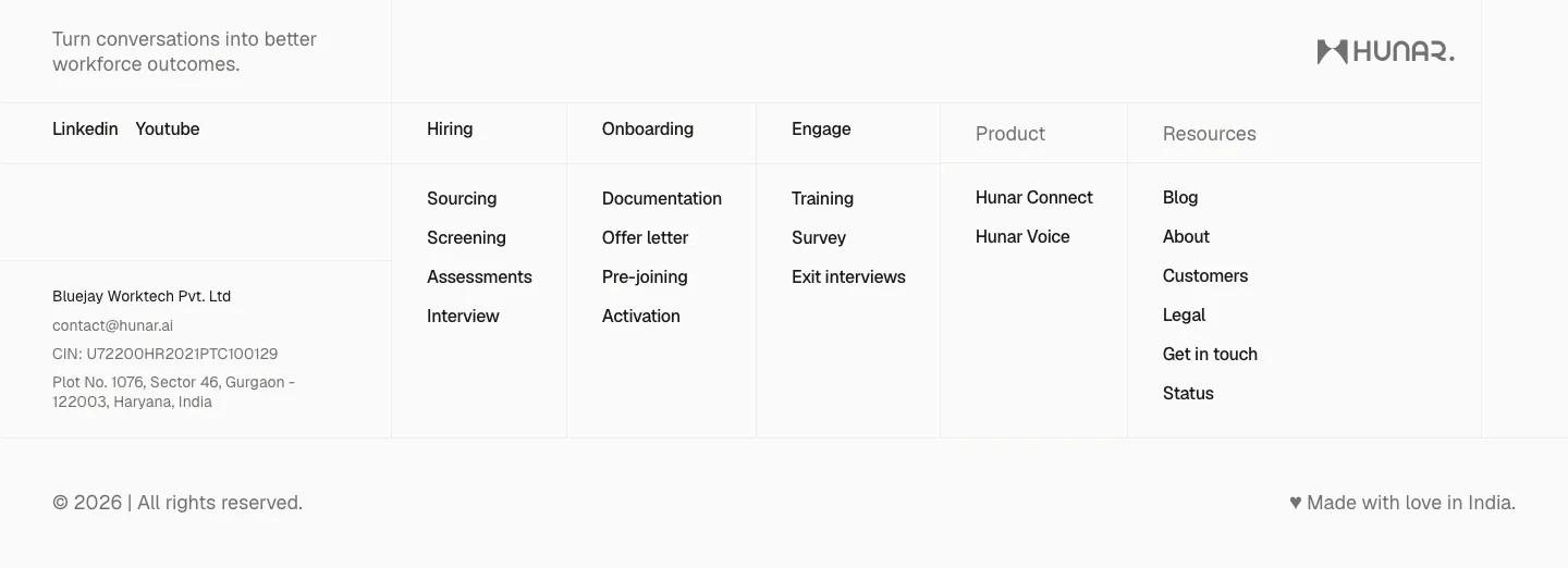
  87. Hunar footer section: light grid footer with tagline, social links, company address and link columns beside the Hunar wordmark
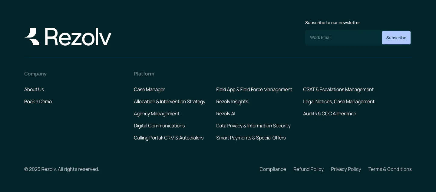
  88. Rezolv footer section: wordmark and newsletter email field above company and platform link columns on a dark teal background
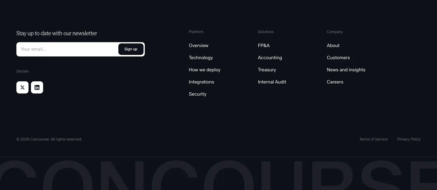
  89. Concourse footer section: newsletter email field and social icons left, link columns right, cut-off Concourse wordmark below on dark
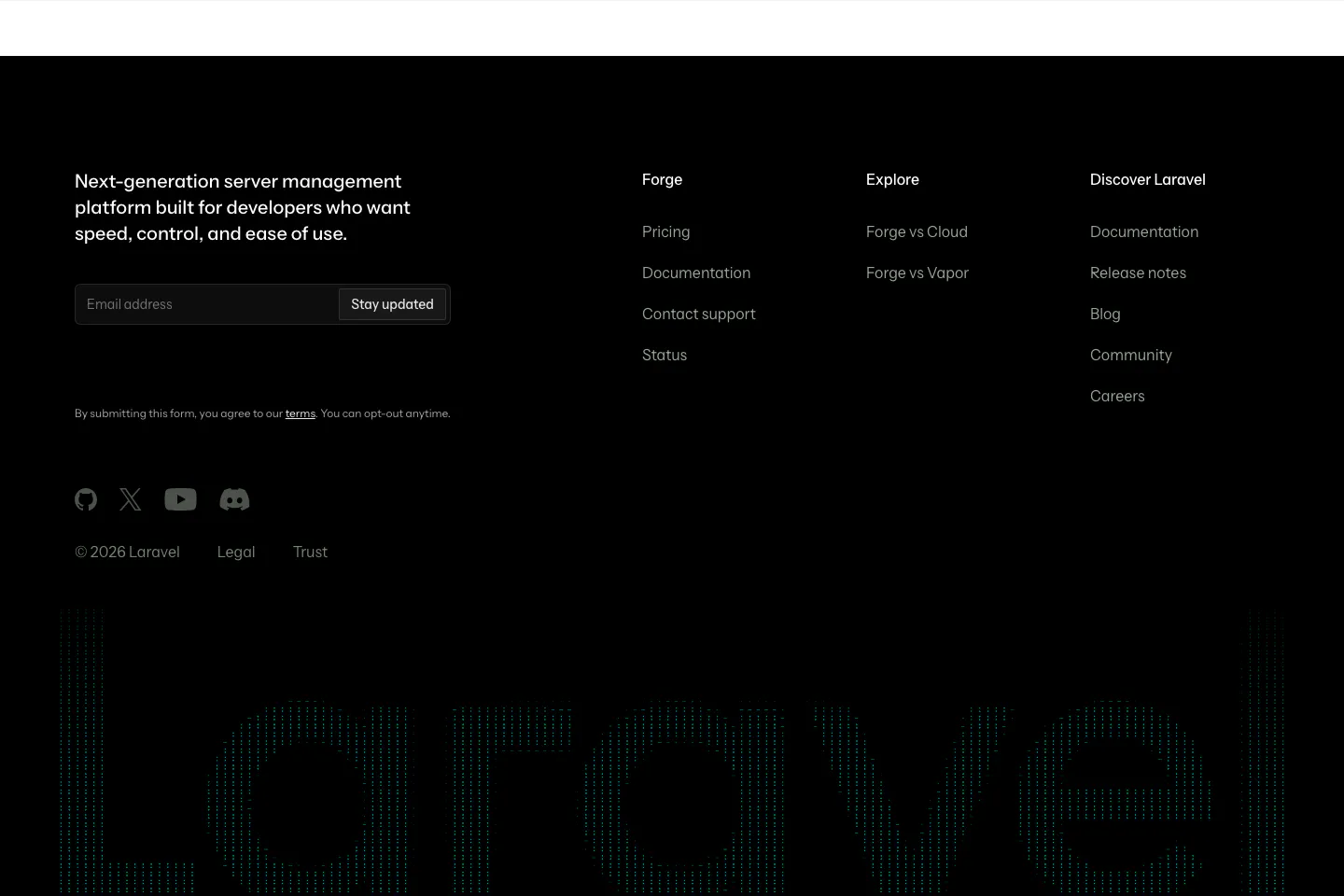
  90. Laravel Forge footer section: dark footer with email signup, link columns, social icons and a huge dithered Laravel wordmark
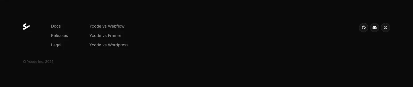
  91. Ycode footer section: small logo, two short link columns, social icon buttons and copyright line on a black background
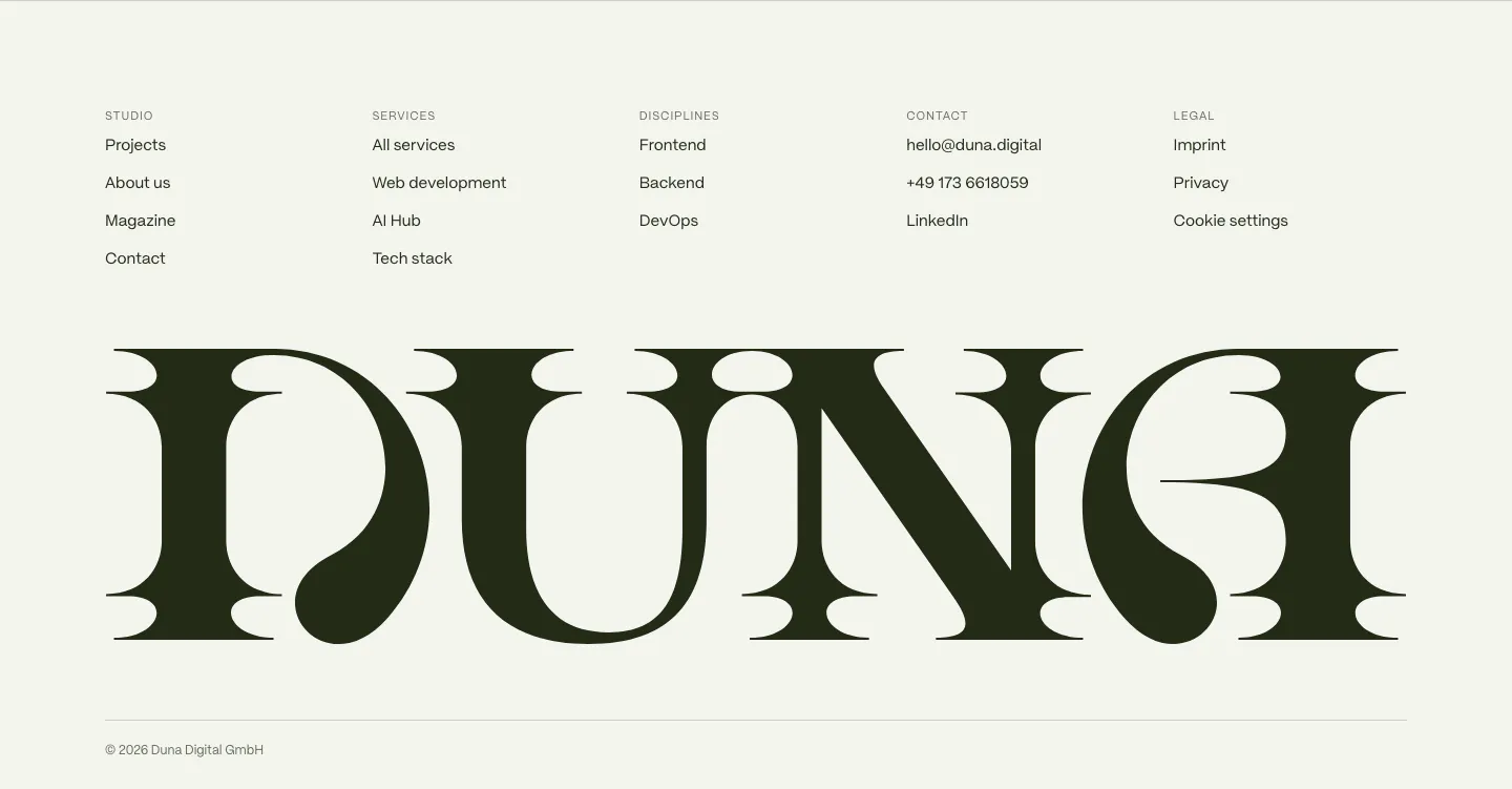
  92. DUNA footer section: five link columns above a giant dark serif DUNA wordmark and copyright line on off-white
  93. Arke footer section: full-width grayscale halftone painting of angels crowning a figure with the wordmark and small legal links along the bottom
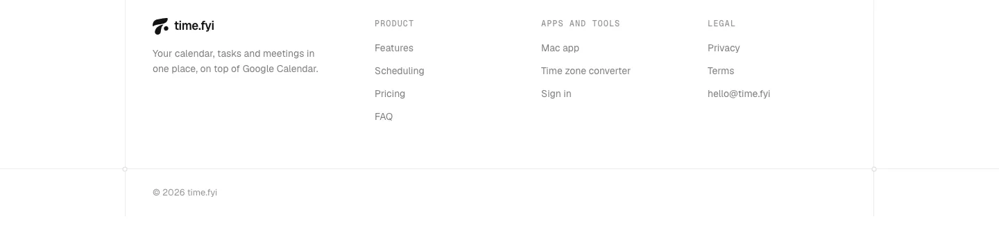
  94. time.fyi footer section: logo and tagline beside Product, Apps and tools, and Legal link columns with a copyright line on white
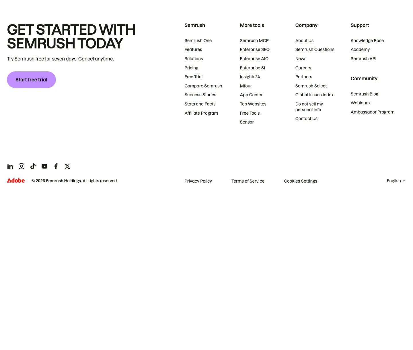
  95. Semrush footer section: uppercase signup headline with purple trial button beside four link columns, social icons and copyright row
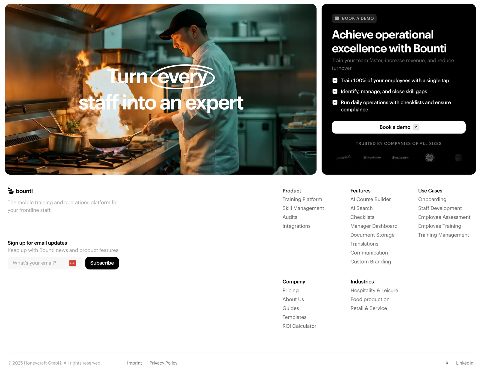
  96. Bounti footer section: kitchen photo card and black demo card with checklist above a white footer with email signup and link columns
  97. Endex footer section: serif CTA headline with two buttons, teal pixel-grid strip, link rows and a huge faded Endex wordmark on dark green
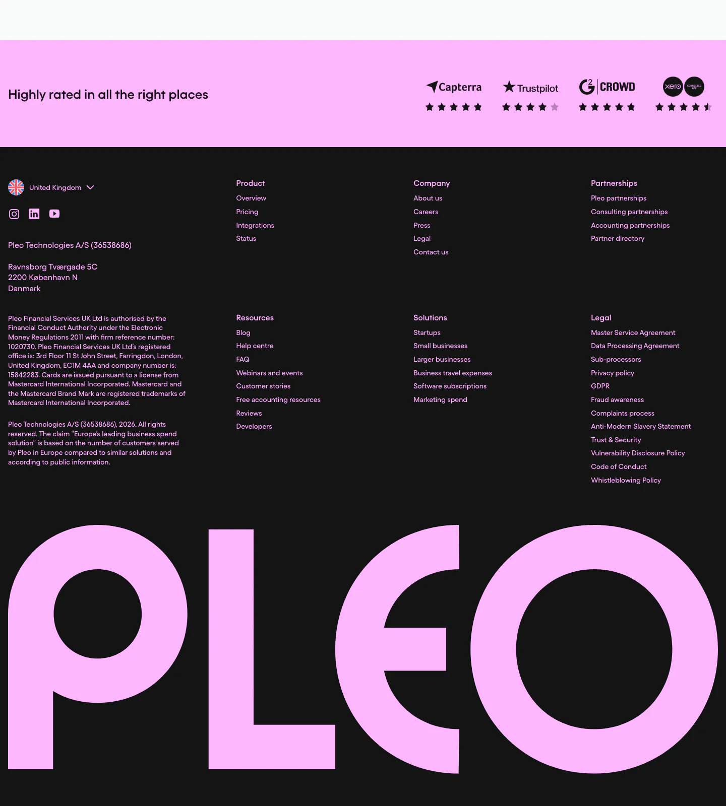
  98. Pleo footer section: pink review-ratings strip above dark link columns, legal text and a giant pink Pleo wordmark
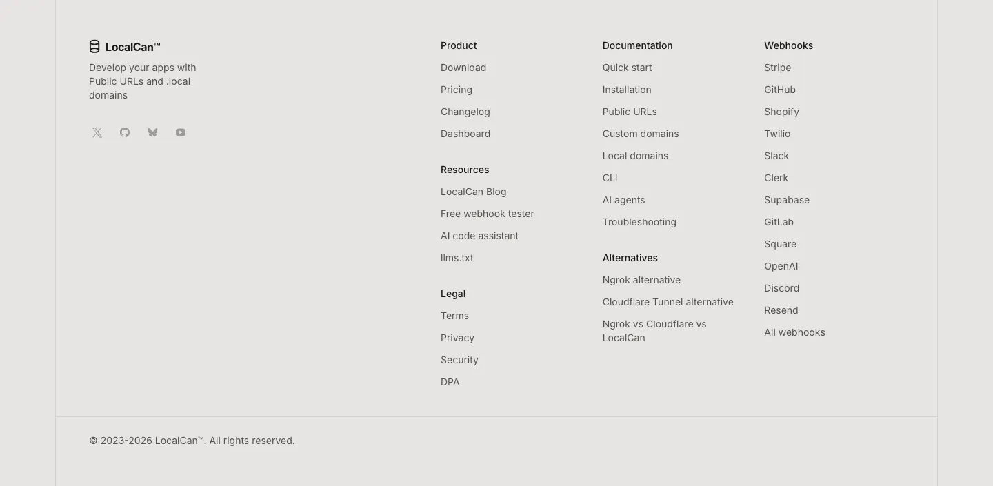
  99. LocalCan footer section: logo, tagline and social icons on the left, link columns for product, docs, alternatives and webhooks, copyright row
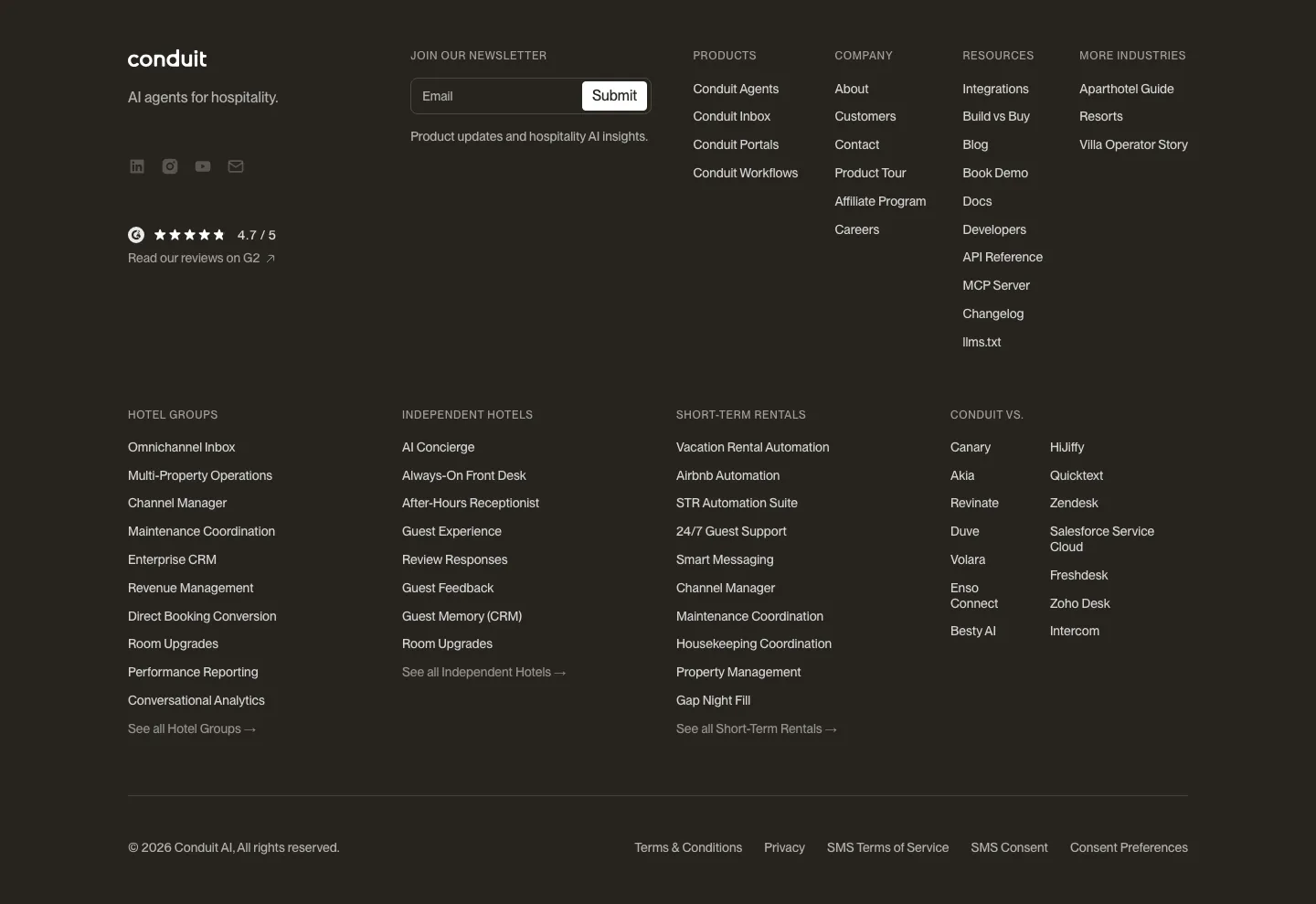
  100. Conduit footer section: dark brown footer with newsletter field, G2 rating and dense multi-column link lists
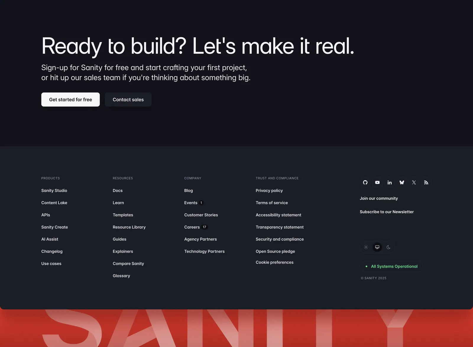
  101. Sanity footer section: CTA headline with two buttons above link columns and social icons on charcoal, with a giant red SANITY wordmark
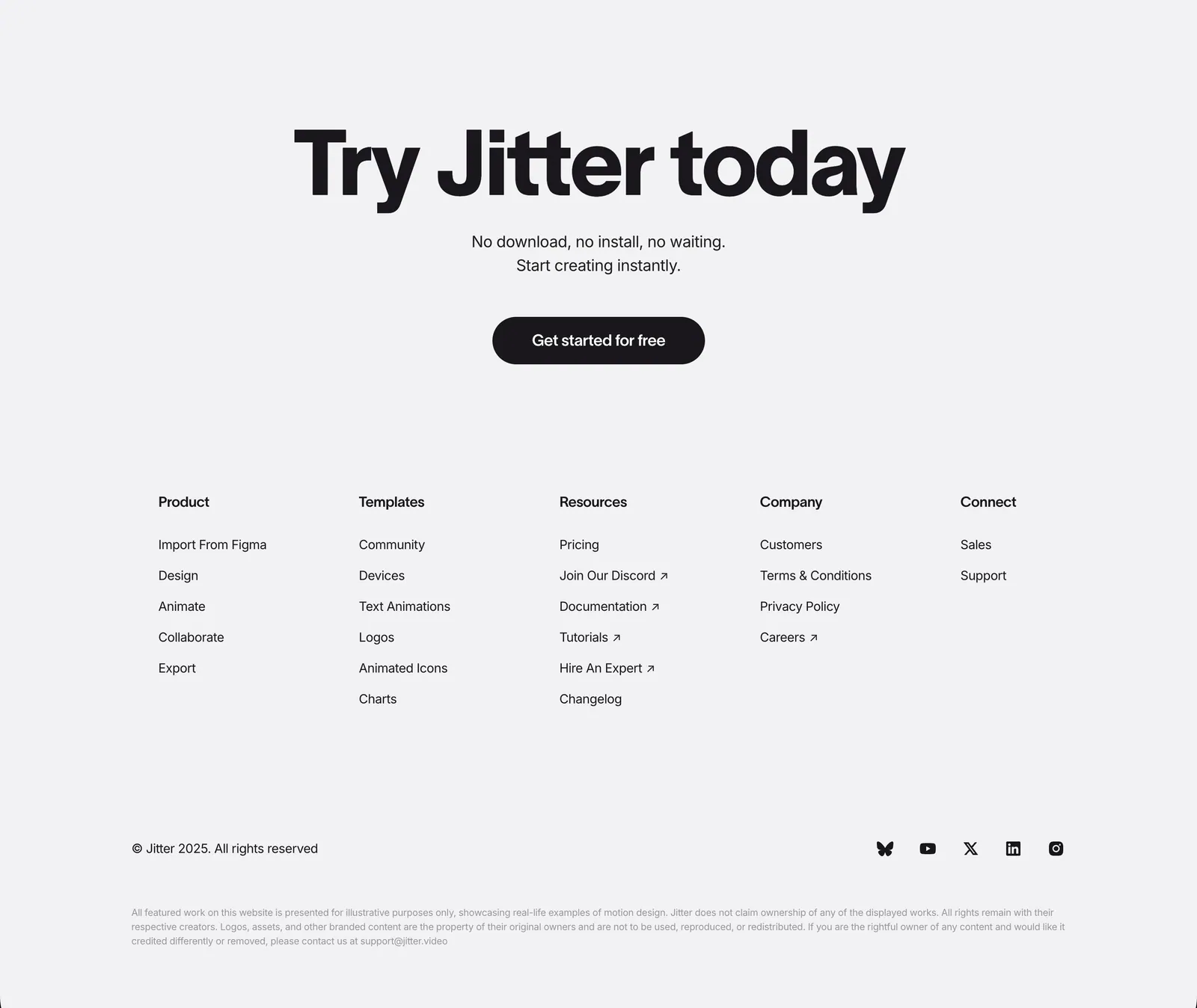
  102. Jitter footer section: large centered CTA headline and button above five link columns, copyright and social icons on light gray
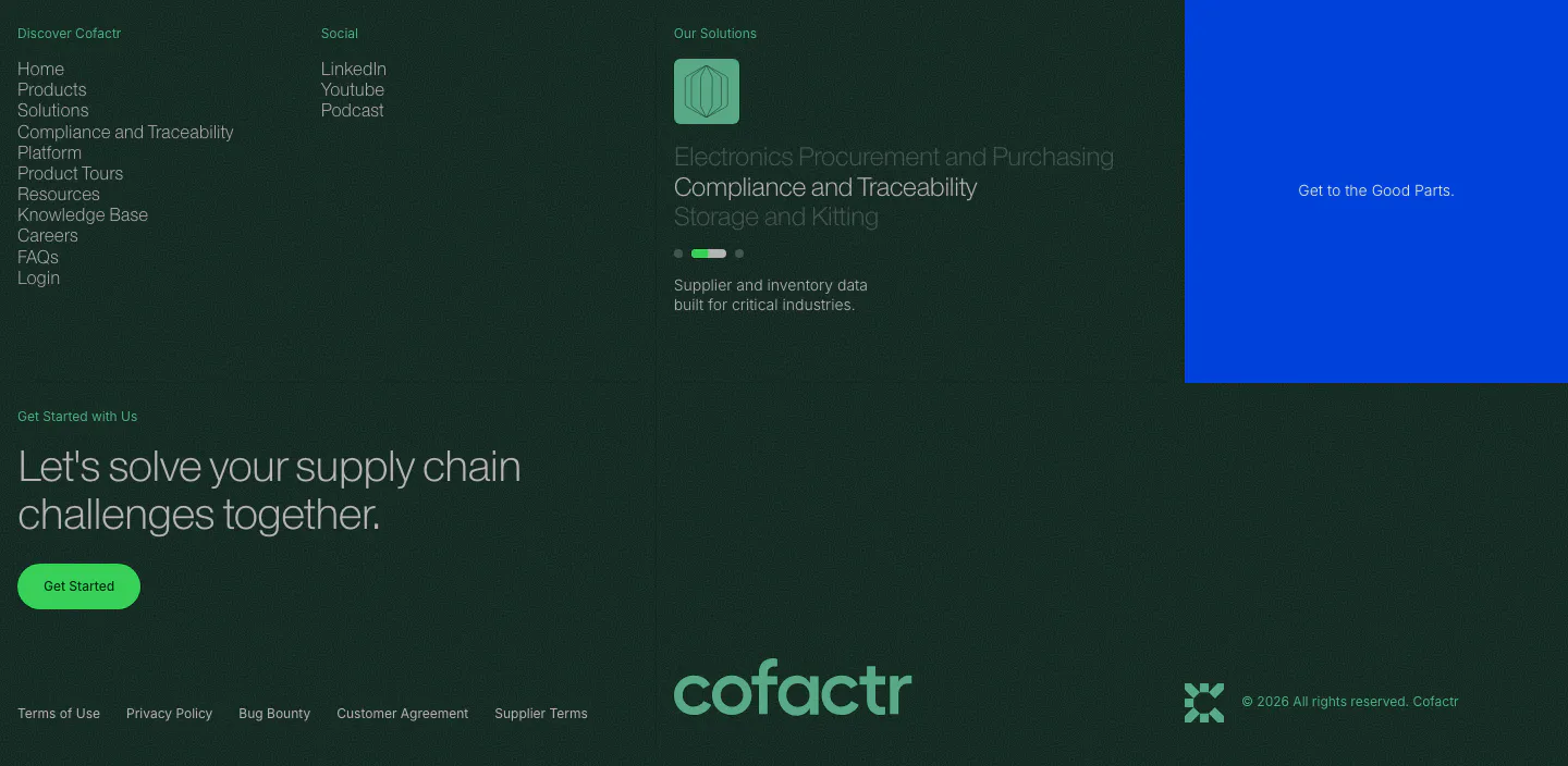
  103. Cofactr footer section: dark green link columns, solutions slider, blue promo block, Get Started CTA and a green cofactr wordmark
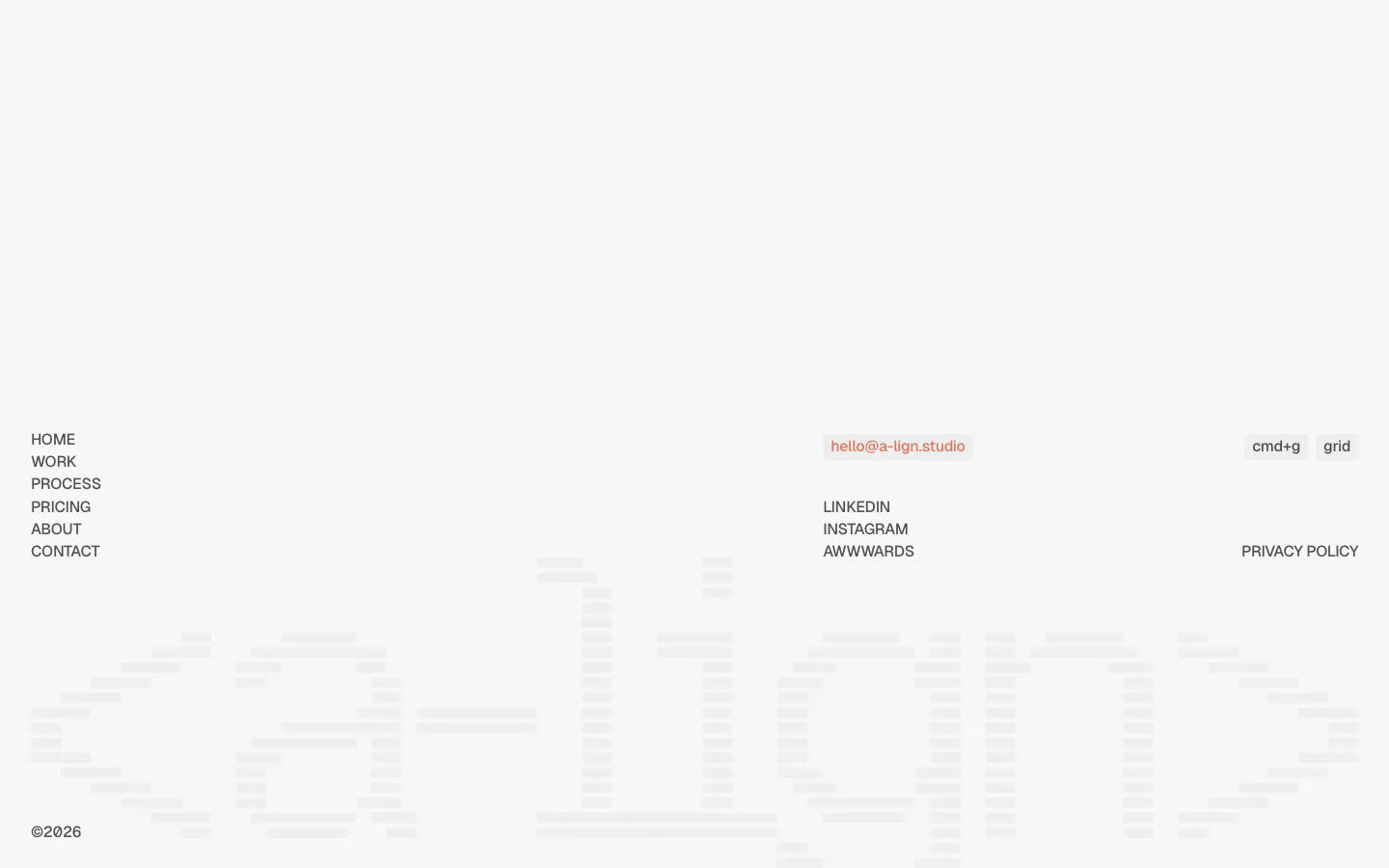
  104. A-LIGN footer section: link list, email pill and social links above a faint full-width striped a-lign wordmark on light gray
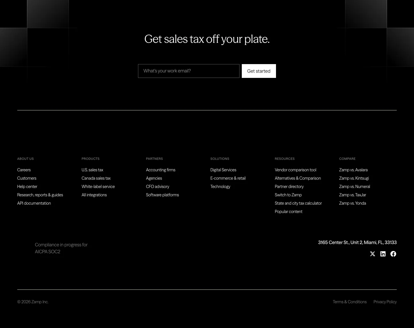
  105. Zamp footer section: black footer with centered headline and email field above six link columns, address and social icons
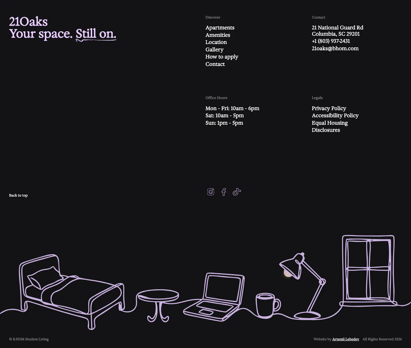
  106. 21Oaks footer section: dark background with serif wordmark, link and contact columns, and a lavender line drawing of a room
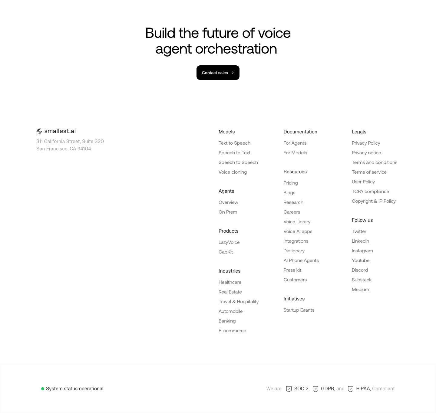
  107. Smallest.ai footer section: centered CTA headline and Contact sales button above logo, address, link column groups and a status bar
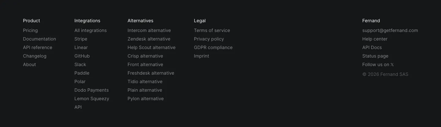
  108. Fernand footer section: five link columns with contact email and copyright on a near-black background
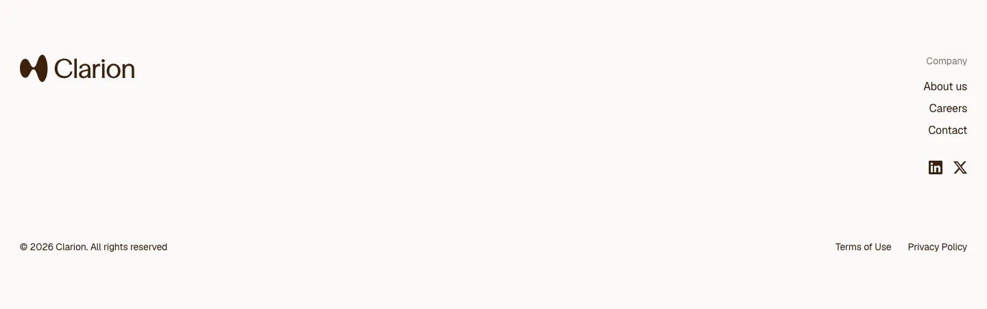
  109. Clarion footer section: light footer with logo at left, company links and social icons at right, and a copyright line
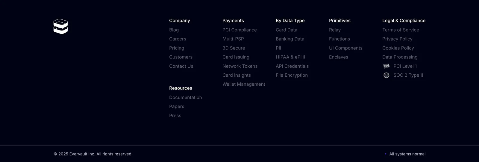
  110. Evervault footer section: logo at left with five link columns, compliance badges and copyright line on a near-black navy background
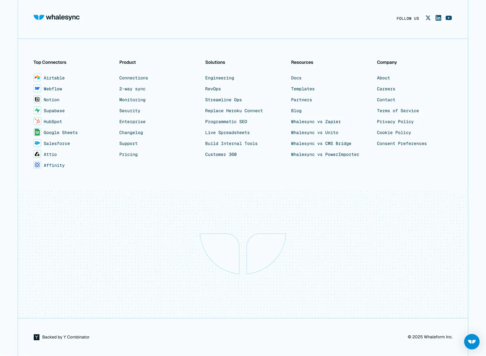
  111. Whalesync footer section: logo and five monospace link columns with connector icons above a dot-grid outlined logo on pale blue
  112. Cloudflare Agents footer section: orange headline and buttons over line-drawn clouds, a terms link and chat bubble illustrations
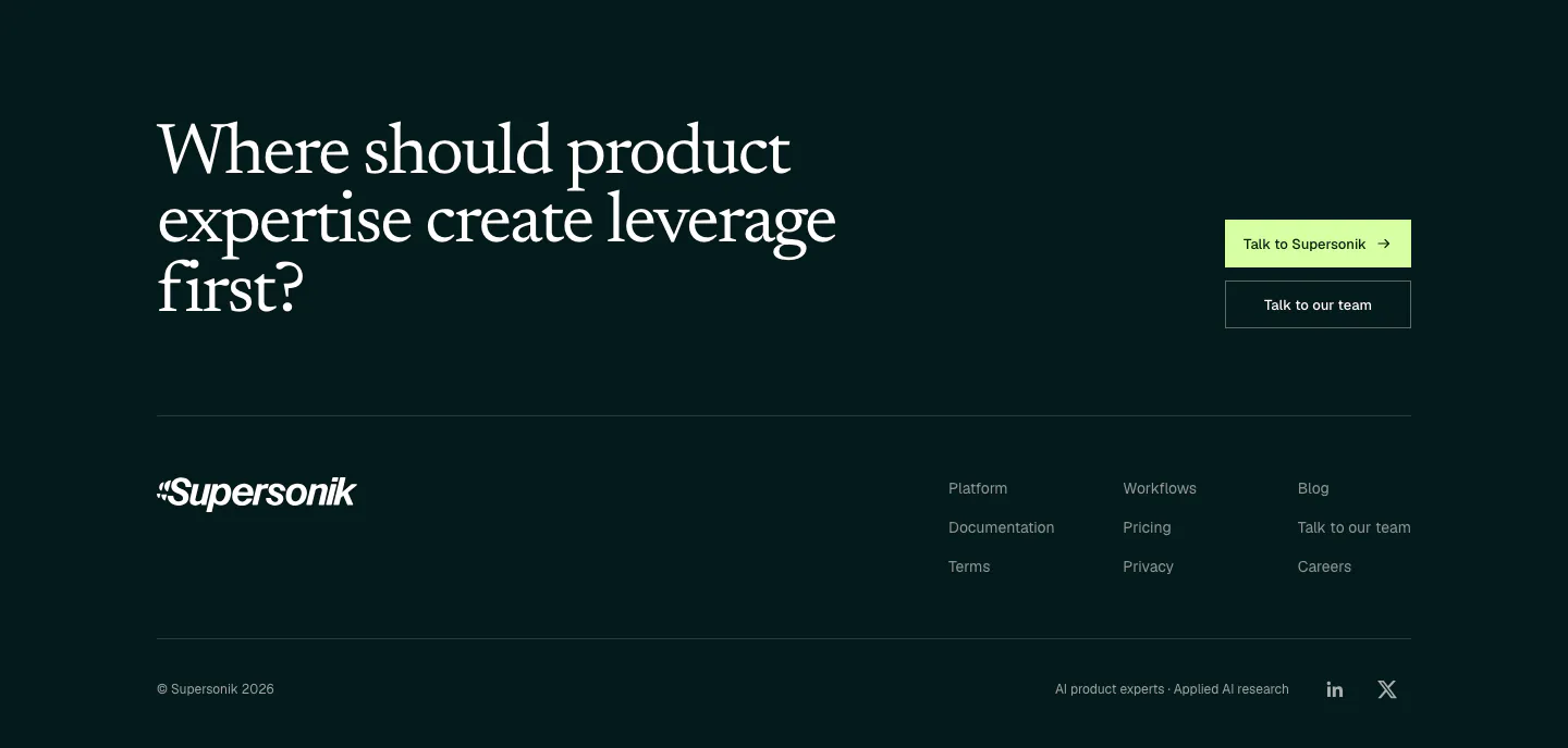
  113. Supersonik footer section: large serif question with two CTA buttons above a wordmark, three link columns and copyright on dark teal
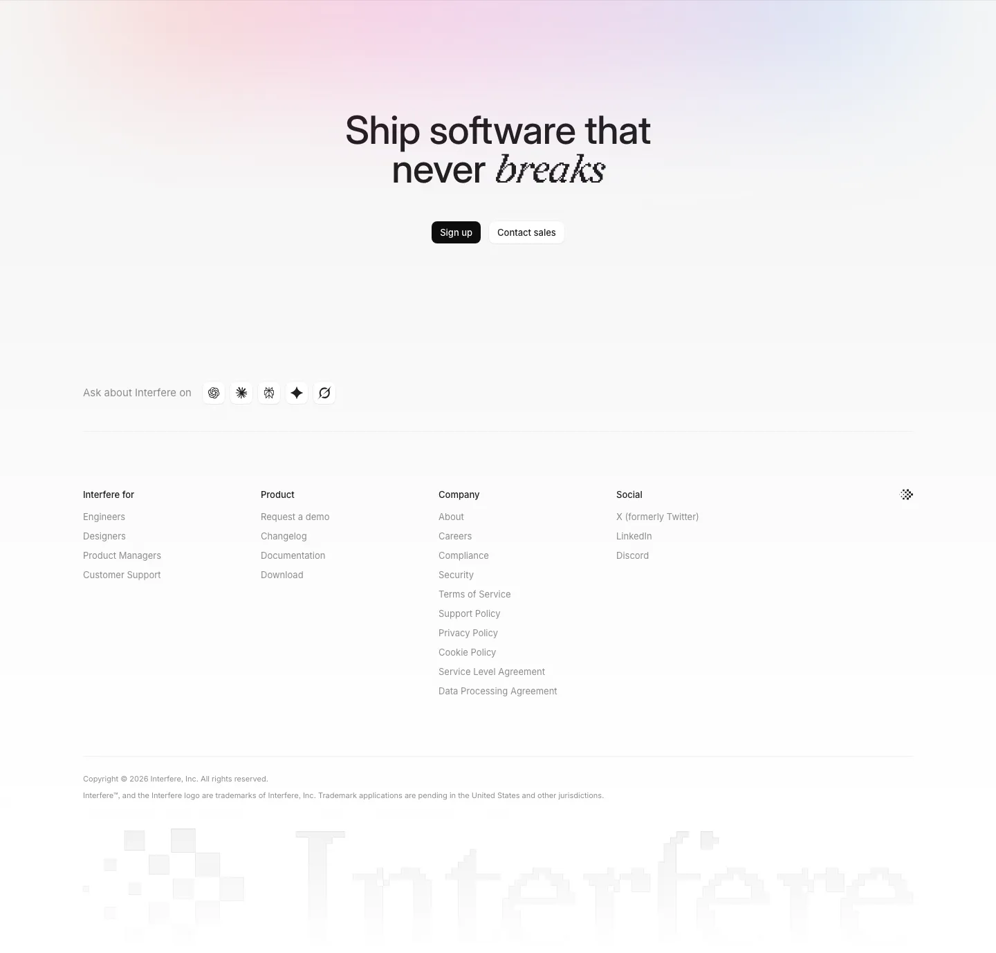
  114. Interfere footer section: centered closing headline with buttons, four link columns and a large faded pixel wordmark
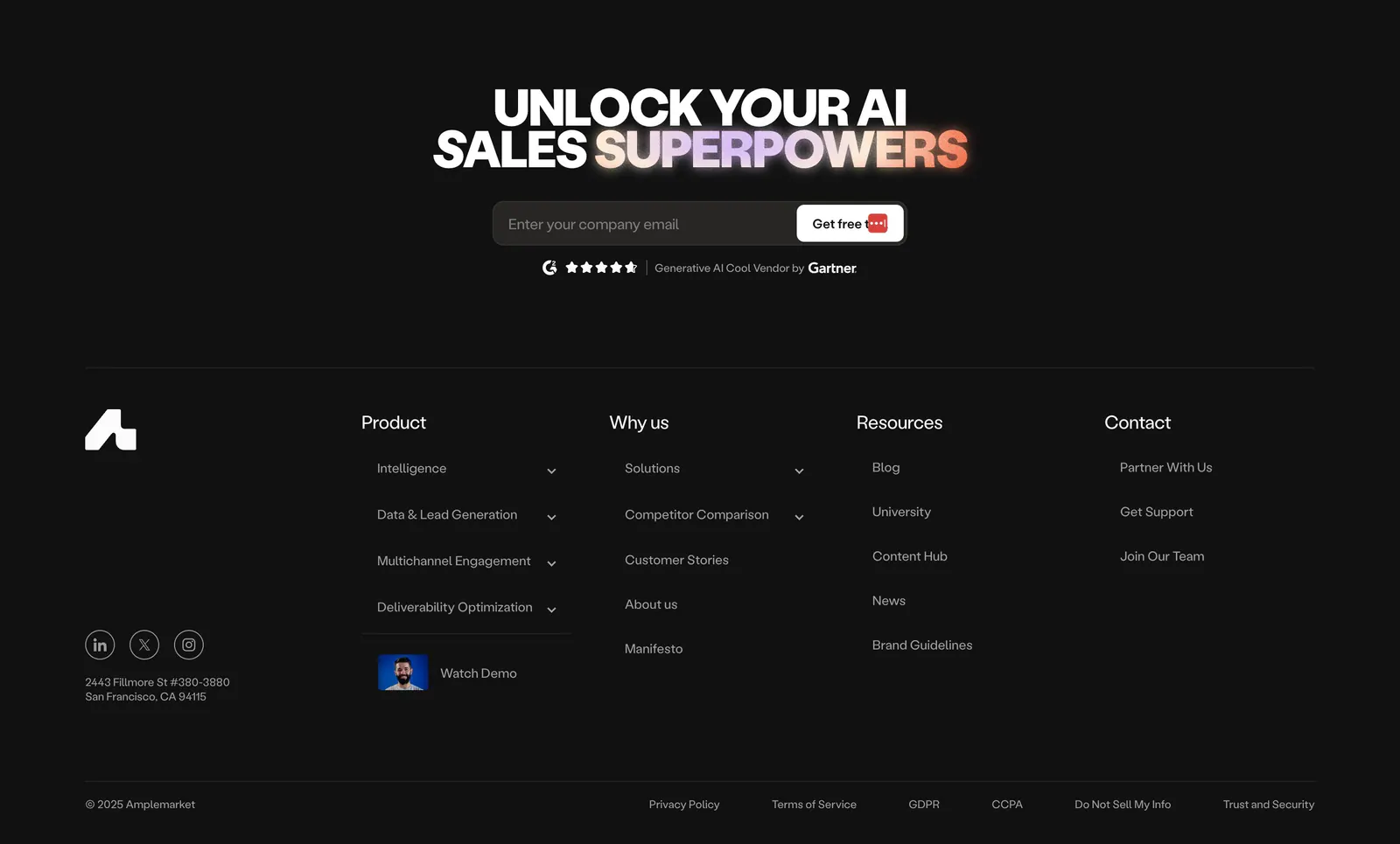
  115. Amplemarket footer section: dark centered headline with gradient text and email field above link columns, socials and legal row
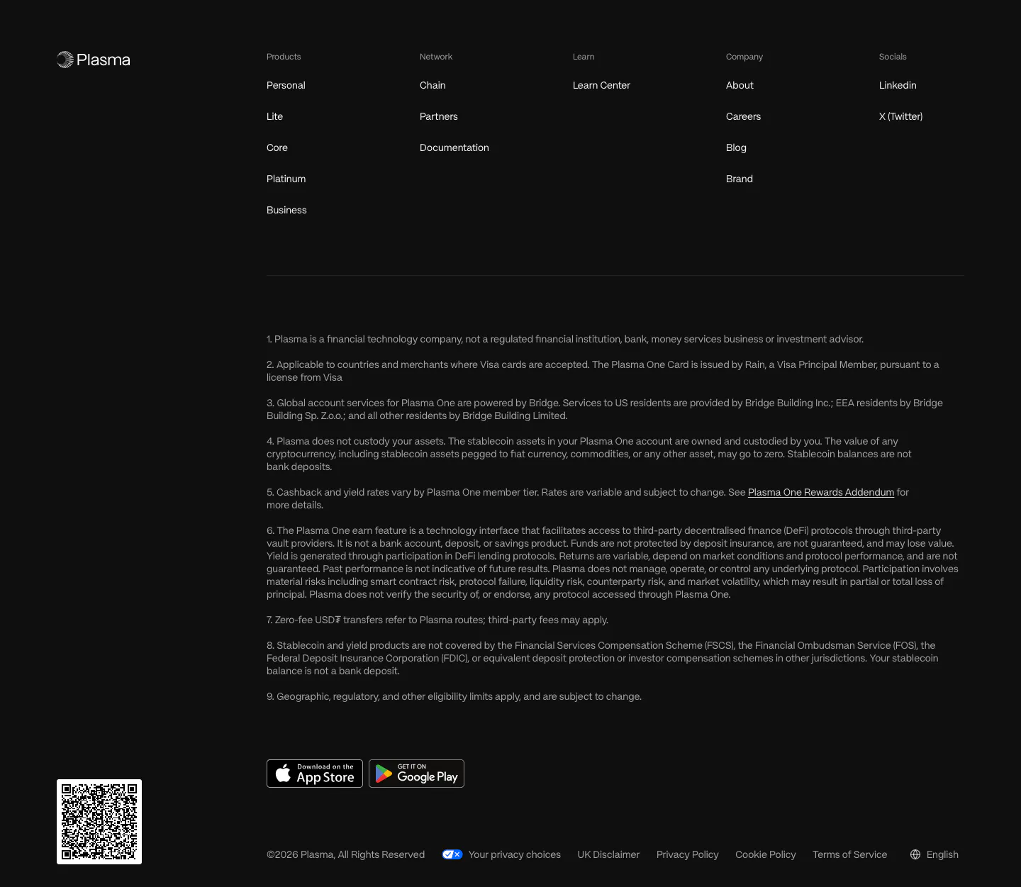
  116. Plasma footer section: logo, five link columns, numbered legal disclosures, app store badges and a QR code on near-black
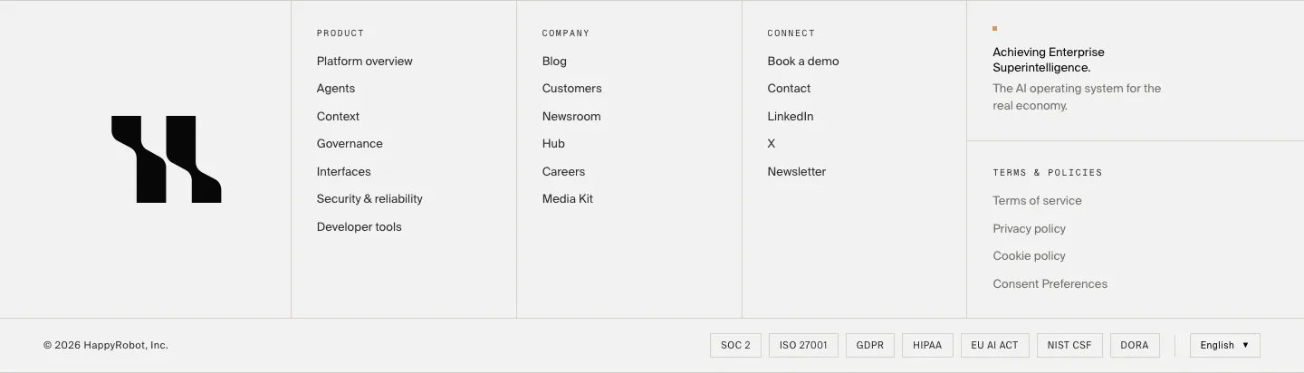
  117. HappyRobot footer section: large black logo mark, three link columns, tagline and policy links, compliance badge row and copyright on light gray
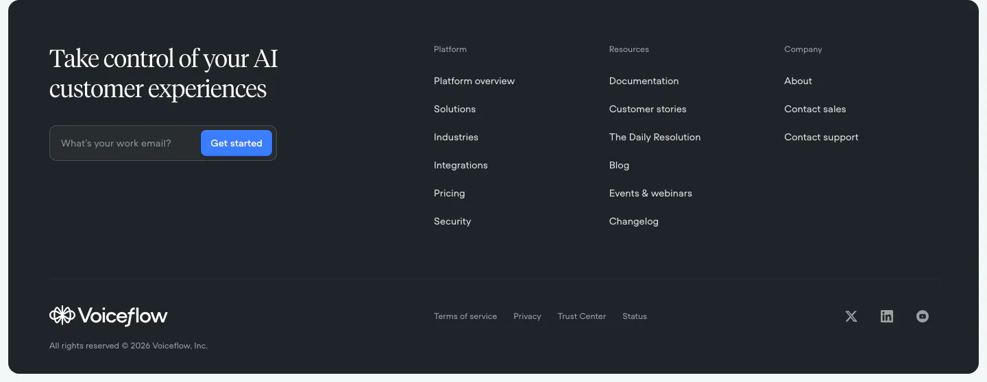
  118. Voiceflow footer section: dark rounded panel with serif headline and email field on the left, three link columns and social icons
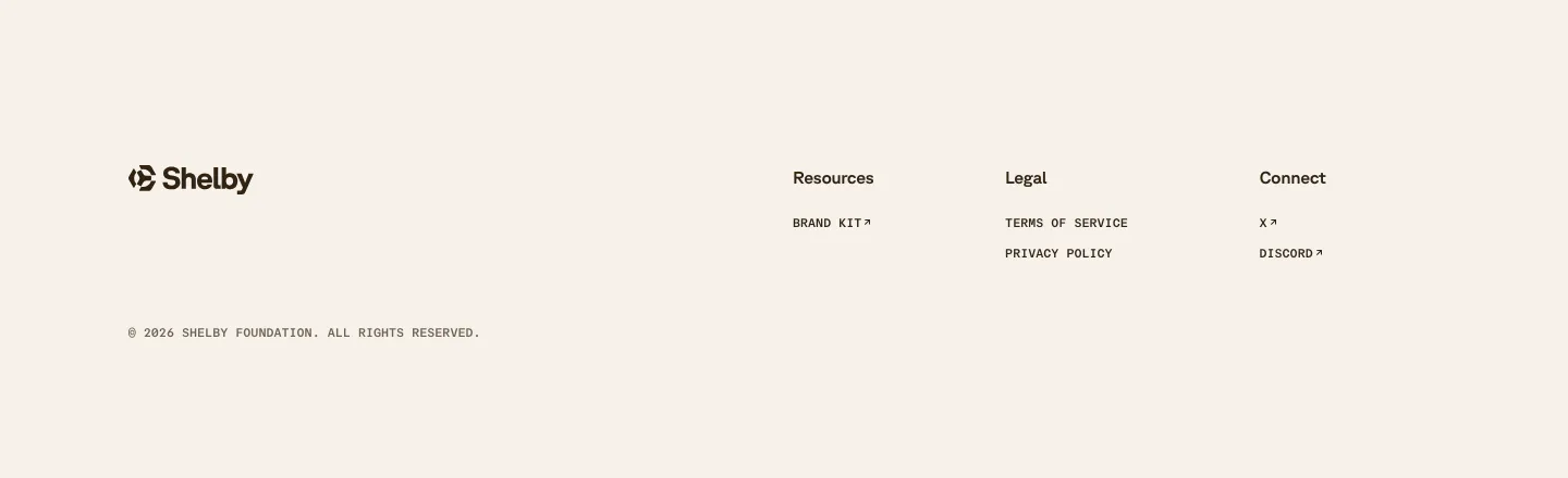
  119. Shelby footer section: logo at left with Resources, Legal and Connect link columns and a copyright line on a cream background
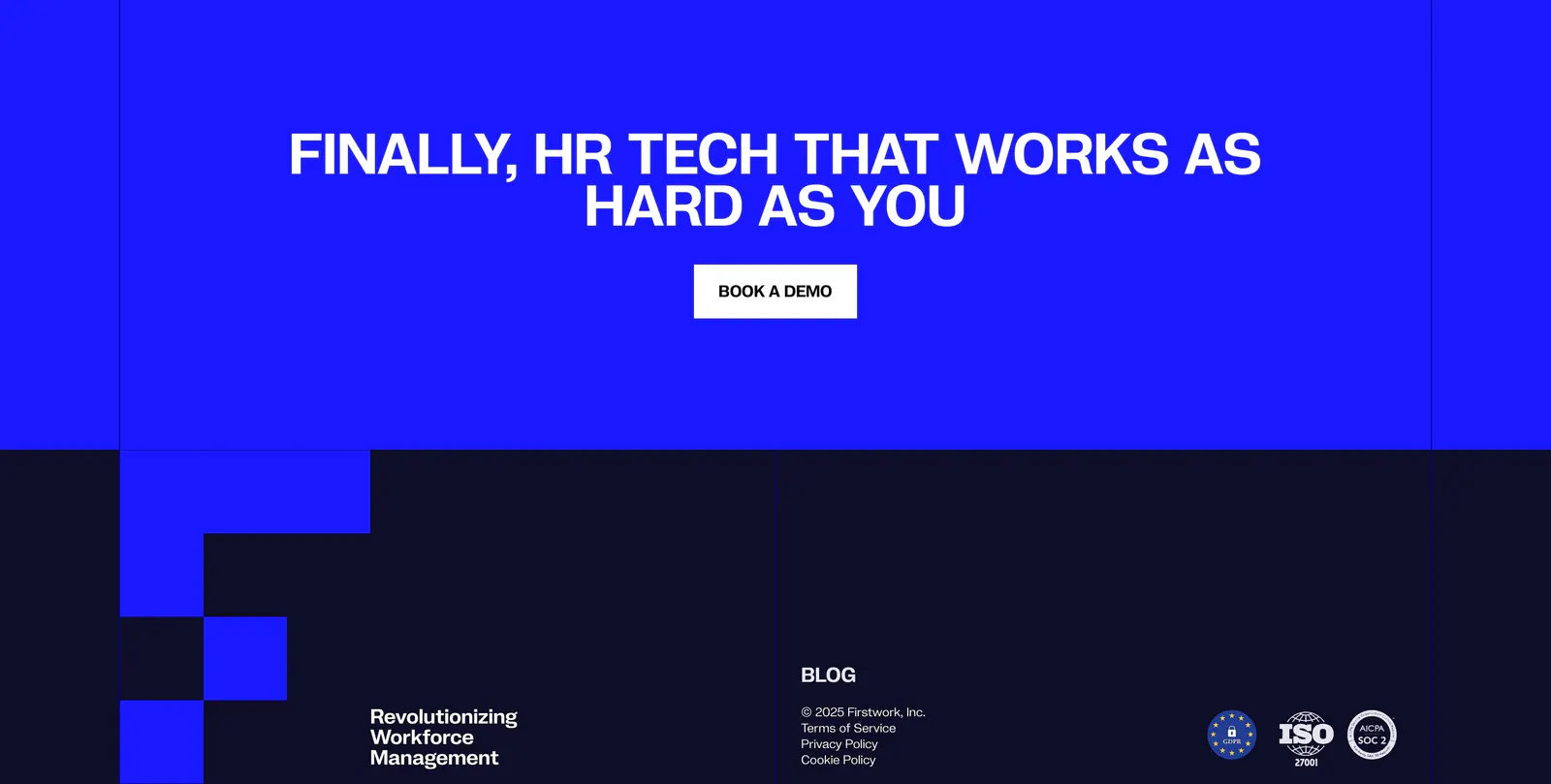
  120. Firstwork footer section: centered uppercase CTA on a bright blue band above a navy footer with pixel-block shapes, legal links and badges
    Firstwork
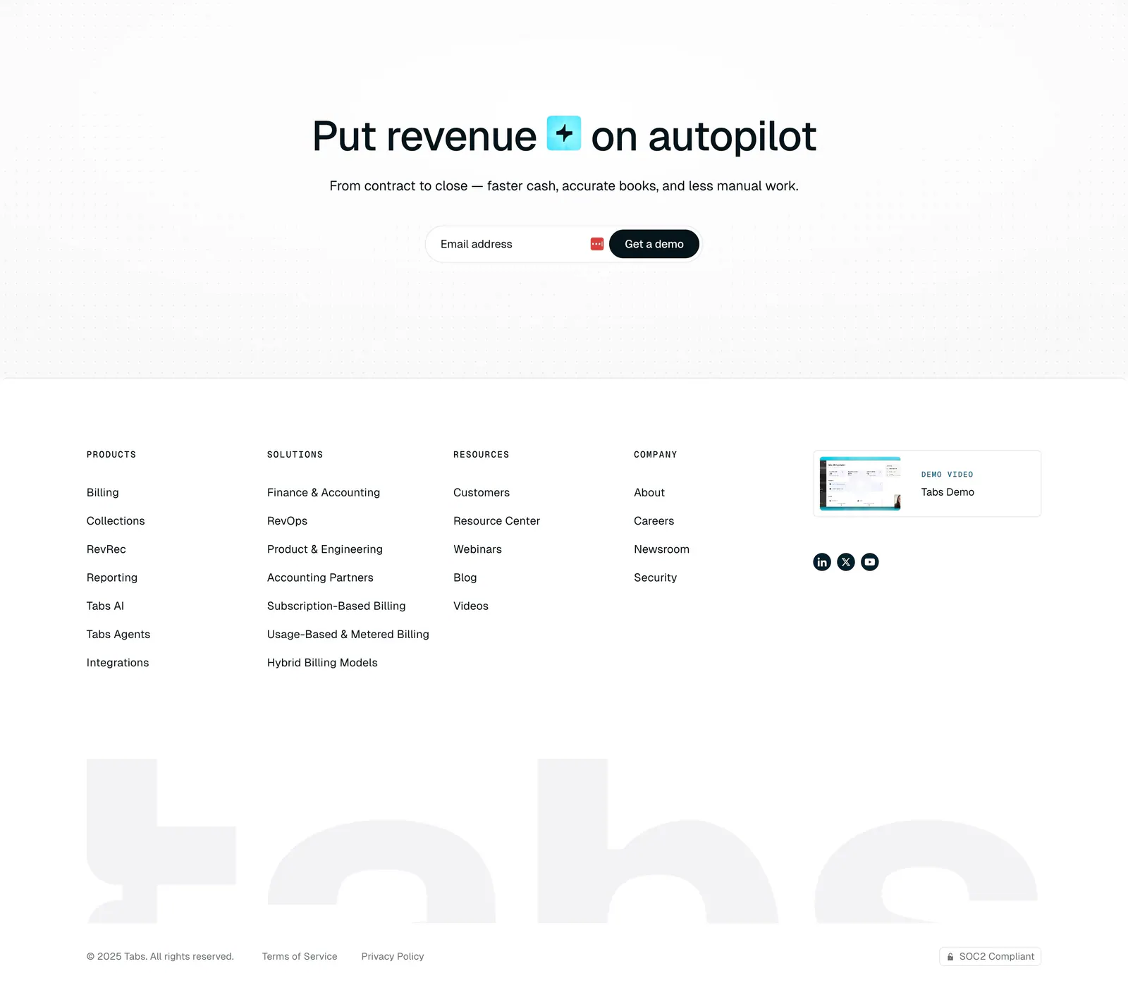
  121. Tabs footer section: centered headline and email demo field on a dot grid, link columns, demo video card and huge faded tabs wordmark
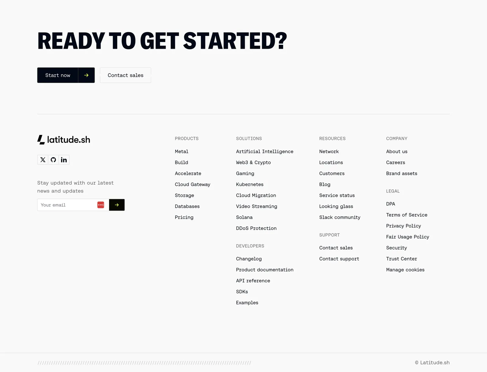
  122. Latitude.sh footer section: large uppercase CTA headline with buttons above logo, email field and link columns on light gray
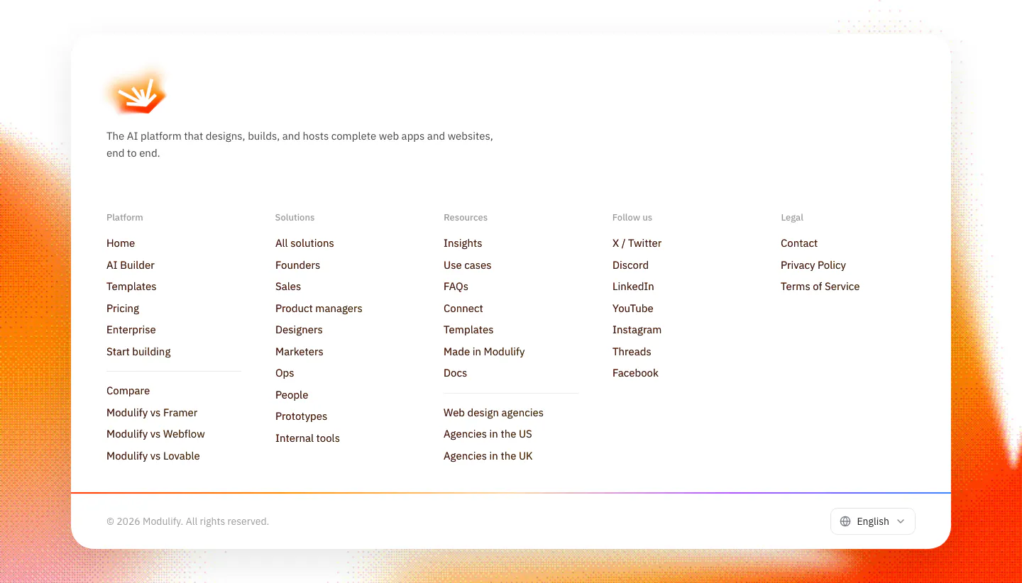
  123. Modulify footer section: white rounded card with logo, five link columns and language picker over grainy orange edges
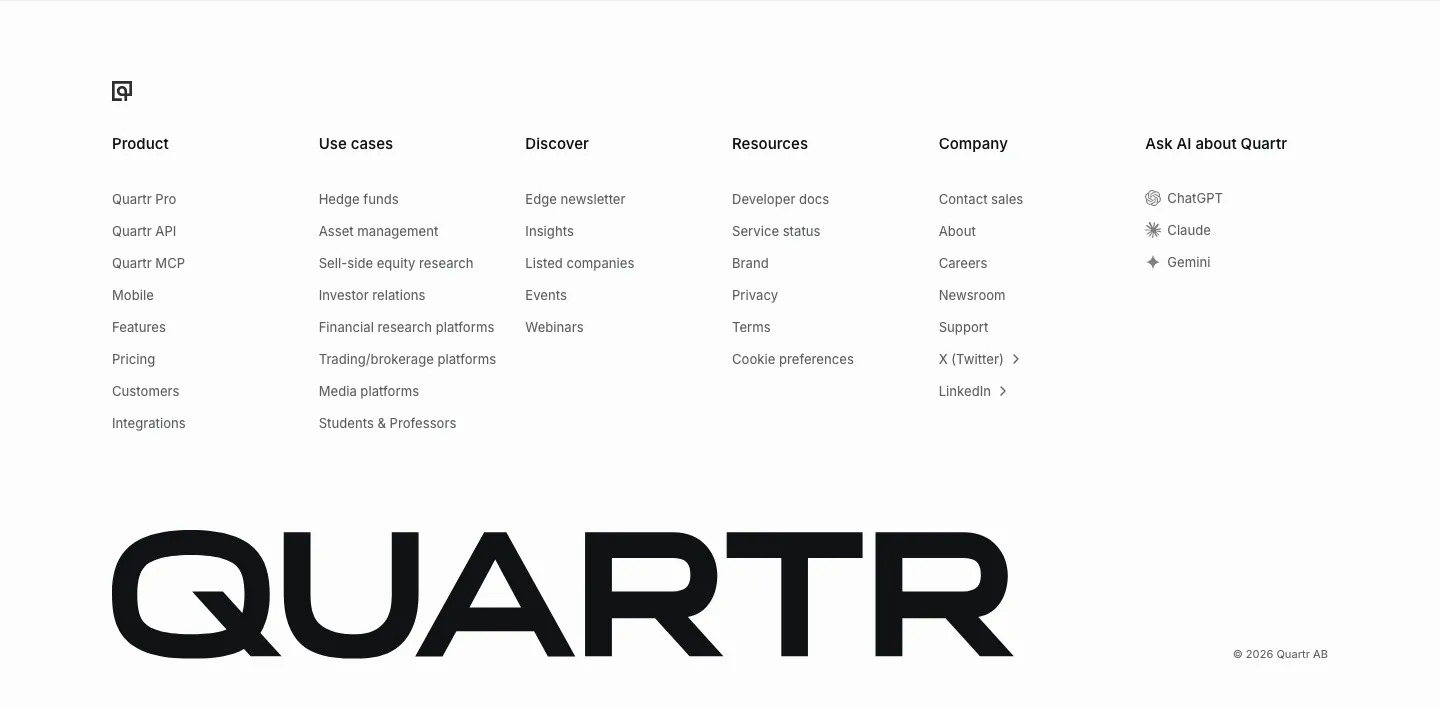
  124. Quartr footer section: six link columns including Ask AI about Quartr, above an oversized black QUARTR wordmark
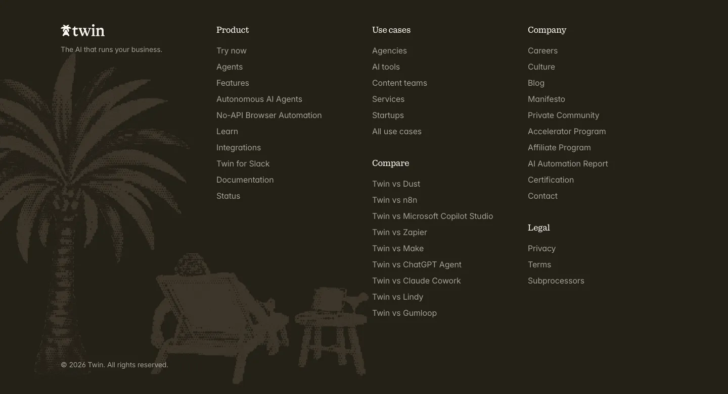
  125. Twin footer section: logo and link columns beside a dithered palm tree and beach chair illustration on a dark brown background
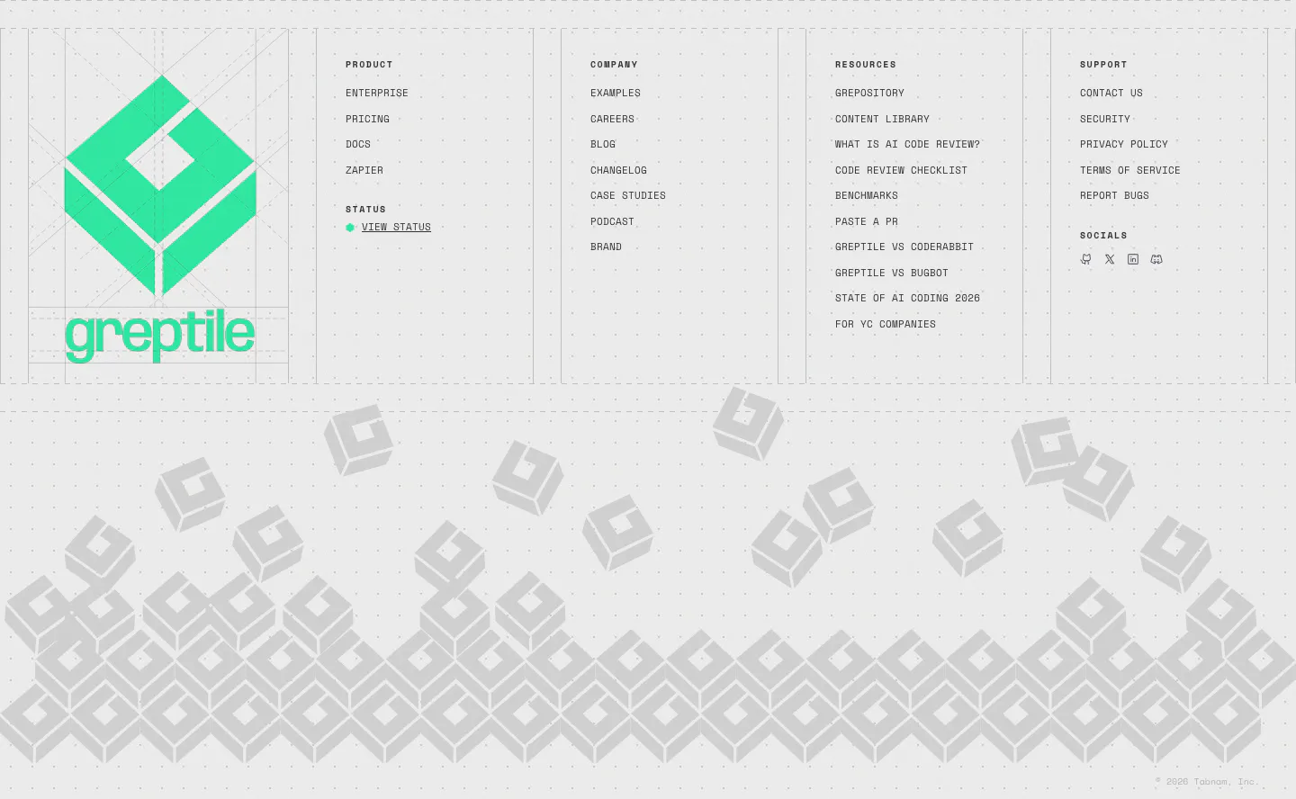
  126. Greptile footer section: large green logo beside four link columns, above a pile of gray isometric logo blocks on light gray
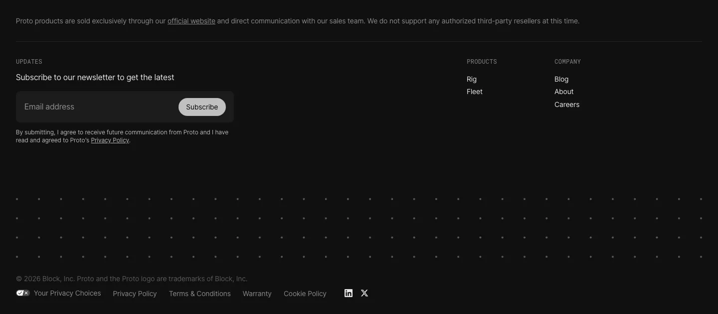
  127. Proto footer section: newsletter email field with Subscribe button, Products and Company link columns, a dot pattern band and legal links on black
    Proto
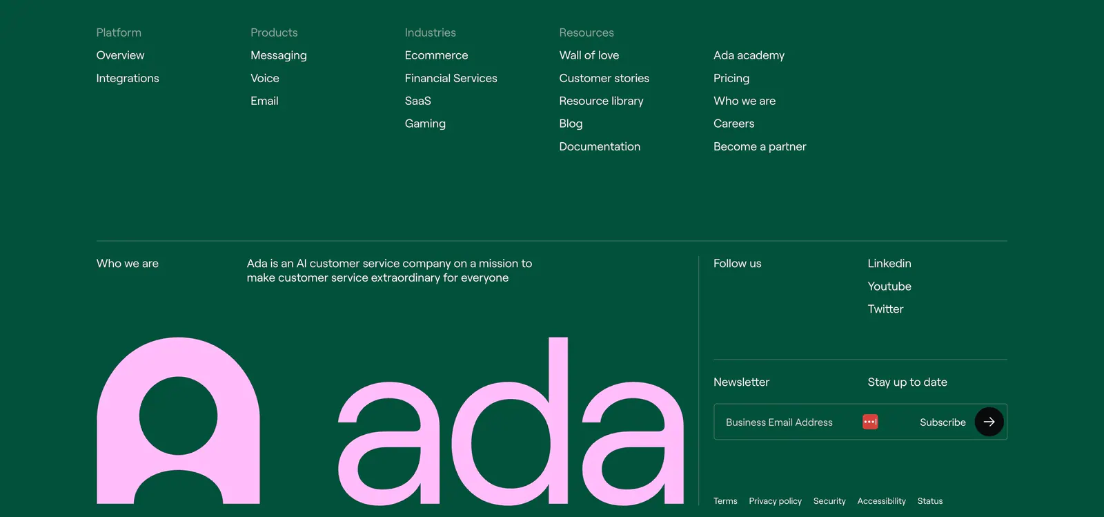
  128. Ada footer section: deep green background with link columns, newsletter email field and a huge pink ada wordmark and logo
    Ada
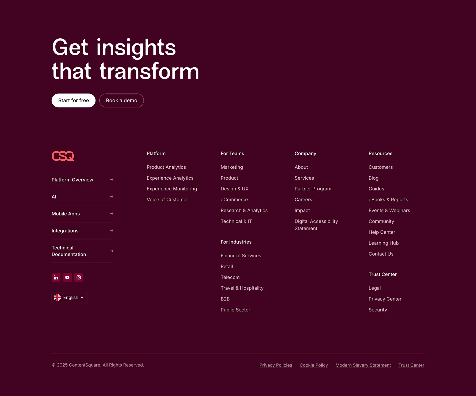
  129. Contentsquare footer section: CTA headline and buttons above link columns, social icons and copyright on a dark plum background
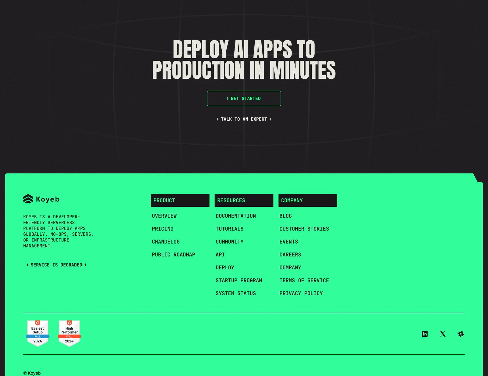
  130. Koyeb footer section: dark CTA band with condensed headline above a bright green footer with link columns and G2 badges
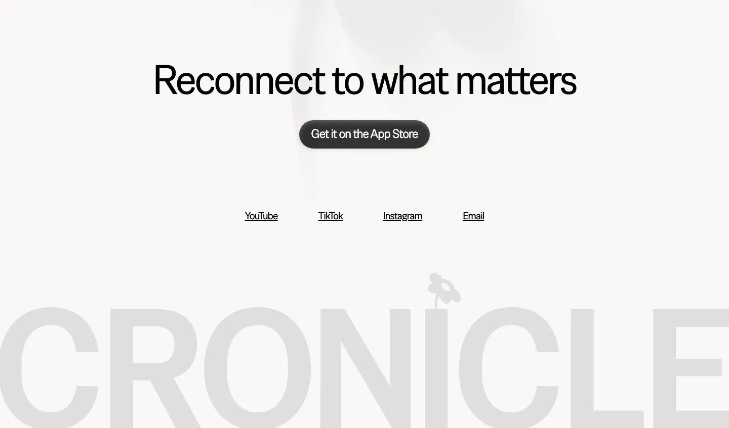
  131. Cronicle footer section: centered headline with an App Store button and social links above a giant faded gray CRONICLE wordmark
    Cronicle
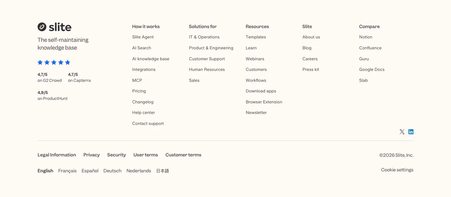
  132. Slite footer section: logo, tagline and review ratings beside five link columns, legal links, language list and copyright on cream
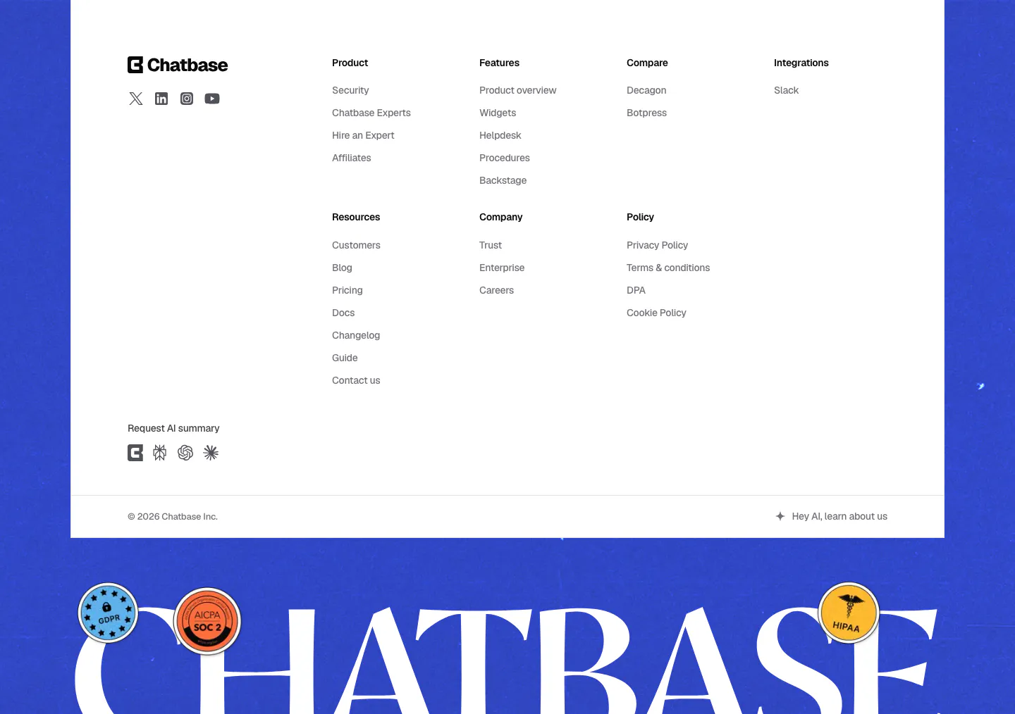
  133. Chatbase footer section: white link-column panel on a blue background above a giant serif Chatbase wordmark with compliance stickers
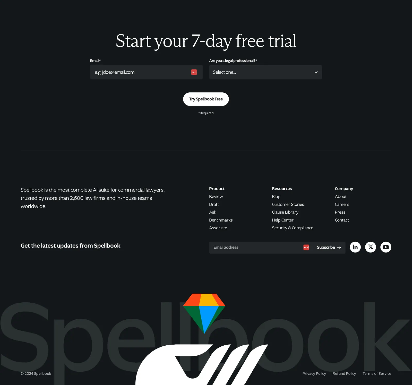
  134. Spellbook footer section: trial signup form, link columns, newsletter field and a huge faded Spellbook wordmark with logo on dark charcoal
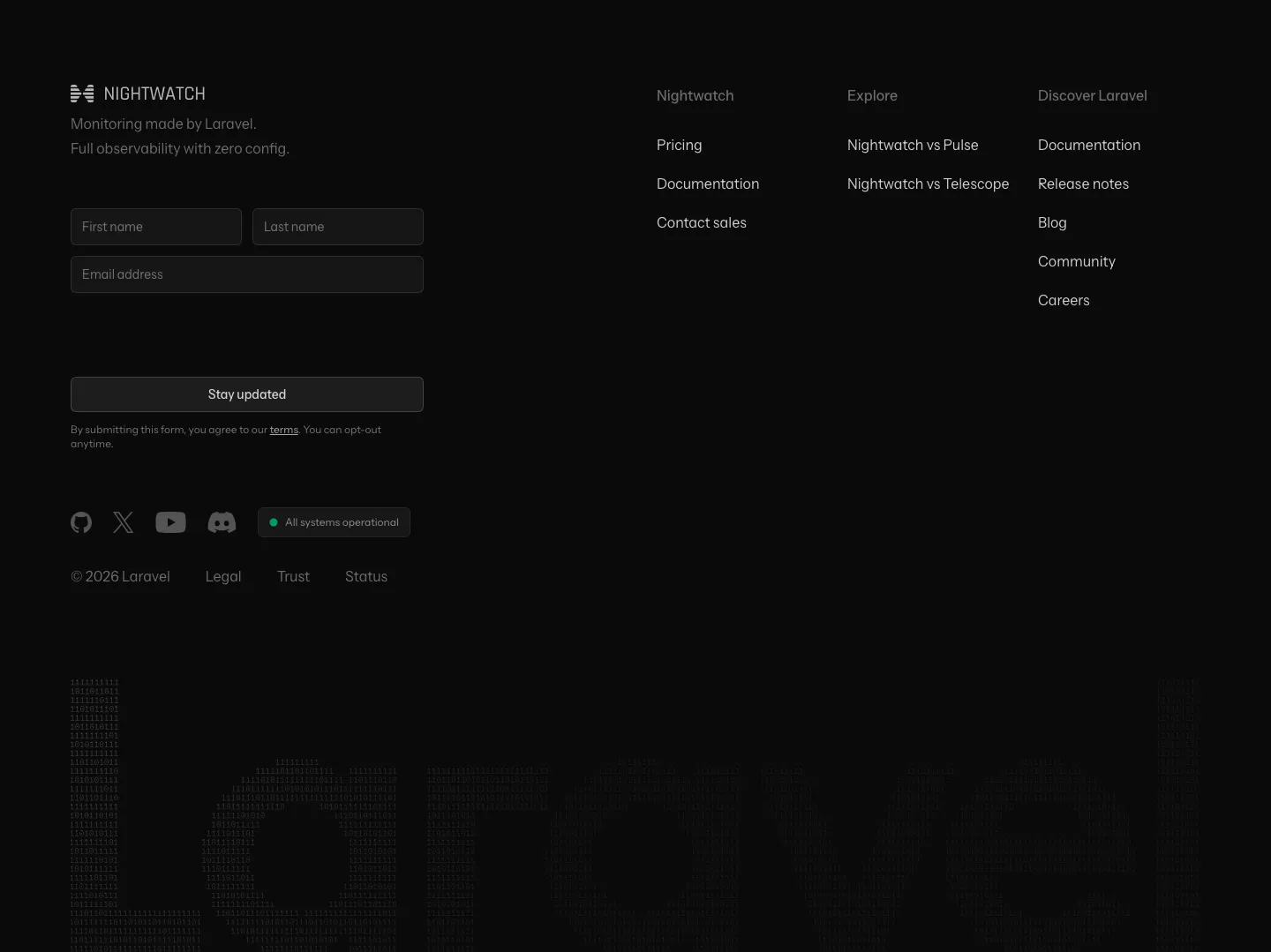
  135. Laravel Nightwatch footer section: newsletter form and link columns above a giant dim Laravel wordmark built from digits on black
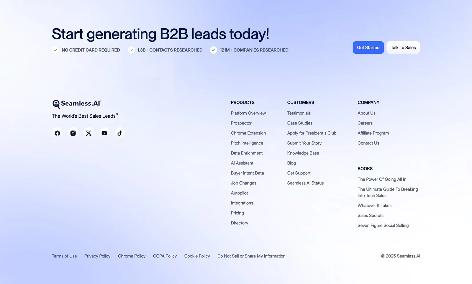
  136. Seamless.AI footer section: CTA headline with buttons above logo, social icons and link columns on a soft blue gradient background
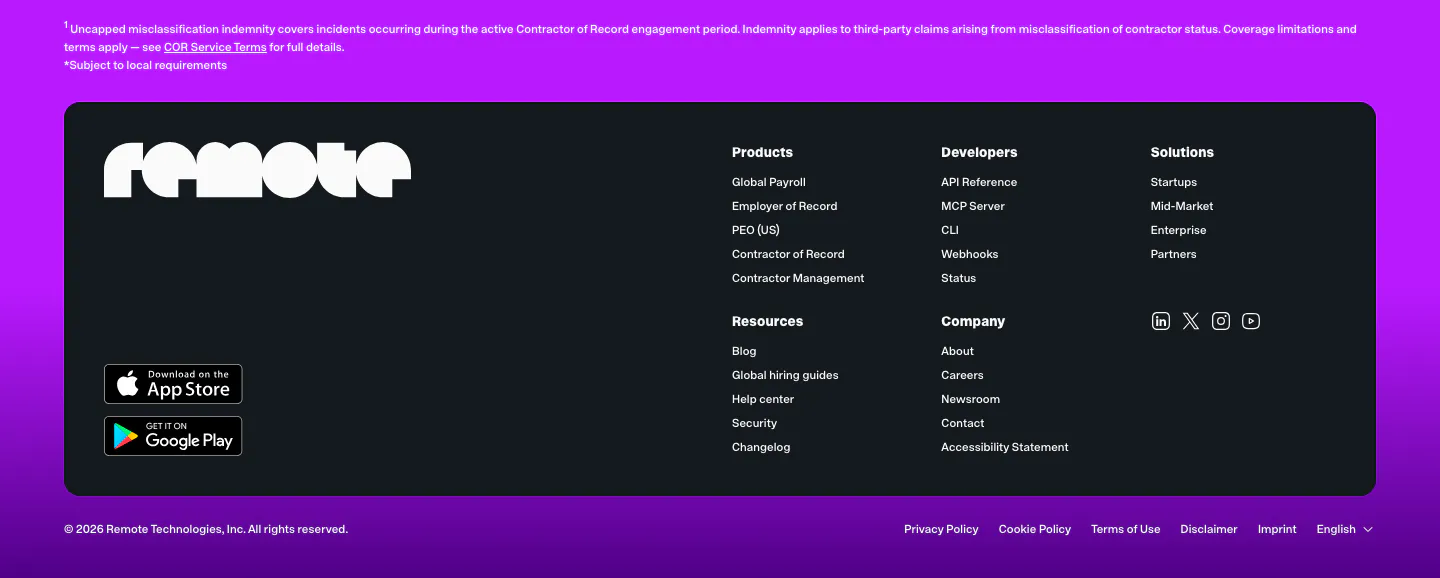
  137. Remote footer section: dark rounded panel with Remote wordmark, app store badges and link columns on a purple background
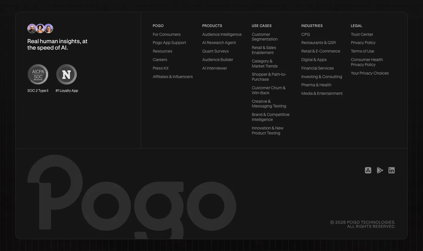
  138. Pogo footer section: dark rounded panel with tagline, compliance badges, five link columns and a large faded Pogo wordmark
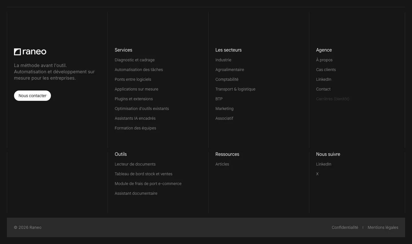
  139. Raneo footer section: dark bordered grid with logo, tagline and contact button beside six link columns and a copyright bar
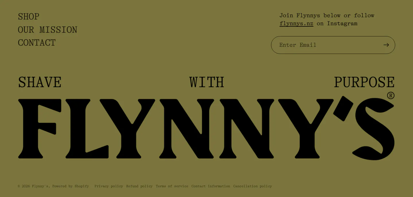
  140. Flynny's footer section: olive background with nav links, email signup field and a giant full-width black serif wordmark above legal links
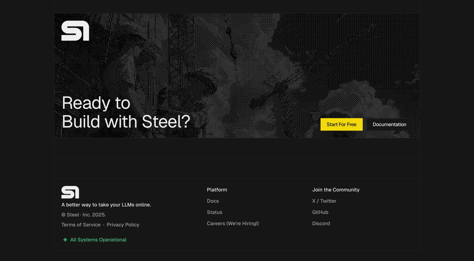
  141. Steel footer section: dithered photo CTA banner above a logo, copyright, link columns and status indicator on a dark grid background
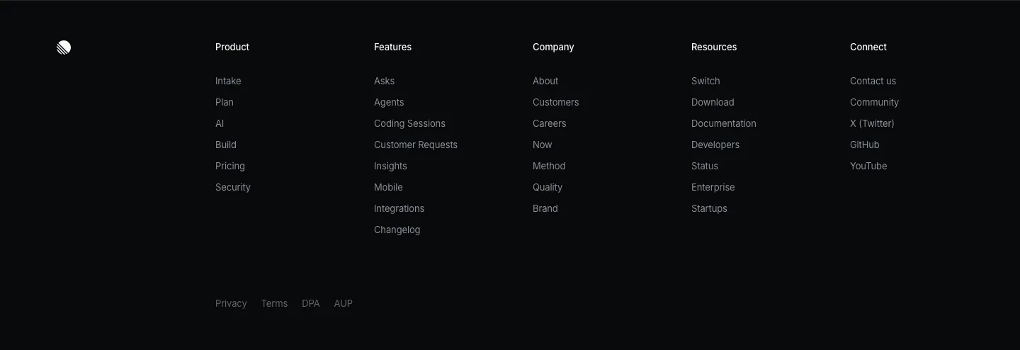
  142. Linear footer section: dark footer with a logo mark, five link columns and a row of legal links
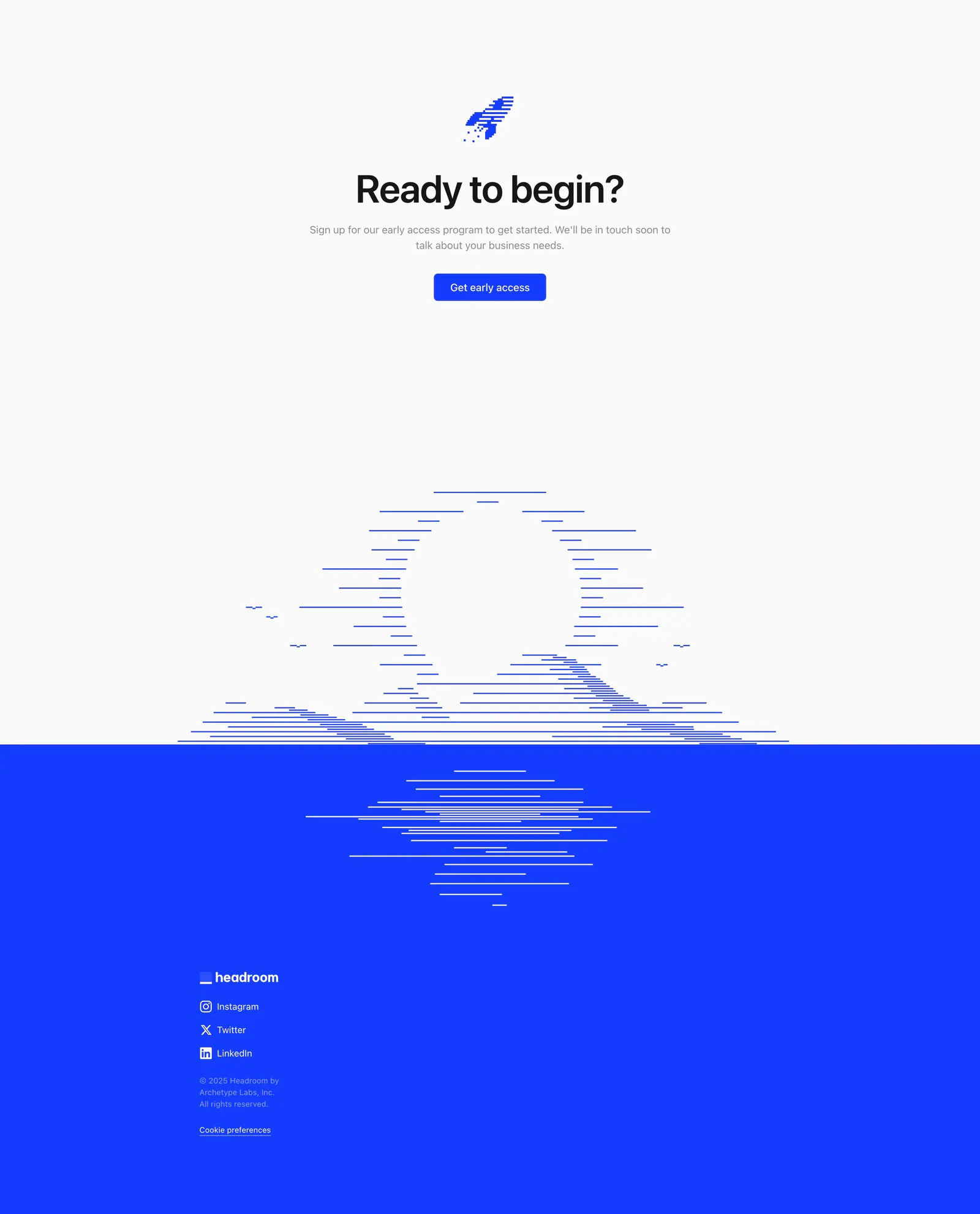
  143. Headroom footer section: centered call-to-action above a line-art sunset that meets a bright blue footer with logo and social links
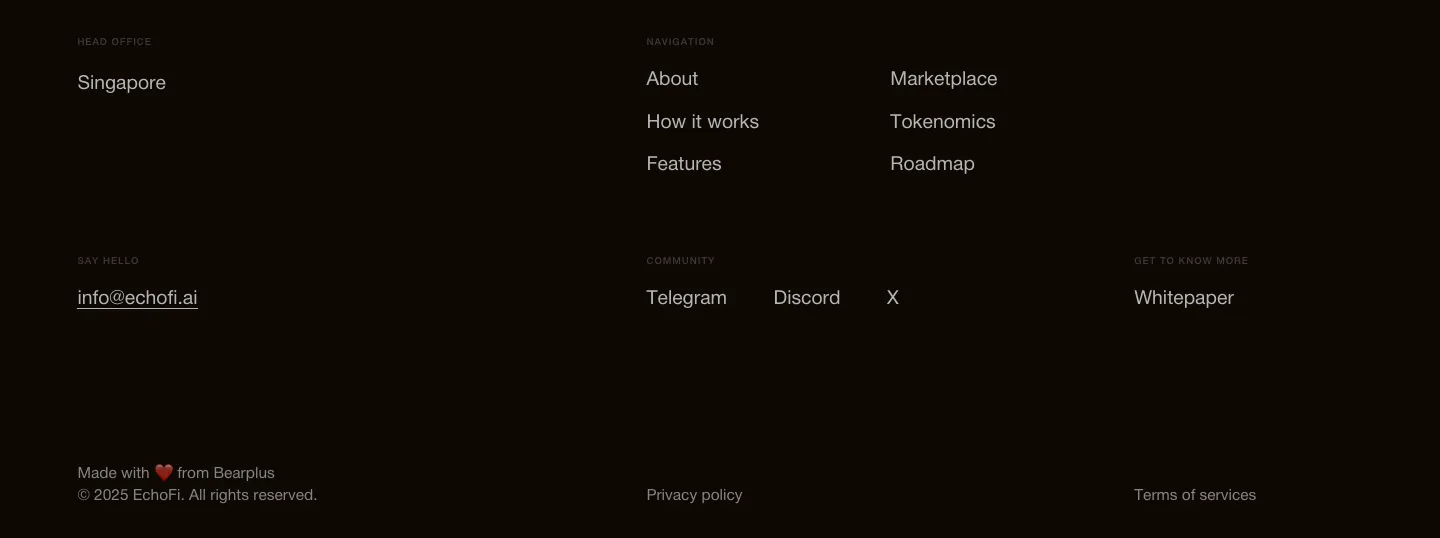
  144. EchoFi footer section: office, contact email, navigation and community link columns with copyright on near-black
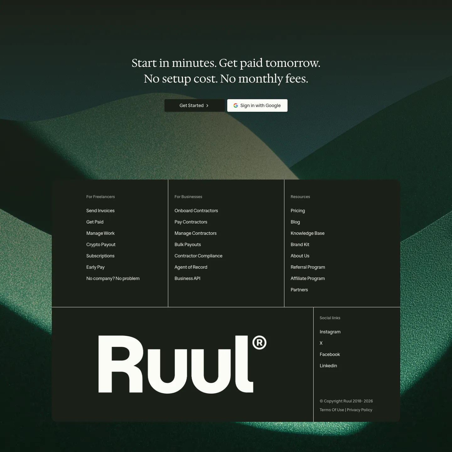
  145. Ruul footer section: serif CTA over dark green hills artwork, with a dark panel of link columns and a large Ruul wordmark
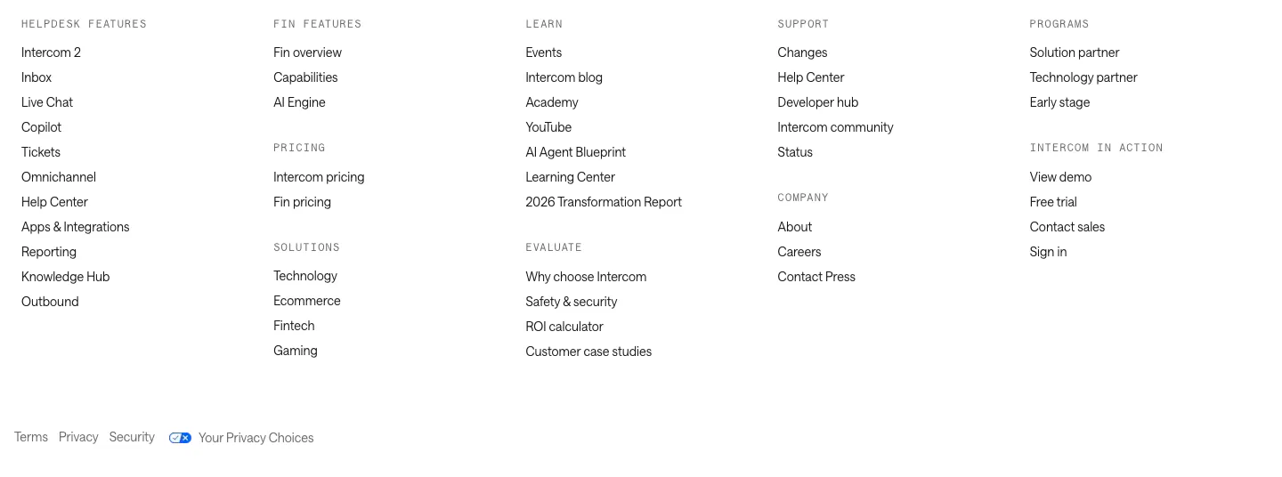
  146. Intercom footer section: five columns of grouped links under monospace labels with a row of legal links on white
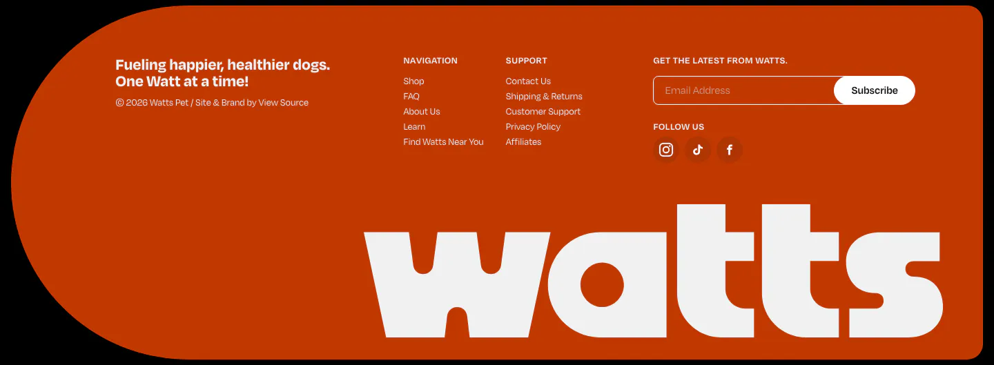
  147. Watts footer section: burnt-orange rounded panel with link columns, email subscribe field, social icons and a giant white watts wordmark
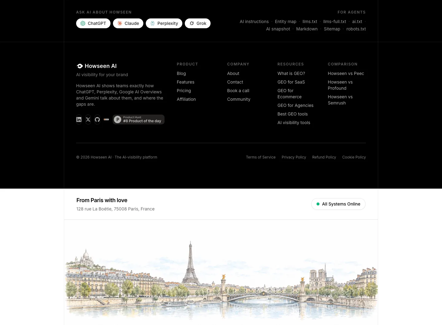
  148. Howseen AI footer section: black footer with link columns and Ask AI buttons above a watercolor Paris skyline illustration
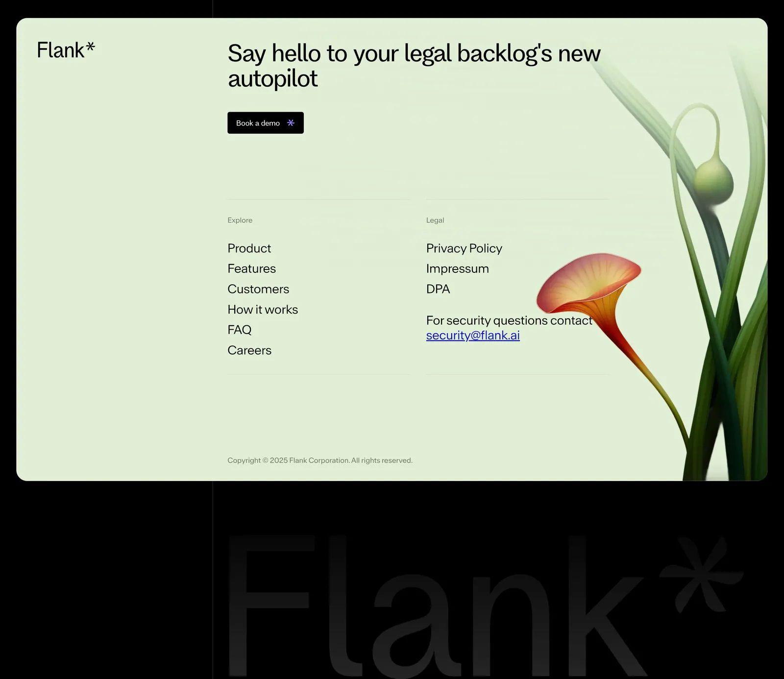
  149. Flank footer section: mint-green card with headline, demo button, link columns and a rendered flower above a giant faint wordmark on black
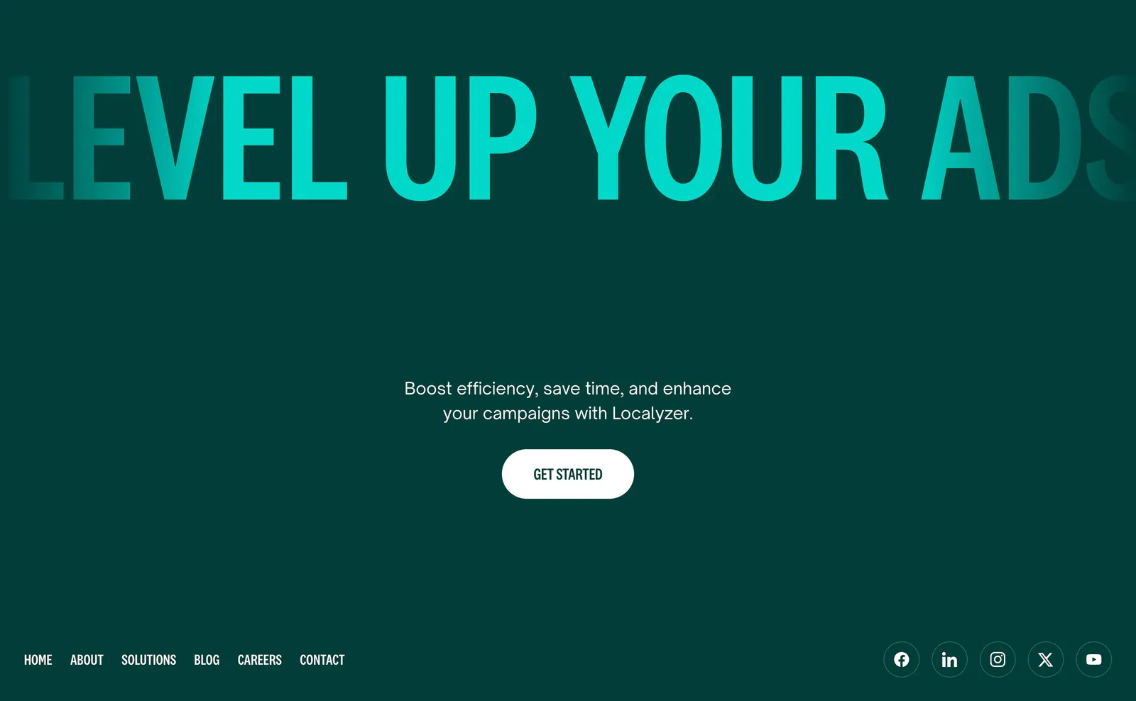
  150. Localyzer footer section: full-width teal display headline on dark green with centered CTA, nav links and social icons
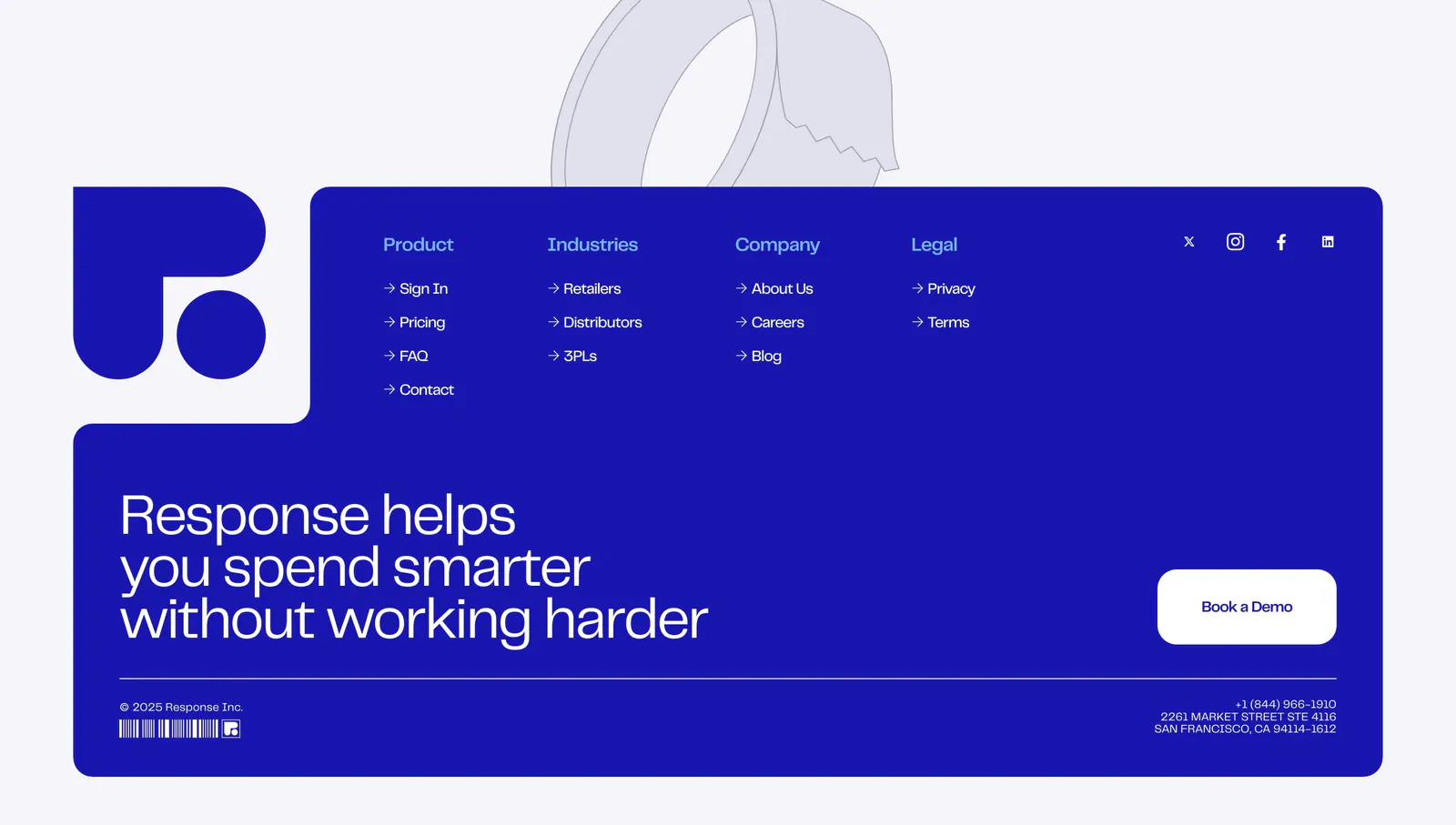
  151. Response footer section: royal blue panel with logo, link columns, large statement and Book a Demo button, tape line art above
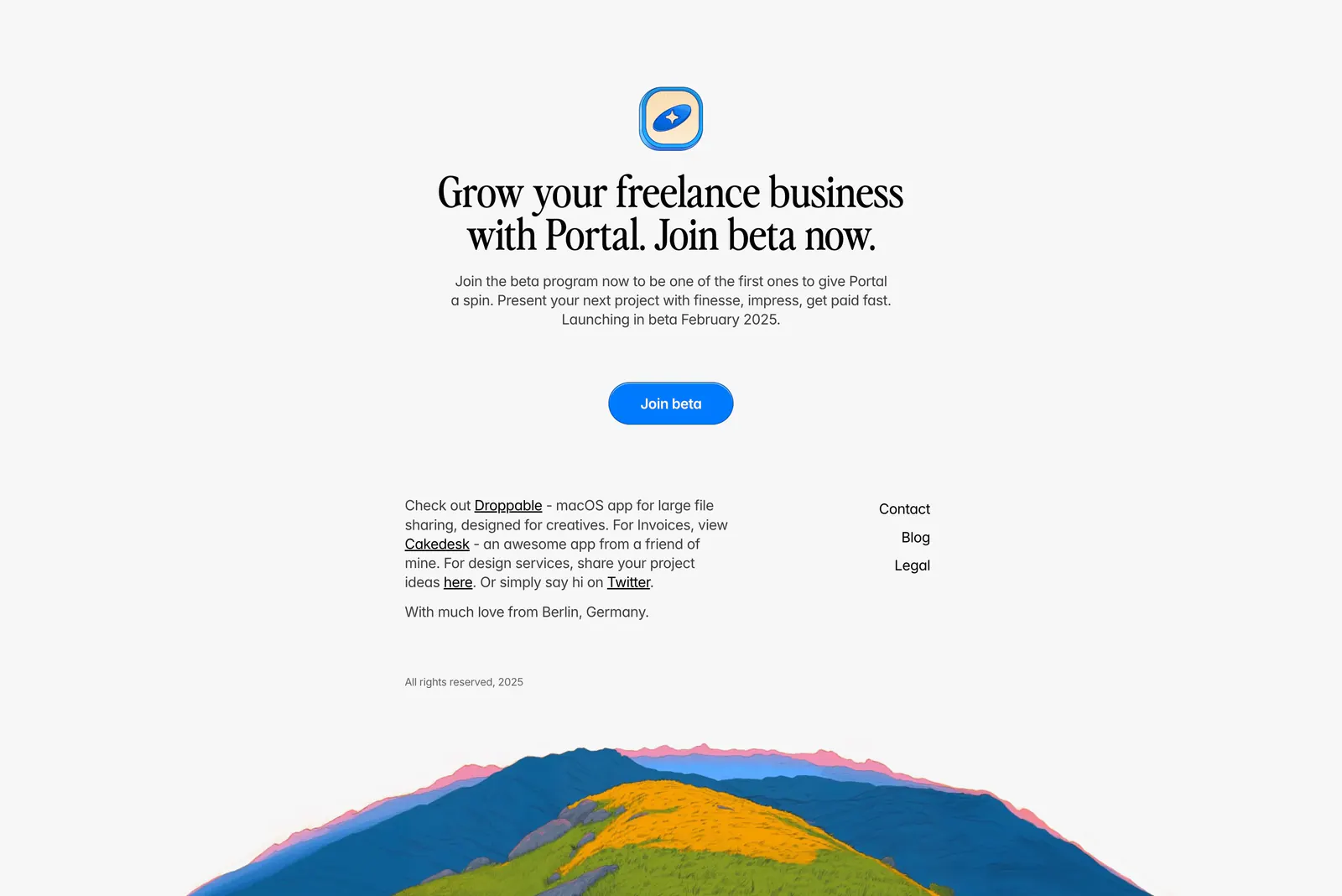
  152. Portal footer section: centered serif join-beta headline and blue button above small link columns and a painted hillside illustration
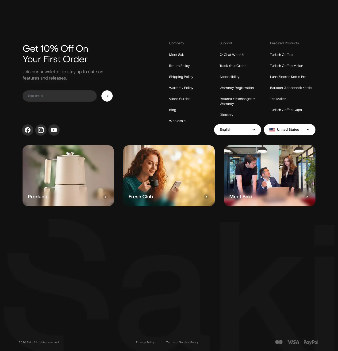
  153. Saki footer section: dark footer with newsletter email field, link columns, three photo cards and a giant faint Saki wordmark
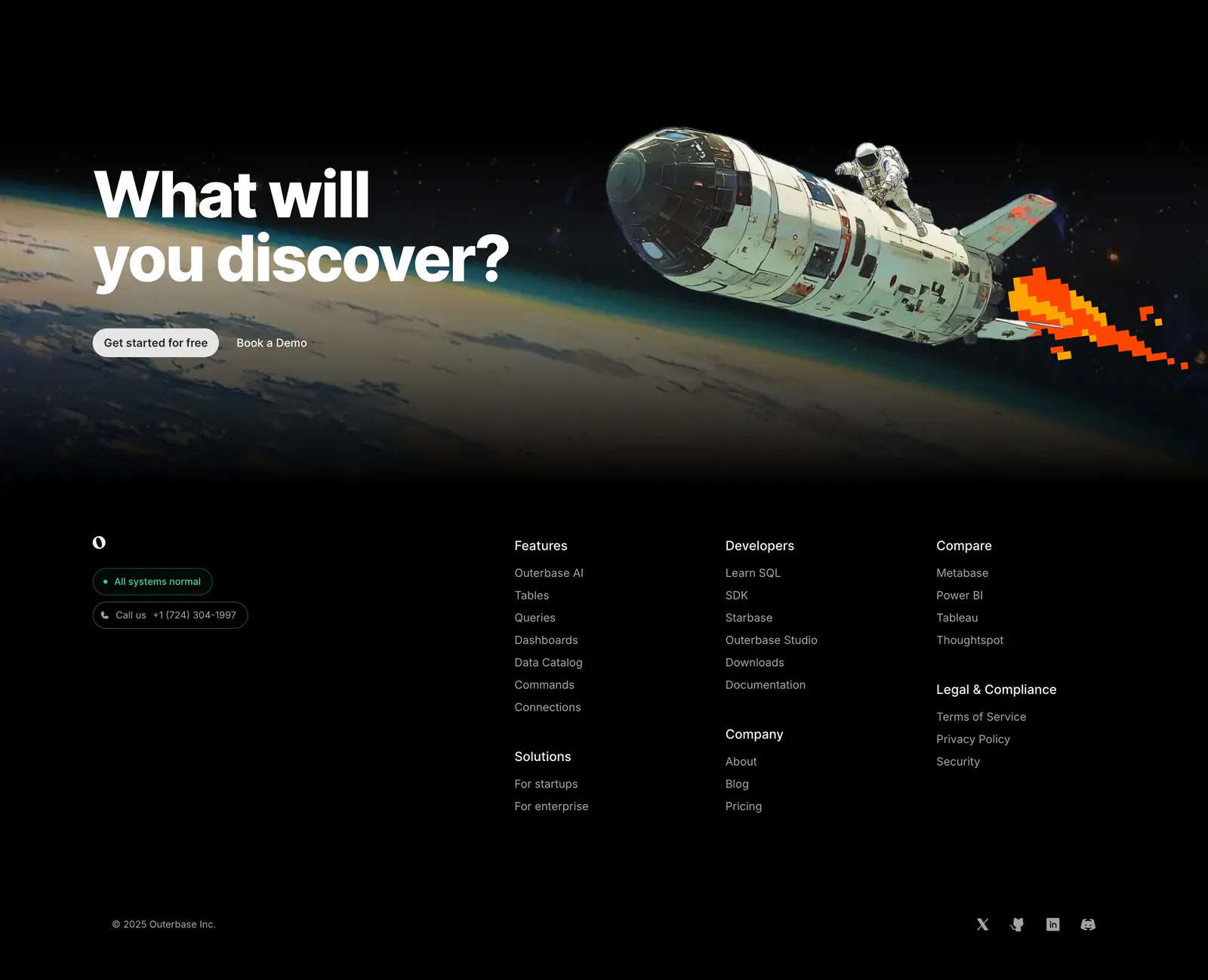
  154. Outerbase footer section: space-art CTA band above a black footer with logo, status badges, link columns and social icons
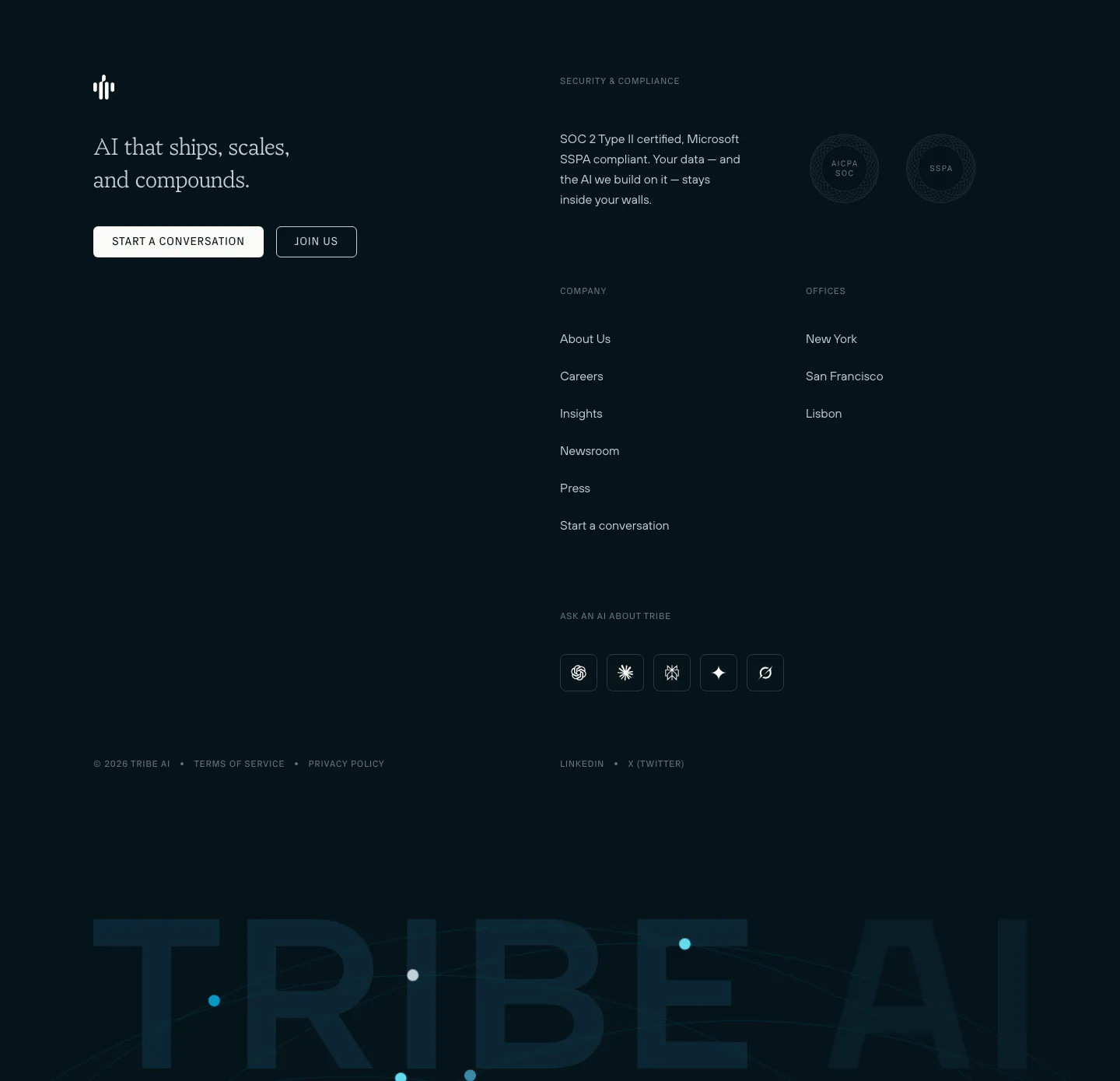
  155. Tribe AI footer section: dark navy footer with serif tagline, two buttons, security badges, link columns and a giant faded TRIBE AI wordmark
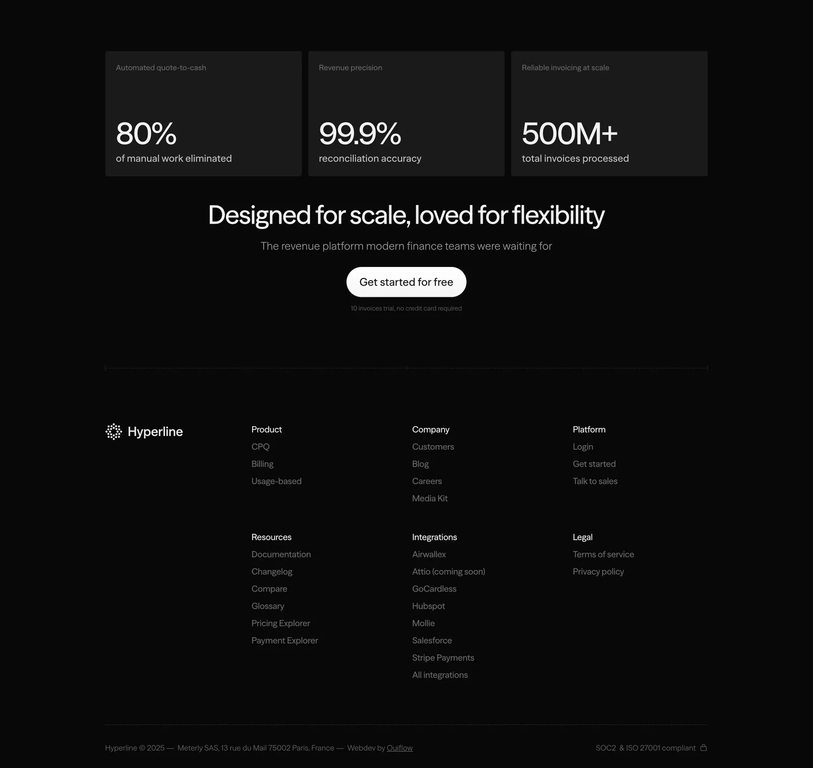
  156. Hyperline footer section: three stat cards and a centered CTA above link columns and copyright on a near-black background
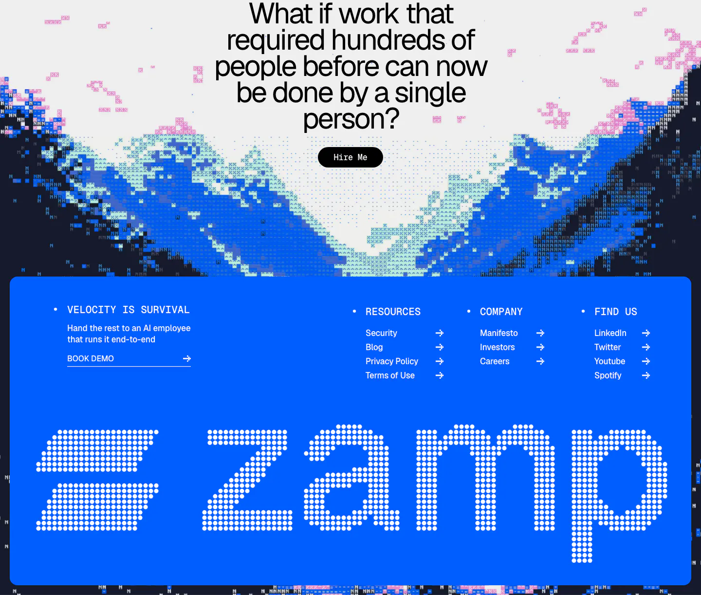
  157. Zamp footer section: centered question CTA over pixel-art mountains above a bright blue panel with link columns and a giant dotted zamp wordmark
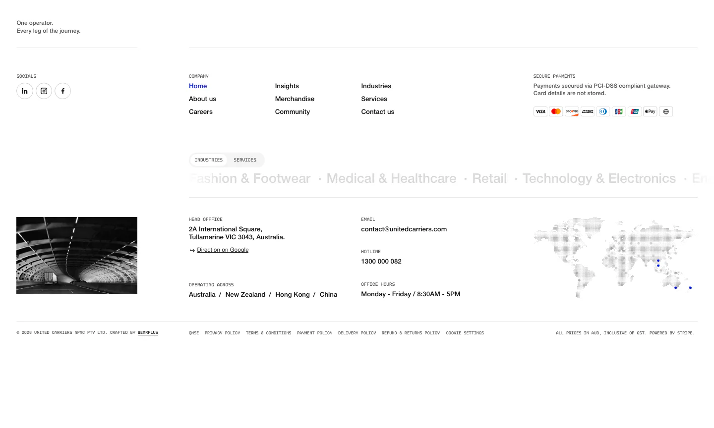
  158. United Carriers footer section: link columns, payment badges, industries marquee, office details and dotted world map on white
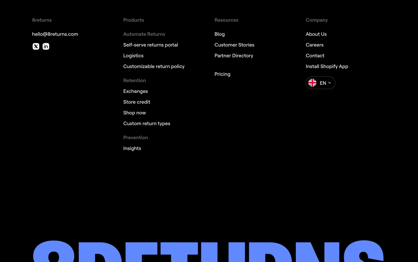
  159. 8returns footer section: black background with four link columns and a huge blue 8RETURNS wordmark cropped at the bottom
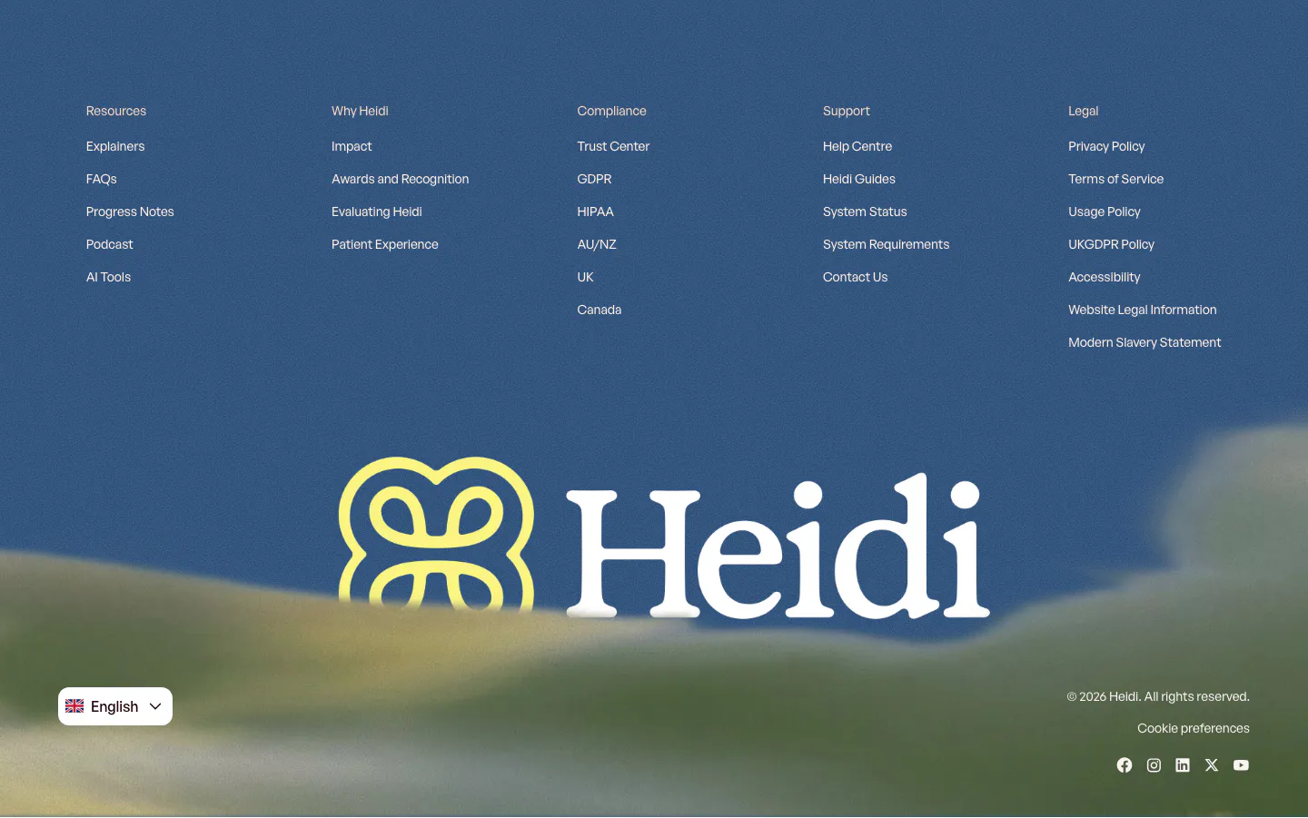
  160. Heidi footer section: five link columns on a blue sky and hills backdrop with a large yellow logo and white Heidi wordmark
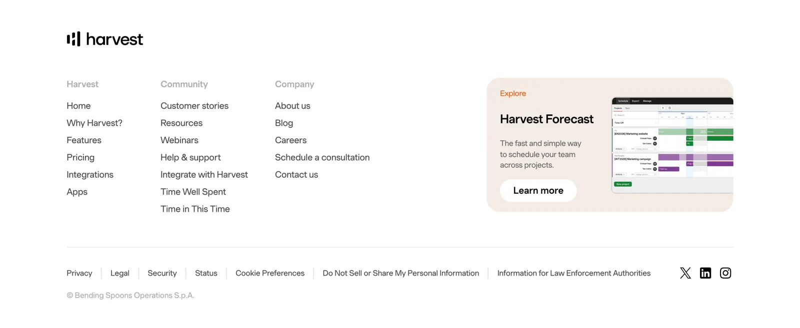
  161. Harvest footer section: logo above three link columns beside a Harvest Forecast promo card with screenshot, legal links and social icons
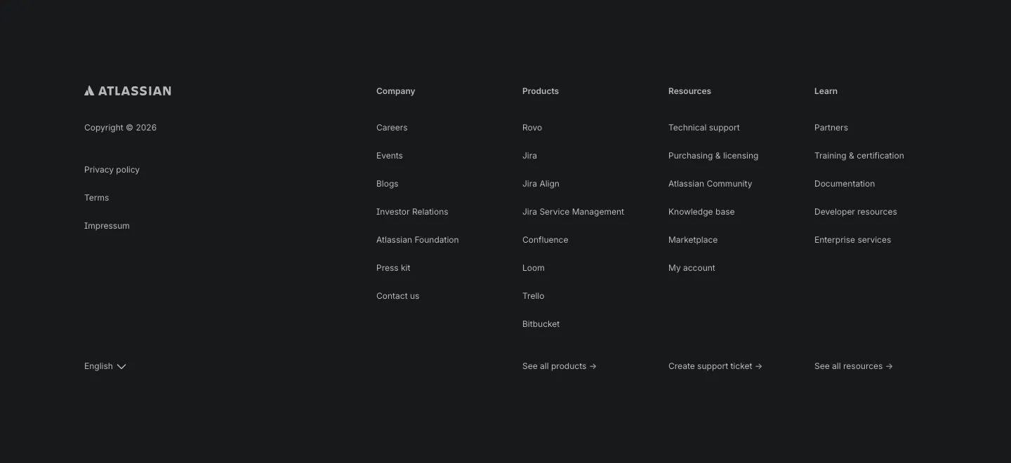
  162. Atlassian footer section: Atlassian logo, legal links and four link columns with a language selector on a dark background
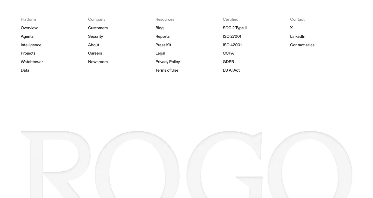
  163. Rogo footer section: five link columns on white above a huge faint gray serif ROGO wordmark
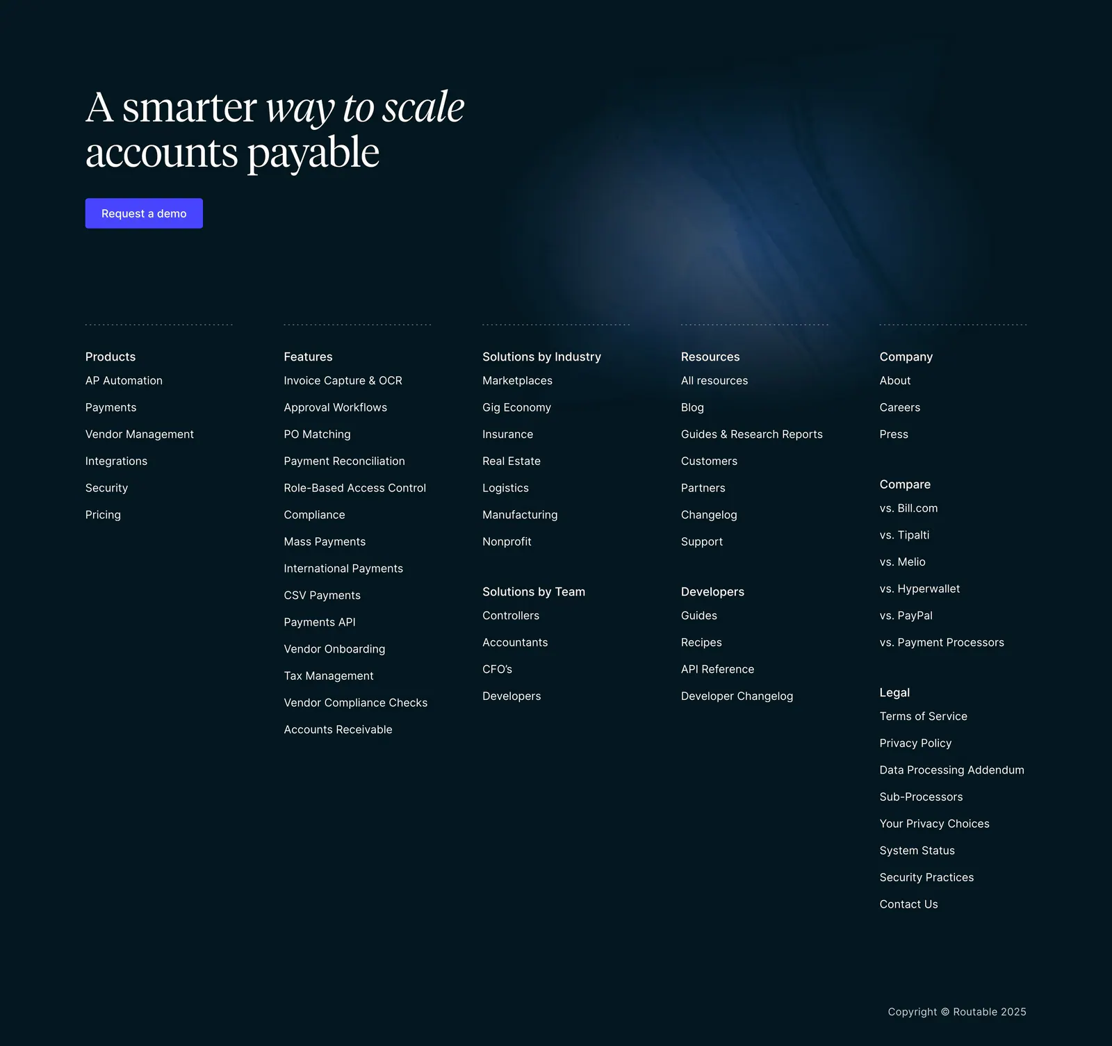
  164. Routable footer section: serif headline with demo button above five link columns and a copyright line on a dark navy background
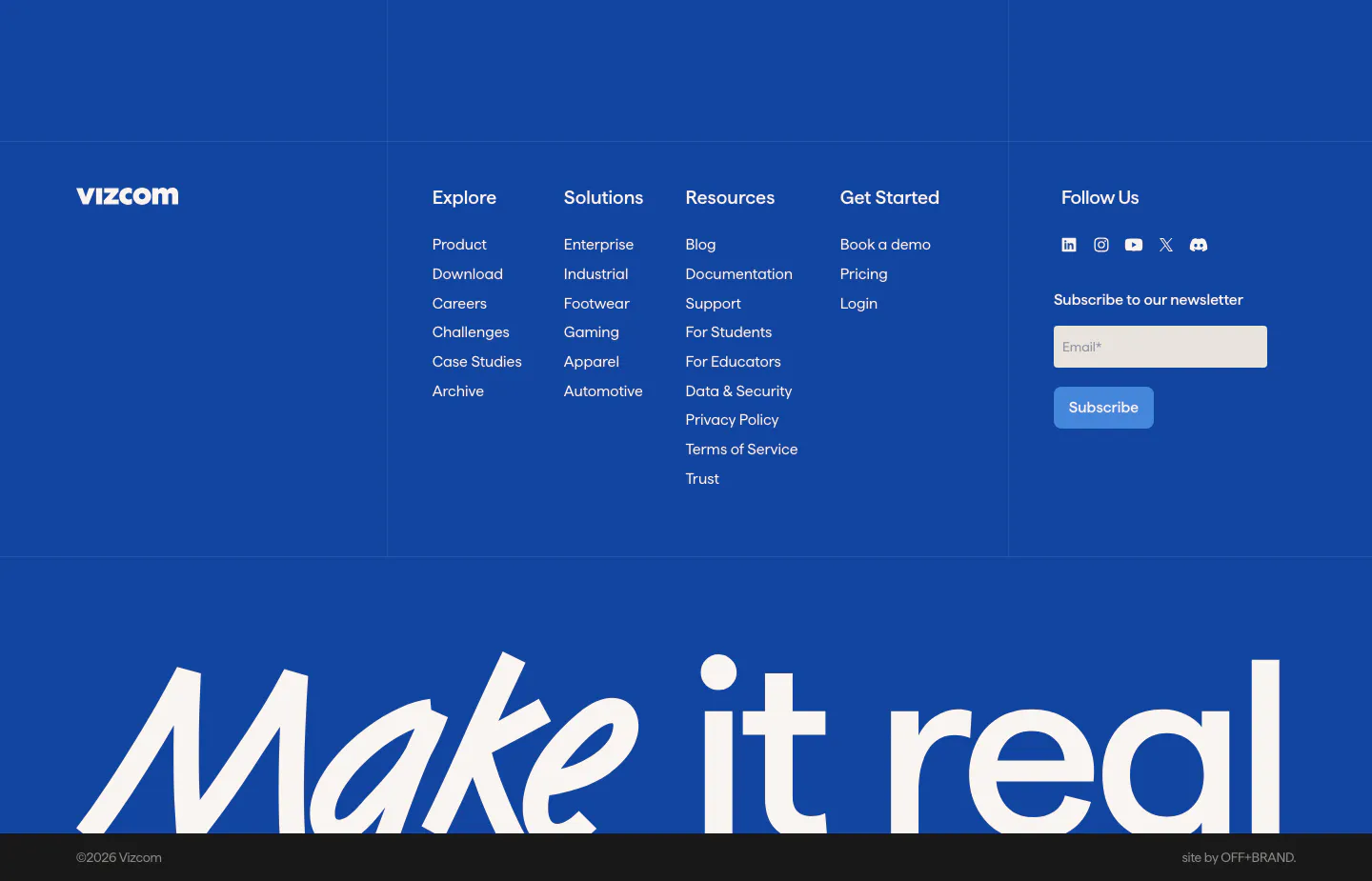
  165. Vizcom footer section: blue footer with logo, link columns, newsletter email field and a huge white 'Make it real' wordmark at the bottom
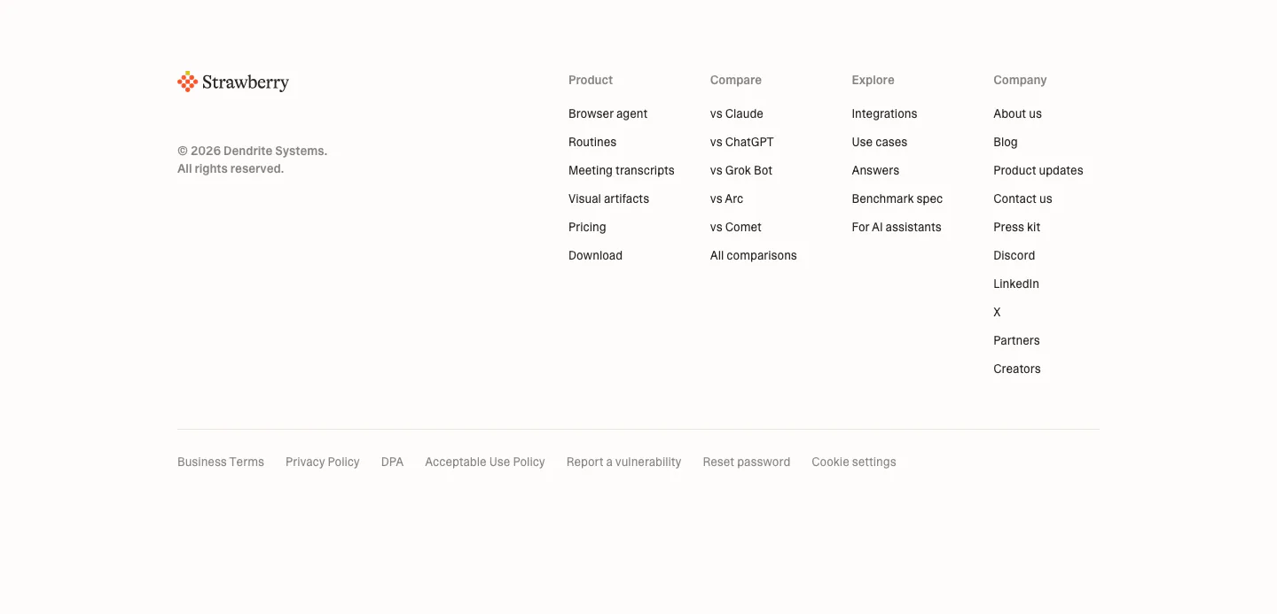
  166. Strawberry footer section: logo and copyright on the left, four link columns on the right, legal links row on a cream background
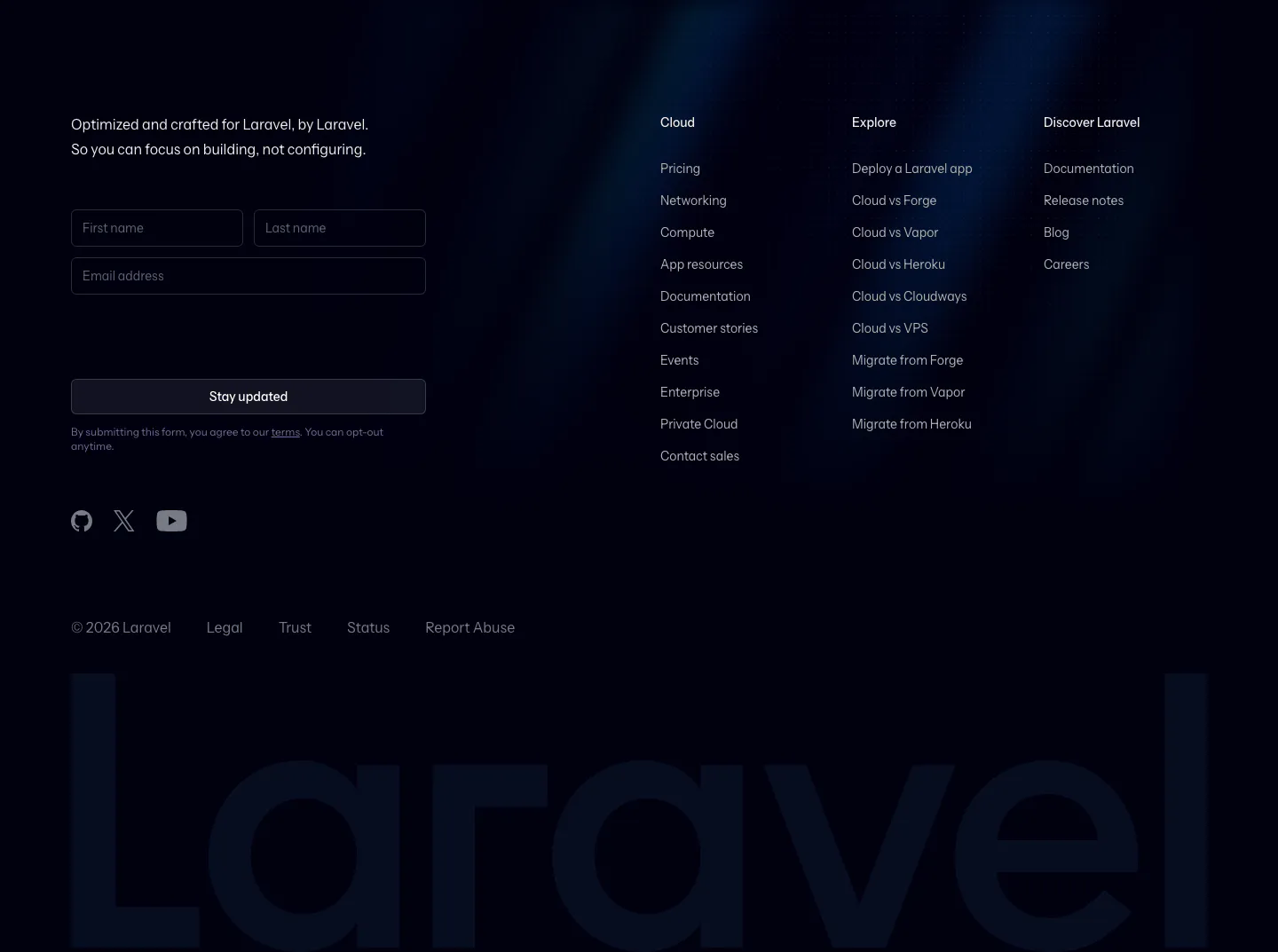
  167. Laravel Cloud footer section: newsletter form and link columns above a giant faint Laravel wordmark on a dark navy background
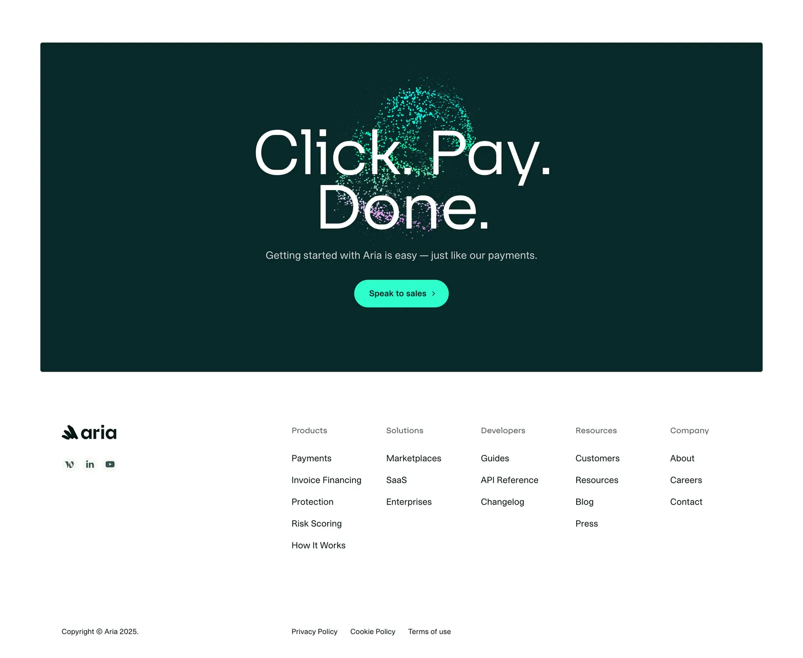
  168. Aria footer section: dark teal call-to-action panel with large centered headline above a white footer with logo and five link columns
  169. Goodside footer section: slim strip with italic inquiry note and email, a gold dandelion mark and stacked social links
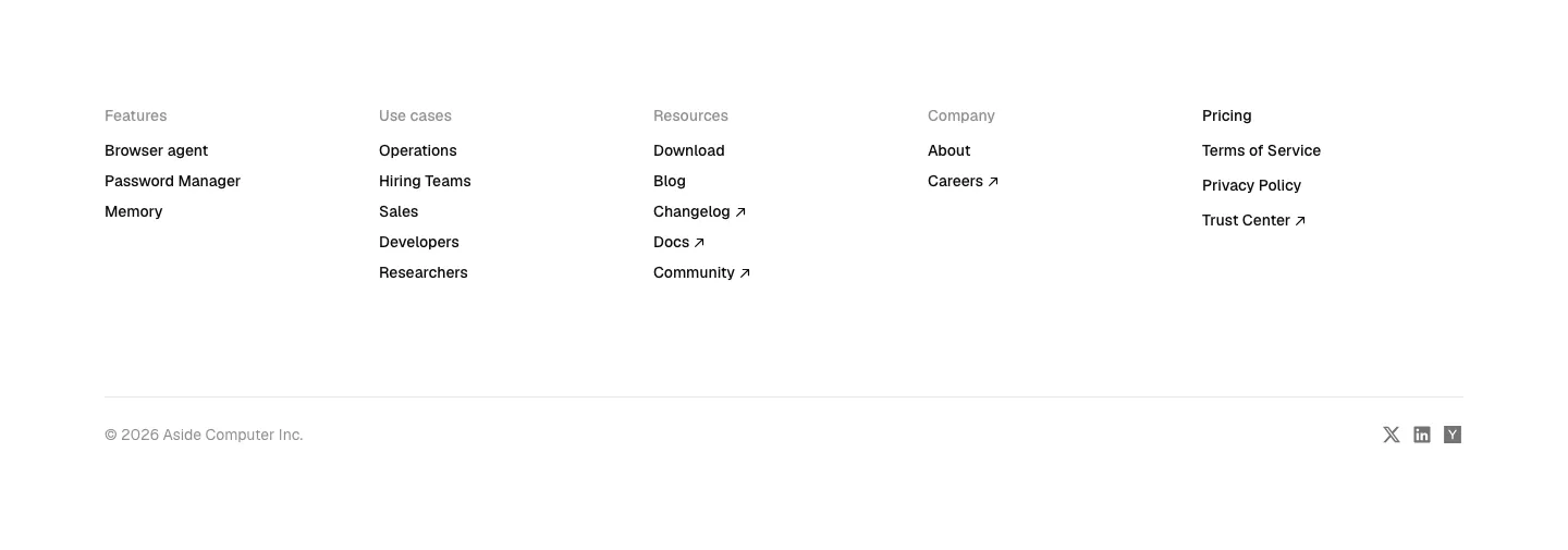
  170. Aside footer section: five link columns, copyright line and small social icons on white
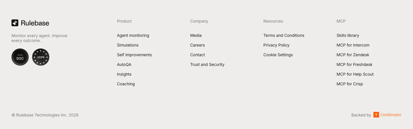
  171. Rulebase footer section: logo, tagline and compliance badges beside four link columns, with copyright and Y Combinator note on light gray
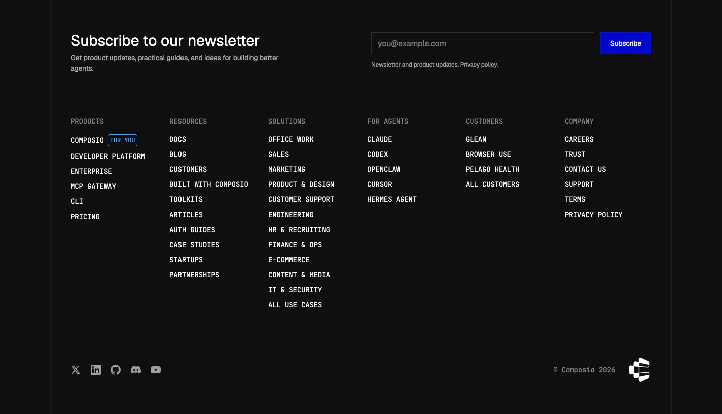
  172. Composio footer section: newsletter heading with email field and blue subscribe button above six monospace link columns on black
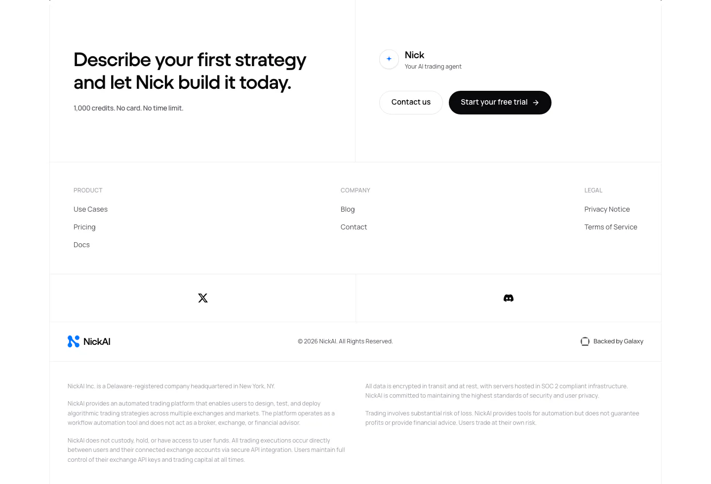
  173. NickAI footer section: closing CTA with contact and trial buttons above link columns, social icons, logo row and legal disclaimers
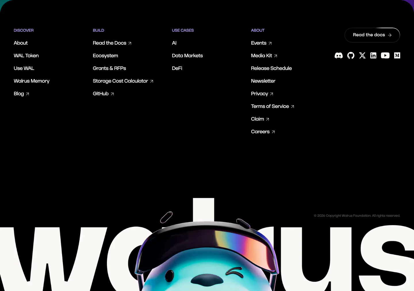
  174. Walrus footer section: black footer with link columns and social icons above a giant walrus wordmark with 3D mascot
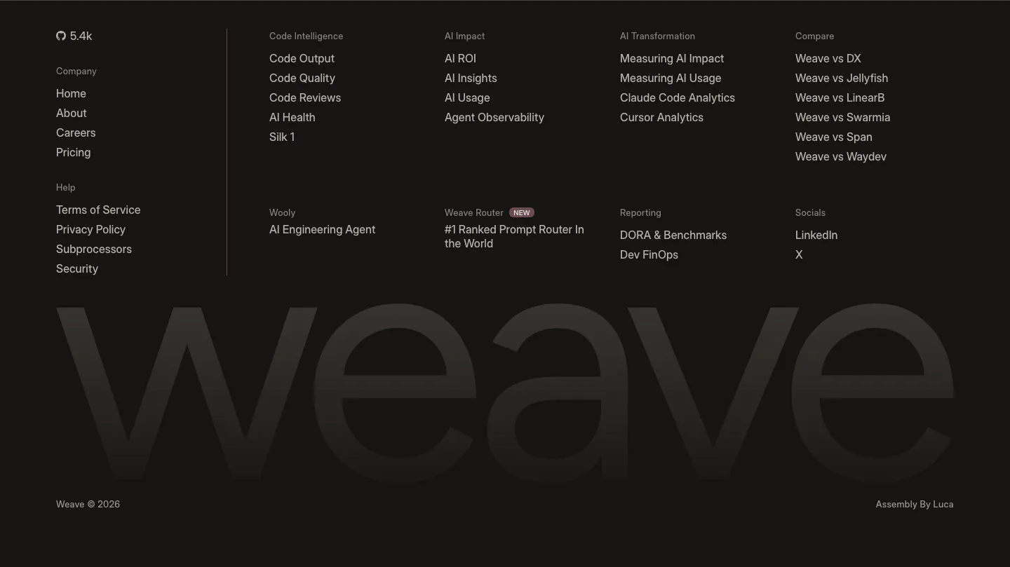
  175. Weave footer section: near-black footer with link columns and a huge faint weave wordmark spanning the full width

Common patterns in website footers

How to design a website footer

  1. Group links into labeled columns

    Sort links by what visitors look for, such as product, resources, company, and legal. Give each column a short heading and keep labels to one or two words. Put the most visited links, like pricing, docs, and contact, near the top of their columns.
  2. Keep small links legible

    Footers tend to drift into tiny, low-contrast gray text. Keep links at 14 pixels or larger with 4.5:1 contrast against the background, including on dark footers, and leave enough spacing between links that each one is easy to tap on a phone.

  3. Collapse columns carefully on mobile

    On narrow screens, arrange columns two across or turn them into accordions under each heading. Keep the logo, key links, and legal row visible without expanding anything, and test at small widths, since long link lists push the copyright row far down.

  4. Separate the legal row

    Place copyright, privacy, terms, and cookie settings in a slim bottom row, set apart by a rule or extra spacing. Keep social icons small and give each an accessible name. A newsletter field needs its own block so it does not crowd the link columns.

Companies in this collection

All section types
    ↑↓ Navigate ↵ Open

    Section preview

    Website section