Hyperline website design

Every section we captured from the Hyperline website, in page order, from the hero section down to the footer. Open any thumbnail to see it full size.

Sections 5

In page order, top to bottom

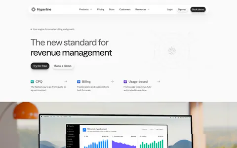
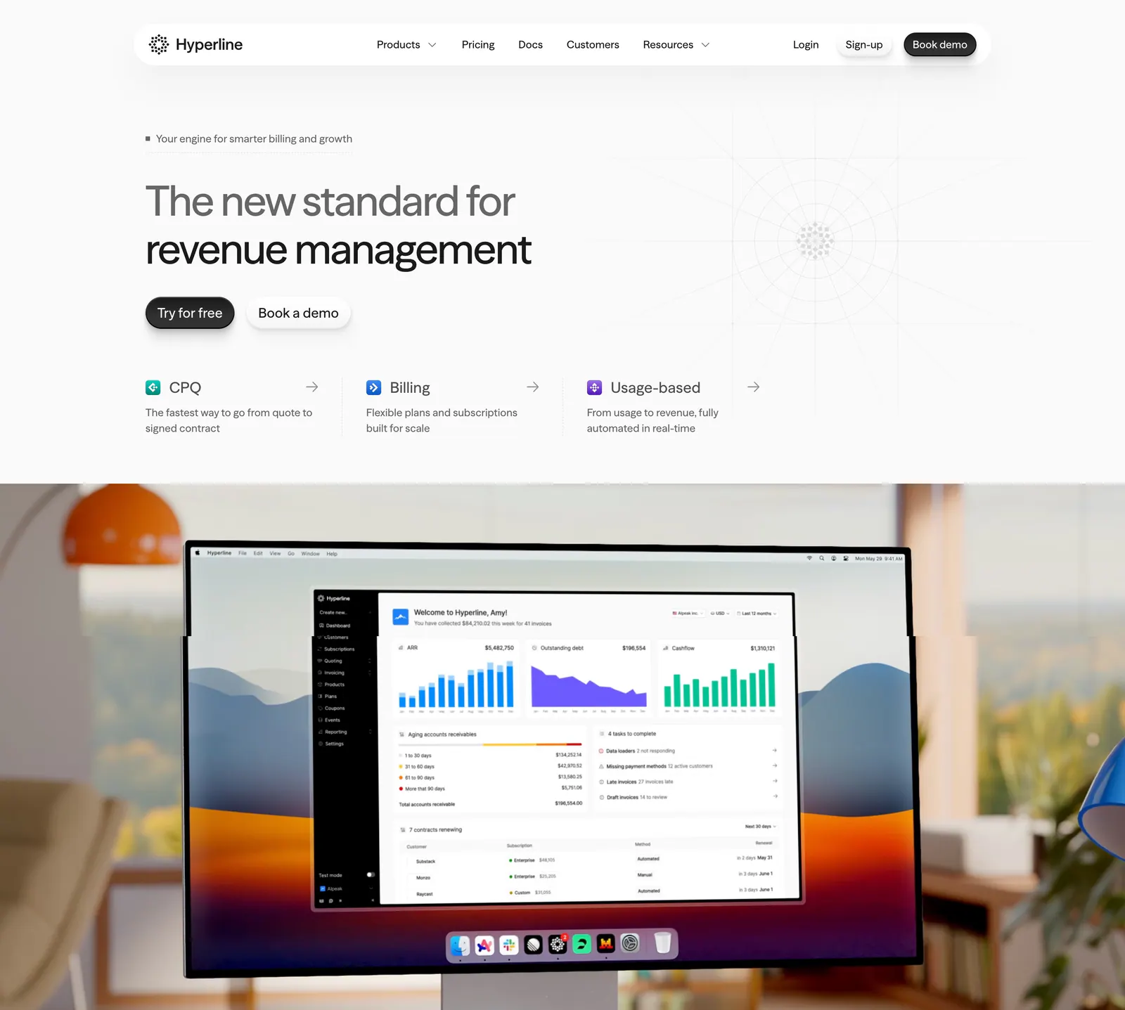
  1. Hyperline hero section: left-aligned headline and three product links above a photo of a desktop monitor showing the billing dashboard
    01 Hero

    The new standard for revenue management

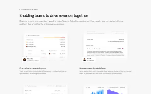
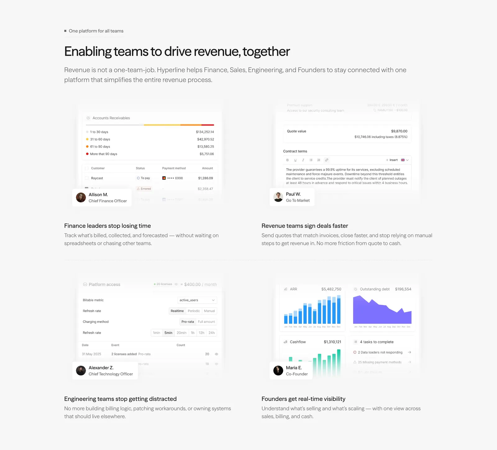
  2. Hyperline features section: left-aligned headline above a 2x2 grid of role-based product UI snippets with persona badges on light gray

    Enabling teams to drive revenue, together

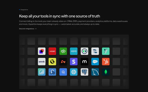
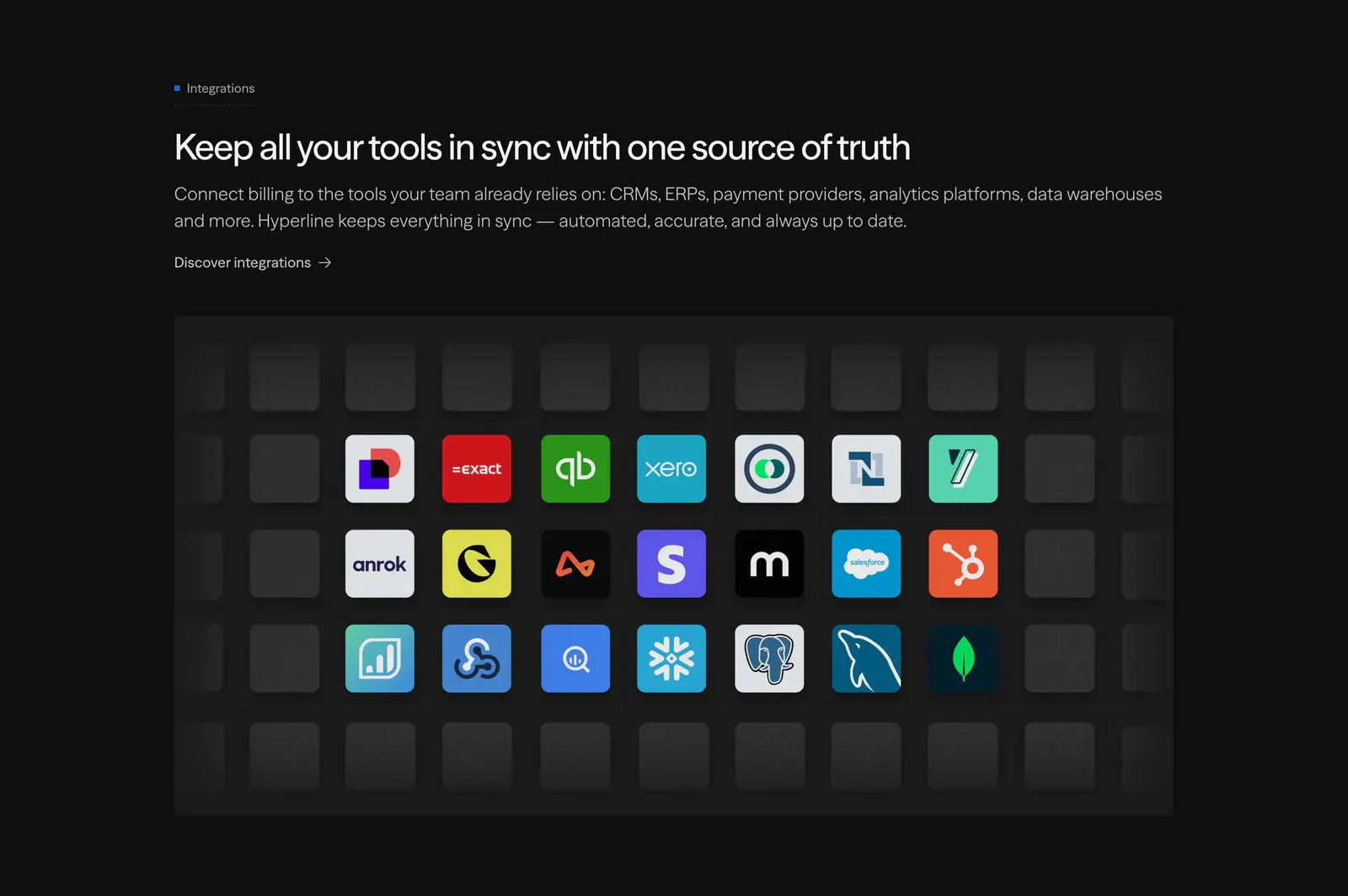
  3. Hyperline integrations section: left-aligned headline above a grid of colorful app icon tiles fading into empty dark tiles

    Keep all your tools in sync with one source of truth

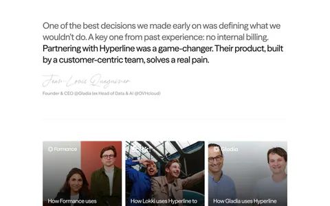
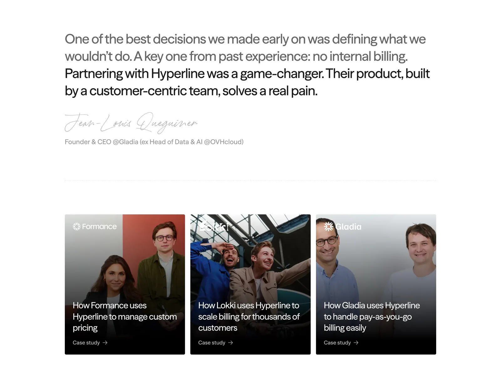
  4. Hyperline testimonials section: large quote with handwritten signature above three photo case-study cards on white

    One of the best decisions we made early on was defining what we wouldn't do. A key one from past experience: no internal billing. Partnering with Hyperline was a game-changer. Their product, built by a customer-centric team, solves a real pain.

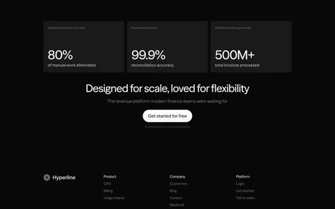
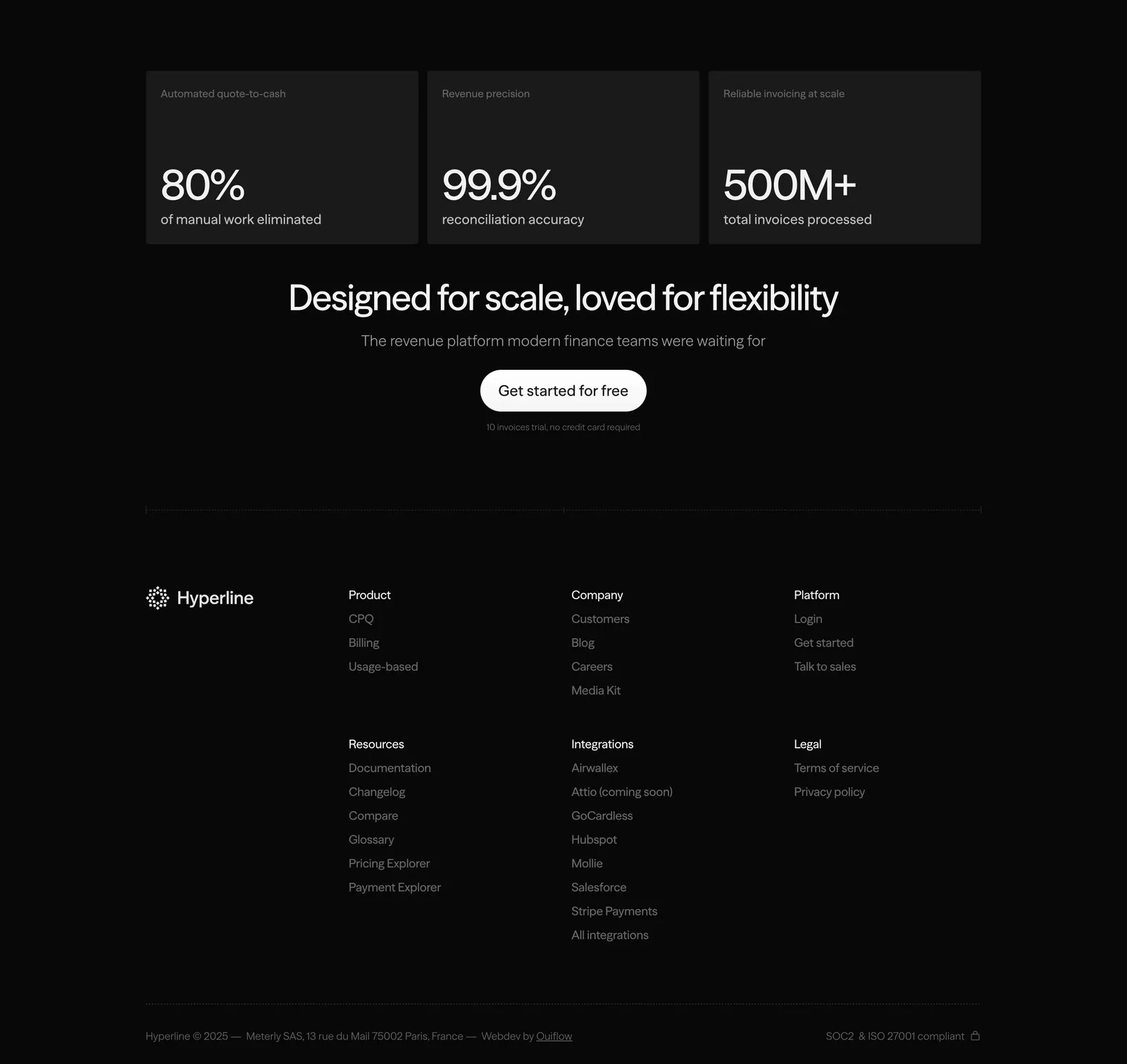
  5. Hyperline footer section: three stat cards and a centered CTA above link columns and copyright on a near-black background
    05 Footer

    Designed for scale, loved for flexibility
Similar companies

All companies
    ↑↓ Navigate ↵ Open

    Section preview

    Website section