Fintech Website Design Examples

Software that touches money has to earn more trust than almost anything else a company buys. Visitors want to know who holds the funds, which licenses and partner banks stand behind the product, and what happens when something goes wrong. Good fintech website design pairs clear product visuals with plain explanations of fees, security, and compliance. Calm layouts, precise numbers, and restrained color read as more credible than bold promises.
310 sections

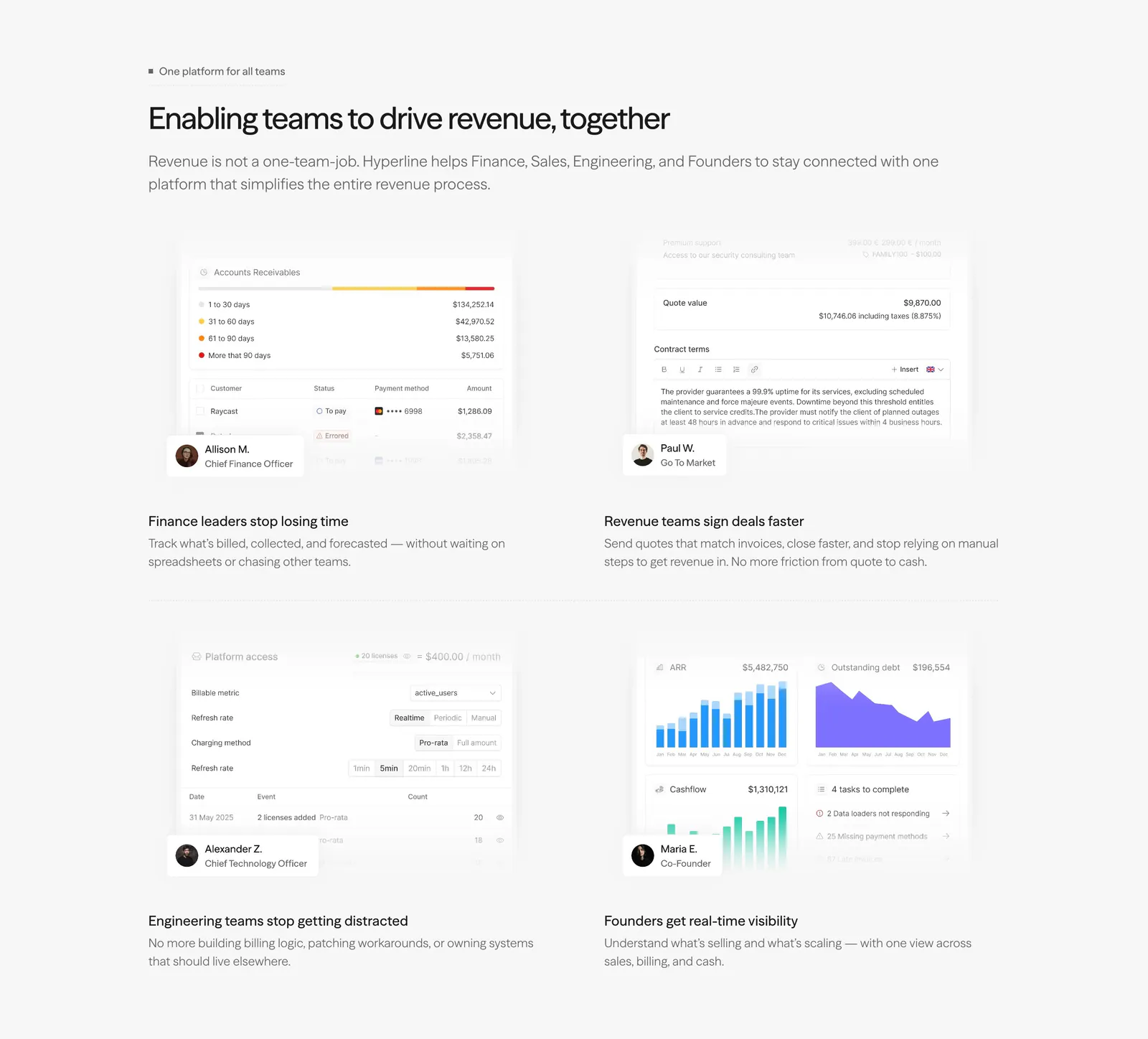
  1. Hyperline features section: left-aligned headline above a 2x2 grid of role-based product UI snippets with persona badges on light gray
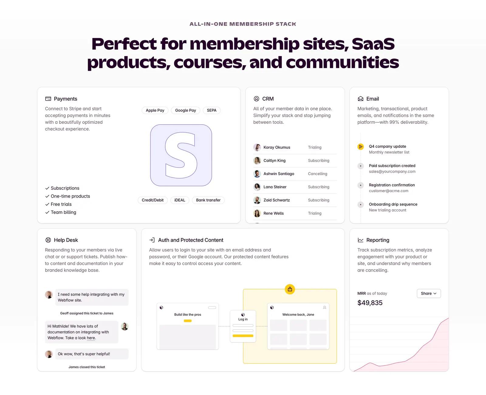
  2. Outseta features section: centered headline above a bento grid of cards for payments, CRM, email, help desk, auth and reporting
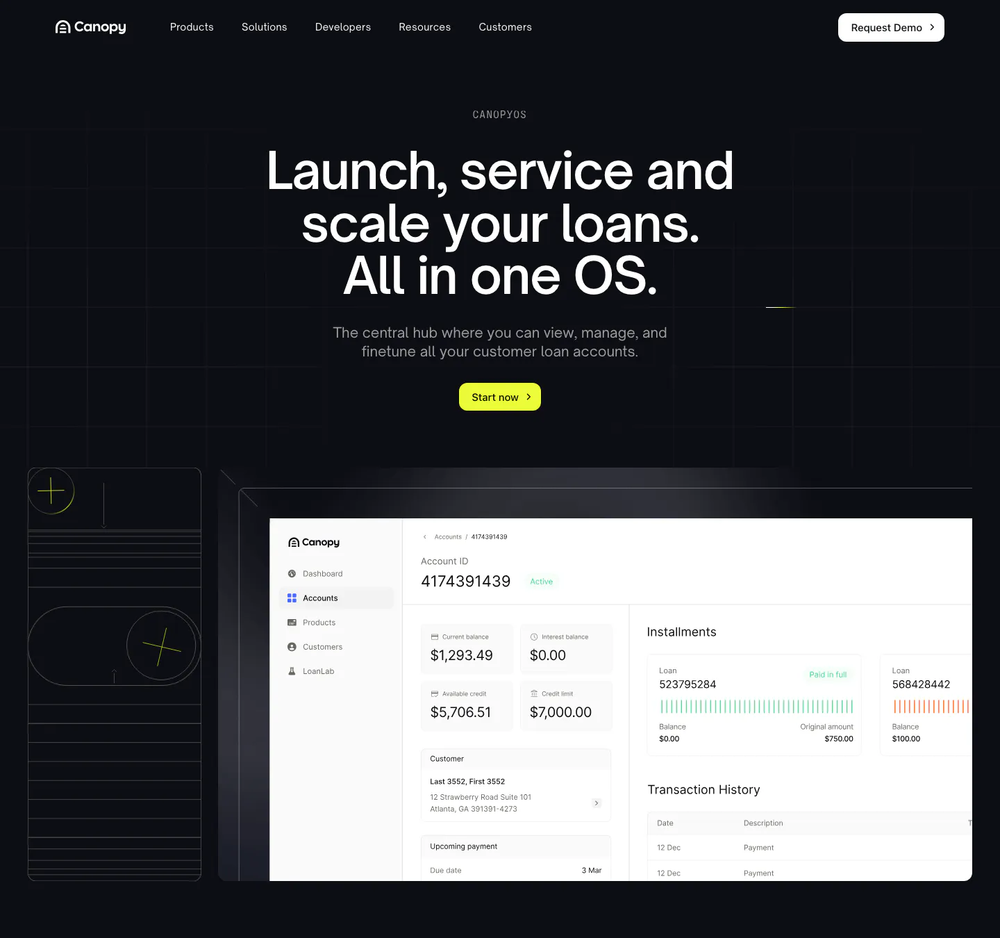
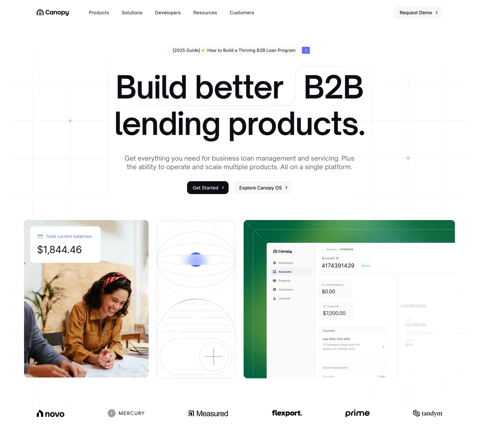
  3. Canopy hero section: dark centered headline and lime button above a loan account dashboard screenshot and line-art tile
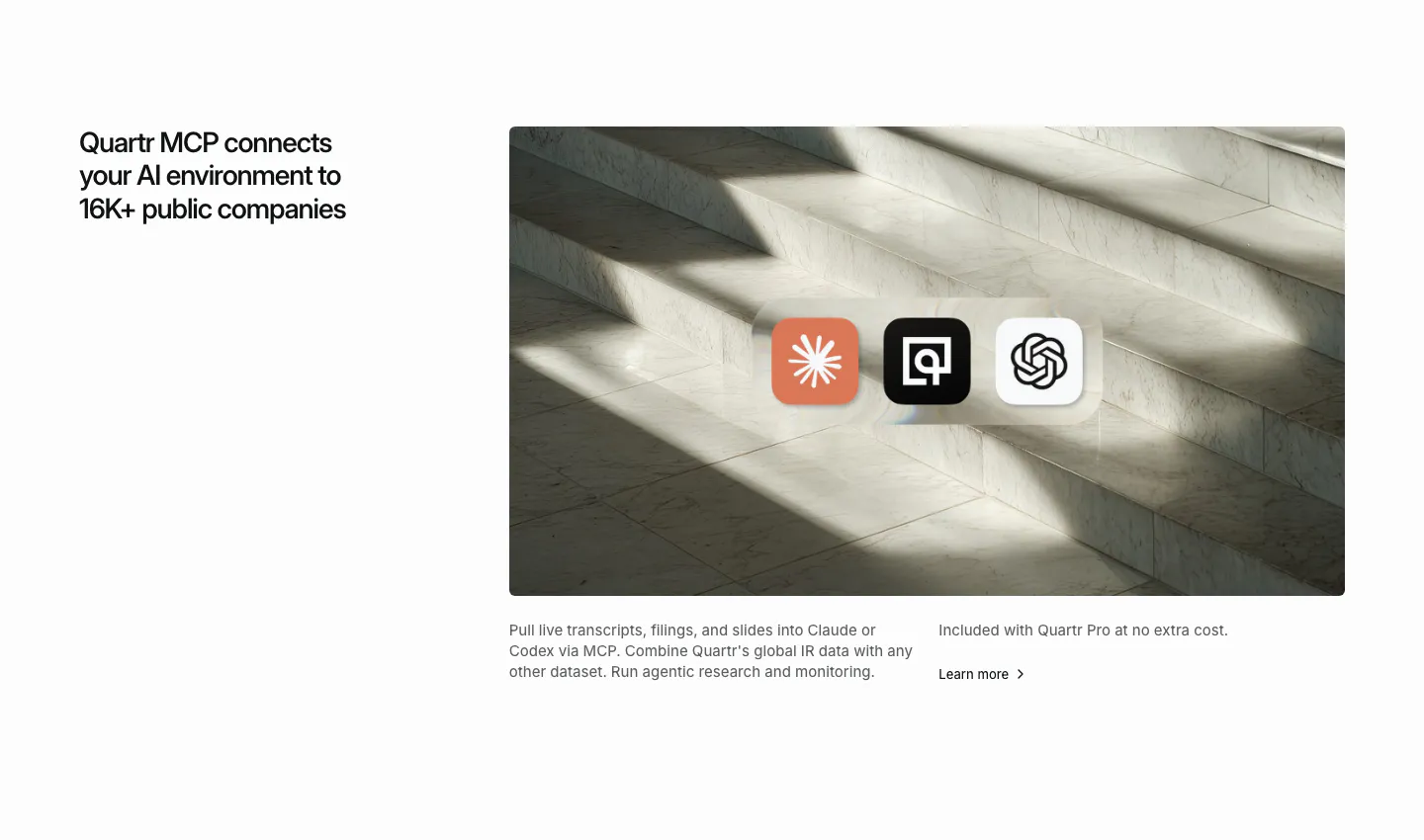
  4. Quartr integrations section: headline on the left, marble staircase photo on the right with Claude, Quartr and OpenAI app icons
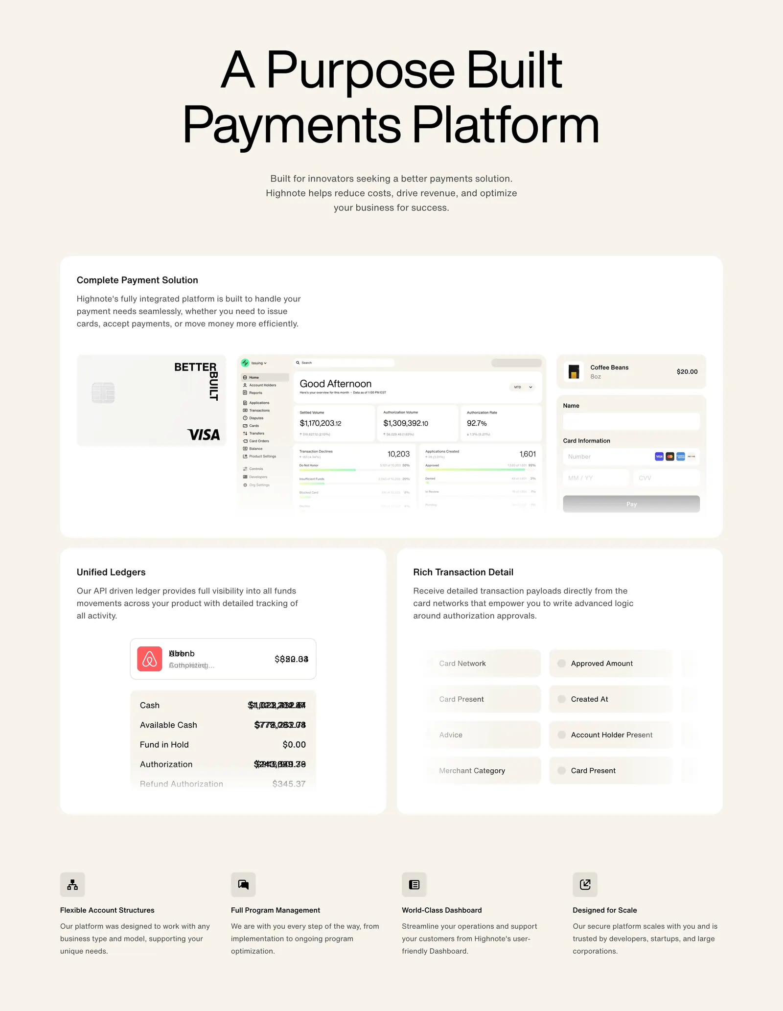
  5. Highnote features section: centered headline above large cards with card, dashboard and ledger UI, then a four-column feature list
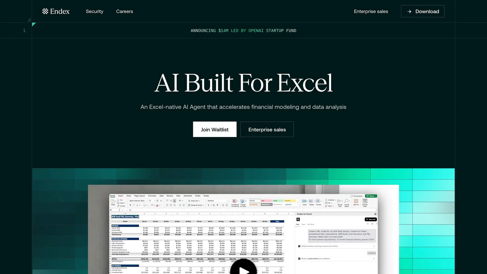
  6. Endex hero section: centered serif headline with two buttons above an Excel AI screenshot set on a teal pixel-gradient band, on dark green
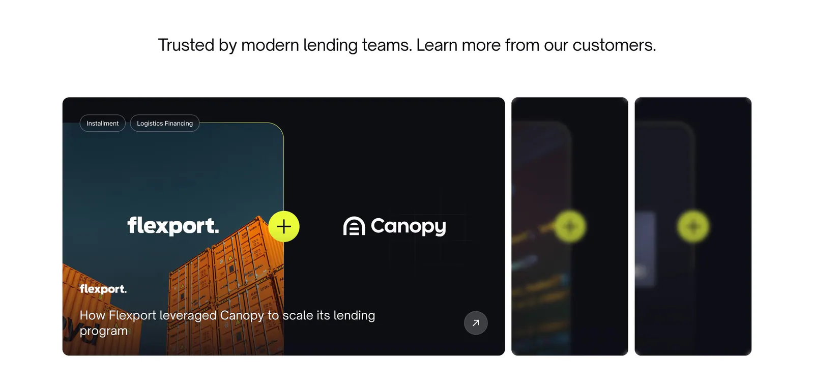
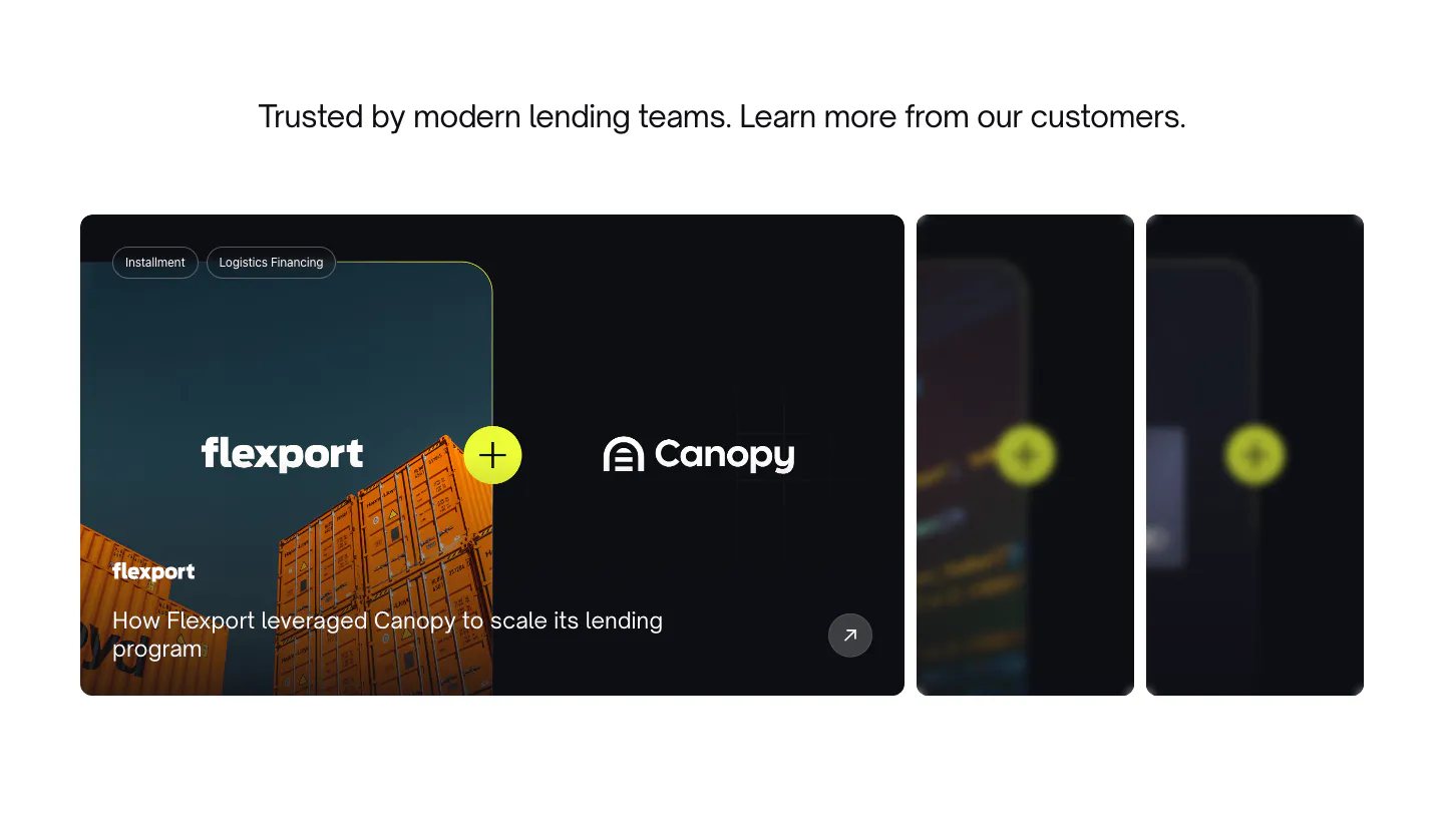
  7. Canopy testimonials section: centered headline above a Flexport case study card with container photo and two collapsed cards
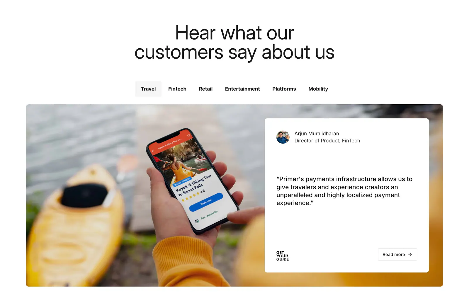
  8. Primer testimonials section: centered headline, industry tabs, and a quote card over a photo of a hand holding a phone
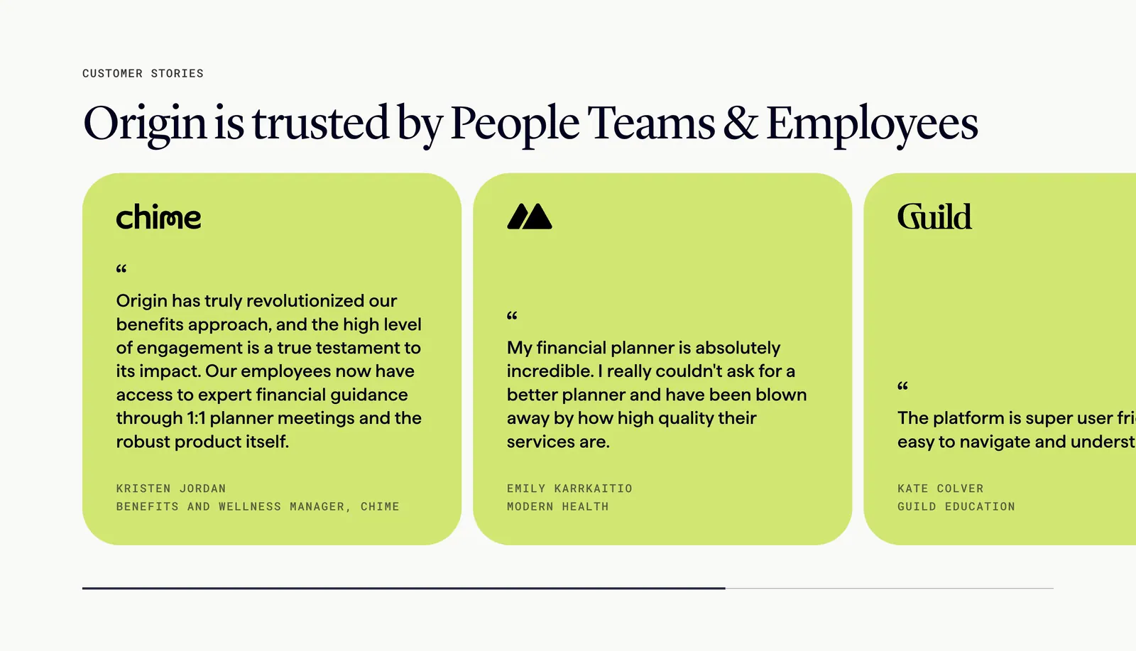
  9. Origin hero section: large centered serif headline and lime CTA above tilted mobile app screens, a Featured in press logo row below
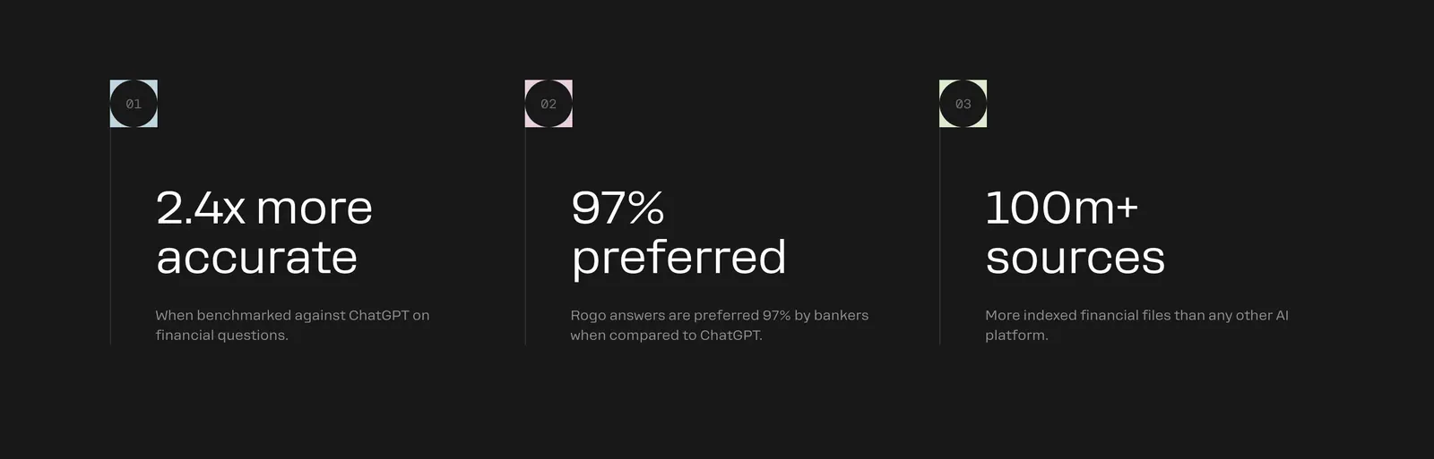
  10. Rogo value proposition section: three numbered columns of large outcome stats with short descriptions on charcoal
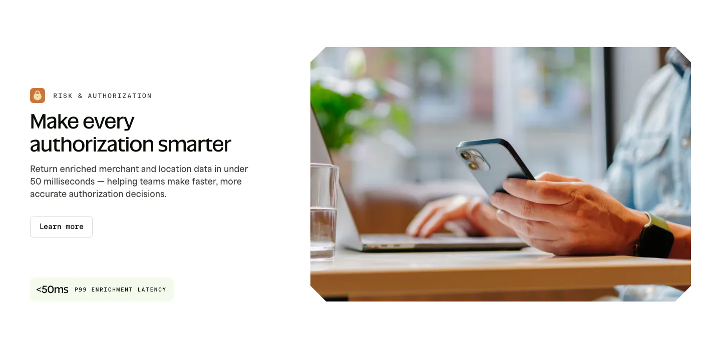
  11. Spade features section: labeled headline, copy, button and latency stat chip on the left beside a photo of hands holding a phone at a laptop
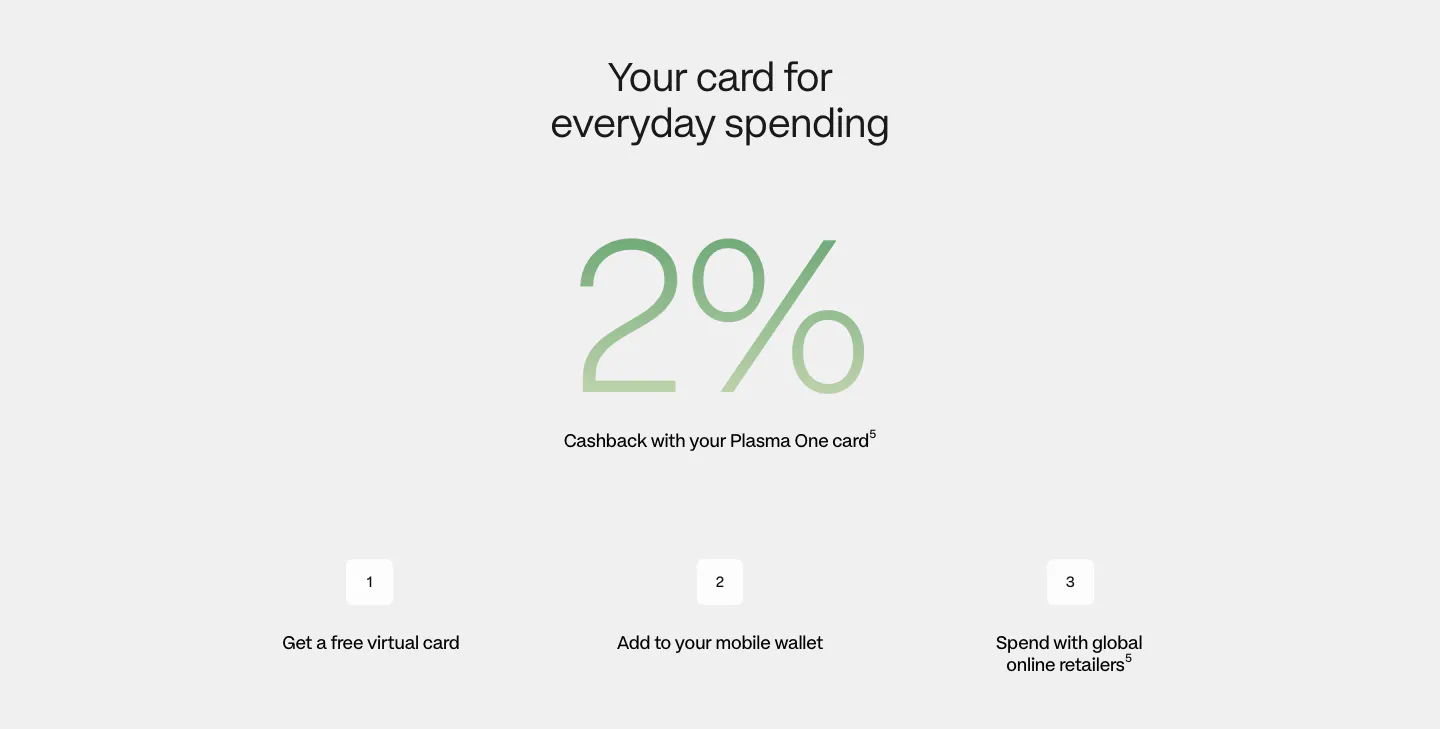
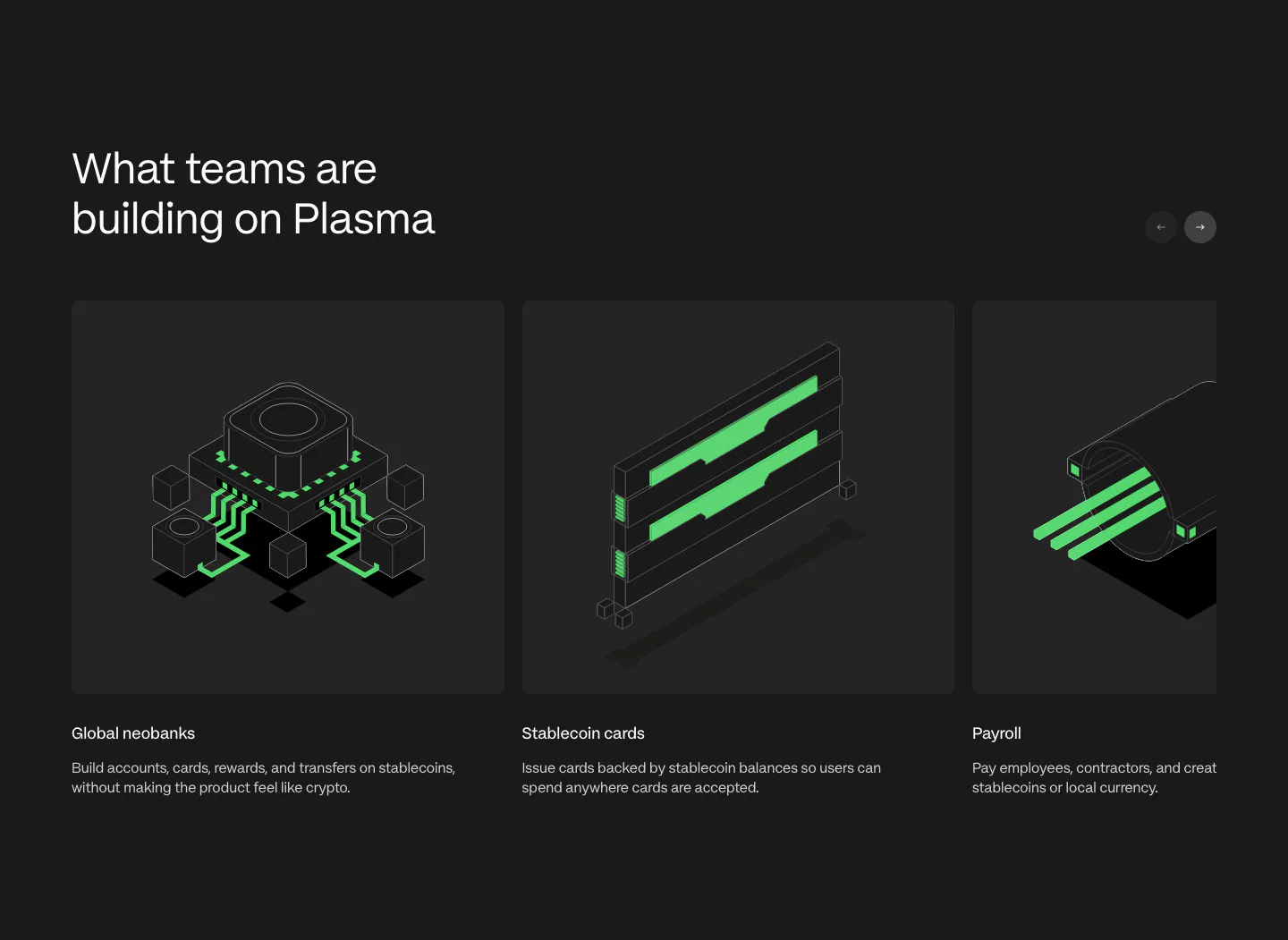
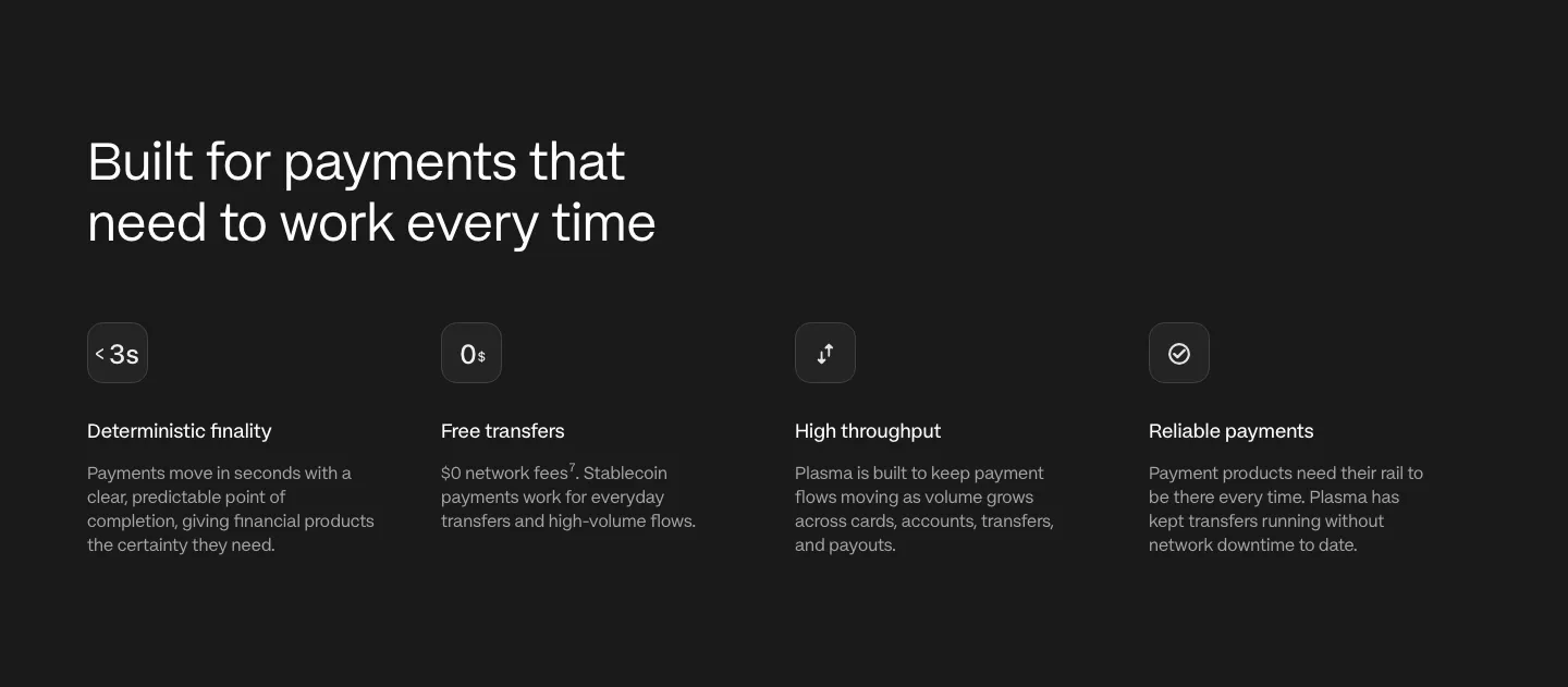
  12. Plasma how it works section: centered heading, giant green gradient 2% figure and three numbered steps on light gray
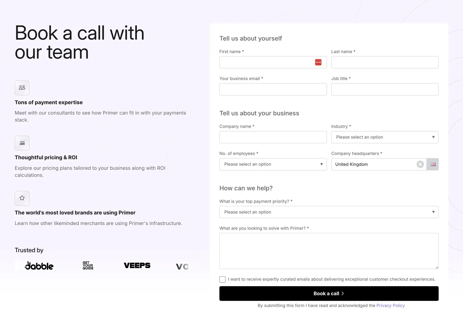
  13. Primer contact section: headline and three benefit points with a logo row on the left, multi-field demo booking form on the right
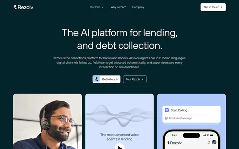
  14. Rezolv hero section: centered headline with two buttons above three cards, a headset agent photo, voice demo play card and phone app
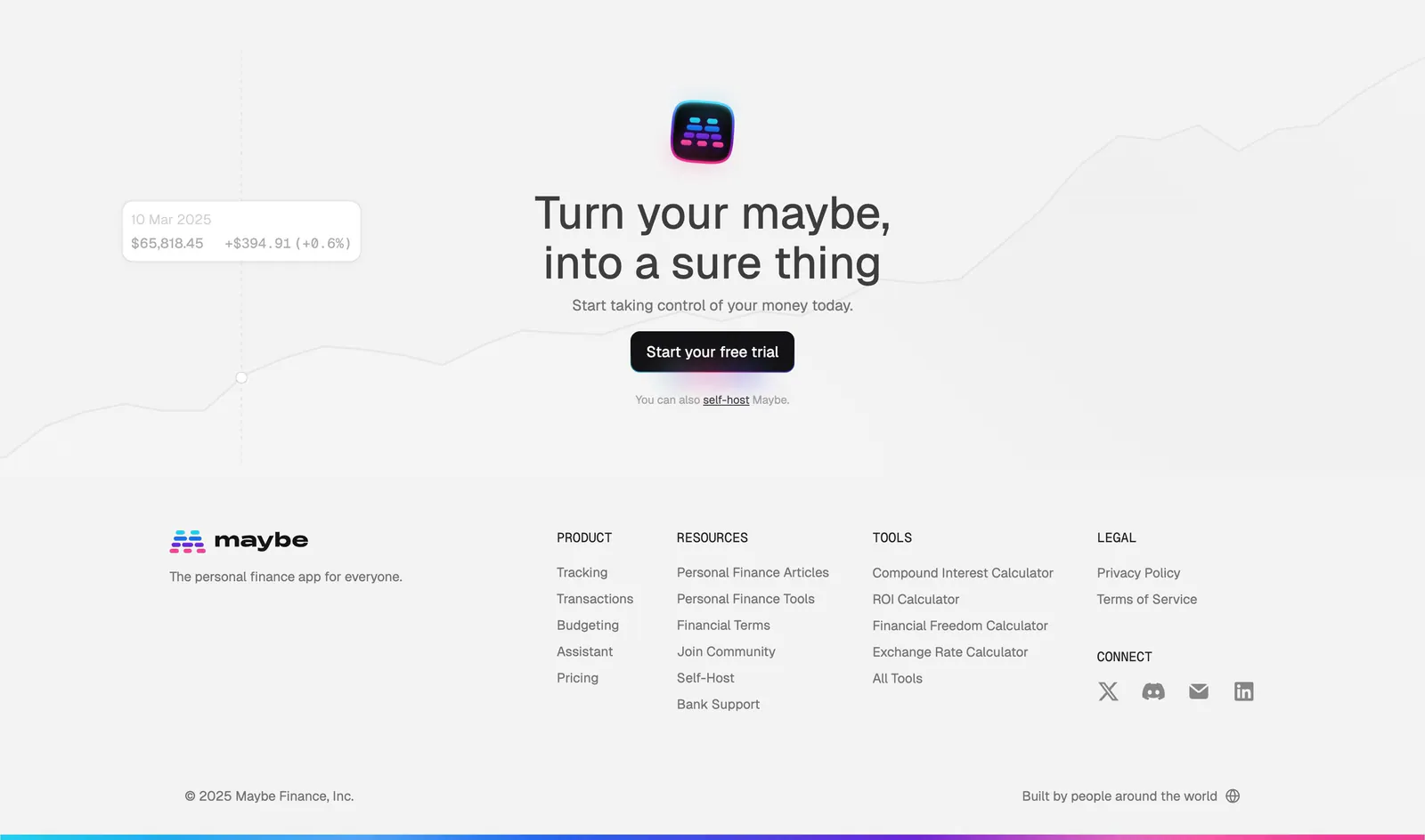
  15. Maybe footer section: centered closing CTA over a faint line chart, then logo and four link columns on light gray
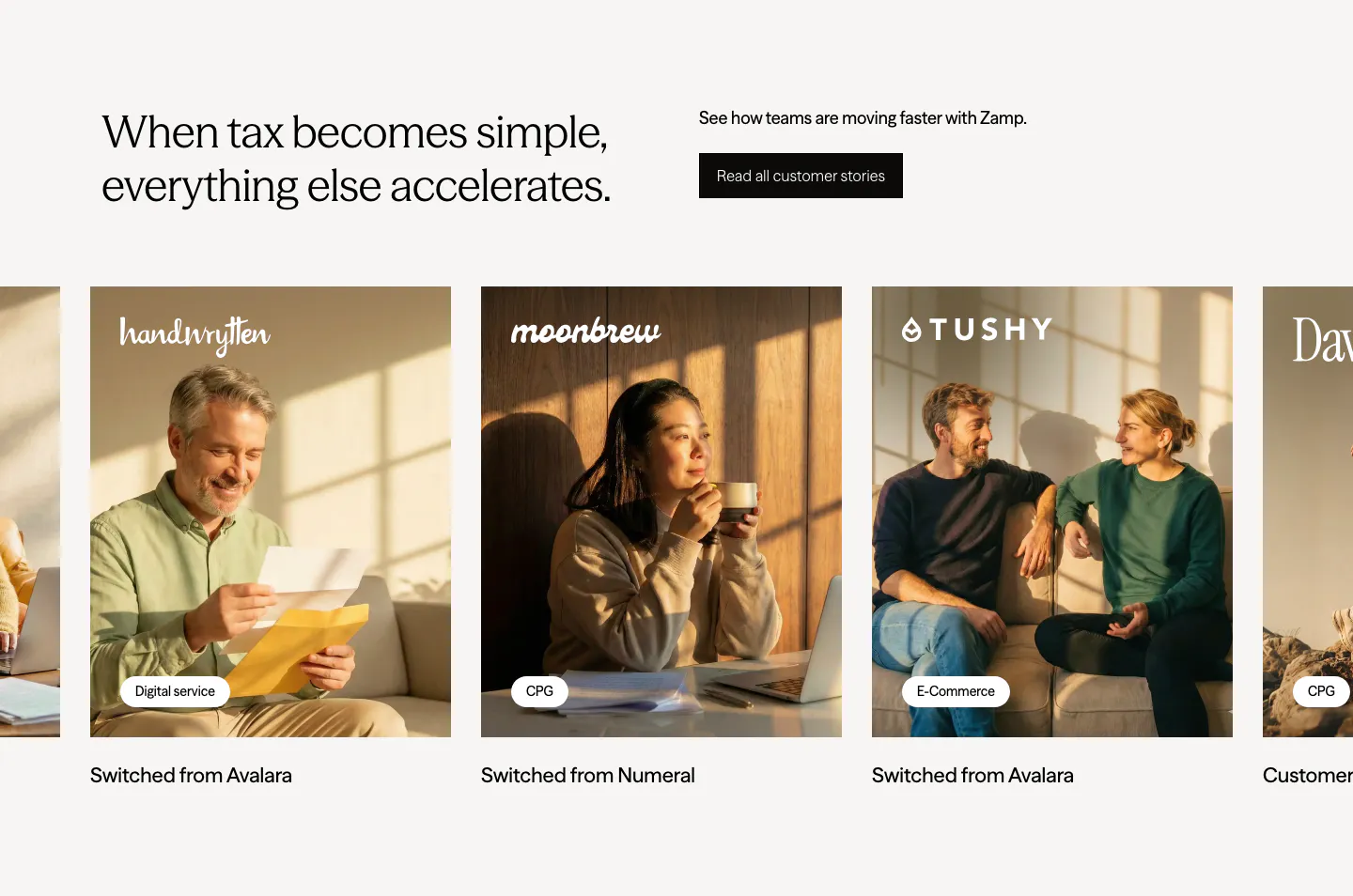
  16. Zamp testimonials section: headline and stories button above a carousel of customer photo cards with brand logos and tags
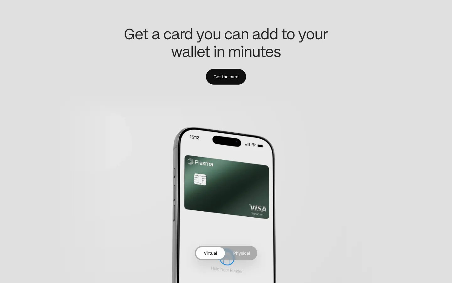
  17. Plasma features section: centered heading and button above a phone showing a green Visa card with a virtual/physical toggle
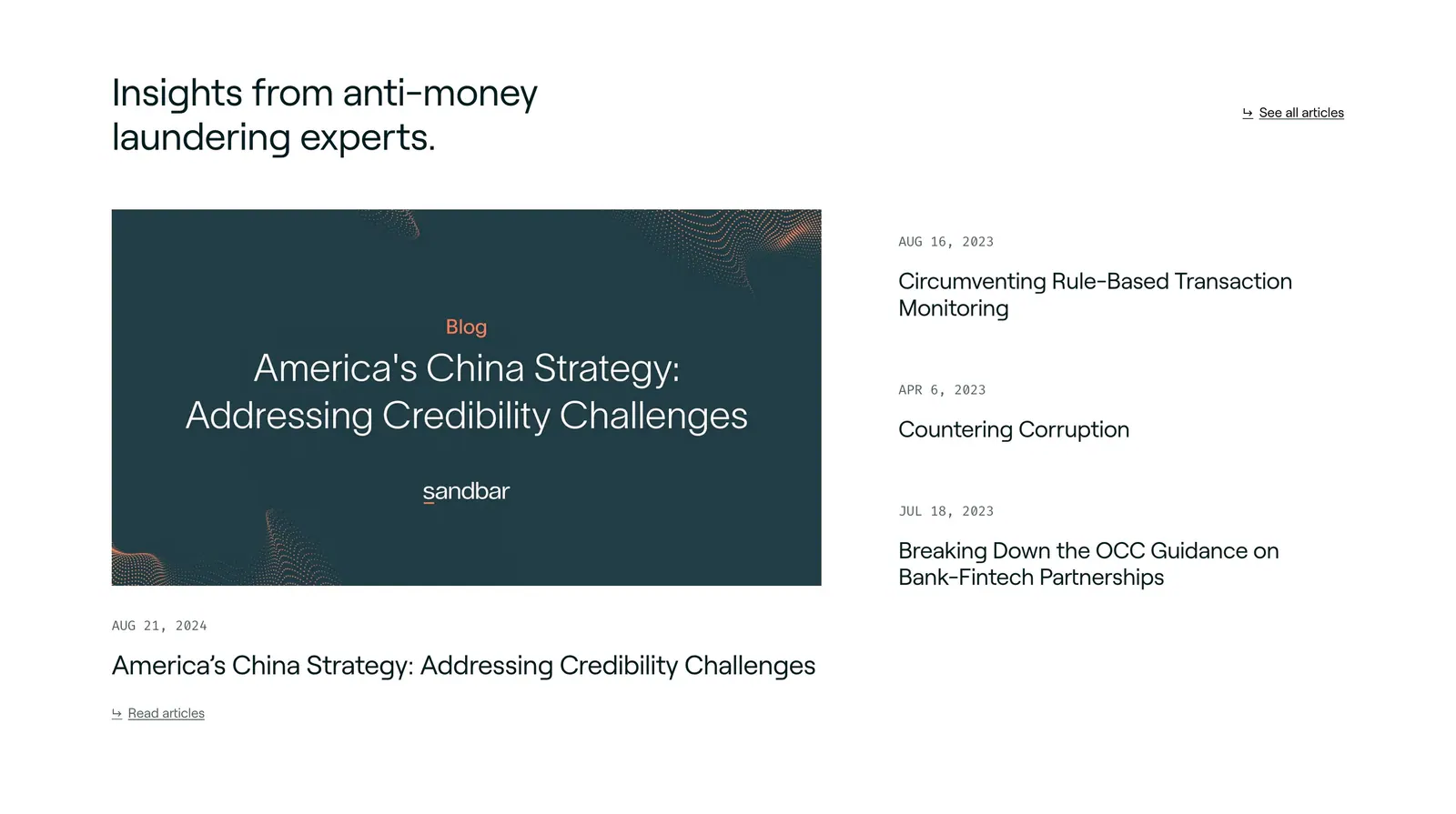
  18. Sandbar blog & resources section: headline above a featured article card on the left and a dated list of three articles on the right
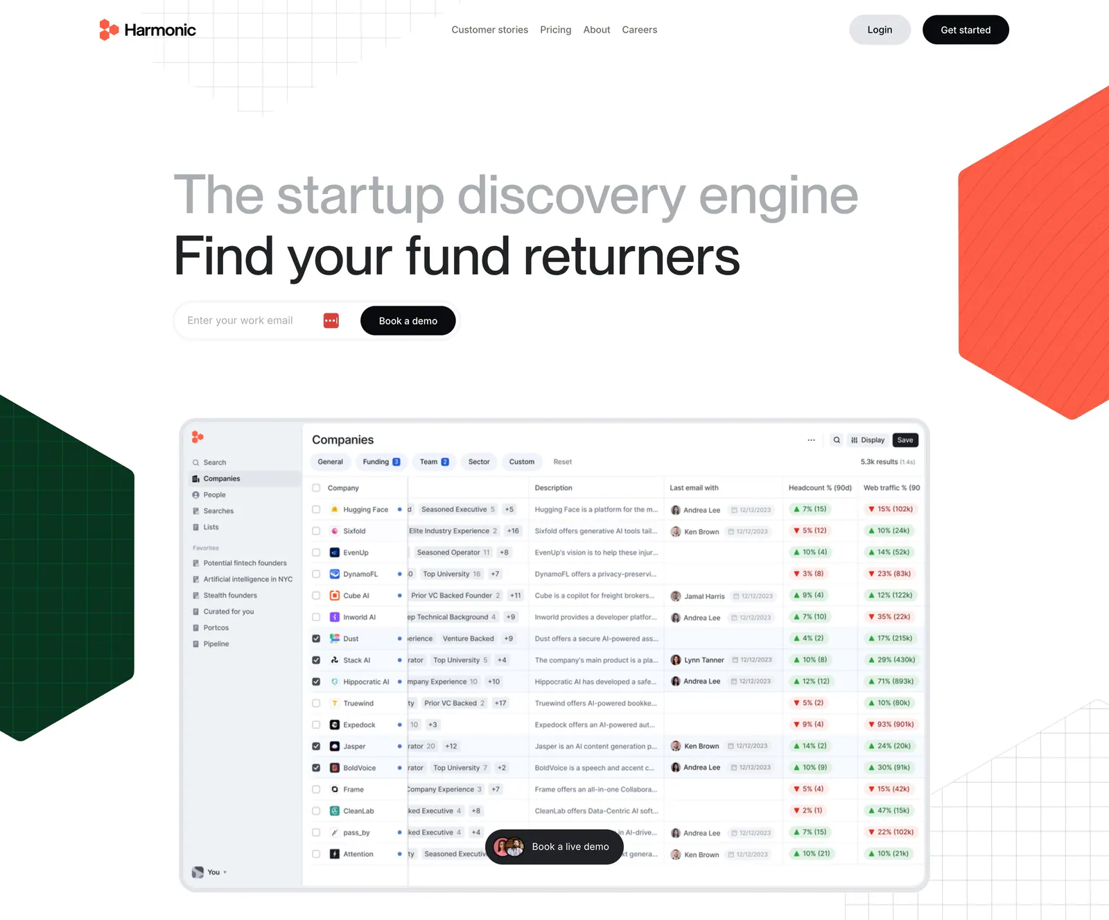
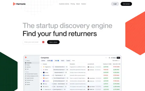
  19. Harmonic hero section: two-tone headline with email field above a companies table screenshot, flanked by red and green hexagons
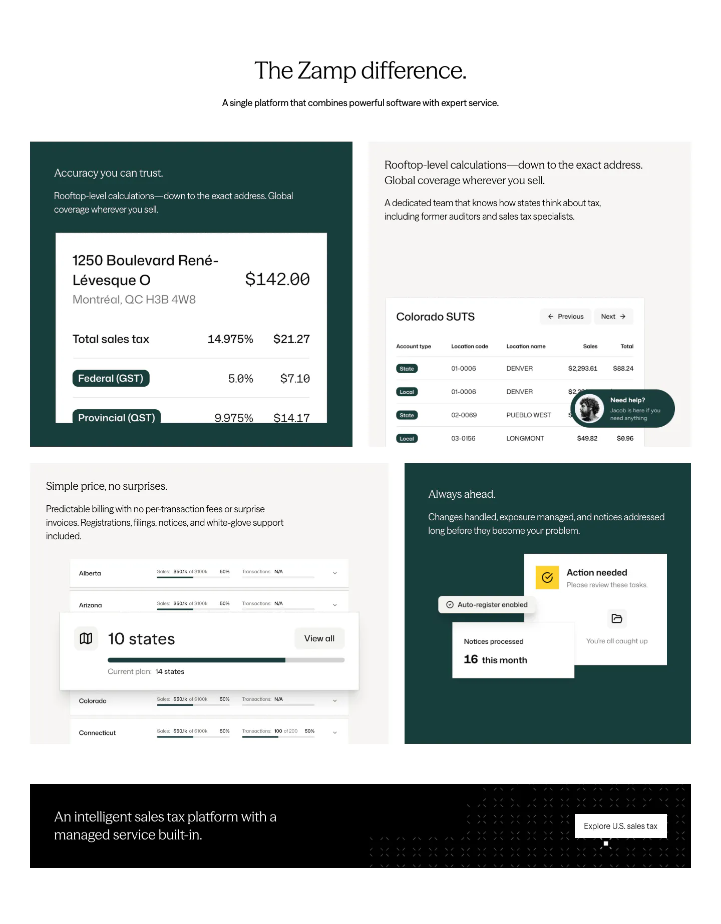
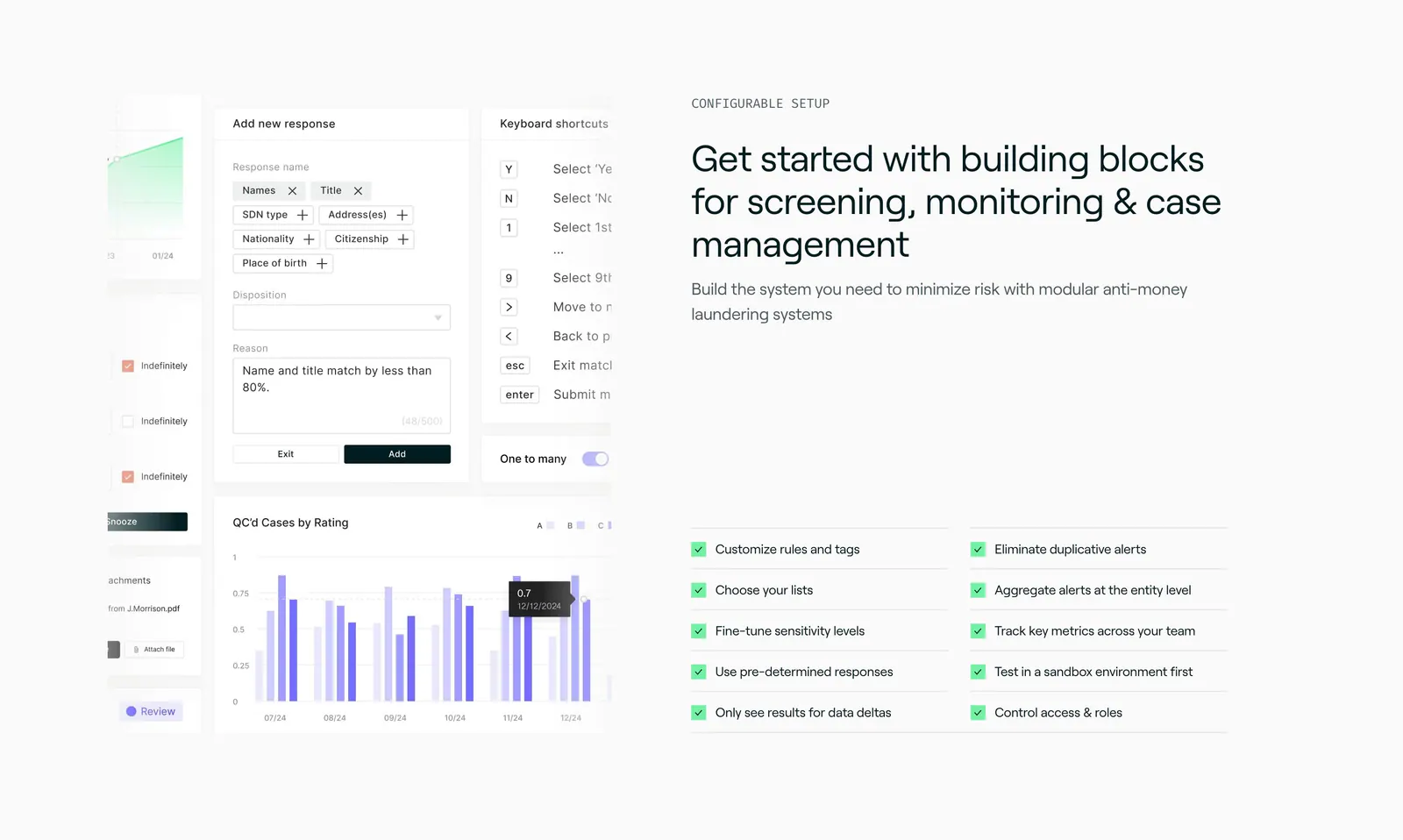
  20. Zamp features section: centered headline above a grid of dark green and light tiles with tax UI snippets and a black banner
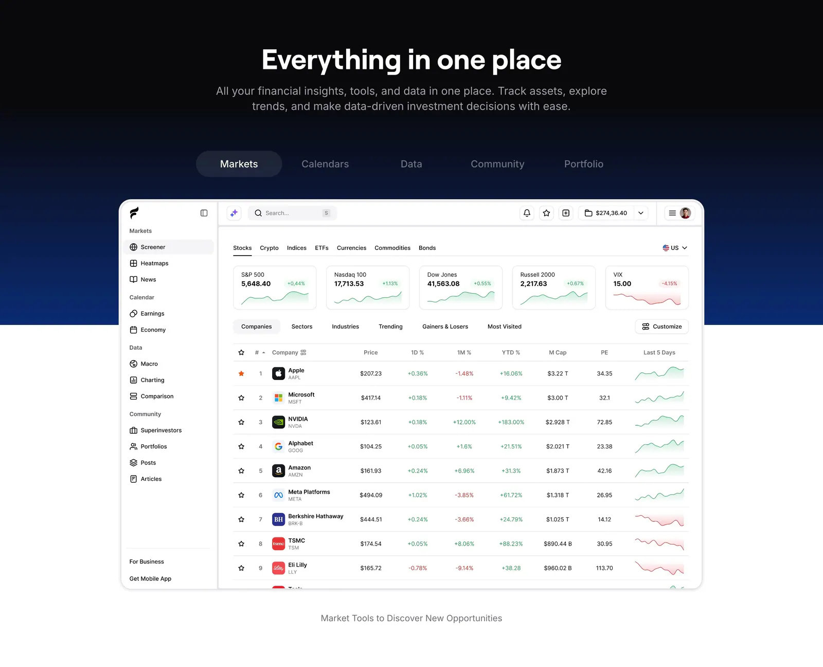
  21. Finsepa features section: centered headline and tab bar on a black-to-navy band above a stock screener dashboard screenshot
  22. Rogo footer section: serif CTA headline with demo button above four link columns and a copyright line on a dark background
  23. Concourse call-to-action section: centered headline and dark button over a white-to-lavender dot-grid background
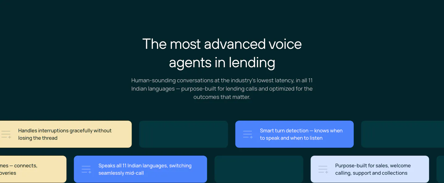
  24. Rezolv features section: centered headline above staggered rows of yellow, blue and teal capability chips on a dark teal background
  25. Zamp stats section: single row of four large figures with labels separated by thin dividers on white
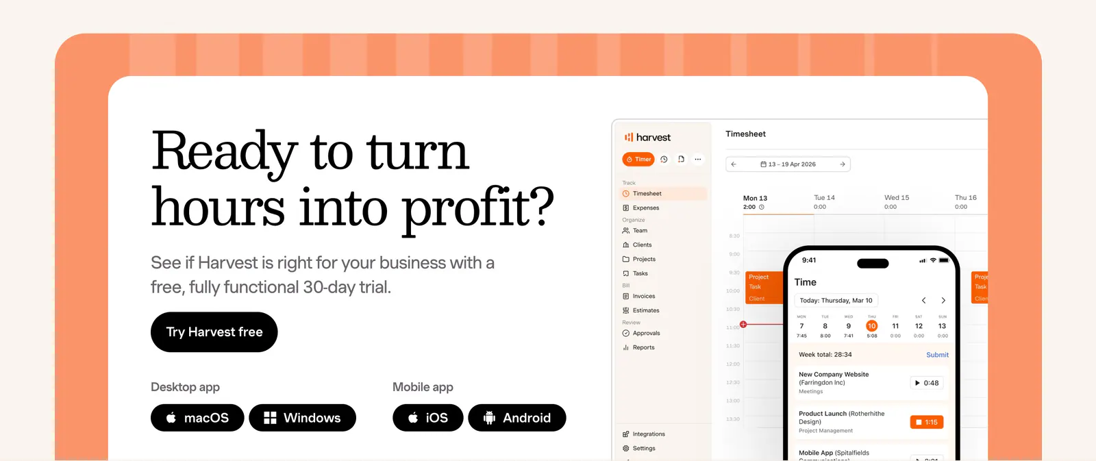
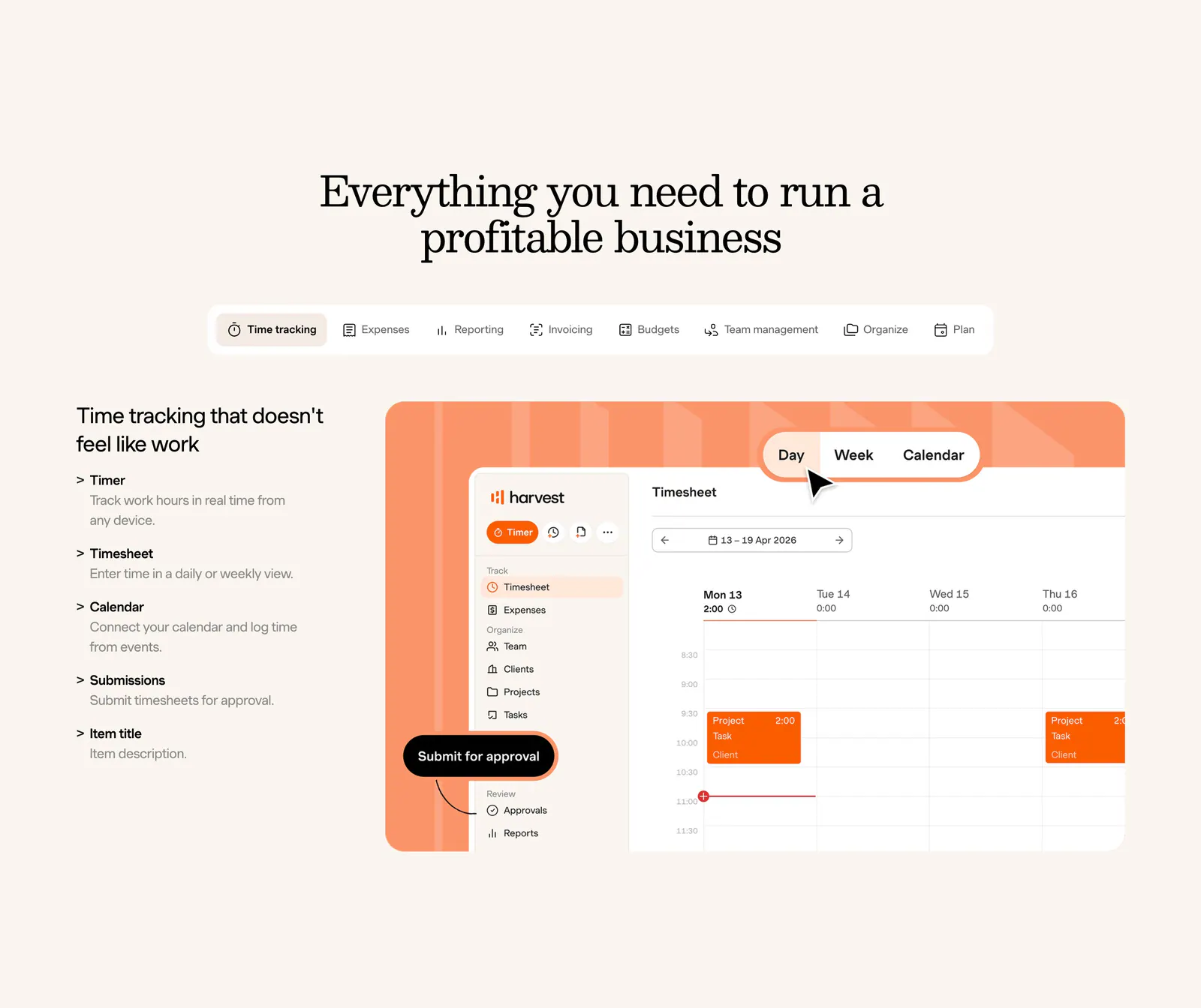
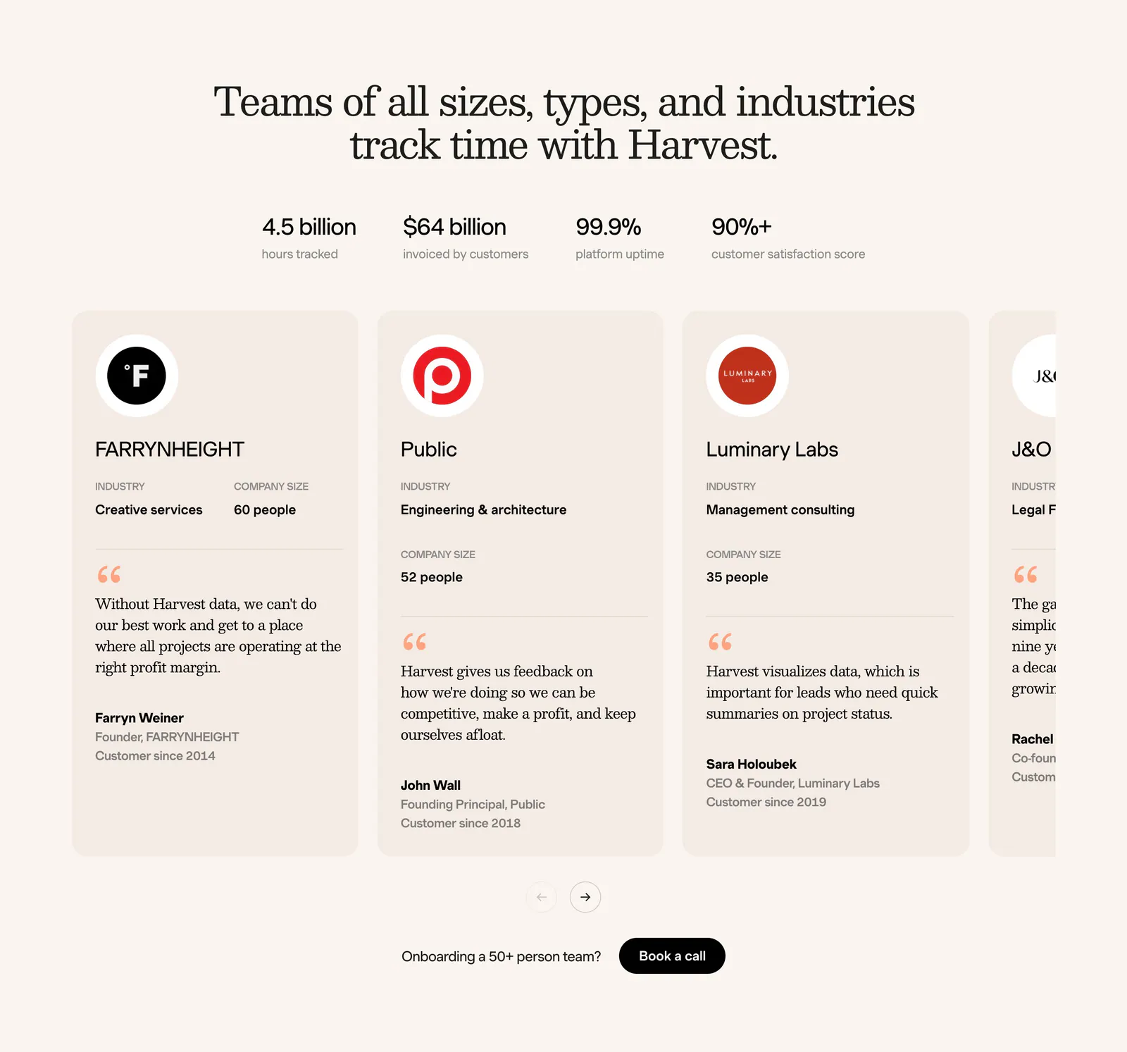
  26. Harvest call-to-action section: serif headline, trial button and app badges beside desktop and mobile timesheet UI in an orange-framed card
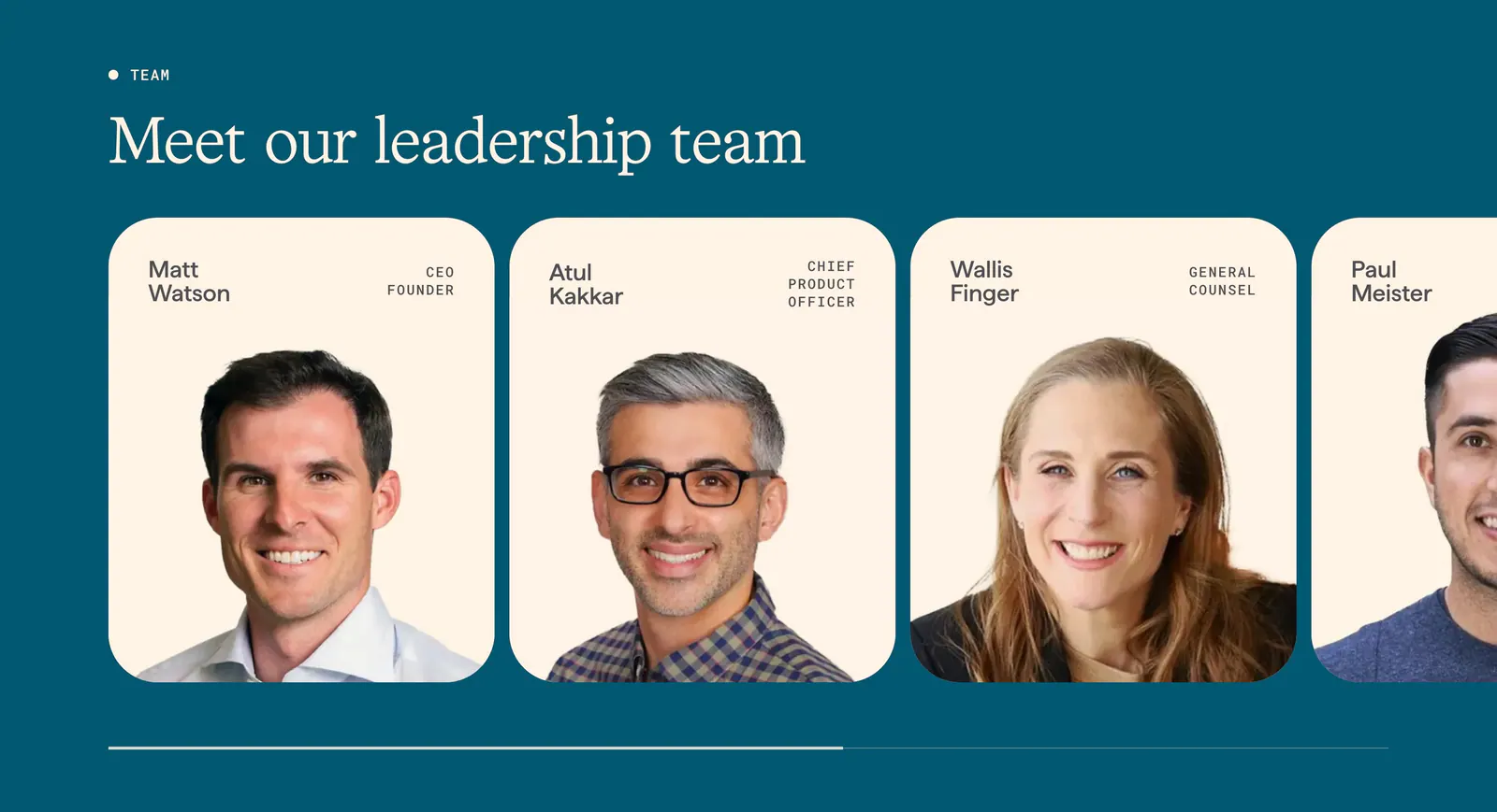
  27. Origin team section: serif headline above a scrolling row of cream leadership cards with portrait photos and titles on deep teal
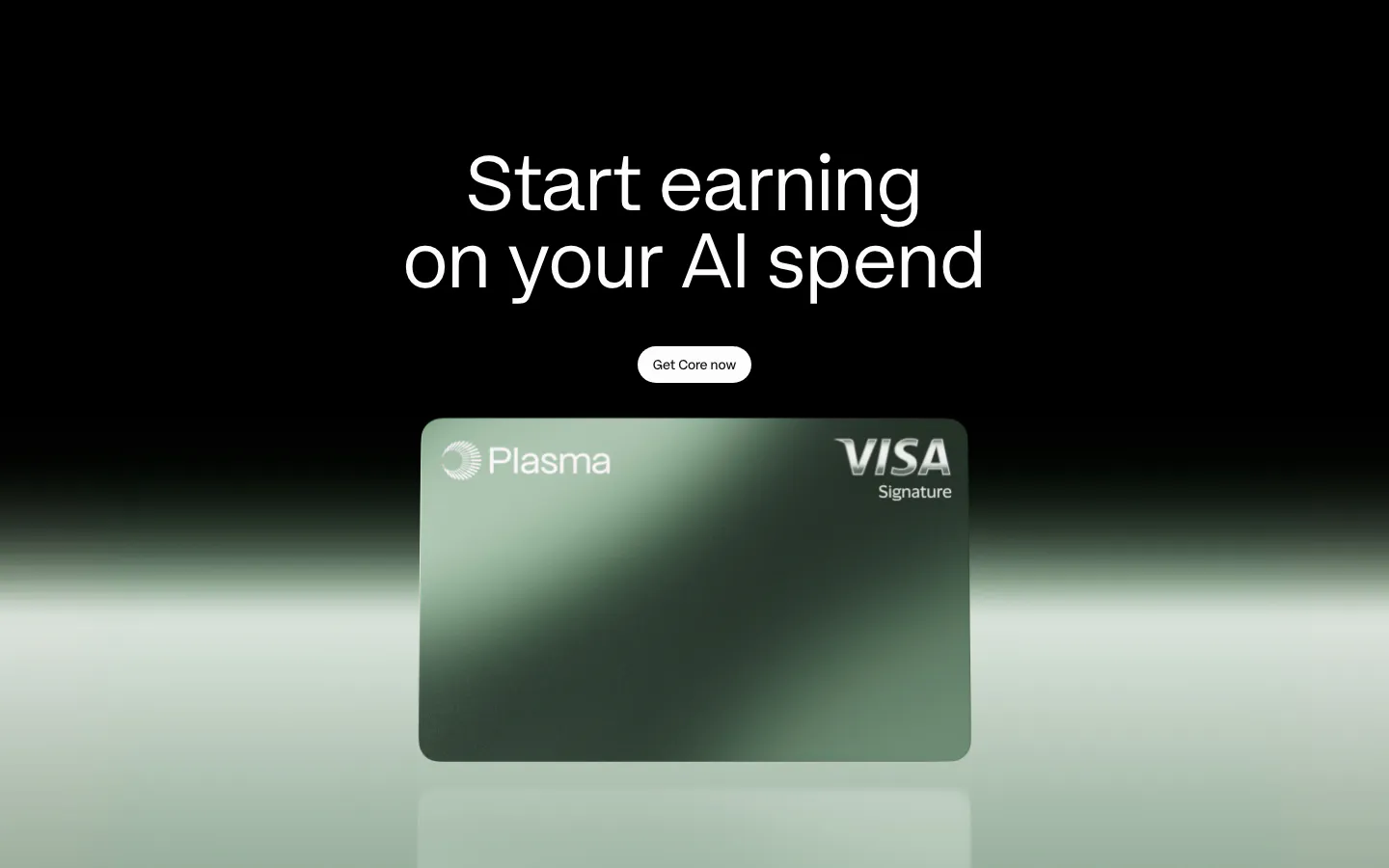
  28. Plasma call-to-action section: centered headline and button above a green Plasma card render with a green glow on black
  29. Concourse stats section: headline above a 2x2 grid of large metrics with labels on a near-black background
  30. Nominal footer section: large black logo mark on the left, six link columns and a copyright row on an off-white background
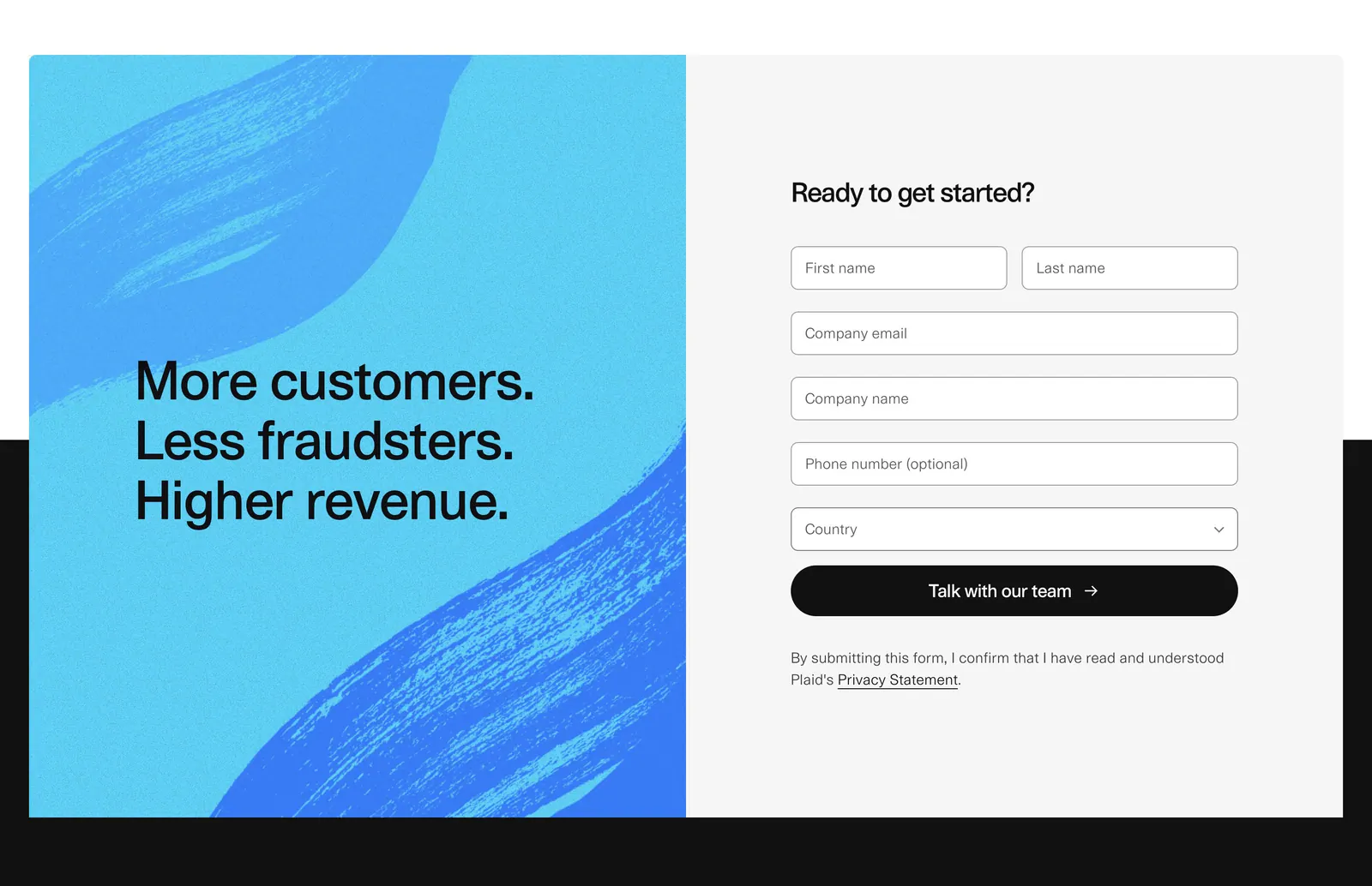
  31. Plaid call to action section: blue brushstroke panel with stacked headline beside a gray contact form with name, email and country fields
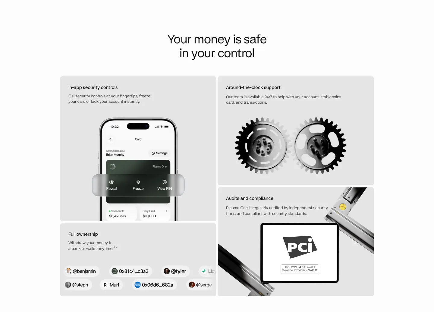
  32. Plasma security section: centered heading above a bento of gray tiles with a phone UI, 3D gears, a PCI badge and user handles
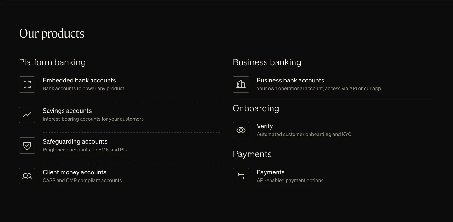
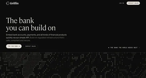
  33. Griffin features section: serif heading above two columns of product list items with outlined icons on black
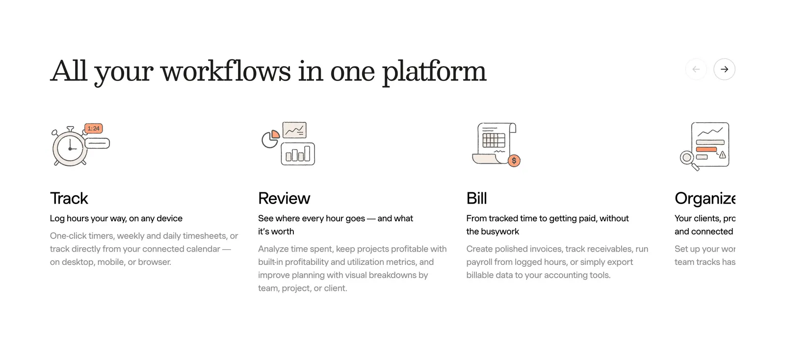
  34. Harvest features section: serif heading with arrow controls above a sliding row of track, review, bill and organize columns with line drawings
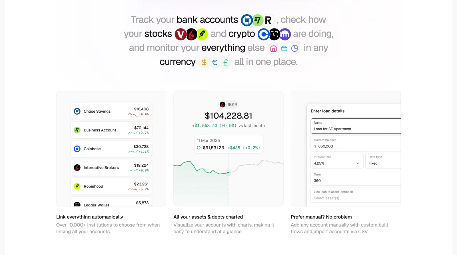
  35. Maybe features section: centered sentence headline with inline logos above three cards showing account list, chart and loan form UI
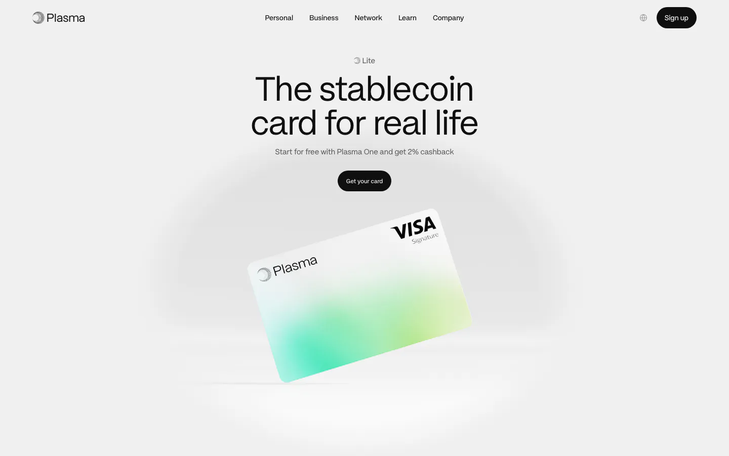
  36. Plasma hero section: nav, centered headline and black button above a tilted white-and-green Visa card render on light gray
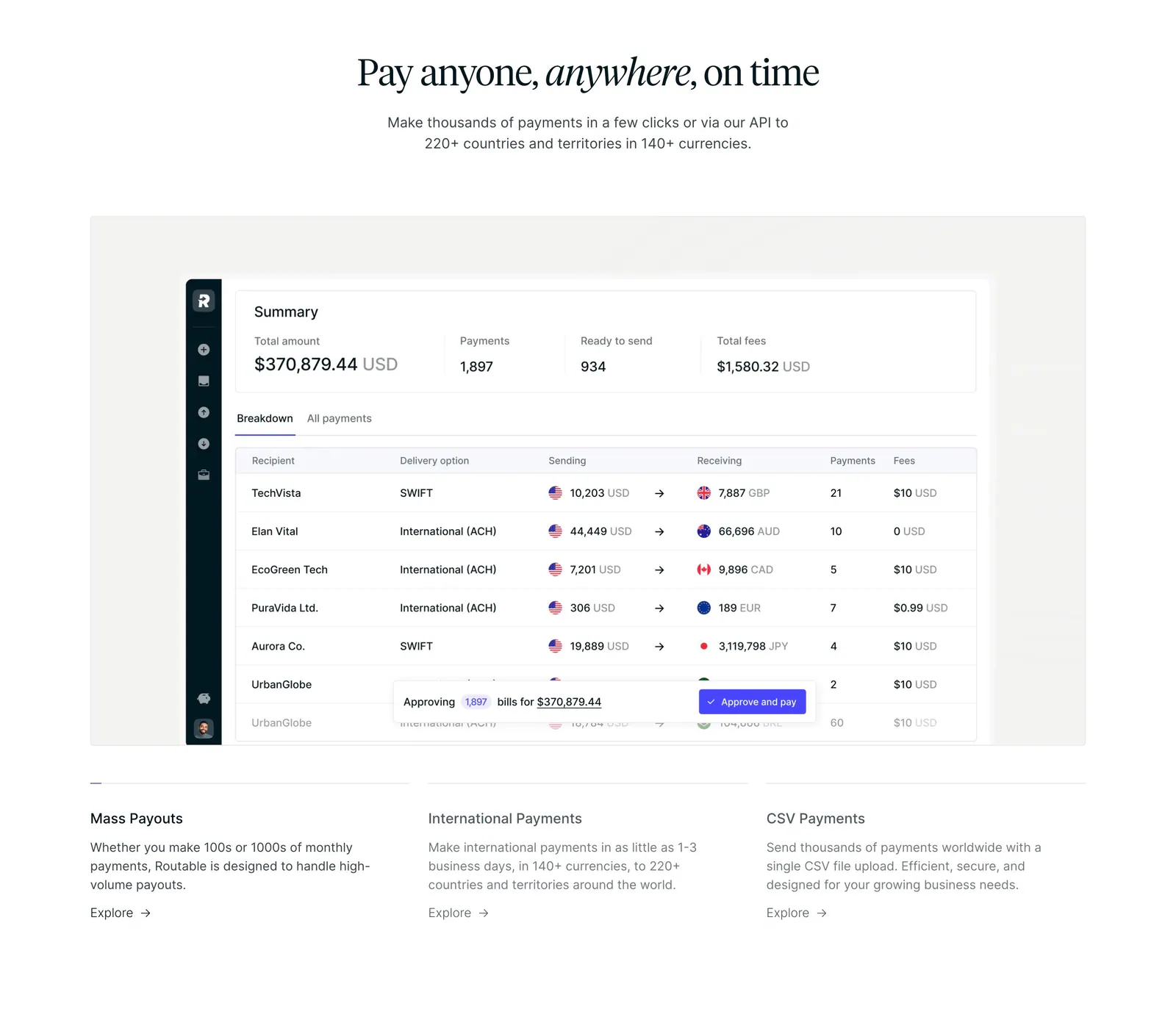
  37. Routable features section: centered serif headline above a payments summary dashboard screenshot and three feature columns on white
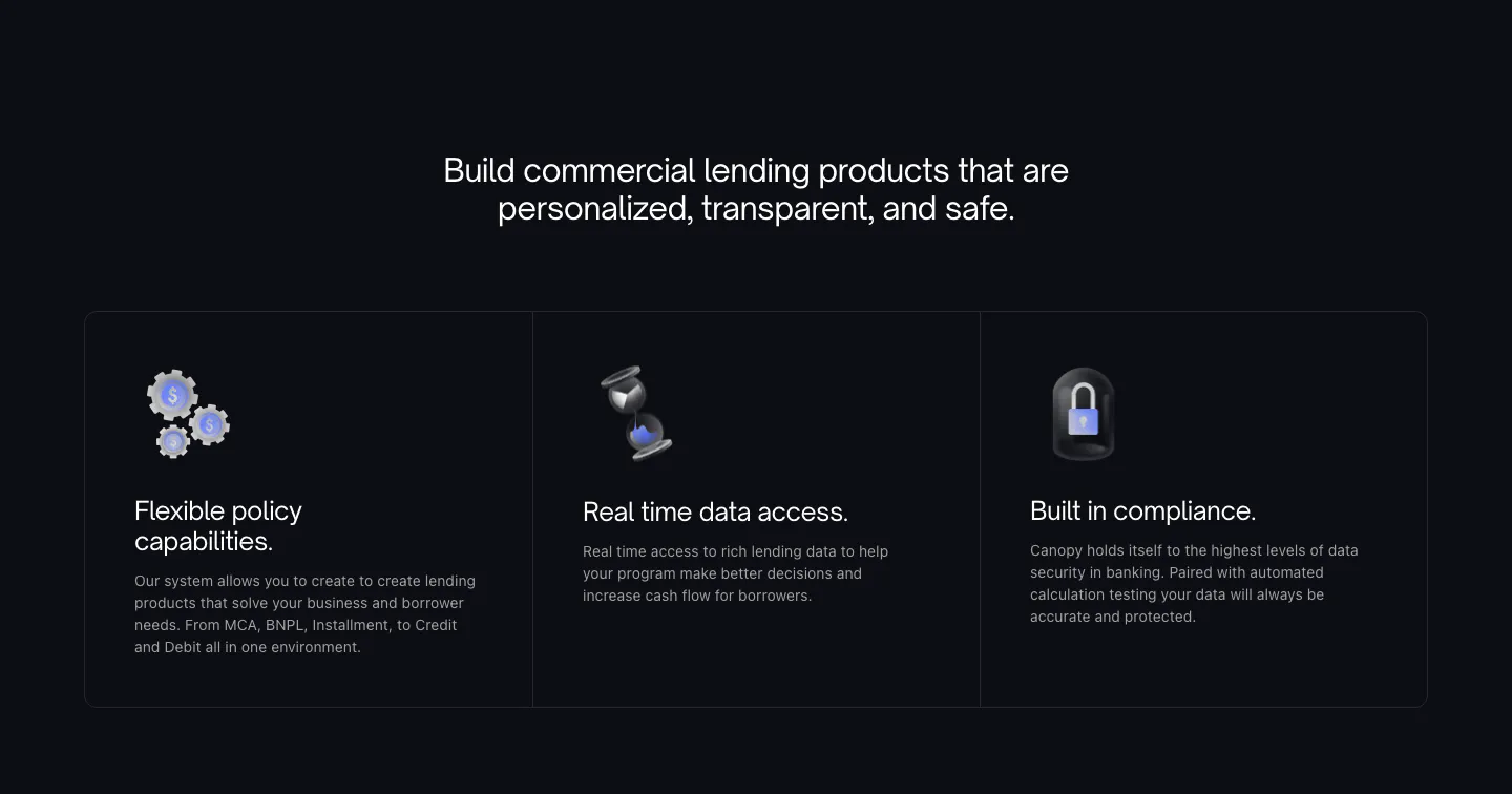
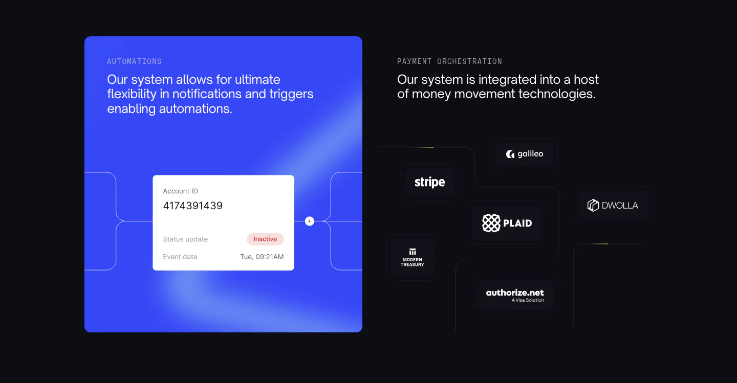
  38. Canopy features section: blue automation card with account UI beside payment partner logos on dark tiles
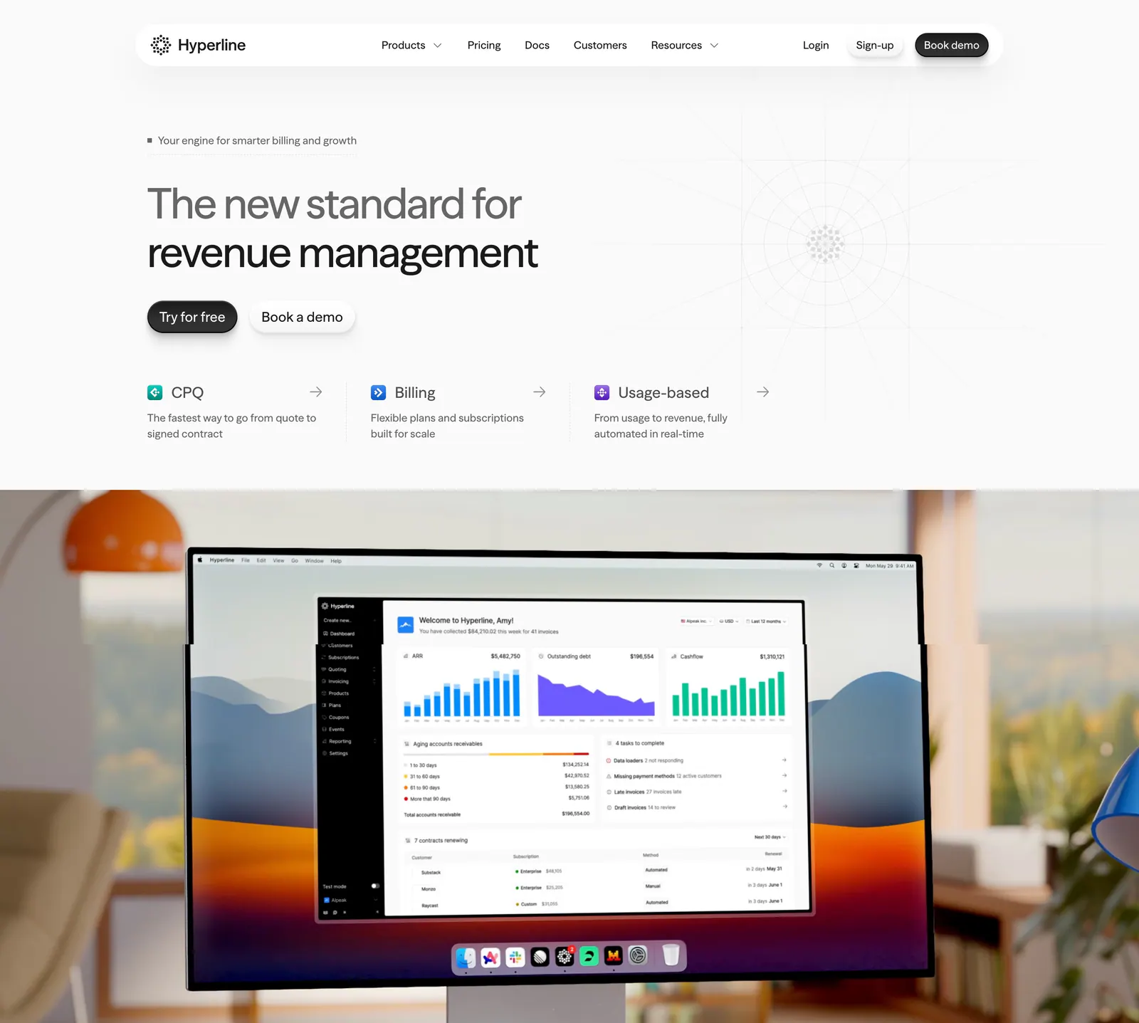
  39. Hyperline hero section: left-aligned headline and three product links above a photo of a desktop monitor showing the billing dashboard
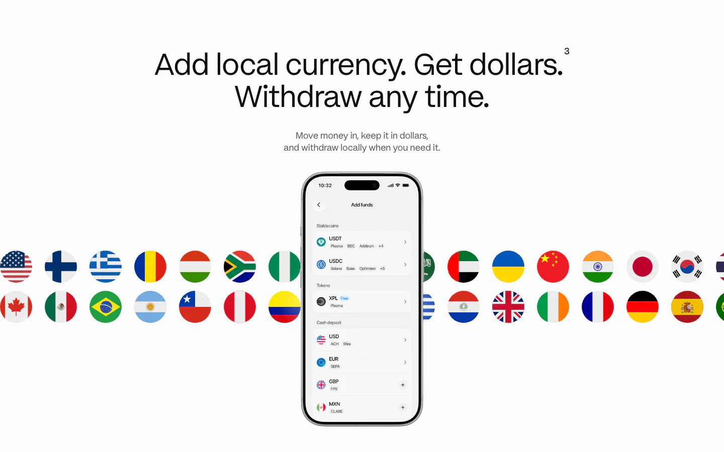
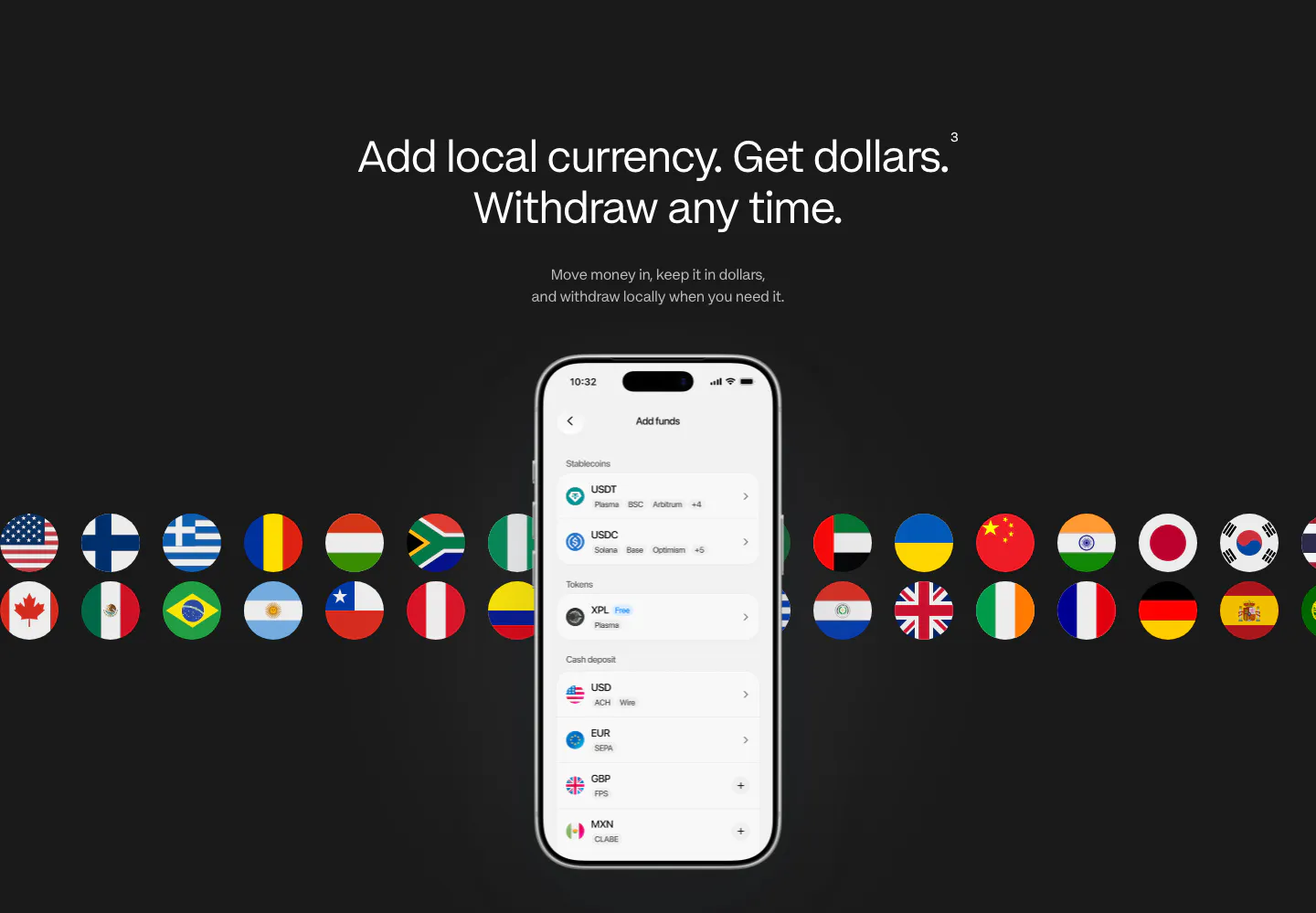
  40. Plasma features section: centered heading above a phone add-funds screen with two rows of country flag circles behind it
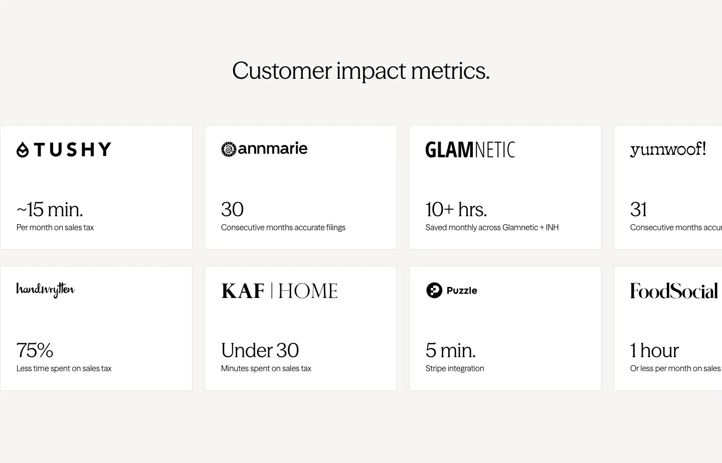
  41. Zamp stats section: centered heading above two rows of white cards pairing customer logos with time-saved figures, cut off at the right edge
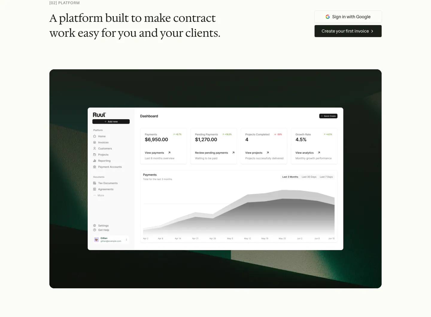
  42. Ruul features section: serif headline with two buttons above a dashboard screenshot on a dark green textured panel
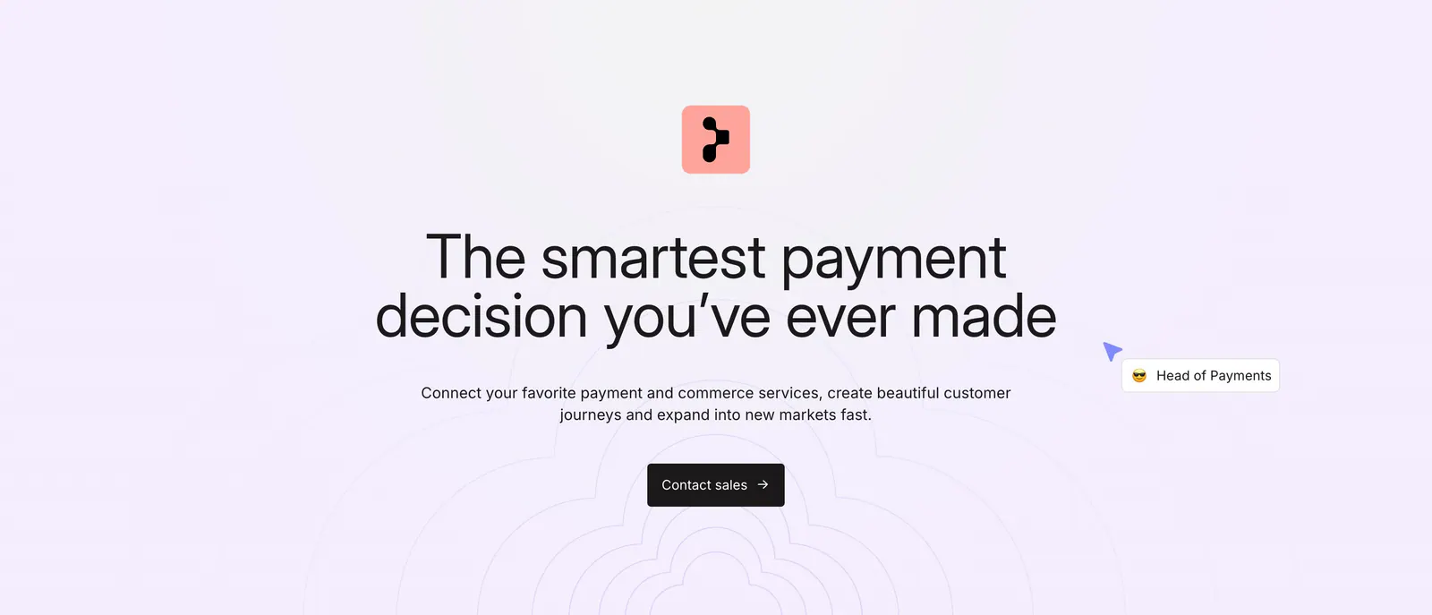
  43. Primer call-to-action section: centered headline, subcopy and dark Contact sales button over a faint concentric line pattern
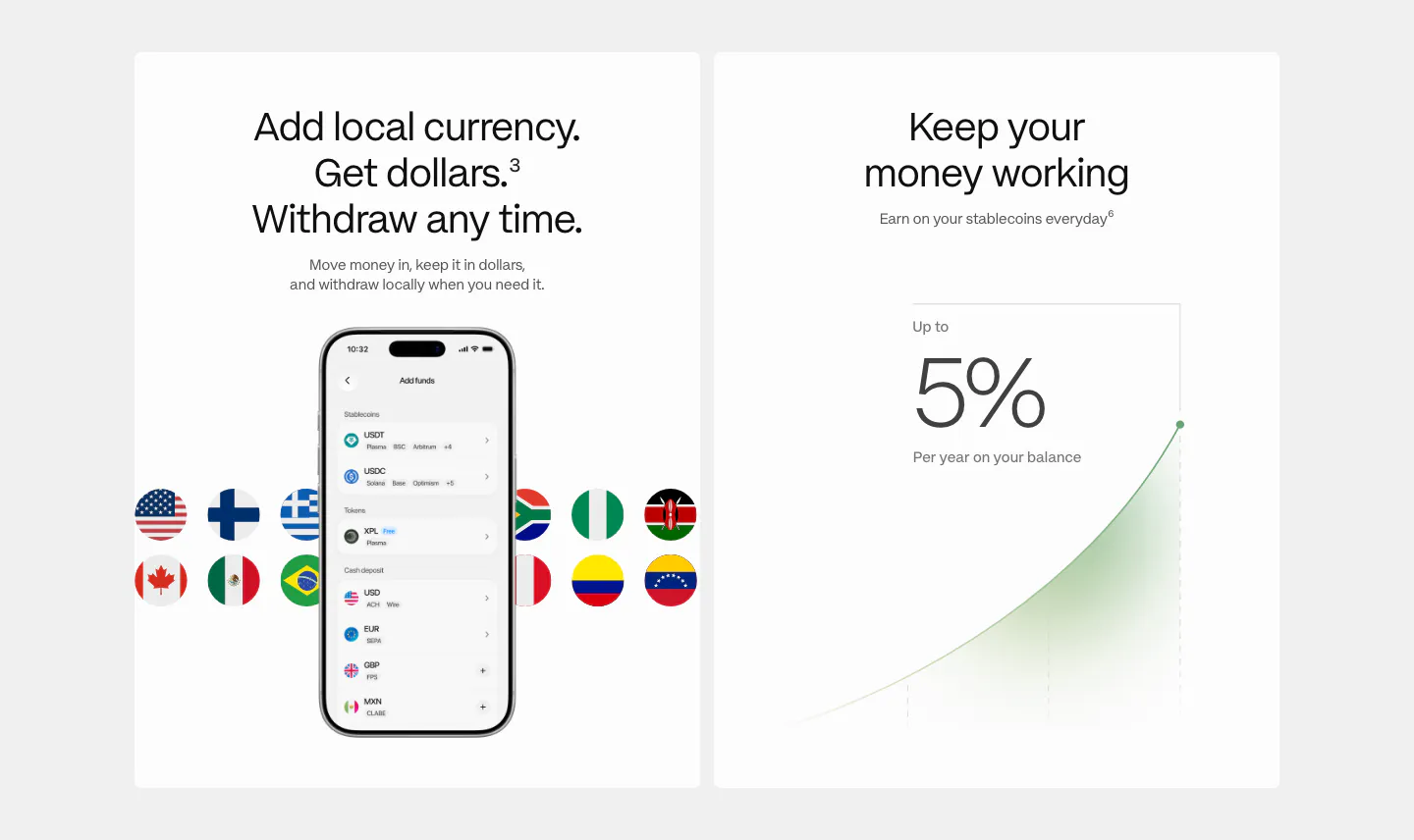
  44. Plasma features section: two white cards, one with a phone add-funds UI and flags, one with a 5% yield growth chart
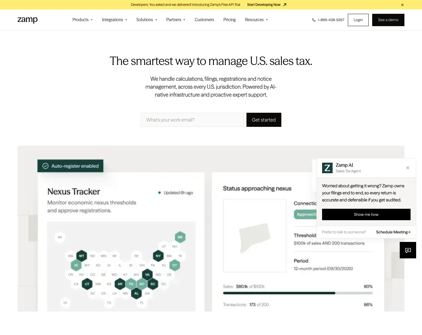
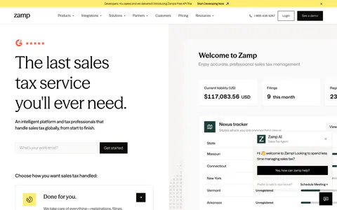
  45. Zamp hero section: centered sales tax headline with work email field above a nexus tracker dashboard with US state hex map on white
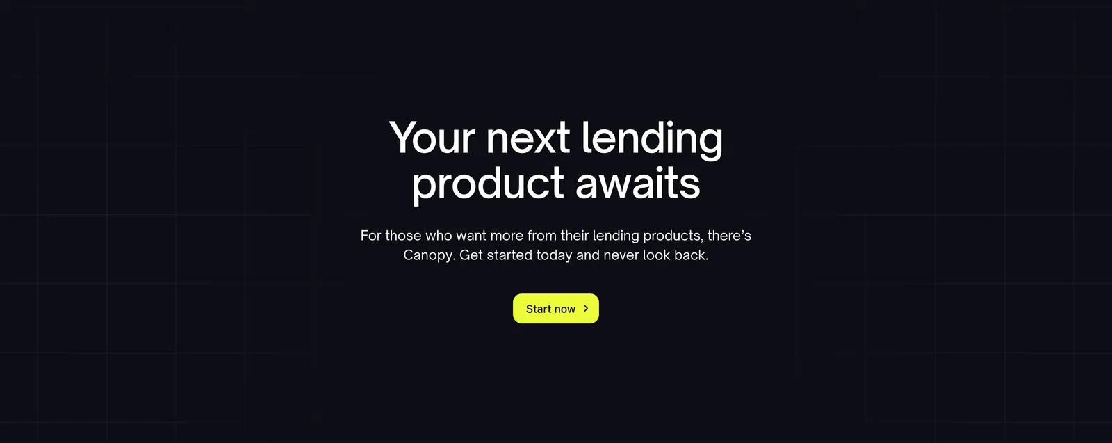
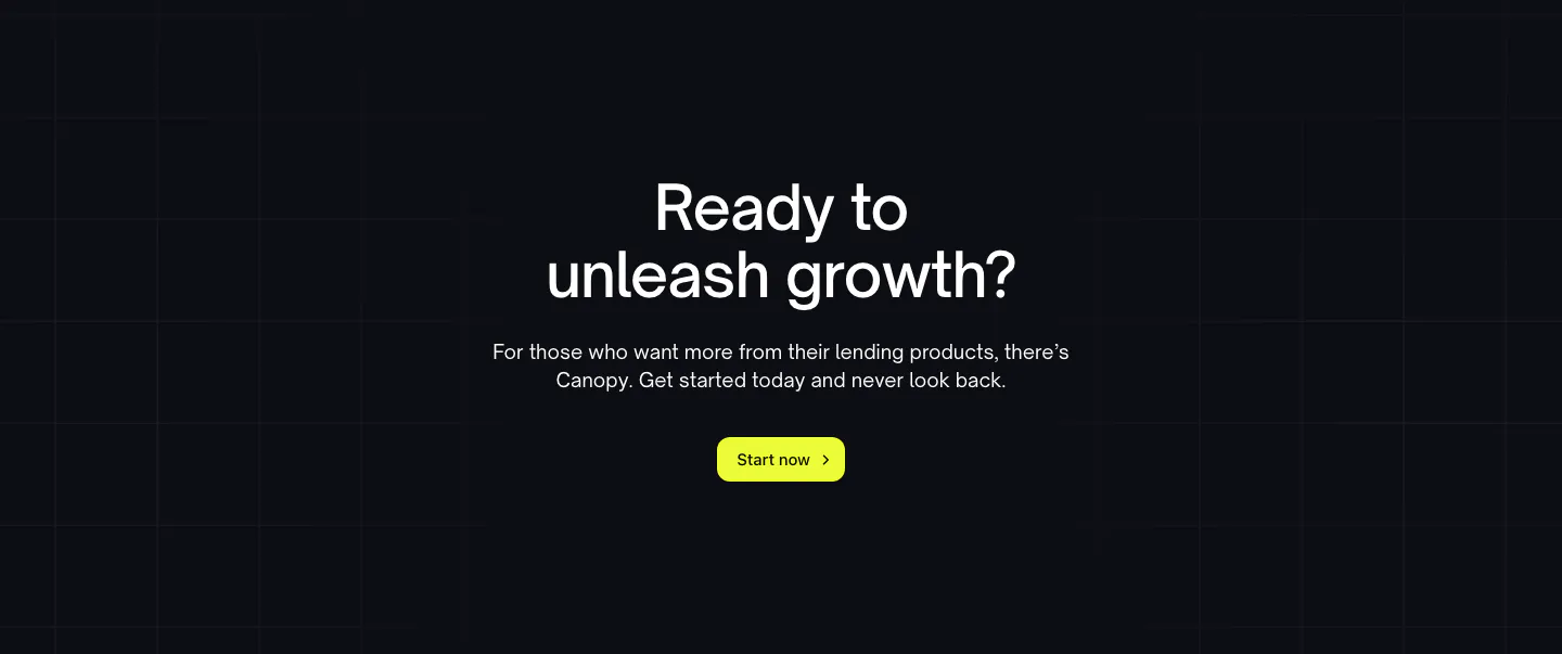
  46. Canopy call-to-action section: centered headline, short copy and lime button on a dark background with faint grid lines
  47. Harvest features section: centered serif heading and feature tabs above a feature list beside a timesheet UI on an orange panel, cream background
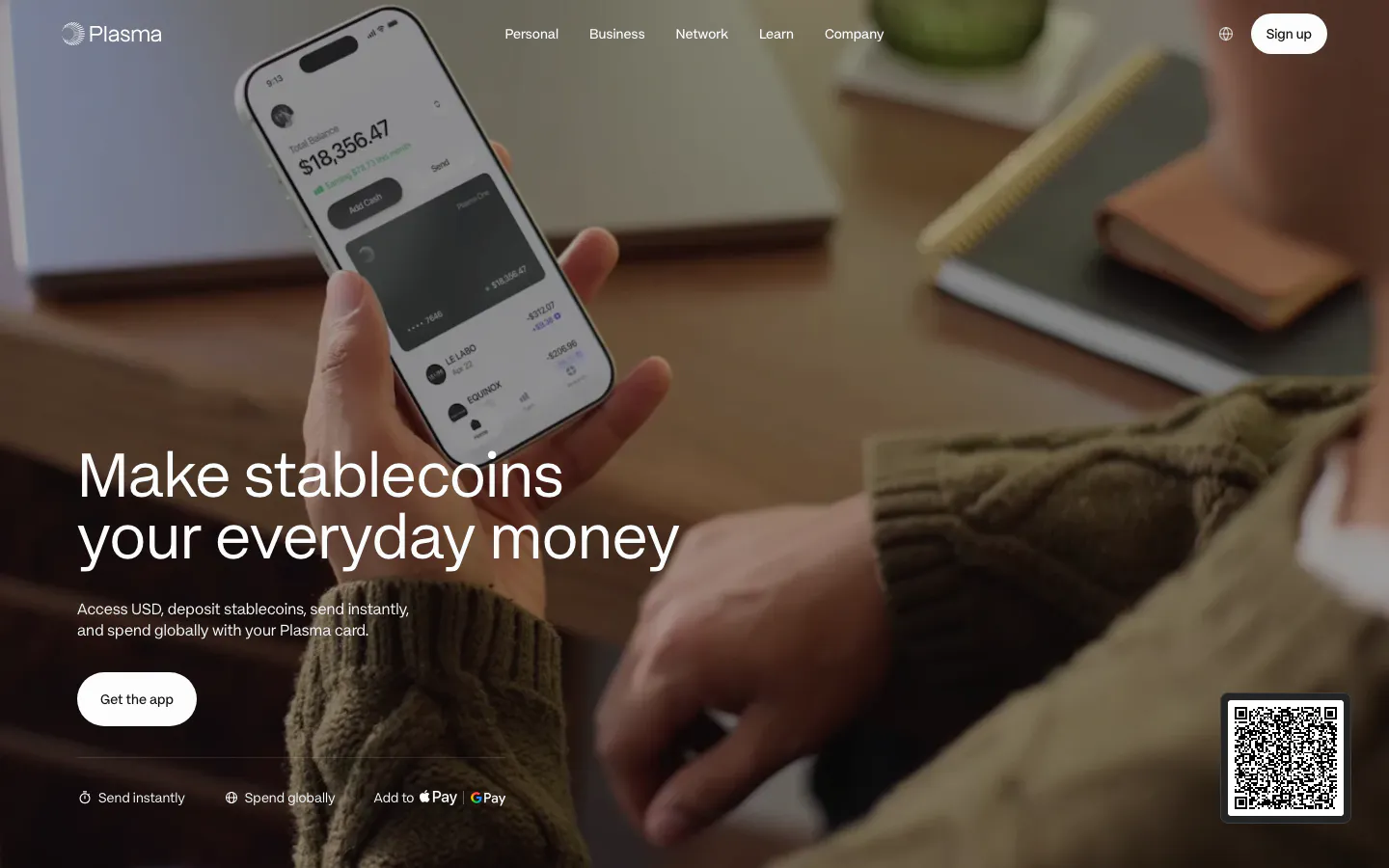
  48. Plasma hero section: large headline and app button bottom left over a full-bleed photo of a hand holding a phone with the app
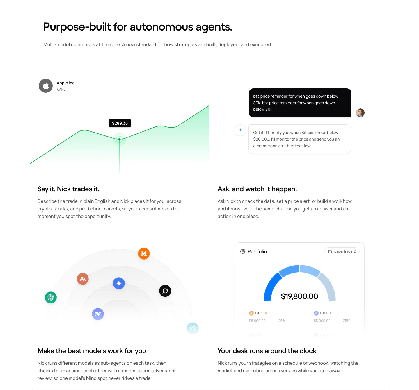
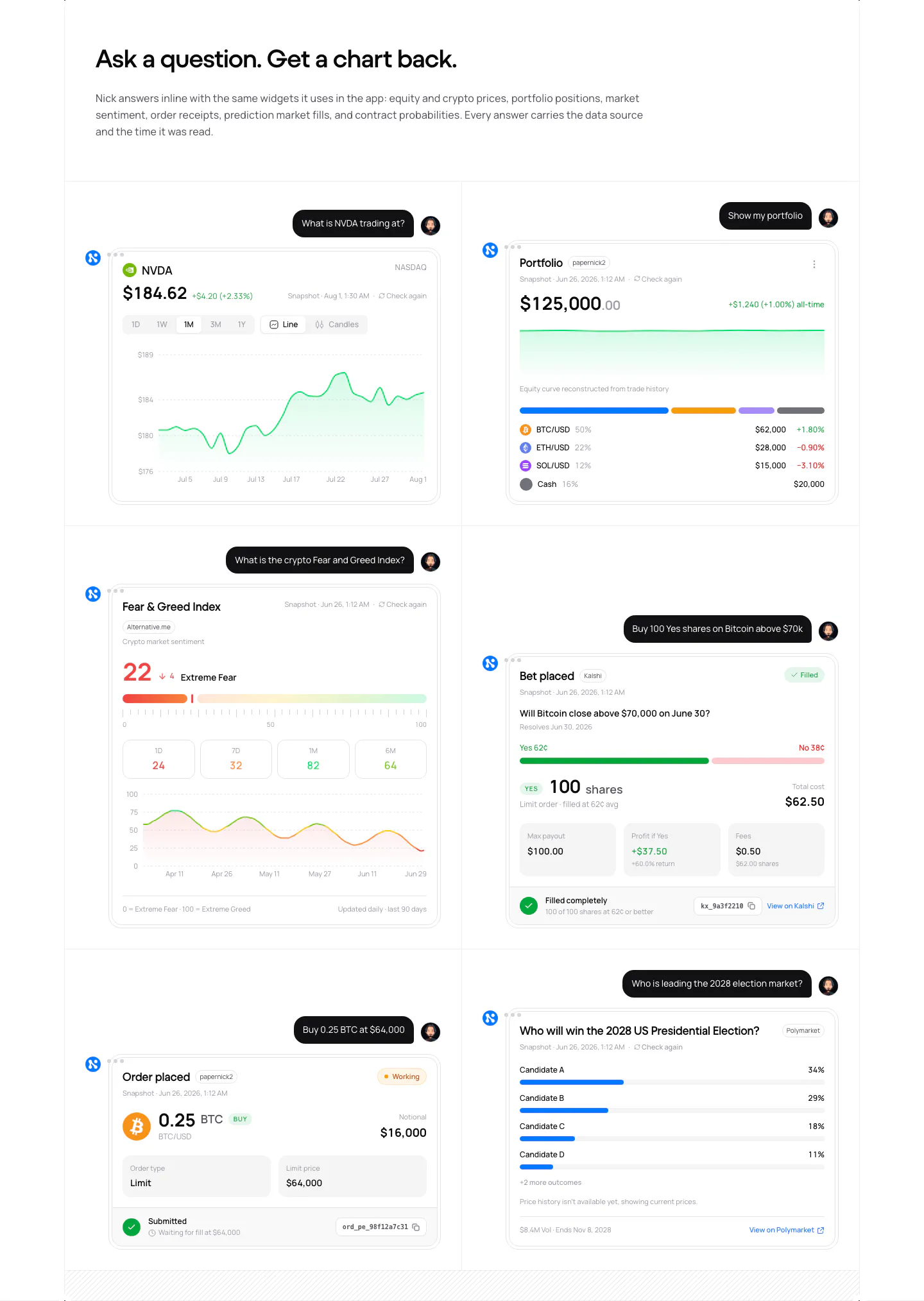
  49. NickAI features section: left heading above a 2x2 grid of feature cells with price chart, chat, model icons and portfolio UI
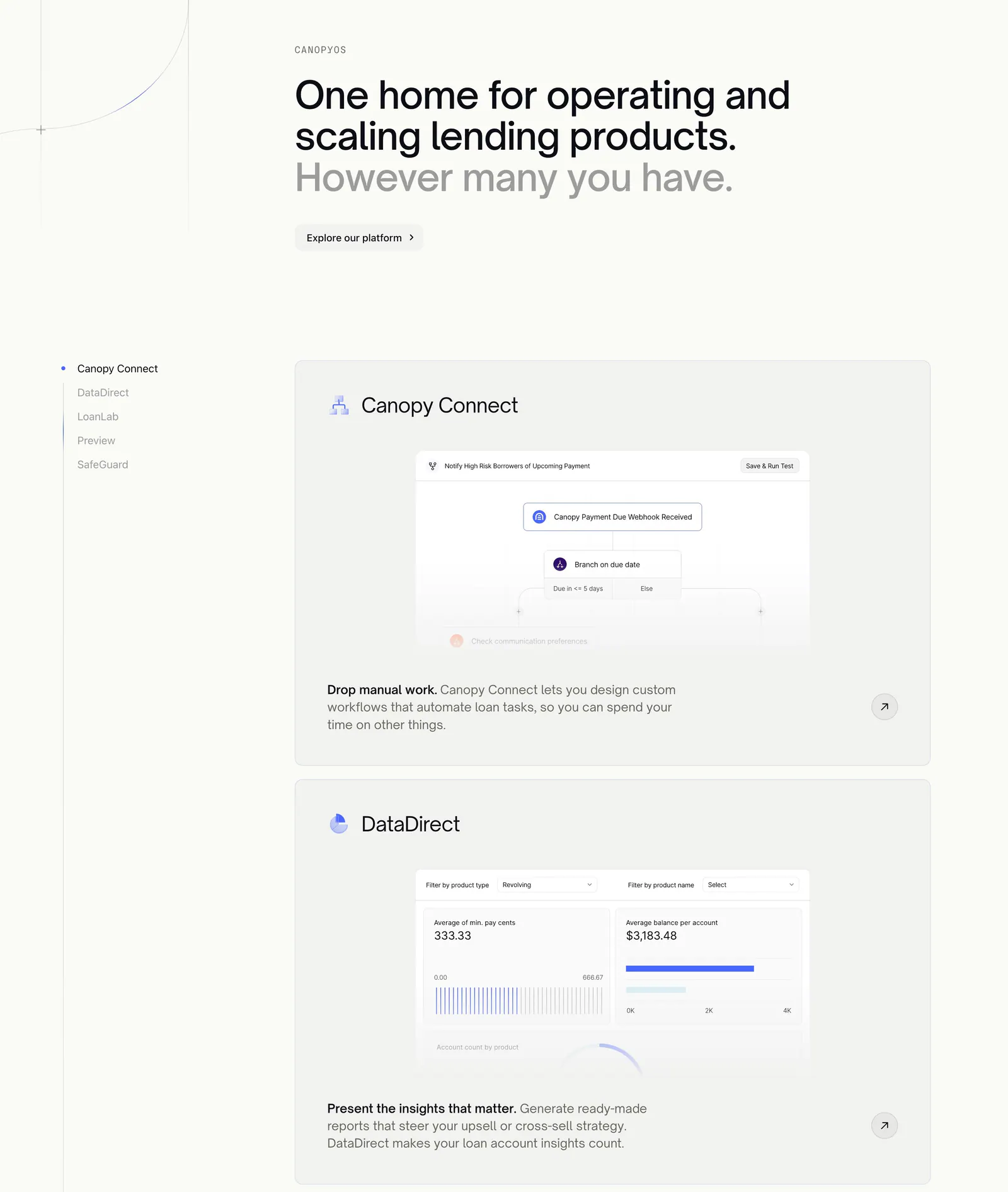
  50. Canopy features section: large headline above a sticky product list on the left and stacked cards with workflow and analytics UI
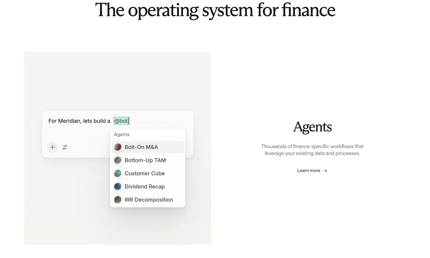
  51. Rogo features section: serif heading above an agent picker UI mockup on the left and Agents text with a link on the right
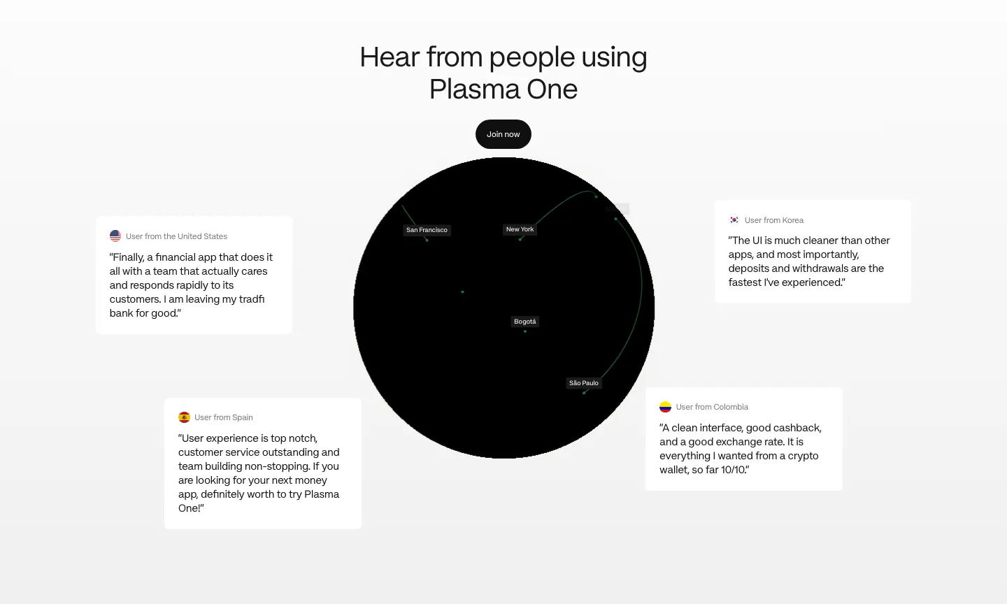
  52. Plasma testimonials section: centered heading and button above a black globe surrounded by four floating user quote cards
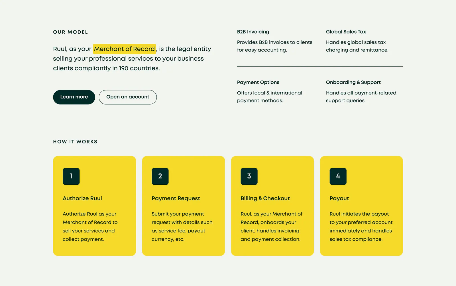
  53. Ruul how it works section: Merchant of Record statement and four feature notes above four numbered yellow step cards on light gray
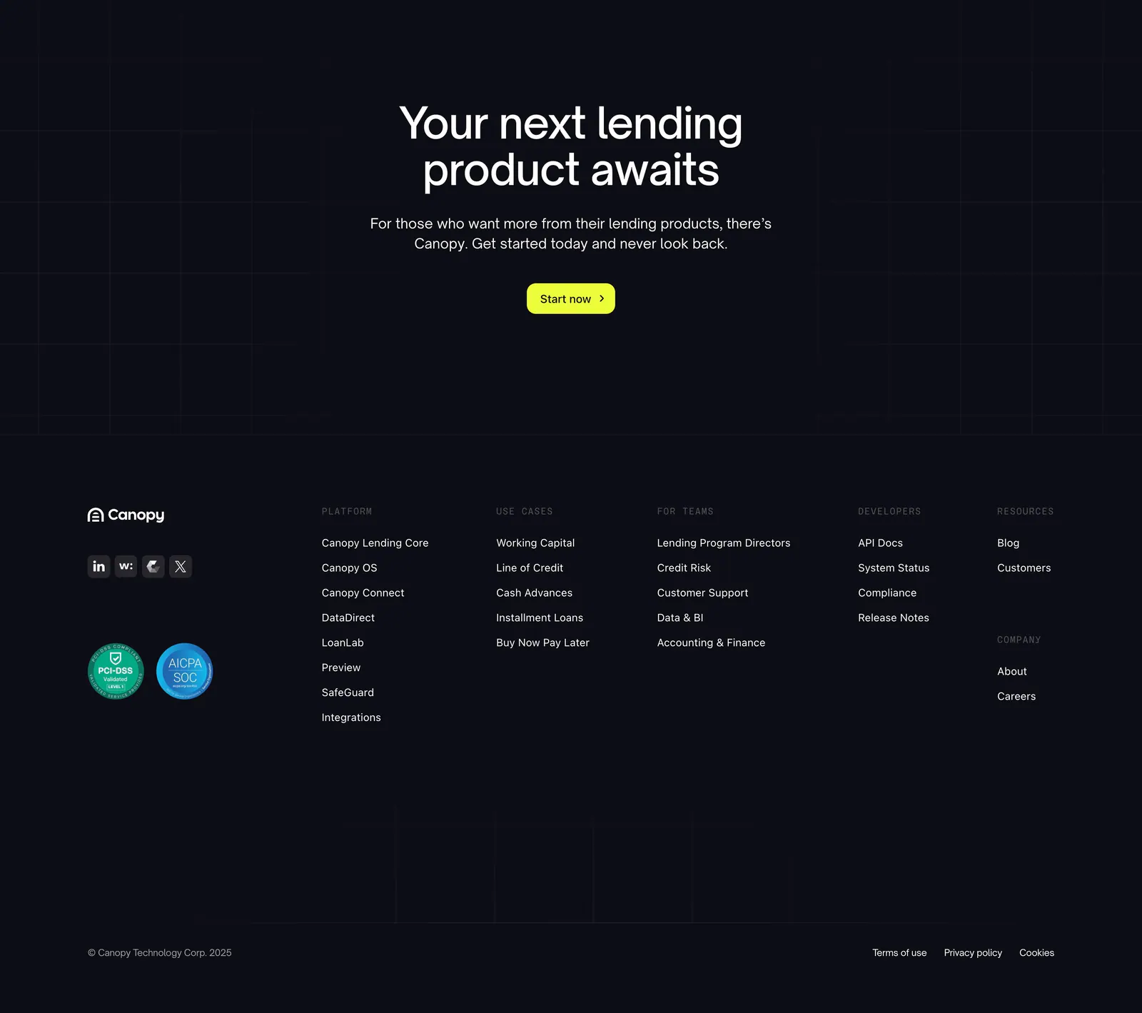
  54. Canopy footer section: centered call-to-action with lime button above a dark footer with logo, compliance badges and link columns
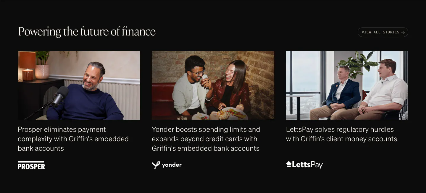
  55. Griffin testimonials section: serif heading above three customer story cards with photos, captions and logos on black
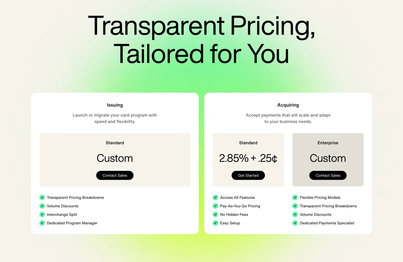
  56. Highnote pricing section: large centered headline above two white plan cards with price boxes and checklists on a green glow
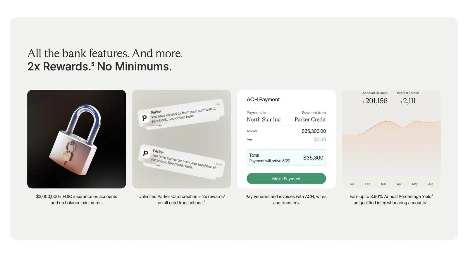
  57. Parker value proposition section: beige panel with headline above four cards showing a 3D padlock, notifications, payment UI and a yield chart
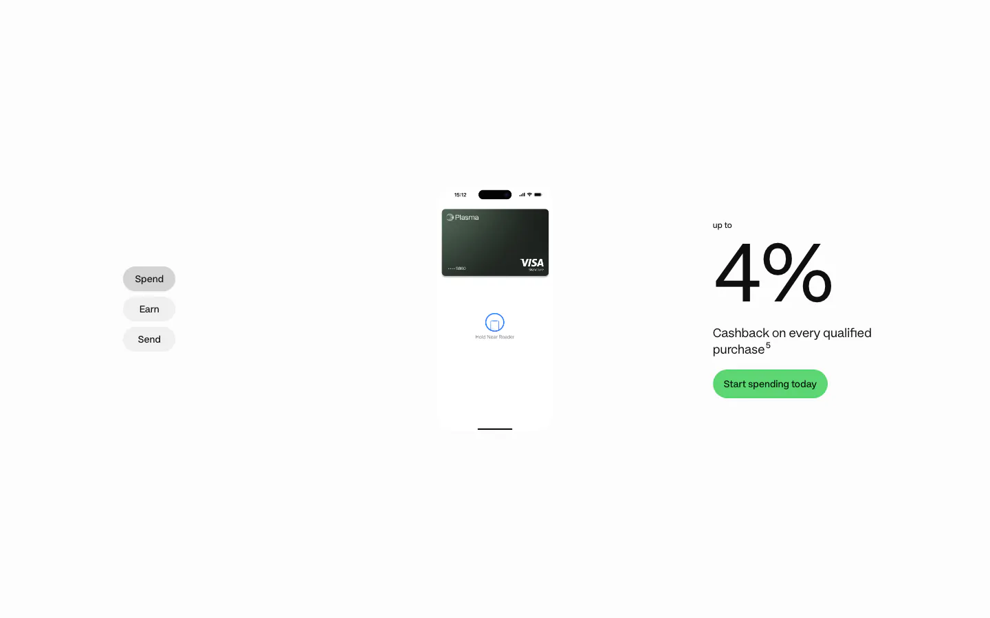
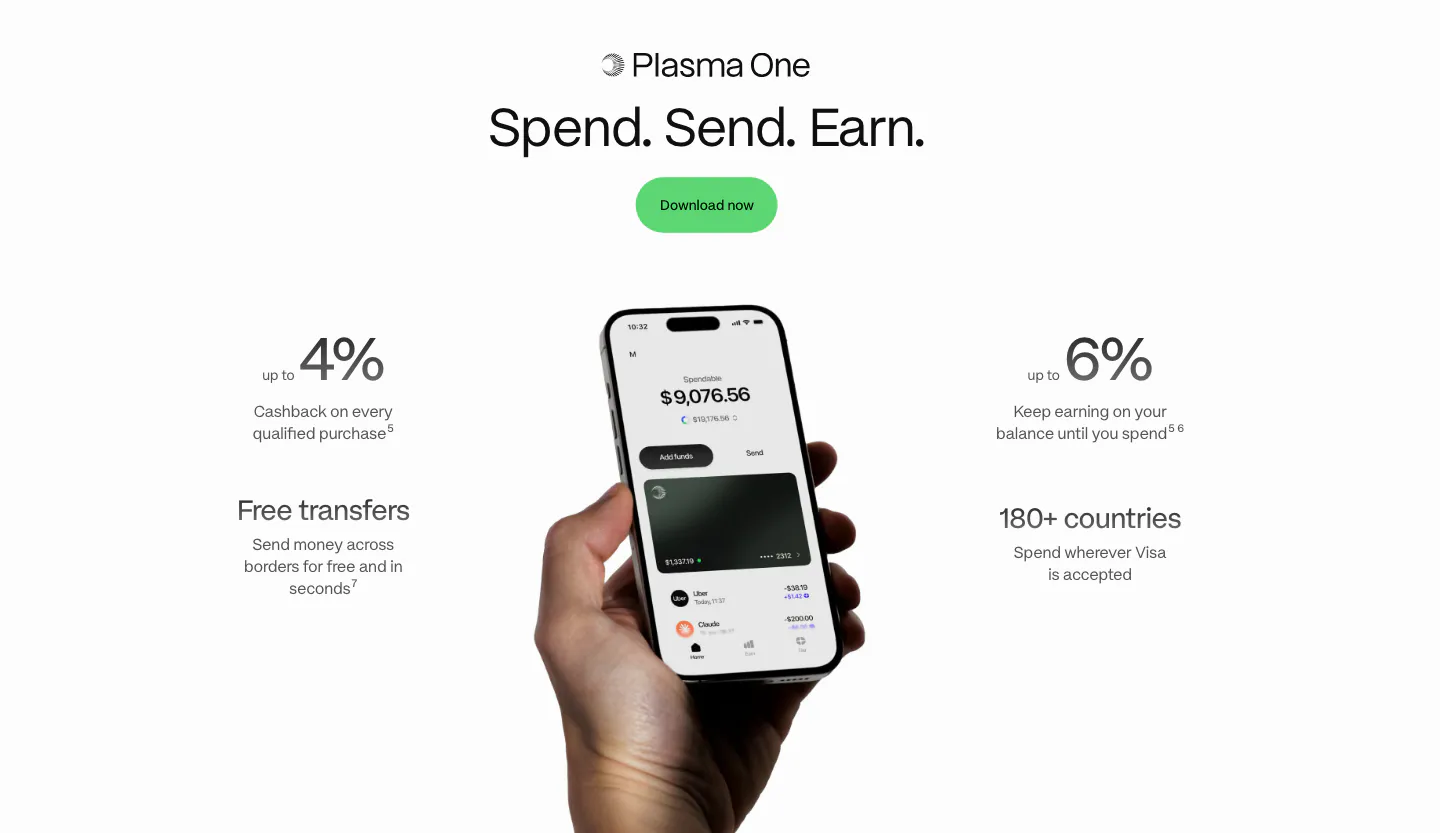
  58. Plasma features section: Spend/Earn/Send tabs left, phone with card center and a large 4% cashback figure right on white
  59. Rezolv logo cloud section: small In the News label above a single row of divided press publication logos on cream
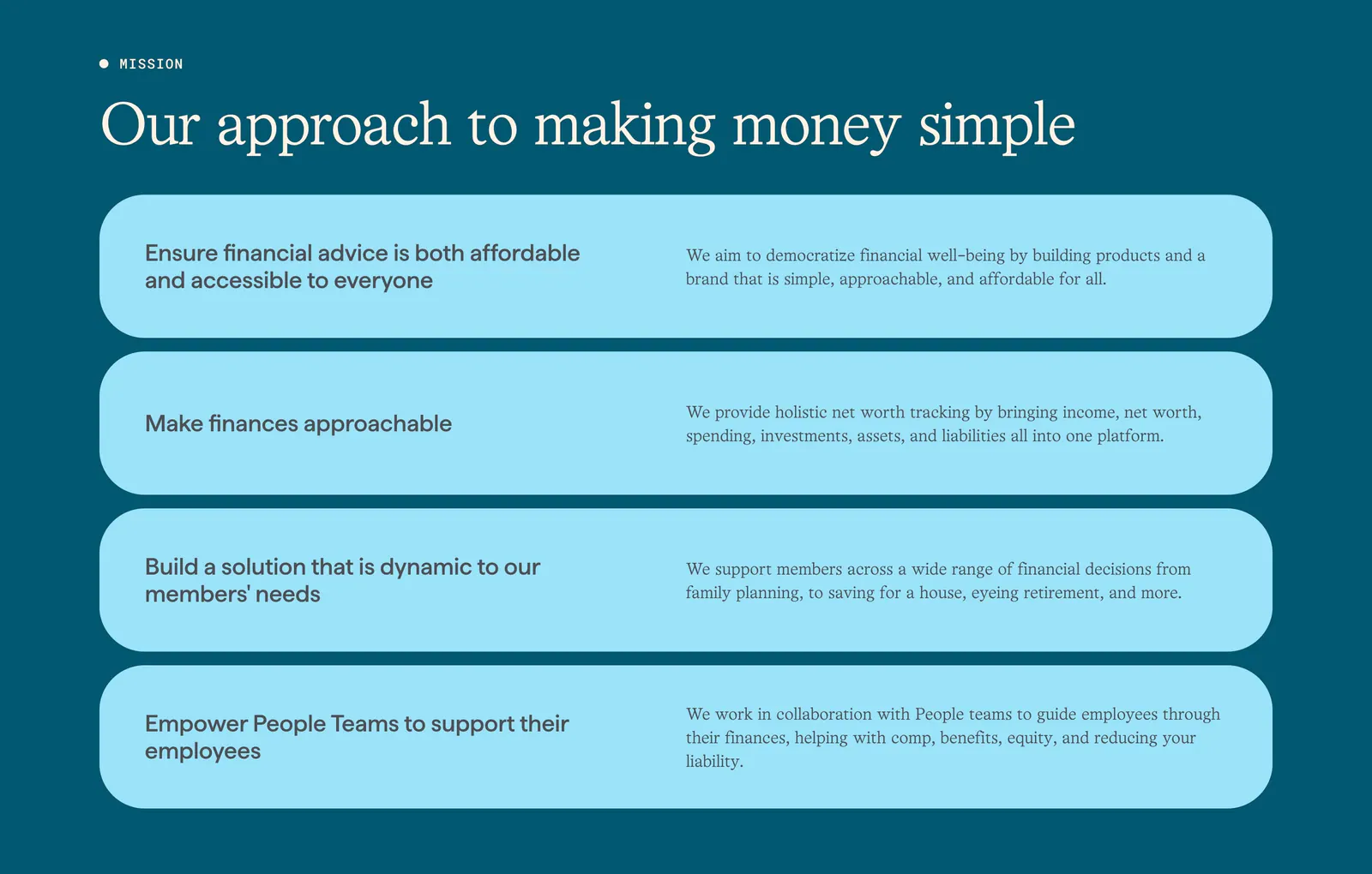
  60. Origin about & mission section: serif headline above four stacked light blue rounded rows of principles on a deep teal background
  61. NEAR footer section: logo, tagline and three link columns above a giant faded near wordmark on a charcoal background
  62. Rogo footer section: Get started CTA with demo button, four link columns and a huge faint Rogo wordmark on charcoal
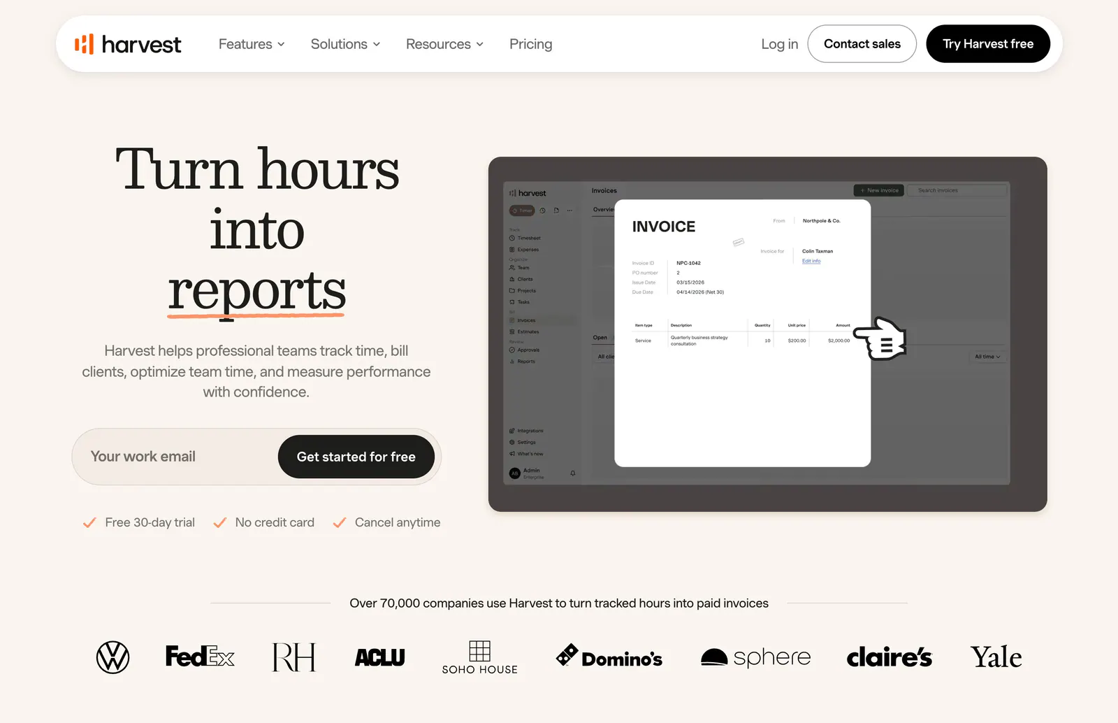
  63. Harvest hero section: serif headline with email signup field beside an invoice UI screenshot, customer logo row below on warm cream
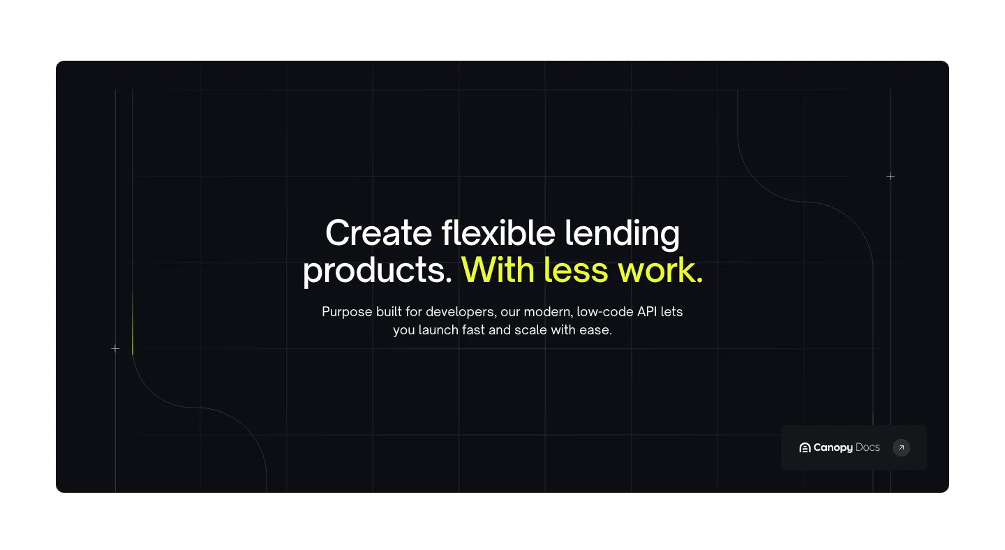
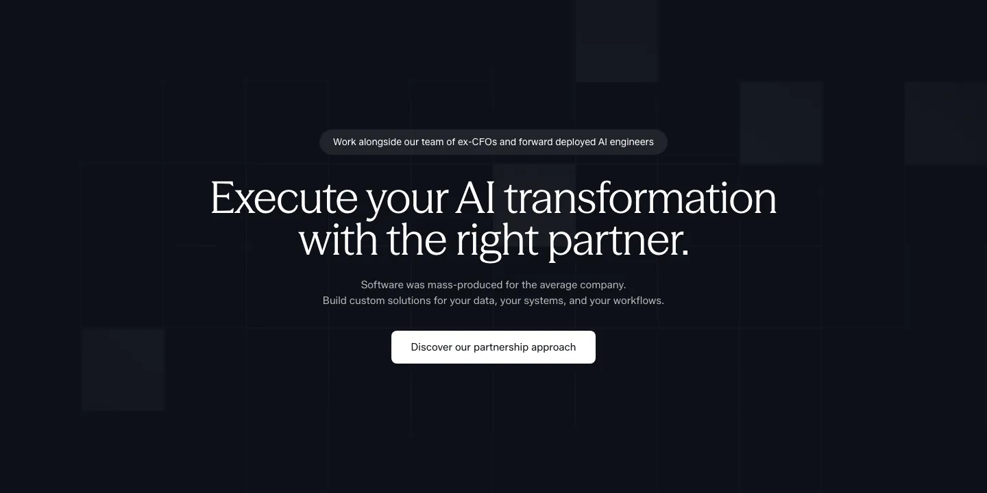
  64. Canopy value proposition section: centered headline with lime highlight in a dark rounded panel with grid lines and a docs link
  65. Plasma features section: centered heading above a phone add-funds screen with rows of country flag circles on charcoal
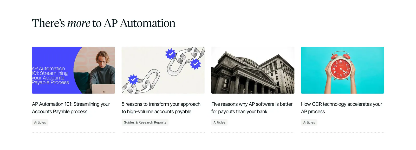
  66. Routable blog & resources section: serif headline above four article cards with photo and illustration thumbnails on white
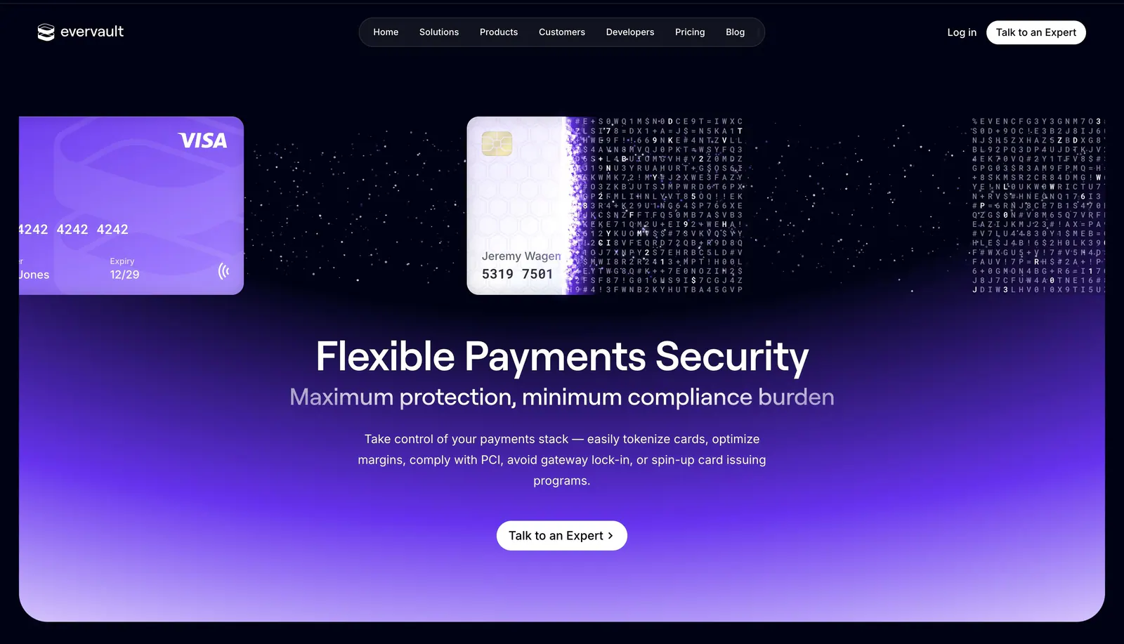
  67. Evervault hero section: credit cards dissolving into encrypted characters above a centered headline and CTA on a violet glow
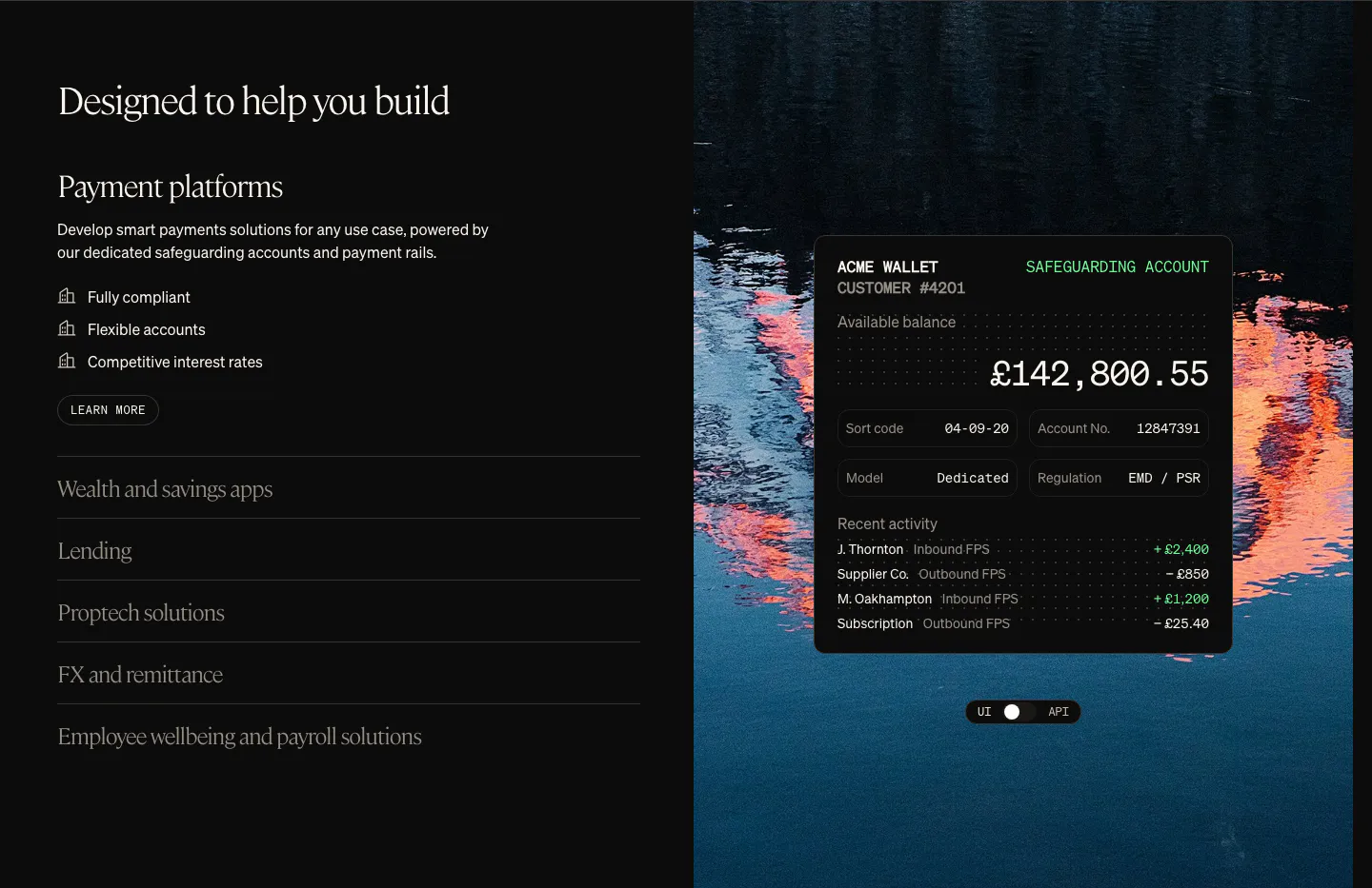
  68. Griffin use cases section: serif heading with use-case accordion on the left, wallet UI card over a lake photo on the right
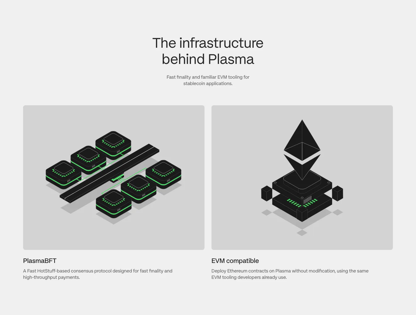
  69. Plasma features section: centered heading above two gray cards with black and green isometric renders of consensus and EVM
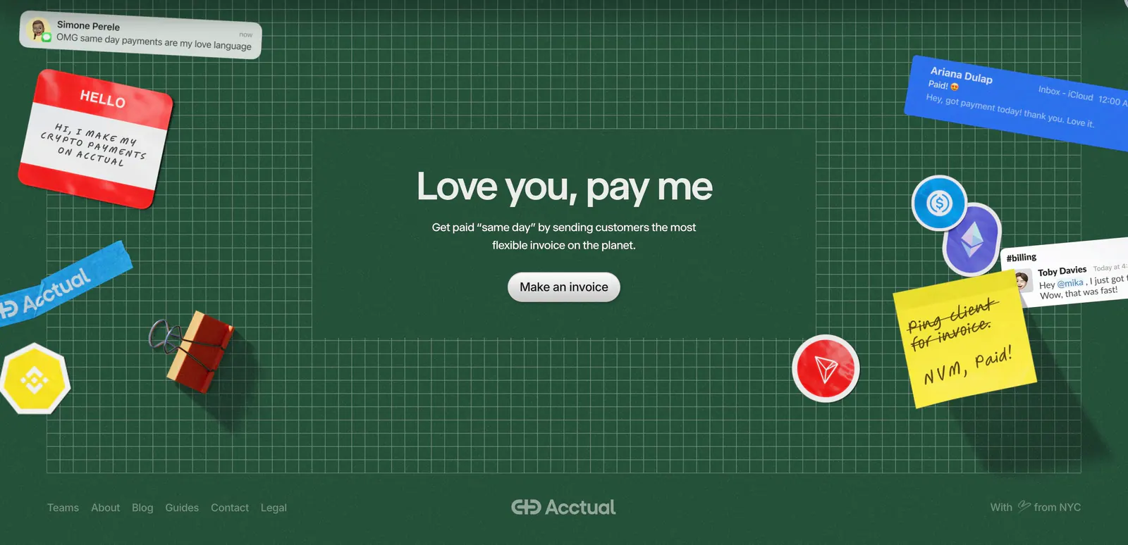
  70. Acctual footer section: centered closing headline on a dark green grid with 3D stickers and notes, plus a link row and wordmark
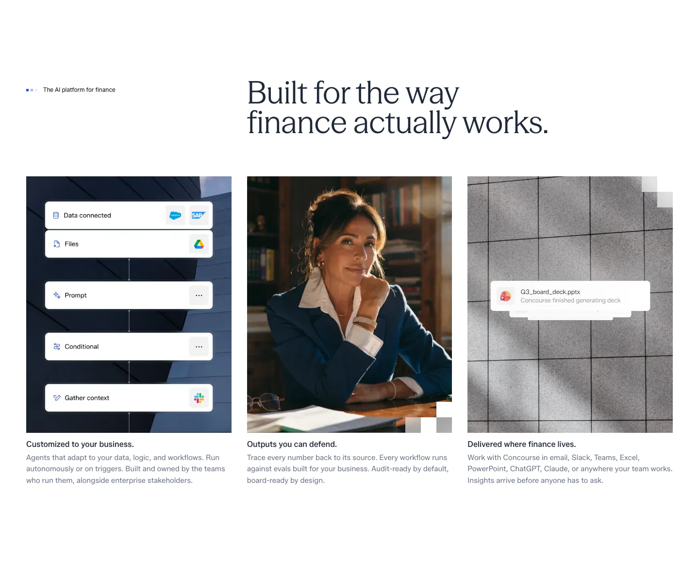
  71. Concourse features section: headline above three equal cards showing a workflow UI mockup, a portrait photo and a file notification
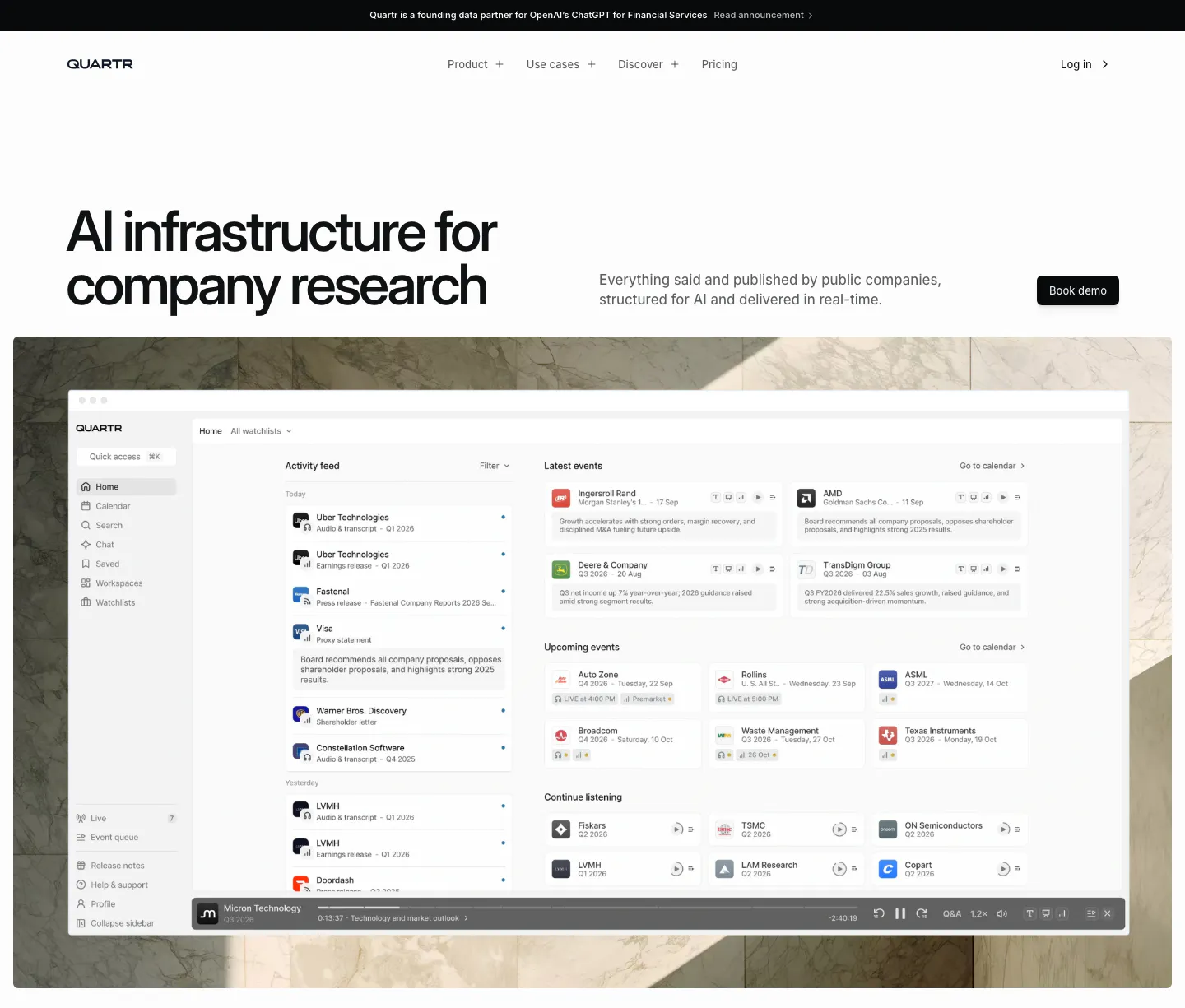
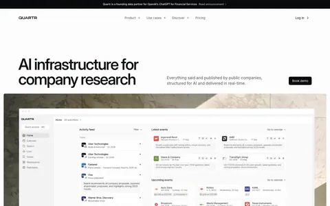
  72. Quartr hero section: left-aligned headline with Book demo button above a research app dashboard set on a marble photo backdrop
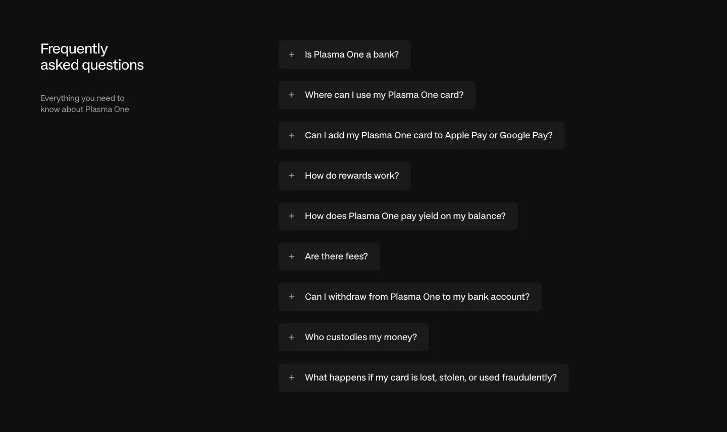
  73. Plasma FAQ section: heading and intro left, collapsed question pills stacked right on a near-black background
  74. Acctual testimonials section: single centered quote with five orange stars and a script attribution in a light gray rounded panel
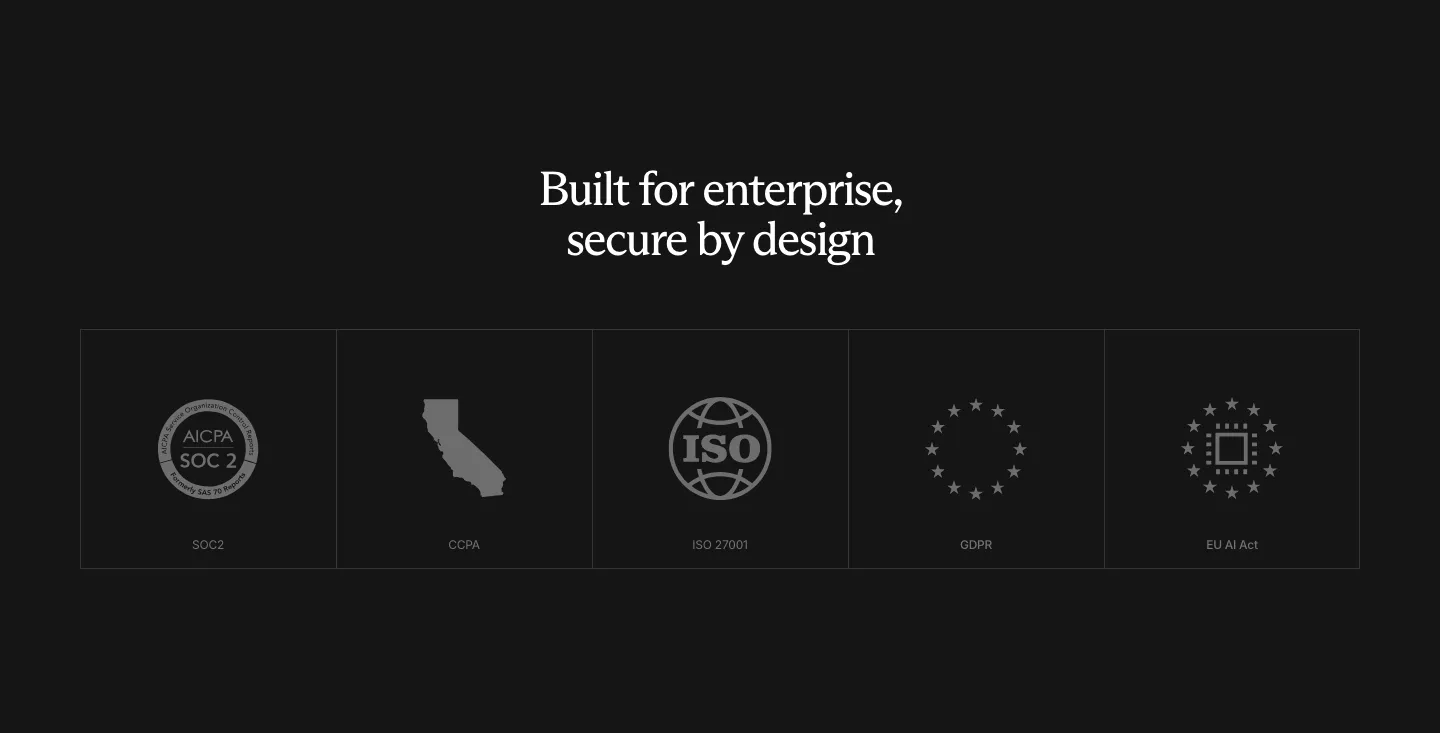
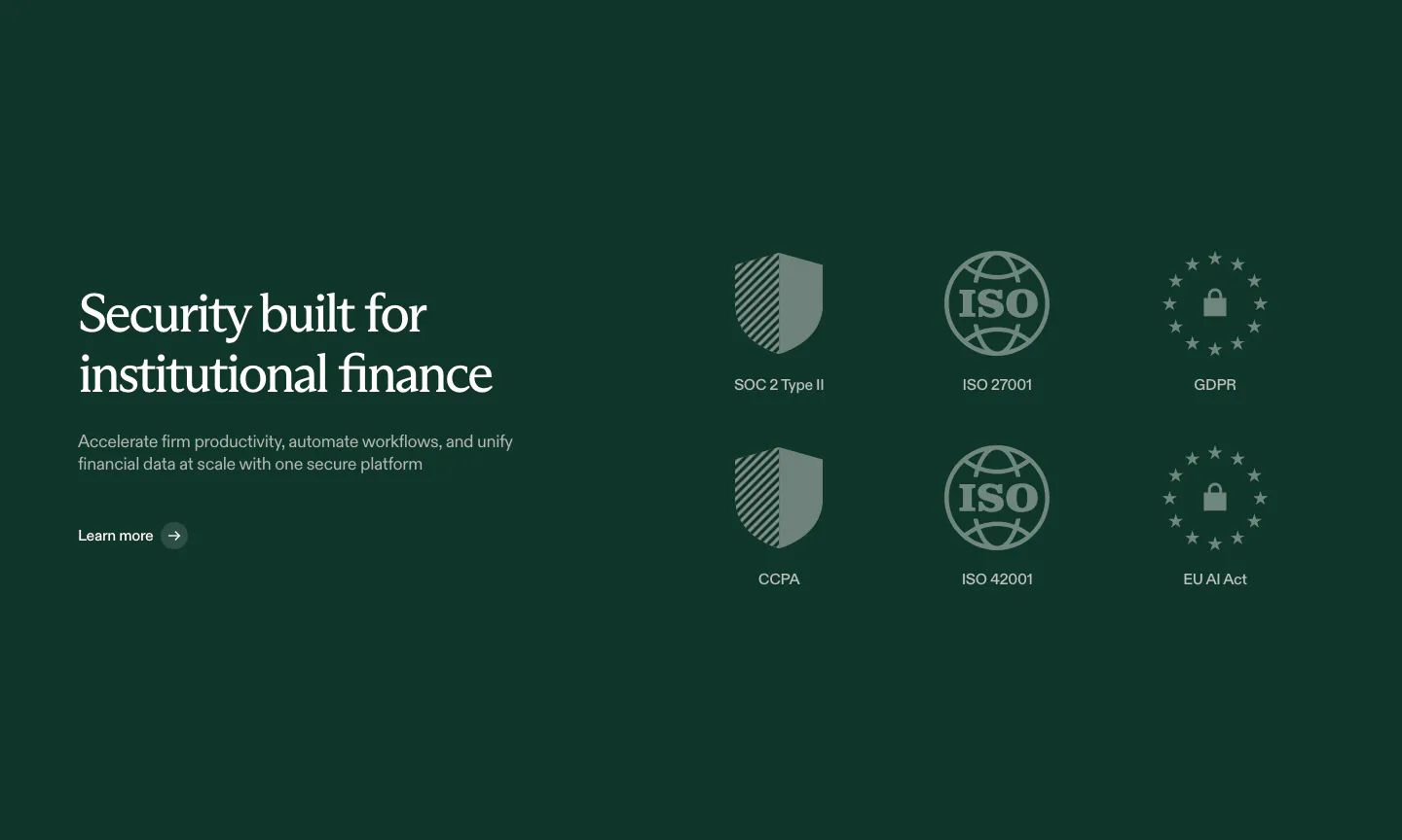
  75. Rogo security section: centered serif headline above a row of five compliance badge tiles (SOC 2, CCPA, ISO, GDPR, EU AI Act)
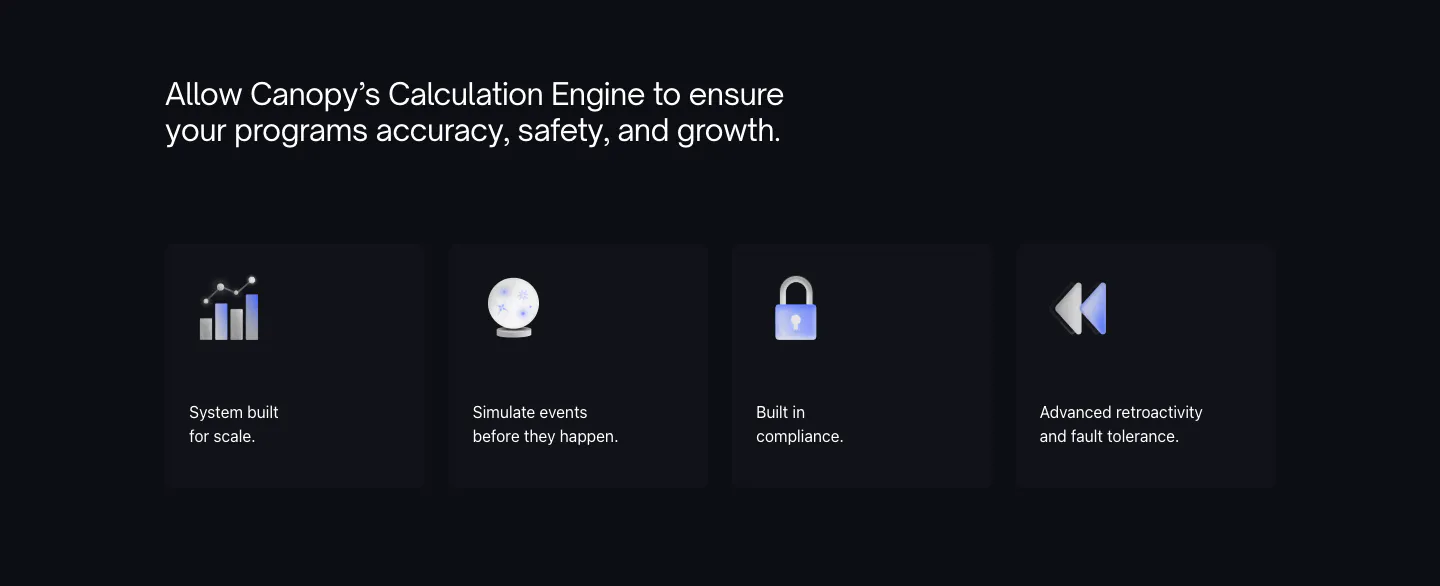
  76. Canopy features section: dark headline above four dark cards with 3D icons and short labels
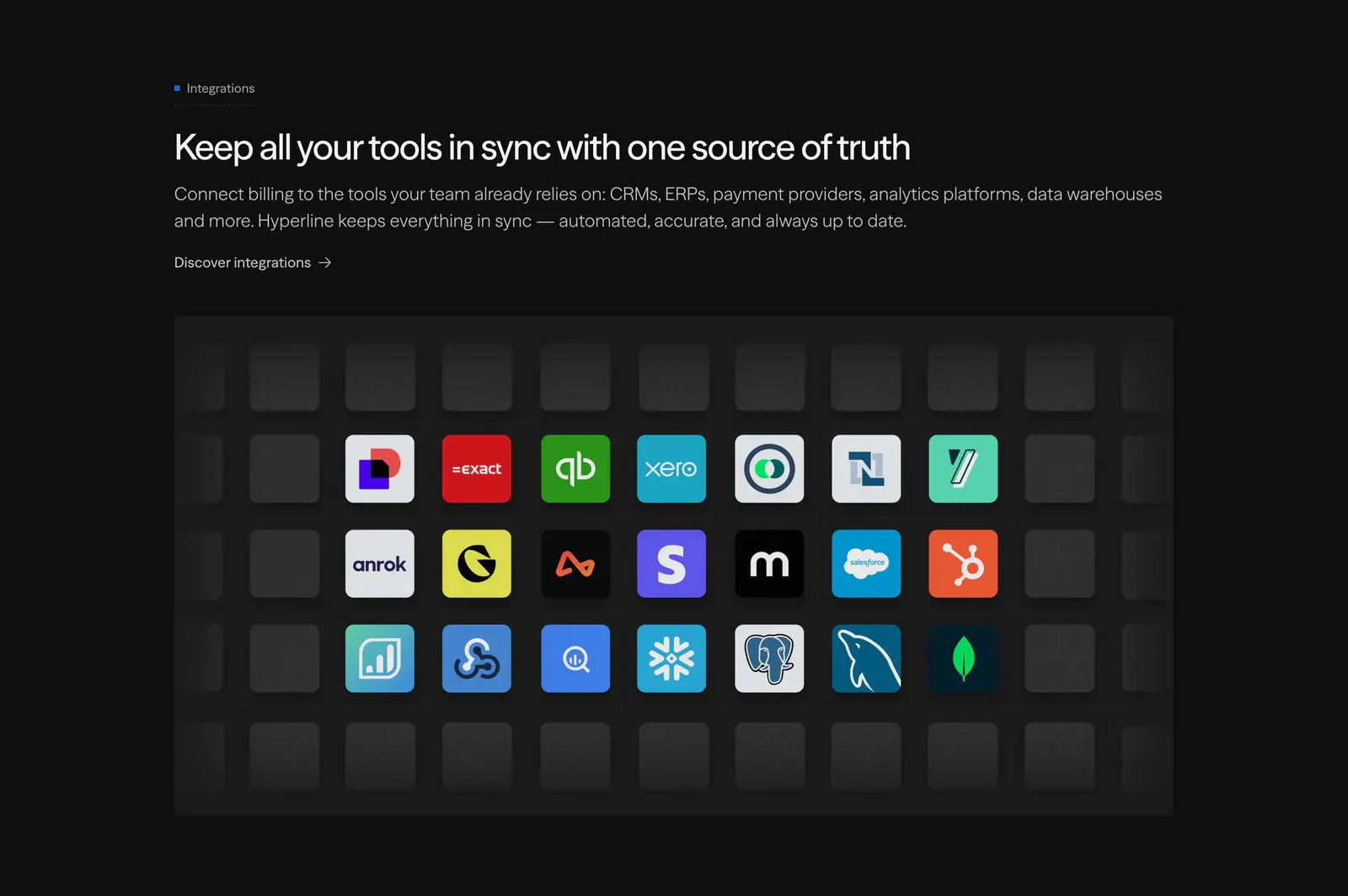
  77. Hyperline integrations section: left-aligned headline above a grid of colorful app icon tiles fading into empty dark tiles
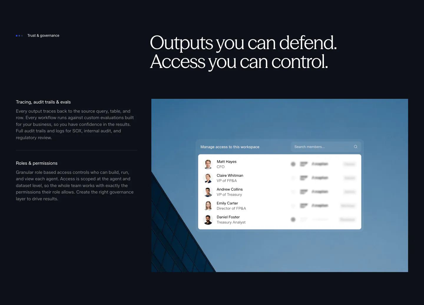
  78. Concourse security section: governance points left, access-control UI over a blue building photo right on a dark background
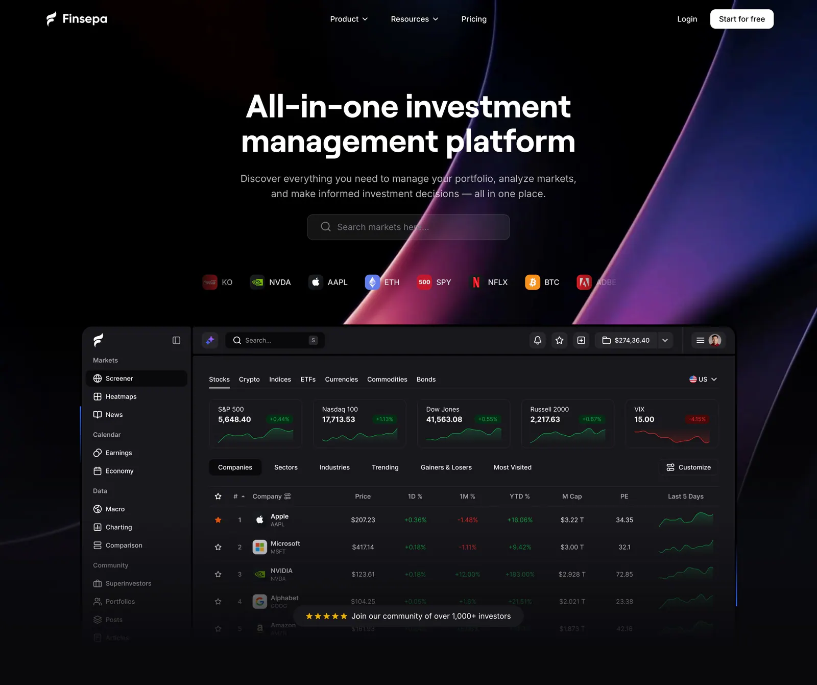
  79. Finsepa hero section: centered headline, search field and ticker chips above a dark stock screener dashboard with purple swooshes
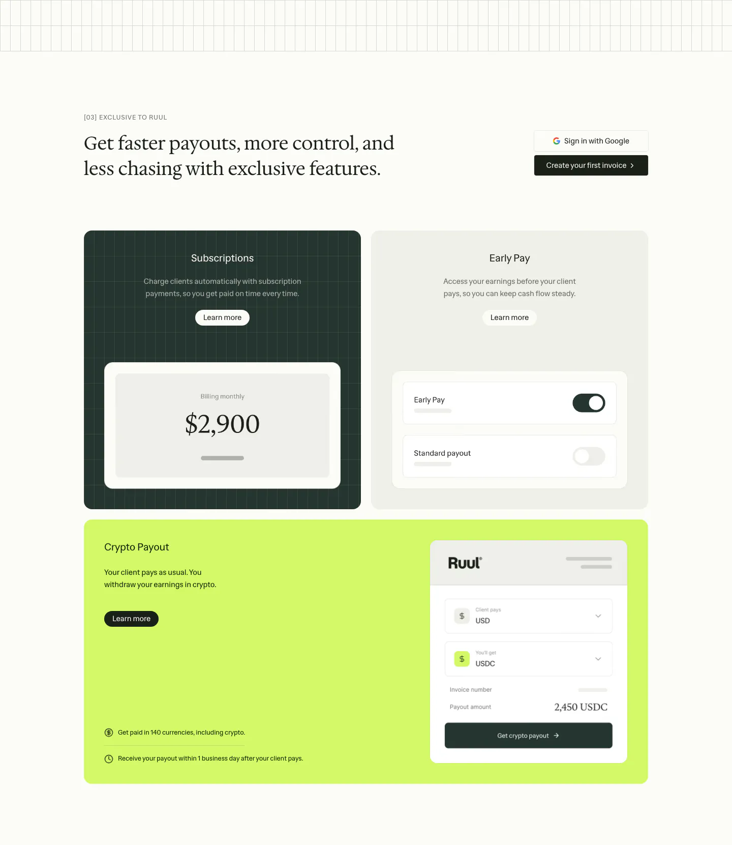
  80. Ruul features section: serif headline above three feature cards in dark green, gray and lime with payout and toggle UI mockups
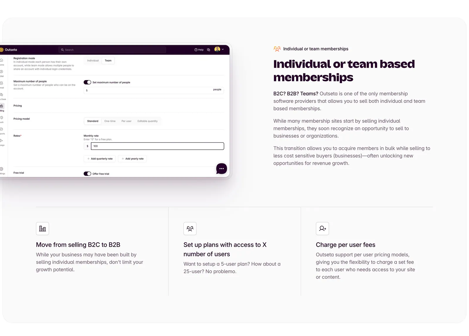
  81. Outseta features section: settings UI screenshot left of headline and copy, three icon feature columns below on a light gray panel
  82. Plasma call to action section: slim dark band with a centered two-line heading and a white Get in touch button
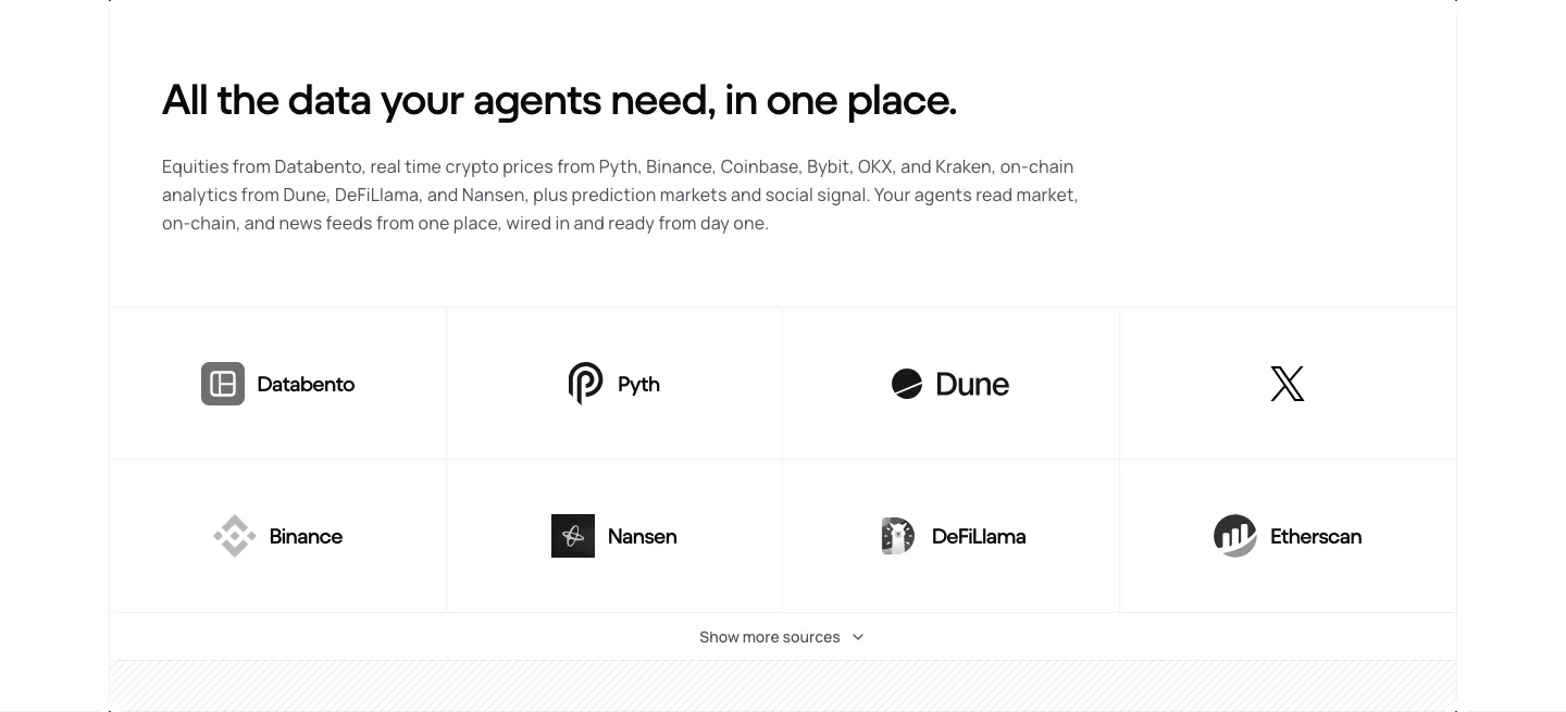
  83. NickAI integrations section: left heading and copy above a bordered grid of eight grayscale data provider logos
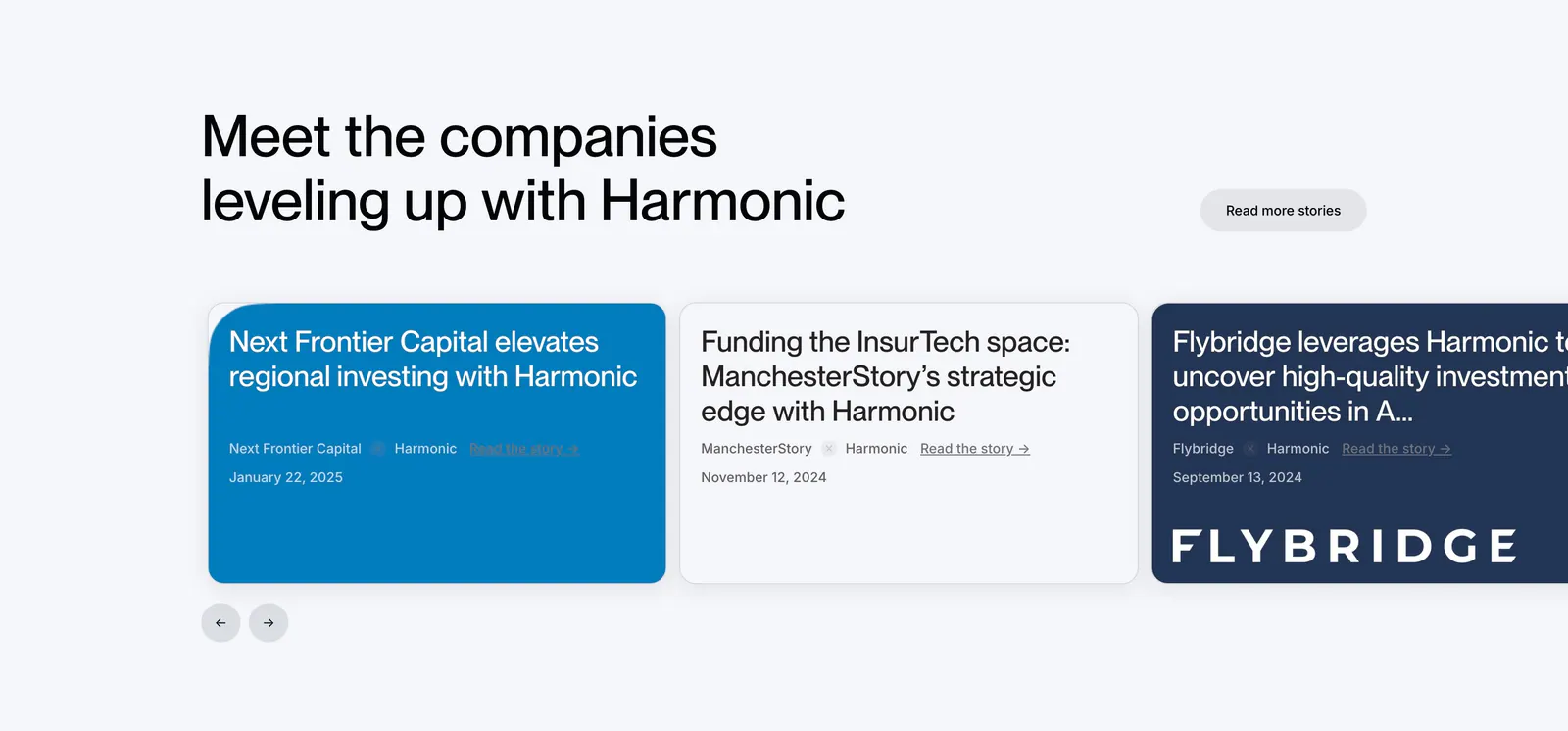
  84. Harmonic testimonials section: left-aligned headline above a carousel of customer story cards in blue, white and navy with arrows
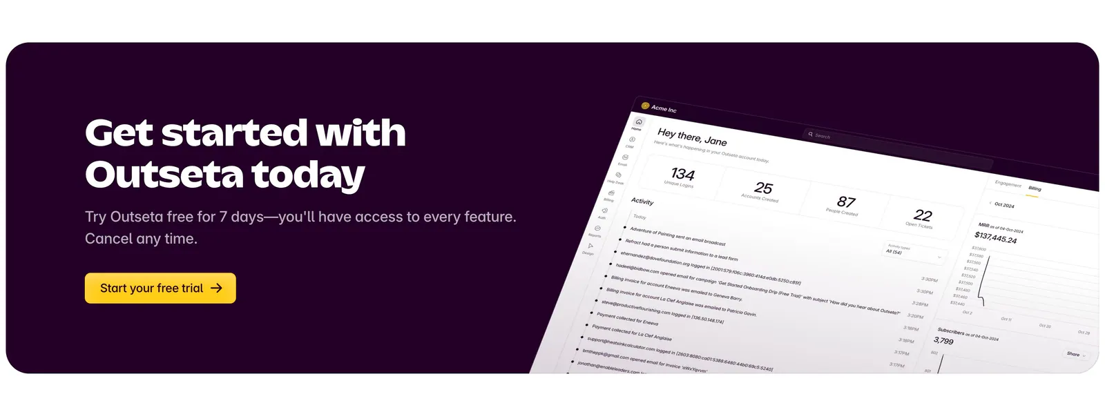
  85. Outseta call-to-action section: dark aubergine banner with headline, copy and yellow trial button beside a tilted dashboard screenshot
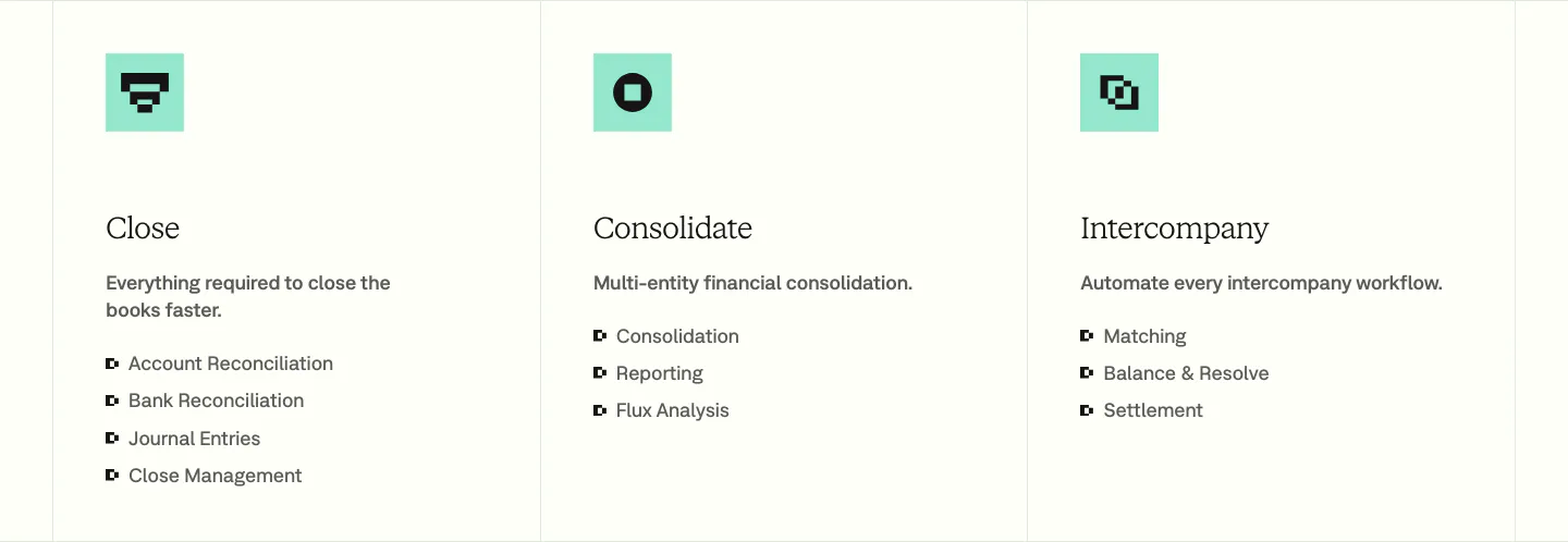
  86. Nominal features section: three bordered columns with mint pixel icons, serif titles and bullet lists for Close, Consolidate and Intercompany
  87. Primer logo cloud section: centered headline above a staggered row of customer logo tiles mixed with lifestyle photos
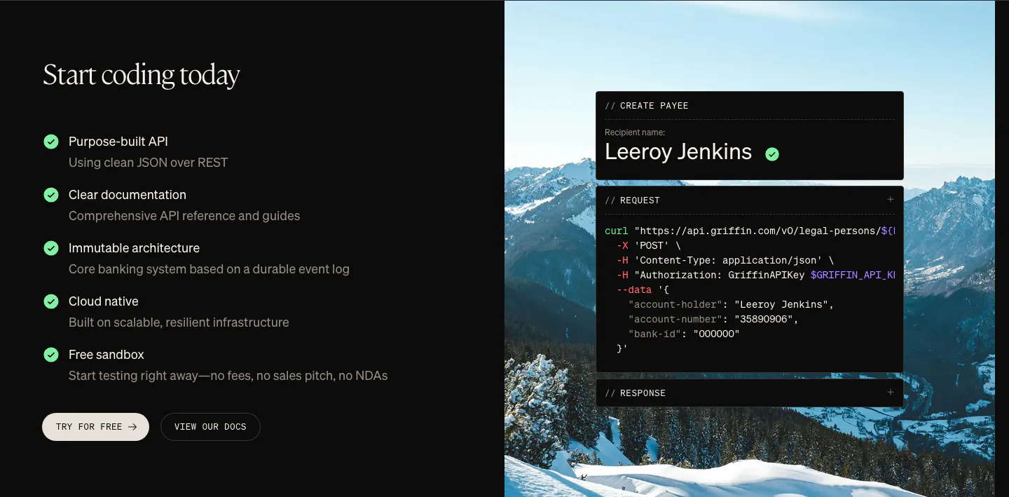
  88. Griffin features section: checklist of API benefits and two buttons beside a curl code card over a mountain photo
  89. NickAI integrations section: left heading and copy above a bordered grid of eight grayscale exchange and market logos
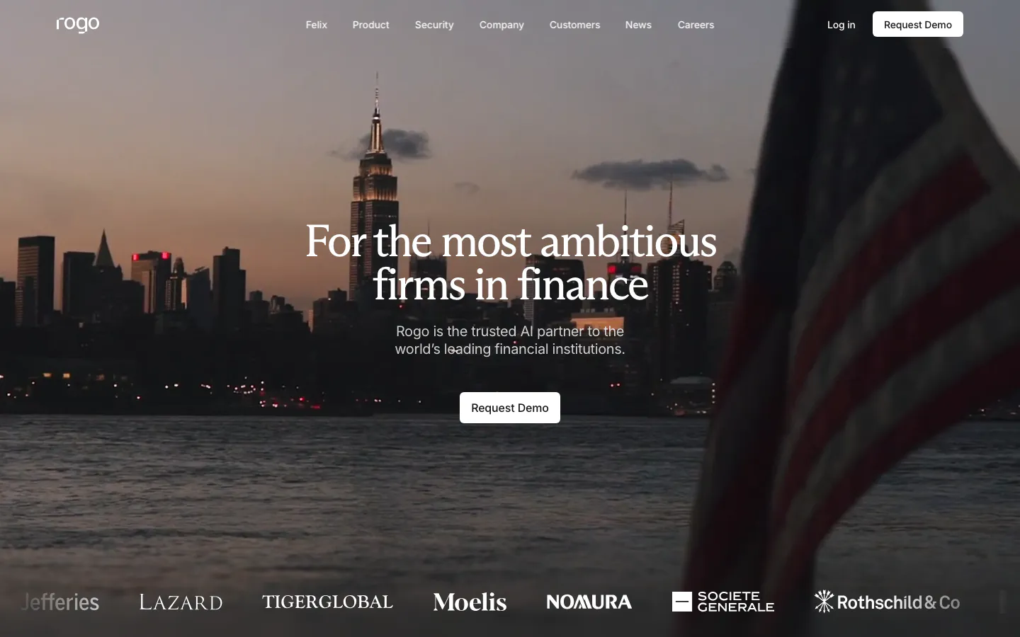
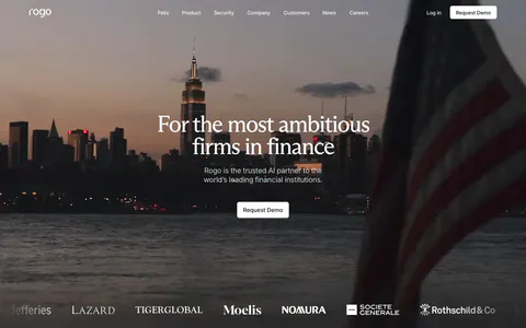
  90. Rogo hero section: centered serif headline and demo button over a full-bleed dusk photo of a city skyline, logo strip at the bottom
  91. Harvest footer section: serif headline, four stats and a carousel of customer testimonial cards with logos on a cream background
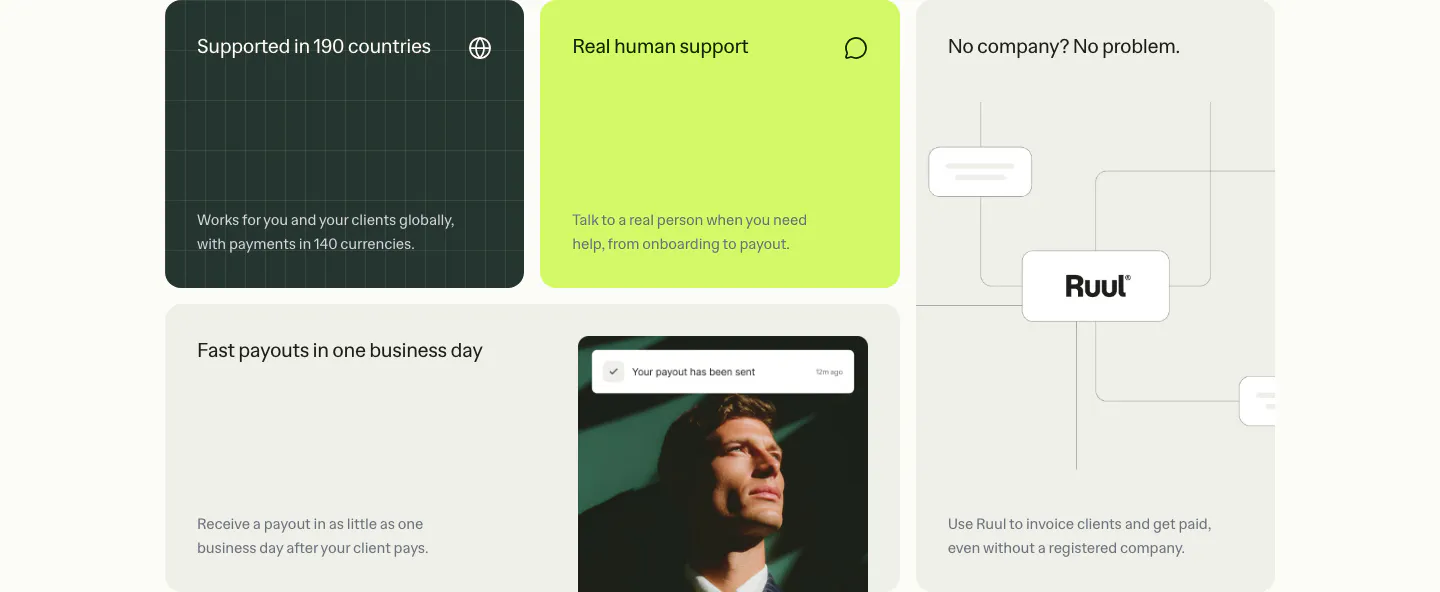
  92. Ruul features section: bento grid of benefit tiles in dark green, lime and warm gray, with a portrait photo and a node diagram
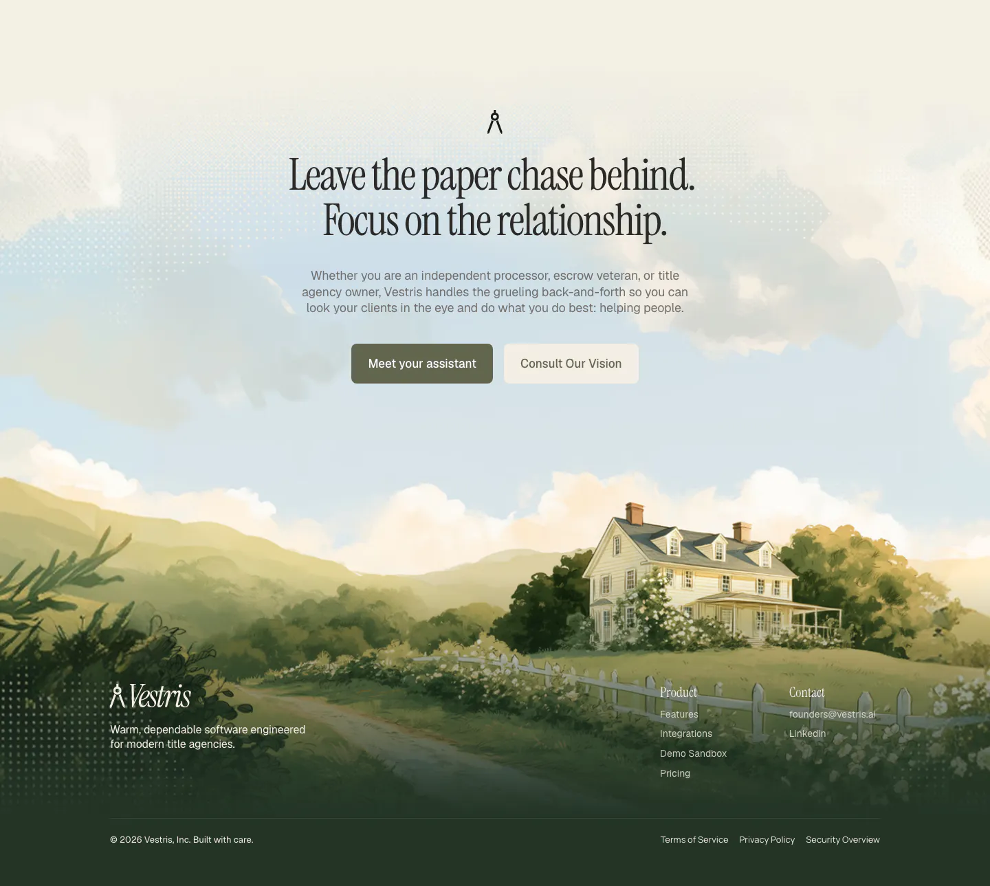
  93. Vestris call-to-action section: centered serif headline and two buttons over a painted countryside house scene that flows into the footer
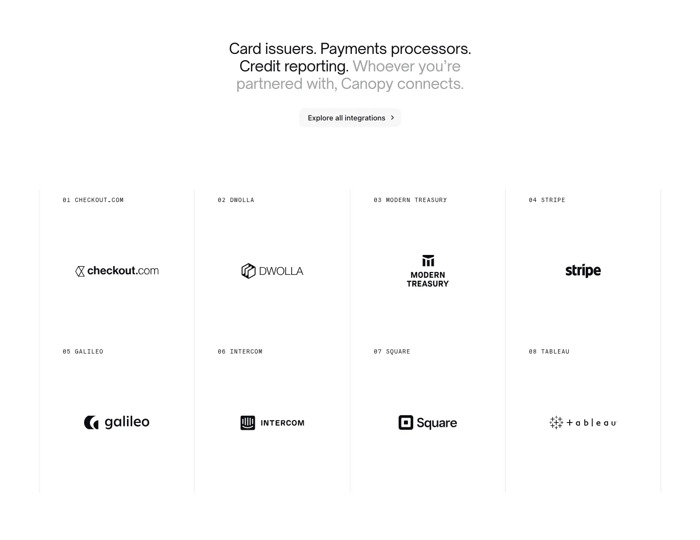
  94. Canopy integrations section: centered headline and button above a bordered 4x2 grid of numbered partner logos on white
  95. Concourse value proposition section: centered headline, pill label and white button on a near-black background with faint square blocks
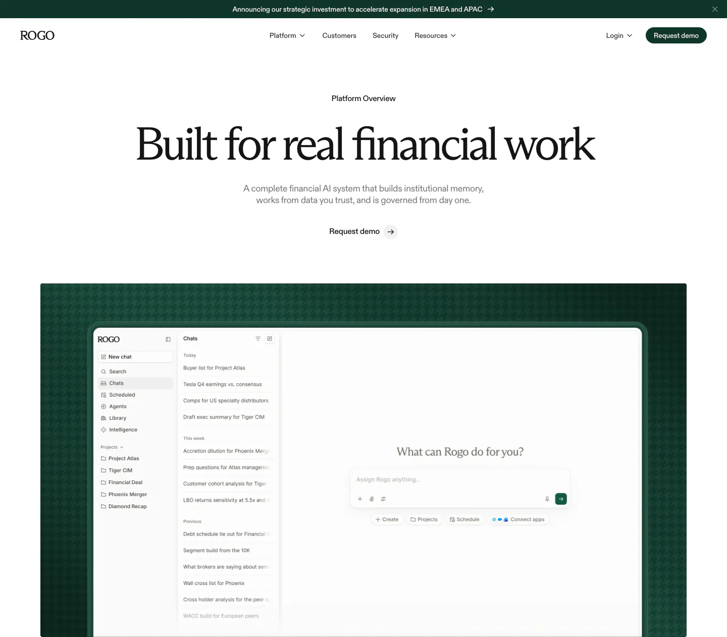
  96. Rogo hero section: announcement bar, nav, centered serif headline and demo link above a chat app screenshot on dark green
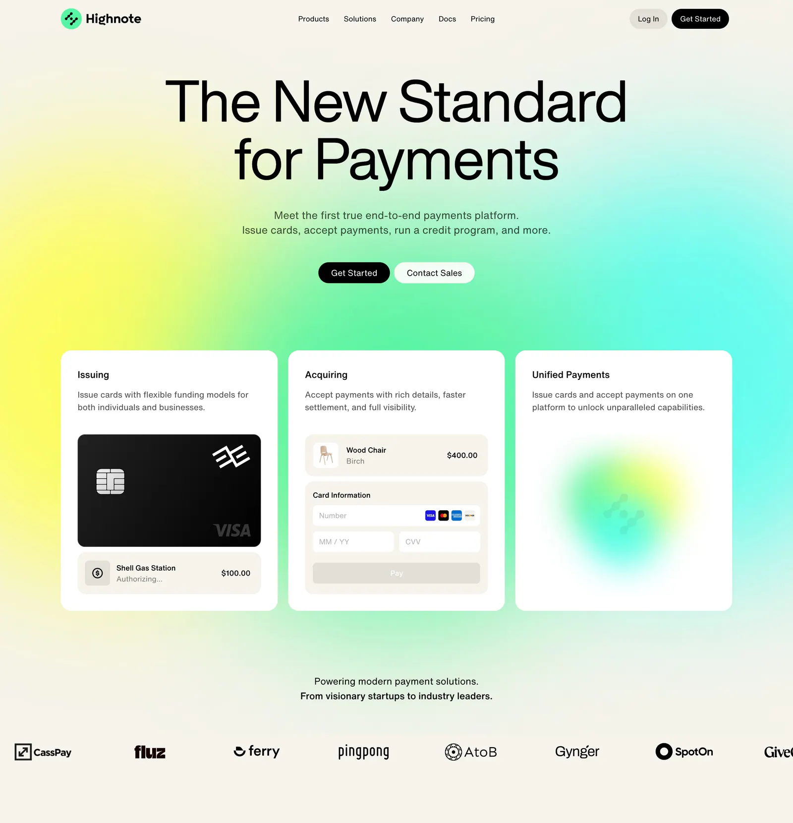
  97. Highnote hero section: centered headline over a yellow-green-cyan glow above three product cards and a scrolling logo row
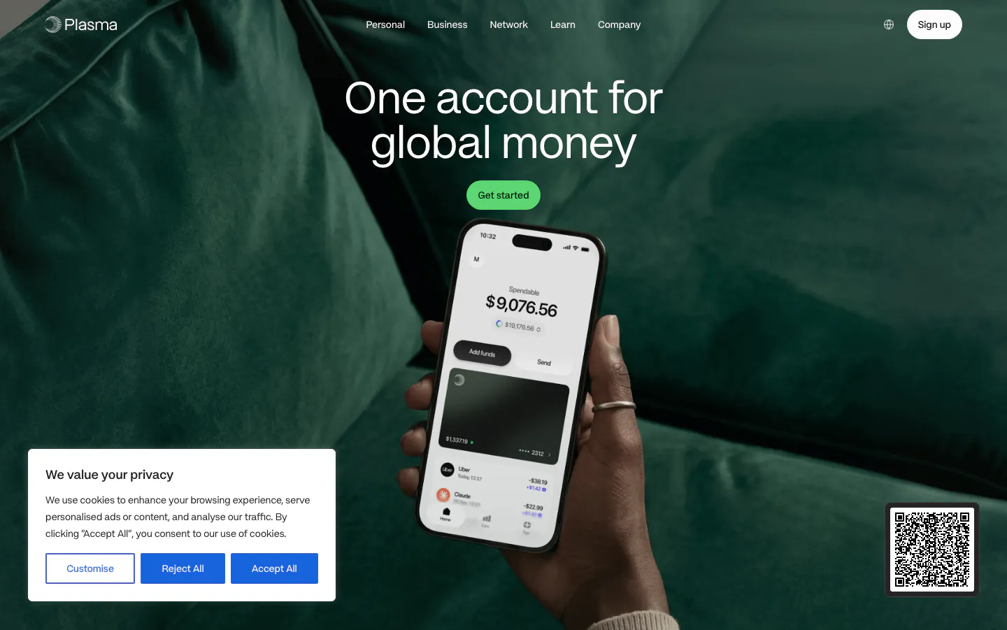
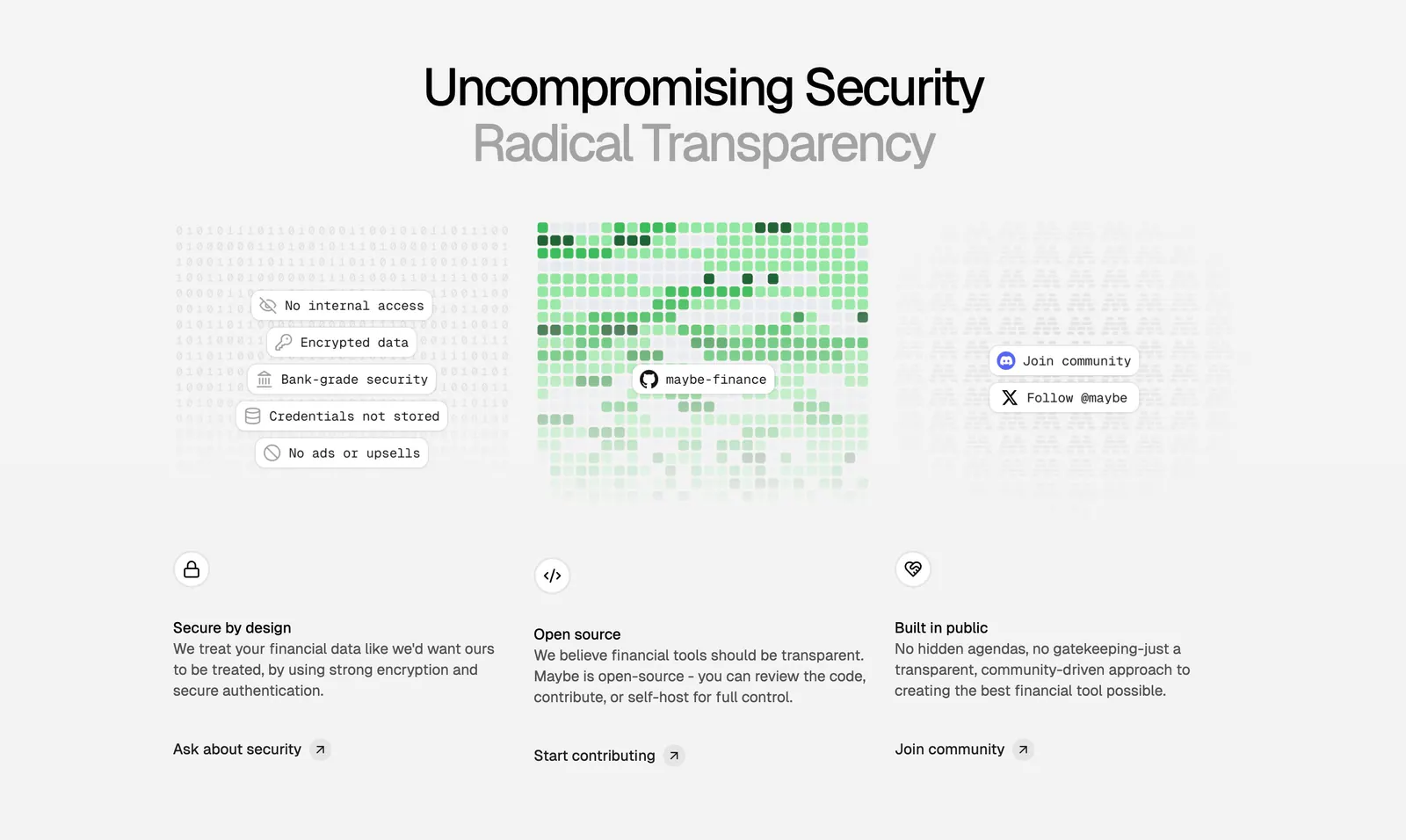
  98. Maybe features section: centered two-tone headline above three columns on security, open source and community with textured visuals
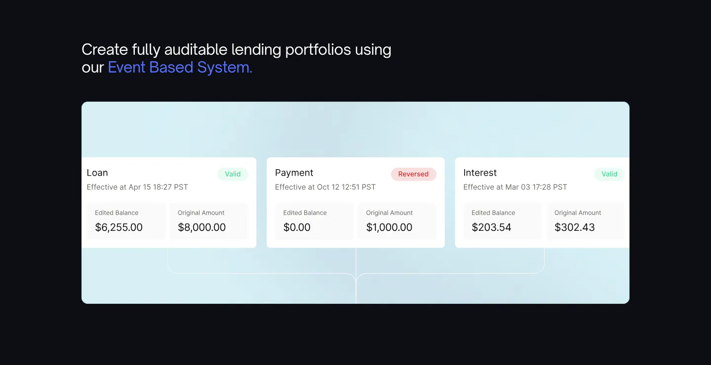
  99. Canopy features section: headline with blue highlight above a light blue panel of loan event UI cards on a dark background
  100. Plasma hero section: centered headline and green button above a hand holding a phone over a full-bleed green sofa photo
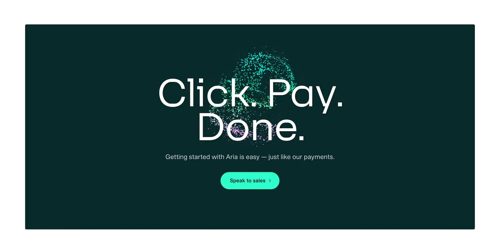
  101. Aria call-to-action section: large centered headline over a teal particle sphere with a mint button on a dark teal panel
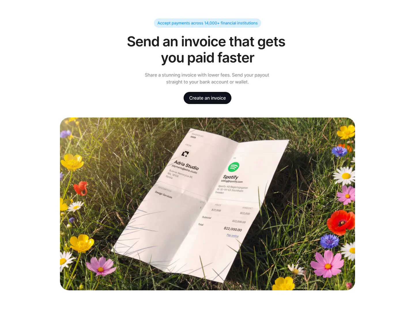
  102. Acctual call to action section: centered headline and button above a rounded photo of a printed invoice lying in a flower meadow
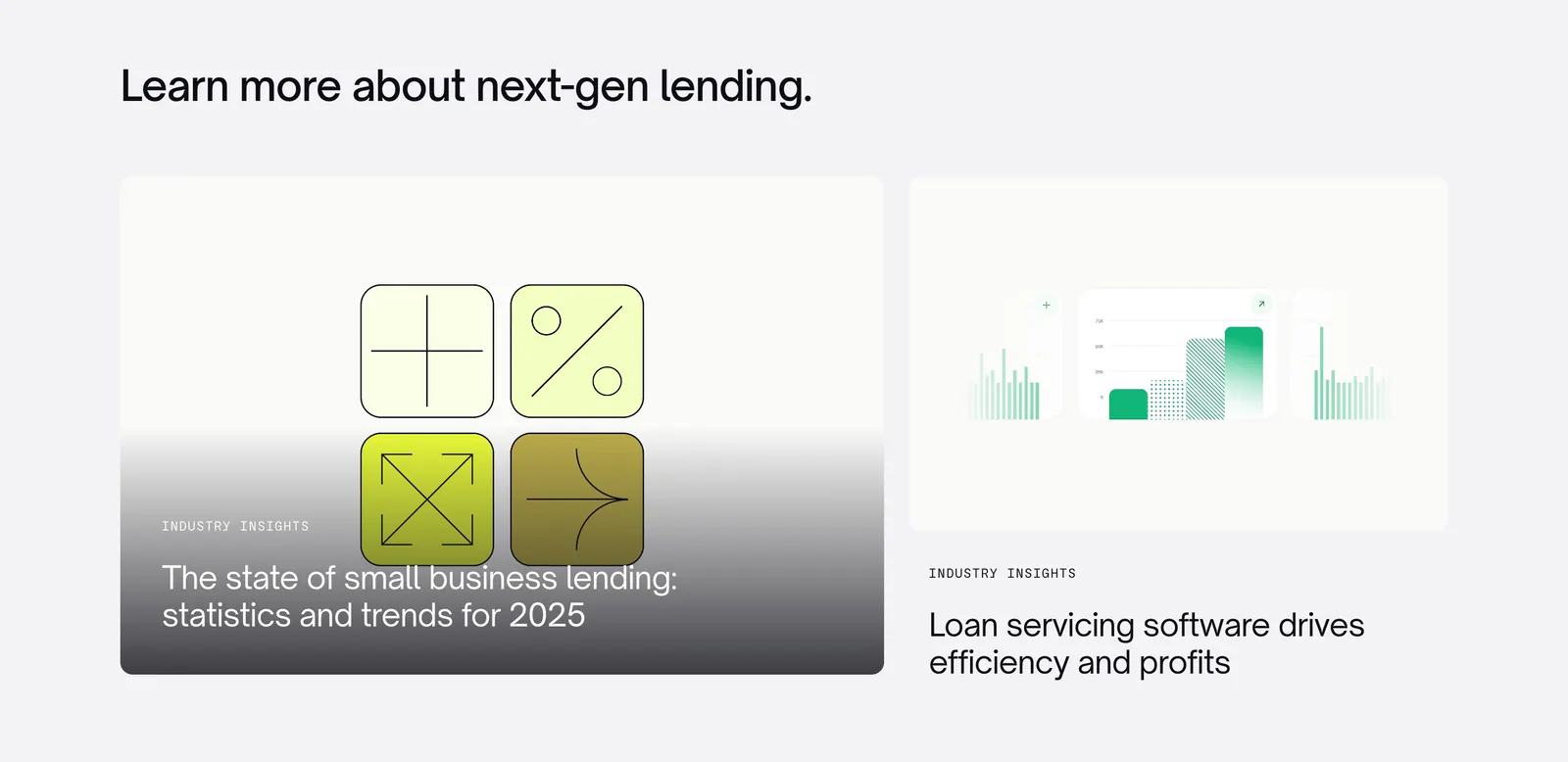
  103. Canopy blog & resources section: left-aligned heading above two article cards with abstract lending graphics on light gray
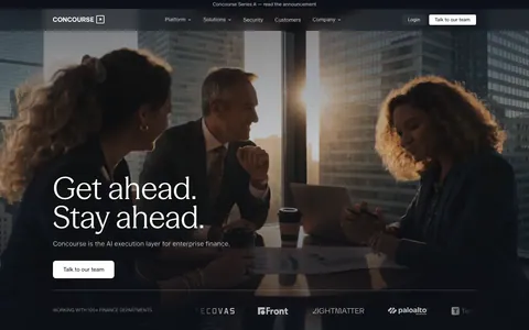
  104. Concourse hero section: left-aligned headline and button over a dark full-bleed office meeting photo with a logo strip below
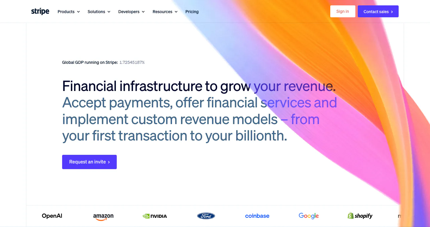
  105. Stripe hero section: nav bar, left-aligned headline with gray subcopy and invite button, orange-pink gradient ribbon at right, customer logo row
  106. Zamp logo cloud section: left-aligned heading with intro copy beside it above a bordered grid of six black customer logos on light gray
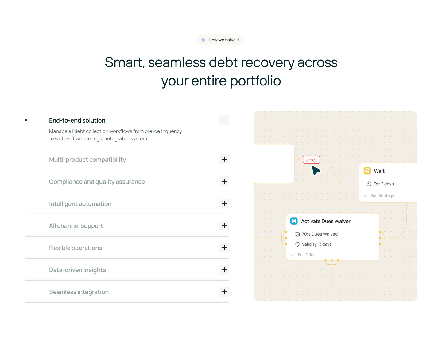
  107. Rezolv features section: centered headline above an accordion of capabilities on the left and a workflow node diagram on the right
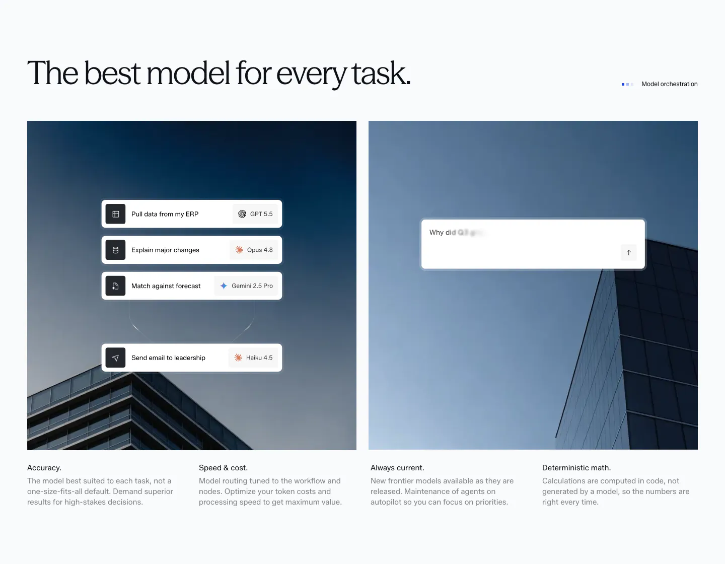
  108. Concourse features section: headline above two building photos overlaid with model-routing and chat UI cards, four feature notes below
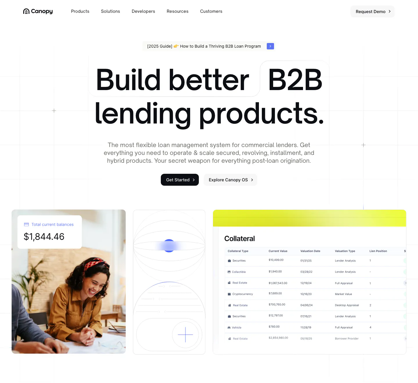
  109. Canopy hero section: centered bold headline and two buttons above a photo, abstract tile and collateral table UI on a white grid
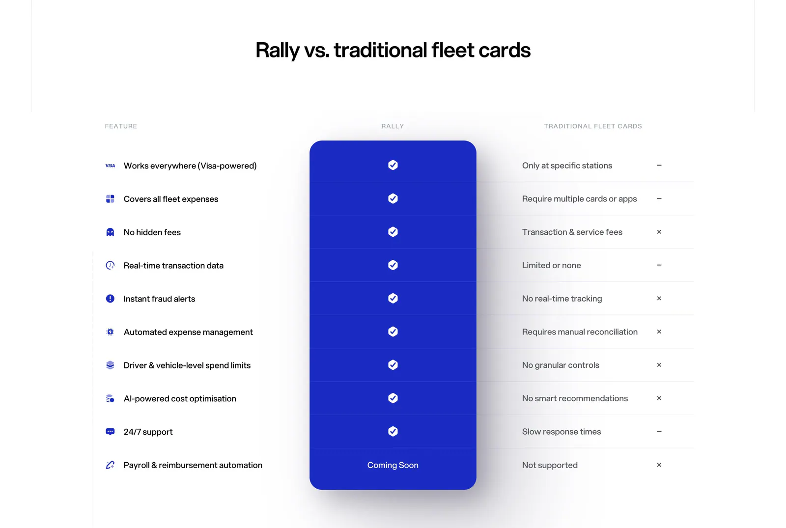
  110. Rally comparison section: centered headline above a feature comparison table with a highlighted blue Rally column of checkmarks
  111. Plasma hero section: nav and centered headline with Get in touch button over a full-bleed office photo of a woman holding a tablet
  112. Concourse testimonials section: headline with arrow buttons above a carousel of quote cards with a Palo Alto Networks photo on dark navy
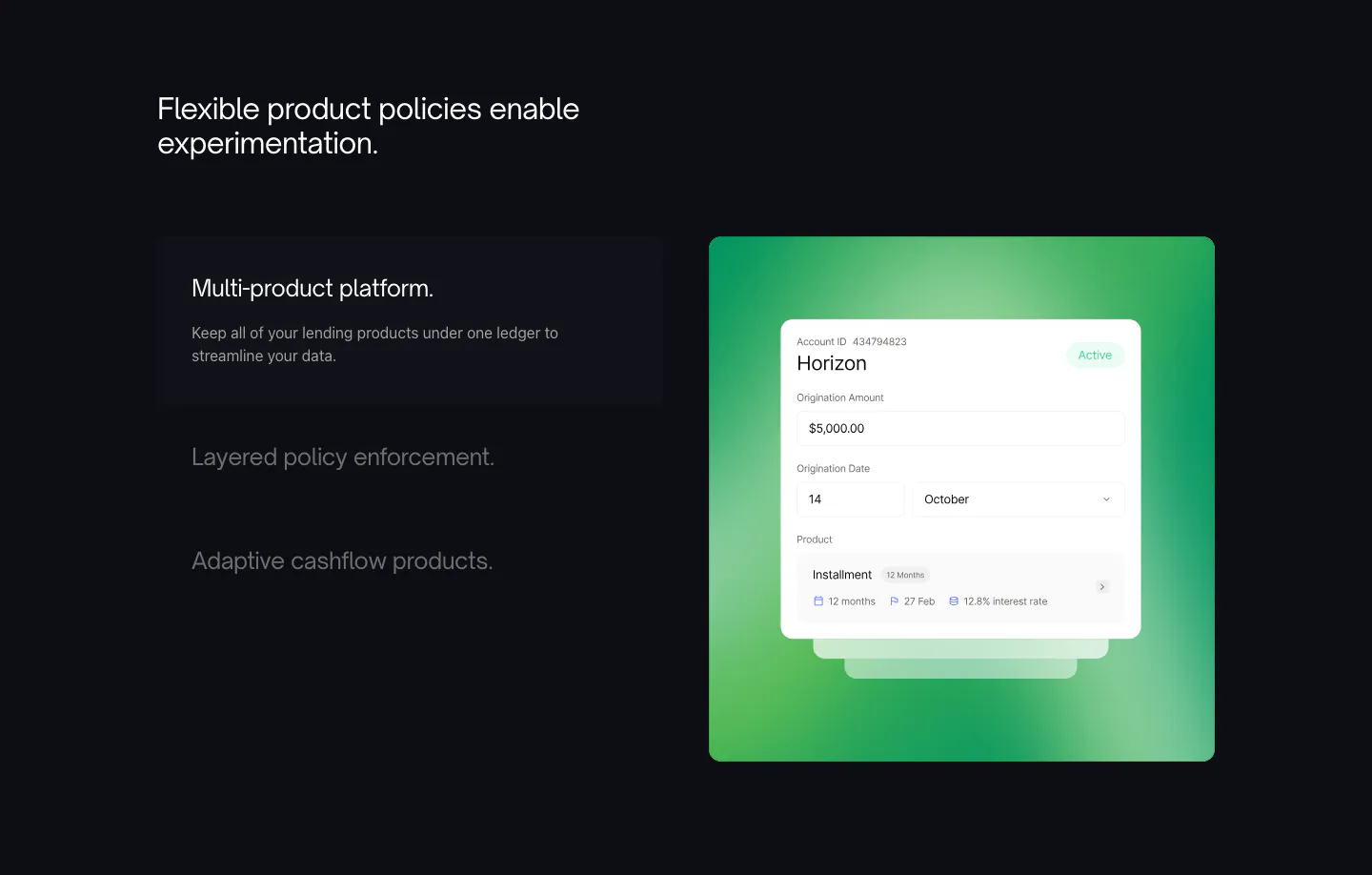
  113. Canopy features section: dark layout with a three-item feature list on the left and a UI card on a green gradient panel
  114. Harmonic features section: two-tone headline above a four-tile bento grid with search chips, company cards and growth charts
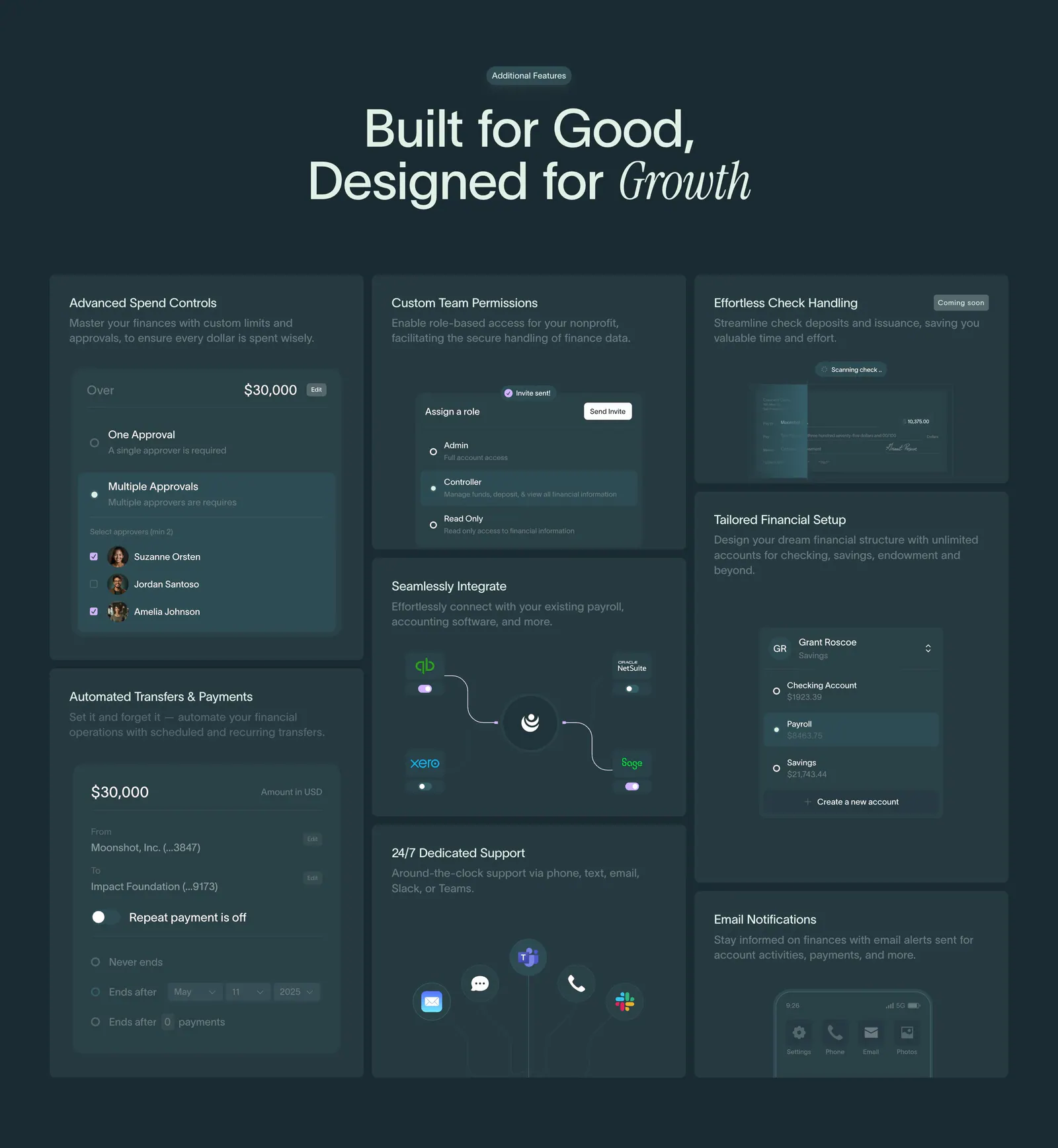
  115. Crescent Cares features section: centered headline above a bento grid of finance feature cards with UI snippets on dark teal
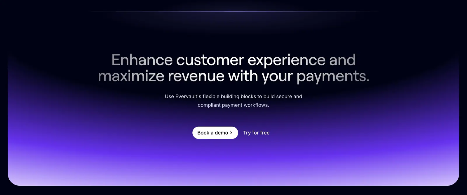
  116. Evervault call-to-action section: centered two-tone headline and demo buttons above a violet gradient glow on a dark navy background
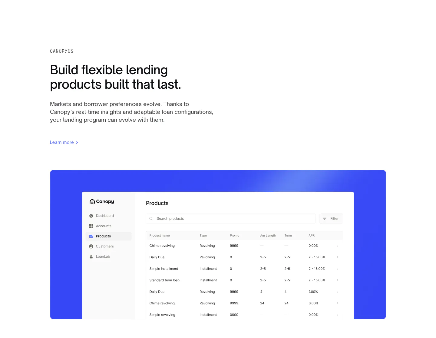
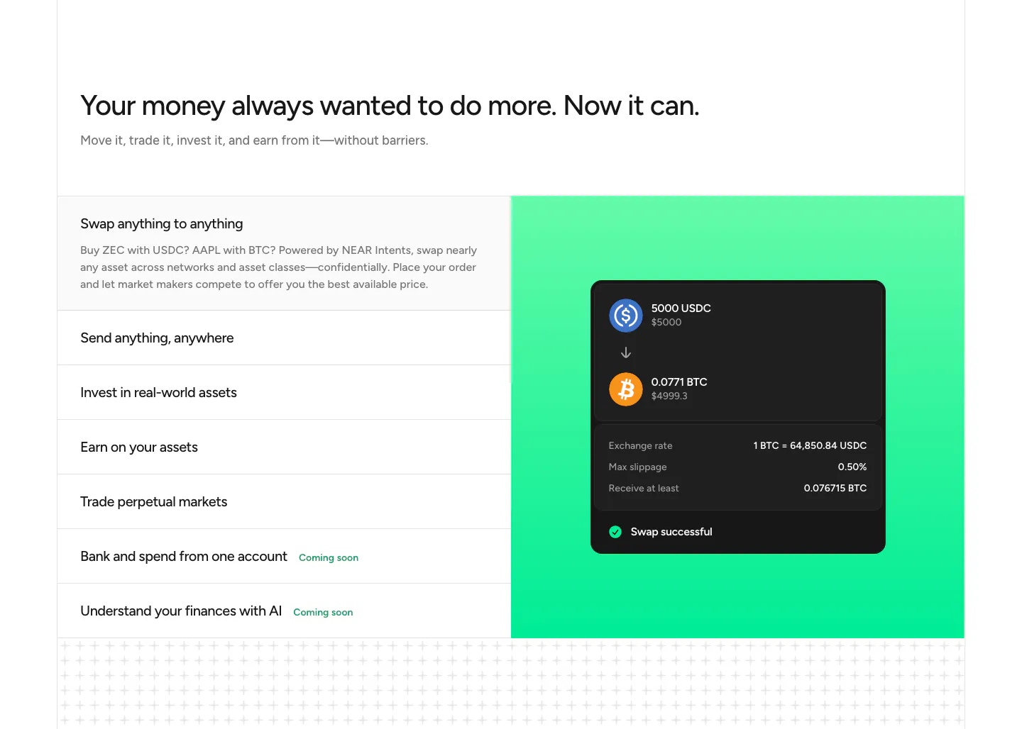
  117. Canopy features section: left-aligned eyebrow, headline and link above a products table screenshot on a bright blue panel
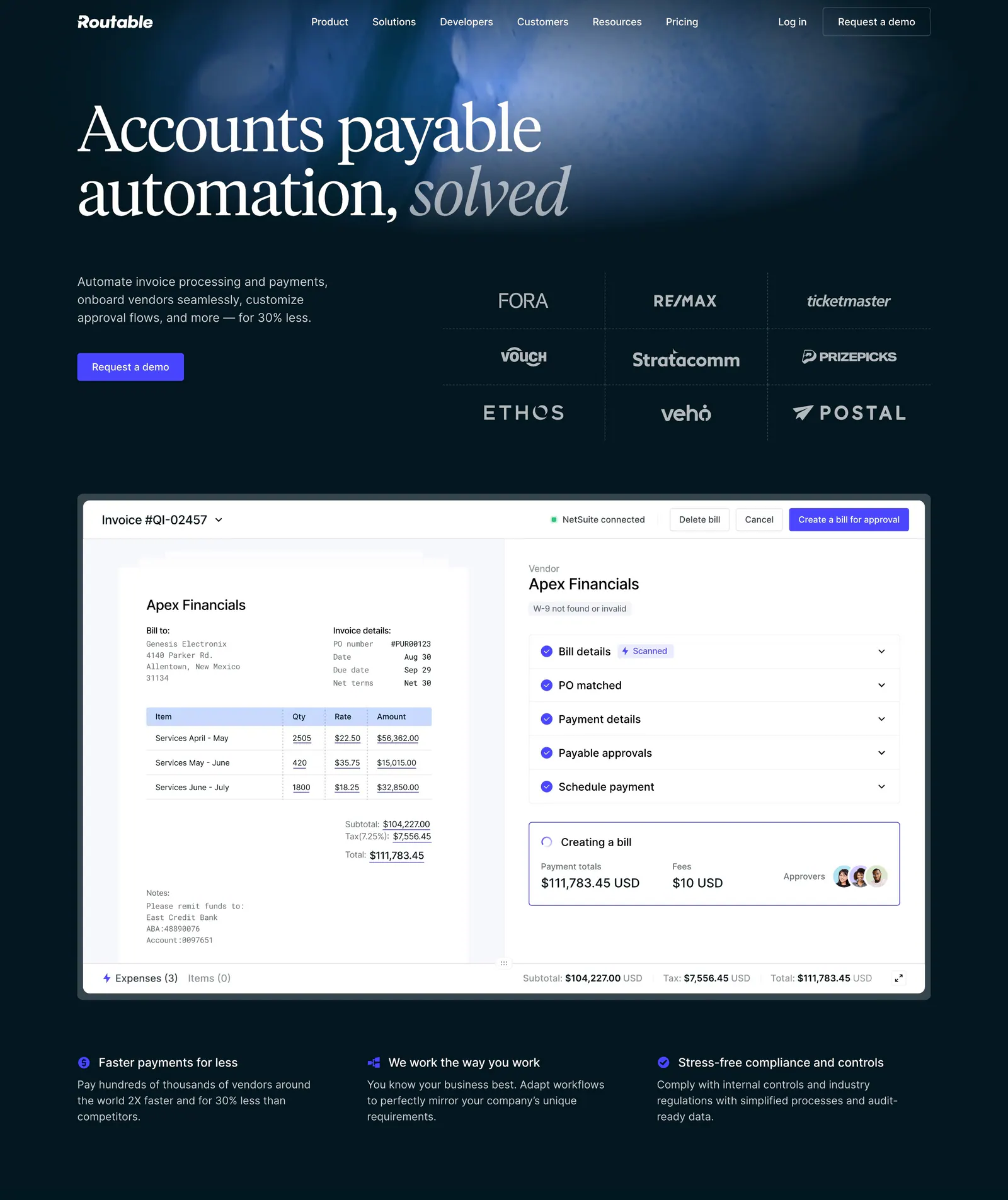
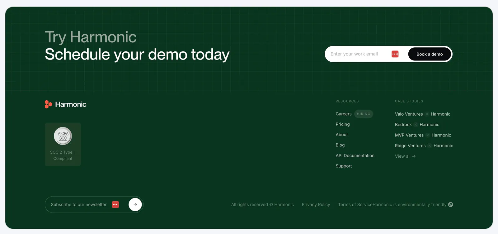
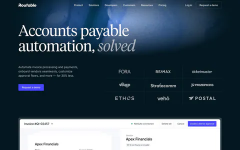
  118. Routable hero section: serif headline and demo button beside a customer logo grid, above an invoice approval screenshot on dark navy
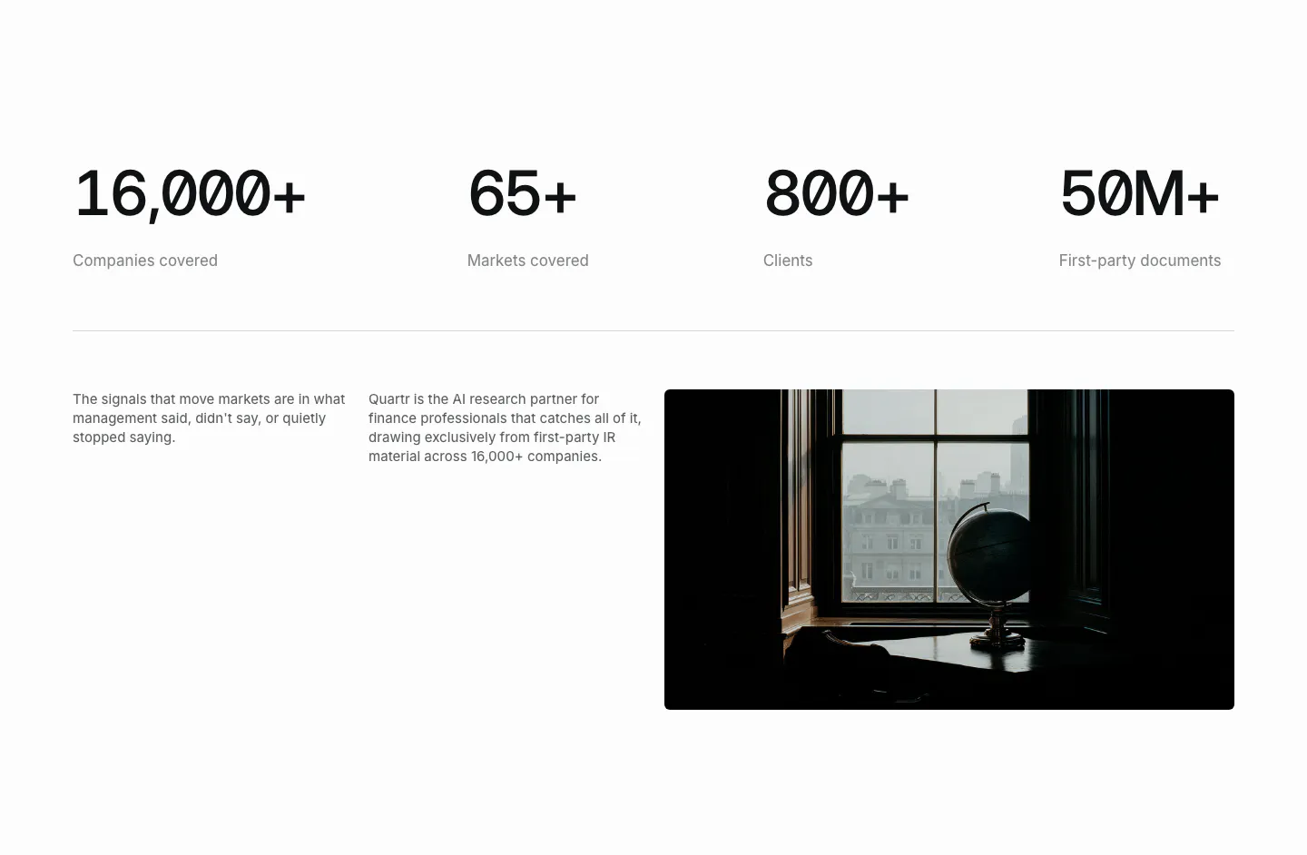
  119. NEAR features section: headline above a list of capabilities on the left and a swap UI card on a green gradient panel
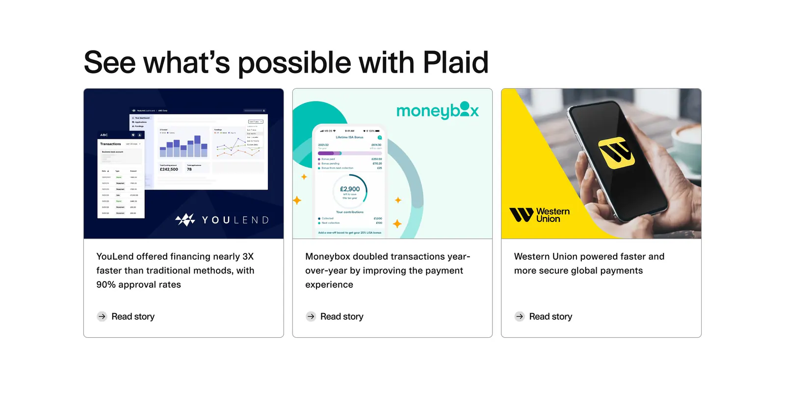
  120. Harmonic footer section: dark green panel with demo email signup over a grid texture, logo, SOC 2 badge, link columns and newsletter field
  121. Quartr stats section: four large monospace figures in a row above two short text columns and a dark photo of a globe by a window
  122. Plaid blog & resources section: headline above three customer story cards with product screenshots, a phone photo and Read story links
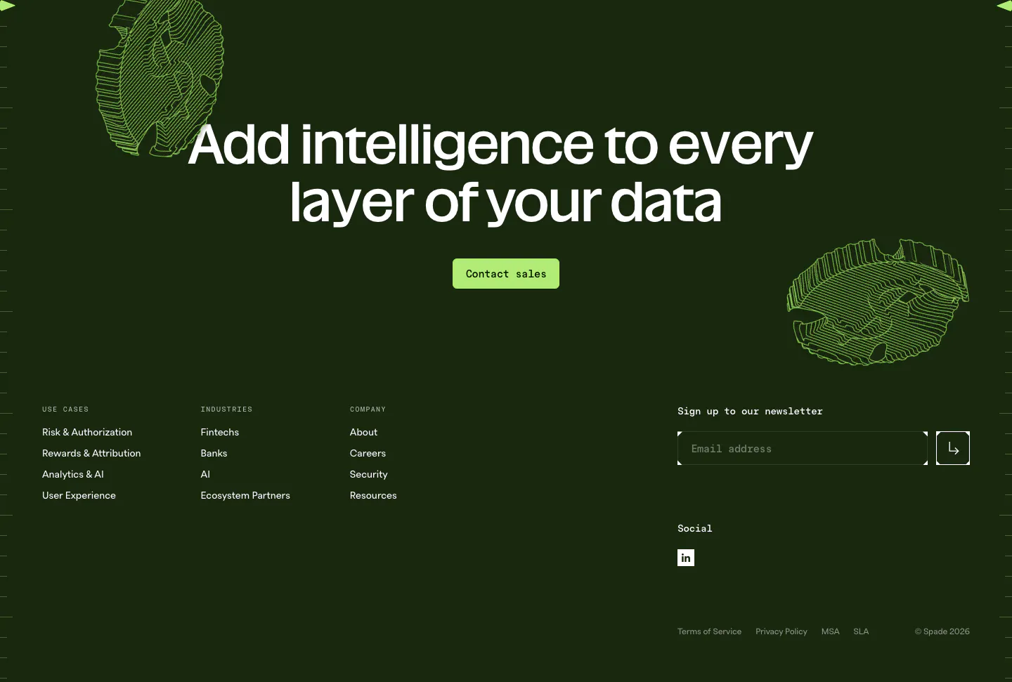
  123. Spade footer section: dark green CTA with centered headline, green button and line-art coins above link columns and a newsletter email field
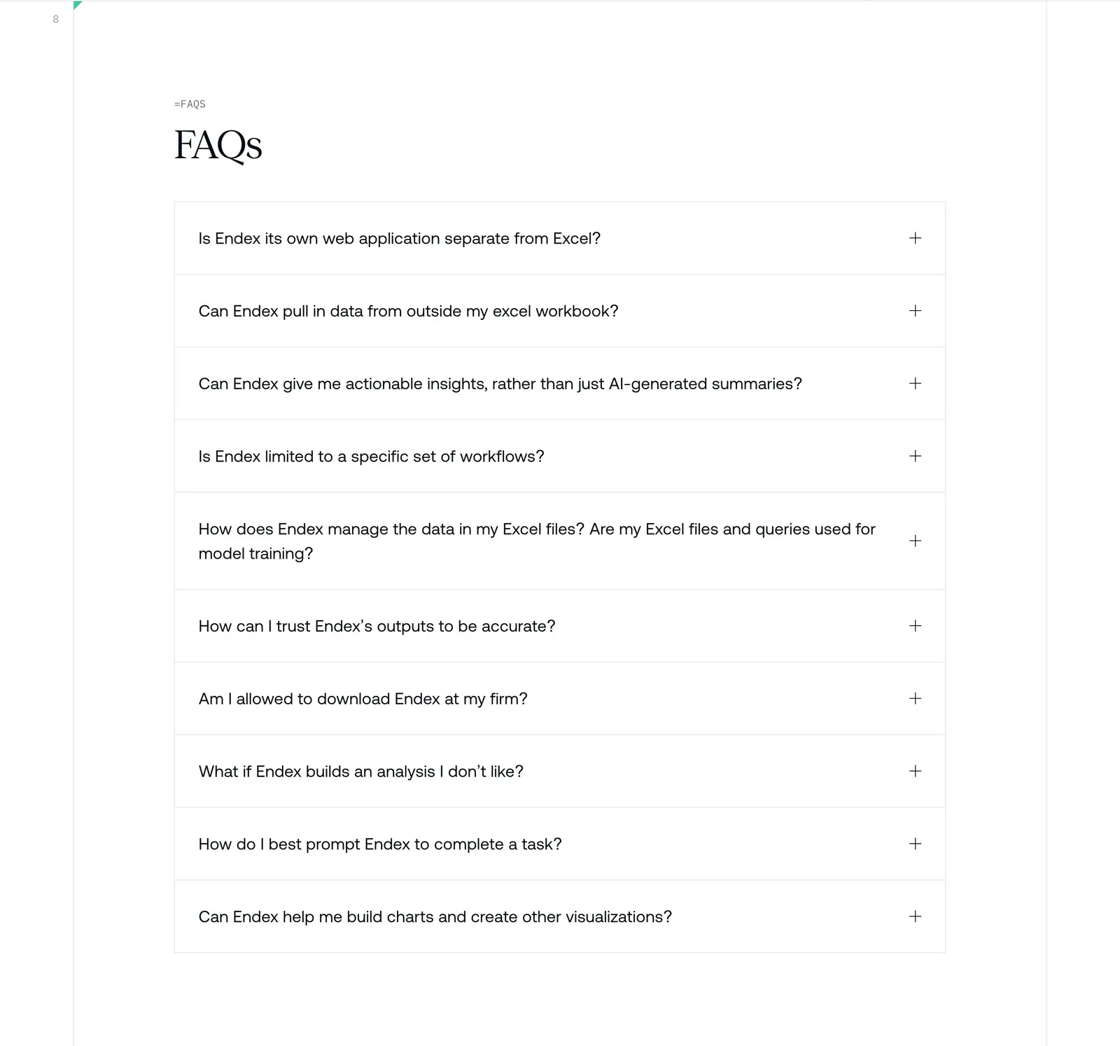
  124. Endex FAQ section: serif FAQs heading above a bordered accordion list of ten questions with plus icons on white
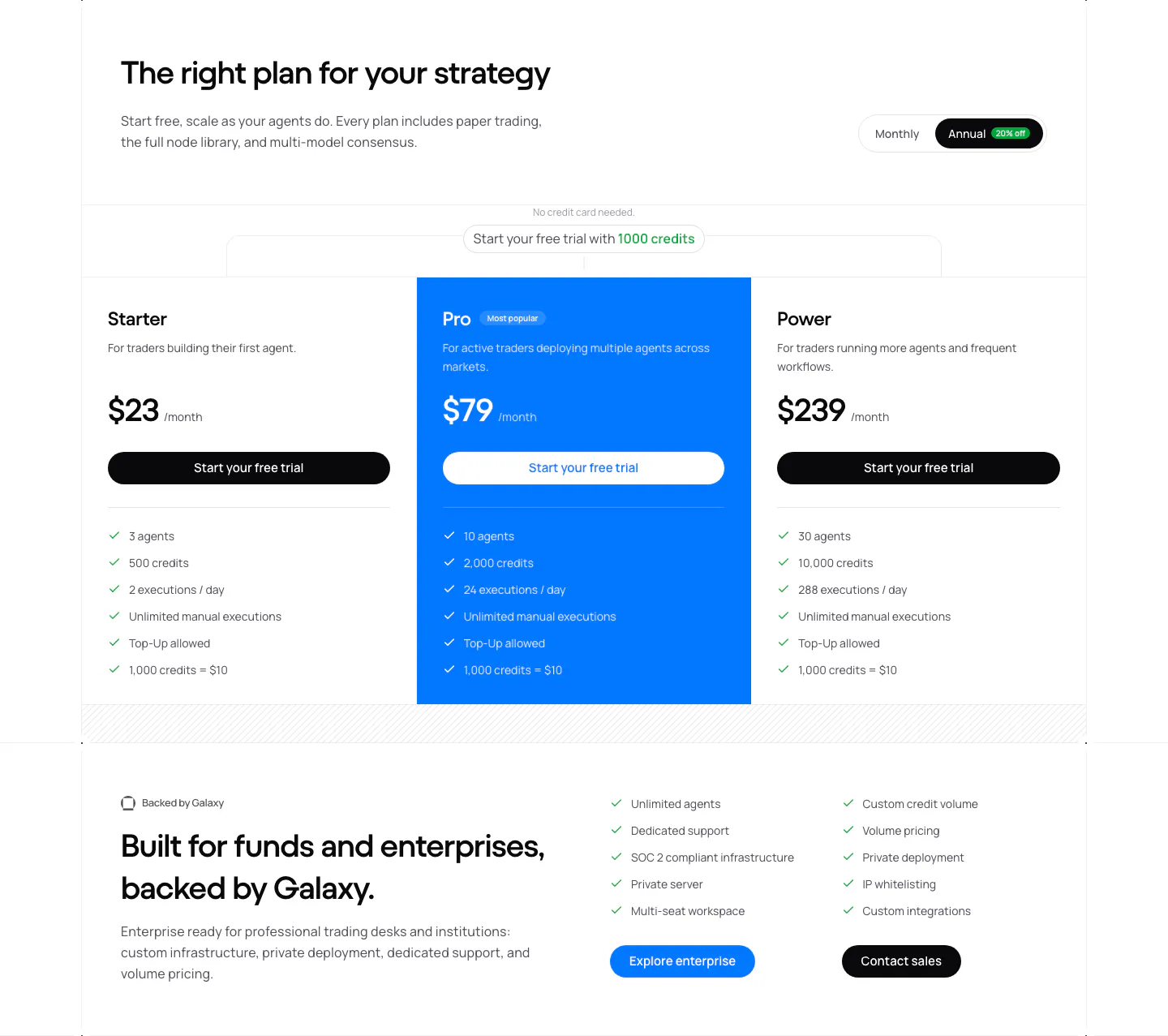
  125. NickAI pricing section: heading with monthly/annual toggle, three plan columns with blue highlighted Pro tier and enterprise band
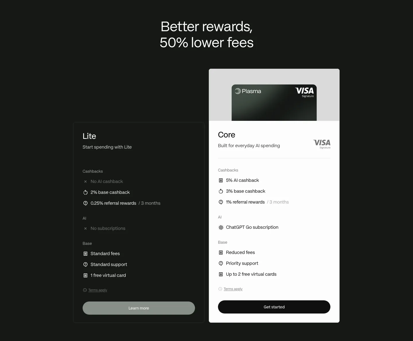
  126. Plasma pricing section: centered headline above dark Lite and white Core plan cards with feature lists on a dark background
  127. Sandbar features section: product UI collage of forms and a bar chart on the left, headline and two-column checklist on the right
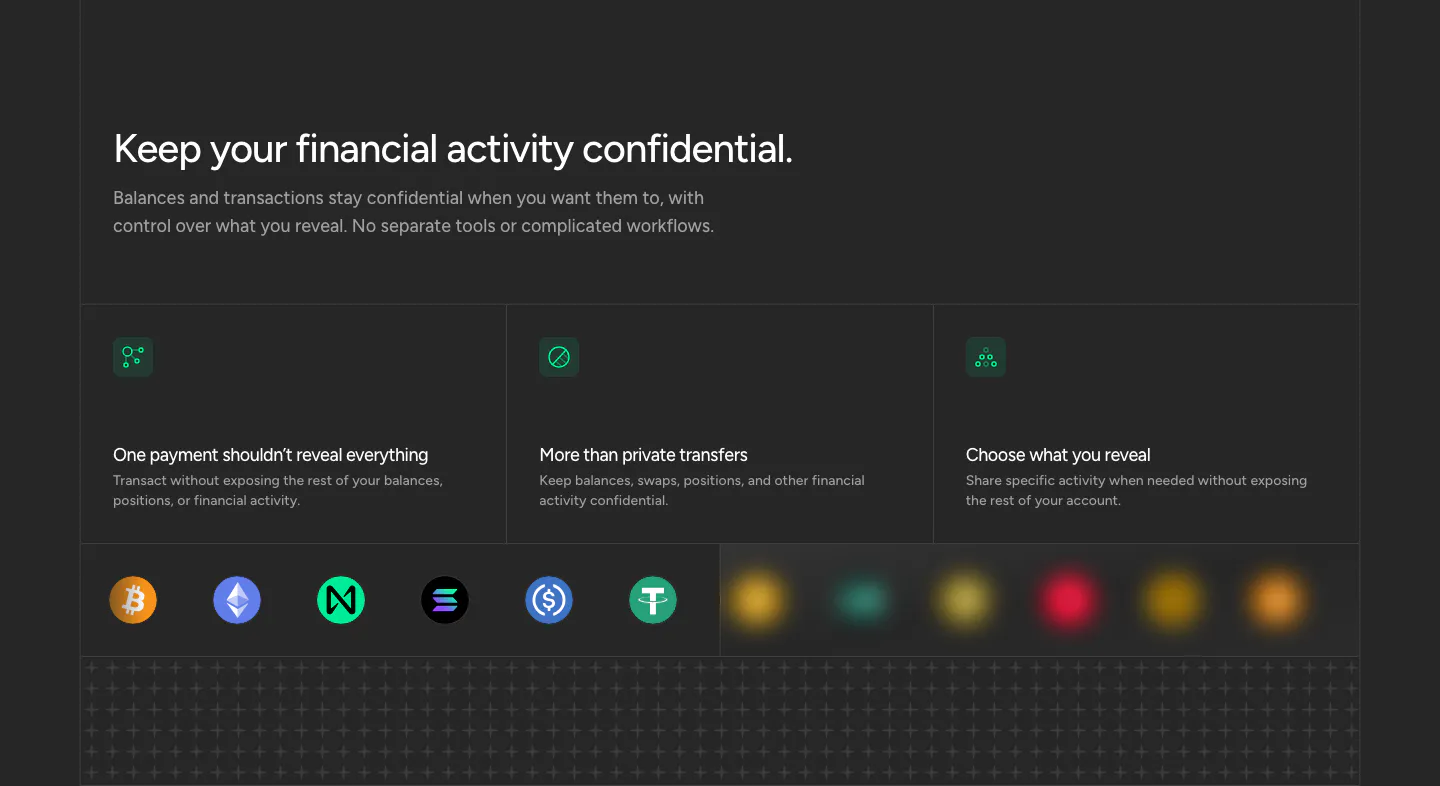
  128. NEAR security section: headline above three privacy cards with green icons and a row of crypto token icons on dark
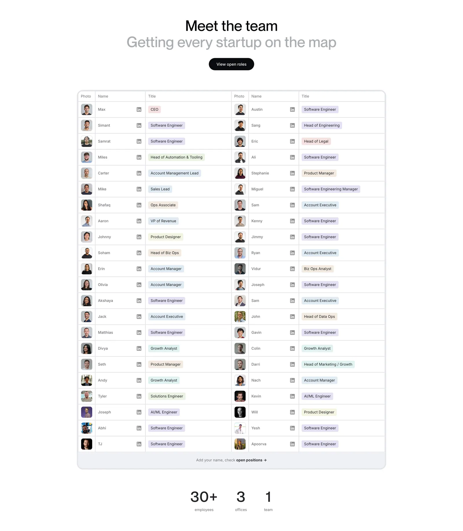
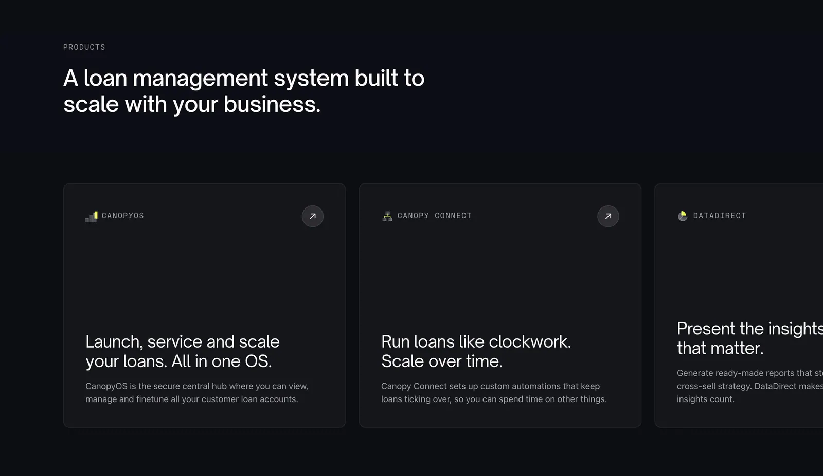
  129. Harmonic team section: centered heading above a two-column table of team member photos, names and role tags with stats below
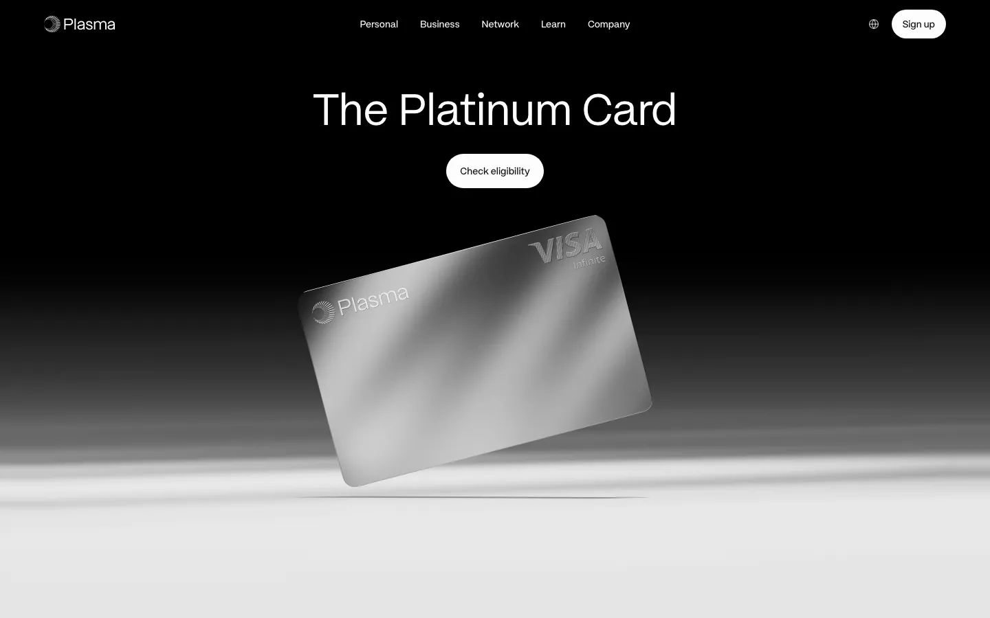
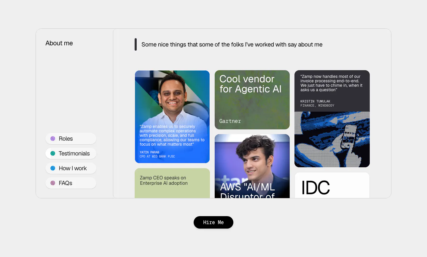
  130. Plasma hero section: nav and centered headline with Check eligibility button above a tilted silver card render on black-to-white
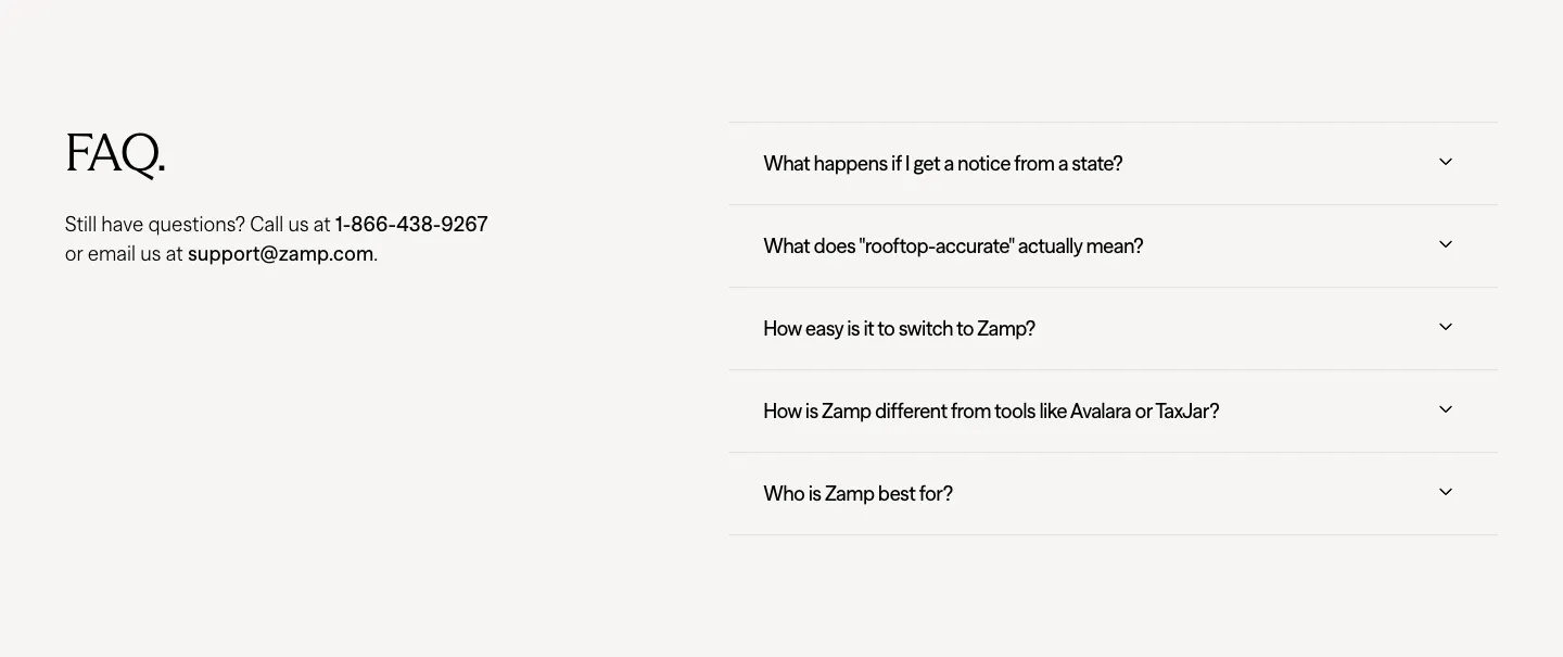
  131. Canopy features section: left-aligned headline above a horizontally scrolling row of dark product cards, the last cut off
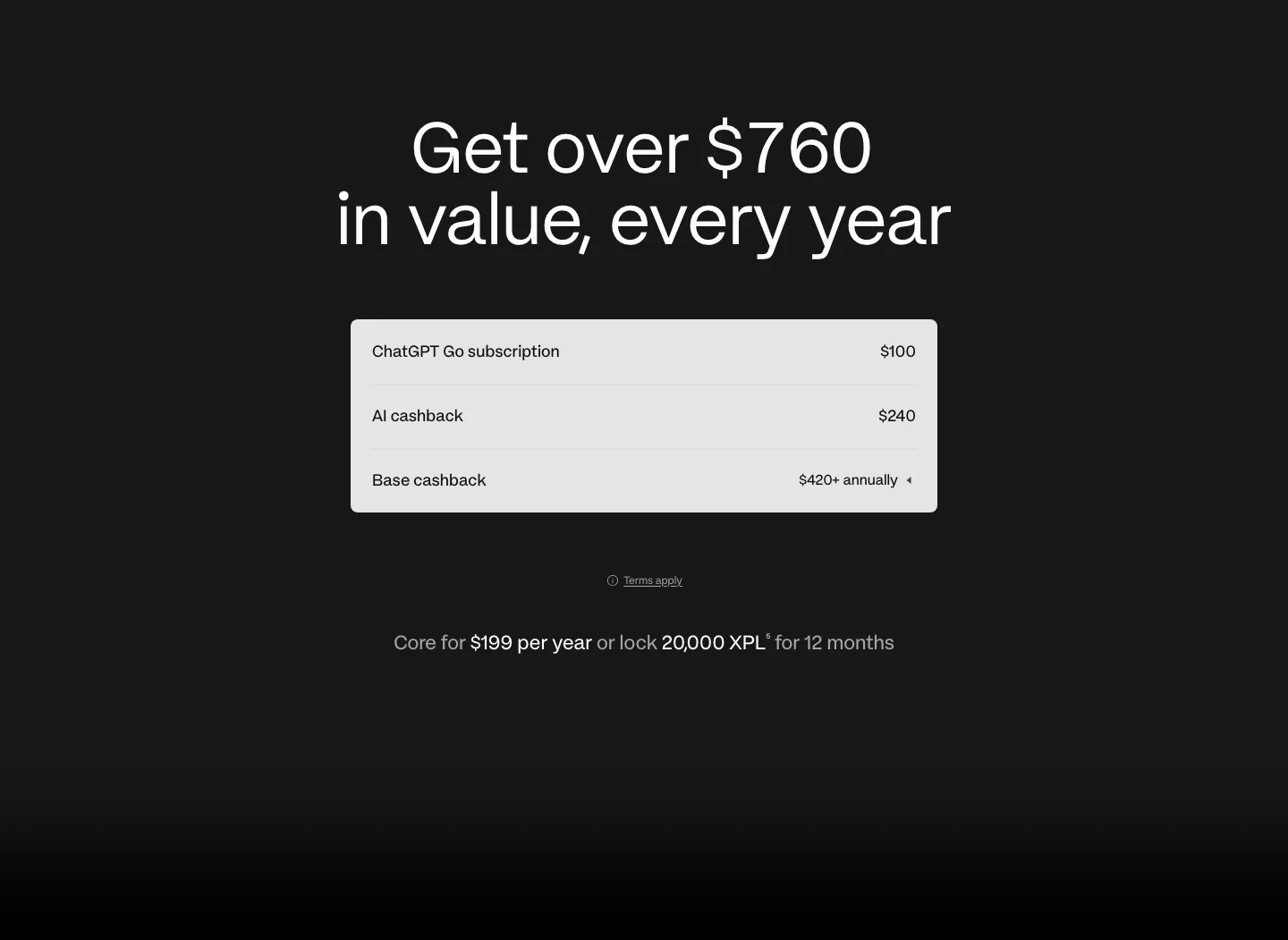
  132. Zamp testimonials section: framed panel with side menu and masonry grid of quote cards, analyst badges and portrait photos on light gray
  133. Zamp FAQ section: serif FAQ heading with contact details on the left and an accordion of five questions on the right
  134. Plasma pricing section: centered headline above a light value breakdown table with annual price line on a dark background
  135. Griffin footer section: dark footer with logo, legal text, B Corp badge, four link columns and social icons
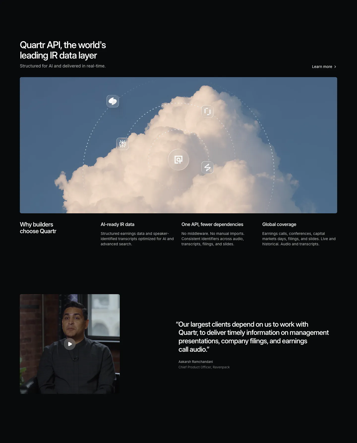
  136. Quartr features section: dark layout with a wide cloud photo orbited by icons, three benefit columns and a video testimonial
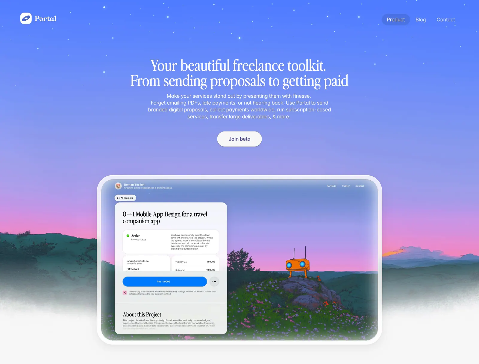
  137. Portal hero section: centered serif headline on a blue-to-purple sky gradient above a proposal UI framed in a painted landscape
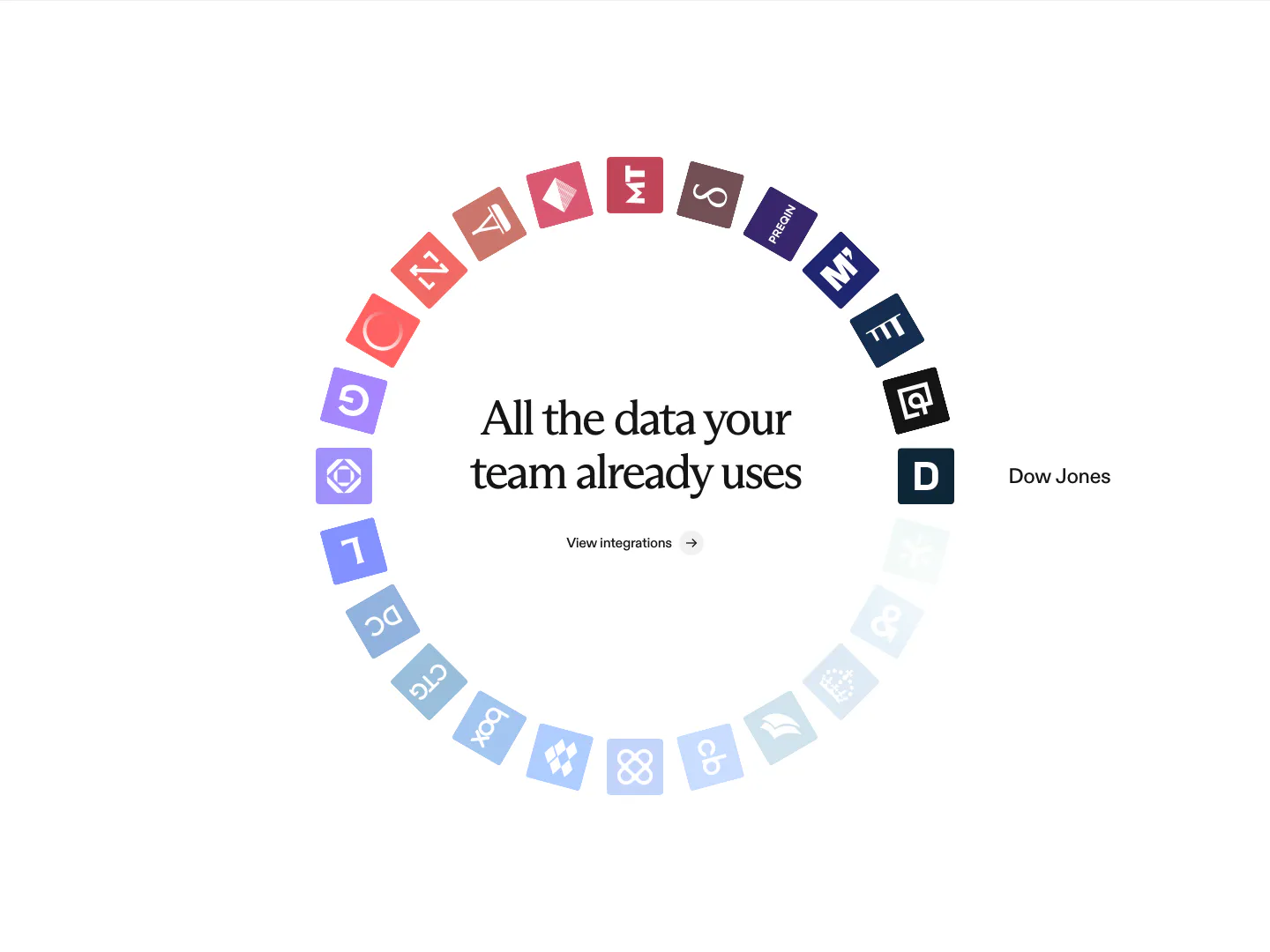
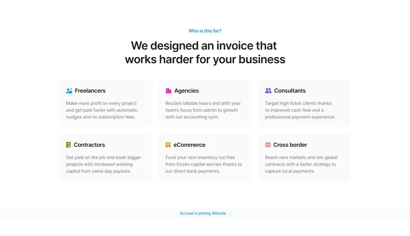
  138. Rogo integrations section: centered serif headline inside a ring of colored data provider app icons fading to light blue
  139. Plasma features section: gray panel with heading and buttons left and a grid of colorful brand tiles right
  140. Acctual use cases section: centered headline above a 3x2 grid of audience cards for freelancers, agencies, contractors and more
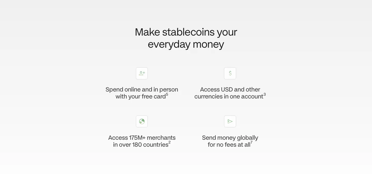
  141. Primer footer section: five link columns, social icons, email signup field and investor logos on a plain white background
  142. Zamp logo cloud section: centered one-line trust statement above a single row of grayscale consumer brand logos on white
  143. Plasma value proposition section: centered heading above a 2x2 grid of icon benefit points on a light gray fade
  144. Quartr call to action section: centered white headline and Contact sales button on a near-black background
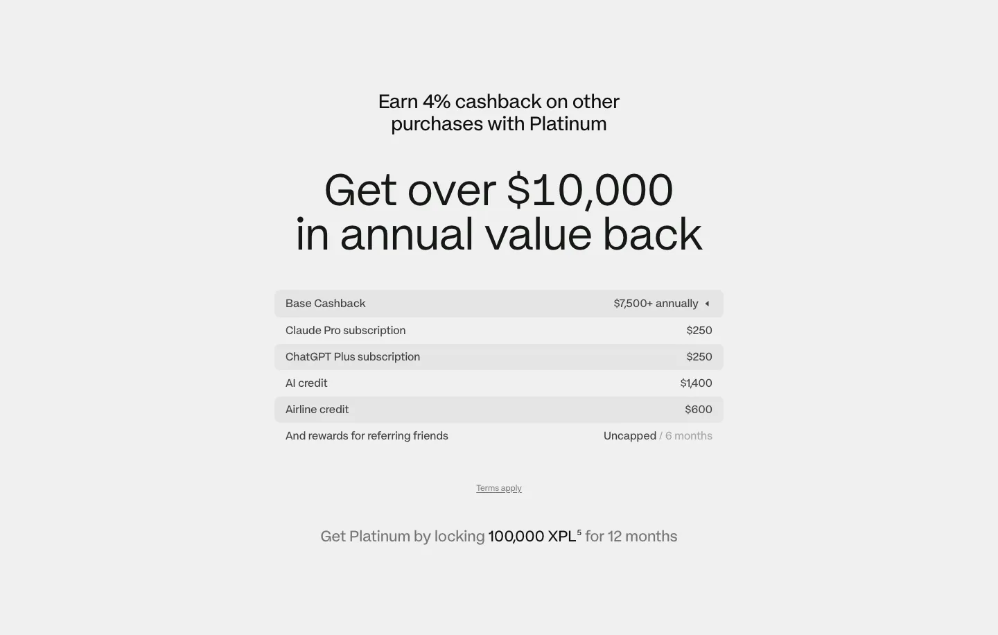
  145. Canopy team section: heading above a grid of arch-framed leadership headshot photos with names, titles and LinkedIn icons
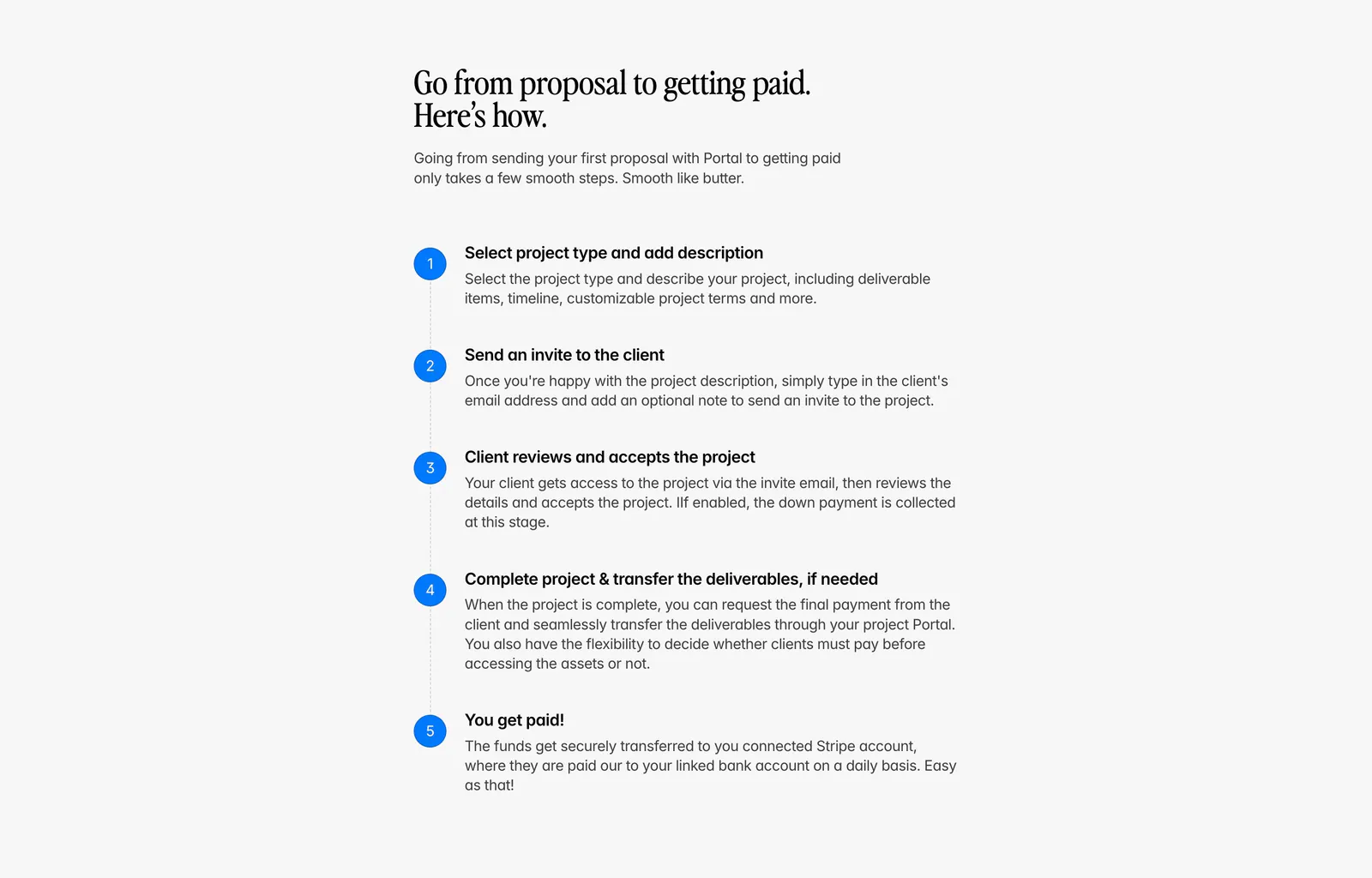
  146. Portal how it works section: serif headline above a vertical five-step list with blue numbered circles on a light gray background
  147. Plasma pricing section: centered headline above a striped value breakdown table and lock requirement note on light gray
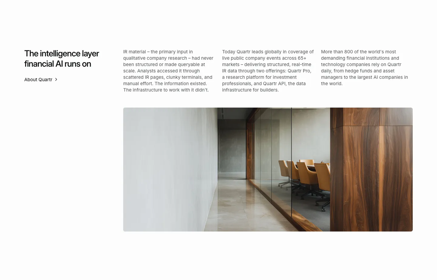
  148. Quartr about & mission section: headline with About link, three columns of company story text and a wide office interior photo
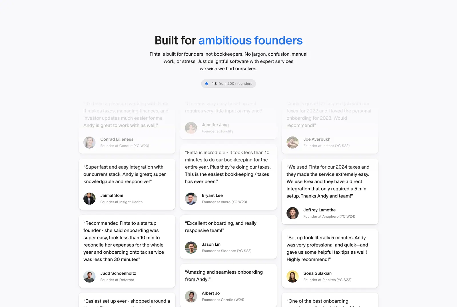
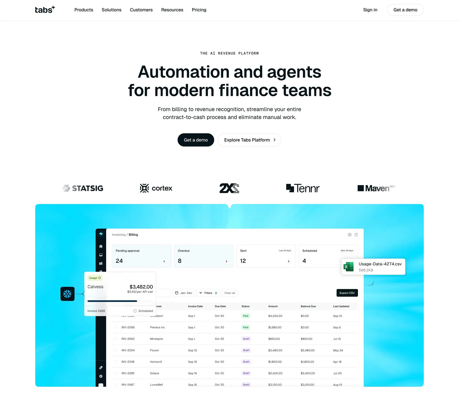
  149. Finta testimonials section: centered headline with blue accent words and rating pill above a three-column masonry wall of quotes
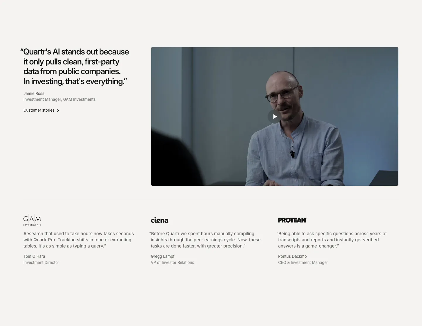
  150. Ruul integrations section: small caption above a row of grayscale bank and wallet logos on an off-white background
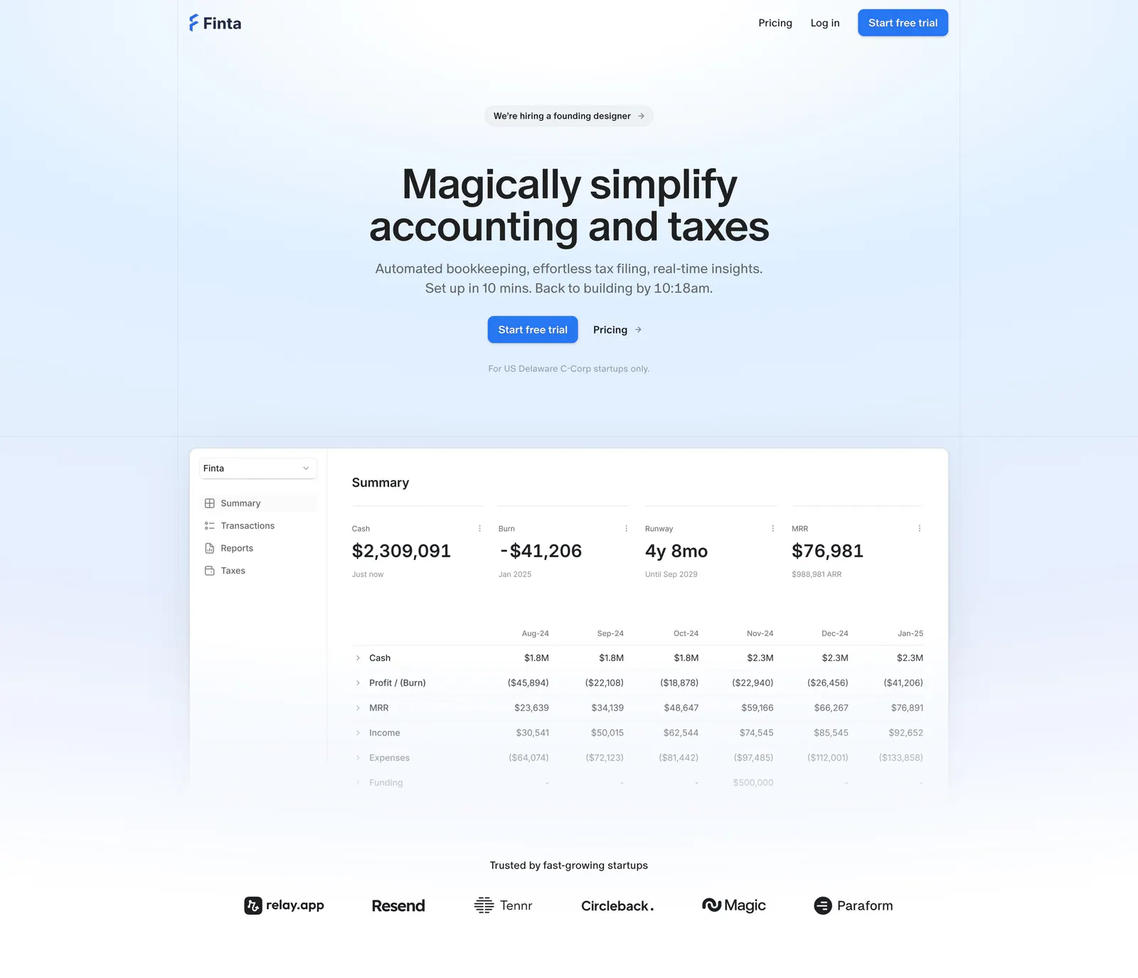
  151. Tabs hero section: centered headline with two buttons, customer logo row and a billing dashboard screenshot on a bright cyan panel
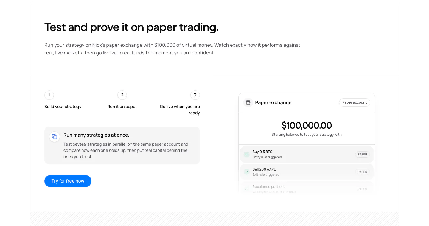
  152. Quartr testimonials section: large quote beside a customer video with play button, above three logo-headed quotes in columns
  153. Finta hero section: centered headline and CTAs on a pale blue wash above a financial summary dashboard and a startup logo row
  154. NickAI features section: three-step progress row, info card and button on the left, paper exchange balance UI on the right
  155. Tabs testimonials section: full-width case study card with an office photo of two people, Cortex logo, headline and watch video button
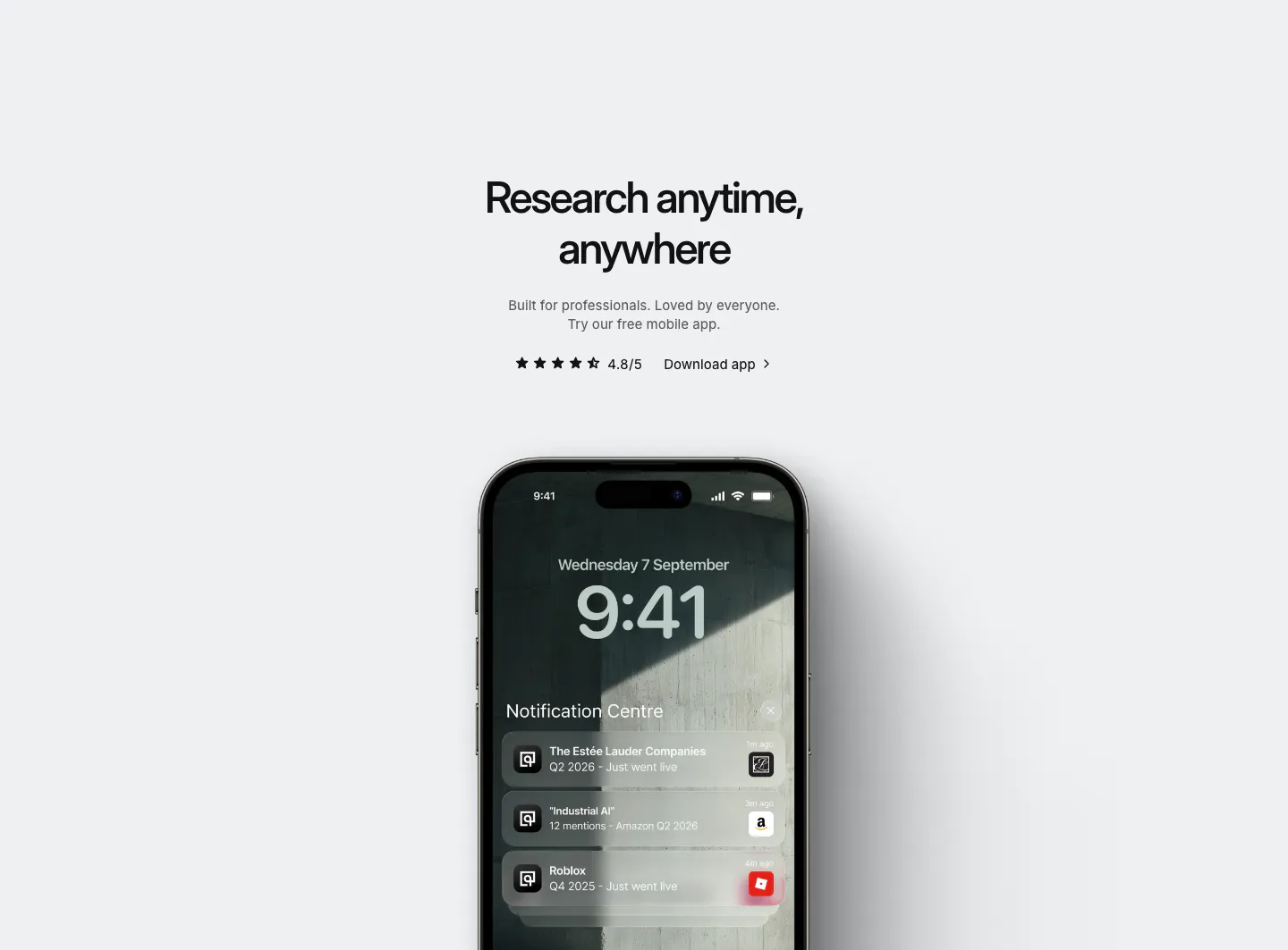
  156. Quartr other section: centered app download headline with star rating above an iPhone showing Quartr lock-screen notifications
    Quartr Other
  157. Griffin value proposition section: serif heading and copy above four dark outlined link cards with arrows
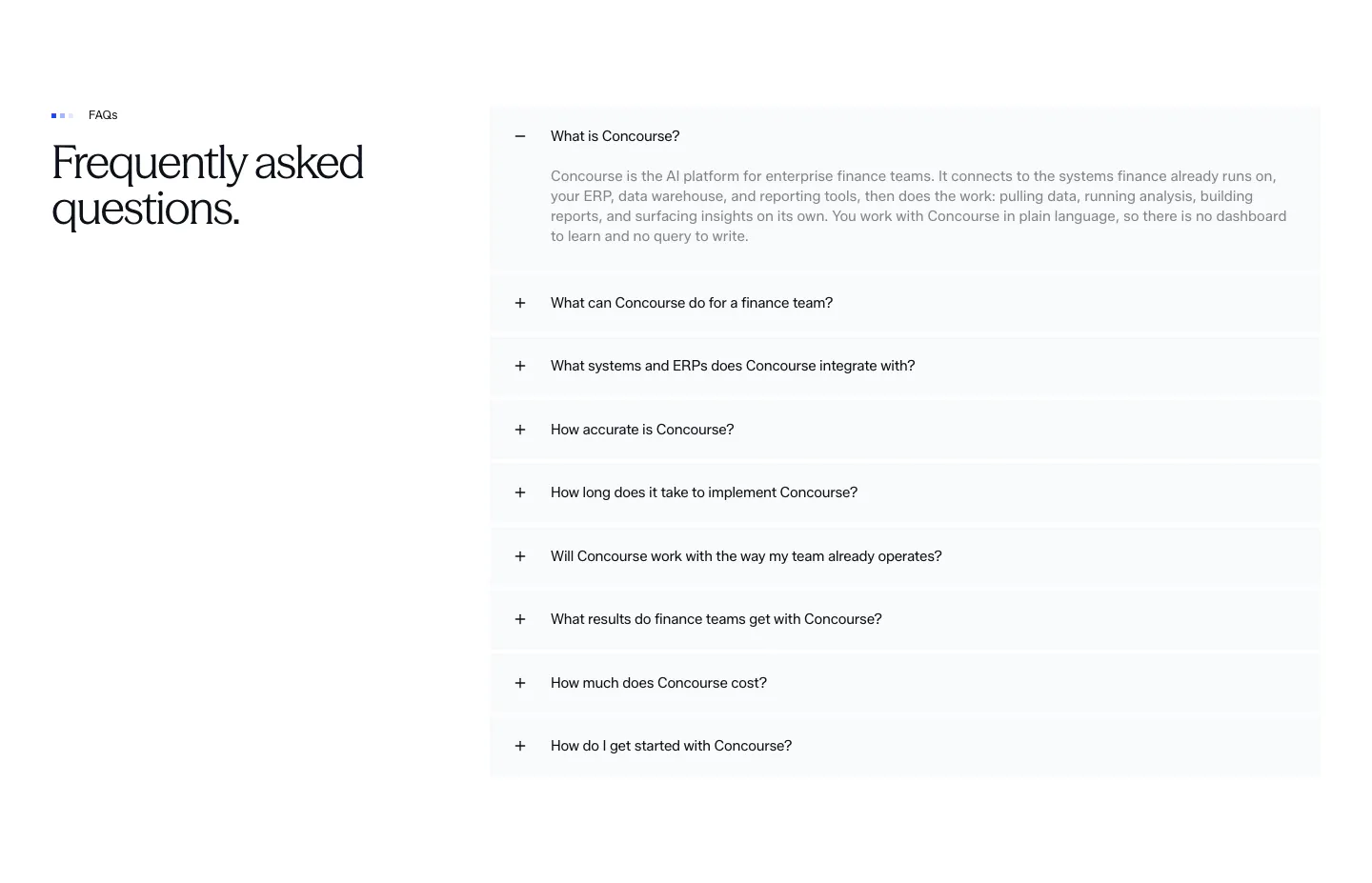
  158. Concourse FAQ section: heading left, accordion of questions right with the first item expanded on white
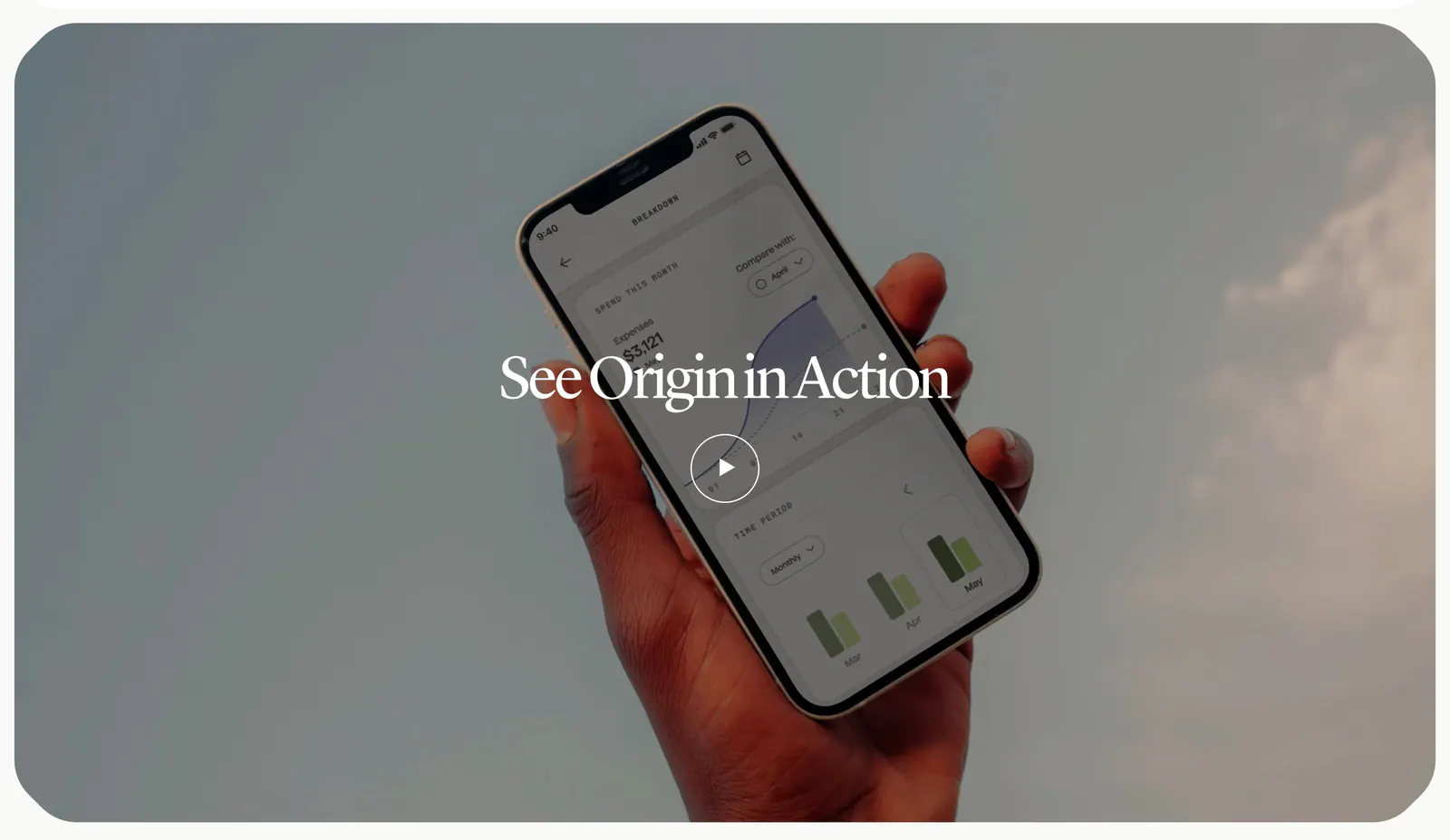
  159. Origin how it works section: serif title and play button over a full-width photo of a hand holding a phone with the app against the sky
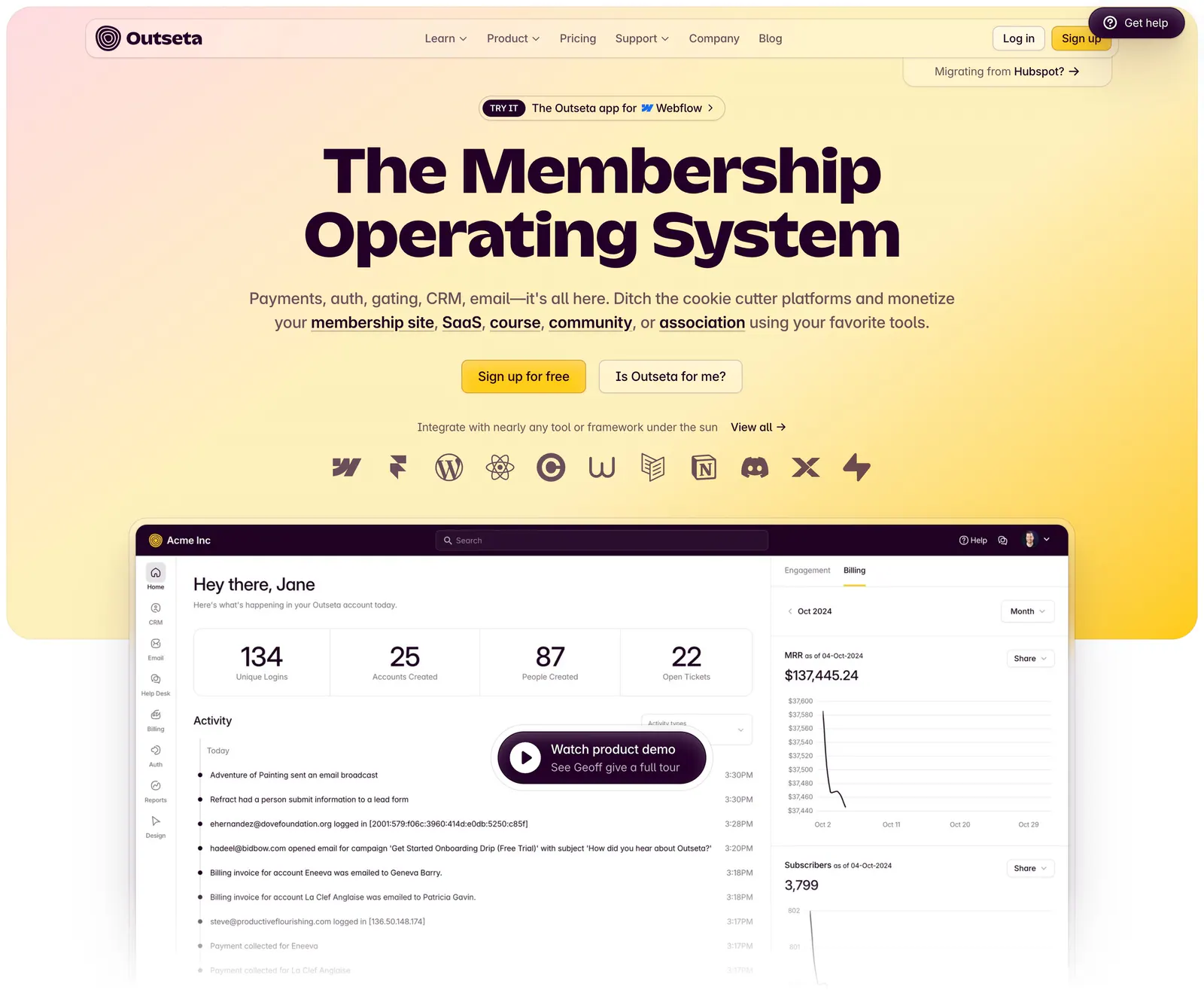
  160. Outseta hero section: centered headline, two buttons and integration icons on a peach-to-yellow gradient above a dashboard with demo button
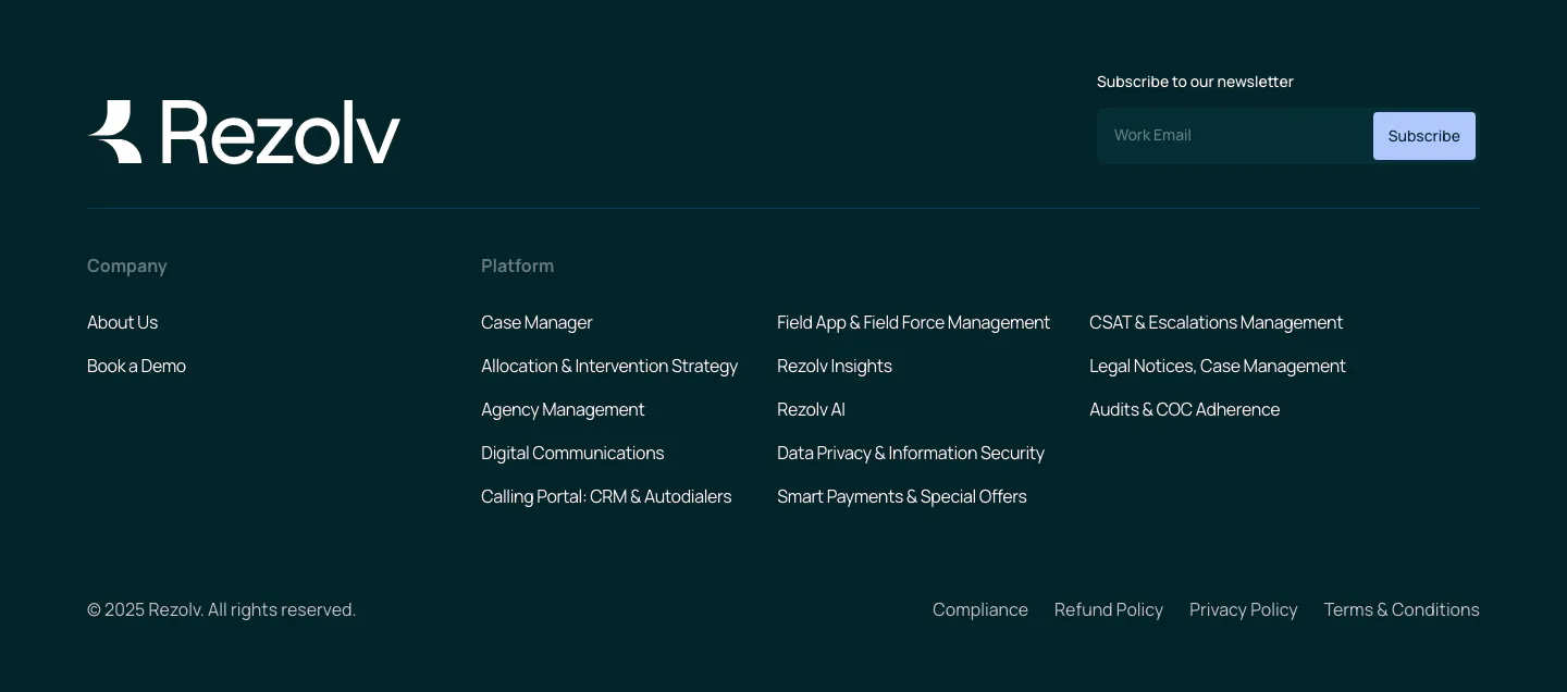
  161. Rezolv footer section: wordmark and newsletter email field above company and platform link columns on a dark teal background
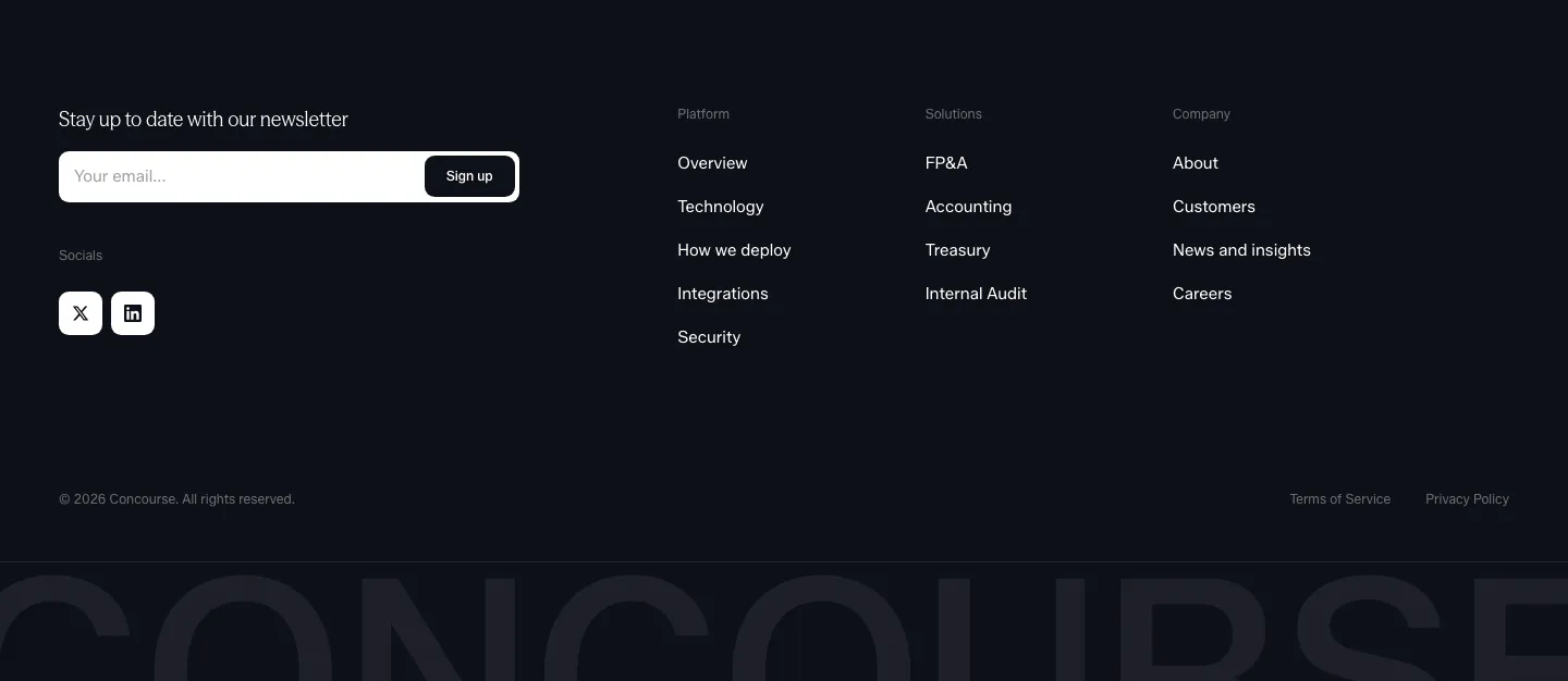
  162. Concourse footer section: newsletter email field and social icons left, link columns right, cut-off Concourse wordmark below on dark
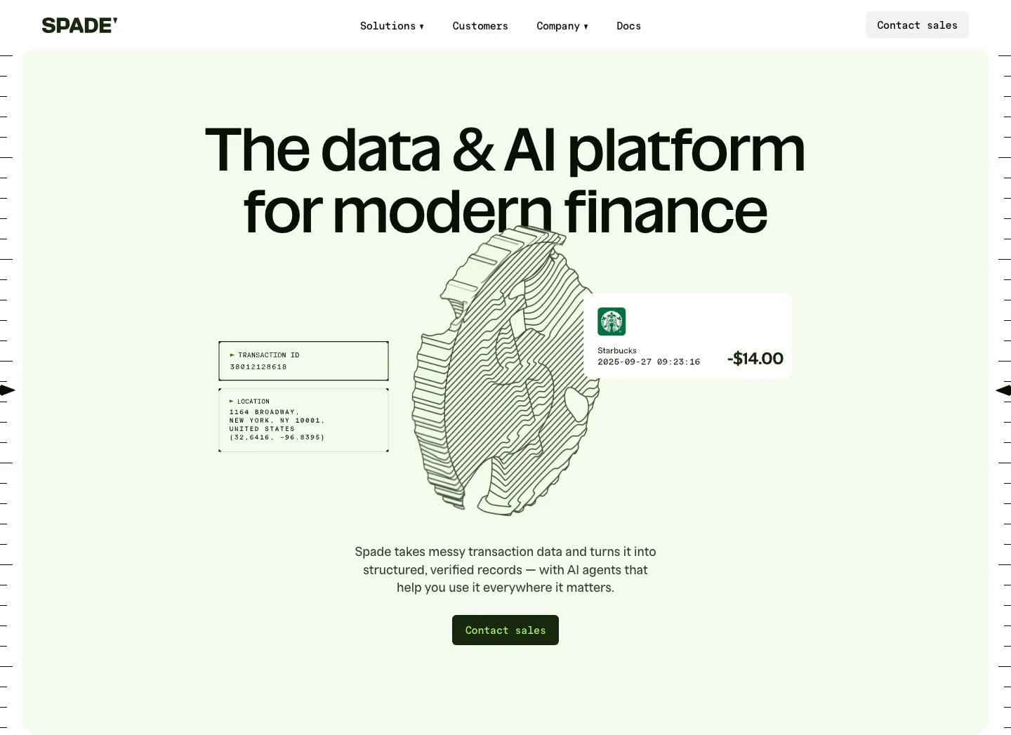
  163. Spade hero section: centered headline over a line-art coin drawing with transaction data cards on a mint green panel, button below
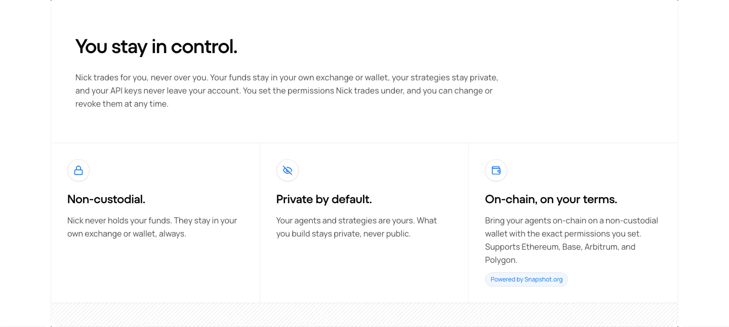
  164. NickAI security section: left heading and copy above three bordered cells with icons for non-custodial, private and on-chain
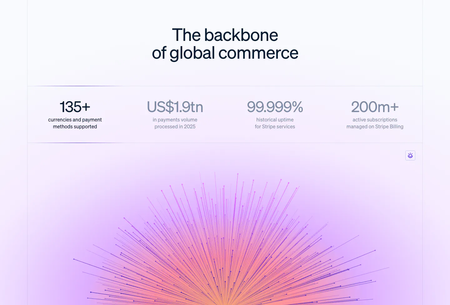
  165. Stripe stats section: centered headline above a row of four large metrics, with a purple-pink radiating line artwork glowing below
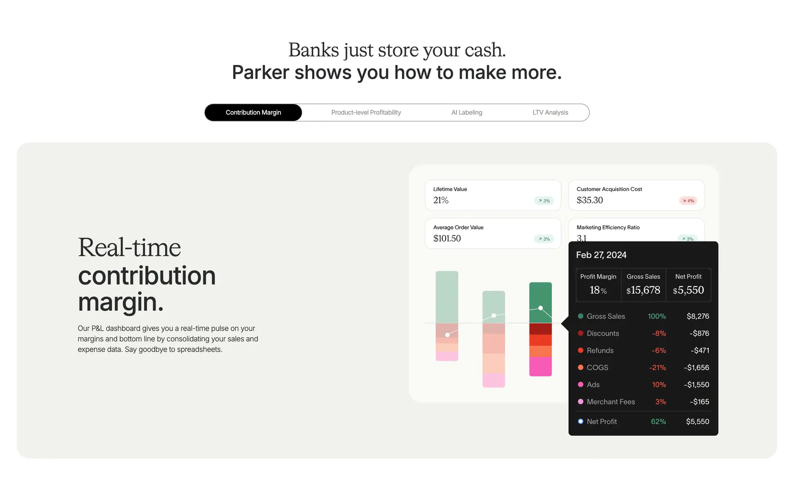
  166. Parker features section: centered headline over a pill tab bar and beige panel with text beside a contribution margin dashboard UI
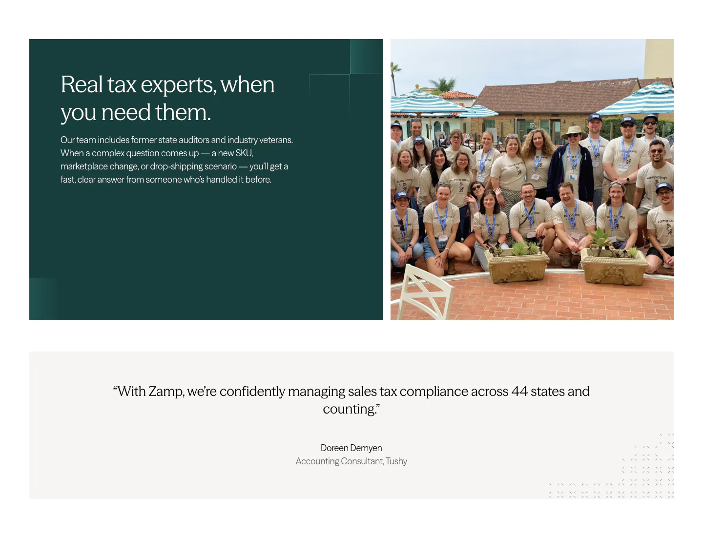
  167. Zamp value proposition section: dark green text panel beside a staff group photo, above a centered customer quote band on light gray
  168. Canopy features section: centered heading above three dark bordered cards with 3D icons on a near-black background
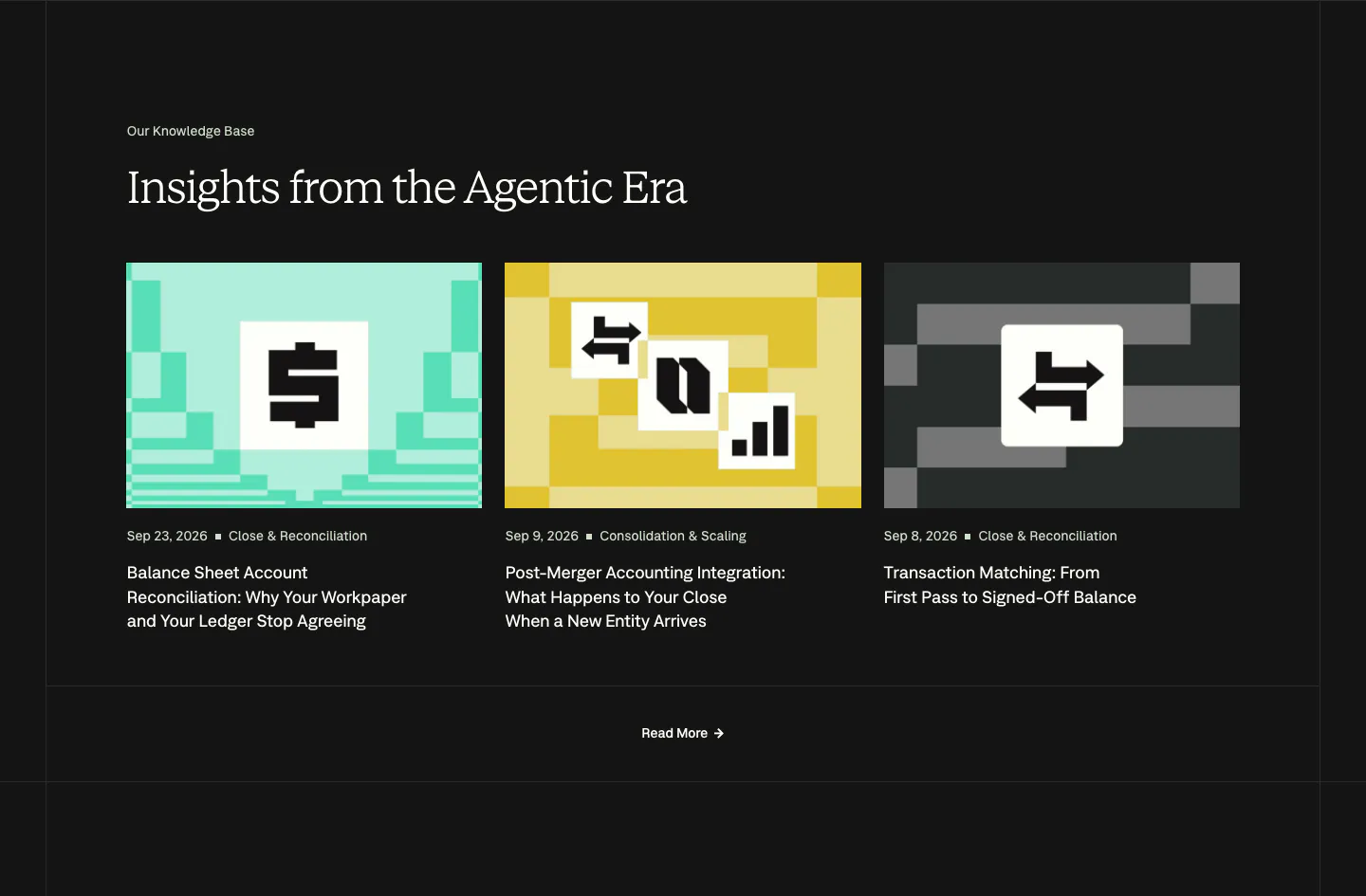
  169. Nominal blog & resources section: serif headline over three article cards with pixel-art thumbnails on a near-black background
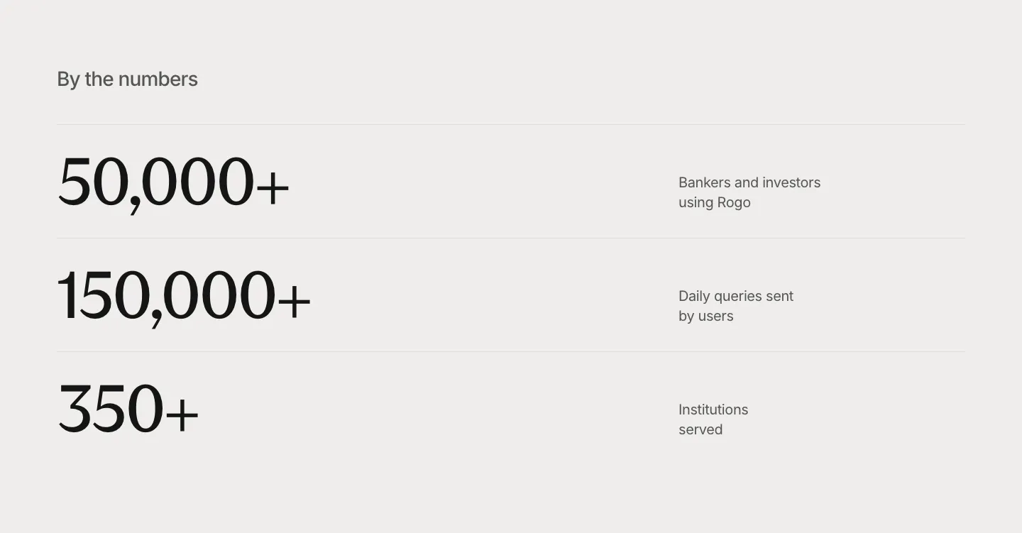
  170. Rogo stats section: three large serif numbers in divided rows with short labels on the right, light gray background
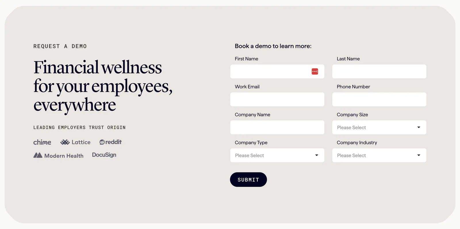
  171. Origin contact section: serif headline and employer logos on the left beside a two-column demo request form in a beige rounded panel
  172. Canopy integrations section: centered two-tone headline and button above a bordered grid of eight numbered partner logos on white
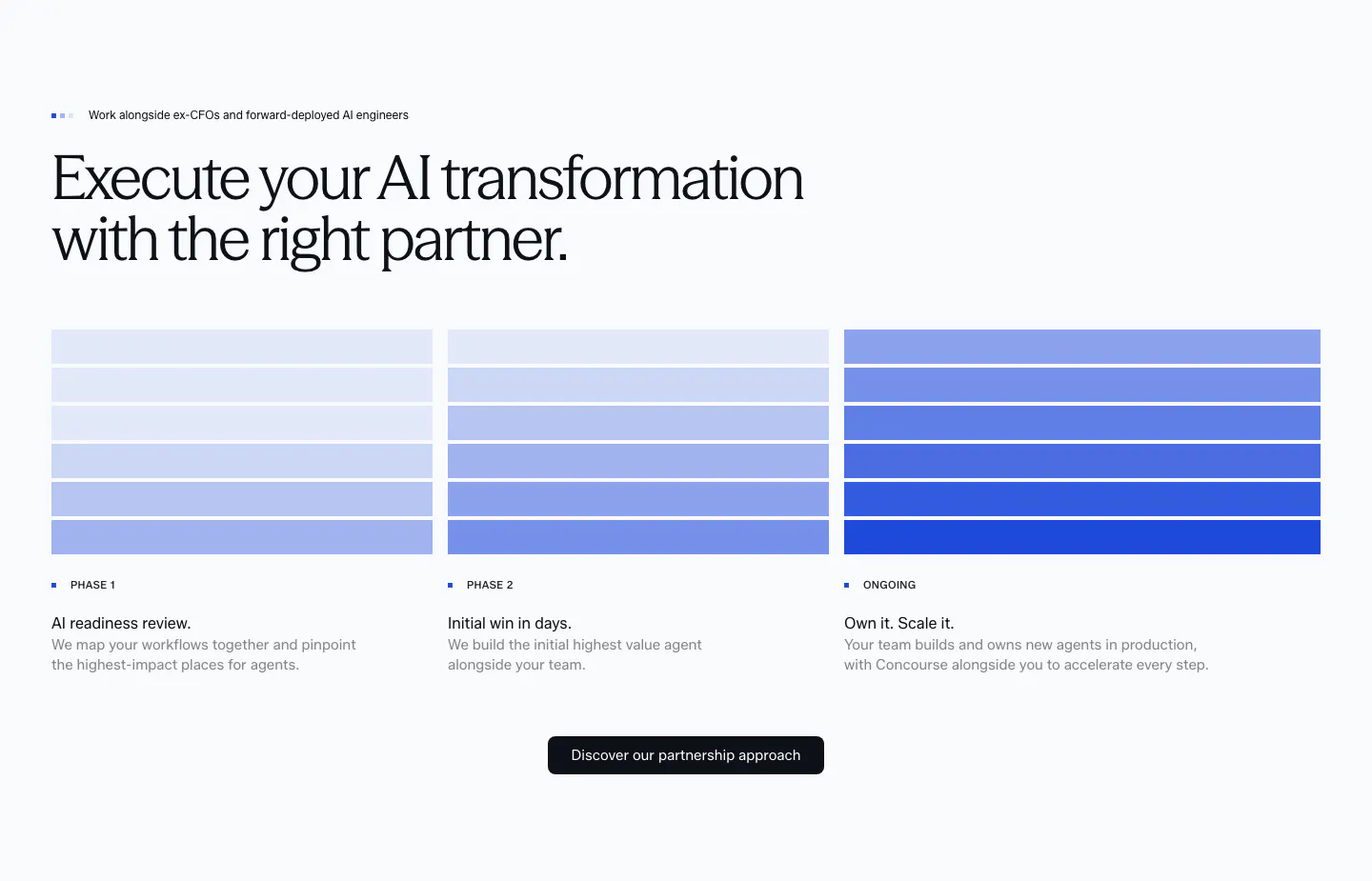
  173. Concourse how it works section: headline above three phase columns of stacked blue bars with step labels, descriptions and a button
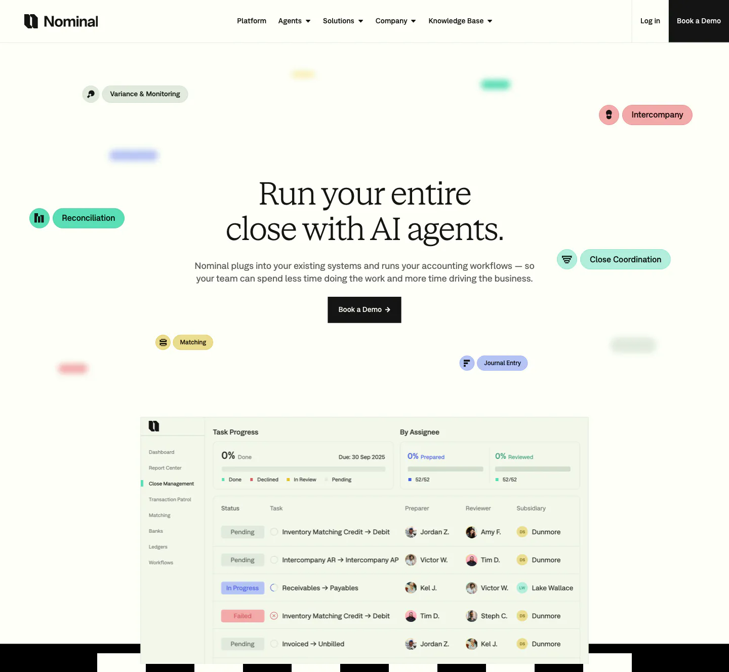
  174. Nominal hero section: centered serif headline with floating colored workflow pills above a close-management task table screenshot
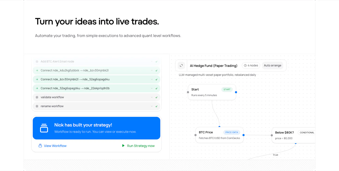
  175. Plasma features section: centered heading above two large cards, a dark card with AI app icons and a light card with a traveler photo
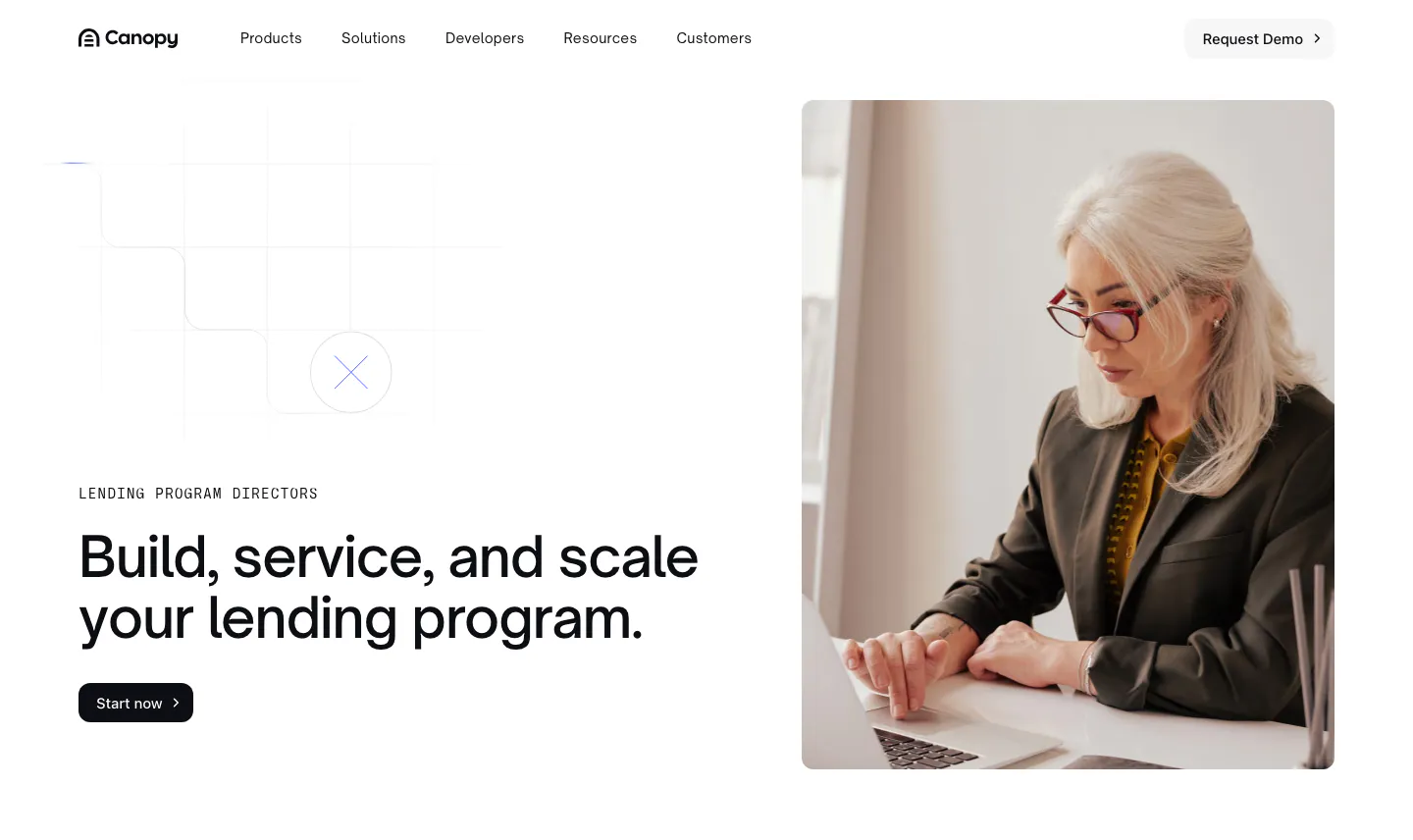
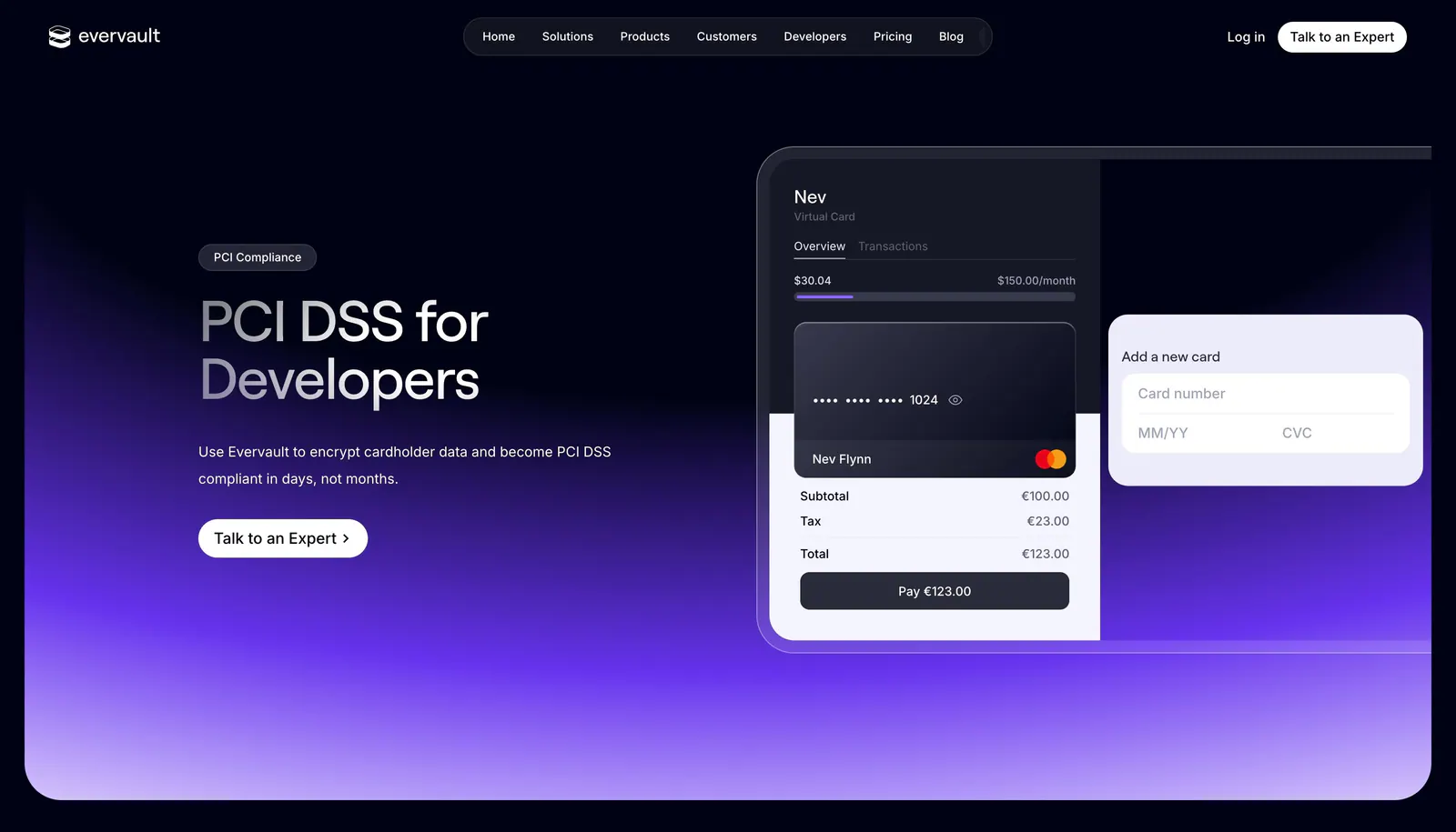
  176. Canopy hero section: left-aligned headline with eyebrow and button beside a photo of a woman working on a laptop
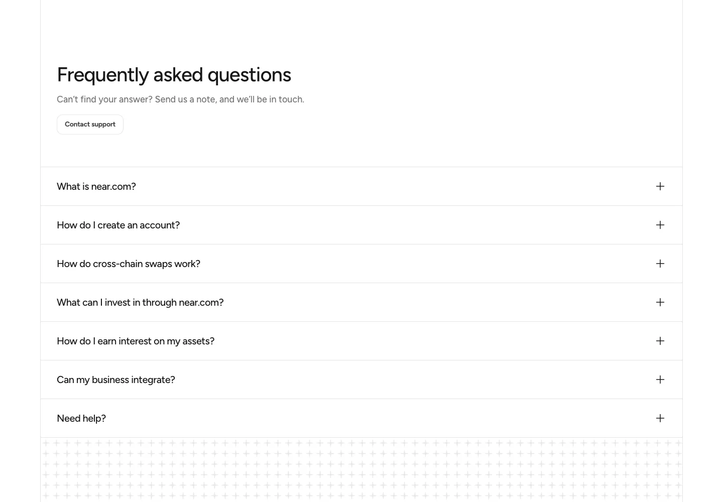
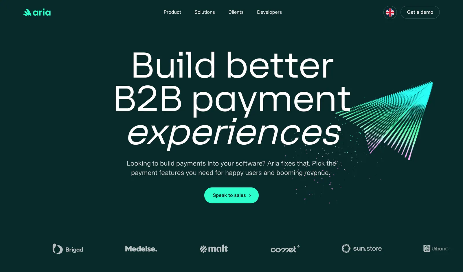
  177. NEAR FAQ section: headline with Contact support button above a full-width accordion of questions on white
  178. NickAI features section: left heading above a product screenshot pairing an agent chat log with a workflow node canvas
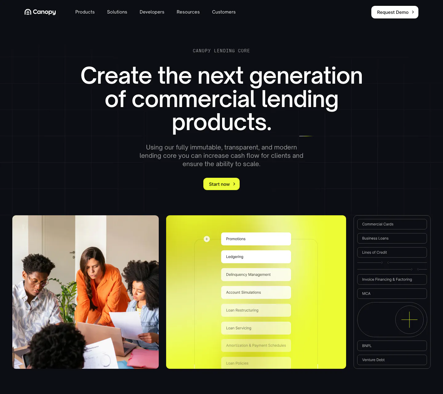
  179. Evervault hero section: nav bar, left headline with expert CTA beside a virtual card payment UI mockup over a purple glow on dark navy
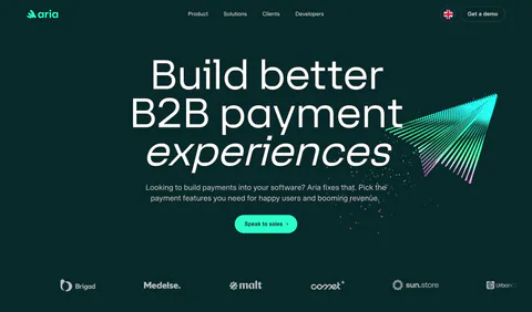
  180. Aria hero section: centered oversized headline, mint button and particle paper-plane graphic above a logo row on dark teal
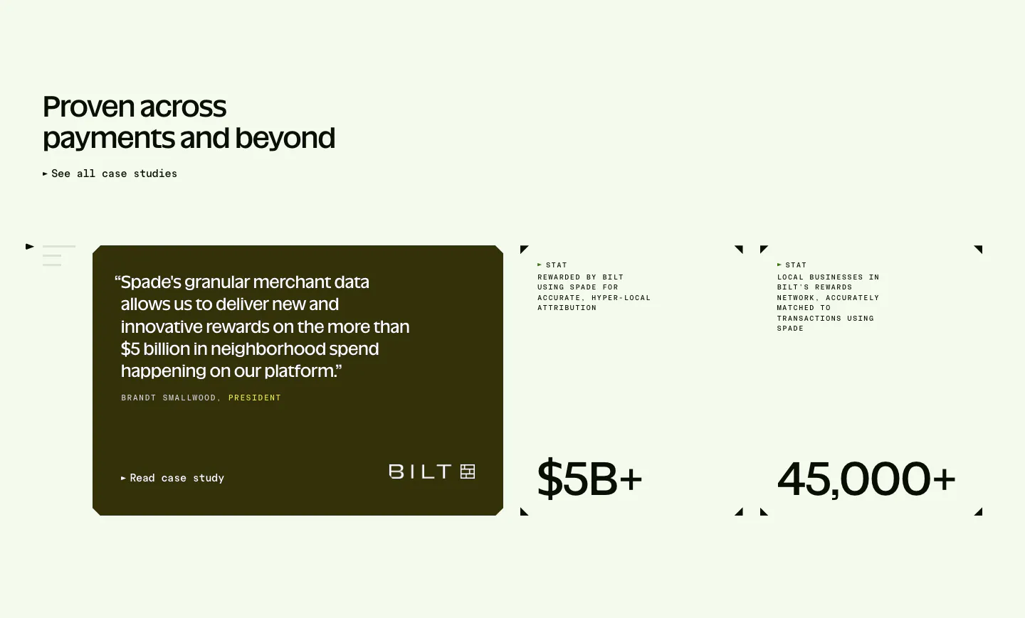
  181. Spade testimonials section: headline above a dark olive quote card with Bilt logo beside two stat blocks with corner marks on mint green
  182. Canopy hero section: dark centered headline and lime button above a team photo, lime UI panel and product list tiles
  183. Endex footer section: serif CTA headline with two buttons, teal pixel-grid strip, link rows and a huge faded Endex wordmark on dark green
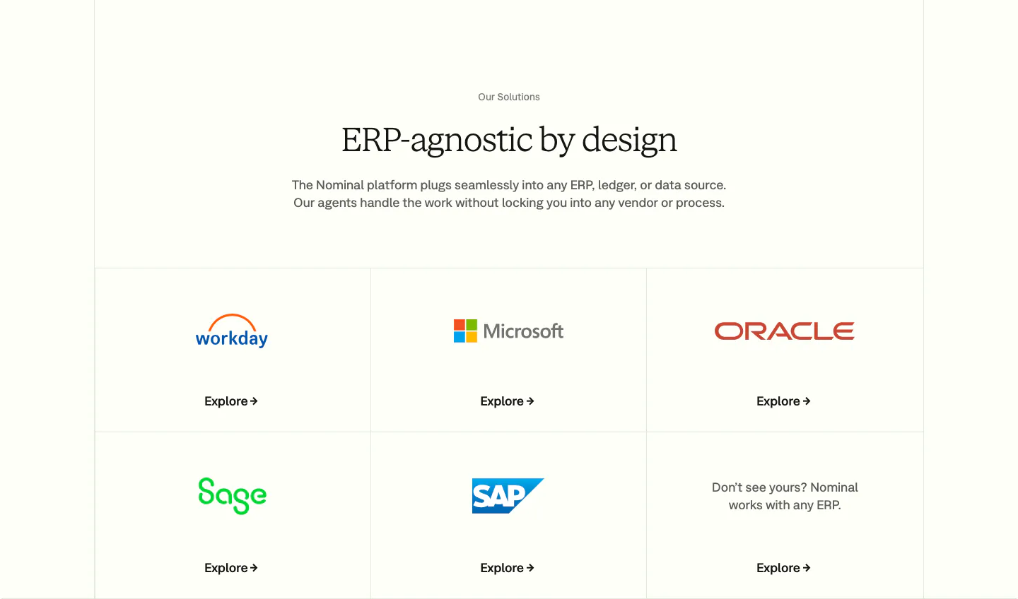
  184. Nominal integrations section: centered serif headline above a bordered grid of ERP logo tiles with Explore links on an off-white background
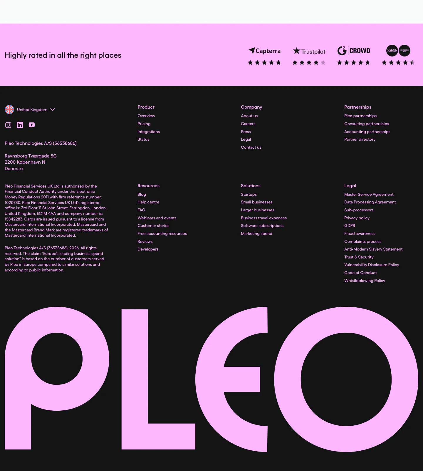
  185. Pleo footer section: pink review-ratings strip above dark link columns, legal text and a giant pink Pleo wordmark
  186. Zamp newsletter section: subscribe strip with email field above a dark green band with a centered Teal customer quote
  187. Ruul logo cloud section: small caption above a single row of grayscale organisation logos on an off-white background
  188. Quartr features section: four equal gray cards with small UI snippets and charts, each with a short title and description
  189. Canopy integrations section: centered headline and copy above a row of four numbered partner logos on a dark background
  190. Evervault contact section: centered heading above two cards for booking a demo and messaging support over a purple glow on dark navy
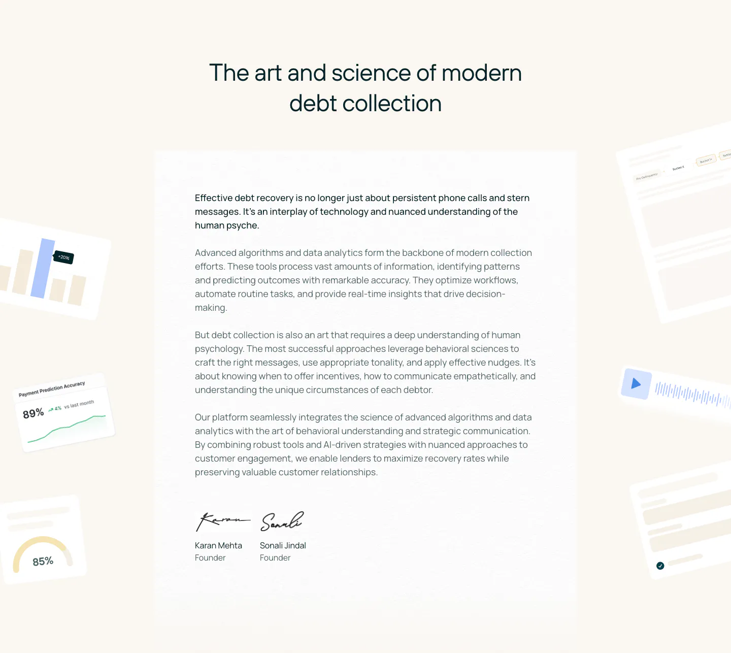
  191. Rezolv about & mission section: centered headline above a founders letter with signatures, flanked by faded UI fragments on cream
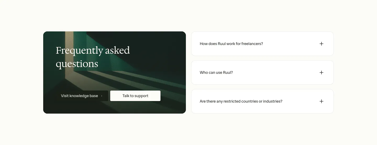
  192. Ruul FAQ section: dark green image card with serif headline and buttons on the left, three collapsed question rows on the right
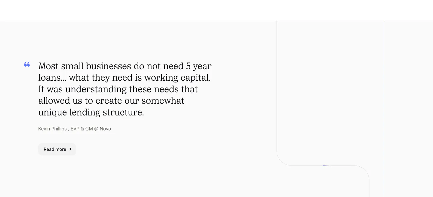
  193. Canopy testimonials section: large serif customer quote with attribution and Read more button on a light gray background
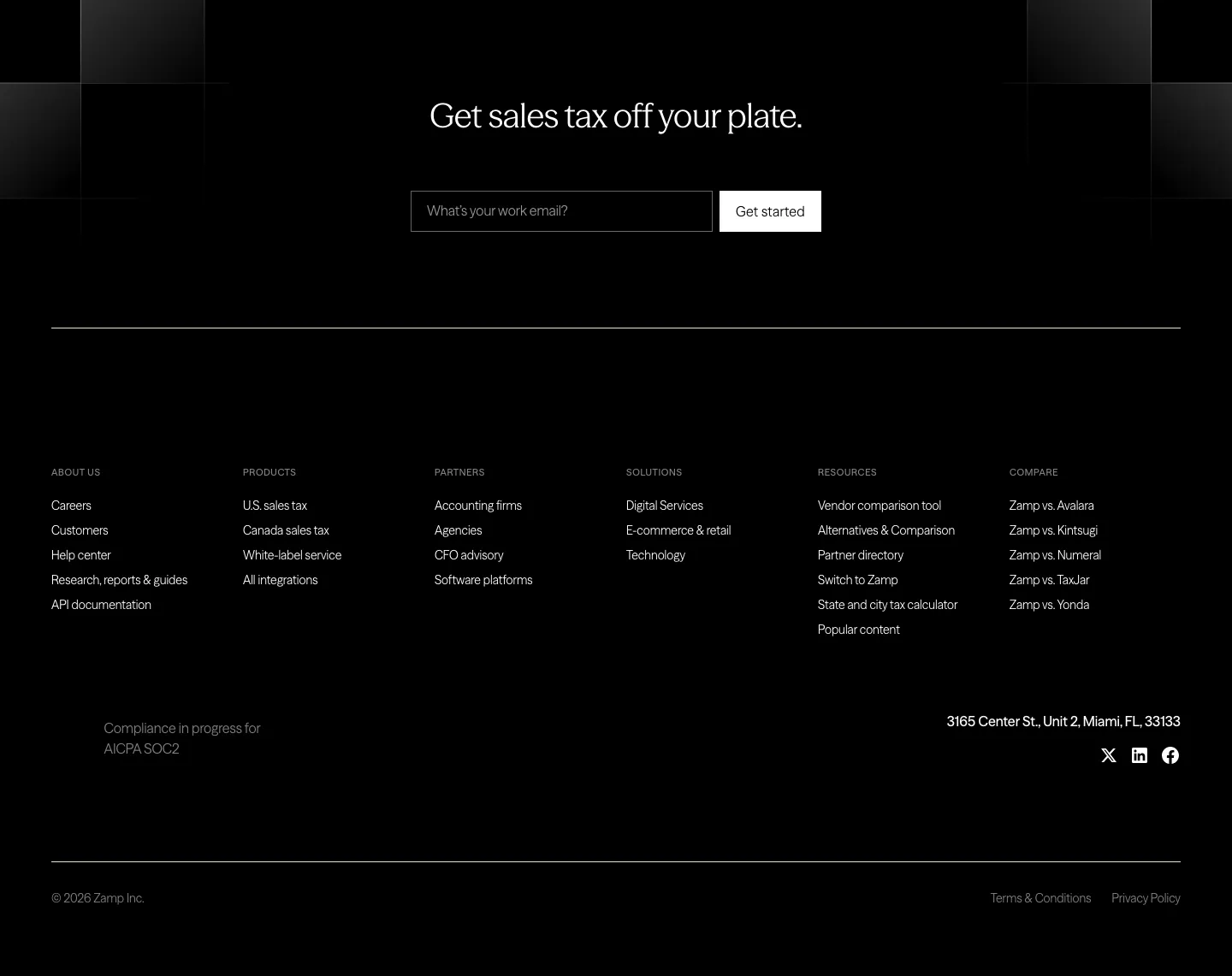
  194. Zamp footer section: black footer with centered headline and email field above six link columns, address and social icons
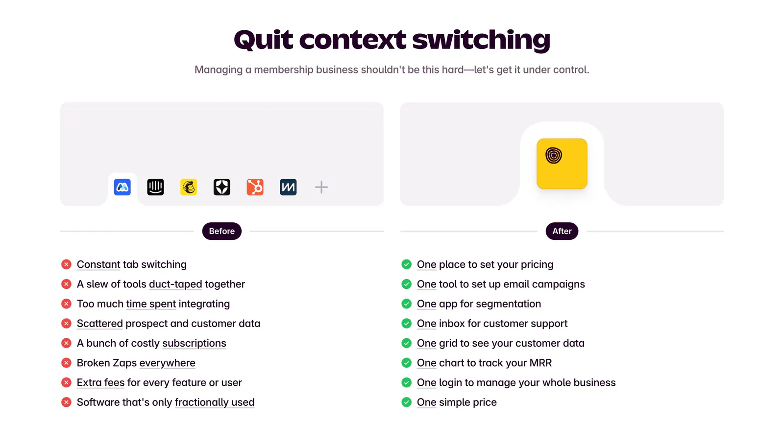
  195. Outseta comparison section: centered headline above Before and After columns contrasting tool clutter and red crosses with green checks
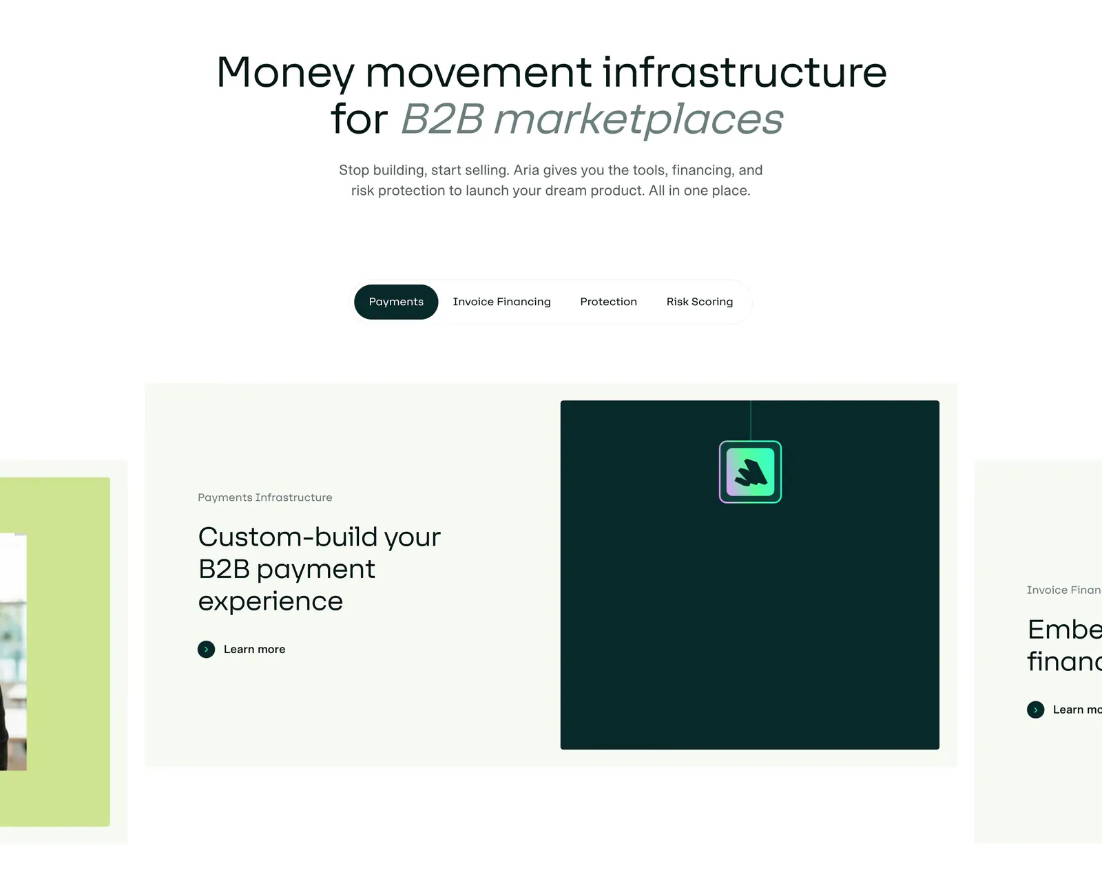
  196. Aria features section: centered headline above a pill tab bar and a carousel of cards with text and a dark teal visual panel
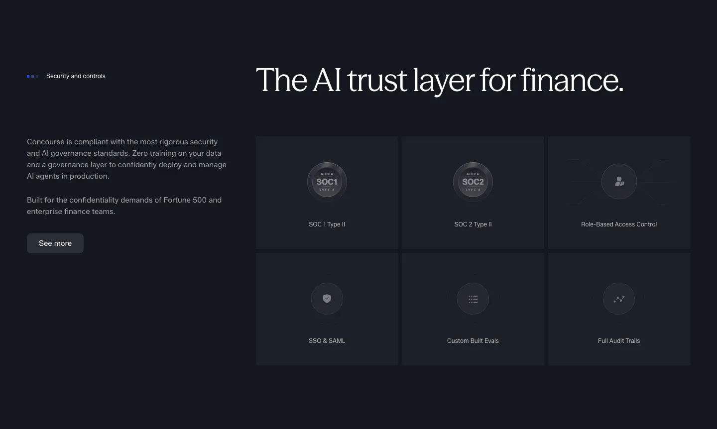
  197. Concourse security section: copy and button left, six dark tiles for SOC 1, SOC 2, RBAC, SSO, evals and audit trails right
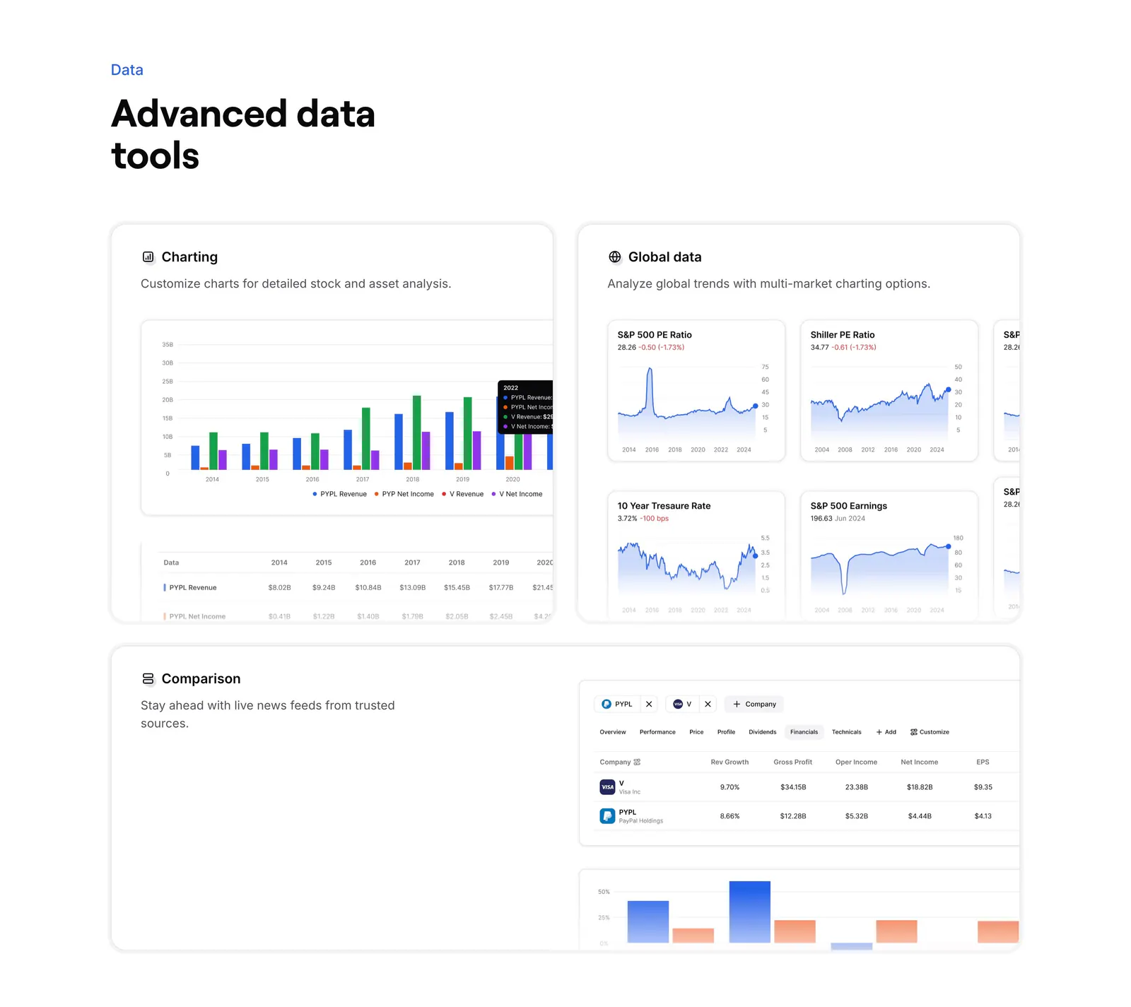
  198. Finsepa features section: left headline above three cards showing charting, global market charts and a company comparison table
  199. Rezolv logo cloud section: centered Our Clients label above two scrolling rows of lender logos on white
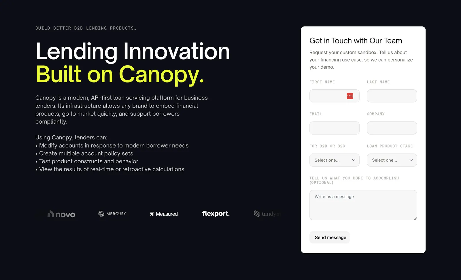
  200. Canopy contact section: headline, bullet list and customer logos left with a white demo request form right on a dark background
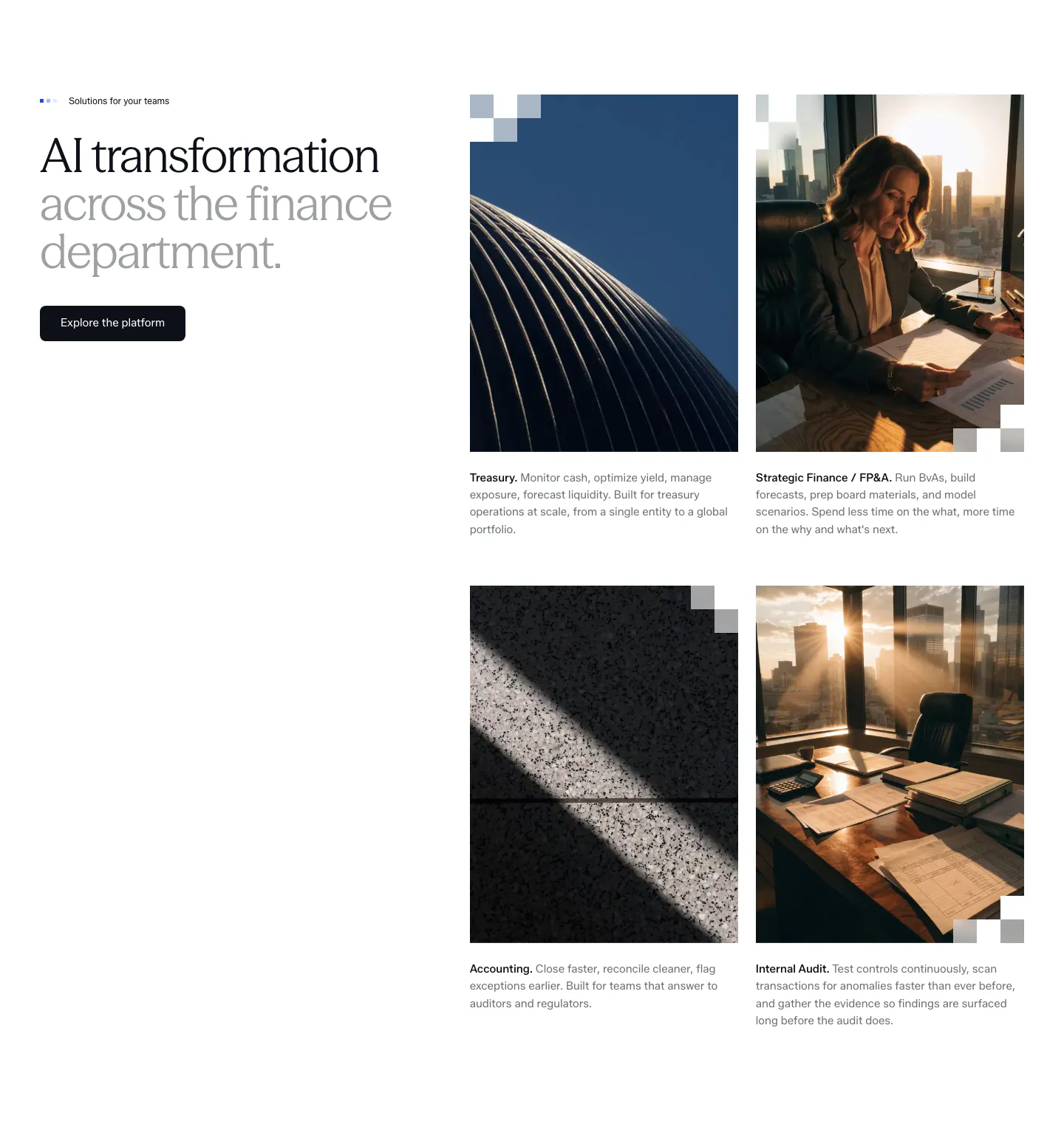
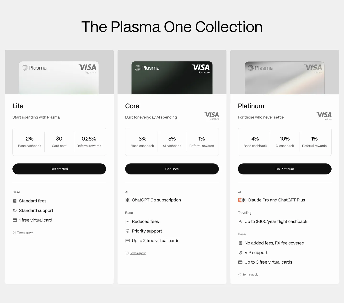
  201. Concourse use cases section: headline and button left, 2x2 grid of photo cards for Treasury, FP&A, Accounting and Internal Audit right
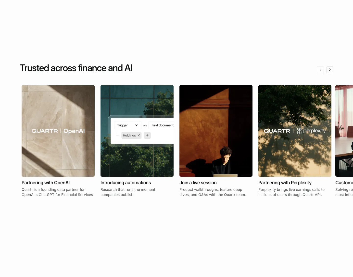
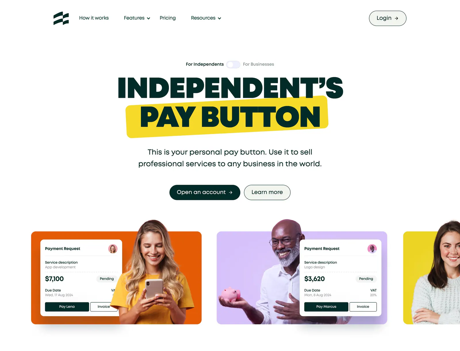
  202. Quartr blog & resources section: horizontal carousel of photo cards for partnership news, automations and a live session
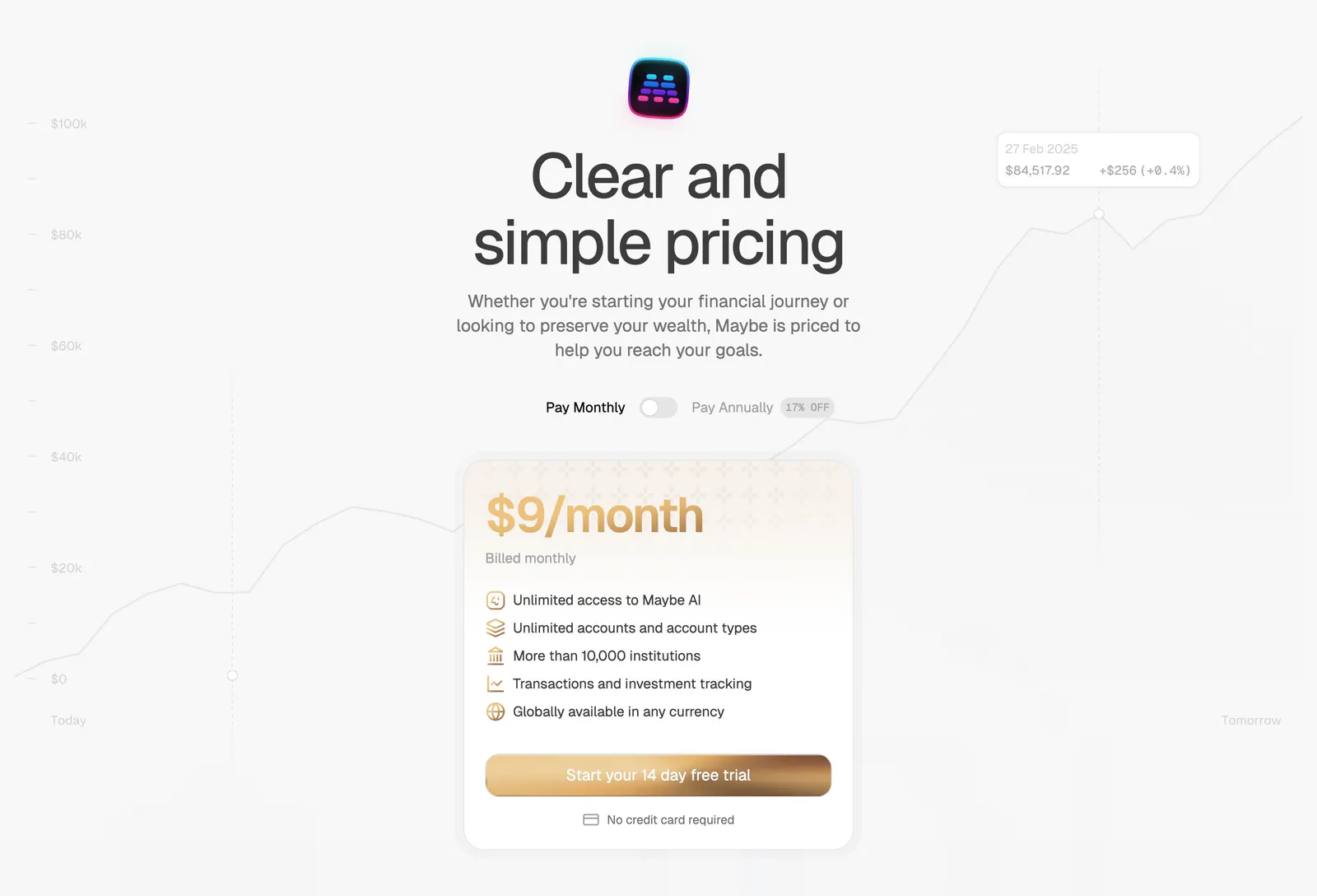
  203. Evervault footer section: logo at left with five link columns, compliance badges and copyright line on a near-black navy background
  204. Plasma pricing section: centered heading above three card tier columns with Visa card images, cashback figures and perks
  205. Ruul hero section: centered uppercase headline with yellow highlight above colored cards pairing people photos with payment request UI
  206. Maybe pricing section: centered headline with monthly/annual toggle above a single gold-accented plan card on a faint chart
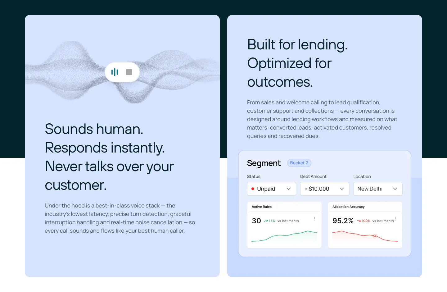
  207. Rezolv features section: two light blue cards, one with a voice waveform and one with a segment dashboard UI with charts
  208. Plasma call to action section: centered Plasma One logo, large headline and green Get Plasma One button on white
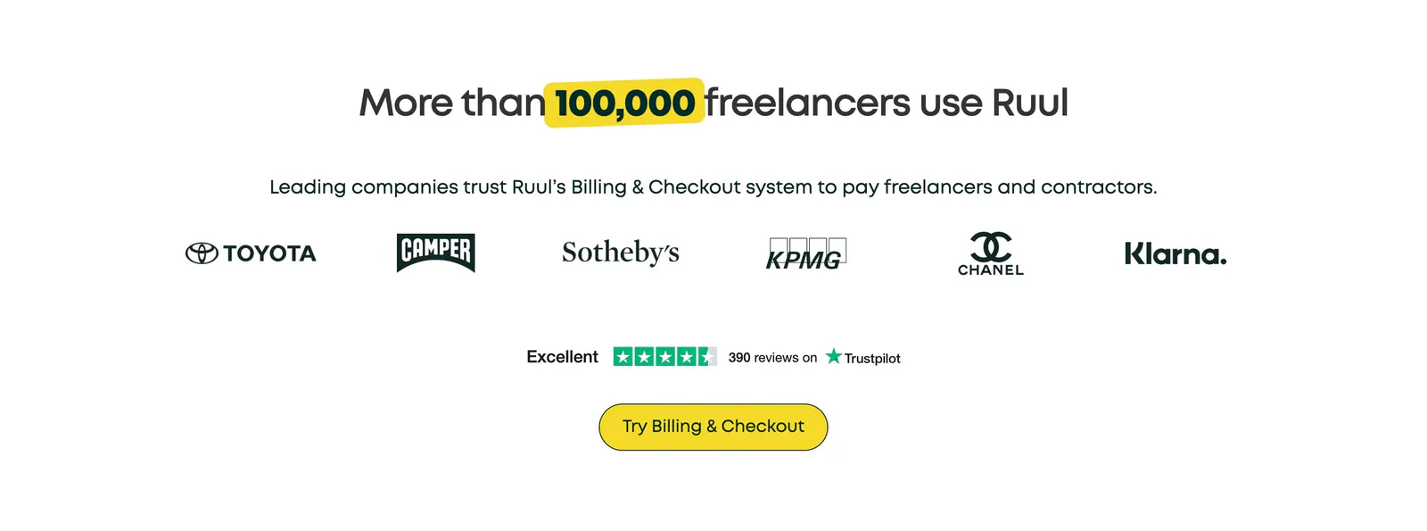
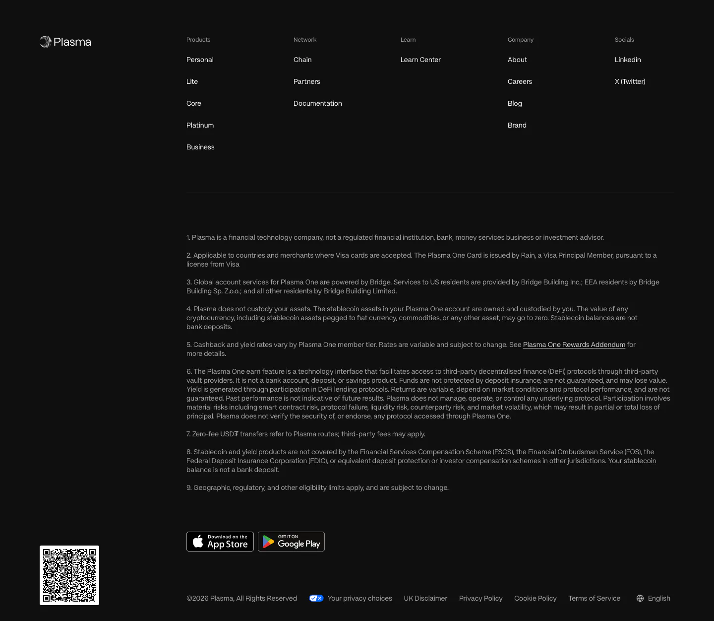
  209. Ruul logo cloud section: centered headline with yellow highlight above a row of brand logos, a Trustpilot rating and a yellow button
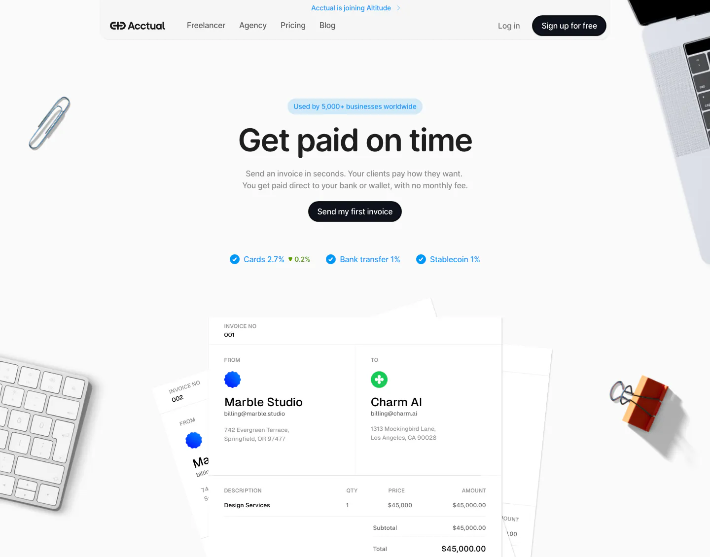
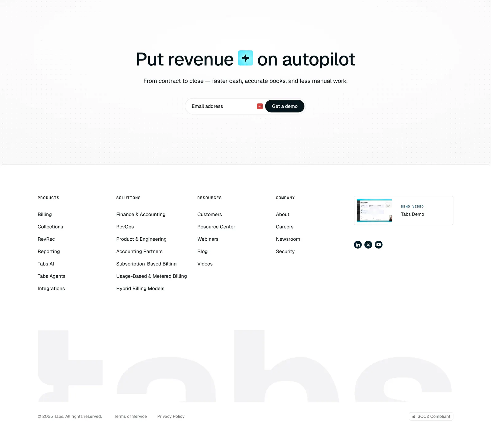
  210. Acctual hero section: centered headline, CTA and fee checklist above an invoice mockup framed by desk objects on light gray
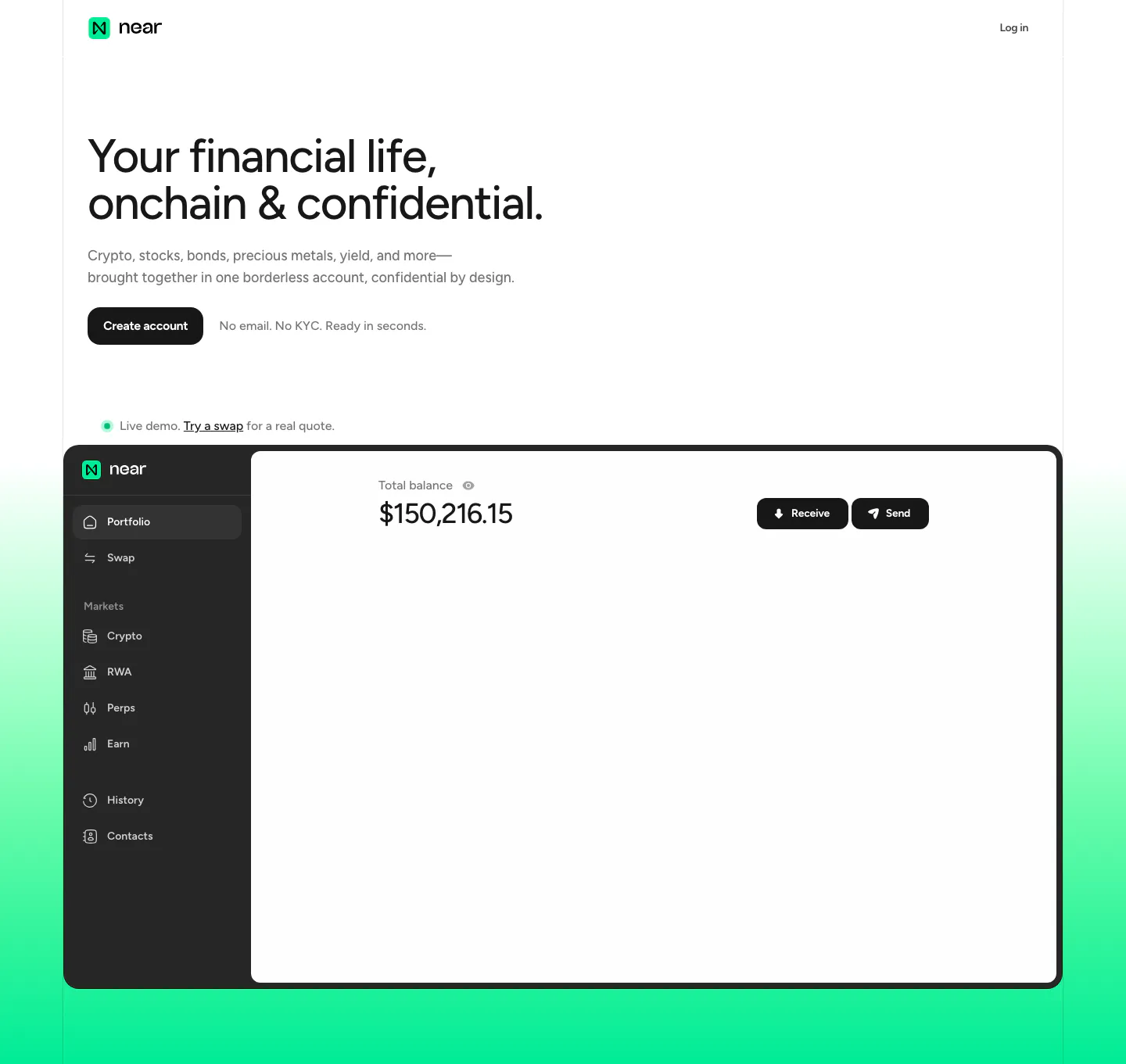
  211. NEAR hero section: left-aligned headline and Create account button above a portfolio app screenshot on a mint green gradient
  212. Plasma footer section: logo, five link columns, numbered legal disclosures, app store badges and a QR code on near-black
  213. Tabs footer section: centered headline and email demo field on a dot grid, link columns, demo video card and huge faded tabs wordmark
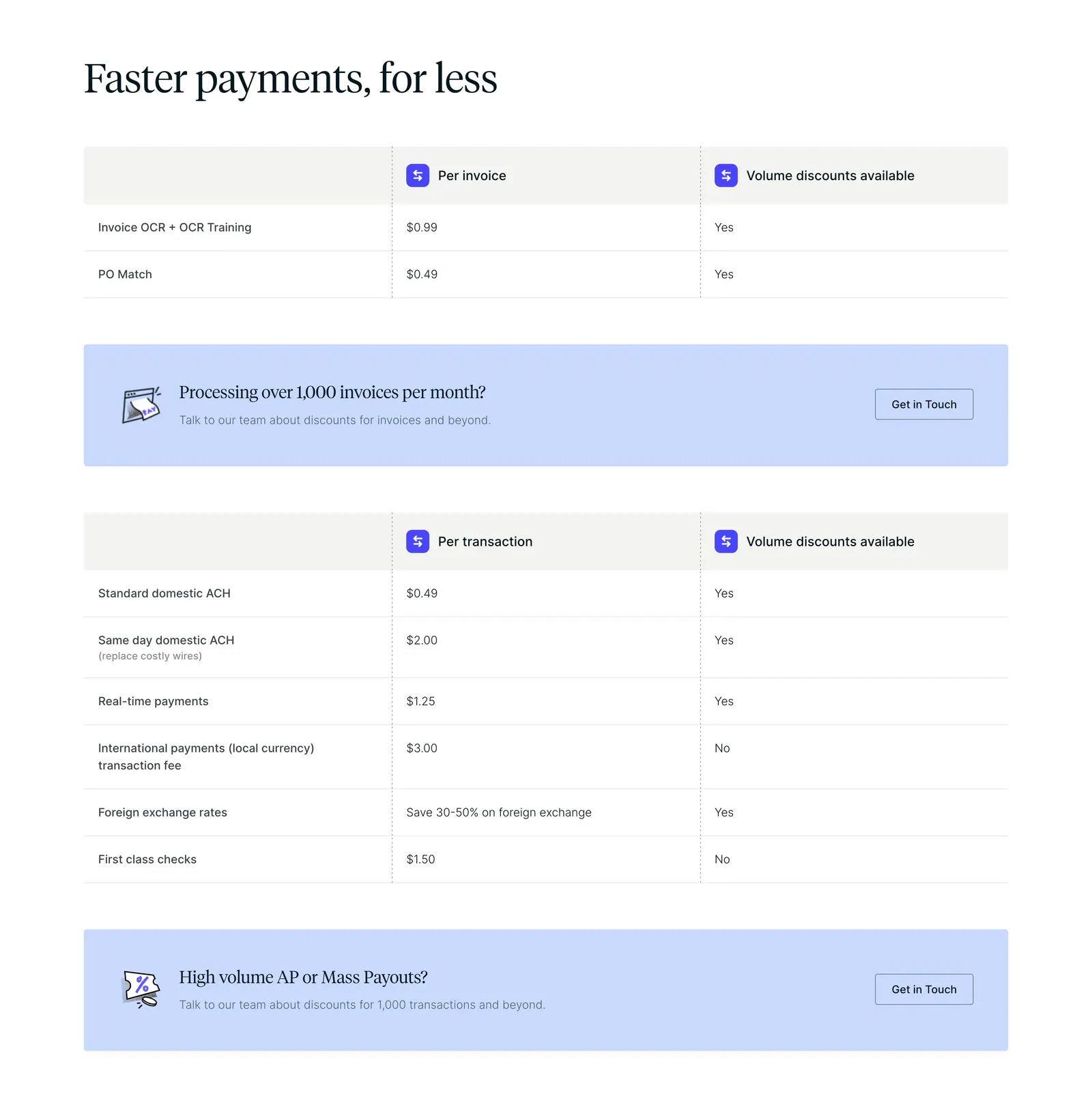
  214. Routable pricing section: serif headline above per-invoice and per-transaction fee tables with light blue contact banners on white
  215. Canopy testimonials section: centered heading above a case study carousel with a Flexport container photo card and blurred cards
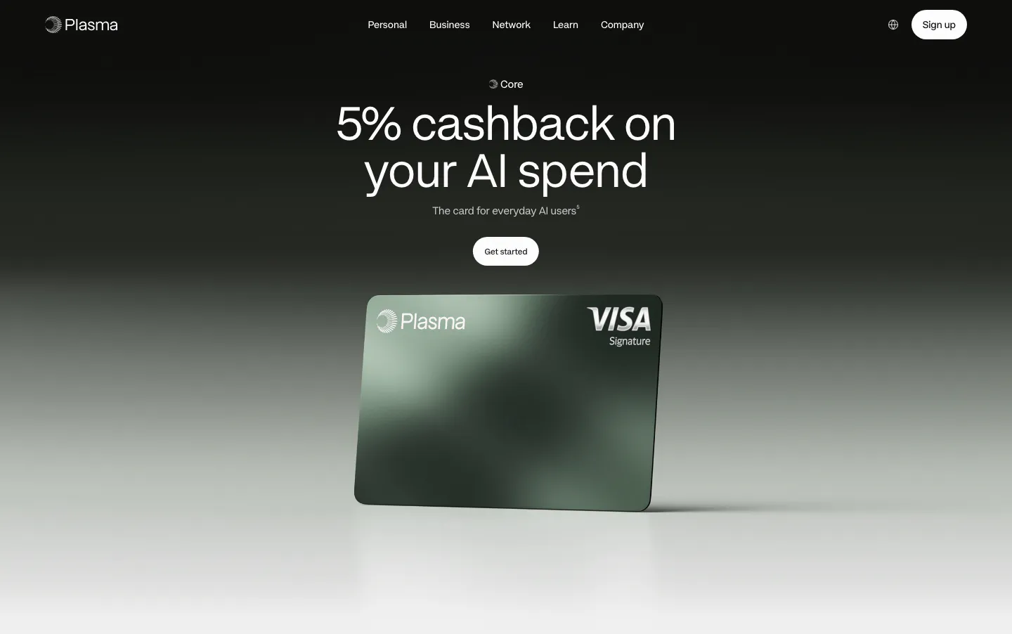
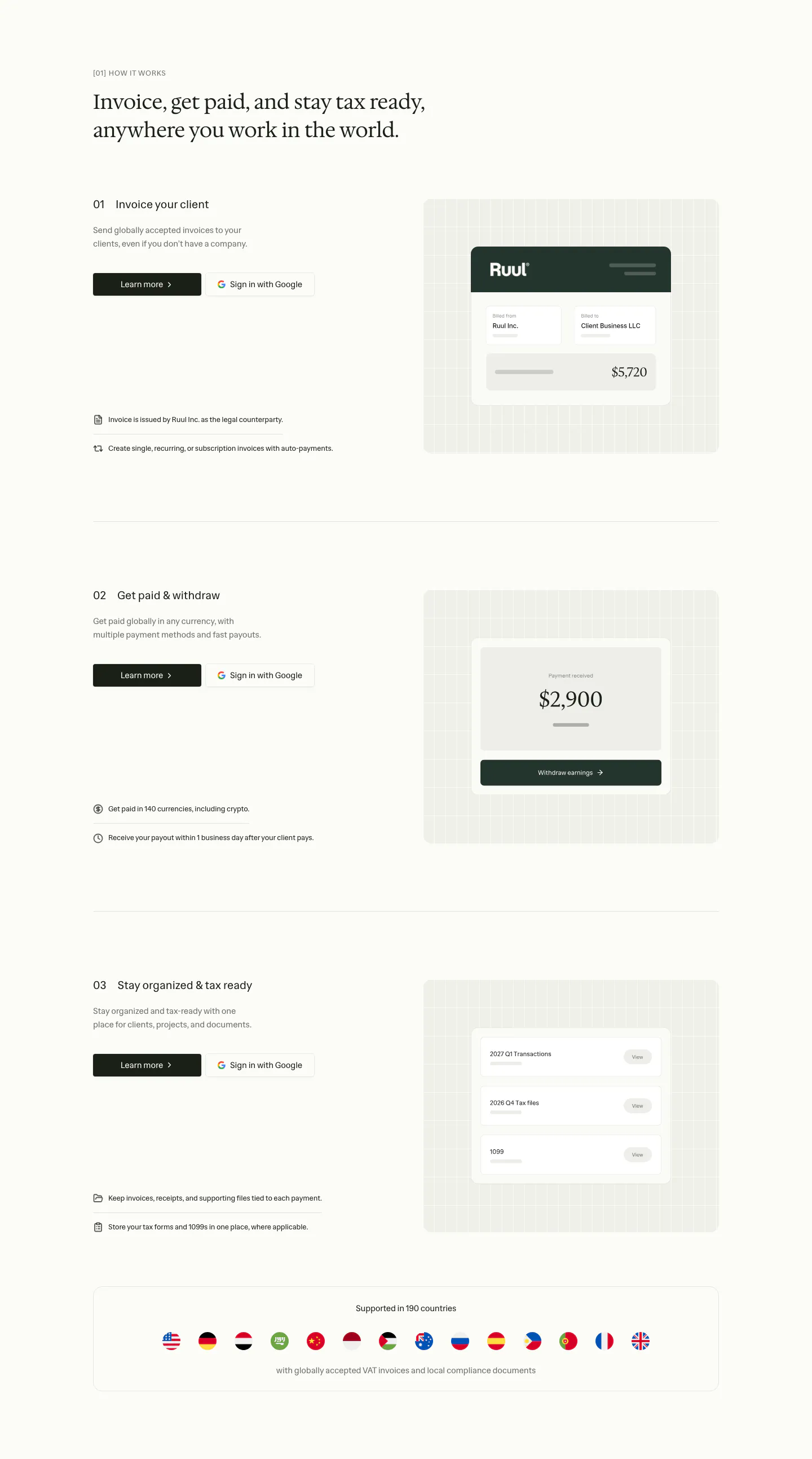
  216. Plasma hero section: centered headline and Get started button above a green Plasma Visa card render on a black-to-gray fade
  217. Quartr footer section: six link columns including Ask AI about Quartr, above an oversized black QUARTR wordmark
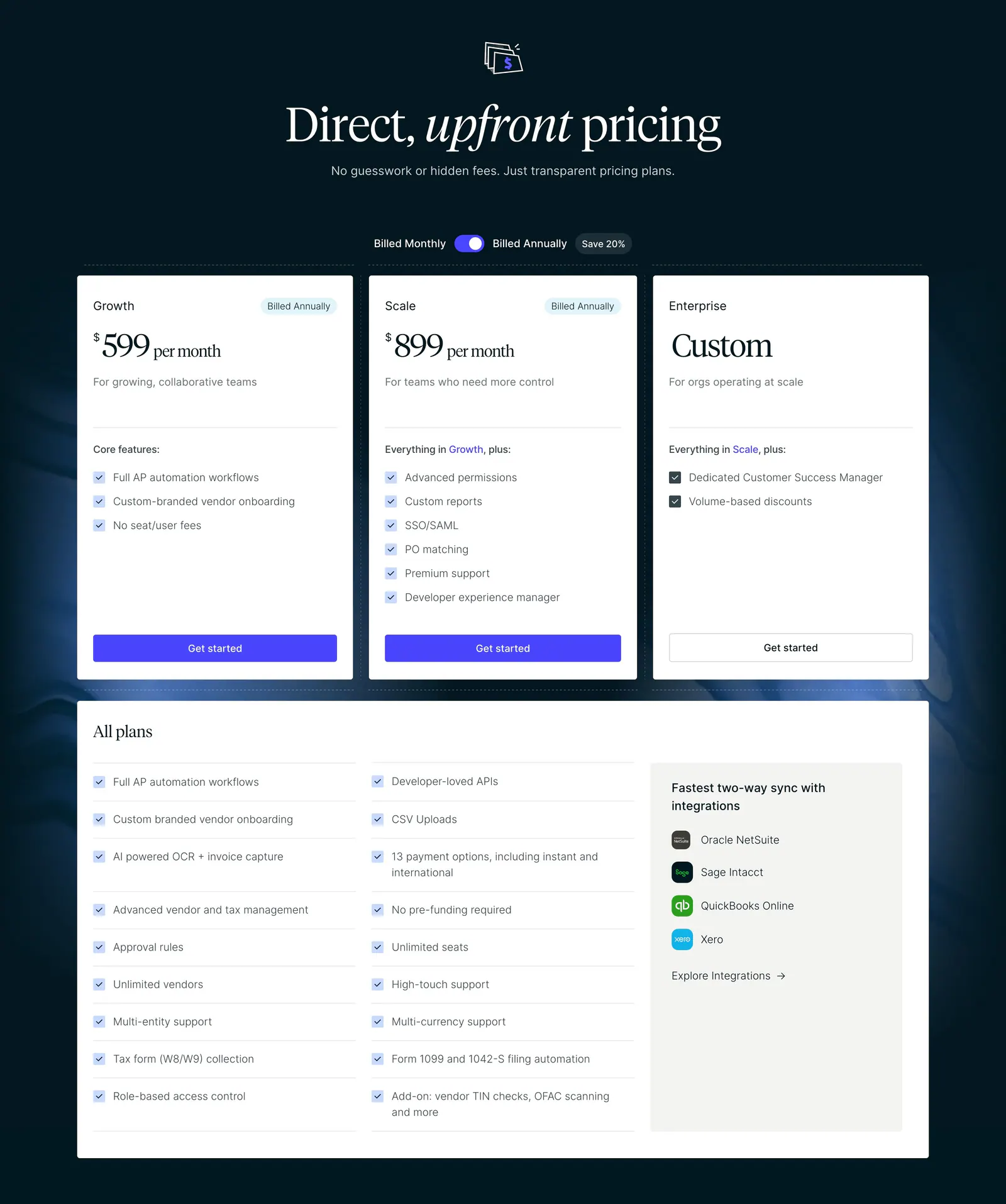
  218. Routable pricing section: serif headline and billing toggle above three plan cards and an all-plans checklist on a dark navy background
  219. Ruul how it works section: serif headline above three numbered rows with text left and UI cards on grid panels right, plus a flags strip
  220. Plasma value proposition section: centered heading and green button above a hand holding a phone flanked by four benefit stats
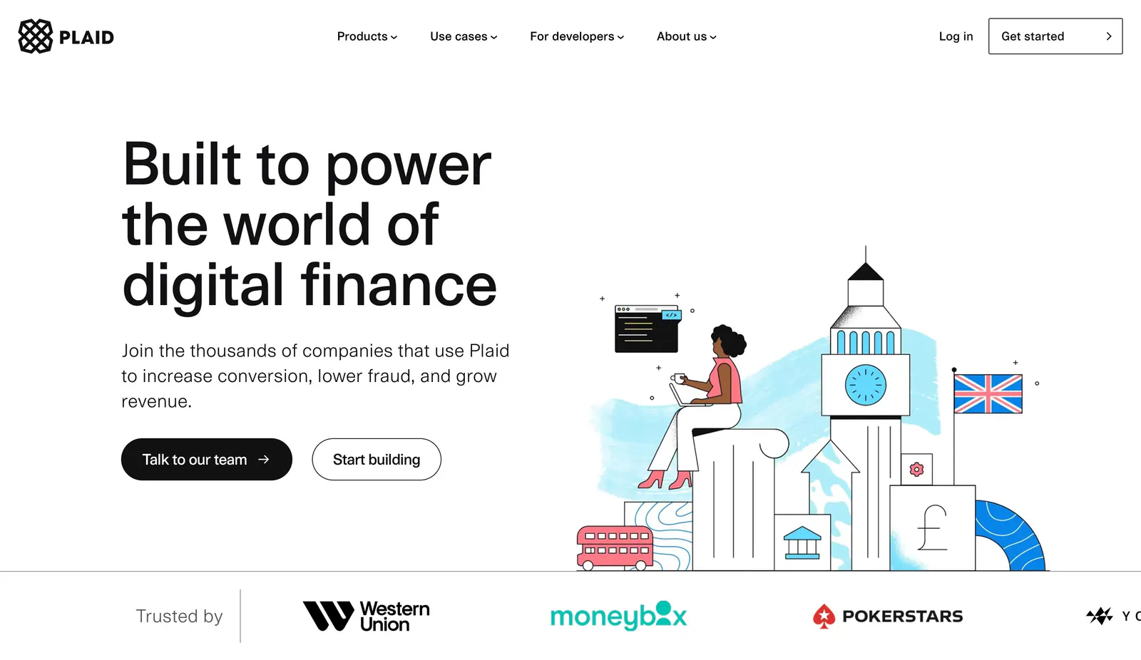
  221. Plaid hero section: large left headline with two buttons beside an illustration of a woman on London landmarks, logo strip below
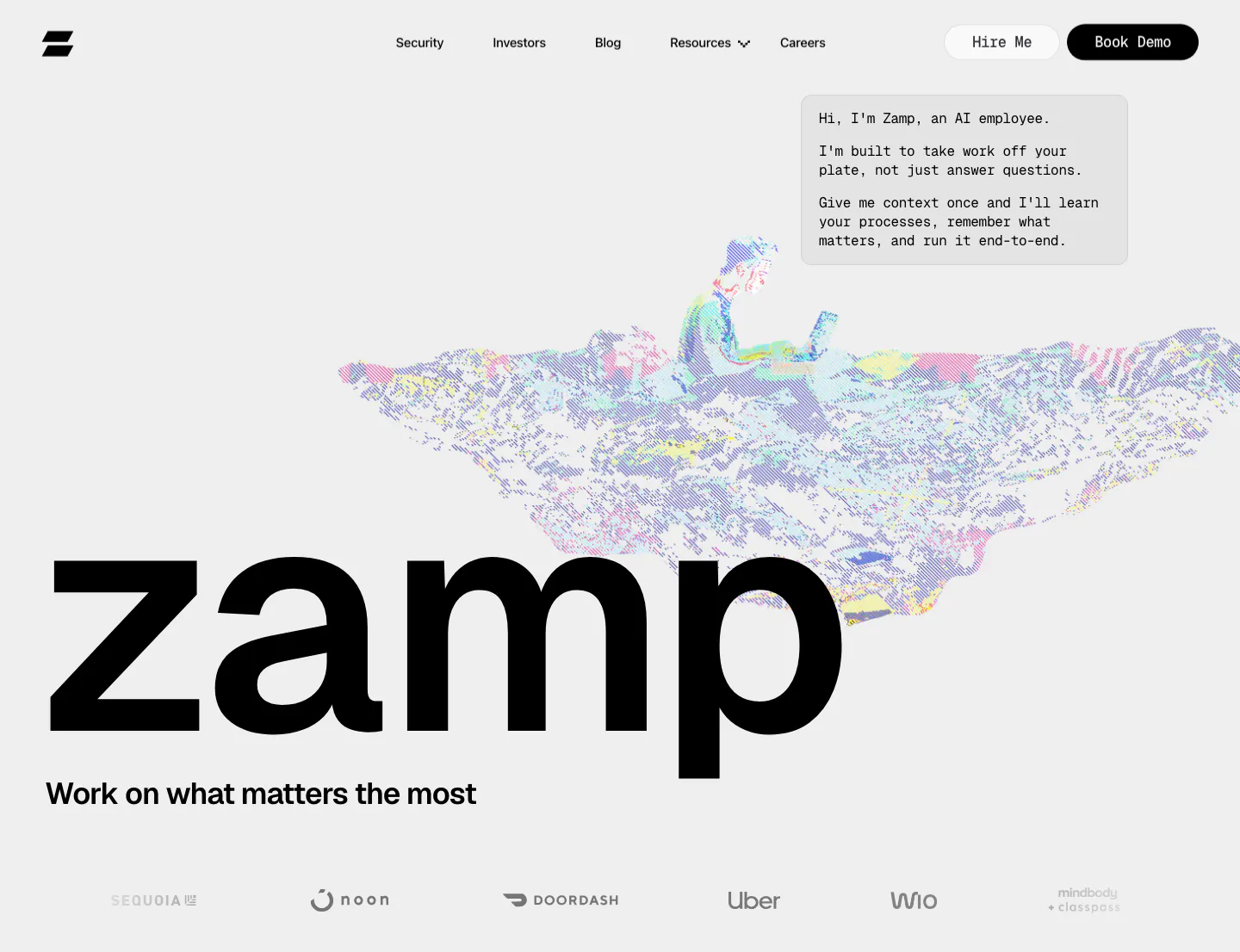
  222. Zamp hero section: giant zamp wordmark under a dithered pixel-art figure on a laptop, chat-style intro box and grayscale logo row on light gray
  223. Canopy call-to-action section: centered question headline, copy and lime Start now button on a dark grid background
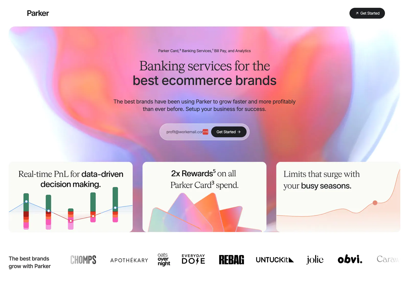
  224. Parker hero section: centered headline and email signup on a pink-orange aurora gradient above three feature cards and a brand logo row
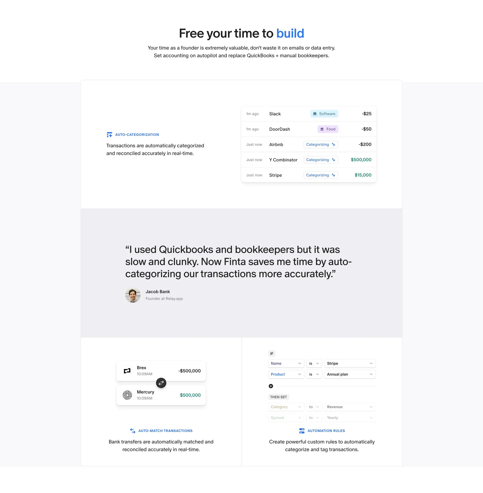
  225. Finta features section: centered headline above bordered tiles with transaction UI snippets and a customer quote band
  226. Plasma value proposition section: oversized silver 10% figure and centered tagline over white light streaks on black
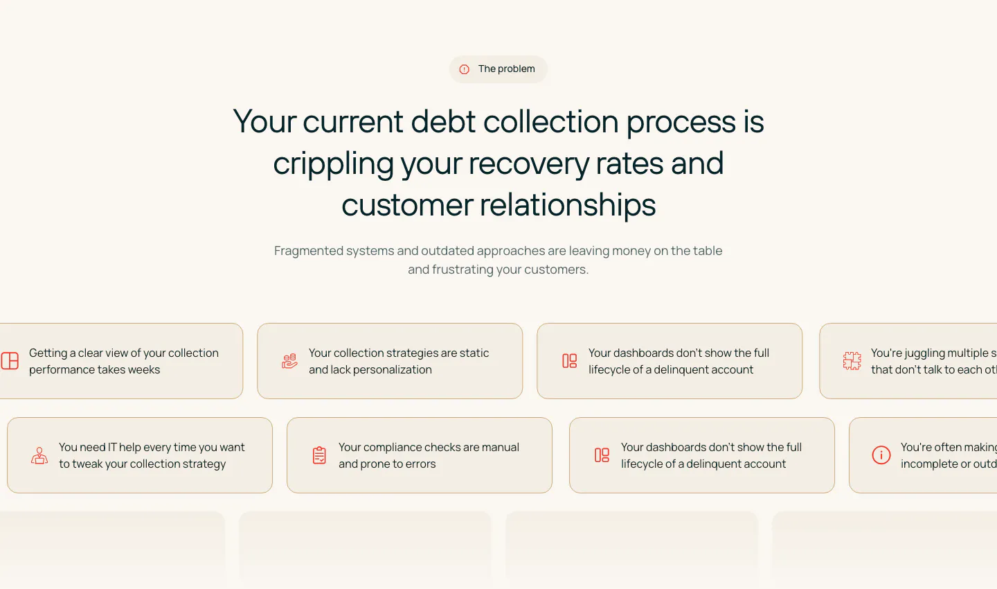
  227. Rezolv value proposition section: centered problem headline above scrolling rows of beige pain-point chips with icons on cream
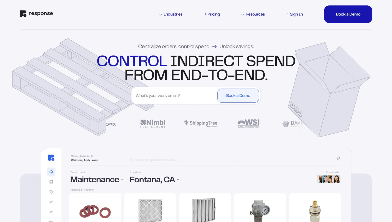
  228. Response hero section: centered uppercase headline with email field, logo row and isometric line drawings above a procurement app UI
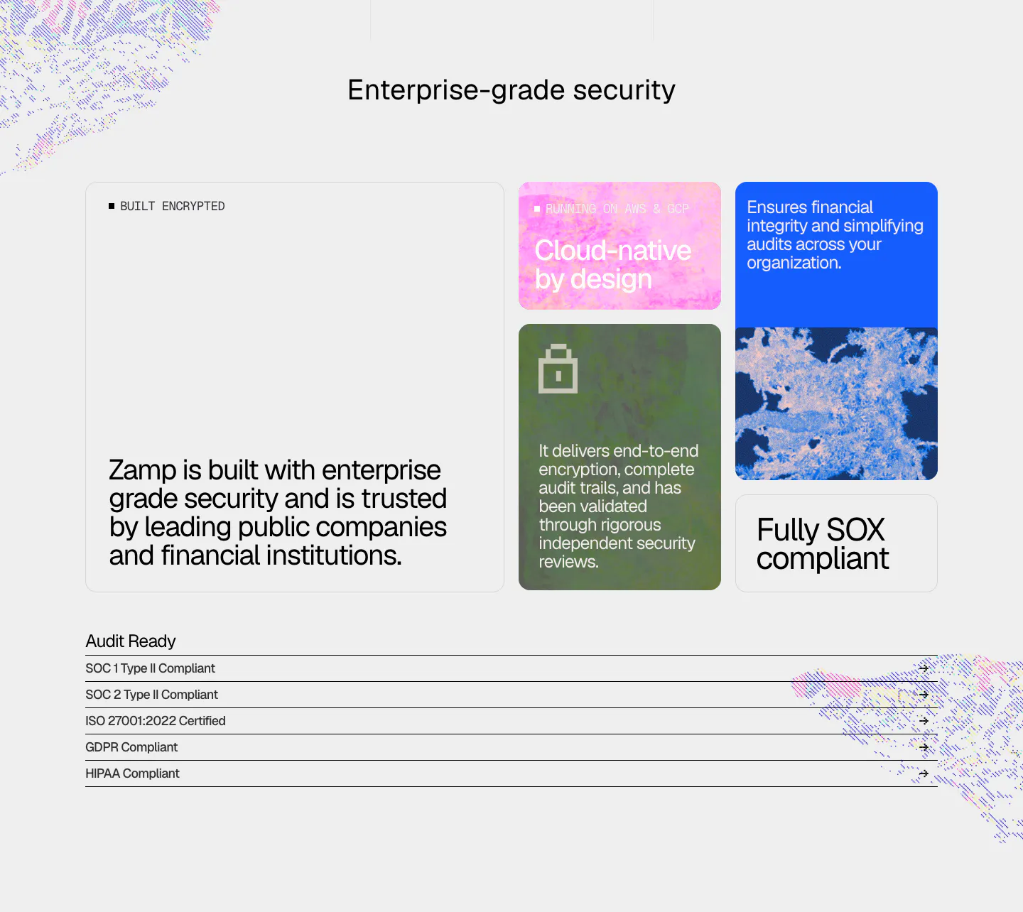
  229. Zamp security section: bento of textured color cards with encryption and SOX claims above a list of SOC, ISO, GDPR and HIPAA compliance rows
  230. Zamp logo cloud section: centered line of text above a single row of gray customer logos on white
  231. Quartr logo cloud section: two rows of five black customer and partner logos on a white background
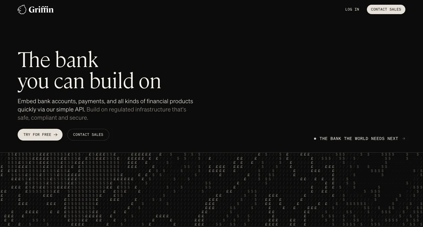
  232. Griffin hero section: large serif headline, copy and two buttons on black above a field of £ and $ characters
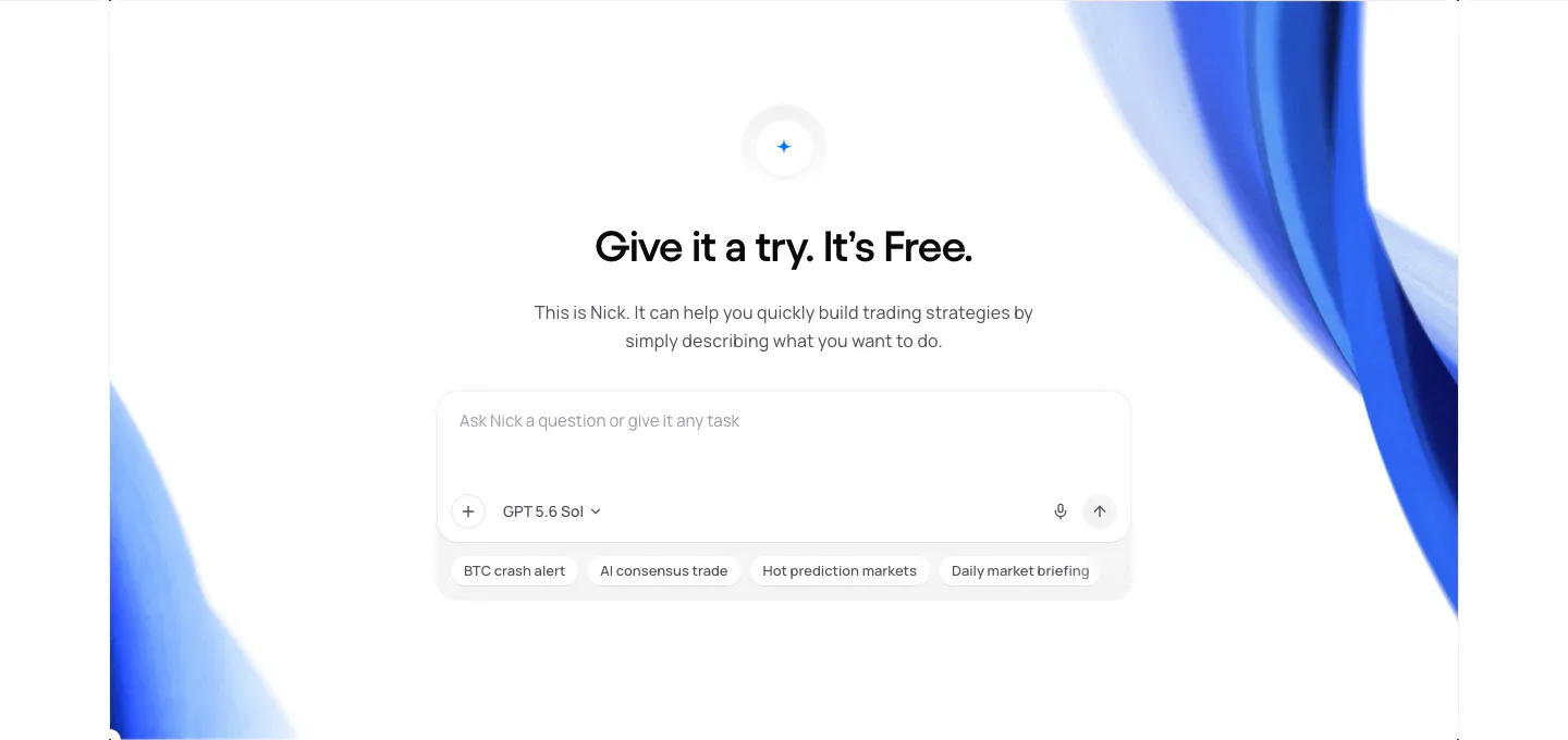
  233. NickAI call-to-action section: centered heading and copy above a chat prompt input with suggestion chips, framed by blue ribbon art
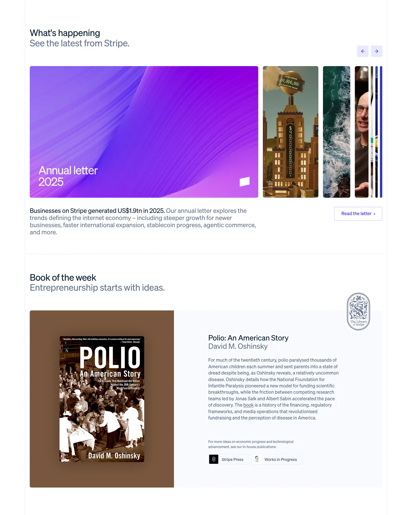
  234. Stripe blog & resources section: news carousel with a large purple Annual letter card and arrows, above a Book of the week cover and blurb
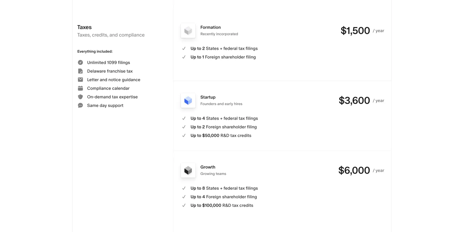
  235. Finta pricing section: Taxes label and included-features list beside three stacked yearly tax plans with prices on white
  236. Concourse features section: headline and button above three cards showing an integration icon ring, notification list and AI answer UI
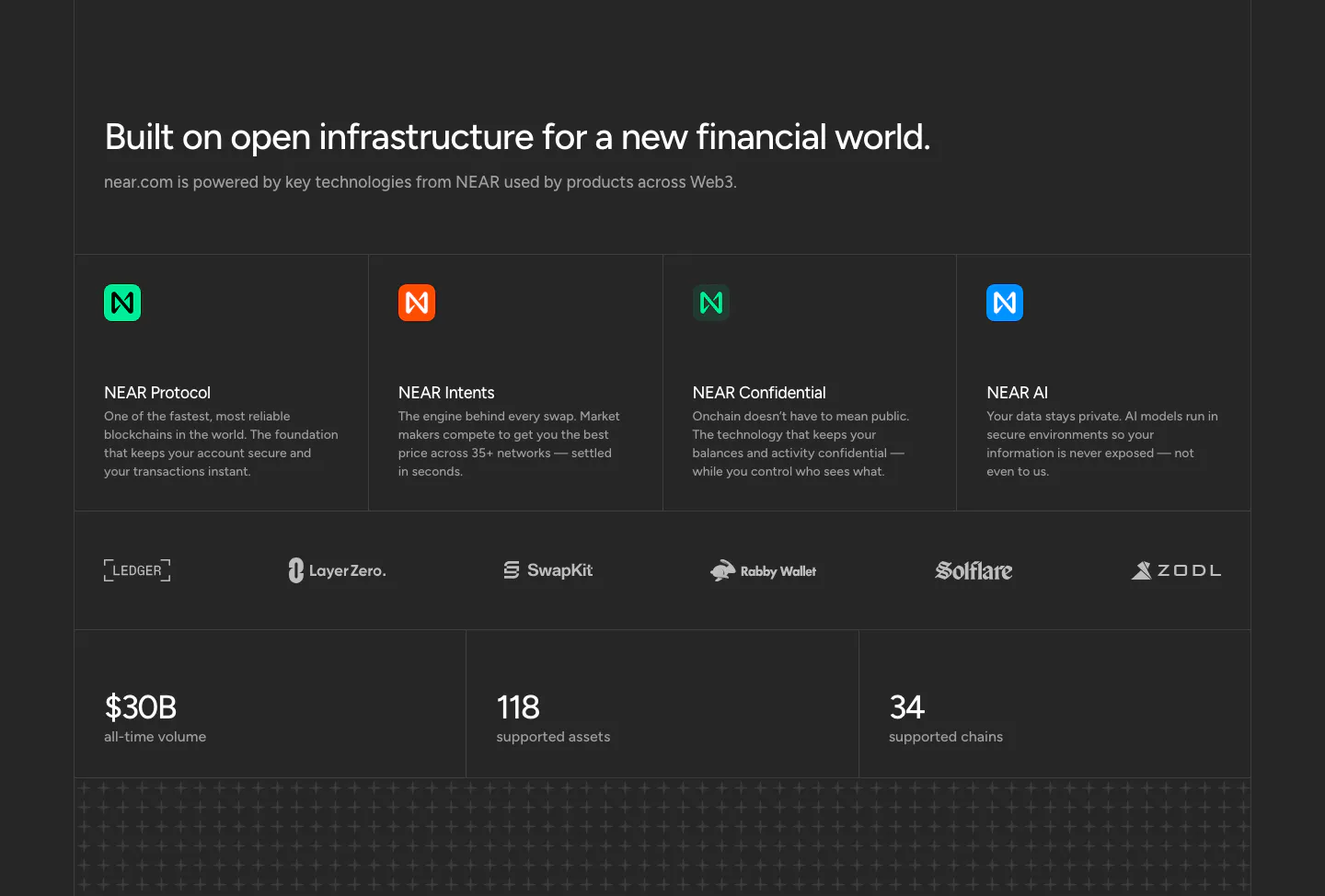
  237. NEAR features section: headline above four technology cards, a partner logo row and three large stats on a charcoal background
  238. Plasma logo cloud section: gray panel with heading and three stats left and a 3x2 grid of partner logo tiles right
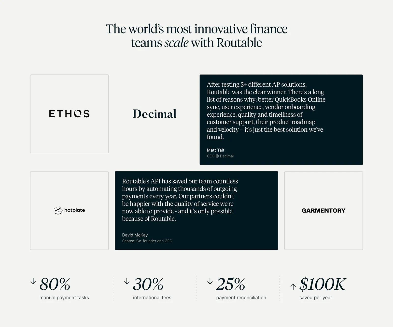
  239. Routable testimonials section: serif headline over a grid of logo tiles and dark quote cards, with four savings metrics below on light gray
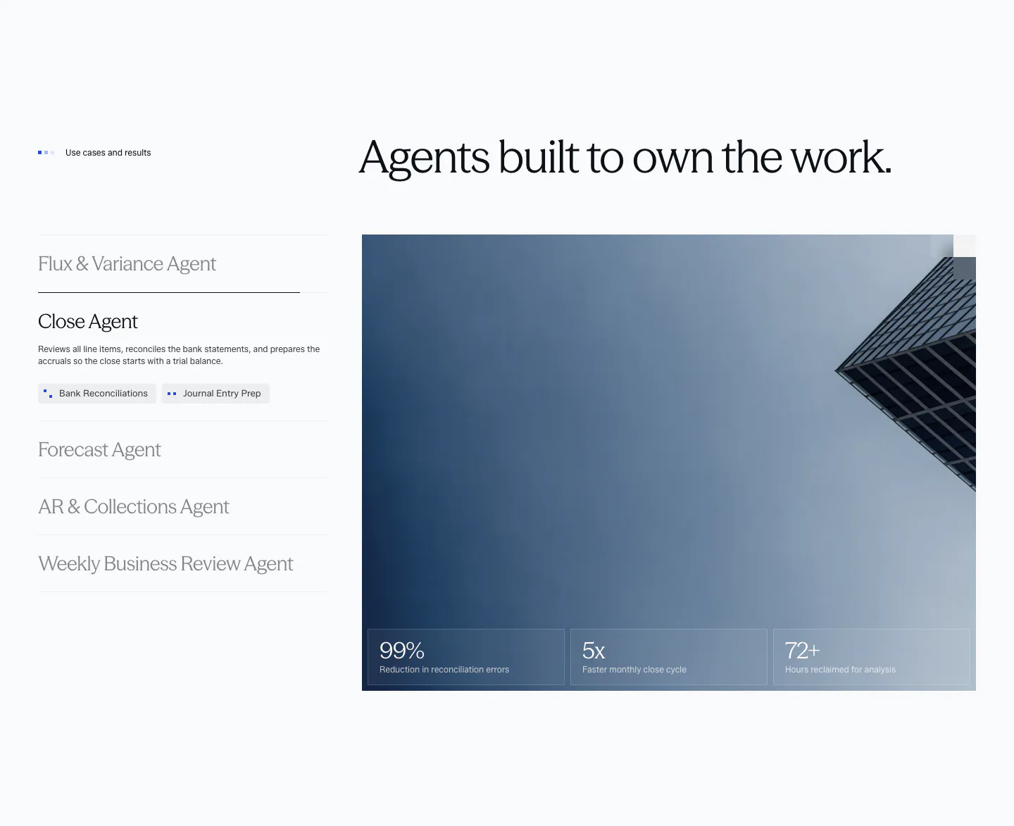
  240. Concourse use cases section: vertical list of agent tabs left, building photo with three metric tiles right on a light background
  241. NickAI features section: left heading above a two-column grid of chat prompts with chart, portfolio and order widget screenshots
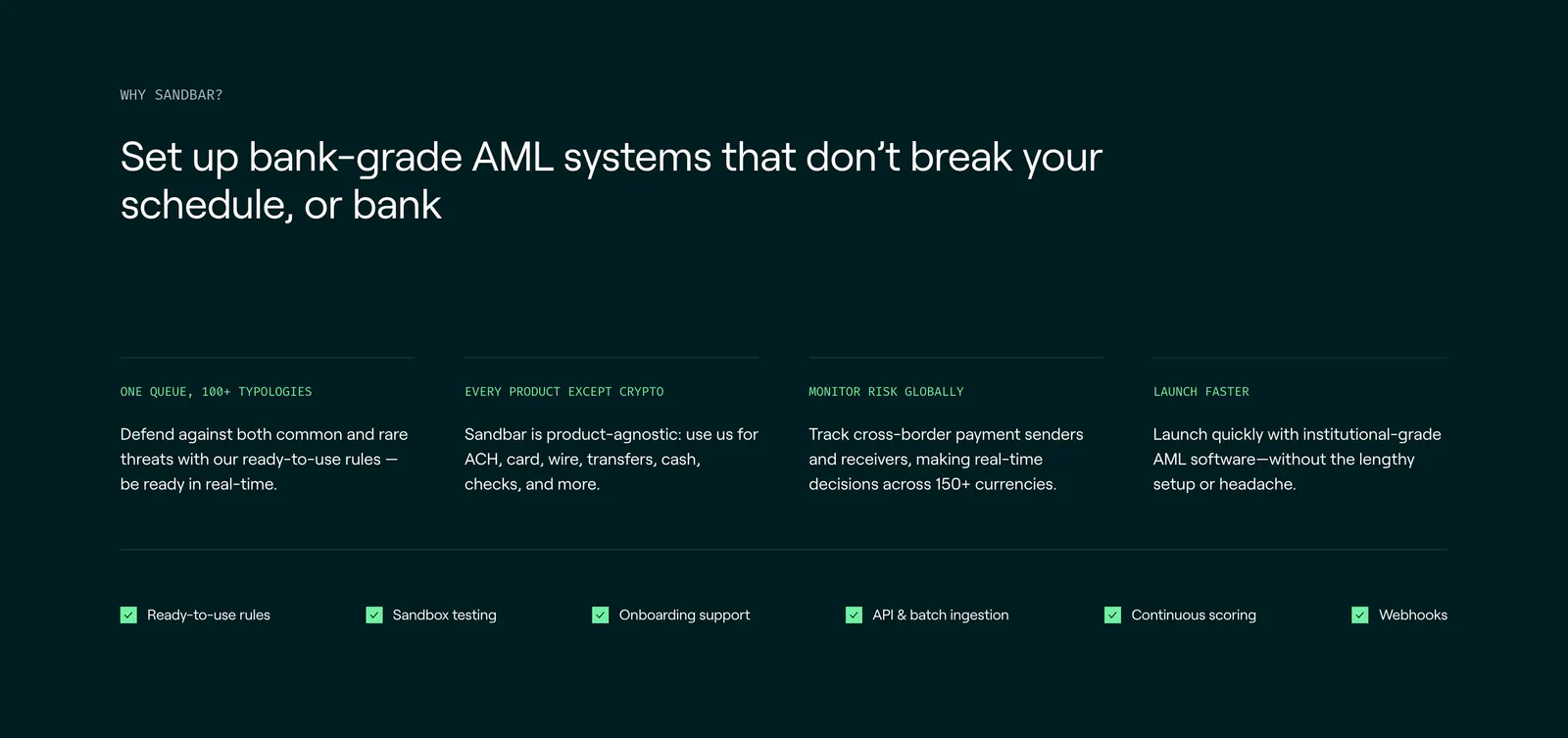
  242. Sandbar features section: left-aligned headline above four benefit columns and a row of checklist items on a dark teal background
  243. Rezolv call-to-action section: light blue rounded banner with left-aligned headline and Get in touch button and curved line art
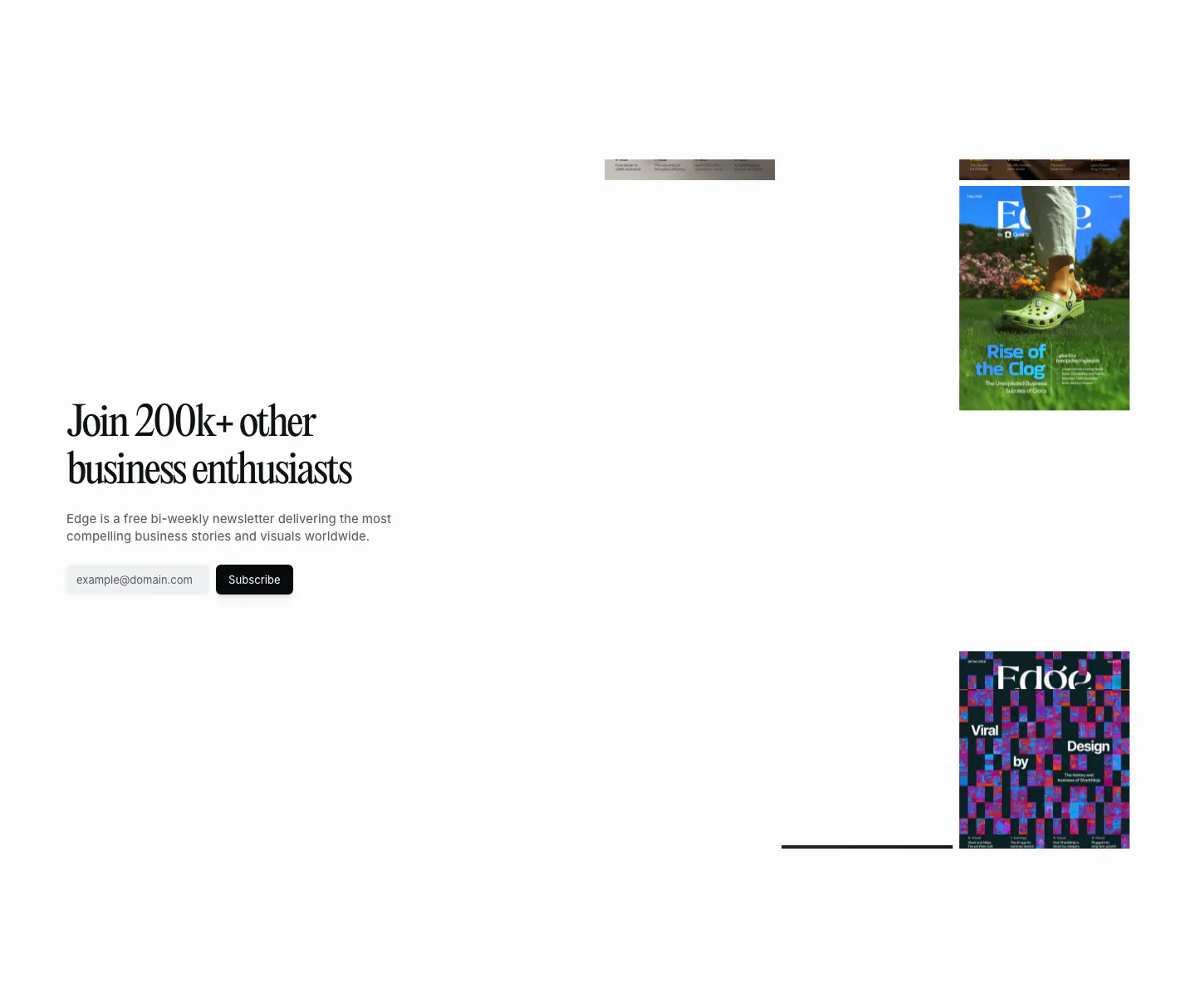
  244. Routable value proposition section: strip of four serif italic metrics with arrows and labels separated by dotted dividers on light gray
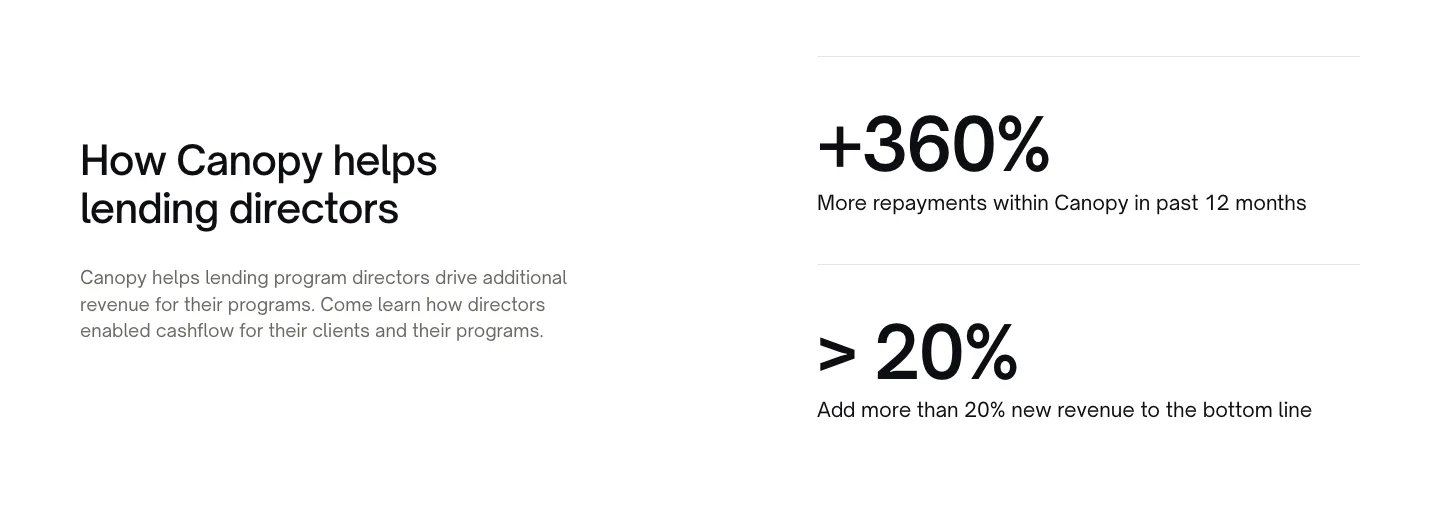
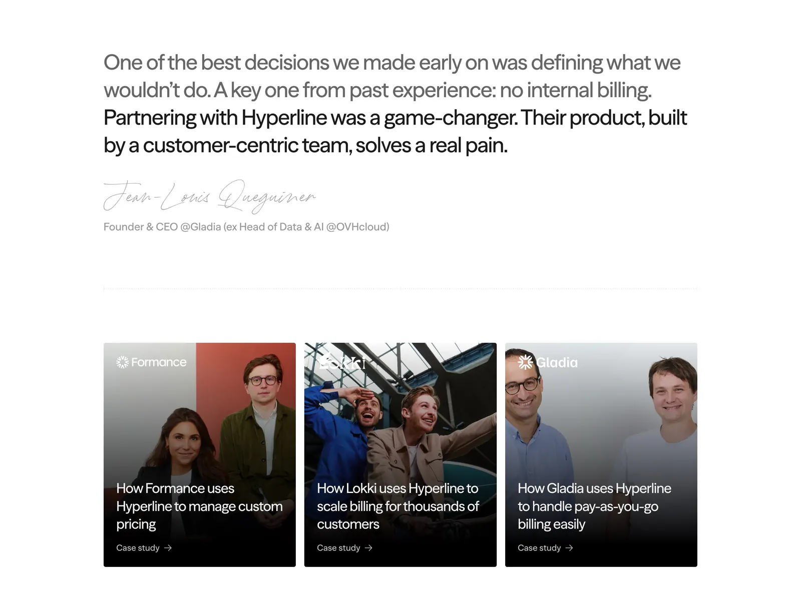
  245. Canopy stats section: heading and copy on the left, two large percentage metrics with labels on the right, white background
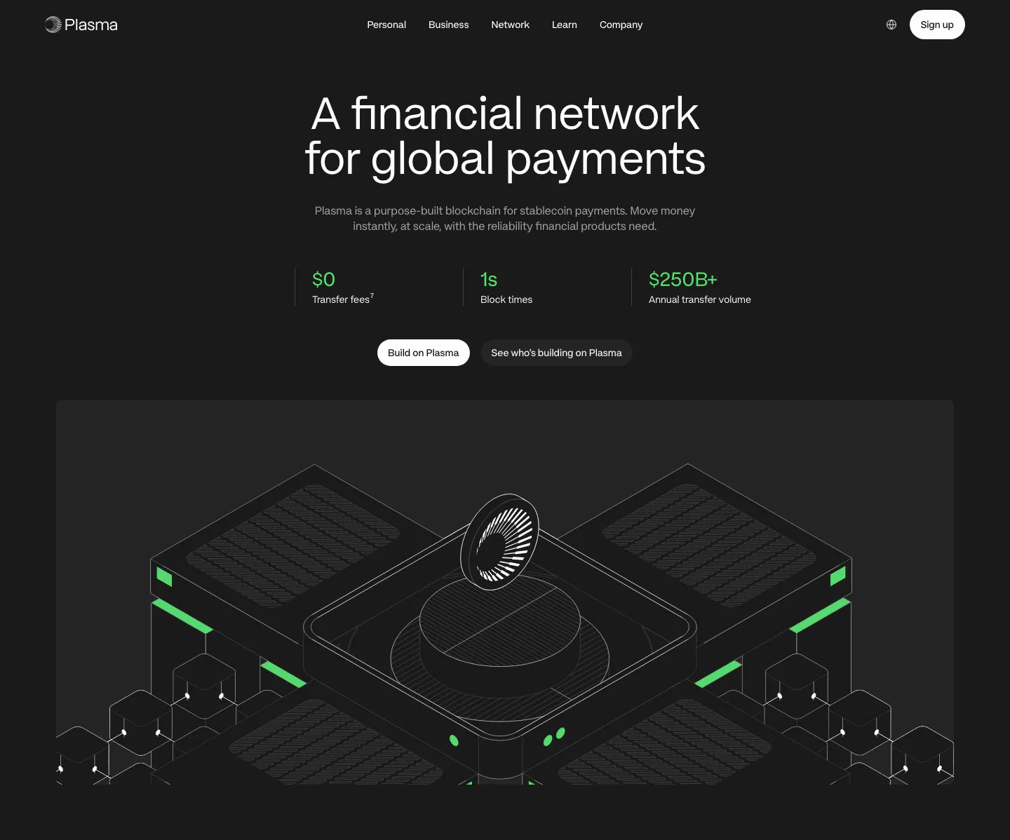
  246. Plasma hero section: centered headline, three green stats and buttons above an isometric line render of blockchain hardware on dark
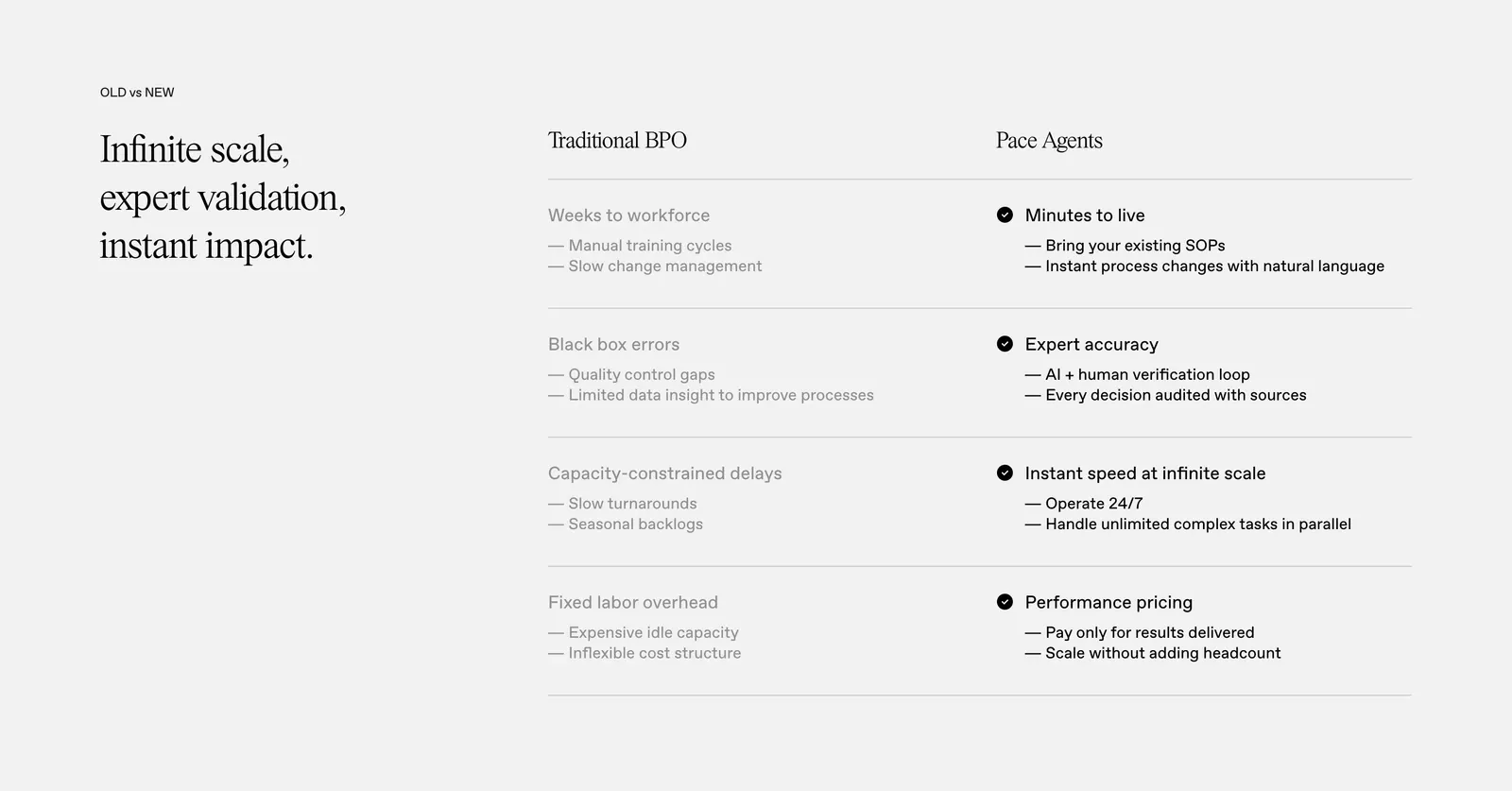
  247. Quartr newsletter section: serif headline and email subscribe field on the left, scattered Edge magazine covers on the right
  248. Hyperline testimonials section: large quote with handwritten signature above three photo case-study cards on white
  249. Evervault logo cloud section: two rows of six white customer logos above a centered trust caption on a near-black background
  250. Pace comparison section: serif headline on the left beside a two-column Traditional BPO vs Pace Agents table with checkmarks on light gray
    Pace Comparison
  251. Ruul call-to-action section: bold uppercase headline, copy and yellow button beside a three-item checklist in a dark green card
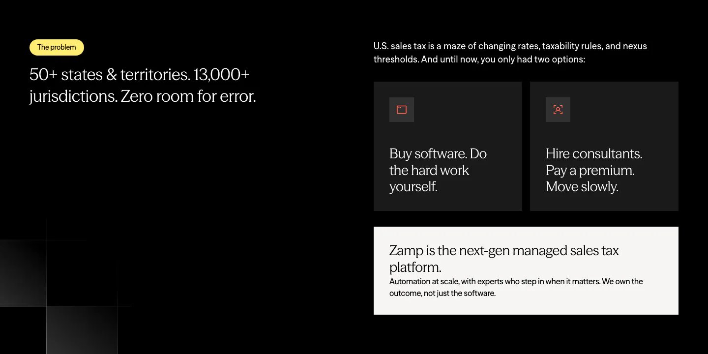
  252. Zamp value proposition section: problem statement on the left and dark option cards with a light Zamp answer card on the right, on black
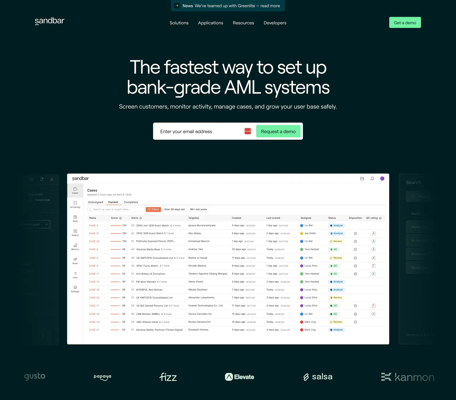
  253. Sandbar hero section: centered headline with email demo form above an AML cases table screenshot and a logo row on dark teal
  254. NEAR call-to-action section: left-aligned headline, short copy and dark button on a bright green gradient band
  255. Rogo security section: serif headline on dark green beside a grid of six compliance badges such as SOC 2, ISO and GDPR
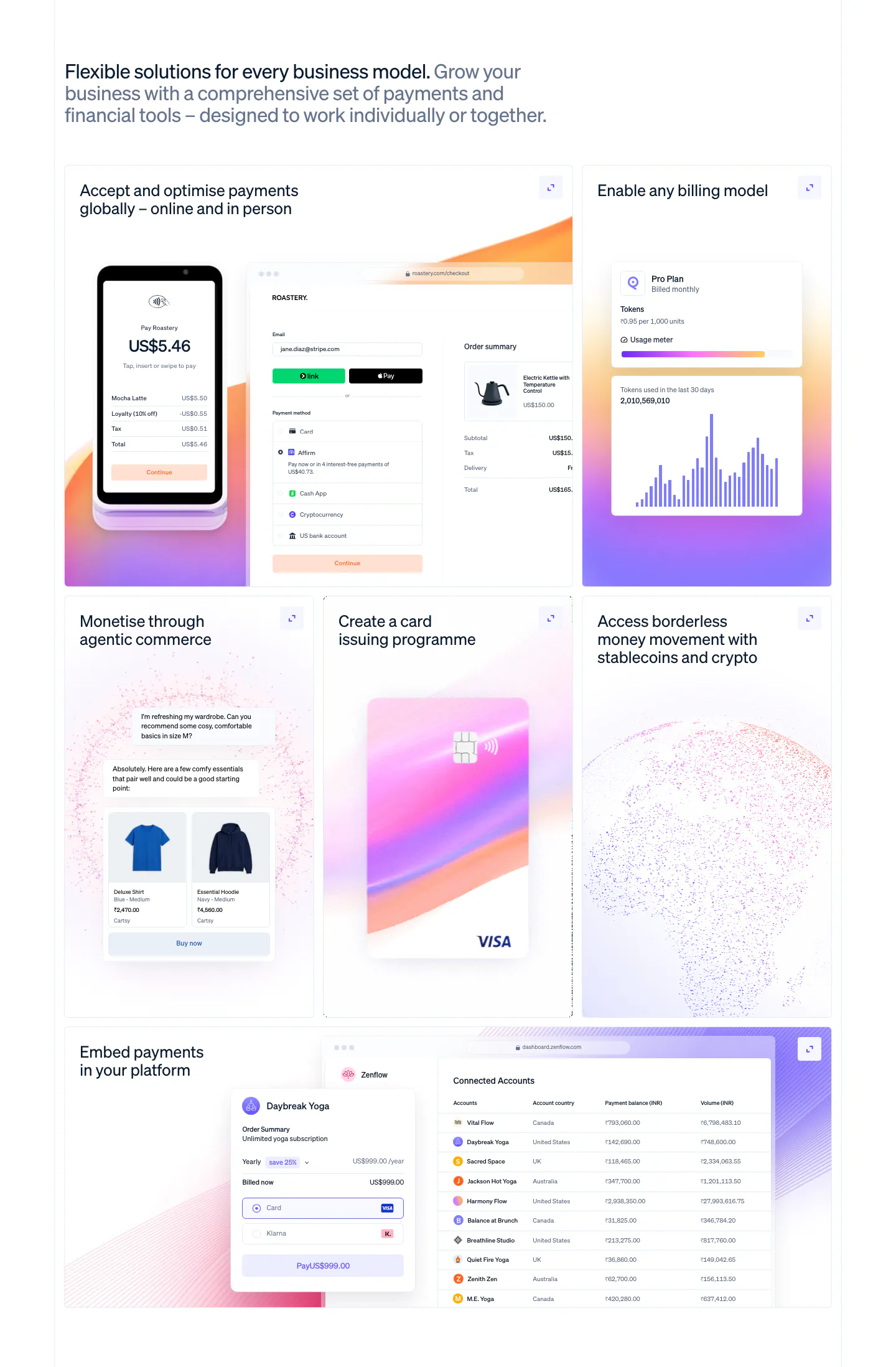
  256. Stripe features section: left-aligned headline above a six-tile bento grid with POS terminal, checkout, billing chart, card and accounts table UI
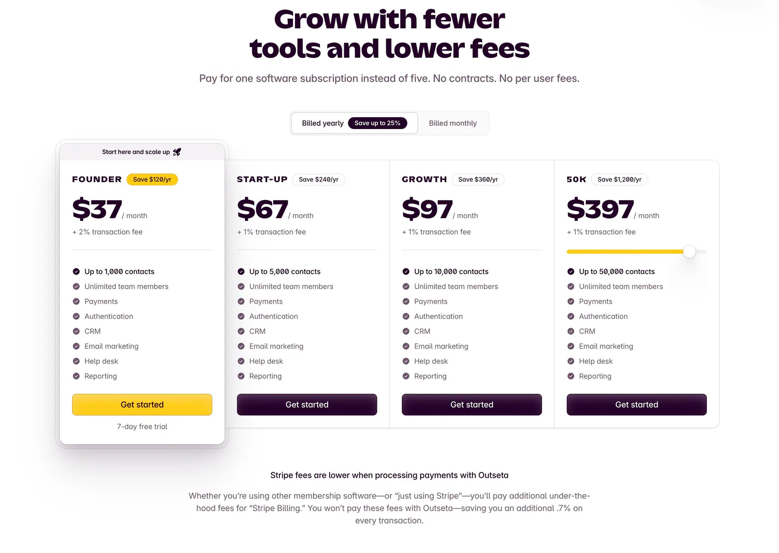
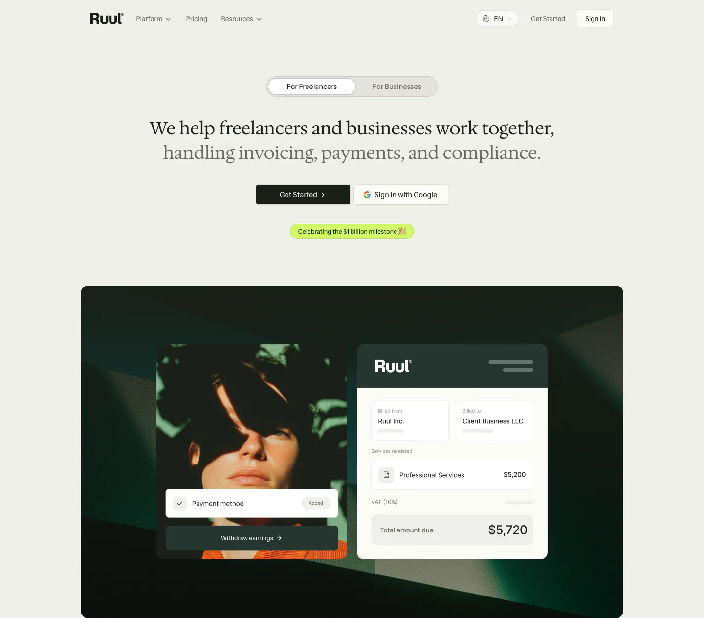
  257. Outseta pricing section: centered headline and billed yearly/monthly toggle above four plan cards with prices and feature checklists
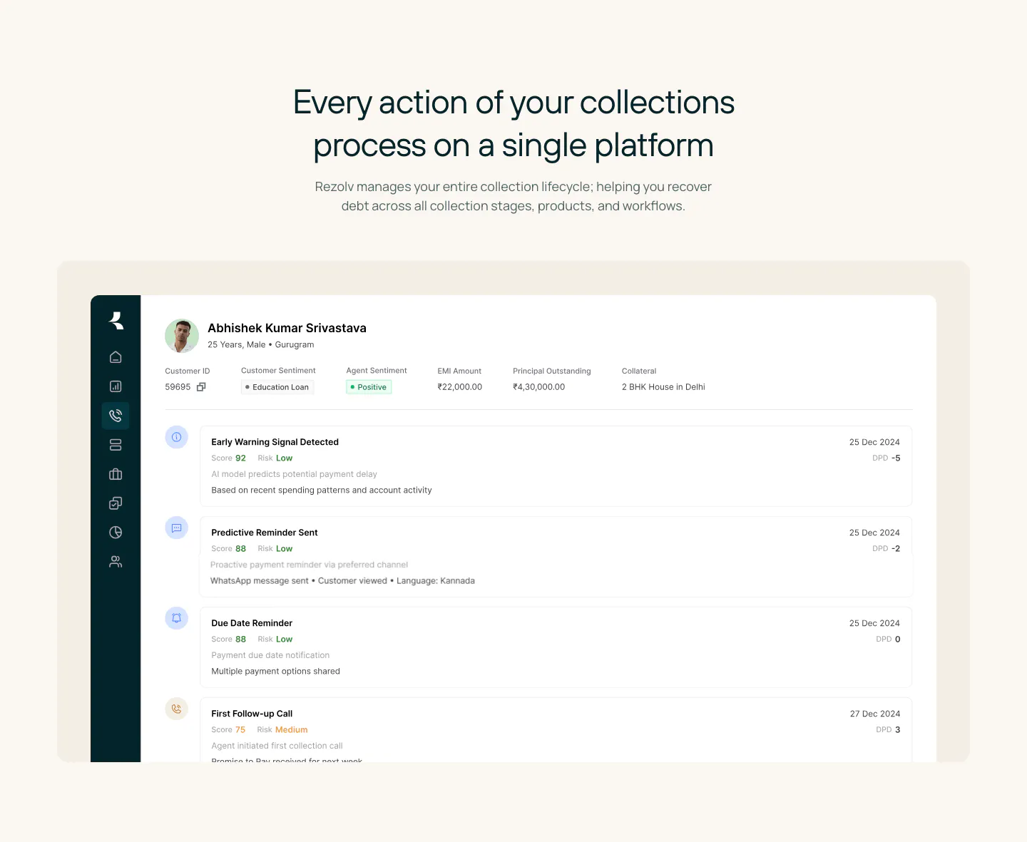
  258. Rezolv features section: centered headline above a large collections dashboard screenshot showing a borrower timeline on cream
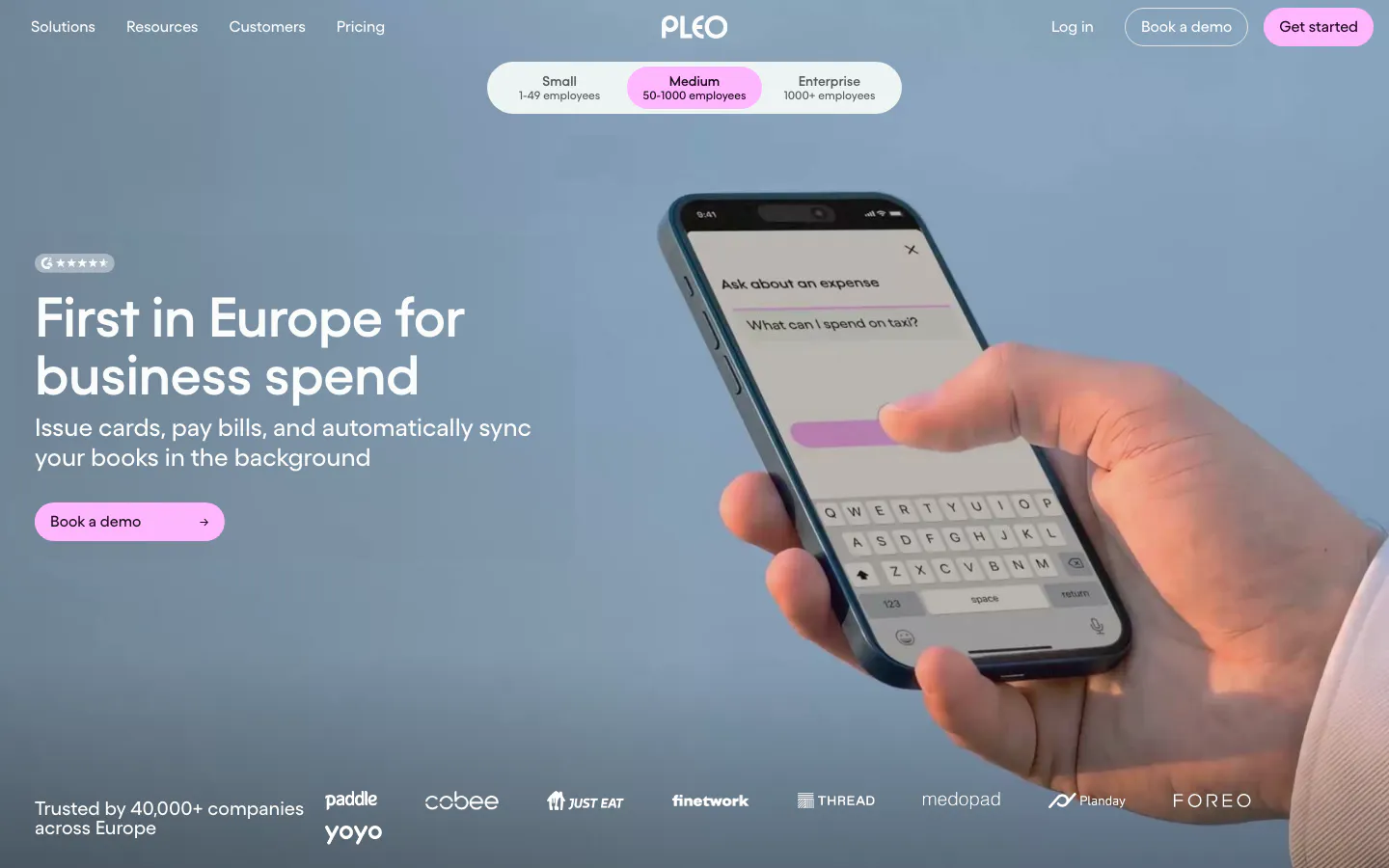
  259. Pleo hero section: left-aligned headline and pink button over a full-bleed photo of a hand holding a phone, logo strip below
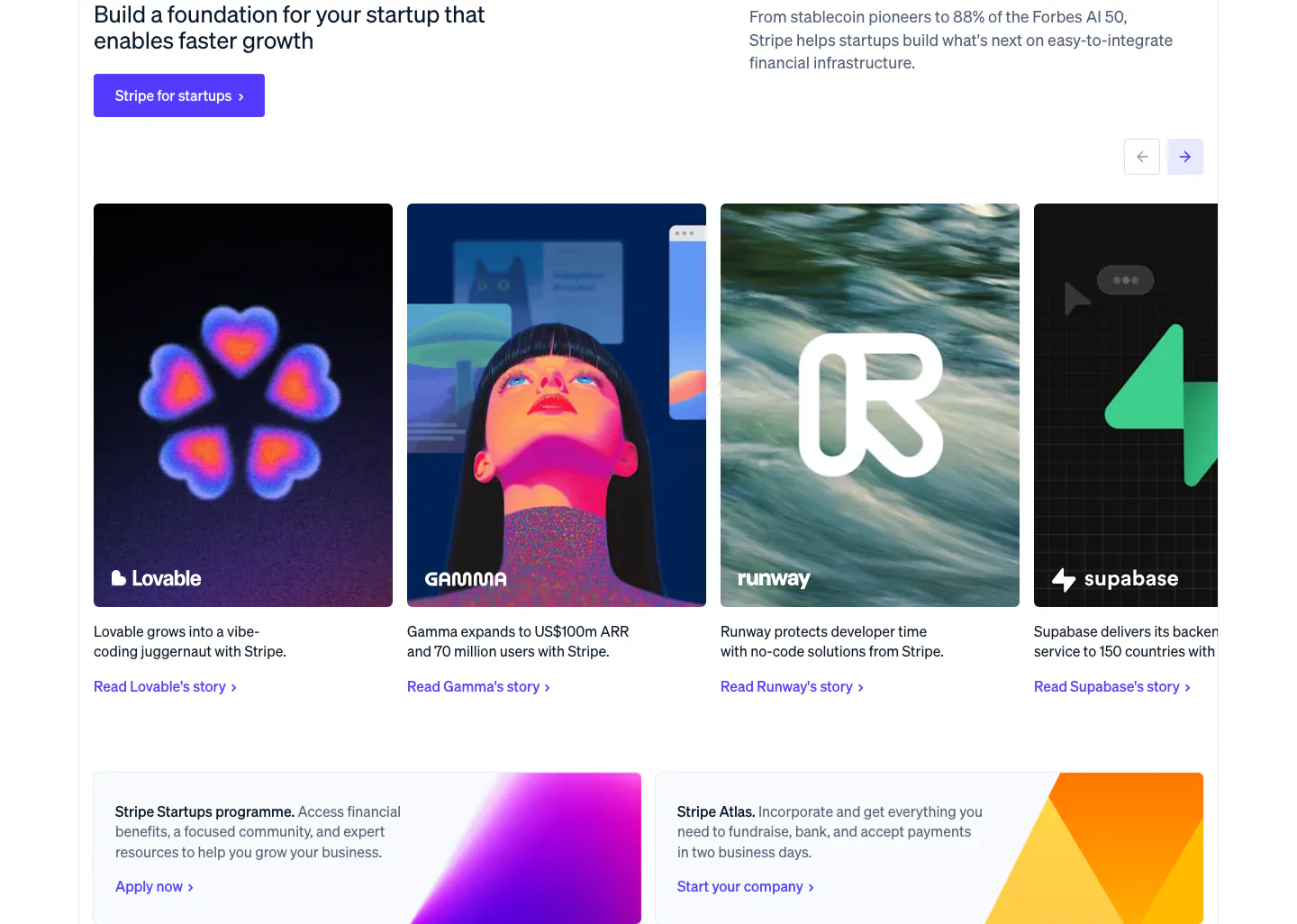
  260. Stripe testimonials section: startup headline and button above a carousel of customer story cards, with two gradient promo cards below
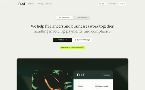
  261. Ruul hero section: audience toggle and centered serif headline above a dark green panel with a portrait photo and invoice UI card
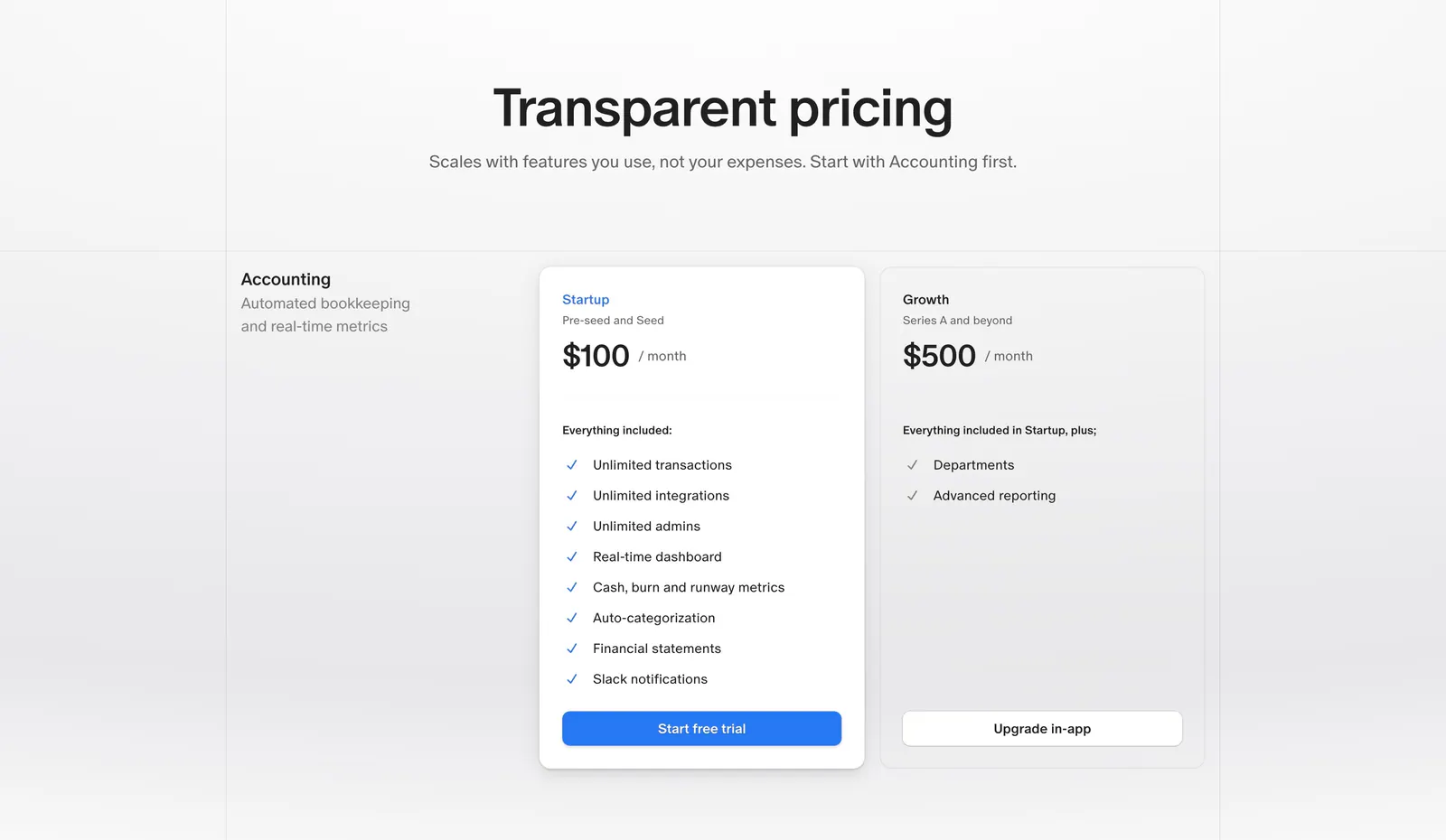
  262. Finta pricing section: centered heading above Startup and Growth monthly plan cards with checklists on a light gray background
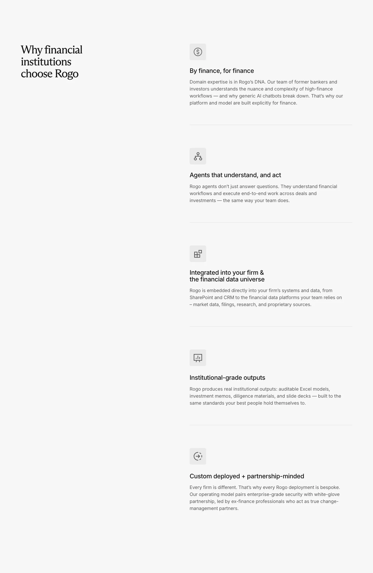
  263. Rogo value proposition section: serif headline on the left, five stacked benefit rows with icons and descriptions on the right
  264. Canopy call-to-action section: centered headline, short copy and lime Get started button on a dark grid background
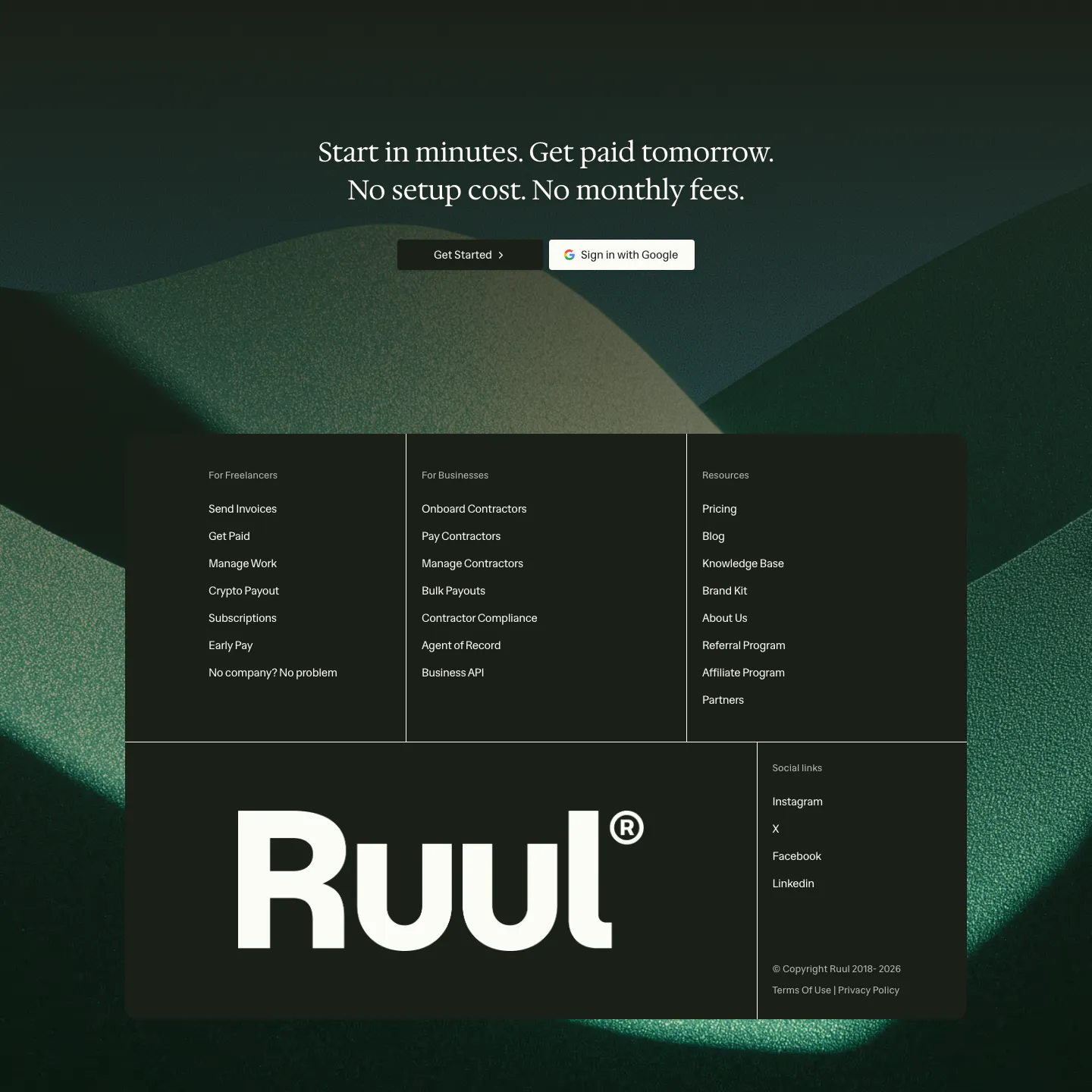
  265. Ruul footer section: serif CTA over dark green hills artwork, with a dark panel of link columns and a large Ruul wordmark
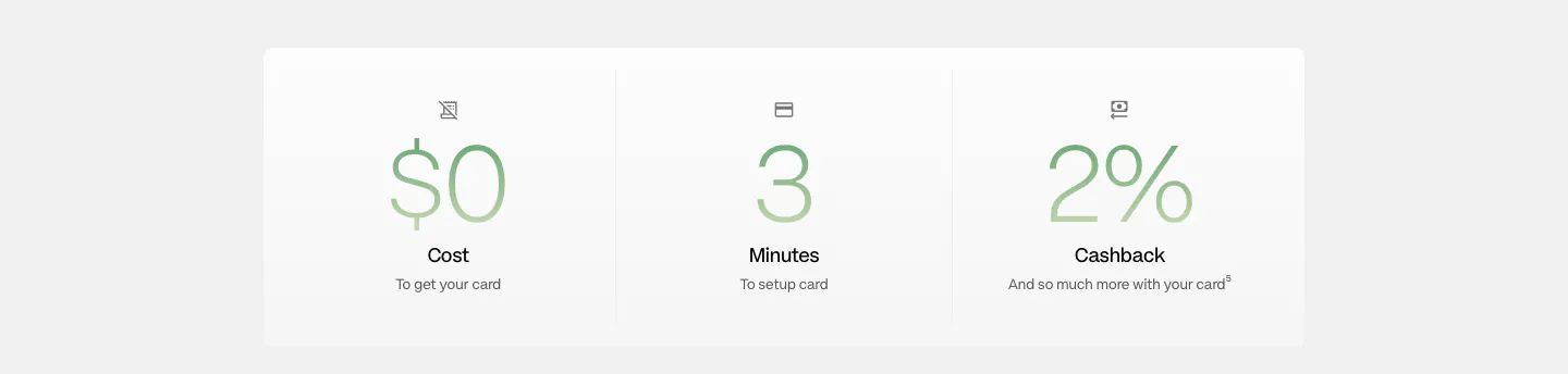
  266. Plasma stats section: white panel with three large green gradient figures for cost, setup minutes and cashback
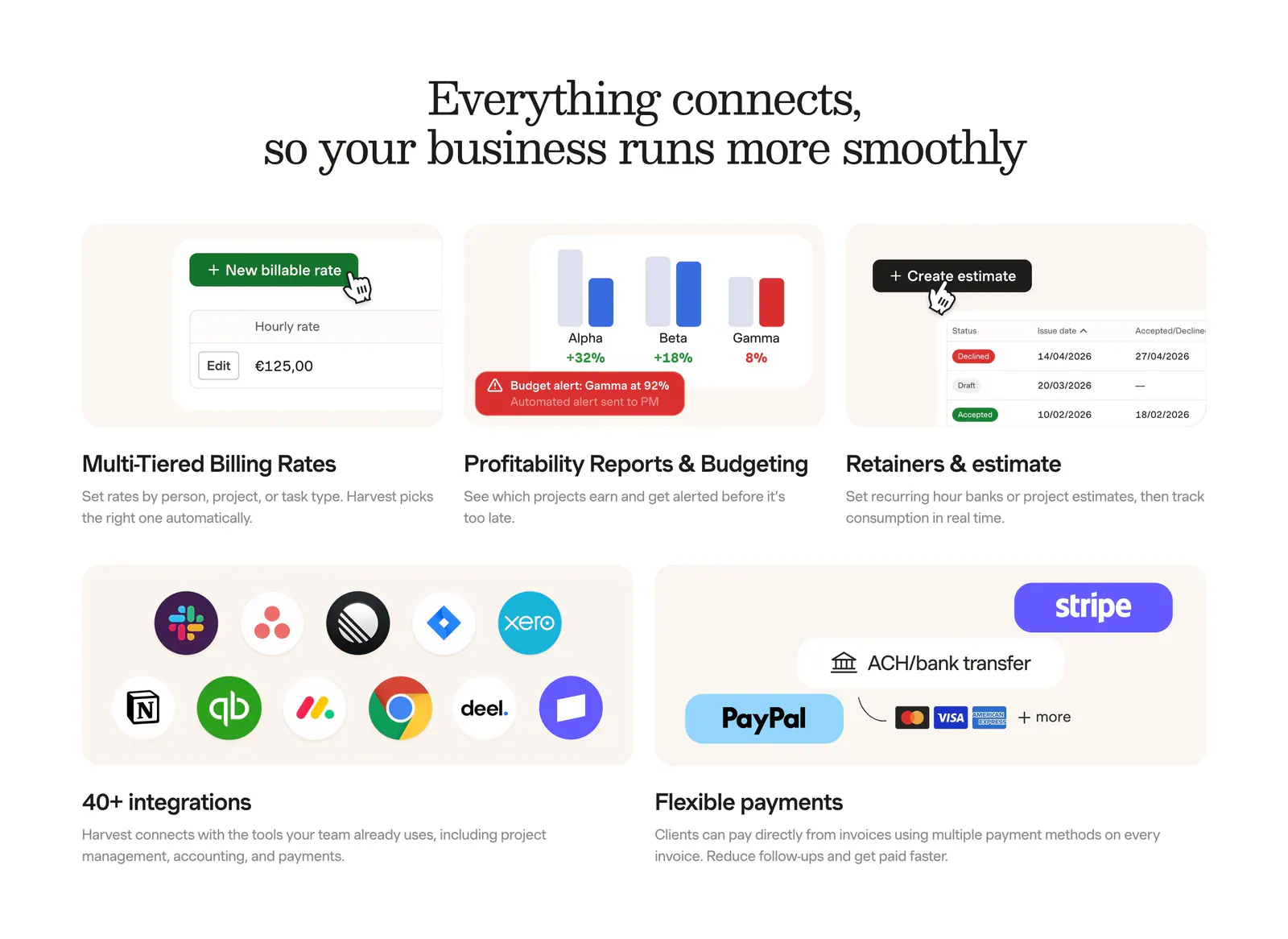
  267. Harvest integrations section: serif headline above a bento grid of billing, reporting and estimate UI tiles plus app-icon and payment tiles
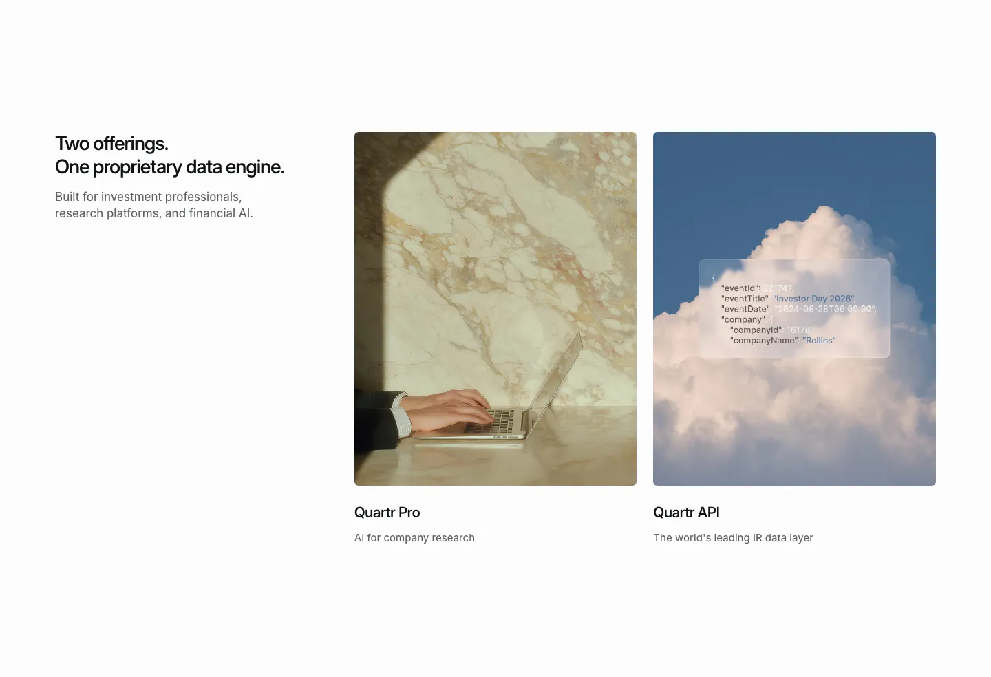
  268. Quartr features section: headline on the left beside two photo cards for Quartr Pro and Quartr API, one with a frosted JSON snippet
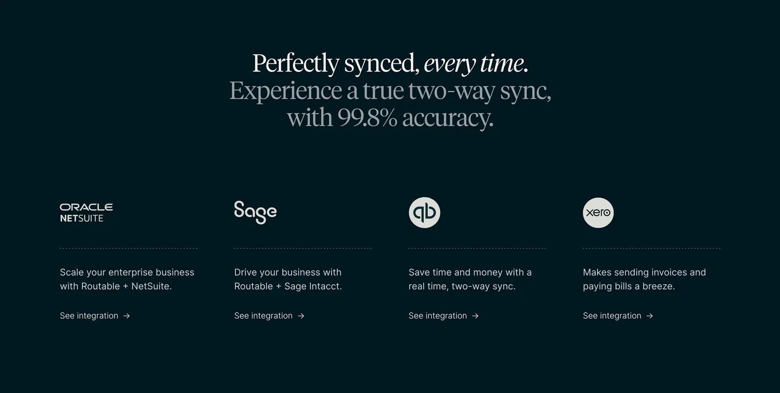
  269. Routable integrations section: centered serif headline above four columns with NetSuite, Sage, QuickBooks and Xero logos on dark
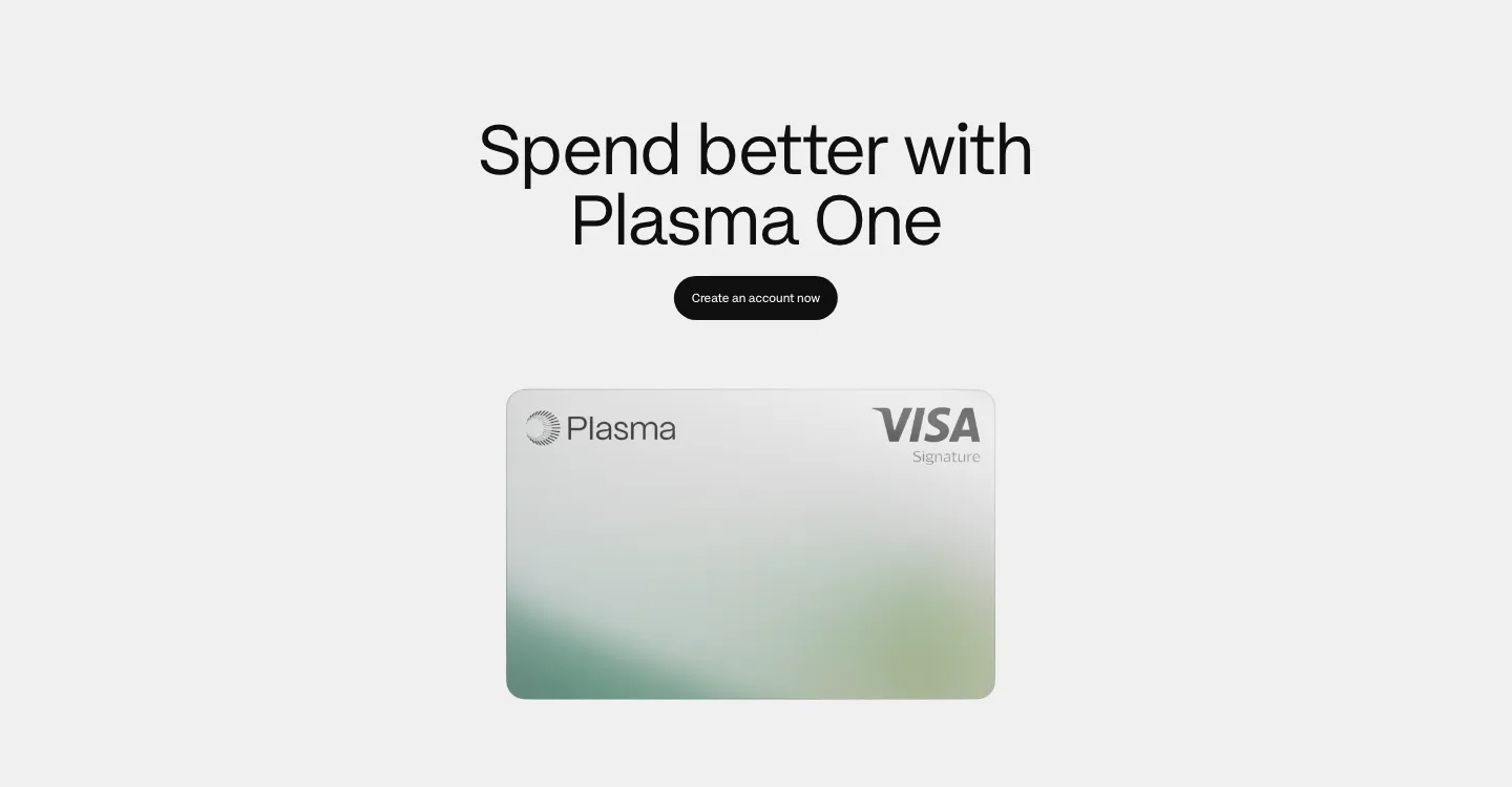
  270. Plasma call to action section: centered heading and black button above a silver Plasma Visa card on light gray
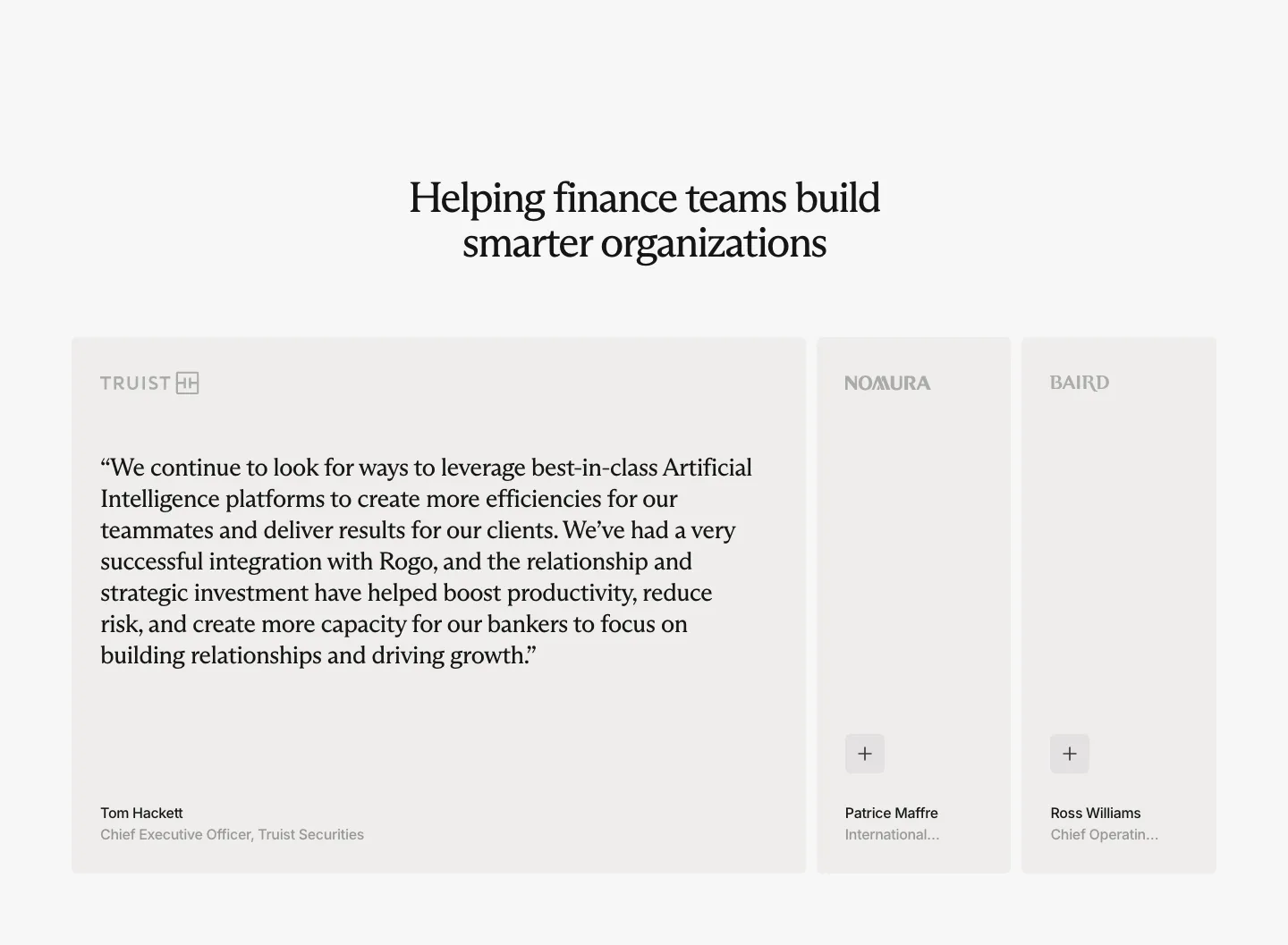
  271. Response footer section: royal blue panel with logo, link columns, large statement and Book a Demo button, tape line art above
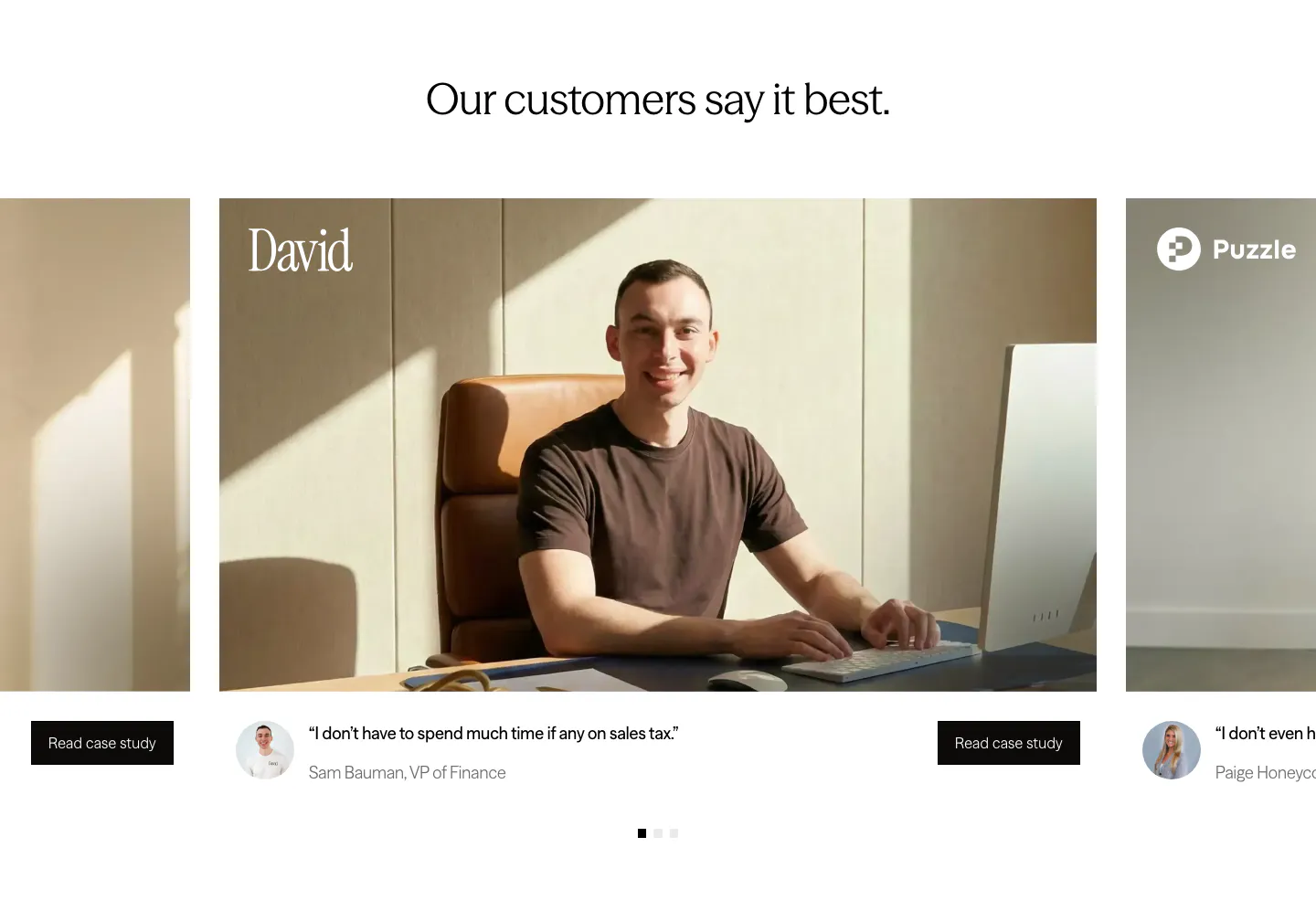
  272. Zamp testimonials section: centered headline above a carousel of customer photo cards with short quotes and case study buttons
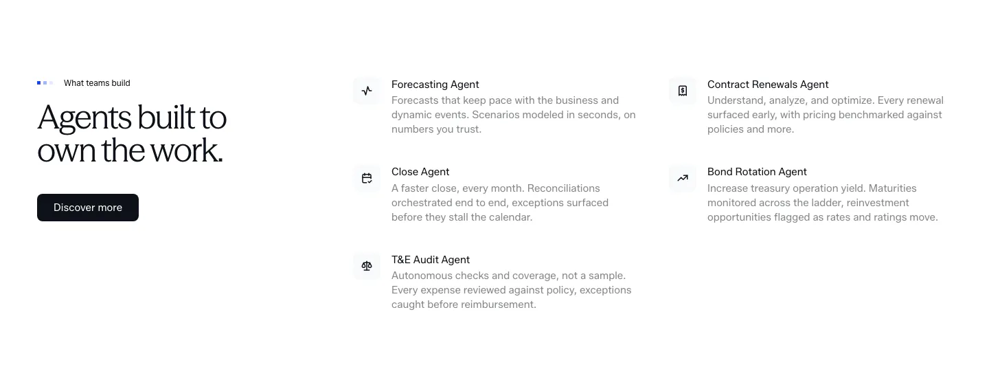
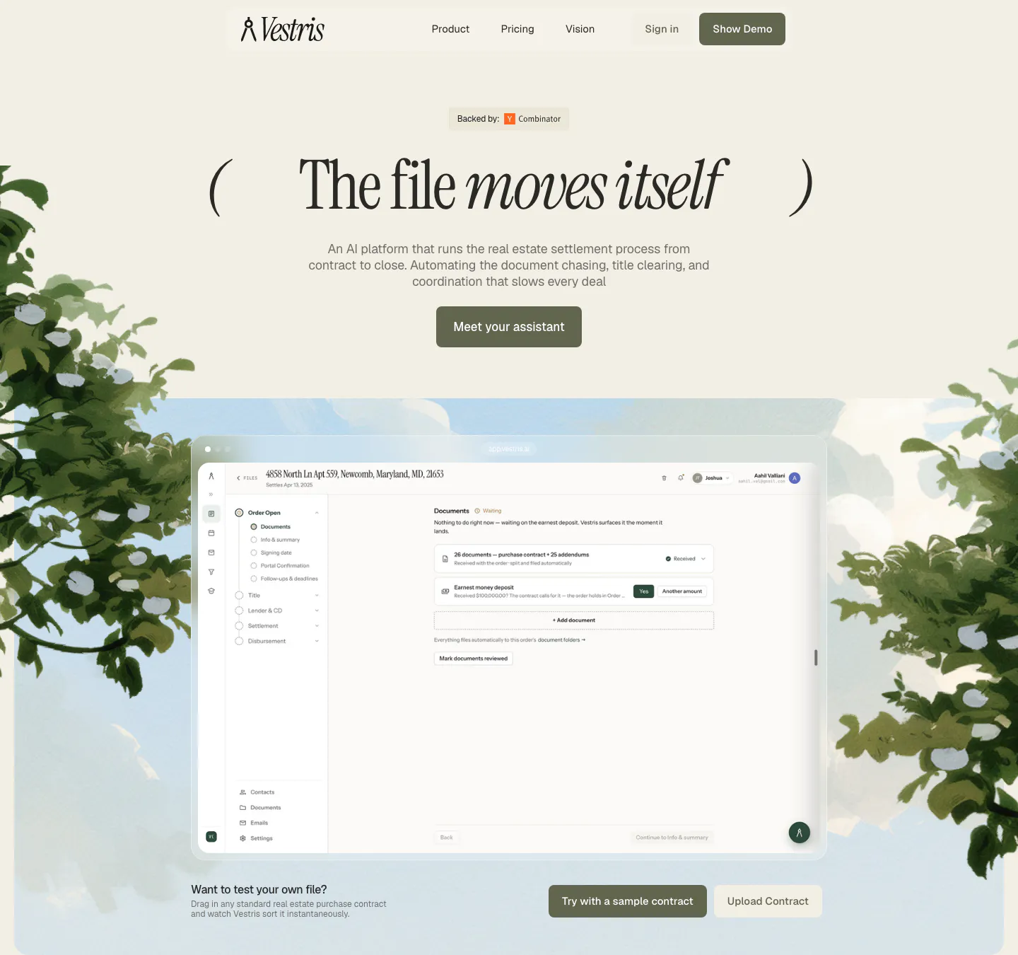
  273. Concourse features section: headline and Discover more button left, two-column list of agent names with icons and descriptions right
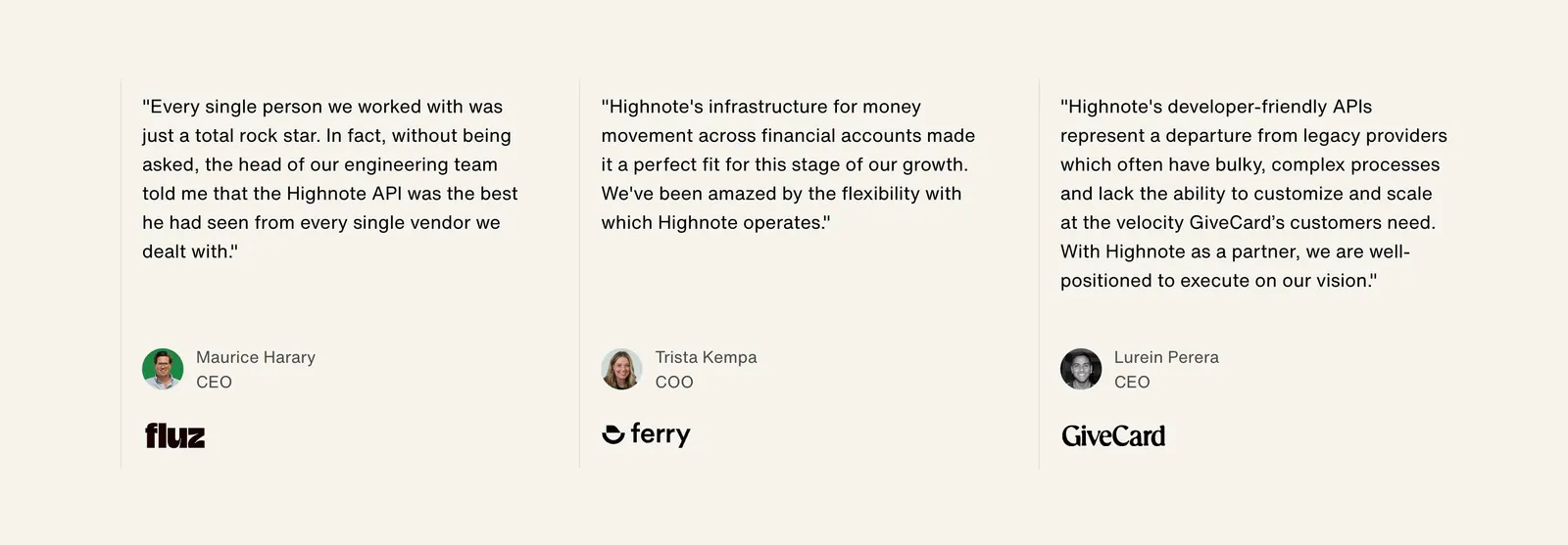
  274. Portal footer section: centered serif join-beta headline and blue button above small link columns and a painted hillside illustration
  275. Rogo testimonials section: centered serif headline above one expanded quote card and two collapsed cards with company logos
  276. Griffin call-to-action section: centered serif headline and Contact sales pill button on a black background
  277. Vestris hero section: nav and centered serif headline with button above an app screenshot framed by painted trees and sky
  278. Highnote testimonials section: three quote columns separated by thin lines with avatars, titles and company logos on beige
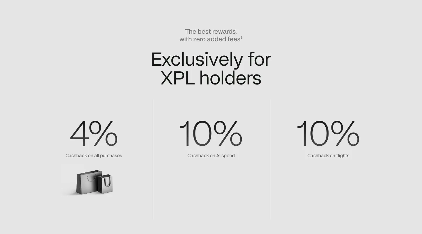
  279. Plasma stats section: centered headline above three large cashback percentages with labels on a light gray background
  280. Aria integrations section: centered headline above a dark panel with a sliding row of accounting software logo tiles, one highlighted
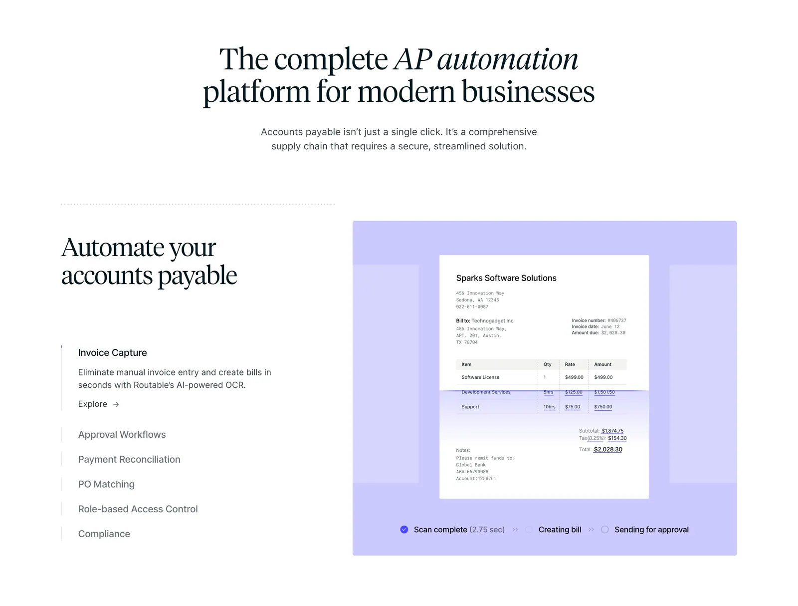
  281. Routable features section: centered serif headline above a feature list and a lavender panel with an invoice scanning mockup
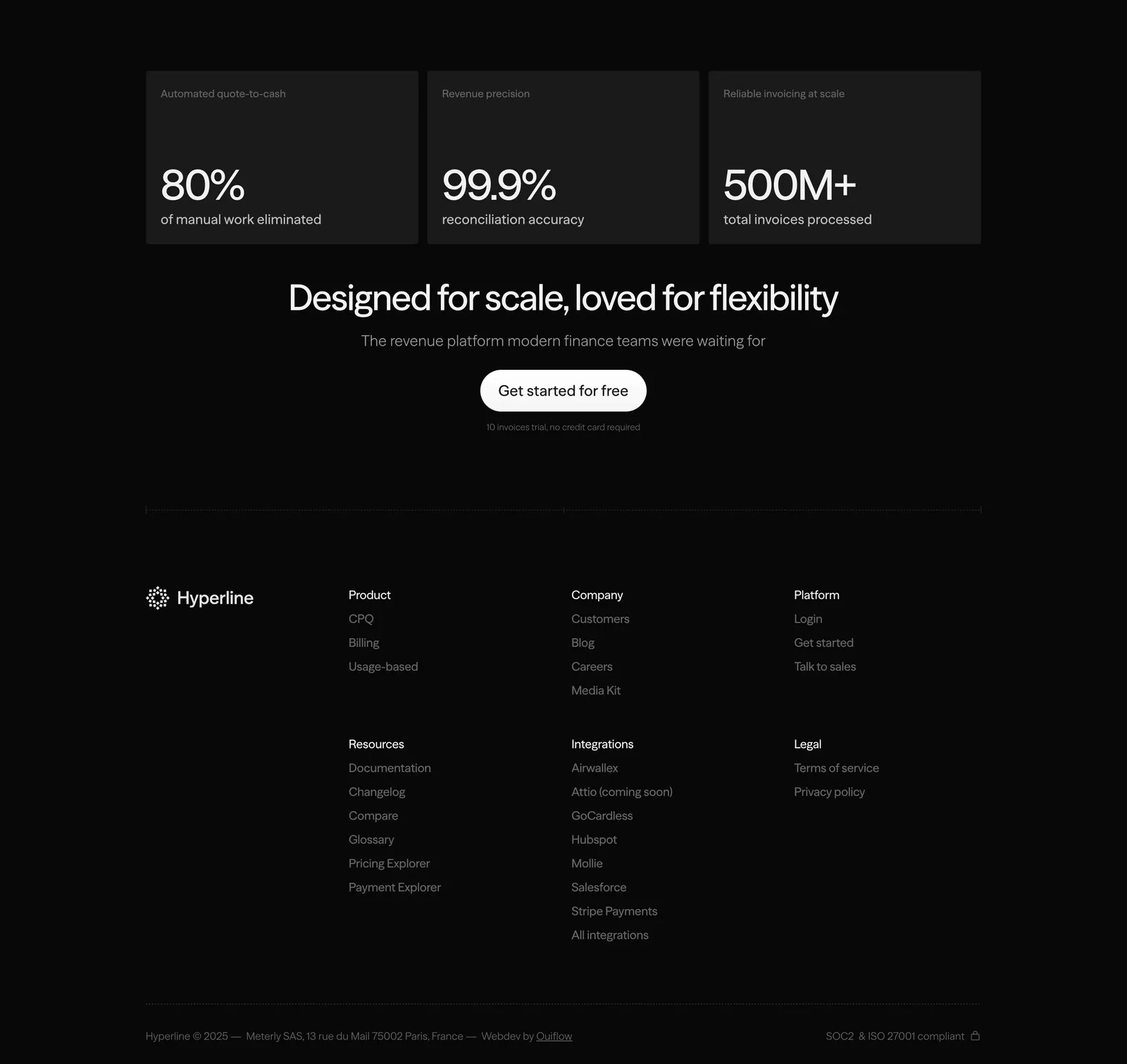
  282. Hyperline footer section: three stat cards and a centered CTA above link columns and copyright on a near-black background
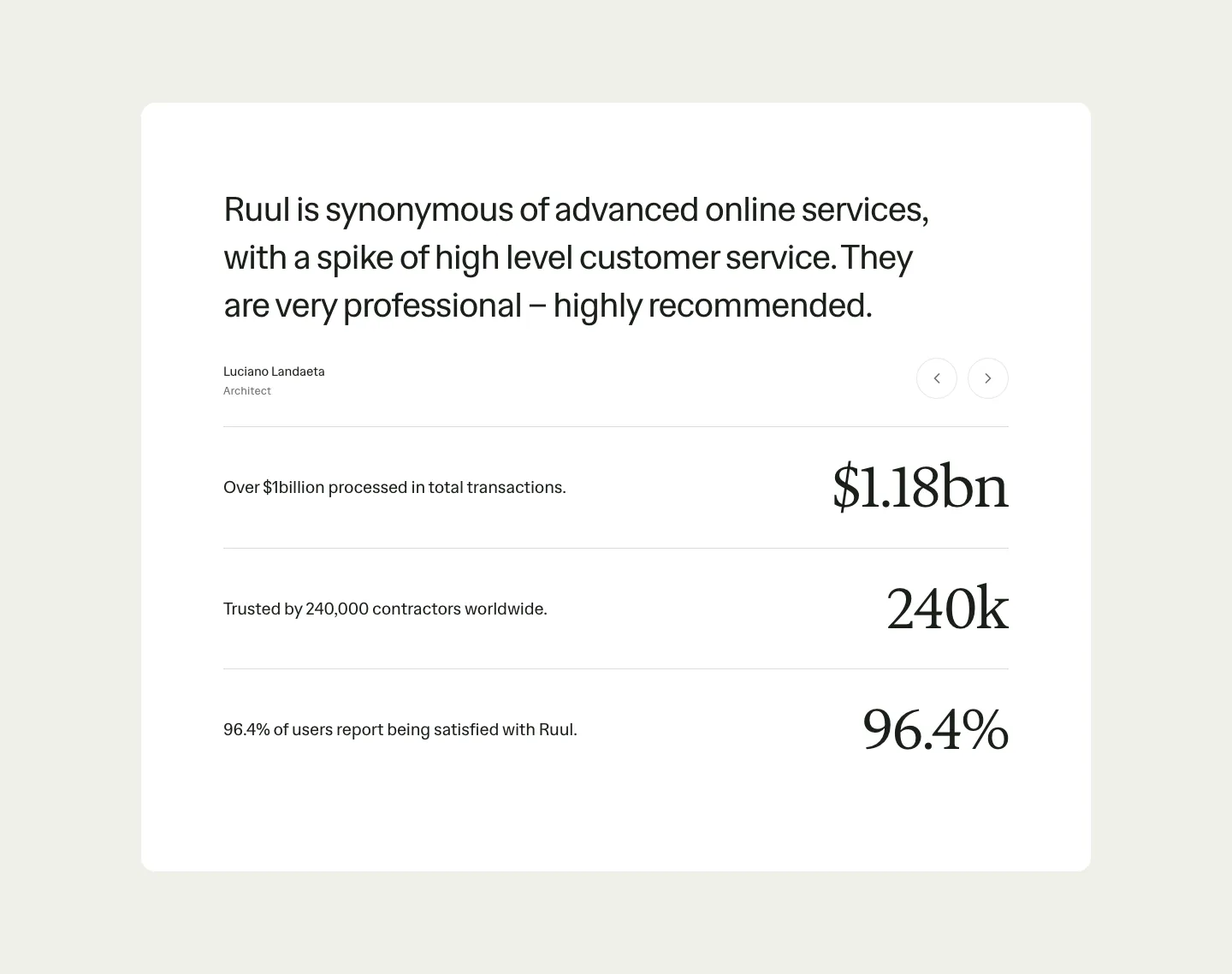
  283. Ruul testimonials section: white card with a large quote and arrow controls above three rows of large serif stats on beige
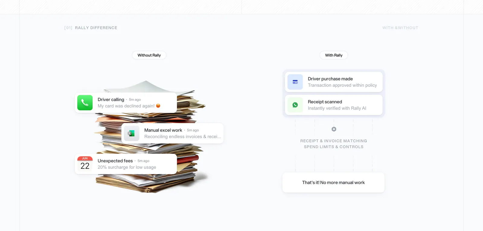
  284. Rally comparison section: without vs with columns, a paper stack with notification cards on the left and a clean approval flow on the right
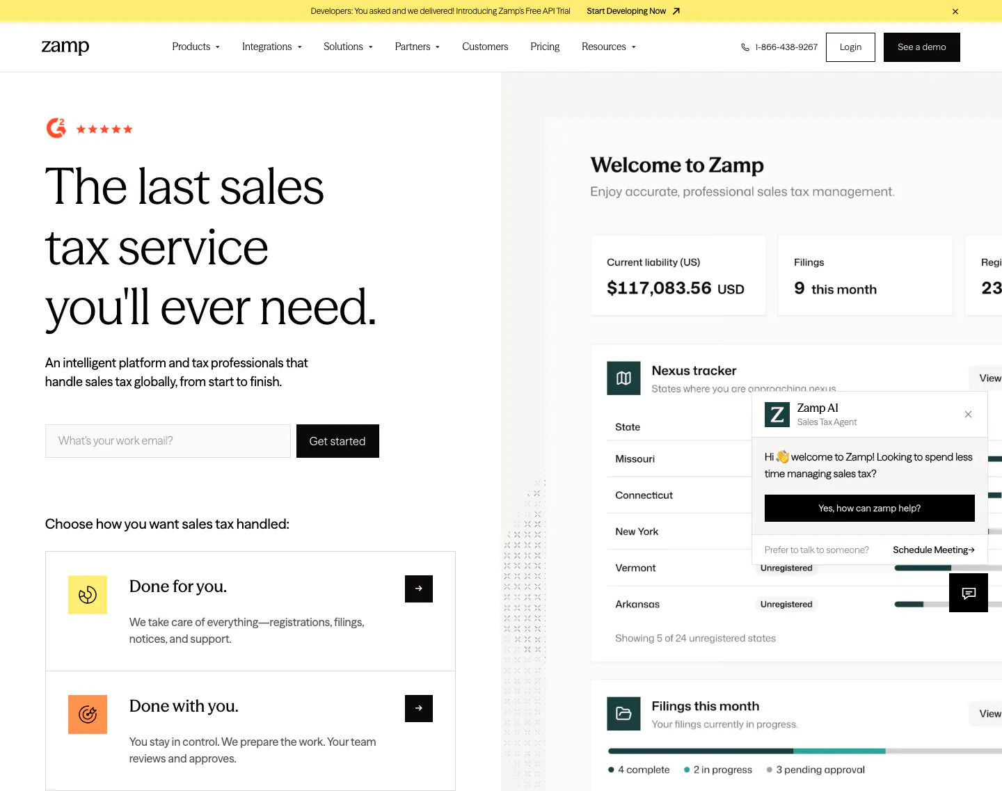
  285. Zamp hero section: left headline with work-email field and service option cards beside a sales tax dashboard screenshot
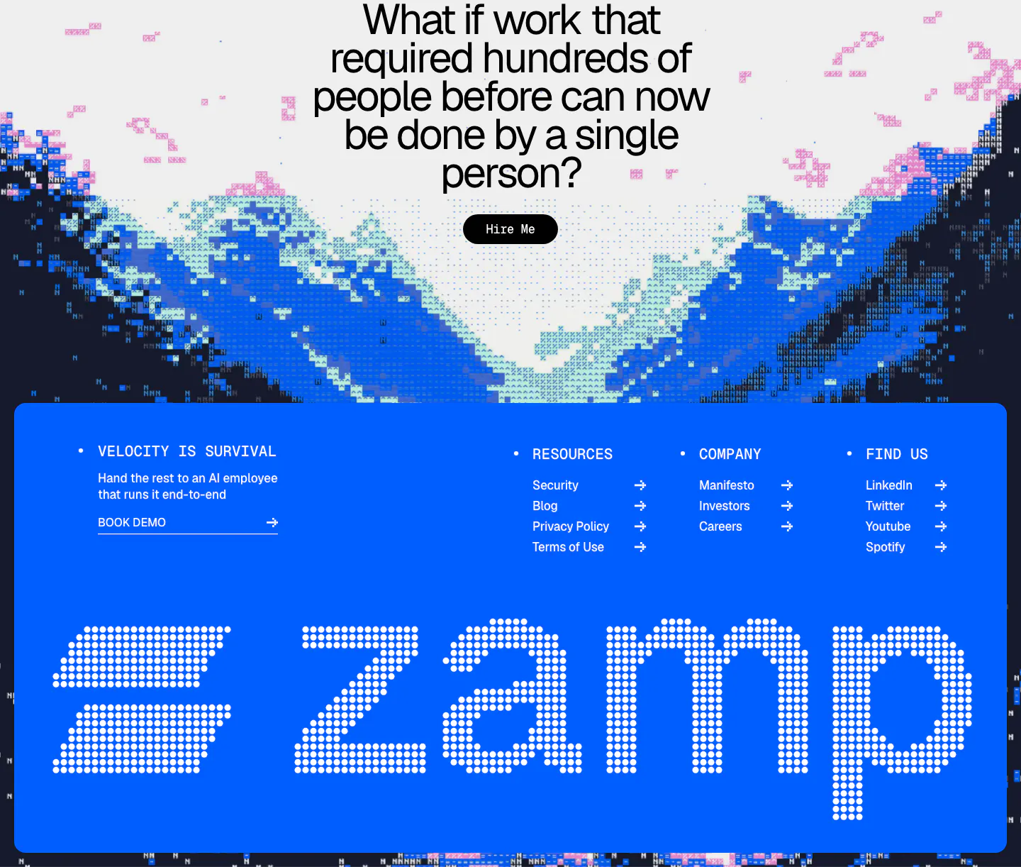
  286. Zamp footer section: centered question CTA over pixel-art mountains above a bright blue panel with link columns and a giant dotted zamp wordmark
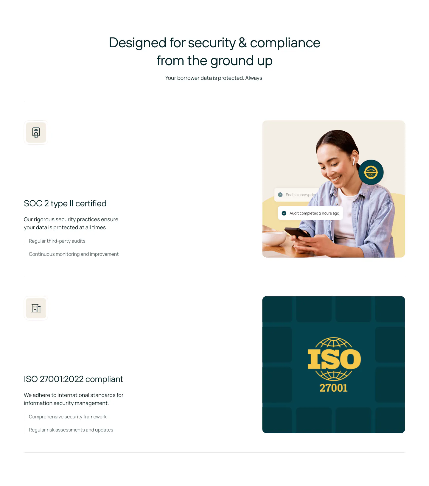
  287. Rezolv security section: centered headline above SOC 2 and ISO 27001 rows, each with text left and a photo or ISO badge right
  288. Plasma use cases section: heading with arrow buttons above a carousel of cards with green isometric renders on charcoal
  289. Origin testimonials section: serif headline above a scrolling row of lime quote cards with company logos and progress bar on off-white
  290. Concourse hero section: centered headline and button above a large video thumbnail of two founders with a Watch the video button
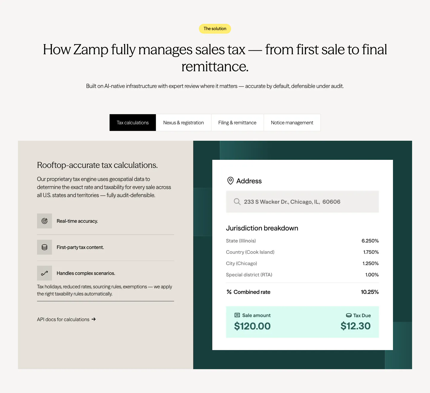
  291. Zamp features section: centered heading over a tab bar and split panel with feature list on beige and a tax calculation card on dark green
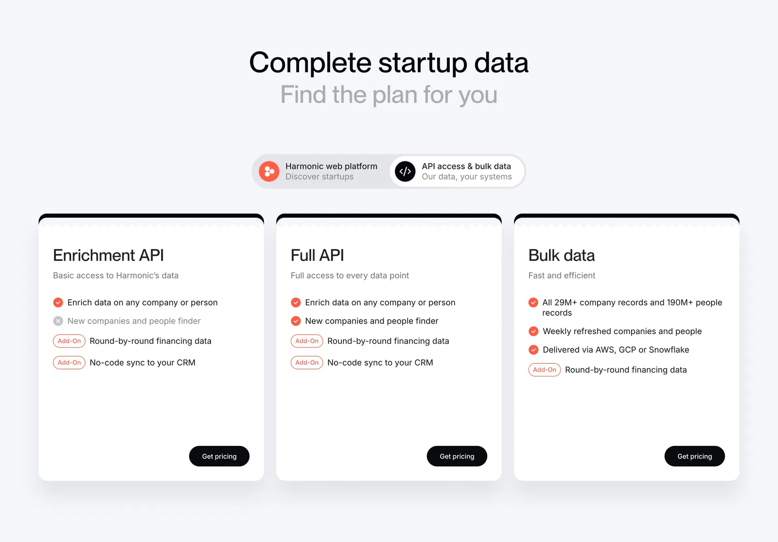
  292. Harmonic pricing section: centered headline and segmented toggle above three white plan cards with checklists and black buttons
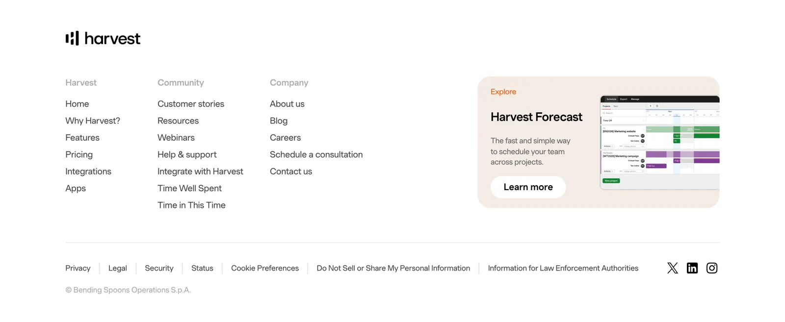
  293. Harvest footer section: logo above three link columns beside a Harvest Forecast promo card with screenshot, legal links and social icons
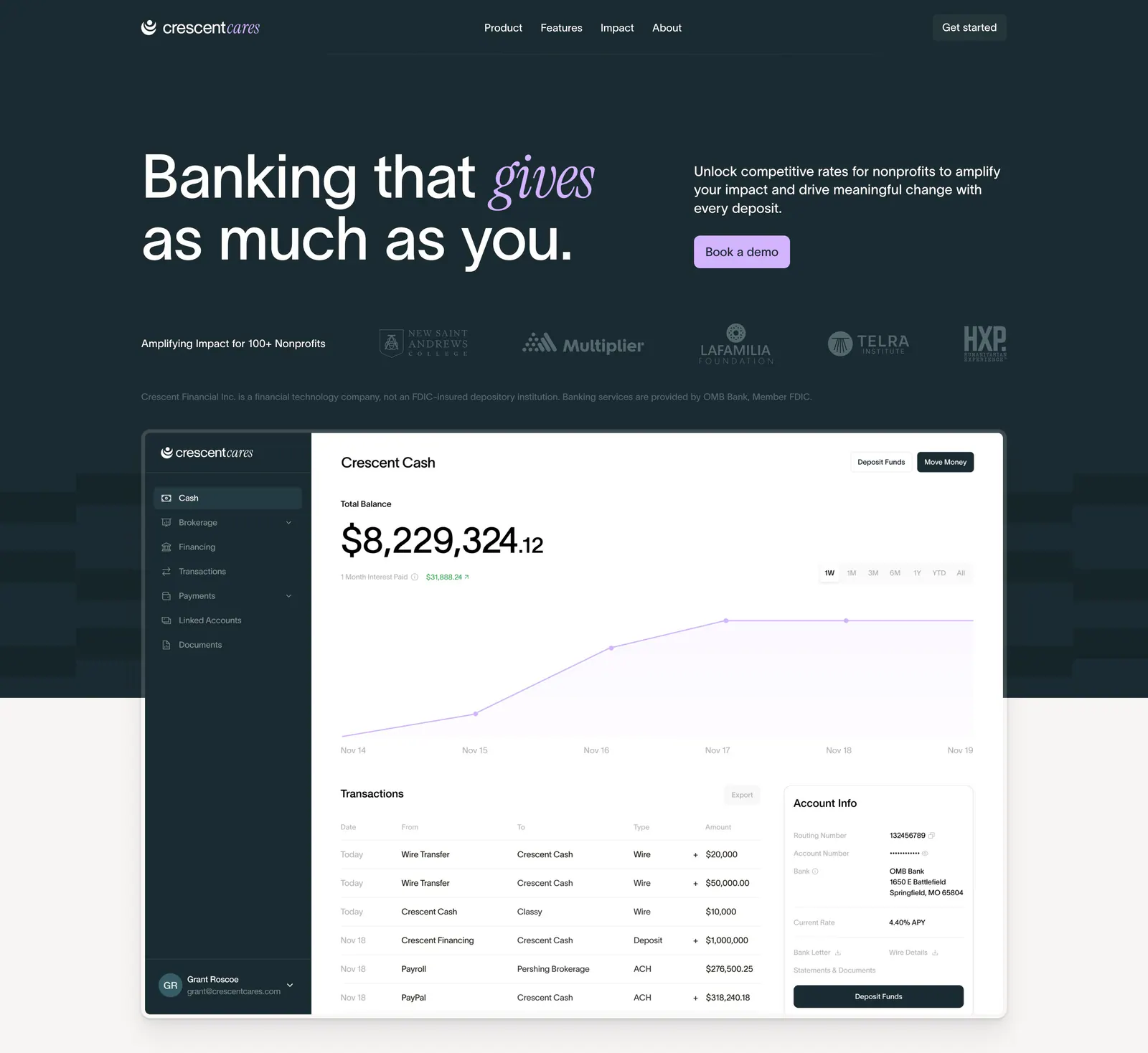
  294. Crescent Cares hero section: headline with italic serif accent, copy and button, nonprofit logo row and banking dashboard screenshot
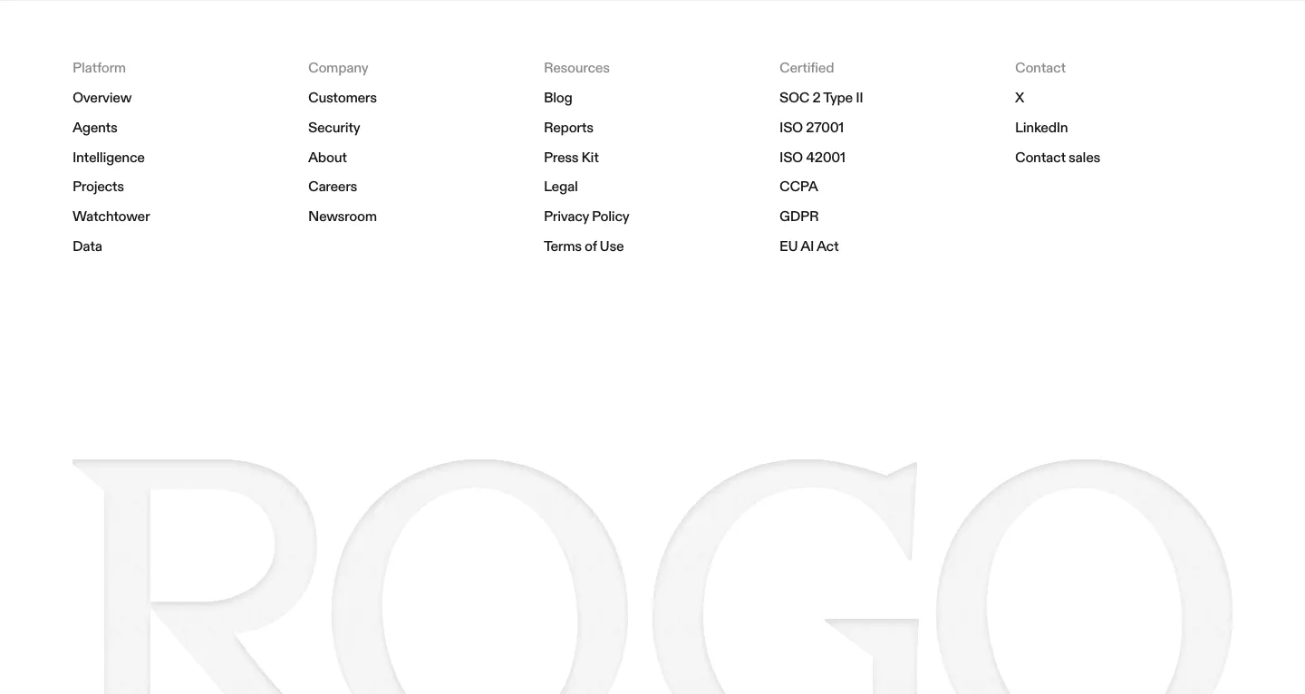
  295. Rogo footer section: five link columns on white above a huge faint gray serif ROGO wordmark
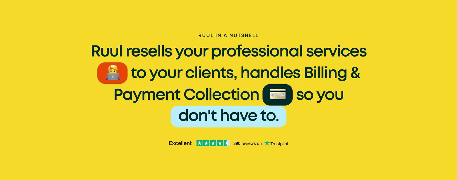
  296. Ruul testimonials section: centered large statement with inline emoji badges and a Trustpilot rating on a bright yellow background
  297. Acctual features section: centered headline above four invoice feature cards with UI snippets, surrounded by 3D clips and crypto stickers
  298. Routable footer section: serif headline with demo button above five link columns and a copyright line on a dark navy background
  299. Aria testimonials section: customer story headline left, customer photo with a stat card right, and a row of customer logos below
  300. Canopy hero section: centered headline and two buttons above cards with a customer photo, line art and a loan dashboard, logos below
  301. Plasma features section: left-aligned heading above four icon columns describing payment capabilities on a charcoal background
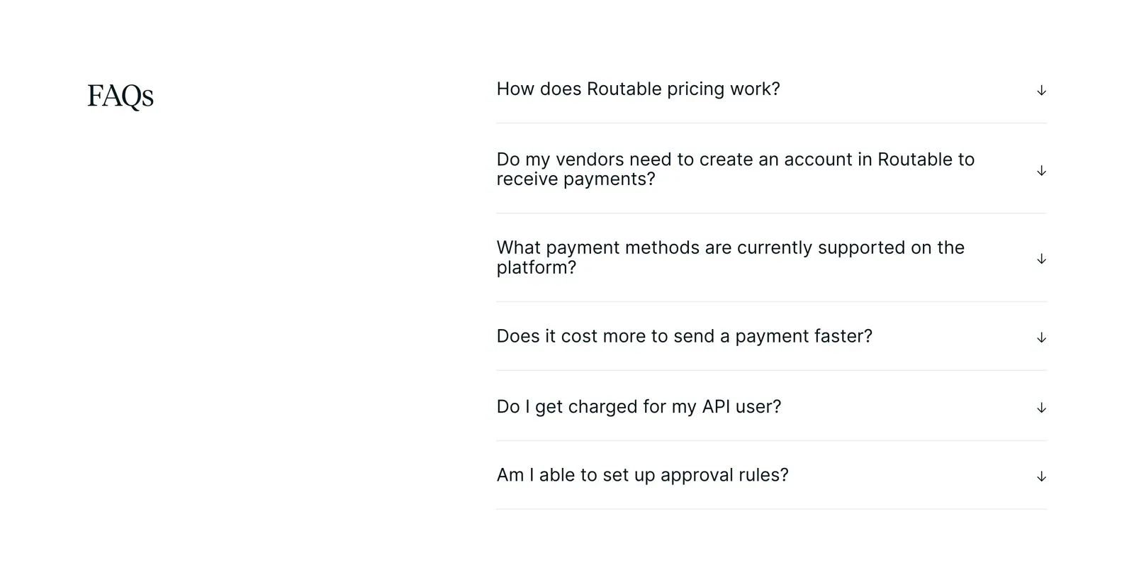
  302. Routable FAQ section: serif FAQs heading on the left beside a six-question accordion with arrow toggles on a white background
  303. Aria footer section: dark teal call-to-action panel with large centered headline above a white footer with logo and five link columns
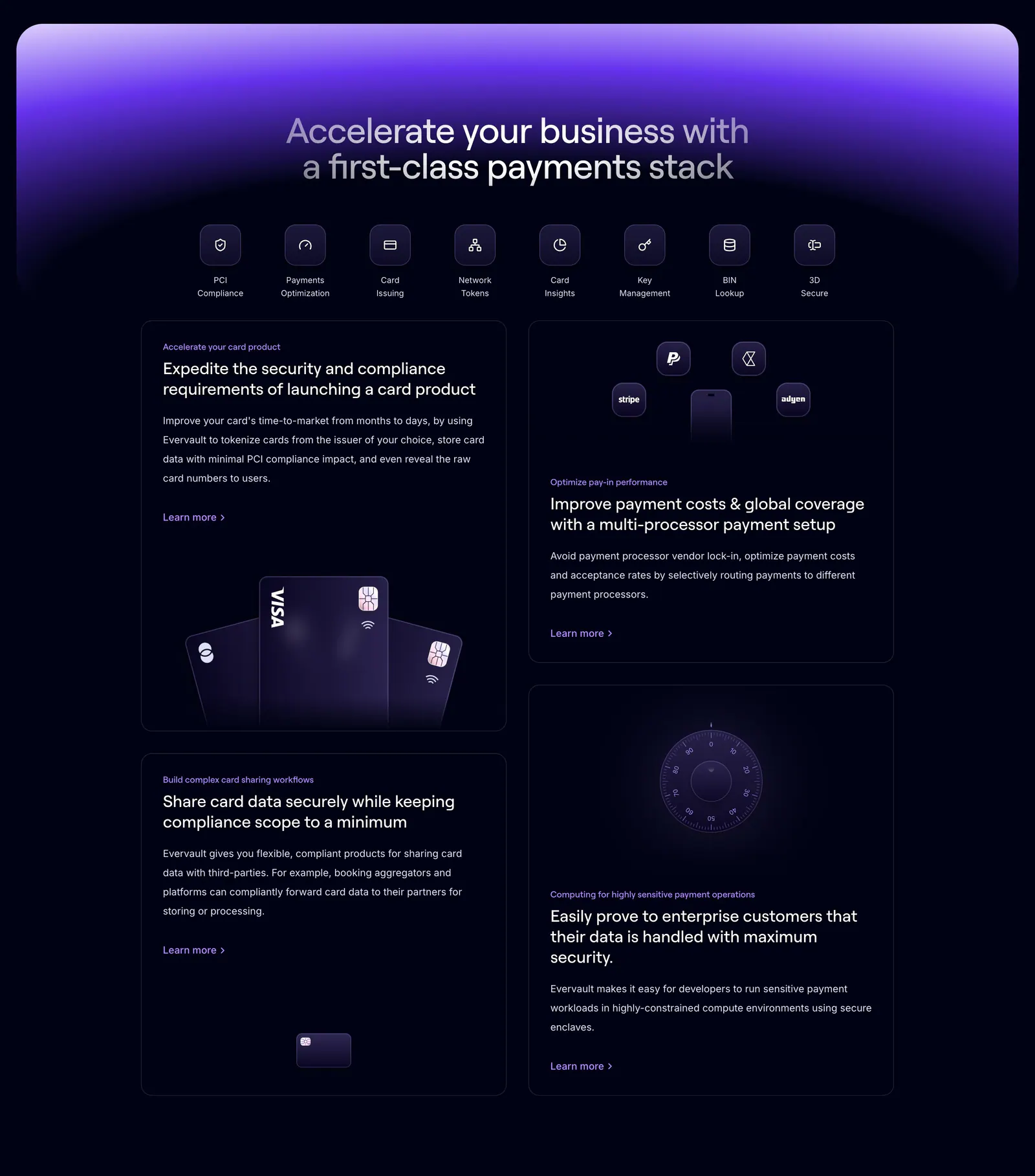
  304. Evervault features section: centered headline and icon row above four dark cards with payment card and vault visuals under a purple glow
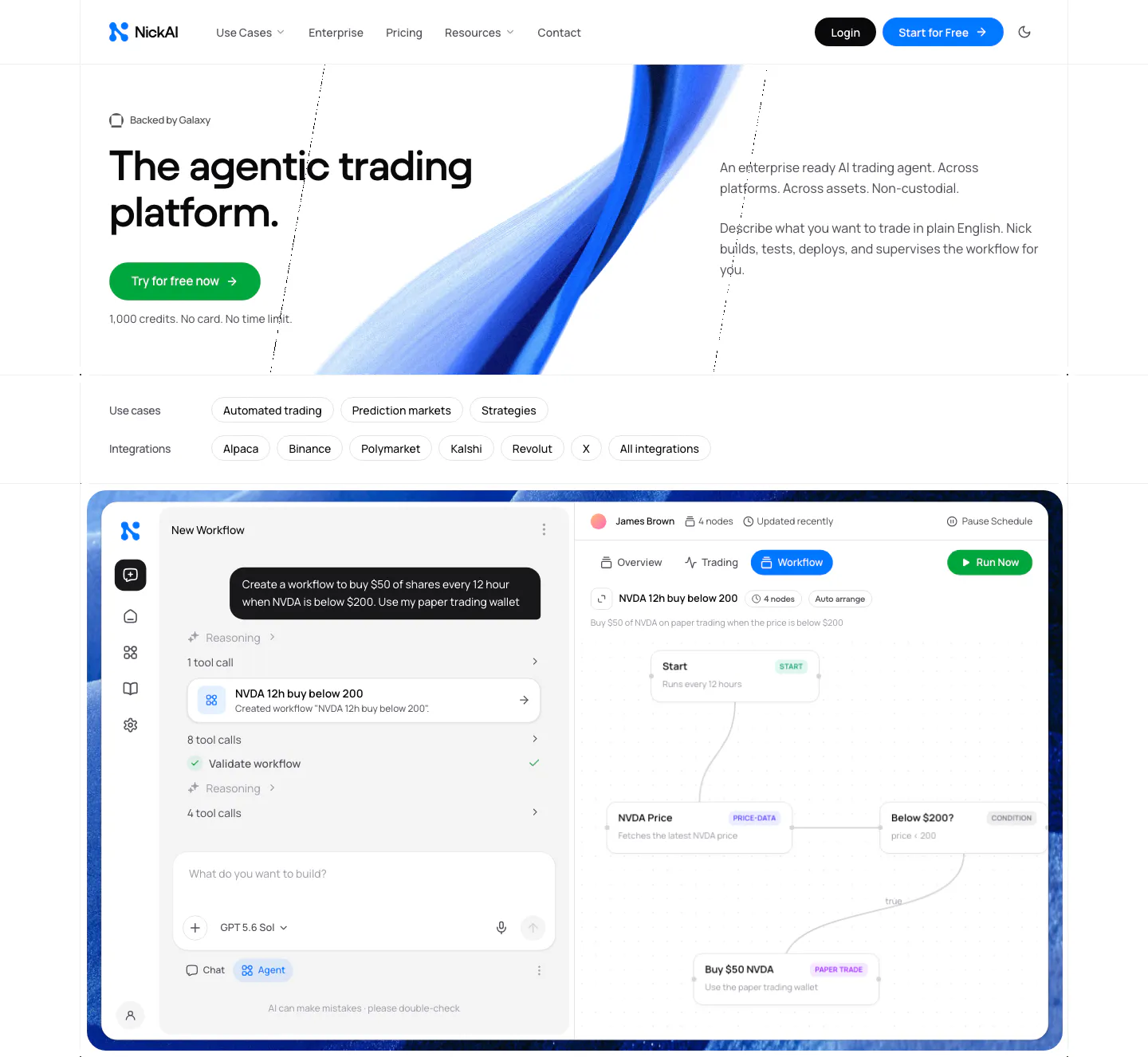
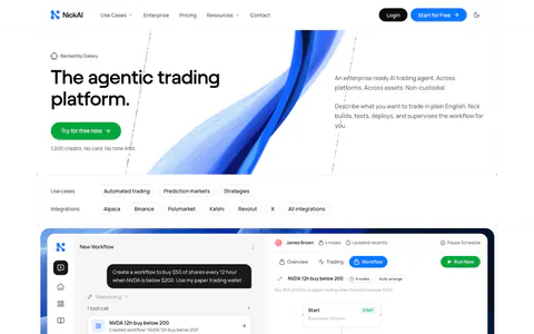
  305. NickAI hero section: nav, left headline with green button, blue ribbon artwork, use-case chips and a large agent workflow screenshot
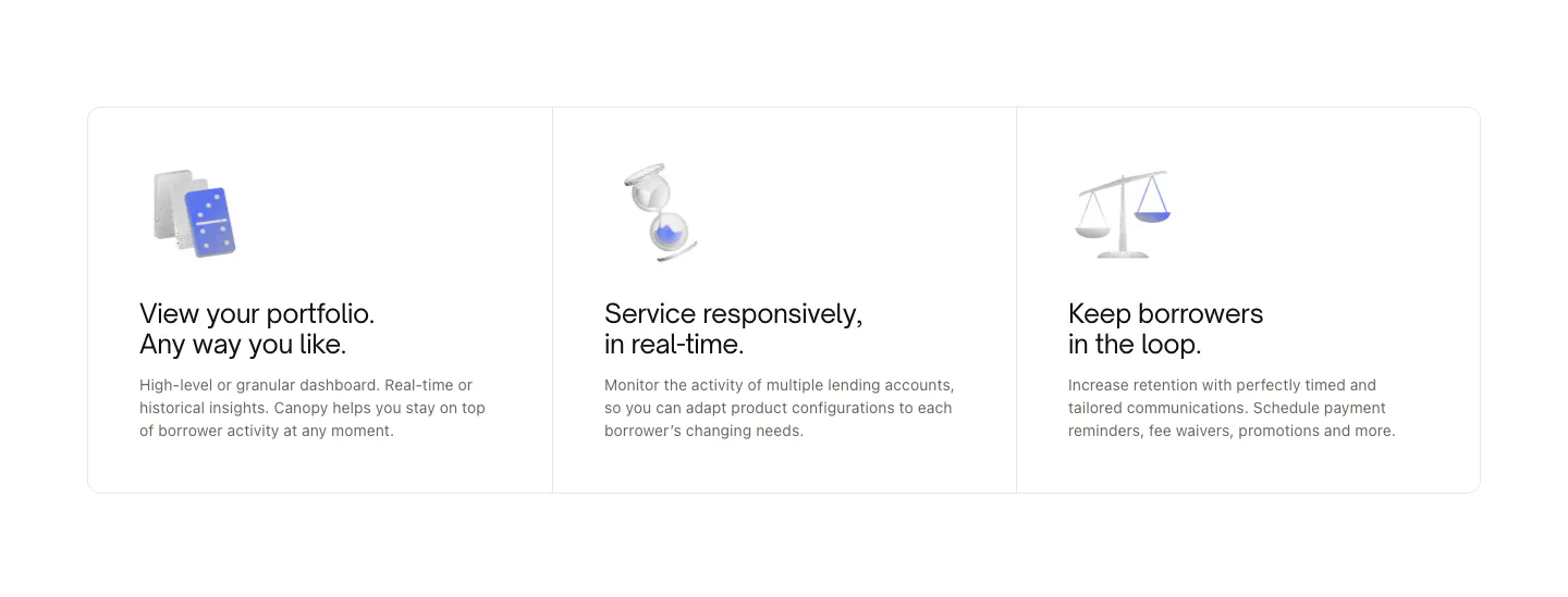
  306. Canopy features section: three bordered cards with small 3D object renders, titles and short descriptions on white
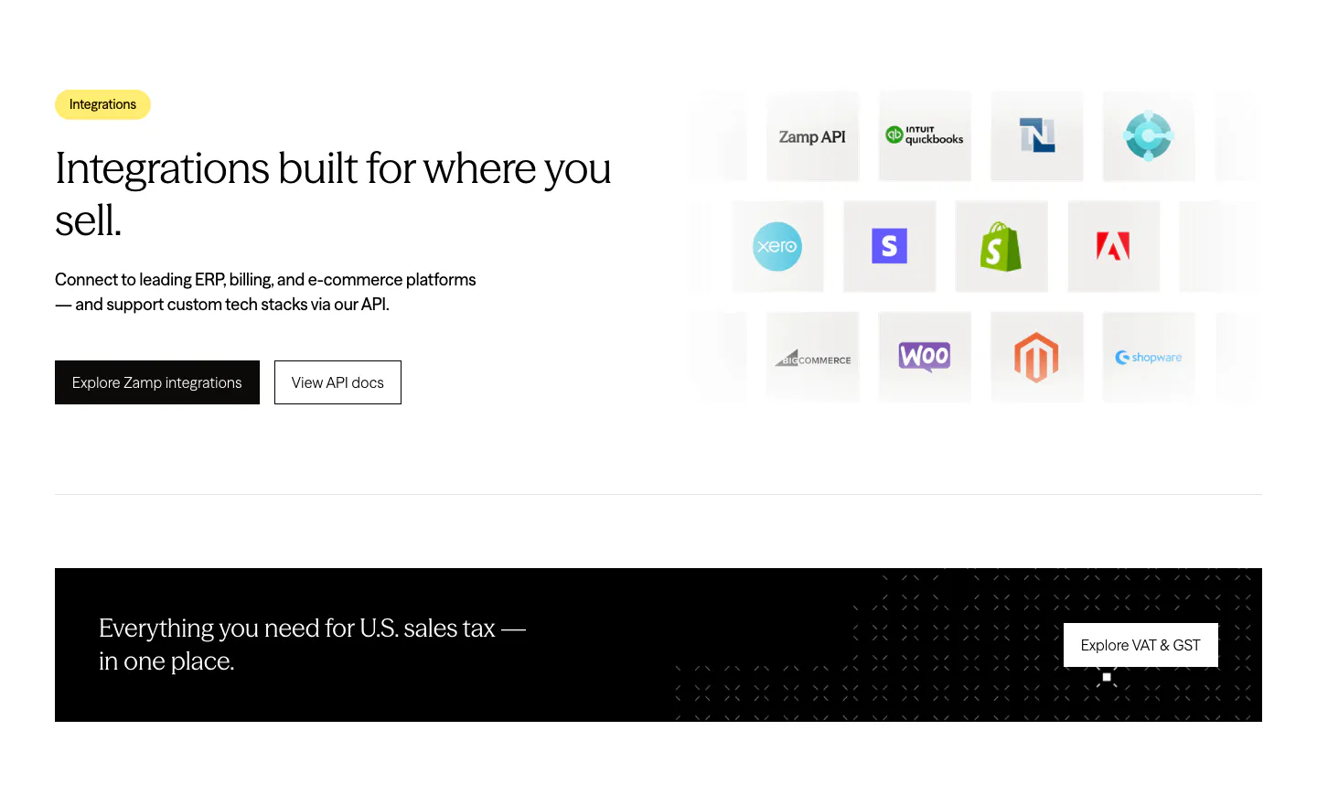
  307. Zamp integrations section: heading and buttons beside a grid of ERP and e-commerce app icon tiles, above a black banner strip
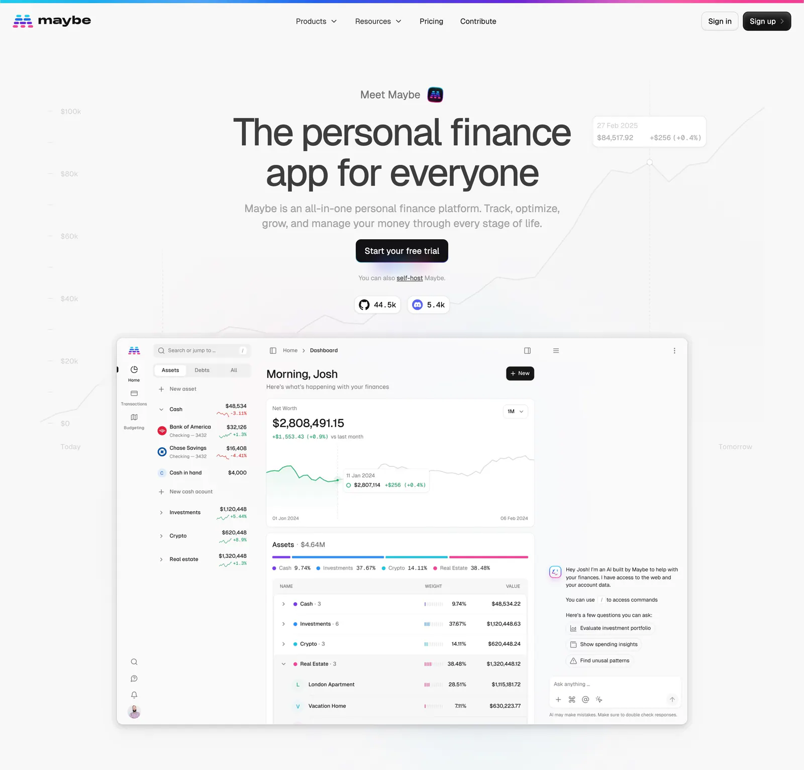
  308. Maybe hero section: centered headline and CTA over a faint chart background above a large finance dashboard screenshot
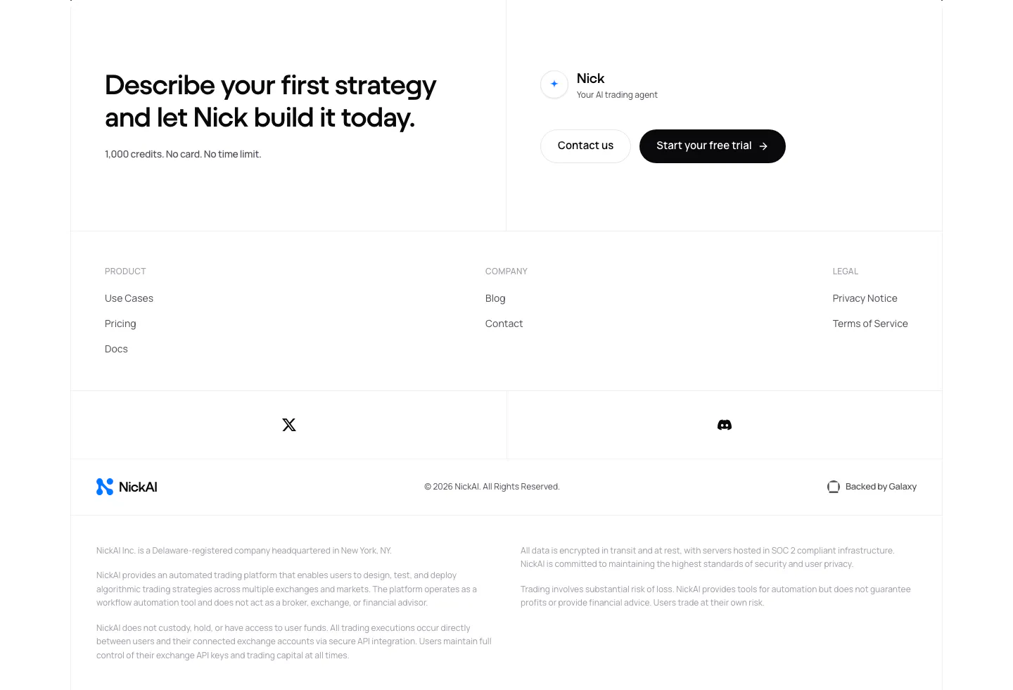
  309. NickAI footer section: closing CTA with contact and trial buttons above link columns, social icons, logo row and legal disclaimers
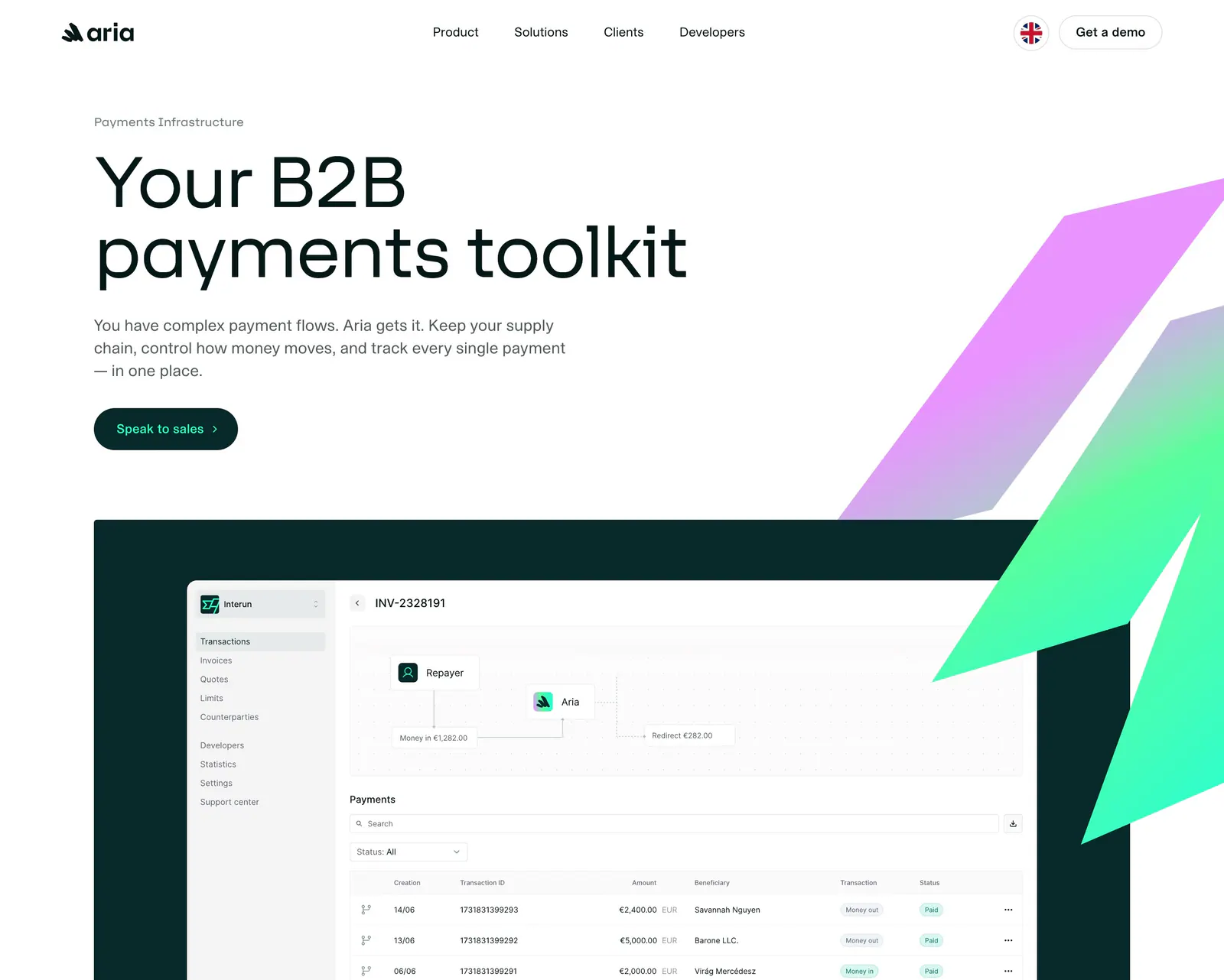
  310. Aria hero section: left-aligned headline and button with purple-green gradient logo shapes above a payments dashboard screenshot

Fintech companies

41 companies in this collection

All companies

Common styles in fintech websites

How to design a fintech website

  1. State who holds the money

    Name the regulated entity, partner bank, or license behind each product, usually in a footnote or footer block. Buyers and their finance teams look for this before they read about features. Phrases like "bank-grade security" invite doubt, while one specific line of legal text settles it.
  2. Show fees as real numbers

    List rates, FX margins, and per-transaction costs in a table, with an example calculation for a typical payment. Hidden or "custom" pricing for basic services makes finance buyers suspicious. If enterprise rates differ, say so, but publish the standard ones.
  3. Make screenshots financially plausible

    Fake balances, round totals, and mismatched currencies stand out to anyone who works in finance. Use realistic amounts, correct currency formatting, and transaction lists that add up. Small errors in a screenshot make a reader wonder about errors in the ledger.

  4. Speak to the CFO and the operator

    The person who signs and the person who uses the product want different things. Give the finance lead controls, audit trails, and accounting integrations. Give the operator speed and fewer manual steps. Separate sections or role-based tabs keep both arguments clear.

All industries
    ↑↓ Navigate ↵ Open

    Section preview

    Website section