How It Works Section Examples

Setup effort is a quiet reason people leave a page. A how it works section answers it by turning the product into a short sequence anyone can follow: sign up, connect your data, see results. The format breaks down when steps stay vague or skip the hard part. These how it works section examples use numbered steps, timelines, and workflow diagrams to make getting started feel manageable.
51 sections

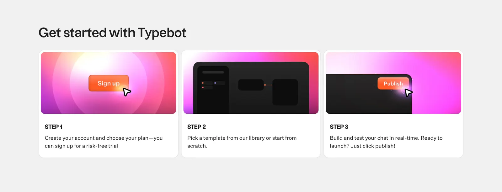
  1. Typebot how it works section: headline above three numbered step cards with pink-orange gradient UI graphics on a light gray background
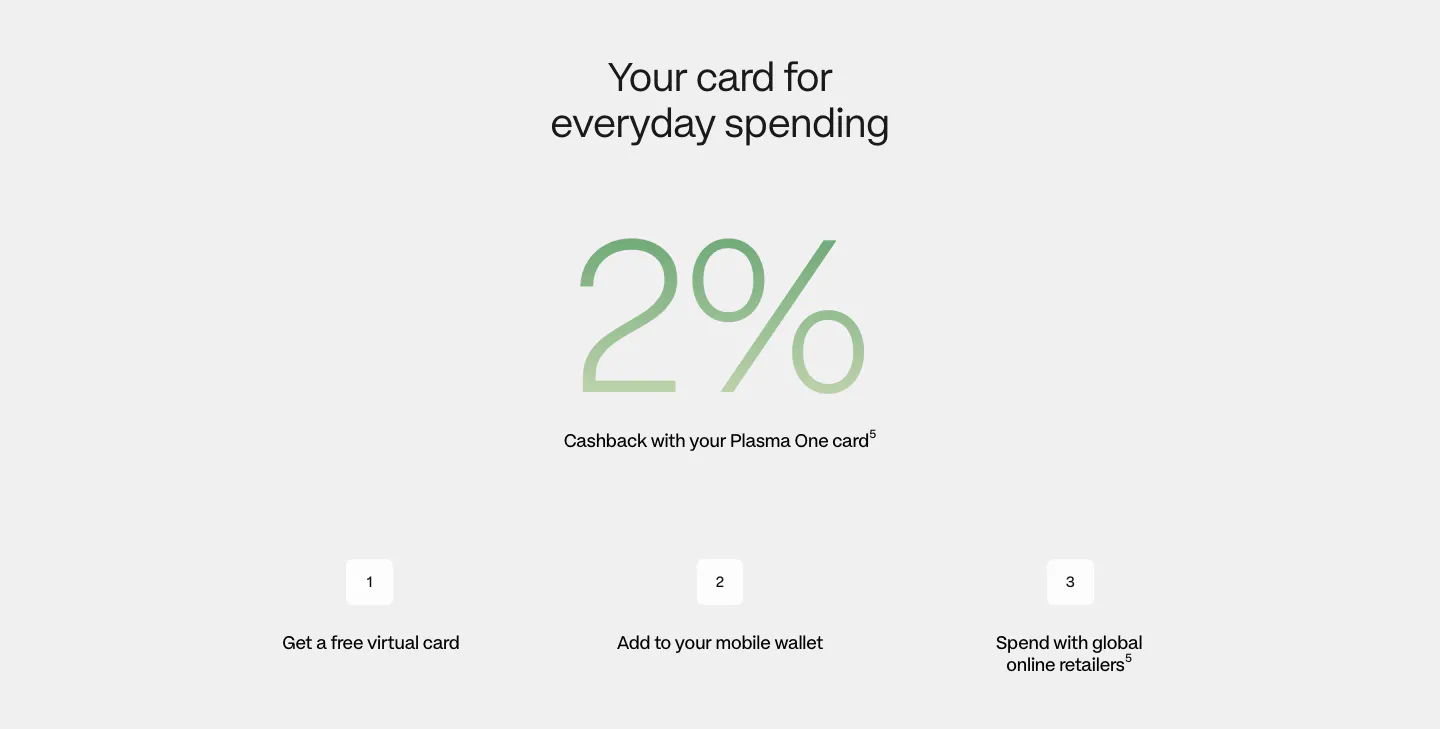
  2. Plasma how it works section: centered heading, giant green gradient 2% figure and three numbered steps on light gray
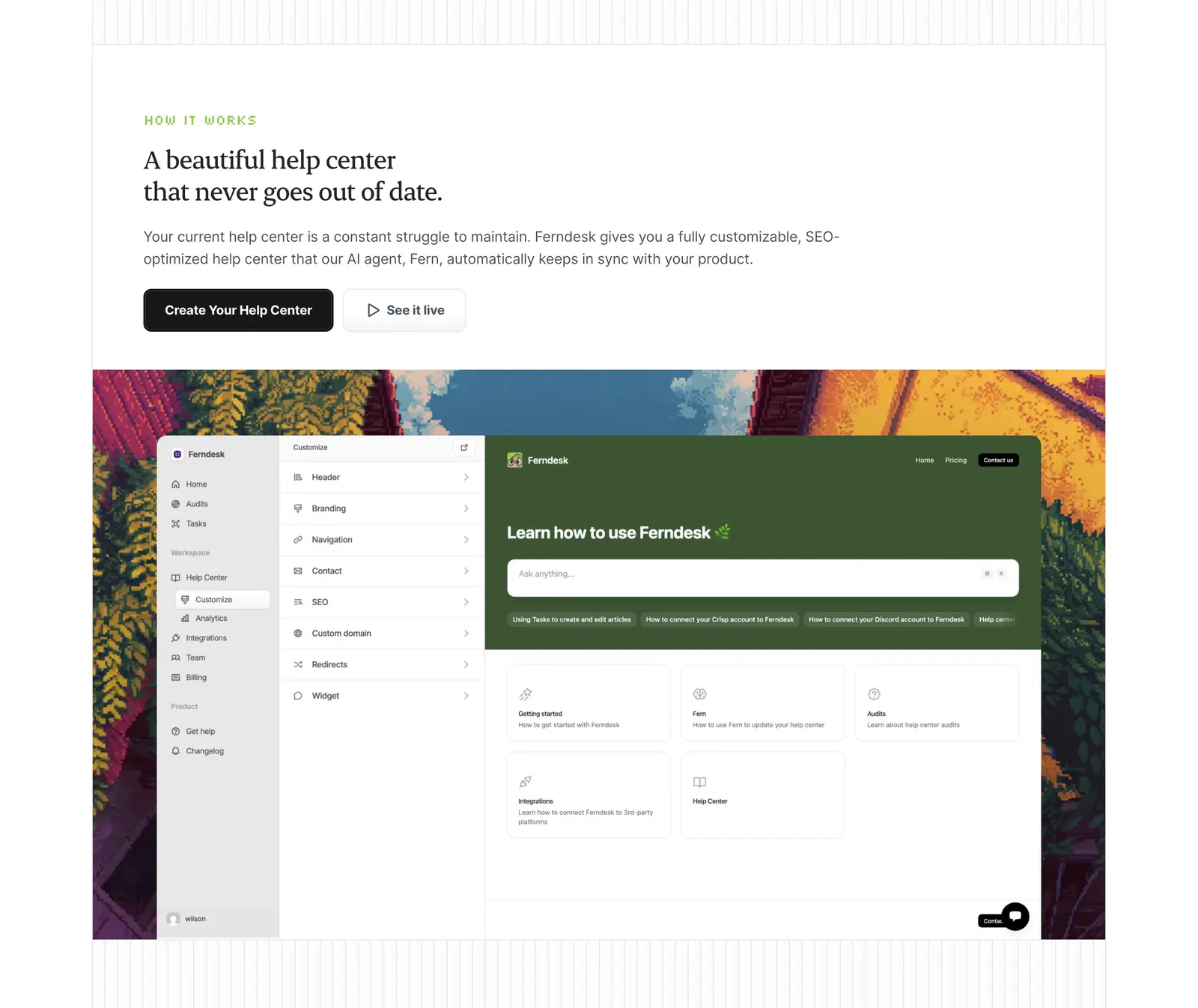
  3. Ferndesk how it works section: serif headline and two buttons above a help center editor screenshot framed by pixel-art scenery
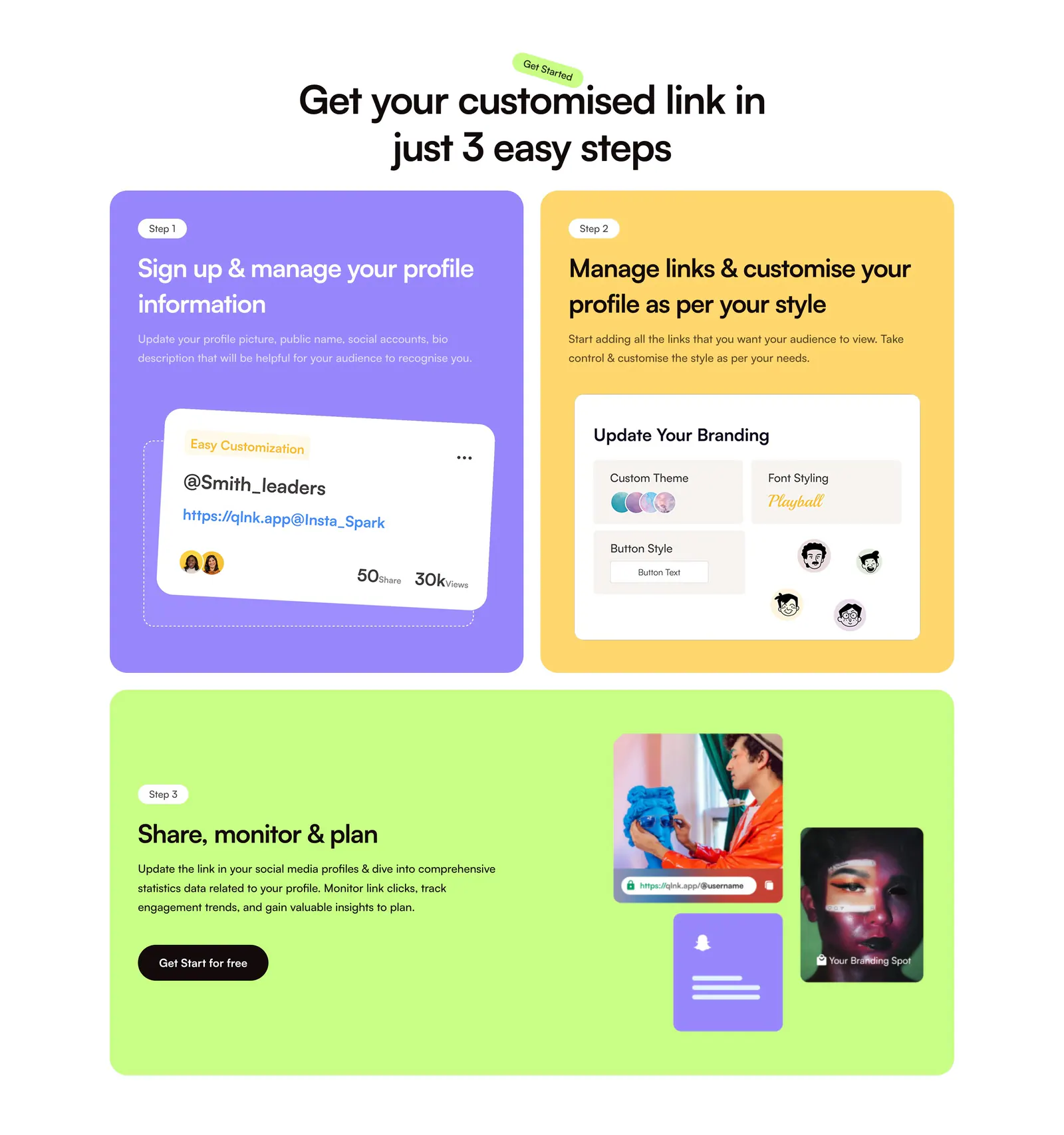
  4. QuickLnk how it works section: centered headline above three step cards in purple, yellow and lime with profile UI mockups and photos
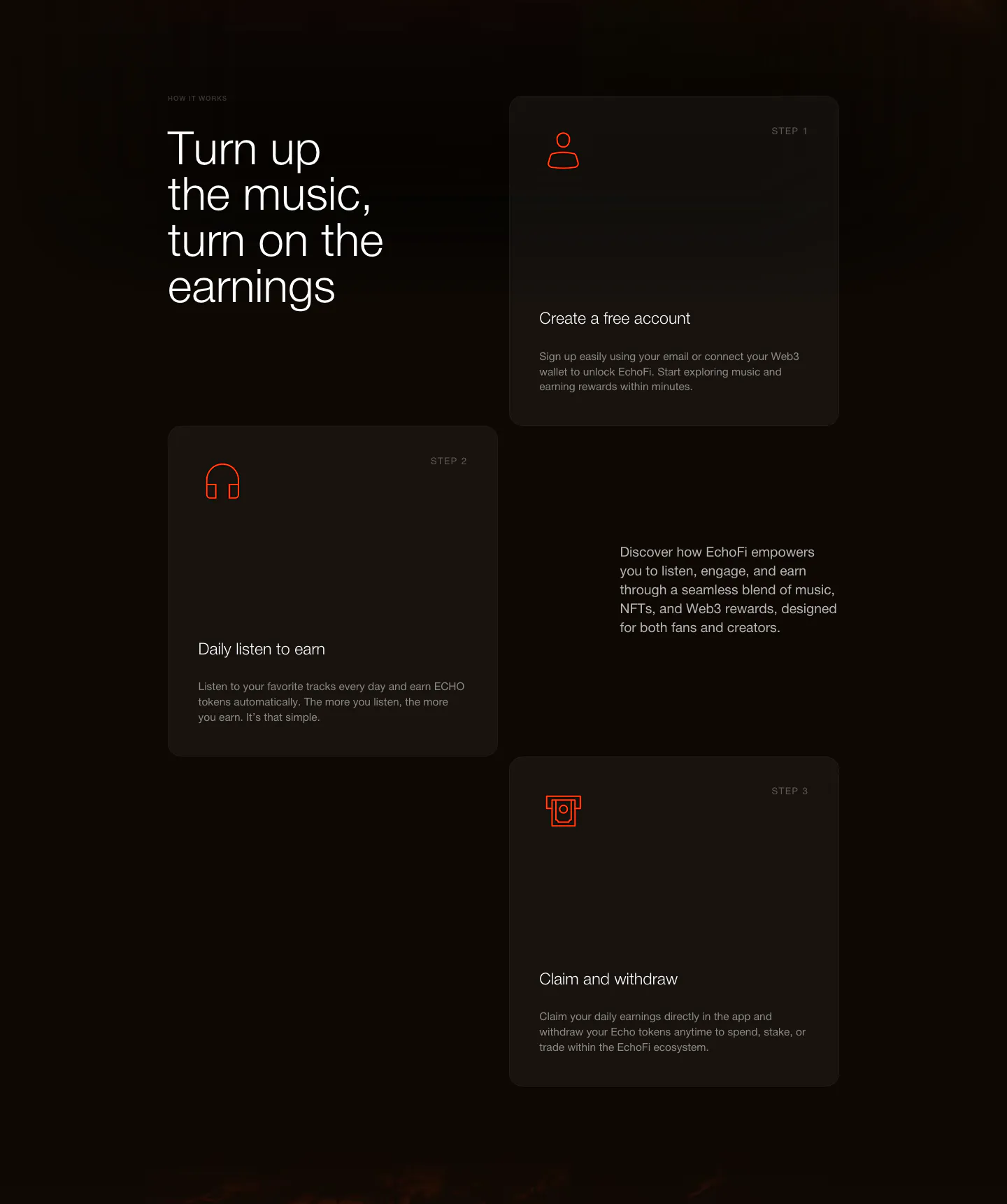
  5. EchoFi how it works section: headline at left with three staggered step cards and orange line icons on a dark background
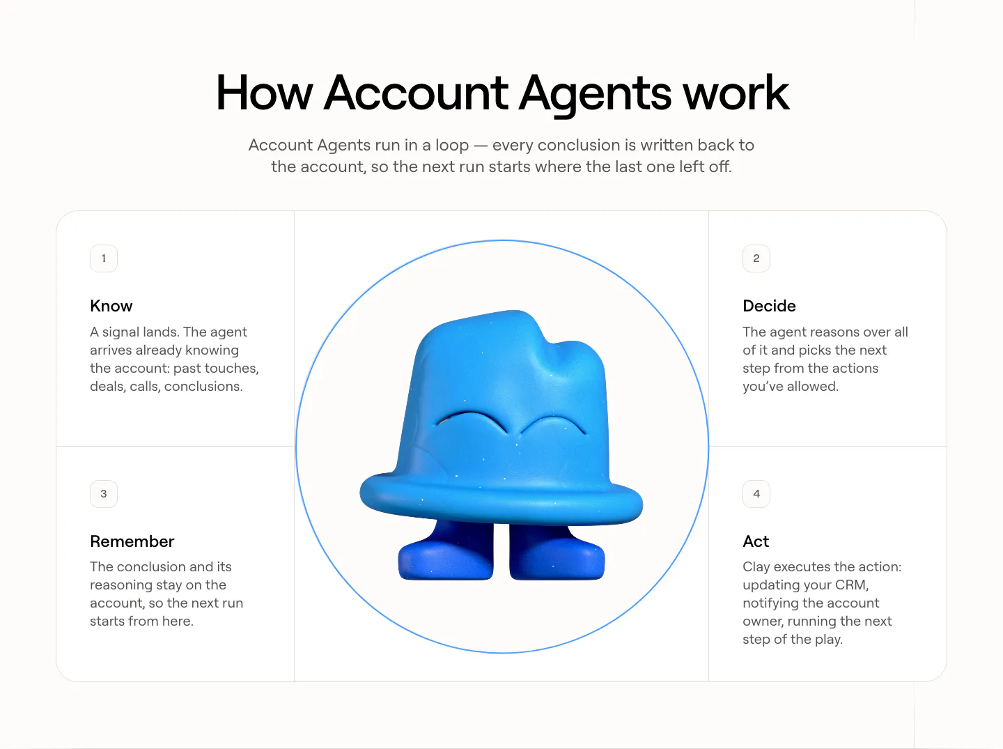
  6. Clay how it works section: centered heading over four numbered step cards arranged around a circle with a blue 3D clay mascot
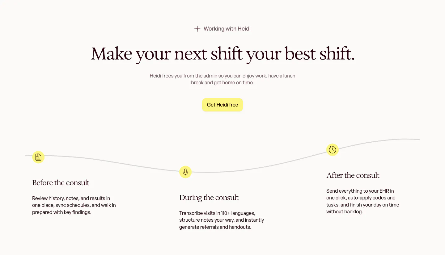
  7. Heidi how it works section: centered serif headline above a wavy timeline with before, during and after the consult steps
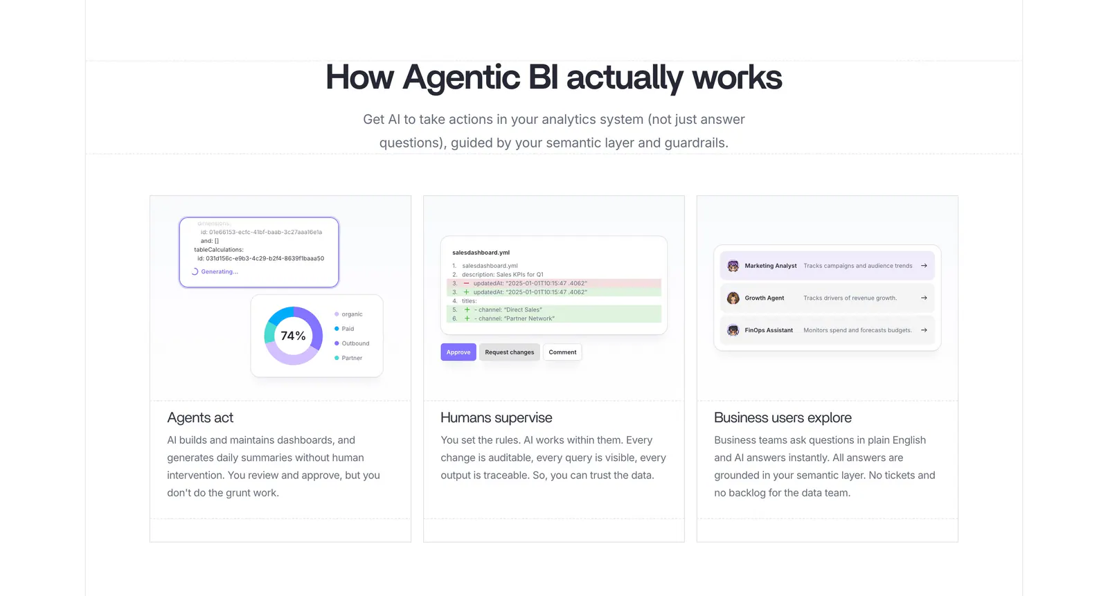
  8. Lightdash how it works section: centered heading above three equal cards with UI snippets for AI agents, a YAML diff review and business users
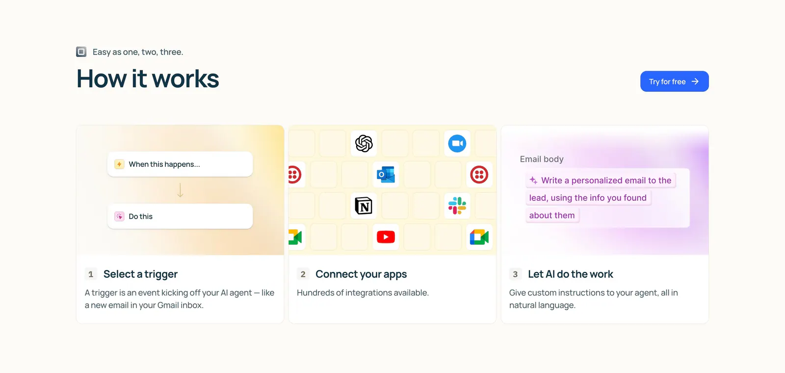
  9. Lindy how it works section: left-aligned heading and button above three numbered step cards with trigger, app icon grid and AI prompt visuals
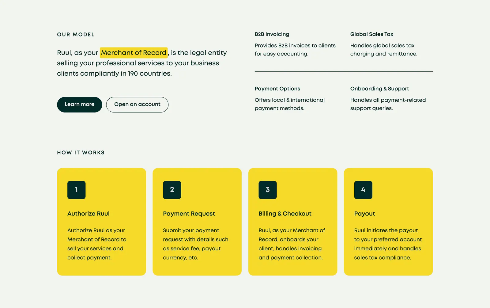
  10. Ruul how it works section: Merchant of Record statement and four feature notes above four numbered yellow step cards on light gray
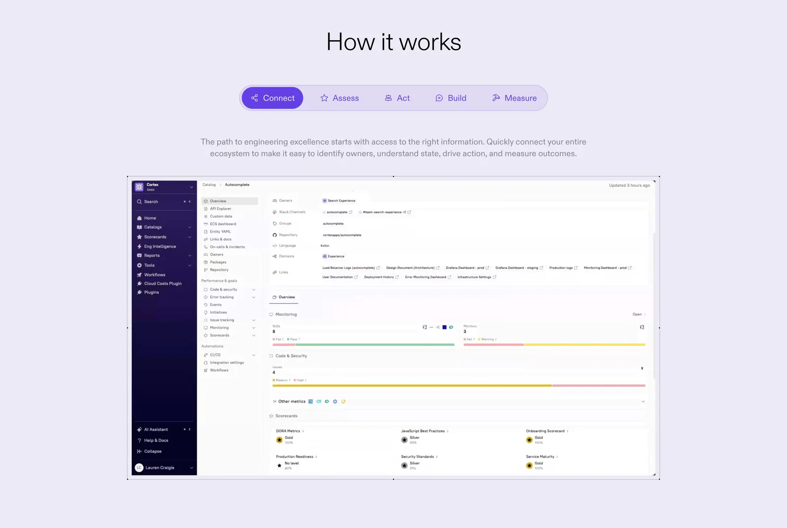
  11. Cortex how it works section: centered heading and five-step tab bar above a catalog dashboard screenshot on lavender
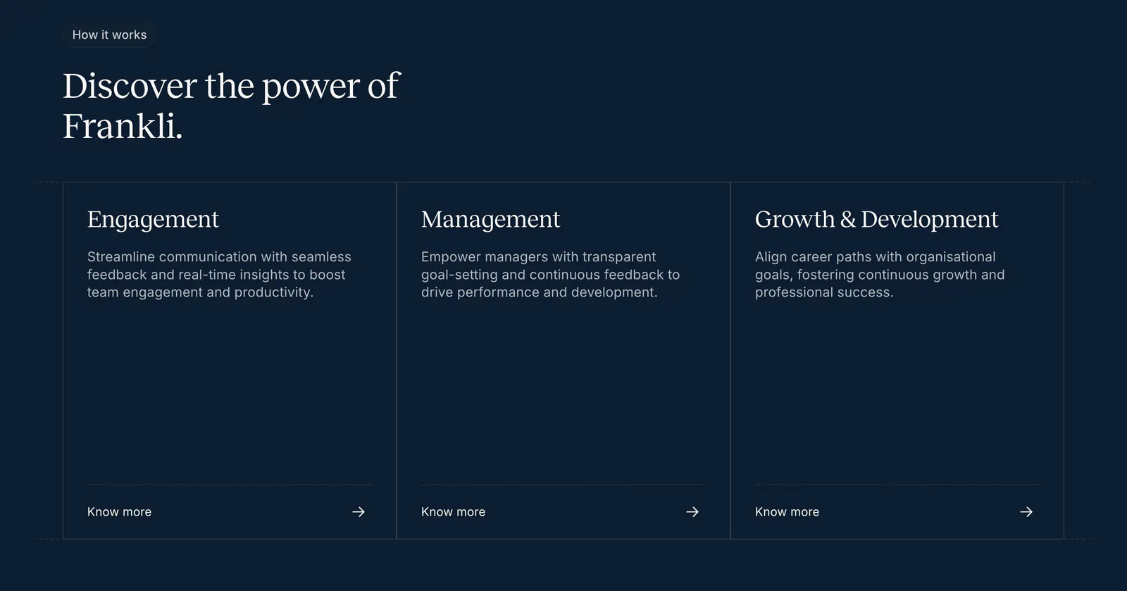
  12. Frankli how it works section: serif heading above three outlined cards for engagement, management and growth with links on navy
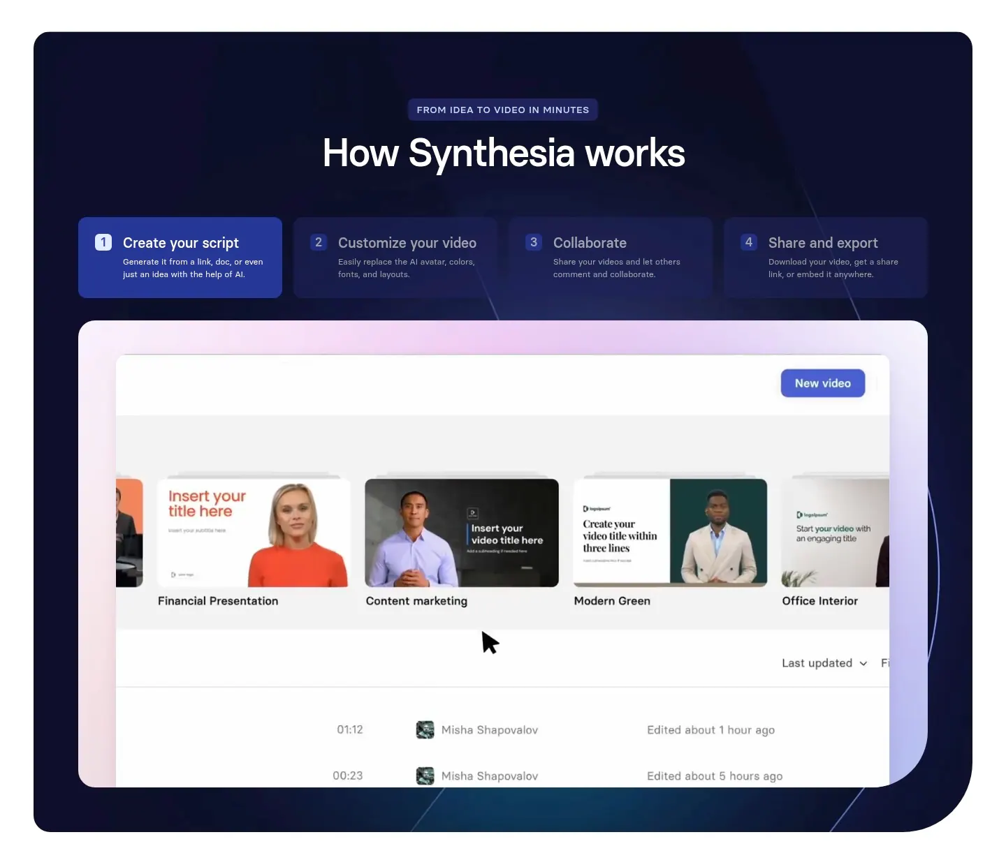
  13. Synthesia how it works section: centered headline over four numbered step tabs and a video library UI screenshot in a dark navy panel
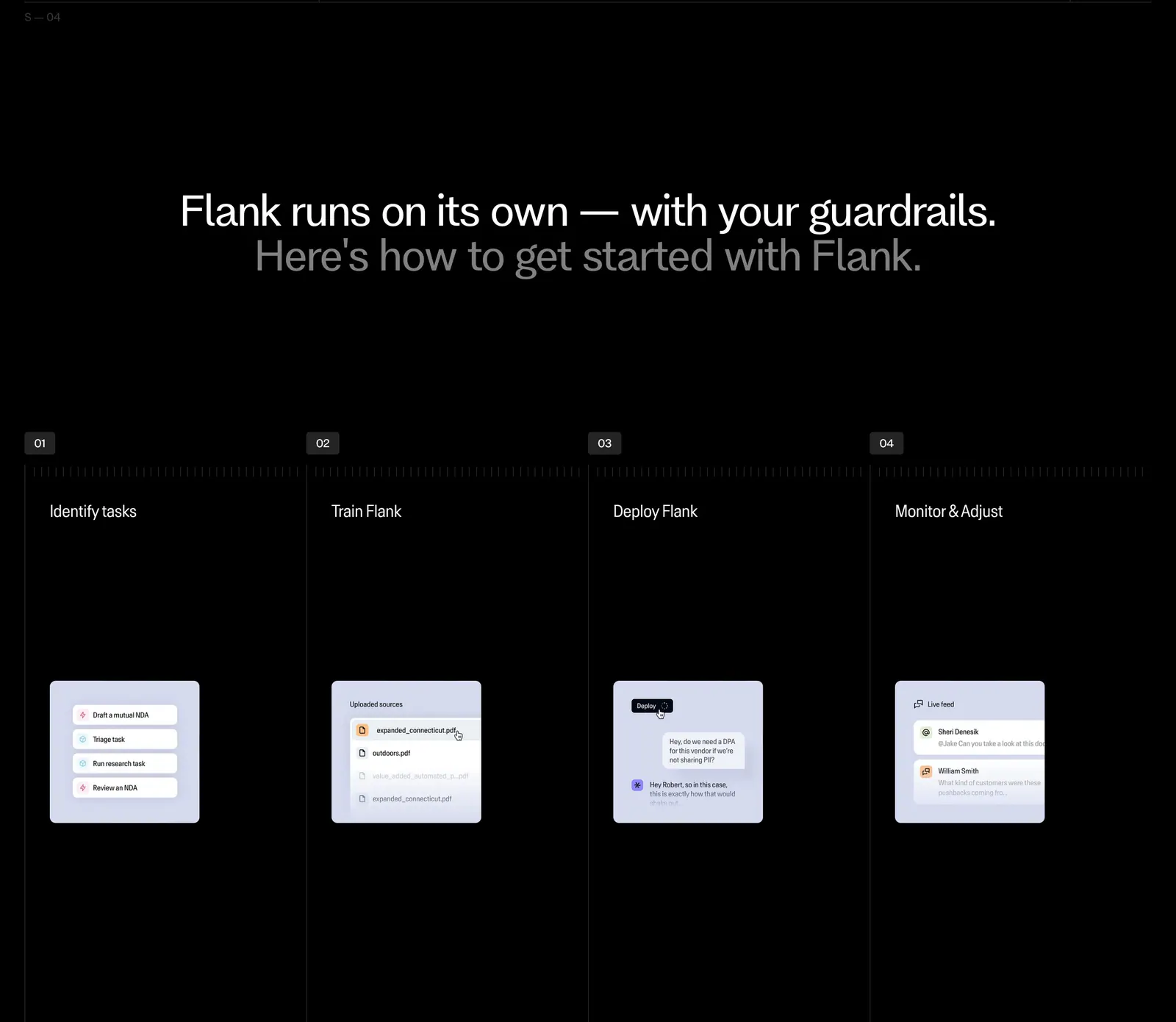
  14. Flank how it works section: centered two-tone headline above four numbered step columns with small UI mockup cards on black
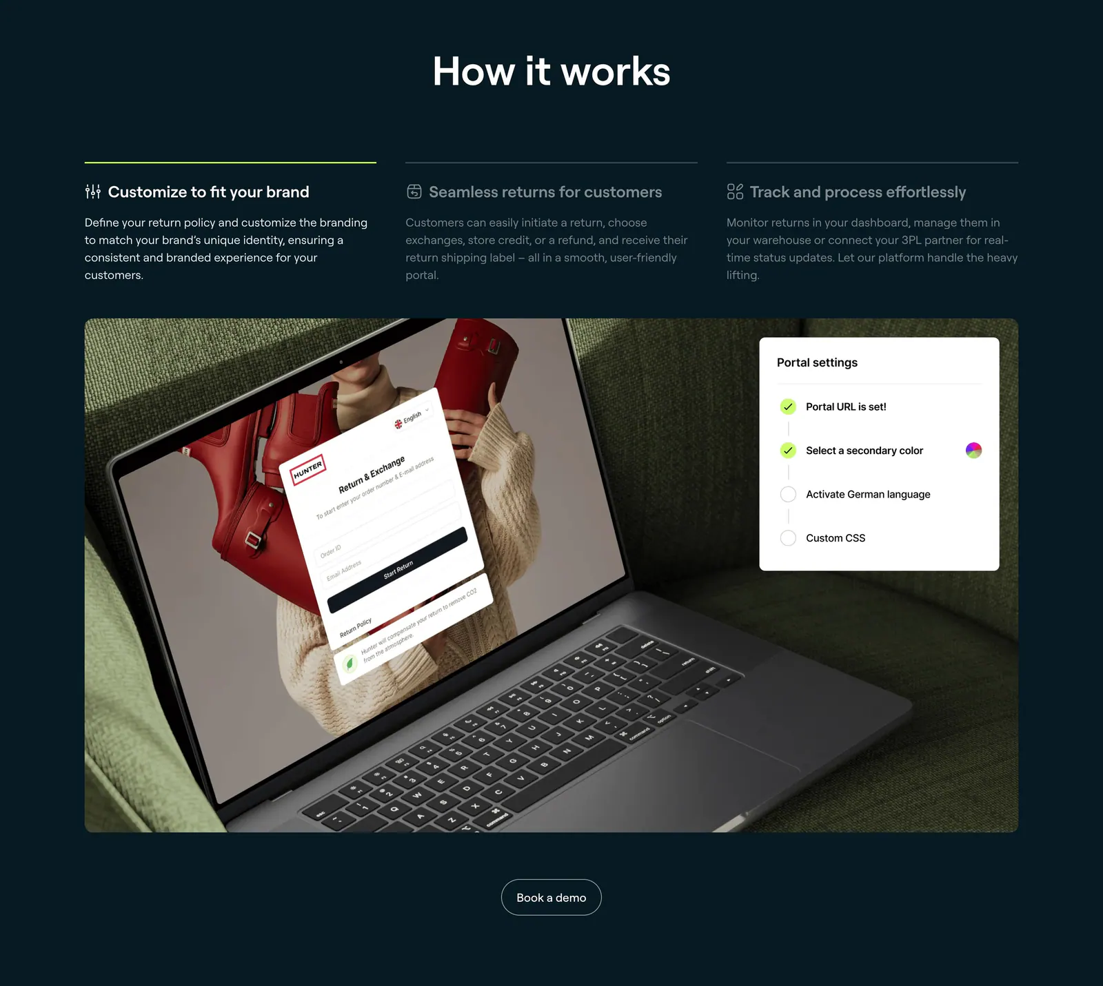
  15. 8returns how it works section: three step tabs on dark navy above a photo of a laptop showing a returns portal with a settings card
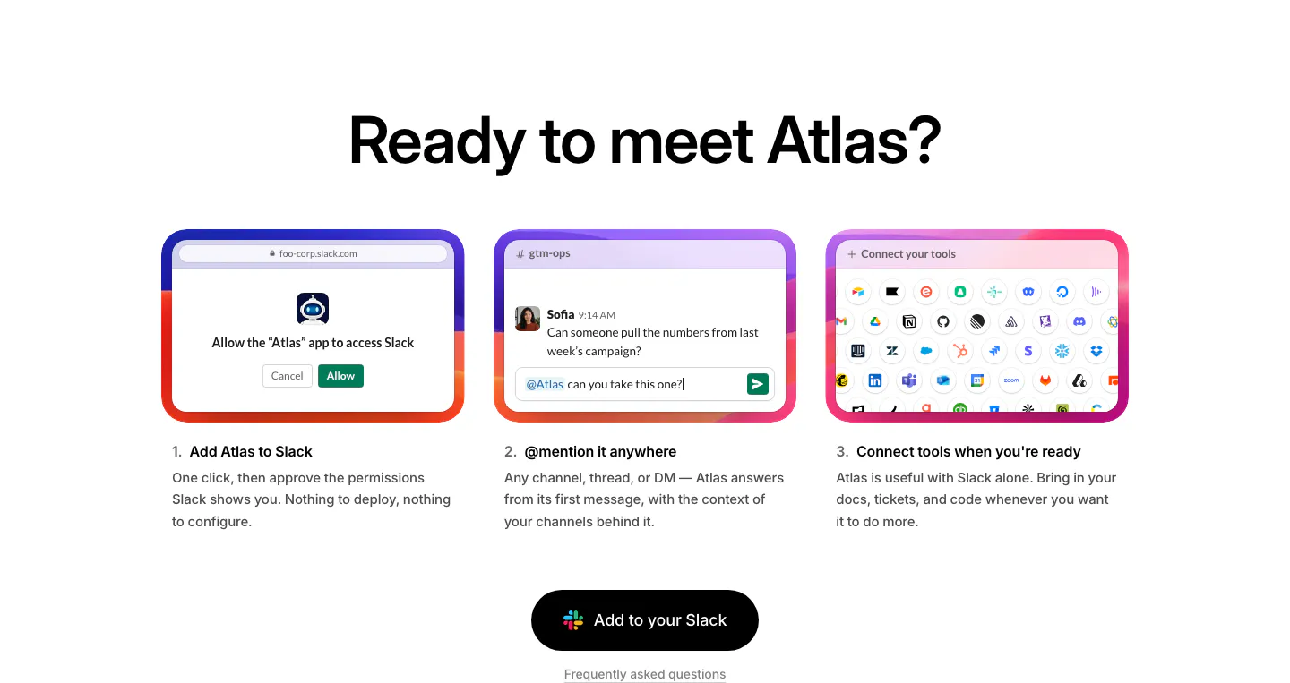
  16. WorkOS how it works section: centered headline above three numbered step cards with UI mockups and a Slack button
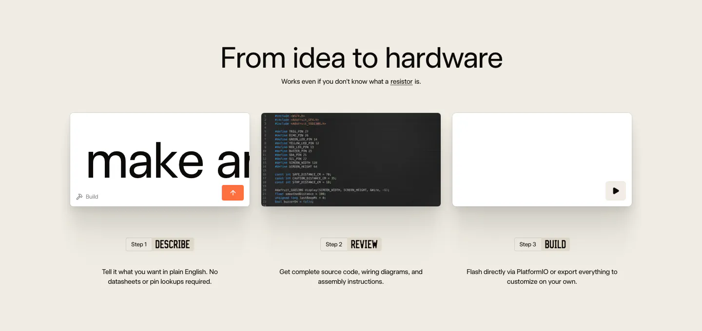
  17. Schematik how it works section: centered headline above three step cards for describe, review and build on beige
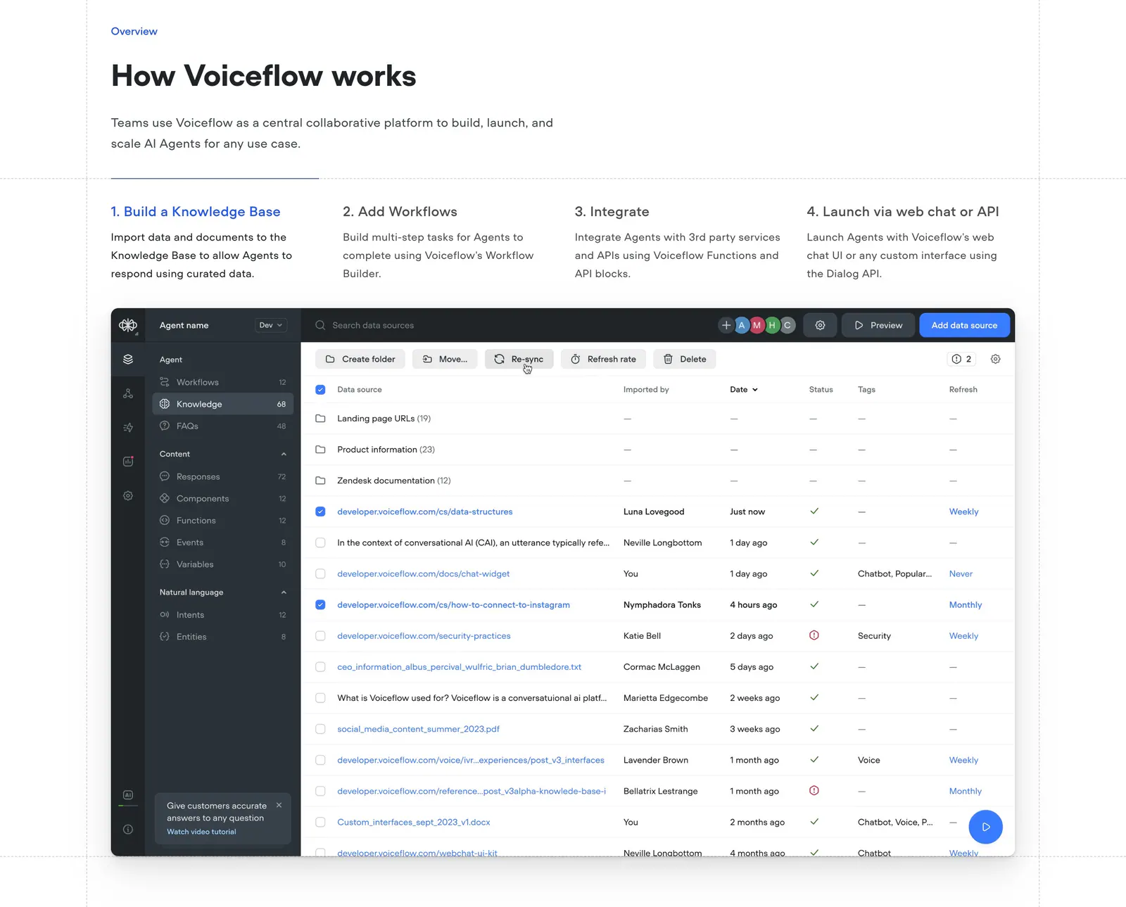
  18. Voiceflow how it works section: headline above four numbered step tabs and a knowledge base data table screenshot
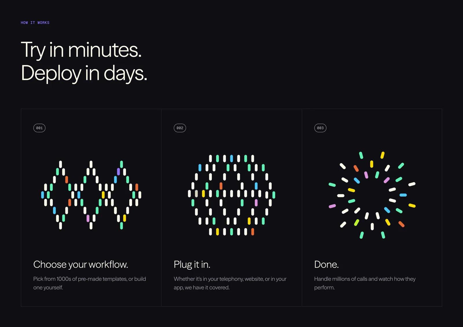
  19. Vapi how it works section: left-aligned headline above three numbered step cards with colorful dot-pill artworks on a black background
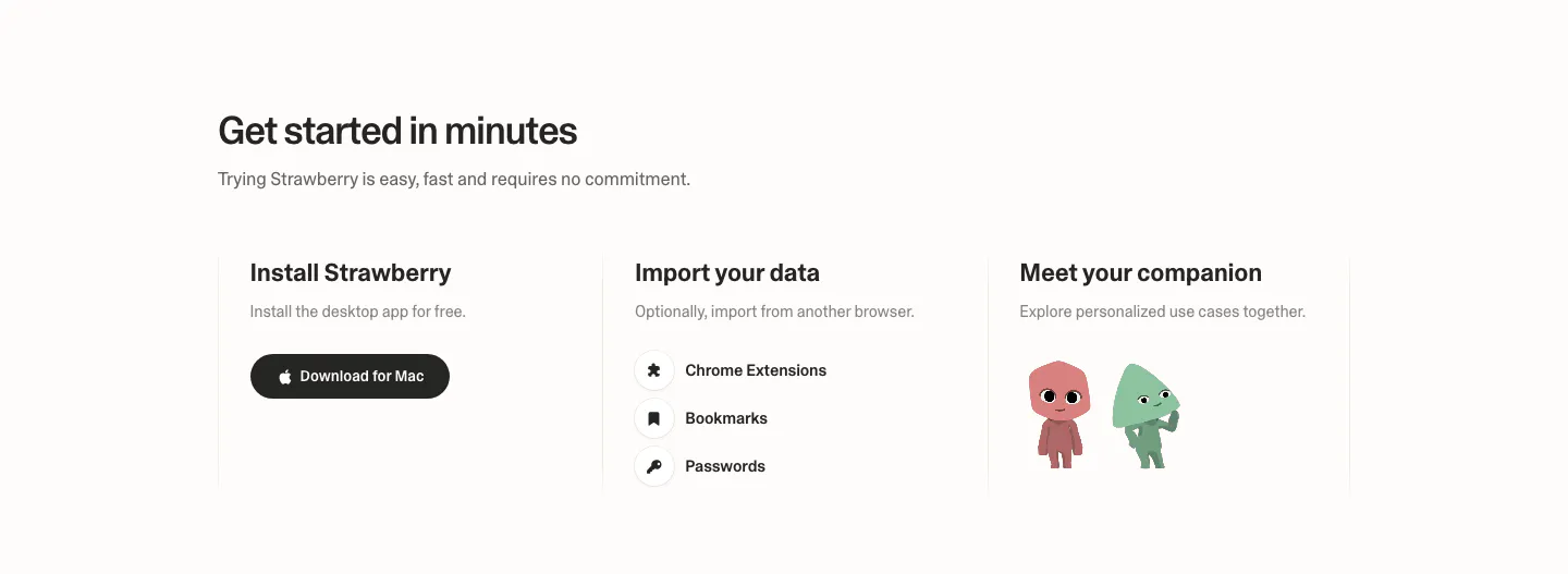
  20. Strawberry how it works section: three columns for install, import data and meet your companion, with a download button and characters
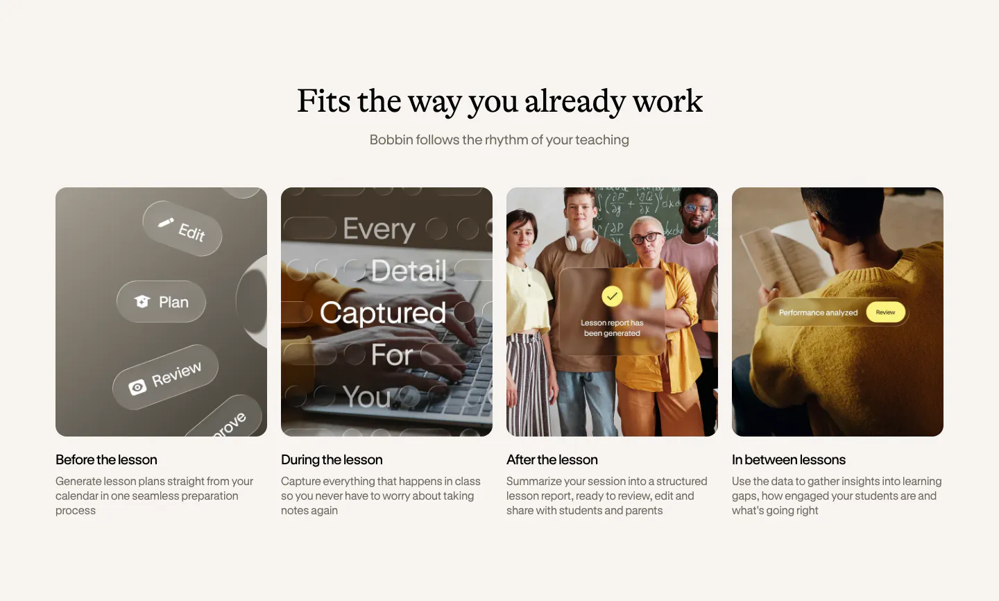
  21. Bobbin how it works section: serif heading above four equal photo cards for before, during, after and between lessons
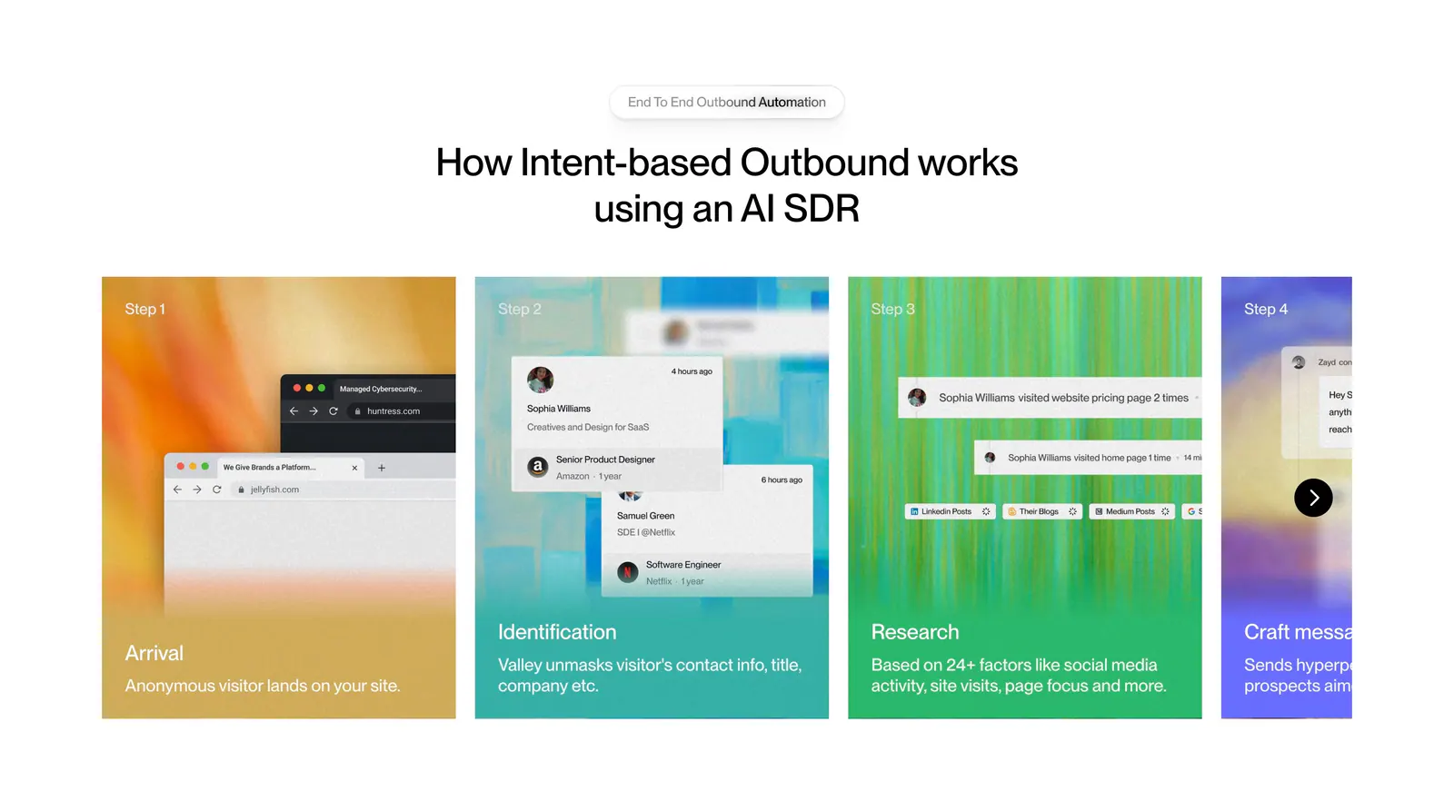
  22. Valley how it works section: centered headline above a carousel of numbered step cards with colorful textured backgrounds and UI snippets
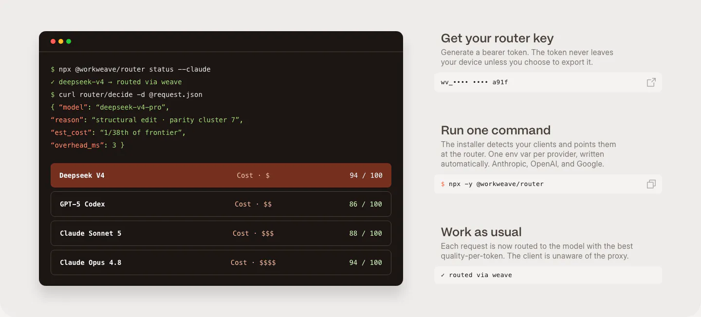
  23. Weave how it works section: dark terminal window with router commands and model scores beside three setup steps with copyable fields
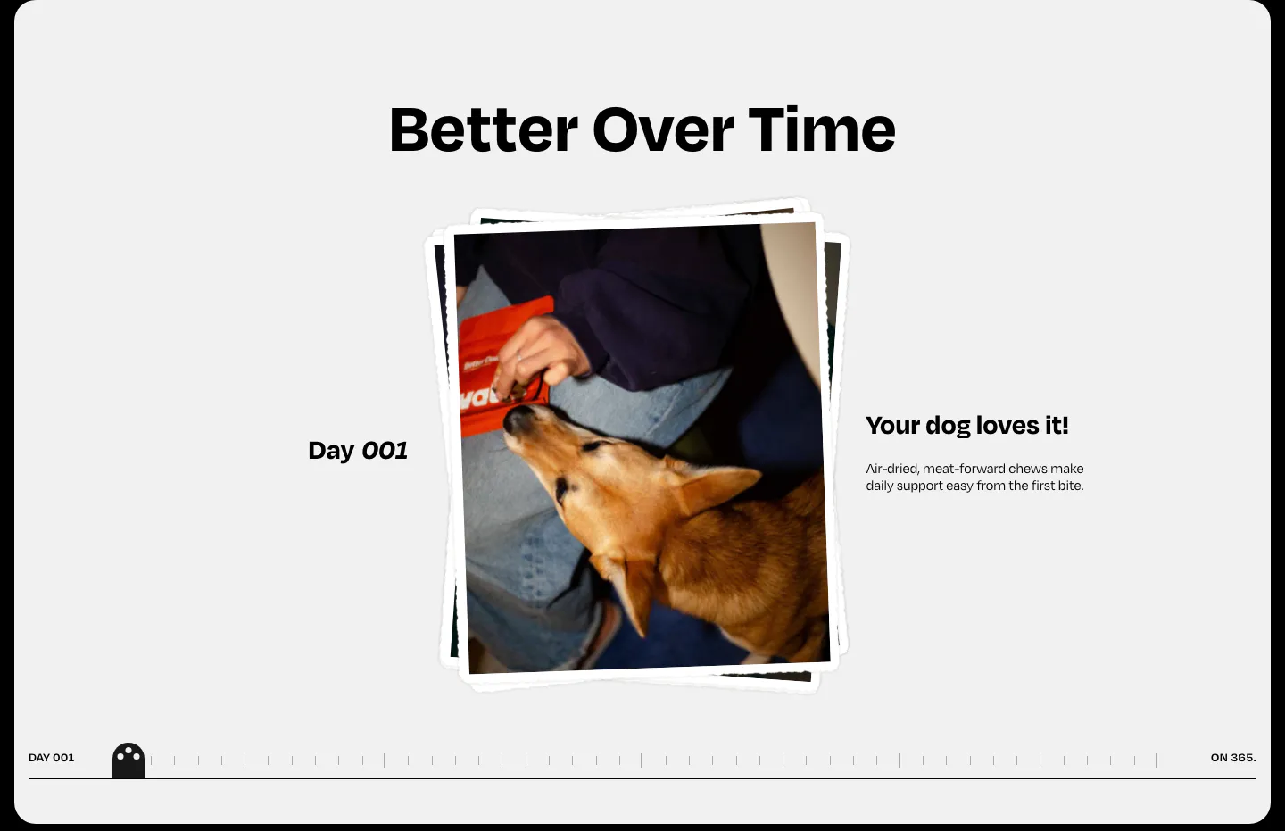
  24. Watts how it works section: centered heading over a stacked dog photo, day label and caption with a day-by-day timeline scrubber
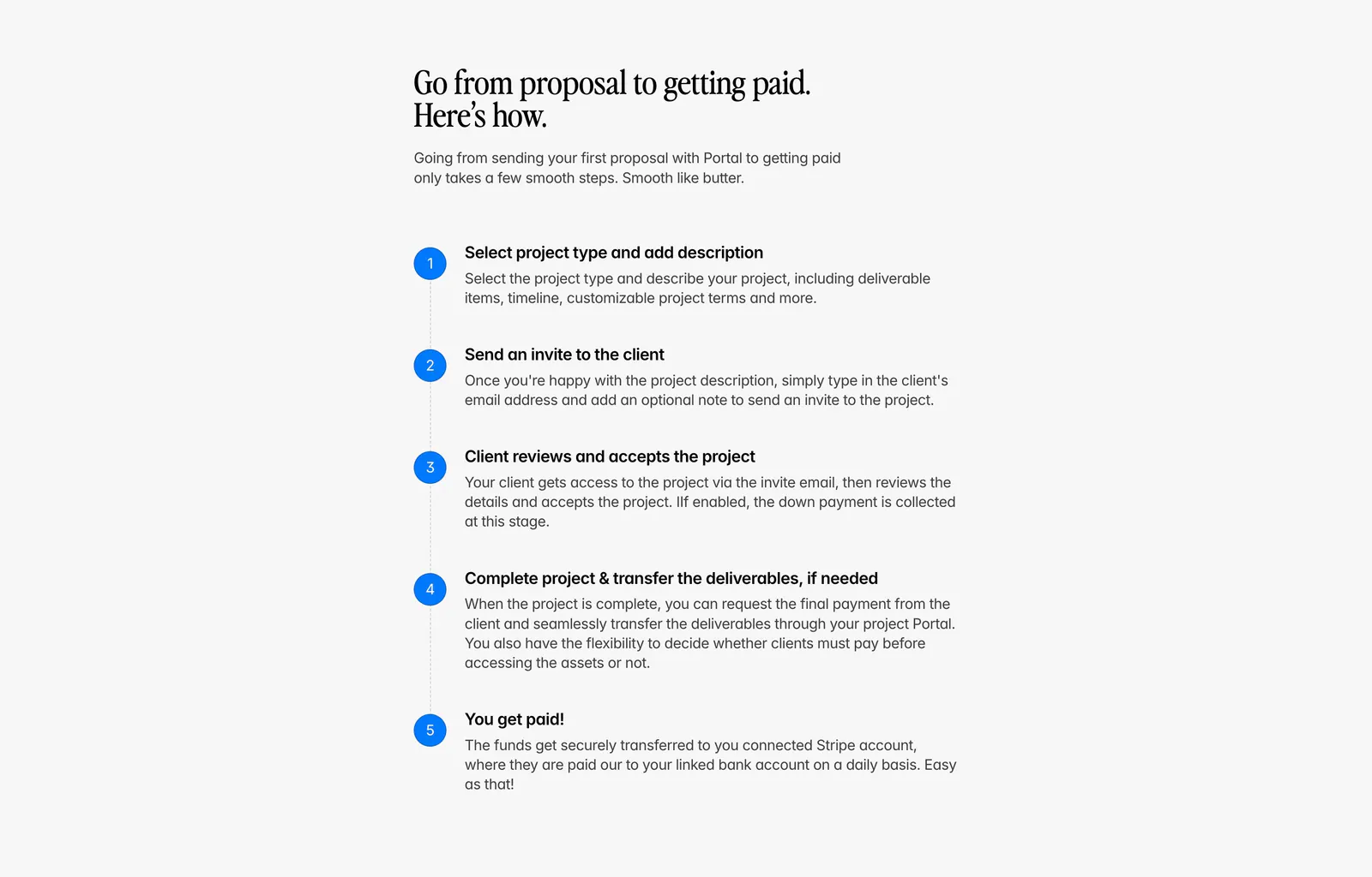
  25. Portal how it works section: serif headline above a vertical five-step list with blue numbered circles on a light gray background
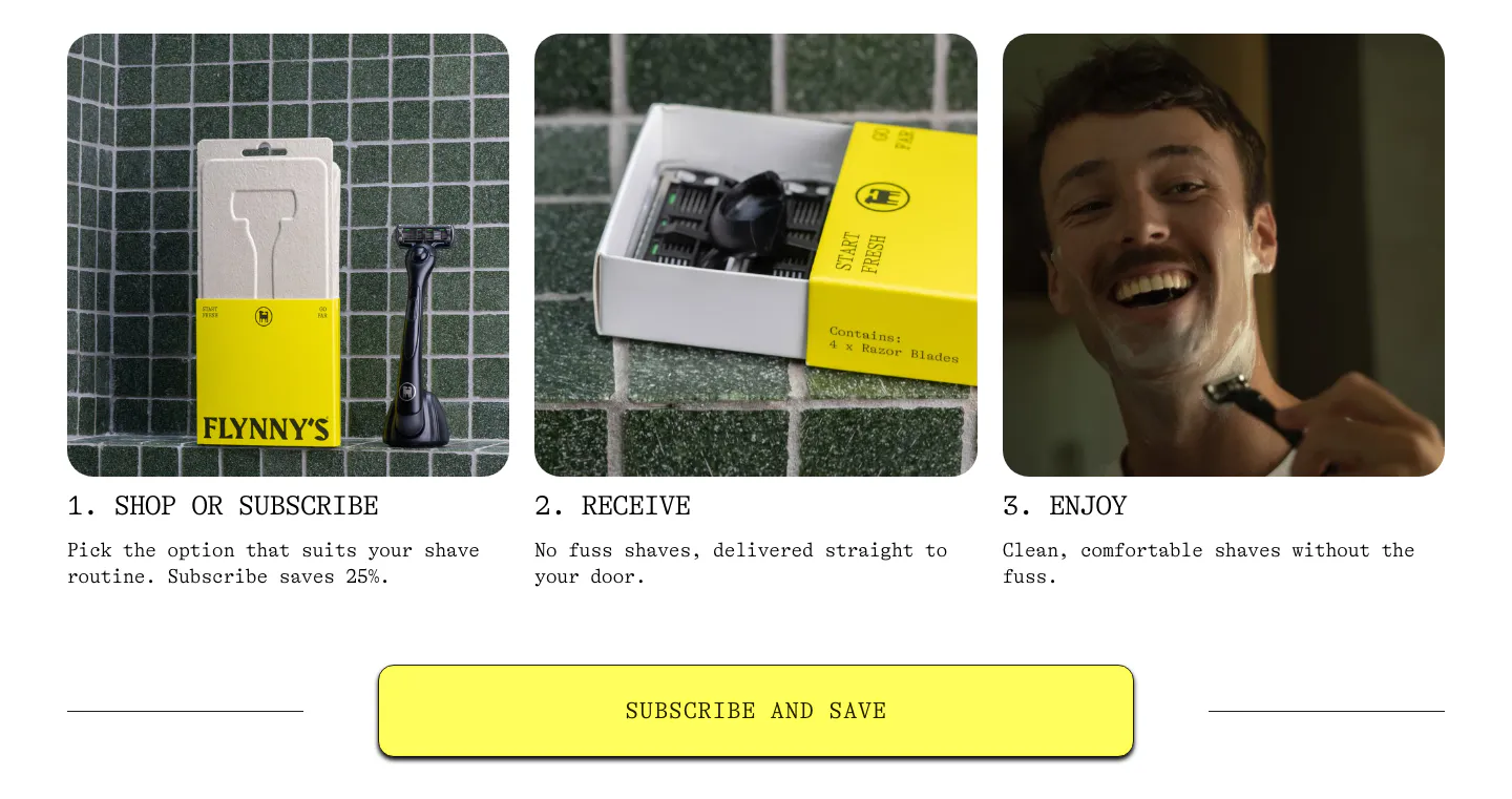
  26. Flynny's how it works section: three numbered step cards with product and lifestyle photos above a wide yellow Subscribe and Save button
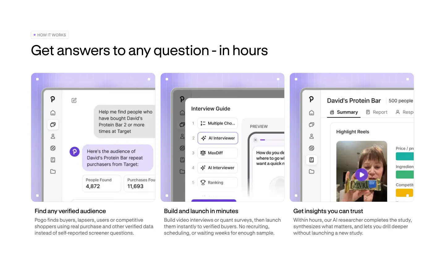
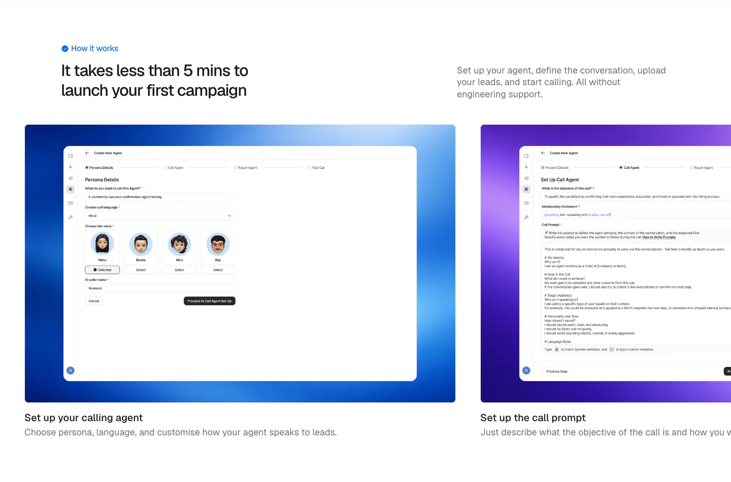
  27. Pogo how it works section: three cards with lavender-framed product screenshots and short step descriptions below a left-aligned headline
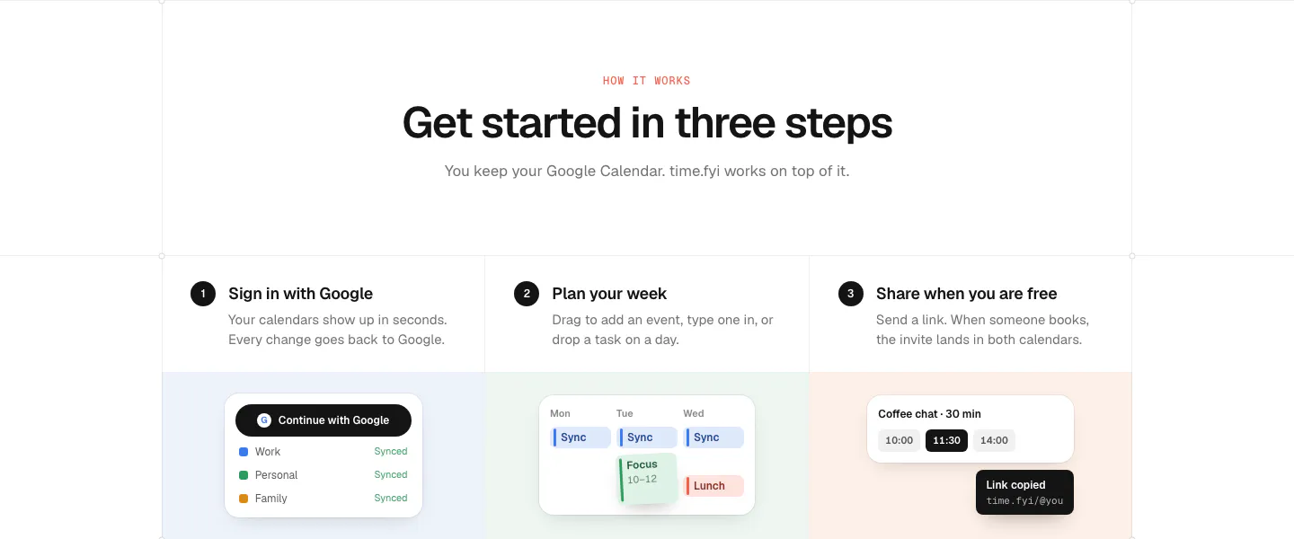
  28. time.fyi how it works section: centered header above three numbered step columns with small UI snippets on pastel panels
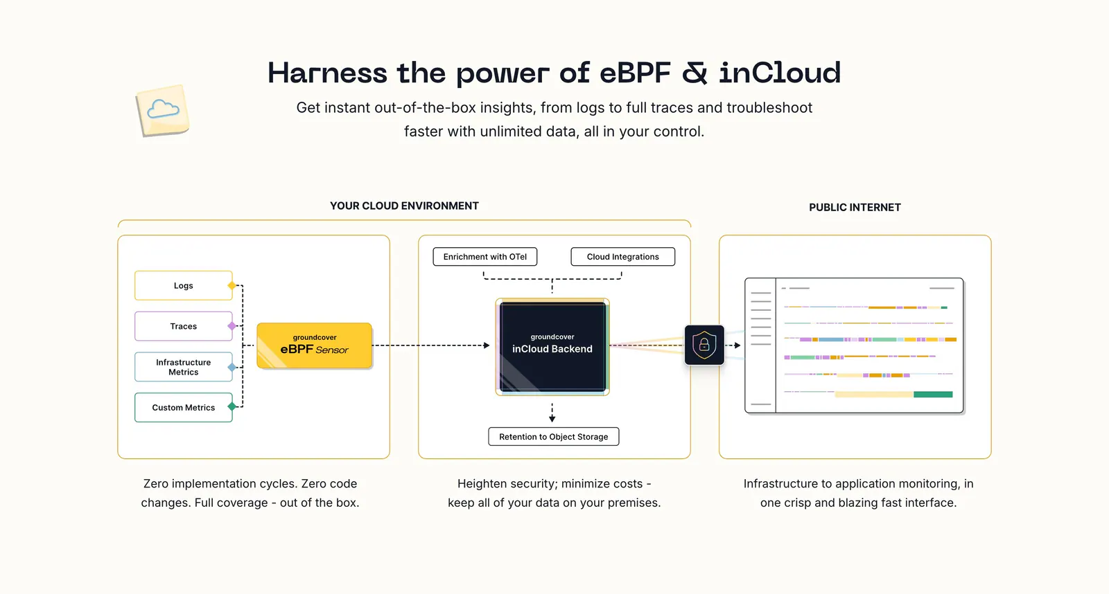
  29. groundcover how it works section: centered headline above an architecture diagram flowing from sensor to backend to UI with captions
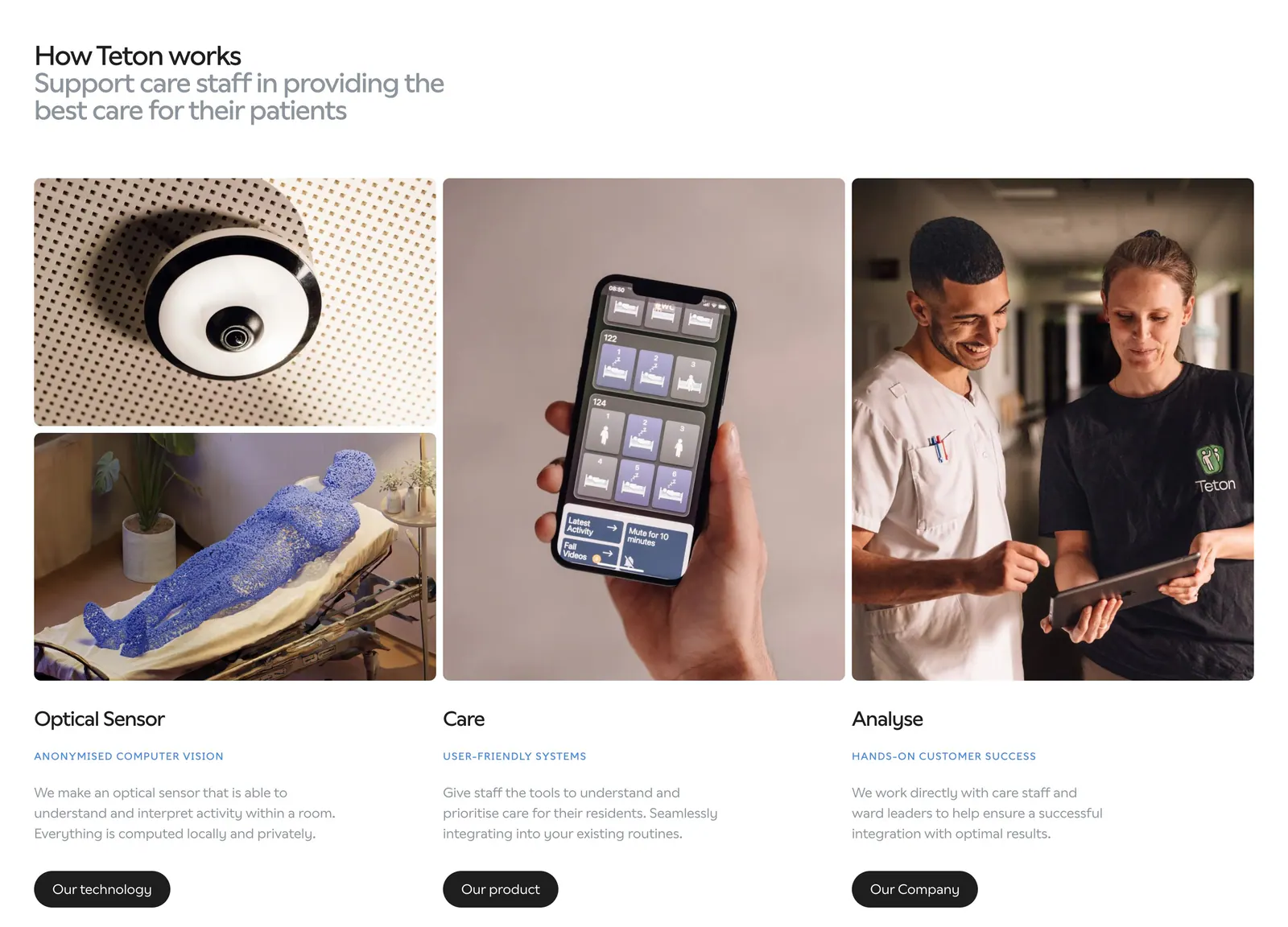
  30. Teton how it works section: headline above three columns of photos (sensor, phone app, care staff) with titles, descriptions and buttons
  31. Origin how it works section: serif title and play button over a full-width photo of a hand holding a phone with the app against the sky
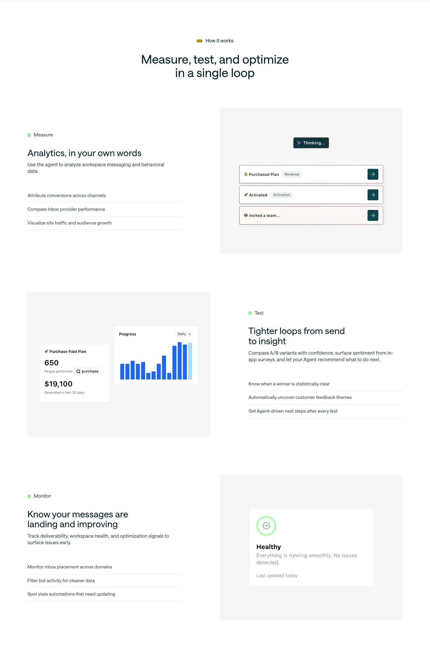
  32. Customer.io features section: centered headline above three alternating rows of Measure, Test and Monitor copy beside UI mockups
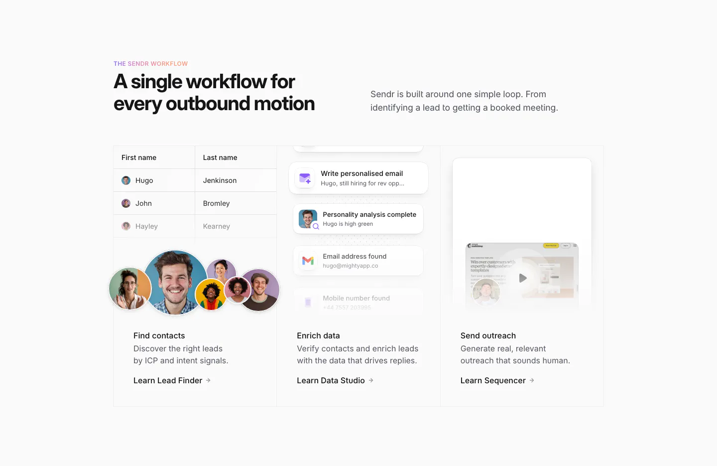
  33. Sendr how it works section: headline above three columns for Find contacts, Enrich data and Send outreach with UI snippets
  34. Spara how it works section: centered headline above a demo video player with AI chat panel and four step tabs below
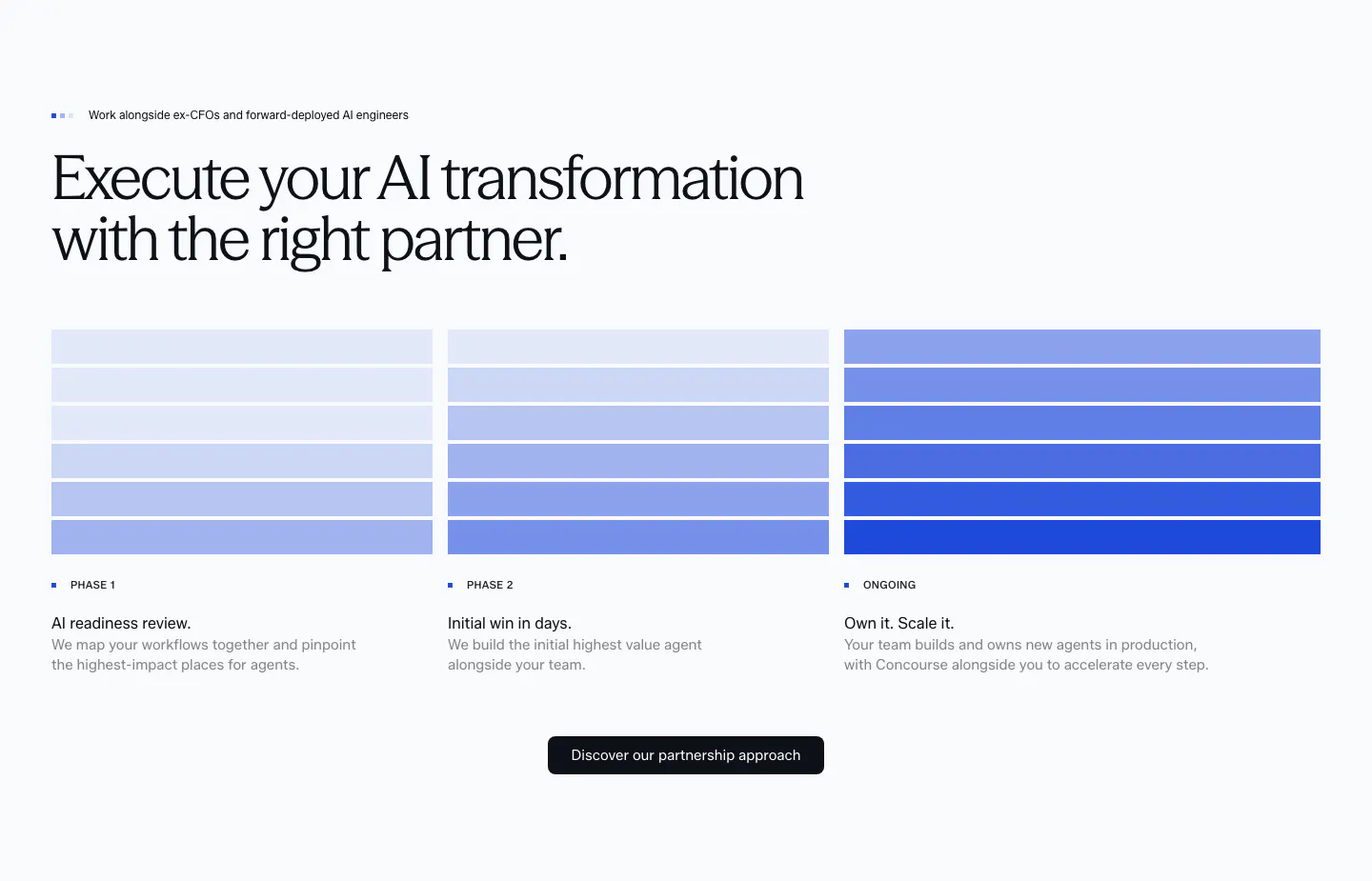
  35. Concourse how it works section: headline above three phase columns of stacked blue bars with step labels, descriptions and a button
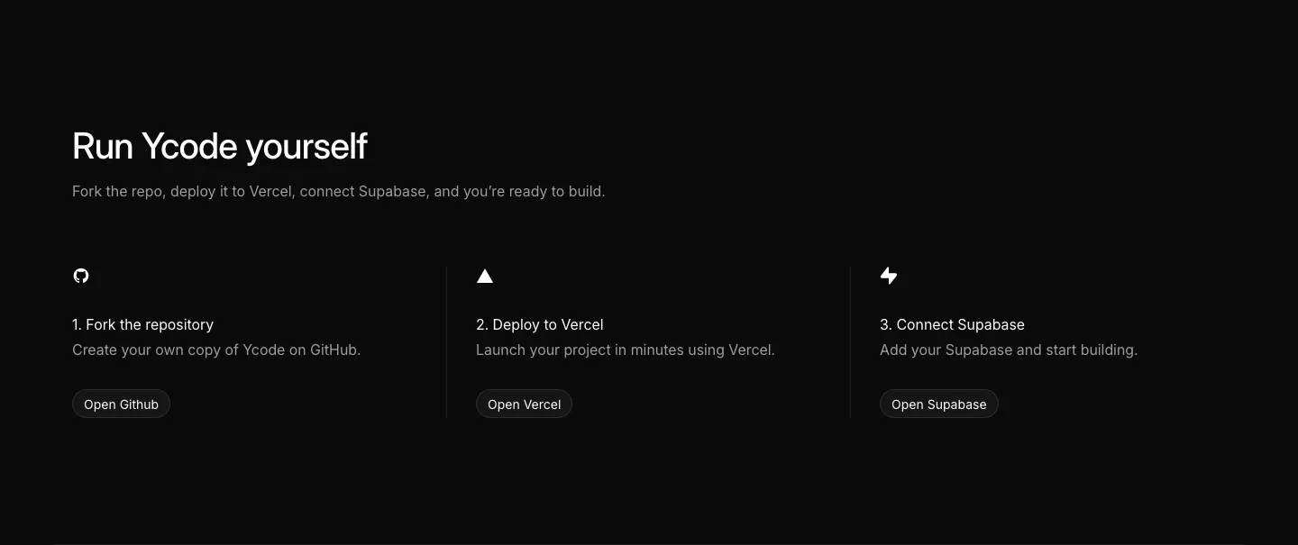
  36. Ycode how it works section: headline above three numbered steps with icons and buttons for GitHub, Vercel and Supabase on black
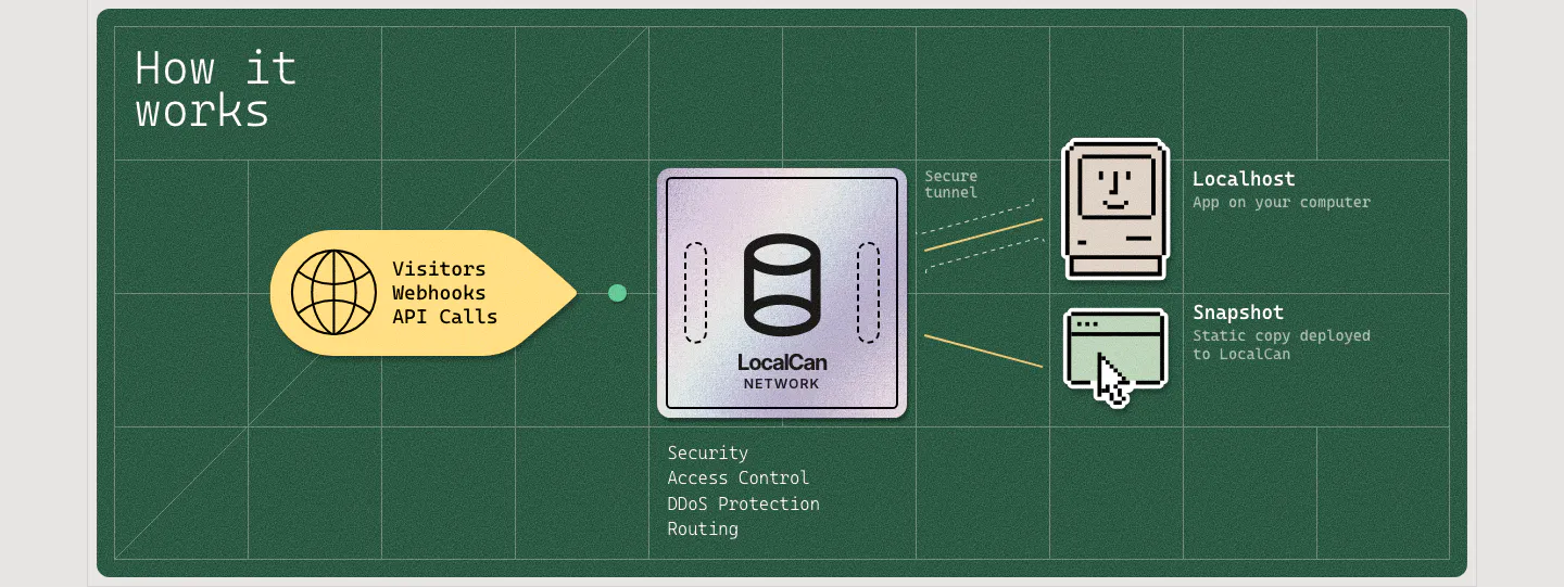
  37. LocalCan how it works section: flow diagram from visitor traffic through a LocalCan network chip to pixel-art localhost and snapshot icons
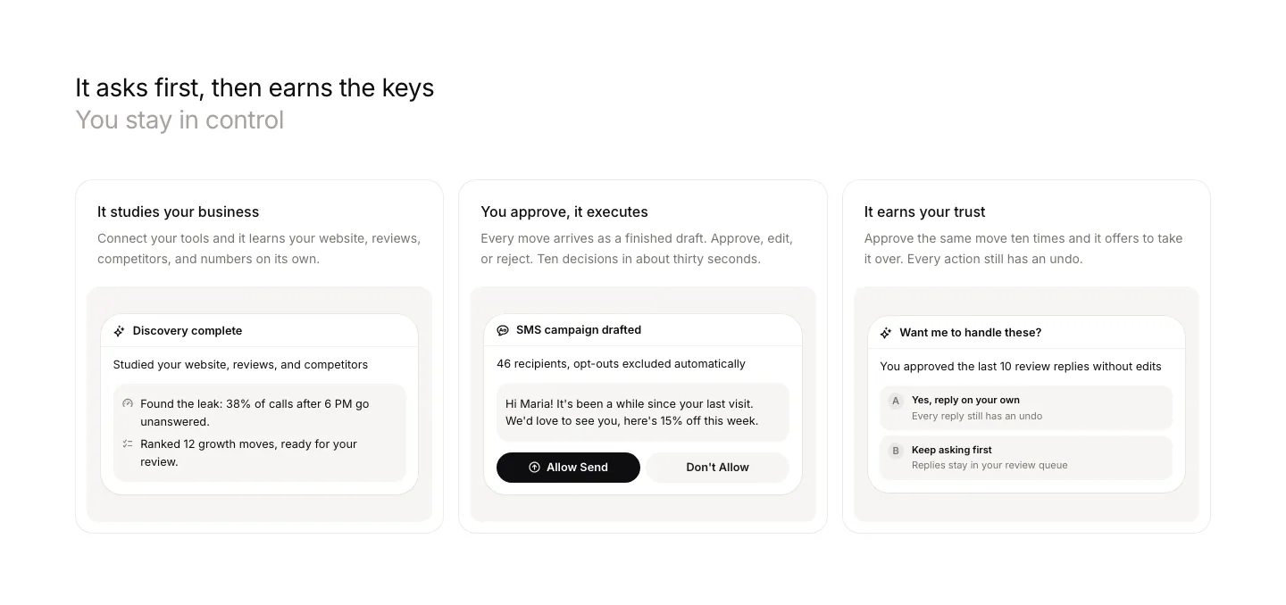
  38. Beside features section: left-aligned headline above three cards, each with a short description and an approval UI snippet
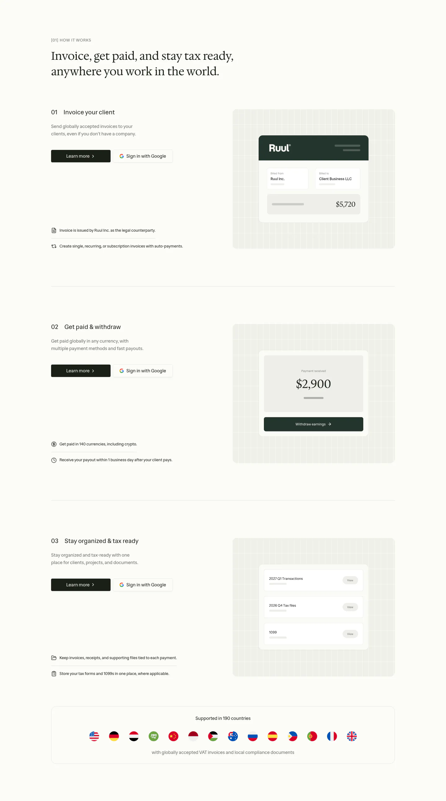
  39. Ruul how it works section: serif headline above three numbered rows with text left and UI cards on grid panels right, plus a flags strip
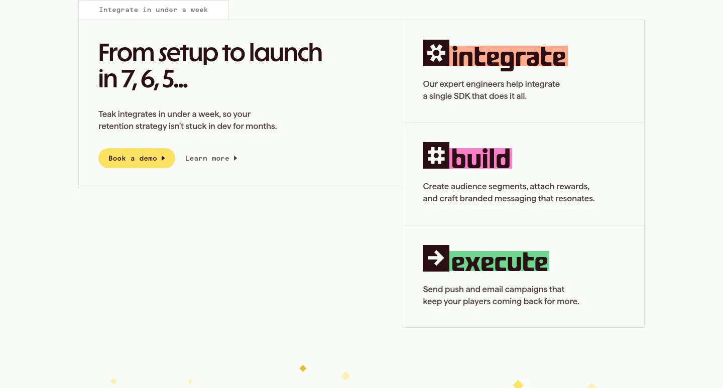
  40. Teak how it works section: headline and demo button in a bordered box at left, three stacked step cards for integrate, build, execute
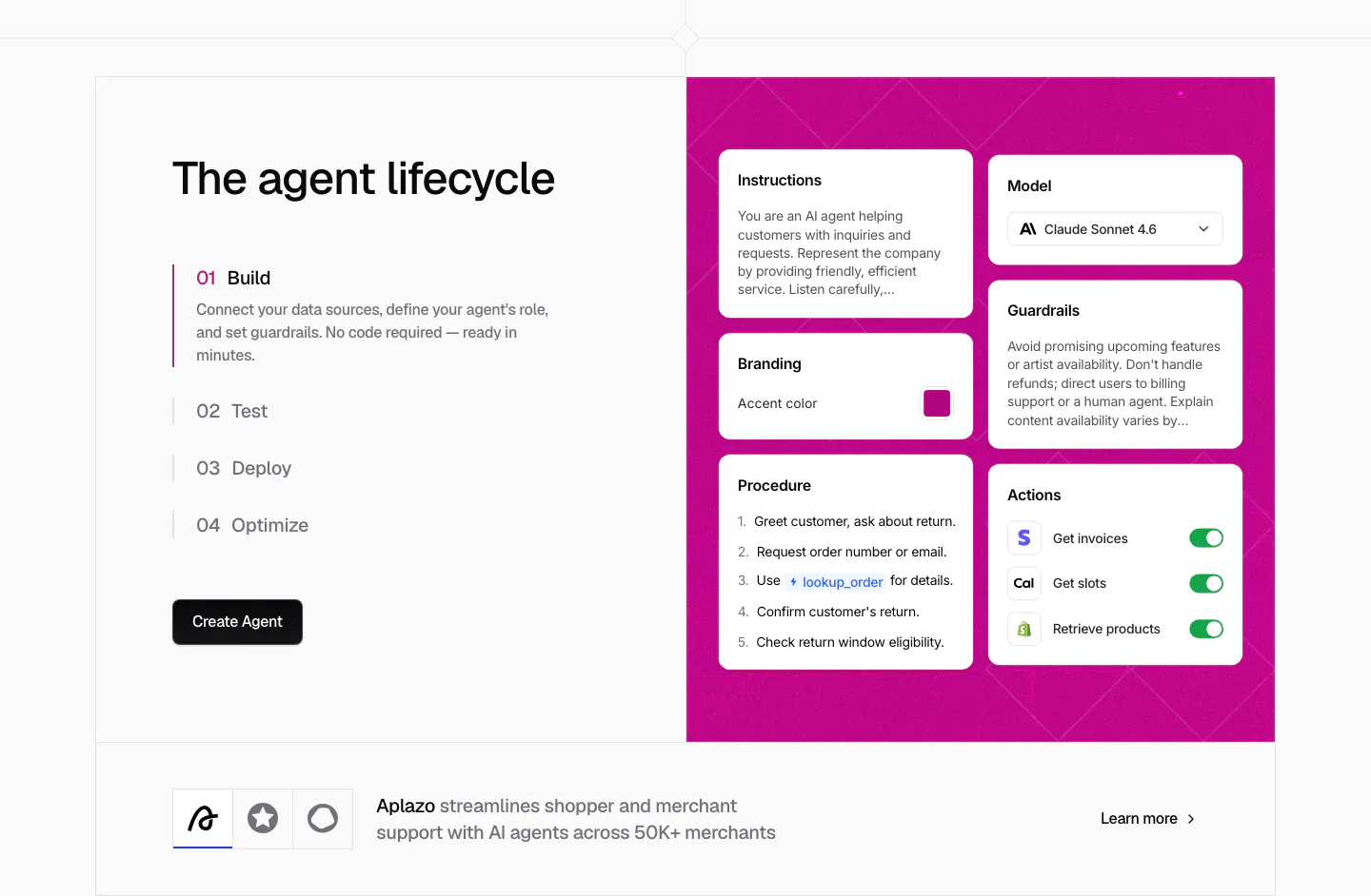
  41. Chatbase how it works section: four numbered lifecycle steps beside a magenta panel of agent config cards, customer story strip below
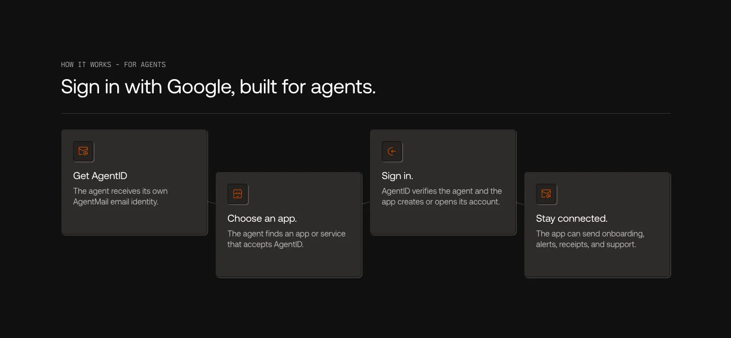
  42. AgentID how it works section: dark row of four staggered step cards with orange icons, from Get AgentID to Stay connected
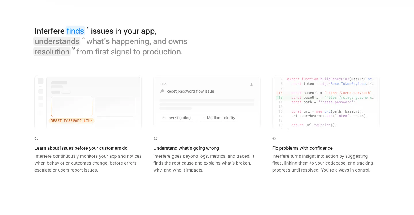
  43. Interfere how it works section: multi-line headline above three numbered columns with faded UI and code vignettes on white
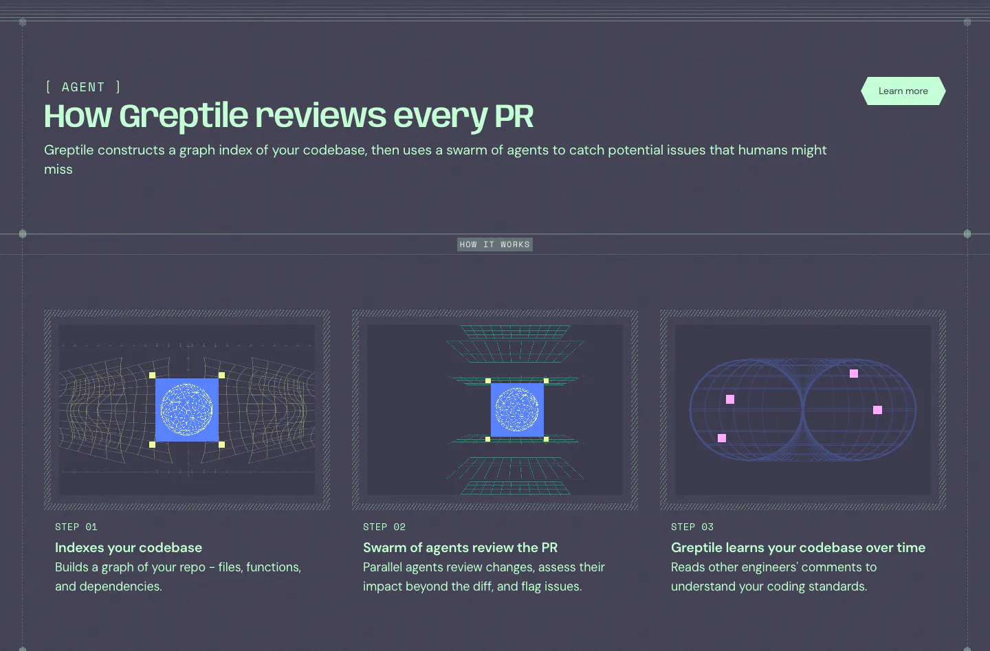
  44. Greptile how it works section: three step cards with wireframe graphics on a dark slate background below a mint headline
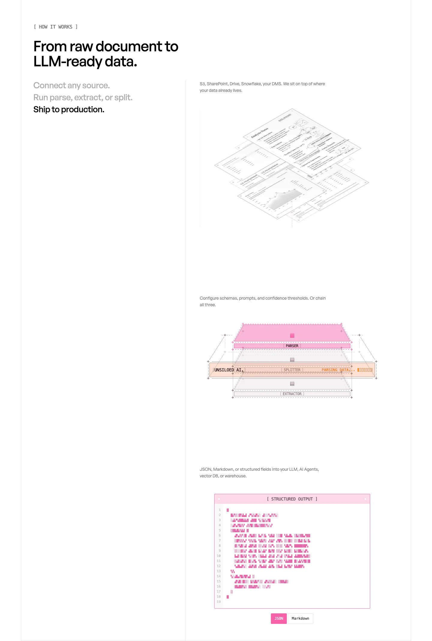
  45. Unsiloed how it works section: three-step list at left beside stacked visuals of isometric documents, a parser layer diagram and a JSON window
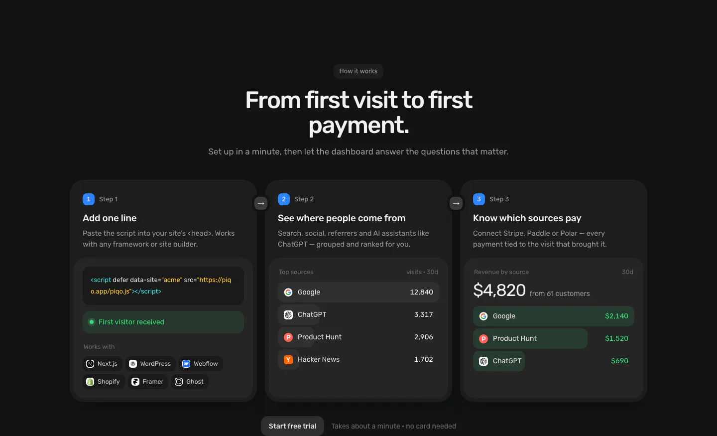
  46. Piqo how it works section: centered headline above three numbered step cards with a script snippet, top sources list and revenue UI
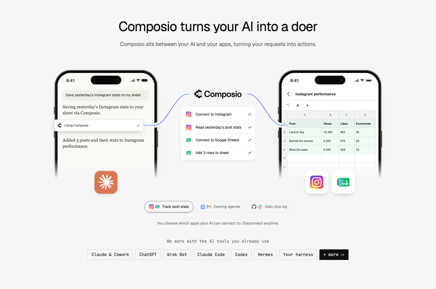
  47. Composio how it works section: two phone mockups linked through a Composio step list, example tabs and a row of AI tool chips
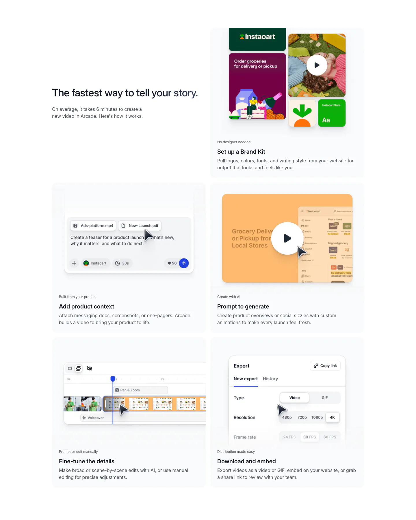
  48. Arcade how it works section: headline beside a two-column grid of five step cards showing brand kit, prompt, editor and export UI
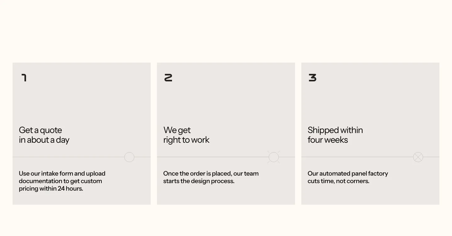
  49. Podium Automation how it works section: three numbered gray step cards with short titles and descriptions on a cream background
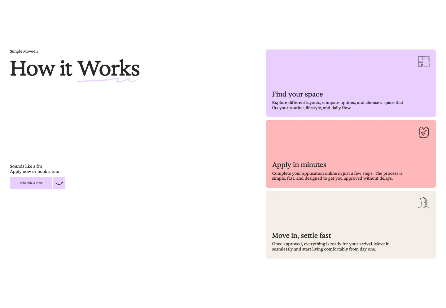
  50. 21Oaks how it works section: serif heading and tour button on the left, three stacked pastel step cards on the right
  51. Hunar how it works section: left heading and intro copy above a carousel of step cards with product screenshots on gradient panels

Common patterns in how it works sections

How to lay out a how it works section

  1. Cut the process to a few steps

    Three or four steps are easier to scan and remember than seven. Merge minor actions into one step and start each step title with a verb. If the real process is long, show the path to first value rather than the full onboarding.

  2. Number the steps and show direction

    Use large step numbers, a connecting line, or arrows so the order is obvious at a glance. A horizontal row works on desktop. On mobile, switch to a vertical stack so the sequence still reads top to bottom without sideways scrolling.
  3. Illustrate every step consistently

    Show the screen, file, or result the user sees at each stage. Keep visuals the same size and style so they read as one set. A small cropped screenshot is usually clearer than a custom illustration of the same idea.

  4. End on the result and next action

    Make the last step show the payoff, such as a finished report or a live page, then place a call to action right after it. Readers who just followed the process are ready to try it, so do not push the button further down the page.

Companies in this collection

All section types
    ↑↓ Navigate ↵ Open

    Section preview

    Website section