Greptile website design

Every section we captured from the Greptile website, in page order, from the hero section down to the footer. Open any thumbnail to see it full size.

Sections 14

In page order, top to bottom

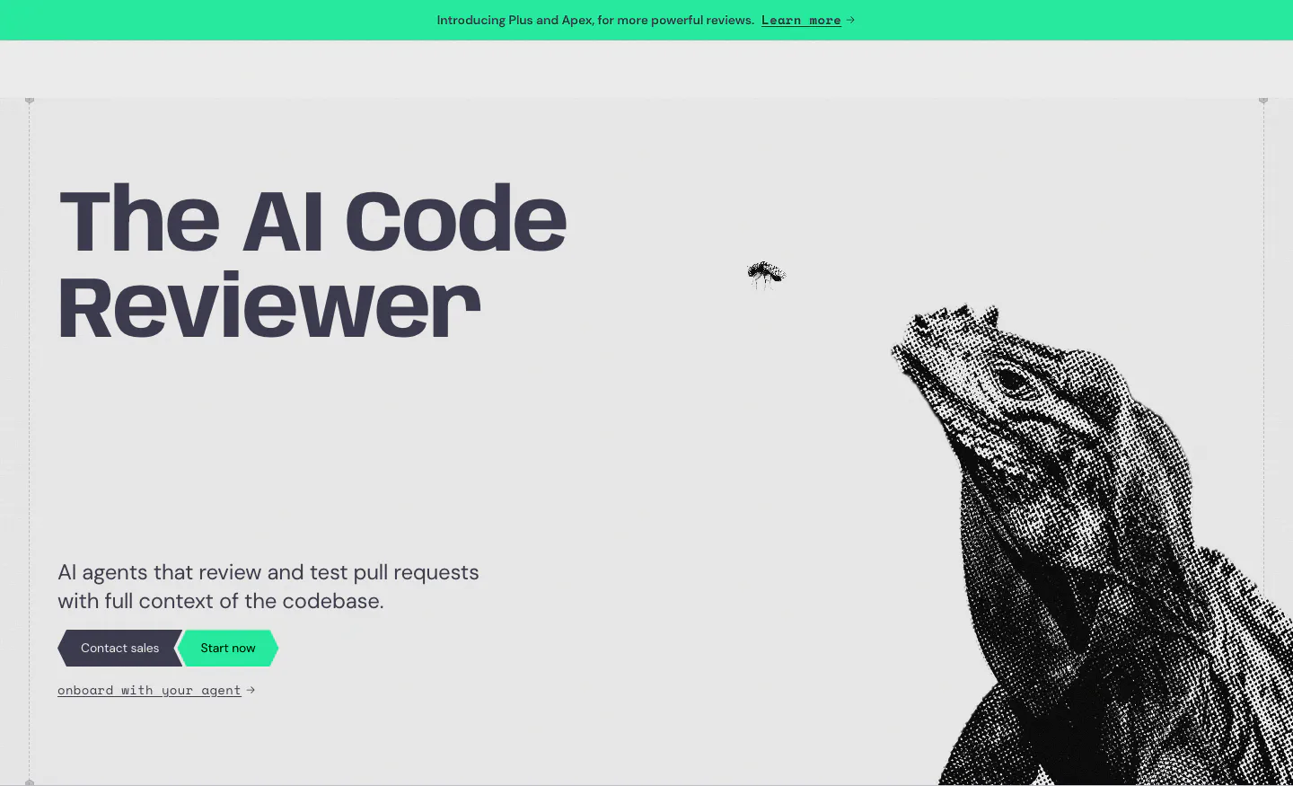
  1. Greptile hero section: bold headline and two CTAs on the left, halftone iguana artwork on the right, green announcement bar above
    01 Hero

    The AI Code Reviewer

  2. Greptile logo cloud section: two rows of grayscale customer logos in bordered grid cells under a small mono caption

    OVER 22,000+ TEAMS USE GREPTILE

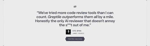
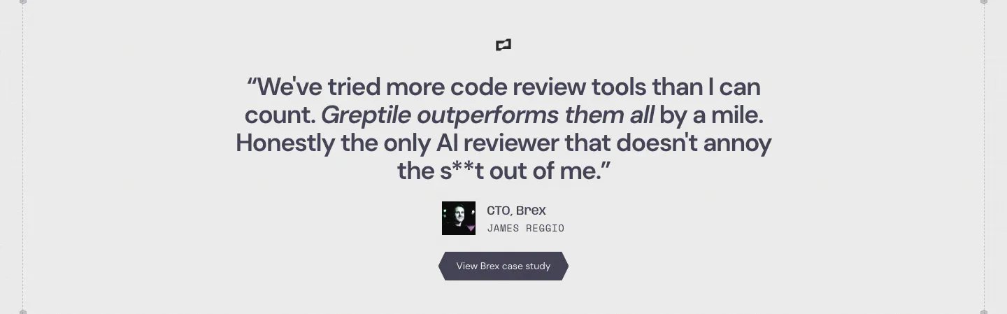
  3. Greptile testimonials section: centered single customer quote with company logo, avatar, name, title and a case study button

    We've tried more code review tools than I can count. Greptile outperforms them all by a mile. Honestly the only AI reviewer that doesn't annoy the s**t out of me.

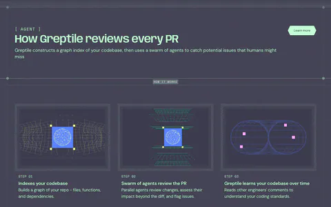
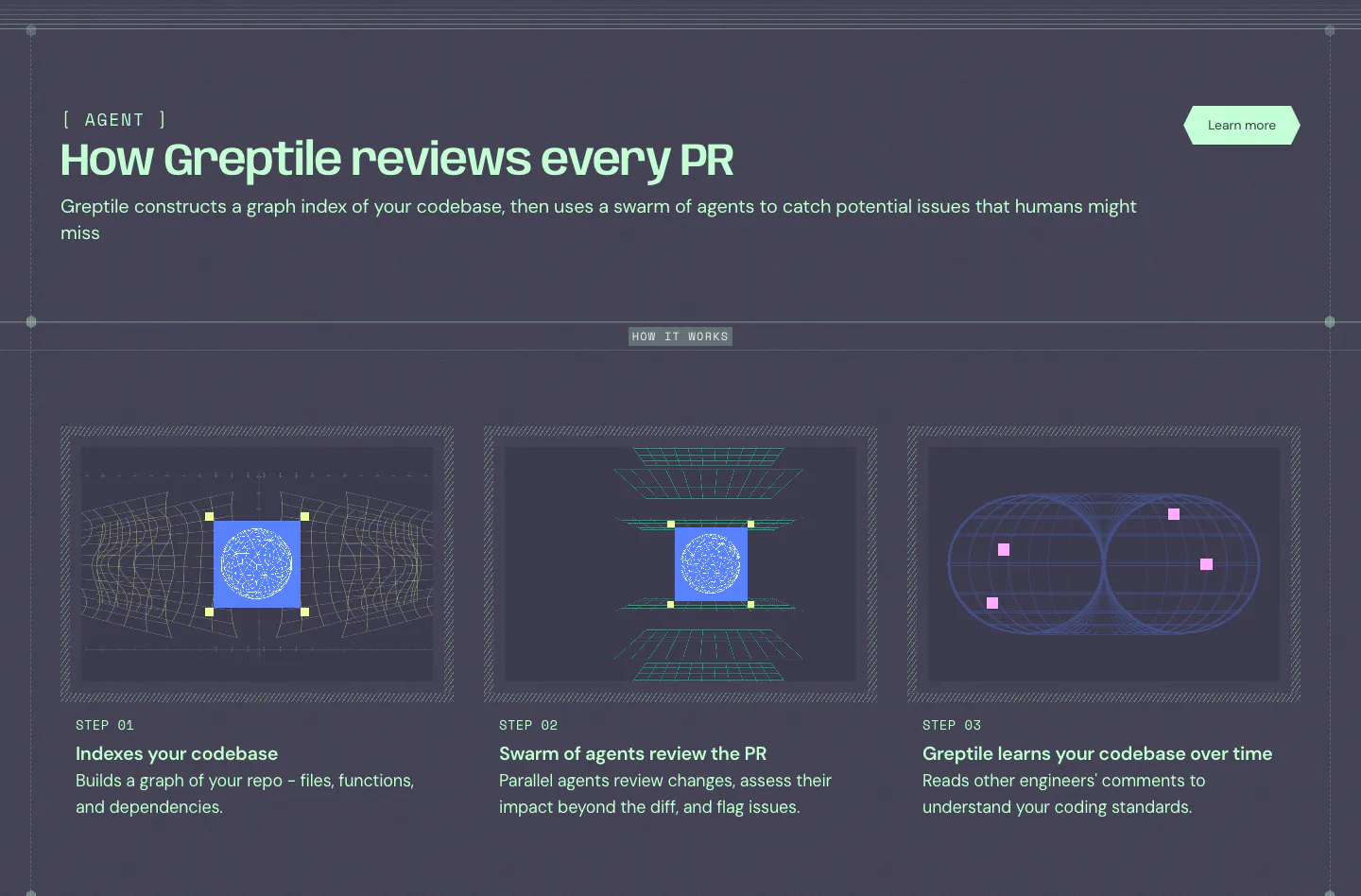
  4. Greptile how it works section: three step cards with wireframe graphics on a dark slate background below a mint headline

    How Greptile reviews every PR

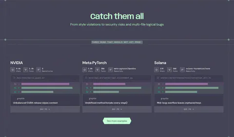
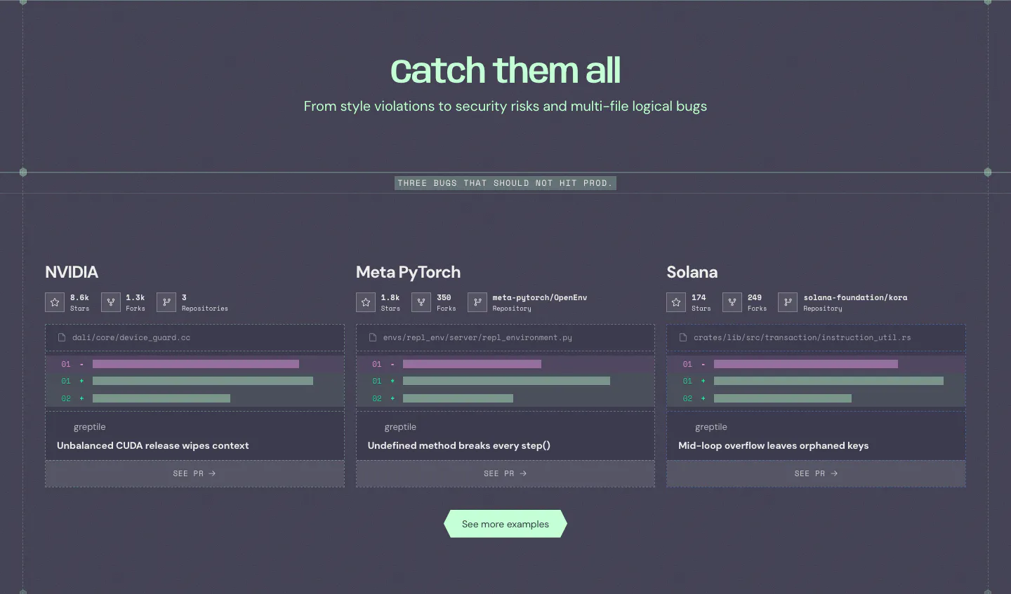
  5. Greptile features section: centered headline over three cards showing example bugs caught in open-source repos with diff snippets

    Catch them all

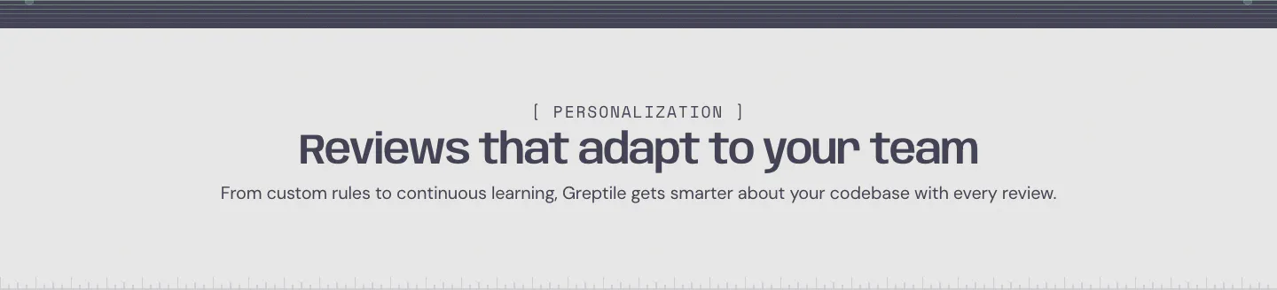
  6. Greptile features section: centered eyebrow label, headline and one-line subtitle on a light gray band with a striped top edge

    Reviews that adapt to your team

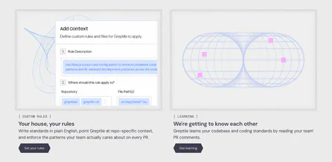
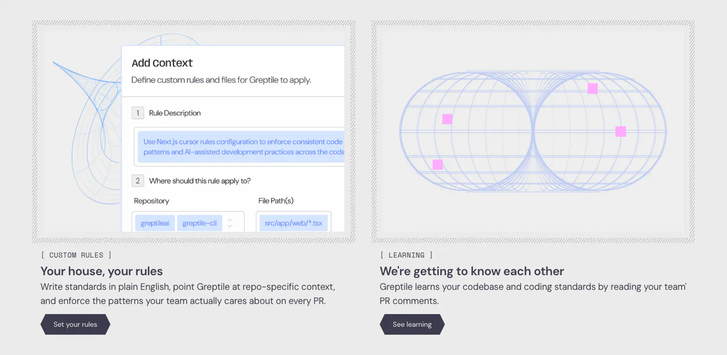
  7. Greptile features section: two cards side by side, one with a custom rules form UI, one with a blue wireframe torus graphic
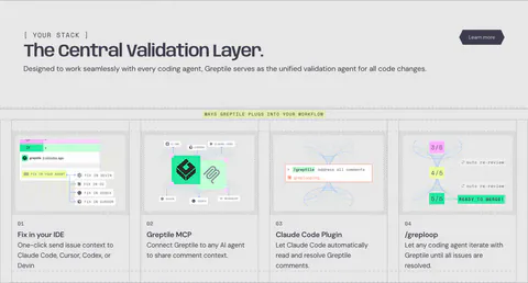
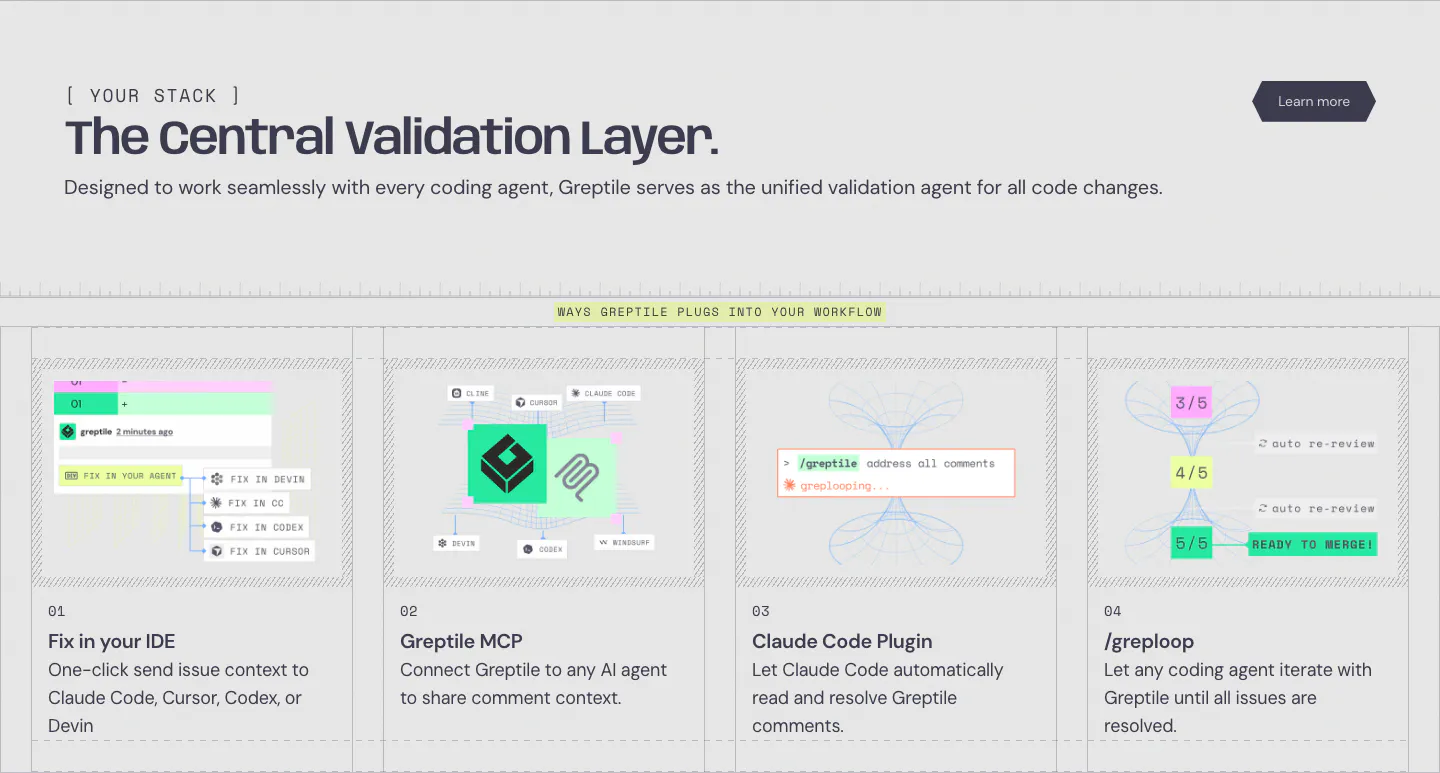
  8. Greptile integrations section: left-aligned headline above four numbered cards showing IDE, MCP, Claude Code plugin and loop workflows

    The Central Validation Layer.

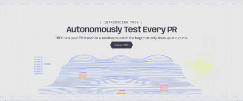
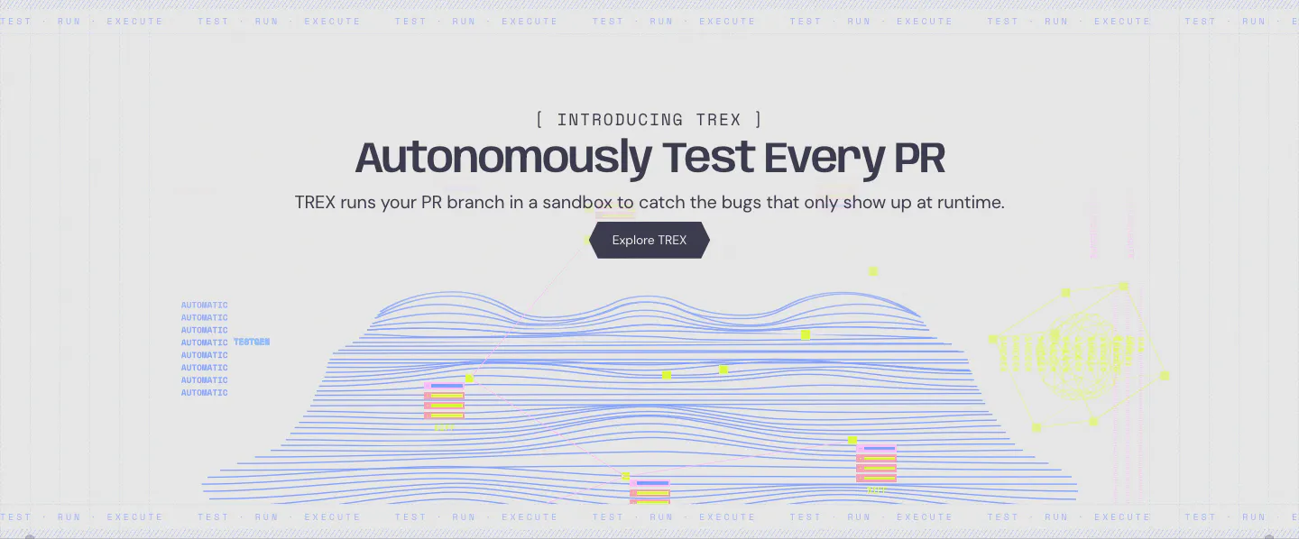
  9. Greptile features section: centered product launch headline and button above a blue line-wave landscape illustration

    Autonomously Test Every PR

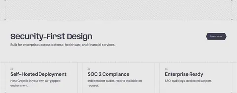
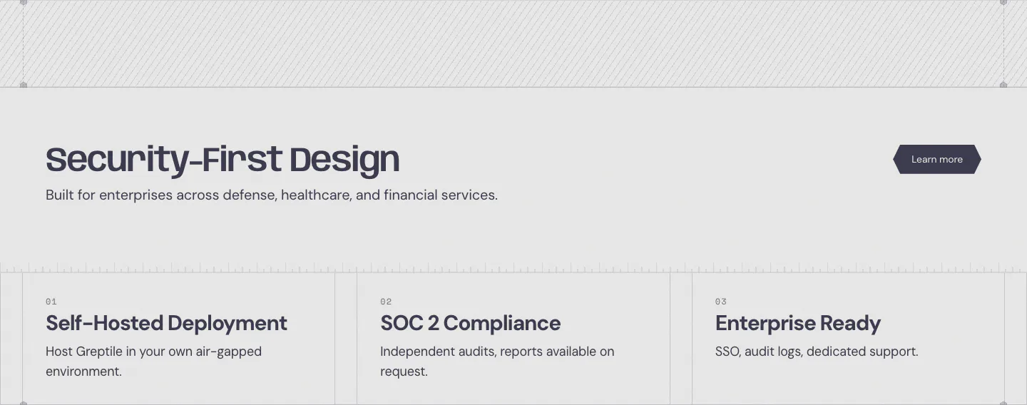
  10. Greptile security section: headline with learn more button above three numbered cards for self-hosting, SOC 2 and enterprise features

    Security-First Design

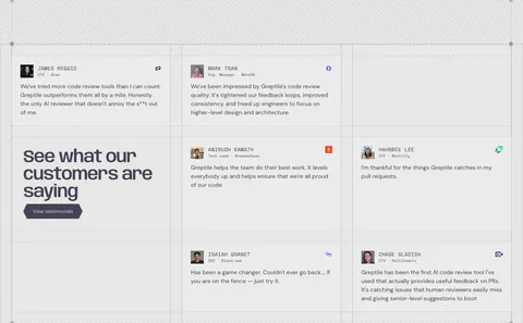
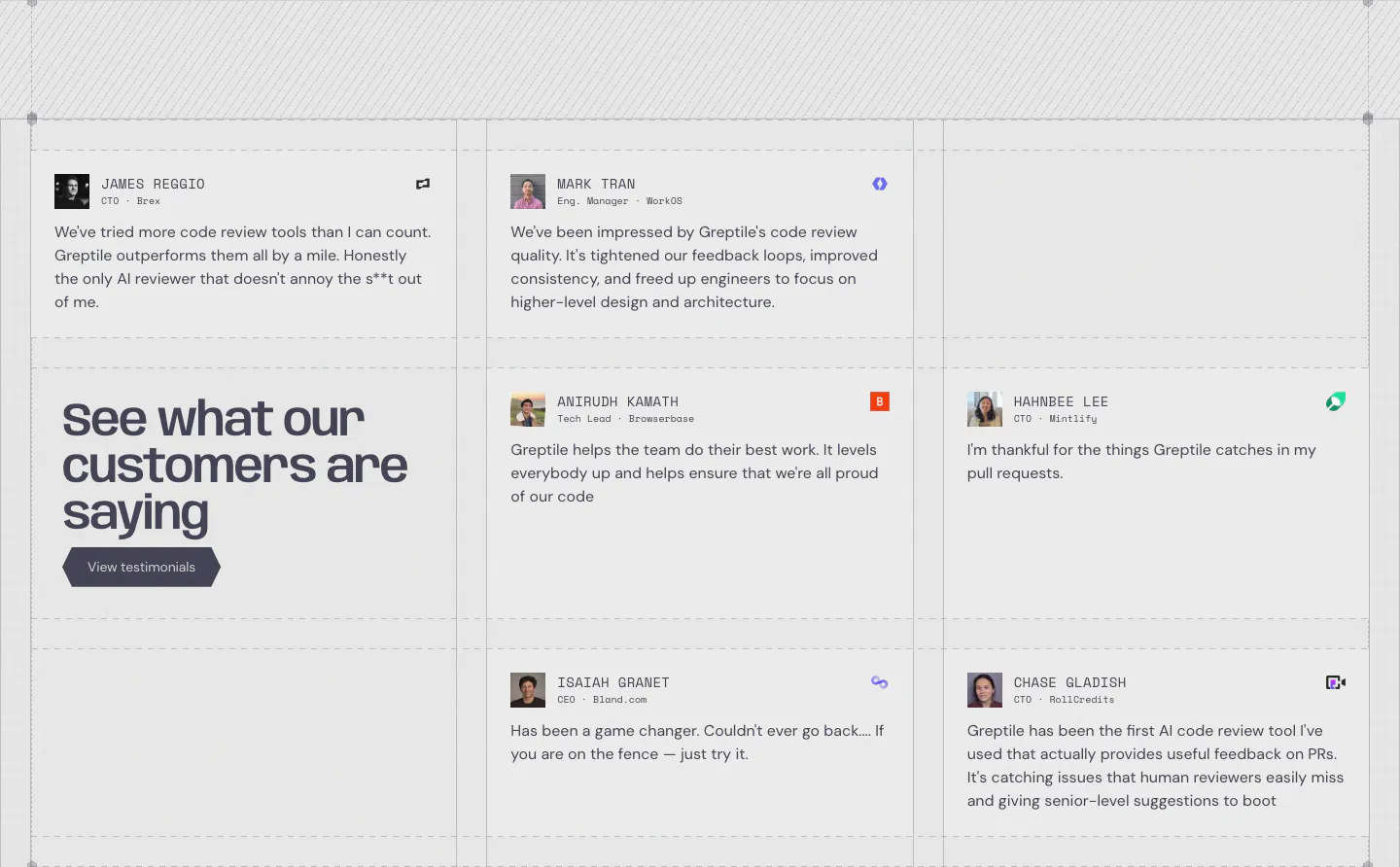
  11. Greptile testimonials section: grid of quote cards with avatars and company logos around a large headline cell with a button

    See what our customers are saying

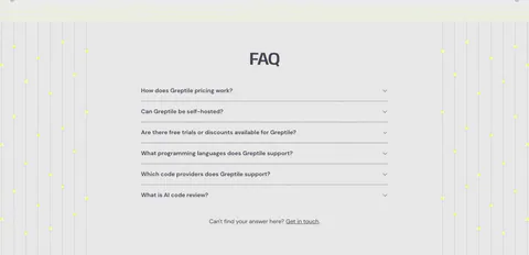
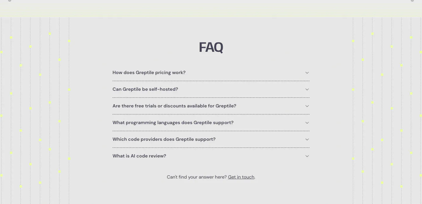
  12. Greptile FAQ section: centered accordion list of six questions flanked by vertical dotted lines with yellow dots on light gray
    12 FAQ

    FAQ

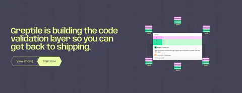
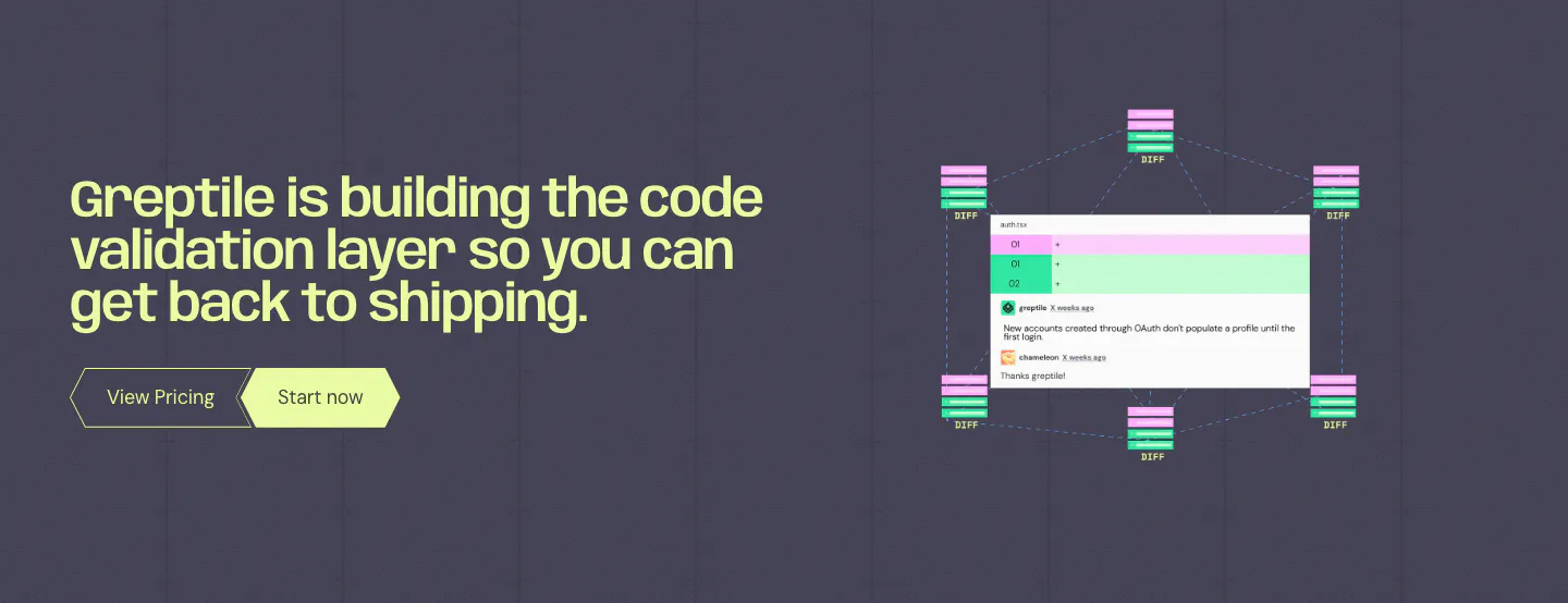
  13. Greptile call to action section: lime headline and two buttons on the left, code review comment UI with diff nodes on the right

    Greptile is building the code validation layer so you can get back to shipping.

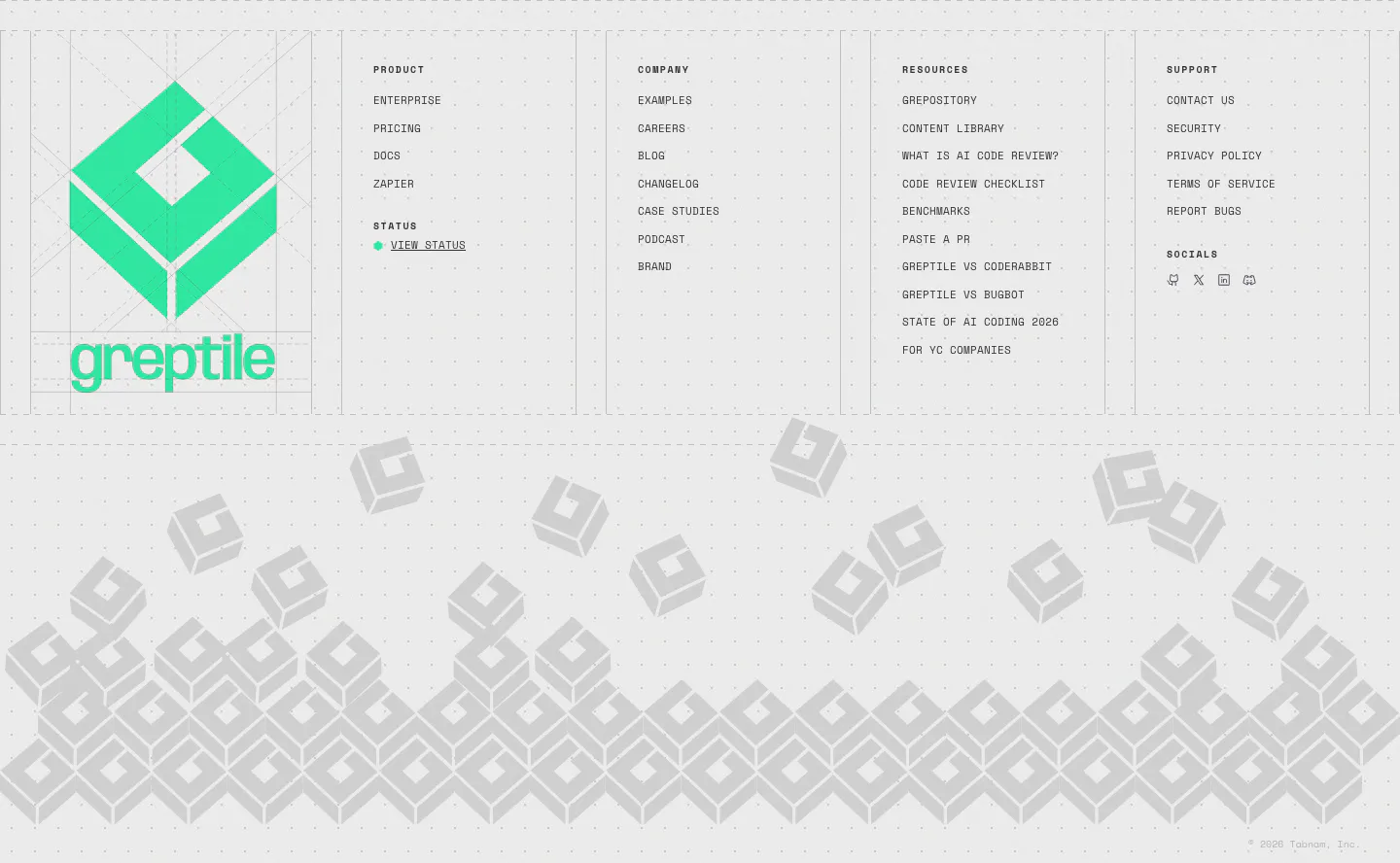
  14. Greptile footer section: large green logo beside four link columns, above a pile of gray isometric logo blocks on light gray
    14 Footer

Similar companies

All companies
    ↑↓ Navigate ↵ Open

    Section preview

    Website section