FAQ Section Examples

A handful of questions stop people from signing up, buying, or booking a call. An FAQ section answers them before they turn into support tickets or lost deals. The useful ones draw on real objections and stay easy to scan, with no softball questions padding the list. Scroll through these FAQ section examples for different ways to group questions, style accordions, and handle long answers.
60 sections

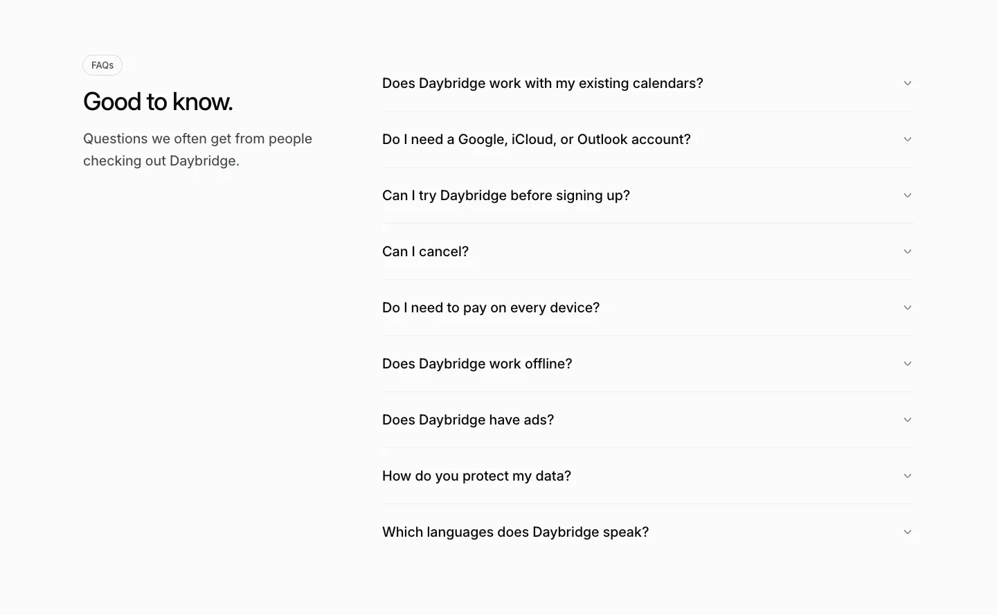
  1. Daybridge FAQ section: heading and short intro on the left with a gray accordion list of questions on the right
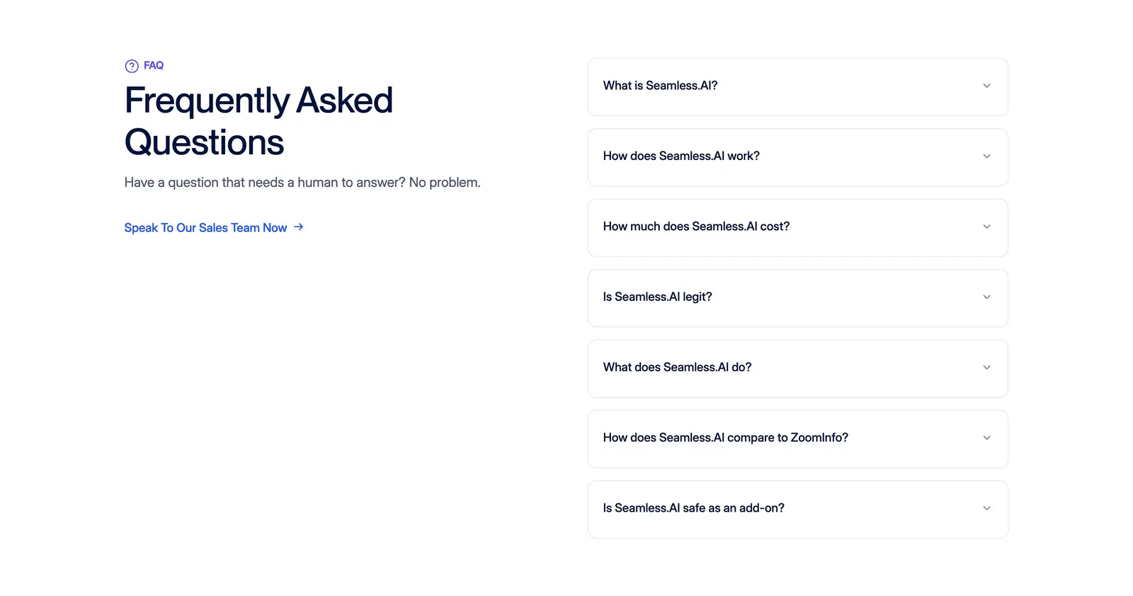
  2. Seamless.AI FAQ section: headline and sales link on the left, seven bordered accordion questions on the right on a white background
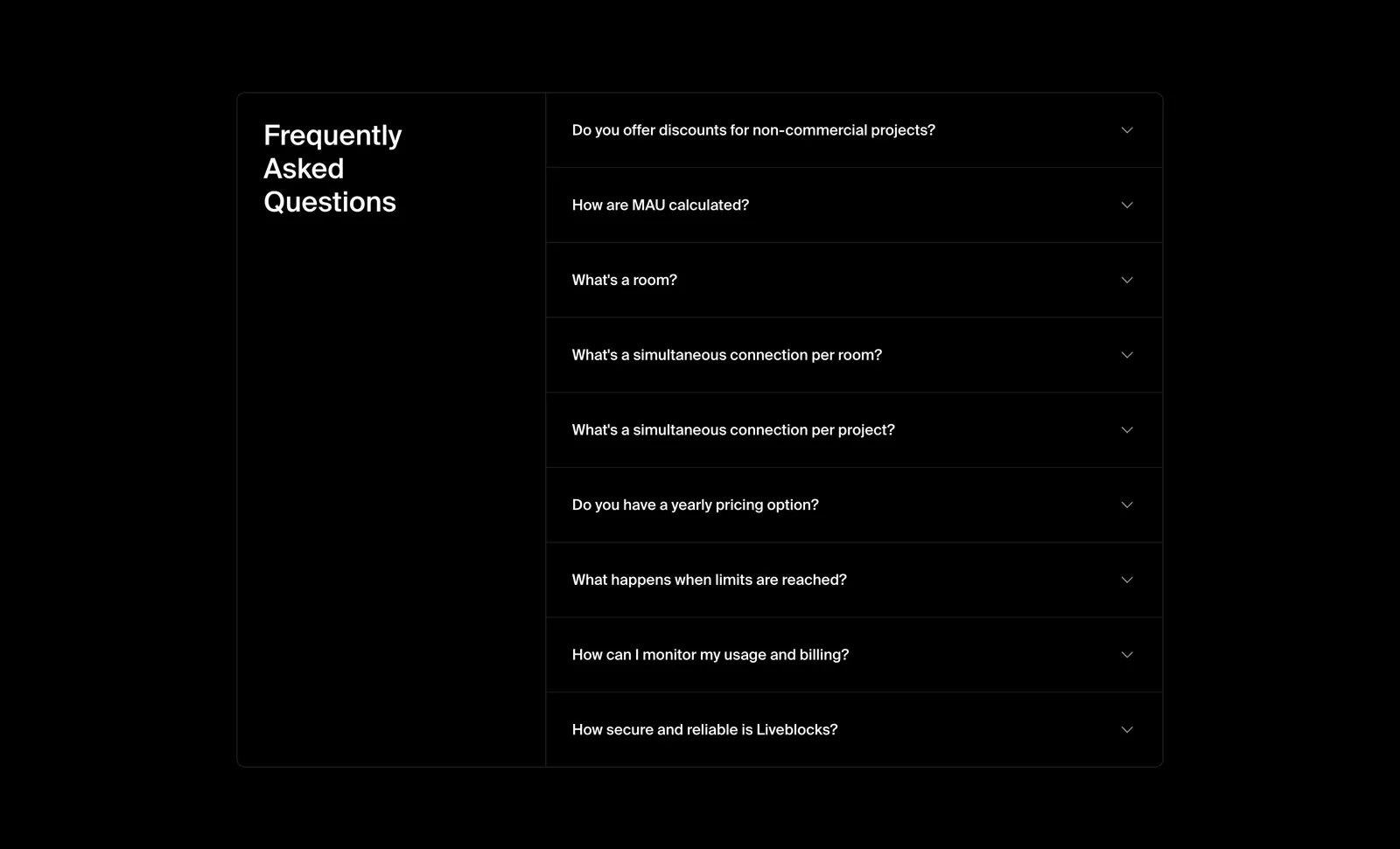
  3. Liveblocks FAQ section: bordered two-column panel with the heading on the left and a collapsed nine-question accordion on the right, on black
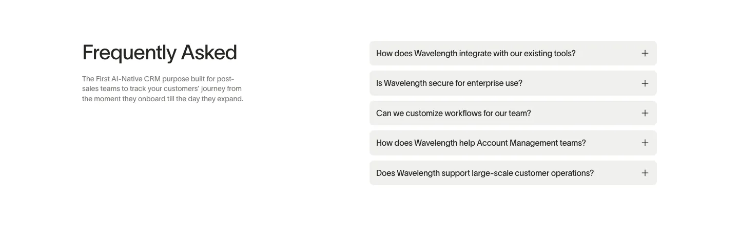
  4. Wavelength FAQ section: headline and short description at left beside a stack of five light gray accordion questions on white
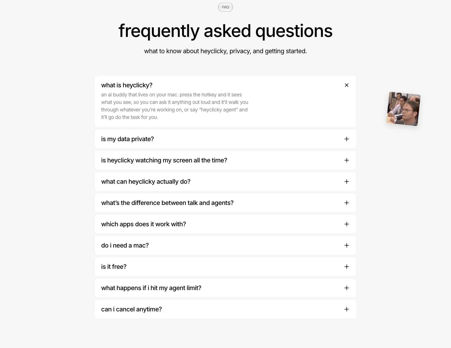
  5. heyclicky FAQ section: centered headline over a single-column accordion of white question rows, first one expanded, on light gray
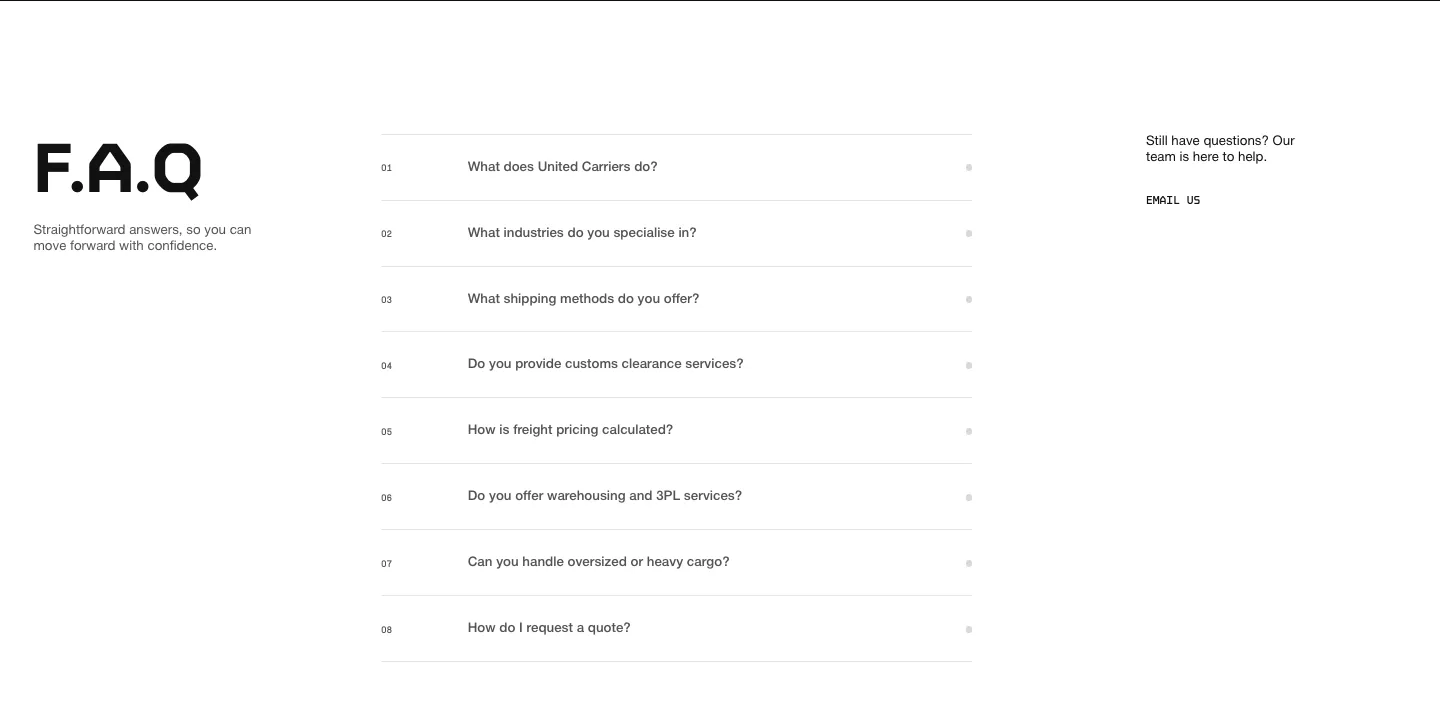
  6. United Carriers FAQ section: large F.A.Q heading left, numbered accordion questions center and an email link right on white
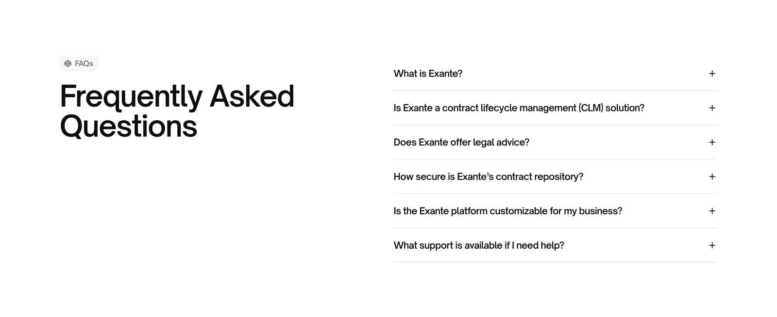
  7. Exante FAQ section: large heading with FAQs badge on the left and a six-question accordion on the right on a white background
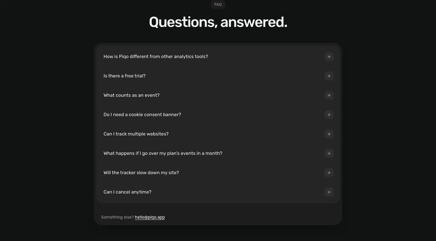
  8. Piqo FAQ section: centered pill label and headline above a rounded dark card with eight collapsed questions and a contact email
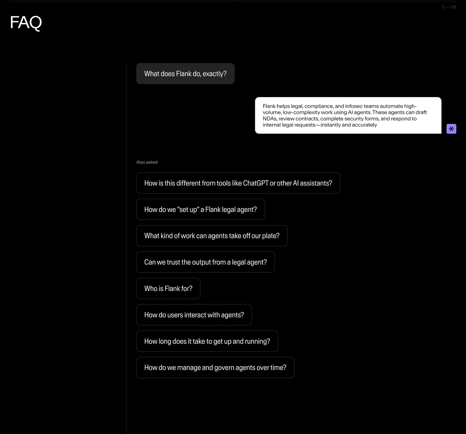
  9. Flank FAQ section: questions styled as chat bubbles with one answered reply and a list of follow-up questions on a black background
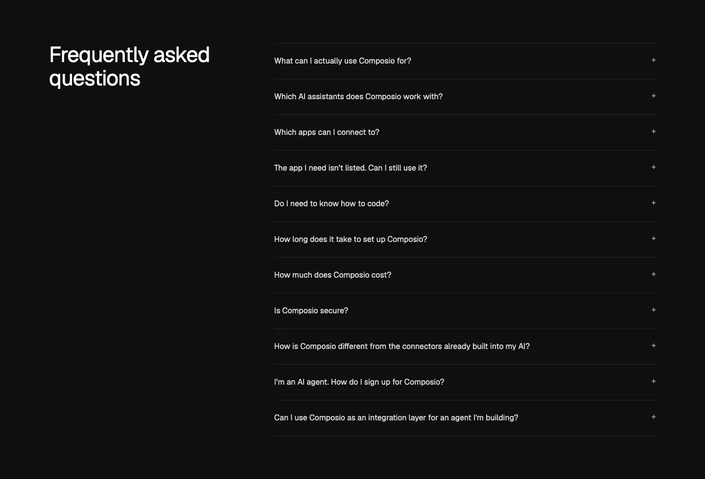
  10. Composio FAQ section: heading at left beside an accordion list of eleven questions with plus icons on near-black
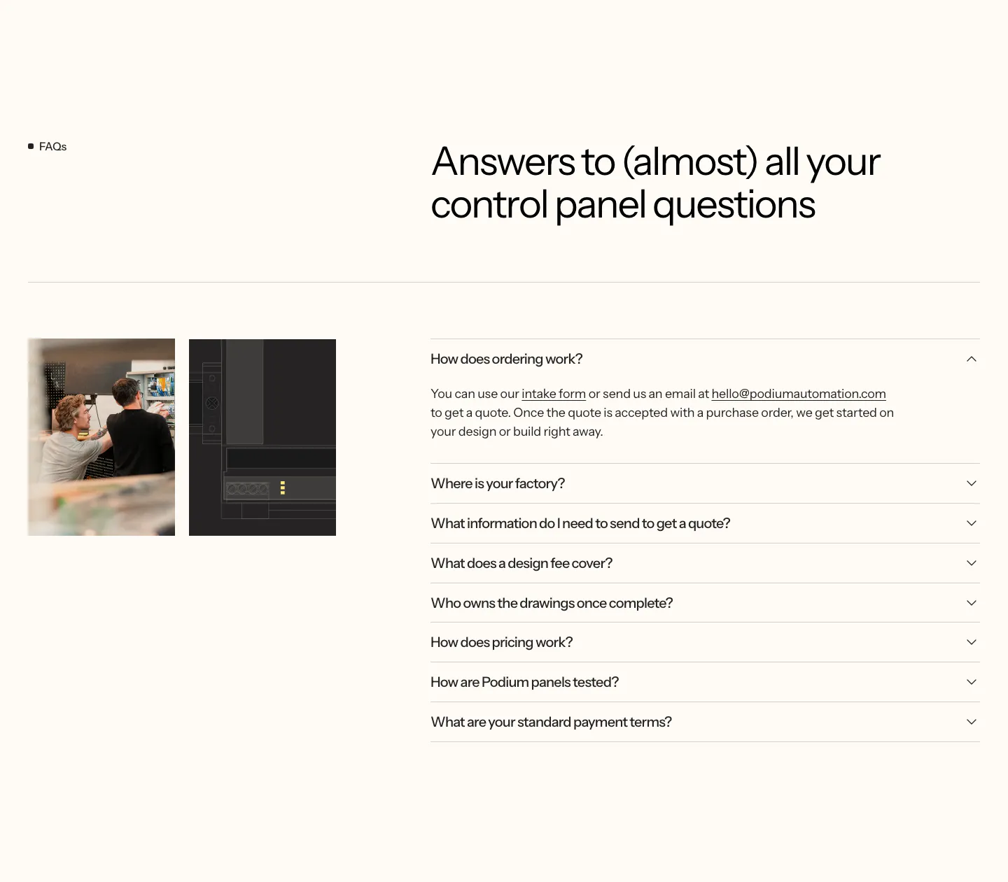
  11. Podium Automation FAQ section: two small photos on the left, headline and accordion of questions on the right, cream background
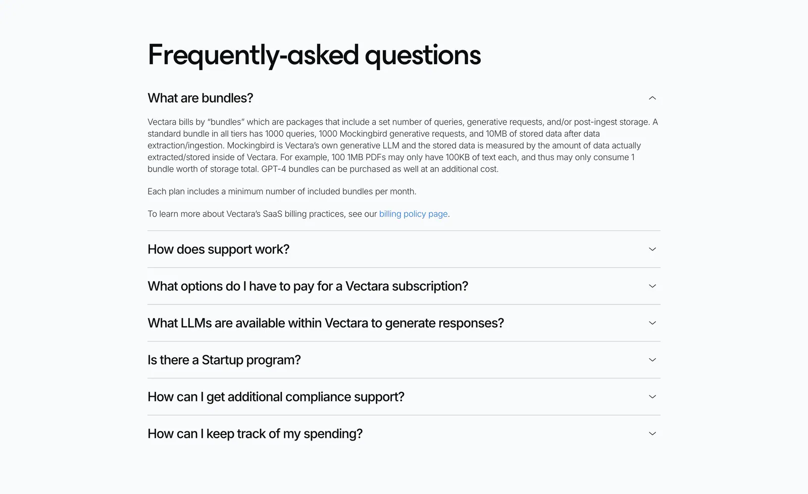
  12. Vectara FAQ section: left-aligned heading above an accordion of questions with the first answer expanded on a light gray background
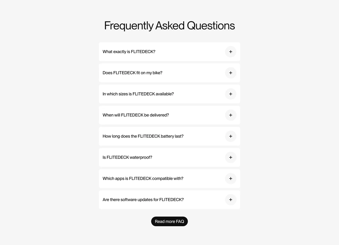
  13. FLITEDECK FAQ section: centered heading above a single column of white accordion questions and a black button on light gray
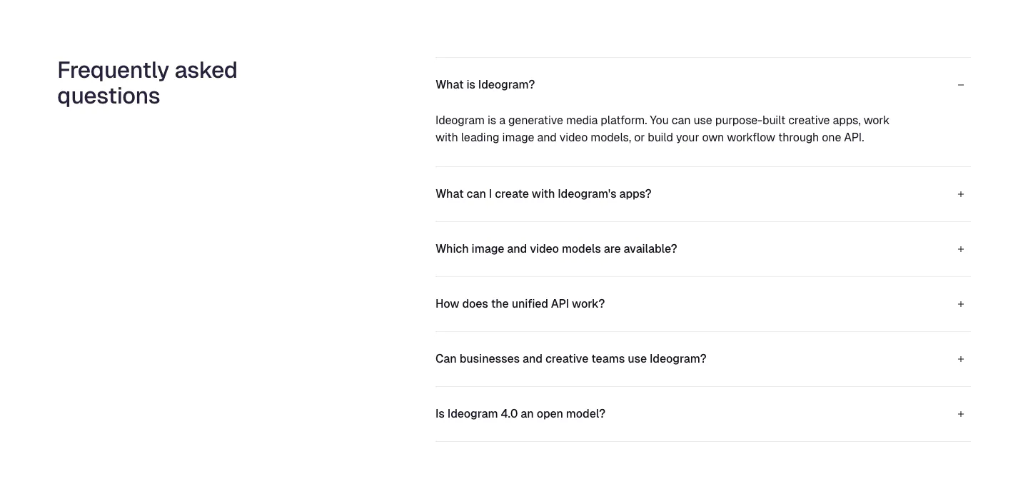
  14. Ideogram FAQ section: heading on the left, accordion of six questions on the right with the first one expanded, on white
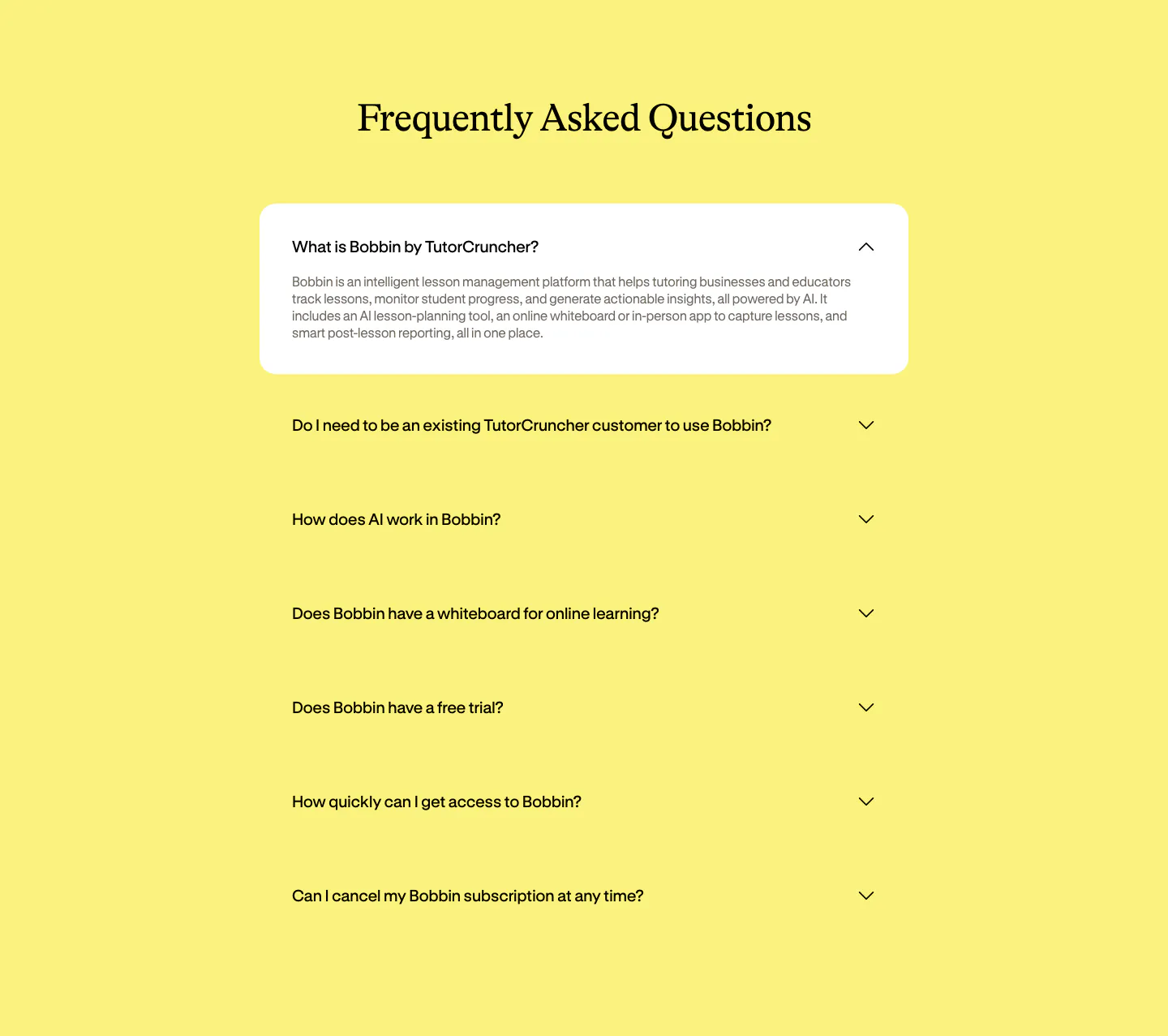
  15. Bobbin FAQ section: centered serif heading above an accordion of questions with the first expanded in a white card on yellow
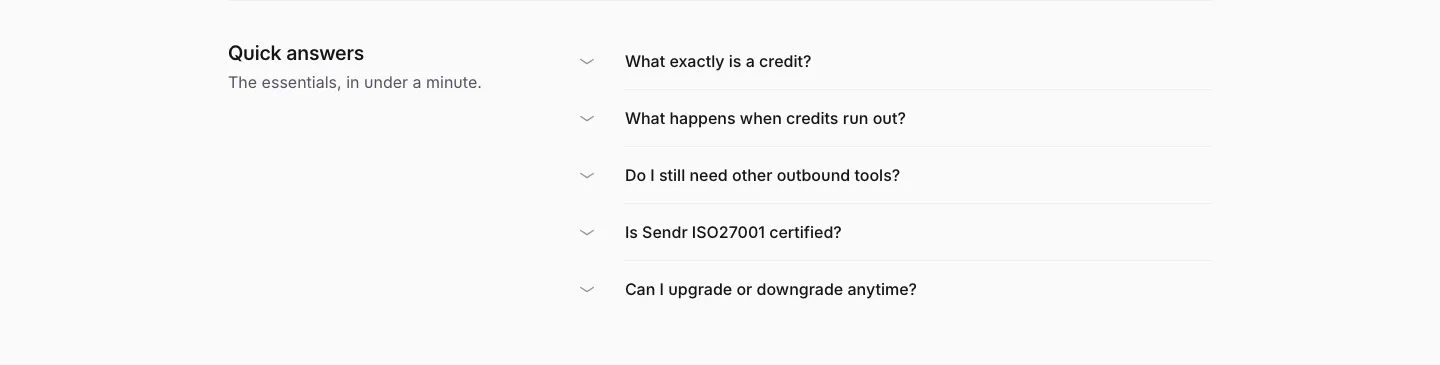
  16. Sendr FAQ section: Quick answers title on the left beside a five-question collapsed accordion list on light gray
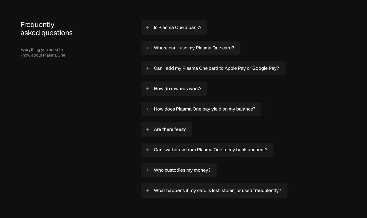
  17. Plasma FAQ section: heading and intro left, collapsed question pills stacked right on a near-black background
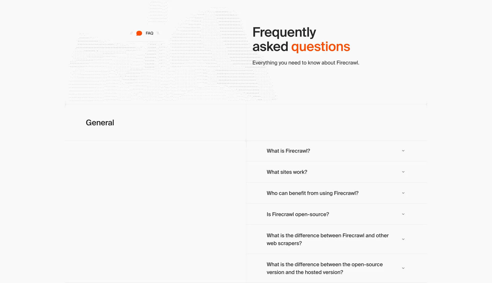
  18. Firecrawl FAQ section: headline beside dithered artwork above a two-column accordion of questions on a light gray grid layout
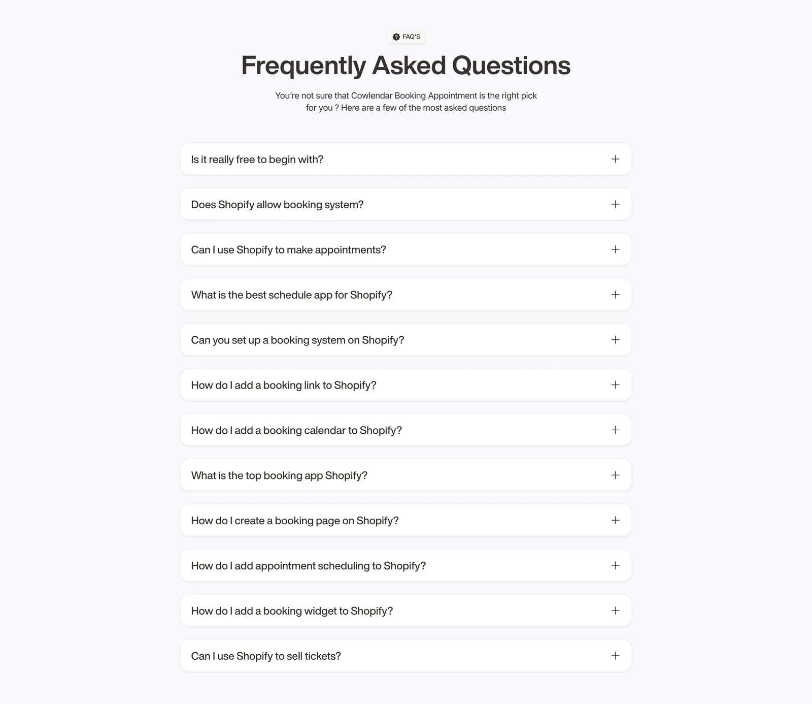
  19. Cowlendar FAQ section: centered heading above a single column of twelve collapsed question accordions on light gray
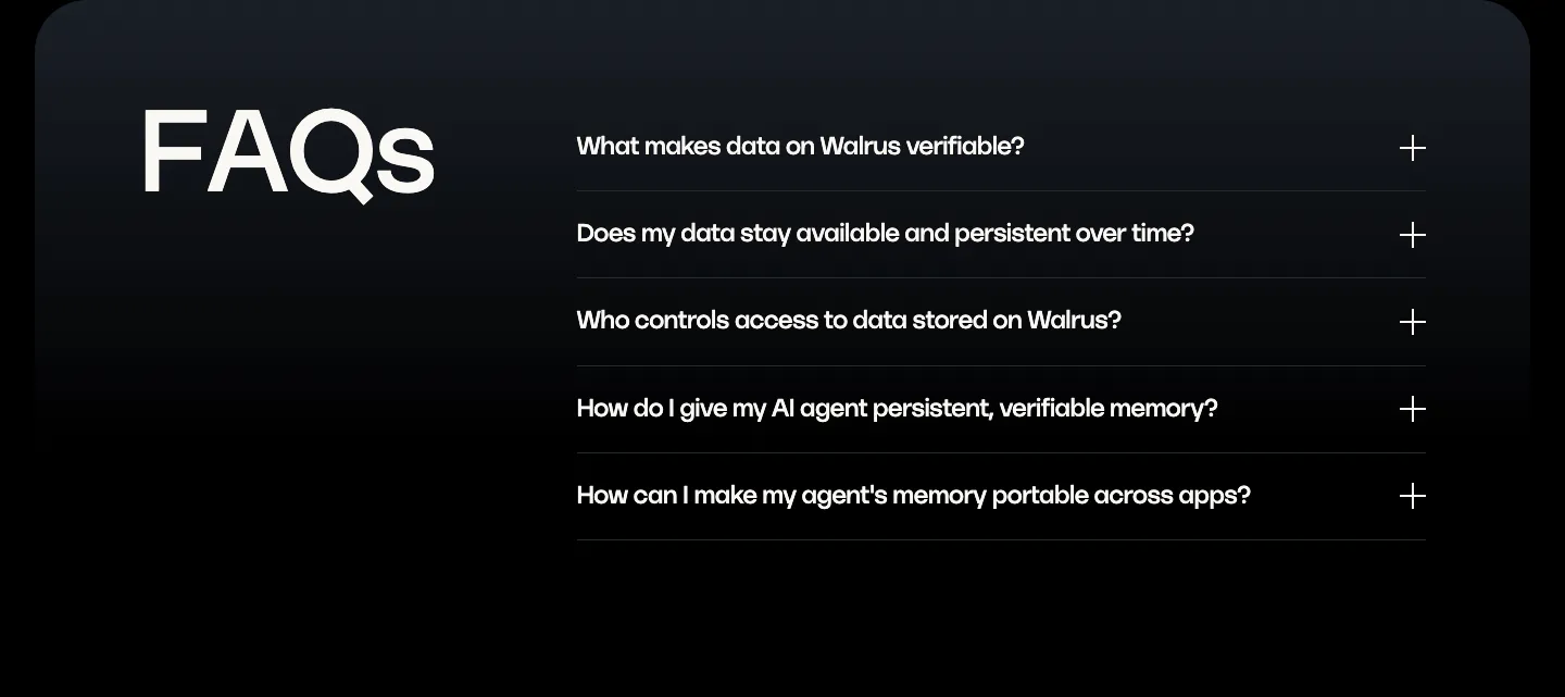
  20. Walrus FAQ section: oversized FAQs heading on the left beside a five-question accordion on a dark panel
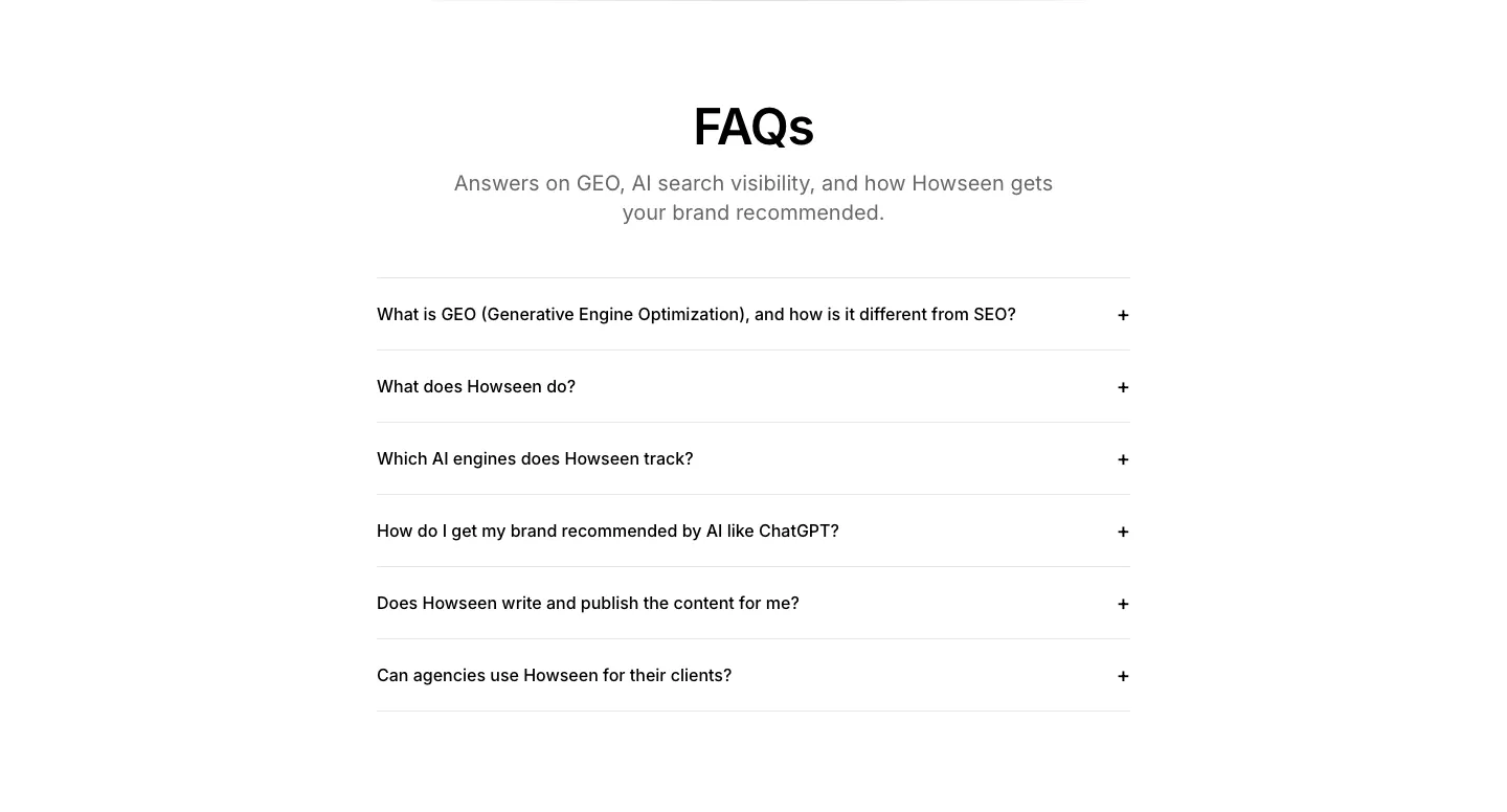
  21. Howseen AI FAQ section: centered heading above a six-question accordion list on a white background
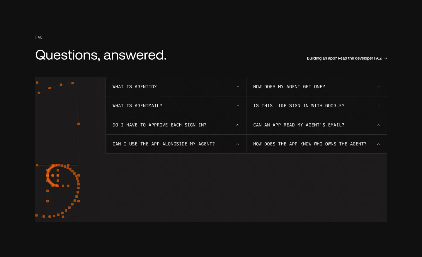
  22. AgentID FAQ section: dark two-column grid of monospace accordion questions beside an orange pixel-dot smiley artwork
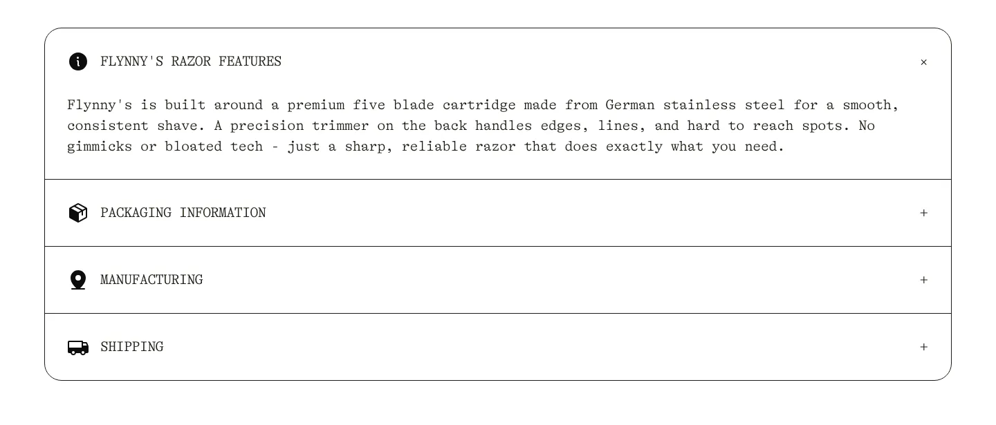
  23. Flynny's FAQ section: rounded bordered accordion in typewriter type with razor features open and packaging, manufacturing, shipping closed
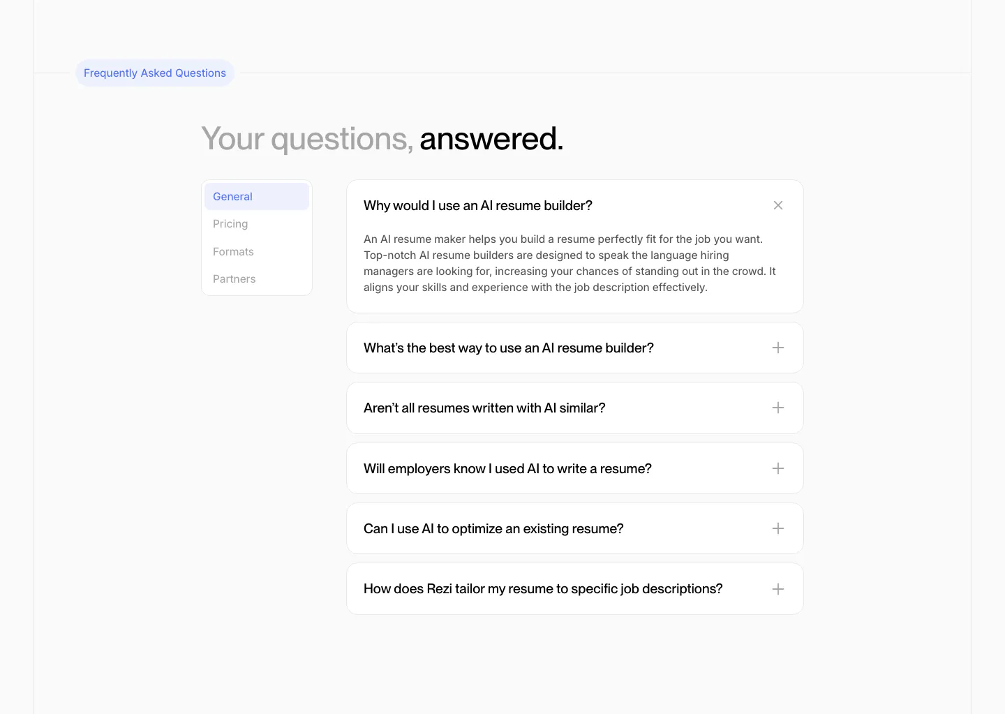
  24. Rezi FAQ section: two-tone headline above a side tab list and an accordion of question cards with one expanded answer
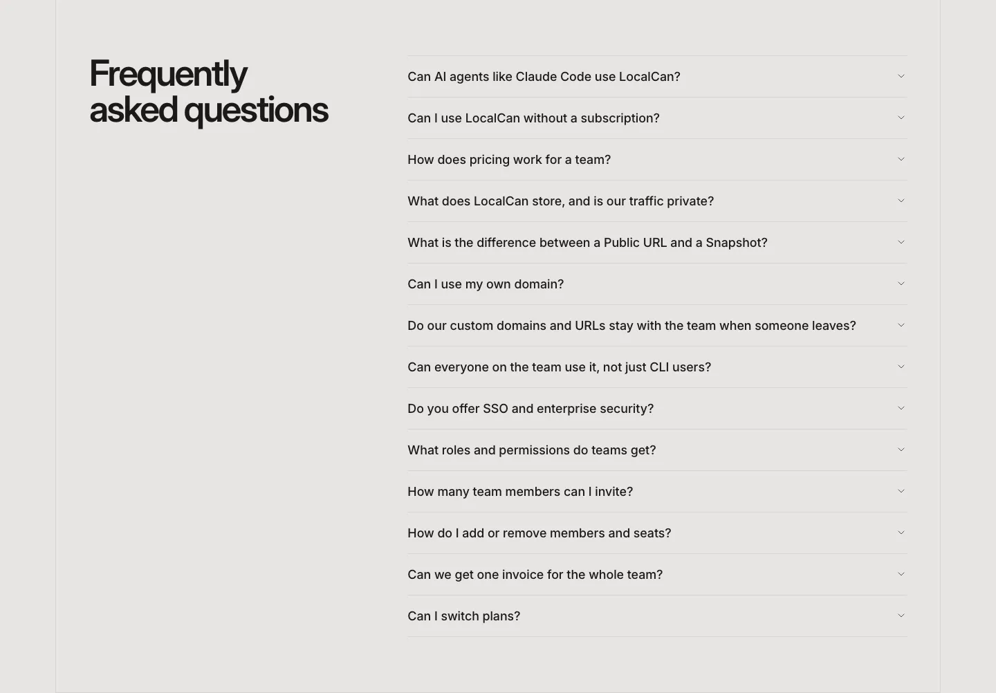
  25. LocalCan FAQ section: two-line headline on the left beside a long collapsed accordion of questions on a light gray background
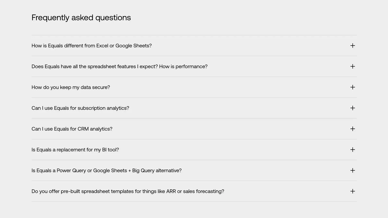
  26. Equals FAQ section: left-aligned heading above an eight-question accordion with plus icons on a light gray background
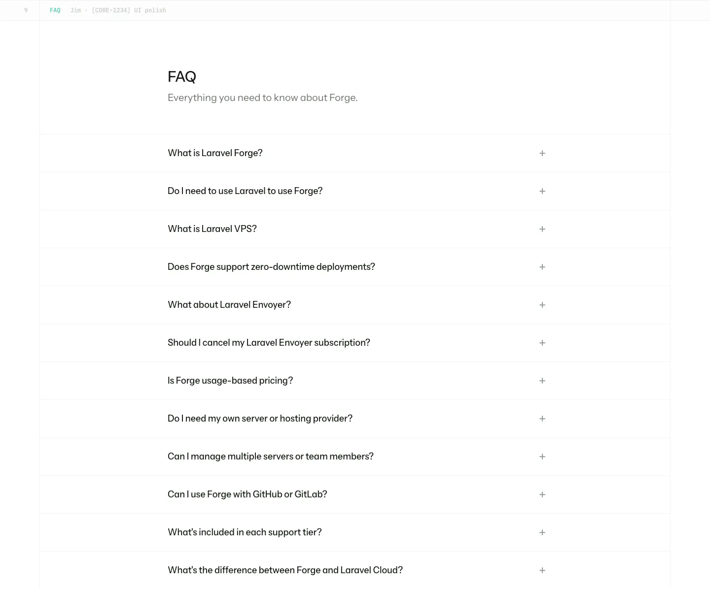
  27. Laravel Forge FAQ section: heading above a long accordion list of questions with plus icons on white
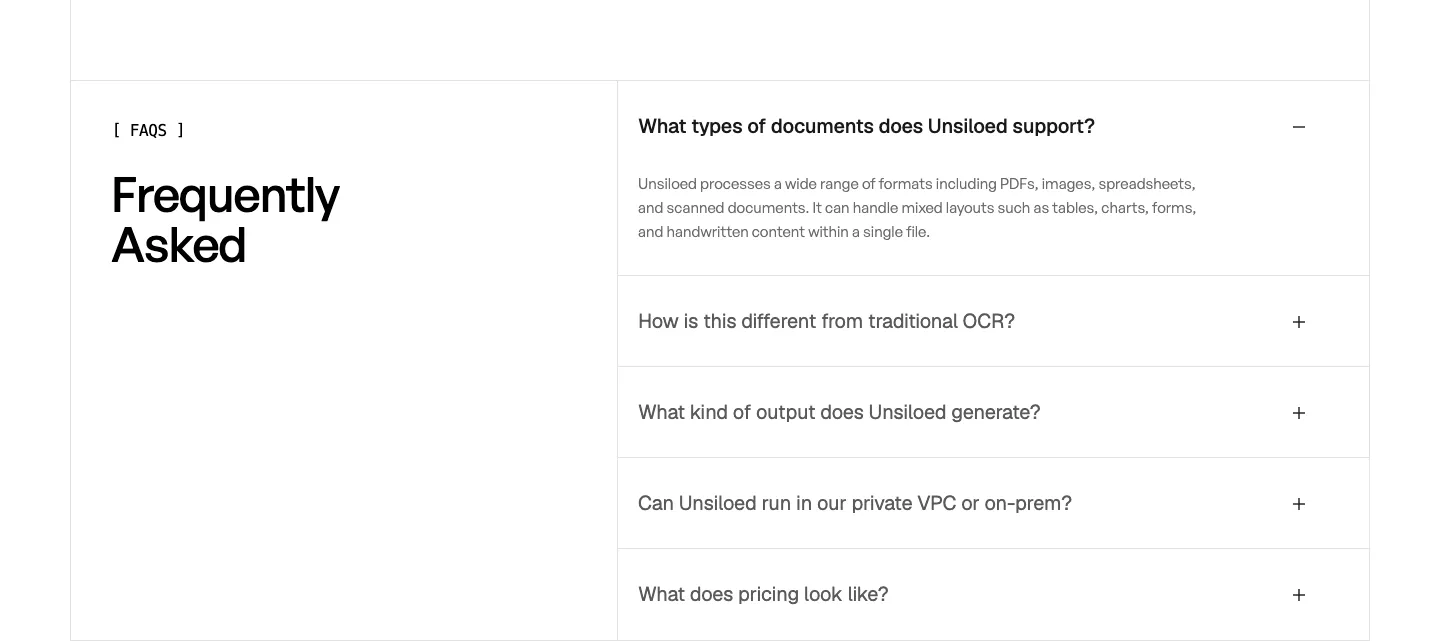
  28. Unsiloed FAQ section: Frequently Asked heading at left beside a bordered accordion with the first question expanded on white
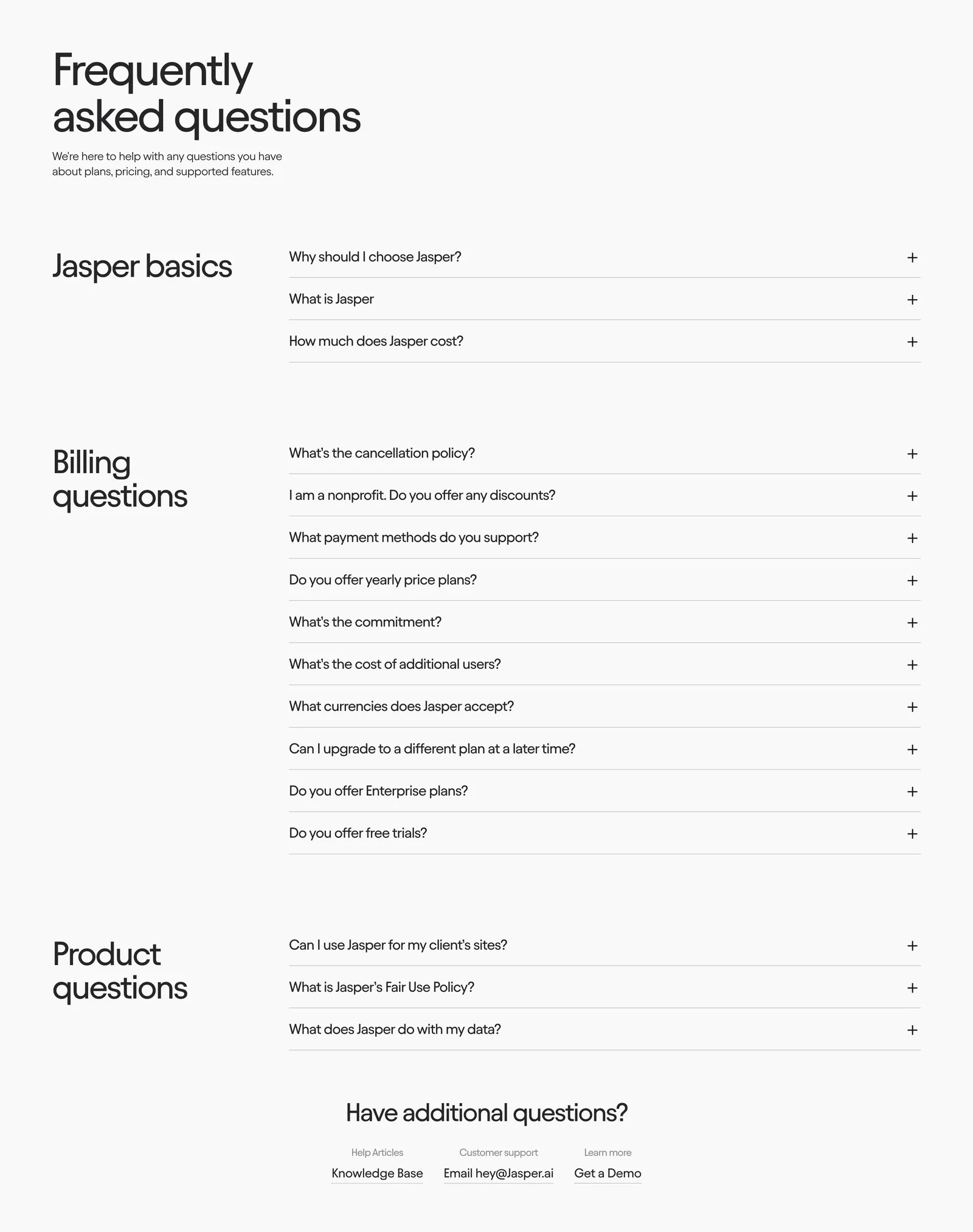
  29. Jasper FAQ section: large heading above grouped accordion questions with category titles in a left column on an off-white background
  30. Raneo FAQ section: centered headline above a single-column accordion with the first question expanded on a light gray background
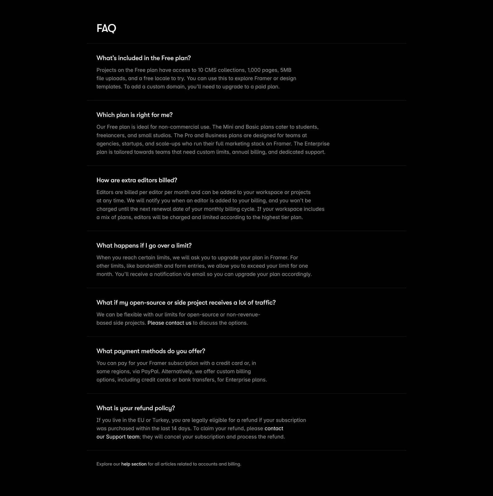
  31. Framer FAQ section: heading above a single-column list of questions with expanded answers separated by thin rules on black
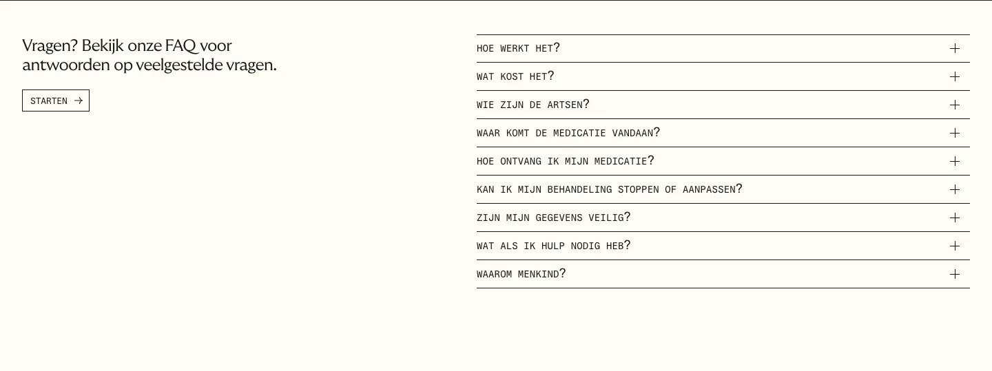
  32. Menkind FAQ section: short intro with start button on the left and a monospace question accordion on the right on cream
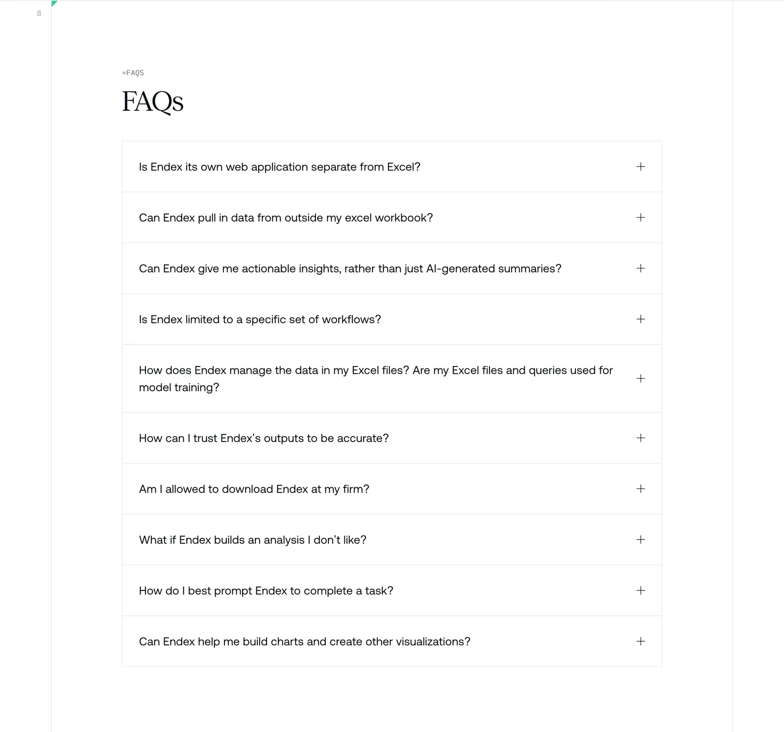
  33. Endex FAQ section: serif FAQs heading above a bordered accordion list of ten questions with plus icons on white
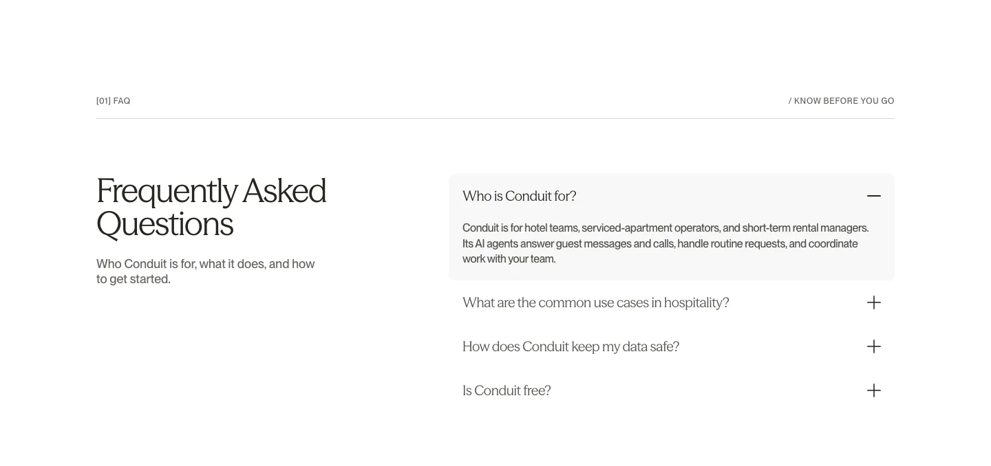
  34. Conduit FAQ section: serif heading on the left beside an accordion with the first answer expanded on white
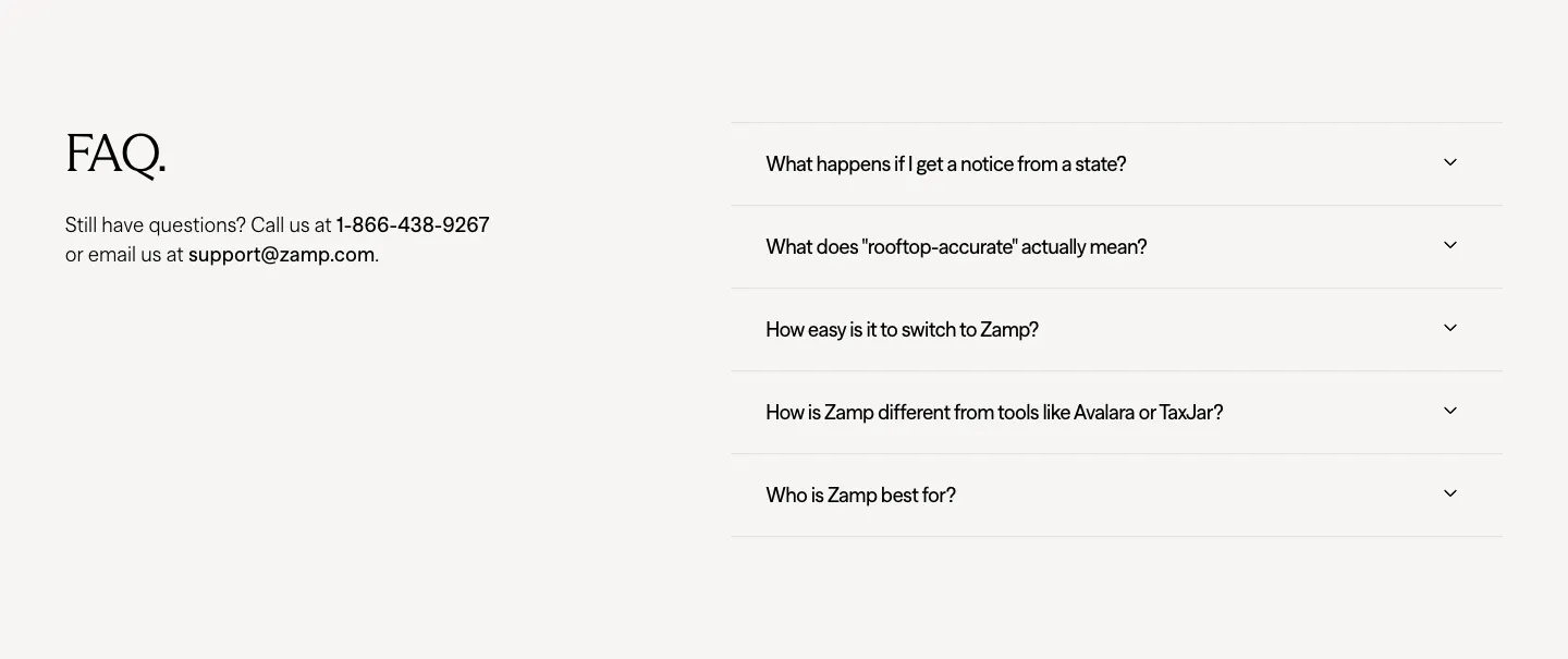
  35. Zamp FAQ section: serif FAQ heading with contact details on the left and an accordion of five questions on the right
  36. 21Oaks FAQ section: centered serif heading, intro and button on the left, accordion question list on the right on white
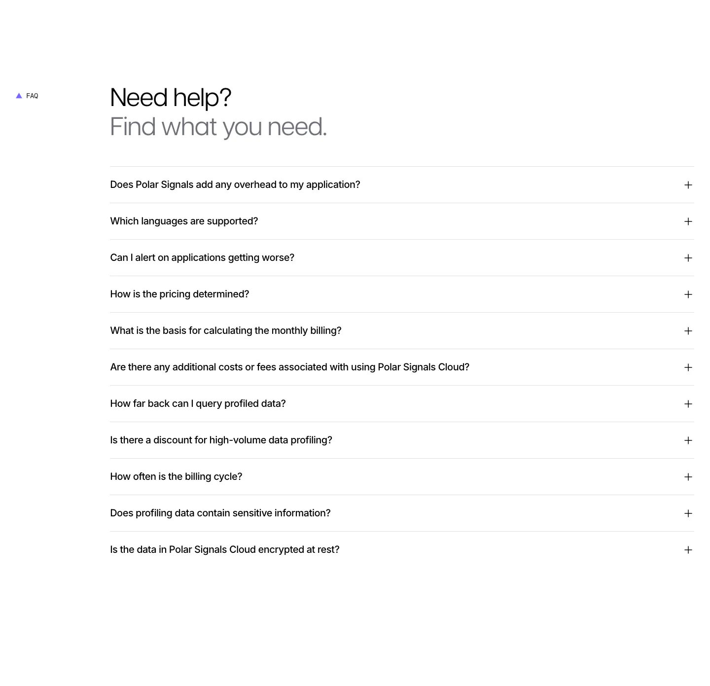
  37. Polar Signals FAQ section: two-tone headline above a full-width accordion list of eleven questions with plus icons on white
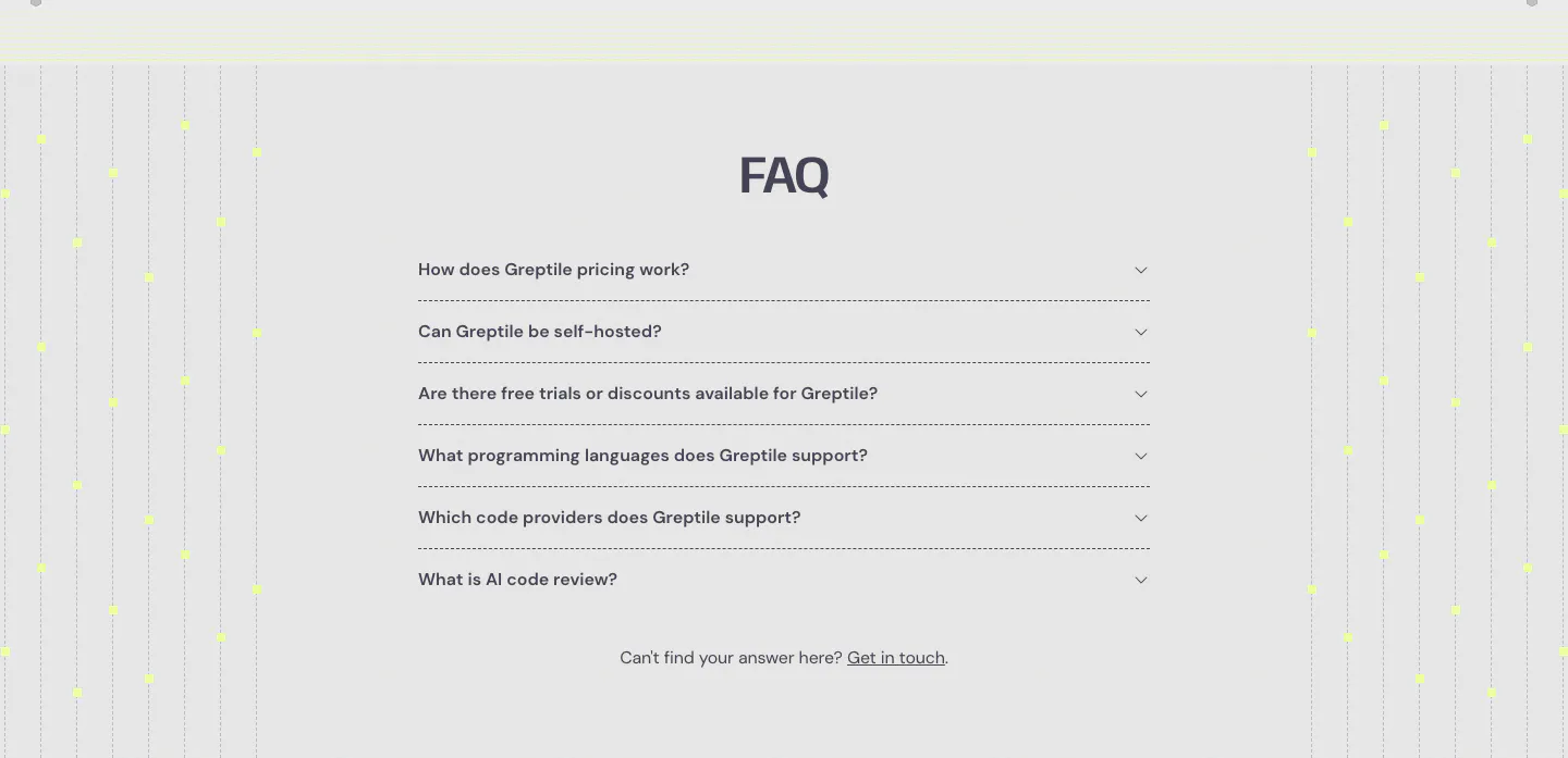
  38. Greptile FAQ section: centered accordion list of six questions flanked by vertical dotted lines with yellow dots on light gray
  39. Concourse FAQ section: heading left, accordion of questions right with the first item expanded on white
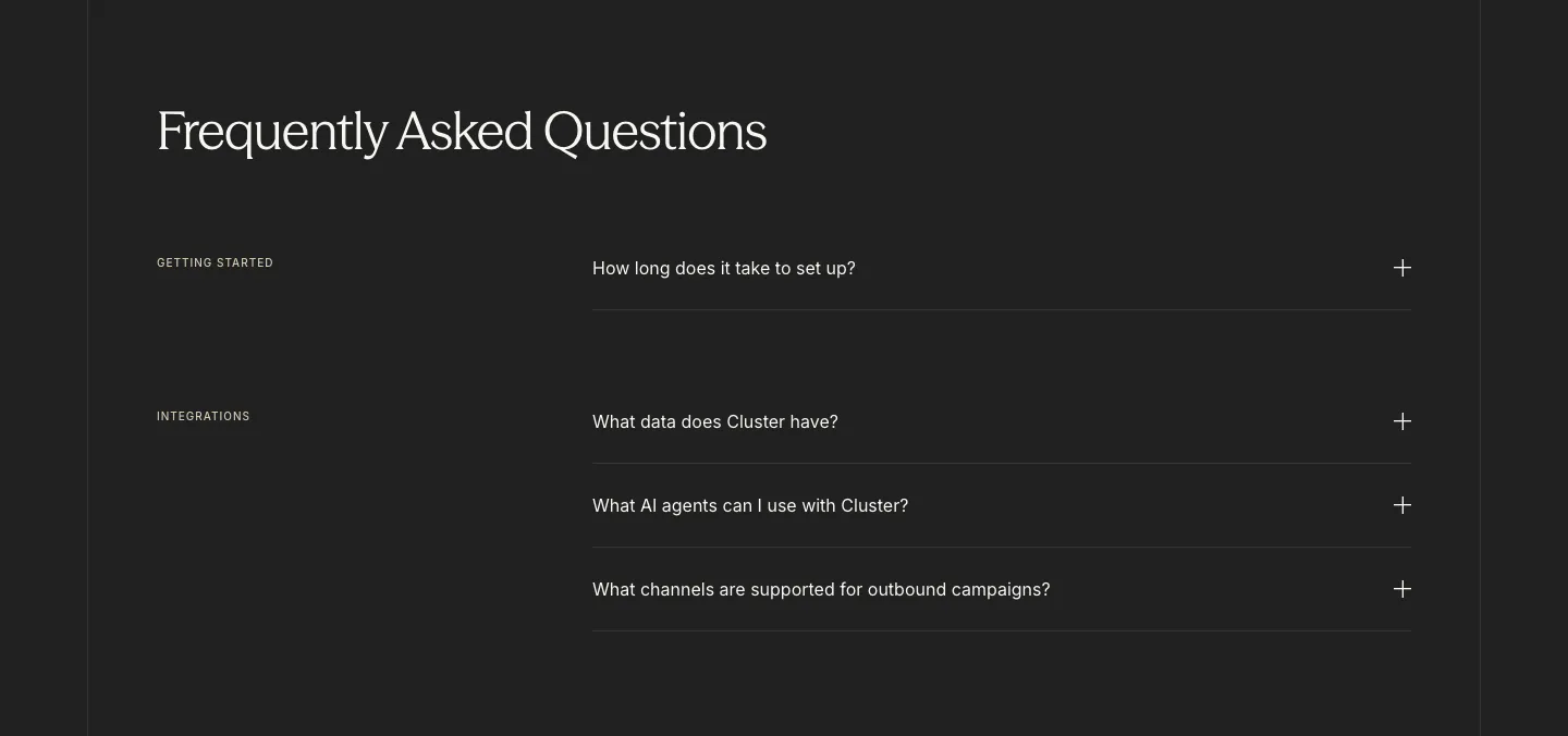
  40. Cluster FAQ section: serif headline above category-labelled accordion questions with plus icons on a charcoal background
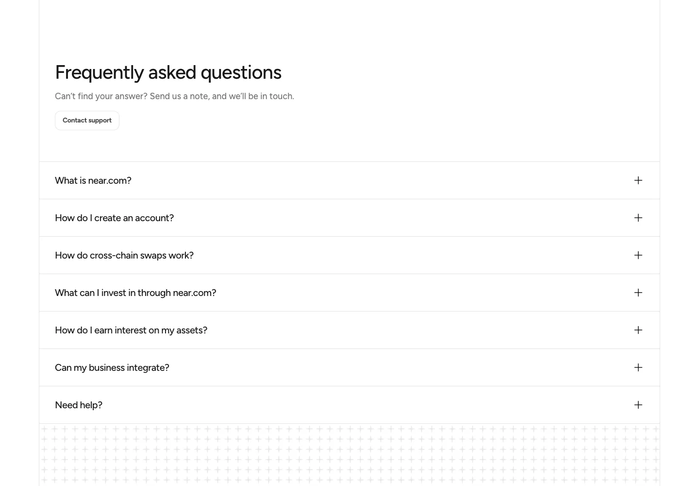
  41. NEAR FAQ section: headline with Contact support button above a full-width accordion of questions on white
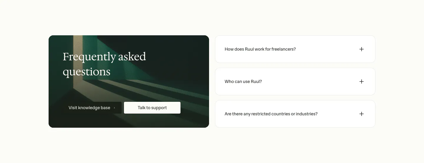
  42. Ruul FAQ section: dark green image card with serif headline and buttons on the left, three collapsed question rows on the right
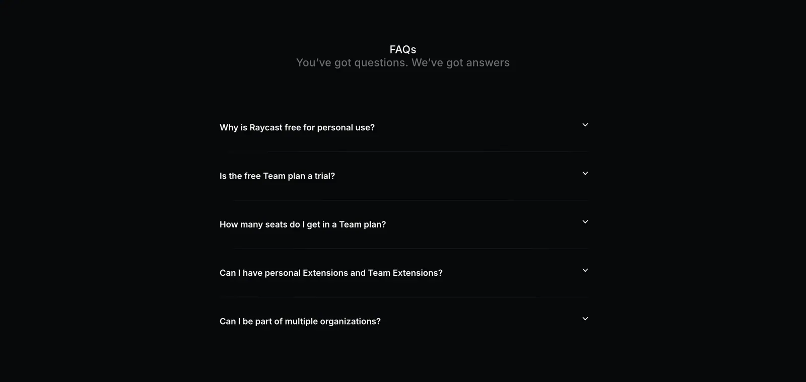
  43. Raycast FAQ section: centered FAQs heading above a five-question collapsed accordion on a near-black background
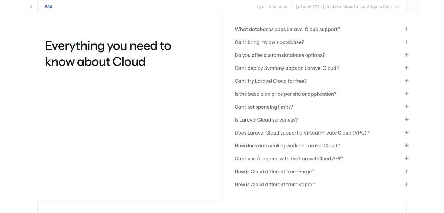
  44. Laravel Cloud FAQ section: headline on the left beside a long accordion of questions about databases, pricing and deployment on white
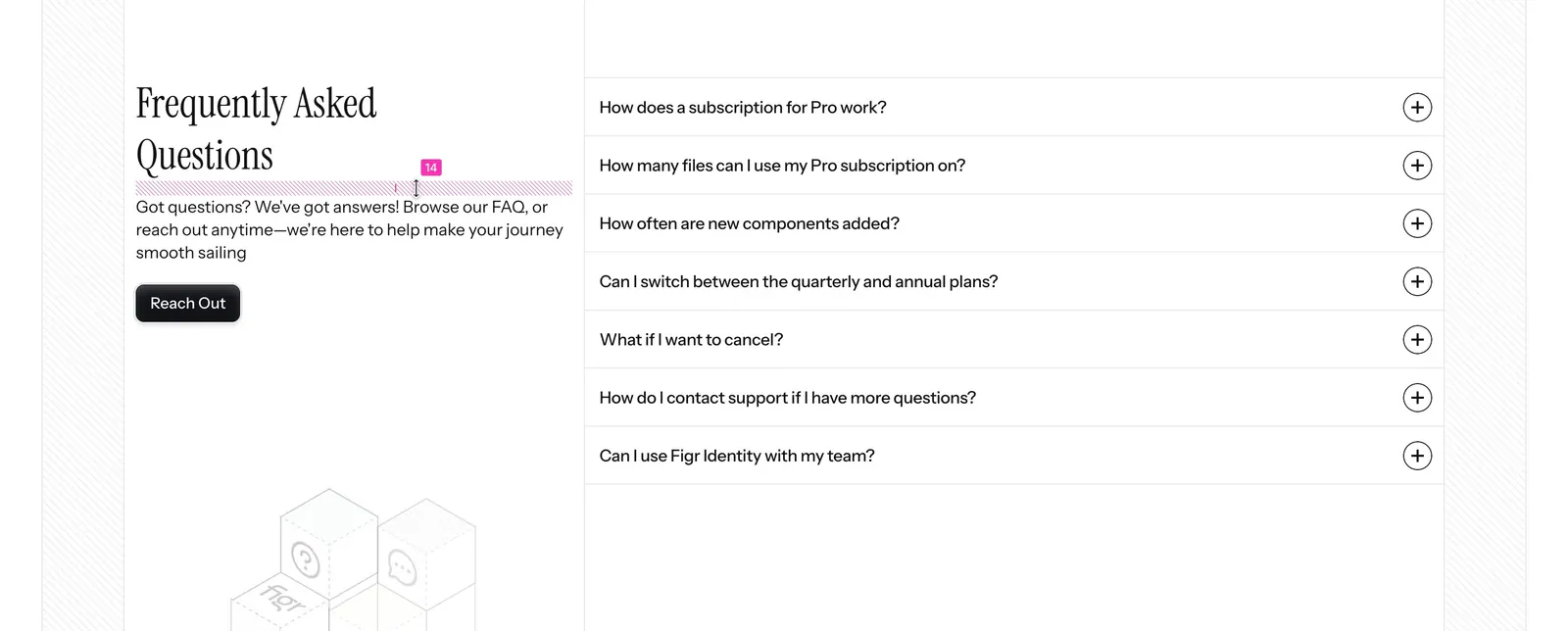
  45. Figr FAQ section: serif heading, intro and Reach Out button on the left with a seven-question accordion on the right
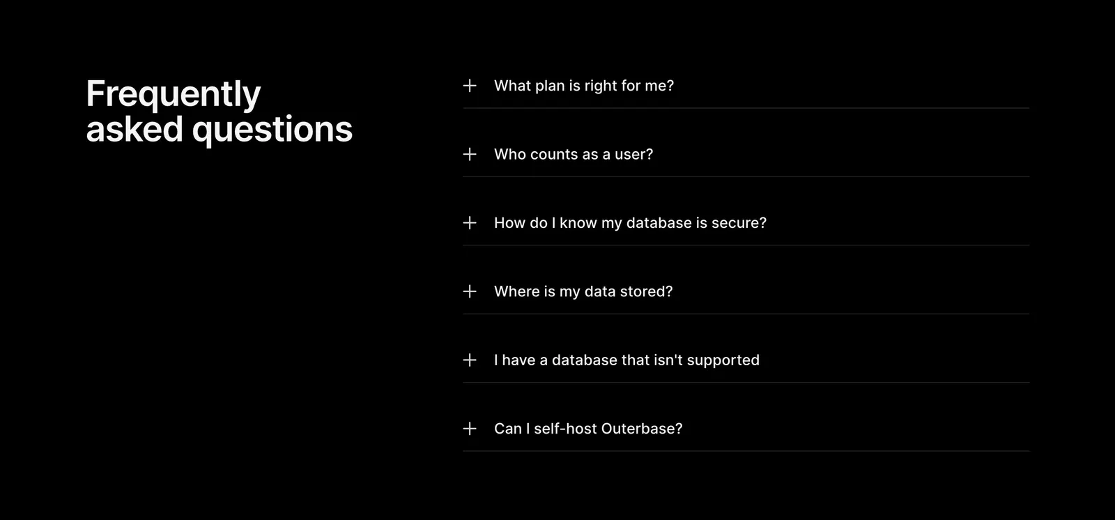
  46. Outerbase FAQ section: headline on the left beside a six-item plus-icon accordion of questions on a black background
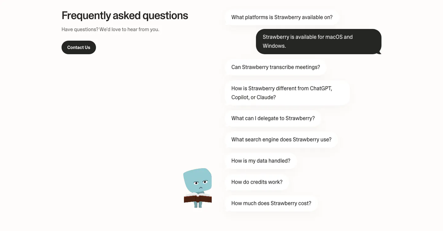
  47. Strawberry FAQ section: headline and contact button on the left, questions as chat bubbles with one dark answer and a character
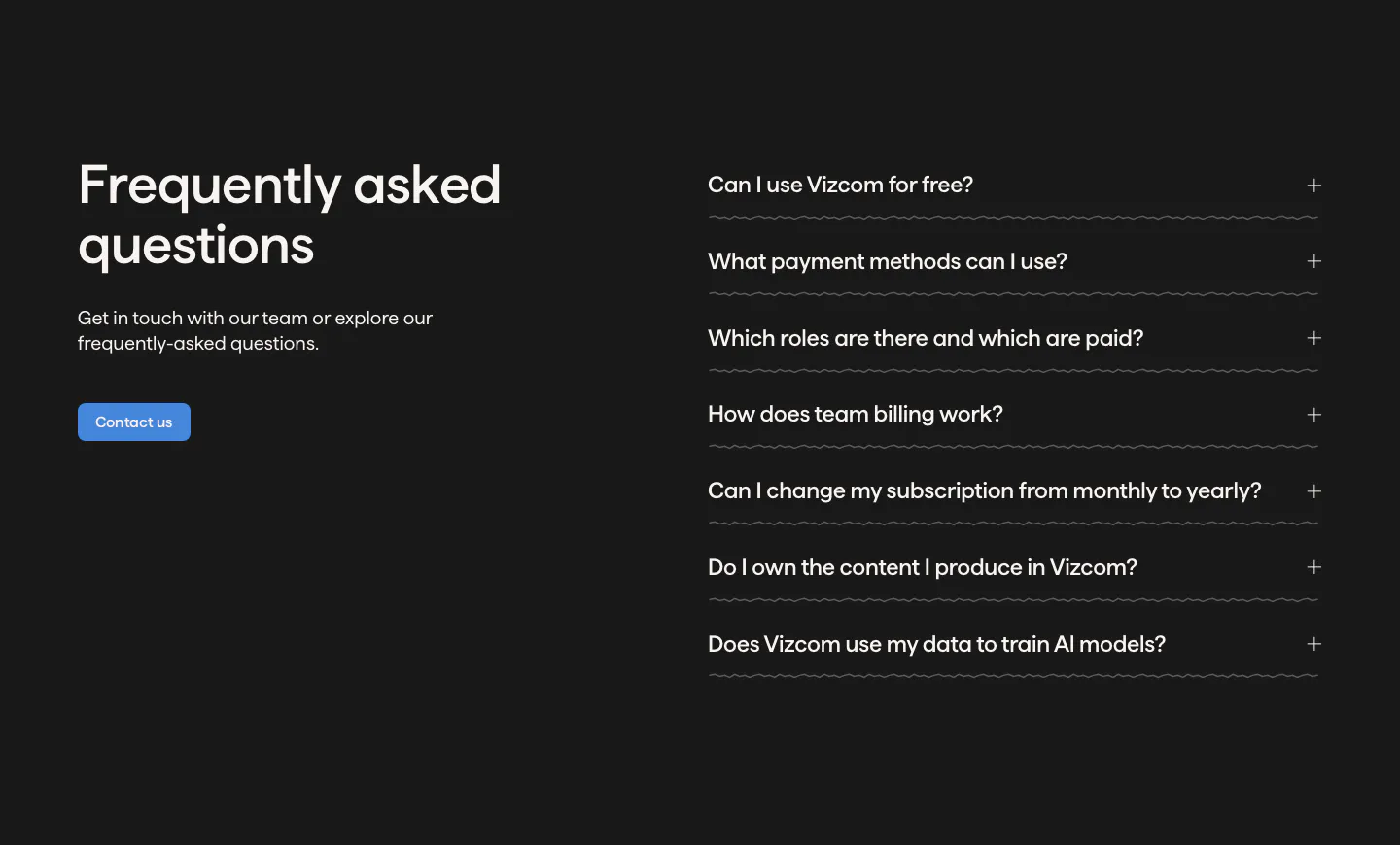
  48. Vizcom FAQ section: headline, copy and contact button on the left beside an accordion of questions on a dark charcoal background
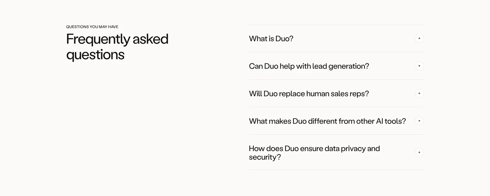
  49. Amplemarket FAQ section: headline on the left and an accordion of five questions with plus icons on the right, on off-white
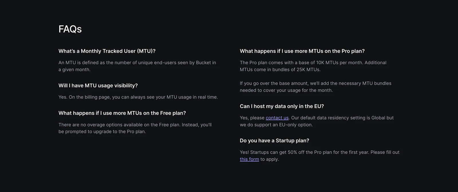
  50. Bucket FAQ section: FAQs heading above a two-column list of questions and answers on a dark background
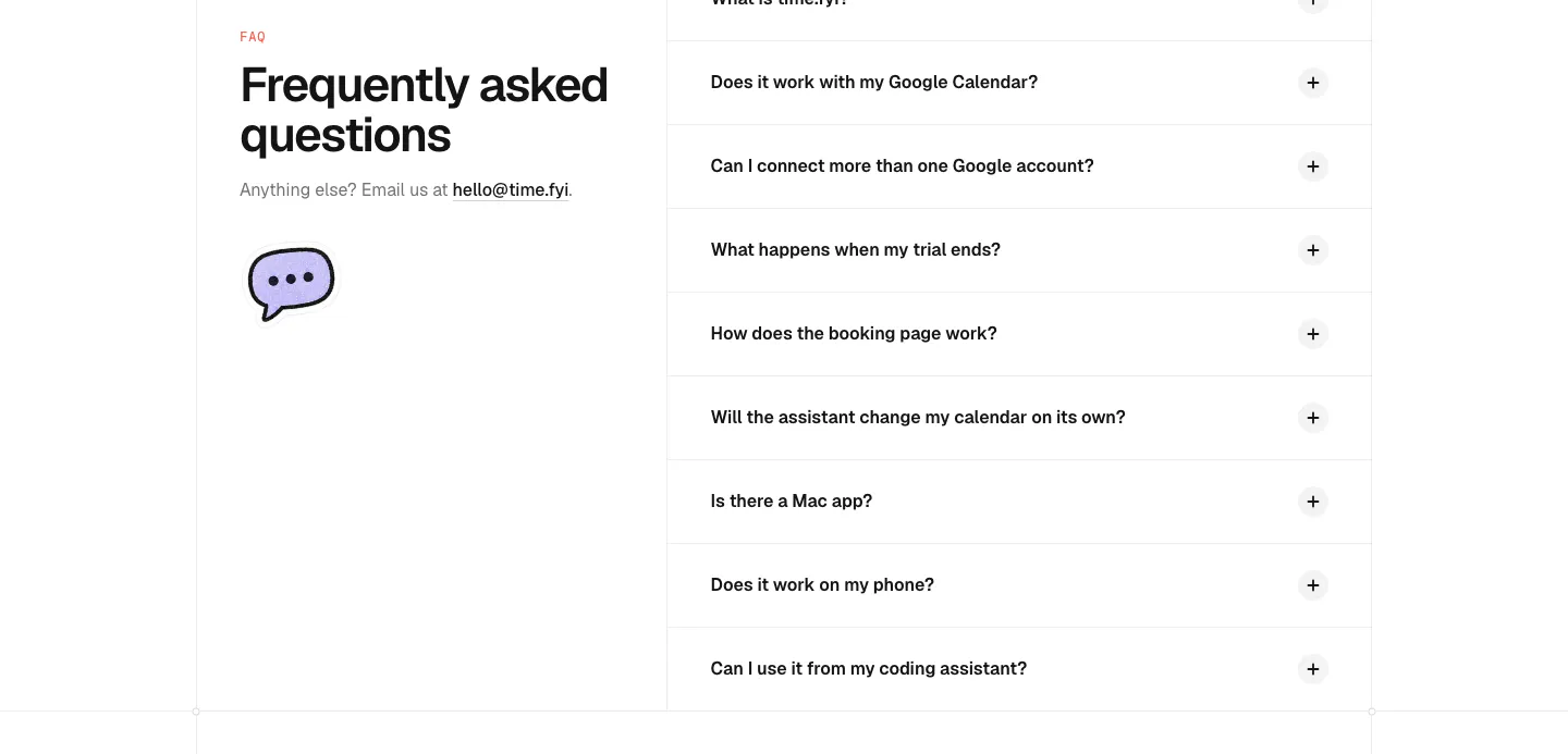
  51. time.fyi FAQ section: left headline with email contact and chat bubble icon beside a right-hand accordion of collapsed questions
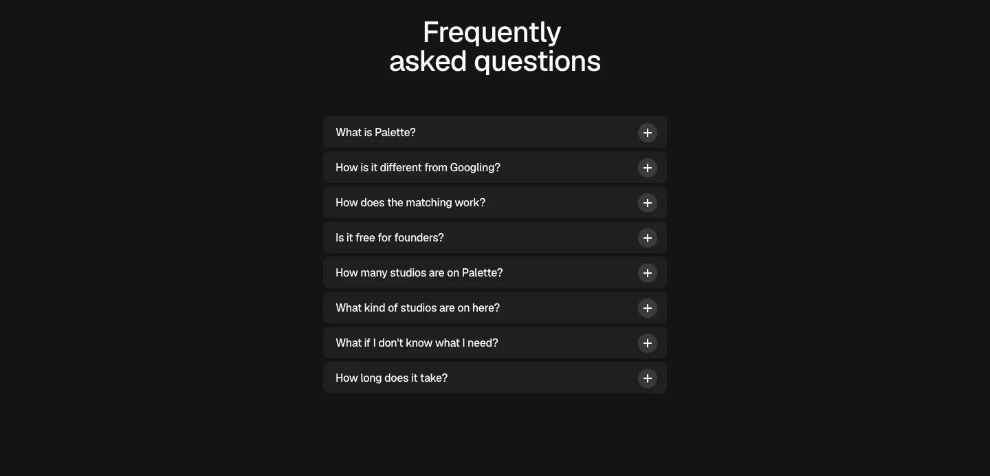
  52. Palette FAQ section: centered headline above a narrow accordion of eight collapsed questions with plus icons on a dark background
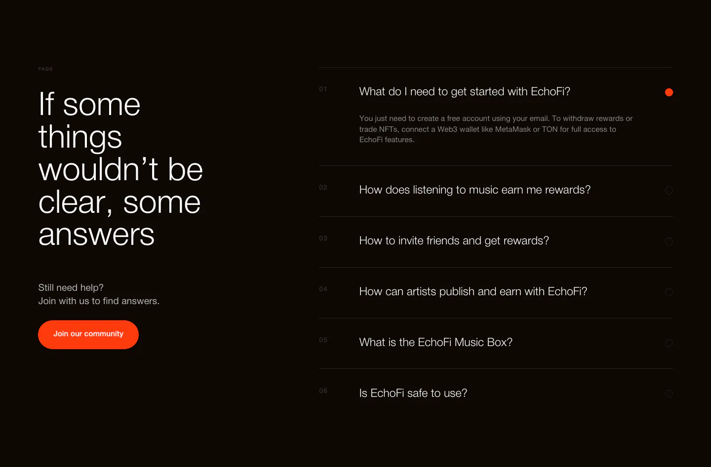
  53. EchoFi FAQ section: large headline and orange community button at left, numbered question accordion at right on black
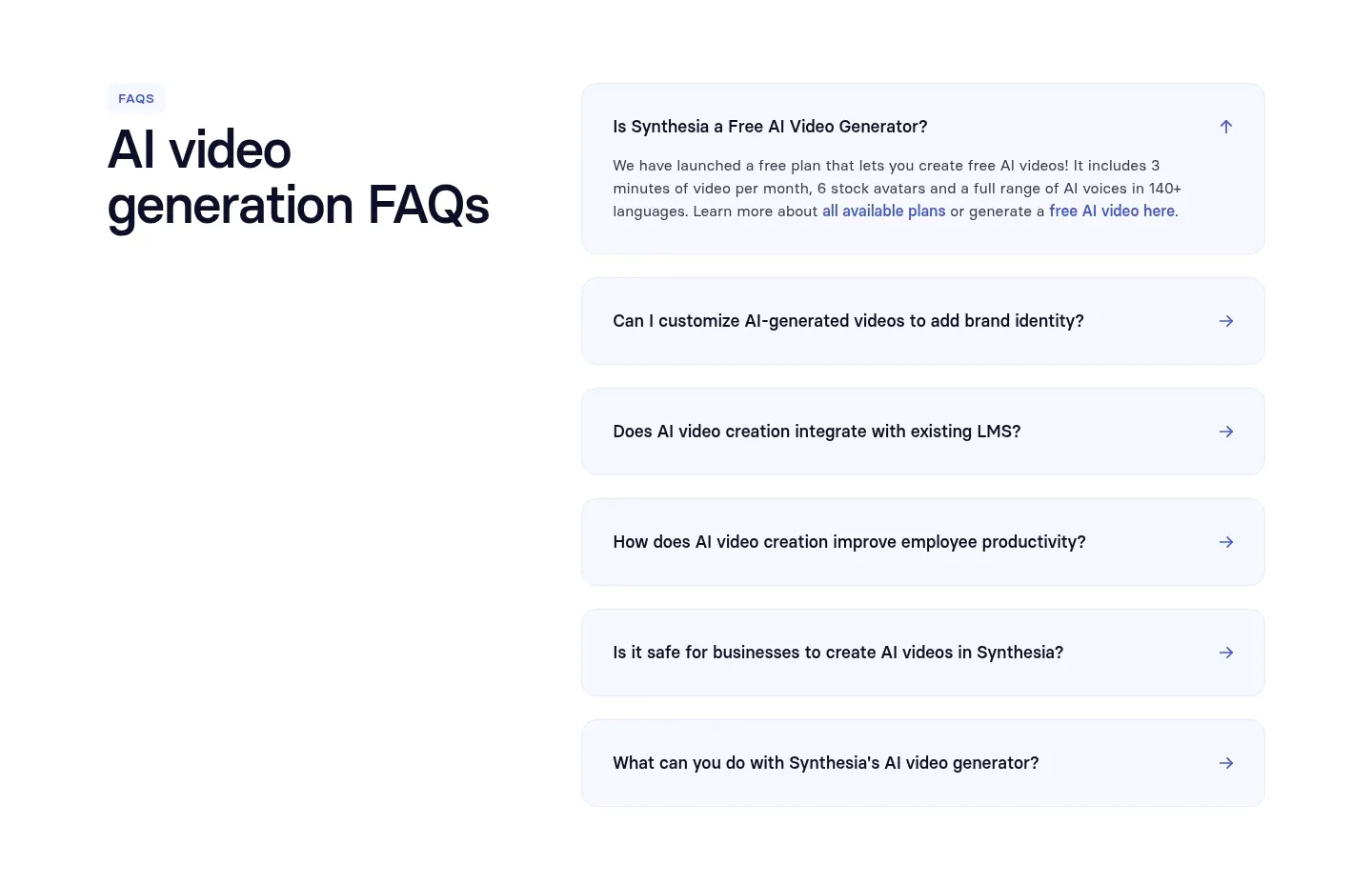
  54. Synthesia FAQ section: headline on the left with an accordion of pale blue question rows on the right, white background
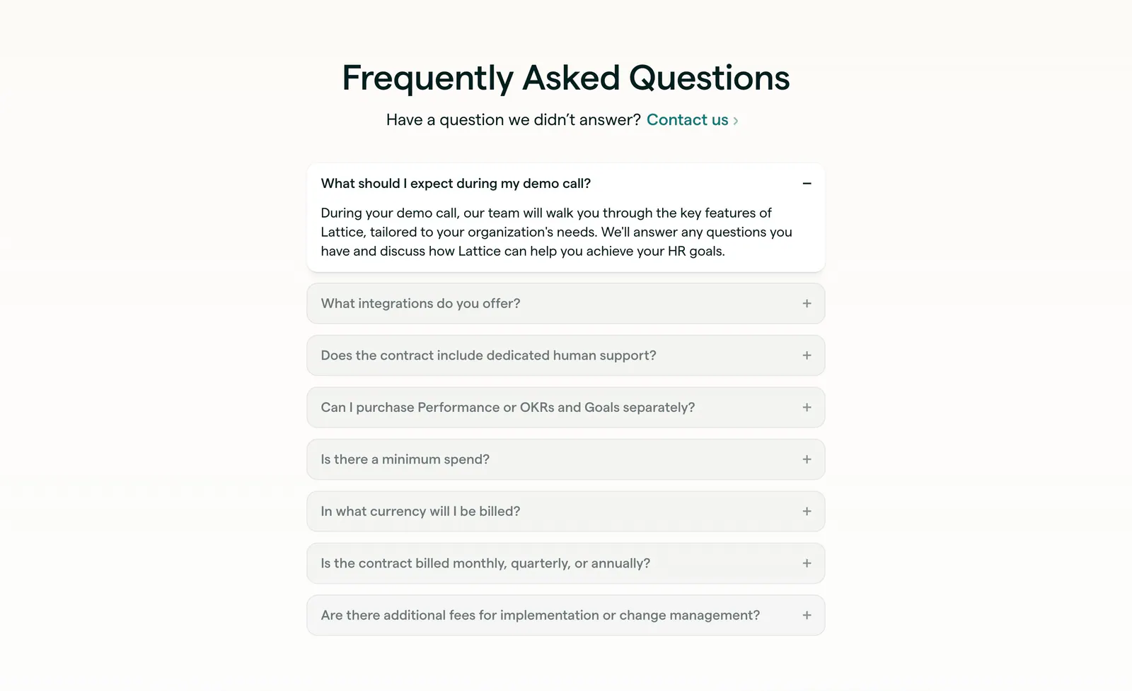
  55. Lattice FAQ section: centered heading and contact link above a single-column accordion with the first question open, on warm off-white
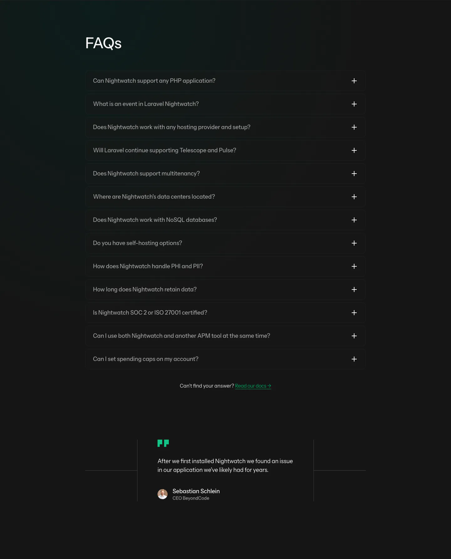
  56. Laravel Nightwatch FAQ section: left-aligned FAQs heading above a dark accordion of 13 questions and a short customer quote below
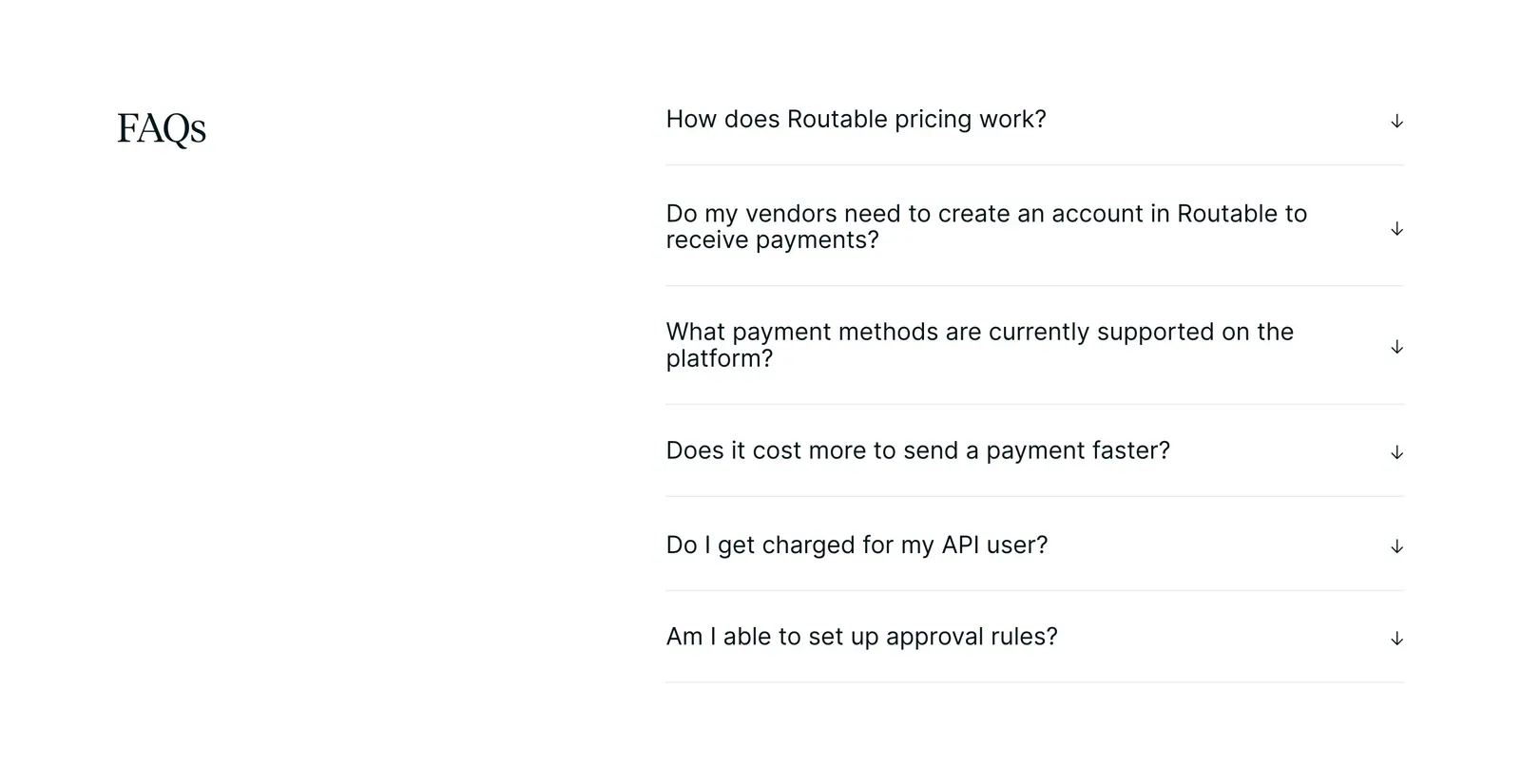
  57. Routable FAQ section: serif FAQs heading on the left beside a six-question accordion with arrow toggles on a white background
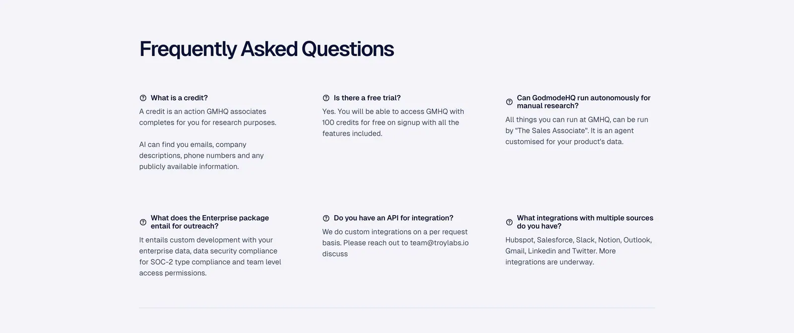
  58. Godmode FAQ section: left-aligned heading above a three-column grid of question and answer pairs on a pale gray background
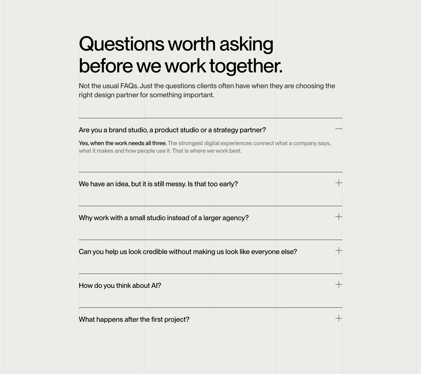
  59. Brikken+Co FAQ section: large headline and intro above a ruled accordion with plus icons on warm gray with grid lines
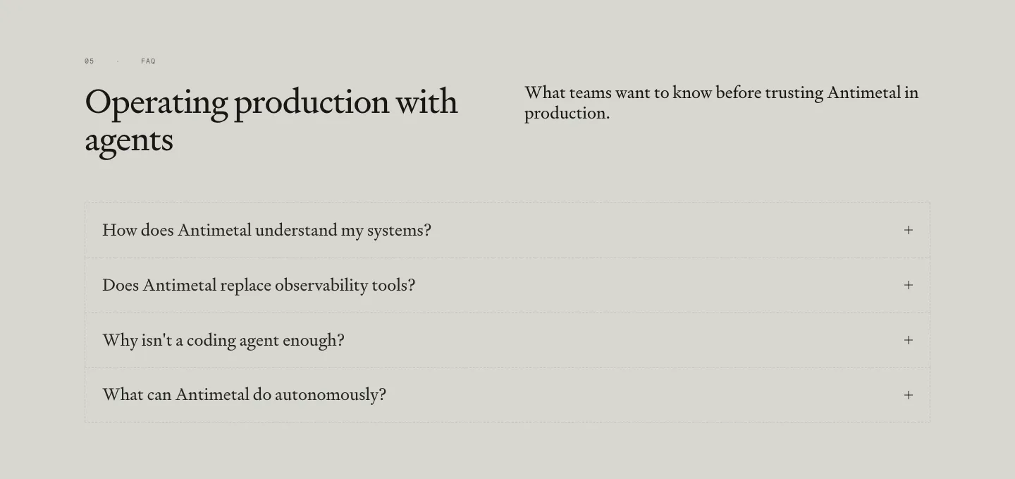
  60. Antimetal FAQ section: serif headline and intro side by side above a bordered accordion of four serif questions on warm gray

Common patterns in FAQ sections

How to design an FAQ section

  1. Source questions from real conversations

    Pull questions from support tickets, sales calls, and onboarding emails, not from what marketing wishes people asked. Lead with pricing, cancellation, data handling, and setup time. If a question only exists to repeat a feature claim, cut it, because readers notice filler.

  2. Turn each question into a button

    Render every question as a full-width button with a plus or chevron that changes when open, and give each row a hit area at least 44 pixels tall. Use real button elements with aria-expanded so keyboard and screen reader users can open answers too.

  3. Answer in the first sentence

    Put the direct answer up front, then add detail. Two to four sentences is usually enough, with a link to docs for anything longer. Write answers in the same voice as the rest of the page, not like legal disclaimers.
  4. Group long lists and offer a way out
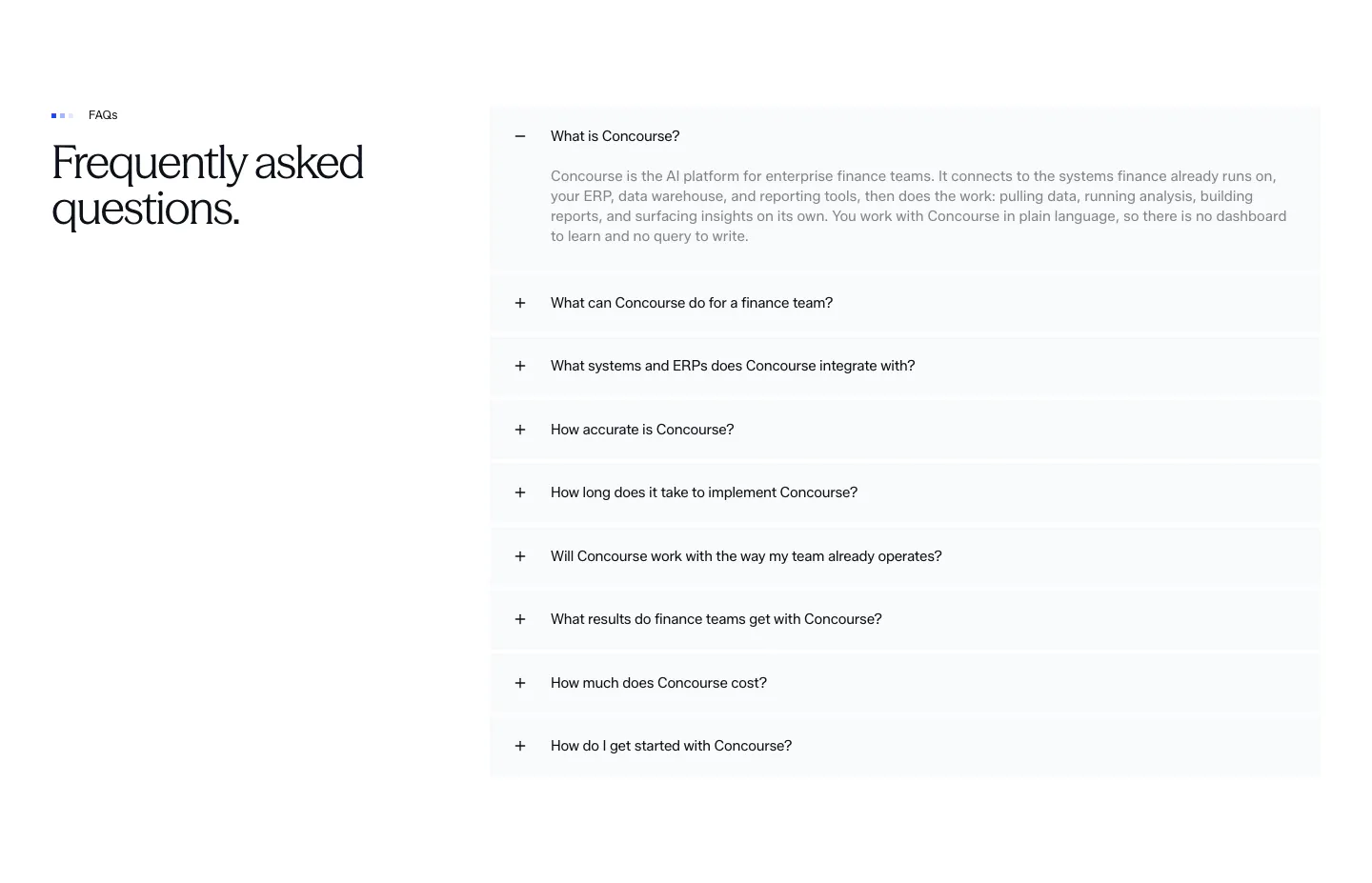
    When the list grows, split questions under short labels such as billing, security, and setup. On wide screens, a two-column layout works well, with the heading and a contact link on the left and questions on the right. Always end with a path to a human.
Companies in this collection

All section types
    ↑↓ Navigate ↵ Open

    Section preview

    Website section