CTA Section Examples

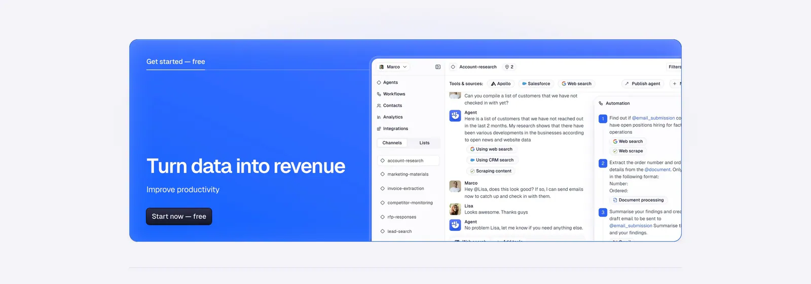
By the time someone reaches the bottom of a page, they have seen the pitch. The closing call to action gives them one specific line and one button that says exactly what happens on click. A generic slogan stacked above several equal buttons gives them nothing to act on. In these CTA section examples, full-width bands and contained cards each end the page with a single, clear ask.

158 sections

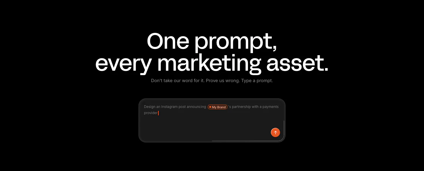
  1. Linearity call-to-action section: large centered headline and short line above a dark prompt input box with an orange send button on black

  2. Palette call-to-action section: centered headline, short copy and black Start for Free button on an orange-to-blue gradient band
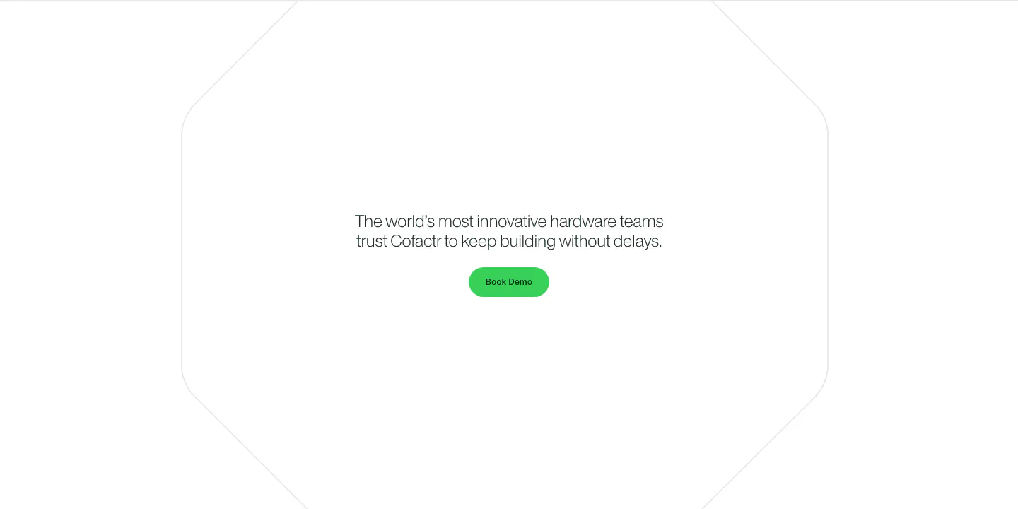
  3. Cofactr call to action section: centered one-line statement and green Book Demo button inside a faint octagon outline on white
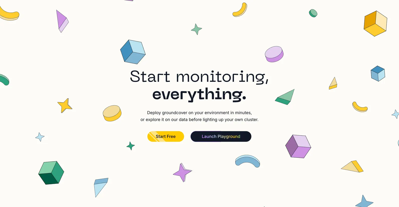
  4. groundcover call-to-action section: centered headline with yellow and dark buttons surrounded by scattered isometric shapes on cream
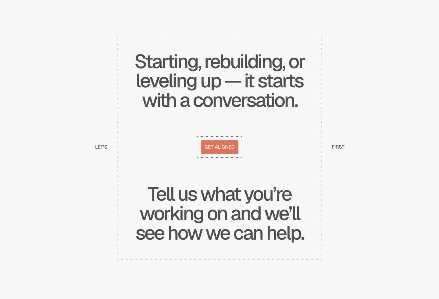
  5. A-LIGN call to action section: centered two-part headline in a dashed frame around a small orange Get Aligned button on light gray
  6. United Carriers call-to-action section: bold uppercase headline and short copy inside a thin circle outline on a dark background
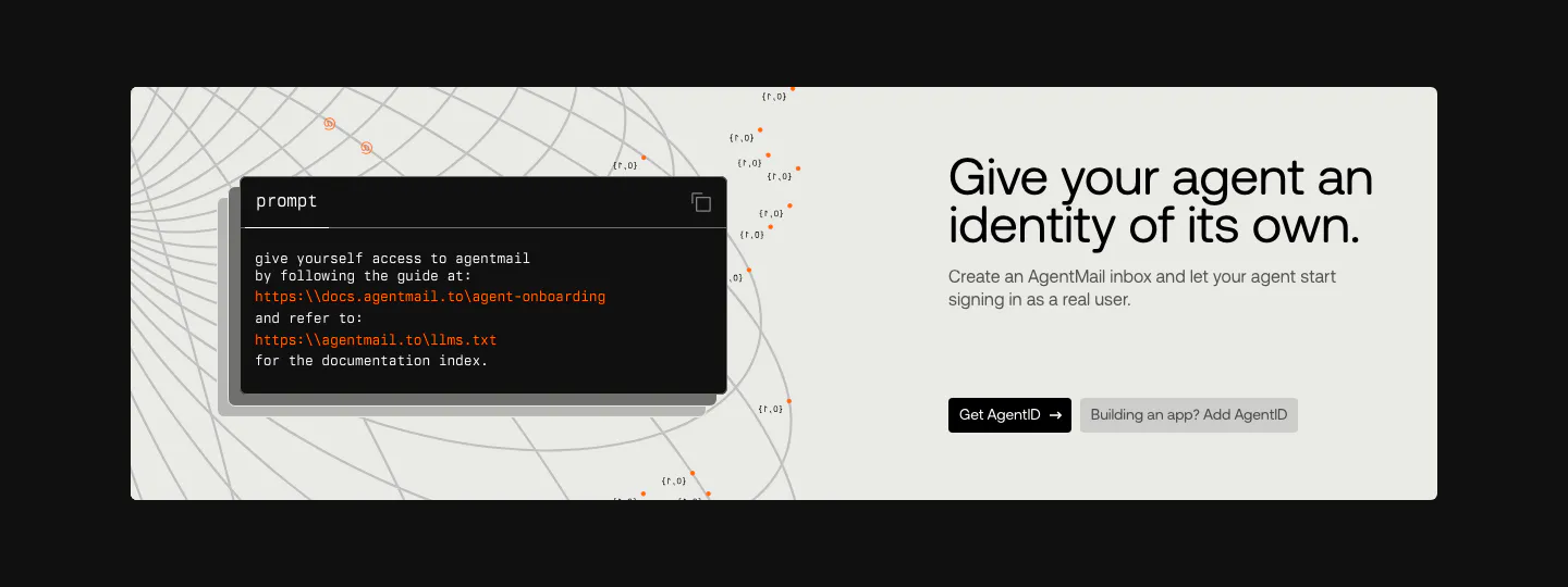
  7. AgentID call to action section: light panel on black with a dark prompt code card left and headline, copy and two buttons right
  8. Bayshore call-to-action section: headline with Book a call and Copy email buttons on a mauve-to-tan gradient beside 3D marble shapes
  9. Invertase call-to-action section: centered headline below a glowing logo tile with two buttons on a dark background with faint hexagons
  10. Lattice call-to-action section: centered headline, demo button and G2 and Capterra ratings over a soft green cloud glow background
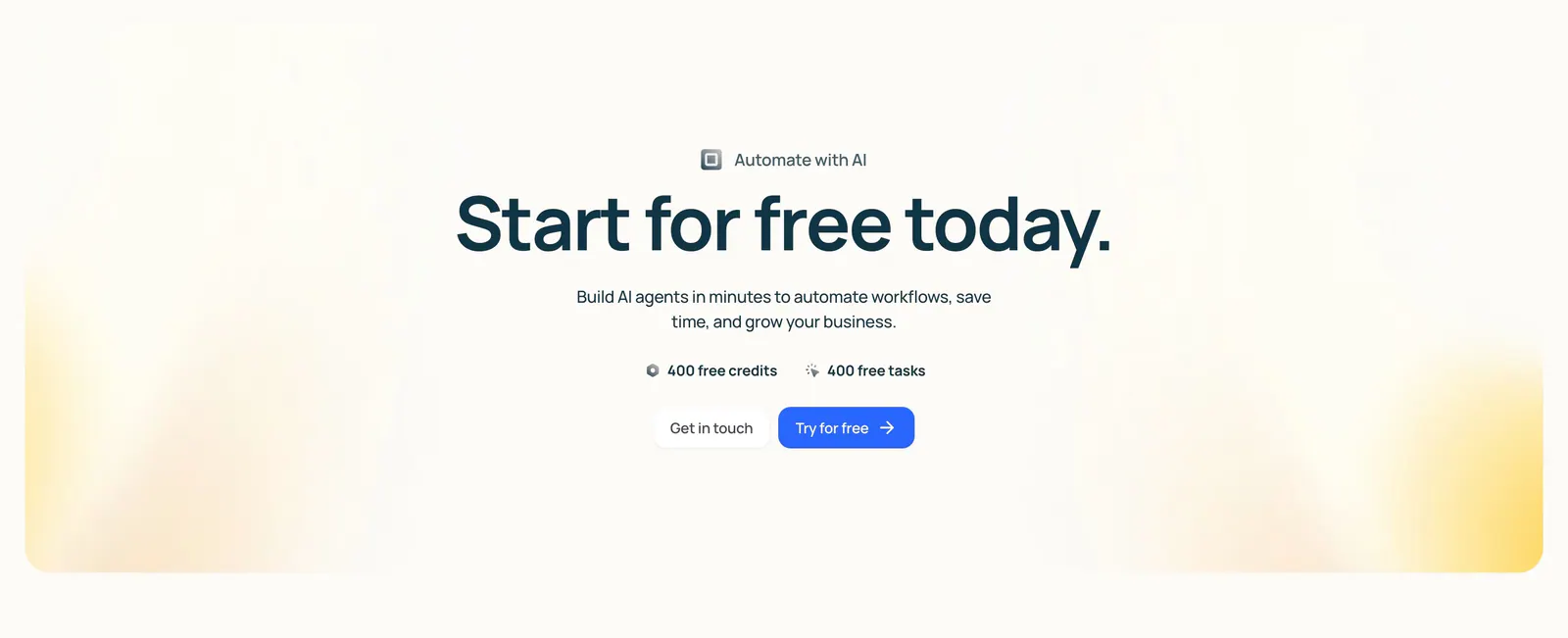
  11. Lindy call-to-action section: centered headline with free credit badges and two buttons inside a cream panel with soft yellow corner glows
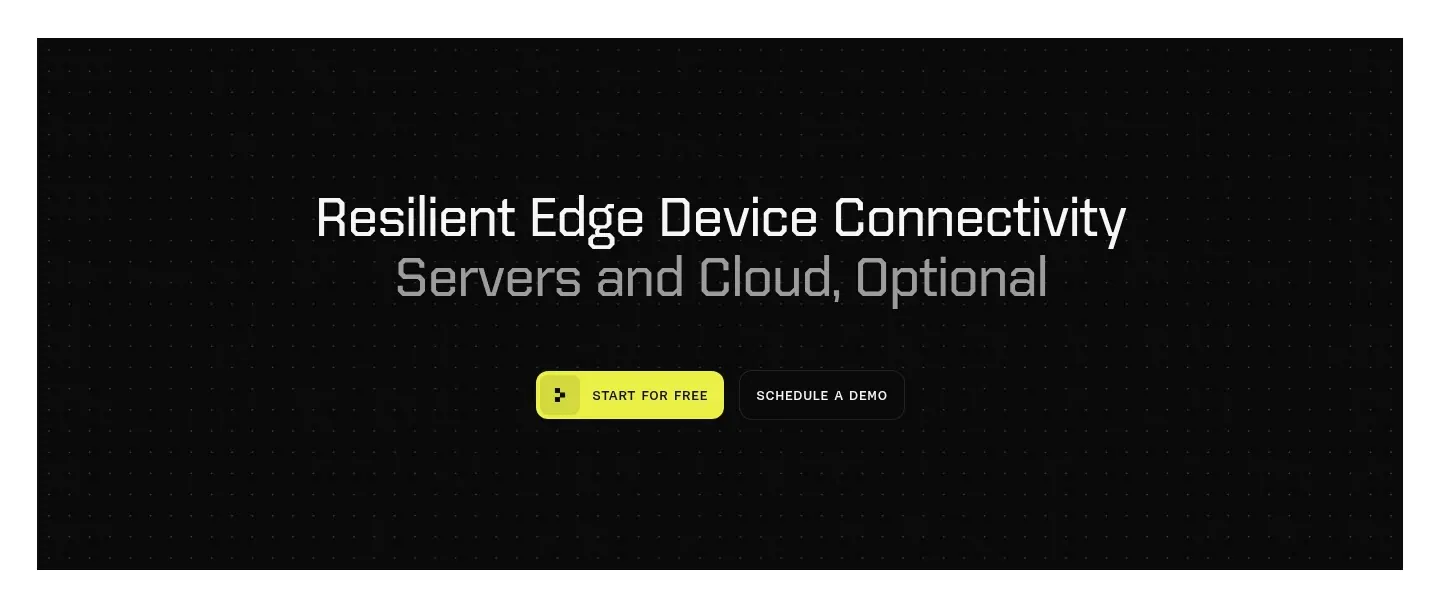
  12. Ditto call-to-action section: centered two-tone headline with yellow and outline buttons inside a black dotted panel
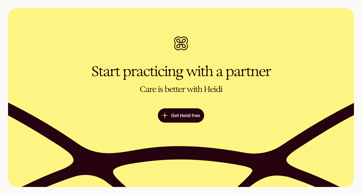
  13. Heidi call to action section: yellow rounded panel with logo, centered serif headline and button over a large dark curved logo shape
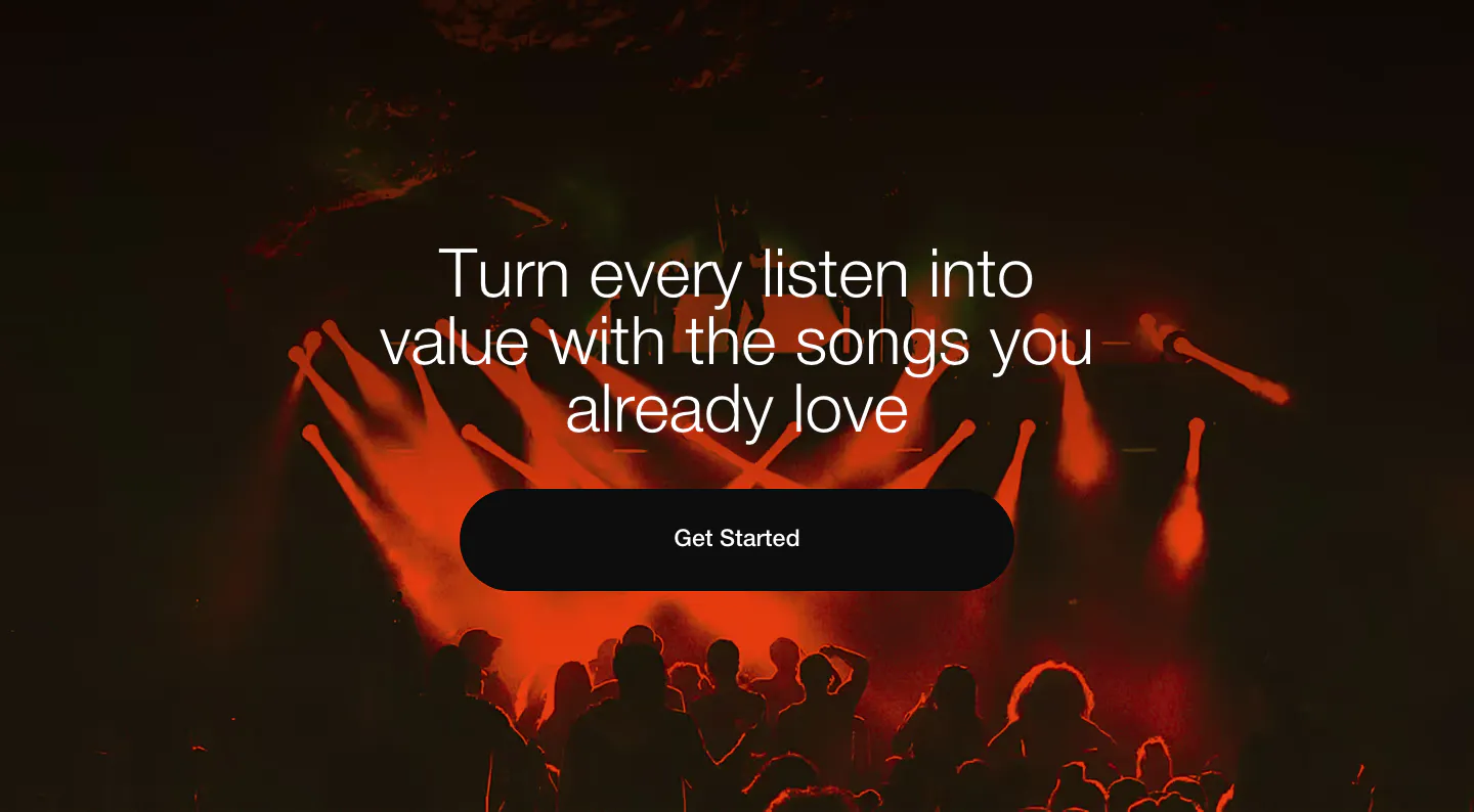
  14. EchoFi call-to-action section: centered headline and black pill button over a full-bleed red-lit concert crowd photo
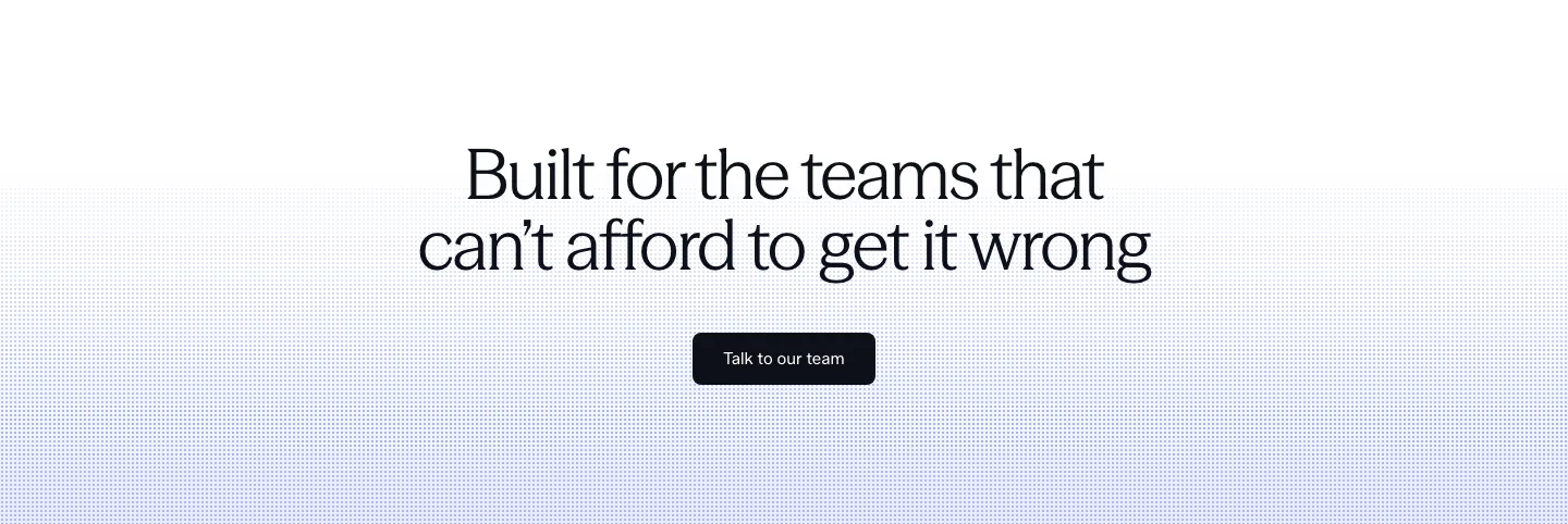
  15. Concourse call-to-action section: centered headline and dark button over a white-to-lavender dot-grid background
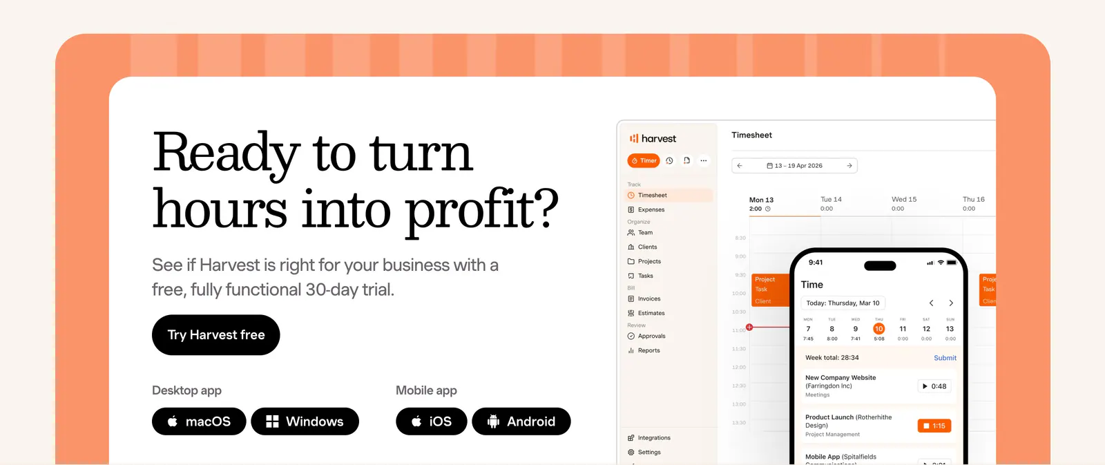
  16. Harvest call-to-action section: serif headline, trial button and app badges beside desktop and mobile timesheet UI in an orange-framed card
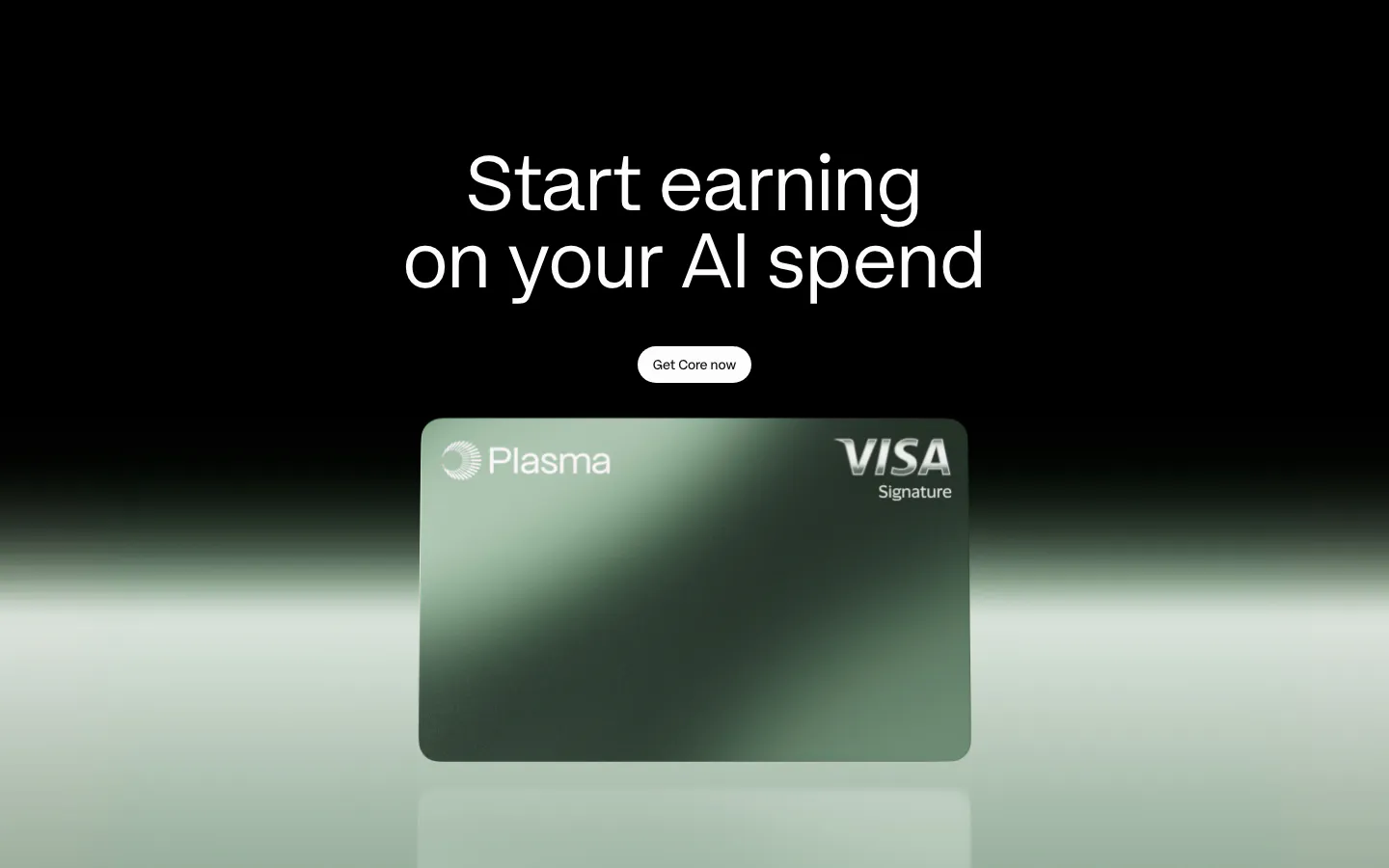
  17. Plasma call-to-action section: centered headline and button above a green Plasma card render with a green glow on black
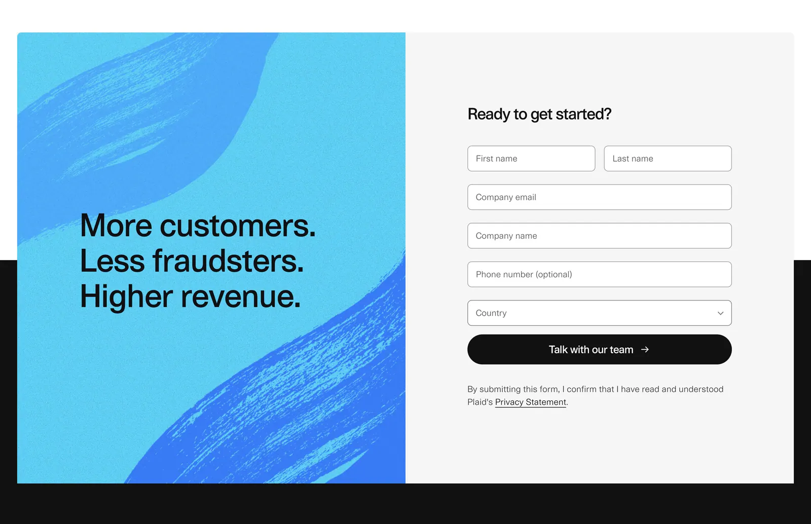
  18. Plaid call to action section: blue brushstroke panel with stacked headline beside a gray contact form with name, email and country fields
  19. Ycode call to action section: centered headline with a spotlight fade effect and two buttons on a black background
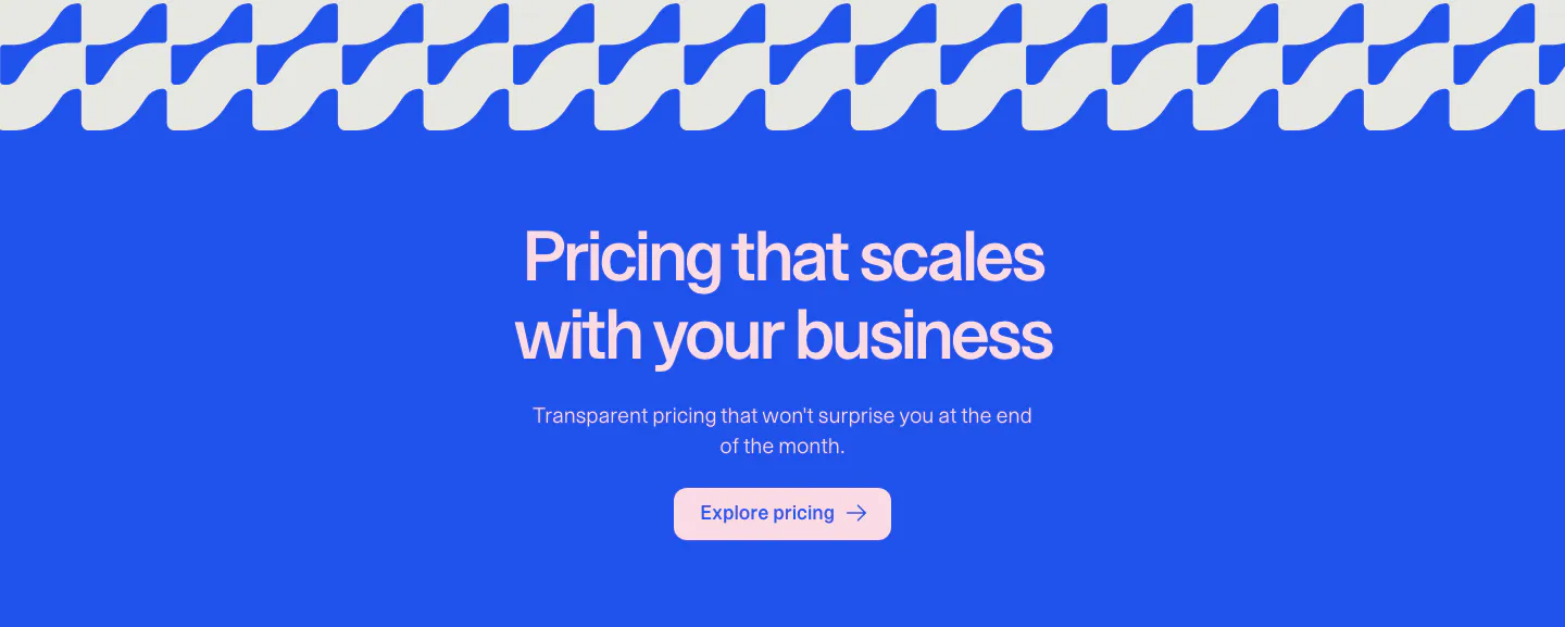
  20. Weav call to action section: centered headline, copy and pink button on a bright blue background under a wave pattern strip
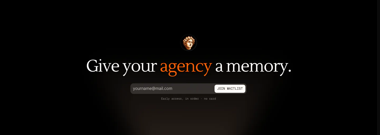
  21. Arke call to action section: centered serif headline with an orange accent word above an email waitlist field and a small statue icon on black
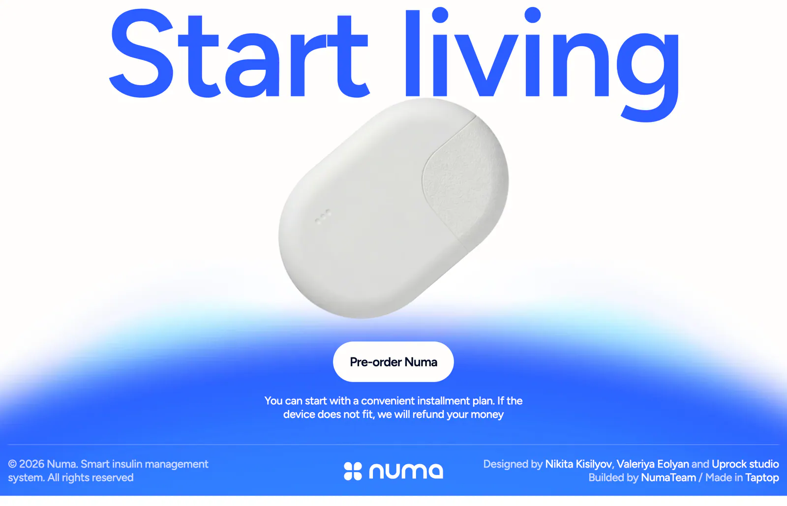
  22. Numa call to action section: full-width blue headline above a white insulin device, pre-order button on a blue glow, slim footer row below
    Numa
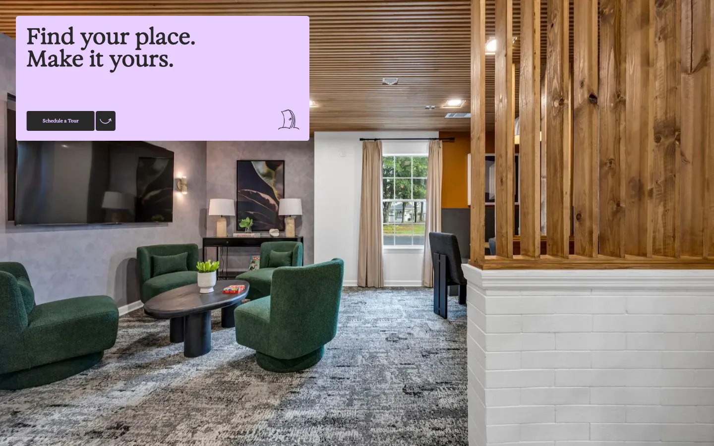
  23. 21Oaks call-to-action section: full-bleed lounge photo with a lavender card holding a serif headline and tour button
  24. Attio call to action section: centered two-line headline with Talk to sales and Start for free buttons on a dark striped background
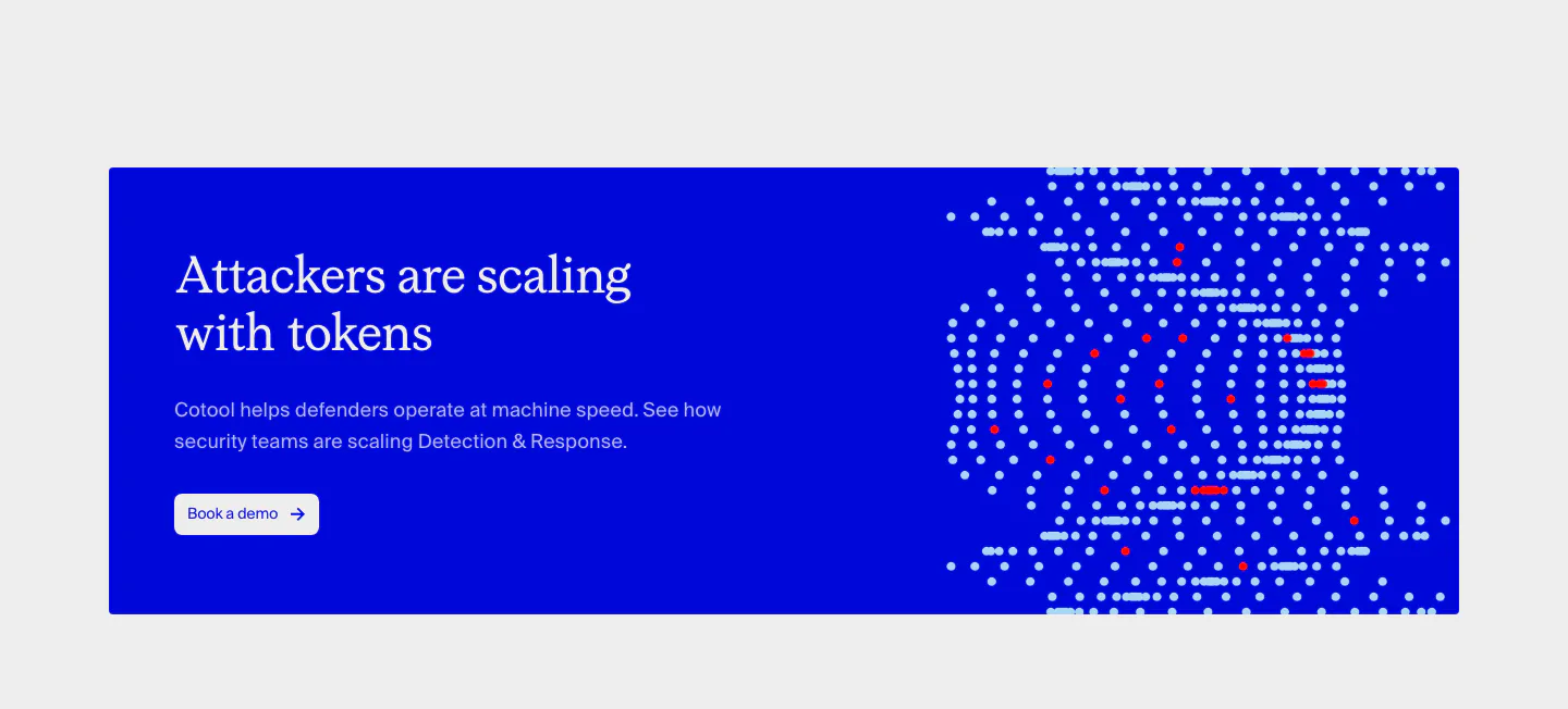
  25. Cotool call-to-action section: saturated blue banner with serif headline and button on the left and a dotted pixel artwork on the right
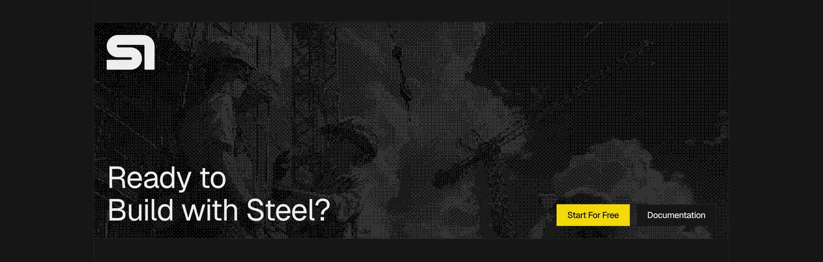
  26. Steel call-to-action section: dithered grayscale construction photo banner with logo, large headline and yellow button on a dark background
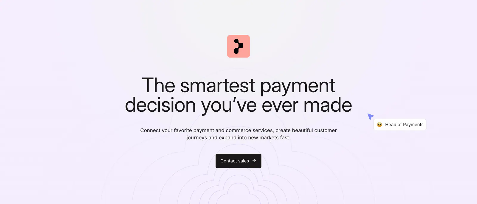
  27. Primer call-to-action section: centered headline, subcopy and dark Contact sales button over a faint concentric line pattern
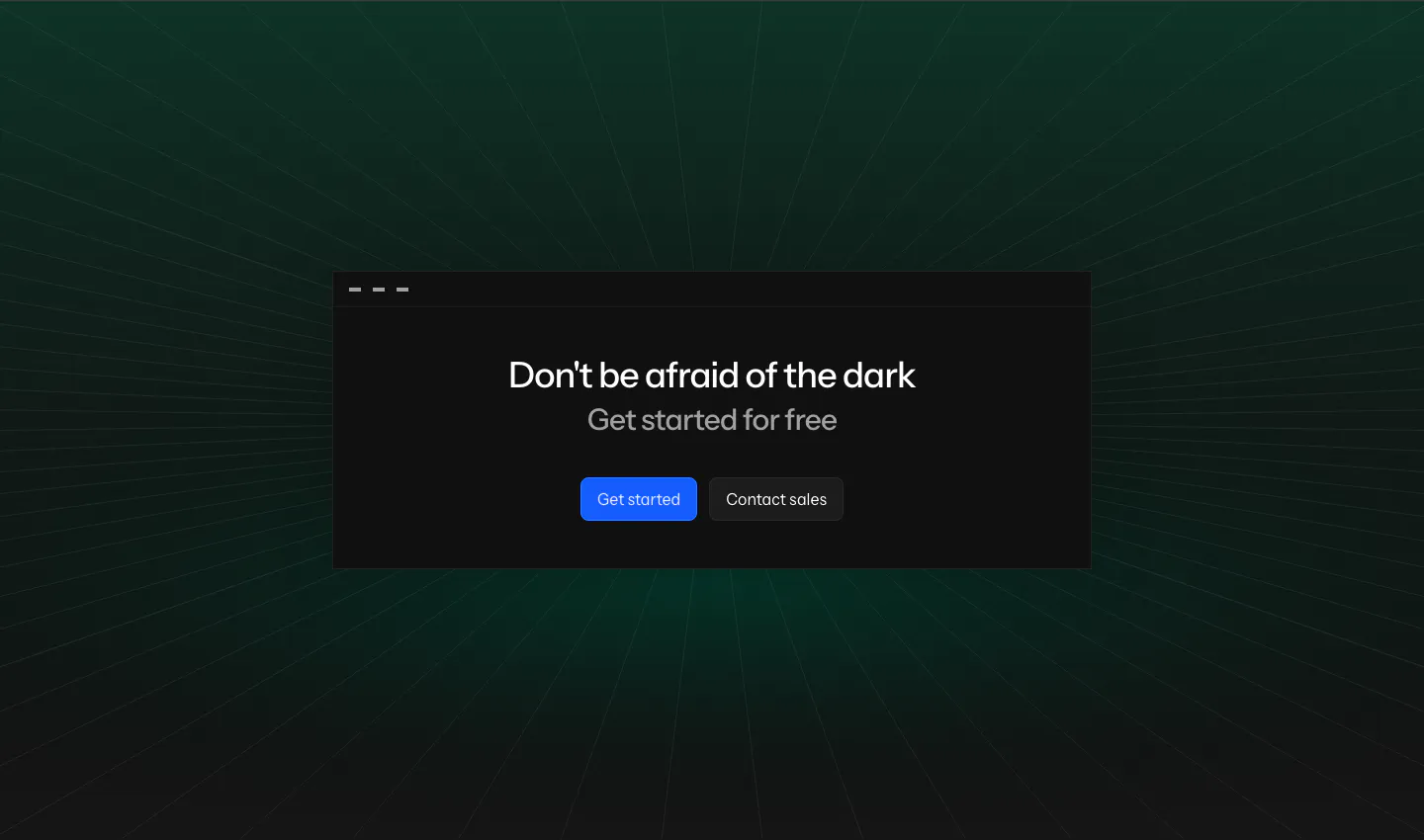
  28. Laravel Nightwatch call-to-action section: centered headline and buttons in a dark window card over a green-tinted perspective grid
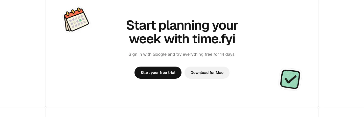
  29. time.fyi call-to-action section: centered headline with trial and Mac download buttons flanked by calendar and checkbox stickers
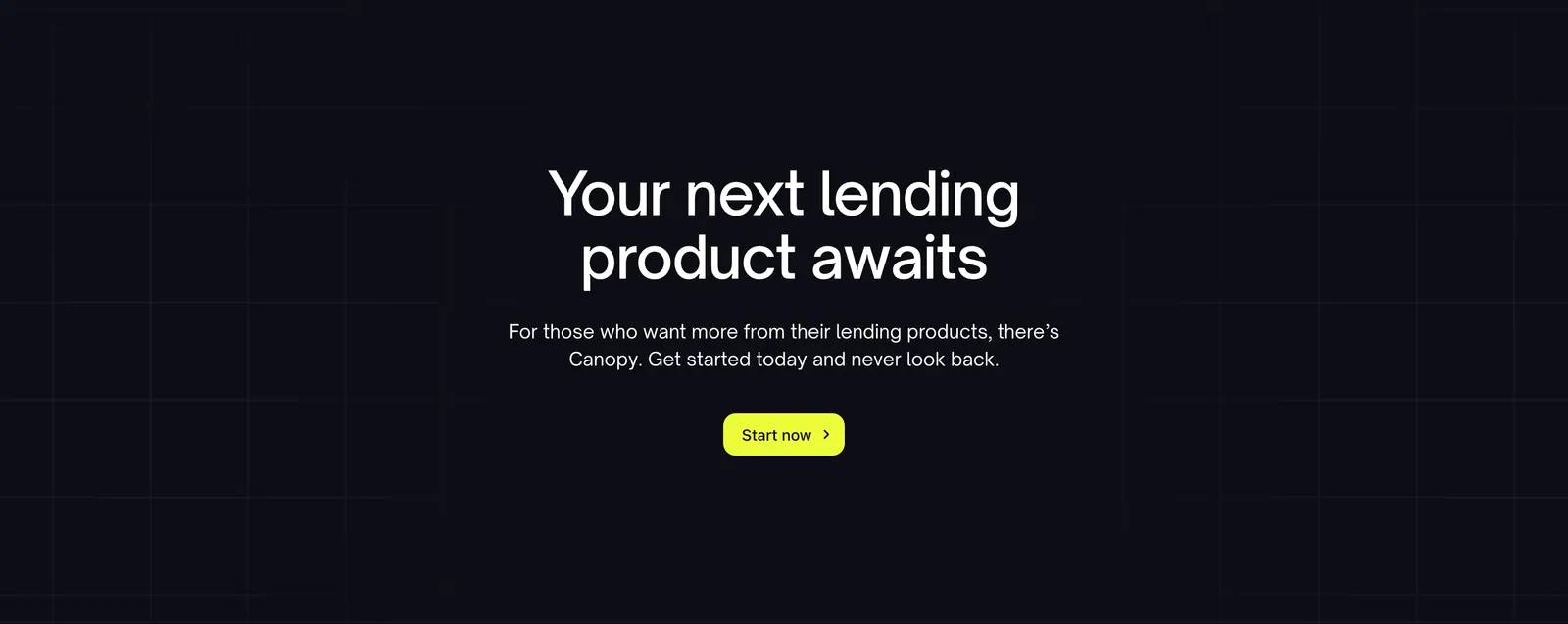
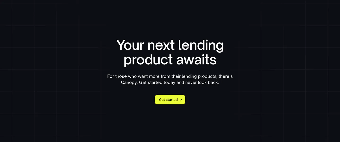
  30. Canopy call-to-action section: centered headline, short copy and lime button on a dark background with faint grid lines
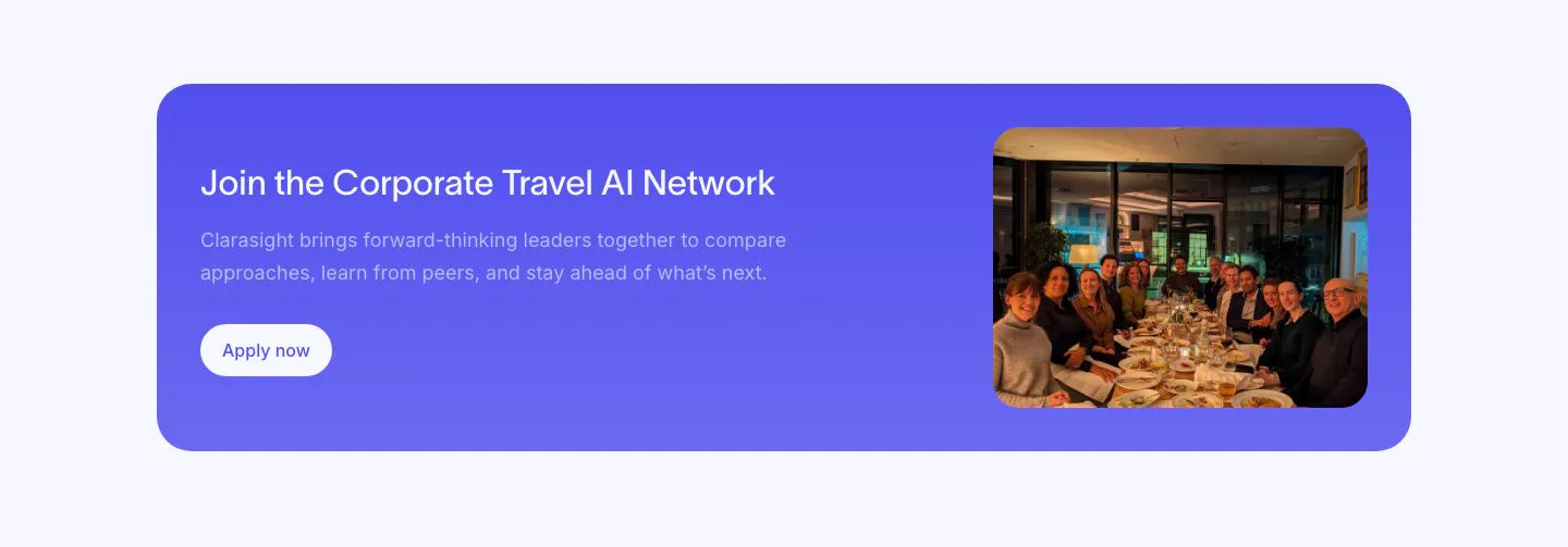
  31. Clarasight call to action section: indigo rounded banner with headline, copy and white button beside a photo of a group at a dinner table
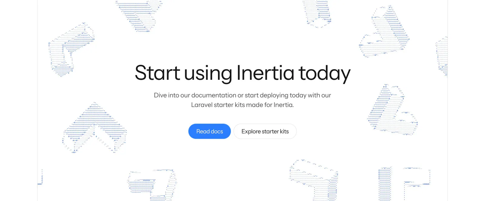
  32. Inertia.js call-to-action section: centered headline with blue and outline buttons amid scattered dotted isometric 3D shapes on white
    Inertia.js
  33. Laravel call-to-action section: centered two-line headline with an orange Deploy on Cloud button and a framework docs button on white
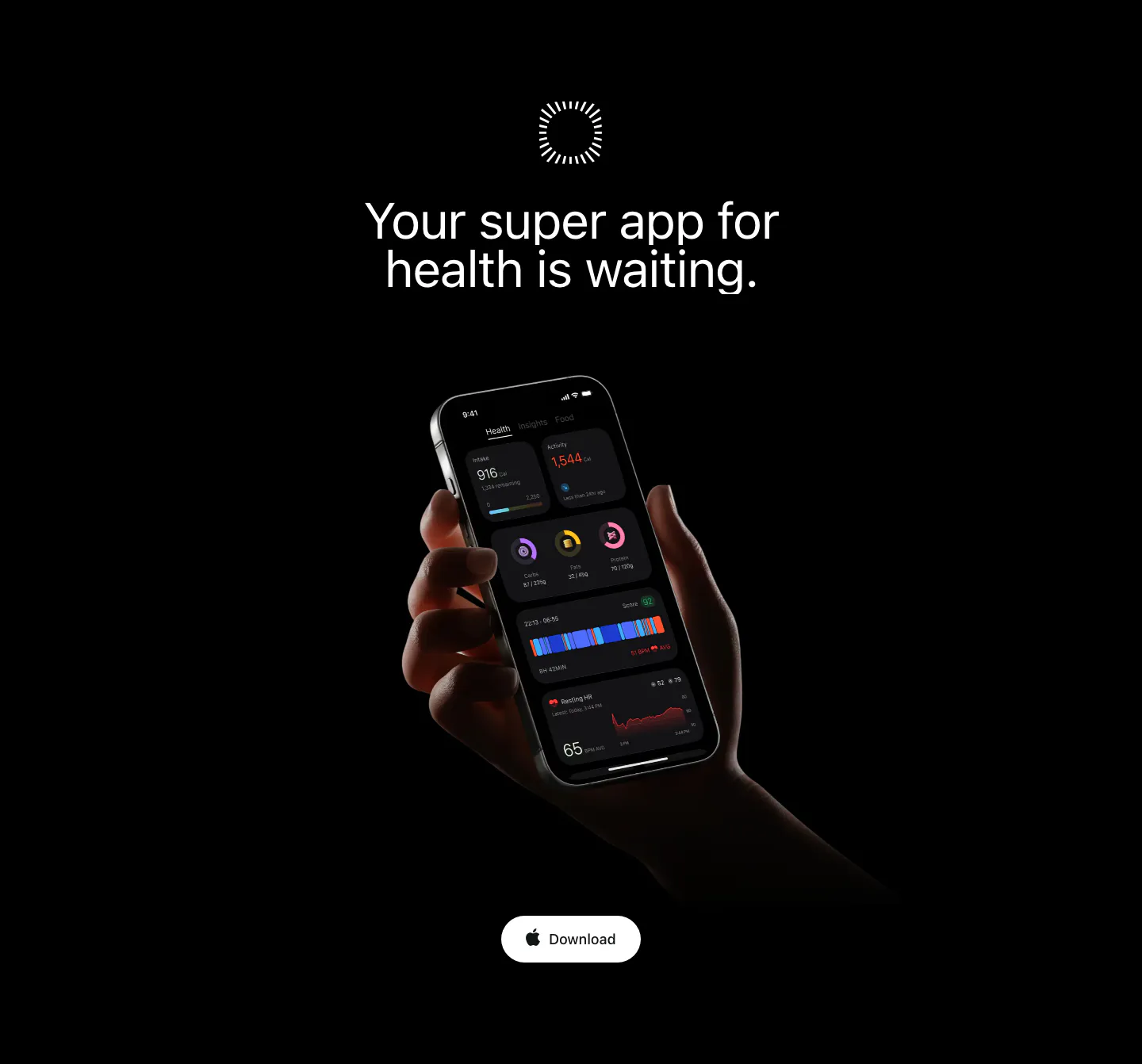
  34. Bright call to action section: centered headline on black above a hand holding a phone with the dark app UI and a Download button
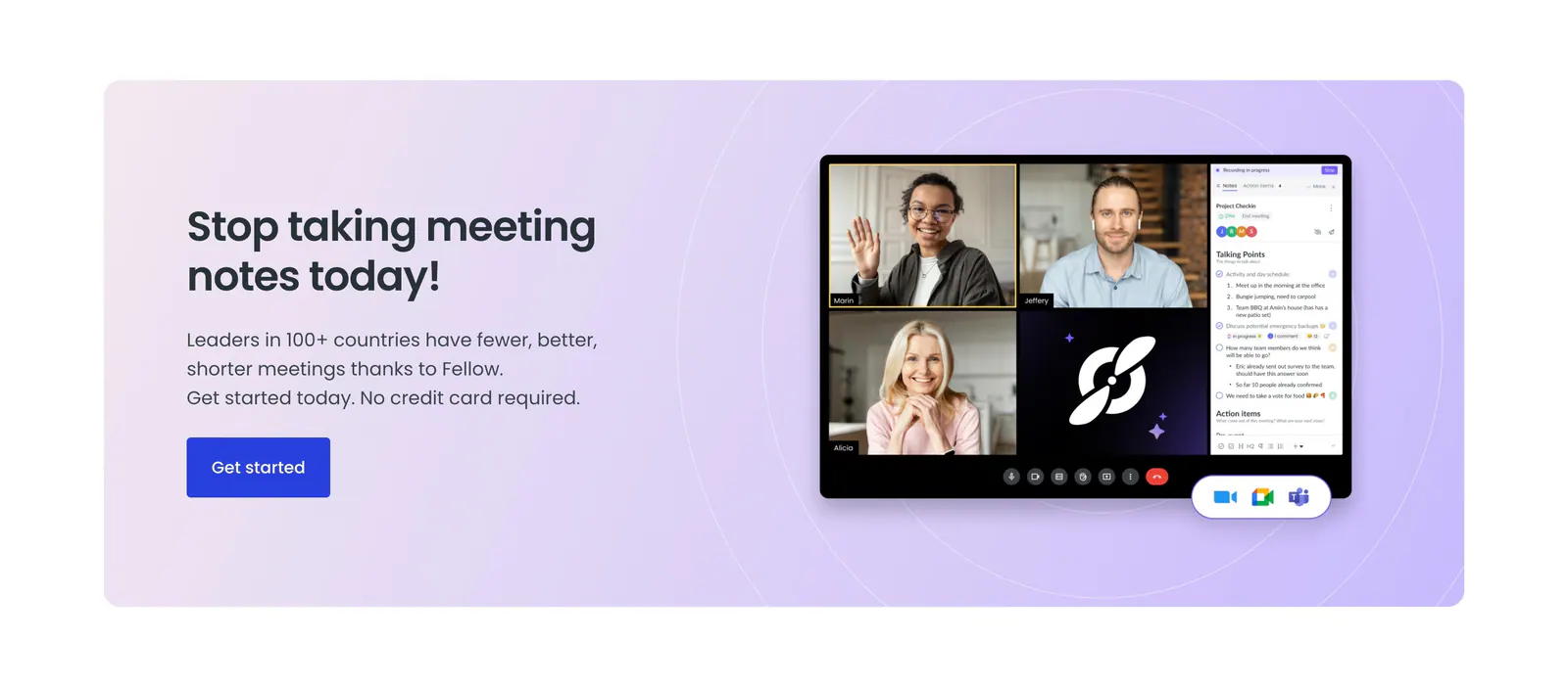
  35. Fellow call-to-action section: lavender panel with headline and blue button beside a video meeting app screenshot with notes sidebar
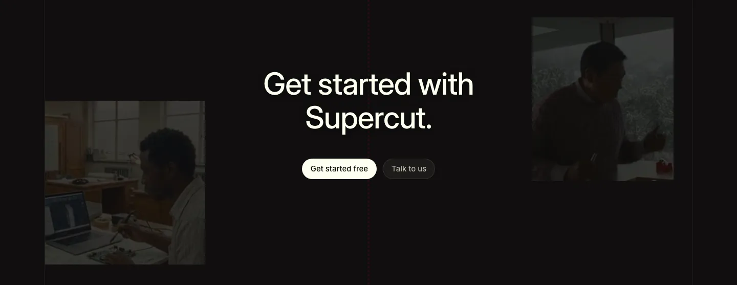
  36. Supercut call to action section: centered headline with two buttons between dimmed photos of people working, near-black background
  37. Gradient Labs call-to-action section: centered serif headline and pill email field on a bright orange background with thin curved lines
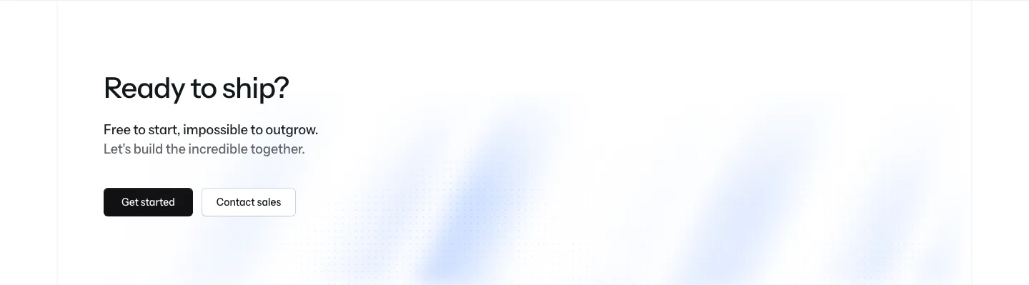
  38. Laravel Cloud call-to-action section: left-aligned headline with short copy, Get started and Contact sales buttons over a faint blue glow
  39. Heidi call to action section: cream rounded band with centered serif headline, Get Remote button and faint curved line decorations
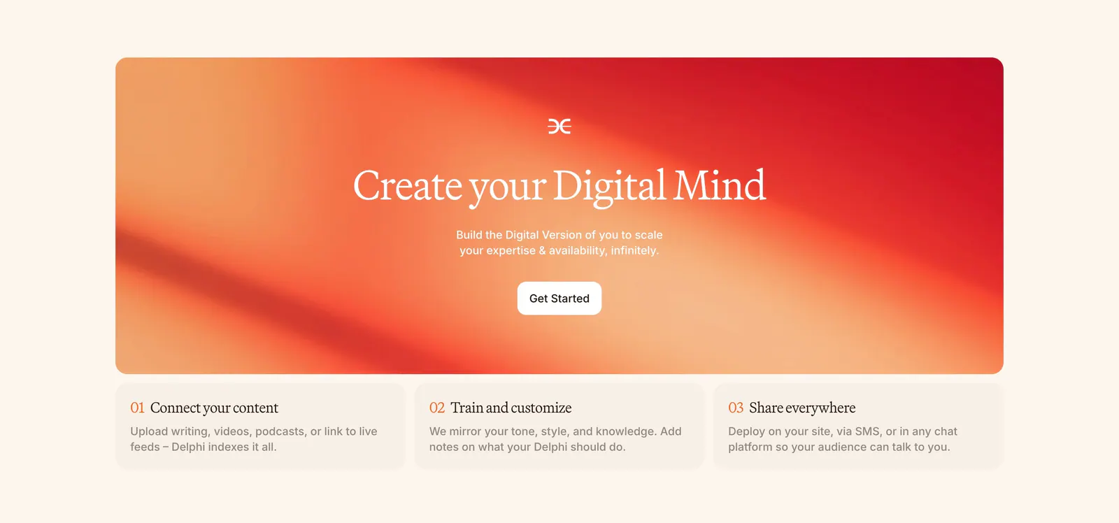
  40. Delphi call-to-action section: centered serif headline and Get Started button on an orange-red gradient card above three numbered step cards
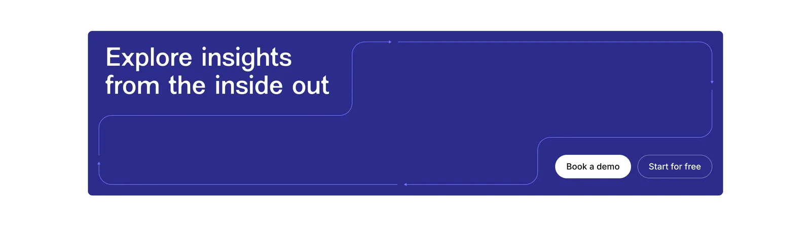
  41. Contentsquare call-to-action section: headline and two buttons in a deep indigo banner with thin outline path lines
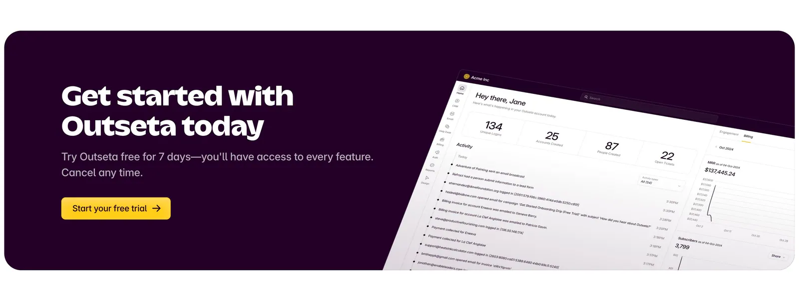
  42. Outseta call-to-action section: dark aubergine banner with headline, copy and yellow trial button beside a tilted dashboard screenshot
  43. Plasma call to action section: slim dark band with a centered two-line heading and a white Get in touch button
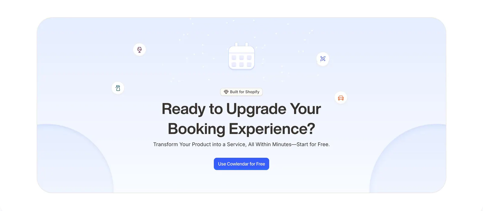
  44. Cowlendar call-to-action section: centered headline and blue button with calendar icon in a pale blue rounded panel
  45. Ada call-to-action section: centered lowercase headline with an inline yellow Get a demo pill button on a white background
    Ada
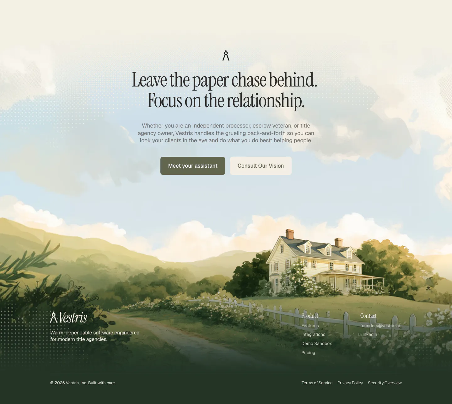
  46. Vestris call-to-action section: centered serif headline and two buttons over a painted countryside house scene that flows into the footer
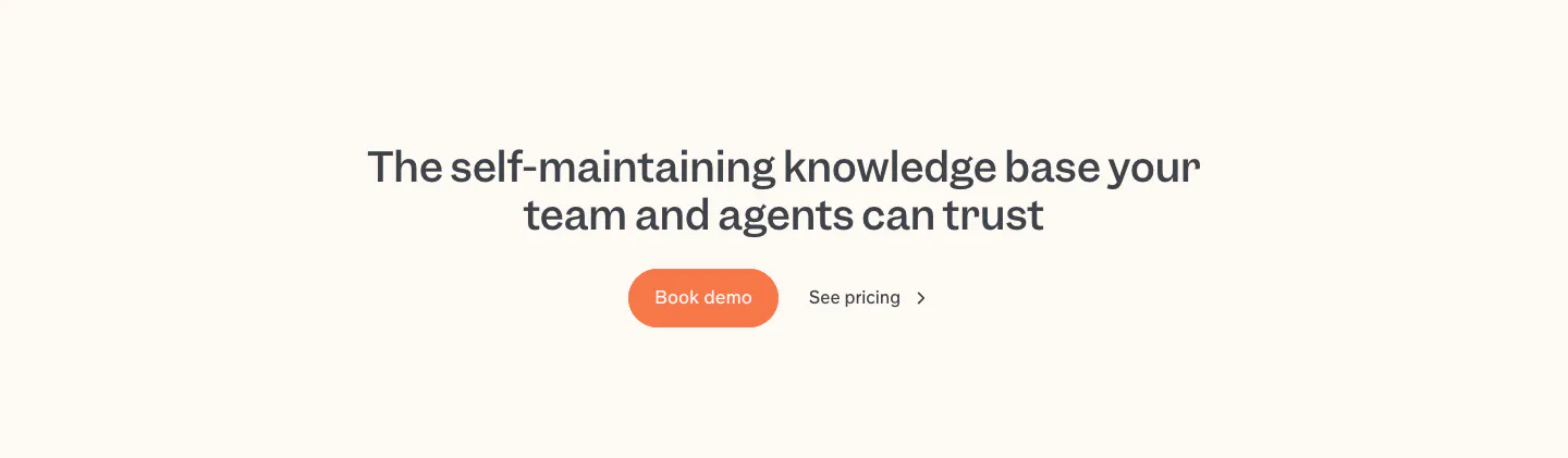
  47. Slite call to action section: centered two-line headline with an orange Book demo button and a See pricing link on a cream band
  48. Cortex call-to-action section: centered headline and purple button with radiating light lines on a near-black background
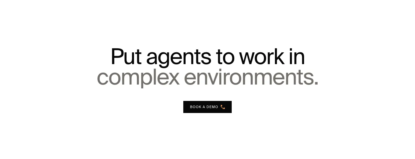
  49. HappyRobot call to action section: centered two-tone headline in black and gray above a small black Book a demo button on white
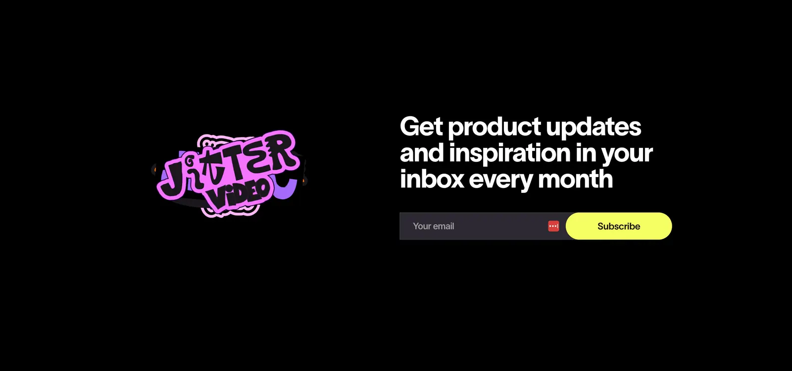
  50. Jitter call-to-action section: pink sticker logo on the left, headline with email field and yellow subscribe button on a black background
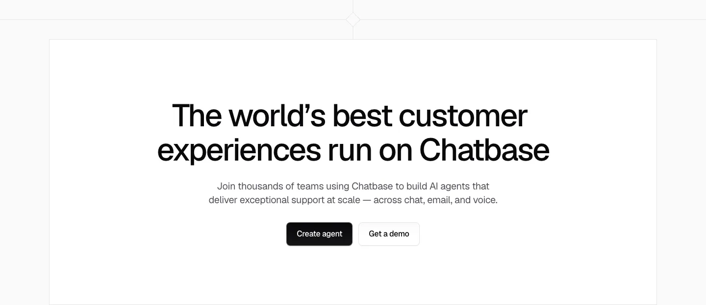
  51. Chatbase call to action section: centered black headline, short copy and two buttons in a white bordered box
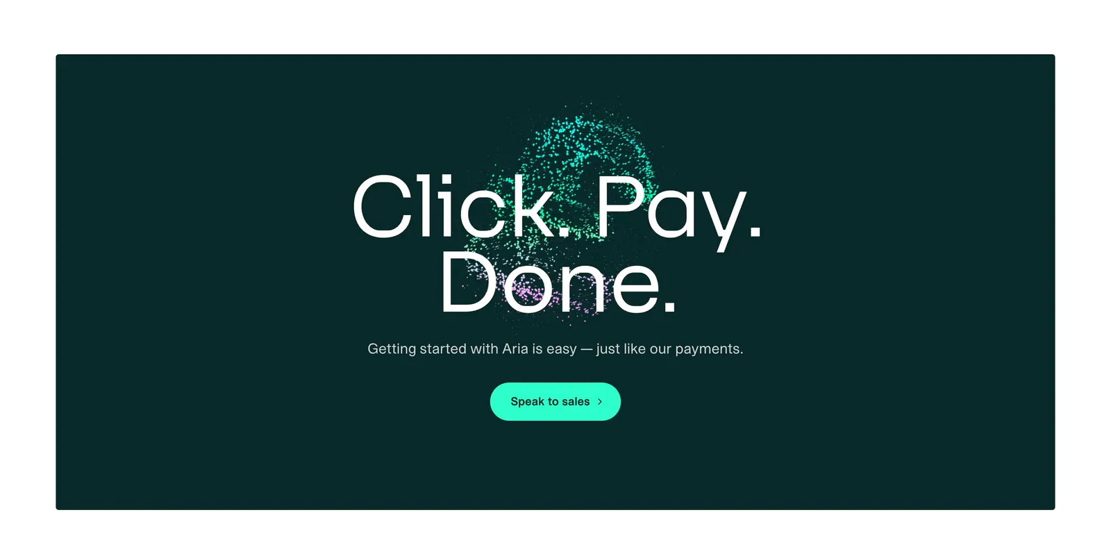
  52. Aria call-to-action section: large centered headline over a teal particle sphere with a mint button on a dark teal panel
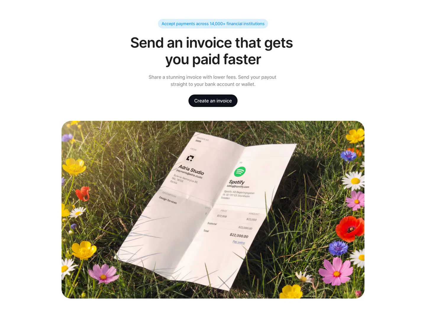
  53. Acctual call to action section: centered headline and button above a rounded photo of a printed invoice lying in a flower meadow
  54. Exante call-to-action section: centered headline with sign up and learn more buttons over a faint grid on a near-black background
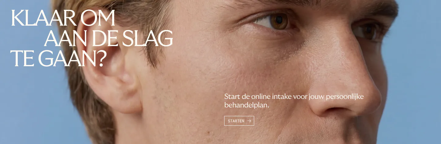
  55. Menkind call-to-action section: white serif headline and start button over a full-bleed close-up face photo on blue
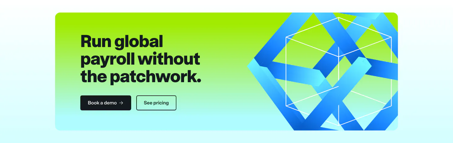
  56. Remote call to action section: dark headline and two buttons on a lime-to-cyan gradient card with a blue 3D ribbon cube
  57. Modulify call-to-action section: centered headline and black button inside a rounded orange-to-pink gradient card
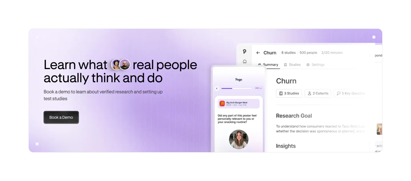
  58. Pogo call to action section: lavender gradient banner with headline and demo button left and app and phone UI screenshots right
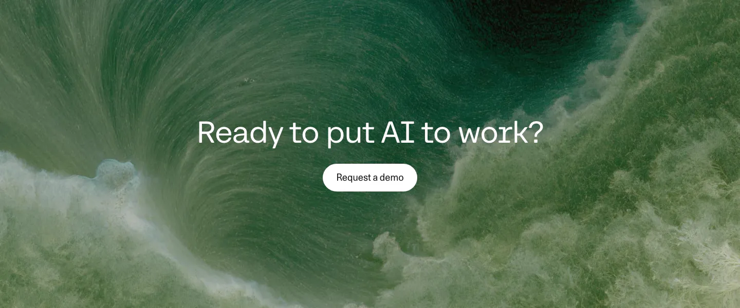
  59. Cohere call to action section: centered question headline and demo button over a full-bleed green water vortex image
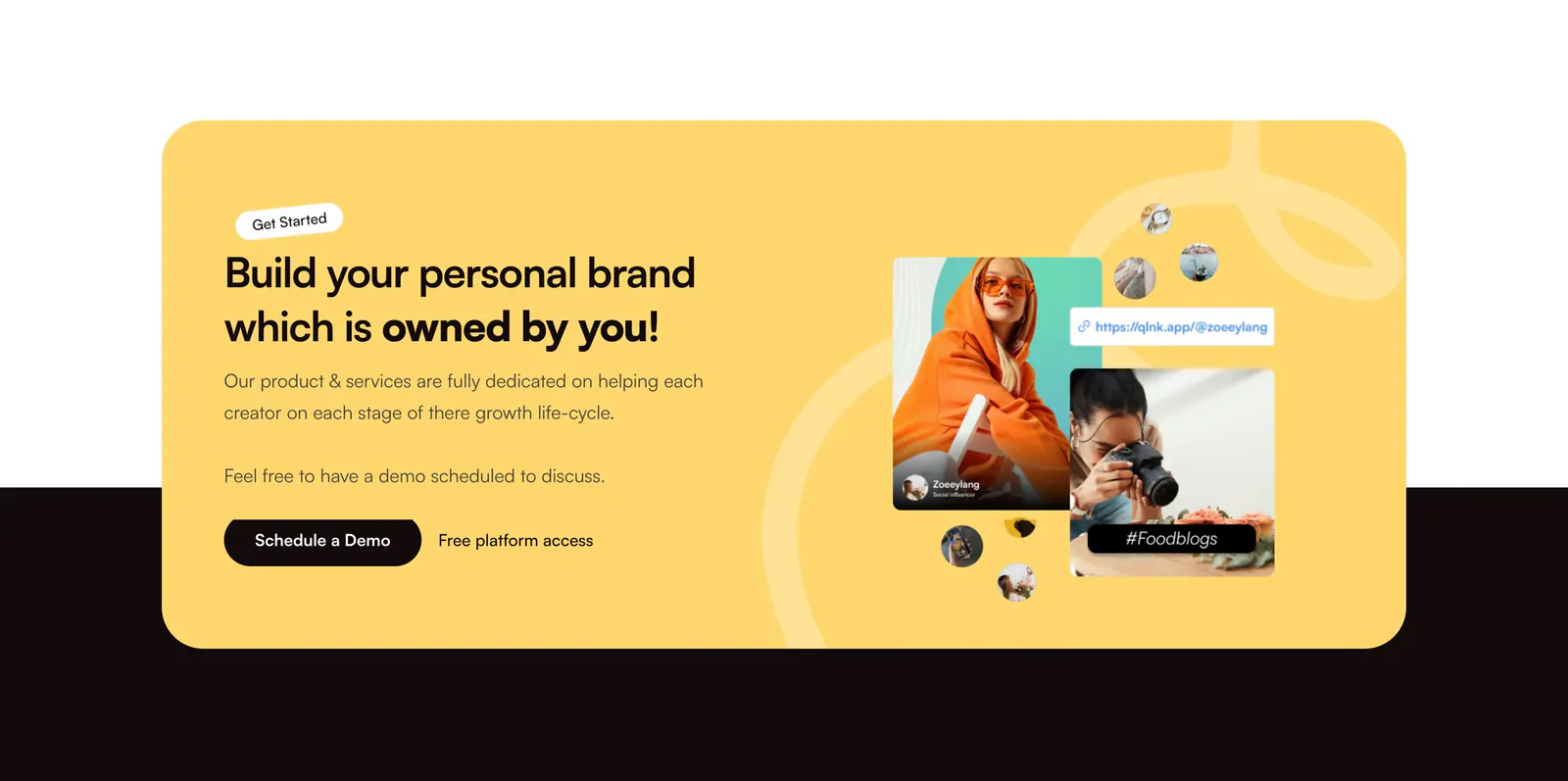
  60. QuickLnk call-to-action section: yellow rounded card with headline and demo button on the left, creator photo collage on the right
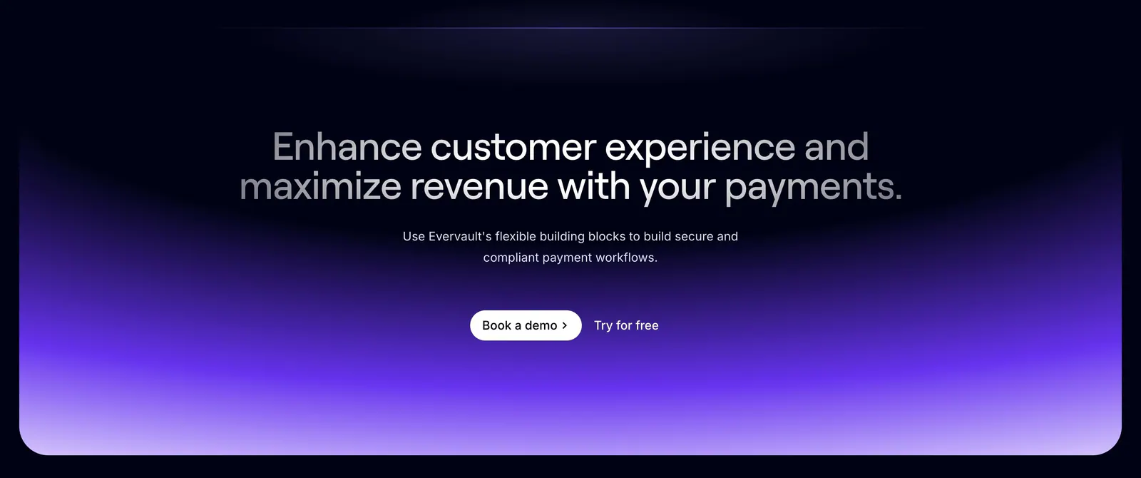
  61. Evervault call-to-action section: centered two-tone headline and demo buttons above a violet gradient glow on a dark navy background
  62. Cluster call-to-action section: centered serif headline and dark pill button on a beige panel framed by dark edges
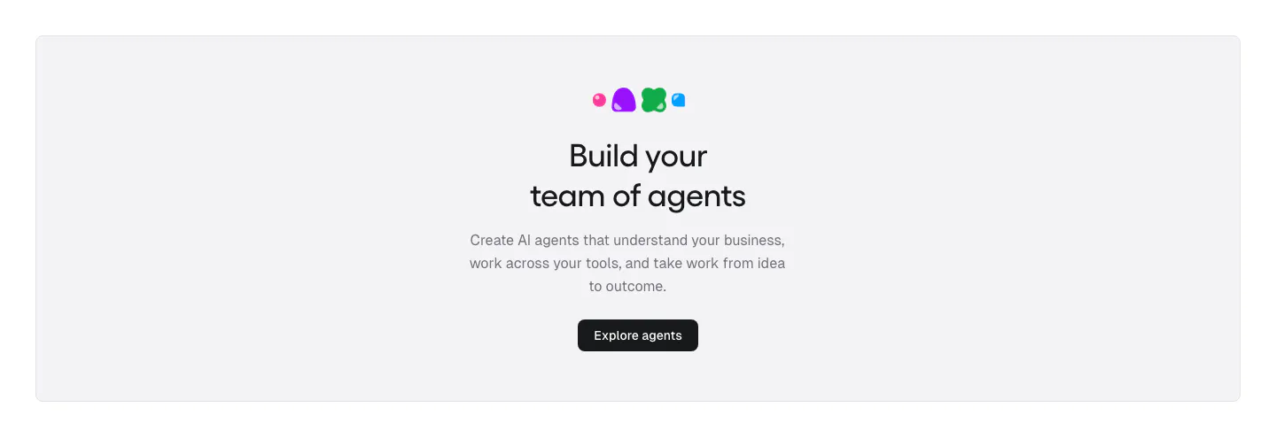
  63. Gumloop call-to-action section: centered headline, copy and button inside a light gray rounded panel
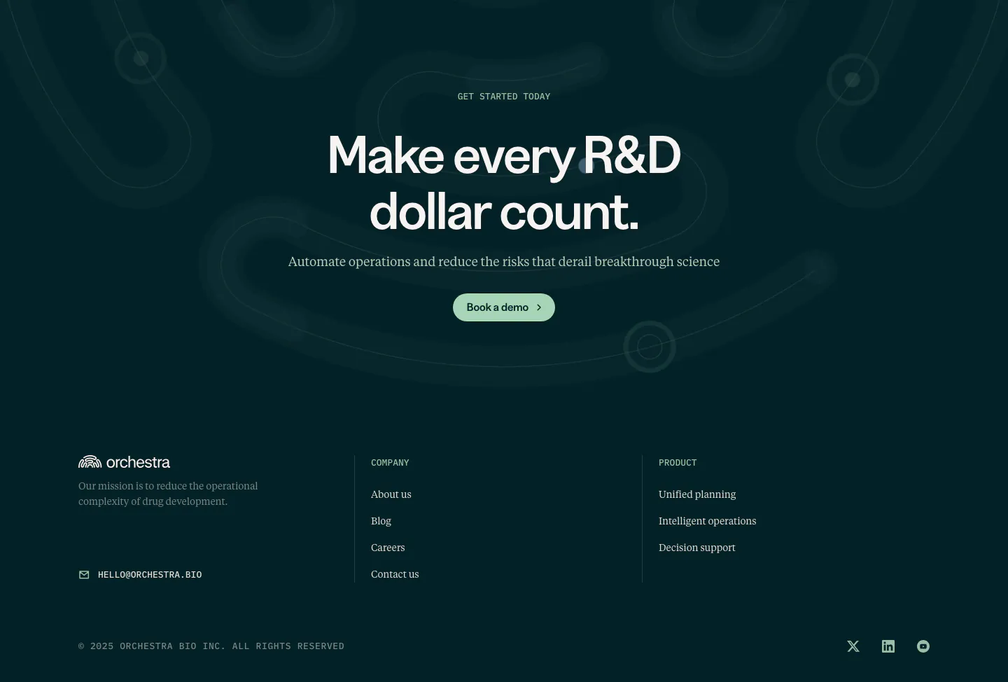
  64. Orchestra Bio call to action section: centered headline and demo button on dark teal with faint loop shapes, above a footer
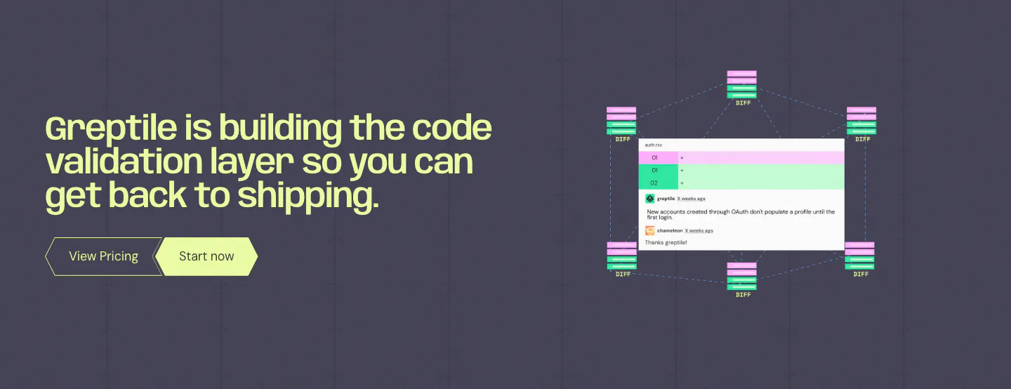
  65. Greptile call to action section: lime headline and two buttons on the left, code review comment UI with diff nodes on the right
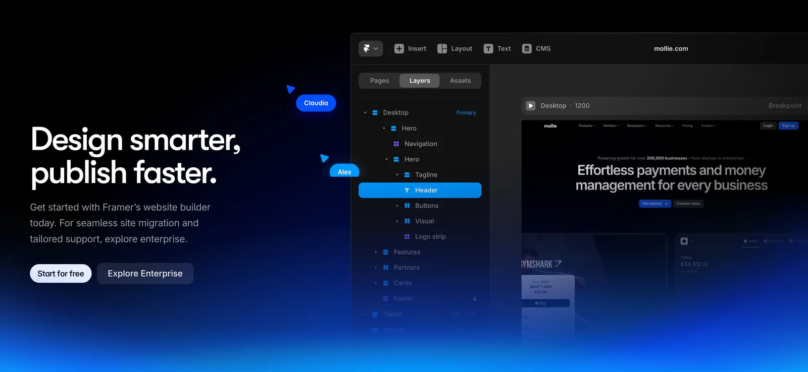
  66. Framer call-to-action section: left headline with two buttons beside the Framer editor layers panel, blue glow along the bottom on black
  67. Rezi call to action section: blue full-width band with a two-tone headline on the left and a white pill button on the right
  68. Composio call to action section: single-line headline beside a black Try Composio now button in a slim light gray band
  69. Hunar call-to-action section: white card with headline, AI model icons and a demo button on a blue gradient background
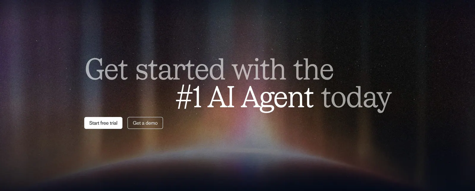
  70. Fin call-to-action section: two-tone serif headline with trial and demo buttons over a glowing aurora on a dark background
    Fin
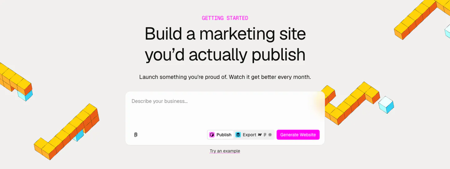
  71. Relume call-to-action section: centered headline and AI prompt box with a pink Generate Website button, framed by yellow isometric voxel shapes
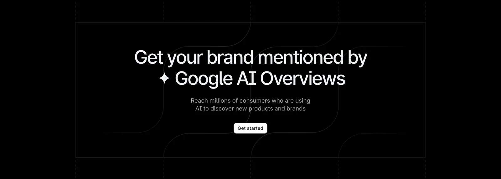
  72. Profound call-to-action section: centered headline and white Get started button on black with faint grid and curved line pattern
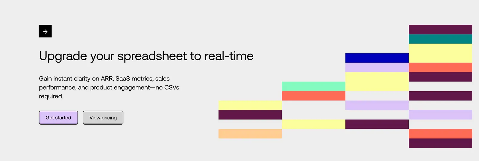
  73. Equals call-to-action section: left-aligned headline with two buttons beside a stepped grid of colorful blocks on a light gray background
  74. Quartr call to action section: centered white headline and Contact sales button on a near-black background
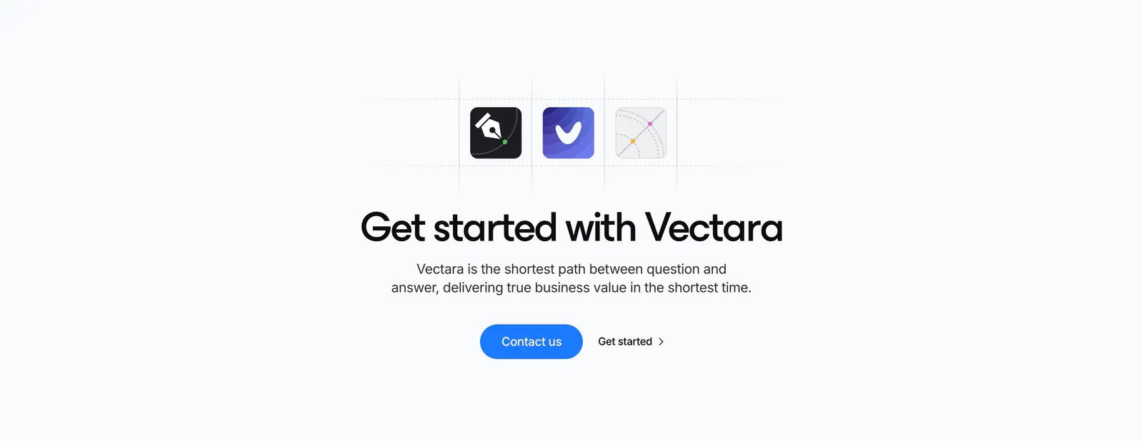
  75. Vectara call-to-action section: three app icons in a dashed grid above a centered headline with blue Contact us button on light gray
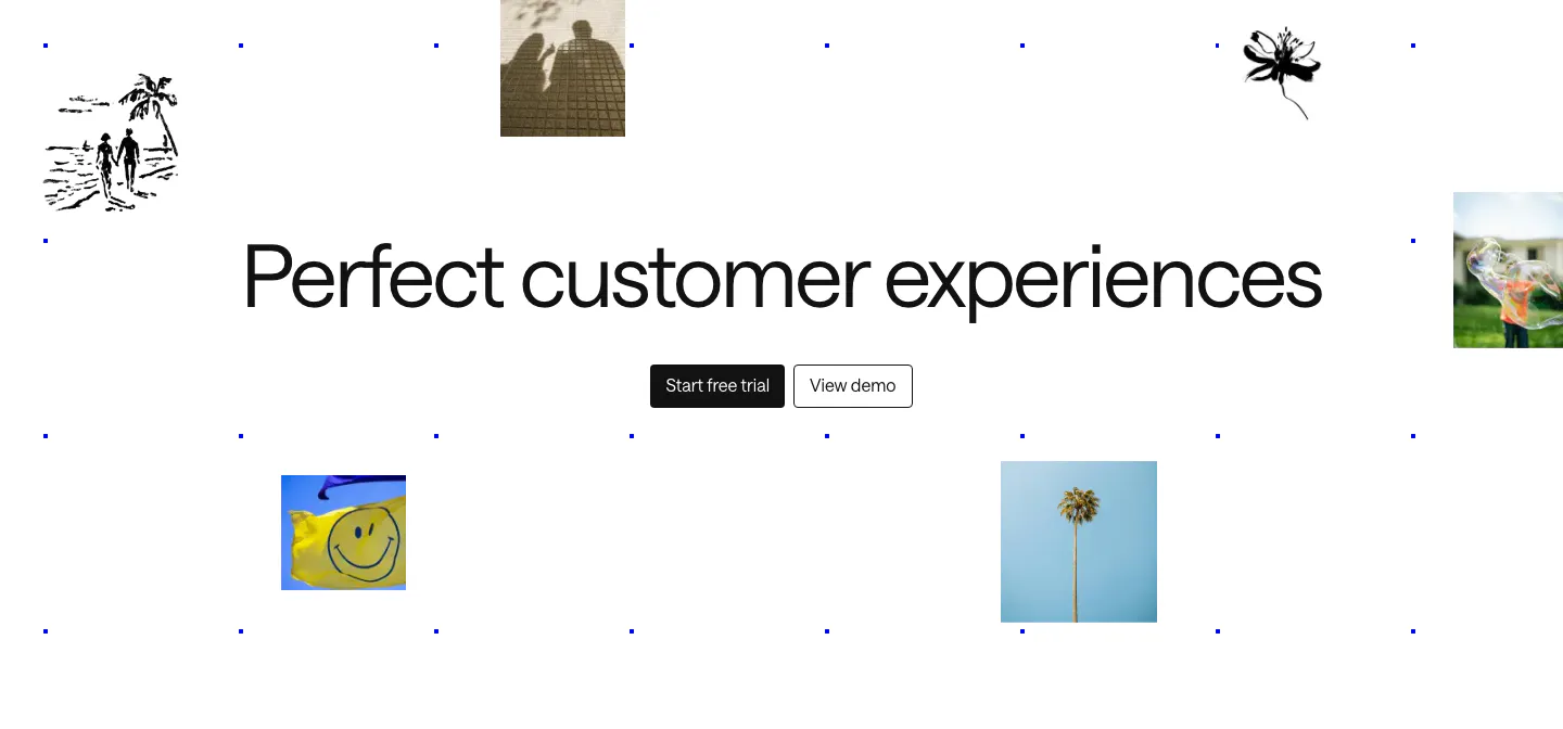
  76. Intercom call to action section: large centered headline and two buttons amid scattered photo tiles, ink sketches and a blue dot grid
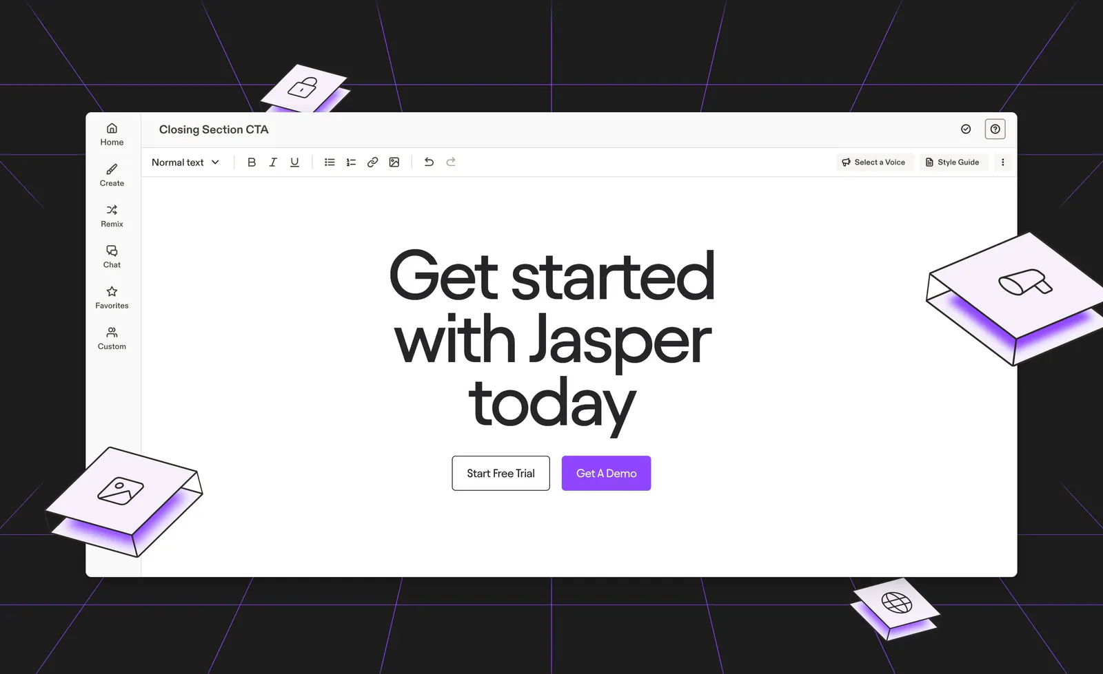
  77. Jasper call-to-action section: centered headline and buttons inside an editor mockup on a dark background with purple lines and isometric tiles
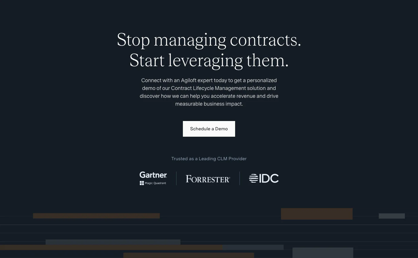
  78. Agiloft call-to-action section: centered serif headline and Schedule a Demo button on dark navy above Gartner, Forrester and IDC logos
  79. Laravel Forge call-to-action section: left-aligned headline and two buttons beside a streaky teal gradient artwork
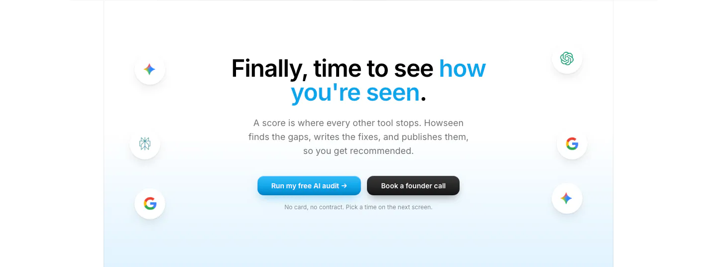
  80. Howseen AI call-to-action section: centered headline and two buttons flanked by floating AI engine icons on a pale blue fade
  81. Linear call to action section: centered two-line headline with light and dark pill buttons on a black background
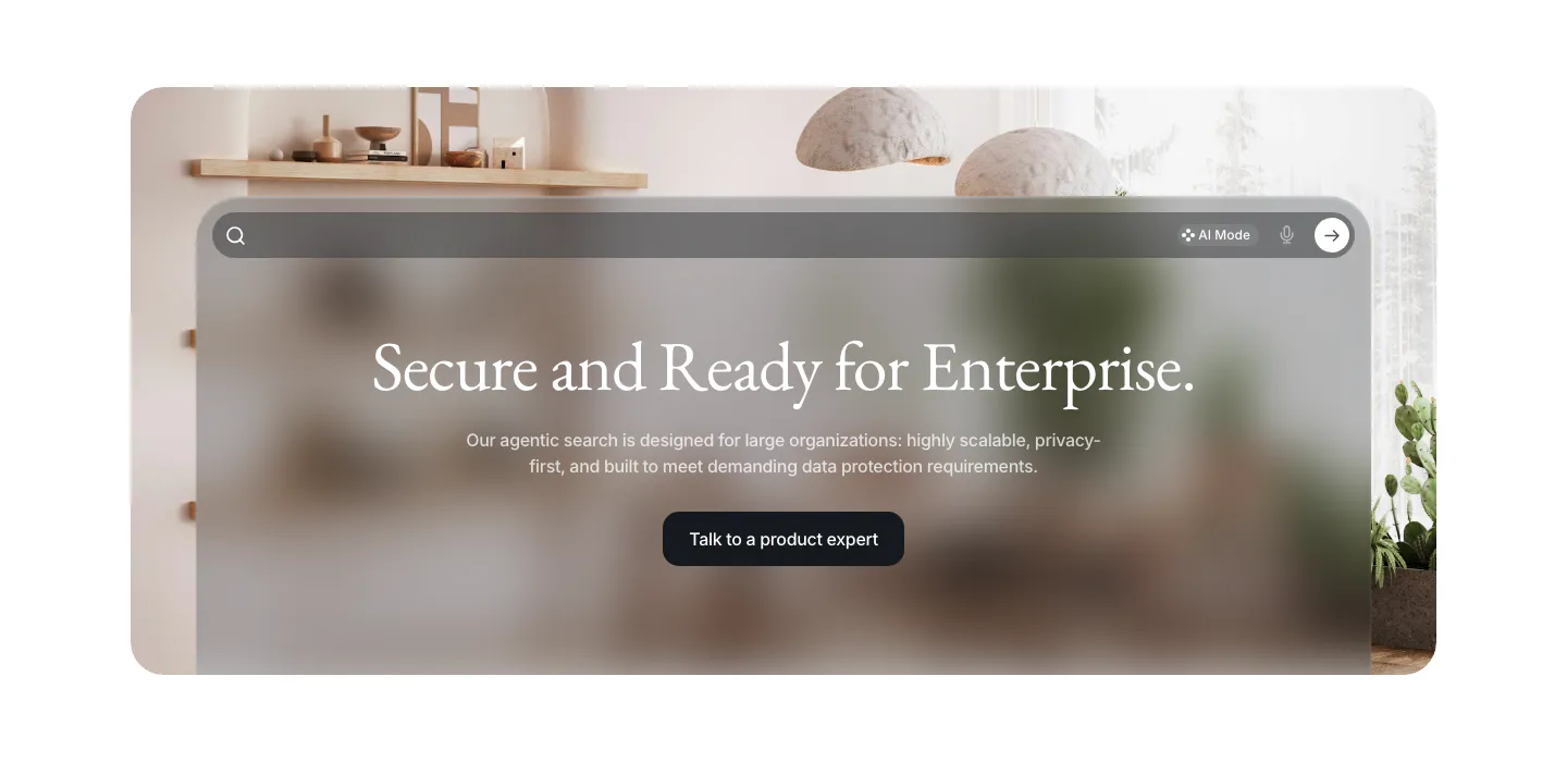
  82. VisionAI call-to-action section: centered serif headline and button on a frosted glass search panel over an interior photo
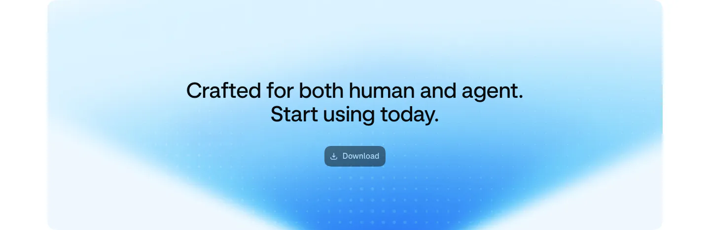
  83. Aside call-to-action section: centered two-line headline and download button on a soft blue gradient card
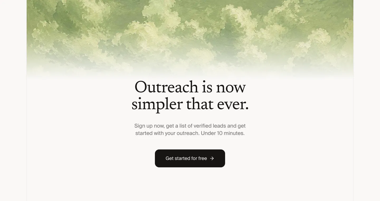
  84. Leedlime call to action section: centered serif headline and Get started button below a band of painted green clouds on off-white
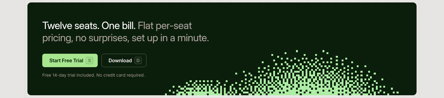
  85. LocalCan call-to-action section: two-tone headline with Start Free Trial and Download buttons on a dark green band with a pixel dither pattern
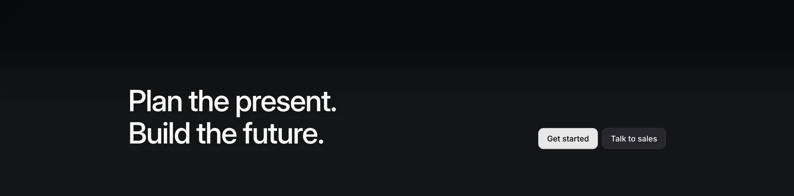
  86. Linear call-to-action section: two-line headline on the left with Get started and Talk to sales buttons on the right, on a near-black gradient
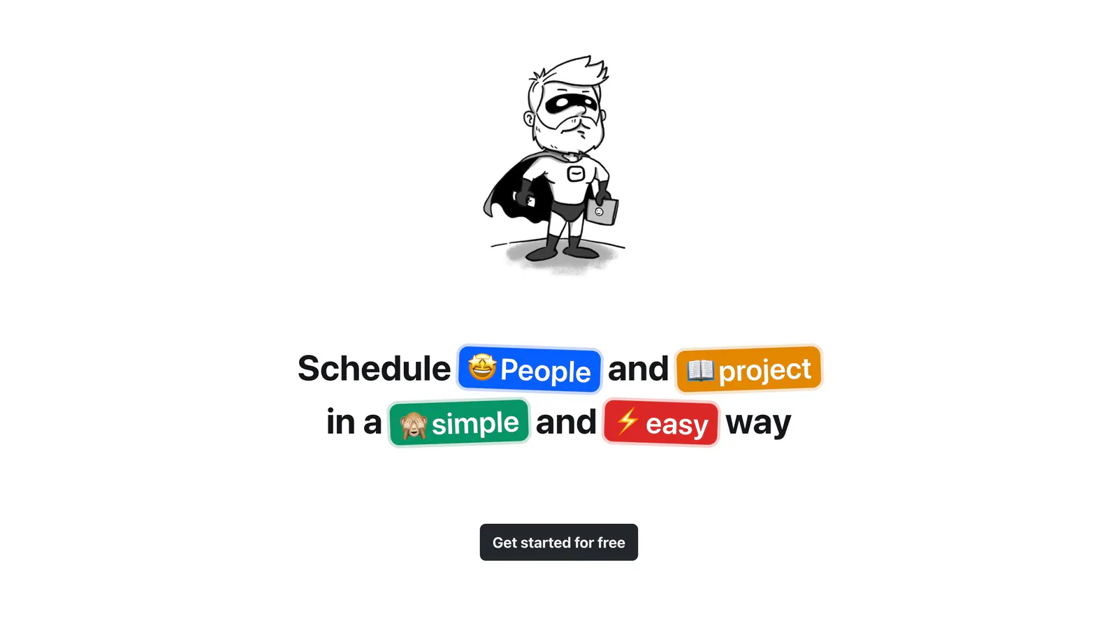
  87. Hellotime call-to-action section: hand-drawn superhero character above a centered headline with colored emoji pills and a button
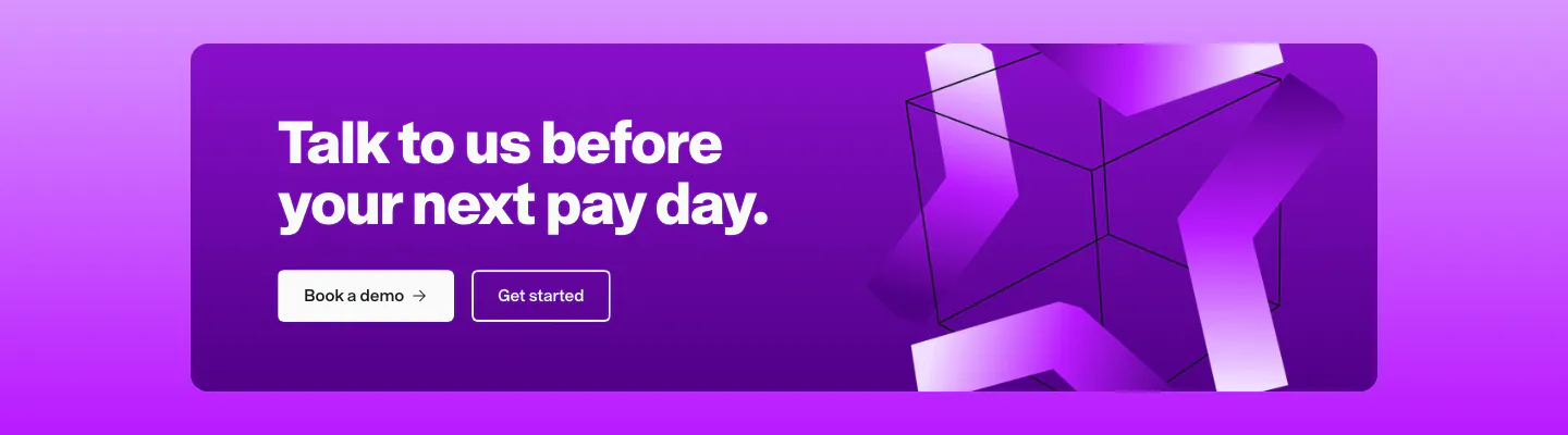
  88. Remote call to action section: white headline and two buttons on a purple card with abstract 3D ribbon shapes on the right
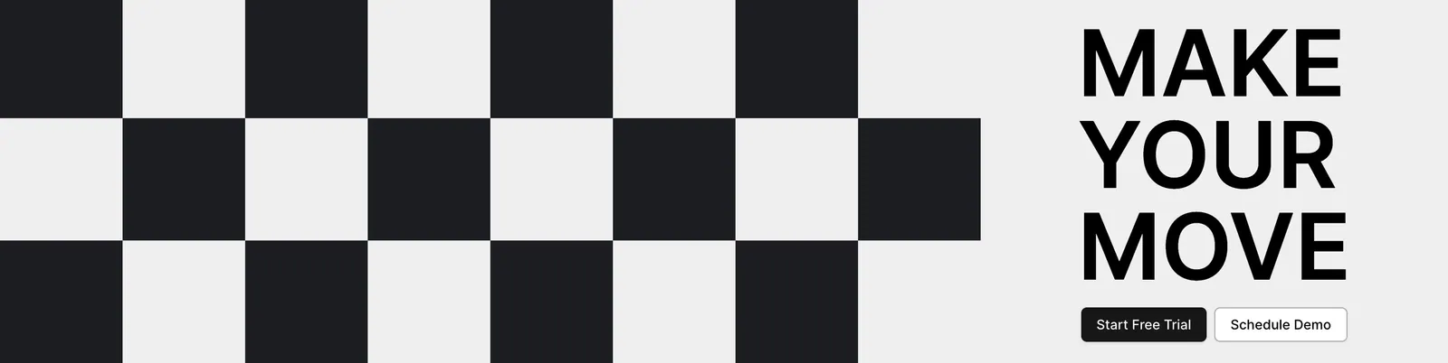
  89. Airbook call-to-action section: black and white checkerboard pattern on the left beside a bold MAKE YOUR MOVE headline and two buttons
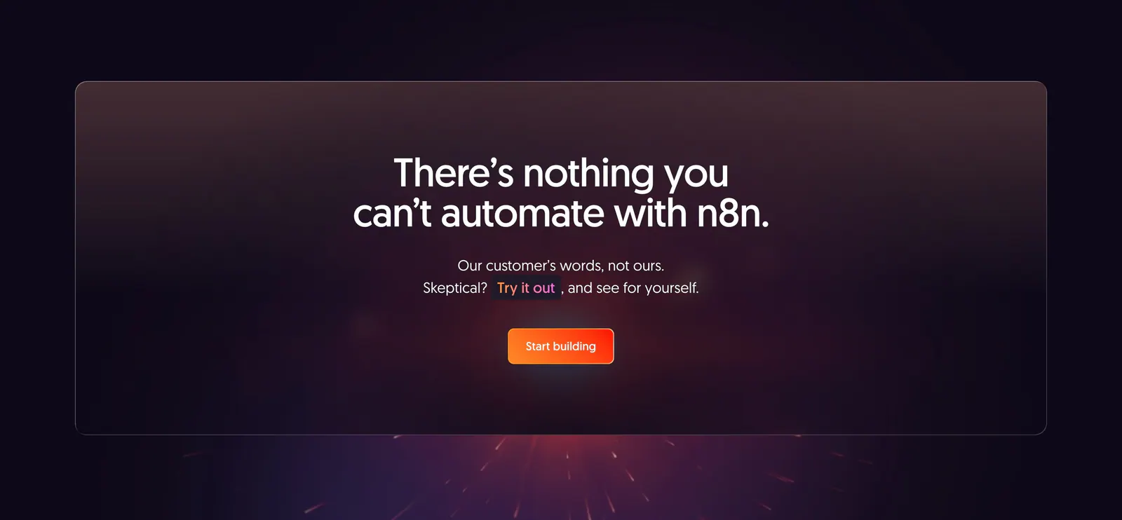
  90. n8n call-to-action section: centered headline and orange button in a translucent panel over a dark purple glow with sparks
    n8n
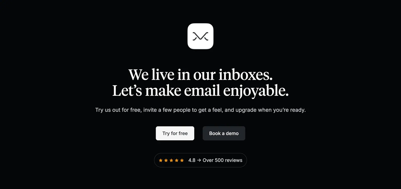
  91. Missive call-to-action section: centered app icon and serif headline with two buttons and a review rating badge on black
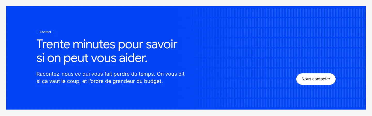
  92. Raneo call-to-action section: blue banner with left-aligned headline and copy, a white contact button and vertical line texture
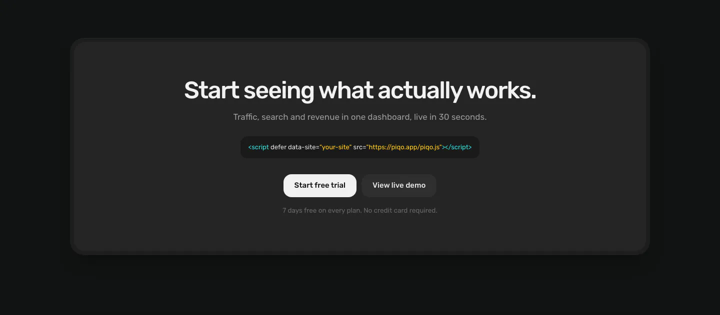
  93. Piqo call to action section: centered headline, script tag snippet and two buttons inside a rounded charcoal card on a near-black page
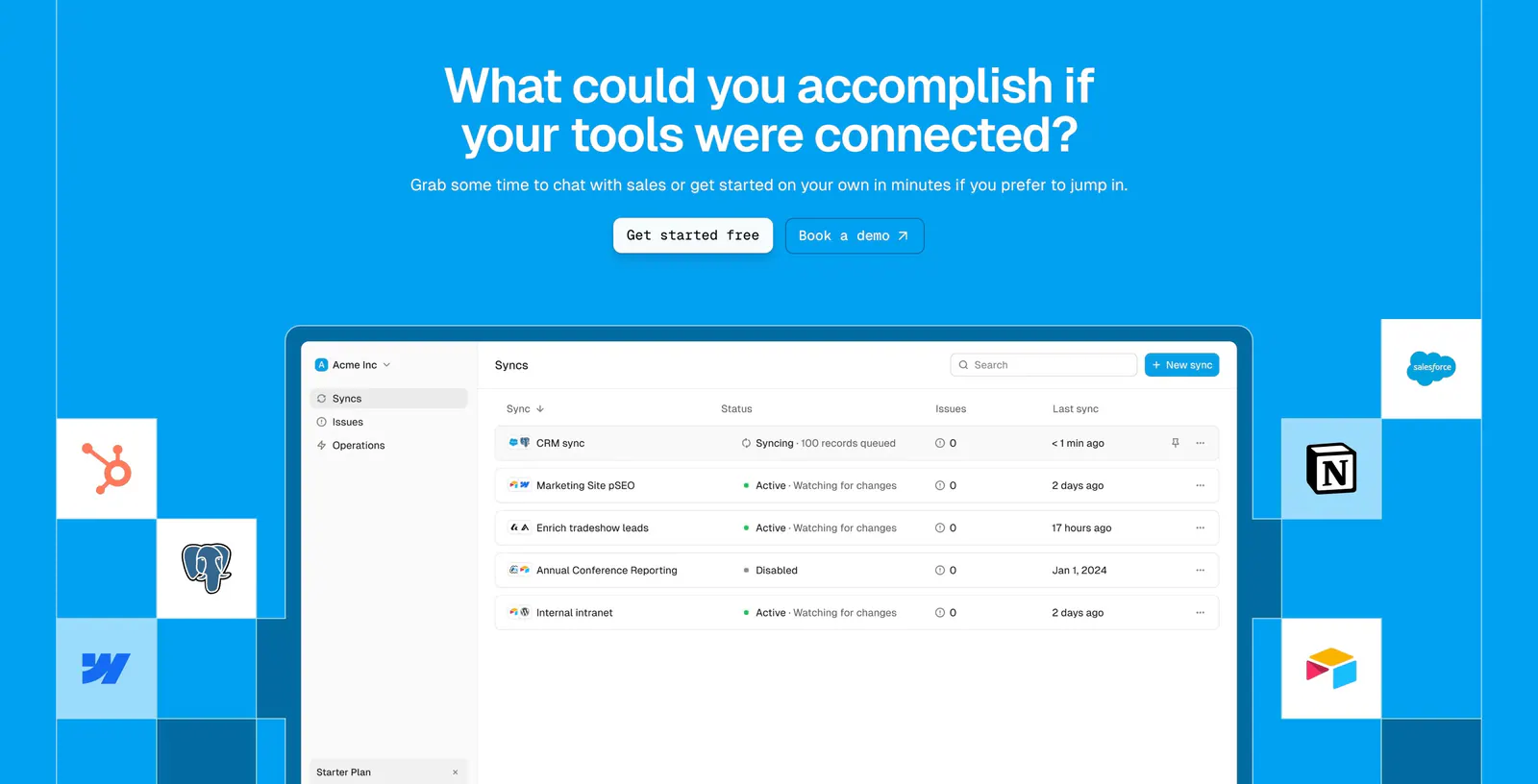
  94. Whalesync call-to-action section: centered headline and buttons above a syncs dashboard screenshot flanked by app icon tiles on bright blue
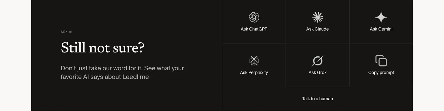
  95. Leedlime call to action section: serif Still not sure? headline at left beside a grid of Ask ChatGPT, Claude, Gemini and Grok buttons on black
  96. Laravel Cloud call-to-action section: left-aligned headline and two buttons on a bright blue pixel mosaic background
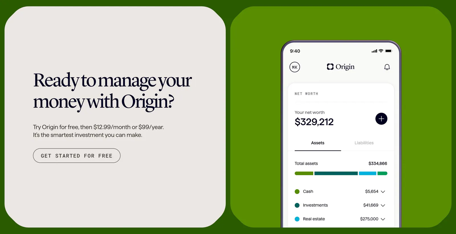
  97. Coframe call-to-action section: serif headline card beside a phone app screenshot on a bright green background, branded as Origin
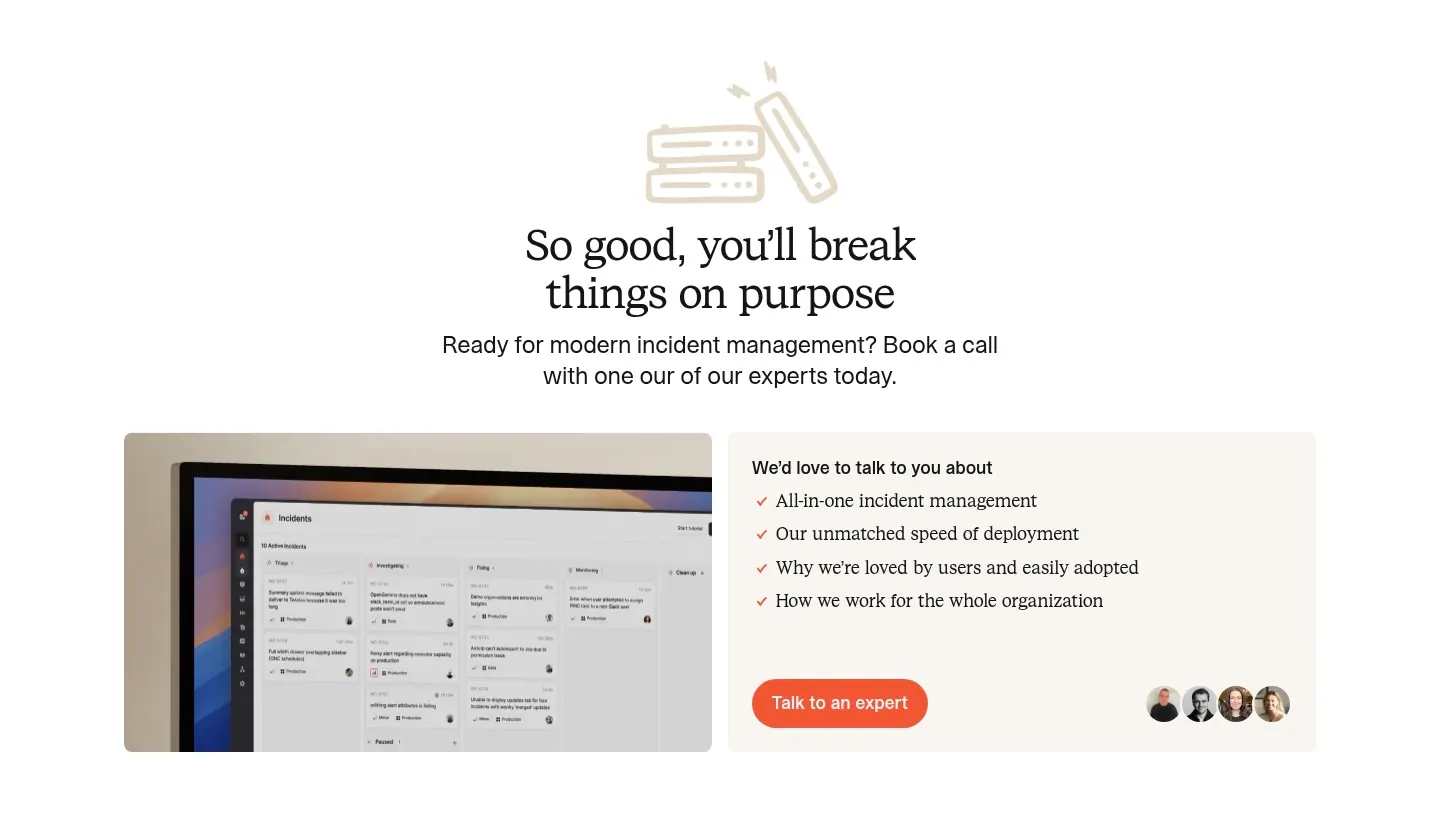
  98. incident.io call-to-action section: serif centered headline with line-art icon above a monitor screenshot and a talk-to-an-expert card
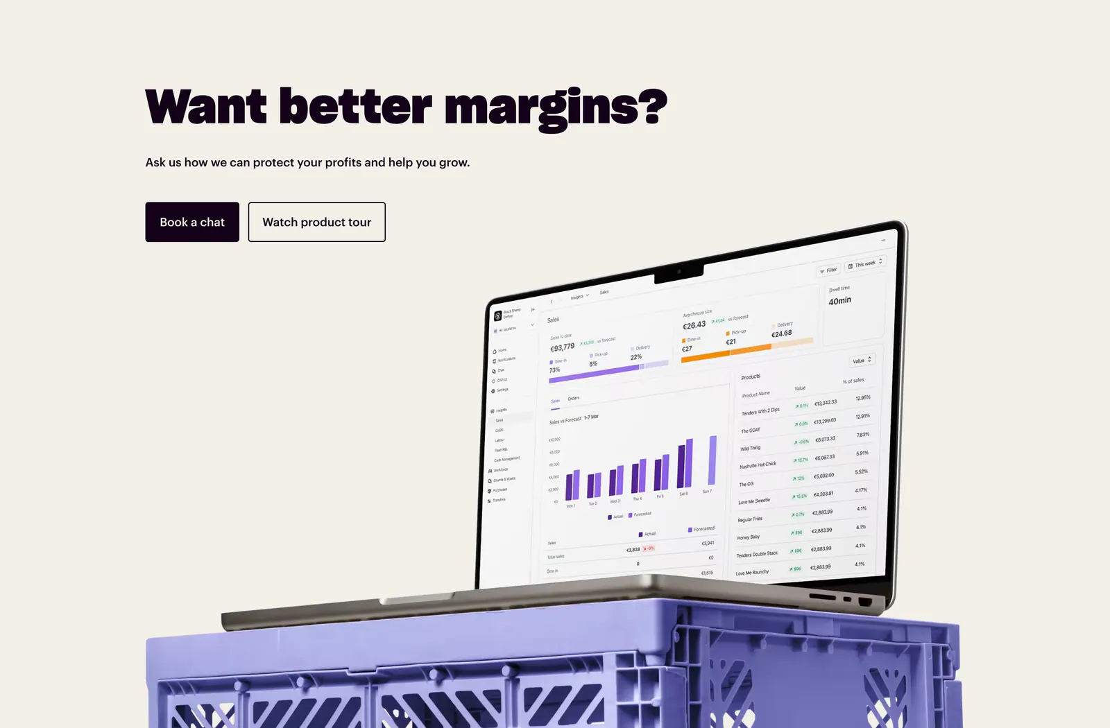
  99. Nory call-to-action section: bold headline with two buttons above a laptop showing a sales dashboard on a purple crate, cream background
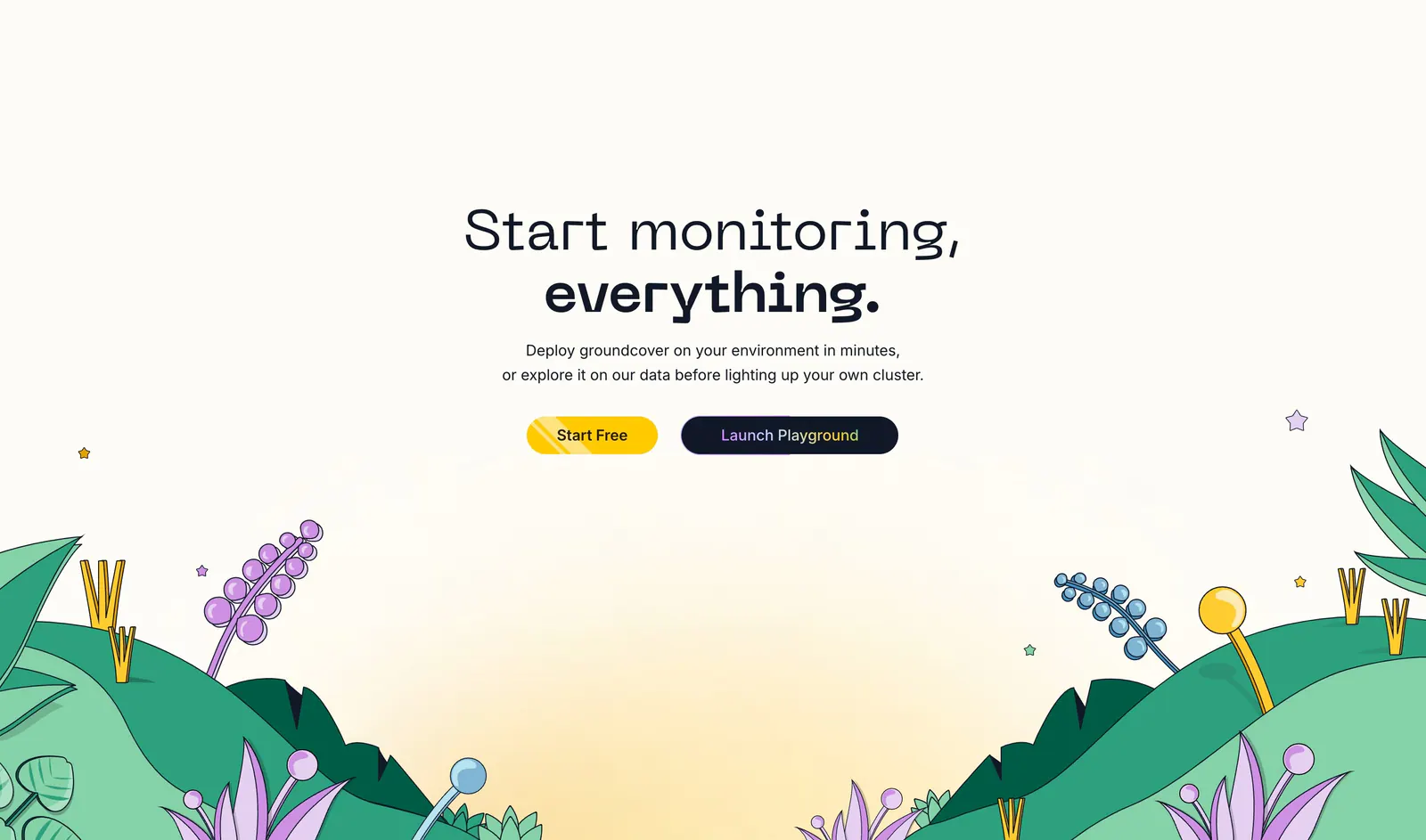
  100. groundcover call-to-action section: centered headline and two buttons above an illustrated landscape of hills and plants on cream
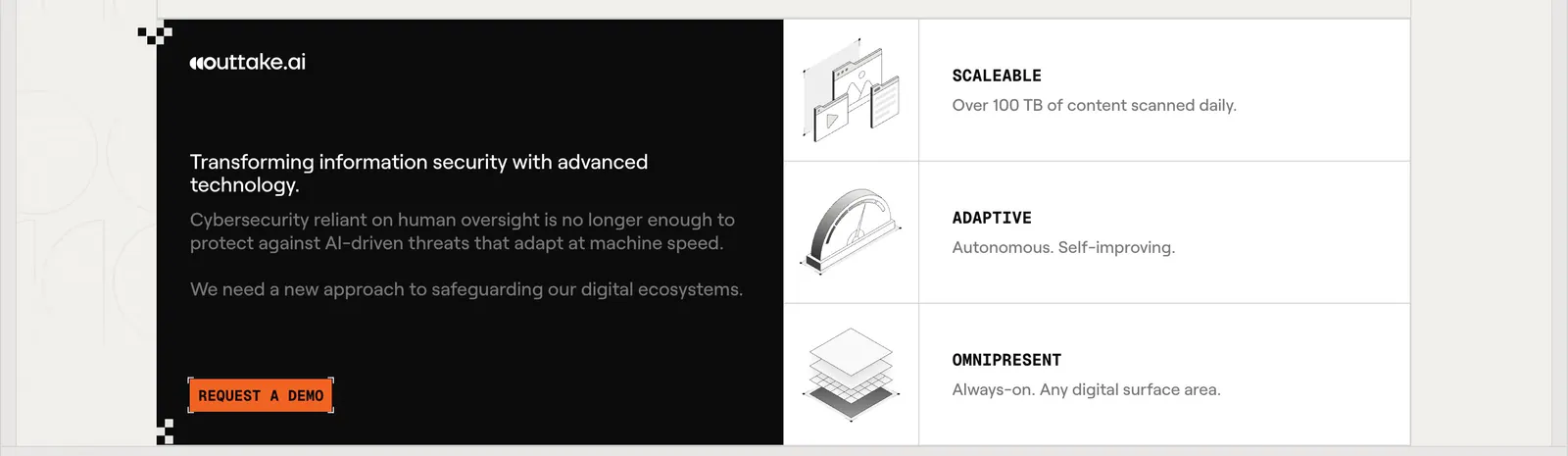
  101. Outtake call to action section: black text panel with orange demo button beside three rows of isometric line illustrations on a beige page
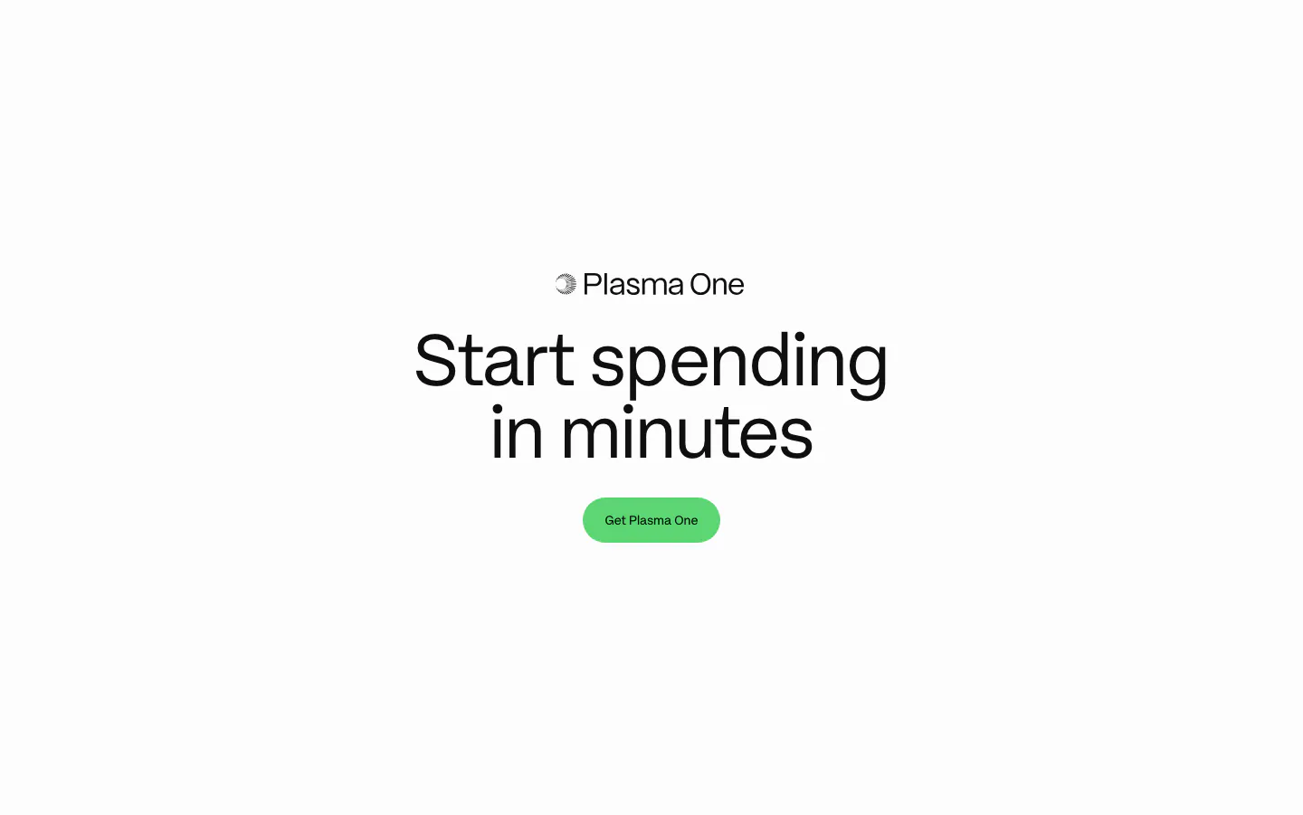
  102. Plasma call to action section: centered Plasma One logo, large headline and green Get Plasma One button on white
  103. Neon call-to-action section: centered two-line headline and green Get Started button over a dark dot-grid map with glowing teal dots
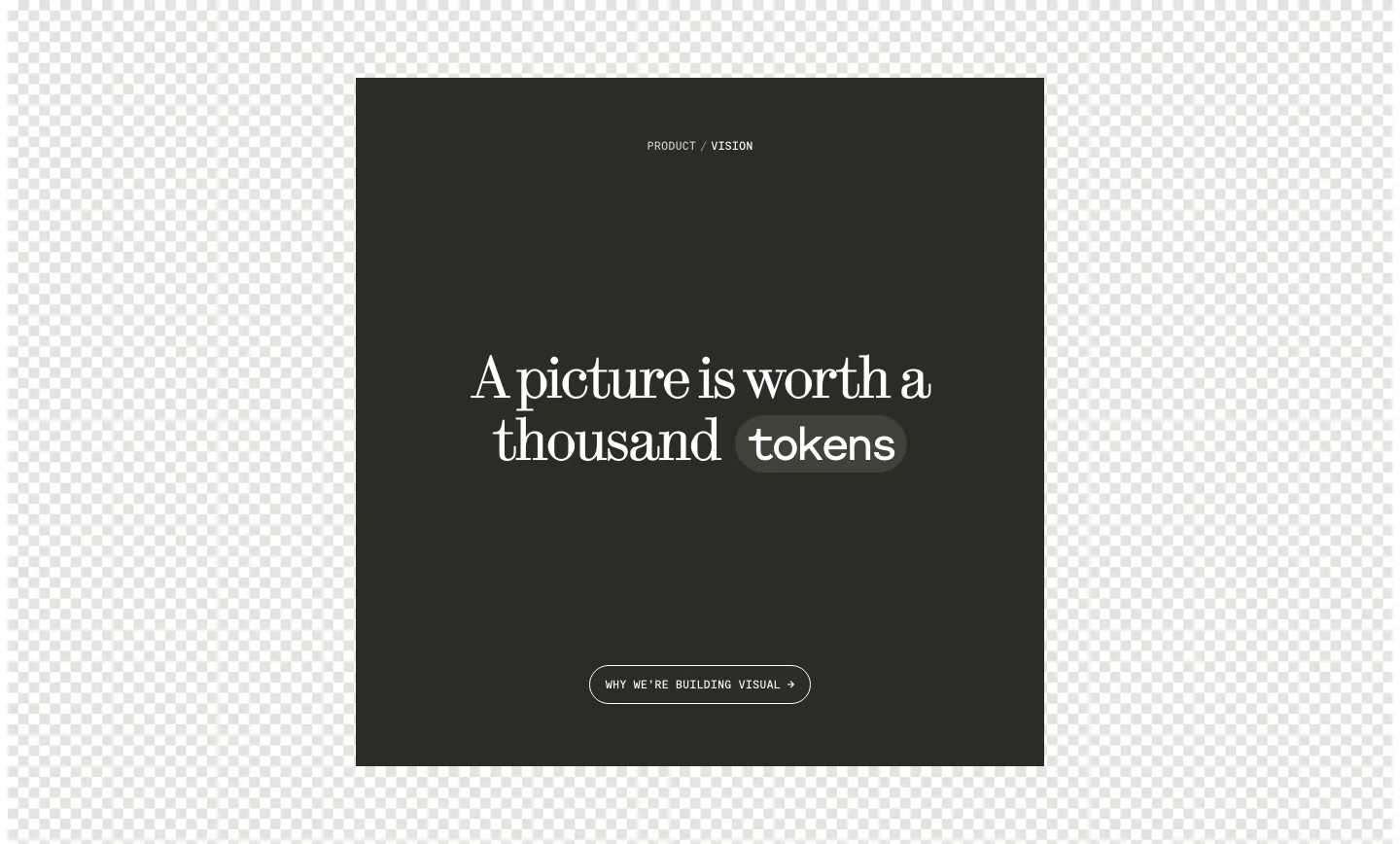
  104. Visual call to action section: dark square panel with centered serif headline, a tokens pill and outline button over a checkerboard background
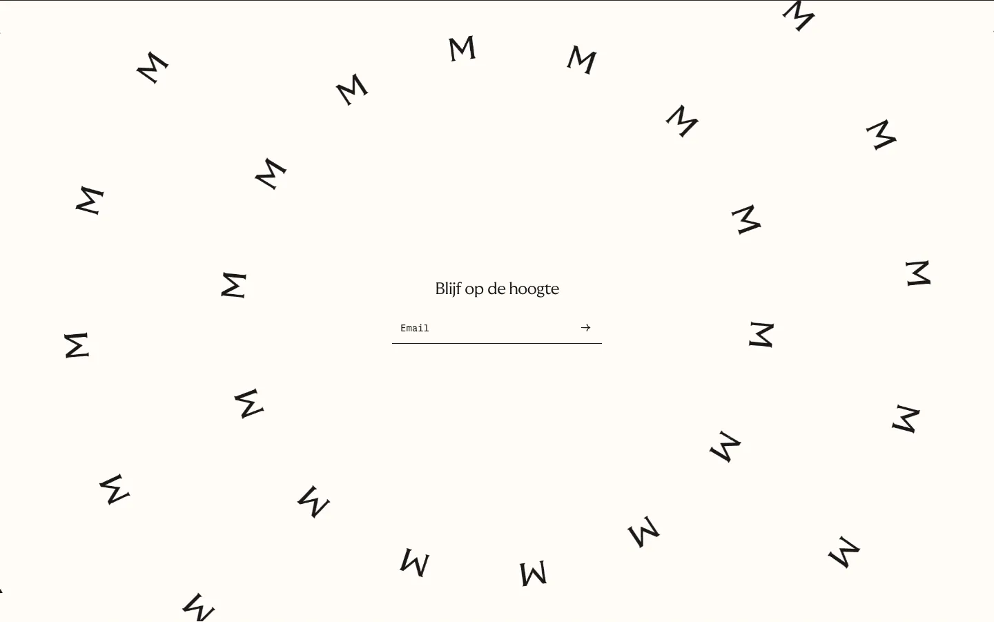
  105. Menkind newsletter section: centered email field surrounded by a swirl of scattered rotated M letters on cream
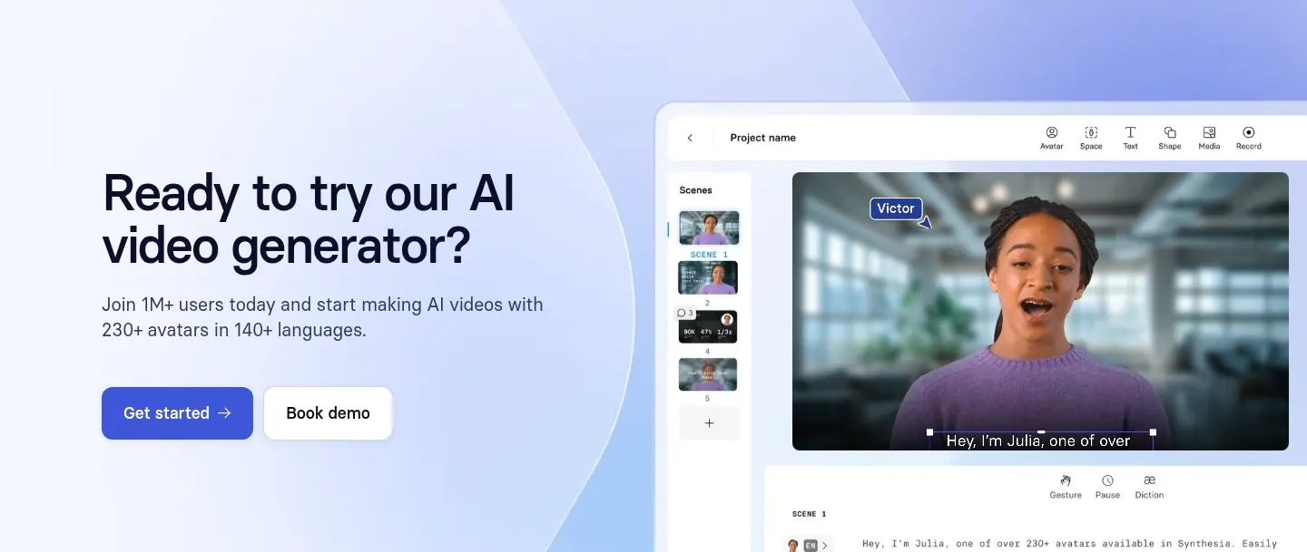
  106. Synthesia call-to-action section: headline with two buttons on the left and a video editor UI screenshot on a lavender-blue gradient right
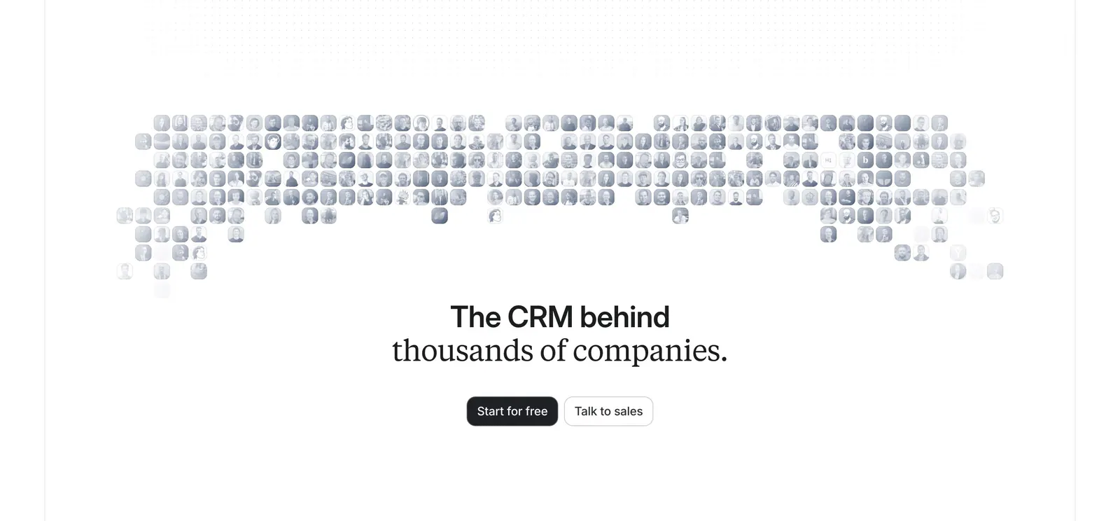
  107. Attio call-to-action section: centered headline and two buttons below a grayscale mosaic of customer logo tiles on white
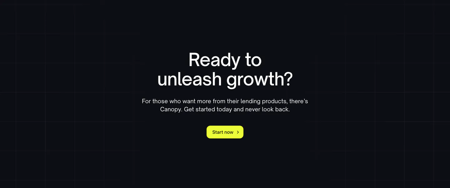
  108. Canopy call-to-action section: centered question headline, copy and lime Start now button on a dark grid background
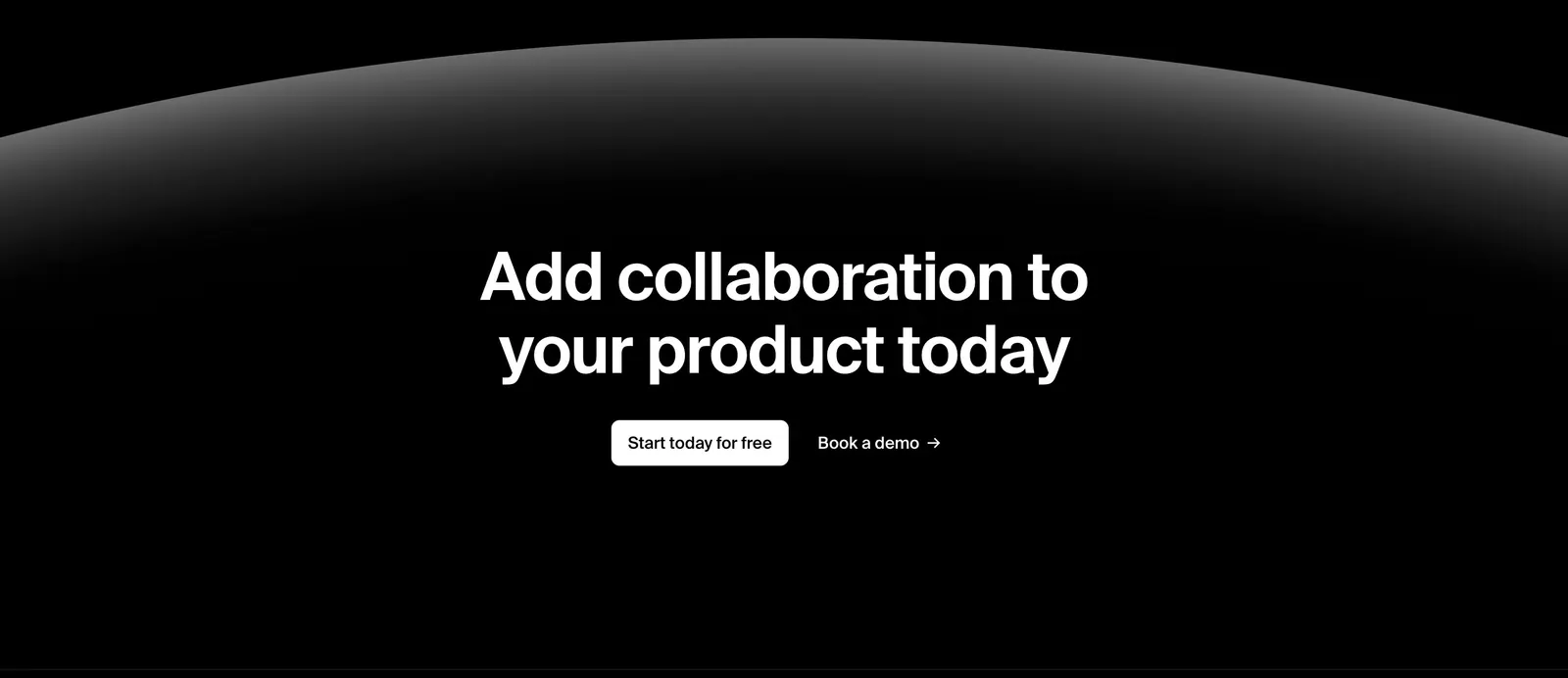
  109. Liveblocks call-to-action section: centered white headline and two buttons beneath a glowing gray planet-like arc on a black background
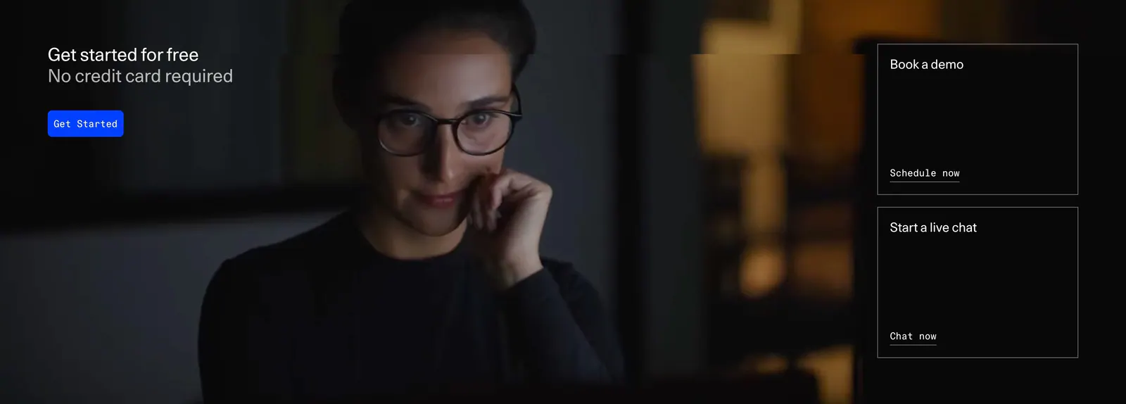
  110. DevRev call-to-action section: headline and blue button over a full-bleed dark photo, with demo and live chat link cards on the right
  111. Greenhouse call-to-action section: white serif headline and blue button on the left with a fingerprint flower artwork on dark green
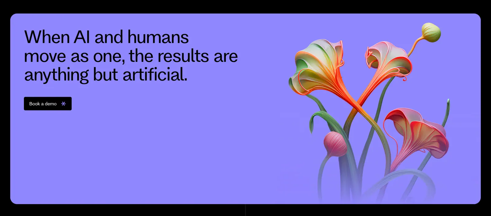
  112. Flank call-to-action section: left-aligned headline and demo button on a lavender panel with rendered orange flowers on the right
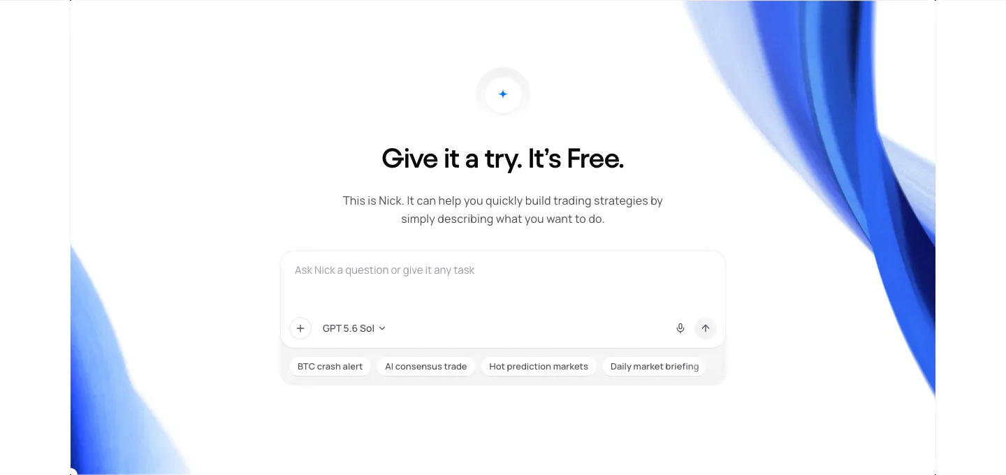
  113. NickAI call-to-action section: centered heading and copy above a chat prompt input with suggestion chips, framed by blue ribbon art
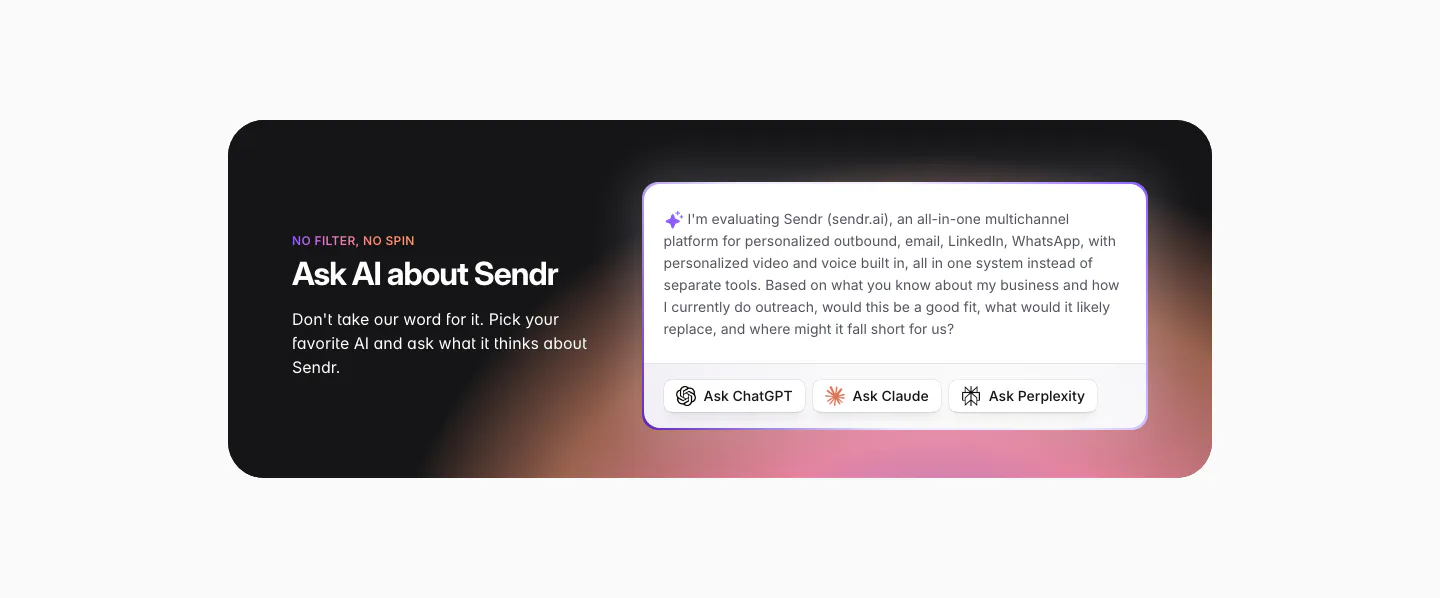
  114. Sendr call to action section: dark rounded card with warm glow, headline left, prefilled AI prompt with Ask ChatGPT, Claude, Perplexity buttons
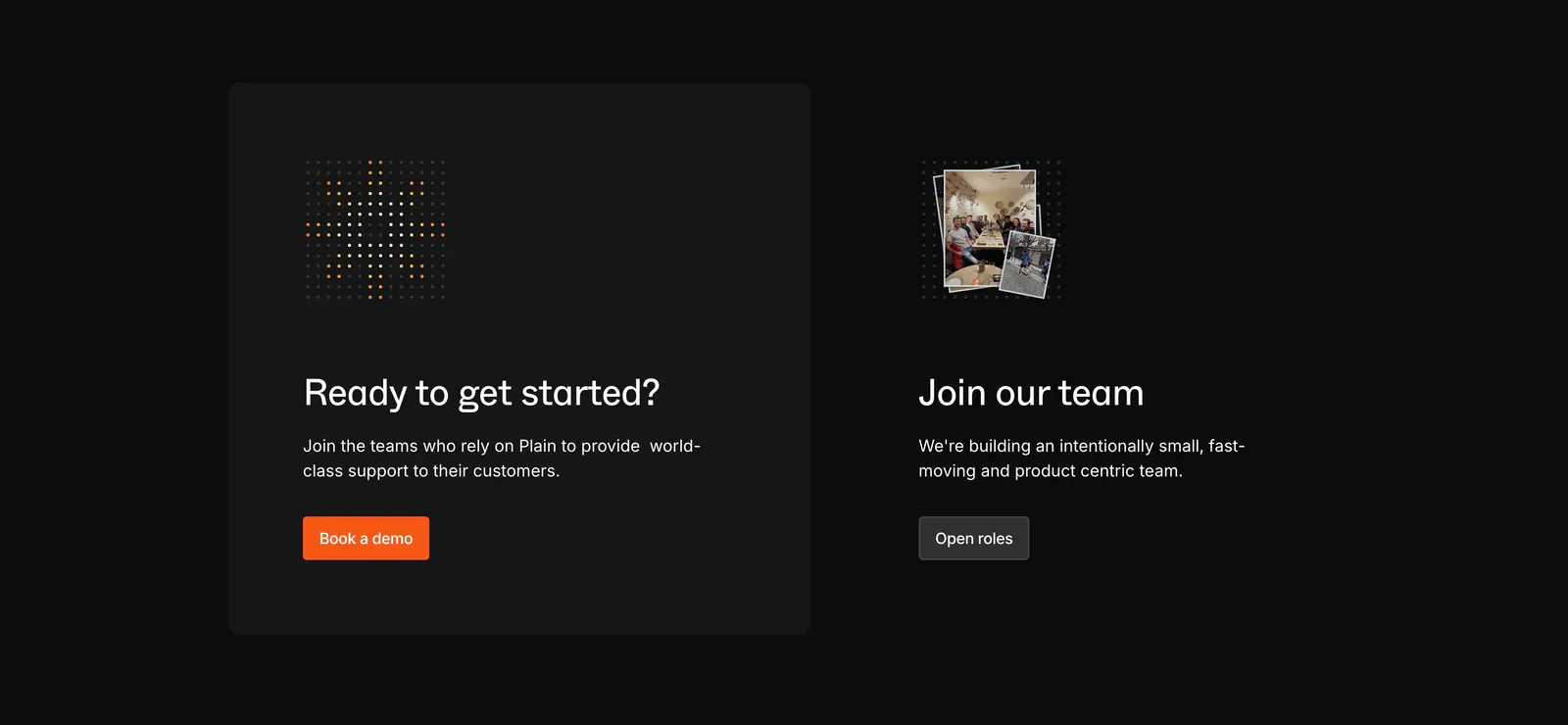
  115. Plain call to action section: dark card with dot icon and orange demo button beside a Join our team block with a small photo stack
  116. Lightning Proxies call-to-action section: centered white headline and Get Started button on a bright blue background with thin circuit lines
  117. Godmode call-to-action section: blue rounded card with headline and button on the left and an AI agent chat screenshot on the right
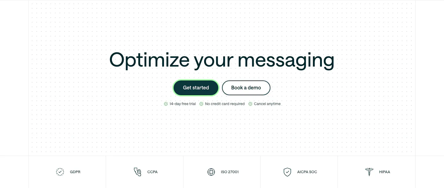
  118. Customer.io call to action section: centered headline and two buttons on a dot grid, above a row of compliance badges
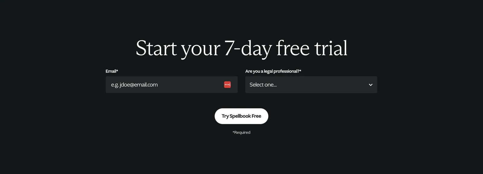
  119. Spellbook call-to-action section: centered serif headline above an email field and select dropdown with a white button on a dark background
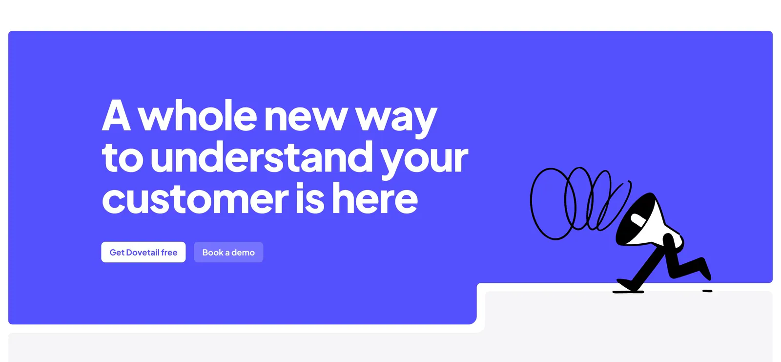
  120. Dovetail call-to-action section: large white headline and two buttons on a bright indigo panel with a walking megaphone illustration
  121. Rezolv call-to-action section: light blue rounded banner with left-aligned headline and Get in touch button and curved line art
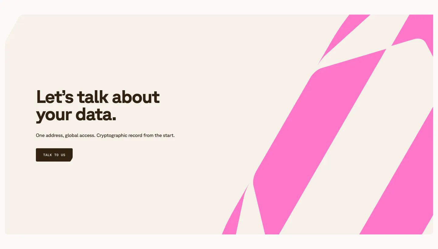
  122. Shelby call to action section: left headline, one-line copy and Talk to us button beside bold pink diagonal stripes on a cream panel
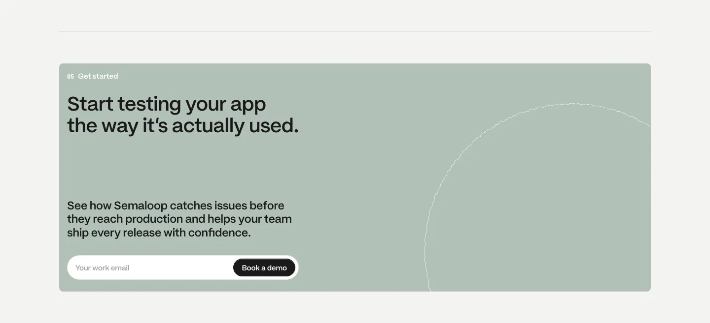
  123. Semaloop call to action section: sage green card with headline, short copy and an email field with demo button, thin circle outline at right
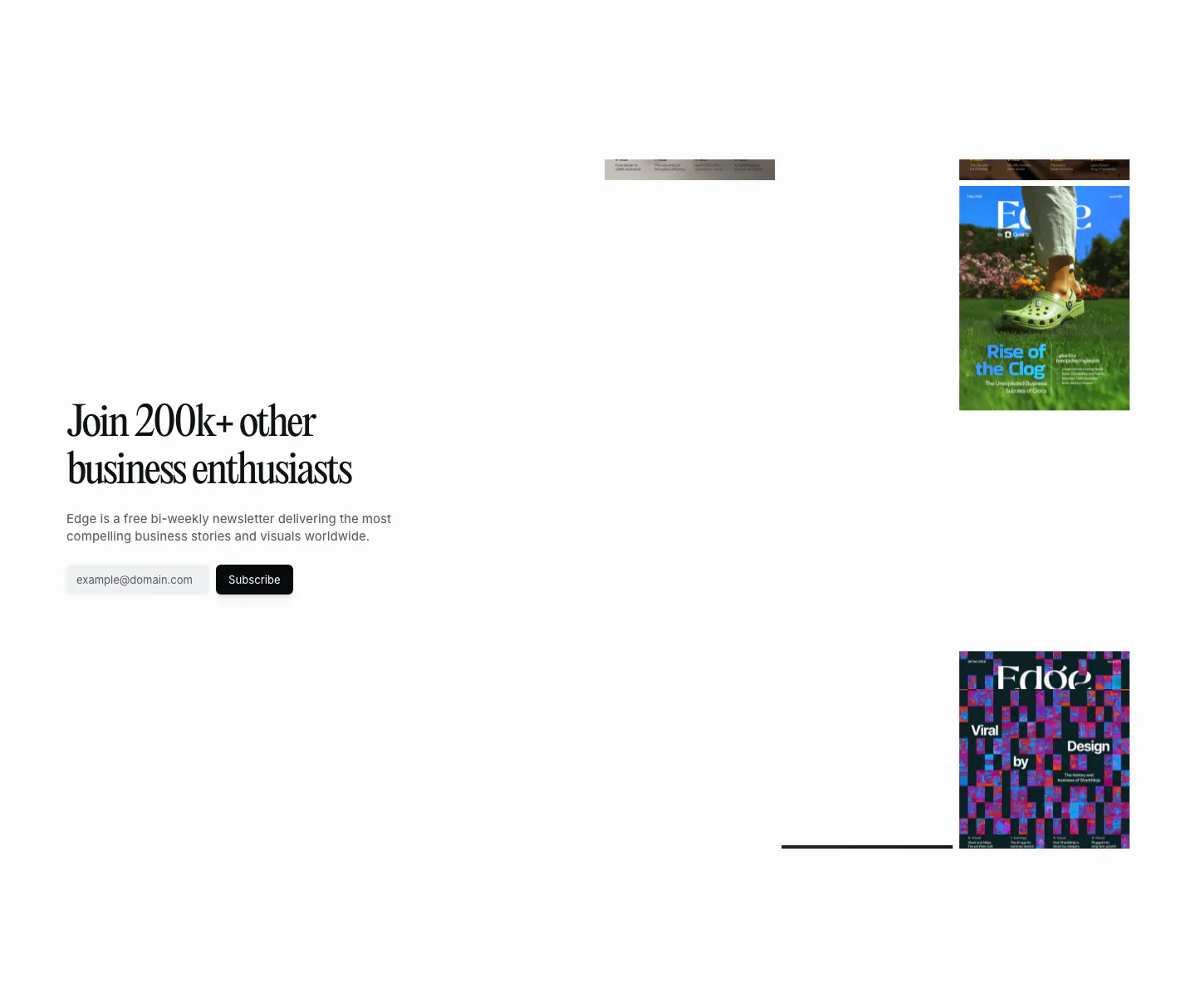
  124. Quartr newsletter section: serif headline and email subscribe field on the left, scattered Edge magazine covers on the right
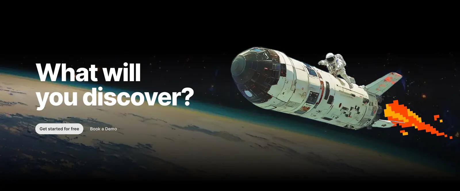
  125. Outerbase call-to-action section: bold headline and two buttons over painted artwork of an astronaut riding a shuttle above Earth
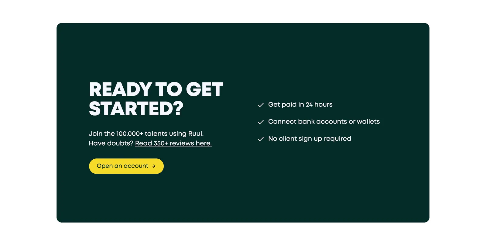
  126. Ruul call-to-action section: bold uppercase headline, copy and yellow button beside a three-item checklist in a dark green card
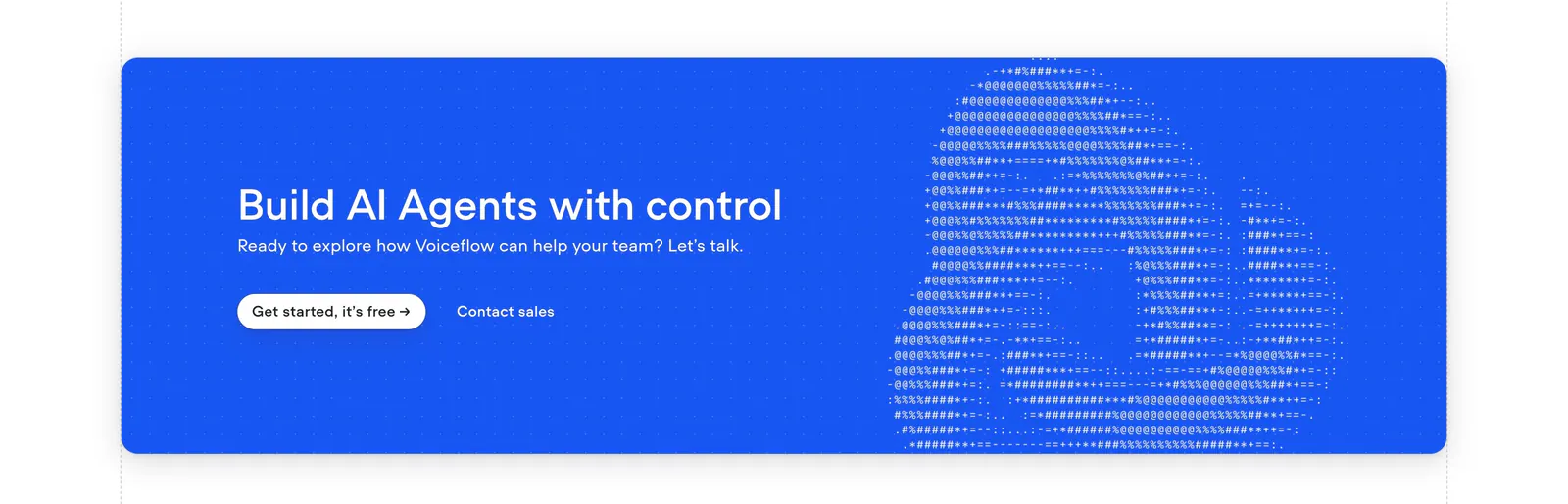
  127. Voiceflow call-to-action section: bright blue rounded banner with left headline and buttons beside ASCII-art logo on a dot grid
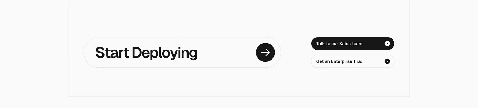
  128. Vercel call-to-action section: large Start Deploying pill with arrow button beside two sales and trial buttons on a gray grid
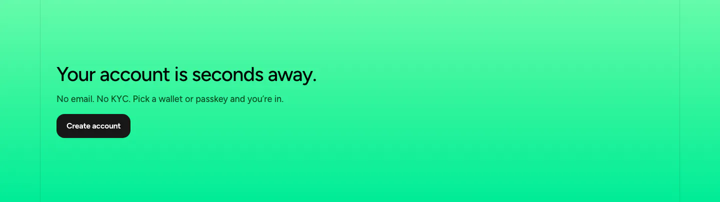
  129. NEAR call-to-action section: left-aligned headline, short copy and dark button on a bright green gradient band
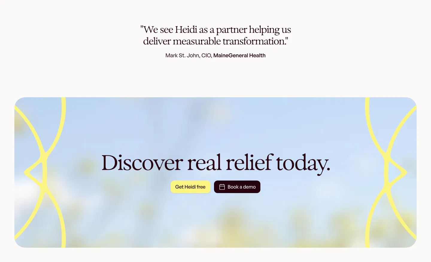
  130. Heidi call to action section: short serif customer quote above a rounded panel with blurred sky photo, serif headline and two buttons
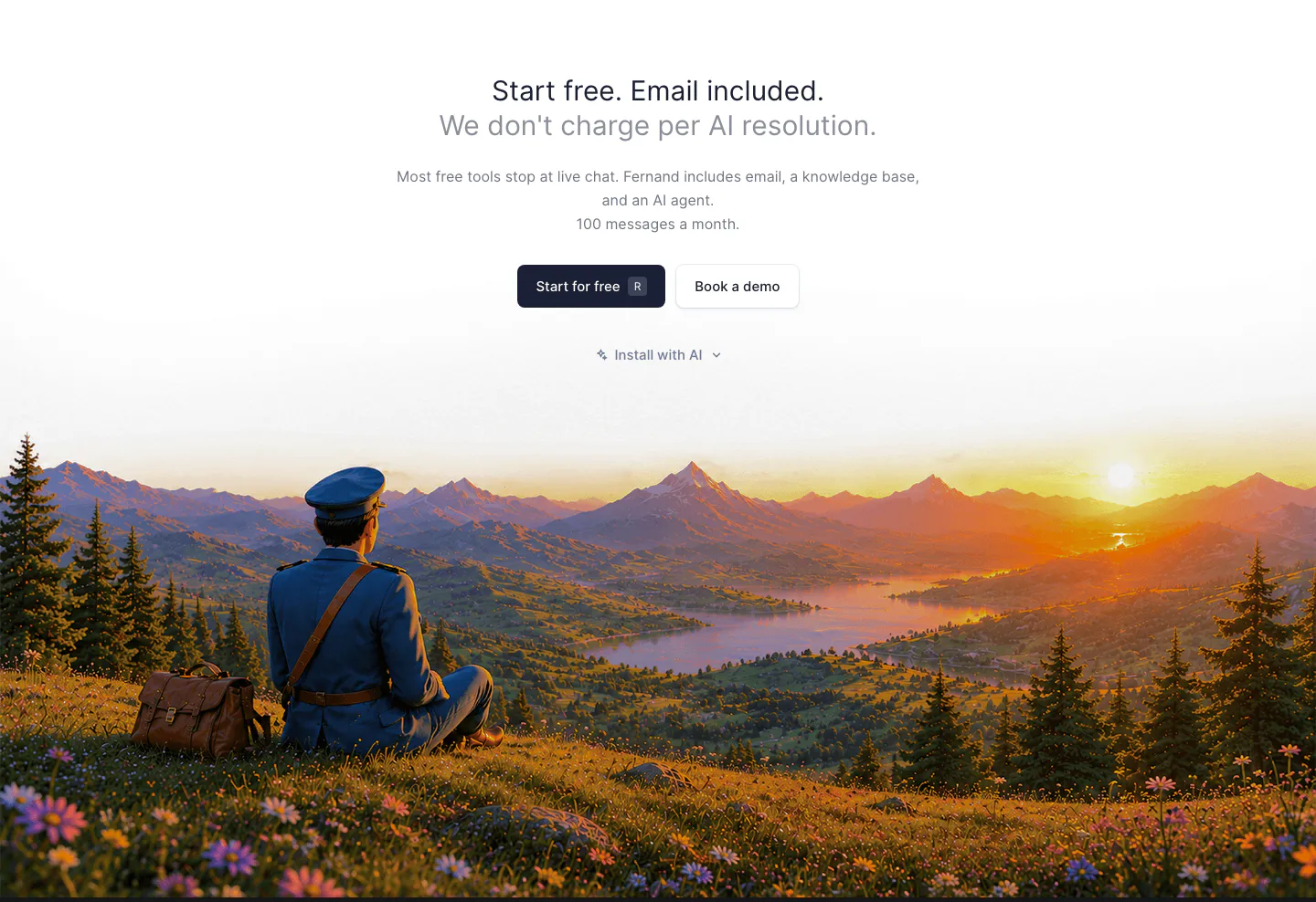
  131. Fernand call-to-action section: centered headline and buttons above a painted sunset landscape with a seated postman
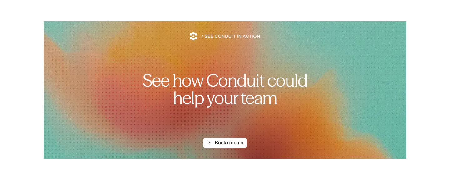
  132. Conduit call-to-action section: centered serif headline and button on an orange and teal gradient panel with dot texture
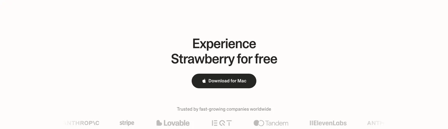
  133. Strawberry call to action section: centered headline and dark download button above a faded customer logo strip
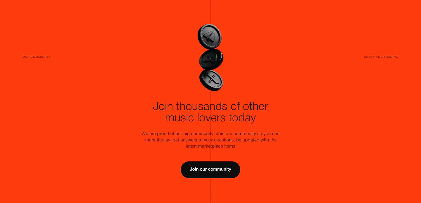
  134. EchoFi call-to-action section: stacked black 3D coins above a centered headline and community button on bright orange
  135. Canopy call-to-action section: centered headline, short copy and lime Get started button on a dark grid background
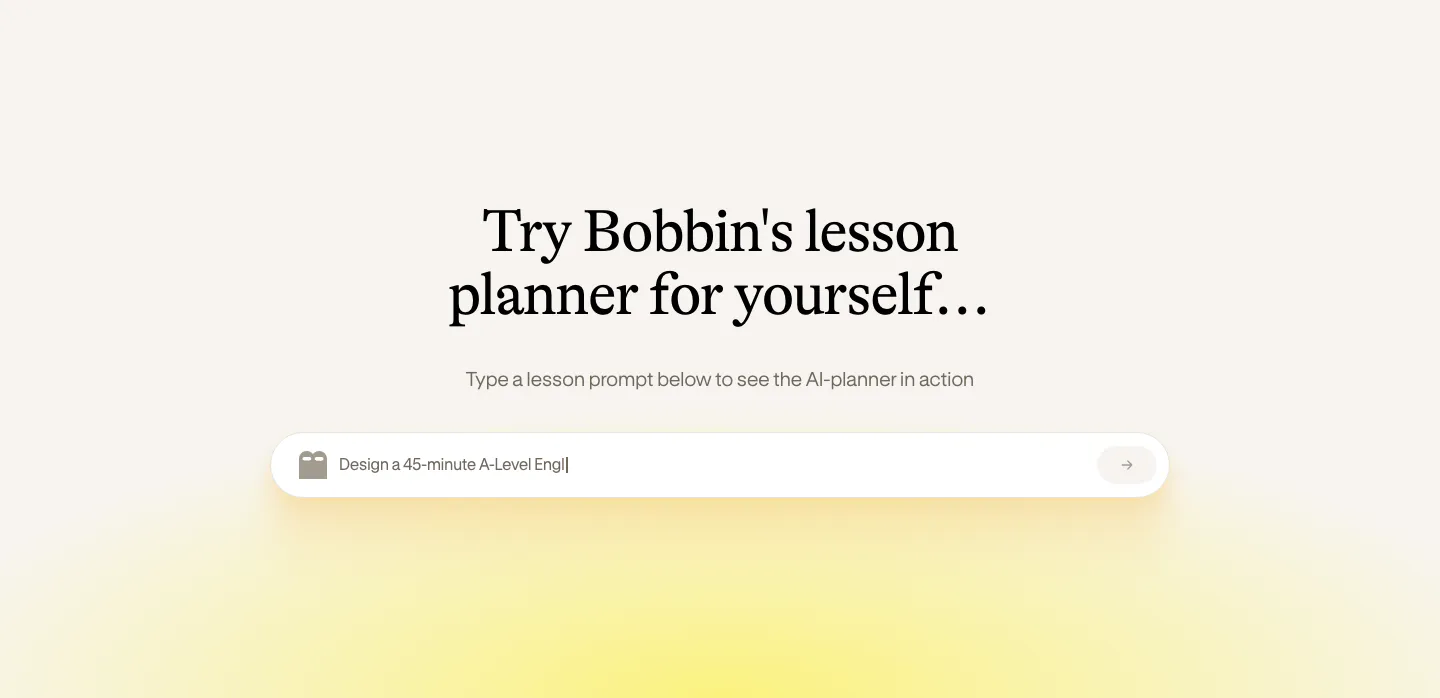
  136. Bobbin call to action section: centered serif heading above a lesson prompt input field with a soft yellow glow on cream
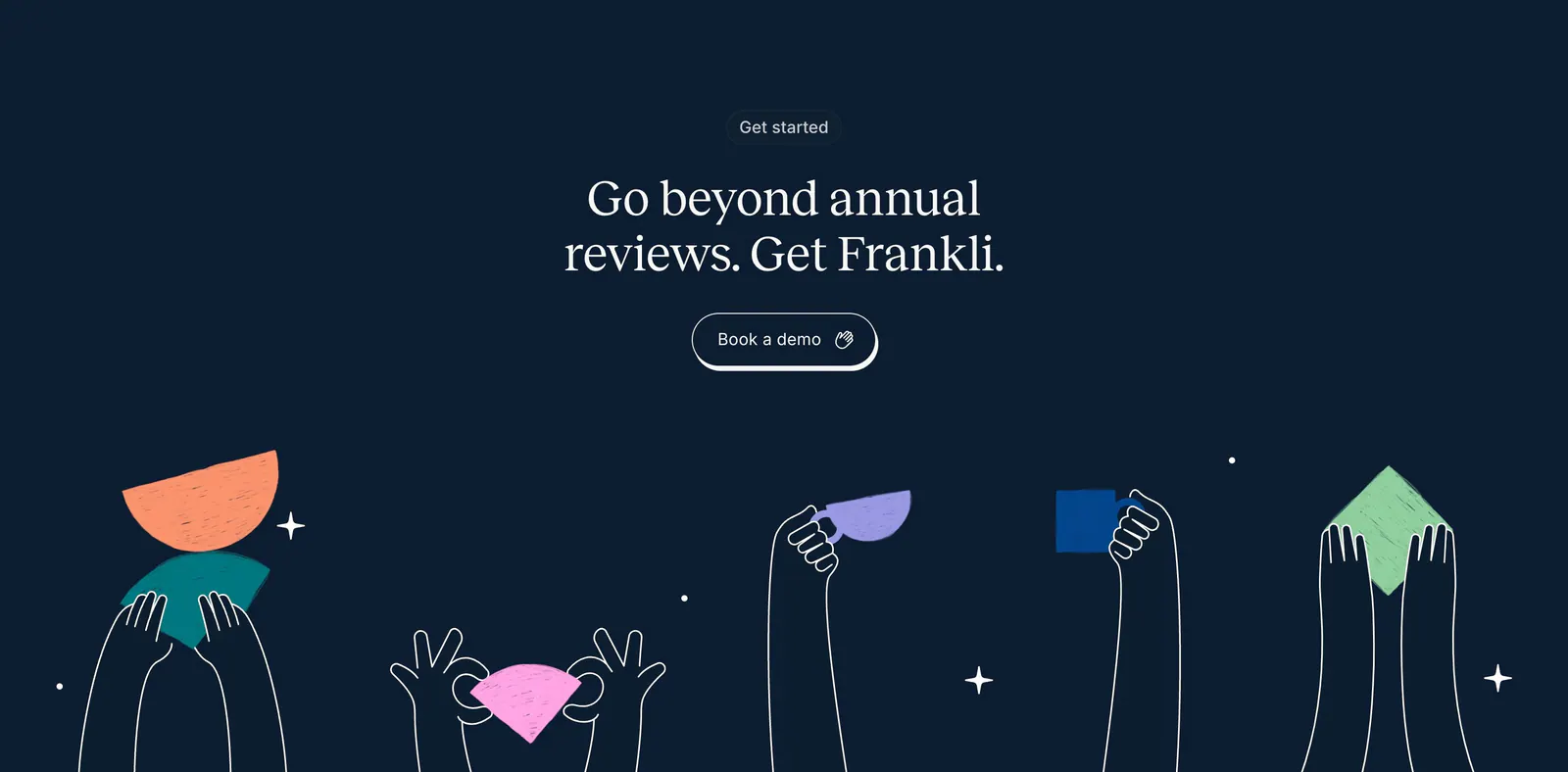
  137. Frankli call-to-action section: centered serif headline and demo button above hand-drawn hands holding colorful shapes on navy
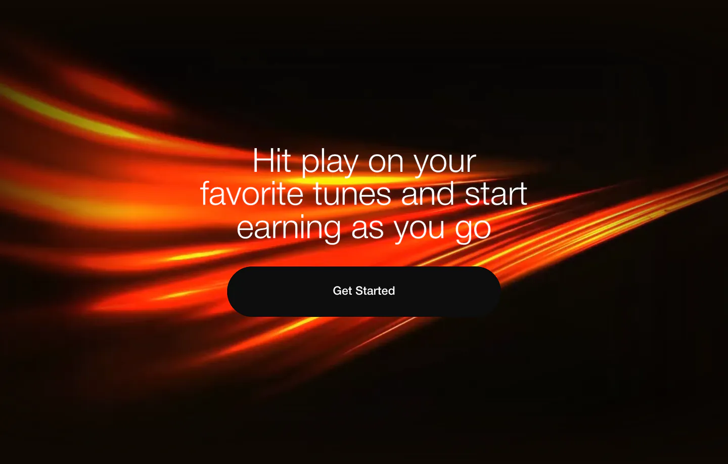
  138. EchoFi call-to-action section: centered headline and black pill button over sweeping orange light streaks on black
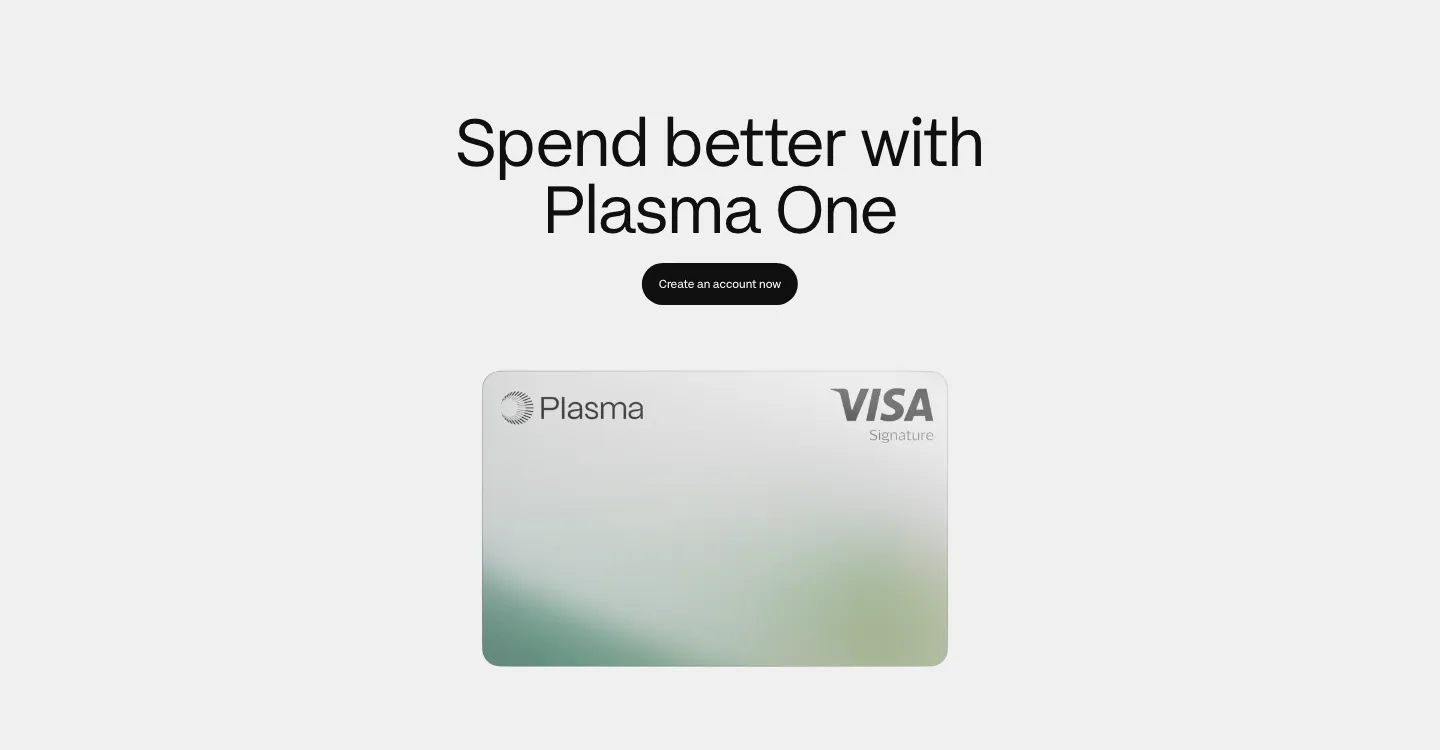
  139. Plasma call to action section: centered heading and black button above a silver Plasma Visa card on light gray
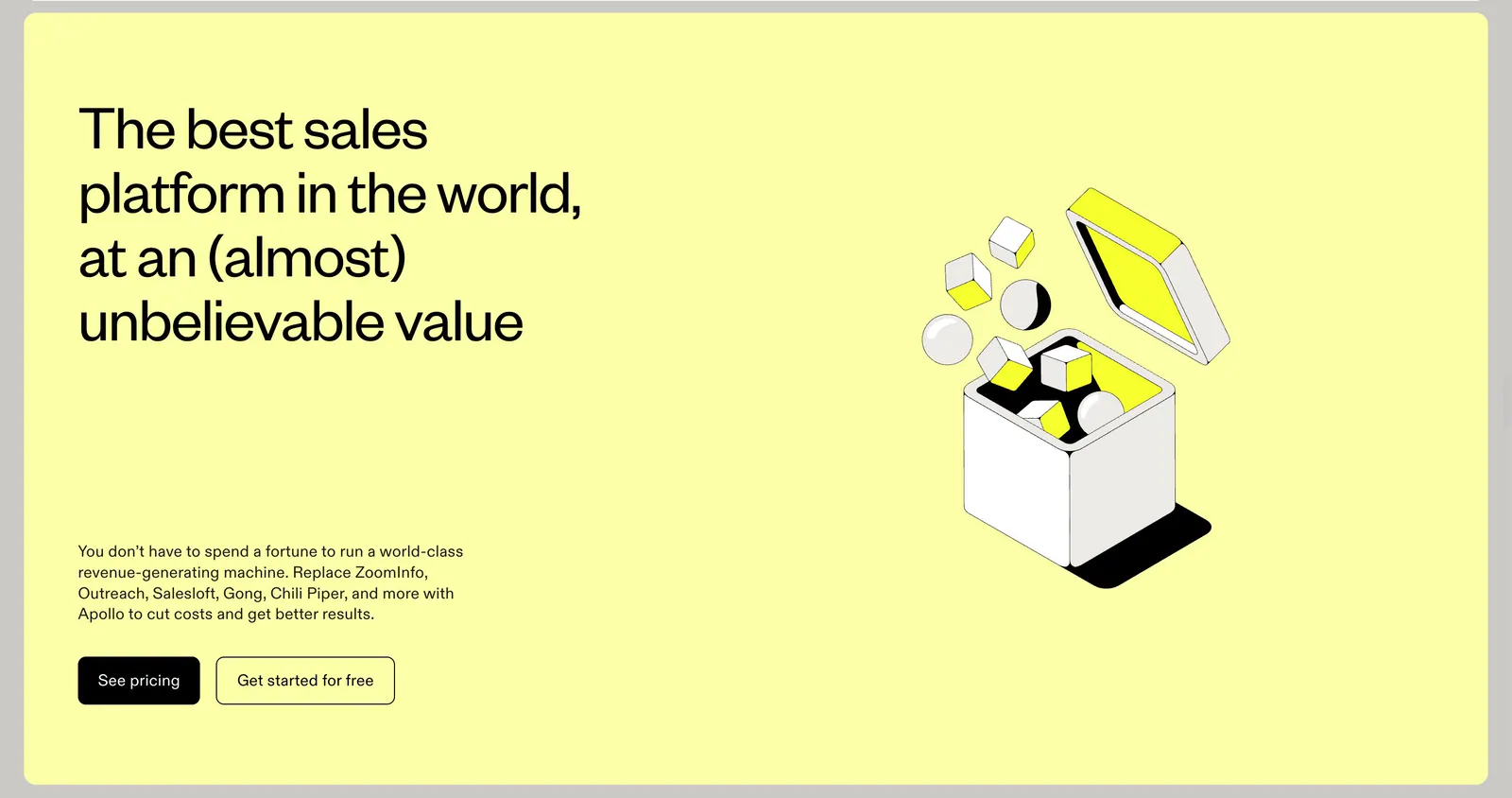
  140. Apollo call-to-action section: headline, copy and two buttons left with an isometric line-art box illustration right on a pale yellow panel
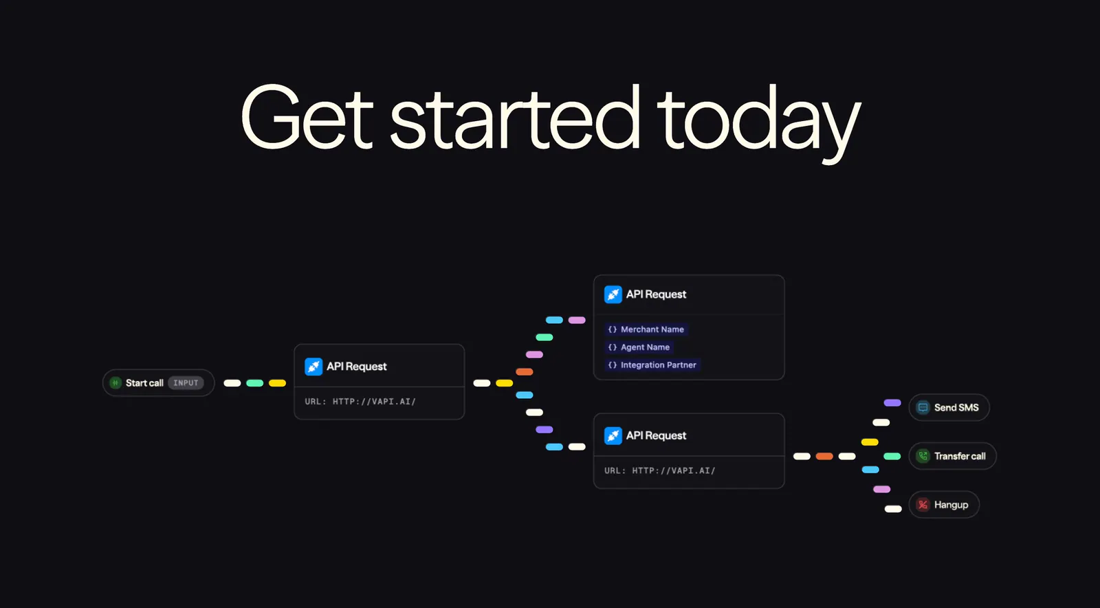
  141. Vapi call-to-action section: huge centered headline above a workflow diagram of API request nodes linked by colorful dashes on black
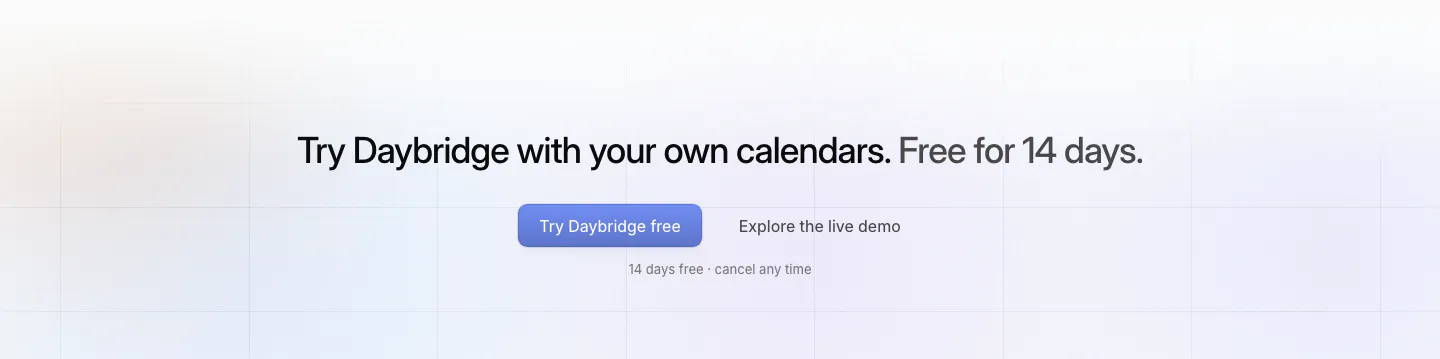
  142. Daybridge call-to-action section: centered one-line headline with primary and secondary buttons over faint grid lines
  143. Griffin call-to-action section: centered serif headline and Contact sales pill button on a black background
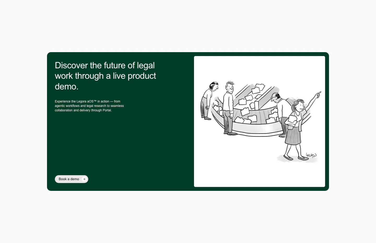
  144. Legora call-to-action section: dark green card with headline and demo button left and a black-and-white cartoon right
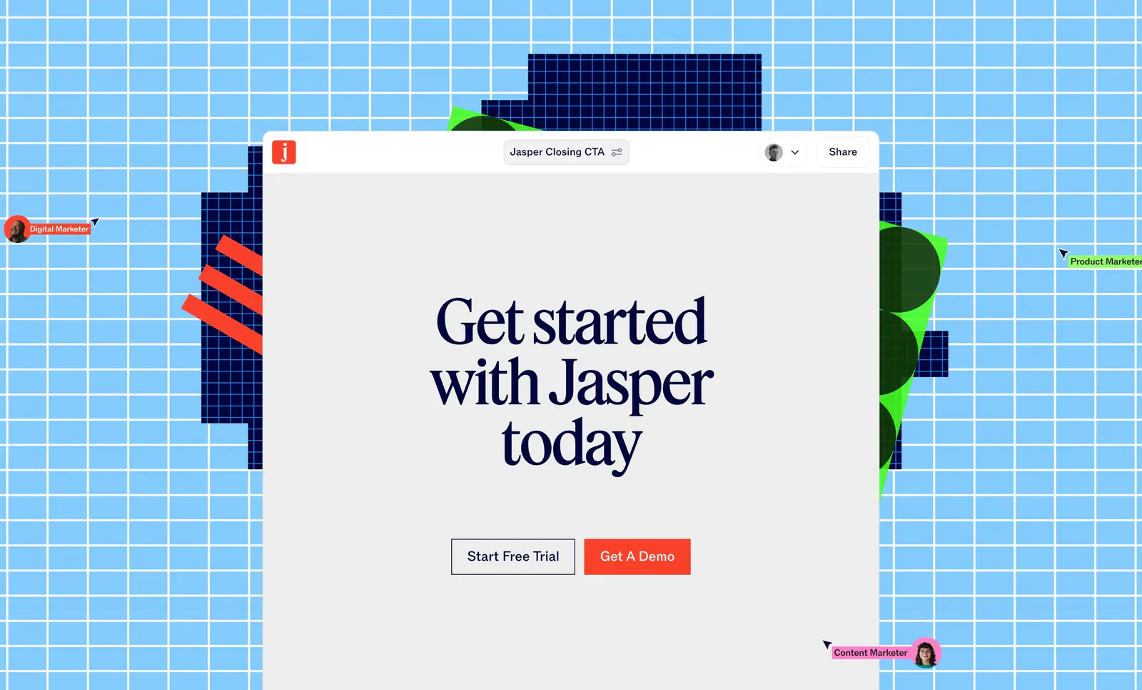
  145. Jasper call-to-action section: serif headline and two buttons in an editor window over a sky-blue grid with pixel shapes and cursors
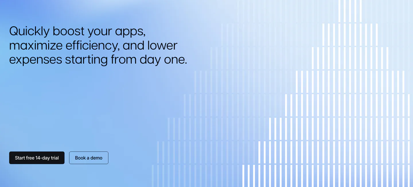
  146. Polar Signals call to action section: left headline and two buttons on a blue gradient with white vertical bars rising like a bar chart
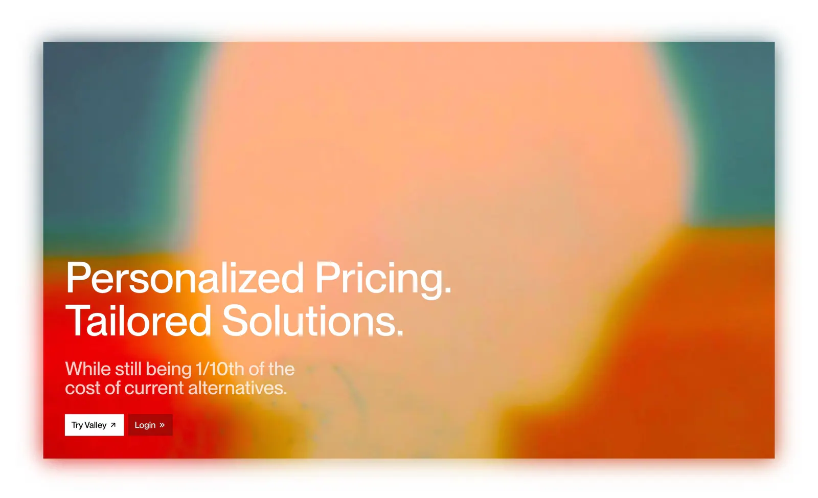
  147. Valley call-to-action section: white headline and two buttons over a full-bleed blurred orange, peach and teal abstract image
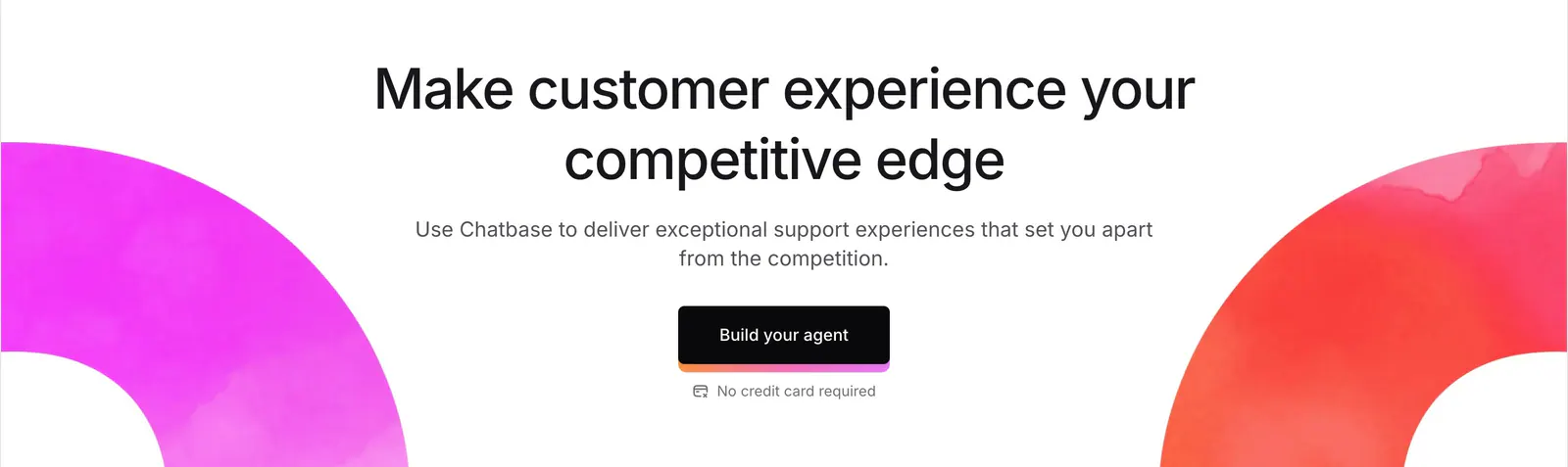
  148. Chatbase call-to-action section: centered headline and dark button framed by magenta and red watercolor arcs on white
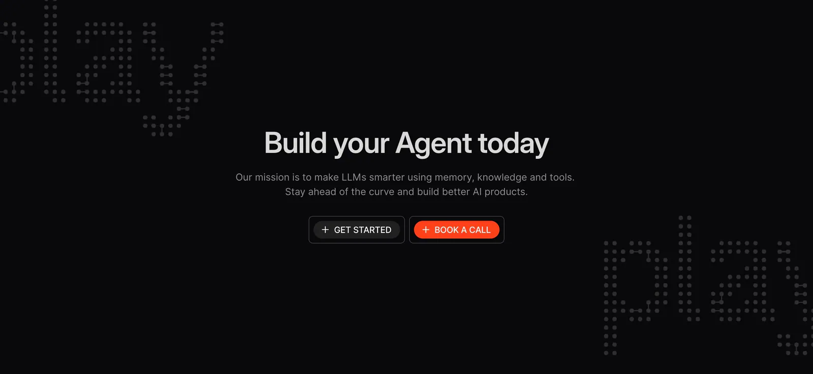
  149. Phidata call to action section: centered headline with two buttons on a black background with dot-matrix lettering in the corners
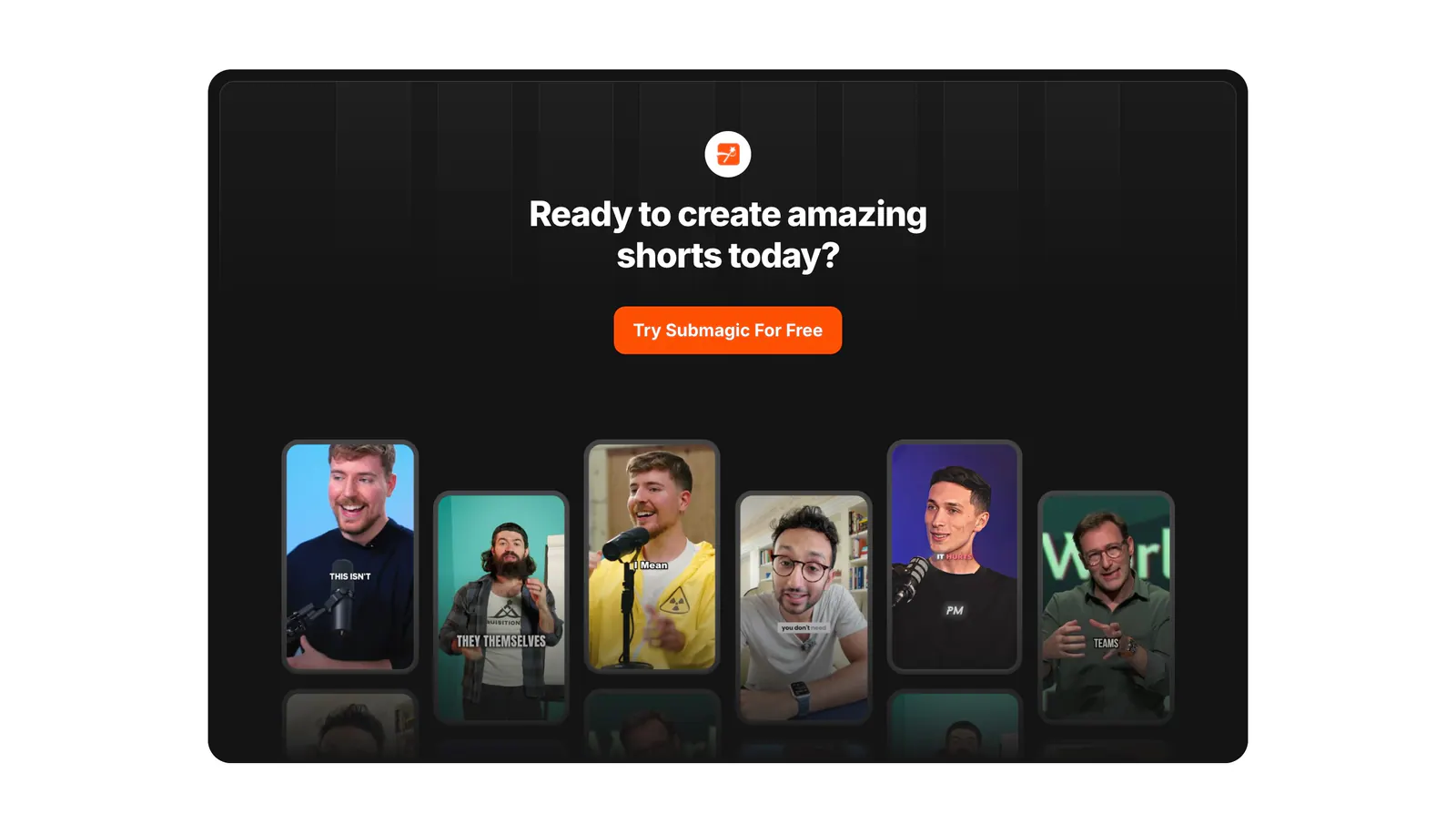
  150. Submagic call-to-action section: centered headline and orange button in a dark rounded panel above a row of vertical creator video thumbnails
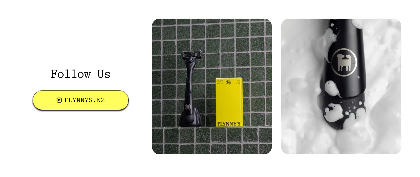
  151. Flynny's call to action section: Follow Us heading and yellow Instagram button left, two product photos of a black razor and yellow box right
  152. Arcade call to action section: slim light gray band with a one-line headline and Sign up for free and Talk to a GTM expert buttons
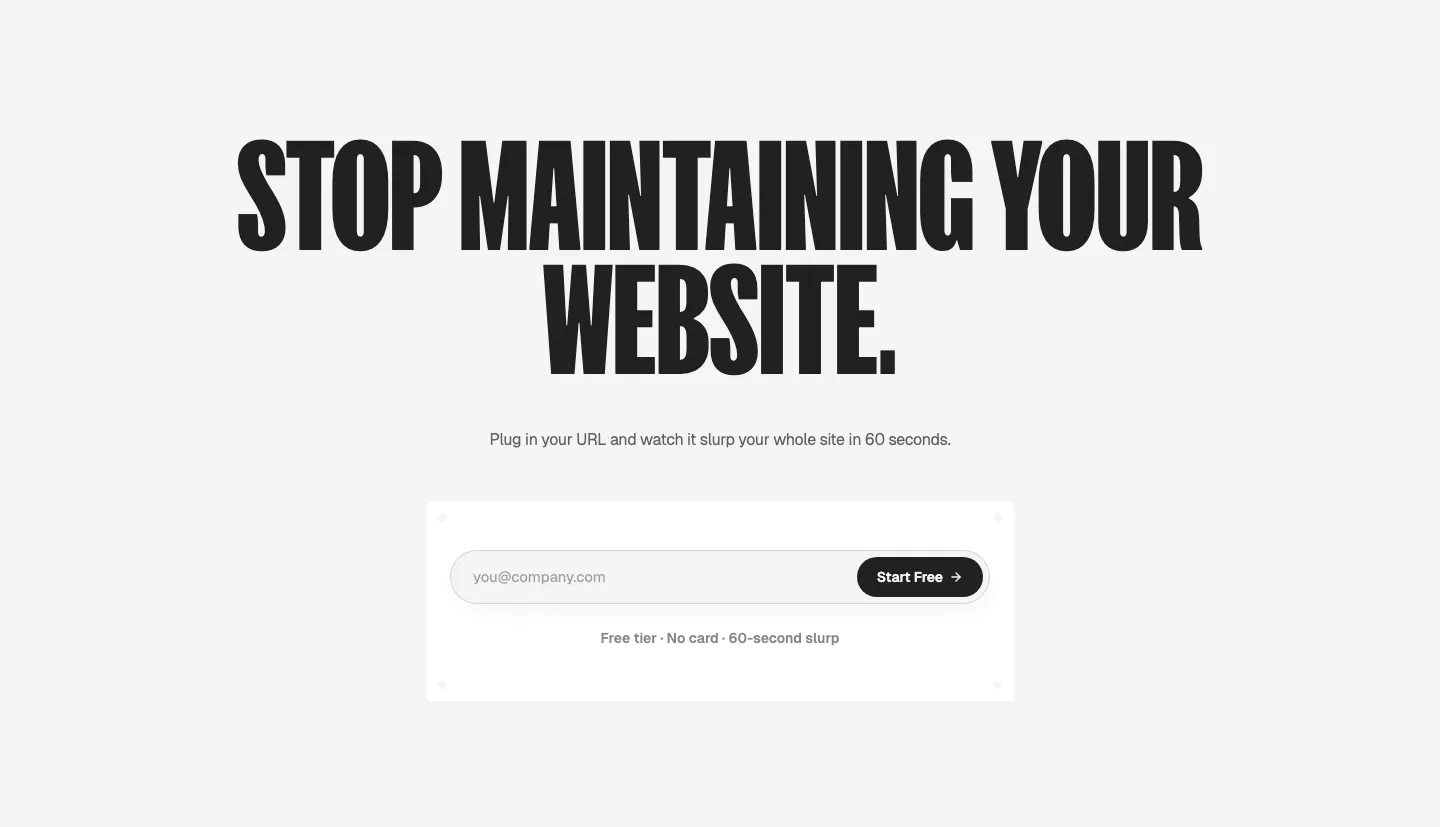
  153. Ploy call-to-action section: huge condensed centered headline above an email signup field with a black Start Free button on light gray
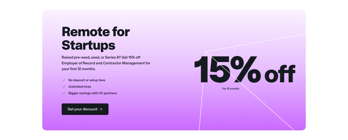
  154. Remote call to action section: startup offer card with headline, checklist and button beside large 15% off text on purple gradient
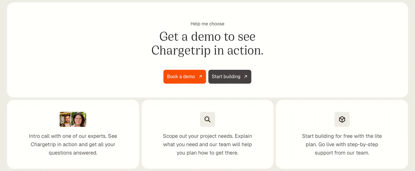
  155. Chargetrip call-to-action section: centered serif headline with orange demo button above three cards outlining next steps
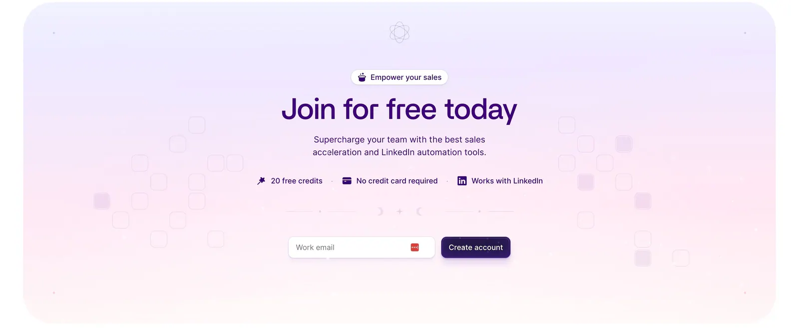
  156. Wiza call-to-action section: centered headline, benefit badges and work-email signup field on a lavender-to-pink gradient card
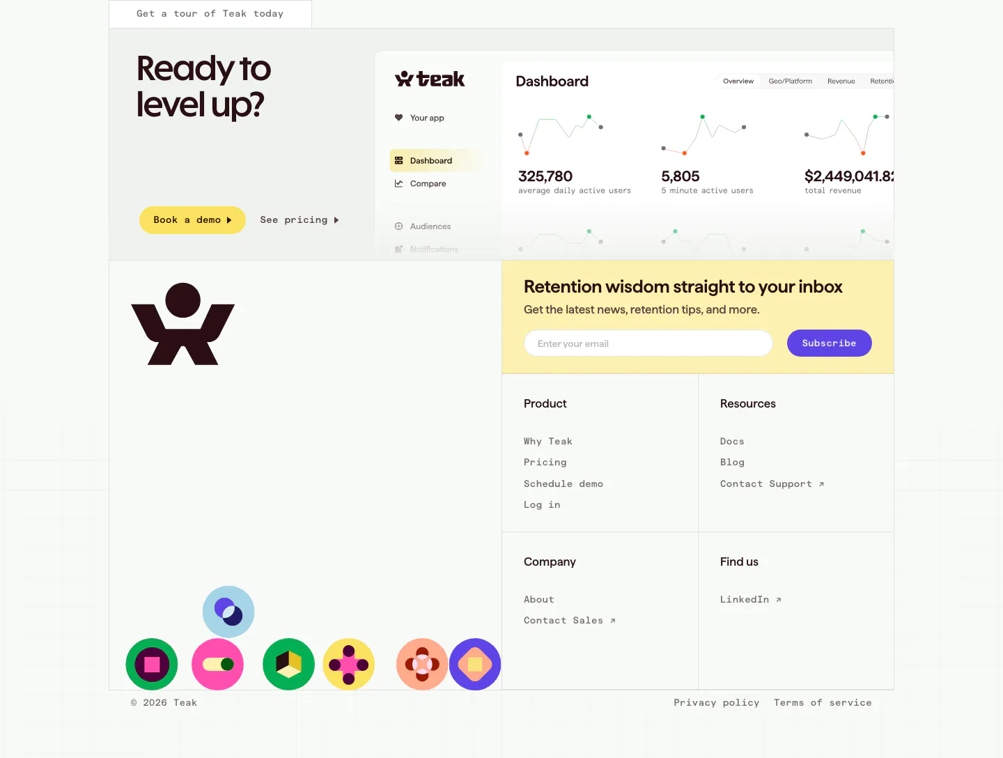
  157. Teak call to action section: headline and buttons beside a dashboard screenshot, then email signup, link columns and round color icons
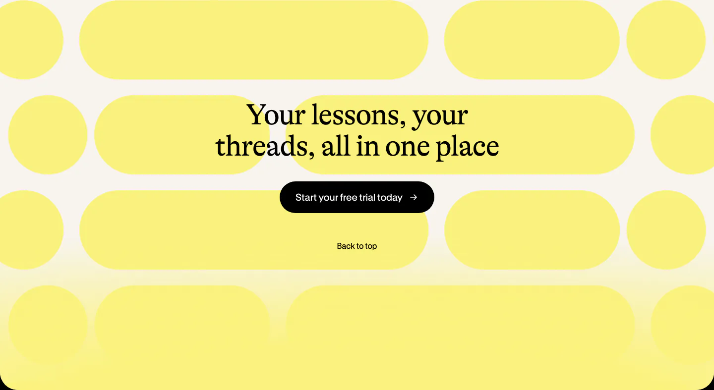
  158. Bobbin call to action section: centered serif heading and black button over a pattern of yellow pill shapes on cream

Common patterns in call to action sections

How to design a closing CTA section

  1. Write a headline that names the outcome

    Skip lines like "Ready to get started?" Say what the reader gets or does next, in under ten words, such as starting a trial or seeing the product on their own data. Add one short line that removes the last objection, like no credit card required.

  2. Commit to one primary action

    Give the main button the strongest color on the page and demote any second option to a text link or outline button. Two equal buttons split attention. Match the label to the hero's main action so the page makes one consistent ask from top to bottom.

  3. Set the band apart visually

    Use a contrasting background, a contained card with rounded corners, or extra vertical padding so the closing band reads as its own moment. Then check that button text still meets 4.5:1 contrast, since tinted and gradient backgrounds often fail once brand colors are layered.

  4. Ask for an email and nothing else

    If the closing band collects an email instead of linking to a signup page, ask for the address only and move everything else to the next step. A single field is a lighter commitment than a form, so it suits trials and waitlists better than sales calls.
Companies in this collection

All section types
    ↑↓ Navigate ↵ Open

    Section preview

    Website section