Plain website design

Every section we captured from the Plain website, in page order, from the hero section down to the CTA section. Open any thumbnail to see it full size.

Sections 8

In page order, top to bottom

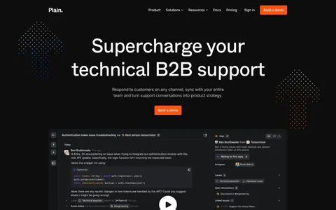
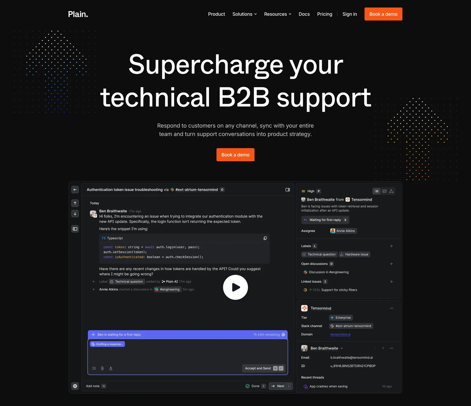
  1. Plain hero section: dark centered headline and orange demo button above a support thread UI with a play button, flanked by dot clusters
    01 Hero

    Supercharge your technical B2B support

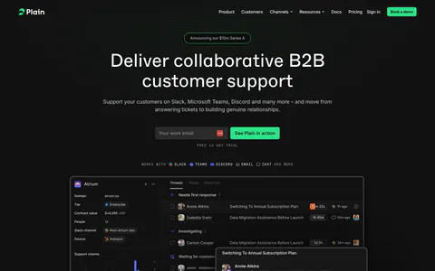
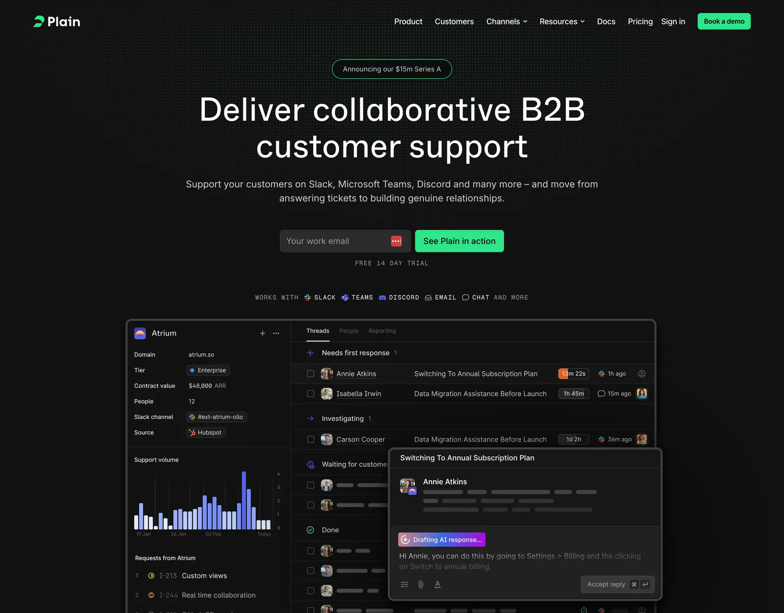
  2. Plain hero section: dark centered headline with email field and green button above a support inbox screenshot on a dot grid
    02 Hero

    Deliver collaborative B2B customer support

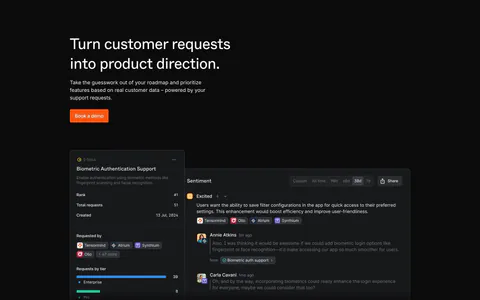
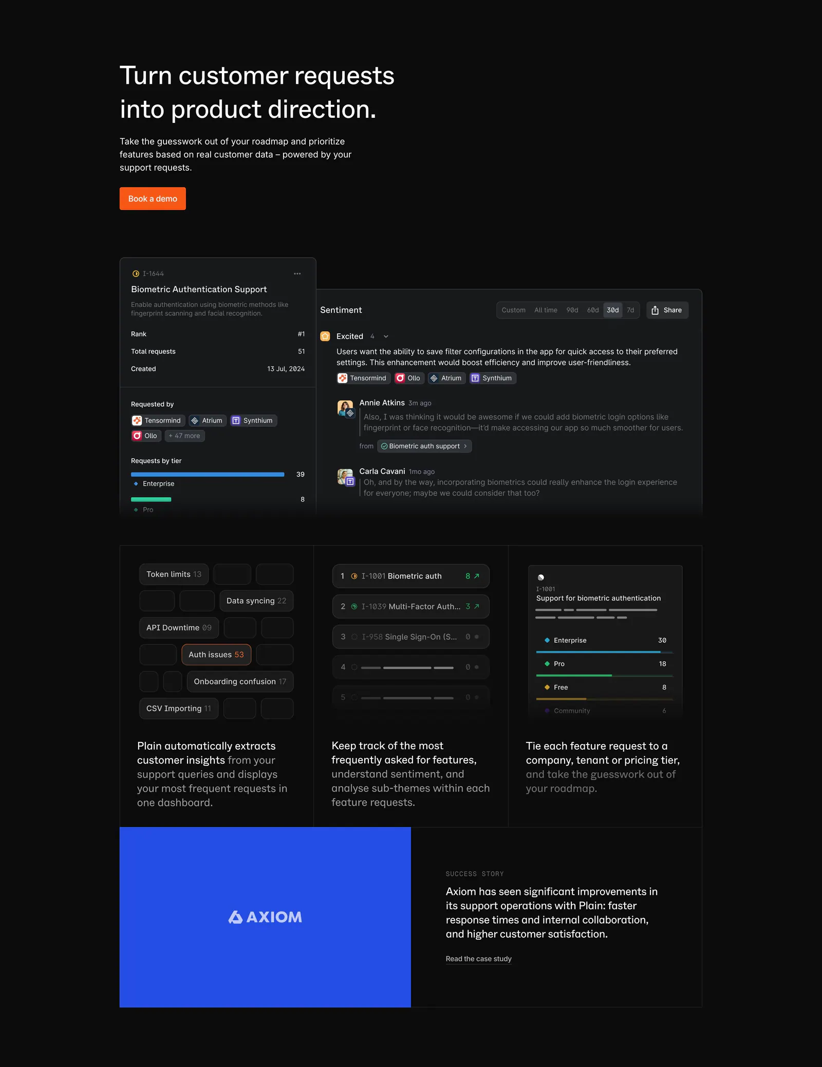
  3. Plain features section: dark headline with orange button above feature request UI panels, three insight cards and a blue Axiom case study

    Turn customer requests into product direction.

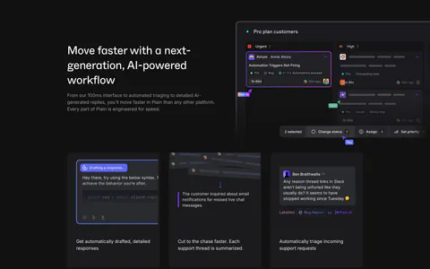
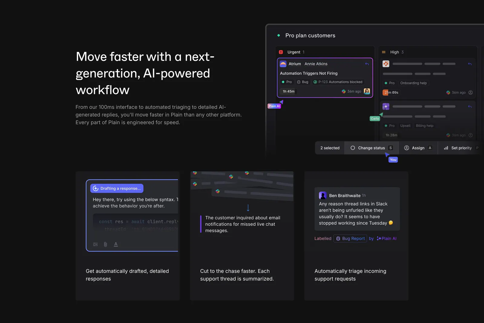
  4. Plain features section: dark split with headline beside a triage board UI, above three cards showing AI drafting, summaries and labels

    Move faster with a next-generation, AI-powered workflow

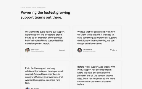
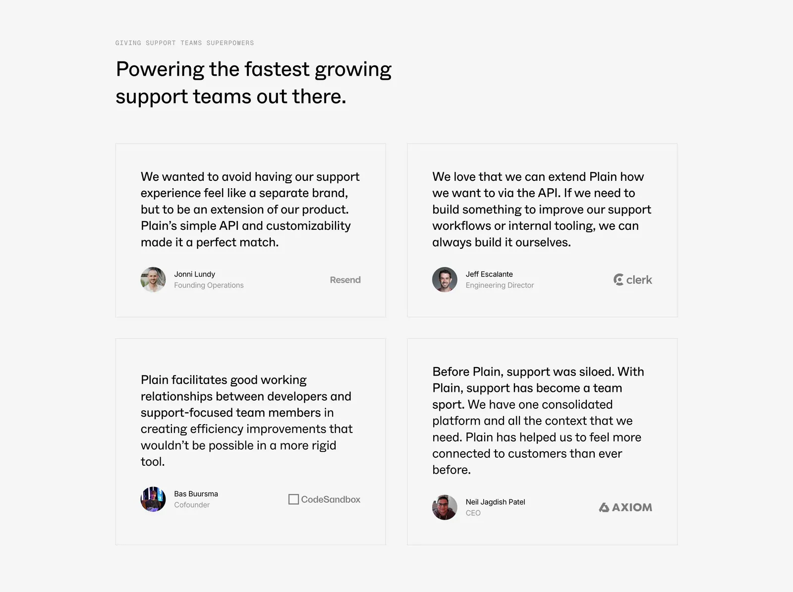
  5. Plain testimonials section: left-aligned headline above a 2x2 grid of bordered quote cards with avatars and company logos on light gray

    Powering the fastest growing support teams out there.

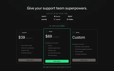
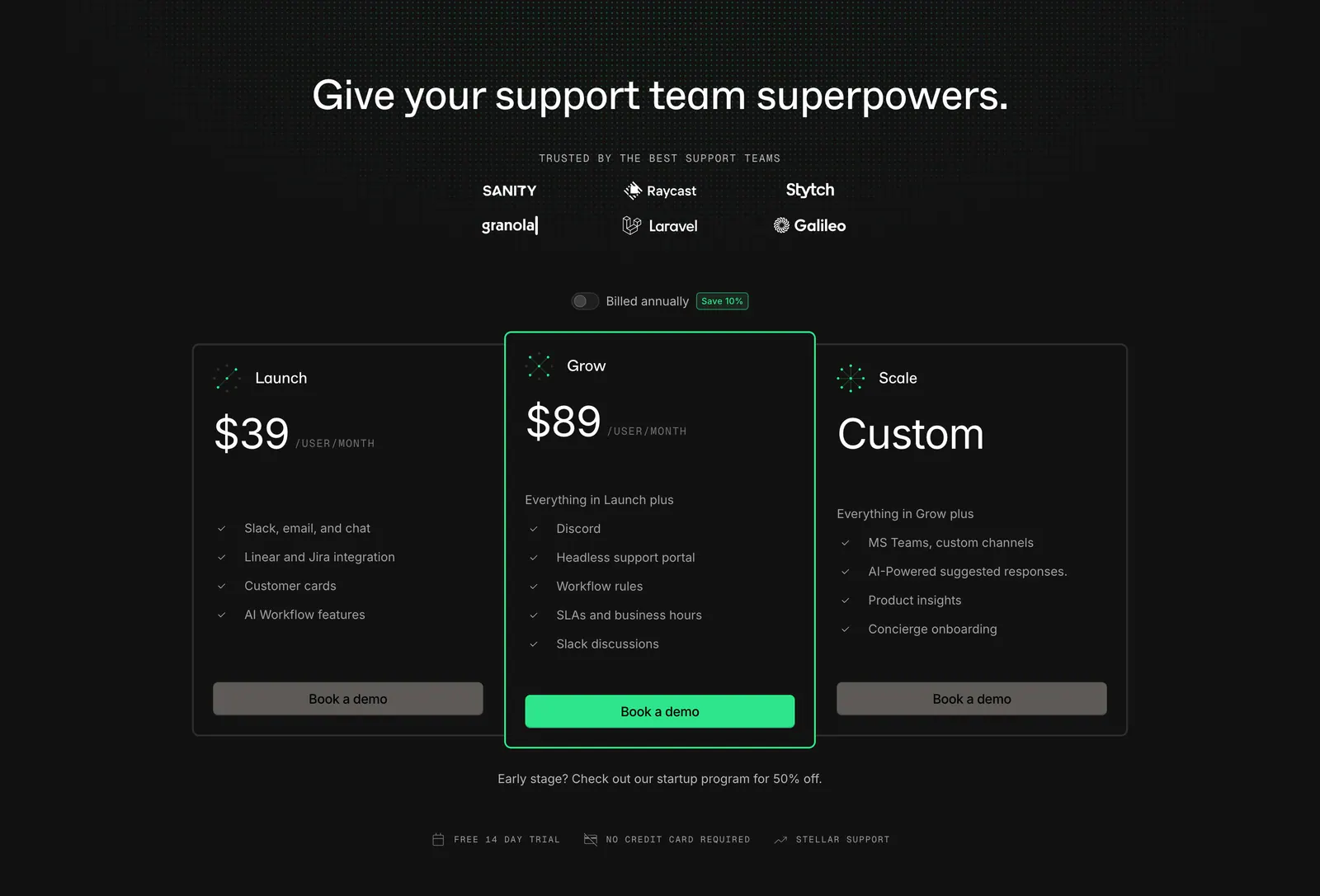
  6. Plain pricing section: dark centered headline with logo grid and billing toggle above three plan cards, the middle one highlighted green
    06 Pricing

    Give your support team superpowers.

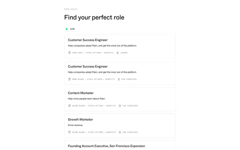
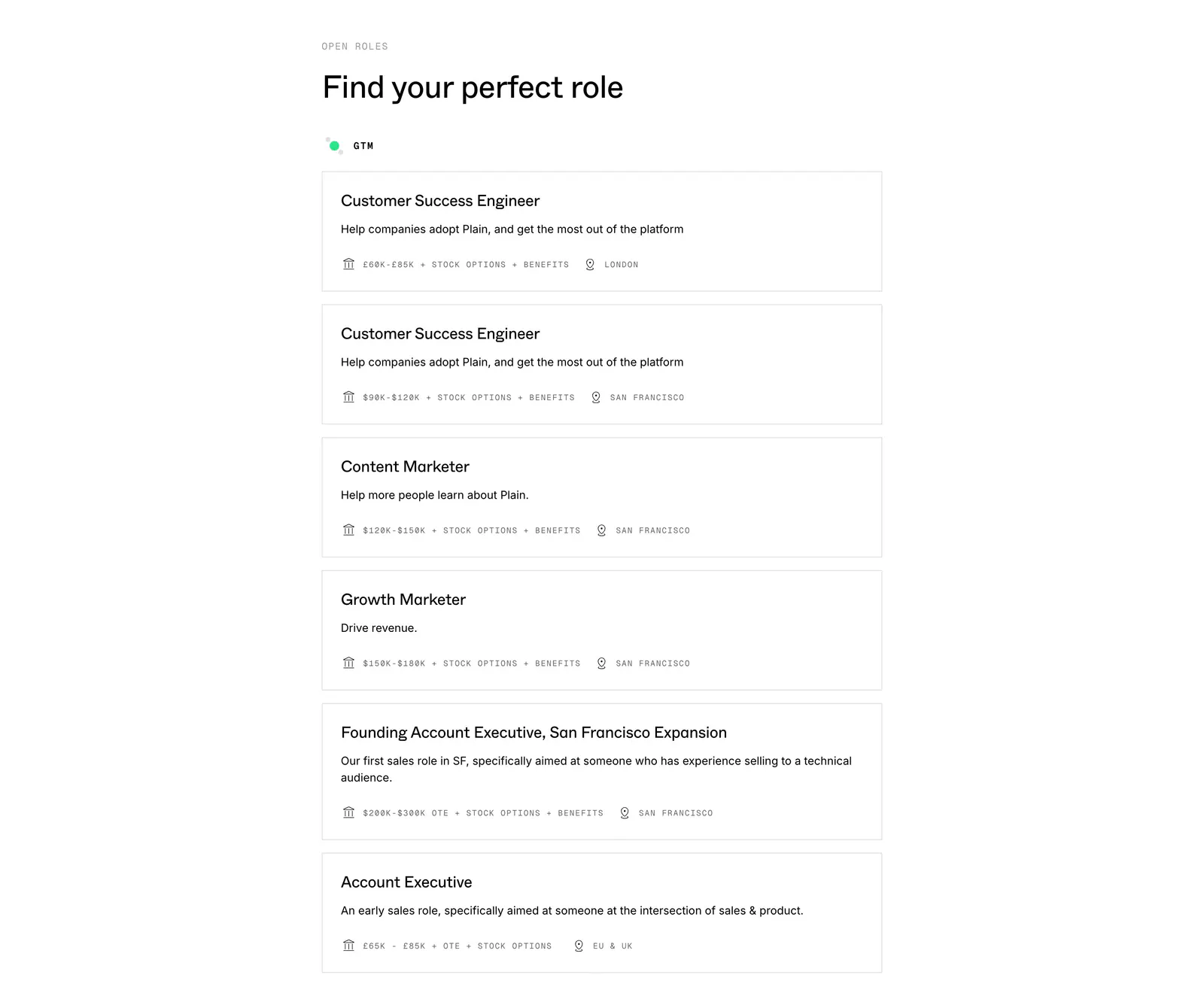
  7. Plain careers section: left-aligned heading above a stacked list of bordered job cards with salary and location details on white
    07 Team

    Find your perfect role

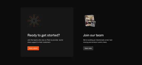
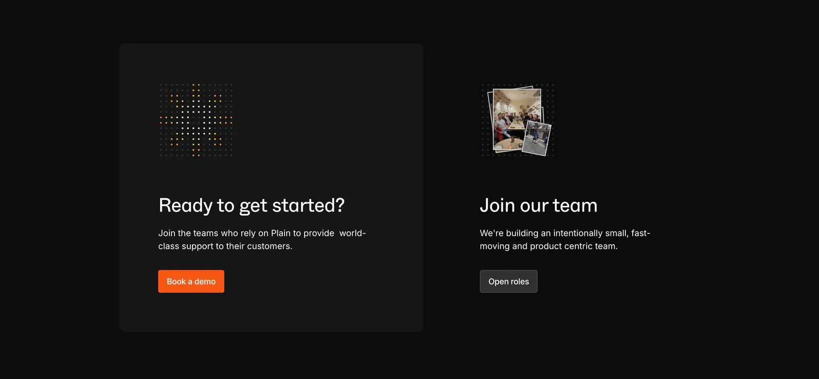
  8. Plain call to action section: dark card with dot icon and orange demo button beside a Join our team block with a small photo stack

    Ready to get started?

Similar companies

All companies
    ↑↓ Navigate ↵ Open

    Section preview

    Website section