Team Section Examples
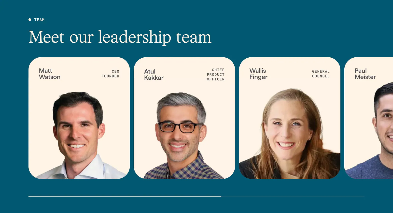
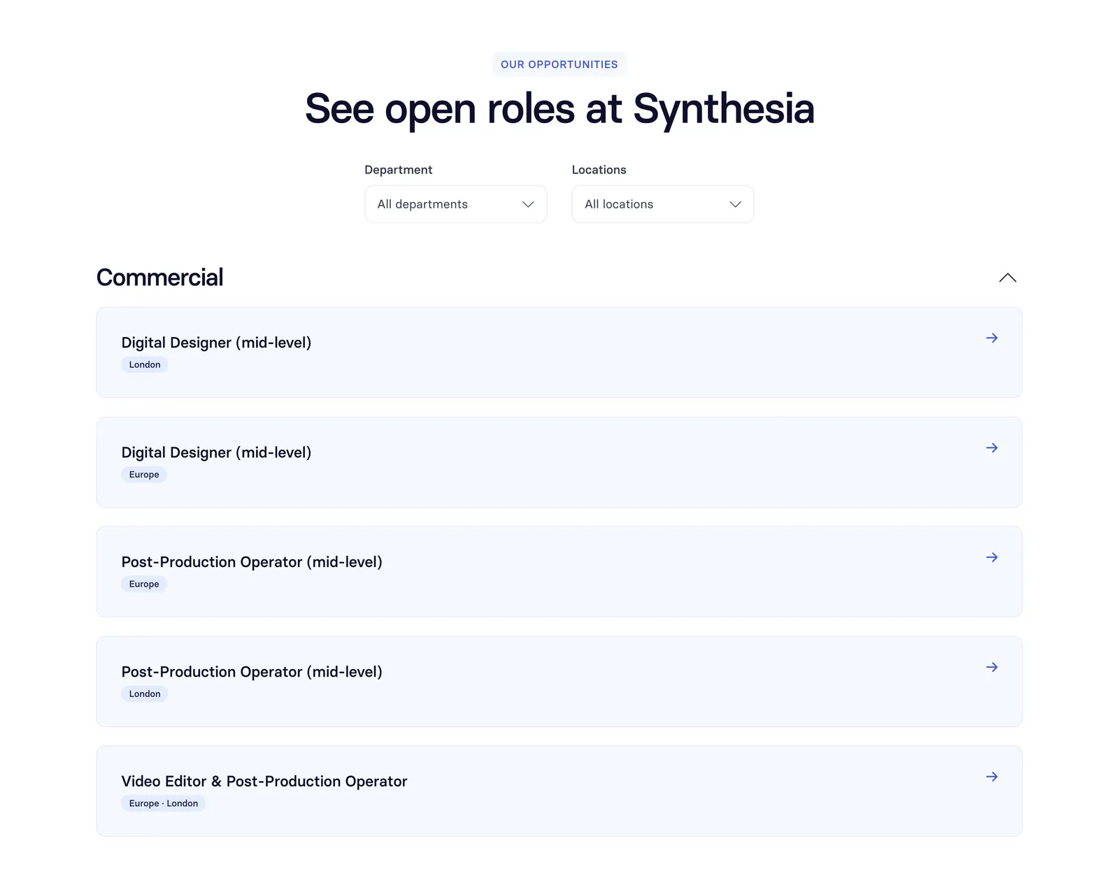
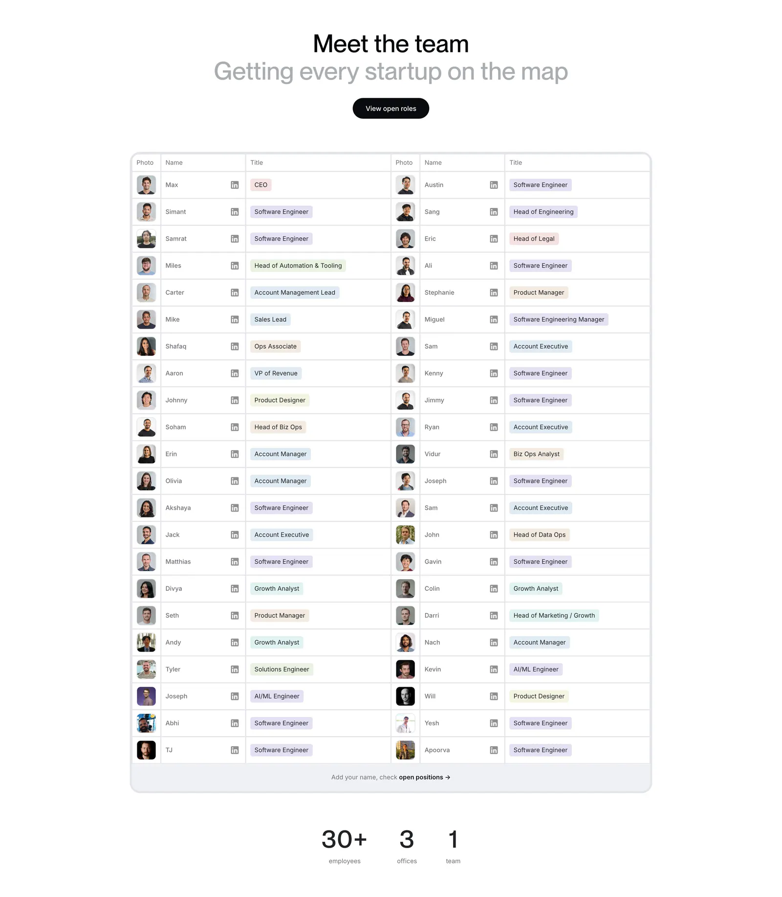
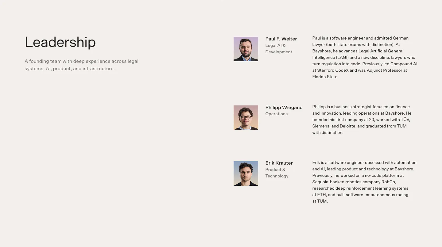
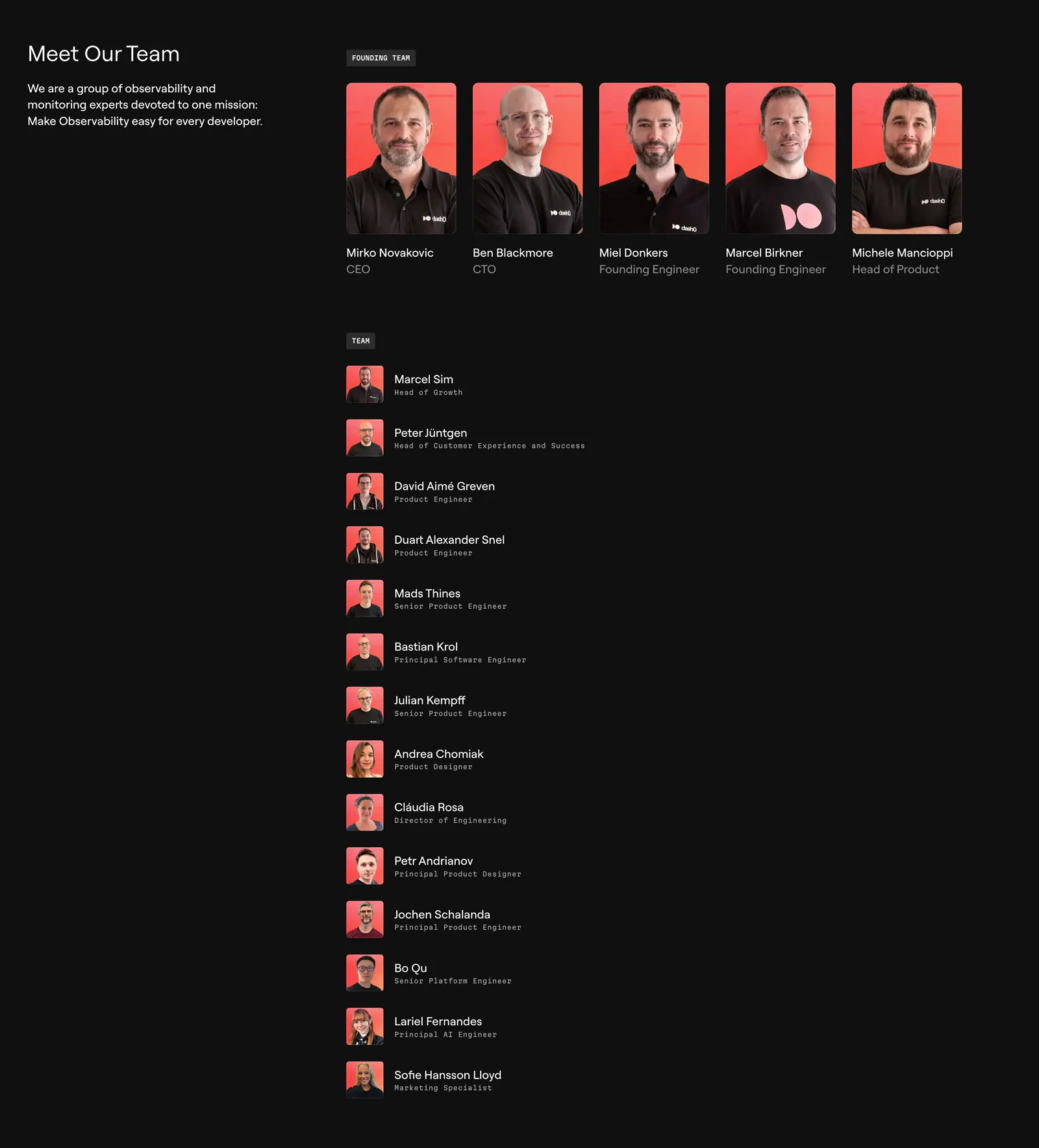
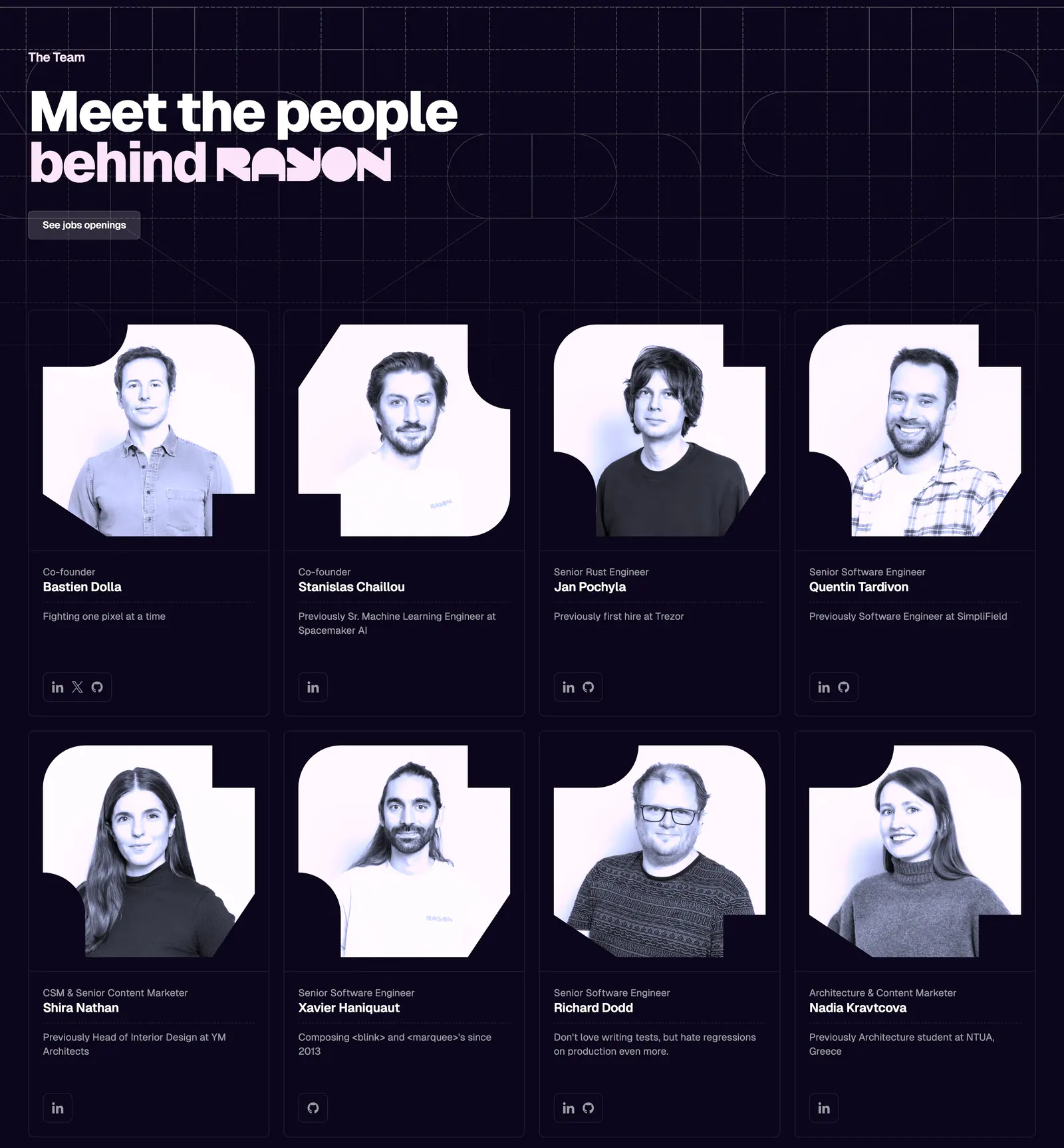
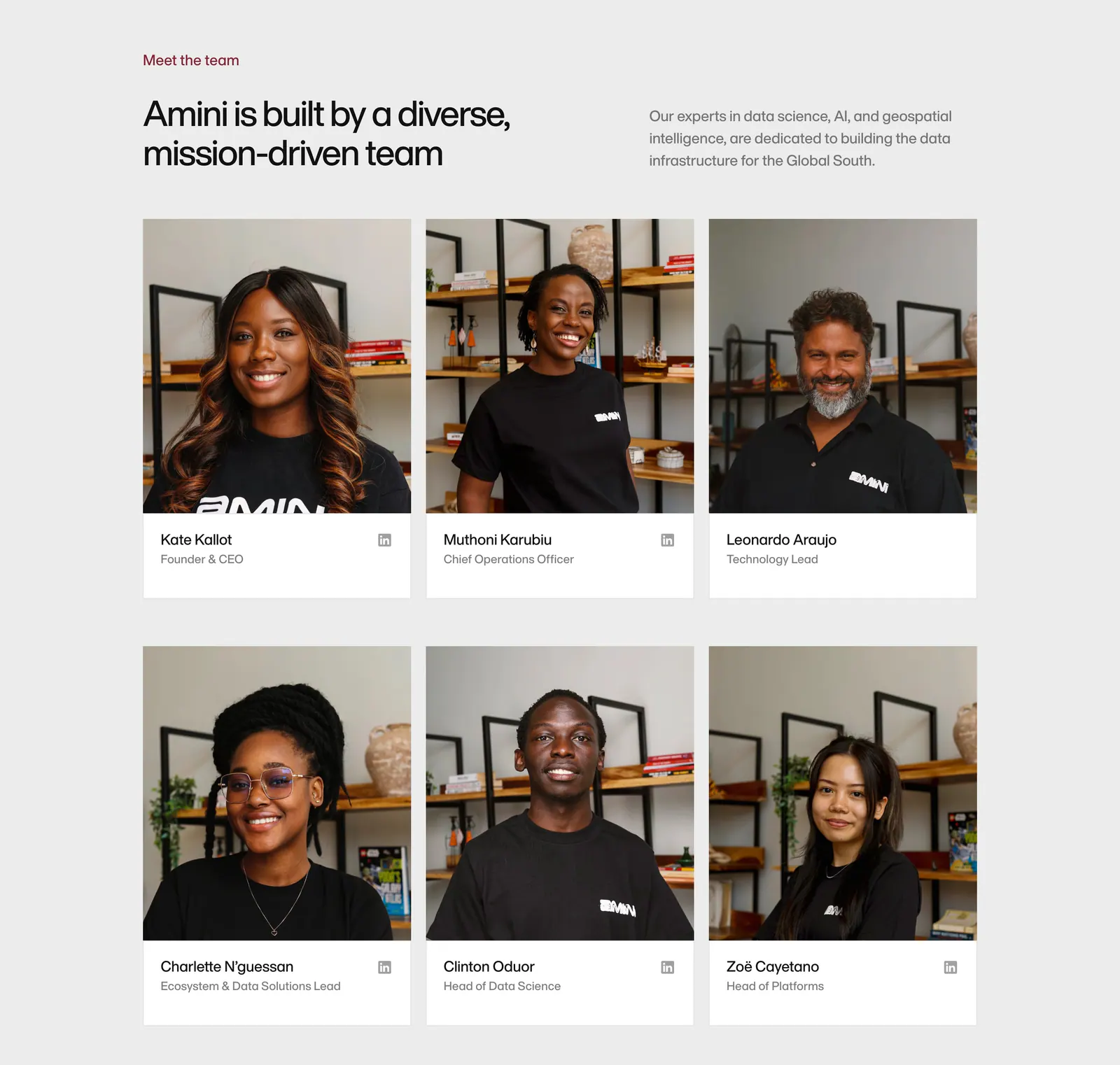
Few sections build trust as directly as a team section, because it puts faces and names behind the product. Consistent photos, clear roles, and a line on why each person matters to customers make it work. Mismatched headshots with no context make it look like an afterthought. Match the format to your stage with these team section examples, from founder spotlights to full staff grids and investor rows.








Common patterns in team sections
- Photography
- Card grid
- Minimal
- Warm neutral
- Monochrome
- Serif type
- Split layout
How to design a team section
-
Unify portrait crops and lighting
Use one crop, one aspect ratio, and similar lighting for every portrait. Square or 4:5 crops suit most grids. If photos come from different sources, a shared treatment such as grayscale or a tinted backdrop makes them read as a set. Include each person's name in the alt text.
-
Show names and roles without hover
Set the name in a stronger weight than the role and place both directly under the photo. Do not hide roles behind hover effects, since touch users never see them. Add a one-line bio only when it tells visitors something useful.
-
Scale the layout to the team
A small founding team works best as large cards with short bios. A bigger team needs a tighter grid with smaller photos and no bios. Give investors and advisors their own row with smaller cards or logos so the groups stay distinct.
-
Link profiles only when they help
Include social or profile links when the people are part of the pitch, such as founders or a research team. Give each icon link an accessible name that includes the person and the platform, and keep icons small so they do not compete with faces.