Menkind website design

Every section we captured from the Menkind website, in page order, from the features section down to the footer. Open any thumbnail to see it full size.

Sections 8

In page order, top to bottom

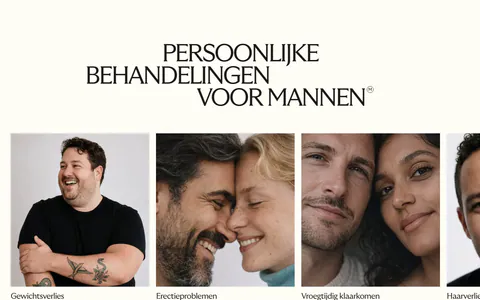
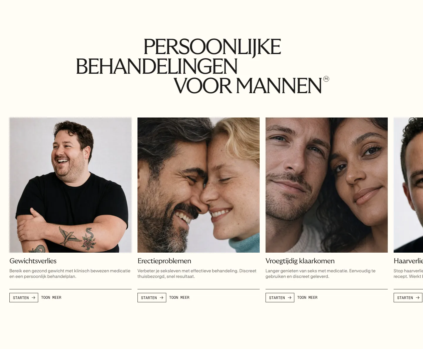
  1. Menkind features section: serif uppercase headline above a carousel of treatment cards with portrait photos and start buttons on cream

    PERSOONLIJKE BEHANDELINGEN VOOR MANNEN

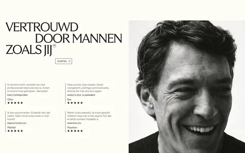
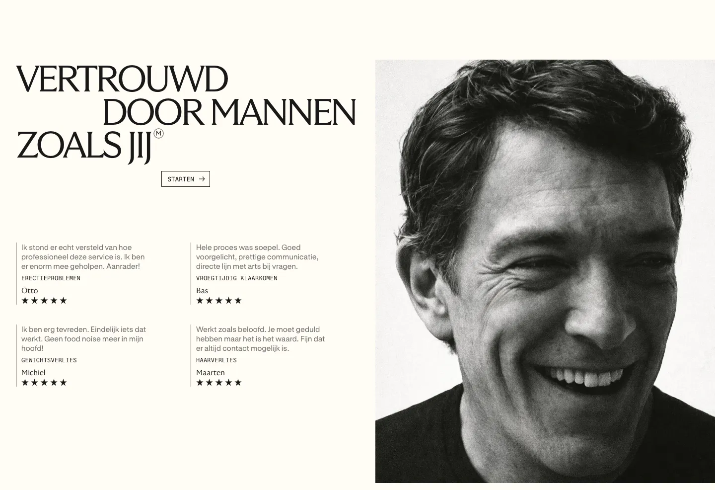
  2. Menkind testimonials section: serif headline and four starred review quotes beside a large black-and-white portrait on cream

    VERTROUWD DOOR MANNEN ZOALS JIJ

  3. Menkind team section: serif headline above four staggered black-and-white portraits of medical professionals with roles on cream
    03 Team

    MEDISCHE PROFESSIONALS

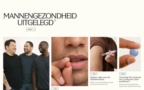
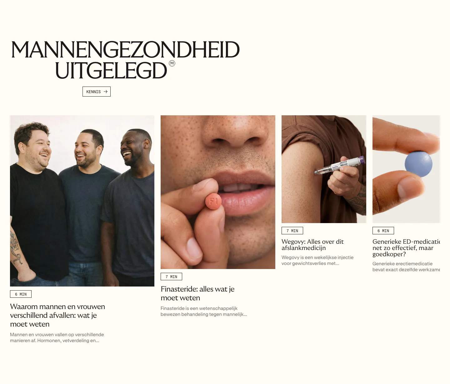
  4. Menkind blog & resources section: serif headline above a row of article cards with photos and read times, cut off at the edge

    MANNENGEZONDHEID UITGELEGD

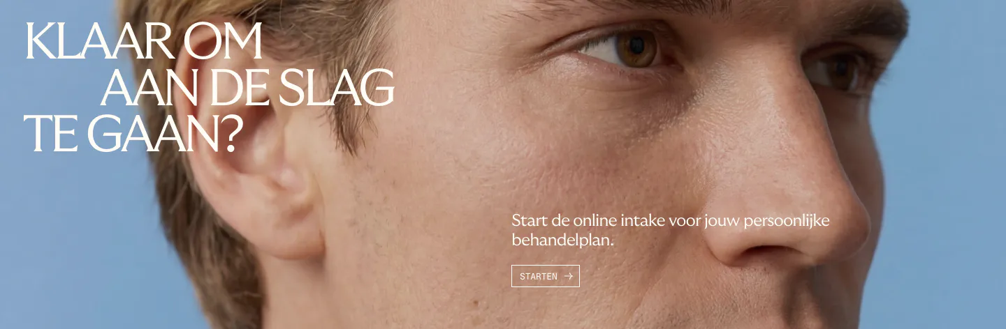
  5. Menkind call-to-action section: white serif headline and start button over a full-bleed close-up face photo on blue

    KLAAR OM AAN DE SLAG TE GAAN?

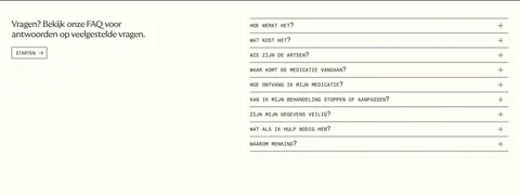
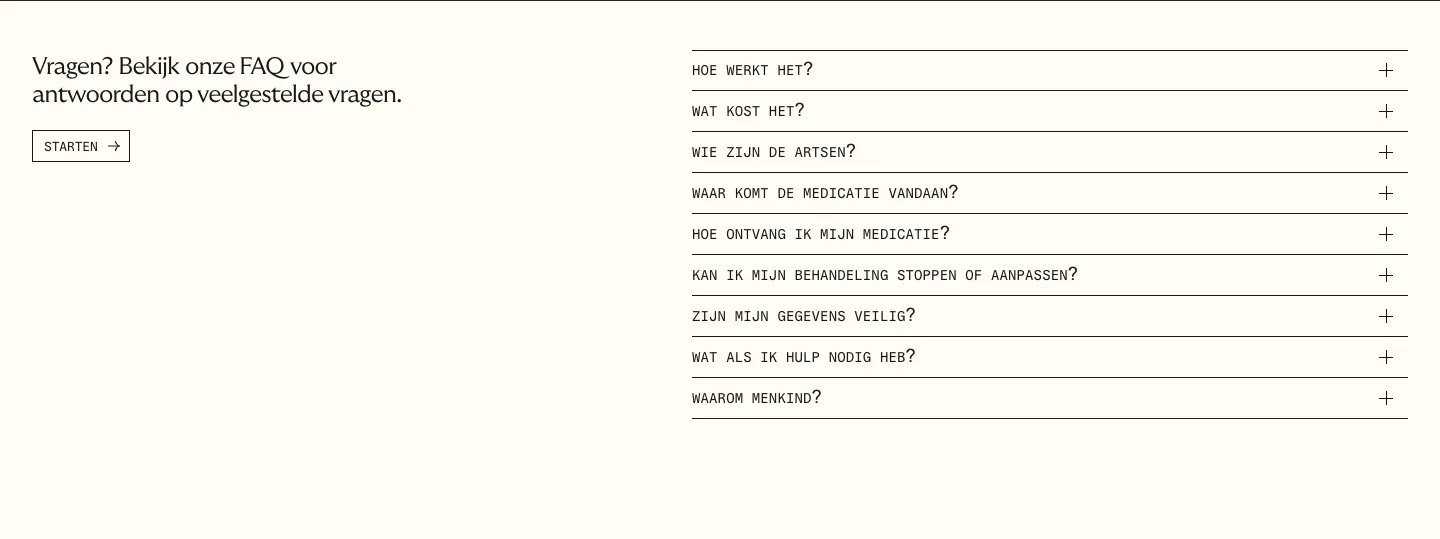
  6. Menkind FAQ section: short intro with start button on the left and a monospace question accordion on the right on cream
    06 FAQ

    Vragen? Bekijk onze FAQ voor antwoorden op veelgestelde vragen.

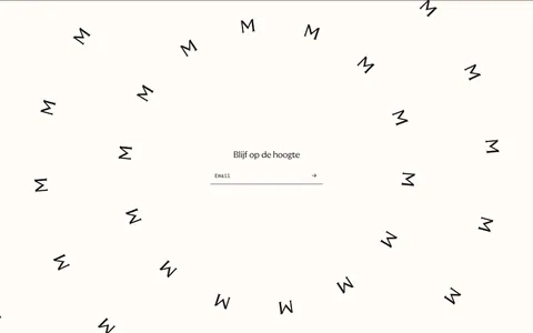
  7. Menkind newsletter section: centered email field surrounded by a swirl of scattered rotated M letters on cream

    Blijf op de hoogte

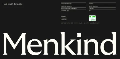
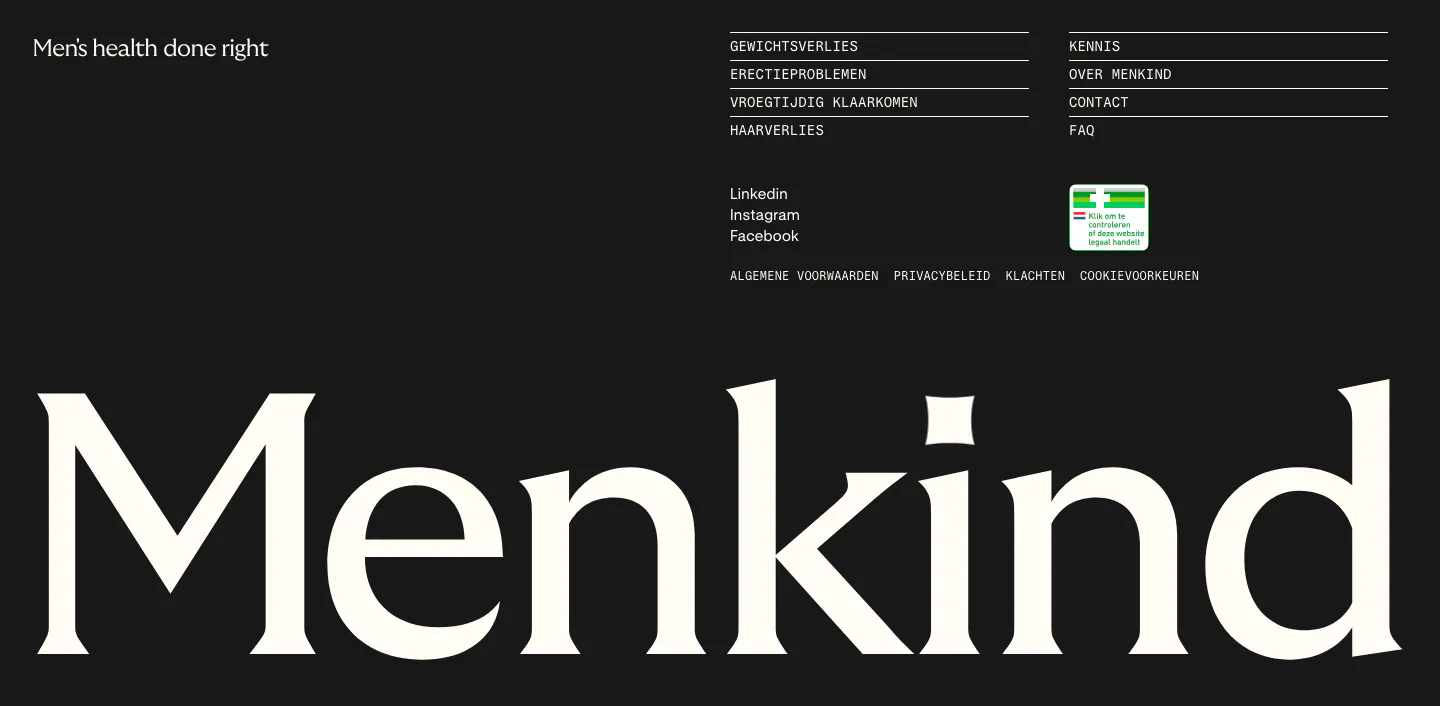
  8. Menkind footer section: tagline and monospace link columns above a giant serif Menkind wordmark on a black background
    08 Footer

    Men's health done right

Similar companies

All companies
    ↑↓ Navigate ↵ Open

    Section preview

    Website section