Full-Bleed Media Website Design Examples
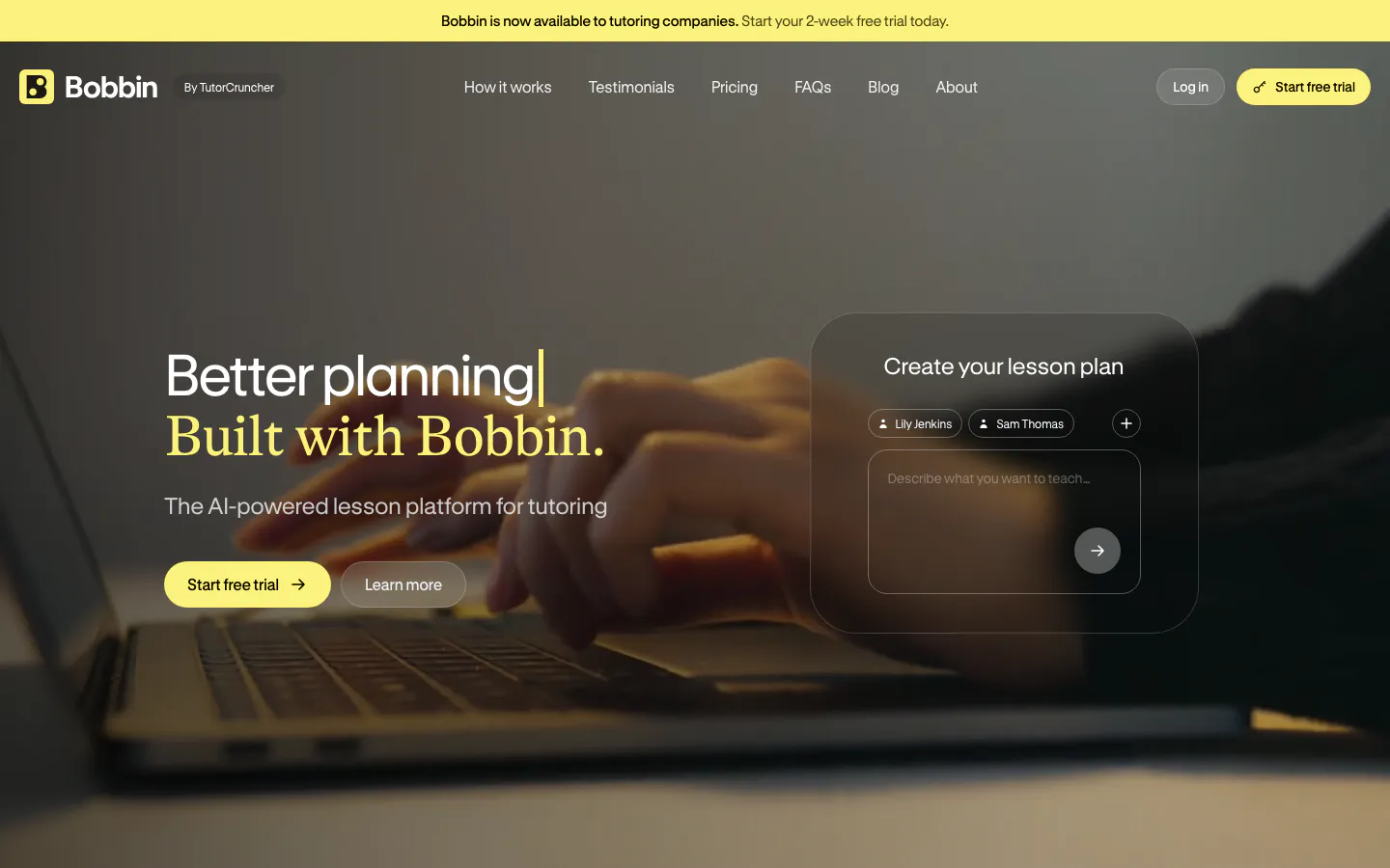
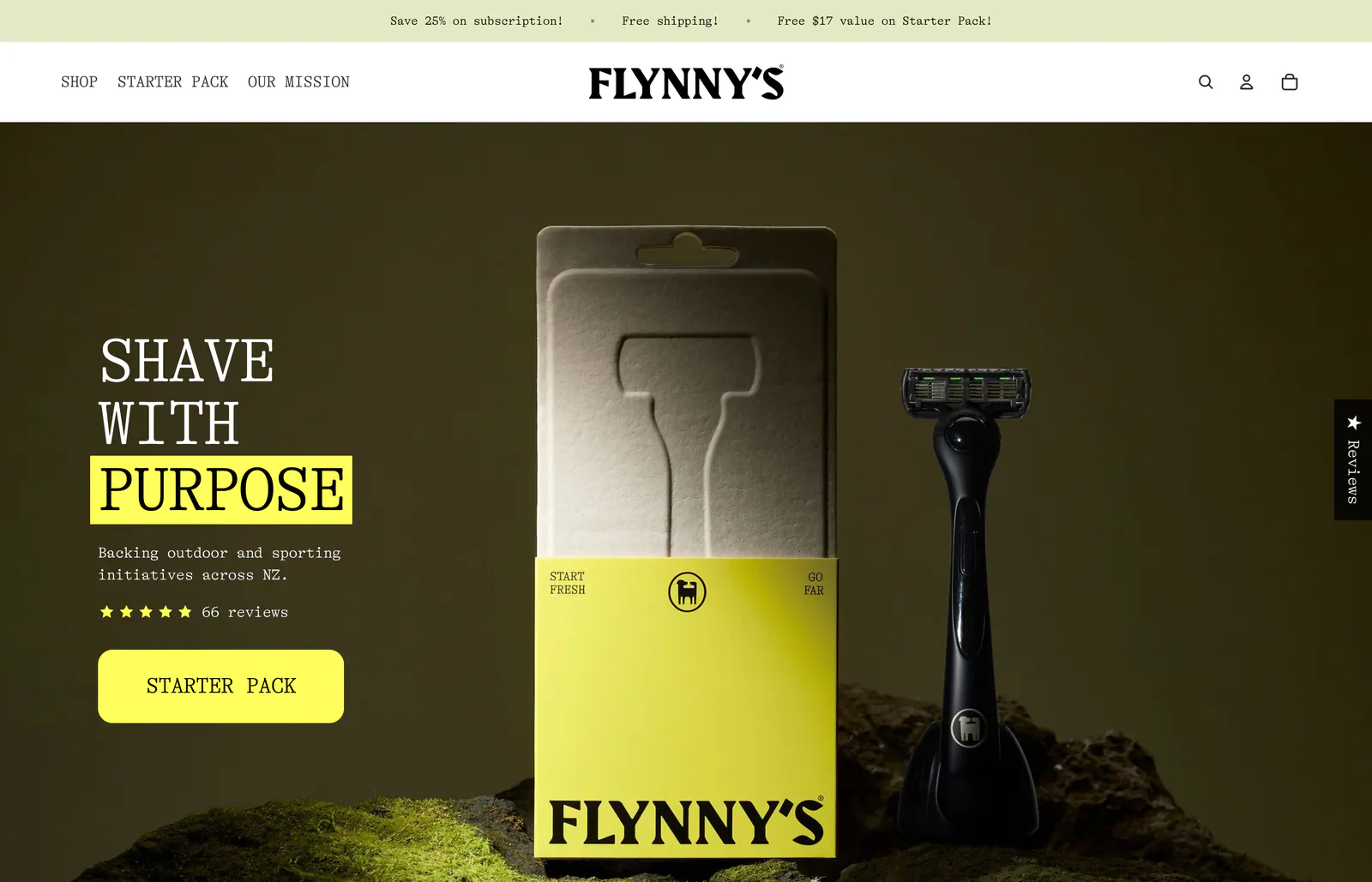
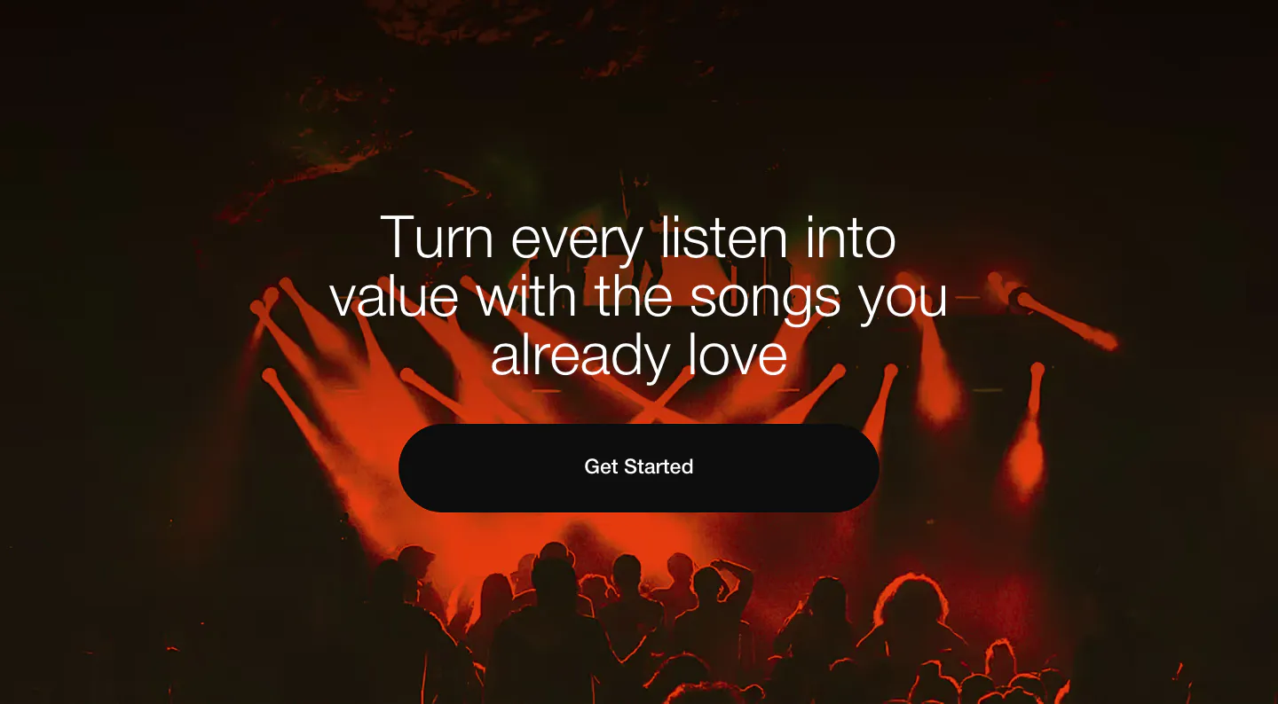
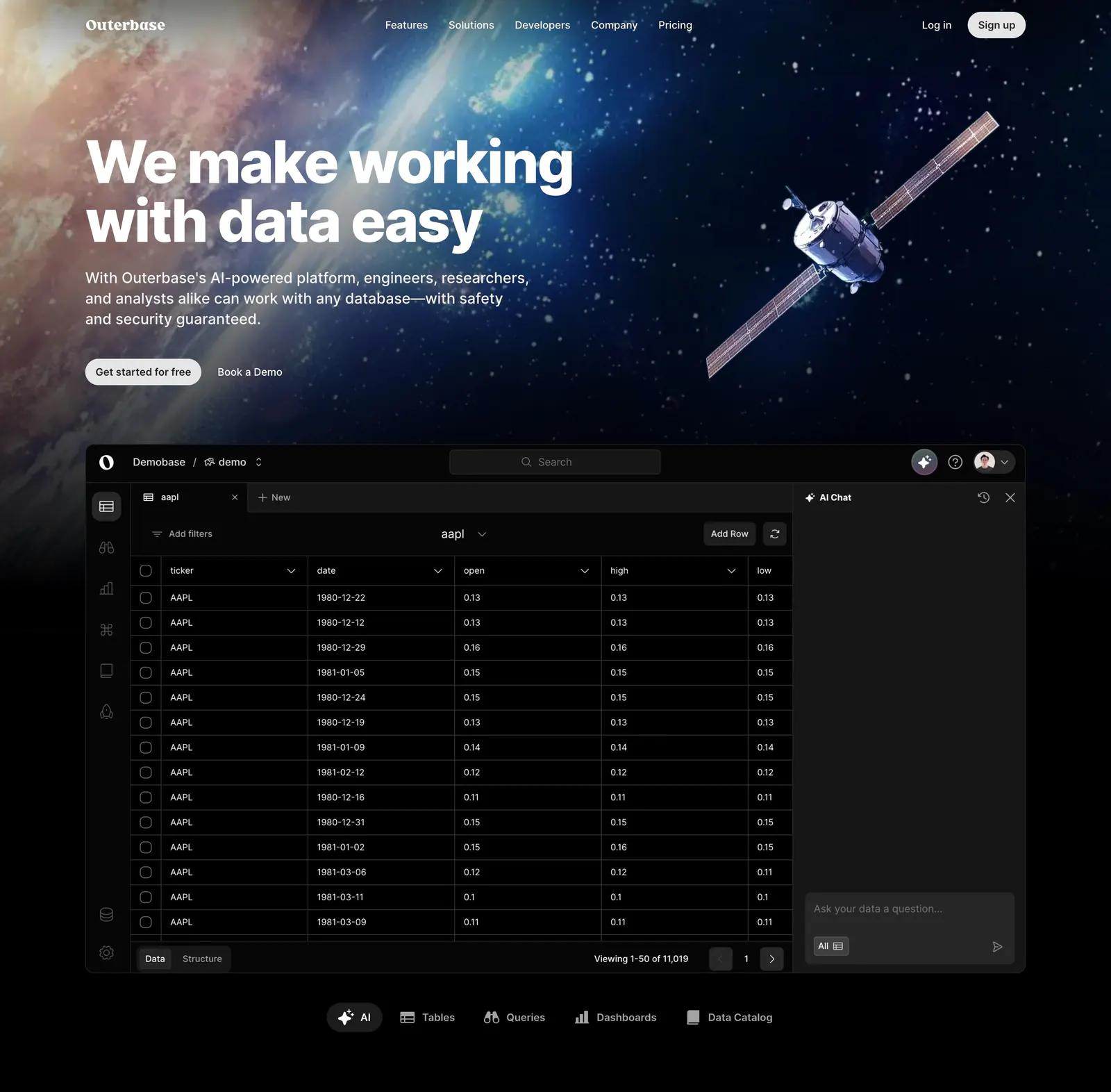
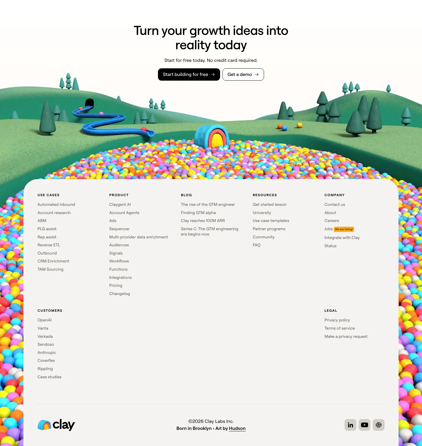
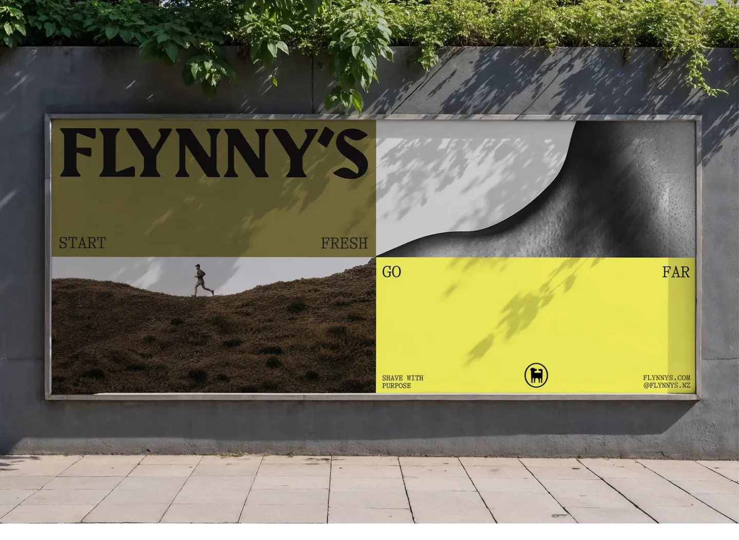
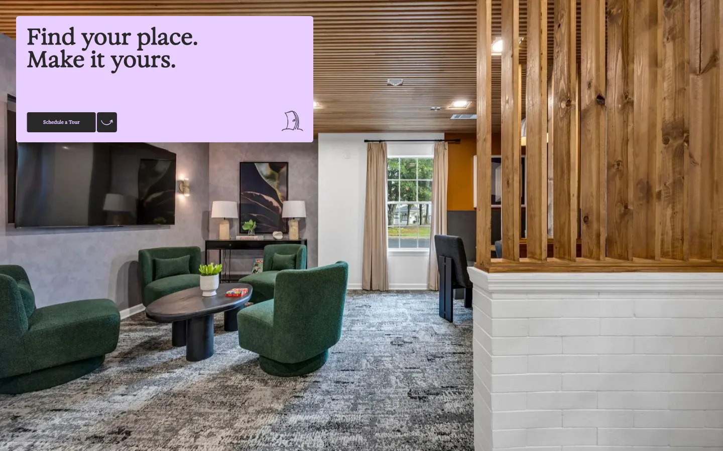
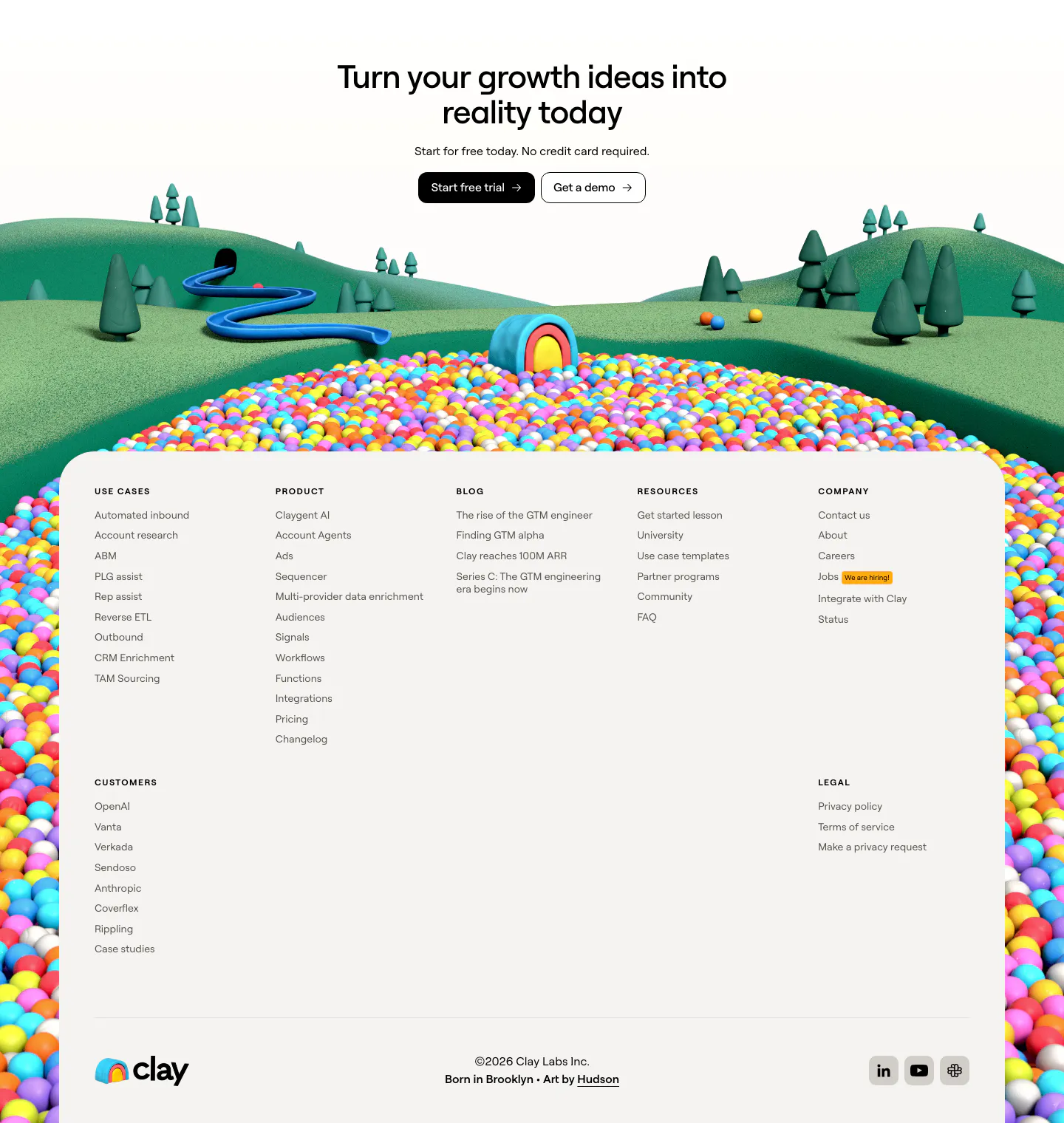
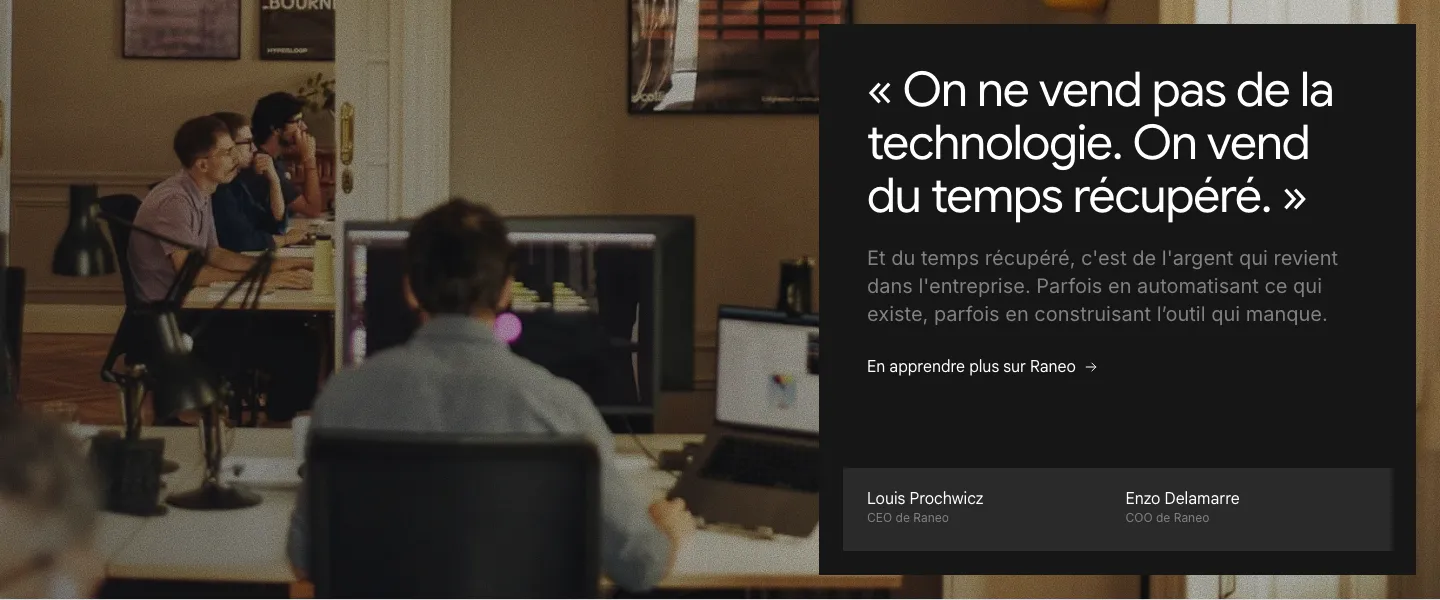
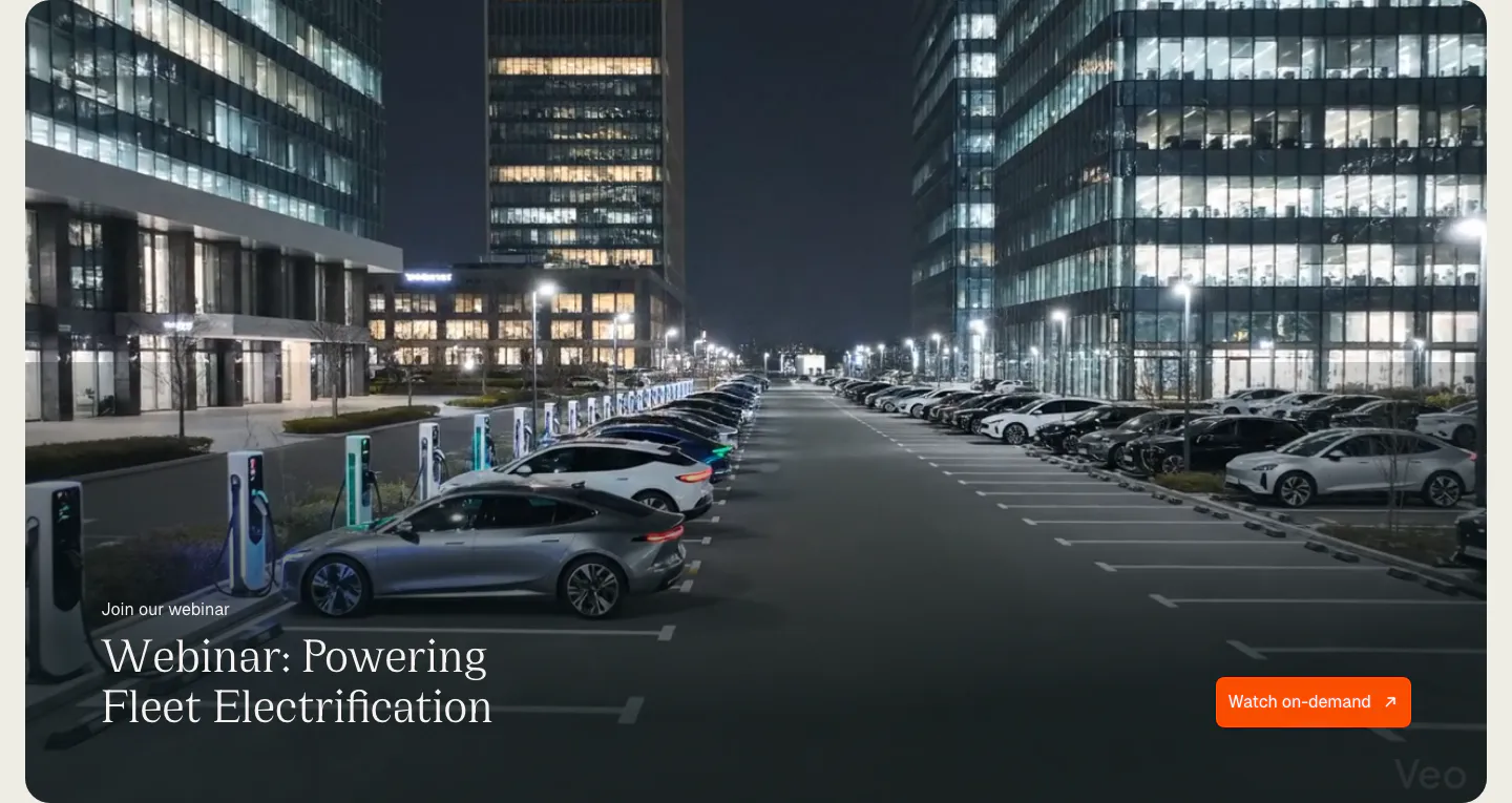
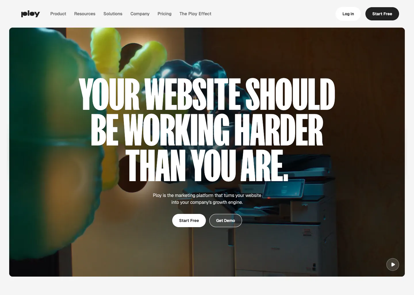
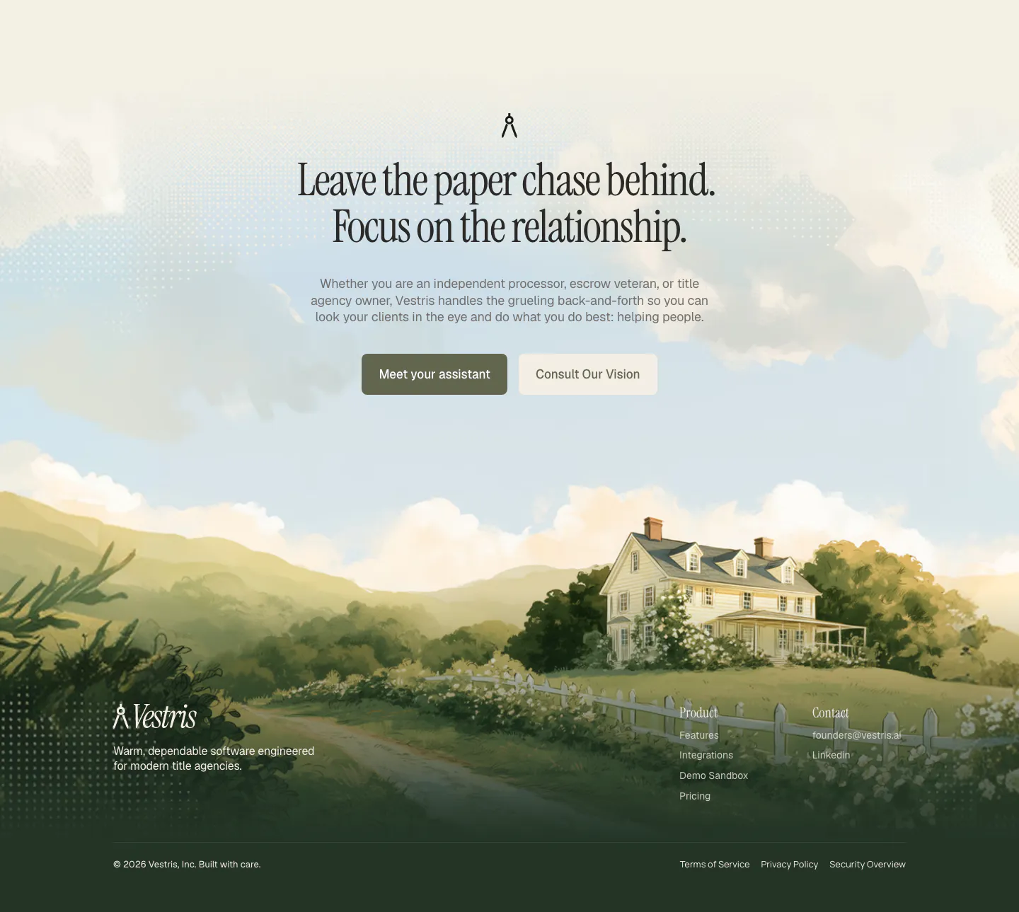
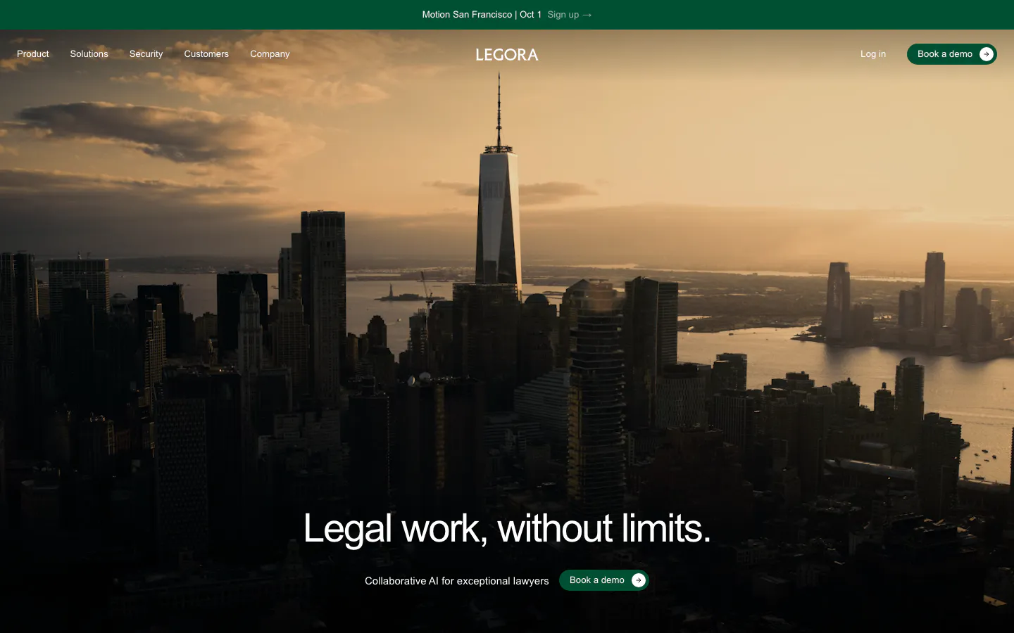
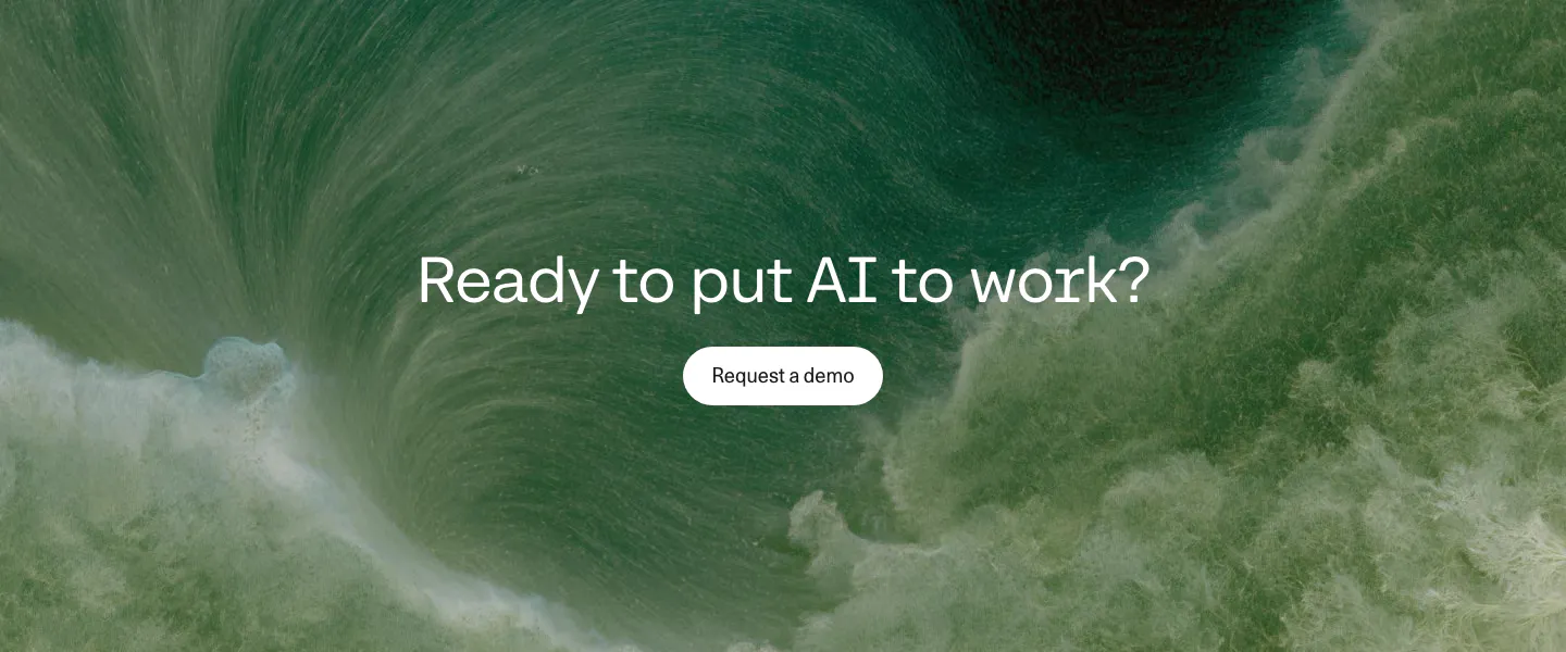
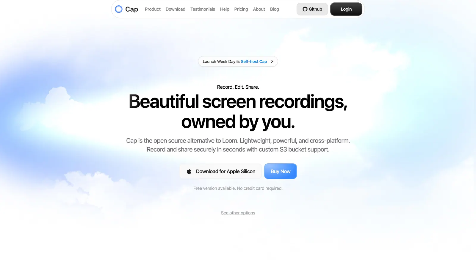
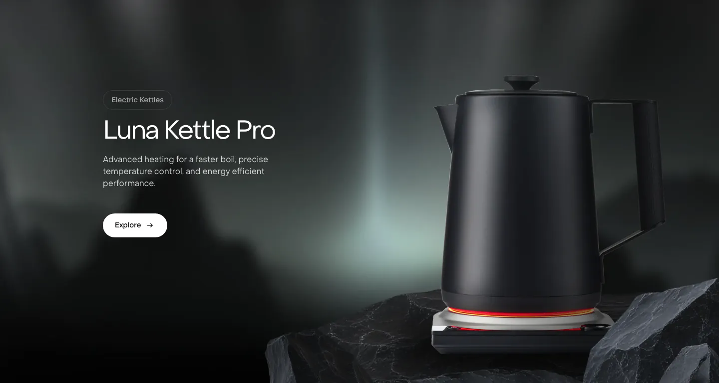
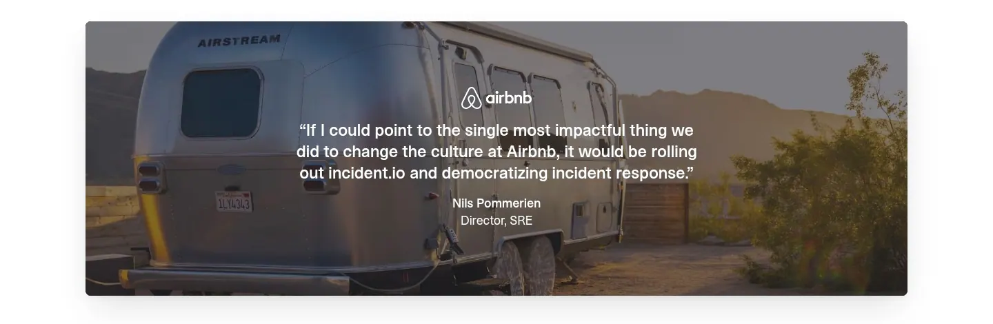
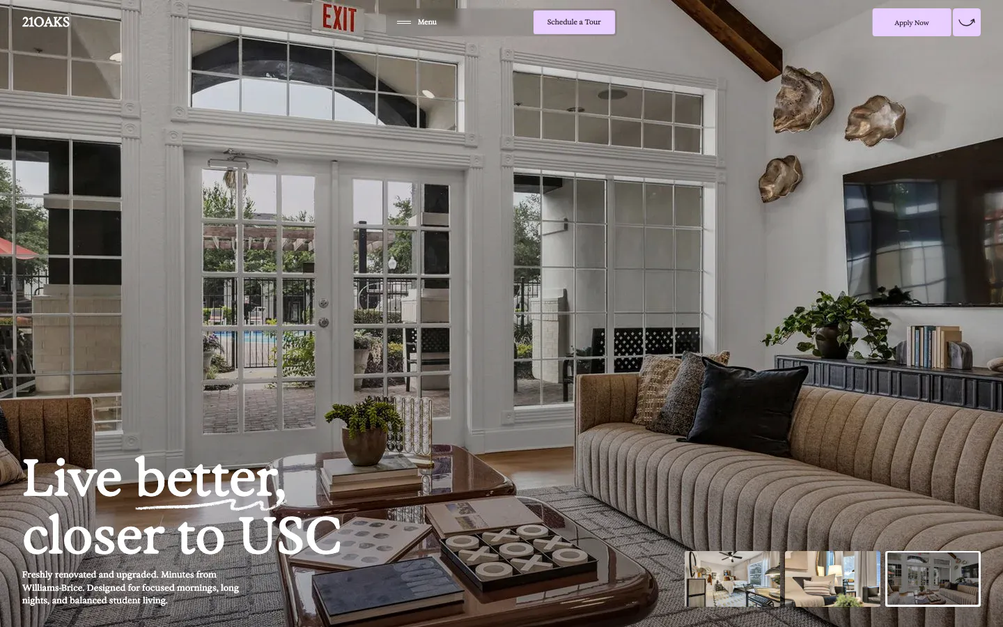
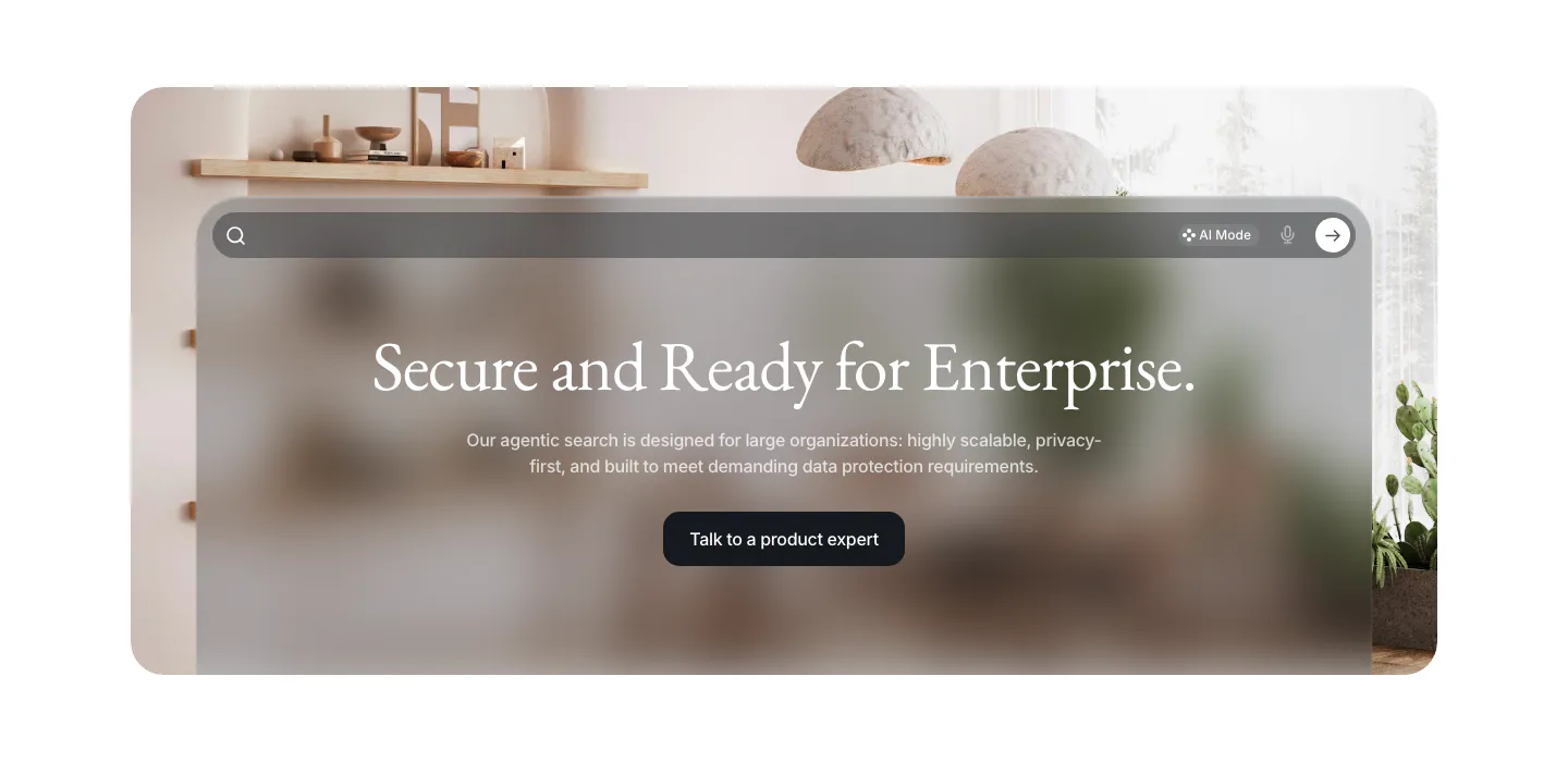
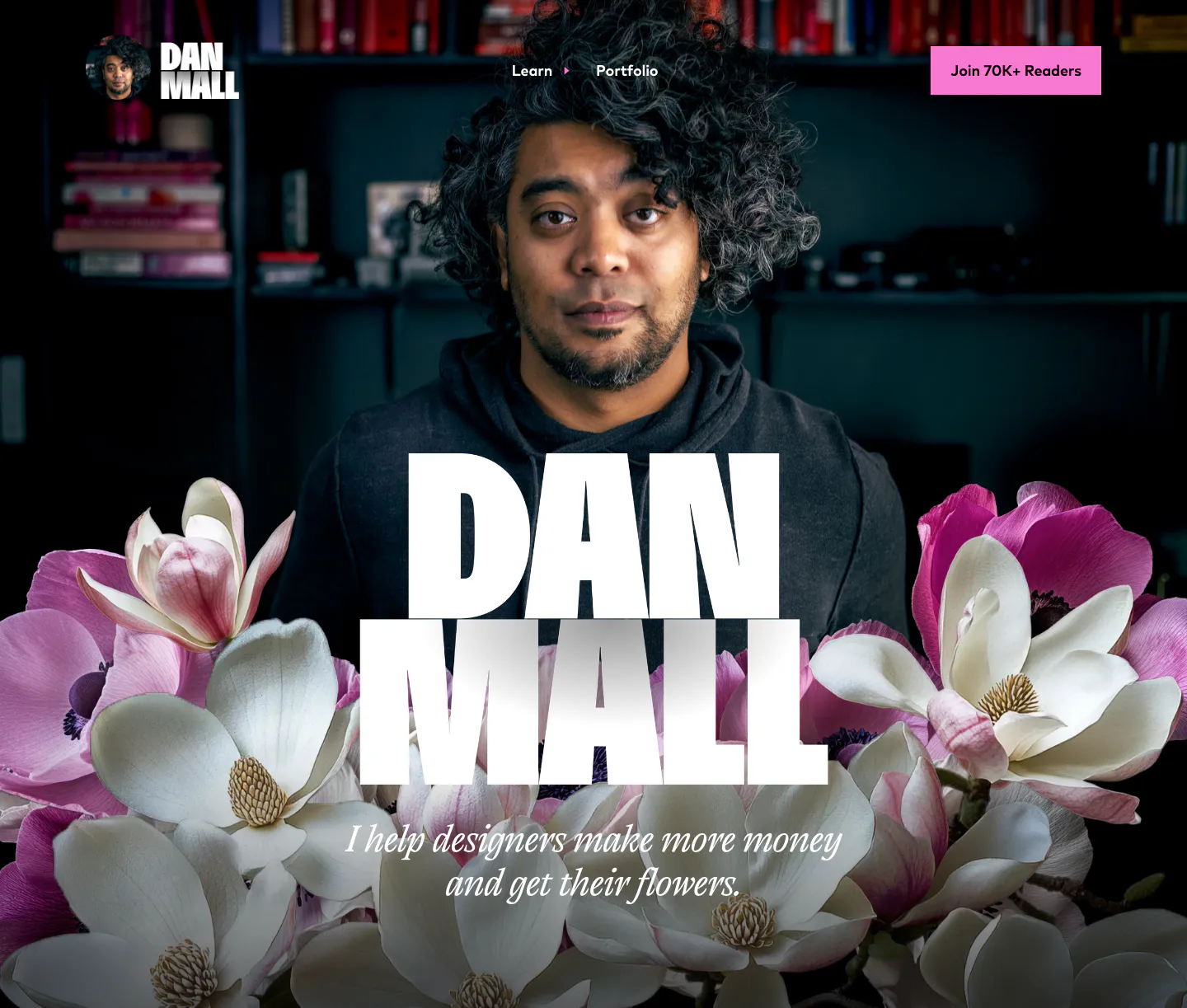
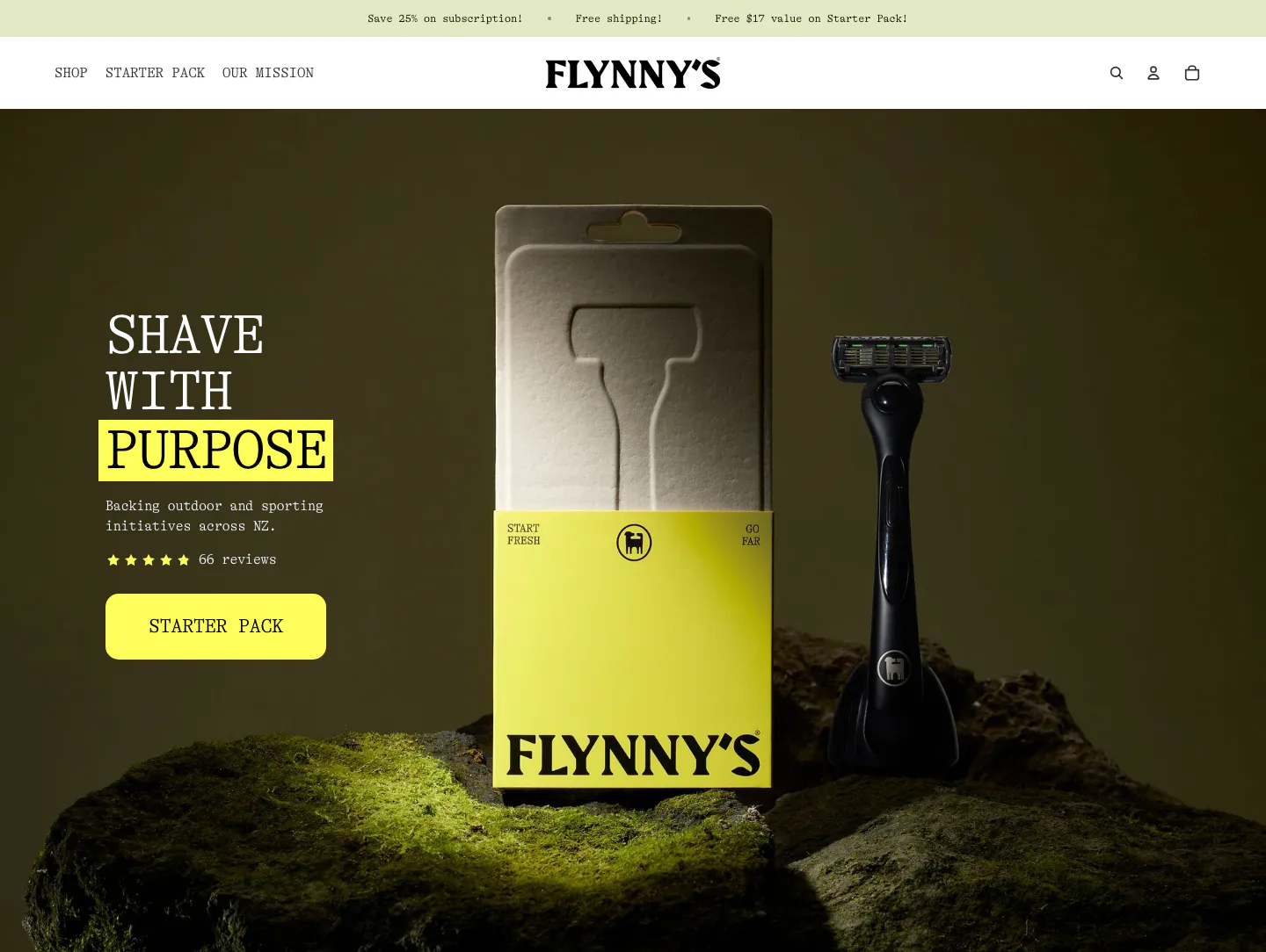
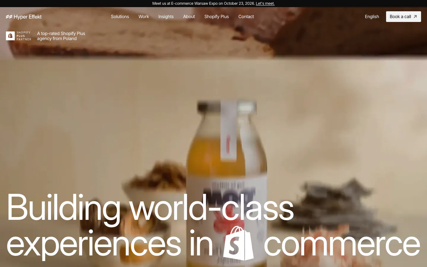
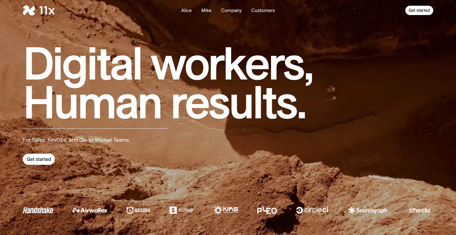
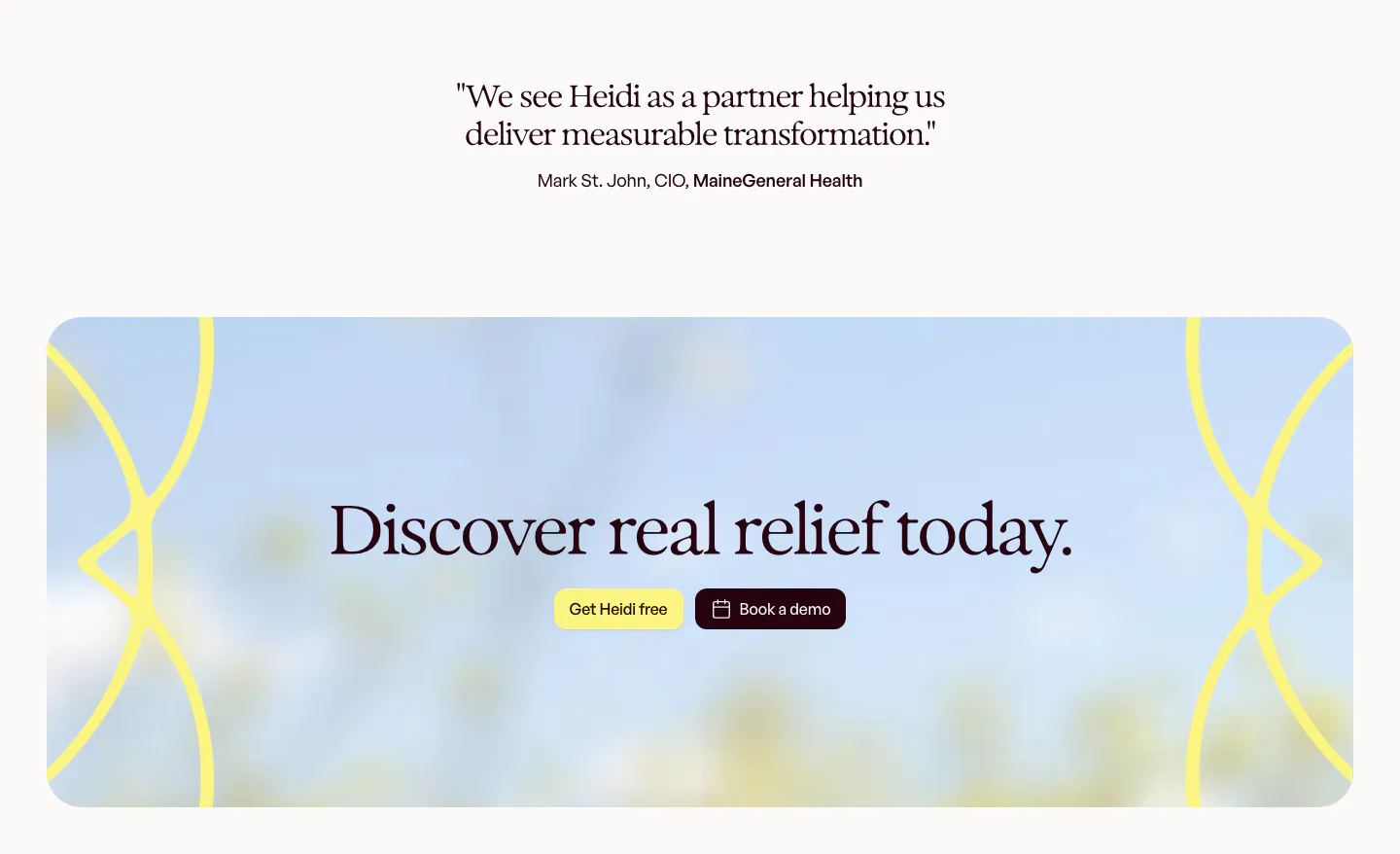
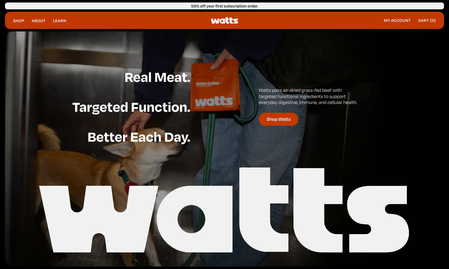
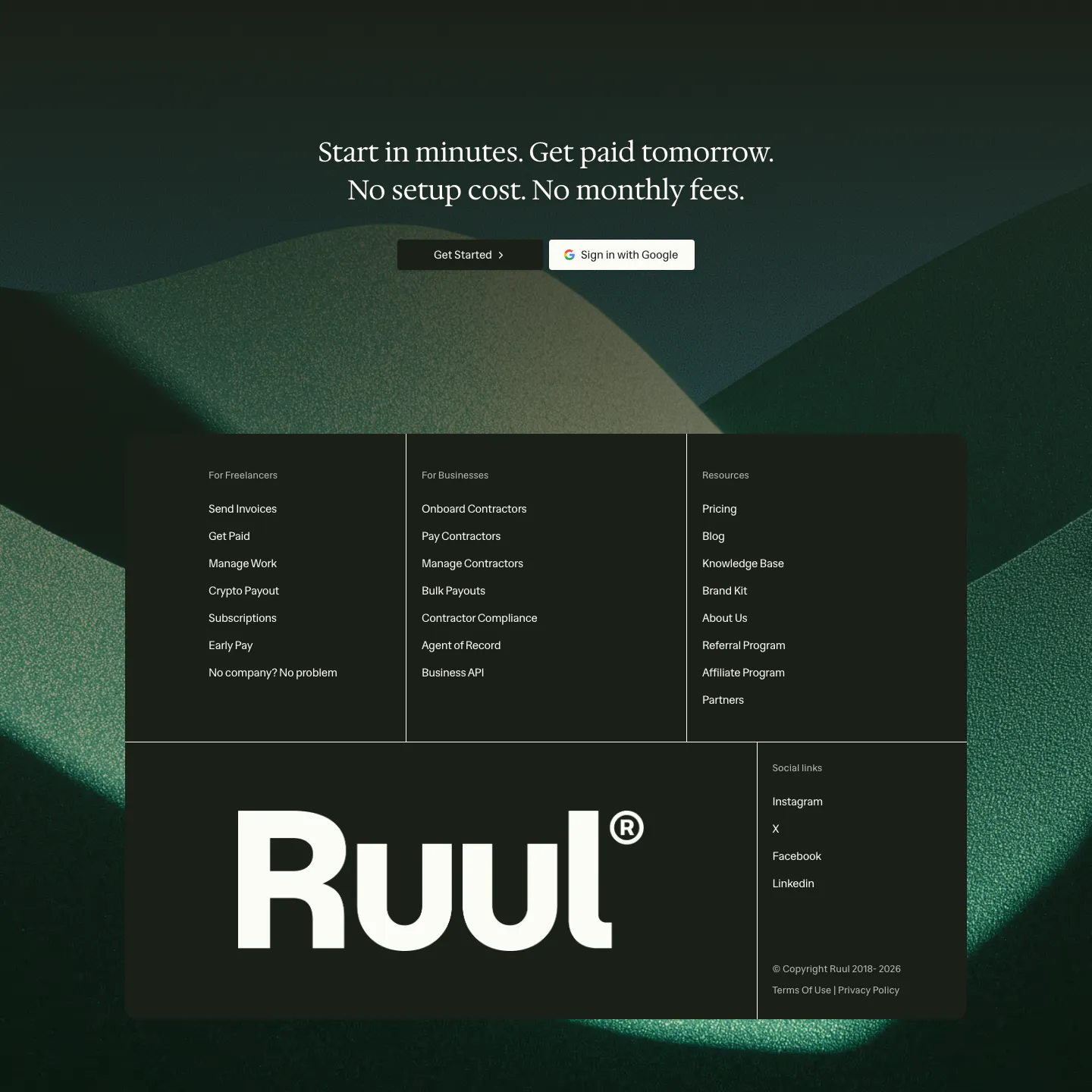
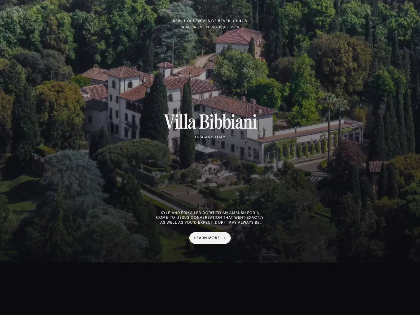
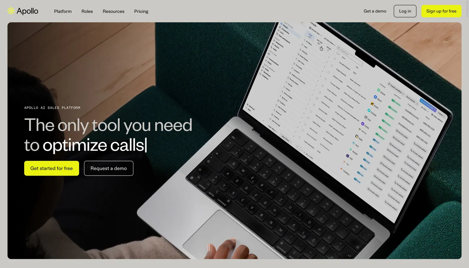
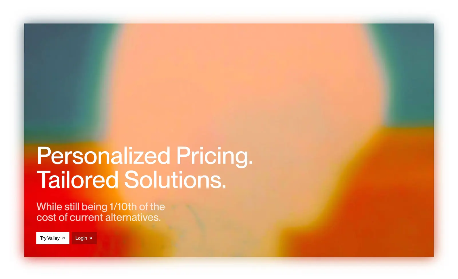
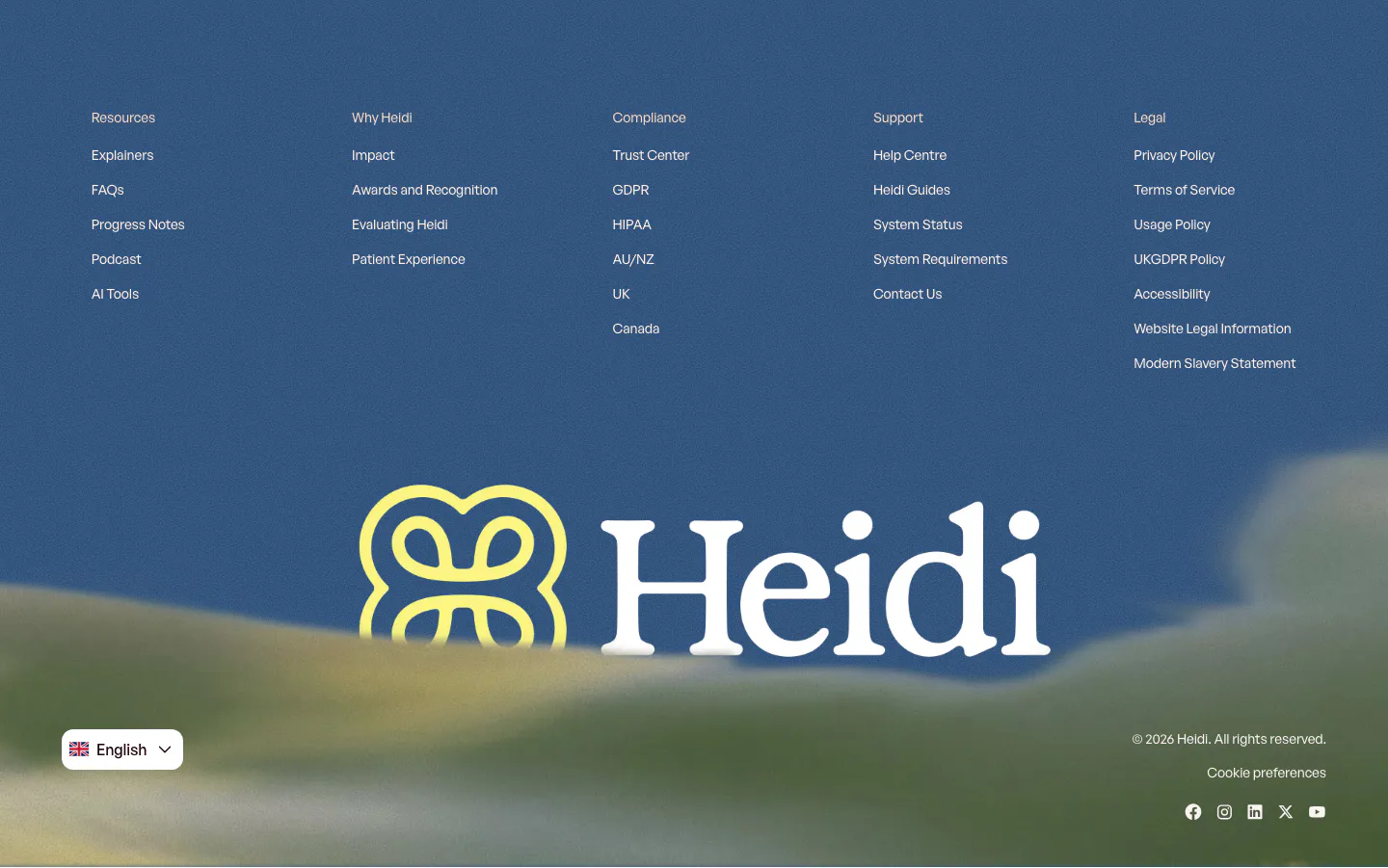
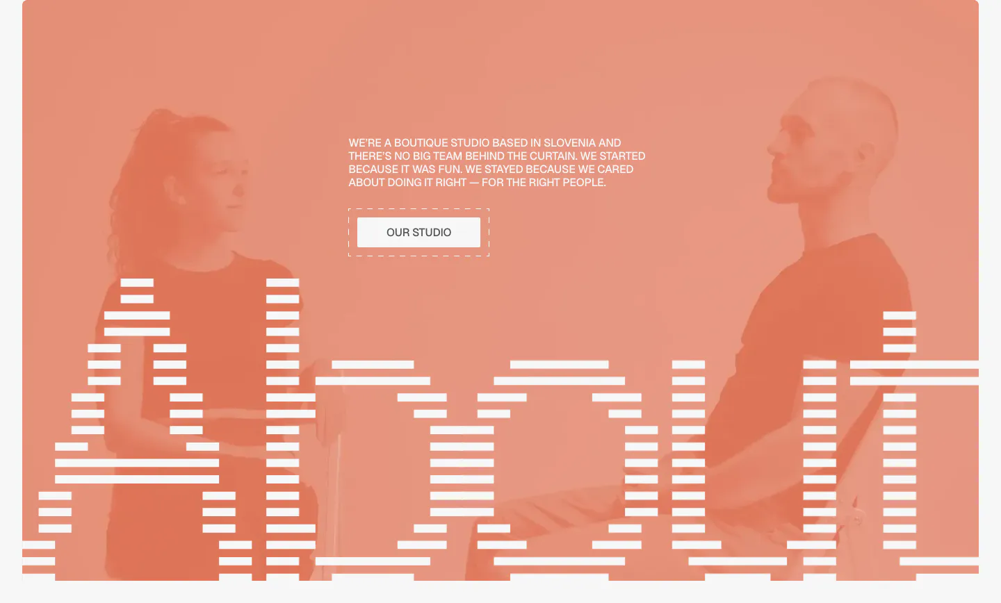
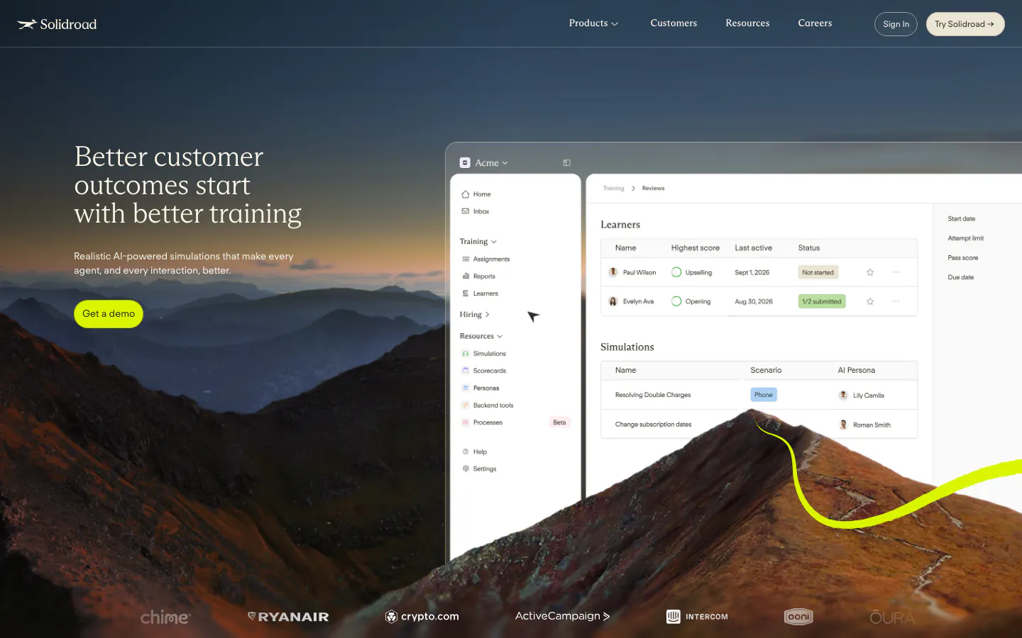
When a photo, video frame, or artwork fills the entire section background, the image sets the mood before anyone reads the headline. Full-bleed media in website design works hardest for brand stories, physical products, and places, where atmosphere does part of the selling. Keeping text readable takes work, because busy images compete with headlines, crops shift across screen sizes, and large video files slow the page.










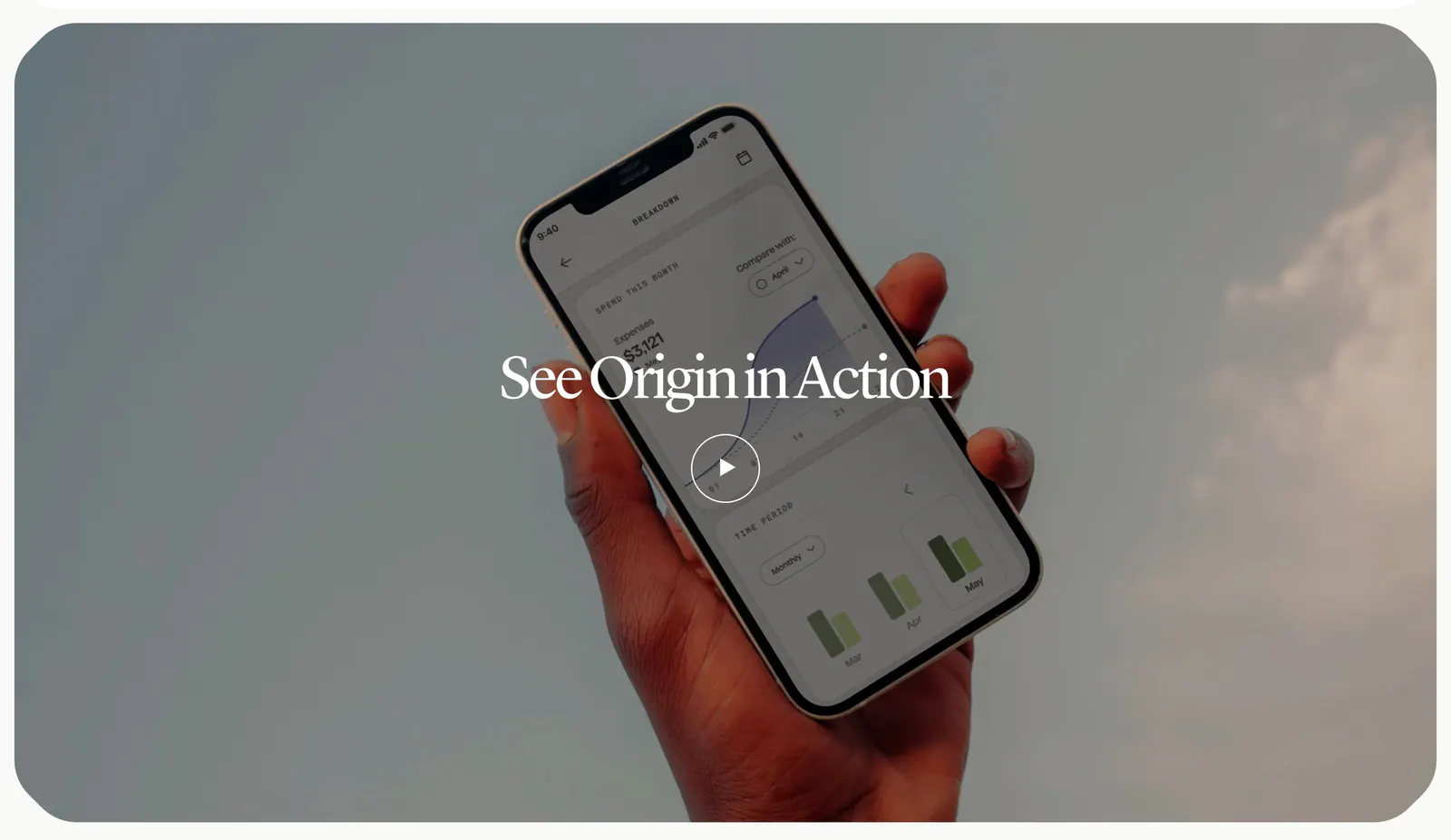
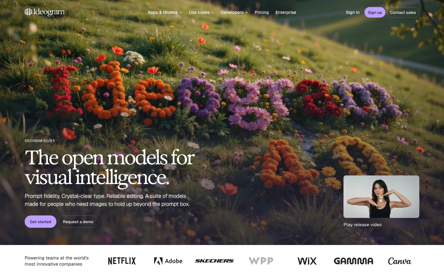

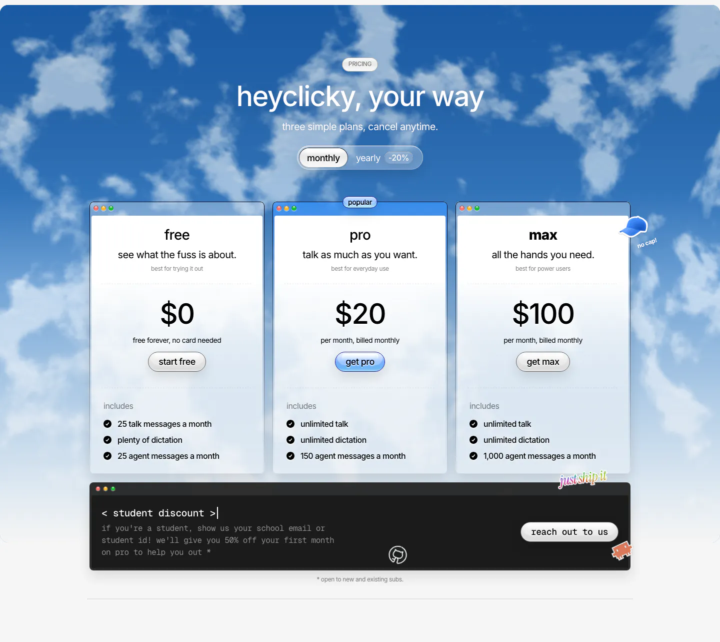
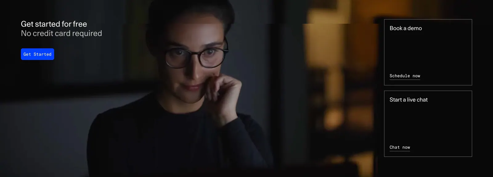



Where full-bleed media shows up
Often paired with
How to design full-bleed media sections
-
Add a scrim behind the text
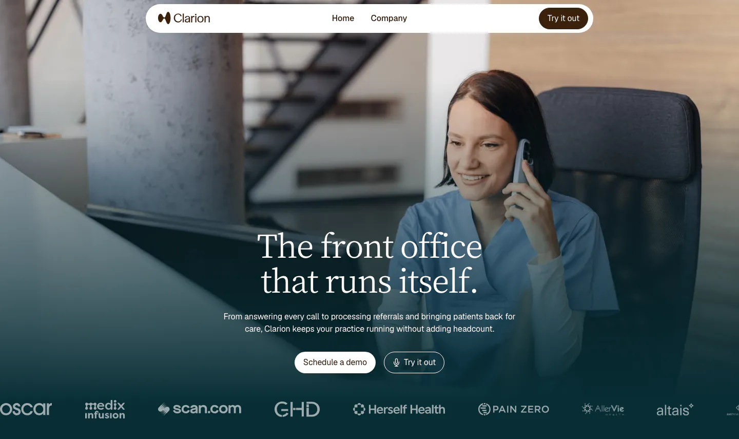
Place a gradient overlay or soft dark layer where the text sits rather than darkening the whole image. Check contrast against the brightest part of the image under the copy, and keep text in a defined zone so the rest of the image stays vivid.
-
Set focal points for every breakpoint
A wide crop that works on desktop can cut off the subject on mobile. Use object-position or art-directed image sources to keep the key subject visible at each size, and leave a calm area in the image for the headline at every breakpoint.
-
Compress video and set a poster
Background videos should be short, muted loops in WebM or MP4, as small as the quality allows. Always set a poster image so the section looks finished before playback starts, and show that still frame instead when reduced motion is on.
-
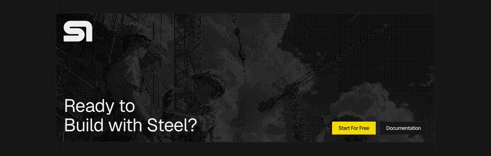
Keep overlaid copy brief
Text over imagery is harder to read than text on a flat background. Limit it to a headline, one supporting line, and a button. Longer content belongs in the next section, where it can sit on a plain surface and be read comfortably.