Bento Grid Website Design Examples

Borrowed from the compartments of a lunch box, a bento grid packs several tiles of different sizes into one tight layout. Any section with many small ideas to show at once can use bento grid website design, from features to integrations, testimonials, and stats. Balance decides whether it works. When tile content is uneven or nothing marks where to start, the grid turns into clutter.
79 sections

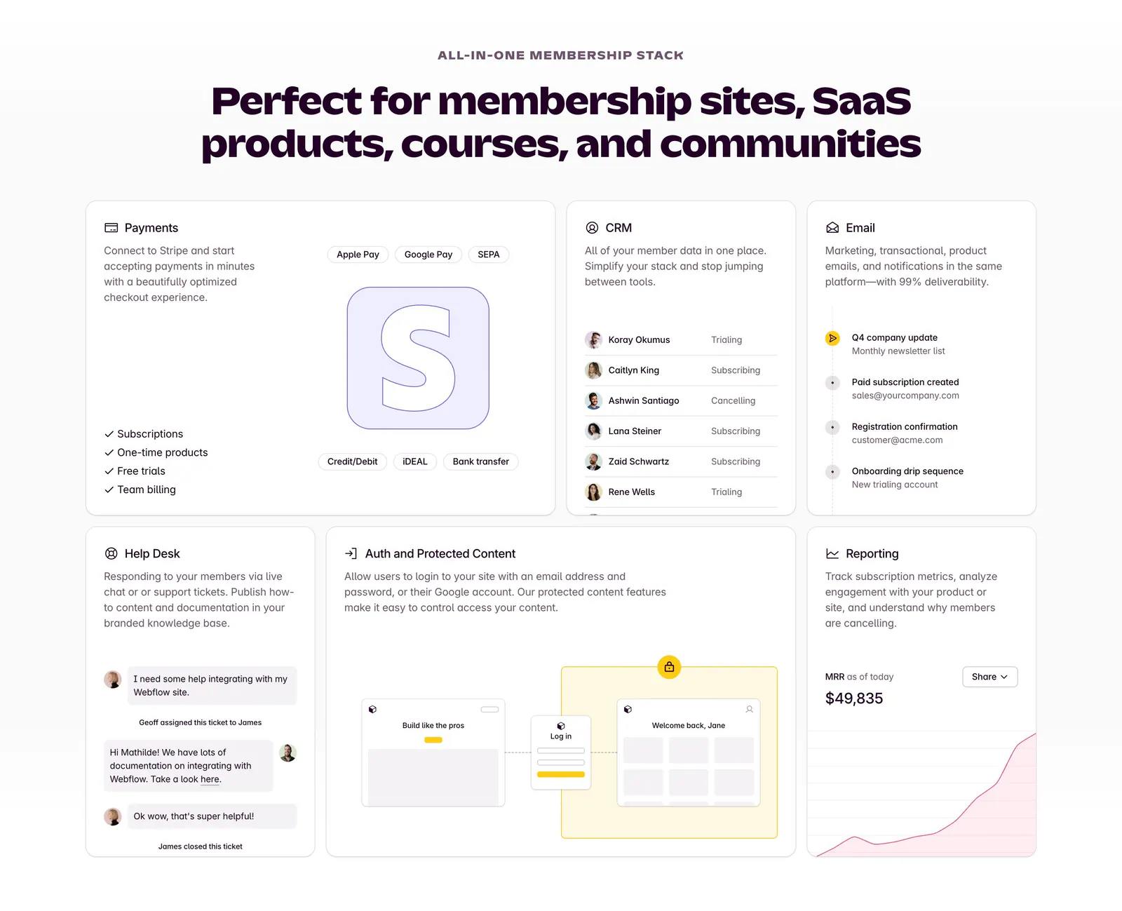
  1. Outseta features section: centered headline above a bento grid of cards for payments, CRM, email, help desk, auth and reporting
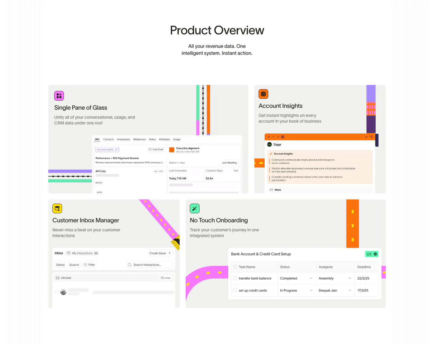
  2. Wavelength features section: centered Product Overview headline above a four-tile bento of UI snippets with colorful transit-line accents
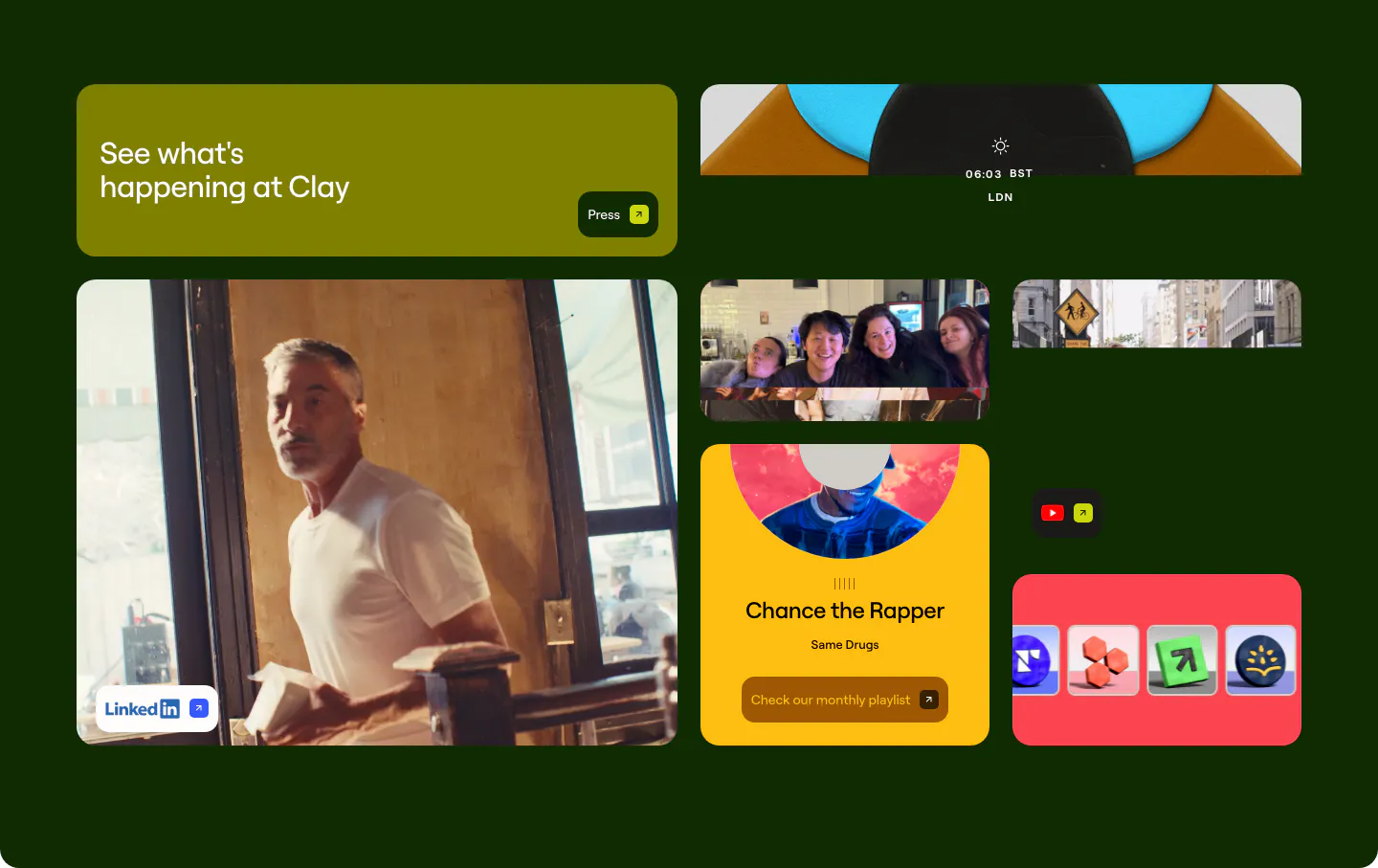
  3. Clay other section: bento grid of photo, playlist and social link tiles on a very dark green background
    Clay Other
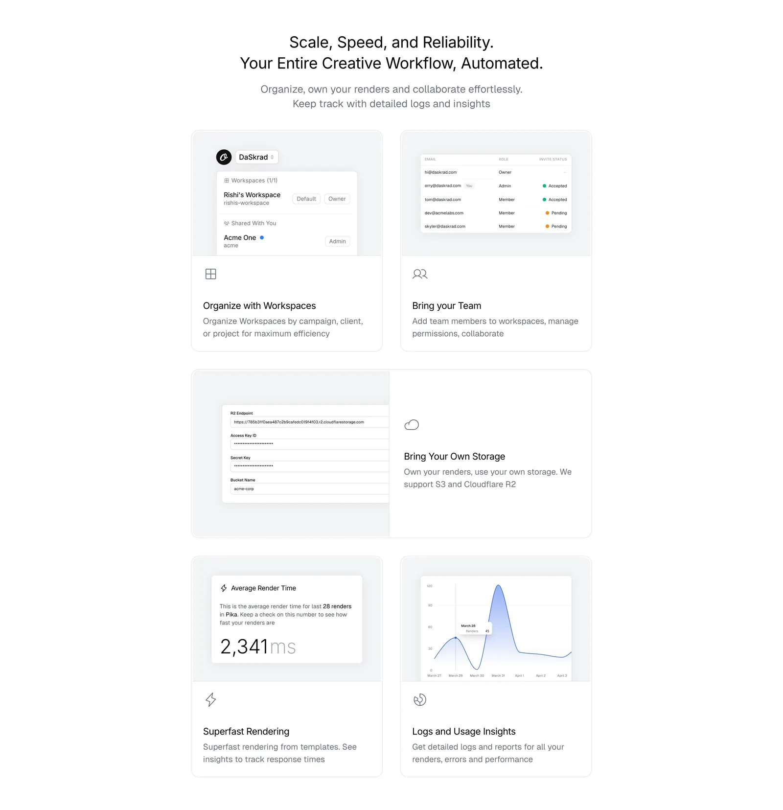
  4. Orshot features section: centered headline above a bento grid of light gray cards with workspace, team, storage and analytics UI
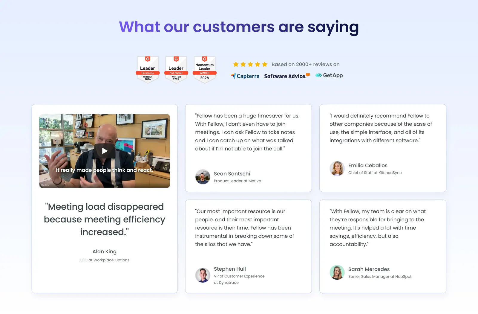
  5. Fellow testimonials section: centered heading with G2 badges above a large video testimonial card and four quote cards
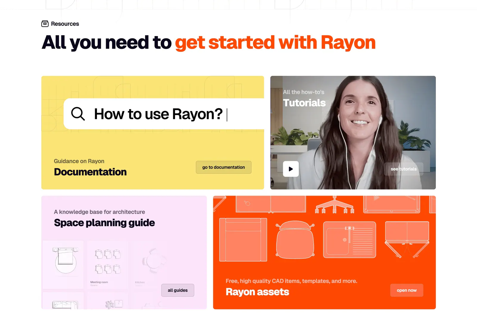
  6. Rayon blog & resources section: headline above a four-tile bento of yellow docs, video tutorial, pink guide and orange assets cards
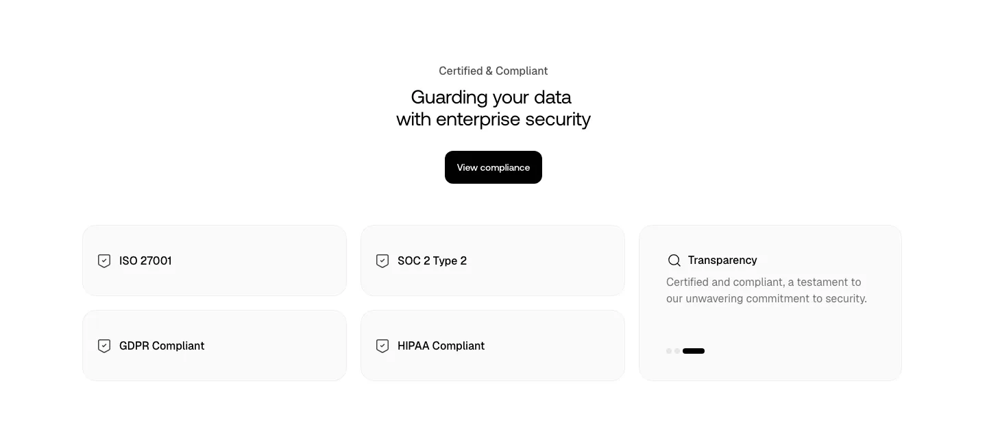
  7. Smallest.ai security section: centered headline and compliance button above light cards for ISO 27001, SOC 2, GDPR, HIPAA and transparency
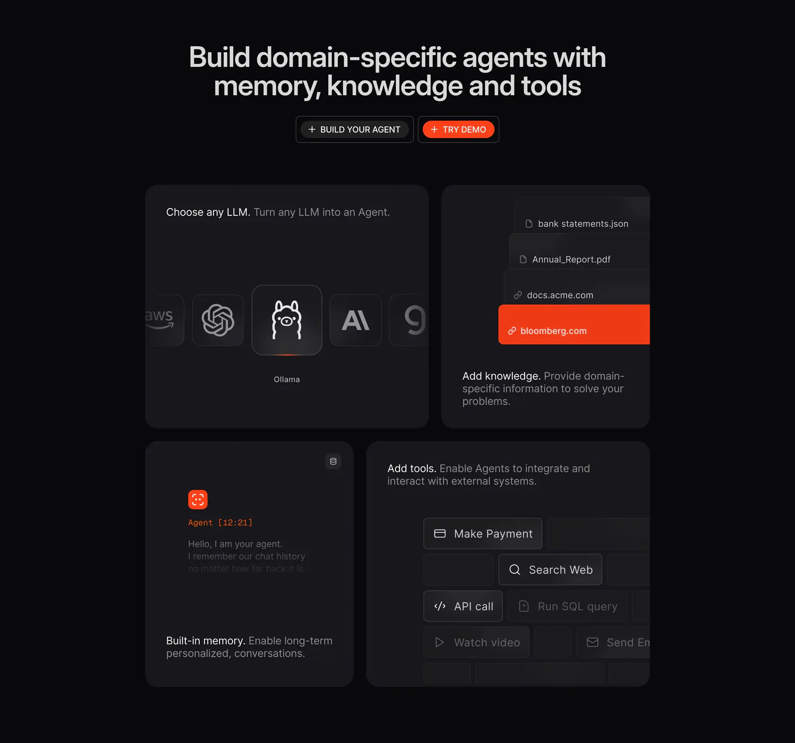
  8. Phidata features section: dark centered headline with two buttons above a four-tile bento of LLM picker, knowledge, memory and tools UI
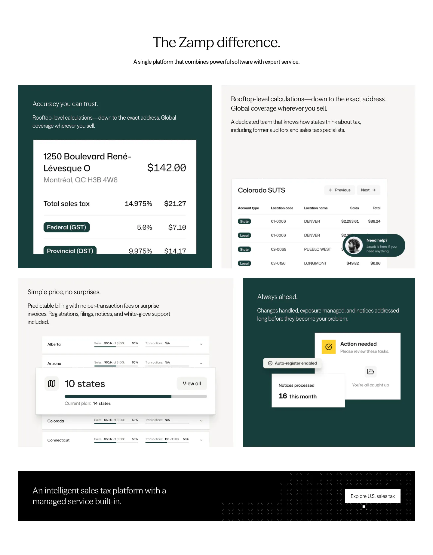
  9. Zamp features section: centered headline above a grid of dark green and light tiles with tax UI snippets and a black banner
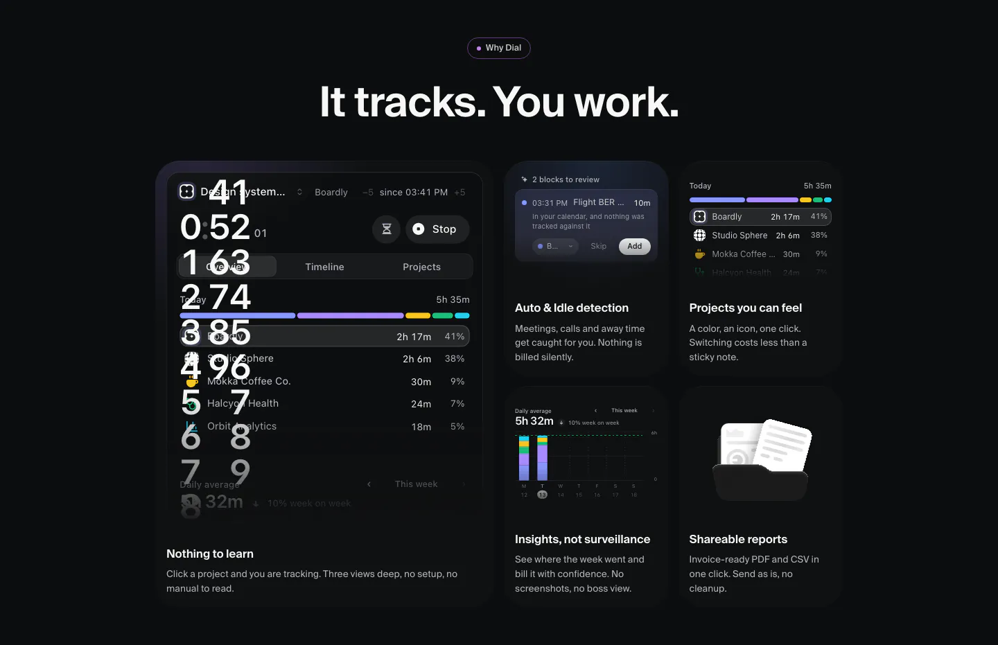
  10. Dial features section: dark bento grid of time-tracking UI tiles, a large timer panel plus cards for idle detection, projects, insights and reports
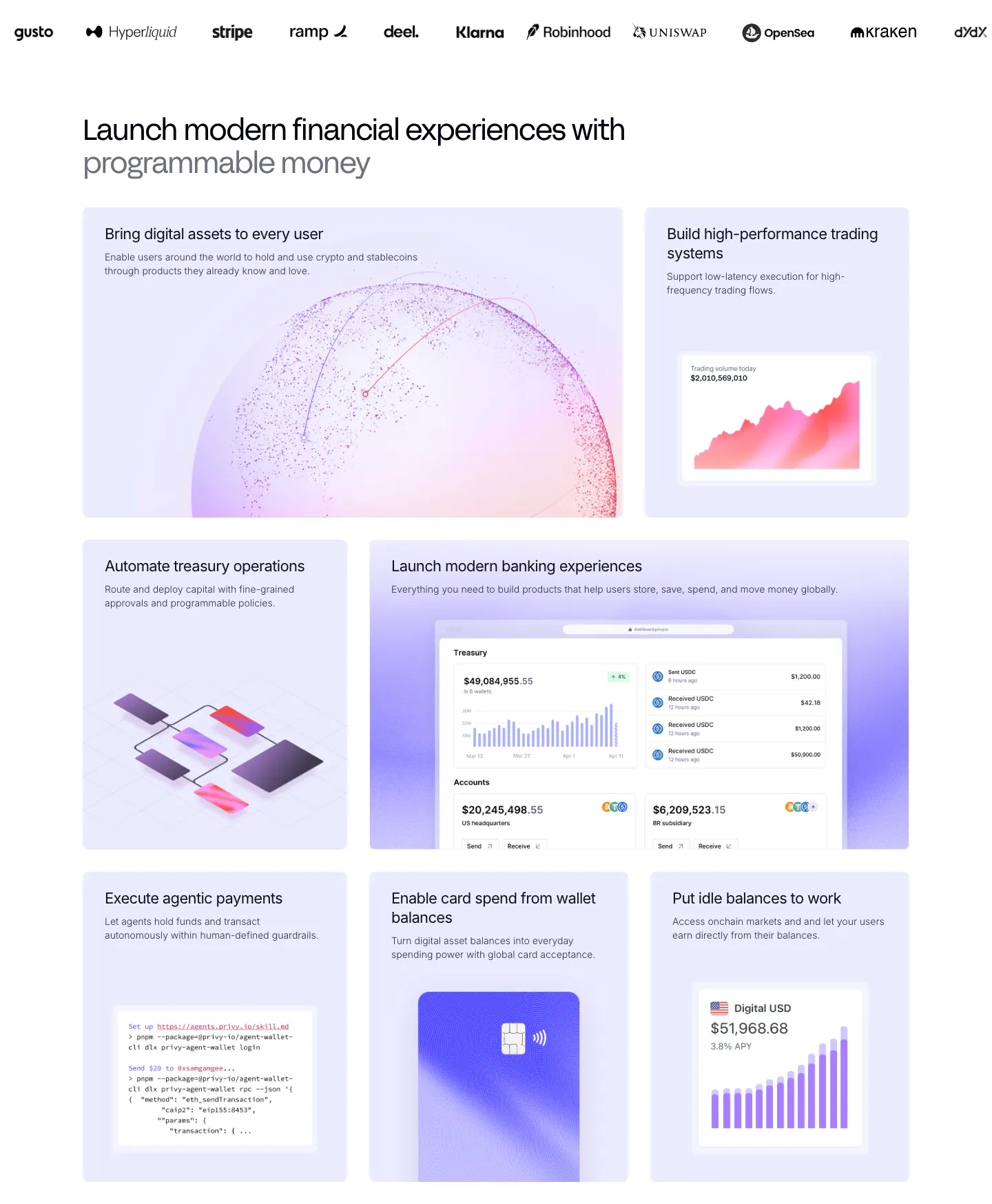
  11. Privy features section: customer logo strip above a bento grid of lavender tiles with dashboards, charts, a code snippet and a card visual
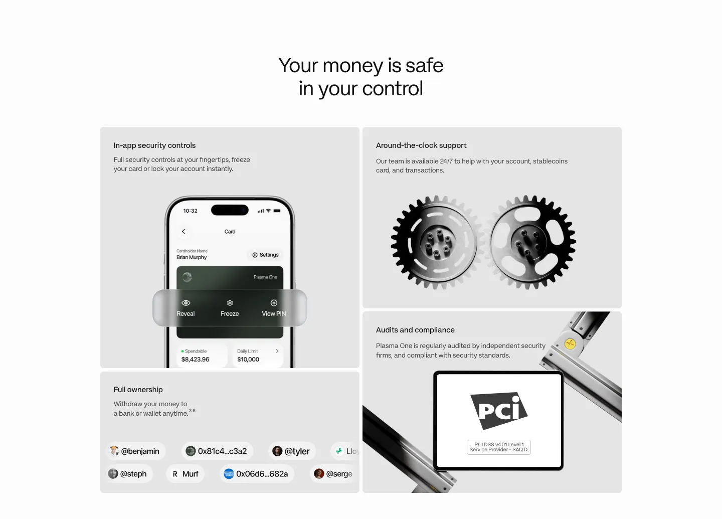
  12. Plasma security section: centered heading above a bento of gray tiles with a phone UI, 3D gears, a PCI badge and user handles
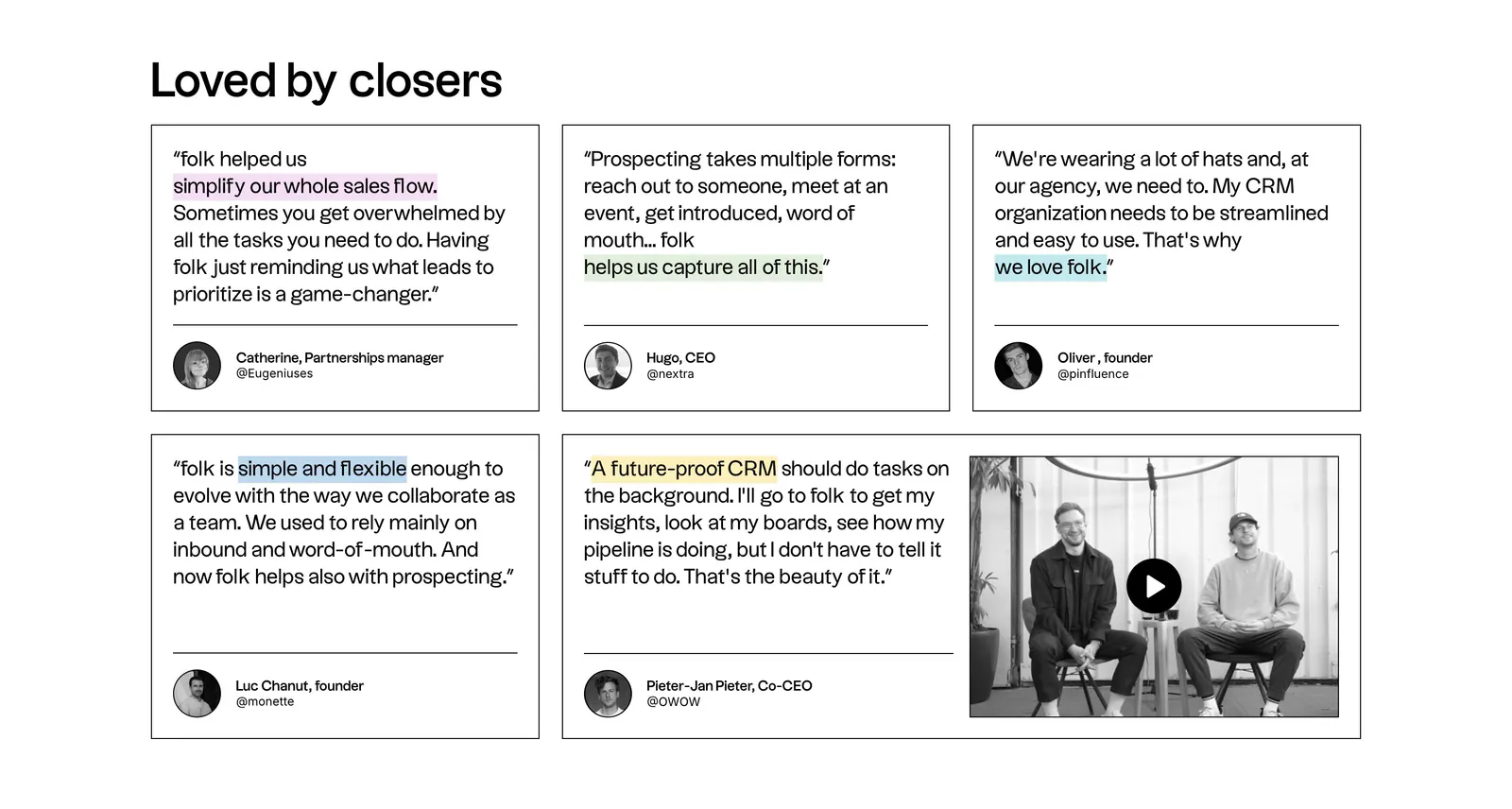
  13. folk testimonials section: bento grid of outlined quote cards with highlighted phrases and a wide card holding a video thumbnail
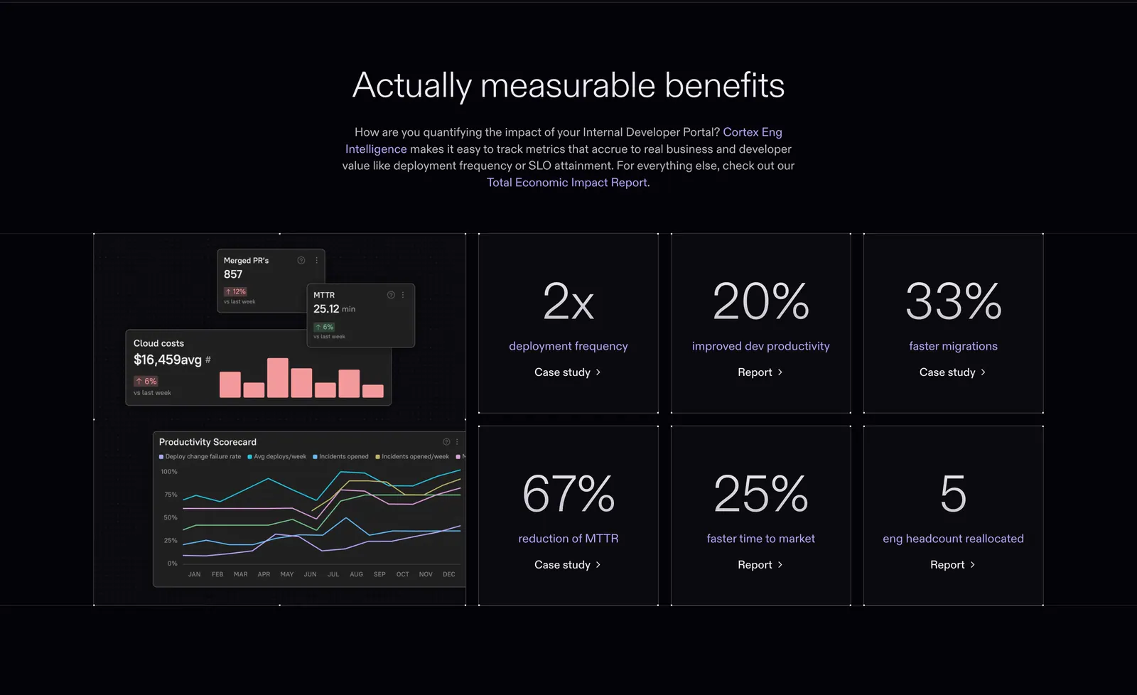
  14. Cortex value proposition section: centered headline above a dashboard chart tile and six large percentage stat tiles on dark
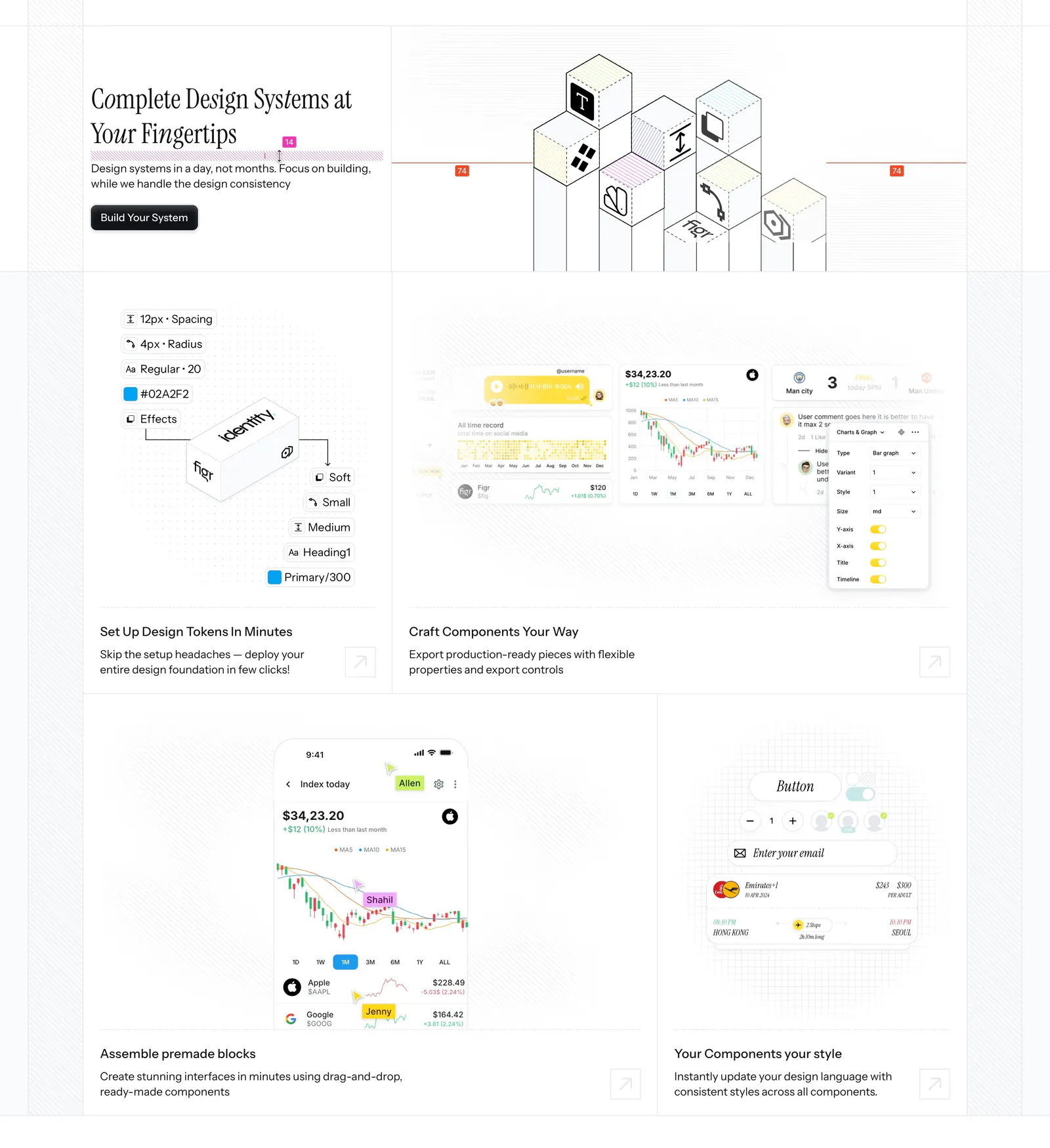
  15. Figr features section: serif headline beside an isometric cube drawing above a bento of design token, chart and mobile UI tiles
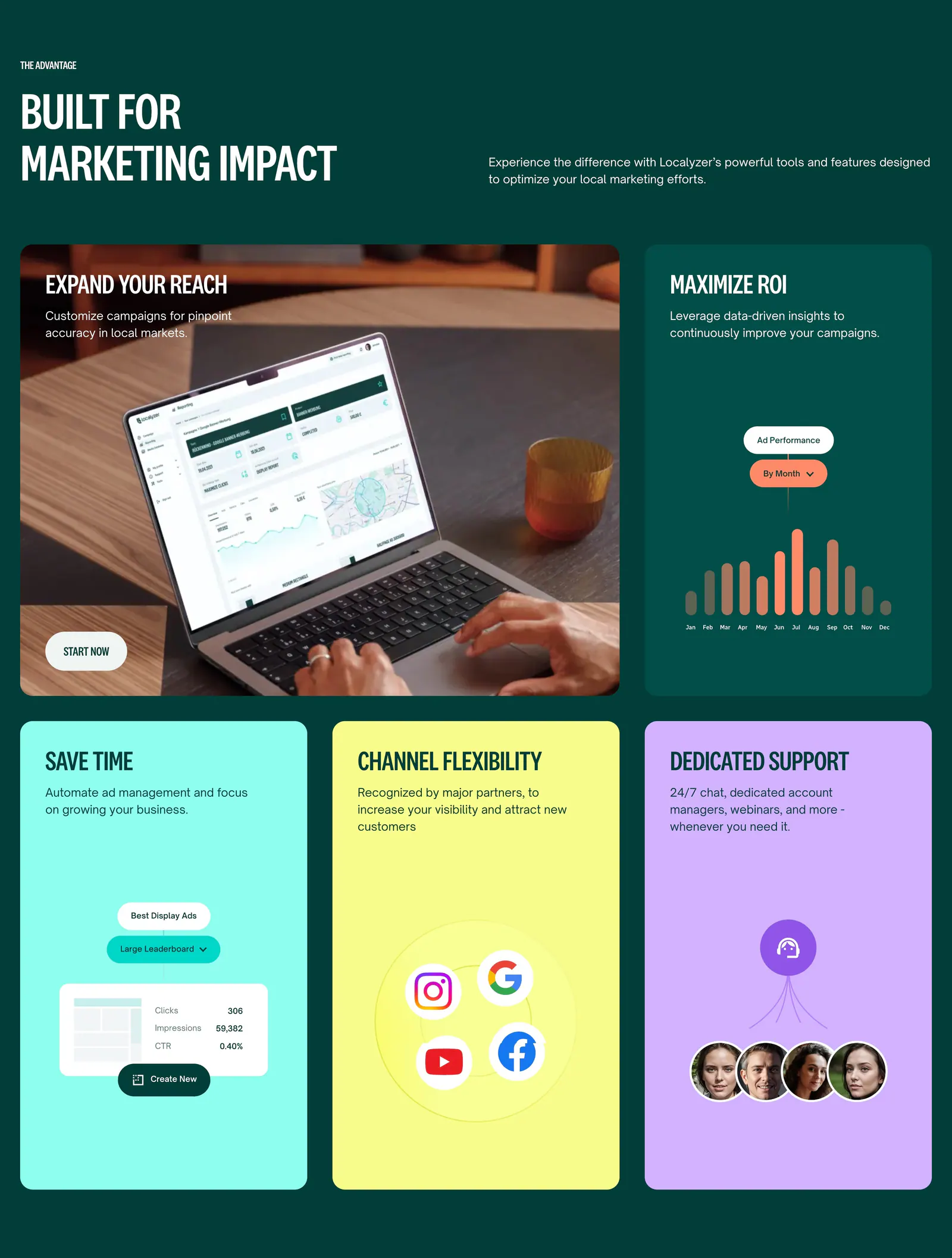
  16. Localyzer features section: bento grid on dark green with a laptop photo tile, ad chart tile and bright colored benefit cards
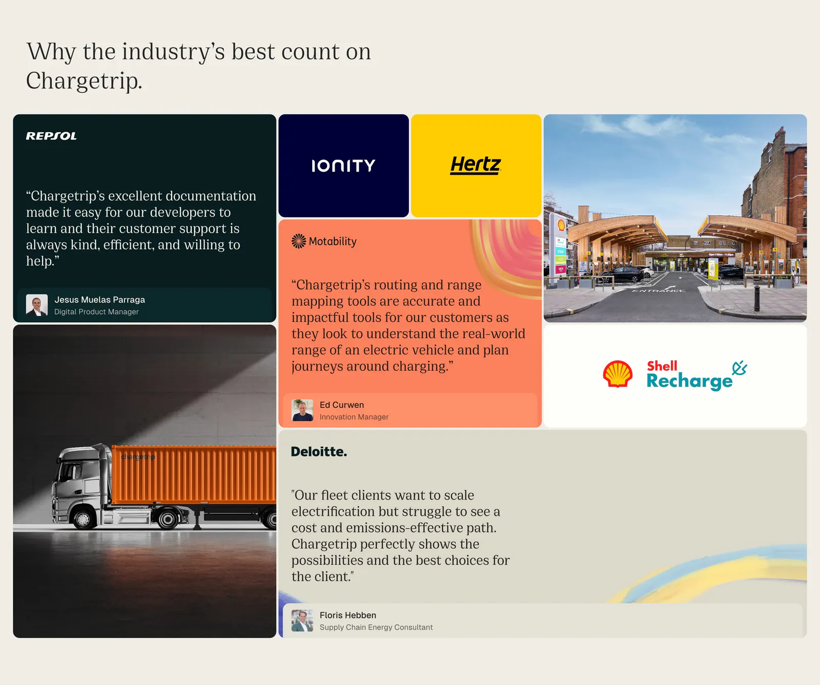
  17. Chargetrip testimonials section: bento grid of quote cards, partner logo tiles and photos of a truck and charging station on beige
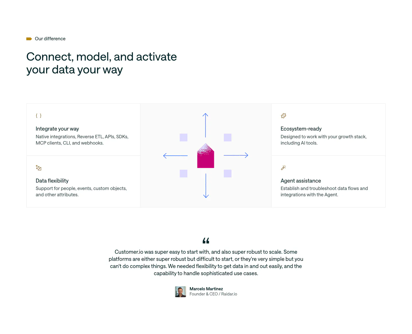
  18. Customer.io features section: four feature cells around a central envelope and arrows graphic, followed by a centered customer quote
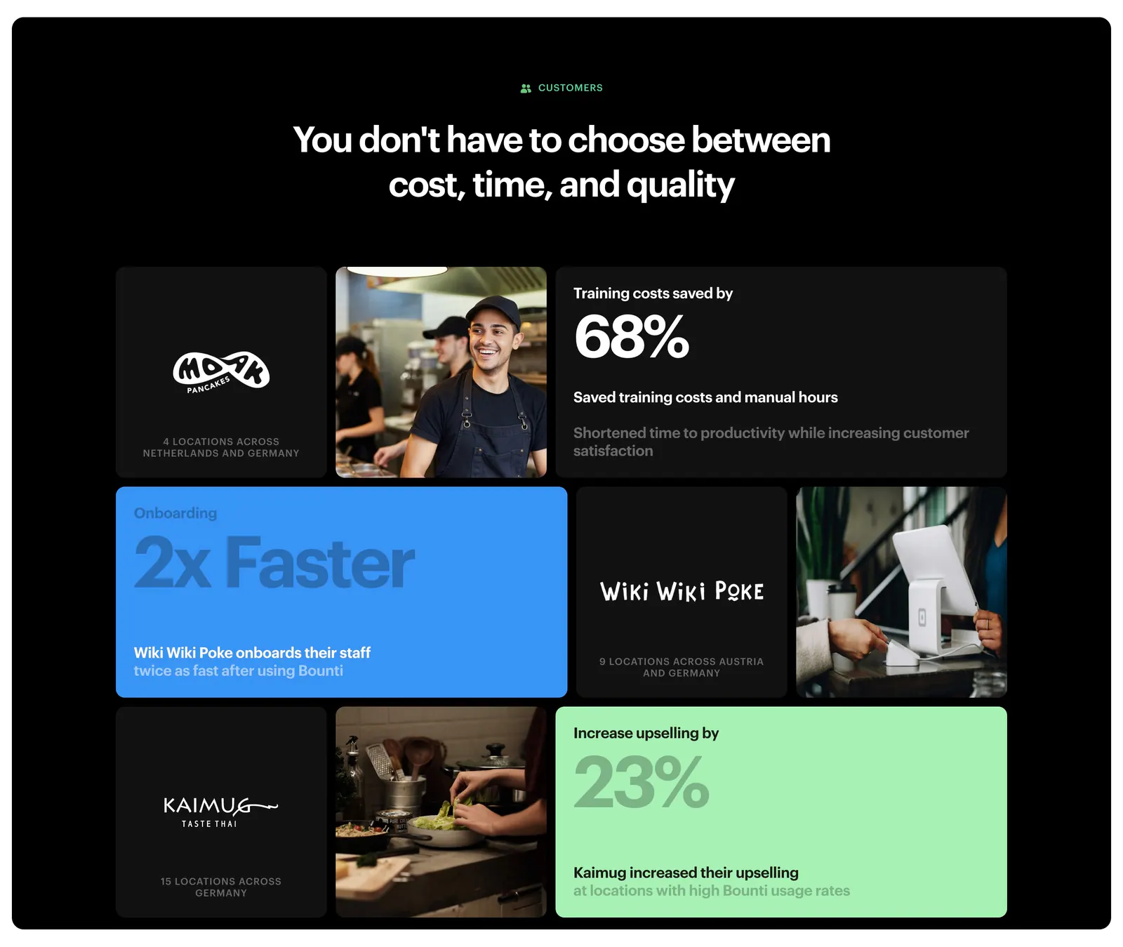
  19. Bounti value proposition section: centered headline over a bento grid of customer logos, kitchen photos and stat tiles on a black panel
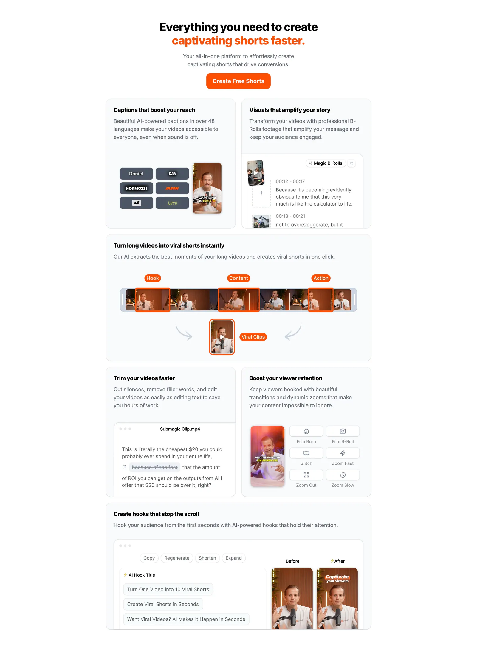
  20. Submagic features section: centered headline with orange accent above a bento grid of light cards showing caption, clip and editing UI
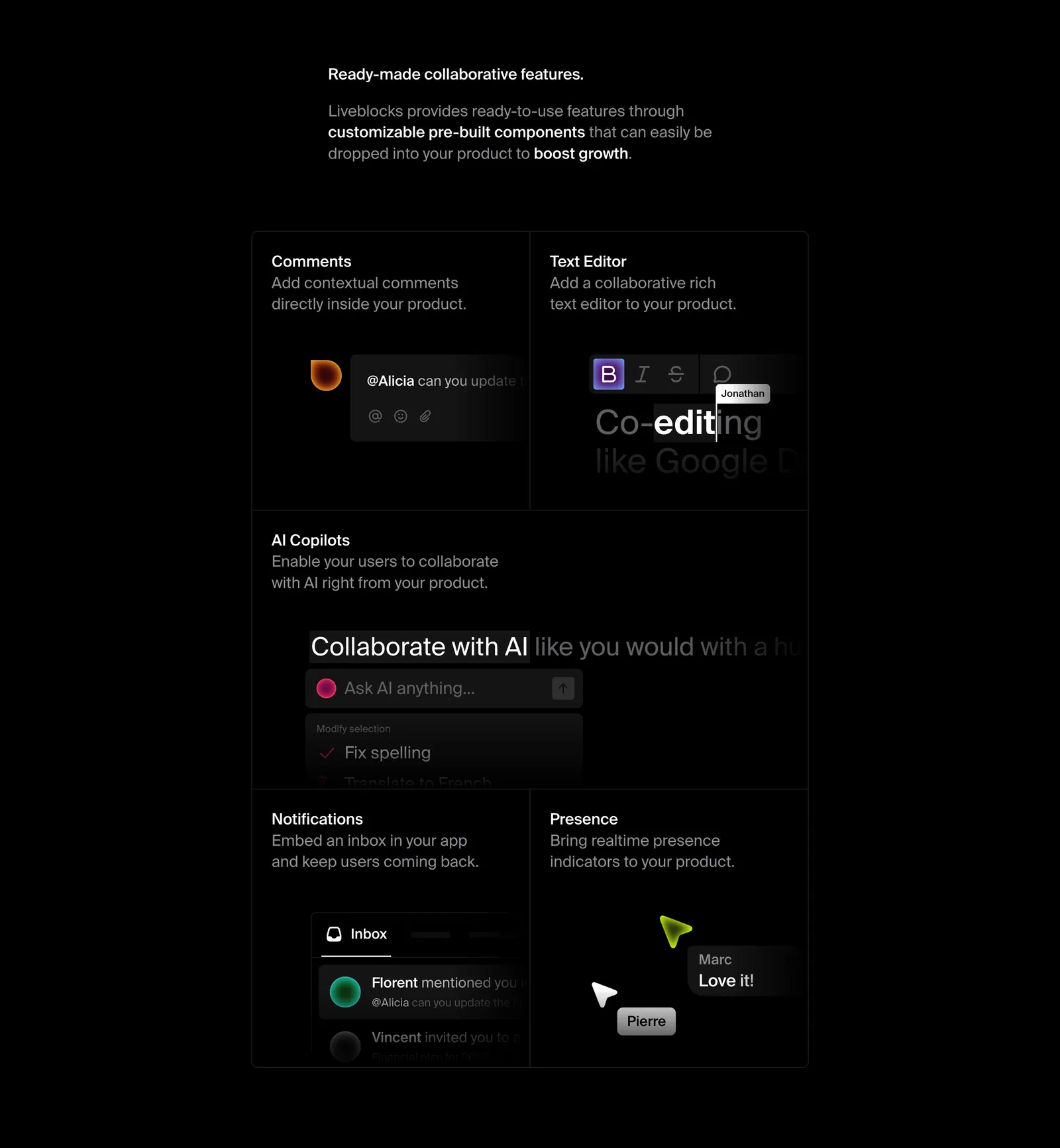
  21. Liveblocks features section: short intro copy above a dark bento grid of comments, text editor, AI copilot, notifications and presence UI tiles
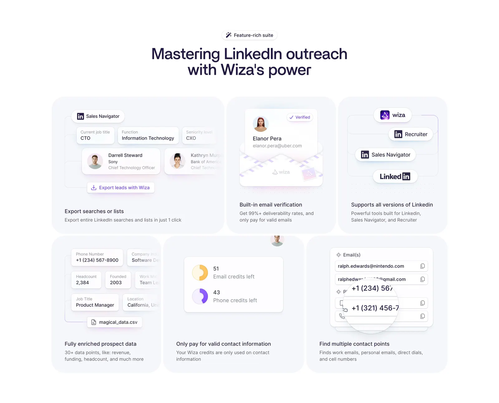
  22. Wiza features section: centered headline above a six-card bento grid of LinkedIn prospecting UI mockups on a white background
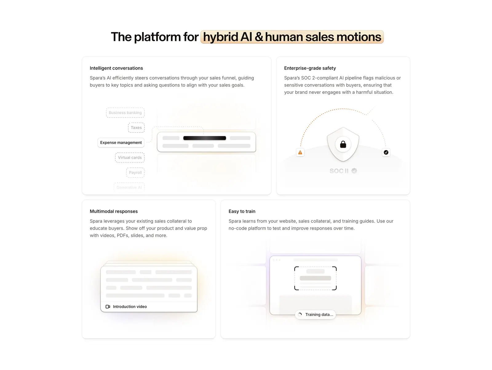
  23. Spara features section: centered headline with highlighted phrase above a four-tile bento grid of feature cards with abstract UI art
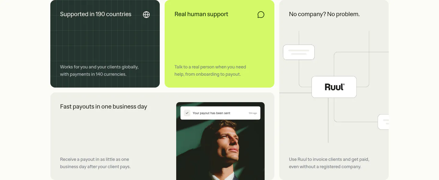
  24. Ruul features section: bento grid of benefit tiles in dark green, lime and warm gray, with a portrait photo and a node diagram
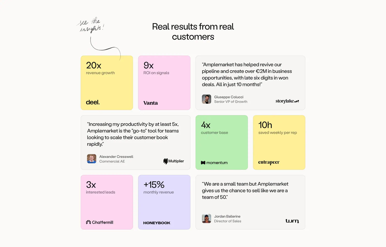
  25. Amplemarket testimonials section: centered headline above a bento grid of pastel metric tiles and gray quote cards with logos
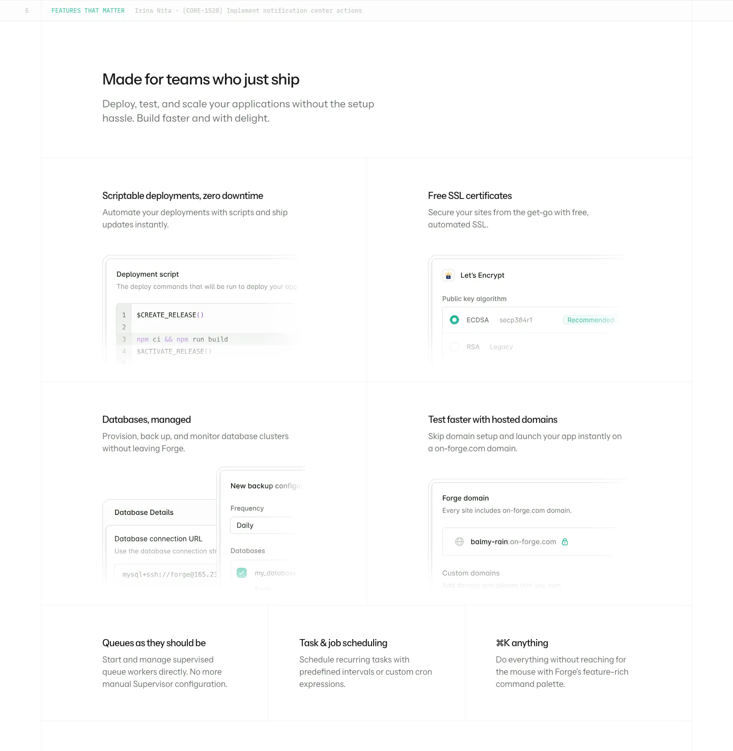
  26. Laravel Forge features section: four large tiles with UI mockups incl. a deploy script, plus three text-only tiles on white
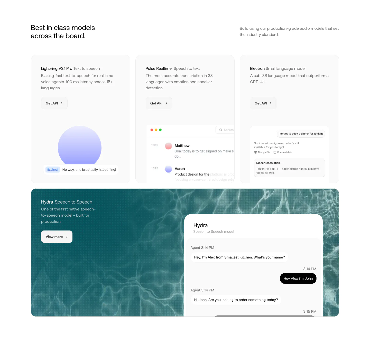
  27. Smallest.ai features section: three model cards with UI previews above a wide teal water-textured card showing a speech-to-speech chat UI
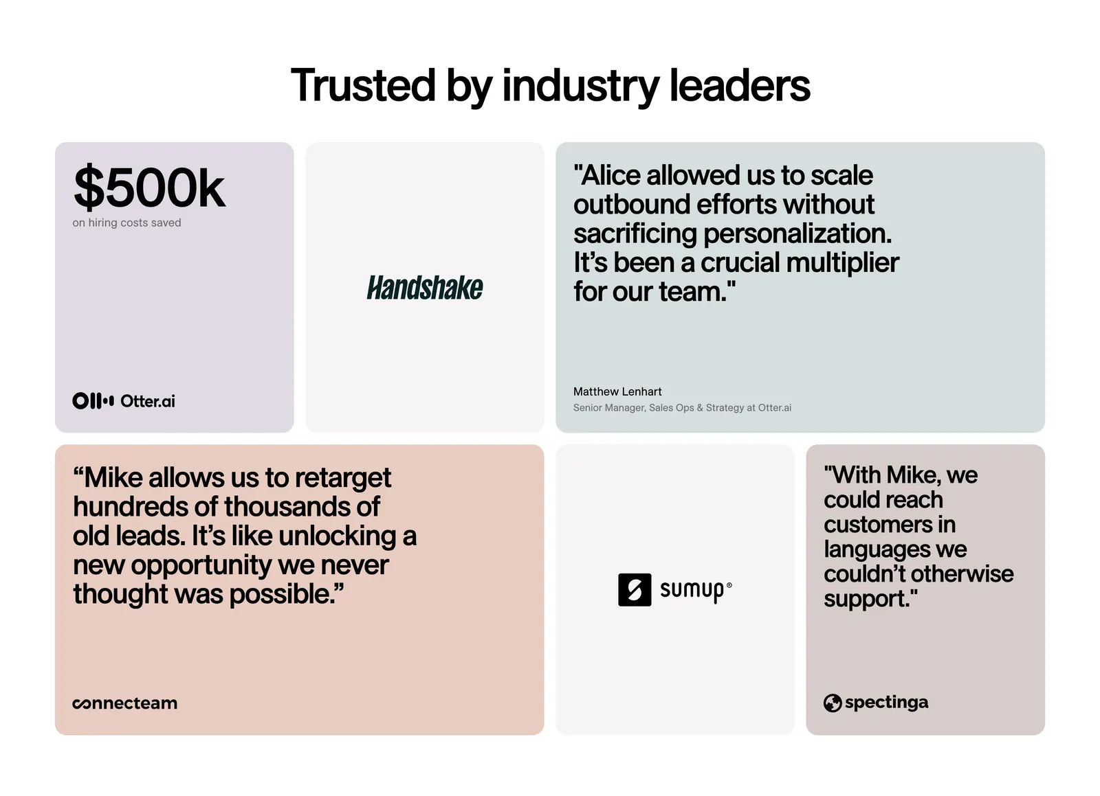
  28. 11x testimonials section: centered headline above a bento grid of pastel quote cards, a $500k metric tile and customer logo tiles
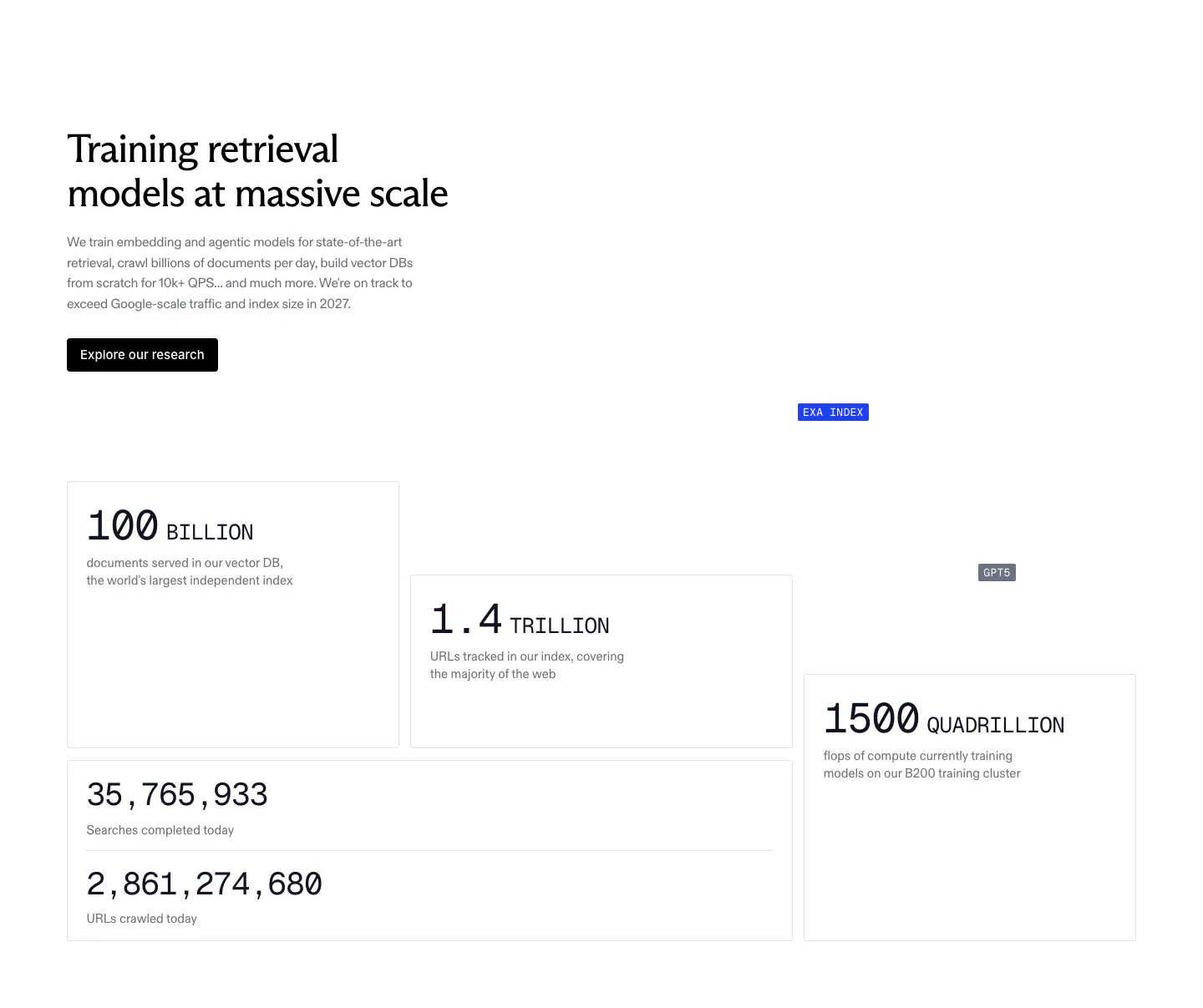
  29. Exa stats section: headline, copy and research button above staggered bordered cards with large monospace figures for index size and compute
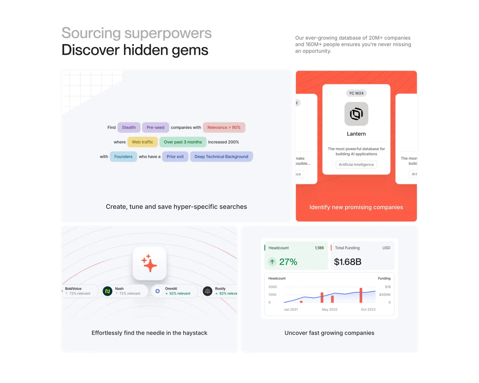
  30. Harmonic features section: two-tone headline above a four-tile bento grid with search chips, company cards and growth charts
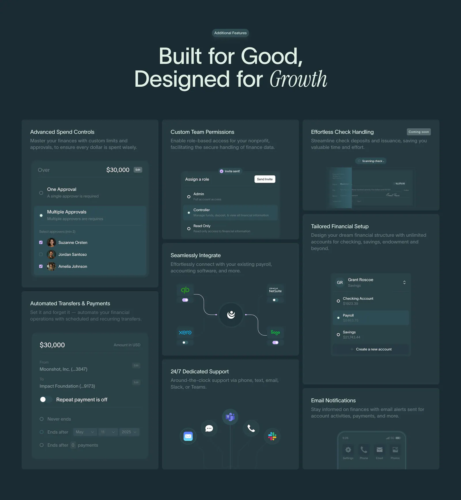
  31. Crescent Cares features section: centered headline above a bento grid of finance feature cards with UI snippets on dark teal
  32. Valley logo cloud section: bordered grid of customer logos around a central headline tile with a Book a call button on white
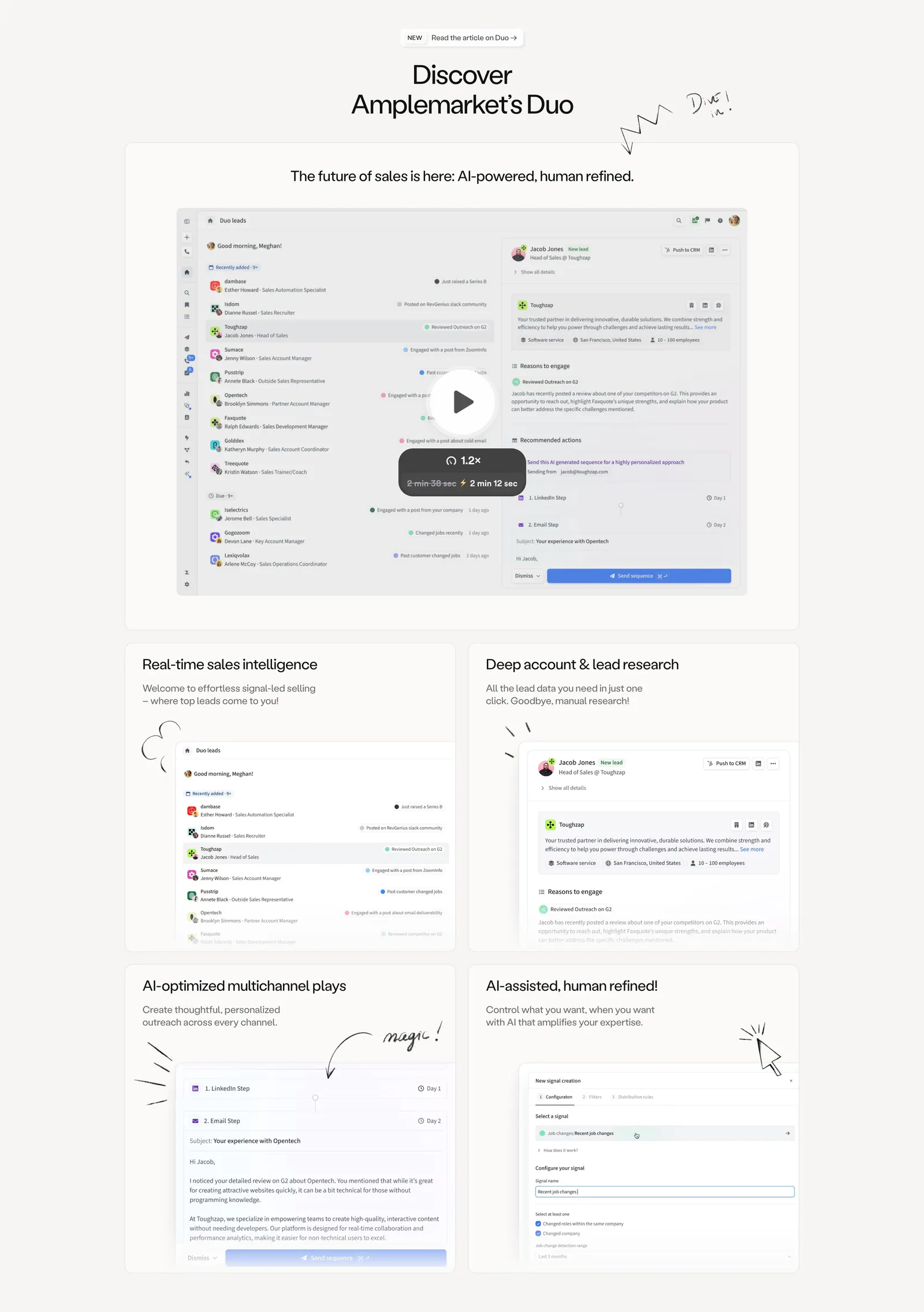
  33. Amplemarket features section: centered headline above a product video card and a 2x2 bento of UI cards with hand-drawn doodles
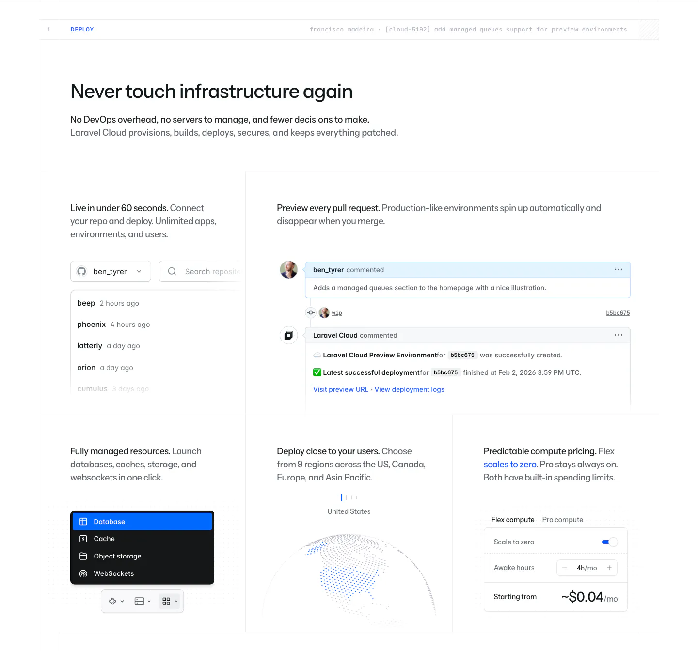
  34. Laravel Cloud features section: headline above a bento grid of UI snippets for repo deploys, PR previews, resources, regions and pricing
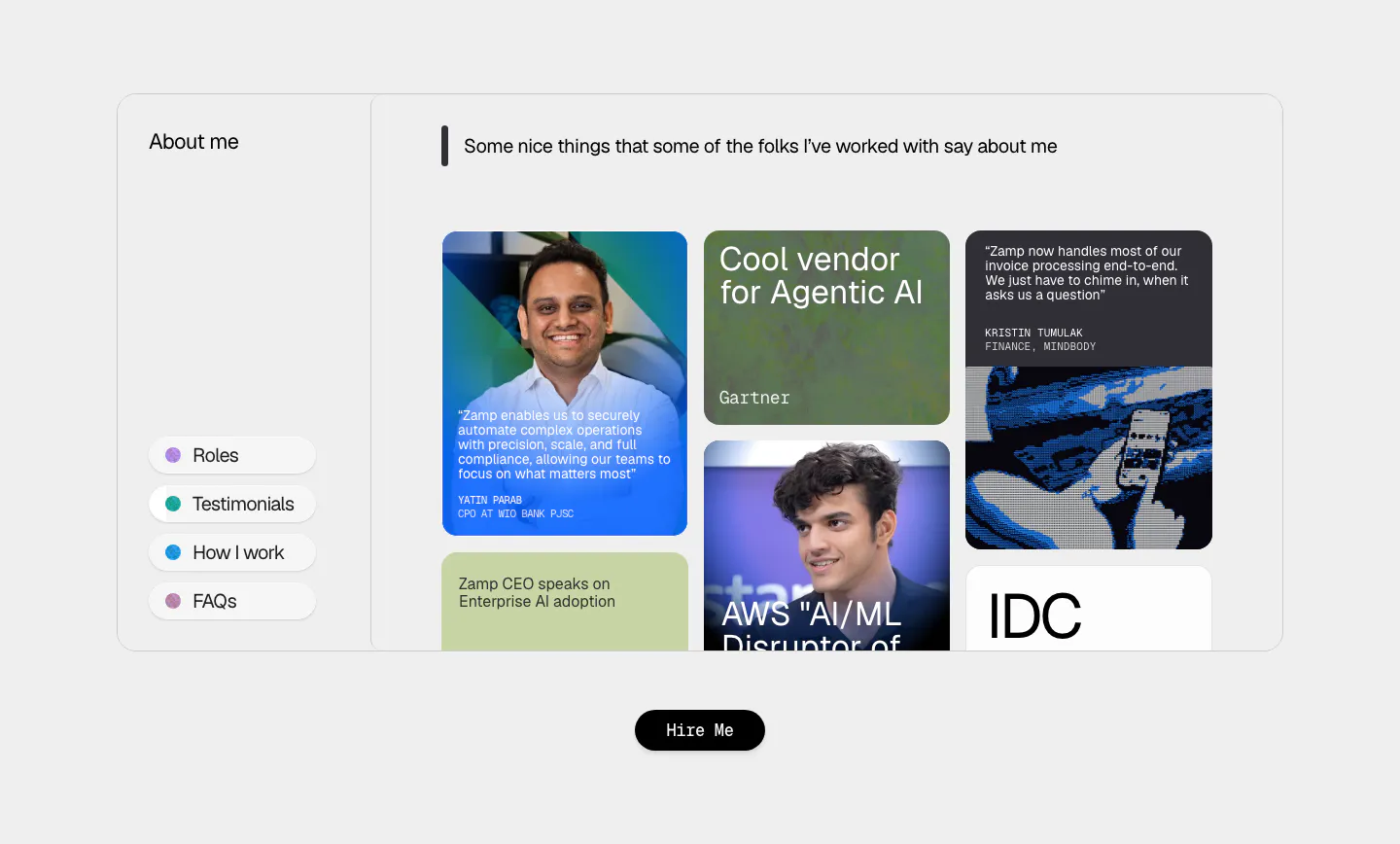
  35. Zamp testimonials section: framed panel with side menu and masonry grid of quote cards, analyst badges and portrait photos on light gray
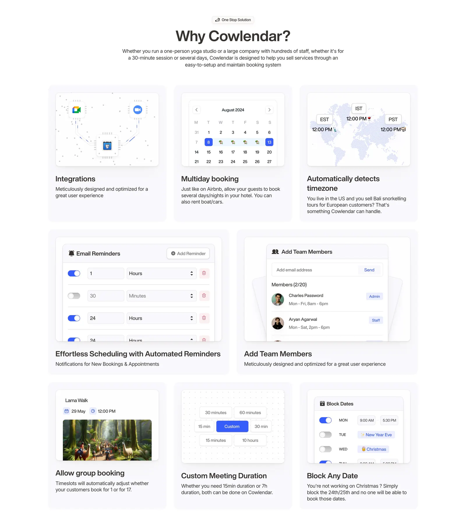
  36. Cowlendar features section: centered heading above a bento grid of eight booking feature cards with UI snippets
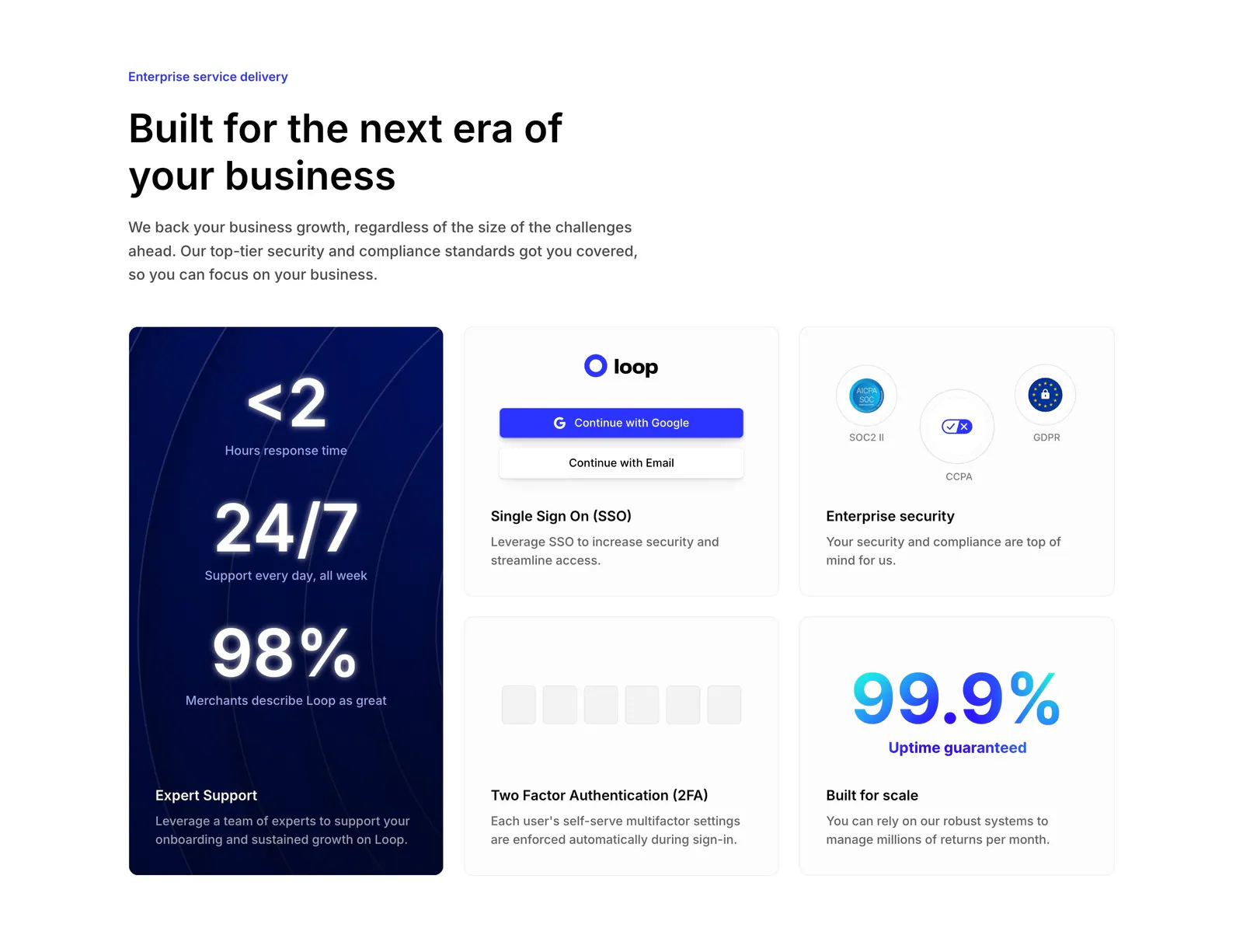
  37. Loop value proposition section: headline above a bento grid with a tall navy stats card and SSO, security, 2FA and uptime tiles
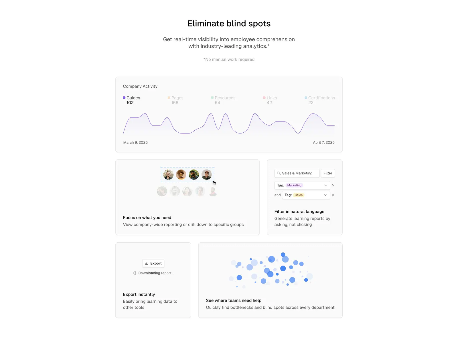
  38. Basewell features section: centered headline above a bento grid of analytics UI cards with line chart, filters and bubble chart
    Basewell Features
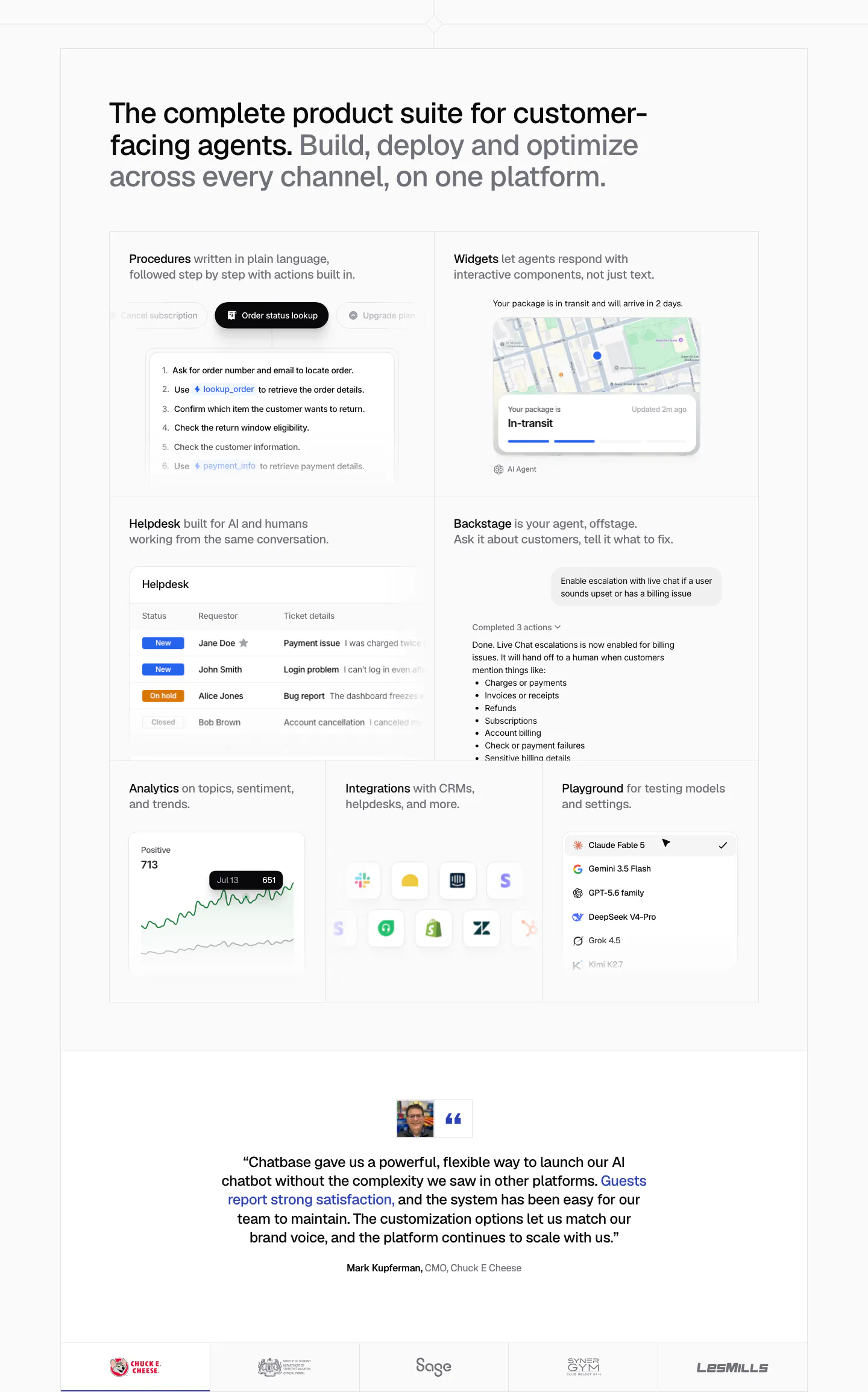
  39. Chatbase features section: bento grid of product UI tiles for procedures, widgets, helpdesk and analytics, a centered quote and logo row
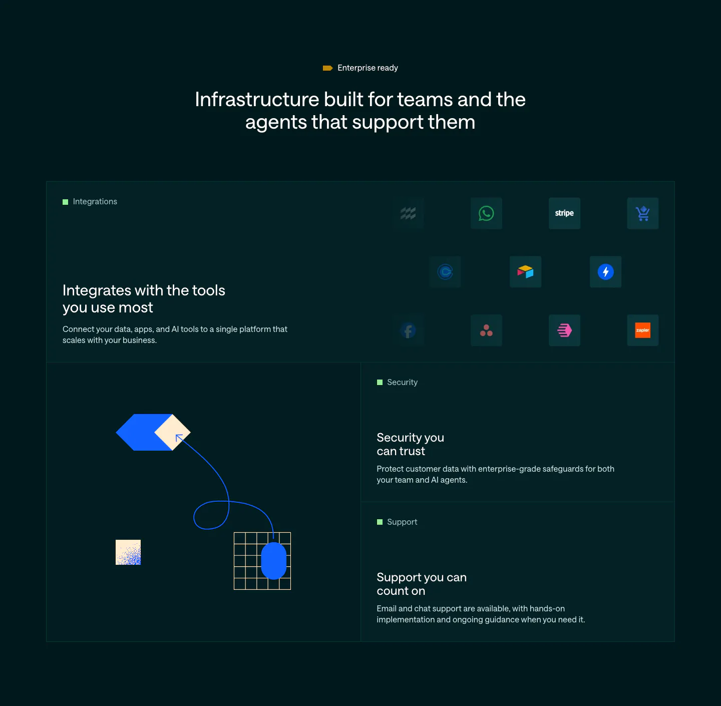
  40. Customer.io features section: dark bento grid with an integration icon tile, abstract hexagon and grid artwork, and security and support tiles
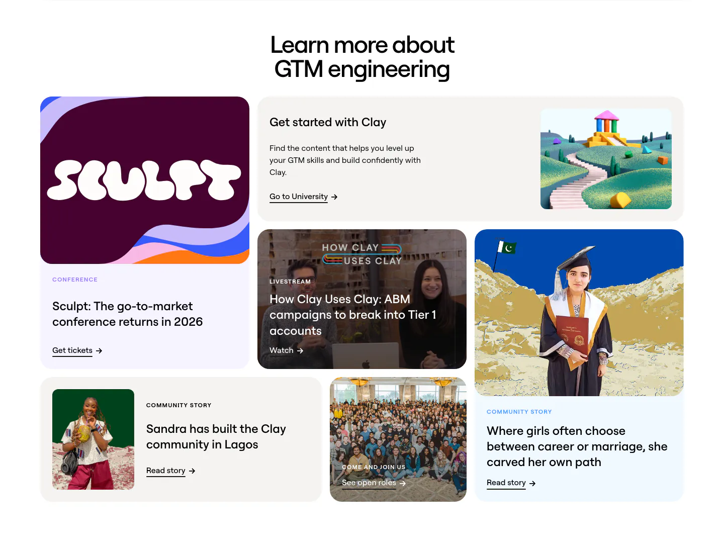
  41. Clay blog & resources section: centered headline above a bento grid of conference, livestream, community story and careers cards
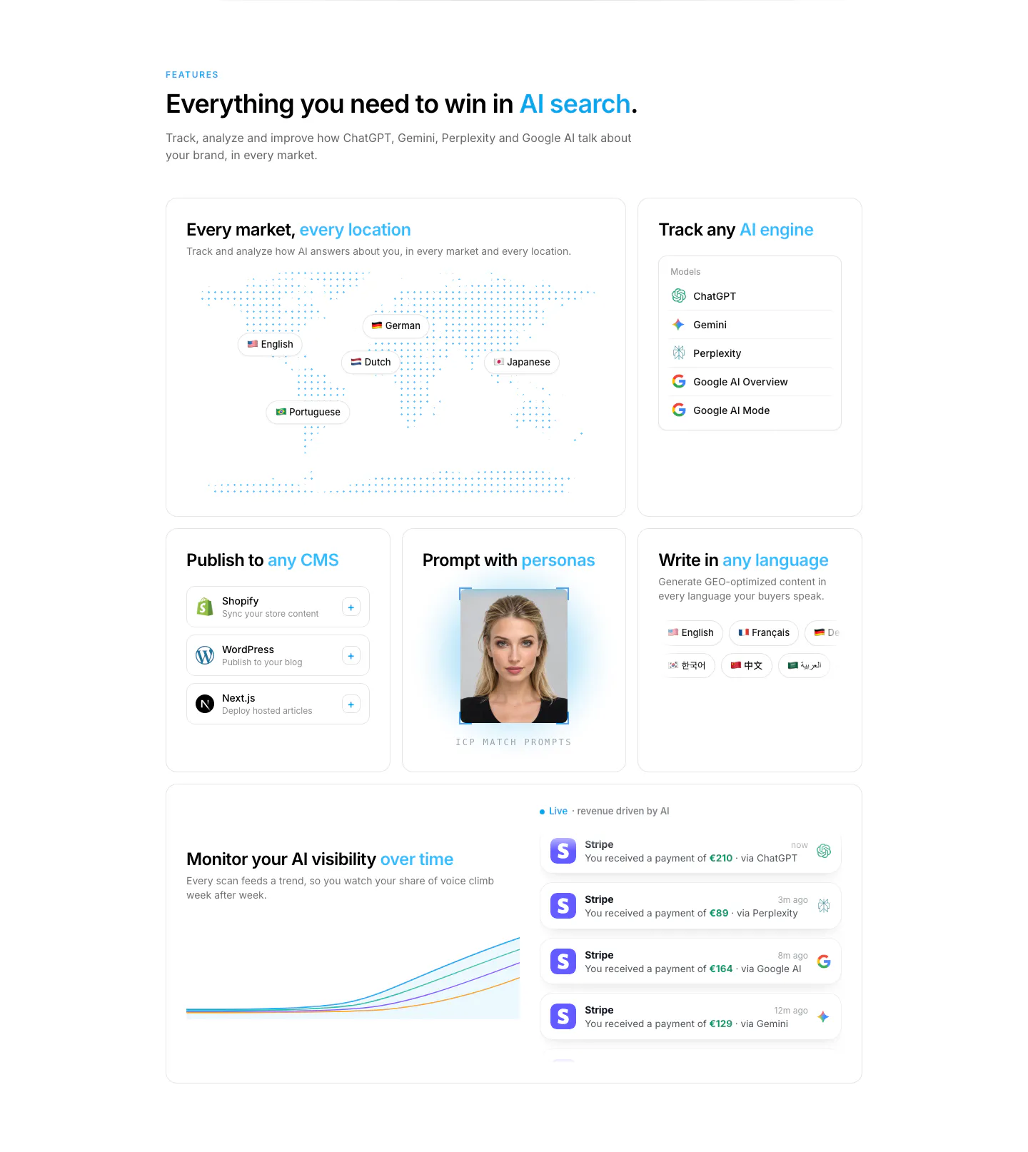
  42. Howseen AI features section: bento grid with dotted world map, AI engine list, CMS cards, persona photo and revenue chart
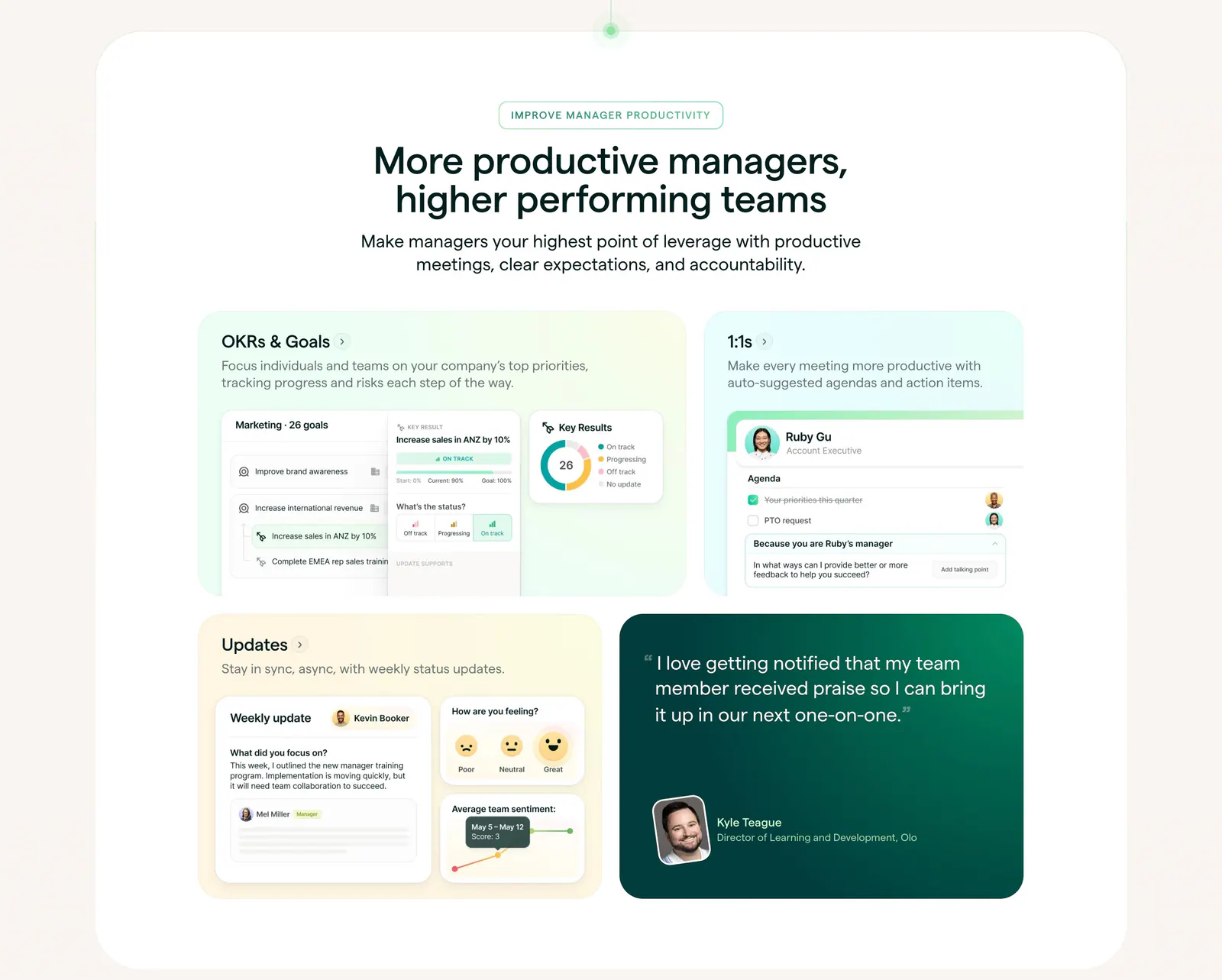
  43. Lattice features section: centered heading above a bento grid of pastel cards with OKR, 1:1 and update UI mockups plus a green quote card
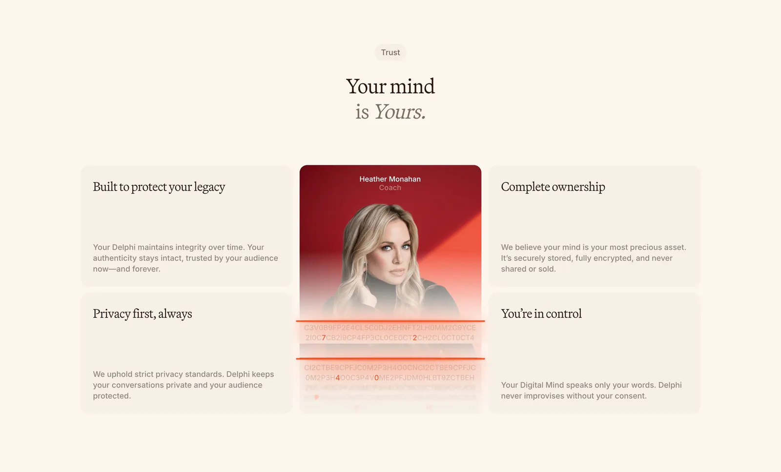
  44. Delphi features section: centered serif headline above a bento of four trust cards around a tall portrait card with an encryption text effect
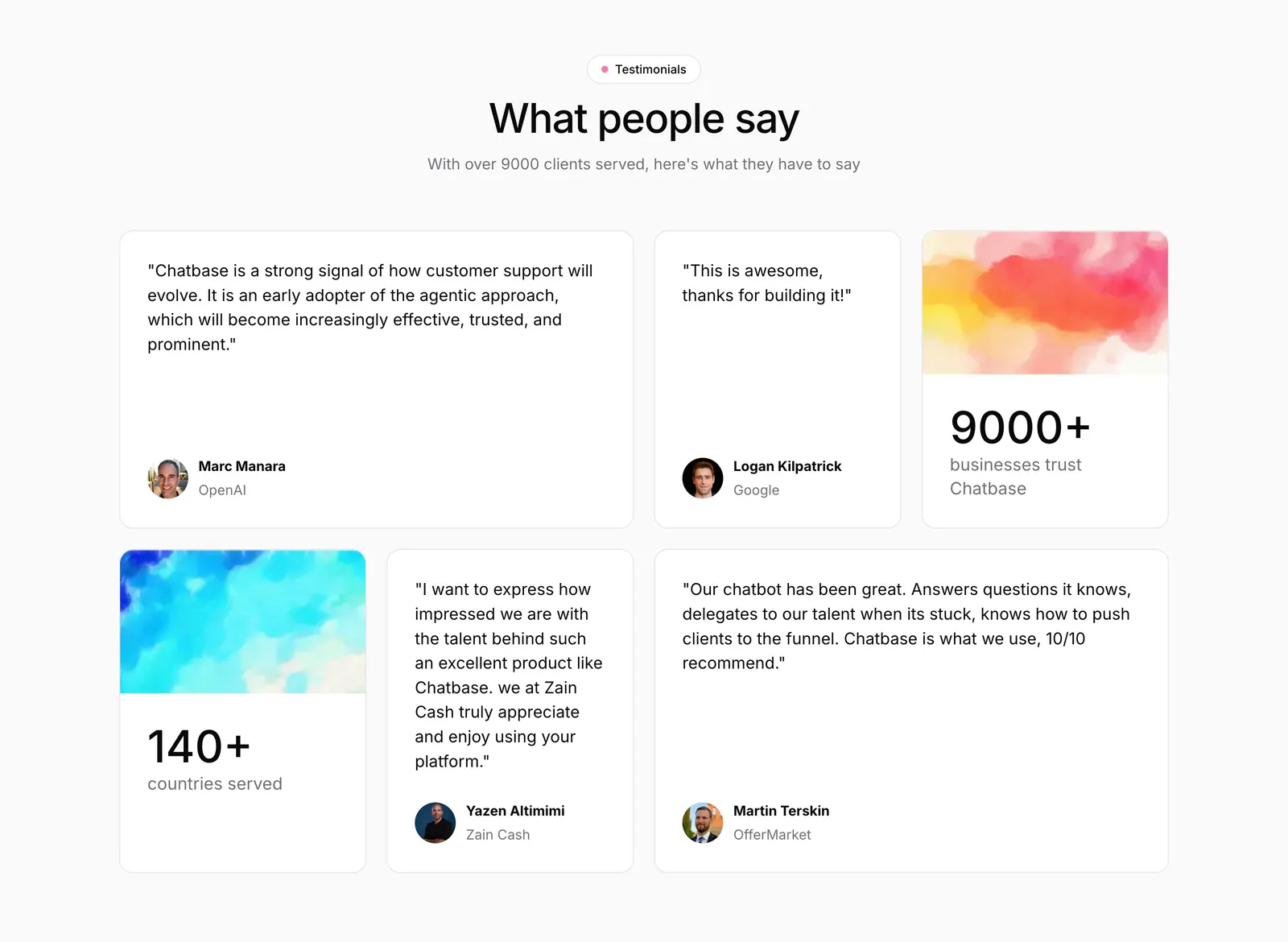
  45. Chatbase testimonials section: centered heading above a bento grid of quote cards and two stat cards with watercolor images
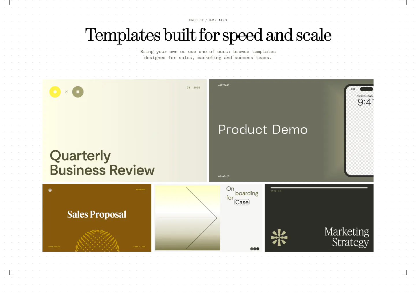
  46. Visual features section: centered serif headline above a bento grid of presentation template previews in olive, cream, brown and charcoal
  47. Jasper testimonials section: headline and button row above a bento grid of pastel metric tiles and quote cards with portraits
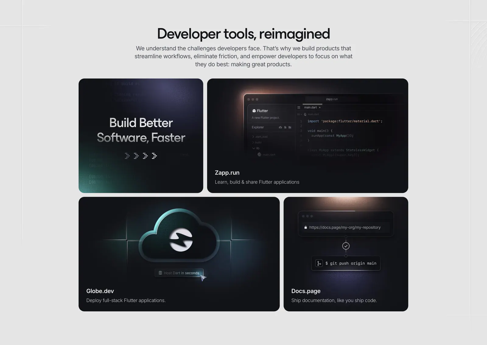
  48. Invertase features section: centered headline above a bento of four dark tiles showing a code editor, cloud icon and git push
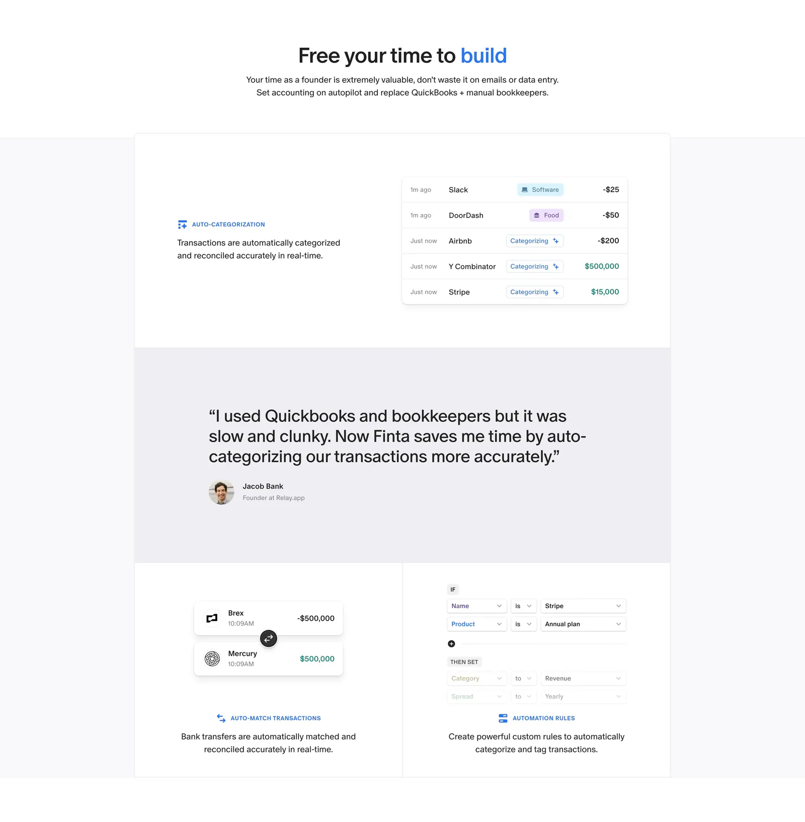
  49. Finta features section: centered headline above bordered tiles with transaction UI snippets and a customer quote band
  50. Godmode logo cloud section: centered heading above a masonry grid of white logo tiles in mixed sizes with a case studies button
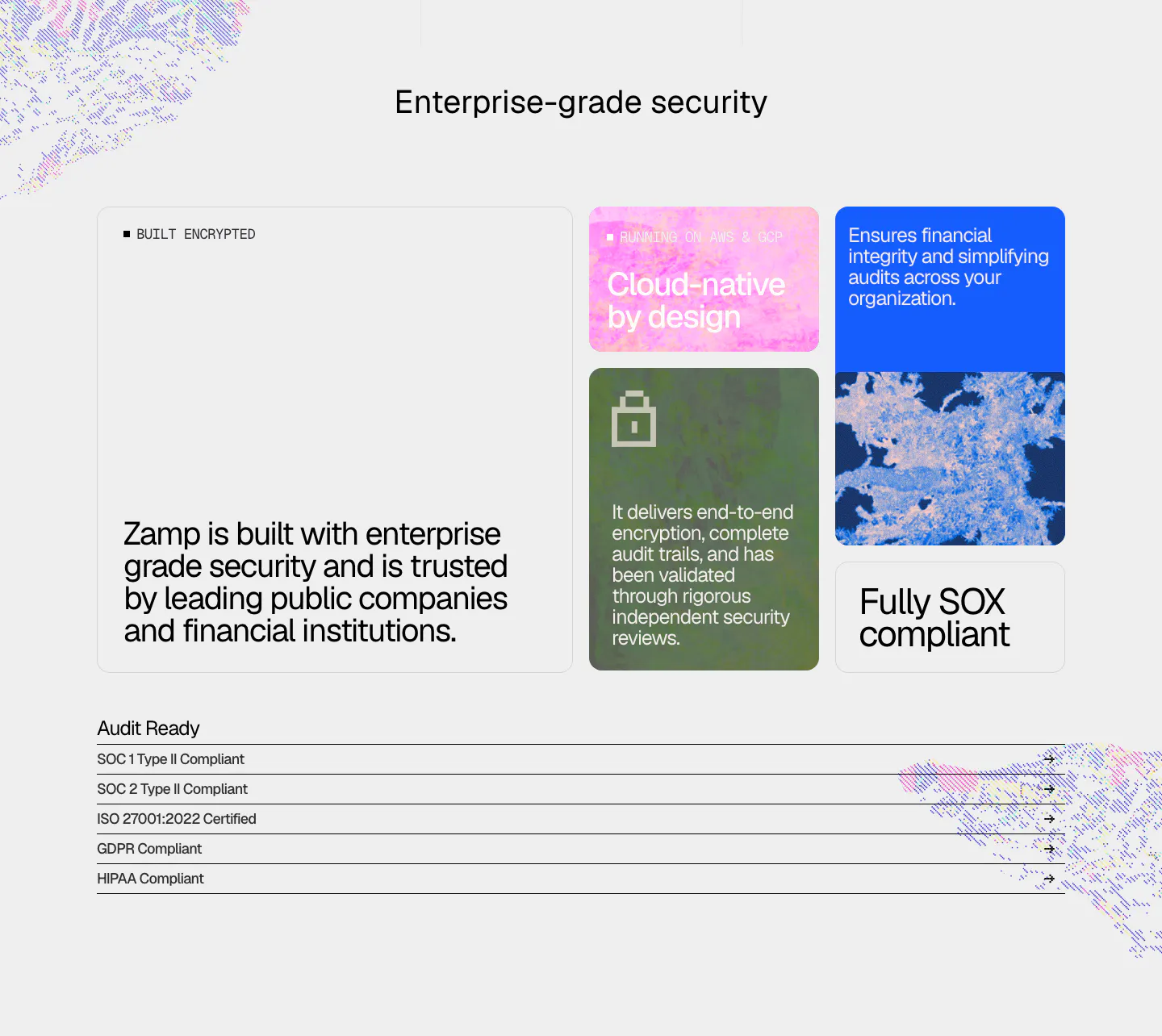
  51. Zamp security section: bento of textured color cards with encryption and SOX claims above a list of SOC, ISO, GDPR and HIPAA compliance rows
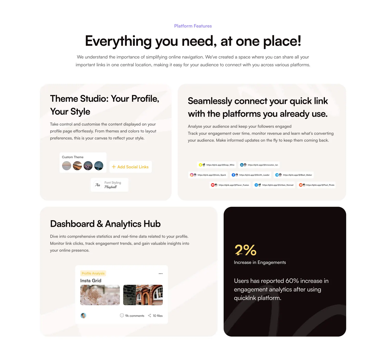
  52. QuickLnk features section: centered headline above a four-tile bento of beige cards with UI snippets and one dark stat card
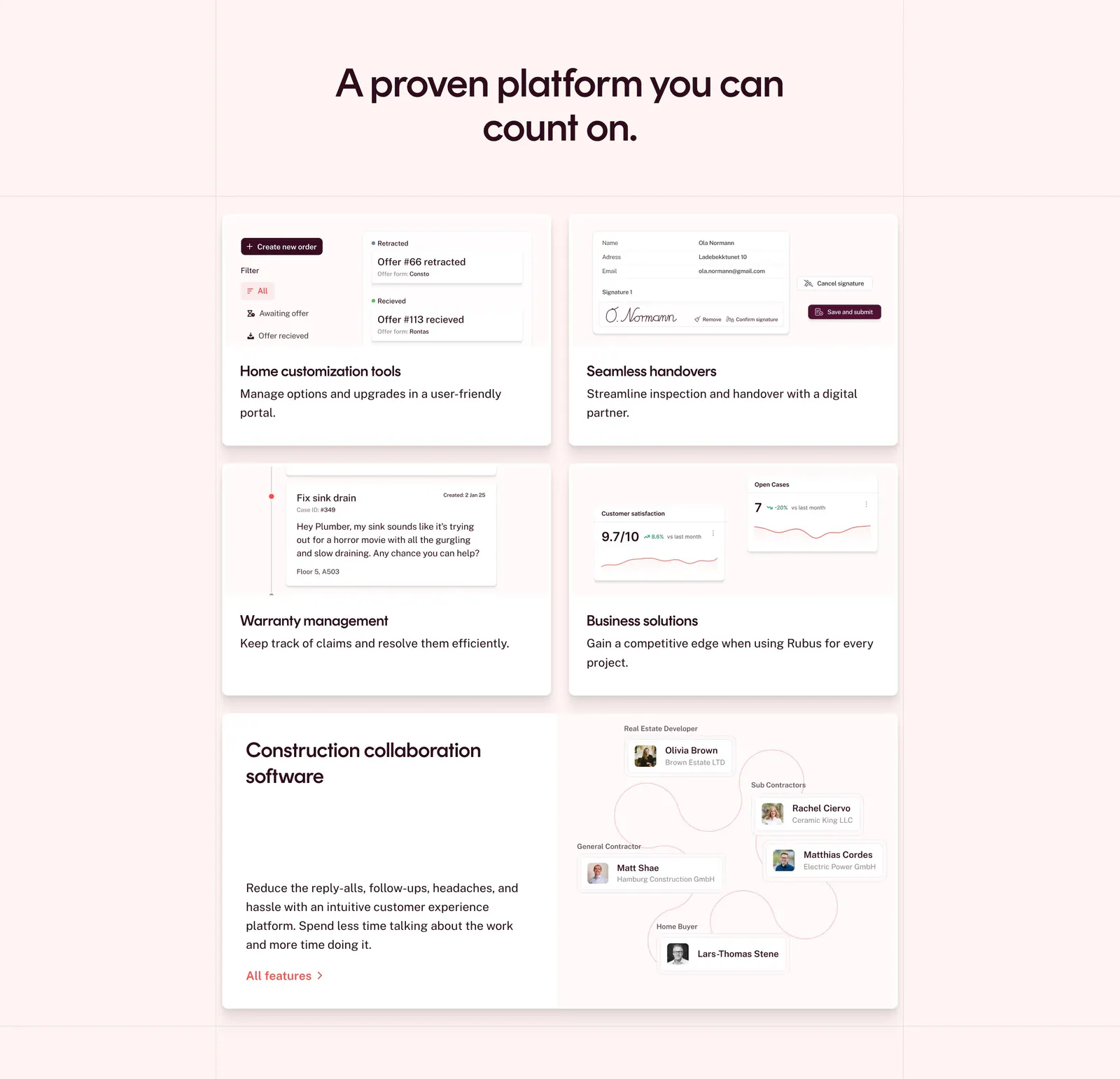
  53. Rubus features section: centered headline above a bento grid of feature cards with UI snippets and a collaboration diagram on pale pink
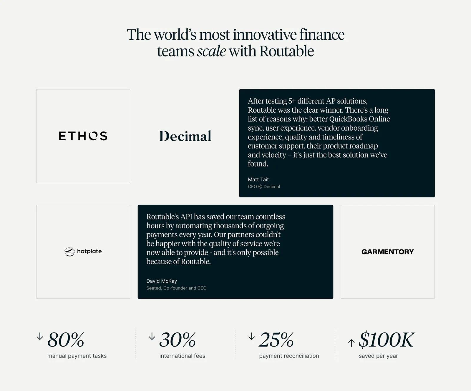
  54. Routable testimonials section: serif headline over a grid of logo tiles and dark quote cards, with four savings metrics below on light gray
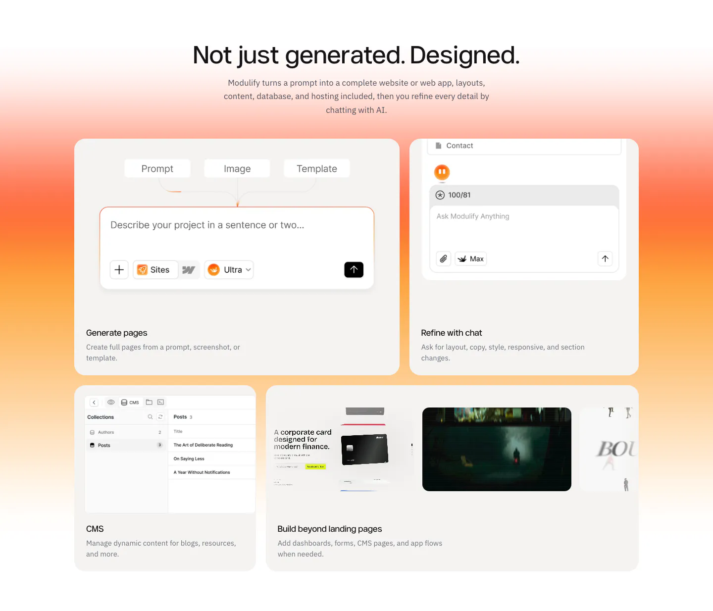
  55. Modulify features section: centered headline above a four-card bento of product UI mockups on an orange gradient band
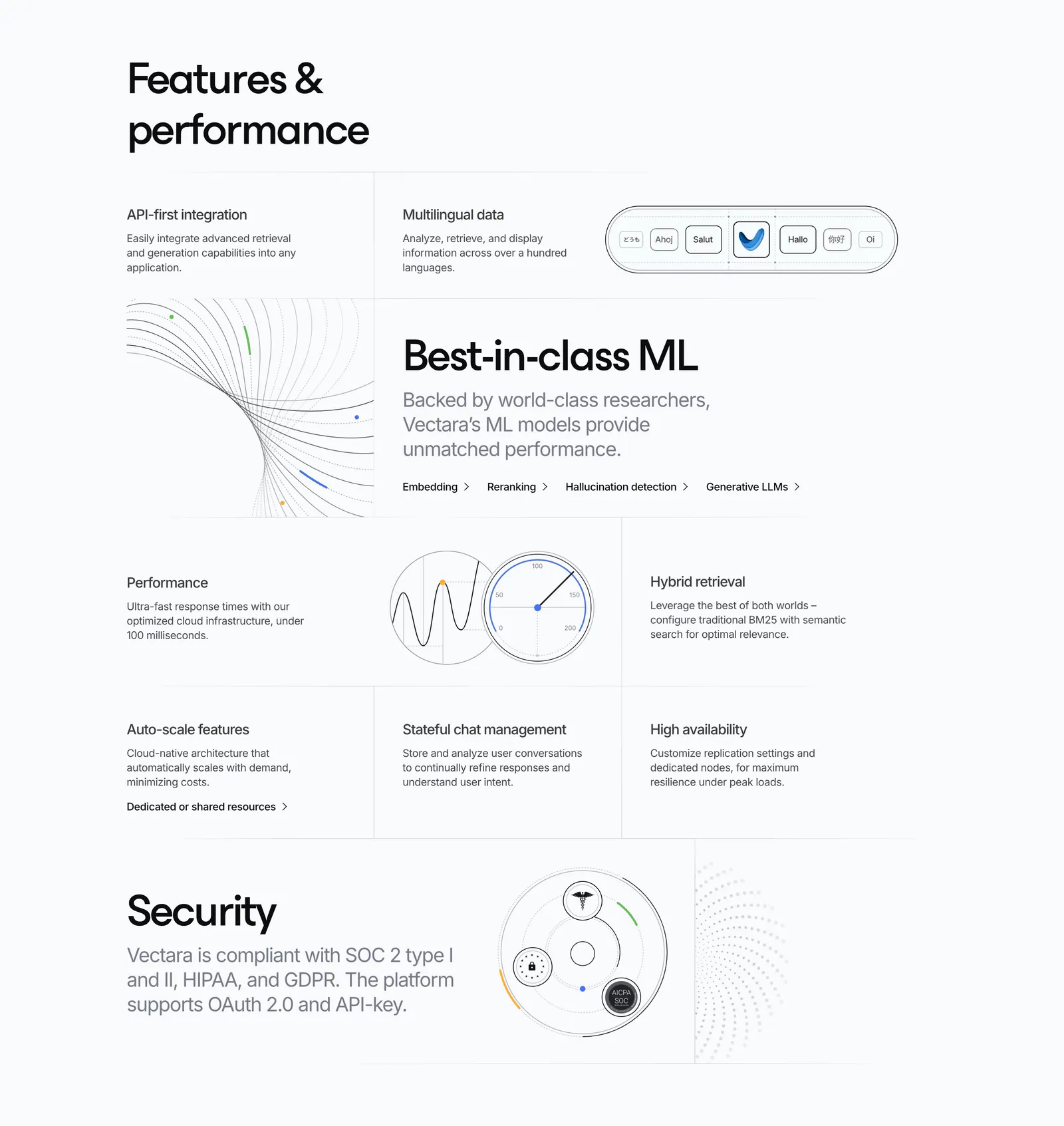
  56. Vectara features section: grid of feature cells in mixed sizes with line-art diagrams, a gauge and a security badge graphic on light gray
  57. Mintlify features section: headline with button above a bento grid of light cards with abstract UI mockups and green line art
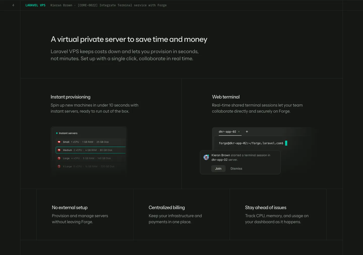
  58. Laravel Forge features section: dark grid with two UI tiles (server list, web terminal) above three smaller feature tiles
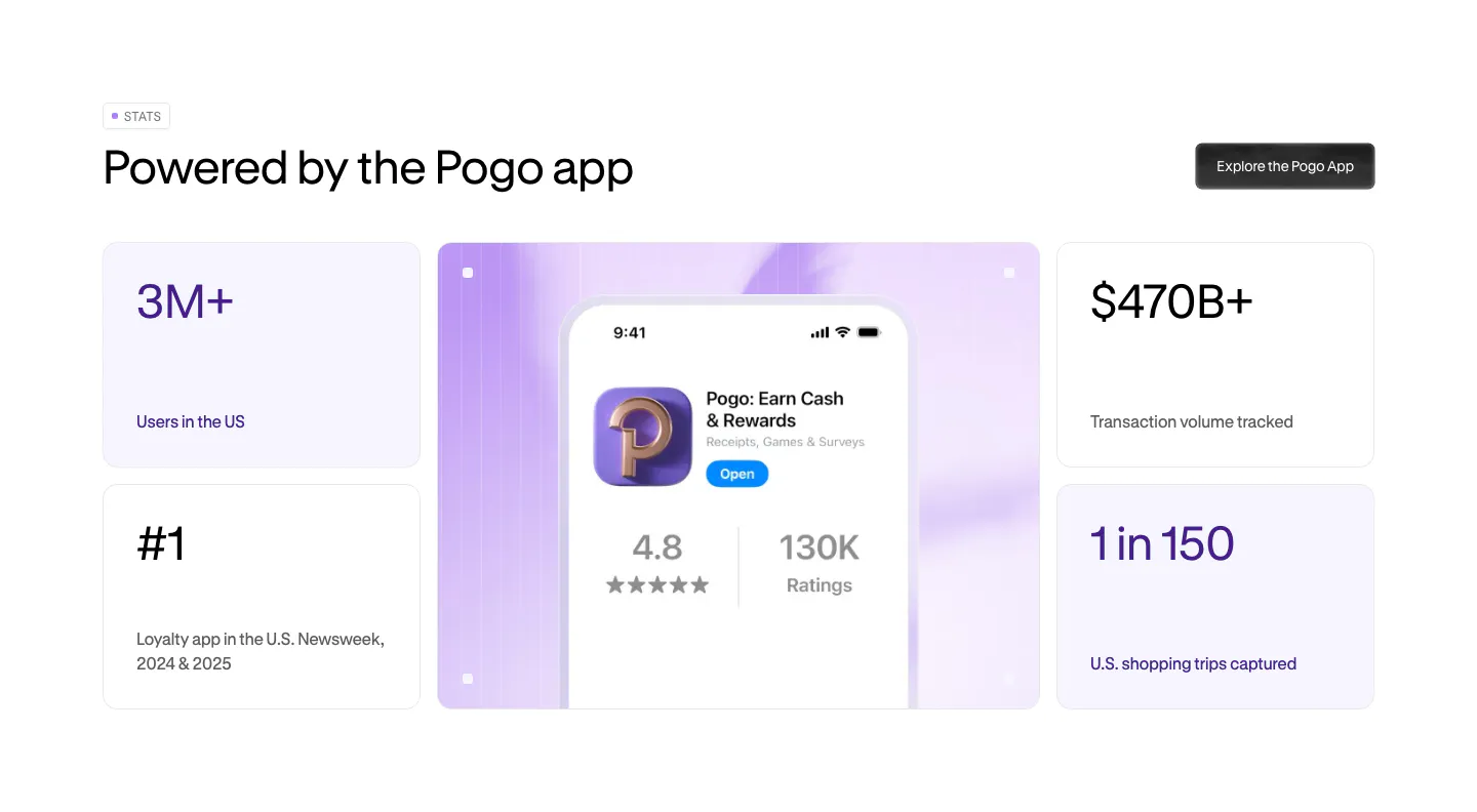
  59. Pogo stats section: bento grid of four metric cards around a lavender panel with a phone showing the Pogo app store listing
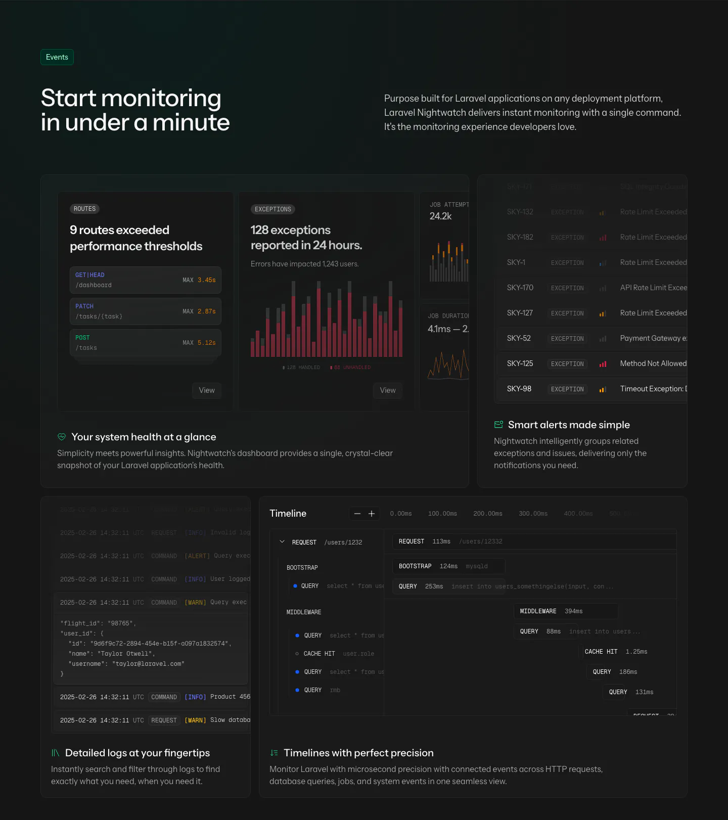
  60. Laravel Nightwatch features section: headline and intro above a dark bento grid of route, exception, alert, log and timeline UI cards
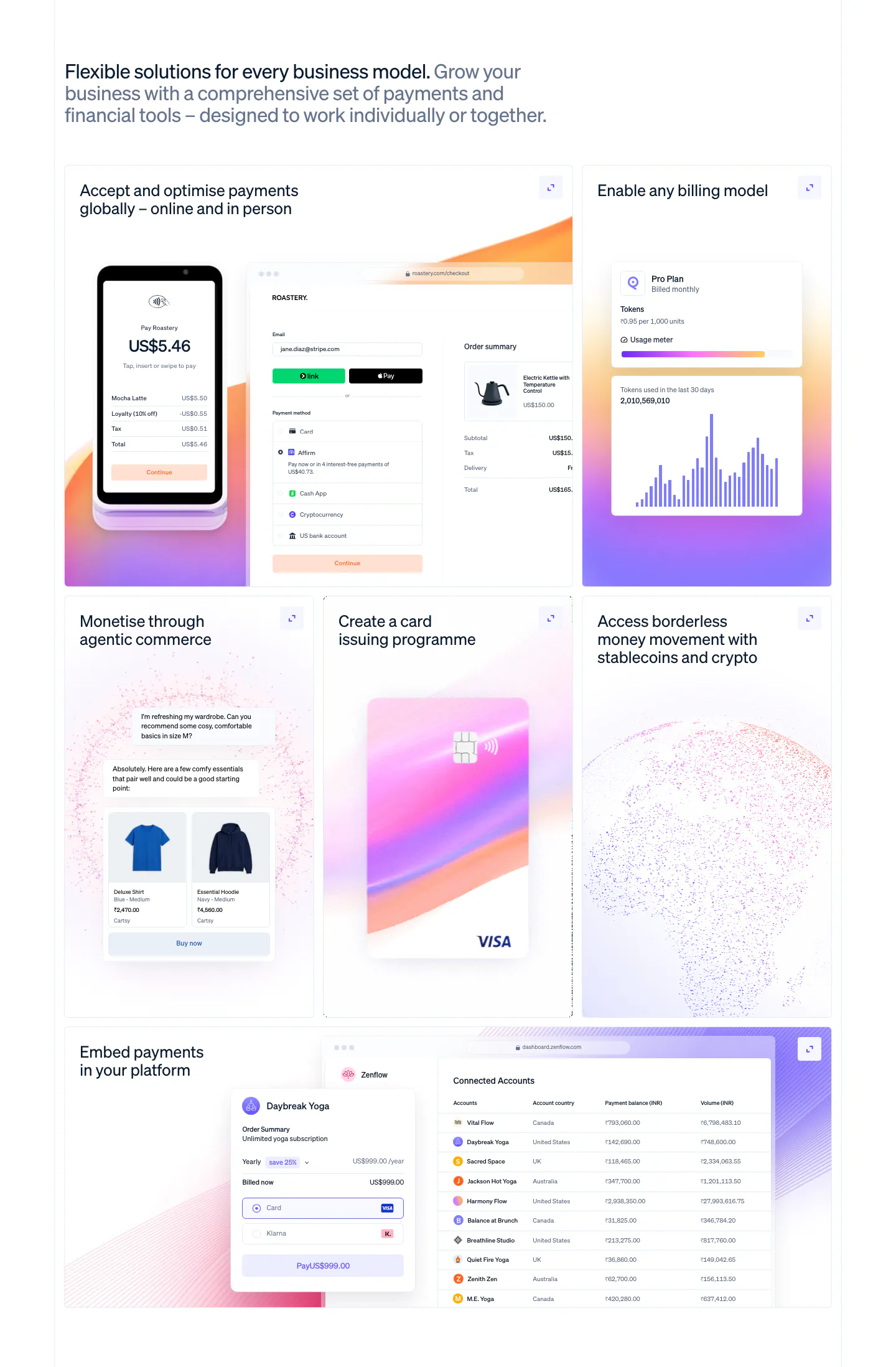
  61. Stripe features section: left-aligned headline above a six-tile bento grid with POS terminal, checkout, billing chart, card and accounts table UI
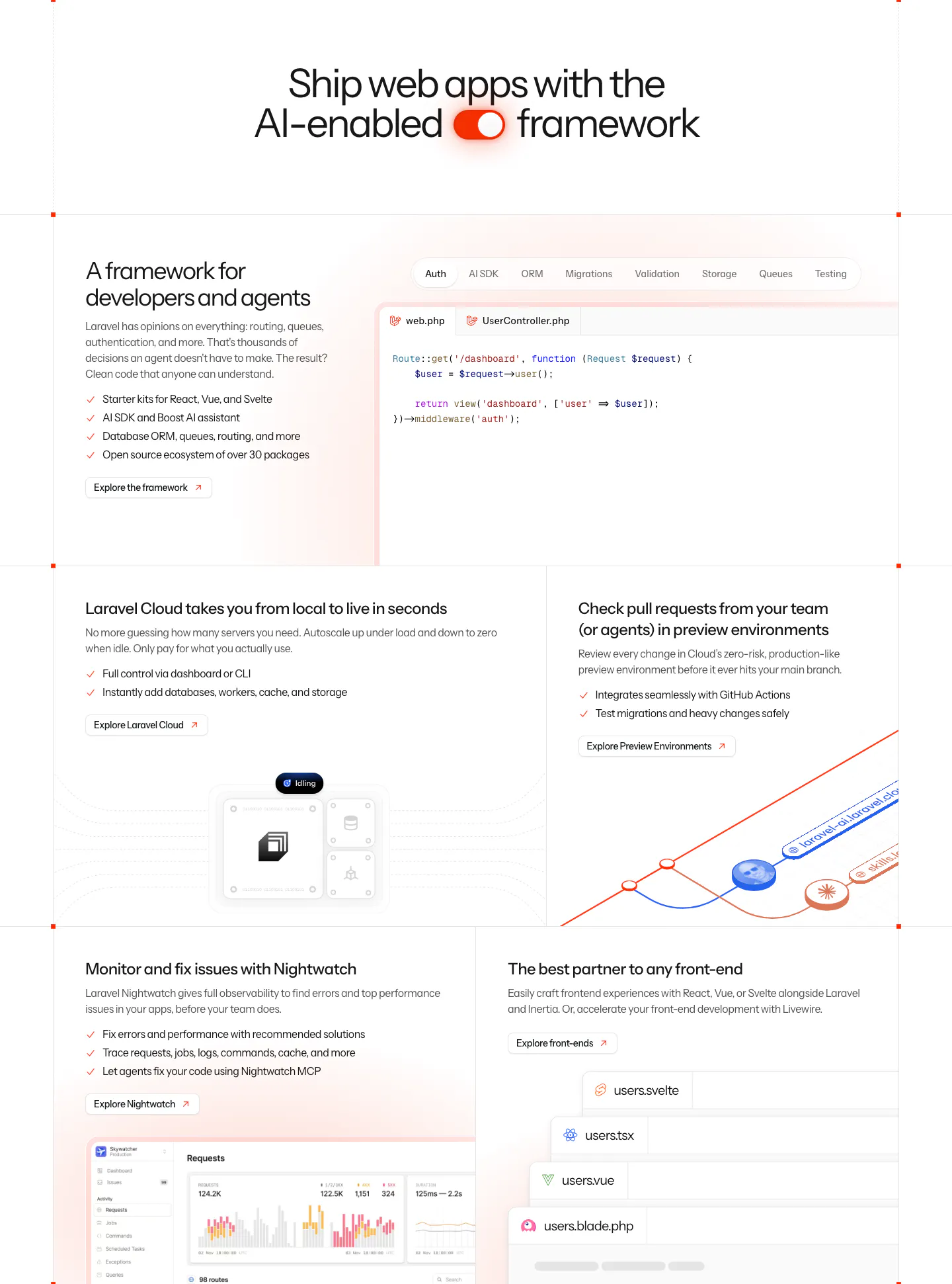
  62. Laravel features section: centered headline with a toggle icon above a bento grid of code tabs, cloud, preview environment and monitoring panels
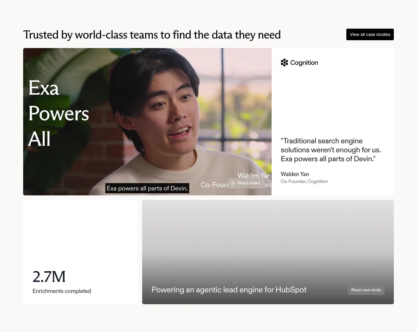
  63. Exa testimonials section: bento with a cofounder video still, Cognition quote card, 2.7M stat tile and a HubSpot case study card
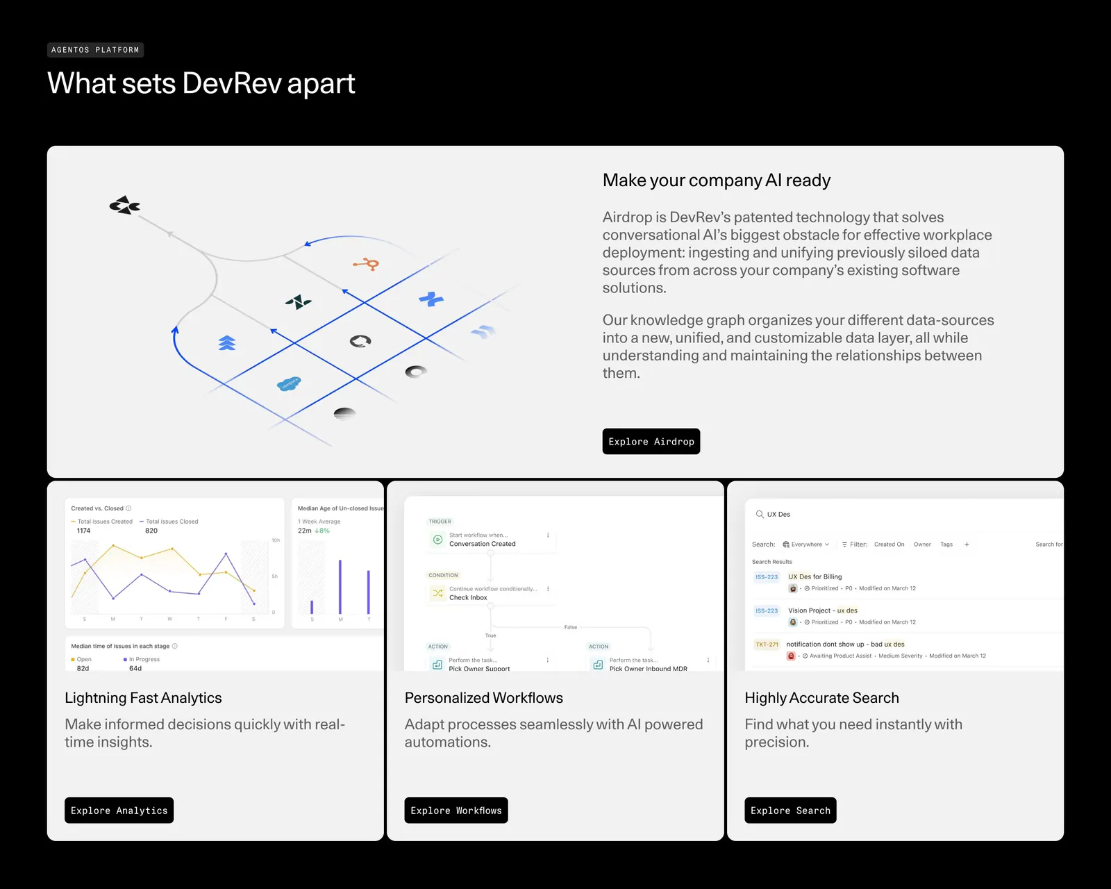
  64. DevRev features section: headline over a bento of one wide Airdrop diagram card and three product UI cards for analytics, workflows and search
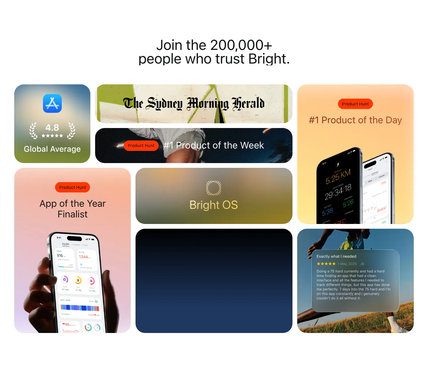
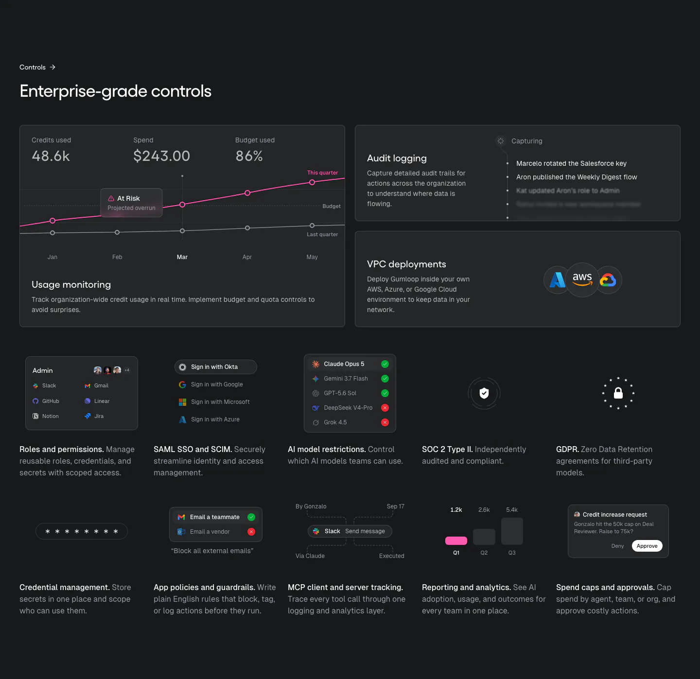
  65. Bright testimonials section: centered headline above a bento grid of App Store rating, Product Hunt awards, press logo and a review card
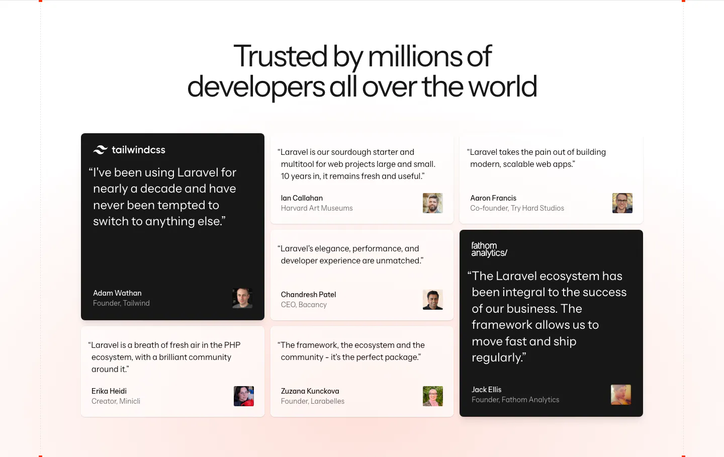
  66. Laravel testimonials section: centered headline above a masonry grid of developer quote cards, two highlighted in black, on a soft pink fade
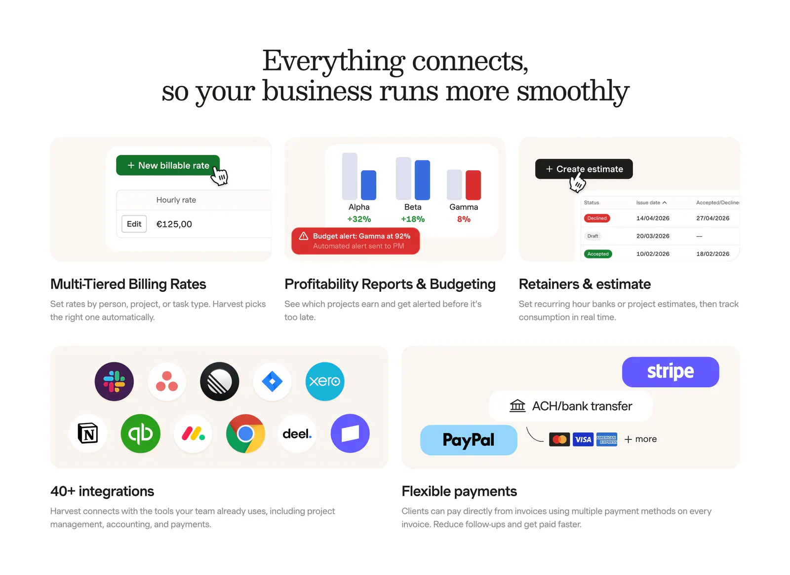
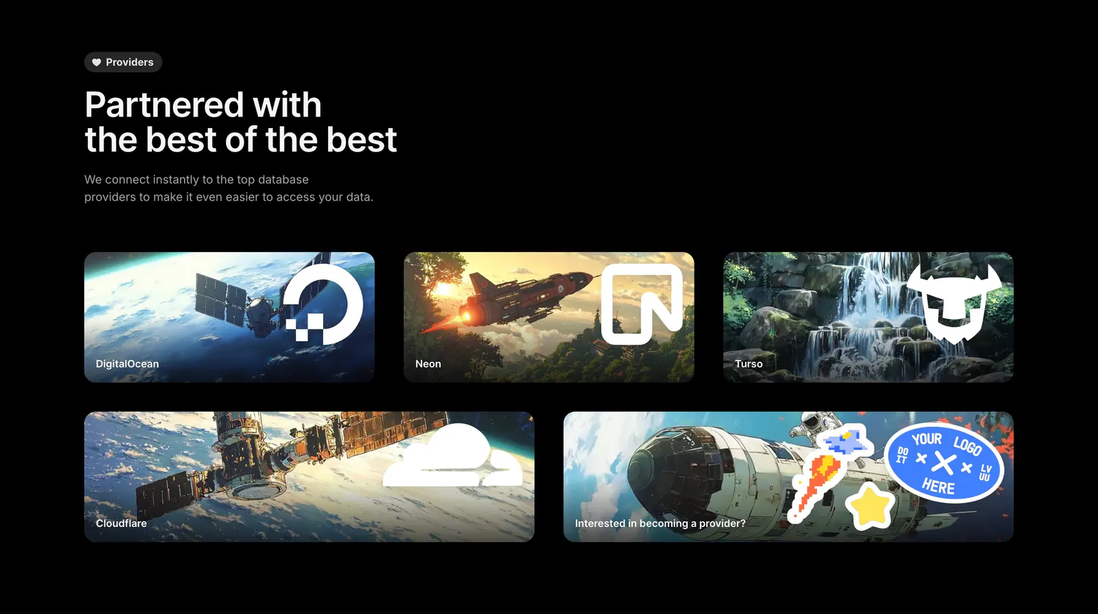
  67. Harvest integrations section: serif headline above a bento grid of billing, reporting and estimate UI tiles plus app-icon and payment tiles
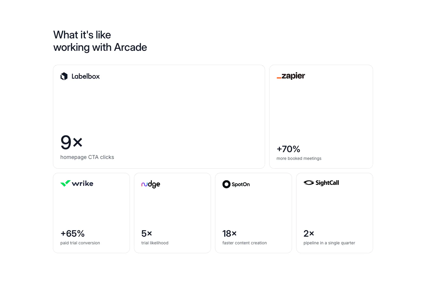
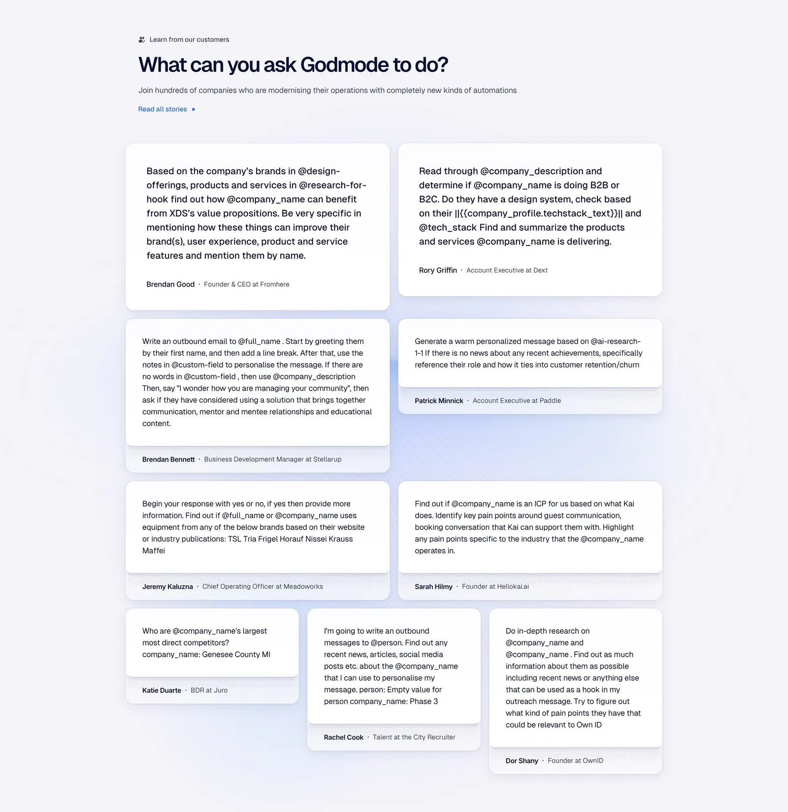
  68. Arcade stats section: bento grid of six bordered cards, each with a customer logo and a large result metric like 9x or +70%
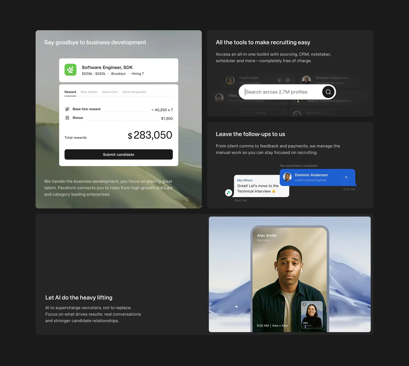
  69. Gumloop security section: dark bento of usage chart, audit log and VPC cards above a grid of small control tiles
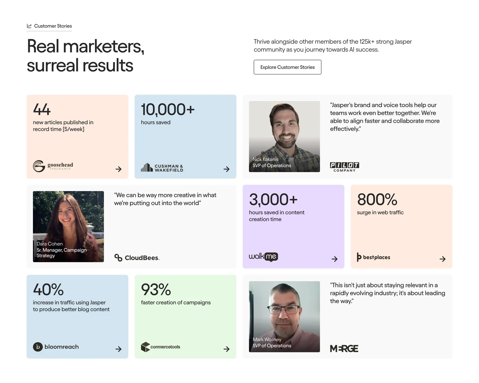
  70. Jasper testimonials section: centered serif headline above a bento grid of pastel stat tiles and customer quote cards with portraits
  71. Outerbase integrations section: headline above five artwork cards with provider logos for DigitalOcean, Neon, Turso and Cloudflare
  72. Godmode testimonials section: left-aligned heading above a masonry grid of white cards with customer prompts and names
  73. Paraform features section: dark bento grid of four tiles with reward, search and chat UI cards and a recruiter video call photo
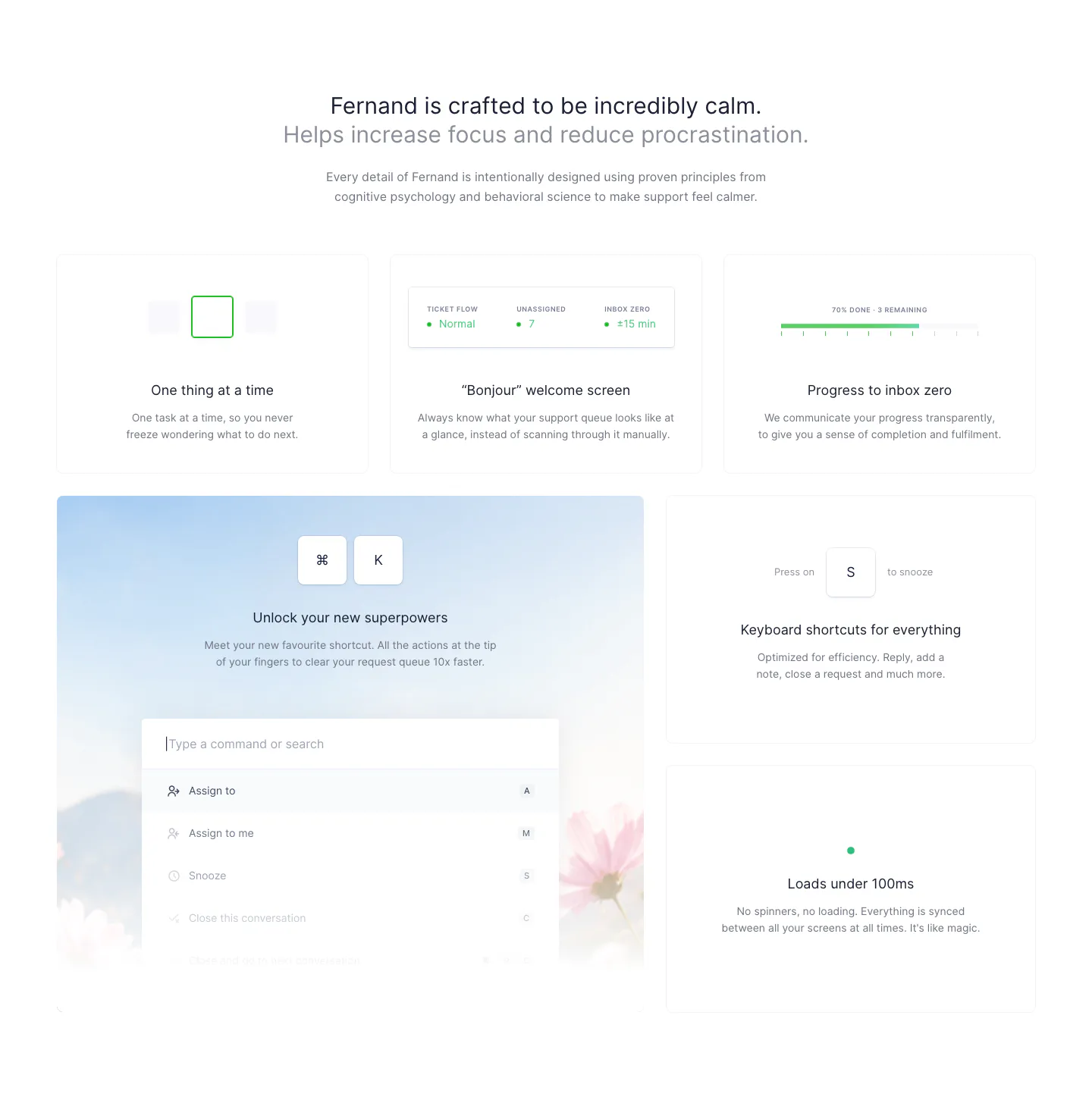
  74. Fernand features section: centered heading above a bento grid of cards with a command palette and keyboard shortcut UI
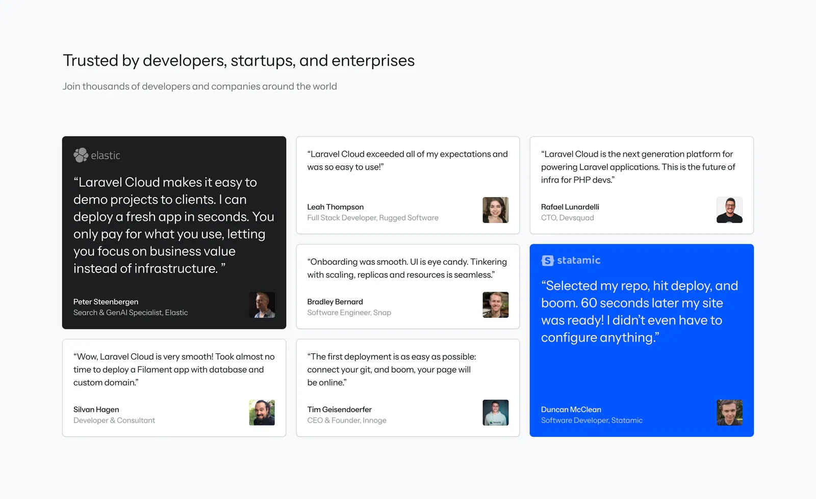
  75. Laravel Cloud testimonials section: heading above a masonry grid of quote cards with avatars, one dark and one bright blue highlight card
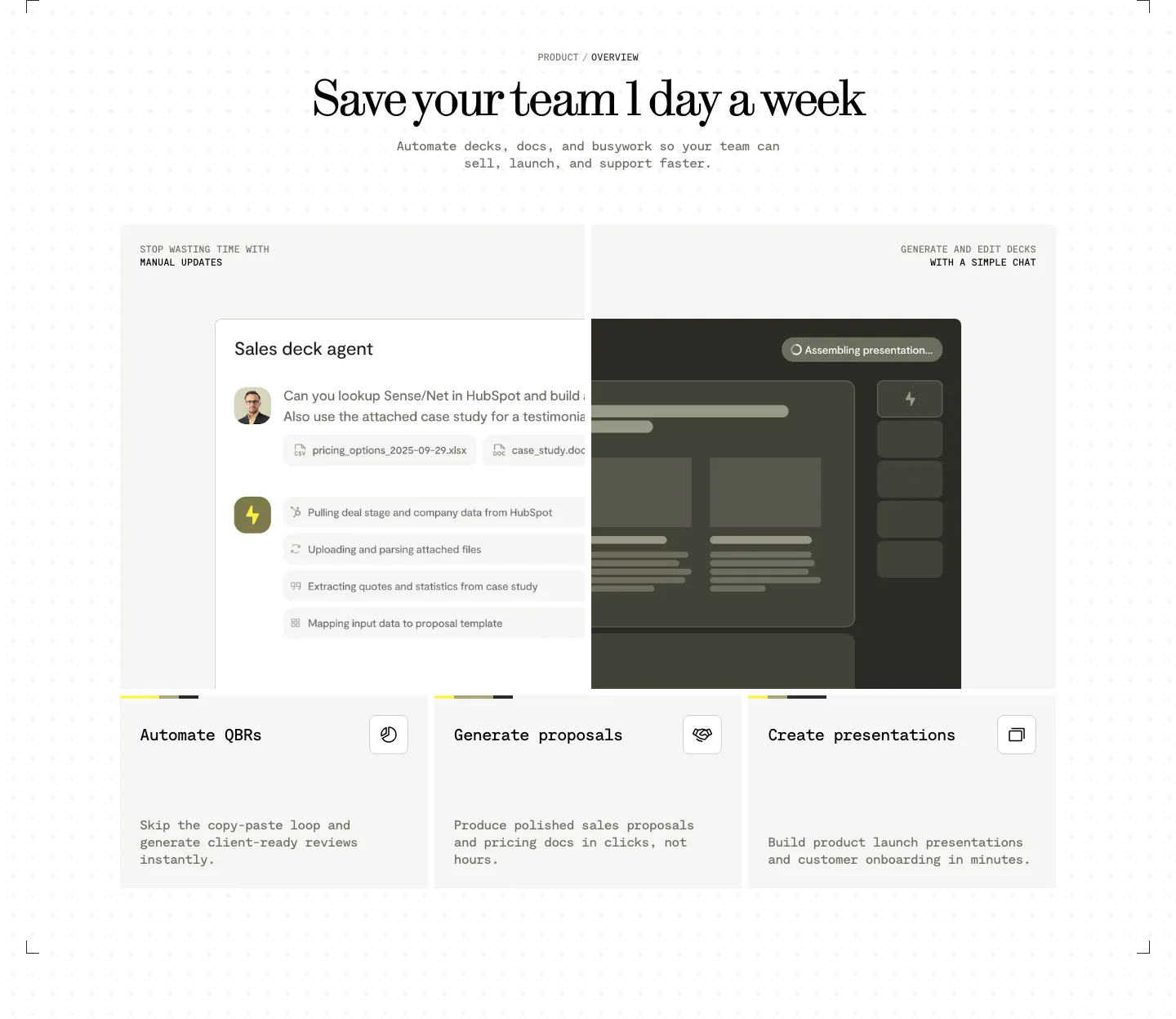
  76. Visual features section: centered serif headline above a sales deck agent chat UI and three cards for QBRs, proposals and presentations
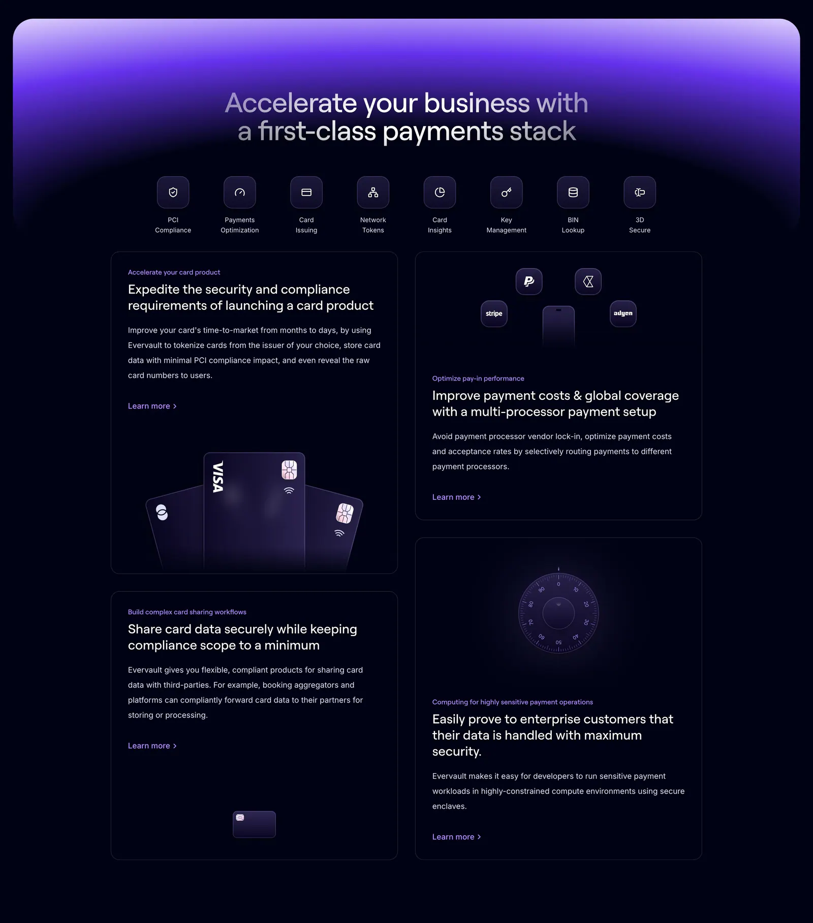
  77. Evervault features section: centered headline and icon row above four dark cards with payment card and vault visuals under a purple glow
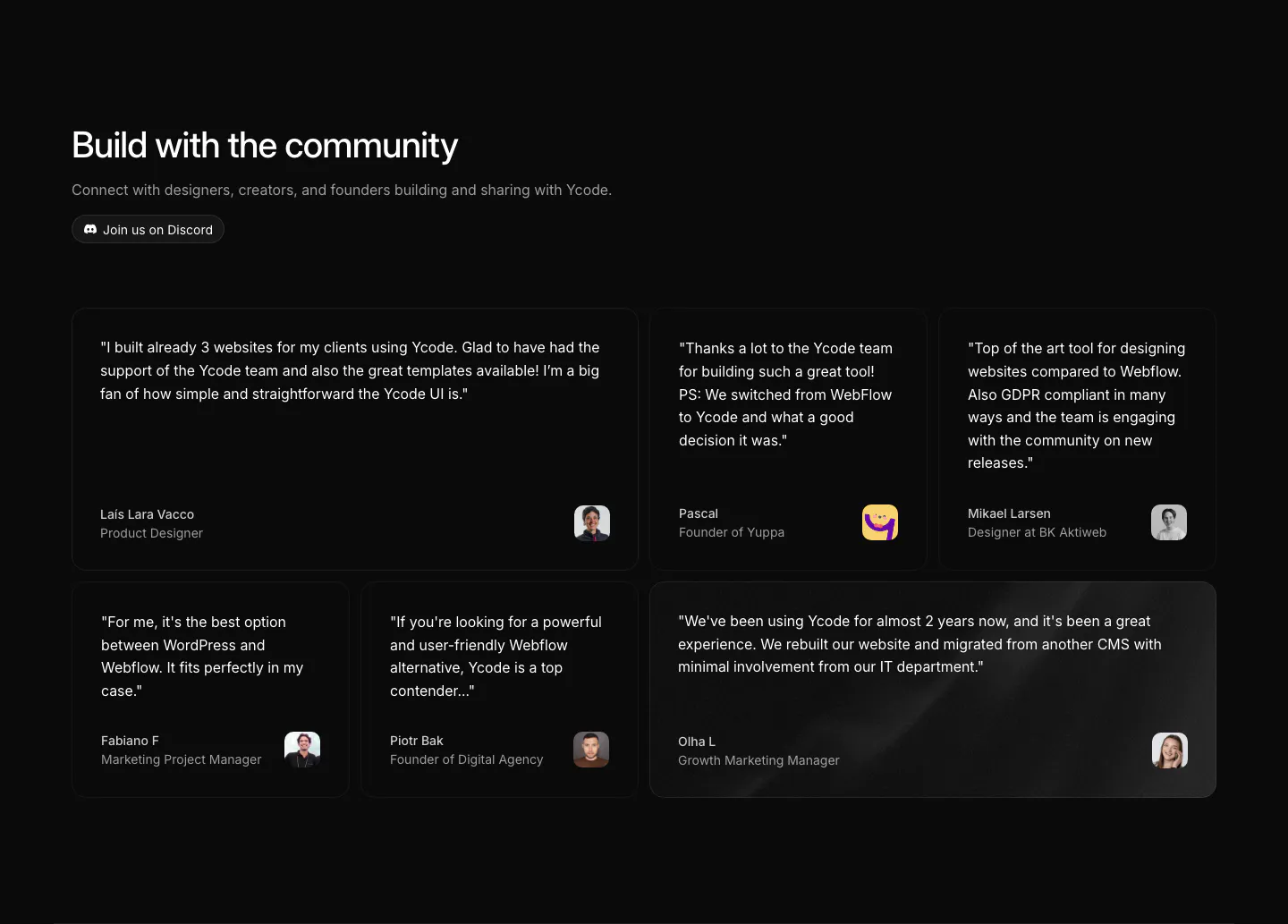
  78. Ycode testimonials section: headline with Discord button above a bento grid of six quote cards in mixed widths with avatars
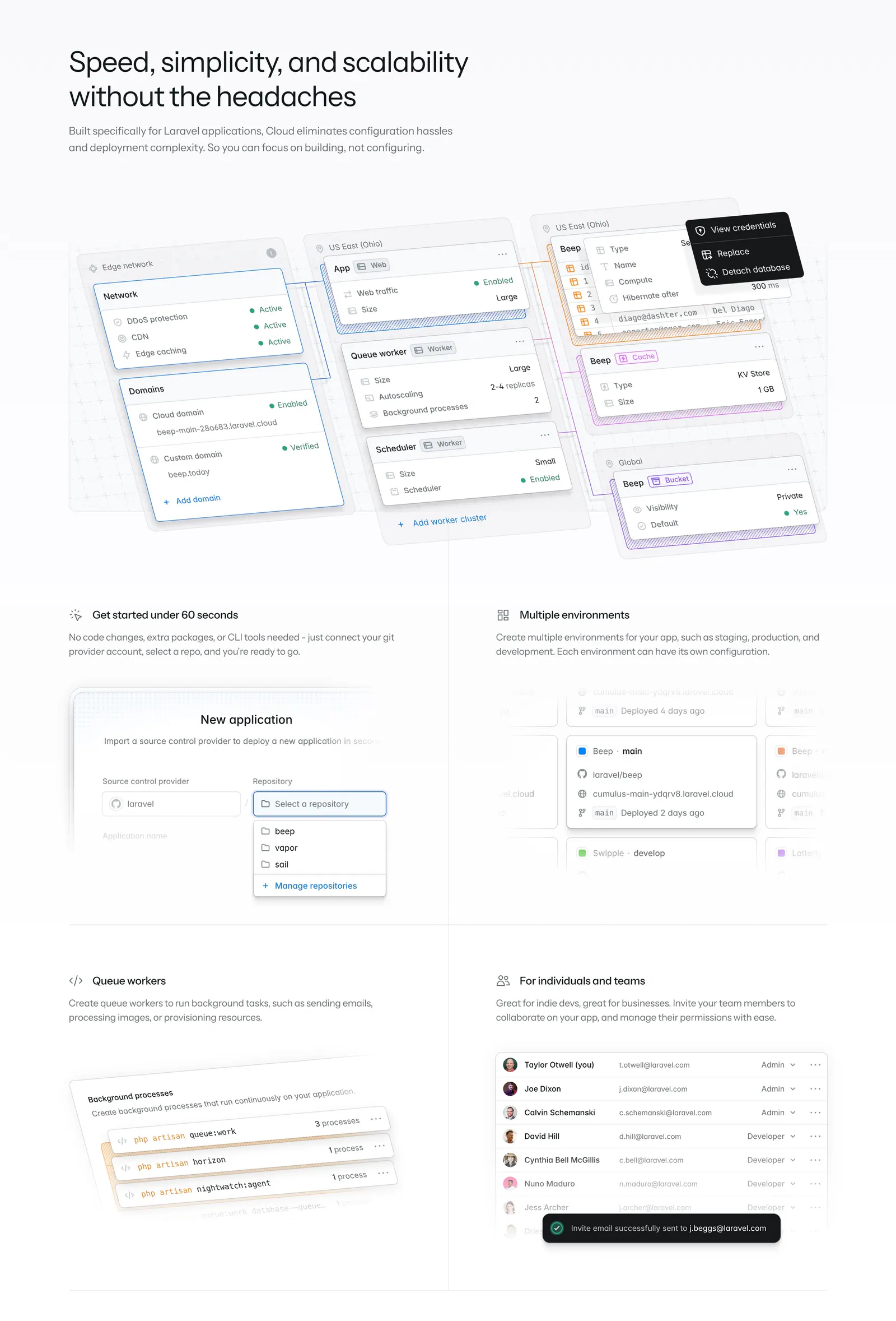
  79. Laravel Cloud features section: headline above a large infrastructure canvas mockup and four feature cells with UI snippets

Where bento grid shows up

Often paired with

Share of bento grid sections that also use each style

How to design a bento grid layout

  1. Size tiles by importance

    Put the most important point in the biggest tile, usually top left or spanning two columns. It sets the entry point and tells people where to start. Smaller tiles then support it with secondary details, integrations, or proof points.

  2. Hold each tile to one idea

    Each tile should carry a short headline, one line of copy, and one visual. If a tile needs a paragraph, it deserves its own section. Consistent inner padding and title placement make the grid feel ordered even when tile sizes vary.

  3. Set the mobile tile order

    A bento grid that works on desktop often collapses into a long, unbalanced list on phones. Set the stacking order deliberately, keep the largest tile first, and consider a two-column mini grid for small tiles. Check that visuals still read at narrow widths.

  4. Standardize gaps and corner radius

    Keep the same gutter between all tiles, typically 12 to 24px, and one corner radius across the grid. Mixed gaps make the layout look accidental. If tiles use different background colors, limit them to two or three fills so the grid stays calm.
Companies using bento grid

All styles
    ↑↓ Navigate ↵ Open

    Section preview

    Website section