Code Website Design Examples

For developer products, a few lines of real code often say more than a headline. A code block, terminal window, or API snippet placed in the section shows visitors how integration actually works, which is why code is a fixture of website design for APIs, SDKs, and infrastructure tools. The snippet has to be short, legible, and on brand, or the section ends up harder to trust than plain copy.
57 sections

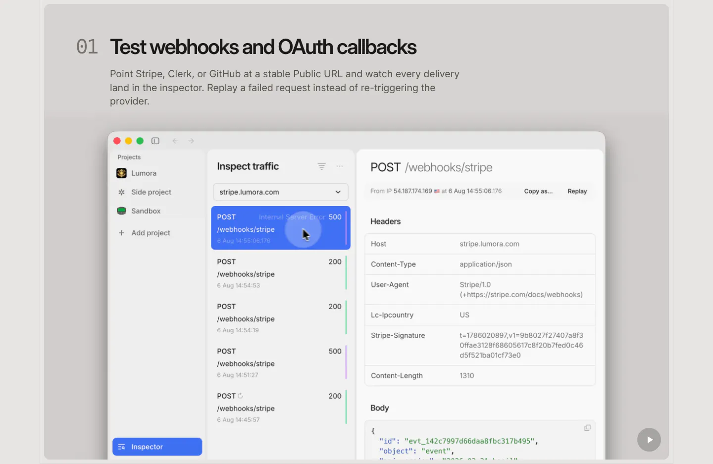
  1. LocalCan features section: numbered headline and description above a large macOS-style traffic inspector screenshot of webhook requests
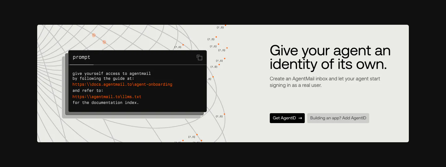
  2. AgentID call to action section: light panel on black with a dark prompt code card left and headline, copy and two buttons right
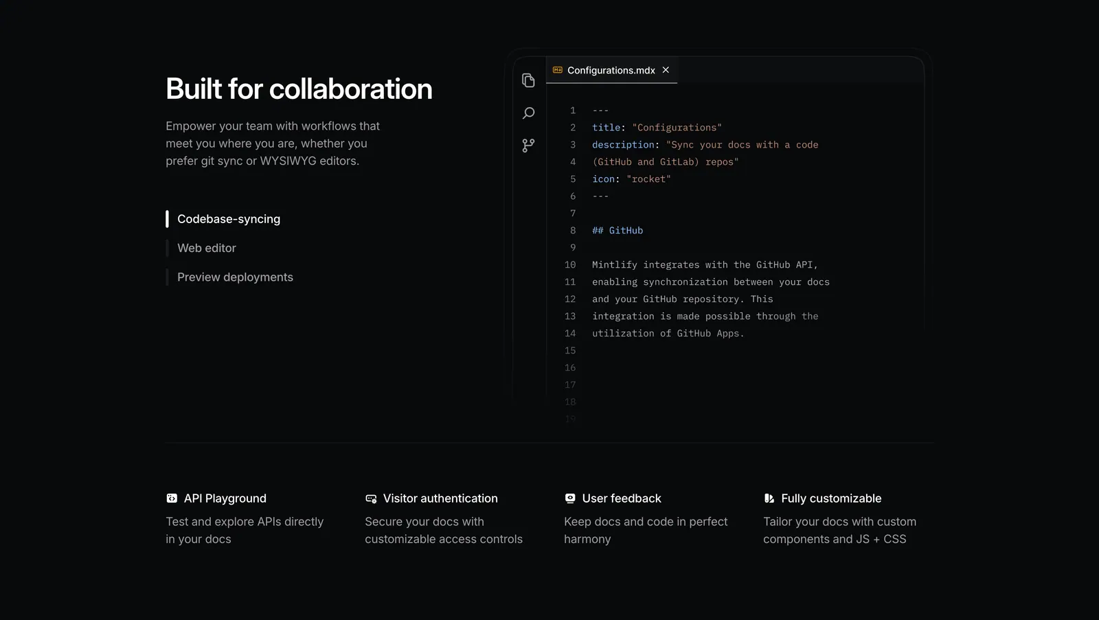
  3. Mintlify features section: dark split layout with tab list beside an MDX code editor, above a four-column feature row
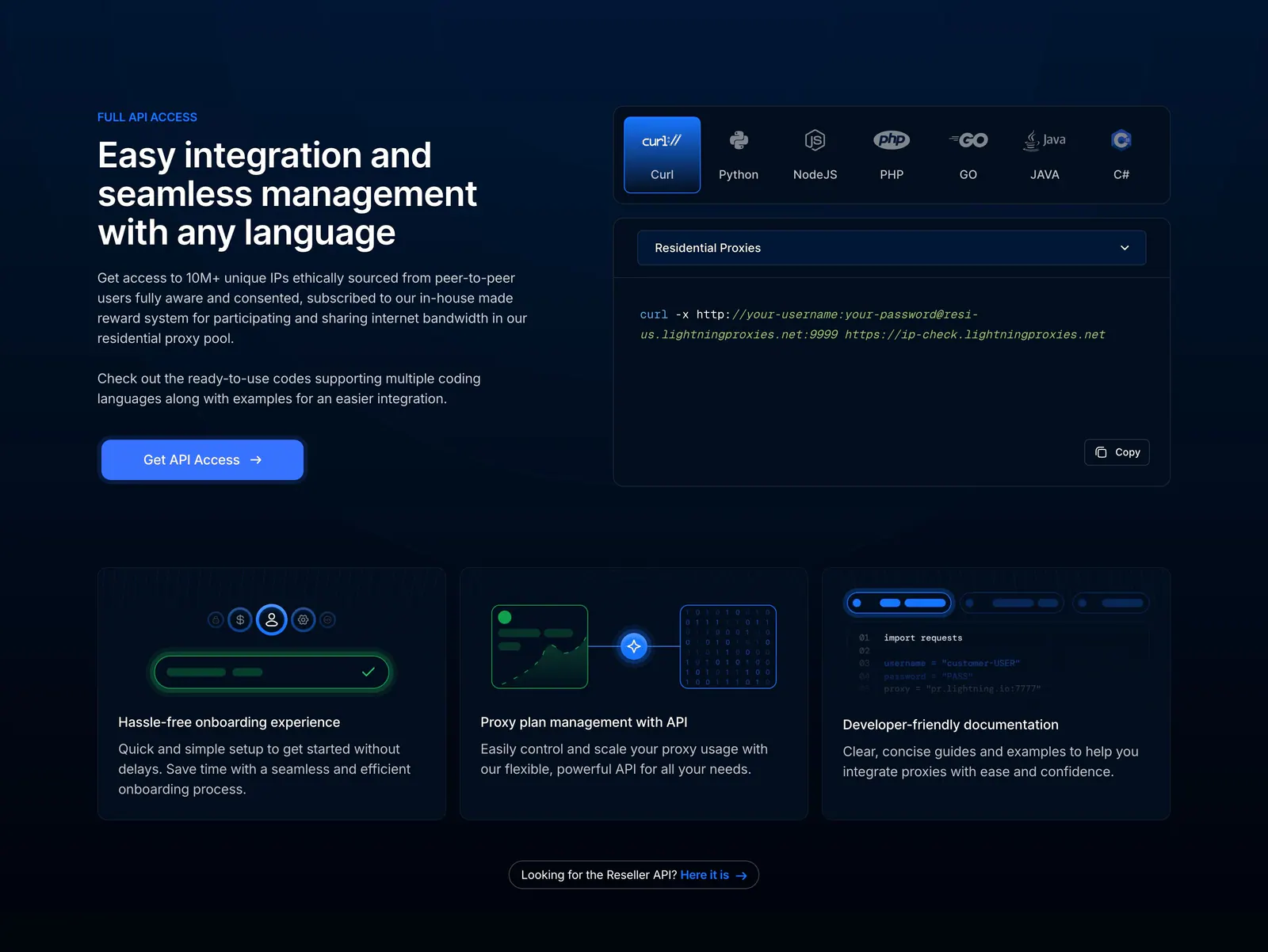
  4. Lightning Proxies features section: dark split layout with API copy beside a language-tabbed curl snippet, above three feature cards
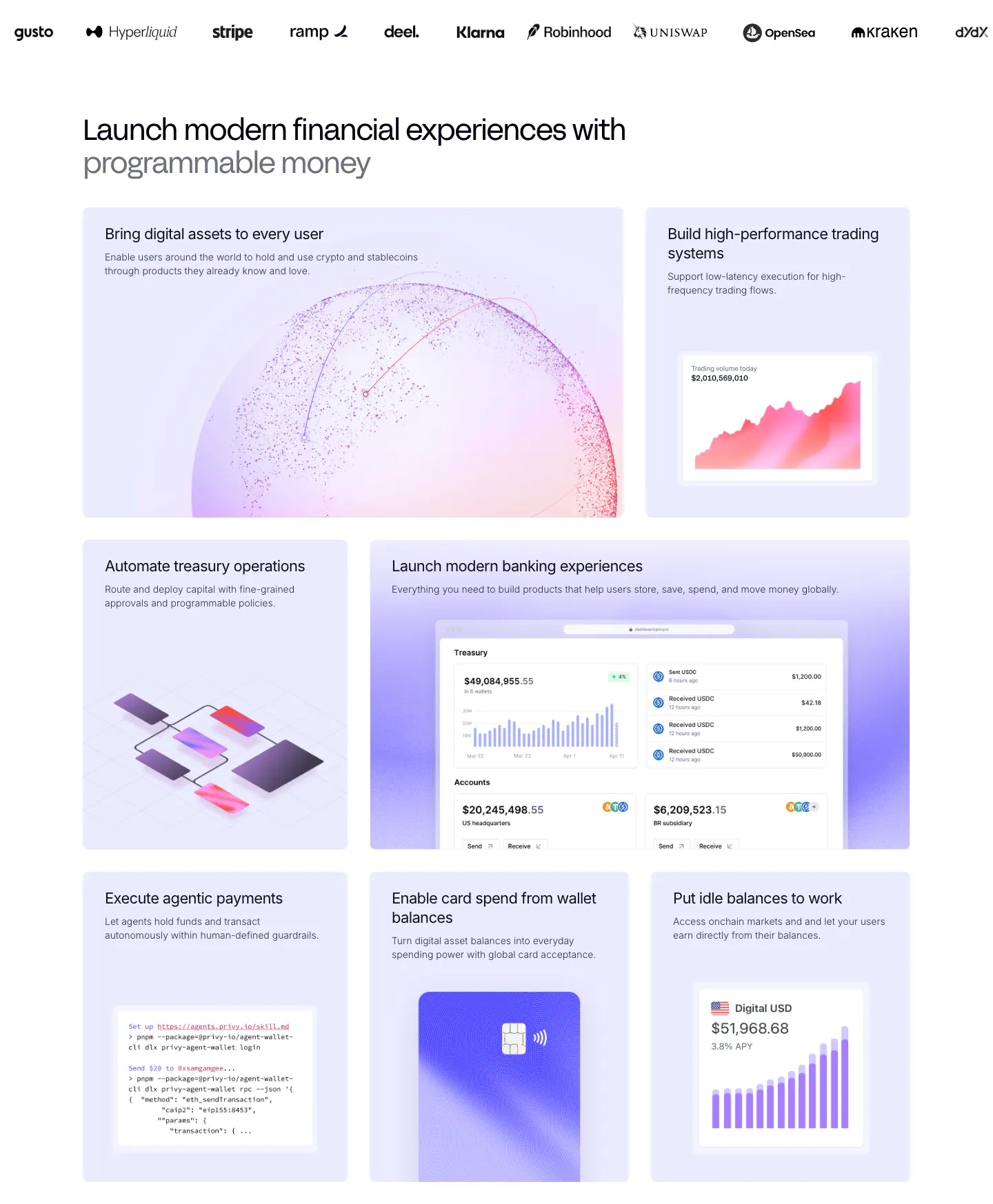
  5. Privy features section: customer logo strip above a bento grid of lavender tiles with dashboards, charts, a code snippet and a card visual
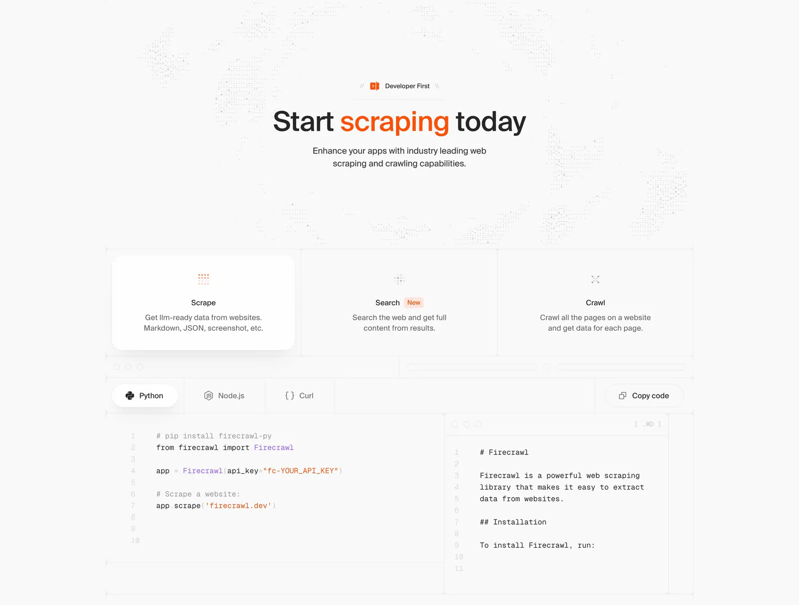
  6. Firecrawl features section: centered headline, three capability cards and a tabbed Python/Node.js/Curl code sample with markdown output
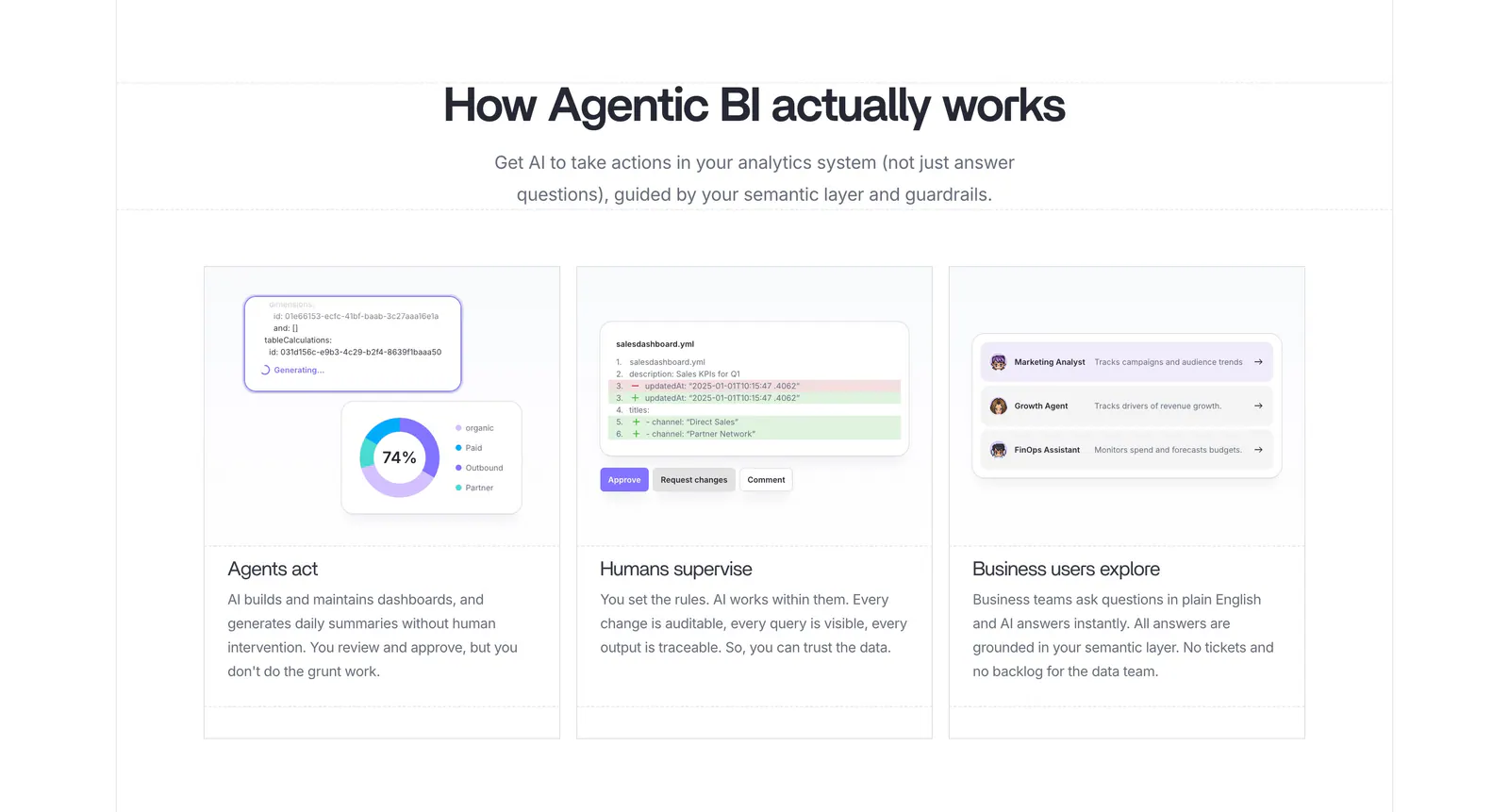
  7. Lightdash how it works section: centered heading above three equal cards with UI snippets for AI agents, a YAML diff review and business users
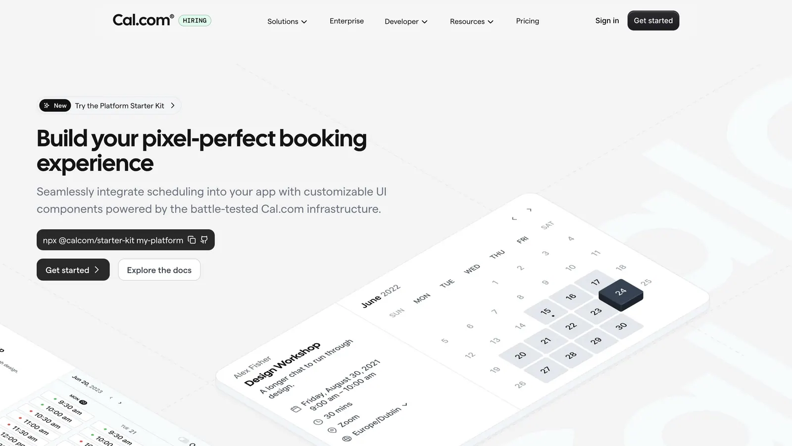
  8. Cal.com hero section: headline, npx command and buttons left beside tilted isometric calendar booking UI cards on light gray
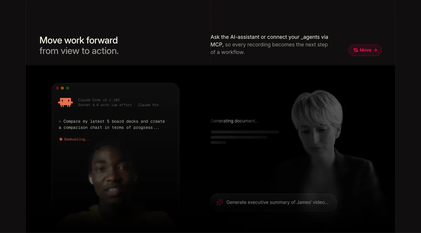
  9. Supercut features section: headline row above a Claude Code terminal prompt and a generating-document panel over faded presenters
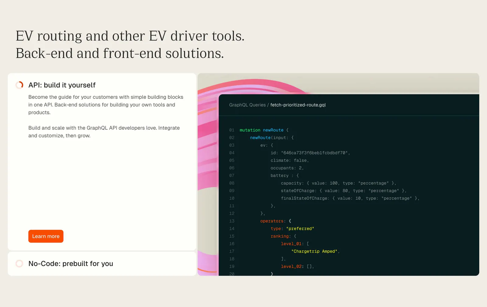
  10. Chargetrip features section: serif headline above an expandable option list beside a GraphQL code snippet on a beige background
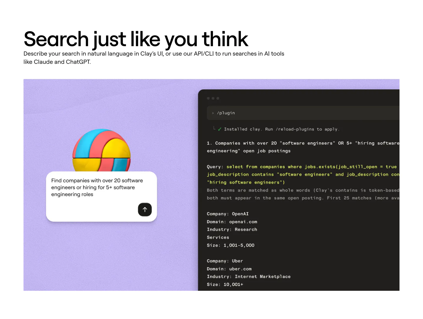
  11. Clay features section: left-aligned heading above a lavender panel with a 3D ball, a search prompt card and a dark terminal showing a query
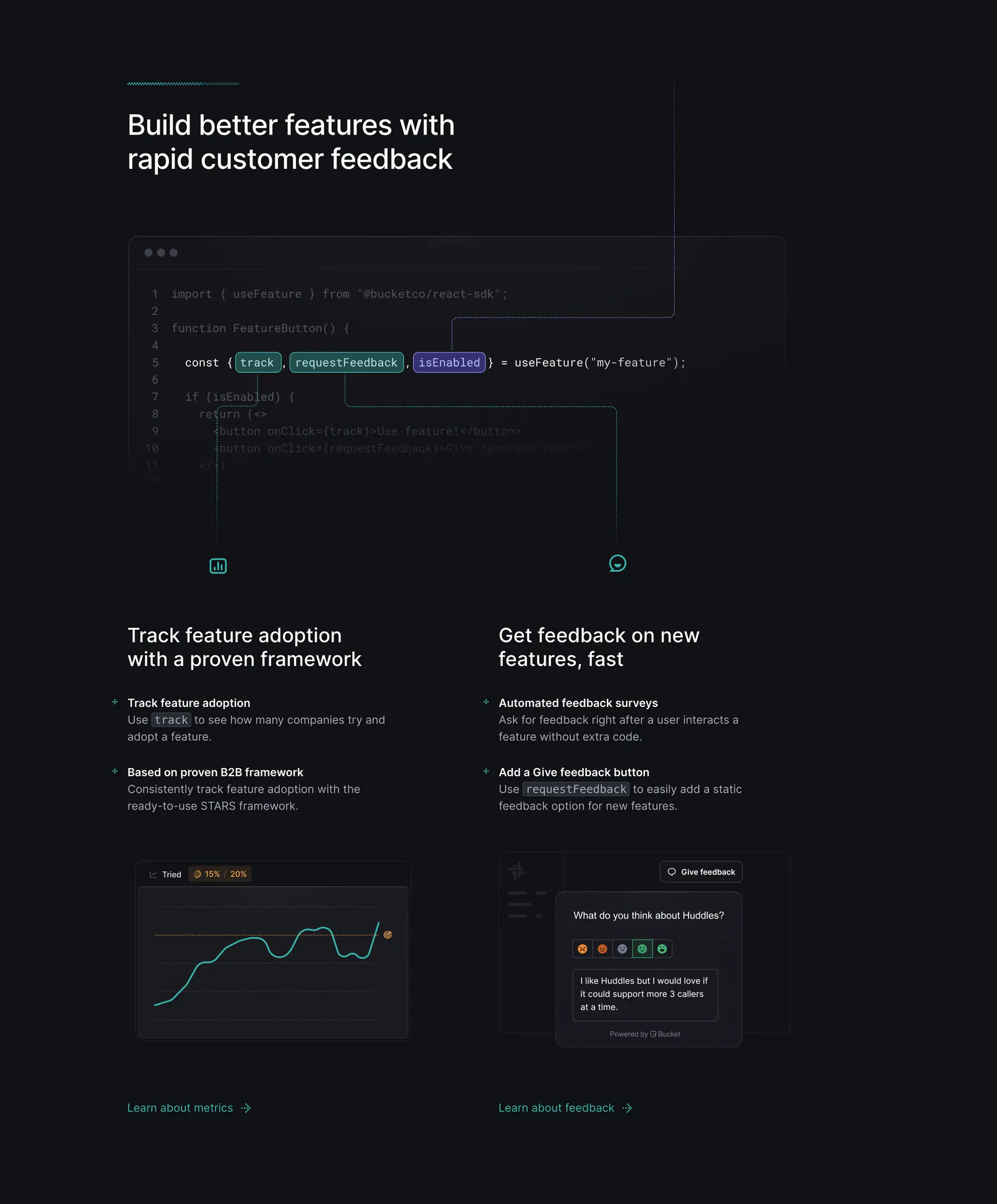
  12. Bucket features section: code snippet with highlighted hooks linked by lines to two feature columns with chart and feedback UI on dark
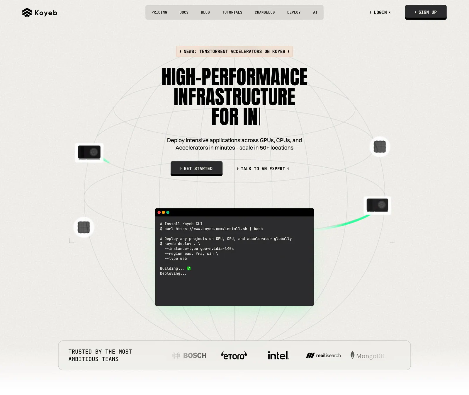
  13. Koyeb hero section: centered condensed headline and buttons over a wireframe globe with a terminal window and a logo strip
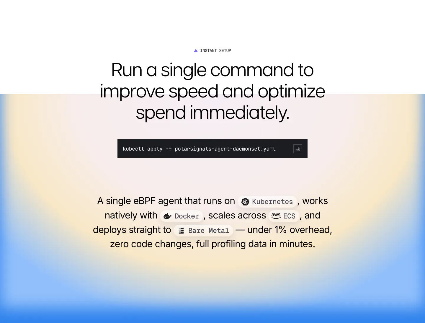
  14. Polar Signals features section: centered headline with a kubectl command block and inline platform chips over a blue and yellow radial gradient
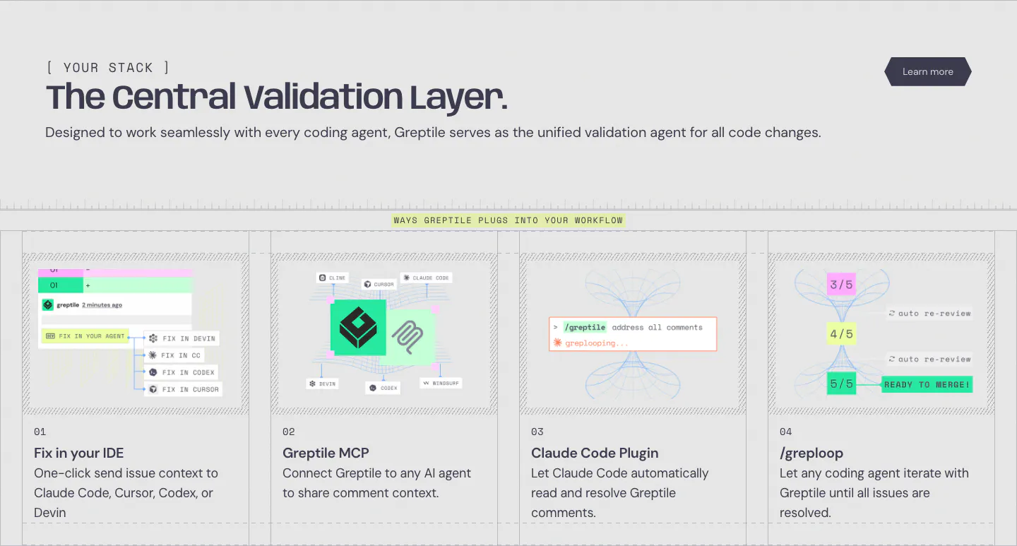
  15. Greptile integrations section: left-aligned headline above four numbered cards showing IDE, MCP, Claude Code plugin and loop workflows
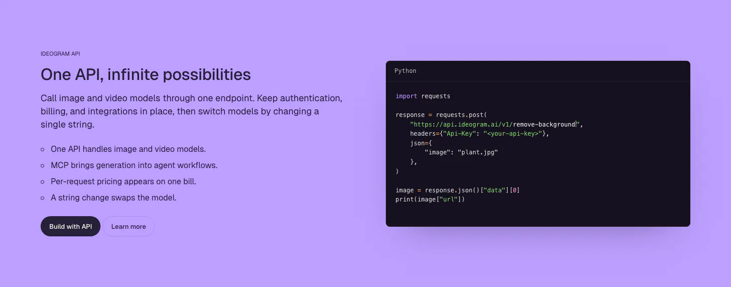
  16. Ideogram features section: purple background, headline, copy and bullet list on the left, dark Python code snippet window on the right
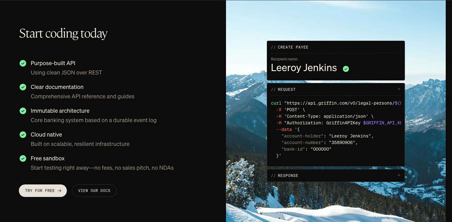
  17. Griffin features section: checklist of API benefits and two buttons beside a curl code card over a mountain photo
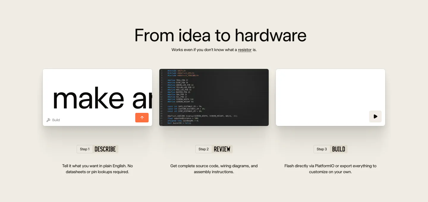
  18. Schematik how it works section: centered headline above three step cards for describe, review and build on beige
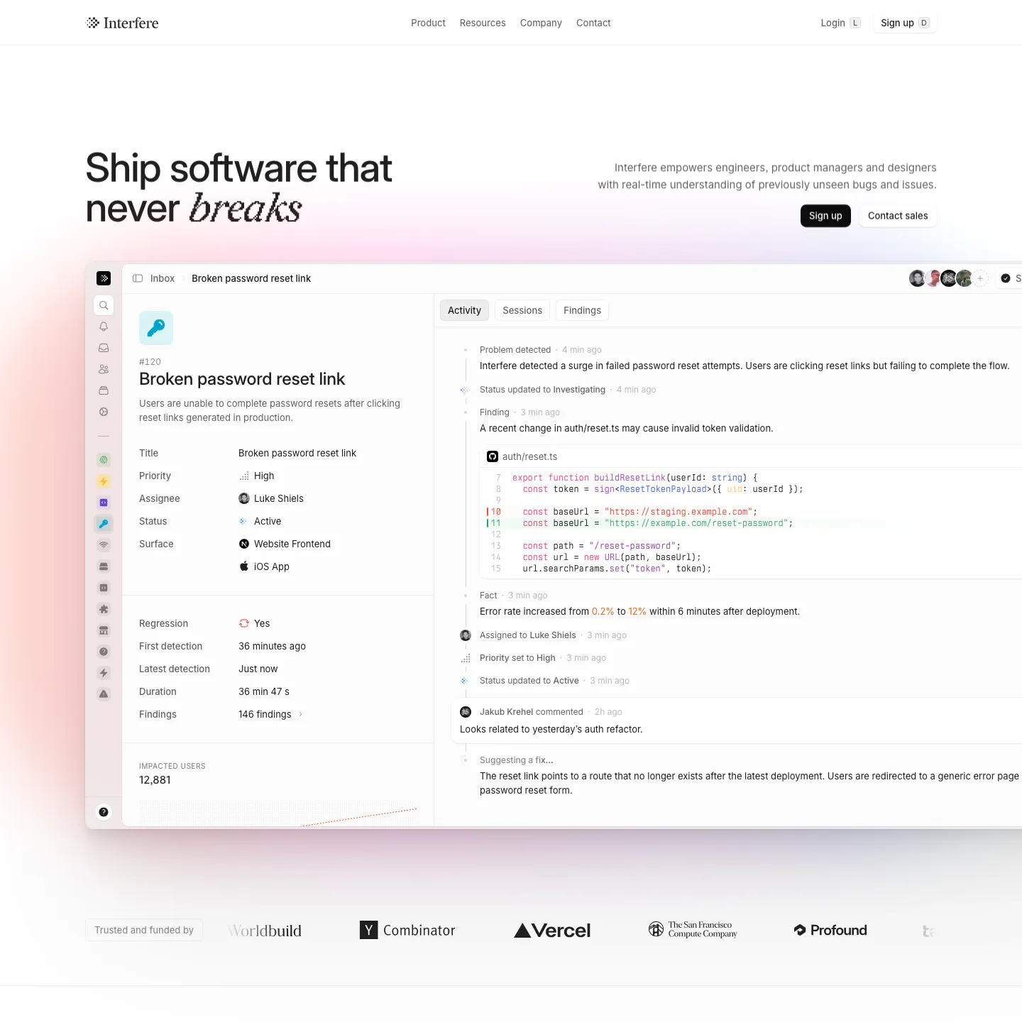
  19. Interfere hero section: headline left and copy with buttons right above a large issue-tracker product screenshot and a logo row
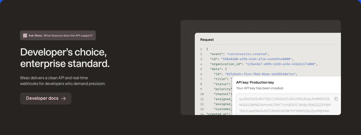
  20. Weav features section: dark brown band with headline and docs button on the left and a JSON request code block with an API key popup
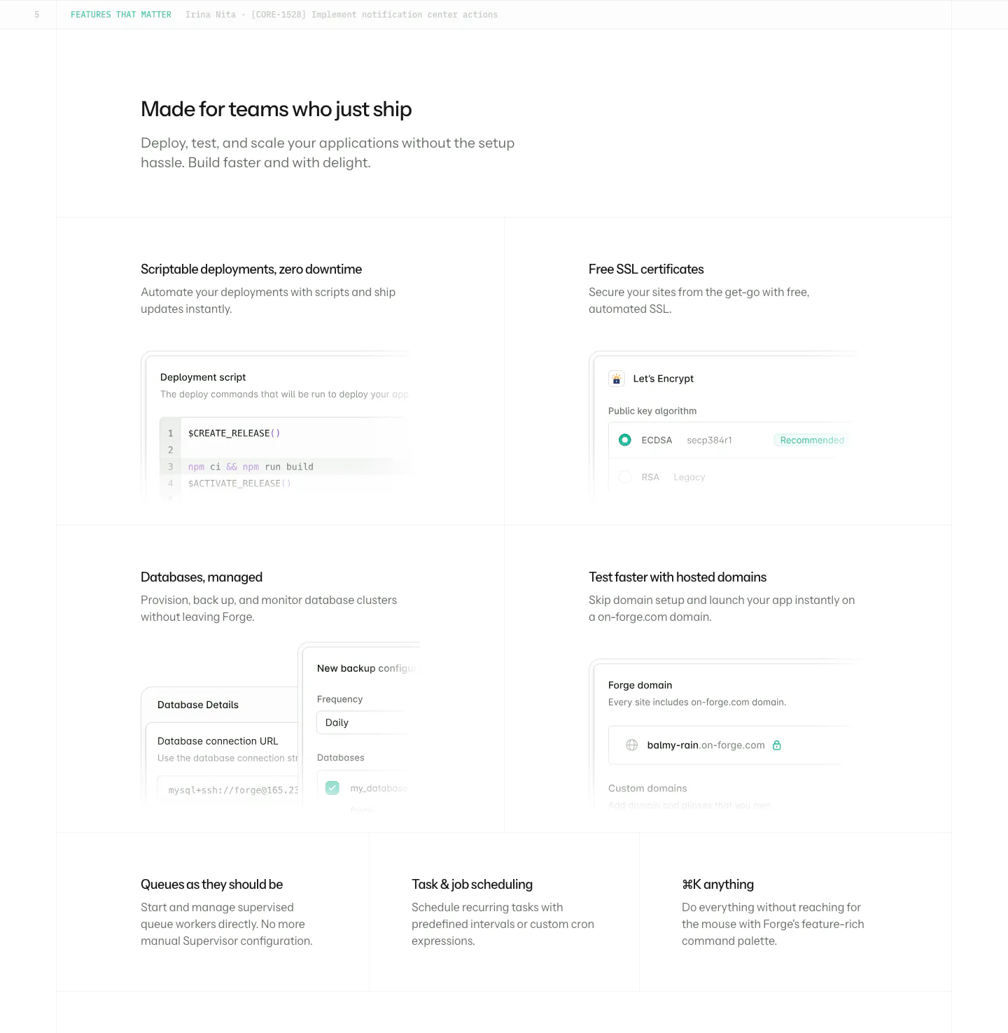
  21. Laravel Forge features section: four large tiles with UI mockups incl. a deploy script, plus three text-only tiles on white
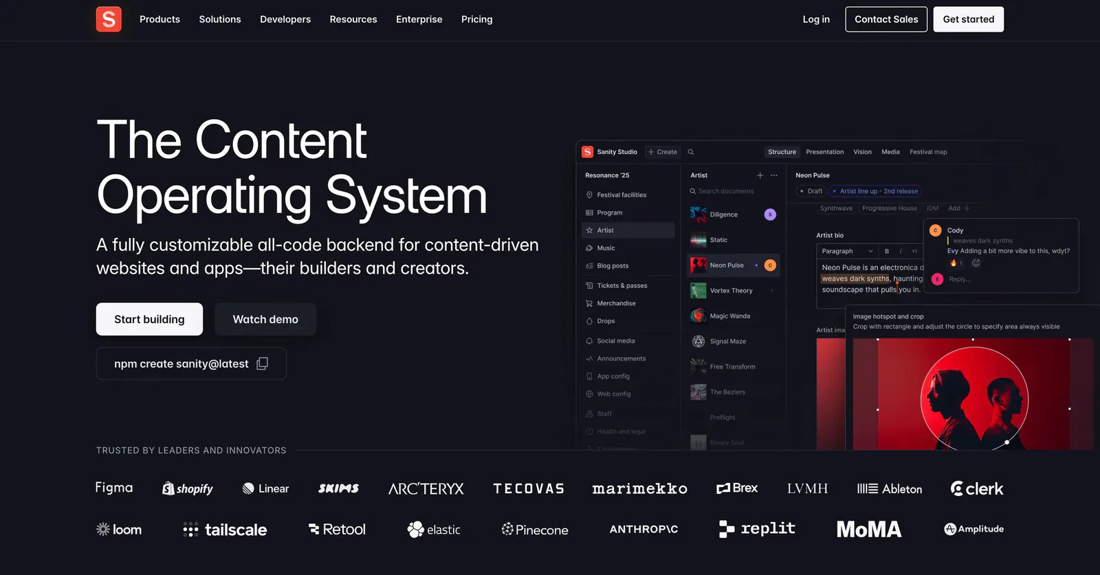
  22. Sanity hero section: headline, buttons and npm command left, Sanity Studio screenshot right, two rows of customer logos below on dark
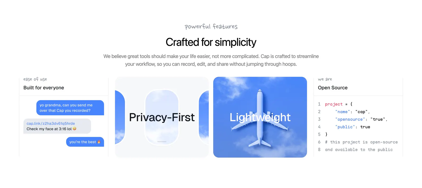
  23. Cap features section: centered headline above four cards with a chat mockup, airplane window art, sky photo and code snippet
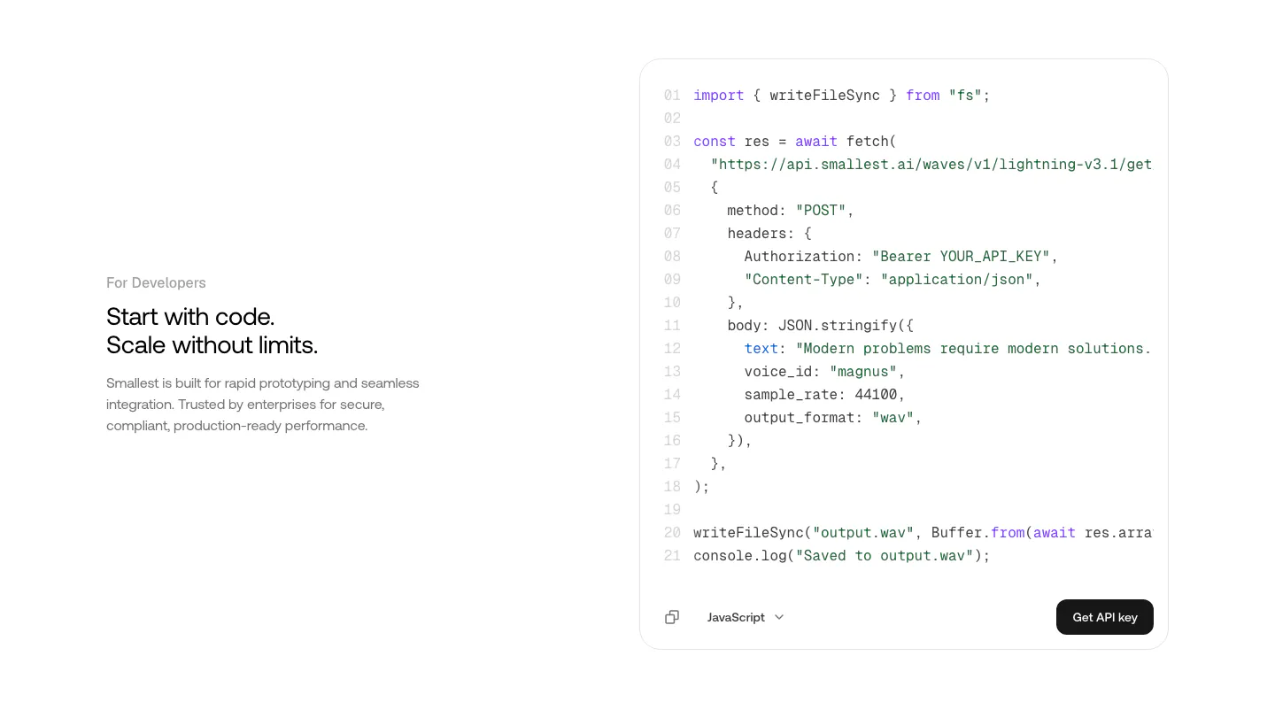
  24. Smallest.ai features section: developer copy on the left beside a JavaScript API code block with a Get API key button on white
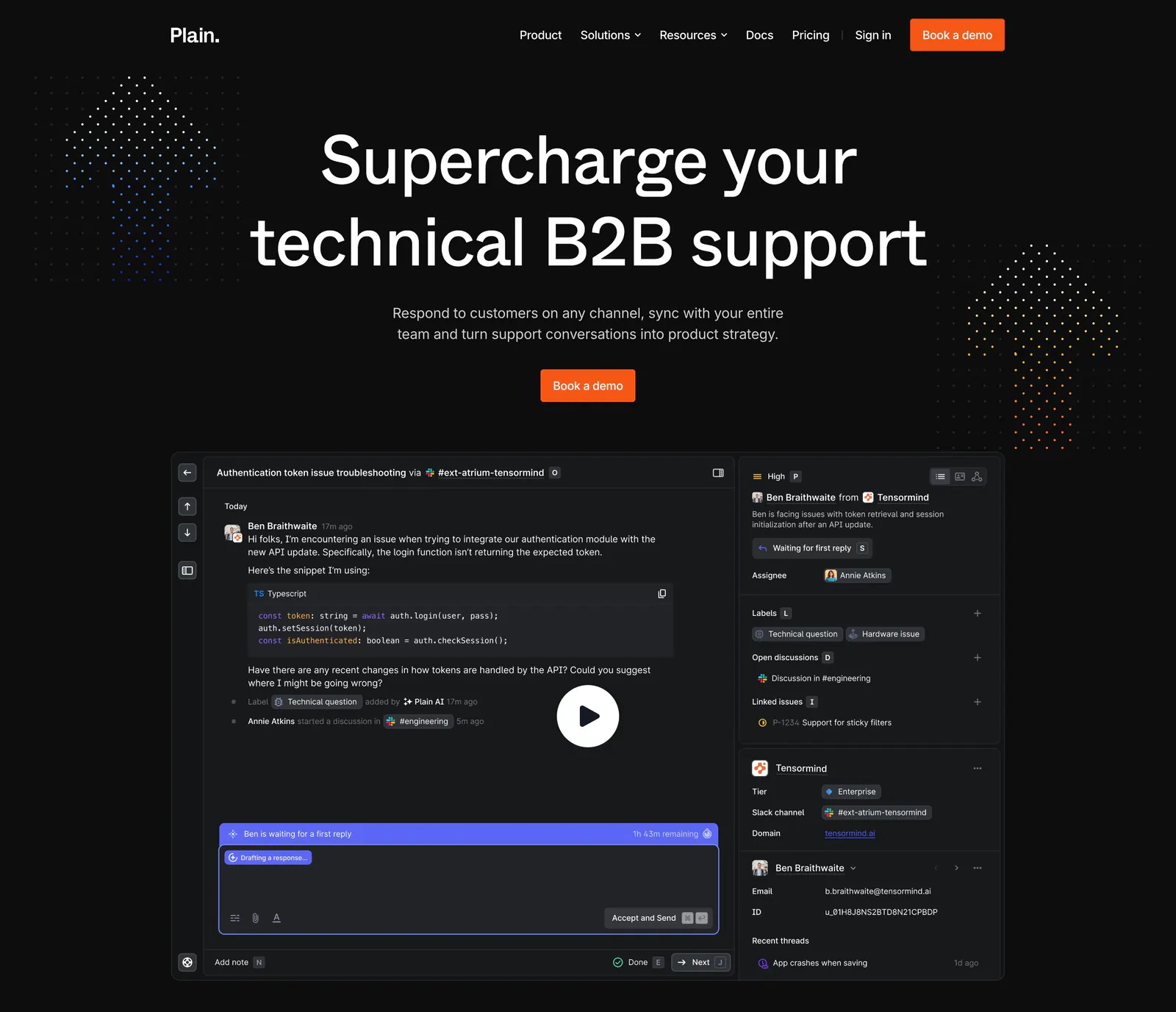
  25. Plain hero section: dark centered headline and orange demo button above a support thread UI with a play button, flanked by dot clusters
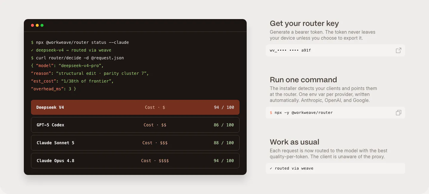
  26. Weave how it works section: dark terminal window with router commands and model scores beside three setup steps with copyable fields
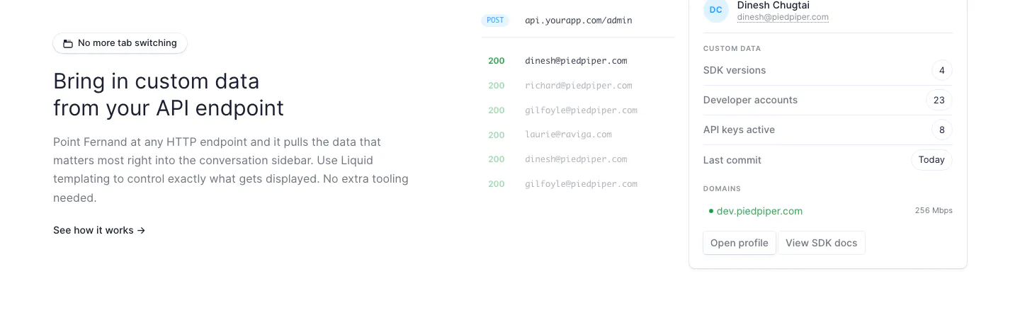
  27. Fernand features section: text on the left, API endpoint response list and customer data sidebar UI on the right
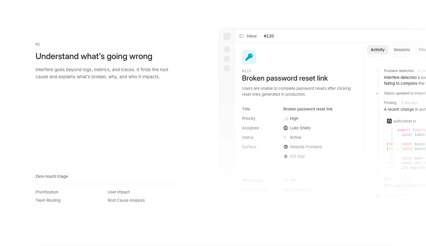
  28. Interfere features section: numbered text block with triage list on the left and an issue detail screenshot on the right
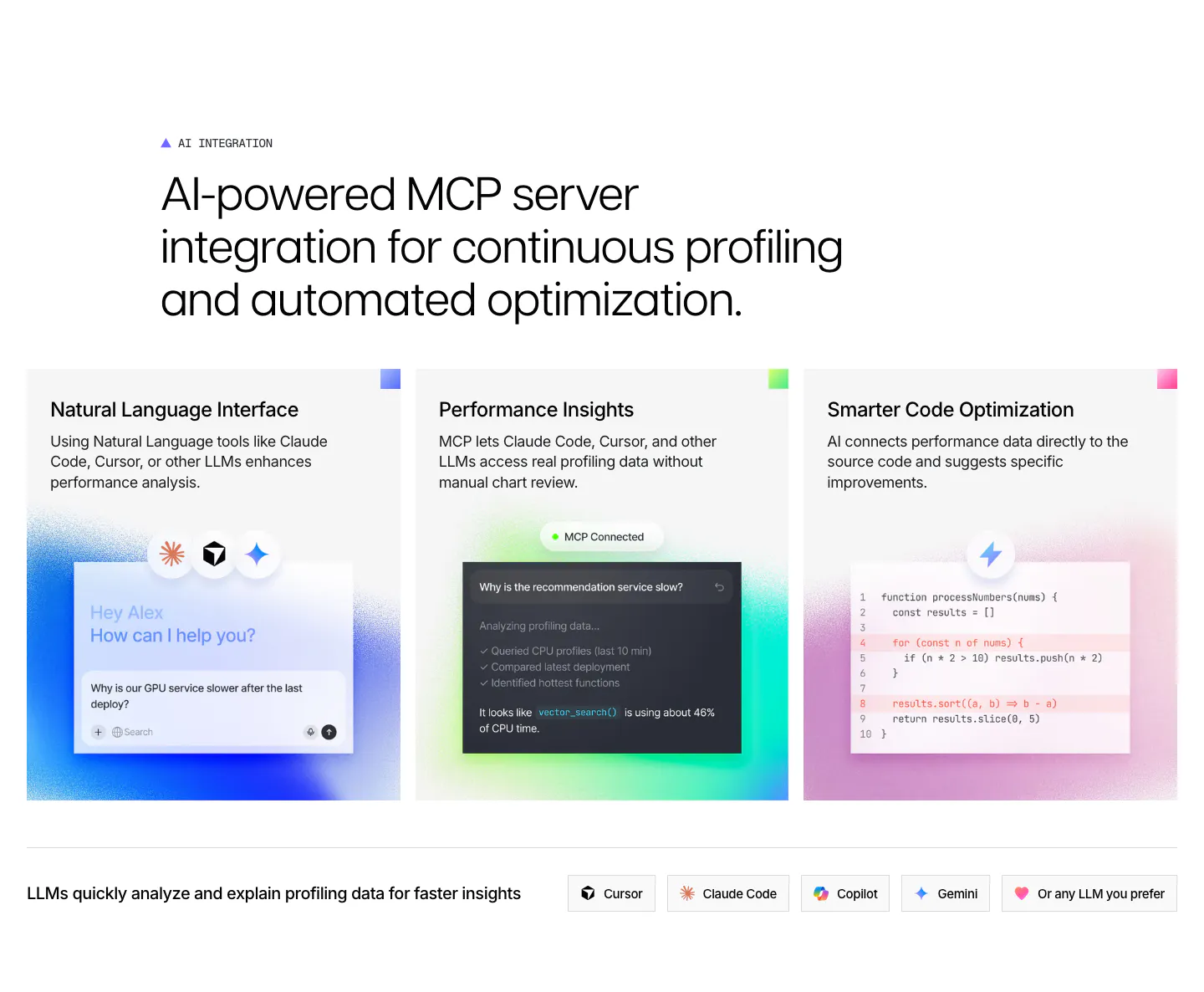
  29. Polar Signals features section: large headline over three cards with glowing chat, MCP and code mockups, plus a row of LLM tool chips
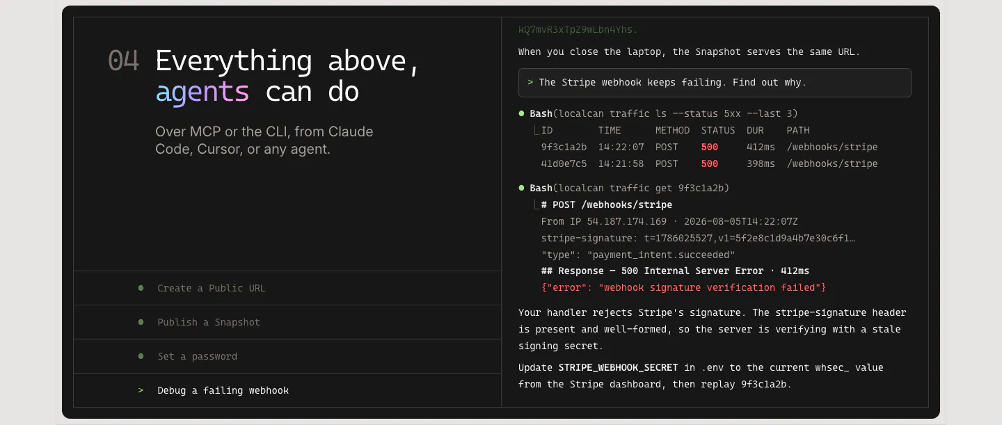
  30. LocalCan features section: monospace headline and agent task list on the left of a dark panel, terminal transcript debugging a webhook on the right
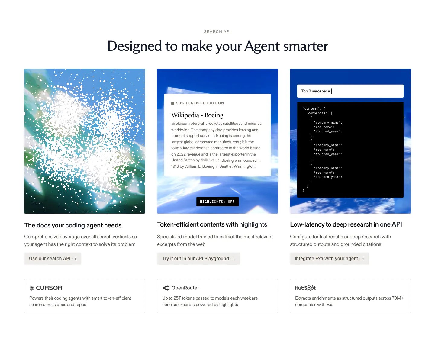
  31. Exa features section: centered headline over three image cards with sky visuals, a text excerpt and JSON output, plus customer callouts below
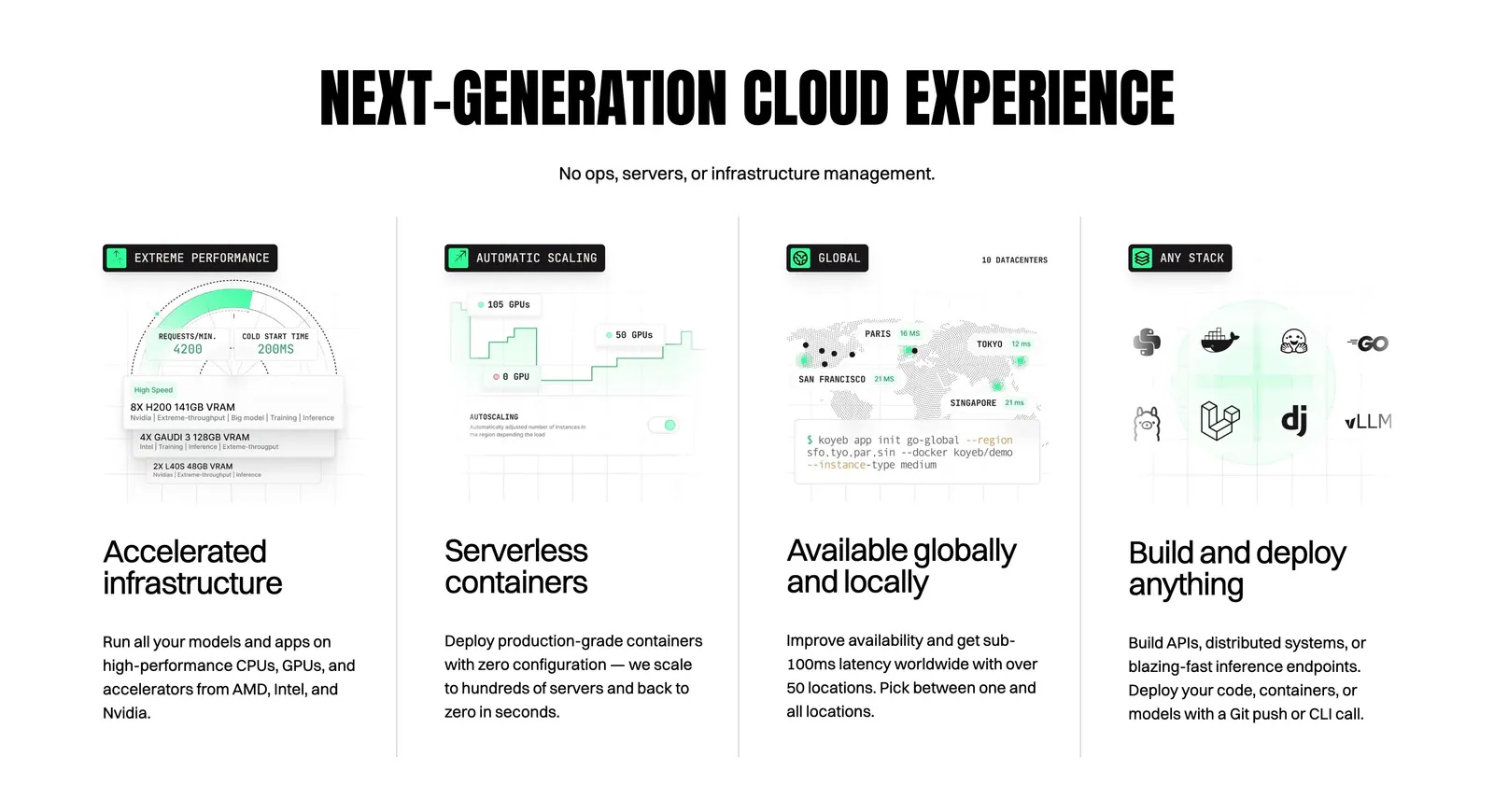
  32. Koyeb features section: condensed uppercase headline above four columns with UI mockups, a world map and a CLI snippet
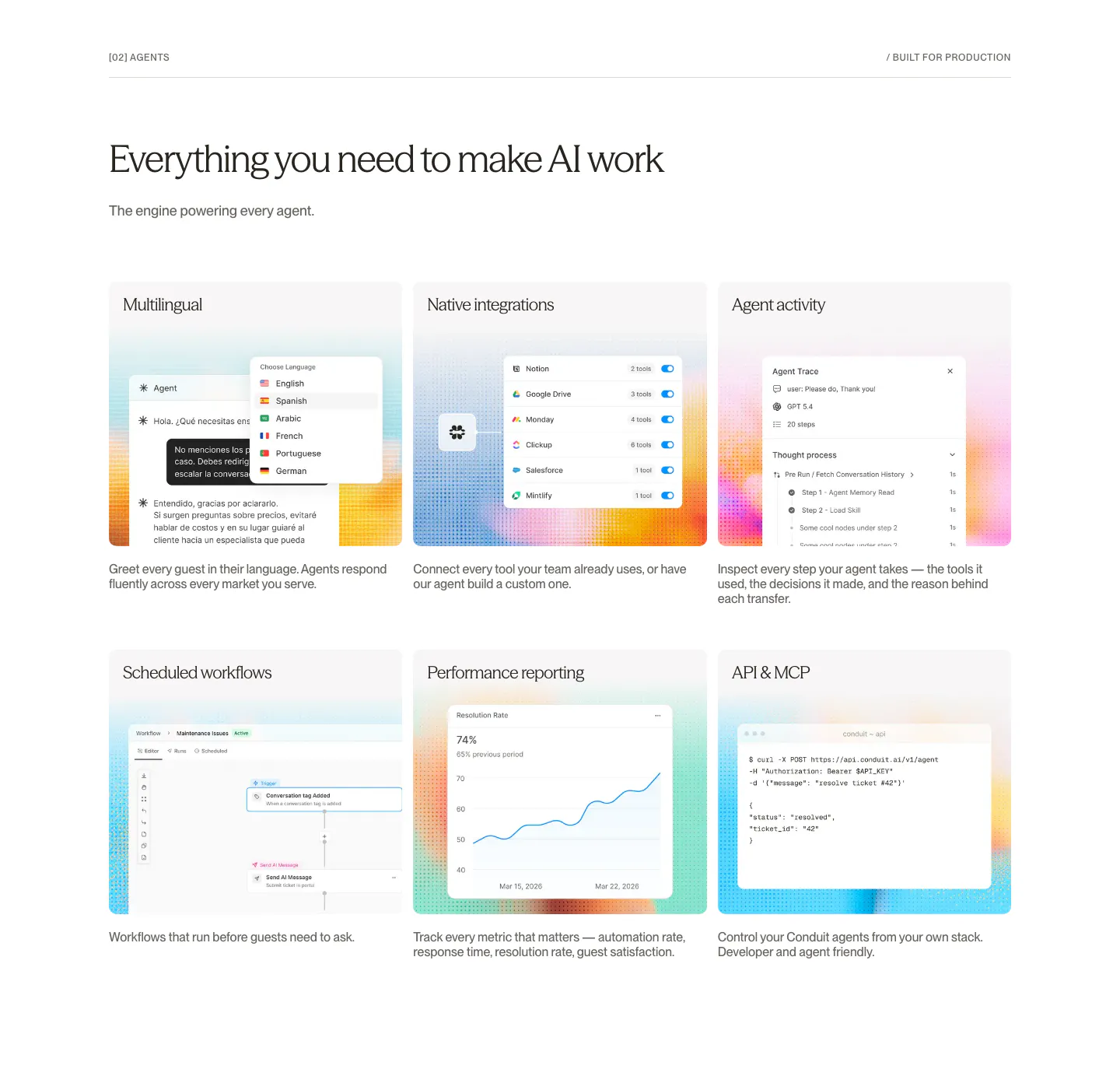
  33. Conduit features section: serif headline above a 3x2 card grid of agent UI mockups on dithered gradient tiles
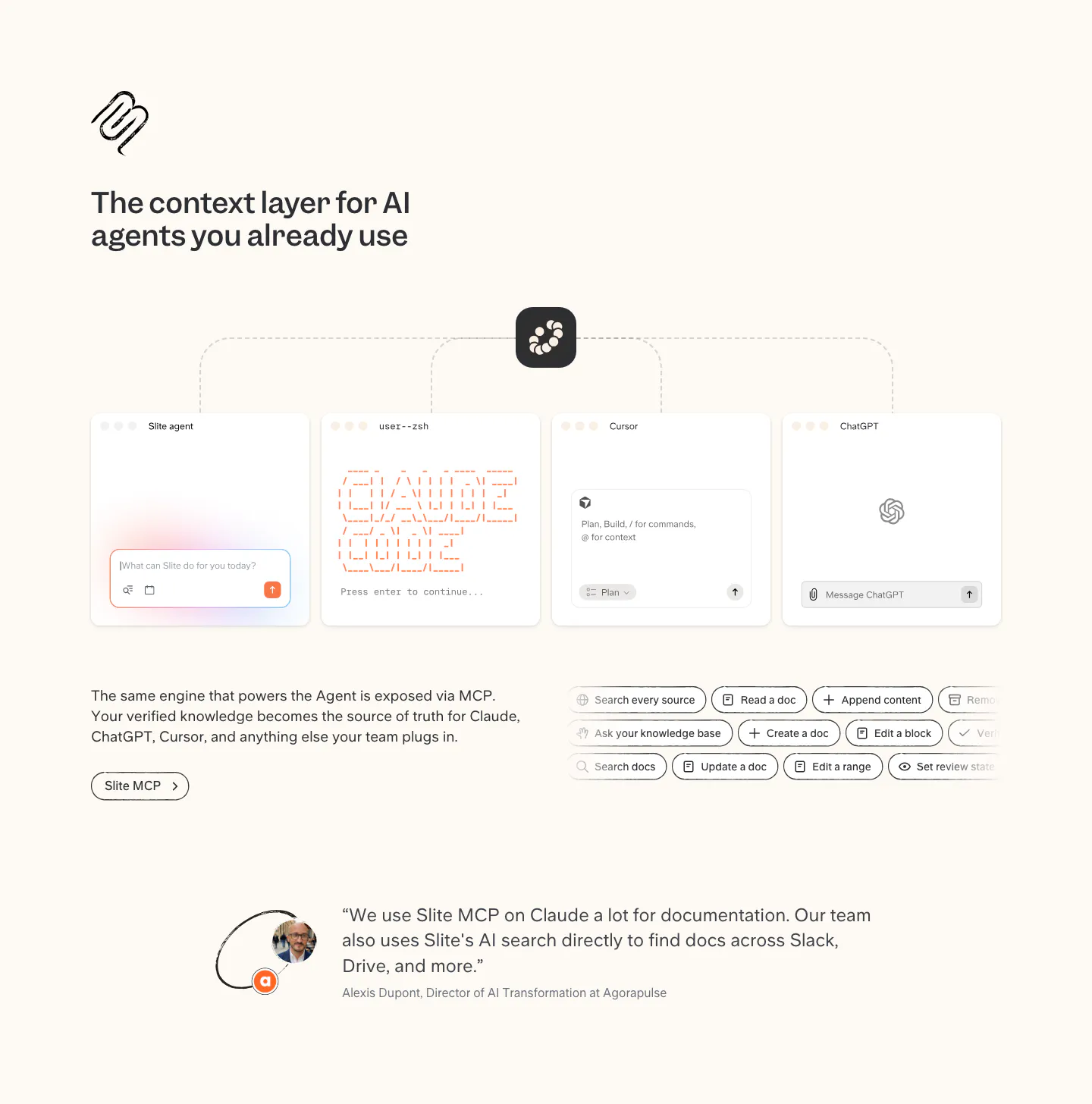
  34. Slite integrations section: MCP diagram linking Slite to agent, terminal, Cursor and ChatGPT windows, tool chips and a customer quote
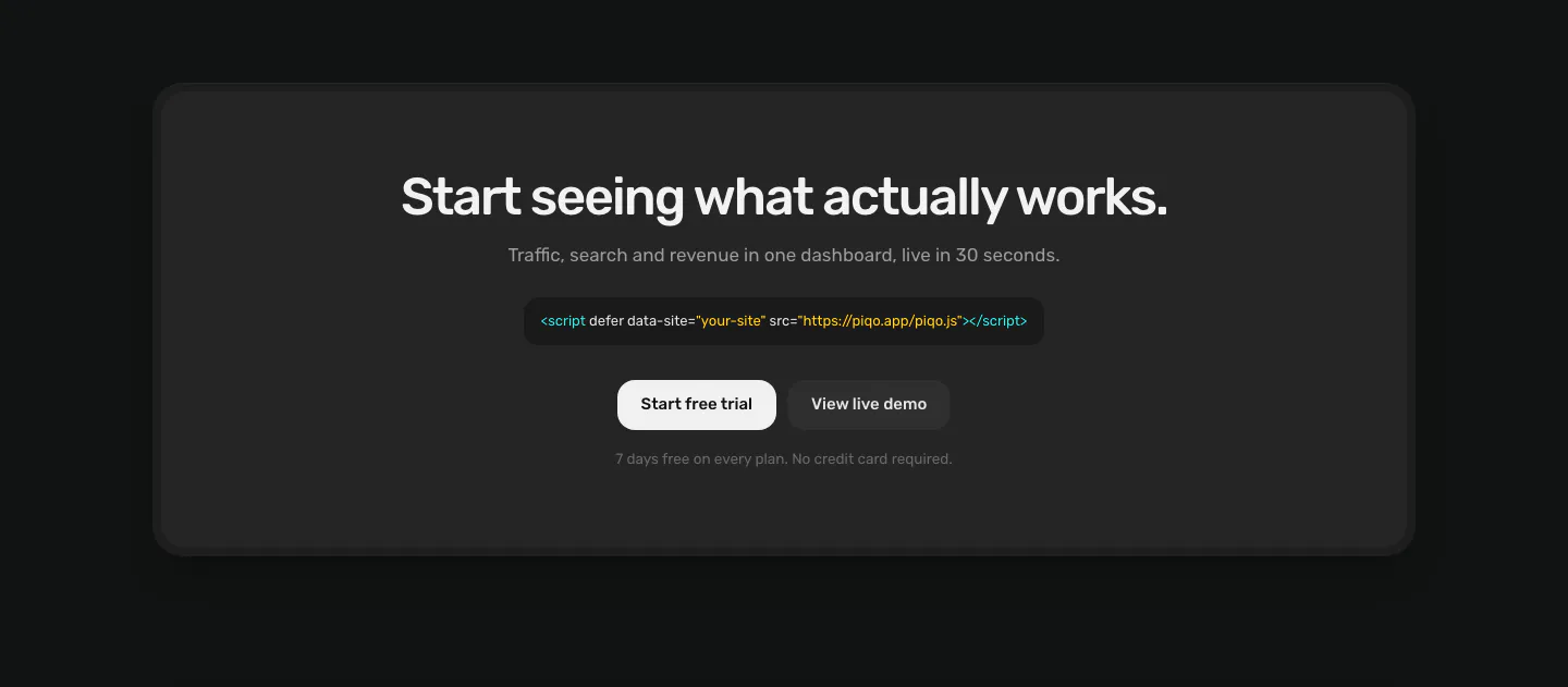
  35. Piqo call to action section: centered headline, script tag snippet and two buttons inside a rounded charcoal card on a near-black page
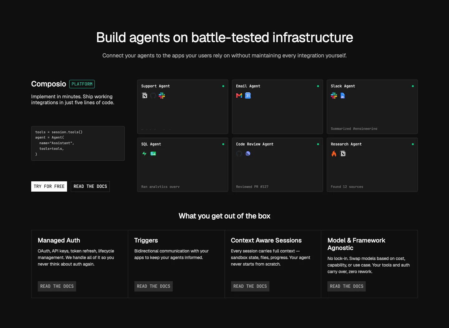
  36. Composio features section: code snippet and CTAs beside a grid of agent cards, then four platform feature columns on near-black
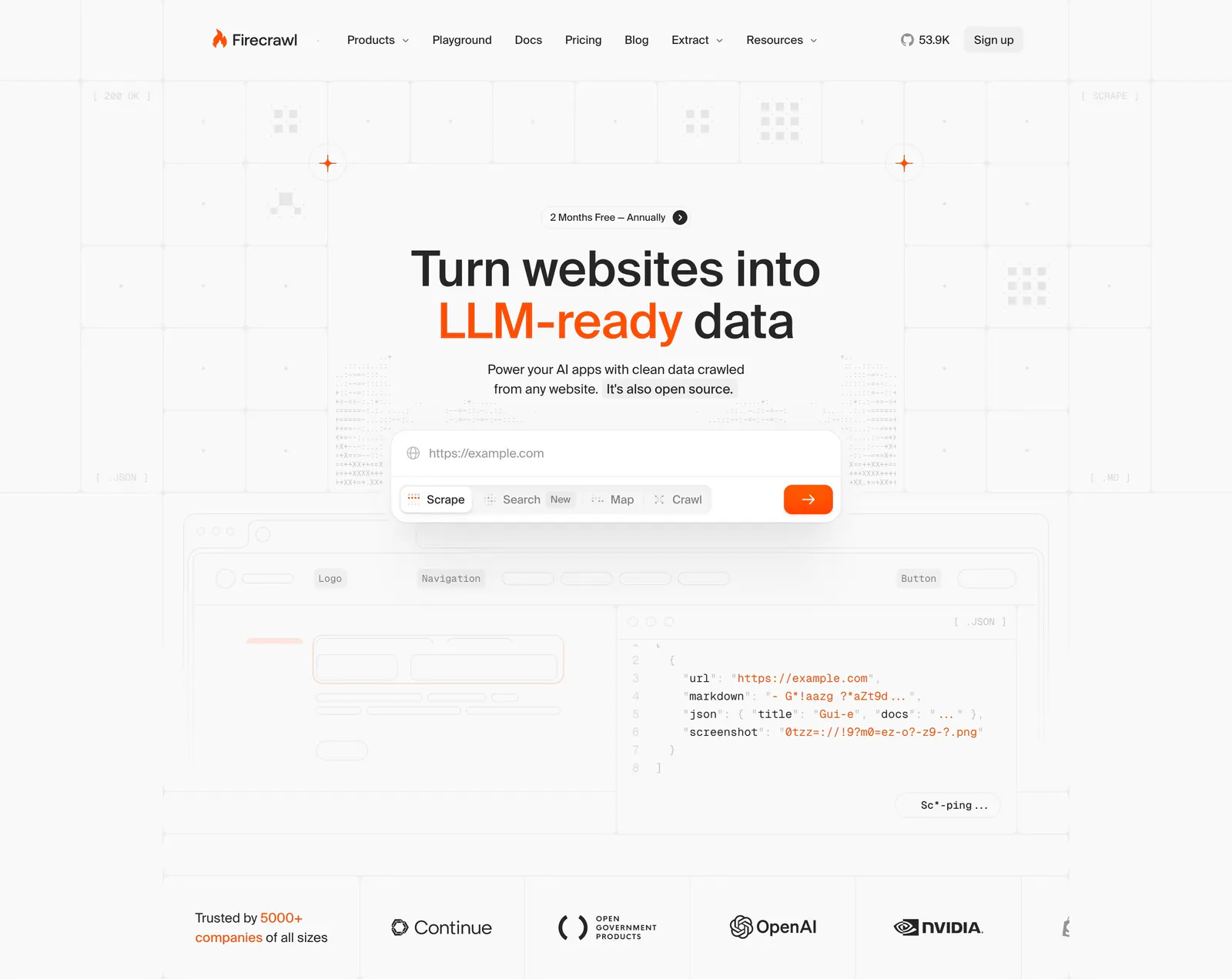
  37. Firecrawl hero section: centered headline with URL input and mode tabs over a grid background, JSON code preview and customer logo row below
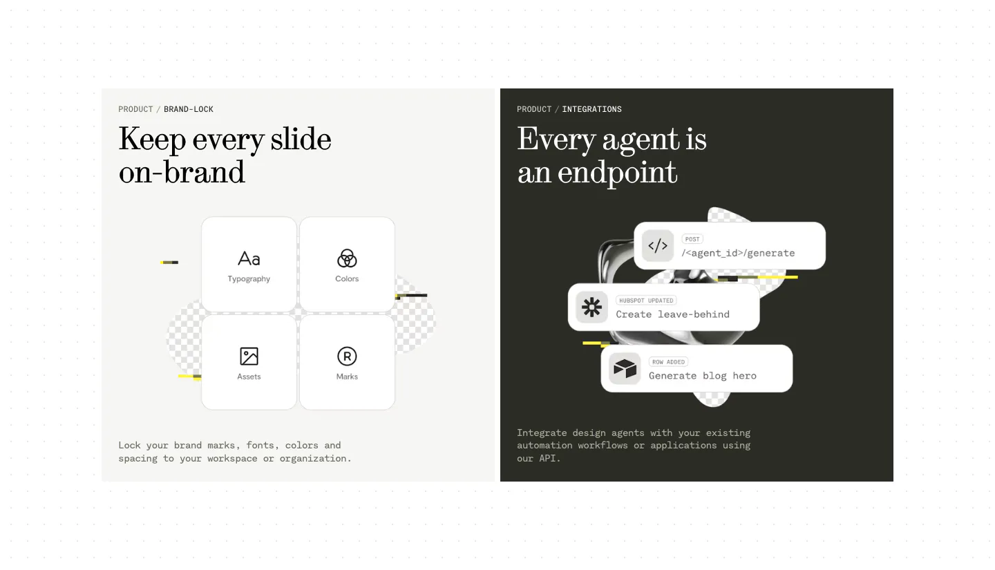
  38. Visual features section: two side-by-side panels, a light one with four brand-lock tiles and a dark one with stacked API endpoint cards
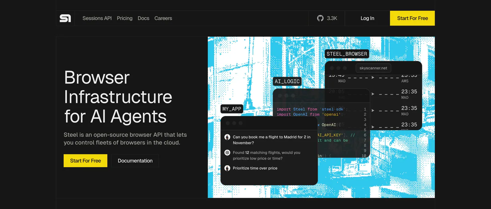
  39. Steel hero section: headline and yellow buttons on the left, cyan dithered artwork with code and chat UI windows on the right, dark theme
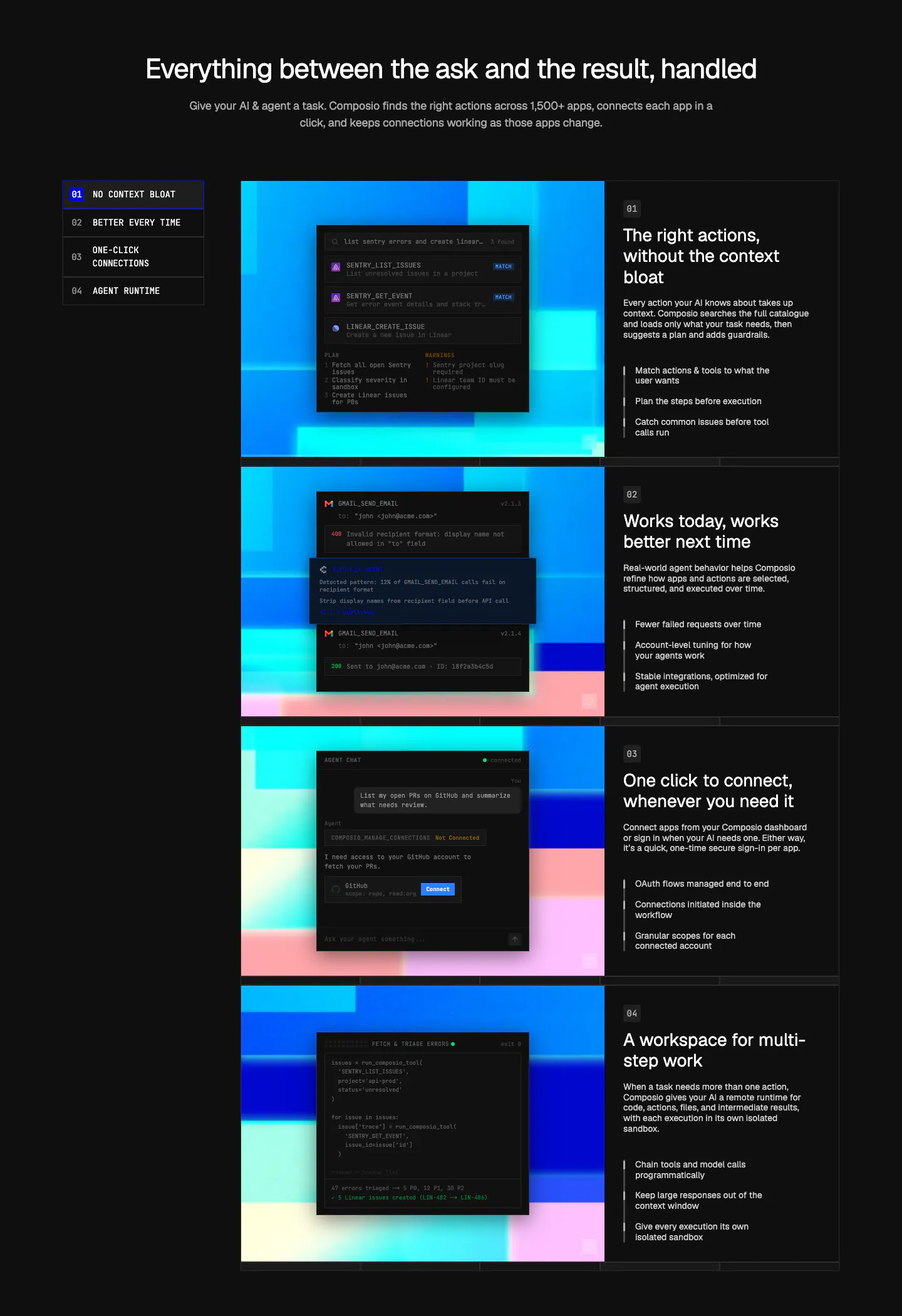
  40. Composio features section: numbered side nav beside four rows of dark UI and code panels on colorful pixel art, each with text
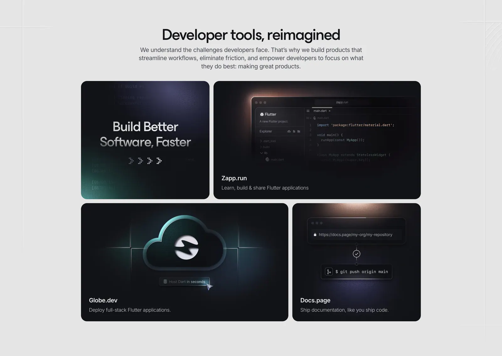
  41. Invertase features section: centered headline above a bento of four dark tiles showing a code editor, cloud icon and git push
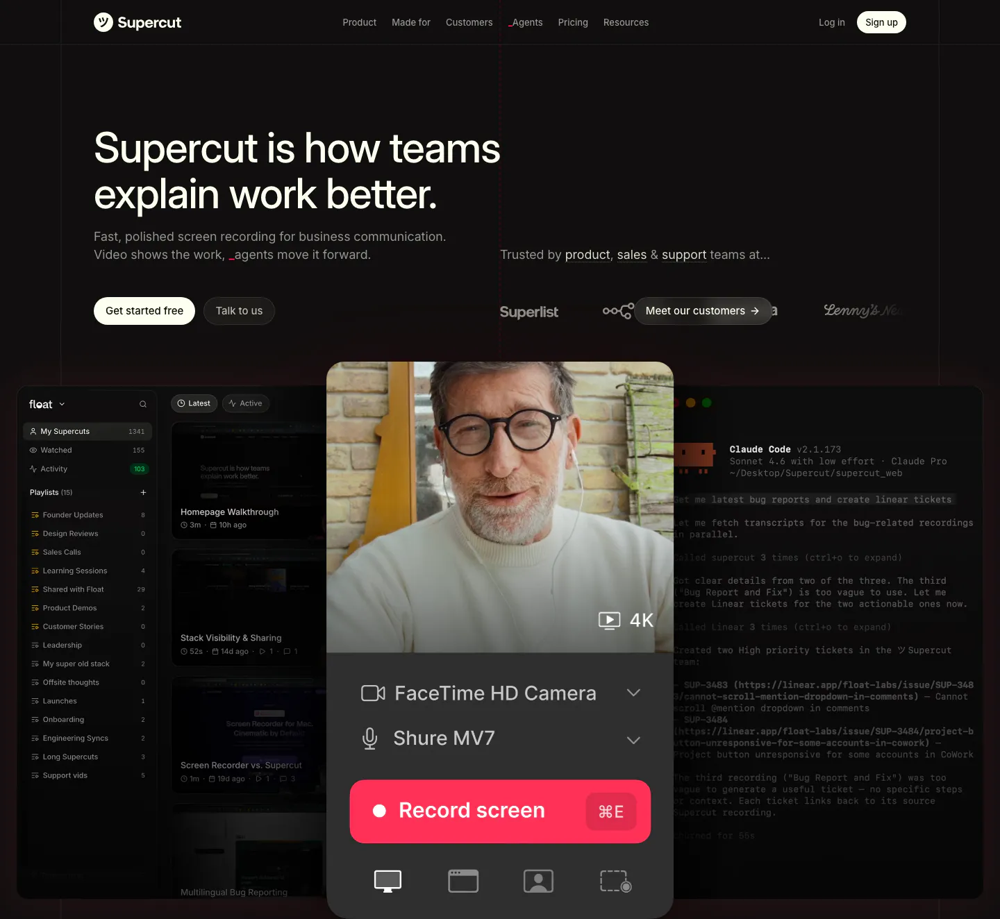
  42. Supercut hero section: left-aligned headline with two buttons and customer logos above a recorder panel with webcam video over app UI
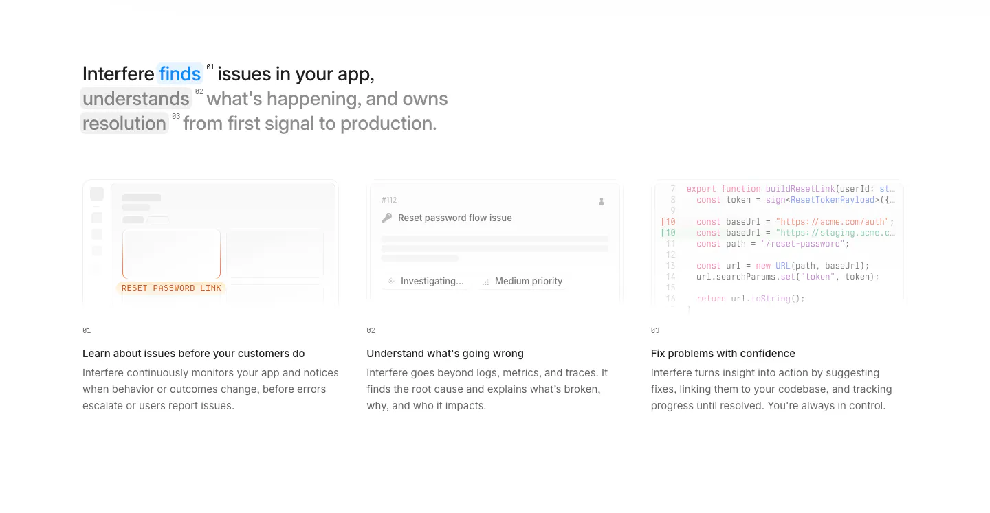
  43. Interfere how it works section: multi-line headline above three numbered columns with faded UI and code vignettes on white
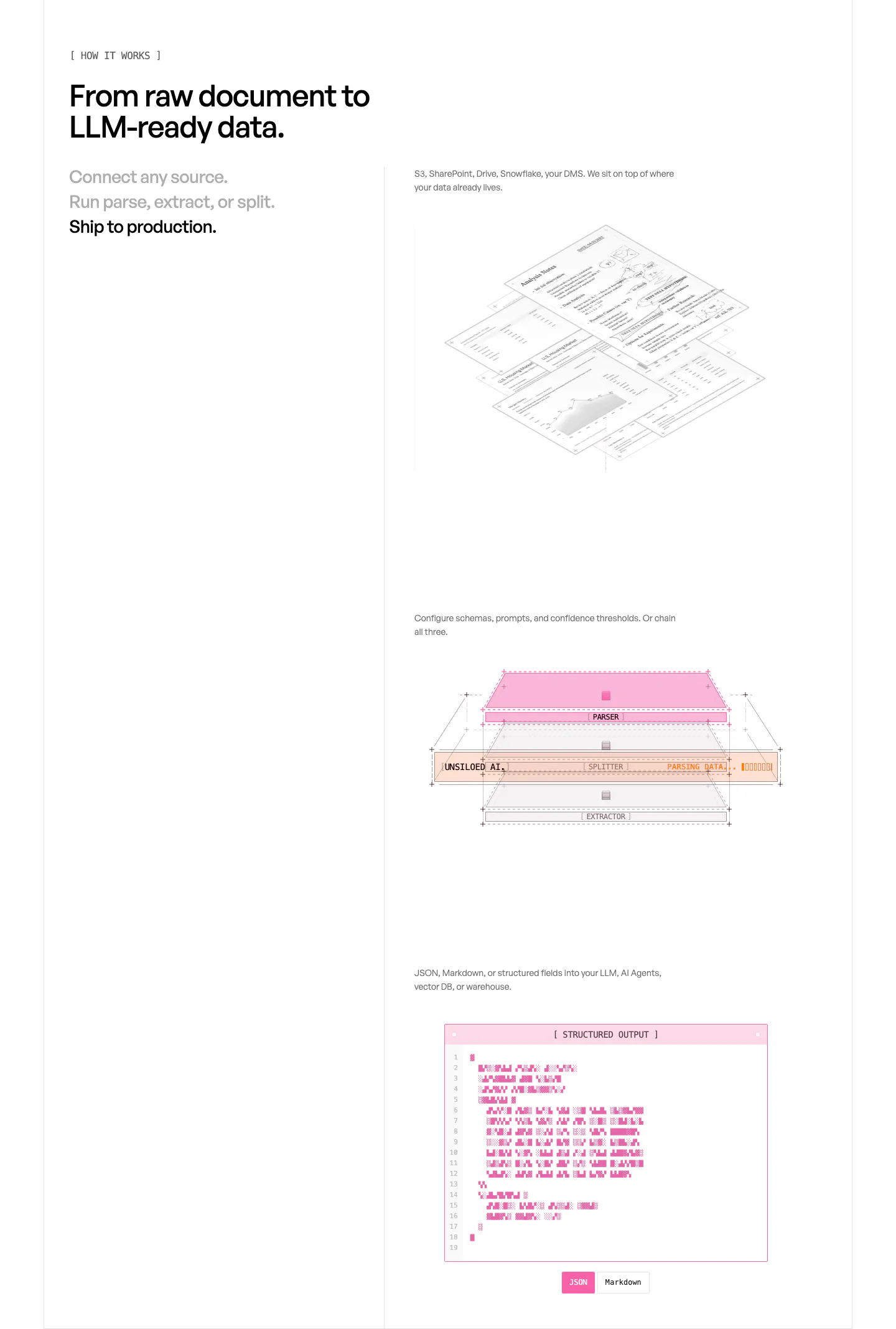
  44. Unsiloed how it works section: three-step list at left beside stacked visuals of isometric documents, a parser layer diagram and a JSON window
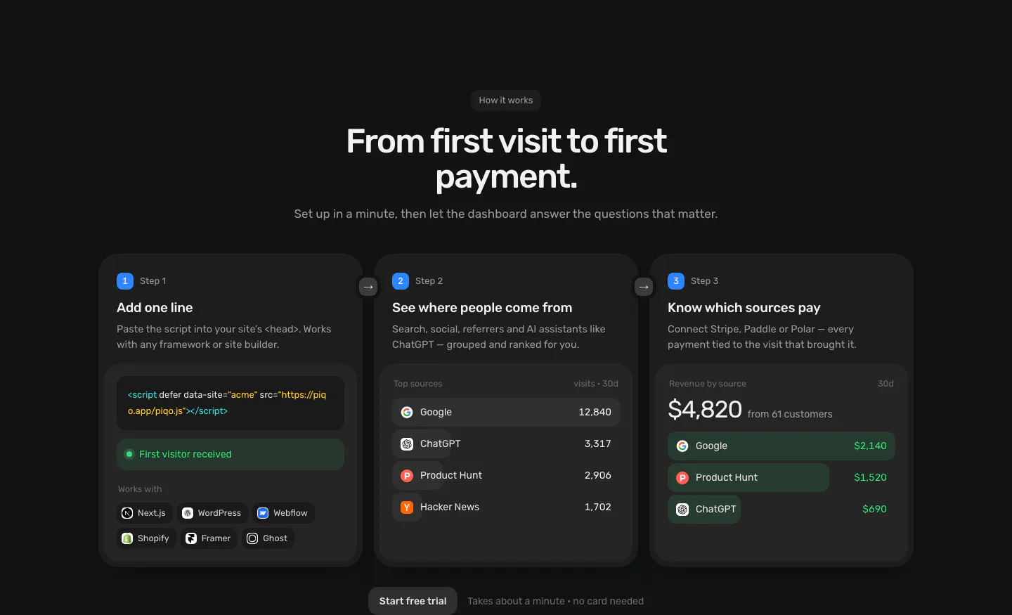
  45. Piqo how it works section: centered headline above three numbered step cards with a script snippet, top sources list and revenue UI
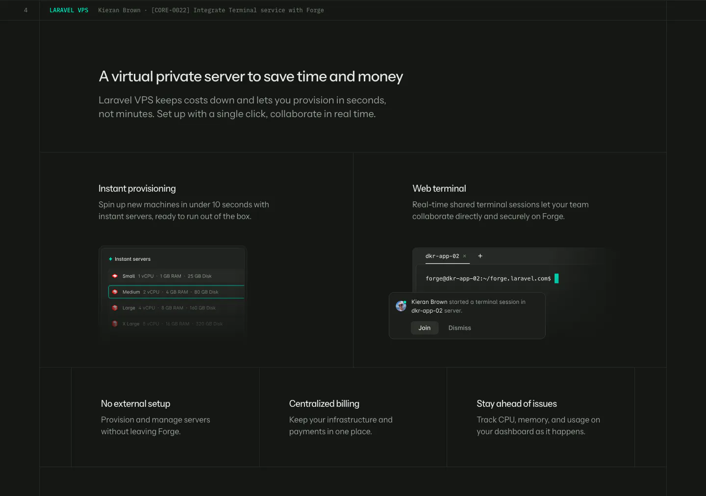
  46. Laravel Forge features section: dark grid with two UI tiles (server list, web terminal) above three smaller feature tiles
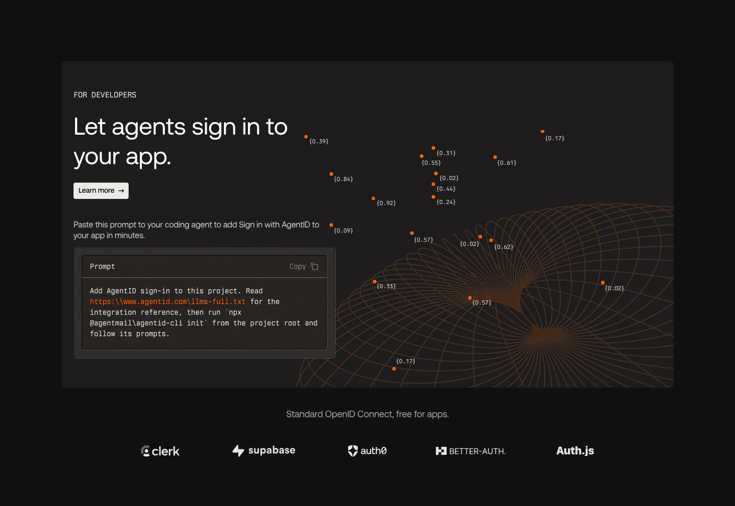
  47. AgentID features section: dark developer panel with headline, prompt code block and orange wireframe globe above a row of auth provider logos
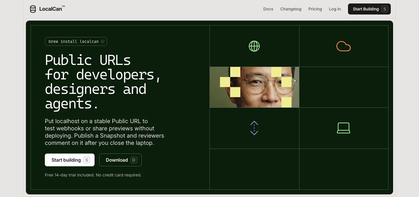
  48. LocalCan hero section: monospace headline and two buttons on a dark green panel, with a grid of icons and a pixelated portrait on the right
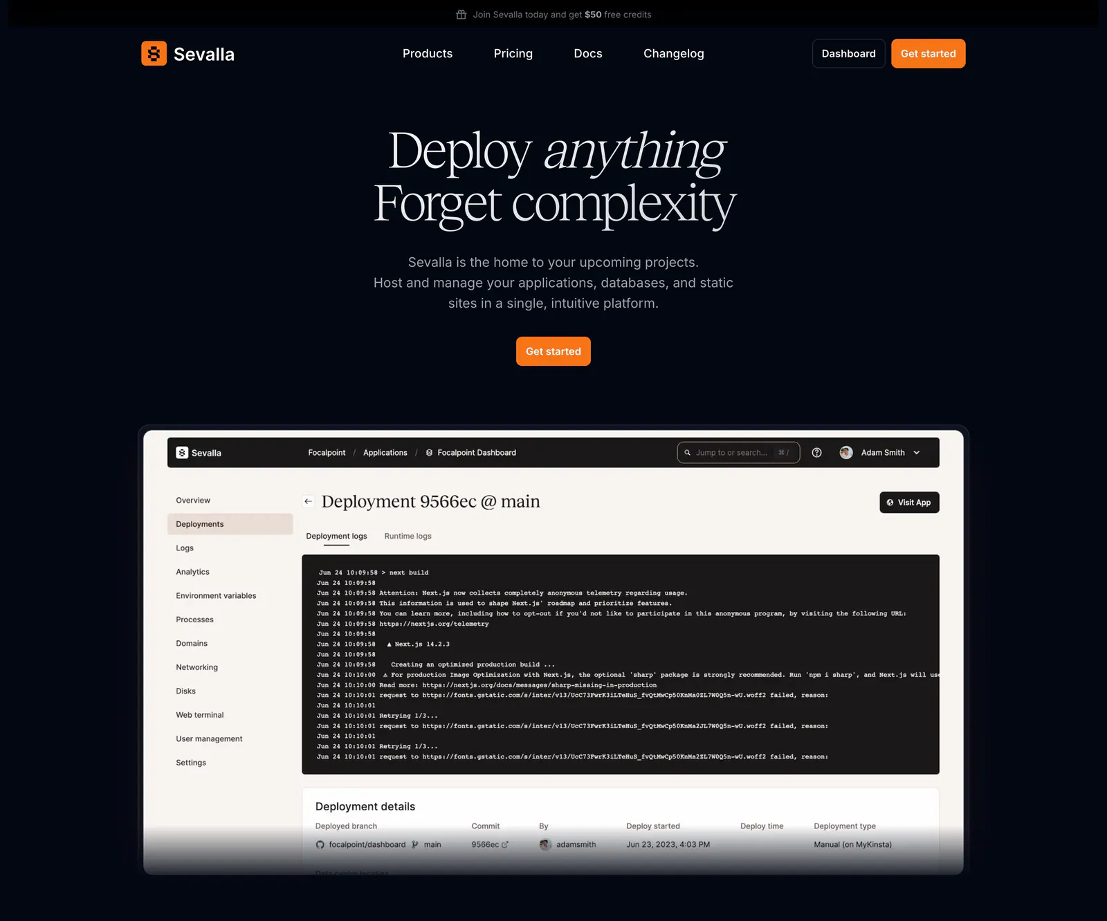
  49. Sevalla hero section: centered serif headline and orange button above a deployment logs dashboard screenshot on a near-black background
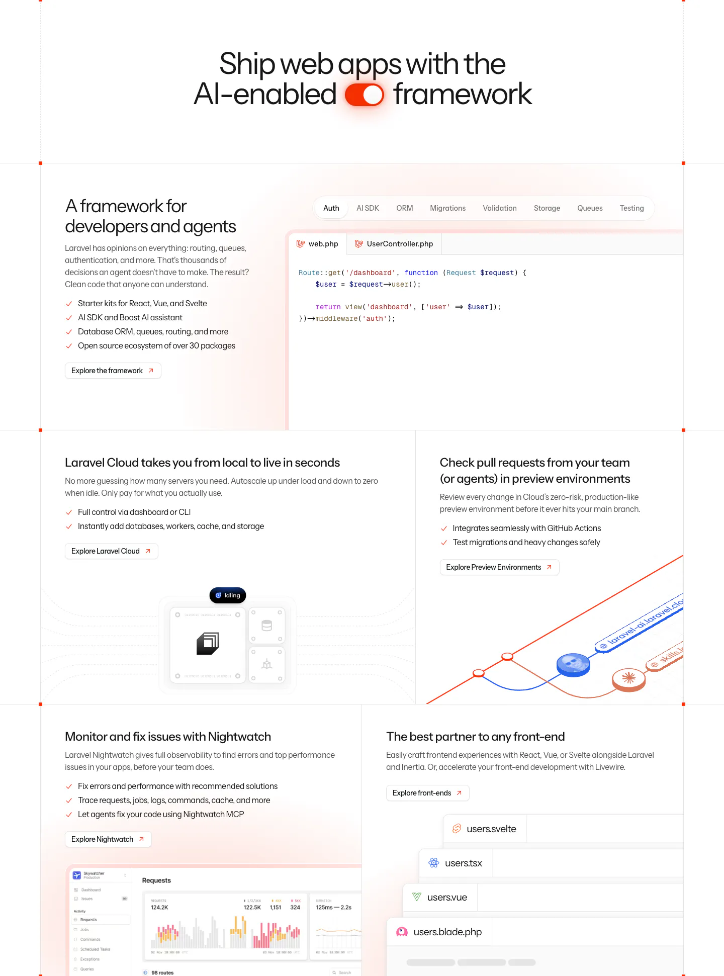
  50. Laravel features section: centered headline with a toggle icon above a bento grid of code tabs, cloud, preview environment and monitoring panels
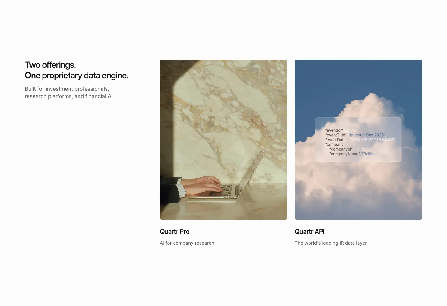
  51. Quartr features section: headline on the left beside two photo cards for Quartr Pro and Quartr API, one with a frosted JSON snippet
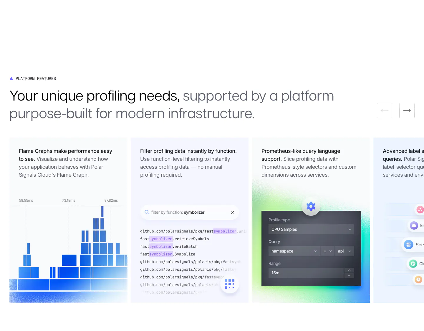
  52. Polar Signals features section: two-tone headline with arrow buttons above a sliding row of cards with flame graph, code filter and query UI
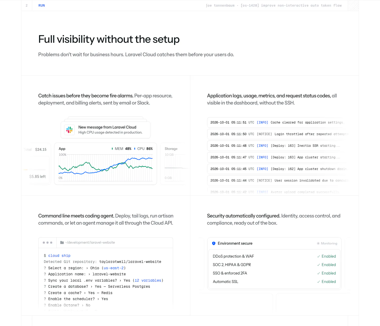
  53. Laravel Cloud features section: headline above a 2x2 grid showing usage alerts, a log stream, a CLI terminal session and a security checklist
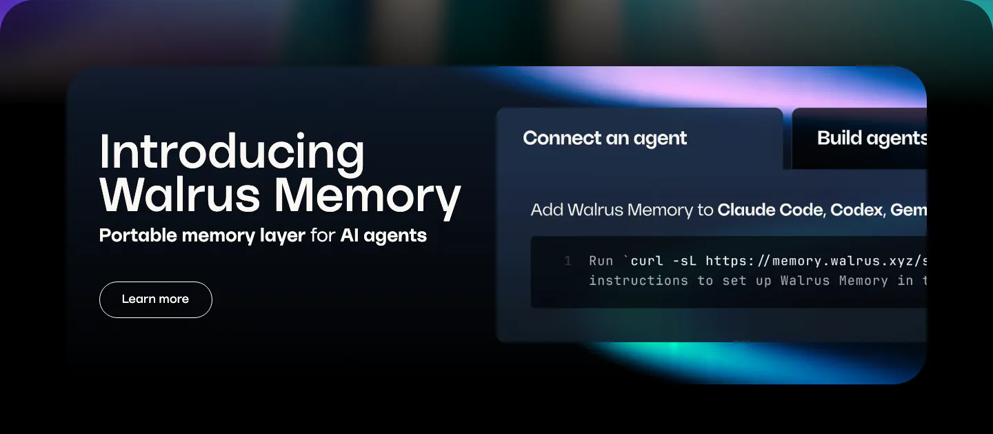
  54. Walrus features section: dark rounded banner with product intro on the left and a tabbed code snippet panel on the right
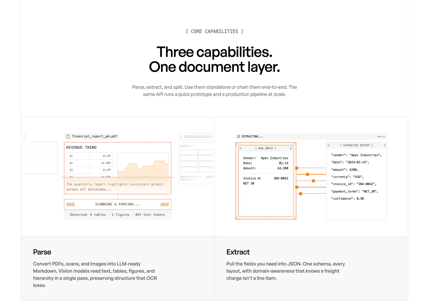
  55. Unsiloed features section: centered headline above two panels showing a PDF parsing mockup and a JSON extraction view, labeled Parse and Extract
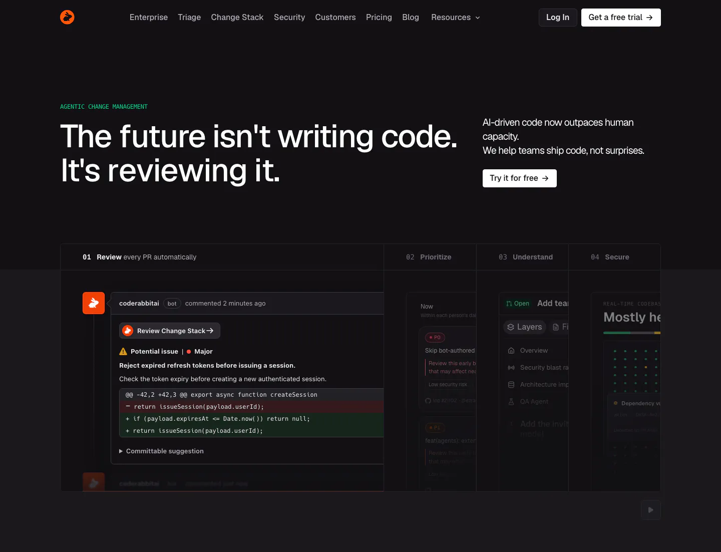
  56. CodeRabbit hero section: dark page with left headline, copy and CTA at right, and a tabbed product panel showing a PR review comment
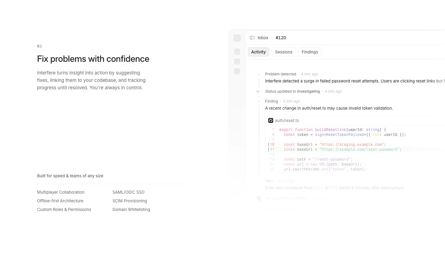
  57. Interfere features section: numbered text block with enterprise feature list left and an activity timeline with code diff right

Where code shows up

Often paired with

Share of code sections that also use each style

How to design code snippets on a website

  1. Start with the shortest working example

    Pick a snippet that does one useful thing in about ten to fifteen lines, such as installing a package and making a first call. Trim boilerplate that adds no meaning. Real, runnable code earns more trust than a stylized fake that would not compile.

  2. Match syntax colors to the brand

    Default editor themes rarely fit your palette. Build a syntax theme from your brand colors with enough contrast for each token type. Keep comments and punctuation muted so keywords, strings, and values carry the visual weight and the logic is easy to follow.

  3. Size code for comfortable reading

    Use a monospaced font at 14 to 16px with a line height around 1.5 to 1.6. Do not shrink snippets to fit a fixed frame. Let them scroll horizontally on small screens rather than wrapping in confusing places, and give the block generous inner padding.

  4. Add language tabs and a copy button

    If you support several languages or SDKs, offer tabs so developers see code in their own stack. Include a labeled copy button with a confirmation state, and render the snippet as real text, not an image, so it stays selectable and searchable.


Companies using code

All styles
    ↑↓ Navigate ↵ Open

    Section preview

    Website section