Data & Analytics Website Design Examples

Data products are hard to show because their value lives in the questions they answer. Buyers want to see the dashboards, queries, or pipelines they would actually build, and they want to know how the tool fits their existing stack. Clear data & analytics website design uses charts with believable data, explains where data flows, and speaks to both the analysts who use the tool and the engineers who run it.
100 sections

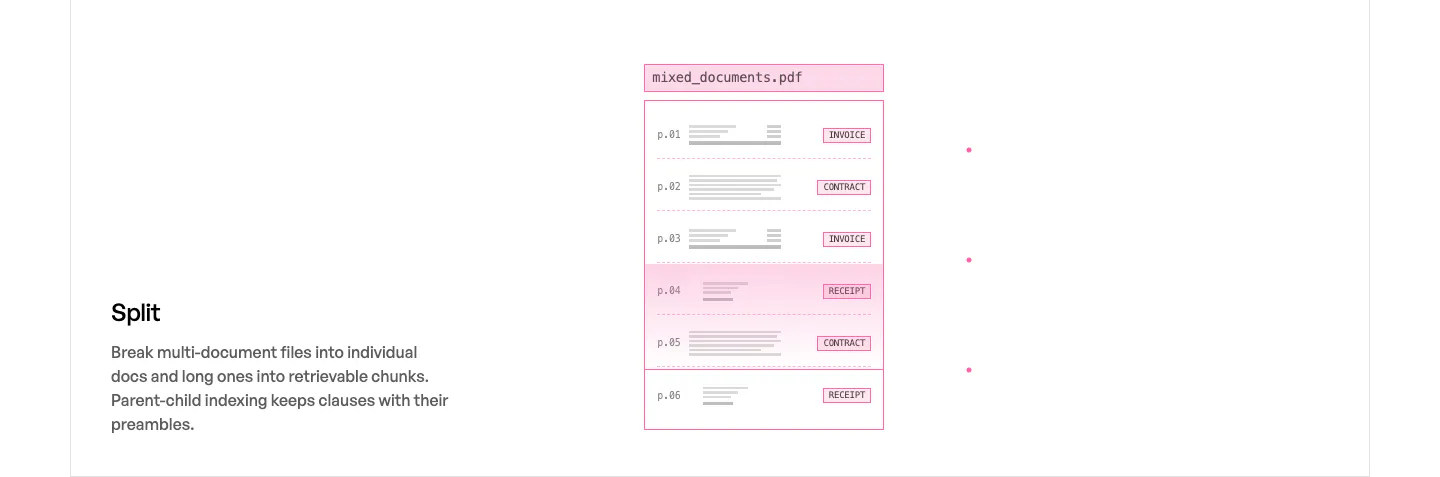
  1. Unsiloed features section: Split title and description at left beside a pink-outlined mockup of a multi-page PDF sorted by document type
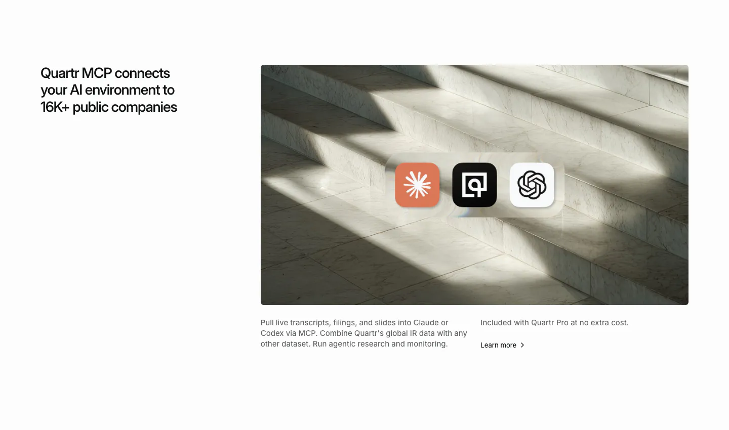
  2. Quartr integrations section: headline on the left, marble staircase photo on the right with Claude, Quartr and OpenAI app icons
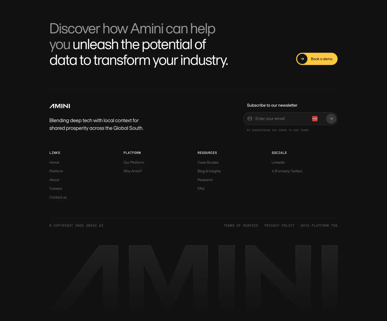
  3. Amini footer section: dark closing headline with yellow button, newsletter field, link columns and a faded giant AMINI wordmark
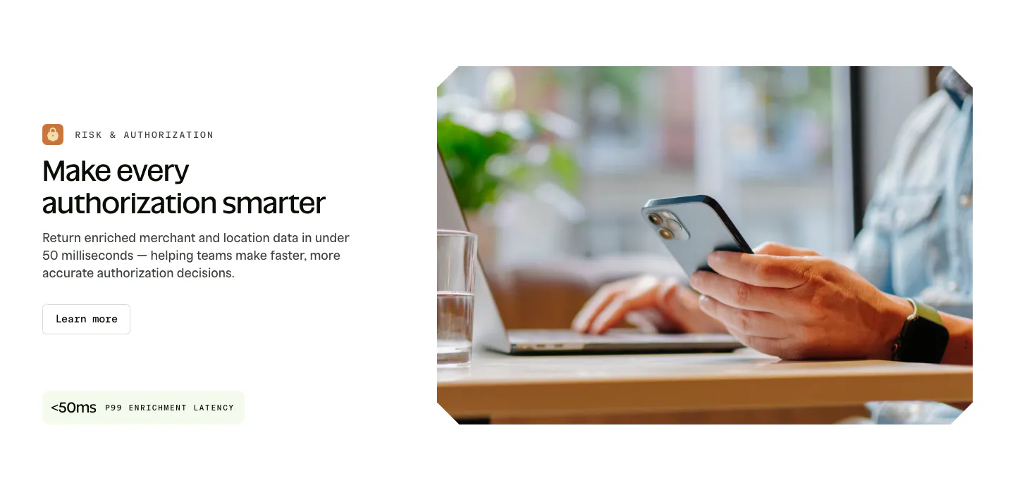
  4. Spade features section: labeled headline, copy, button and latency stat chip on the left beside a photo of hands holding a phone at a laptop
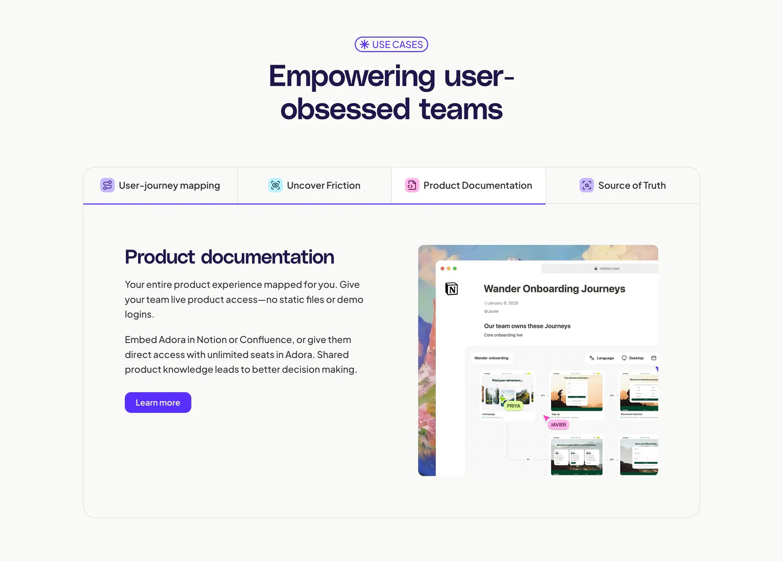
  5. Adora features section: centered headline above a four-tab panel with text on the left and a Notion-style product screenshot on the right
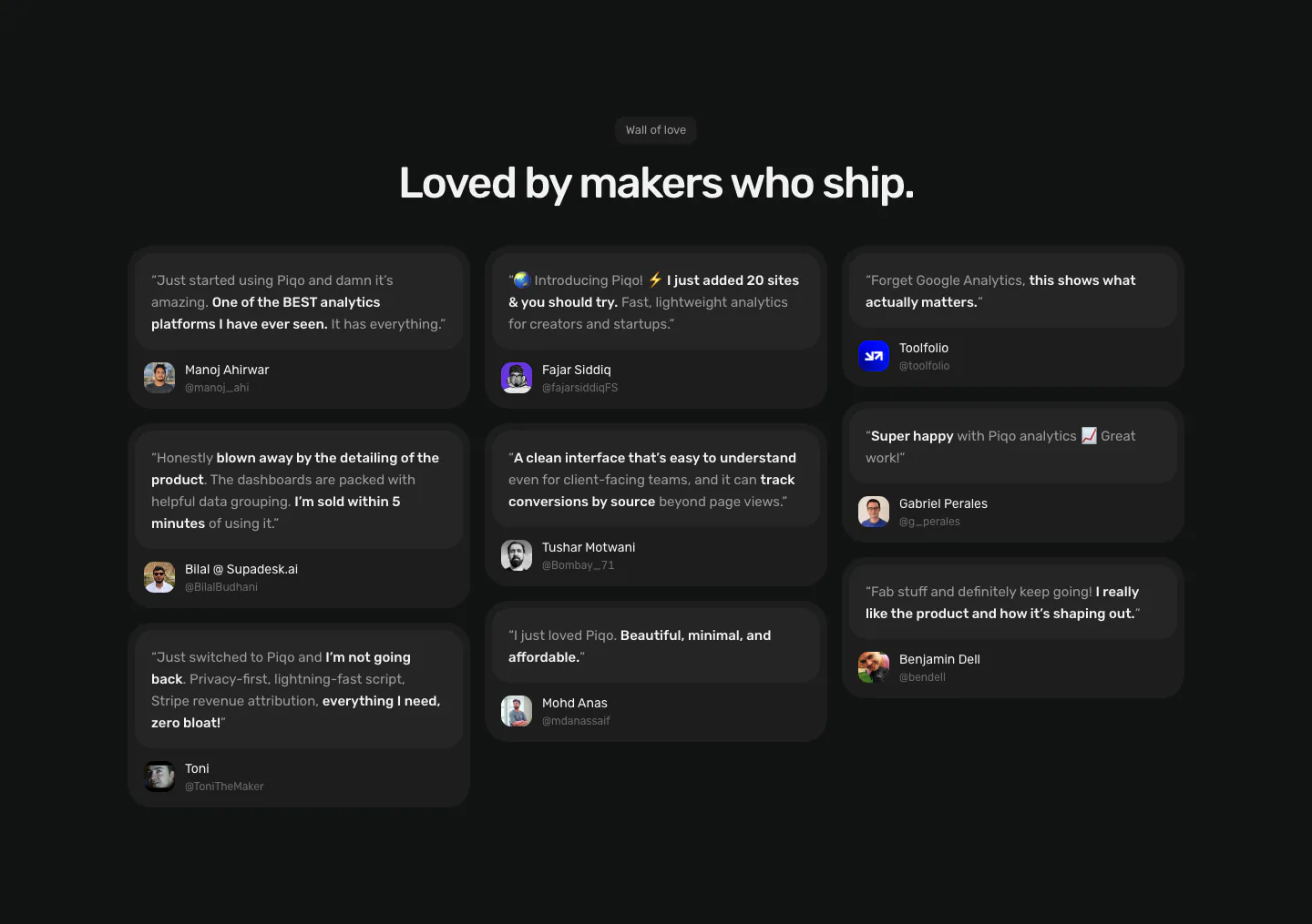
  6. Piqo testimonials section: centered Wall of love label and headline above a three-column masonry of dark quote cards with avatars
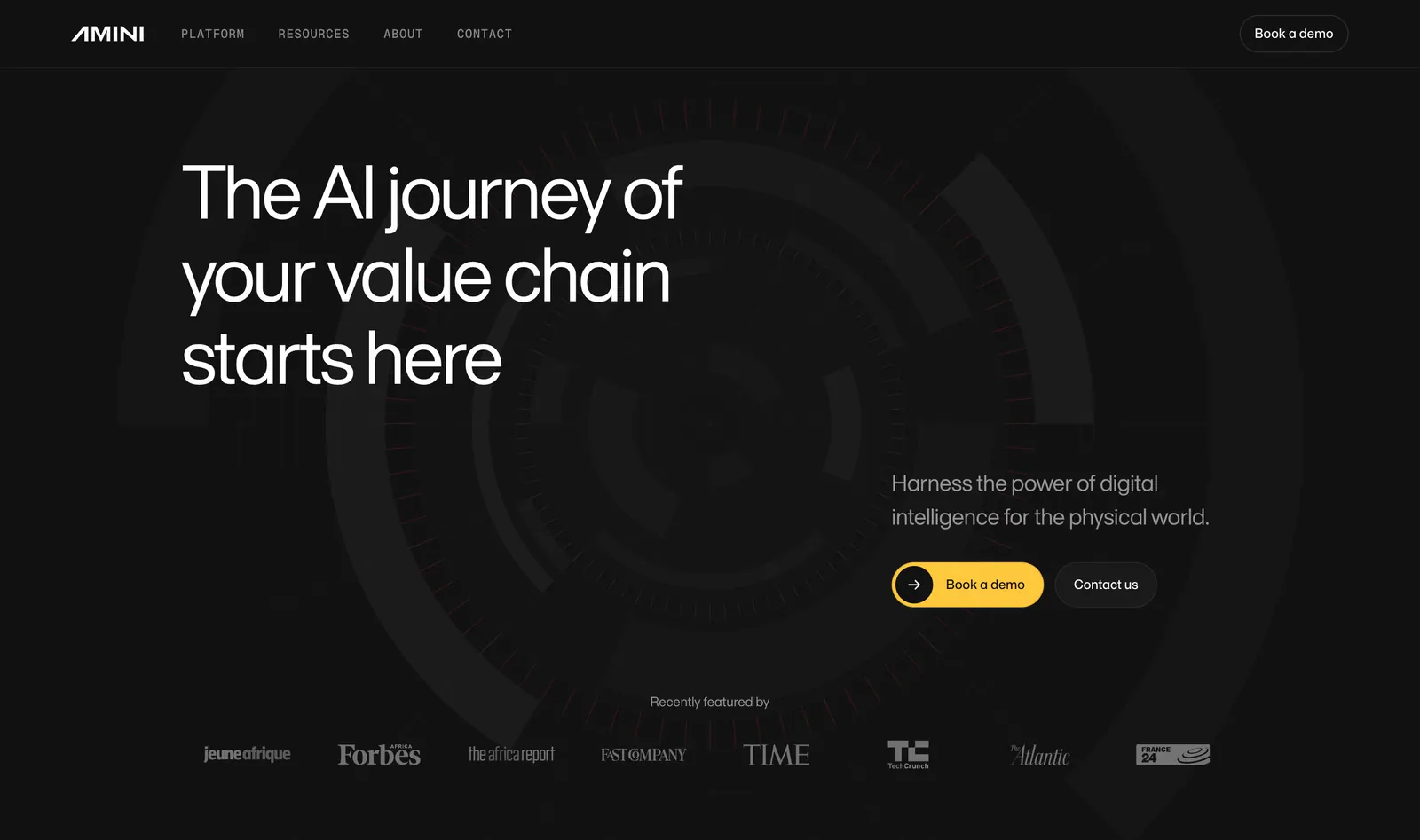
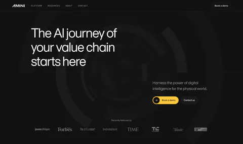
  7. Amini hero section: dark background with concentric arc artwork, left-aligned headline, yellow demo button and press logo strip
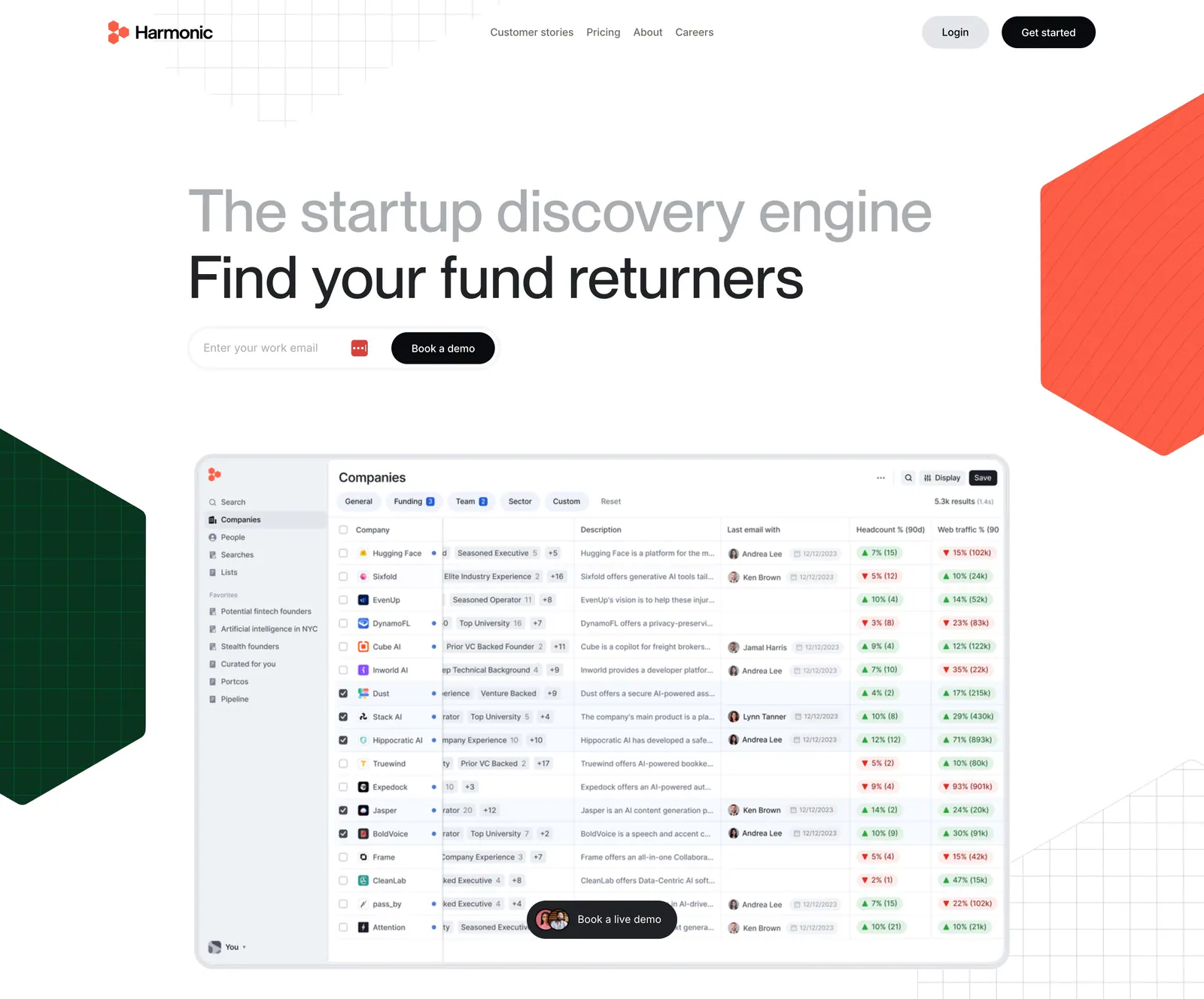
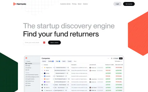
  8. Harmonic hero section: two-tone headline with email field above a companies table screenshot, flanked by red and green hexagons
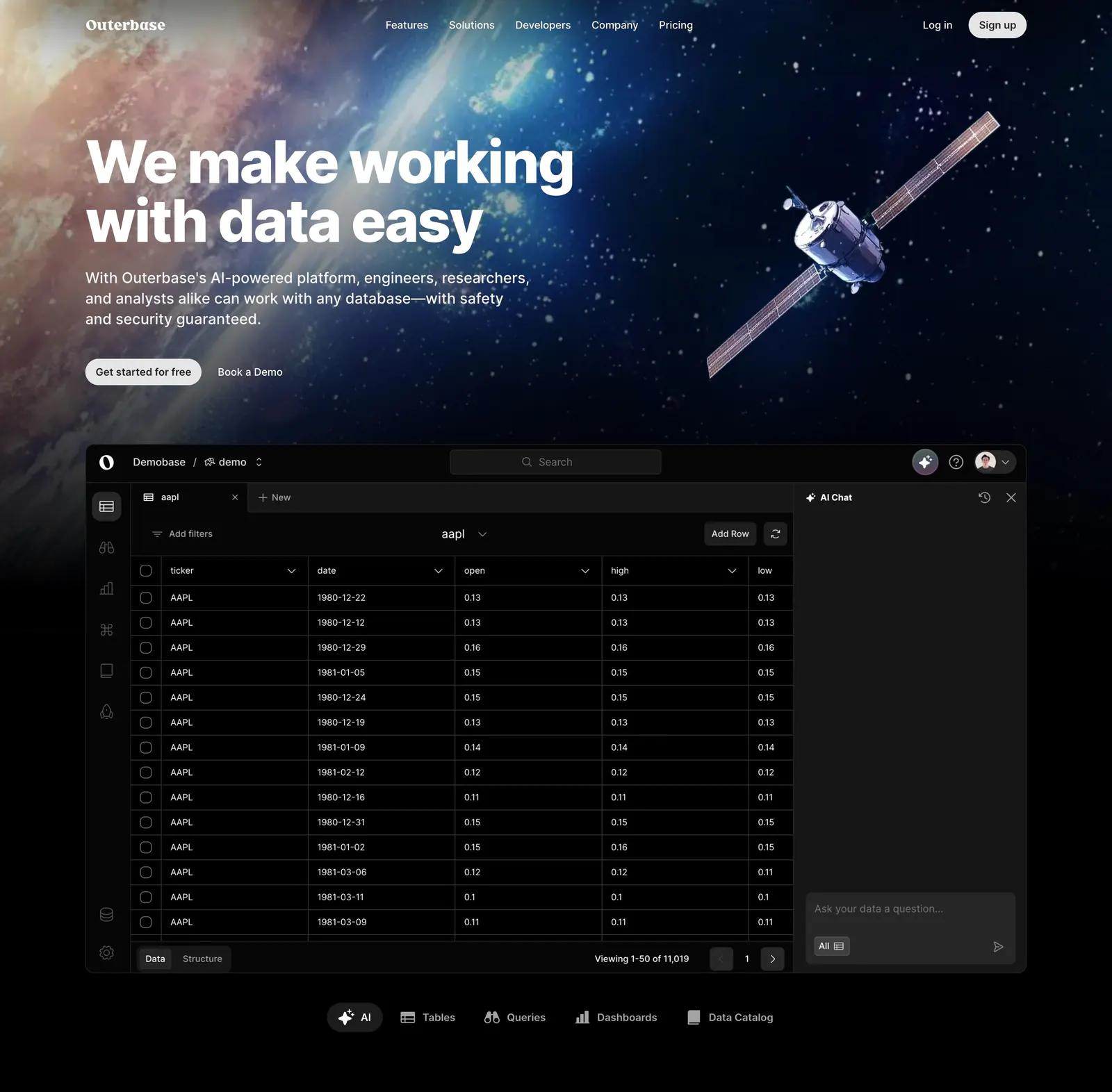
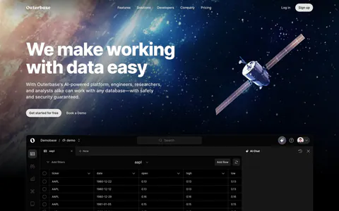
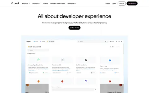
  9. Outerbase hero section: left-aligned headline over space artwork with a satellite, above a dark database table app screenshot and tabs
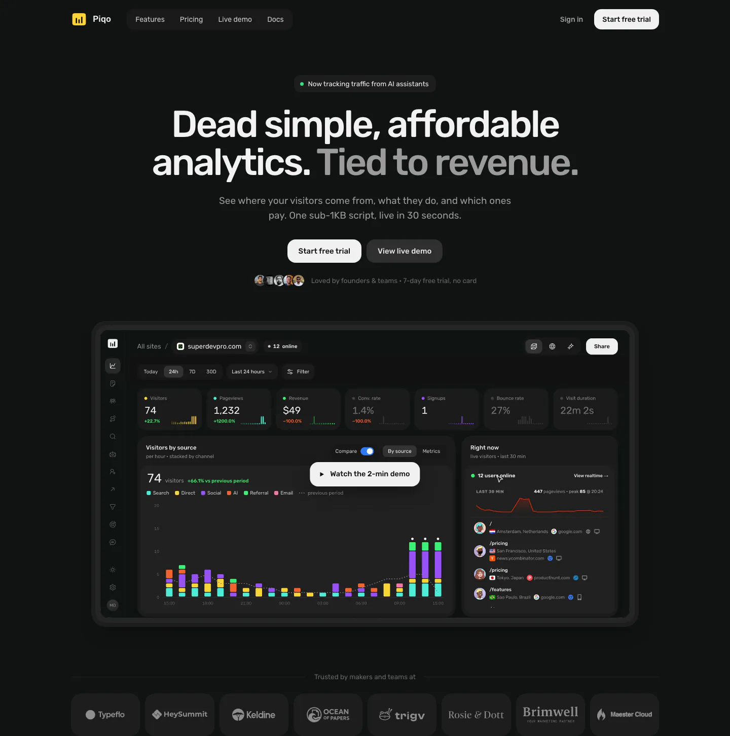
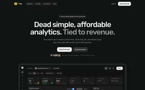
  10. Piqo hero section: nav, centered headline with two buttons and avatars above a dark analytics dashboard with a demo play button, logo row
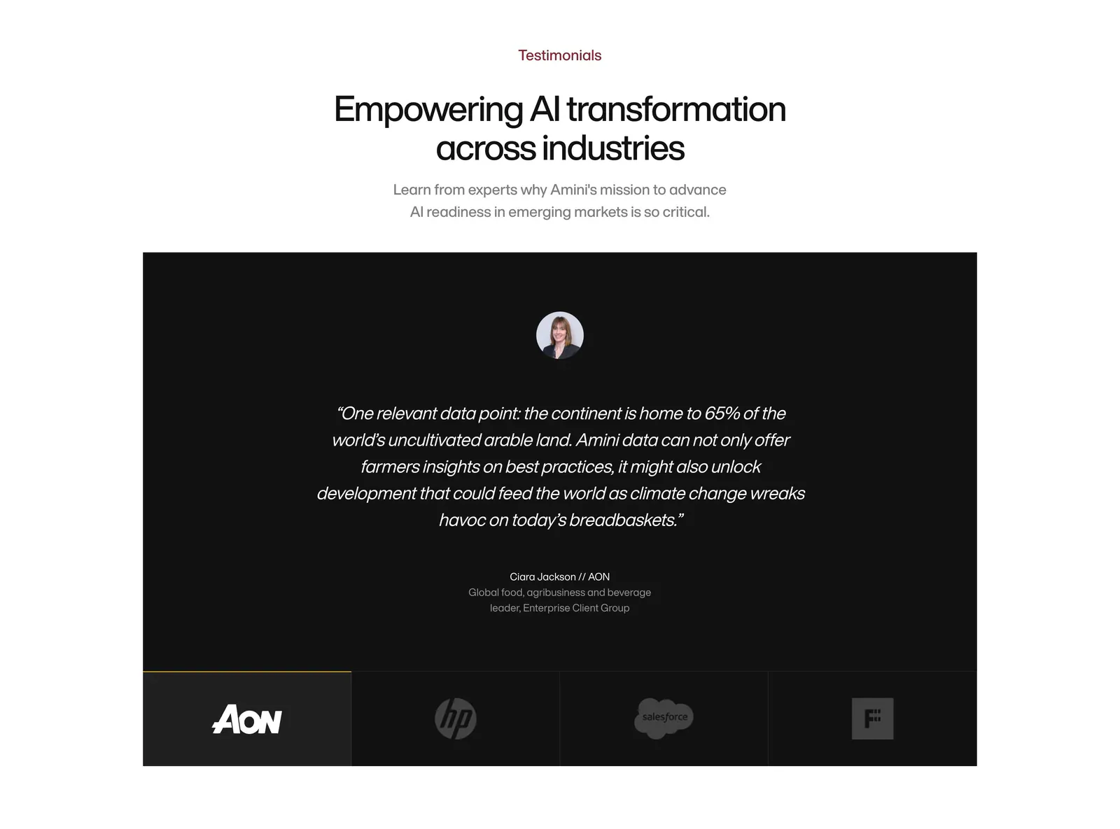
  11. Amini testimonials section: centered headline above a black panel with a centered italic quote and a row of logo tabs
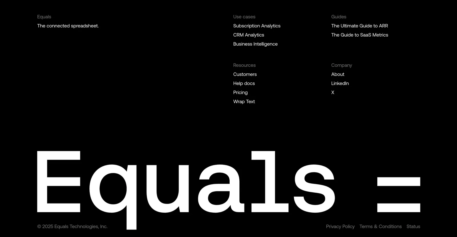
  12. Equals footer section: link columns above a giant monospace Equals wordmark and copyright line on a black background
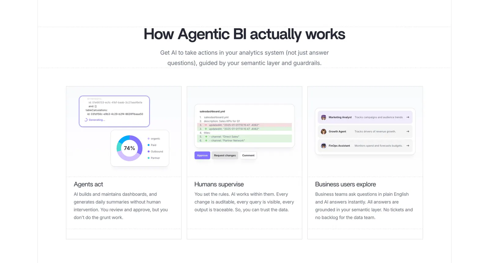
  13. Lightdash how it works section: centered heading above three equal cards with UI snippets for AI agents, a YAML diff review and business users
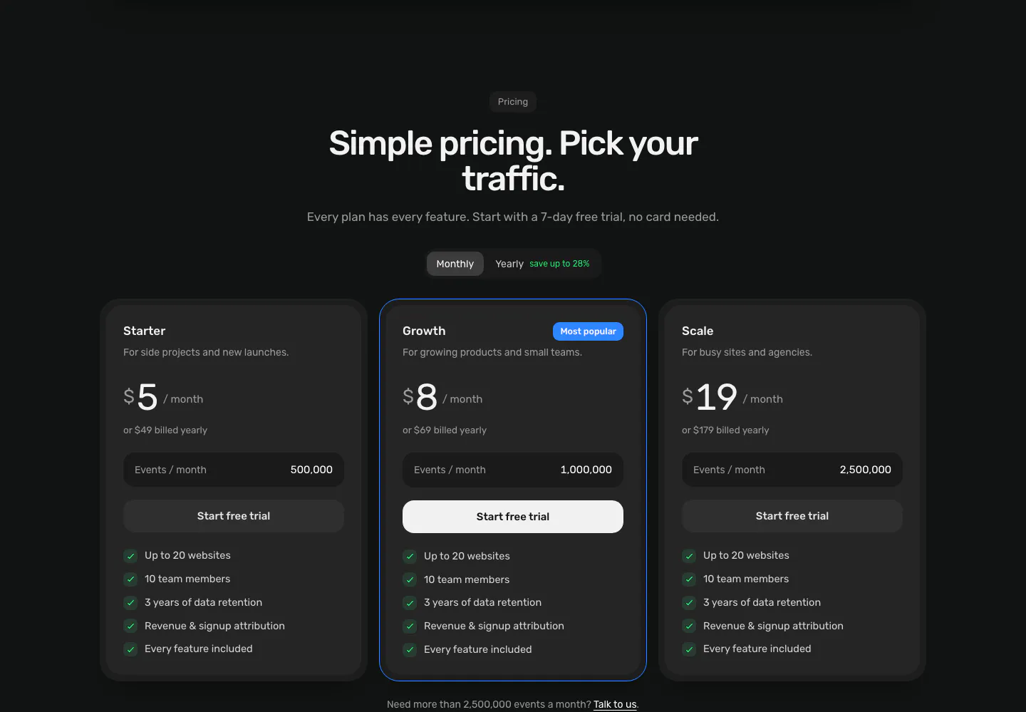
  14. Piqo pricing section: centered headline and monthly/yearly toggle above three dark plan cards, the middle one highlighted as Most popular
  15. Secoda integrations section: centered headline and button above two rows of integration app icons fading at the edges on white
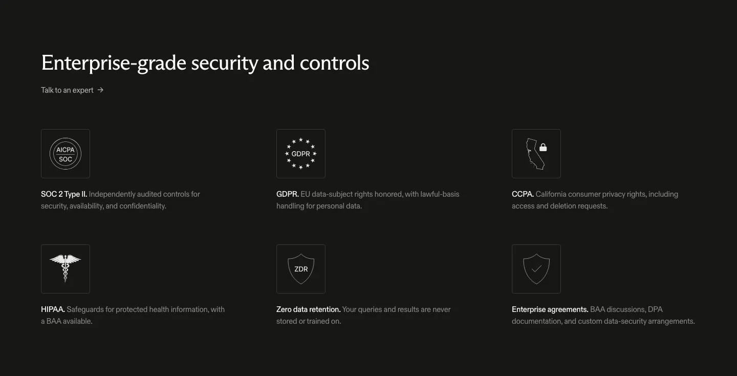
  16. Exa security section: dark background with headline and a three-by-two grid of outlined compliance icons for SOC 2, GDPR, CCPA and HIPAA
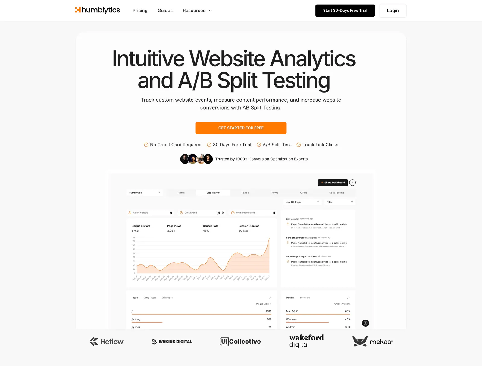
  17. Humblytics hero section: centered headline, orange CTA and analytics dashboard screenshot above a customer logo row on a light background
  18. Piqo FAQ section: centered pill label and headline above a rounded dark card with eight collapsed questions and a contact email
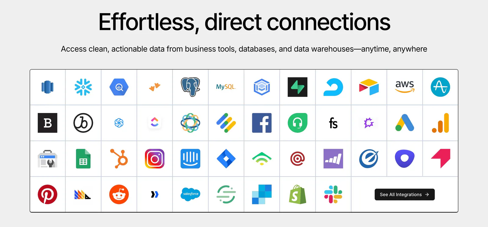
  19. Airbook integrations section: centered headline above a bordered grid of colorful third-party app icons with a See all button
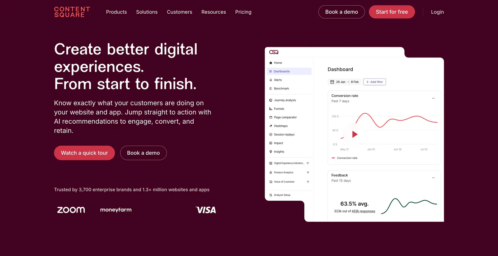
  20. Contentsquare hero section: left headline and buttons with logo row beside an analytics dashboard screenshot on dark plum
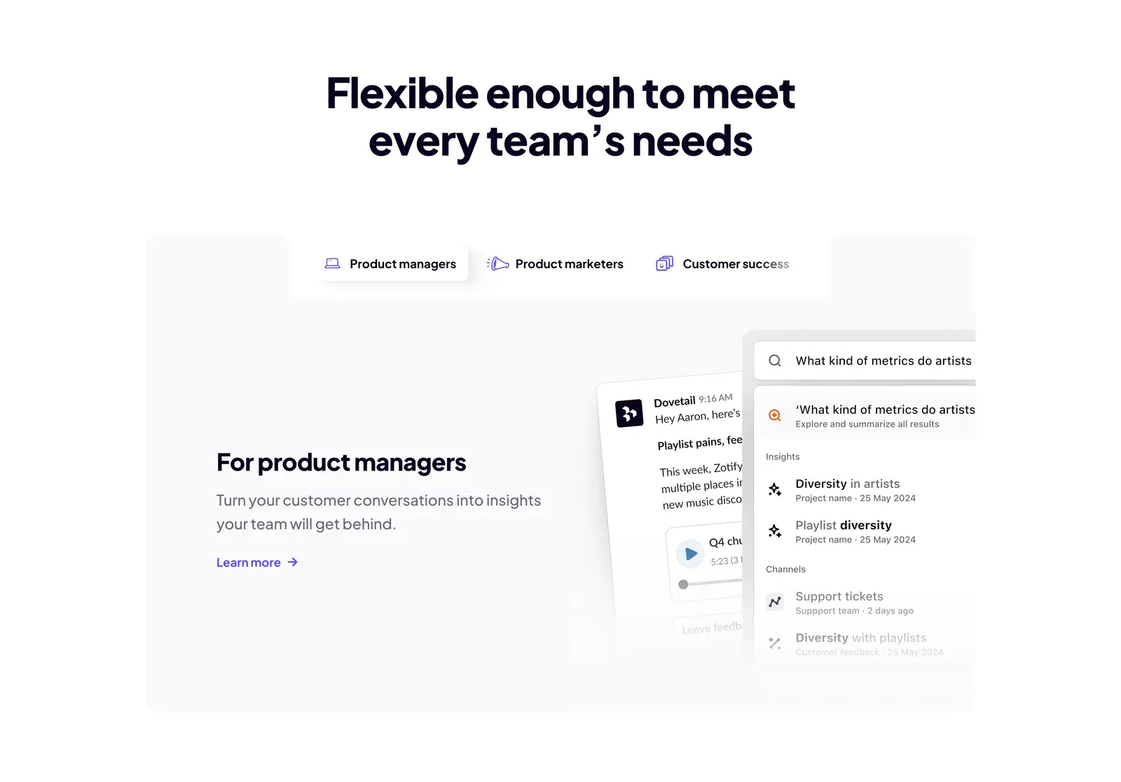
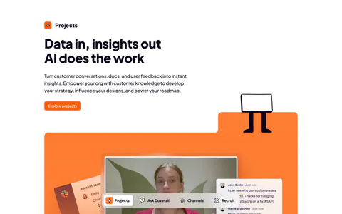
  21. Dovetail features section: centered headline above role tabs and a panel with product manager copy beside chat and search UI cards
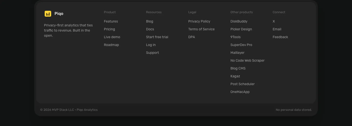
  22. Piqo footer section: rounded dark card with yellow logo and tagline, five link columns including other products, copyright row
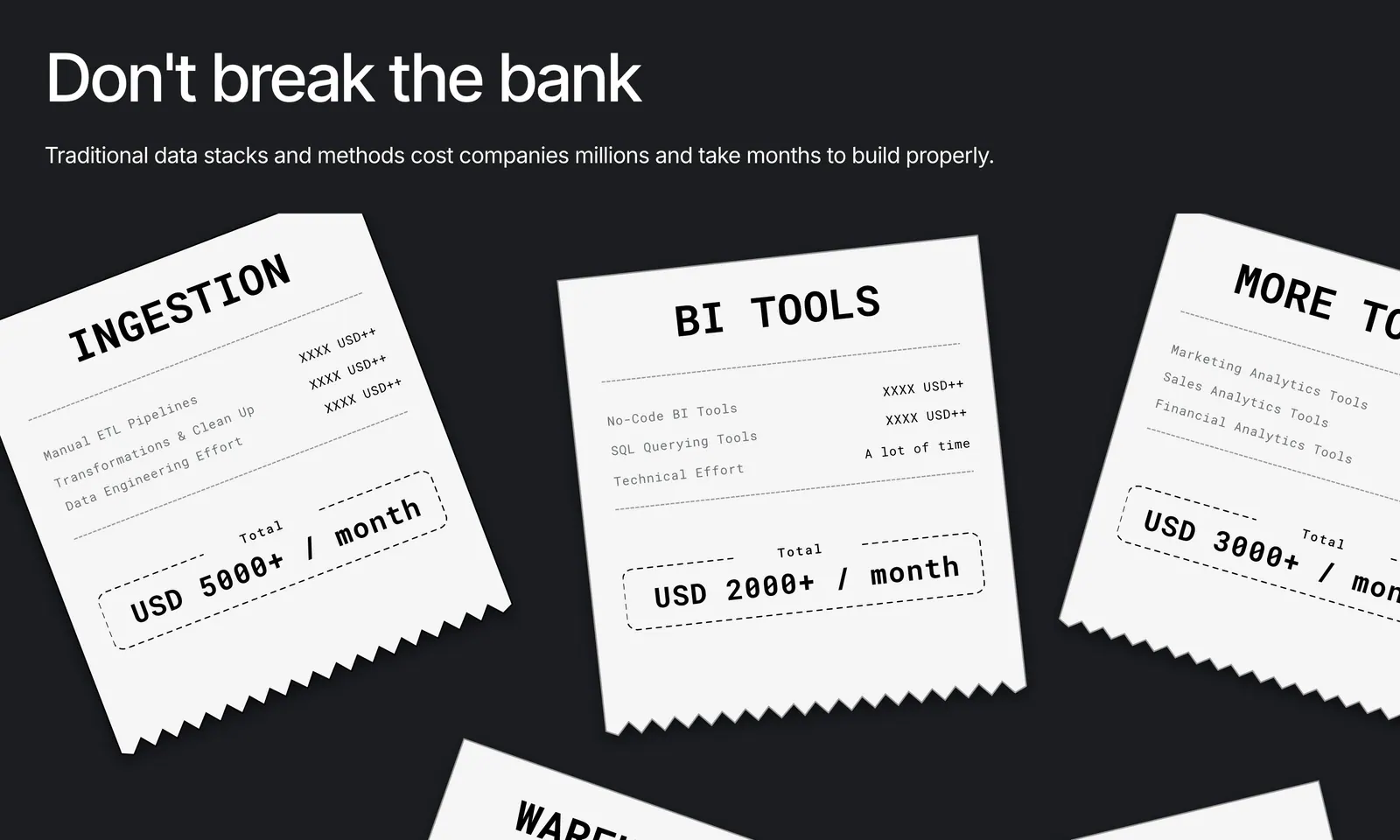
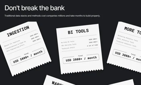
  23. Airbook value proposition section: headline on charcoal with scattered white receipt cards listing data tool costs per month
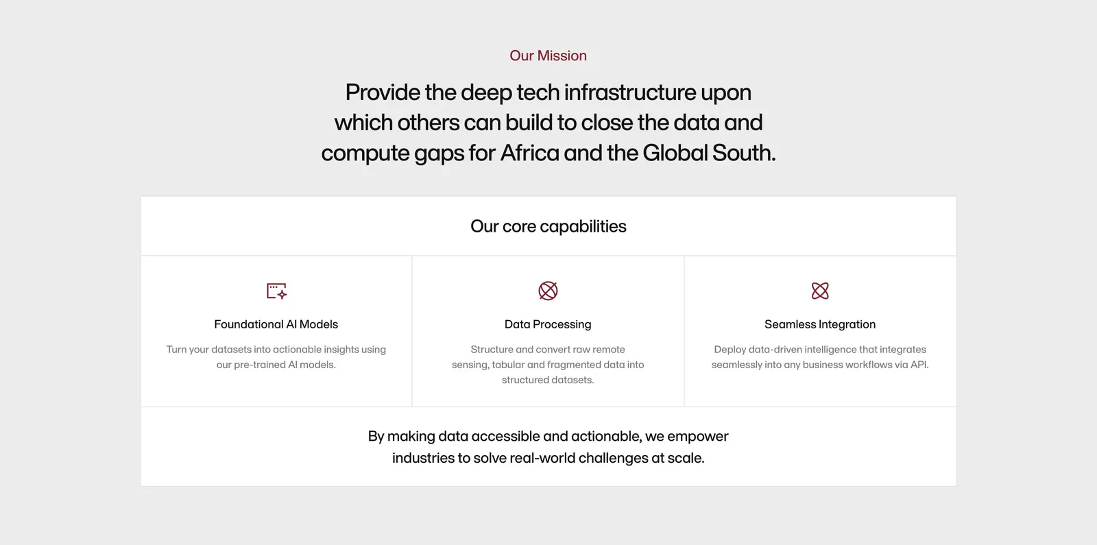
  24. Amini about & mission section: centered mission statement above a bordered panel of three core capability columns with icons
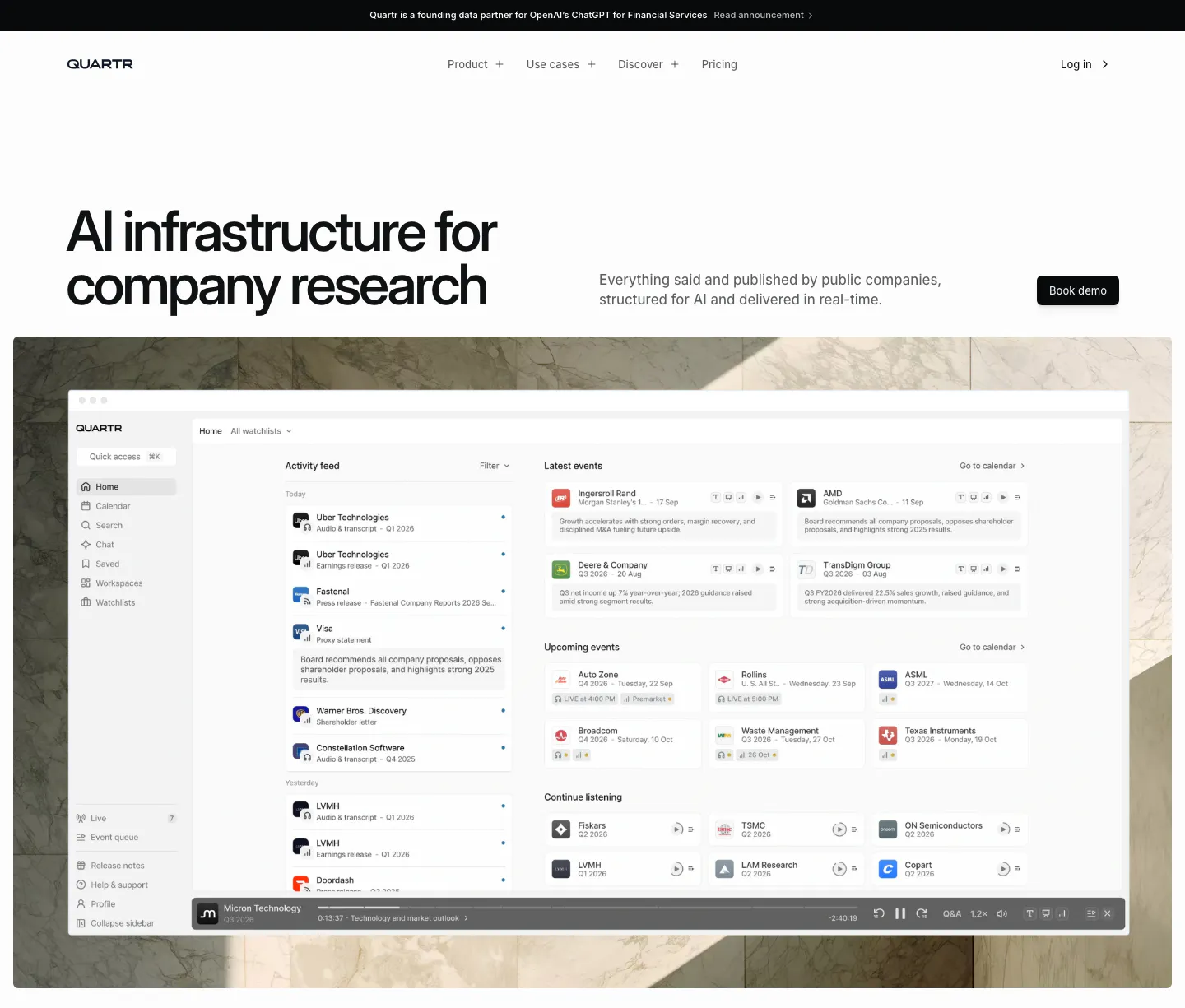
  25. Quartr hero section: left-aligned headline with Book demo button above a research app dashboard set on a marble photo backdrop
  26. Contentsquare call-to-action section: headline and two buttons in a deep indigo banner with thin outline path lines
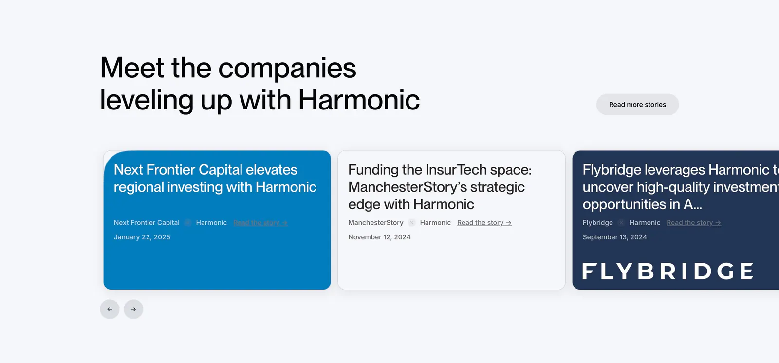
  27. Harmonic testimonials section: left-aligned headline above a carousel of customer story cards in blue, white and navy with arrows
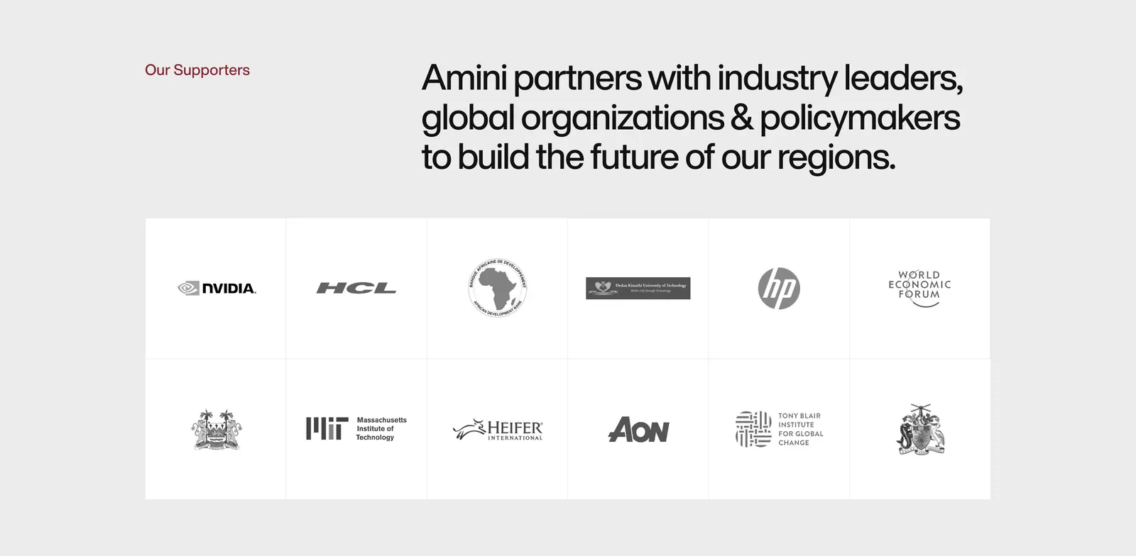
  28. Amini logo cloud section: label and headline above a bordered two-row grid of grayscale partner and supporter logos on light gray
  29. Equals logo cloud section: three rows of five grayscale customer logos including Notion, Intercom and Attio on a light gray background
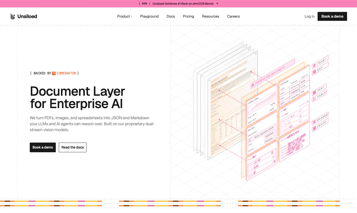
  30. Unsiloed hero section: left headline with Book a demo and Read the docs buttons beside an isometric illustration of layered parsed documents
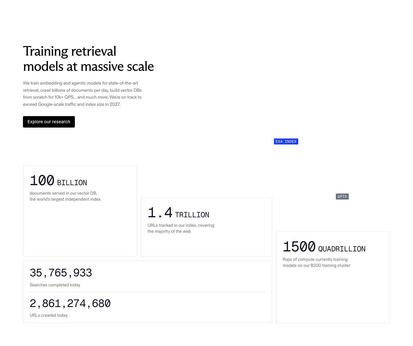
  31. Exa stats section: headline, copy and research button above staggered bordered cards with large monospace figures for index size and compute
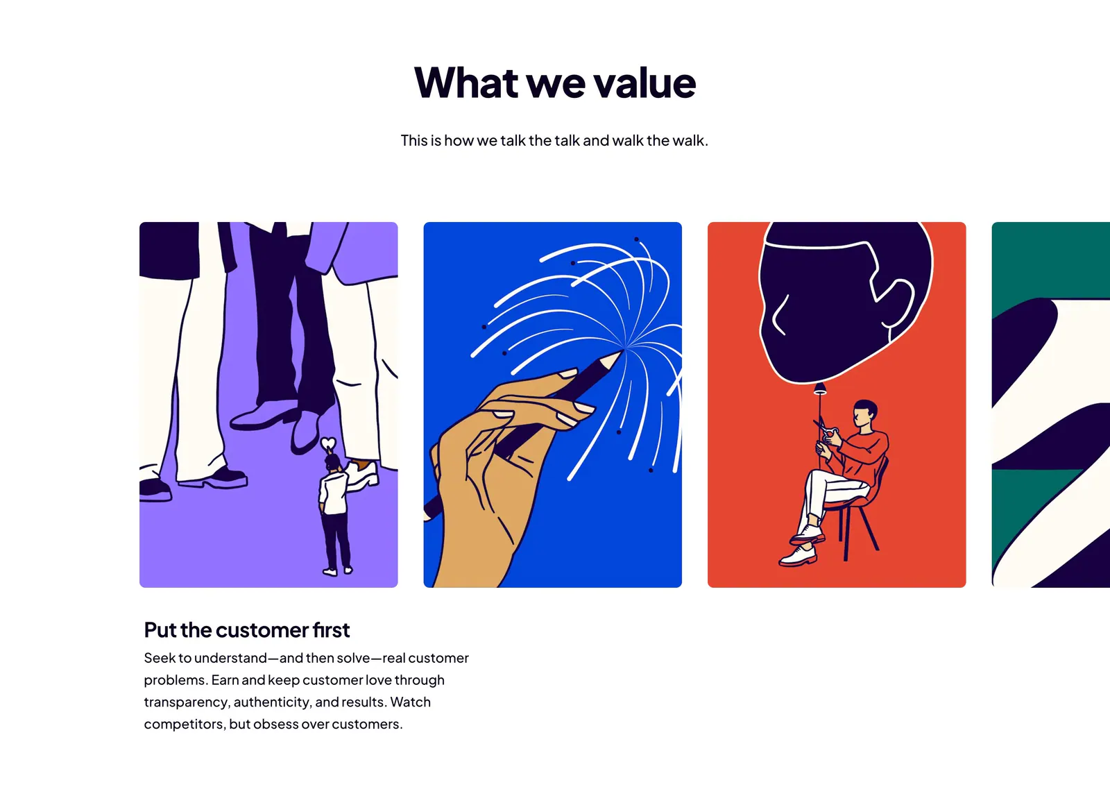
  32. Dovetail value proposition section: centered headline above a carousel of bold illustrated value cards with the first value's text below
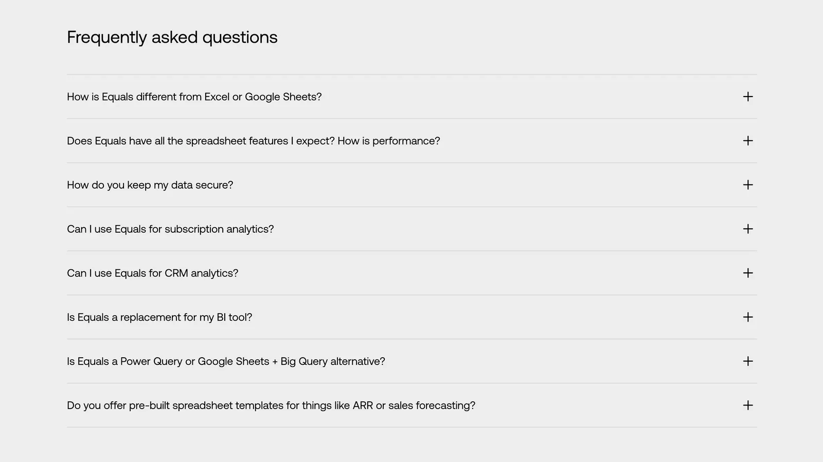
  33. Equals FAQ section: left-aligned heading above an eight-question accordion with plus icons on a light gray background
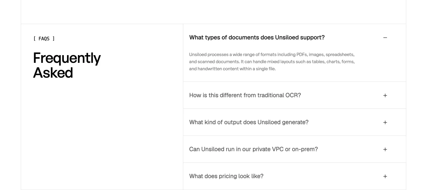
  34. Unsiloed FAQ section: Frequently Asked heading at left beside a bordered accordion with the first question expanded on white
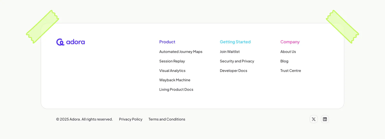
  35. Adora footer section: rounded white card with logo and three link columns, taped corners, copyright row on off-white
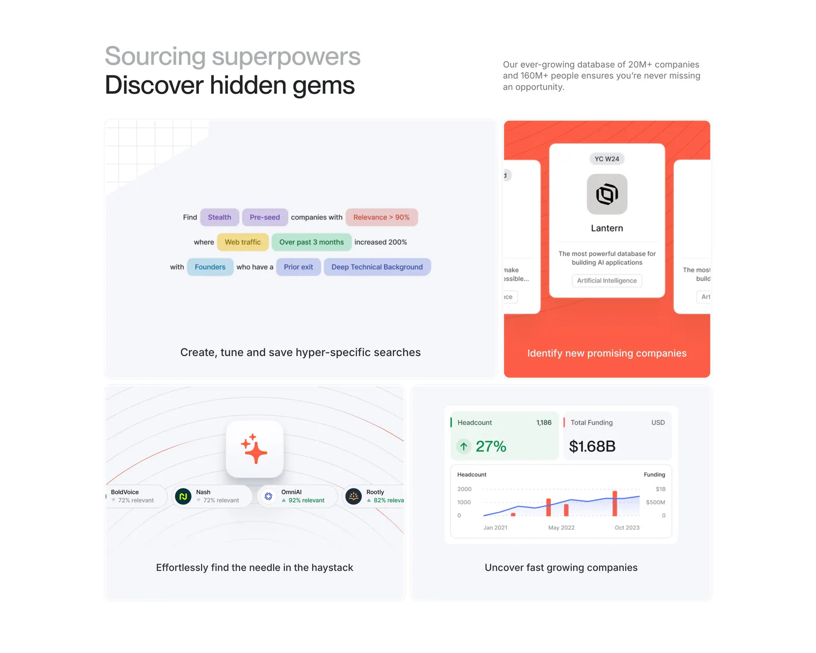
  36. Harmonic features section: two-tone headline above a four-tile bento grid with search chips, company cards and growth charts
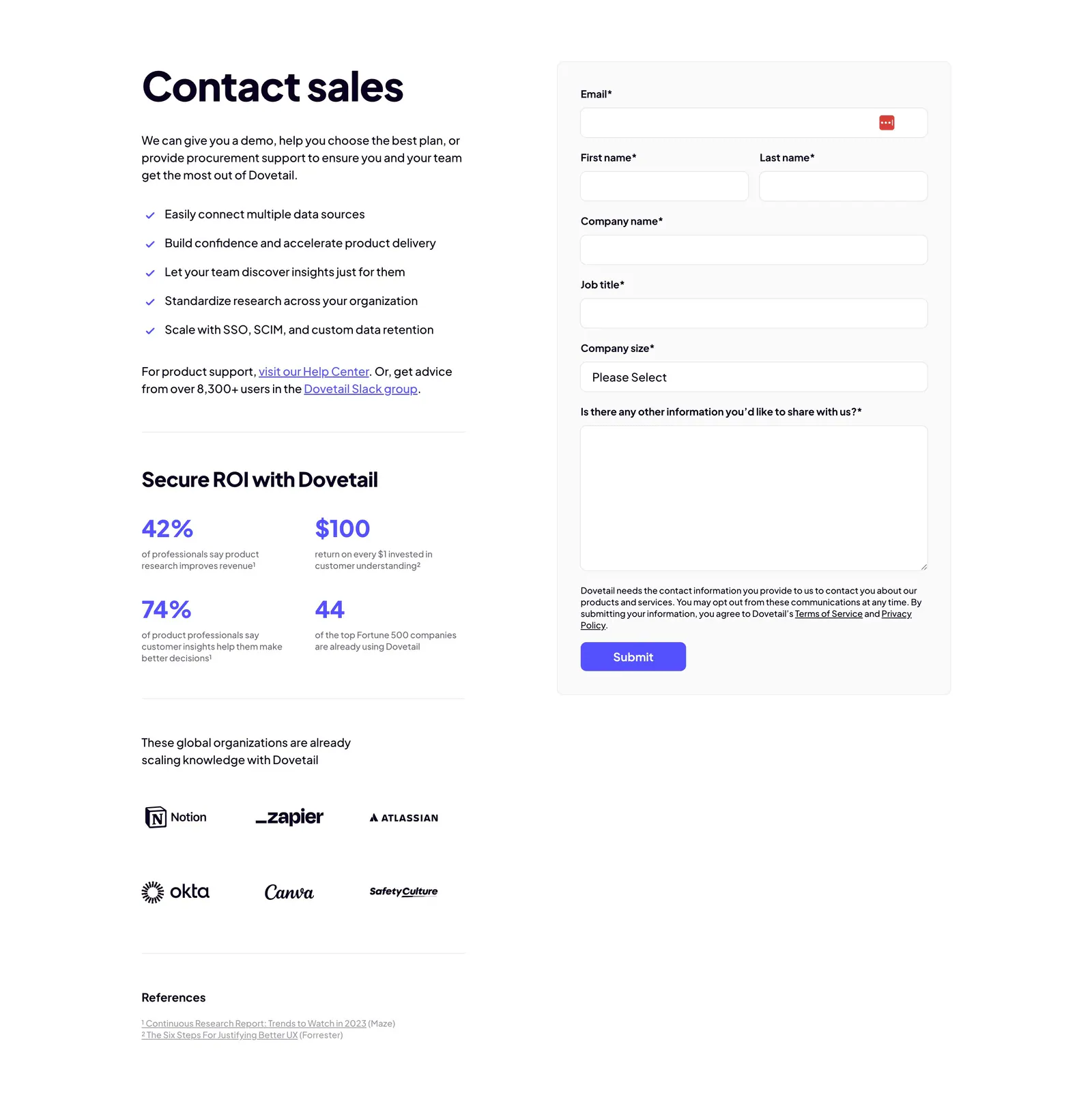
  37. Dovetail contact section: copy with checklist, ROI stats and customer logos on the left beside a gray contact sales form with purple submit
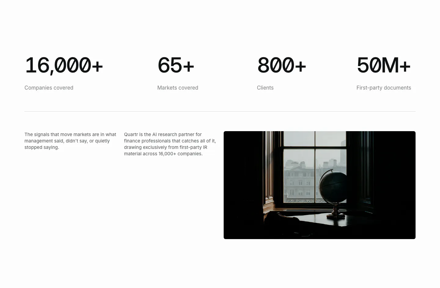
  38. Quartr stats section: four large monospace figures in a row above two short text columns and a dark photo of a globe by a window
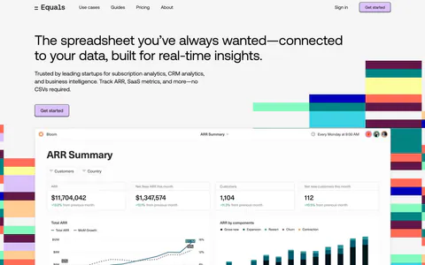
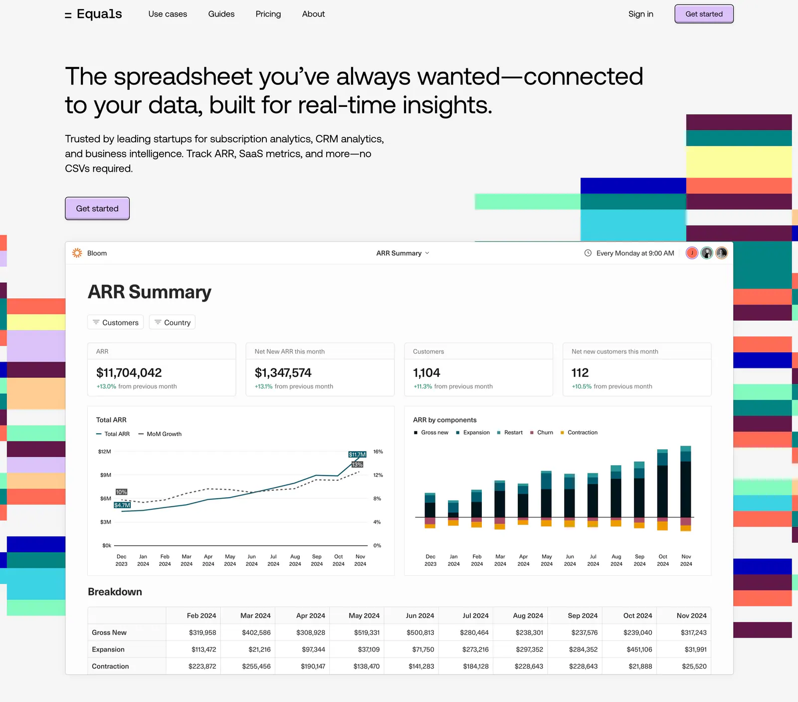
  39. Equals hero section: nav bar and left-aligned headline above an ARR dashboard screenshot flanked by colorful stepped block graphics
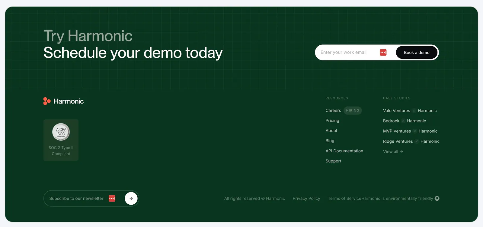
  40. Harmonic footer section: dark green panel with demo email signup over a grid texture, logo, SOC 2 badge, link columns and newsletter field
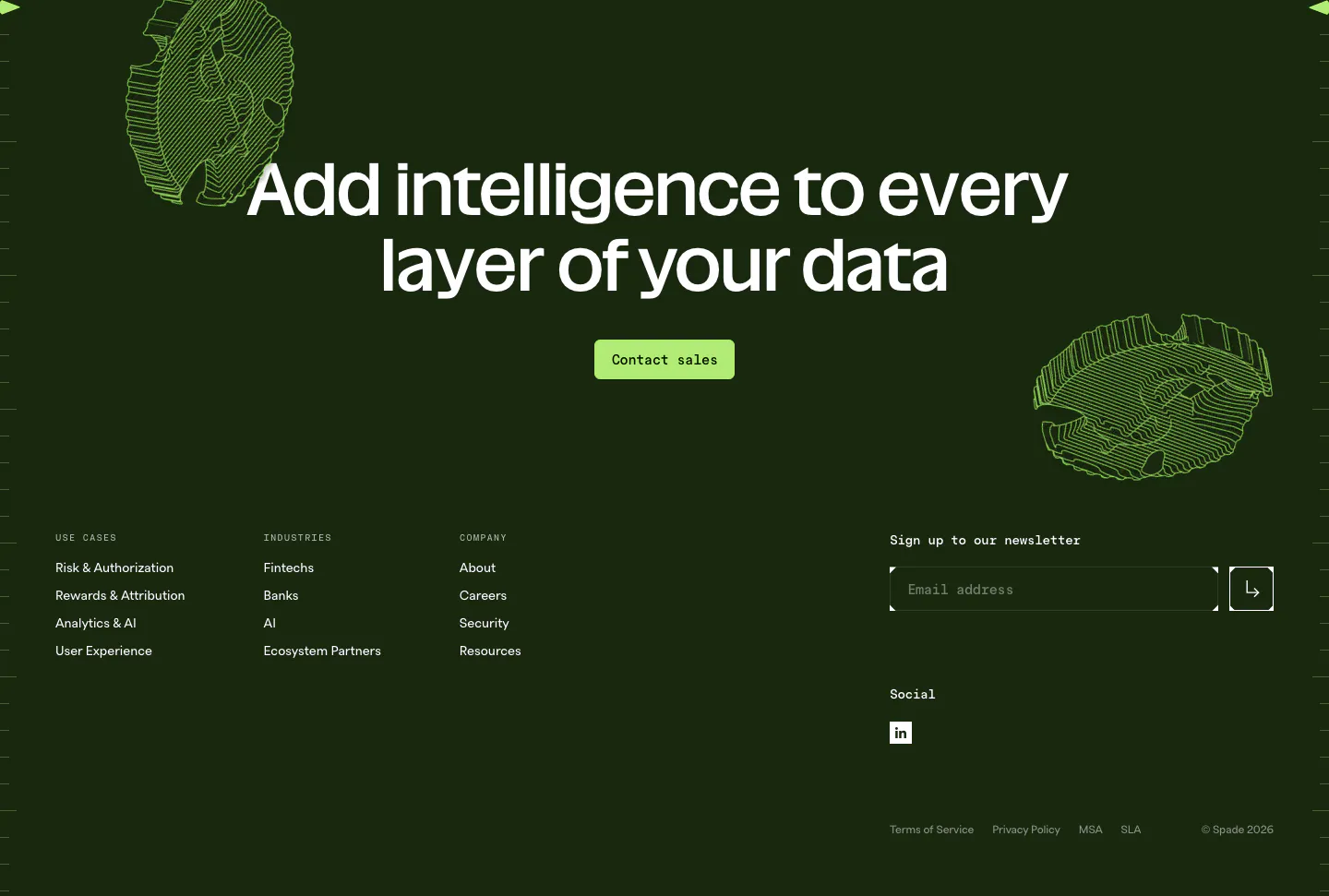
  41. Spade footer section: dark green CTA with centered headline, green button and line-art coins above link columns and a newsletter email field
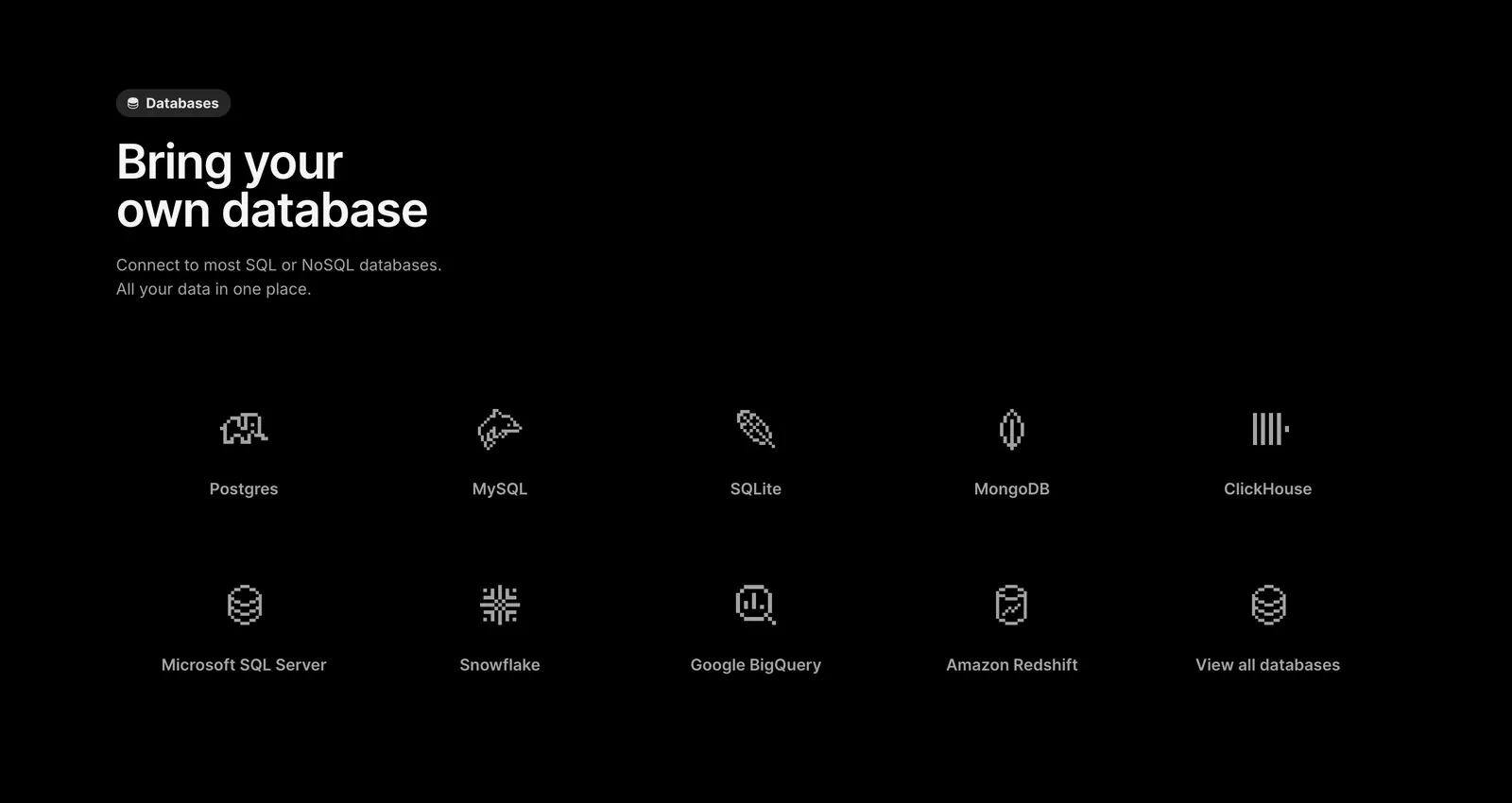
  42. Outerbase features section: left-aligned headline above a two-row grid of pixel-style database icons with names on black
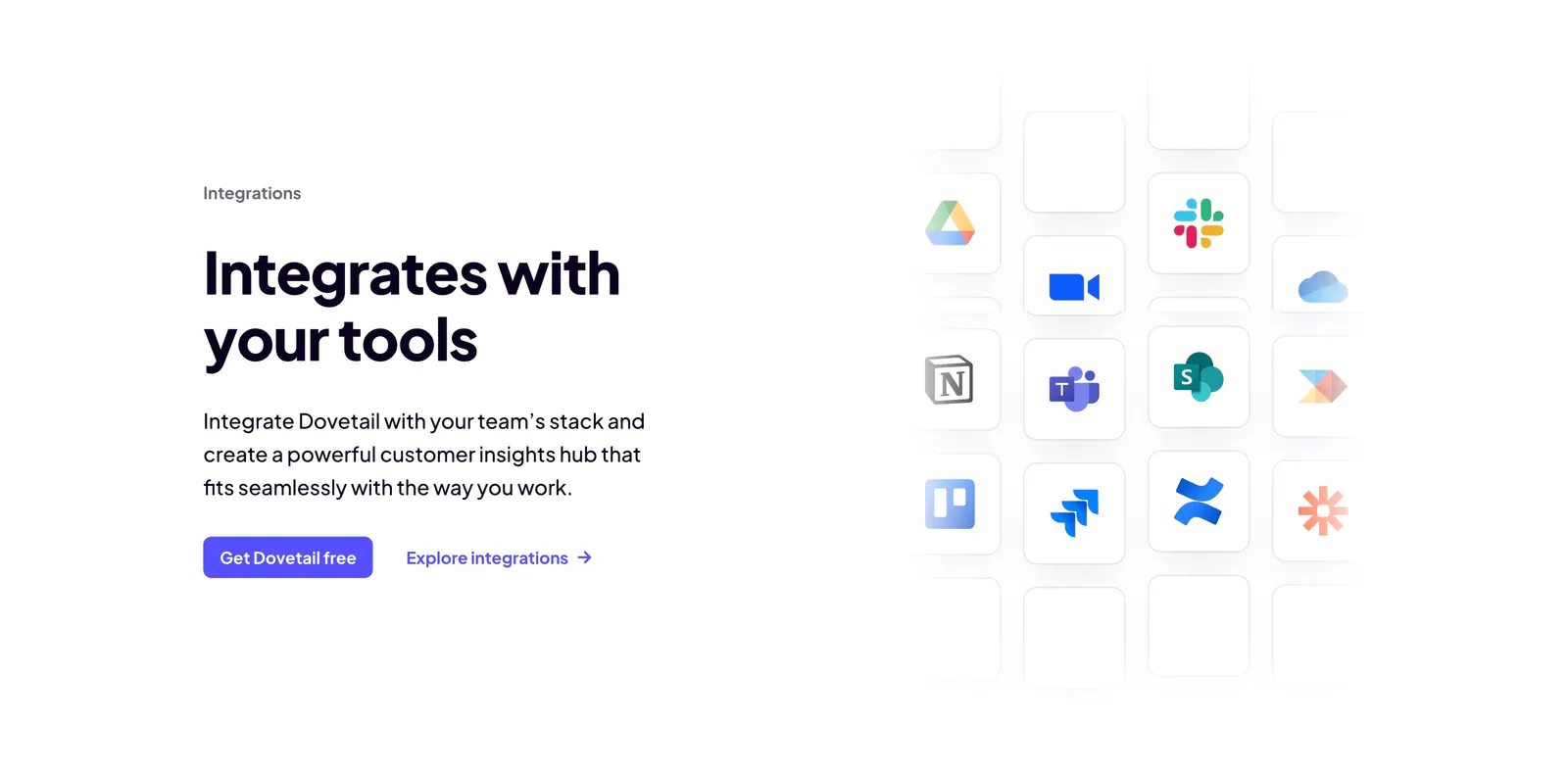
  43. Dovetail integrations section: headline, copy and two CTAs on the left beside a fading grid of app icon tiles like Slack, Notion and Jira
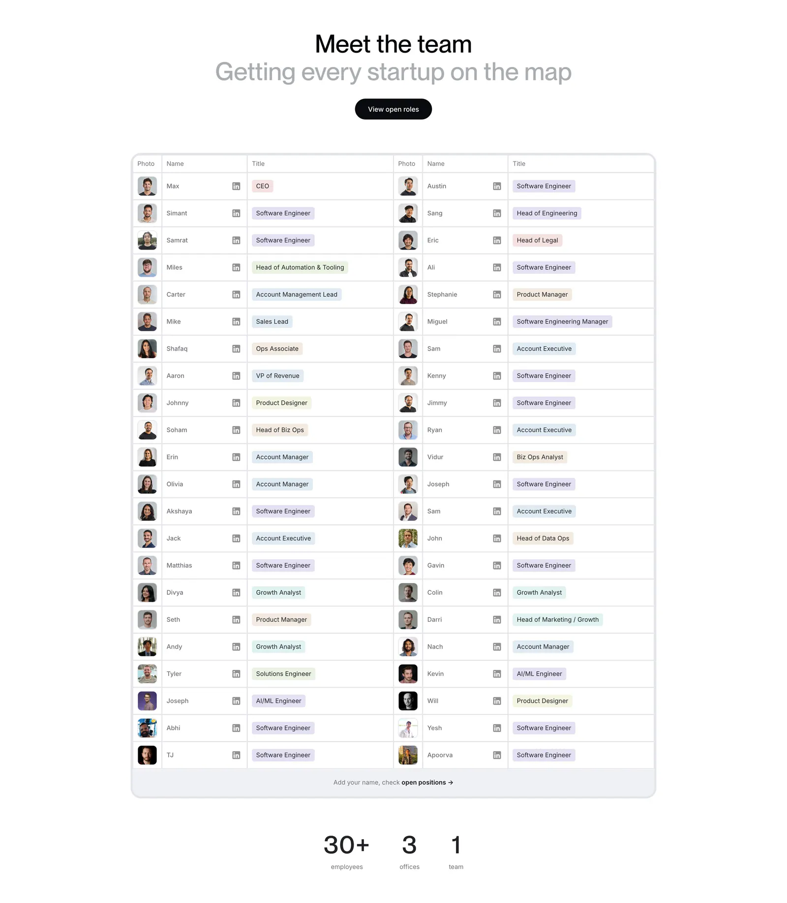
  44. Harmonic team section: centered heading above a two-column table of team member photos, names and role tags with stats below
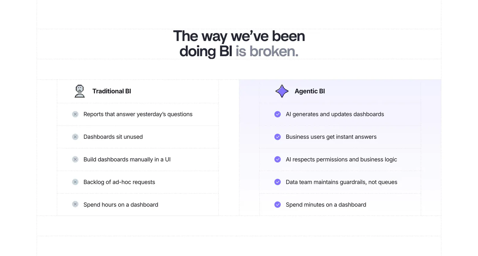
  45. Lightdash comparison section: centered headline above a two-column Traditional BI vs Agentic BI list with cross and check marks on white
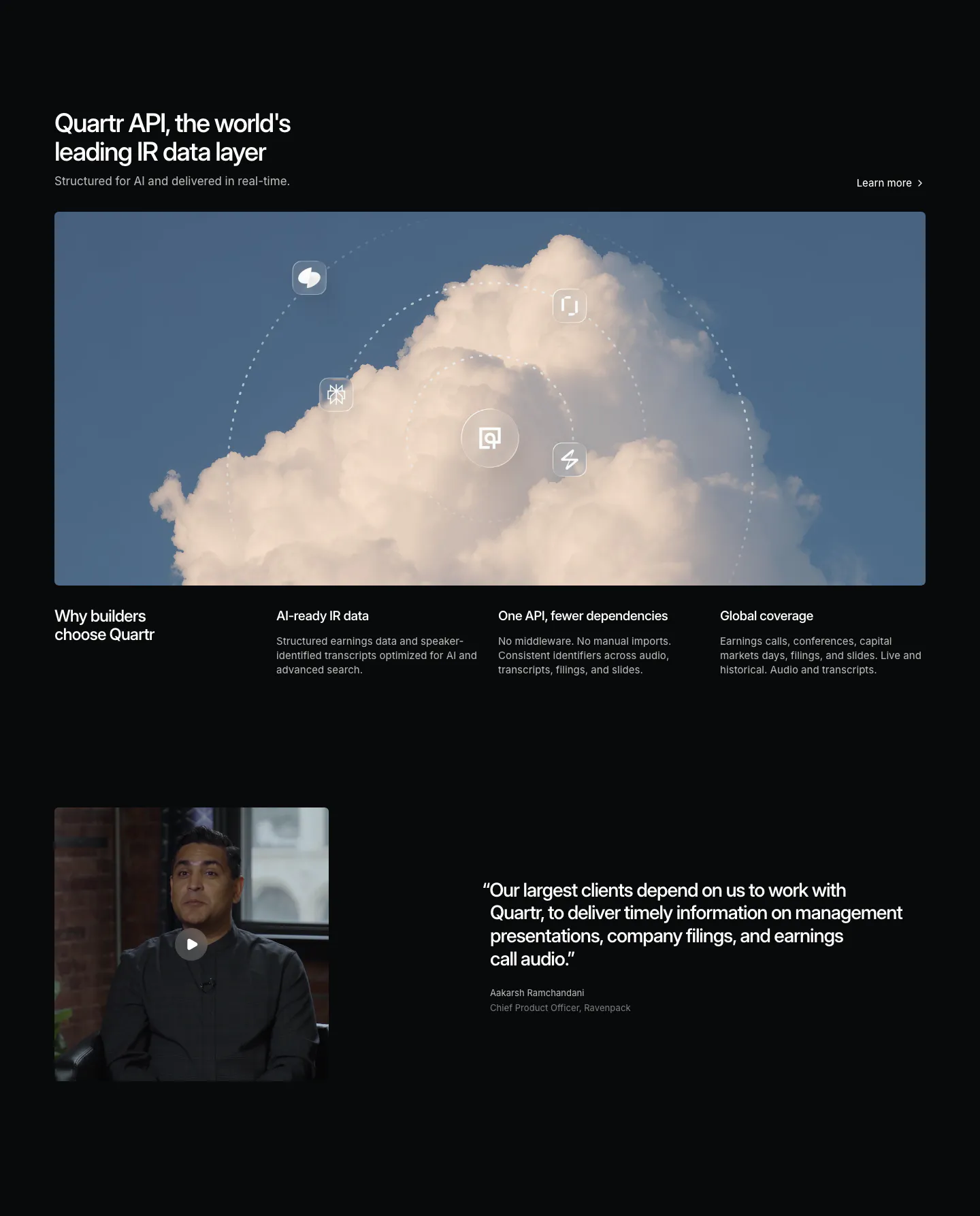
  46. Quartr features section: dark layout with a wide cloud photo orbited by icons, three benefit columns and a video testimonial
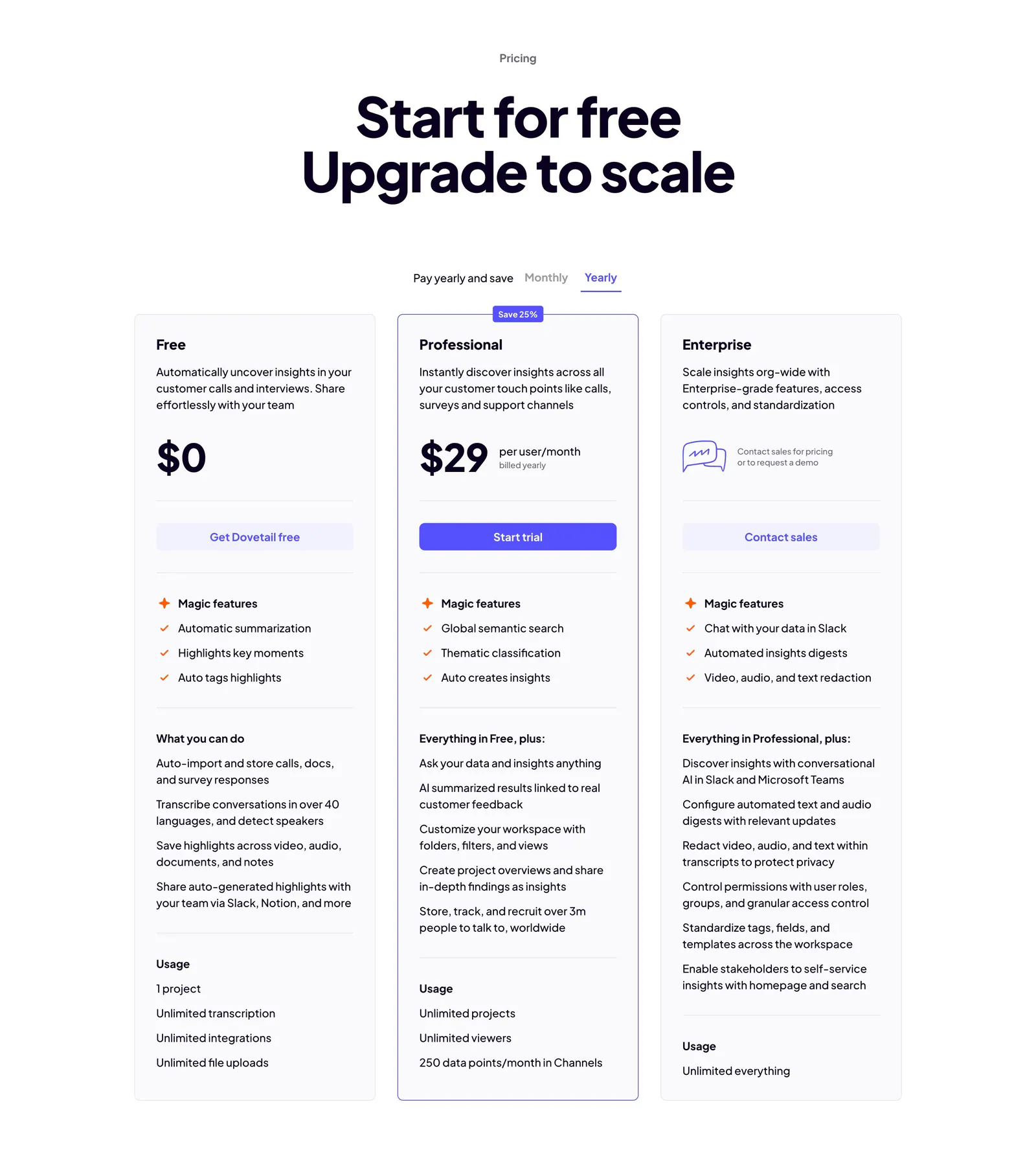
  47. Dovetail pricing section: centered headline, monthly/yearly toggle and three plan cards with the Professional tier outlined in indigo
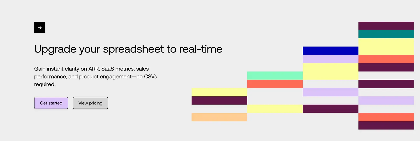
  48. Equals call-to-action section: left-aligned headline with two buttons beside a stepped grid of colorful blocks on a light gray background
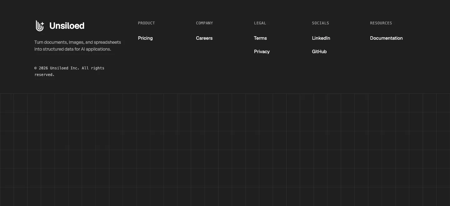
  49. Unsiloed footer section: logo and tagline with Product, Company, Legal, Socials and Resources columns above a grid-line pattern on charcoal
  50. Quartr call to action section: centered white headline and Contact sales button on a near-black background
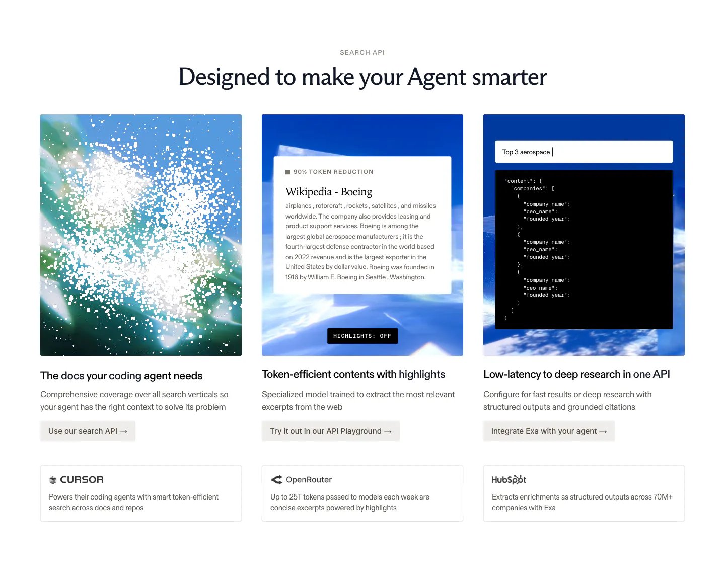
  51. Exa features section: centered headline over three image cards with sky visuals, a text excerpt and JSON output, plus customer callouts below
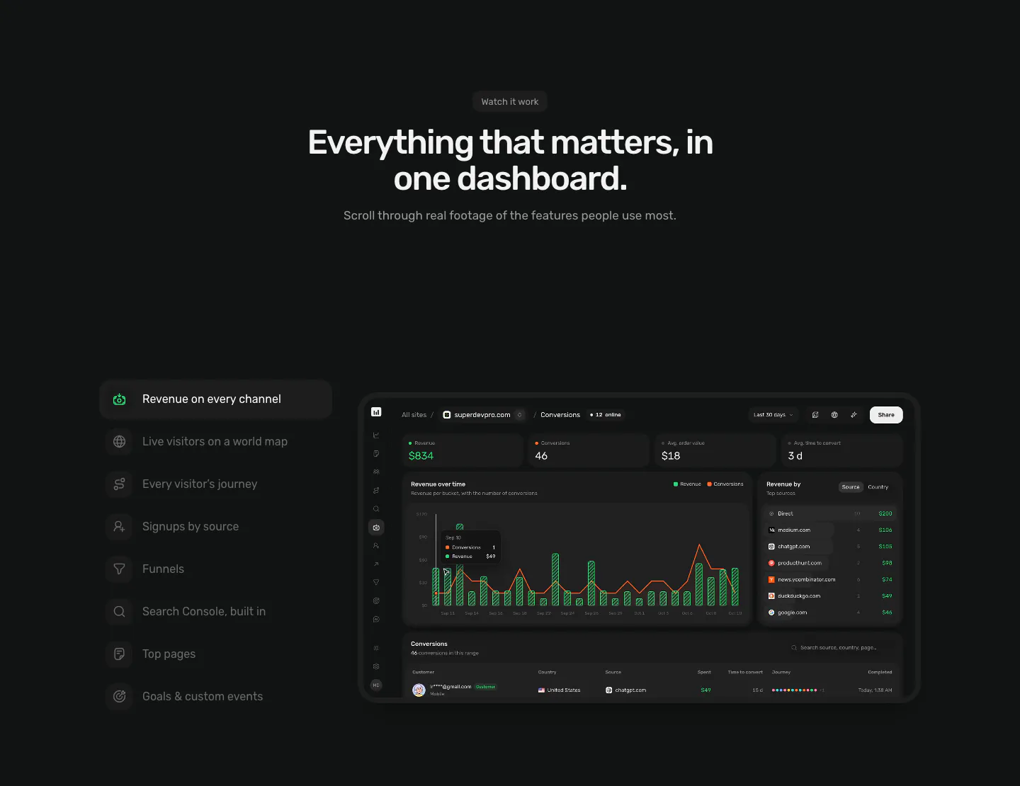
  52. Piqo features section: centered headline above a vertical feature tab list on the left and a dark revenue dashboard screenshot on the right
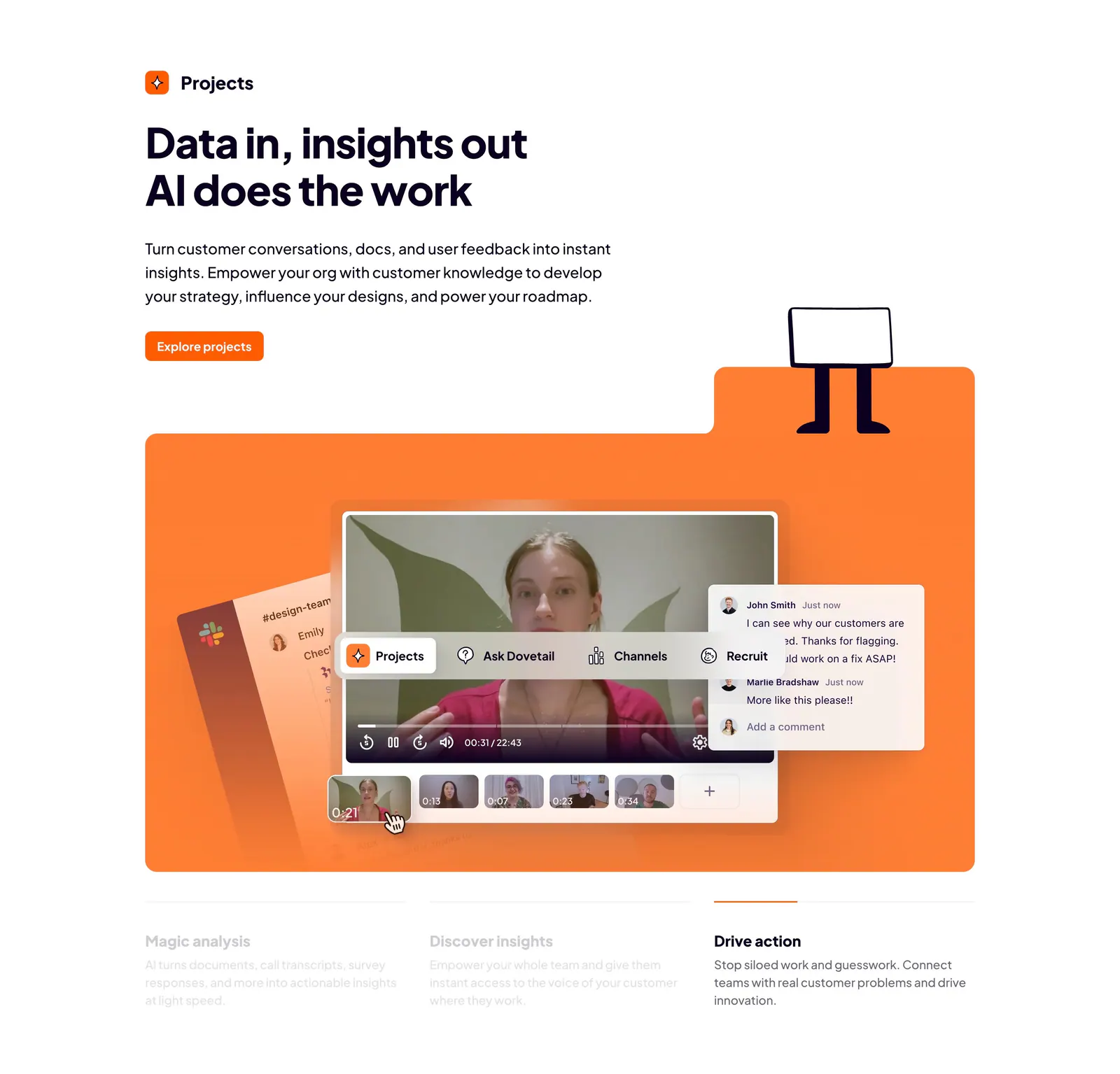
  53. Dovetail features section: left-aligned headline and orange button above an orange panel with a video insights UI and three tabbed benefits
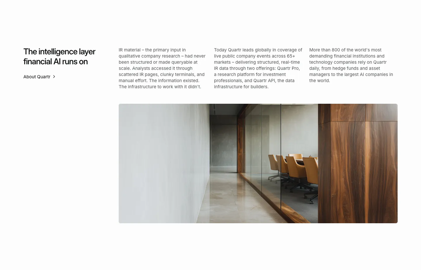
  54. Quartr about & mission section: headline with About link, three columns of company story text and a wide office interior photo
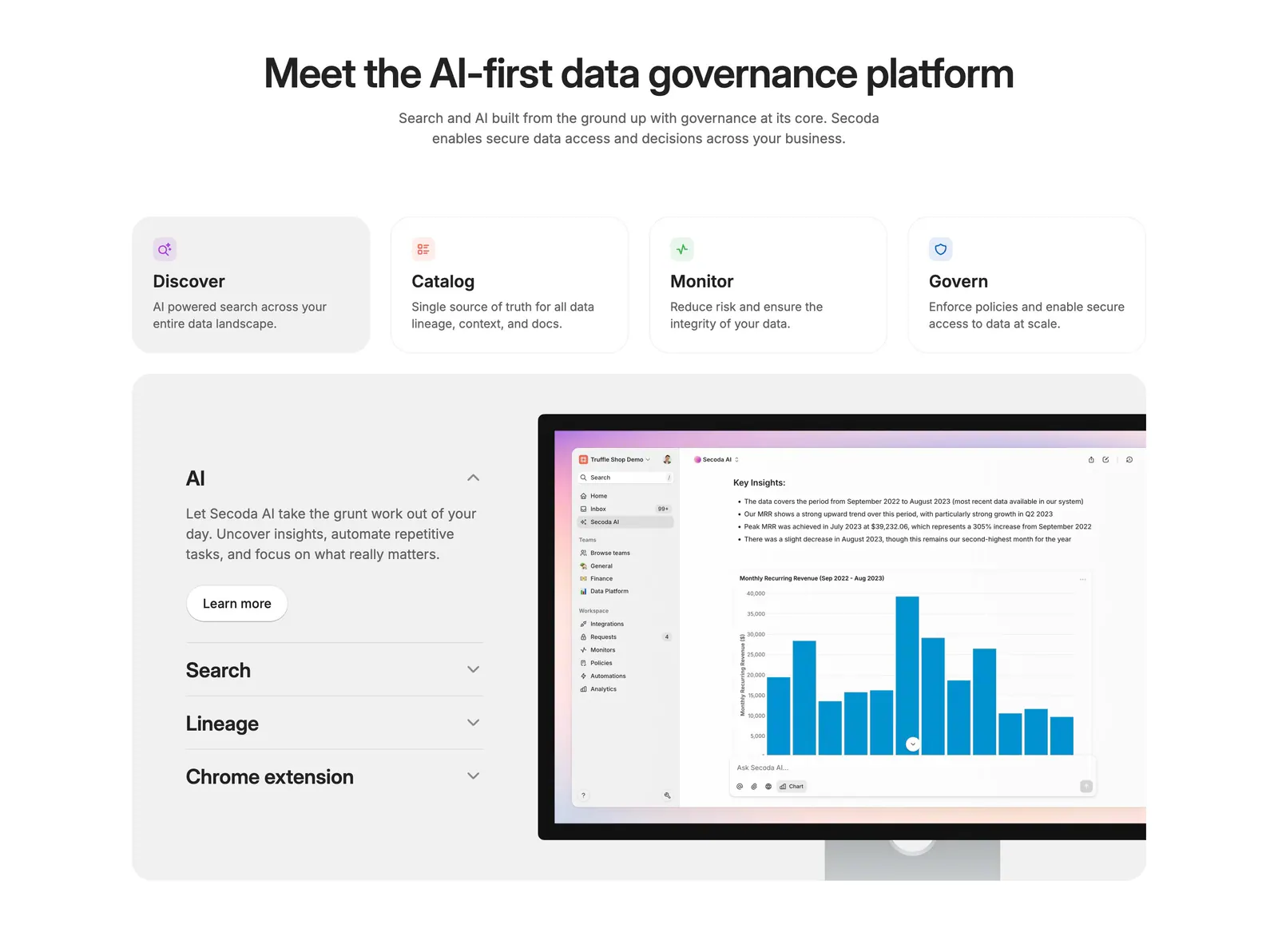
  55. Secoda features section: centered headline above four capability cards and an accordion beside an AI analytics screenshot
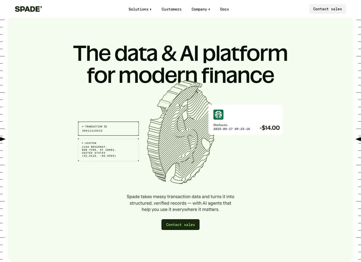
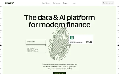
  56. Spade hero section: centered headline over a line-art coin drawing with transaction data cards on a mint green panel, button below
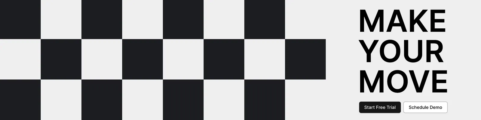
  57. Airbook call-to-action section: black and white checkerboard pattern on the left beside a bold MAKE YOUR MOVE headline and two buttons
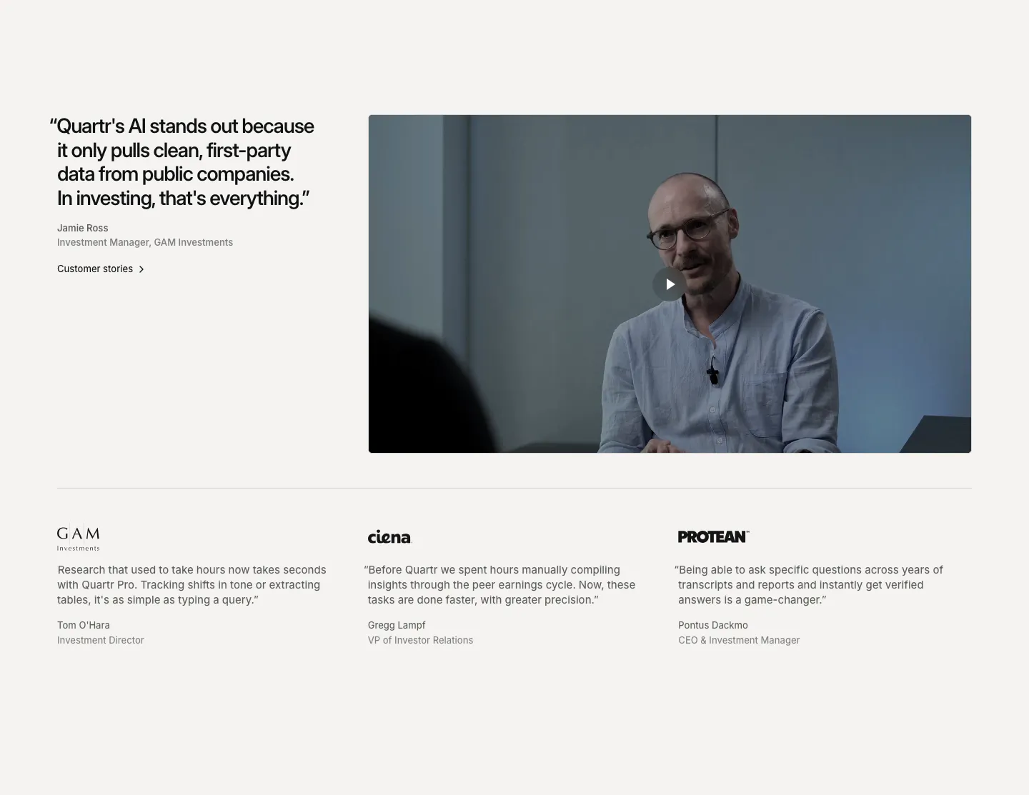
  58. Quartr testimonials section: large quote beside a customer video with play button, above three logo-headed quotes in columns
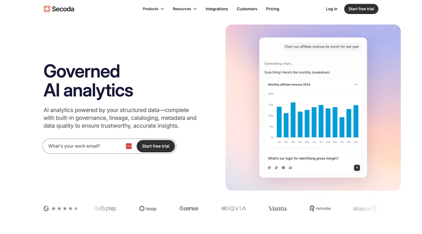
  59. Secoda hero section: headline and work email form on the left, AI chart chat mockup on a pastel gradient panel right, logos below
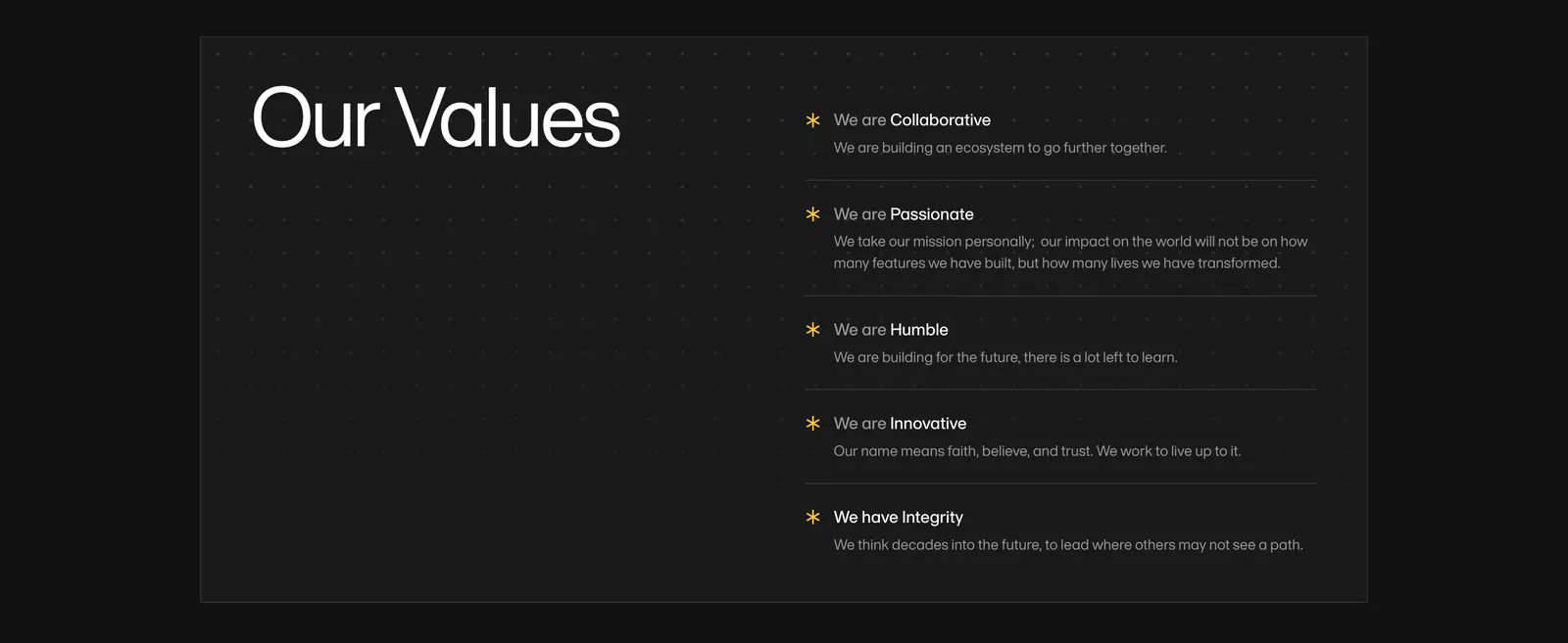
  60. Amini value proposition section: large Our Values heading on a dark dotted panel beside a list of five values with yellow asterisks
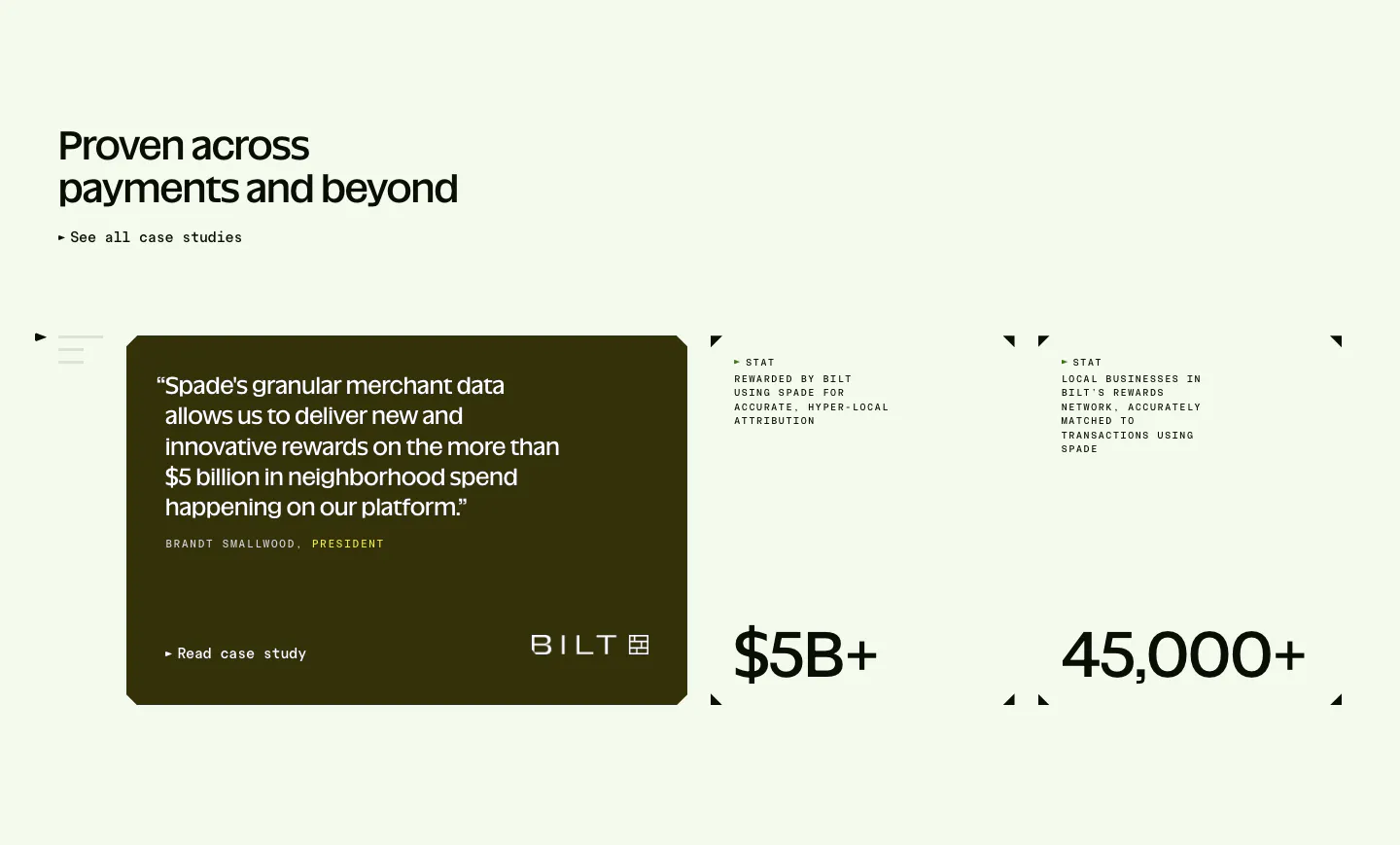
  61. Spade testimonials section: headline above a dark olive quote card with Bilt logo beside two stat blocks with corner marks on mint green
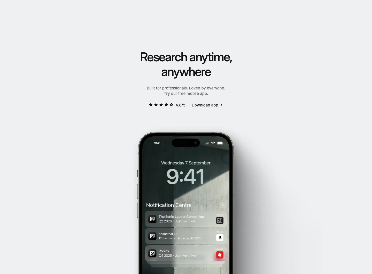
  62. Quartr other section: centered app download headline with star rating above an iPhone showing Quartr lock-screen notifications
    Quartr Other
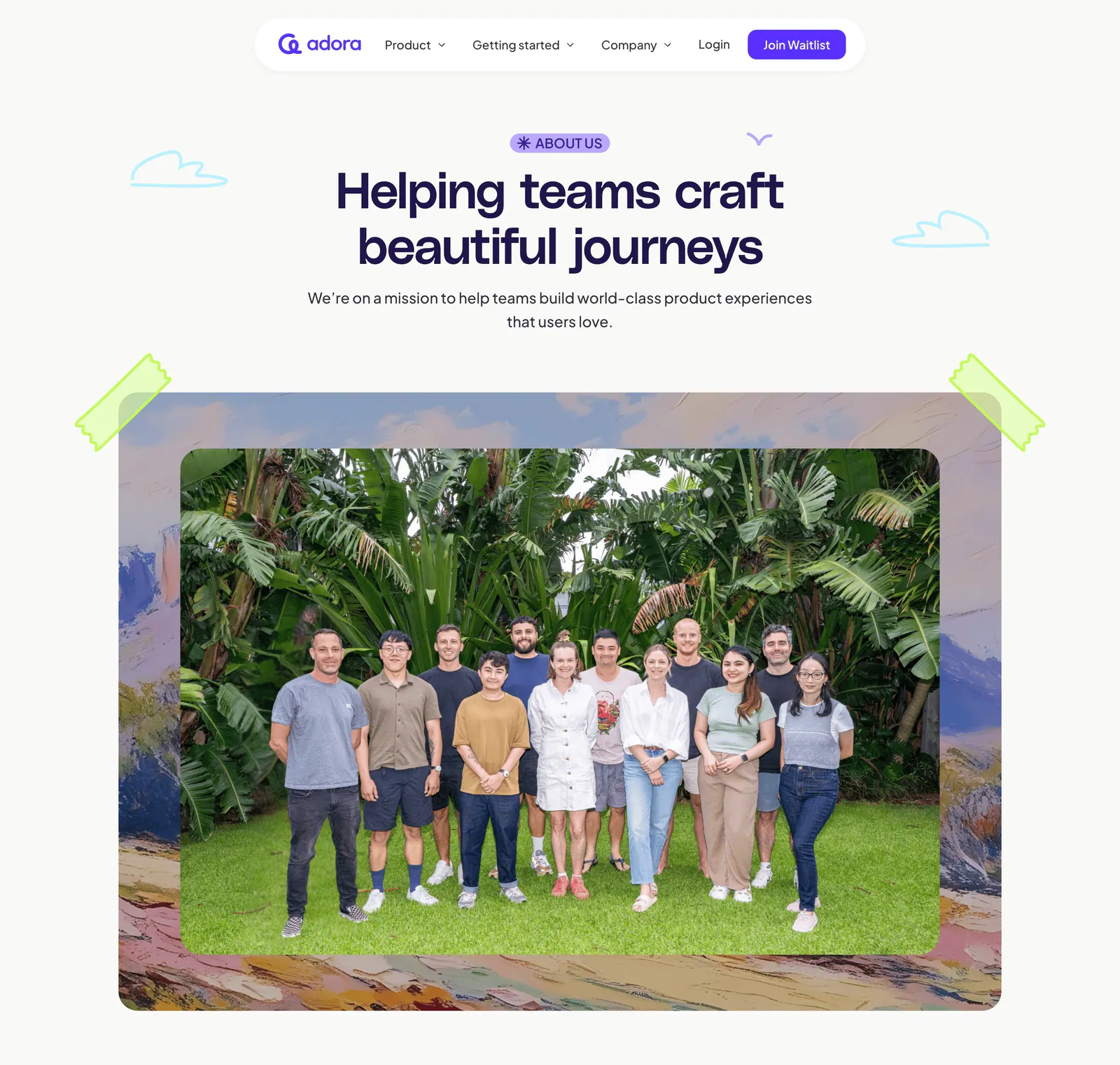
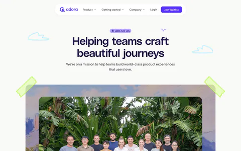
  63. Adora hero section: floating nav, centered About us headline and a large team photo framed by painted artwork and tape
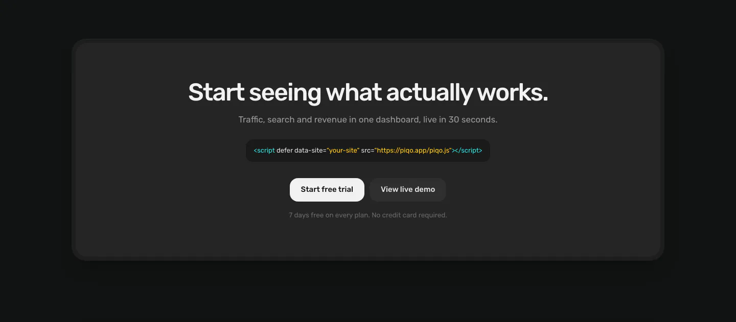
  64. Piqo call to action section: centered headline, script tag snippet and two buttons inside a rounded charcoal card on a near-black page
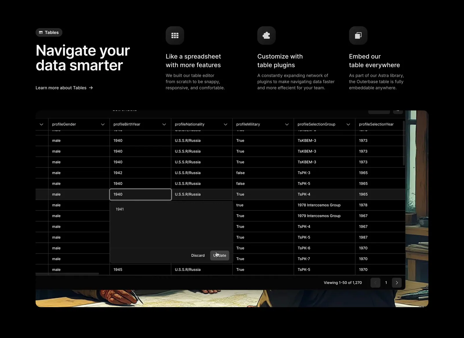
  65. Outerbase features section: headline beside three feature columns with icons above a dark data table screenshot on painted artwork
  66. Quartr features section: four equal gray cards with small UI snippets and charts, each with a short title and description
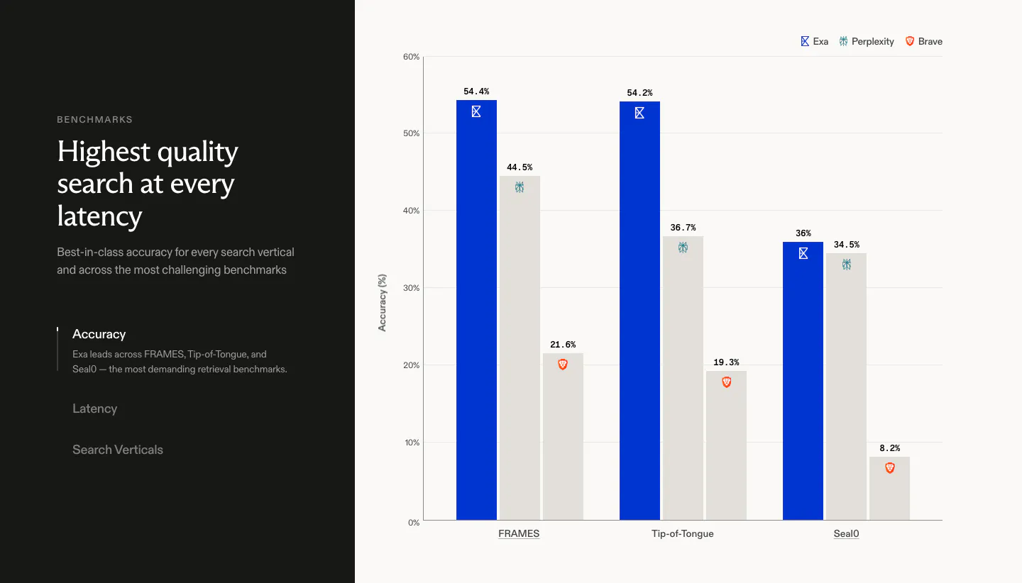
  67. Exa comparison section: dark left panel with headline and vertical tabs beside a bar chart of accuracy scores against Perplexity and Brave
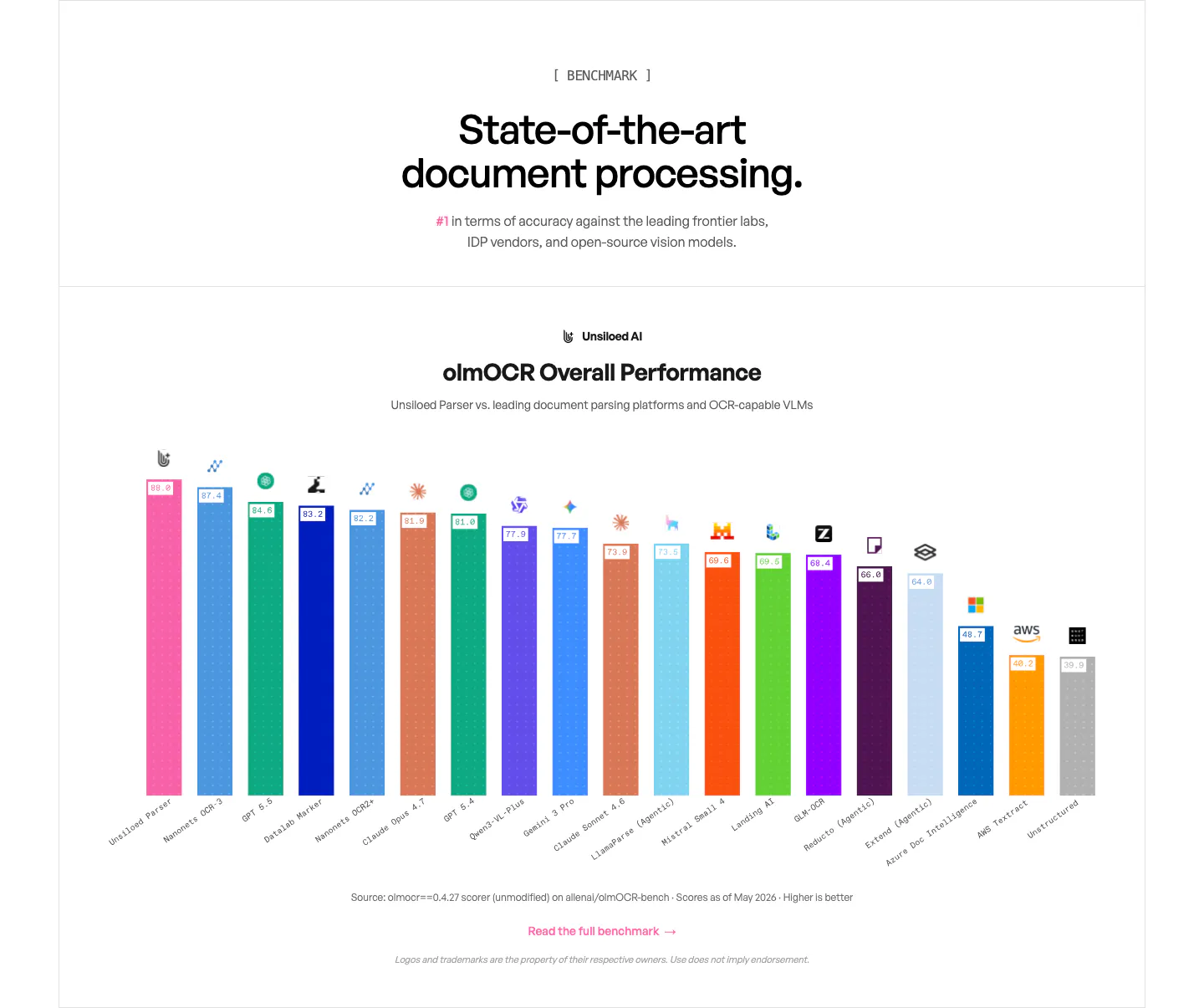
  68. Unsiloed comparison section: centered headline above a multicolor bar chart ranking Unsiloed Parser against other OCR models and VLMs
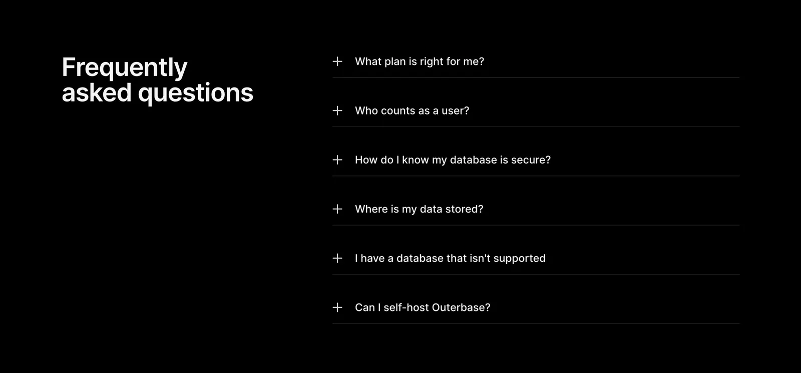
  69. Outerbase FAQ section: headline on the left beside a six-item plus-icon accordion of questions on a black background
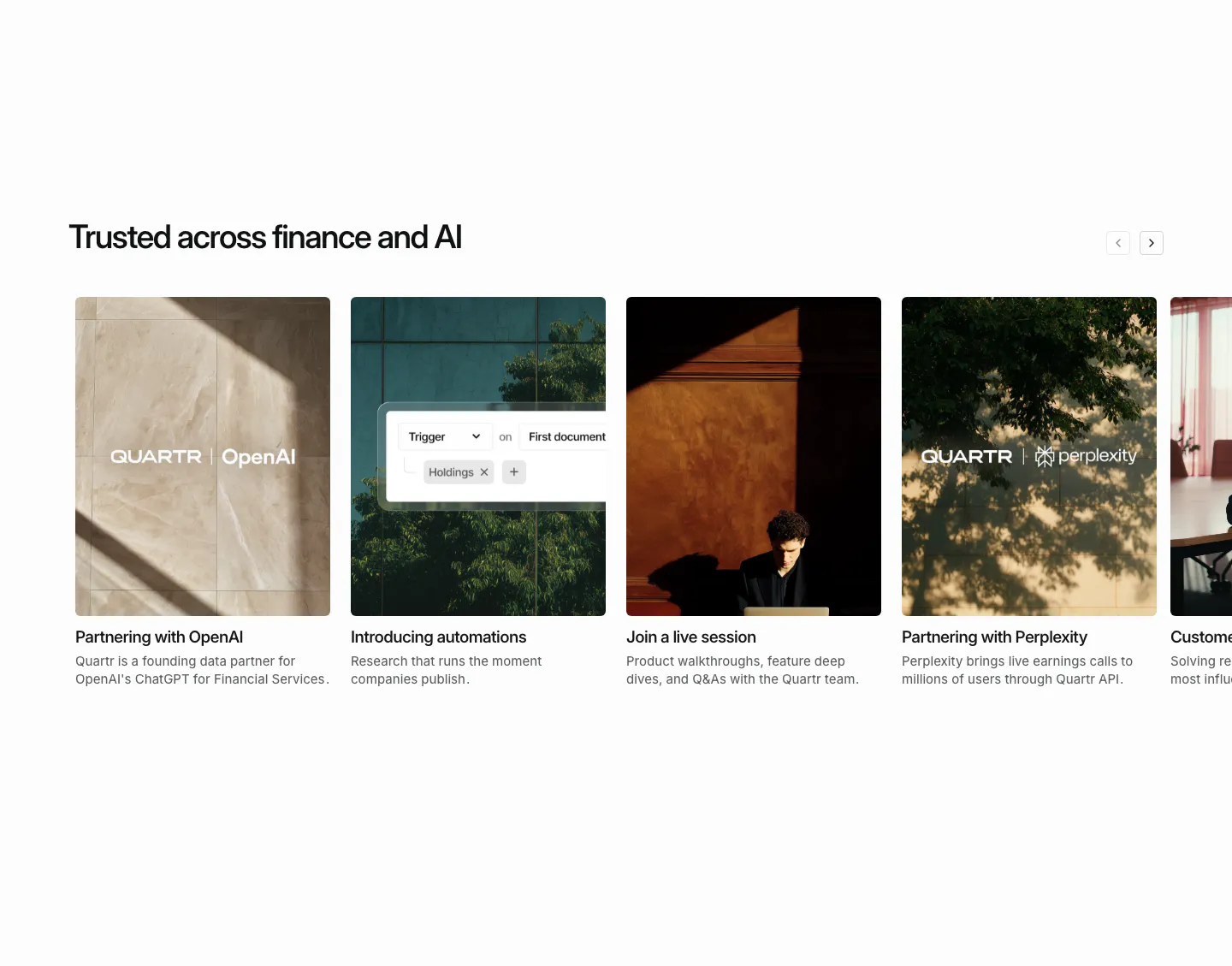
  70. Quartr blog & resources section: horizontal carousel of photo cards for partnership news, automations and a live session
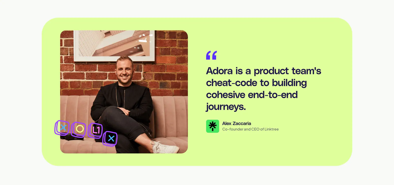
  71. Adora testimonials section: lime card with a portrait photo on the left and a large customer quote with attribution on the right
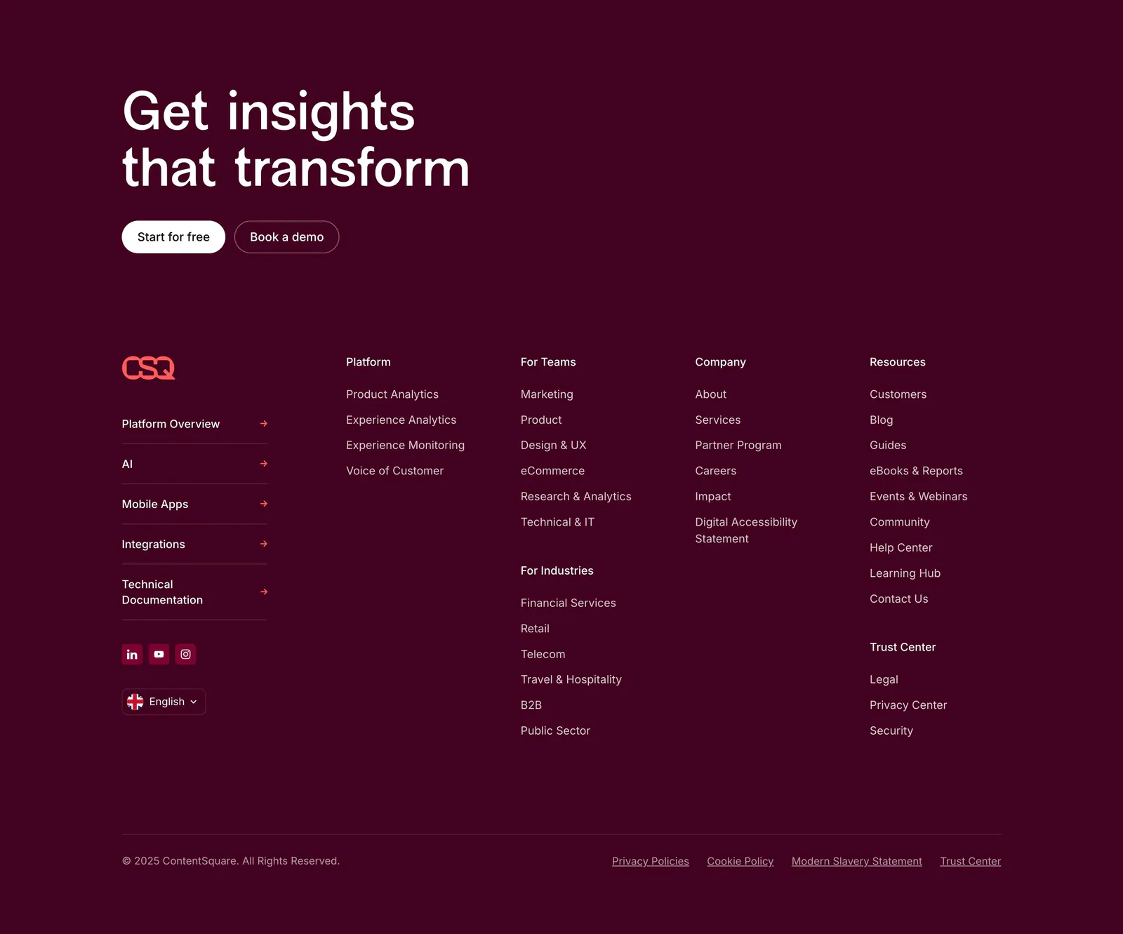
  72. Contentsquare footer section: CTA headline and buttons above link columns, social icons and copyright on a dark plum background
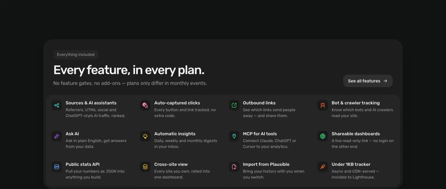
  73. Piqo features section: rounded dark panel with pill label, headline and button above a 4x3 grid of icon features on near-black
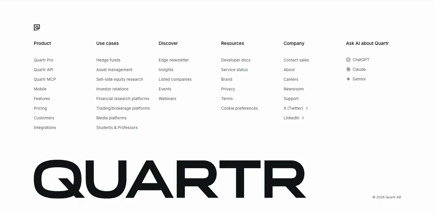
  74. Quartr footer section: six link columns including Ask AI about Quartr, above an oversized black QUARTR wordmark
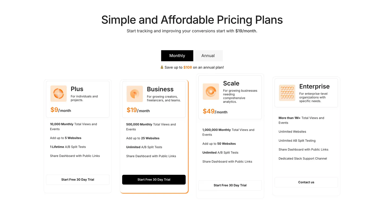
  75. Humblytics pricing section: monthly/annual toggle above four plan cards with orange prices and trial buttons on white
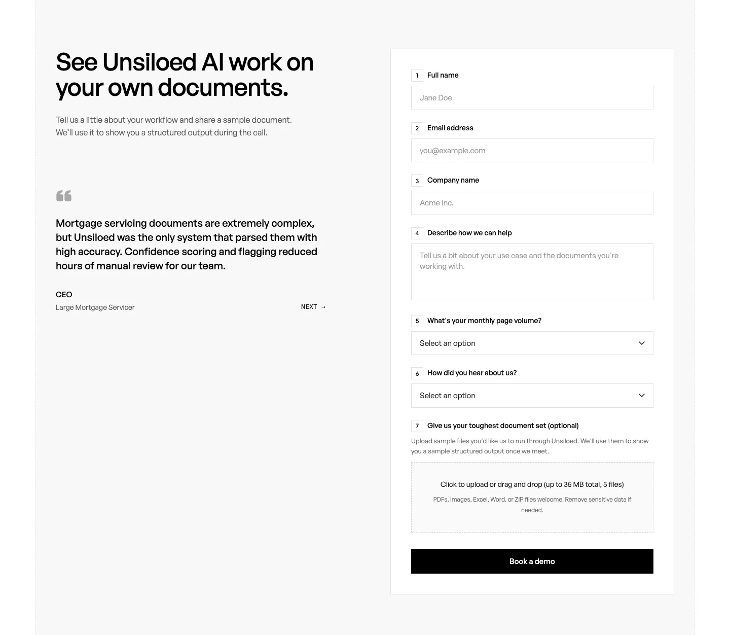
  76. Unsiloed contact section: headline and customer quote at left beside a numbered demo request form with text fields, selects and file upload
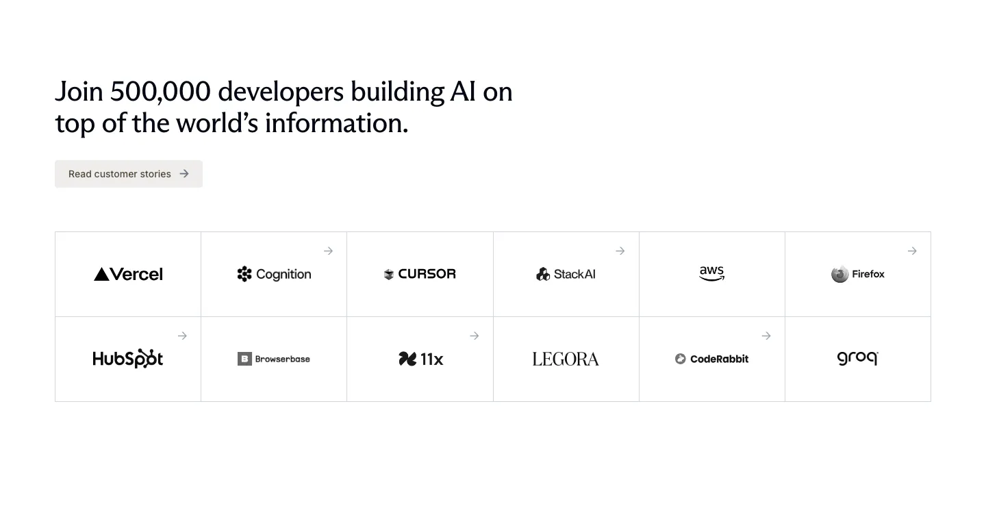
  77. Exa logo cloud section: left-aligned headline and customer stories button above a bordered six-by-two grid of customer logos
  78. Quartr logo cloud section: two rows of five black customer and partner logos on a white background
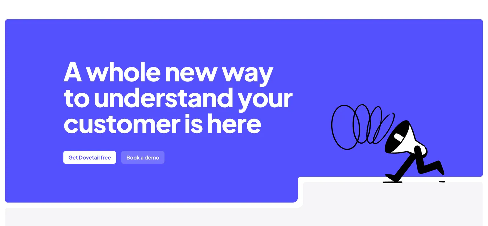
  79. Dovetail call-to-action section: large white headline and two buttons on a bright indigo panel with a walking megaphone illustration
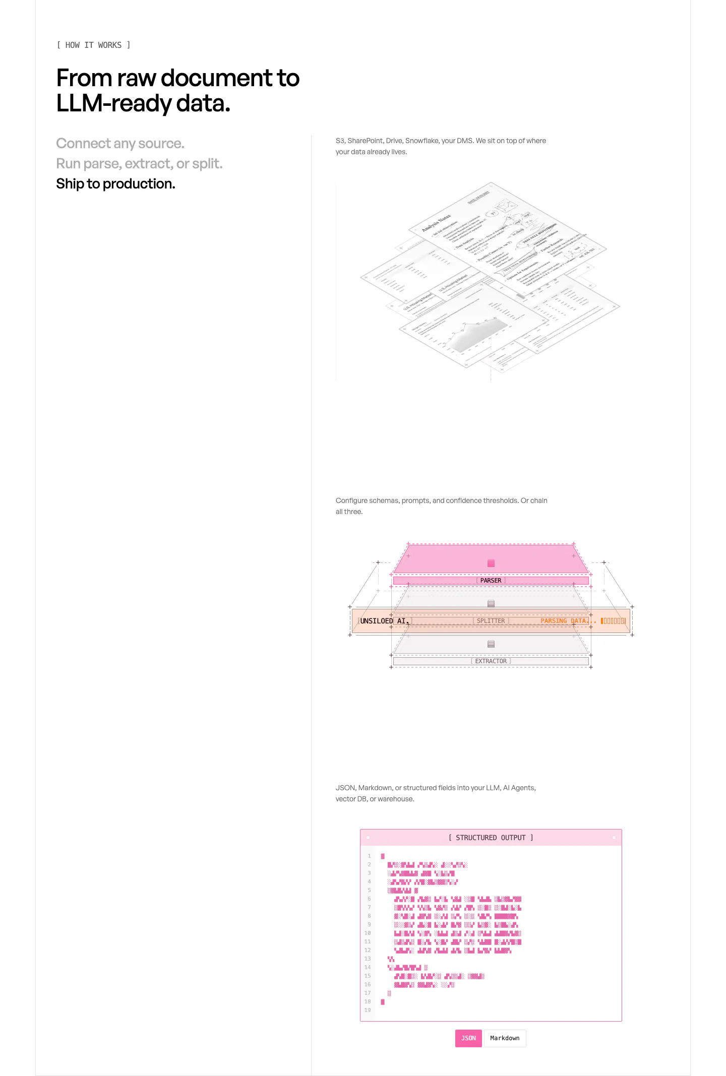
  80. Unsiloed how it works section: three-step list at left beside stacked visuals of isometric documents, a parser layer diagram and a JSON window
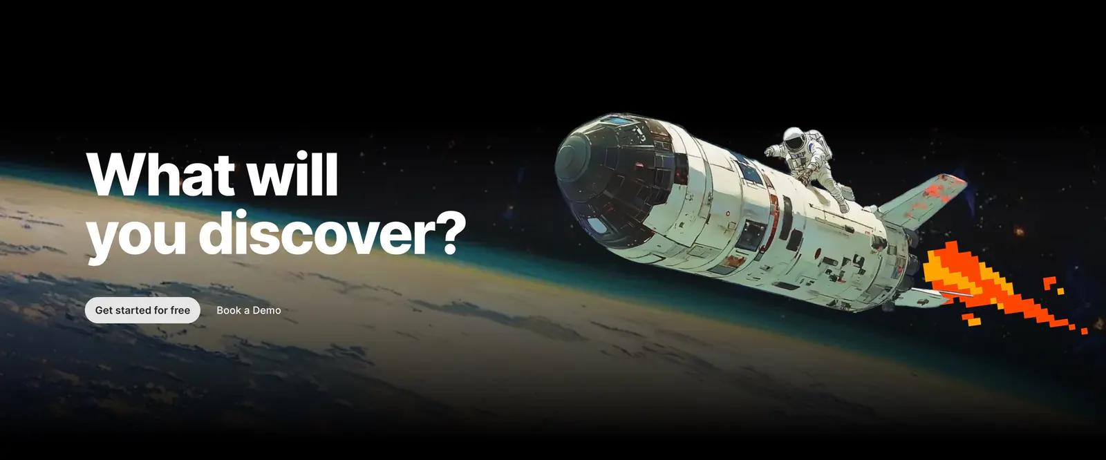
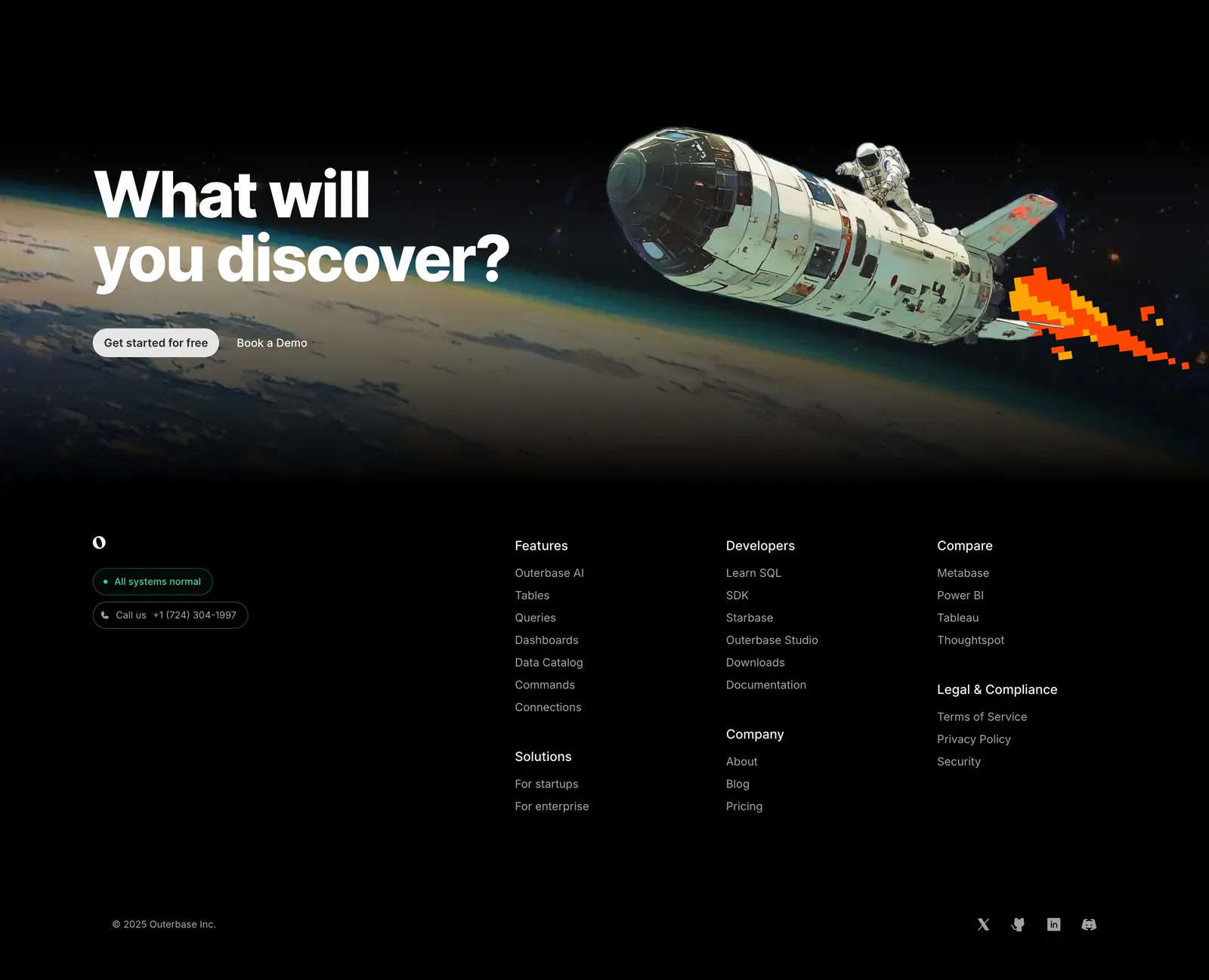
  81. Outerbase call-to-action section: bold headline and two buttons over painted artwork of an astronaut riding a shuttle above Earth
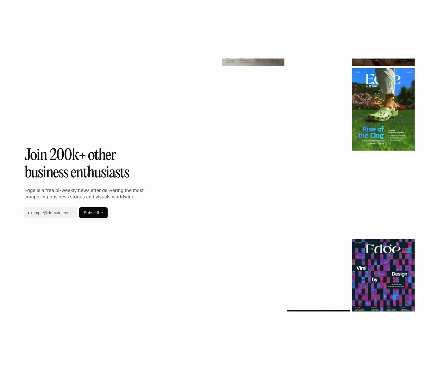
  82. Quartr newsletter section: serif headline and email subscribe field on the left, scattered Edge magazine covers on the right
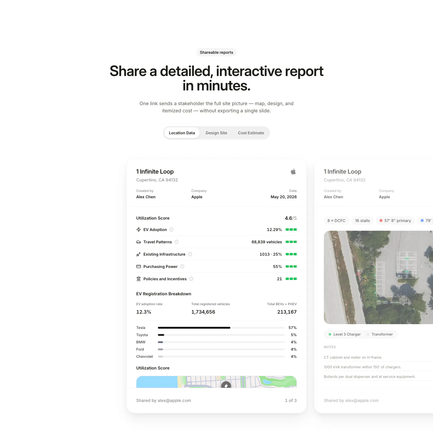
  83. EVpin features section: centered heading and segmented tabs above site report cards with utilization scores, cut off at the right edge
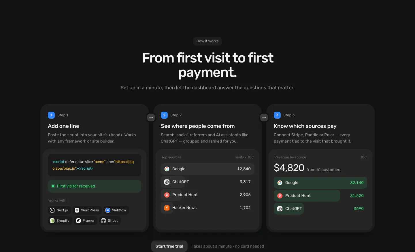
  84. Piqo how it works section: centered headline above three numbered step cards with a script snippet, top sources list and revenue UI
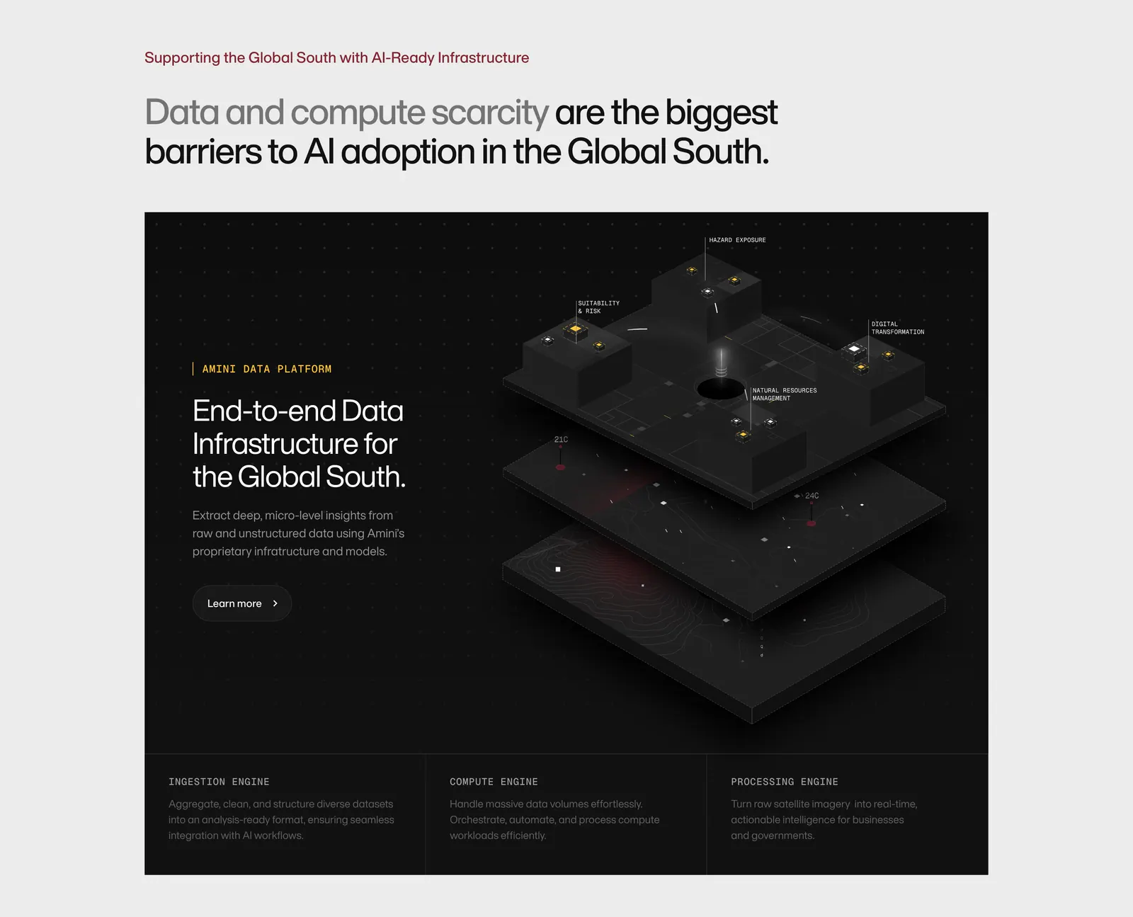
  85. Amini features section: headline on light gray above a dark panel with text and an isometric 3D data platform render, three engine columns
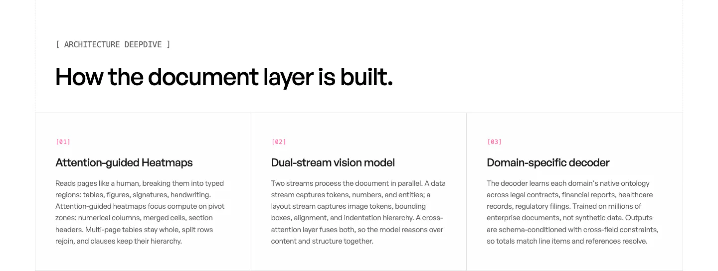
  86. Unsiloed features section: left headline above three bordered columns numbered 01 to 03 describing model architecture components on white
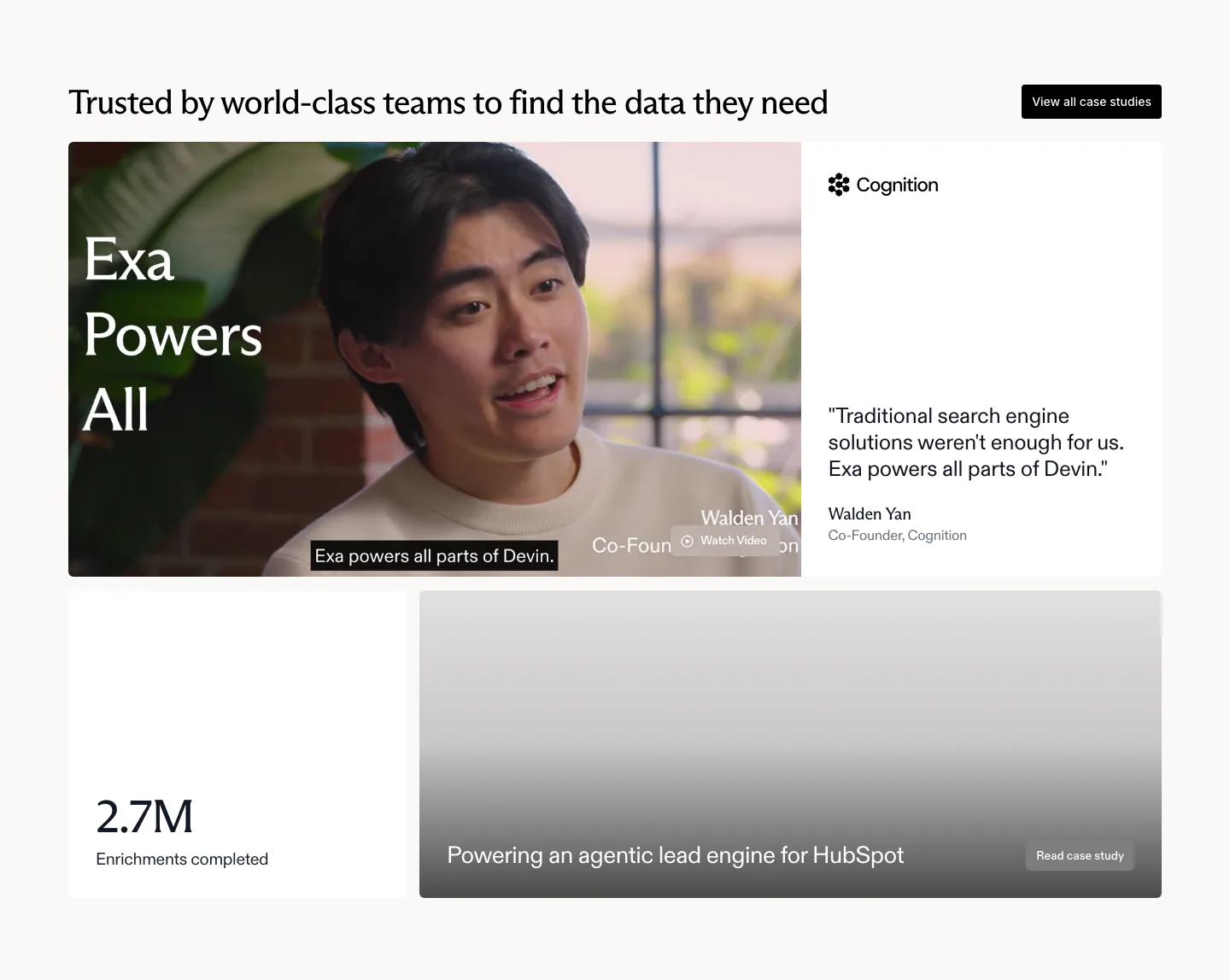
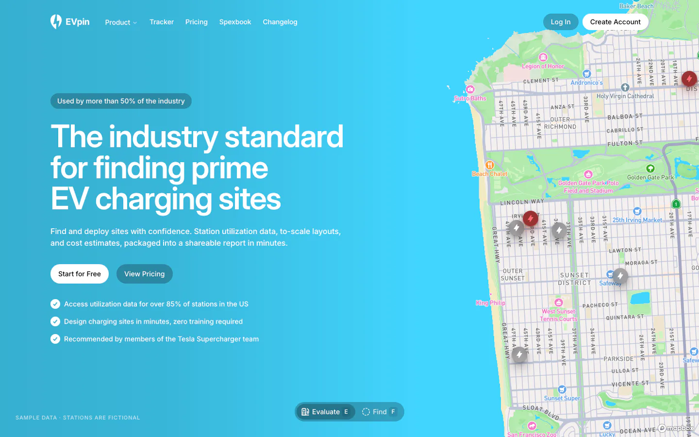
  87. Exa testimonials section: bento with a cofounder video still, Cognition quote card, 2.7M stat tile and a HubSpot case study card
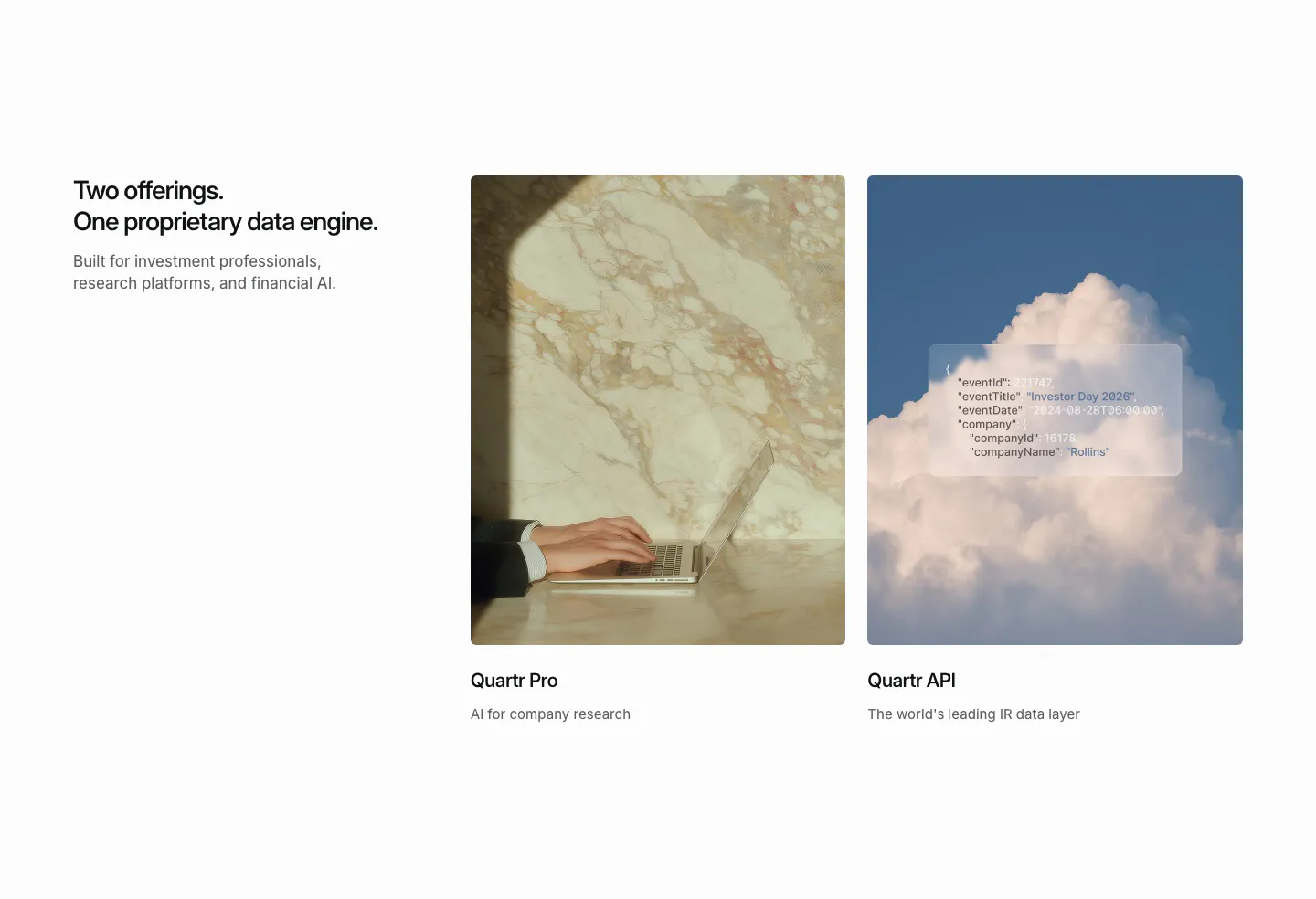
  88. Quartr features section: headline on the left beside two photo cards for Quartr Pro and Quartr API, one with a frosted JSON snippet
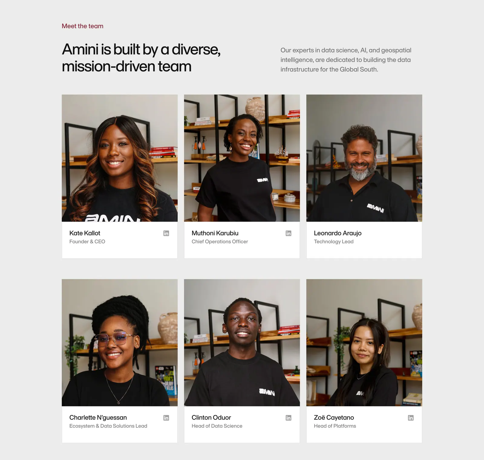
  89. Amini team section: headline and intro above a three-column grid of team member photo cards with names and roles
  90. EVpin hero section: headline, buttons and checklist on a bright cyan gradient beside a street map with charging station pins
  91. Outerbase footer section: space-art CTA band above a black footer with logo, status badges, link columns and social icons
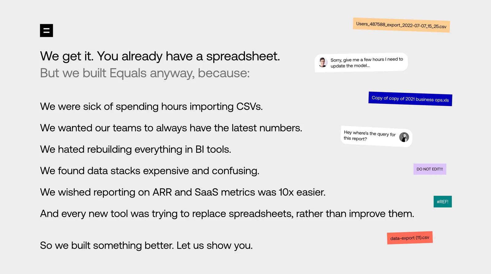
  92. Equals about & mission section: left-aligned list of reasons for building Equals beside floating file-name chips and chat bubbles
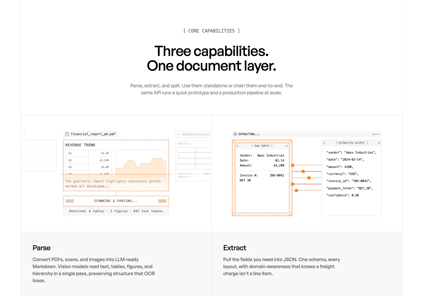
  93. Unsiloed features section: centered headline above two panels showing a PDF parsing mockup and a JSON extraction view, labeled Parse and Extract
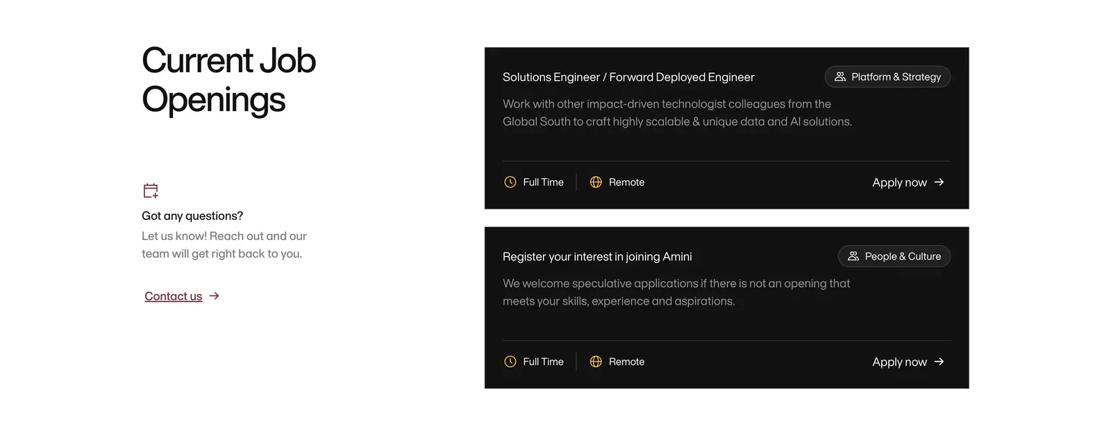
  94. Amini careers section: headline and contact prompt on the left, two black job opening cards with tags and Apply now links on the right
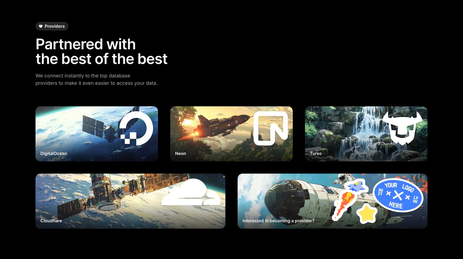
  95. Outerbase integrations section: headline above five artwork cards with provider logos for DigitalOcean, Neon, Turso and Cloudflare
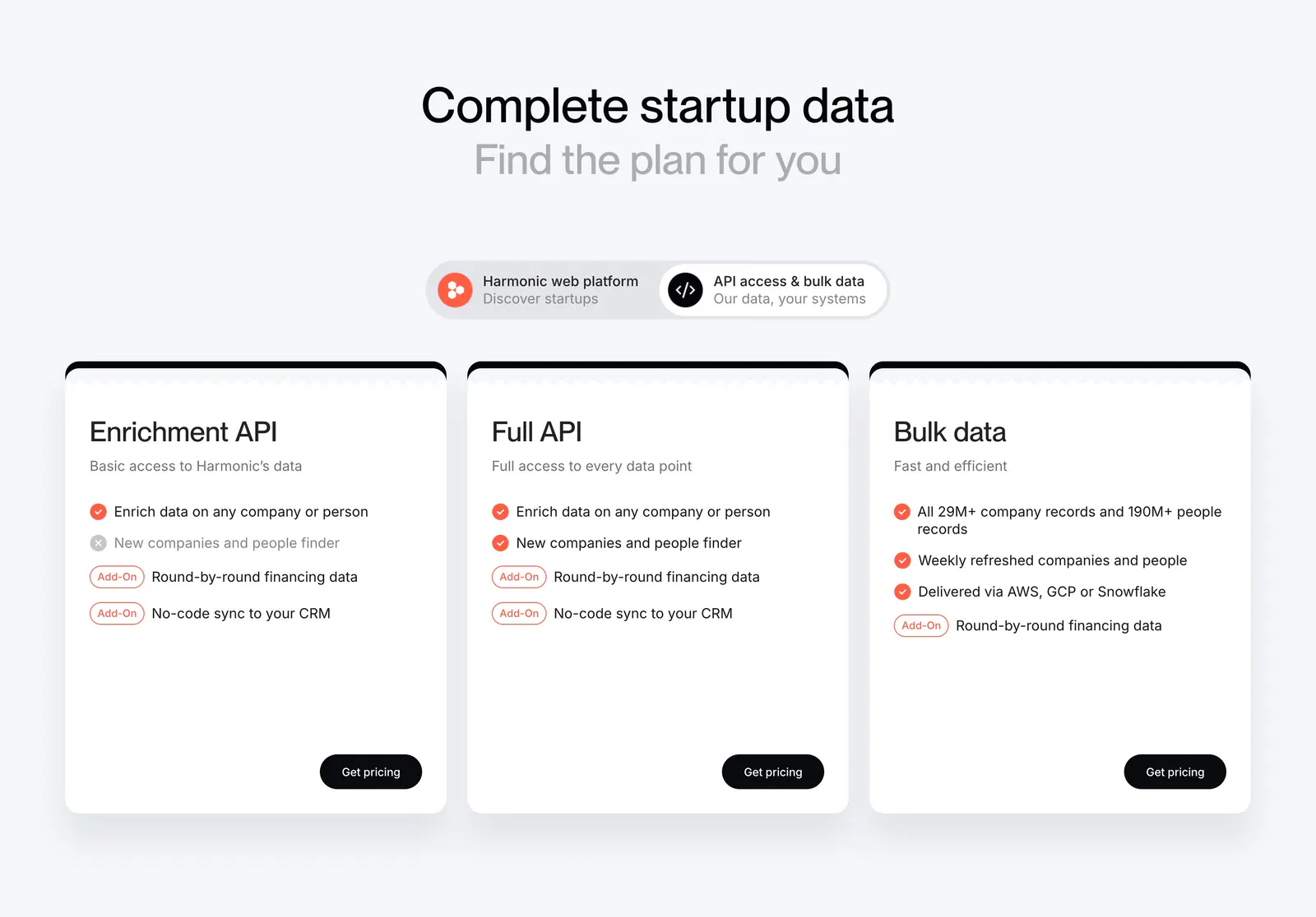
  96. Harmonic pricing section: centered headline and segmented toggle above three white plan cards with checklists and black buttons
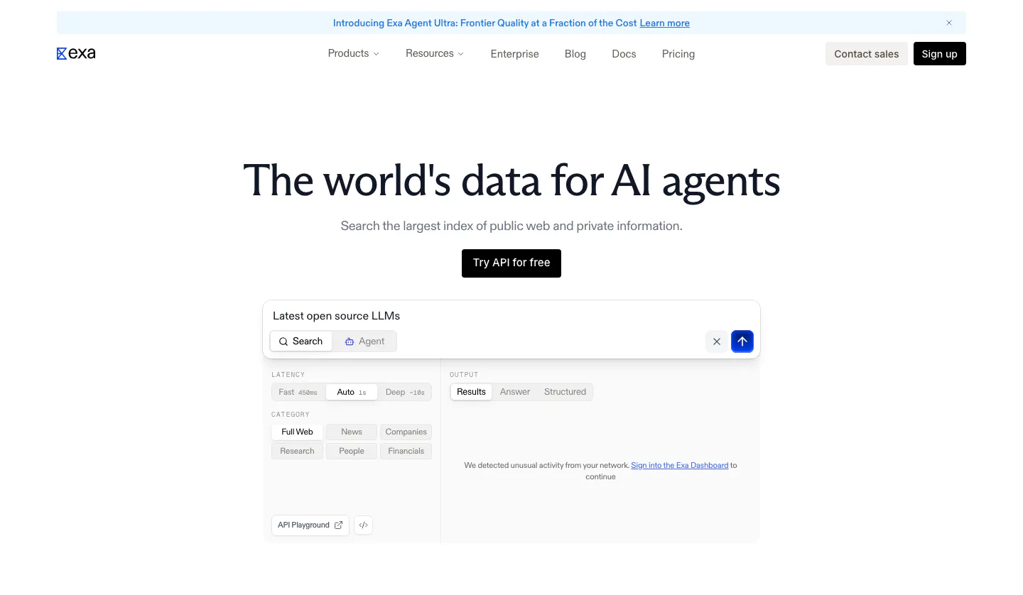
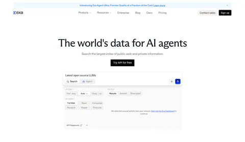
  97. Exa hero section: centered headline and API button above a search playground with query field, filter chips and results panel
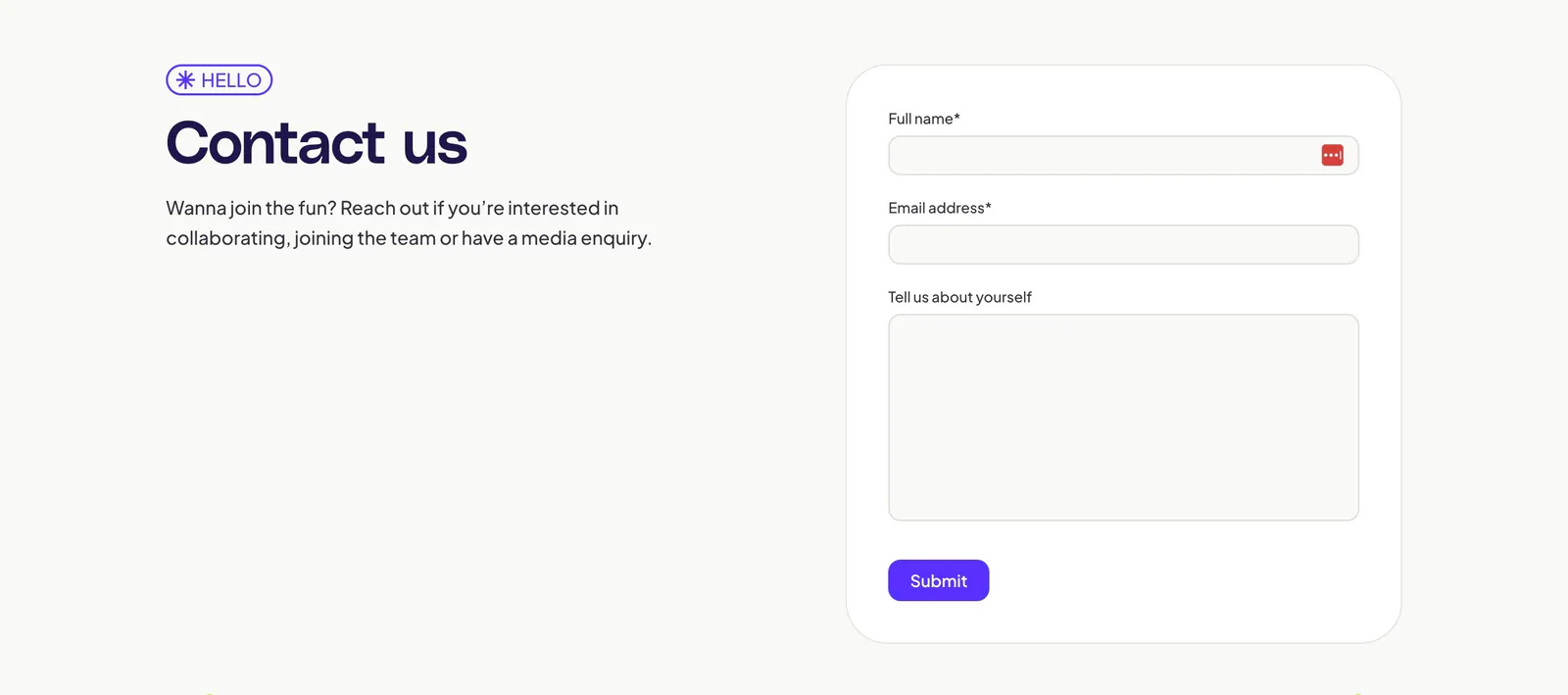
  98. Adora contact section: headline and intro text on the left, a contact form with name, email and message fields in a card on the right
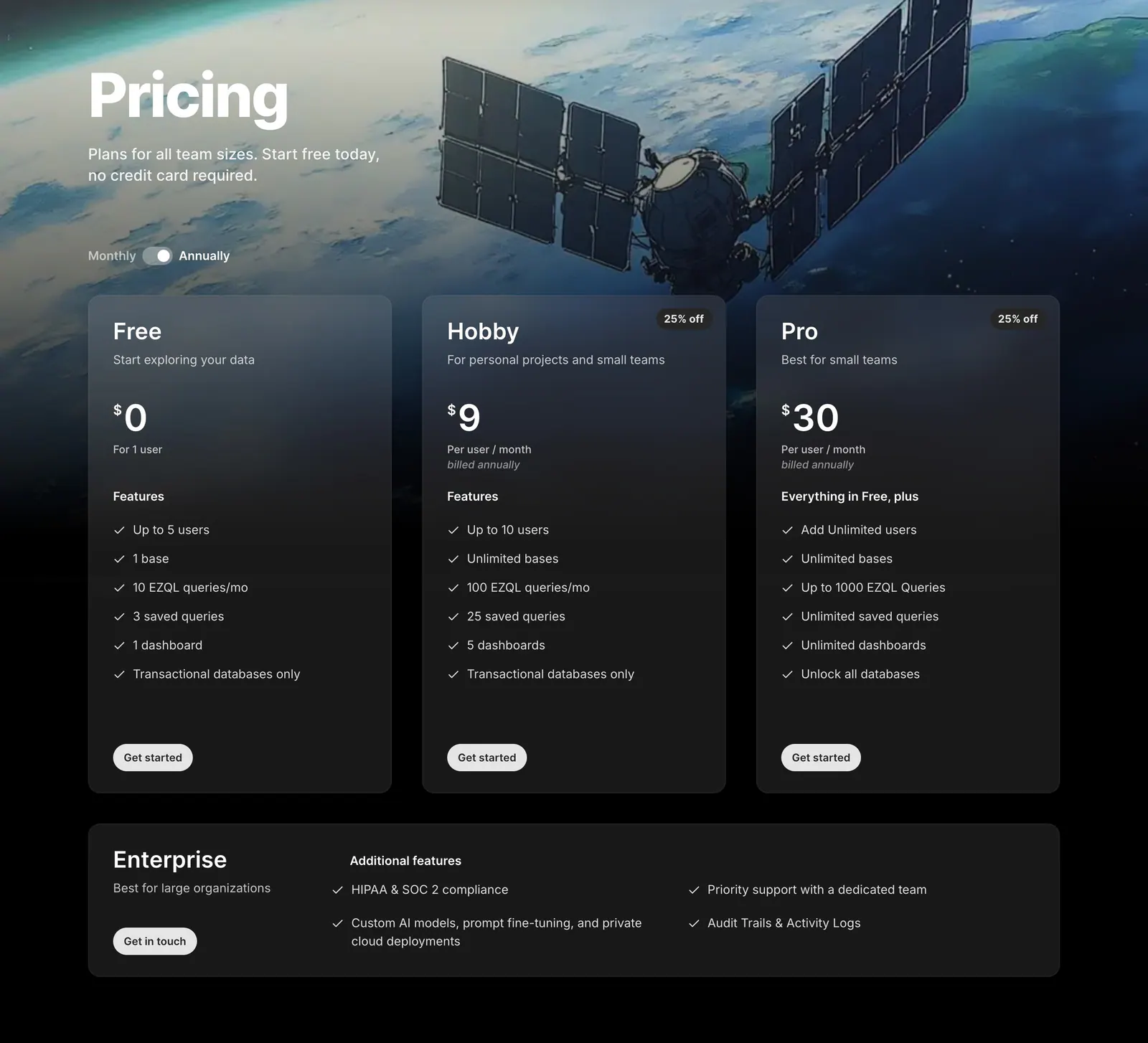
  99. Outerbase pricing section: headline and monthly/annual toggle over satellite artwork, three translucent plan cards and an Enterprise row
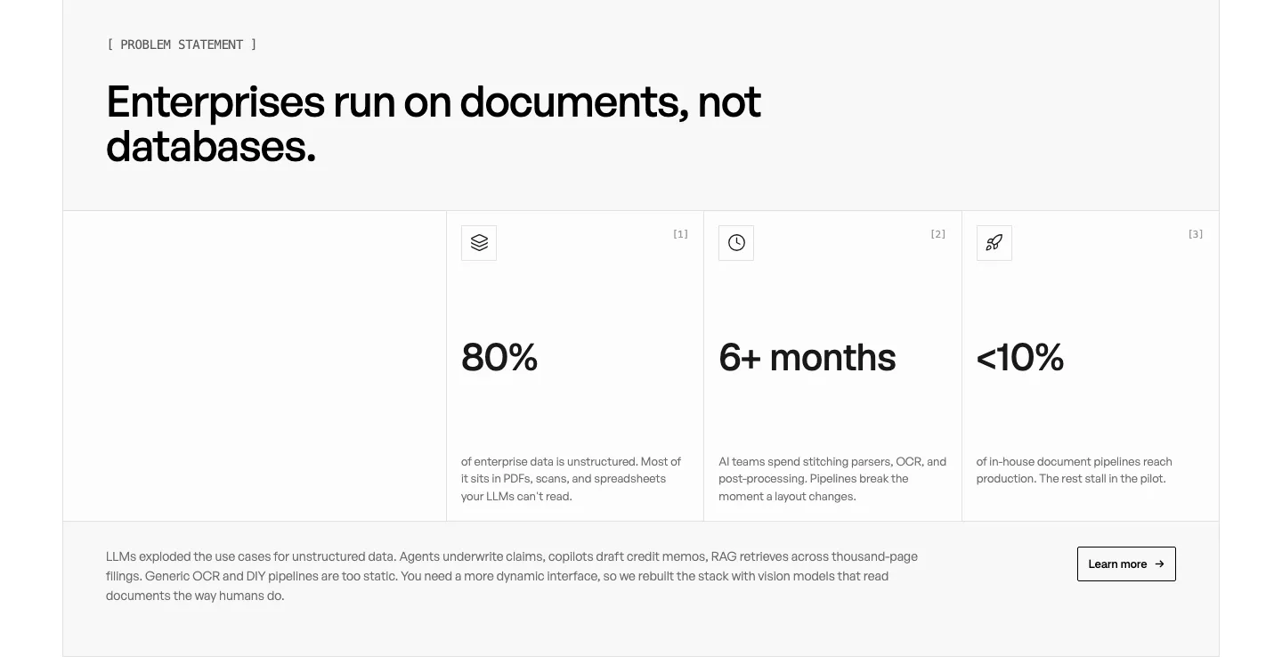
  100. Unsiloed stats section: left headline above three bordered cells with large figures 80%, 6+ months and <10% plus a closing paragraph on white

Data & analytics companies

17 companies in this collection

All companies

Common styles in data & analytics websites

  • Monochrome 35% · 35
  • Dark mode 29% · 29
  • Minimal 27% · 27
  • Split layout 26% · 26
  • Product UI 23% · 23
  • Centered 16% · 16
  • Card grid 15% · 15

How to design a data and analytics website

  1. Use charts with believable data

    Screenshots full of perfect upward curves look fake to analysts. Use realistic datasets with seasonality, noise, and proper axis labels. Pick examples from the buyer's world, such as retention cohorts or revenue by region, so readers can picture their own reports.

  2. Draw where the product fits

    Show the product between sources, warehouse, and end users in one simple diagram. Label the connectors and the direction data moves. Data engineers decide quickly whether a tool fits their stack, and a clear diagram answers that faster than several paragraphs.

  3. Back performance claims with conditions

    State the query speeds, data volumes, and refresh intervals the product handles, along with the setup behind them. Analysts and engineers distrust "fast" without context. A benchmark with its method linked persuades far more than a bare claim on a hero banner.
  4. Explain governance and access controls
    Larger teams care about who can see which data. Explain row-level permissions, lineage, and audit logs in plain terms, with a screenshot of the controls. These features rarely win over the first user, but they often decide whether the company approves the purchase.

All industries
    ↑↓ Navigate ↵ Open

    Section preview

    Website section