1,908 sections · 285 companies · Updated October 2026

Website section design inspiration

A curated library of real sections from the best SaaS and startup websites. Browse heroes, pricing, features and footers by section type, style, industry and company.
Featuring sections from Plasma, Canopy, Clay, Customer.io, Remote, Jasper and 279 other companies.

Recently added
The latest 48 sections added to the library
48 sections

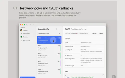
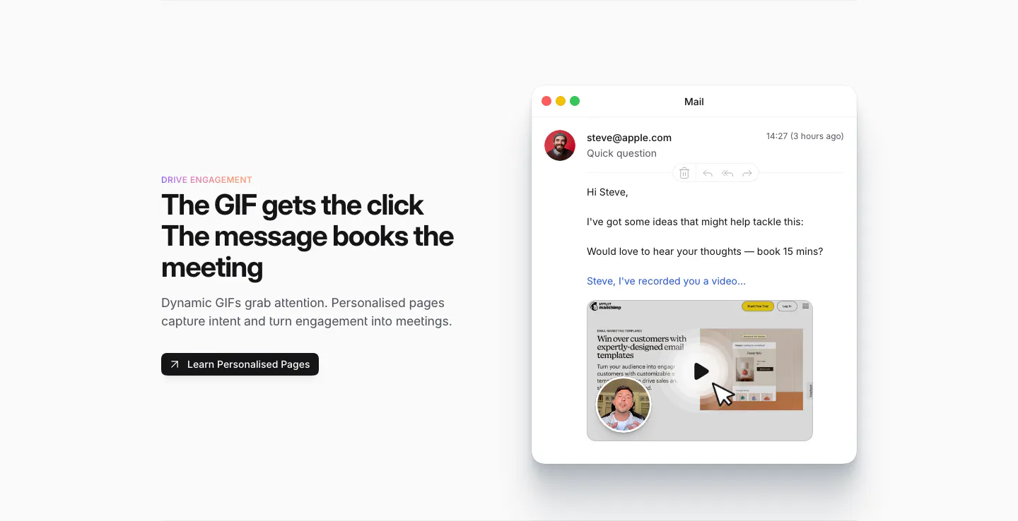
  1. Sendr features section: Drive Engagement copy and button left, Mail app mockup with a personalised video GIF preview right
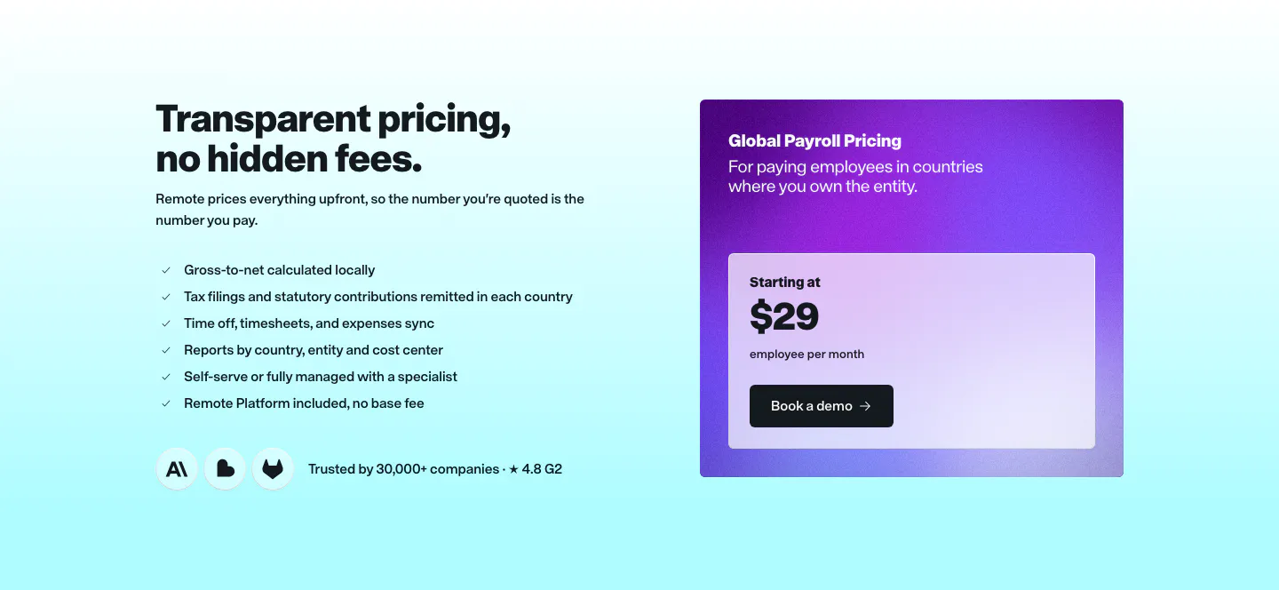
  2. Remote pricing section: headline and checklist on the left beside a purple gradient Global Payroll price card on cyan
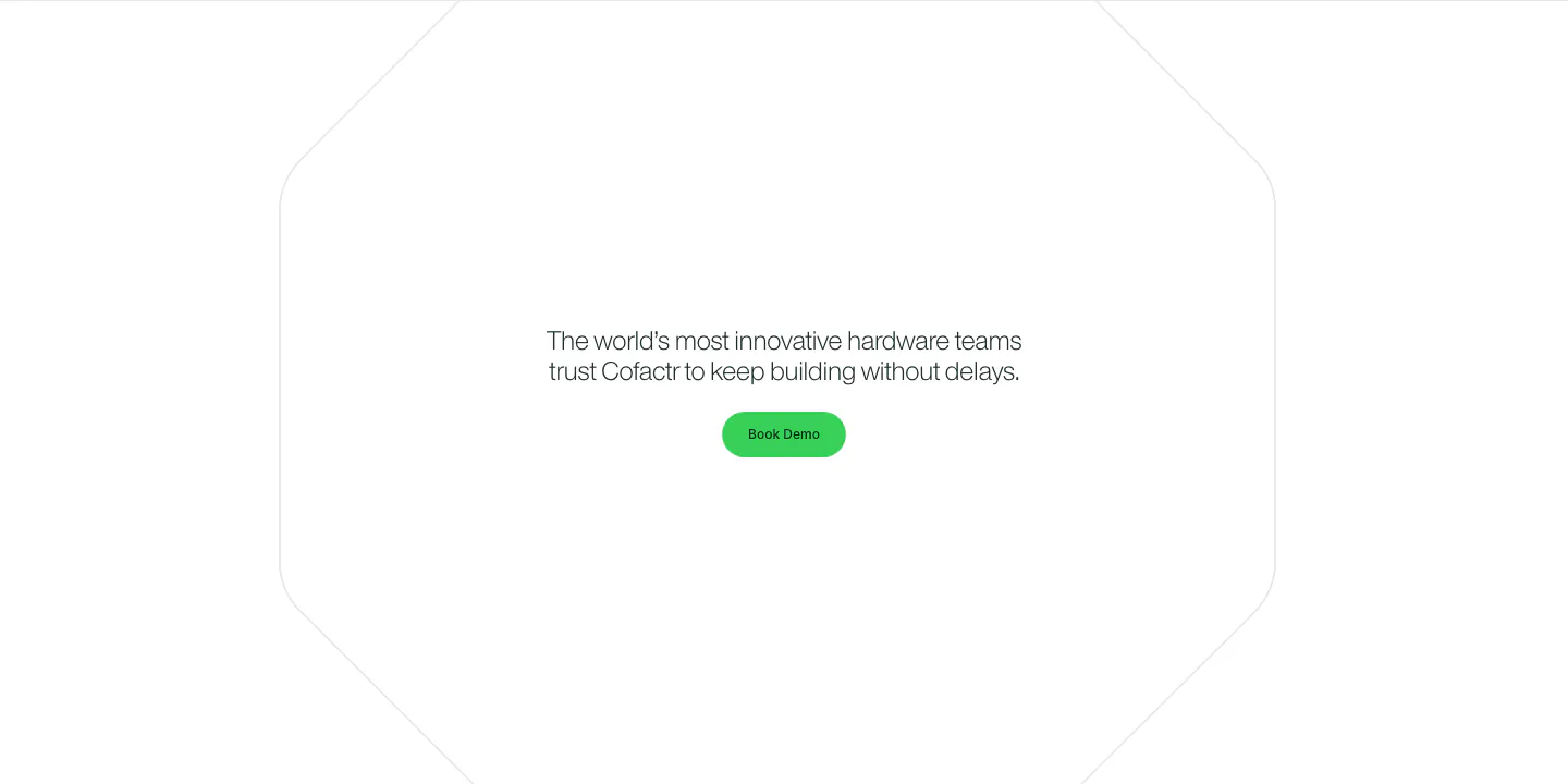
  3. Cofactr call to action section: centered one-line statement and green Book Demo button inside a faint octagon outline on white
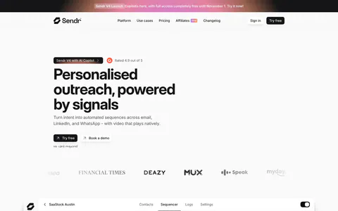
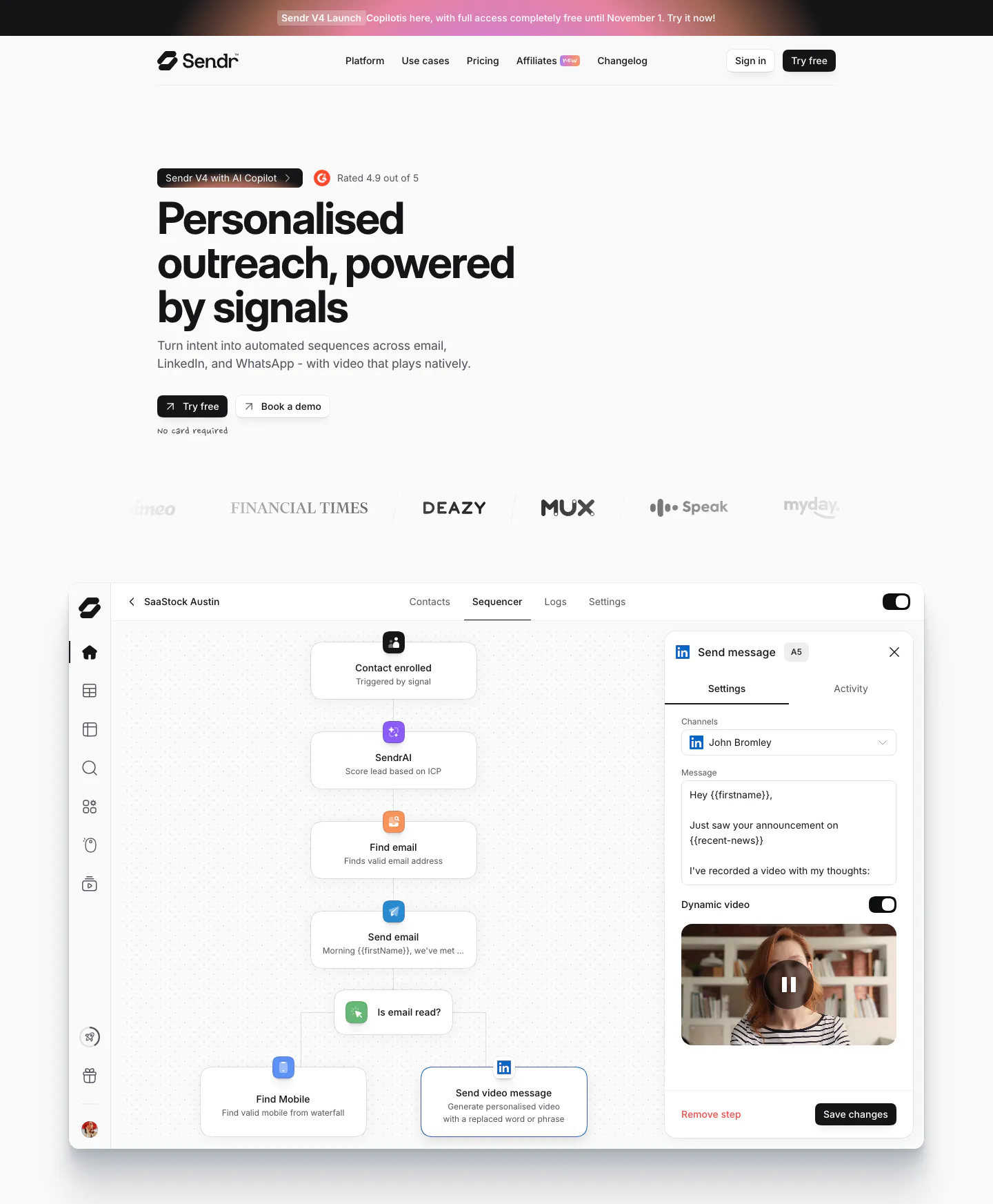
  4. Sendr hero section: nav, left-aligned headline with Try free and Book a demo buttons, logo row and a sequencer workflow UI
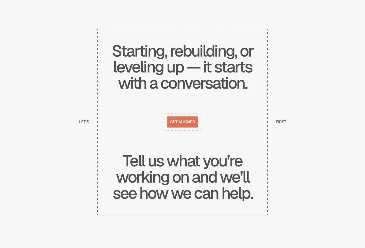
  5. A-LIGN call to action section: centered two-part headline in a dashed frame around a small orange Get Aligned button on light gray
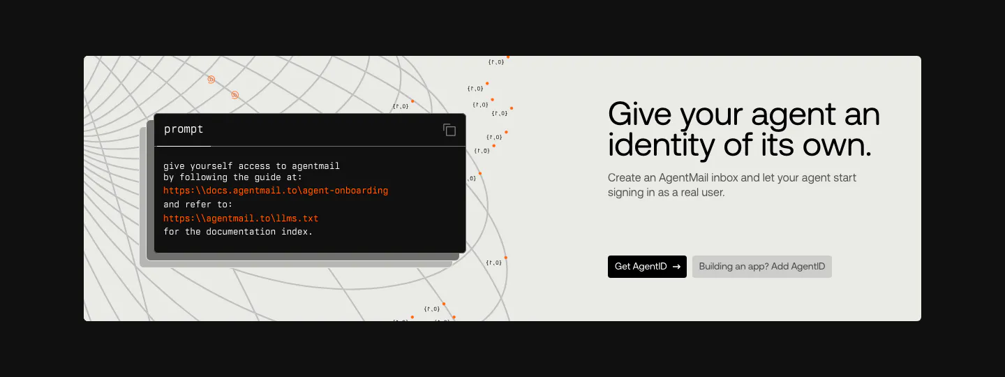
  6. AgentID call to action section: light panel on black with a dark prompt code card left and headline, copy and two buttons right
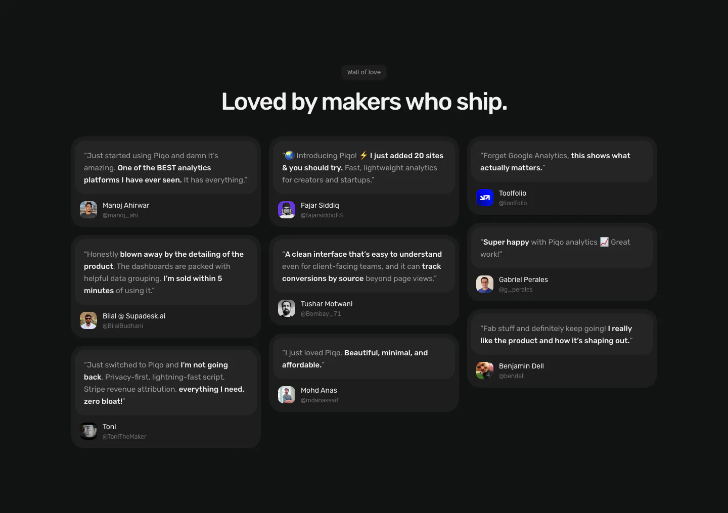
  7. Piqo testimonials section: centered Wall of love label and headline above a three-column masonry of dark quote cards with avatars
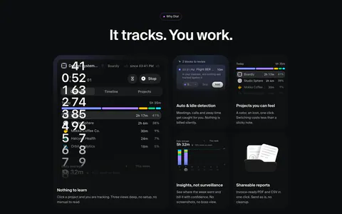
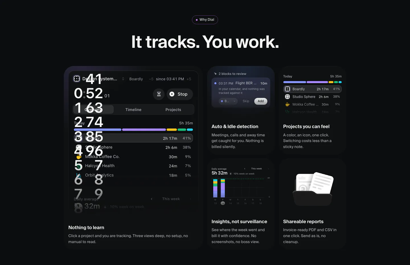
  8. Dial features section: dark bento grid of time-tracking UI tiles, a large timer panel plus cards for idle detection, projects, insights and reports
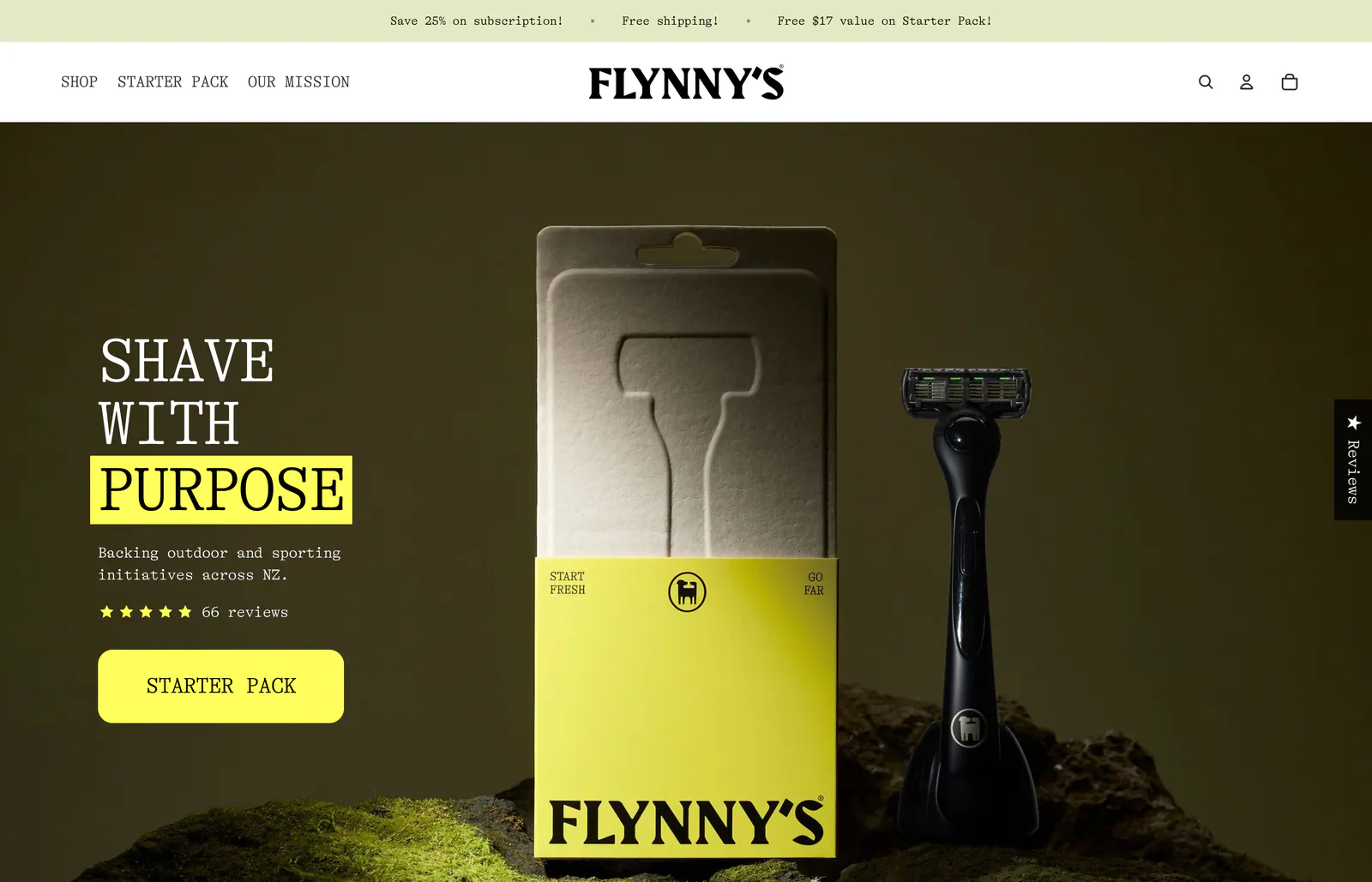
  9. Flynny's hero section: serif headline with a yellow-highlighted word, star rating and yellow CTA over a dark photo of a razor and its box on moss
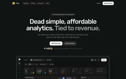
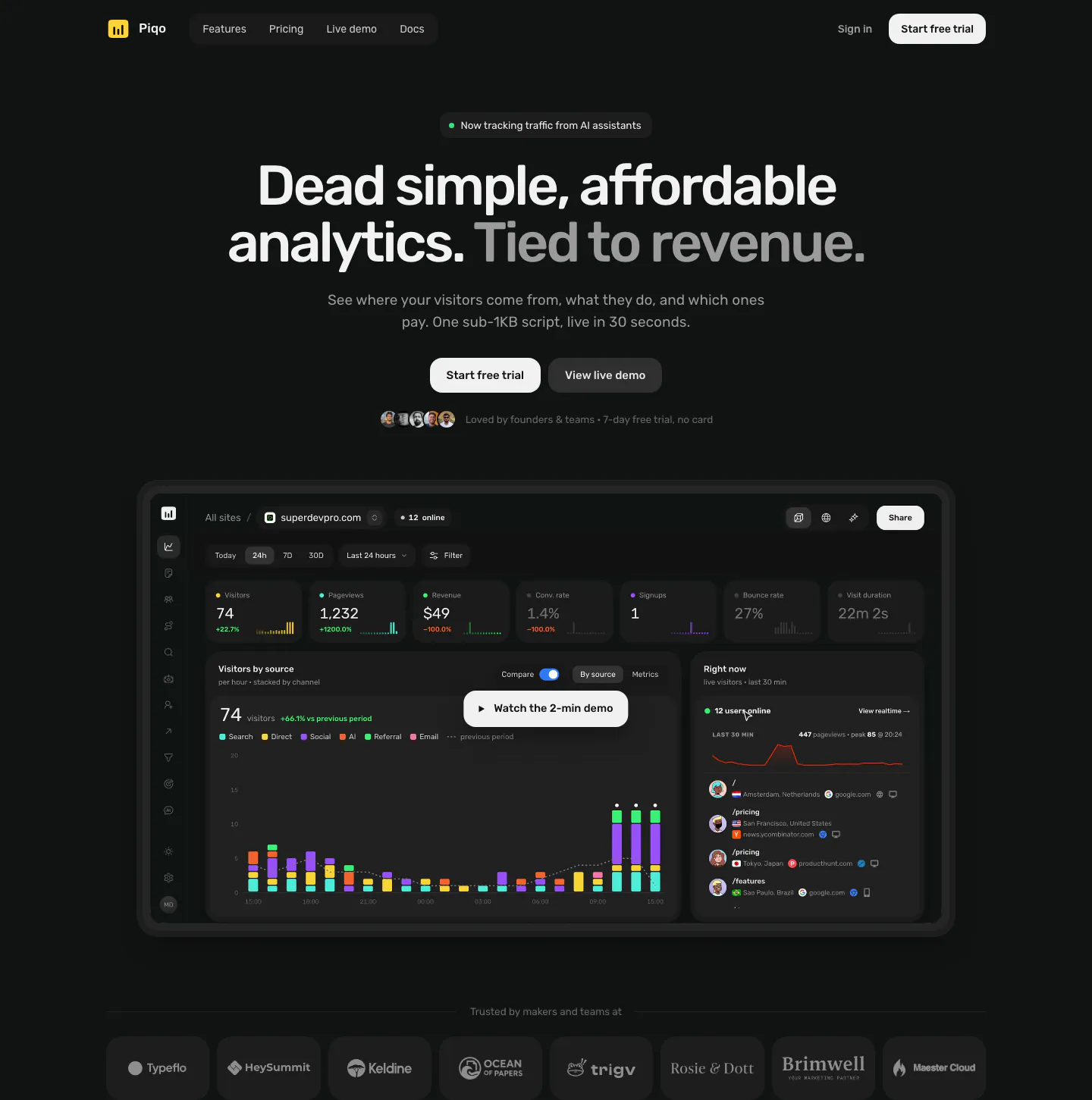
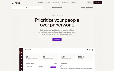
  10. Piqo hero section: nav, centered headline with two buttons and avatars above a dark analytics dashboard with a demo play button, logo row
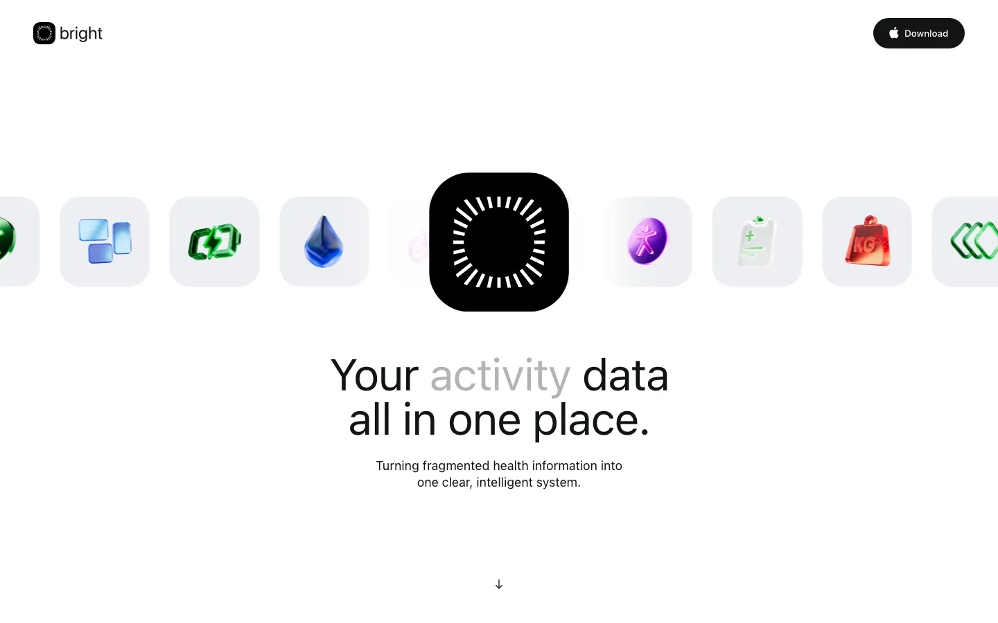
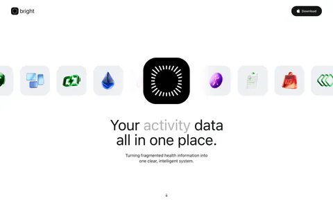
  11. Bright hero section: logo nav, a row of glossy 3D health icons around a black app icon, centered headline and subcopy below
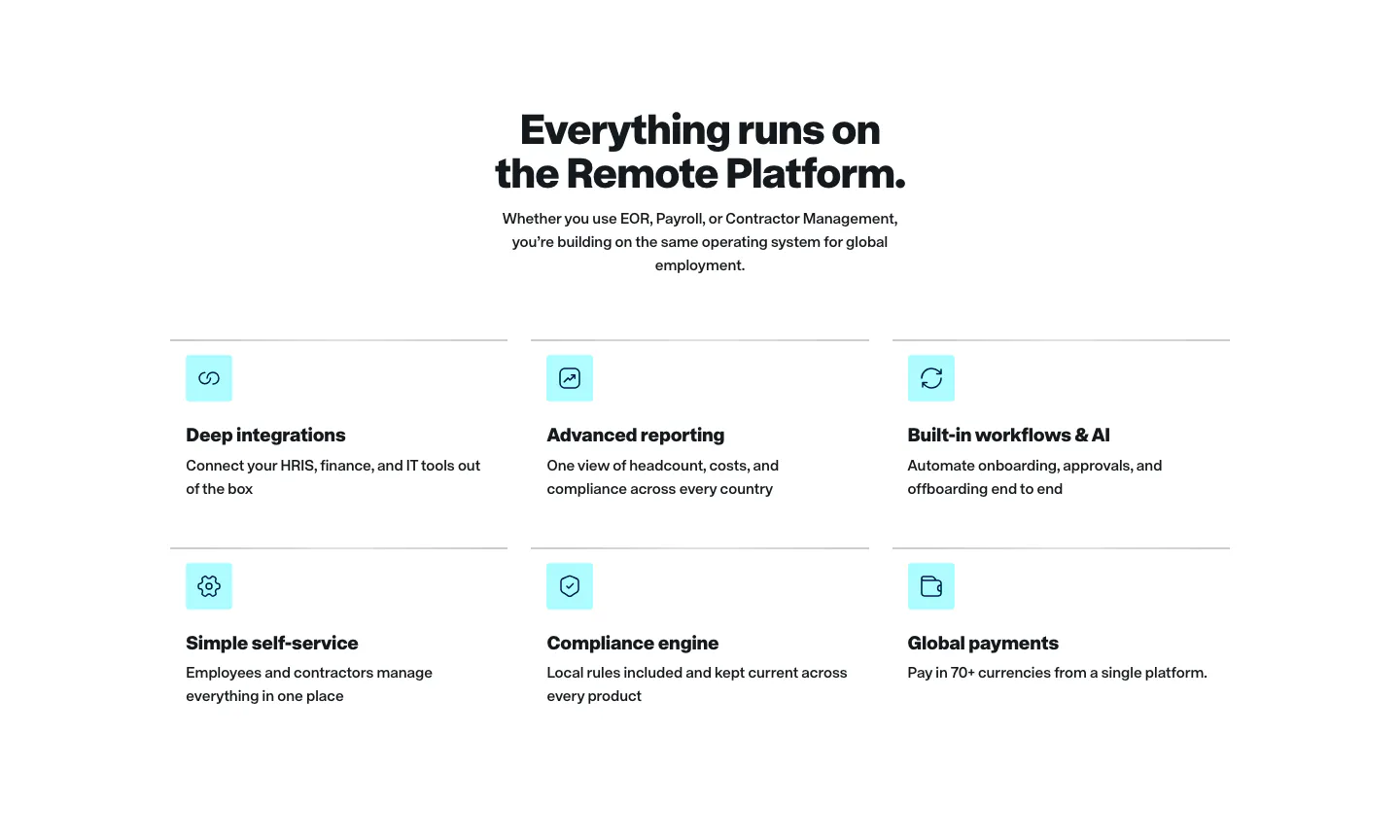
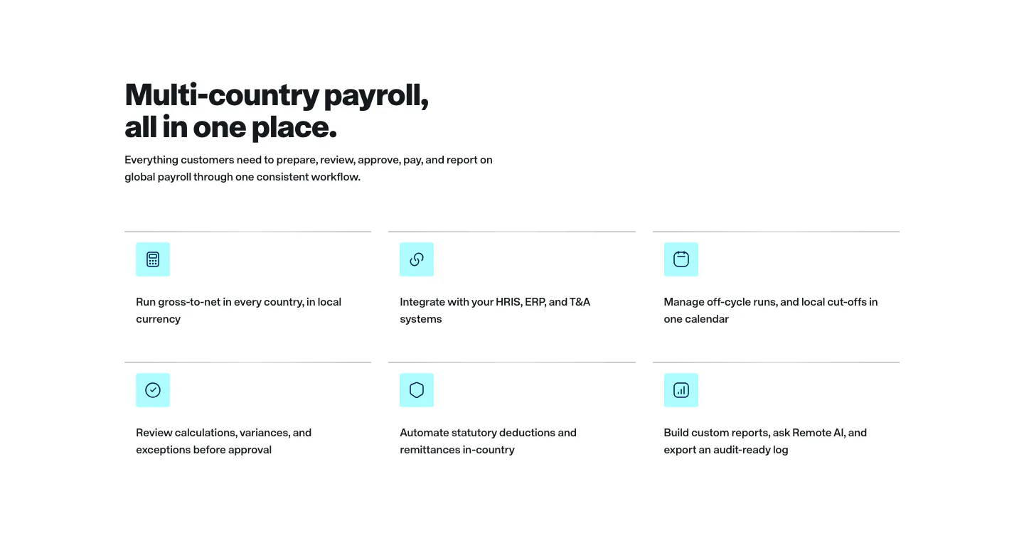
  12. Remote features section: centered headline above a two-row grid of six features with cyan icon tiles on white
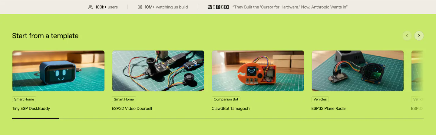
  13. Schematik features section: stats bar above a carousel of hardware template photo cards on a lime green background
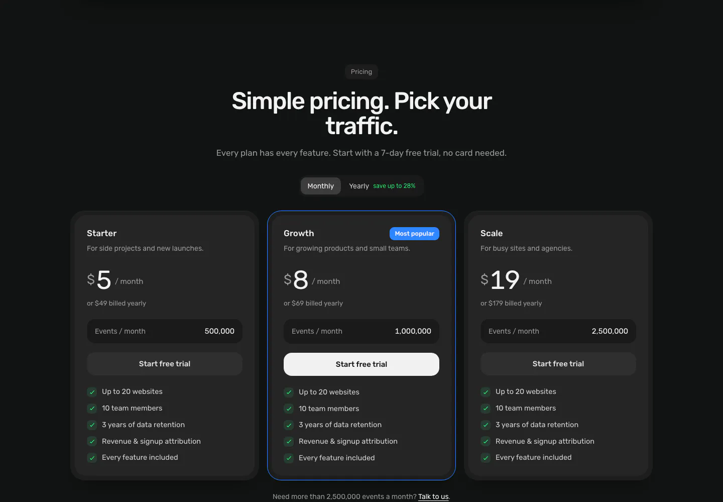
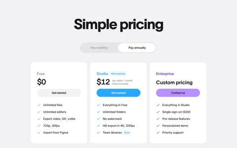
  14. Piqo pricing section: centered headline and monthly/yearly toggle above three dark plan cards, the middle one highlighted as Most popular
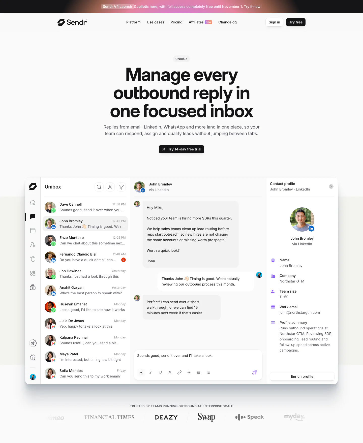
  15. Sendr hero section: nav, centered Unibox headline and trial button above a full inbox product UI and a customer logo row
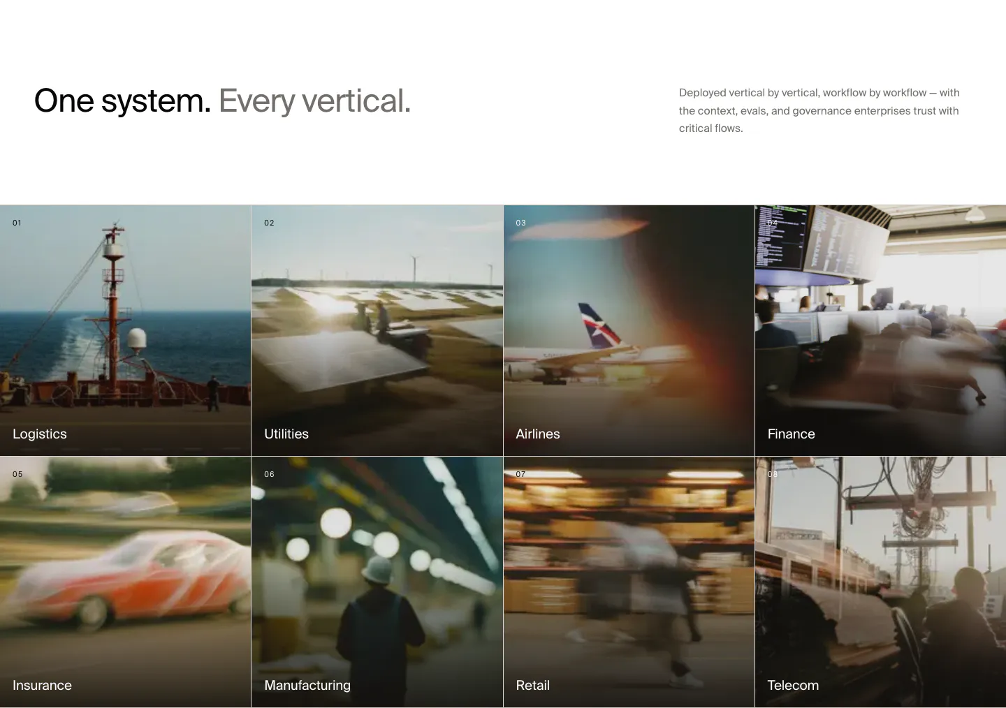
  16. HappyRobot use cases section: headline with side note above a 4x2 grid of numbered industry tiles on blurred photos, Logistics to Telecom
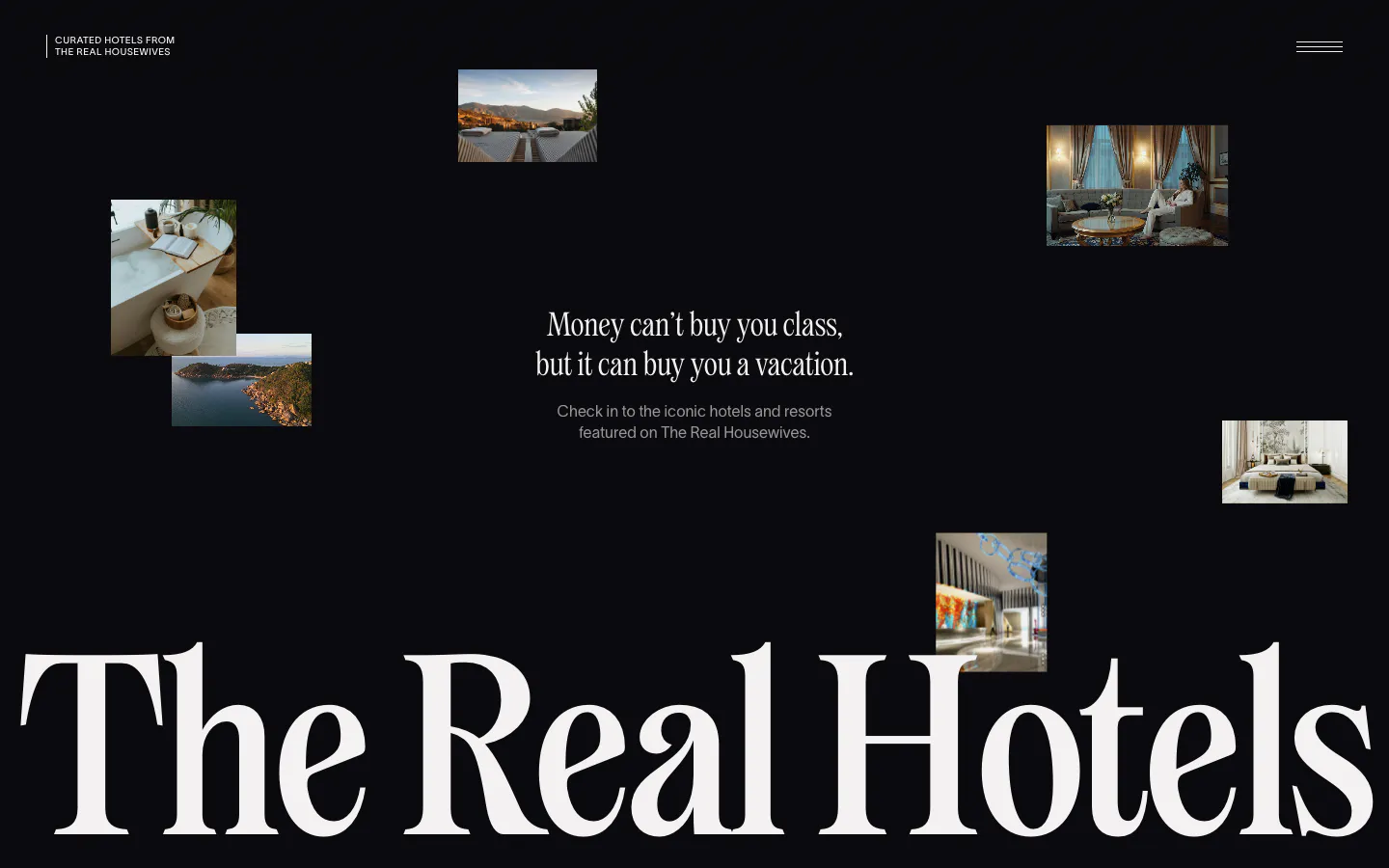
  17. The Real Hotels hero section: scattered hotel photos on black around a centered serif tagline, huge serif wordmark across the bottom
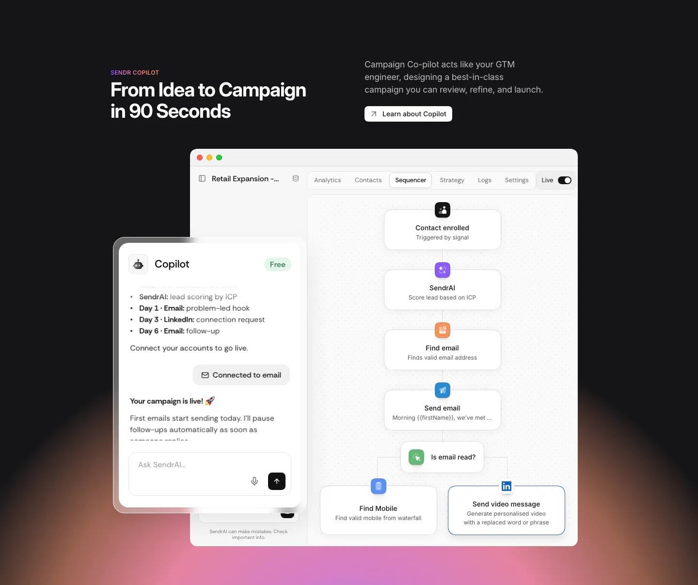
  18. Sendr features section: dark section with headline above a Copilot chat panel overlapping a sequencer workflow UI, warm glow below
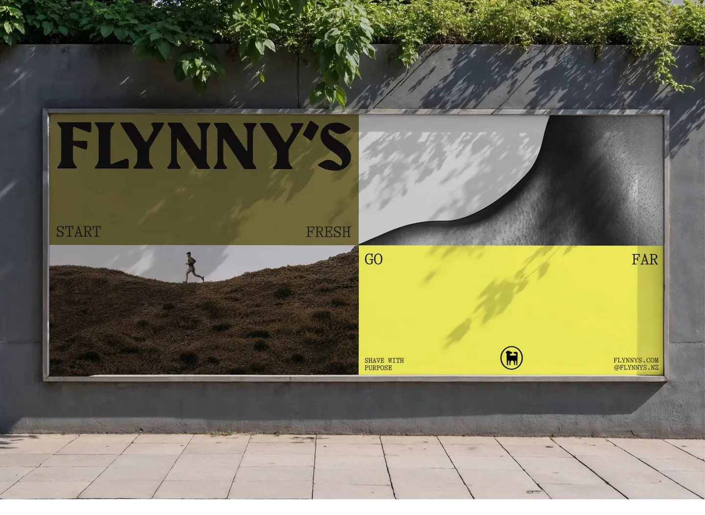
  19. Flynny's other section: photo of a street billboard showing the olive and yellow Flynny's campaign with a runner and wordmark
    Flynny's Other
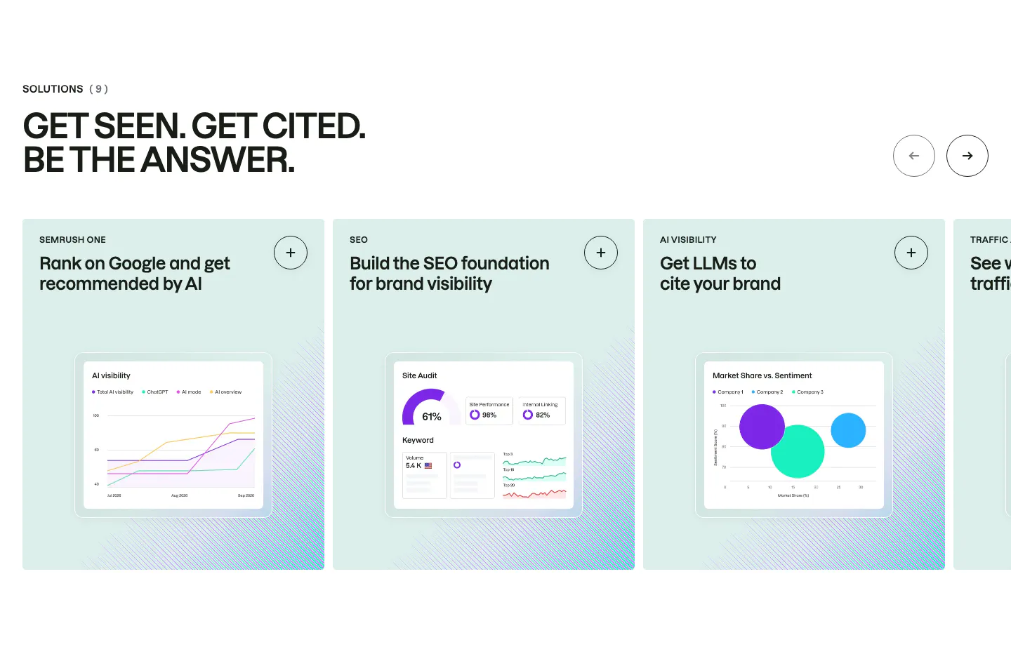
  20. Semrush features section: uppercase headline above a carousel of mint solution cards, each with a chart-based product UI mockup
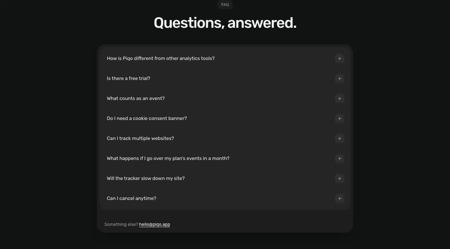
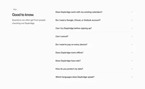
  21. Piqo FAQ section: centered pill label and headline above a rounded dark card with eight collapsed questions and a contact email
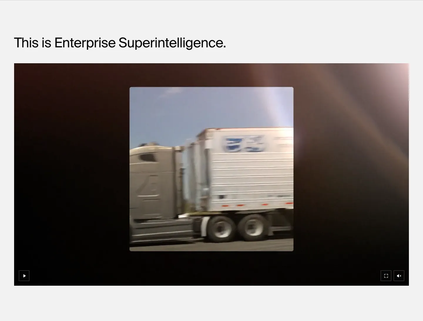
  22. HappyRobot features section: left-aligned headline above a wide dark video player showing footage of a moving truck, on light gray
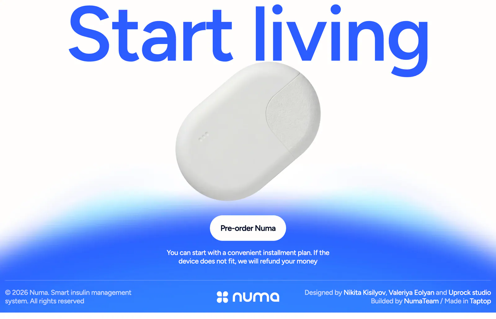
  23. Numa call to action section: full-width blue headline above a white insulin device, pre-order button on a blue glow, slim footer row below
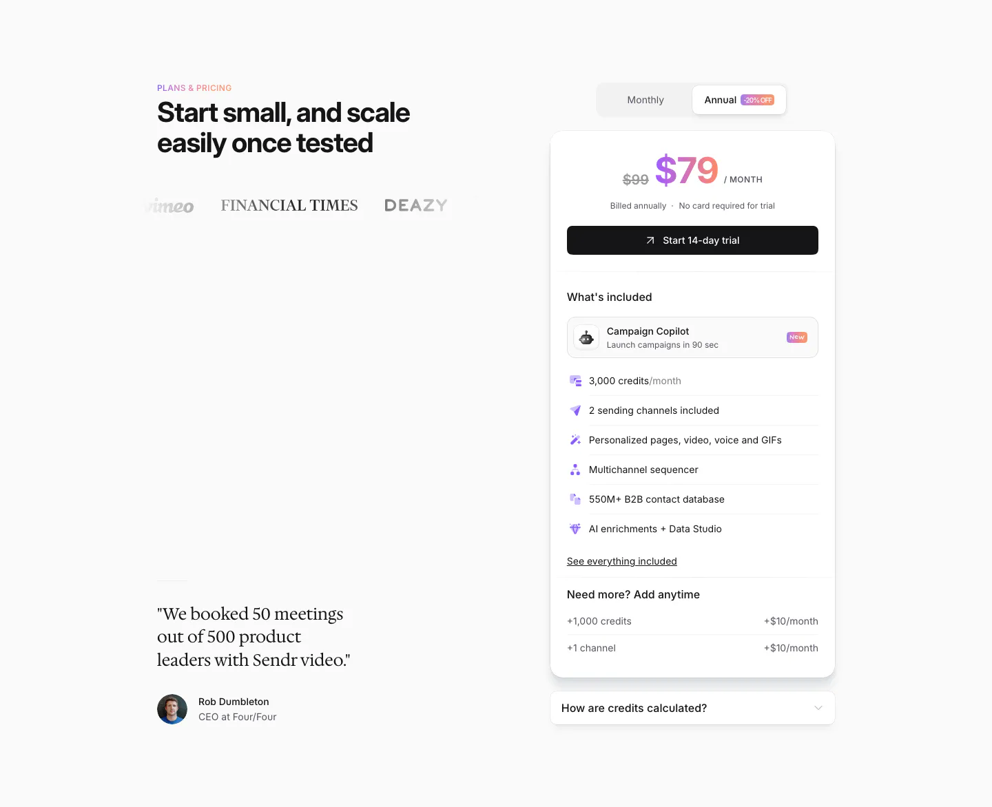
  24. Sendr pricing section: headline, logos and serif customer quote left, single $79 plan card with monthly/annual toggle right
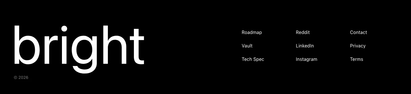
  25. Bright footer section: huge white bright wordmark on black beside three short columns of links, with a © 2026 line
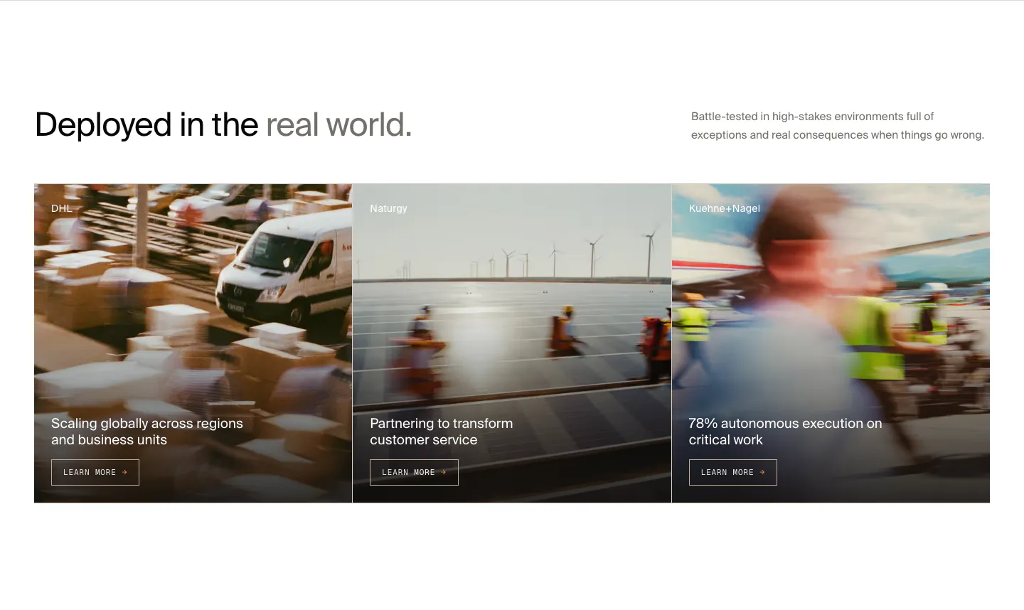
  26. HappyRobot features section: headline with side note above three customer story cards (DHL, Naturgy, Kuehne+Nagel) on motion-blurred photos
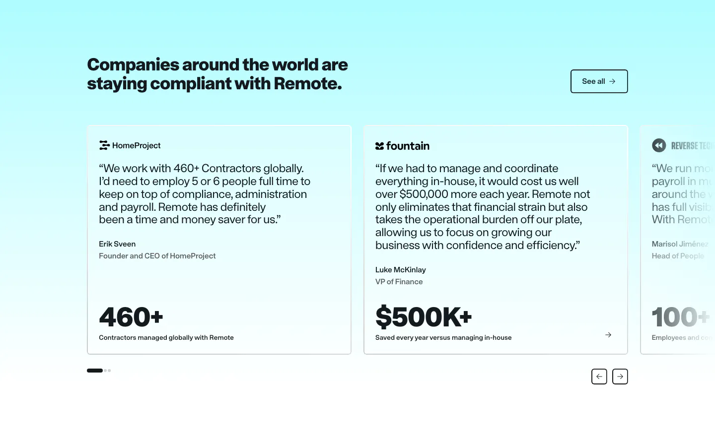
  27. Remote testimonials section: headline and See all button above a carousel of quote cards with large metrics on cyan
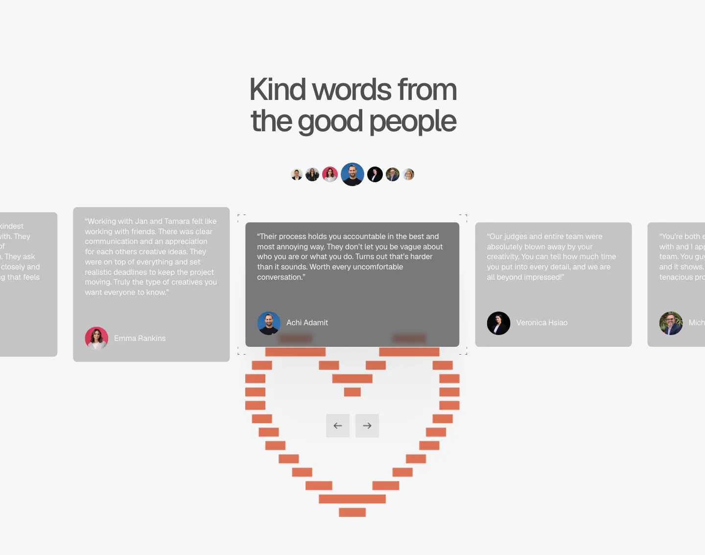
  28. A-LIGN testimonials section: centered headline, avatar row and a quote card carousel with arrows above a pixel-style orange heart
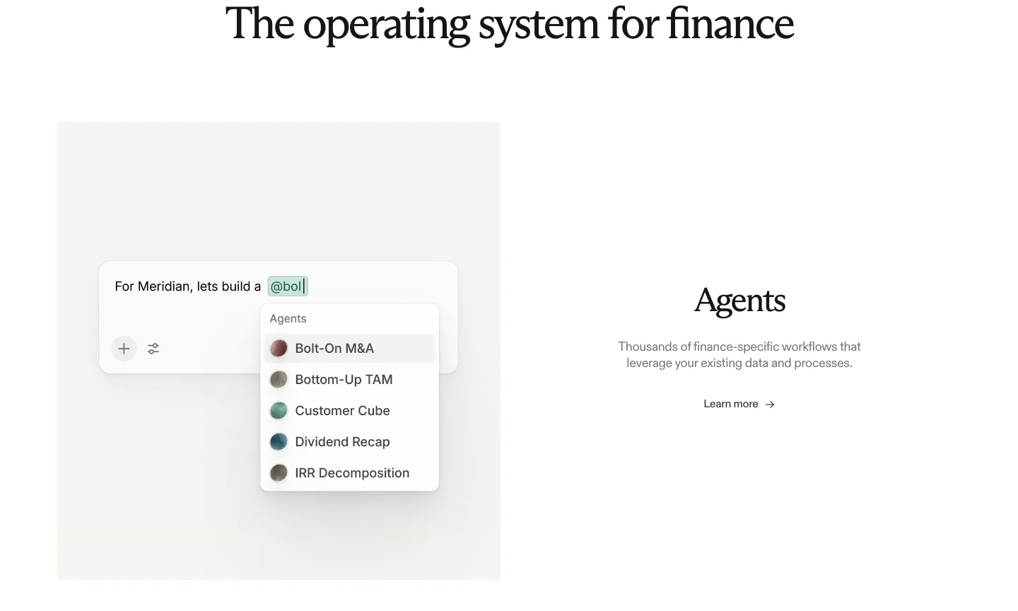
  29. Rogo features section: serif heading above an agent picker UI mockup on the left and Agents text with a link on the right
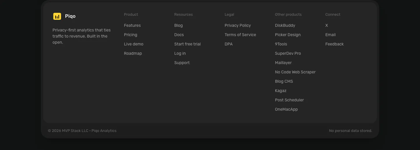
  30. Piqo footer section: rounded dark card with yellow logo and tagline, five link columns including other products, copyright row
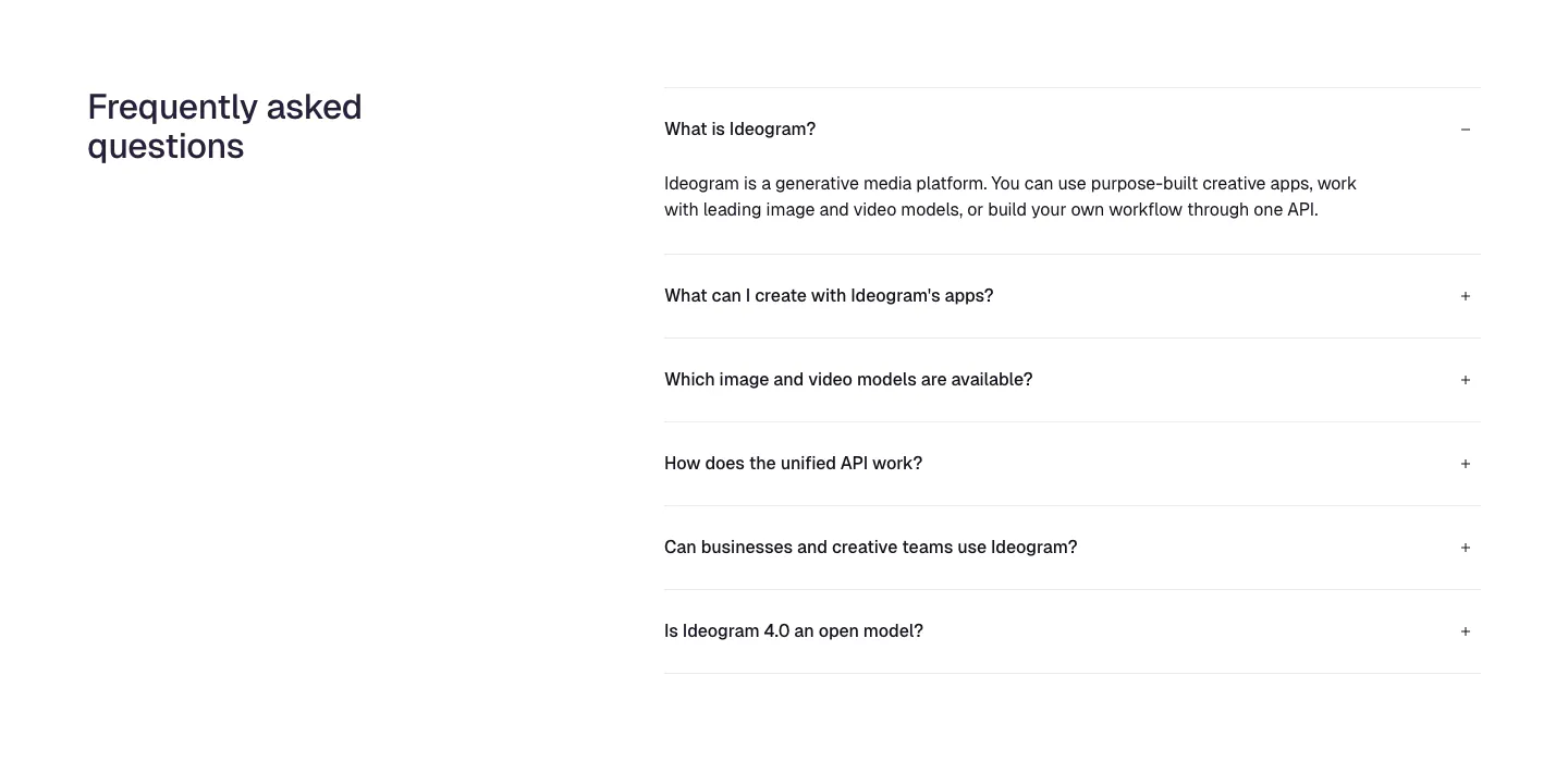
  31. Ideogram FAQ section: heading on the left, accordion of six questions on the right with the first one expanded, on white
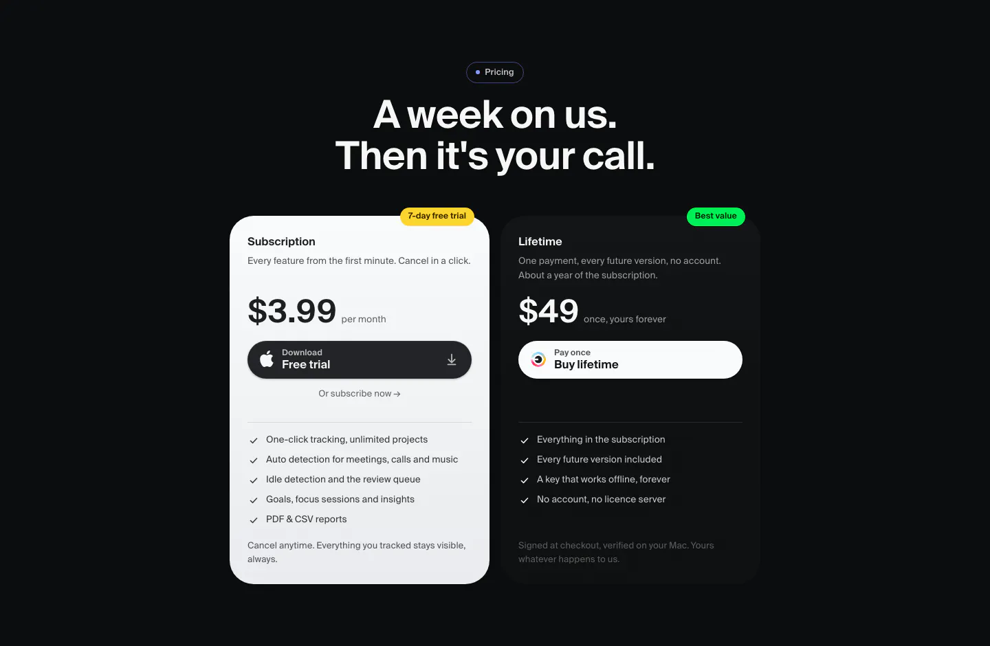
  32. Dial pricing section: dark centered headline above two plan cards, a light $3.99 monthly subscription and a dark $49 lifetime option
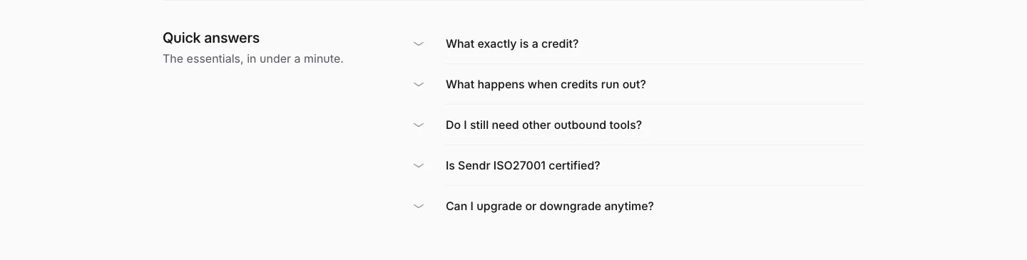
  33. Sendr FAQ section: Quick answers title on the left beside a five-question collapsed accordion list on light gray
  34. Remote features section: left-aligned headline above a six-item grid with cyan icon tiles and divider lines
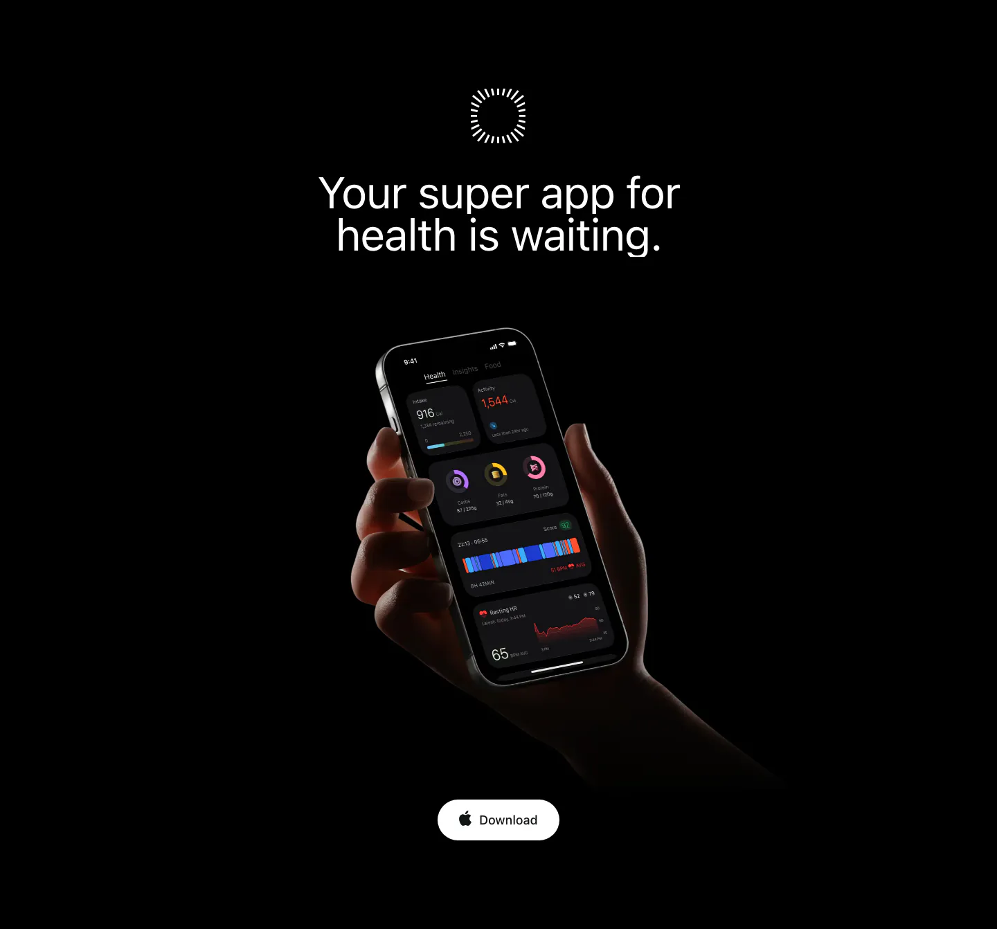
  35. Bright call to action section: centered headline on black above a hand holding a phone with the dark app UI and a Download button
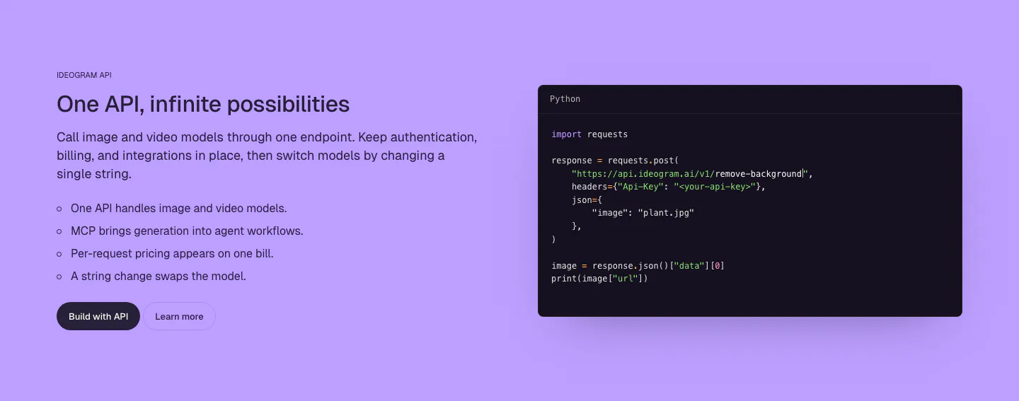
  36. Ideogram features section: purple background, headline, copy and bullet list on the left, dark Python code snippet window on the right
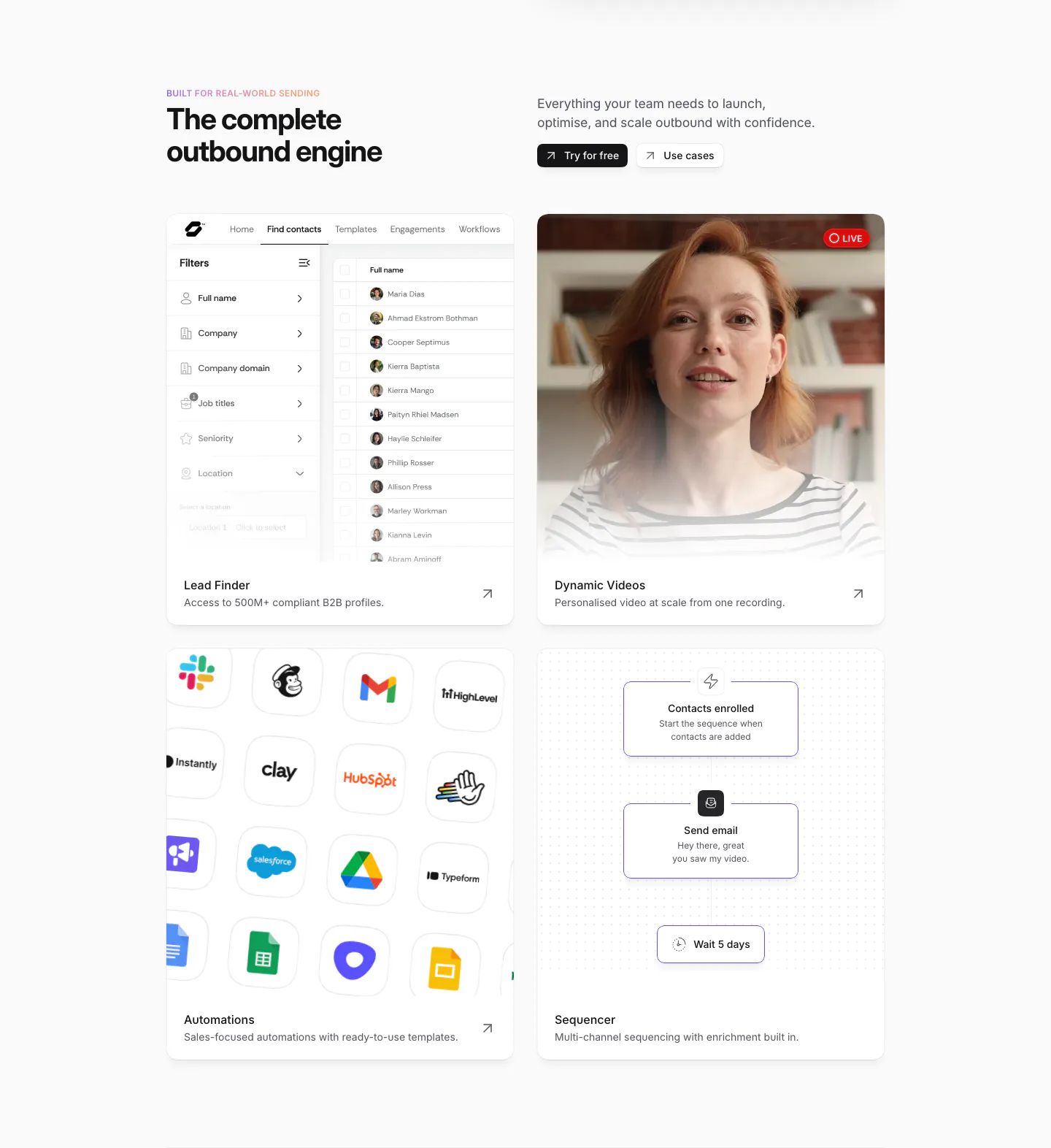
  37. Sendr features section: headline and buttons above a 2x2 card grid of lead finder UI, live video, app icon grid and sequencer flow
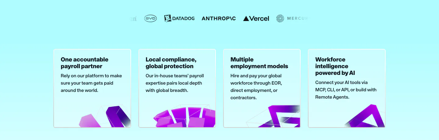
  38. Remote value proposition section: faded logo row above four light cyan benefit cards with purple 3D shapes at the bottom
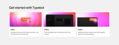
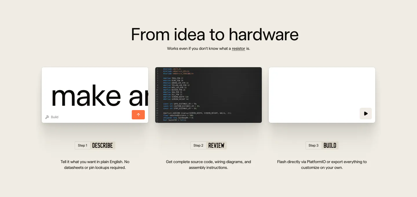
  39. Schematik how it works section: centered headline above three step cards for describe, review and build on beige
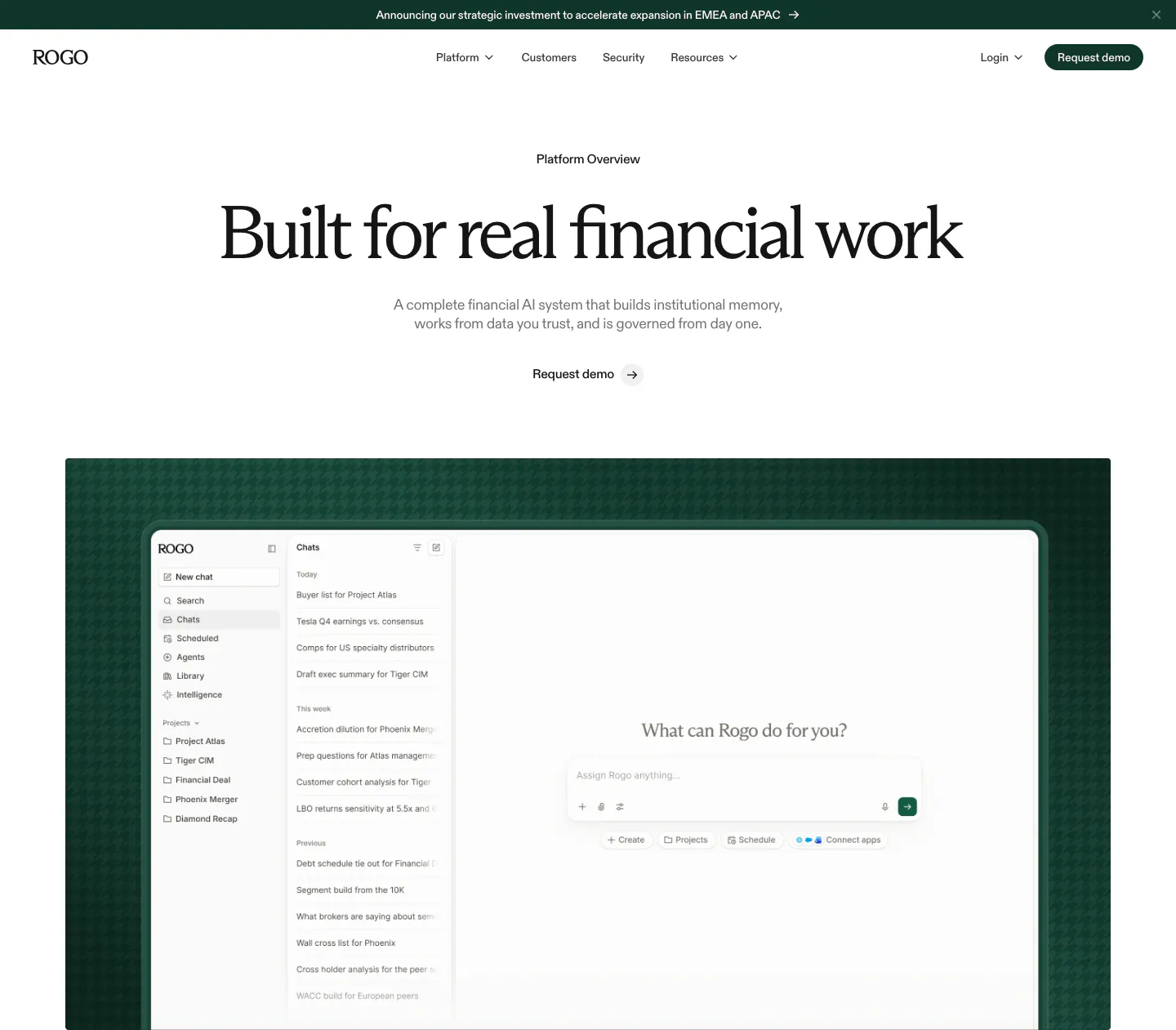
  40. Rogo hero section: announcement bar, nav, centered serif headline and demo link above a chat app screenshot on dark green
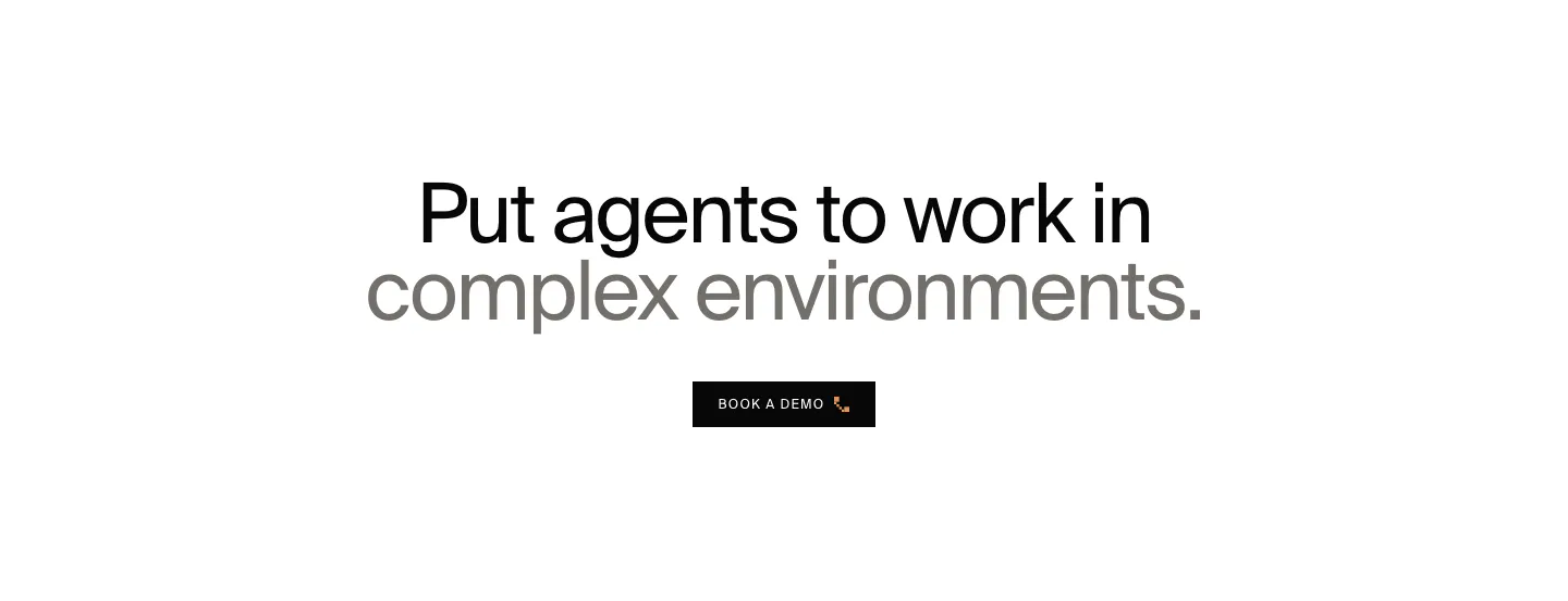
  41. HappyRobot call to action section: centered two-tone headline in black and gray above a small black Book a demo button on white
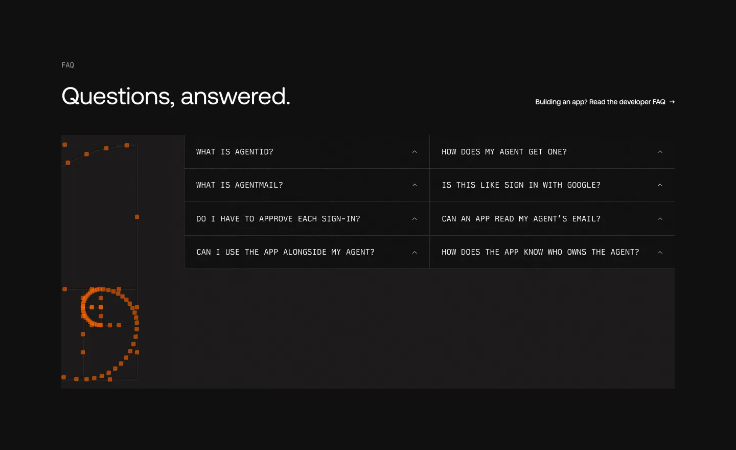
  42. AgentID FAQ section: dark two-column grid of monospace accordion questions beside an orange pixel-dot smiley artwork
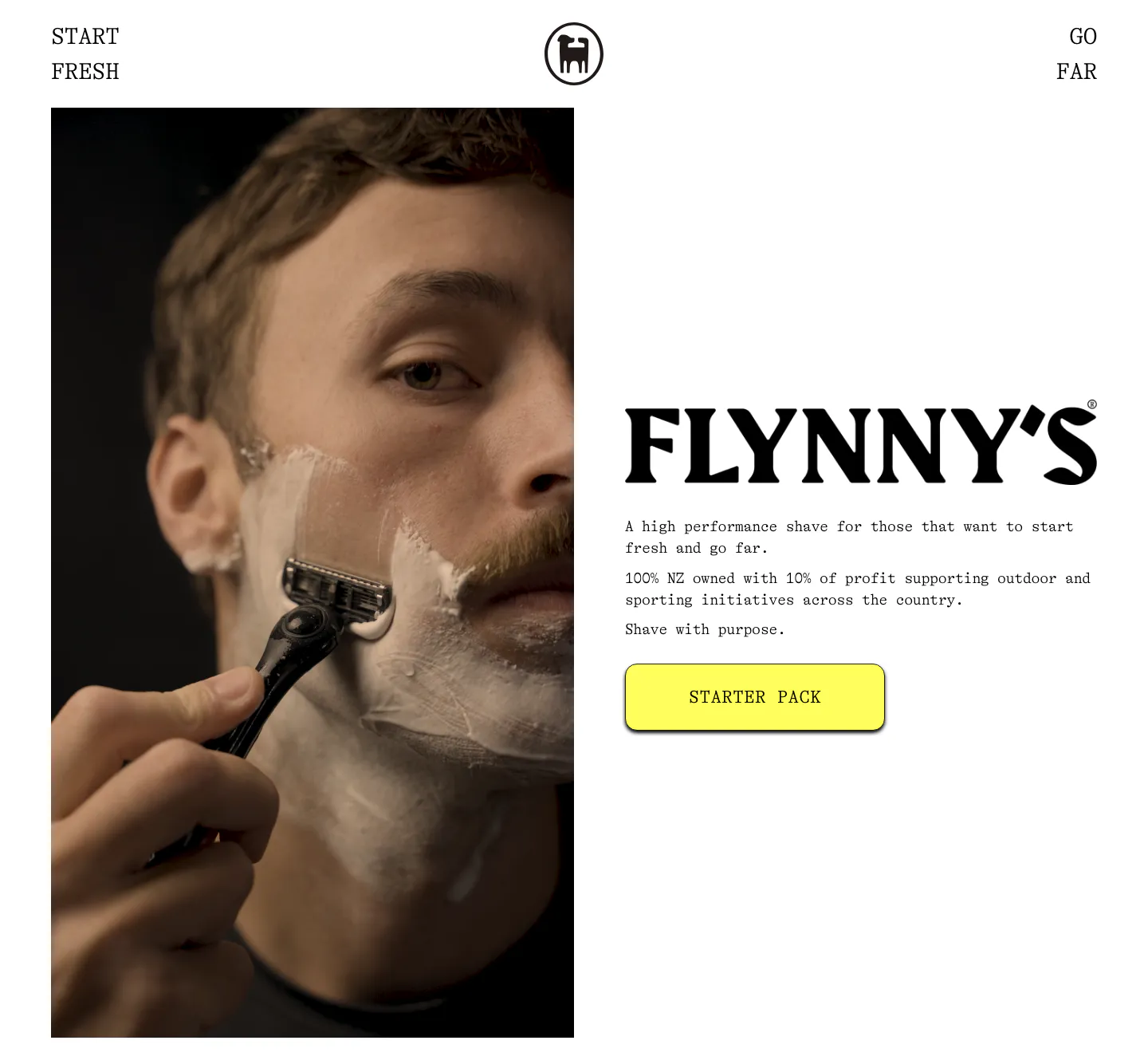
  43. Flynny's about & mission section: tall photo of a man shaving left, large serif wordmark, short brand copy and yellow Starter Pack button right
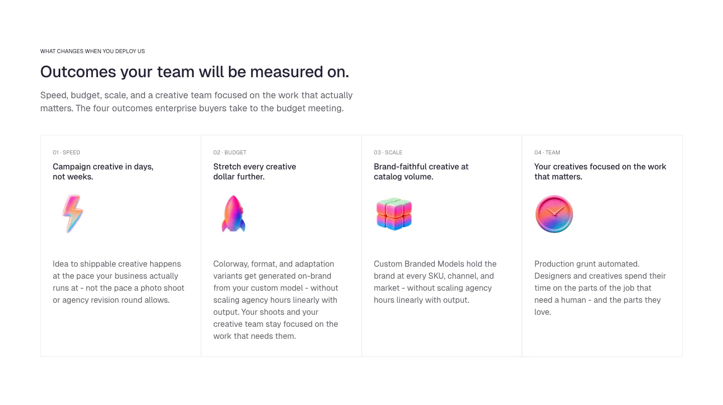
  44. Ideogram value proposition section: eyebrow, headline and intro above four bordered outcome cards with numbered labels and glossy 3D icons
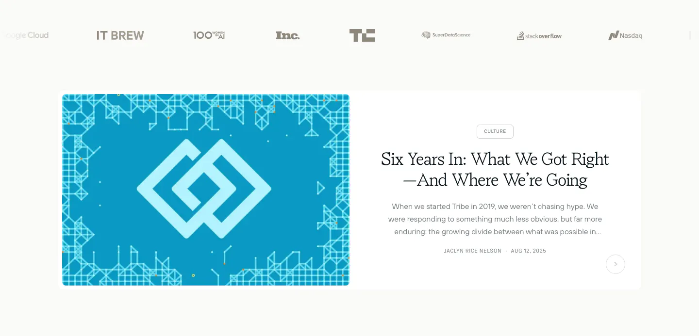
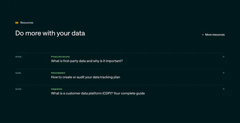
  45. Tribe AI blog & resources section: press logo row above a featured article card with a blue geometric cover left and serif title right
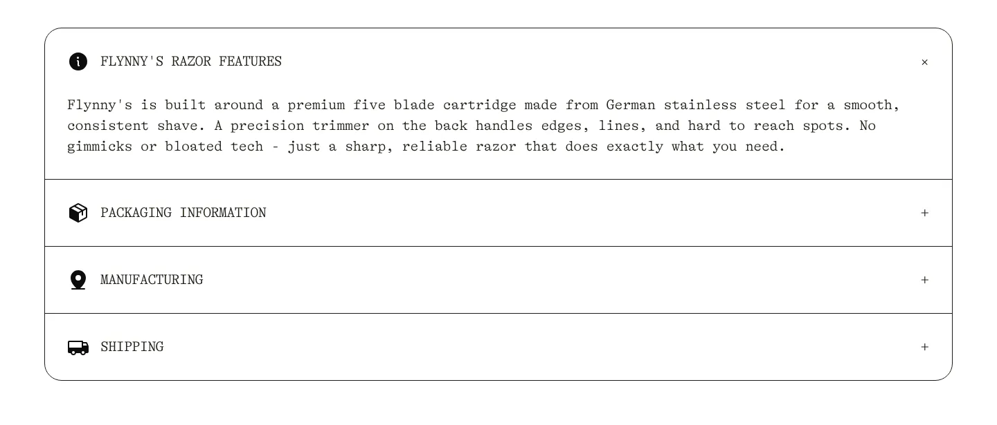
  46. Flynny's FAQ section: rounded bordered accordion in typewriter type with razor features open and packaging, manufacturing, shipping closed
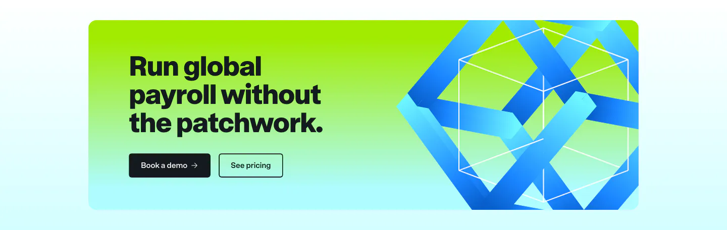
  47. Remote call to action section: dark headline and two buttons on a lime-to-cyan gradient card with a blue 3D ribbon cube
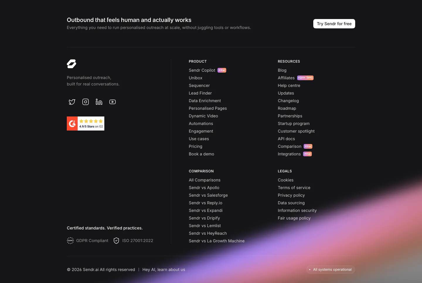
  48. Sendr footer section: dark footer with CTA strip, logo, G2 badge, product, resources, comparison and legal columns and a purple glow

Browse by section type

19 section types

All section types

Browse by style

22 styles across color & theme, layout, visuals, treatment and typography

All styles

Browse by industry

17 industries, from fintech to developer tools

All industries

What is UI Sections?

UI Sections is a curated library of website section design inspiration. Every screenshot is a real section from a live SaaS or startup website: feature sections, hero sections, testimonial sections, footer sections, CTA sections and more, captured as it shipped rather than recreated as a template.

Sections are grouped by type, visual style and company, so you can compare how different teams solve the same layout problem, or see how one company builds its landing page from hero to footer. Open any screenshot full size, then follow its links to similar designs.

How the library is curated
Website sections
1,908
Companies
285
Section types
19
    ↑↓ Navigate ↵ Open

    Section preview

    Website section