Healthcare Website Design Examples

Healthcare websites speak to patients, clinicians, and administrators at once, and each group needs a different kind of reassurance. Patients want clarity and warmth. Clinicians want evidence. Buyers want compliance and proof that the product fits existing systems. Good healthcare website design separates these paths, uses accessible type and color, and backs each health claim with sources, clearances, or study results instead of vague promises.
61 sections

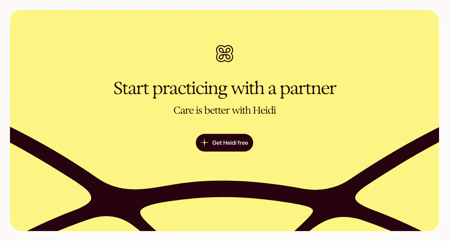
  1. Heidi call to action section: yellow rounded panel with logo, centered serif headline and button over a large dark curved logo shape
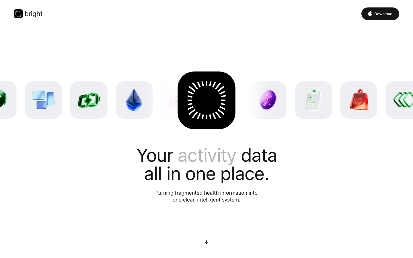
  2. Bright hero section: logo nav, a row of glossy 3D health icons around a black app icon, centered headline and subcopy below
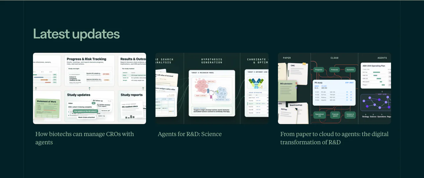
  3. Orchestra Bio blog & resources section: Latest updates heading over three article cards with illustrated thumbnails on dark teal
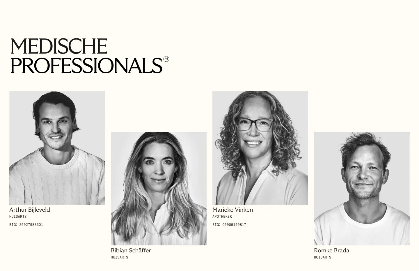
  4. Menkind team section: serif headline above four staggered black-and-white portraits of medical professionals with roles on cream
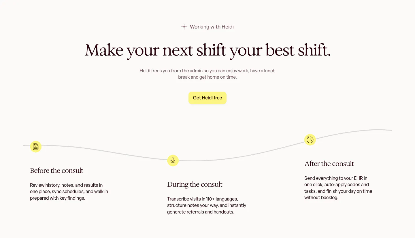
  5. Heidi how it works section: centered serif headline above a wavy timeline with before, during and after the consult steps
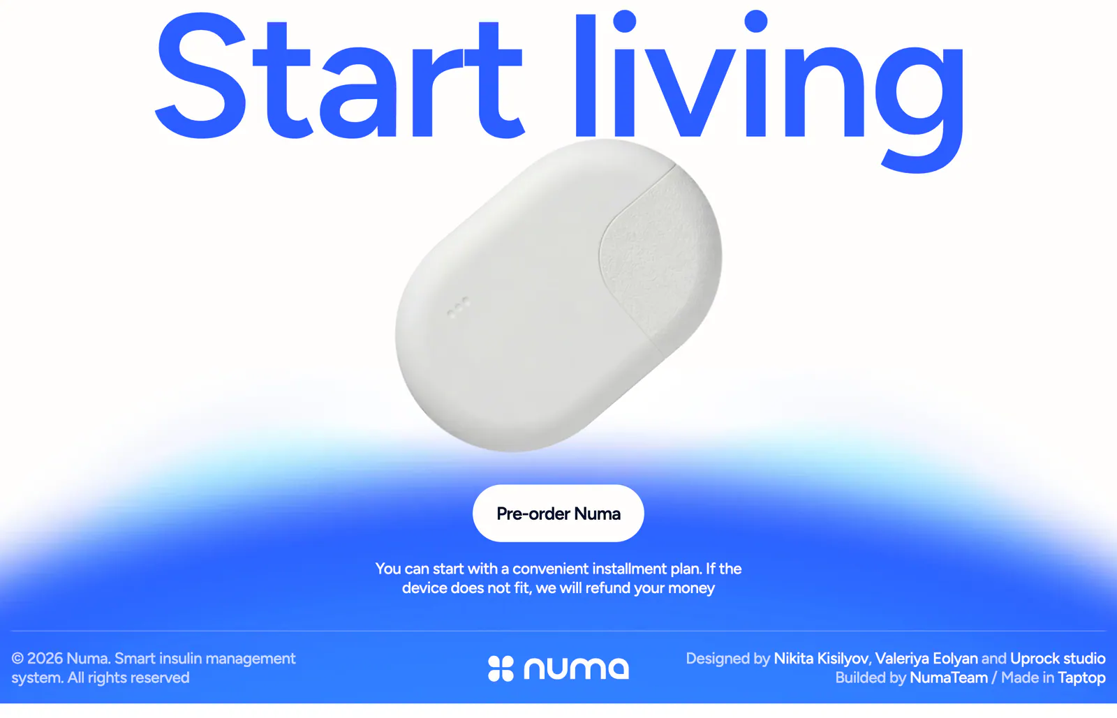
  6. Numa call to action section: full-width blue headline above a white insulin device, pre-order button on a blue glow, slim footer row below
  7. Bright footer section: huge white bright wordmark on black beside three short columns of links, with a © 2026 line
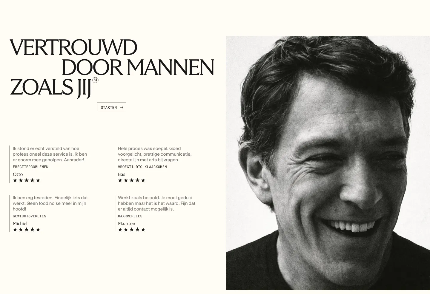
  8. Menkind testimonials section: serif headline and four starred review quotes beside a large black-and-white portrait on cream
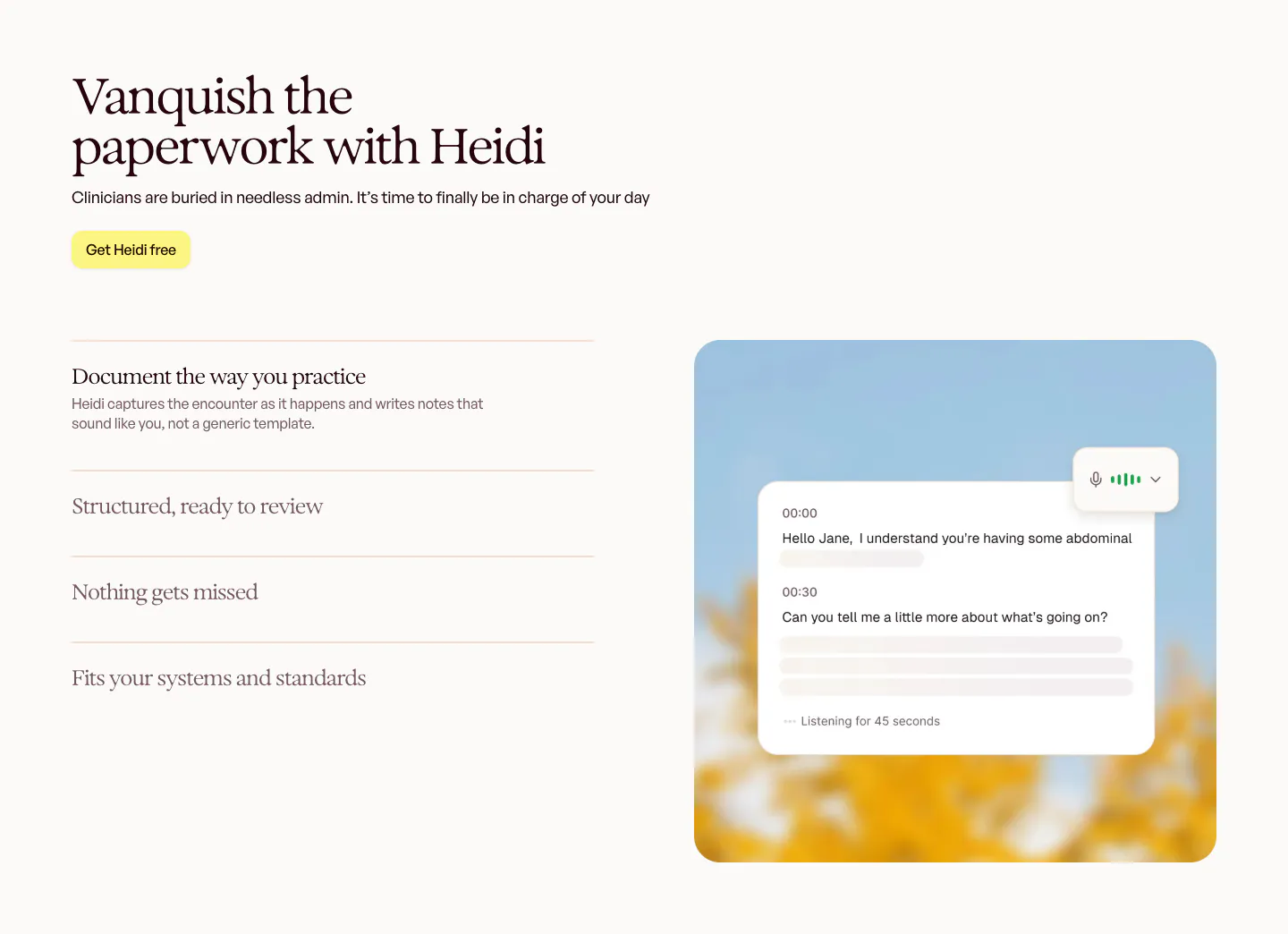
  9. Heidi features section: serif headline and accordion feature list on the left, live transcript card over a blurred sky photo on the right
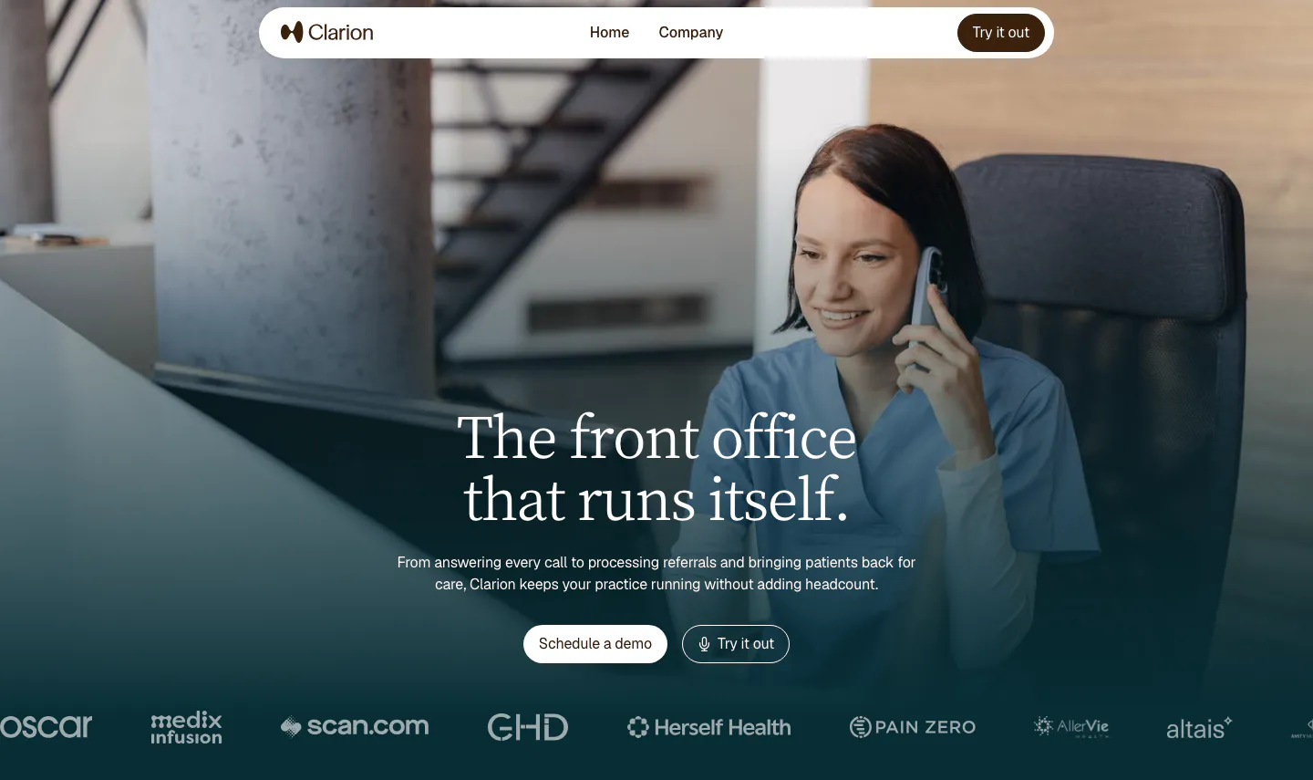
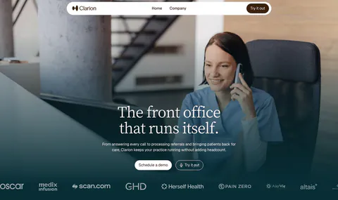
  10. Clarion hero section: full-bleed photo of a clinic worker on the phone, centered serif headline, two buttons and a customer logo row
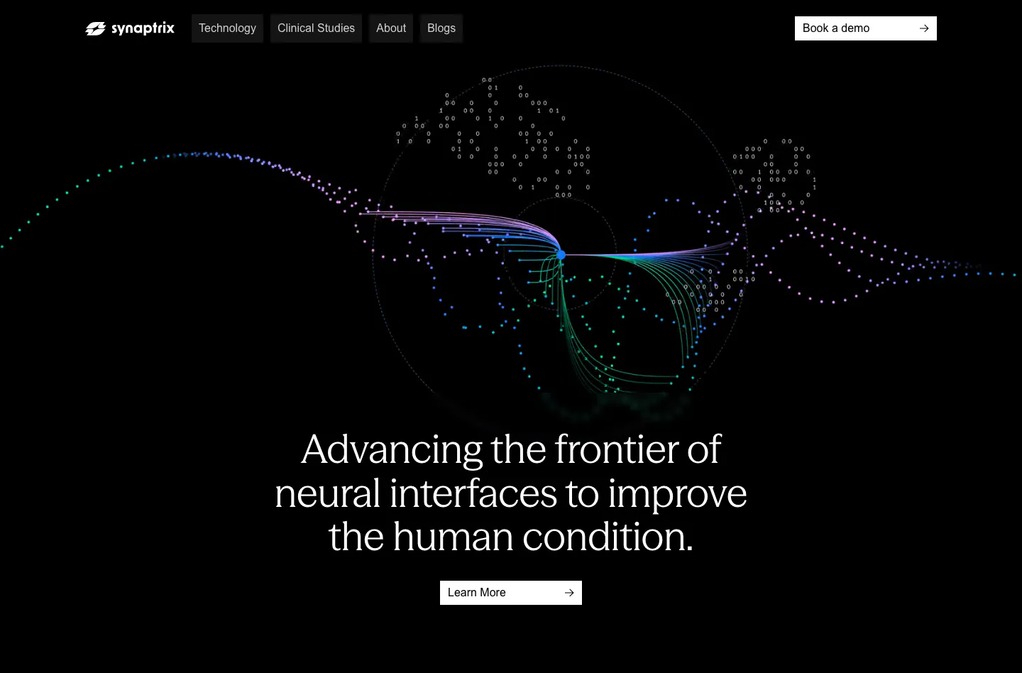
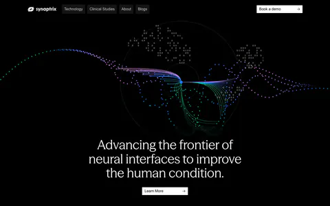
  11. Synaptrix hero section: centered headline below a colorful particle neural-wave visualization on a black background with top nav
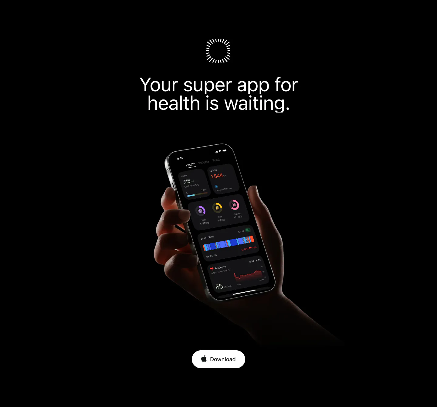
  12. Bright call to action section: centered headline on black above a hand holding a phone with the dark app UI and a Download button
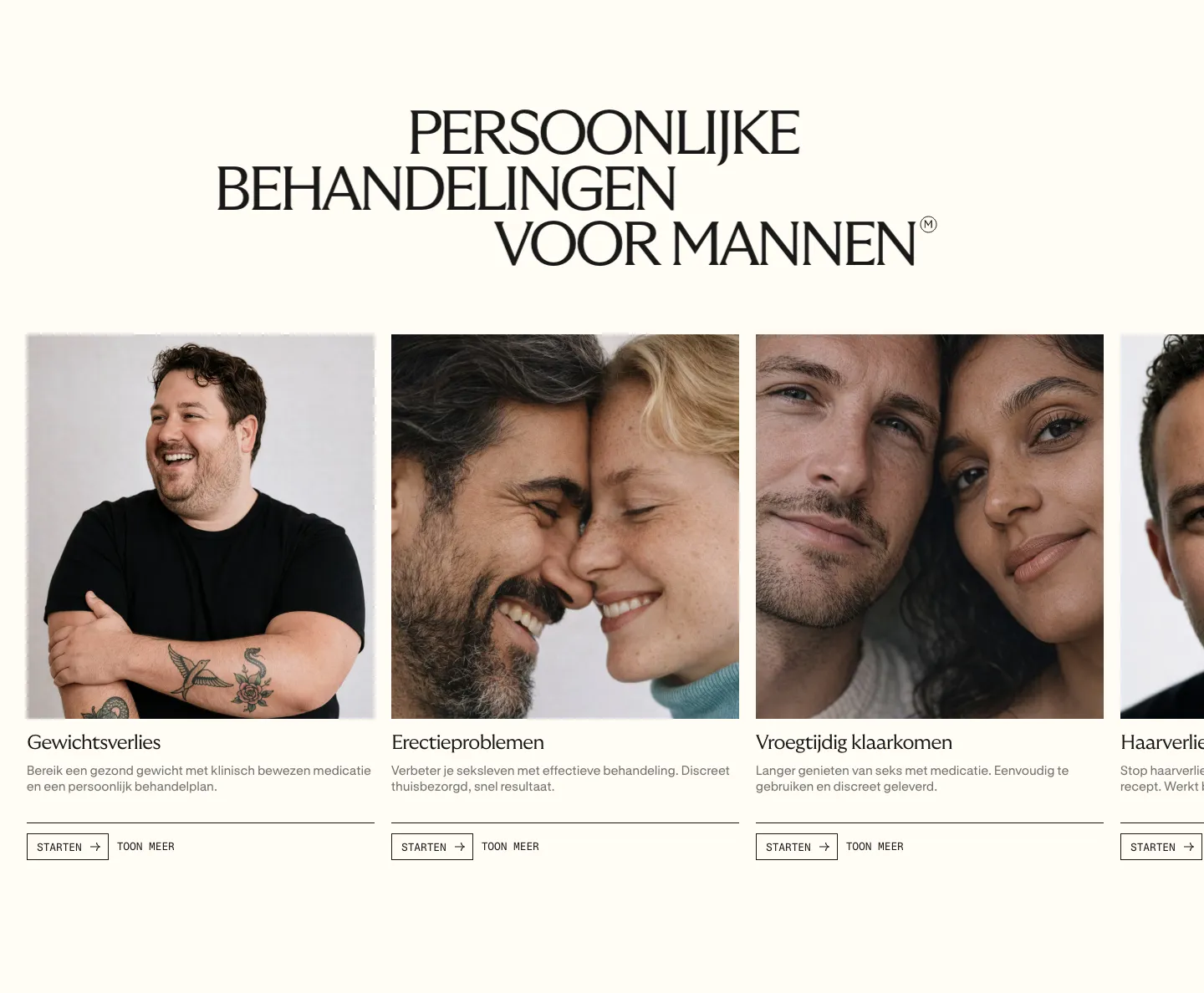
  13. Menkind features section: serif uppercase headline above a carousel of treatment cards with portrait photos and start buttons on cream
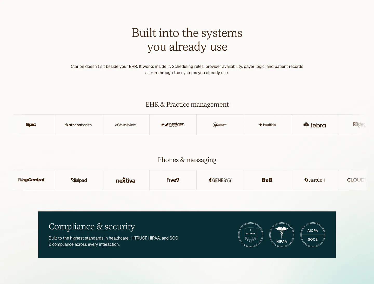
  14. Clarion integrations section: centered serif headline above two rows of EHR and phone system logos and a dark compliance badge banner
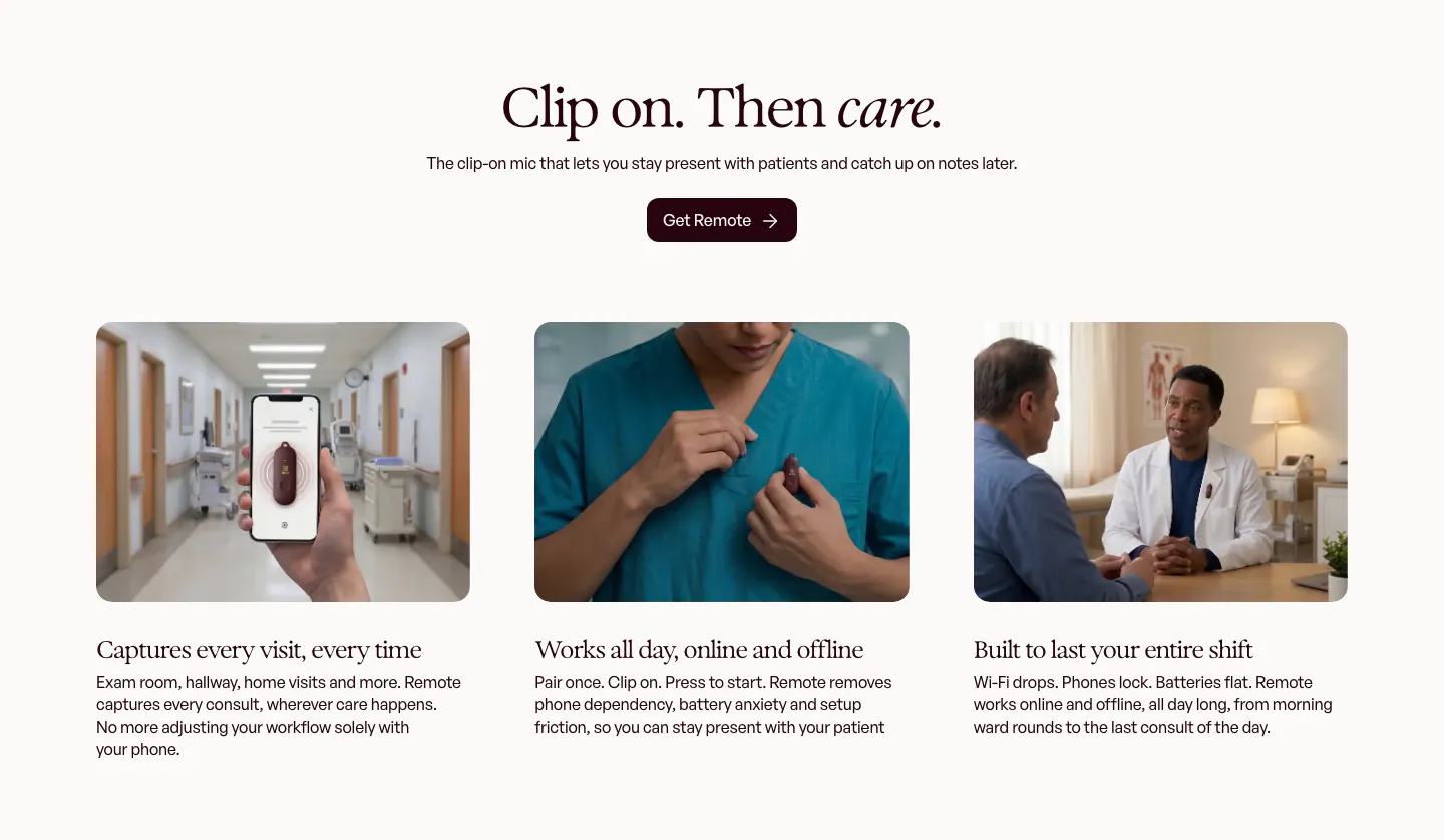
  15. Heidi call to action section: cream rounded band with centered serif headline, Get Remote button and faint curved line decorations
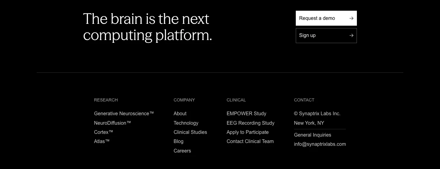
  16. Synaptrix footer section: closing headline with demo and sign-up buttons above four link columns on a black background
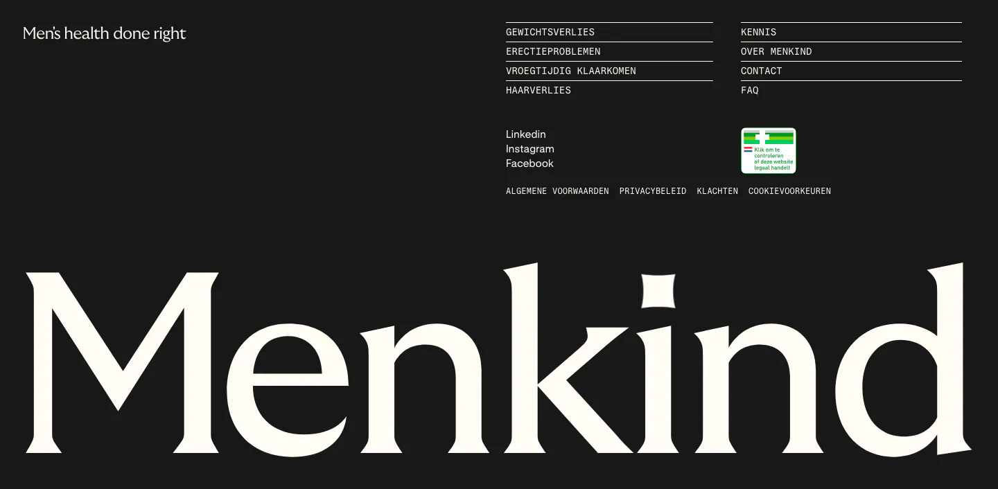
  17. Menkind footer section: tagline and monospace link columns above a giant serif Menkind wordmark on a black background
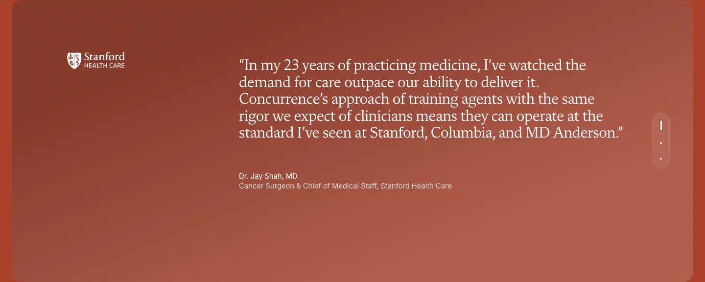
  18. Concurrence testimonials section: serif quote from a Stanford Health Care surgeon on a rust gradient card with vertical pagination dots
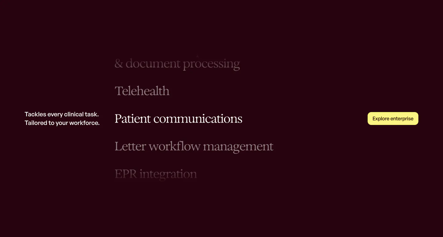
  19. Heidi features section: dark plum background with a scrolling serif list of clinical tasks and a yellow Explore enterprise button
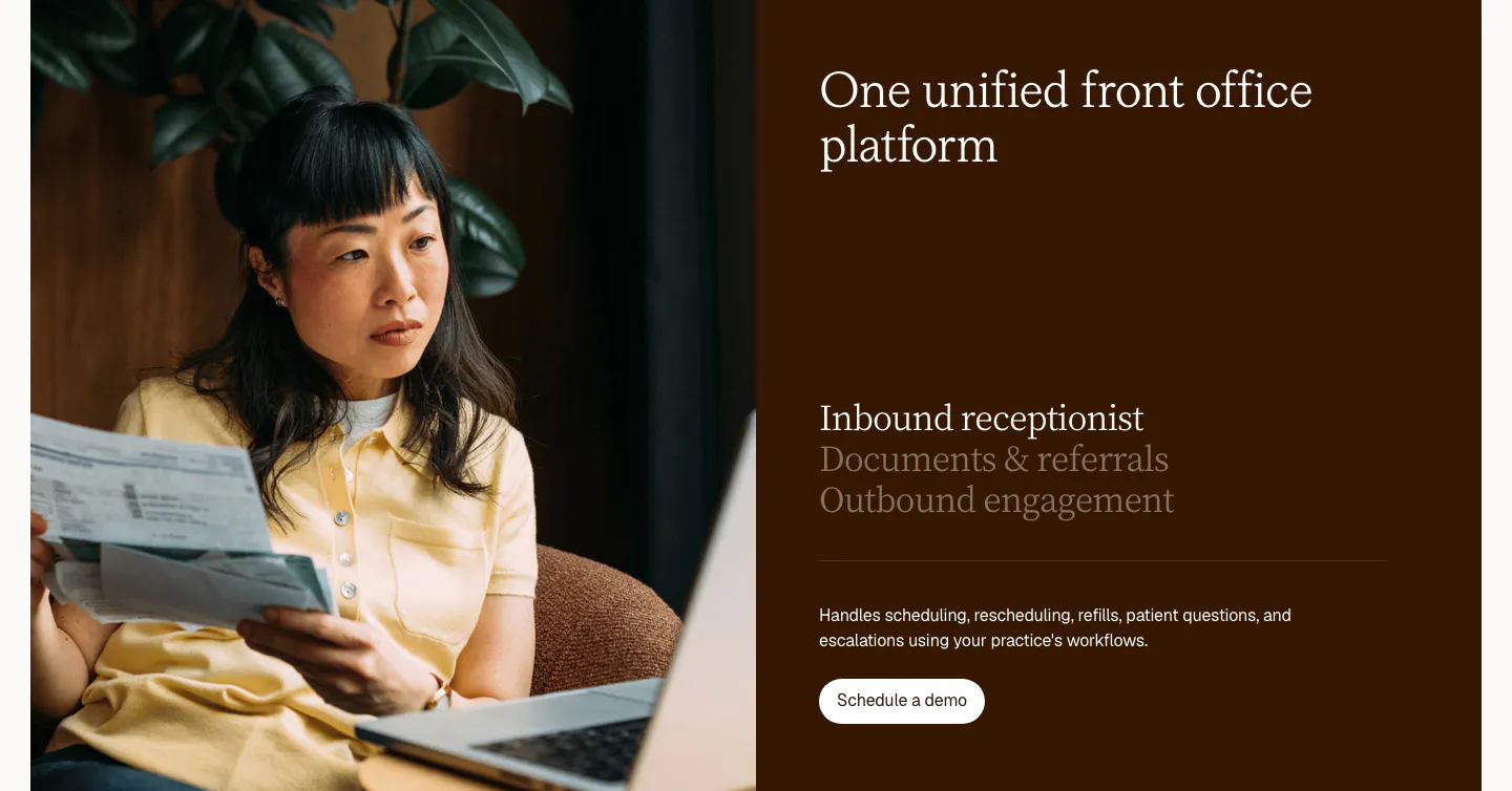
  20. Clarion features section: split card with a photo of a woman reviewing papers beside a dark brown panel with a serif tab list and button
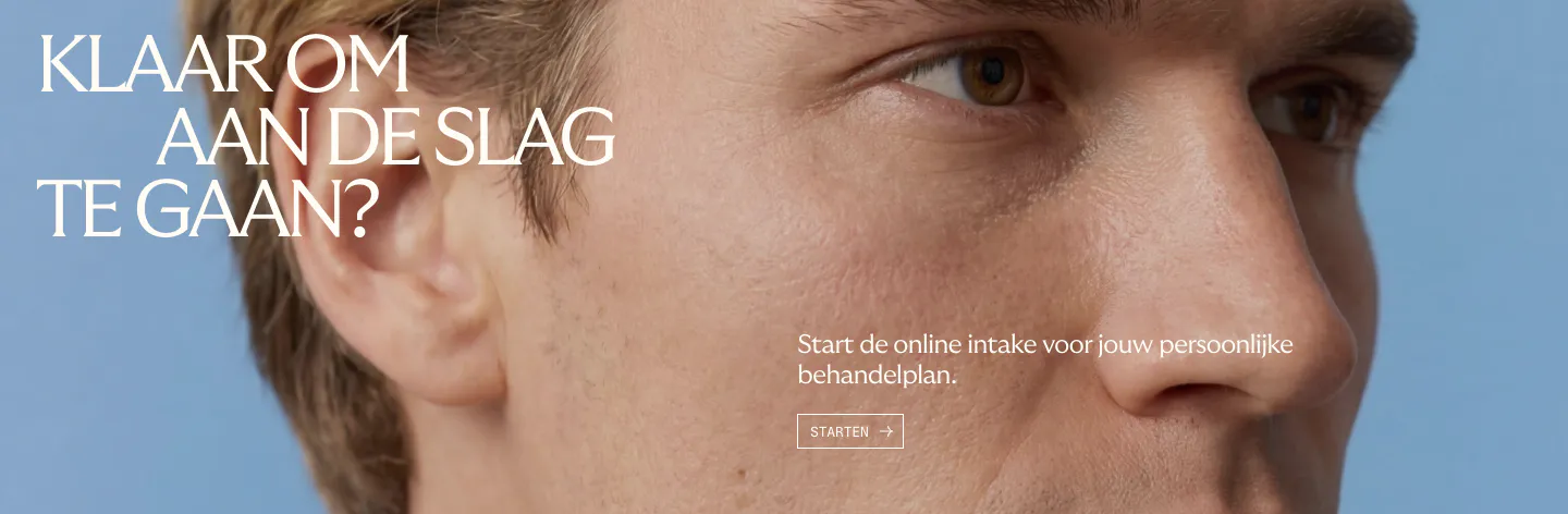
  21. Menkind call-to-action section: white serif headline and start button over a full-bleed close-up face photo on blue
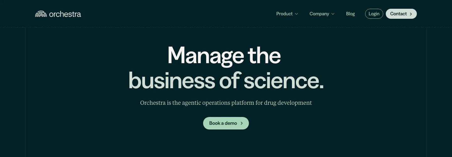
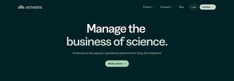
  22. Orchestra Bio hero section: nav above a centered two-tone headline, serif subtitle and pale green demo button on dark teal
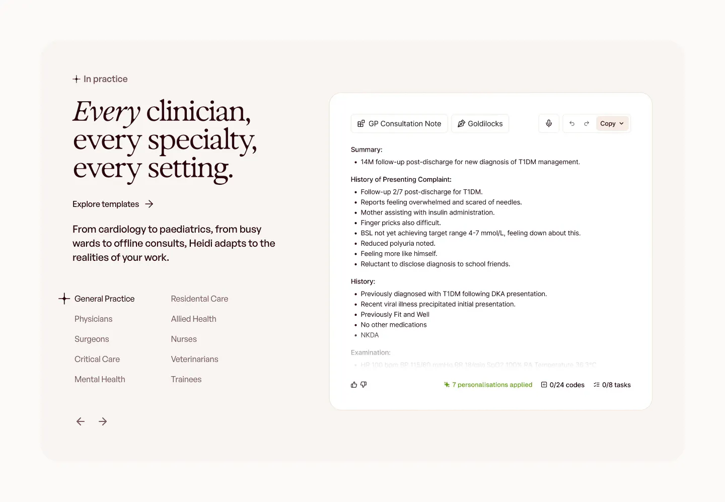
  23. Heidi use cases section: serif headline with a specialty list and arrows on the left, GP consultation note UI on the right
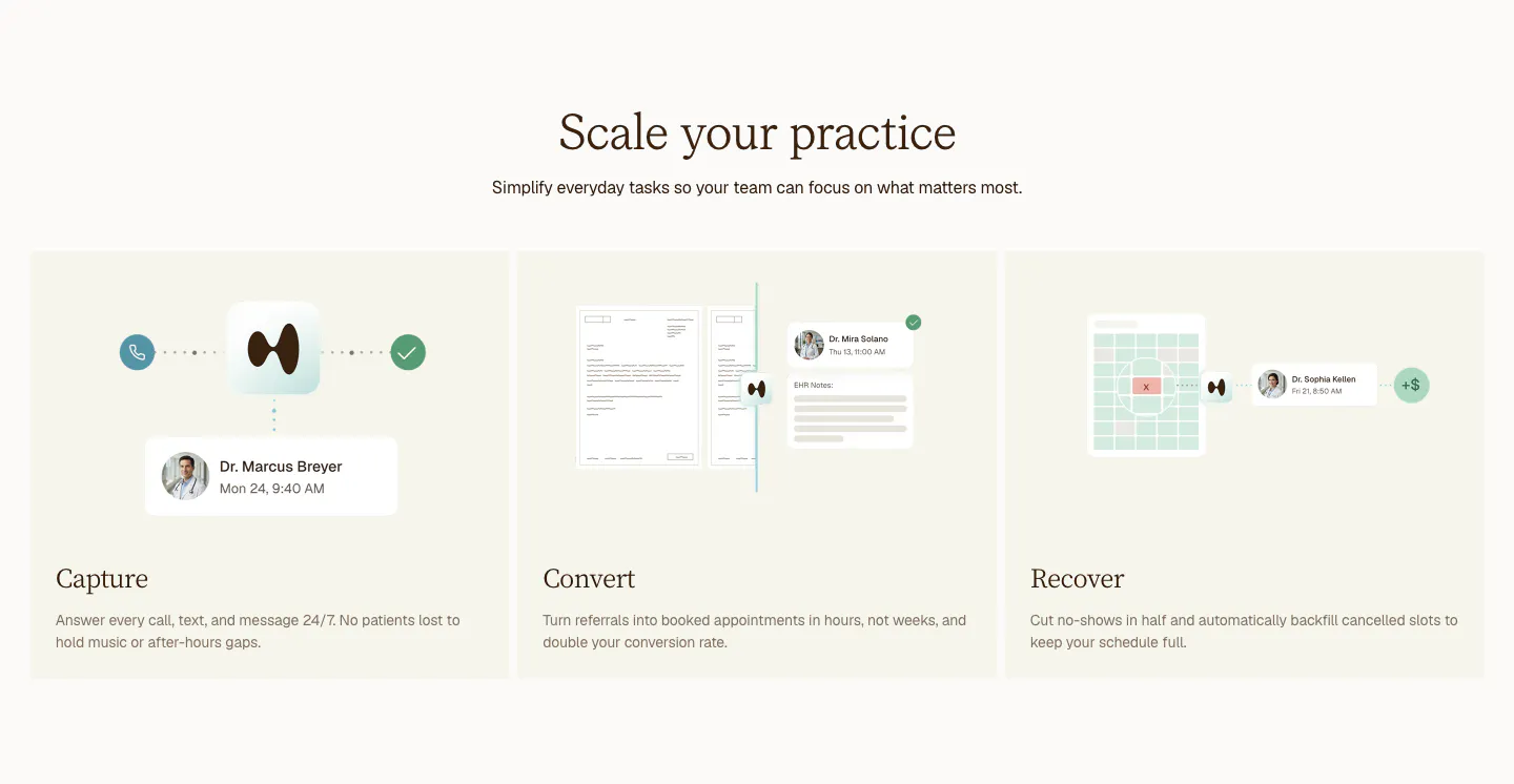
  24. Clarion features section: centered serif headline above three cream cards for Capture, Convert and Recover with light UI mockups
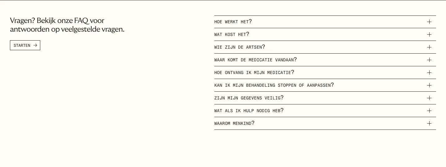
  25. Menkind FAQ section: short intro with start button on the left and a monospace question accordion on the right on cream
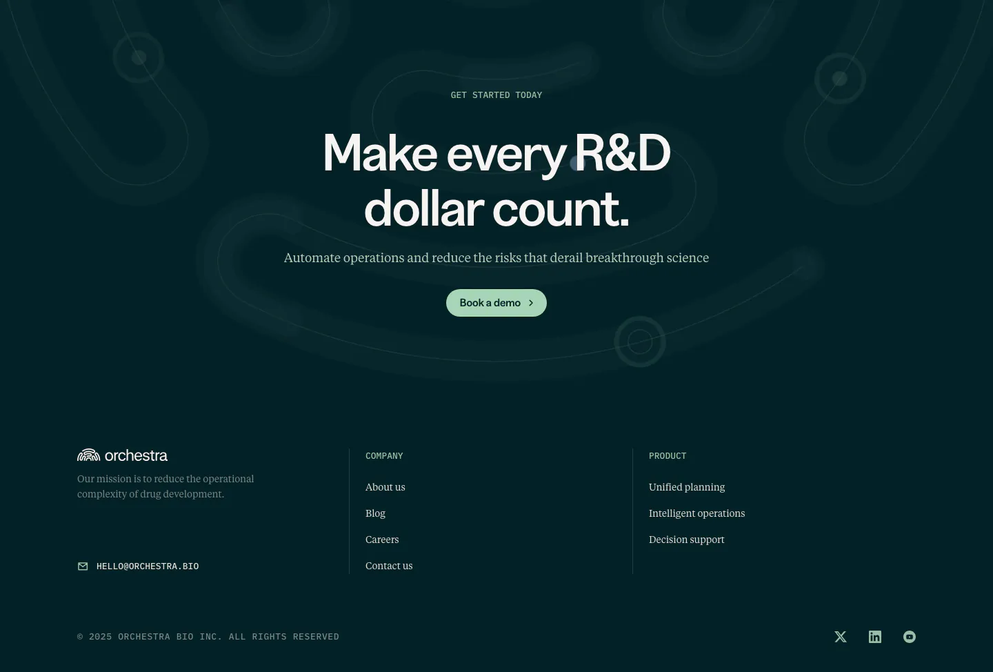
  26. Orchestra Bio call to action section: centered headline and demo button on dark teal with faint loop shapes, above a footer
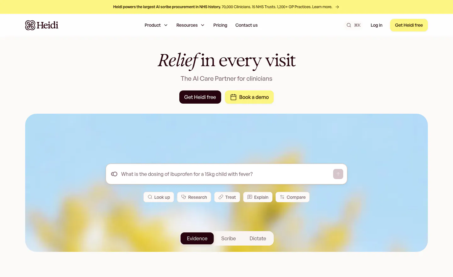
  27. Heidi hero section: centered serif headline with two buttons above a search prompt box and mode tabs on a blurred flower photo
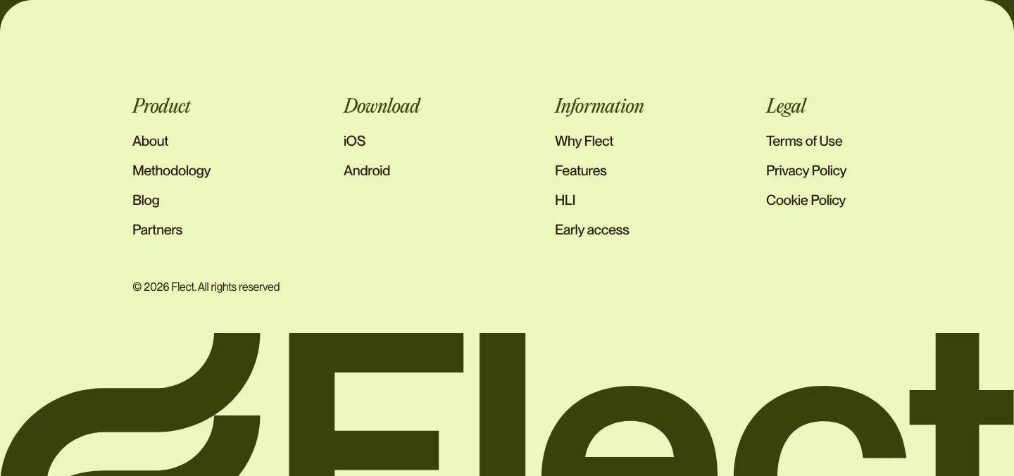
  28. Flect footer section: italic serif column headings and links above a giant cropped Flect wordmark on a pale lime background
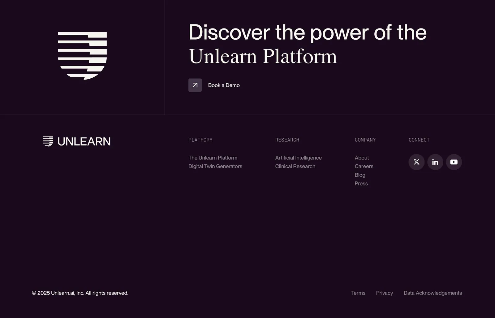
  29. Unlearn footer section: logo mark and mixed sans/serif CTA headline with demo link above link columns and social icons on dark plum
    Unlearn Footer
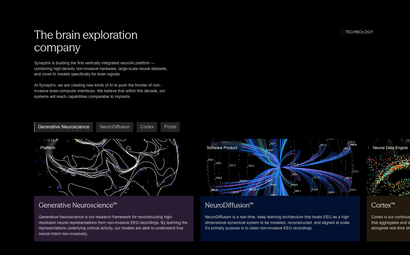
  30. Synaptrix features section: heading and intro copy above a tab bar and cut-off product cards with neural data visualizations on black
  31. Heidi logo cloud section: single row of dark NHS trust and healthcare provider logos on a cream background
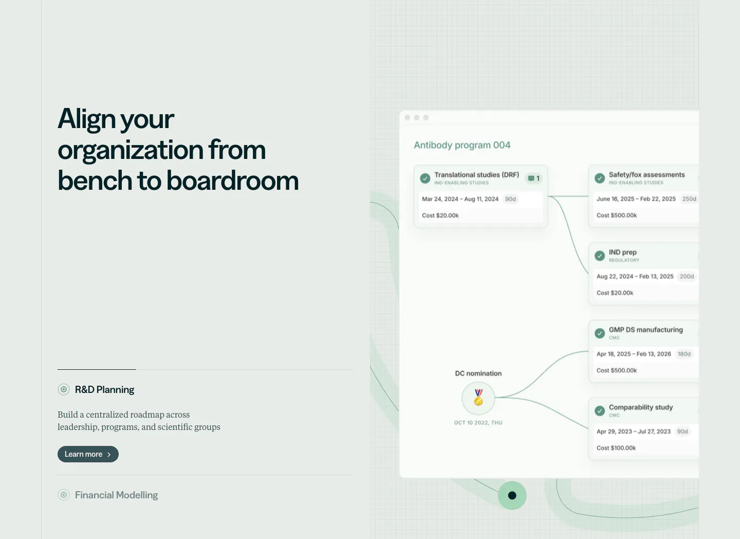
  32. Orchestra Bio features section: headline and R&D planning accordion at left, program timeline product UI on a faint grid at right
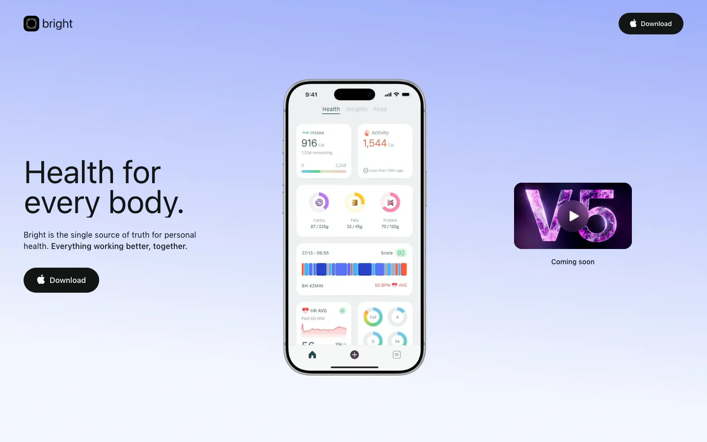
  33. Bright hero section: headline and Download button left, phone app screenshot center and V5 video thumbnail right on periwinkle gradient
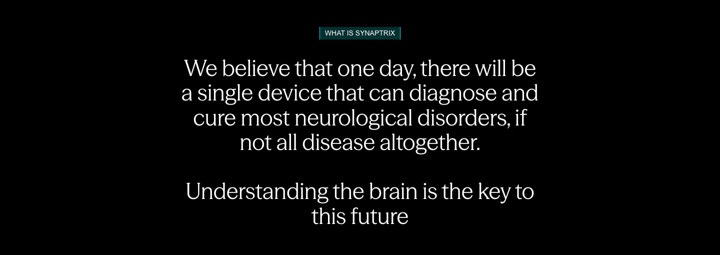
  34. Synaptrix about & mission section: centered mission statement in white text with a small teal label on a black background
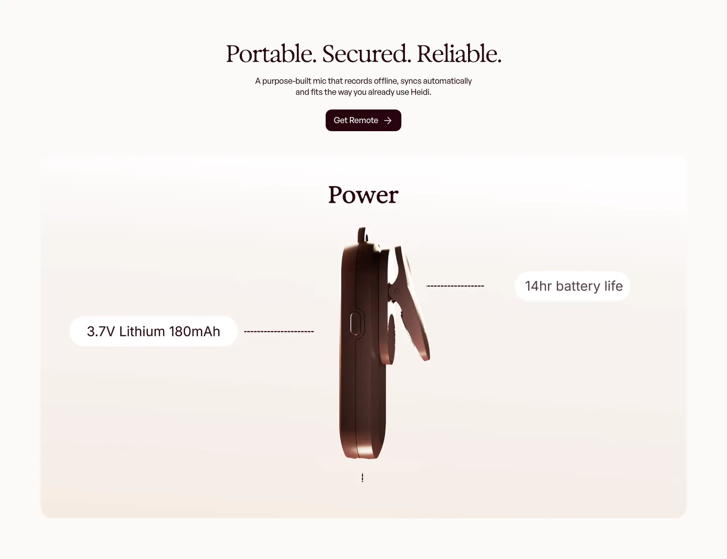
  35. Heidi features section: centered serif headline above a rendered side view of the clip-on mic with battery spec callouts
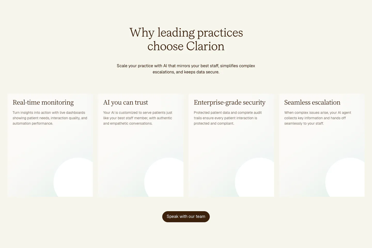
  36. Clarion value proposition section: centered serif headline above four tall cream cards with soft circle shapes and a brown button
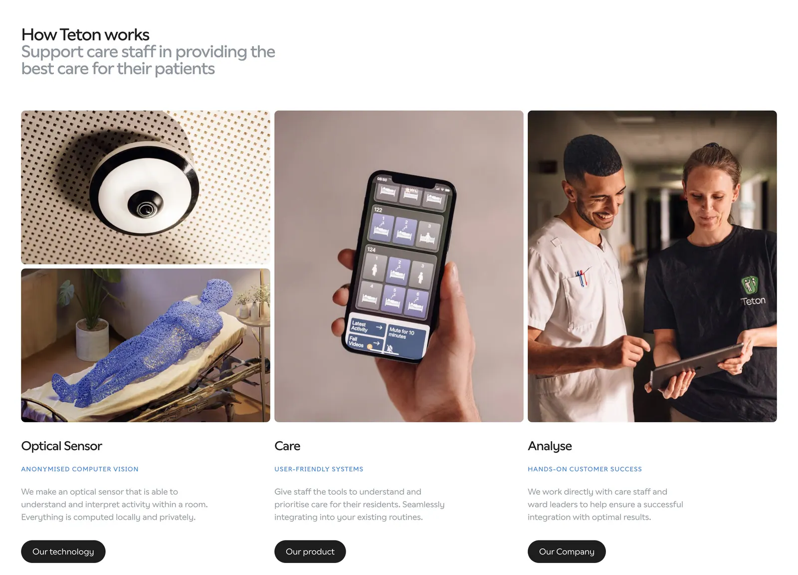
  37. Teton how it works section: headline above three columns of photos (sensor, phone app, care staff) with titles, descriptions and buttons
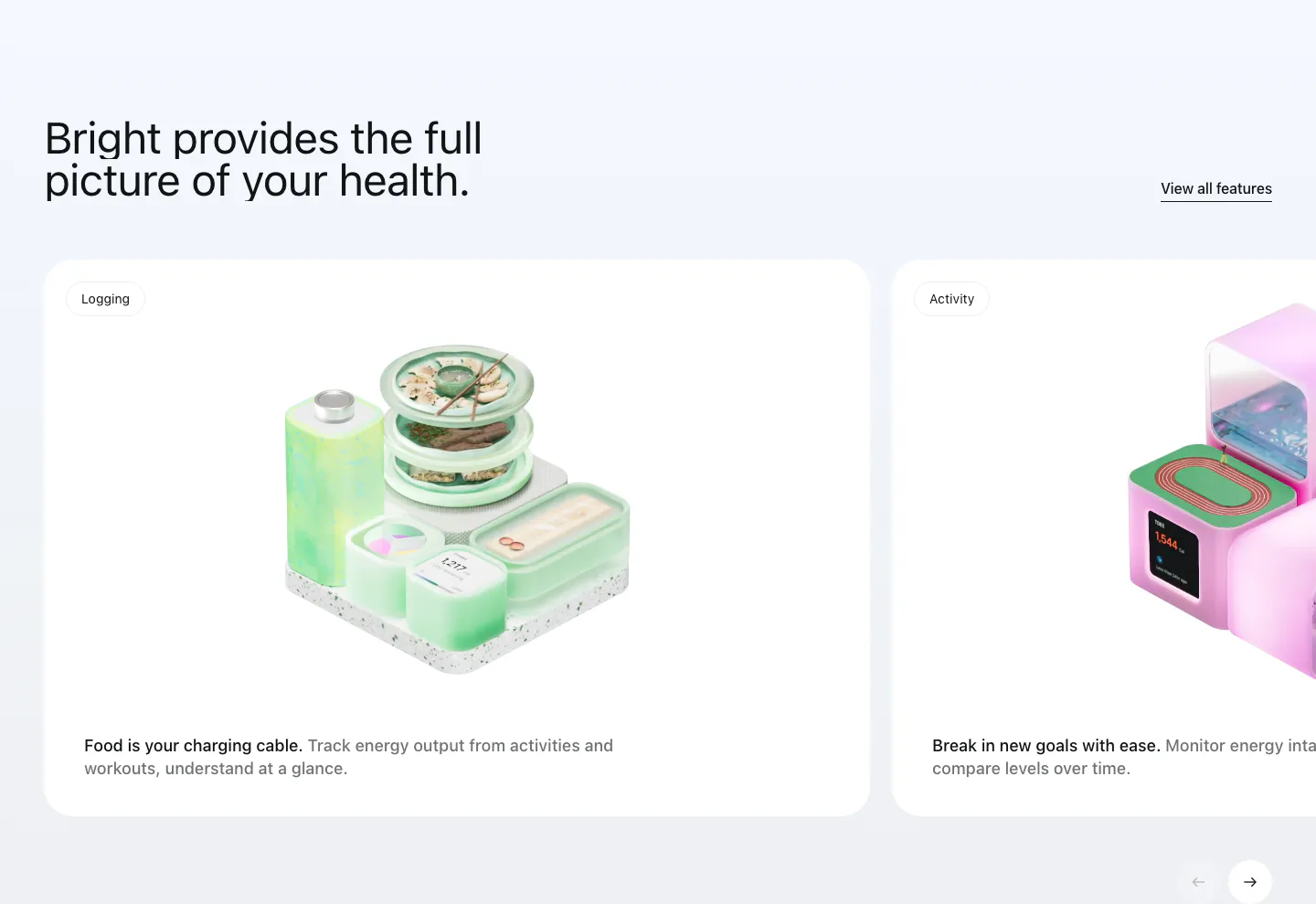
  38. Bright features section: headline with View all link above a carousel of white cards with 3D renders for logging and activity
  39. Heidi features section: centered serif headline and button above three photo cards of the clip-on mic in clinical settings
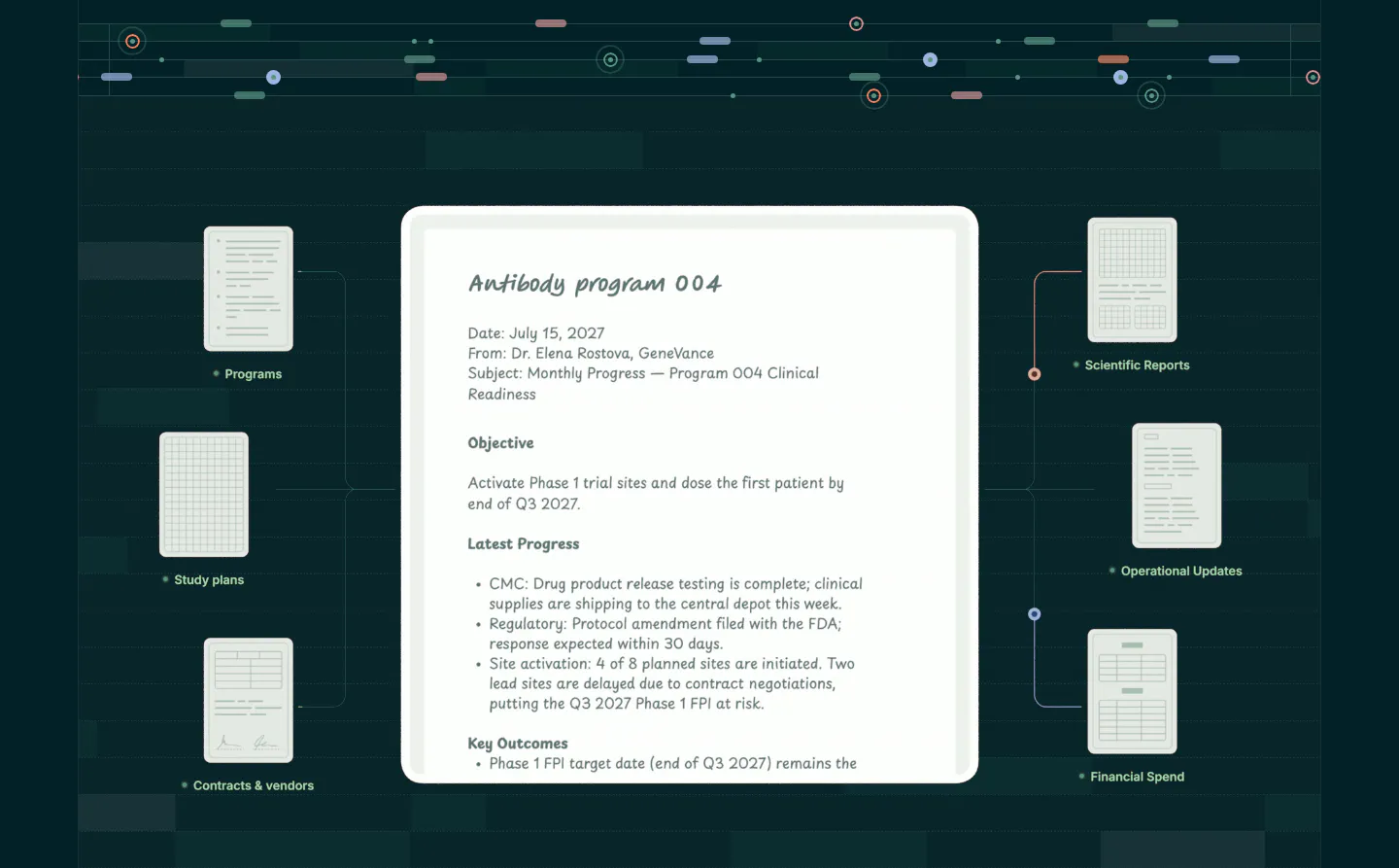
  40. Orchestra Bio features section: central program report document linked to smaller document cards on a dark teal grid background
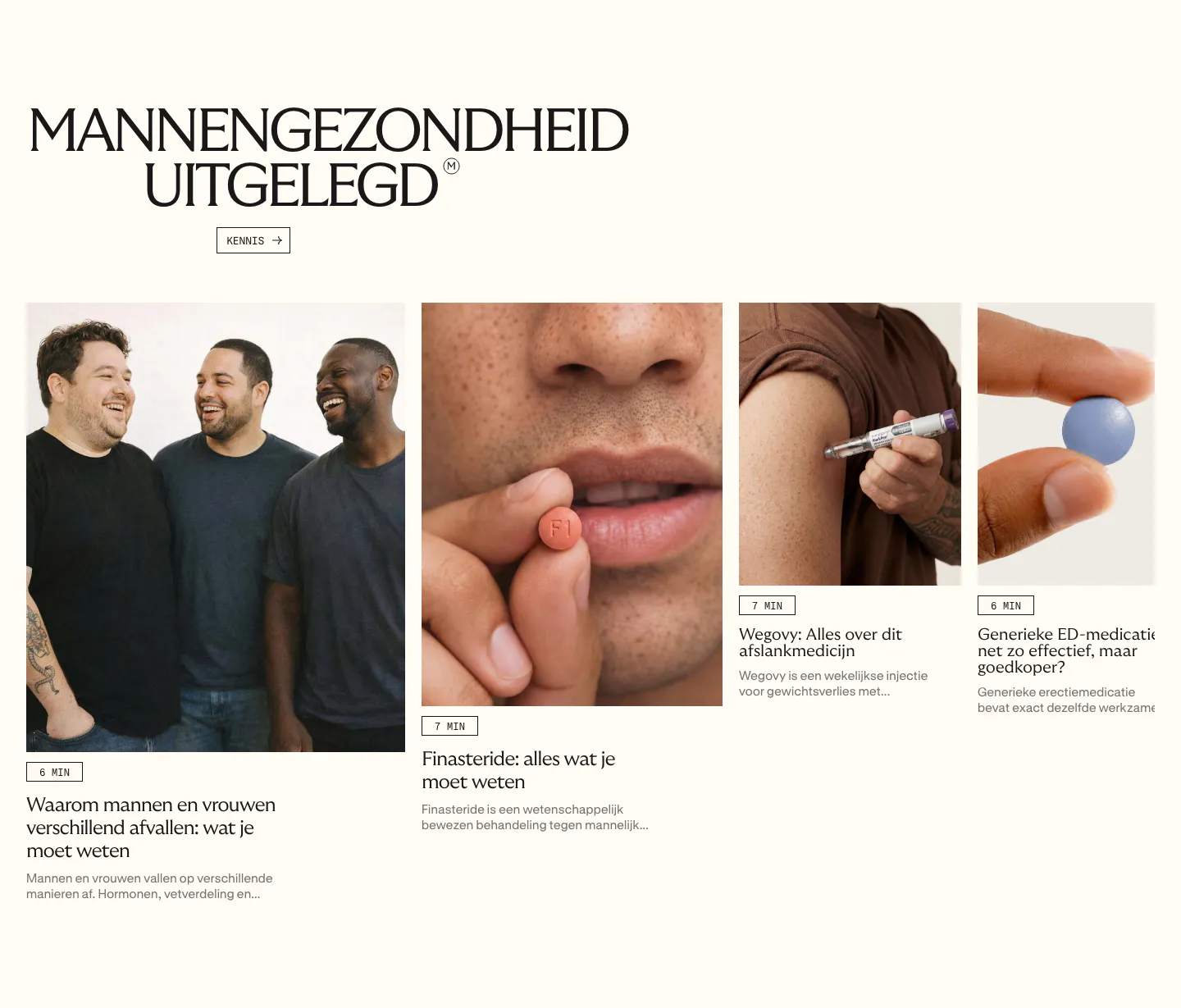
  41. Menkind blog & resources section: serif headline above a row of article cards with photos and read times, cut off at the edge
  42. Teton logo cloud section: two-tone headline above a scrolling row of gray tiles with black healthcare and municipality logos
  43. Bright hero section: logo nav above a carousel of glossy 3D icons with a green battery centered, Energy Tracking label and button
  44. Clarion footer section: light footer with logo at left, company links and social icons at right, and a copyright line
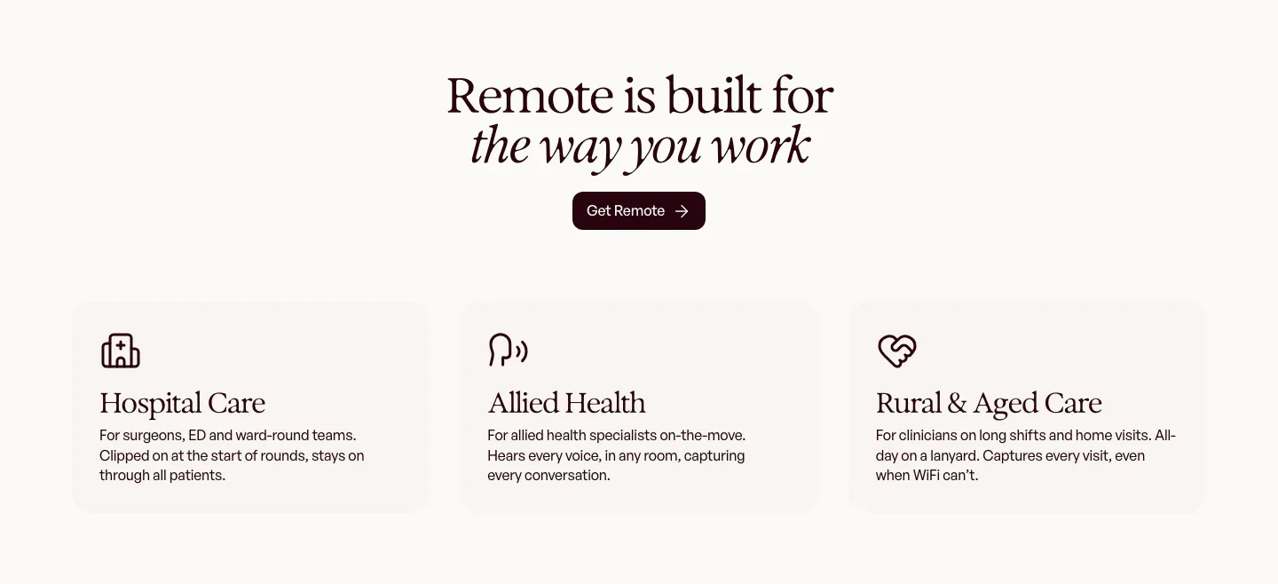
  45. Heidi use cases section: centered serif headline and Get Remote button above three cream cards for hospital, allied and rural care
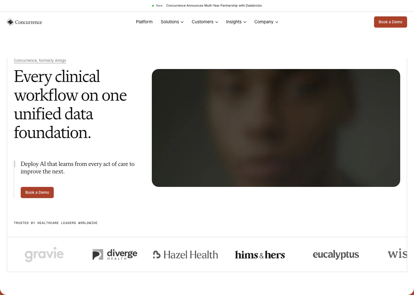
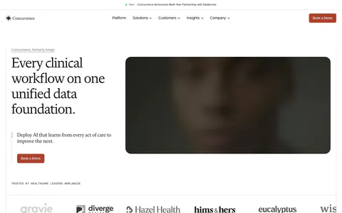
  46. Concurrence hero section: serif headline and rust Book a Demo button beside a blurred dark portrait image, healthcare logo row below
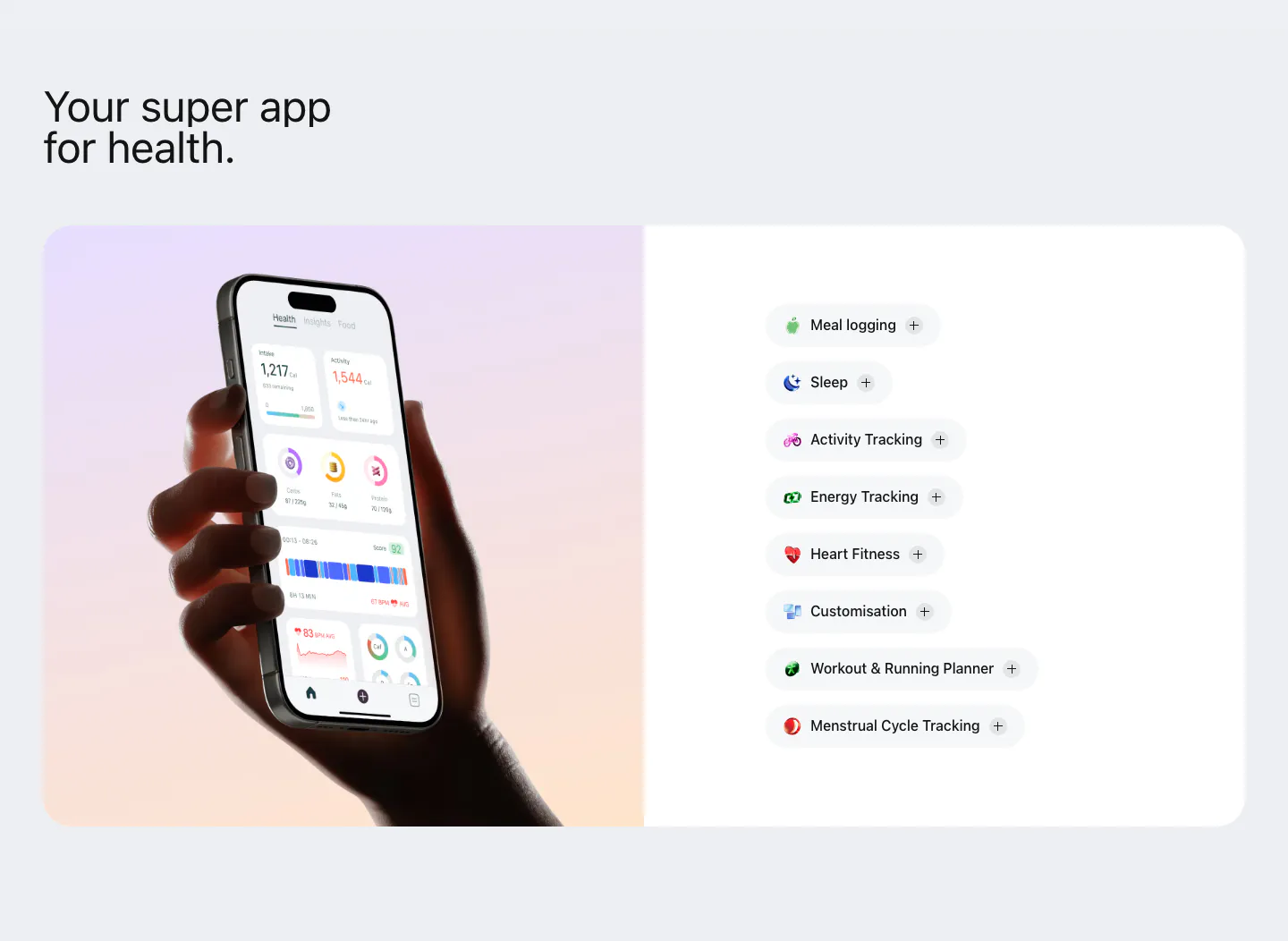
  47. Bright features section: hand holding a phone with the health app on a lavender-peach gradient panel beside a list of feature pills
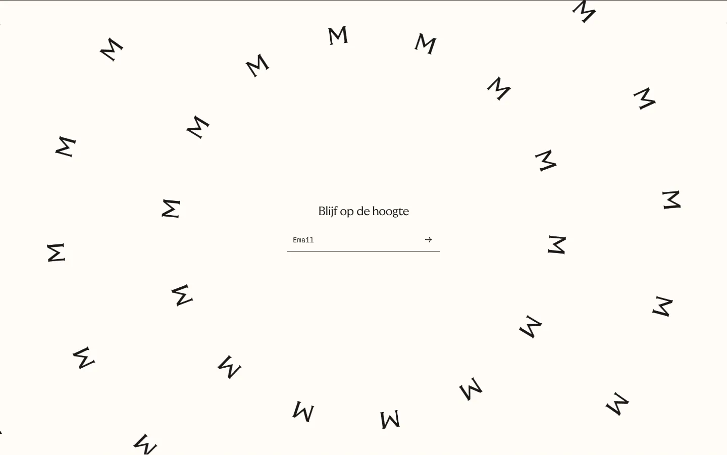
  48. Menkind newsletter section: centered email field surrounded by a swirl of scattered rotated M letters on cream
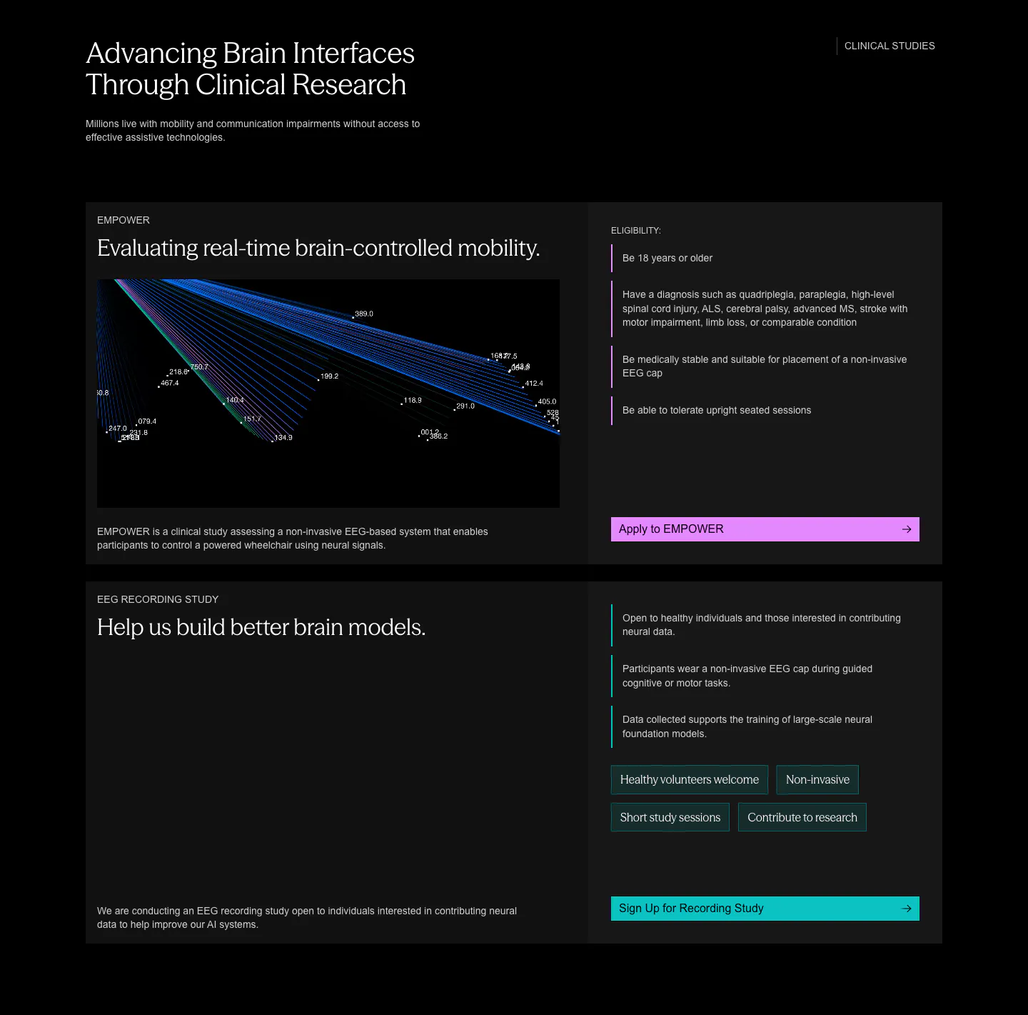
  49. Synaptrix other section: two stacked clinical study cards with line visualizations, eligibility lists and colored apply buttons on black
    Synaptrix Other
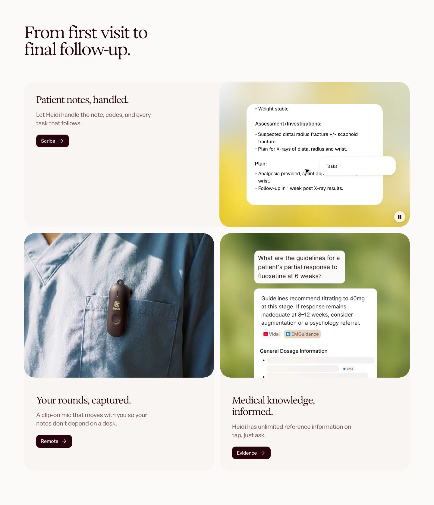
  50. Heidi features section: serif headline over rounded cards pairing text with a clinical notes UI, a clip-on mic photo and a chat answer
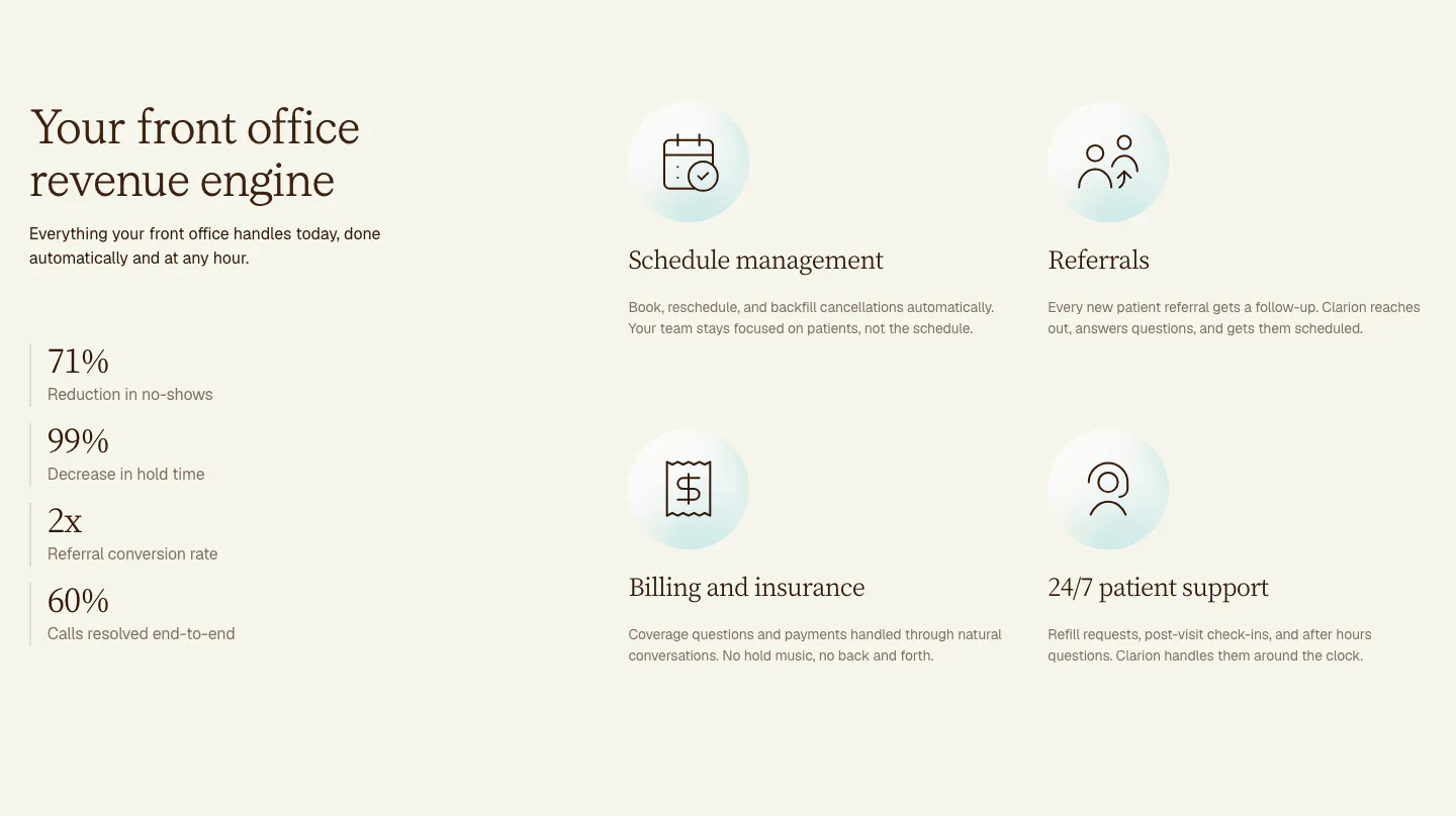
  51. Clarion features section: serif headline and four stacked metrics on the left, a 2x2 grid of icon features on the right, cream background
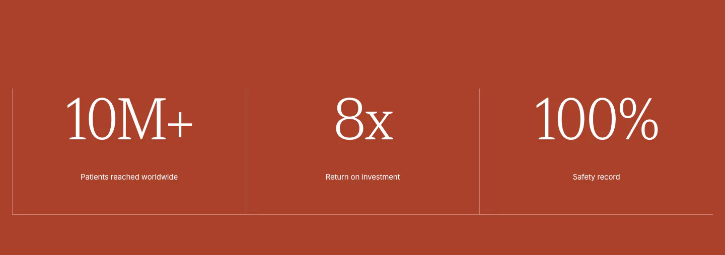
  52. Concurrence stats section: three large serif metrics with small labels split by thin dividers on a solid rust-red background
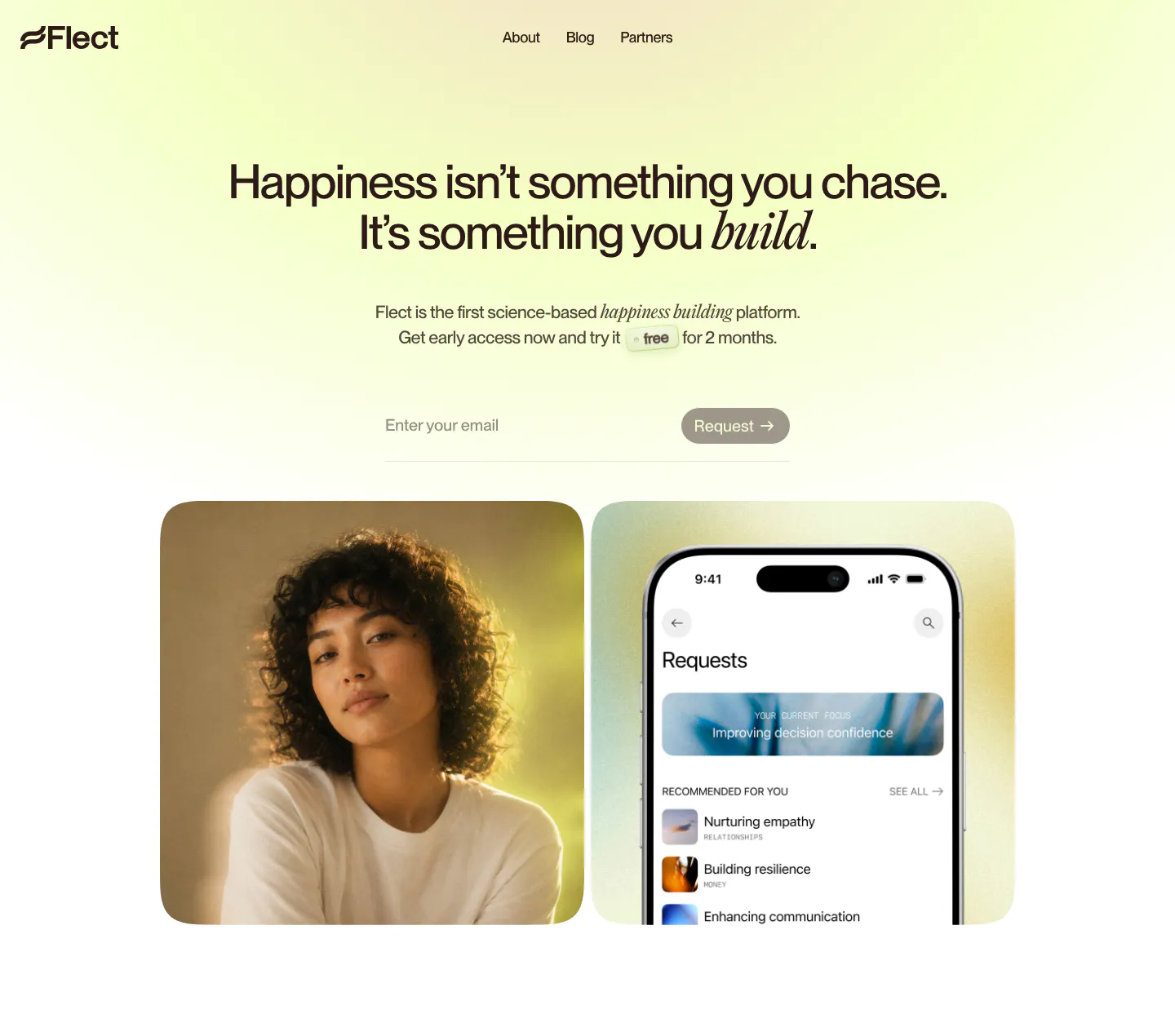
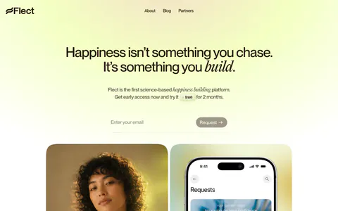
  53. Flect hero section: centered headline with email request field above a portrait photo and a phone app screenshot on yellow-green glow
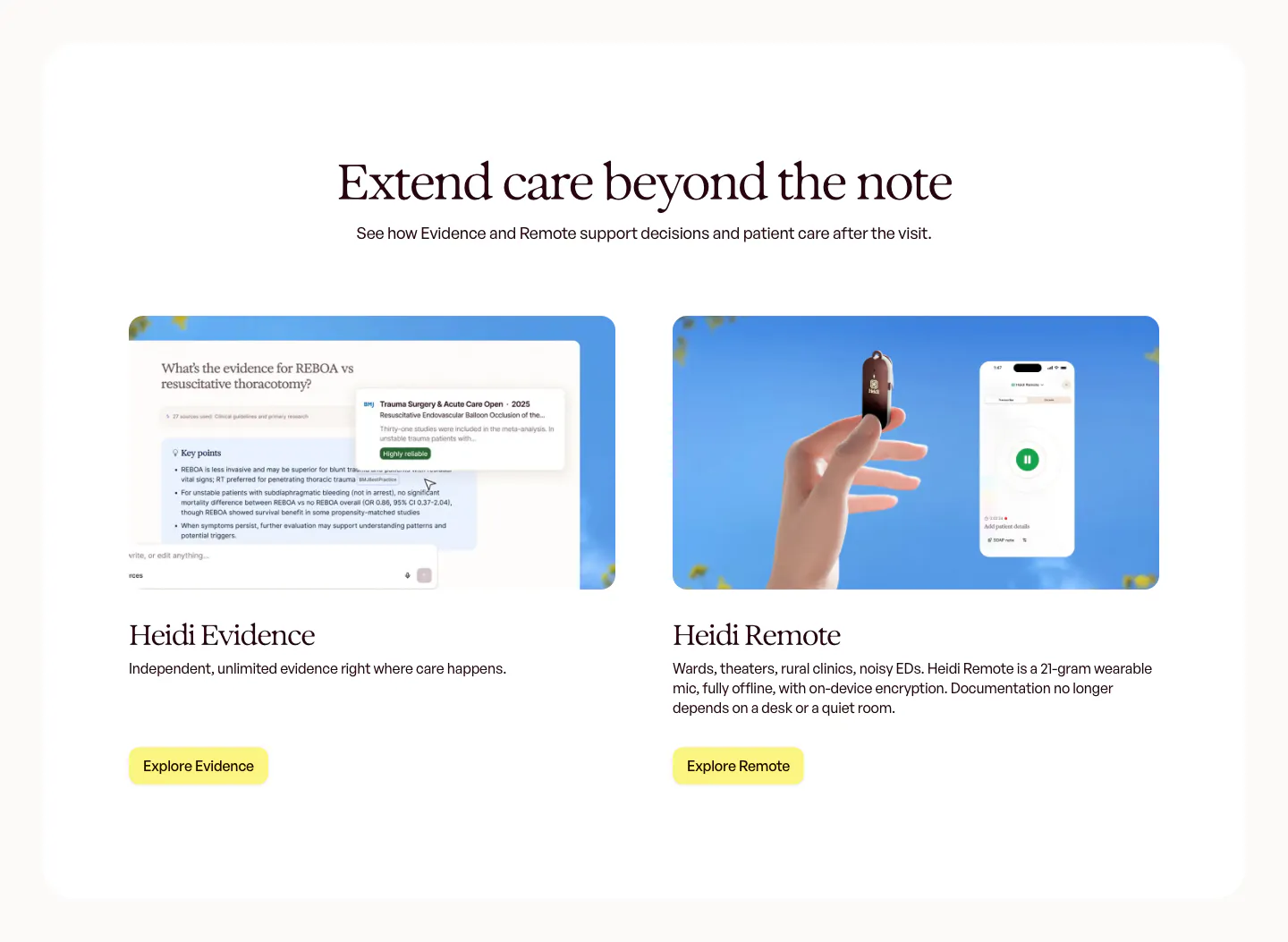
  54. Heidi features section: centered serif headline above two product cards, an Evidence answer UI and a hand holding the Remote mic
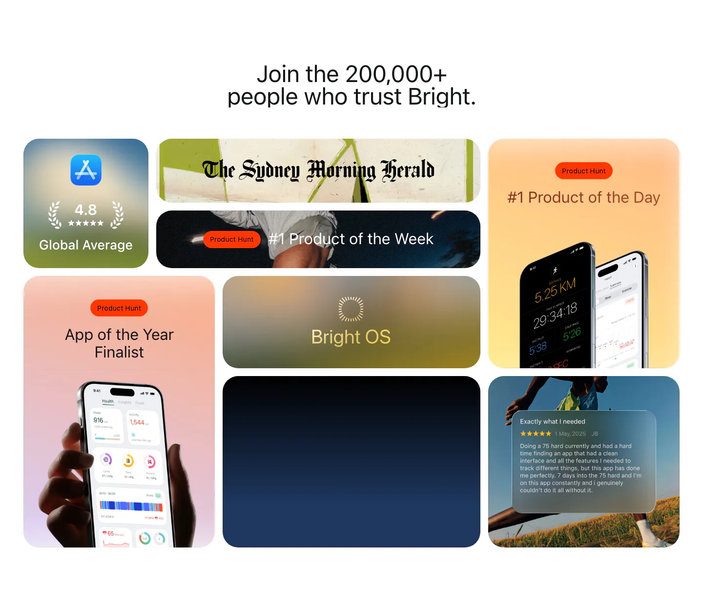
  55. Bright testimonials section: centered headline above a bento grid of App Store rating, Product Hunt awards, press logo and a review card
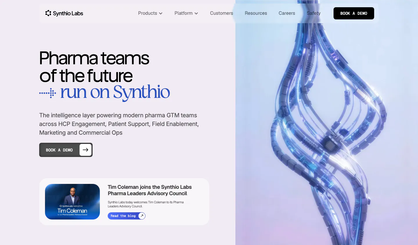
  56. Synthio Labs hero section: split layout with headline, demo button and news card on lavender beside a 3D render of twisting blue cables
    Synthio Labs Hero
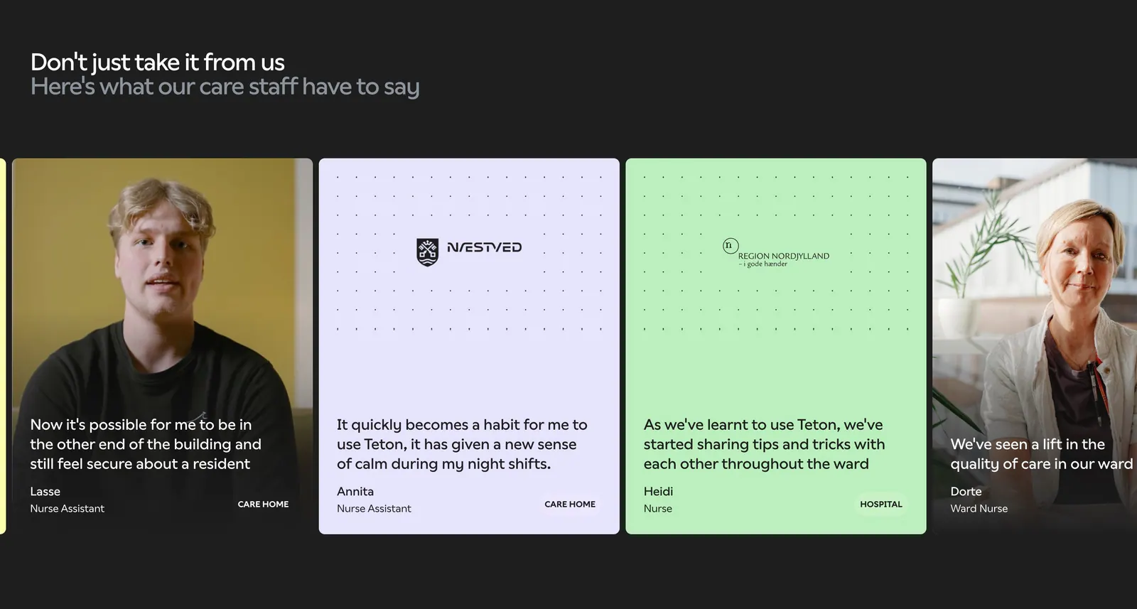
  57. Teton testimonials section: two-tone headline over a carousel of quote cards with staff photos and pastel cards on a dark background
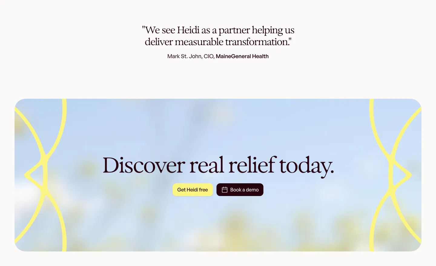
  58. Heidi call to action section: short serif customer quote above a rounded panel with blurred sky photo, serif headline and two buttons
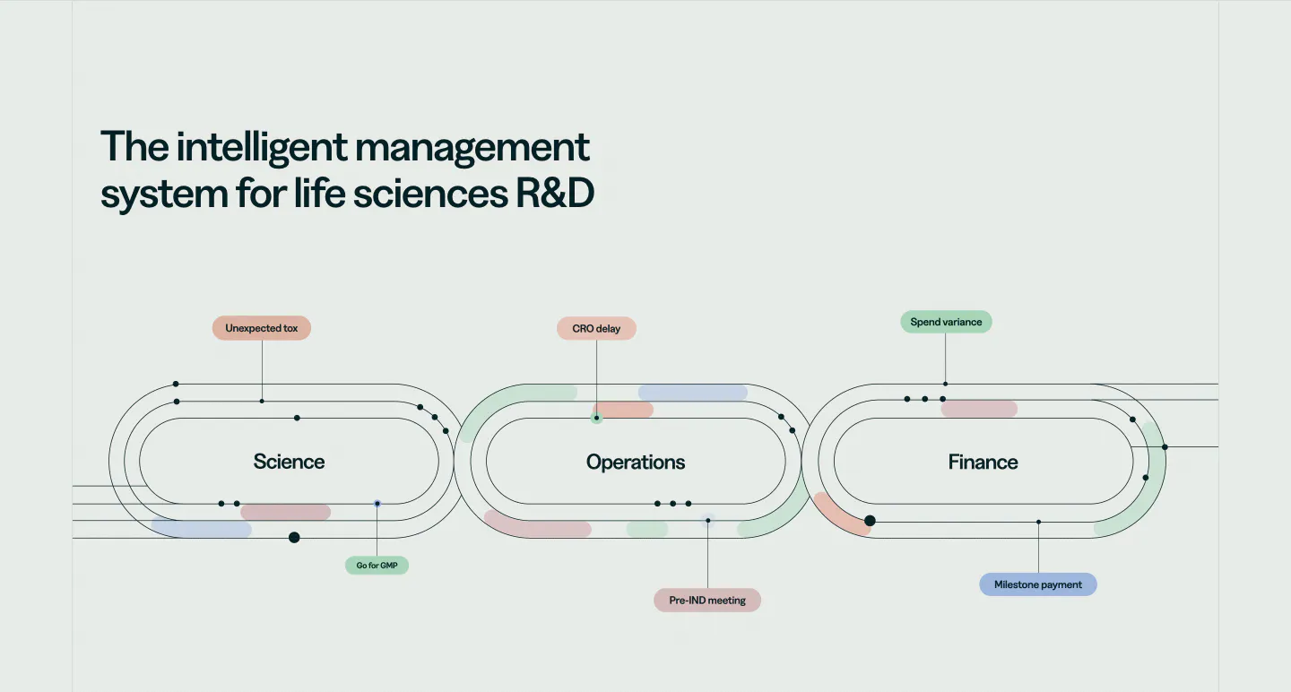
  59. Orchestra Bio features section: headline above a line diagram of three linked loops for science, operations and finance with labels
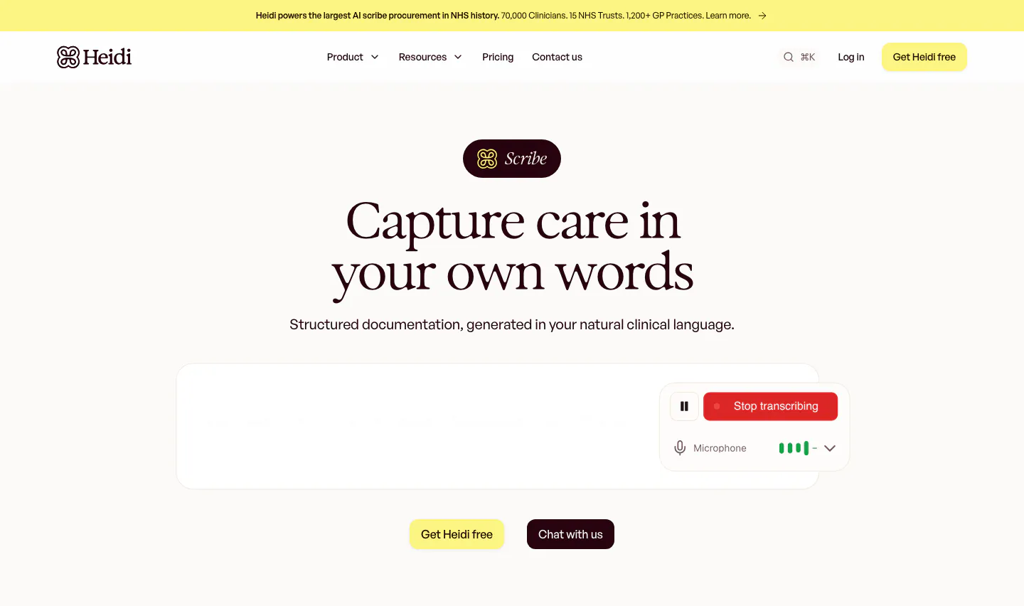
  60. Heidi hero section: Scribe badge and centered serif headline above a transcription box with a Stop transcribing control
  61. Heidi footer section: five link columns on a blue sky and hills backdrop with a large yellow logo and white Heidi wordmark

Healthcare companies

12 companies in this collection

All companies

Common styles in healthcare websites

How to design a healthcare website

  1. Split paths for patients and providers

    A patient booking care and a hospital evaluating software need different pages. Make the split obvious in the navigation and the hero, with distinct language for each. Mixing clinical detail with consumer messaging confuses both groups and weakens trust.
  2. Cite evidence for every health claim

    Link outcome claims to published studies, trial results, or regulatory clearances, and describe the study setting where it helps. Clinicians discount unsupported numbers, and regulators may treat them as advertising problems. Precise sourcing protects both credibility and the company.
  3. Design for accessibility from the start

    Many visitors are older, unwell, or reading on a phone in a waiting room. Use large body text, strong contrast, clear labels, and simple navigation. Meeting accessibility standards here is about reaching the real audience, not just passing an audit.

  4. Make compliance and integrations visible

    Health systems ask about HIPAA, data handling, and EHR integration early in any evaluation. Name the standards you meet, the records systems you connect to, and how patient data is protected. A short, specific compliance block keeps deals from stalling.

All industries
    ↑↓ Navigate ↵ Open

    Section preview

    Website section