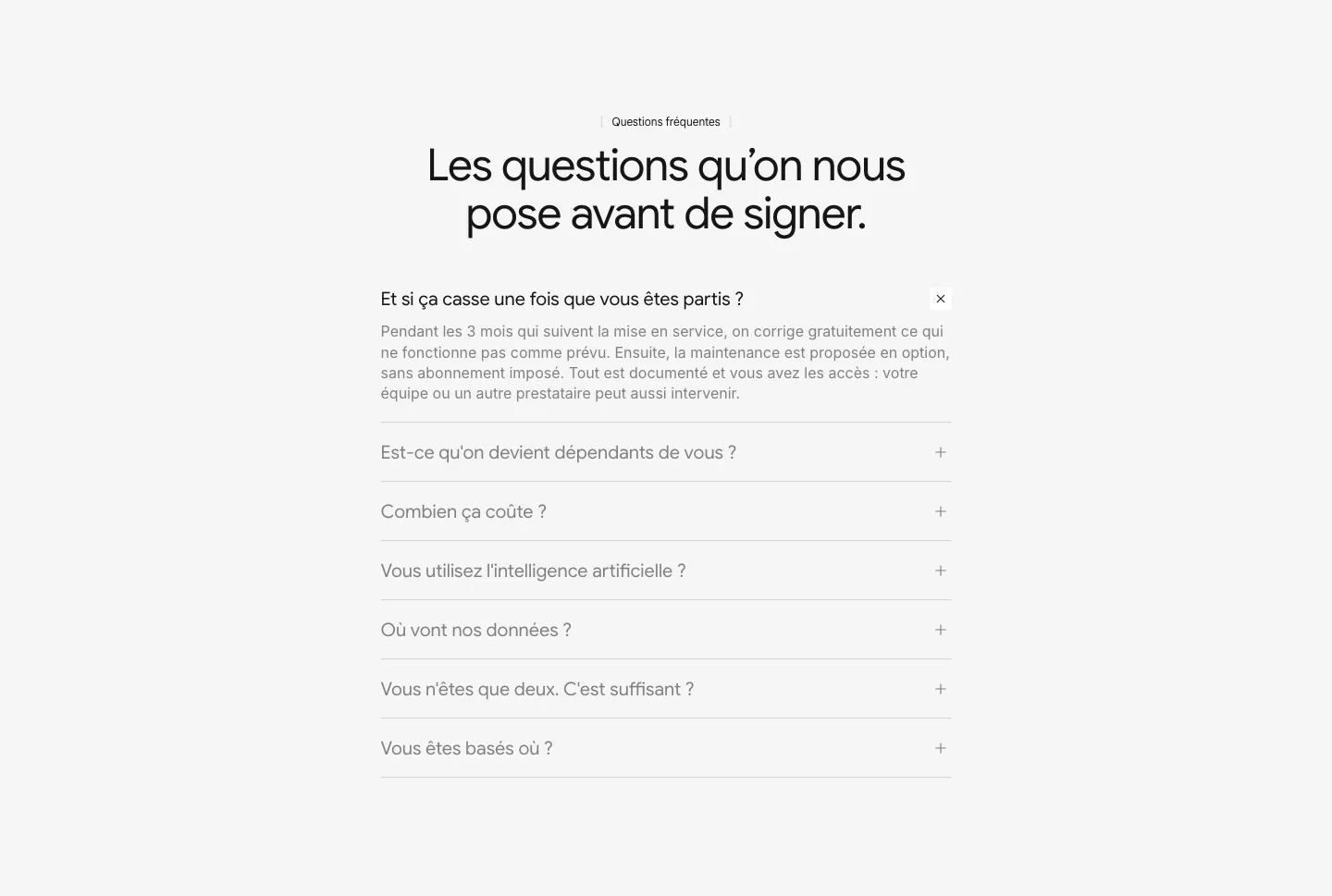
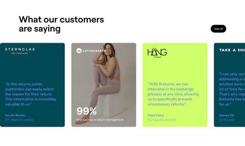
Monochrome Website Design Examples

Take color away and everything else has to work harder. With a palette of black, white, and gray and almost no accent, monochrome website design moves attention to typography, layout, and detail. Developer tools, design software, and premium brands use it to look precise. Hierarchy then depends entirely on size, weight, and spacing, and a section that gets those wrong looks flat or unfinished.

492 sections

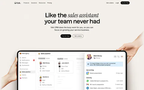
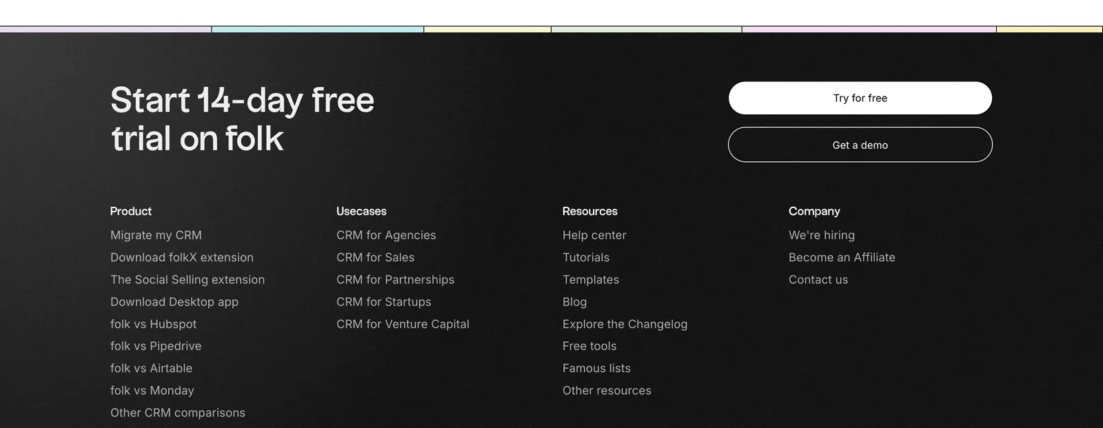
  1. folk footer section: trial headline with two buttons above four link columns on a near-black background, pastel color strip at top
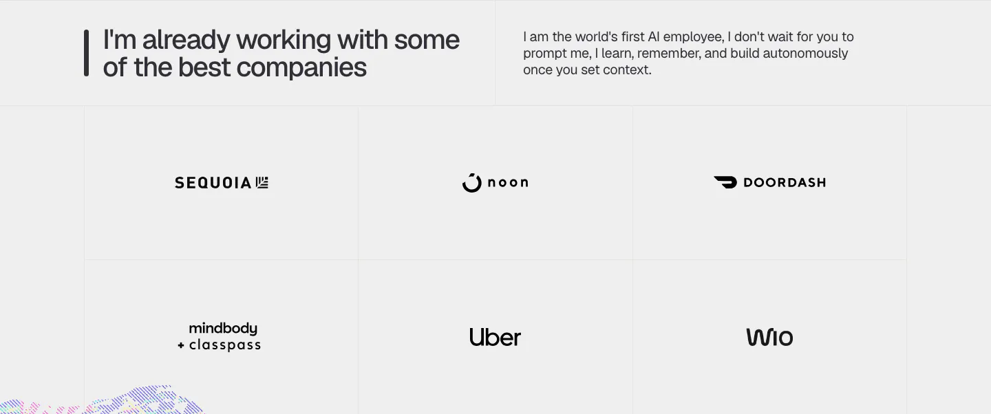
  2. Greptile logo cloud section: two rows of grayscale customer logos in bordered grid cells under a small mono caption
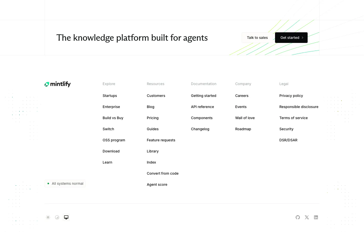
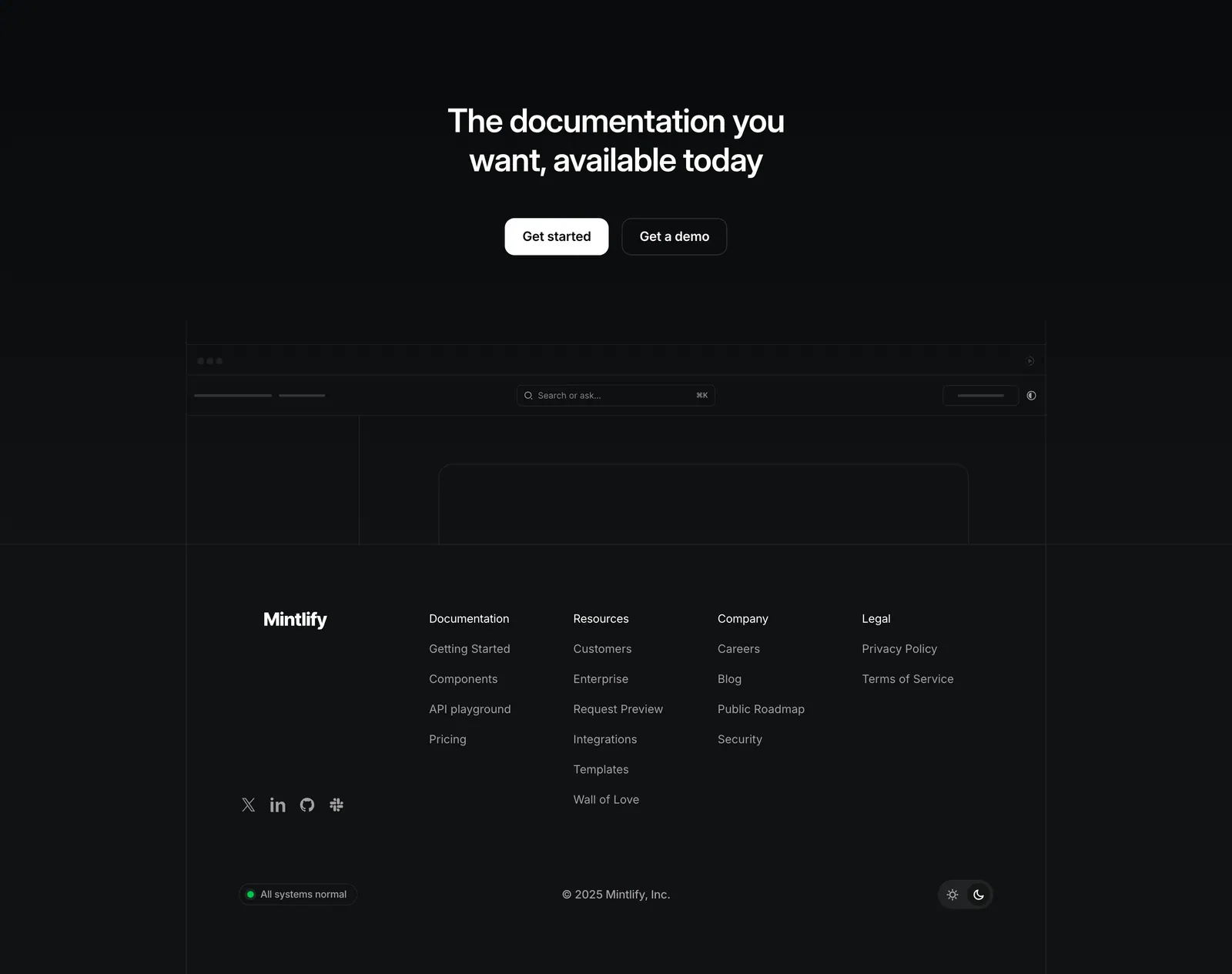
  3. Mintlify footer section: CTA strip with two buttons above logo, status badge and five link columns on a white background
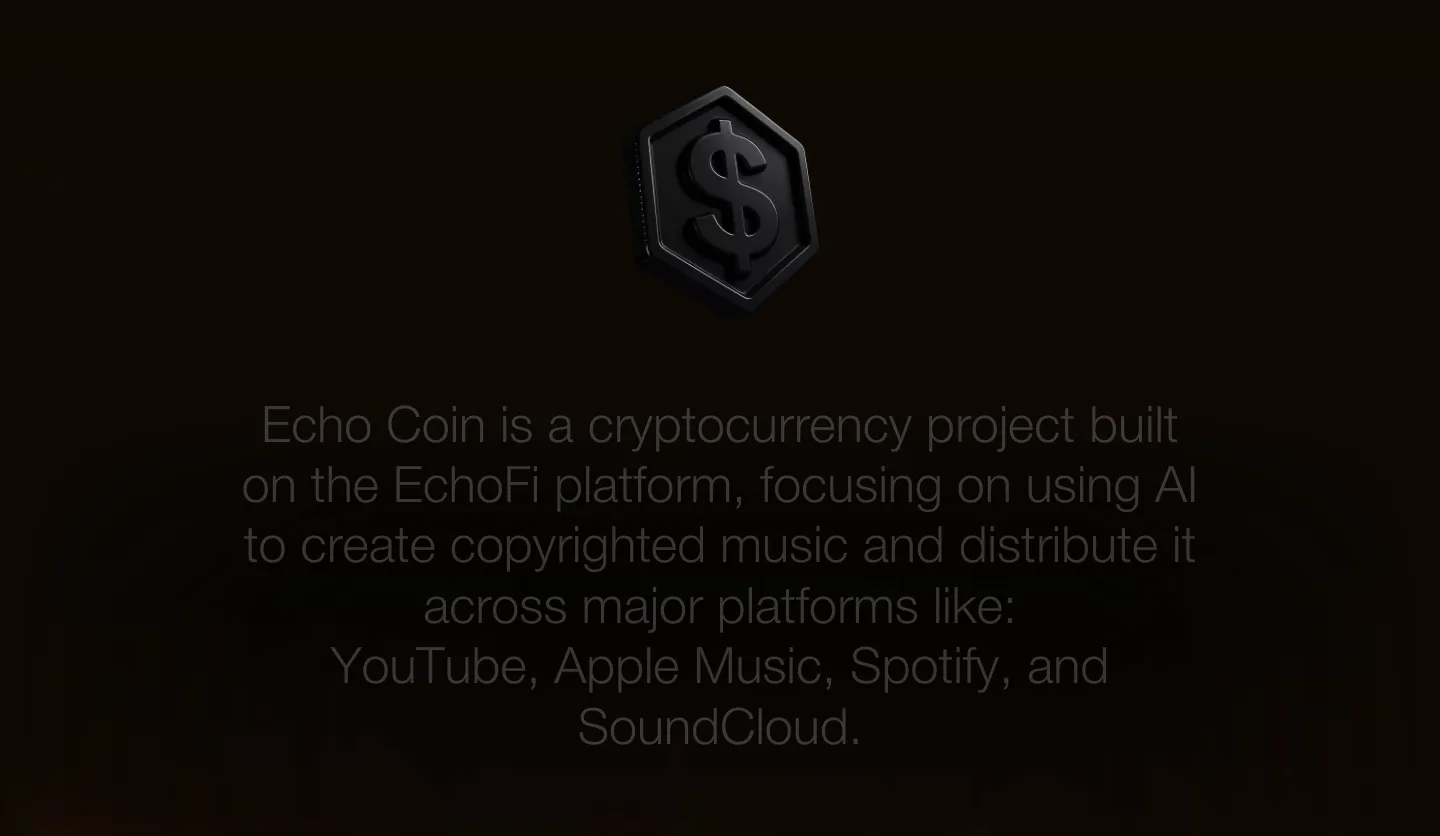
  4. EchoFi about & mission section: centered gray statement text below a dark 3D coin icon on a near-black background
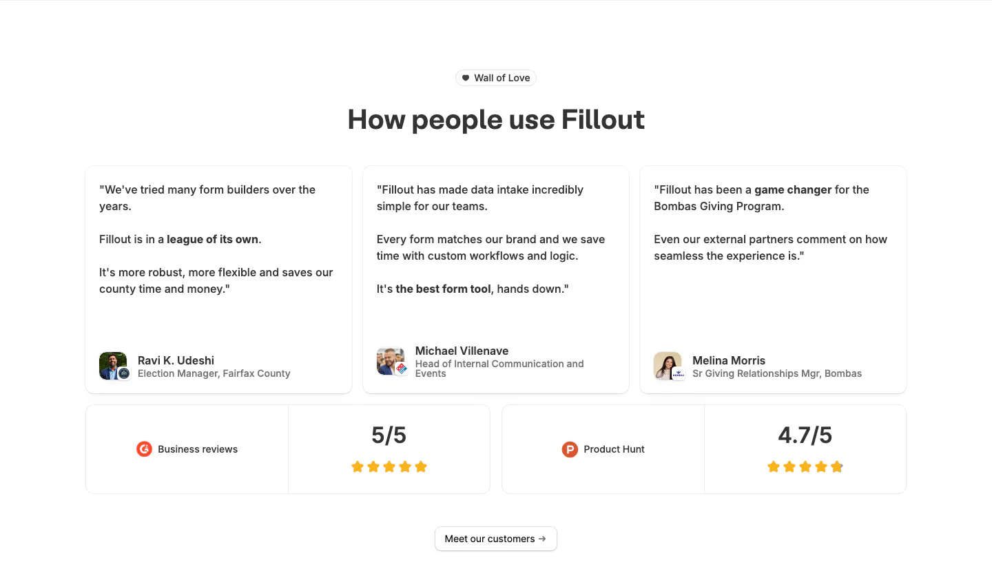
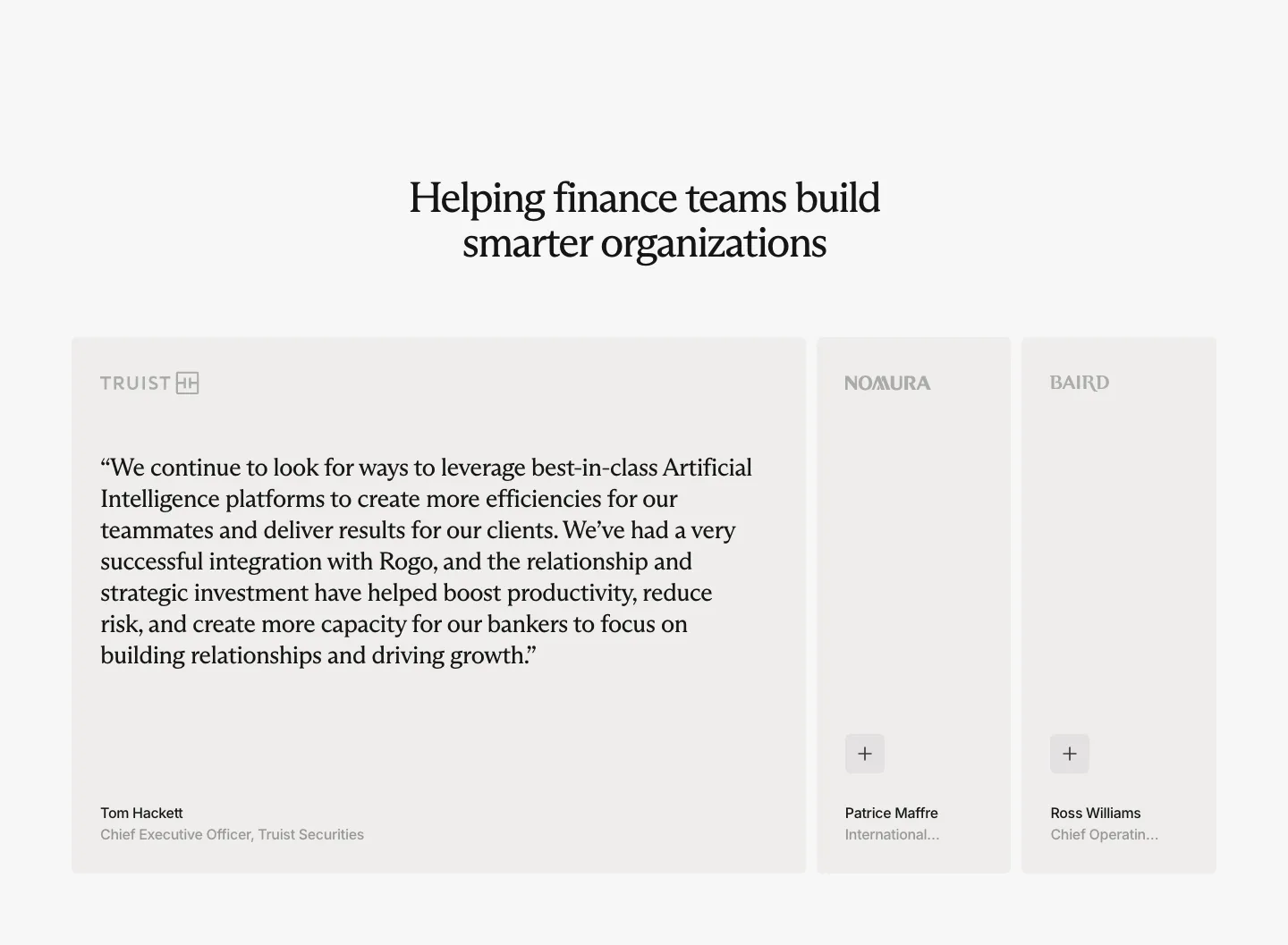
  5. Fillout testimonials section: centered heading above three quote cards with avatars and two rating cards for G2 and Product Hunt
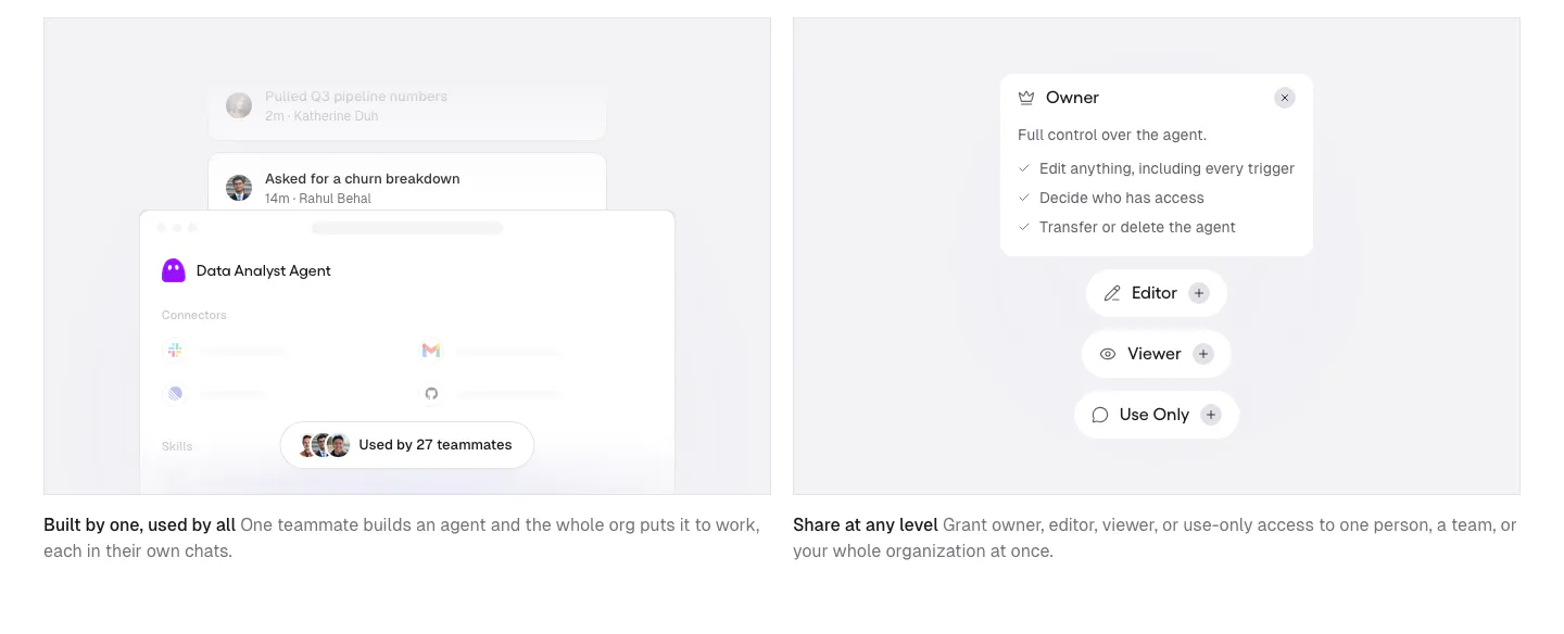
  6. Gumloop features section: two gray cards with agent sharing and permission UI mockups above short captions
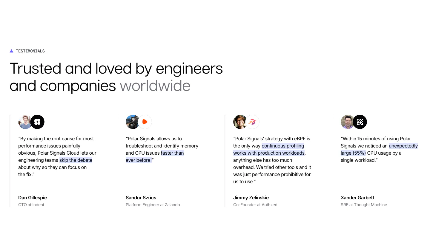
  7. Polar Signals testimonials section: headline above four divided columns of quotes with highlighted phrases, avatar and logo pairs and names
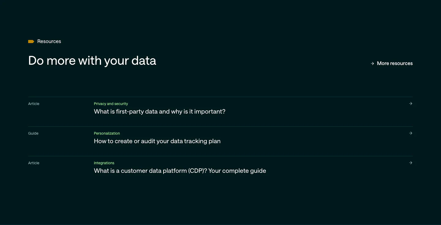
  8. Customer.io blog & resources section: dark teal list of three article and guide links with category labels and arrows
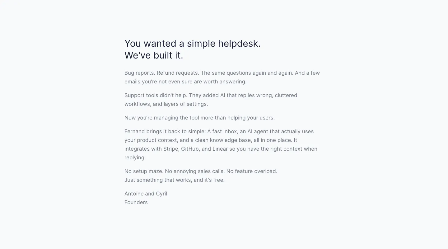
  9. Fernand about & mission section: founders' letter in a narrow left-aligned text column on a pale gray background
  10. Cofactr call to action section: centered one-line statement and green Book Demo button inside a faint octagon outline on white
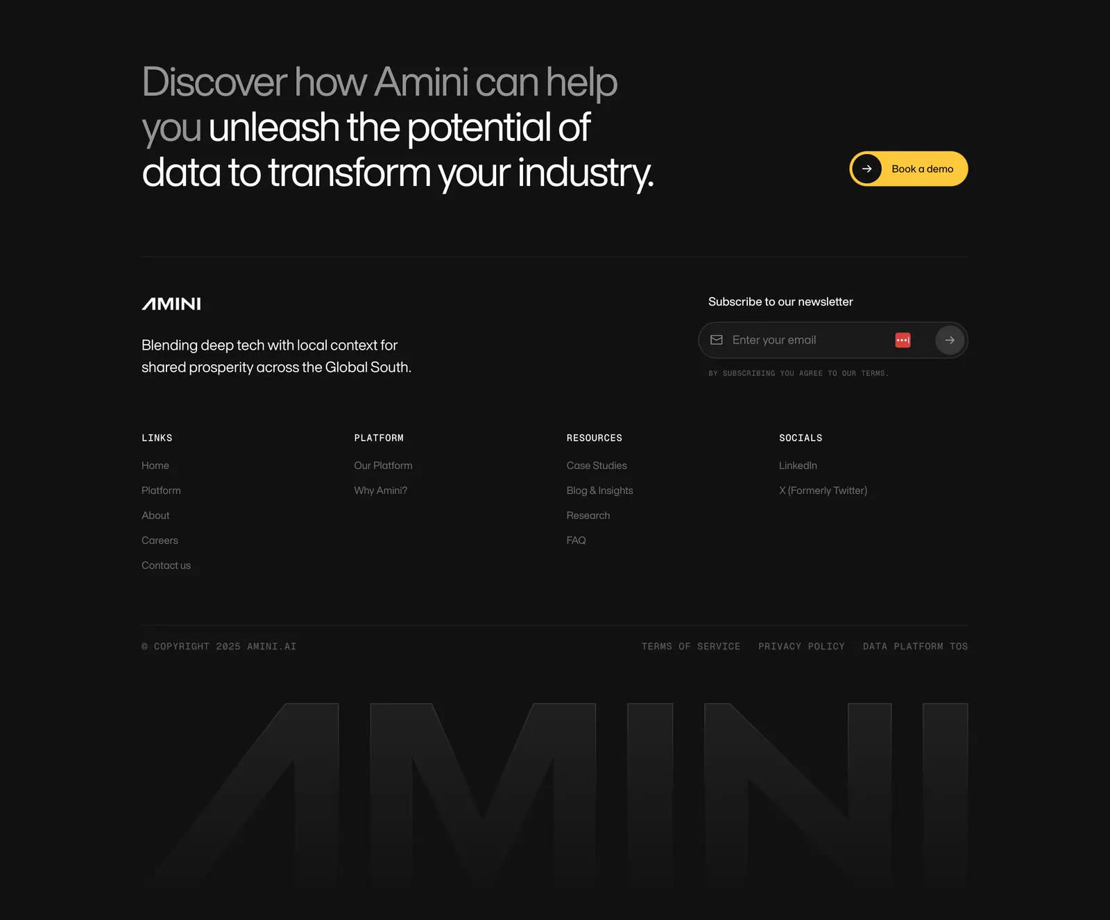
  11. Amini footer section: dark closing headline with yellow button, newsletter field, link columns and a faded giant AMINI wordmark
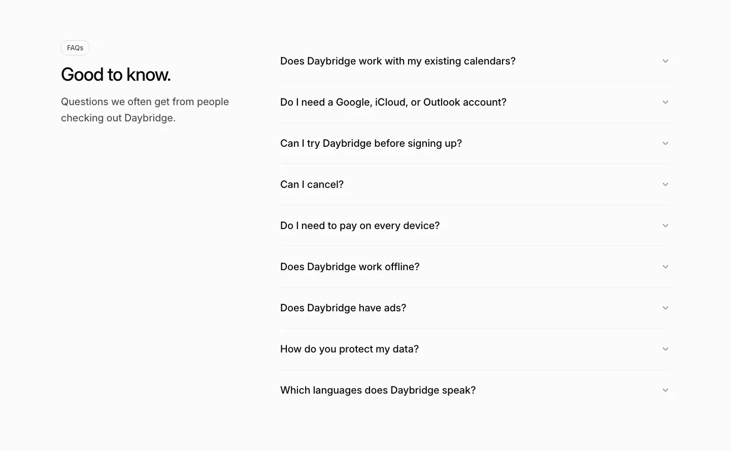
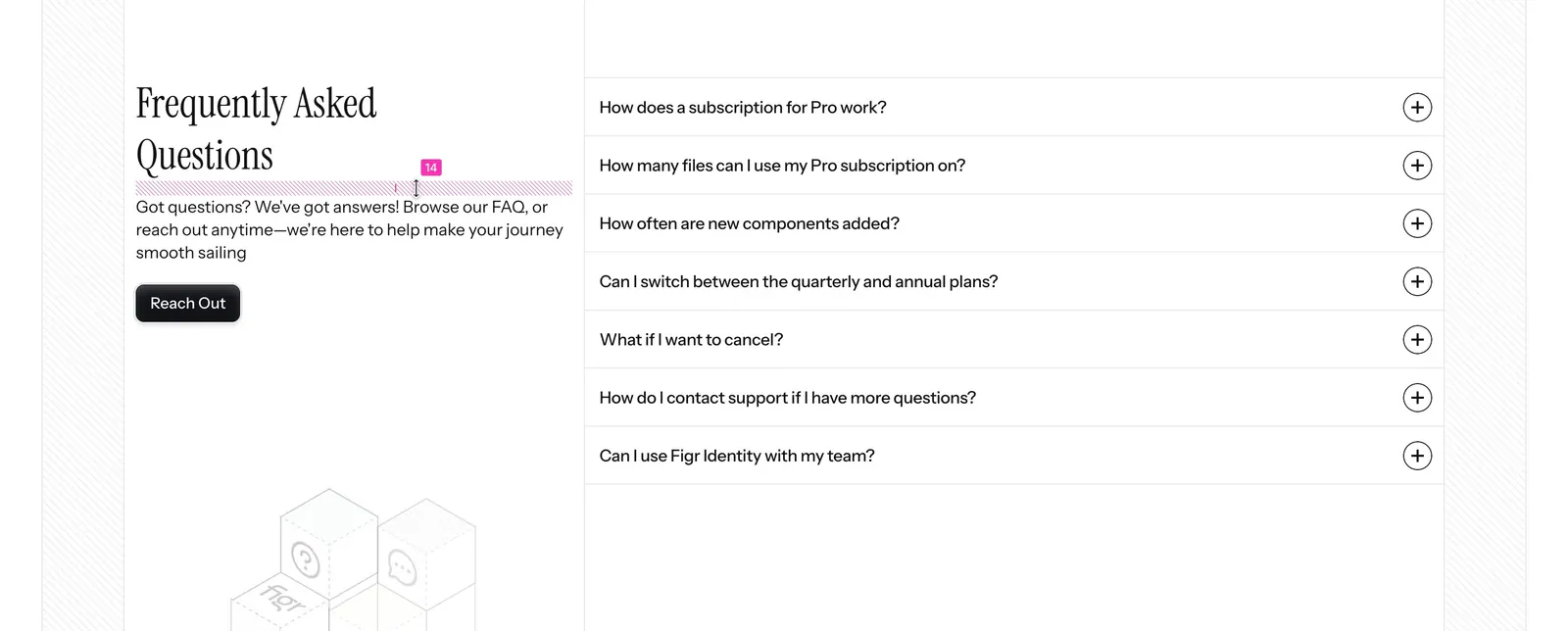
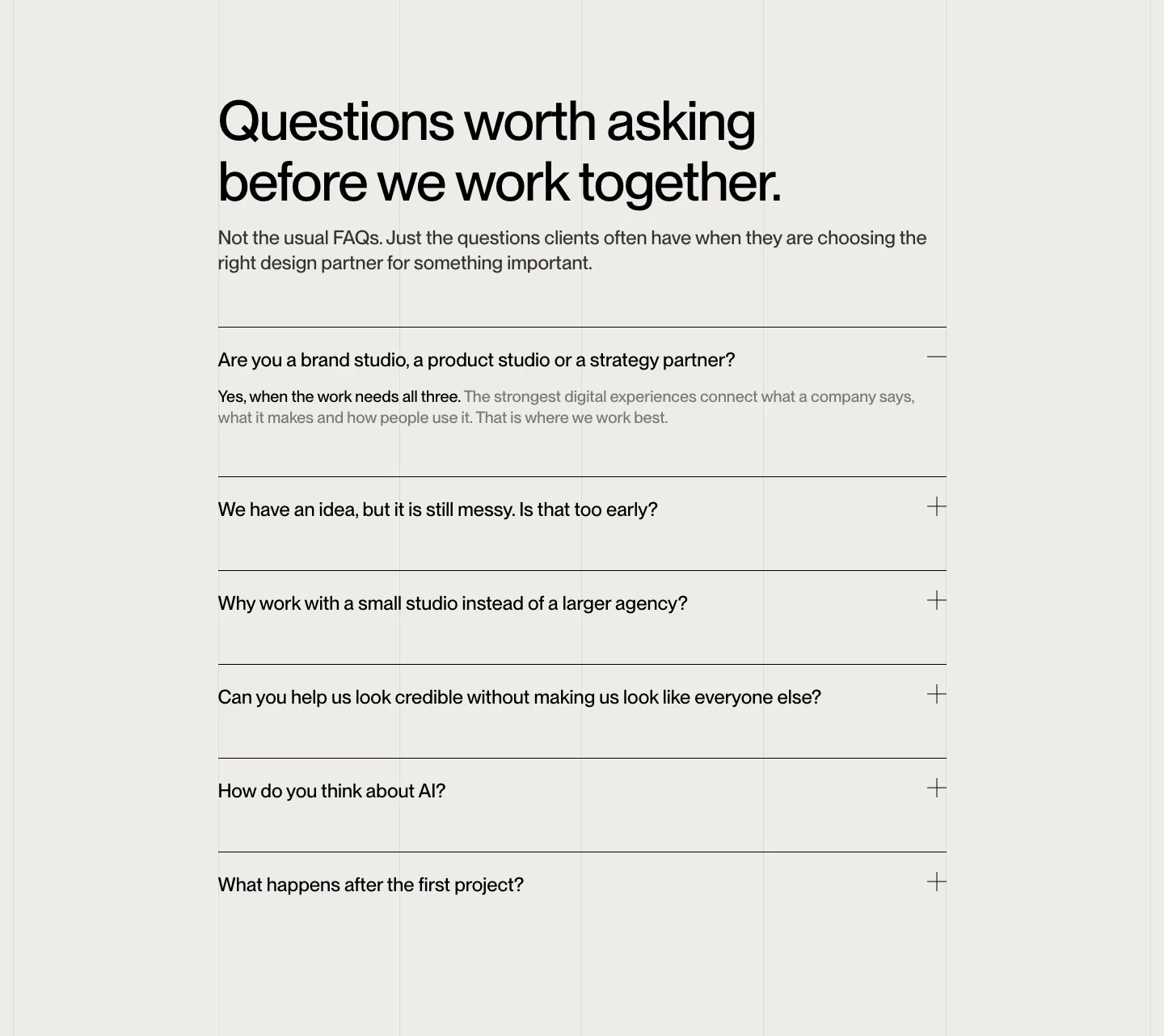
  12. Daybridge FAQ section: heading and short intro on the left with a gray accordion list of questions on the right
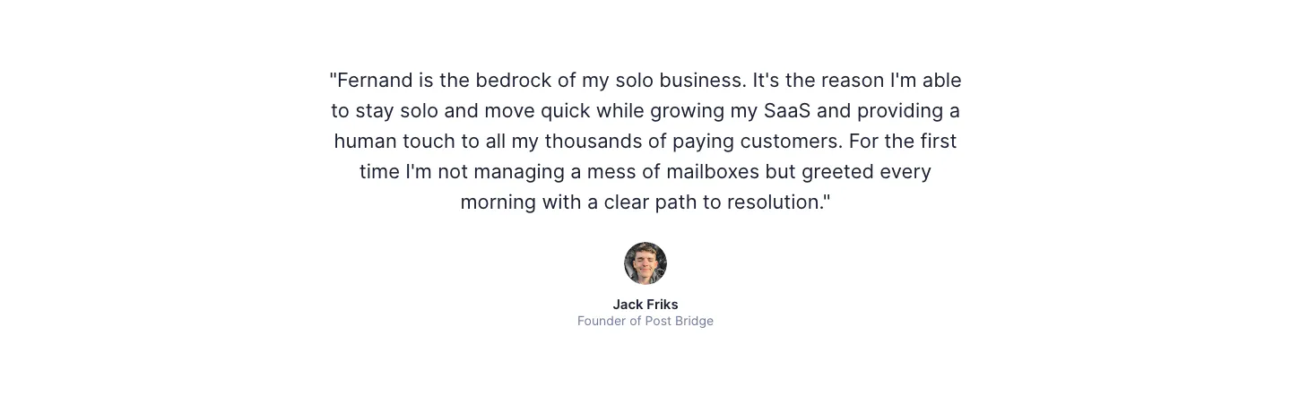
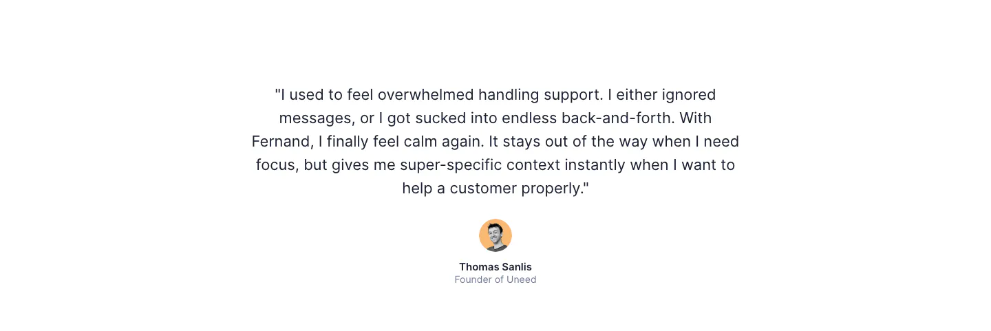
  13. Fernand testimonials section: single centered customer quote with a round avatar, name and title on white
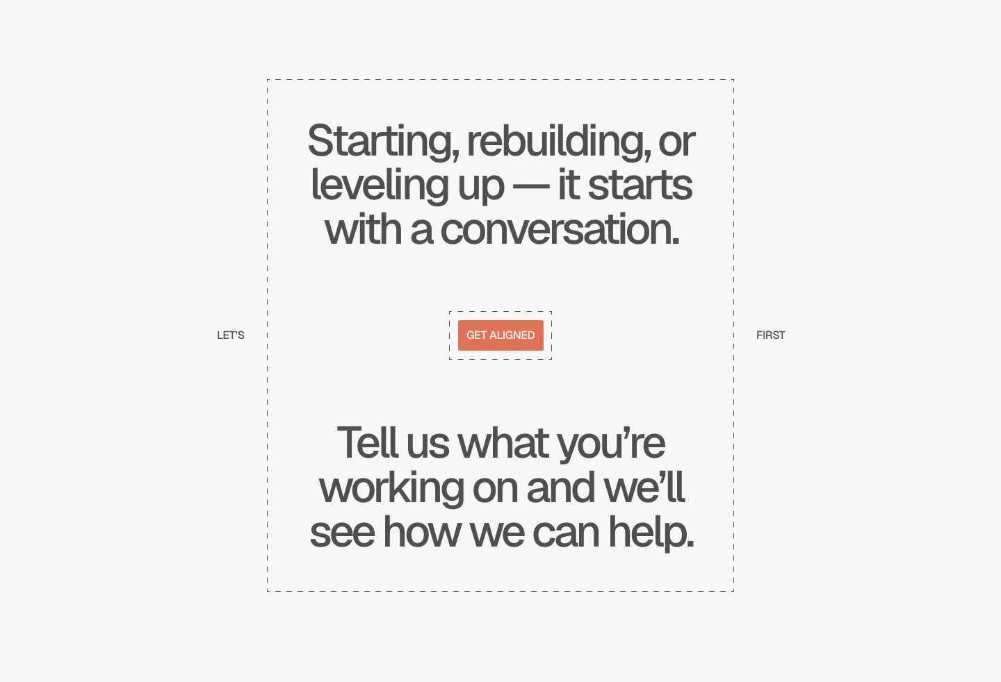
  14. A-LIGN call to action section: centered two-part headline in a dashed frame around a small orange Get Aligned button on light gray
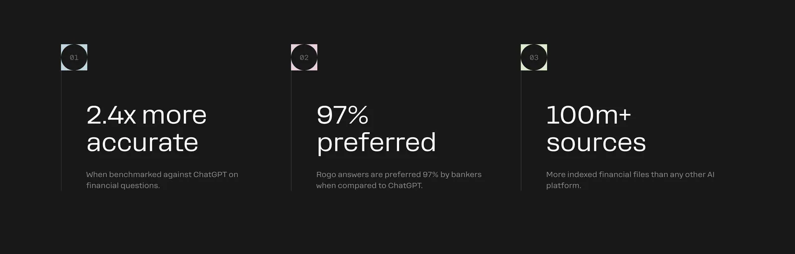
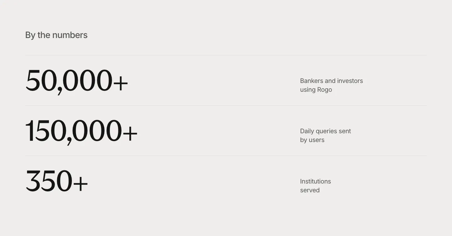
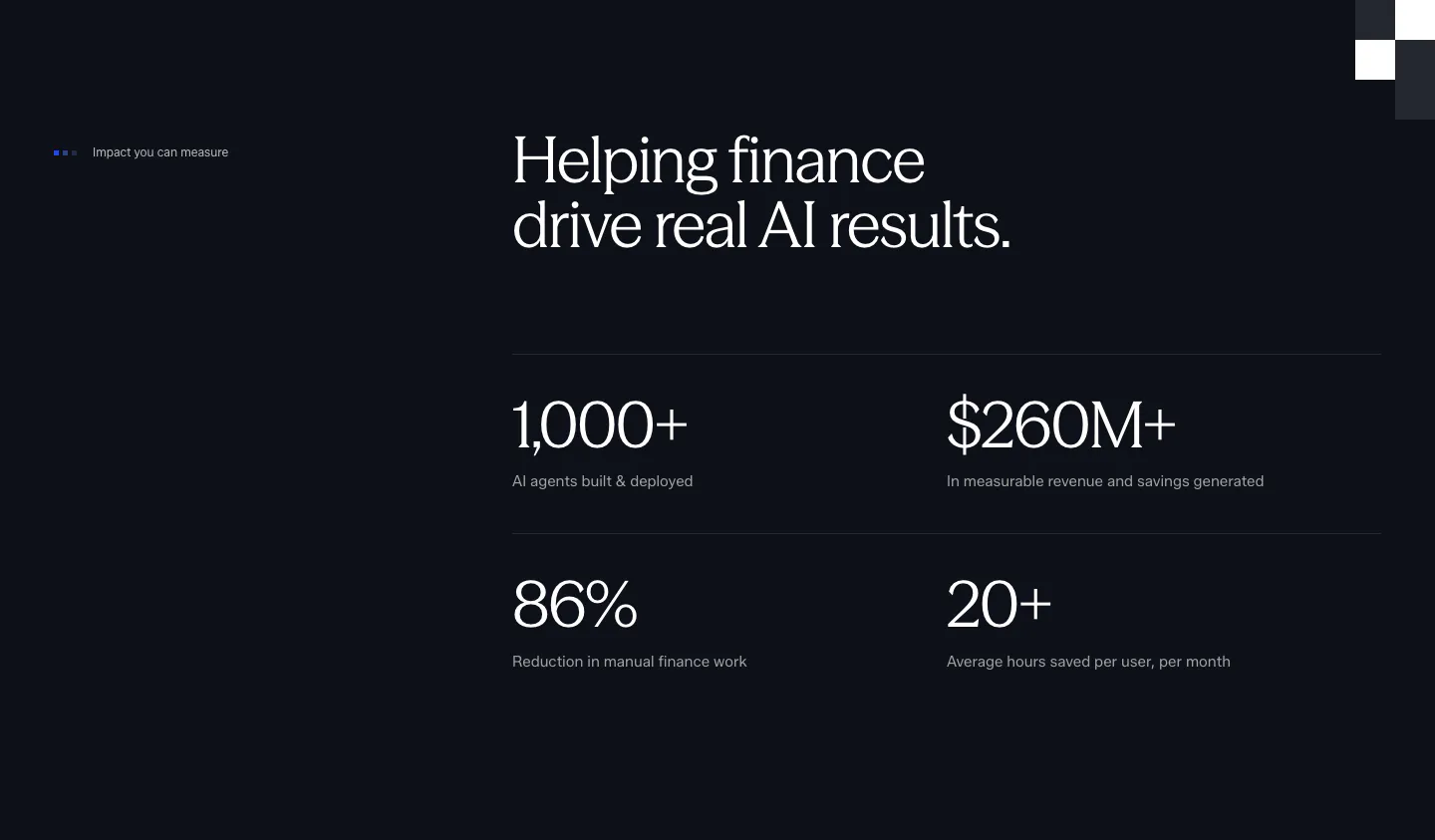
  15. Rogo value proposition section: three numbered columns of large outcome stats with short descriptions on charcoal
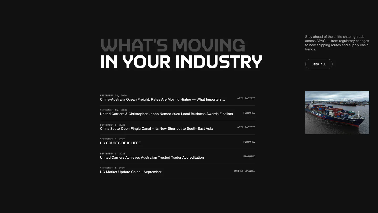
  16. United Carriers call-to-action section: bold uppercase headline and short copy inside a thin circle outline on a dark background
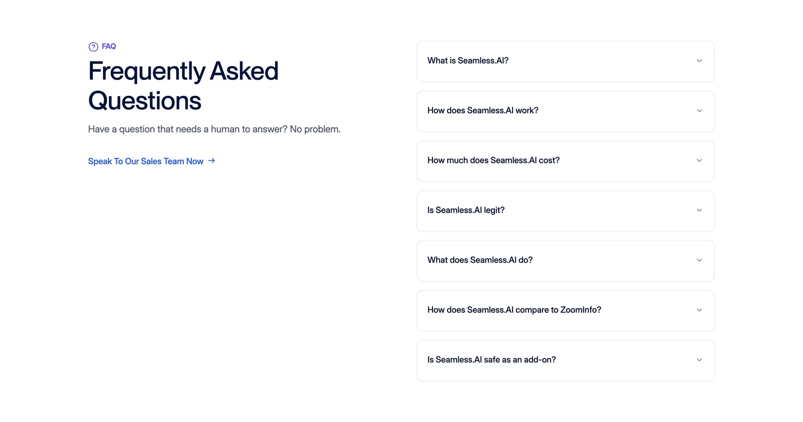
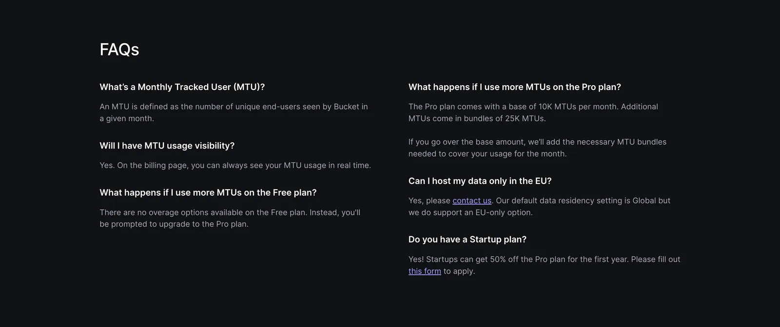
  17. Seamless.AI FAQ section: headline and sales link on the left, seven bordered accordion questions on the right on a white background
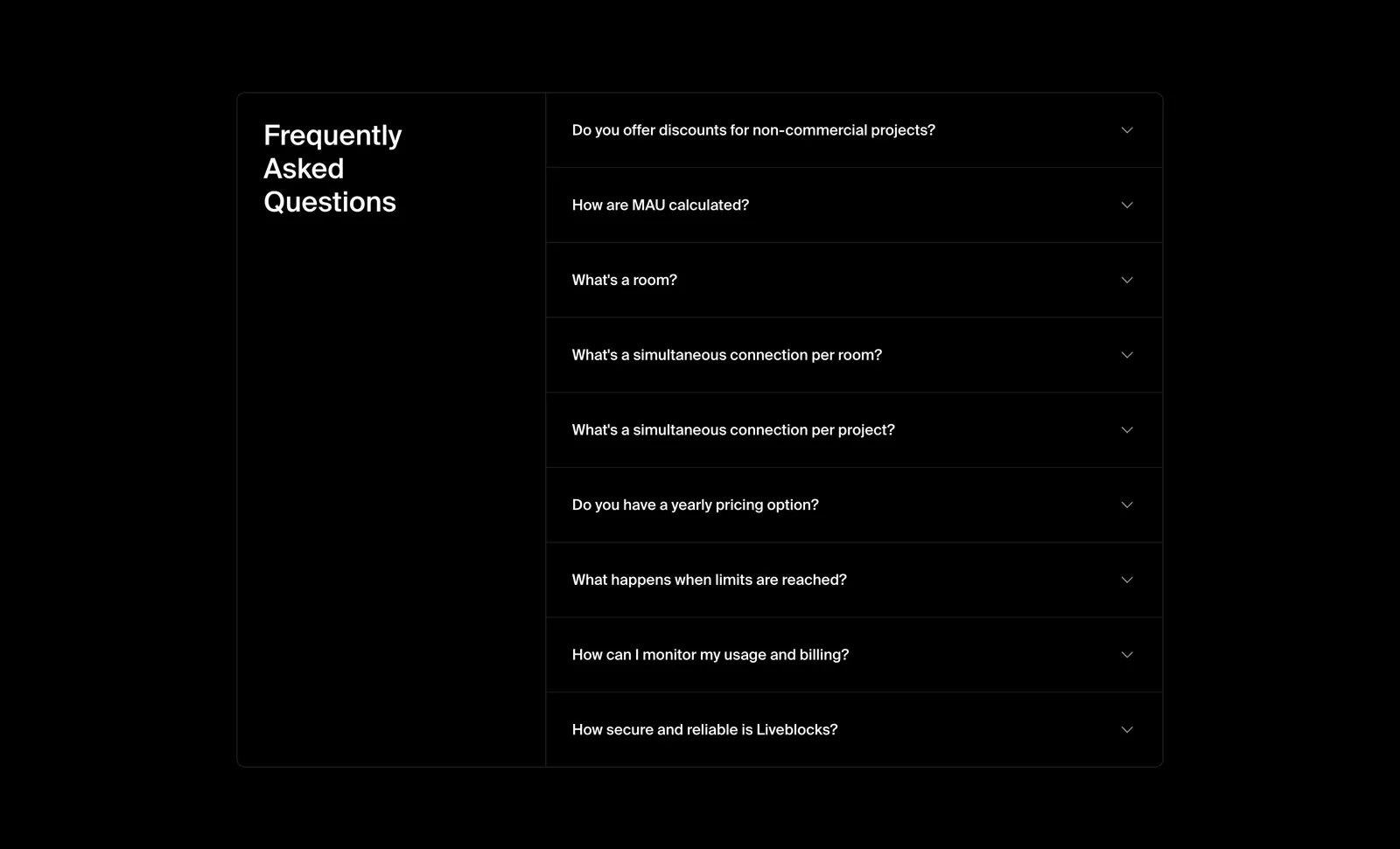
  18. Liveblocks FAQ section: bordered two-column panel with the heading on the left and a collapsed nine-question accordion on the right, on black
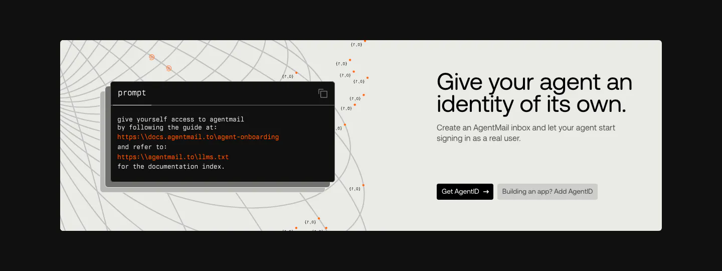
  19. AgentID call to action section: light panel on black with a dark prompt code card left and headline, copy and two buttons right
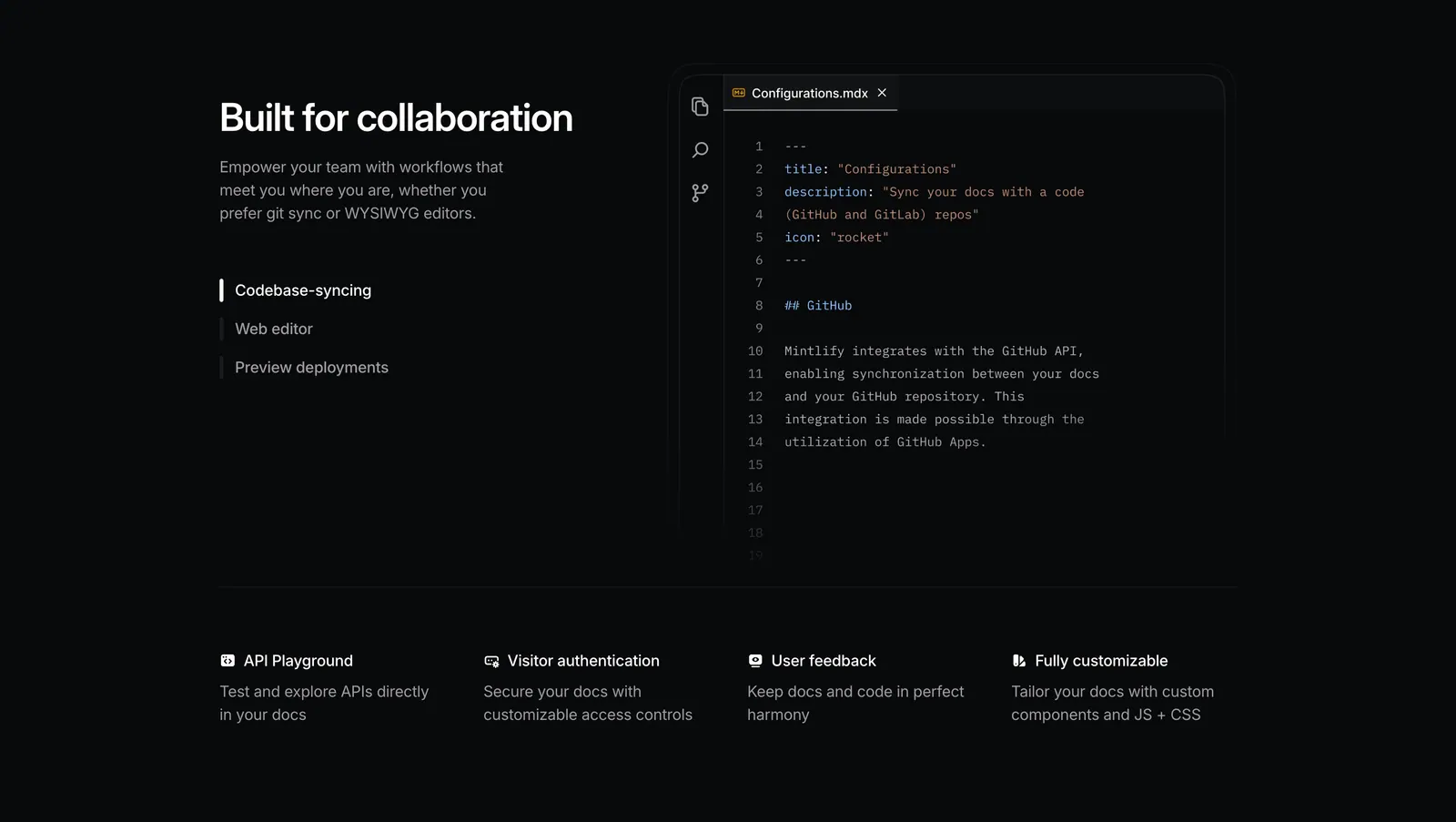
  20. Mintlify features section: dark split layout with tab list beside an MDX code editor, above a four-column feature row
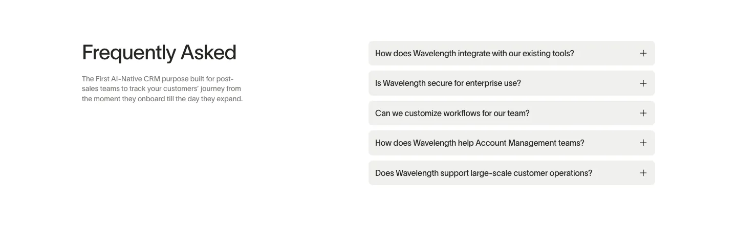
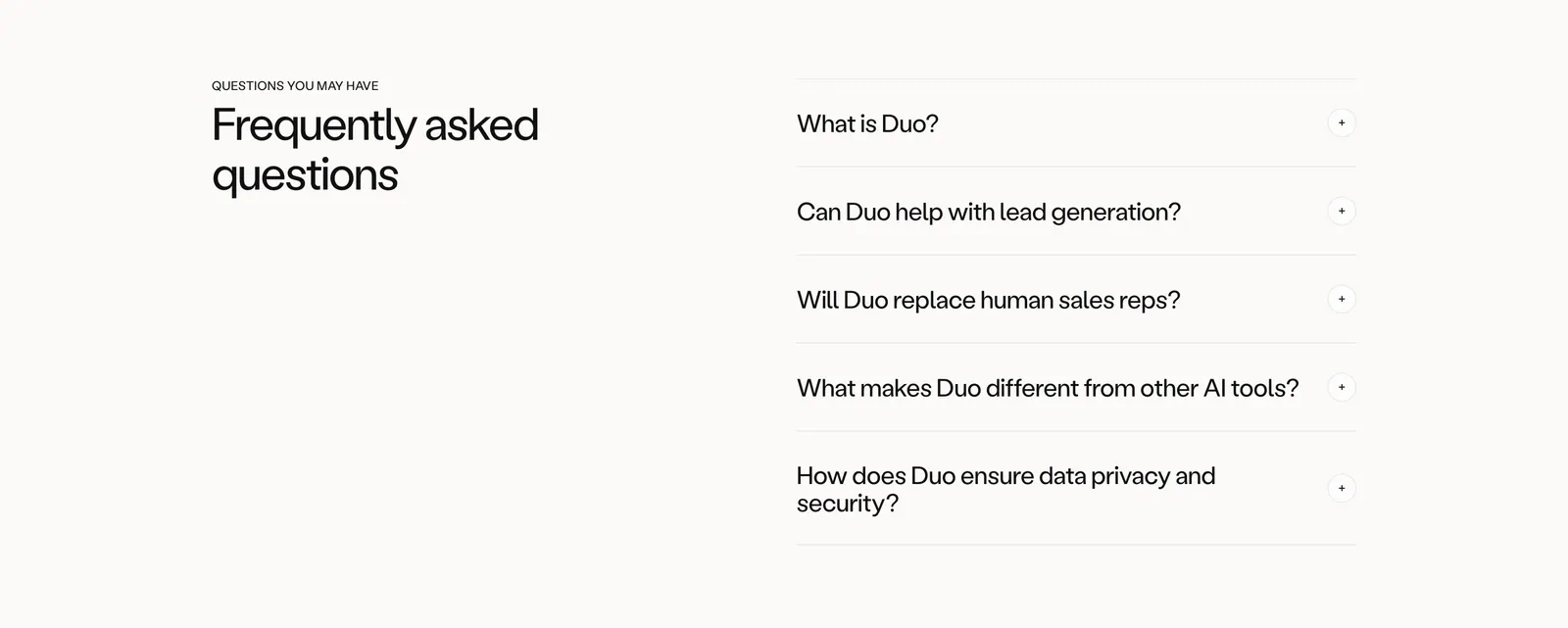
  21. Wavelength FAQ section: headline and short description at left beside a stack of five light gray accordion questions on white
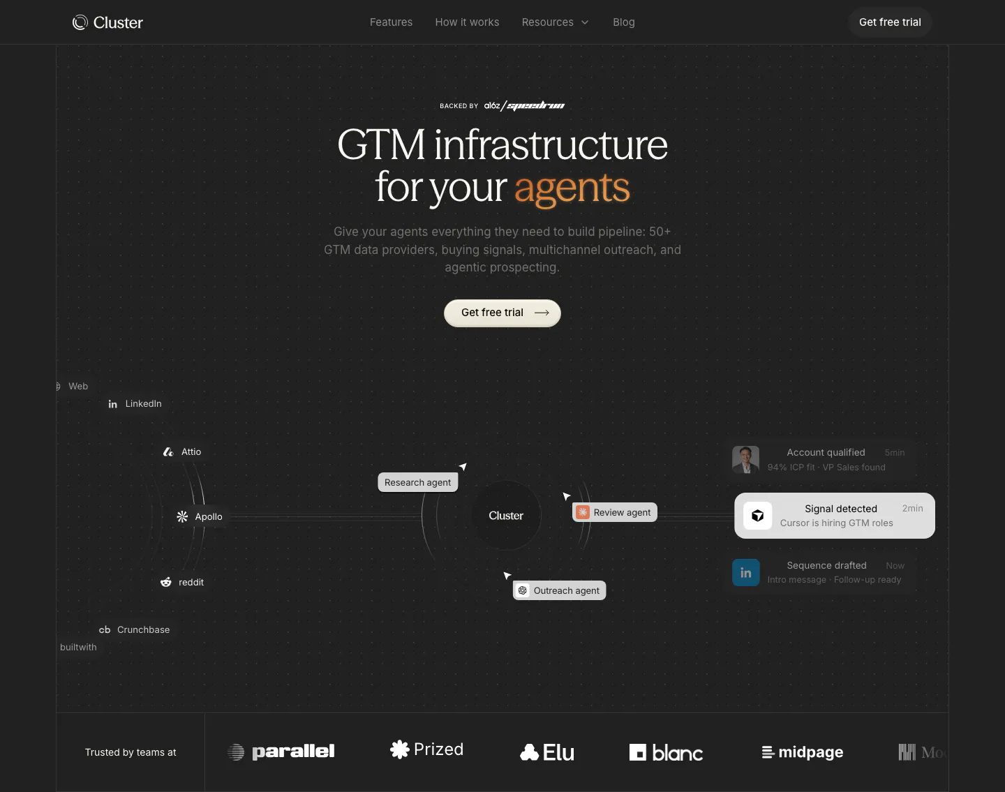
  22. Cluster hero section: centered serif headline with orange accent over an agent workflow diagram and a customer logo row on dark
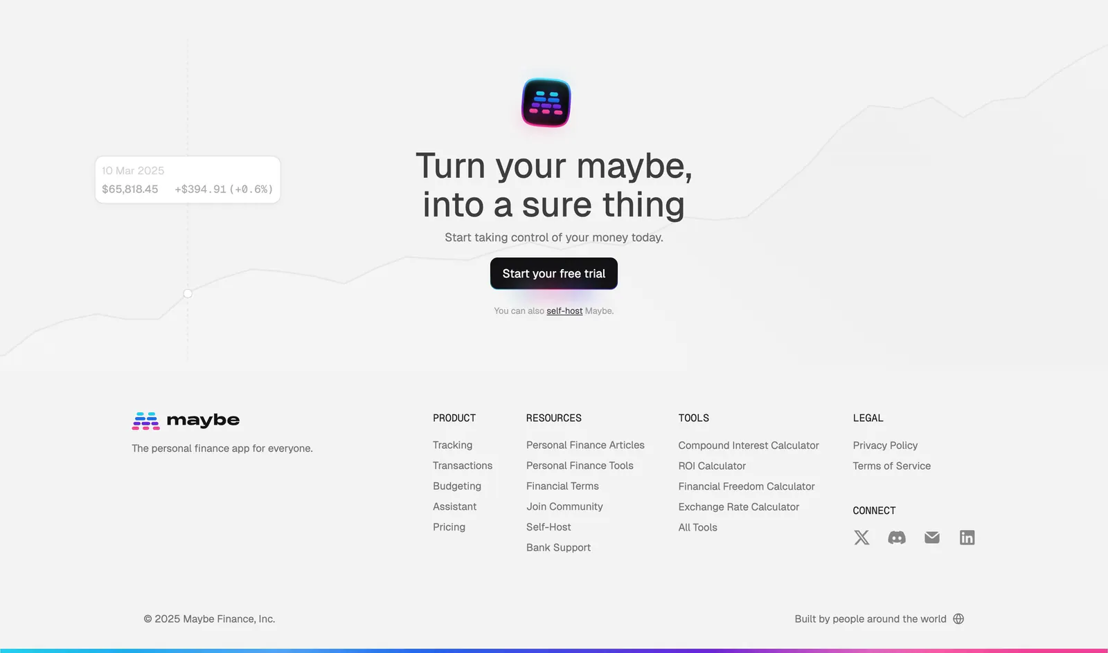
  23. Maybe footer section: centered closing CTA over a faint line chart, then logo and four link columns on light gray
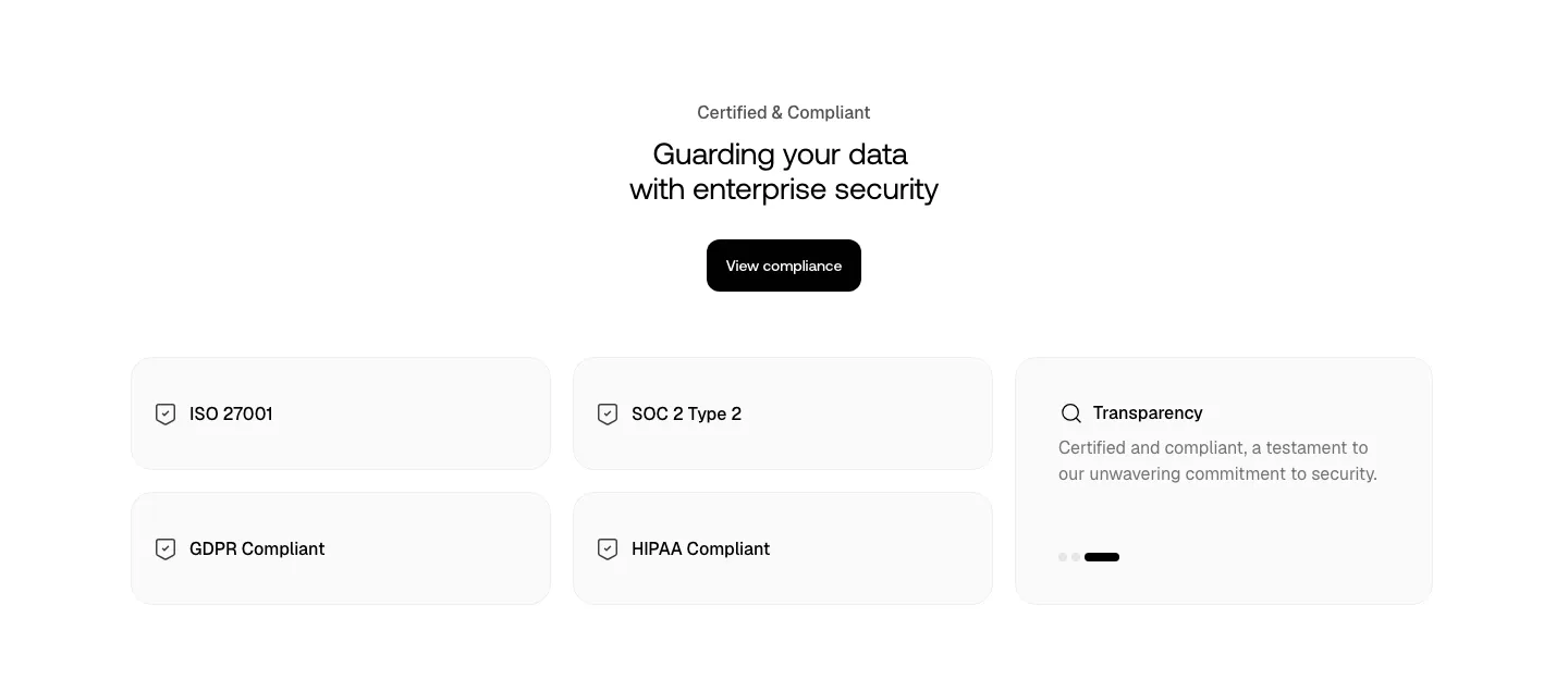
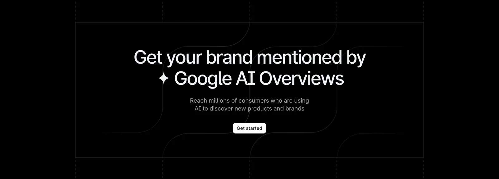
  24. Smallest.ai security section: centered headline and compliance button above light cards for ISO 27001, SOC 2, GDPR, HIPAA and transparency
  25. Wavelength logo cloud section: small centered caption above a row of grayscale logos including Pave, Render and Mintlify on a light gray band
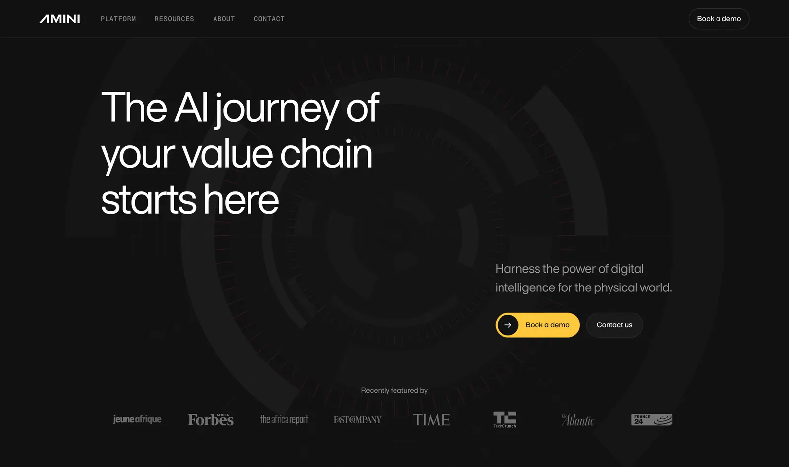
  26. Amini hero section: dark background with concentric arc artwork, left-aligned headline, yellow demo button and press logo strip
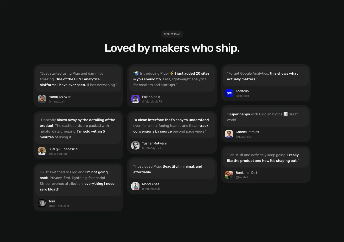
  27. Piqo testimonials section: centered Wall of love label and headline above a three-column masonry of dark quote cards with avatars
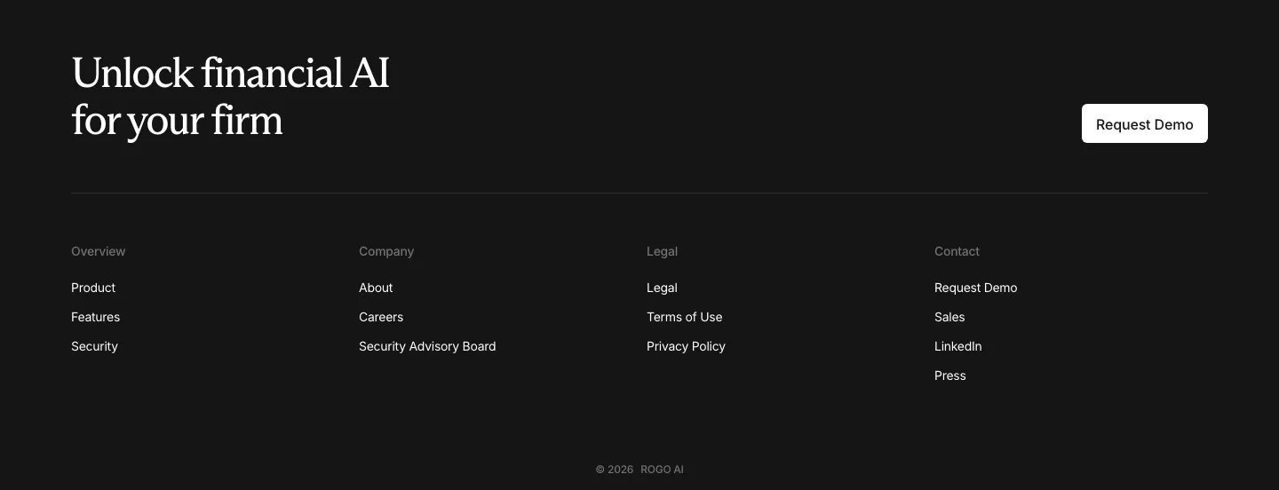
  28. Rogo footer section: serif CTA headline with demo button above four link columns and a copyright line on a dark background
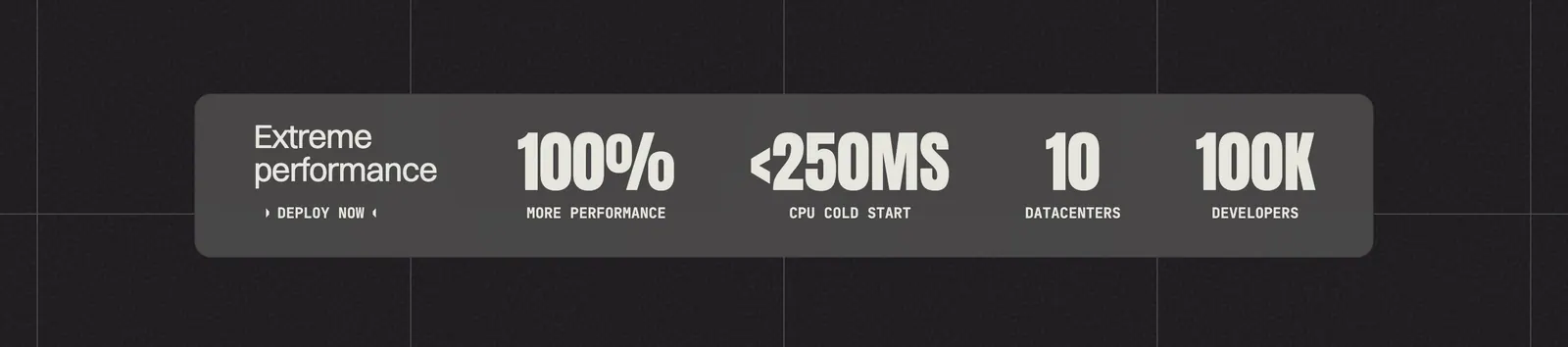
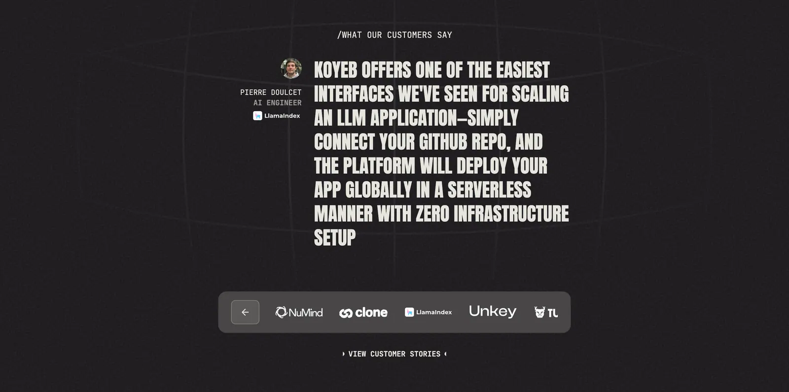
  29. Koyeb value proposition section: gray band with four large condensed metrics on a dark grid background
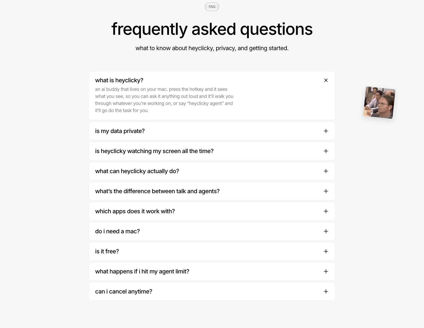
  30. heyclicky FAQ section: centered headline over a single-column accordion of white question rows, first one expanded, on light gray
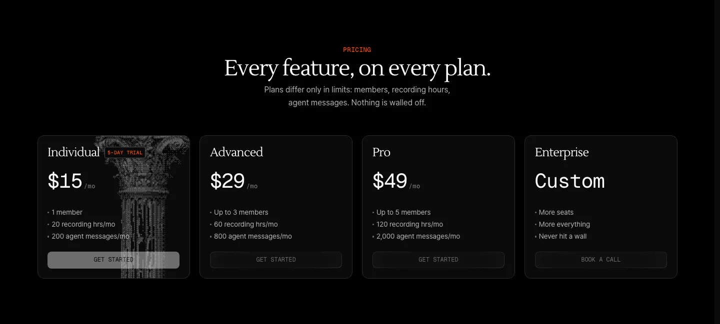
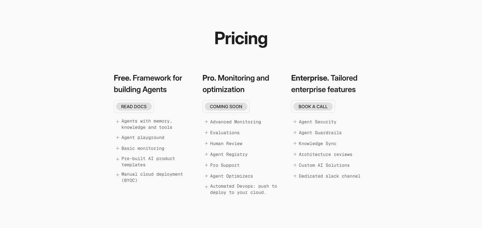
  31. Arke pricing section: centered serif headline above four dark plan cards from $15 Individual to Custom Enterprise, one with a halftone column
  32. DevRev logo cloud section: short headline on the left beside a two-row grid of eight grayscale customer logos separated by thin lines
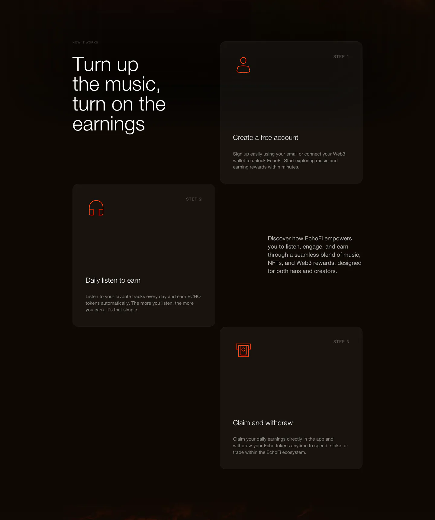
  33. EchoFi how it works section: headline at left with three staggered step cards and orange line icons on a dark background
  34. Zamp stats section: single row of four large figures with labels separated by thin dividers on white
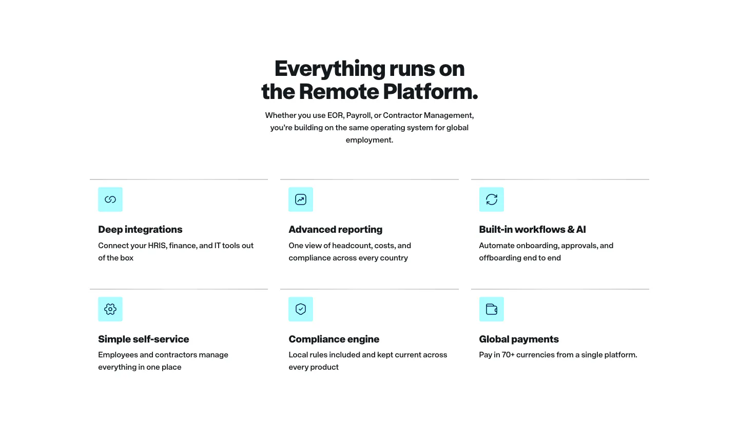
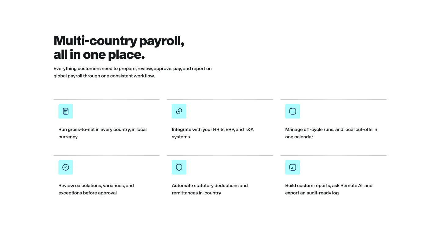
  35. Remote features section: centered headline above a two-row grid of six features with cyan icon tiles on white
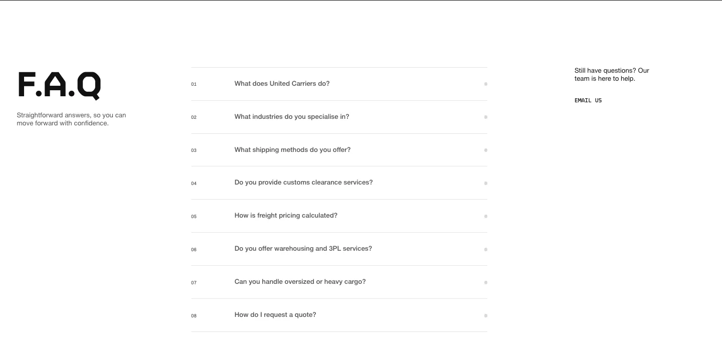
  36. United Carriers FAQ section: large F.A.Q heading left, numbered accordion questions center and an email link right on white
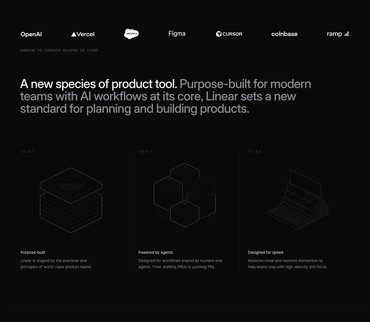
  37. Linear value proposition section: dark logo strip, two-tone statement and three columns with isometric line drawings and short benefits
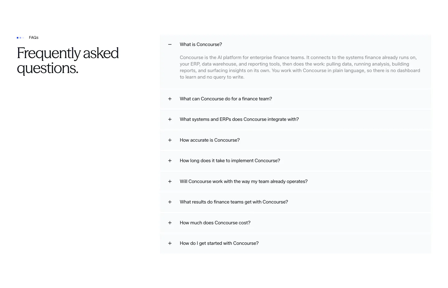
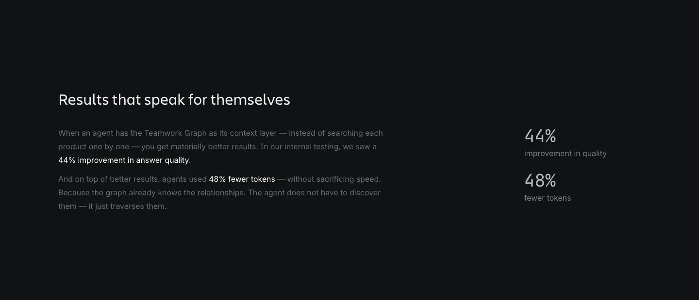
  38. Concourse stats section: headline above a 2x2 grid of large metrics with labels on a near-black background
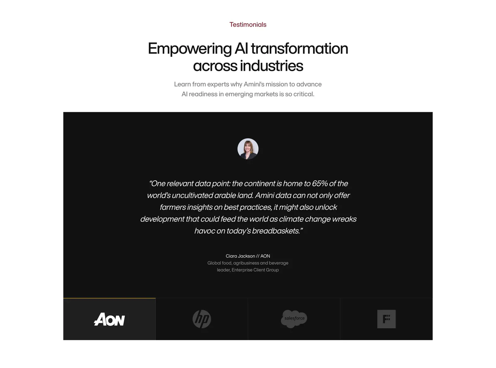
  39. Amini testimonials section: centered headline above a black panel with a centered italic quote and a row of logo tabs
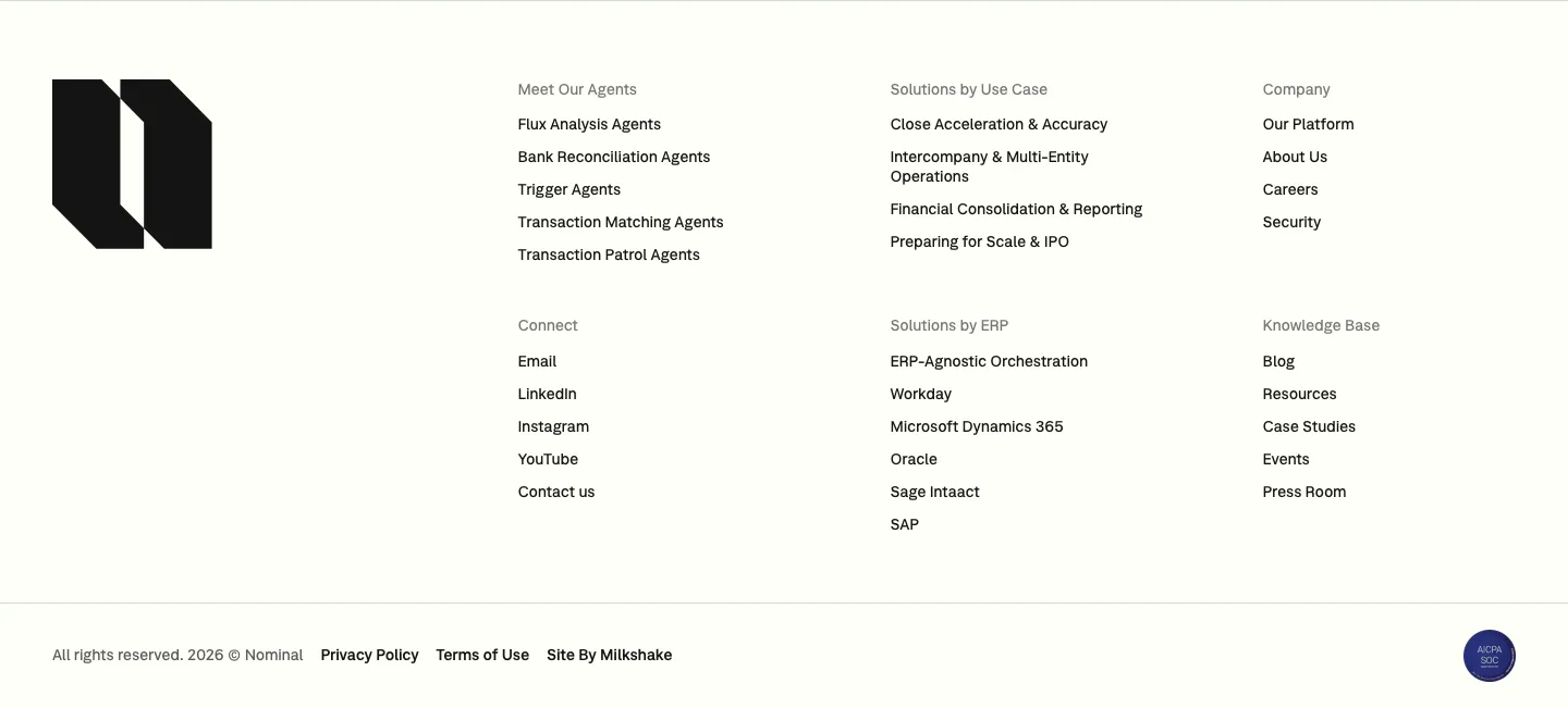
  40. Nominal footer section: large black logo mark on the left, six link columns and a copyright row on an off-white background
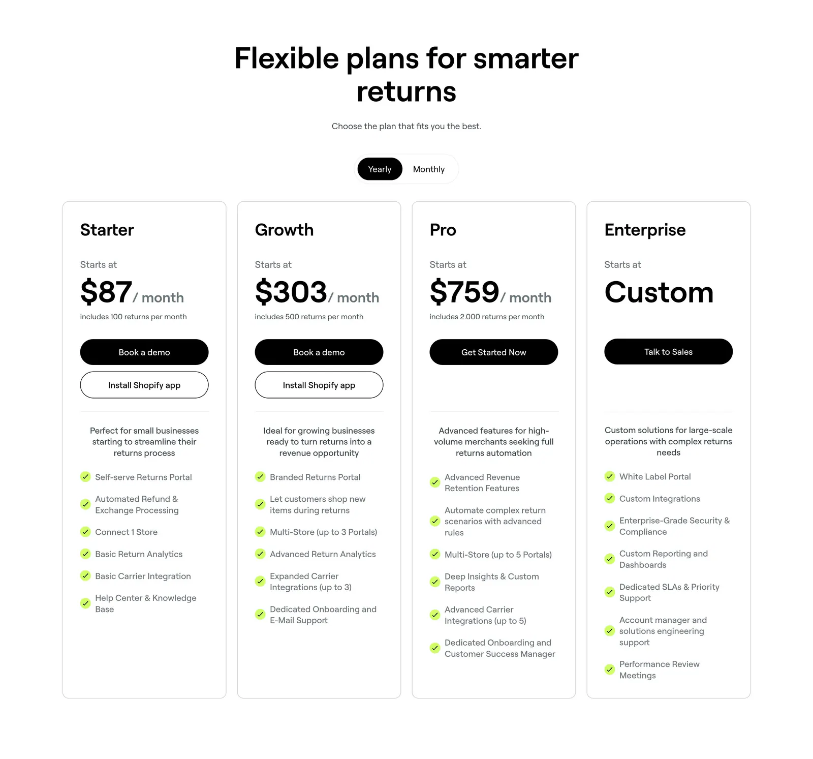
  41. 8returns pricing section: centered headline with yearly/monthly toggle above four white plan cards with prices and checklists
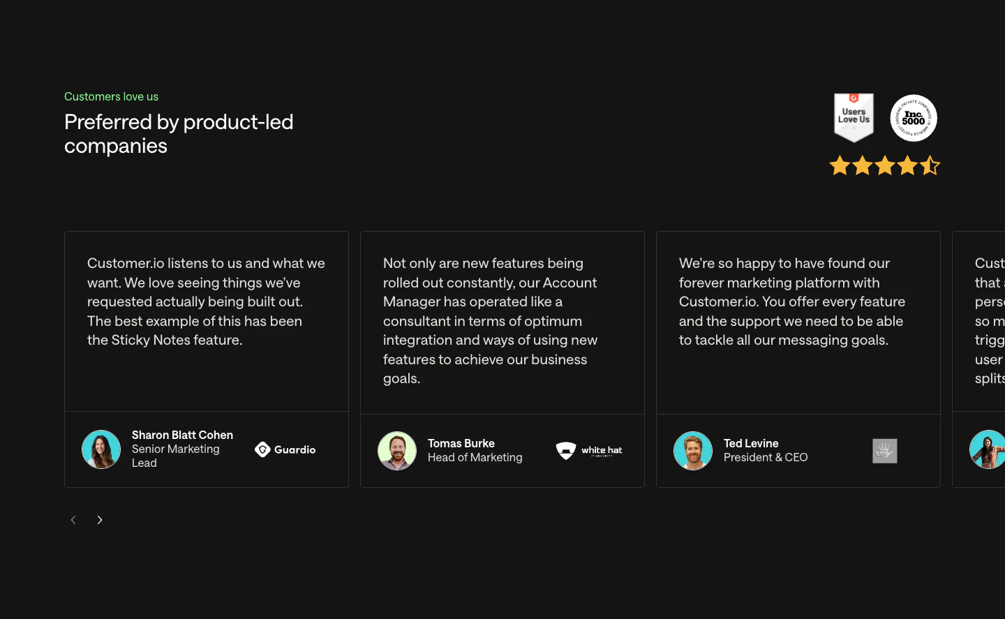
  42. Customer.io testimonials section: charcoal carousel of quote cards with avatars and company logos, plus G2 and Inc. 5000 badges and stars
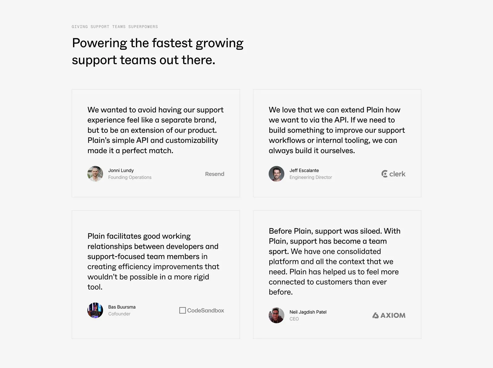
  43. Plain testimonials section: left-aligned headline above a 2x2 grid of bordered quote cards with avatars and company logos on light gray
  44. Ycode call to action section: centered headline with a spotlight fade effect and two buttons on a black background
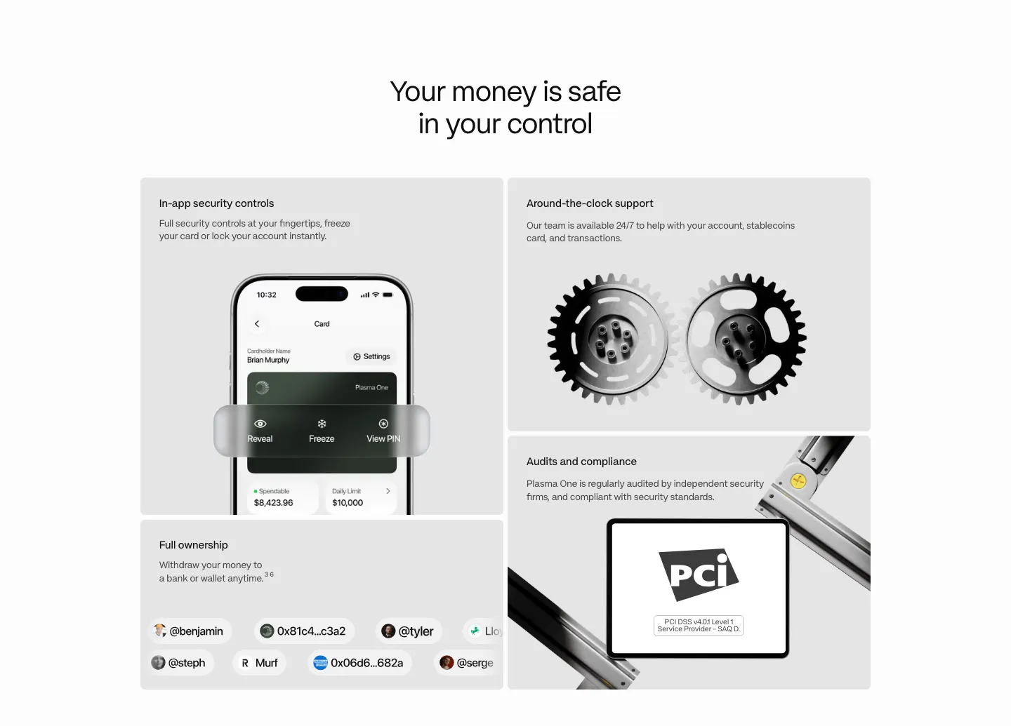
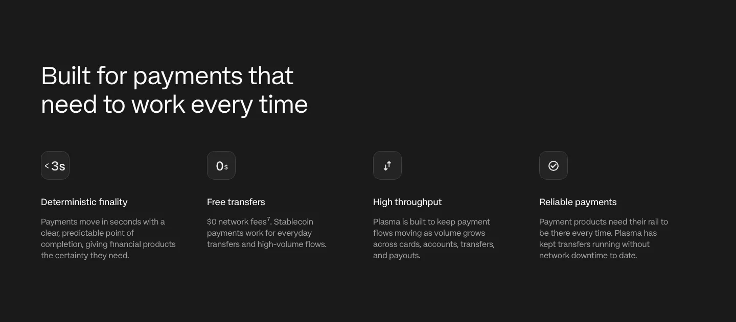
  45. Plasma security section: centered heading above a bento of gray tiles with a phone UI, 3D gears, a PCI badge and user handles
  46. Attio logo cloud section: two rows of five customer logos in bordered grid cells, including granola, Modal, Railway and taskrabbit
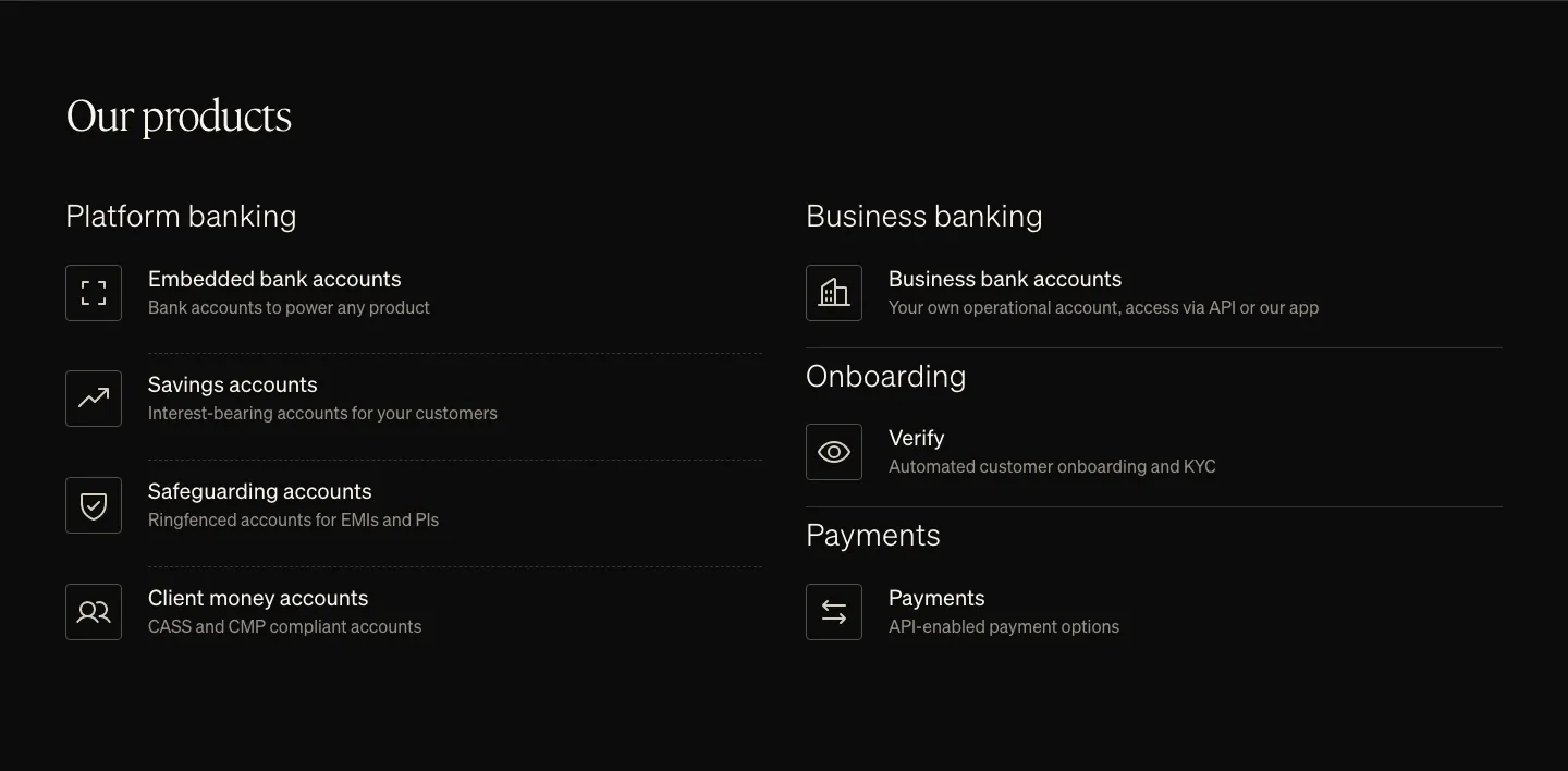
  47. Griffin features section: serif heading above two columns of product list items with outlined icons on black
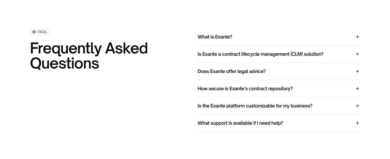
  48. Exante FAQ section: large heading with FAQs badge on the left and a six-question accordion on the right on a white background
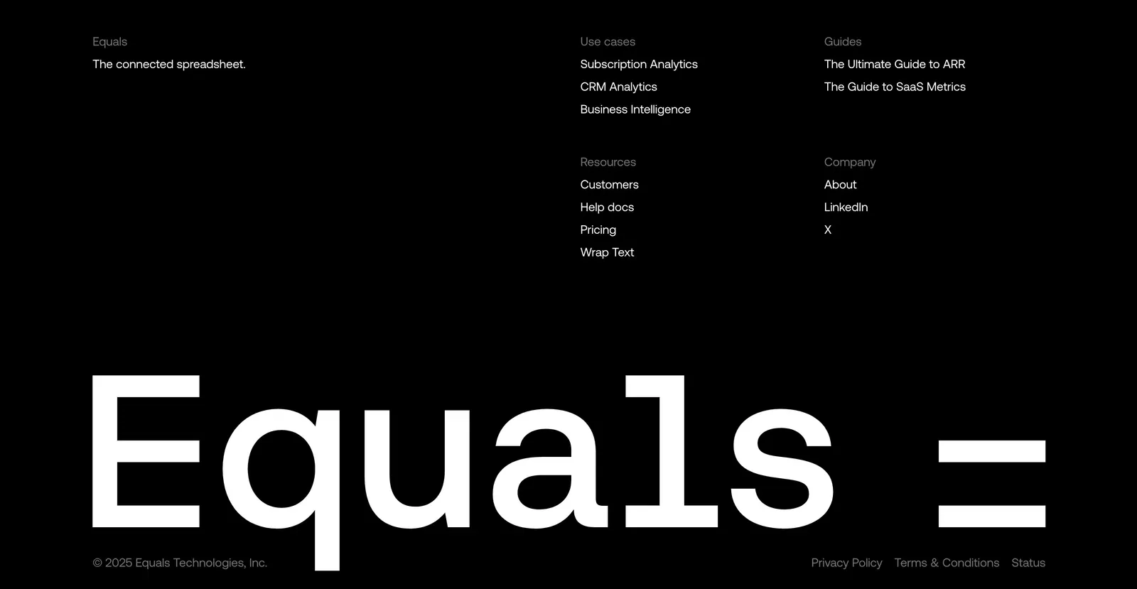
  49. Equals footer section: link columns above a giant monospace Equals wordmark and copyright line on a black background
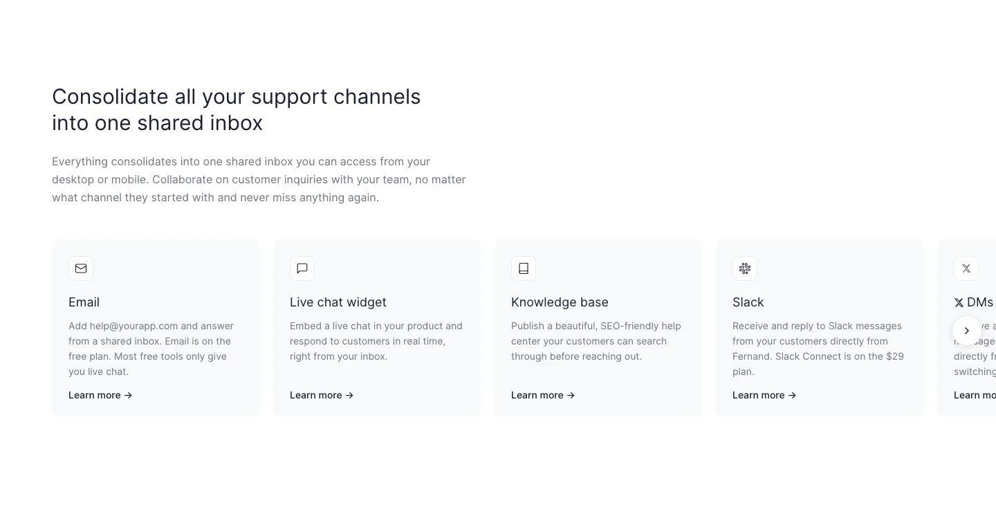
  50. Fernand features section: left-aligned headline above a row of support channel cards cut off at the right edge with a next arrow
  51. Neon logo cloud section: left-aligned headline beside a two-row grid of white customer logos on a black background
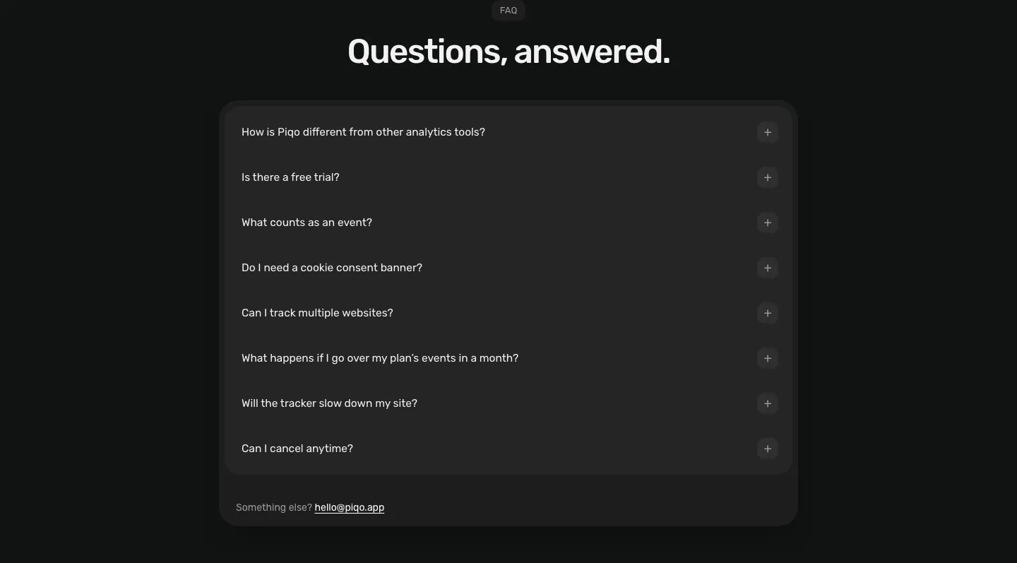
  52. Piqo FAQ section: centered pill label and headline above a rounded dark card with eight collapsed questions and a contact email
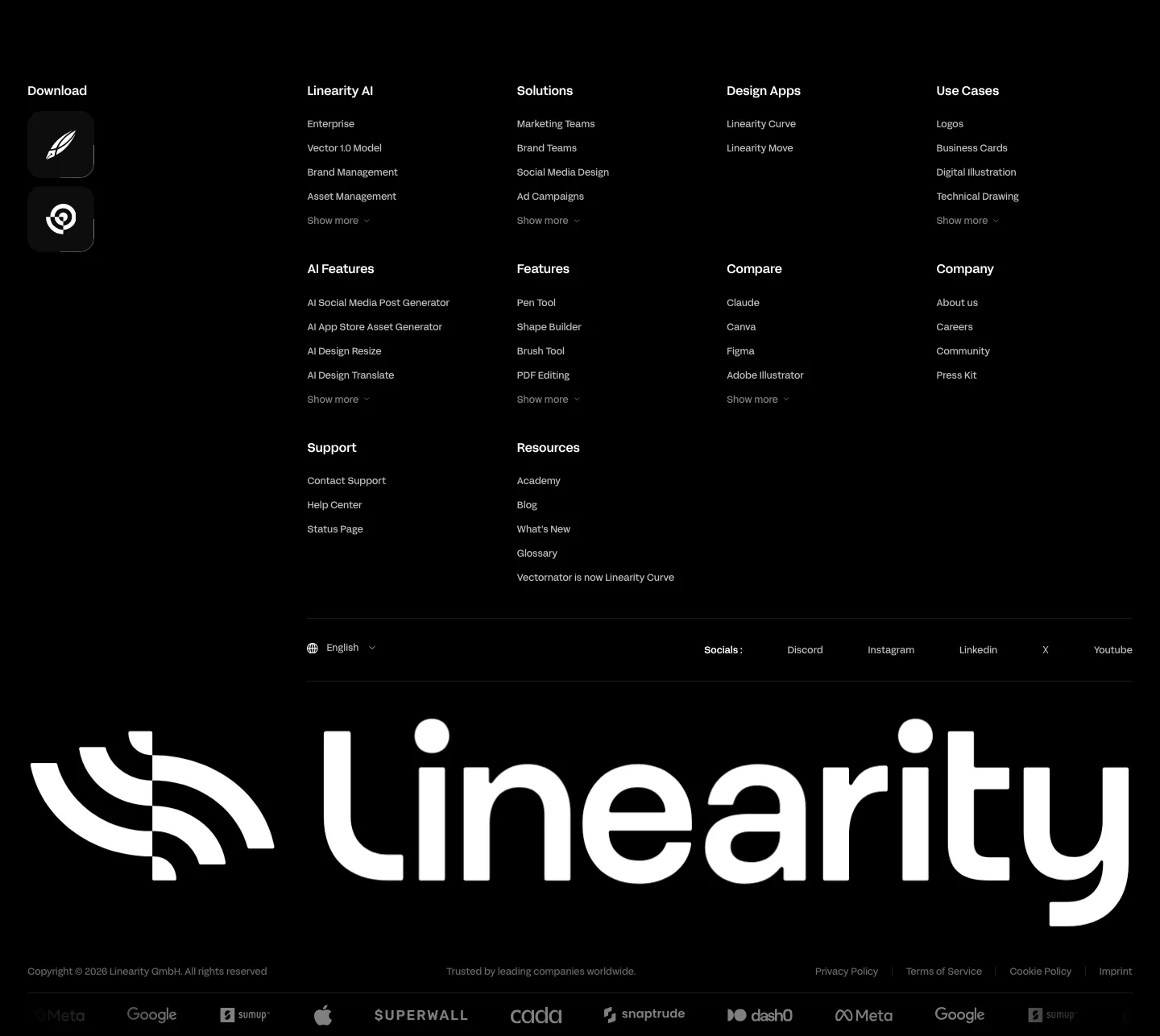
  53. Linearity footer section: dense link columns with app download icons, a giant white Linearity wordmark and a customer logo strip on black
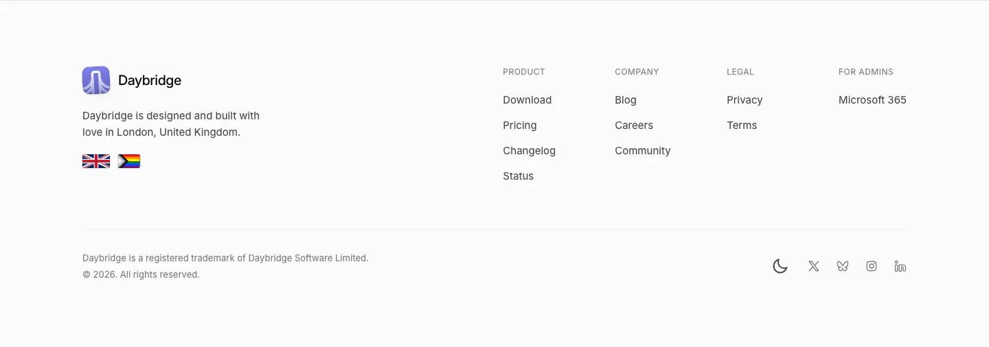
  54. Daybridge footer section: logo, London tagline and flags on the left, four link columns right, trademark line and social icons
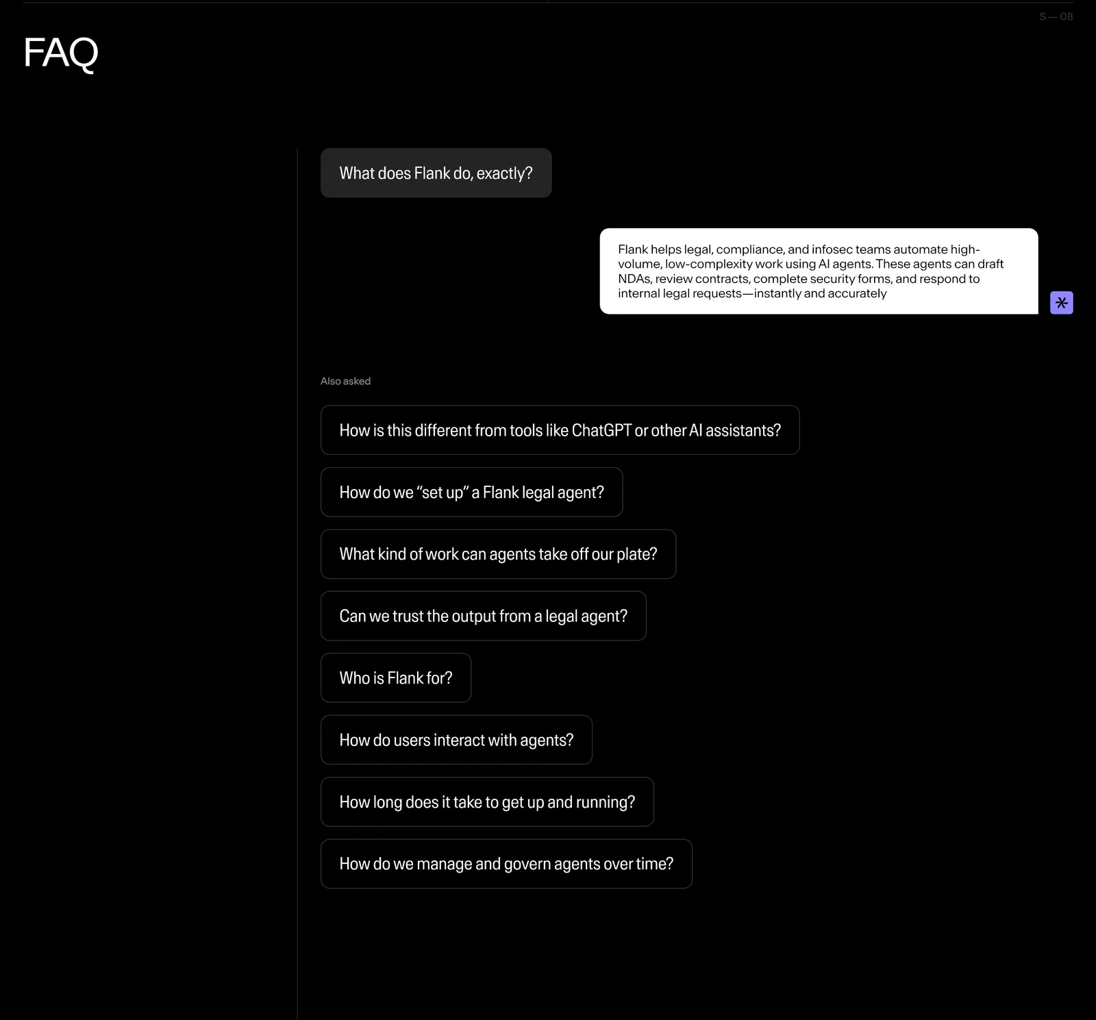
  55. Flank FAQ section: questions styled as chat bubbles with one answered reply and a list of follow-up questions on a black background
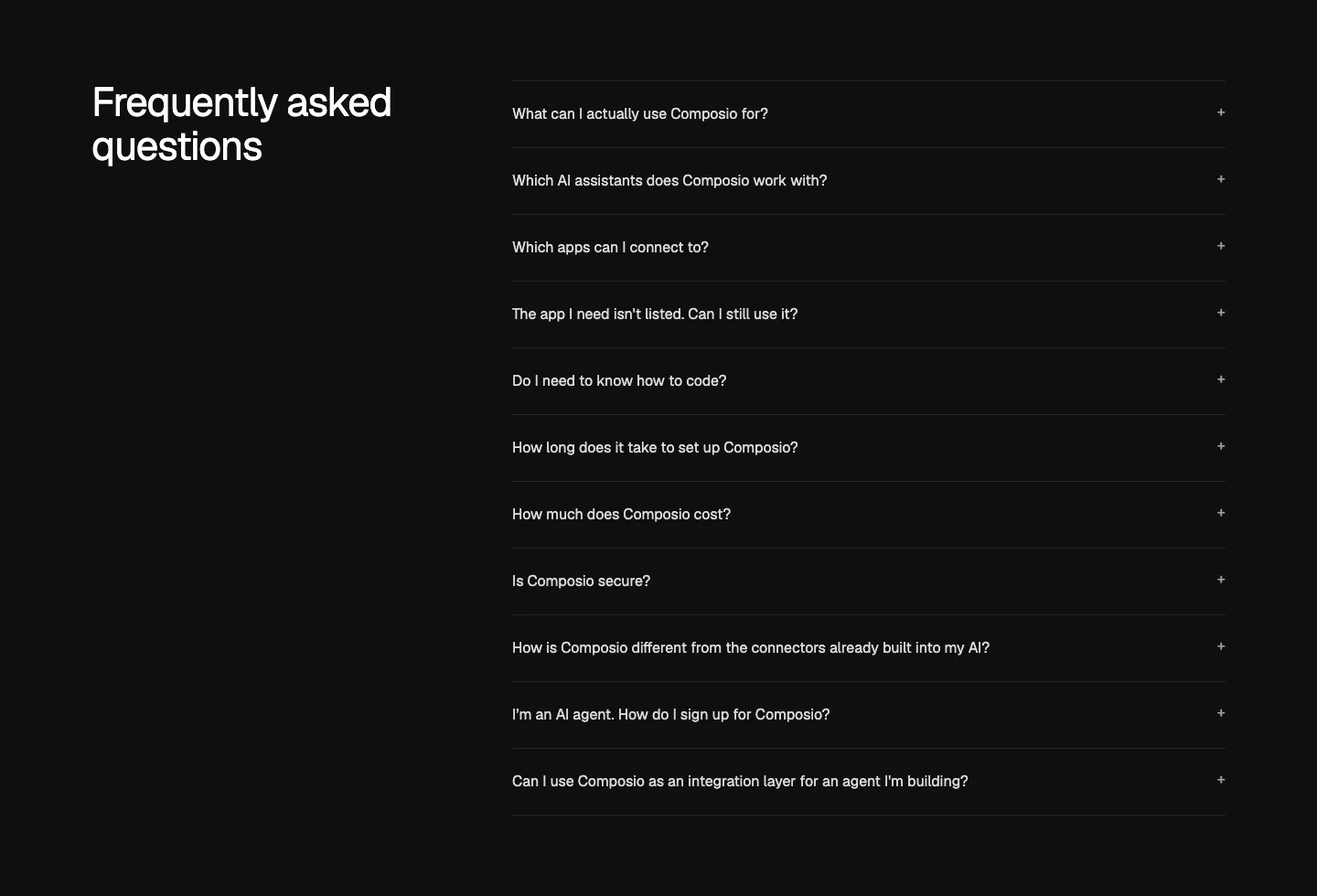
  56. Composio FAQ section: heading at left beside an accordion list of eleven questions with plus icons on near-black
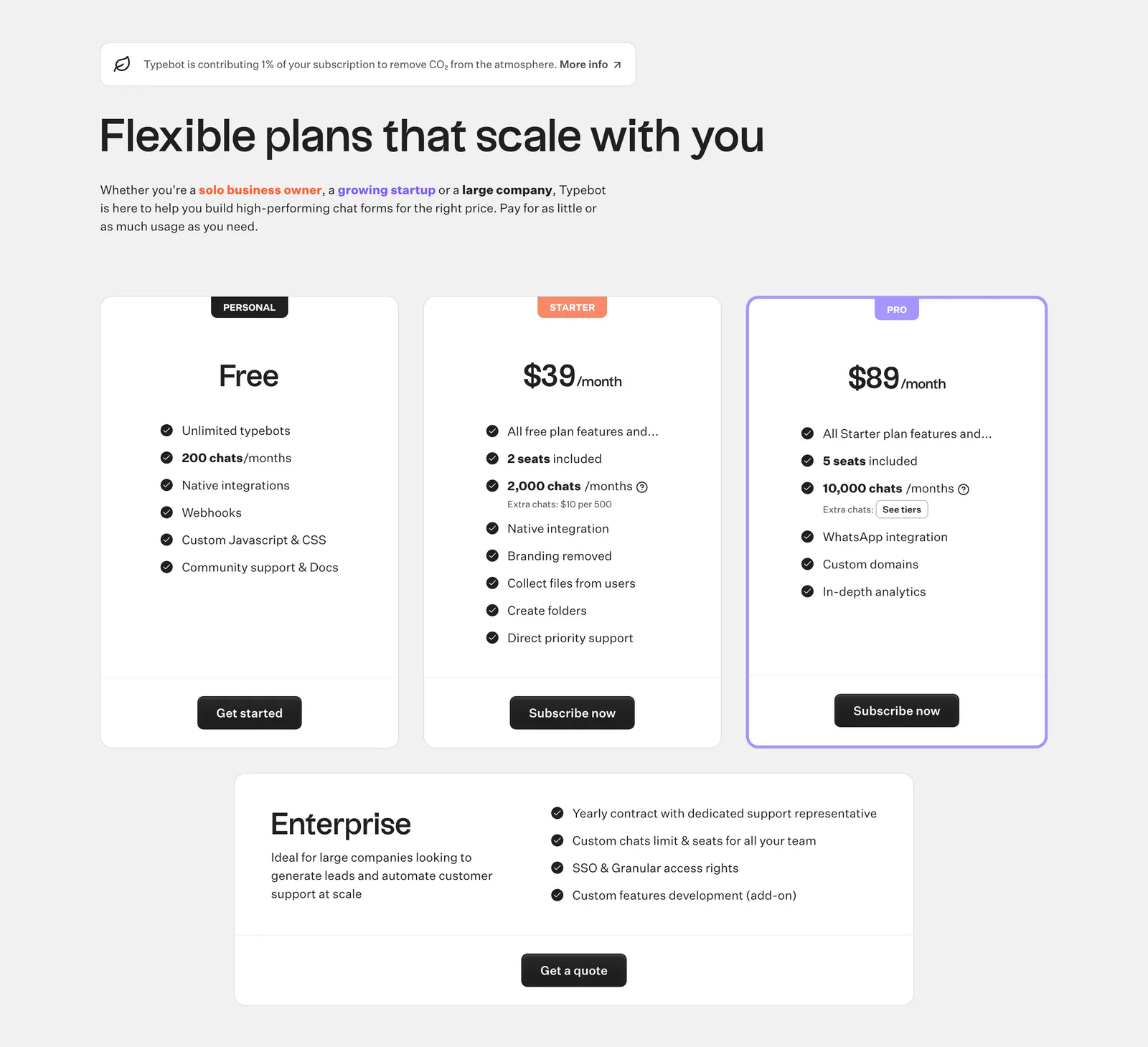
  57. Typebot pricing section: left-aligned headline above three plan cards with check lists and a wide enterprise card on light gray
  58. Godmode logo cloud section: single thin row with a trusted-by label beside fading grayscale customer logos on a pale background
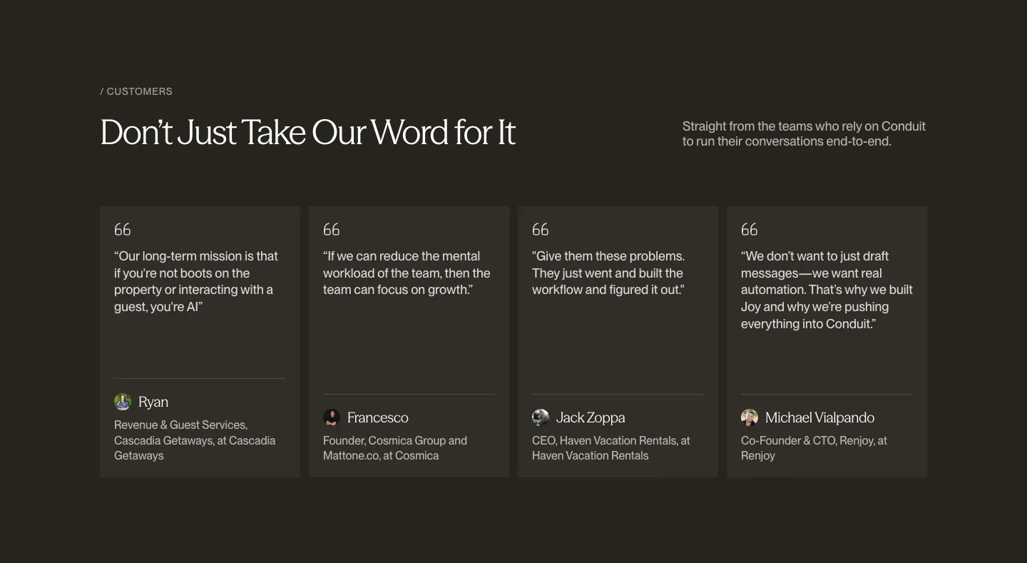
  59. Conduit testimonials section: serif headline above four quote cards with avatars on a dark brown background
  60. Shelby logo cloud section: single row of customer logos including NBCUniversal and Watchee inside a rounded bordered box on off-white
  61. Attio call to action section: centered two-line headline with Talk to sales and Start for free buttons on a dark striped background
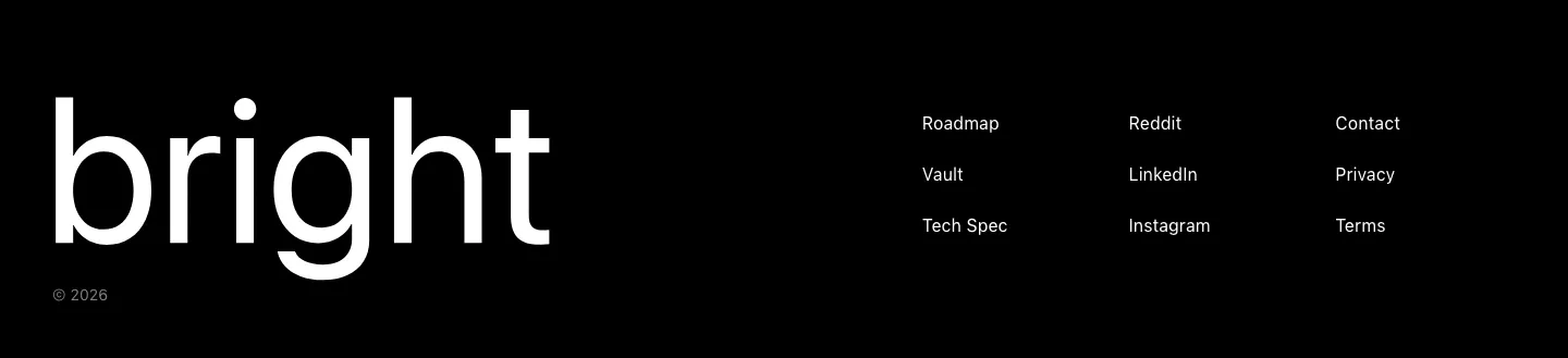
  62. Bright footer section: huge white bright wordmark on black beside three short columns of links, with a © 2026 line
  63. Cotool logo cloud section: single row of grayscale customer logos under a small 'Loved by teams at' label on a light gray background
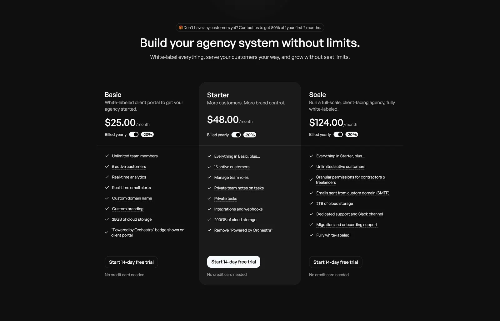
  64. Orchestra pricing section: centered headline above three plan columns with billed-yearly toggles and feature checklists on dark background
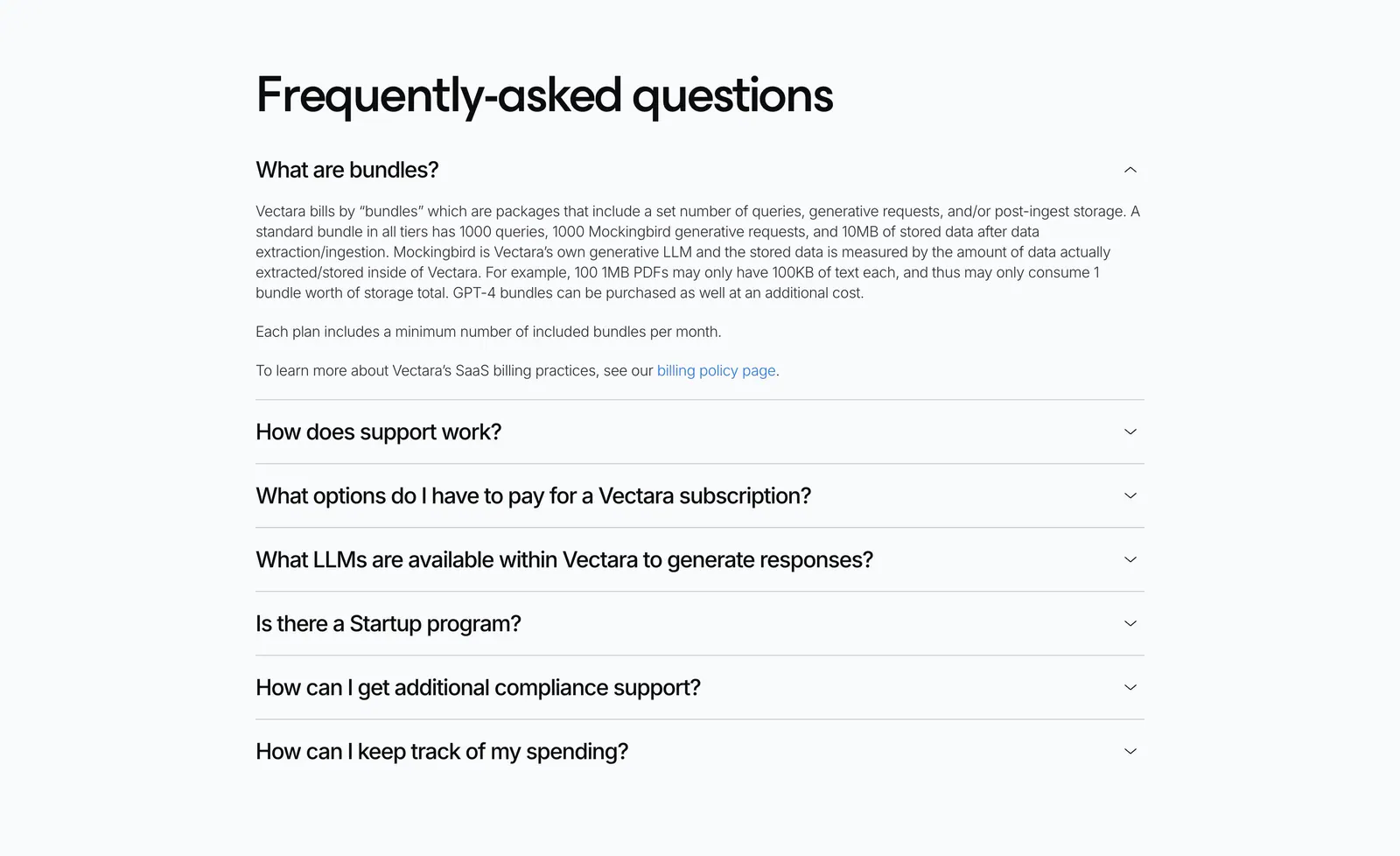
  65. Vectara FAQ section: left-aligned heading above an accordion of questions with the first answer expanded on a light gray background
  66. Smallest.ai logo cloud section: small Trusted by label on the left beside a row of grayscale RingCentral, Paytm, Truecaller and Acefone logos
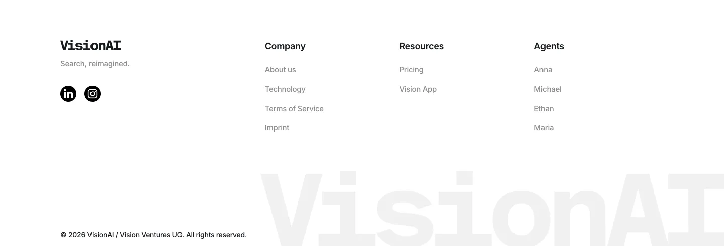
  67. VisionAI footer section: logo, social icons and three link columns above a large faint wordmark on white
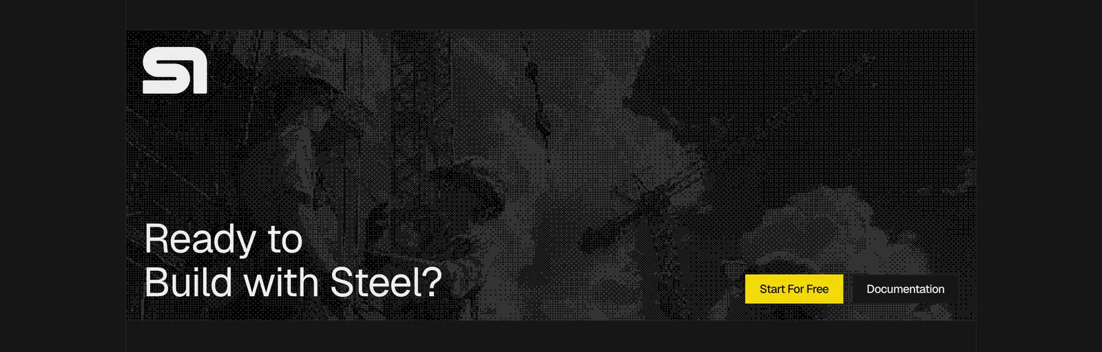
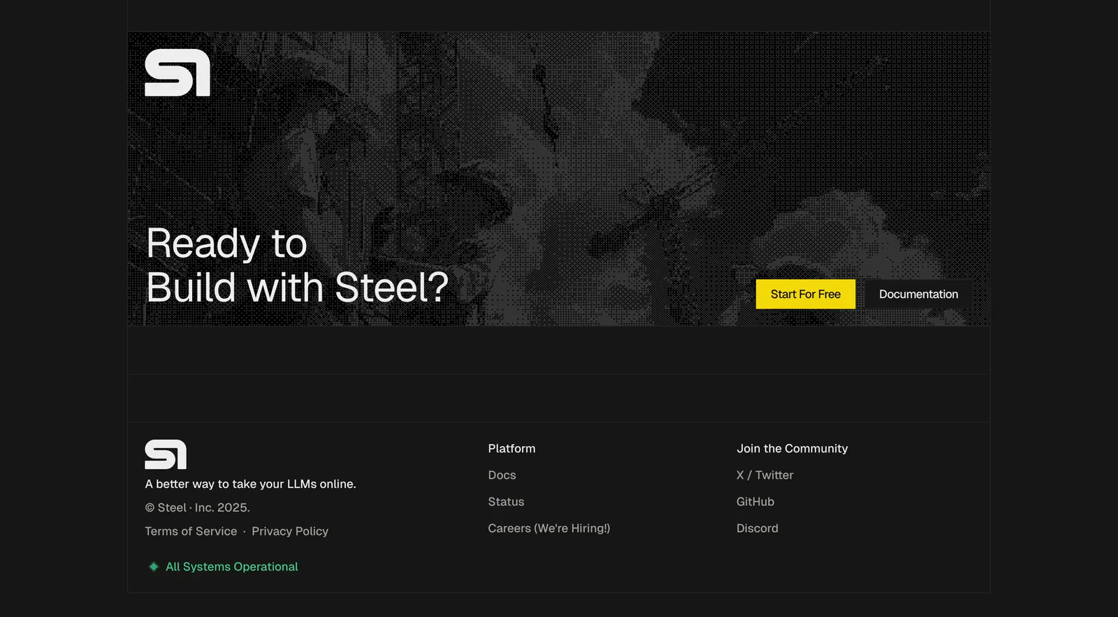
  68. Steel call-to-action section: dithered grayscale construction photo banner with logo, large headline and yellow button on a dark background
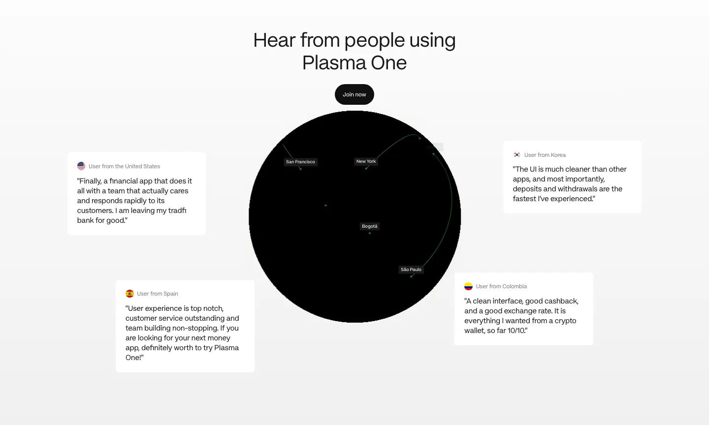
  69. Plasma testimonials section: centered heading and button above a black globe surrounded by four floating user quote cards
  70. Whalesync logo cloud section: small monospace caption above two centered rows of black customer logos on a pale background
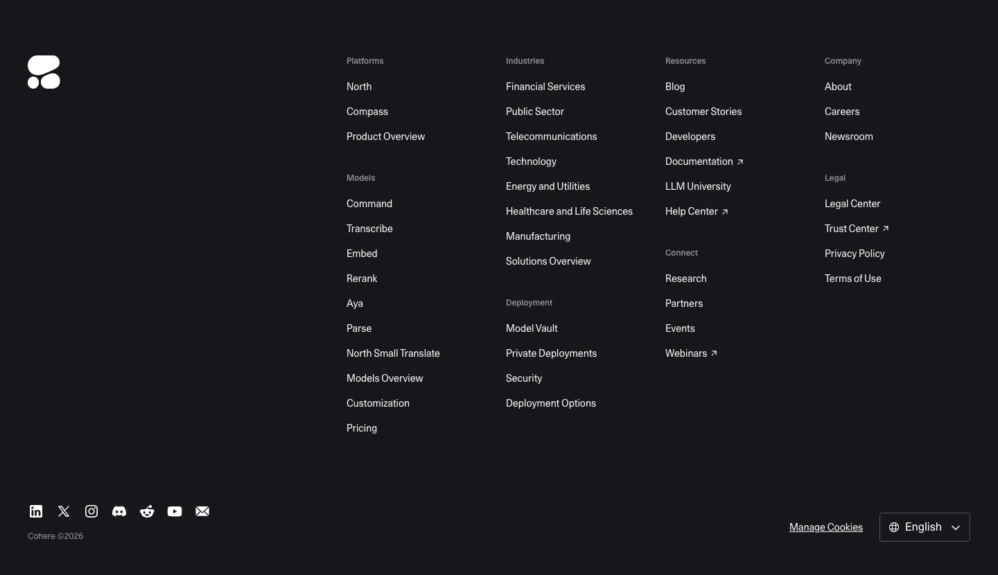
  71. Cohere footer section: dark background with logo, multi-group link columns, social icons and language selector
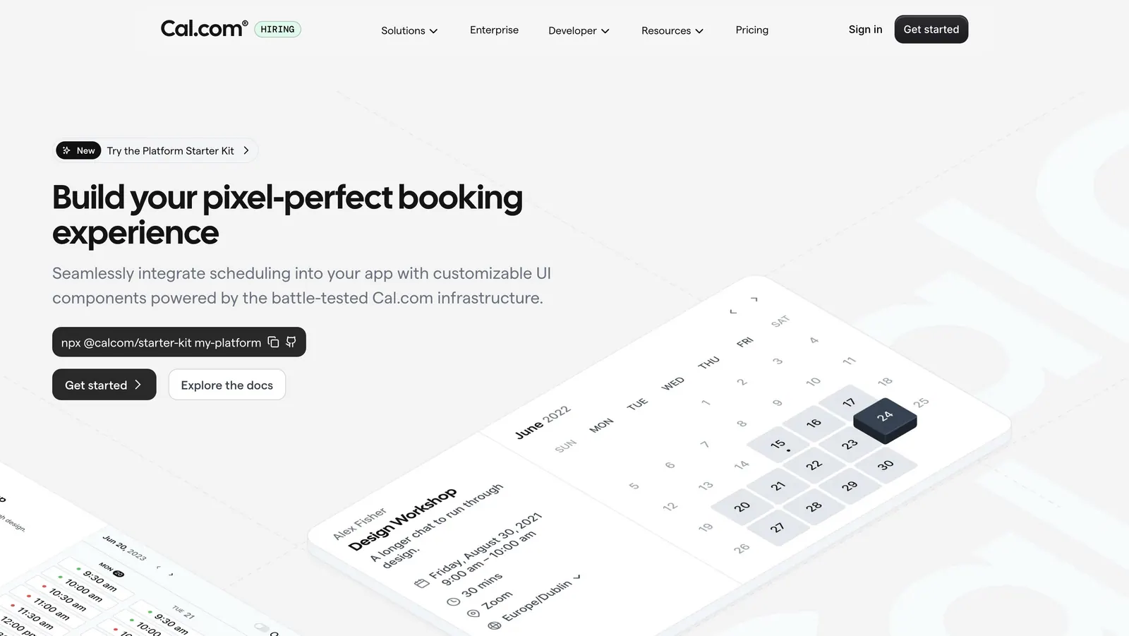
  72. Cal.com hero section: headline, npx command and buttons left beside tilted isometric calendar booking UI cards on light gray
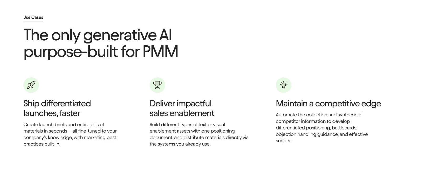
  73. Jasper features section: large left-aligned headline above three icon columns with short benefit descriptions on a white background
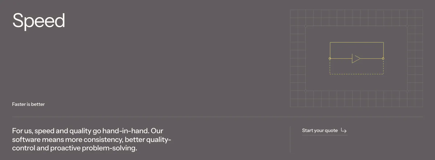
  74. Podium Automation value proposition section: large Speed heading and body copy on a muted gray band with a small grid line diagram
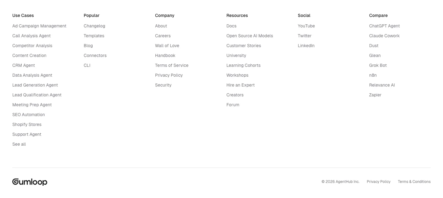
  75. Gumloop footer section: six link columns above a wordmark and copyright row on white
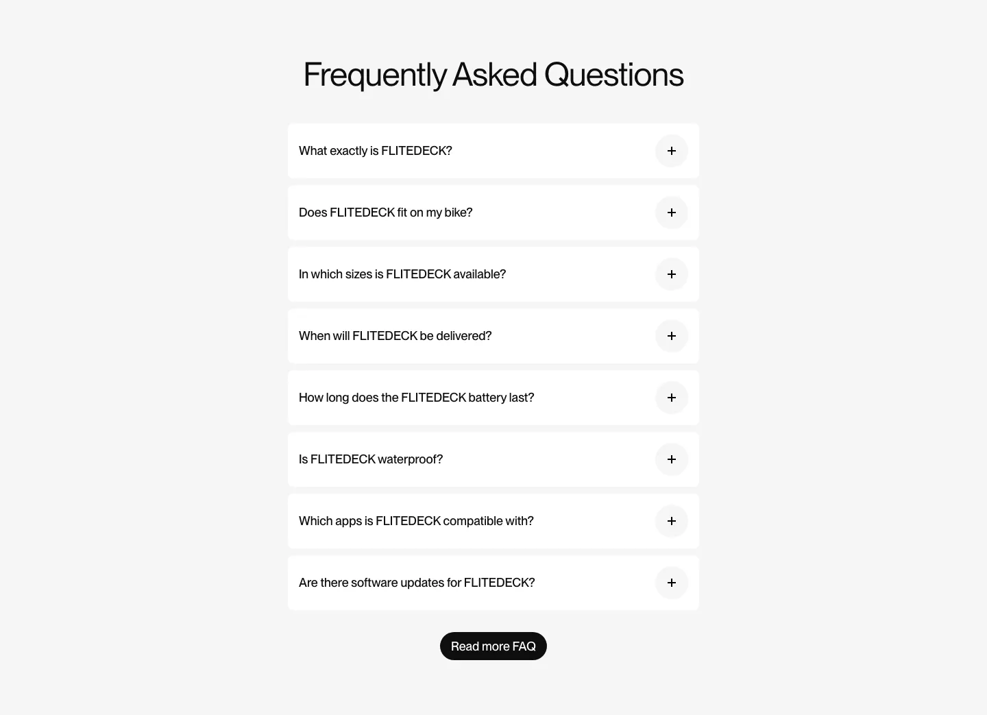
  76. FLITEDECK FAQ section: centered heading above a single column of white accordion questions and a black button on light gray
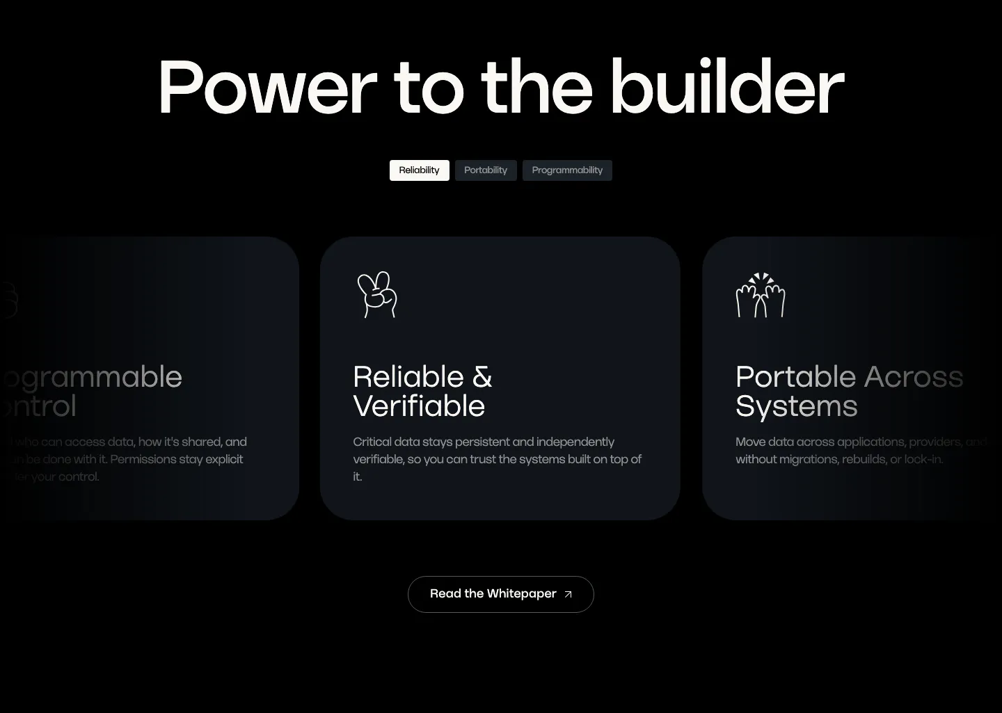
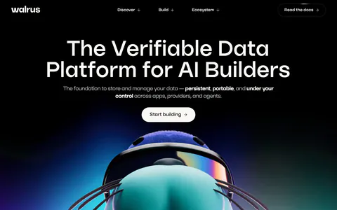
  77. Walrus value proposition section: large headline over tab pills and a carousel of dark benefit cards with line icons
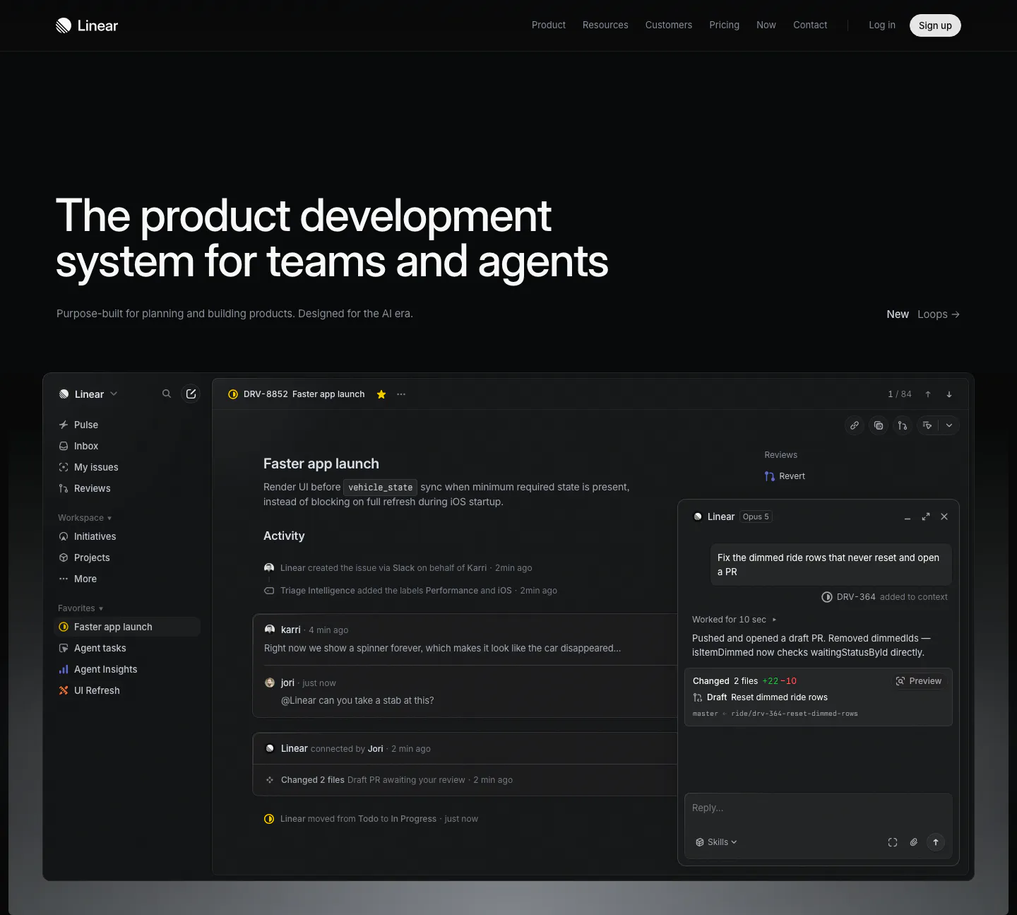
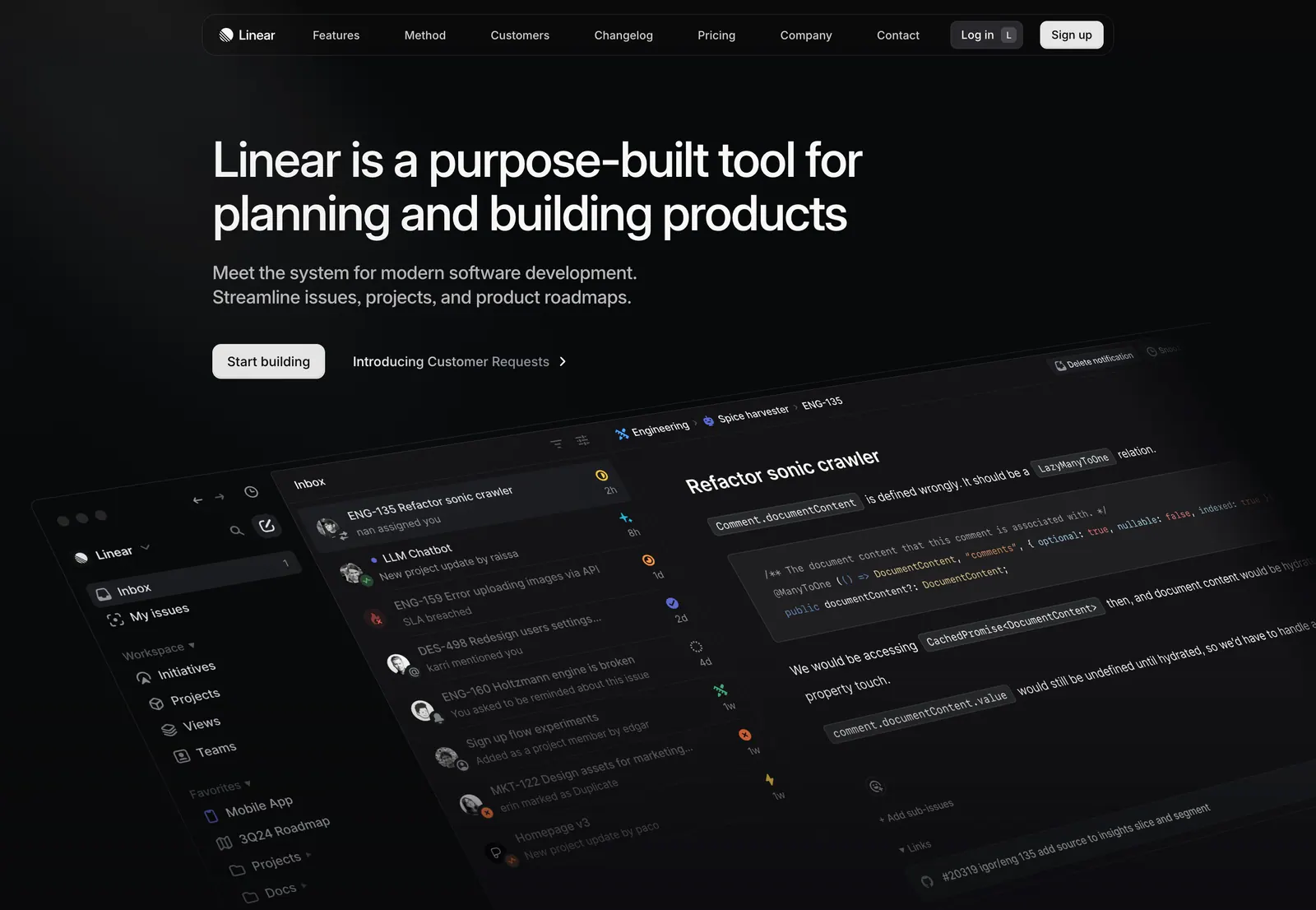
  78. Linear hero section: dark page with a large left-aligned headline and a full-width issue tracker screenshot with an agent chat panel
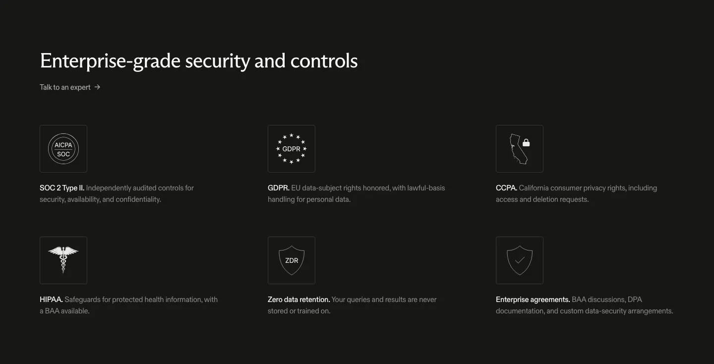
  79. Exa security section: dark background with headline and a three-by-two grid of outlined compliance icons for SOC 2, GDPR, CCPA and HIPAA
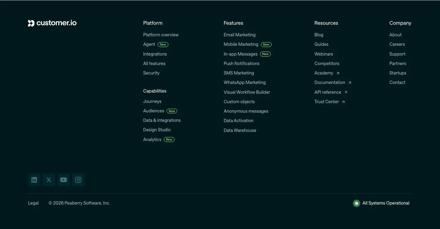
  80. Customer.io footer section: dark teal footer with logo, link columns with New badges, social icons, copyright and system status
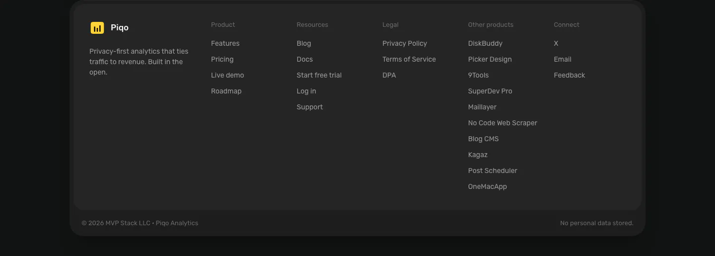
  81. Piqo footer section: rounded dark card with yellow logo and tagline, five link columns including other products, copyright row
  82. Harvey logo cloud section: centered serif headline above three rows of grayscale law firm and enterprise logos
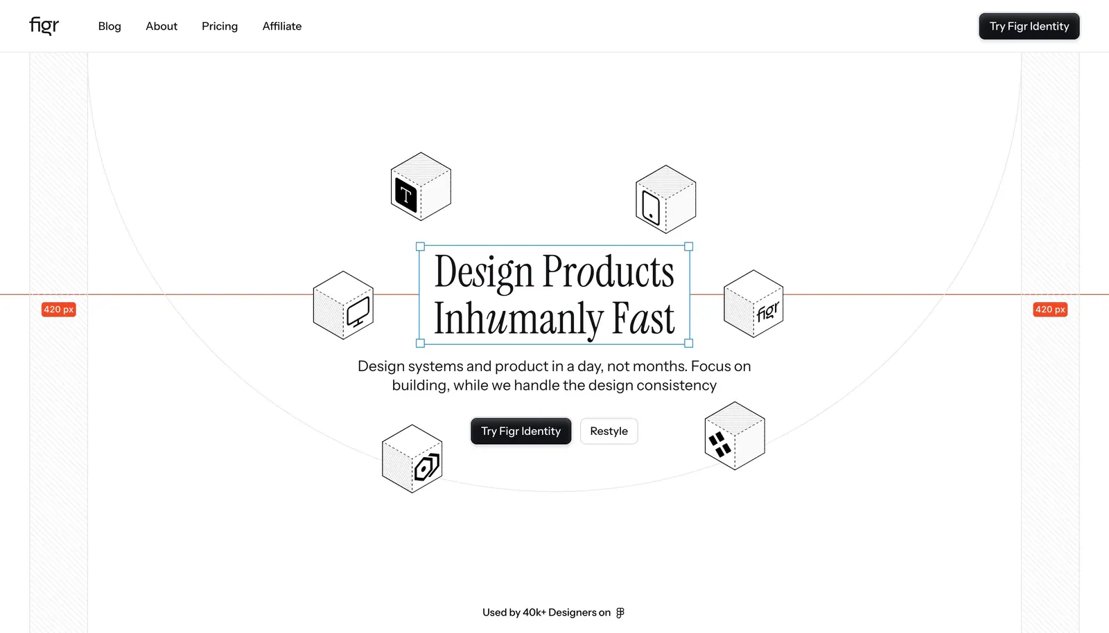
  83. Figr hero section: centered serif headline in a selection box ringed by isometric line-drawn cubes with measurement guides
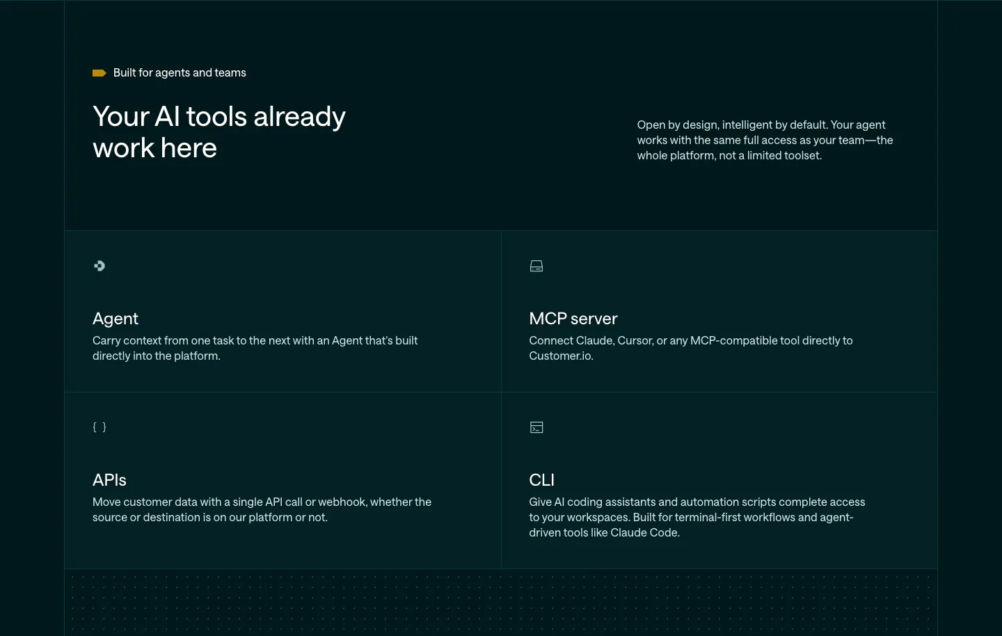
  84. Customer.io features section: dark teal header with headline and copy above a 2x2 grid of Agent, MCP server, APIs and CLI cells
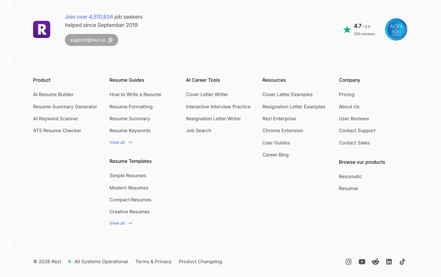
  85. Rezi footer section: logo with user count and support email, five link columns, rating and SOC badge, copyright and social icons
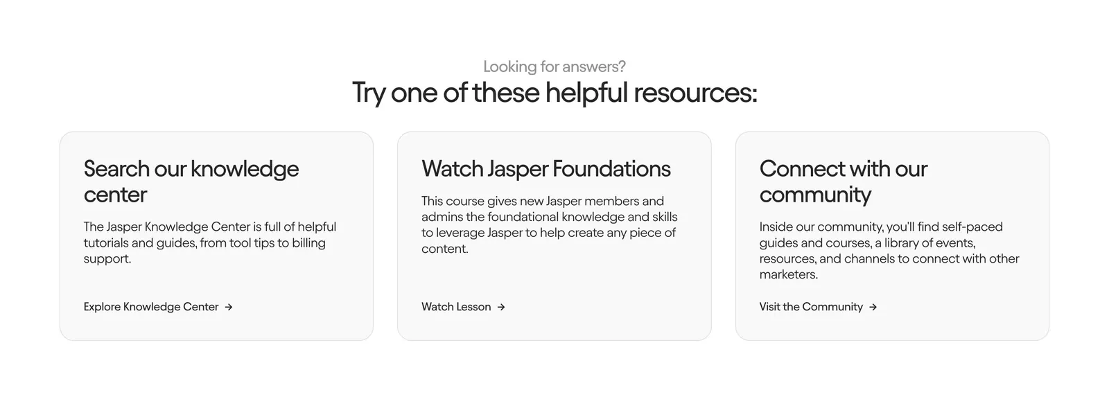
  86. Jasper contact section: centered heading above three light gray cards linking to the knowledge center, a course and the community
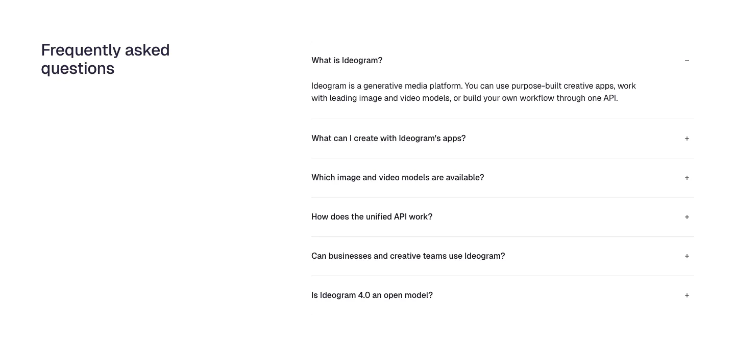
  87. Ideogram FAQ section: heading on the left, accordion of six questions on the right with the first one expanded, on white
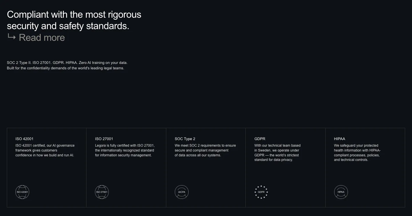
  88. Legora security section: left headline on a dark background above five bordered cells for ISO, SOC 2, GDPR and HIPAA badges
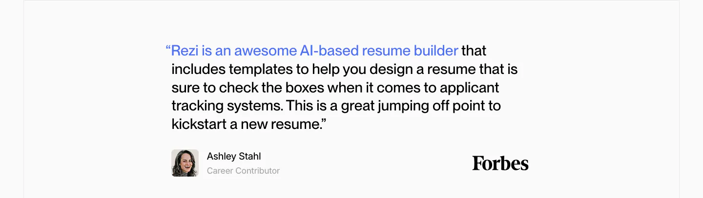
  89. Rezi testimonials section: single Forbes quote with a blue highlighted lead-in, author avatar and Forbes wordmark on light gray
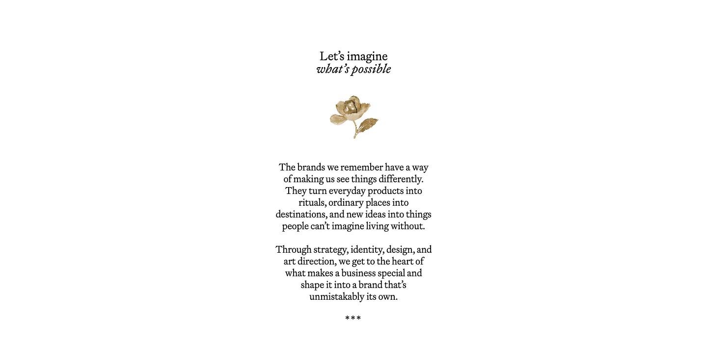
  90. Goodside about & mission section: centered serif heading, small gold flower ornament and short serif paragraphs on white
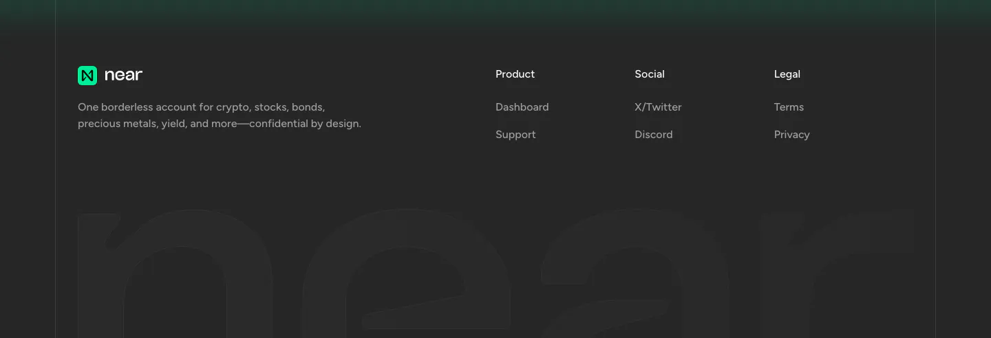
  91. NEAR footer section: logo, tagline and three link columns above a giant faded near wordmark on a charcoal background
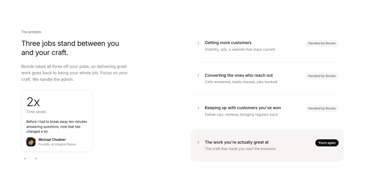
  92. Beside value proposition section: headline and testimonial stat card on the left, four numbered job rows with status pills on the right
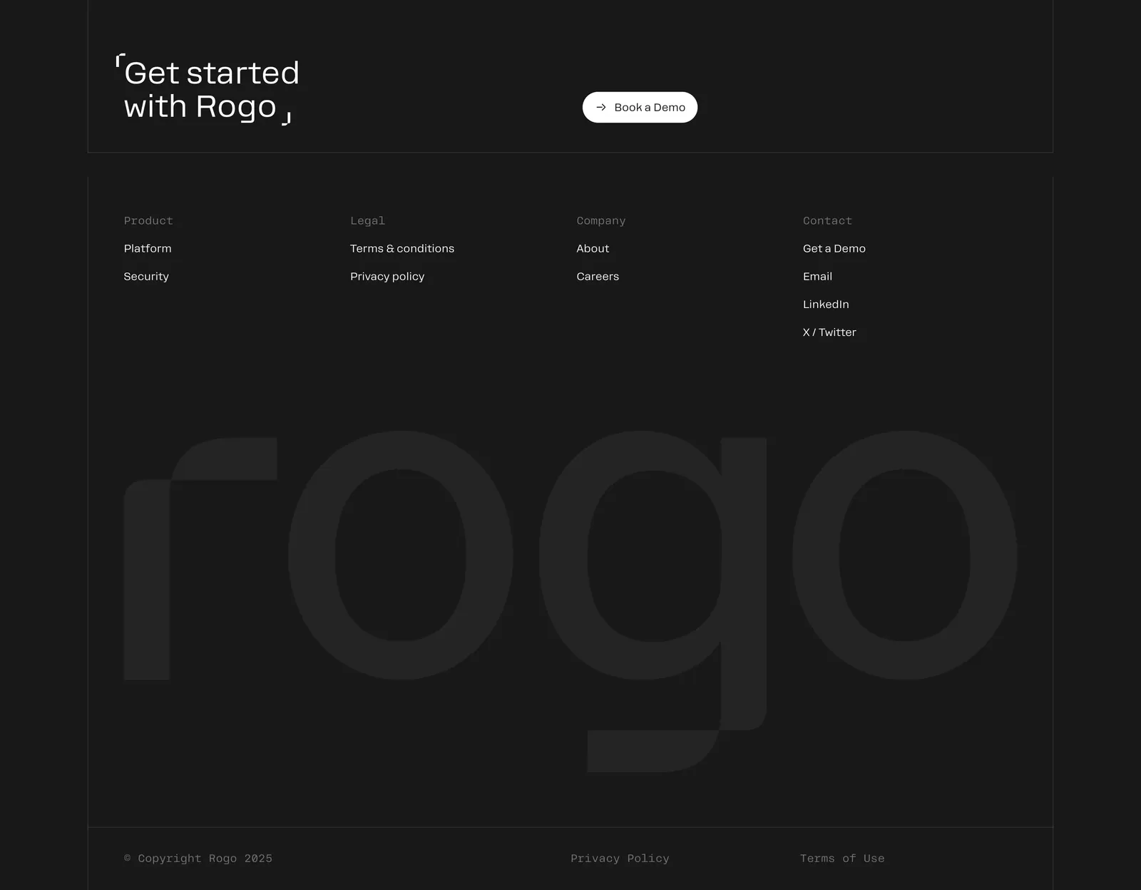
  93. Rogo footer section: Get started CTA with demo button, four link columns and a huge faint Rogo wordmark on charcoal
  94. Ploy logo cloud section: small centered caption above a single row of grayscale customer logos fading at the edges on light gray
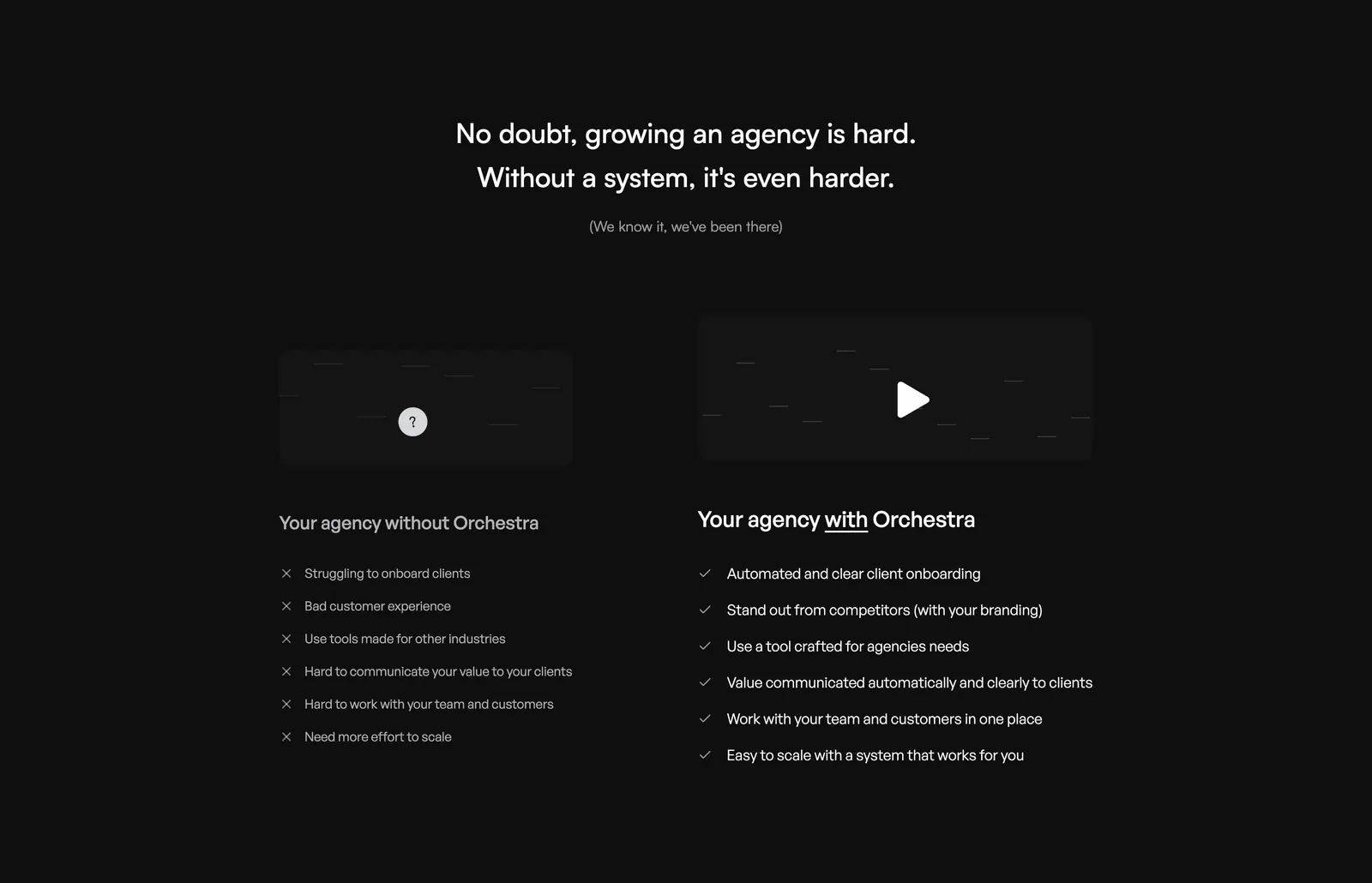
  95. Orchestra comparison section: centered headline above two columns contrasting pains without Orchestra and checked benefits with it, dark
  96. Chatbase logo cloud section: bordered three-row grid of gray customer logos on a light background
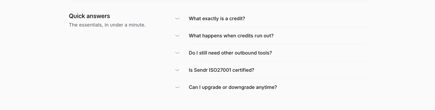
  97. Sendr FAQ section: Quick answers title on the left beside a five-question collapsed accordion list on light gray
  98. incident.io logo cloud section: small uppercase label above three rows of black customer logos on white
  99. Remote features section: left-aligned headline above a six-item grid with cyan icon tiles and divider lines
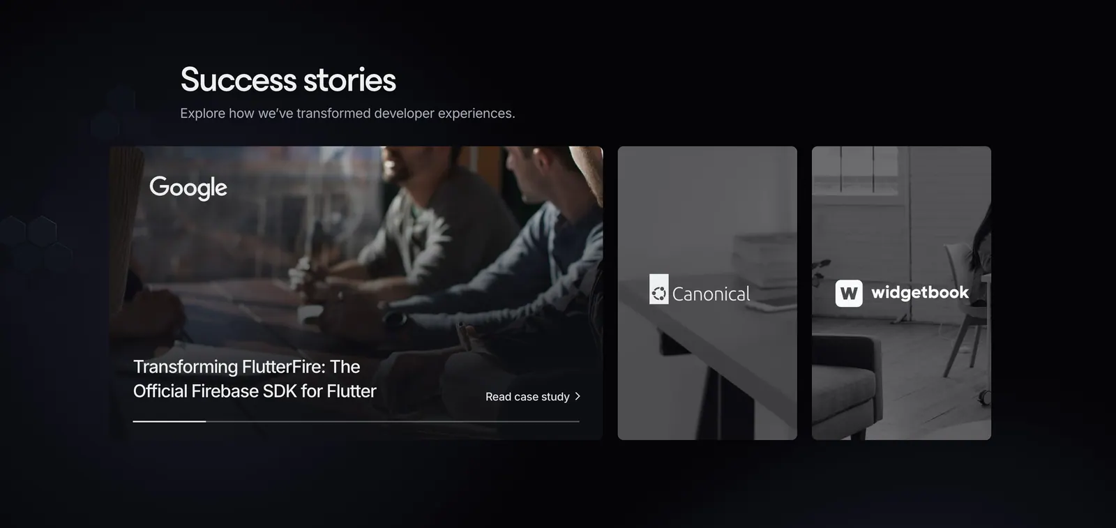
  100. Invertase testimonials section: headline above an expanded case-study card and two narrow photo cards with client logos on dark
  101. Mintlify logo cloud section: centered heading above two rows of grayscale customer logos and an Our customers button on black
  102. Polar Signals footer section: logo, tagline and copyright at left with four link columns on a black background
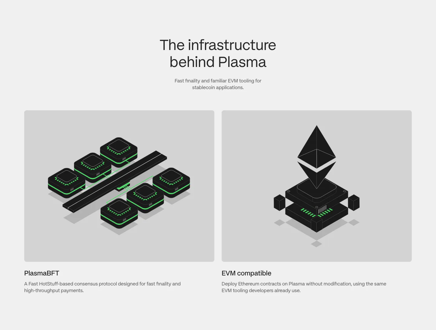
  103. Plasma features section: centered heading above two gray cards with black and green isometric renders of consensus and EVM
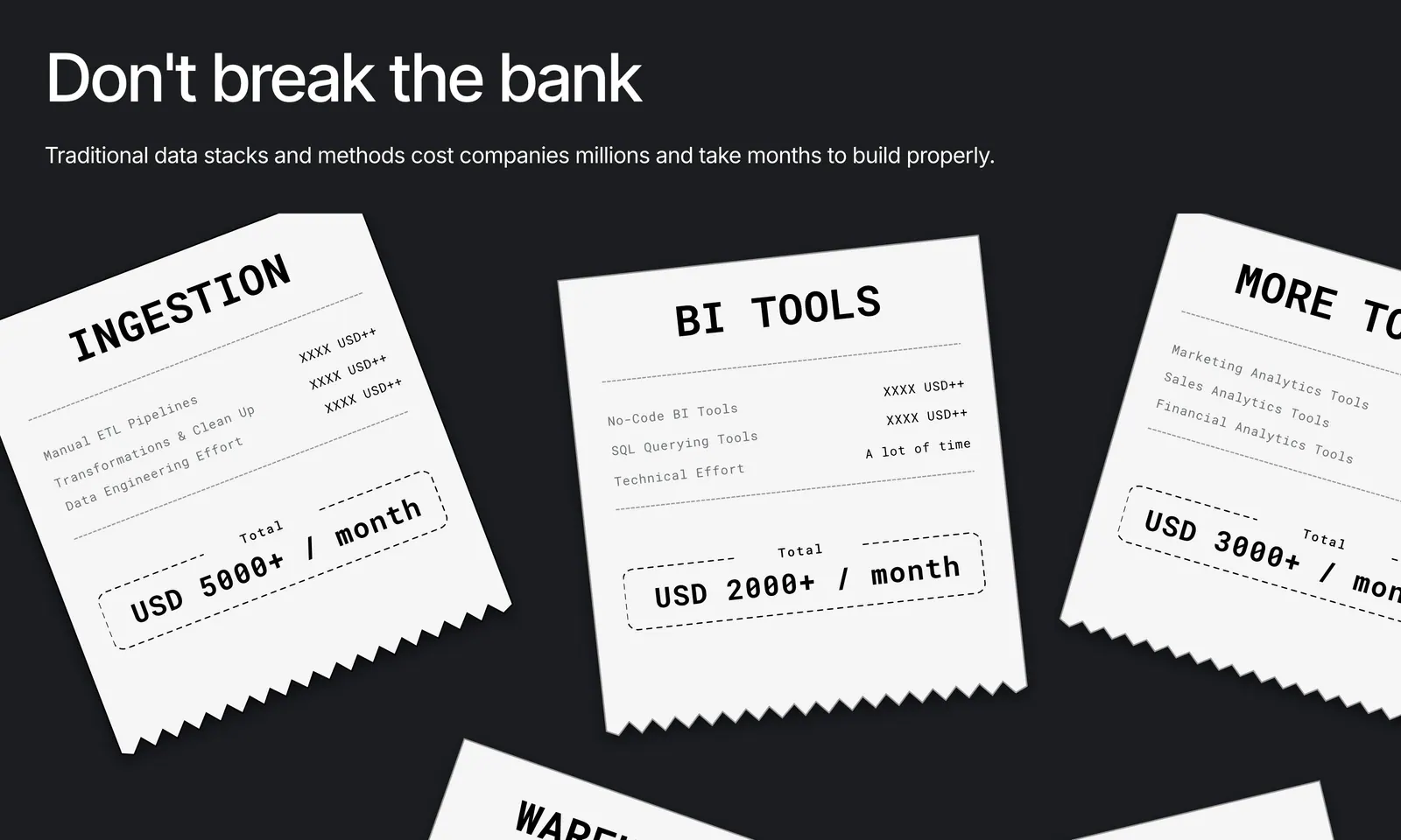
  104. Airbook value proposition section: headline on charcoal with scattered white receipt cards listing data tool costs per month
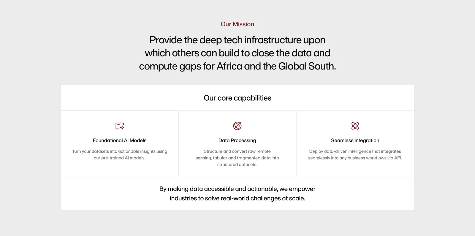
  105. Amini about & mission section: centered mission statement above a bordered panel of three core capability columns with icons
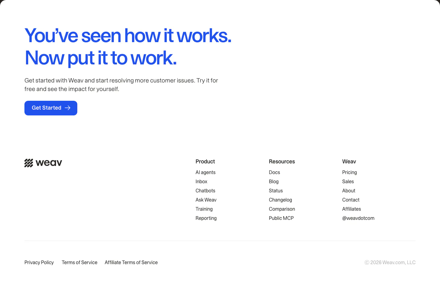
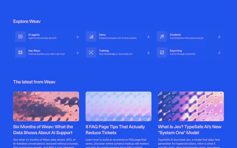
  106. Weav footer section: large blue CTA headline and button above a white footer with wordmark, three link columns and legal links
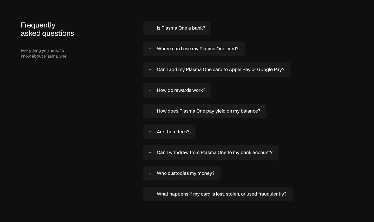
  107. Plasma FAQ section: heading and intro left, collapsed question pills stacked right on a near-black background
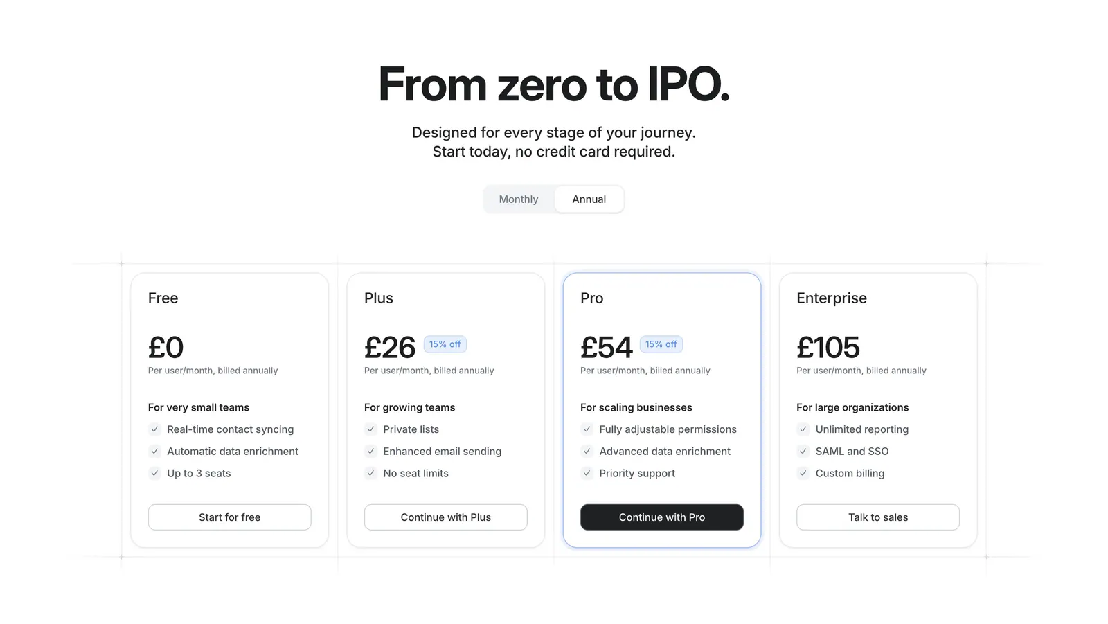
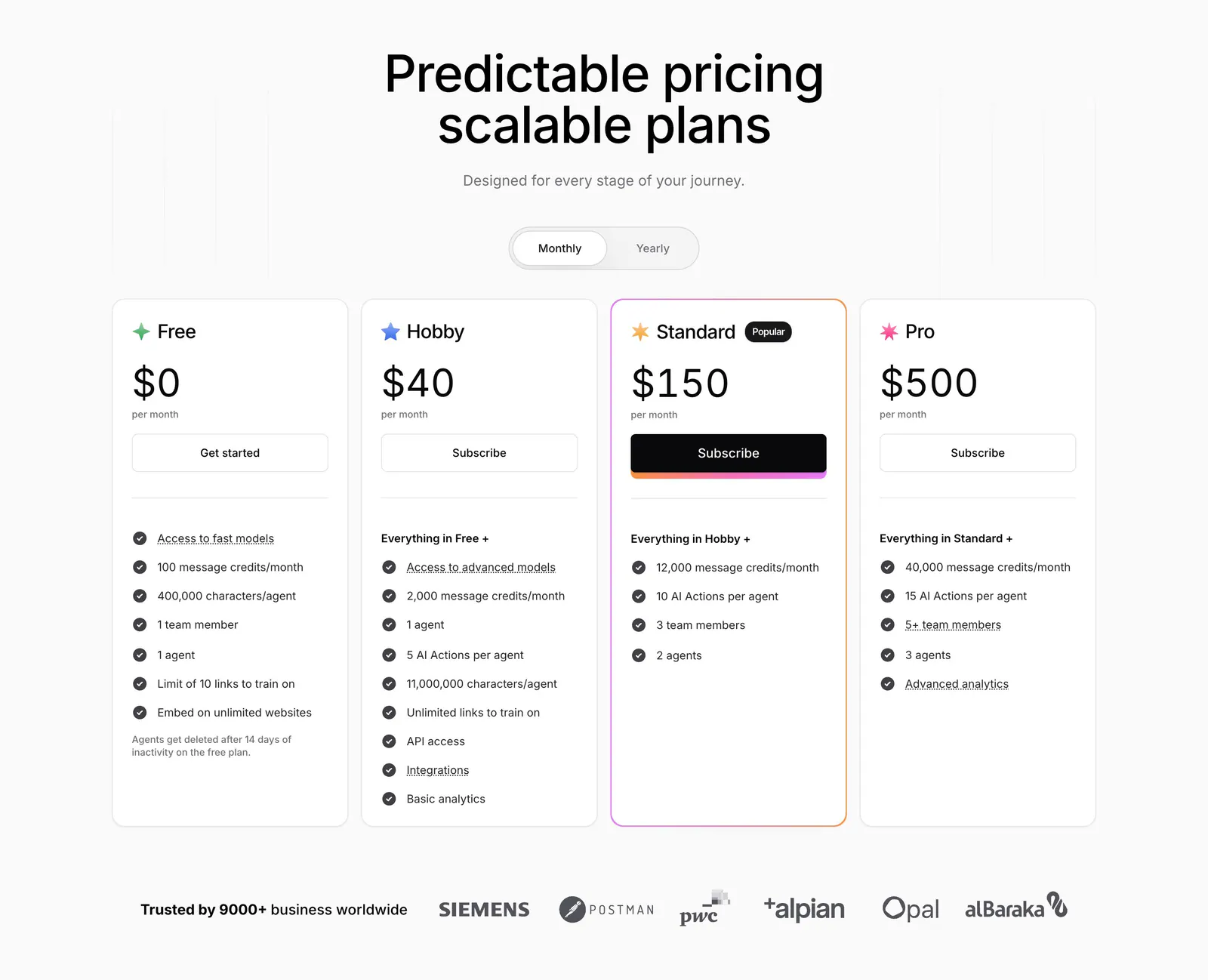
  108. Attio pricing section: centered headline with monthly/annual toggle above four plan cards with prices and checklists on white
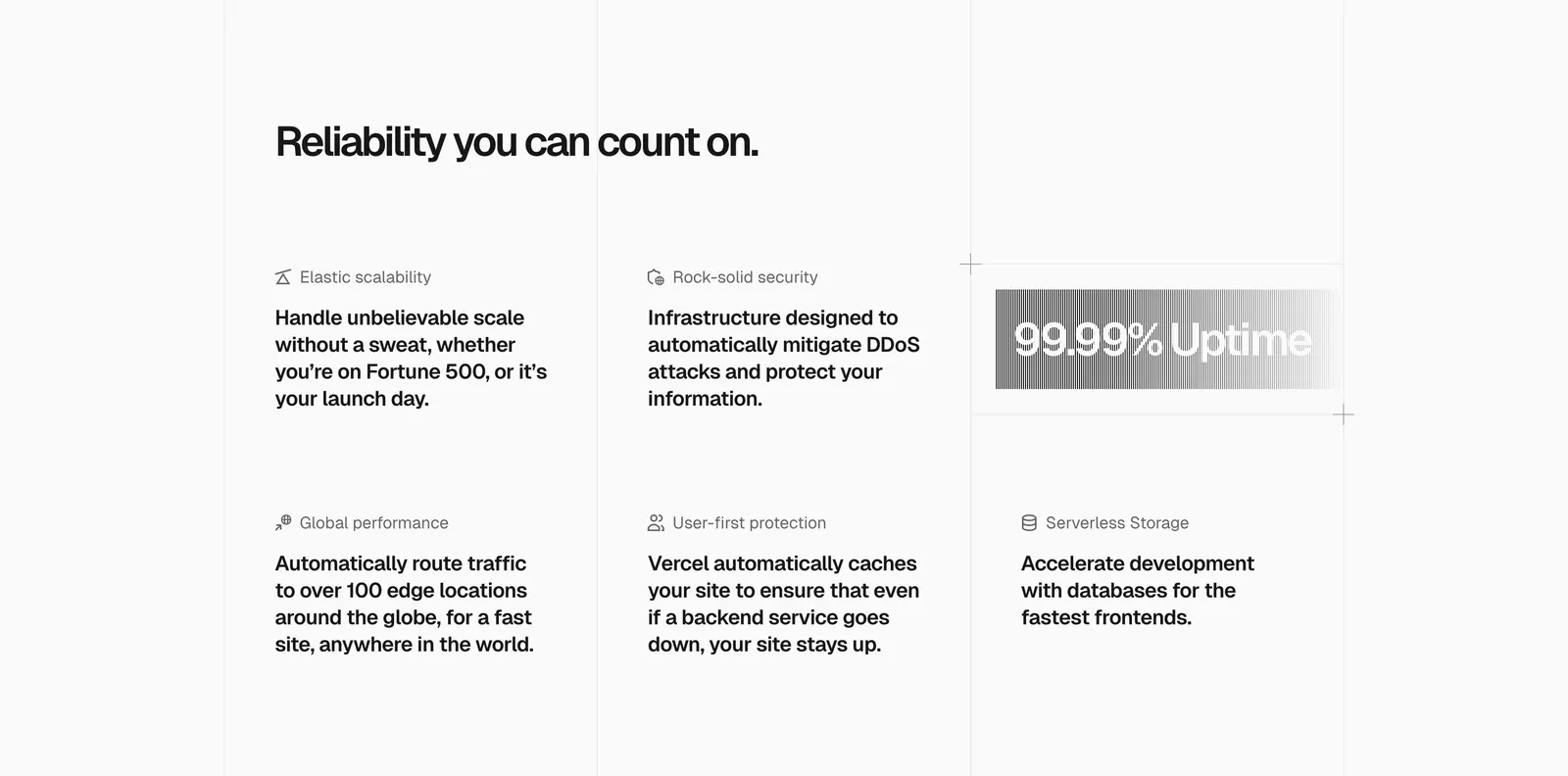
  109. Vercel features section: headline above a six-item grid of feature blurbs with icons and a gray gradient 99.99% Uptime badge
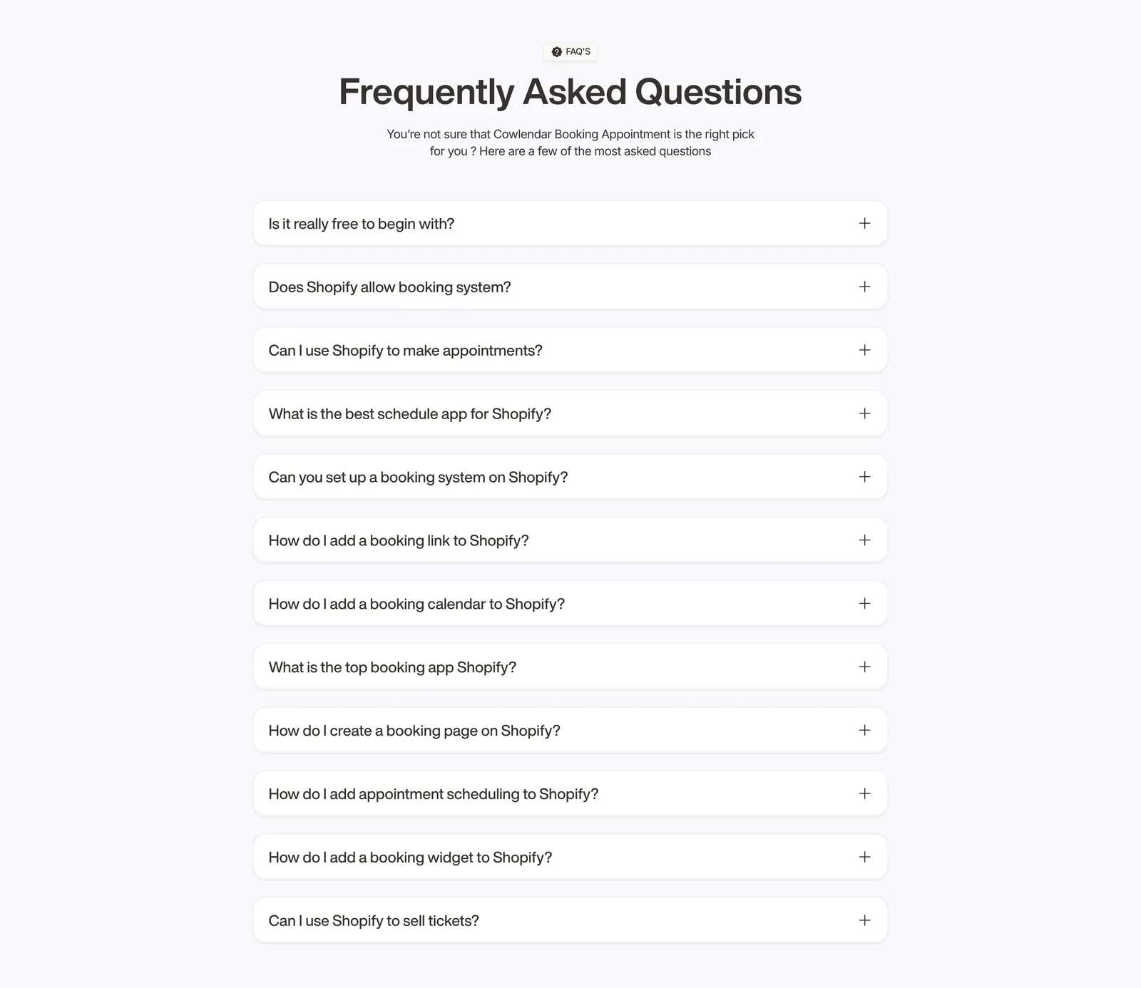
  110. Cowlendar FAQ section: centered heading above a single column of twelve collapsed question accordions on light gray
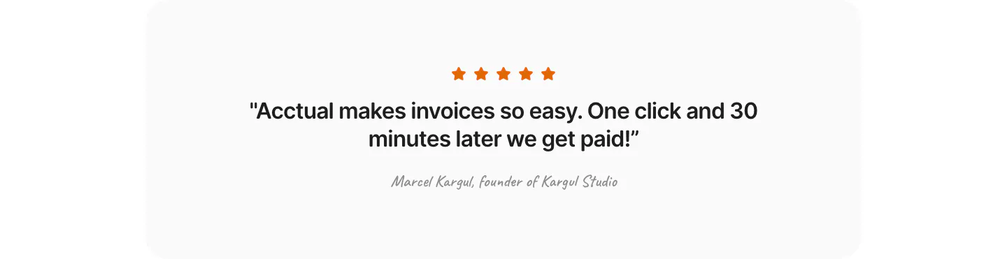
  111. Acctual testimonials section: single centered quote with five orange stars and a script attribution in a light gray rounded panel
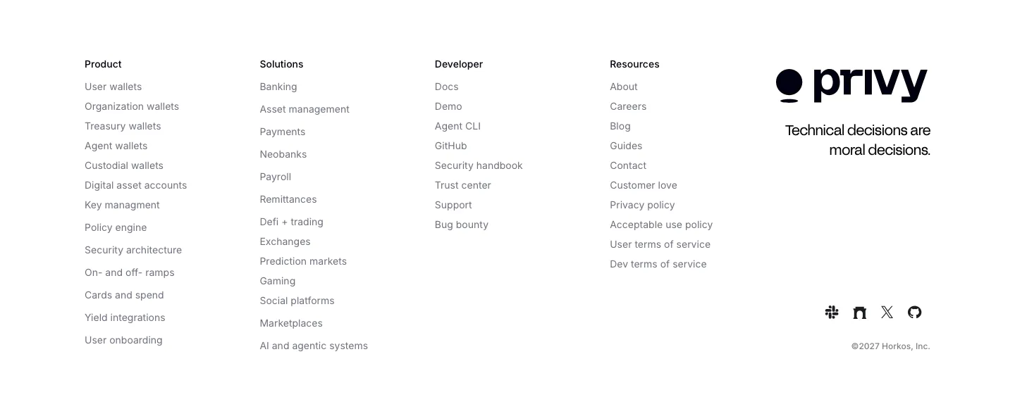
  112. Privy footer section: white footer with five link columns, Privy logo, tagline and social icons in a minimal grayscale layout
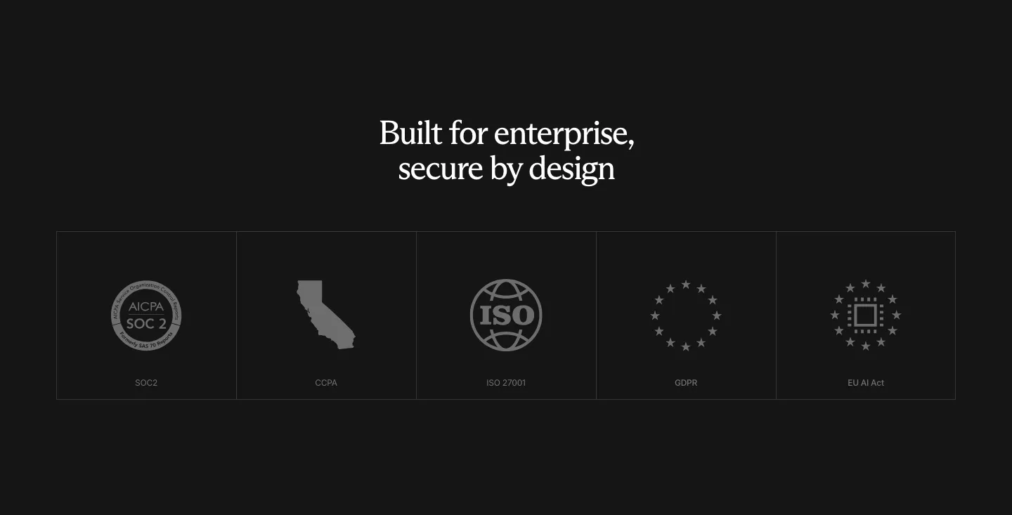
  113. Rogo security section: centered serif headline above a row of five compliance badge tiles (SOC 2, CCPA, ISO, GDPR, EU AI Act)
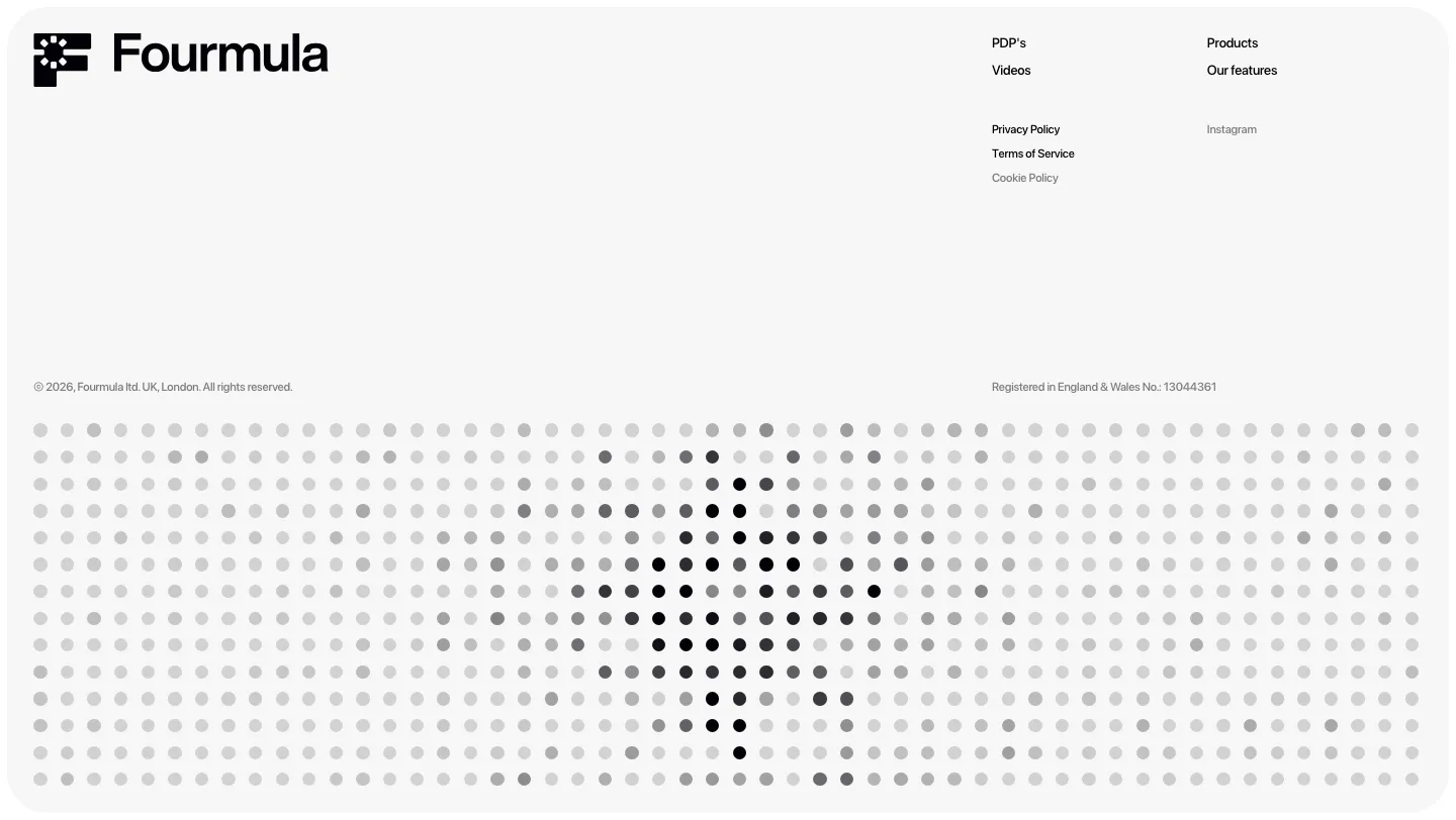
  114. Fourmula footer section: wordmark, small link columns and legal text above a gray dot-matrix field forming a halftone shape
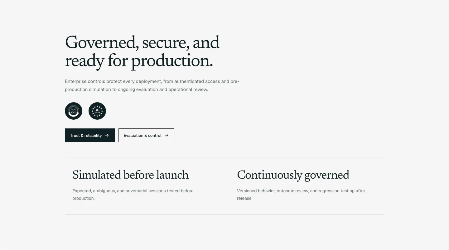
  115. Supersonik security section: serif headline, copy, SOC 2 and GDPR badges and two buttons above two governance points on light gray
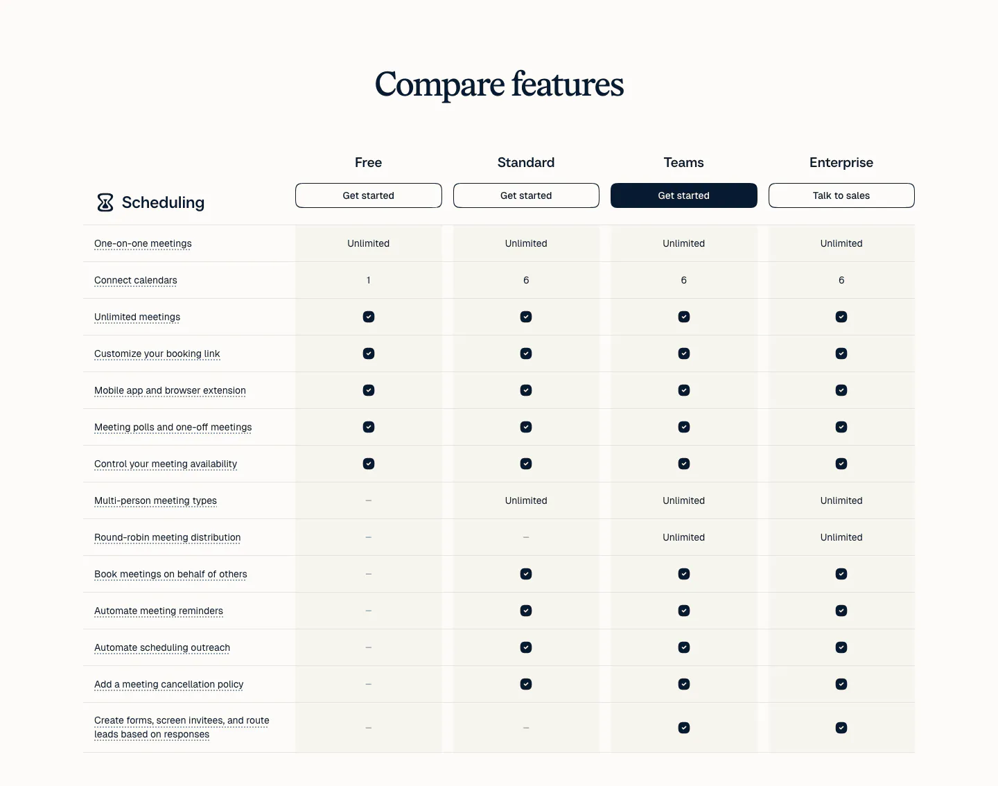
  116. Calendly pricing section: serif heading above a plan comparison table with four plan columns, buttons and check marks on a light background
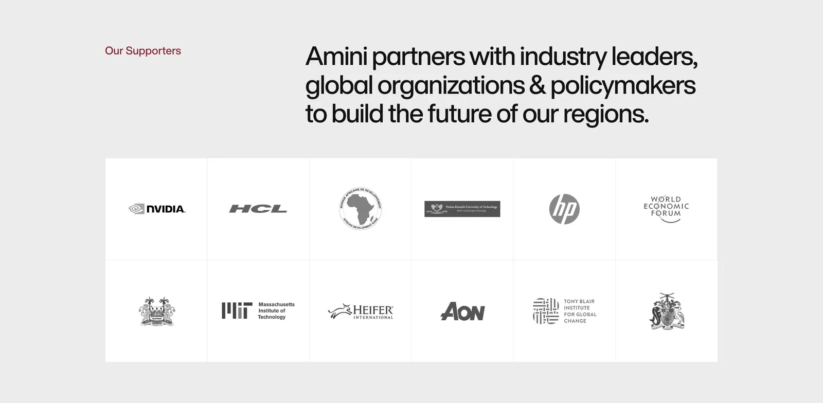
  117. Amini logo cloud section: label and headline above a bordered two-row grid of grayscale partner and supporter logos on light gray
  118. Mintlify pricing section: centered heading with monthly/yearly toggle above four plan columns with icon feature lists on black
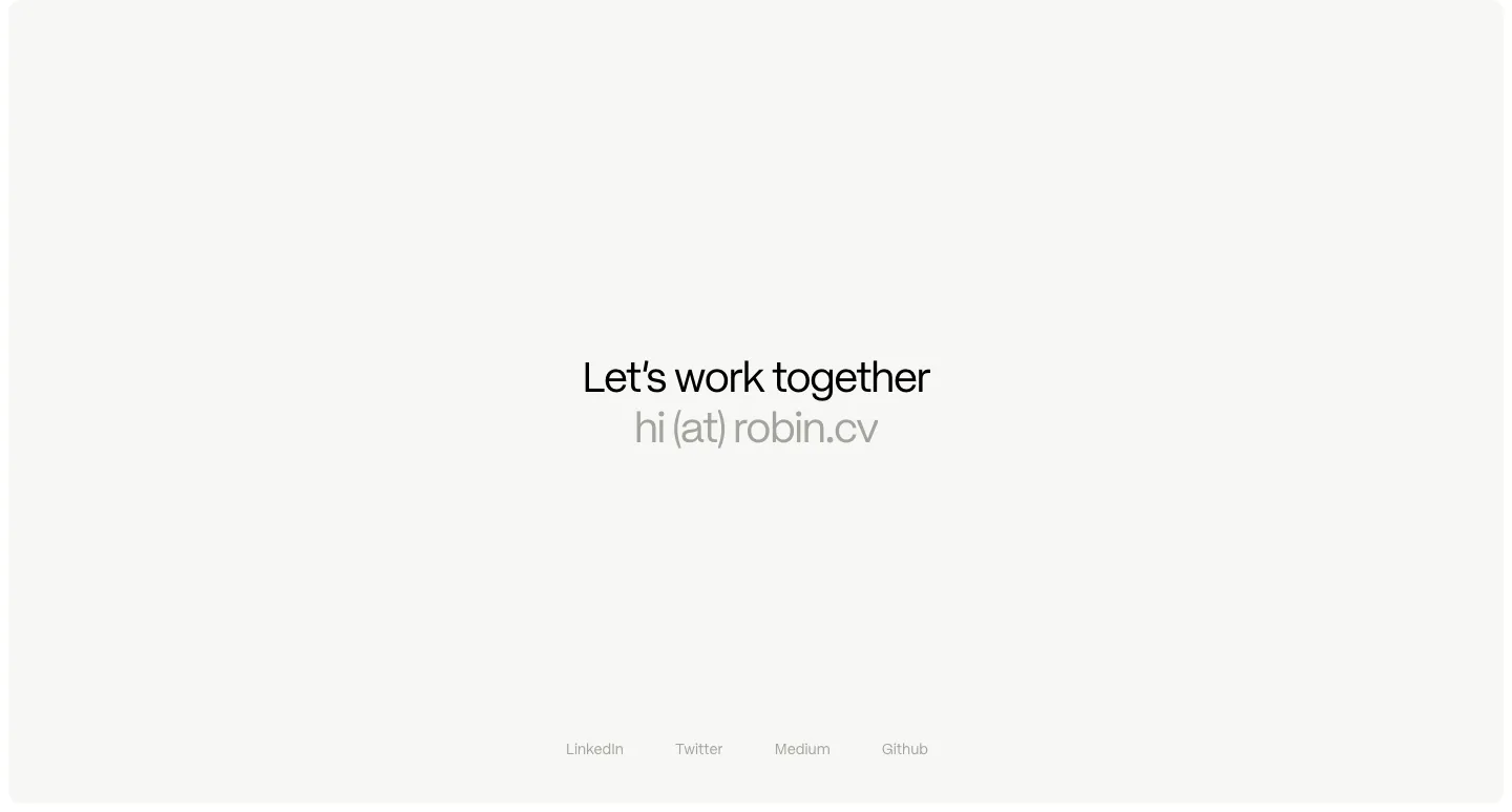
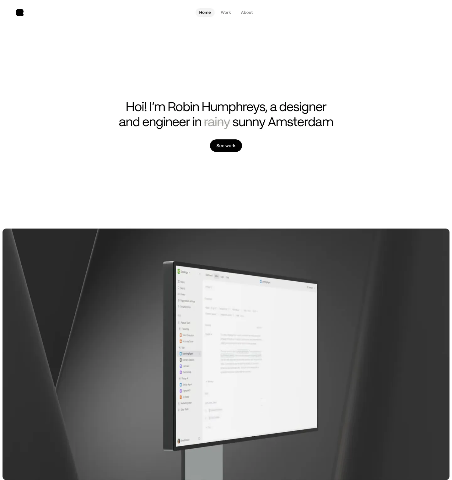
  119. Robin Humphreys footer section: centered Let's work together line with an email address and a row of social links on an off-white card
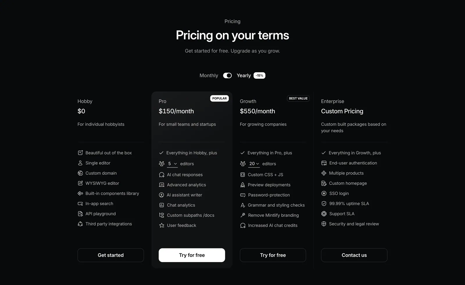
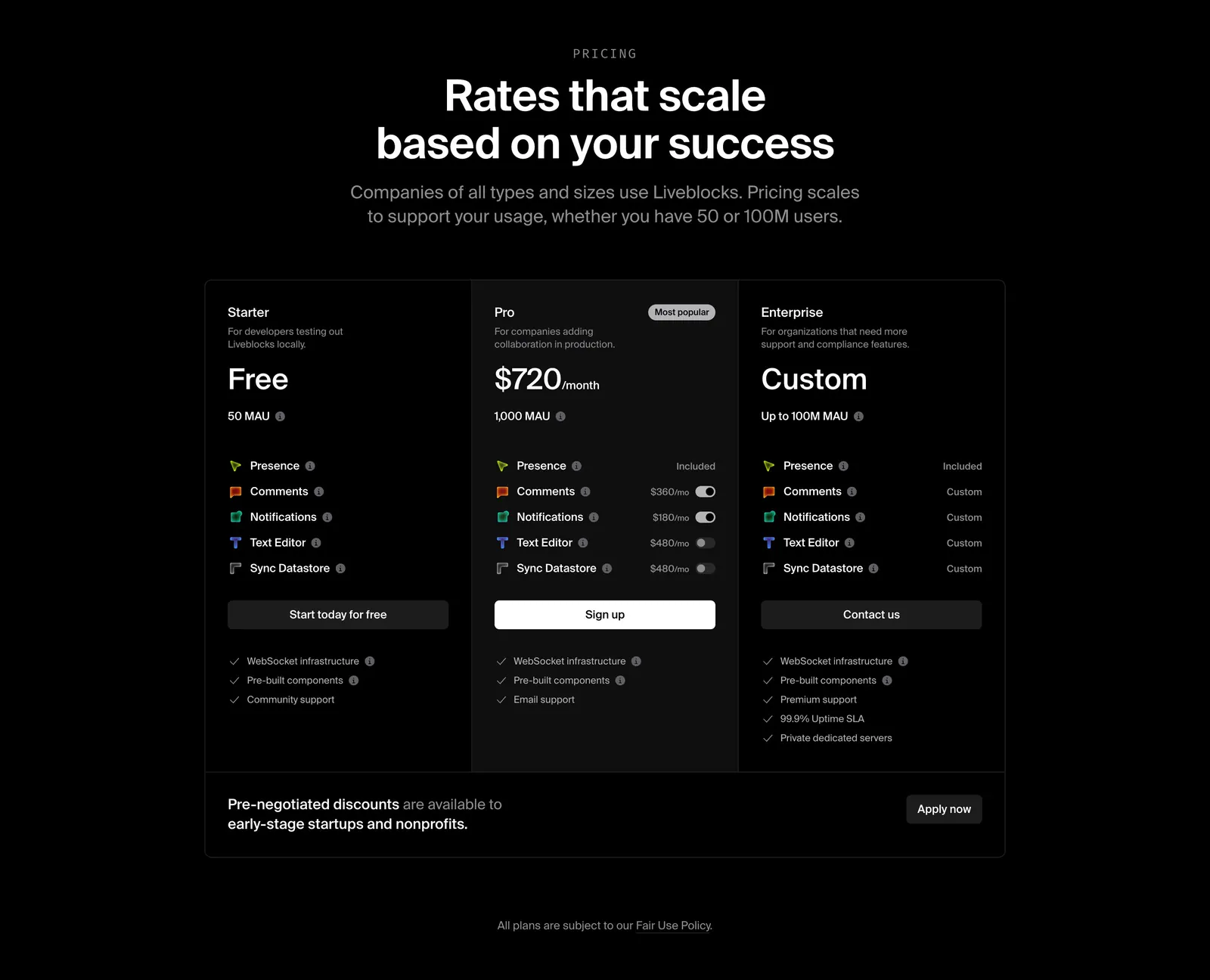
  120. Liveblocks pricing section: centered heading above three dark plan columns, Starter, Pro and Enterprise, with add-on toggles and a discount banner
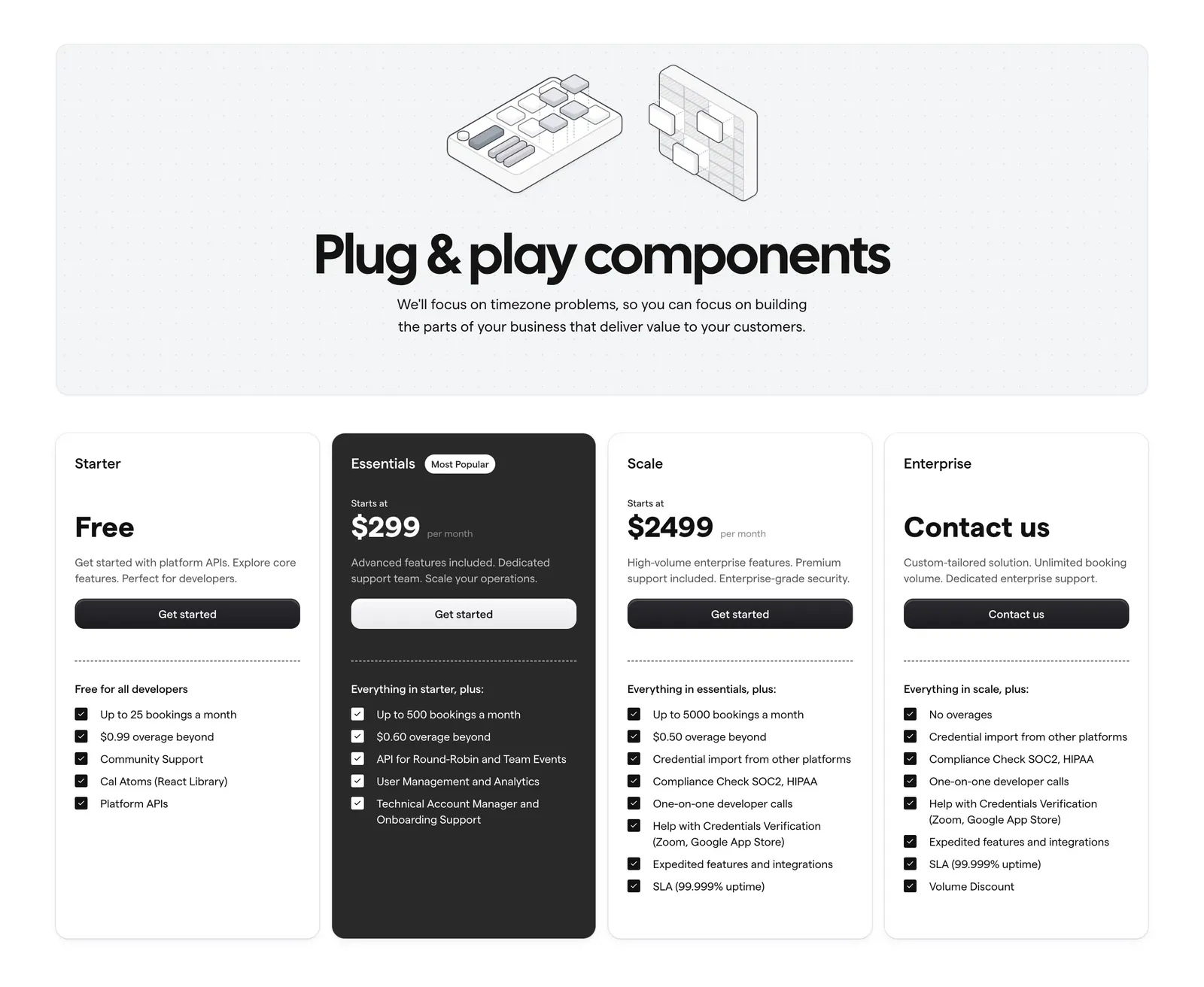
  121. Cal.com pricing section: centered headline with isometric line art on a dotted panel above four plan cards, one dark highlighted
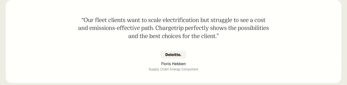
  122. Chargetrip testimonials section: centered serif quote from a Deloitte consultant with company badge and name on a white rounded panel
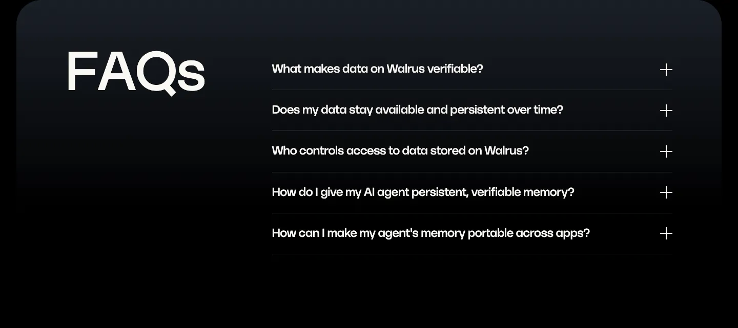
  123. Walrus FAQ section: oversized FAQs heading on the left beside a five-question accordion on a dark panel
  124. Hellotime footer section: logo and tagline on the left, three link columns on the right, copyright and legal links below on white
  125. Plasma call to action section: slim dark band with a centered two-line heading and a white Get in touch button
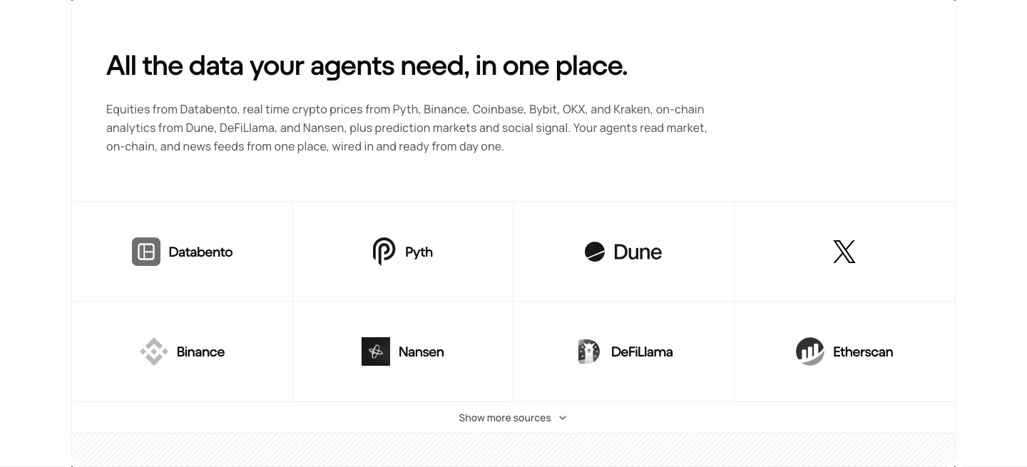
  126. NickAI integrations section: left heading and copy above a bordered grid of eight grayscale data provider logos
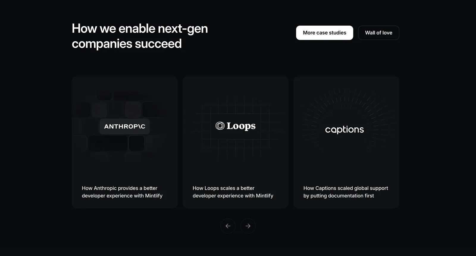
  127. Gradient Labs logo cloud section: serif heading above a single row of white customer logos on a near-black background
  128. Bobbin logo cloud section: centered caption above a single row of five grayscale tutoring company logos on white
  129. Menkind footer section: tagline and monospace link columns above a giant serif Menkind wordmark on a black background
  130. NickAI integrations section: left heading and copy above a bordered grid of eight grayscale exchange and market logos
  131. Mintlify logo cloud section: centered two-line heading above a single faded-edge row of customer logos on black
  132. Ada call-to-action section: centered lowercase headline with an inline yellow Get a demo pill button on a white background
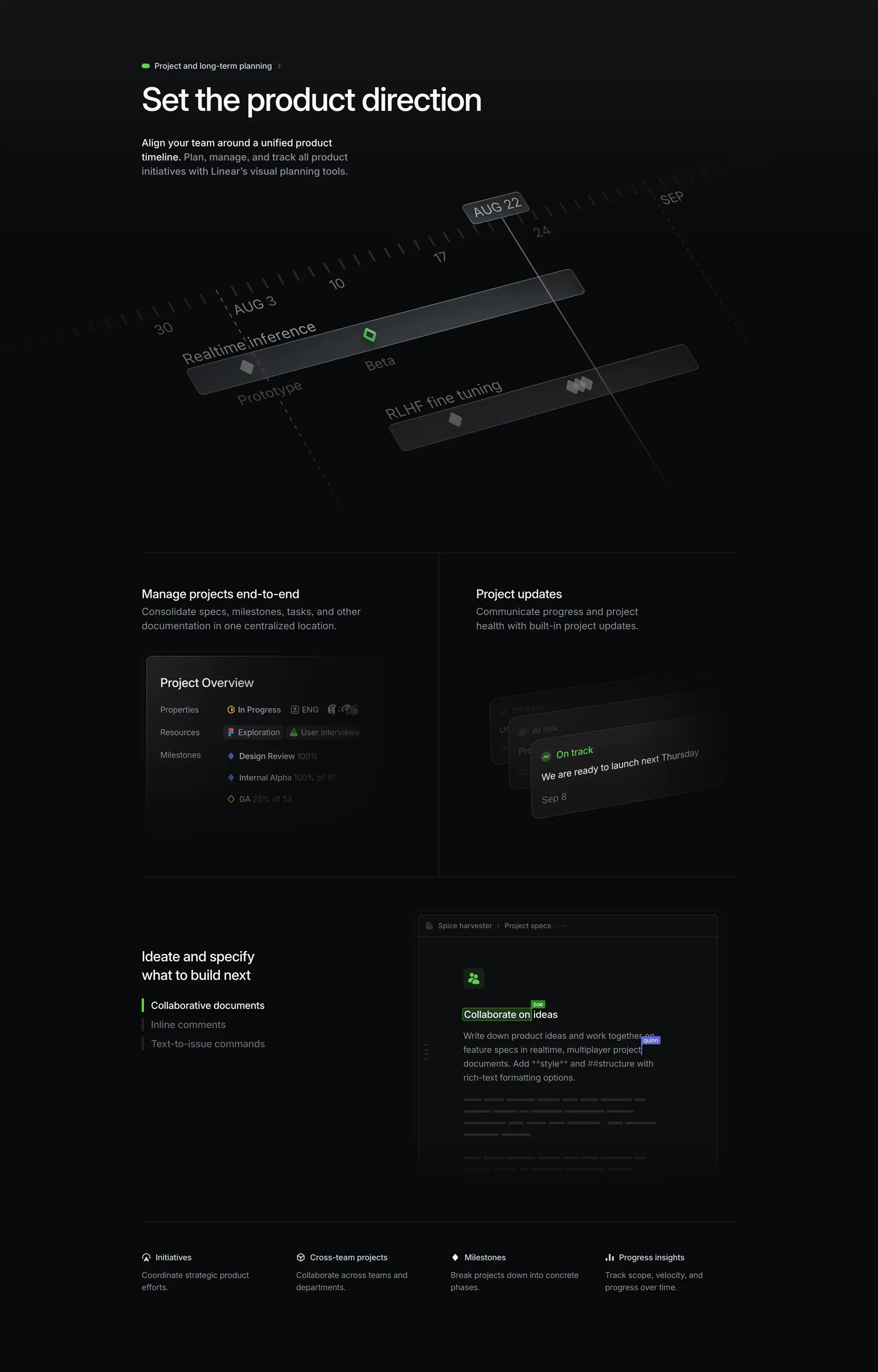
  133. Howseen AI FAQ section: centered heading above a six-question accordion list on a white background
  134. Gumloop logo cloud section: grid of customer logos with case study links beside a headline and two large stats
  135. Linear features section: dark section with a tilted project timeline graphic, project overview and update panels, and a collaborative doc mockup
  136. Vectara footer section: centered CTA with app icons above a logo and five link columns, status pill, social icons and copyright on light gray
  137. Equals logo cloud section: three rows of five grayscale customer logos including Notion, Intercom and Attio on a light gray background
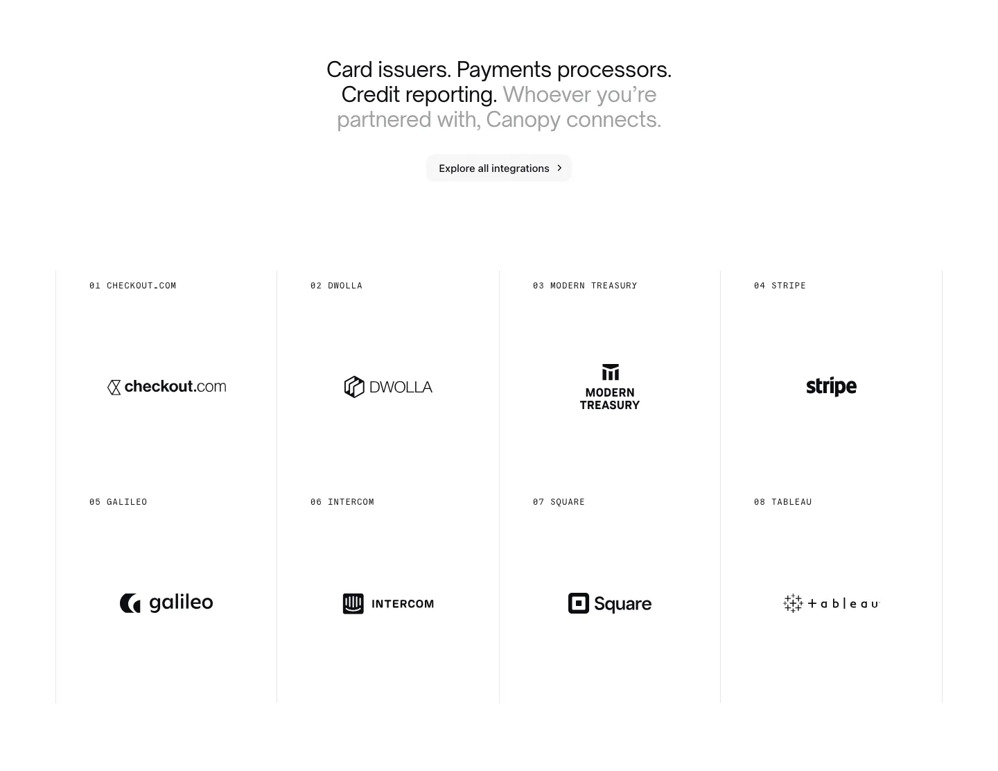
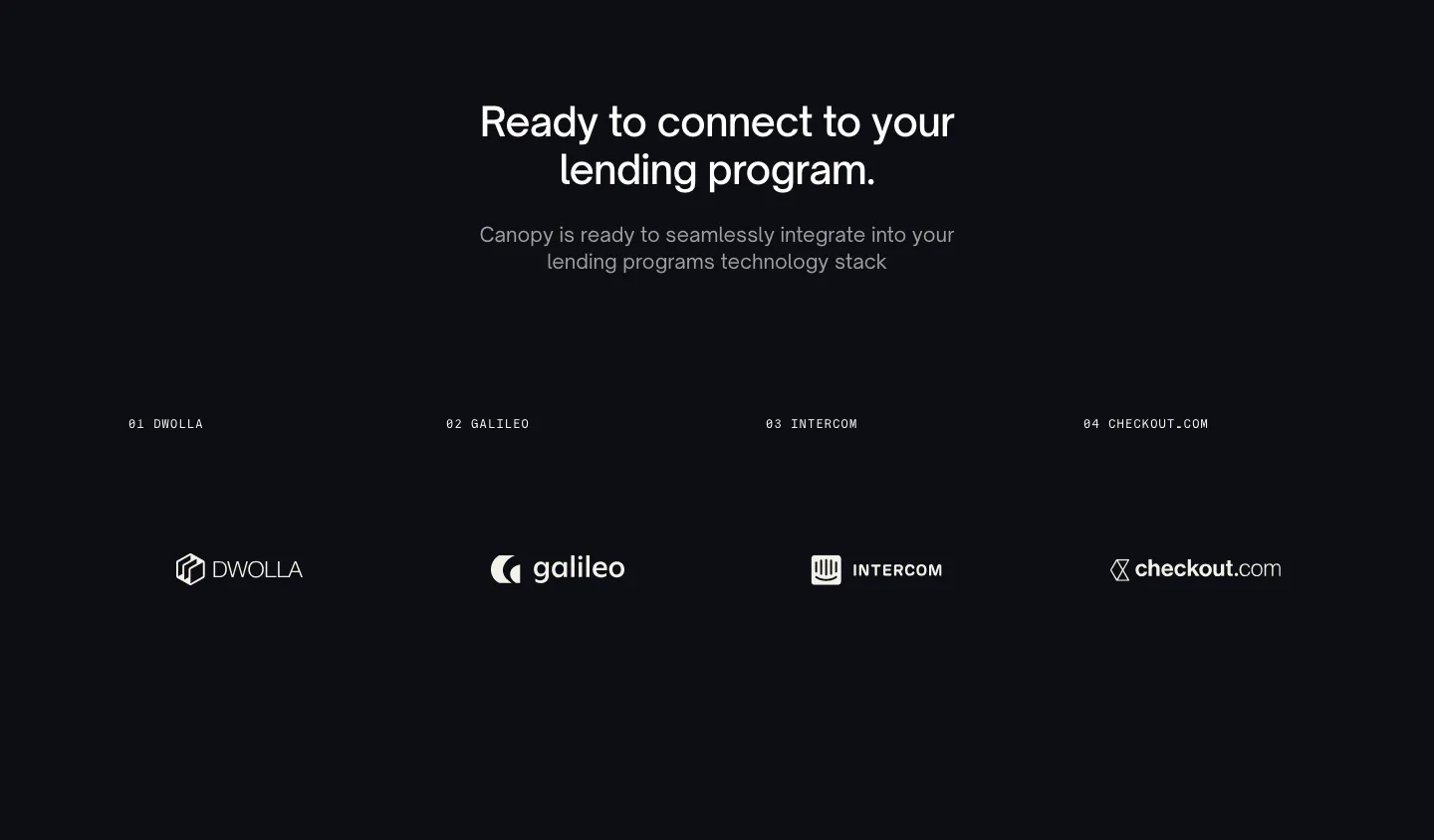
  138. Canopy integrations section: centered headline and button above a bordered 4x2 grid of numbered partner logos on white
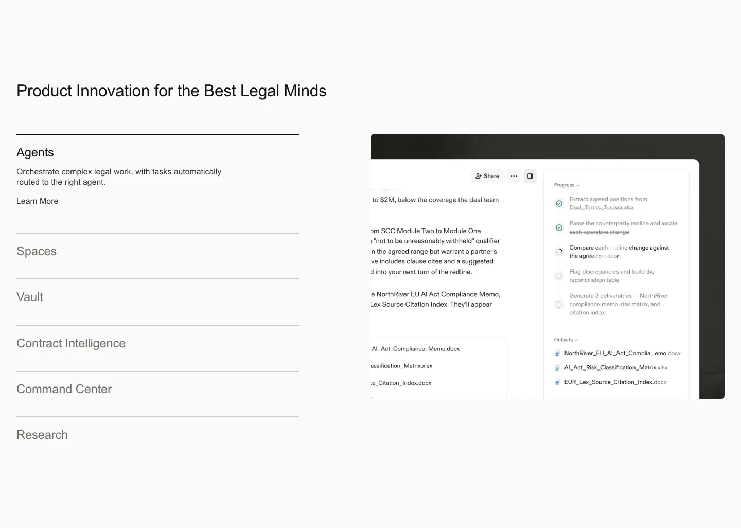
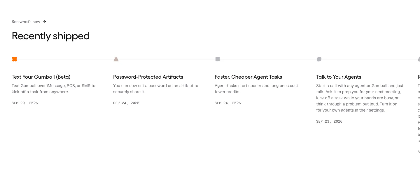
  139. Harvey features section: product list accordion on the left beside an agent workflow screenshot on a light gray background
  140. Concourse value proposition section: centered headline, pill label and white button on a near-black background with faint square blocks
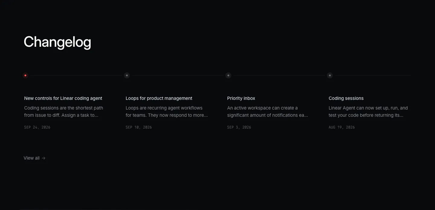
  141. Linear blog & resources section: dark changelog with four dated entries along a horizontal timeline and a view-all link
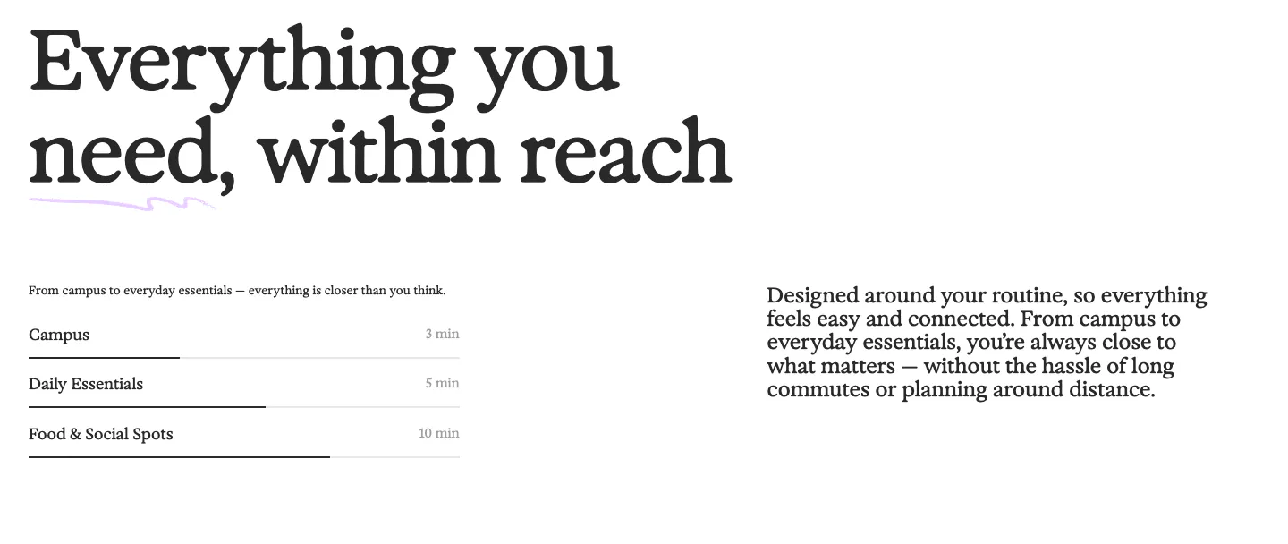
  142. 21Oaks value proposition section: oversized serif headline above a distance list with progress bars and a paragraph on the right
  143. Flank logo cloud section: small left-aligned caption above a single row of gray customer logos on a black background
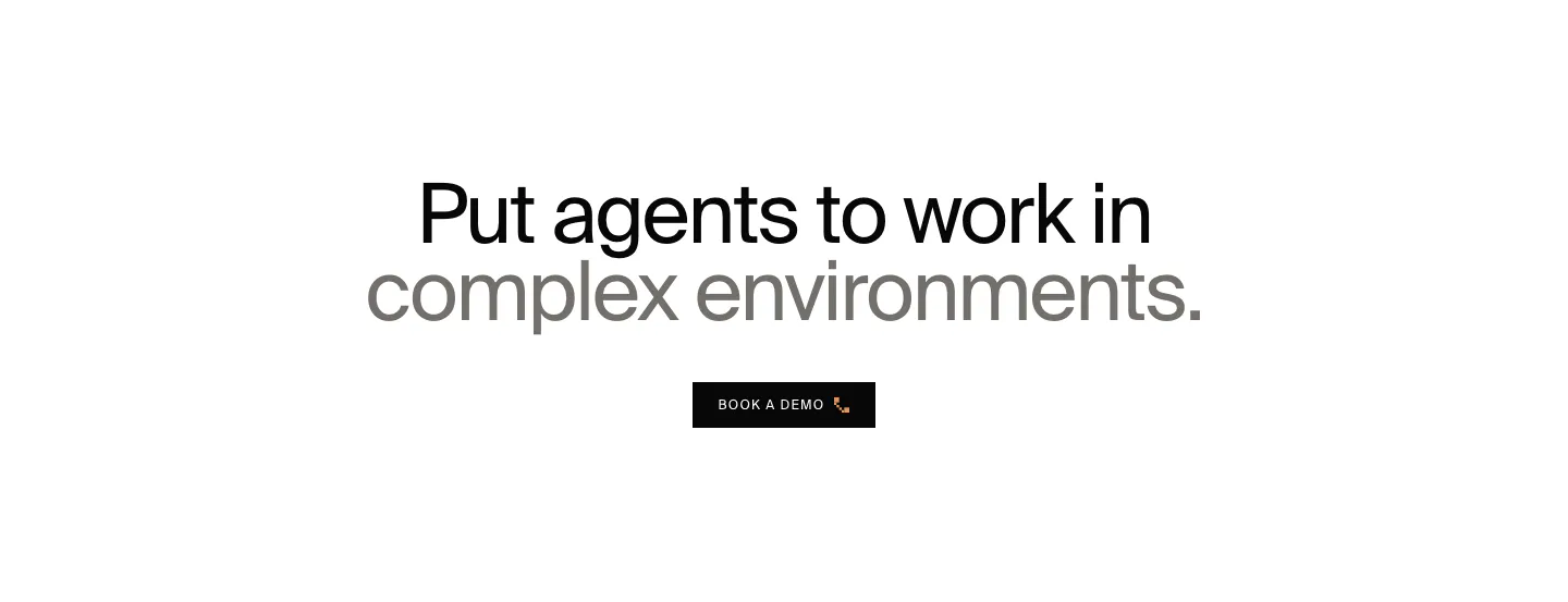
  144. HappyRobot call to action section: centered two-tone headline in black and gray above a small black Book a demo button on white
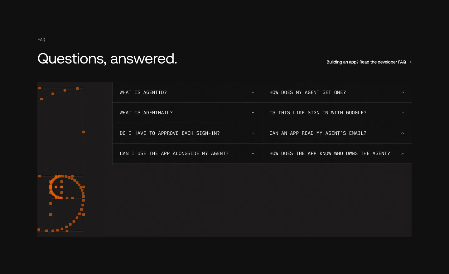
  145. AgentID FAQ section: dark two-column grid of monospace accordion questions beside an orange pixel-dot smiley artwork
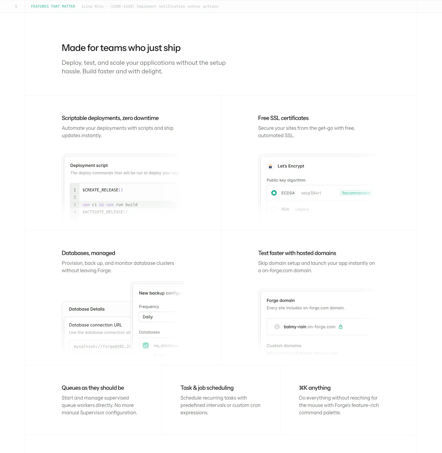
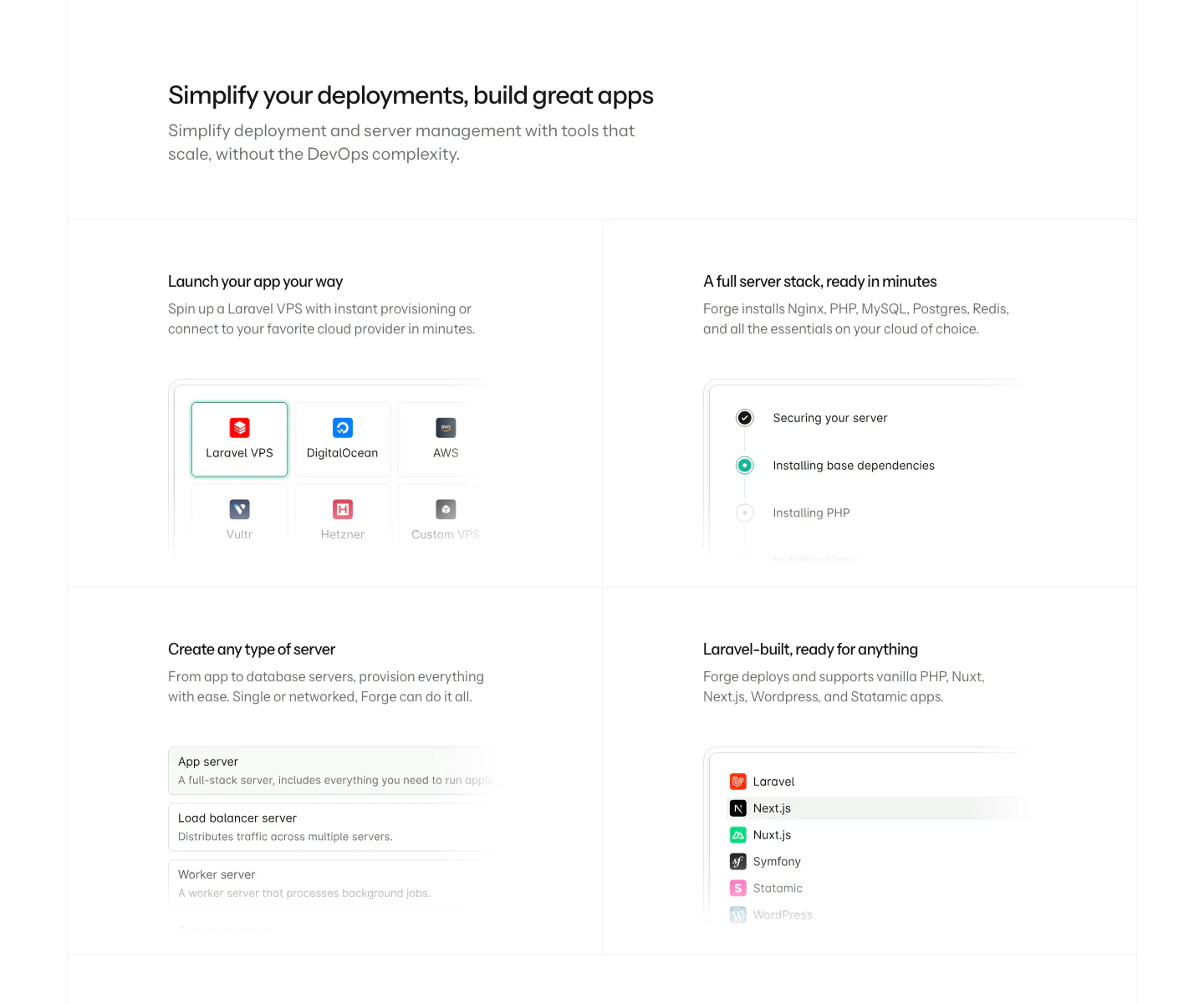
  146. Laravel Forge features section: four large tiles with UI mockups incl. a deploy script, plus three text-only tiles on white
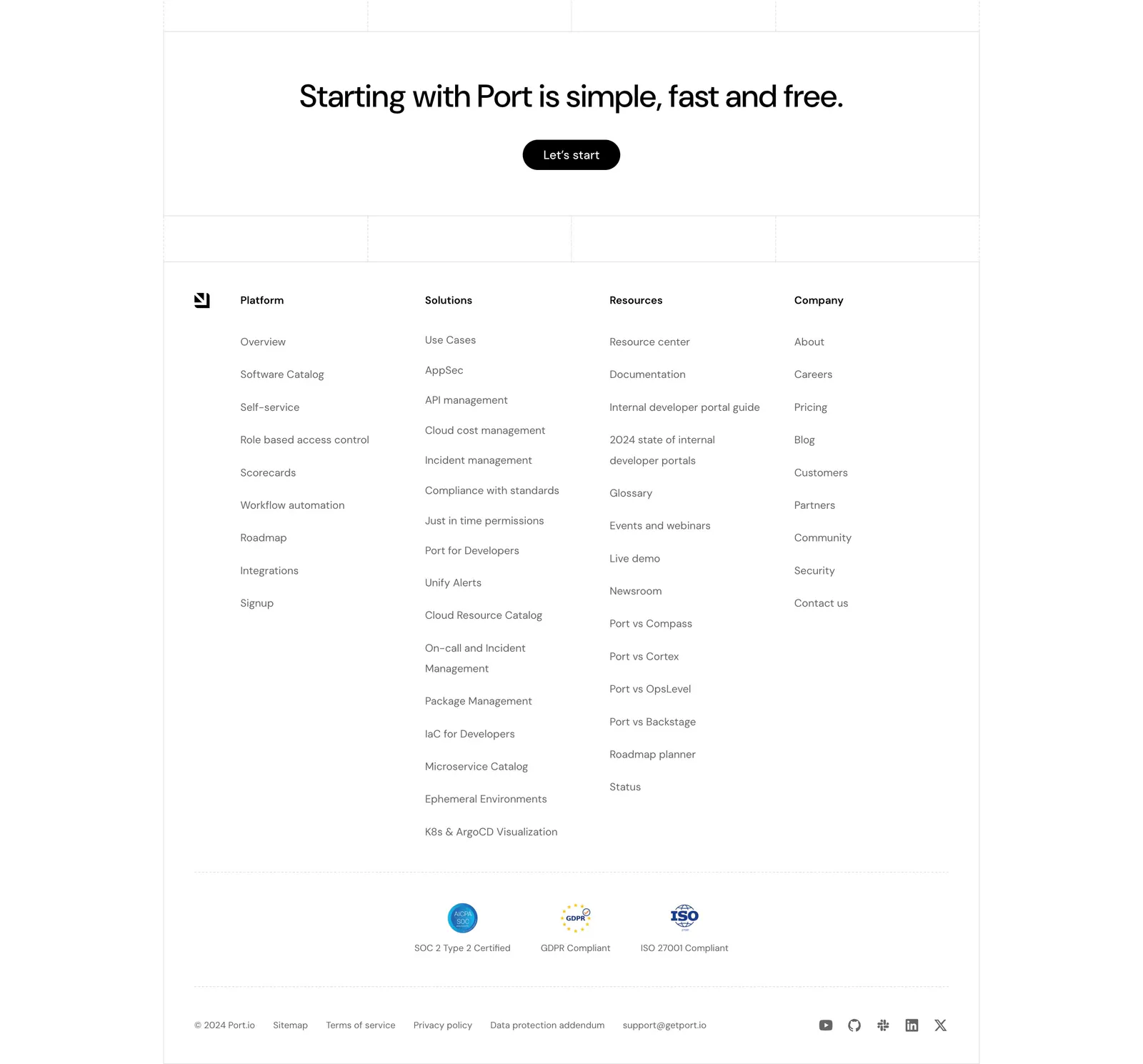
  147. Port footer section: centered CTA with Let's start button above four link columns, compliance badges, legal links and social icons
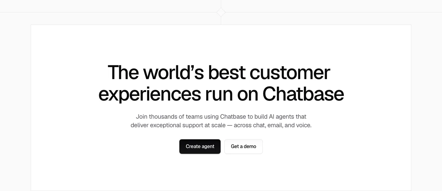
  148. Chatbase call to action section: centered black headline, short copy and two buttons in a white bordered box
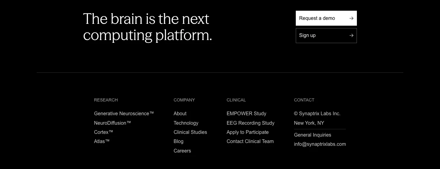
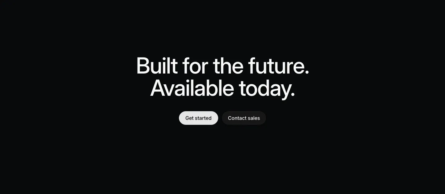
  149. Synaptrix footer section: closing headline with demo and sign-up buttons above four link columns on a black background
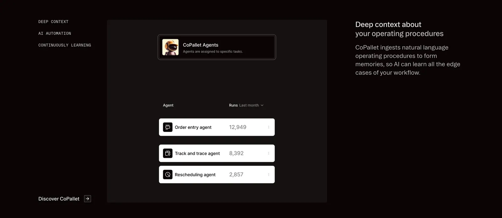
  150. Pallet features section: dark three-column layout with vertical tab labels, a CoPallet agents UI card and descriptive text on the right
  151. Intercom logo cloud section: small monospace label above a six-by-four grid of gray customer logos on white
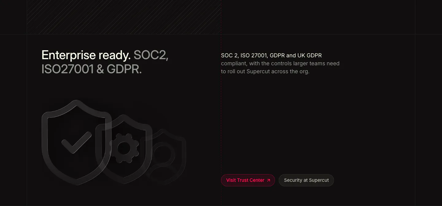
  152. Valley footer section: monospace link columns and newsletter email field above a giant outlined Valley logo and wordmark on white
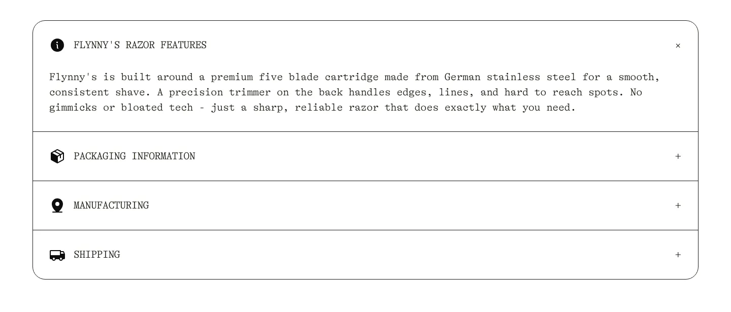
  153. Flynny's FAQ section: rounded bordered accordion in typewriter type with razor features open and packaging, manufacturing, shipping closed
  154. Supercut footer section: logo with status indicator, four link columns, legal links and SOC2, ISO 27001, GDPR badges on dark
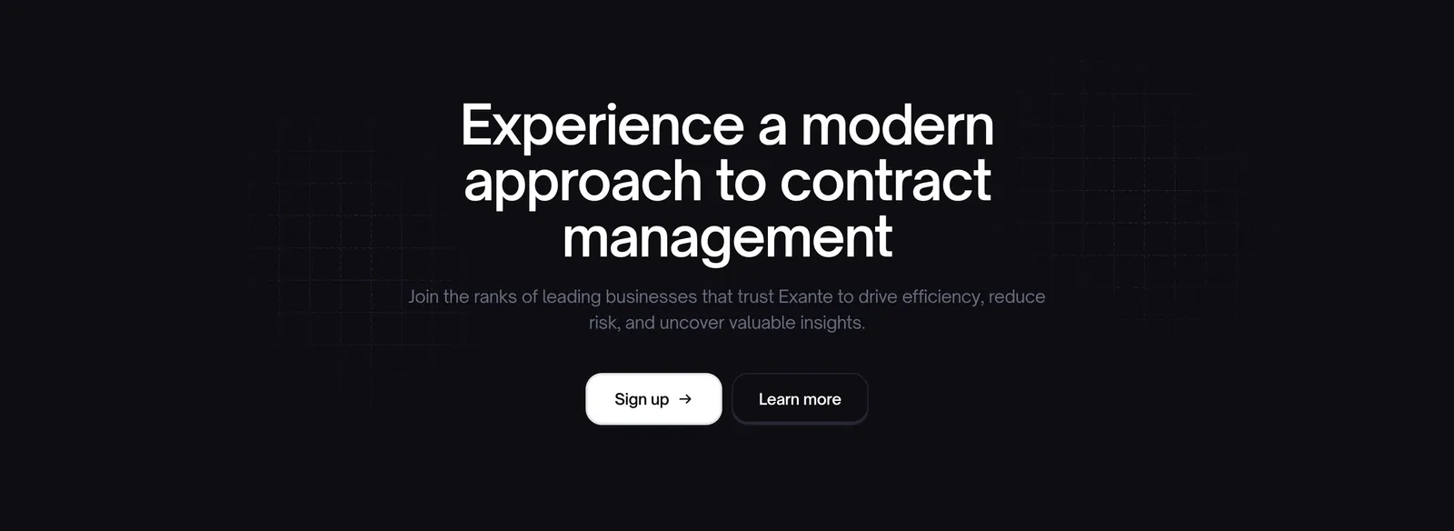
  155. Exante call-to-action section: centered headline with sign up and learn more buttons over a faint grid on a near-black background
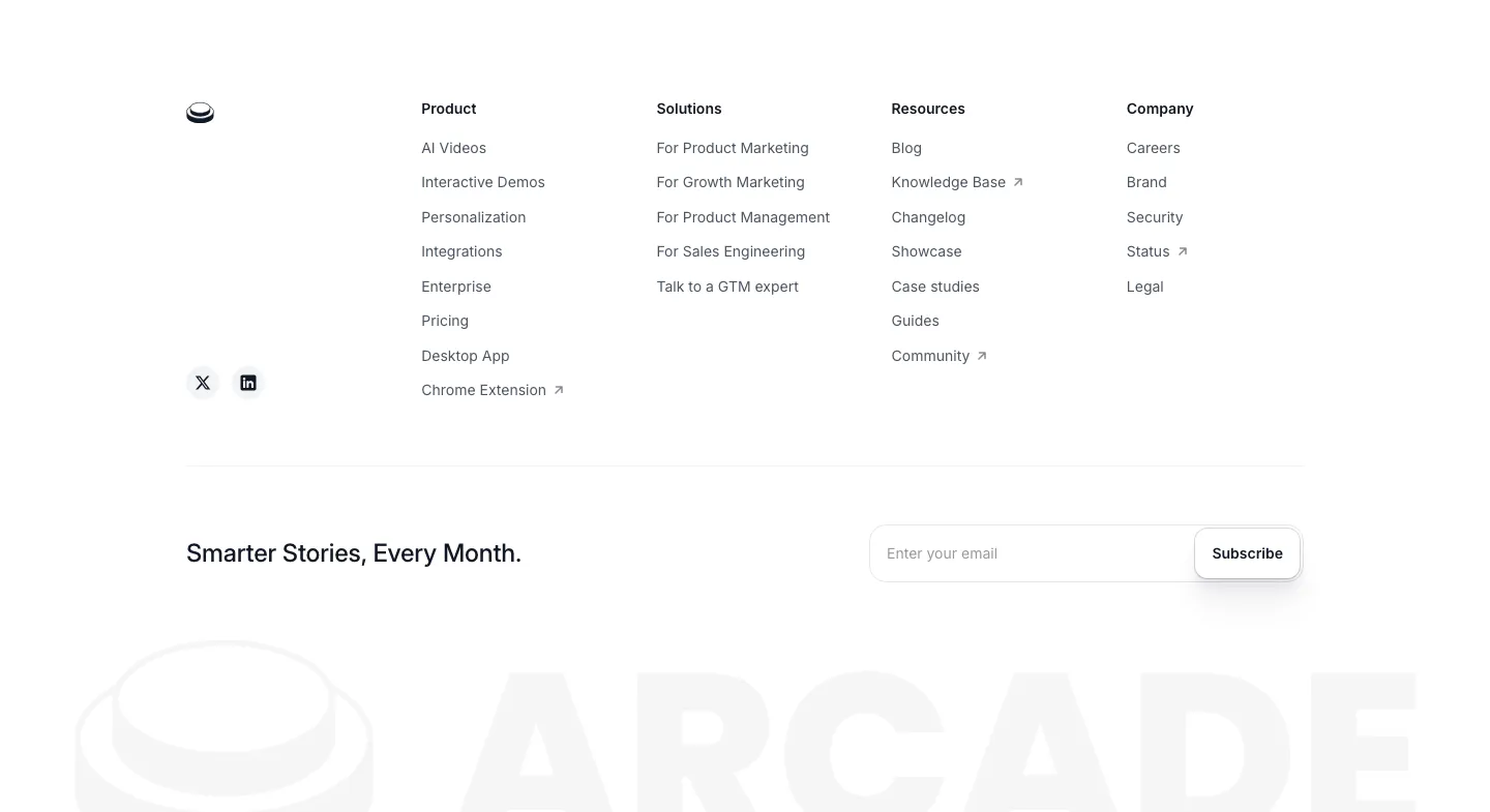
  156. Arcade footer section: four link columns and an email subscribe field above a faded oversized ARCADE wordmark and logo
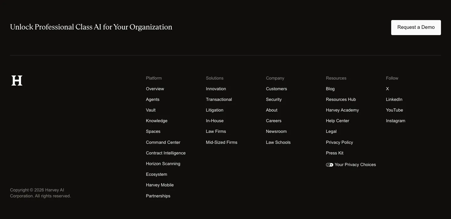
  157. Harvey footer section: dark band with serif closing line and demo button above an H logo and five link columns
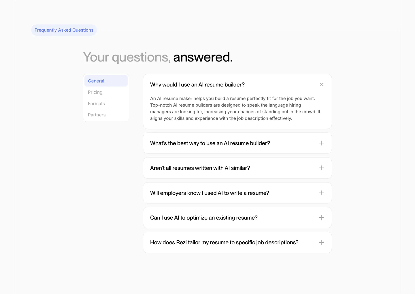
  158. Rezi FAQ section: two-tone headline above a side tab list and an accordion of question cards with one expanded answer
  159. Fillout logo cloud section: grayscale customer logo row above a trust statement and two rating cards for G2 and Product Hunt
  160. Visual footer section: dark charcoal footer with small wordmark, resources and company link columns, a white waitlist button and copyright
  161. Harvey security section: dark split layout with headline and copy left and a list of compliance certifications right
  162. Attio footer section: logo at left, link columns for platform, company, imports, apps and resources, social icons and legal row on dark
  163. Zamp logo cloud section: left-aligned heading with intro copy beside it above a bordered grid of six black customer logos on light gray
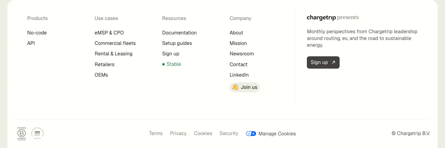
  164. Chargetrip footer section: four link columns beside a newsletter sign-up blurb, with legal links and certification badges on a white panel
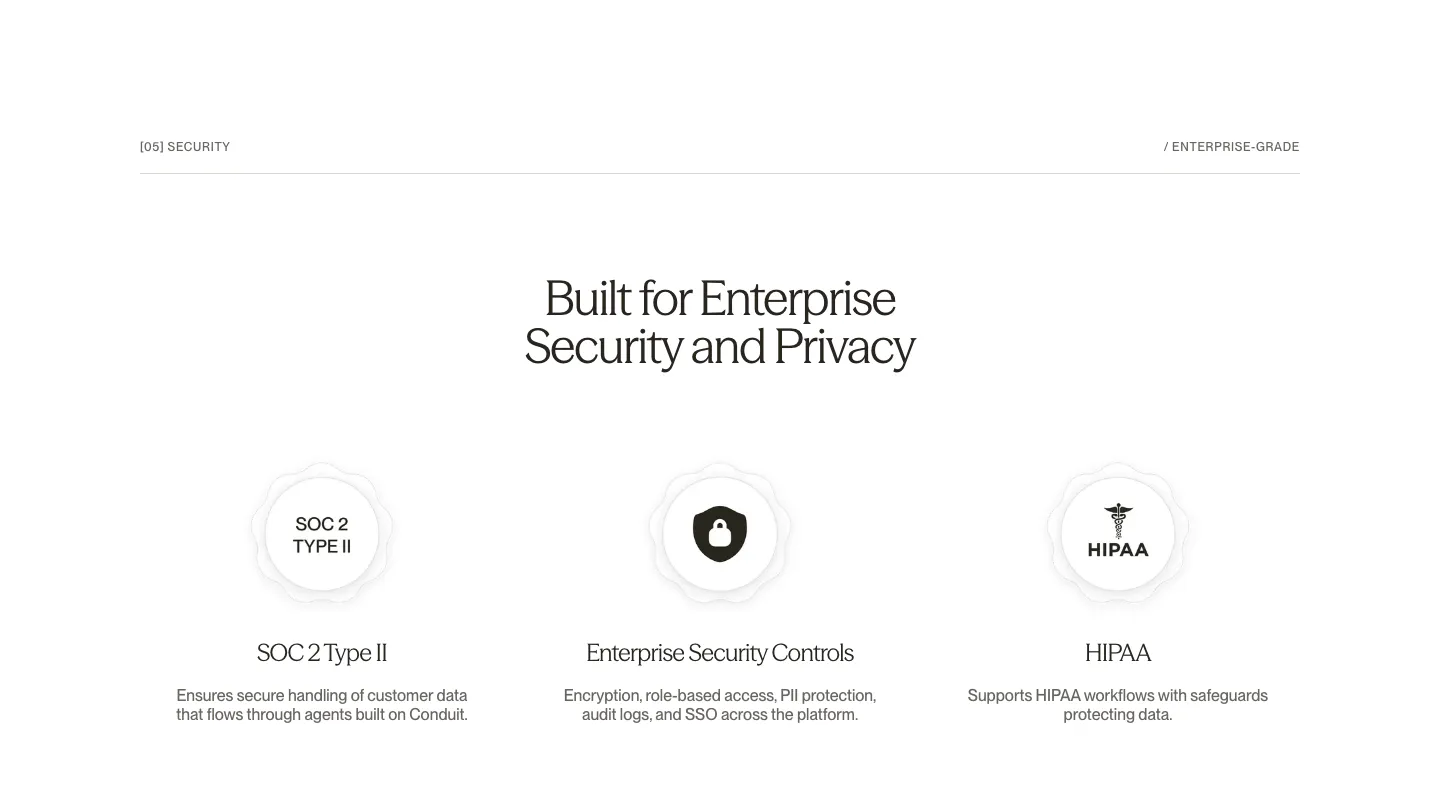
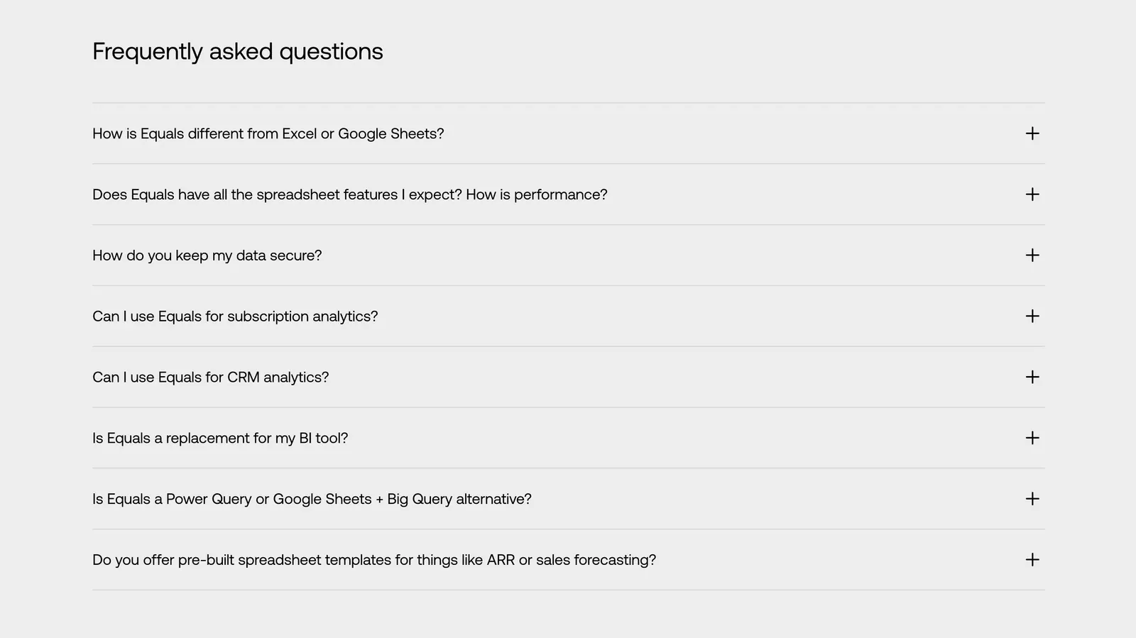
  165. Conduit security section: centered serif headline above SOC 2, security controls and HIPAA badge columns on white
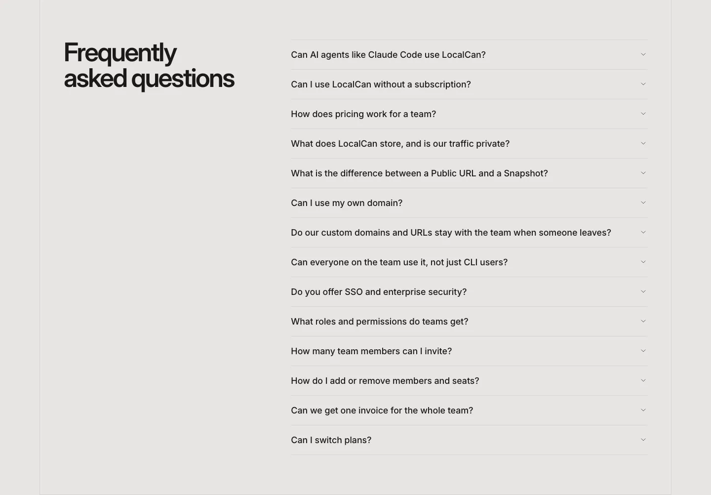
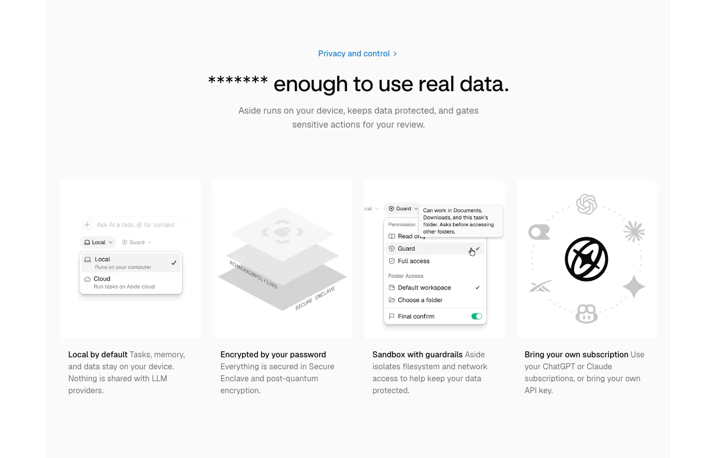
  166. LocalCan FAQ section: two-line headline on the left beside a long collapsed accordion of questions on a light gray background
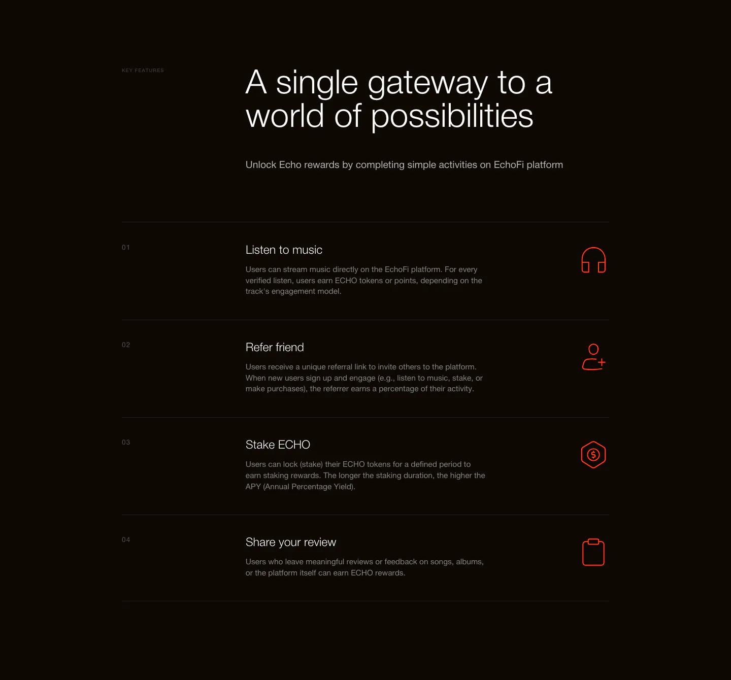
  167. Equals FAQ section: left-aligned heading above an eight-question accordion with plus icons on a light gray background
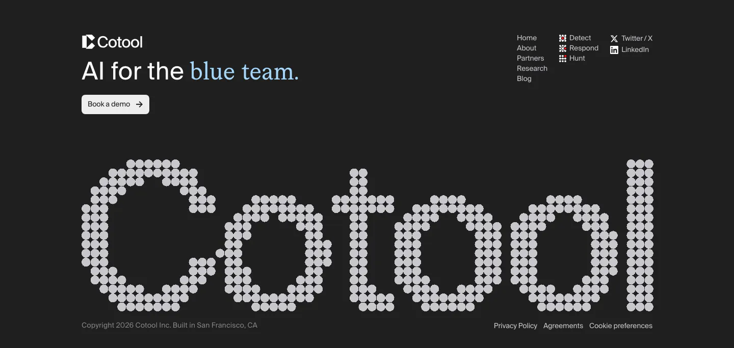
  168. Aside security section: centered headline above four gray cards with permission menu, encryption and AI model visuals
  169. EchoFi features section: headline above a numbered four-row list with orange line icons on a near-black background
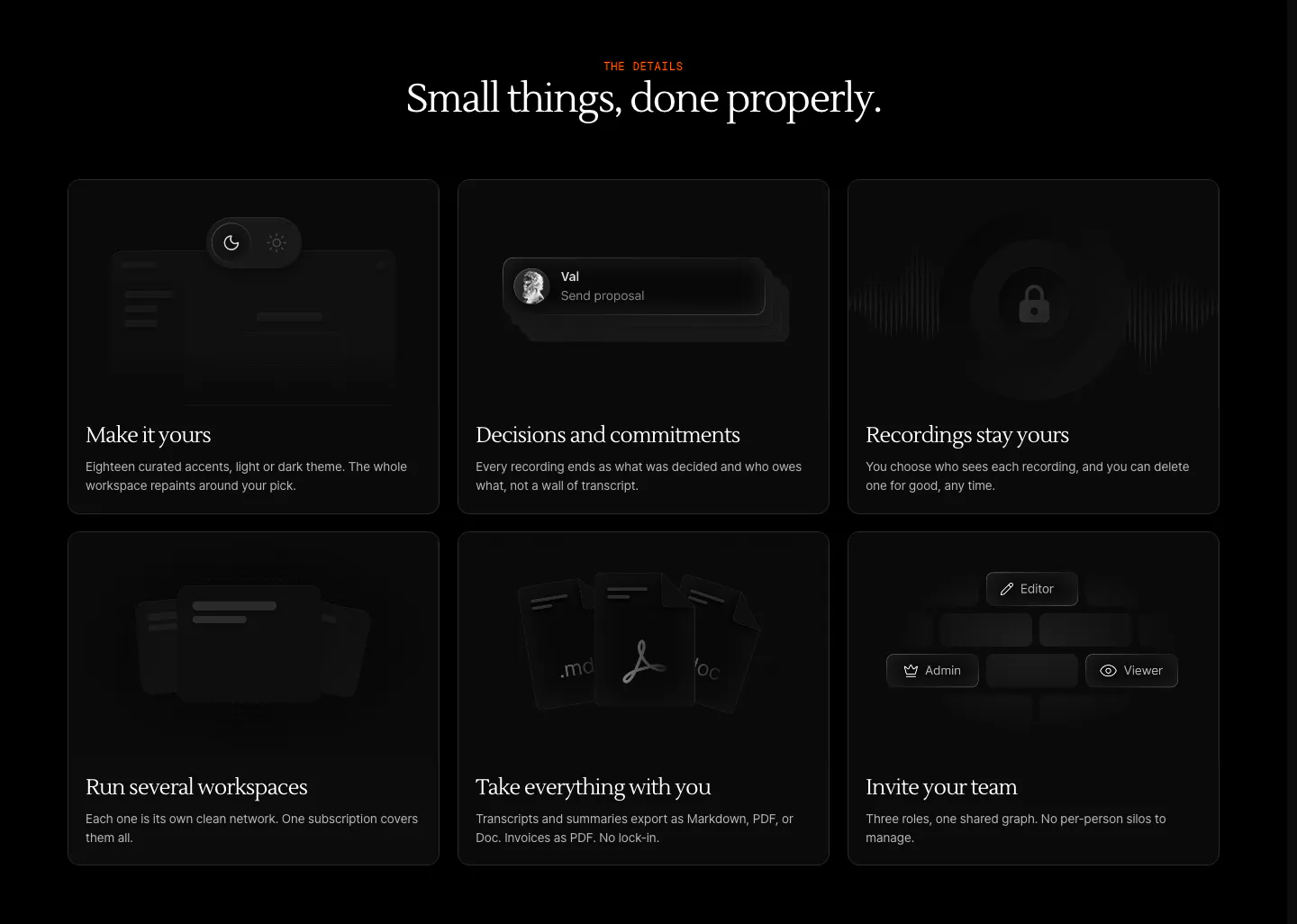
  170. Cotool footer section: tagline, demo button and link columns above a giant dot-matrix Cotool wordmark on a charcoal background
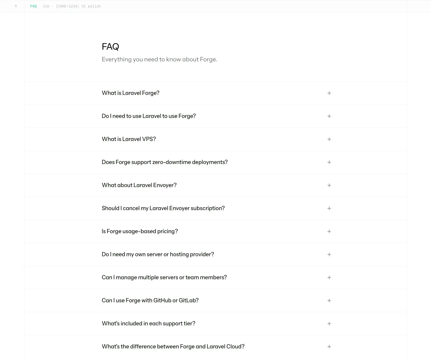
  171. Laravel Forge FAQ section: heading above a long accordion list of questions with plus icons on white
  172. Arke features section: centered serif headline above a three-by-two grid of dark cards with subtle UI vignettes and short descriptions
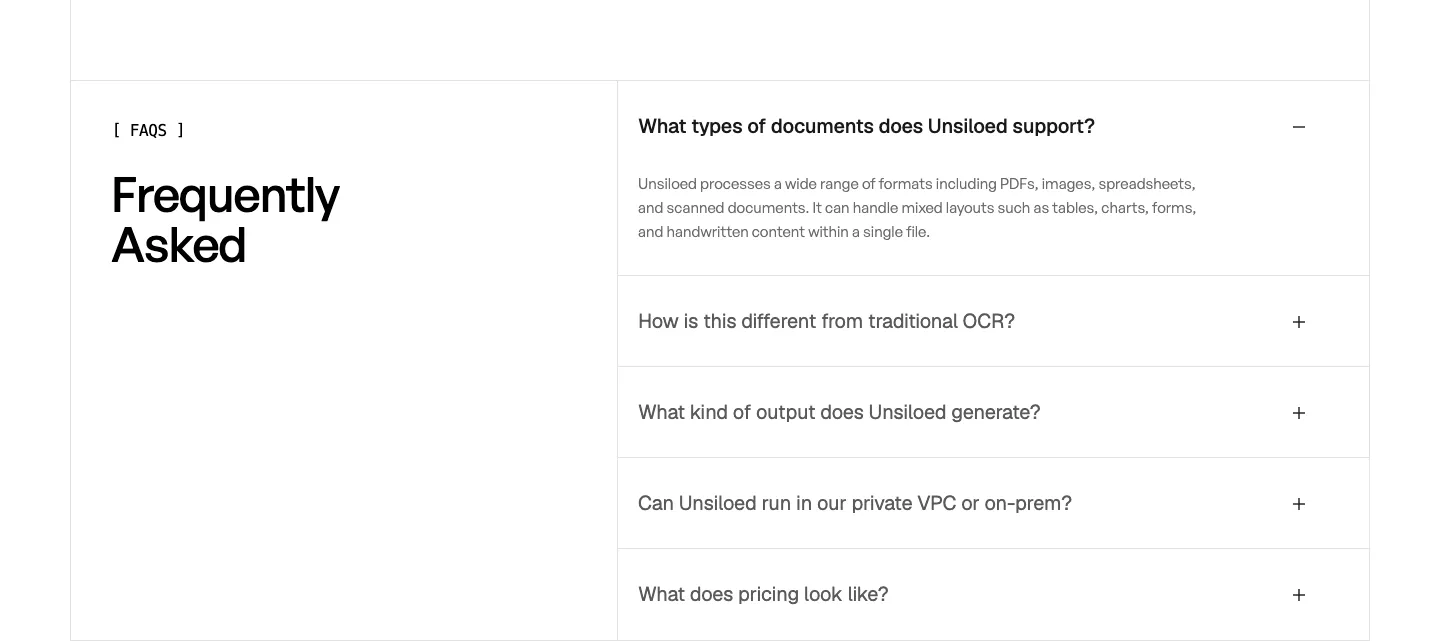
  173. Unsiloed FAQ section: Frequently Asked heading at left beside a bordered accordion with the first question expanded on white
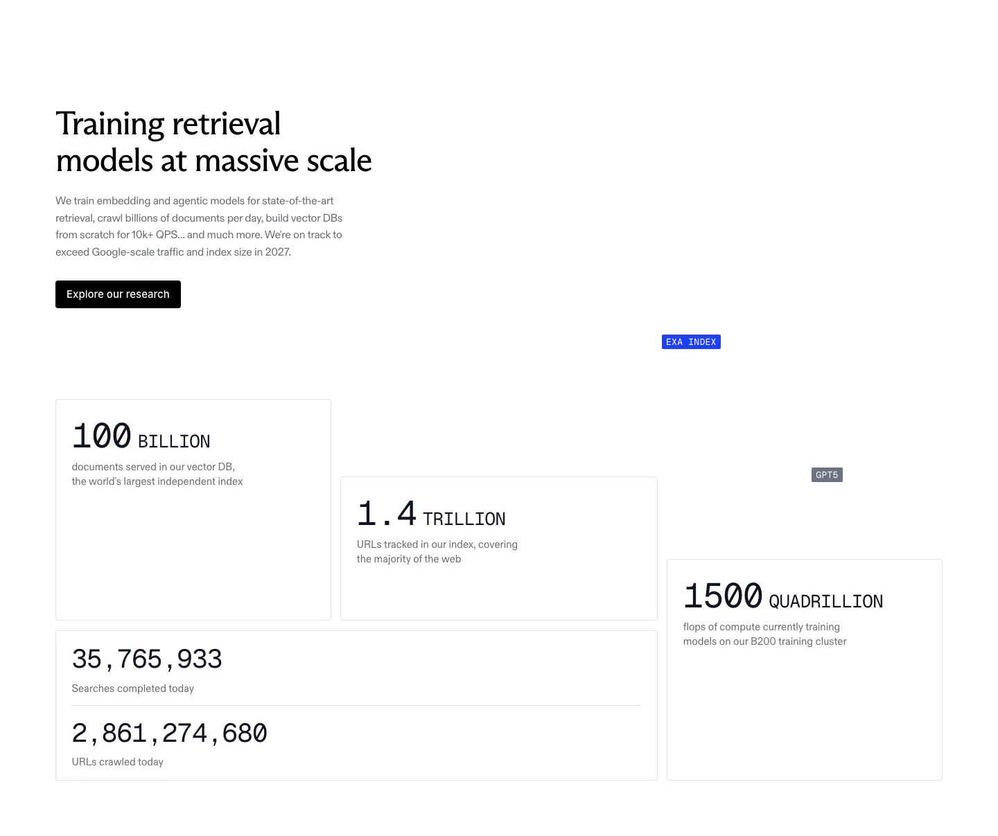
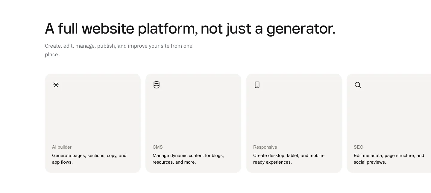
  174. Exa stats section: headline, copy and research button above staggered bordered cards with large monospace figures for index size and compute
  175. Cofactr logo cloud section: centered two-line statement above a single row of gray customer logos like Snap Inc. and Neros on white
  176. Modulify features section: left-aligned headline above a row of four gray icon cards on white, the last card cut off
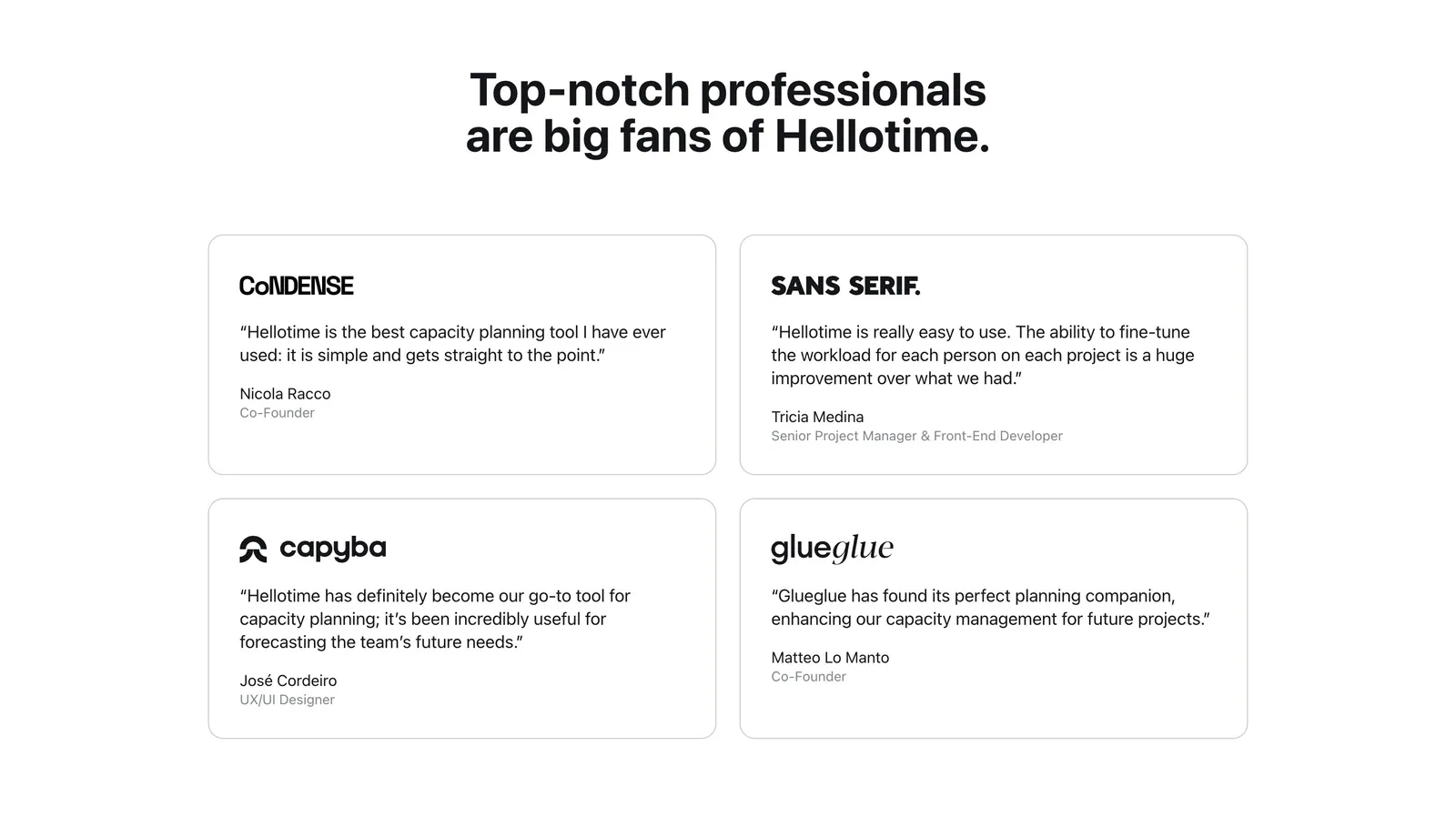
  177. Hellotime testimonials section: centered heading above a two-by-two grid of outlined quote cards with company logos and names
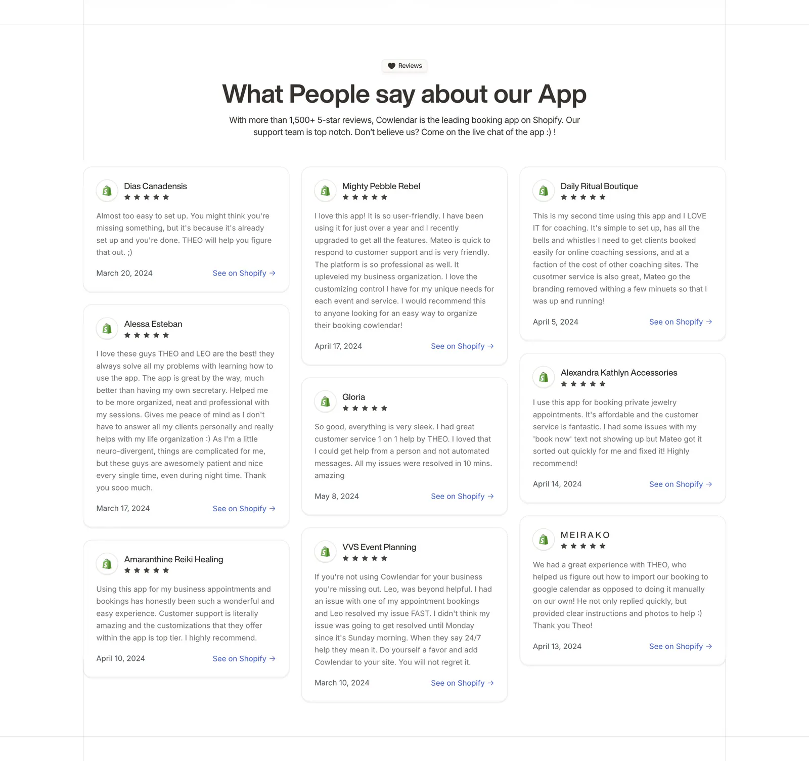
  178. Cowlendar testimonials section: centered heading above a three-column masonry grid of Shopify review cards with stars
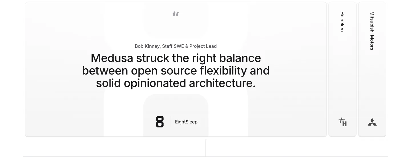
  179. Medusa testimonials section: large centered quote card with EightSleep logo beside collapsed Heineken and Mitsubishi Motors tabs
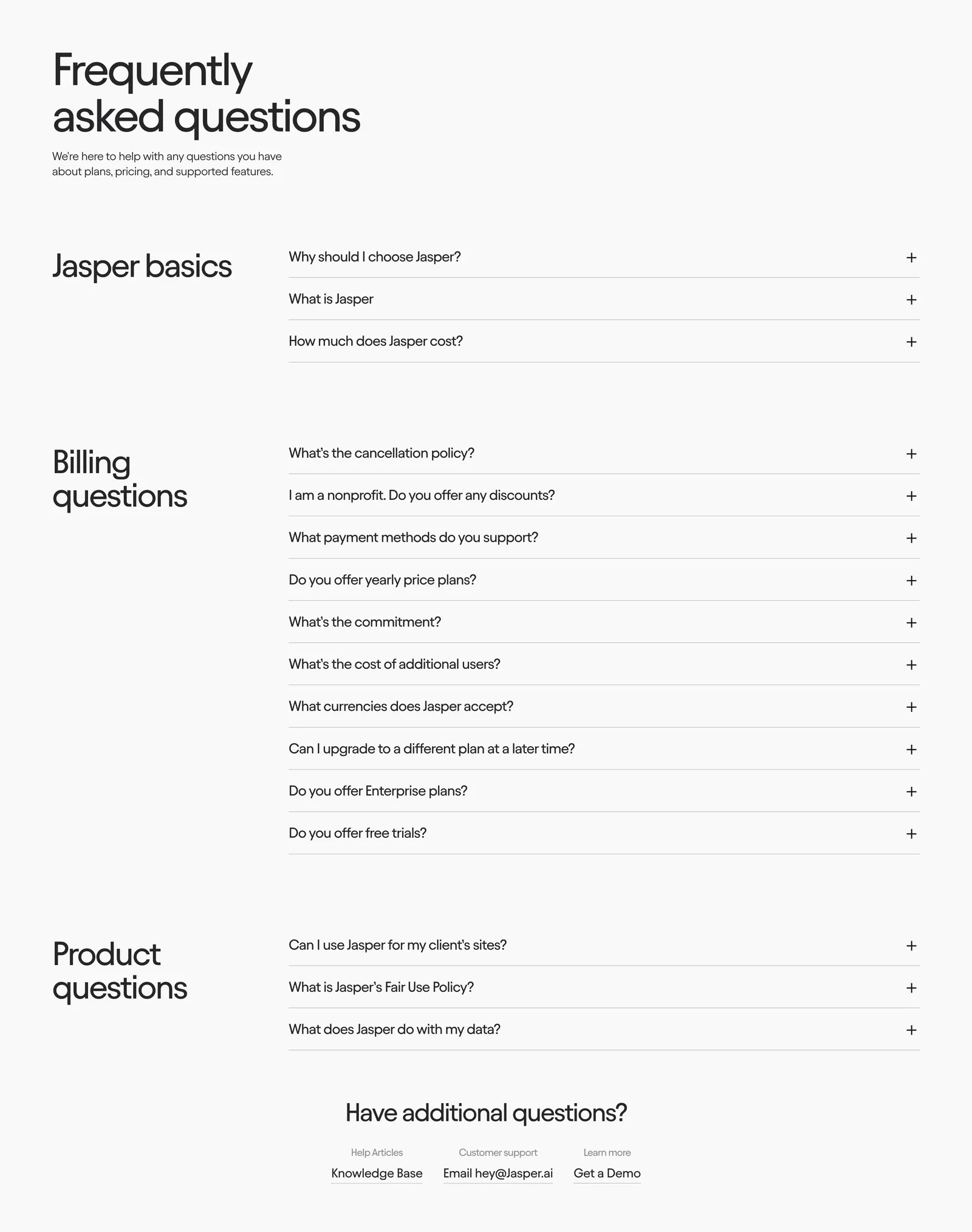
  180. Jasper FAQ section: large heading above grouped accordion questions with category titles in a left column on an off-white background
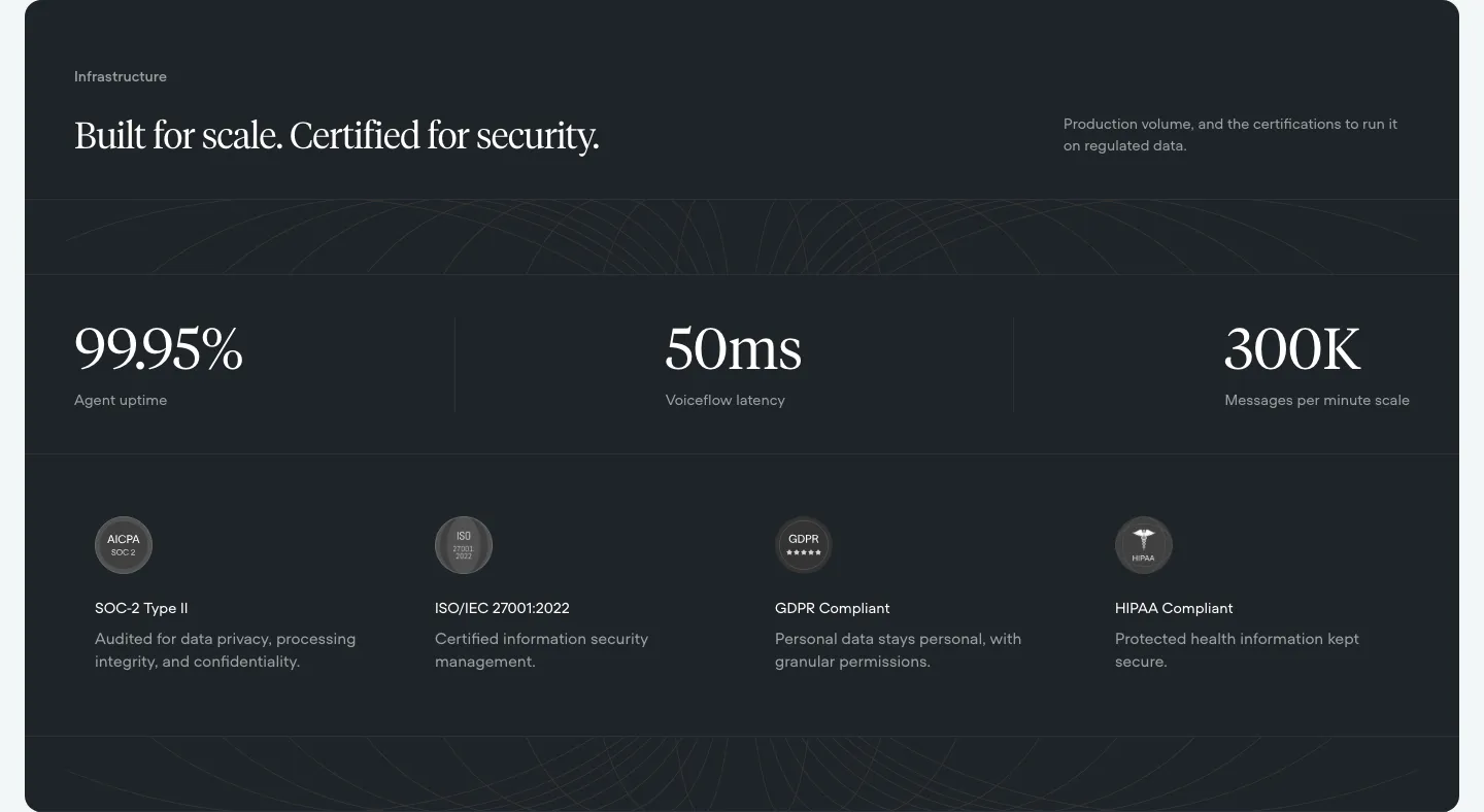
  181. Voiceflow security section: dark panel with serif headline, three large uptime and latency stats and four compliance badges
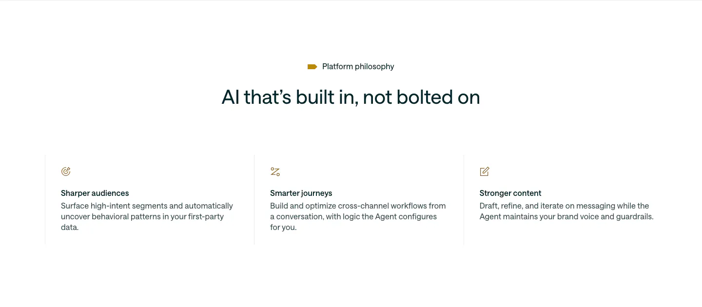
  182. Customer.io value proposition section: centered headline above three icon columns describing audiences, journeys and content
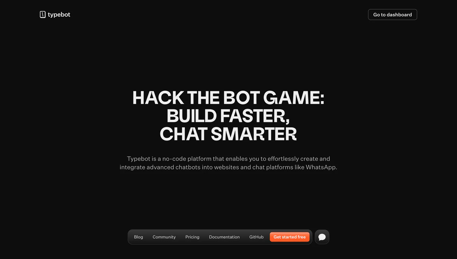
  183. Typebot hero section: centered uppercase headline and description on a black background with a floating bottom pill navigation bar
  184. LocalCan integrations section: centered caption above a single row of grayscale framework logos including Next.js, Laravel, Nuxt and Node
  185. Laravel logo cloud section: monospace caption beside a single row of OpenAI, Apple, Webflow, Nike and Zillow logos in bordered cells
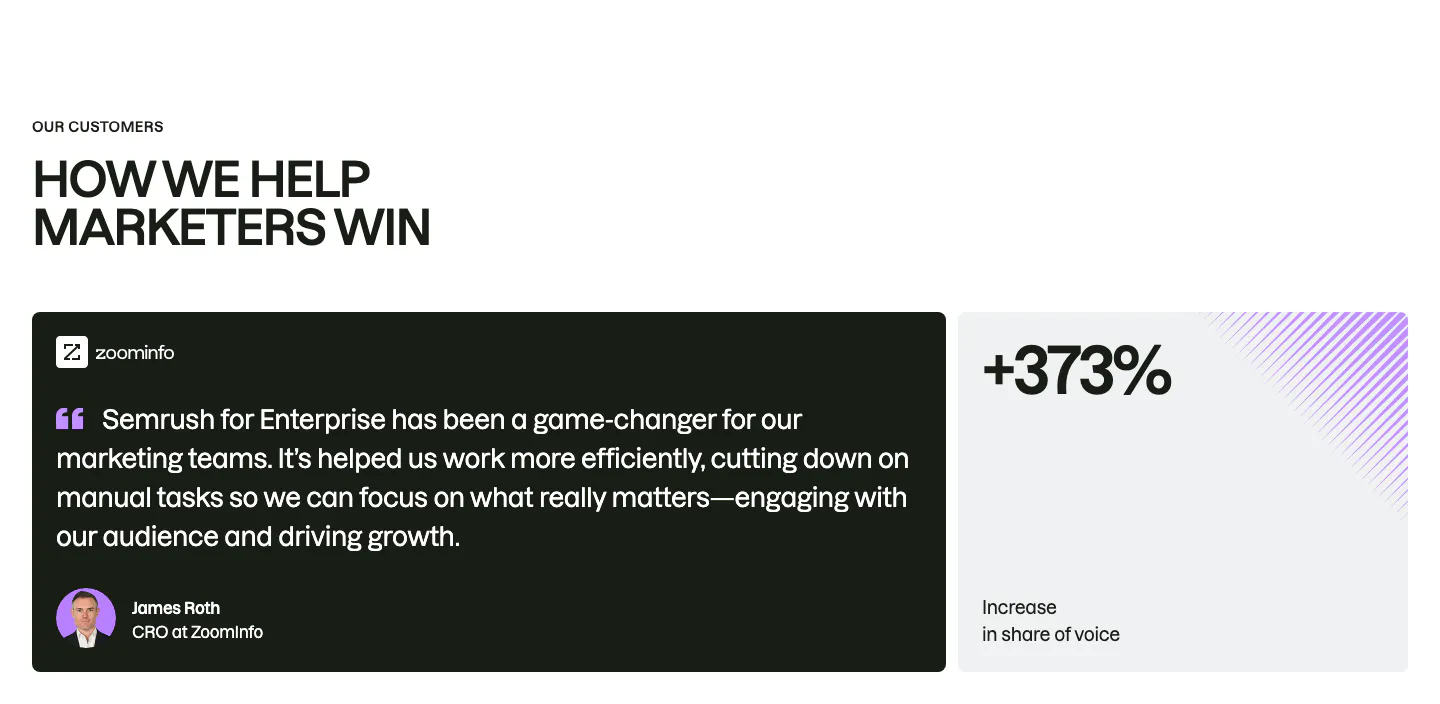
  186. Semrush testimonials section: uppercase headline above a dark ZoomInfo quote card with avatar beside a light +373% stat card
  187. Lightyear about & mission section: two paragraphs of white mission copy beside a small dot-grid icon on a dark charcoal background
    Lightyear About & mission
  188. AgentID footer section: dark layout with logo, newsletter email field, monospace navigation columns, social icons and legal row
  189. Raneo FAQ section: centered headline above a single-column accordion with the first question expanded on a light gray background
  190. Mintlify footer section: centered closing CTA above a faded docs wireframe, then four link columns and status badge on black
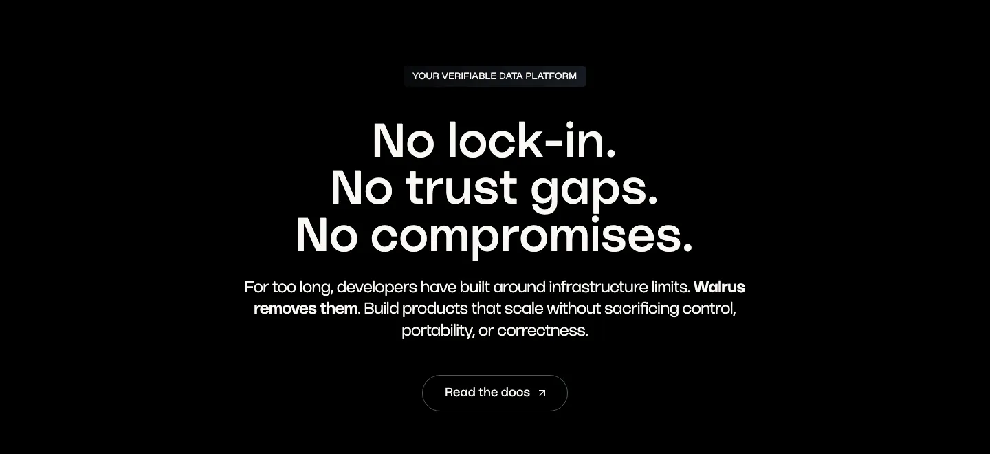
  191. Walrus value proposition section: centered three-line statement headline, copy and outline button on black
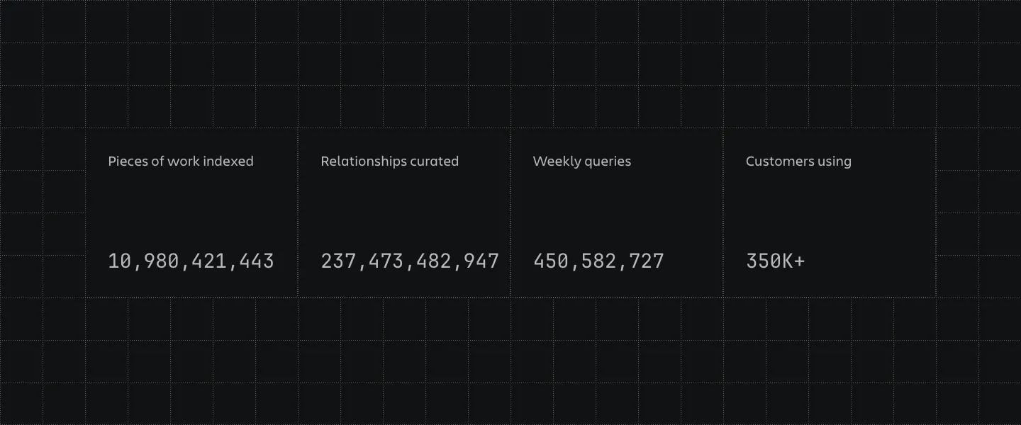
  192. Atlassian stats section: four bordered cells with large monospaced counters and labels on a dark grid-line background
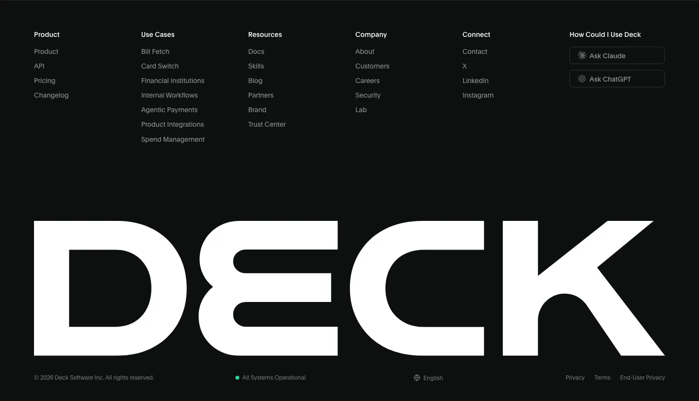
  193. Deck footer section: six link columns with Ask Claude and Ask ChatGPT buttons above a full-width white DECK wordmark on black
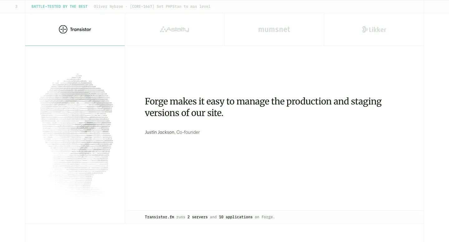
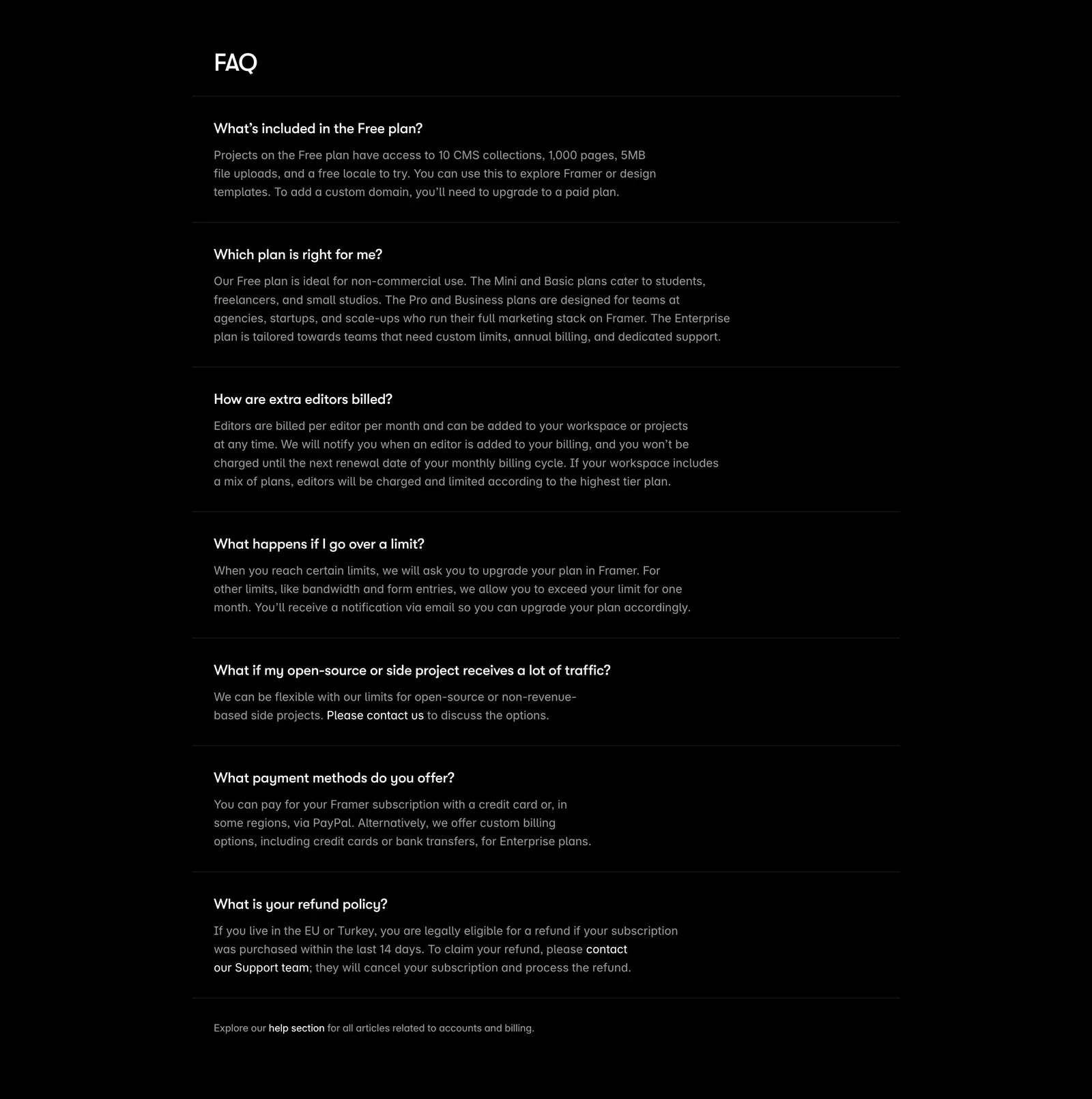
  194. Laravel Forge testimonials section: customer logo tabs above a serif quote with an ASCII-art portrait on the left
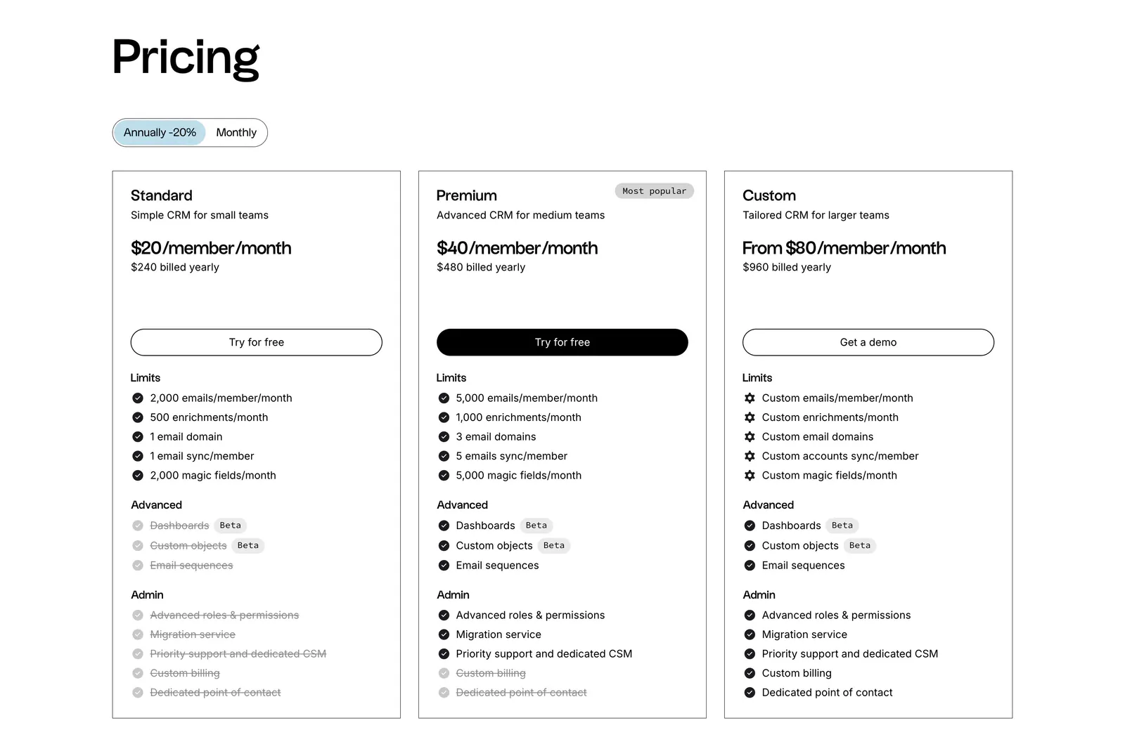
  195. Linear logo cloud section: centered two-line intro above a three-by-two grid of white customer logos such as Ramp, Vercel and Cash App on black
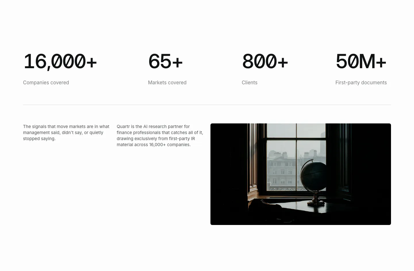
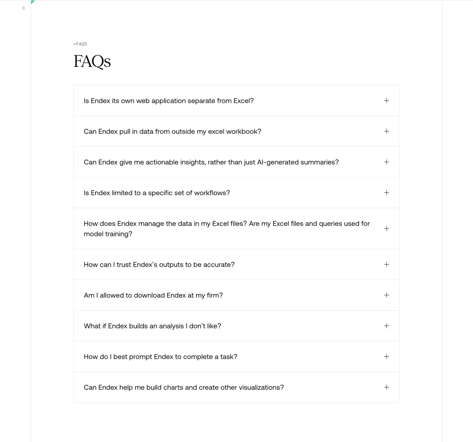
  196. Quartr stats section: four large monospace figures in a row above two short text columns and a dark photo of a globe by a window
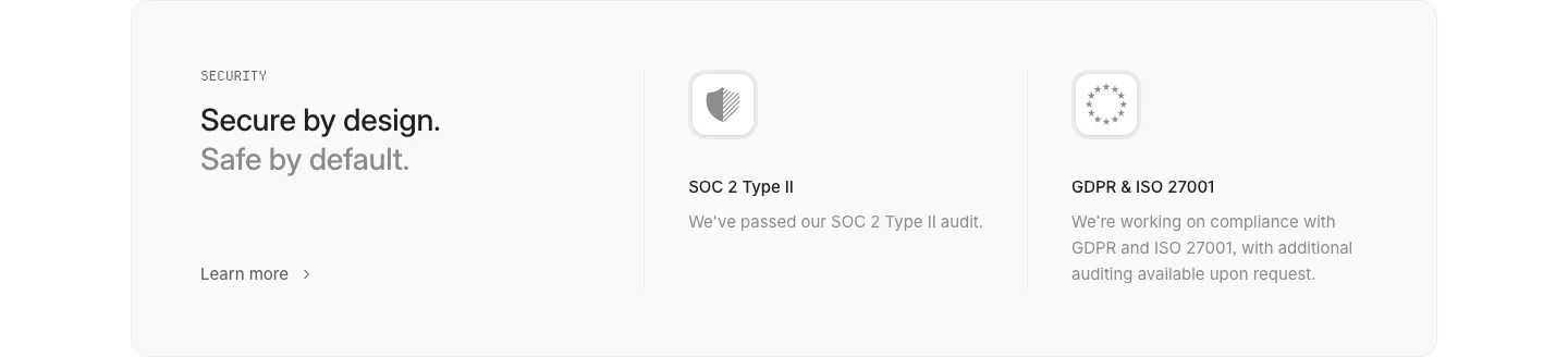
  197. Framer FAQ section: heading above a single-column list of questions with expanded answers separated by thin rules on black
  198. folk pricing section: left-aligned heading, annual/monthly toggle and three outlined plan cards with feature checklists on white
  199. Endex FAQ section: serif FAQs heading above a bordered accordion list of ten questions with plus icons on white
  200. Interfere security section: light gray card with headline left and SOC 2 and GDPR/ISO compliance columns with icons
  201. Gumloop blog & resources section: changelog timeline of dated release entries running off the right edge
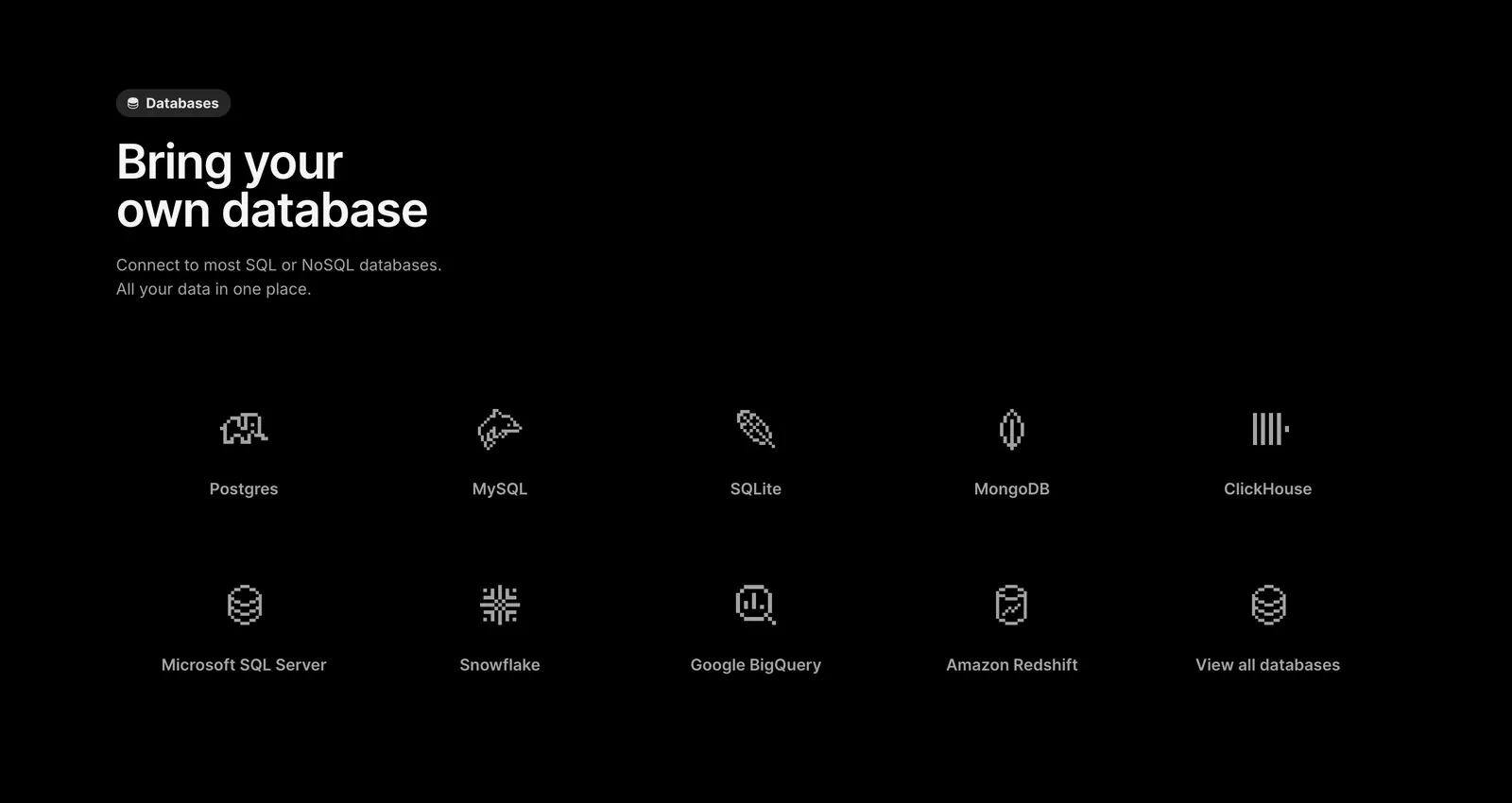
  202. Outerbase features section: left-aligned headline above a two-row grid of pixel-style database icons with names on black
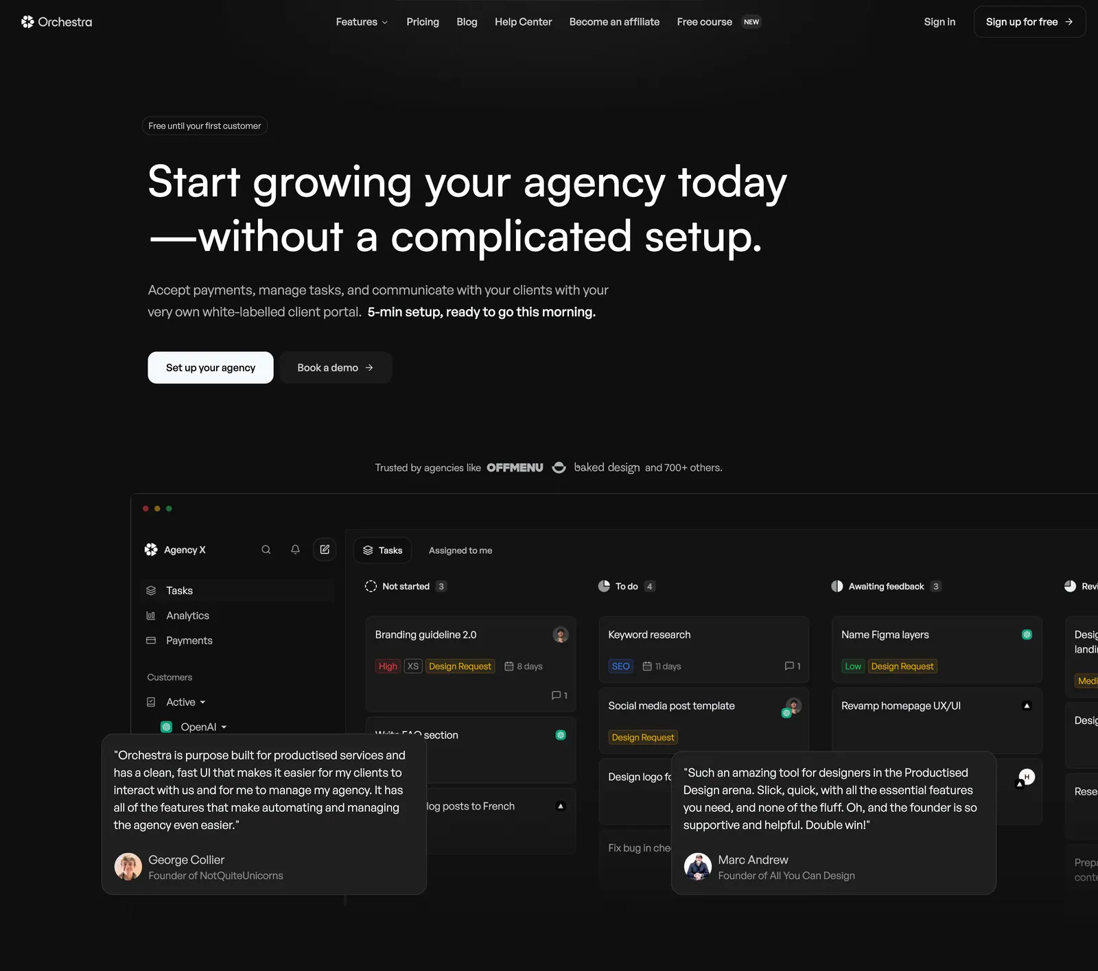
  203. Orchestra hero section: left-aligned headline and two buttons above a dark task-board app screenshot with overlaid testimonial cards
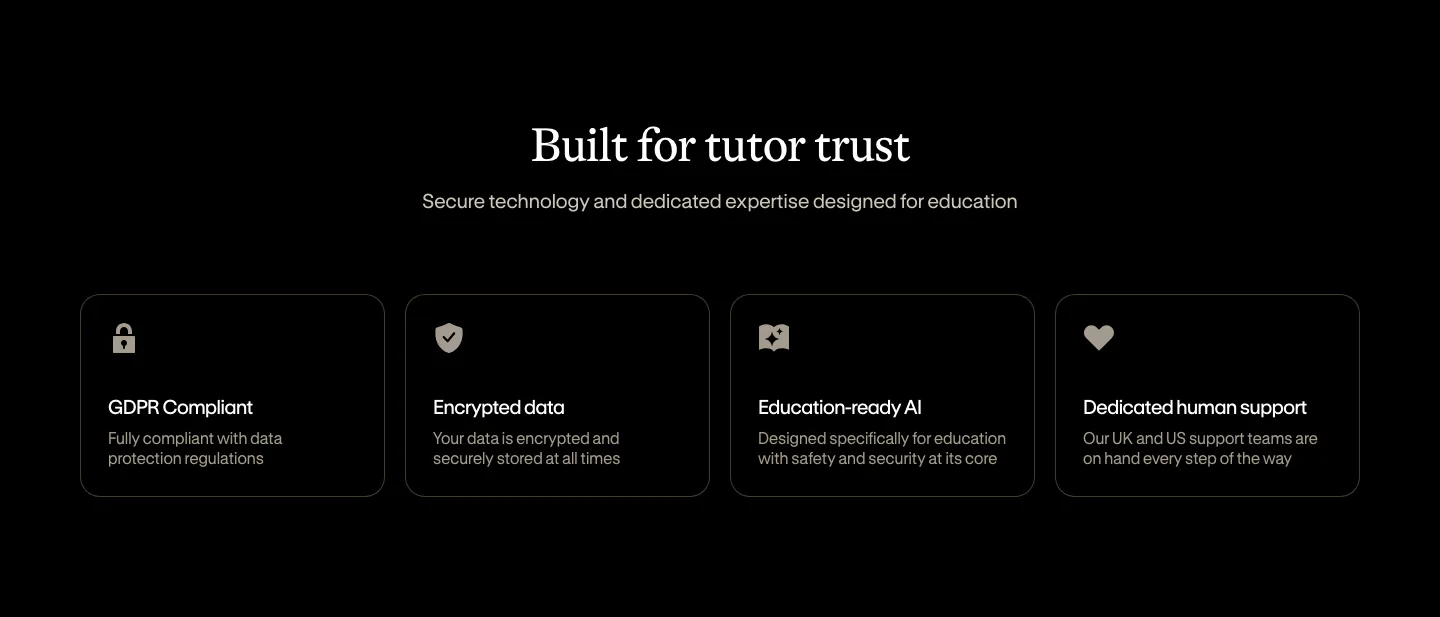
  204. Bobbin security section: centered serif heading above four outlined cards for GDPR, encryption, AI and support on black
  205. Laravel Forge features section: left-aligned heading above a 2x2 grid of feature cards with faded UI snippets on white
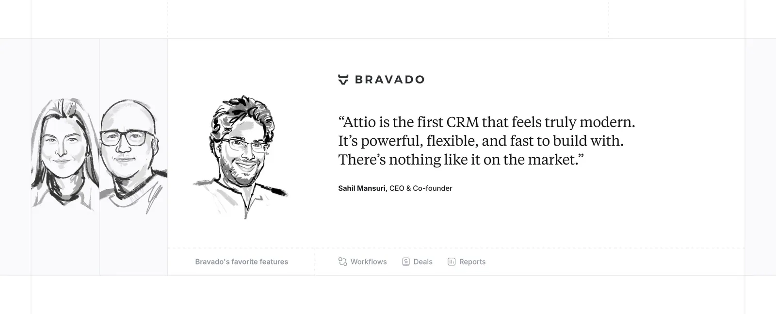
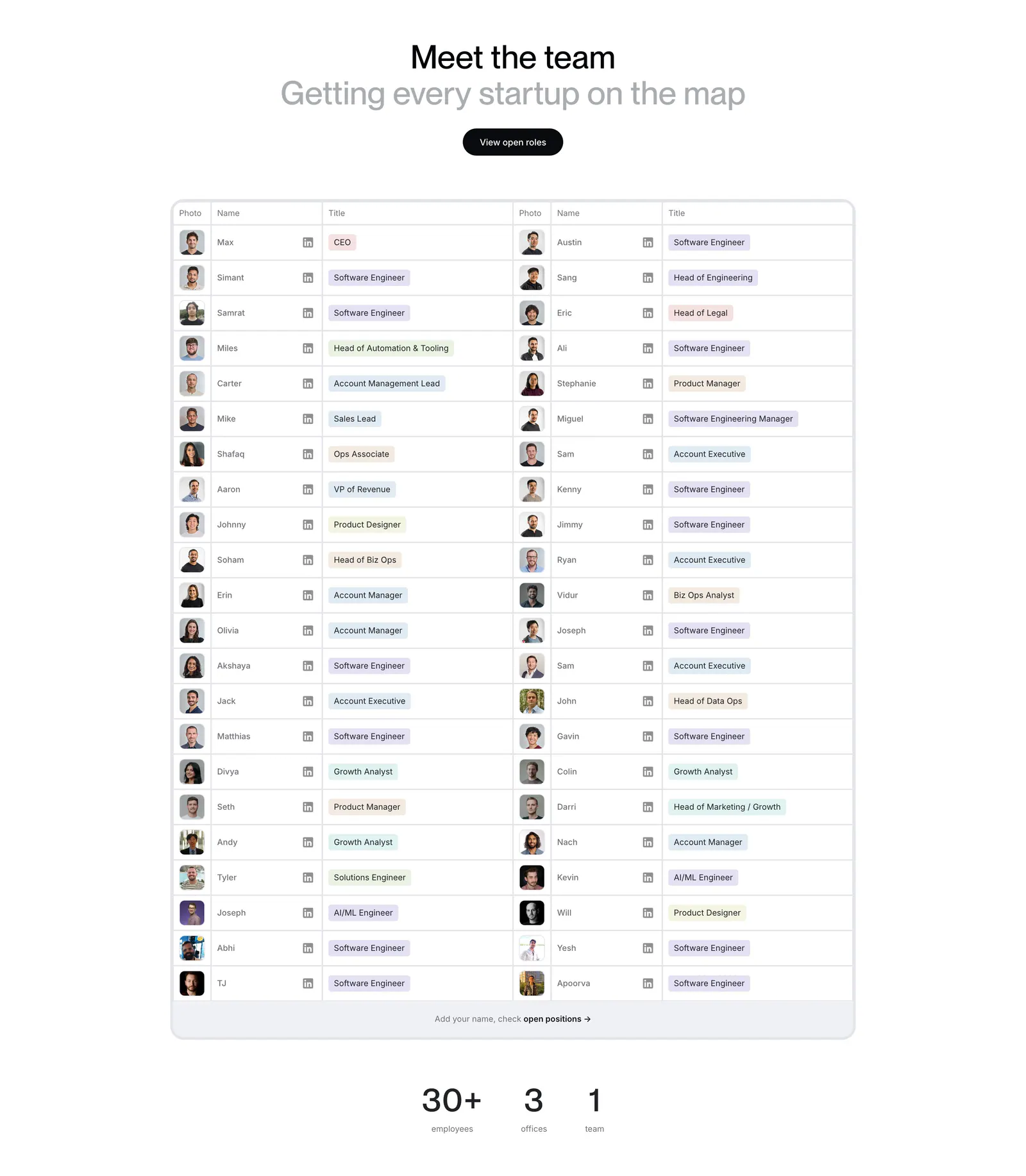
  206. Attio testimonials section: hand-drawn grayscale portrait sketches beside a serif customer quote with company logo and feature links
  207. Chatbase pricing section: centered headline and monthly/yearly toggle above four plan cards and a customer logo row
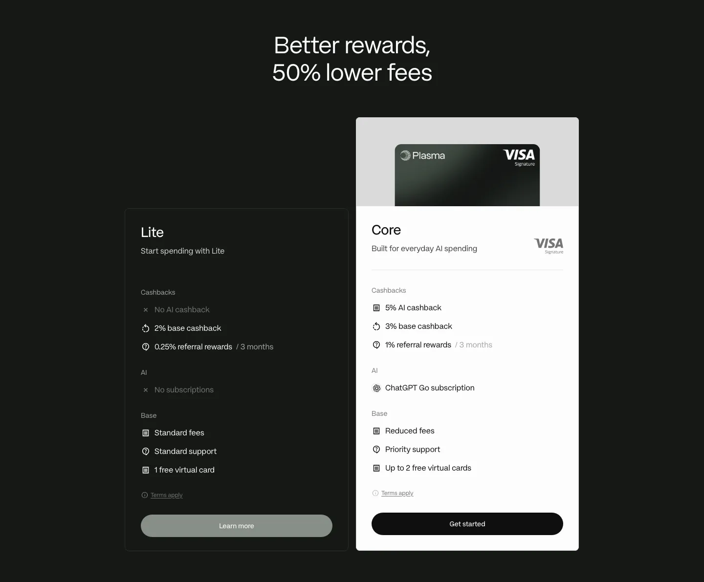
  208. Plasma pricing section: centered headline above dark Lite and white Core plan cards with feature lists on a dark background
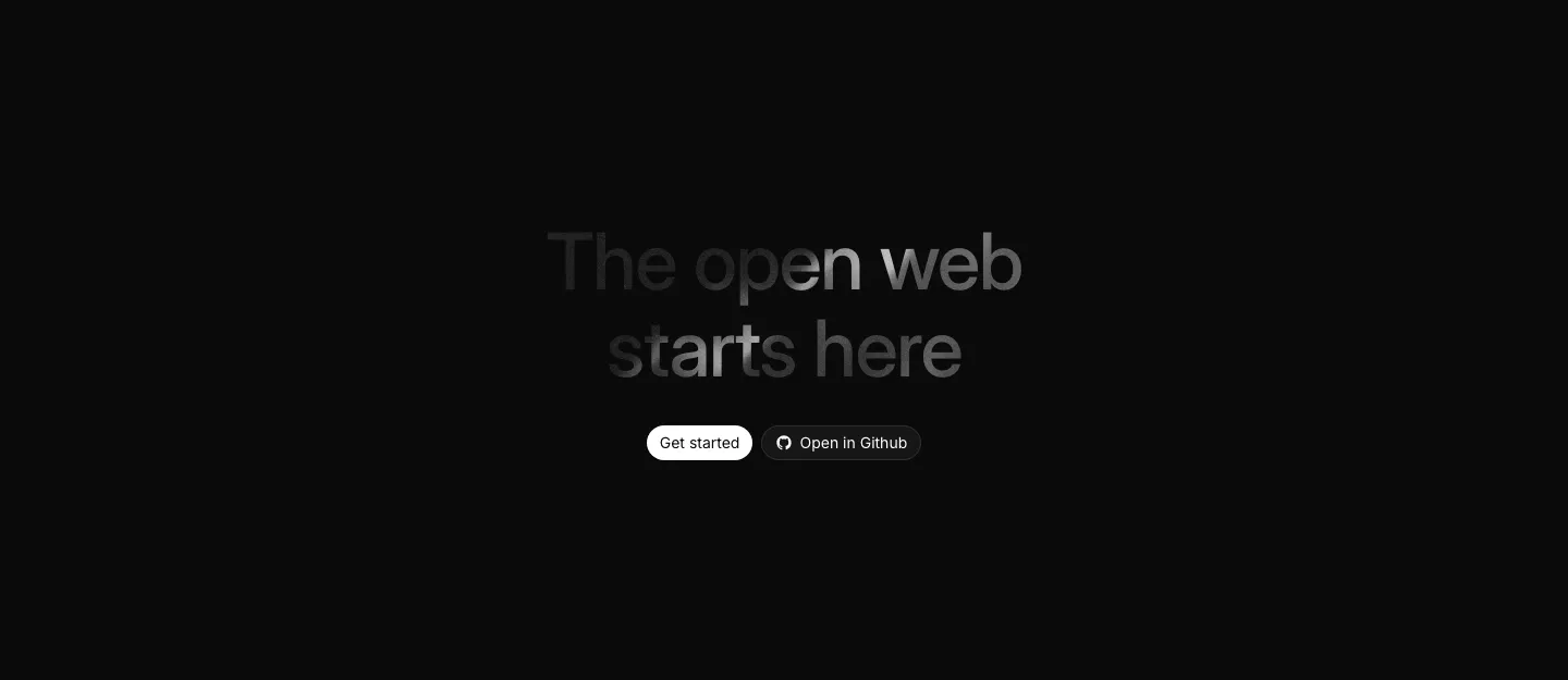
  209. Harmonic team section: centered heading above a two-column table of team member photos, names and role tags with stats below
  210. Fernand testimonials section: single centered customer quote with a round avatar, name and company on white
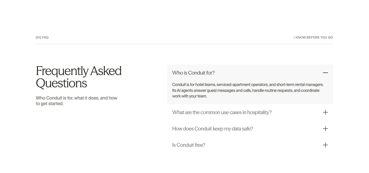
  211. Conduit FAQ section: serif heading on the left beside an accordion with the first answer expanded on white
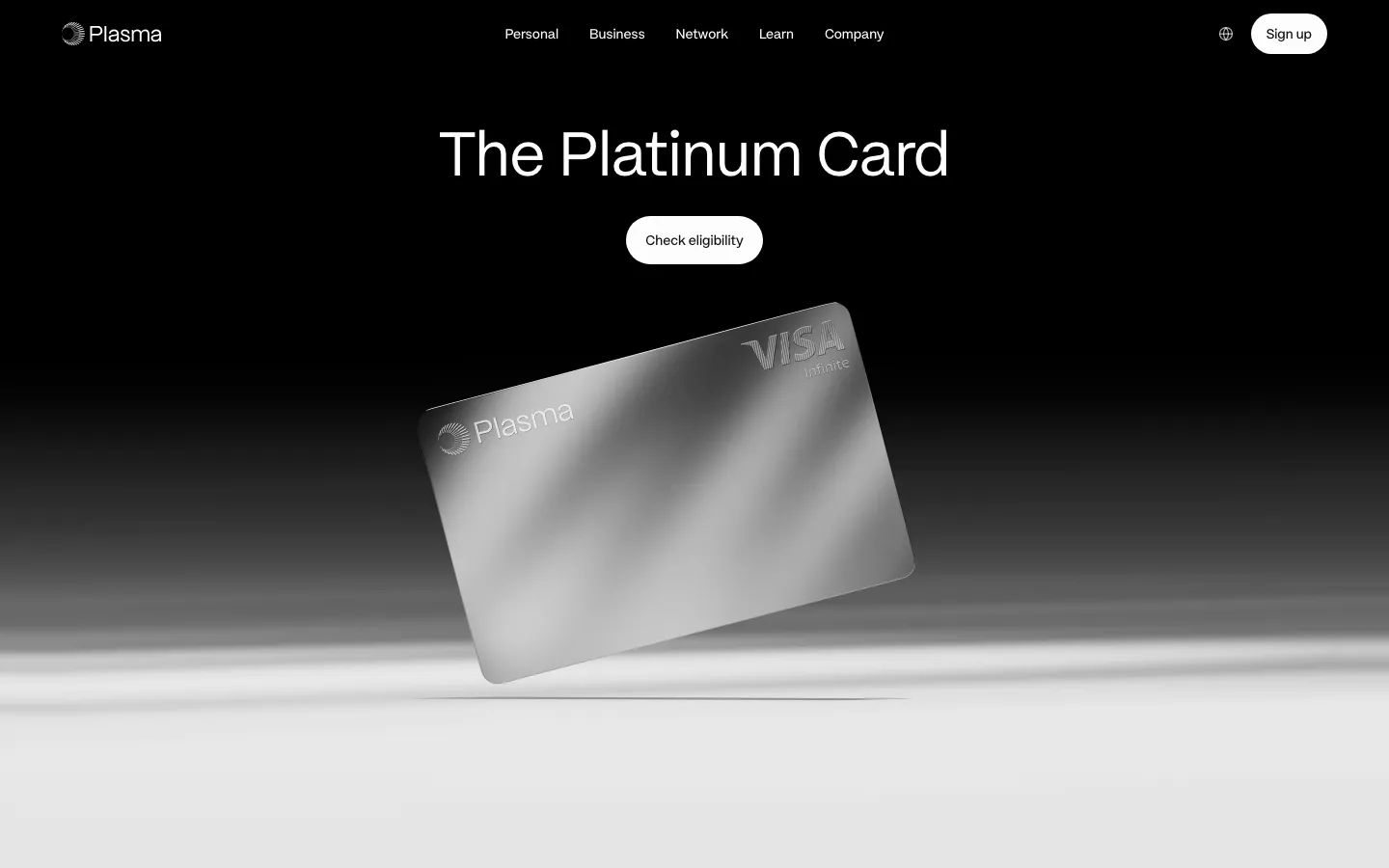
  212. Plasma hero section: nav and centered headline with Check eligibility button above a tilted silver card render on black-to-white
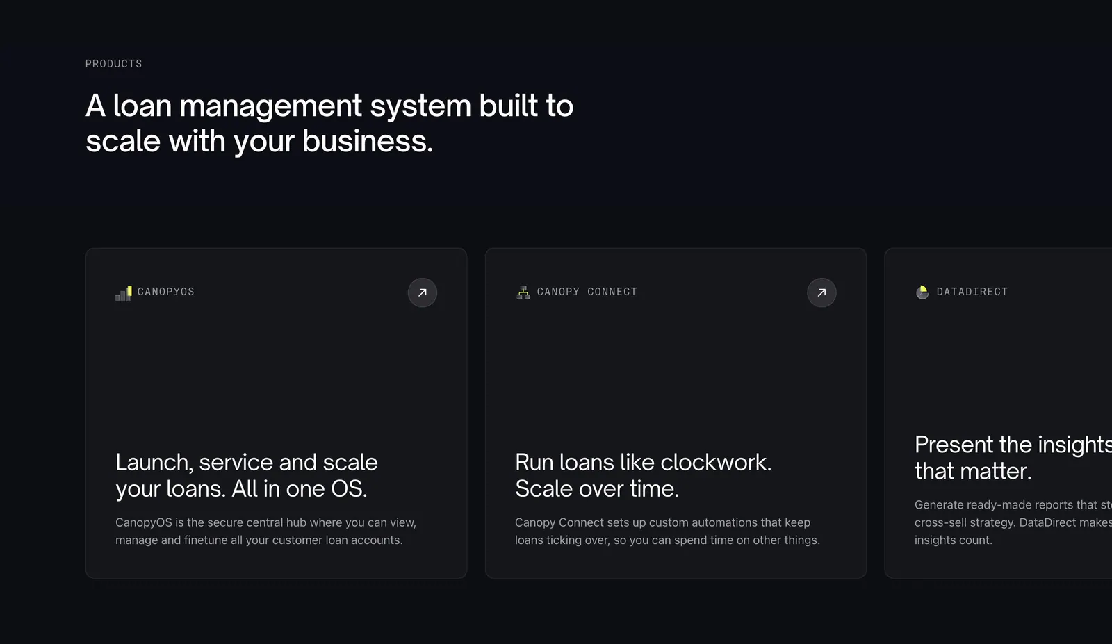
  213. Canopy features section: left-aligned headline above a horizontally scrolling row of dark product cards, the last cut off
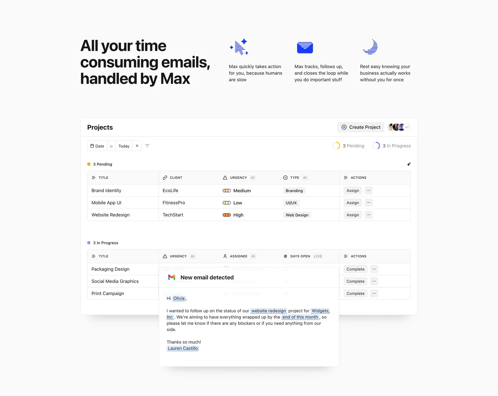
  214. Headroom features section: headline beside three icon benefits above a projects table screenshot overlaid with an email card
  215. Composio call to action section: single-line headline beside a black Try Composio now button in a slim light gray band
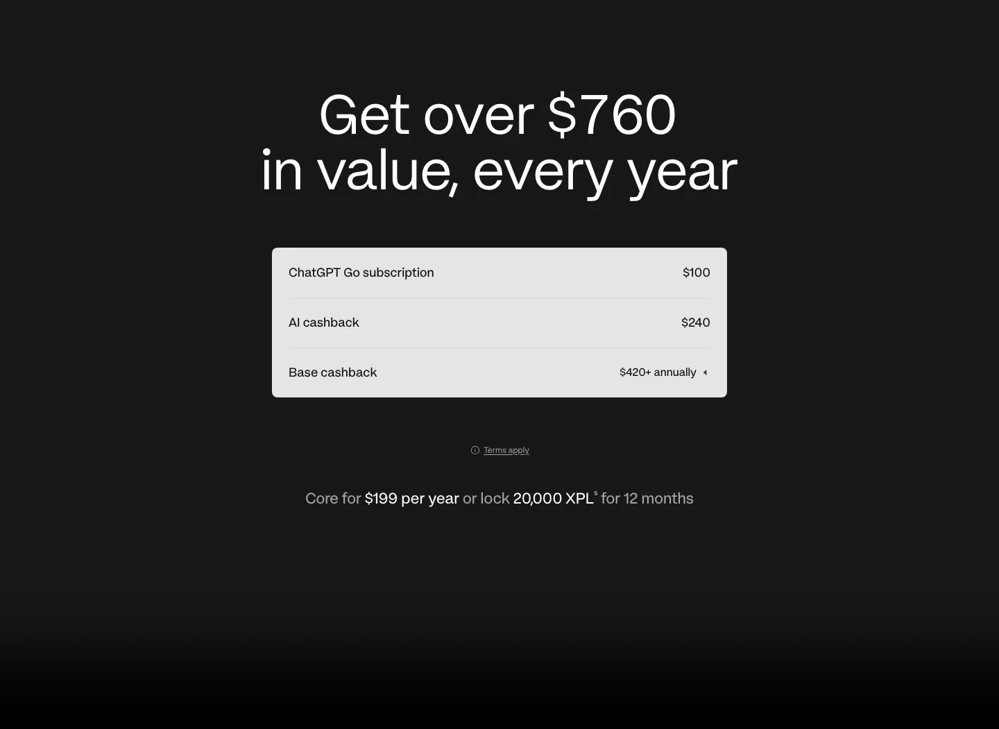
  216. Plasma pricing section: centered headline above a light value breakdown table with annual price line on a dark background
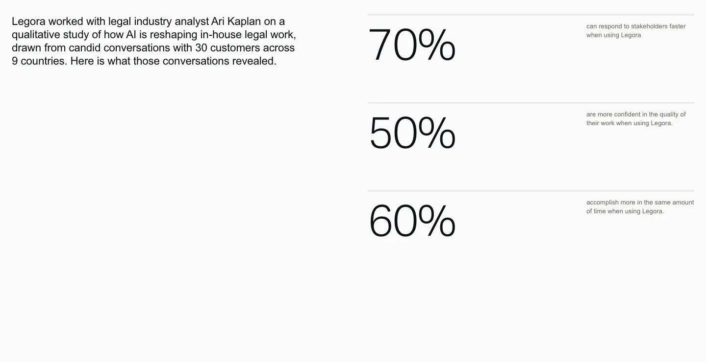
  217. Legora stats section: intro paragraph on the left and three large percentage figures with small labels stacked right on light gray
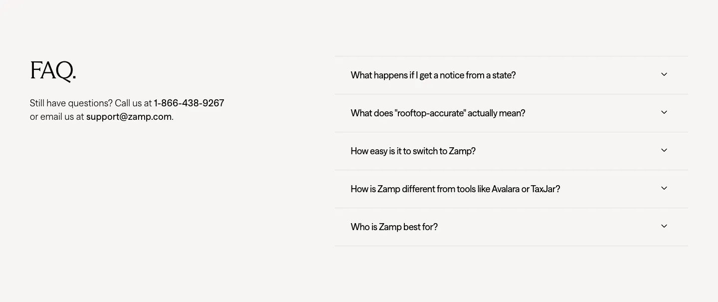
  218. Zamp FAQ section: serif FAQ heading with contact details on the left and an accordion of five questions on the right
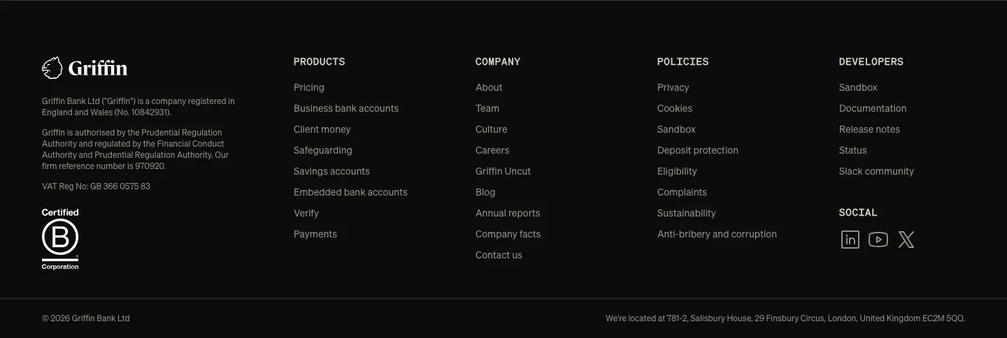
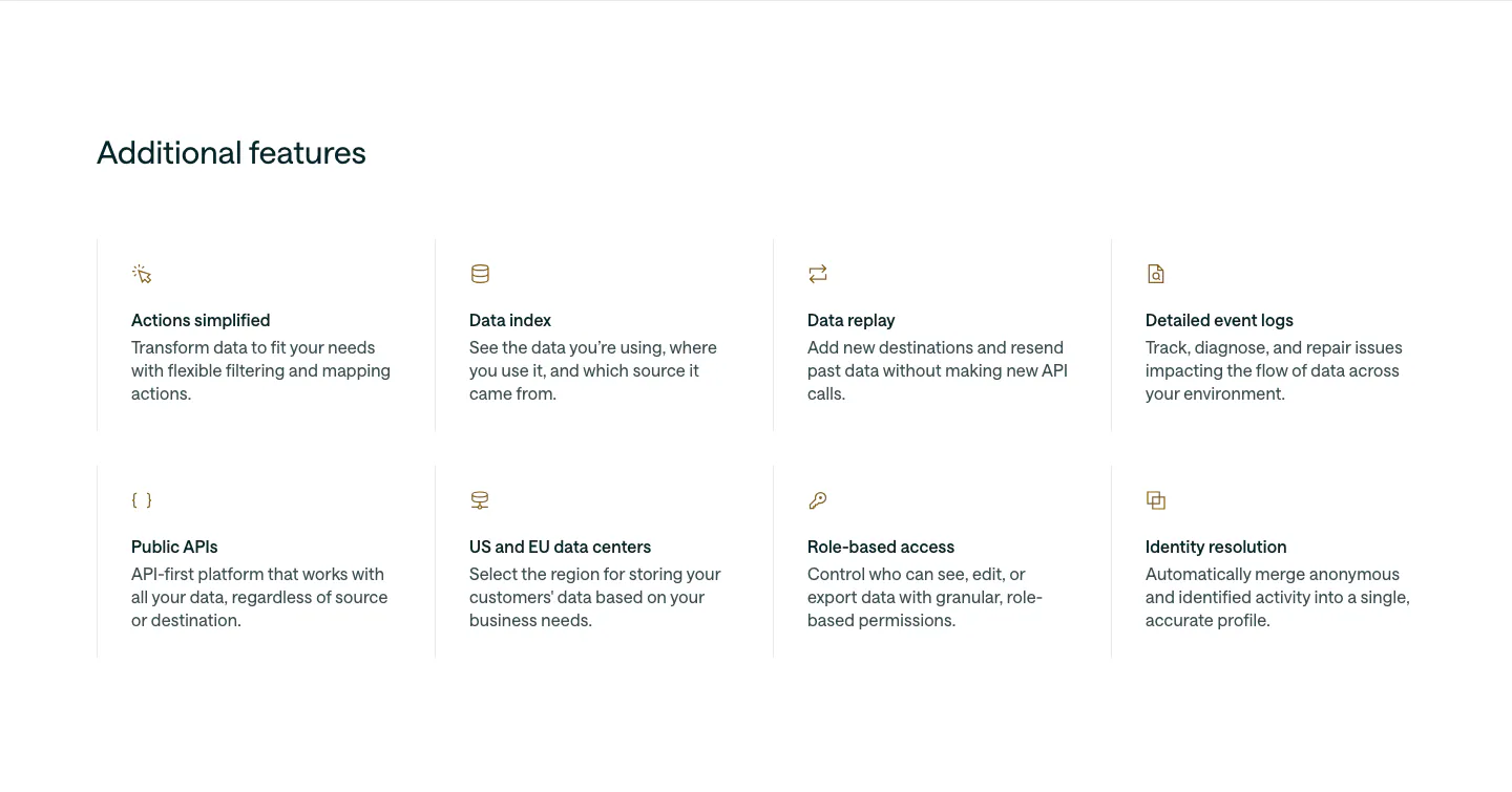
  219. Griffin footer section: dark footer with logo, legal text, B Corp badge, four link columns and social icons
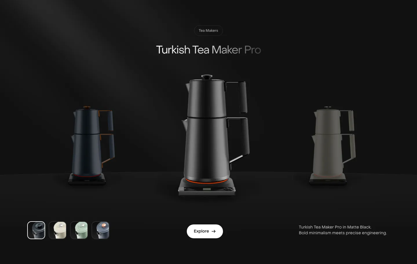
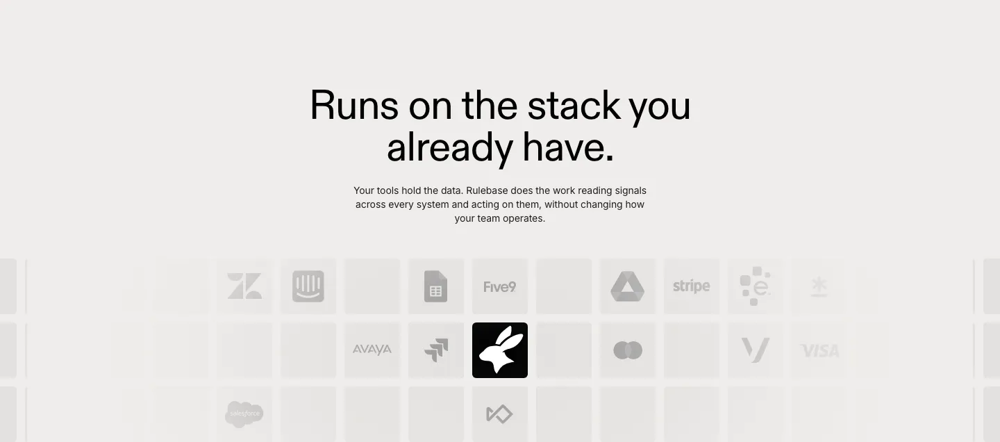
  220. Saki features section: centered product name above a black tea maker flanked by dimmed variants, color swatches and an Explore button on black
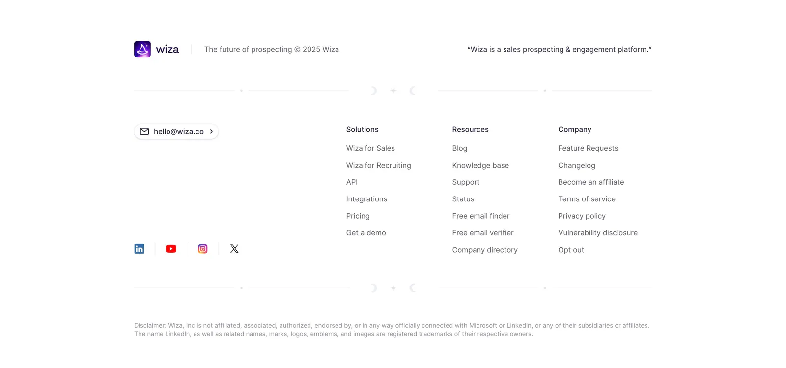
  221. 21Oaks FAQ section: centered serif heading, intro and button on the left, accordion question list on the right on white
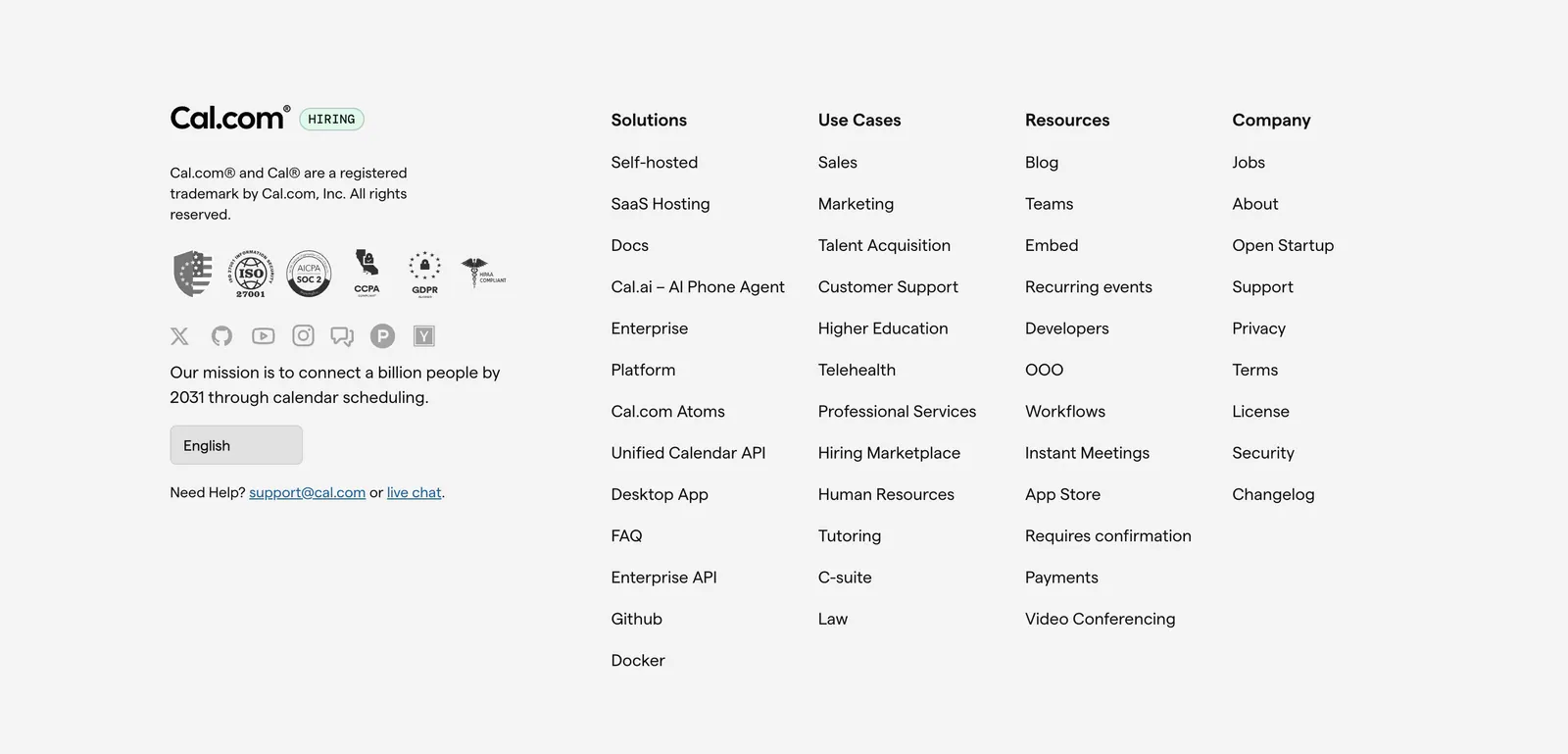
  222. Customer.io features section: left-aligned heading above a 4x2 grid of feature items with small gold icons, titles and descriptions
  223. Rulebase integrations section: centered headline and copy above a fading grid of grayscale app logo tiles like Zendesk, Stripe and Visa
  224. Wiza footer section: logo and tagline above three link columns, email button and social icons on a white background
  225. Cal.com footer section: logo, compliance badges, social icons and language selector beside four link columns on light gray
  226. Profound call-to-action section: centered headline and white Get started button on black with faint grid and curved line pattern
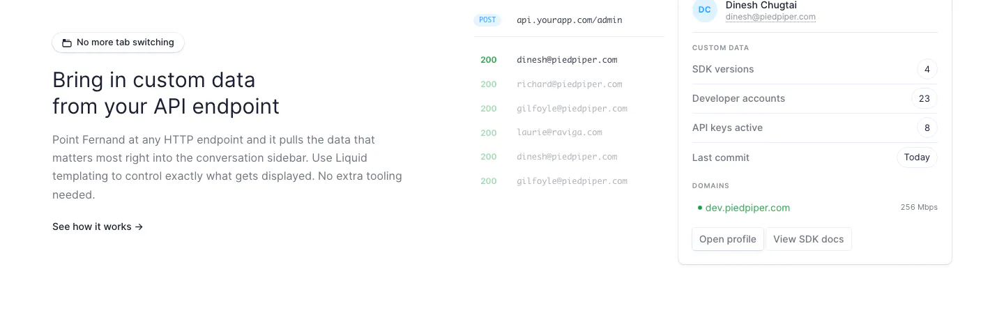
  227. Fernand features section: text on the left, API endpoint response list and customer data sidebar UI on the right
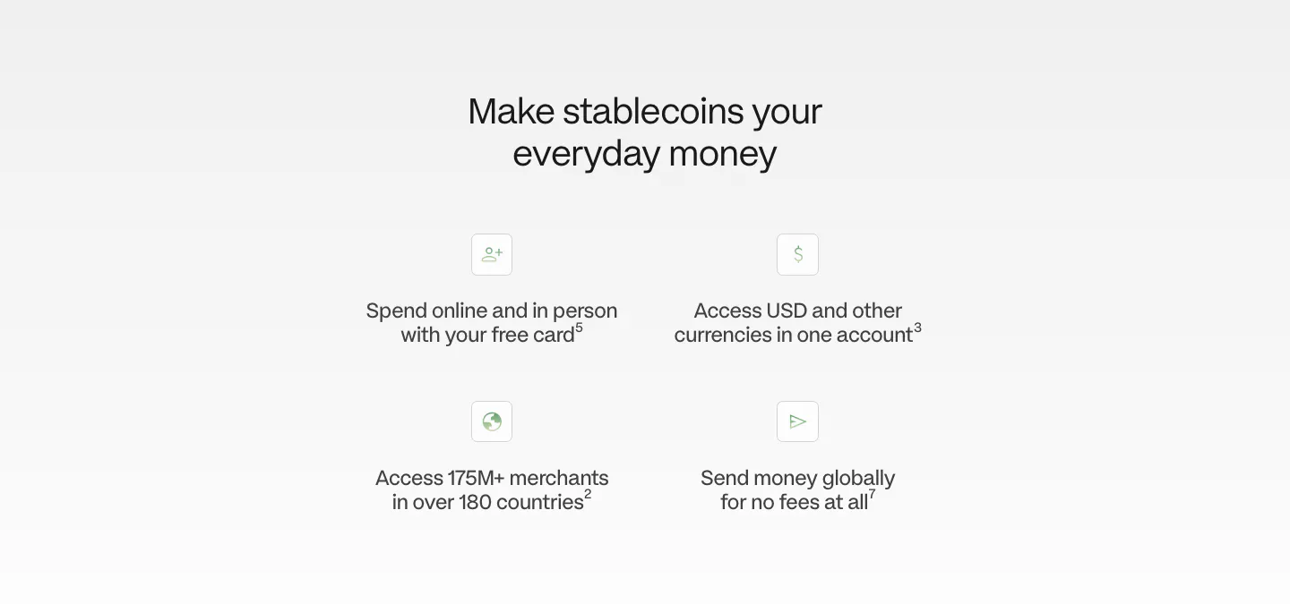
  228. Plasma value proposition section: centered heading above a 2x2 grid of icon benefit points on a light gray fade
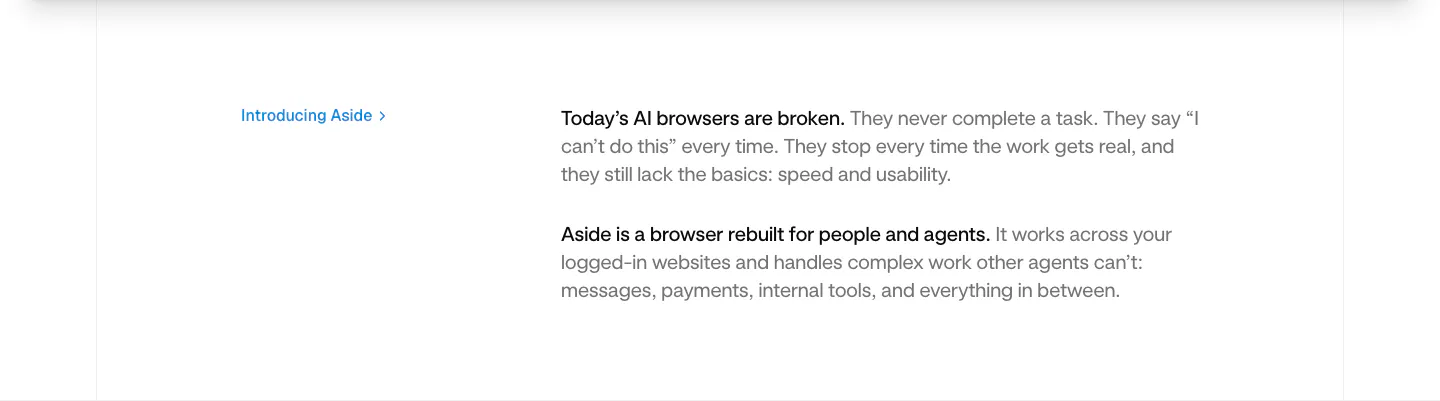
  229. Aside value proposition section: small blue Introducing Aside link at left beside two short intro paragraphs on white
  230. Phidata pricing section: centered Pricing heading above three plain plan columns with buttons and monospace feature lists on light gray
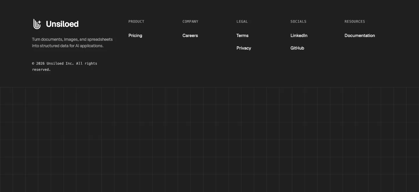
  231. Unsiloed footer section: logo and tagline with Product, Company, Legal, Socials and Resources columns above a grid-line pattern on charcoal
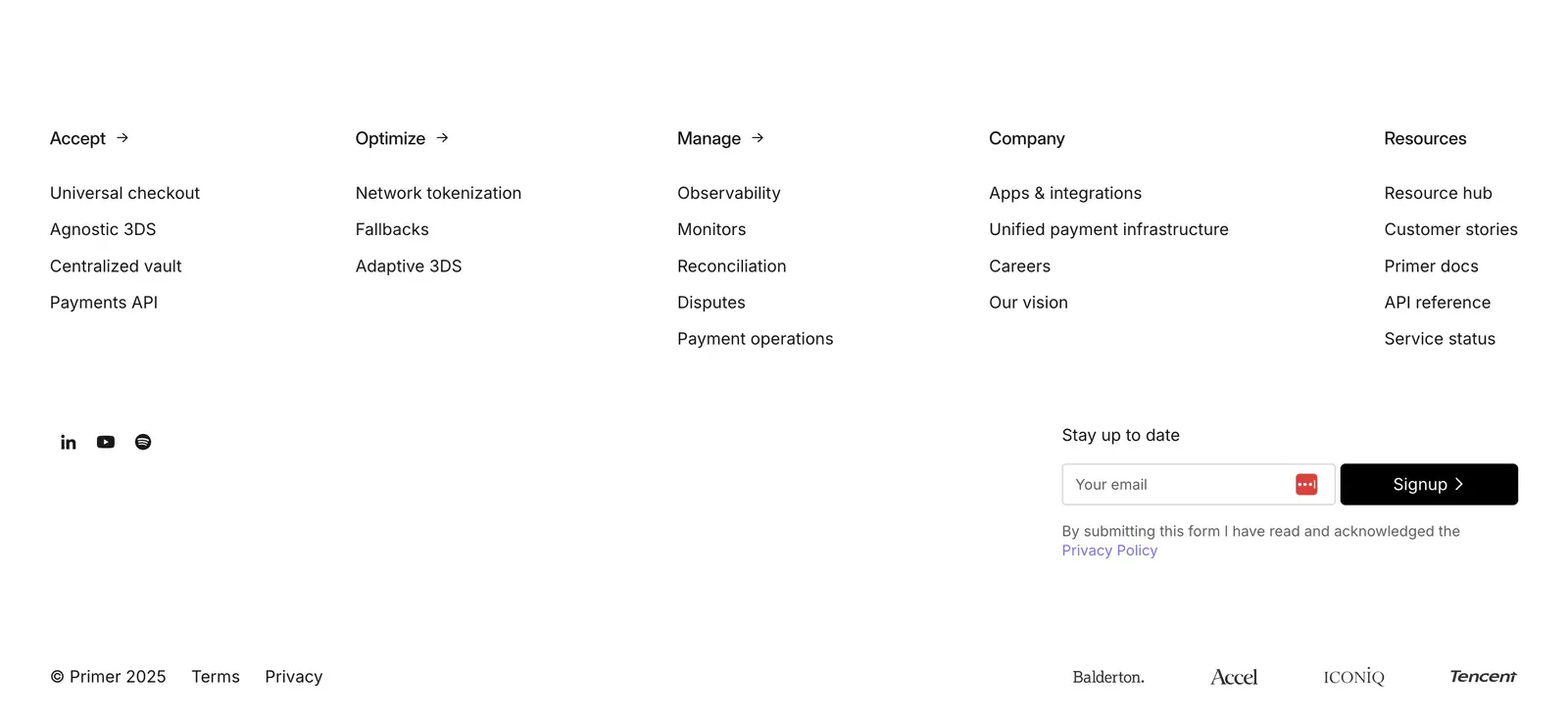
  232. Primer footer section: five link columns, social icons, email signup field and investor logos on a plain white background
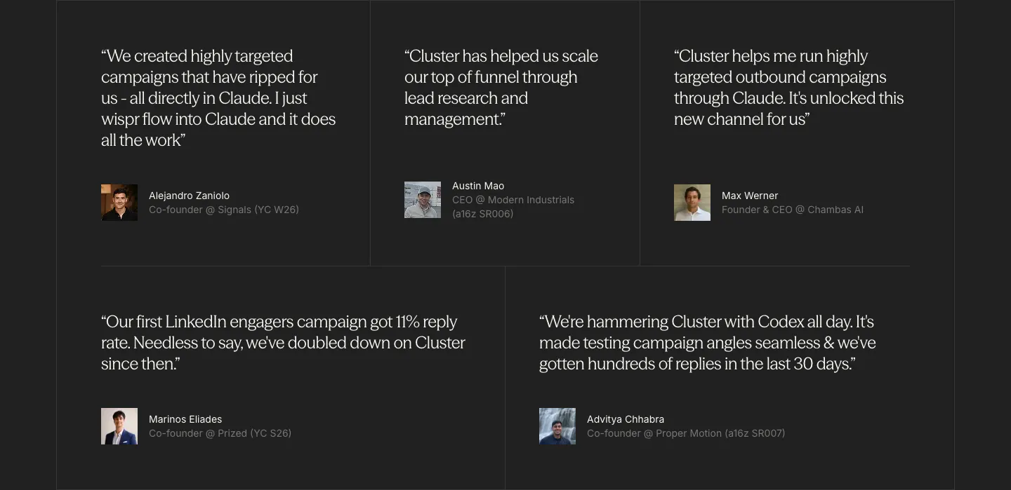
  233. Cluster testimonials section: grid of five serif customer quotes with small avatar photos and titles on a charcoal background
  234. Zamp logo cloud section: centered one-line trust statement above a single row of grayscale consumer brand logos on white
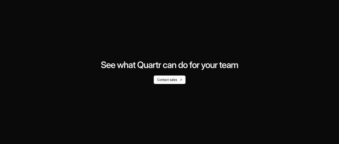
  235. Quartr call to action section: centered white headline and Contact sales button on a near-black background
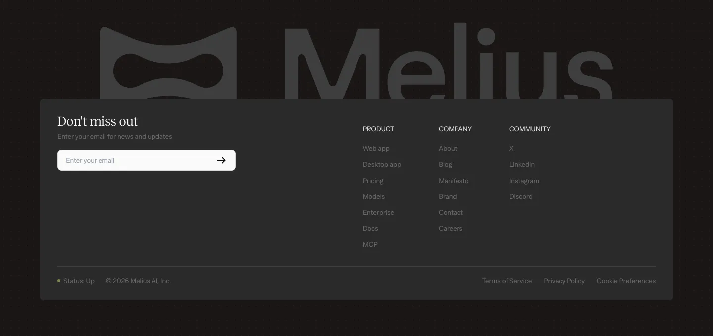
  236. Melius footer section: large gray Melius wordmark behind a dark card with email signup field, three link columns and legal row
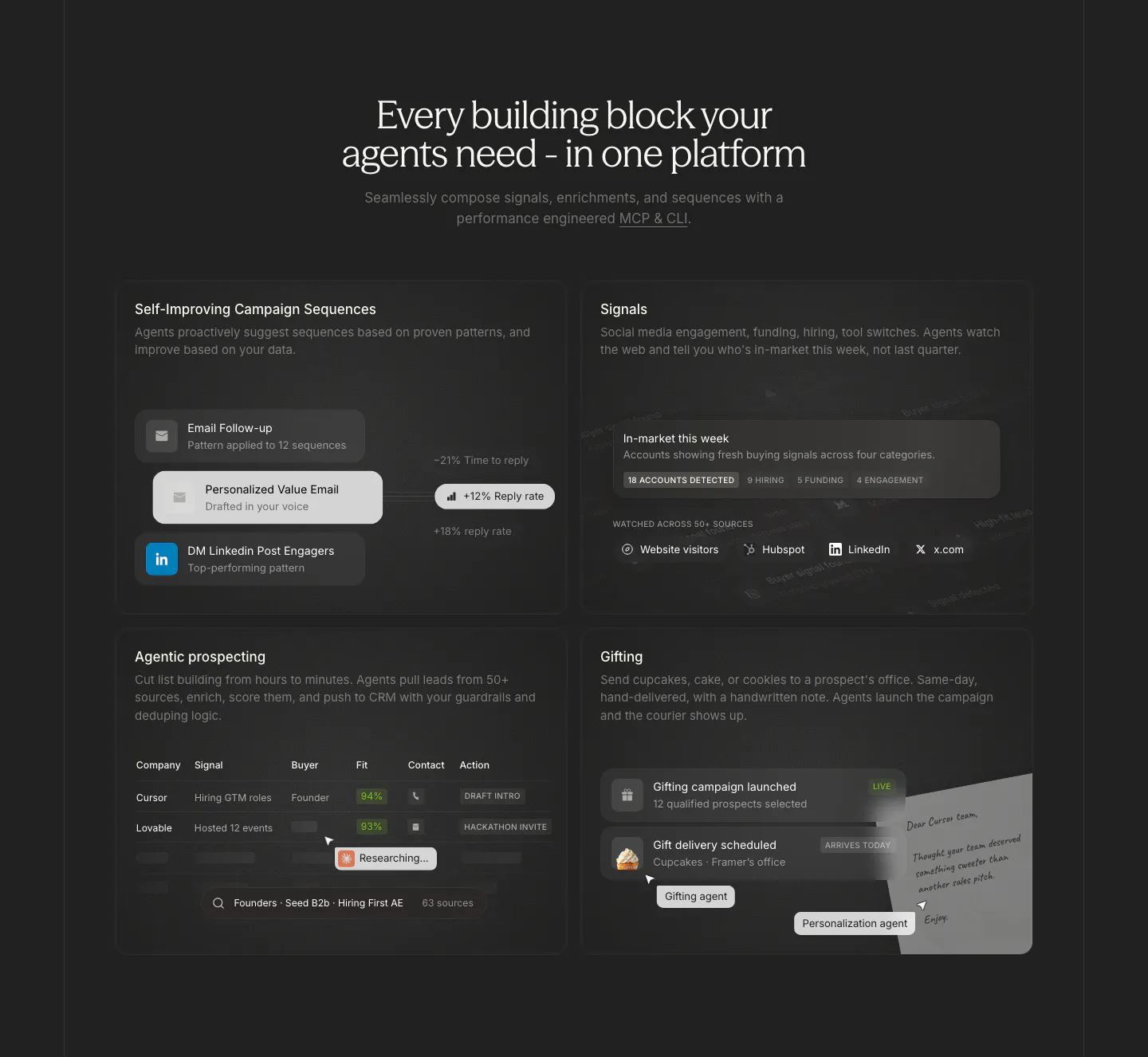
  237. Cluster features section: centered serif headline above a 2x2 grid of dark cards with sequence, signal, prospect table and gifting UI
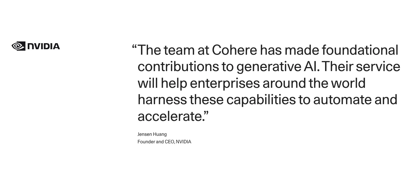
  238. Cohere testimonials section: NVIDIA logo left of a large quote with attribution on a white background
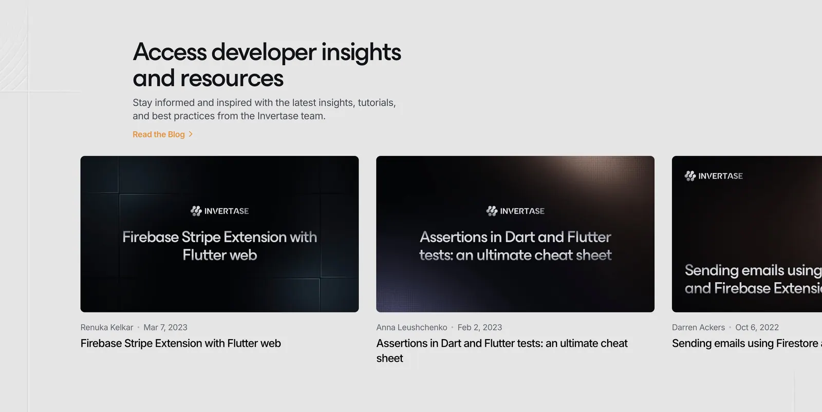
  239. Invertase blog & resources section: left headline above a row of dark article thumbnail cards cut off at the right edge on light gray
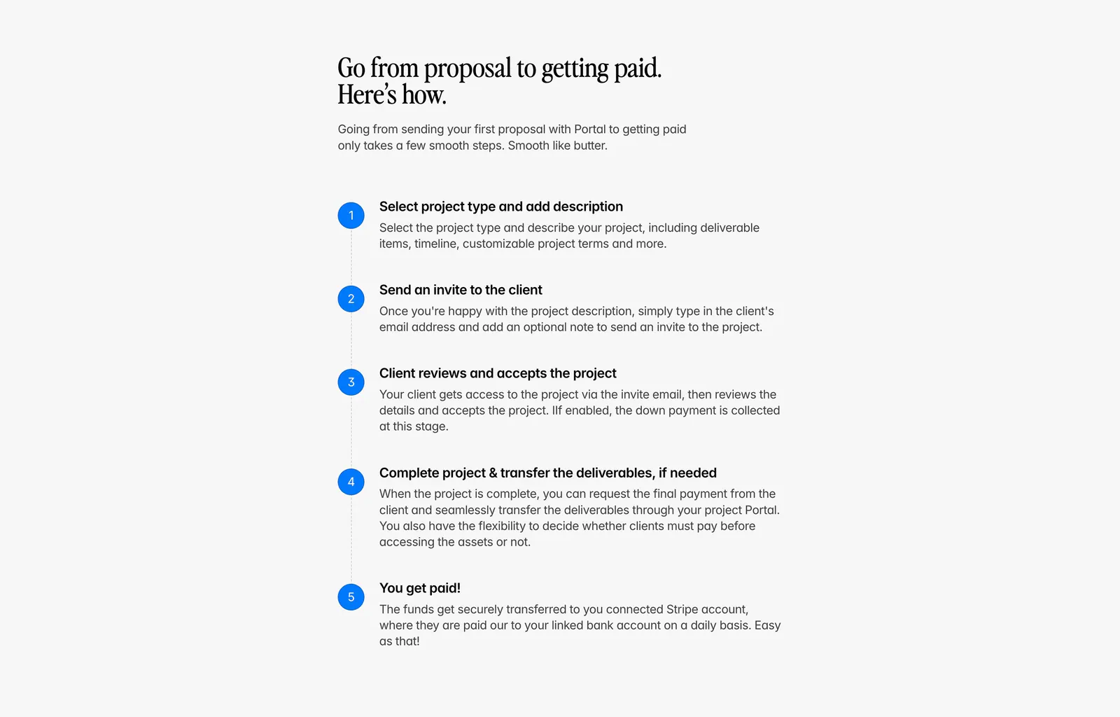
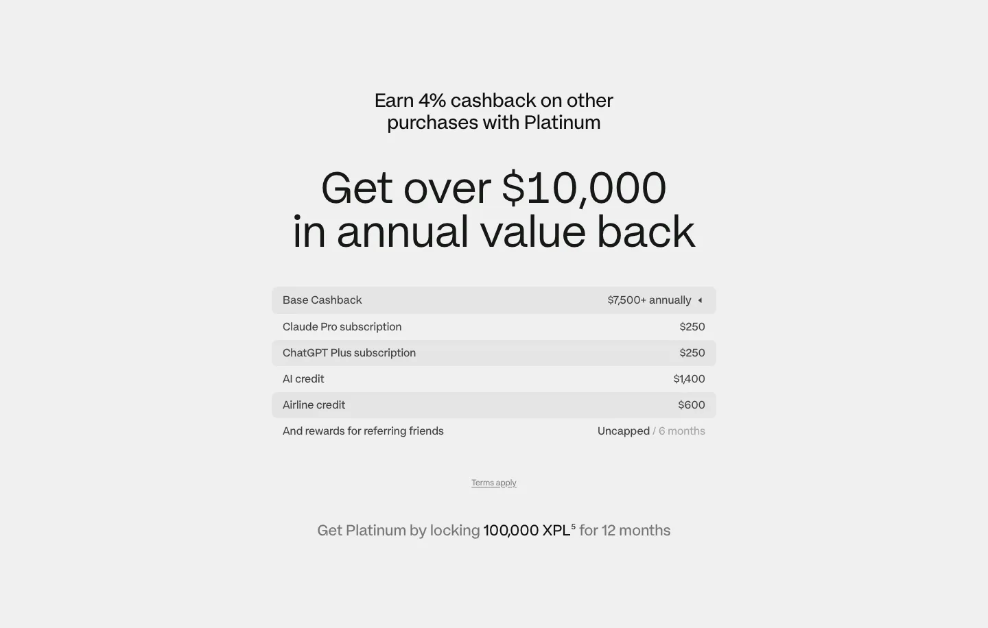
  240. Portal how it works section: serif headline above a vertical five-step list with blue numbered circles on a light gray background
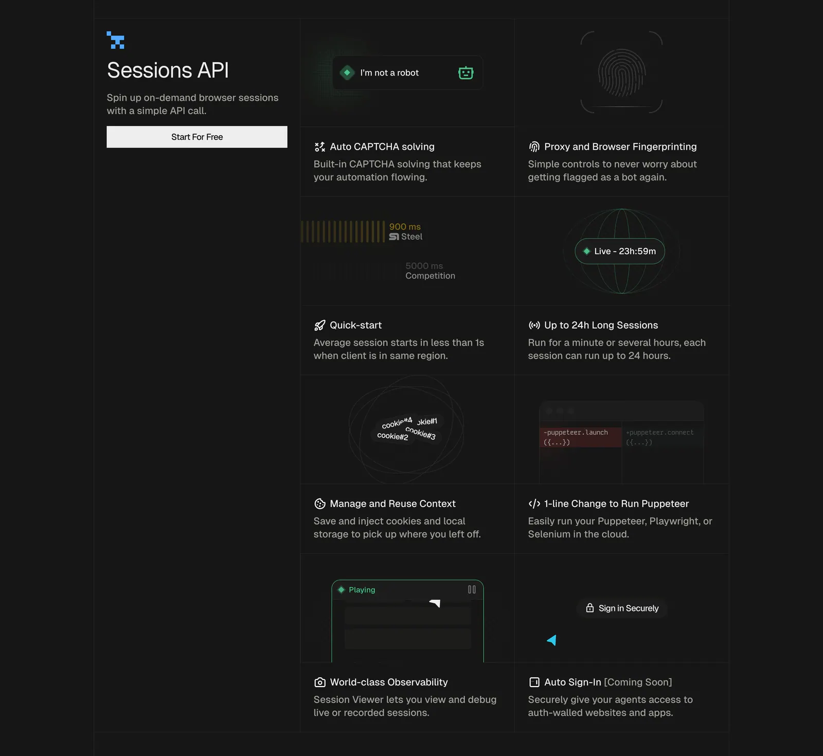
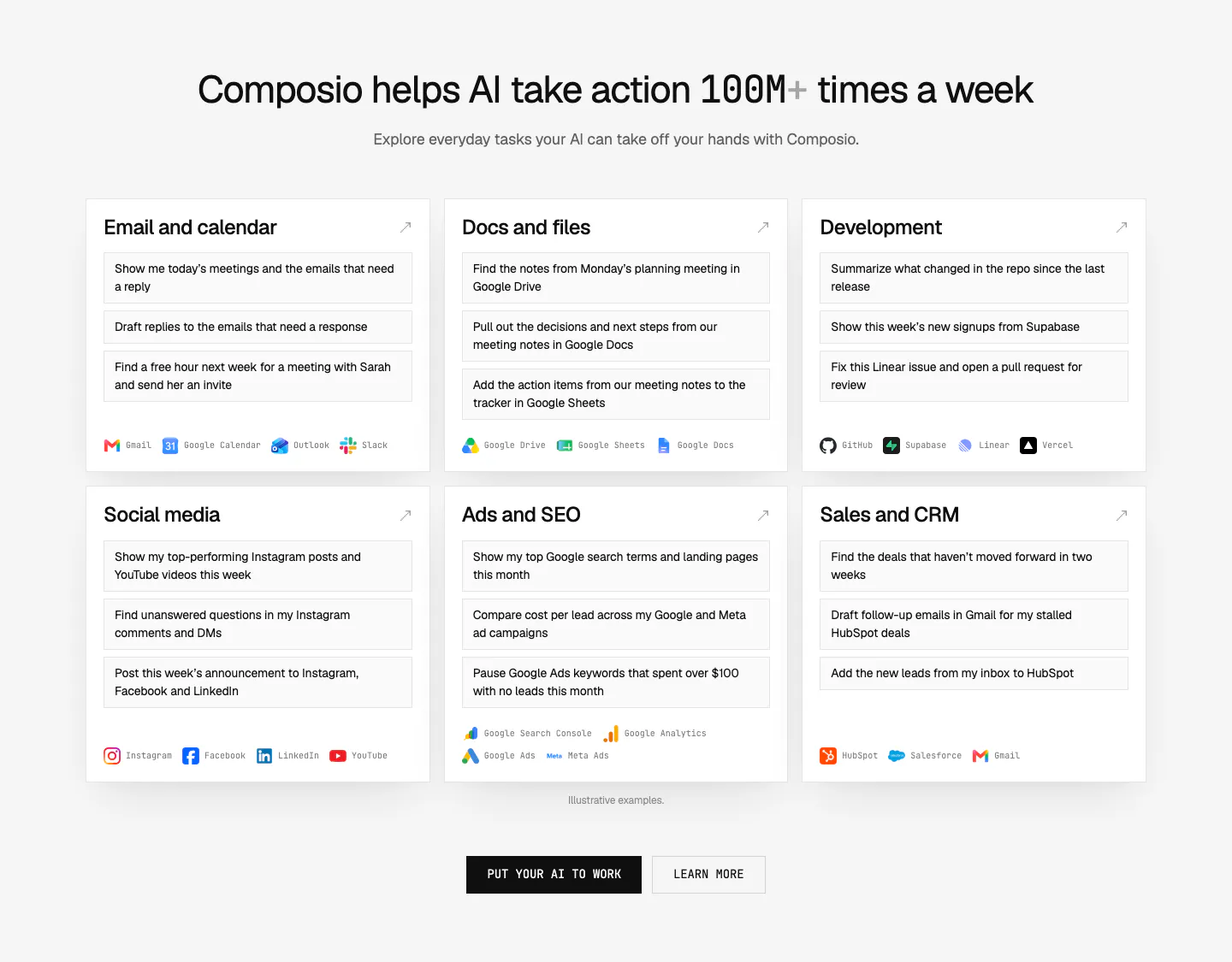
  241. Steel features section: left title block with button beside a two-column grid of feature cells with small UI graphics on a dark background
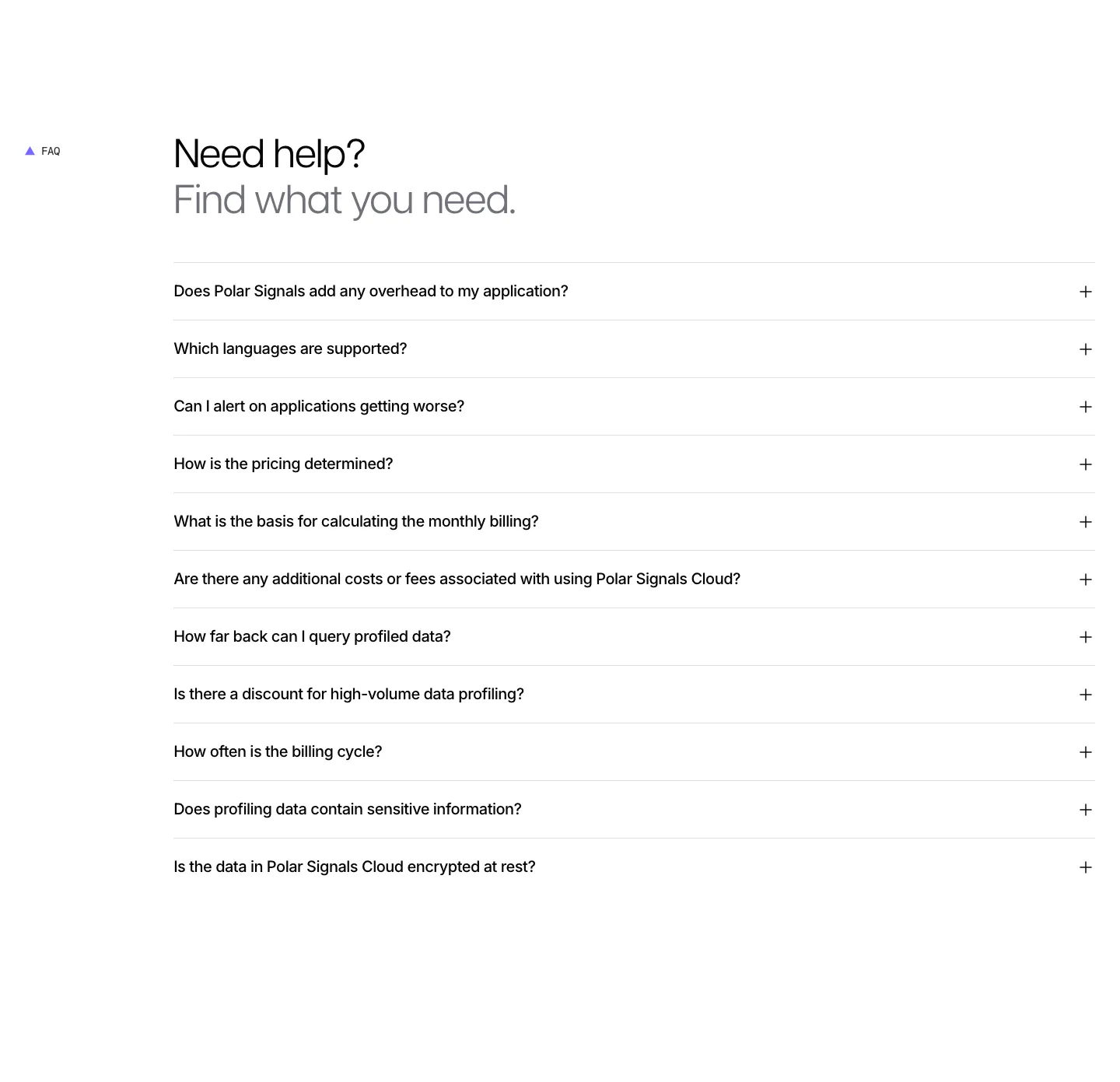
  242. Polar Signals FAQ section: two-tone headline above a full-width accordion list of eleven questions with plus icons on white
  243. Plasma pricing section: centered headline above a striped value breakdown table and lock requirement note on light gray
  244. Composio use cases section: centered headline above six white cards of example prompts by category with app names, plus two CTAs
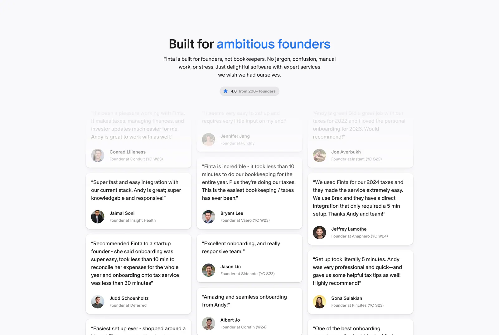
  245. Finta testimonials section: centered headline with blue accent words and rating pill above a three-column masonry wall of quotes
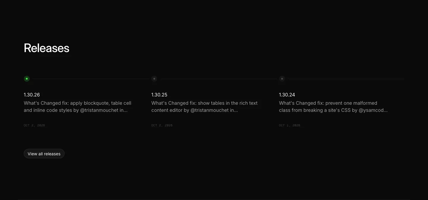
  246. Ycode blog & resources section: releases heading above three changelog entries on a horizontal timeline with a view all button
  247. Ruul integrations section: small caption above a row of grayscale bank and wallet logos on an off-white background
  248. Linear call to action section: centered two-line headline with light and dark pill buttons on a black background
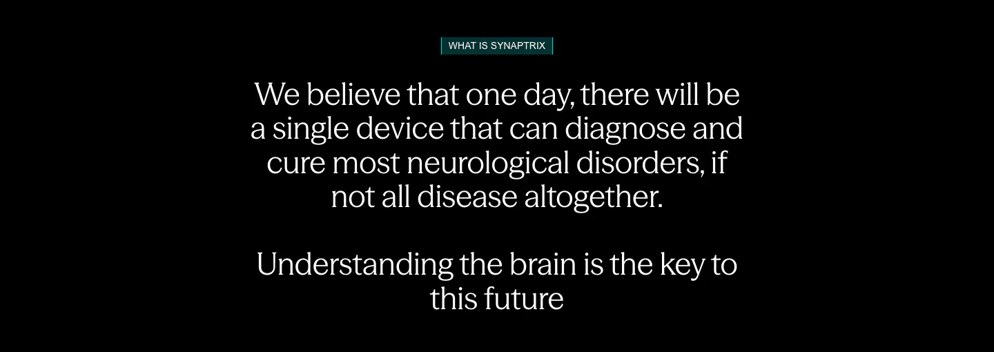
  249. Synaptrix about & mission section: centered mission statement in white text with a small teal label on a black background
  250. Relume logo cloud section: small caption on the left of a single rounded strip of black customer logos on a light gray background
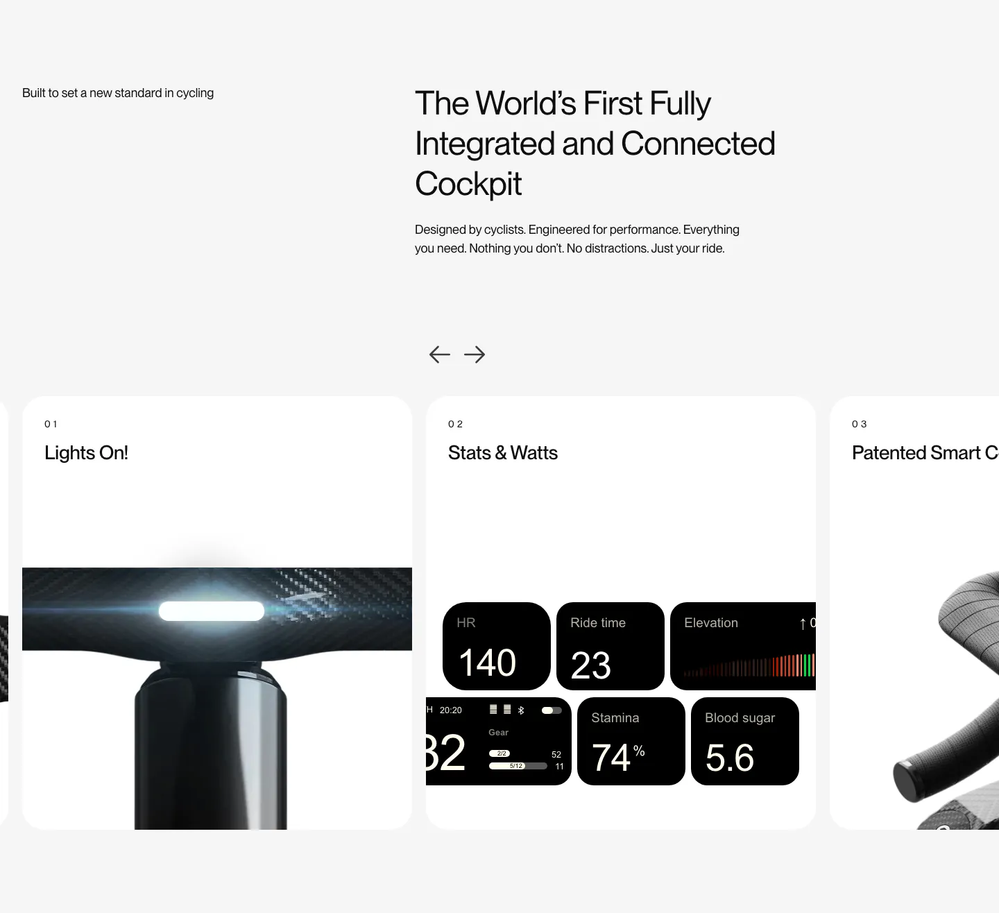
  251. FLITEDECK features section: heading on light gray above a numbered card carousel with arrows showing light, stats and handlebar photos
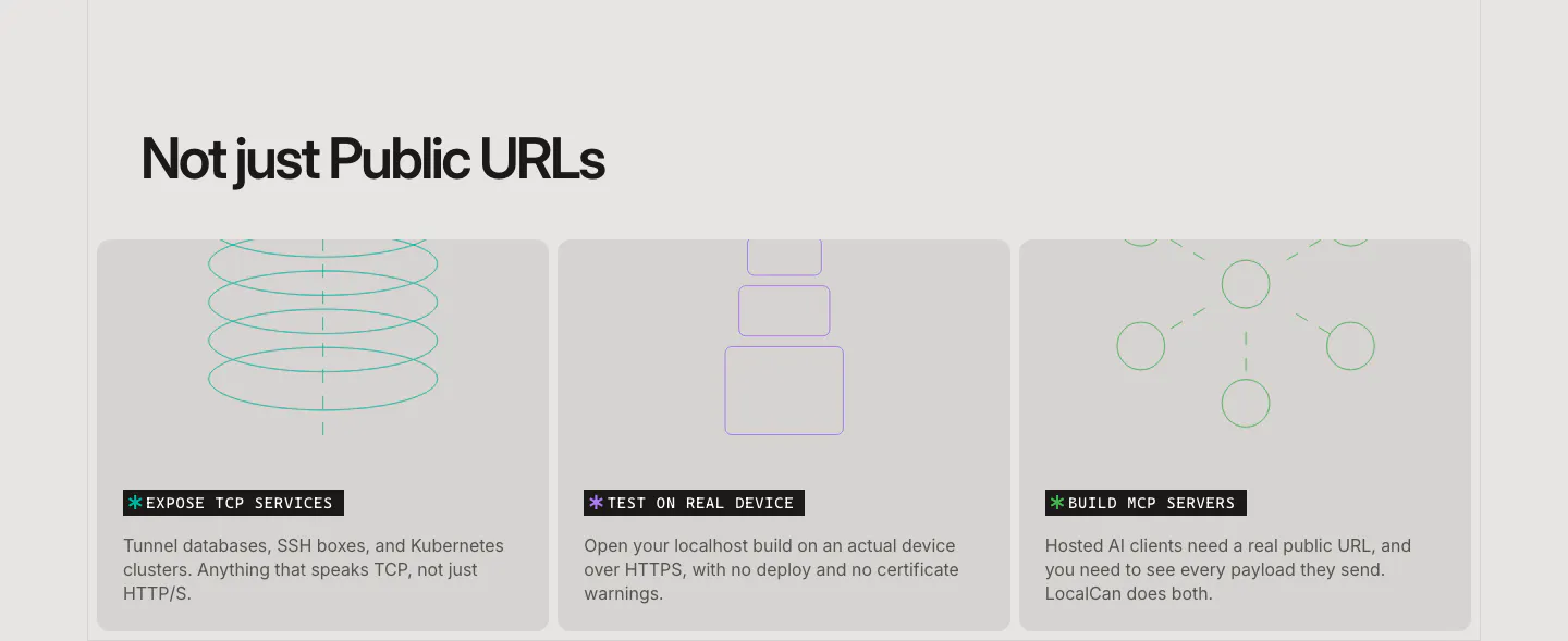
  252. LocalCan features section: left-aligned headline above three equal gray cards with thin line drawings for TCP, devices and MCP servers
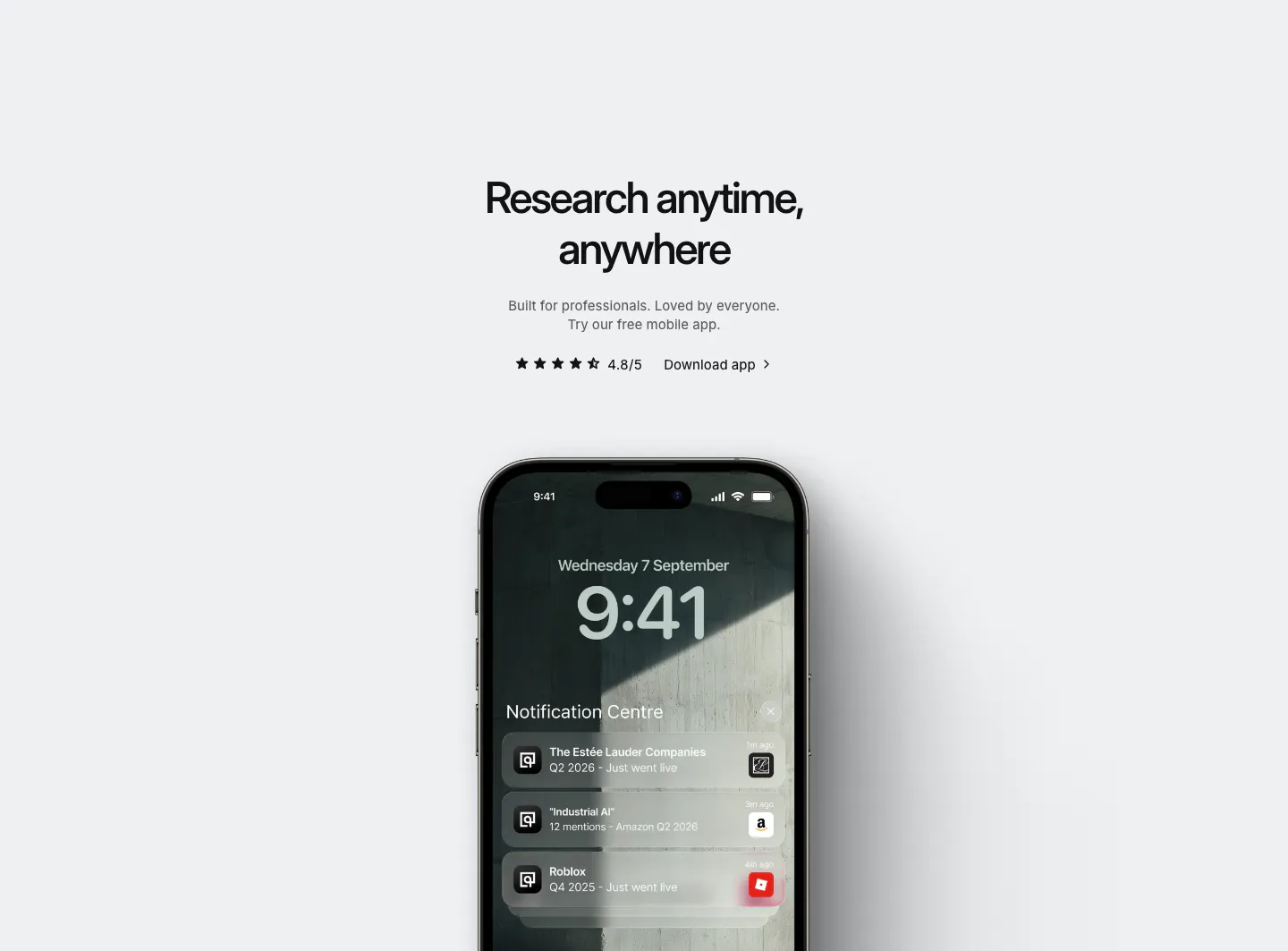
  253. Quartr other section: centered app download headline with star rating above an iPhone showing Quartr lock-screen notifications
    Quartr Other
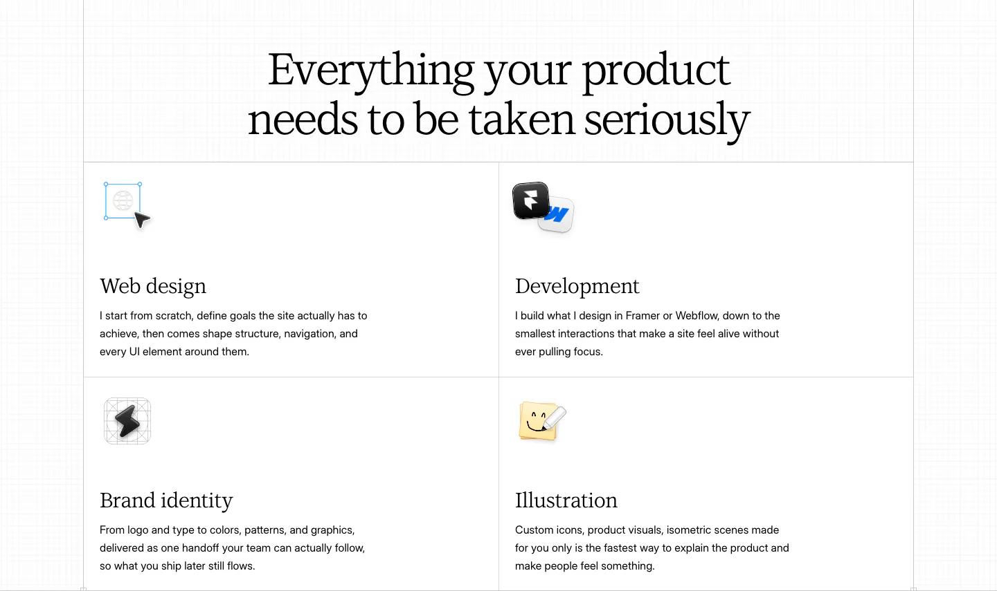
  254. Daniel Sun features section: centered serif headline above a bordered 2x2 grid of services with small icons on white
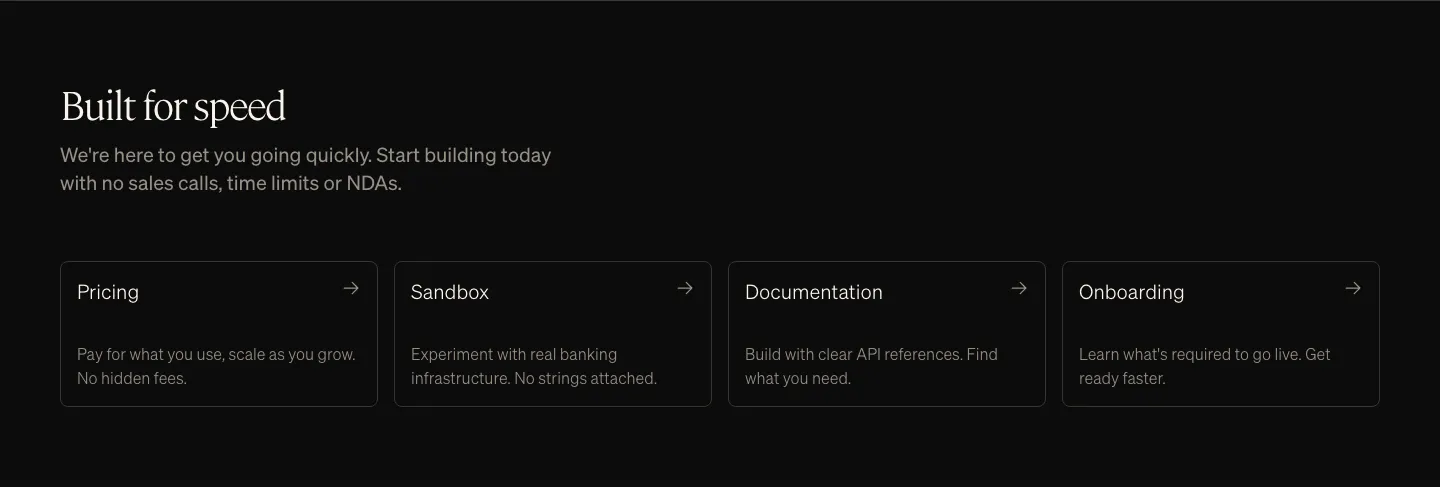
  255. Griffin value proposition section: serif heading and copy above four dark outlined link cards with arrows
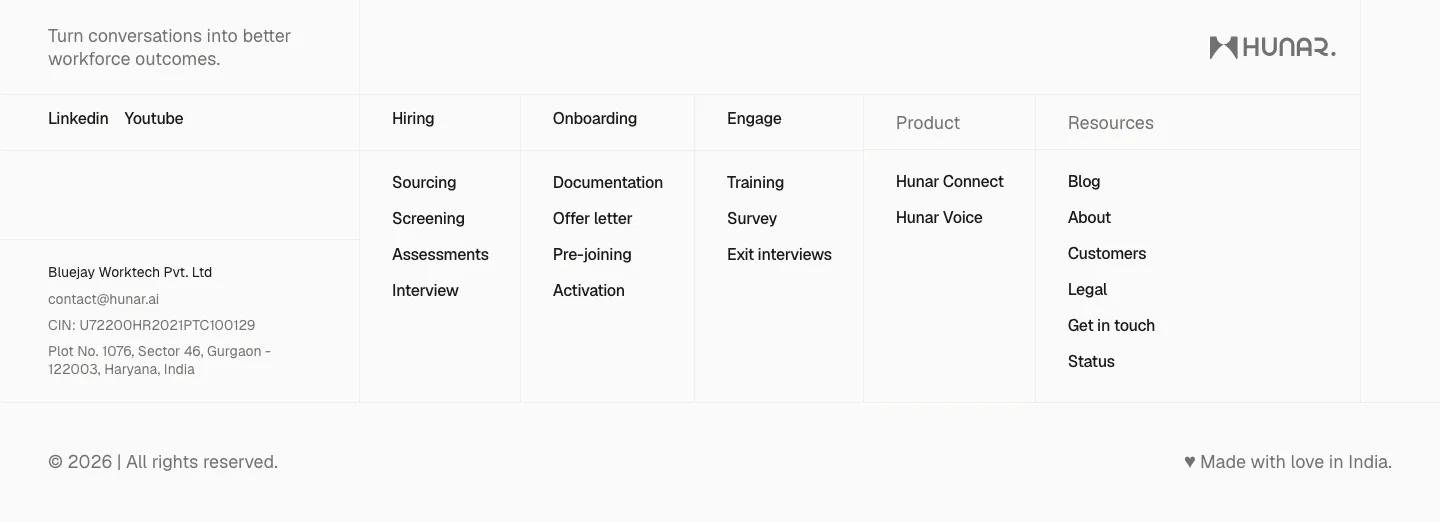
  256. Hunar footer section: light grid footer with tagline, social links, company address and link columns beside the Hunar wordmark
  257. Concourse FAQ section: heading left, accordion of questions right with the first item expanded on white
  258. Atlassian stats section: heading and explanatory copy on the left with two percentage metrics on the right on a dark background
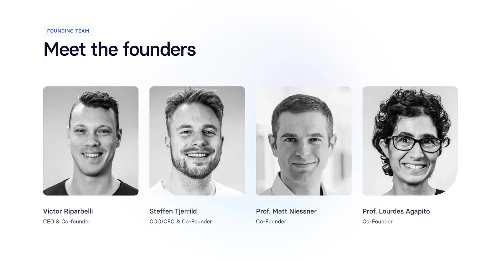
  259. Synthesia team section: left-aligned headline above four black-and-white founder headshot cards with names and titles on white
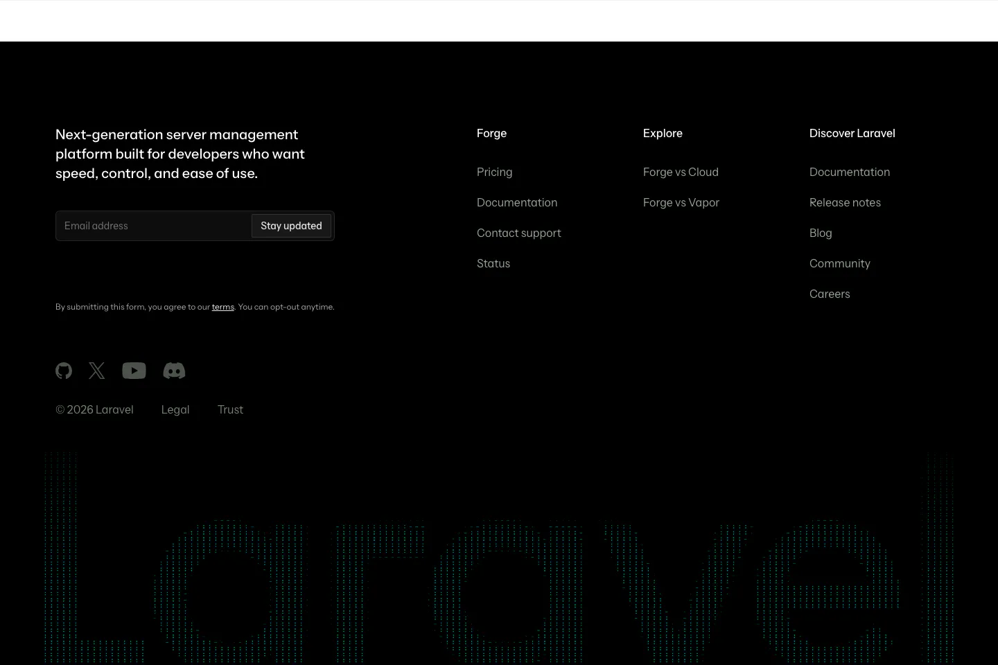
  260. Laravel Forge footer section: dark footer with email signup, link columns, social icons and a huge dithered Laravel wordmark
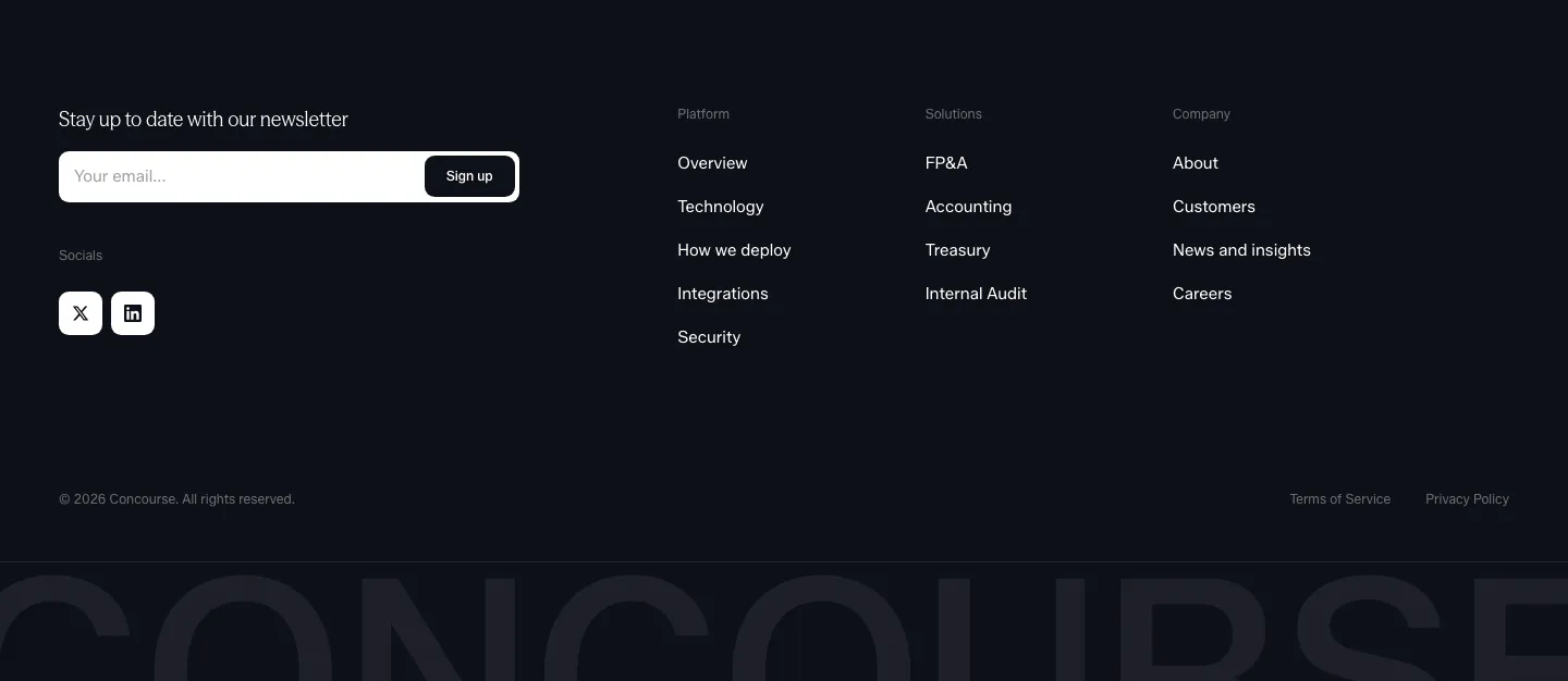
  261. Concourse footer section: newsletter email field and social icons left, link columns right, cut-off Concourse wordmark below on dark
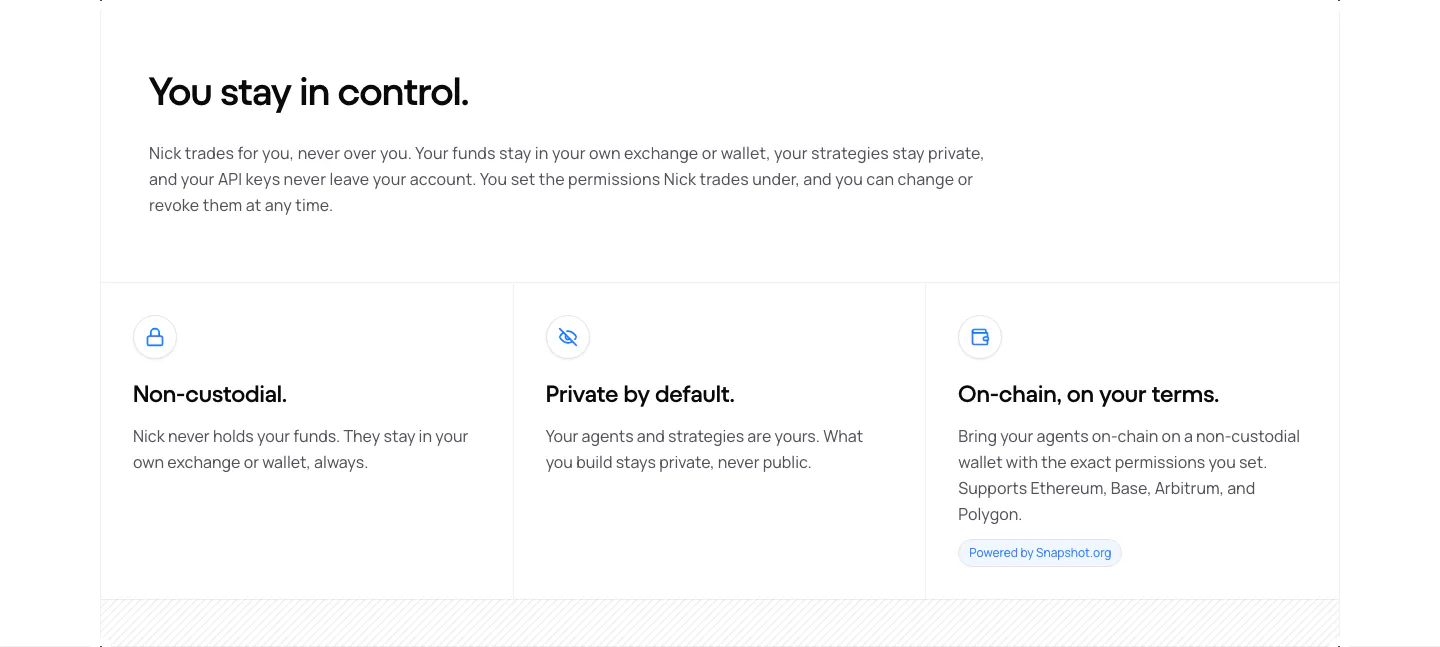
  262. NickAI security section: left heading and copy above three bordered cells with icons for non-custodial, private and on-chain
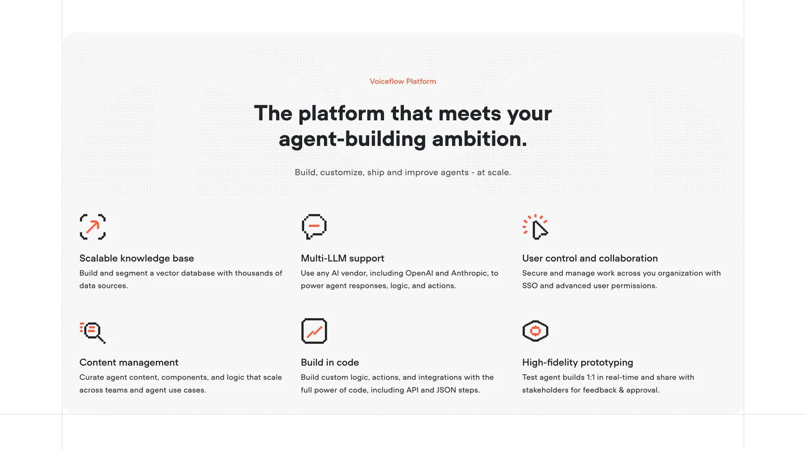
  263. Voiceflow features section: centered headline above a six-item grid of features with orange pixel-style icons on a light gray panel
  264. Profound logo cloud section: small centered heading above a bordered 4x3 grid of white customer logos on black
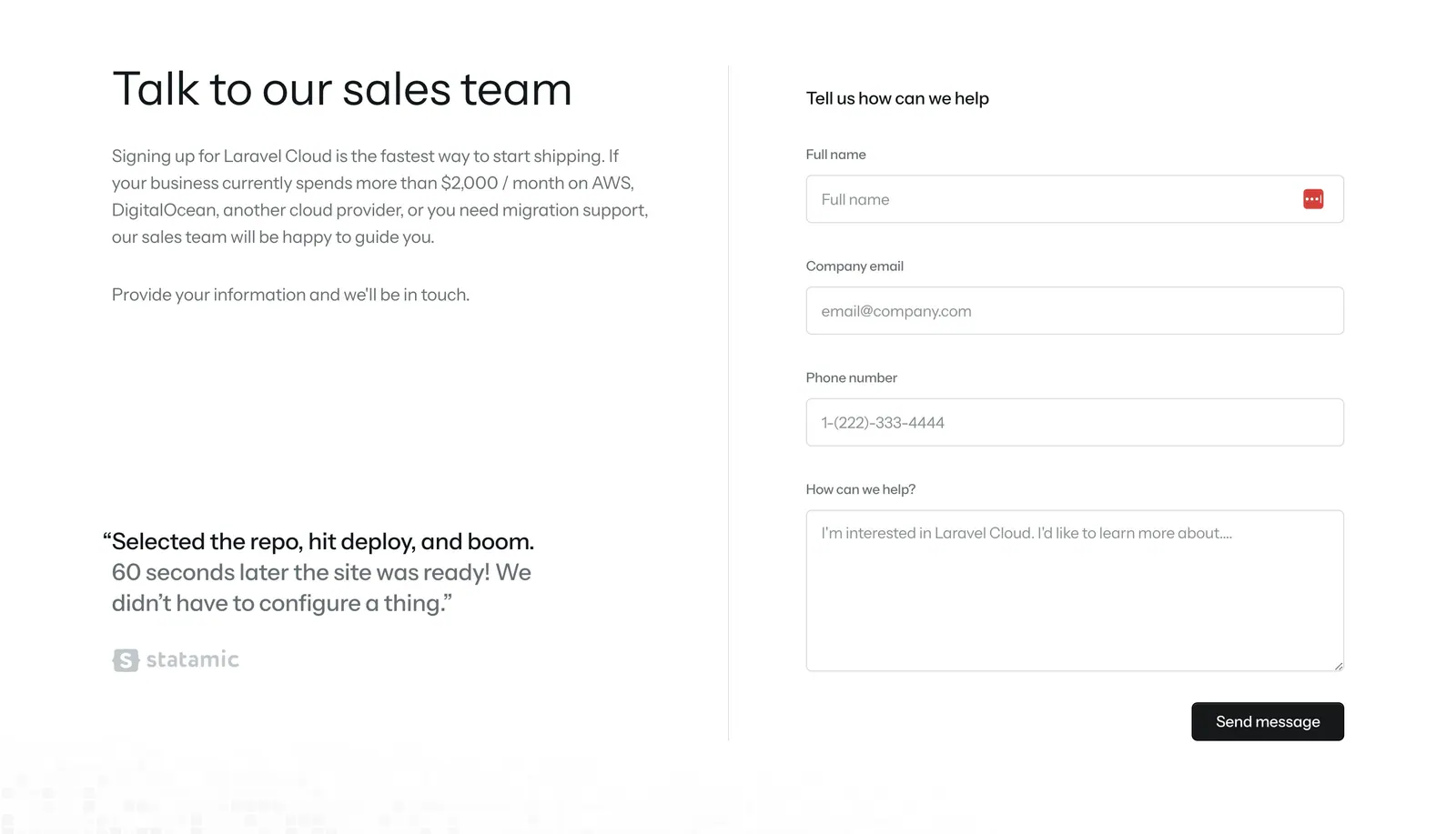
  265. Laravel Cloud contact section: headline, copy and customer quote on the left, sales contact form on the right on white
  266. Ycode footer section: small logo, two short link columns, social icon buttons and copyright line on a black background
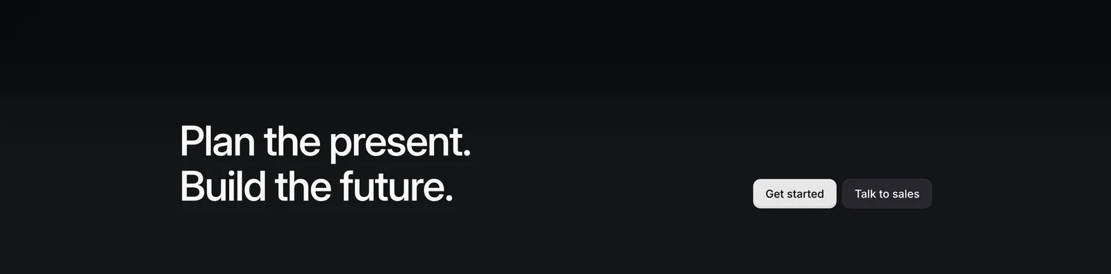
  267. Linear call-to-action section: two-line headline on the left with Get started and Talk to sales buttons on the right, on a near-black gradient
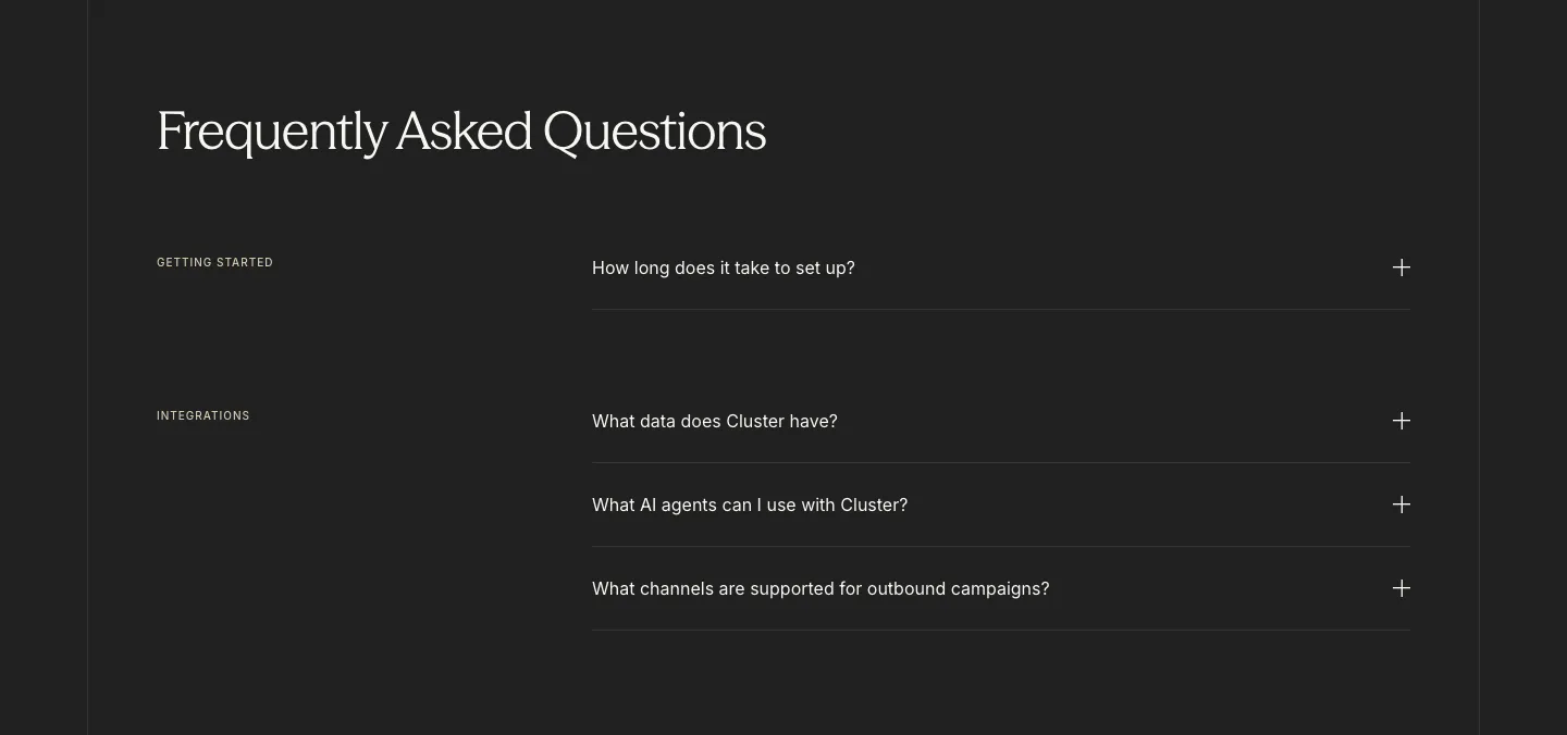
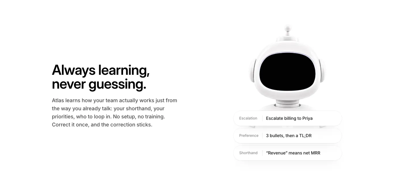
  268. Cluster FAQ section: serif headline above category-labelled accordion questions with plus icons on a charcoal background
  269. Rogo stats section: three large serif numbers in divided rows with short labels on the right, light gray background
  270. Canopy integrations section: centered two-tone headline and button above a bordered grid of eight numbered partner logos on white
  271. Linear hero section: nav bar, left-aligned headline, subcopy and two CTAs above a tilted dark app screenshot showing inbox and an issue view
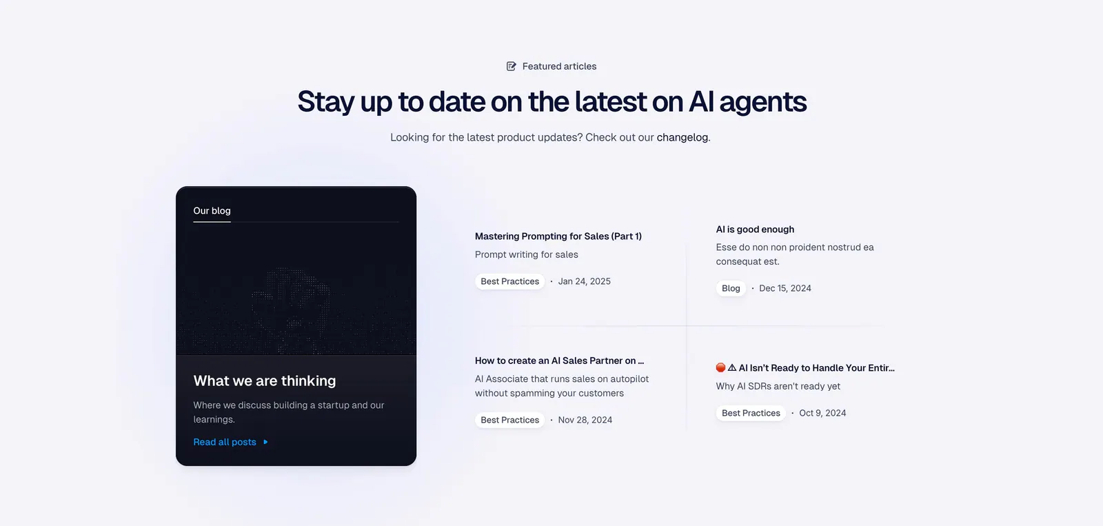
  272. Godmode blog & resources section: centered heading above a dark blog card on the left and a two-by-two list of article links
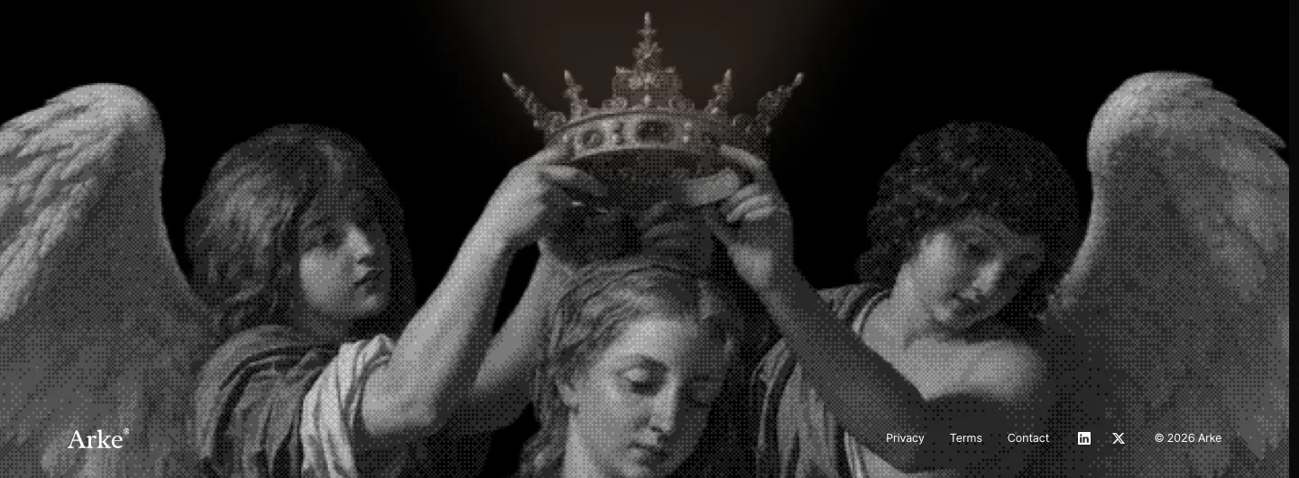
  273. Arke footer section: full-width grayscale halftone painting of angels crowning a figure with the wordmark and small legal links along the bottom
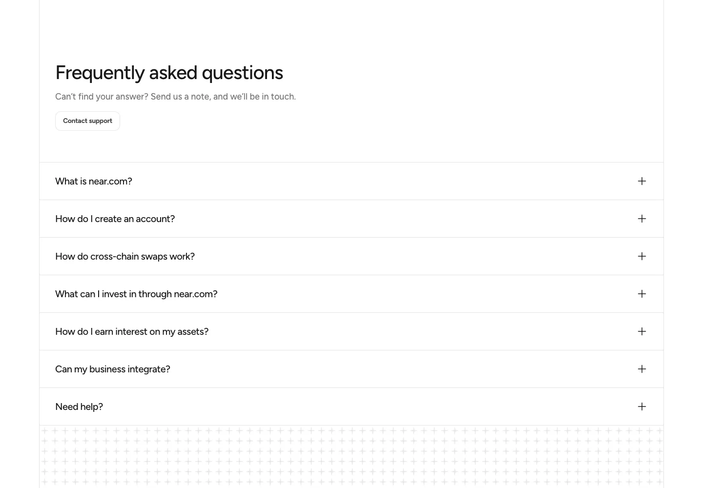
  274. NEAR FAQ section: headline with Contact support button above a full-width accordion of questions on white
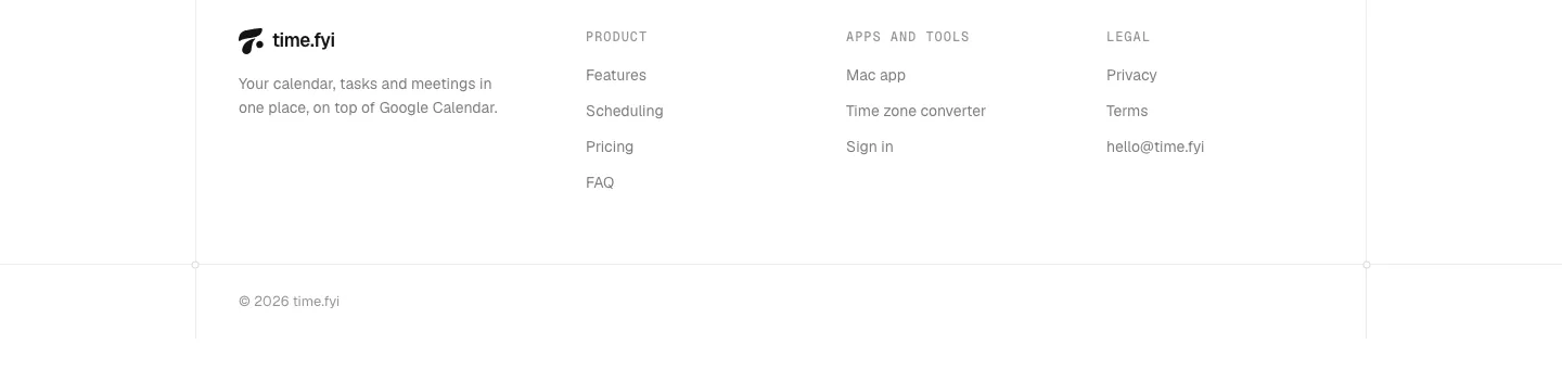
  275. time.fyi footer section: logo and tagline beside Product, Apps and tools, and Legal link columns with a copyright line on white
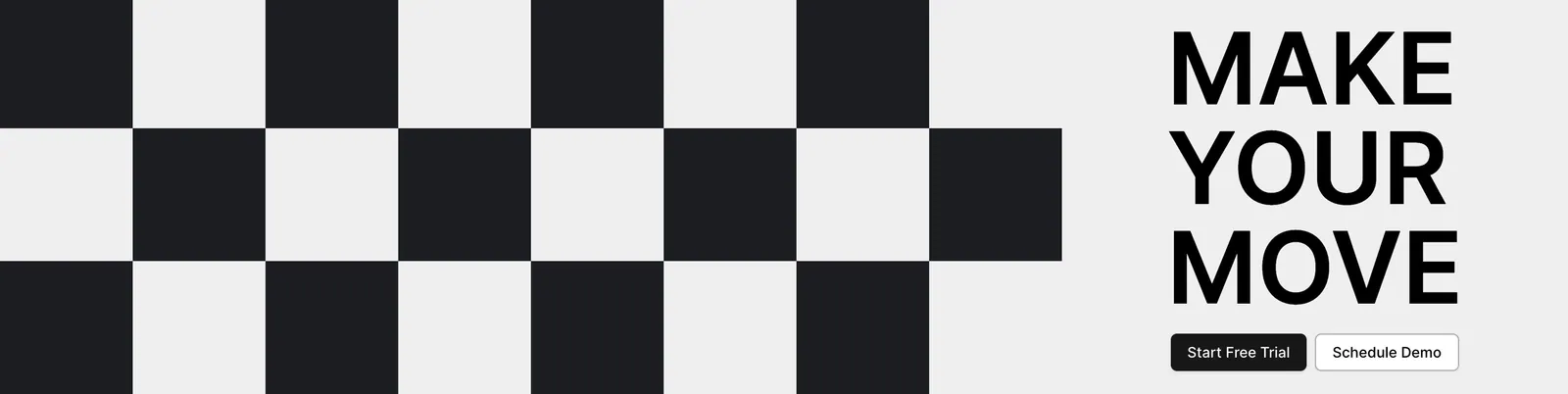
  276. Airbook call-to-action section: black and white checkerboard pattern on the left beside a bold MAKE YOUR MOVE headline and two buttons
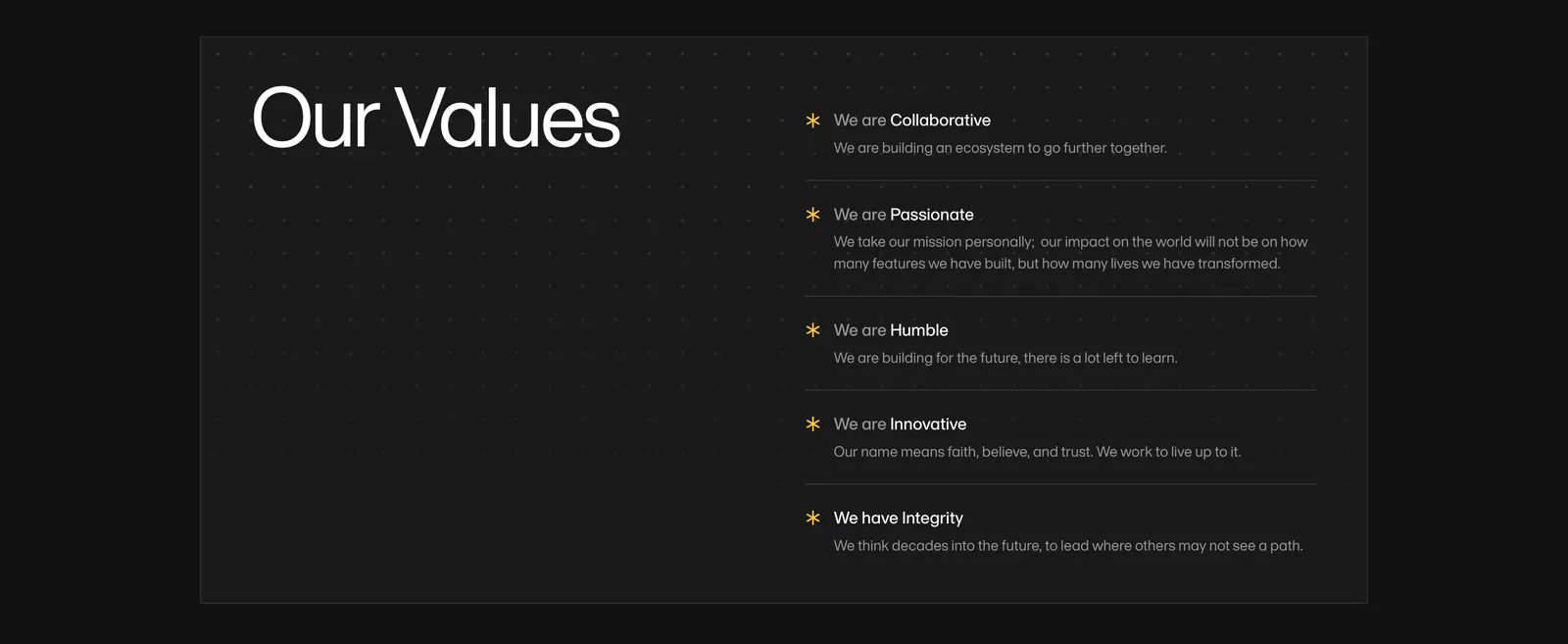
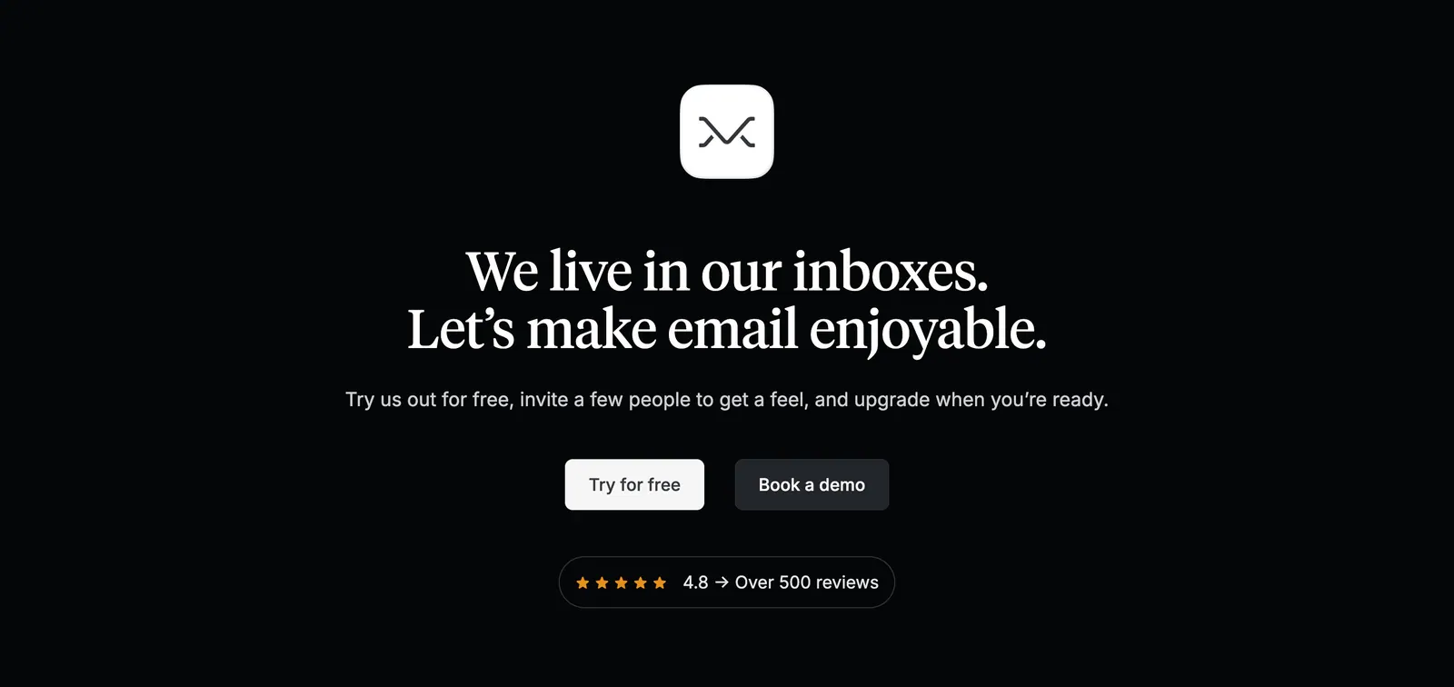
  277. Amini value proposition section: large Our Values heading on a dark dotted panel beside a list of five values with yellow asterisks
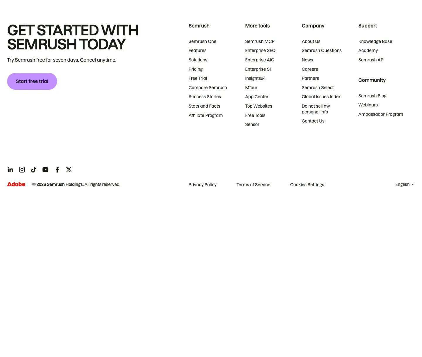
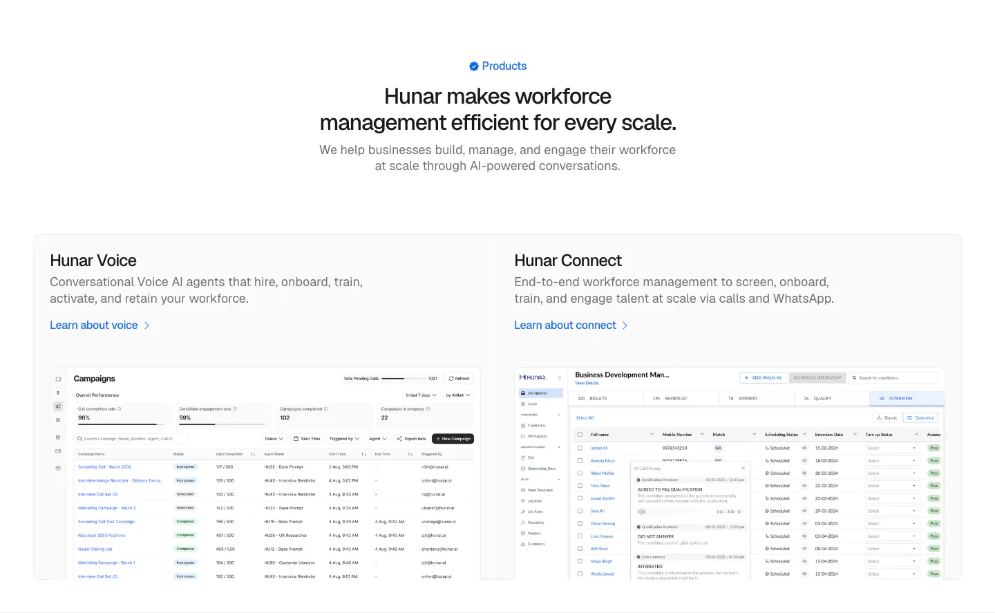
  278. Semrush footer section: uppercase signup headline with purple trial button beside four link columns, social icons and copyright row
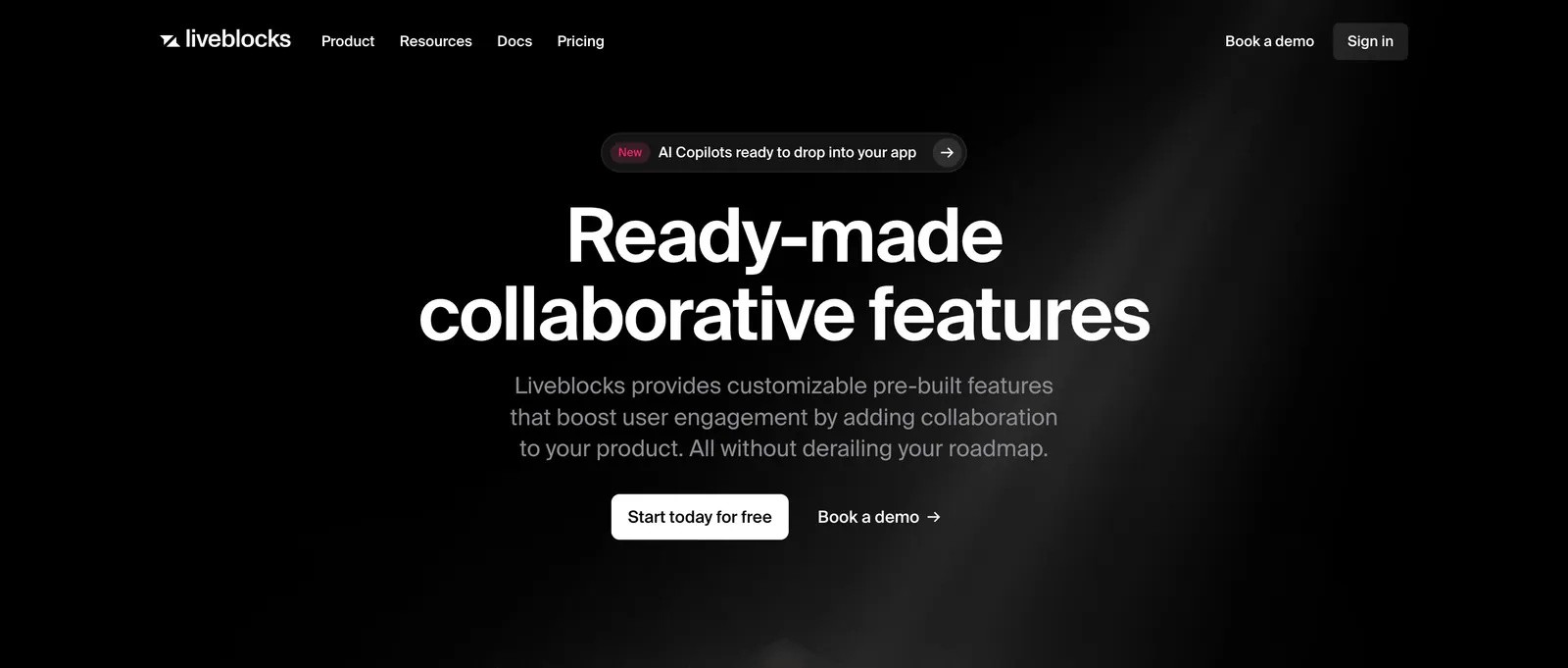
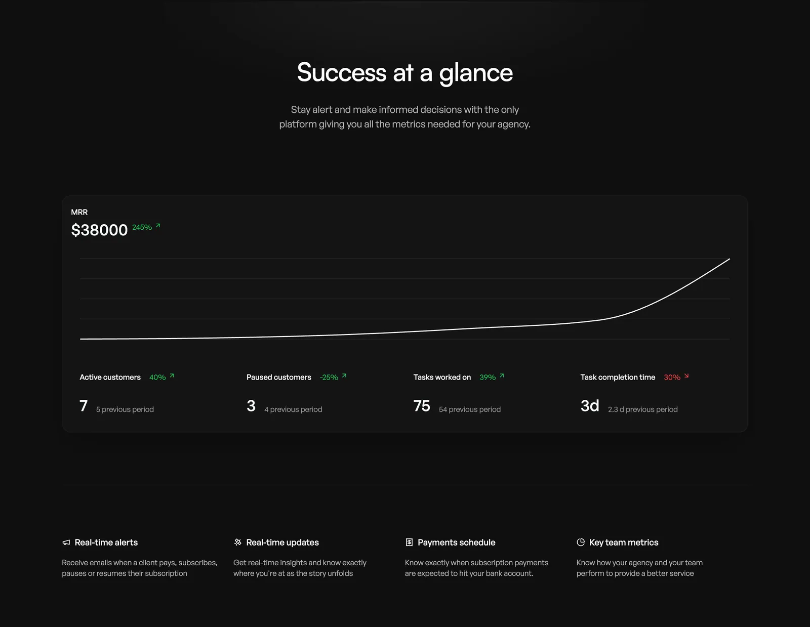
  279. Liveblocks hero section: nav bar, announcement pill, large centered white headline, subcopy and two CTAs on black with a faint light beam
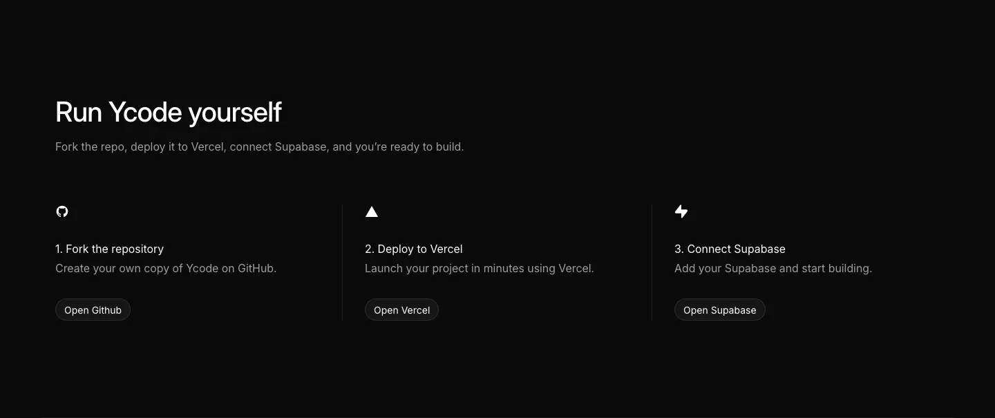
  280. Teton logo cloud section: two-tone headline above a scrolling row of gray tiles with black healthcare and municipality logos
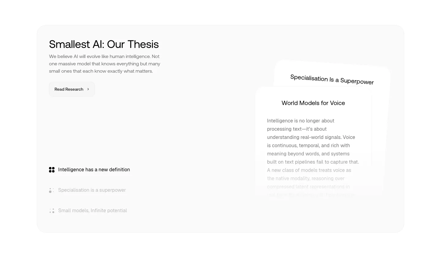
  281. Missive call-to-action section: centered app icon and serif headline with two buttons and a review rating badge on black
  282. Hunar features section: centered heading above two product cards with campaign and candidate table screenshots on a light background
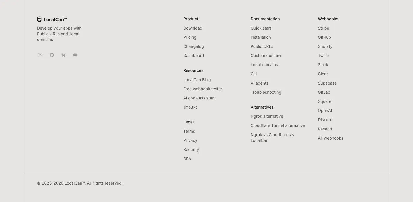
  283. Orchestra value proposition section: centered headline above an MRR line chart dashboard card and a four-column feature list, dark
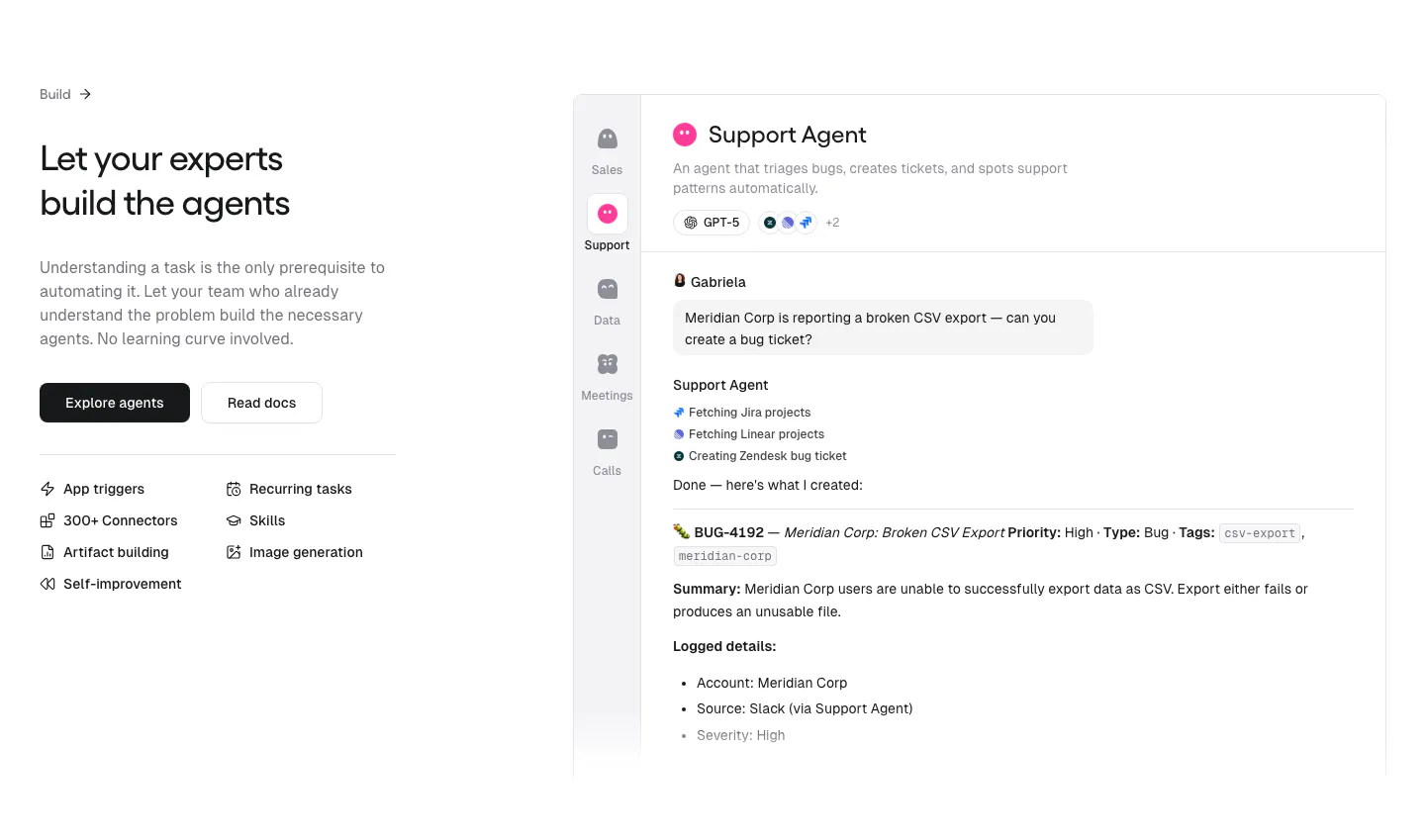
  284. Ycode how it works section: headline above three numbered steps with icons and buttons for GitHub, Vercel and Supabase on black
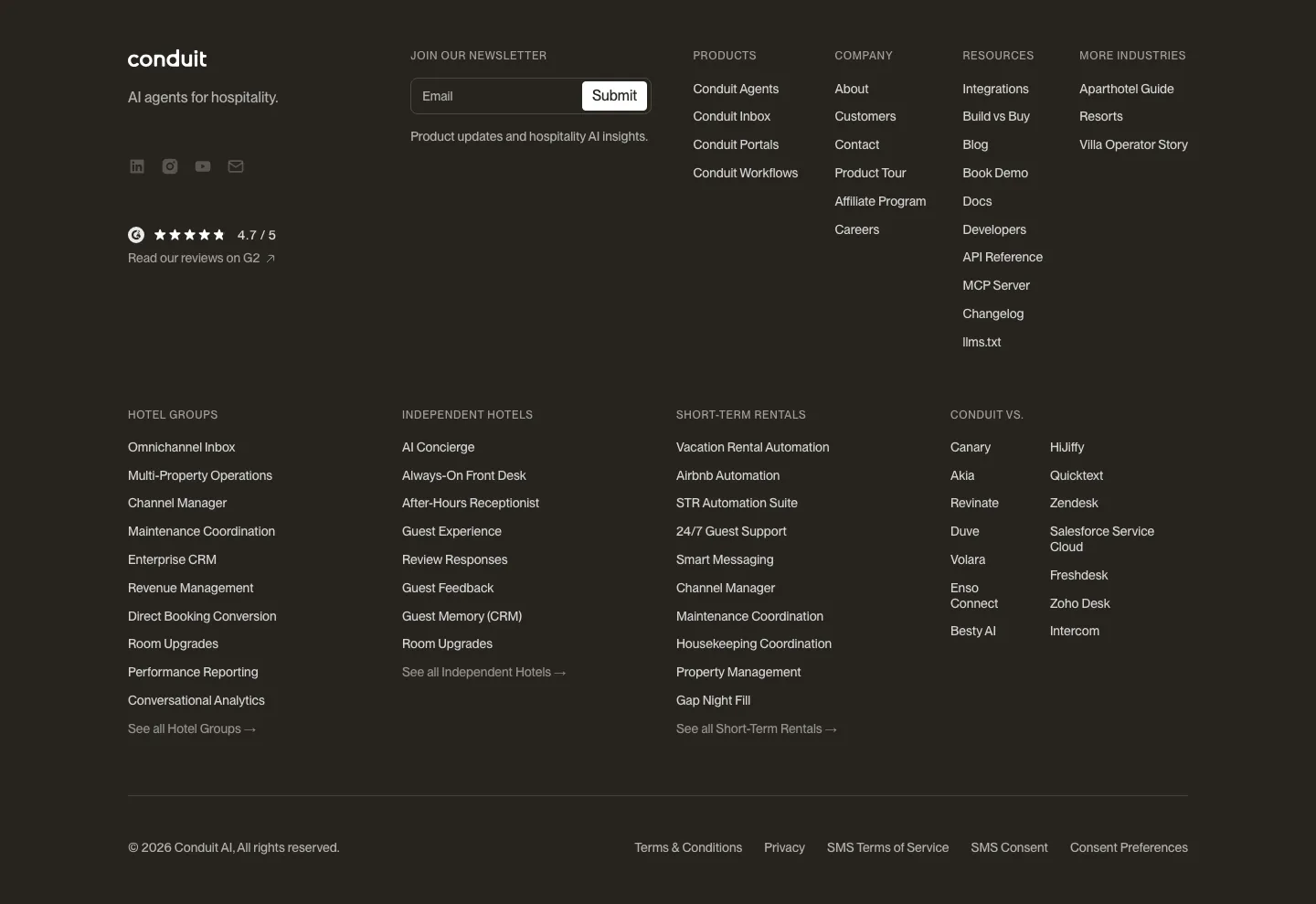
  285. Smallest.ai about & mission section: thesis headline, research button and topic list on the left beside stacked text cards in a gray panel
  286. Ruul logo cloud section: small caption above a single row of grayscale organisation logos on an off-white background
  287. LocalCan footer section: logo, tagline and social icons on the left, link columns for product, docs, alternatives and webhooks, copyright row
  288. Gumloop features section: headline, buttons and capability list on the left, support agent chat UI on the right
  289. Conduit footer section: dark brown footer with newsletter field, G2 rating and dense multi-column link lists
  290. Quartr features section: four equal gray cards with small UI snippets and charts, each with a short title and description
  291. Canopy integrations section: centered headline and copy above a row of four numbered partner logos on a dark background
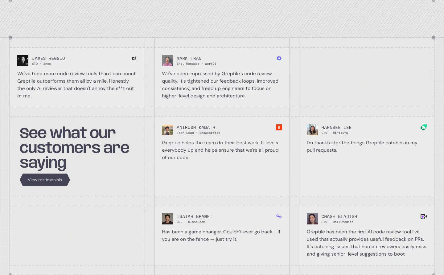
  292. Greptile testimonials section: grid of quote cards with avatars and company logos around a large headline cell with a button
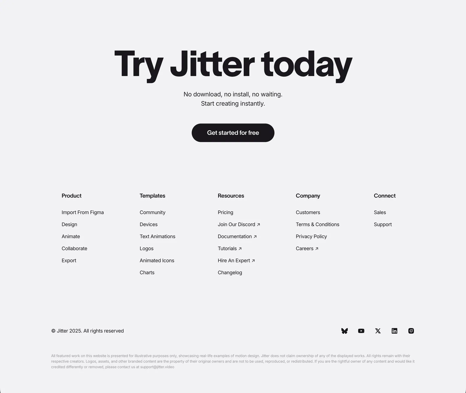
  293. Jitter footer section: large centered CTA headline and button above five link columns, copyright and social icons on light gray
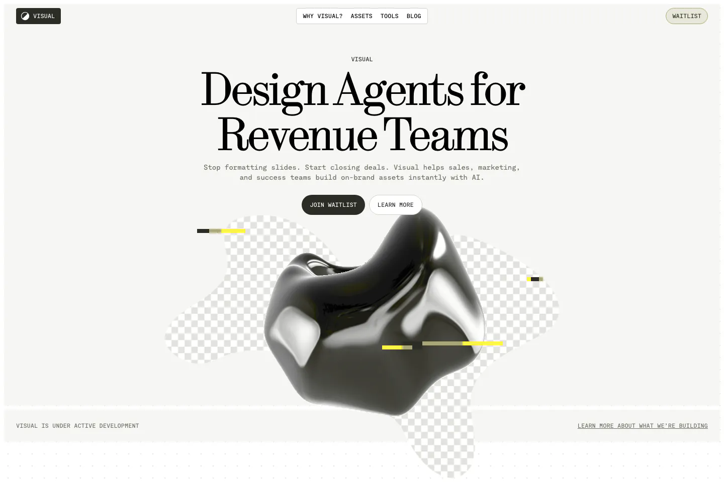
  294. Visual hero section: nav bar and centered serif headline with two buttons above a glossy black 3D blob on checkerboard shapes
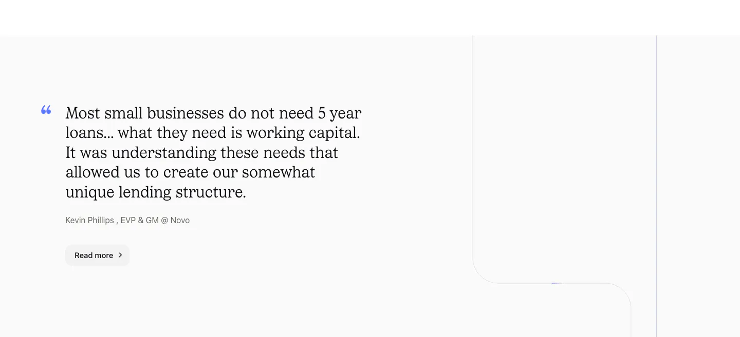
  295. Canopy testimonials section: large serif customer quote with attribution and Read more button on a light gray background
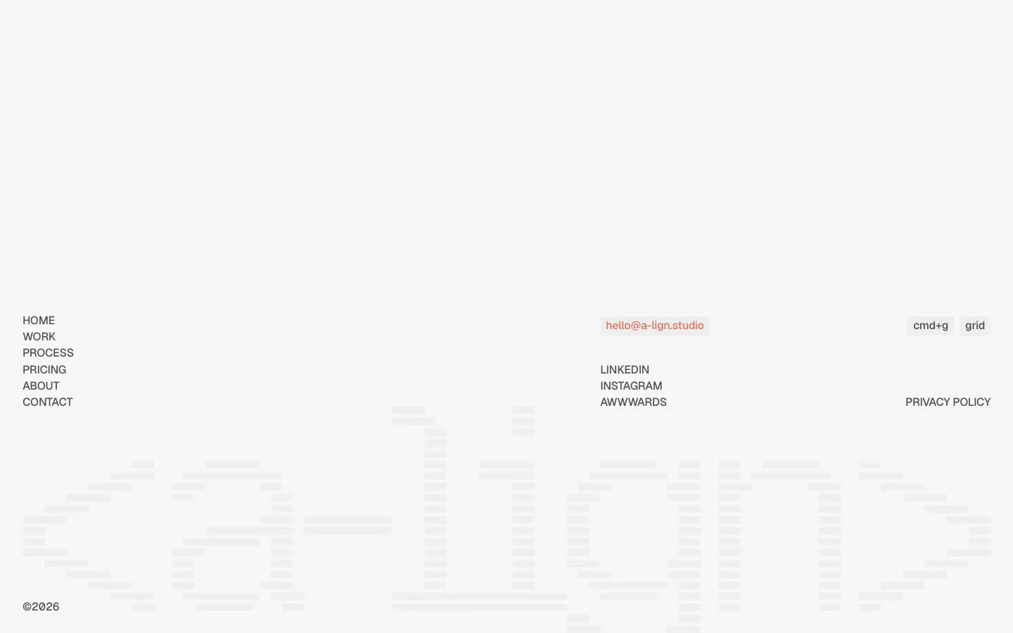
  296. A-LIGN footer section: link list, email pill and social links above a faint full-width striped a-lign wordmark on light gray
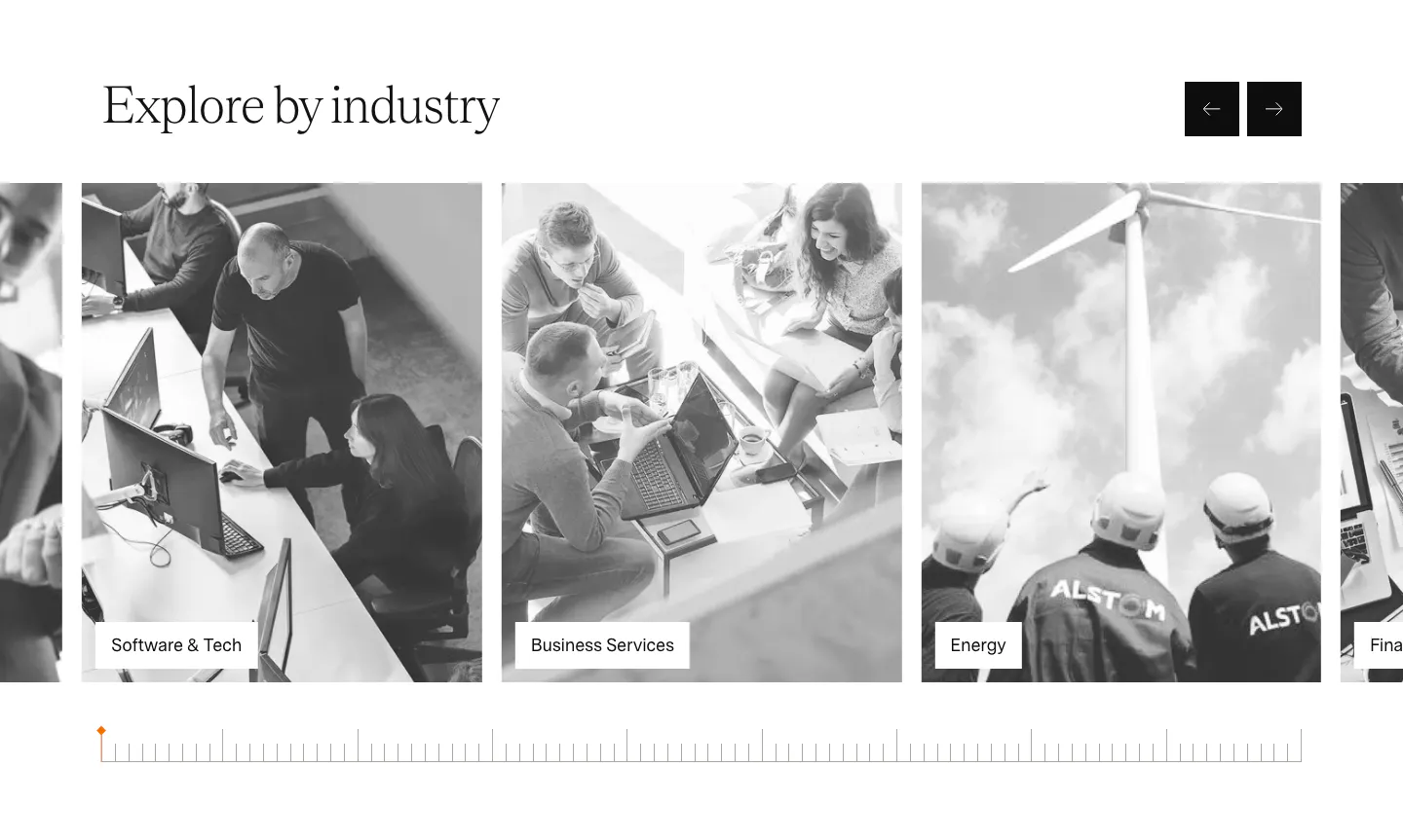
  297. Agiloft use cases section: serif heading with arrow buttons above a carousel of grayscale industry photo cards
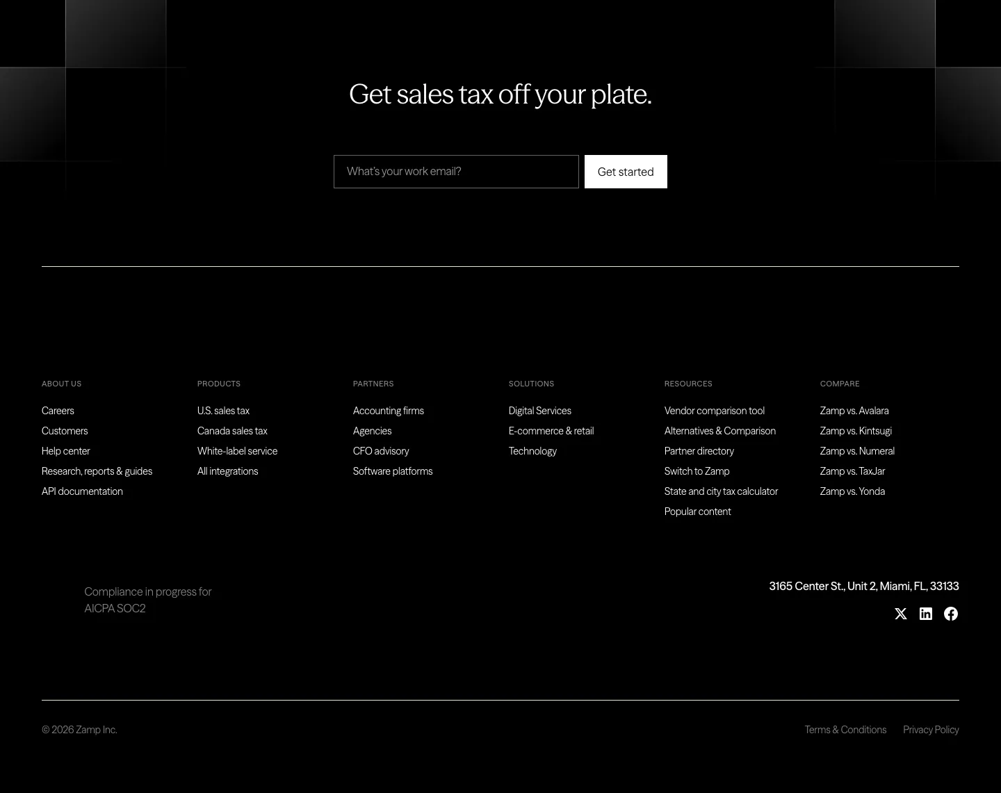
  298. Zamp footer section: black footer with centered headline and email field above six link columns, address and social icons
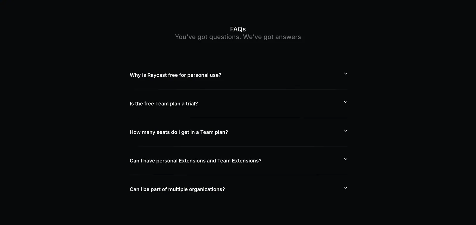
  299. Raycast FAQ section: centered FAQs heading above a five-question collapsed accordion on a near-black background
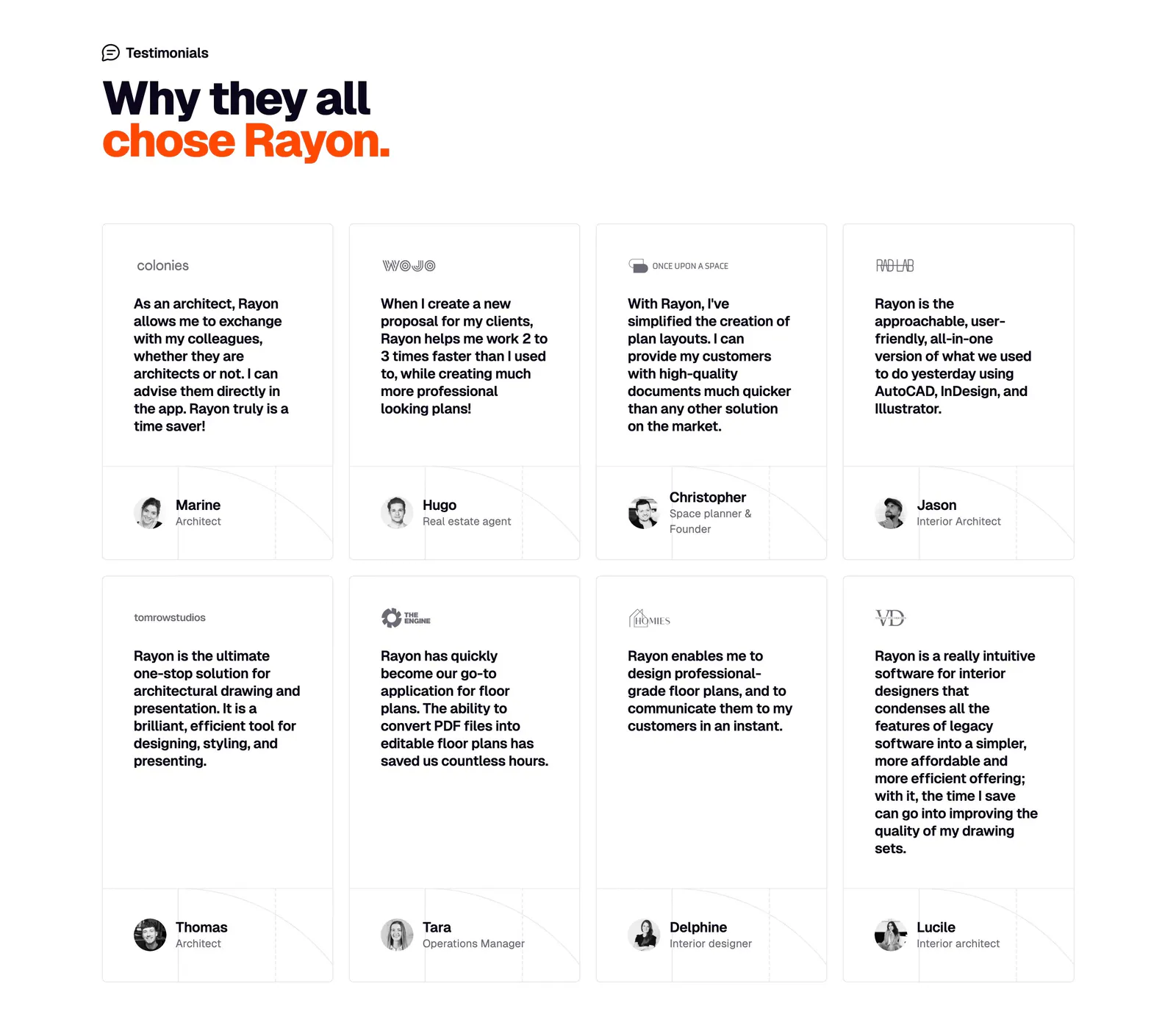
  300. Rayon testimonials section: two-line headline above a grid of eight quote cards with company logos and avatar names
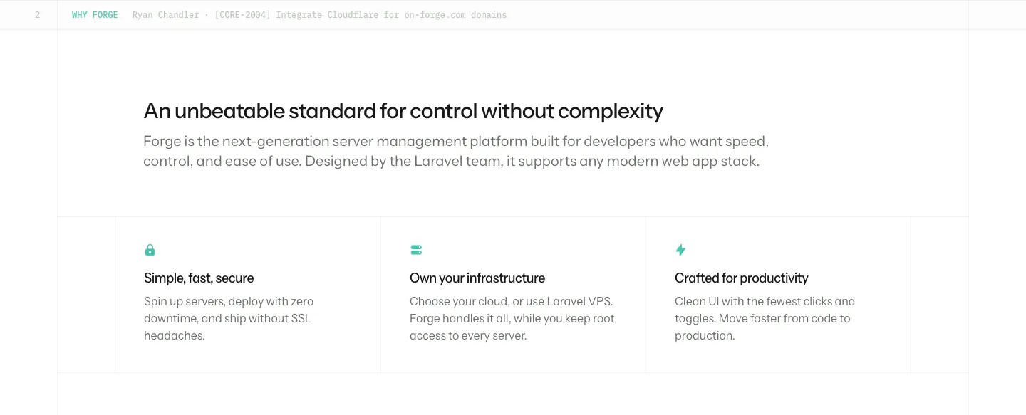
  301. Laravel Forge value proposition section: left-aligned heading and intro above three bordered benefit columns with small teal icons
  302. Voiceflow logo cloud section: centered line of text above three rows of grayscale customer logos on a charcoal background
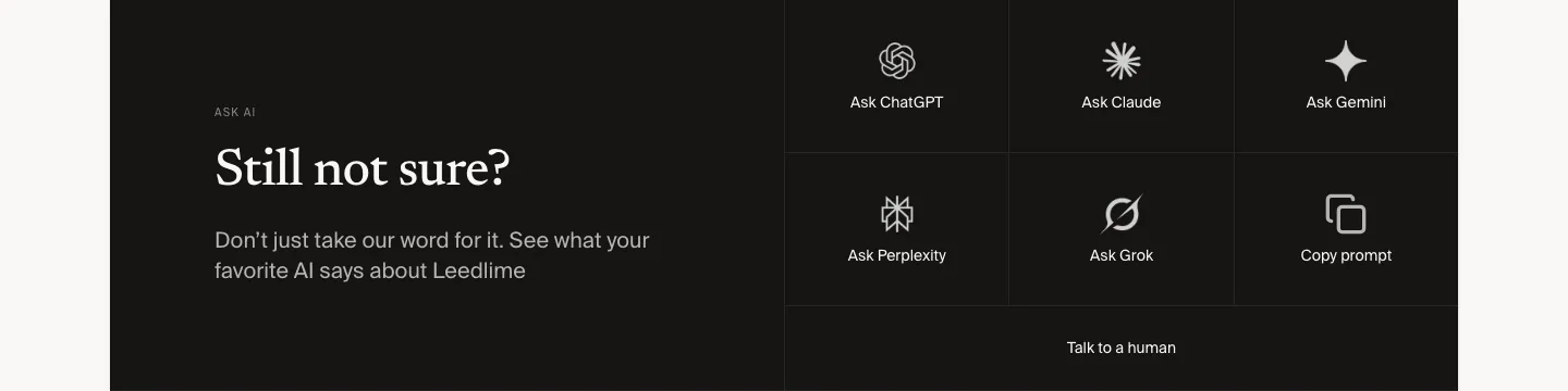
  303. Leedlime call to action section: serif Still not sure? headline at left beside a grid of Ask ChatGPT, Claude, Gemini and Grok buttons on black
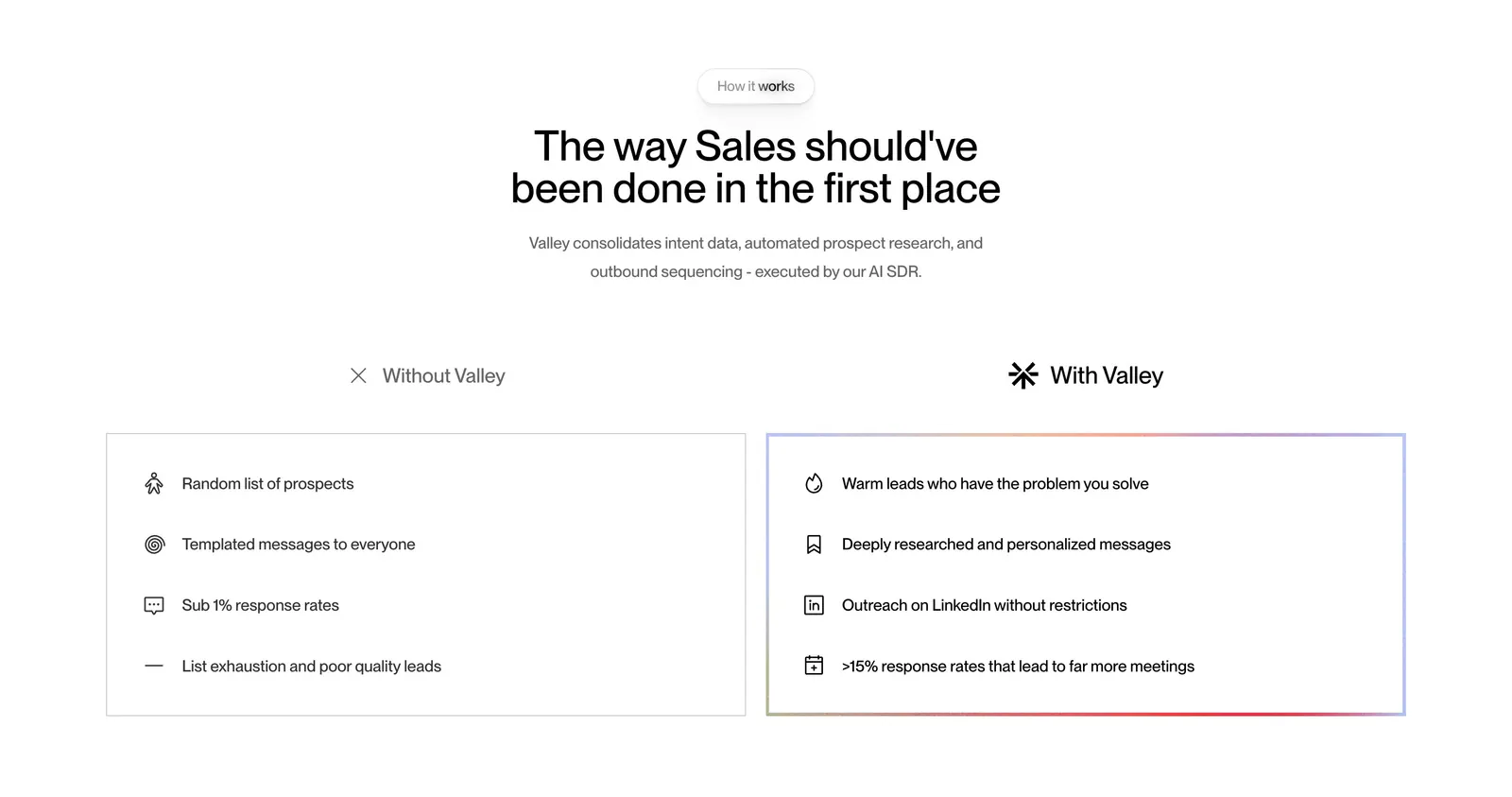
  304. Valley comparison section: centered headline above side-by-side Without Valley and With Valley lists in outlined cards on white
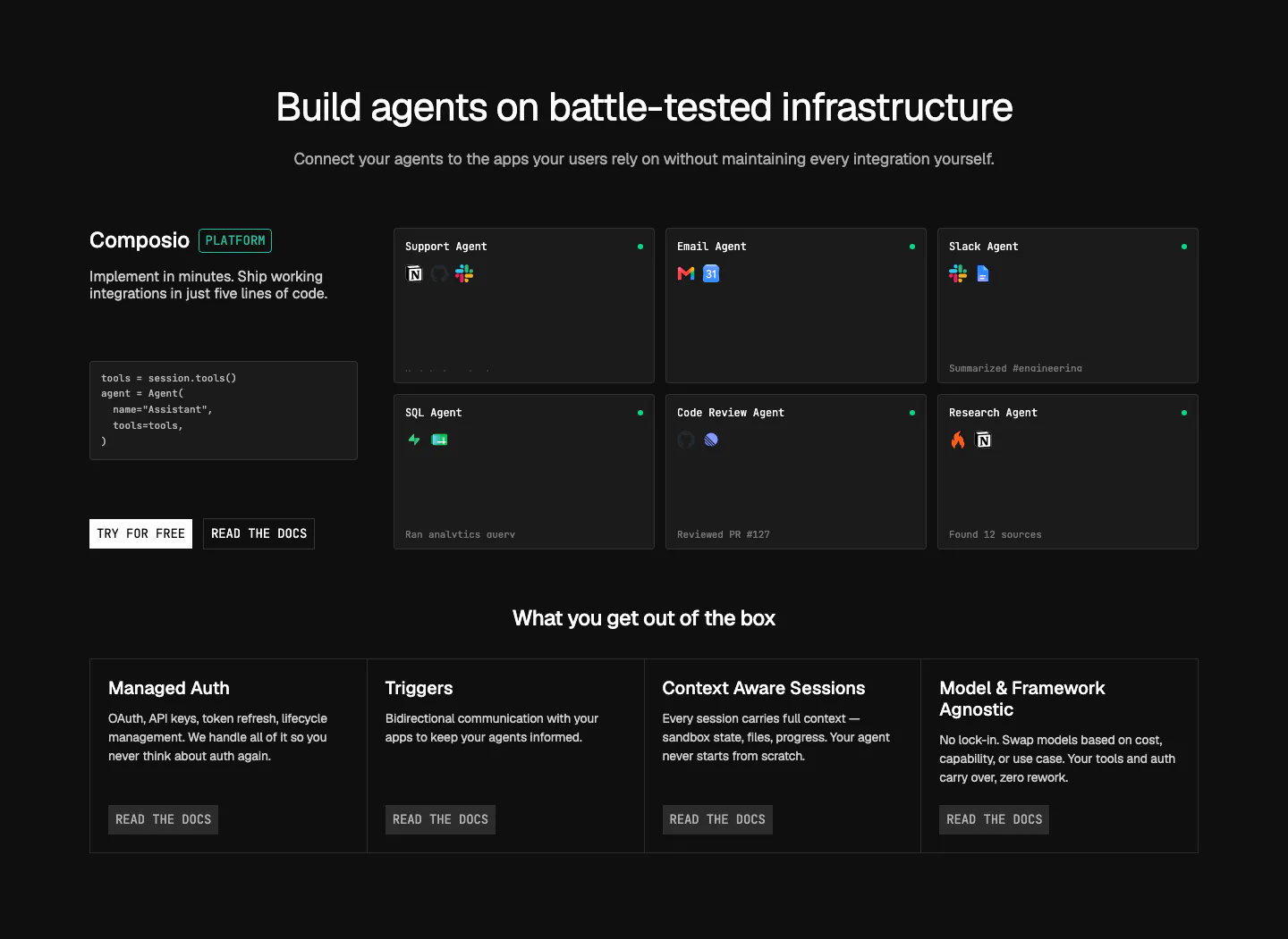
  305. Composio features section: code snippet and CTAs beside a grid of agent cards, then four platform feature columns on near-black
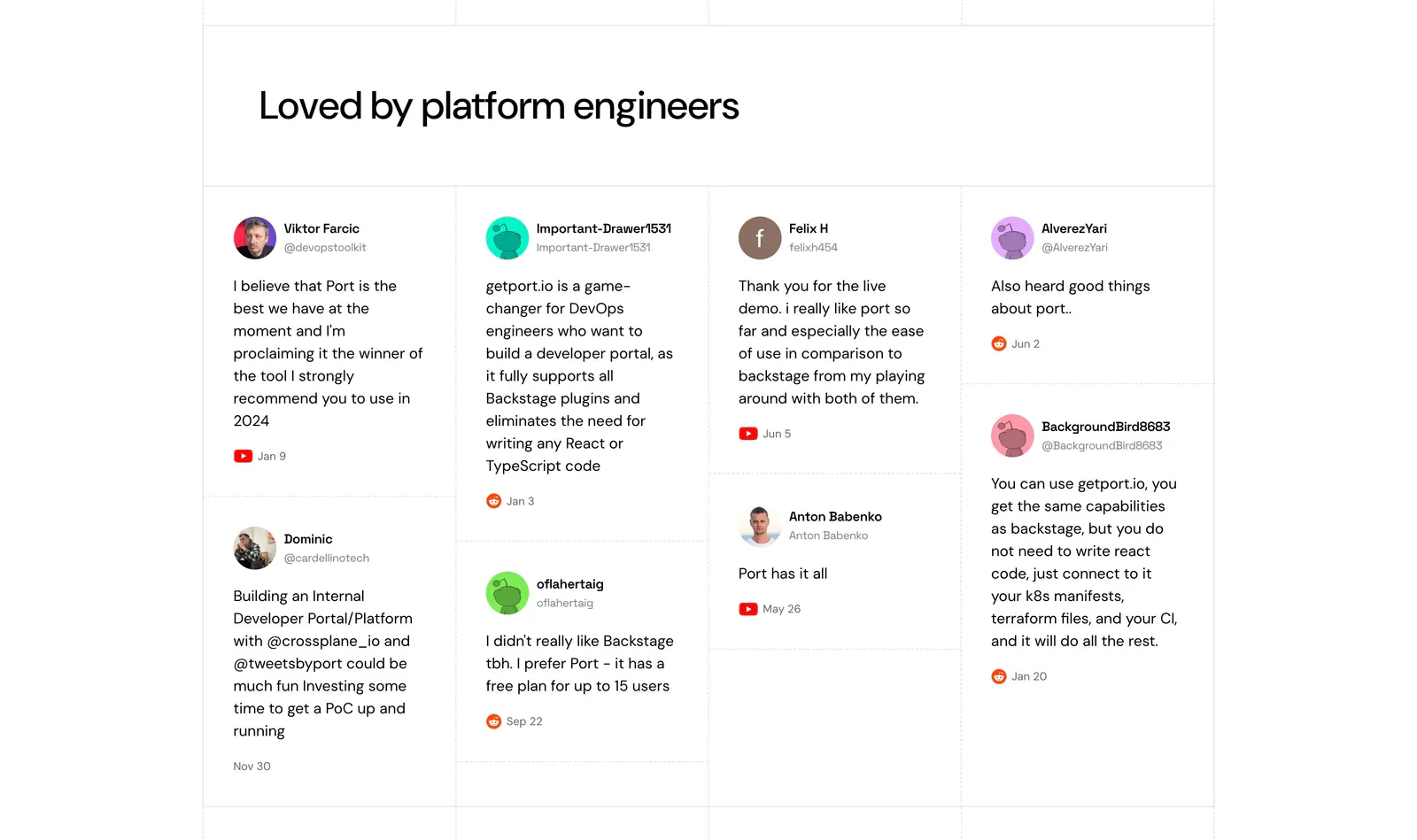
  306. Port testimonials section: headline above a four-column wall of social posts with avatars, handles and YouTube or Reddit source icons
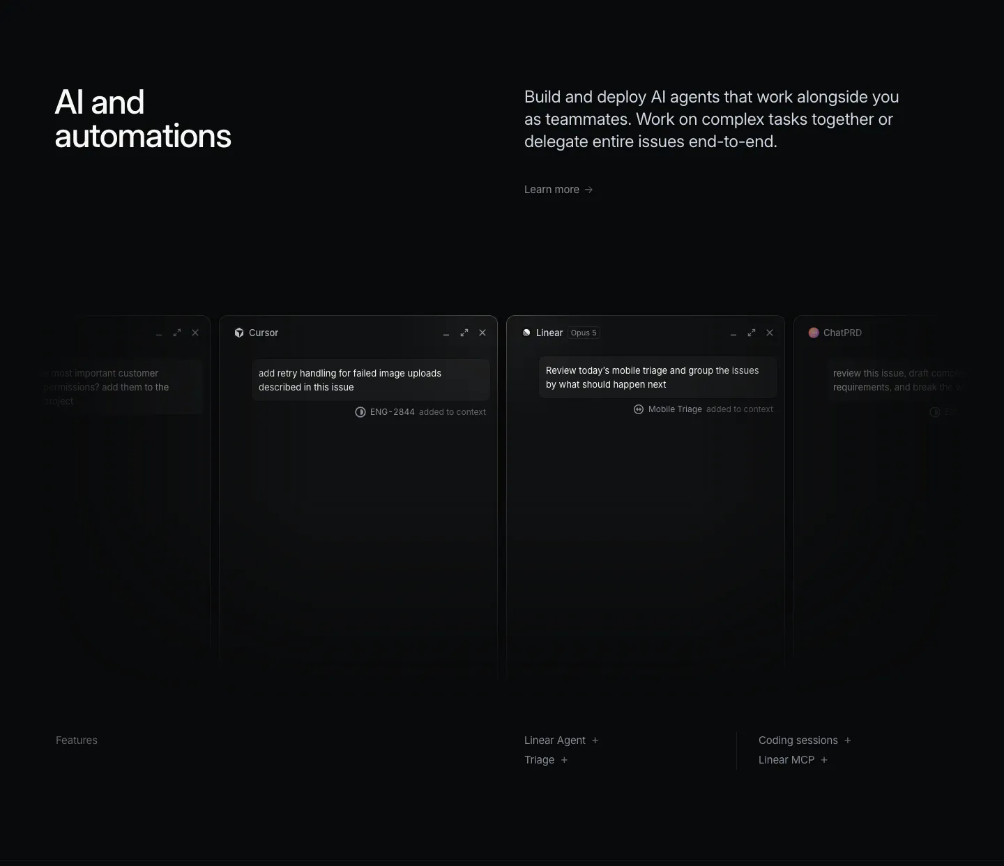
  307. Linear features section: dark headline and copy above a row of agent chat windows fading off both edges, feature links below
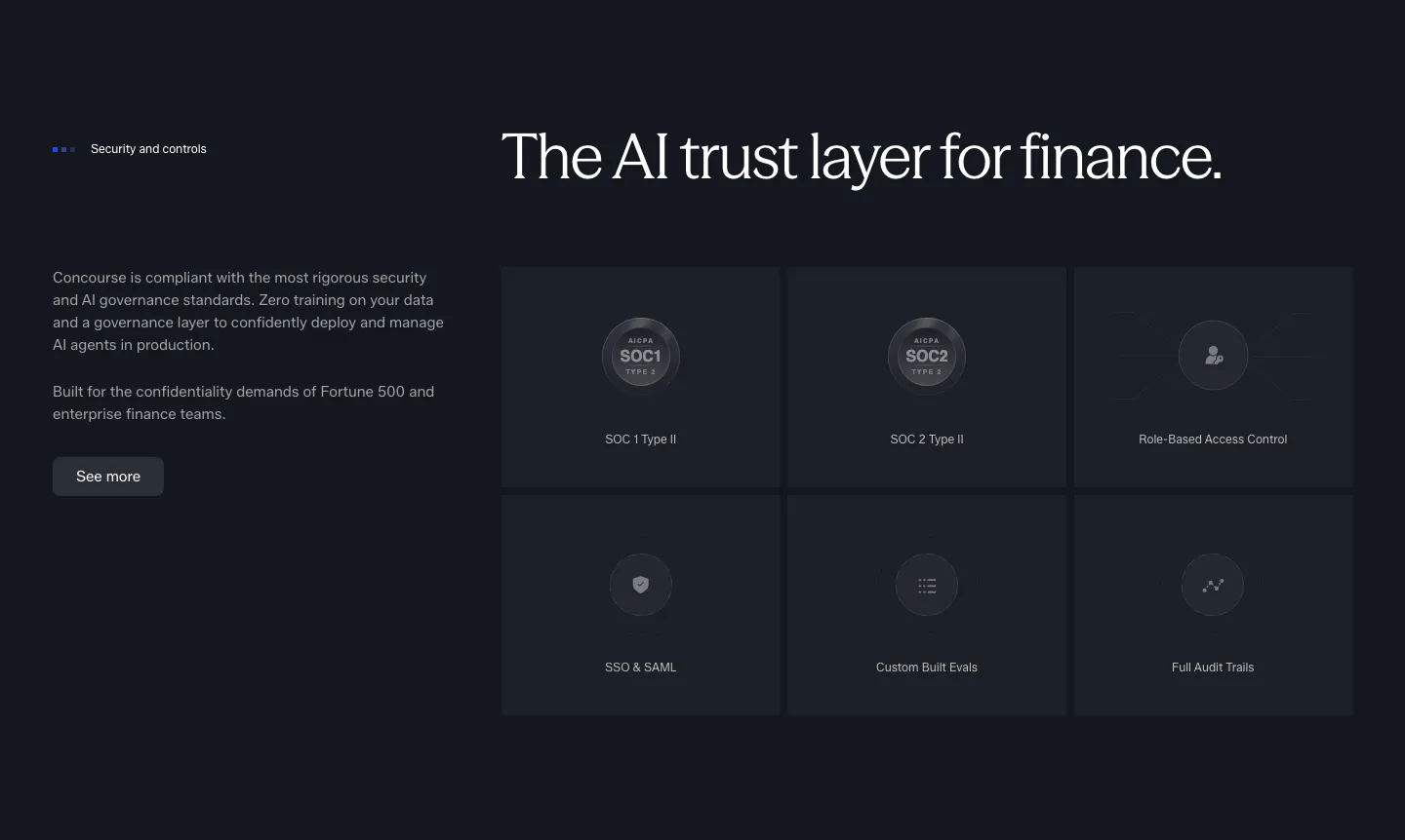
  308. Concourse security section: copy and button left, six dark tiles for SOC 1, SOC 2, RBAC, SSO, evals and audit trails right
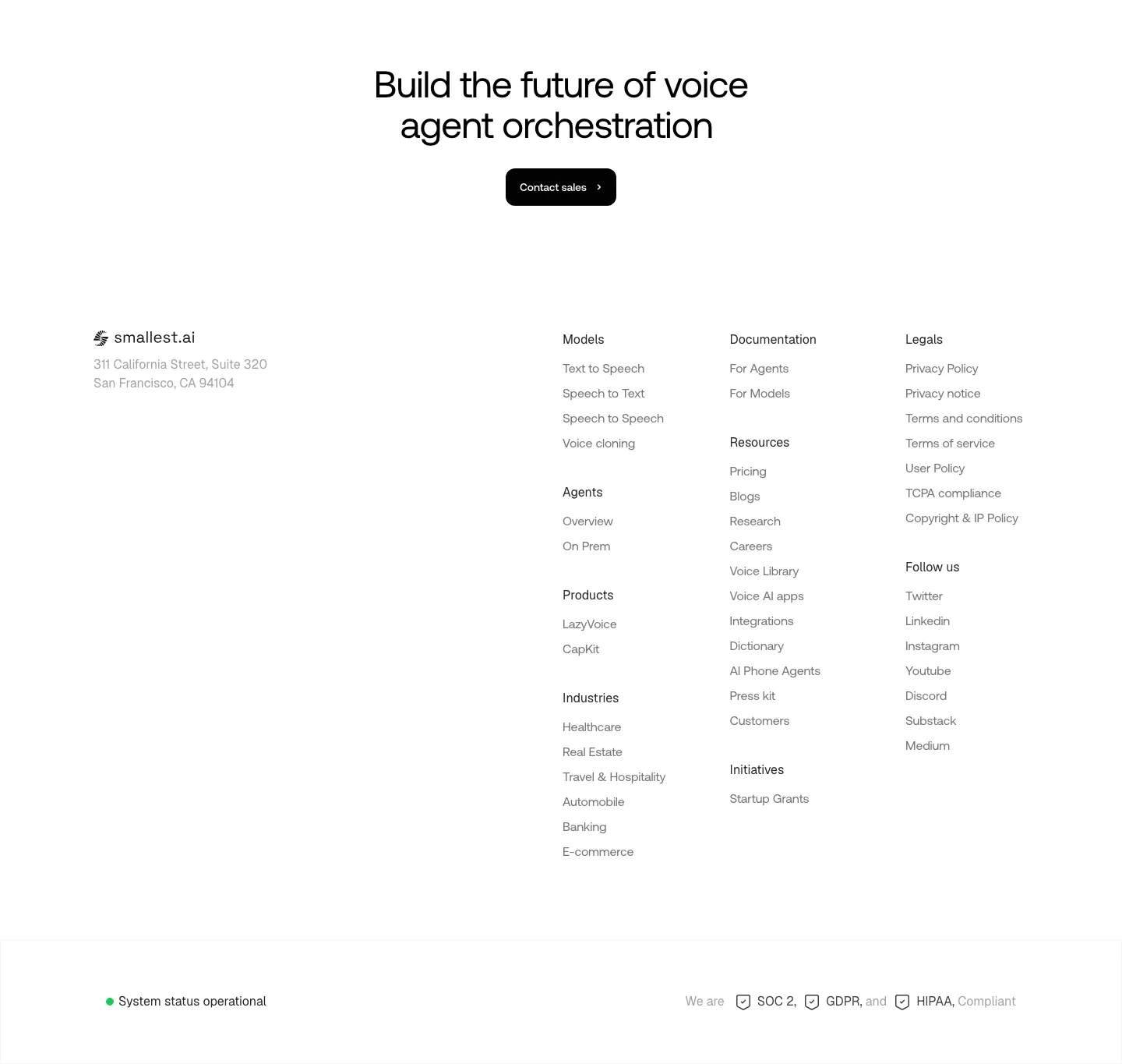
  309. Smallest.ai footer section: centered CTA headline and Contact sales button above logo, address, link column groups and a status bar
  310. Port logo cloud section: two rows of five black customer logos centered on a white background with faint grid lines
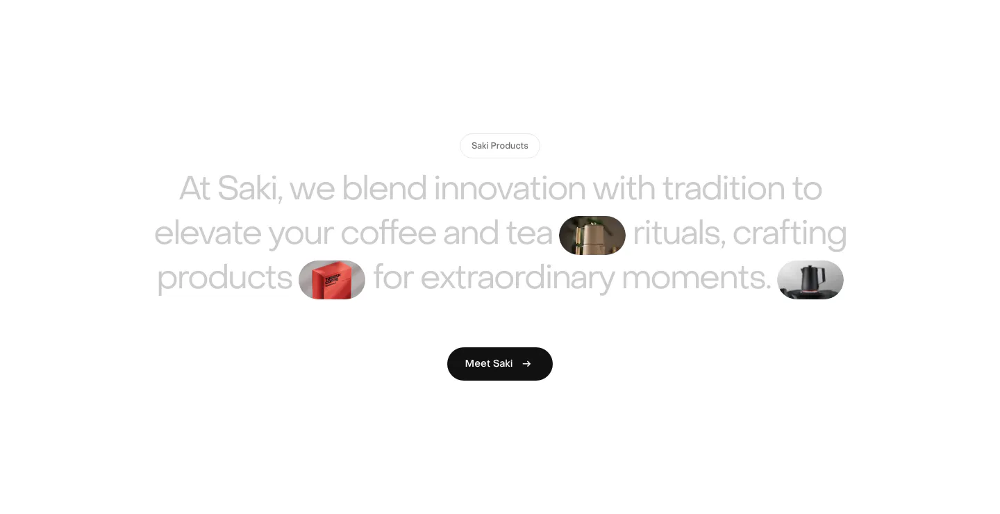
  311. Saki about & mission section: centered gray statement with inline product image pills and a black Meet Saki button on white
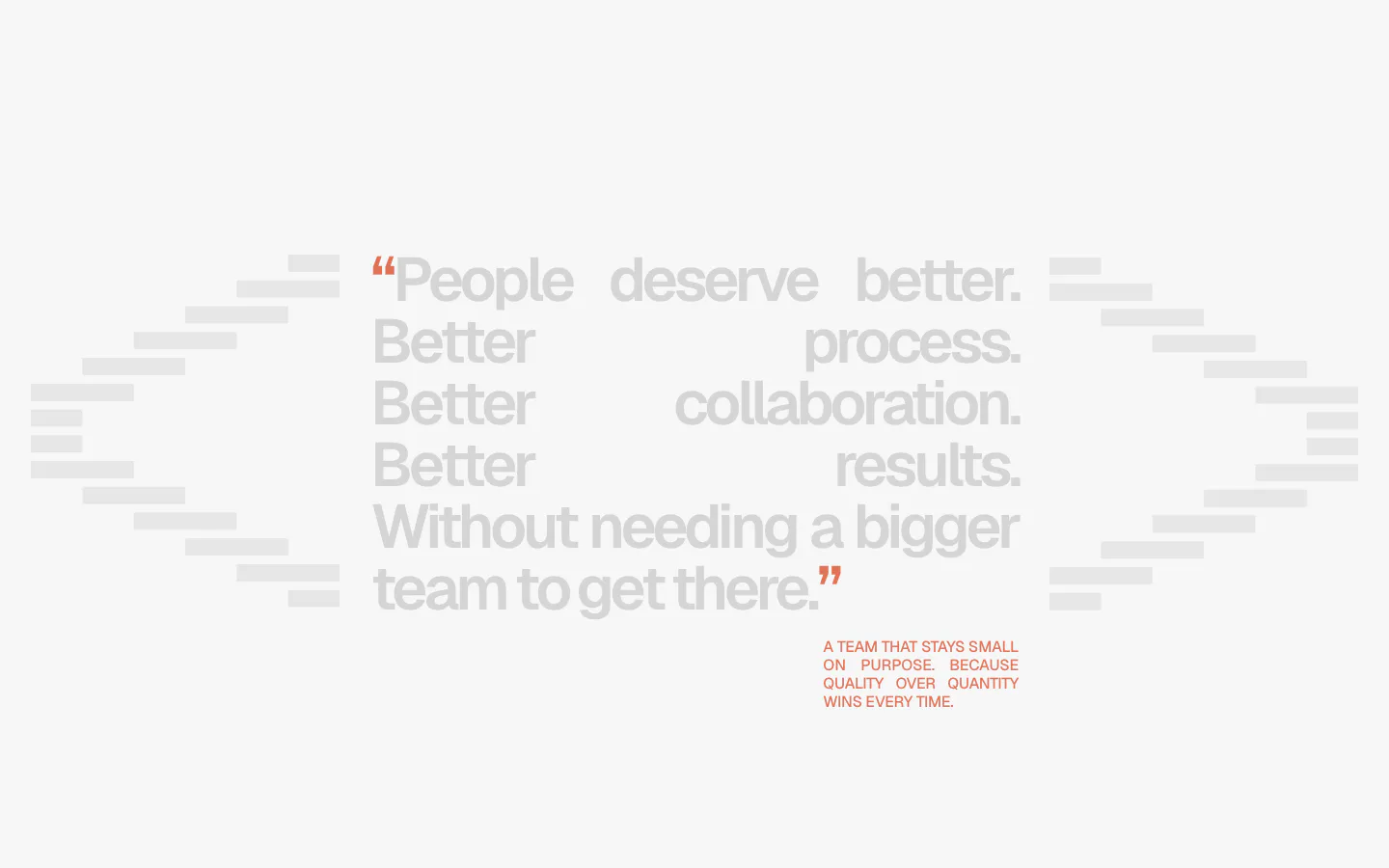
  312. A-LIGN about & mission section: justified light gray manifesto quote with orange quote marks between stepped bar shapes on a pale background
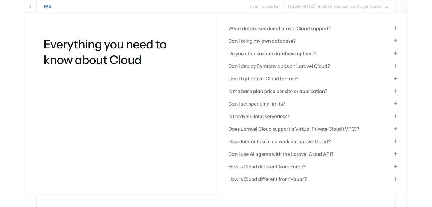
  313. Laravel Cloud FAQ section: headline on the left beside a long accordion of questions about databases, pricing and deployment on white
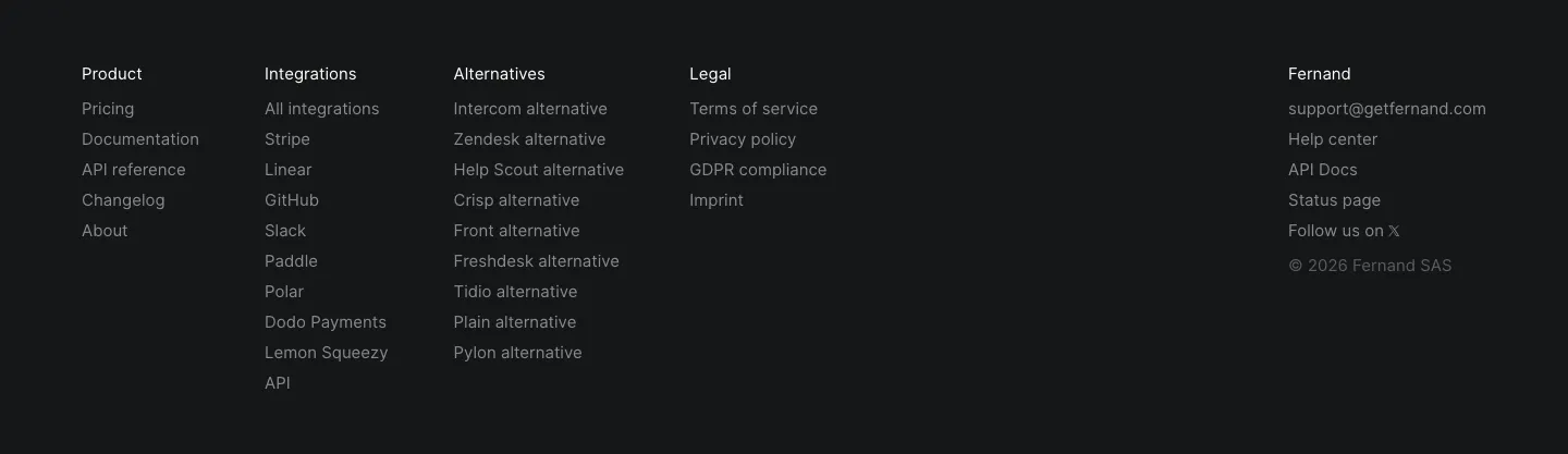
  314. Fernand footer section: five link columns with contact email and copyright on a near-black background
  315. Clarion footer section: light footer with logo at left, company links and social icons at right, and a copyright line
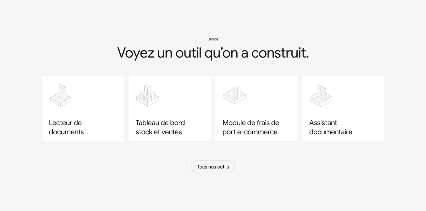
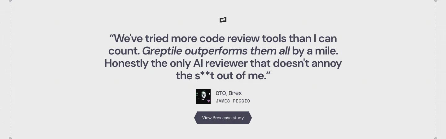
  316. Raneo features section: centered headline above four equal white cards with isometric line icons for demo tools and an all-tools button
  317. Evervault footer section: logo at left with five link columns, compliance badges and copyright line on a near-black navy background
  318. Remote logo cloud section: small centered caption above two rows of gray customer logos on white
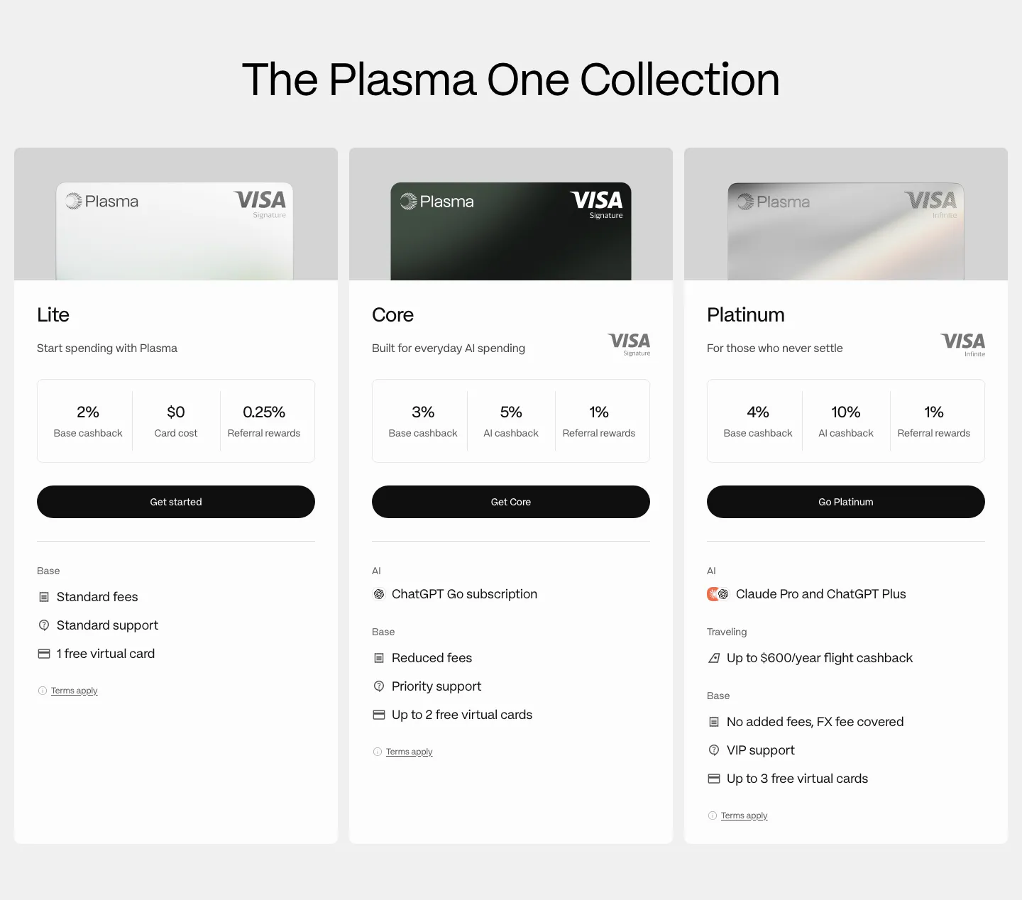
  319. Plasma pricing section: centered heading above three card tier columns with Visa card images, cashback figures and perks
  320. Greptile testimonials section: centered single customer quote with company logo, avatar, name, title and a case study button
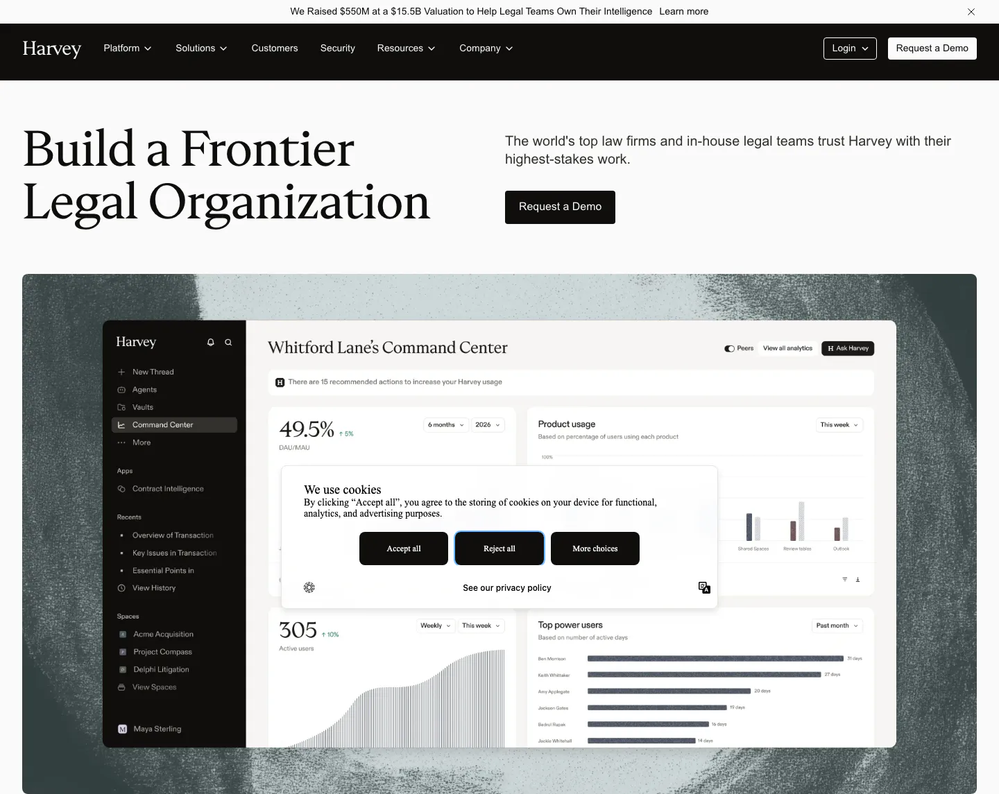
  321. Harvey hero section: serif headline left, copy and demo button right, above a dashboard screenshot on a textured backdrop
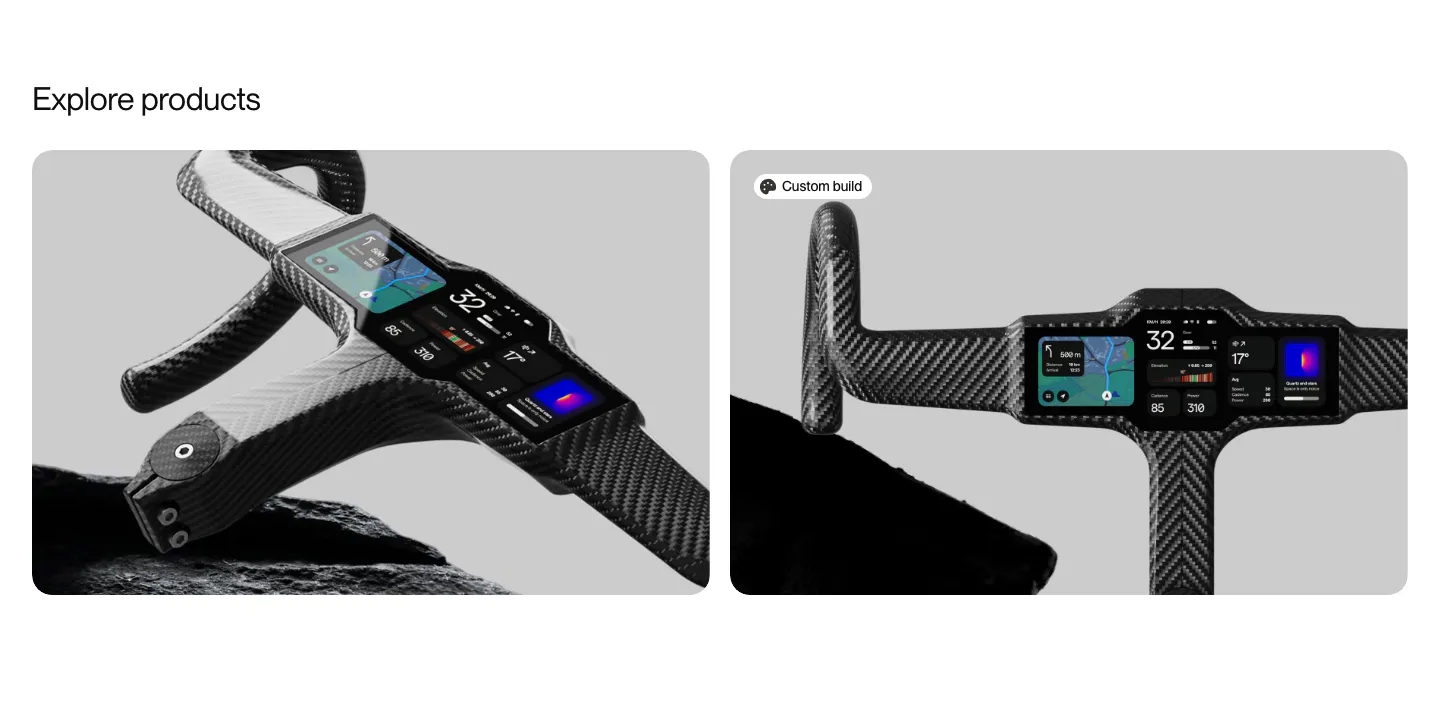
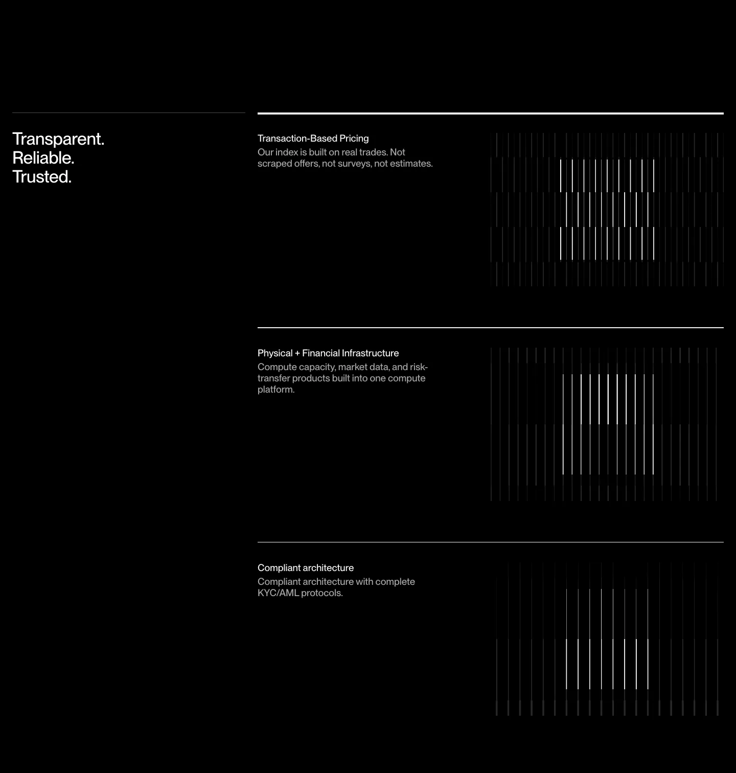
  322. FLITEDECK other section: Explore products heading above two rounded cards with carbon handlebar cockpit product photos on gray
    Flitedeck Other
  323. Robin Humphreys hero section: centered greeting headline with a See work button above a dark 3D render of a monitor showing an app interface
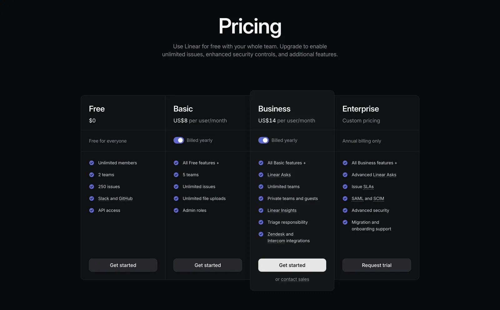
  324. Linear pricing section: centered heading above four dark plan columns, Free, Basic, Business and Enterprise, with billing toggles and checklists
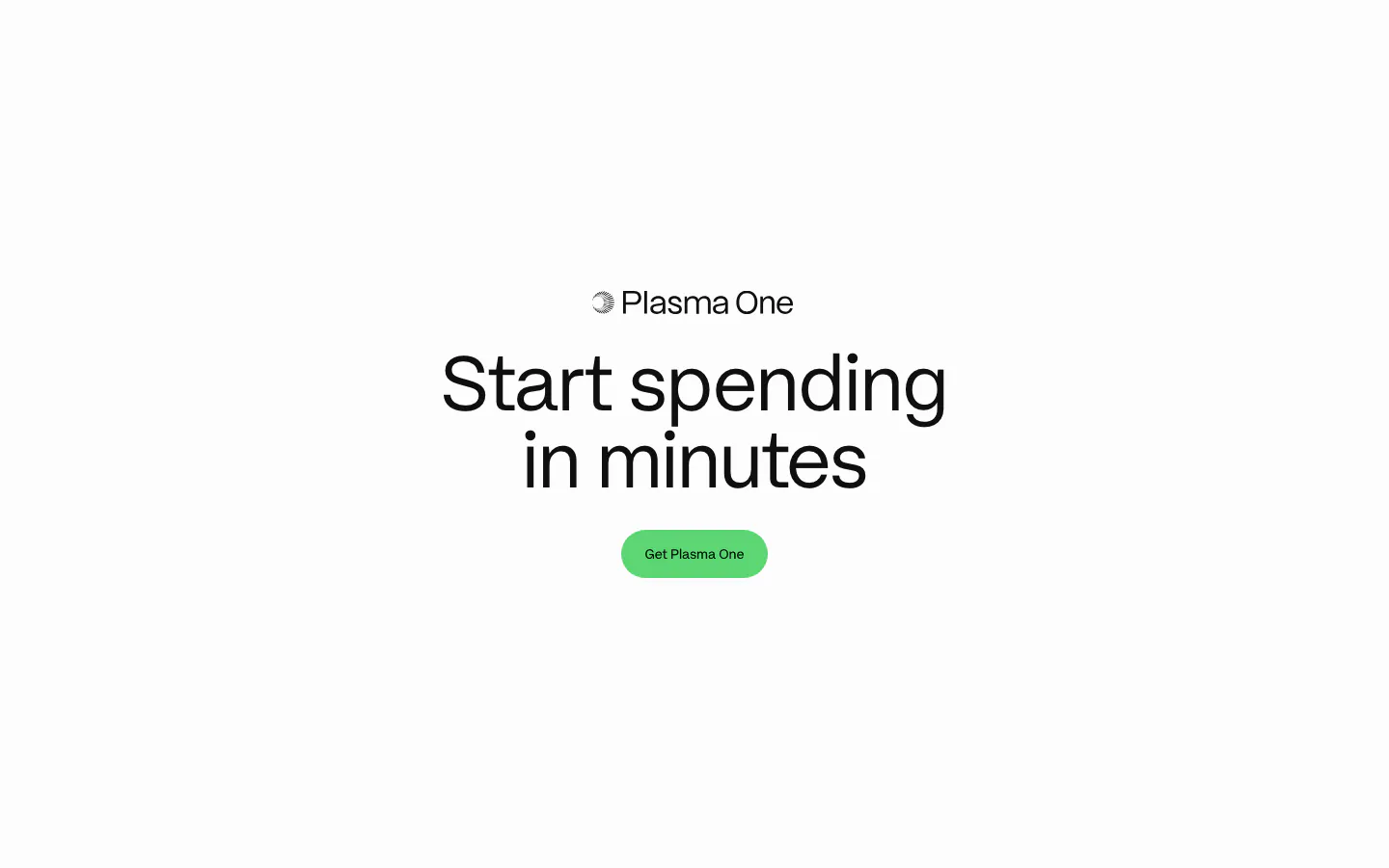
  325. Plasma call to action section: centered Plasma One logo, large headline and green Get Plasma One button on white
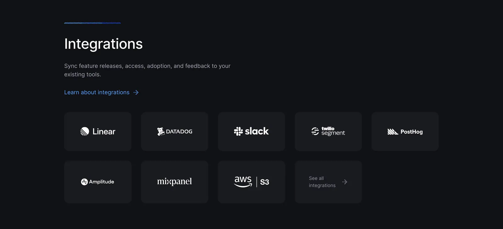
  326. Bucket integrations section: left-aligned heading above a grid of dark tiles with white logos for Linear, Datadog, Slack and more
  327. Unknown value proposition section: stacked headline at left, three ruled benefit rows with vertical line graphics on a black background
  328. Cohere logo cloud section: small centered caption above a single row of black enterprise logos on white
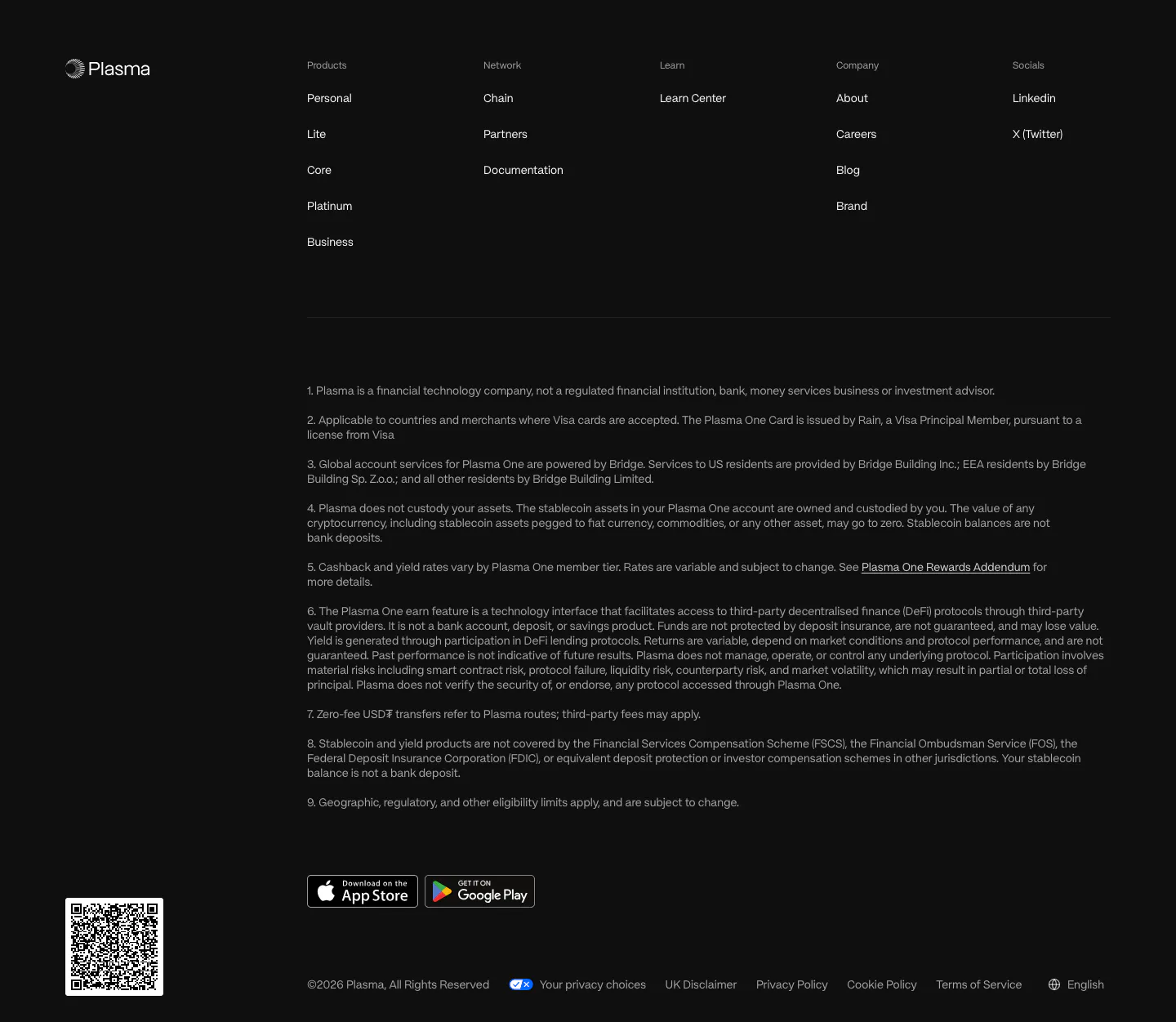
  329. Plasma footer section: logo, five link columns, numbered legal disclosures, app store badges and a QR code on near-black
  330. Bucket pricing section: centered headline and monthly/annual toggle above three dark plan cards with checklists and a small logo row
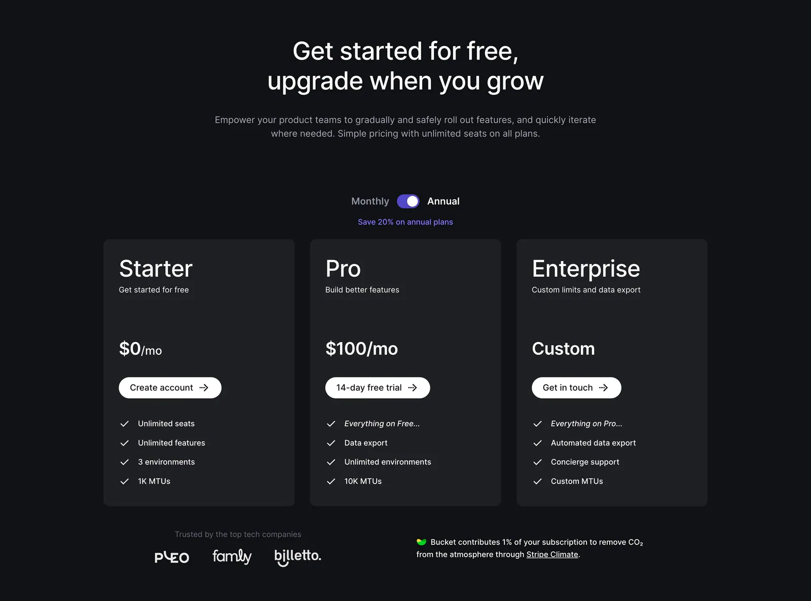
  331. Raycast pricing section: four-plan feature comparison table with checkmarks, limits and select buttons on a near-black background
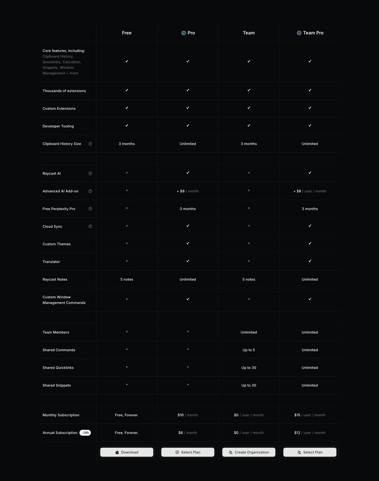
  332. Laravel Forge logo cloud section: "Trusted by 1000+ companies" label beside a row of six grayscale customer logos on white
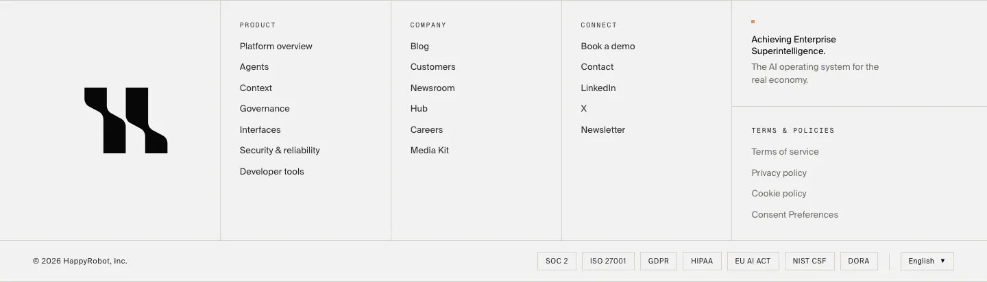
  333. HappyRobot footer section: large black logo mark, three link columns, tagline and policy links, compliance badge row and copyright on light gray
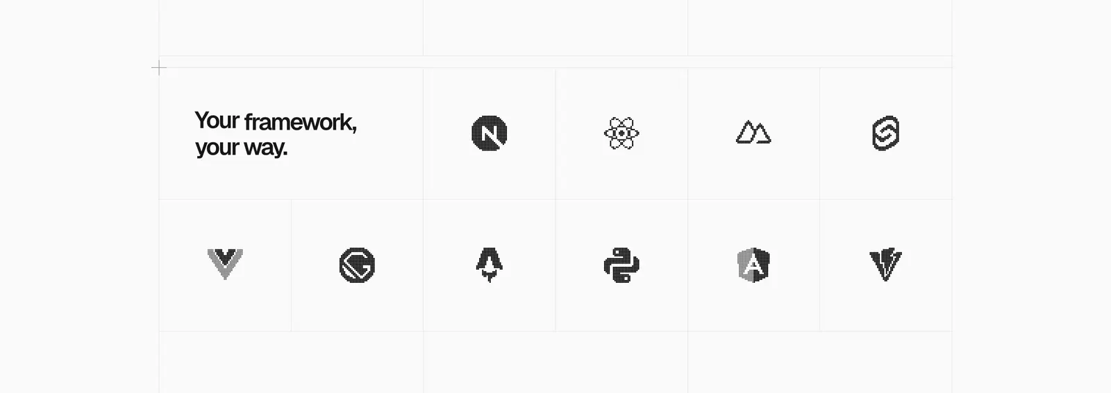
  334. Vercel logo cloud section: headline tile in a bordered grid of grayscale framework logos like Next.js, React, Svelte and Angular
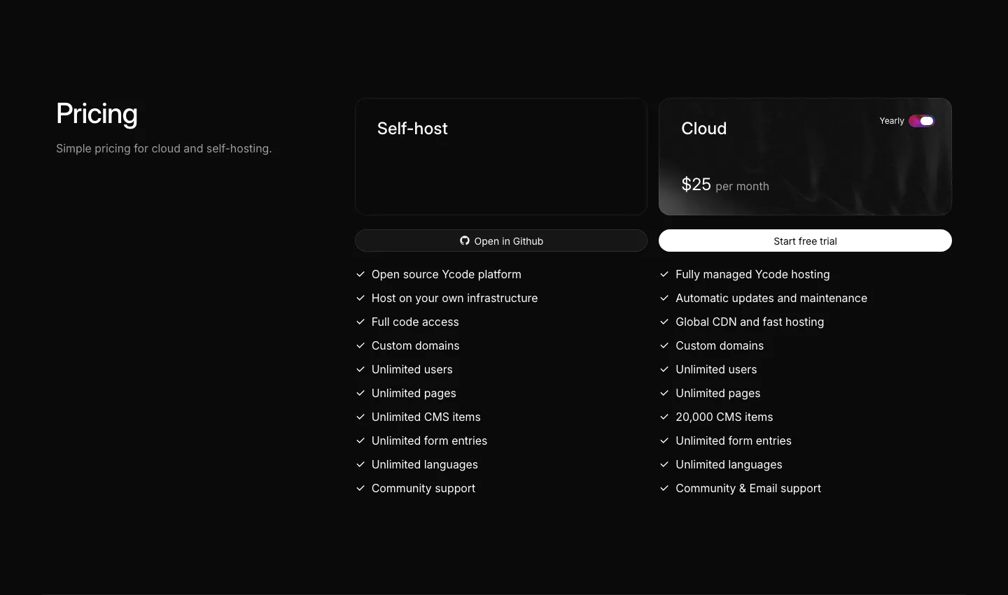
  335. Ycode pricing section: heading on the left, self-host and cloud plan cards with a yearly toggle and checkmark feature lists
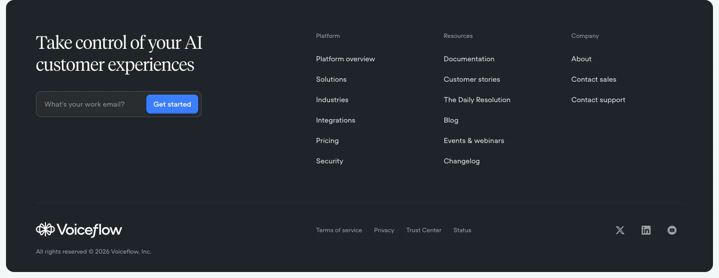
  336. Voiceflow footer section: dark rounded panel with serif headline and email field on the left, three link columns and social icons
  337. Figr FAQ section: serif heading, intro and Reach Out button on the left with a seven-question accordion on the right
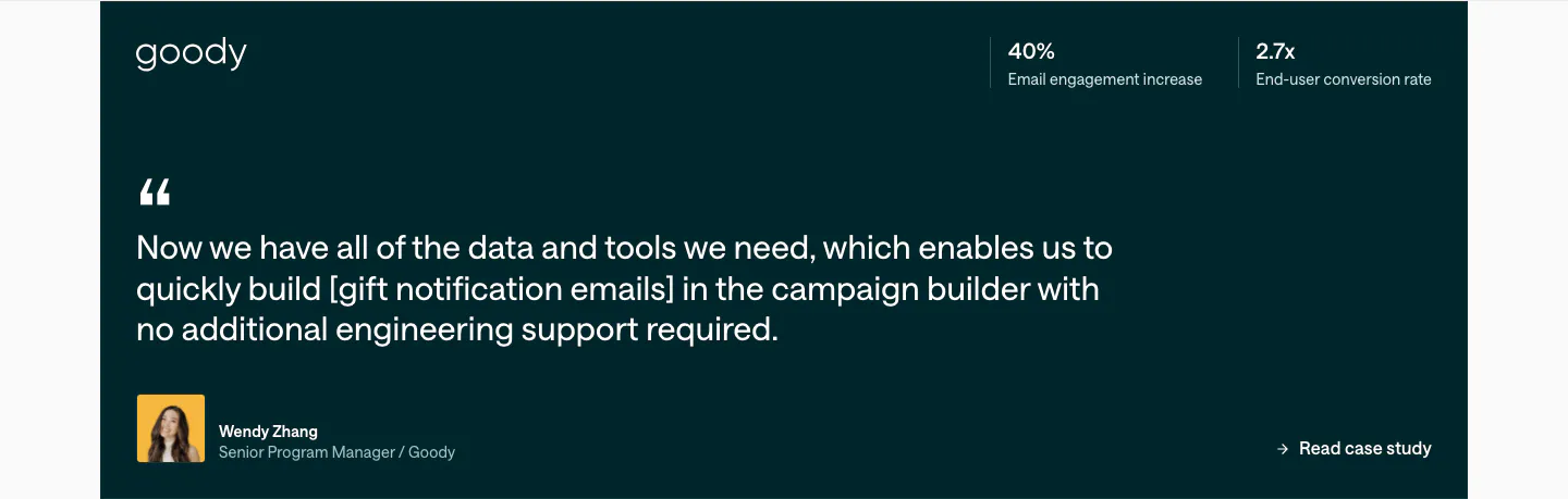
  338. Customer.io testimonials section: dark teal quote card with Goody logo, two stats at top right, large quote and author avatar
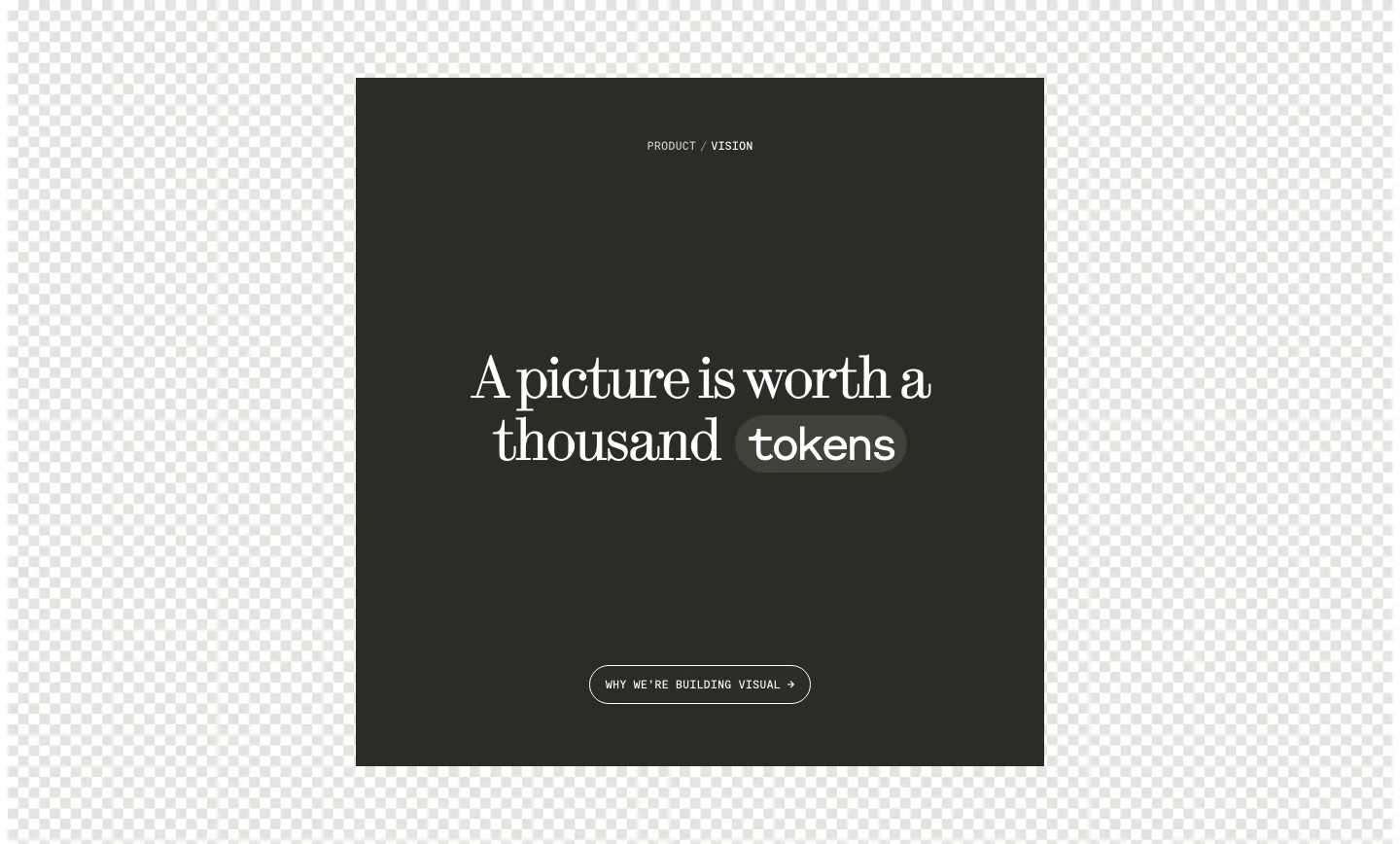
  339. Visual call to action section: dark square panel with centered serif headline, a tokens pill and outline button over a checkerboard background
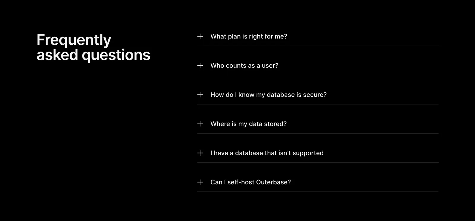
  340. Outerbase FAQ section: headline on the left beside a six-item plus-icon accordion of questions on a black background
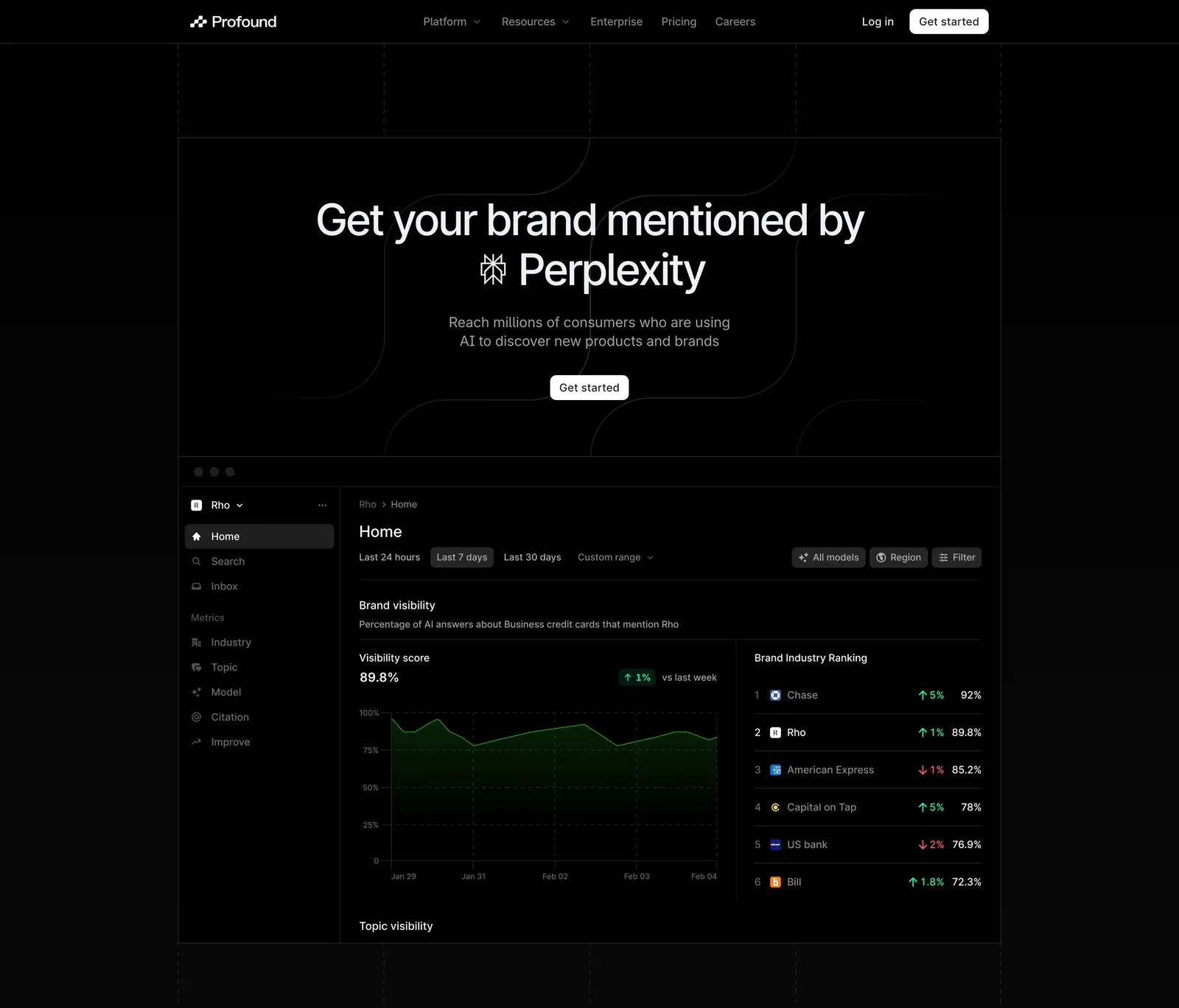
  341. Profound hero section: centered headline with Perplexity logo above a dark brand visibility dashboard screenshot on black
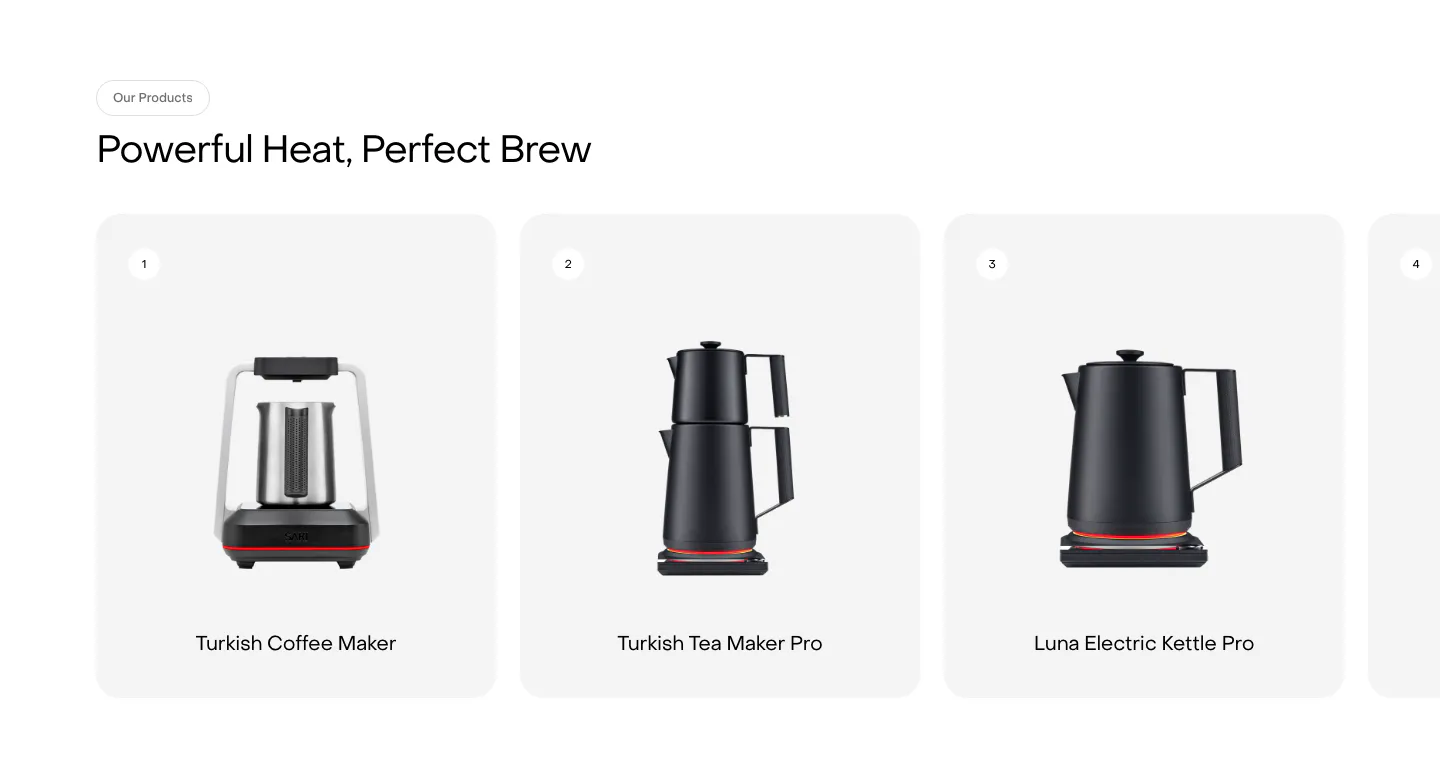
  342. Saki features section: headline above a row of numbered product cards showing kettles and coffee makers, with a fourth card cut off at the edge
  343. Conduit logo cloud section: two rows of gray hospitality brand logos separated by thin dividers on white
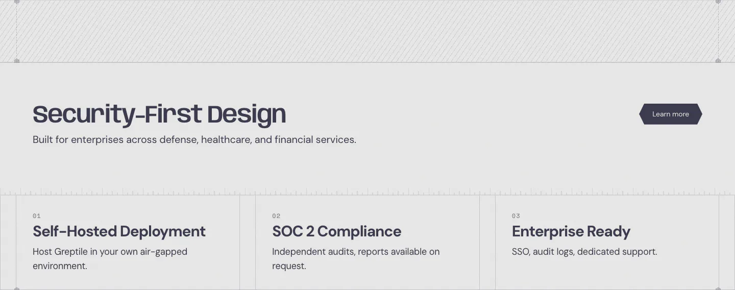
  344. Greptile security section: headline with learn more button above three numbered cards for self-hosting, SOC 2 and enterprise features
  345. DevRev testimonials section: centered large customer quote with name and title above three pagination bars on a plain white background
  346. Pogo logo cloud section: grayscale customer logos in rounded cards along a single row cut off at the edges on white
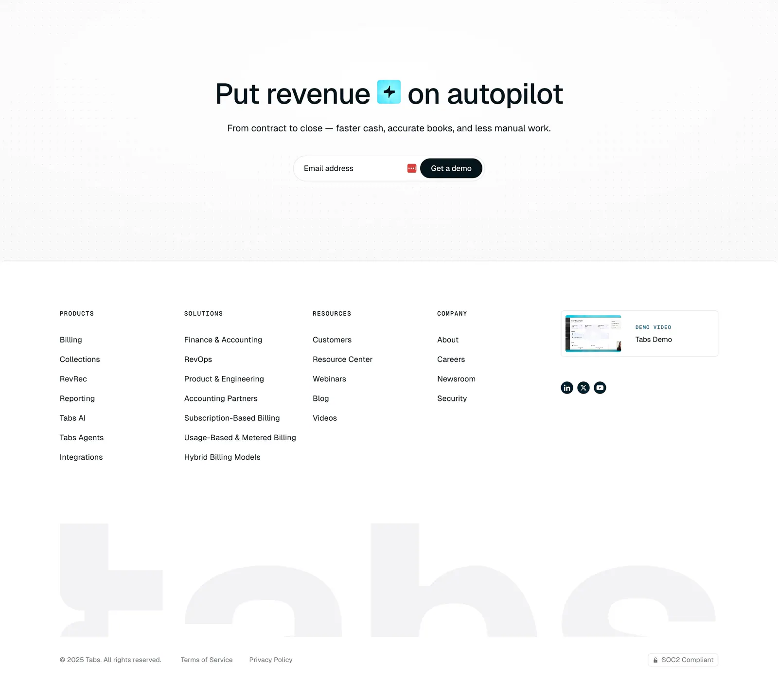
  347. Tabs footer section: centered headline and email demo field on a dot grid, link columns, demo video card and huge faded tabs wordmark
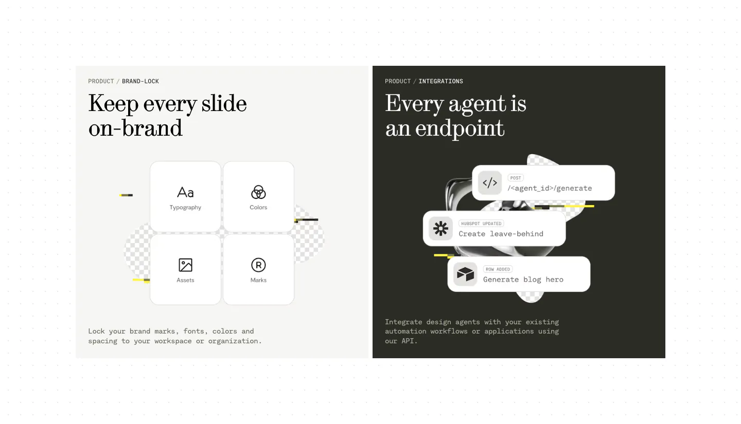
  348. Visual features section: two side-by-side panels, a light one with four brand-lock tiles and a dark one with stacked API endpoint cards
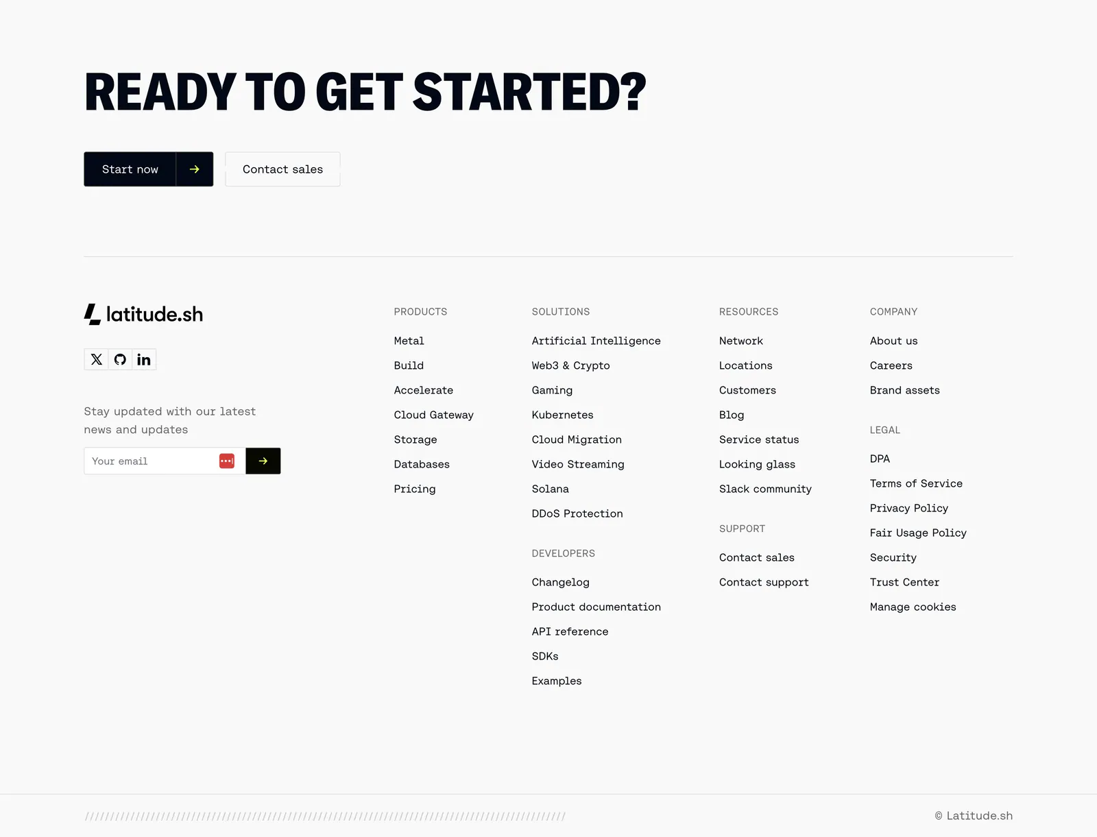
  349. Latitude.sh footer section: large uppercase CTA headline with buttons above logo, email field and link columns on light gray
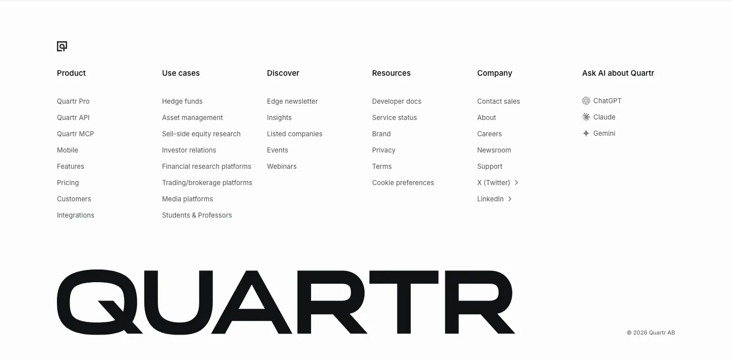
  350. Quartr footer section: six link columns including Ask AI about Quartr, above an oversized black QUARTR wordmark
  351. Daniel Sun logo cloud section: italic serif label above a bordered 5x3 grid of black client logos on white
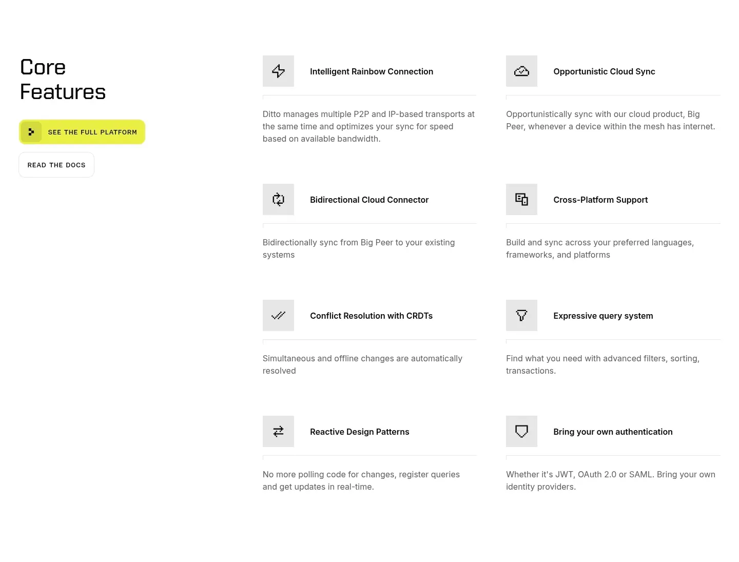
  352. Ditto features section: left headline with yellow and outline buttons beside a two-column list of eight icon-led features on white
  353. Proto footer section: newsletter email field with Subscribe button, Products and Company link columns, a dot pattern band and legal links on black
    Proto Footer
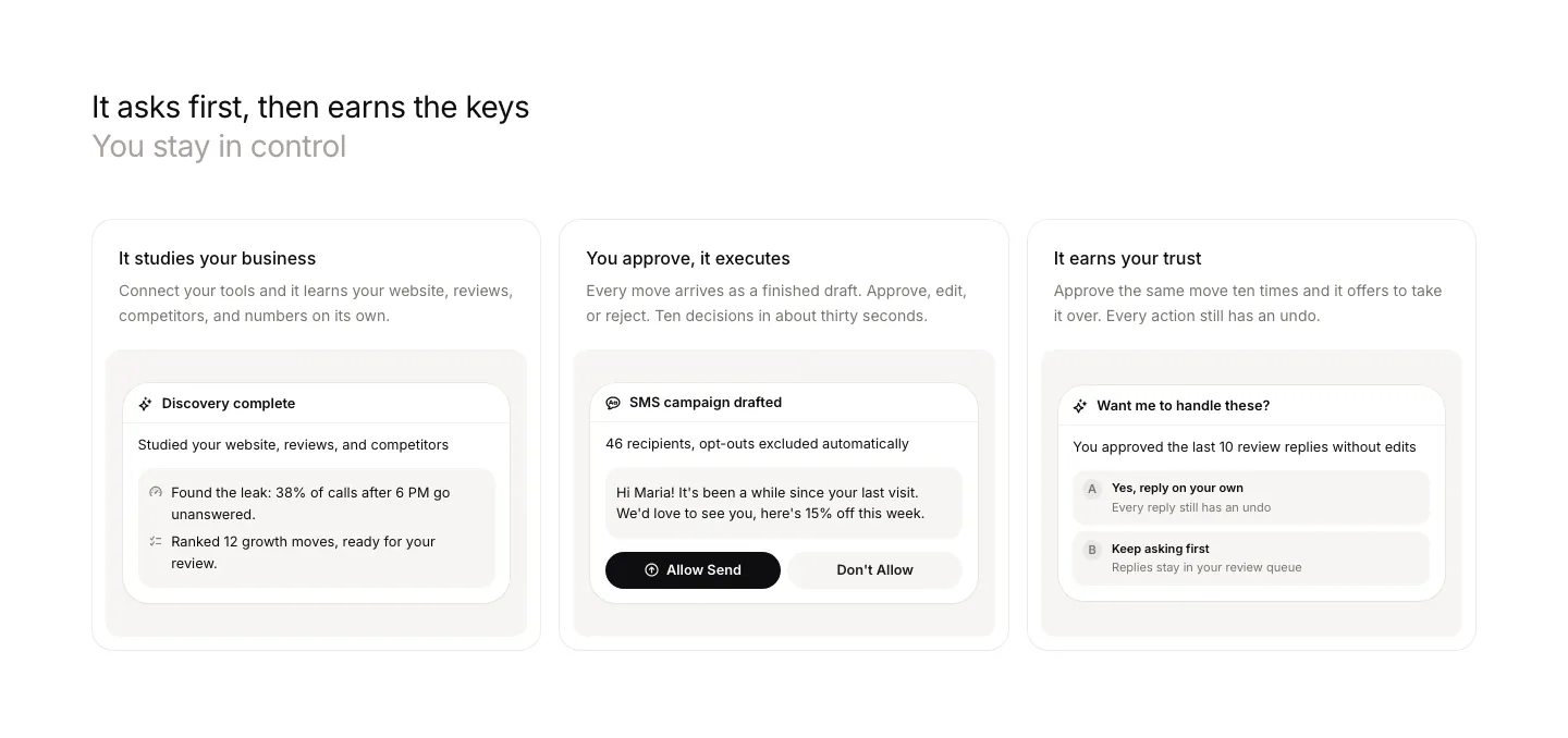
  354. Beside features section: left-aligned headline above three cards, each with a short description and an approval UI snippet
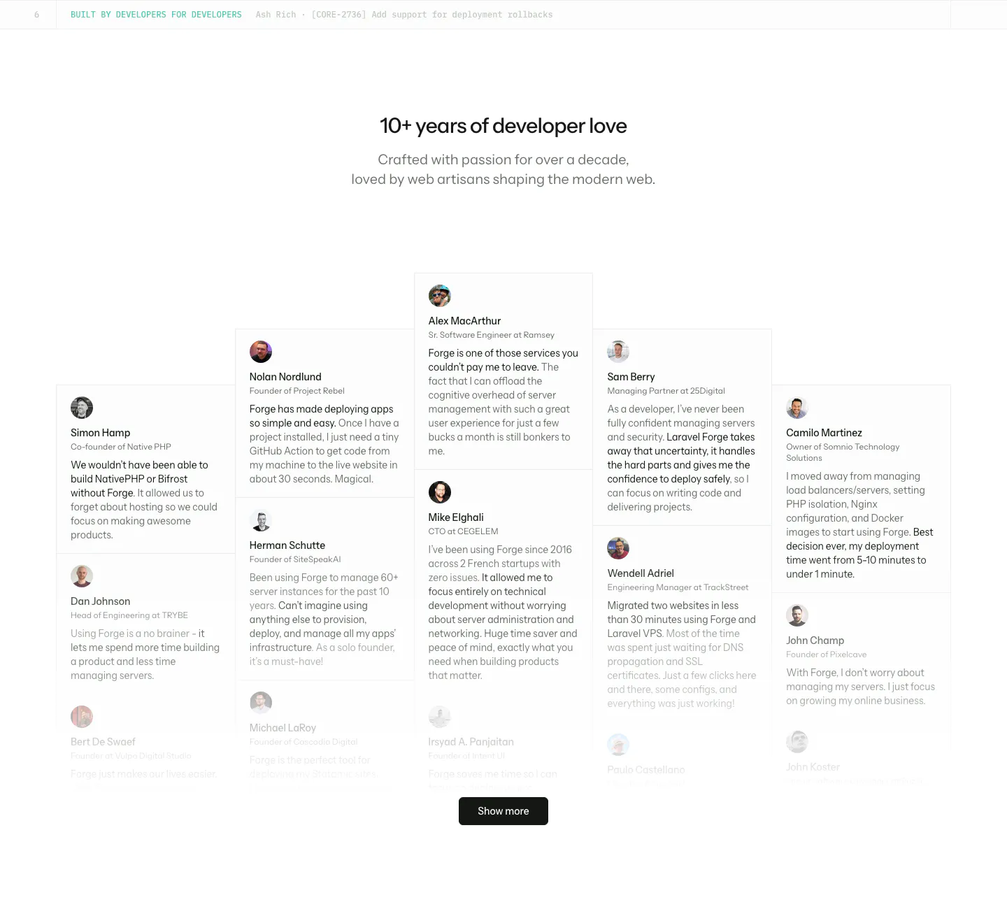
  355. Laravel Forge testimonials section: centered heading above a staggered wall of testimonial cards with avatars and a Show more button
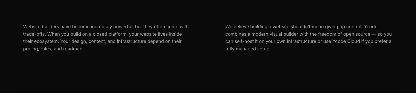
  356. Ycode about & mission section: two columns of gray paragraph text about closed platforms and open source control on black
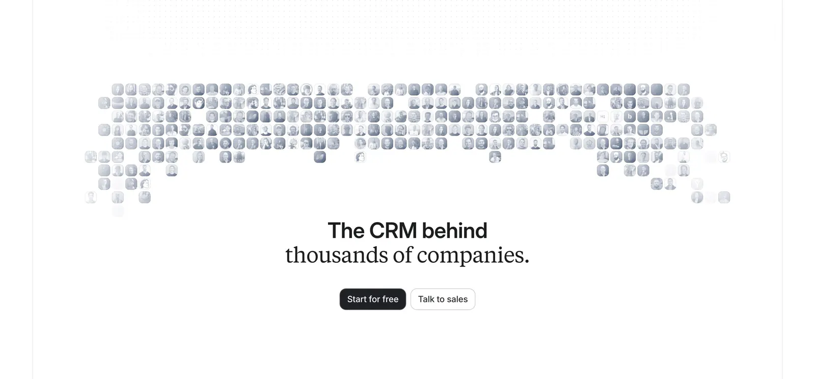
  357. Attio call-to-action section: centered headline and two buttons below a grayscale mosaic of customer logo tiles on white
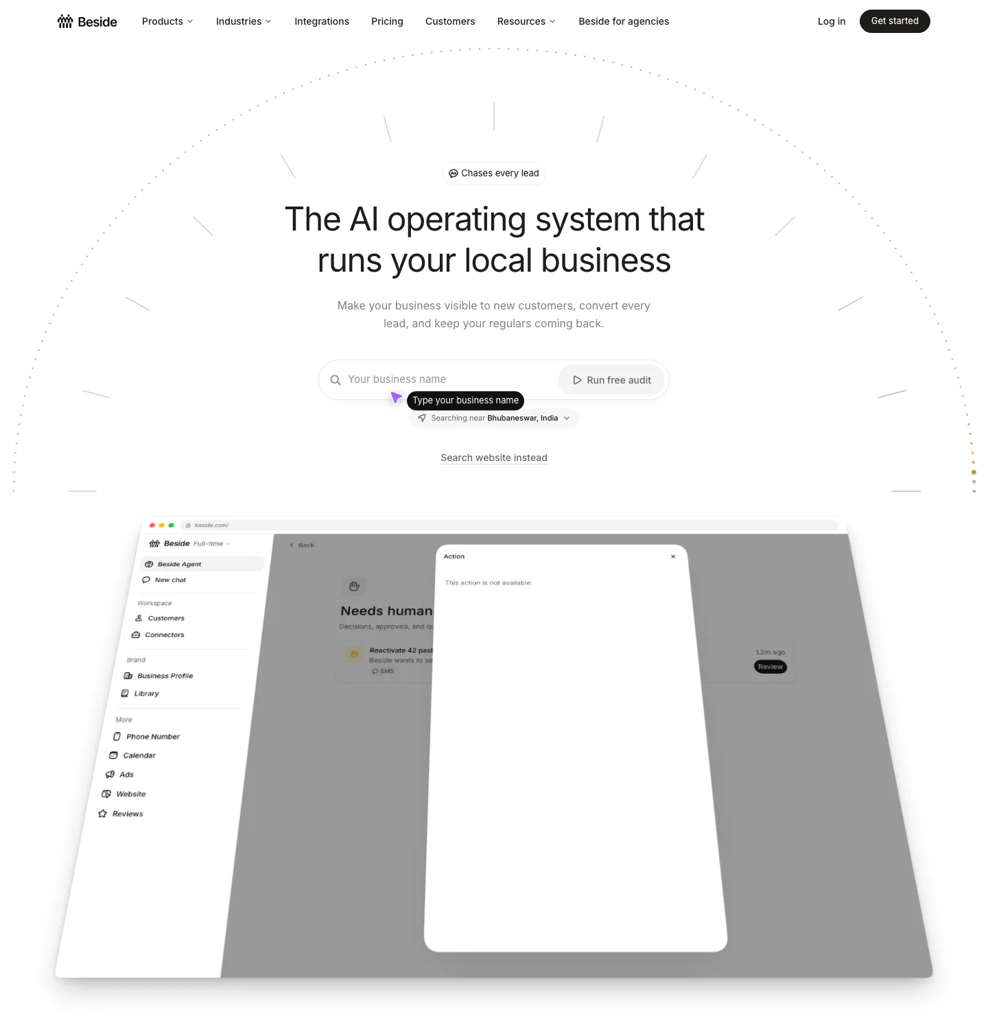
  358. Beside hero section: centered headline with a business name search field above a tilted app dashboard screenshot on white
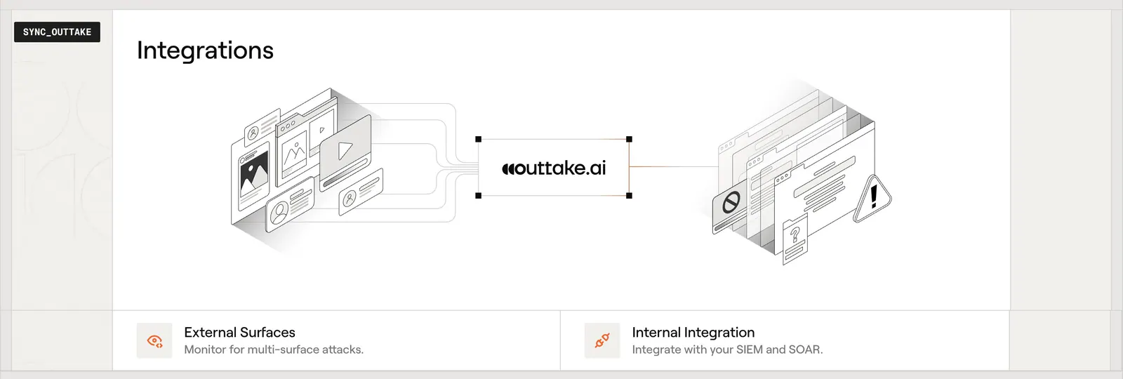
  359. Outtake integrations section: isometric diagram linking external surfaces to the Outtake logo and internal tools, with two feature cards below
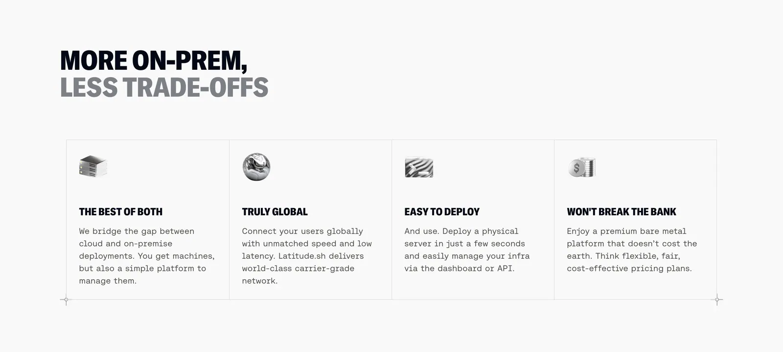
  360. Latitude.sh features section: two-tone uppercase headline above four bordered columns with small 3D icons and monospace copy
  361. Miter logo cloud section: small centered label above a two-row bordered grid of grayscale contractor logos
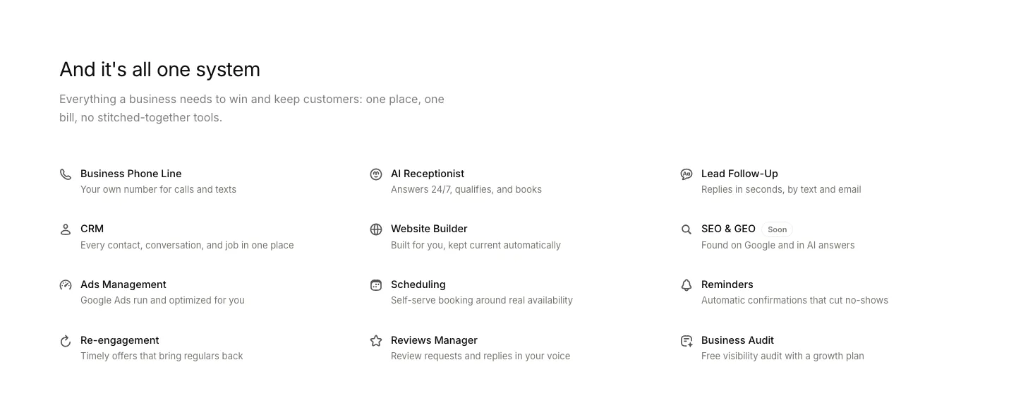
  362. Beside features section: headline and intro above a three-column list of twelve capabilities with line icons and short descriptions
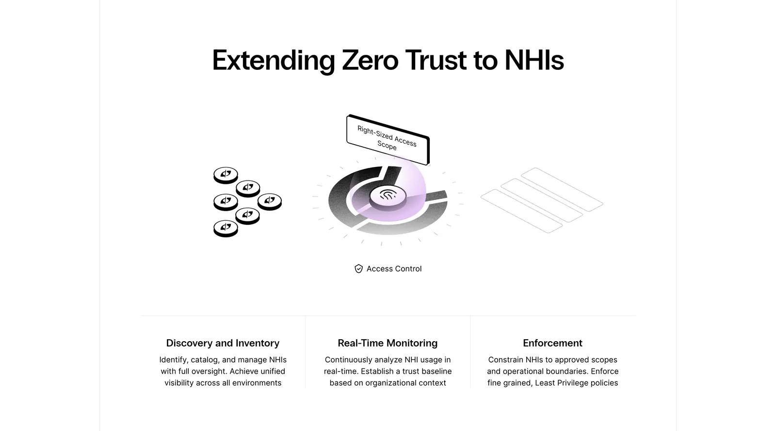
  363. Clutch Security features section: centered headline above a grayscale isometric access-control illustration and three capability columns
    Clutch Security Features
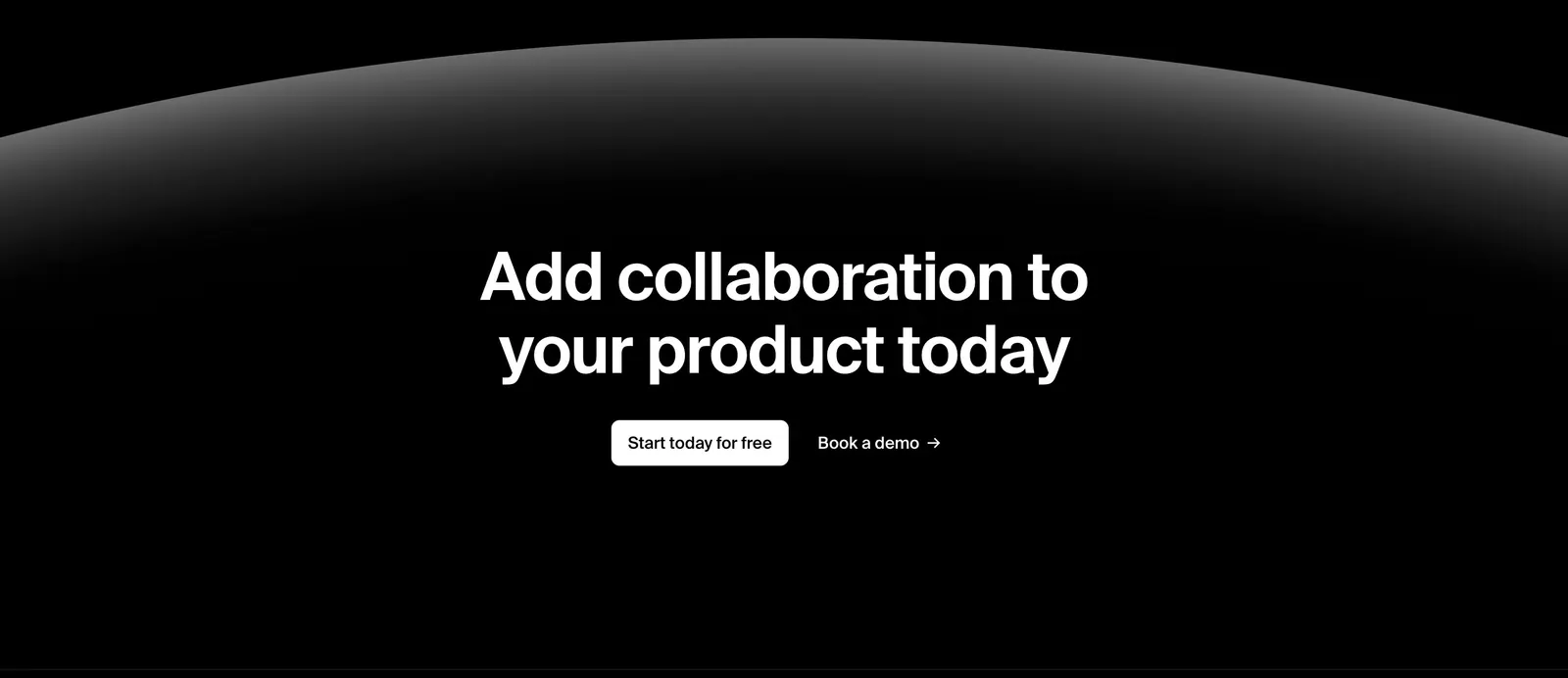
  364. Liveblocks call-to-action section: centered white headline and two buttons beneath a glowing gray planet-like arc on a black background
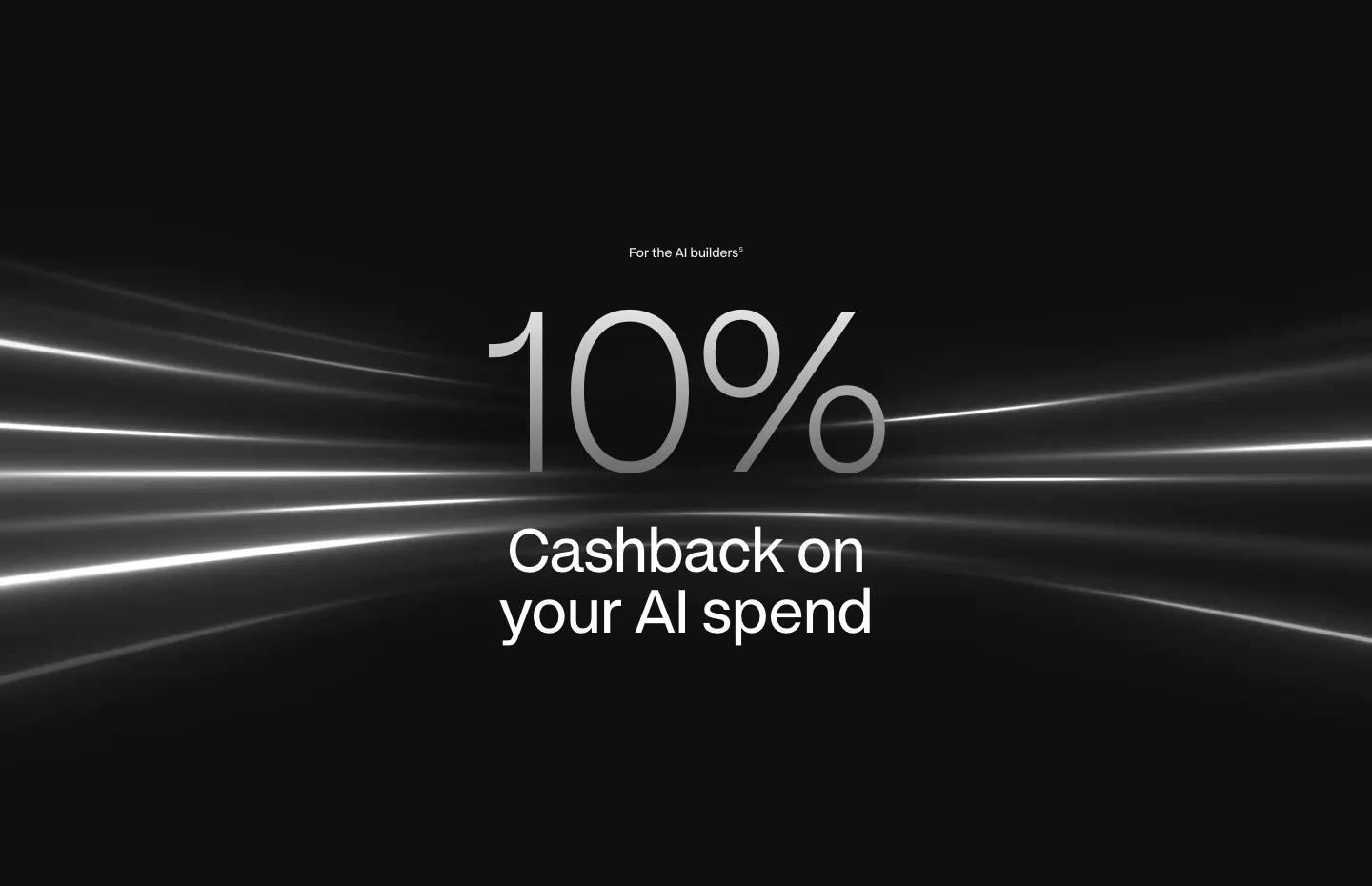
  365. Plasma value proposition section: oversized silver 10% figure and centered tagline over white light streaks on black
  366. Piqo features section: rounded dark panel with pill label, headline and button above a 4x3 grid of icon features on near-black
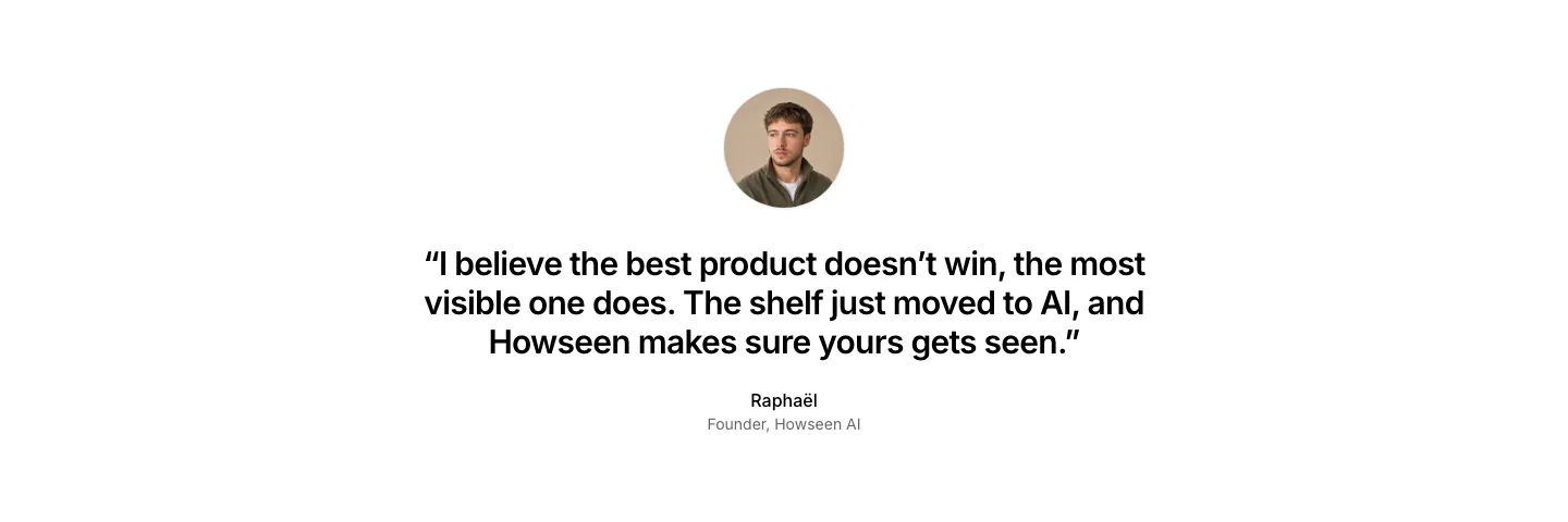
  367. Howseen AI about & mission section: centered founder quote below a circular portrait on a plain white background
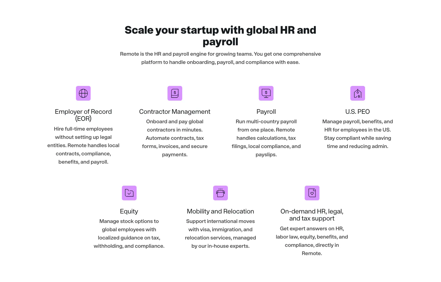
  368. Remote features section: centered headline above seven product items with purple icons in rows of four and three
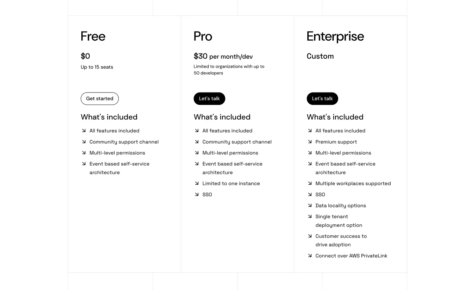
  369. Port pricing section: three bordered plan columns for Free, Pro and Enterprise with prices, buttons and arrow feature lists on white
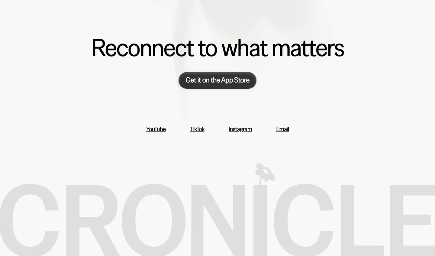
  370. Cronicle footer section: centered headline with an App Store button and social links above a giant faded gray CRONICLE wordmark
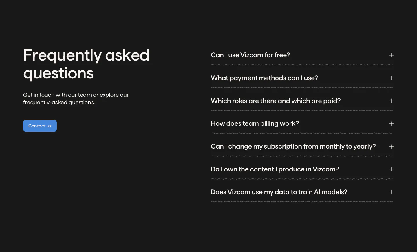
    Cronicle Footer
  371. Vizcom FAQ section: headline, copy and contact button on the left beside an accordion of questions on a dark charcoal background
  372. Zamp logo cloud section: centered line of text above a single row of gray customer logos on white
  373. Quartr logo cloud section: two rows of five black customer and partner logos on a white background
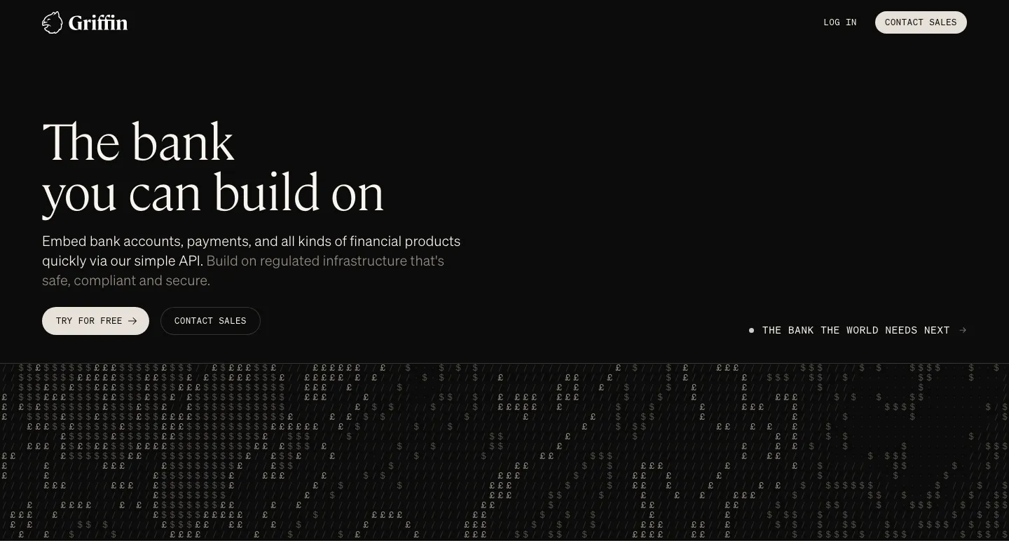
  374. Griffin hero section: large serif headline, copy and two buttons on black above a field of £ and $ characters
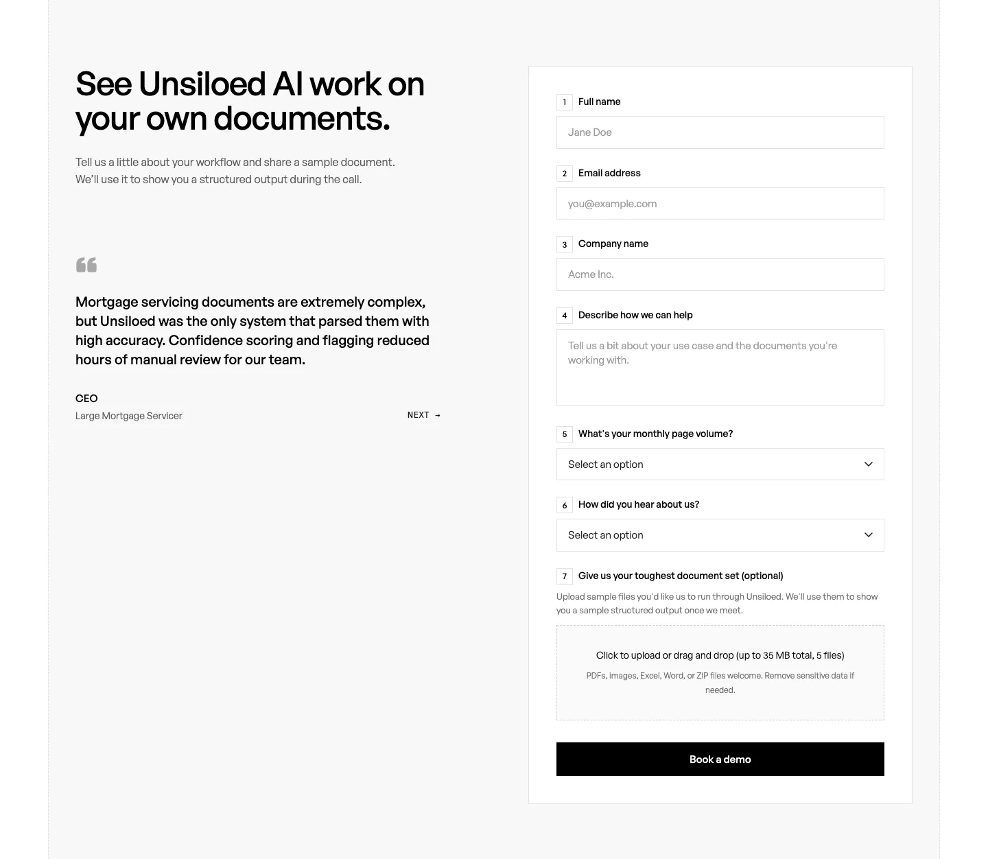
  375. Unsiloed contact section: headline and customer quote at left beside a numbered demo request form with text fields, selects and file upload
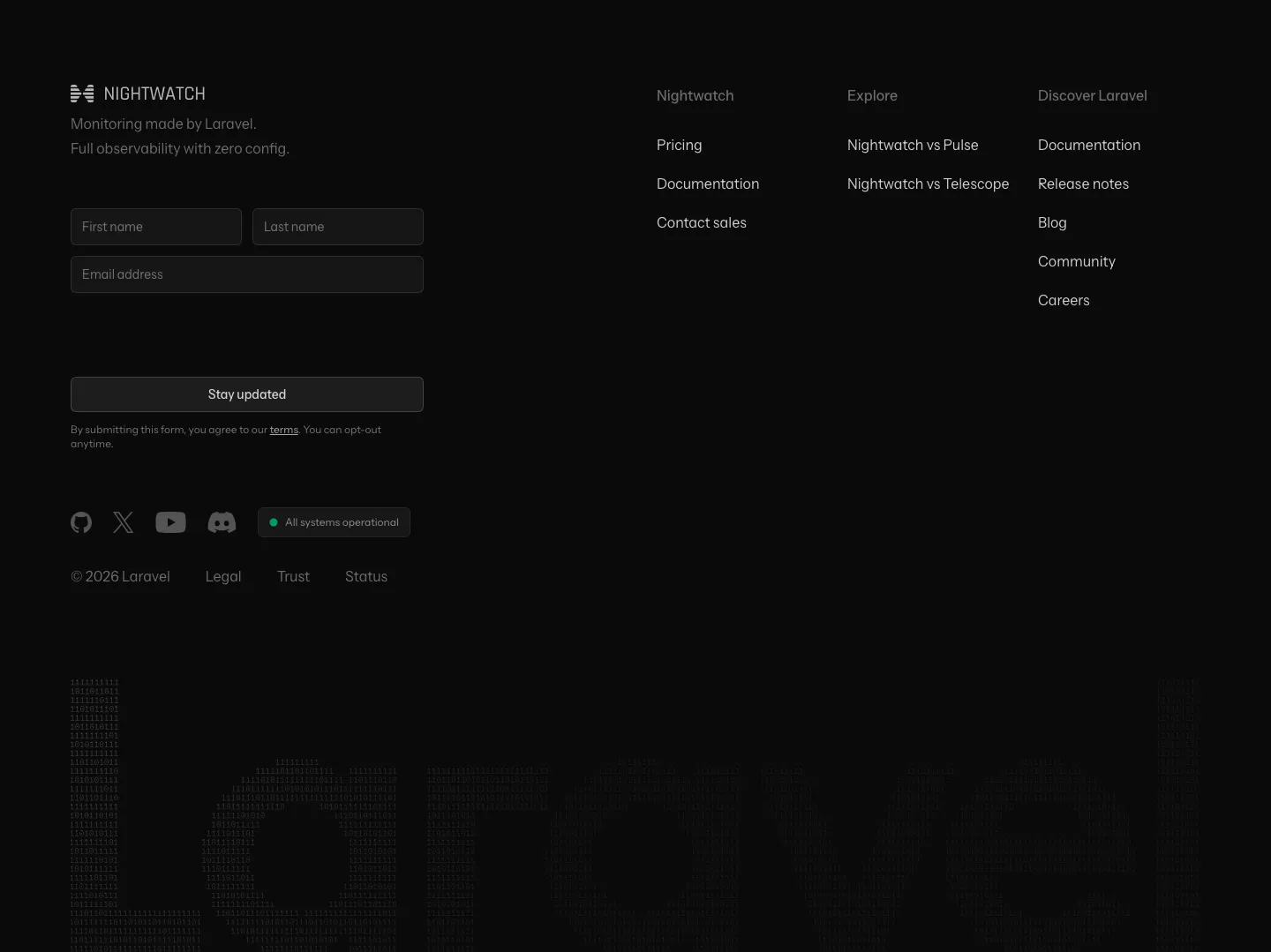
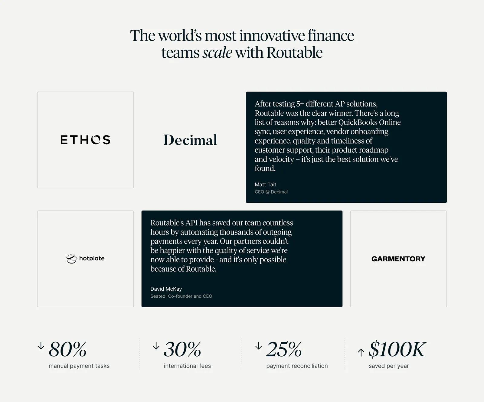
  376. Laravel Nightwatch footer section: newsletter form and link columns above a giant dim Laravel wordmark built from digits on black
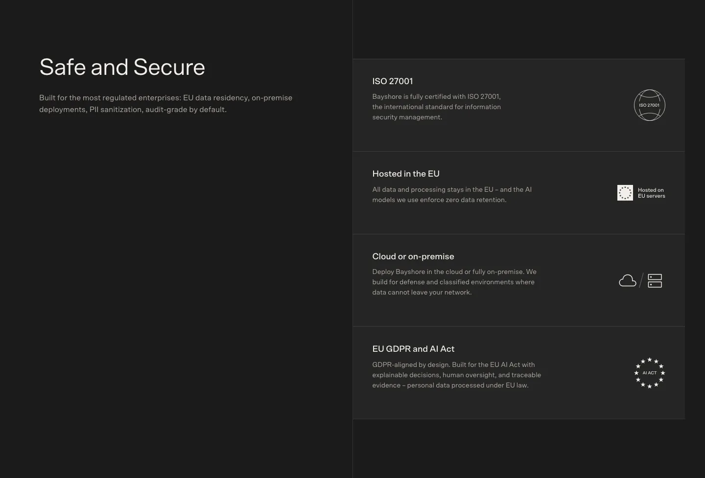
  377. Bayshore security section: heading left on charcoal, stacked cards for ISO 27001, EU hosting, on-premise and GDPR right
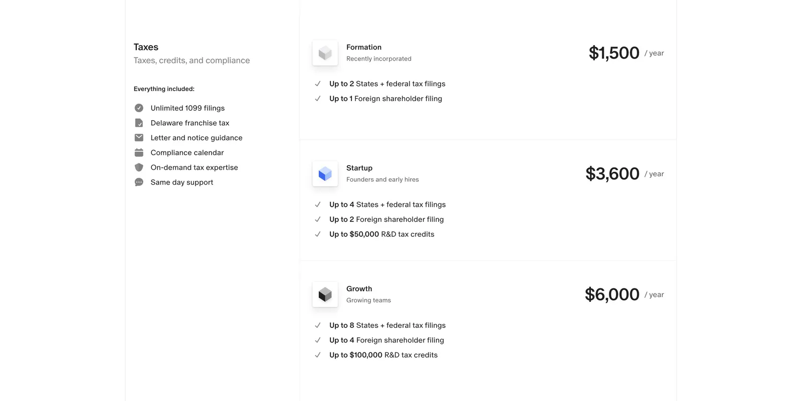
  378. Finta pricing section: Taxes label and included-features list beside three stacked yearly tax plans with prices on white
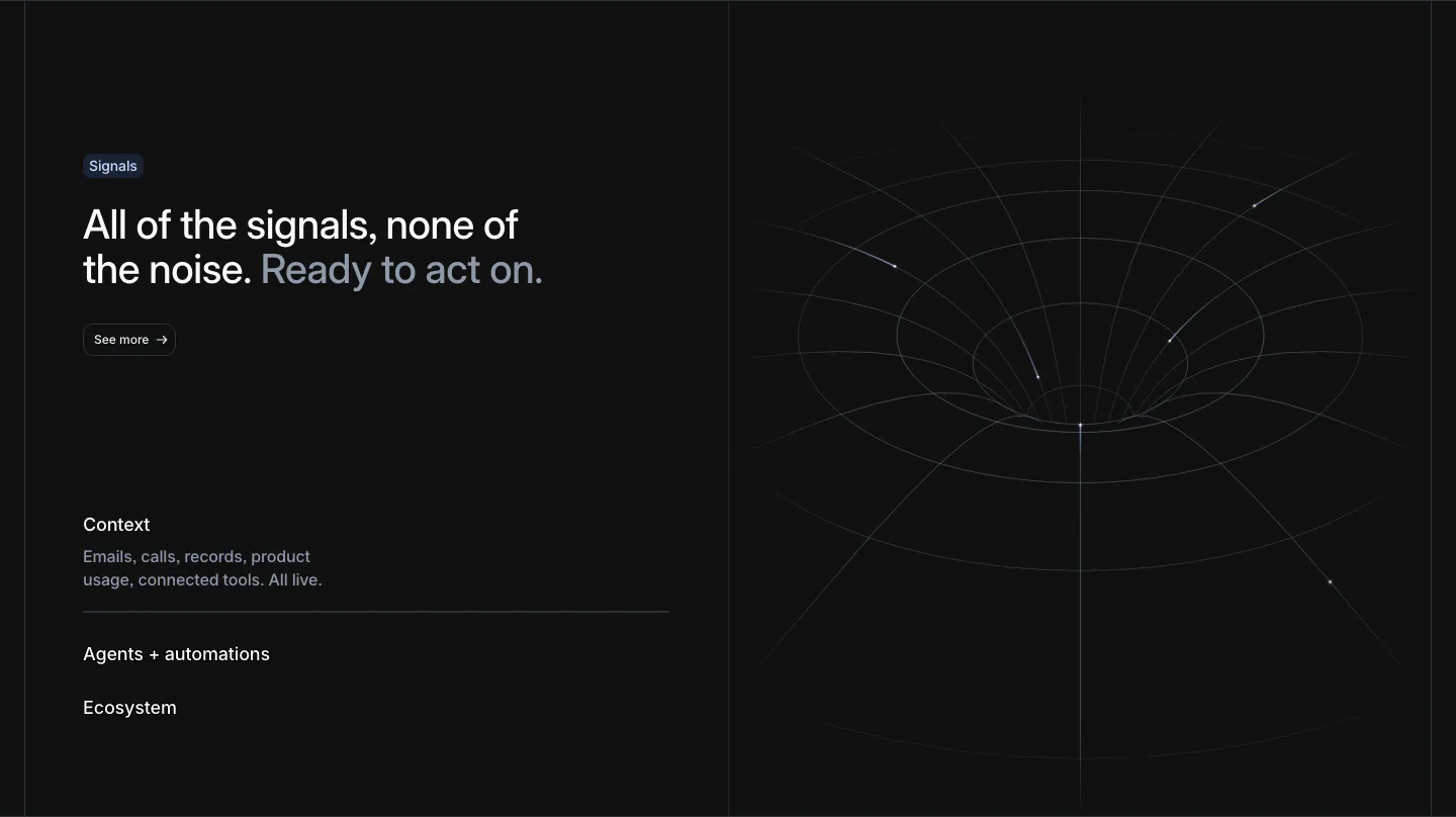
  379. Attio features section: headline with See more button and an expandable list at left, white wireframe funnel line art at right, dark
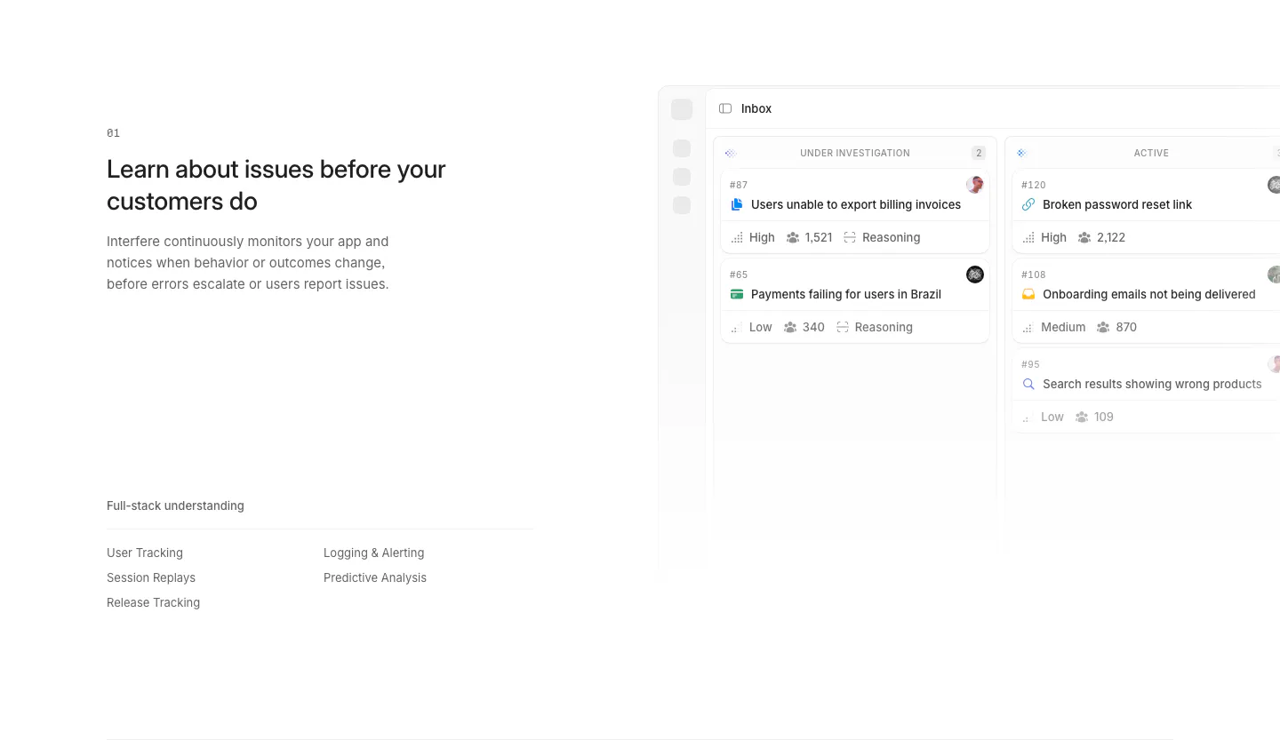
  380. Interfere features section: numbered text block with capability list on the left and an issue inbox board screenshot on the right
  381. Customer.io logo cloud section: two rows of customer logos in bordered cells divided by a trusted-by-9,000+ brands caption
  382. Plasma logo cloud section: gray panel with heading and three stats left and a 3x2 grid of partner logo tiles right
  383. Hellotime logo cloud section: centered caption above a single row of four black agency logos on a white background
  384. Routable testimonials section: serif headline over a grid of logo tiles and dark quote cards, with four savings metrics below on light gray
  385. Customer.io call to action section: centered headline and two buttons on a dot grid, above a row of compliance badges
  386. United Carriers blog & resources section: uppercase heading over a dated news list with category labels and a ship photo on dark
  387. Amplemarket FAQ section: headline on the left and an accordion of five questions with plus icons on the right, on off-white
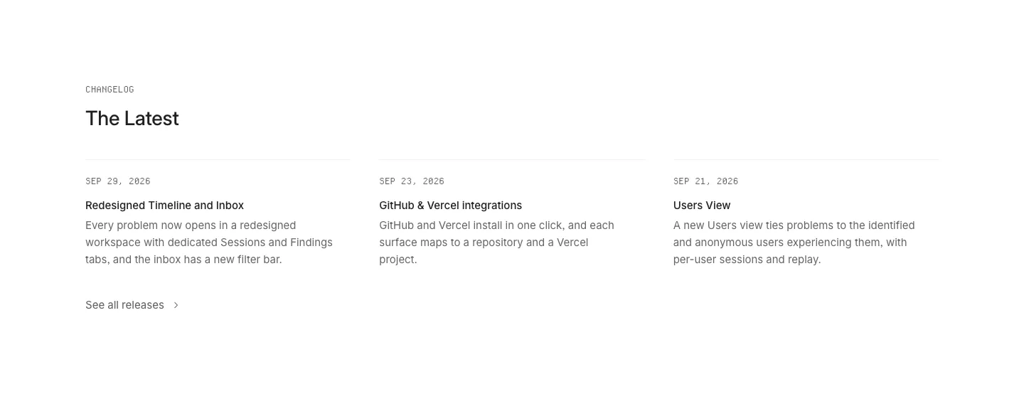
  388. Interfere blog & resources section: changelog heading above three dated release notes in columns on a white background
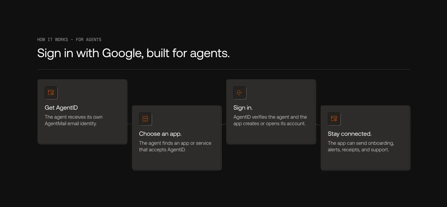
  389. AgentID how it works section: dark row of four staggered step cards with orange icons, from Get AgentID to Stay connected
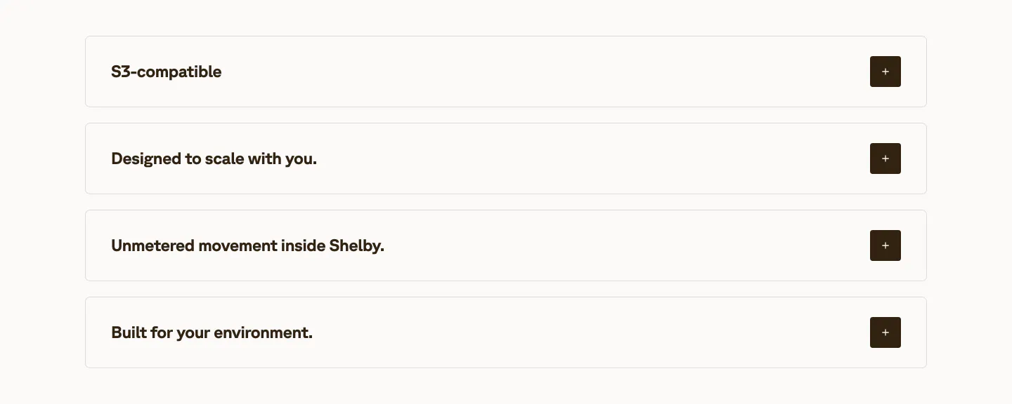
  390. Shelby value proposition section: four stacked accordion rows of benefit titles with dark plus buttons on an off-white background
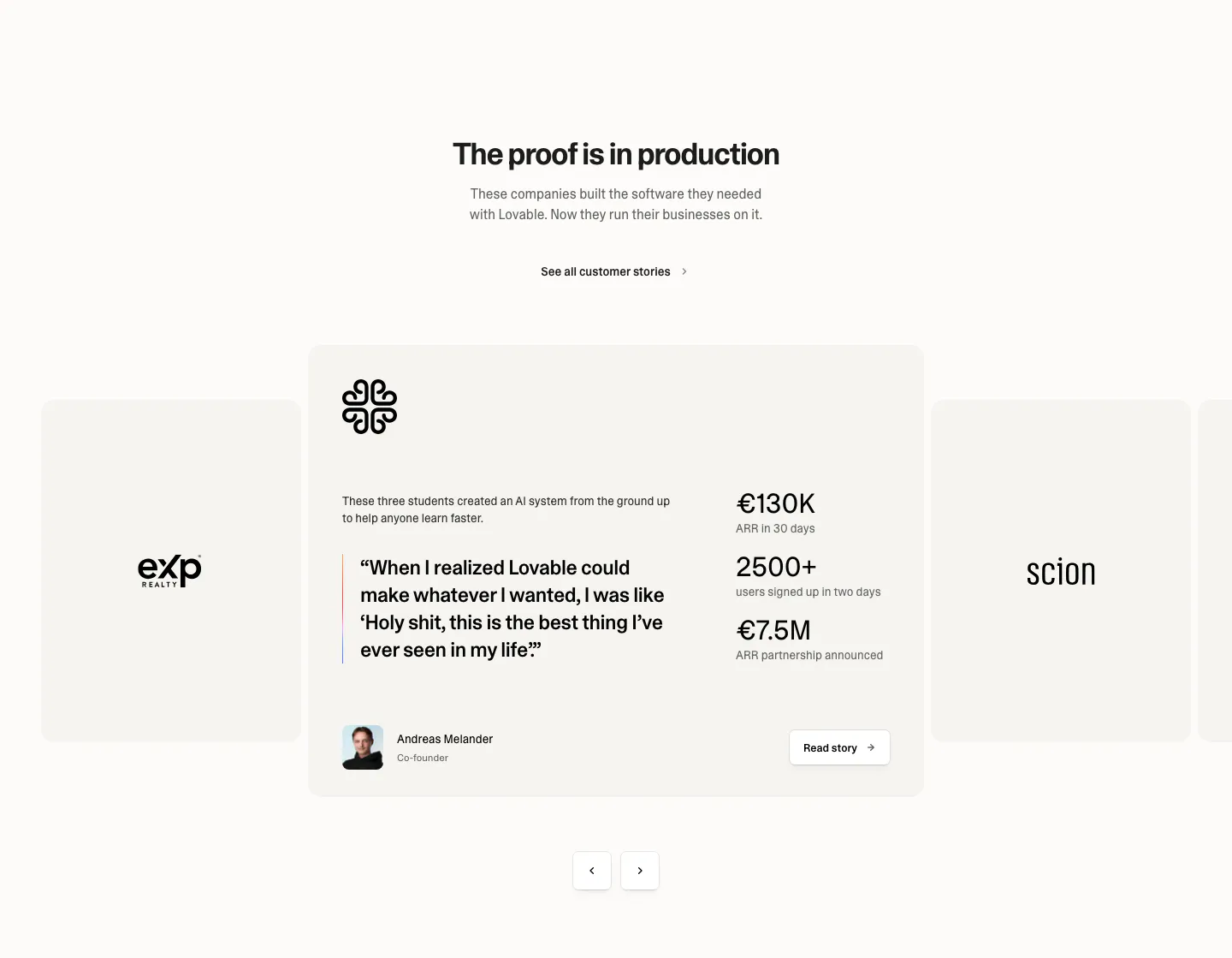
  391. Lovable testimonials section: centered heading above a case study carousel with a quote, three metrics, founder avatar and arrow controls
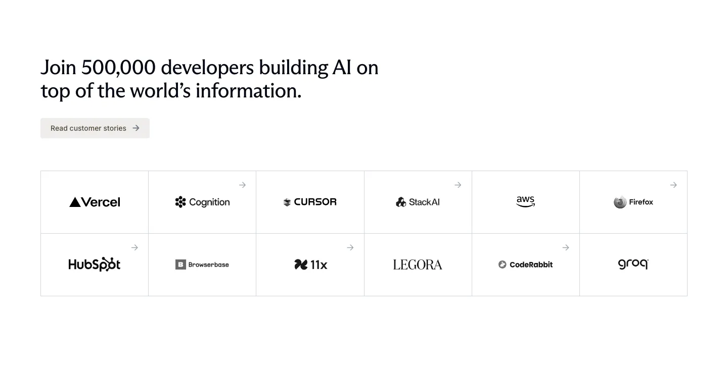
  392. Exa logo cloud section: left-aligned headline and customer stories button above a bordered six-by-two grid of customer logos
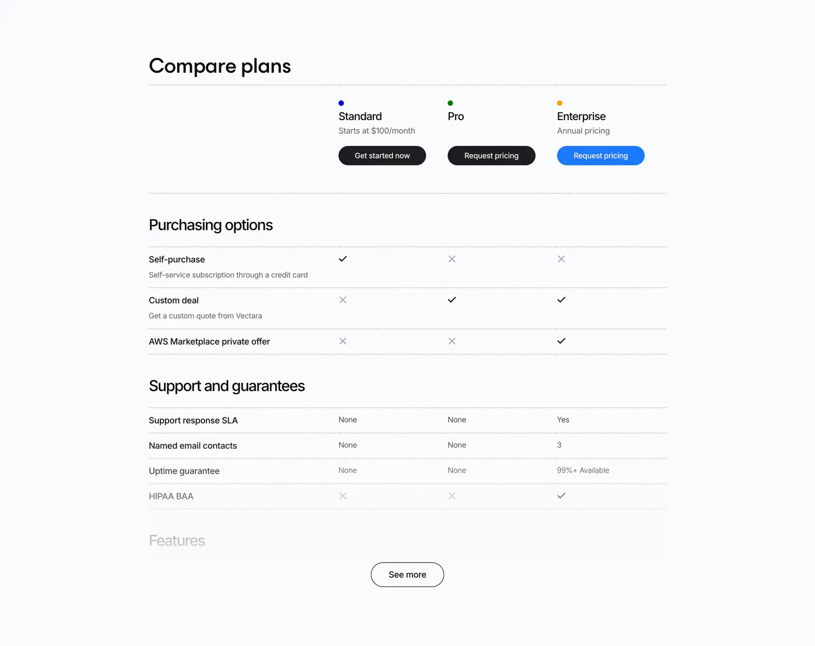
  393. Vectara pricing section: plan comparison table with check and cross marks for Standard, Pro and Enterprise and a See more button
  394. Routable value proposition section: strip of four serif italic metrics with arrows and labels separated by dotted dividers on light gray
  395. Bucket FAQ section: FAQs heading above a two-column list of questions and answers on a dark background
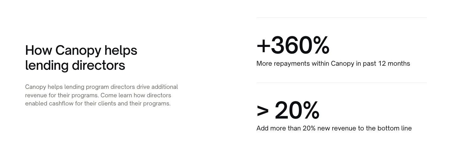
  396. Canopy stats section: heading and copy on the left, two large percentage metrics with labels on the right, white background
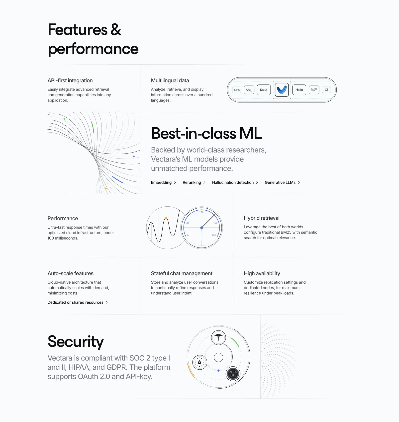
  397. Vectara features section: grid of feature cells in mixed sizes with line-art diagrams, a gauge and a security badge graphic on light gray
  398. Antimetal logo cloud section: centered caption above three rows of grayscale customer logos on a light background
  399. Supercut security section: two-tone headline at left, compliance copy at right, outlined shield icons and Trust Center buttons
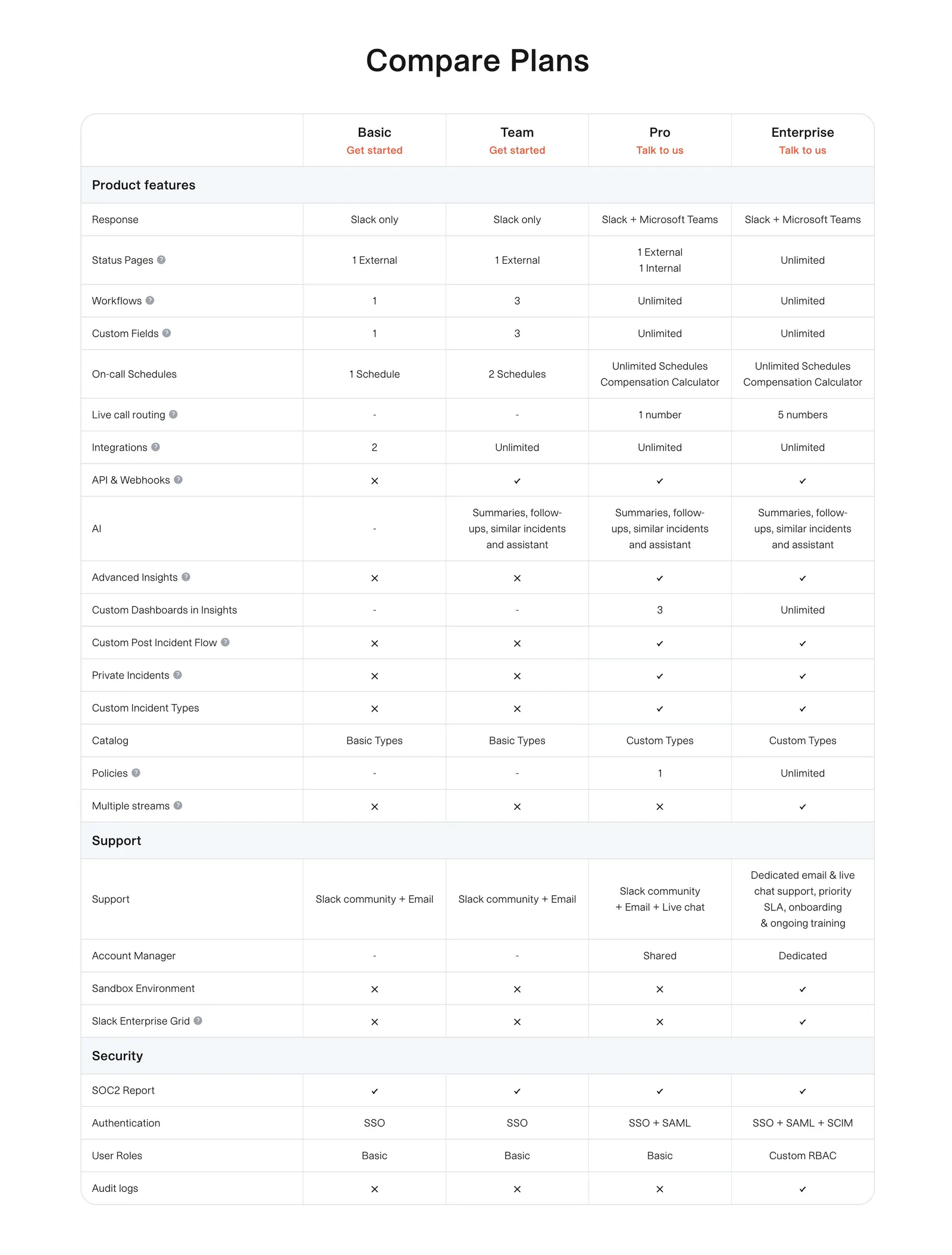
  400. incident.io pricing section: plan comparison table with grouped feature rows and check and cross marks on white
  401. Evervault logo cloud section: two rows of six white customer logos above a centered trust caption on a near-black background
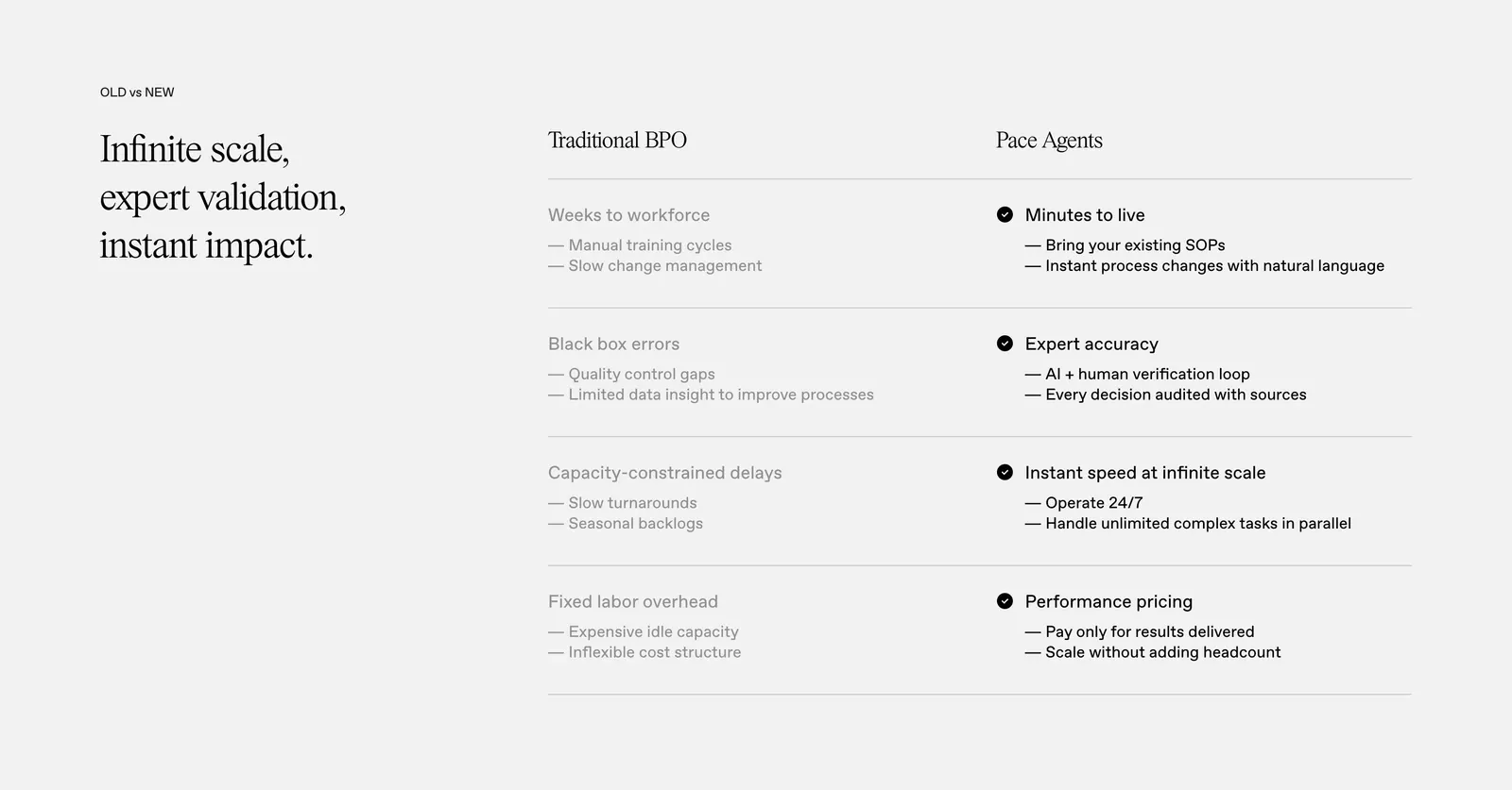
  402. Pace comparison section: serif headline on the left beside a two-column Traditional BPO vs Pace Agents table with checkmarks on light gray
    Pace Comparison
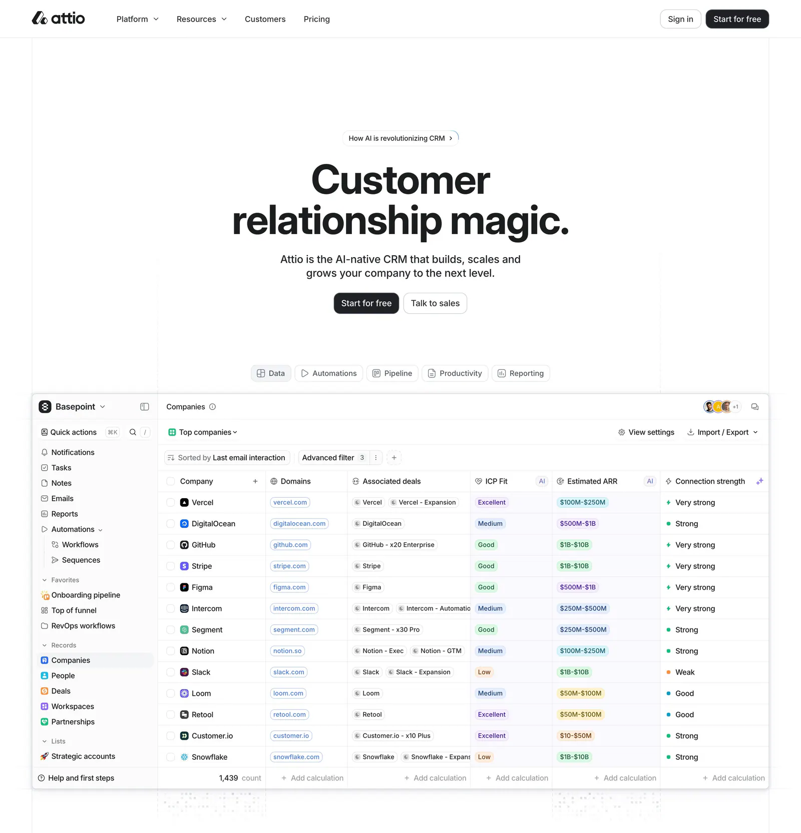
  403. Attio hero section: centered headline, two buttons and a tab bar above a large CRM companies table screenshot on white
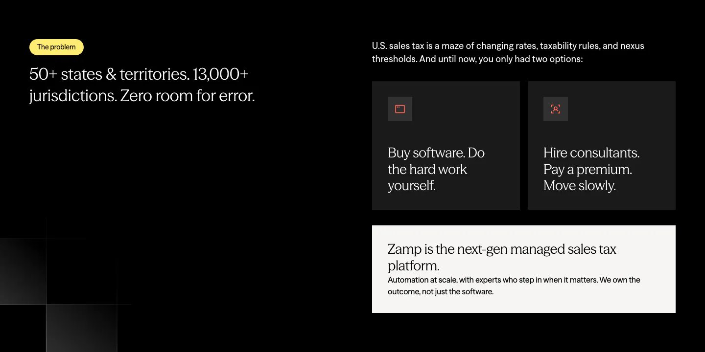
  404. Zamp value proposition section: problem statement on the left and dark option cards with a light Zamp answer card on the right, on black
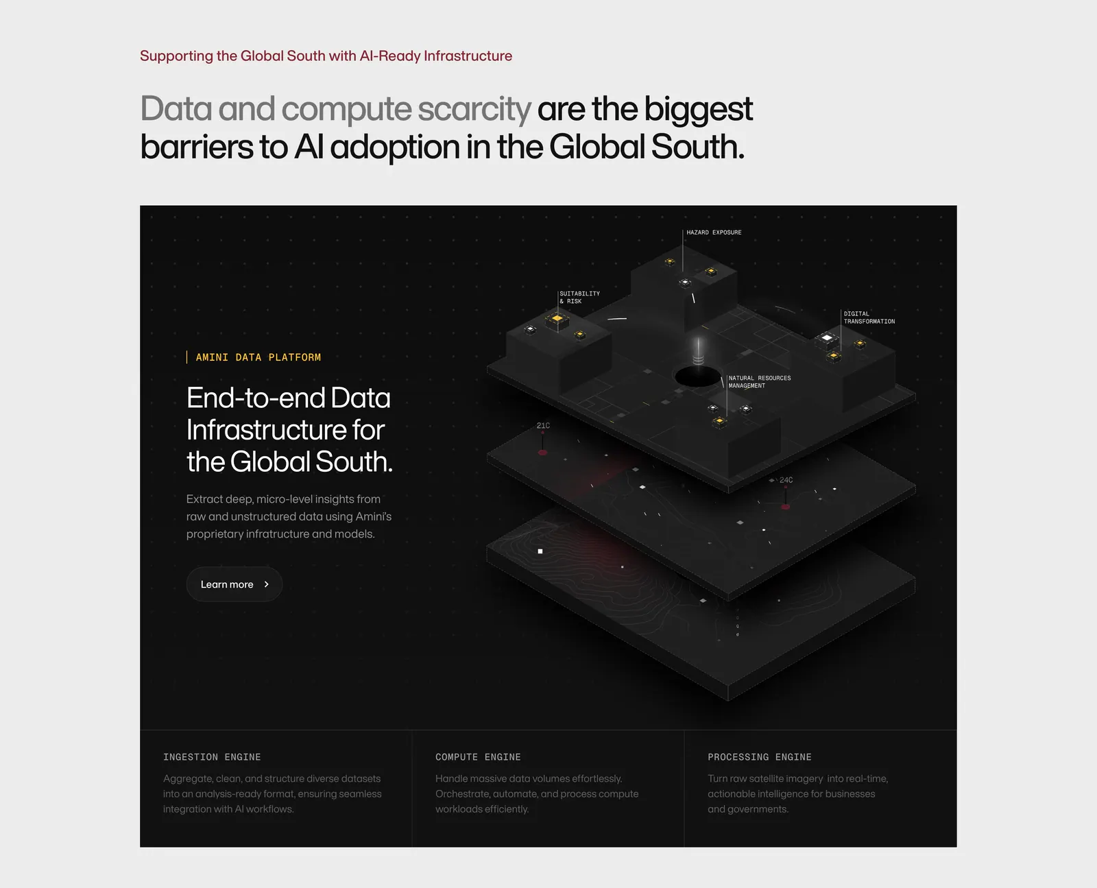
  405. Amini features section: headline on light gray above a dark panel with text and an isometric 3D data platform render, three engine columns
  406. Vercel call-to-action section: large Start Deploying pill with arrow button beside two sales and trial buttons on a gray grid
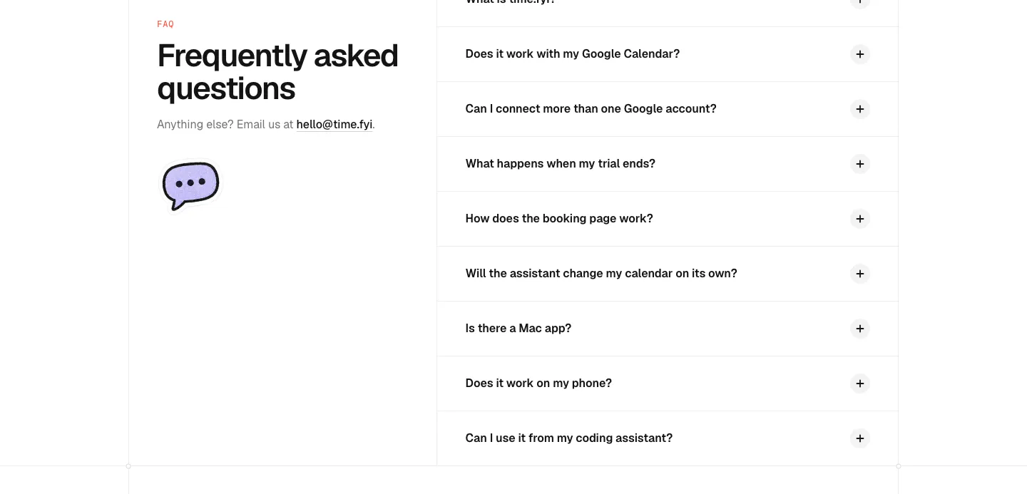
  407. time.fyi FAQ section: left headline with email contact and chat bubble icon beside a right-hand accordion of collapsed questions
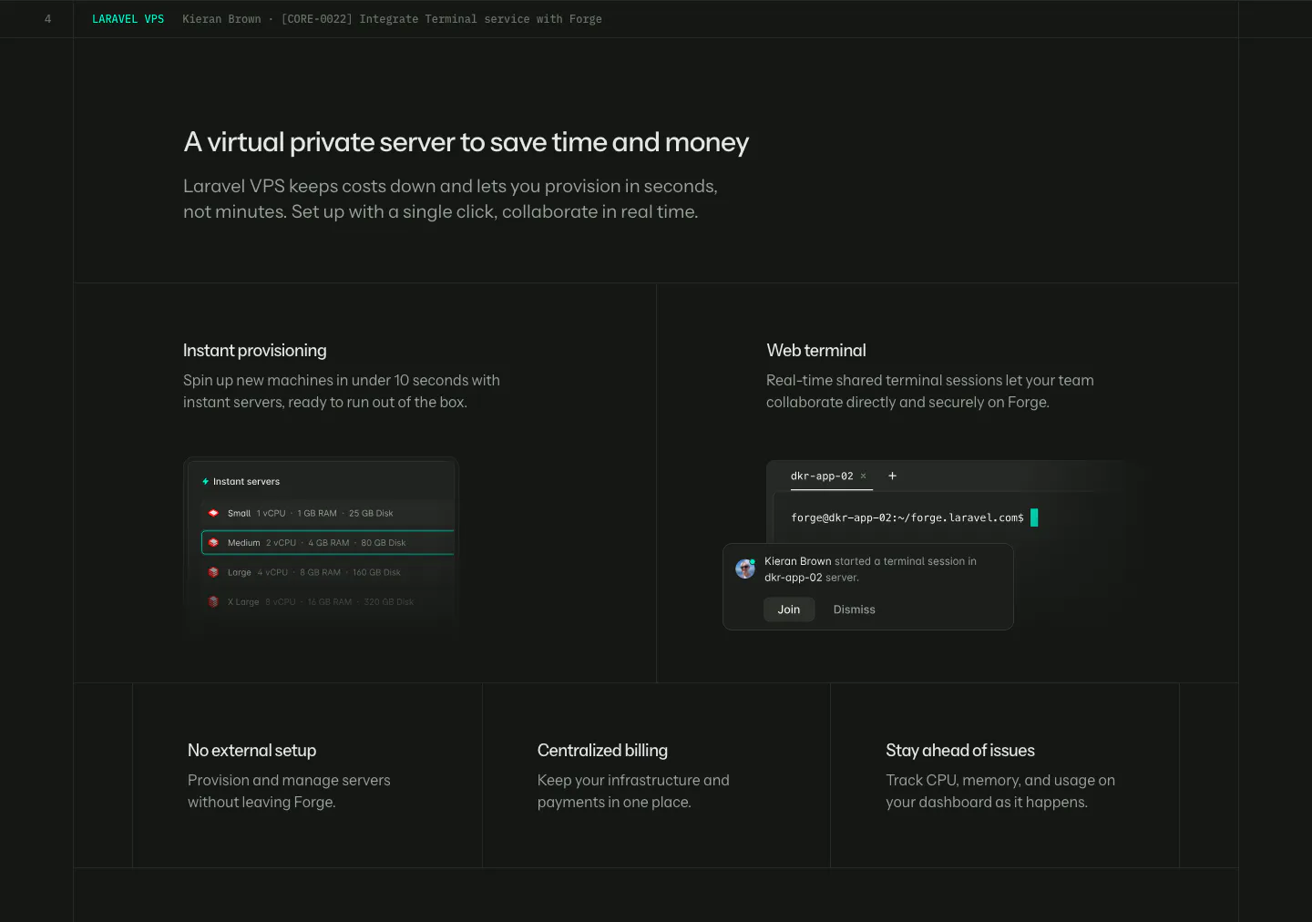
  408. Laravel Forge features section: dark grid with two UI tiles (server list, web terminal) above three smaller feature tiles
  409. Steel value proposition section: three metrics in a bordered row showing tokens scraped, browser hours and session start time on dark gray
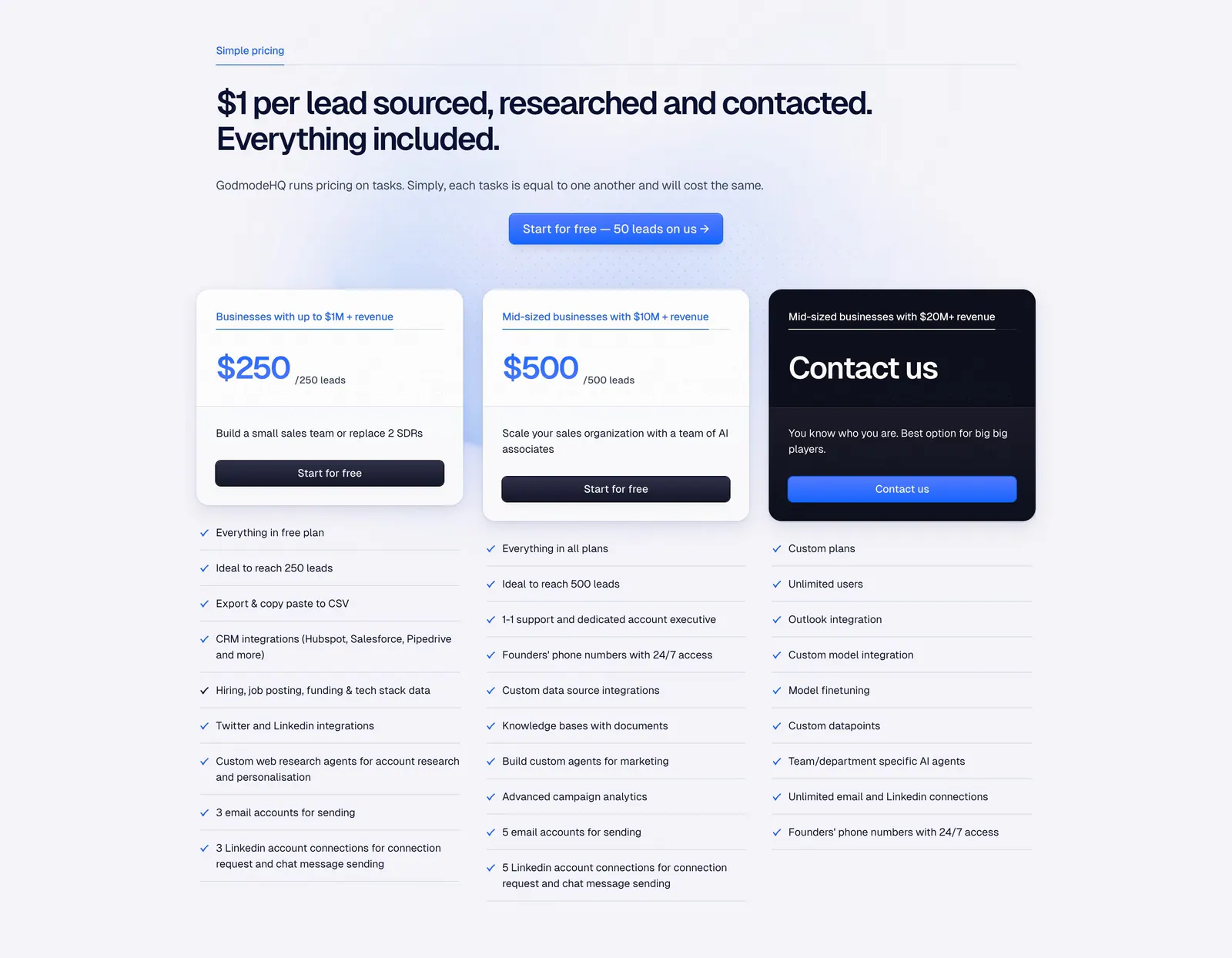
  410. Godmode pricing section: left-aligned headline and blue button above three plan cards, one dark, with checklists below each
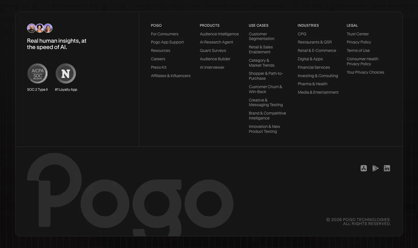
  411. Pogo footer section: dark rounded panel with tagline, compliance badges, five link columns and a large faded Pogo wordmark
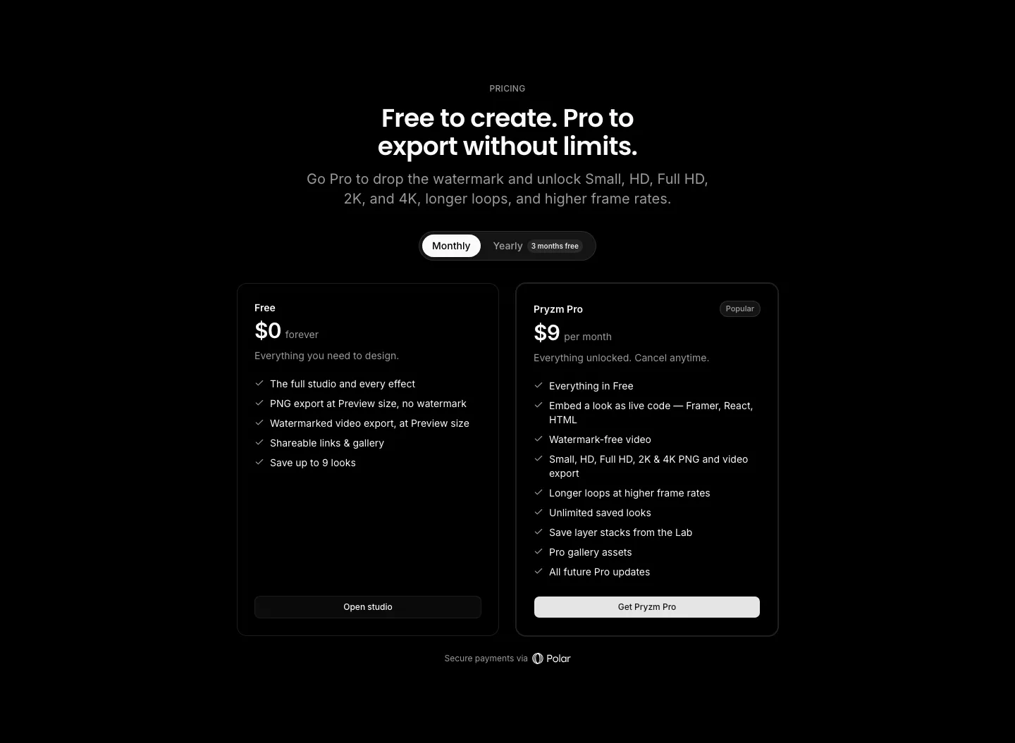
  412. Pryzm pricing section: black background with centered headline, monthly/yearly toggle and two plan cards with feature checklists
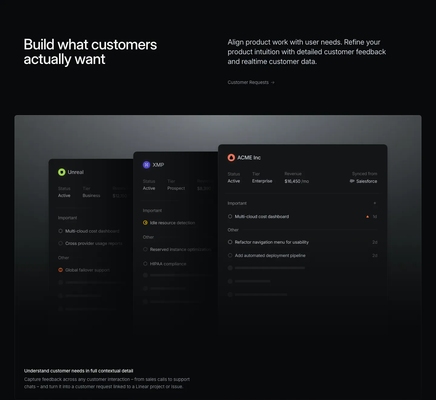
  413. Linear features section: headline left, short copy and link right, above a wide panel of stacked dark customer request cards on near-black
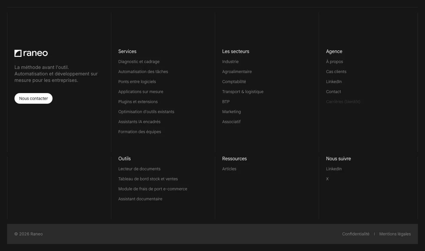
  414. Raneo footer section: dark bordered grid with logo, tagline and contact button beside six link columns and a copyright bar
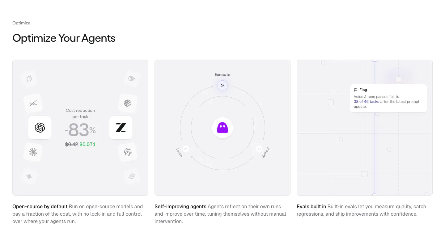
  415. Gumloop features section: left-aligned heading above three equal gray cards with cost, self-improving and evals visuals
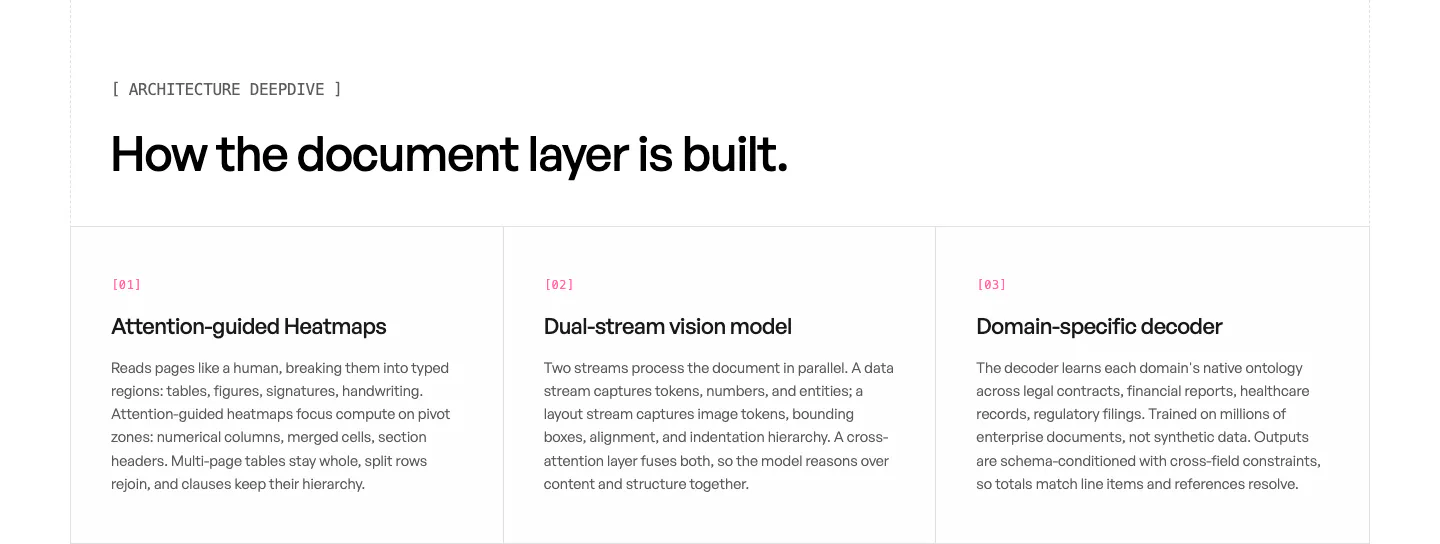
  416. Unsiloed features section: left headline above three bordered columns numbered 01 to 03 describing model architecture components on white
  417. Steel footer section: dithered photo CTA banner above a logo, copyright, link columns and status indicator on a dark grid background
  418. Linear footer section: dark footer with a logo mark, five link columns and a row of legal links
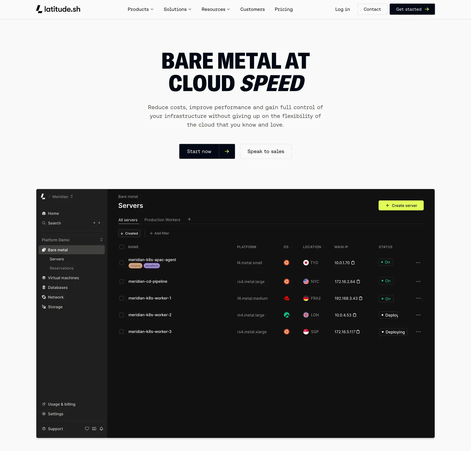
  419. Latitude.sh hero section: nav and centered uppercase headline with buttons above a dark servers dashboard screenshot
  420. EchoFi footer section: office, contact email, navigation and community link columns with copyright on near-black
  421. DevRev logo cloud section: centered gray caption above a single row of six monochrome customer logos on white
  422. Dash0 testimonials section: single customer quote with avatar between prev/next arrows and pagination bars on a near-black background
  423. Finta pricing section: centered heading above Startup and Growth monthly plan cards with checklists on a light gray background
  424. Ycode integrations section: headline over four AI provider rows with icons on the left, three AI feature rows on the right, black
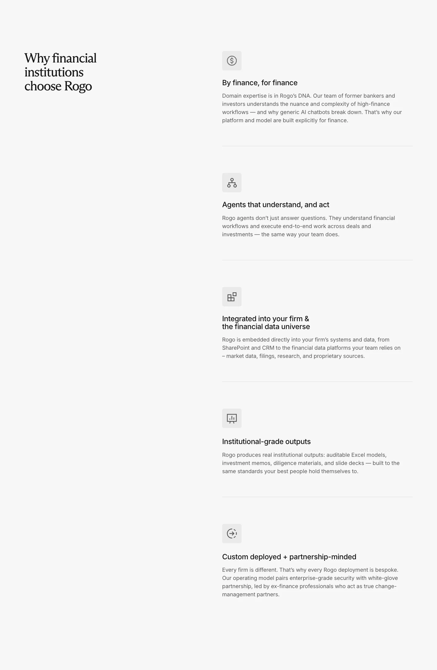
  425. Rogo value proposition section: serif headline on the left, five stacked benefit rows with icons and descriptions on the right
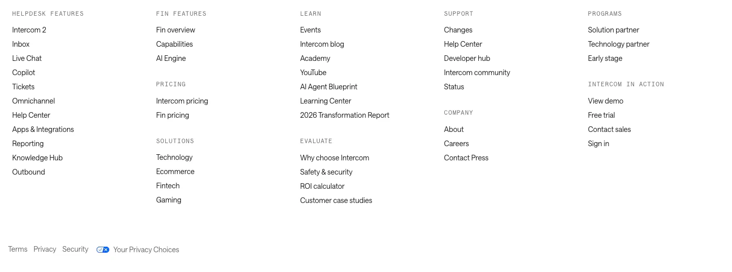
  426. Intercom footer section: five columns of grouped links under monospace labels with a row of legal links on white
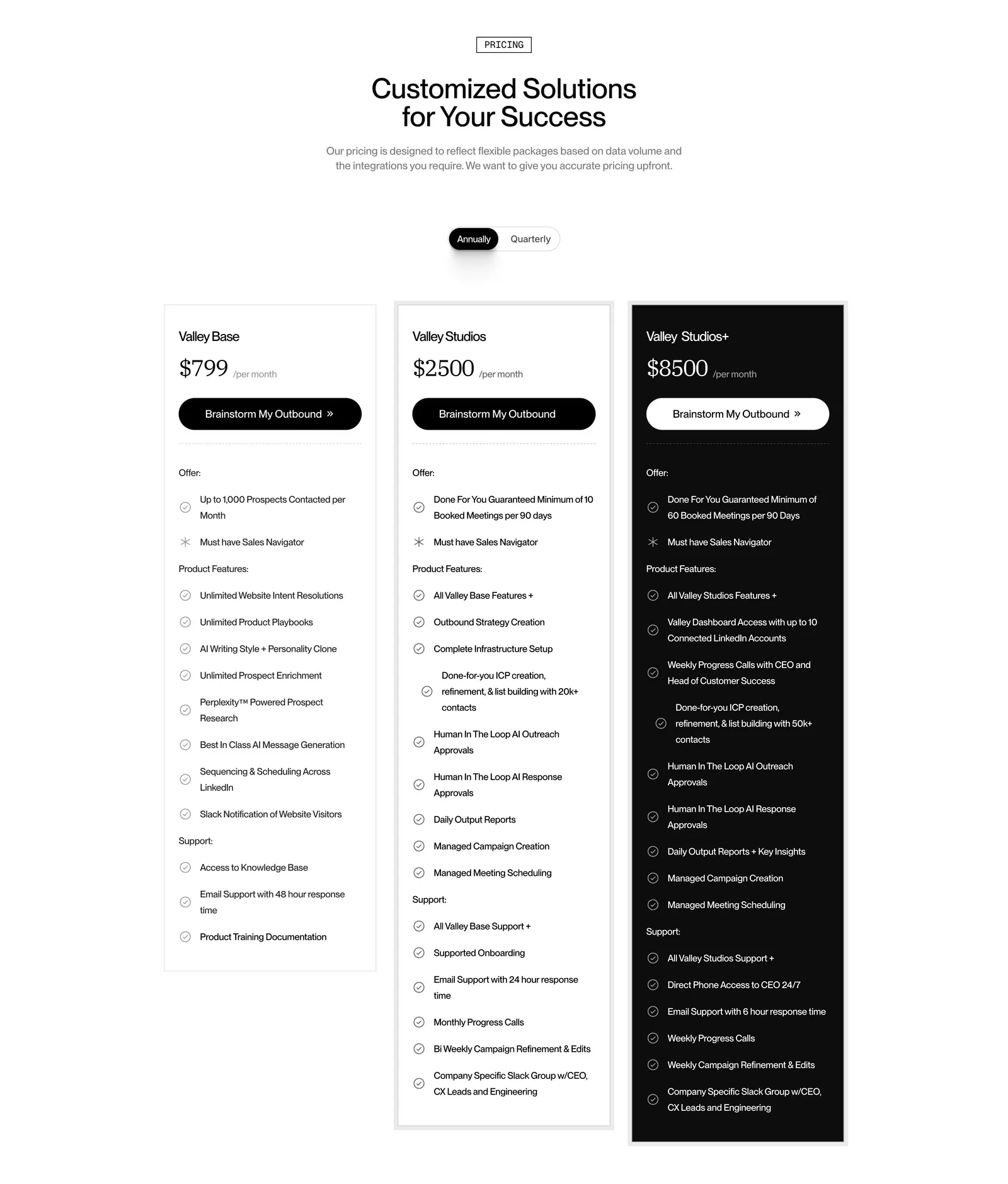
  427. Valley pricing section: centered headline and annual/quarterly toggle above three plan cards, the top tier in black, with feature checklists
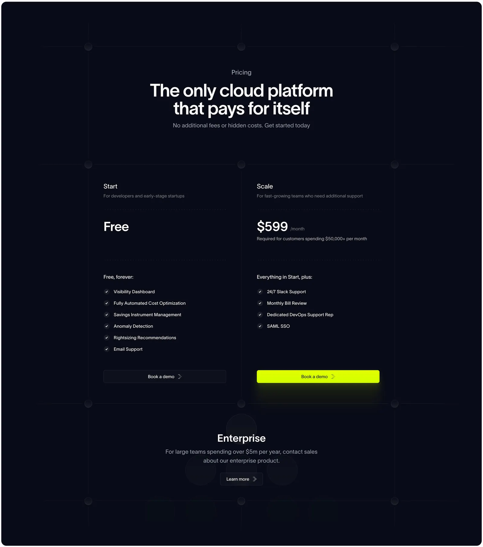
  428. Antimetal pricing section: centered headline on dark navy grid lines above two plan columns and an enterprise row
  429. Mintlify testimonials section: headline with buttons above three dark case-study cards showing customer logos and carousel arrows
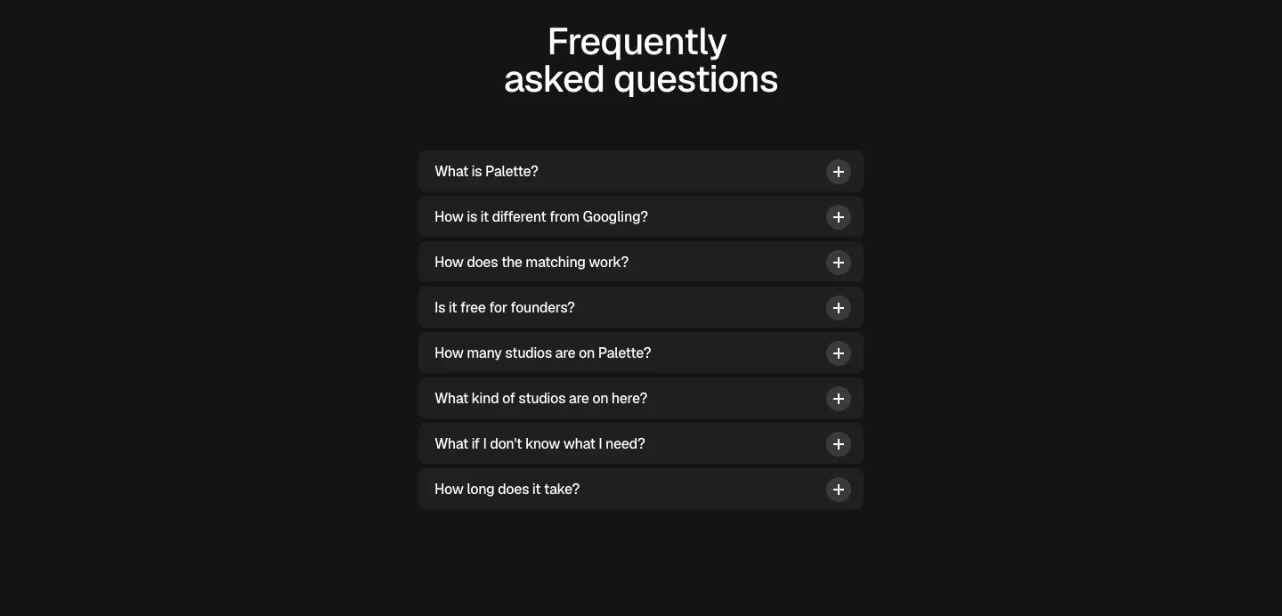
  430. Palette FAQ section: centered headline above a narrow accordion of eight collapsed questions with plus icons on a dark background
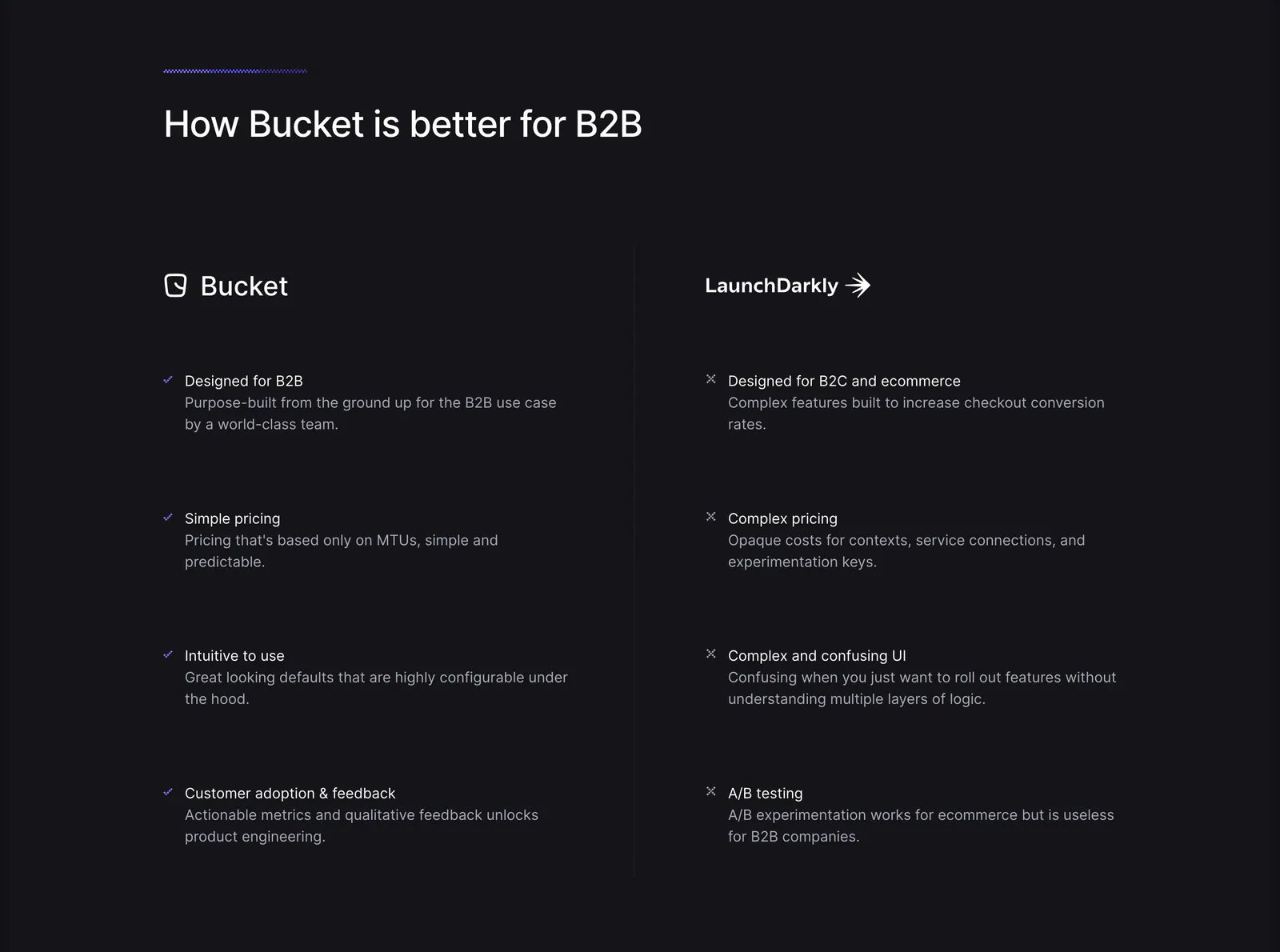
  431. Bucket comparison section: headline above two columns contrasting Bucket checkmarks with LaunchDarkly crosses on a dark background
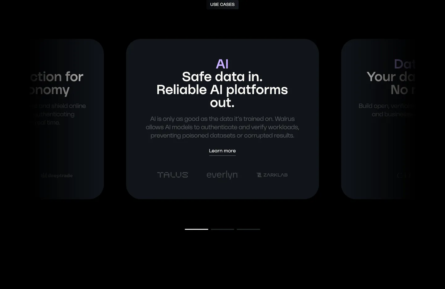
  432. Walrus use cases section: carousel of dark use case cards with a centered AI card, partner logos and pagination bars
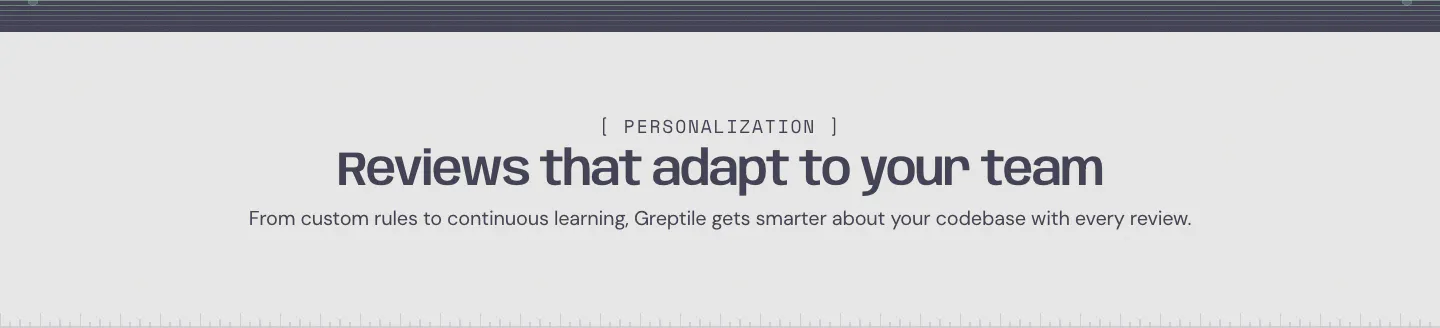
  433. Greptile features section: centered eyebrow label, headline and one-line subtitle on a light gray band with a striped top edge
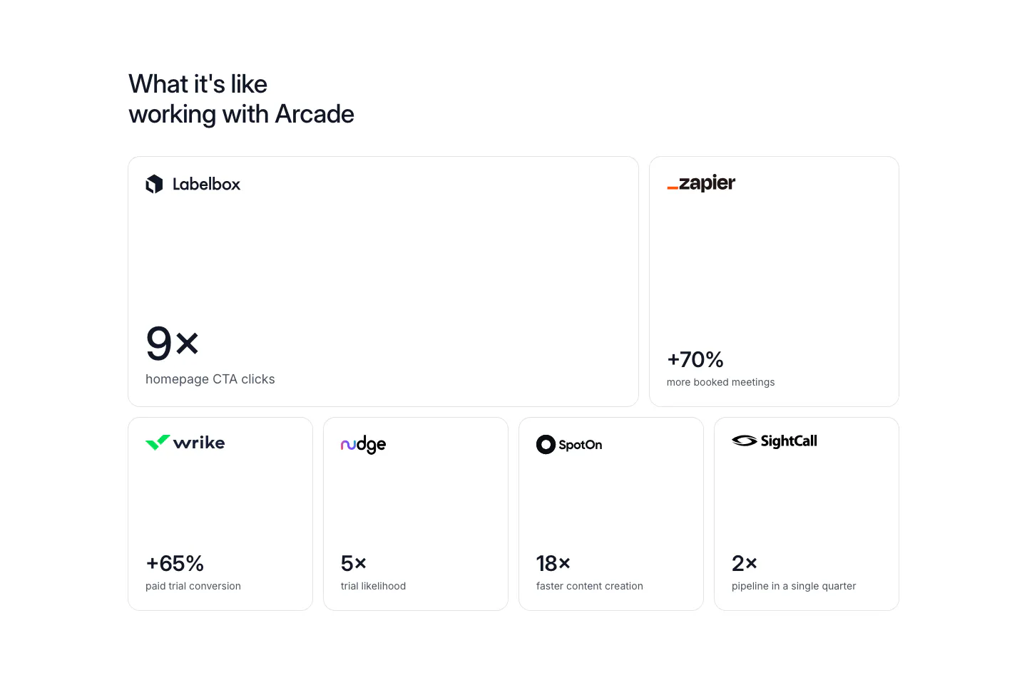
  434. Arcade stats section: bento grid of six bordered cards, each with a customer logo and a large result metric like 9x or +70%
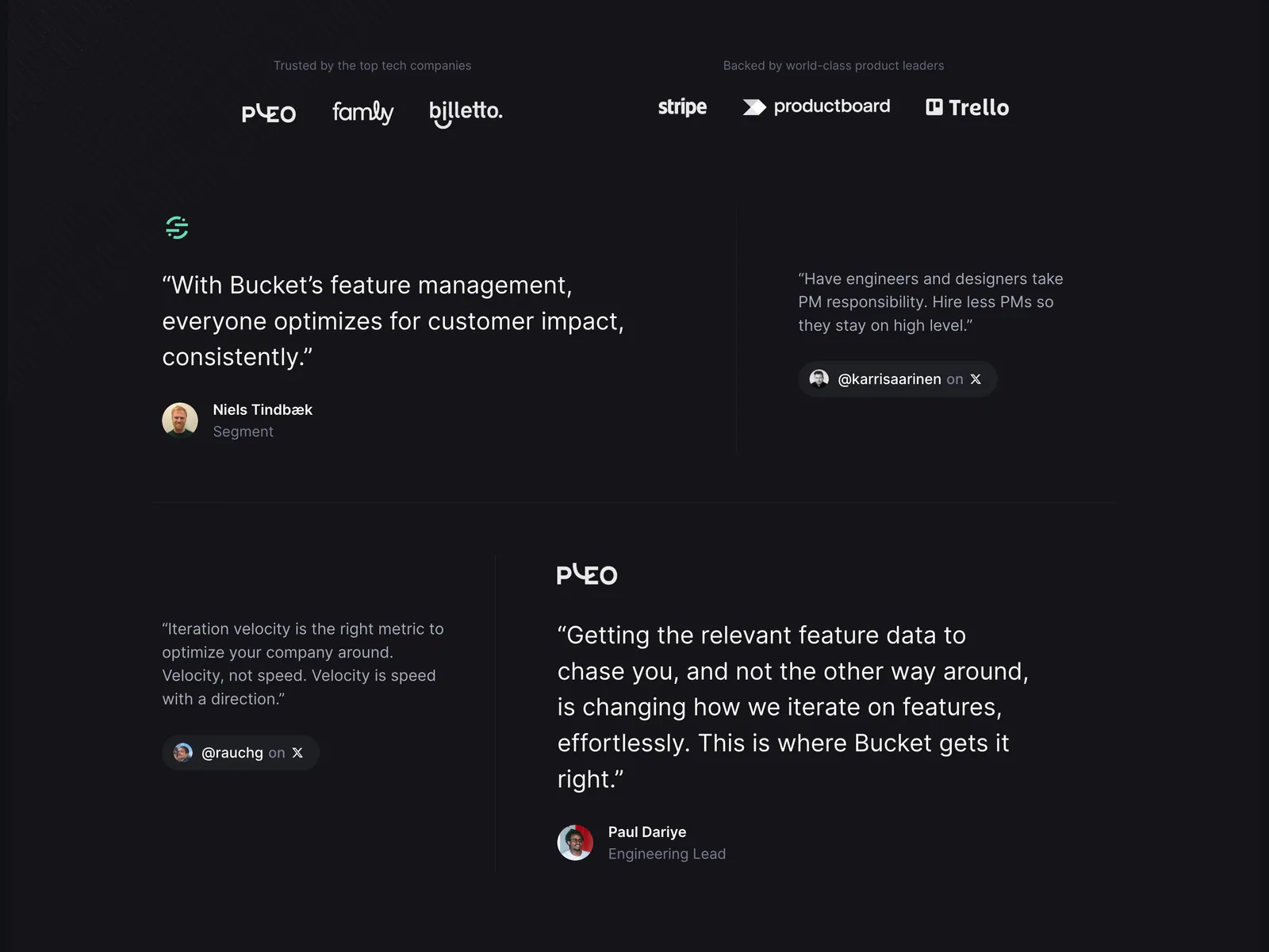
  435. Bucket testimonials section: customer and investor logo rows above a staggered layout of large and small quotes on a dark background
  436. Wiza logo cloud section: single row of customer logos above G2 and Chrome Store rating badges on a white background
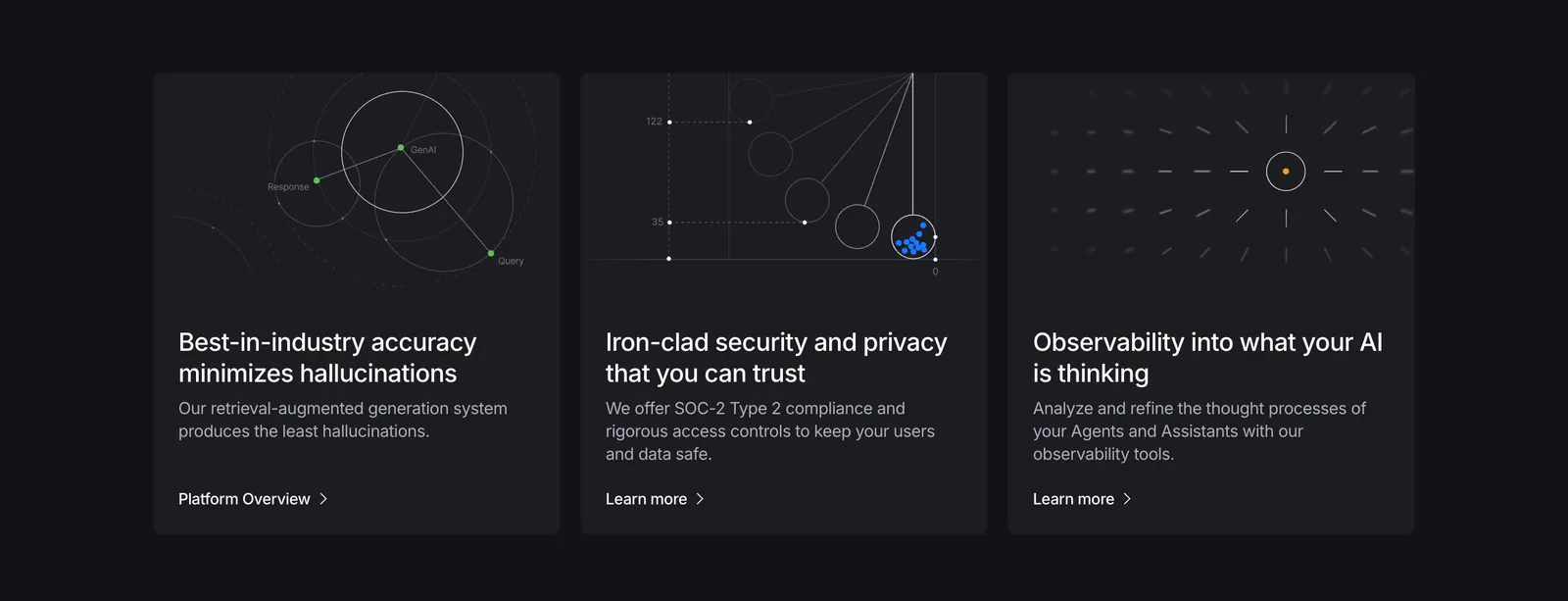
  437. Vectara features section: three dark cards with thin line-diagram graphics, titles and links on a near-black background
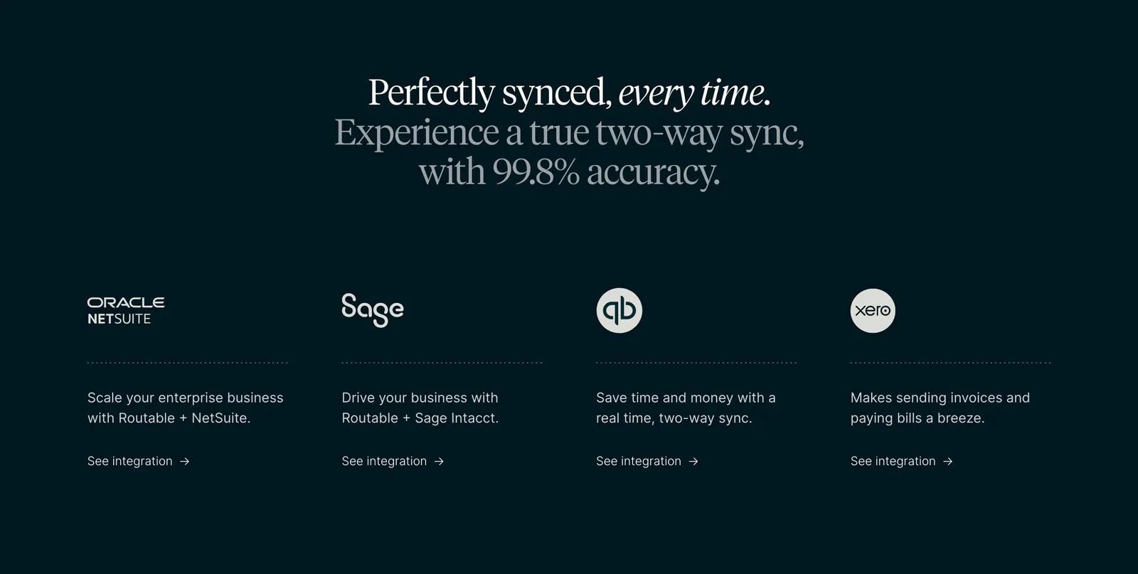
  438. Routable integrations section: centered serif headline above four columns with NetSuite, Sage, QuickBooks and Xero logos on dark
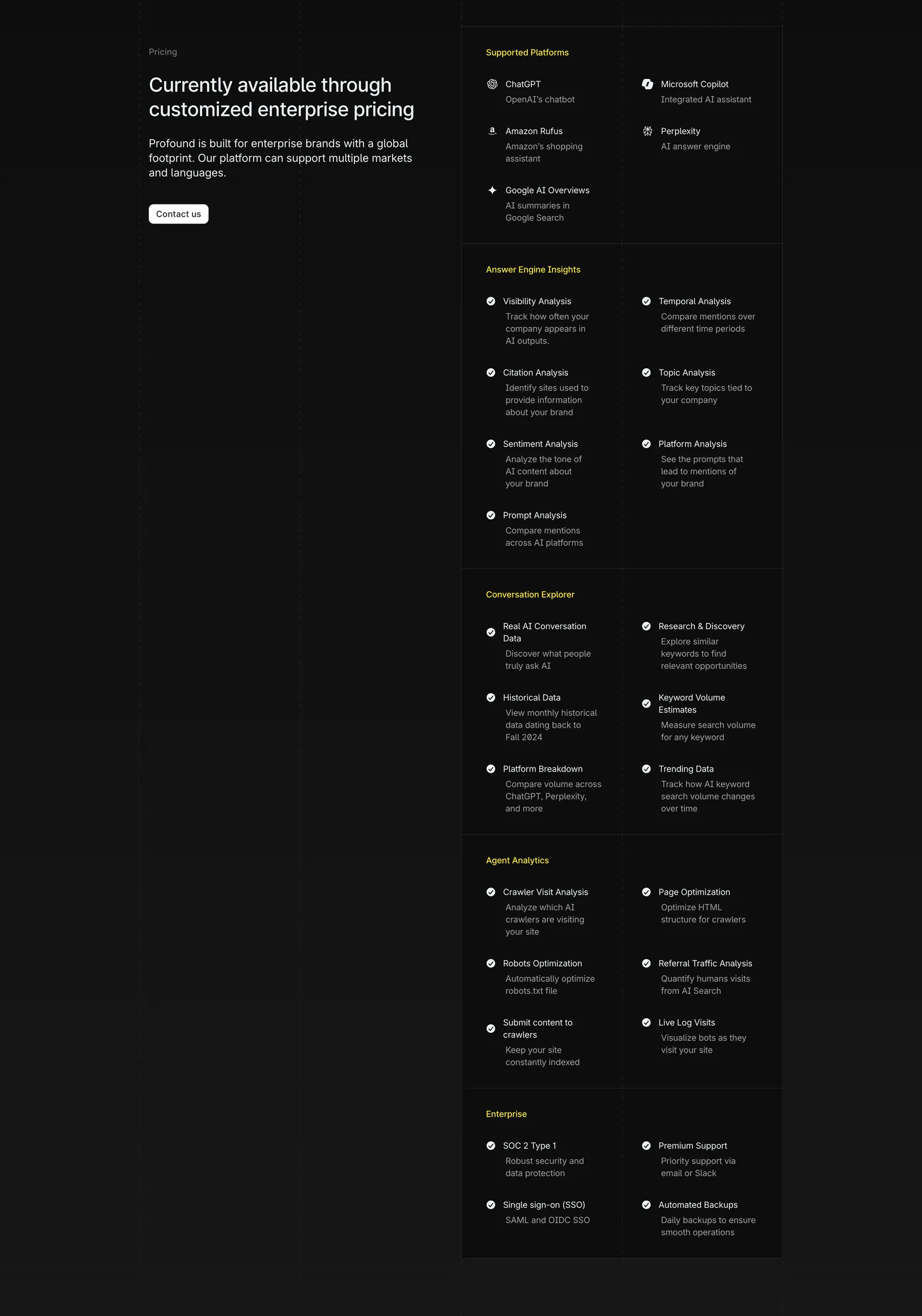
  439. Profound pricing section: enterprise pricing headline and Contact us button on the left, long grouped feature checklist on the right on charcoal
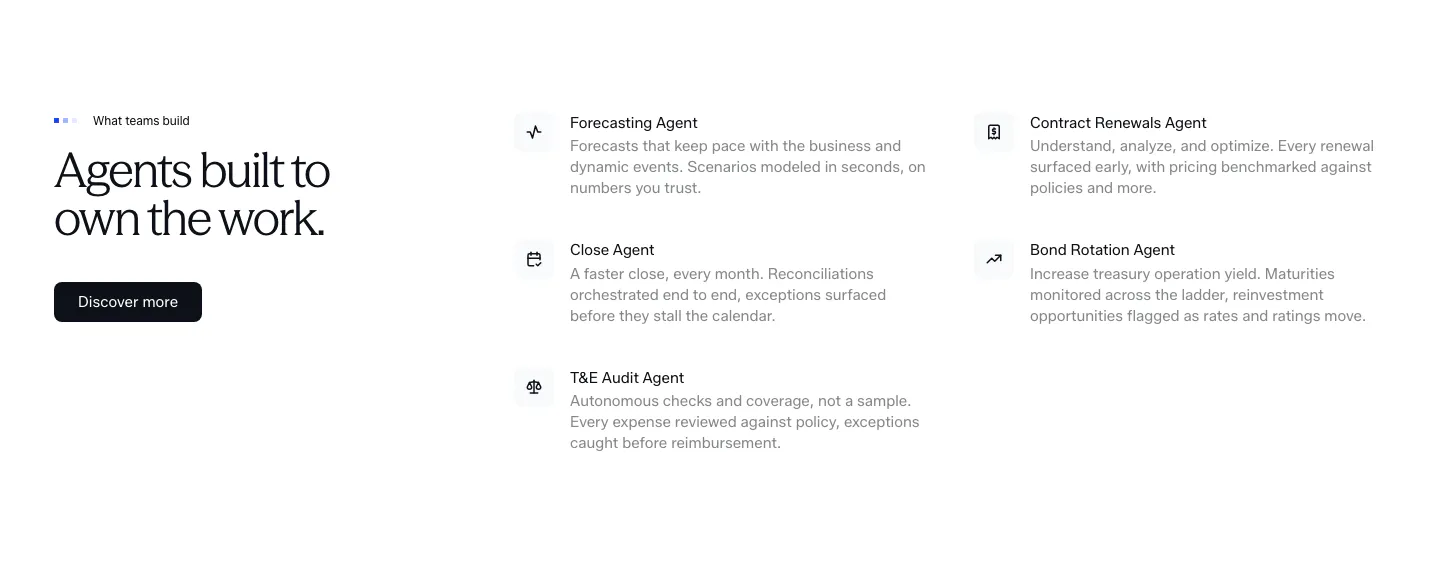
  440. Concourse features section: headline and Discover more button left, two-column list of agent names with icons and descriptions right
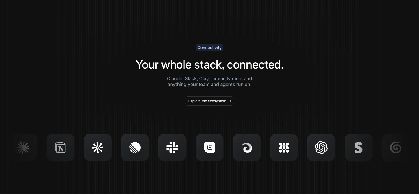
  441. Attio integrations section: centered headline and button above a row of dark rounded app icons fading at both edges, striped dark
  442. Rogo testimonials section: centered serif headline above one expanded quote card and two collapsed cards with company logos
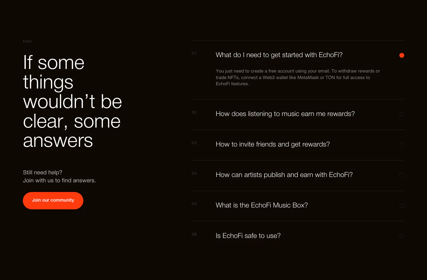
  443. EchoFi FAQ section: large headline and orange community button at left, numbered question accordion at right on black
  444. Griffin call-to-action section: centered serif headline and Contact sales pill button on a black background
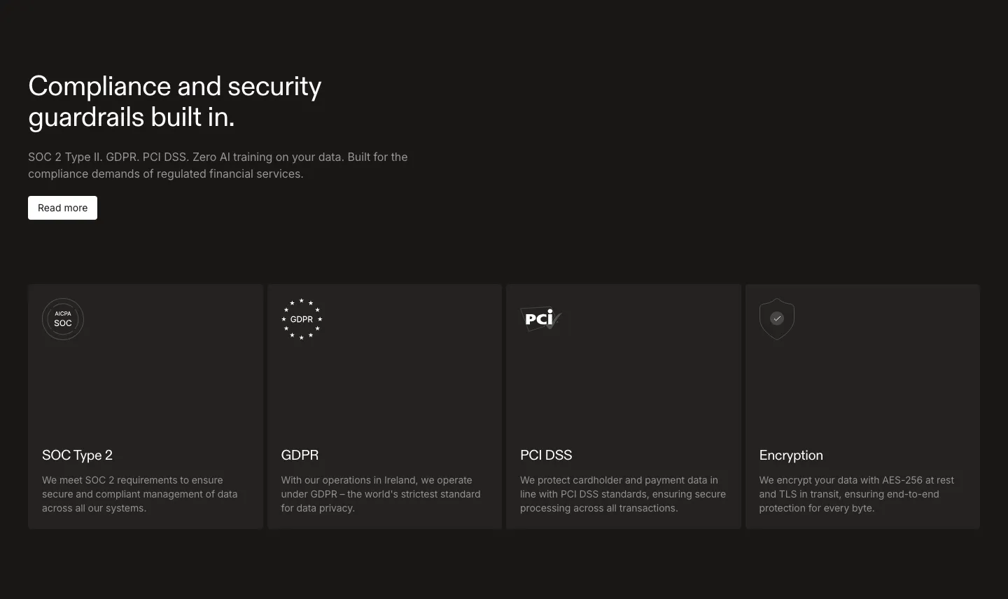
  445. Rulebase security section: left-aligned headline and Read more button above four dark cards for SOC 2, GDPR, PCI DSS and encryption
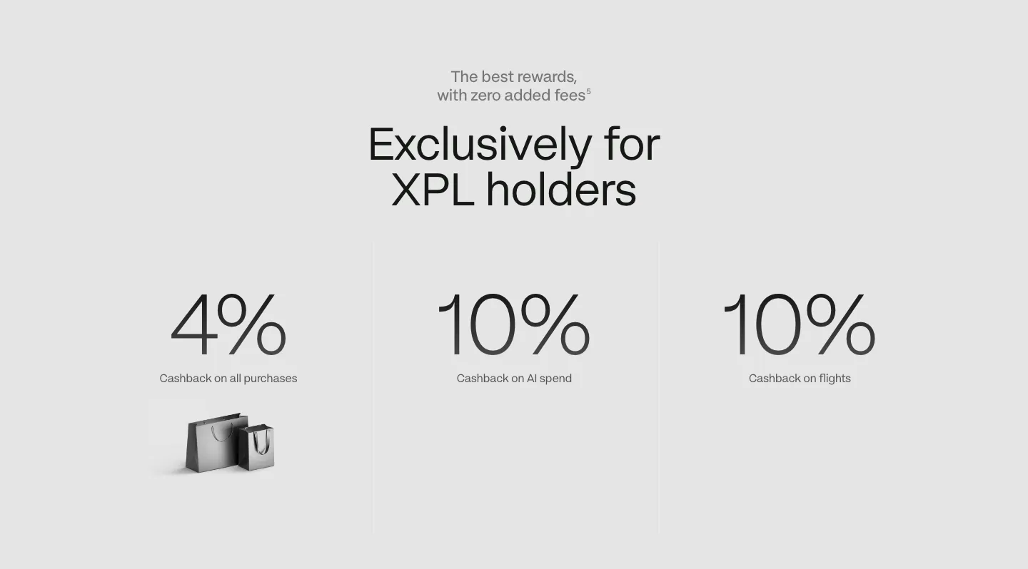
  446. Plasma stats section: centered headline above three large cashback percentages with labels on a light gray background
  447. WorkOS features section: headline and copy on the left, white 3D robot with memory chips on the right, on white
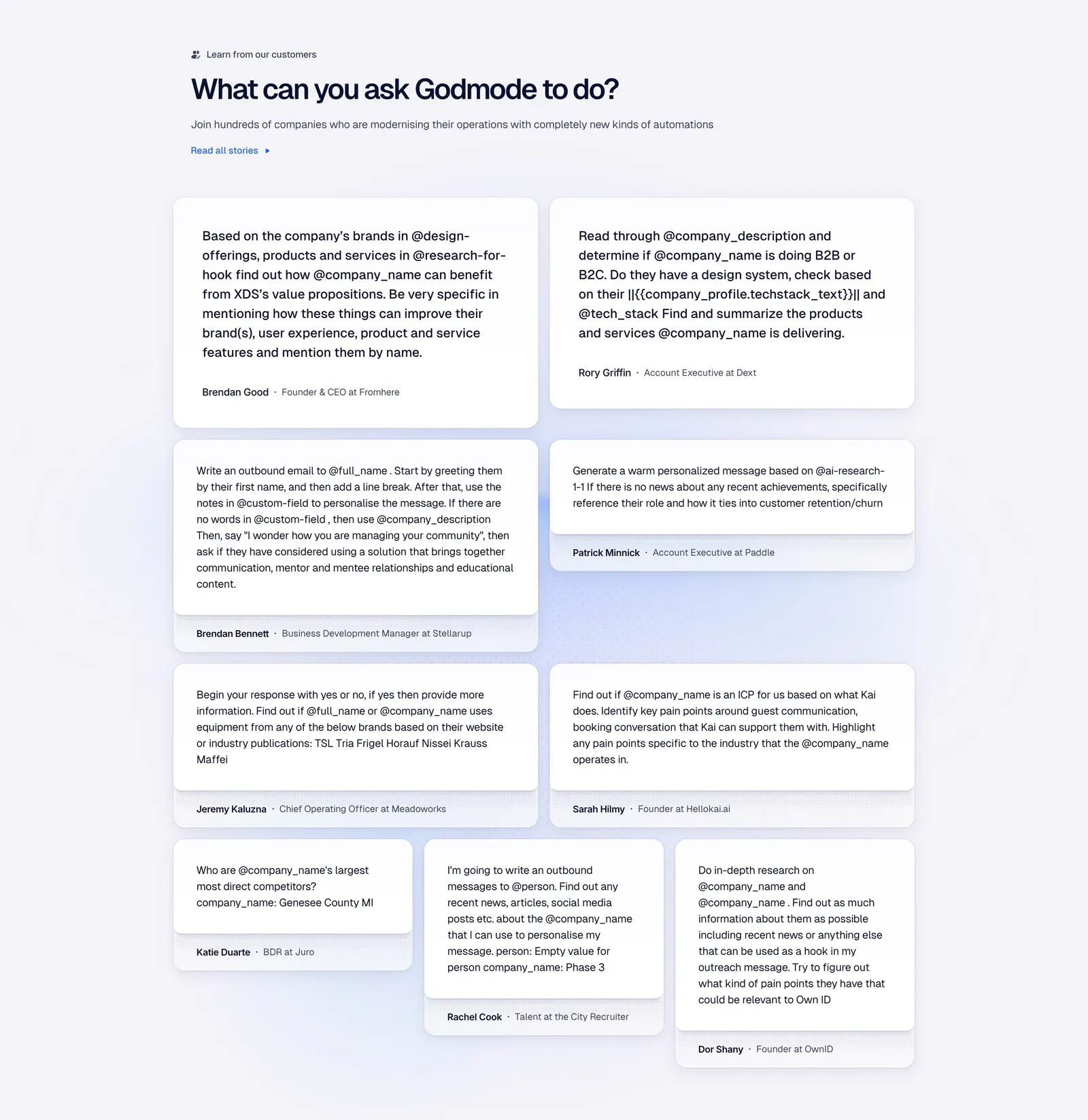
  448. Godmode testimonials section: left-aligned heading above a masonry grid of white cards with customer prompts and names
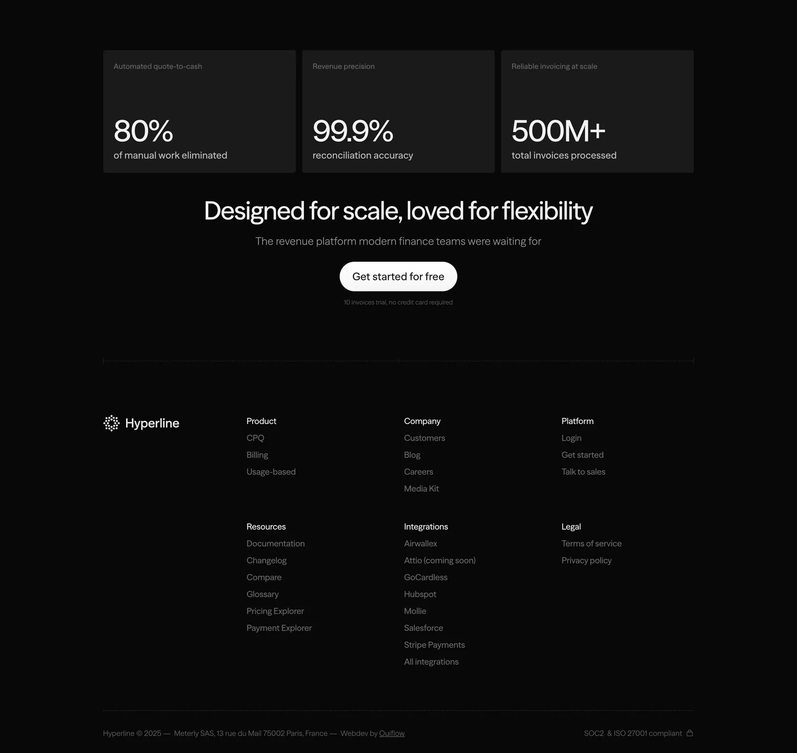
  449. Hyperline footer section: three stat cards and a centered CTA above link columns and copyright on a near-black background
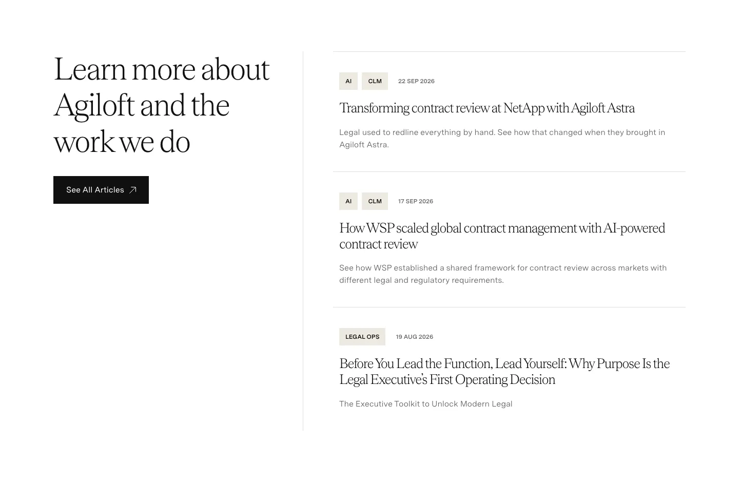
  450. Agiloft blog & resources section: serif heading and See All Articles button left, list of three tagged article entries right
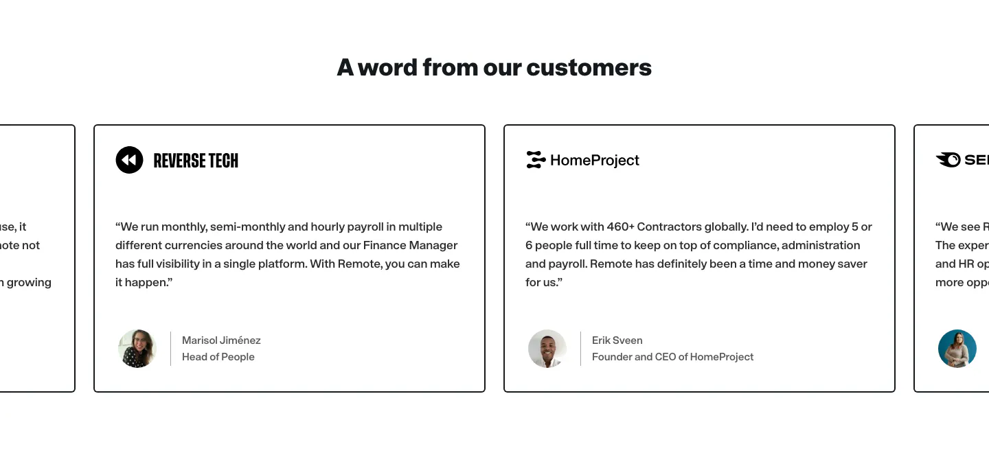
  451. Remote testimonials section: centered heading above a carousel of bordered quote cards with company logos and avatars
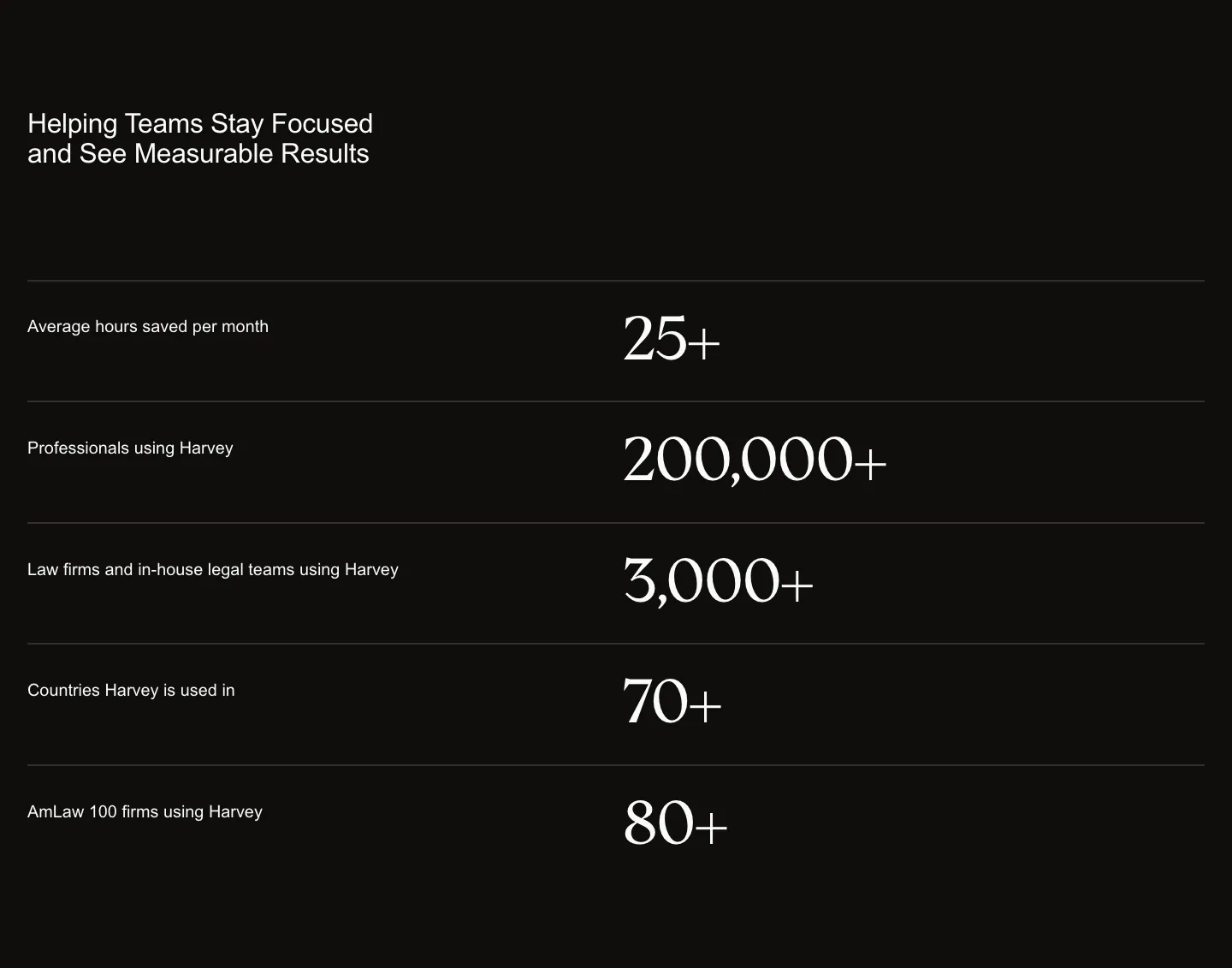
  452. Harvey stats section: headline above five divided rows pairing labels with large serif numbers on a black background
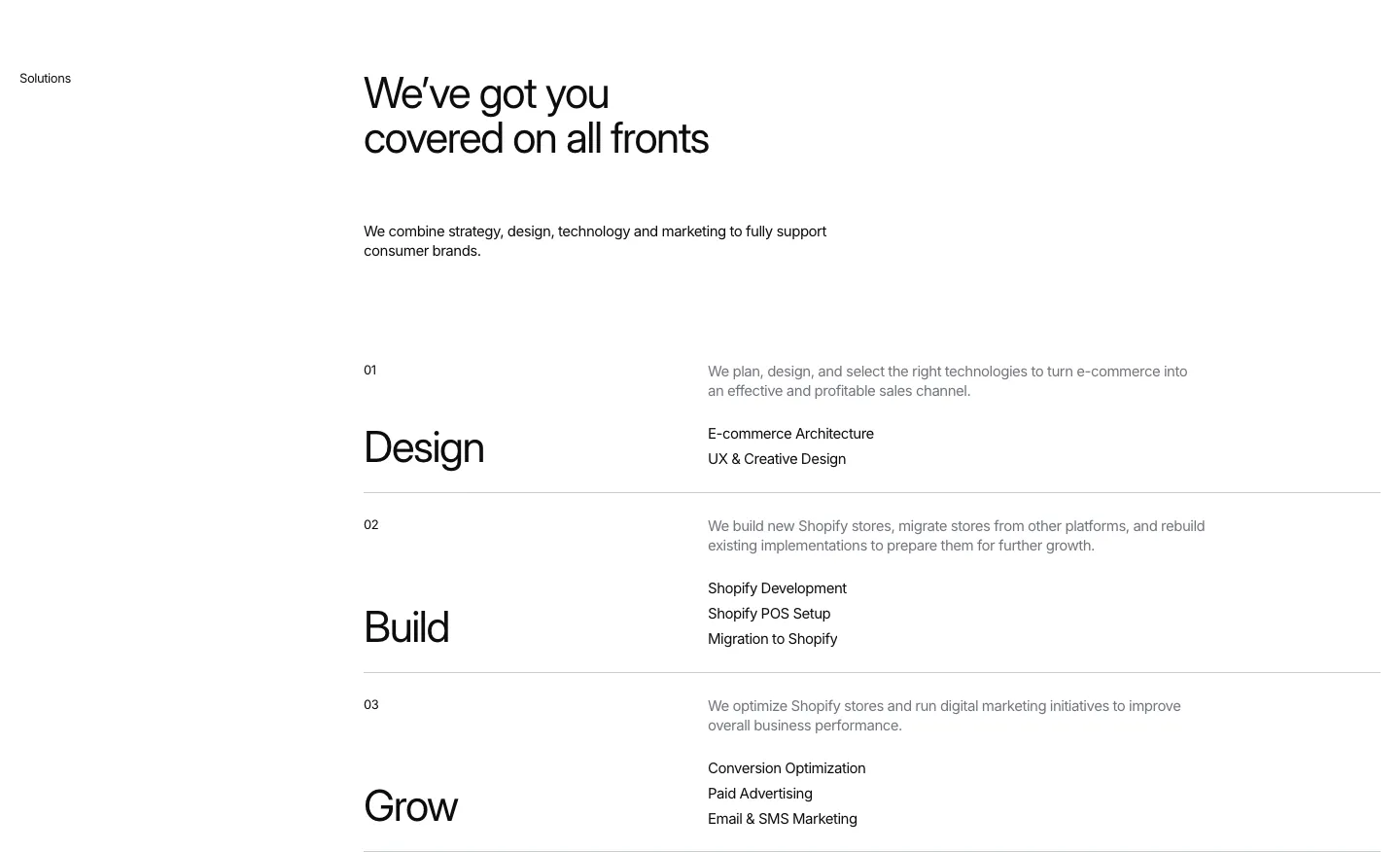
  453. Hyper Effekt features section: headline above three numbered service rows, Design, Build and Grow, each with a short list on white
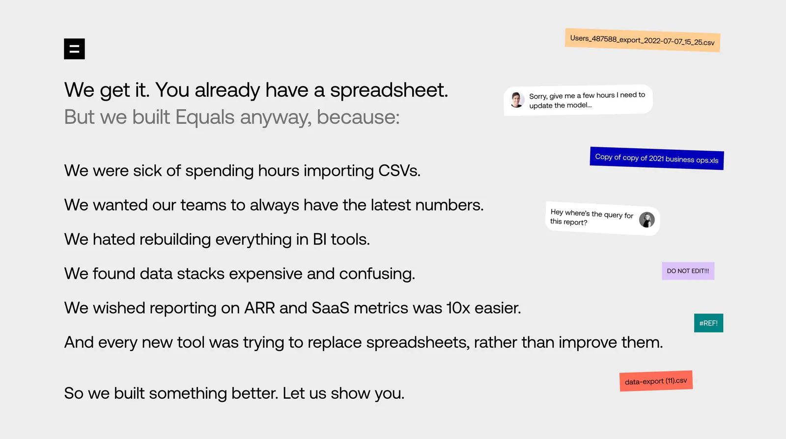
  454. Equals about & mission section: left-aligned list of reasons for building Equals beside floating file-name chips and chat bubbles
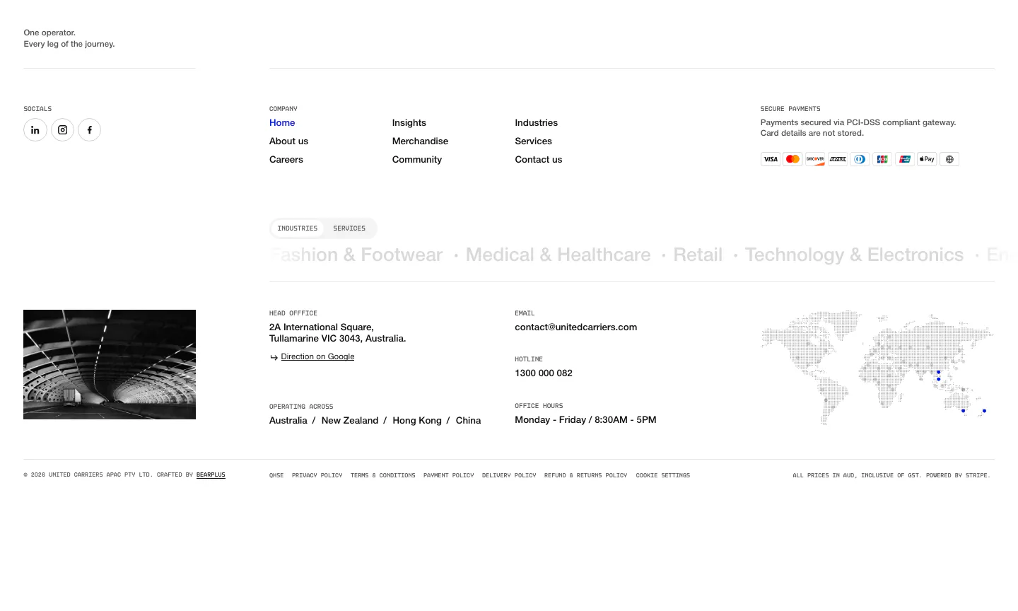
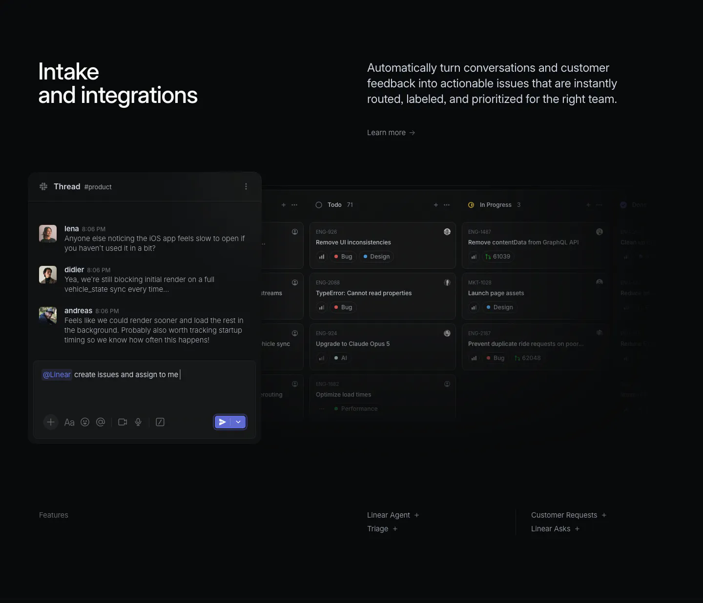
  455. United Carriers footer section: link columns, payment badges, industries marquee, office details and dotted world map on white
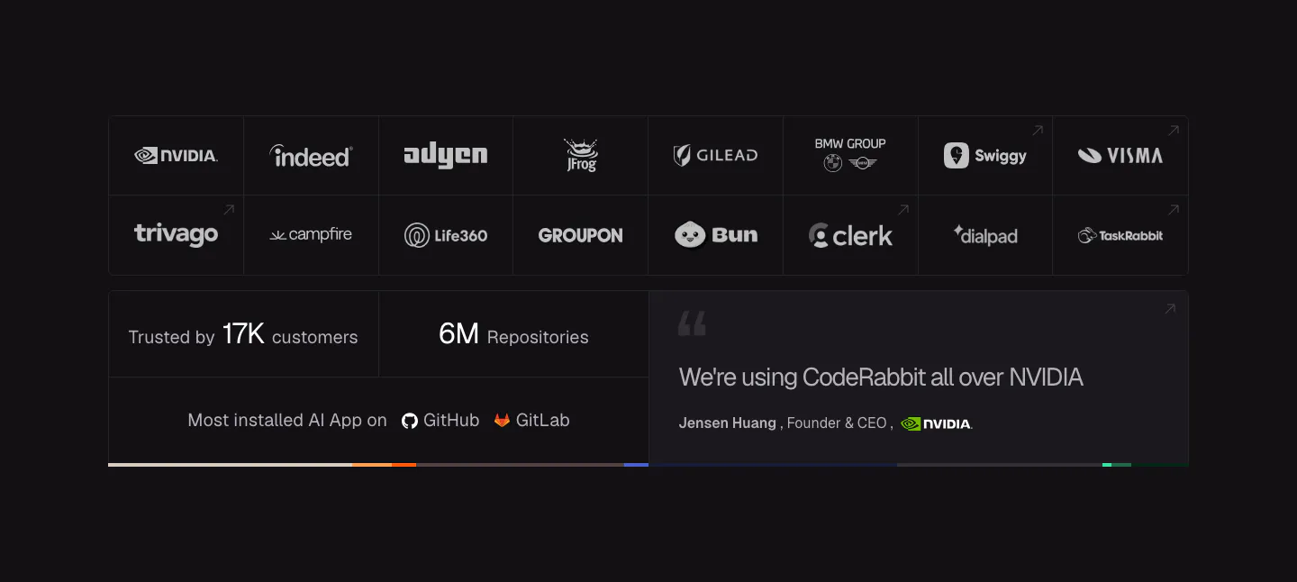
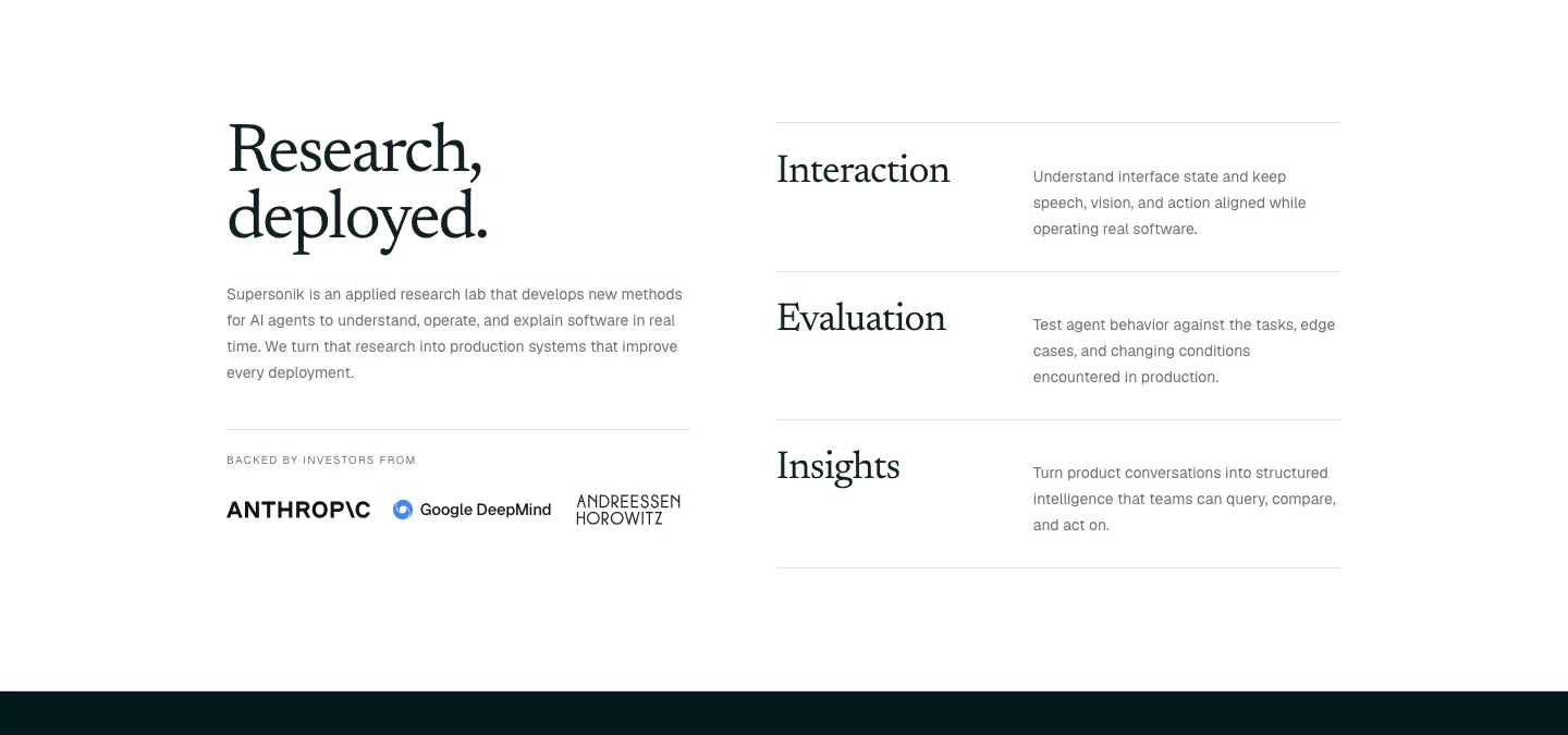
  456. CodeRabbit logo cloud section: dark bordered grid of customer logos above stat tiles for customers and repositories and an NVIDIA quote
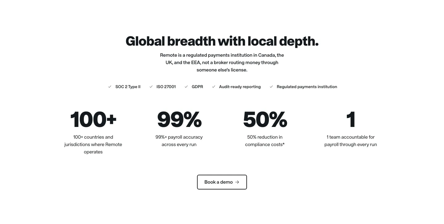
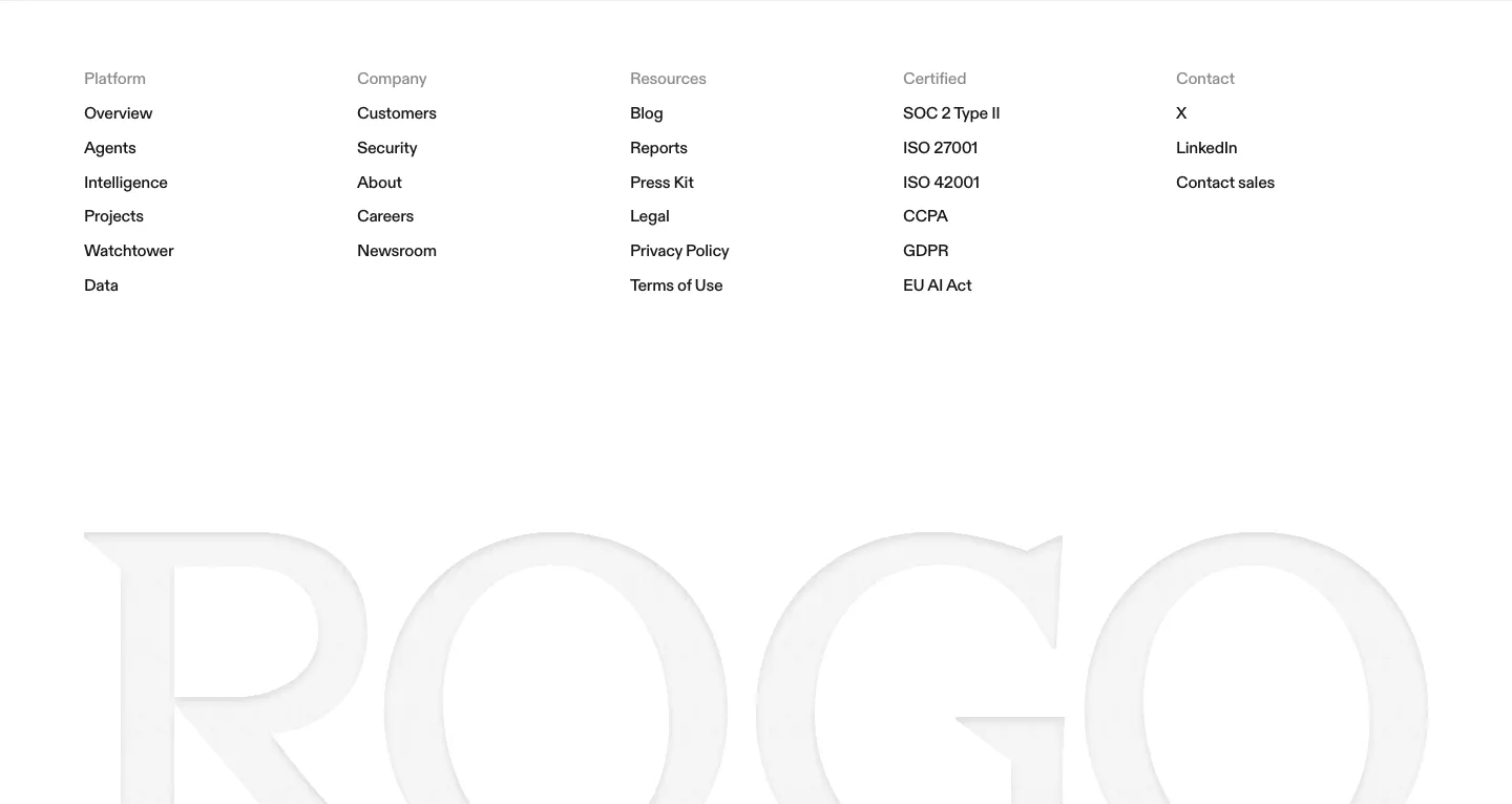
  457. Remote stats section: centered headline, compliance checklist row, four large black metrics and an outlined demo button
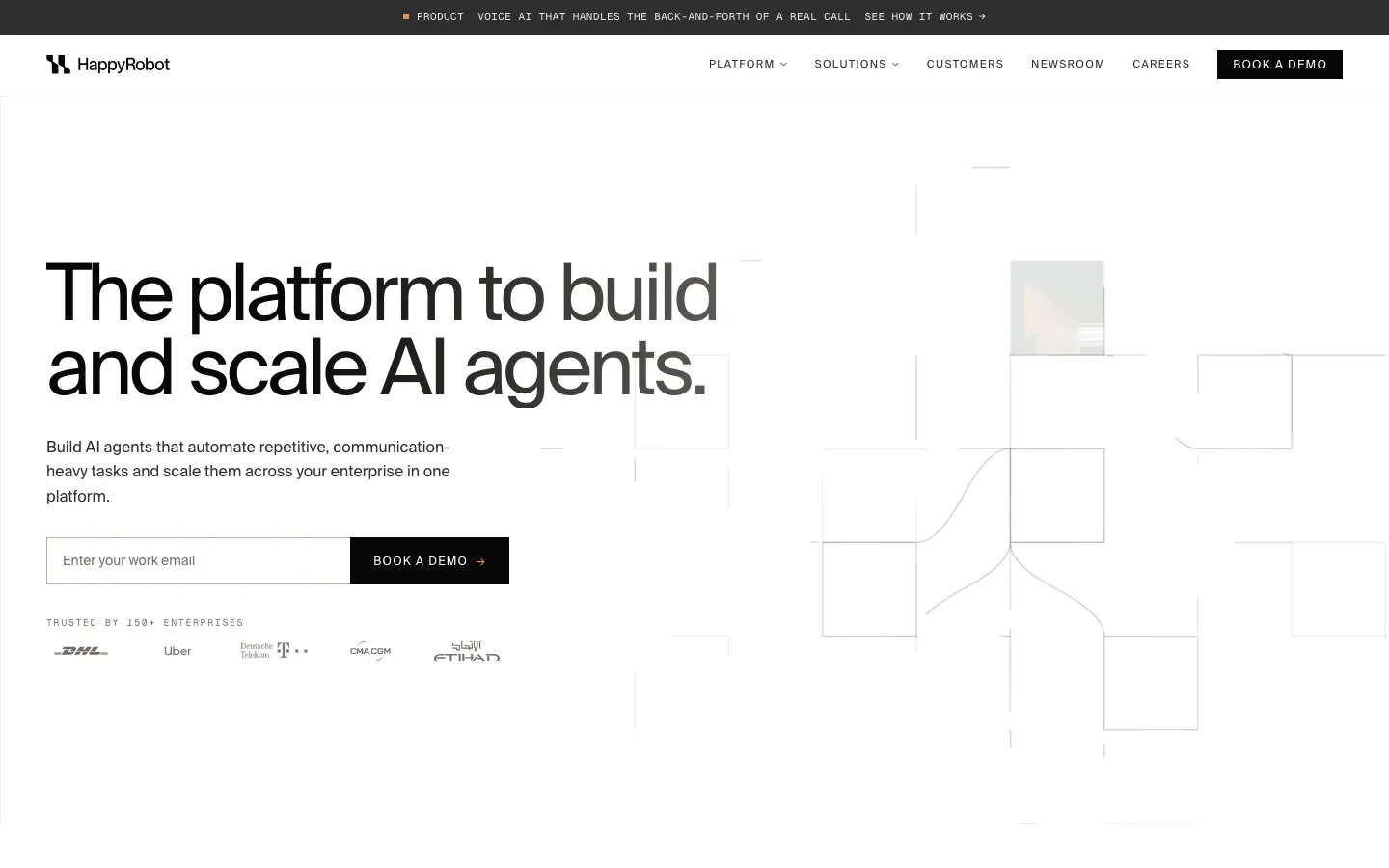
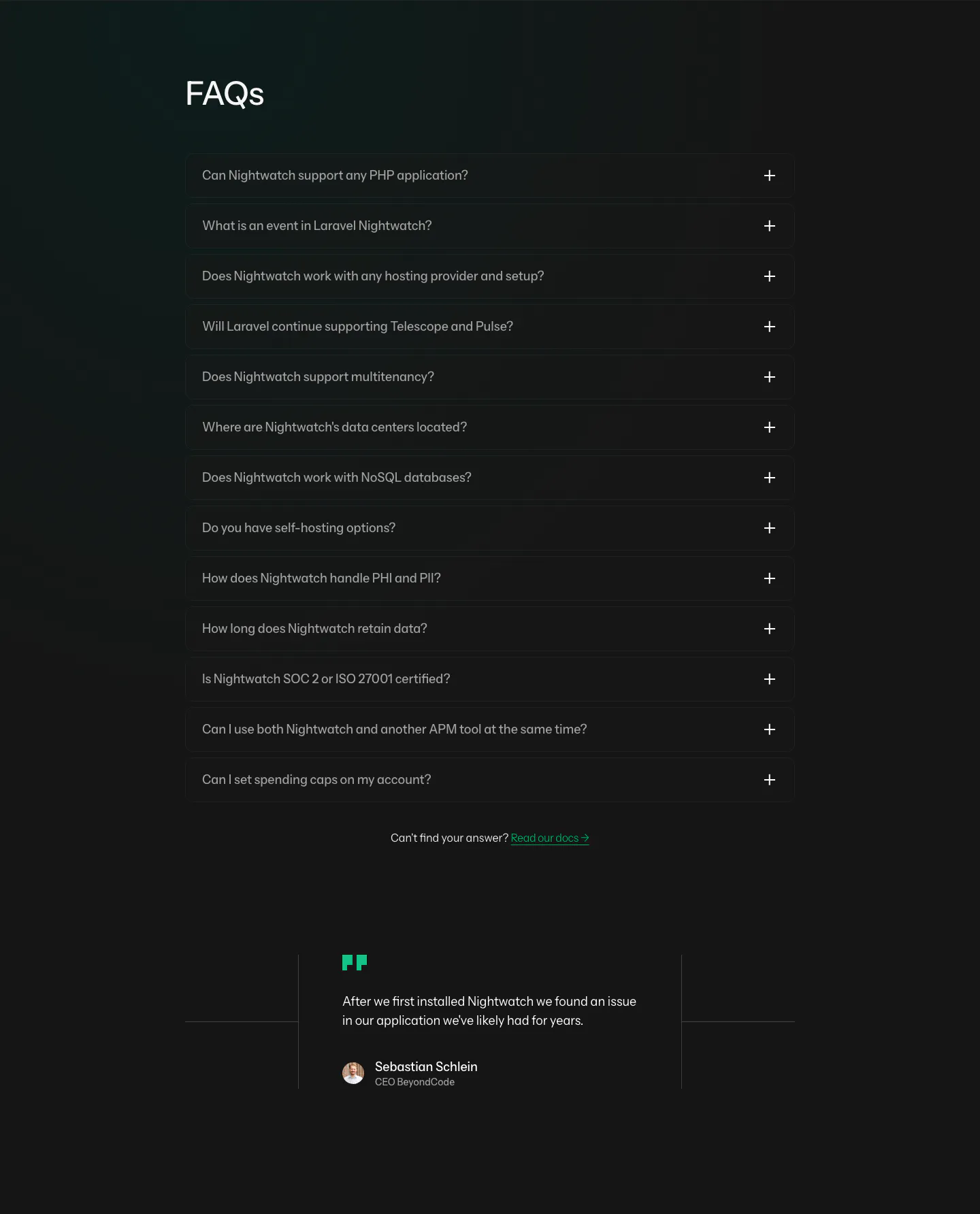
  458. HappyRobot hero section: announcement bar and nav over a left headline with email field and logo row, line-drawn grid of boxes on the right
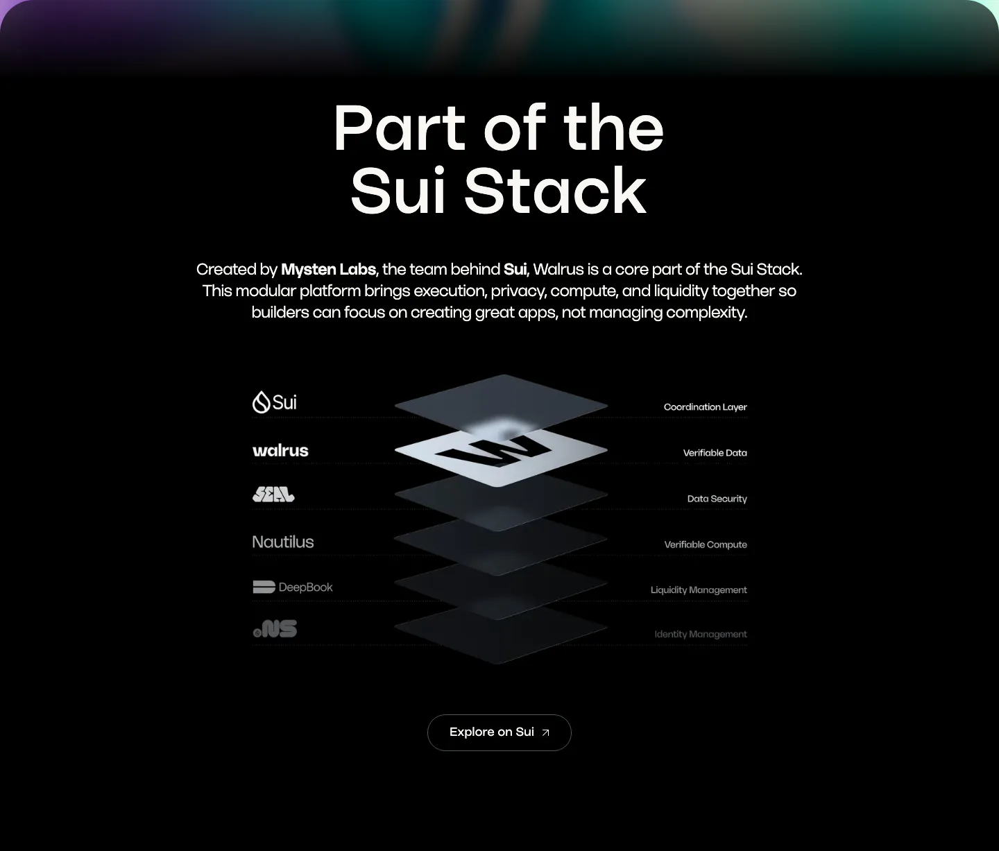
  459. Walrus integrations section: centered headline above an isometric stacked-layer diagram of Sui stack products on black
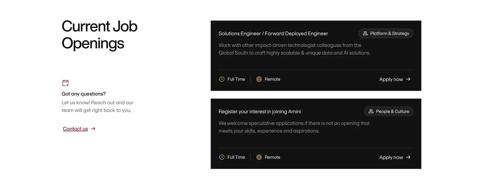
  460. Amini careers section: headline and contact prompt on the left, two black job opening cards with tags and Apply now links on the right
  461. Arcade call to action section: slim light gray band with a one-line headline and Sign up for free and Talk to a GTM expert buttons
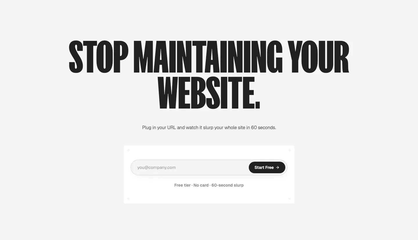
  462. Ploy call-to-action section: huge condensed centered headline above an email signup field with a black Start Free button on light gray
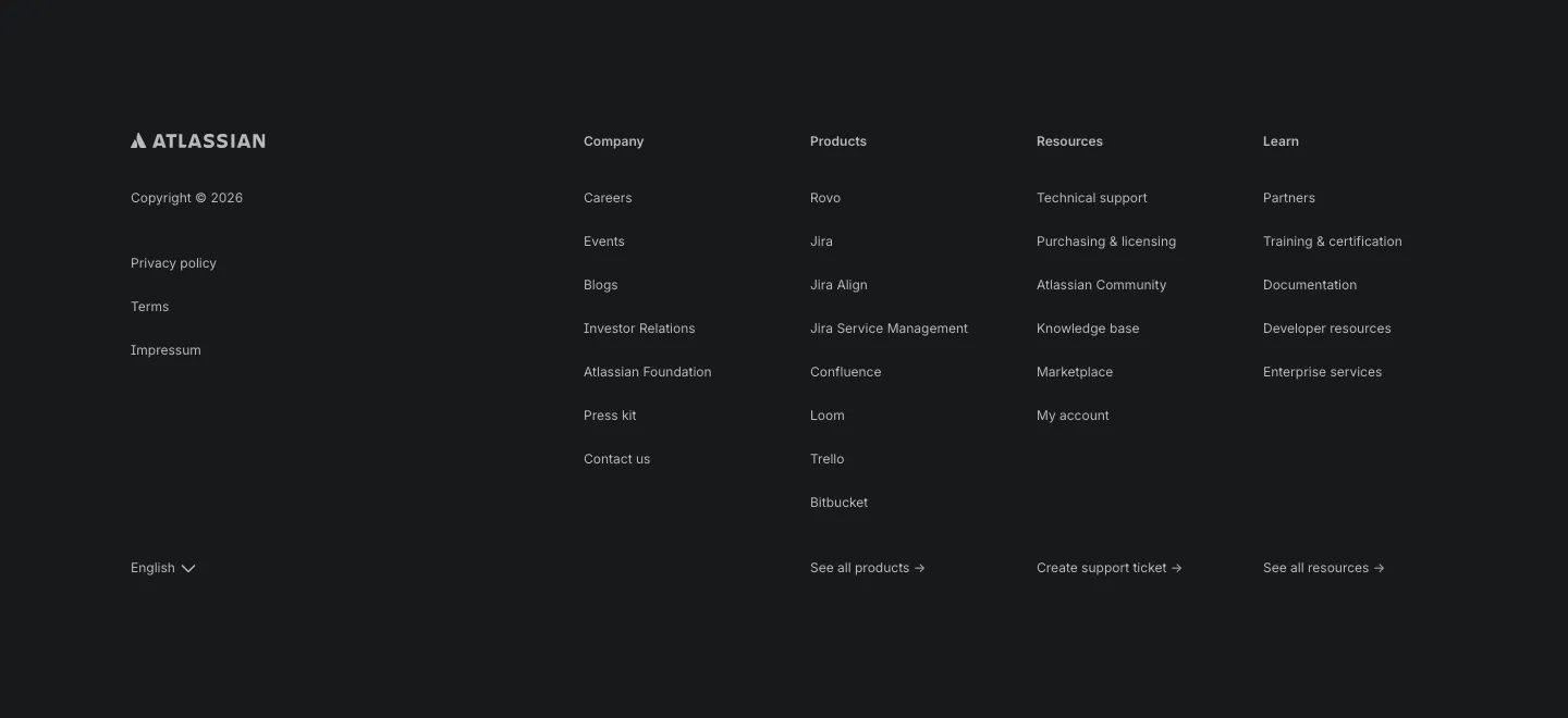
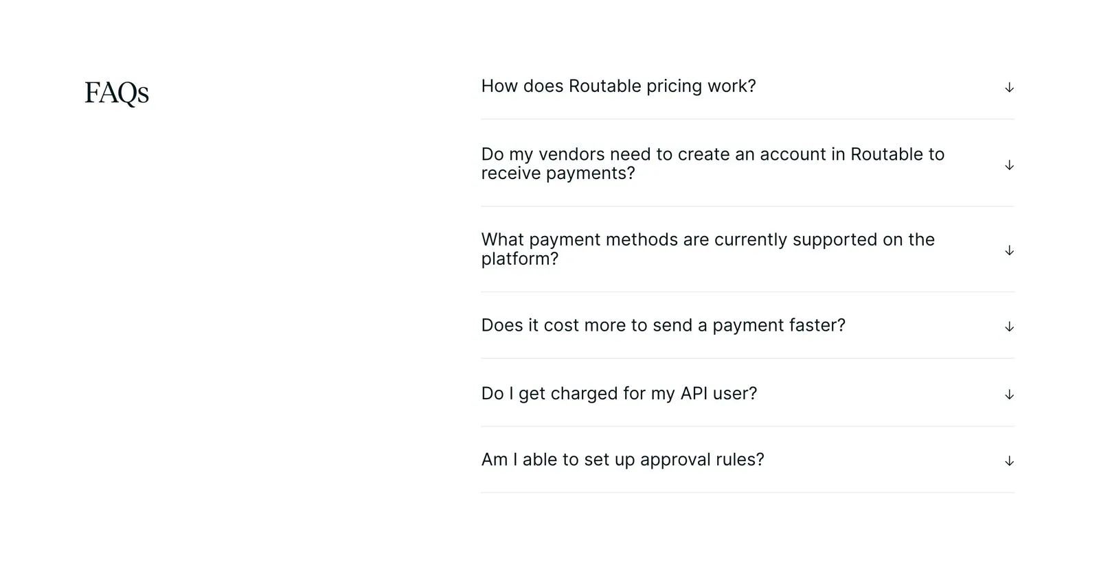
  463. Atlassian footer section: Atlassian logo, legal links and four link columns with a language selector on a dark background
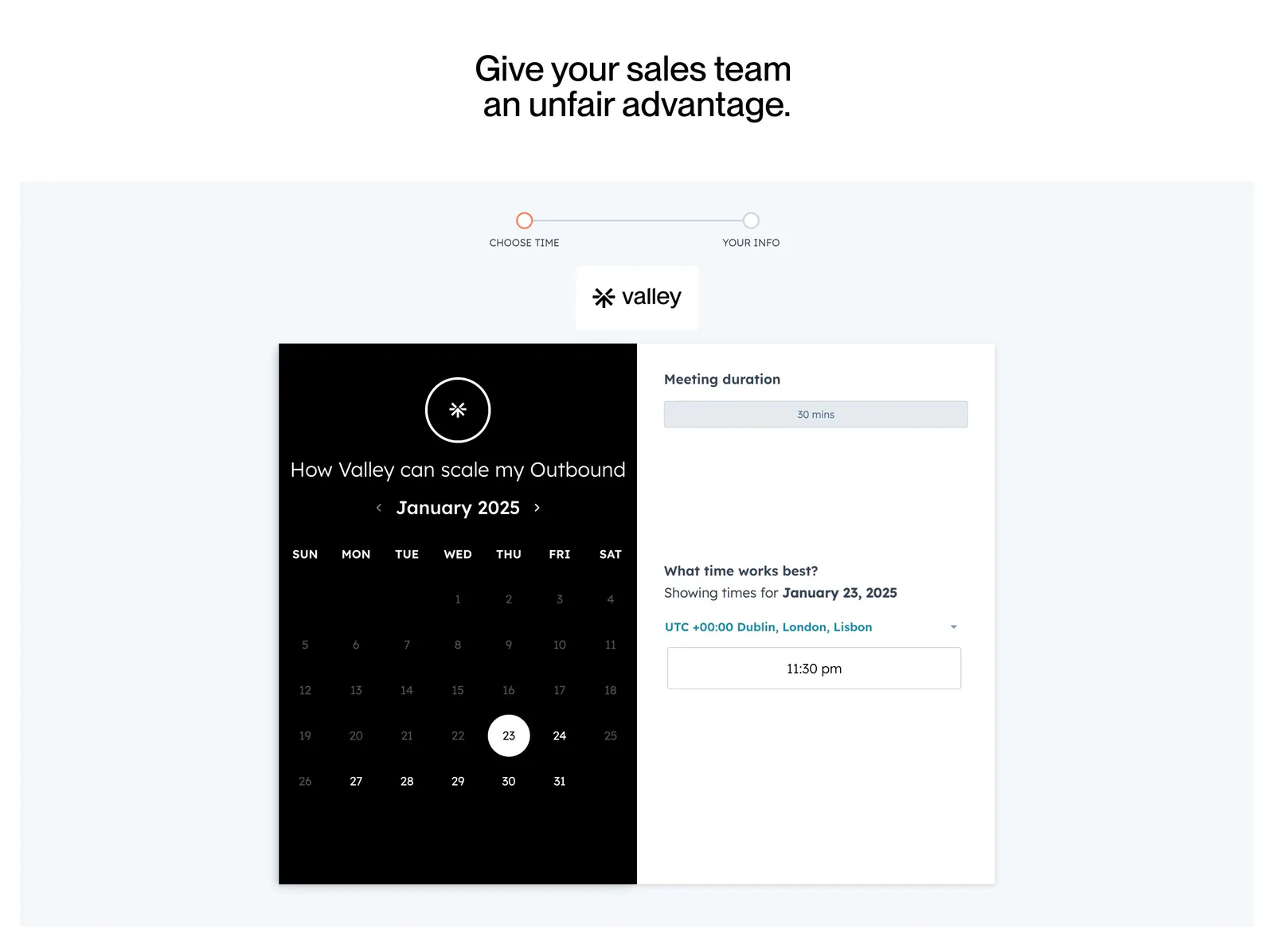
  464. Linear features section: dark headline and copy above a Slack thread overlapping a kanban board screenshot, feature links below
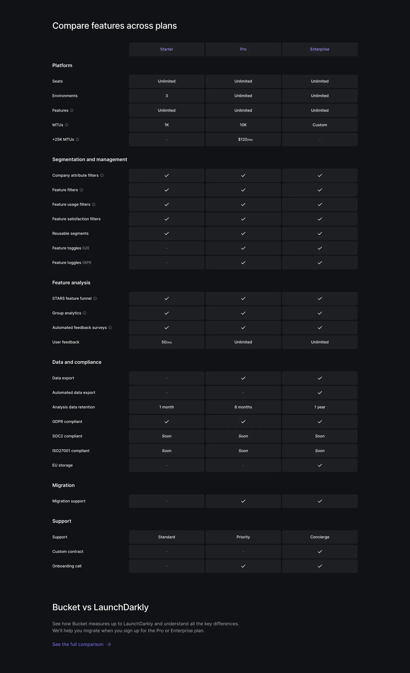
  465. Supersonik about & mission section: serif headline, lab description and investor logos at left, three research areas listed at right
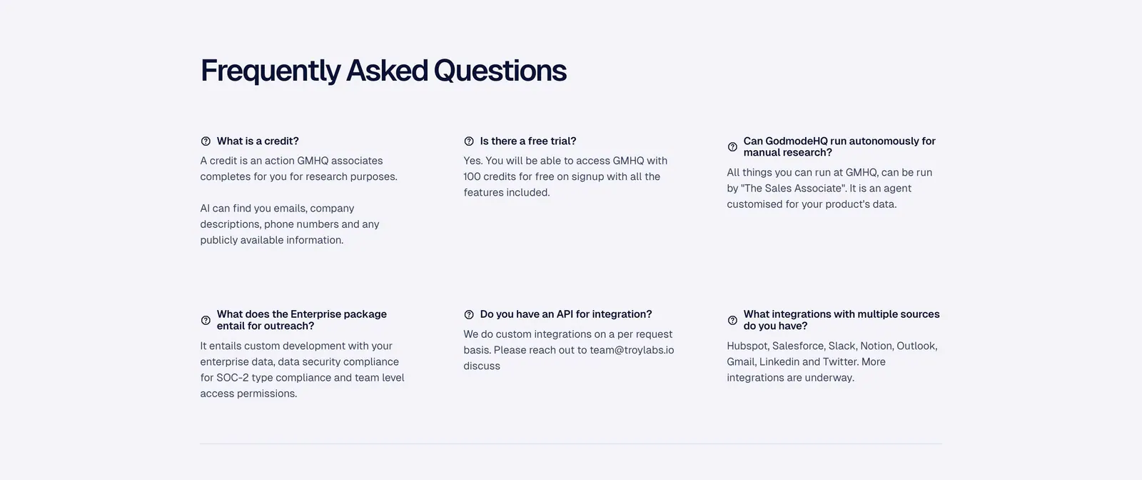
  466. Rogo footer section: five link columns on white above a huge faint gray serif ROGO wordmark
  467. Laravel Nightwatch FAQ section: left-aligned FAQs heading above a dark accordion of 13 questions and a short customer quote below
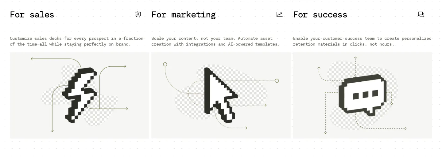
  468. Visual use cases section: three cards for sales, marketing and success with mono titles, short copy and black pixel-art icons on light gray
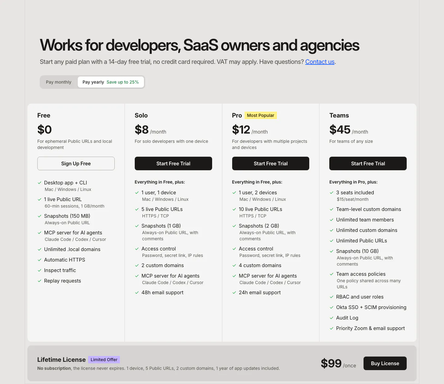
  469. LocalCan pricing section: headline and monthly/yearly toggle above four plan columns with feature checklists and a lifetime license band
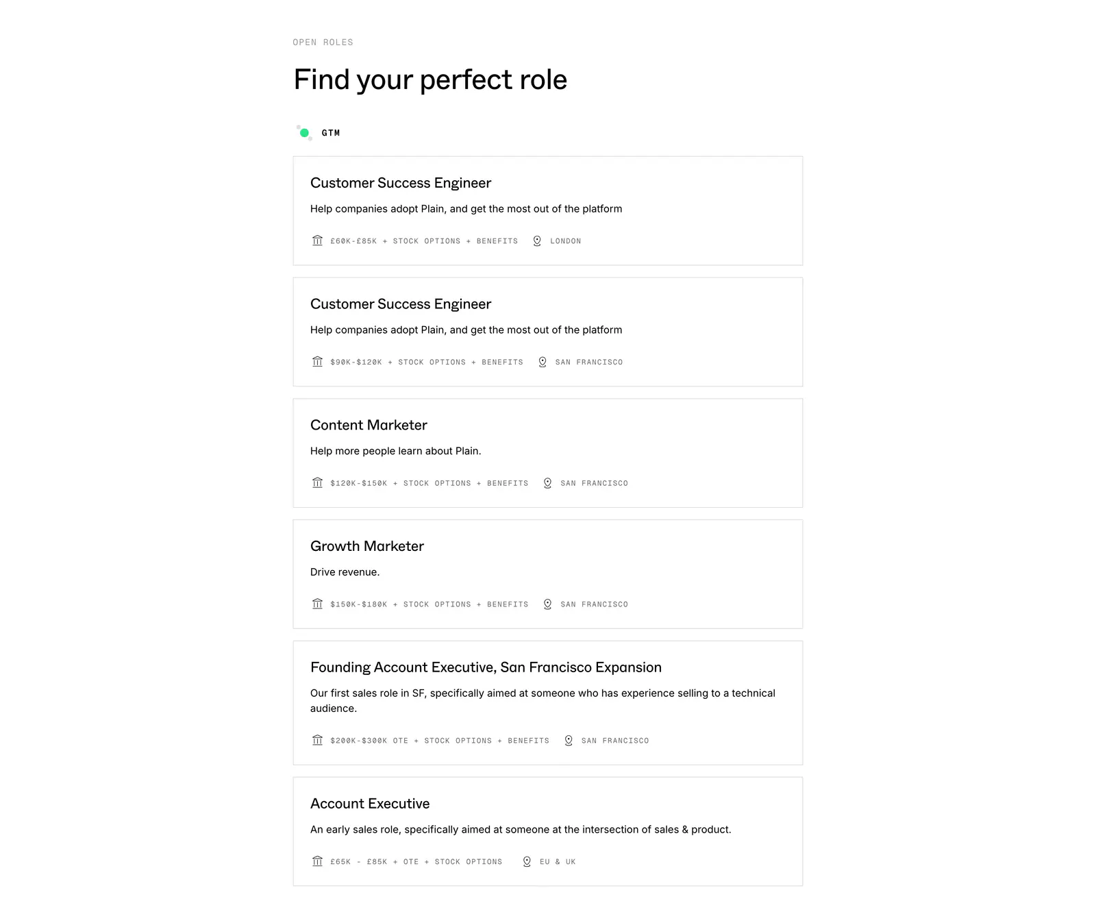
  470. Plain careers section: left-aligned heading above a stacked list of bordered job cards with salary and location details on white
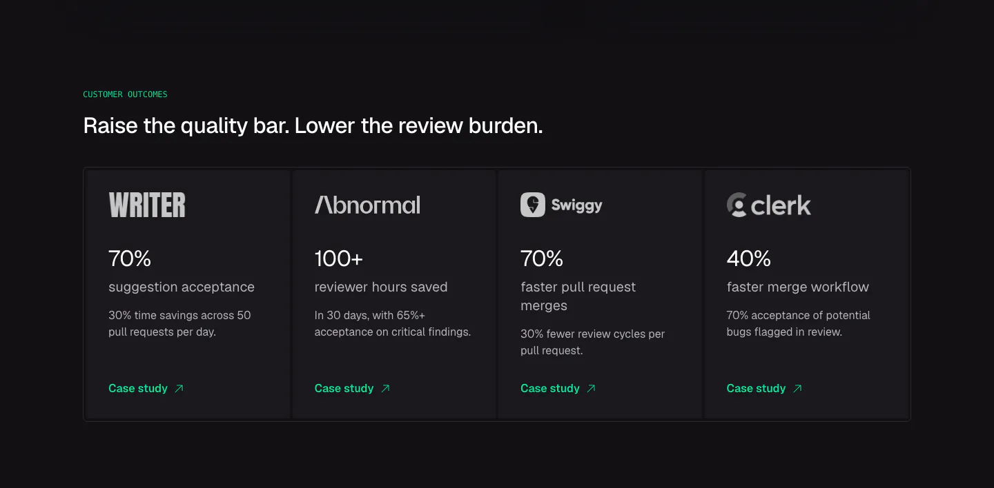
  471. CodeRabbit stats section: dark row of four customer outcome cards with logos, large percentages and case study links
  472. Routable FAQ section: serif FAQs heading on the left beside a six-question accordion with arrow toggles on a white background
  473. Valley contact section: centered headline above a two-step meeting booking widget with a black calendar panel and time picker on light gray
  474. Bucket pricing section: plan comparison table with Starter, Pro and Enterprise columns of checkmarks and limits on a dark background
  475. Godmode FAQ section: left-aligned heading above a three-column grid of question and answer pairs on a pale gray background
  476. Plasma features section: left-aligned heading above four icon columns describing payment capabilities on a charcoal background
  477. Goodside footer section: slim strip with italic inquiry note and email, a gold dandelion mark and stacked social links
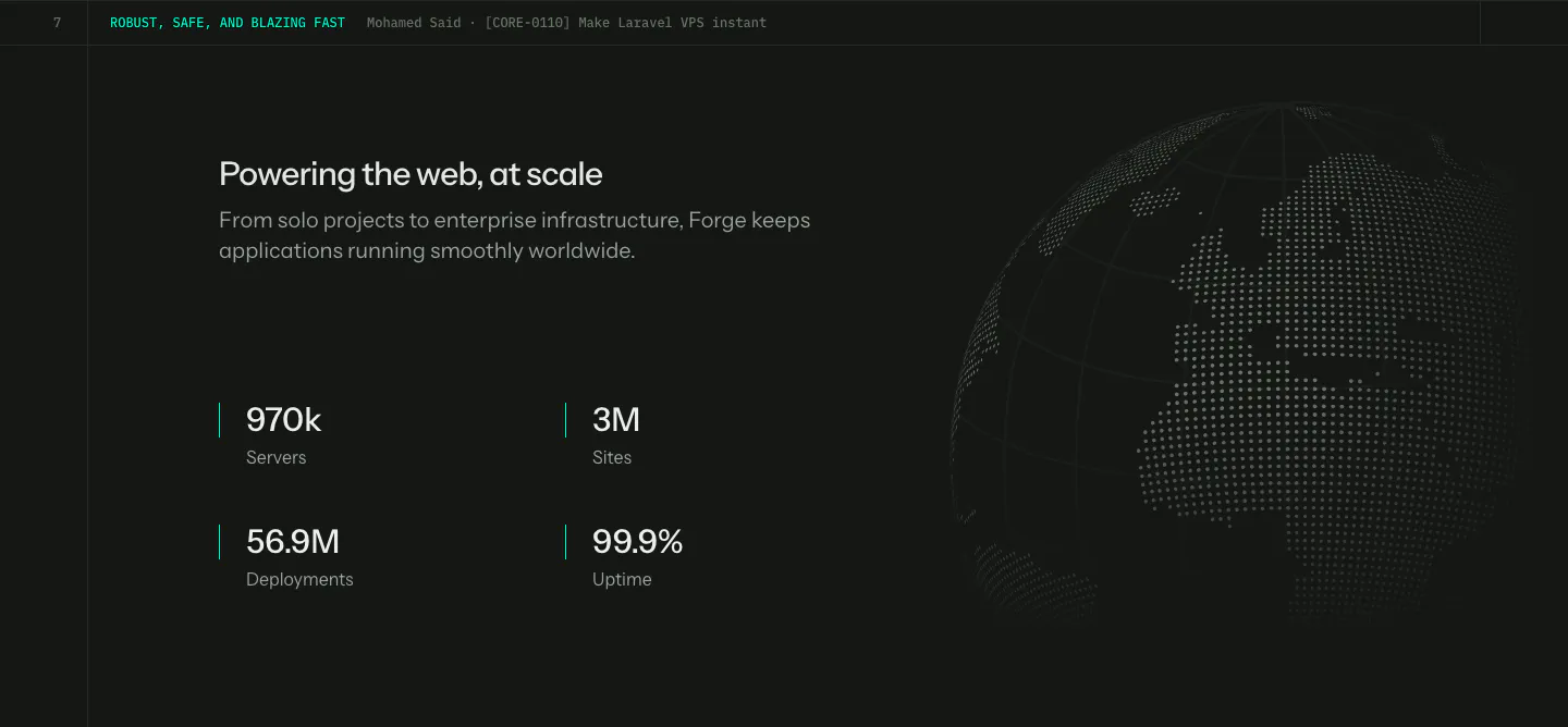
  478. Laravel Forge stats section: four large metrics under a heading on the left with a dotted globe on the right, dark background
  479. Koyeb testimonials section: large uppercase quote with author avatar above a customer logo selector bar on a dark grainy background
  480. Brikken+Co FAQ section: large headline and intro above a ruled accordion with plus icons on warm gray with grid lines
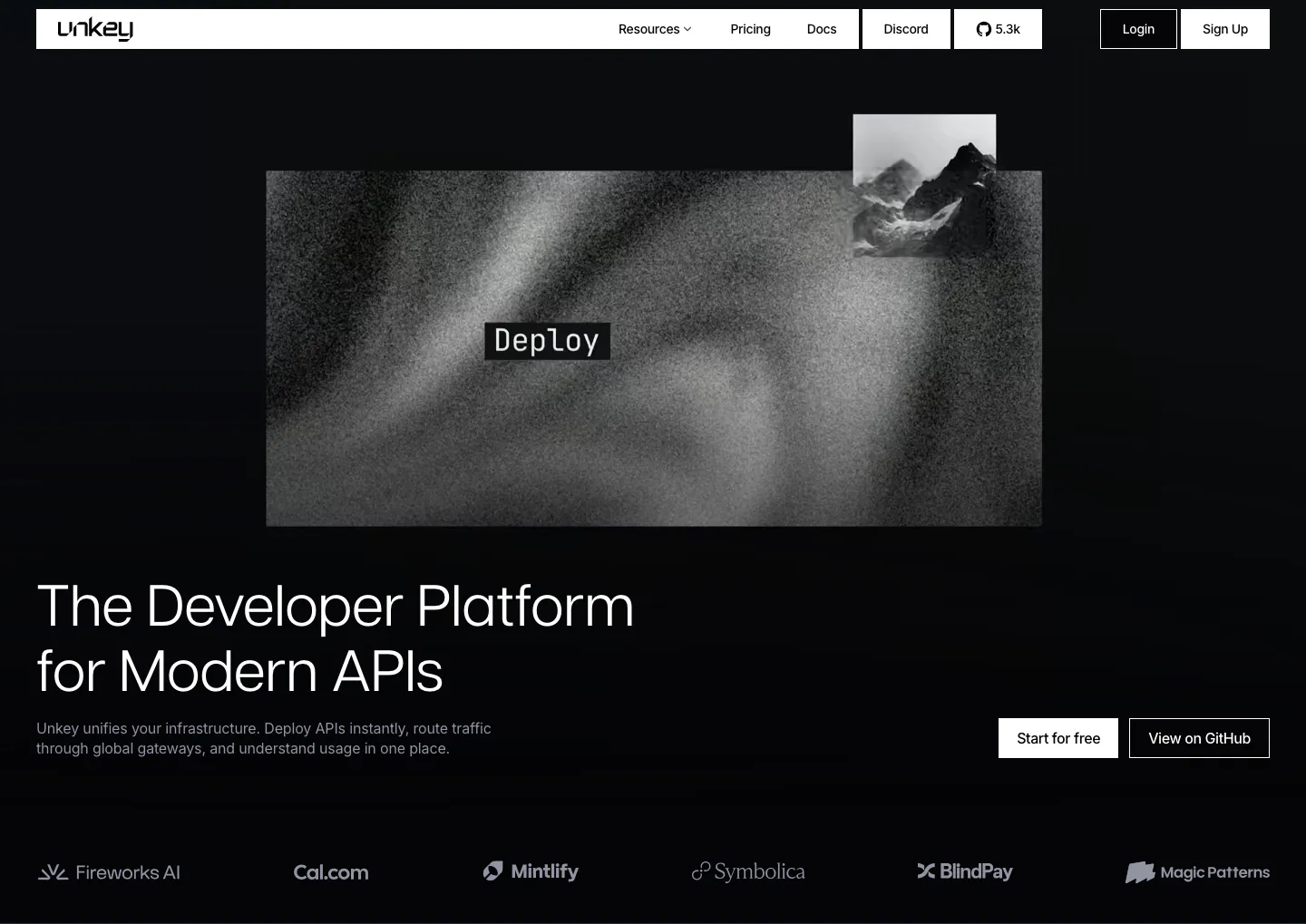
  481. Unkey hero section: grainy grayscale artwork with a Deploy label above a left-aligned headline, CTAs at right and a logo row on black
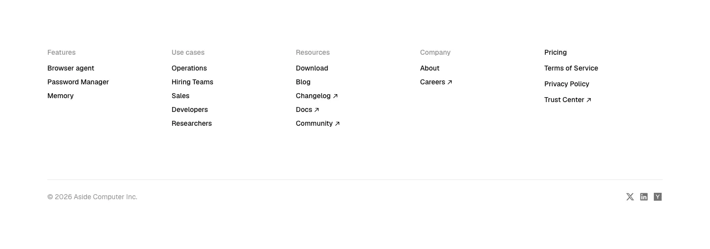
  482. Aside footer section: five link columns, copyright line and small social icons on white
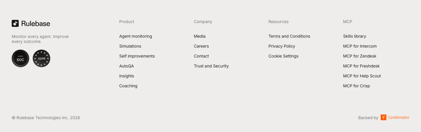
  483. Rulebase footer section: logo, tagline and compliance badges beside four link columns, with copyright and Y Combinator note on light gray
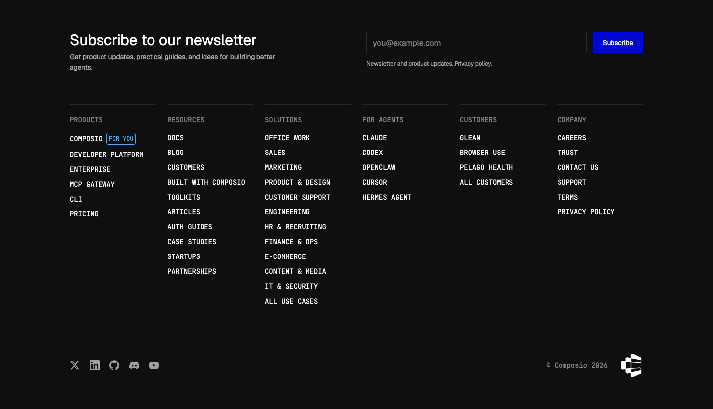
  484. Composio footer section: newsletter heading with email field and blue subscribe button above six monospace link columns on black
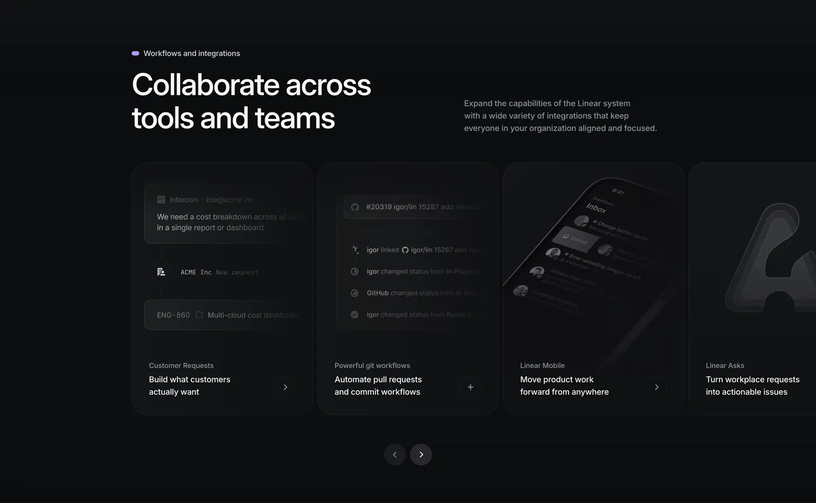
  485. Linear integrations section: heading with side copy above a carousel of dark cards for requests, git workflows, mobile and Asks, with arrows
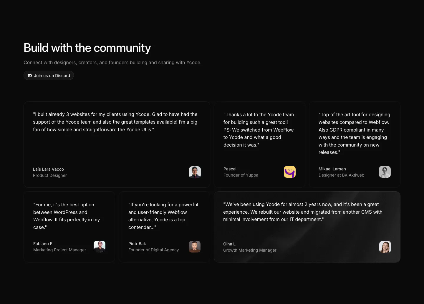
  486. Ycode testimonials section: headline with Discord button above a bento grid of six quote cards in mixed widths with avatars
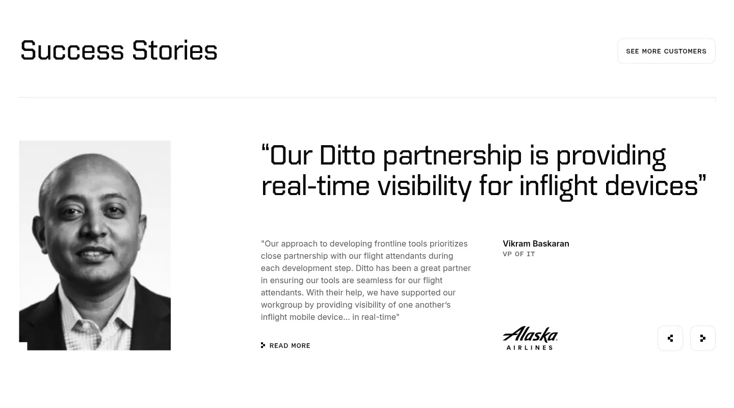
  487. Ditto testimonials section: black-and-white portrait beside a large quote, customer name, Alaska Airlines logo and prev/next arrows
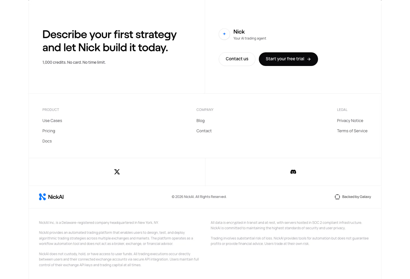
  488. NickAI footer section: closing CTA with contact and trial buttons above link columns, social icons, logo row and legal disclaimers
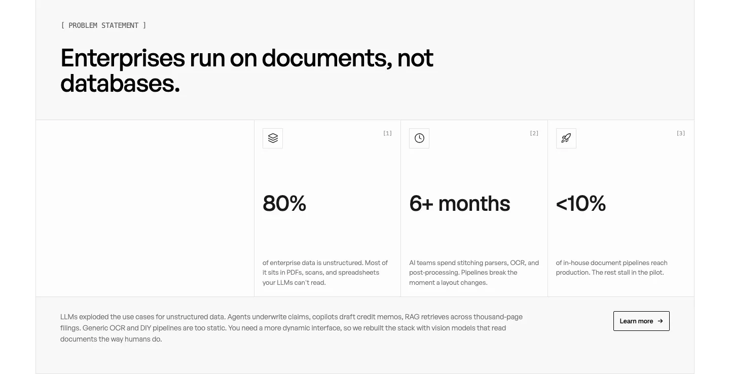
  489. Unsiloed stats section: left headline above three bordered cells with large figures 80%, 6+ months and <10% plus a closing paragraph on white
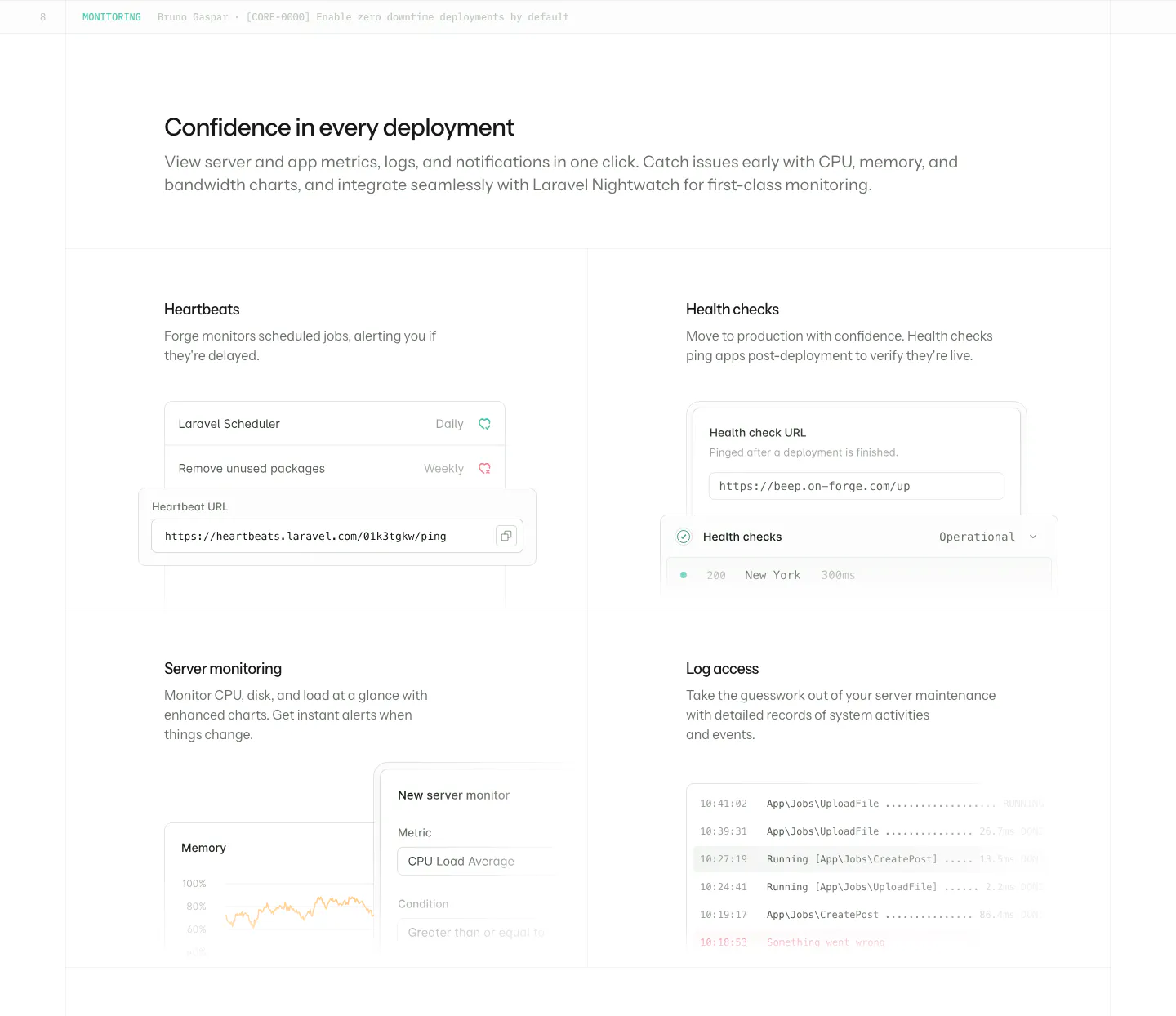
  490. Laravel Forge features section: heading above a 2x2 grid of monitoring cards with heartbeat, health check, chart and log UI
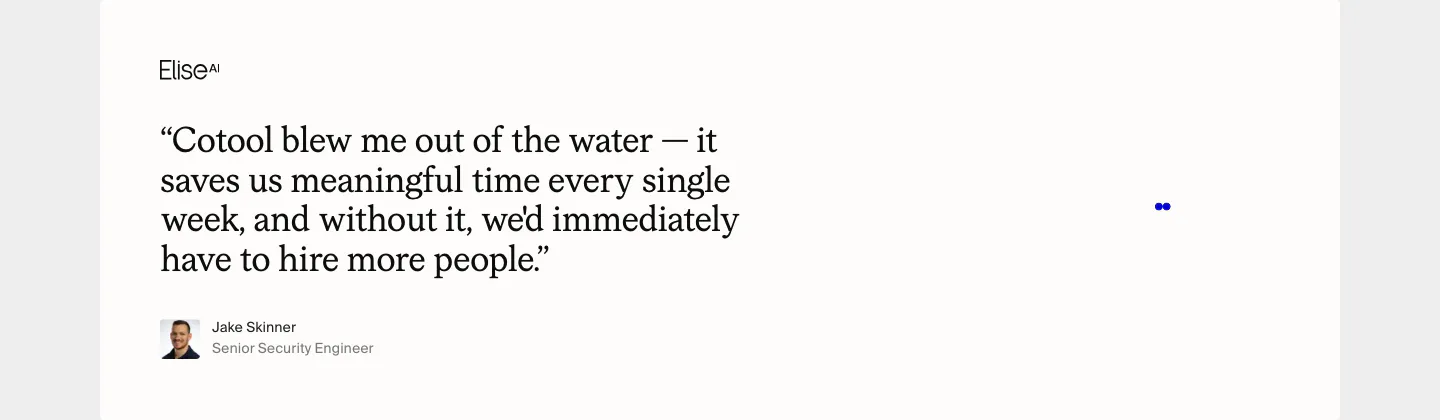
  491. Cotool testimonials section: large serif customer quote with EliseAI logo, avatar and name on an off-white card
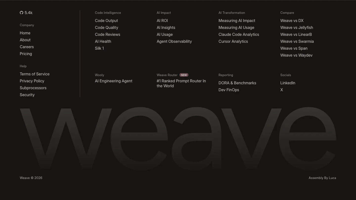
  492. Weave footer section: near-black footer with link columns and a huge faint weave wordmark spanning the full width

Where monochrome shows up

Often paired with

Share of monochrome sections that also use each style

How to design a monochrome section

  1. Build hierarchy with a gray scale

    Define five to seven gray steps and give each a job: headlines, body, secondary text, borders, and surfaces. Use them consistently so the system is learnable. Avoid grays only a few percent apart, because they look like mistakes rather than intent.

  2. Make the primary action unmistakable

    Without a brand color, the main button has to stand out through contrast and shape. Use a solid black button on white, or white on black, and give secondary actions an outline. Keep focus rings clearly visible, since a gray outline can blend into the layout.

  3. Let typography carry the personality

    In a black-and-white palette, the typeface is the brand. Choose a distinctive font for headlines and use weight and size contrast deliberately. Pair a large, tight headline with smaller, airy body text so the section has rhythm instead of a uniform gray texture.
  4. Convert supporting visuals to grayscale

    A full-color photo pulls focus and breaks the effect. Use grayscale photos, line illustrations, and outline icons. For product shots, show the interface in its own dark or light theme so it matches the palette instead of fighting it.

Companies using monochrome

All styles
    ↑↓ Navigate ↵ Open

    Section preview

    Website section