Jitter website design

Every section we captured from the Jitter website, in page order, from the hero section down to the footer. Open any thumbnail to see it full size.

Sections 6

In page order, top to bottom

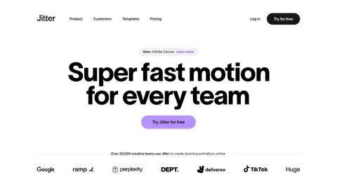
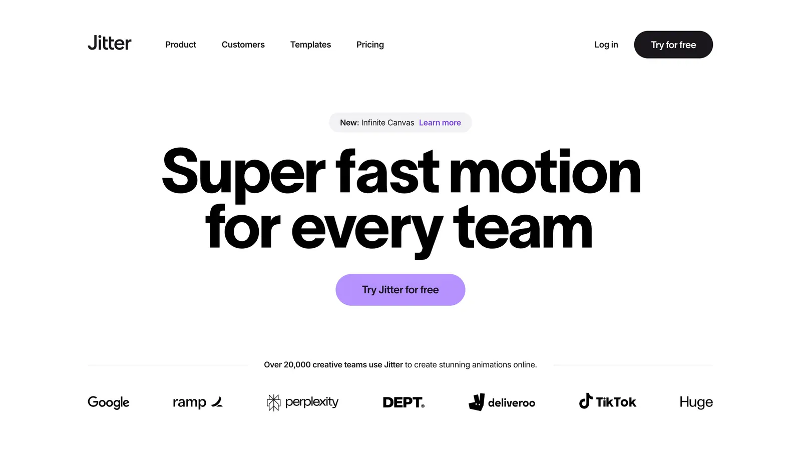
  1. Jitter hero section: nav above a huge centered headline with a purple button and a row of customer logos on white
    01 Hero

    Super fast motion for every team

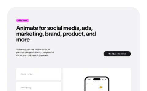
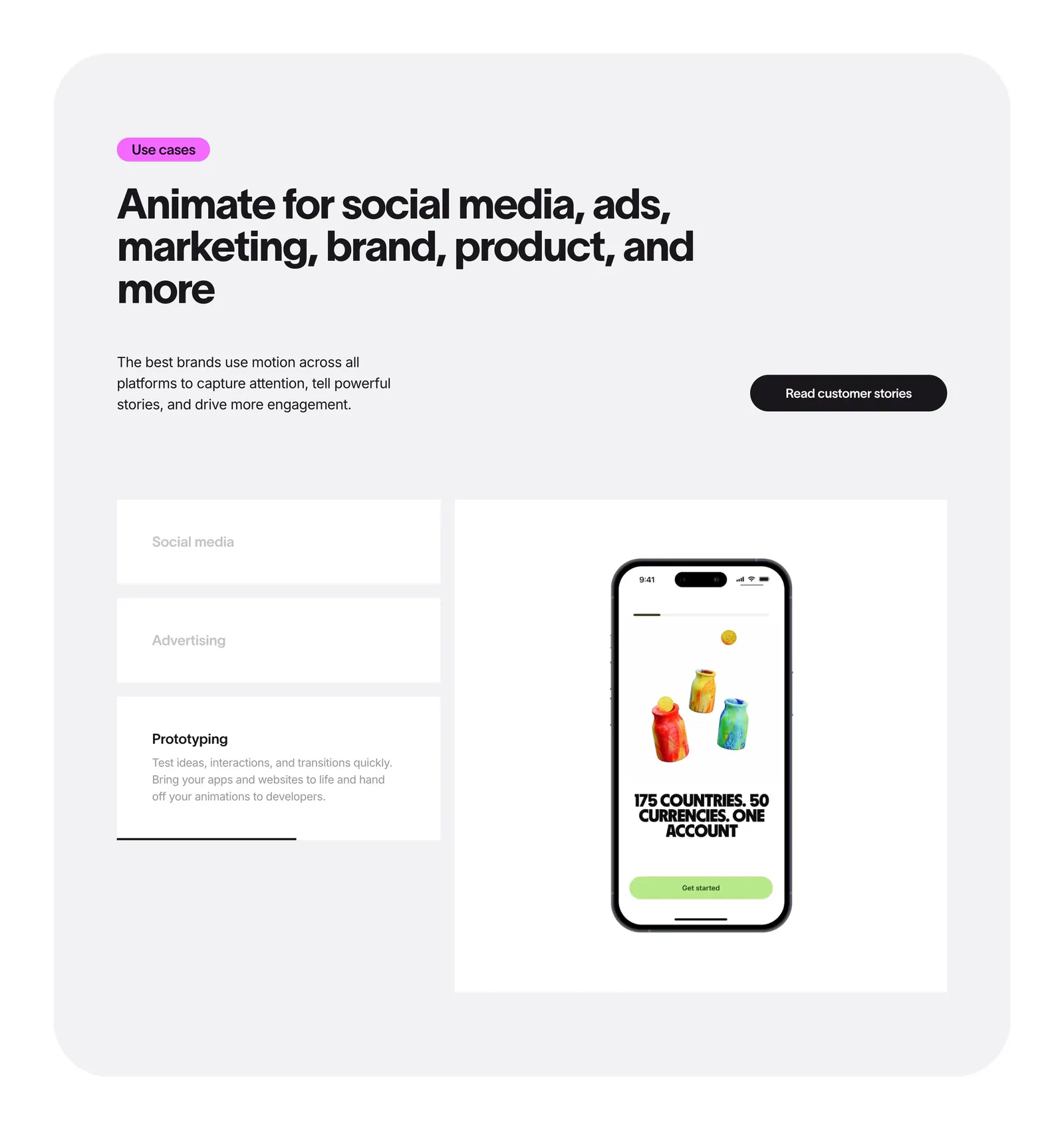
  2. Jitter features section: headline in a rounded gray panel above use case tabs beside a phone mockup preview

    Animate for social media, ads, marketing, brand, product, and more

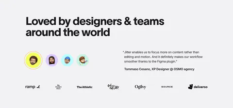
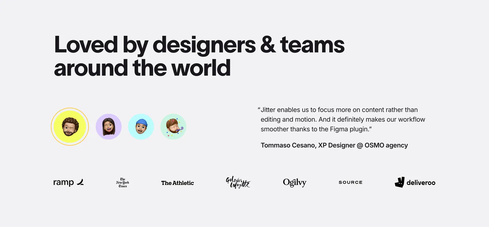
  3. Jitter testimonials section: large headline, memoji avatar selector beside a quote, and a row of customer logos on light gray

    Loved by designers & teams around the world

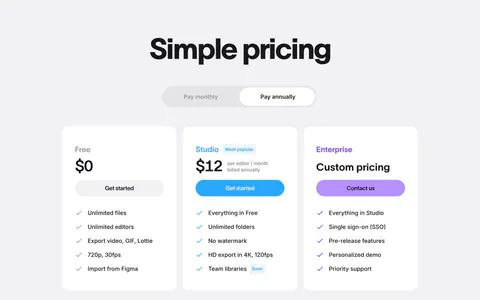
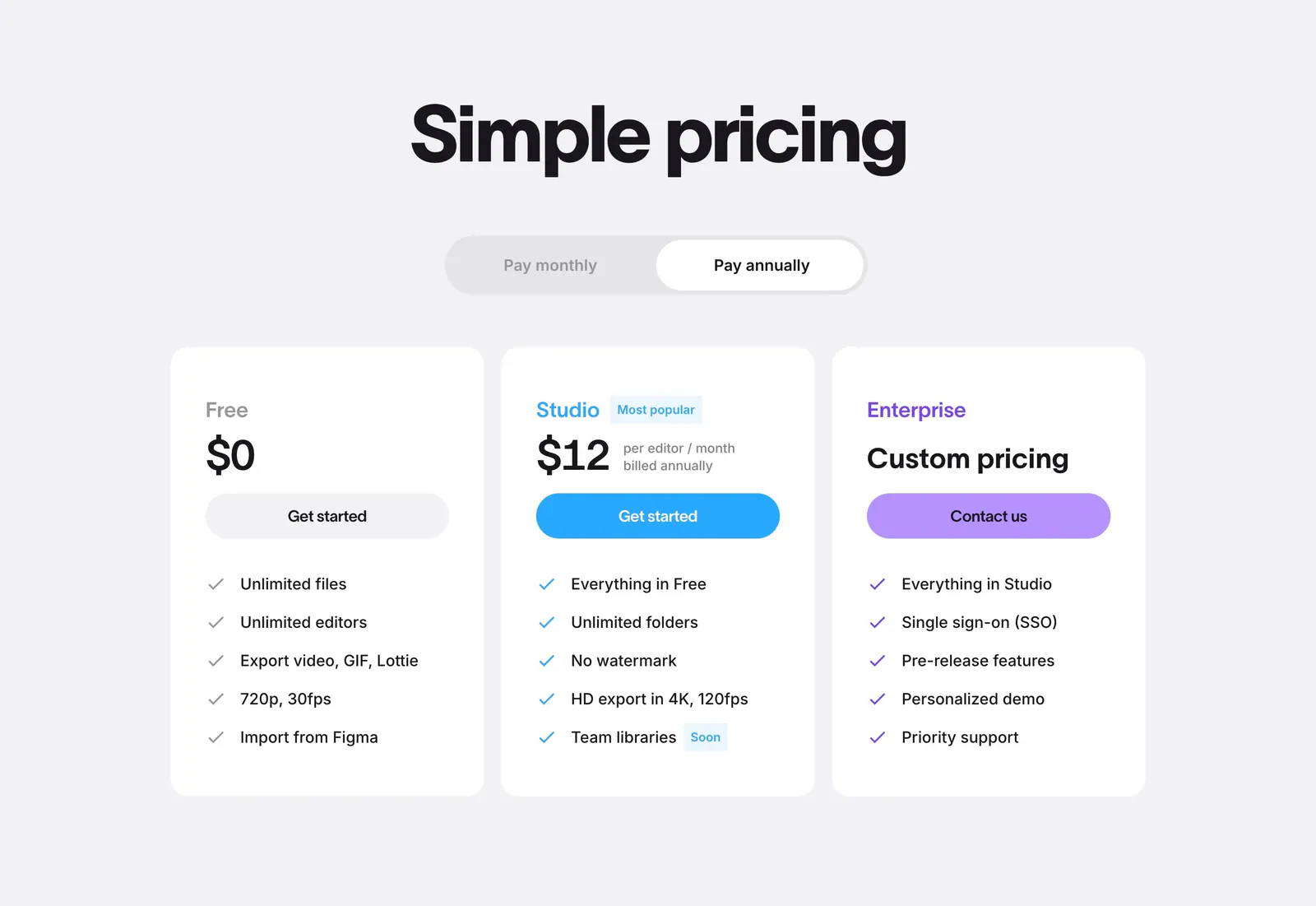
  4. Jitter pricing section: centered headline and billing toggle above three white plan cards with colored buttons on light gray
    04 Pricing

    Simple pricing

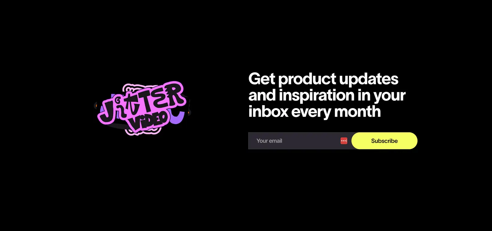
  5. Jitter call-to-action section: pink sticker logo on the left, headline with email field and yellow subscribe button on a black background

    Get product updates and inspiration in your inbox every month

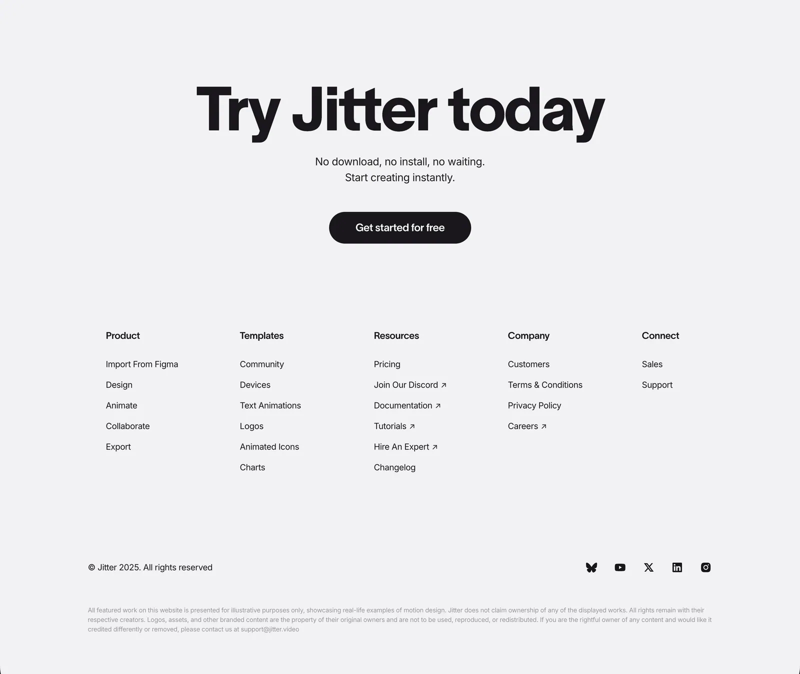
  6. Jitter footer section: large centered CTA headline and button above five link columns, copyright and social icons on light gray
    06 Footer

    Try Jitter today

Similar companies

All companies
    ↑↓ Navigate ↵ Open

    Section preview

    Website section