Design Tools Website Design Examples

A design tool's own website is its first demo. Designers judge it the way they judge a portfolio, so craft, typography, and motion all count. Visitors also want to see the canvas in use, what gets exported, and how the tool fits into a team's handoff. Good website design for a design tool shows real work made with the product and lets interaction carry the message wherever copy would slow it down.
110 sections

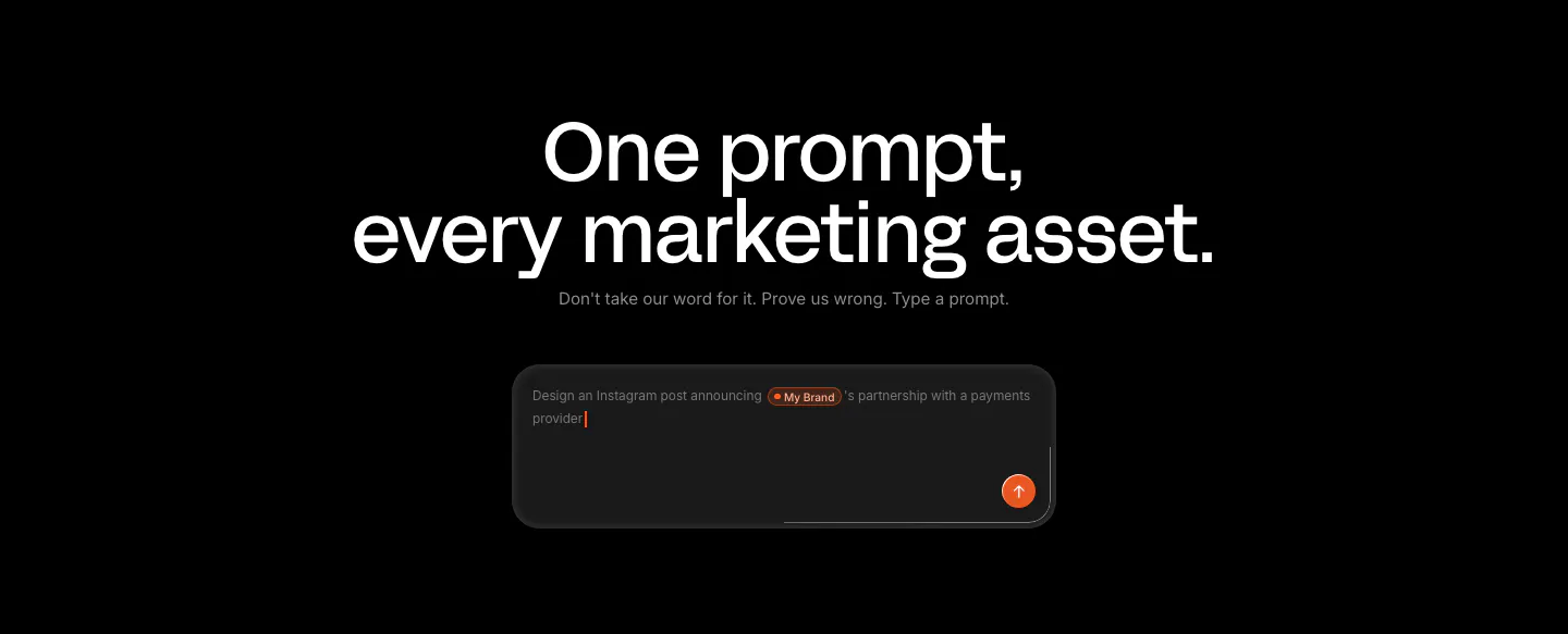
  1. Linearity call-to-action section: large centered headline and short line above a dark prompt input box with an orange send button on black
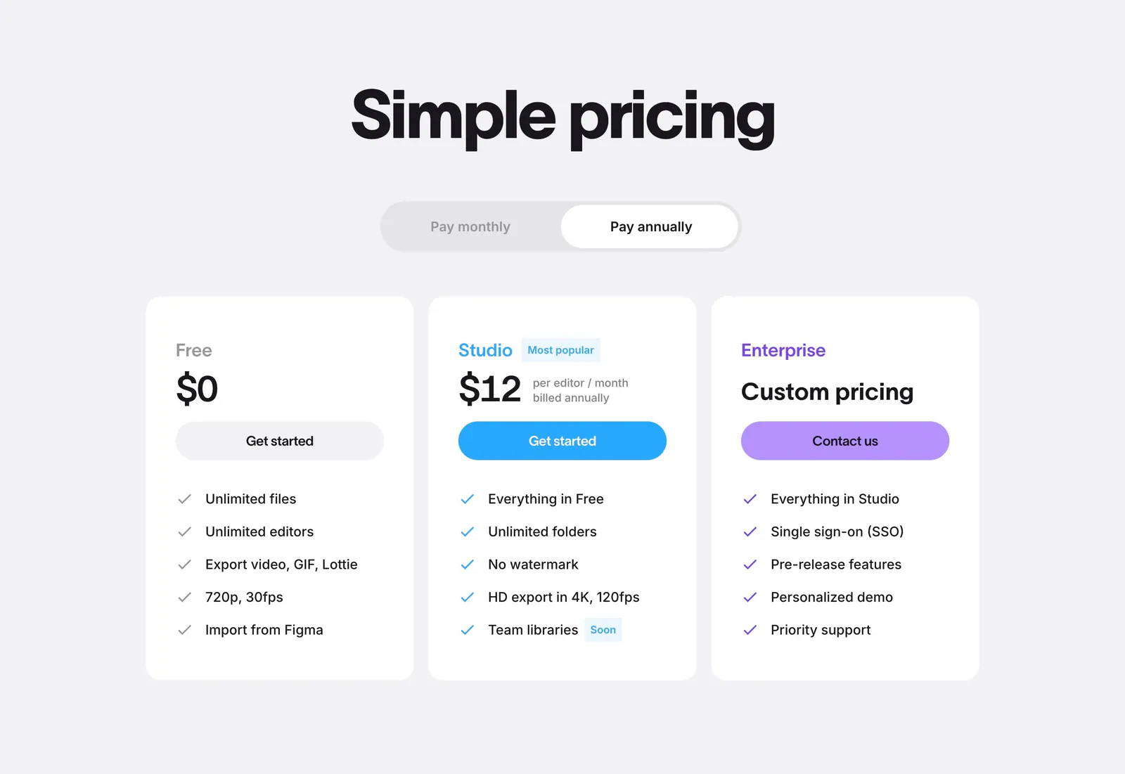
  2. Jitter pricing section: centered headline and billing toggle above three white plan cards with colored buttons on light gray
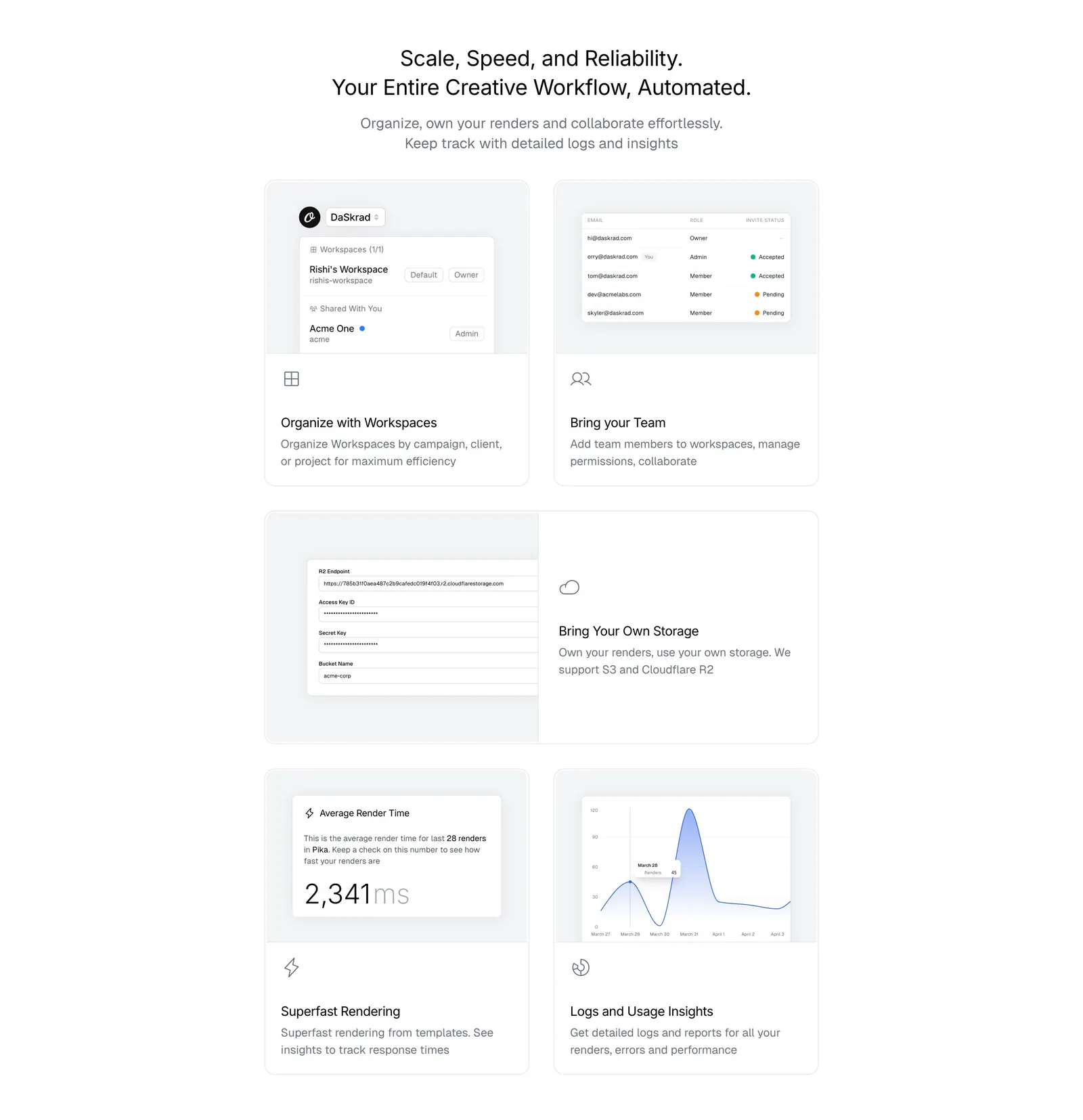
  3. Orshot features section: centered headline above a bento grid of light gray cards with workspace, team, storage and analytics UI
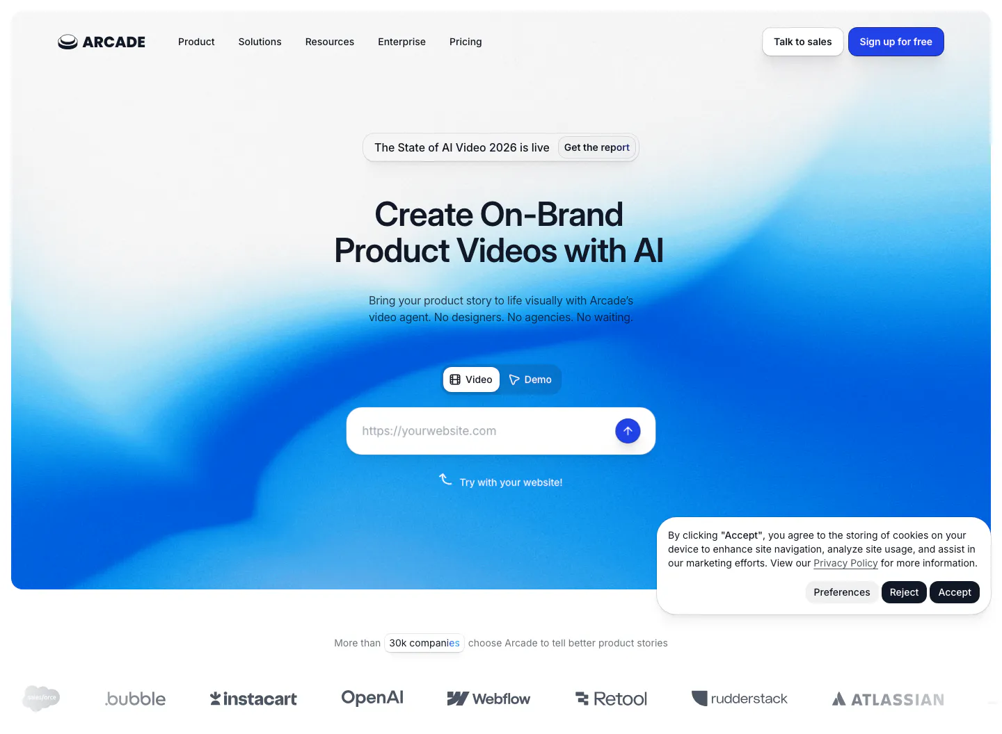
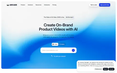
  4. Arcade hero section: centered headline with Video/Demo toggle and URL input on a blue gradient, customer logo row below
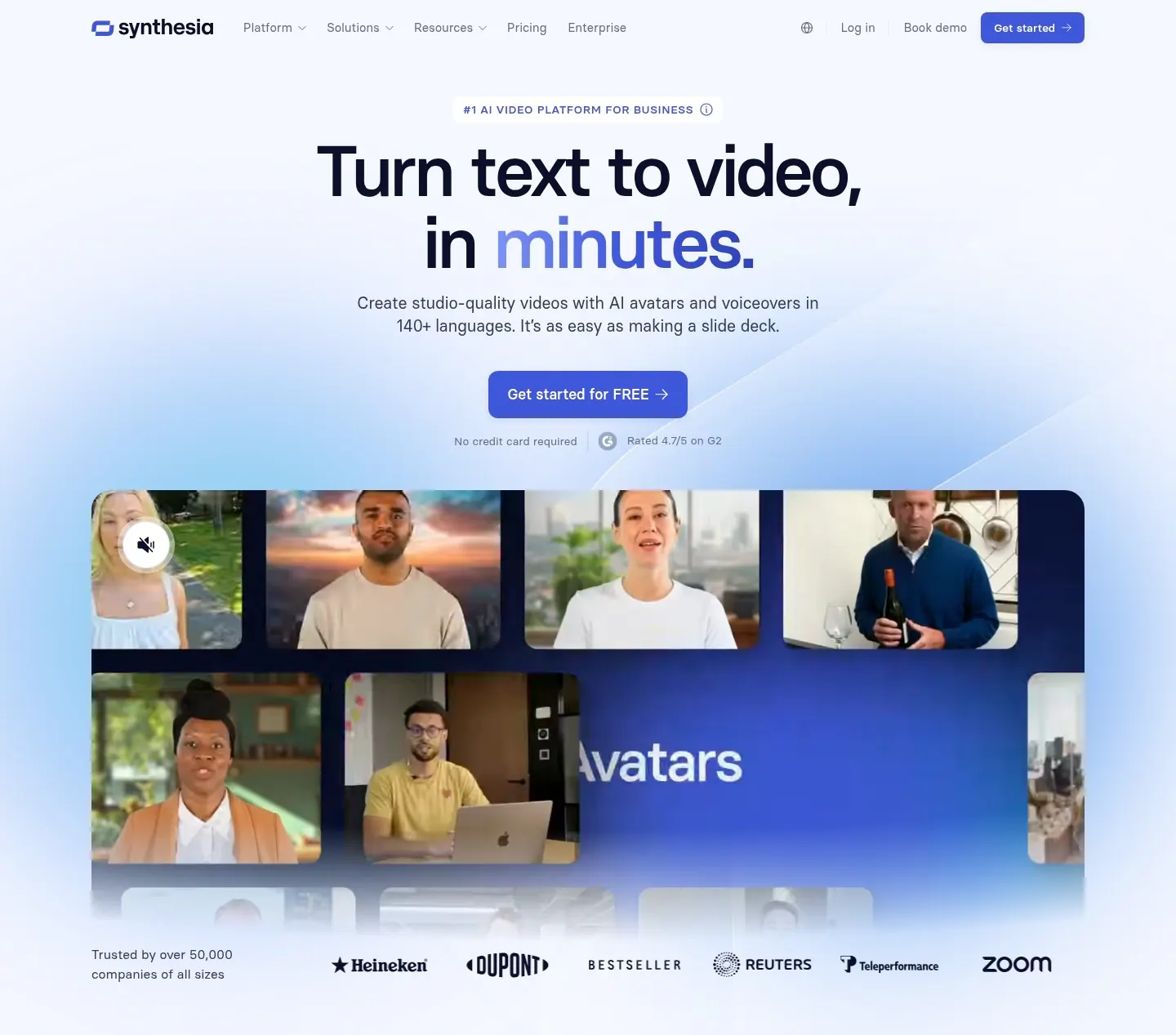
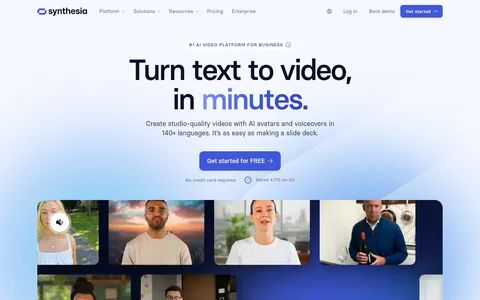
  5. Synthesia hero section: centered headline and blue button above a grid of AI avatar video frames and a customer logo row on soft blue glow
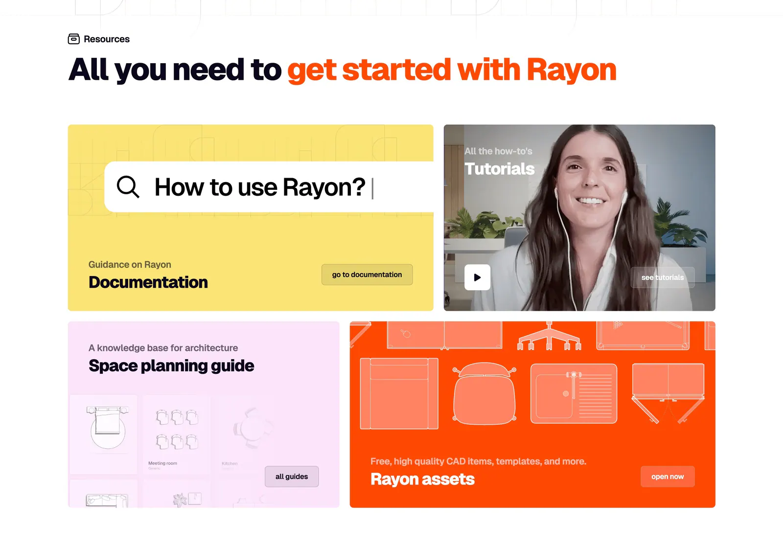
  6. Rayon blog & resources section: headline above a four-tile bento of yellow docs, video tutorial, pink guide and orange assets cards
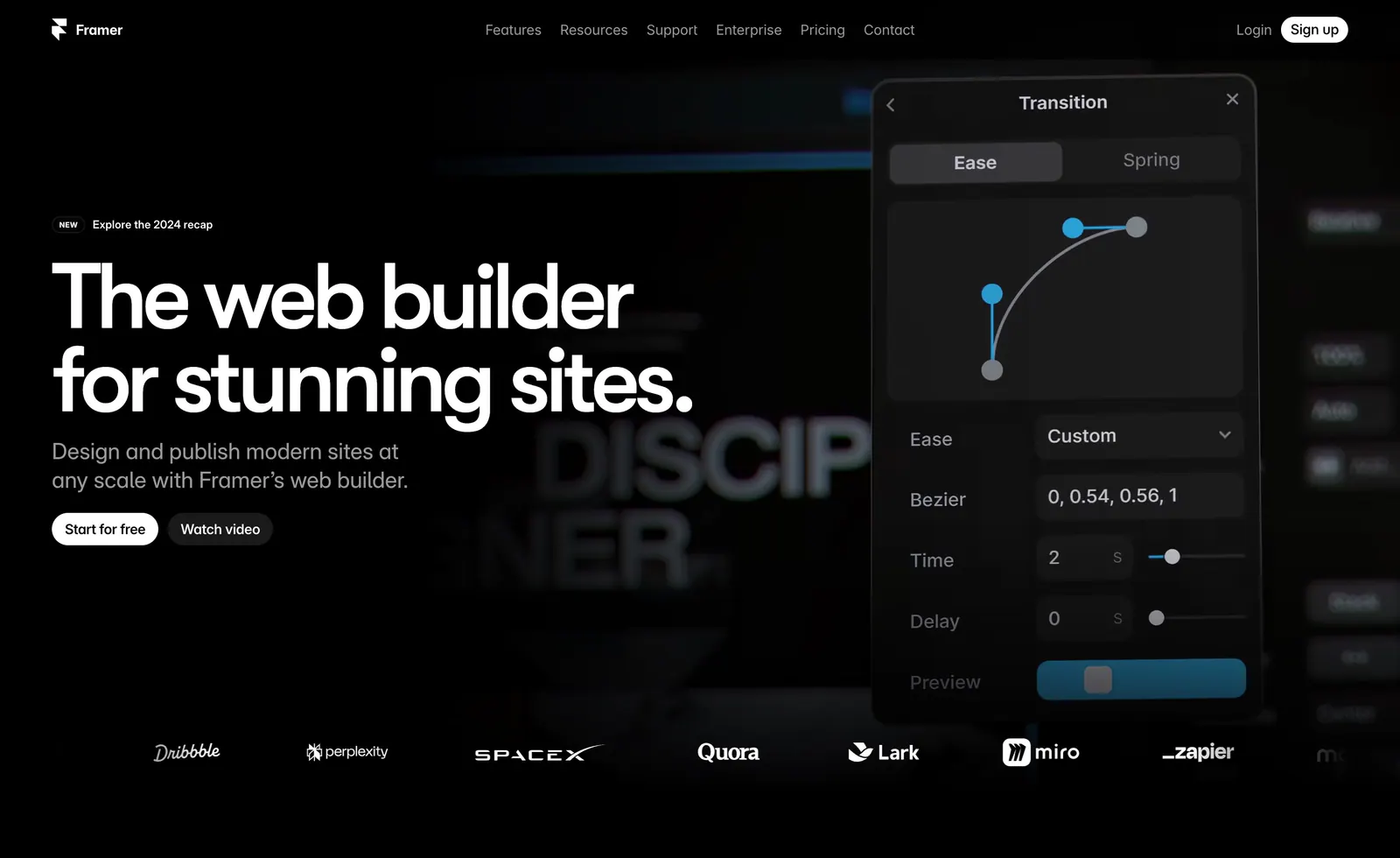
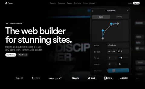
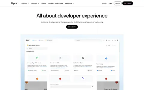
  7. Framer hero section: left-aligned headline with two buttons beside a floating transition-settings panel, logo row below, on black
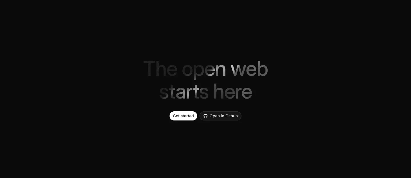
  8. Ycode call to action section: centered headline with a spotlight fade effect and two buttons on a black background
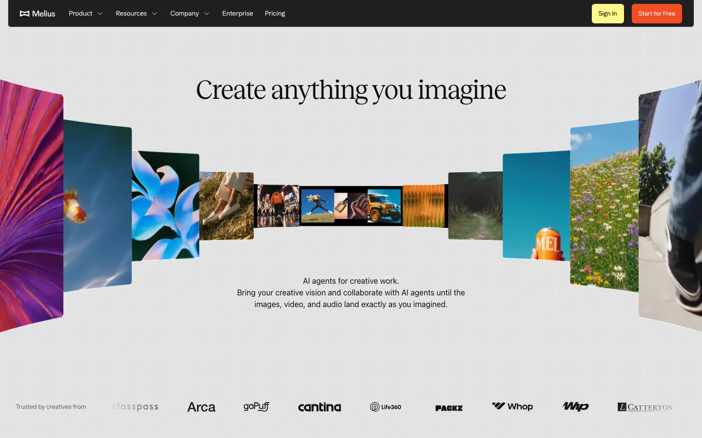
  9. Melius hero section: dark nav bar over a centered serif headline inside a curved gallery of photos and artwork, logo row at bottom
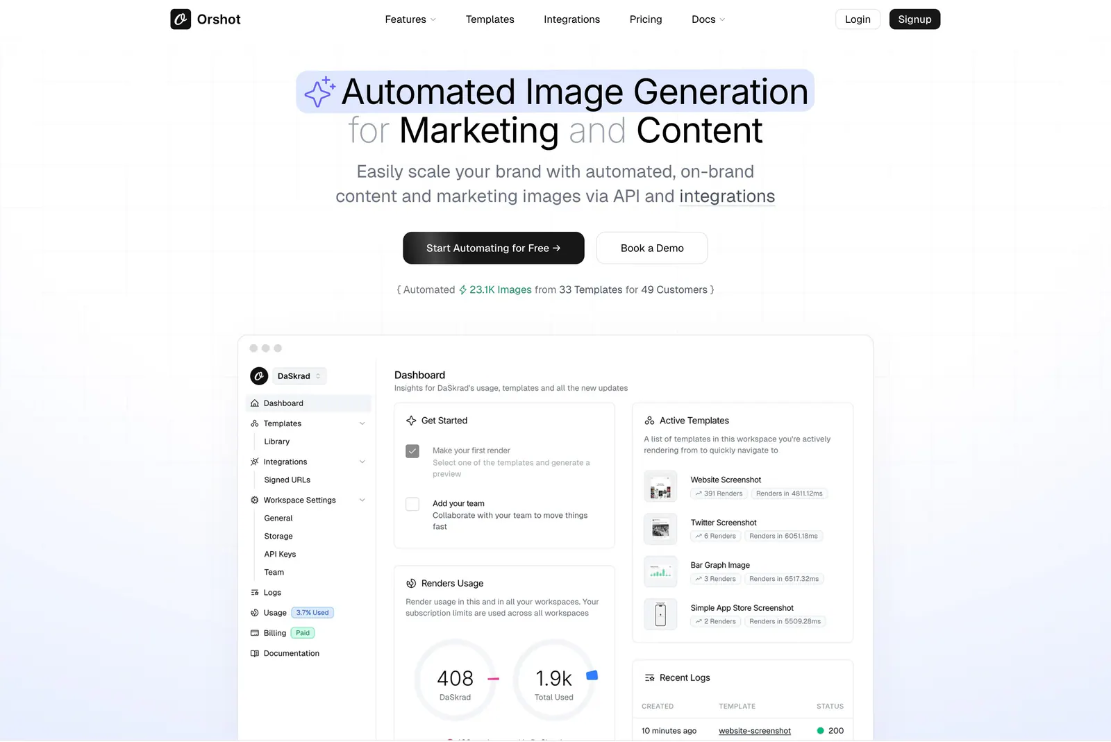
  10. Orshot hero section: centered headline with highlighted phrase, two buttons and a stat line above a dashboard screenshot on faint grid
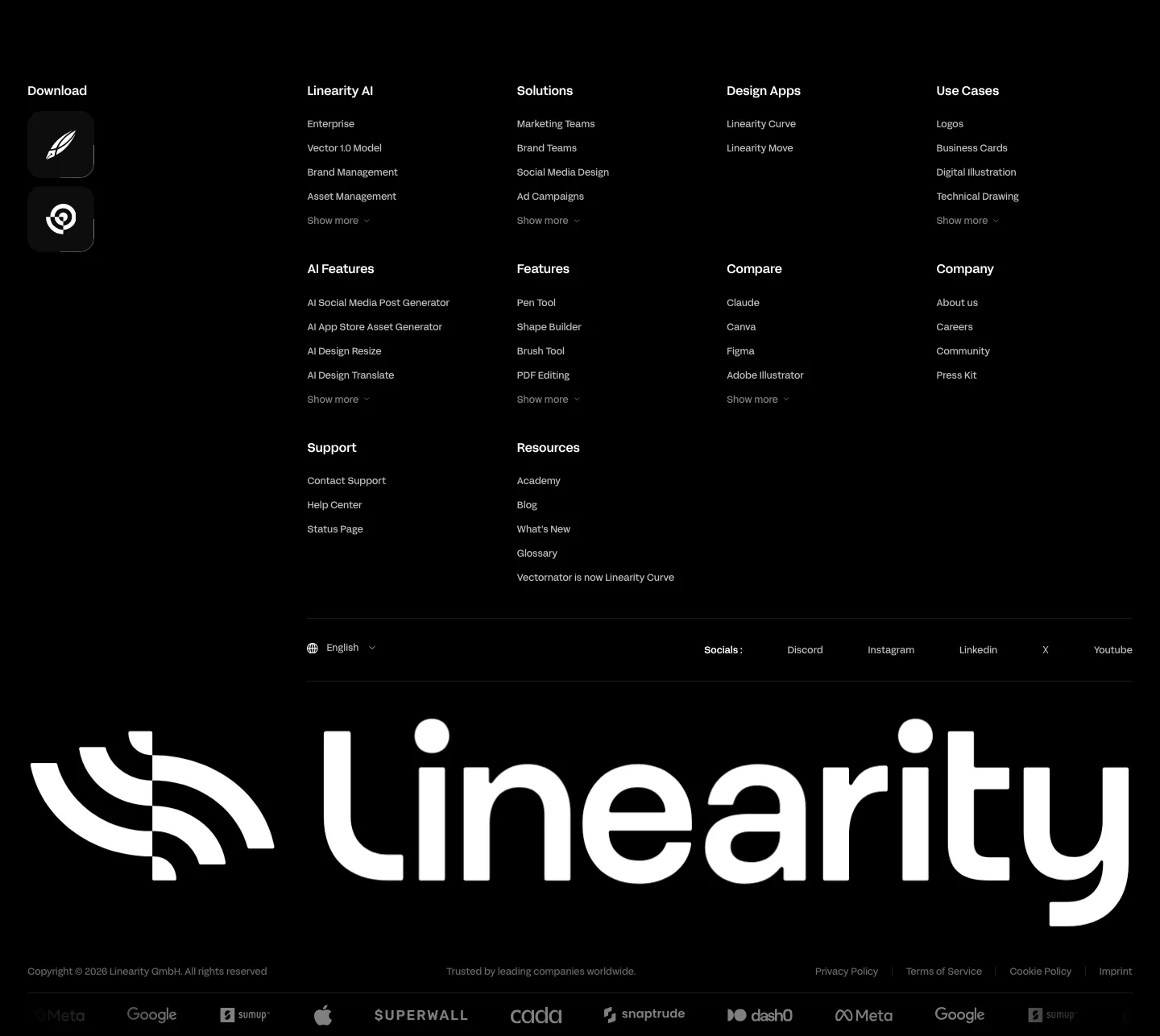
  11. Linearity footer section: dense link columns with app download icons, a giant white Linearity wordmark and a customer logo strip on black
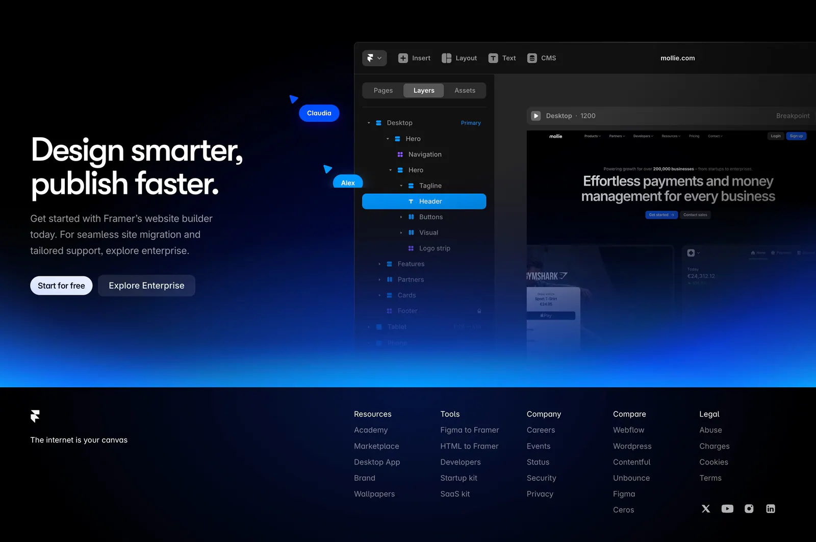
  12. Framer footer section: CTA with editor UI and blue glow above a black footer with logo, tagline, five link columns and social icons
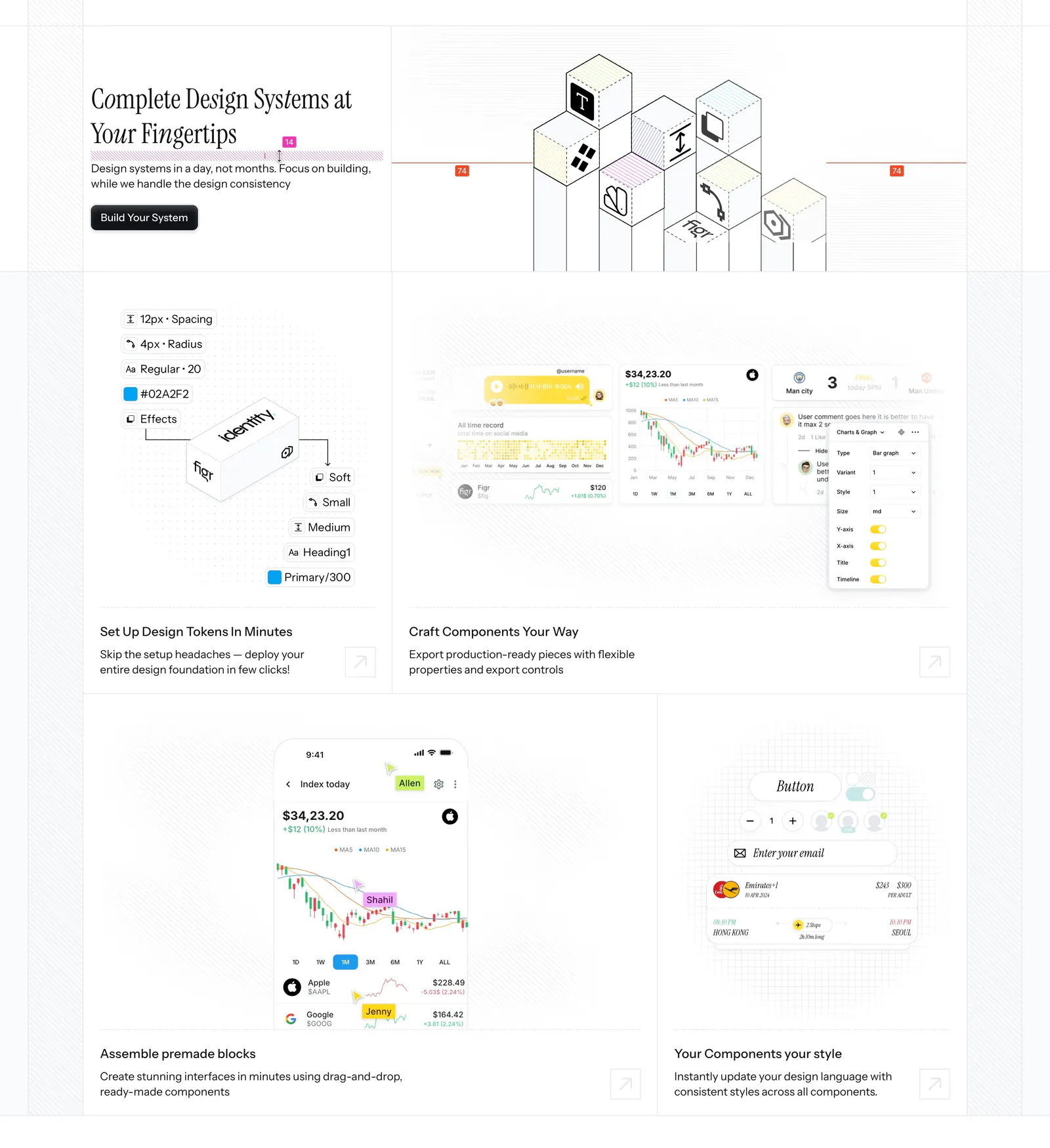
  13. Figr features section: serif headline beside an isometric cube drawing above a bento of design token, chart and mobile UI tiles
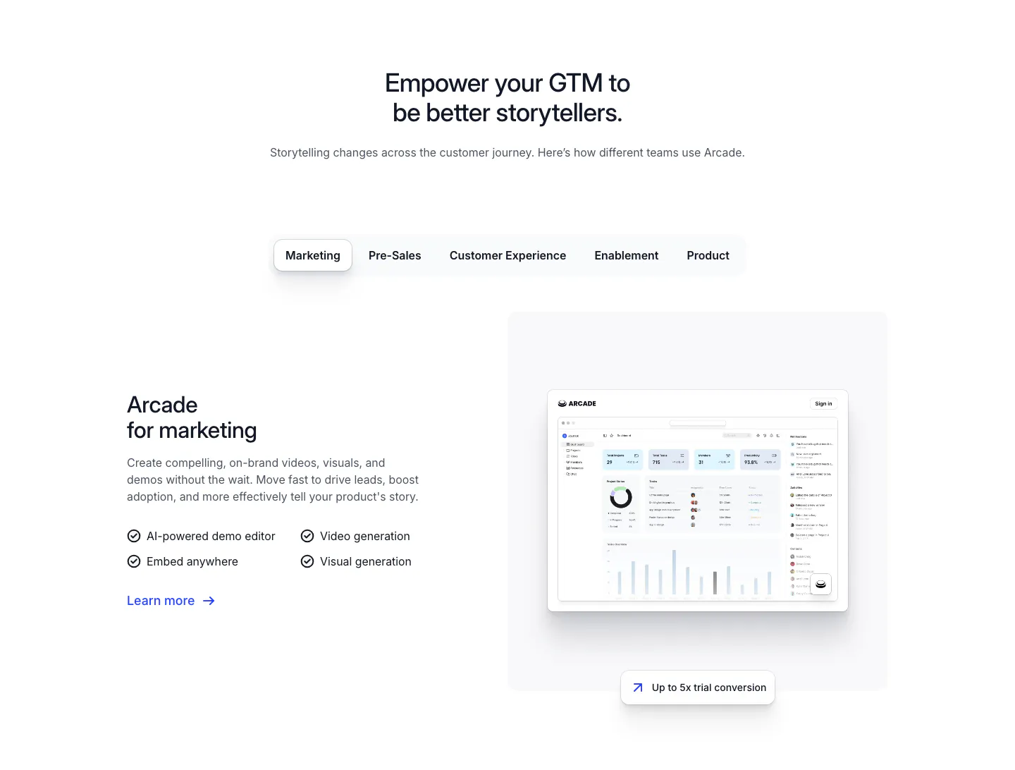
  14. Arcade use cases section: centered headline over team tabs, with marketing copy and checklist beside a dashboard screenshot
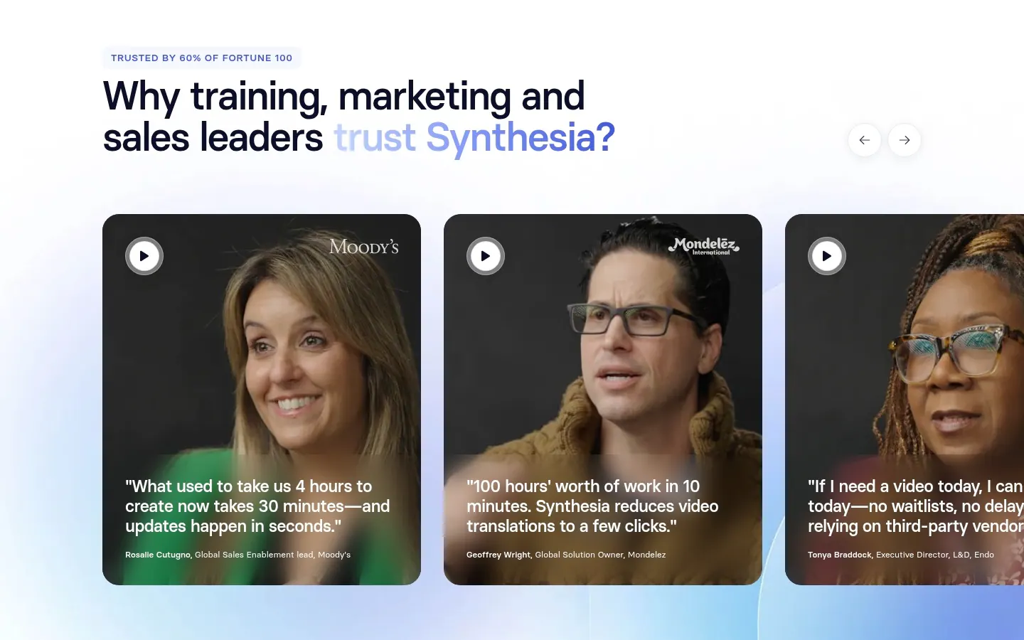
  15. Synthesia testimonials section: headline with arrow controls above a carousel of video testimonial cards with customer portraits and quotes
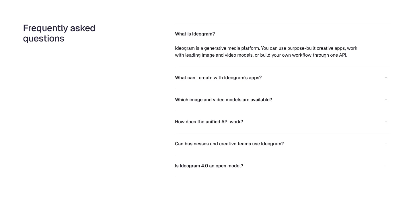
  16. Ideogram FAQ section: heading on the left, accordion of six questions on the right with the first one expanded, on white
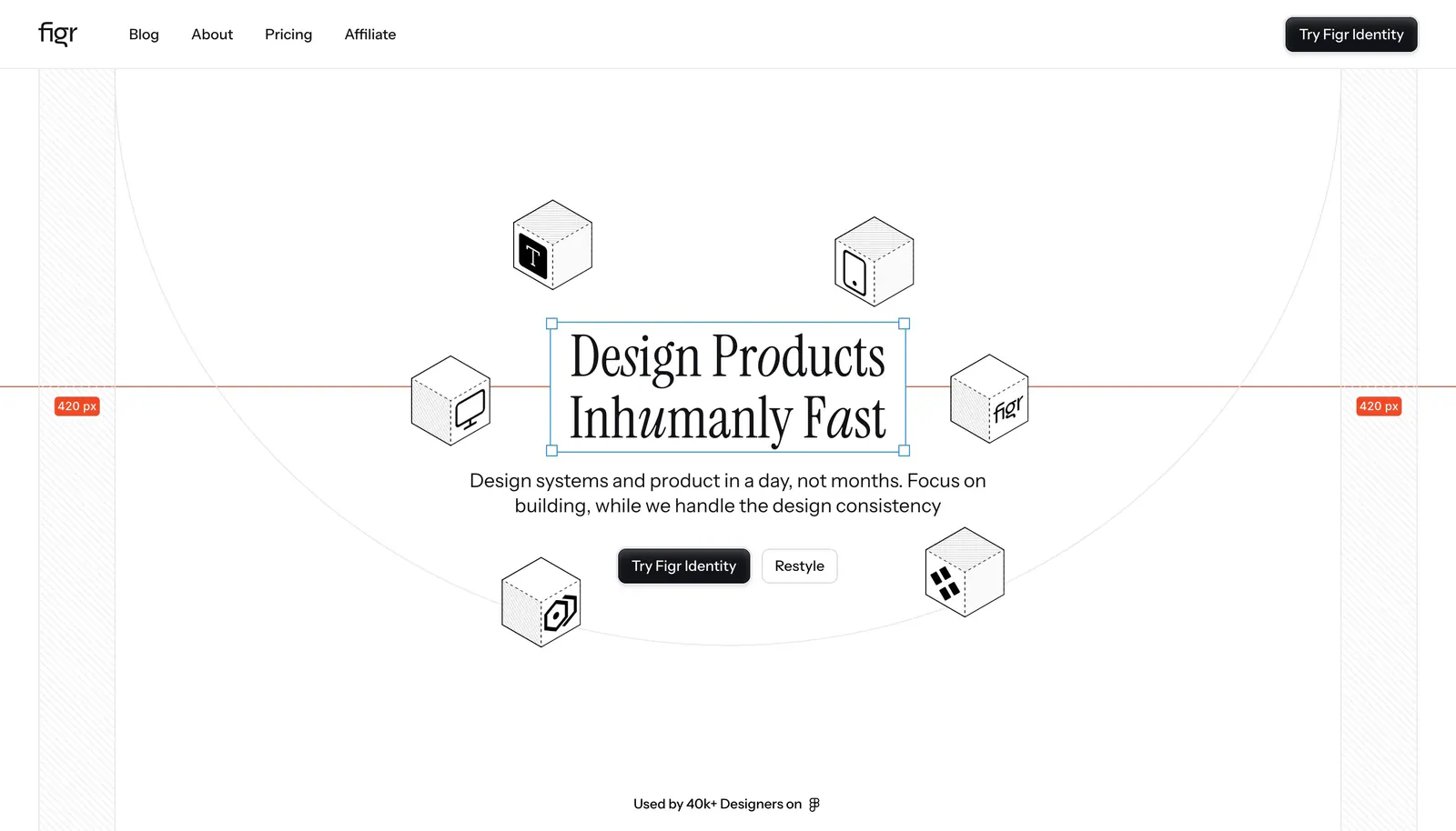
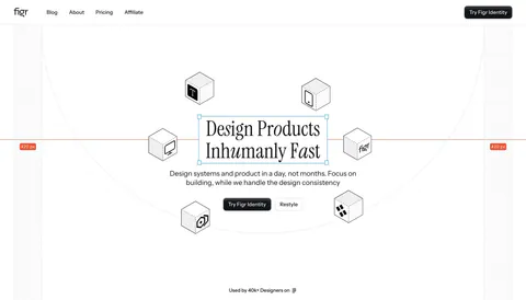
  17. Figr hero section: centered serif headline in a selection box ringed by isometric line-drawn cubes with measurement guides
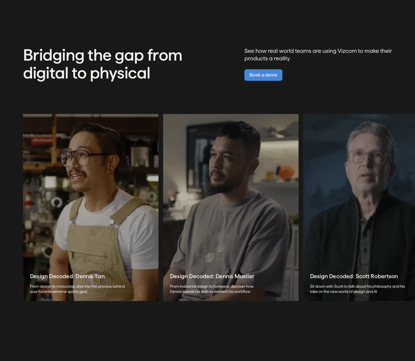
  18. Vizcom testimonials section: headline and demo button above a row of customer video story cards with portrait photos on a charcoal background
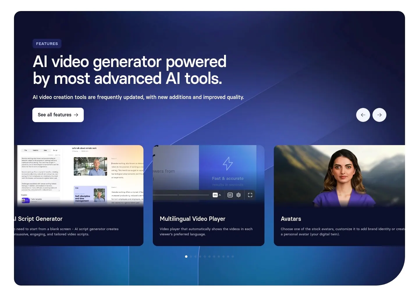
  19. Synthesia features section: navy-to-blue gradient panel with headline, arrow controls and a carousel of feature cards with UI and avatars
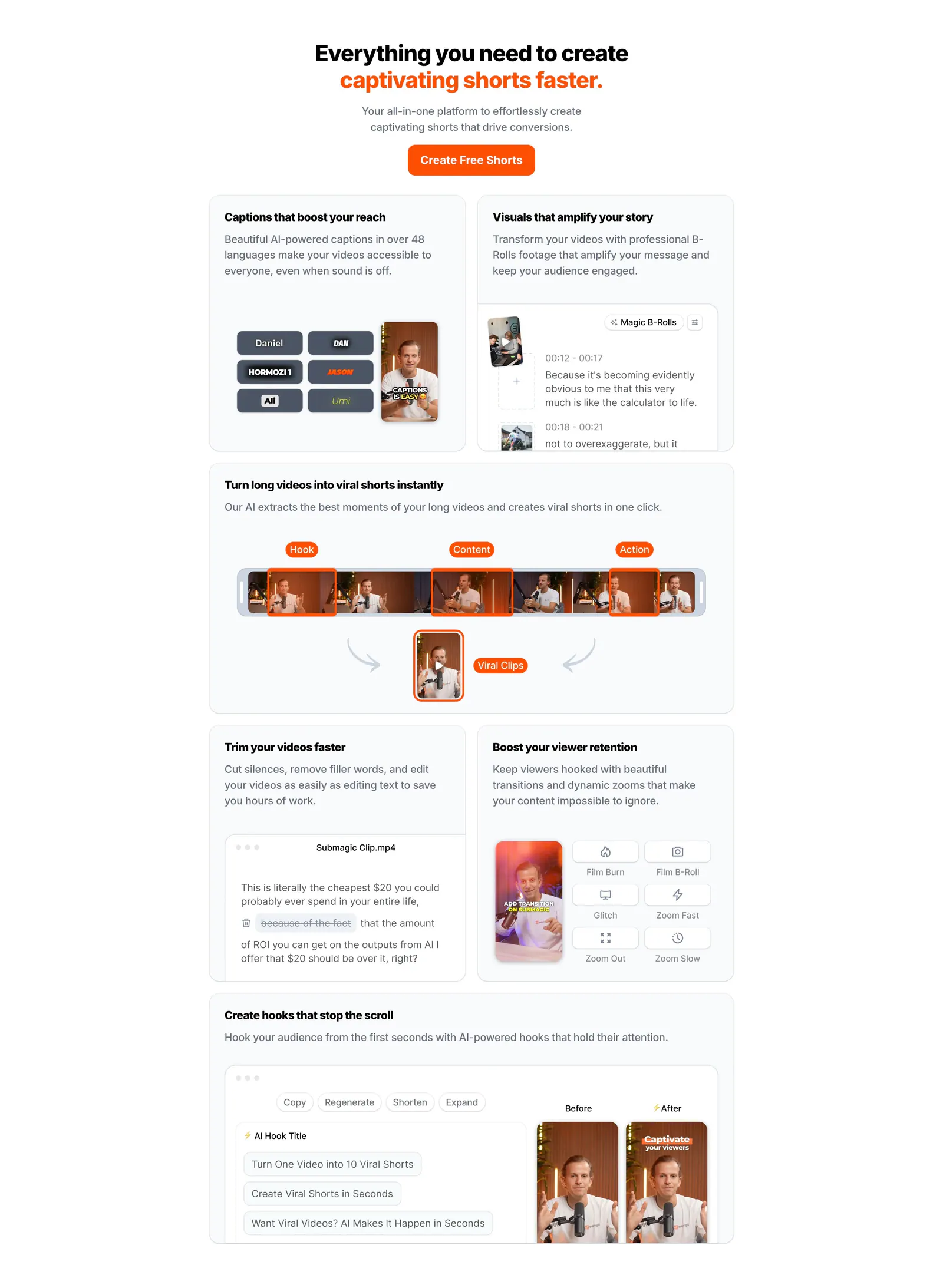
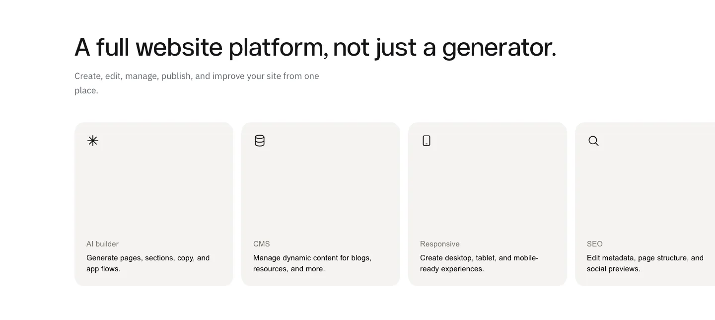
  20. Submagic features section: centered headline with orange accent above a bento grid of light cards showing caption, clip and editing UI
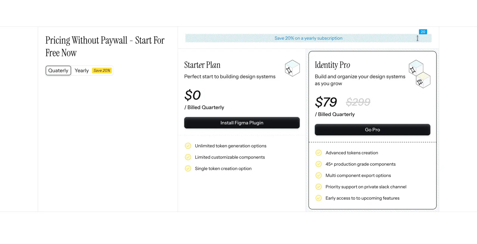
  21. Figr pricing section: serif heading with quarterly/yearly toggle on the left and Starter and Identity Pro plan cards on the right
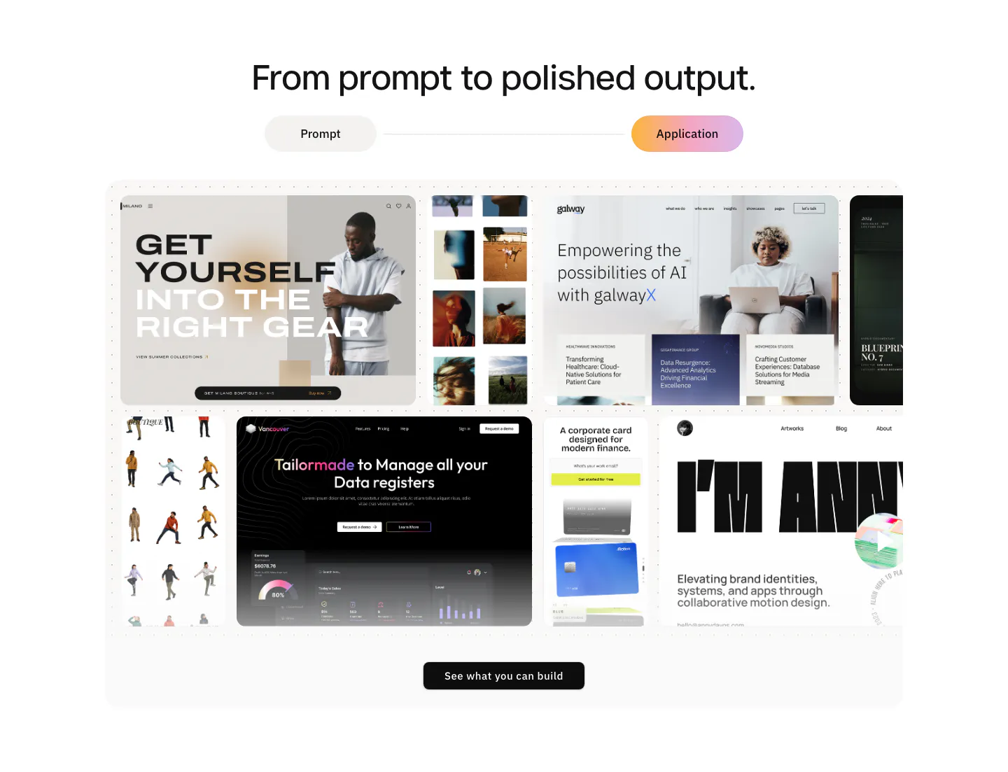
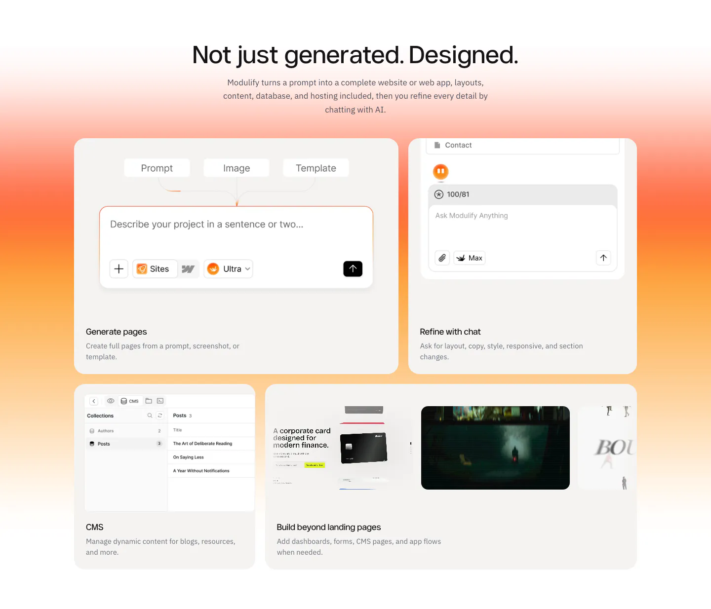
  22. Modulify features section: centered headline and prompt/application toggle above a collage of generated website screenshots
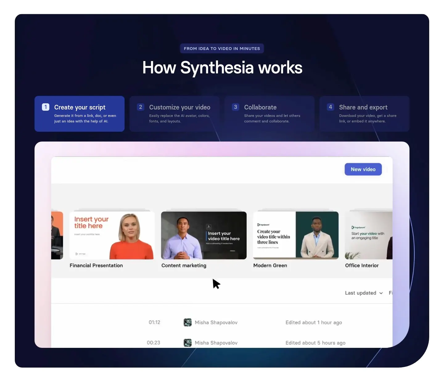
  23. Synthesia how it works section: centered headline over four numbered step tabs and a video library UI screenshot in a dark navy panel
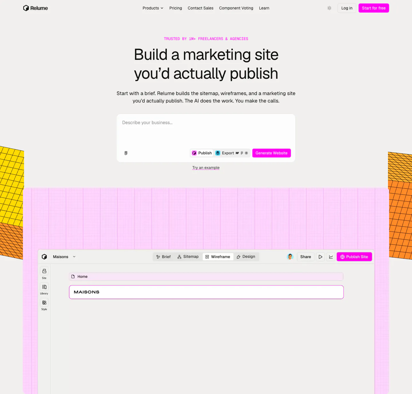
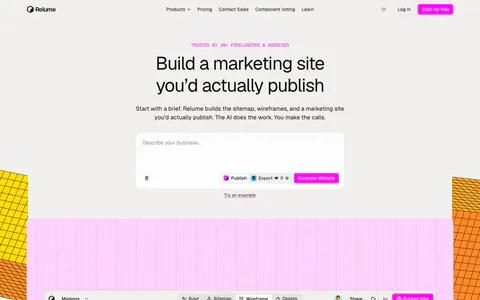
  24. Relume hero section: centered headline and AI prompt box above a wireframe editor screenshot on a pink grid, flanked by yellow isometric blocks
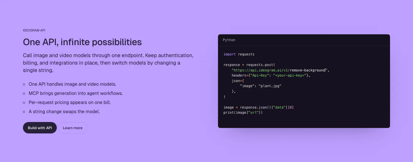
  25. Ideogram features section: purple background, headline, copy and bullet list on the left, dark Python code snippet window on the right
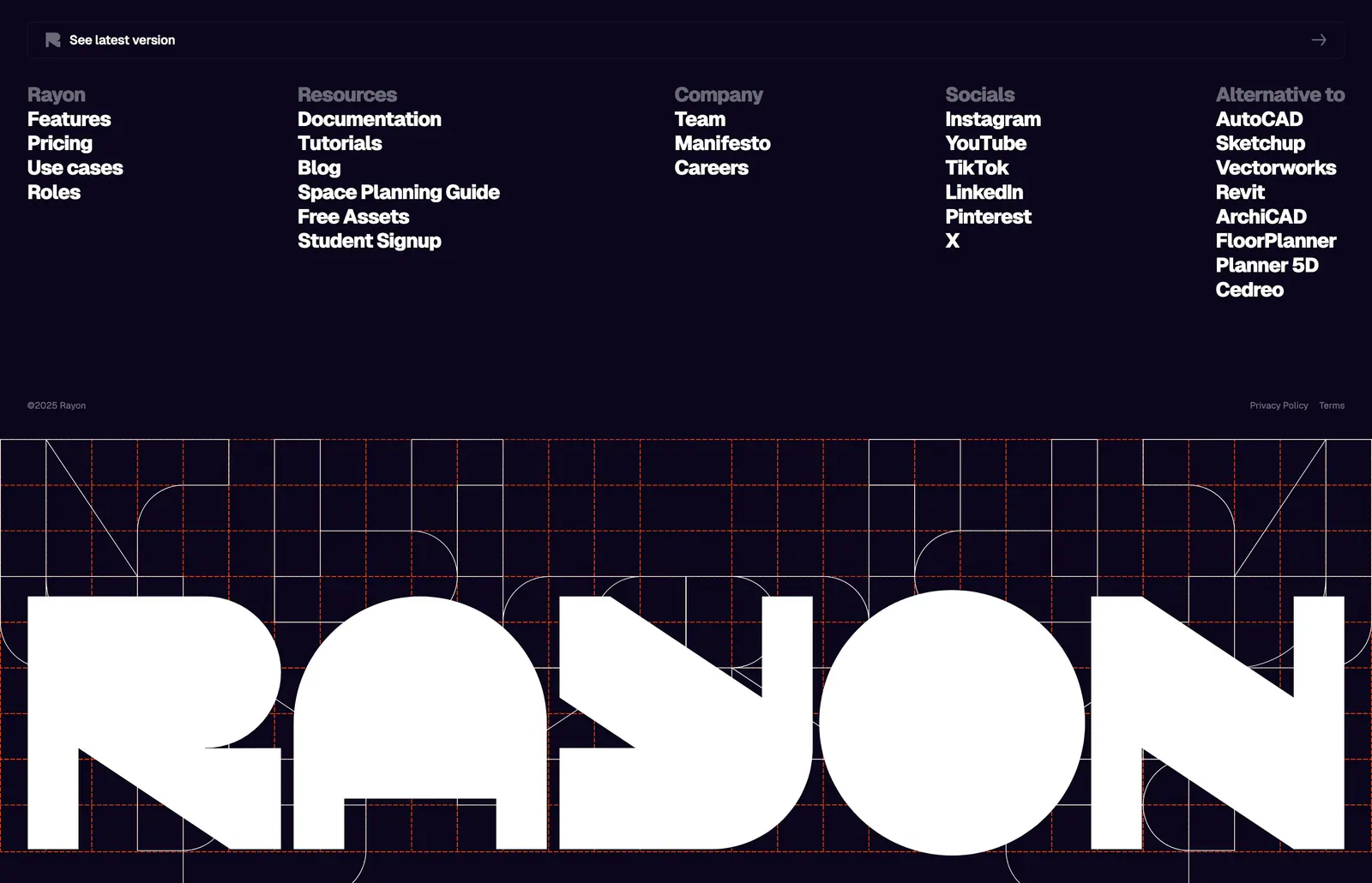
  26. Rayon footer section: five link columns on deep navy above a giant white Rayon wordmark set over an orange construction grid
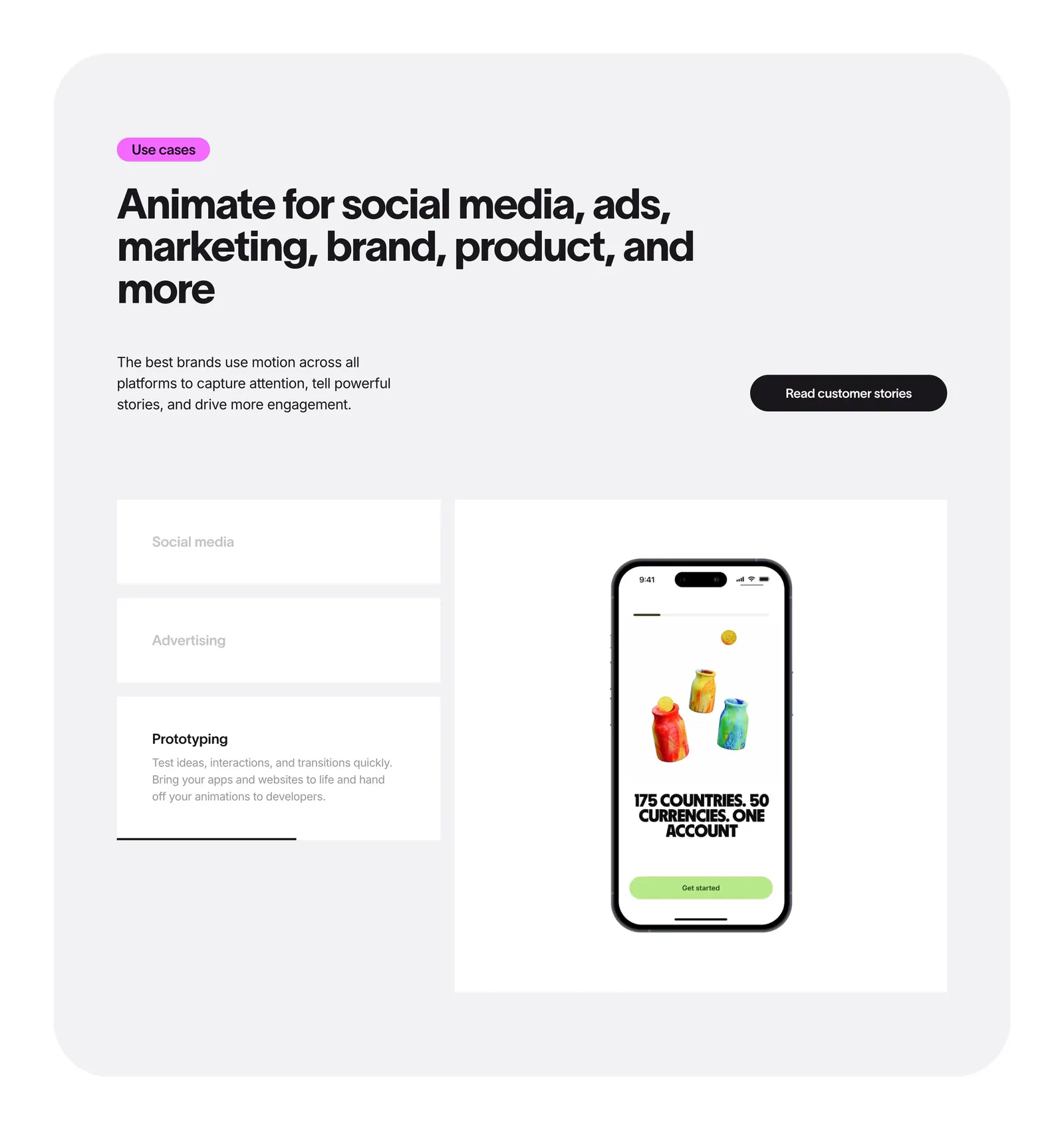
  27. Jitter features section: headline in a rounded gray panel above use case tabs beside a phone mockup preview
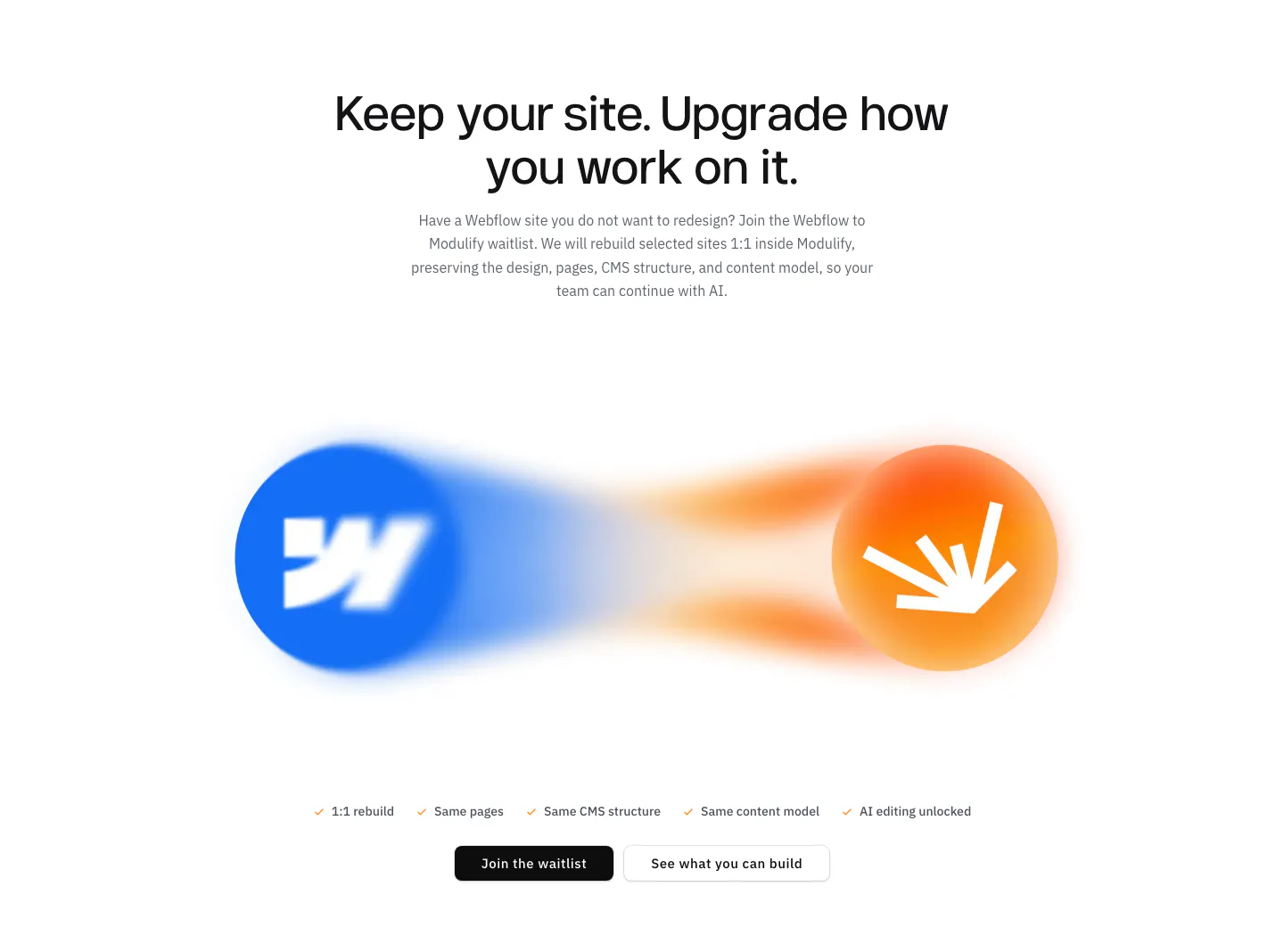
  28. Modulify features section: centered headline above blurred Webflow and Modulify logo orbs, a checklist and two buttons
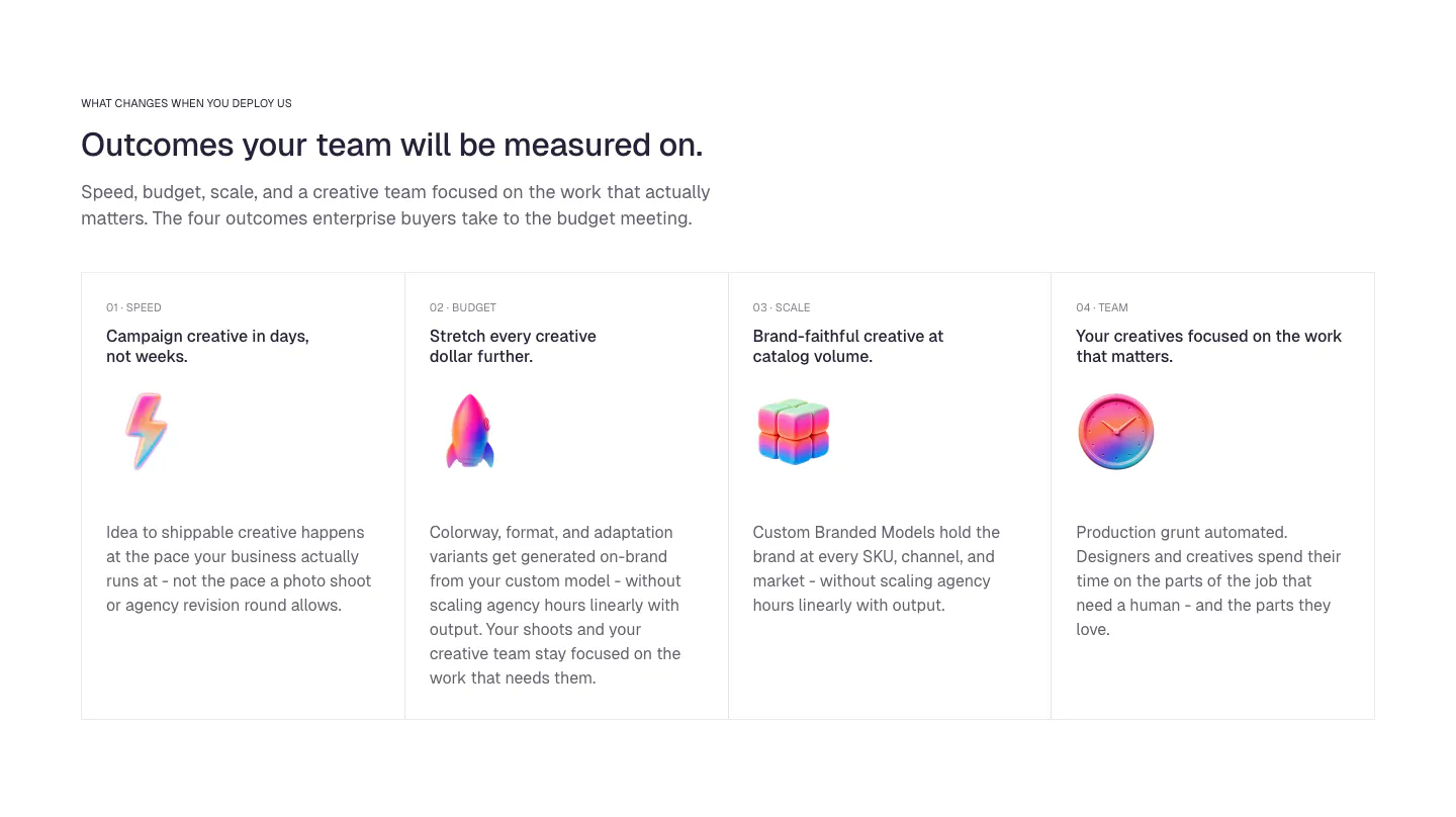
  29. Ideogram value proposition section: eyebrow, headline and intro above four bordered outcome cards with numbered labels and glossy 3D icons
  30. Arcade footer section: four link columns and an email subscribe field above a faded oversized ARCADE wordmark and logo
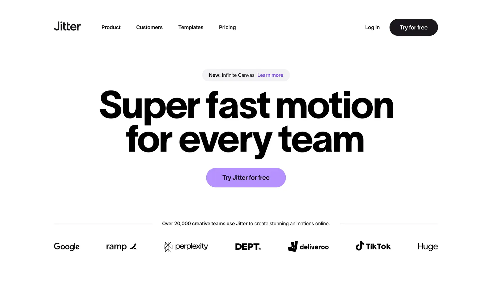
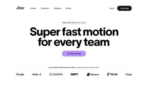
  31. Jitter hero section: nav above a huge centered headline with a purple button and a row of customer logos on white
  32. Modulify call-to-action section: centered headline and black button inside a rounded orange-to-pink gradient card
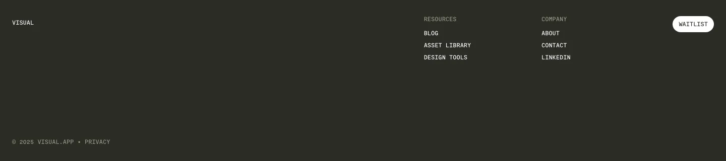
  33. Visual footer section: dark charcoal footer with small wordmark, resources and company link columns, a white waitlist button and copyright
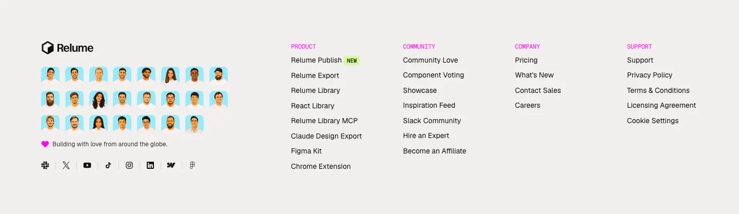
  34. Relume footer section: logo above a grid of illustrated team avatars and social icons, with four link columns under pink labels
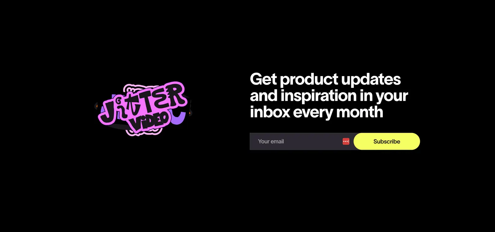
  35. Jitter call-to-action section: pink sticker logo on the left, headline with email field and yellow subscribe button on a black background
  36. Modulify features section: left-aligned headline above a row of four gray icon cards on white, the last card cut off
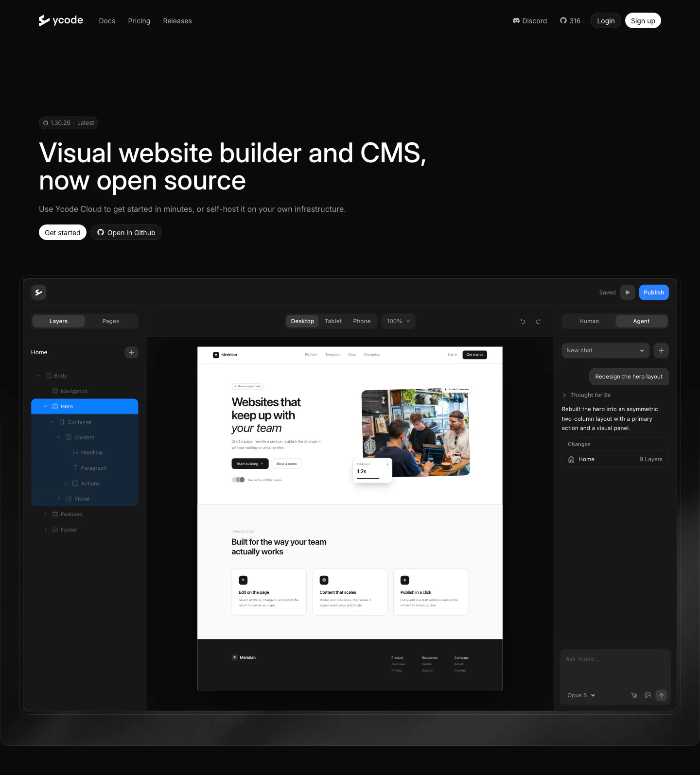
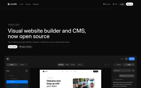
  37. Ycode hero section: left-aligned headline with version badge and two buttons above a large website editor screenshot on black
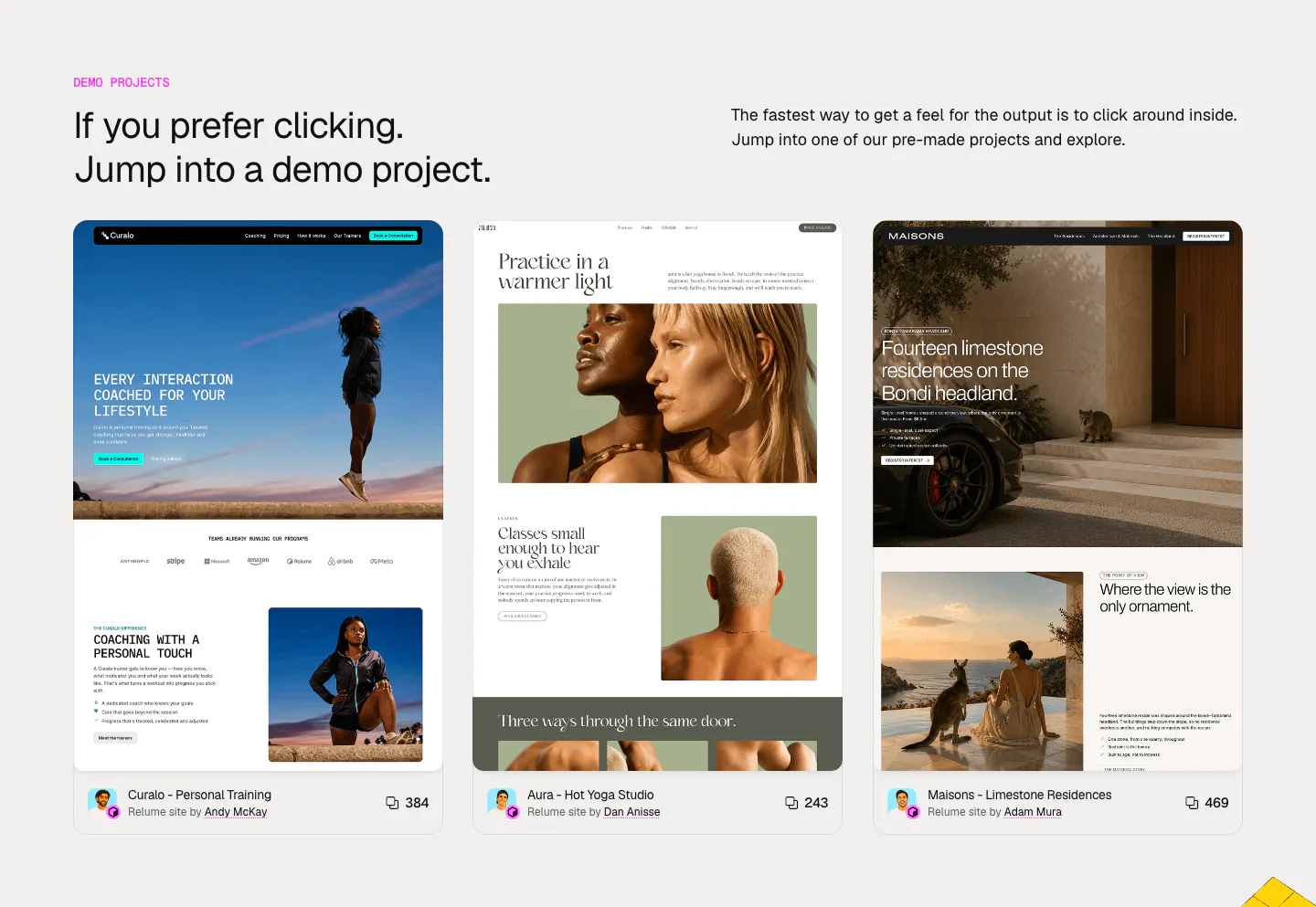
  38. Relume other section: headline and intro above three cards previewing demo websites for coaching, yoga and residences with author credits
    Relume Other
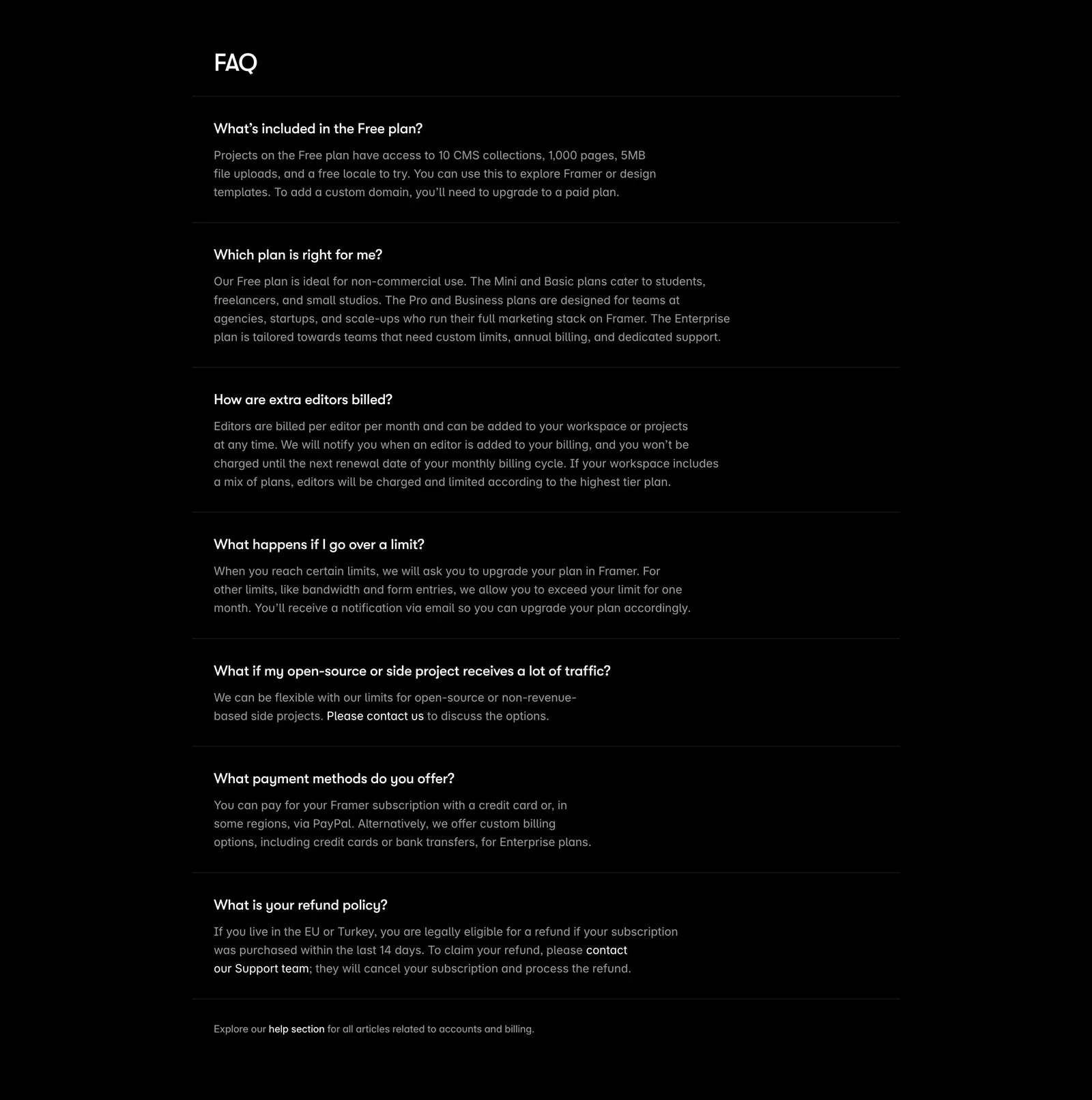
  39. Framer FAQ section: heading above a single-column list of questions with expanded answers separated by thin rules on black
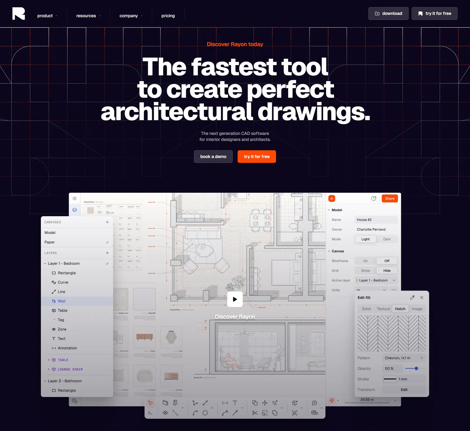
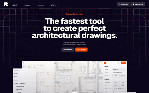
  40. Rayon hero section: centered bold headline and two buttons on a dark navy grid above a CAD floor plan editor screenshot with play button
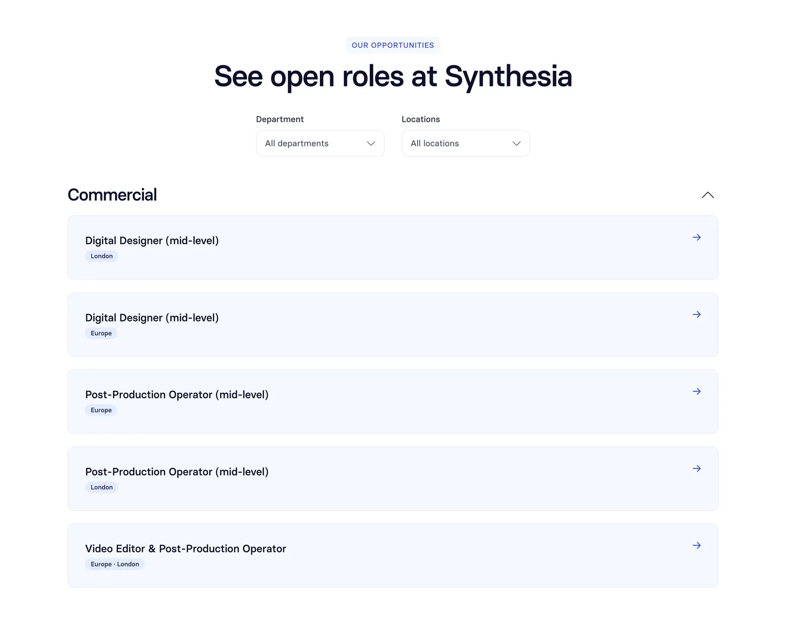
  41. Synthesia careers section: centered headline with department and location dropdowns above a list of open role rows on white
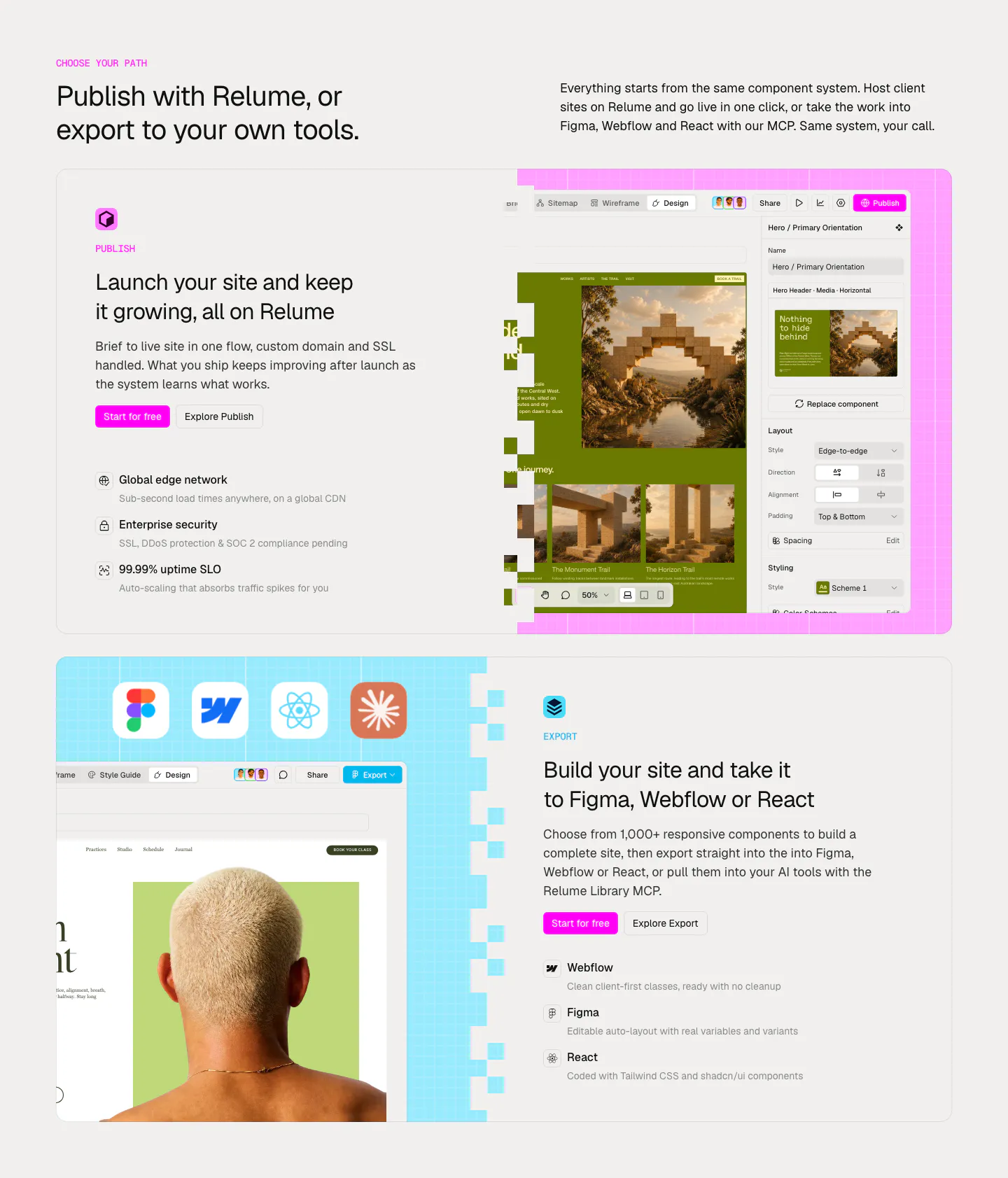
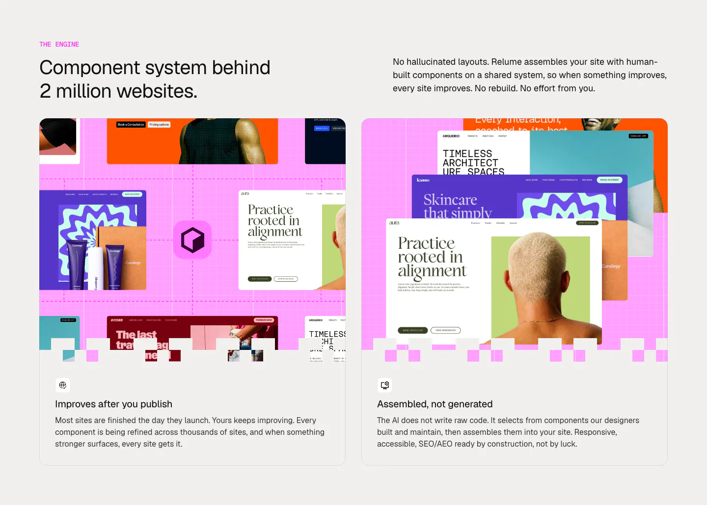
  42. Relume features section: headline above two large cards alternating text and editor screenshots for Publish and Export on pink and blue grids
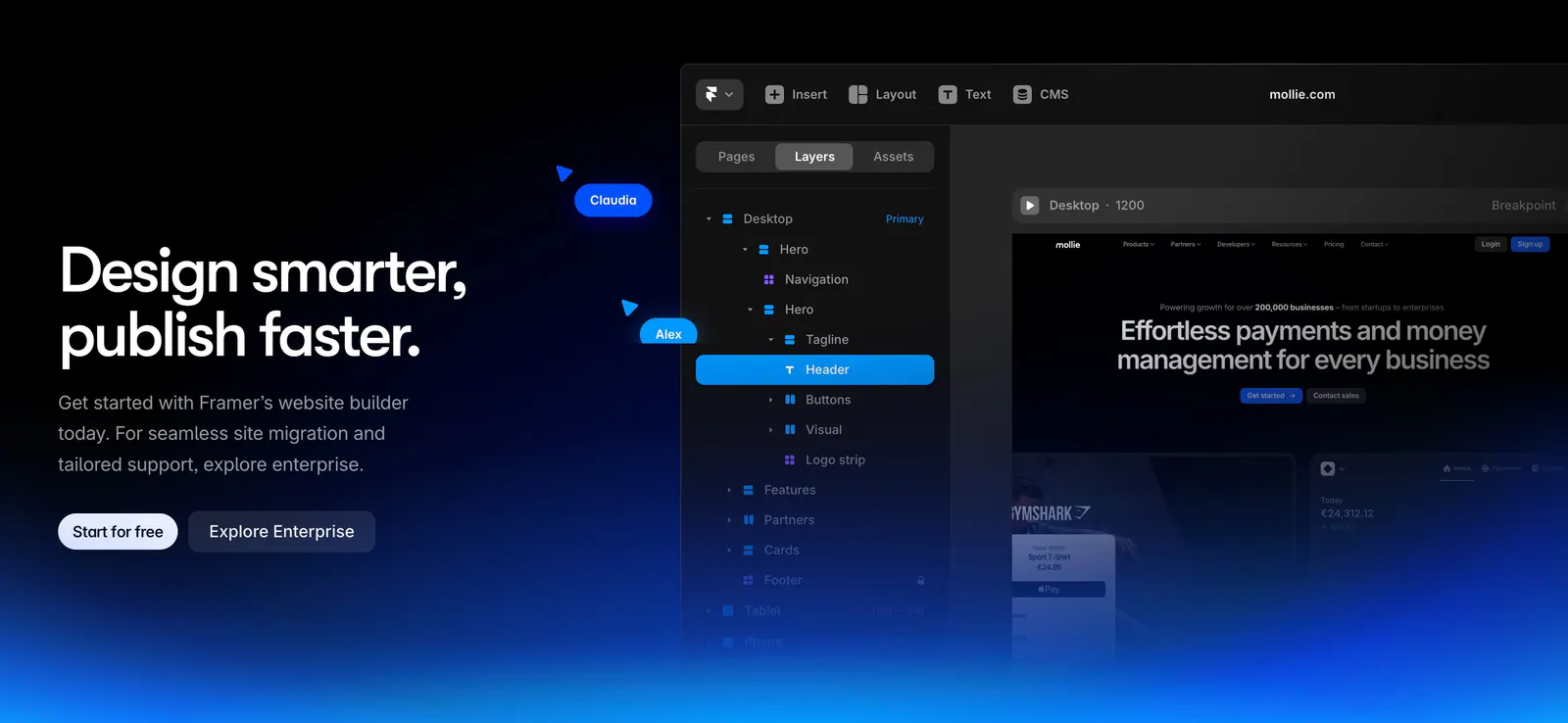
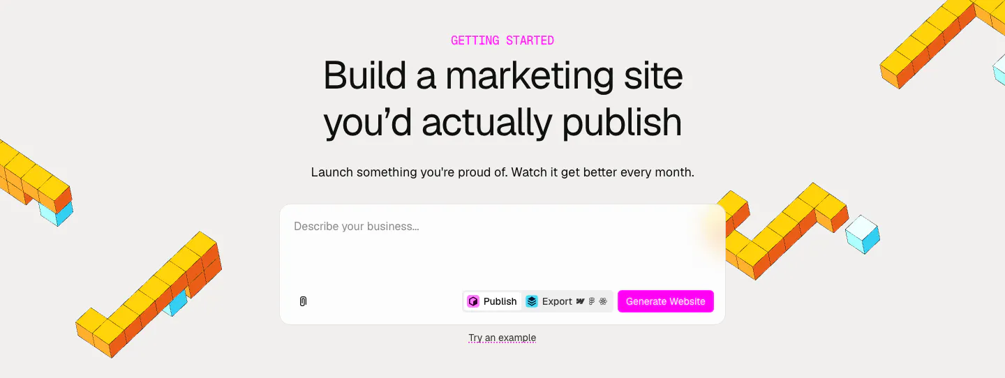
  43. Framer call-to-action section: left headline with two buttons beside the Framer editor layers panel, blue glow along the bottom on black
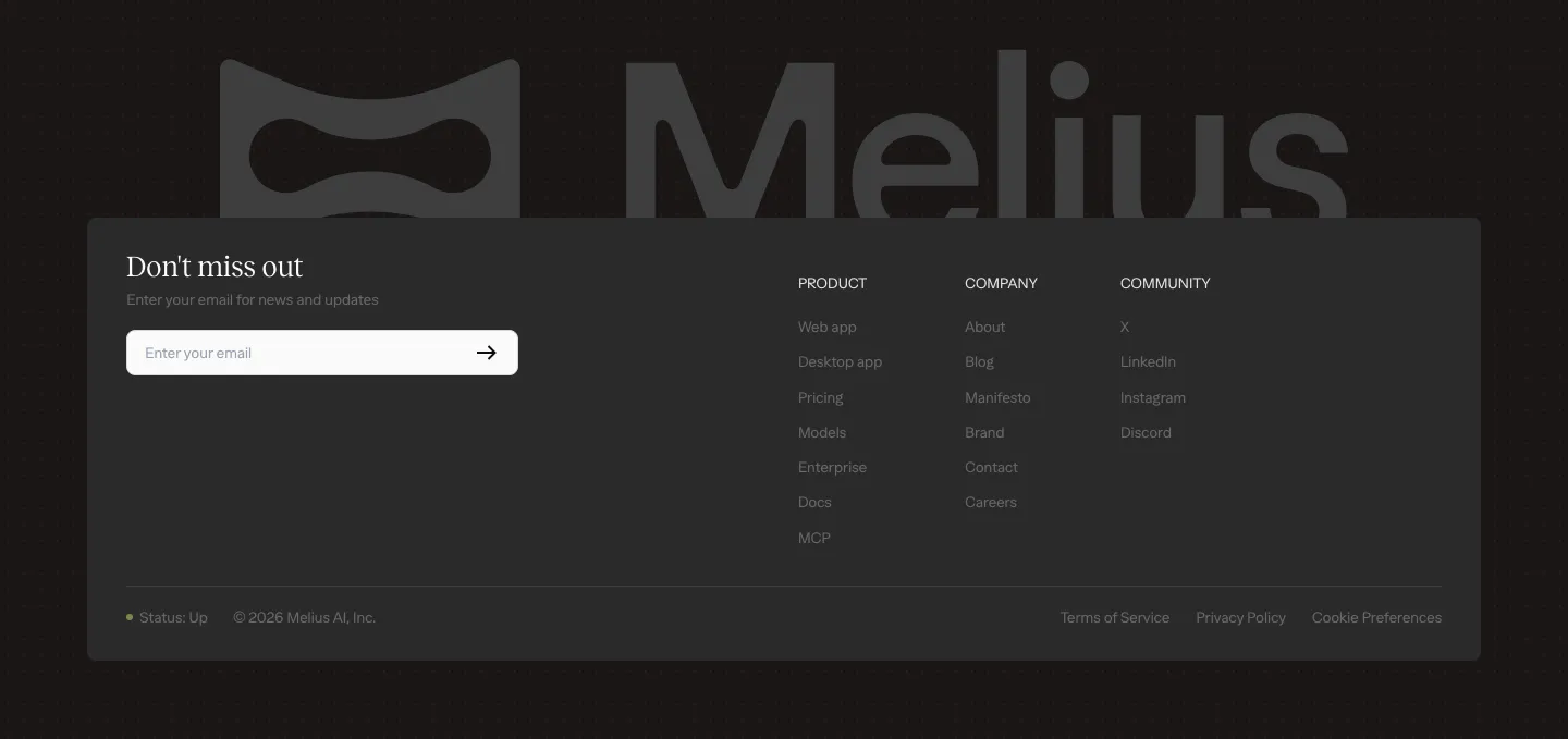
  44. Melius footer section: large gray Melius wordmark behind a dark card with email signup field, three link columns and legal row
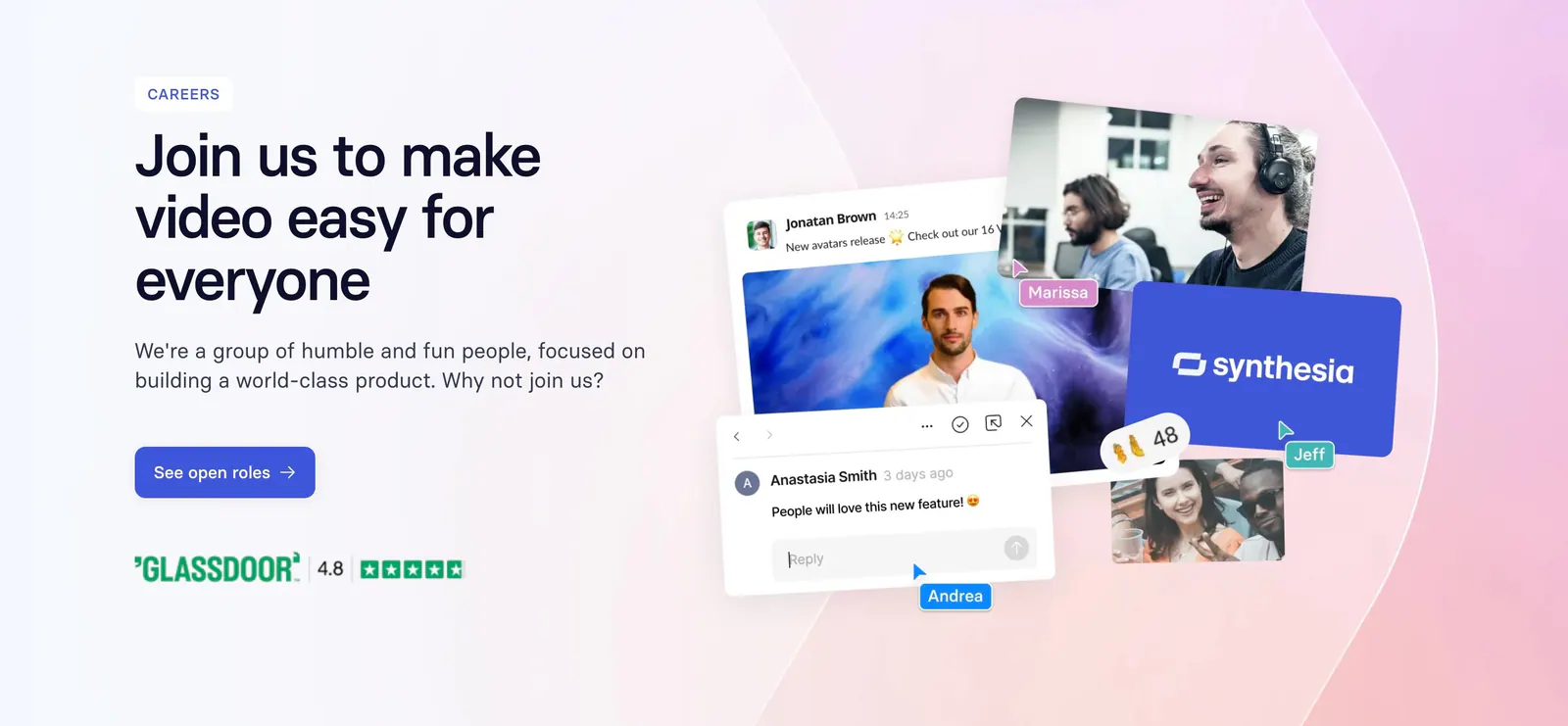
  45. Synthesia call-to-action section: careers banner with headline and blue button left, collage of team photos and chat UI on a pink gradient
  46. Relume call-to-action section: centered headline and AI prompt box with a pink Generate Website button, framed by yellow isometric voxel shapes
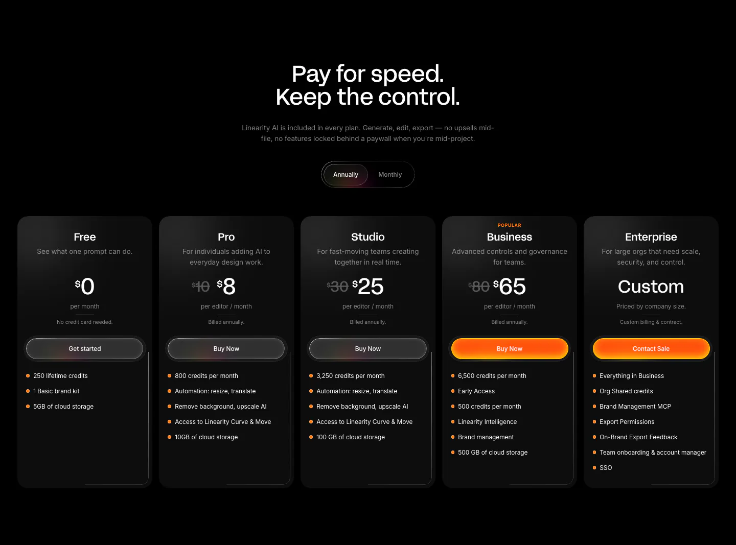
  47. Linearity pricing section: centered headline and annual/monthly toggle above five dark plan cards with orange accent buttons on black
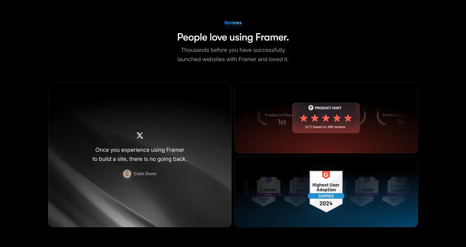
  48. Framer testimonials section: centered heading above a large tweet quote tile beside stacked Product Hunt and G2 badge tiles on black
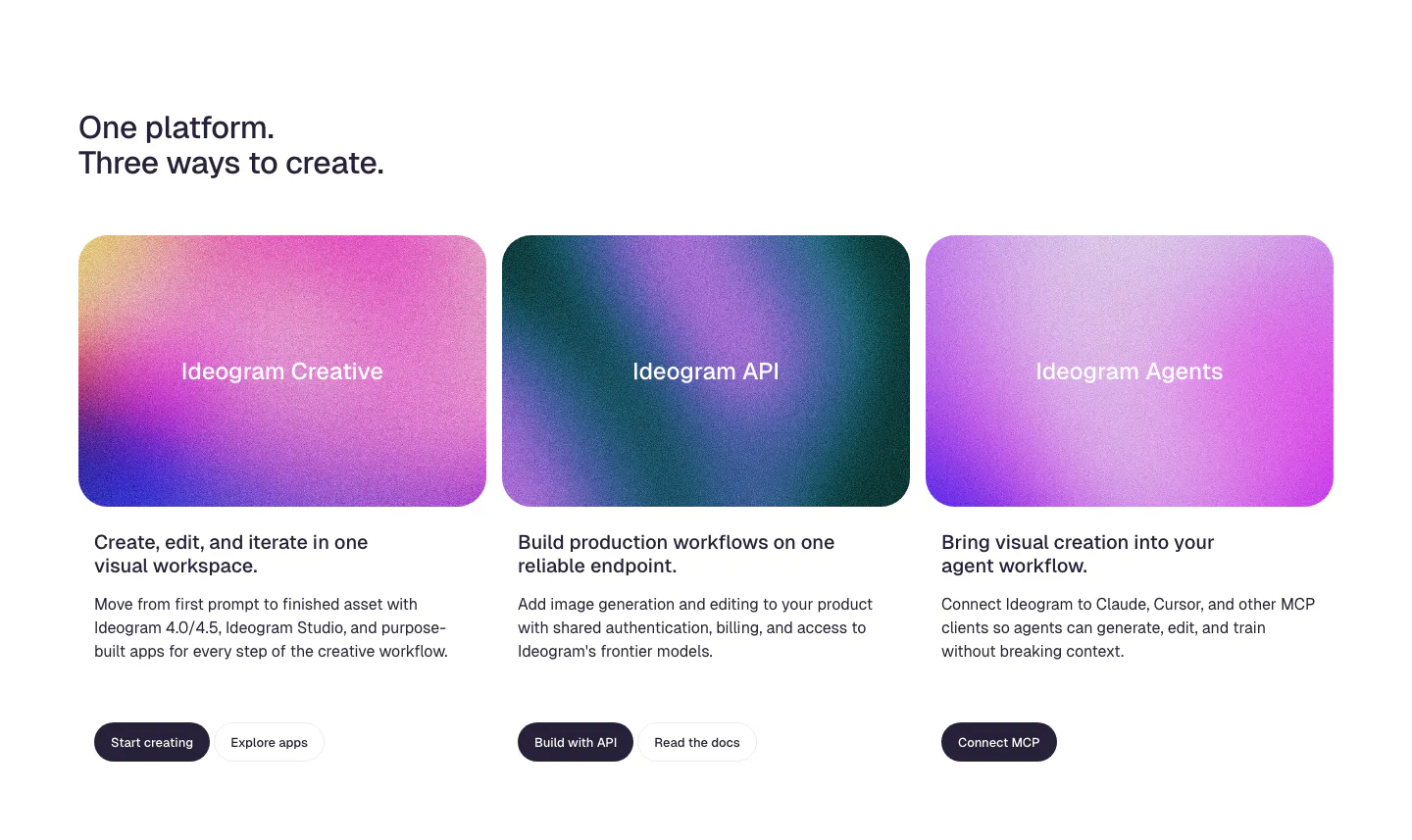
  49. Ideogram features section: two-line headline above three product cards with grainy pink and purple gradient panels, copy and buttons
  50. Relume features section: headline and intro copy above two cards with collages of website template mockups on a pink grid
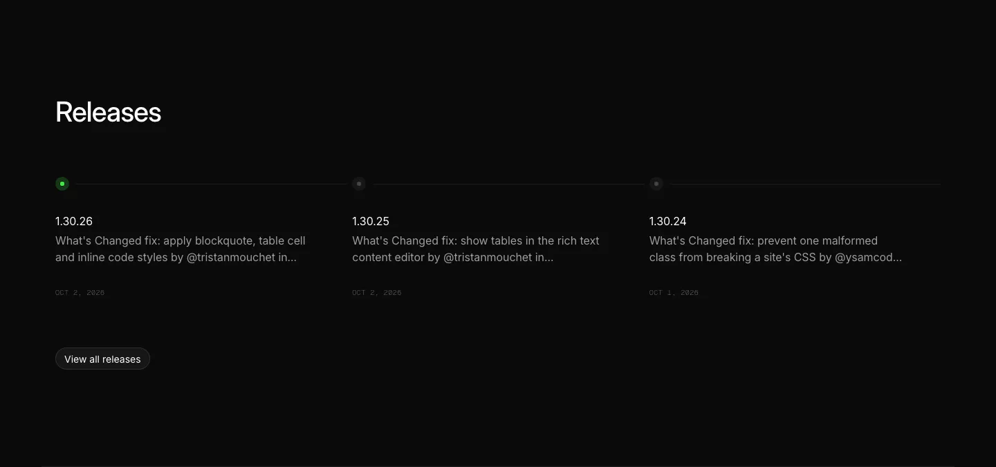
  51. Ycode blog & resources section: releases heading above three changelog entries on a horizontal timeline with a view all button
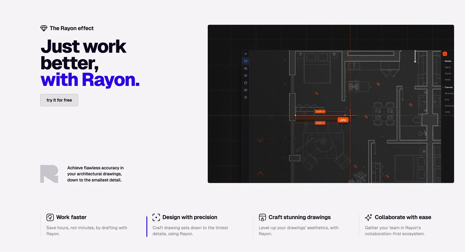
  52. Rayon features section: bold headline and button on the left, dark CAD floor plan screenshot on the right, four benefit columns below
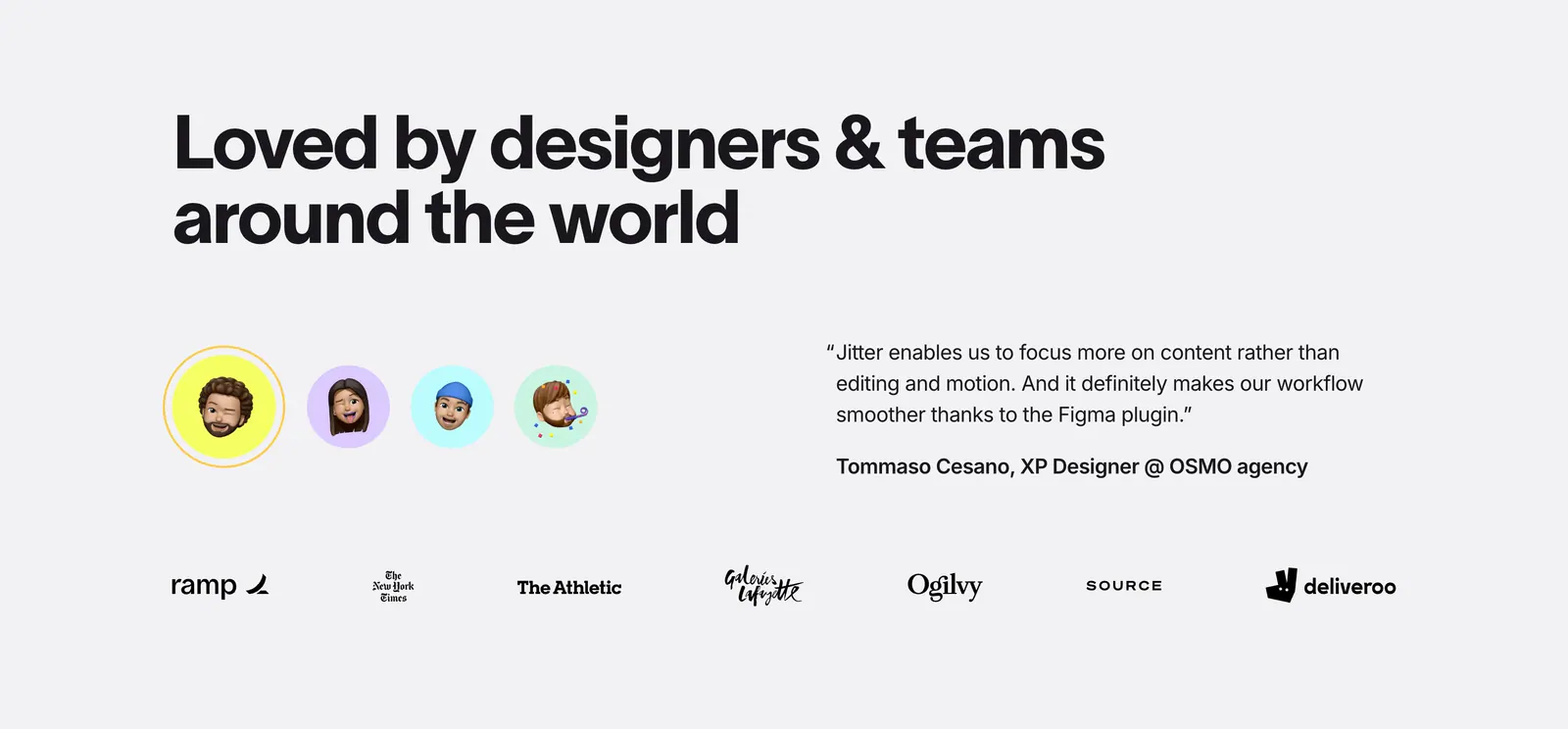
  53. Jitter testimonials section: large headline, memoji avatar selector beside a quote, and a row of customer logos on light gray
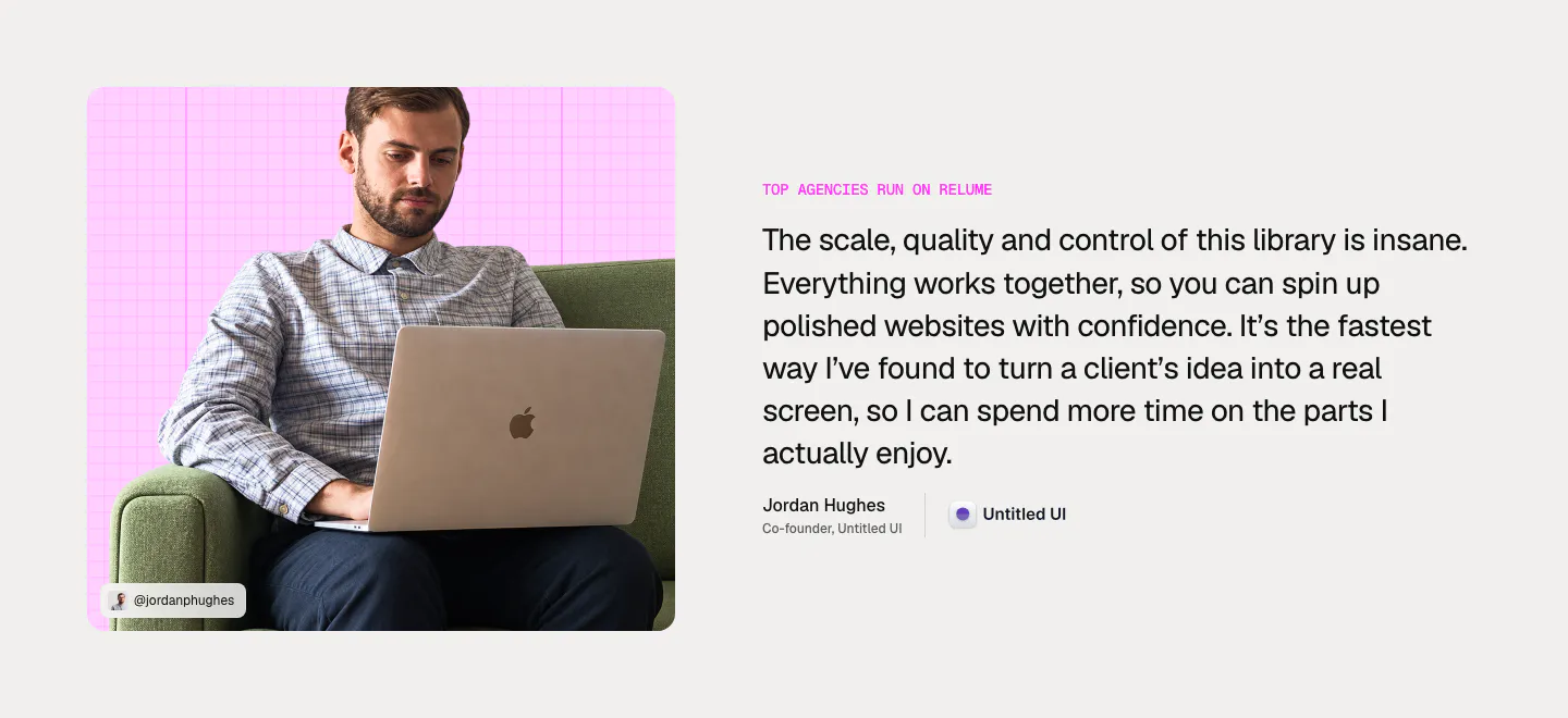
  54. Relume testimonial section: photo of a man with a laptop on a pink grid card on the left, large quote with name and company on the right
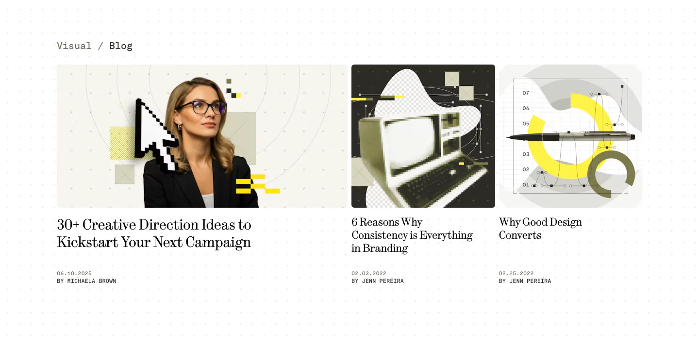
  55. Visual blog & resources section: one wide and two narrow article cards with collage cover images, serif titles and authors on a dotted white page
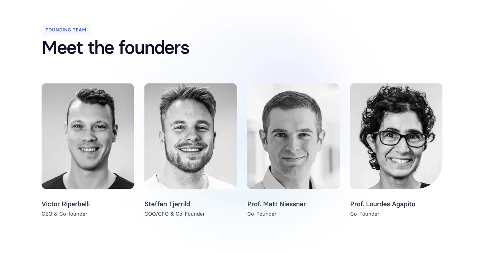
  56. Synthesia team section: left-aligned headline above four black-and-white founder headshot cards with names and titles on white
  57. Ycode footer section: small logo, two short link columns, social icon buttons and copyright line on a black background
  58. Relume logo cloud section: small caption on the left of a single rounded strip of black customer logos on a light gray background
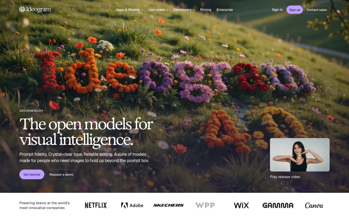
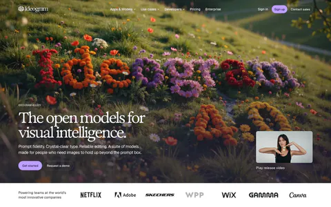
  59. Ideogram hero section: serif headline and buttons over a full-bleed hillside of flowers, release video thumbnail, logo strip below
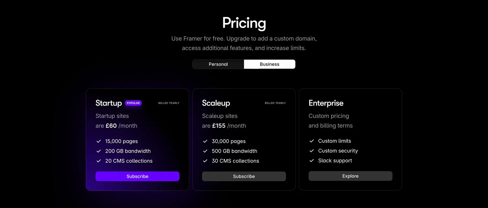
  60. Framer pricing section: centered heading with personal/business toggle above three dark plan cards, the popular one with a purple glow
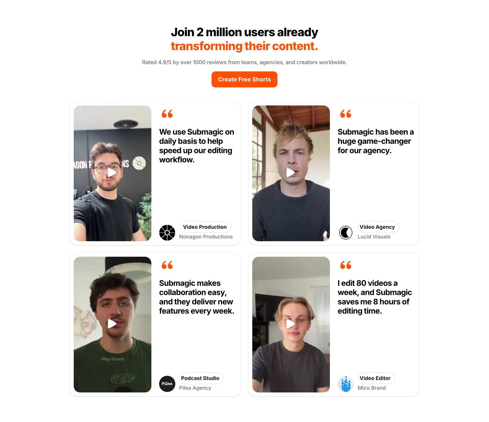
  61. Submagic testimonials section: centered headline and orange button above a 2x2 grid of quote cards with creator video thumbnails
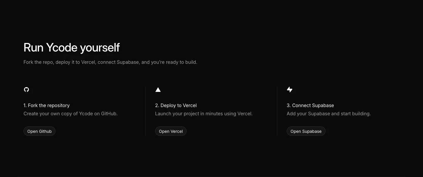
  62. Ycode how it works section: headline above three numbered steps with icons and buttons for GitHub, Vercel and Supabase on black
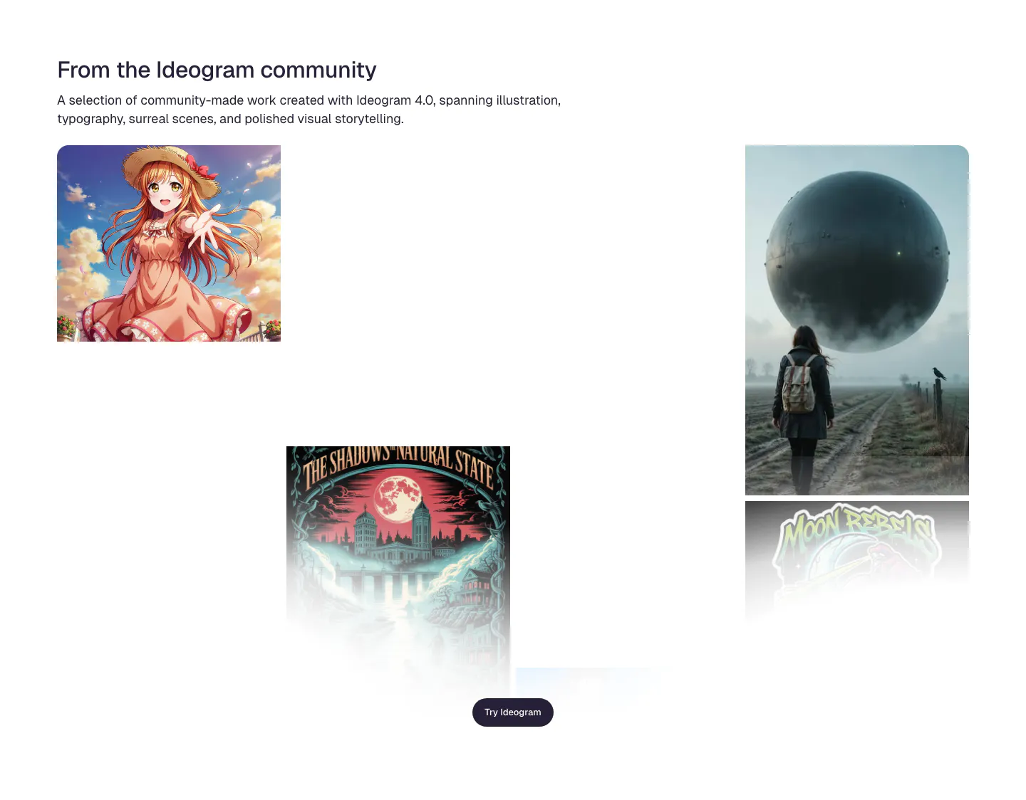
  63. Ideogram features section: headline and intro above a scattered gallery of community images incl. anime art, a poster and a surreal sphere
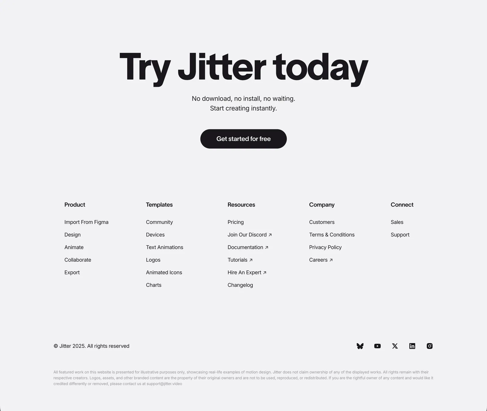
  64. Jitter footer section: large centered CTA headline and button above five link columns, copyright and social icons on light gray
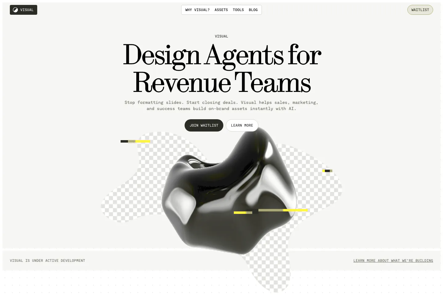
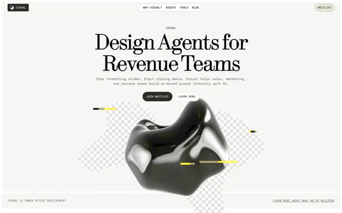
  65. Visual hero section: nav bar and centered serif headline with two buttons above a glossy black 3D blob on checkerboard shapes
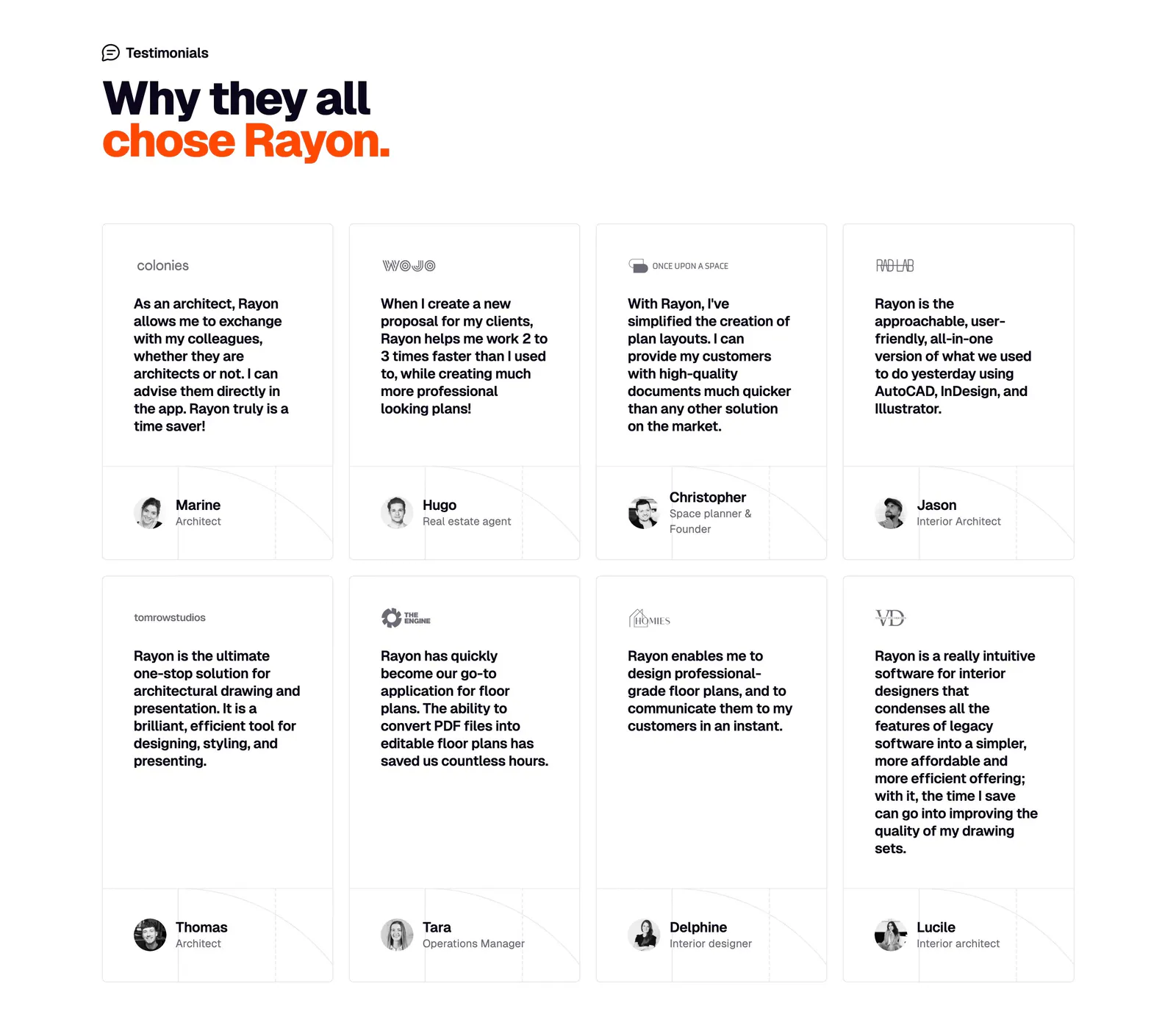
  66. Rayon testimonials section: two-line headline above a grid of eight quote cards with company logos and avatar names
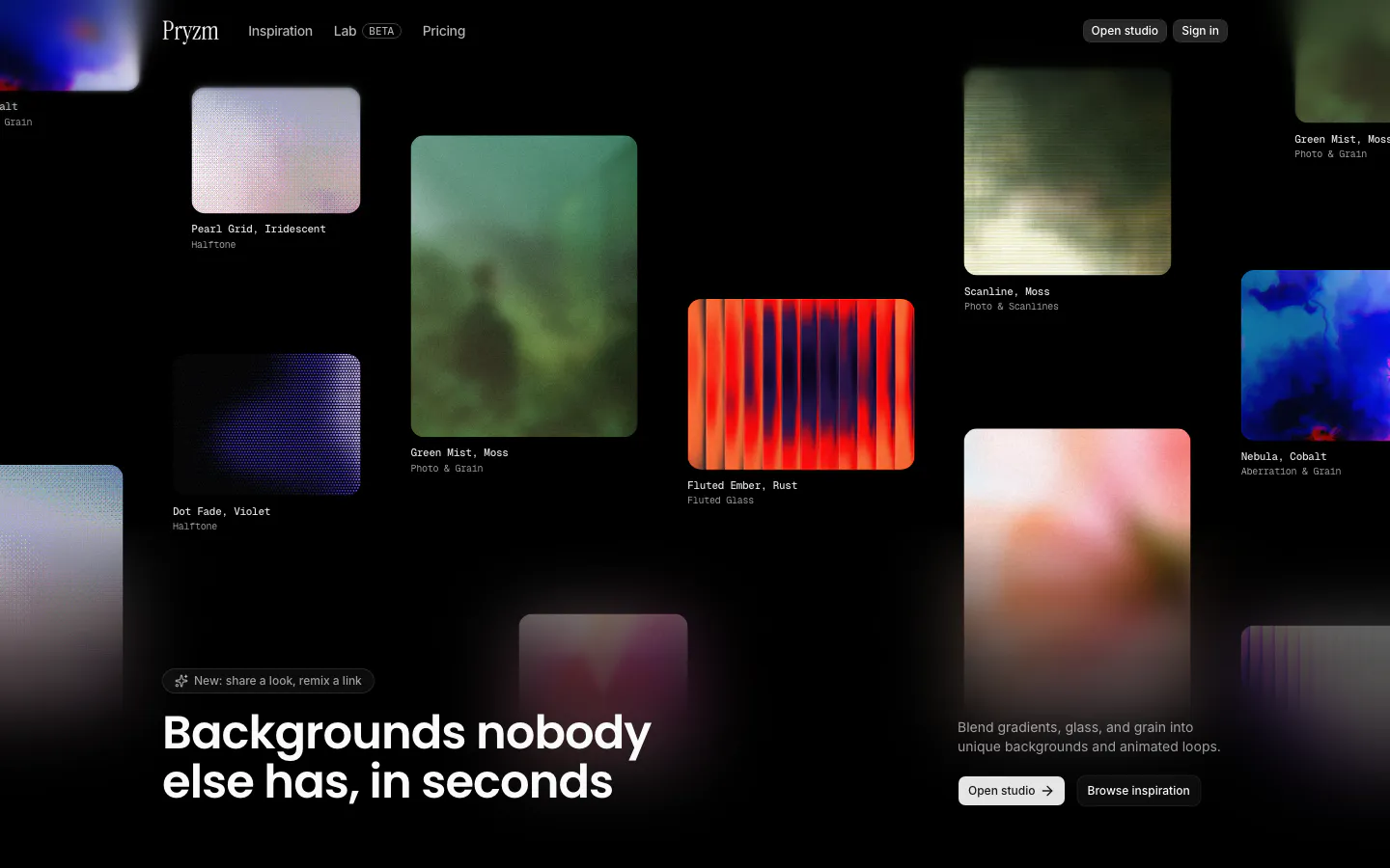
  67. Pryzm hero section: black canvas of scattered colorful background sample cards with labels, headline at bottom left and buttons at right
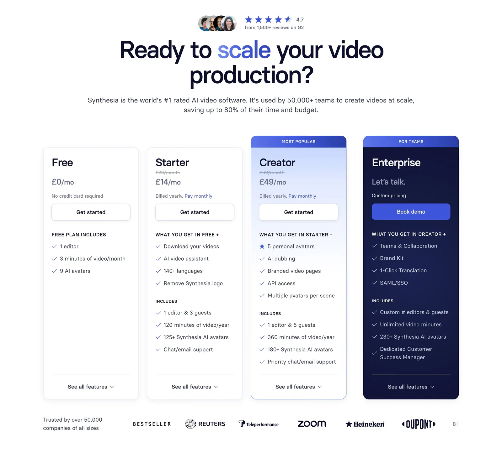
  68. Synthesia pricing section: centered headline with G2 rating above four plan cards, a navy enterprise card and a customer logo row
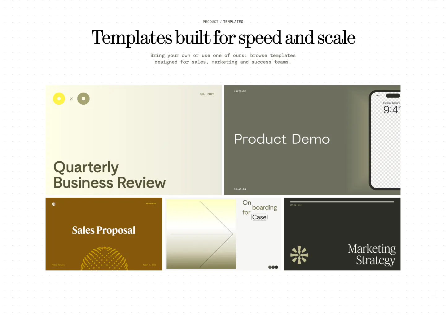
  69. Visual features section: centered serif headline above a bento grid of presentation template previews in olive, cream, brown and charcoal
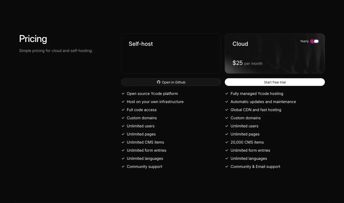
  70. Ycode pricing section: heading on the left, self-host and cloud plan cards with a yearly toggle and checkmark feature lists
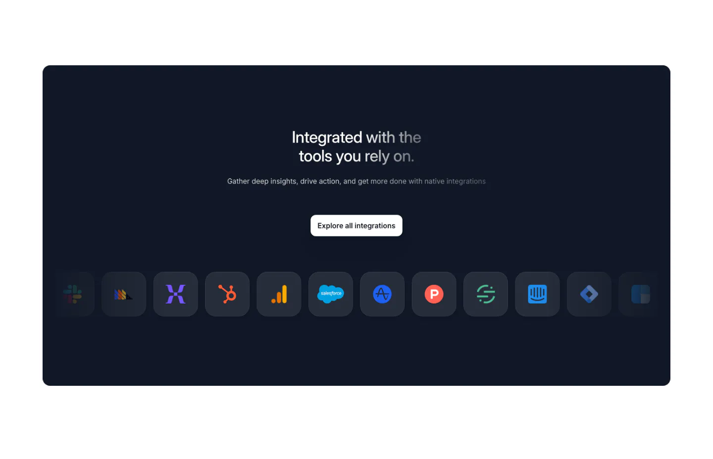
  71. Arcade integrations section: dark navy panel with centered headline, Explore button and a row of app icon tiles fading at the edges
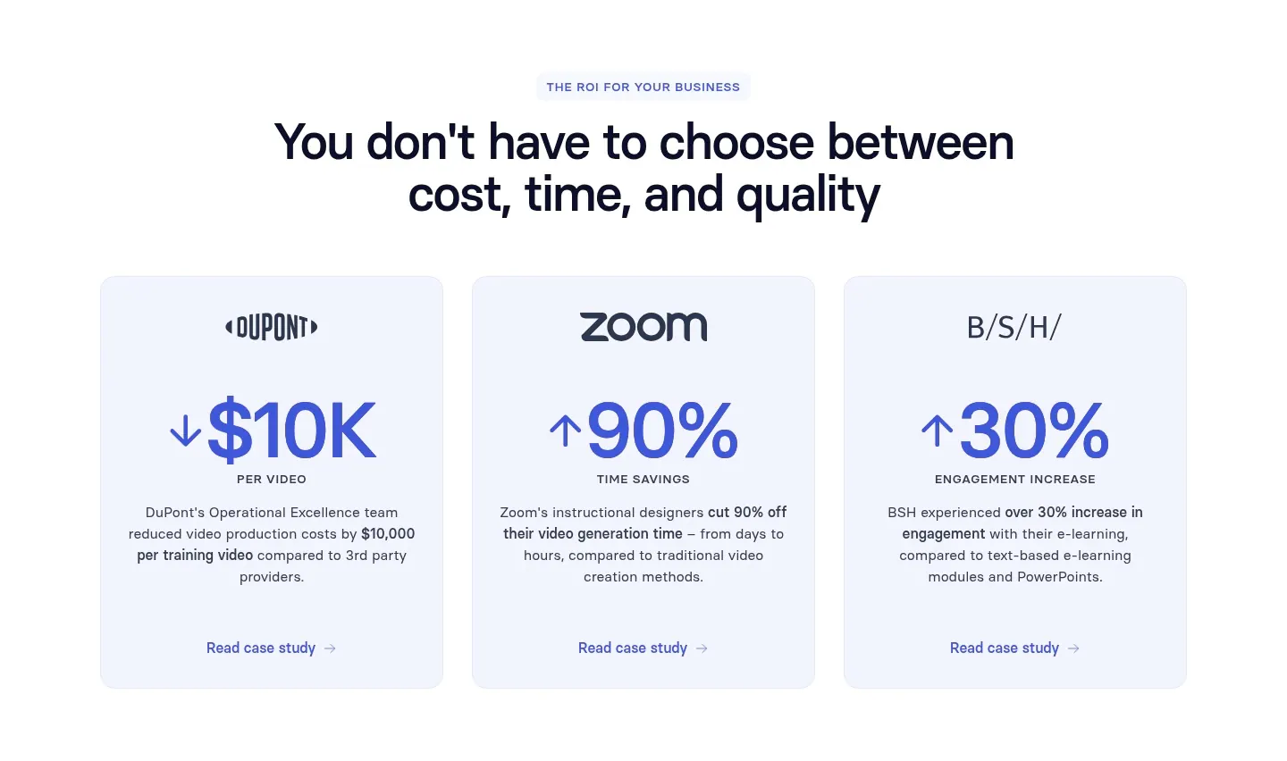
  72. Synthesia value proposition section: centered headline above three pale blue cards with company logos, large ROI metrics and case study links
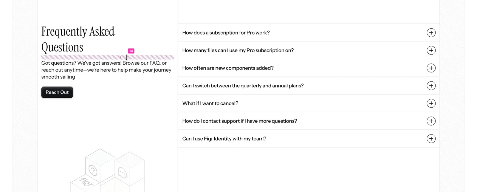
  73. Figr FAQ section: serif heading, intro and Reach Out button on the left with a seven-question accordion on the right
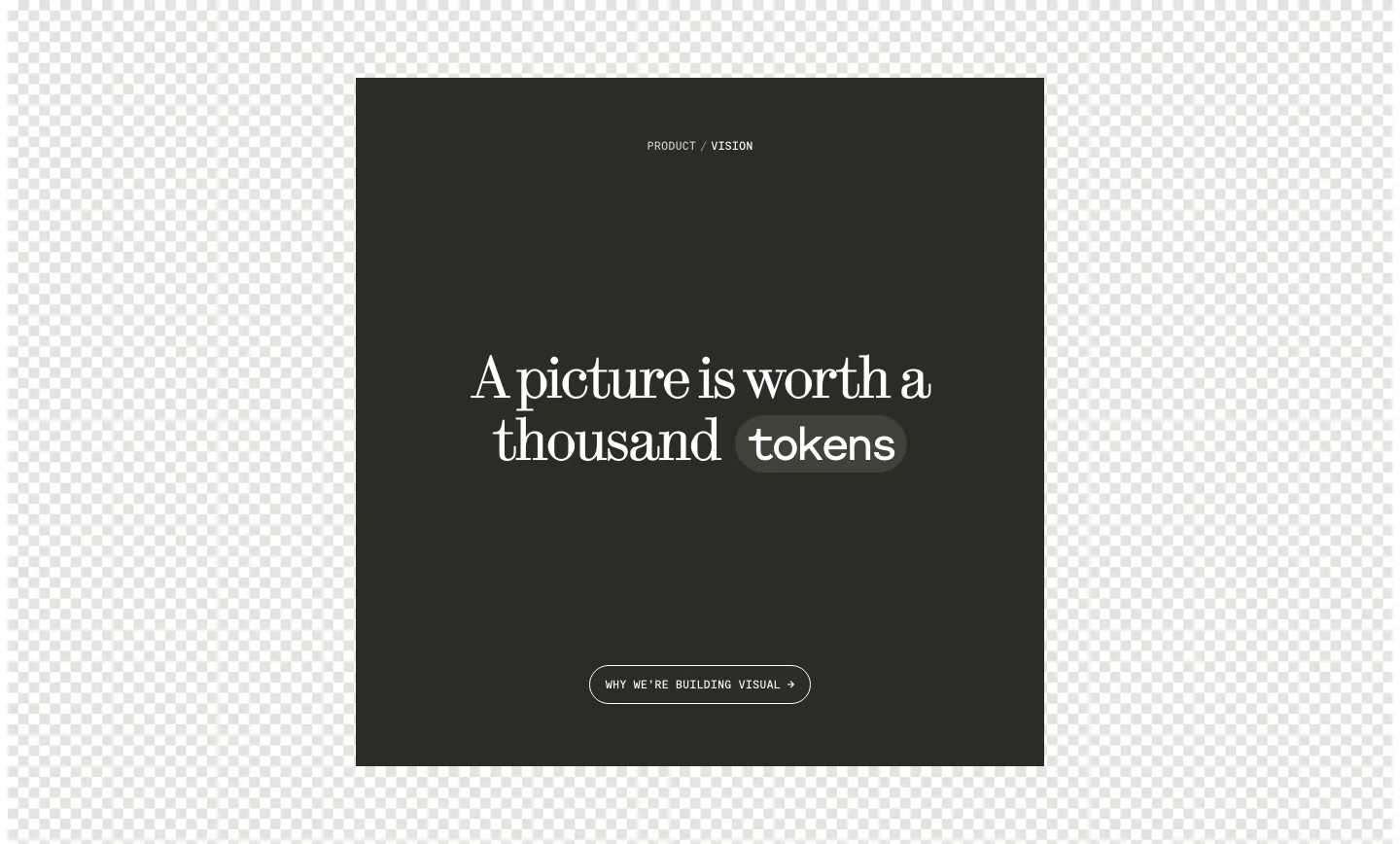
  74. Visual call to action section: dark square panel with centered serif headline, a tokens pill and outline button over a checkerboard background
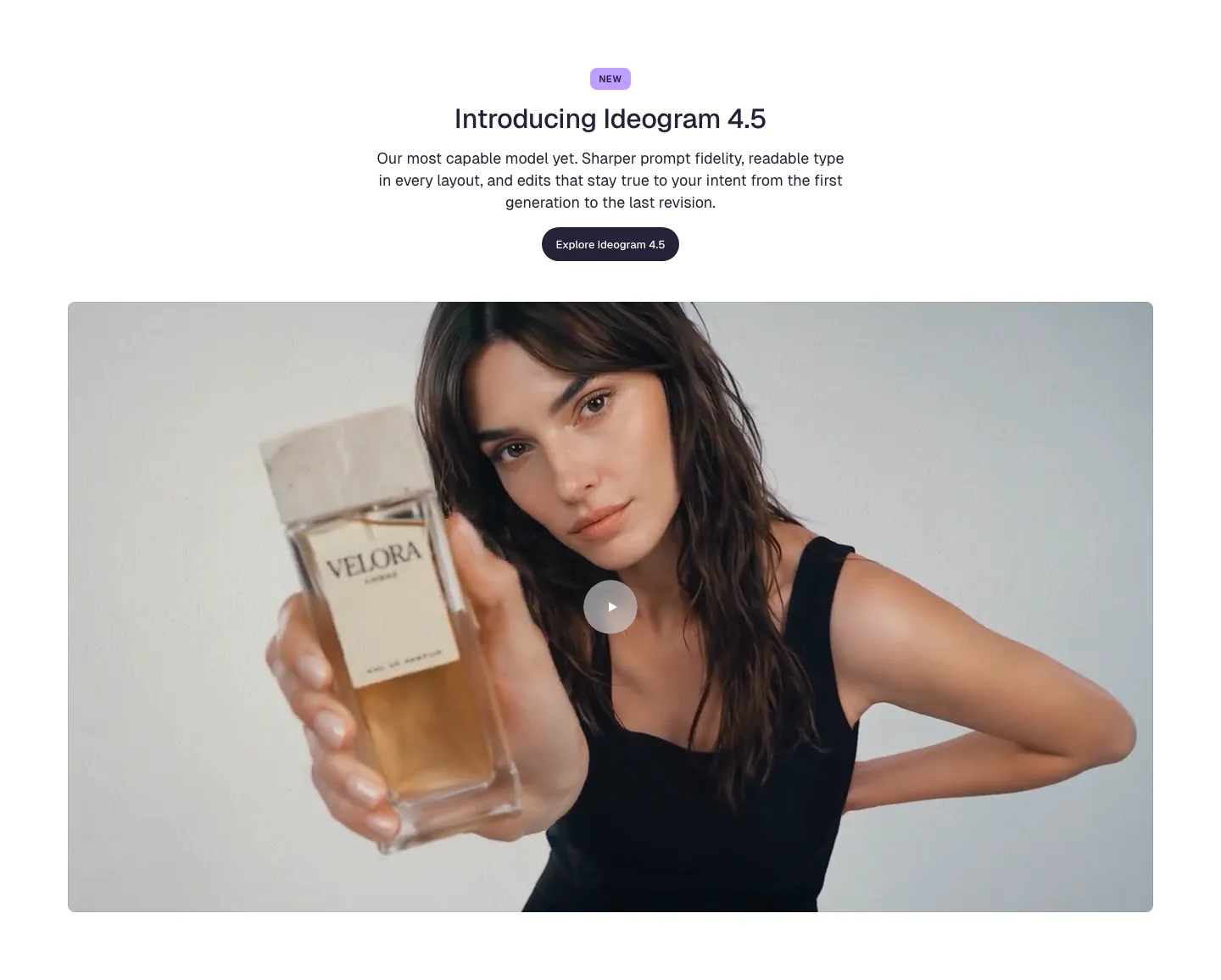
  75. Ideogram features section: centered NEW badge, headline, copy and button above a wide video frame of a woman holding a perfume bottle
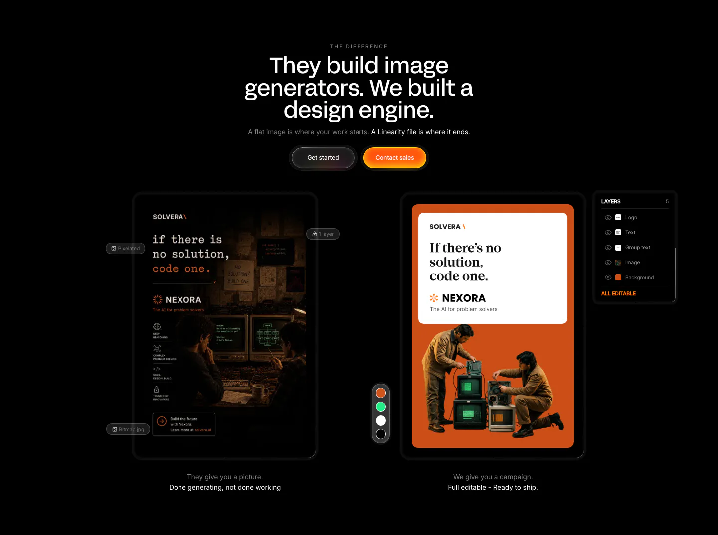
  76. Linearity comparison section: centered headline above a flat image mockup versus an editable ad design with a layers panel, on black
  77. Modulify footer section: white rounded card with logo, five link columns and language picker over grainy orange edges
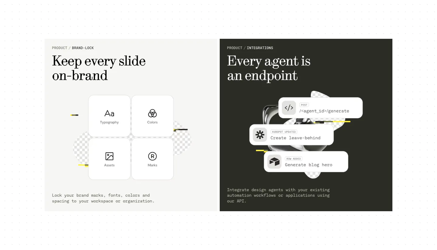
  78. Visual features section: two side-by-side panels, a light one with four brand-lock tiles and a dark one with stacked API endpoint cards
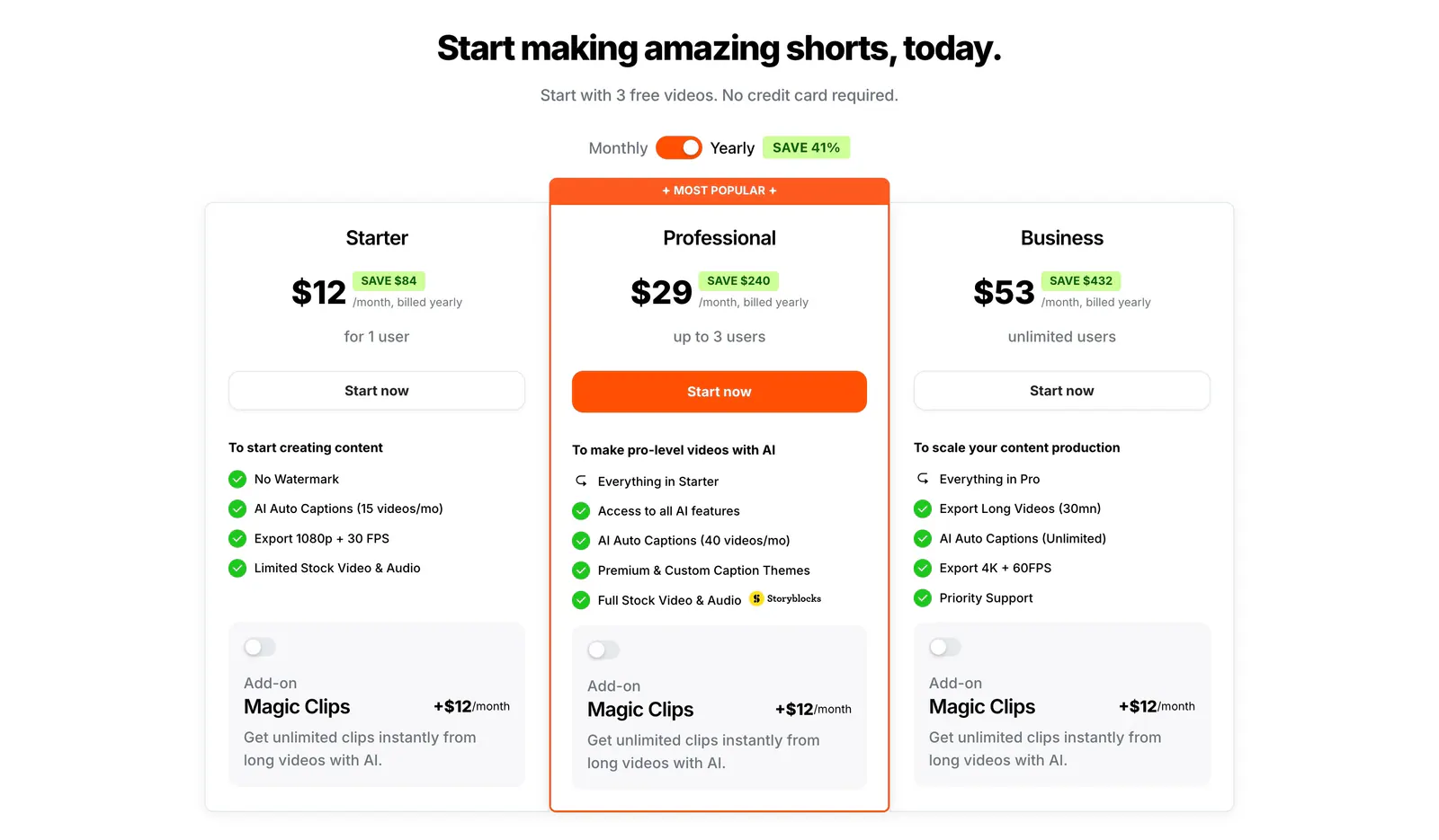
  79. Submagic pricing section: centered headline, monthly/yearly toggle and three plan cards with a highlighted orange Professional tier on white
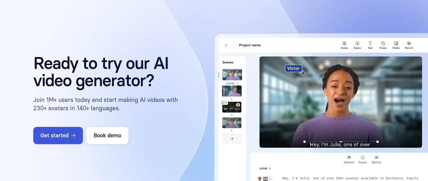
  80. Synthesia call-to-action section: headline with two buttons on the left and a video editor UI screenshot on a lavender-blue gradient right
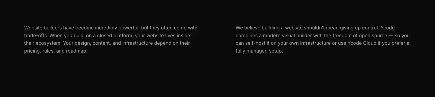
  81. Ycode about & mission section: two columns of gray paragraph text about closed platforms and open source control on black
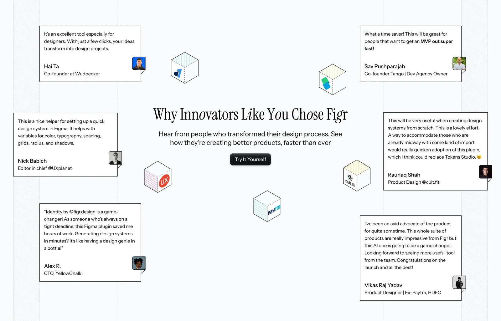
  82. Figr testimonials section: centered serif headline and button surrounded by scattered quote cards and isometric logo cubes
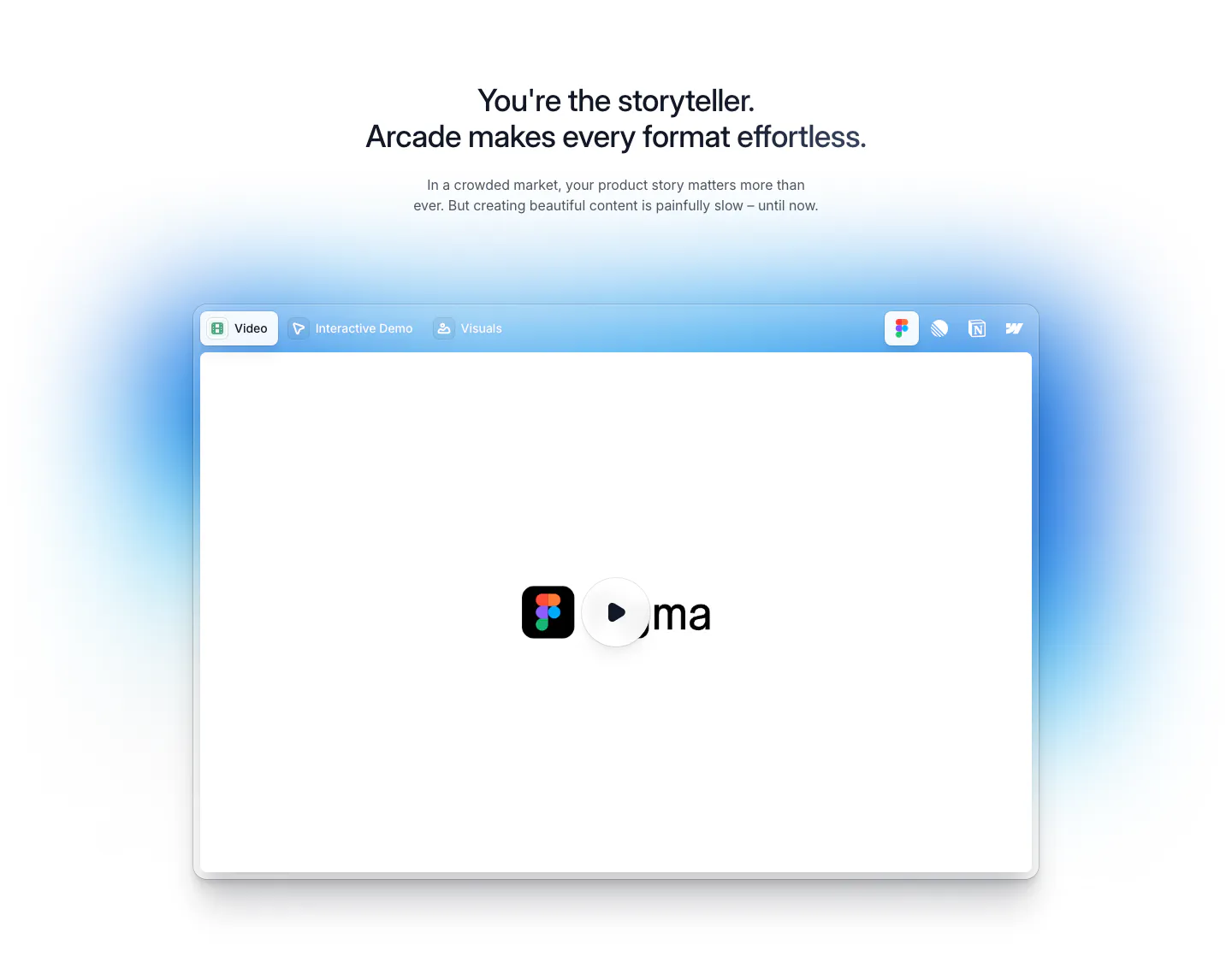
  83. Arcade features section: centered headline above a tabbed video player window with a play button and soft blue glow
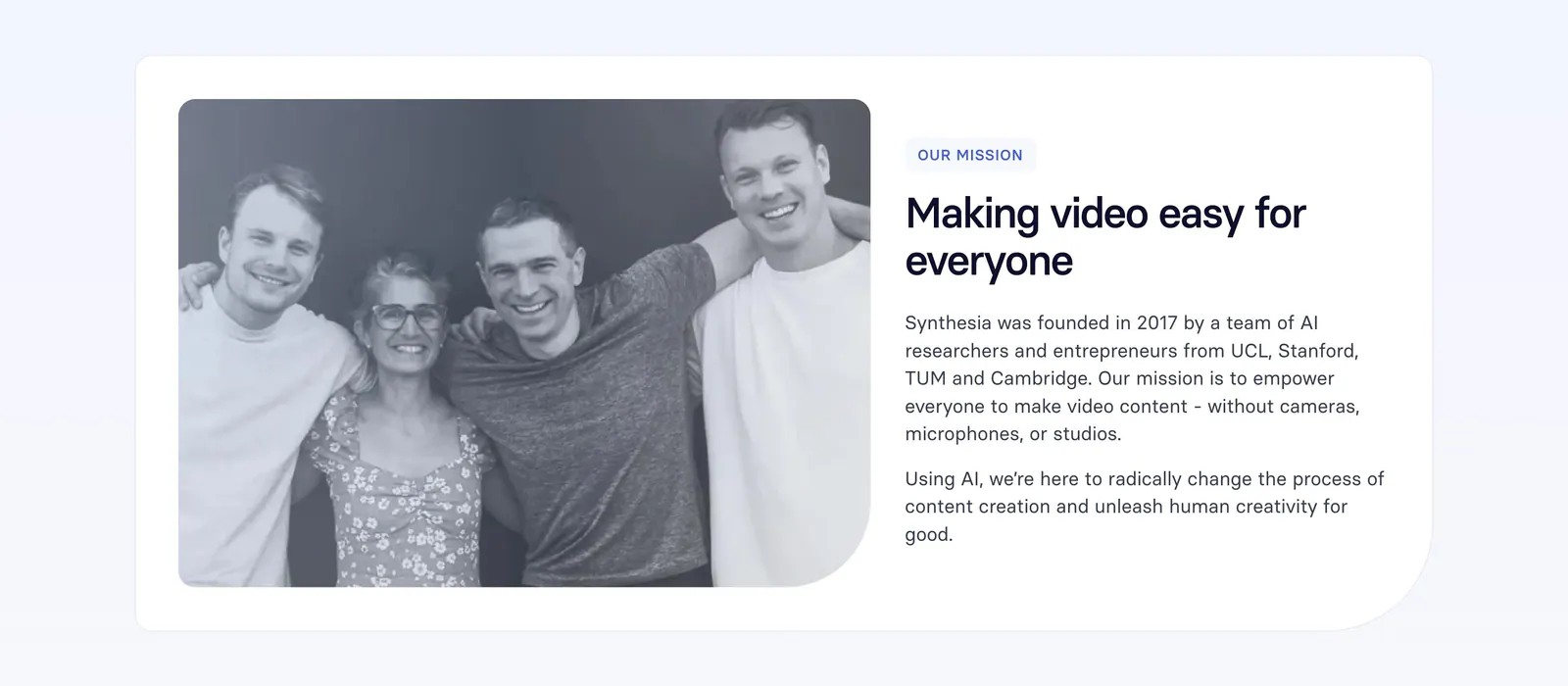
  84. Synthesia about & mission section: black-and-white founders photo on the left with mission label, headline and paragraphs on the right
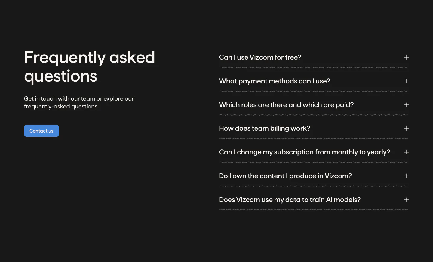
  85. Vizcom FAQ section: headline, copy and contact button on the left beside an accordion of questions on a dark charcoal background
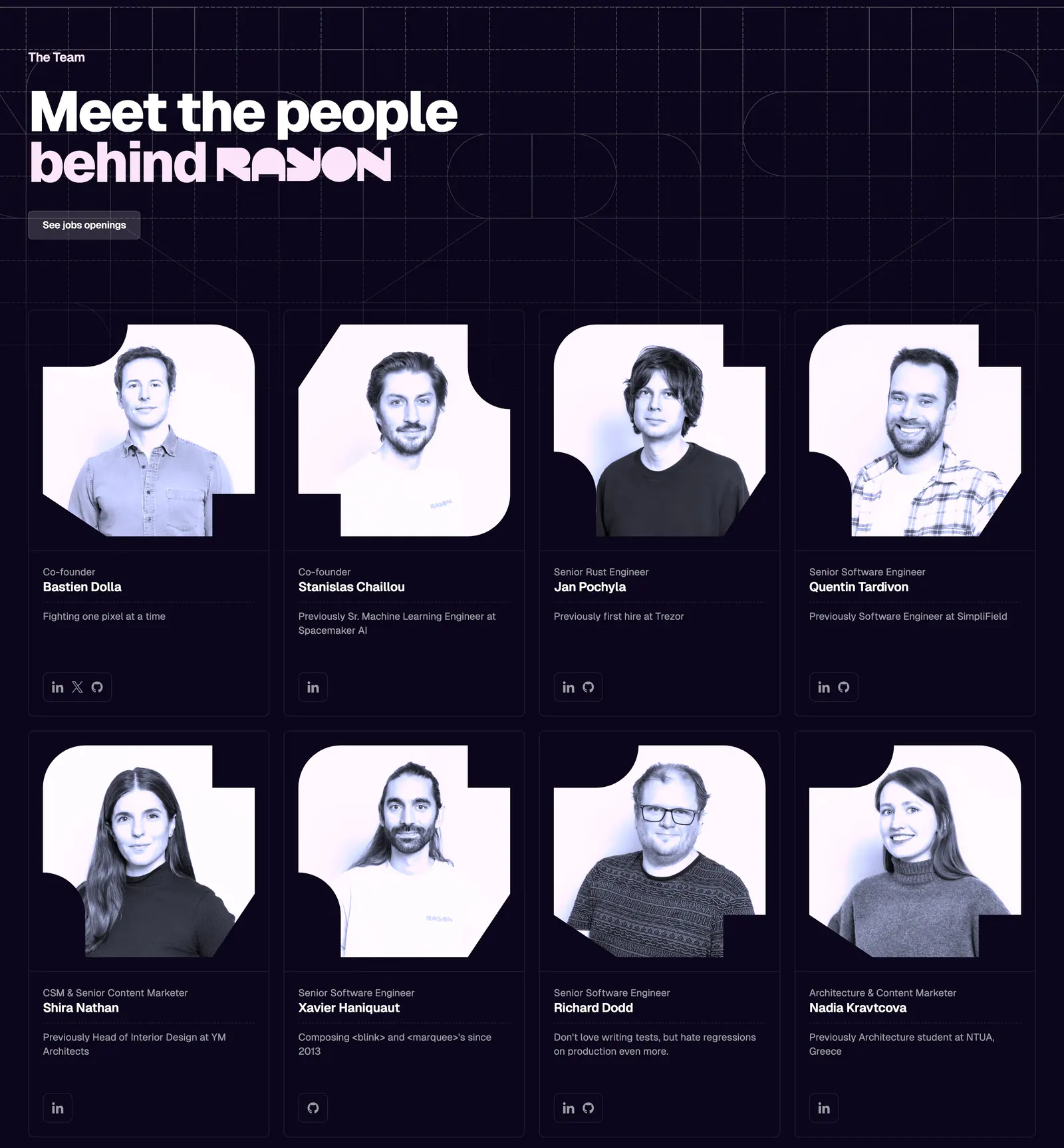
  86. Rayon team section: headline on a dark navy grid above two rows of four team member cards with tinted portrait photos
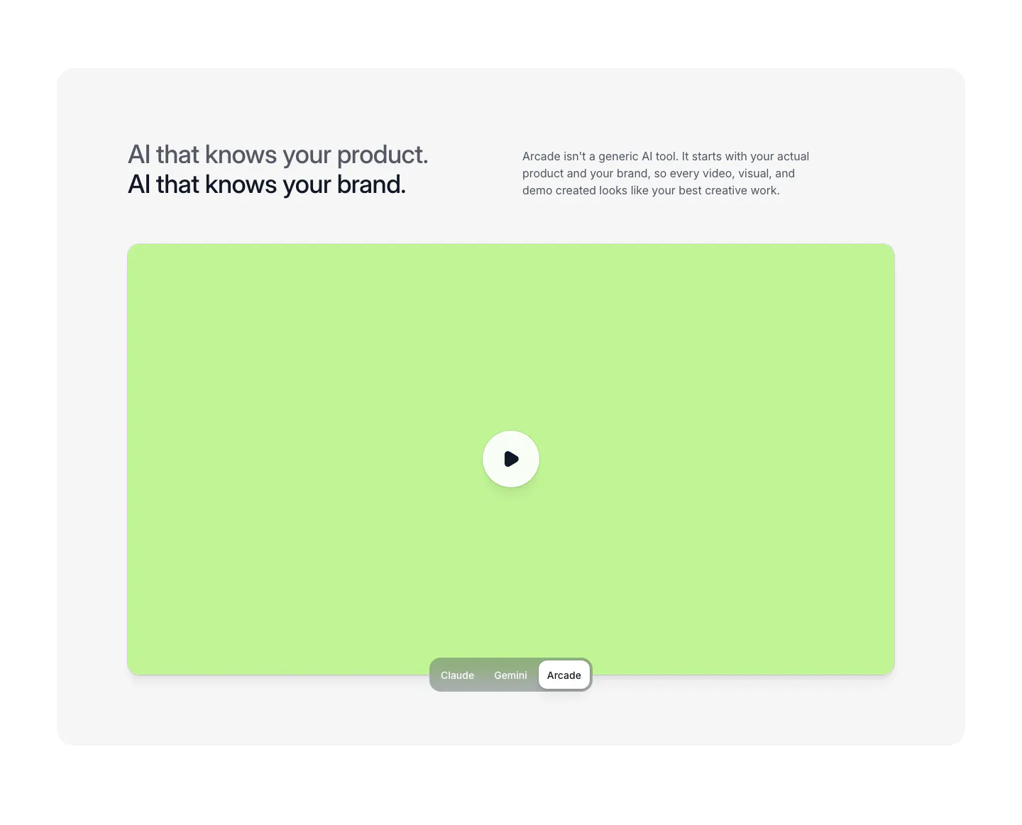
  87. Arcade features section: two-line headline and copy above a lime video panel with play button and a Claude/Gemini/Arcade toggle
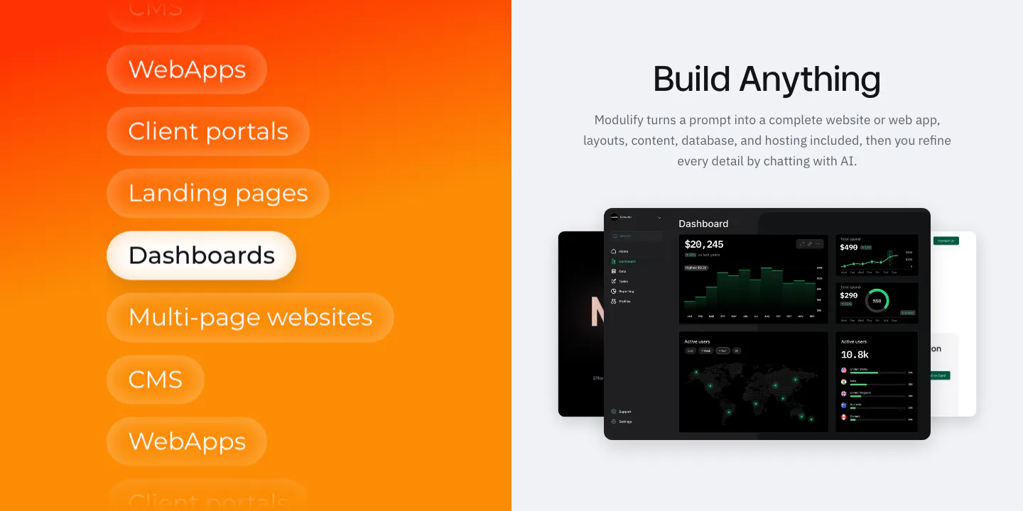
  88. Modulify features section: orange gradient panel of stacked use-case pills beside a headline and dark dashboard mockups
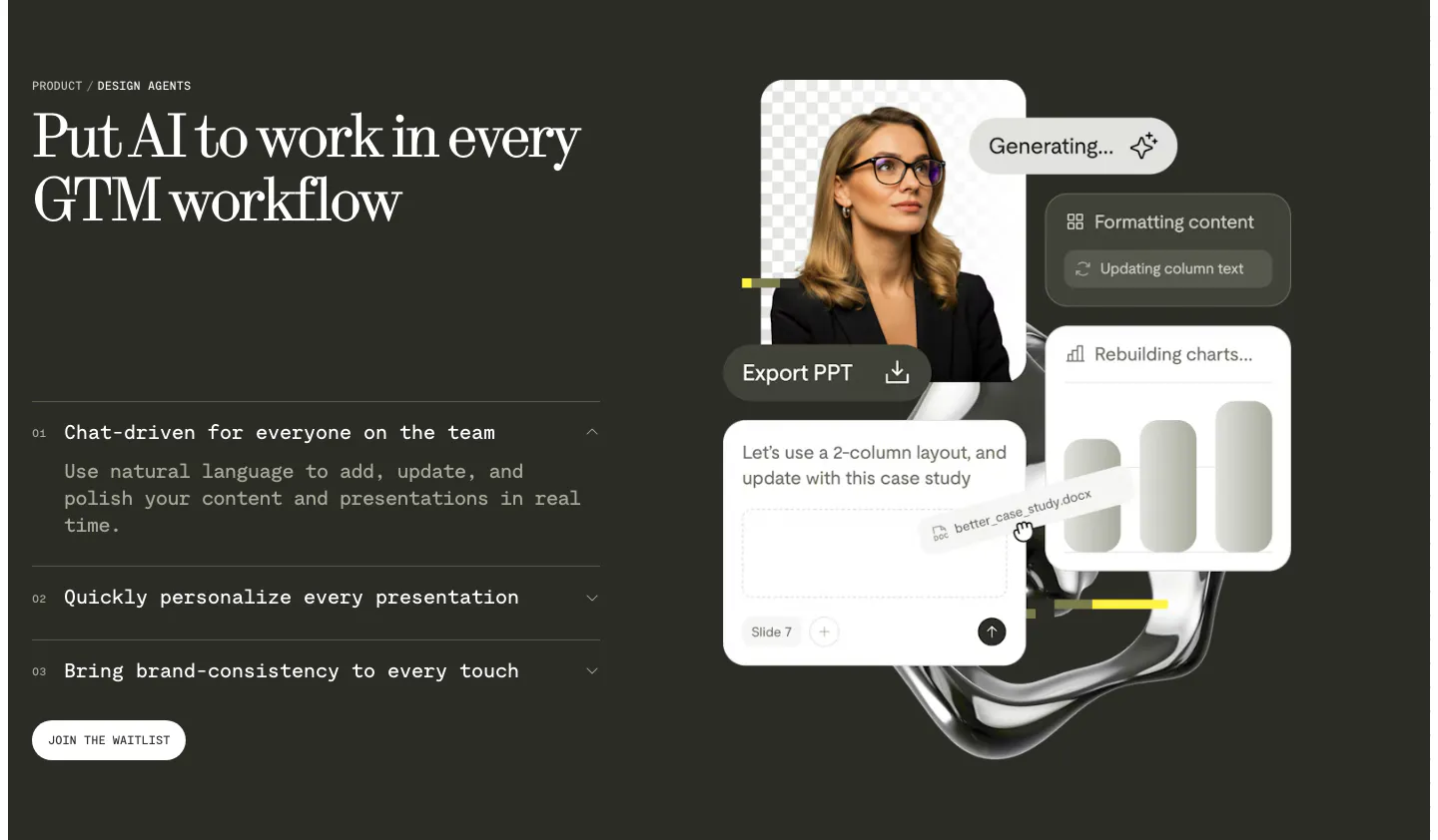
  89. Visual features section: charcoal split layout with serif headline and numbered accordion left, floating AI editing UI cards and portrait right
  90. Rayon logo cloud section: small heading above two scrolling rows of white customer logos in orange dashed boxes on dark navy
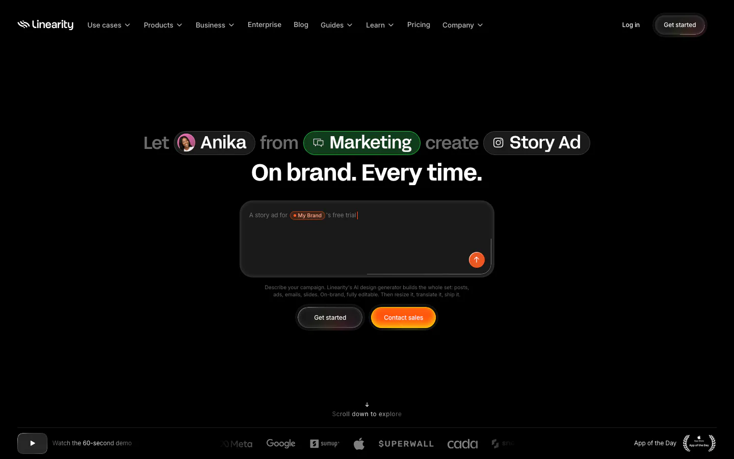
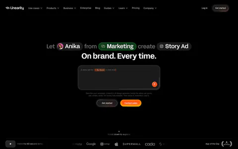
  91. Linearity hero section: centered headline with inline avatar and tag chips above a dark prompt box, two buttons and a logo strip on black
  92. Modulify features section: centered headline above a four-card bento of product UI mockups on an orange gradient band
  93. Arcade testimonials section: centered quote under a G2 five-star rating with a handwritten signature and job title
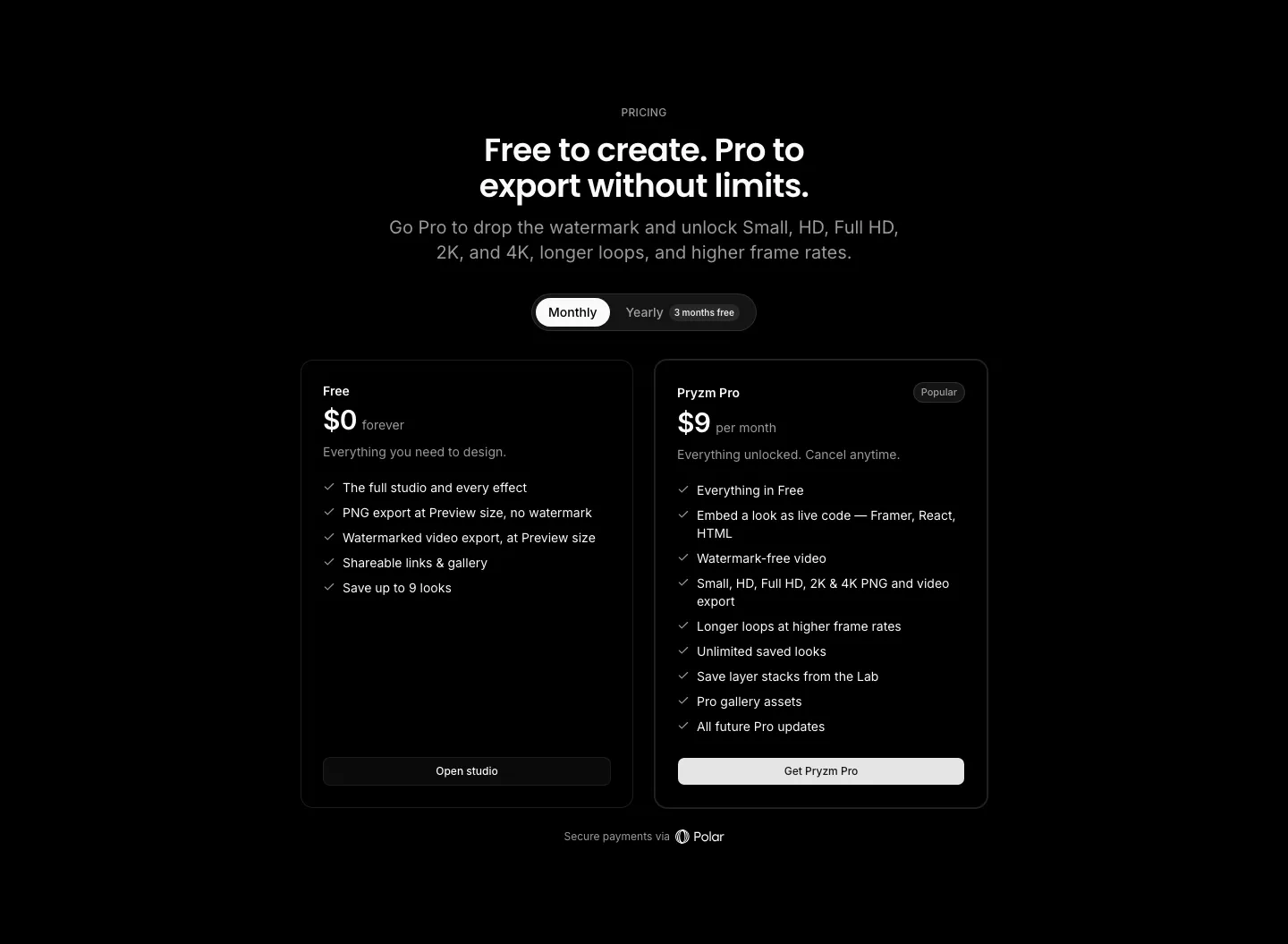
  94. Pryzm pricing section: black background with centered headline, monthly/yearly toggle and two plan cards with feature checklists
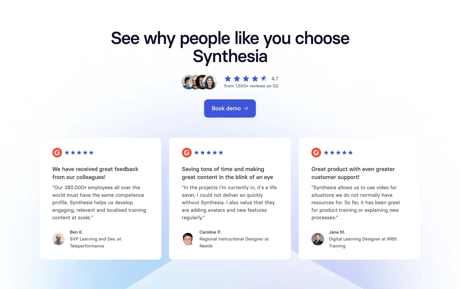
  95. Synthesia testimonials section: centered headline, G2 rating and button above three white G2 review cards with avatars
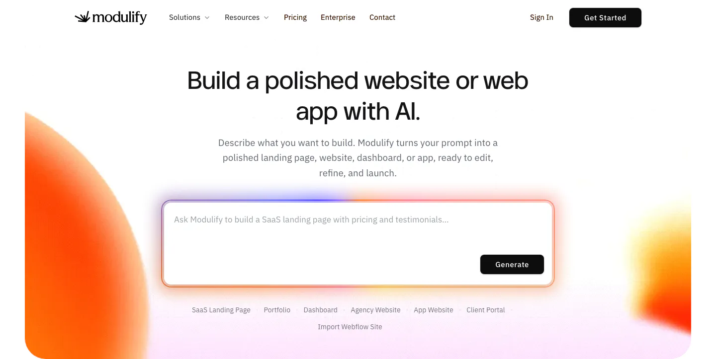
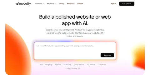
  96. Modulify hero section: centered headline above a large AI prompt box with template chips, flanked by orange gradient blobs
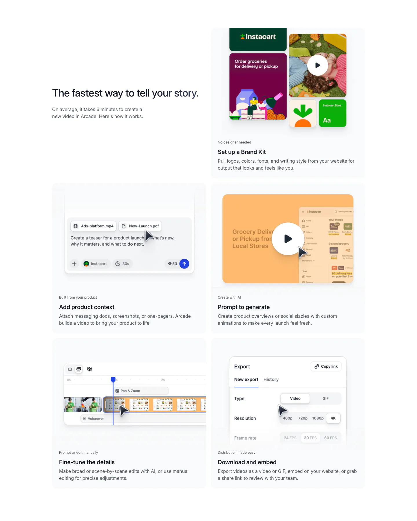
  97. Arcade how it works section: headline beside a two-column grid of five step cards showing brand kit, prompt, editor and export UI
  98. Figr logo cloud section: centered serif heading above a single fading row of customer logos like Airtable and monday.com
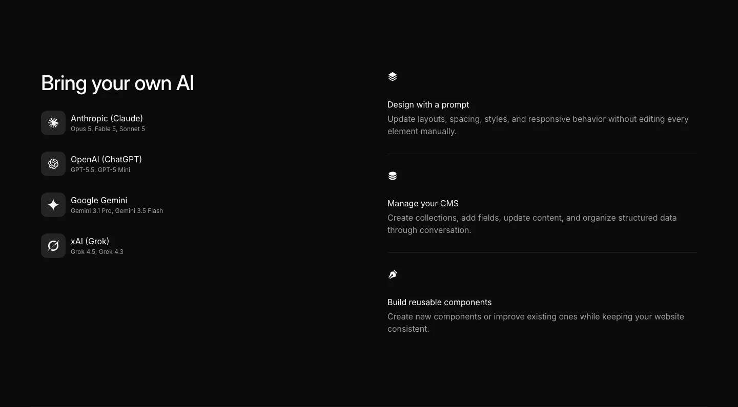
  99. Ycode integrations section: headline over four AI provider rows with icons on the left, three AI feature rows on the right, black
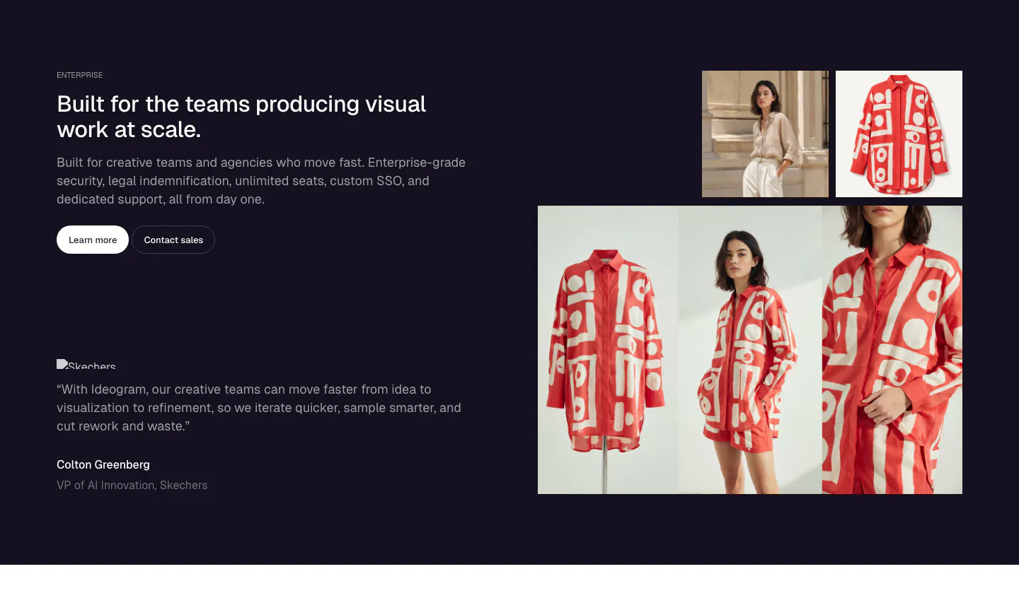
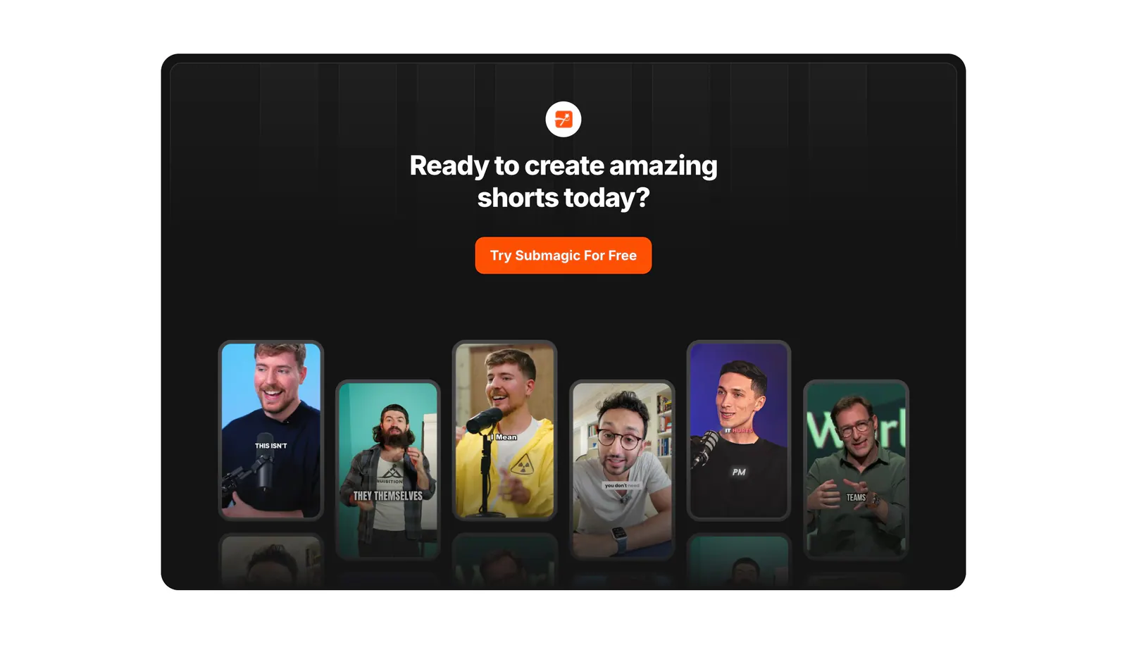
  100. Ideogram testimonials section: dark navy split with headline, buttons and a Skechers quote left, photo grid of a red patterned shirt right
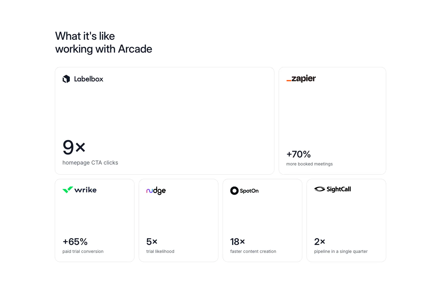
  101. Arcade stats section: bento grid of six bordered cards, each with a customer logo and a large result metric like 9x or +70%
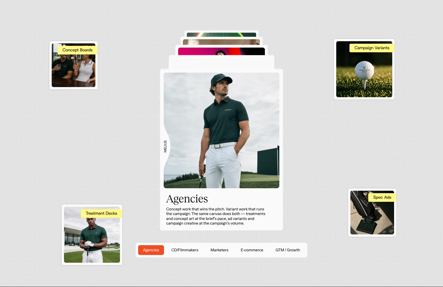
  102. Melius use cases section: stacked card with a golf apparel photo and serif Agencies copy, floating labeled thumbnails, persona tab bar
  103. Submagic call-to-action section: centered headline and orange button in a dark rounded panel above a row of vertical creator video thumbnails
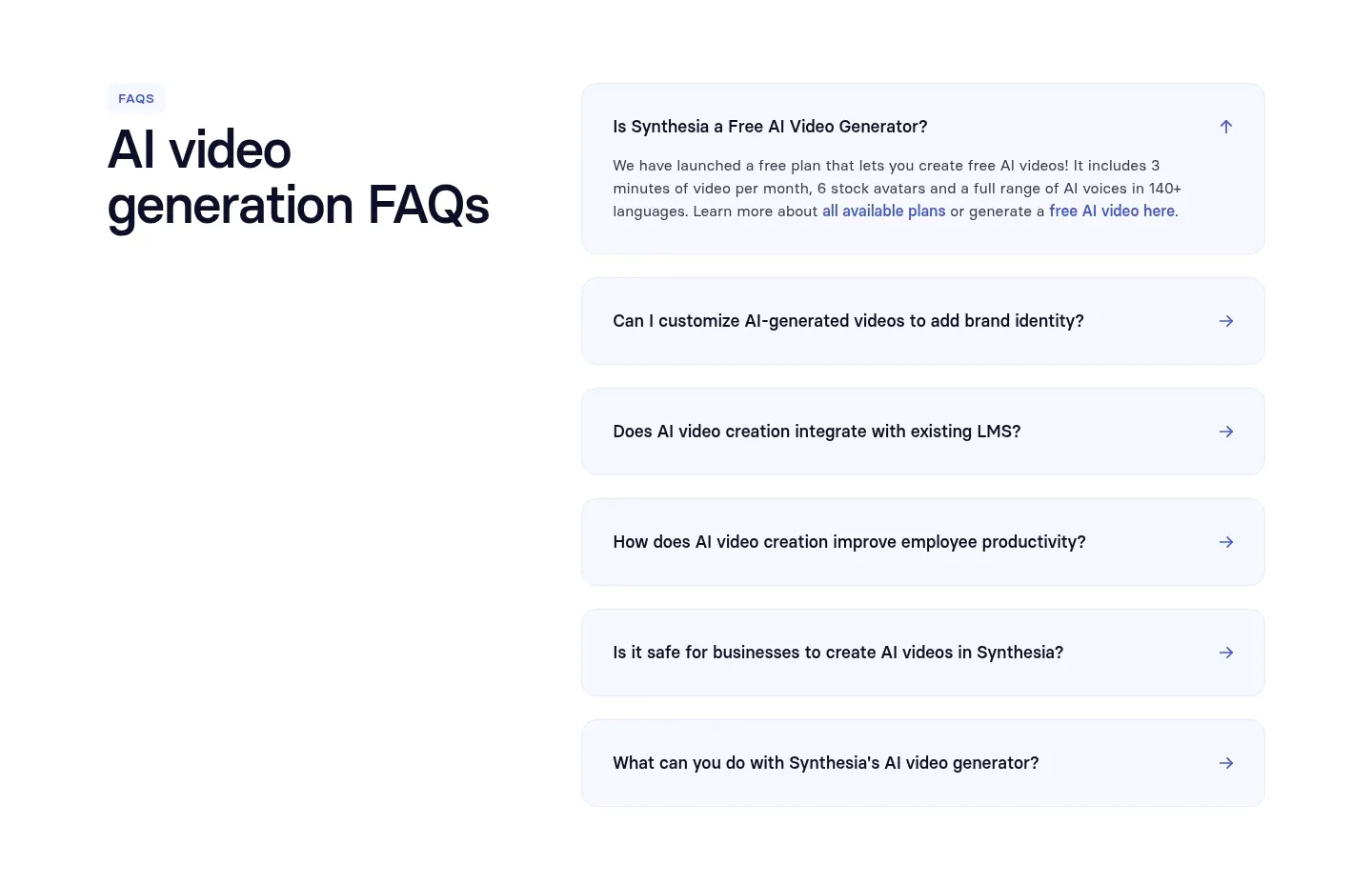
  104. Synthesia FAQ section: headline on the left with an accordion of pale blue question rows on the right, white background
  105. Arcade call to action section: slim light gray band with a one-line headline and Sign up for free and Talk to a GTM expert buttons
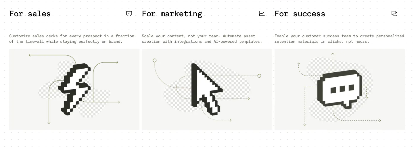
  106. Visual use cases section: three cards for sales, marketing and success with mono titles, short copy and black pixel-art icons on light gray
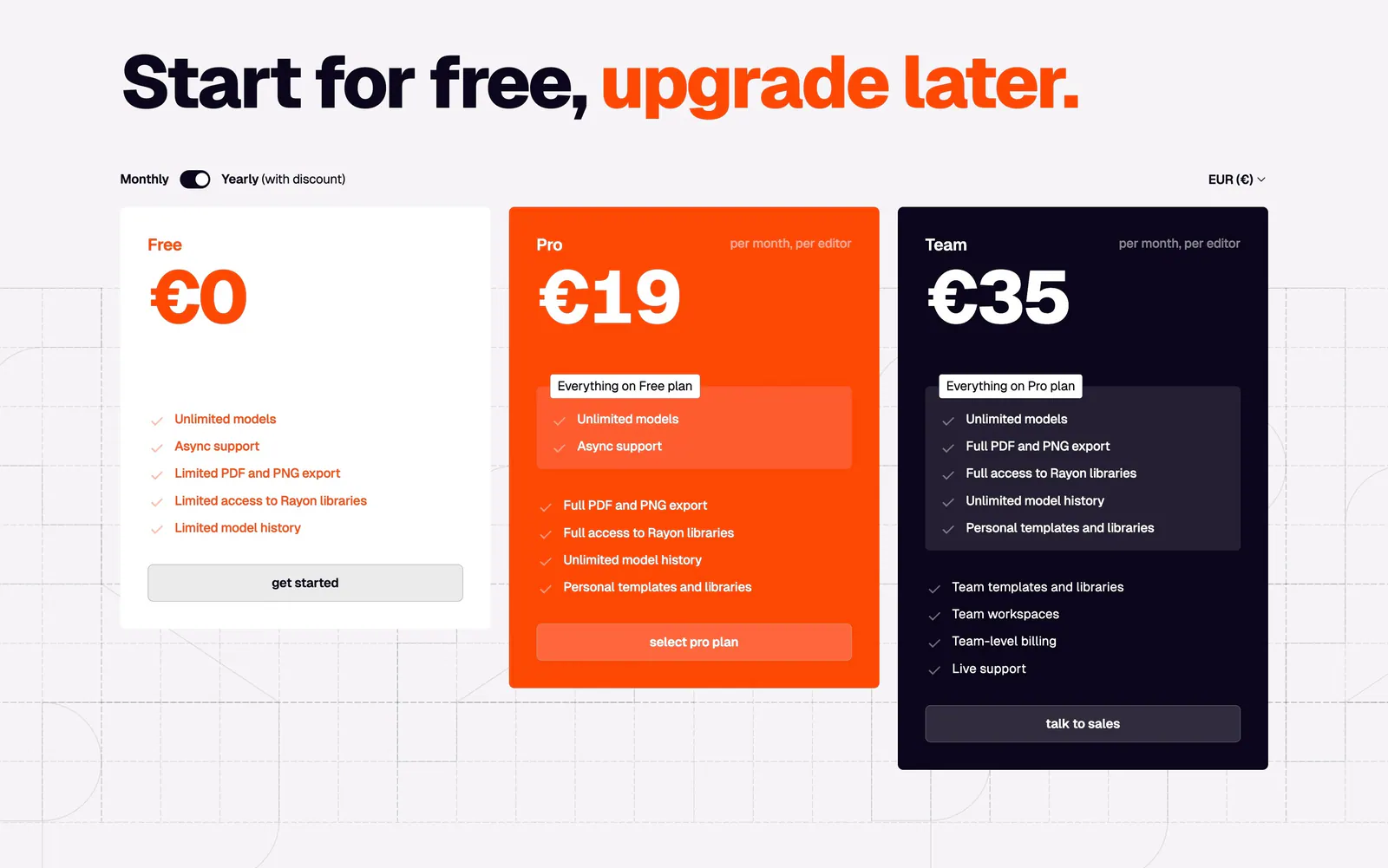
  107. Rayon pricing section: large headline with orange accent, monthly/yearly toggle and white, orange and navy plan cards on a grid
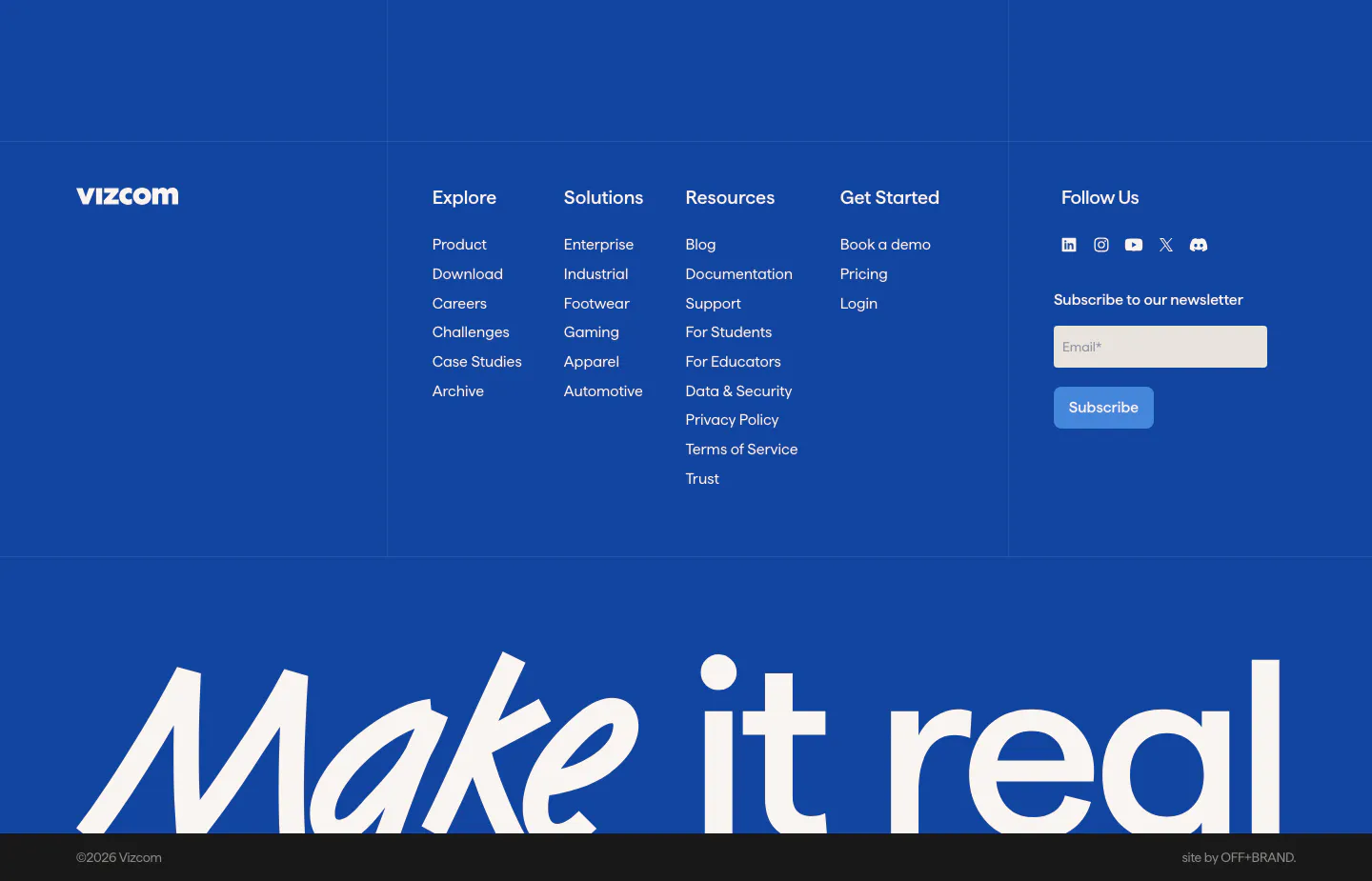
  108. Vizcom footer section: blue footer with logo, link columns, newsletter email field and a huge white 'Make it real' wordmark at the bottom
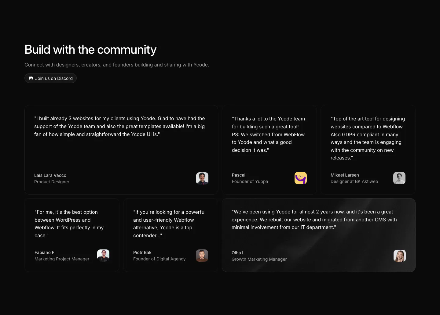
  109. Ycode testimonials section: headline with Discord button above a bento grid of six quote cards in mixed widths with avatars
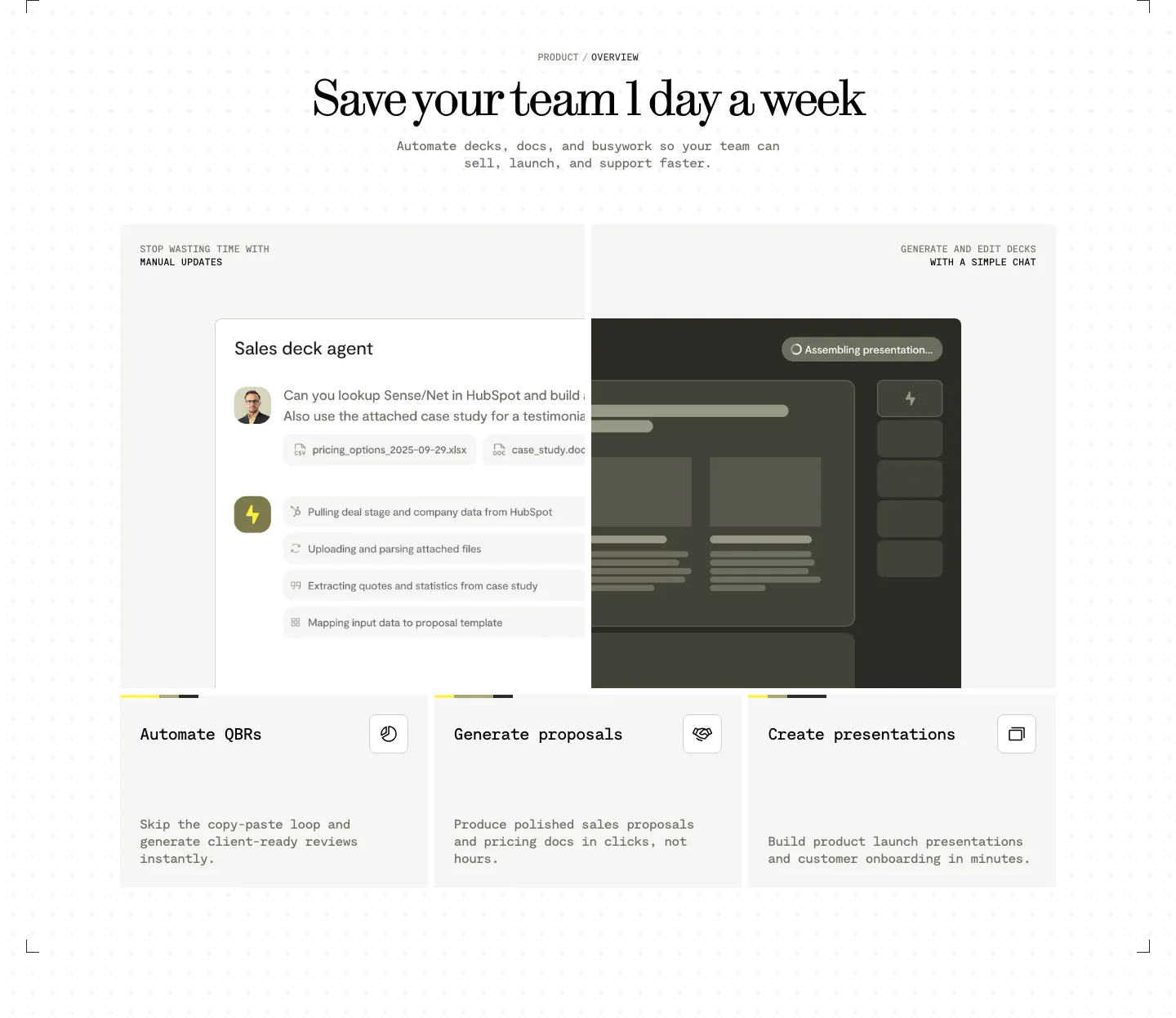
  110. Visual features section: centered serif headline above a sales deck agent chat UI and three cards for QBRs, proposals and presentations

Design & creative companies

17 companies in this collection

All companies

Common styles in design & creative websites

How to design a website for a design tool

  1. Treat the site as a product demo

    Every detail on the page reflects the quality of the tool. Use deliberate typography, careful spacing, and polished motion. If your product makes animation, the site should animate well. If it builds websites, consider building the marketing site with it and saying so.
  2. Show work made by real users

    A gallery of projects created with the product proves range better than any feature description. Credit the creators, show varied styles, and link to the original work. Designers want to see that the tool supports their own taste, not only a house style.
  3. Let the canvas move

    Static screenshots undersell interactive tools. Use short screen recordings of real edits, such as dragging a component, adjusting a curve, or generating a variant. Keep the cursor visible and the pace natural so viewers can follow each step.

  4. Explain handoff and file compatibility

    Teams care about what happens after the design is done. Show export formats, developer handoff, version history, and imports from the tools designers already use. Professional buyers often choose the tool that fits their pipeline over the one with the longest feature list.

All industries
    ↑↓ Navigate ↵ Open

    Section preview

    Website section