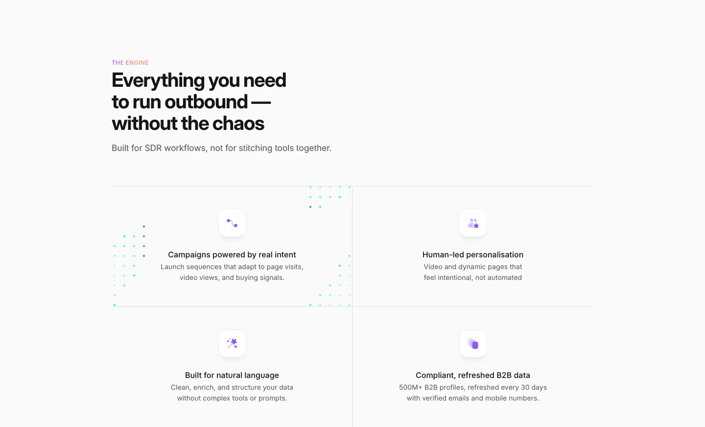
Minimal Website Design Examples

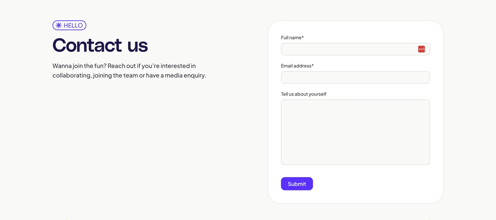
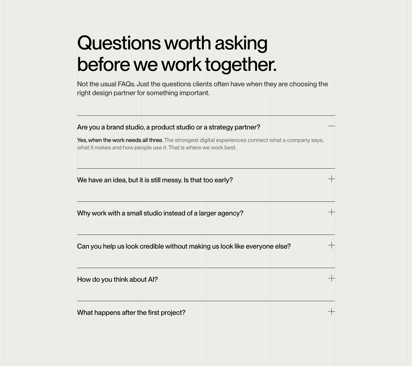
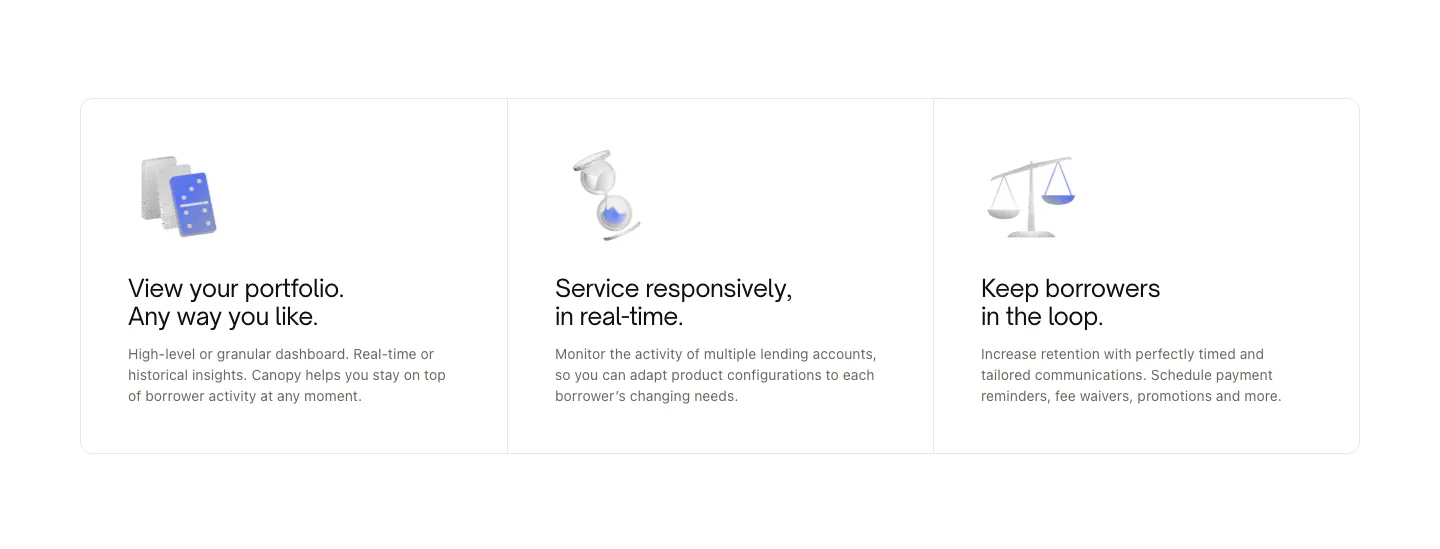
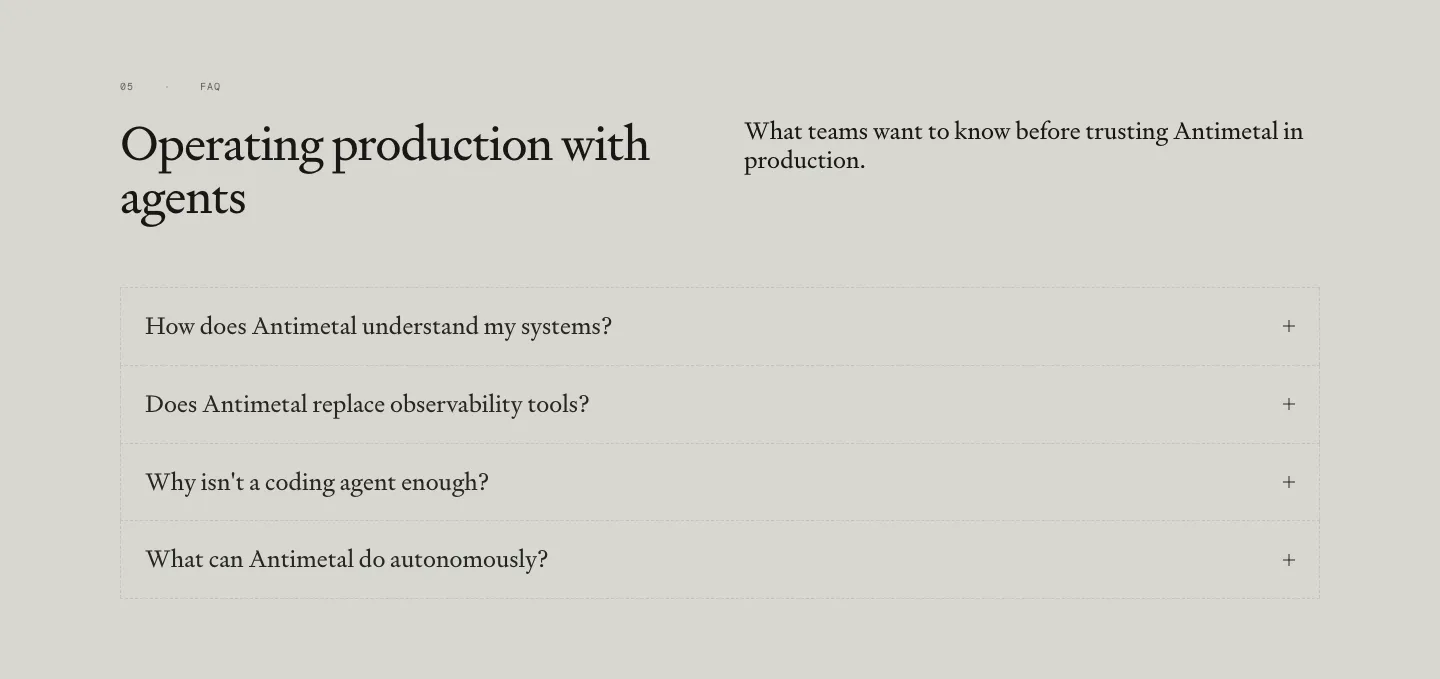
Minimal is not the same as empty. Minimal website design strips a section to its content, with no more than two colors beyond neutrals, a lot of open space, and no decoration for its own sake. It signals confidence and suits products where clarity is the selling point. Without strong type, careful spacing, and sharp copy, the result reads as a placeholder rather than a decision.
529 sections

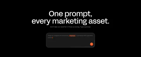
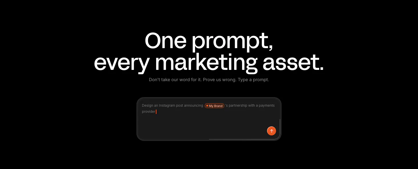
  1. Linearity call-to-action section: large centered headline and short line above a dark prompt input box with an orange send button on black
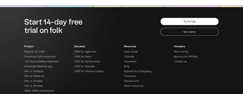
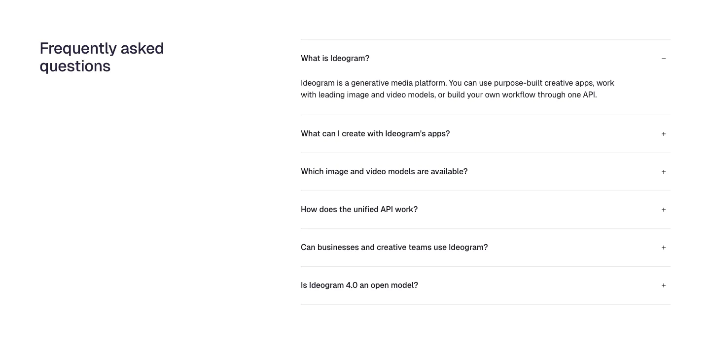
  2. Mintlify footer section: CTA strip with two buttons above logo, status badge and five link columns on a white background
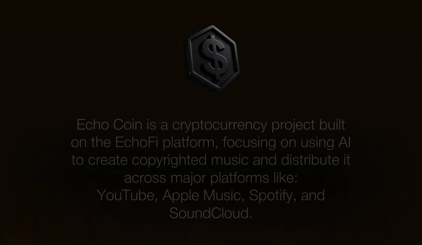
  3. EchoFi about & mission section: centered gray statement text below a dark 3D coin icon on a near-black background
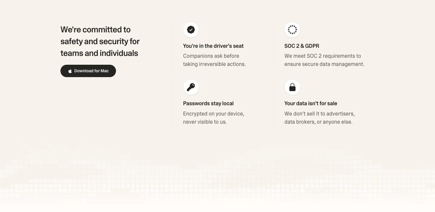
  4. Strawberry security section: headline and download button on the left, 2x2 grid of icon trust points on the right, pixel fade below
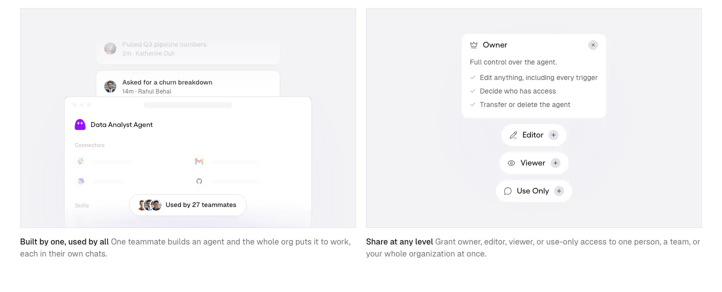
  5. Gumloop features section: two gray cards with agent sharing and permission UI mockups above short captions
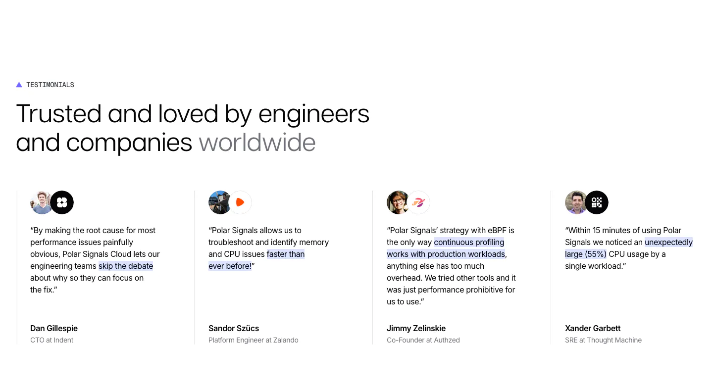
  6. Polar Signals testimonials section: headline above four divided columns of quotes with highlighted phrases, avatar and logo pairs and names
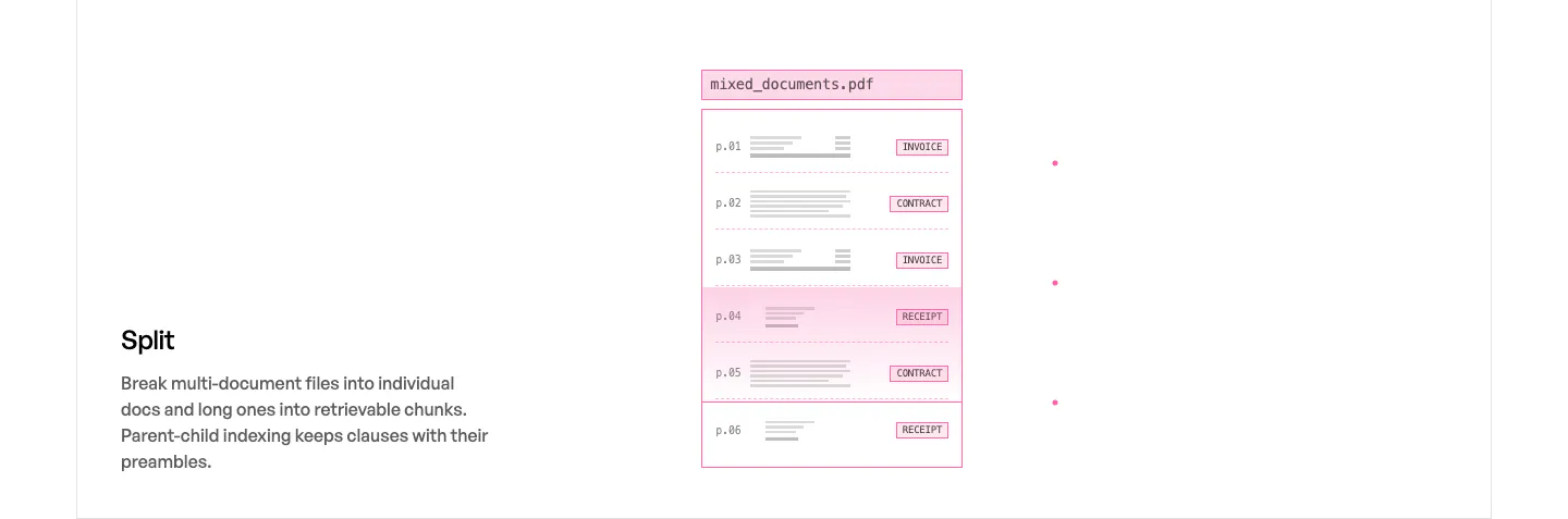
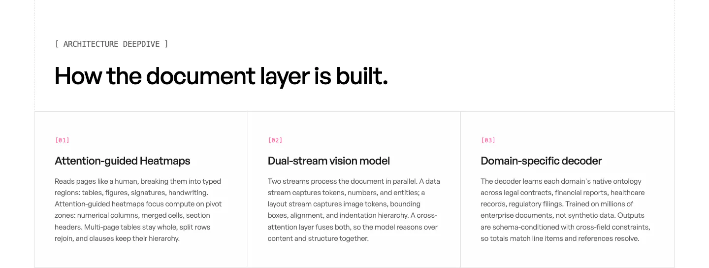
  7. Unsiloed features section: Split title and description at left beside a pink-outlined mockup of a multi-page PDF sorted by document type
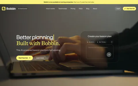
  8. Clarasight value proposition section: small Why Clarasight label above a centered three-line statement on a pale lavender-white background
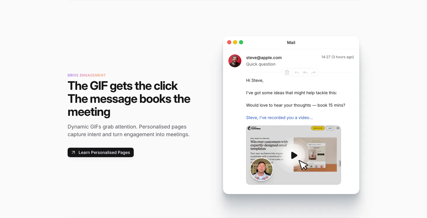
  9. Sendr features section: Drive Engagement copy and button left, Mail app mockup with a personalised video GIF preview right
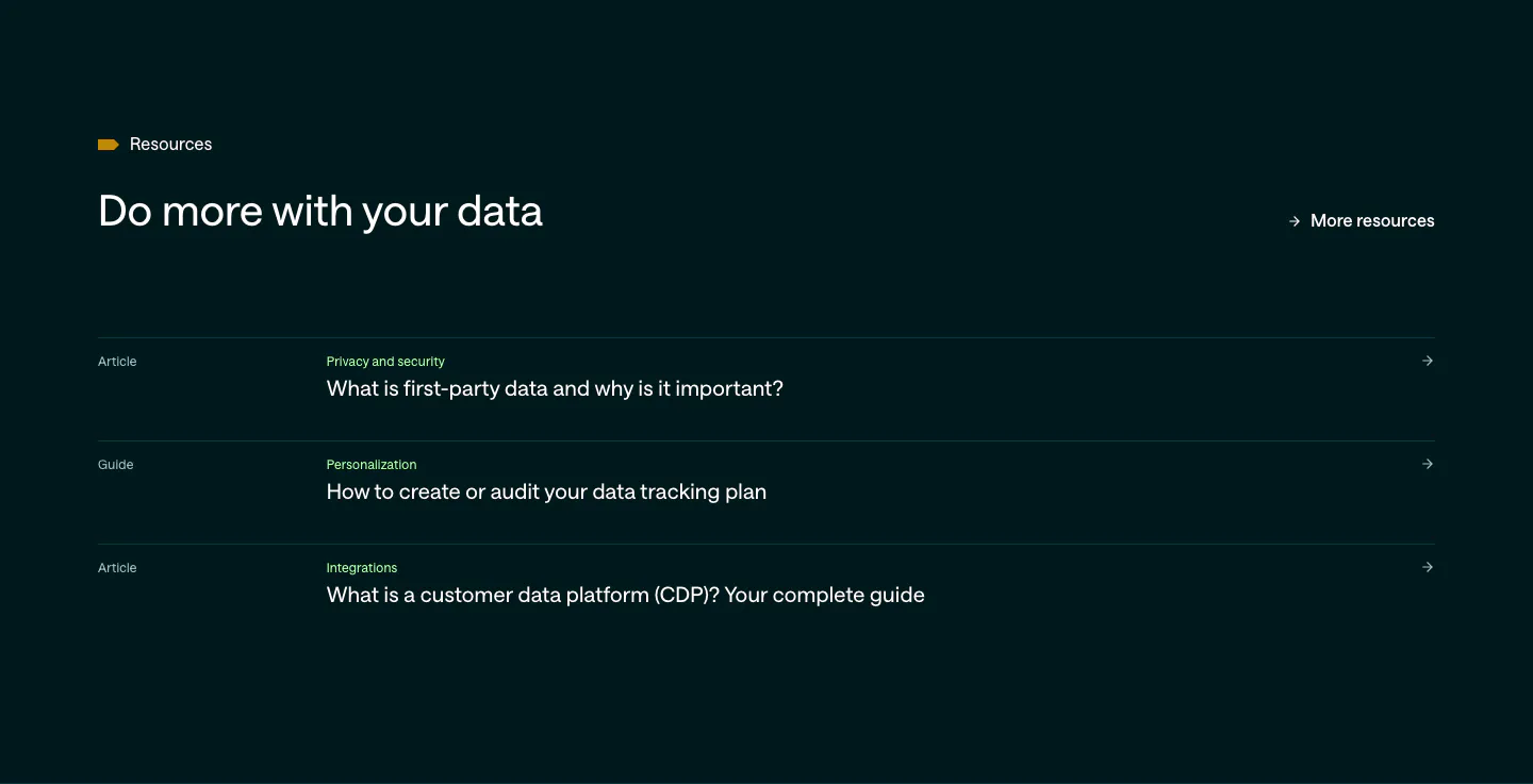
  10. Customer.io blog & resources section: dark teal list of three article and guide links with category labels and arrows
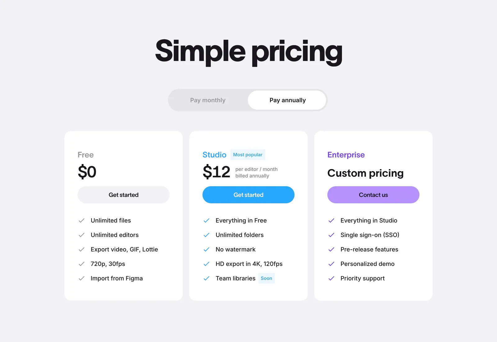
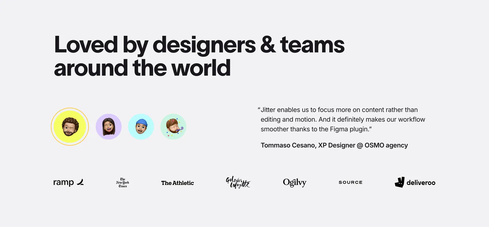
  11. Jitter pricing section: centered headline and billing toggle above three white plan cards with colored buttons on light gray
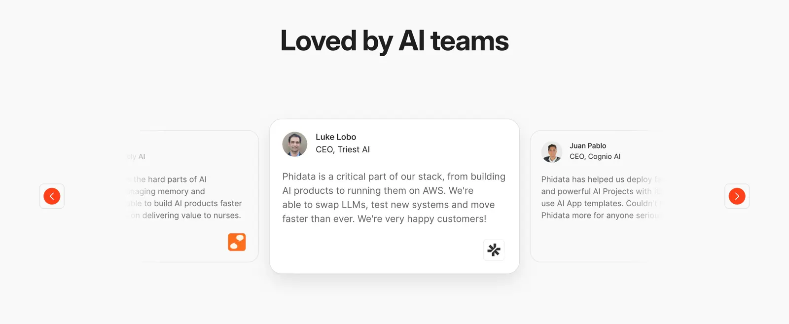
  12. Phidata testimonials section: centered heading above a quote card carousel with faded side cards and orange arrow buttons
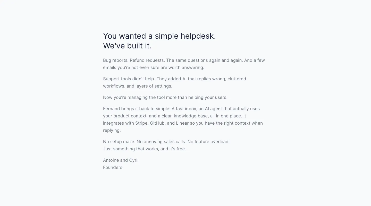
  13. Fernand about & mission section: founders' letter in a narrow left-aligned text column on a pale gray background
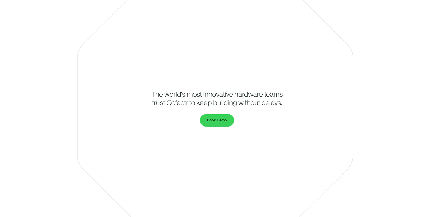
  14. Cofactr call to action section: centered one-line statement and green Book Demo button inside a faint octagon outline on white
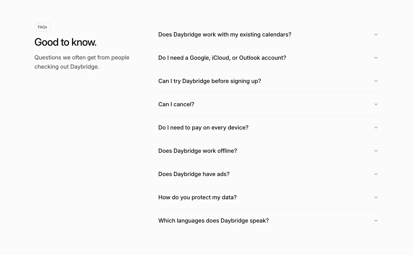
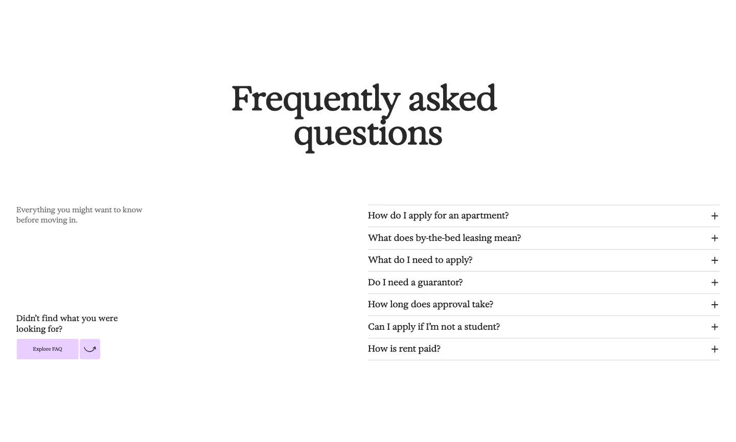
  15. Daybridge FAQ section: heading and short intro on the left with a gray accordion list of questions on the right
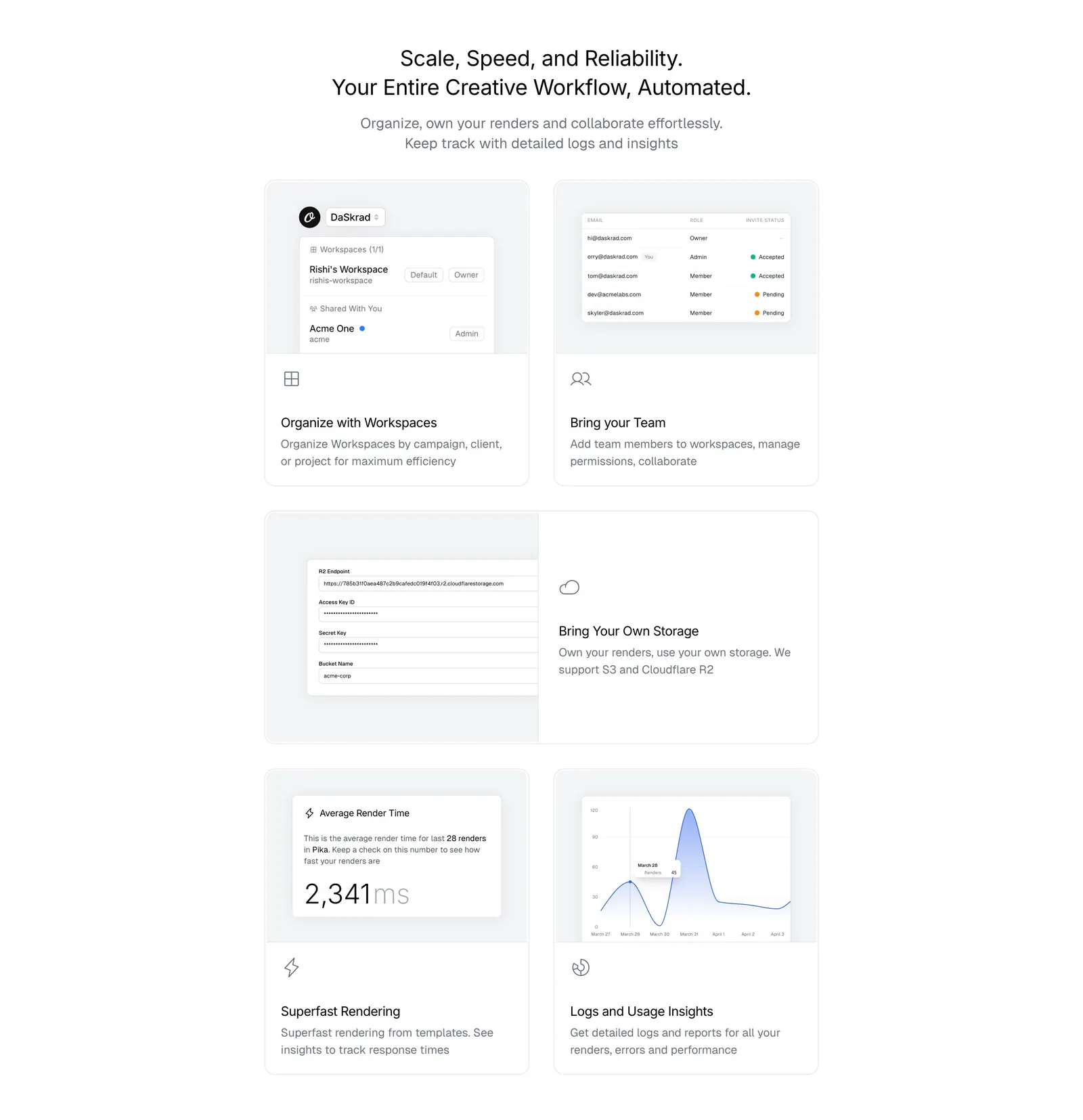
  16. Orshot features section: centered headline above a bento grid of light gray cards with workspace, team, storage and analytics UI
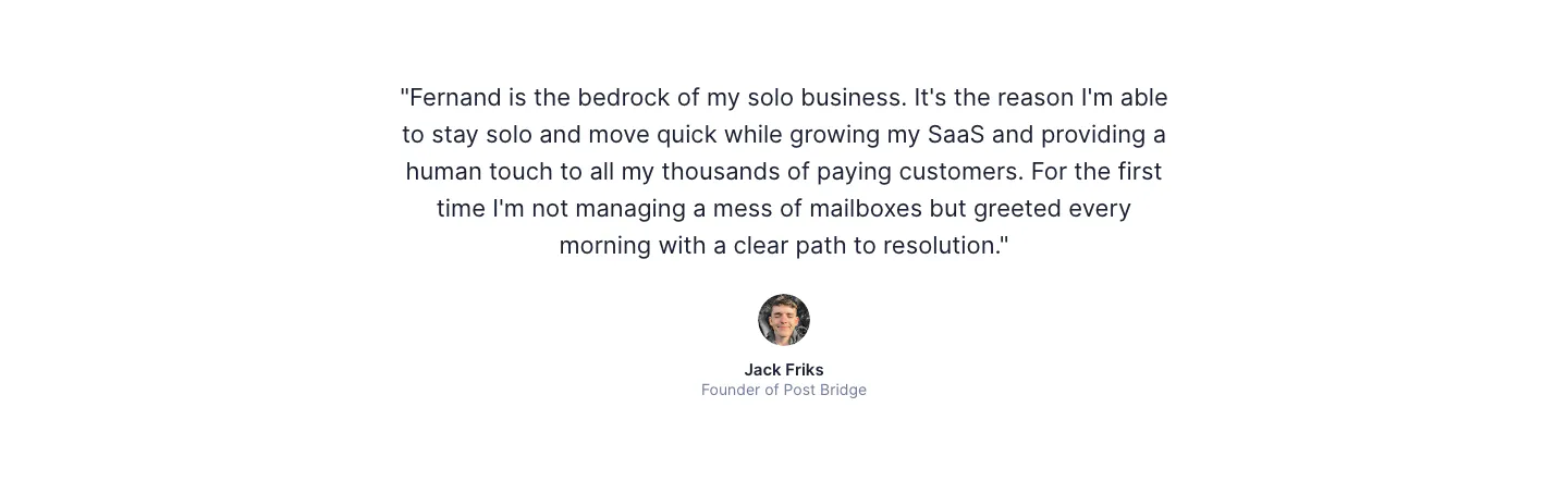
  17. Fernand testimonials section: single centered customer quote with a round avatar, name and title on white
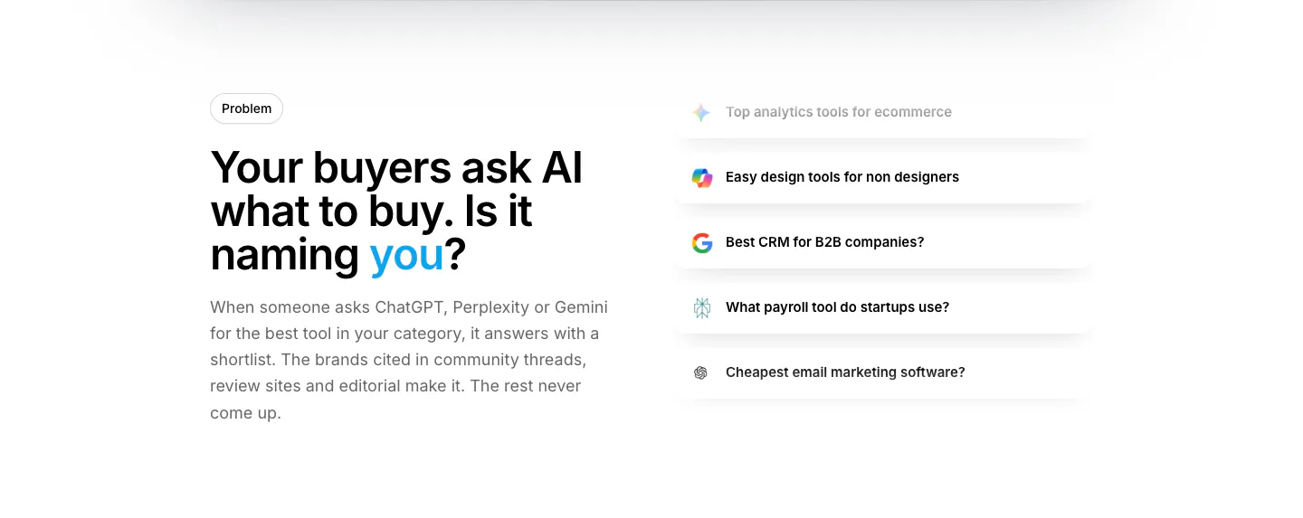
  18. Howseen AI value proposition section: problem headline on the left beside a stacked list of AI prompt query cards on white
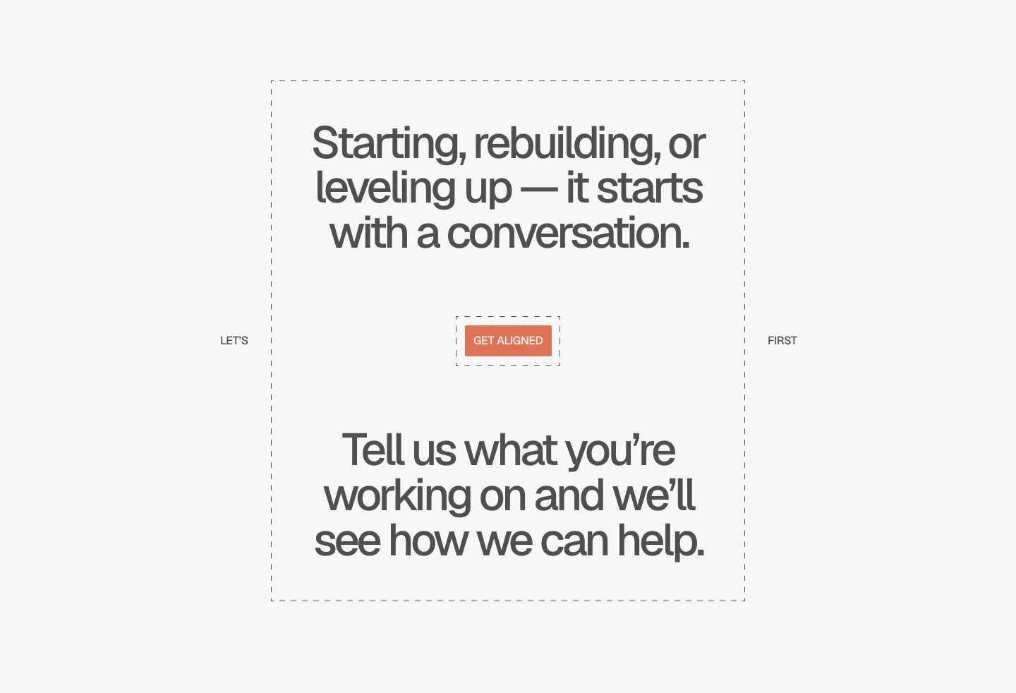
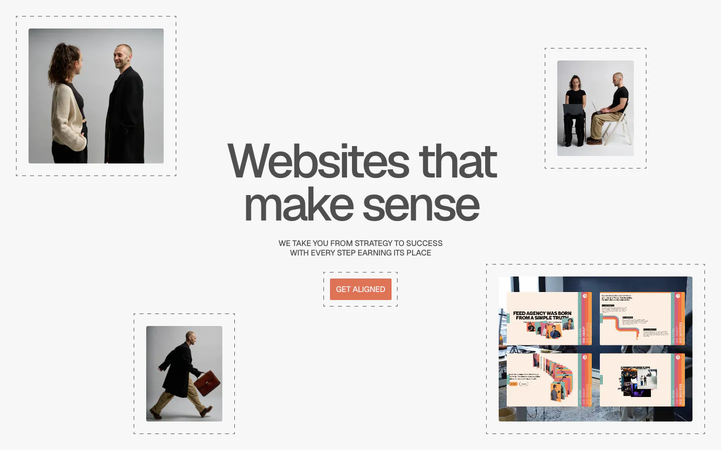
  19. A-LIGN call to action section: centered two-part headline in a dashed frame around a small orange Get Aligned button on light gray
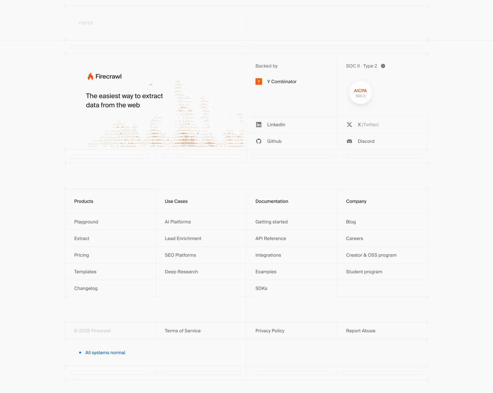
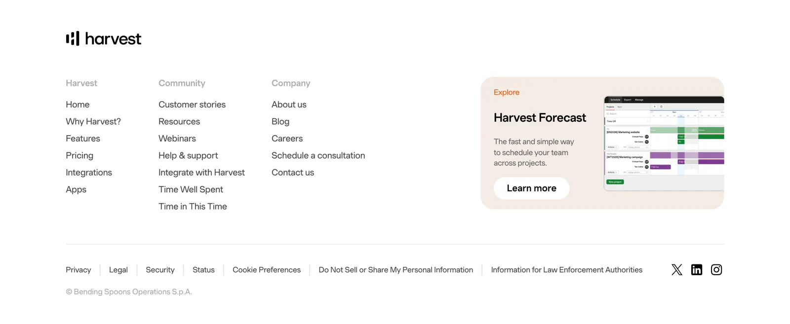
  20. Firecrawl footer section: logo, tagline and dithered chart art, backer and SOC 2 badges, four link columns in a gridded light layout
  21. United Carriers call-to-action section: bold uppercase headline and short copy inside a thin circle outline on a dark background
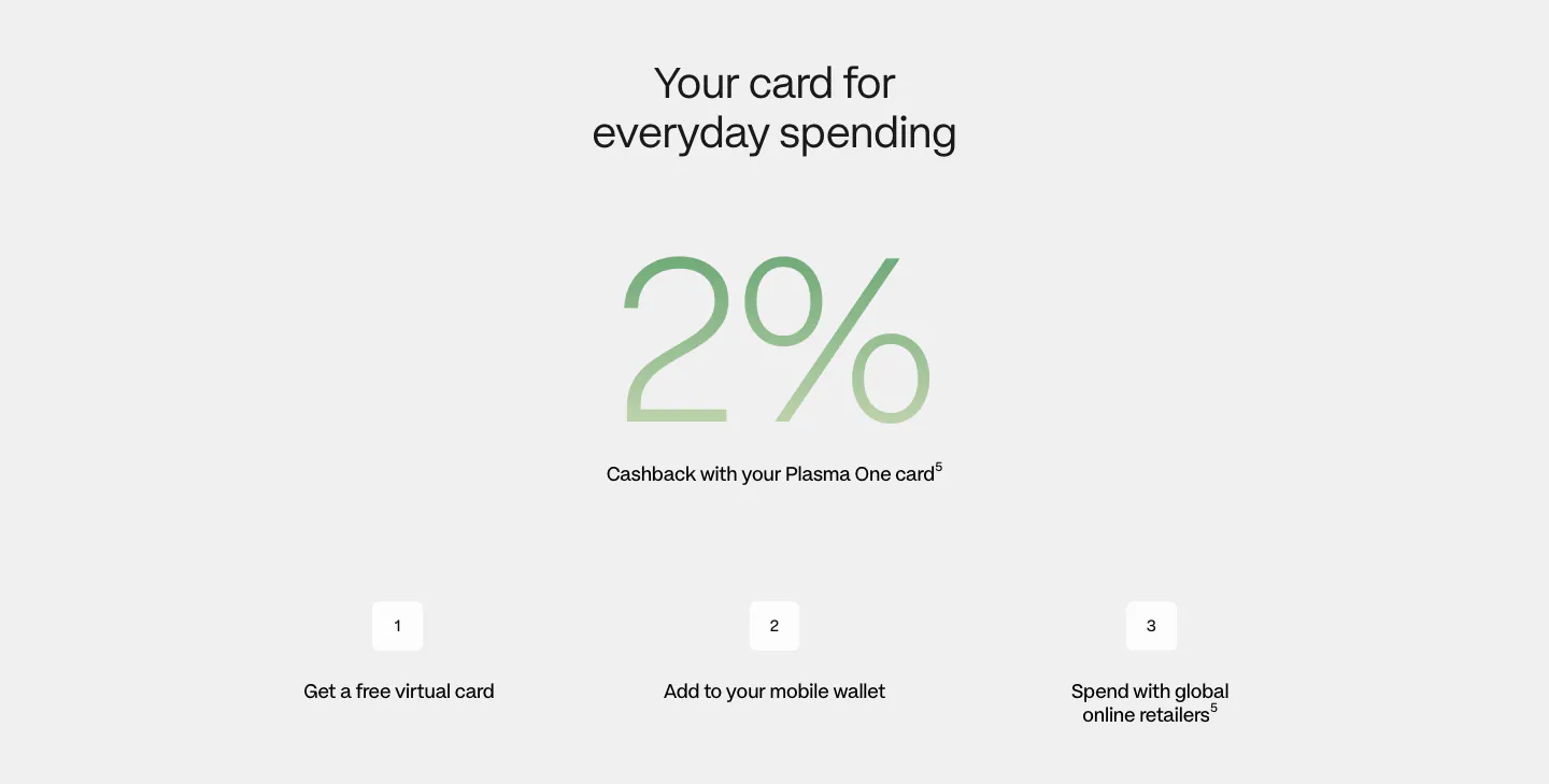
  22. Plasma how it works section: centered heading, giant green gradient 2% figure and three numbered steps on light gray
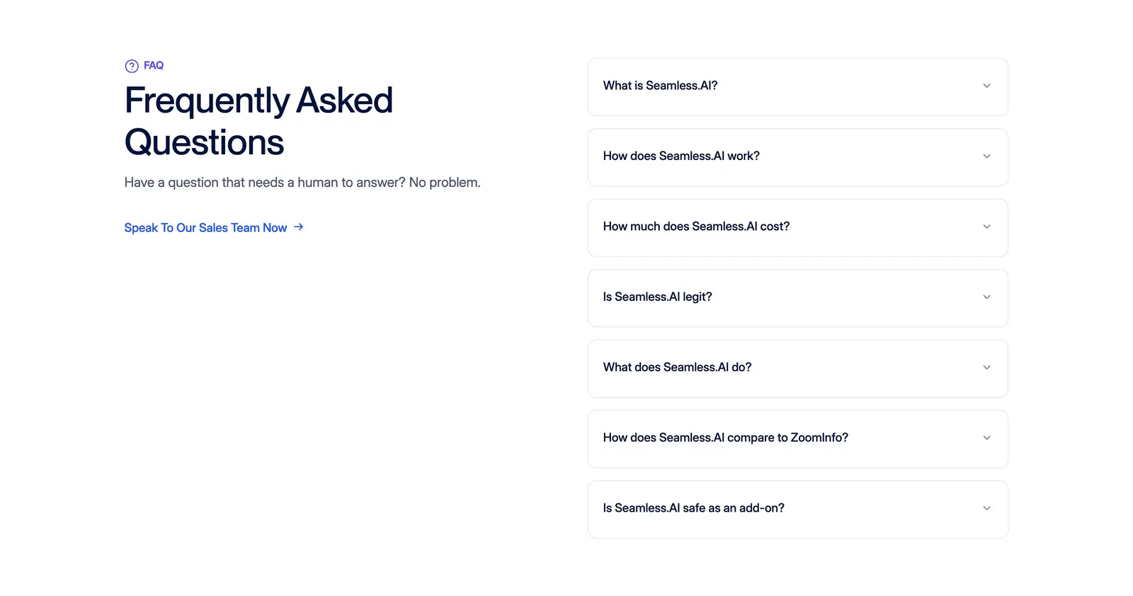
  23. Seamless.AI FAQ section: headline and sales link on the left, seven bordered accordion questions on the right on a white background
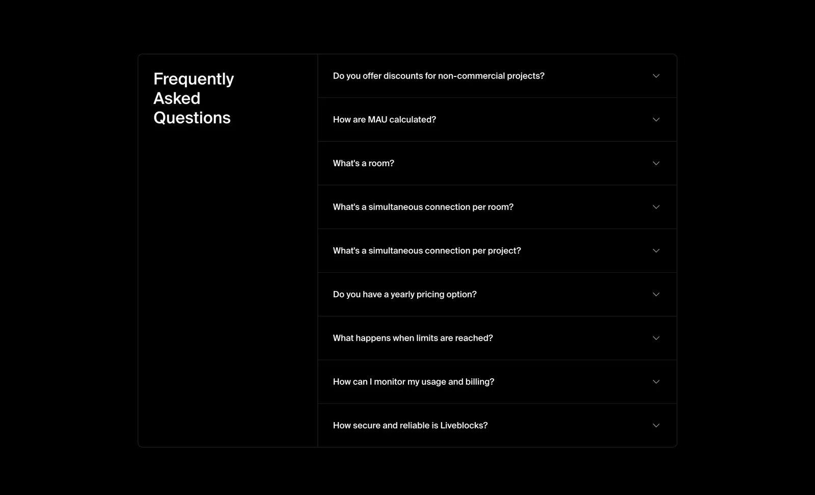
  24. Liveblocks FAQ section: bordered two-column panel with the heading on the left and a collapsed nine-question accordion on the right, on black
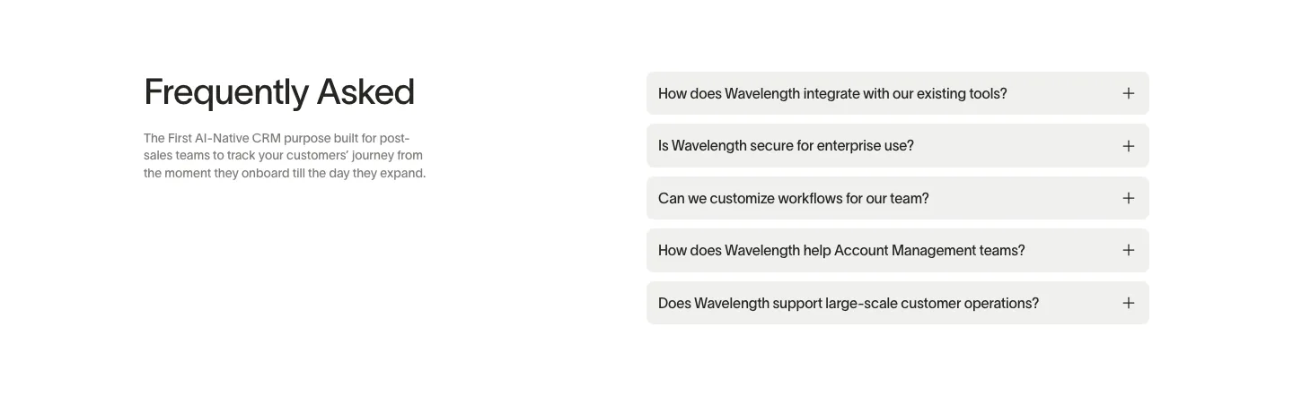
  25. Wavelength FAQ section: headline and short description at left beside a stack of five light gray accordion questions on white
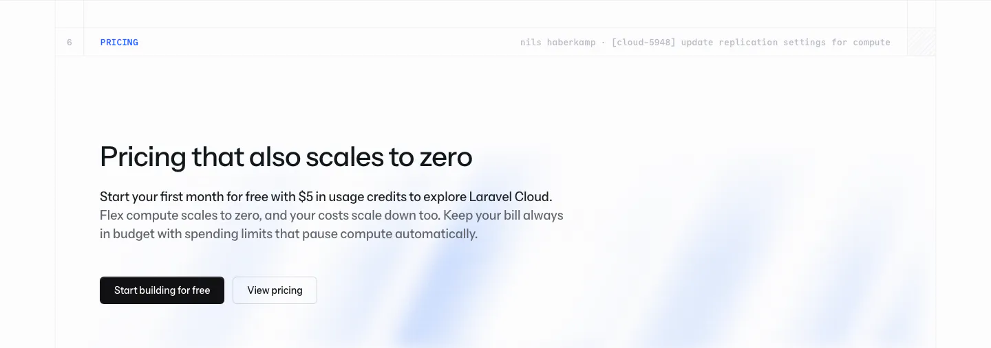
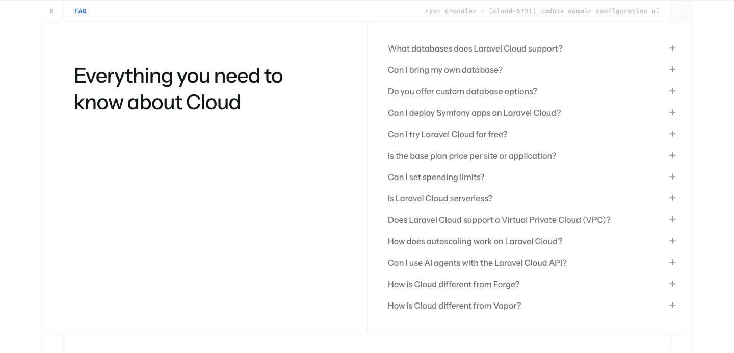
  26. Laravel Cloud call-to-action section: left-aligned pricing headline with free-credit copy and two buttons over a faint blue glow on white
  27. Antimetal footer section: five corner-bracketed boxes with serif link lists, status badge, tagline and dotted logo mark on warm gray
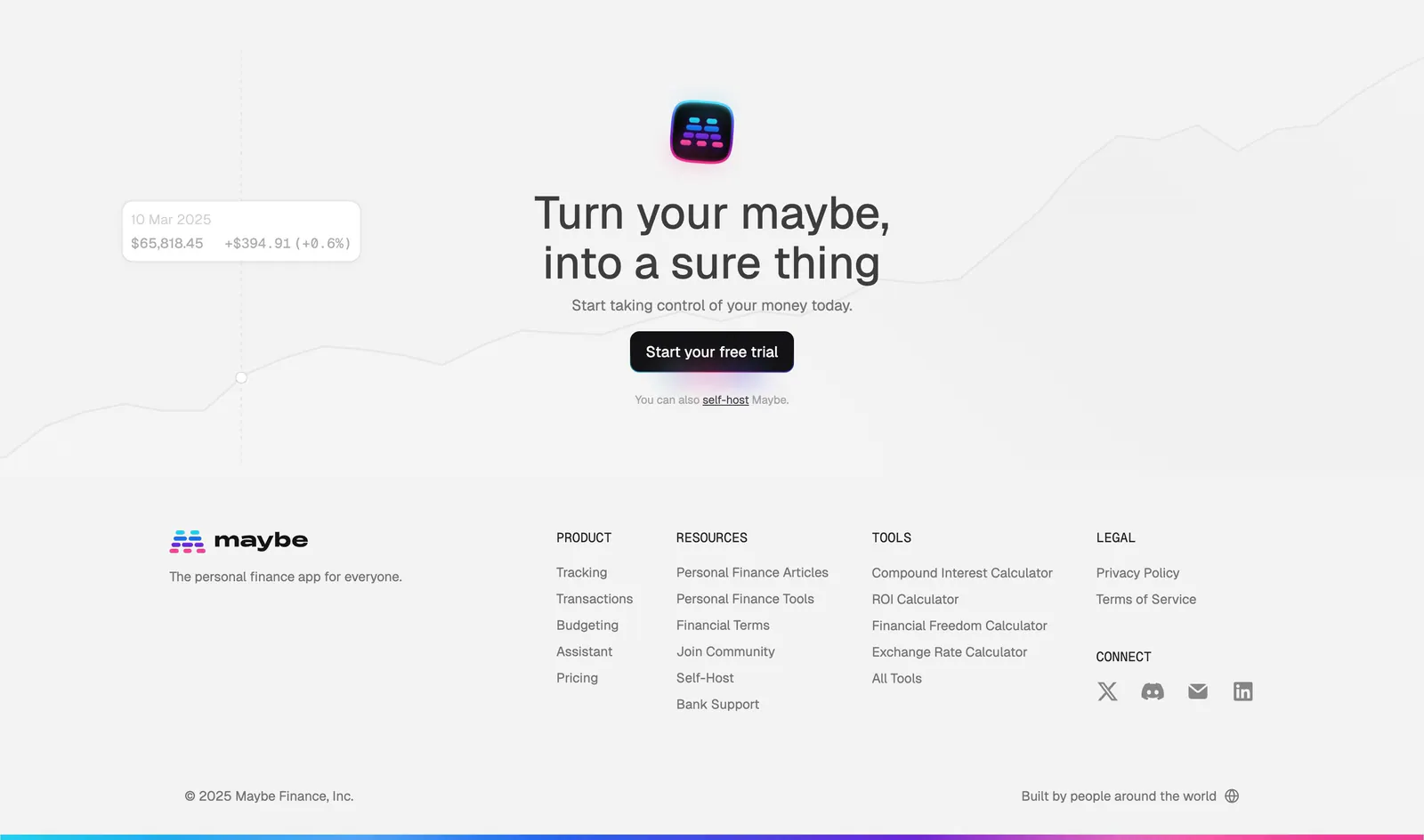
  28. Maybe footer section: centered closing CTA over a faint line chart, then logo and four link columns on light gray
  29. Wavelength logo cloud section: small centered caption above a row of grayscale logos including Pave, Render and Mintlify on a light gray band
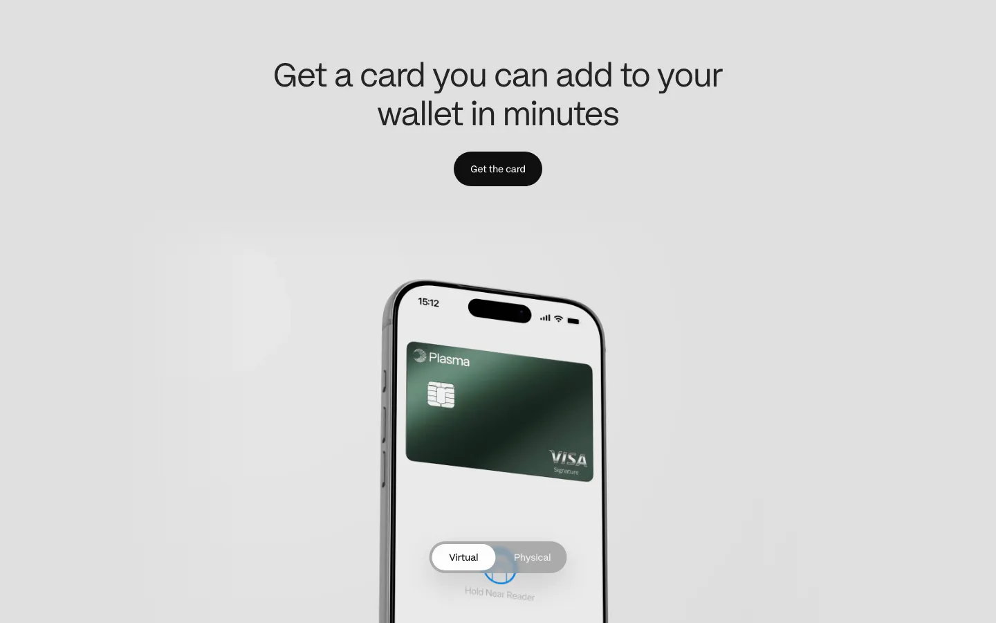
  30. Plasma features section: centered heading and button above a phone showing a green Visa card with a virtual/physical toggle
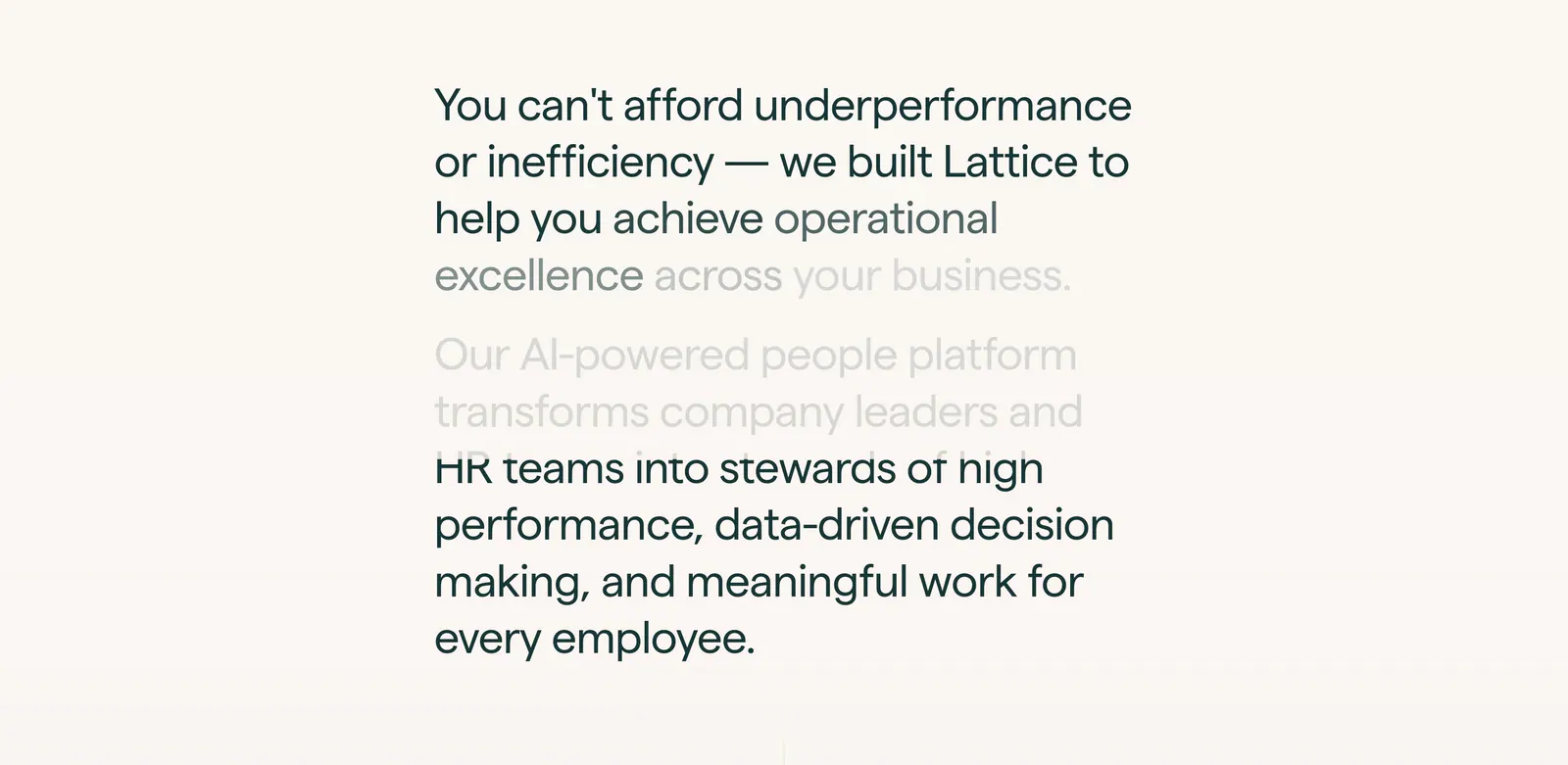
  31. Lattice about & mission section: large two-paragraph mission statement with scroll-fade text in a narrow column on warm off-white
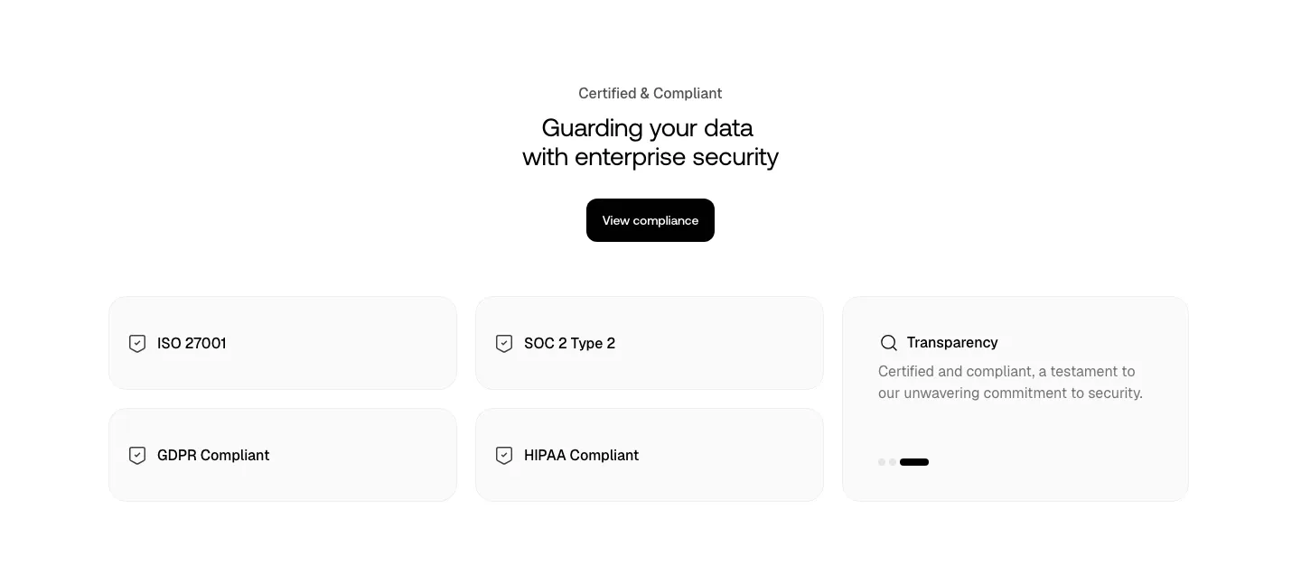
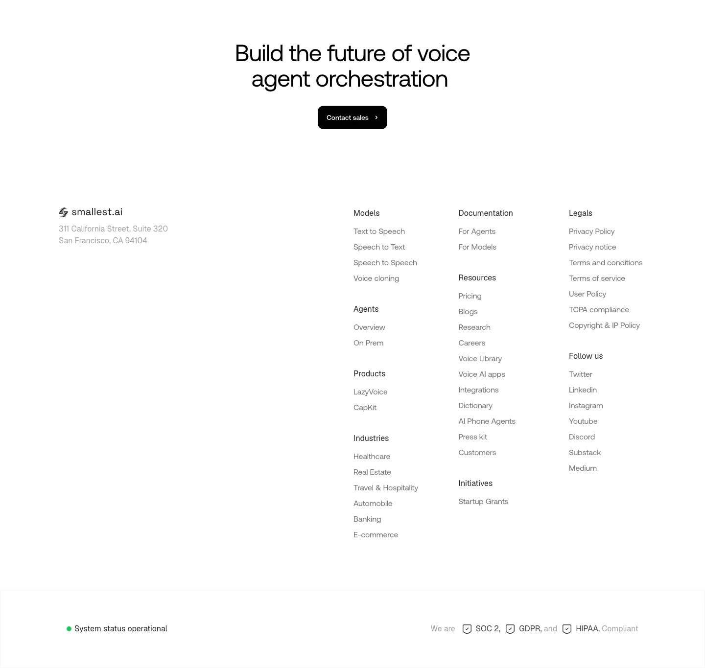
  32. Smallest.ai security section: centered headline and compliance button above light cards for ISO 27001, SOC 2, GDPR, HIPAA and transparency
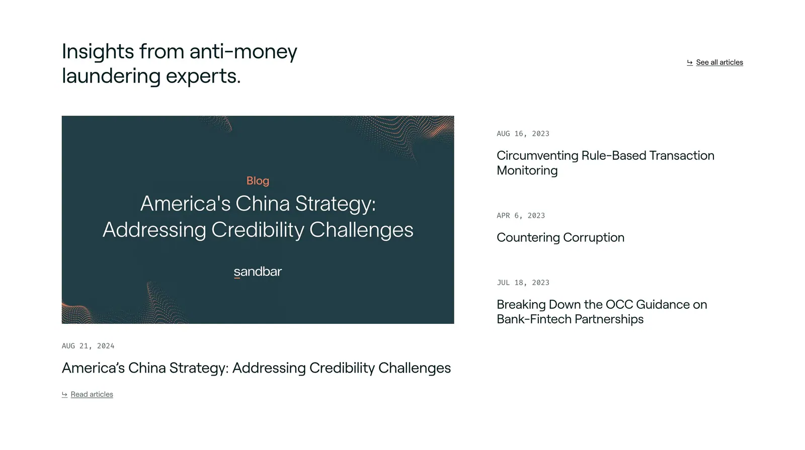
  33. Sandbar blog & resources section: headline above a featured article card on the left and a dated list of three articles on the right
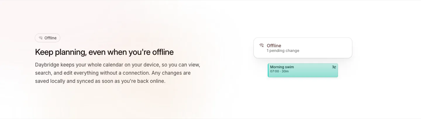
  34. Daybridge features section: offline headline and copy on the left with a small offline status card and event chip on the right
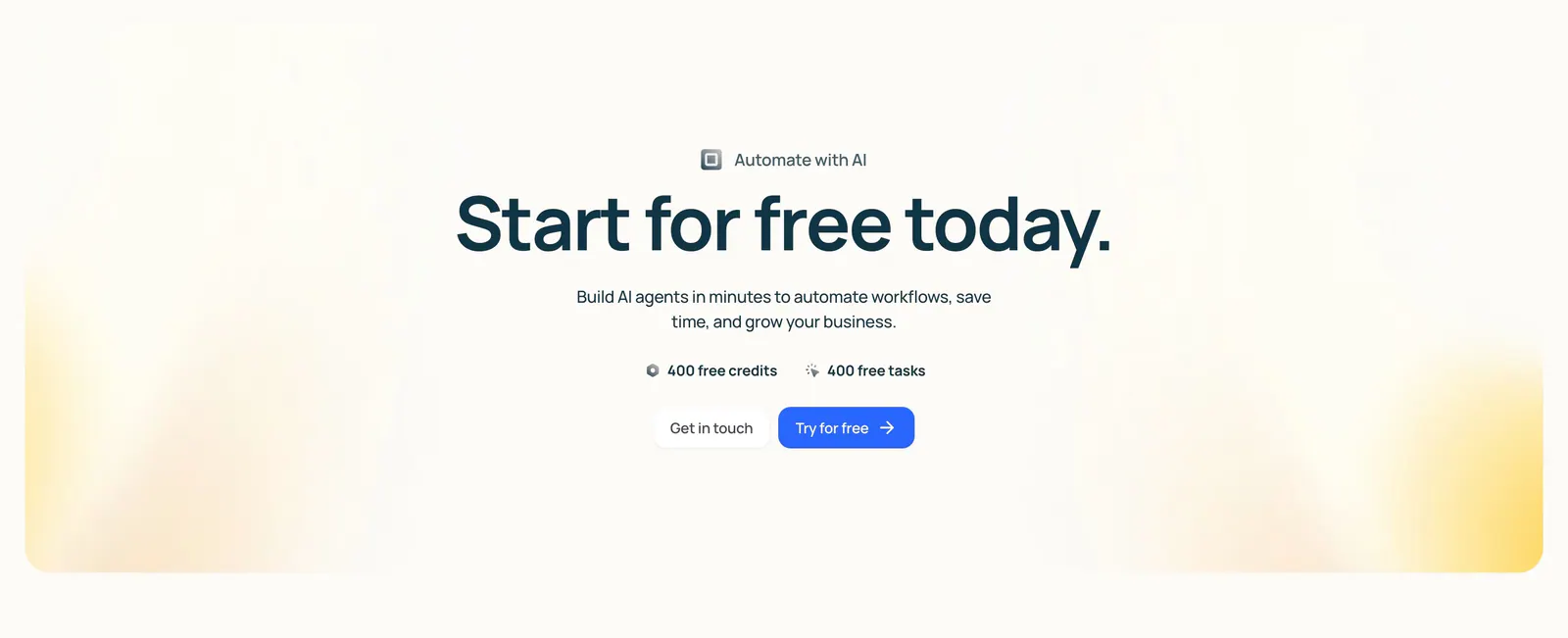
  35. Lindy call-to-action section: centered headline with free credit badges and two buttons inside a cream panel with soft yellow corner glows
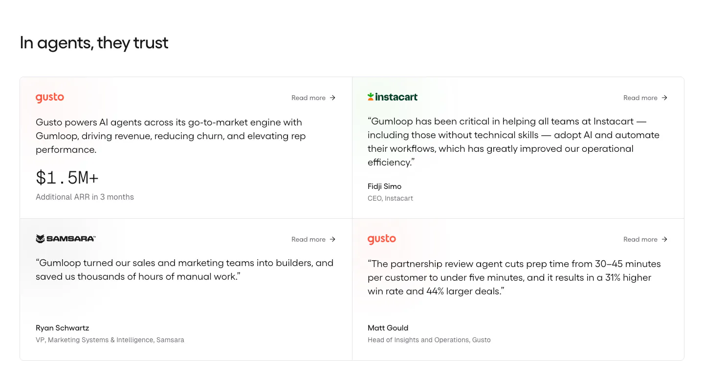
  36. Gumloop testimonials section: heading above a 2x2 grid of customer quote cards with brand logos on white
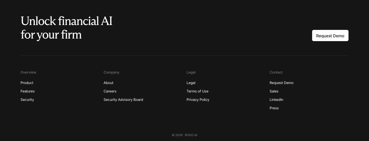
  37. Rogo footer section: serif CTA headline with demo button above four link columns and a copyright line on a dark background
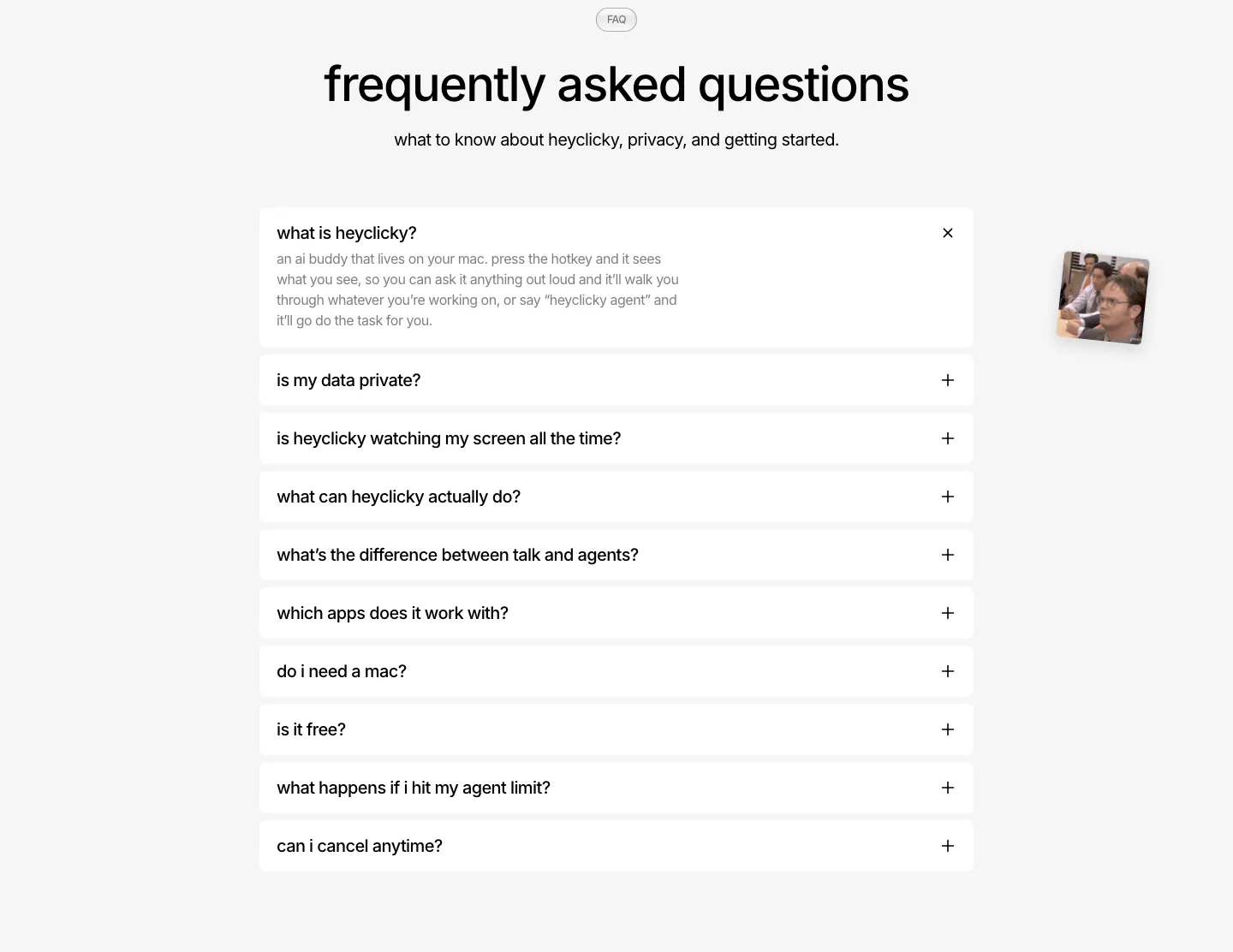
  38. heyclicky FAQ section: centered headline over a single-column accordion of white question rows, first one expanded, on light gray
  39. DevRev logo cloud section: short headline on the left beside a two-row grid of eight grayscale customer logos separated by thin lines
  40. Concourse call-to-action section: centered headline and dark button over a white-to-lavender dot-grid background
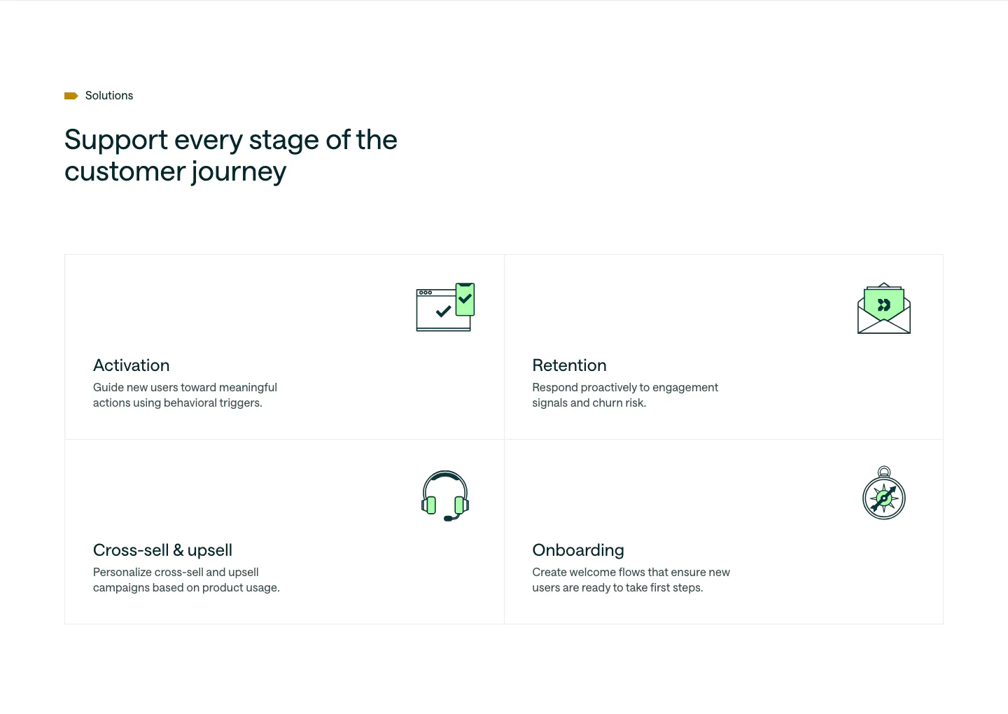
  41. Customer.io use cases section: headline above a 2x2 bordered grid of lifecycle stages, each with a green line icon and short copy
  42. Zamp stats section: single row of four large figures with labels separated by thin dividers on white
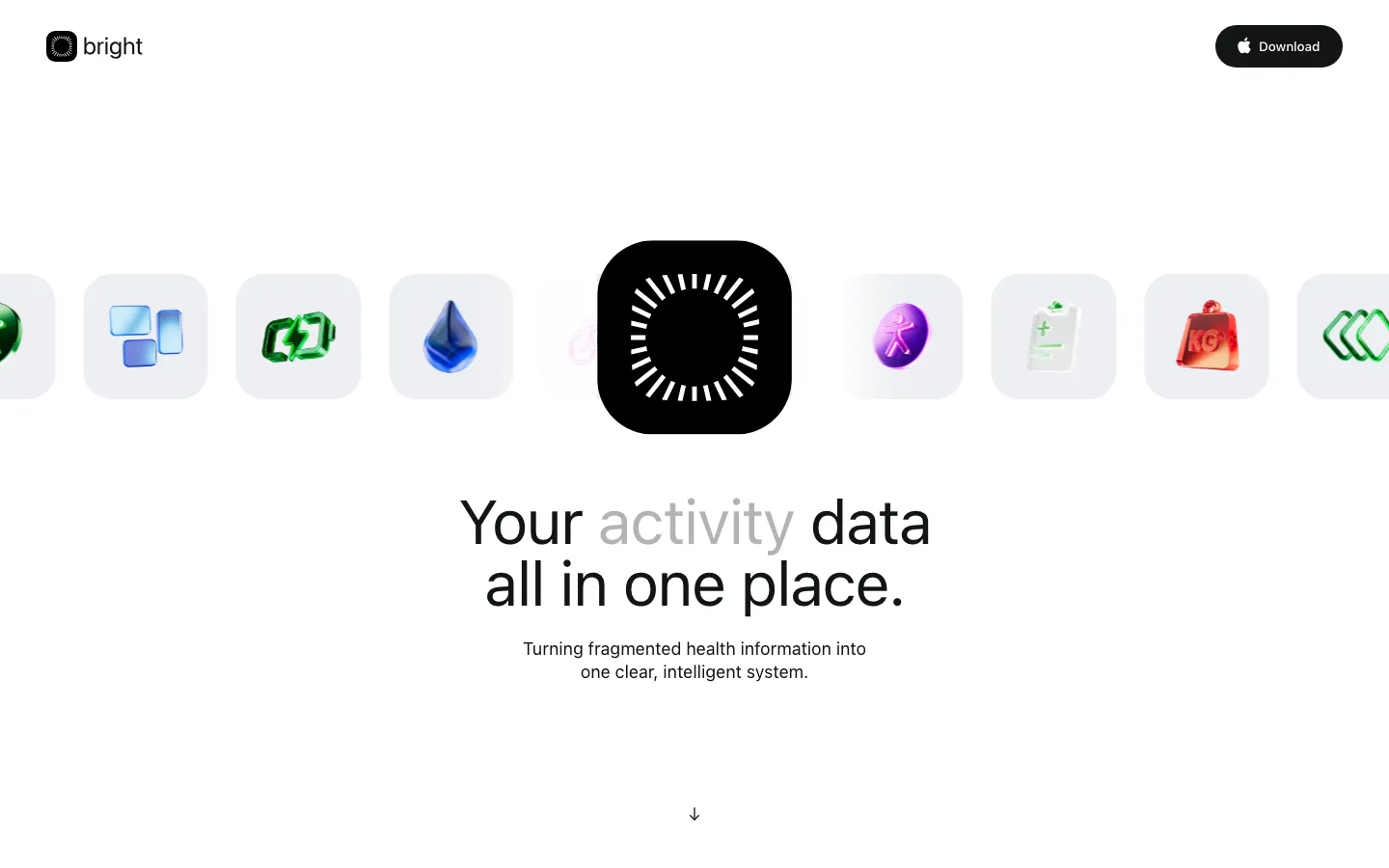
  43. Bright hero section: logo nav, a row of glossy 3D health icons around a black app icon, centered headline and subcopy below
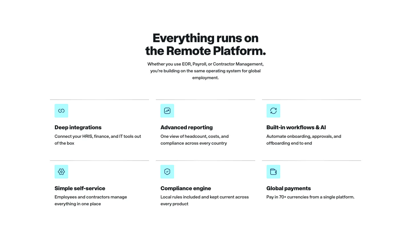
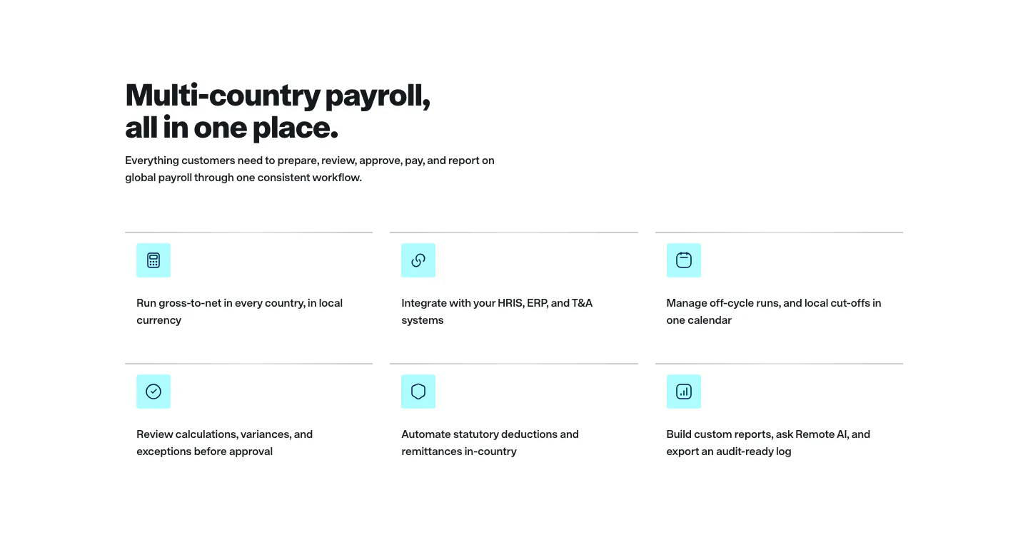
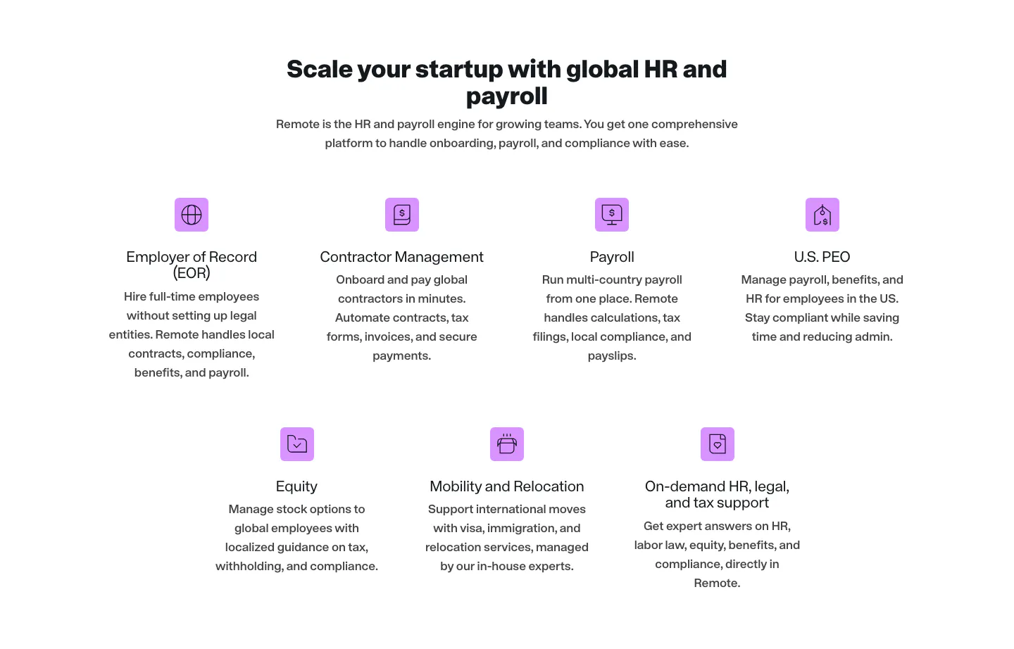
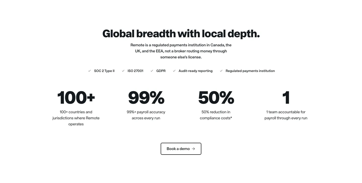
  44. Remote features section: centered headline above a two-row grid of six features with cyan icon tiles on white
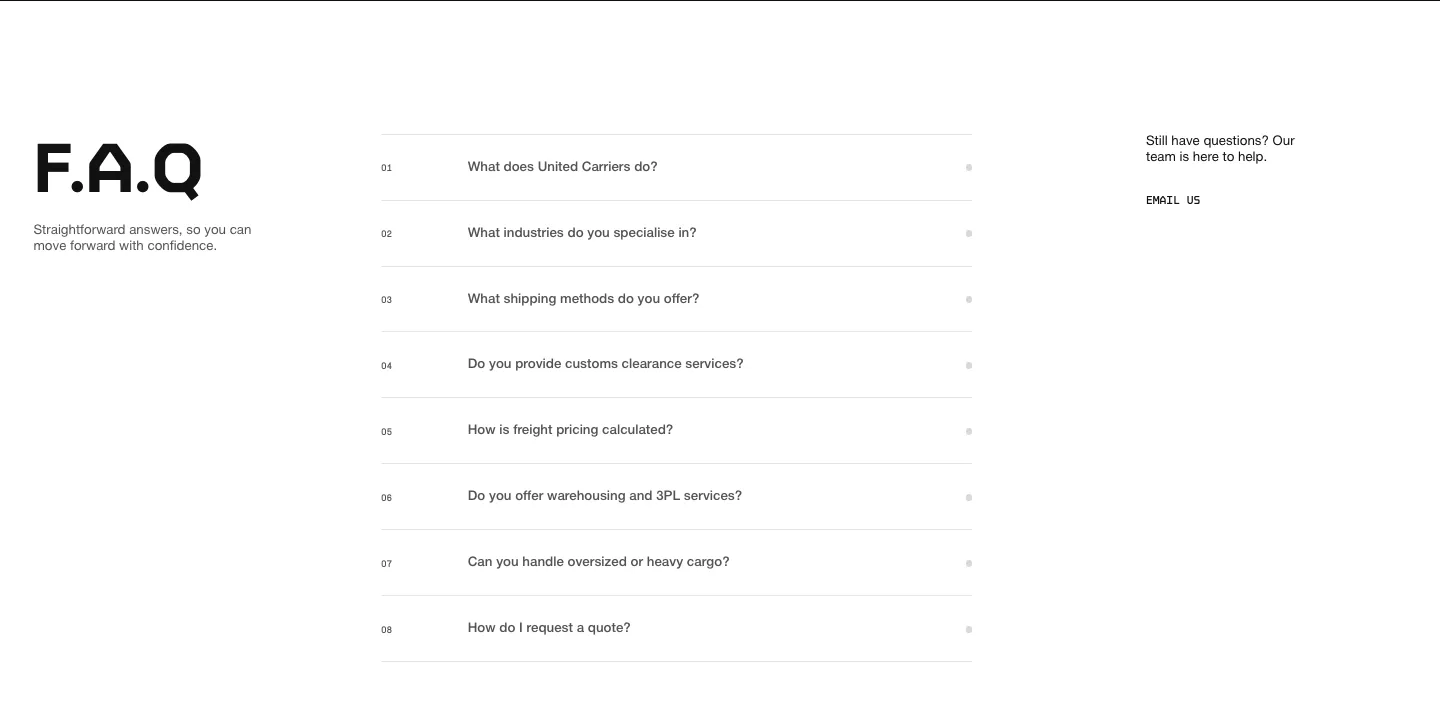
  45. United Carriers FAQ section: large F.A.Q heading left, numbered accordion questions center and an email link right on white
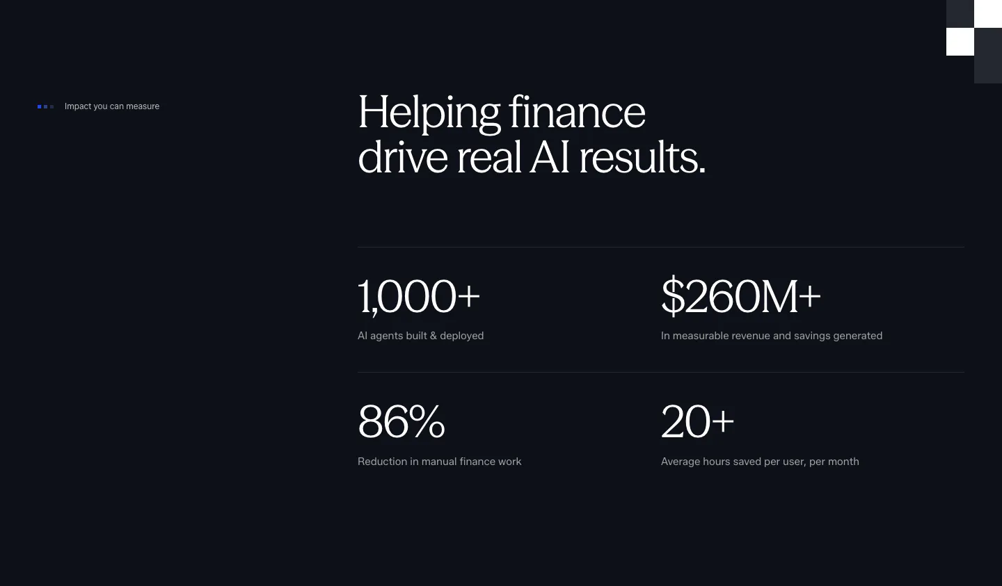
  46. Concourse stats section: headline above a 2x2 grid of large metrics with labels on a near-black background
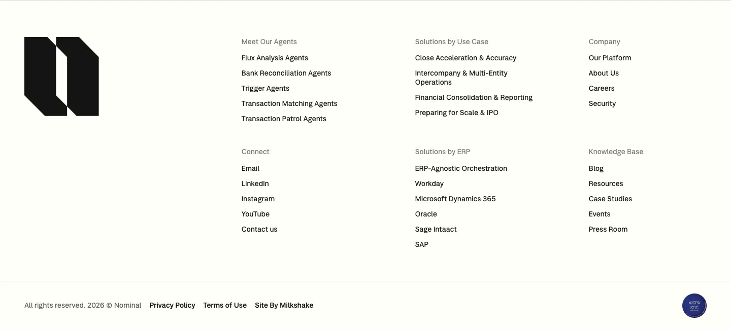
  47. Nominal footer section: large black logo mark on the left, six link columns and a copyright row on an off-white background
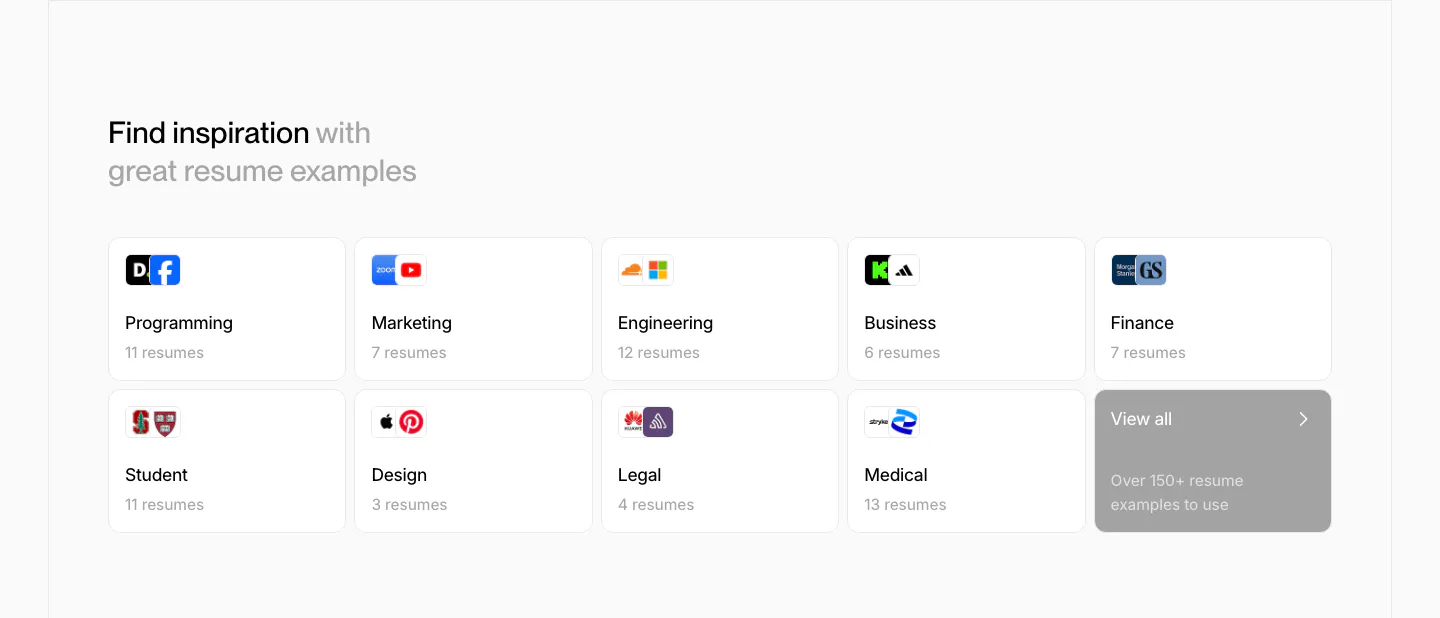
  48. Rezi blog & resources section: two-row grid of resume example category cards with company logos and a gray view-all tile
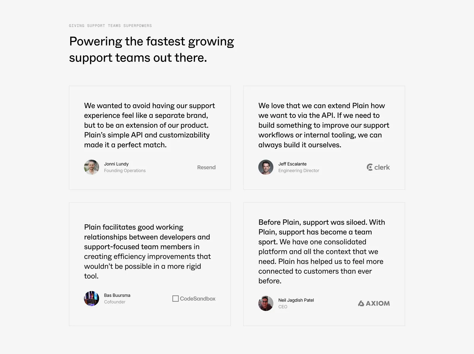
  49. Plain testimonials section: left-aligned headline above a 2x2 grid of bordered quote cards with avatars and company logos on light gray
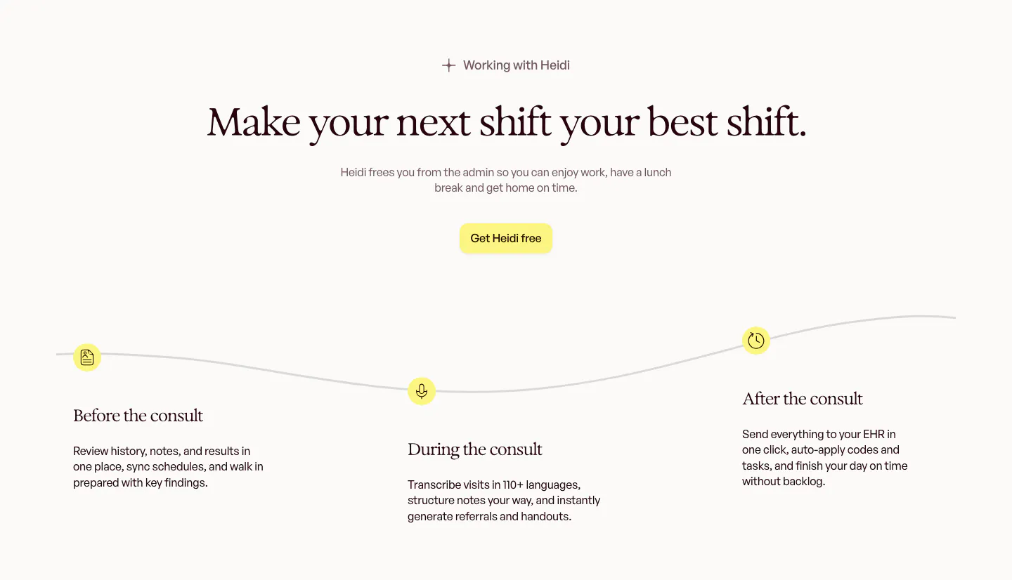
  50. Heidi how it works section: centered serif headline above a wavy timeline with before, during and after the consult steps
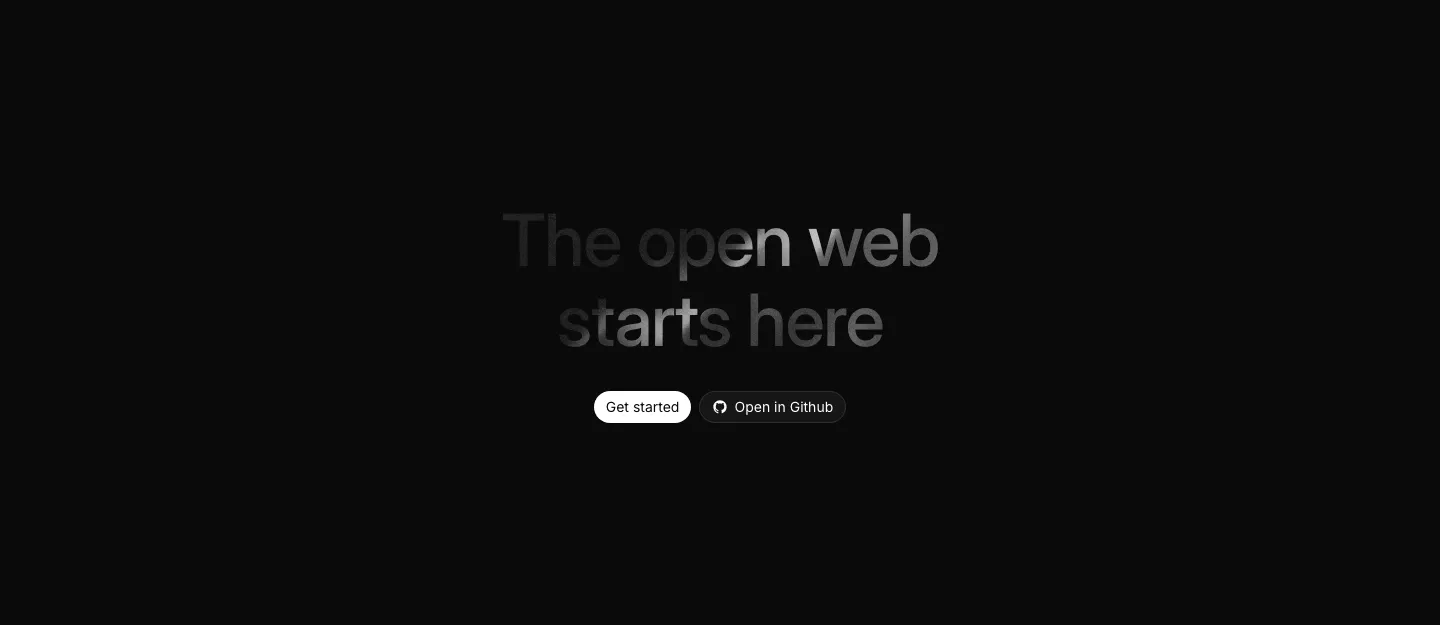
  51. Ycode call to action section: centered headline with a spotlight fade effect and two buttons on a black background
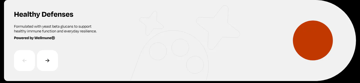
  52. Watts features section: Healthy Defenses slide with short copy, prev/next arrow buttons and an orange circle on a light gray card
  53. Attio logo cloud section: two rows of five customer logos in bordered grid cells, including granola, Modal, Railway and taskrabbit
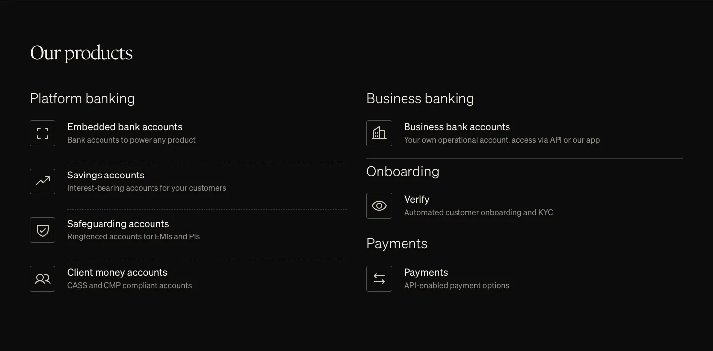
  54. Griffin features section: serif heading above two columns of product list items with outlined icons on black
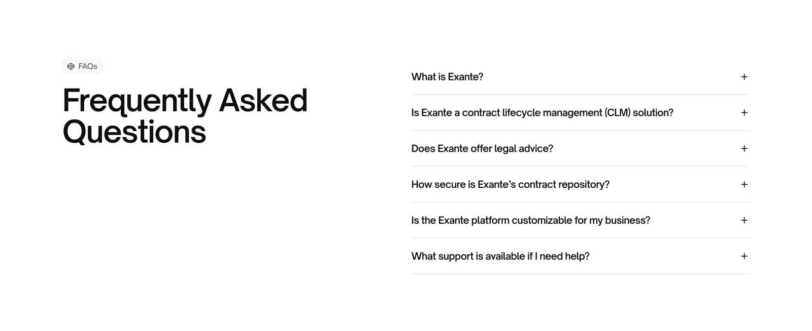
  55. Exante FAQ section: large heading with FAQs badge on the left and a six-question accordion on the right on a white background
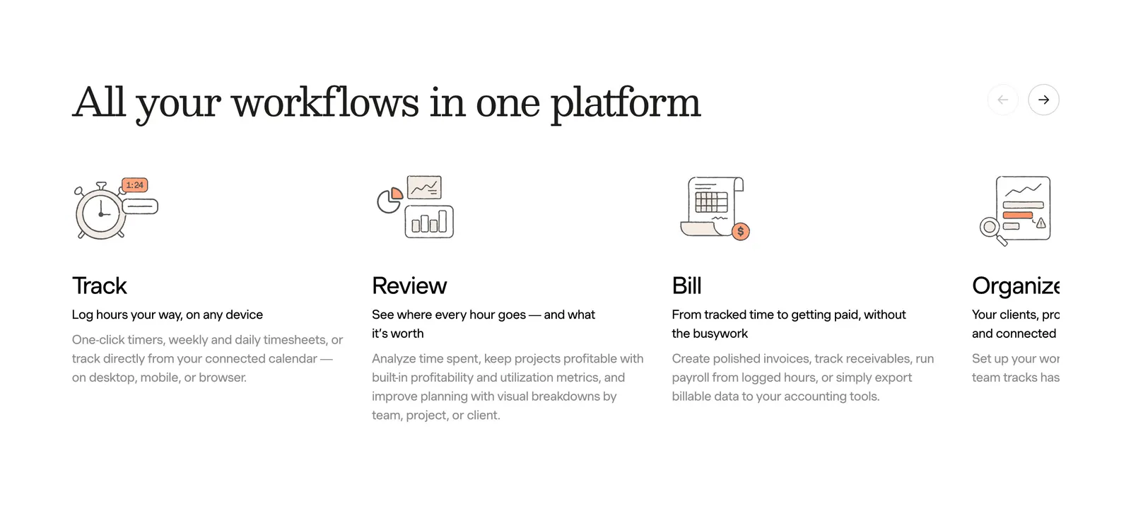
  56. Harvest features section: serif heading with arrow controls above a sliding row of track, review, bill and organize columns with line drawings
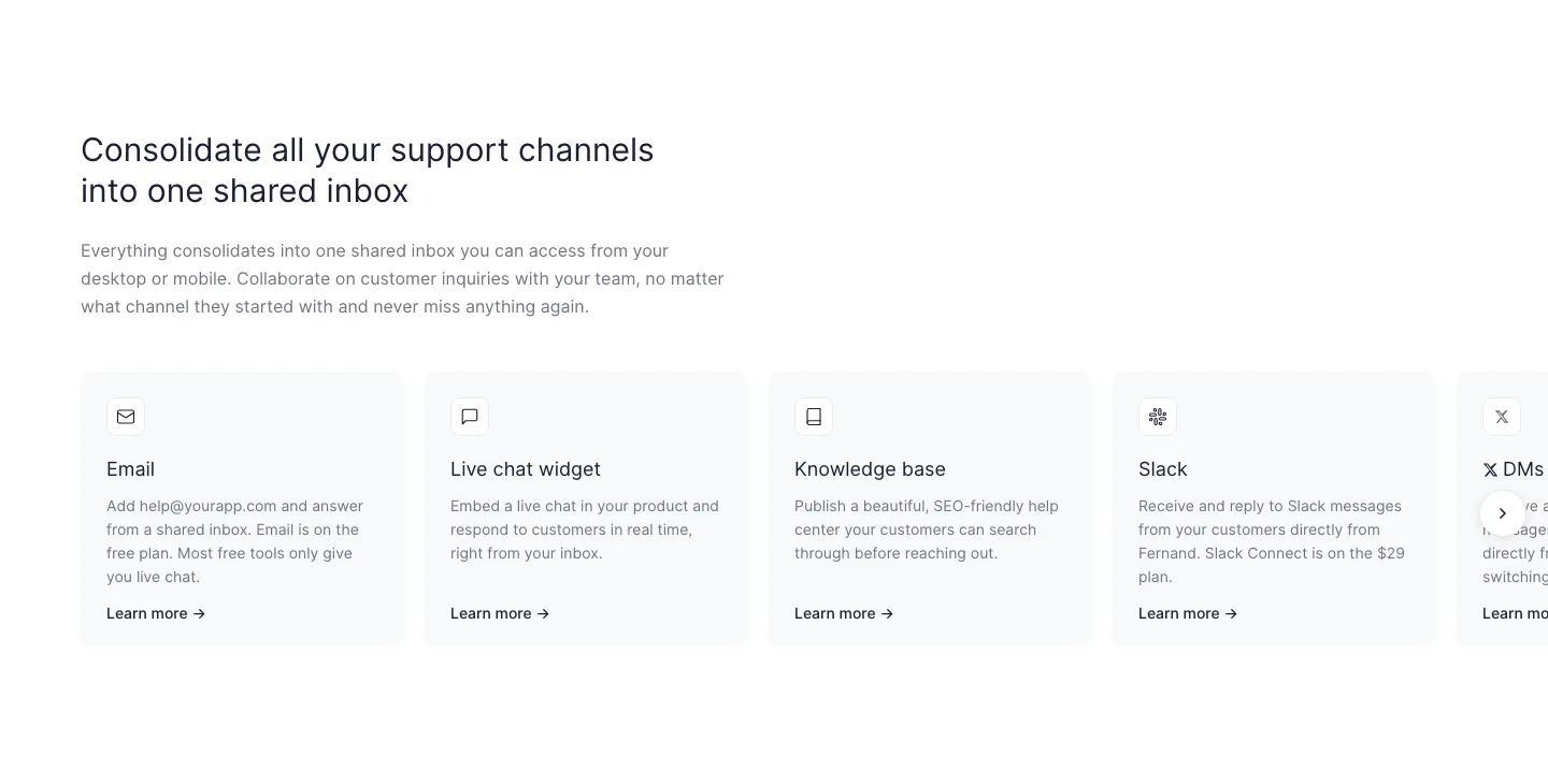
  57. Fernand features section: left-aligned headline above a row of support channel cards cut off at the right edge with a next arrow
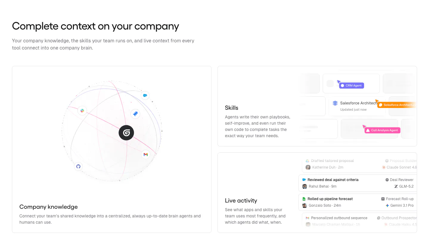
  58. Gumloop features section: headline above a large knowledge globe card and two stacked UI cards for skills and activity
  59. Neon logo cloud section: left-aligned headline beside a two-row grid of white customer logos on a black background
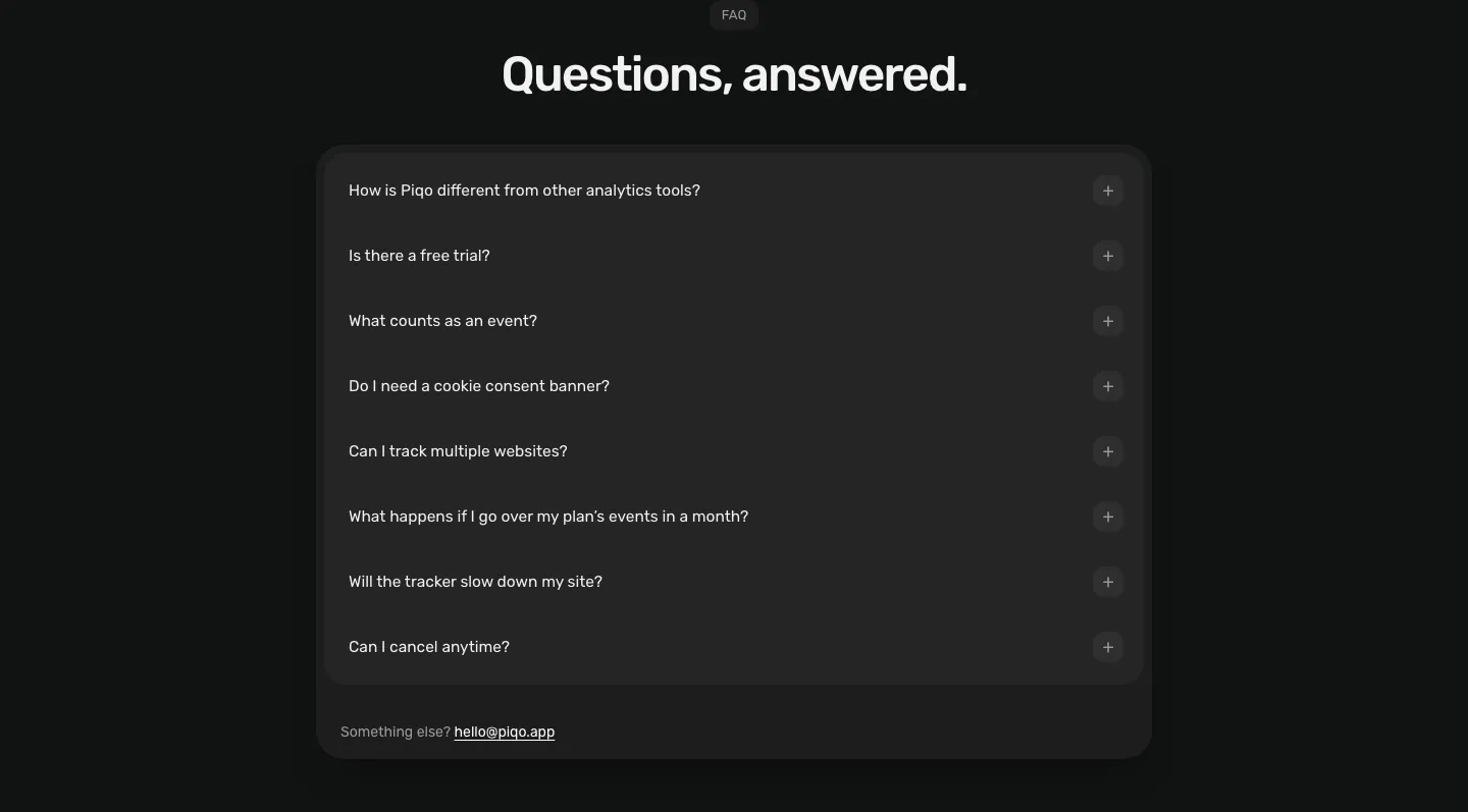
  60. Piqo FAQ section: centered pill label and headline above a rounded dark card with eight collapsed questions and a contact email
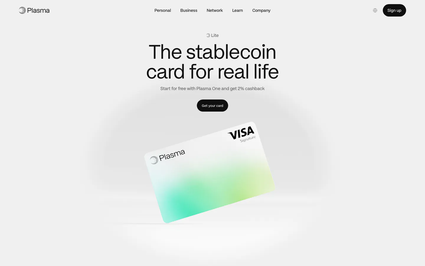
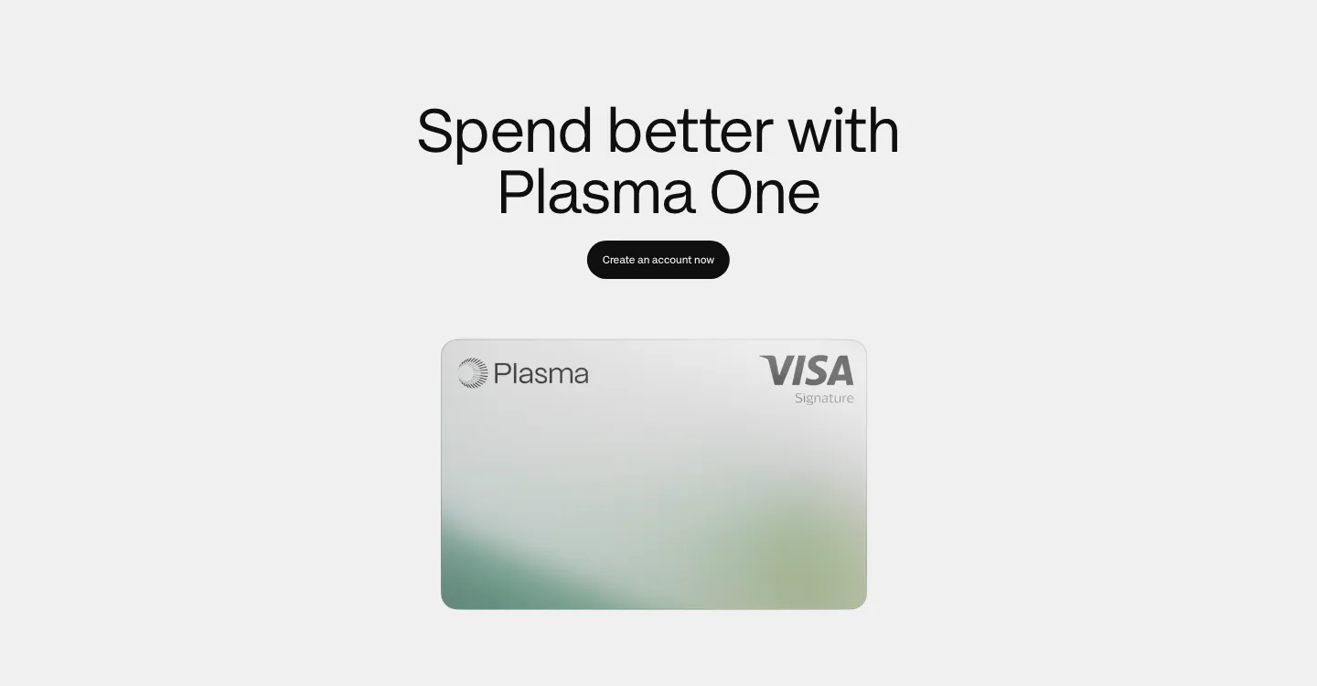
  61. Plasma hero section: nav, centered headline and black button above a tilted white-and-green Visa card render on light gray
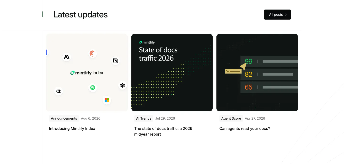
  62. Mintlify blog & resources section: headline with All posts button above three article cards with light and dark thumbnails
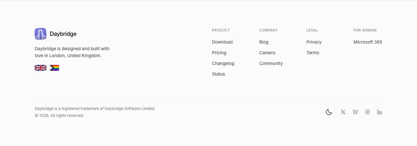
  63. Daybridge footer section: logo, London tagline and flags on the left, four link columns right, trademark line and social icons
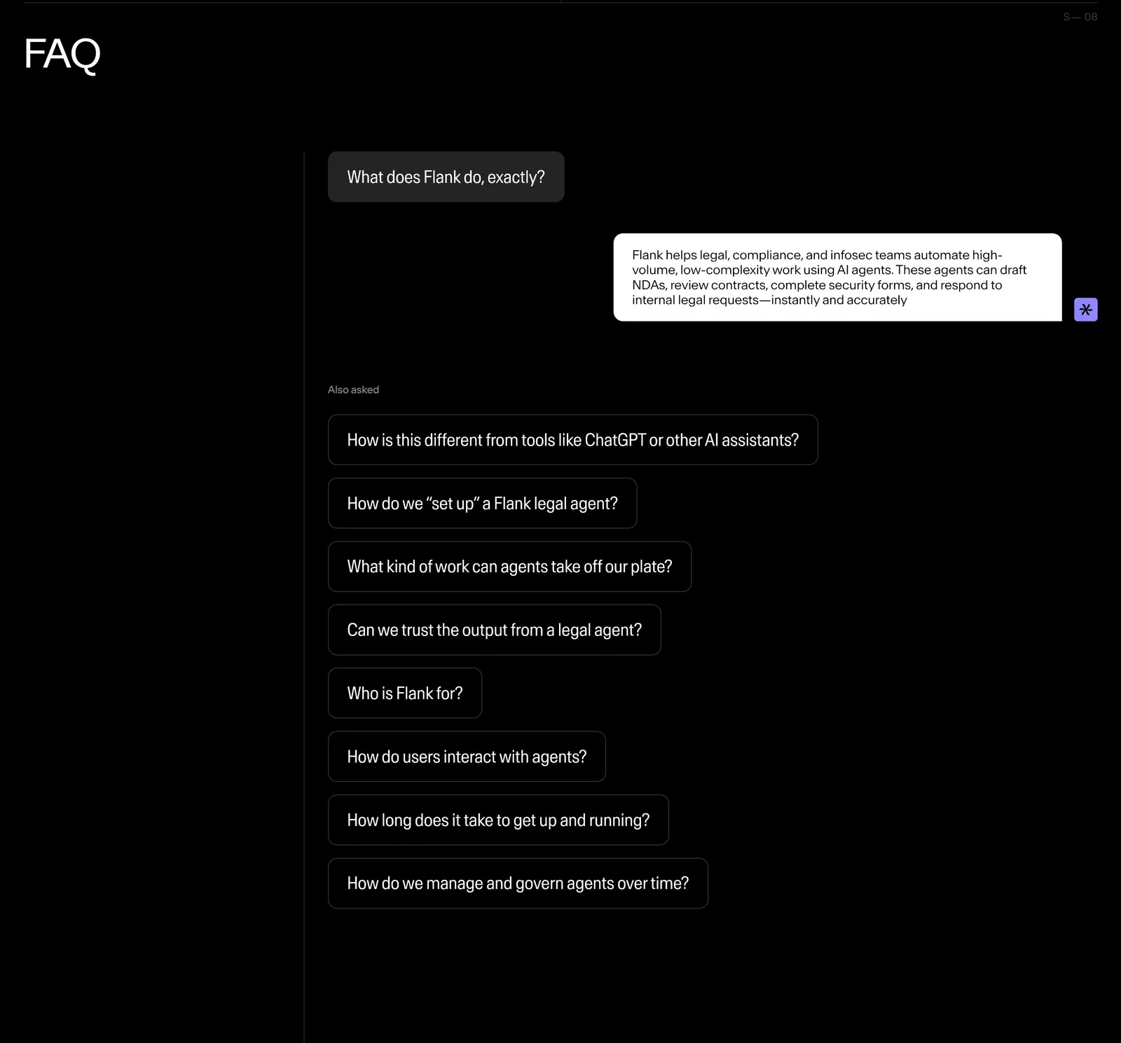
  64. Flank FAQ section: questions styled as chat bubbles with one answered reply and a list of follow-up questions on a black background
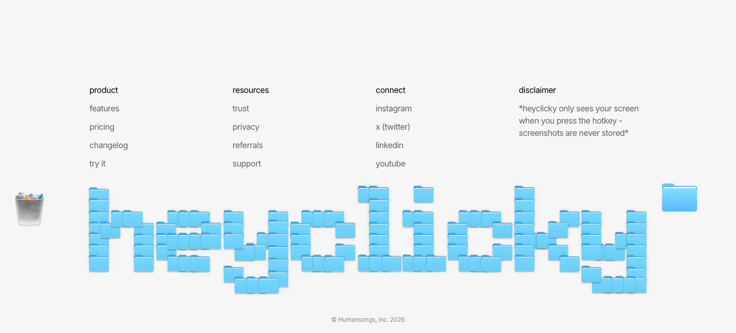
  65. heyclicky footer section: four link columns above a giant wordmark built from blue folder icons, copyright line on light gray
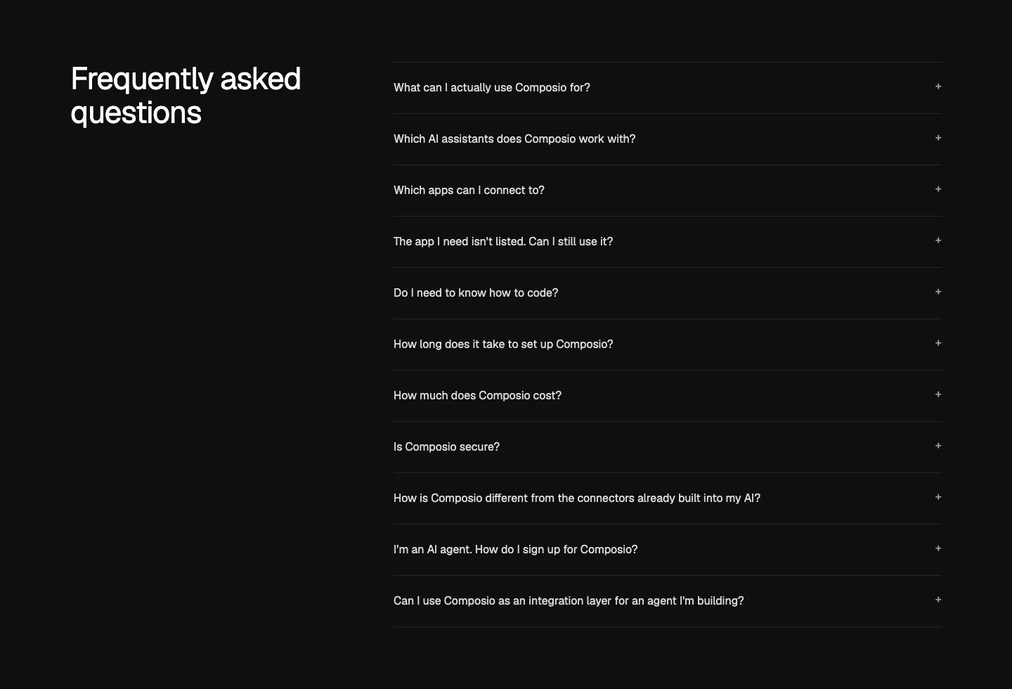
  66. Composio FAQ section: heading at left beside an accordion list of eleven questions with plus icons on near-black
  67. Godmode logo cloud section: single thin row with a trusted-by label beside fading grayscale customer logos on a pale background
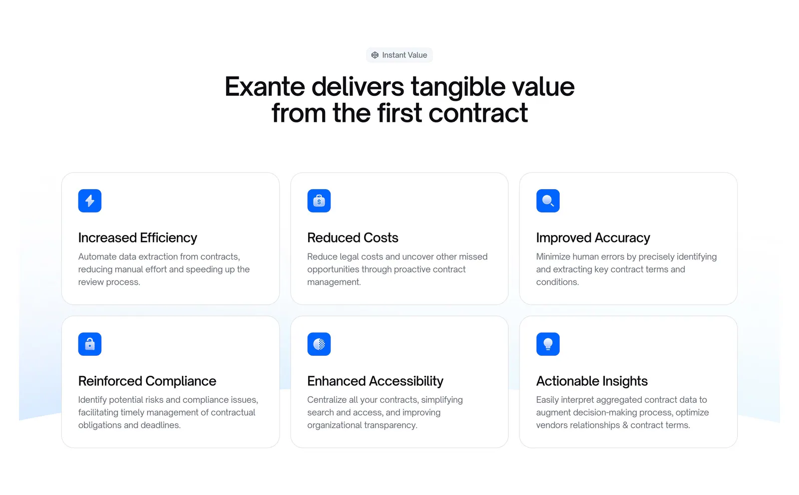
  68. Exante features section: centered headline above a 3x2 grid of benefit cards with blue icons on a white background
  69. Shelby logo cloud section: single row of customer logos including NBCUniversal and Watchee inside a rounded bordered box on off-white
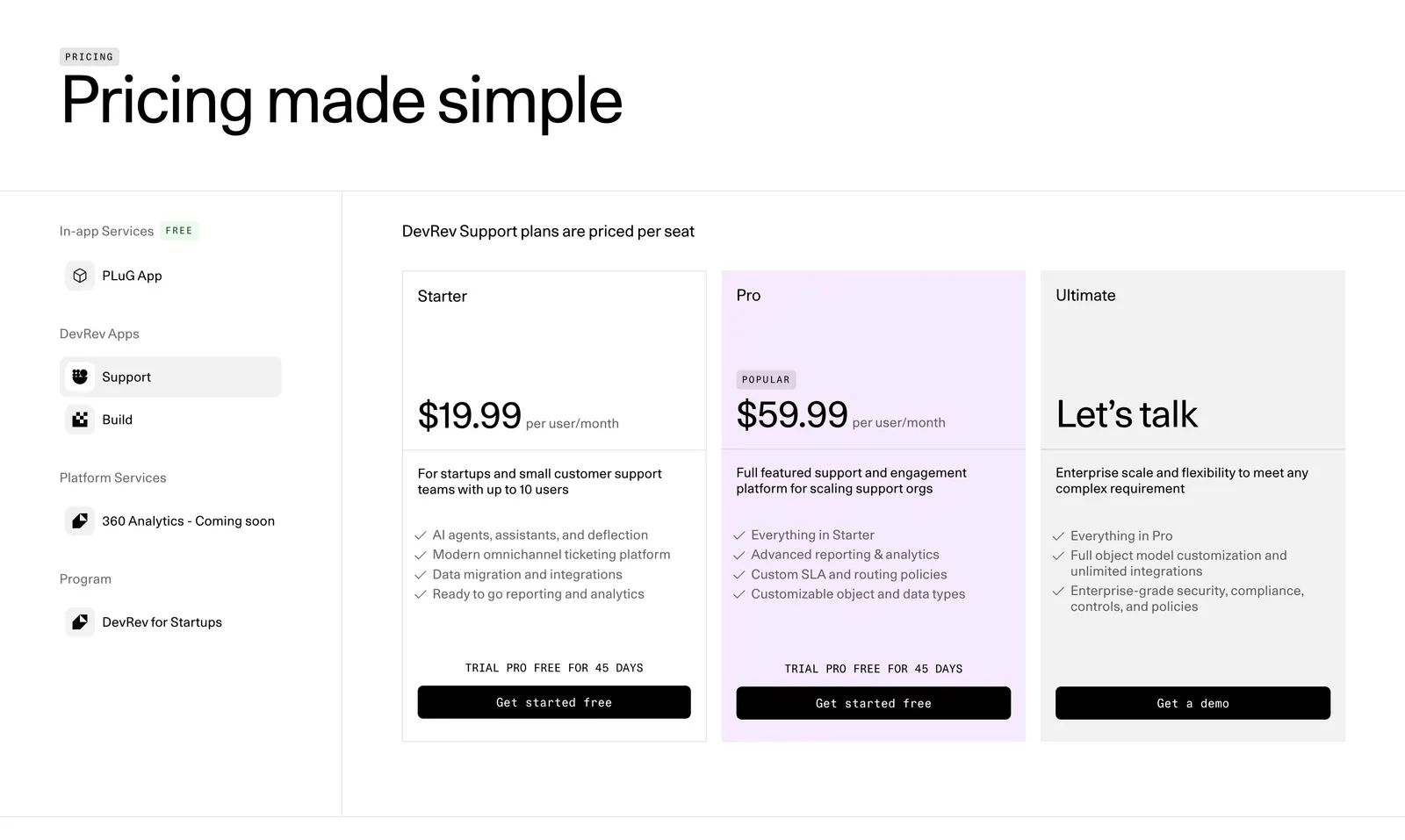
  70. DevRev pricing section: large headline, a left sidebar of product apps and three plan cards with the Pro tier highlighted in lavender
  71. Secoda integrations section: centered headline and button above two rows of integration app icons fading at the edges on white
  72. Attio call to action section: centered two-line headline with Talk to sales and Start for free buttons on a dark striped background
  73. Bright footer section: huge white bright wordmark on black beside three short columns of links, with a © 2026 line
  74. Cotool logo cloud section: single row of grayscale customer logos under a small 'Loved by teams at' label on a light gray background
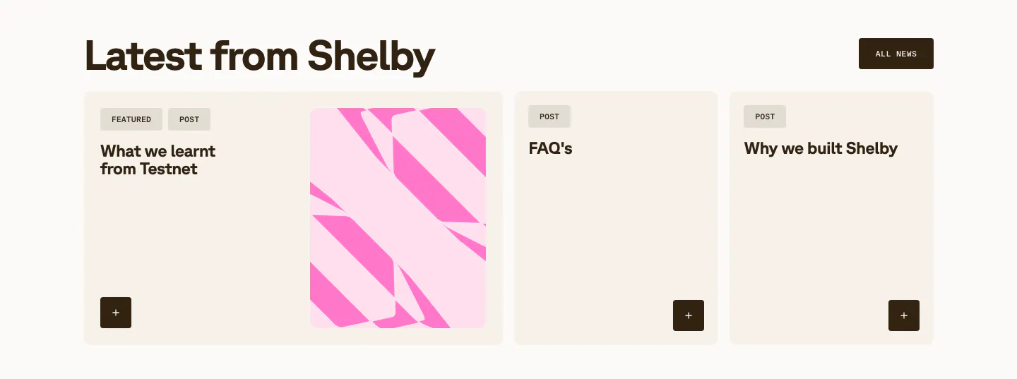
  75. Shelby blog & resources section: headline with All news button above a wide featured post card with pink abstract art and two post cards
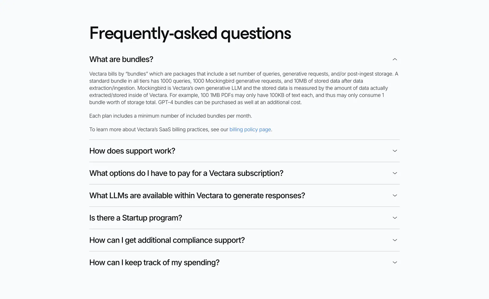
  76. Vectara FAQ section: left-aligned heading above an accordion of questions with the first answer expanded on a light gray background
  77. Smallest.ai logo cloud section: small Trusted by label on the left beside a row of grayscale RingCentral, Paytm, Truecaller and Acefone logos
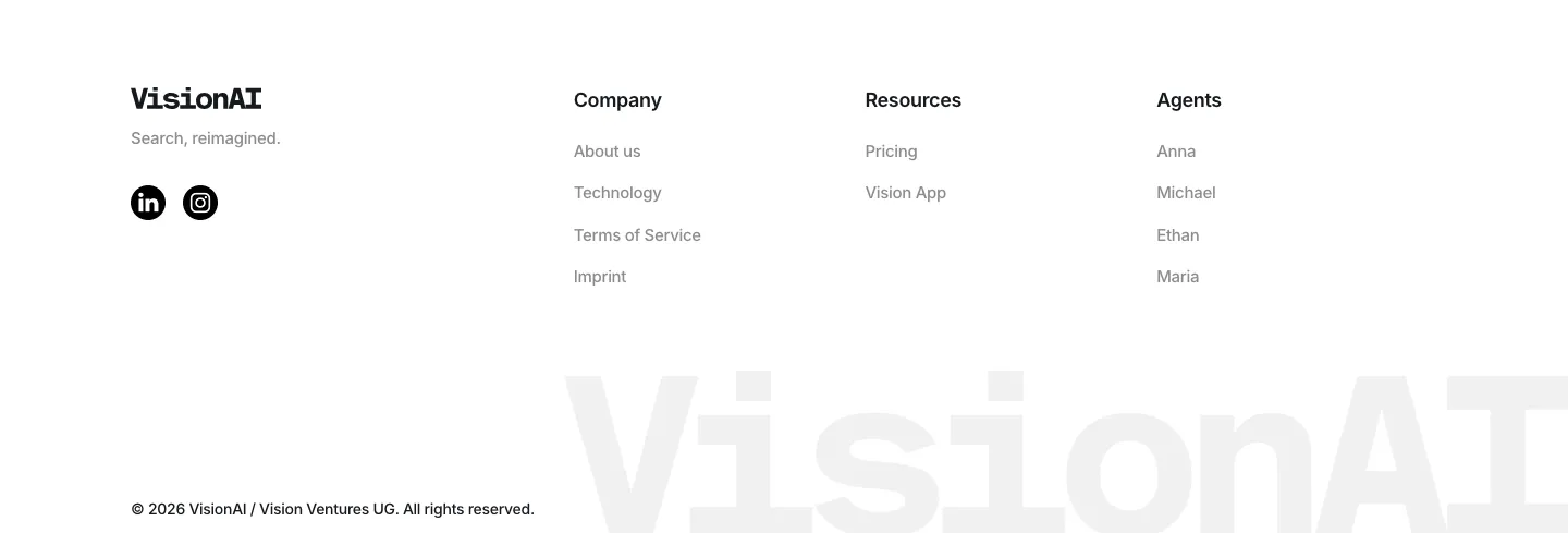
  78. VisionAI footer section: logo, social icons and three link columns above a large faint wordmark on white
  79. Whalesync logo cloud section: small monospace caption above two centered rows of black customer logos on a pale background
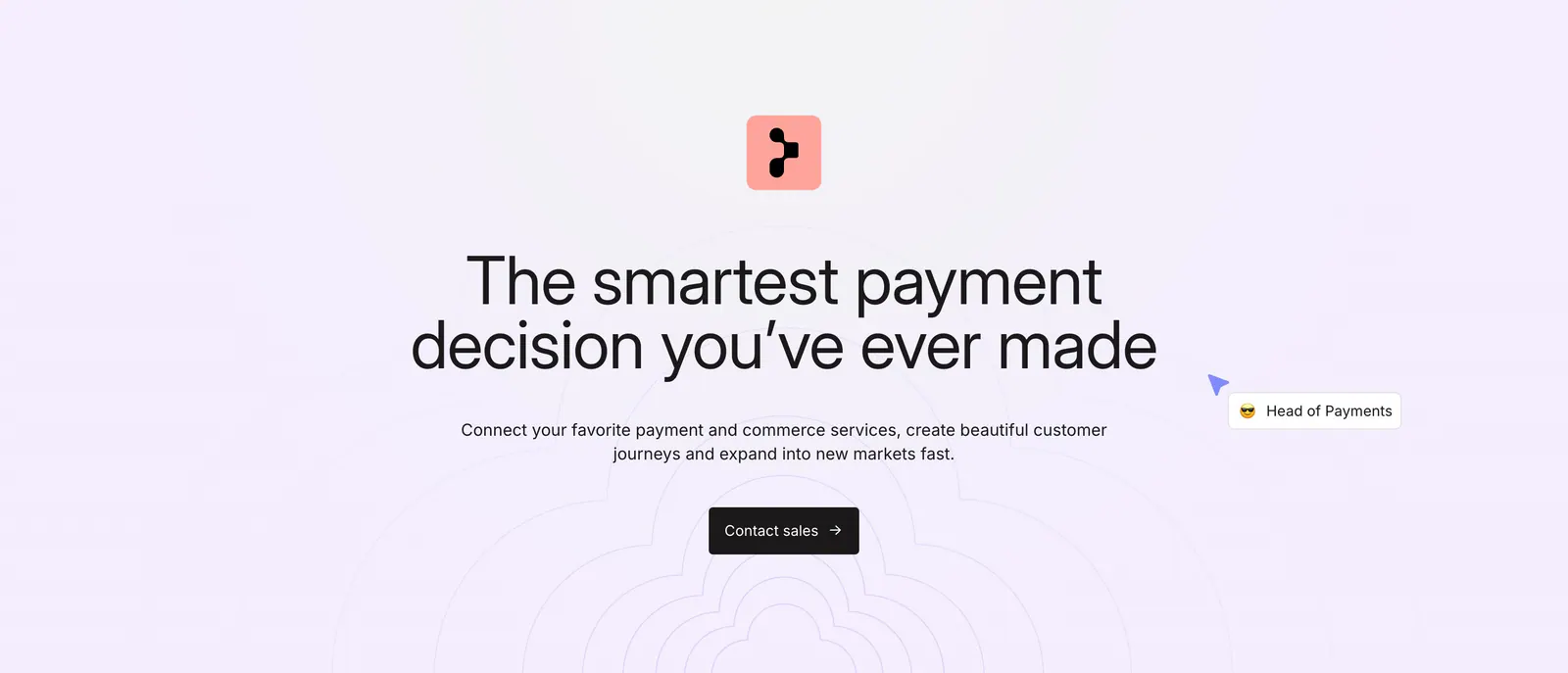
  80. Primer call-to-action section: centered headline, subcopy and dark Contact sales button over a faint concentric line pattern
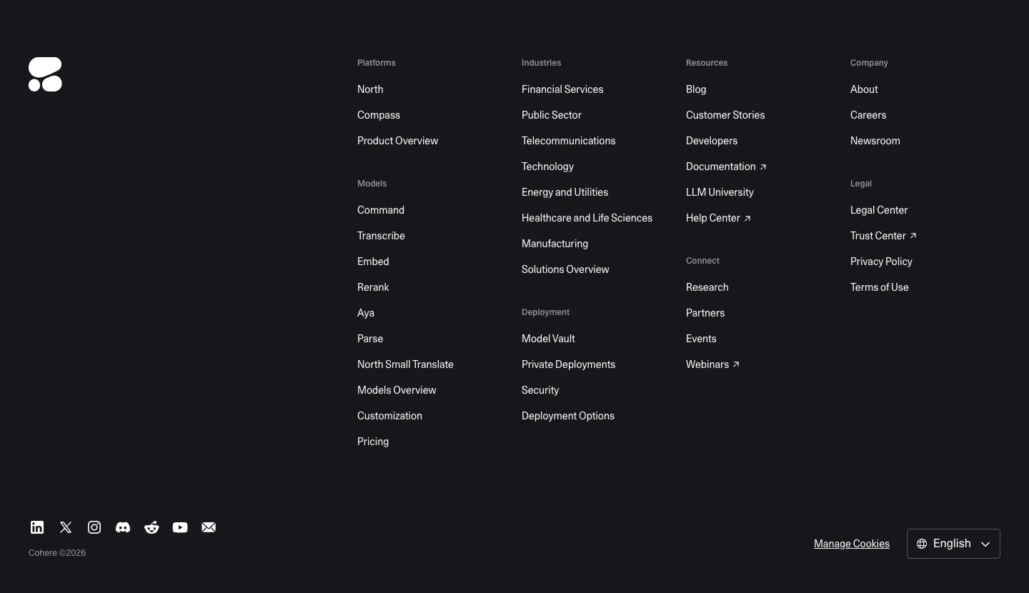
  81. Cohere footer section: dark background with logo, multi-group link columns, social icons and language selector
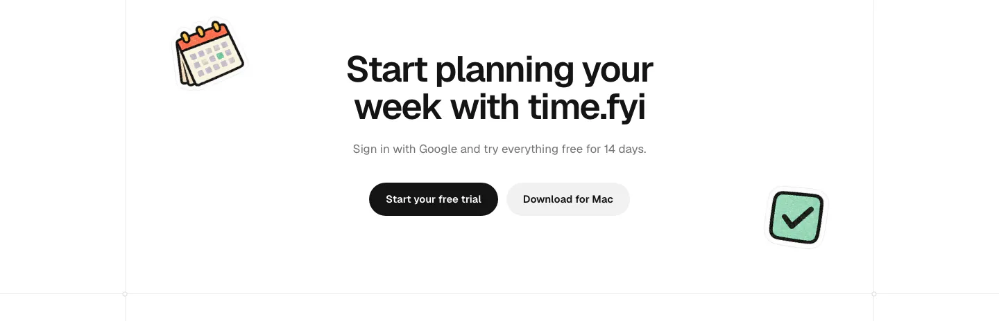
  82. time.fyi call-to-action section: centered headline with trial and Mac download buttons flanked by calendar and checkbox stickers
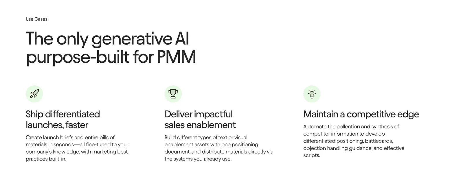
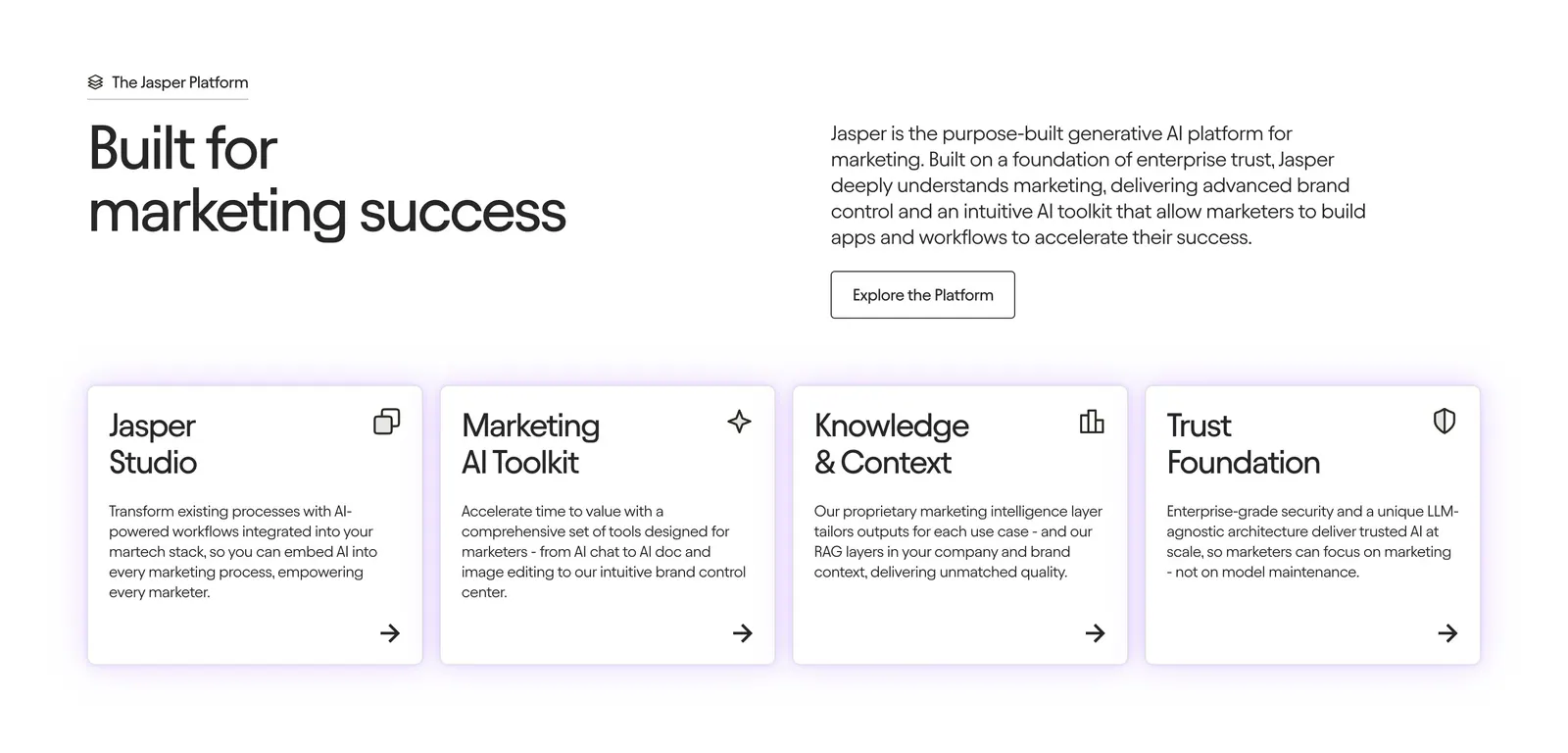
  83. Jasper features section: large left-aligned headline above three icon columns with short benefit descriptions on a white background
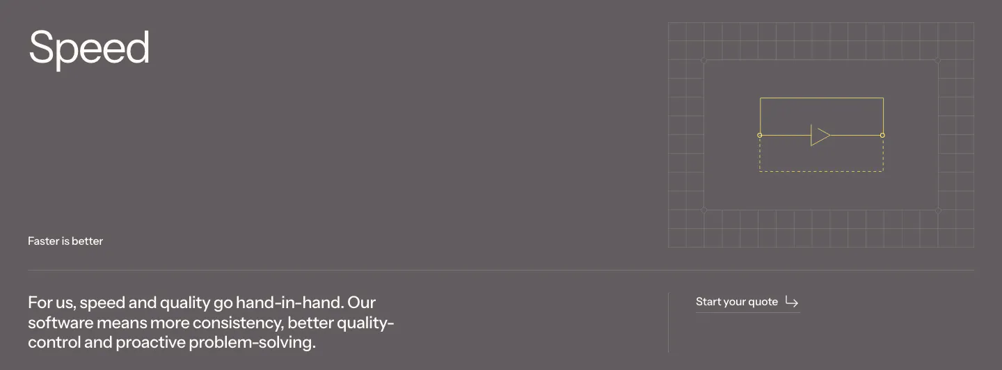
  84. Podium Automation value proposition section: large Speed heading and body copy on a muted gray band with a small grid line diagram
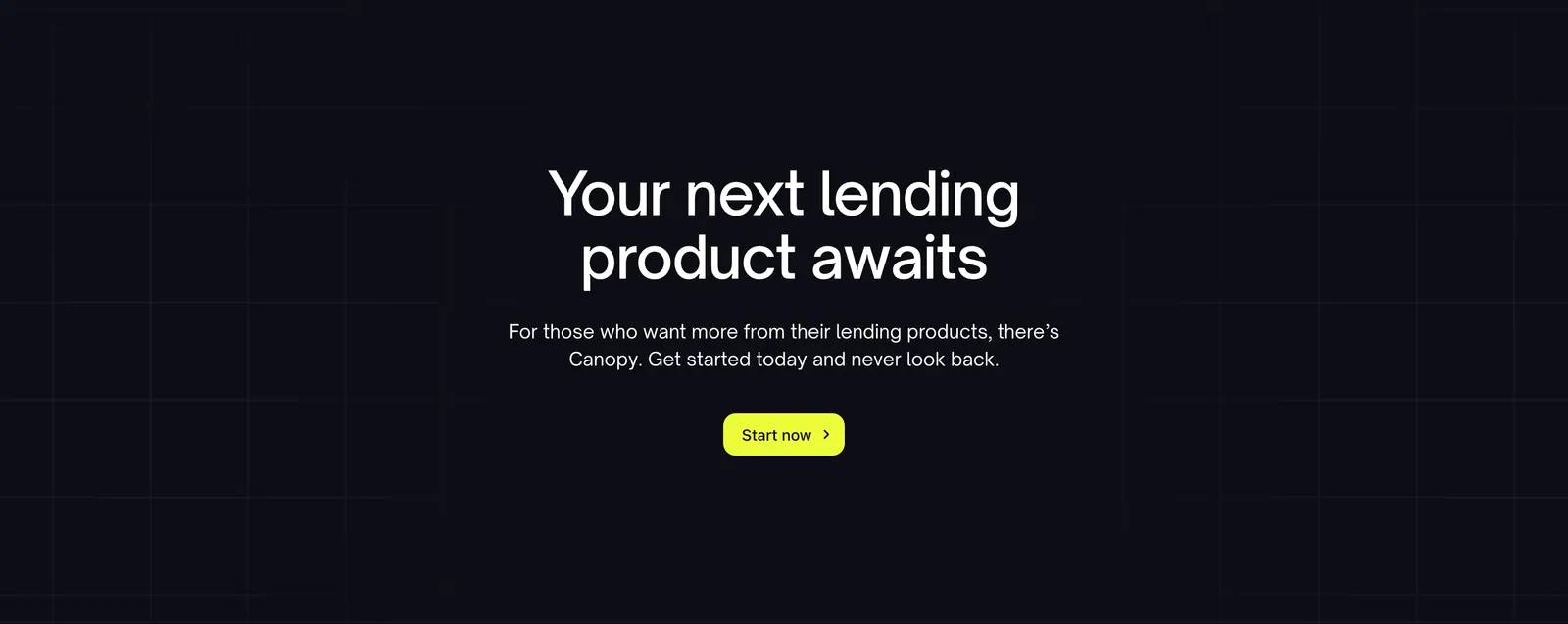
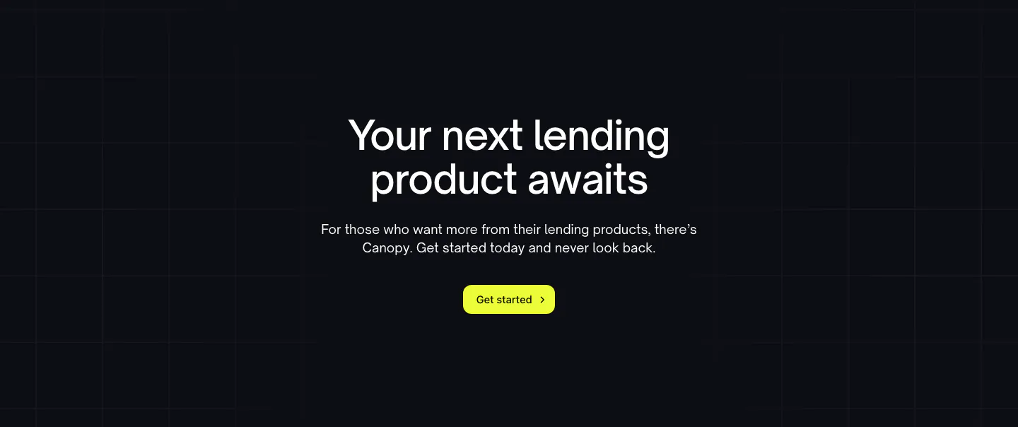
  85. Canopy call-to-action section: centered headline, short copy and lime button on a dark background with faint grid lines
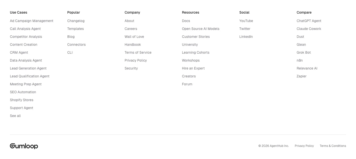
  86. Gumloop footer section: six link columns above a wordmark and copyright row on white
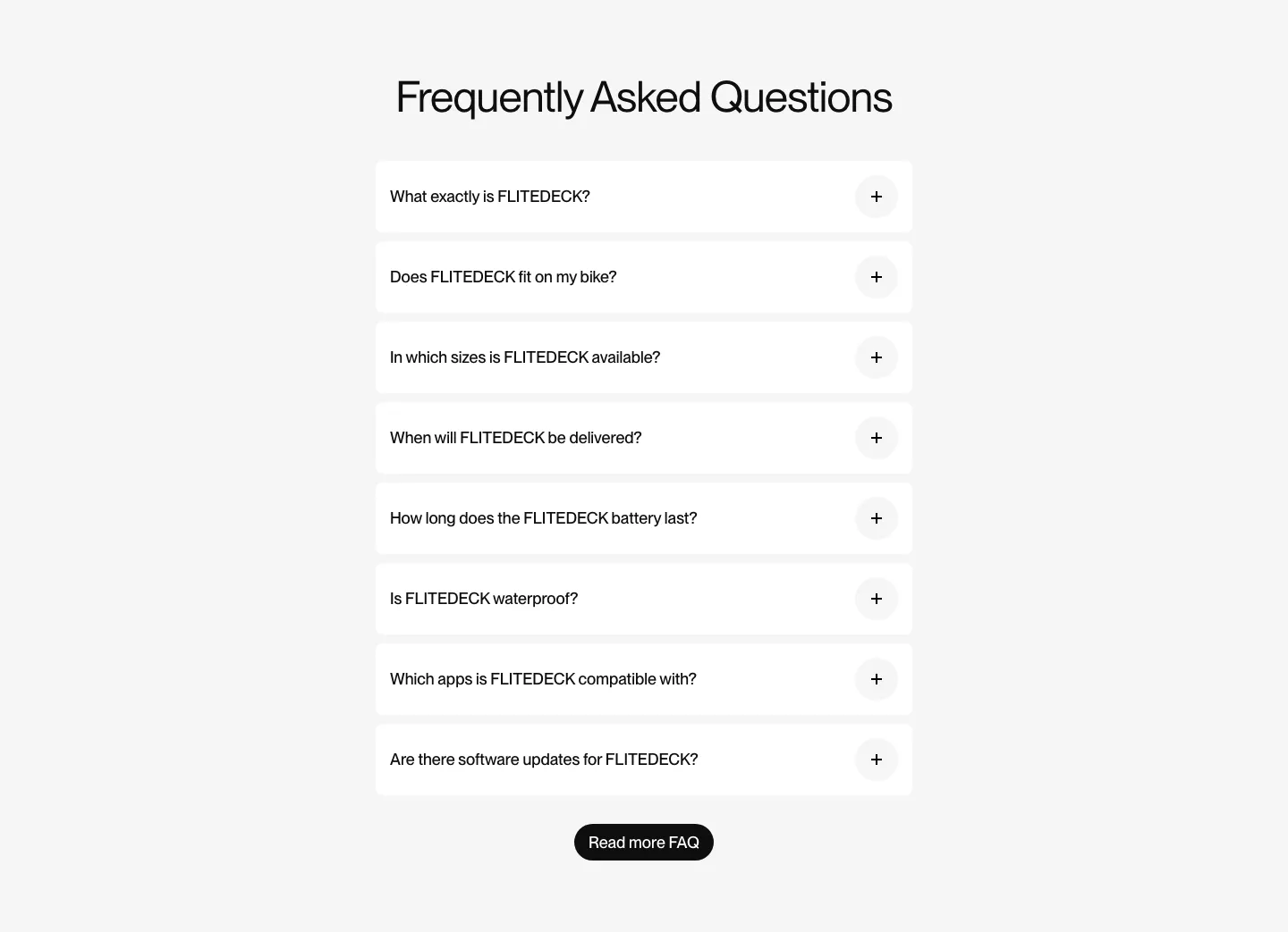
  87. FLITEDECK FAQ section: centered heading above a single column of white accordion questions and a black button on light gray
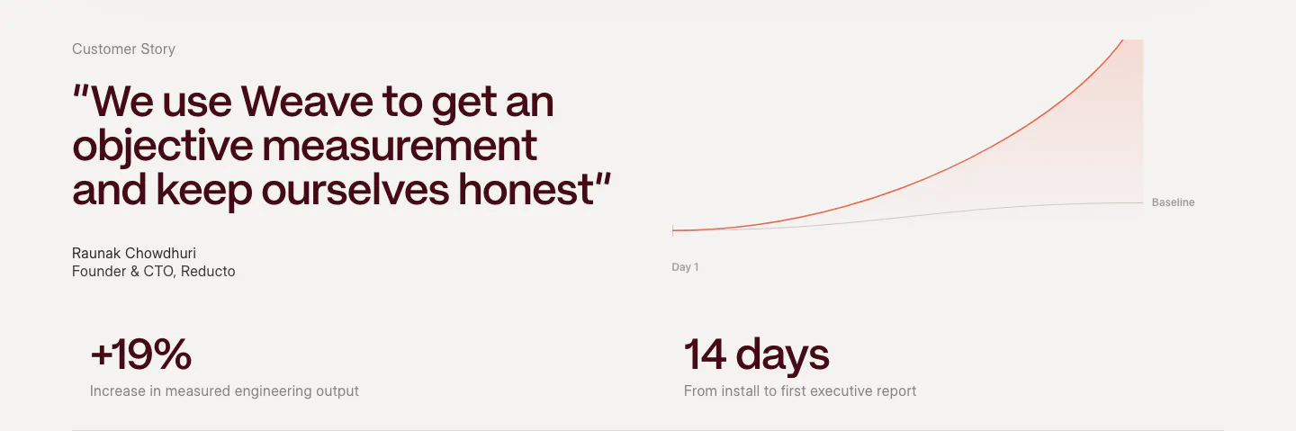
  88. Weave testimonials section: large quote with attribution beside a growth line chart, above two outcome metrics on a warm light background
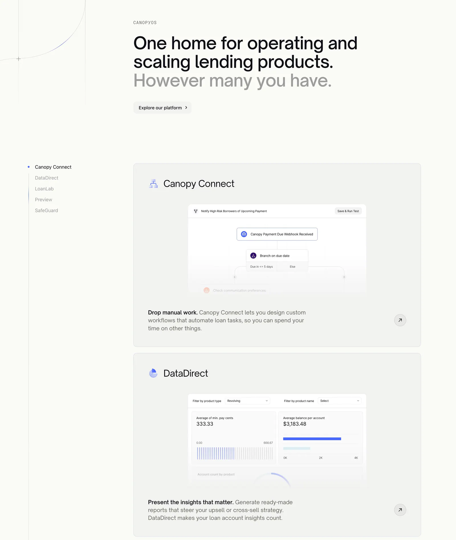
  89. Canopy features section: large headline above a sticky product list on the left and stacked cards with workflow and analytics UI
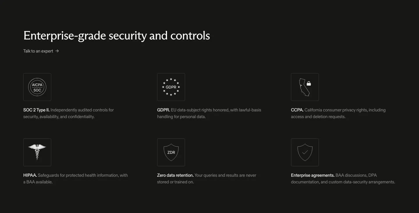
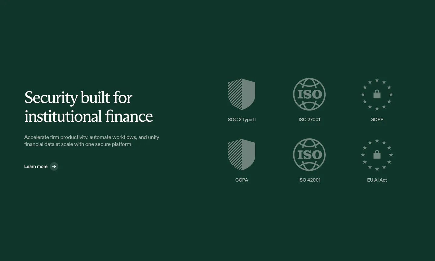
  90. Exa security section: dark background with headline and a three-by-two grid of outlined compliance icons for SOC 2, GDPR, CCPA and HIPAA
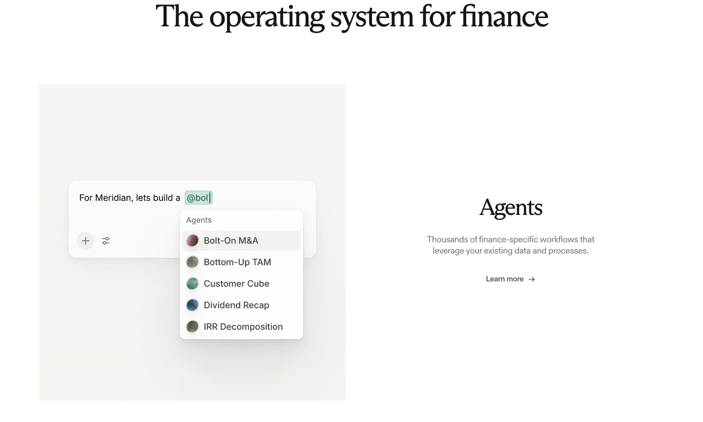
  91. Rogo features section: serif heading above an agent picker UI mockup on the left and Agents text with a link on the right
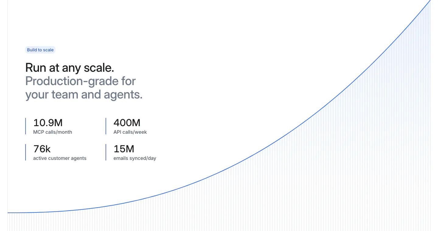
  92. Attio stats section: two-tone headline and four metrics at left beside a rising blue growth curve with vertical line fill on white
  93. Harvey logo cloud section: centered serif headline above three rows of grayscale law firm and enterprise logos
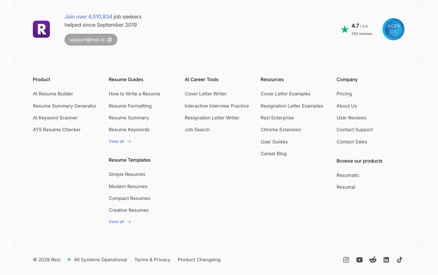
  94. Rezi footer section: logo with user count and support email, five link columns, rating and SOC badge, copyright and social icons
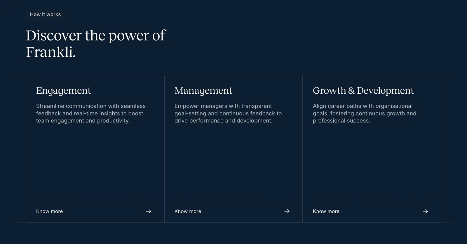
  95. Frankli how it works section: serif heading above three outlined cards for engagement, management and growth with links on navy
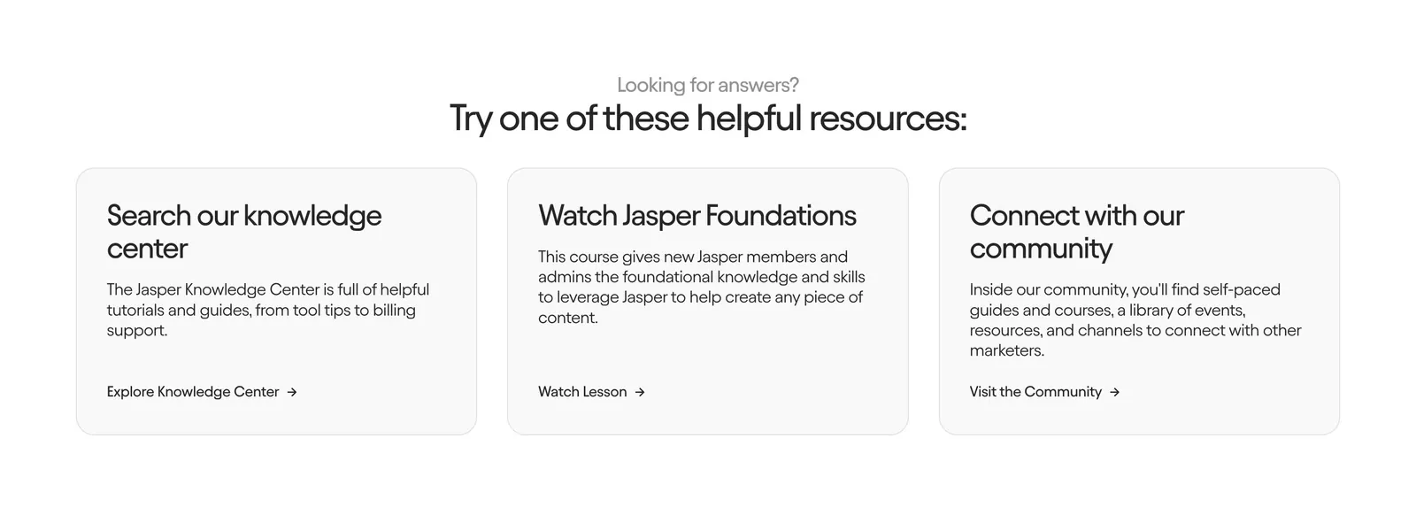
  96. Jasper contact section: centered heading above three light gray cards linking to the knowledge center, a course and the community
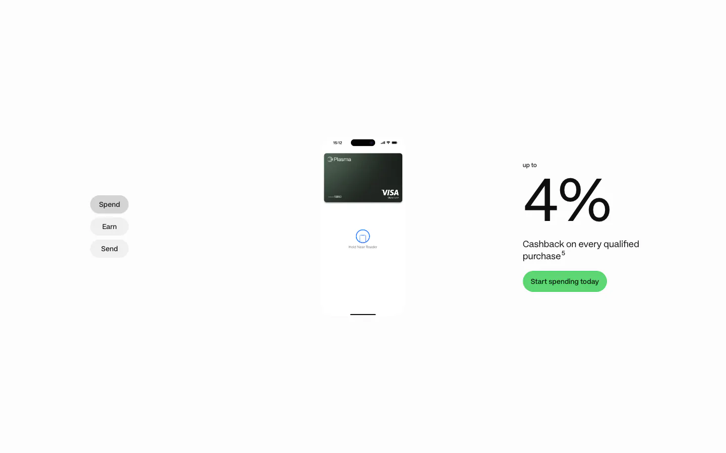
  97. Plasma features section: Spend/Earn/Send tabs left, phone with card center and a large 4% cashback figure right on white
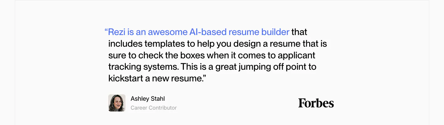
  98. Rezi testimonials section: single Forbes quote with a blue highlighted lead-in, author avatar and Forbes wordmark on light gray
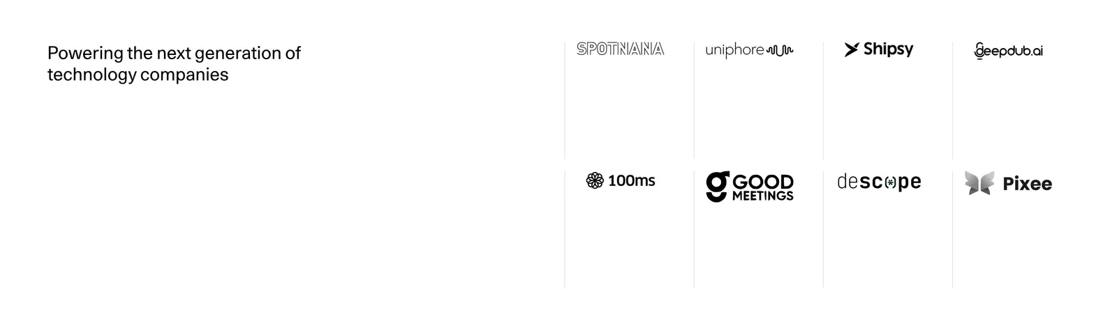
  99. Ideogram FAQ section: heading on the left, accordion of six questions on the right with the first one expanded, on white
  100. Rezolv logo cloud section: small In the News label above a single row of divided press publication logos on cream
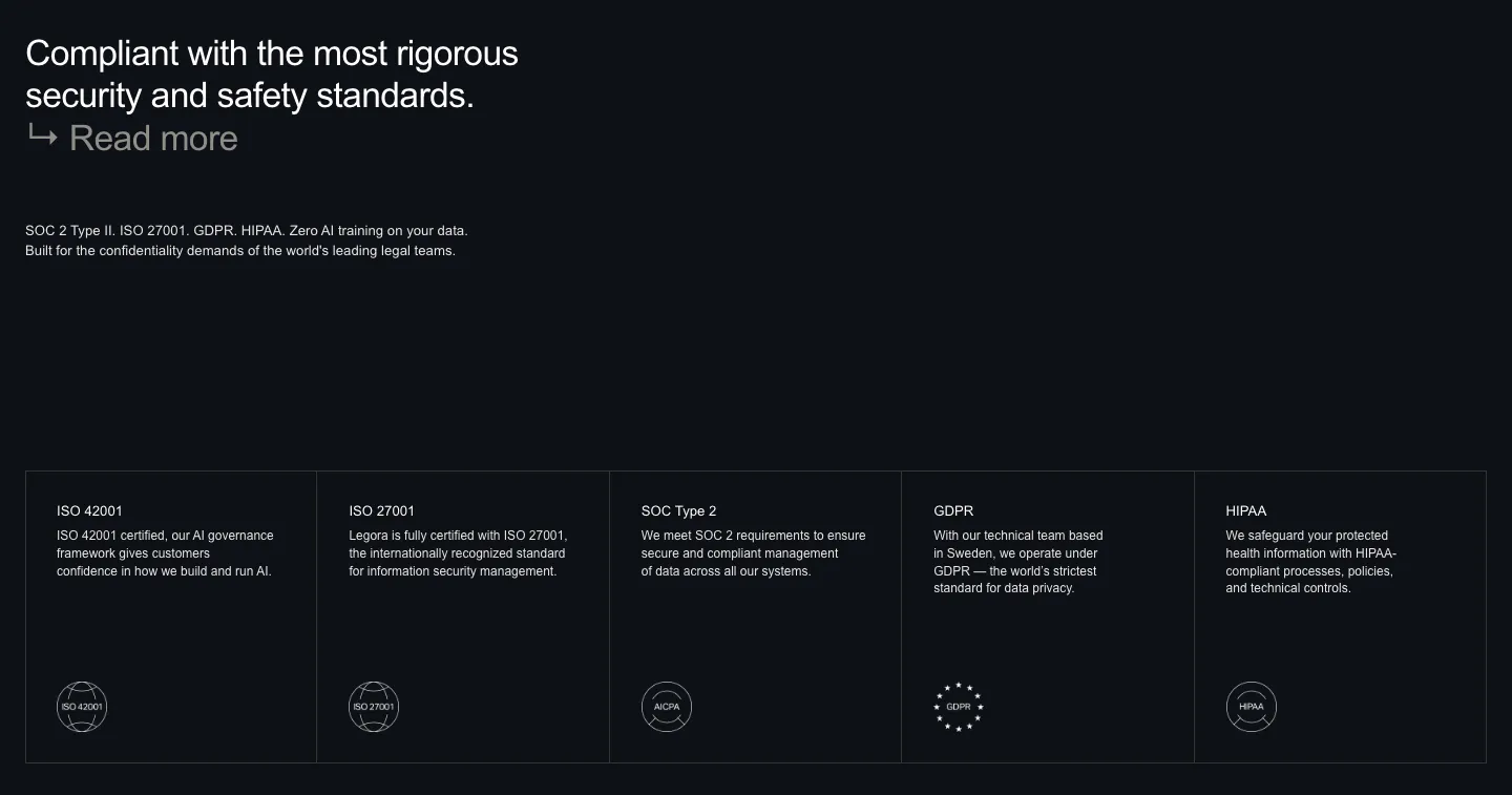
  101. Legora security section: left headline on a dark background above five bordered cells for ISO, SOC 2, GDPR and HIPAA badges
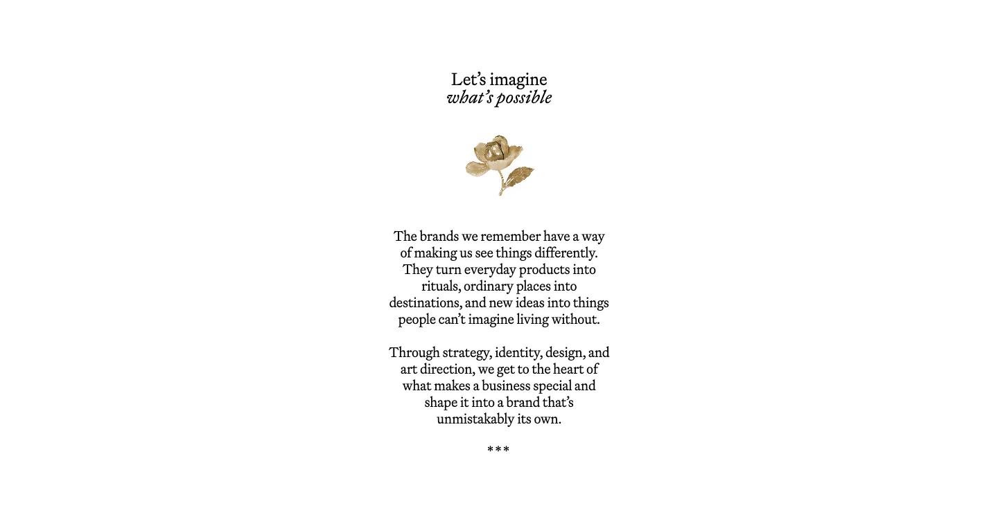
  102. Goodside about & mission section: centered serif heading, small gold flower ornament and short serif paragraphs on white
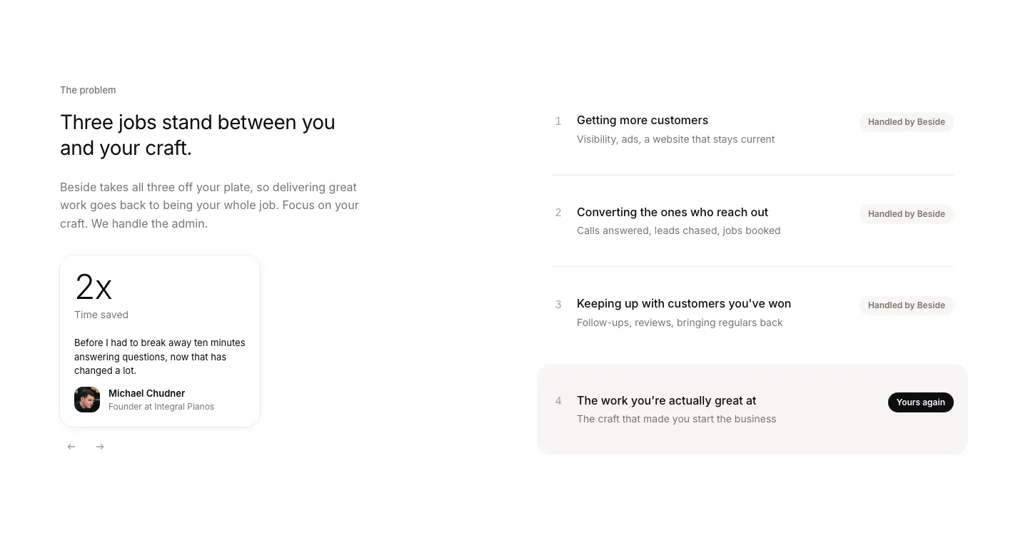
  103. Beside value proposition section: headline and testimonial stat card on the left, four numbered job rows with status pills on the right
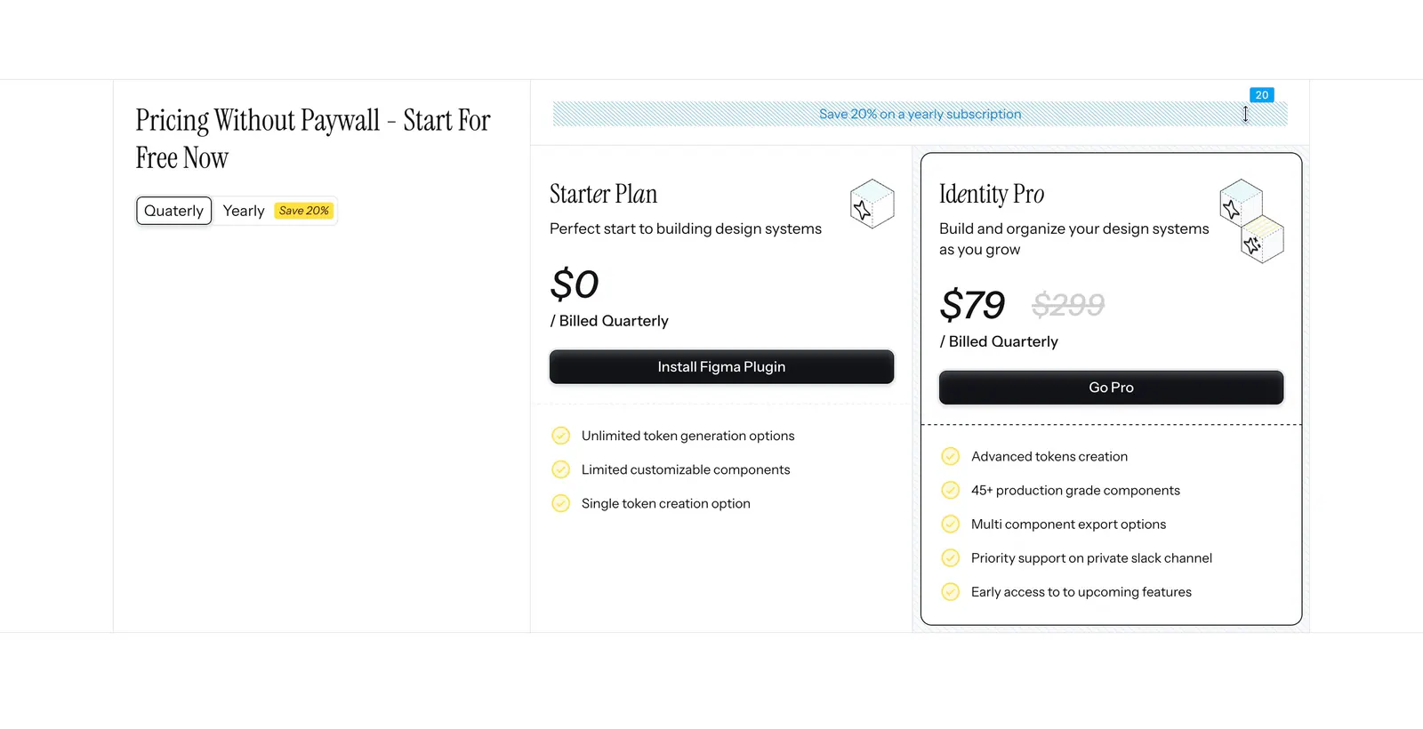
  104. Figr pricing section: serif heading with quarterly/yearly toggle on the left and Starter and Identity Pro plan cards on the right
  105. Ploy logo cloud section: small centered caption above a single row of grayscale customer logos fading at the edges on light gray
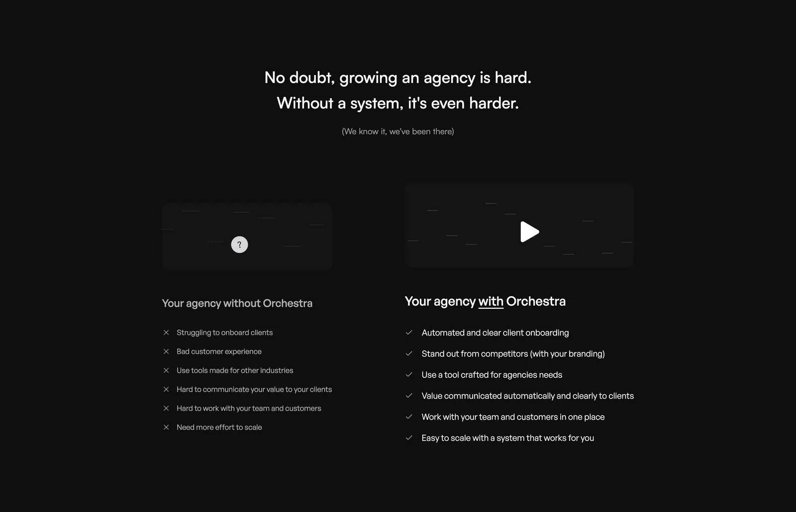
  106. Orchestra comparison section: centered headline above two columns contrasting pains without Orchestra and checked benefits with it, dark
  107. Weav logo cloud section: thin pink strip with a small trust label and a row of blue customer logos separated by dividers
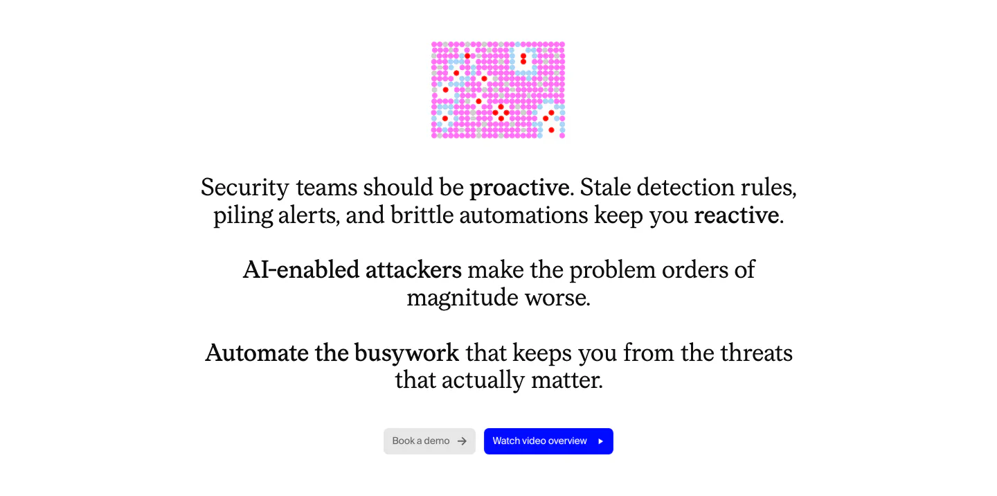
  108. Cotool value proposition section: centered serif problem statement with bolded phrases, small pink pixel graphic and two buttons on white
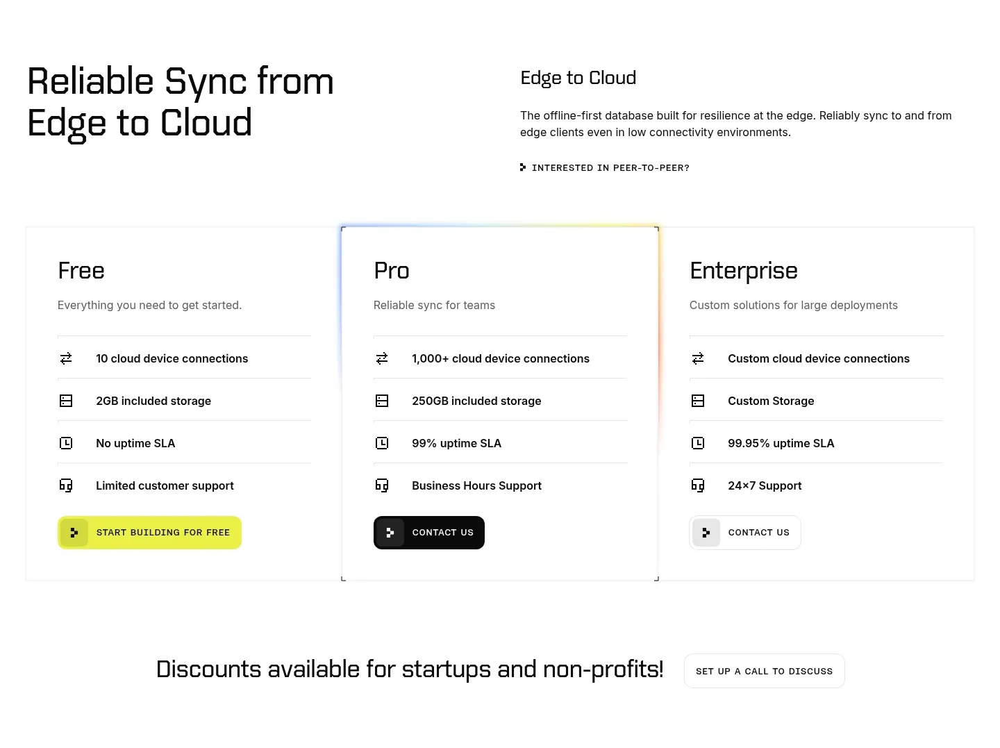
  109. Ditto pricing section: headline and intro above three plan cards for Free, Pro and Enterprise with icon feature rows, Pro with a glowing border
  110. Outtake footer section: centered wordmark above boxed link cells, SOC badge, copyright and legal links on a beige grid
  111. Chatbase logo cloud section: bordered three-row grid of gray customer logos on a light background
  112. Sendr FAQ section: Quick answers title on the left beside a five-question collapsed accordion list on light gray
  113. incident.io logo cloud section: small uppercase label above three rows of black customer logos on white
  114. Remote features section: left-aligned headline above a six-item grid with cyan icon tiles and divider lines
  115. Mintlify logo cloud section: centered heading above two rows of grayscale customer logos and an Our customers button on black
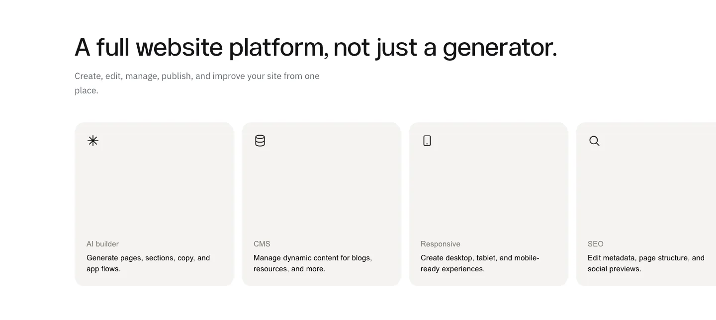
  116. Laravel call-to-action section: centered two-line headline with an orange Deploy on Cloud button and a framework docs button on white
  117. Polar Signals footer section: logo, tagline and copyright at left with four link columns on a black background
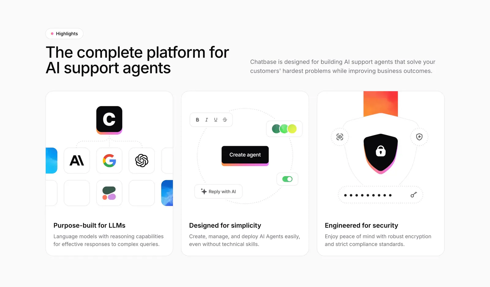
  118. Chatbase features section: headline beside intro copy above three equal cards with model, builder and security illustrations
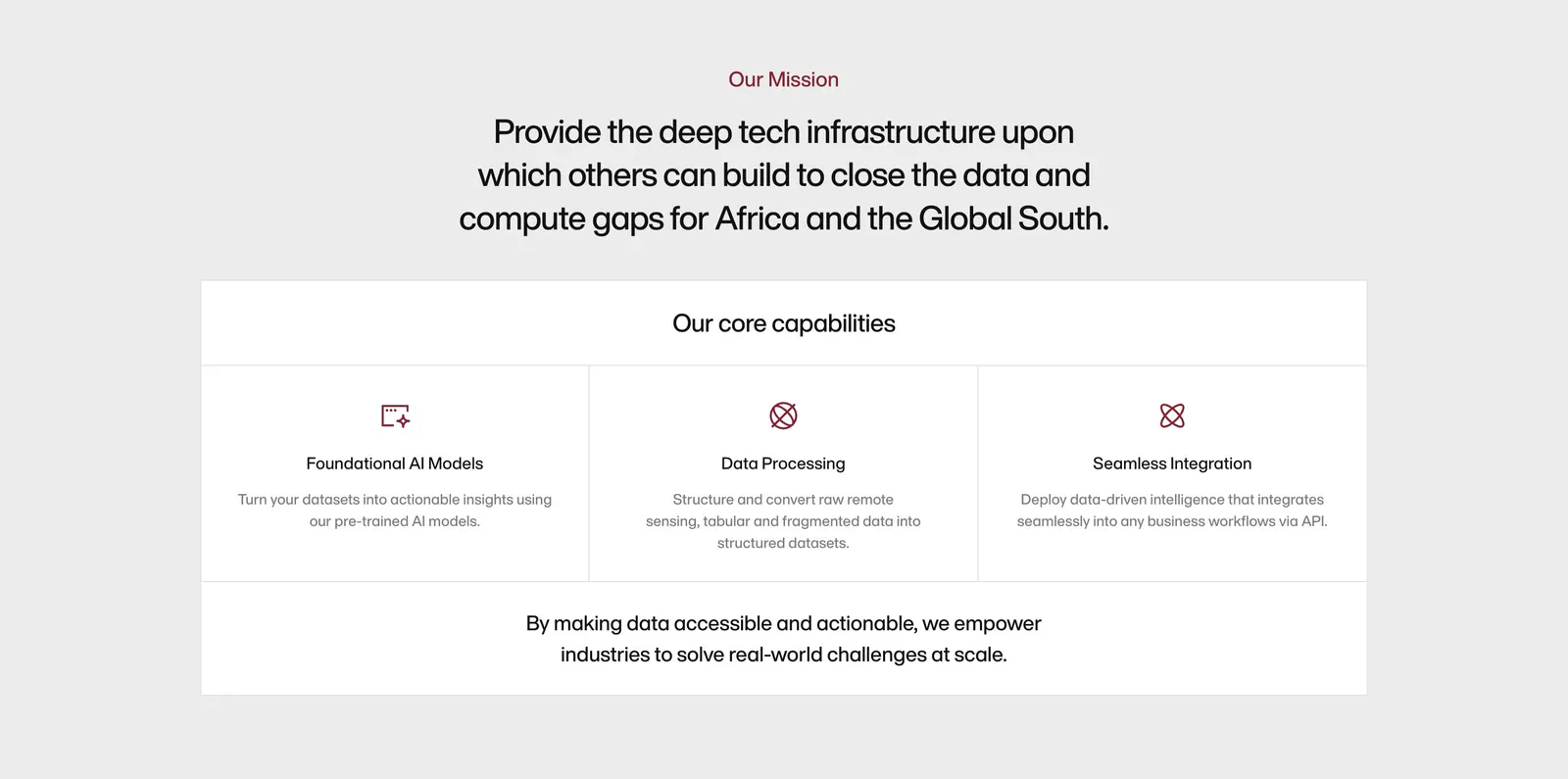
  119. Amini about & mission section: centered mission statement above a bordered panel of three core capability columns with icons
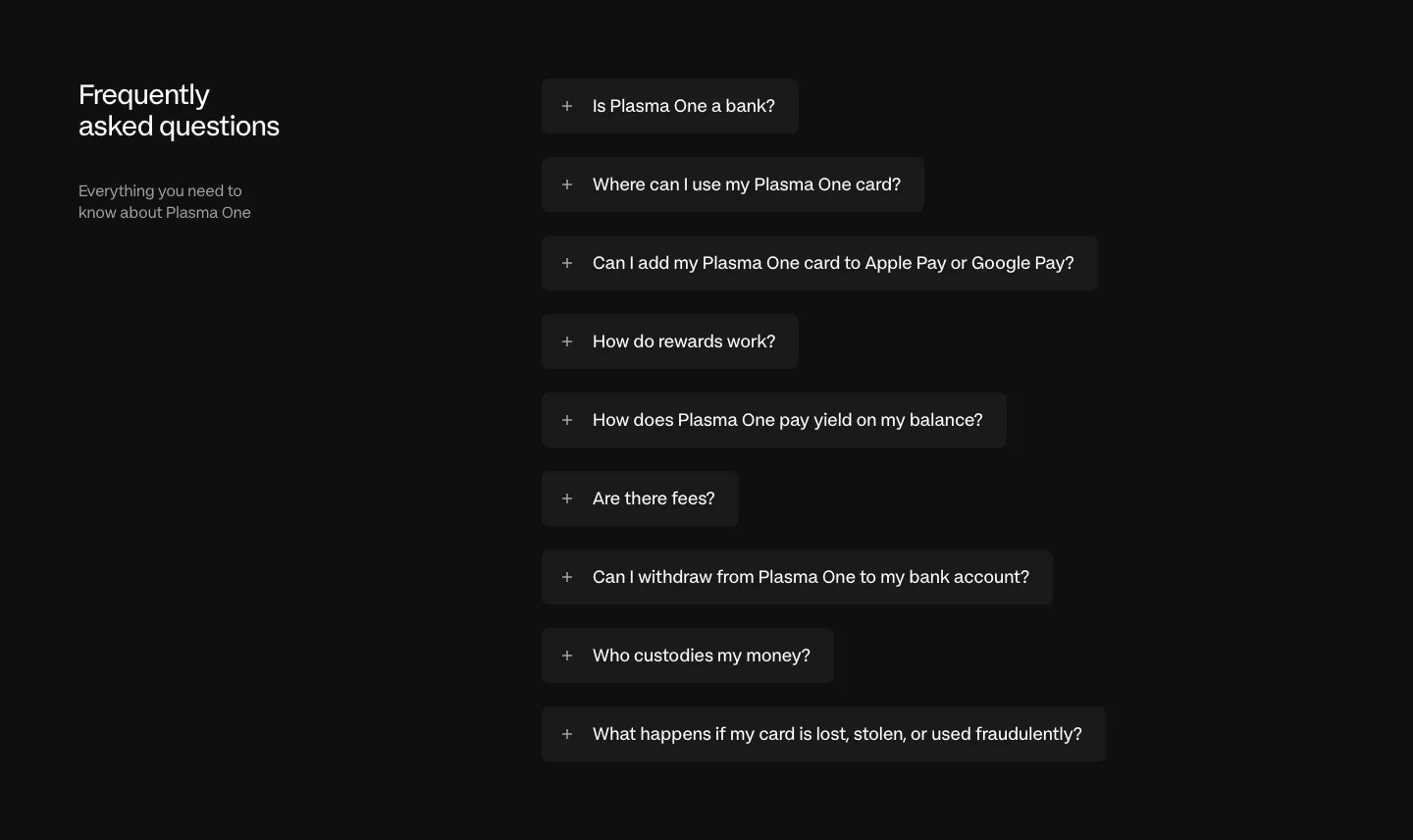
  120. Plasma FAQ section: heading and intro left, collapsed question pills stacked right on a near-black background
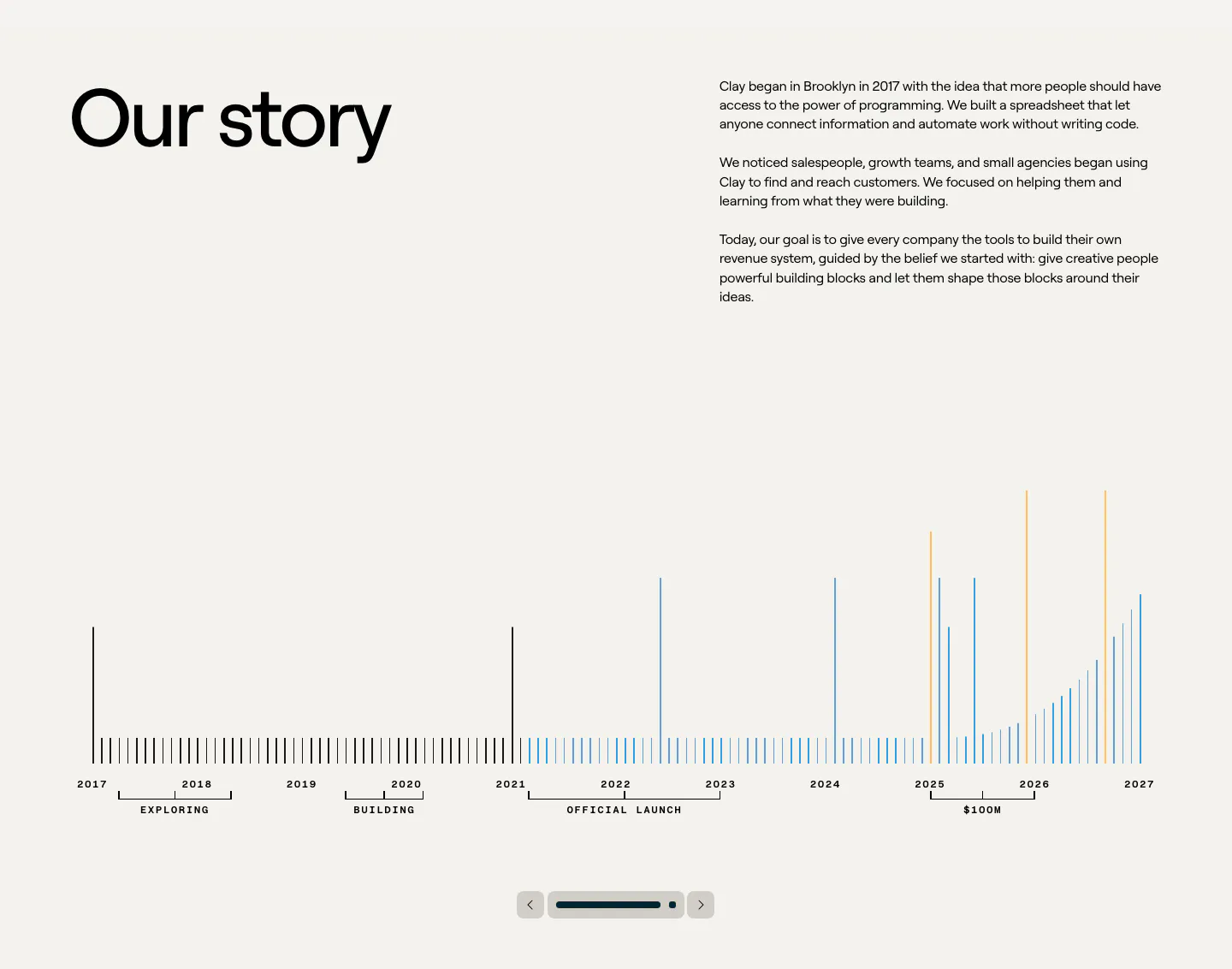
  121. Clay about & mission section: large heading beside story copy above a 2017-2027 bar timeline with slider controls on beige
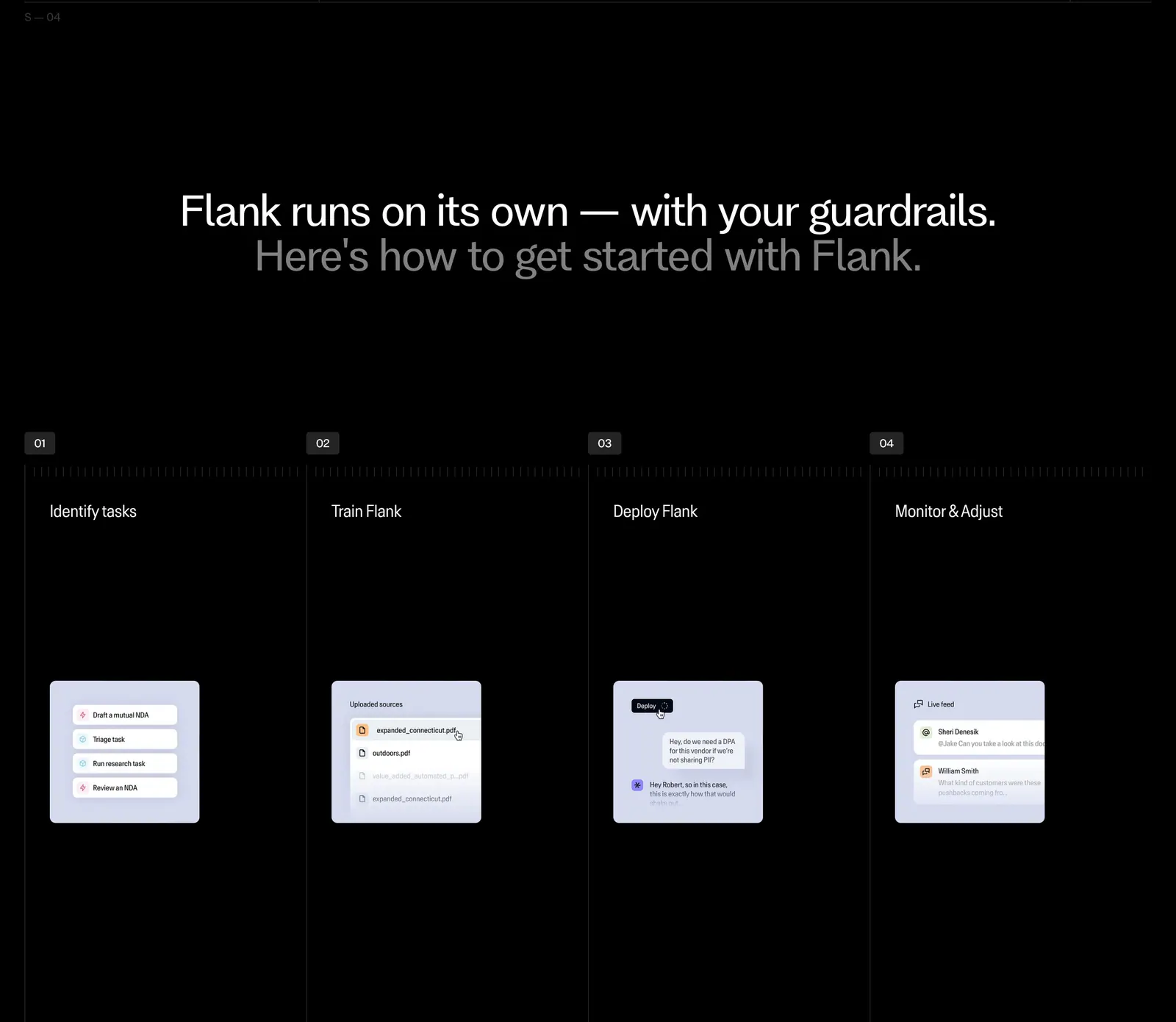
  122. Flank how it works section: centered two-tone headline above four numbered step columns with small UI mockup cards on black
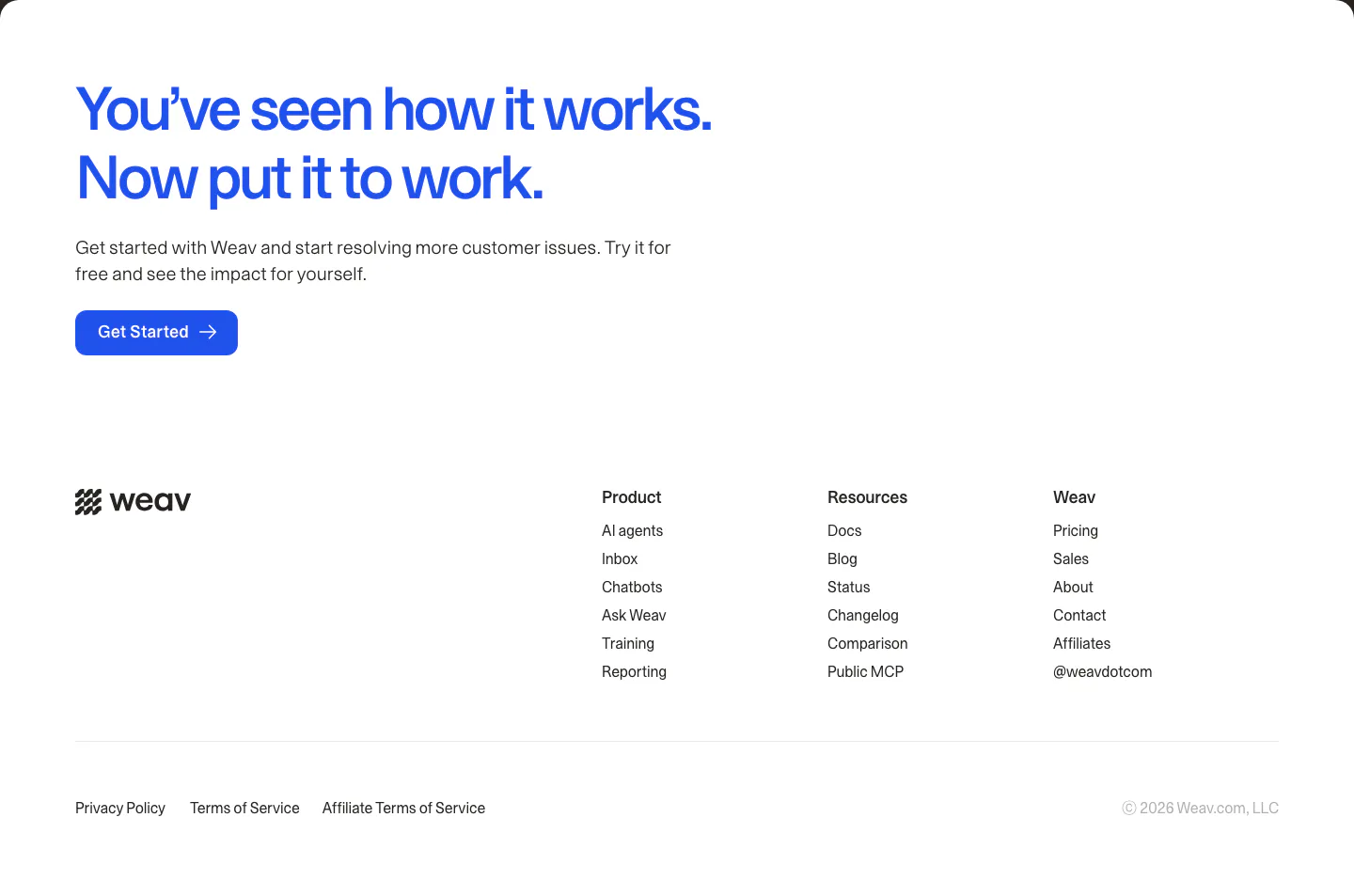
  123. Weav footer section: large blue CTA headline and button above a white footer with wordmark, three link columns and legal links
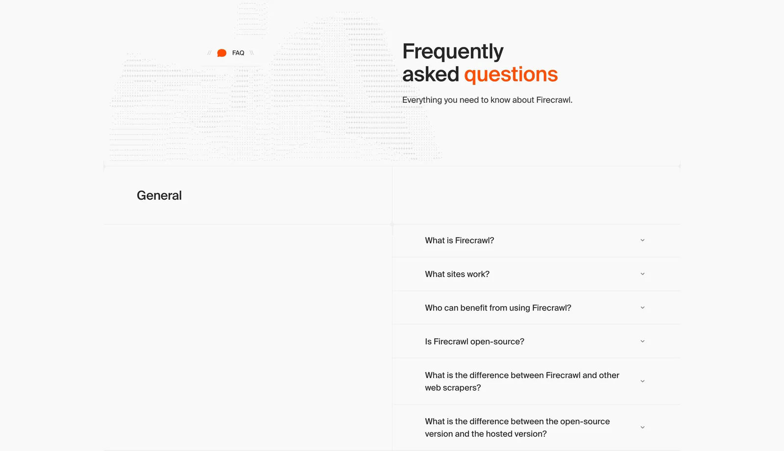
  124. Firecrawl FAQ section: headline beside dithered artwork above a two-column accordion of questions on a light gray grid layout
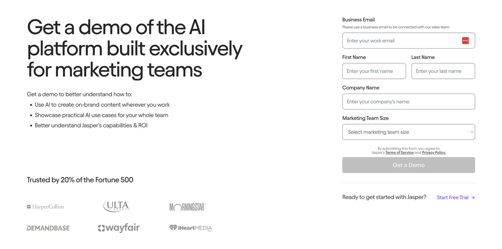
  125. Jasper contact section: headline and benefit bullets with customer logos on the left, demo request form on the right on a light background
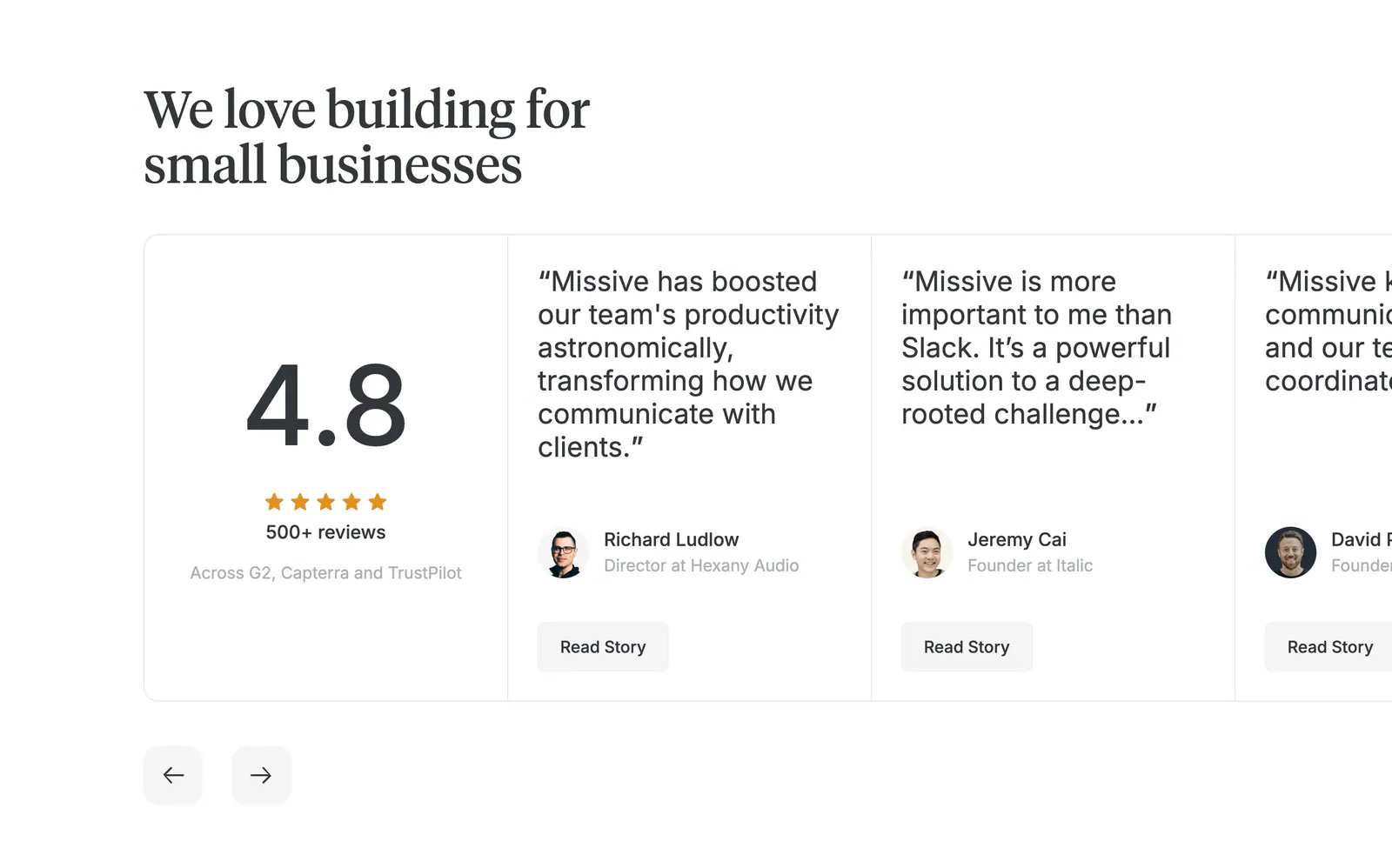
  126. Missive testimonials section: serif headline above a 4.8 rating card and edge-cropped quote cards with arrows on white
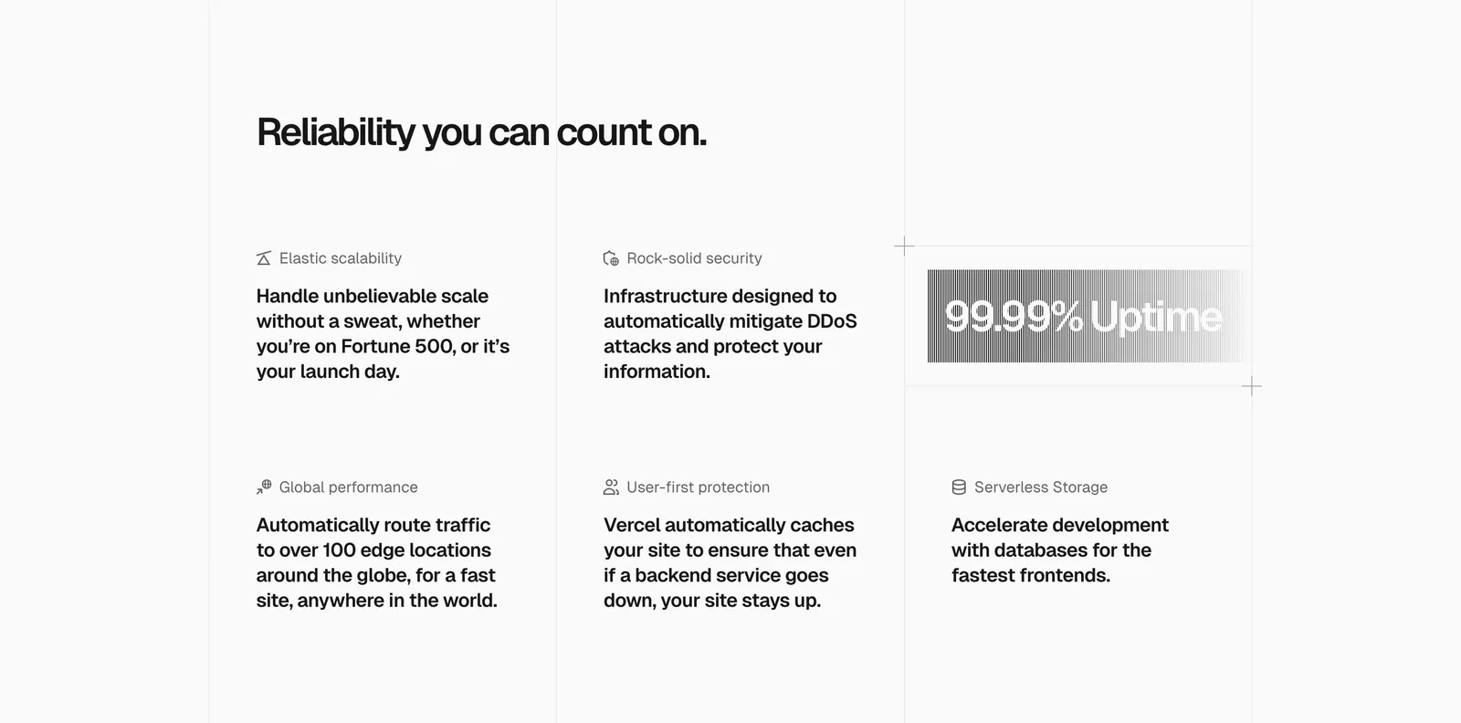
  127. Vercel features section: headline above a six-item grid of feature blurbs with icons and a gray gradient 99.99% Uptime badge
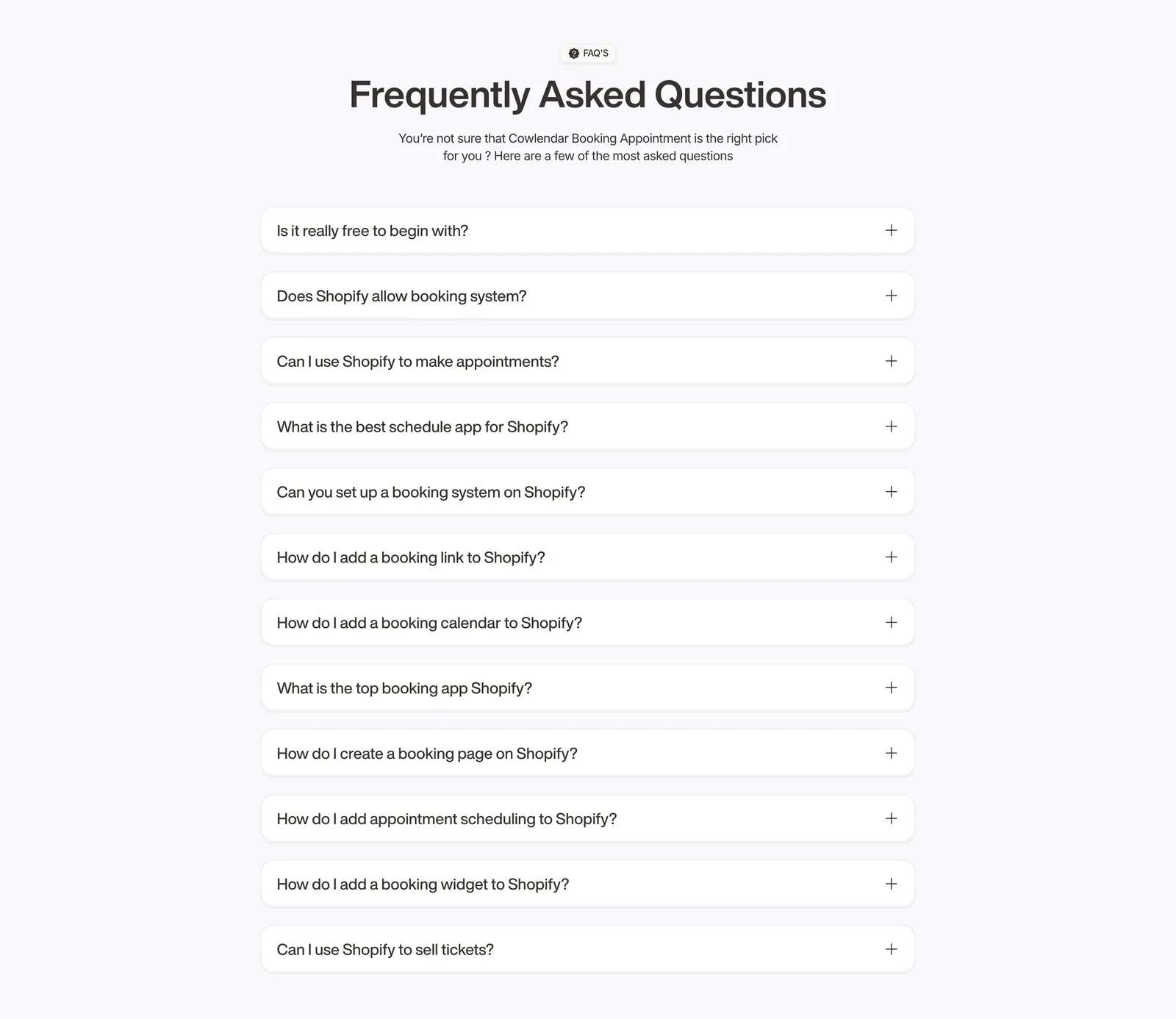
  128. Cowlendar FAQ section: centered heading above a single column of twelve collapsed question accordions on light gray
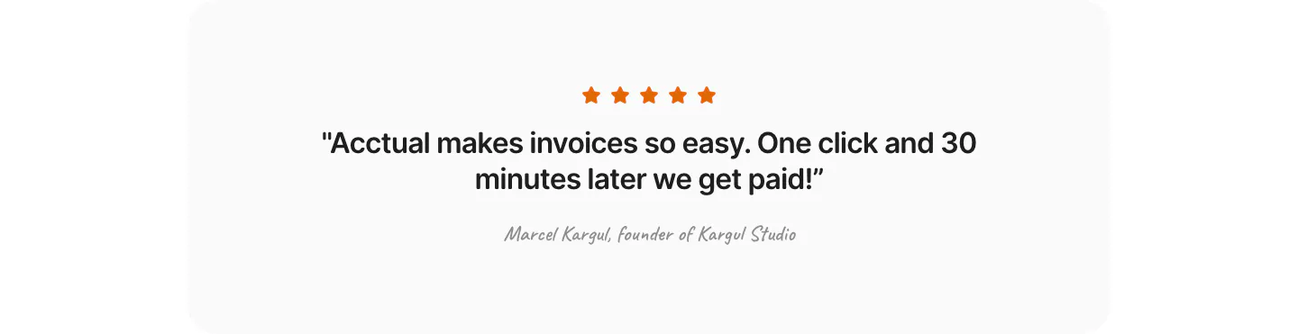
  129. Acctual testimonials section: single centered quote with five orange stars and a script attribution in a light gray rounded panel
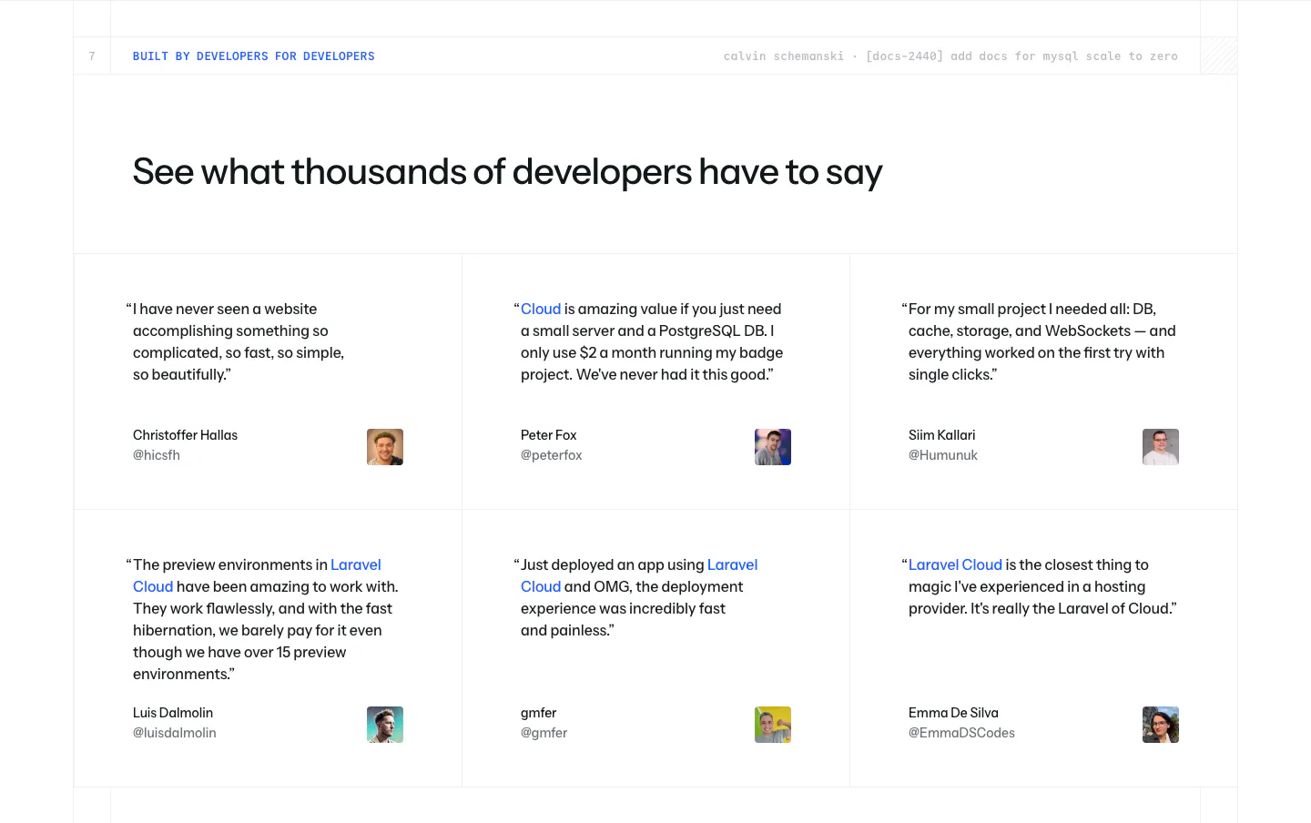
  130. Laravel Cloud testimonials section: left-aligned headline above a 3x2 grid of developer quotes with names, handles and avatar photos
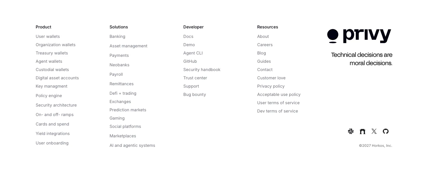
  131. Privy footer section: white footer with five link columns, Privy logo, tagline and social icons in a minimal grayscale layout
  132. Heidi call to action section: cream rounded band with centered serif headline, Get Remote button and faint curved line decorations
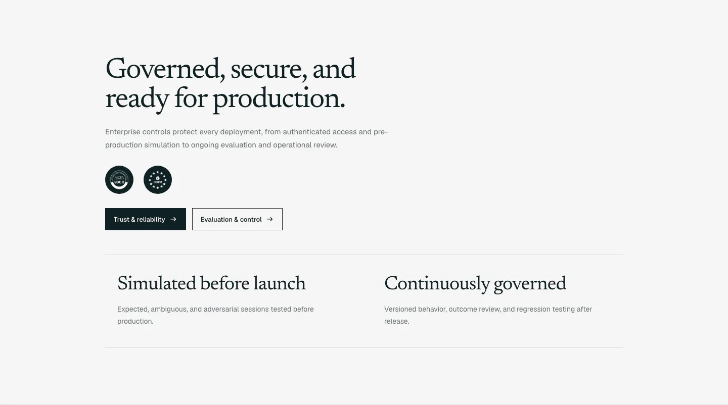
  133. Supersonik security section: serif headline, copy, SOC 2 and GDPR badges and two buttons above two governance points on light gray
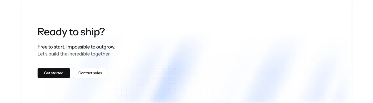
  134. Laravel Cloud call-to-action section: left-aligned headline with short copy, Get started and Contact sales buttons over a faint blue glow
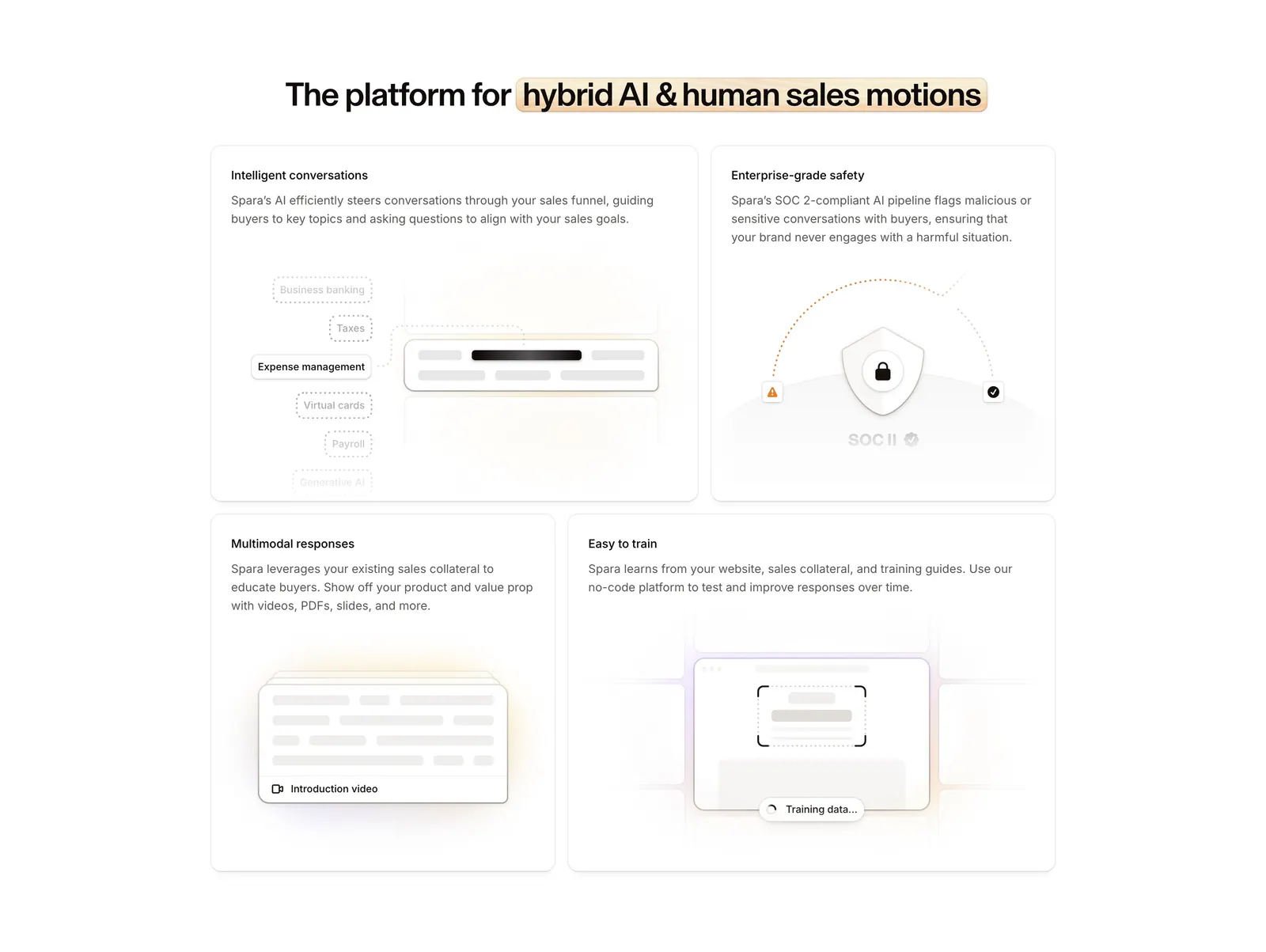
  135. Spara features section: centered headline with highlighted phrase above a four-tile bento grid of feature cards with abstract UI art
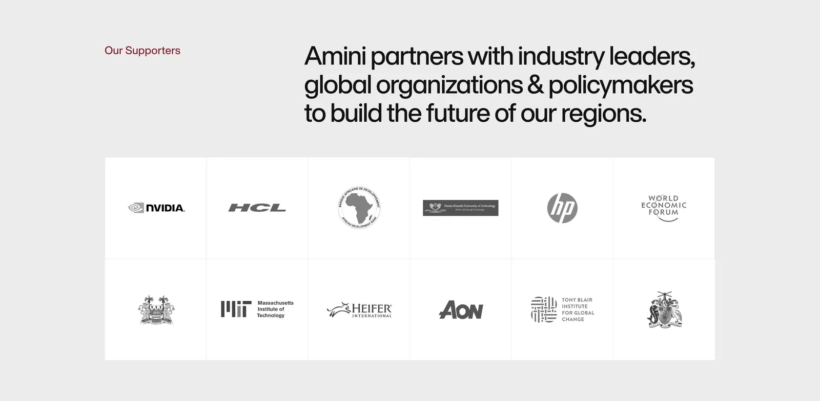
  136. Amini logo cloud section: label and headline above a bordered two-row grid of grayscale partner and supporter logos on light gray
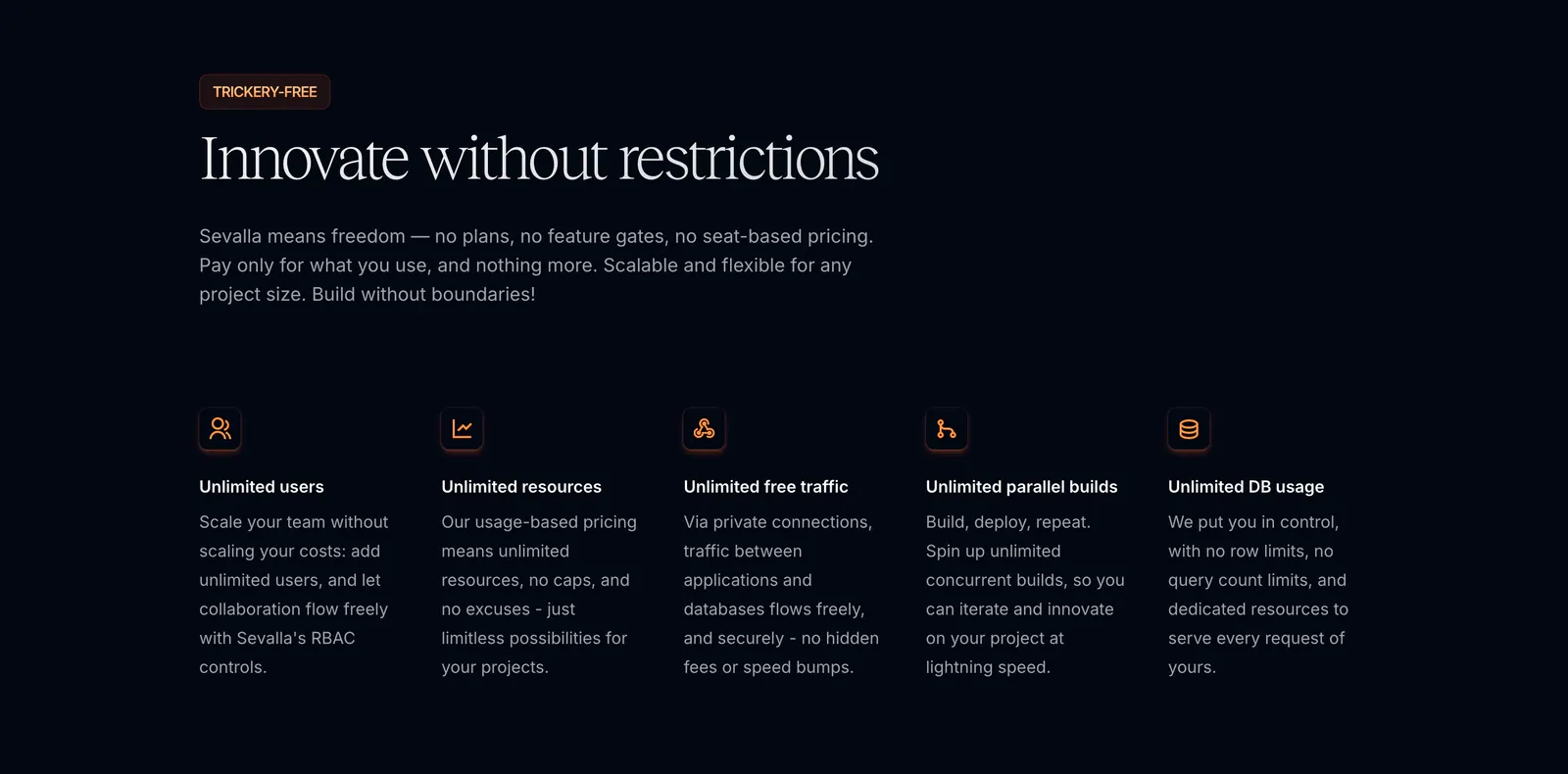
  137. Sevalla features section: serif headline and intro above five icon columns of unlimited usage benefits on a near-black background
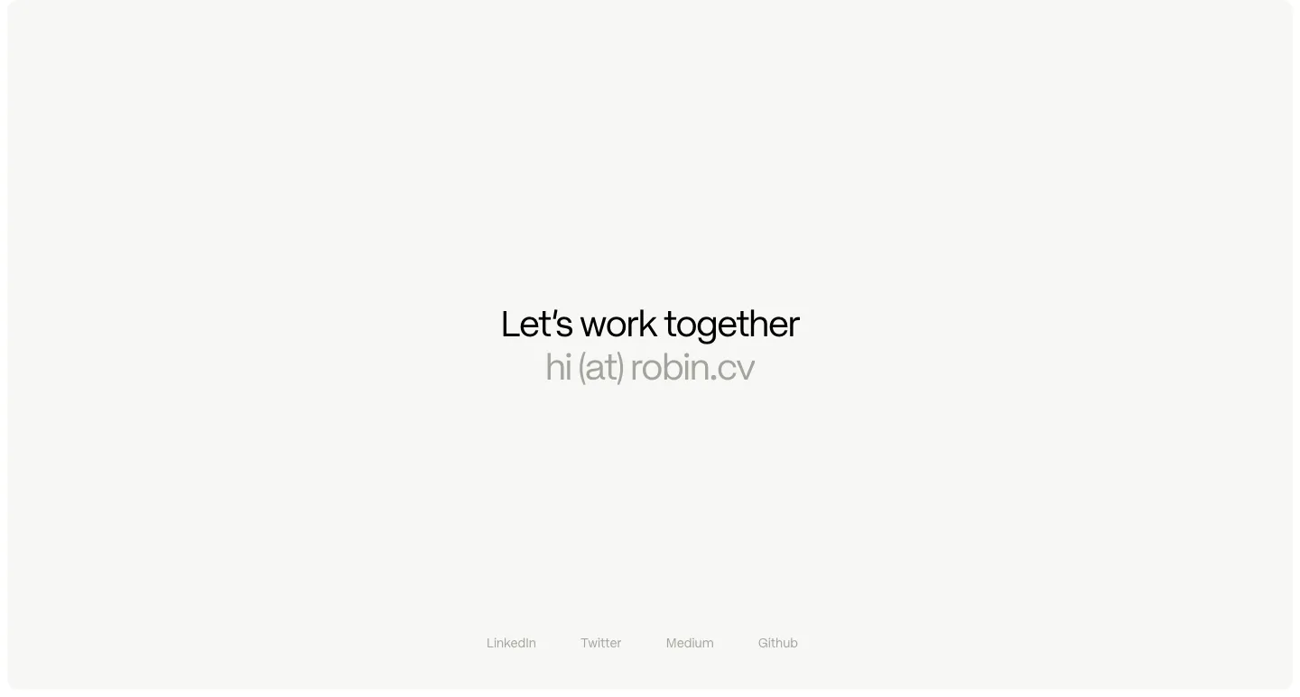
  138. Robin Humphreys footer section: centered Let's work together line with an email address and a row of social links on an off-white card
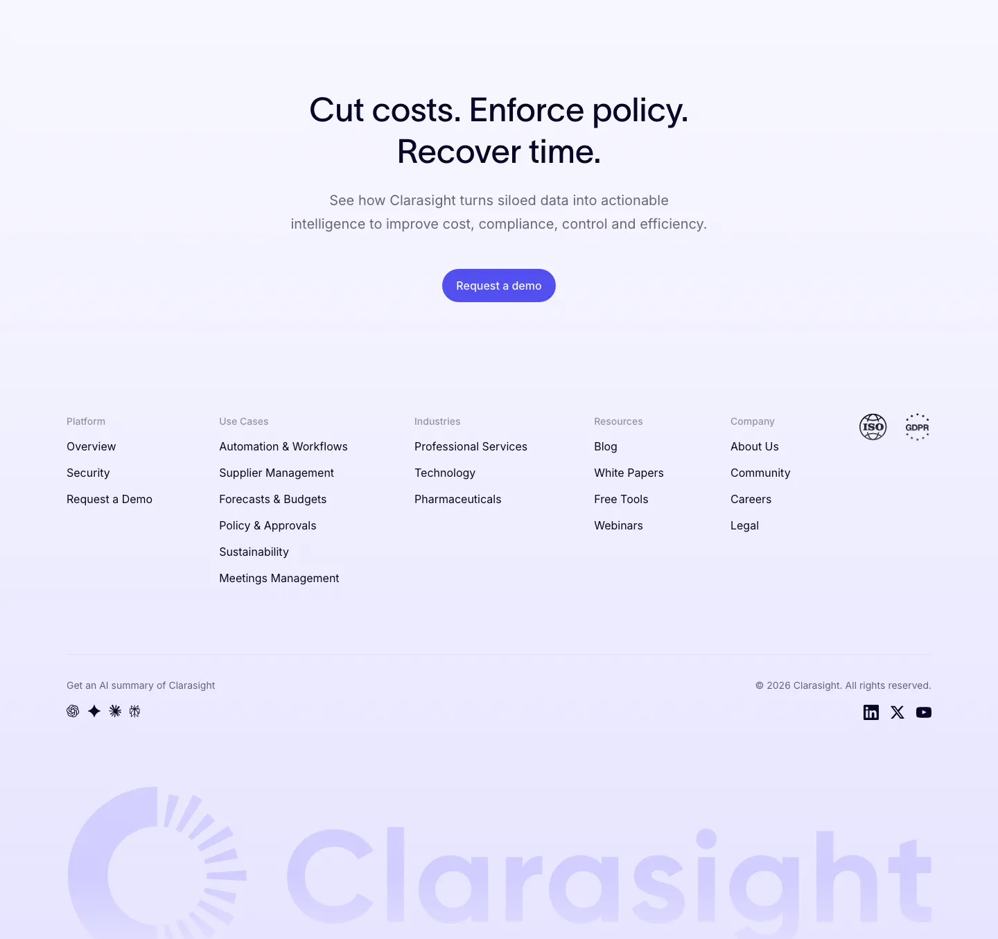
  139. Clarasight footer section: centered CTA headline and button above link columns, compliance badges and a huge faint lavender wordmark
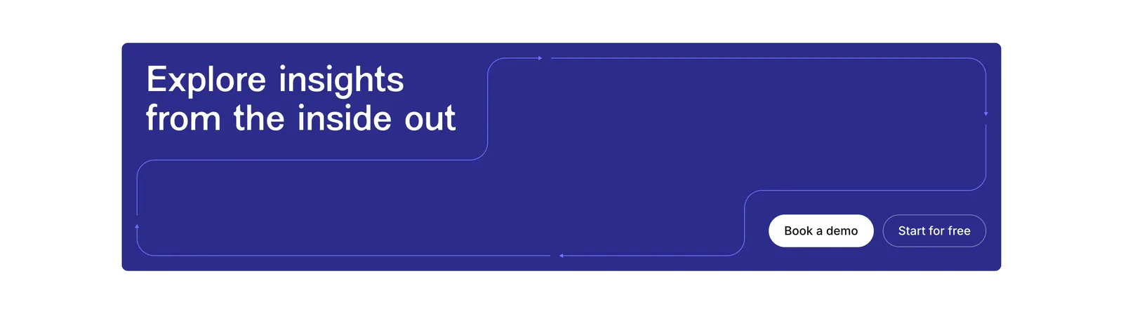
  140. Contentsquare call-to-action section: headline and two buttons in a deep indigo banner with thin outline path lines
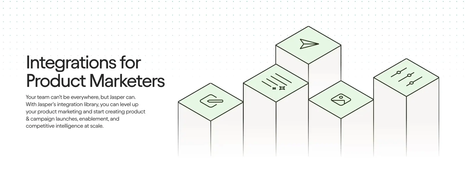
  141. Jasper integrations section: headline and copy on the left beside isometric pillars topped with green icon tiles on a light background
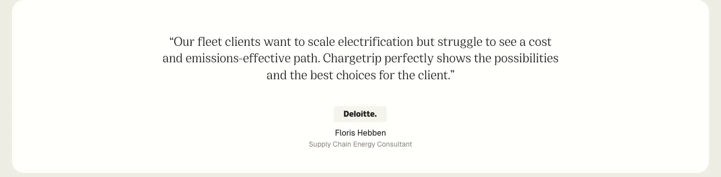
  142. Chargetrip testimonials section: centered serif quote from a Deloitte consultant with company badge and name on a white rounded panel
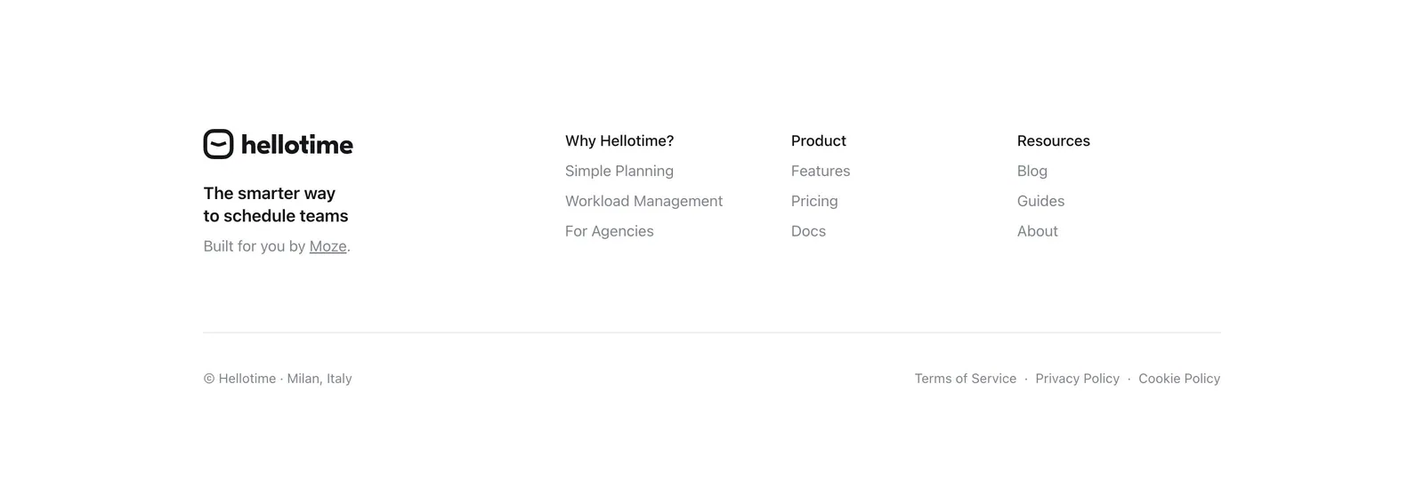
  143. Hellotime footer section: logo and tagline on the left, three link columns on the right, copyright and legal links below on white
  144. Heidi features section: dark plum background with a scrolling serif list of clinical tasks and a yellow Explore enterprise button
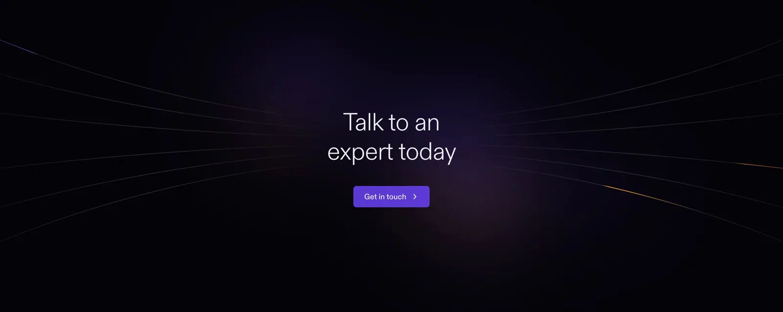
  145. Plasma call to action section: slim dark band with a centered two-line heading and a white Get in touch button
  146. NickAI integrations section: left heading and copy above a bordered grid of eight grayscale data provider logos
  147. Cowlendar call-to-action section: centered headline and blue button with calendar icon in a pale blue rounded panel
  148. Bobbin logo cloud section: centered caption above a single row of five grayscale tutoring company logos on white
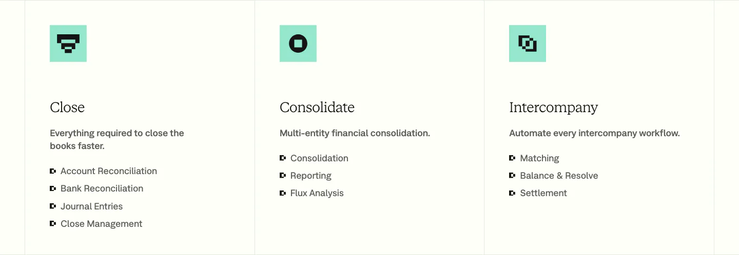
  149. Nominal features section: three bordered columns with mint pixel icons, serif titles and bullet lists for Close, Consolidate and Intercompany
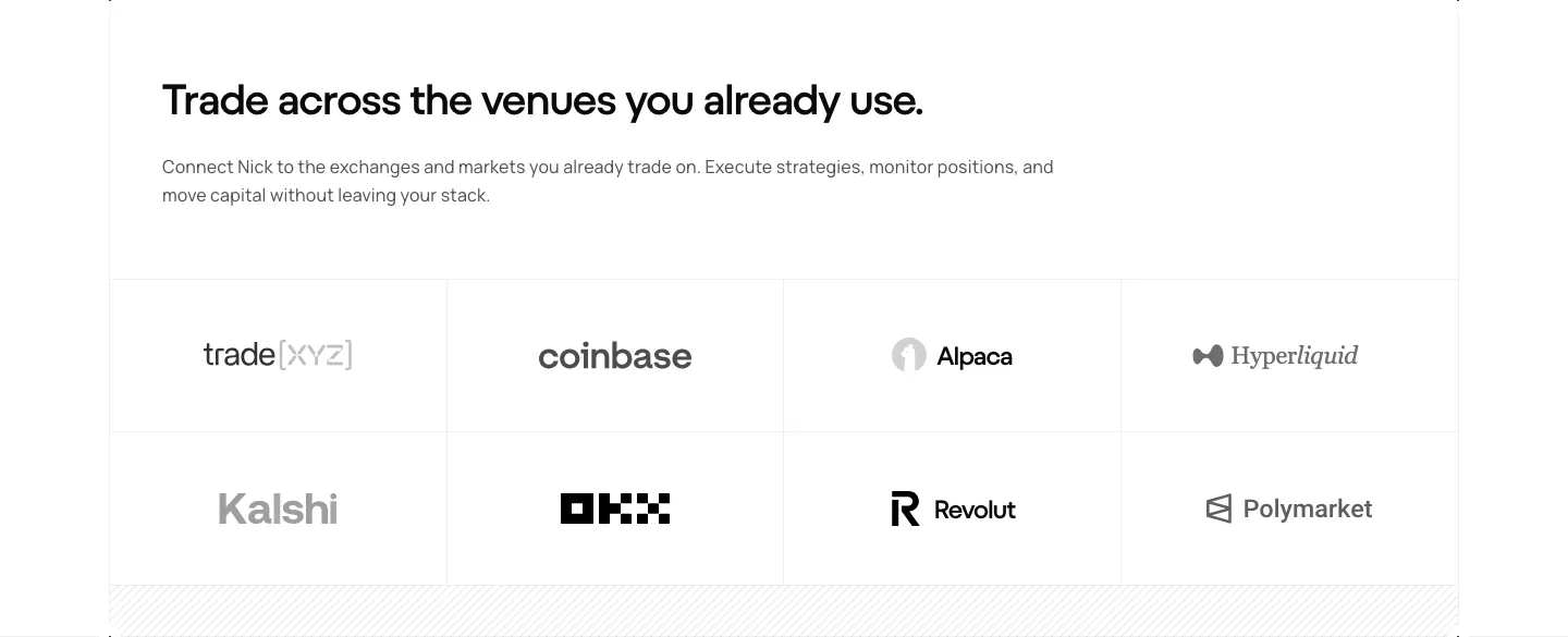
  150. NickAI integrations section: left heading and copy above a bordered grid of eight grayscale exchange and market logos
  151. Mintlify logo cloud section: centered two-line heading above a single faded-edge row of customer logos on black
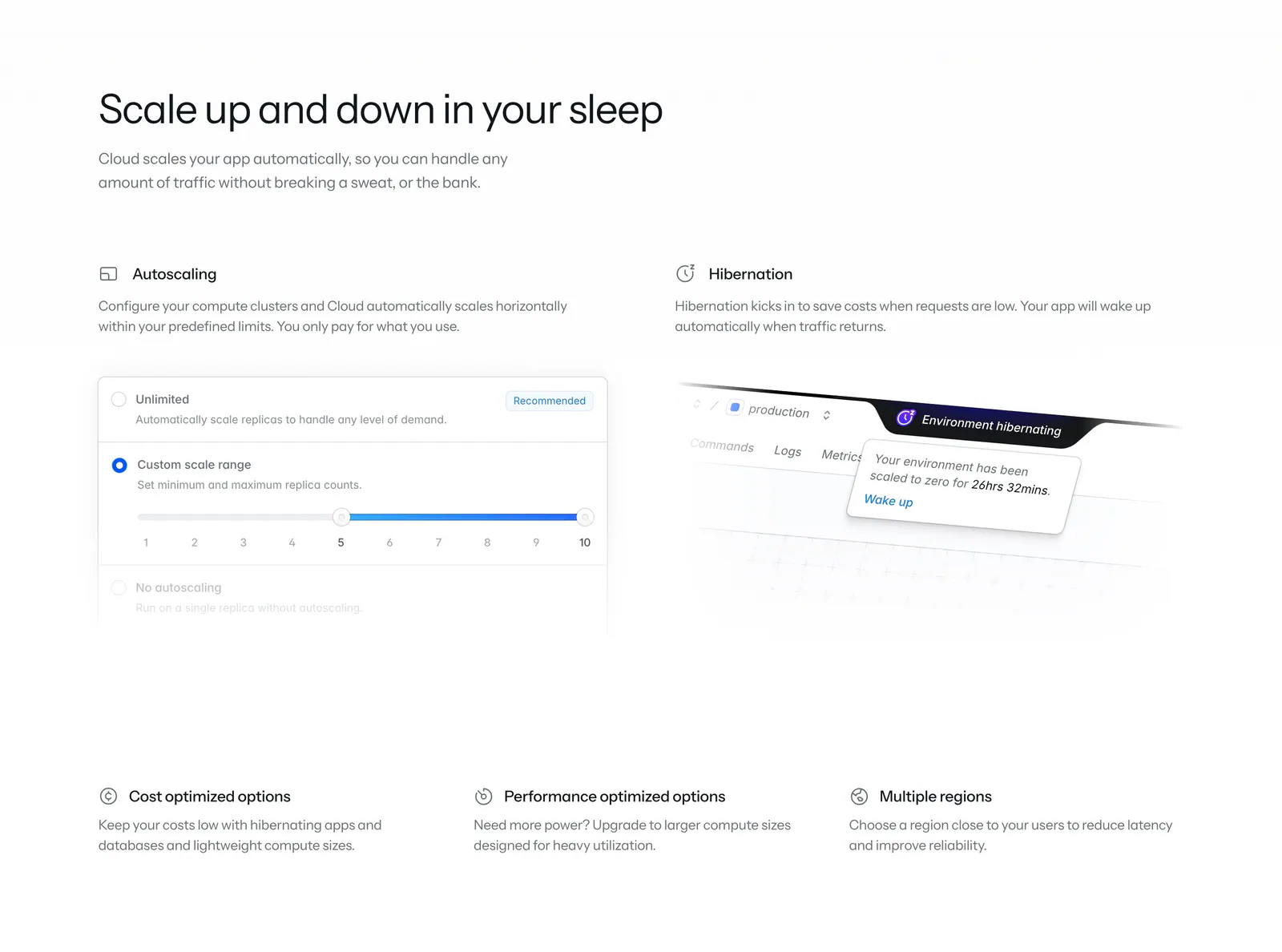
  152. Laravel Cloud features section: headline above two feature columns with autoscaling and hibernation UI snippets and three icon notes
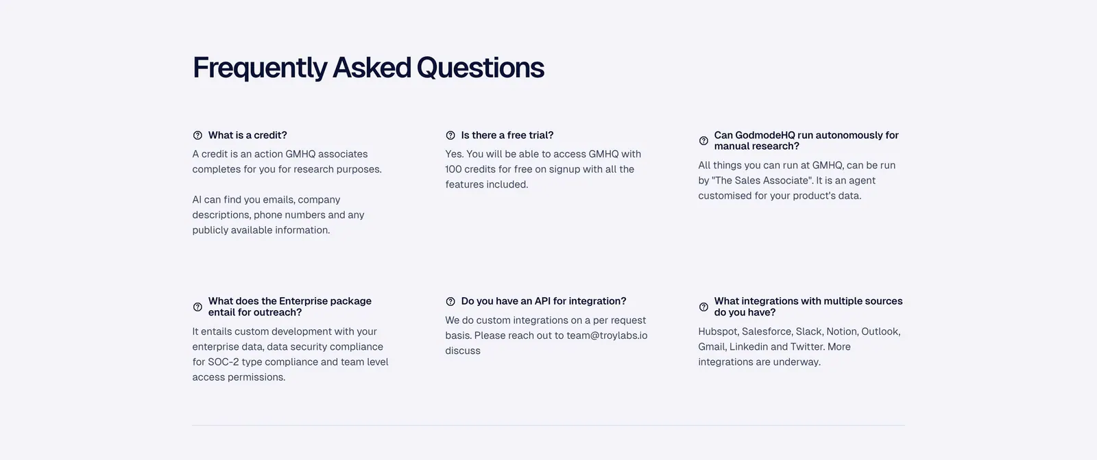
  153. Ada call-to-action section: centered lowercase headline with an inline yellow Get a demo pill button on a white background
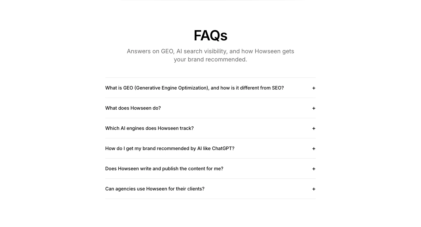
  154. Howseen AI FAQ section: centered heading above a six-question accordion list on a white background
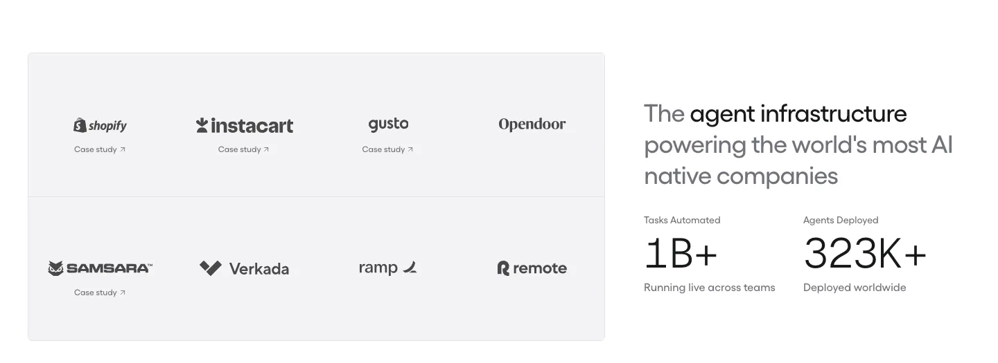
  155. Gumloop logo cloud section: grid of customer logos with case study links beside a headline and two large stats
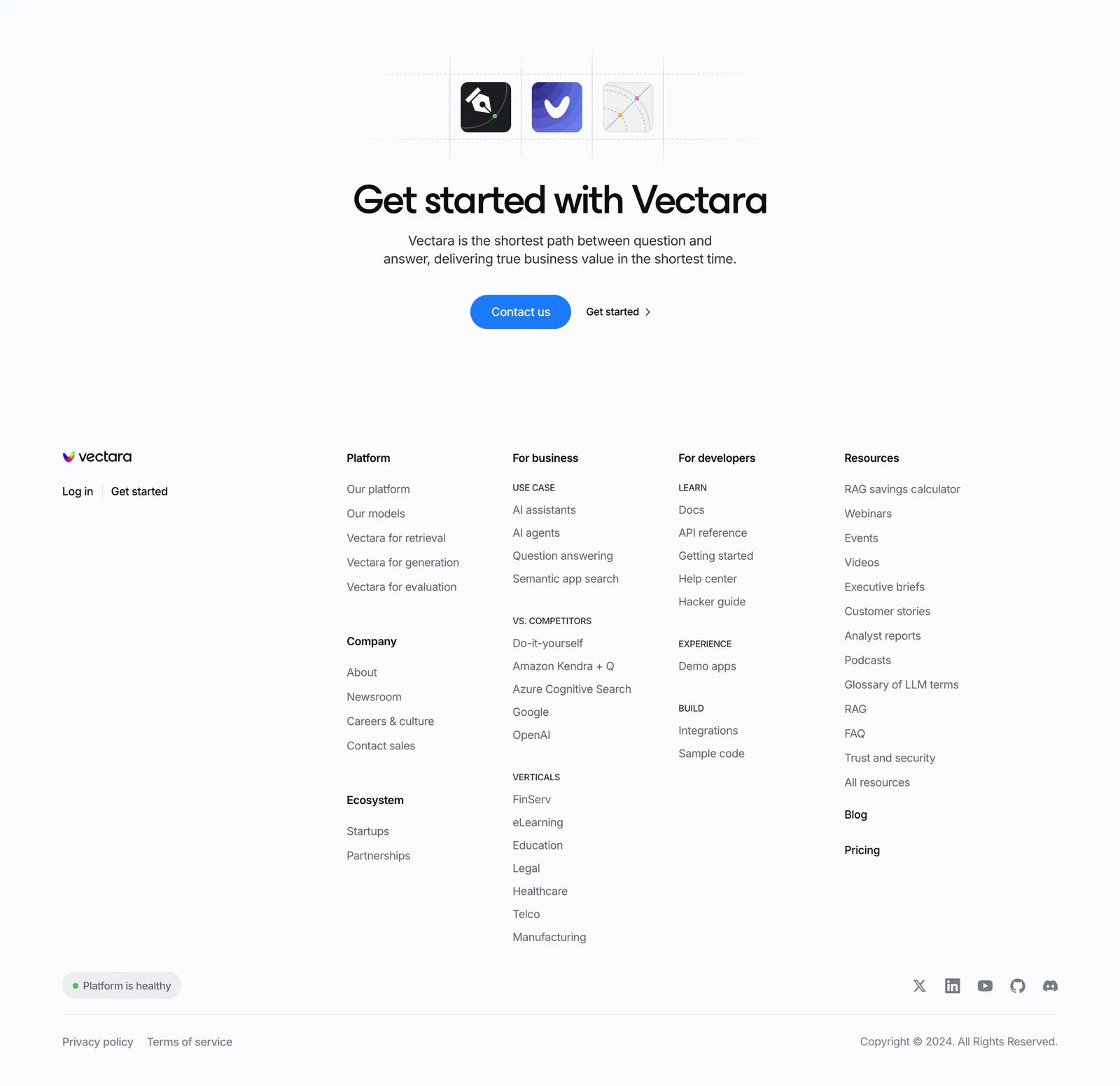
  156. Vectara footer section: centered CTA with app icons above a logo and five link columns, status pill, social icons and copyright on light gray
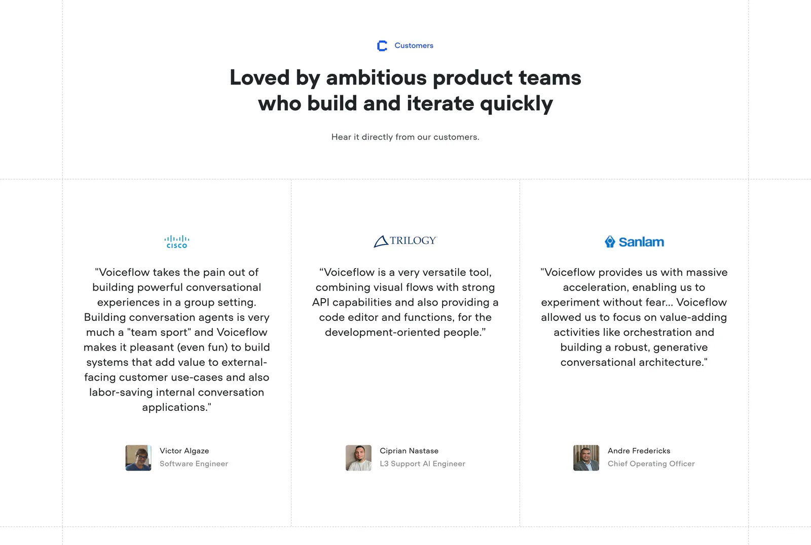
  157. Voiceflow testimonials section: centered headline above three quote columns with company logos and avatar headshots on white
  158. Equals logo cloud section: three rows of five grayscale customer logos including Notion, Intercom and Attio on a light gray background
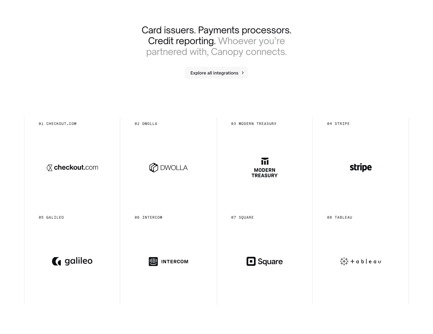
  159. Canopy integrations section: centered headline and button above a bordered 4x2 grid of numbered partner logos on white
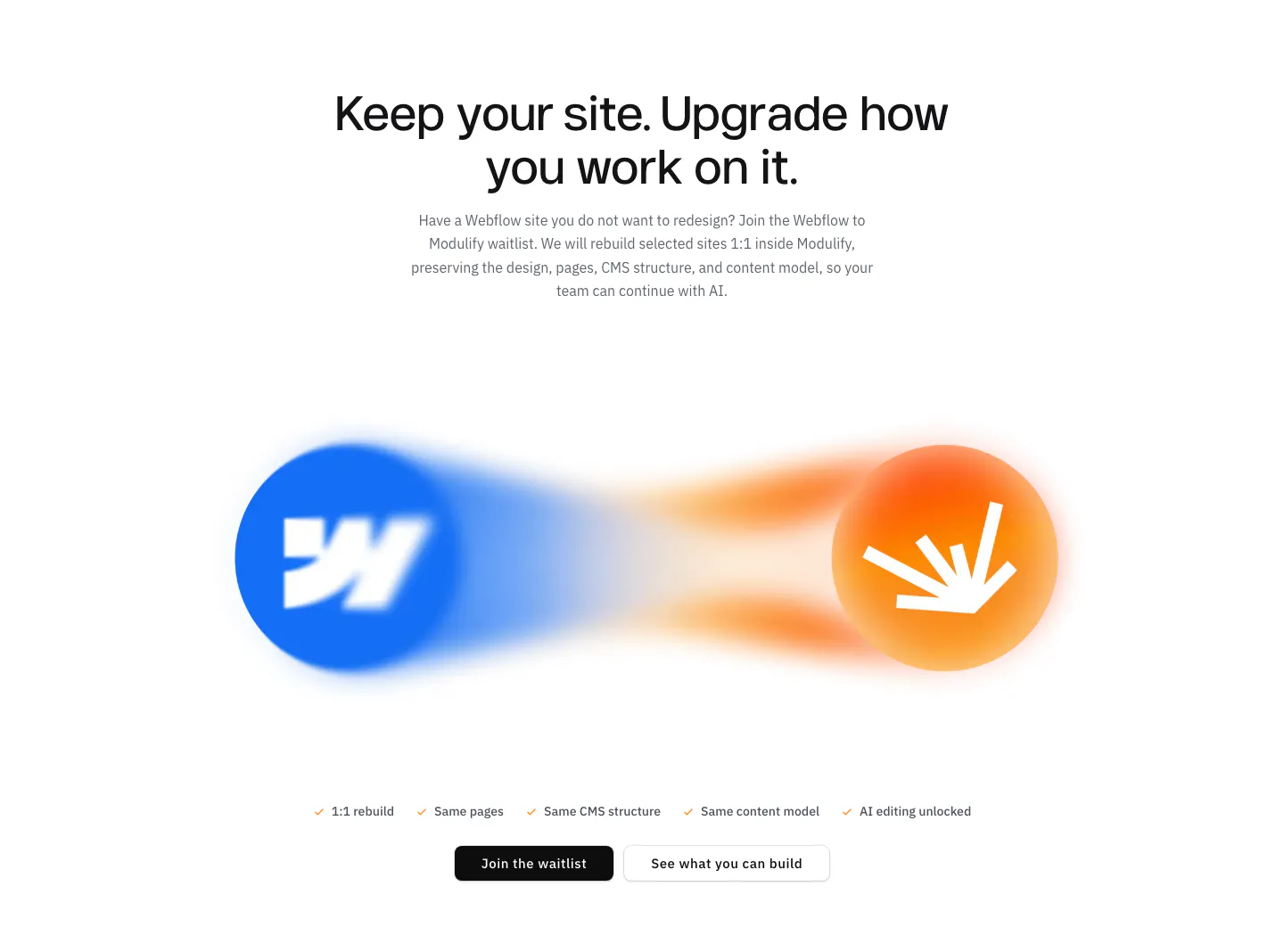
  160. Modulify features section: centered headline above blurred Webflow and Modulify logo orbs, a checklist and two buttons
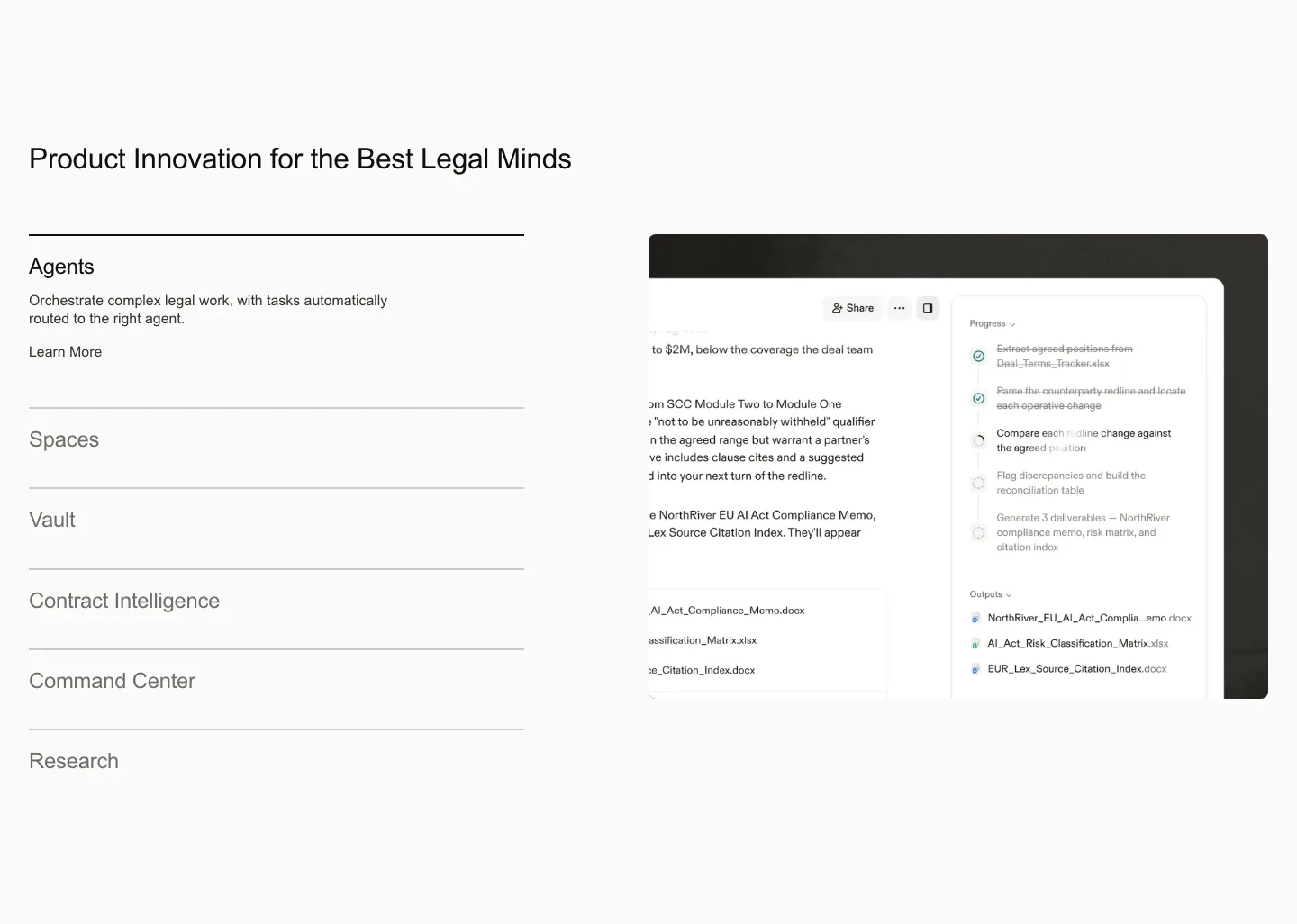
  161. Harvey features section: product list accordion on the left beside an agent workflow screenshot on a light gray background
  162. Concourse value proposition section: centered headline, pill label and white button on a near-black background with faint square blocks
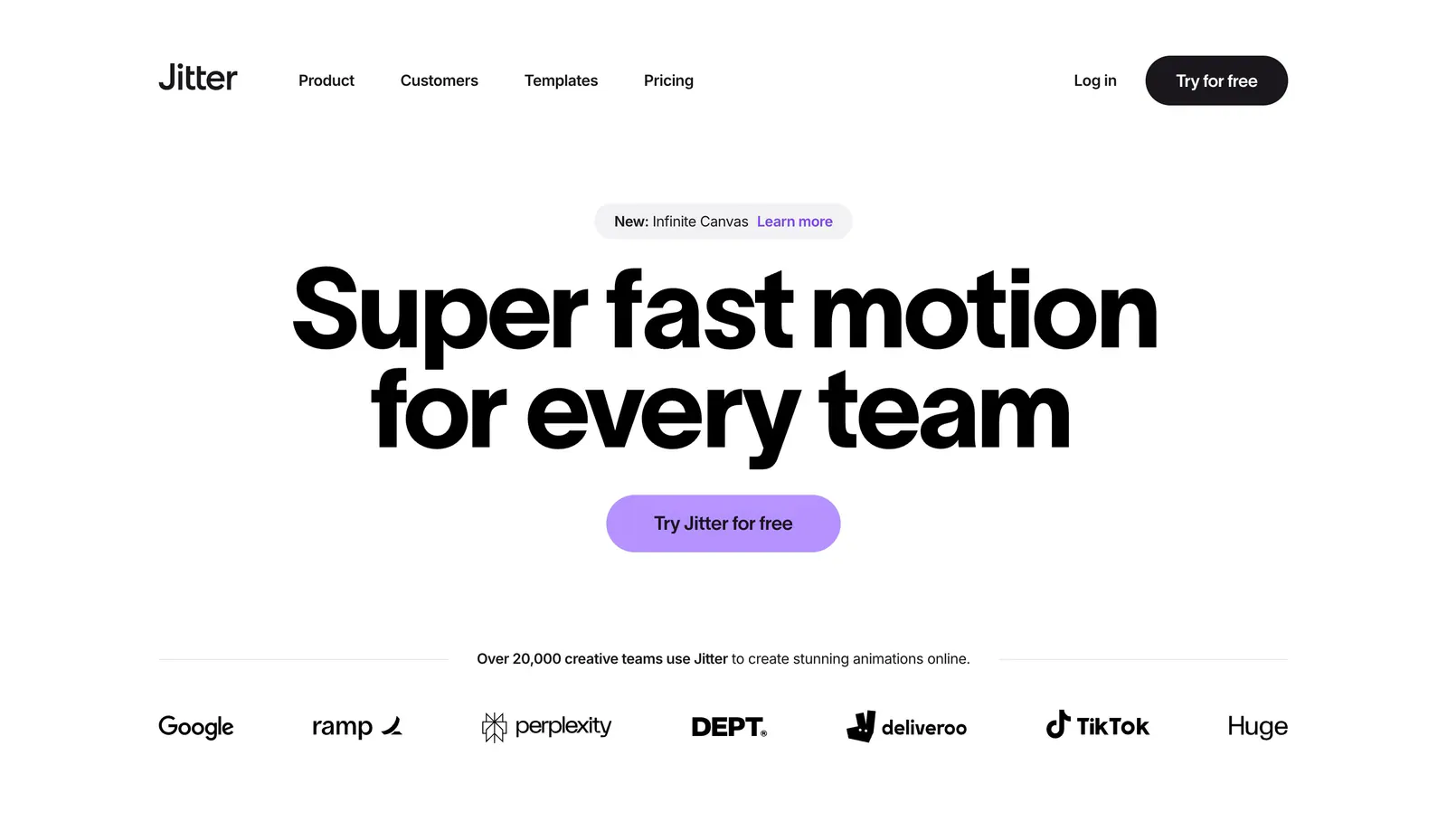
  163. Jitter hero section: nav above a huge centered headline with a purple button and a row of customer logos on white
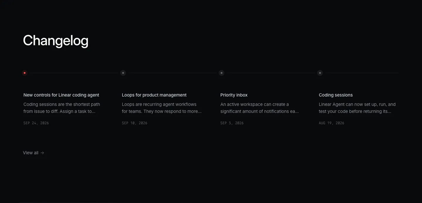
  164. Linear blog & resources section: dark changelog with four dated entries along a horizontal timeline and a view-all link
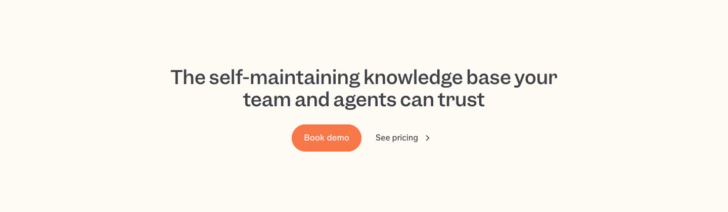
  165. Slite call to action section: centered two-line headline with an orange Book demo button and a See pricing link on a cream band
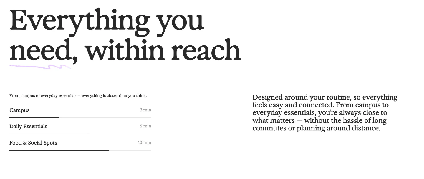
  166. 21Oaks value proposition section: oversized serif headline above a distance list with progress bars and a paragraph on the right
  167. Cortex call-to-action section: centered headline and purple button with radiating light lines on a near-black background
  168. Flank logo cloud section: small left-aligned caption above a single row of gray customer logos on a black background
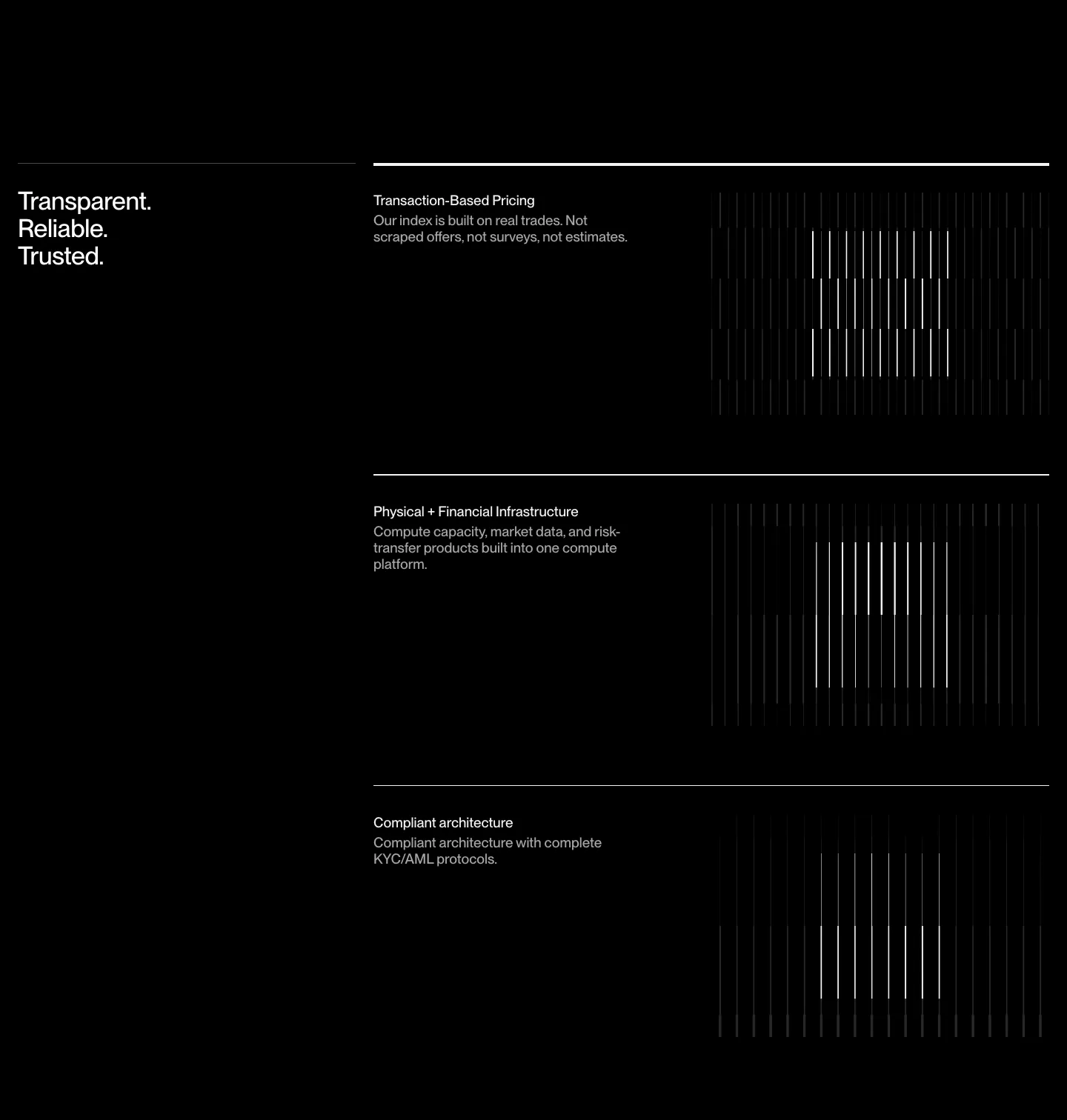
  169. Semaloop testimonials section: centered single quote under a company icon with an agent badge, name and title below on light gray
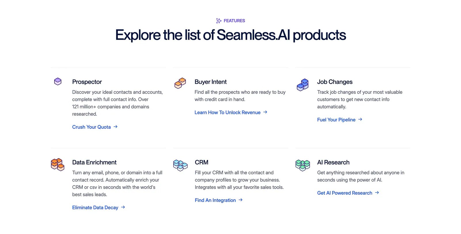
  170. Seamless.AI features section: centered headline above a three-by-two grid of product items with isometric icons and links on white
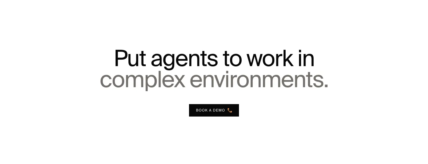
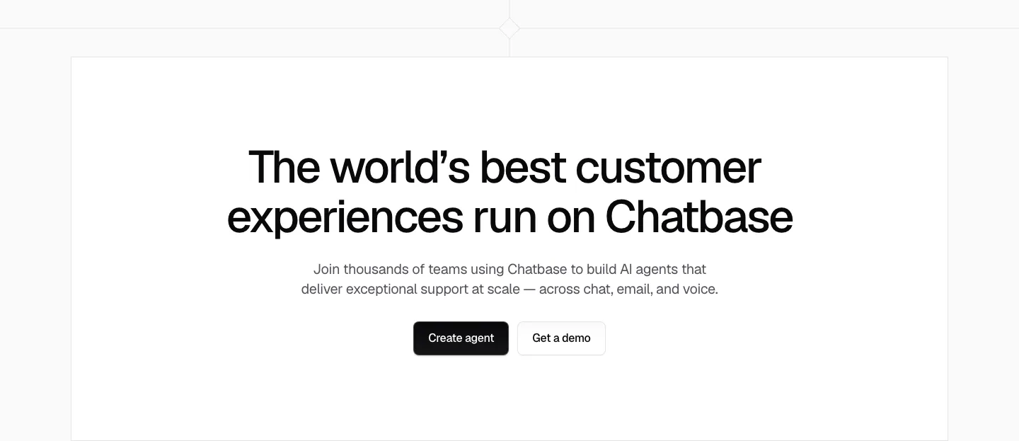
  171. HappyRobot call to action section: centered two-tone headline in black and gray above a small black Book a demo button on white
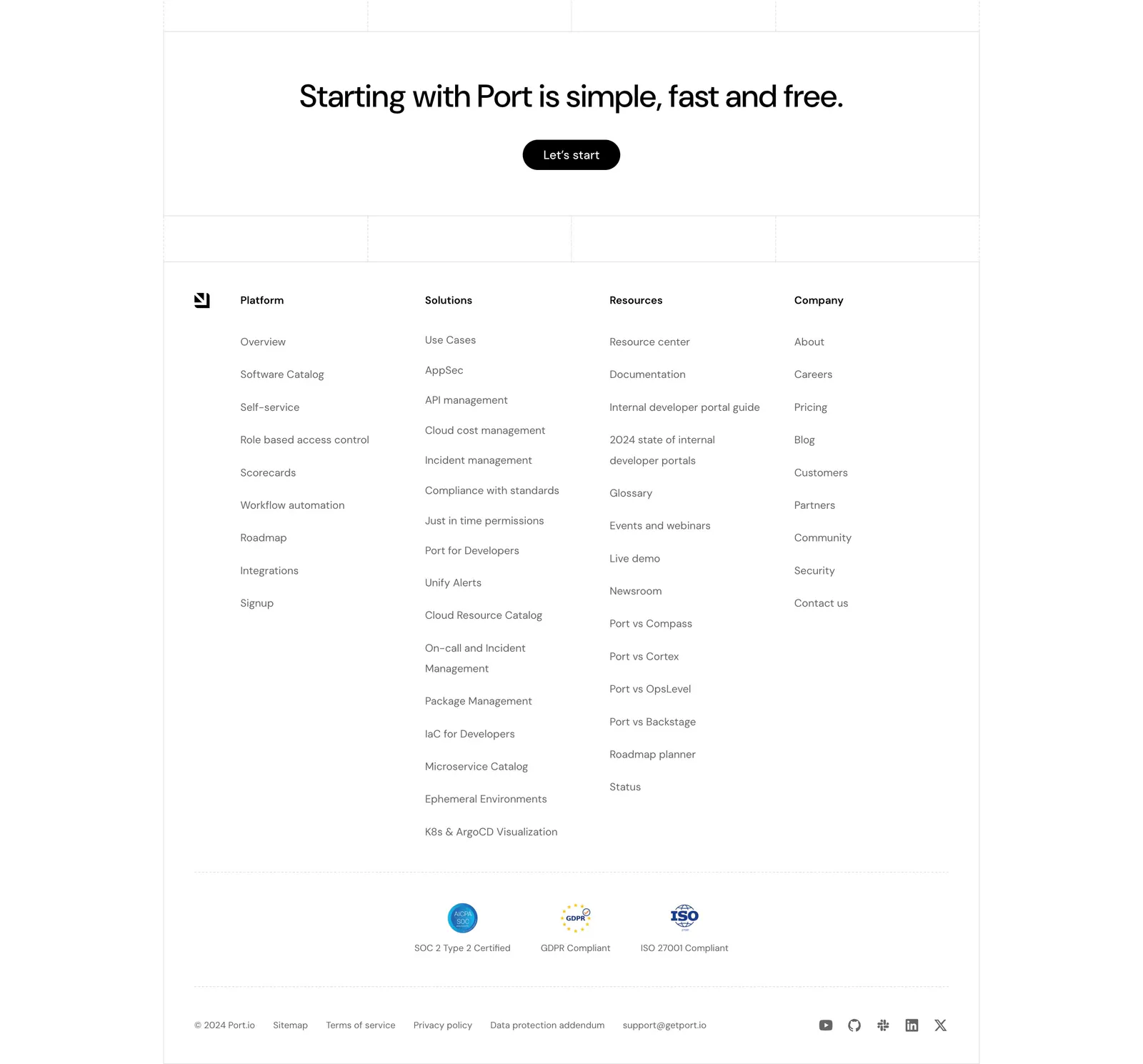
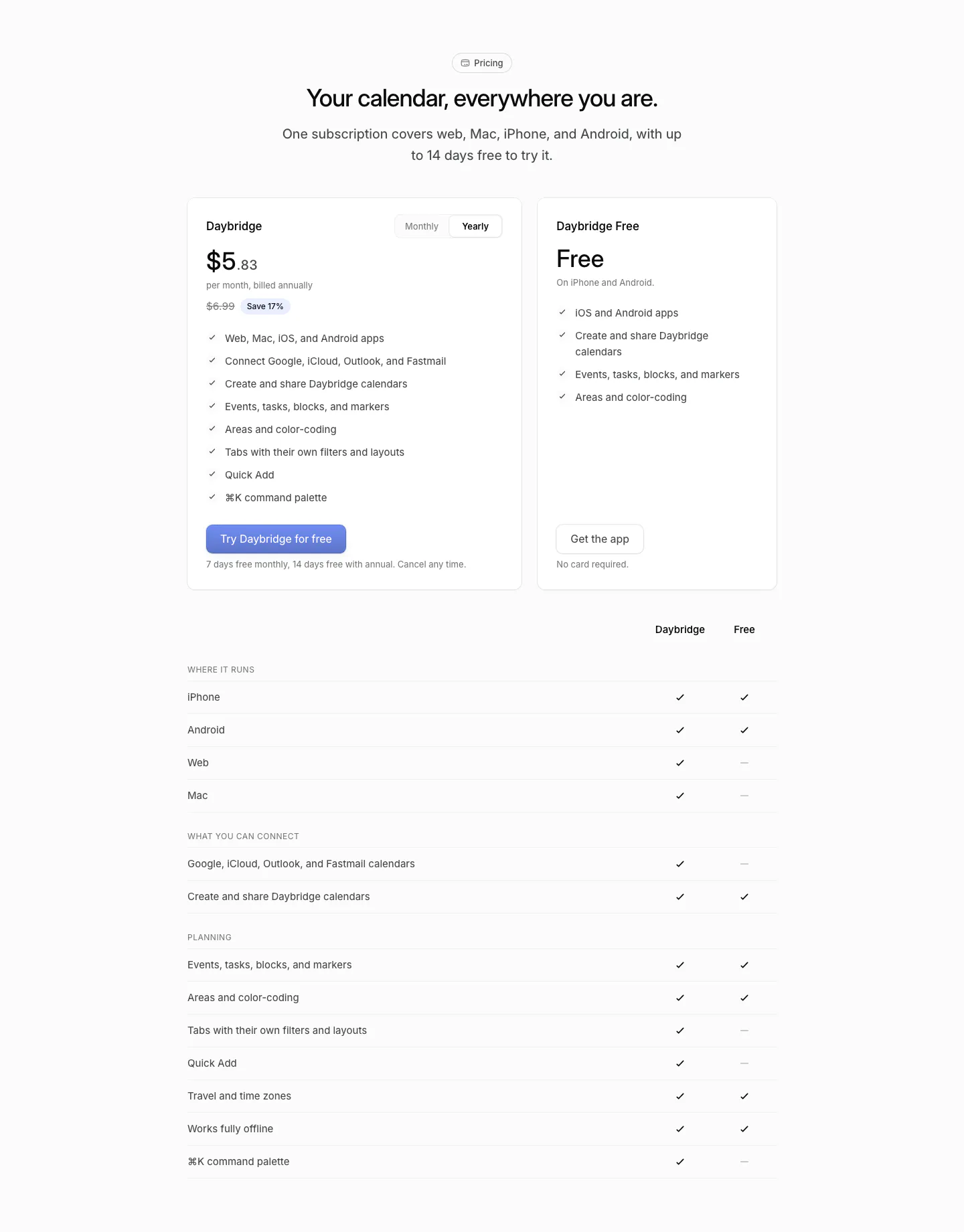
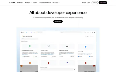
  172. Port footer section: centered CTA with Let's start button above four link columns, compliance badges, legal links and social icons
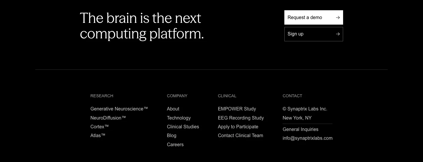
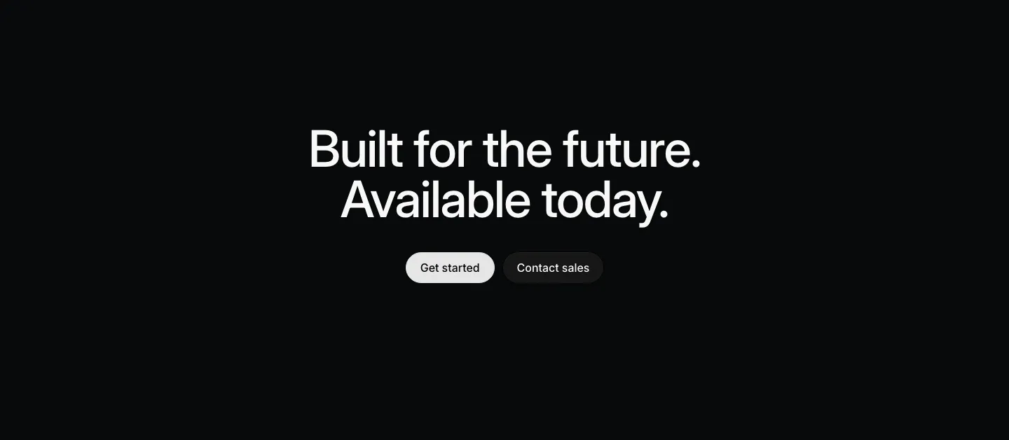
  173. Chatbase call to action section: centered black headline, short copy and two buttons in a white bordered box
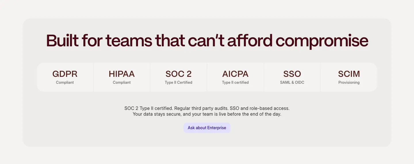
  174. Daybridge pricing section: centered headline above two plan cards with a monthly/yearly toggle and a plan comparison checkmark table
  175. Synaptrix footer section: closing headline with demo and sign-up buttons above four link columns on a black background
  176. Weave security section: centered headline above a row of compliance tiles (GDPR, HIPAA, SOC 2, SSO) and an enterprise button in a gray panel
  177. Mintlify logo cloud section: headline and button beside a grid of eight customer logo tiles, live usage counters row below
  178. Intercom logo cloud section: small monospace label above a six-by-four grid of gray customer logos on white
  179. Valley footer section: monospace link columns and newsletter email field above a giant outlined Valley logo and wordmark on white
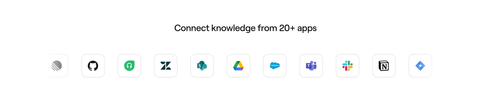
  180. DevRev integrations section: headline above a 4x3 grid of bordered tiles with Jira, Slack, GitHub, Salesforce and other app logos
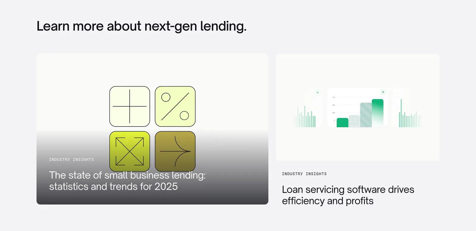
  181. Canopy blog & resources section: left-aligned heading above two article cards with abstract lending graphics on light gray
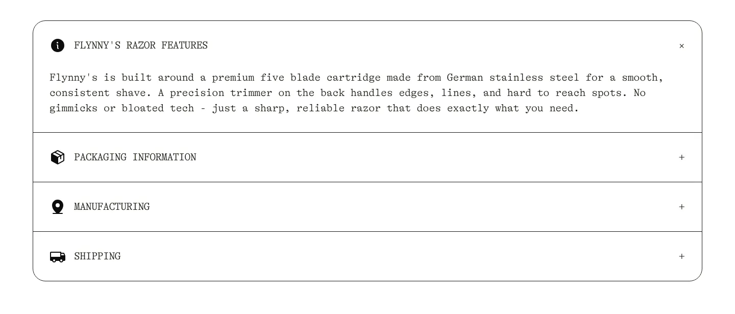
  182. Flynny's FAQ section: rounded bordered accordion in typewriter type with razor features open and packaging, manufacturing, shipping closed
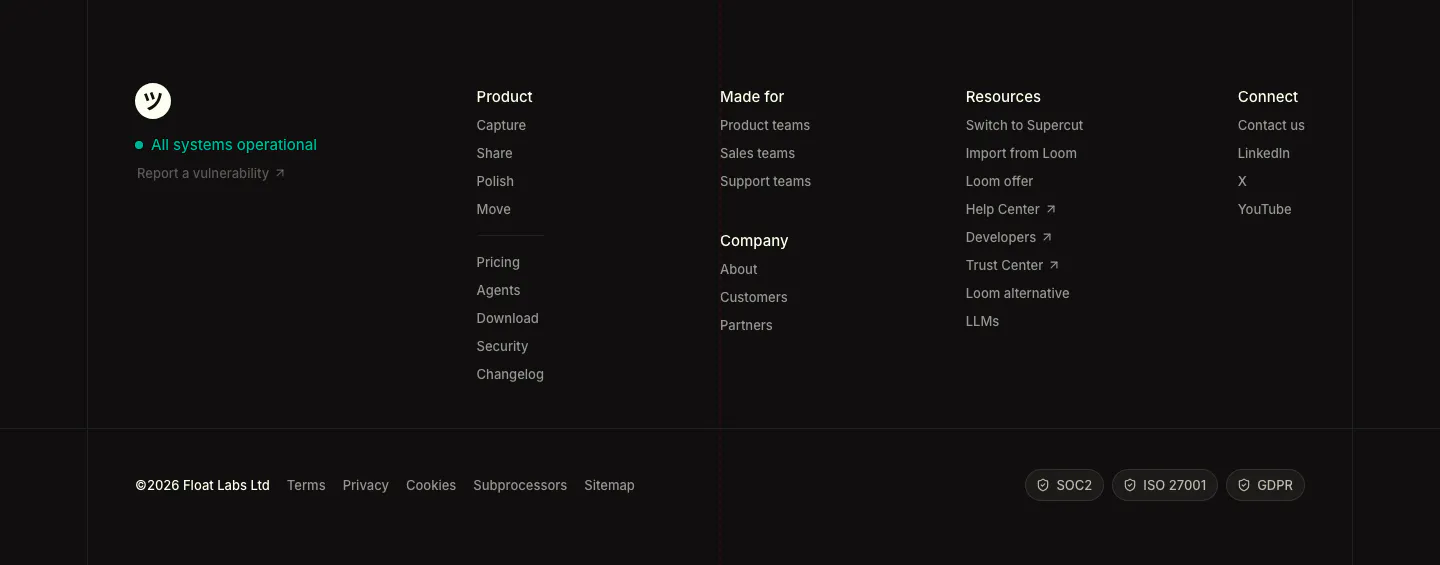
  183. Supercut footer section: logo with status indicator, four link columns, legal links and SOC2, ISO 27001, GDPR badges on dark
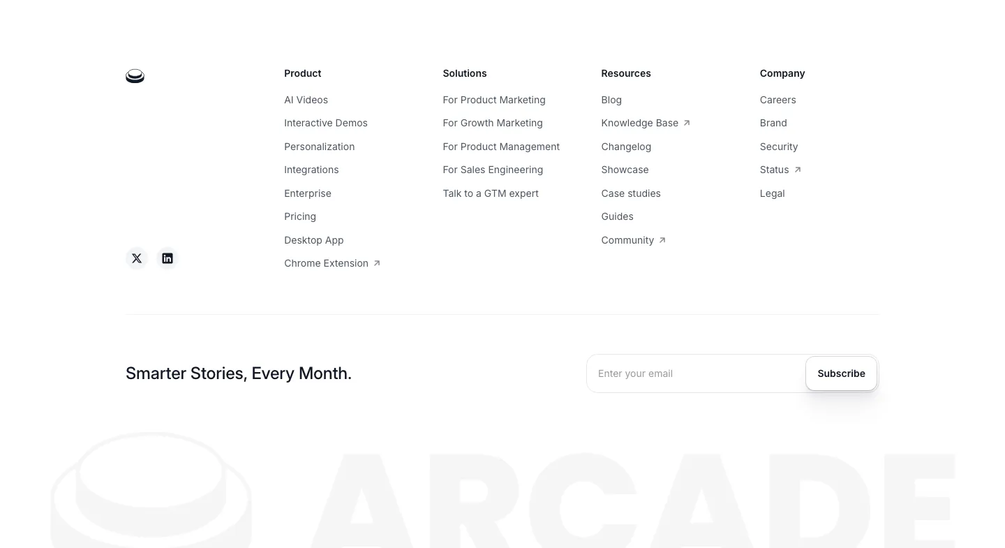
  184. Arcade footer section: four link columns and an email subscribe field above a faded oversized ARCADE wordmark and logo
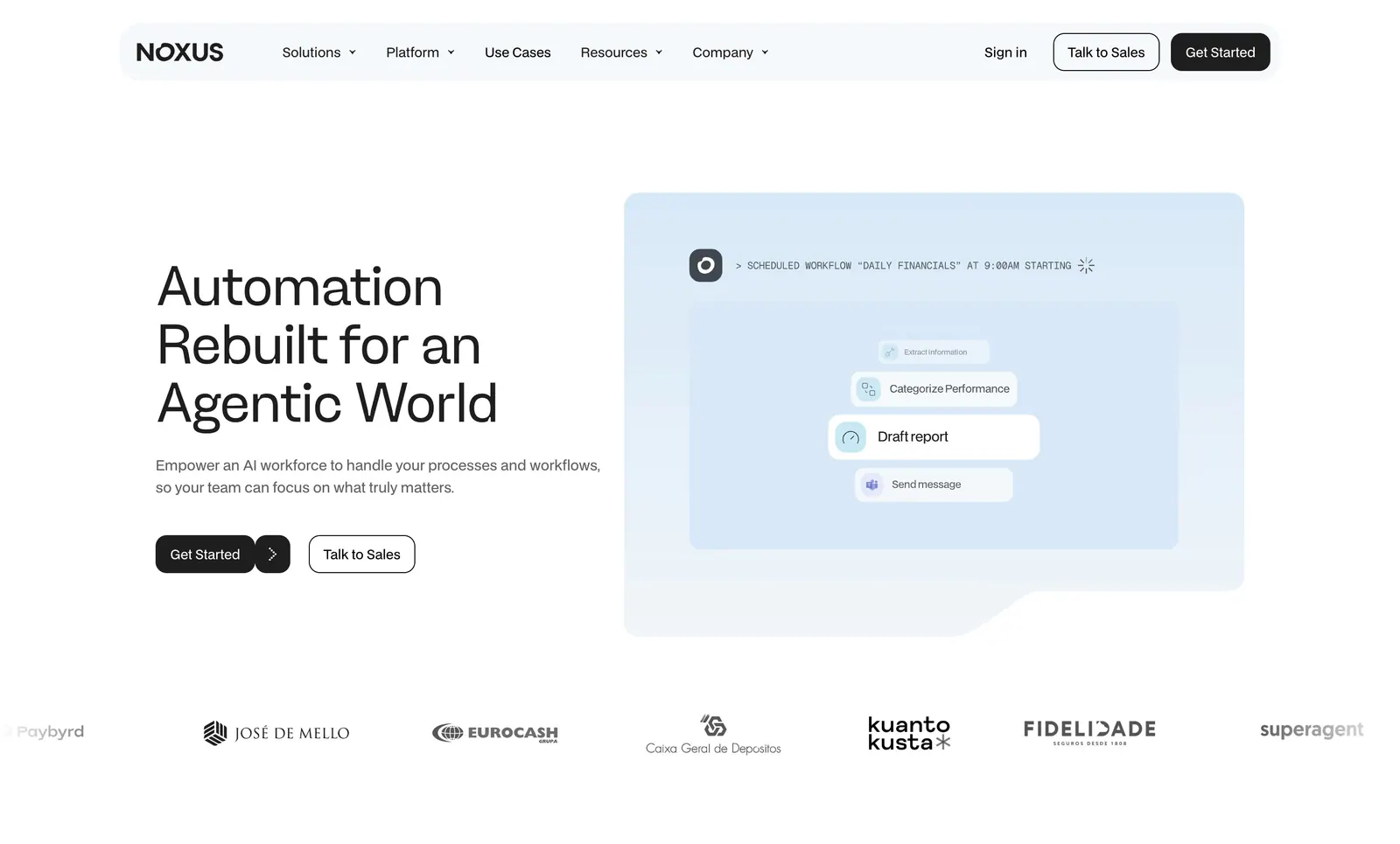
  185. Noxus hero section: left-aligned headline and two buttons beside a pale blue scheduled-workflow UI card, customer logo row below
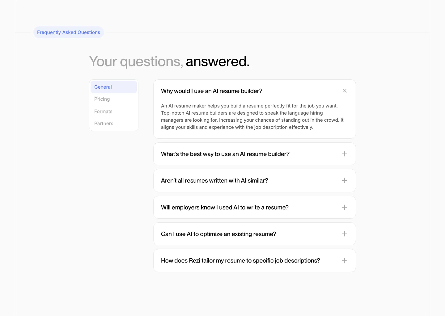
  186. Rezi FAQ section: two-tone headline above a side tab list and an accordion of question cards with one expanded answer
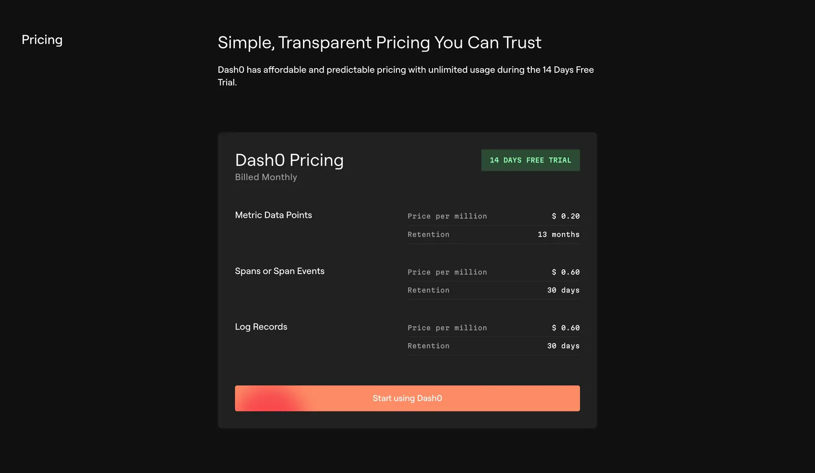
  187. Dash0 pricing section: single dark pricing card listing per-million prices and retention for metrics, spans and logs with an orange CTA
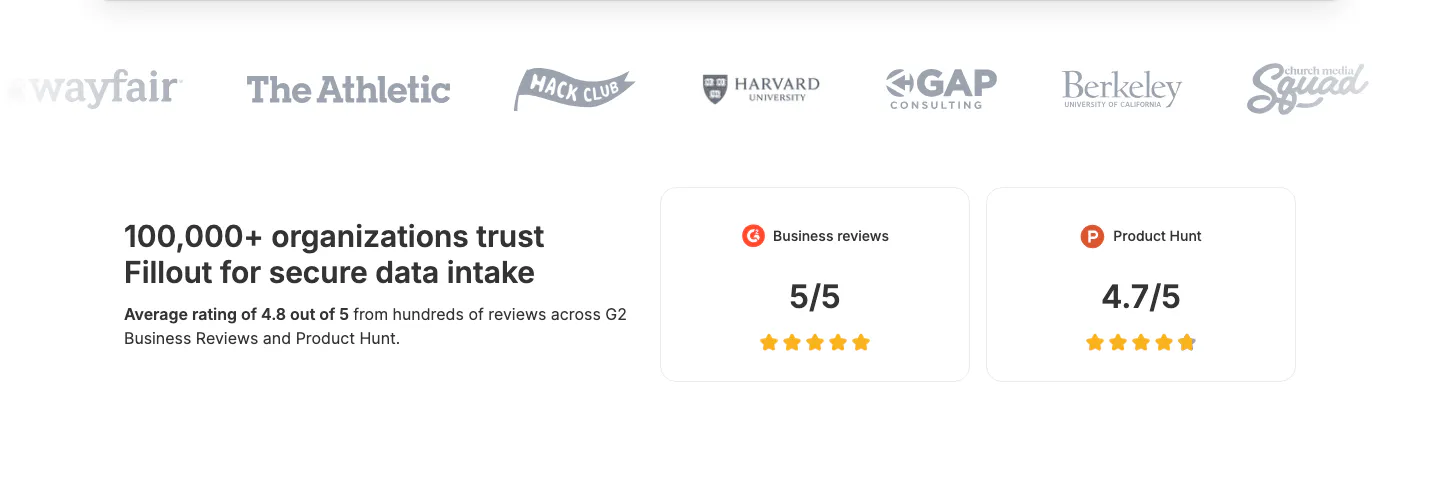
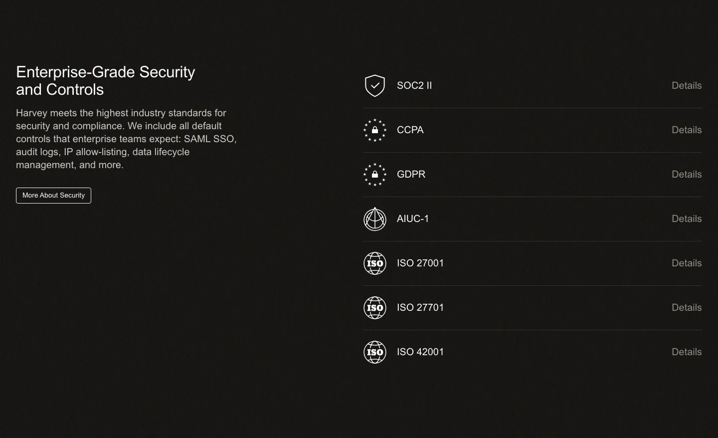
  188. Fillout logo cloud section: grayscale customer logo row above a trust statement and two rating cards for G2 and Product Hunt
  189. Heidi logo cloud section: single row of dark NHS trust and healthcare provider logos on a cream background
  190. Harvey security section: dark split layout with headline and copy left and a list of compliance certifications right
  191. Visual footer section: dark charcoal footer with small wordmark, resources and company link columns, a white waitlist button and copyright
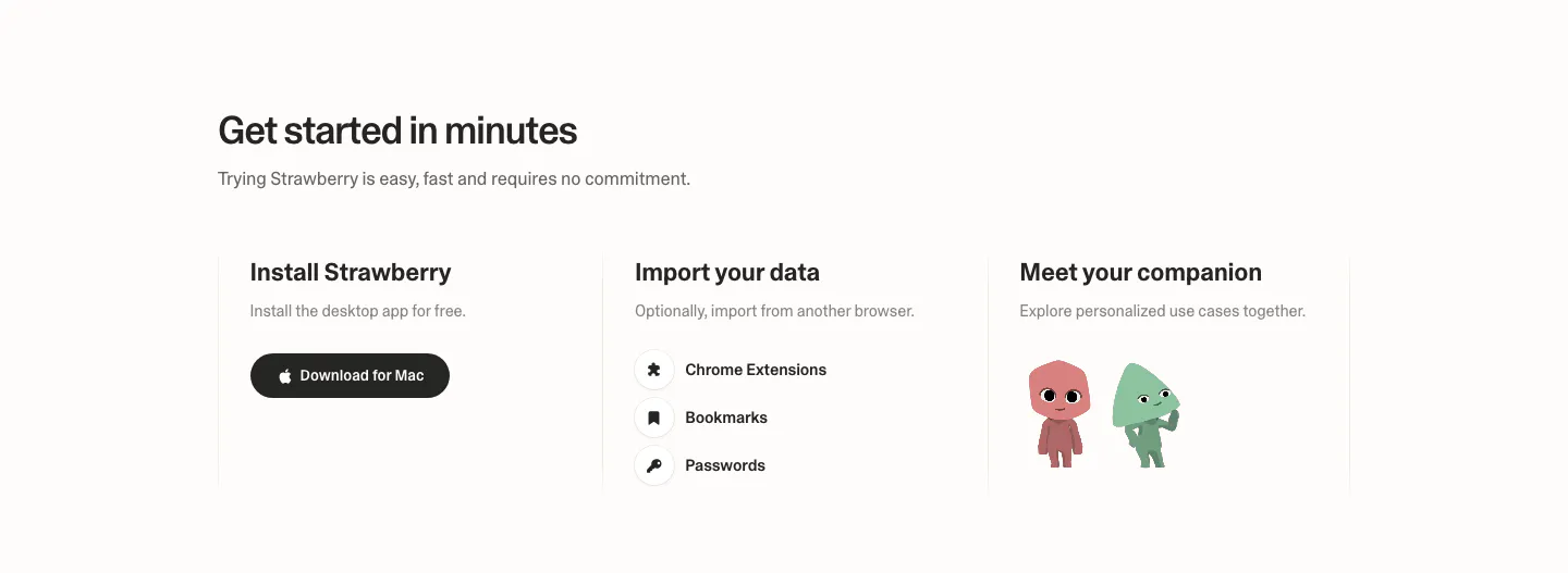
  192. Strawberry how it works section: three columns for install, import data and meet your companion, with a download button and characters
  193. Attio footer section: logo at left, link columns for platform, company, imports, apps and resources, social icons and legal row on dark
  194. Zamp logo cloud section: left-aligned heading with intro copy beside it above a bordered grid of six black customer logos on light gray
  195. Chargetrip footer section: four link columns beside a newsletter sign-up blurb, with legal links and certification badges on a white panel
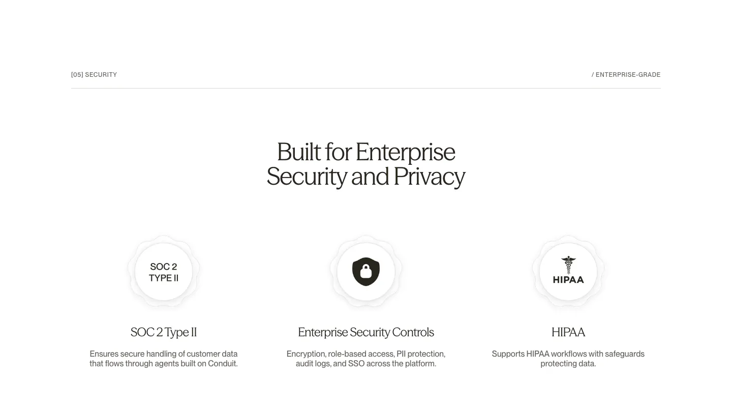
  196. Conduit security section: centered serif headline above SOC 2, security controls and HIPAA badge columns on white
  197. LocalCan FAQ section: two-line headline on the left beside a long collapsed accordion of questions on a light gray background
  198. Semrush logo cloud section: single row of black customer logos incl. Shopify, Samsung, FedEx and Amazon on a pale lavender band
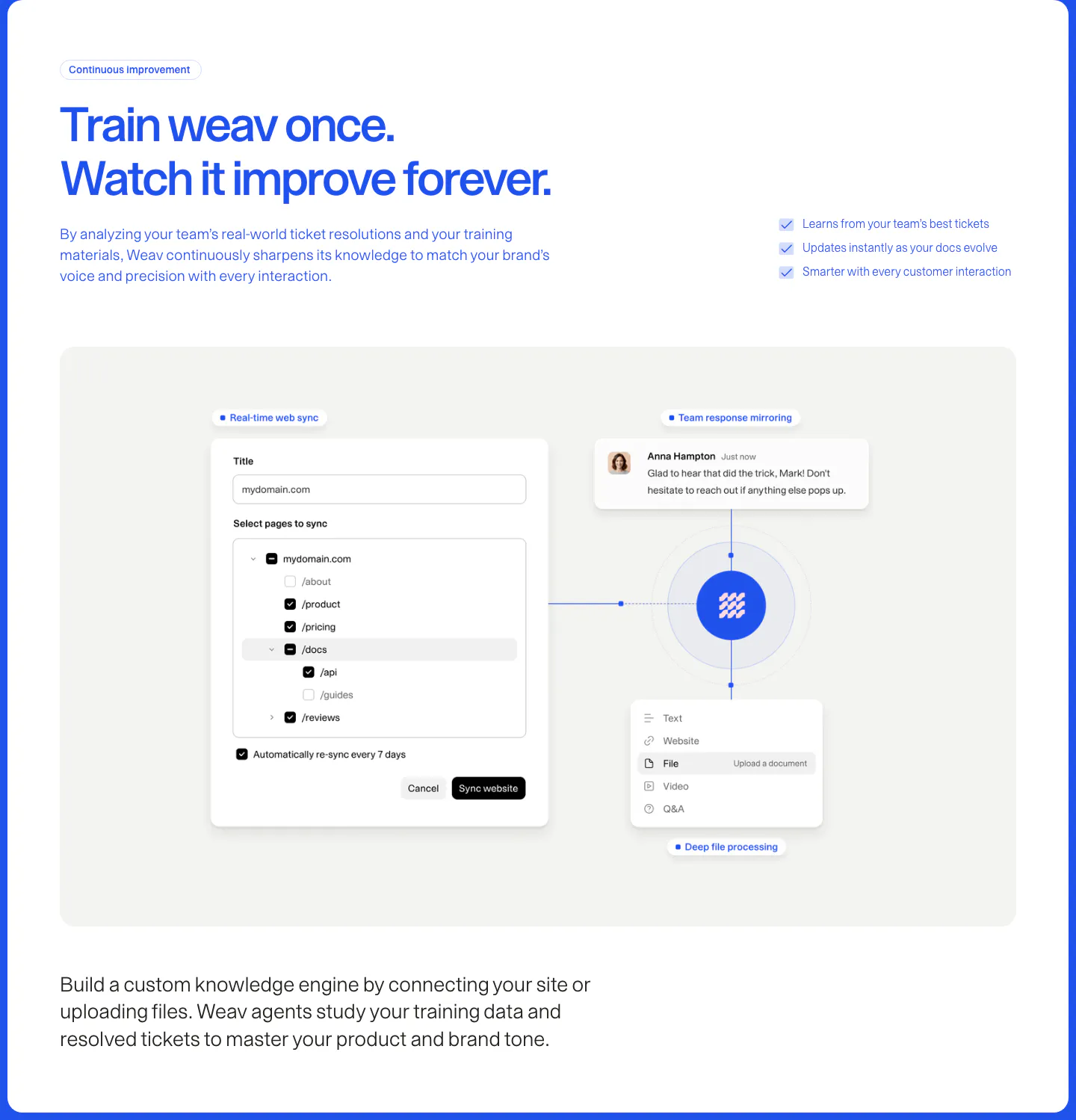
  199. Weav features section: blue headline and checklist above a gray panel with a website sync form and file and chat cards linked to a central logo
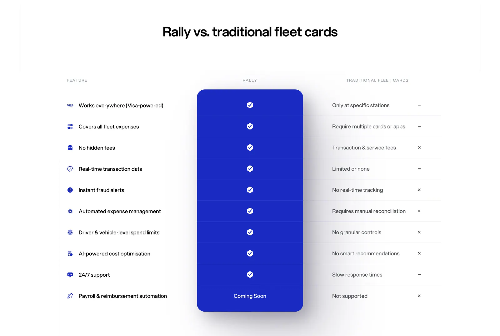
  200. Rally comparison section: centered headline above a feature comparison table with a highlighted blue Rally column of checkmarks
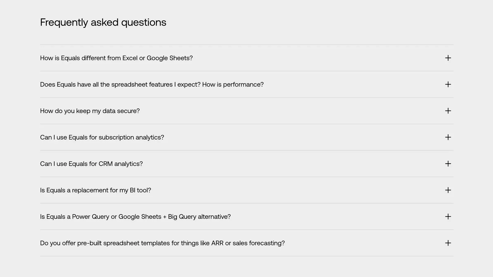
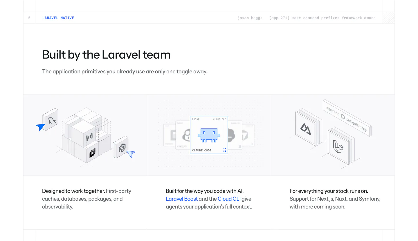
  201. Equals FAQ section: left-aligned heading above an eight-question accordion with plus icons on a light gray background
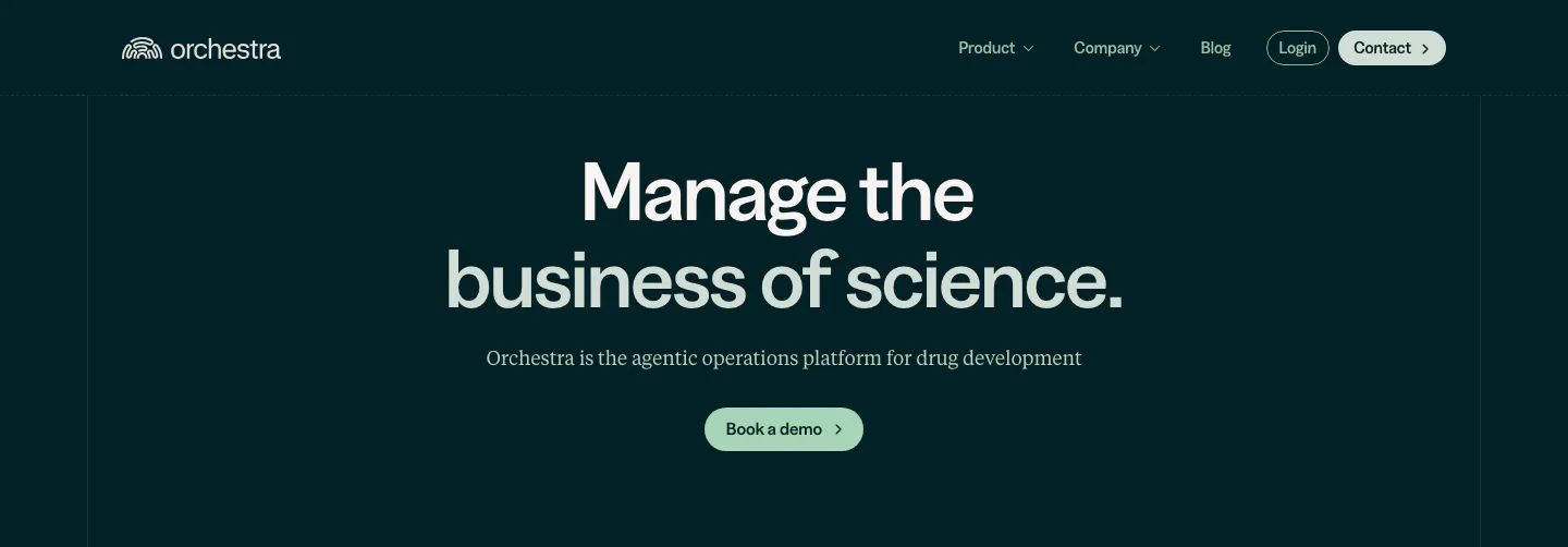
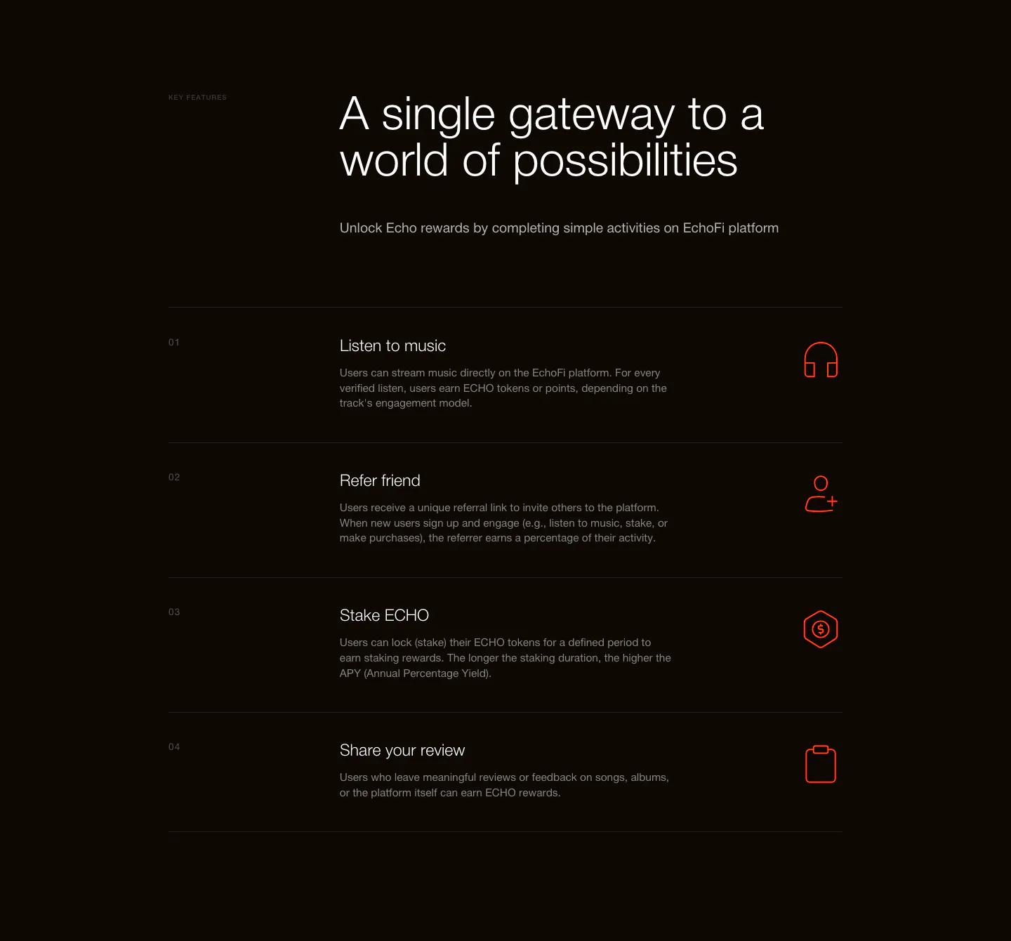
  202. Orchestra Bio hero section: nav above a centered two-tone headline, serif subtitle and pale green demo button on dark teal
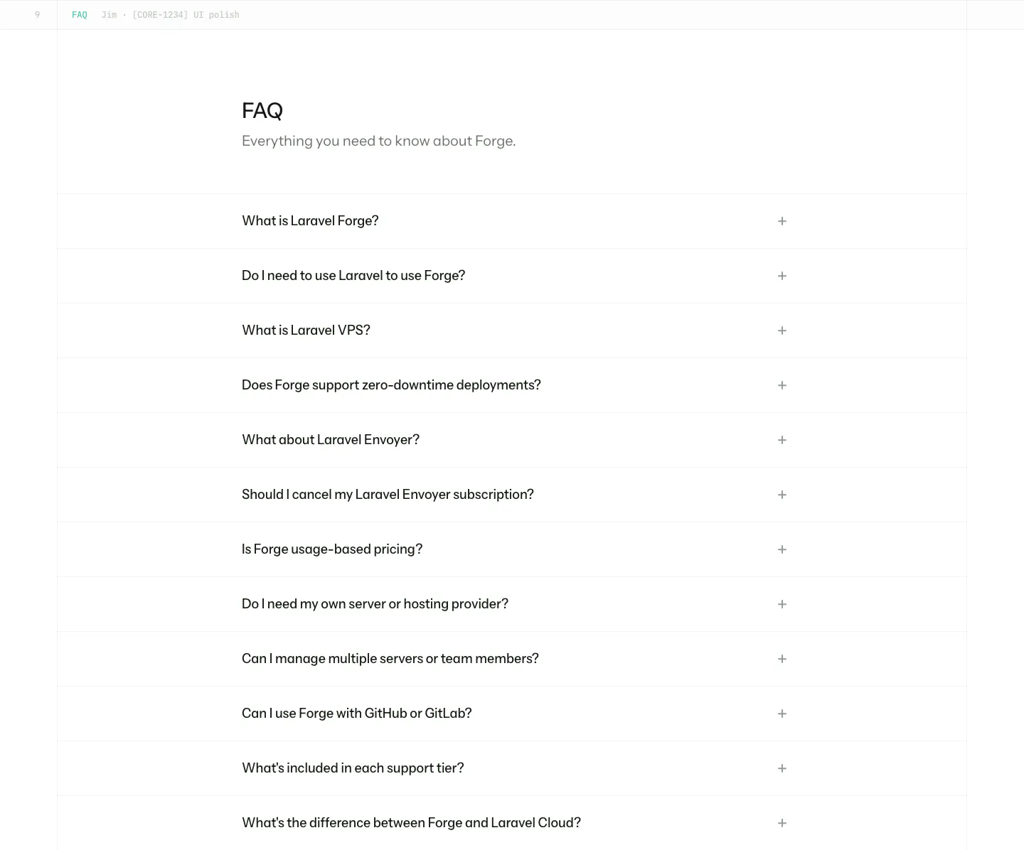
  203. Laravel Cloud features section: headline above three columns of isometric illustrations for first-party packages, AI tooling and frameworks
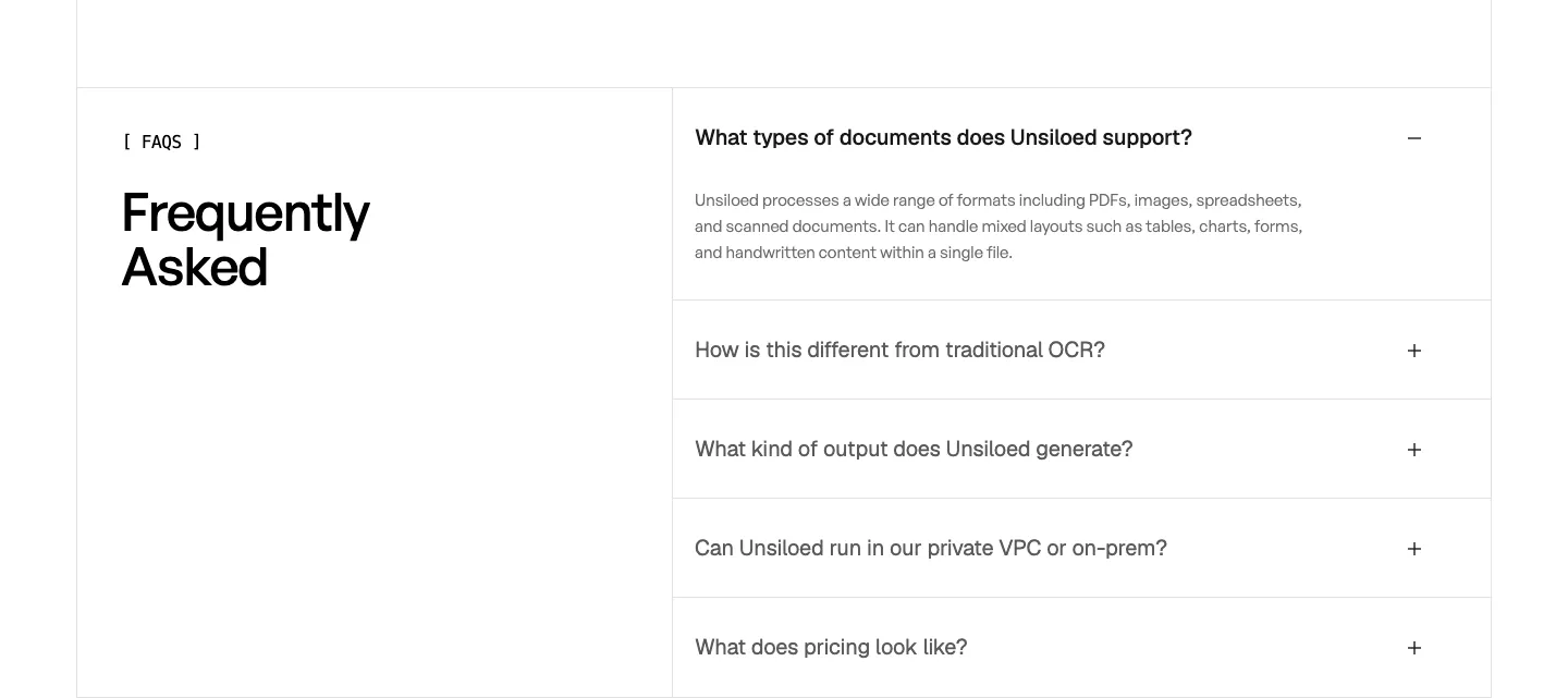
  204. EchoFi features section: headline above a numbered four-row list with orange line icons on a near-black background
  205. Laravel Forge FAQ section: heading above a long accordion list of questions with plus icons on white
  206. Unsiloed FAQ section: Frequently Asked heading at left beside a bordered accordion with the first question expanded on white
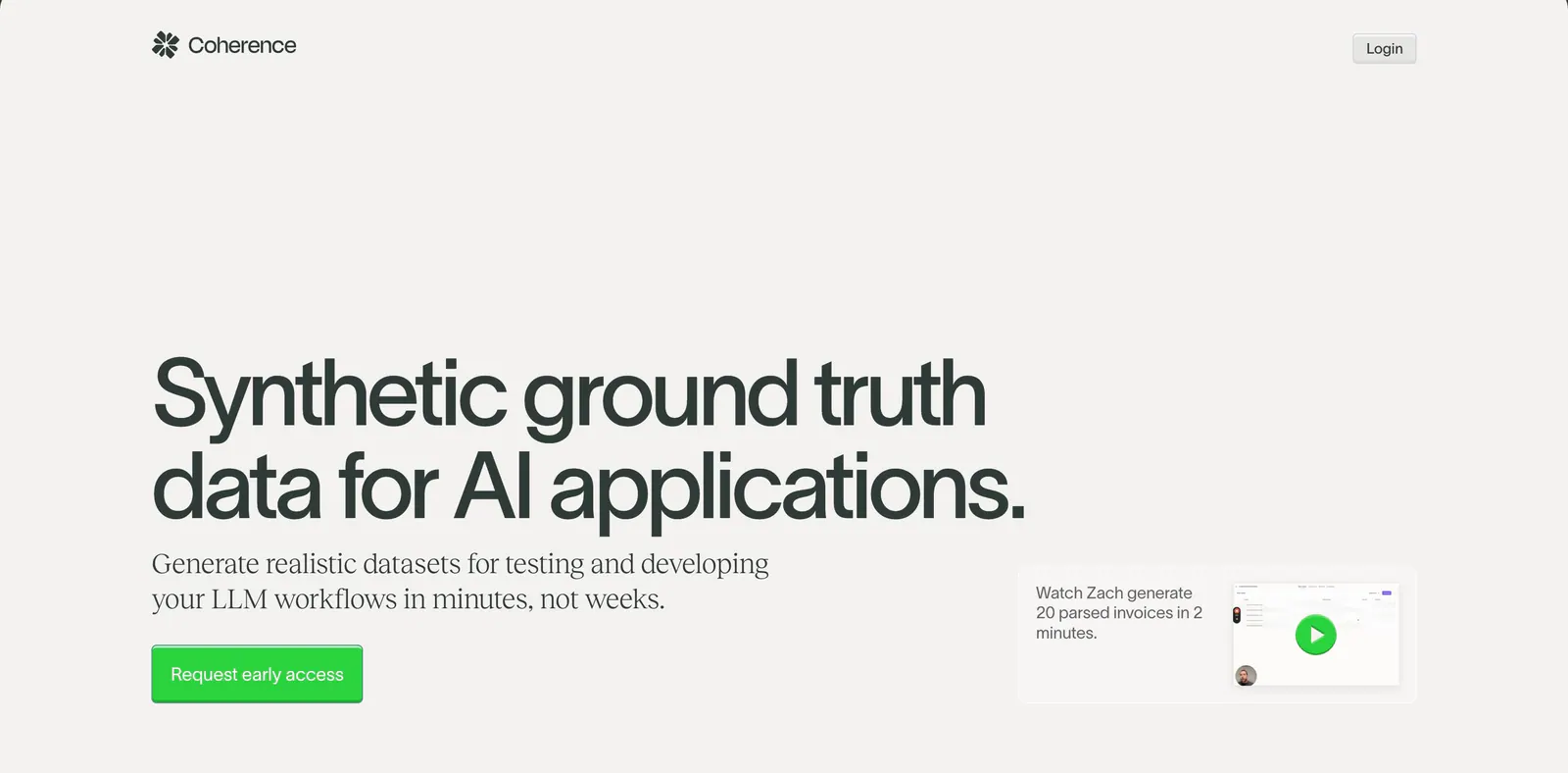
  207. Coherence hero section: oversized left-aligned headline with green CTA and a small video demo card on a warm light gray background
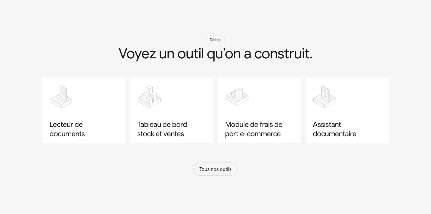
    Coherence Hero
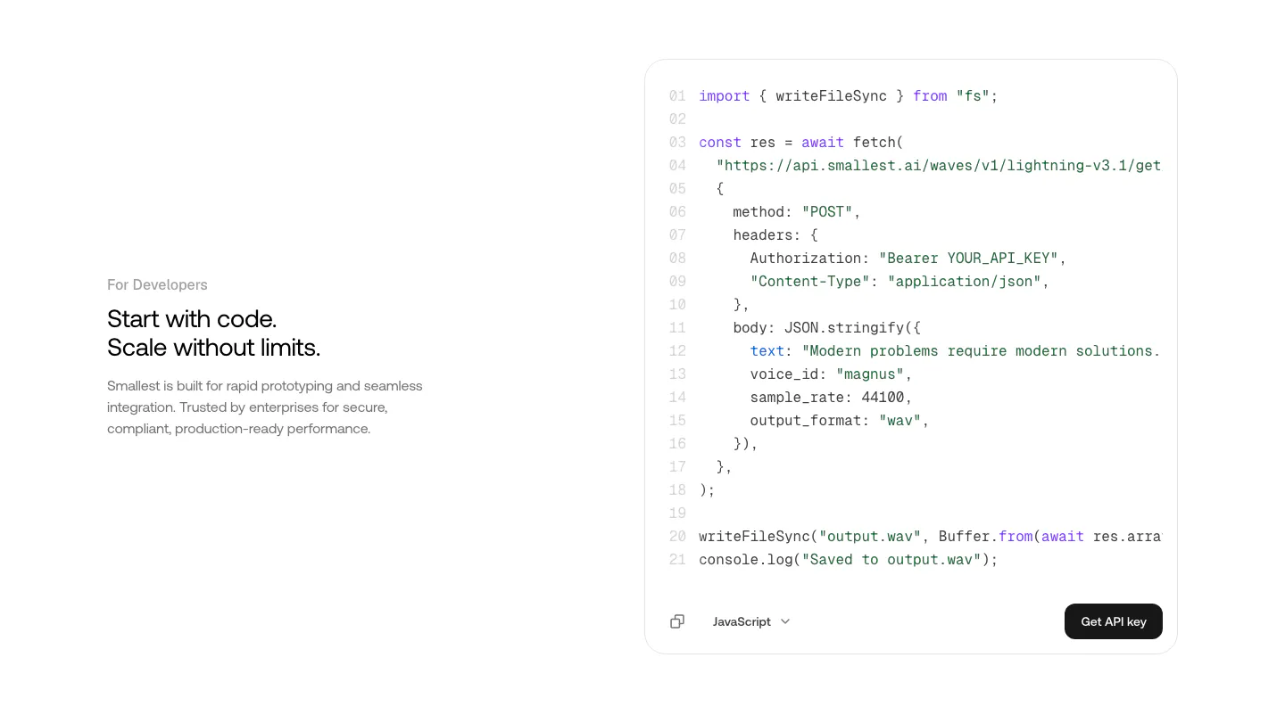
  208. Smallest.ai features section: developer copy on the left beside a JavaScript API code block with a Get API key button on white
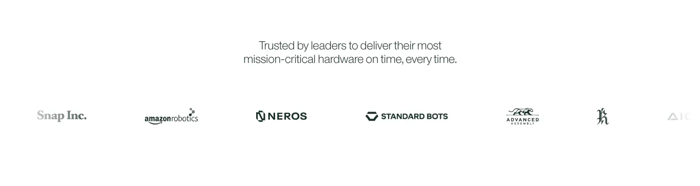
  209. Cofactr logo cloud section: centered two-line statement above a single row of gray customer logos like Snap Inc. and Neros on white
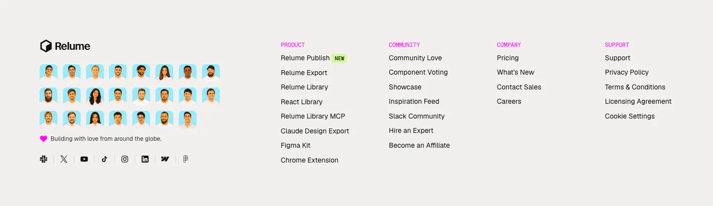
  210. Relume footer section: logo above a grid of illustrated team avatars and social icons, with four link columns under pink labels
  211. Modulify features section: left-aligned headline above a row of four gray icon cards on white, the last card cut off
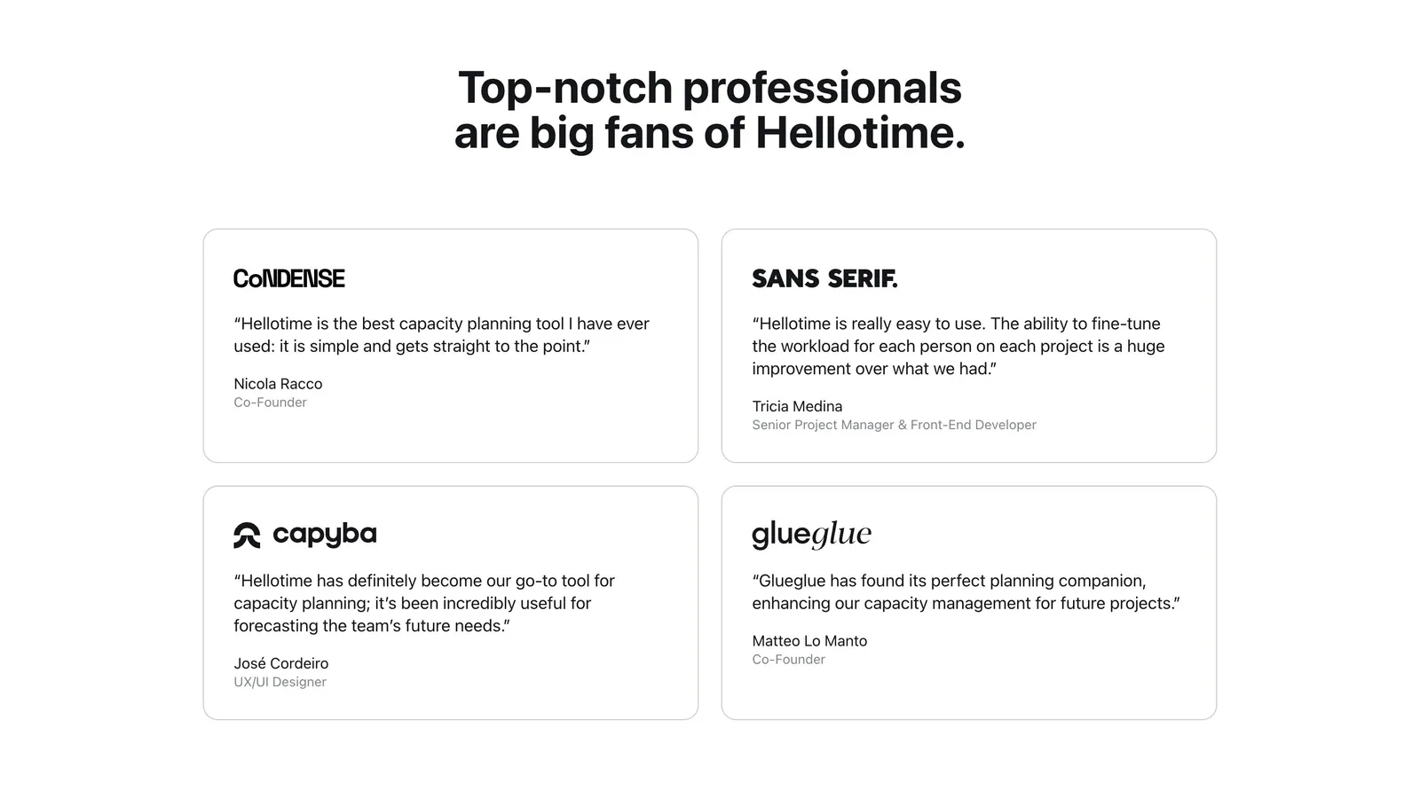
  212. Hellotime testimonials section: centered heading above a two-by-two grid of outlined quote cards with company logos and names
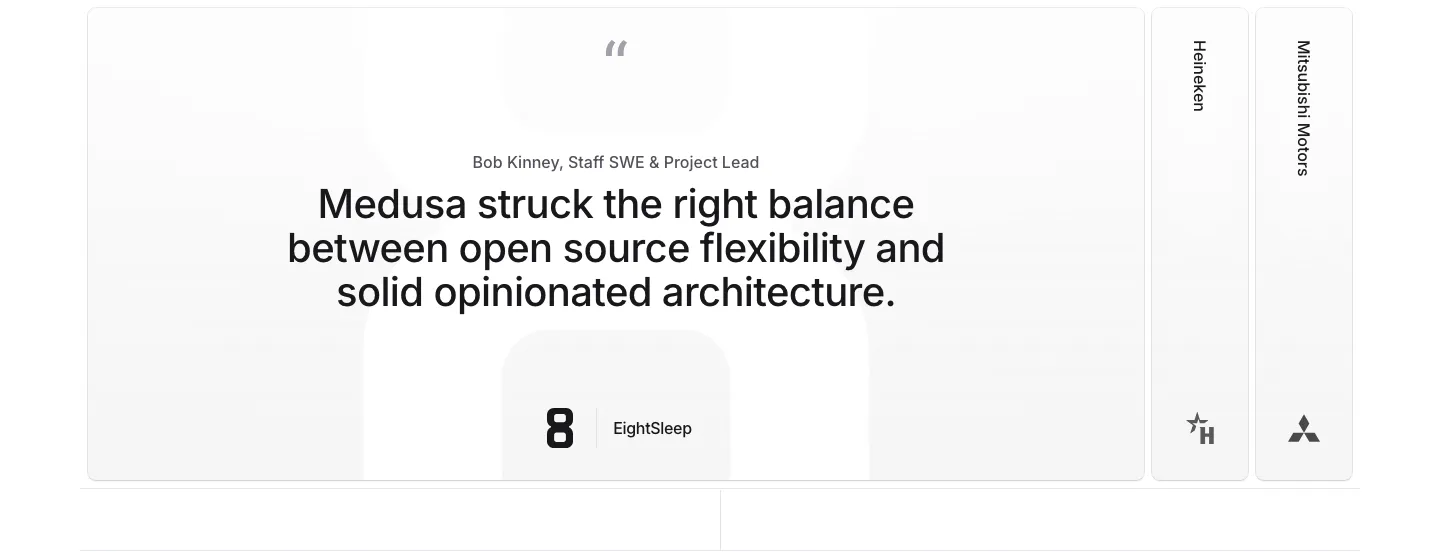
  213. Medusa testimonials section: large centered quote card with EightSleep logo beside collapsed Heineken and Mitsubishi Motors tabs
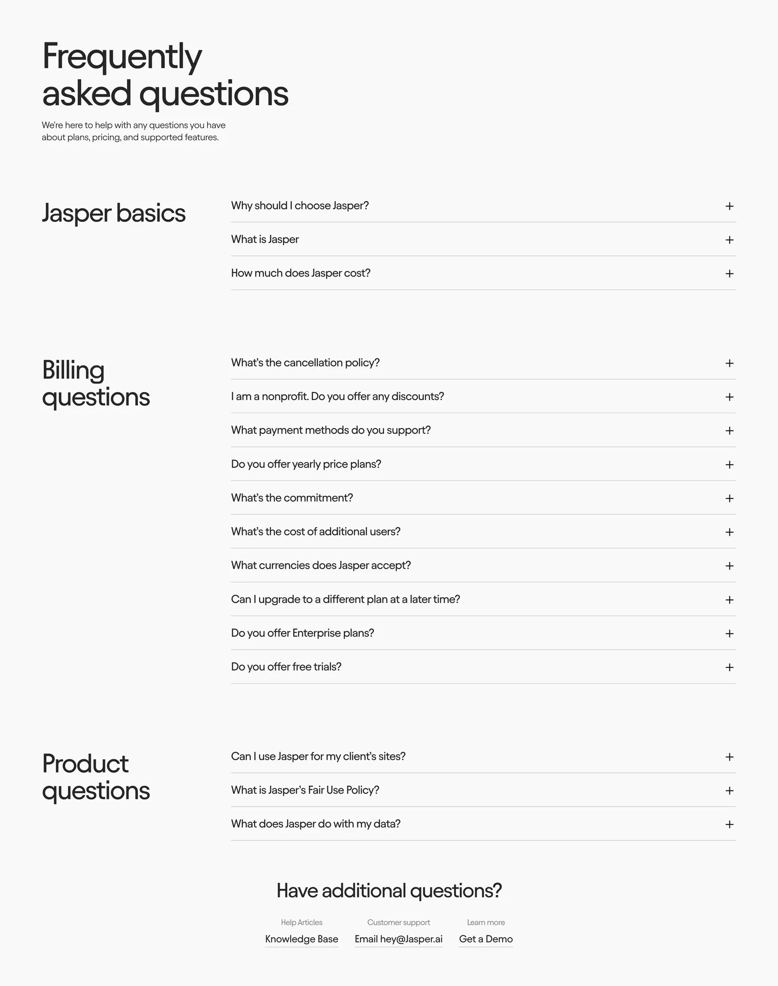
  214. Jasper FAQ section: large heading above grouped accordion questions with category titles in a left column on an off-white background
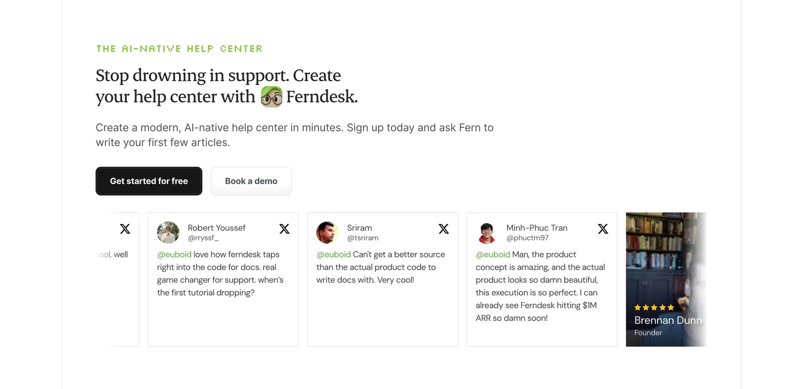
  215. Ferndesk testimonials section: serif headline and two CTAs above a horizontally scrolling row of tweet cards on white
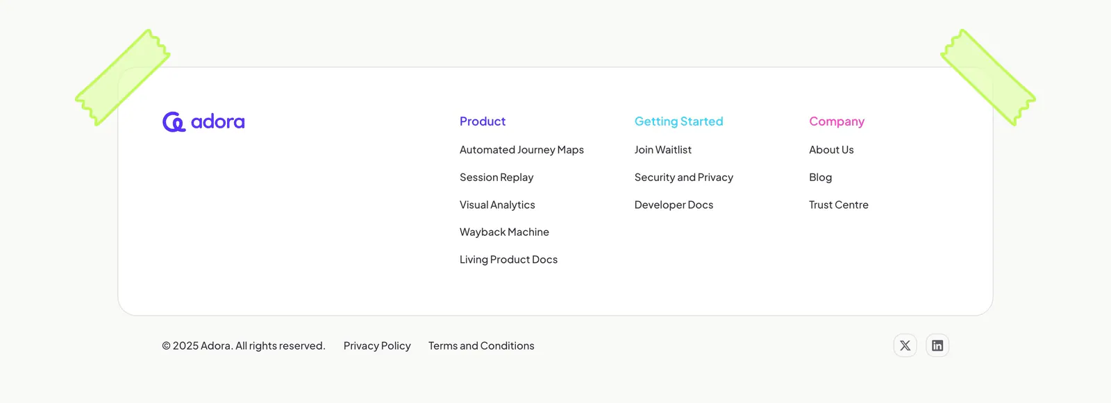
  216. Adora footer section: rounded white card with logo and three link columns, taped corners, copyright row on off-white
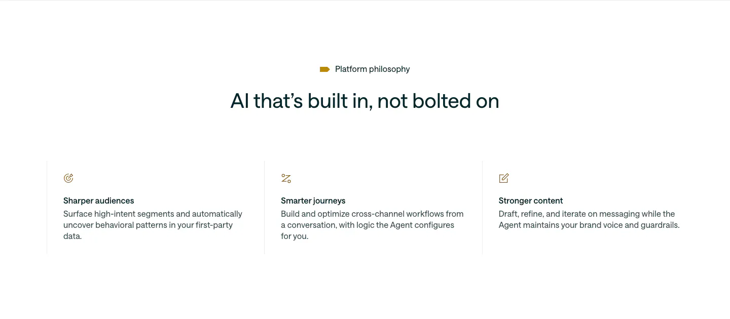
  217. Customer.io value proposition section: centered headline above three icon columns describing audiences, journeys and content
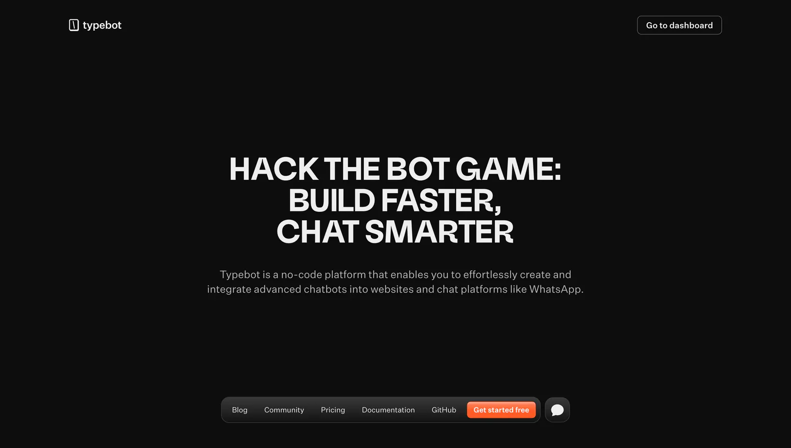
  218. Typebot hero section: centered uppercase headline and description on a black background with a floating bottom pill navigation bar
  219. LocalCan integrations section: centered caption above a single row of grayscale framework logos including Next.js, Laravel, Nuxt and Node
  220. Laravel logo cloud section: monospace caption beside a single row of OpenAI, Apple, Webflow, Nike and Zillow logos in bordered cells
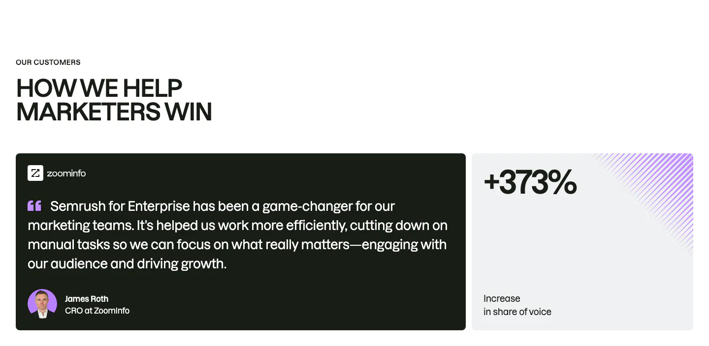
  221. Semrush testimonials section: uppercase headline above a dark ZoomInfo quote card with avatar beside a light +373% stat card
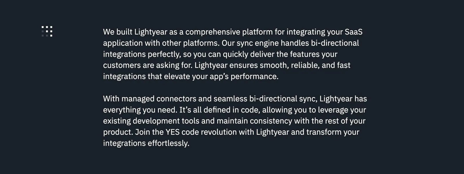
  222. Lightyear about & mission section: two paragraphs of white mission copy beside a small dot-grid icon on a dark charcoal background
    Lightyear About & mission
  223. Raneo FAQ section: centered headline above a single-column accordion with the first question expanded on a light gray background
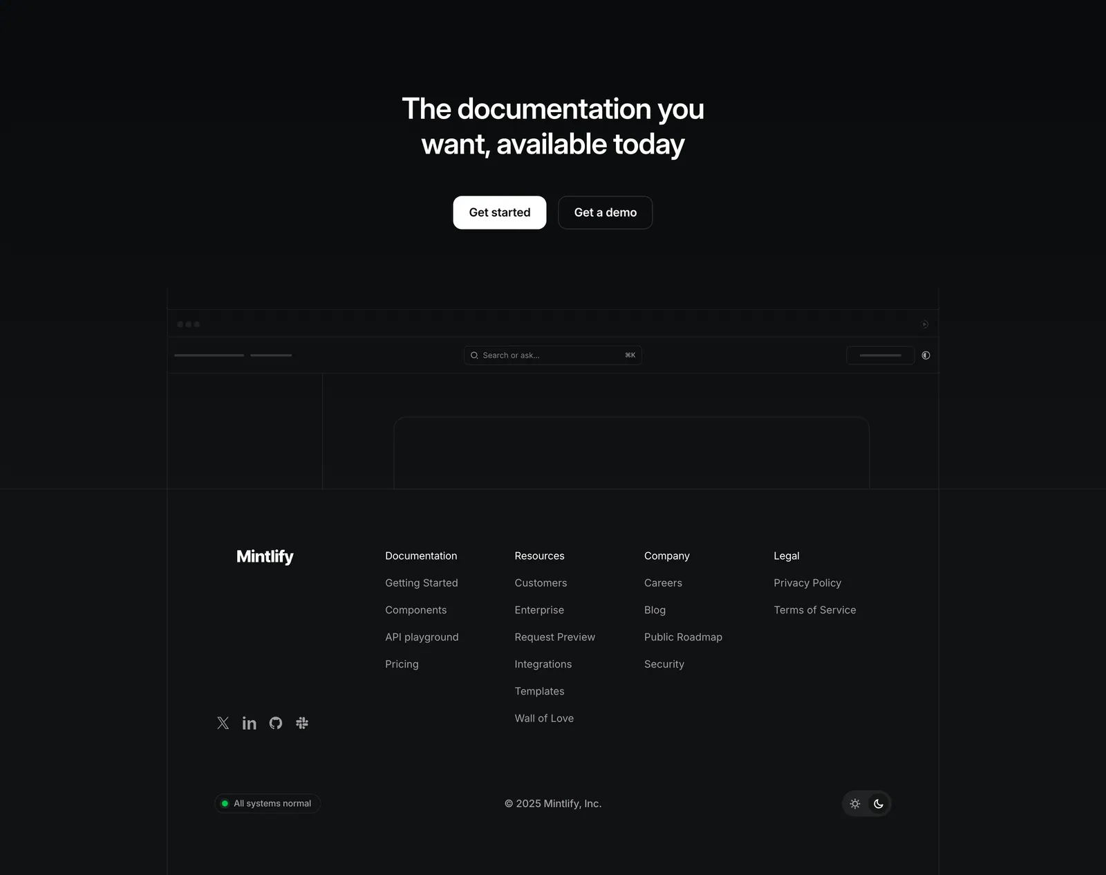
  224. Mintlify footer section: centered closing CTA above a faded docs wireframe, then four link columns and status badge on black
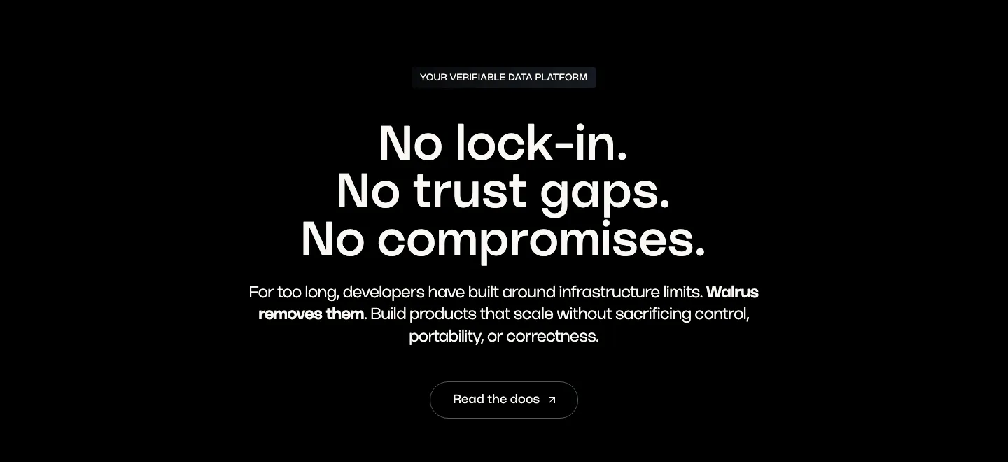
  225. Walrus value proposition section: centered three-line statement headline, copy and outline button on black
  226. Cluster call-to-action section: centered serif headline and dark pill button on a beige panel framed by dark edges
  227. Linear logo cloud section: centered two-line intro above a three-by-two grid of white customer logos such as Ramp, Vercel and Cash App on black
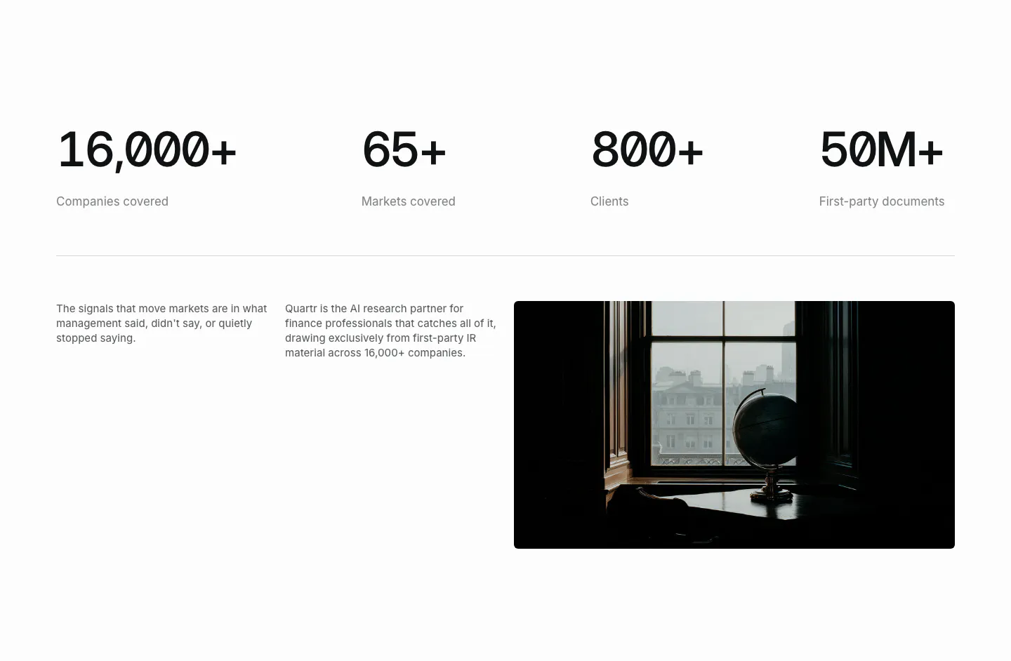
  228. Quartr stats section: four large monospace figures in a row above two short text columns and a dark photo of a globe by a window
  229. Gumloop call-to-action section: centered headline, copy and button inside a light gray rounded panel
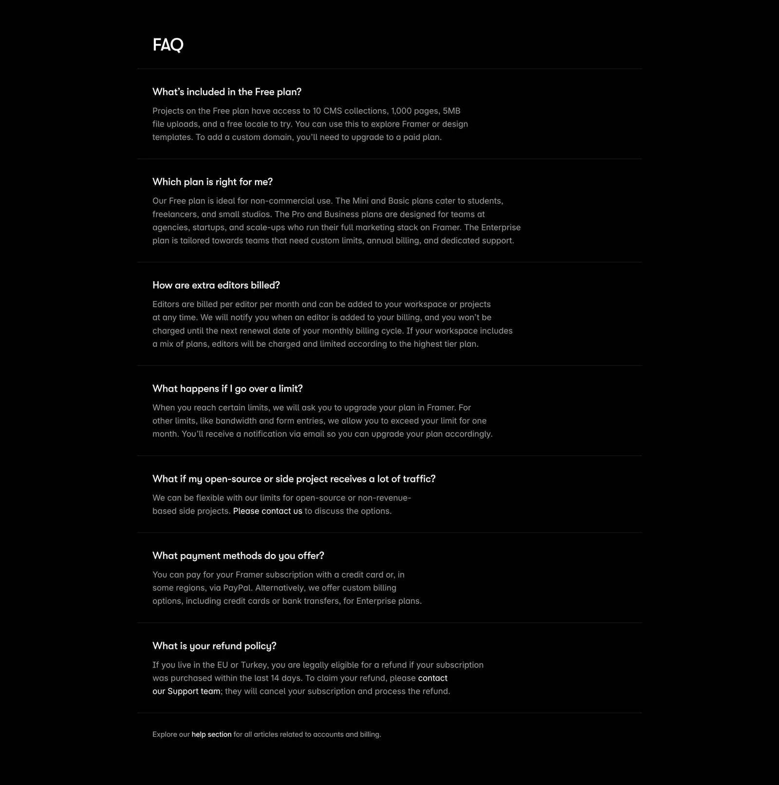
  230. Framer FAQ section: heading above a single-column list of questions with expanded answers separated by thin rules on black
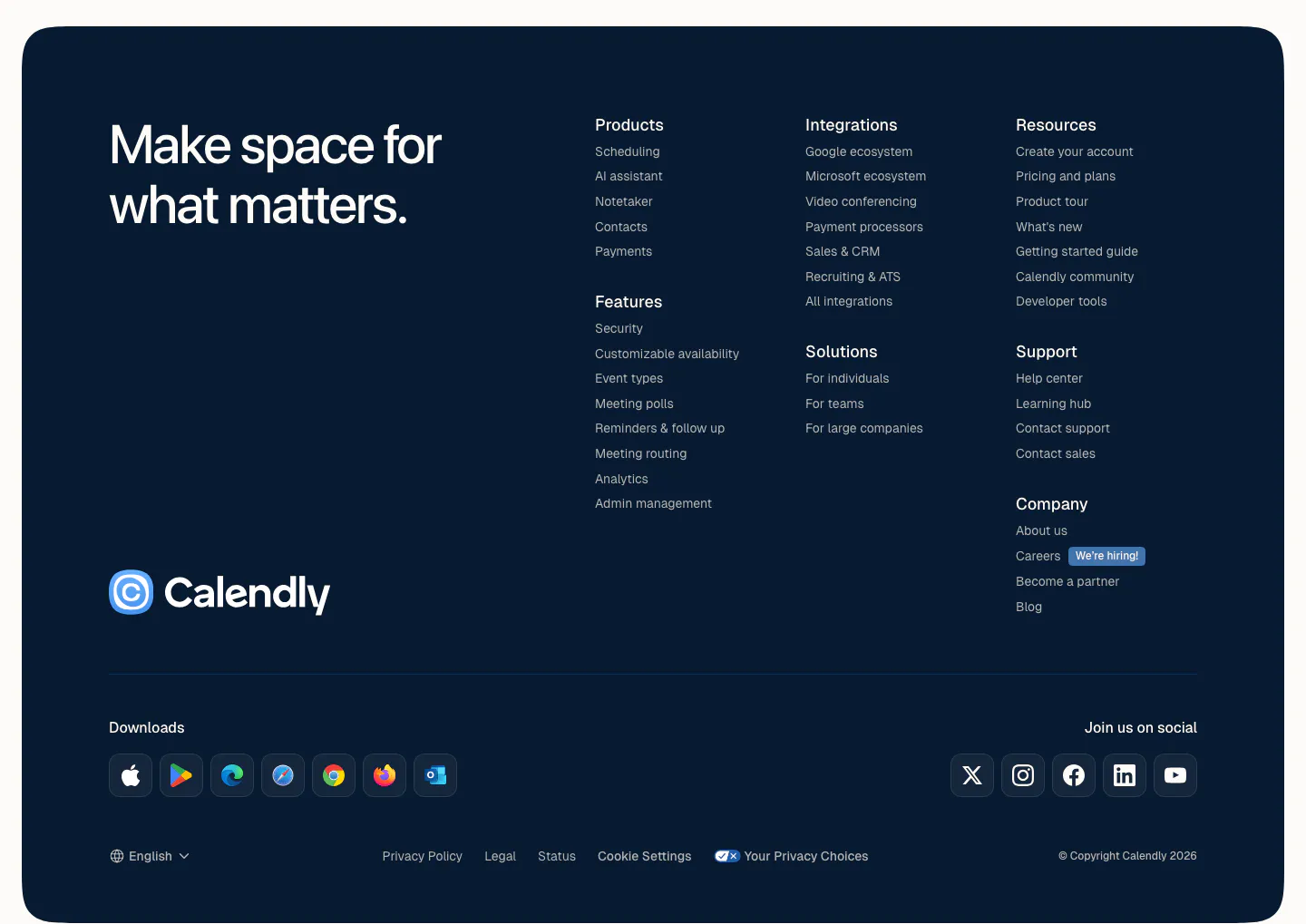
  231. Calendly footer section: rounded dark navy panel with a large tagline, logo, link columns, app download icons and social buttons
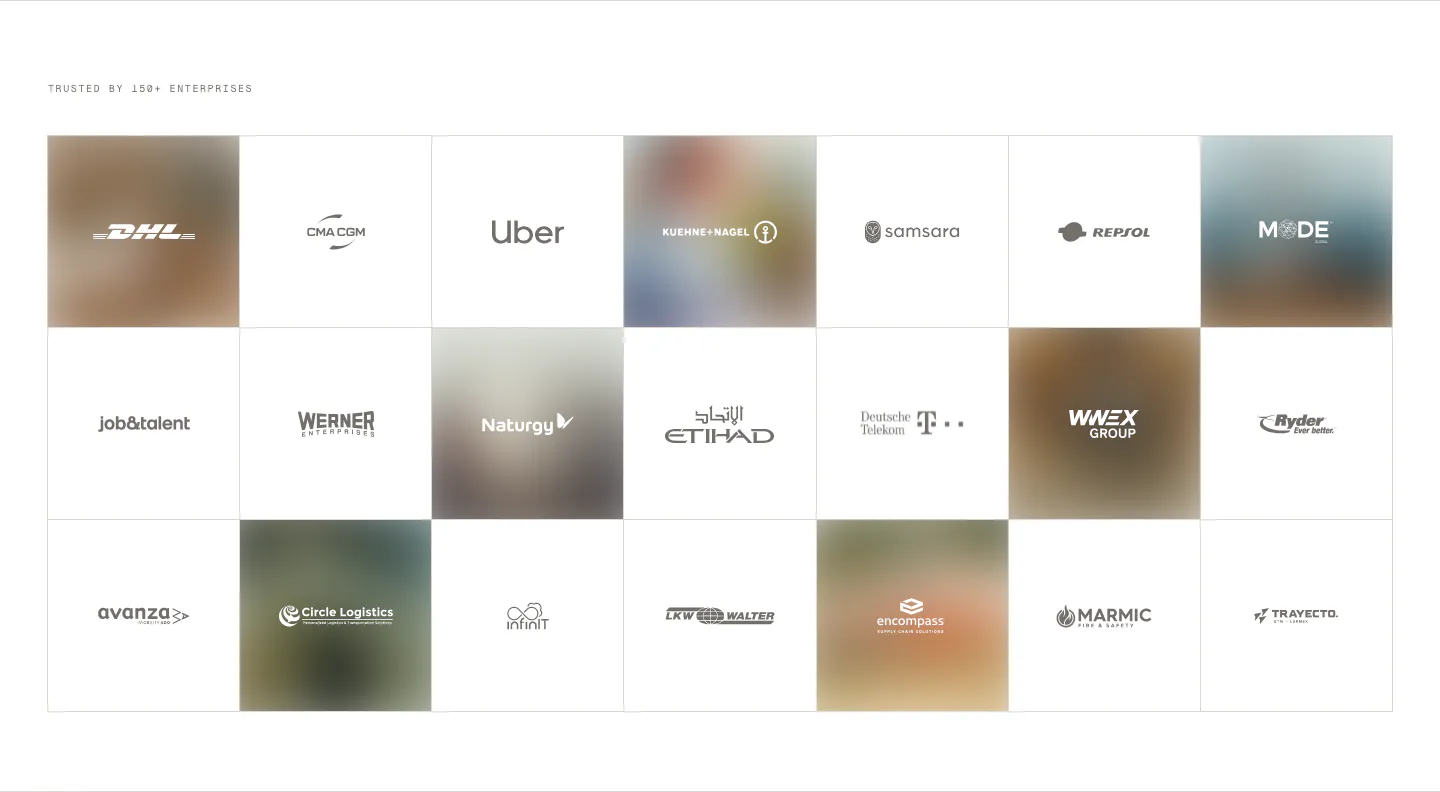
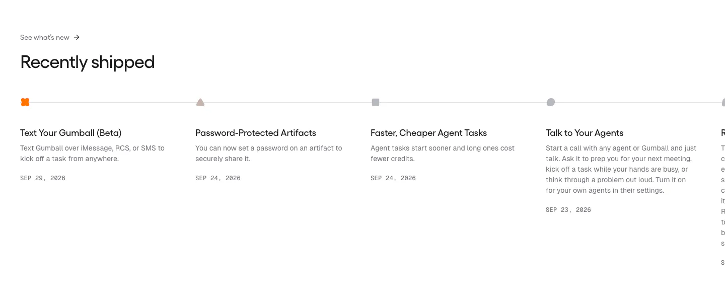
  232. HappyRobot logo cloud section: small eyebrow label above a 7x3 bordered grid of customer logos, some tiles on blurred photo backgrounds
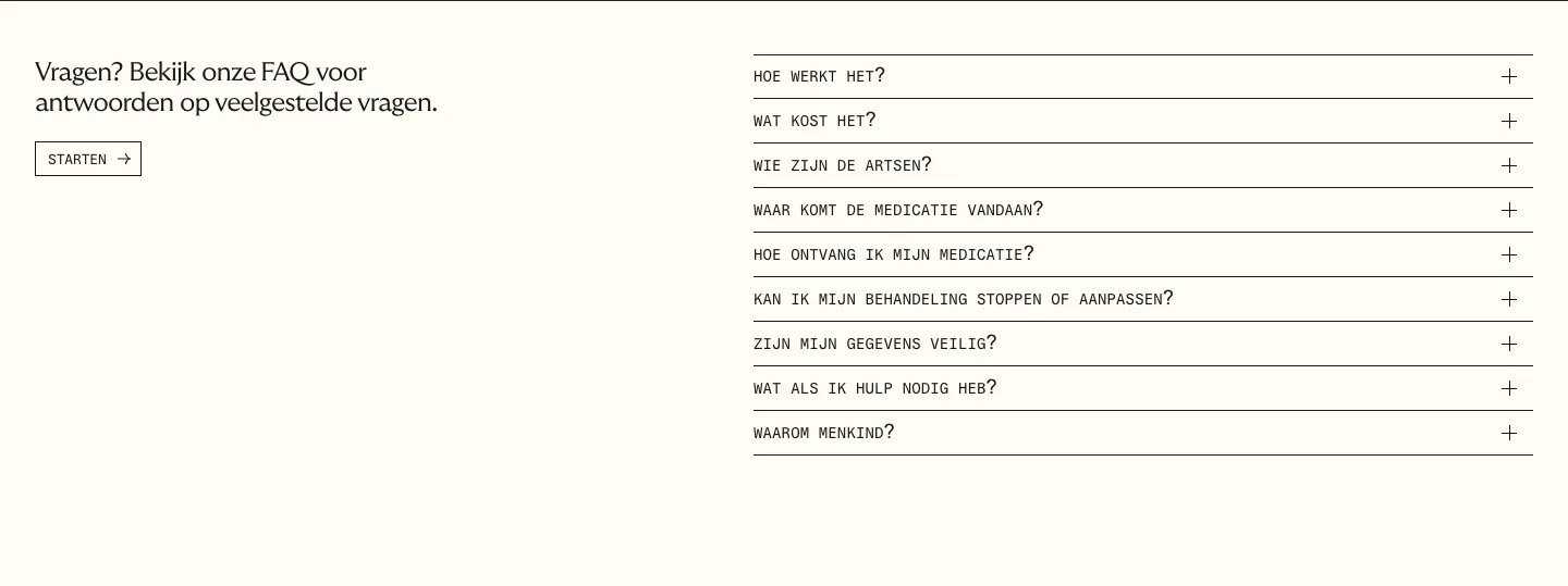
  233. Menkind FAQ section: short intro with start button on the left and a monospace question accordion on the right on cream
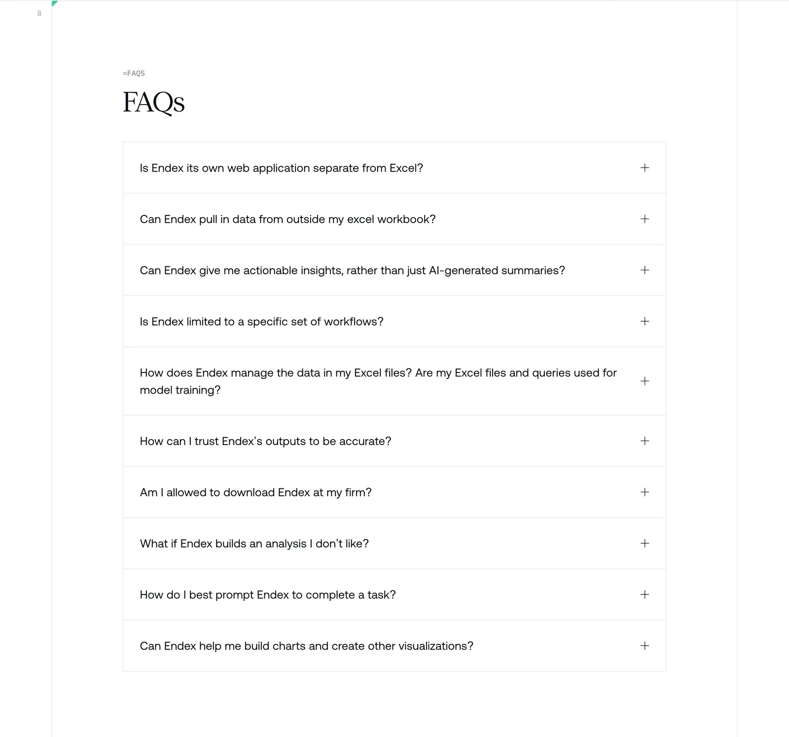
  234. Endex FAQ section: serif FAQs heading above a bordered accordion list of ten questions with plus icons on white
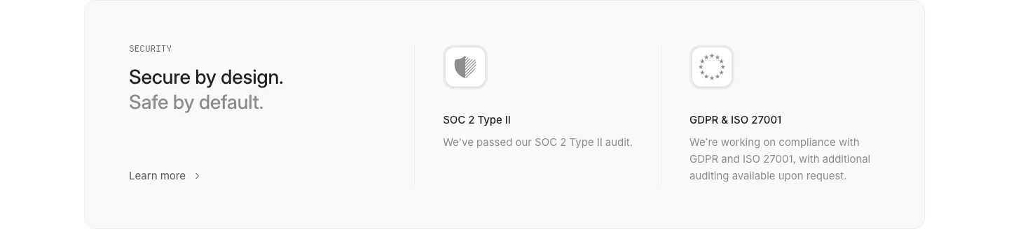
  235. Interfere security section: light gray card with headline left and SOC 2 and GDPR/ISO compliance columns with icons
  236. Gumloop blog & resources section: changelog timeline of dated release entries running off the right edge
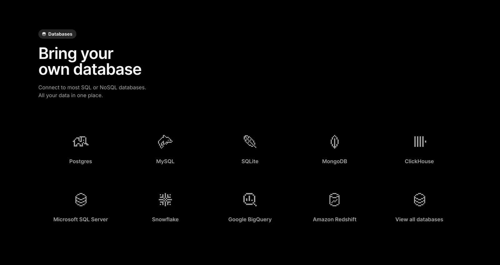
  237. Outerbase features section: left-aligned headline above a two-row grid of pixel-style database icons with names on black
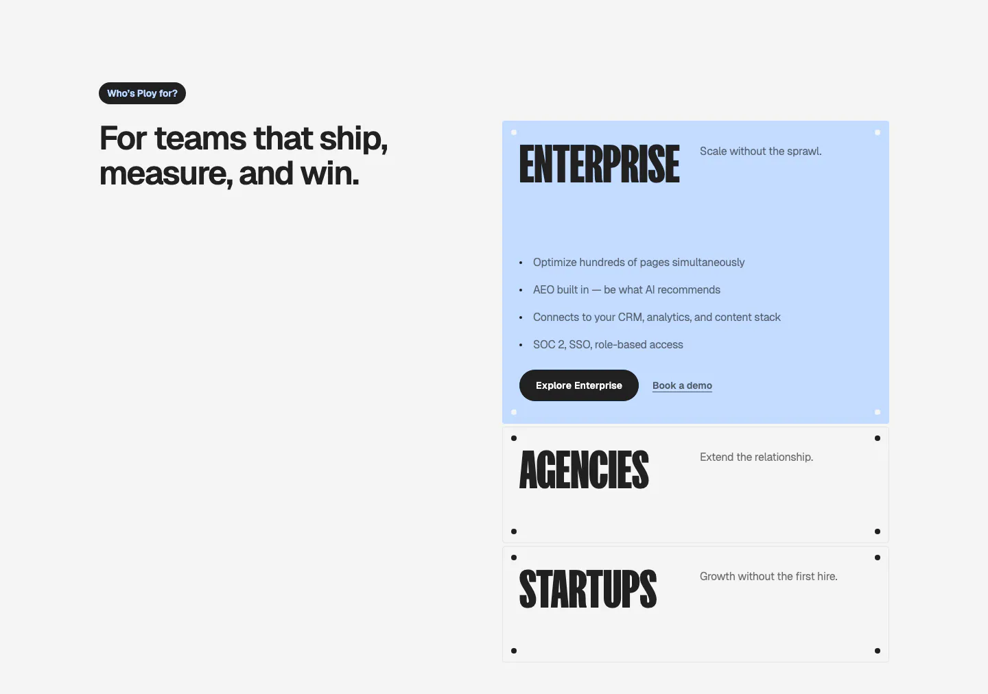
  238. Ploy use cases section: headline on the left with stacked accordion-style cards for Enterprise, Agencies and Startups on the right
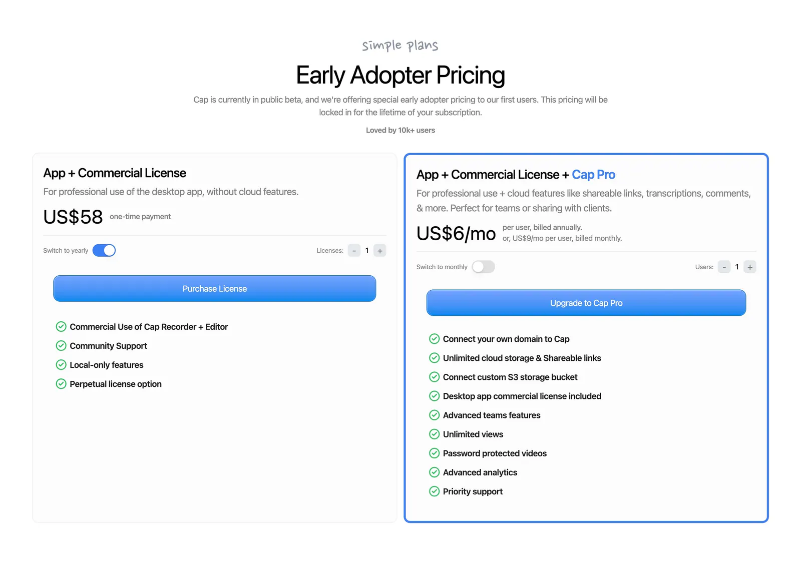
  239. Cap pricing section: centered headline above two license cards with billing toggles, blue buttons and green-check feature lists
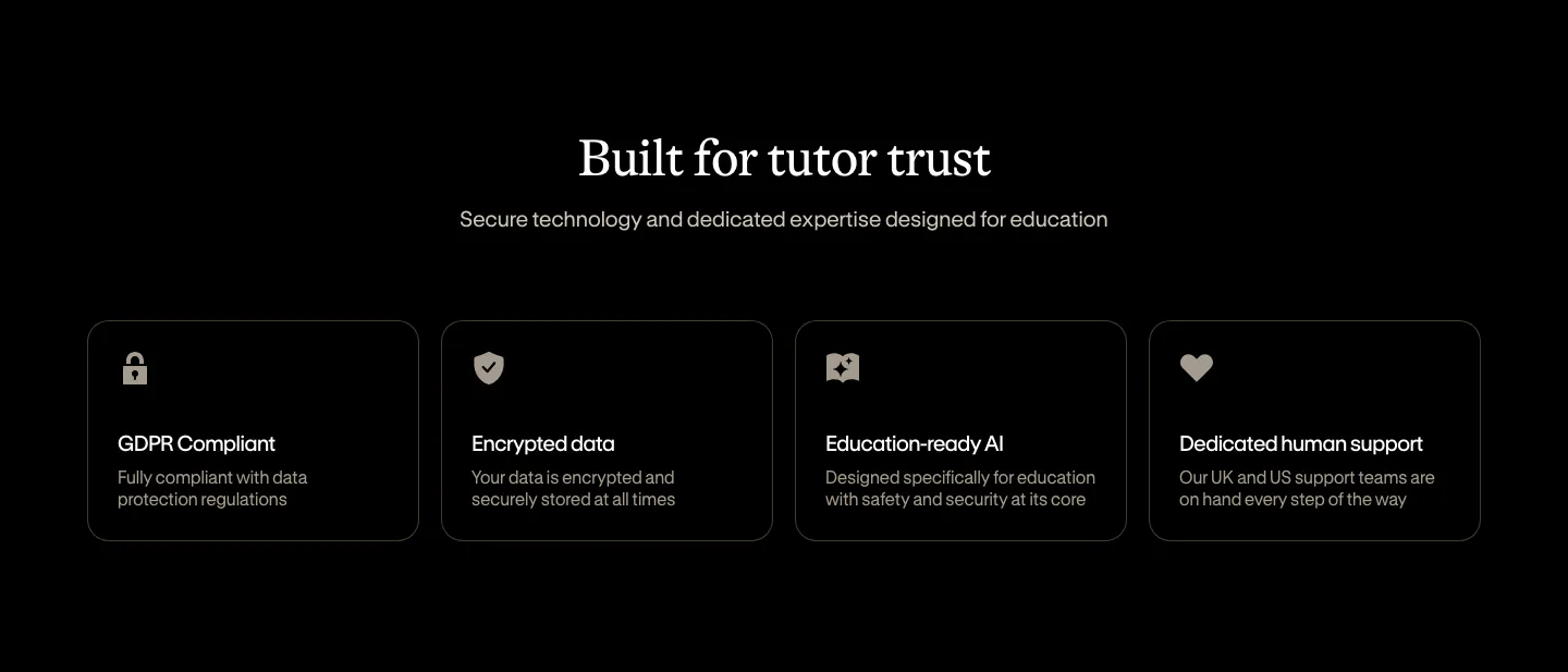
  240. Bobbin security section: centered serif heading above four outlined cards for GDPR, encryption, AI and support on black
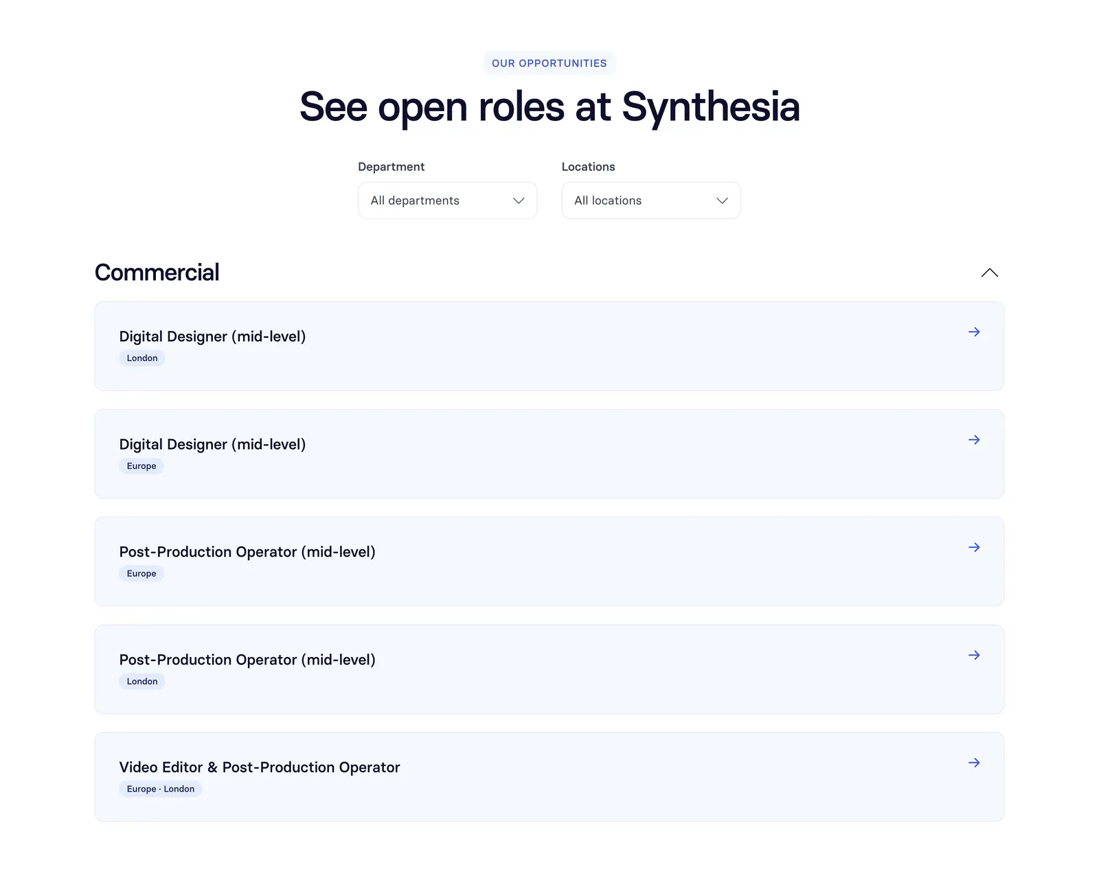
  241. Synthesia careers section: centered headline with department and location dropdowns above a list of open role rows on white
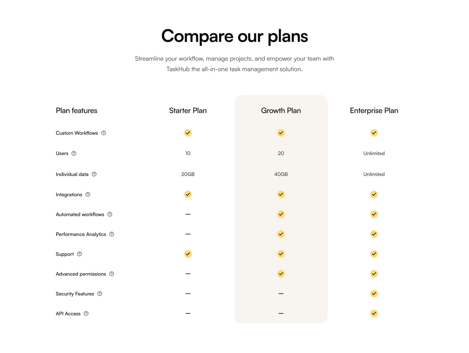
  242. QuickLnk pricing section: centered headline above a plan comparison table with yellow checkmarks and a highlighted Growth column
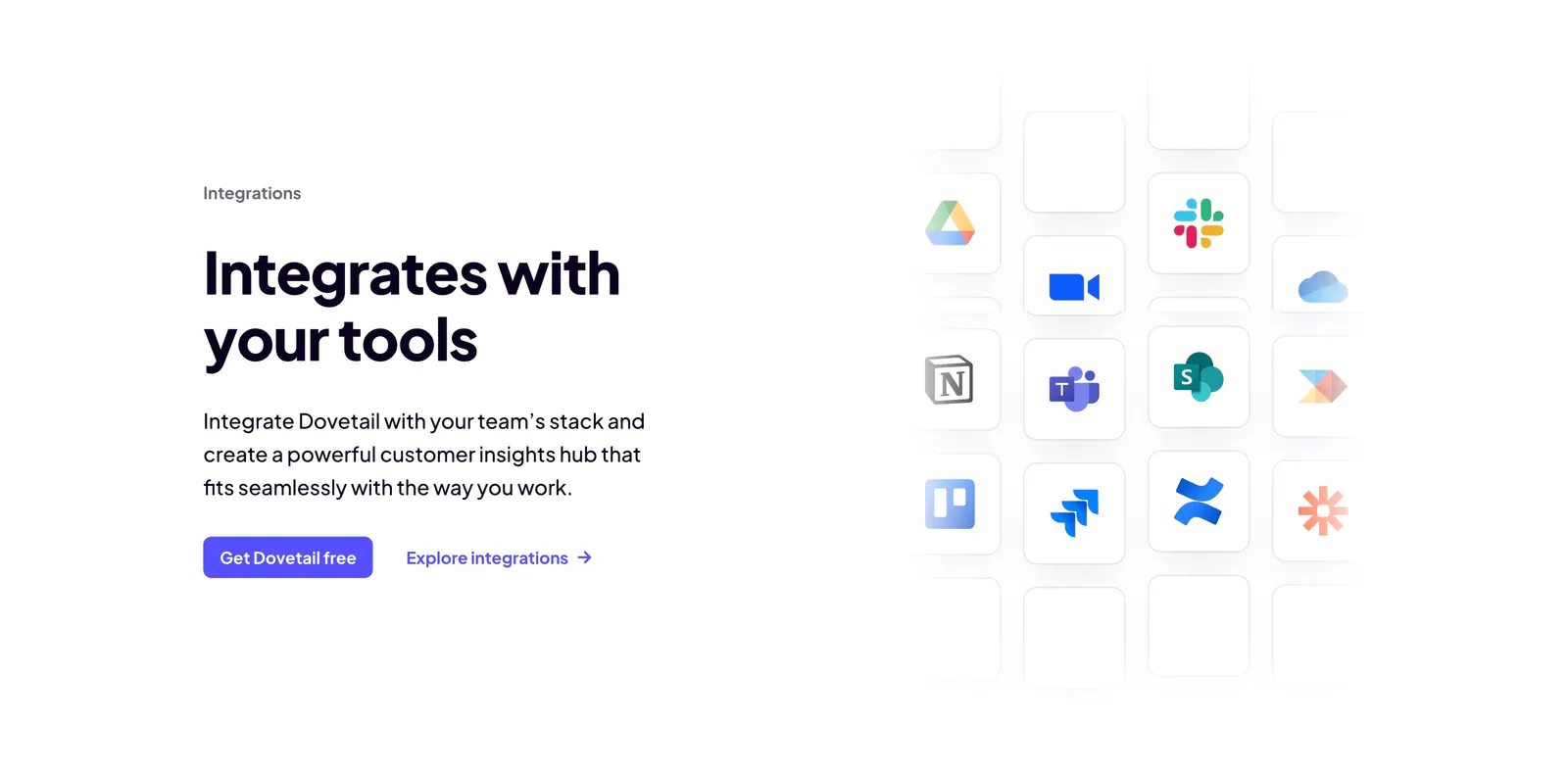
  243. Dovetail integrations section: headline, copy and two CTAs on the left beside a fading grid of app icon tiles like Slack, Notion and Jira
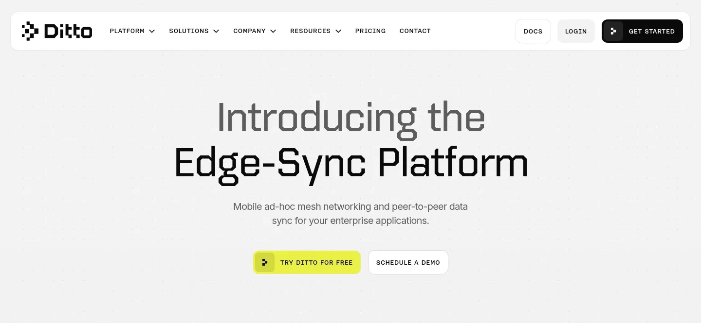
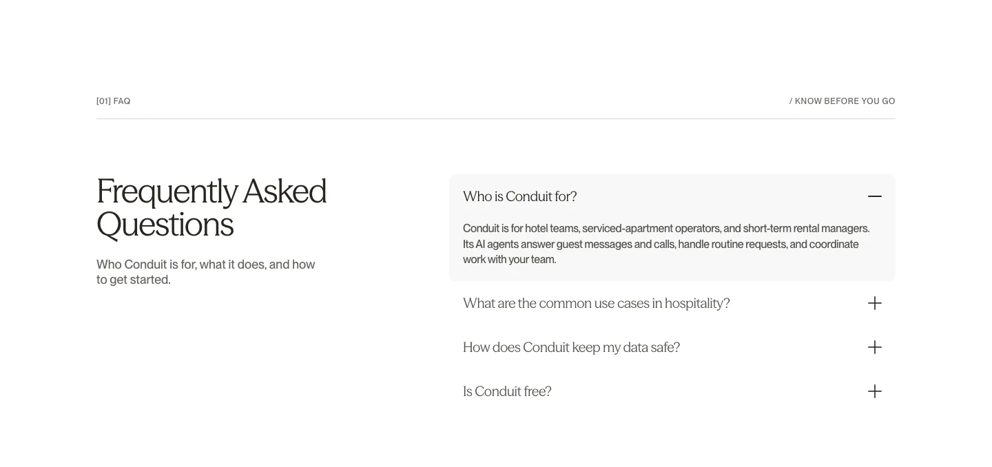
  244. Ditto hero section: rounded nav bar above a centered two-tone headline and yellow and outline buttons on a dotted light gray background
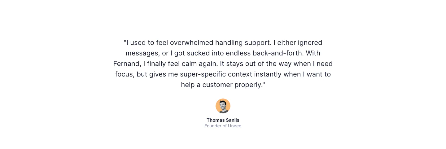
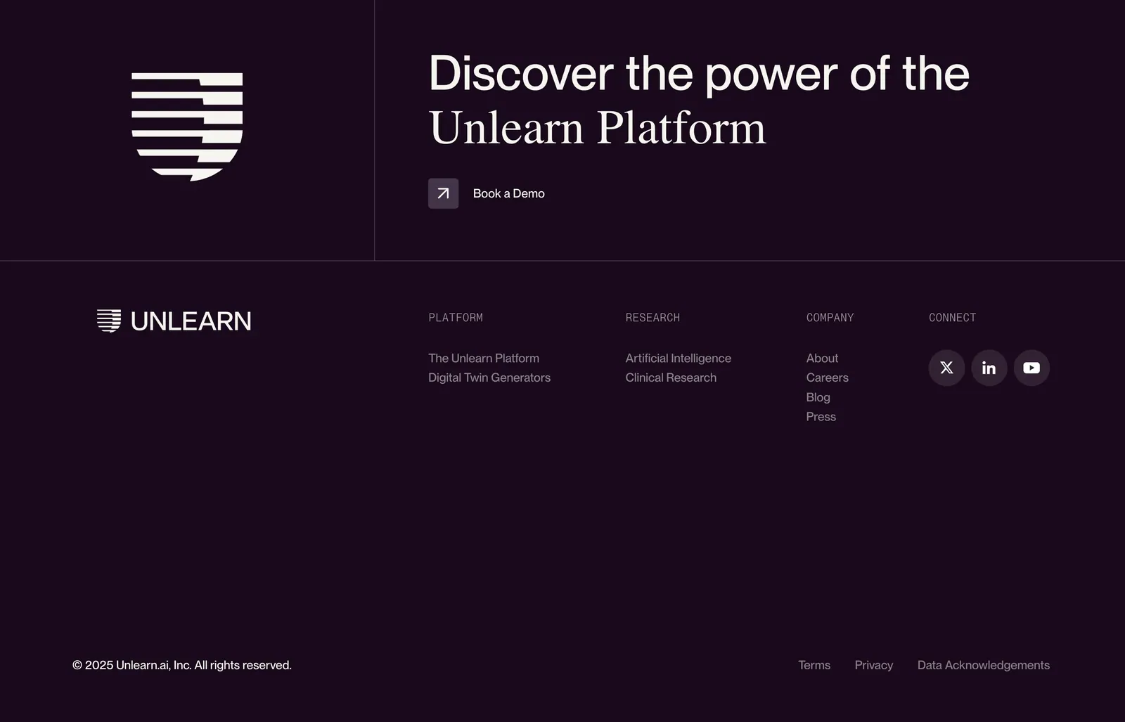
  245. Fernand testimonials section: single centered customer quote with a round avatar, name and company on white
  246. Rezi call to action section: blue full-width band with a two-tone headline on the left and a white pill button on the right
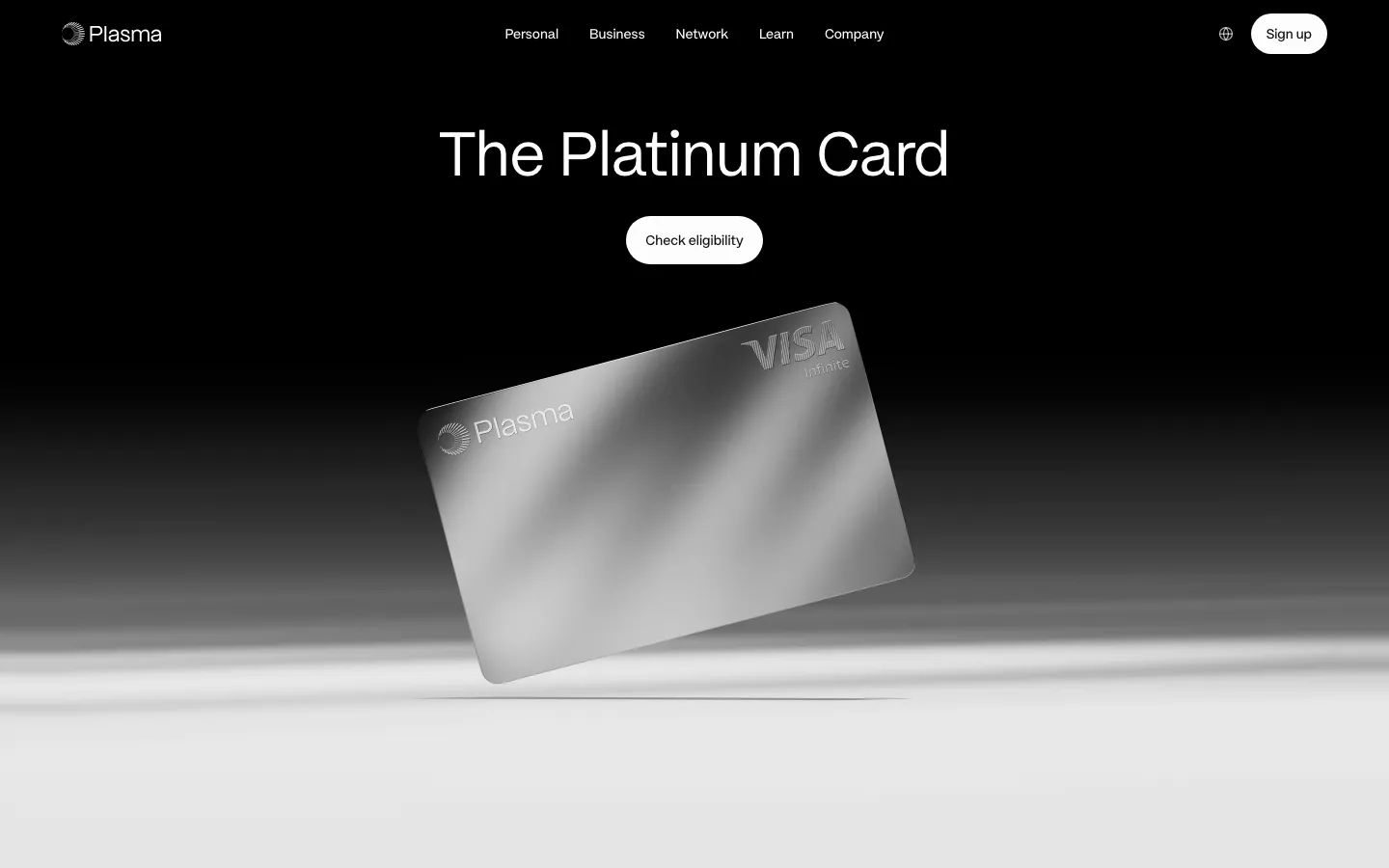
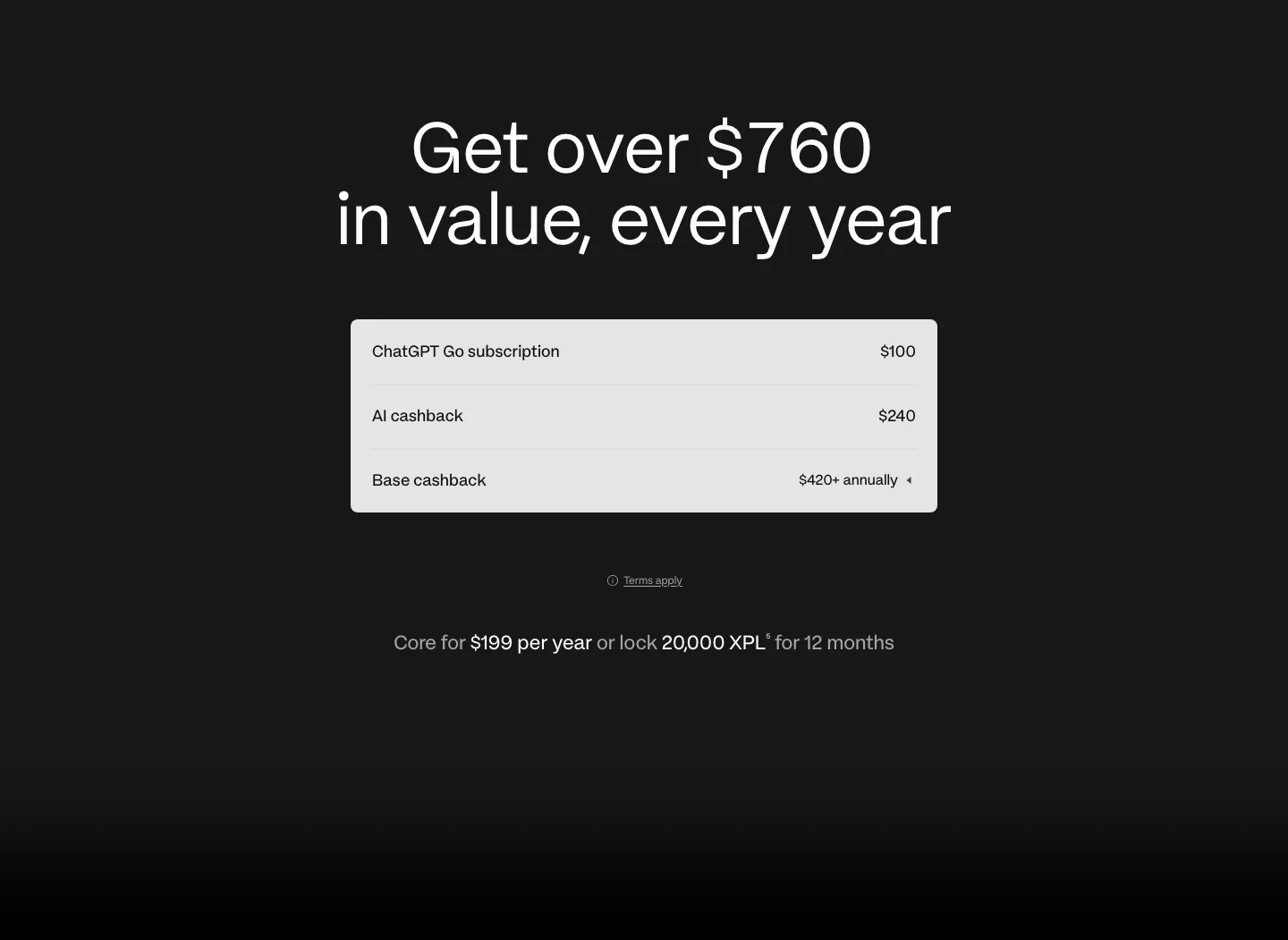
  247. Plasma hero section: nav and centered headline with Check eligibility button above a tilted silver card render on black-to-white
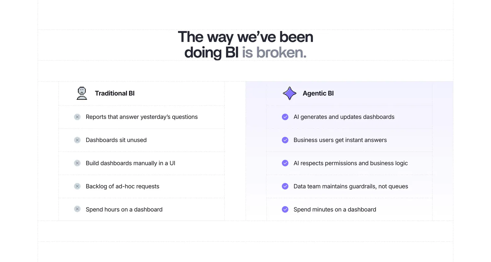
  248. Conduit FAQ section: serif heading on the left beside an accordion with the first answer expanded on white
  249. Unlearn footer section: logo mark and mixed sans/serif CTA headline with demo link above link columns and social icons on dark plum
    Unlearn Footer
  250. Composio call to action section: single-line headline beside a black Try Composio now button in a slim light gray band
  251. Plasma pricing section: centered headline above a light value breakdown table with annual price line on a dark background
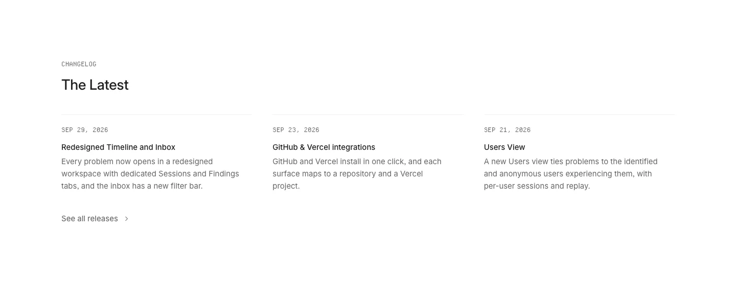
  252. Lightdash comparison section: centered headline above a two-column Traditional BI vs Agentic BI list with cross and check marks on white
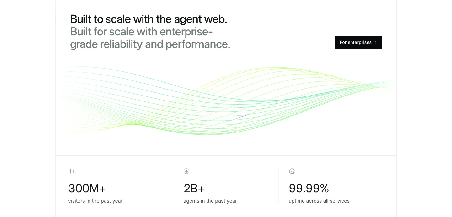
  253. Mintlify stats section: two-tone headline and button above green line waves and a row of three large usage metrics
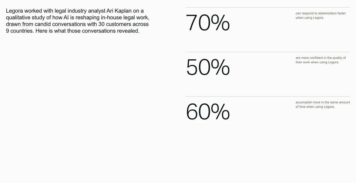
  254. Legora stats section: intro paragraph on the left and three large percentage figures with small labels stacked right on light gray
  255. Lovable logo cloud section: two-column grid of brand logos like adidas, NVIDIA and asana beside a heading, copy and Learn more button
  256. Zamp FAQ section: serif FAQ heading with contact details on the left and an accordion of five questions on the right
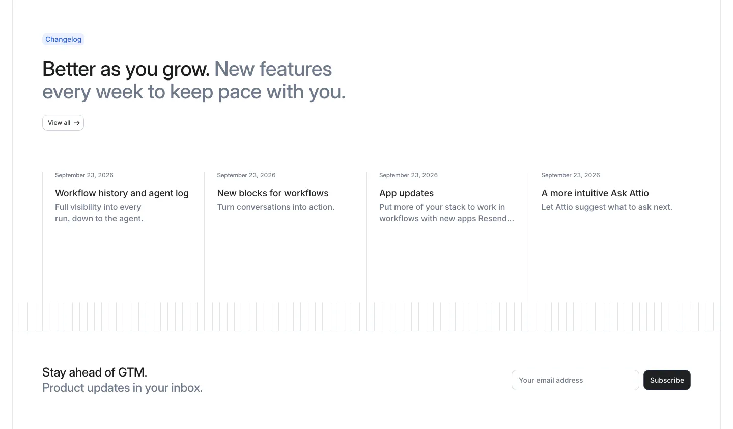
  257. Attio blog & resources section: changelog headline above four dated update columns, with an email subscribe row below
  258. 21Oaks FAQ section: centered serif heading, intro and button on the left, accordion question list on the right on white
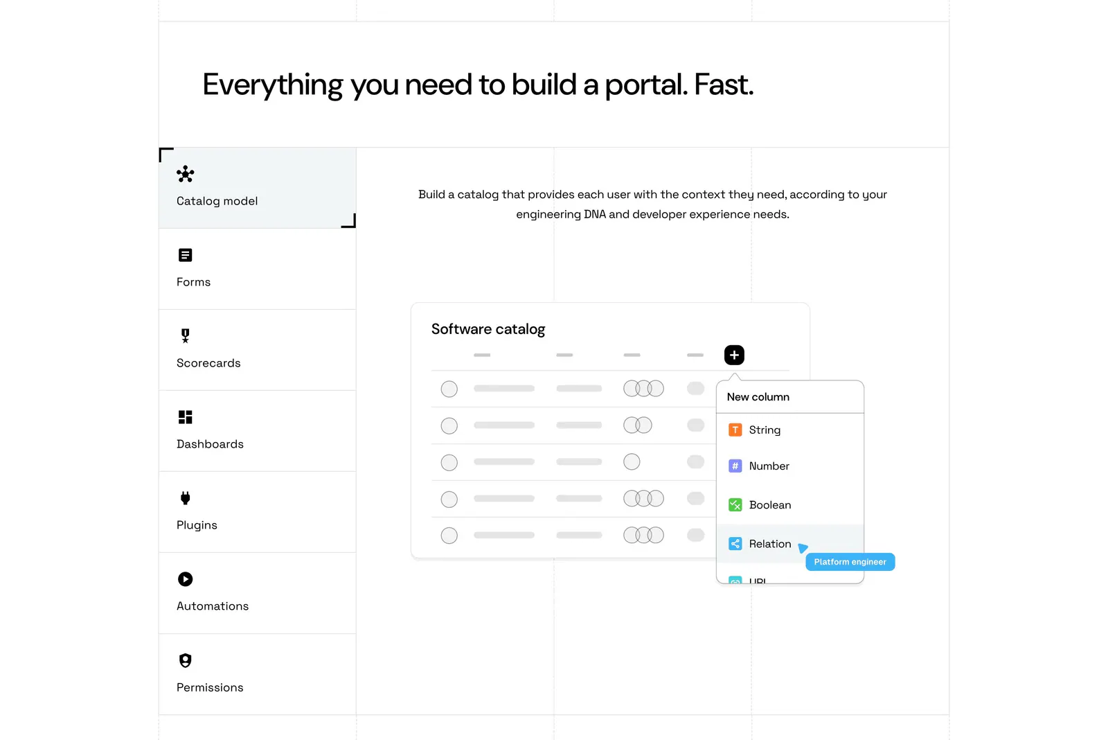
  259. Port features section: headline above a vertical tab list of capabilities beside a software catalog UI mockup on a grid-lined white page
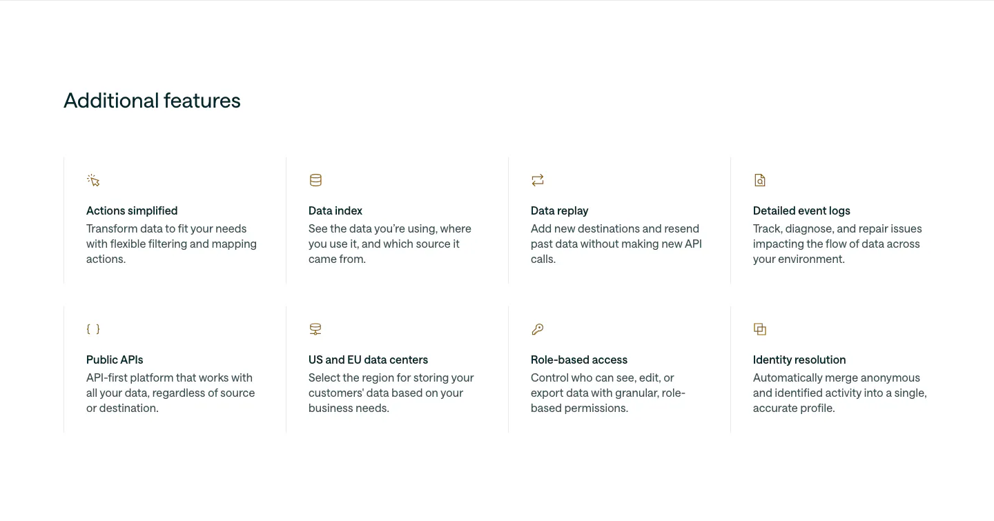
  260. Customer.io features section: left-aligned heading above a 4x2 grid of feature items with small gold icons, titles and descriptions
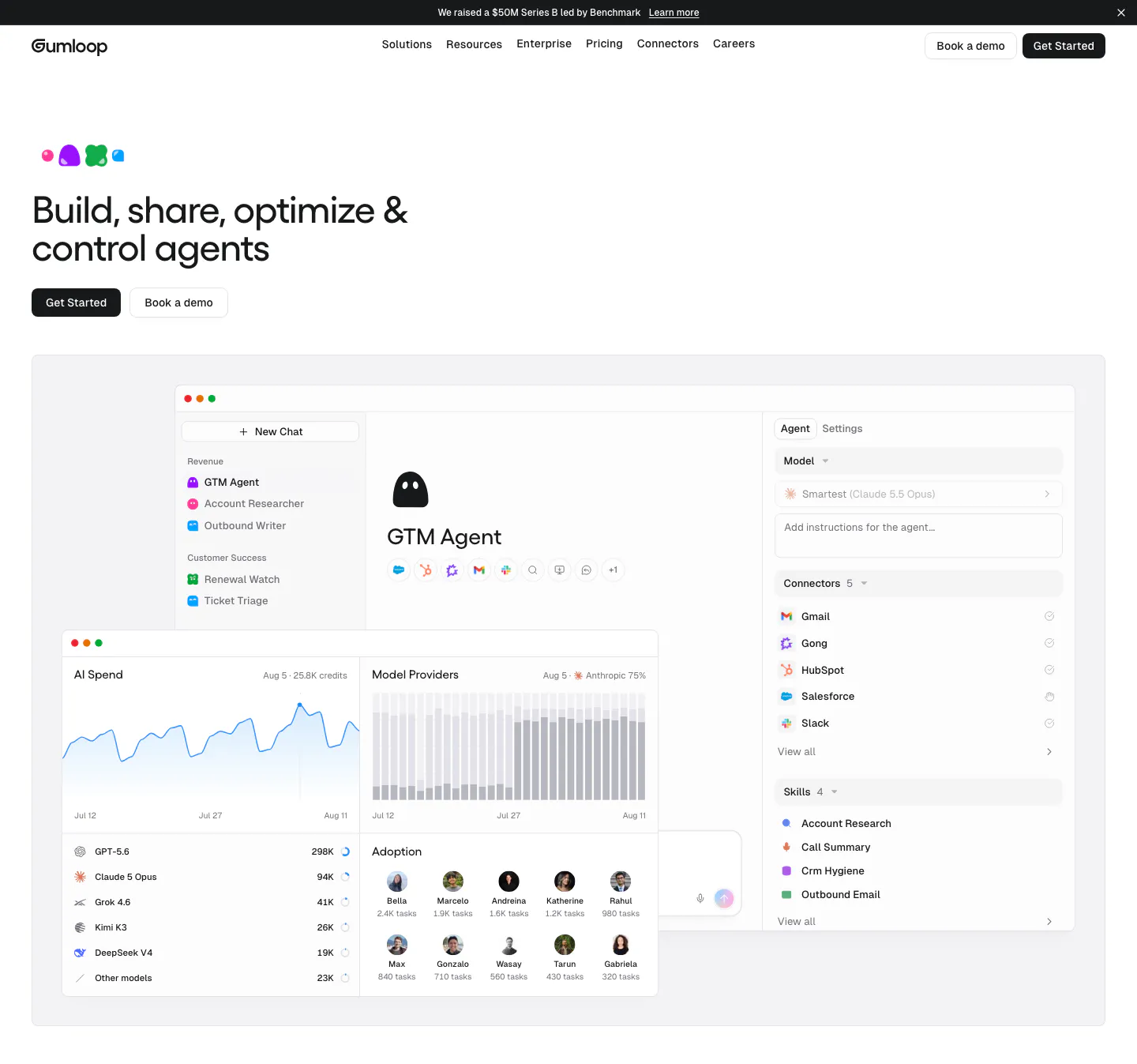
  261. Gumloop hero section: left-aligned headline and buttons above an agent builder and AI spend dashboard screenshot
  262. Wiza footer section: logo and tagline above three link columns, email button and social icons on a white background
  263. Cal.com footer section: logo, compliance badges, social icons and language selector beside four link columns on light gray
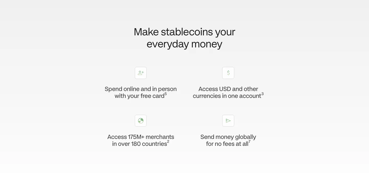
  264. Plasma value proposition section: centered heading above a 2x2 grid of icon benefit points on a light gray fade
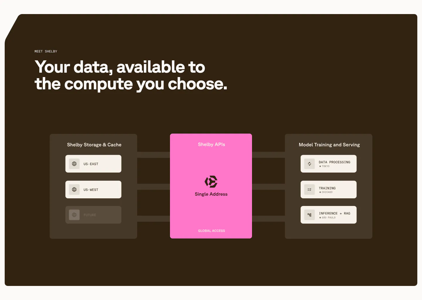
  265. Shelby features section: left headline above a diagram linking storage regions through a pink Shelby APIs card to workloads on dark brown
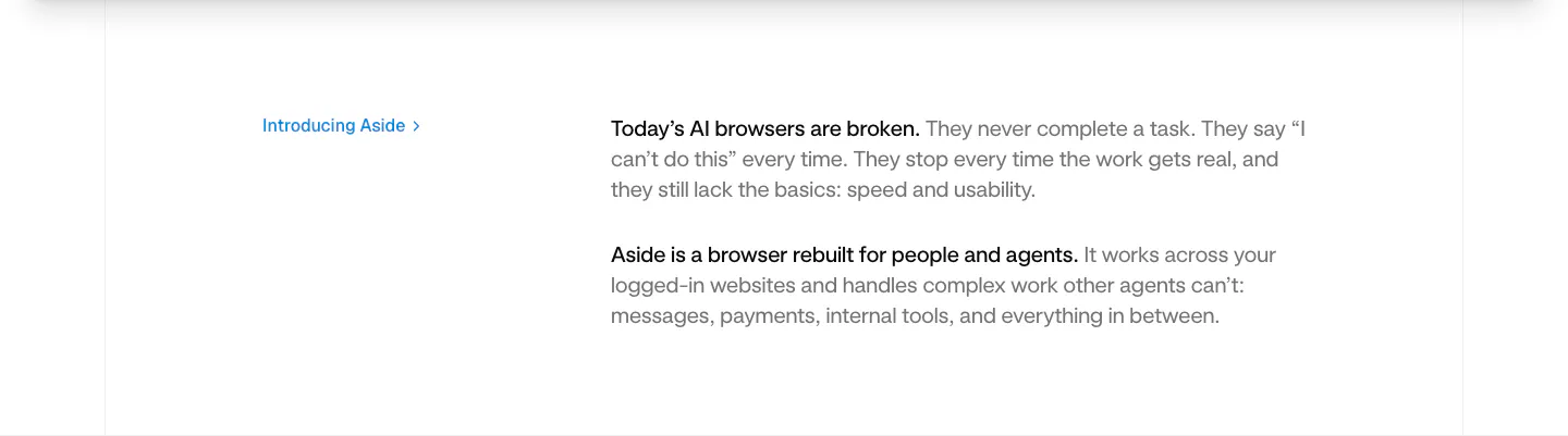
  266. Aside value proposition section: small blue Introducing Aside link at left beside two short intro paragraphs on white
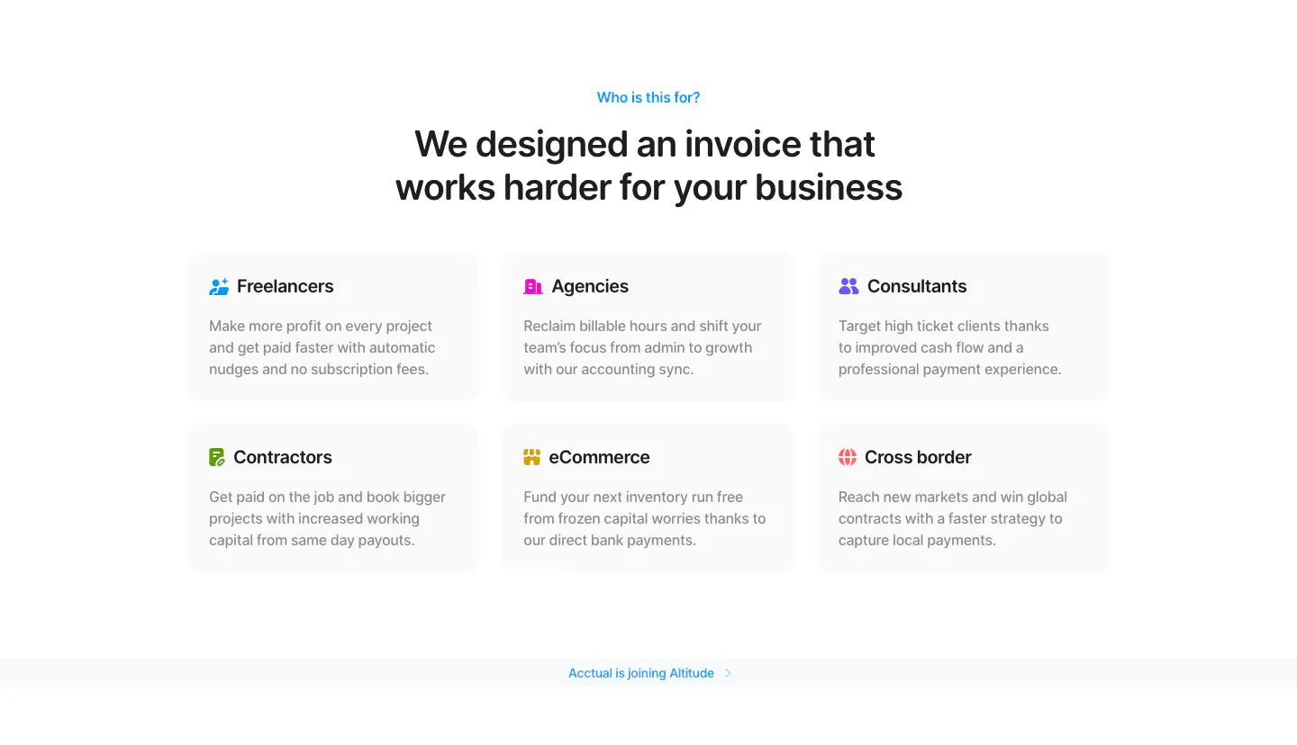
  267. Acctual use cases section: centered headline above a 3x2 grid of audience cards for freelancers, agencies, contractors and more
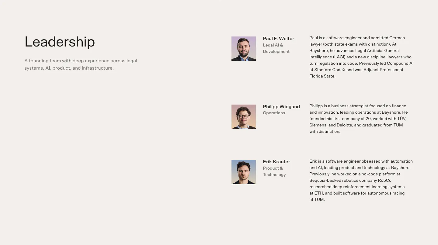
  268. Bayshore team section: Leadership heading left, three founder rows with headshots, roles and bios right on warm off-white
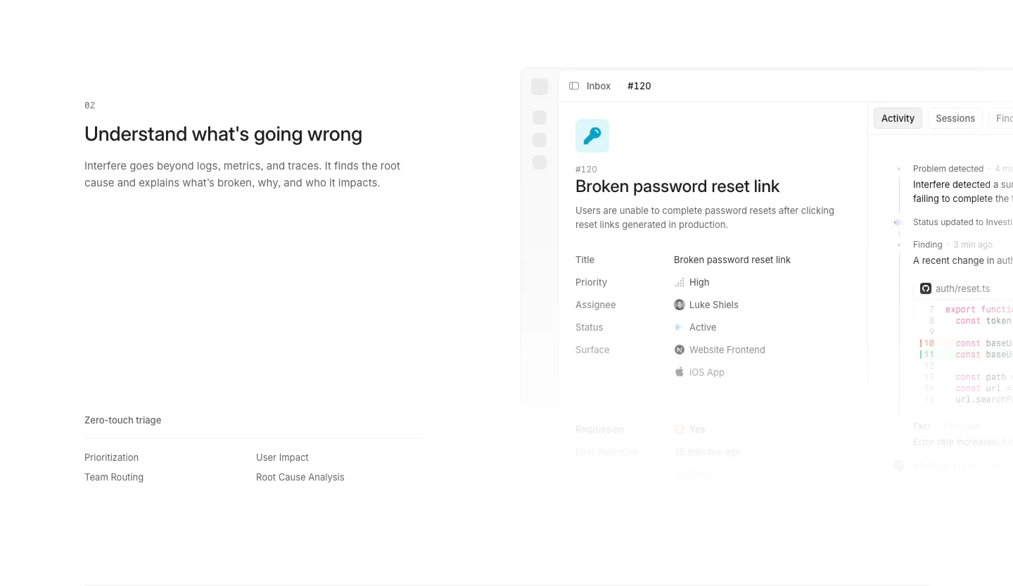
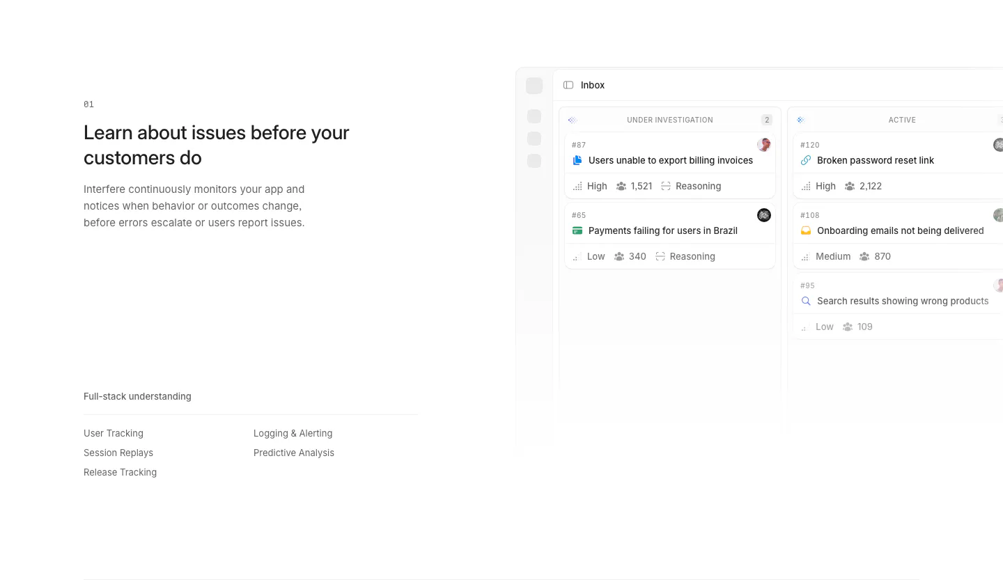
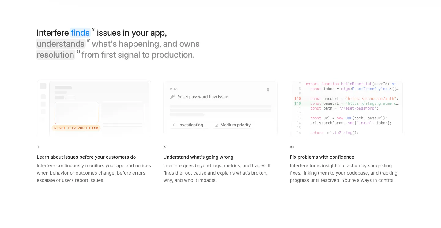
  269. Interfere features section: numbered text block with triage list on the left and an issue detail screenshot on the right
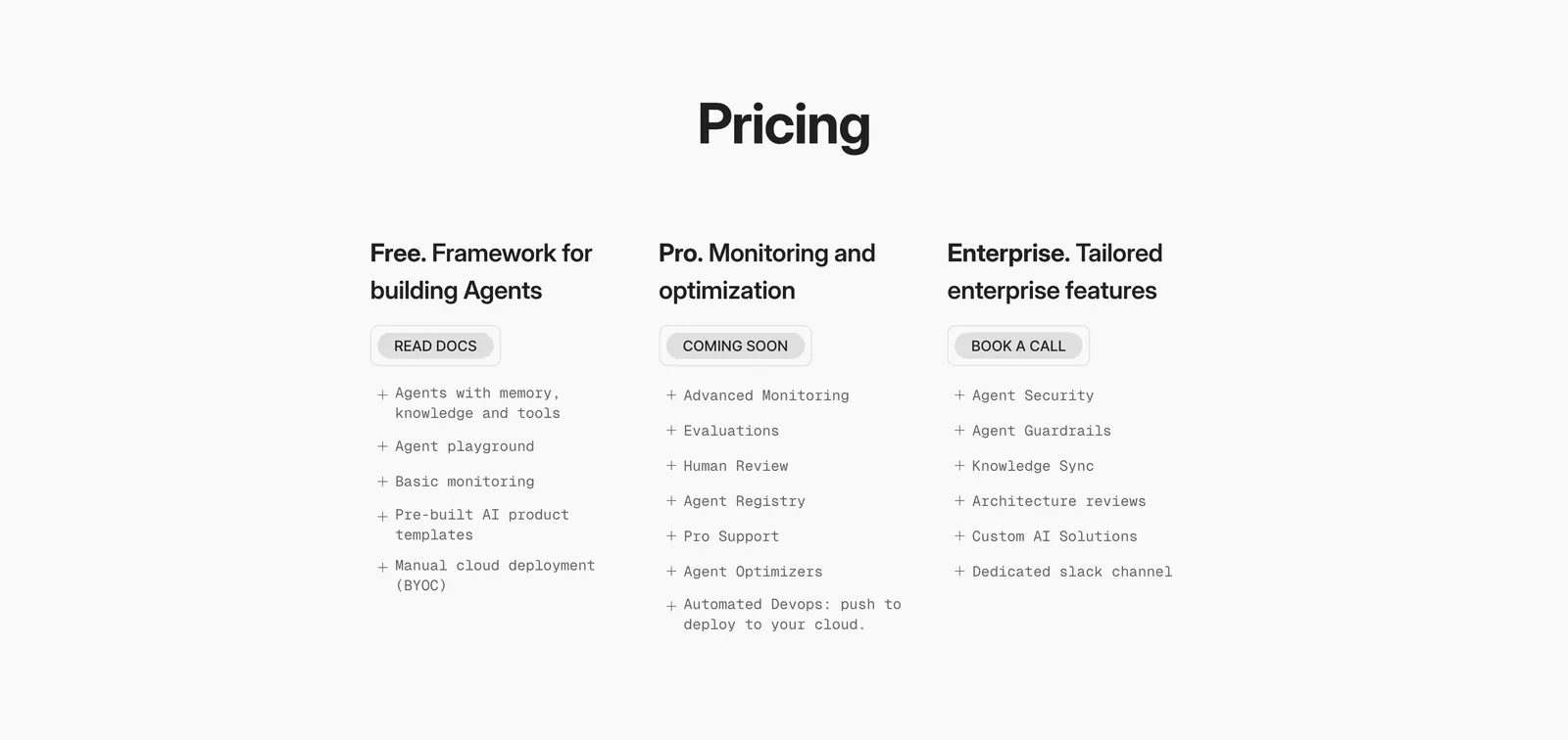
  270. Phidata pricing section: centered Pricing heading above three plain plan columns with buttons and monospace feature lists on light gray
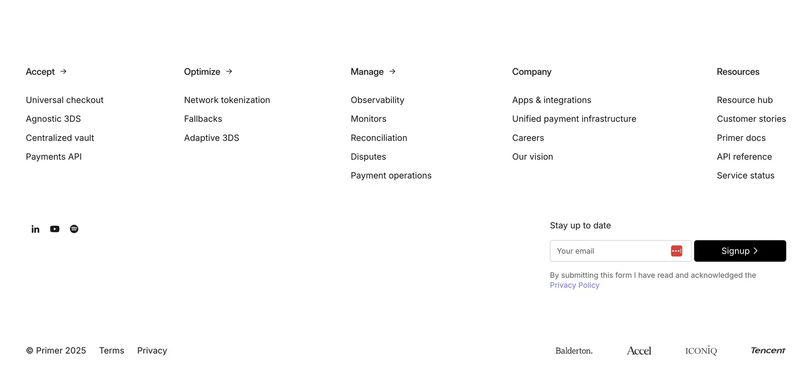
  271. Primer footer section: five link columns, social icons, email signup field and investor logos on a plain white background
  272. Zamp logo cloud section: centered one-line trust statement above a single row of grayscale consumer brand logos on white
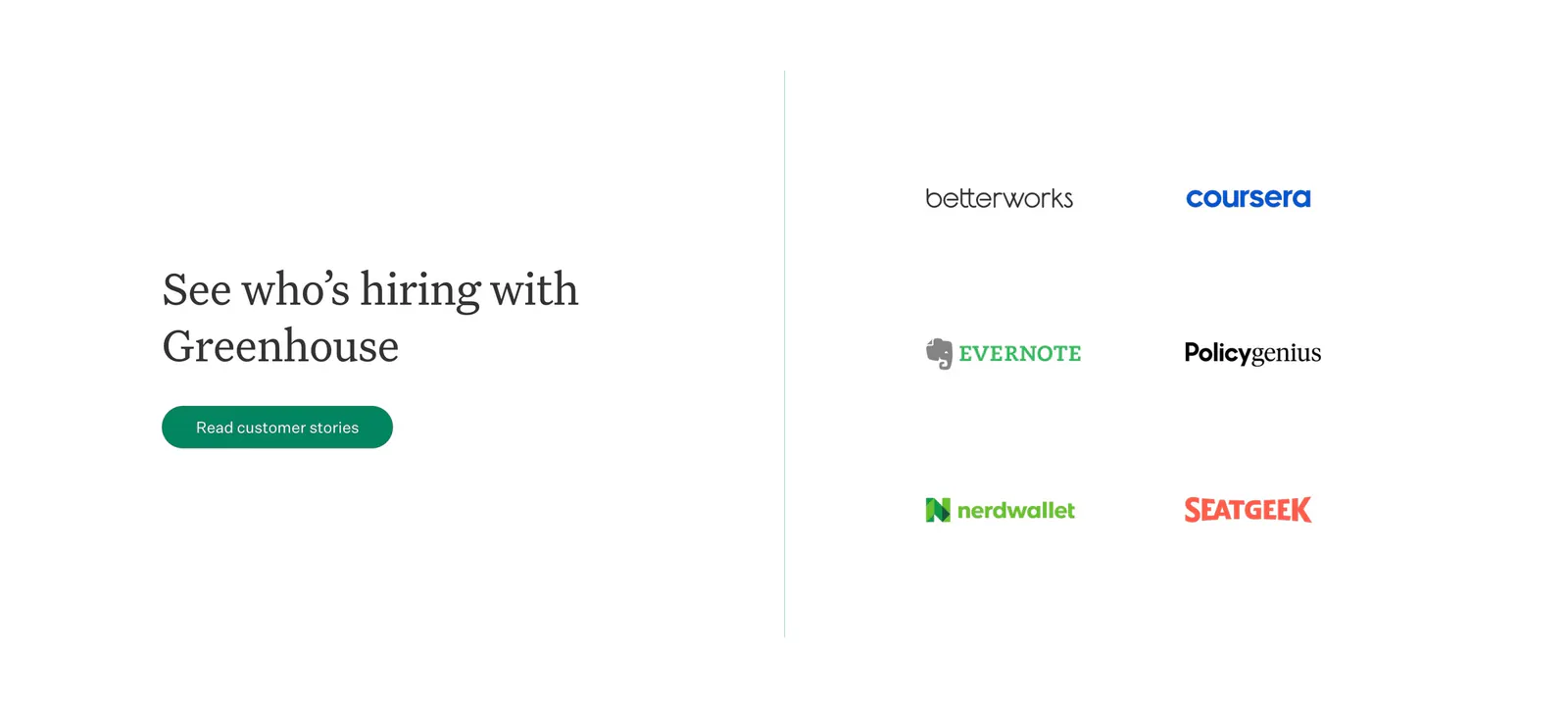
  273. Greenhouse testimonials section: serif heading and customer stories button on the left, two-column grid of customer logos on the right
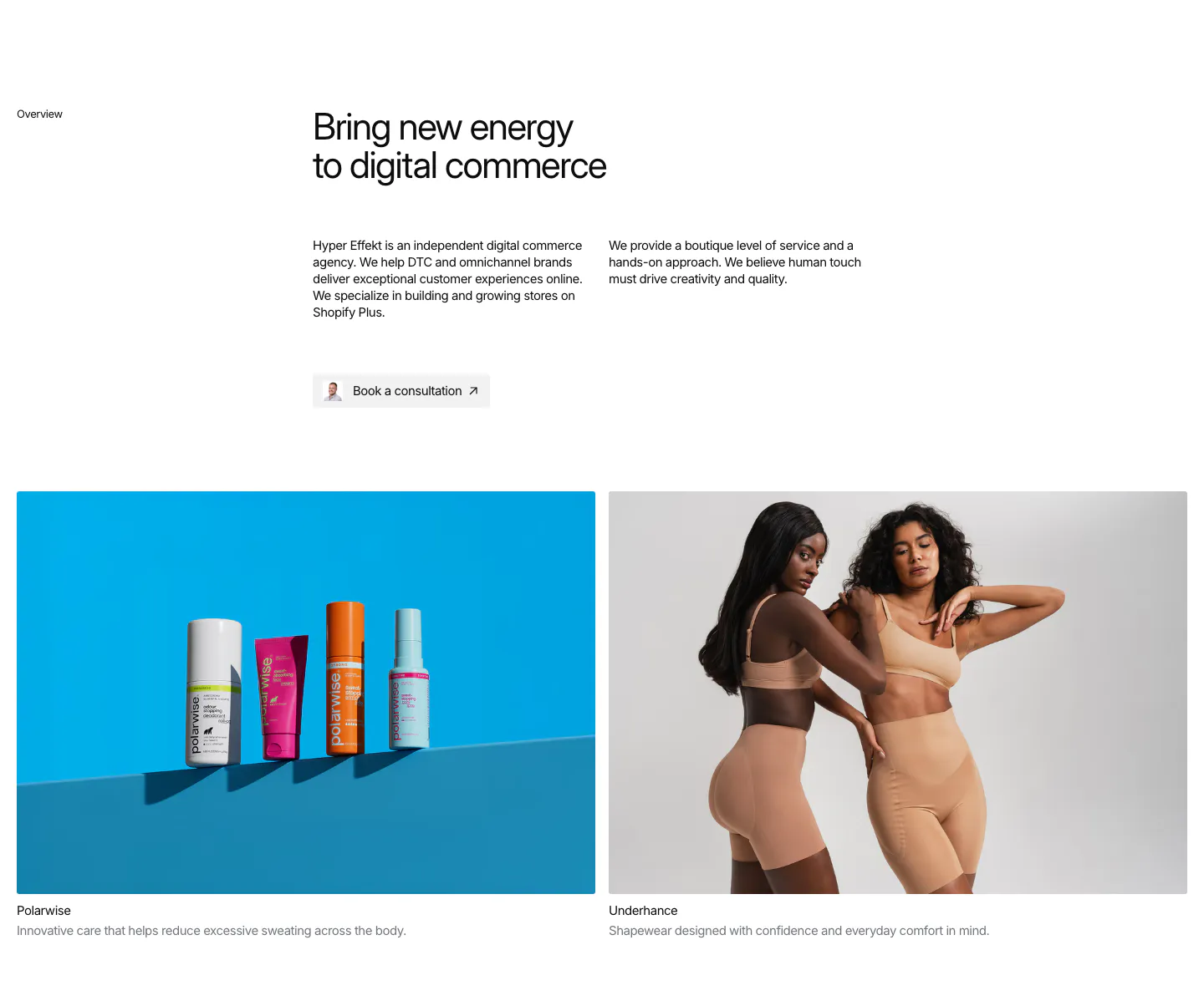
  274. Hyper Effekt about & mission section: agency overview text and consultation button above two client photo cards for Polarwise and Underhance
  275. Quartr call to action section: centered white headline and Contact sales button on a near-black background
  276. Palette footer section: logo, tagline and copyright on the left with Product, Company and Socials link columns on a near-black background
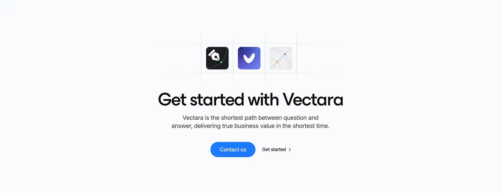
  277. Vectara call-to-action section: three app icons in a dashed grid above a centered headline with blue Contact us button on light gray
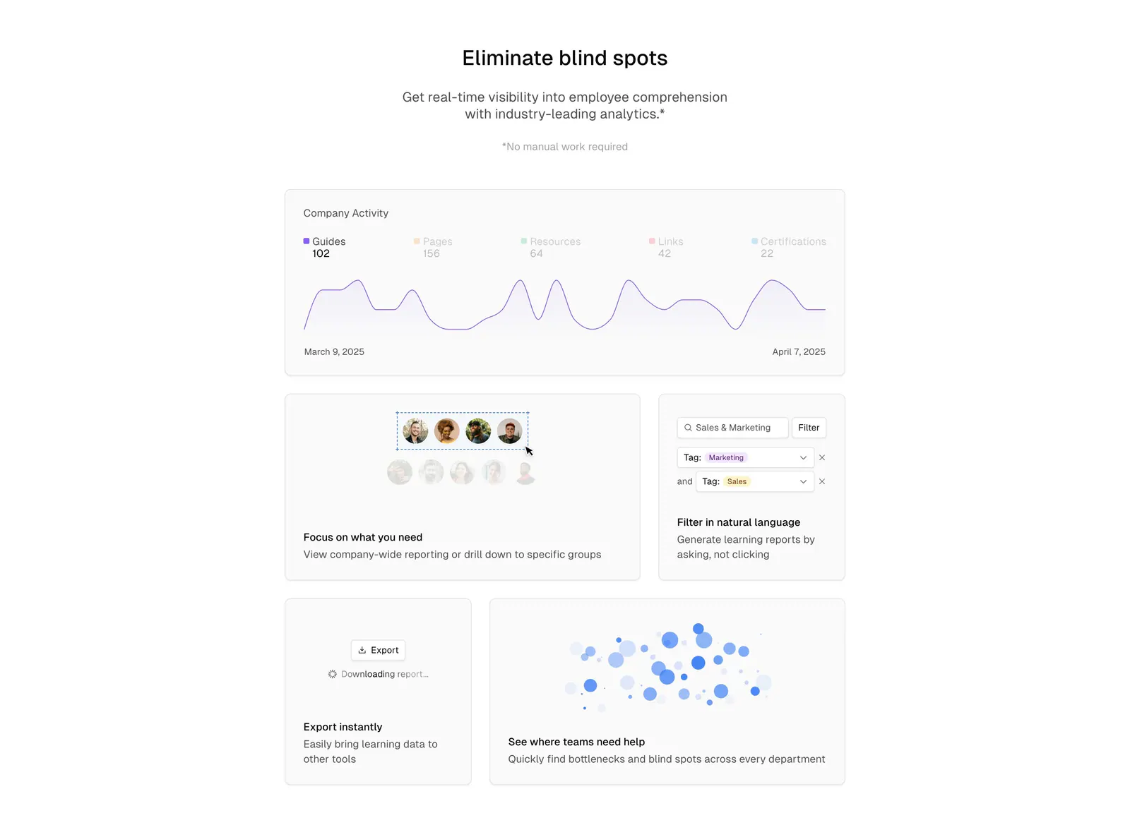
  278. Basewell features section: centered headline above a bento grid of analytics UI cards with line chart, filters and bubble chart
    Basewell Features
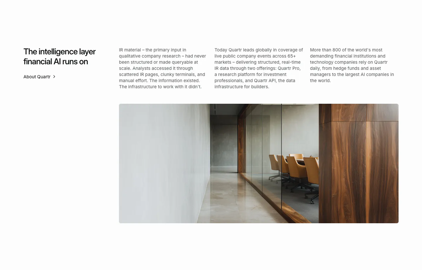
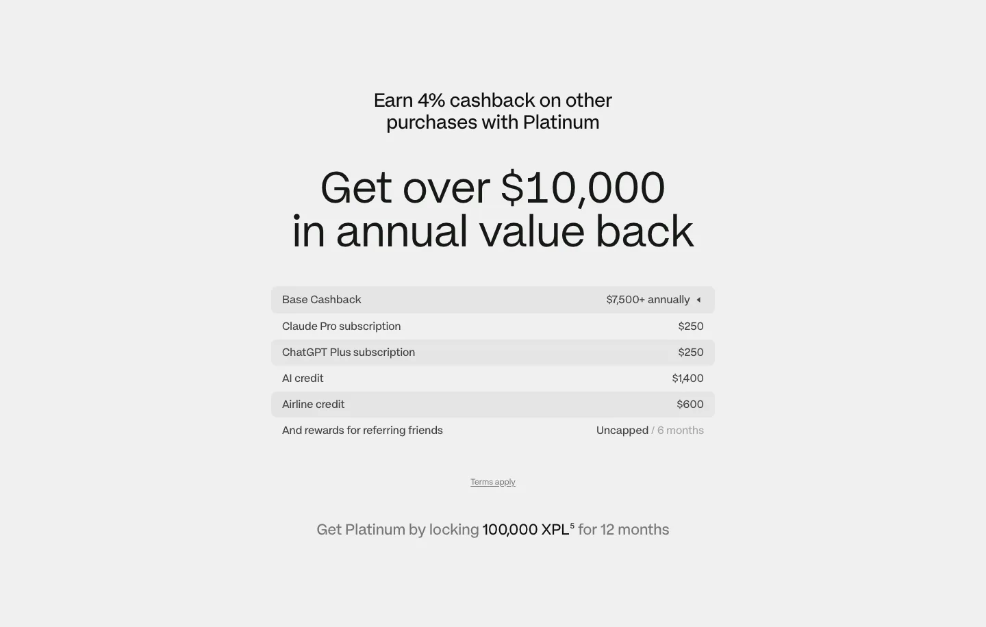
  279. Quartr about & mission section: headline with About link, three columns of company story text and a wide office interior photo
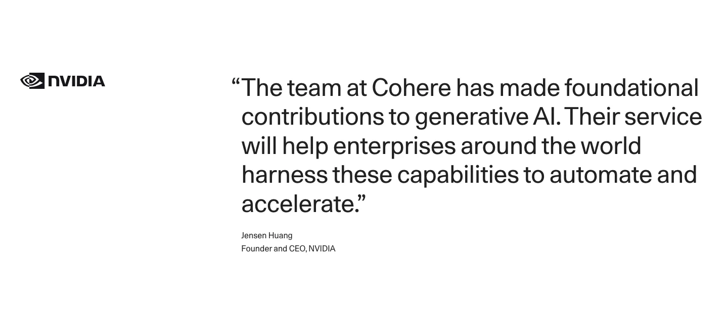
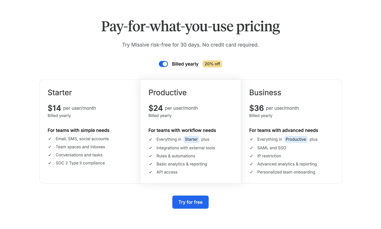
  280. Cohere testimonials section: NVIDIA logo left of a large quote with attribution on a white background
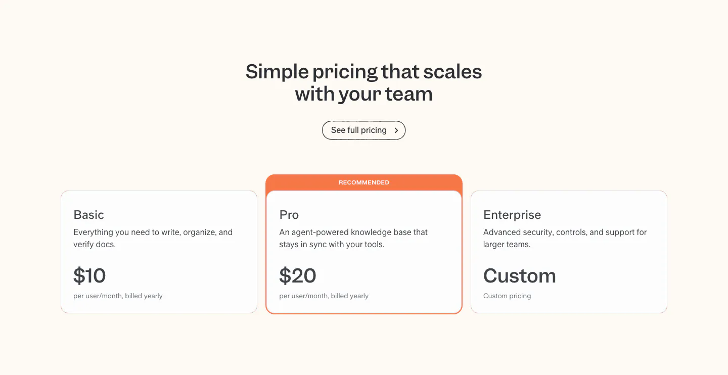
  281. Slite pricing section: centered headline above Basic, Pro and Enterprise plan cards, with the Pro card highlighted as recommended
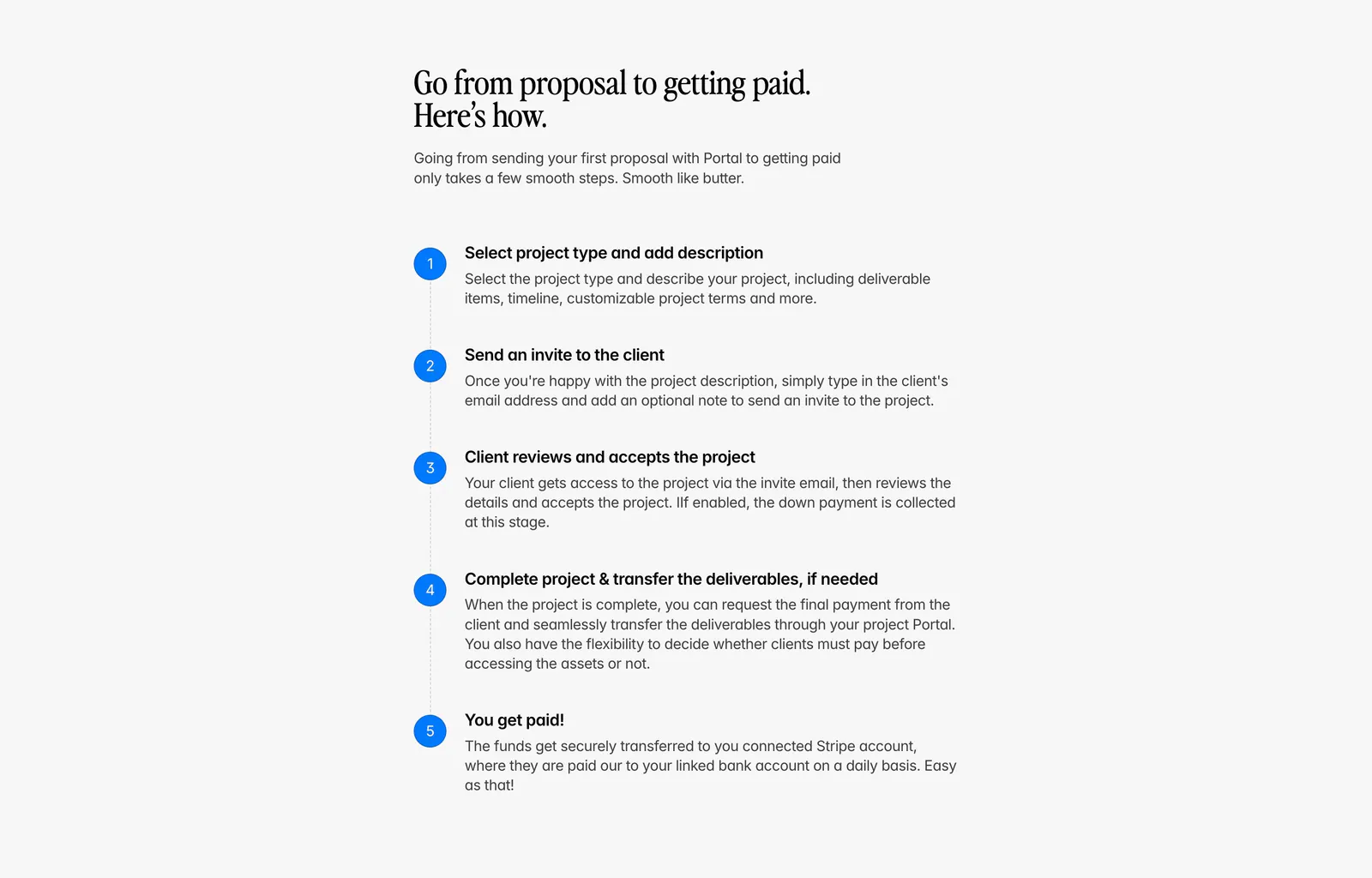
  282. Portal how it works section: serif headline above a vertical five-step list with blue numbered circles on a light gray background
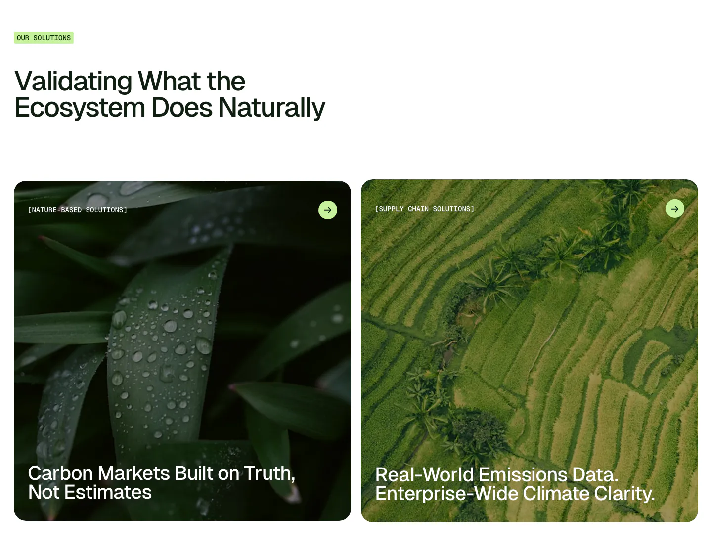
  283. Unknown features section: left-aligned headline with label above two large photo cards of wet leaves and rice terraces
    Unknown Use cases
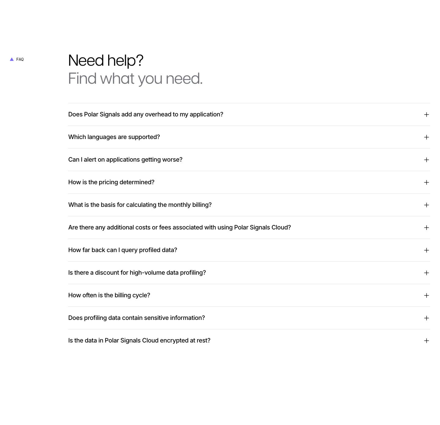
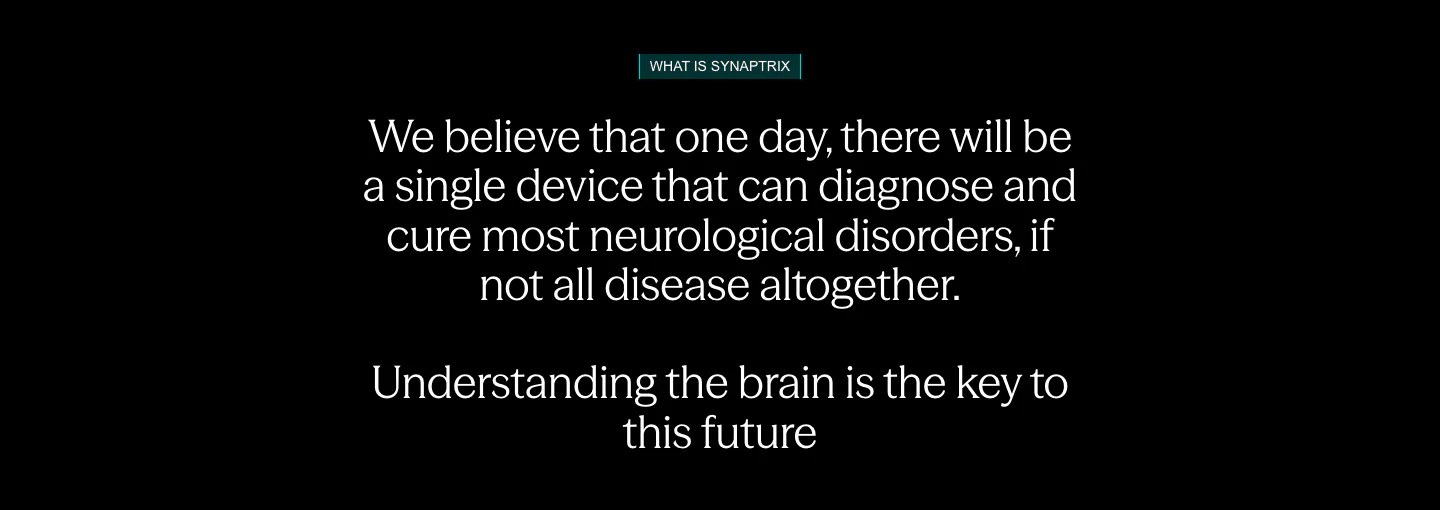
  284. Polar Signals FAQ section: two-tone headline above a full-width accordion list of eleven questions with plus icons on white
  285. Plasma pricing section: centered headline above a striped value breakdown table and lock requirement note on light gray
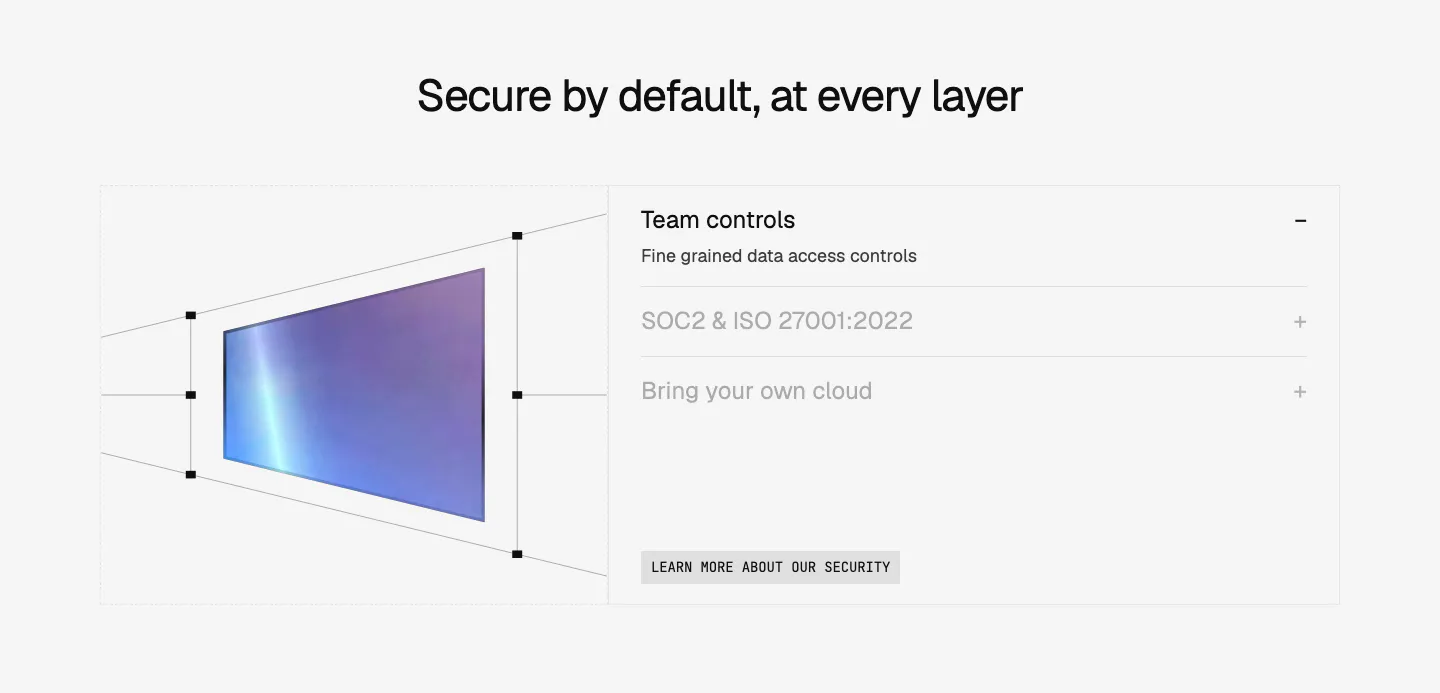
  286. Missive pricing section: centered serif headline with billing toggle above three plan columns and a Try for free button
  287. Bayshore footer section: single row with copyright left, small logo mark centered and text links right on warm off-white
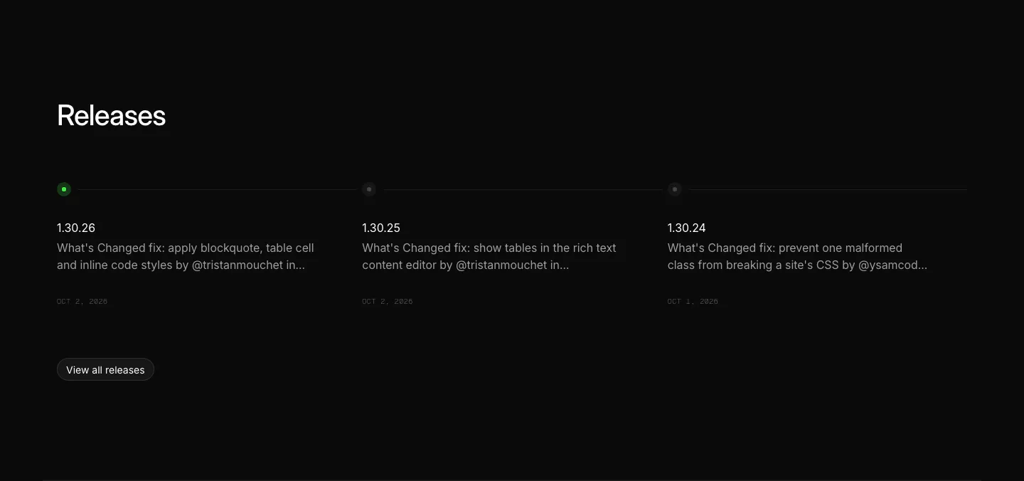
  288. Ycode blog & resources section: releases heading above three changelog entries on a horizontal timeline with a view all button
  289. Ruul integrations section: small caption above a row of grayscale bank and wallet logos on an off-white background
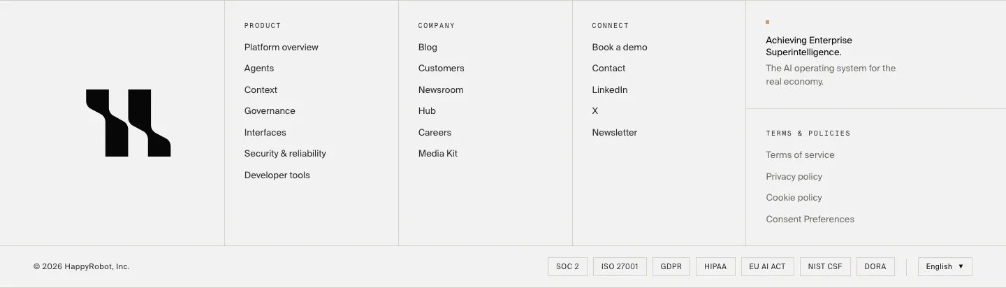
  290. Linear call to action section: centered two-line headline with light and dark pill buttons on a black background
  291. Synaptrix about & mission section: centered mission statement in white text with a small teal label on a black background
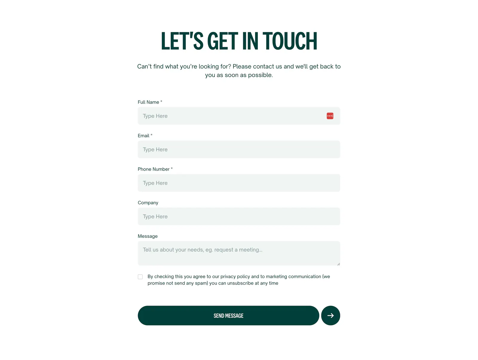
  292. Relume logo cloud section: small caption on the left of a single rounded strip of black customer logos on a light gray background
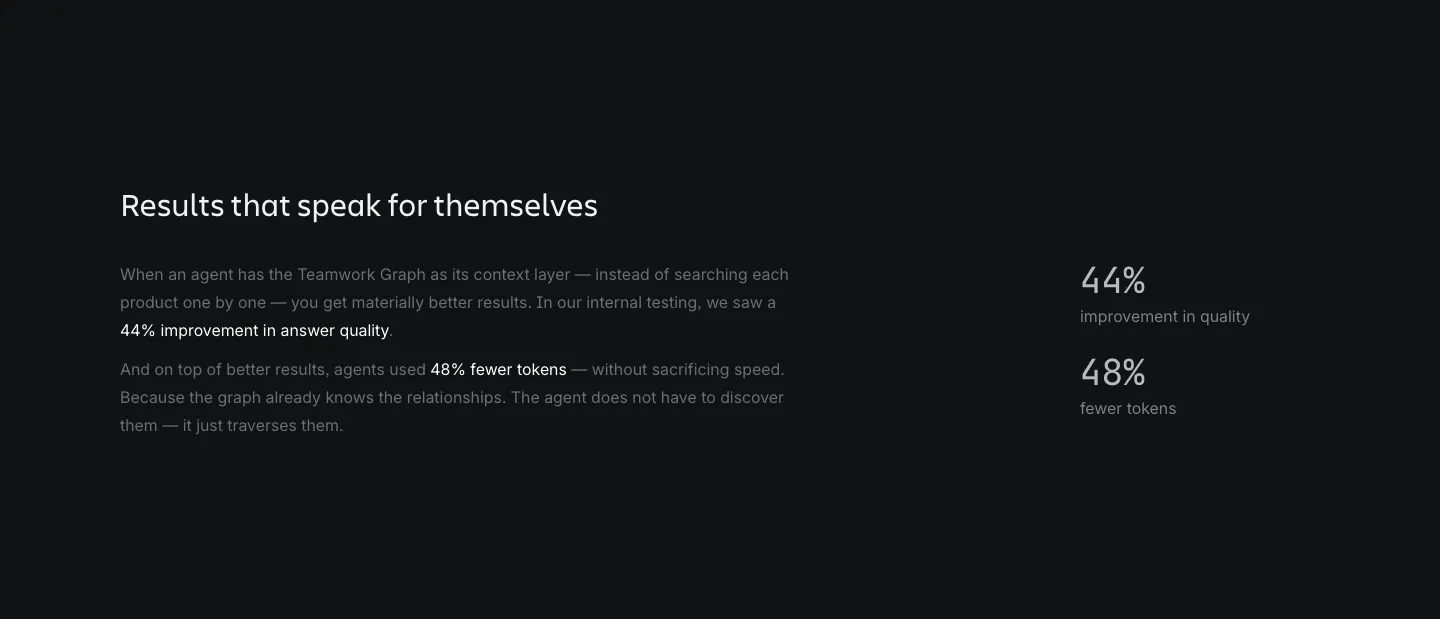
  293. Composio security section: perspective wireframe of a gradient panel at left and an accordion of security topics at right on light gray
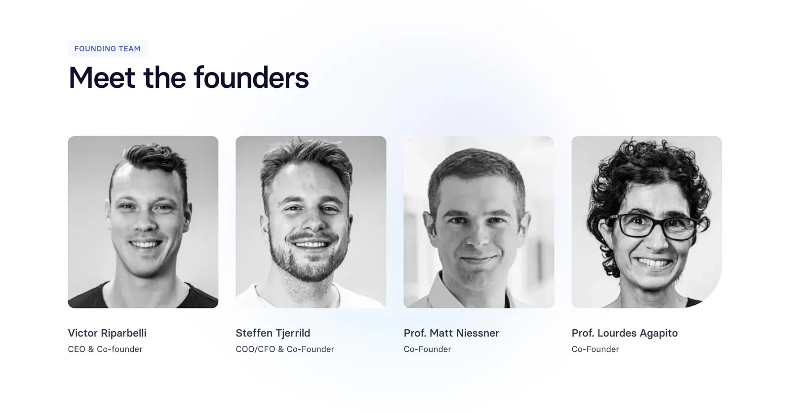
  294. Griffin value proposition section: serif heading and copy above four dark outlined link cards with arrows
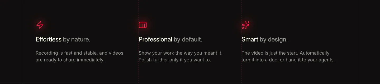
  295. Sendr features section: left-aligned headline above a 2x2 grid of feature cells with small purple icons and dotted accents
  296. Jitter testimonials section: large headline, memoji avatar selector beside a quote, and a row of customer logos on light gray
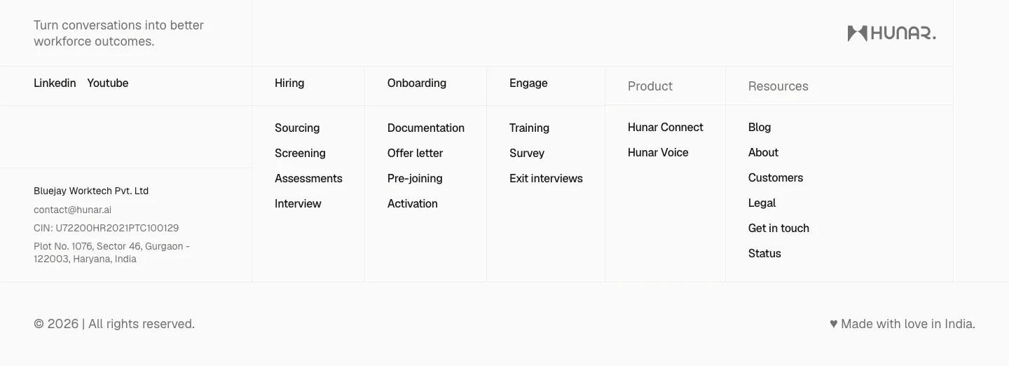
  297. Hunar footer section: light grid footer with tagline, social links, company address and link columns beside the Hunar wordmark
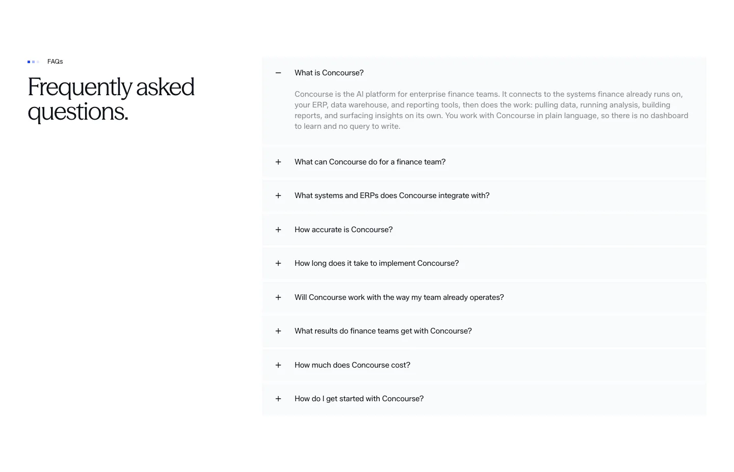
  298. Concourse FAQ section: heading left, accordion of questions right with the first item expanded on white
  299. Localyzer contact section: centered headline above a stacked contact form with name, email, phone, company and message fields
  300. Atlassian stats section: heading and explanatory copy on the left with two percentage metrics on the right on a dark background
  301. Synthesia team section: left-aligned headline above four black-and-white founder headshot cards with names and titles on white
  302. Supercut value proposition section: three columns with red glowing icons, short benefit headings and copy on a dark background
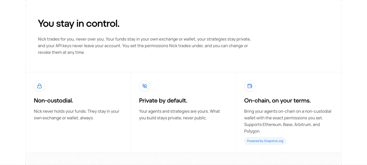
  303. NickAI security section: left heading and copy above three bordered cells with icons for non-custodial, private and on-chain
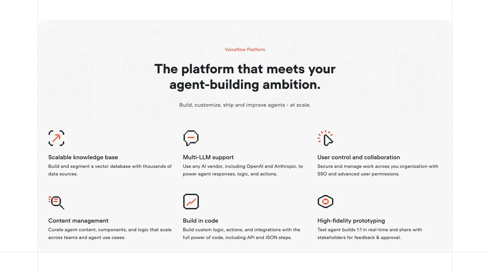
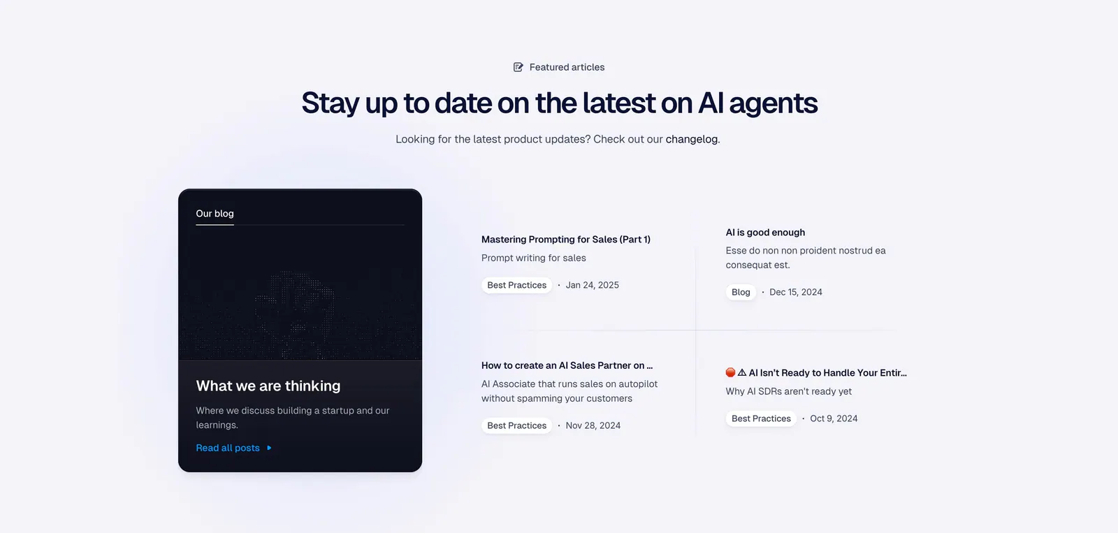
  304. Voiceflow features section: centered headline above a six-item grid of features with orange pixel-style icons on a light gray panel
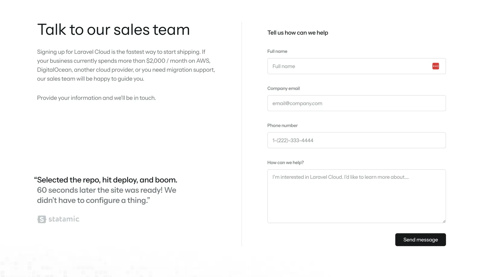
  305. Laravel Cloud contact section: headline, copy and customer quote on the left, sales contact form on the right on white
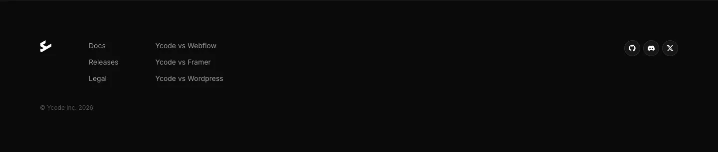
  306. Ycode footer section: small logo, two short link columns, social icon buttons and copyright line on a black background
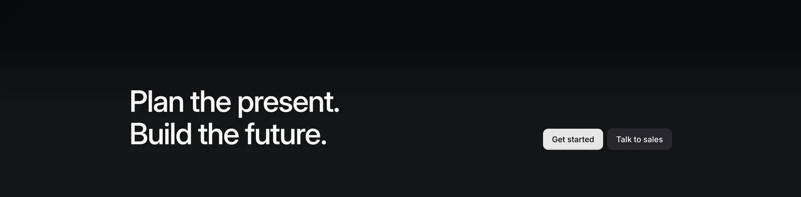
  307. Linear call-to-action section: two-line headline on the left with Get started and Talk to sales buttons on the right, on a near-black gradient
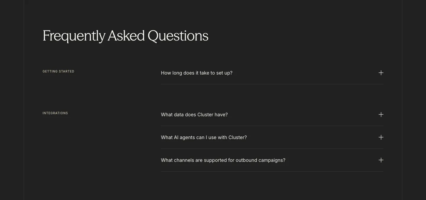
  308. Cluster FAQ section: serif headline above category-labelled accordion questions with plus icons on a charcoal background
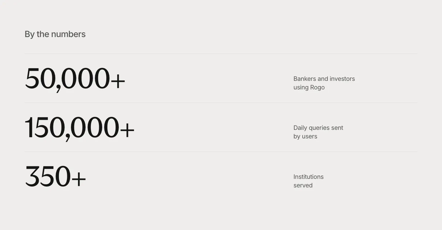
  309. Rogo stats section: three large serif numbers in divided rows with short labels on the right, light gray background
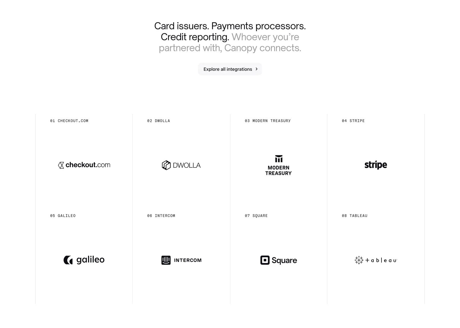
  310. Canopy integrations section: centered two-tone headline and button above a bordered grid of eight numbered partner logos on white
  311. Godmode blog & resources section: centered heading above a dark blog card on the left and a two-by-two list of article links
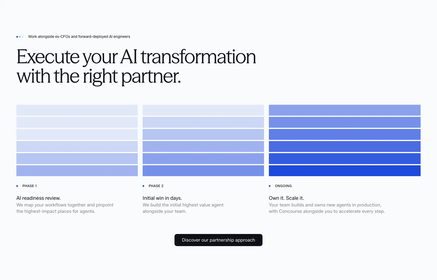
  312. Concourse how it works section: headline above three phase columns of stacked blue bars with step labels, descriptions and a button
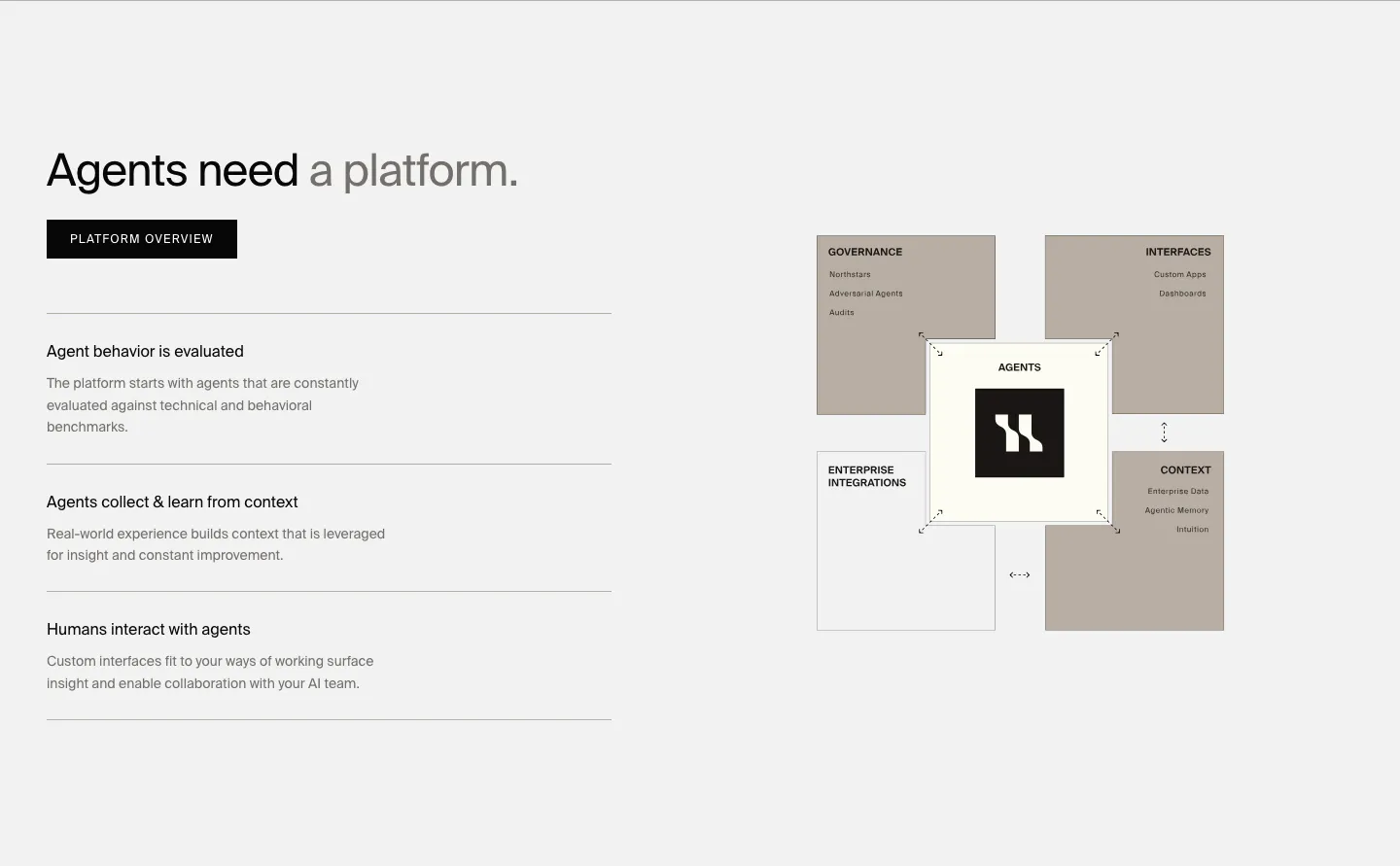
  313. HappyRobot features section: headline, button and three capability rows on the left, taupe block diagram of the agent platform on the right
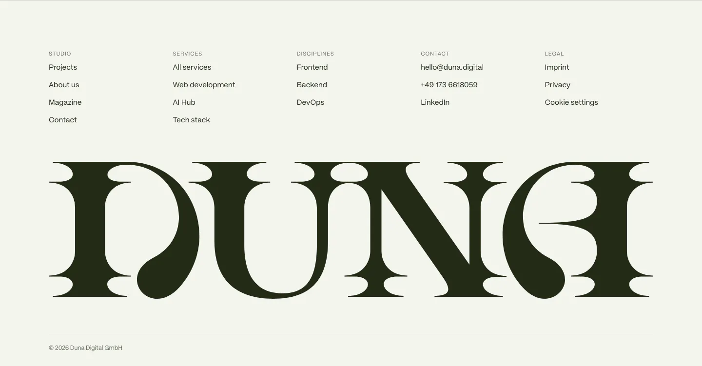
  314. DUNA footer section: five link columns above a giant dark serif DUNA wordmark and copyright line on off-white
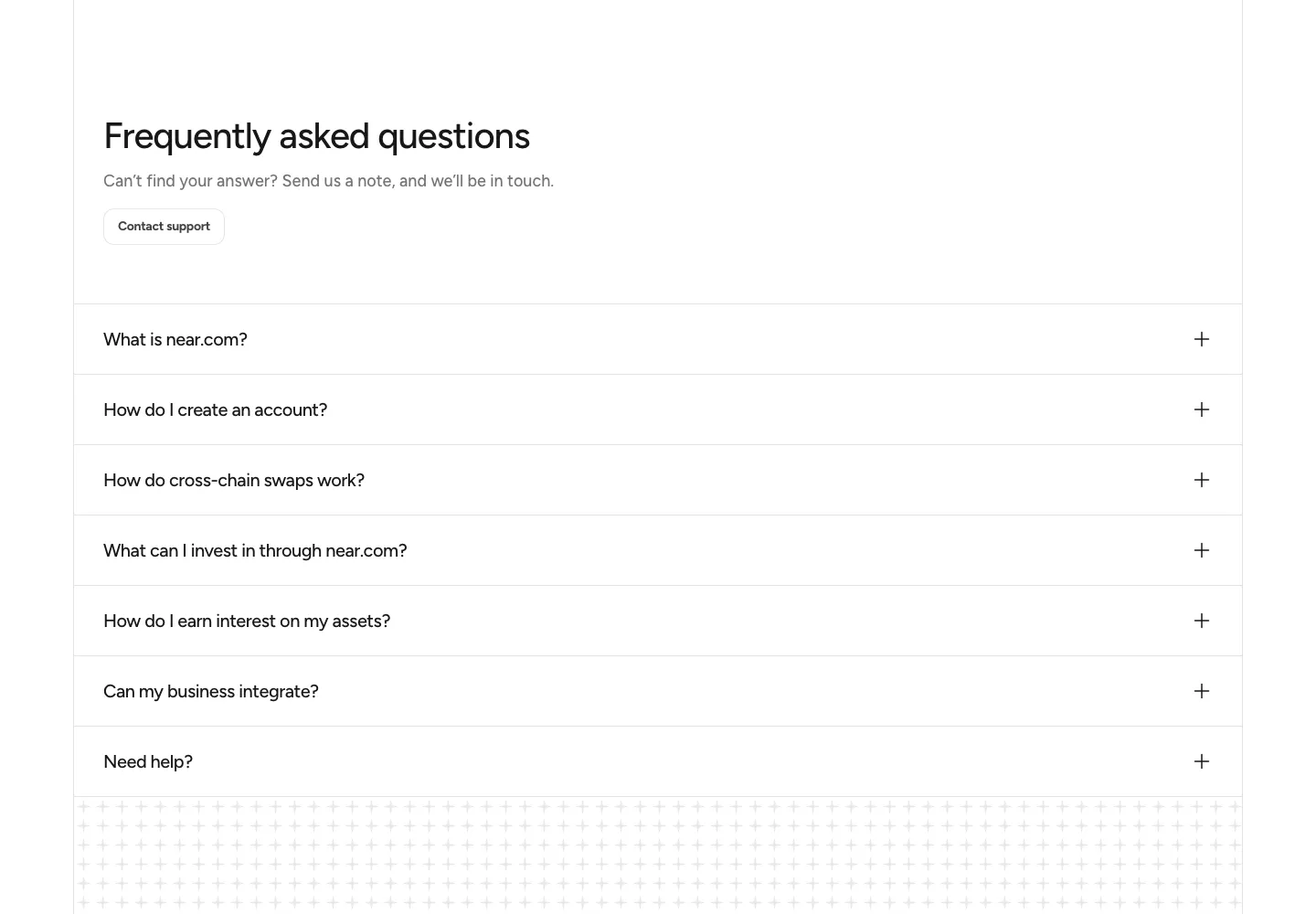
  315. NEAR FAQ section: headline with Contact support button above a full-width accordion of questions on white
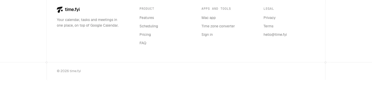
  316. time.fyi footer section: logo and tagline beside Product, Apps and tools, and Legal link columns with a copyright line on white
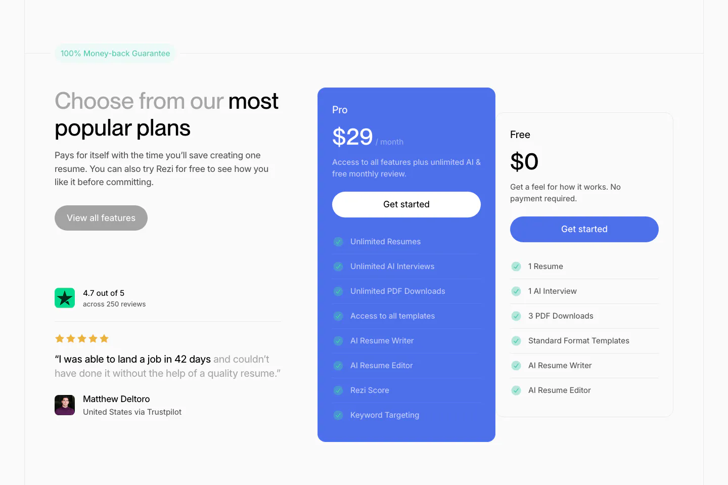
  317. Rezi pricing section: headline and Trustpilot quote on the left, blue Pro plan card and white Free plan card with checklists at right
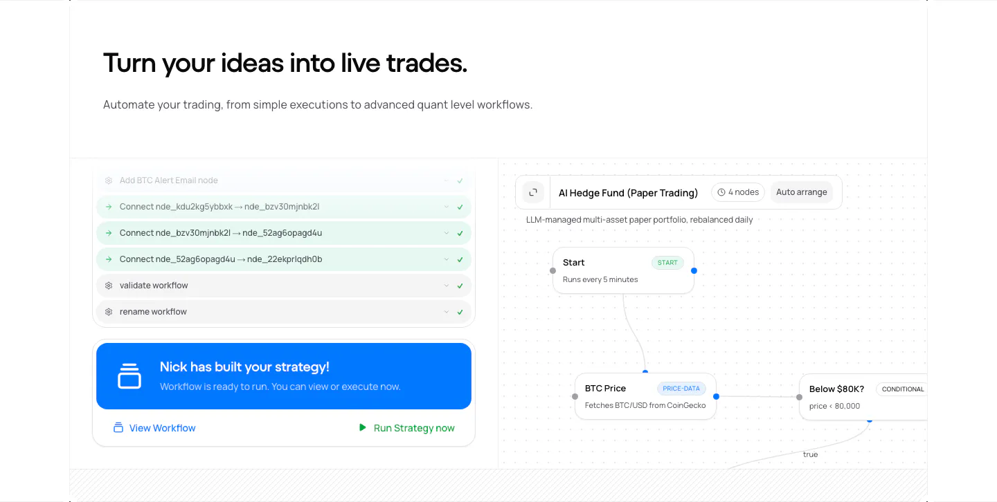
  318. NickAI features section: left heading above a product screenshot pairing an agent chat log with a workflow node canvas
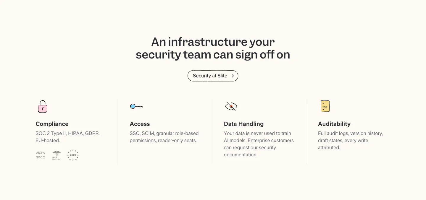
  319. Slite security section: centered headline and button above four columns for compliance, access, data handling and audit, with badges
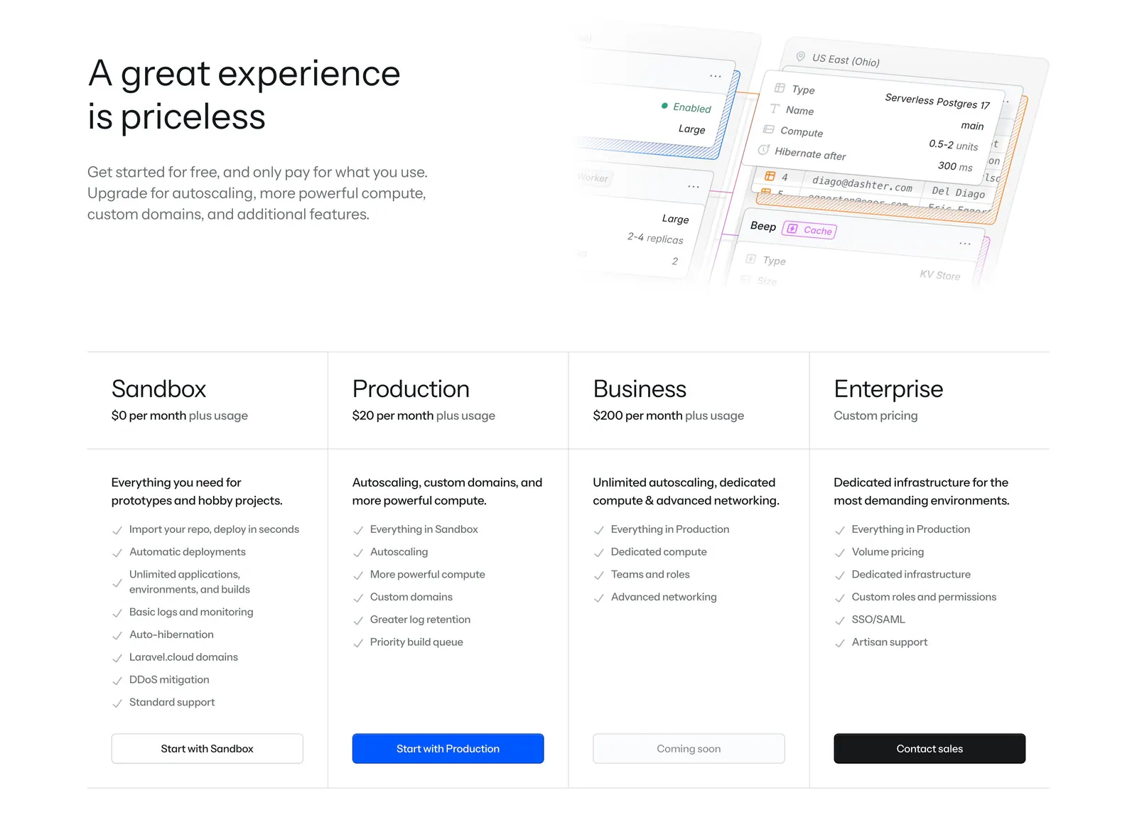
  320. Laravel Cloud pricing section: headline beside a faded UI mockup above four plan columns with checklists and buttons
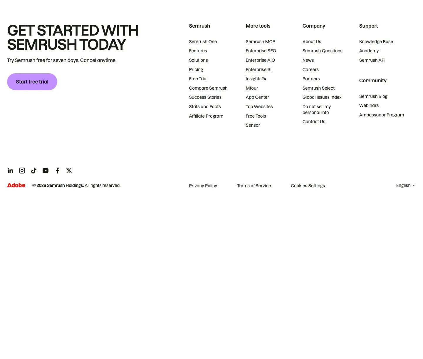
  321. Semrush footer section: uppercase signup headline with purple trial button beside four link columns, social icons and copyright row
  322. Teton logo cloud section: two-tone headline above a scrolling row of gray tiles with black healthcare and municipality logos
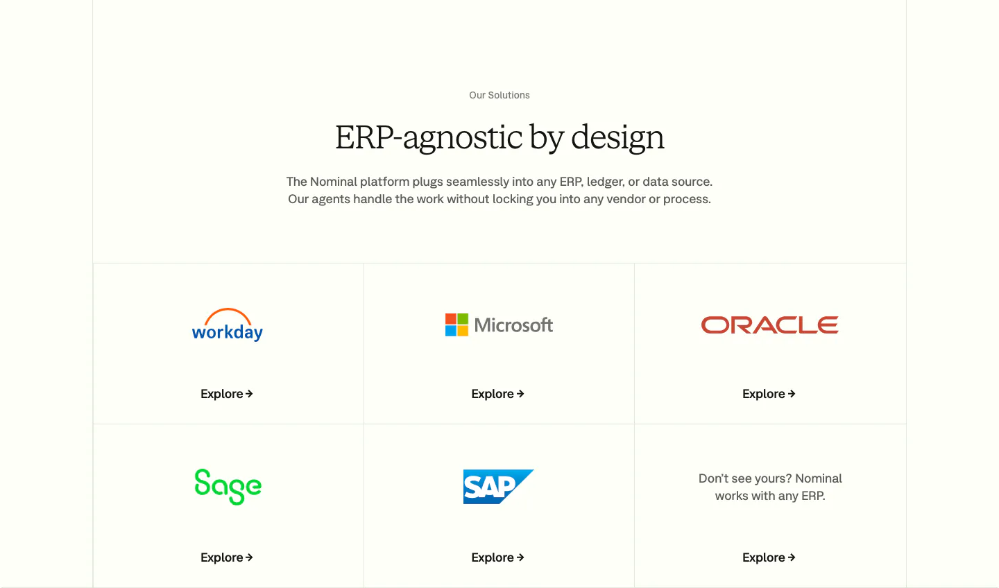
  323. Nominal integrations section: centered serif headline above a bordered grid of ERP logo tiles with Explore links on an off-white background
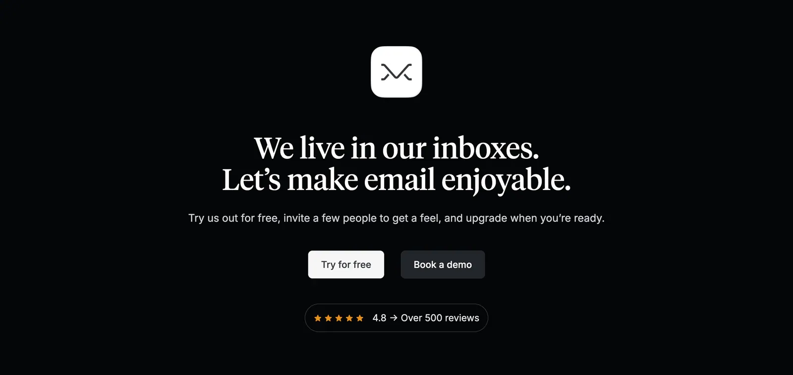
  324. Missive call-to-action section: centered app icon and serif headline with two buttons and a review rating badge on black
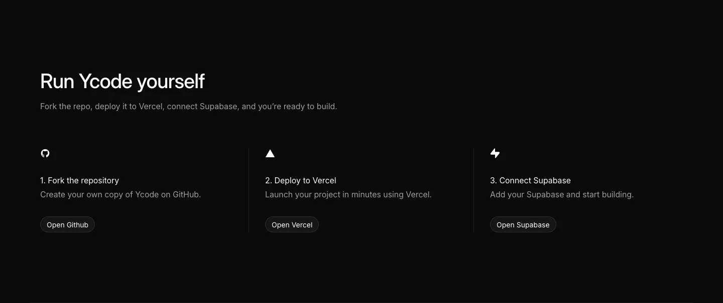
  325. Ycode how it works section: headline above three numbered steps with icons and buttons for GitHub, Vercel and Supabase on black
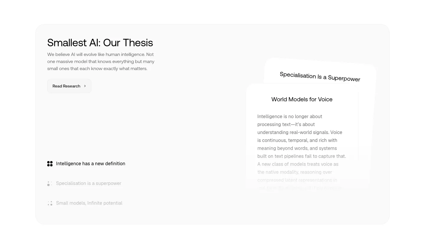
  326. Smallest.ai about & mission section: thesis headline, research button and topic list on the left beside stacked text cards in a gray panel
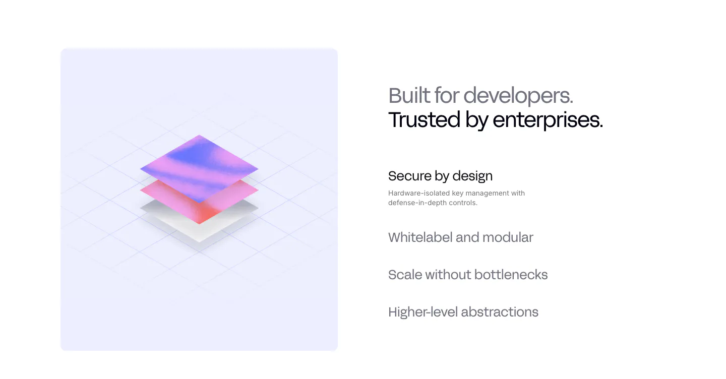
  327. Privy value proposition section: isometric 3D layered render on a lavender panel beside a headline and a list of selectable benefit items
  328. Ruul logo cloud section: small caption above a single row of grayscale organisation logos on an off-white background
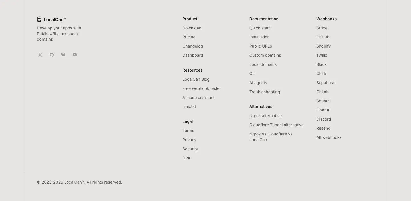
  329. LocalCan footer section: logo, tagline and social icons on the left, link columns for product, docs, alternatives and webhooks, copyright row
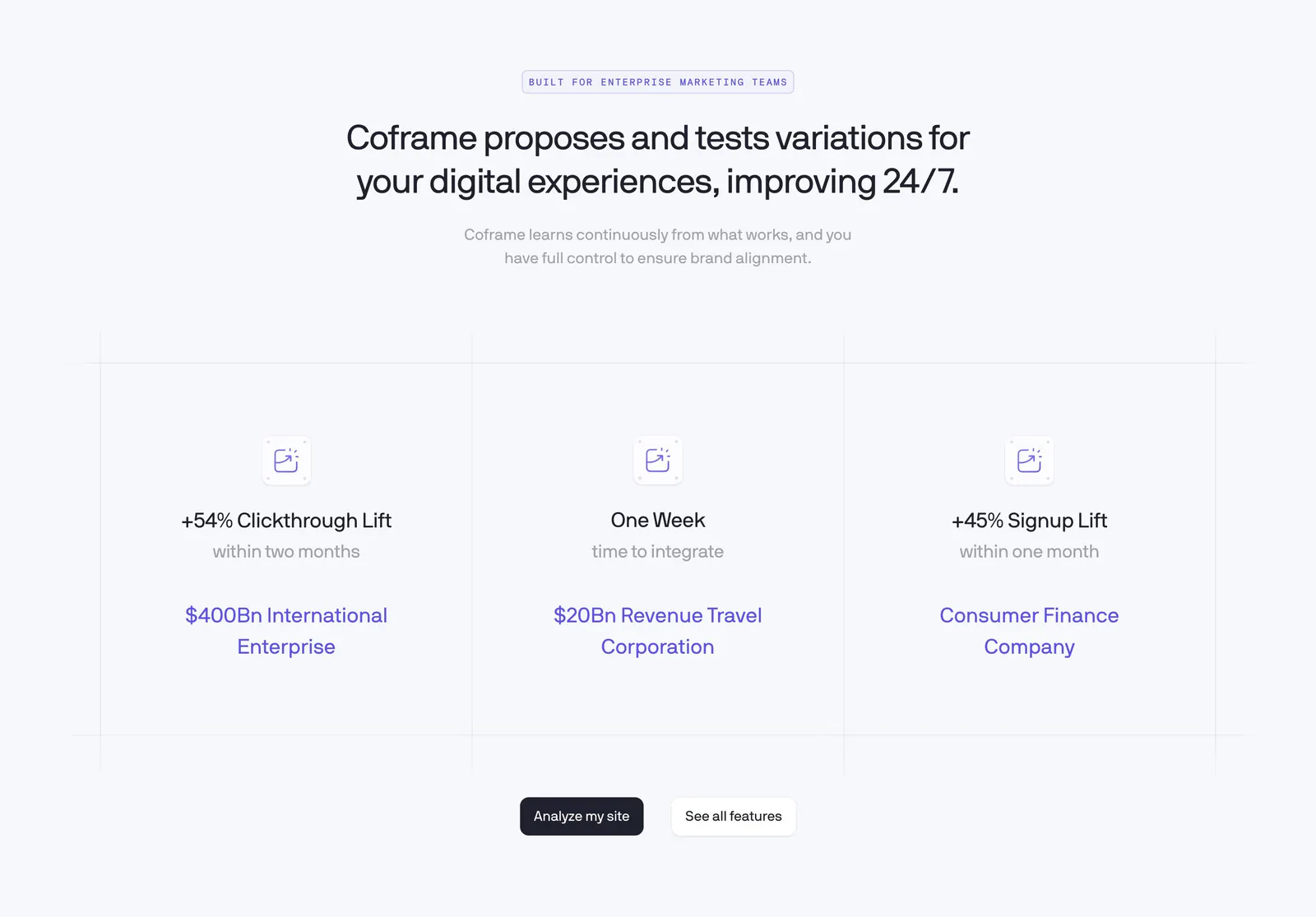
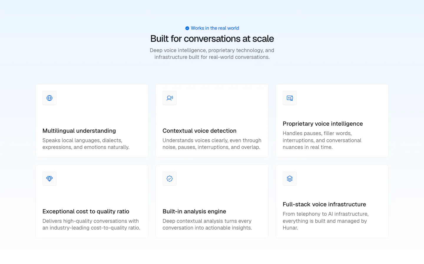
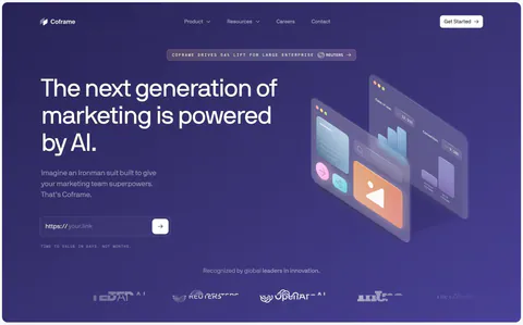
  330. Coframe value proposition section: centered headline above three result columns with lift metrics on a light grid background
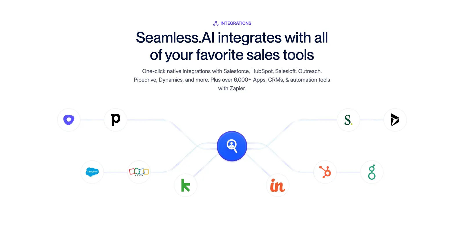
  331. Seamless.AI integrations section: centered headline above a connector diagram linking sales tool icons to a central logo on white
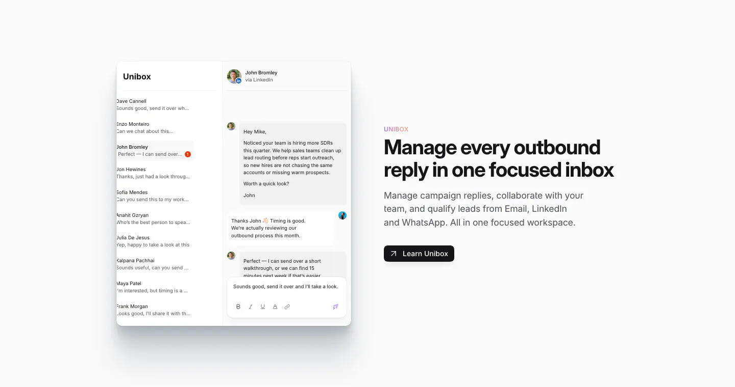
  332. Sendr features section: Unibox inbox UI with a conversation thread on the left, headline, copy and Learn Unibox button on the right
  333. Canopy integrations section: centered headline and copy above a row of four numbered partner logos on a dark background
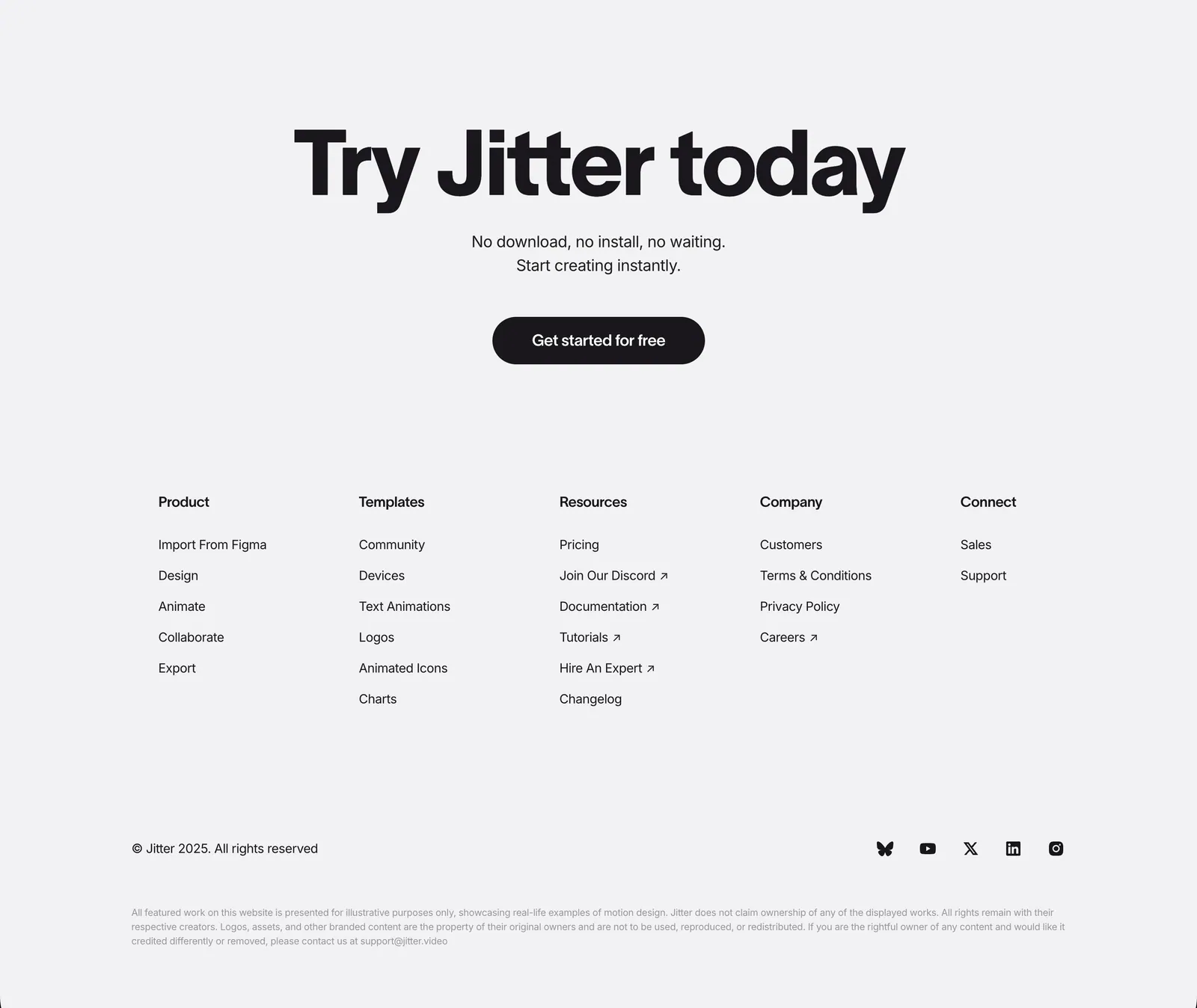
  334. Jitter footer section: large centered CTA headline and button above five link columns, copyright and social icons on light gray
  335. Shelby about & mission section: large left-aligned statement naming Jump Trading Group and Aptos as underlined links on a pale pink panel
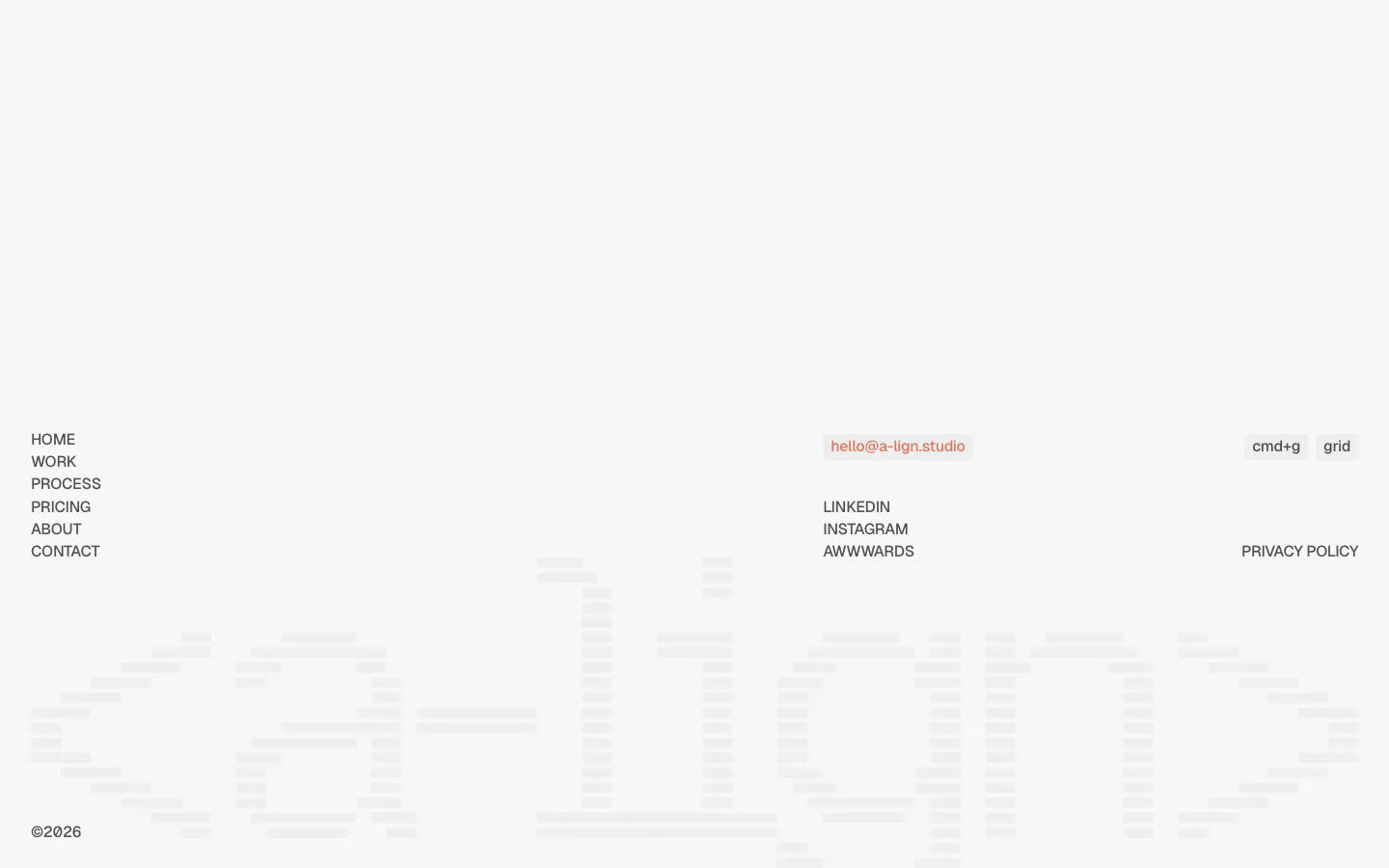
  336. A-LIGN footer section: link list, email pill and social links above a faint full-width striped a-lign wordmark on light gray
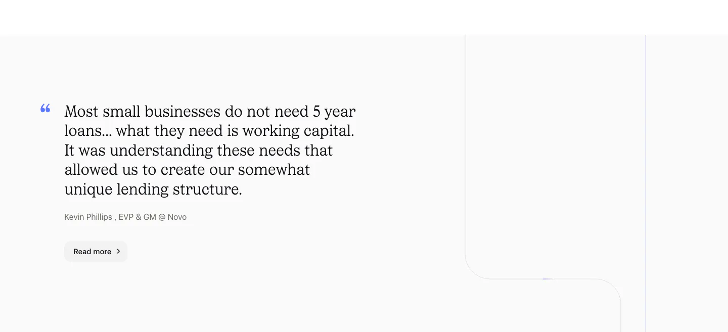
  337. Canopy testimonials section: large serif customer quote with attribution and Read more button on a light gray background
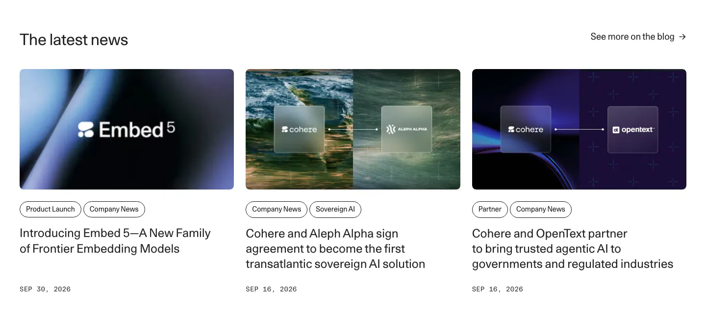
  338. Cohere blog & resources section: headline with blog link above three news cards with images, pill tags and dates
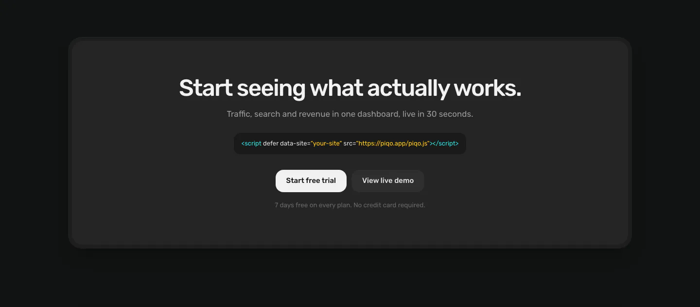
  339. Piqo call to action section: centered headline, script tag snippet and two buttons inside a rounded charcoal card on a near-black page
  340. Hunar features section: centered heading above a two-row grid of six icon cards on a pale blue background
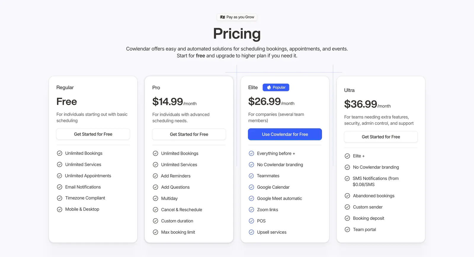
  341. Cowlendar pricing section: centered heading above four plan cards with checklists and a highlighted blue Elite plan
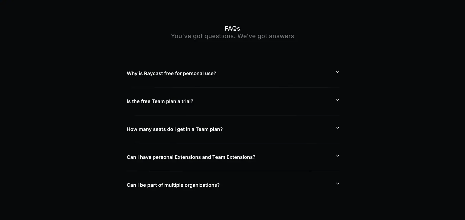
  342. Raycast FAQ section: centered FAQs heading above a five-question collapsed accordion on a near-black background
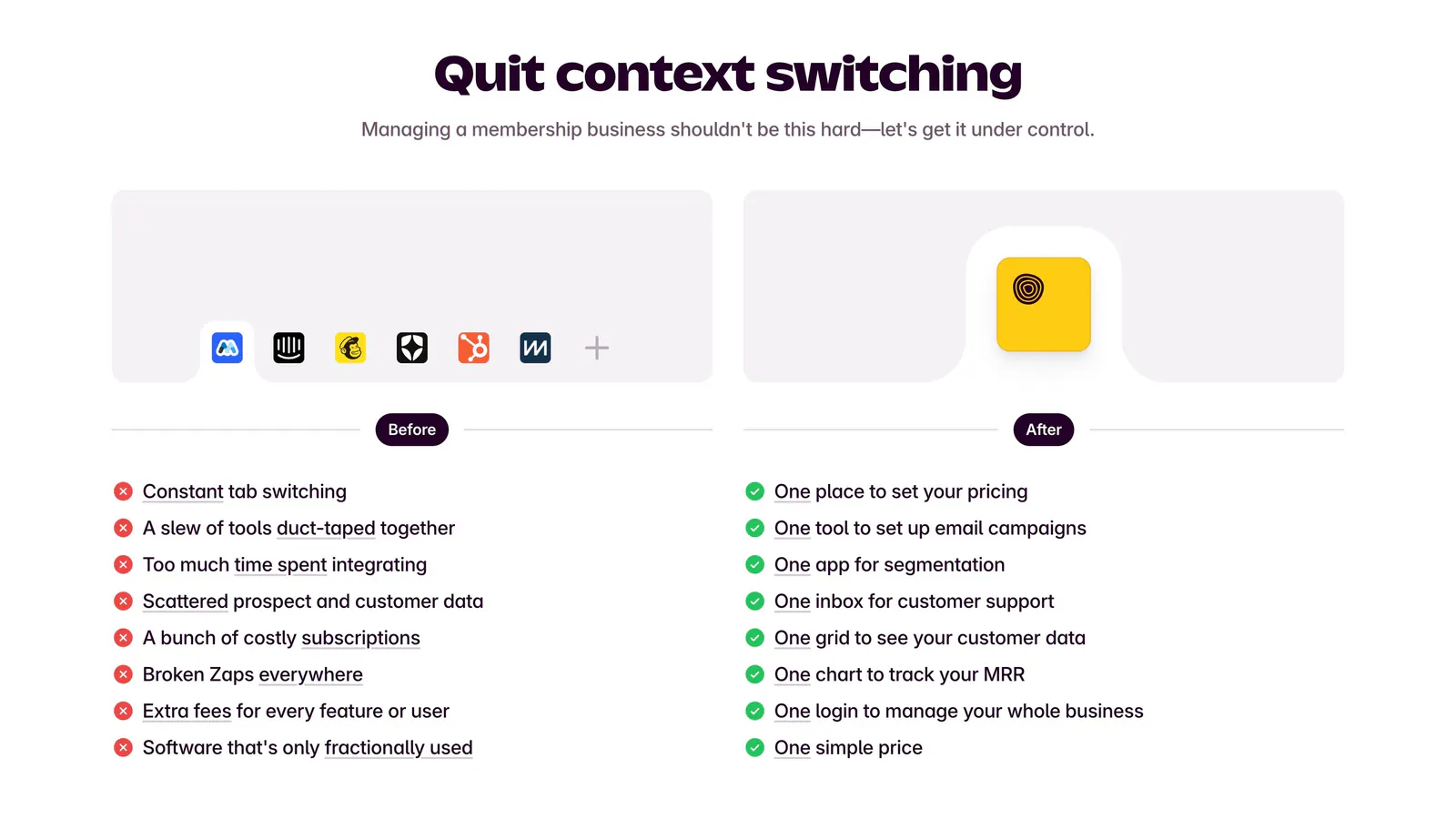
  343. Outseta comparison section: centered headline above Before and After columns contrasting tool clutter and red crosses with green checks
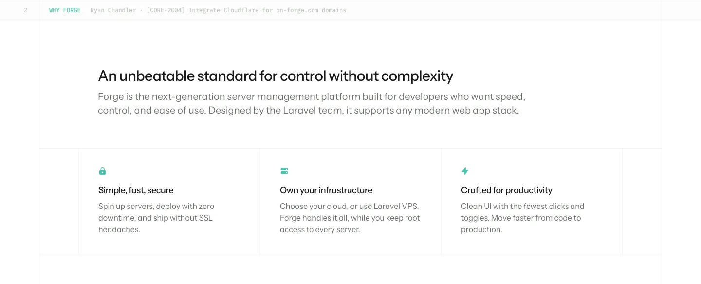
  344. Laravel Forge value proposition section: left-aligned heading and intro above three bordered benefit columns with small teal icons
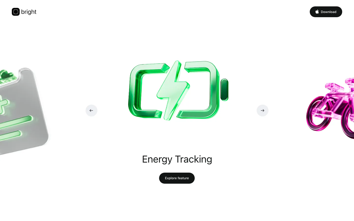
  345. Bright hero section: logo nav above a carousel of glossy 3D icons with a green battery centered, Energy Tracking label and button
  346. Voiceflow logo cloud section: centered line of text above three rows of grayscale customer logos on a charcoal background
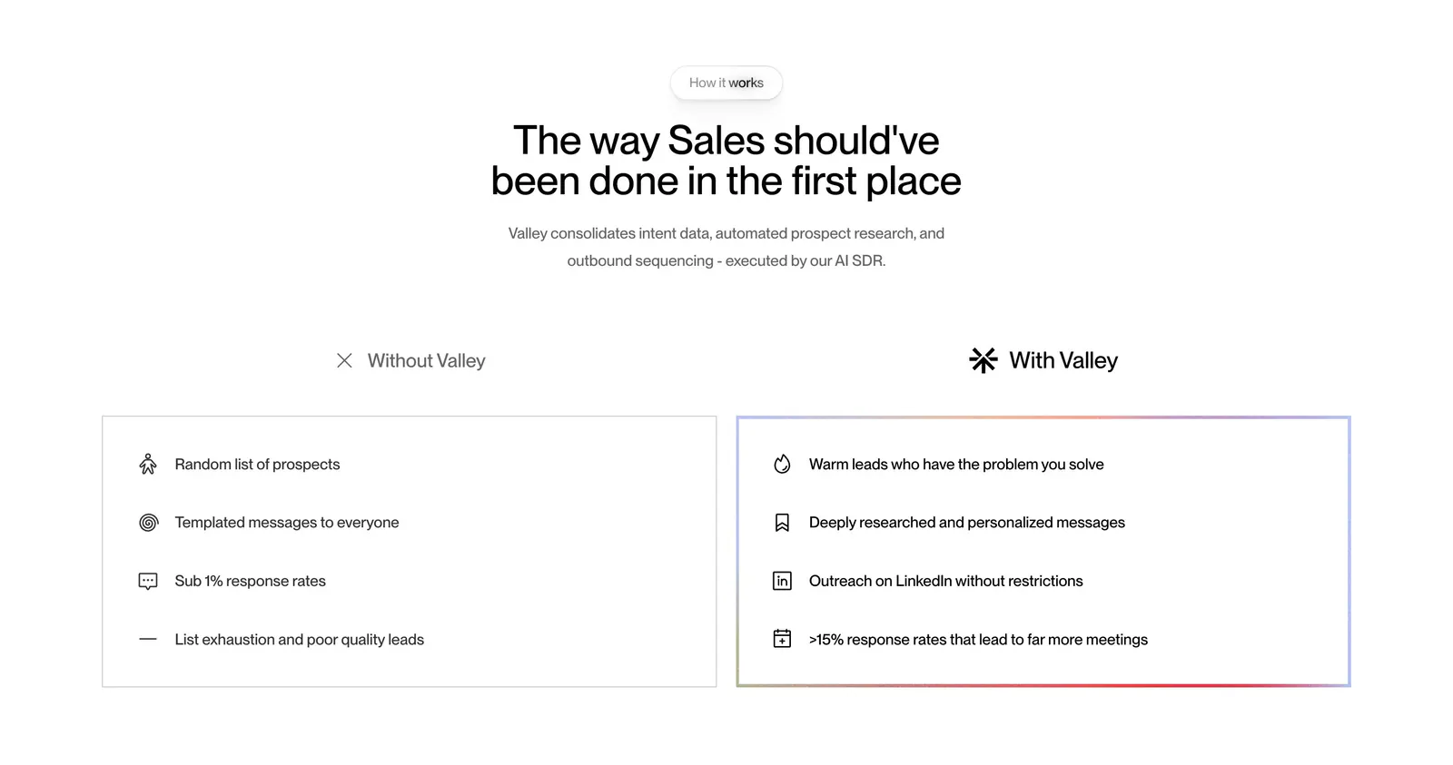
  347. Valley comparison section: centered headline above side-by-side Without Valley and With Valley lists in outlined cards on white
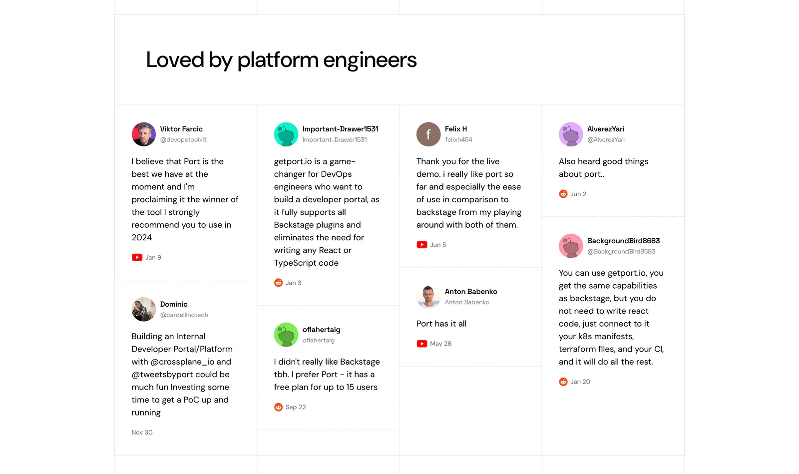
  348. Port testimonials section: headline above a four-column wall of social posts with avatars, handles and YouTube or Reddit source icons
  349. Smallest.ai footer section: centered CTA headline and Contact sales button above logo, address, link column groups and a status bar
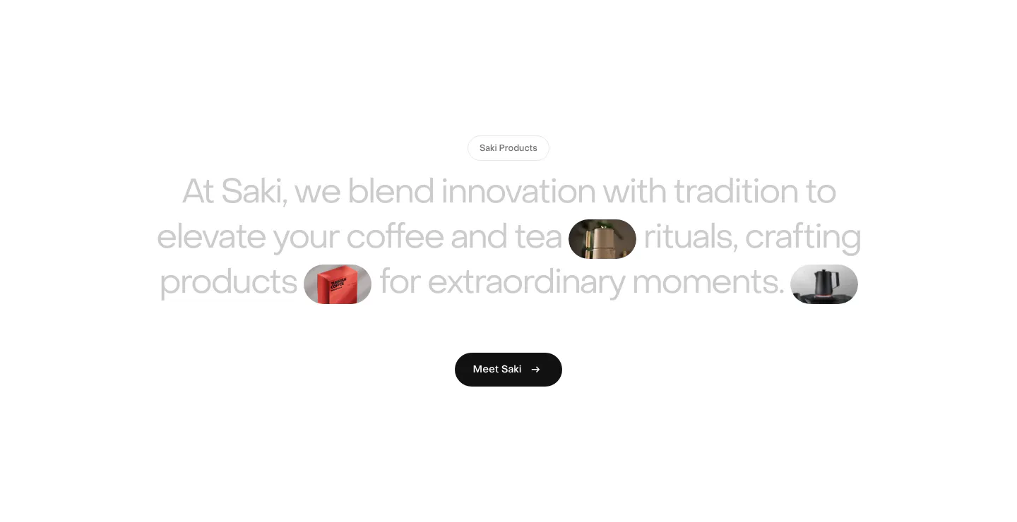
  350. Saki about & mission section: centered gray statement with inline product image pills and a black Meet Saki button on white
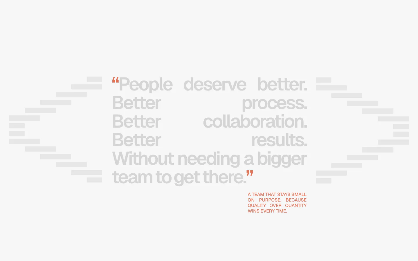
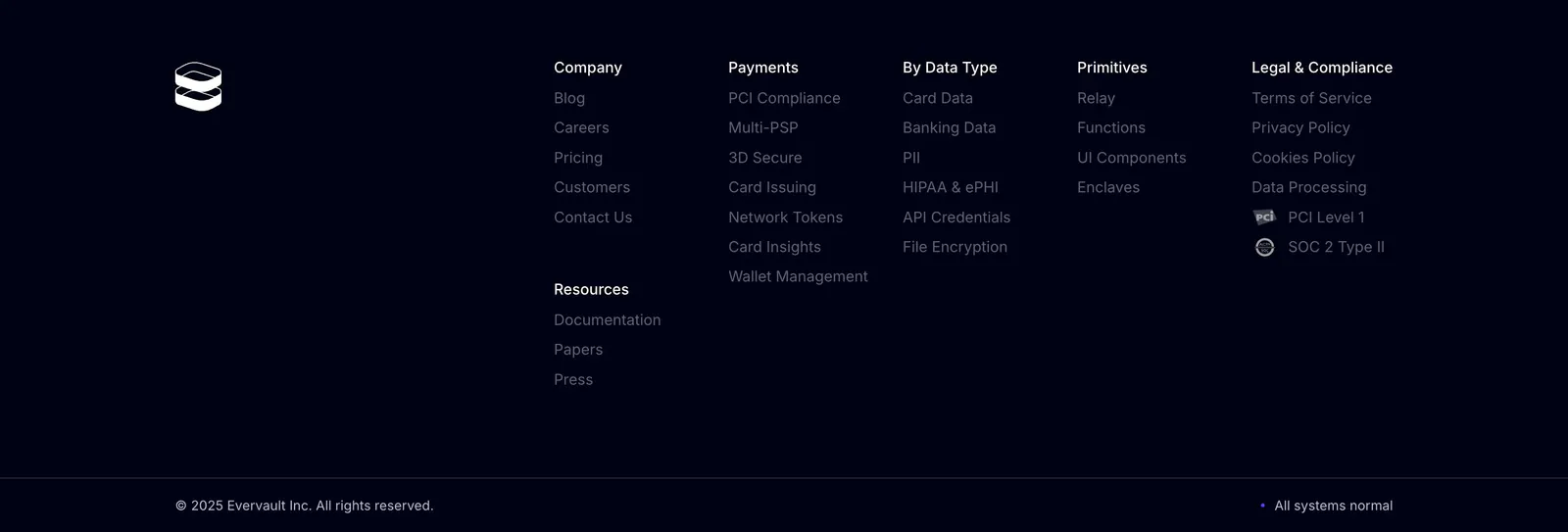
  351. A-LIGN about & mission section: justified light gray manifesto quote with orange quote marks between stepped bar shapes on a pale background
  352. Port logo cloud section: two rows of five black customer logos centered on a white background with faint grid lines
  353. Laravel Cloud FAQ section: headline on the left beside a long accordion of questions about databases, pricing and deployment on white
  354. Fernand footer section: five link columns with contact email and copyright on a near-black background
  355. A-LIGN hero section: centered headline, subline and orange button surrounded by four dashed-frame photos of the team and a project
  356. Clarion footer section: light footer with logo at left, company links and social icons at right, and a copyright line
  357. Raneo features section: centered headline above four equal white cards with isometric line icons for demo tools and an all-tools button
  358. Evervault footer section: logo at left with five link columns, compliance badges and copyright line on a near-black navy background
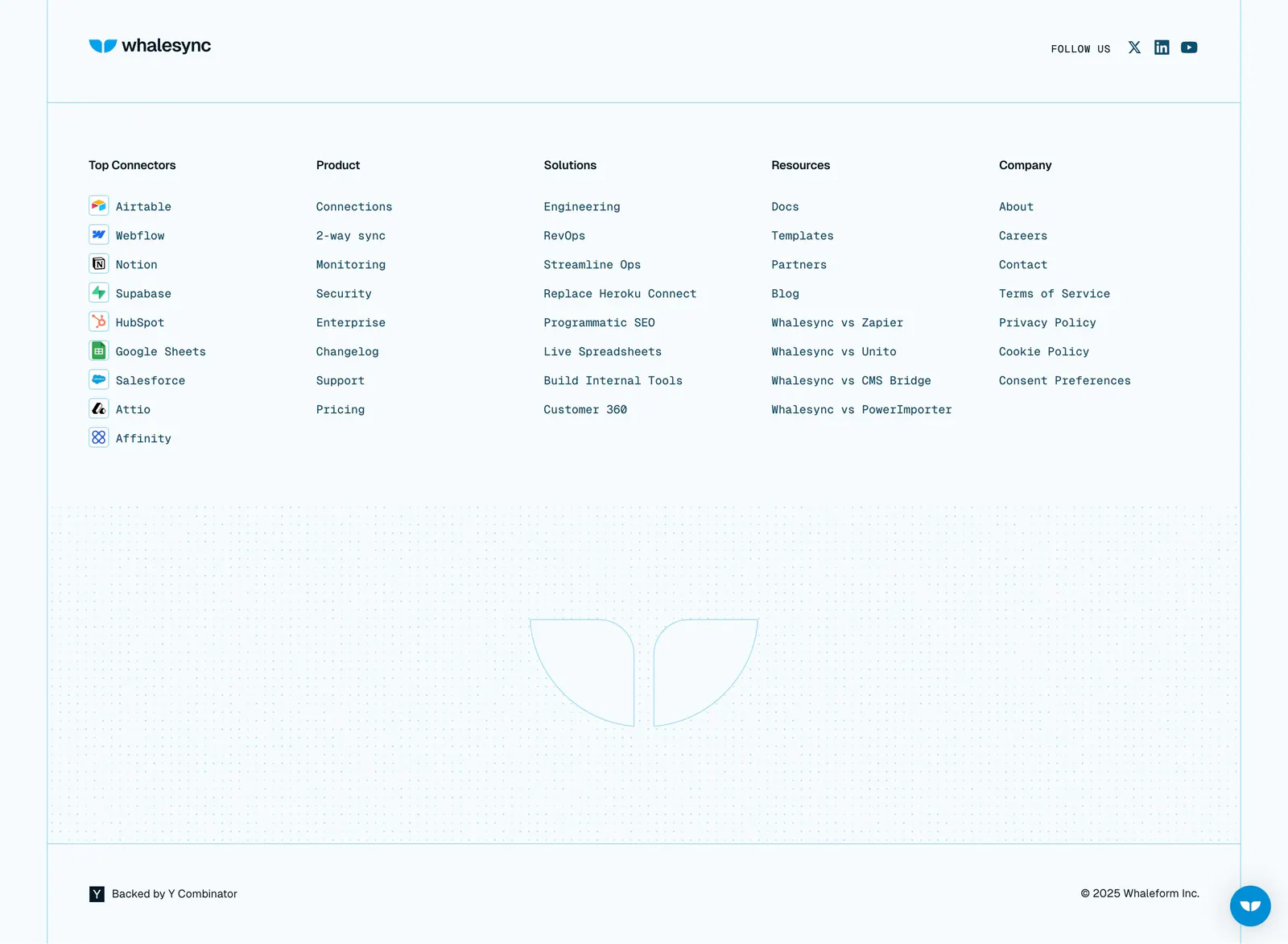
  359. Whalesync footer section: logo and five monospace link columns with connector icons above a dot-grid outlined logo on pale blue
  360. Remote logo cloud section: small centered caption above two rows of gray customer logos on white
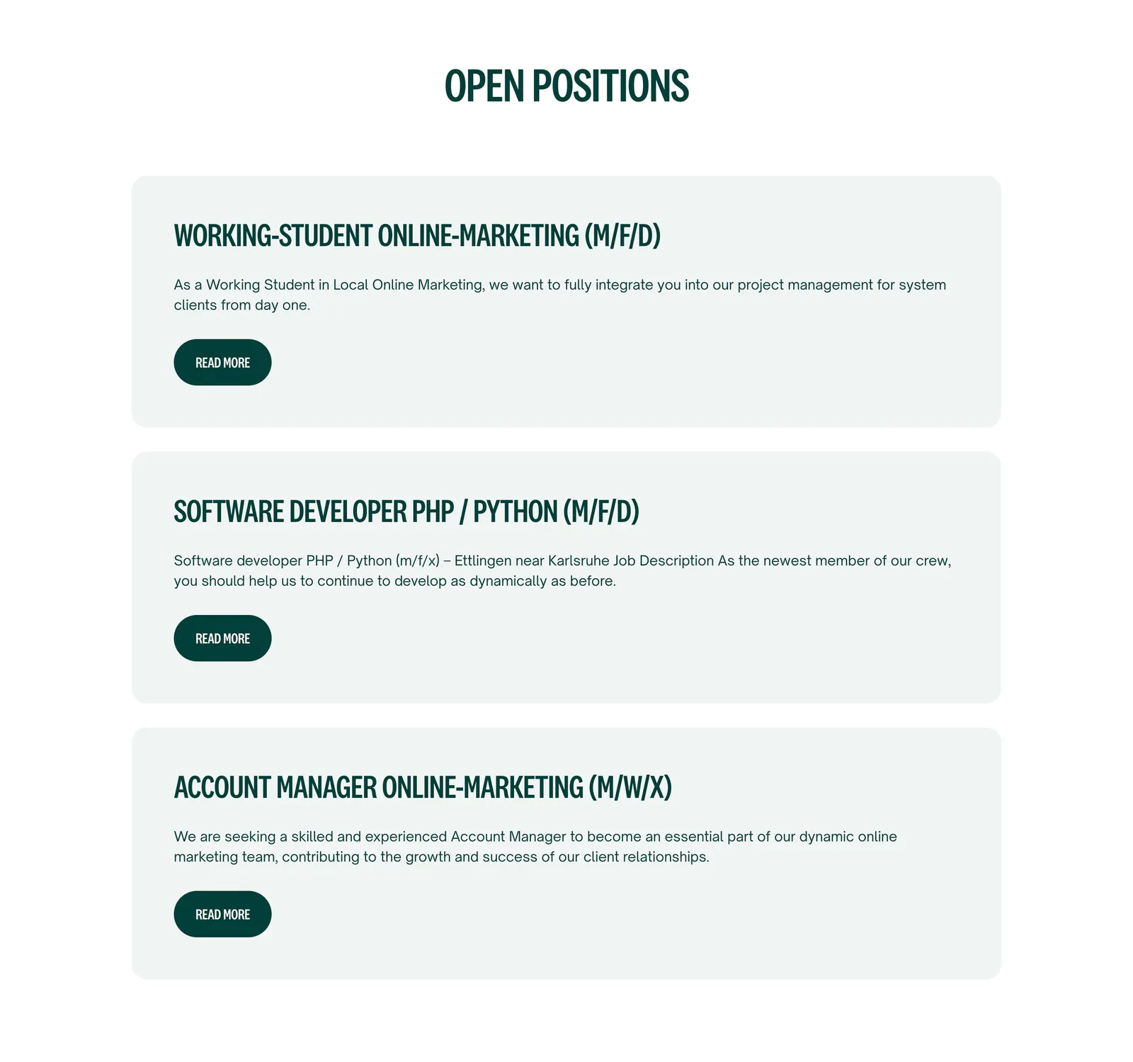
  361. Localyzer careers section: centered heading above three stacked job cards with read-more buttons on a white background
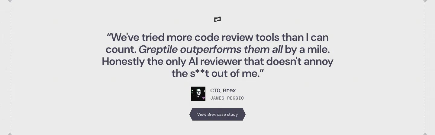
  362. Greptile testimonials section: centered single customer quote with company logo, avatar, name, title and a case study button
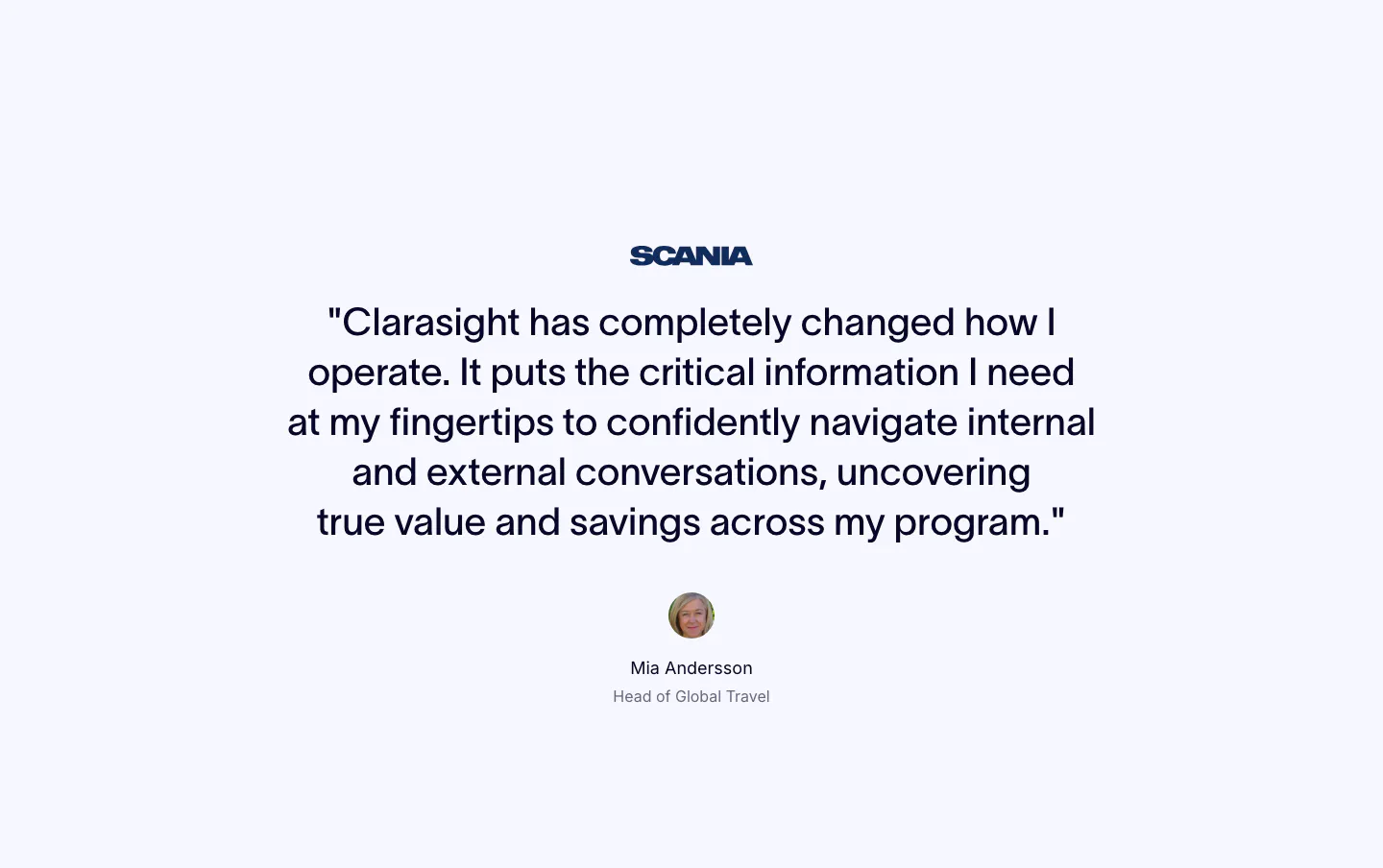
  363. Clarasight testimonials section: centered quote under a Scania logo with a round headshot, name and title below on a pale background
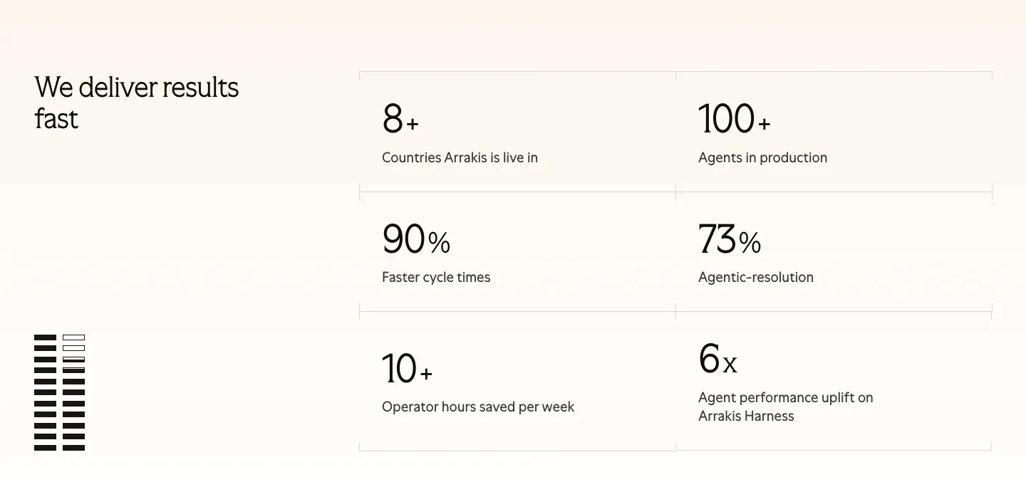
  364. Arrakis stats section: headline at left beside a 2x3 bordered grid of large metrics on a light background, with a striped graphic
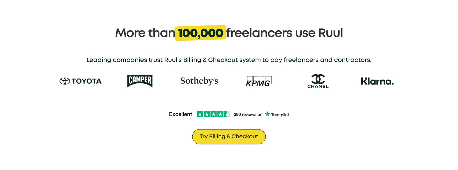
  365. Ruul logo cloud section: centered headline with yellow highlight above a row of brand logos, a Trustpilot rating and a yellow button
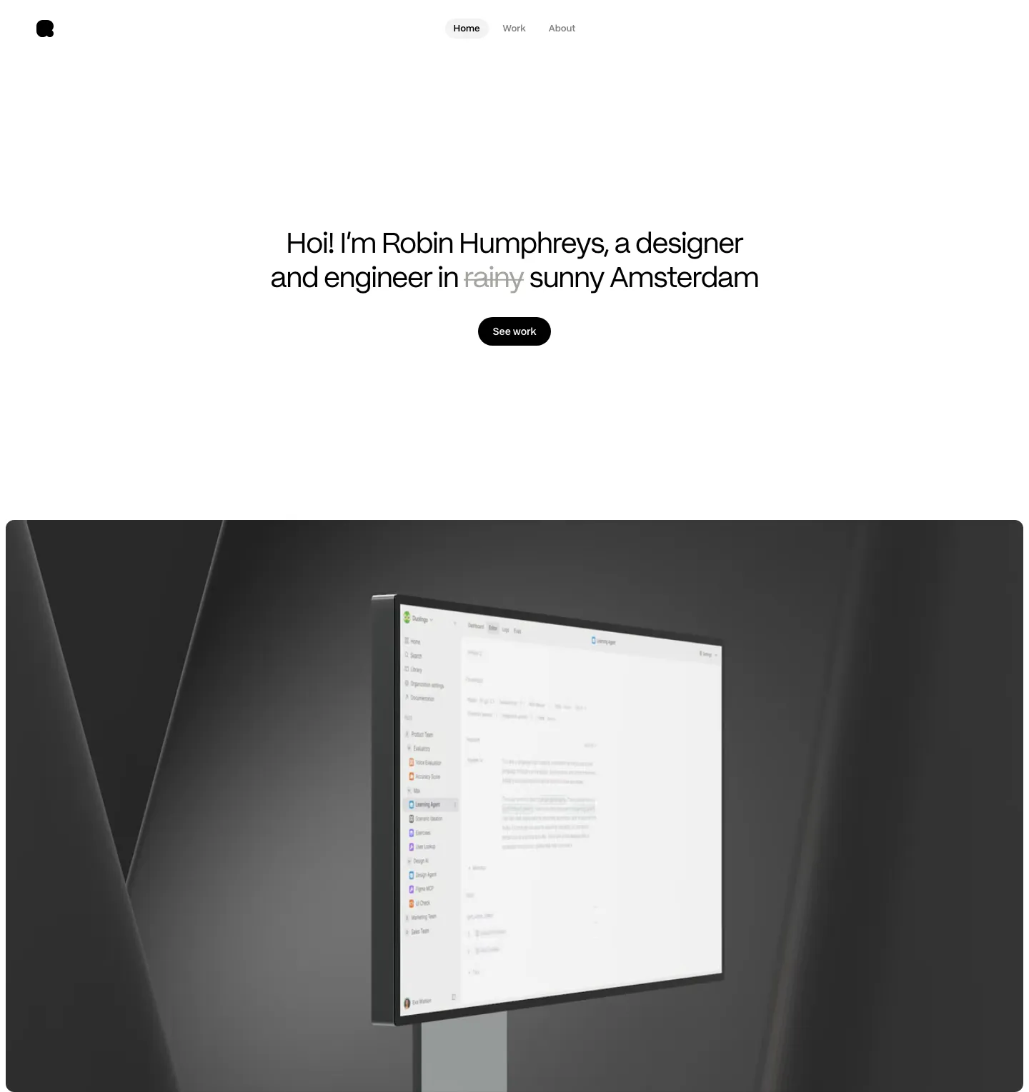
  366. Robin Humphreys hero section: centered greeting headline with a See work button above a dark 3D render of a monitor showing an app interface
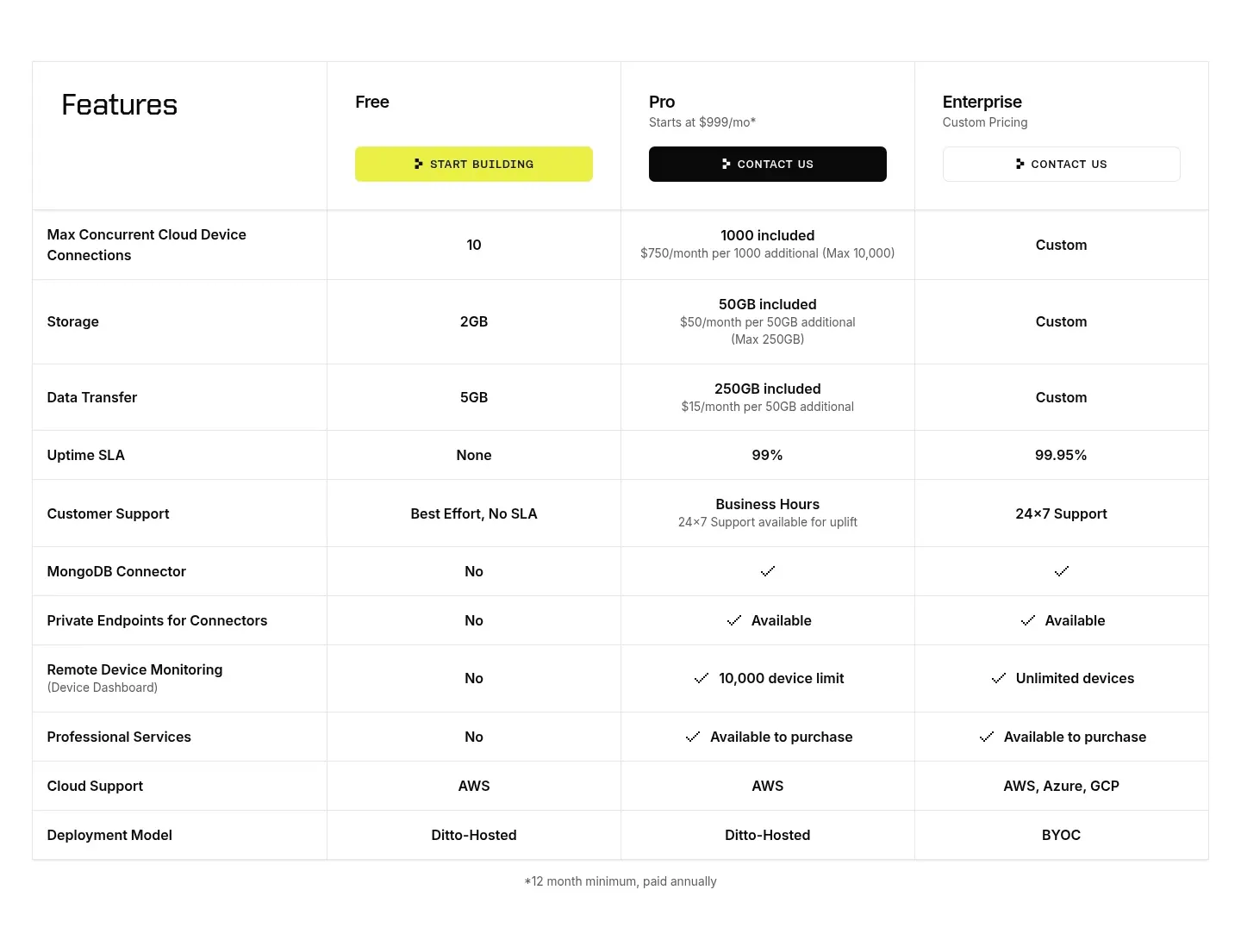
  367. Ditto pricing section: plan comparison table with Free, Pro and Enterprise columns, CTA buttons in the header and rows of limits and checkmarks
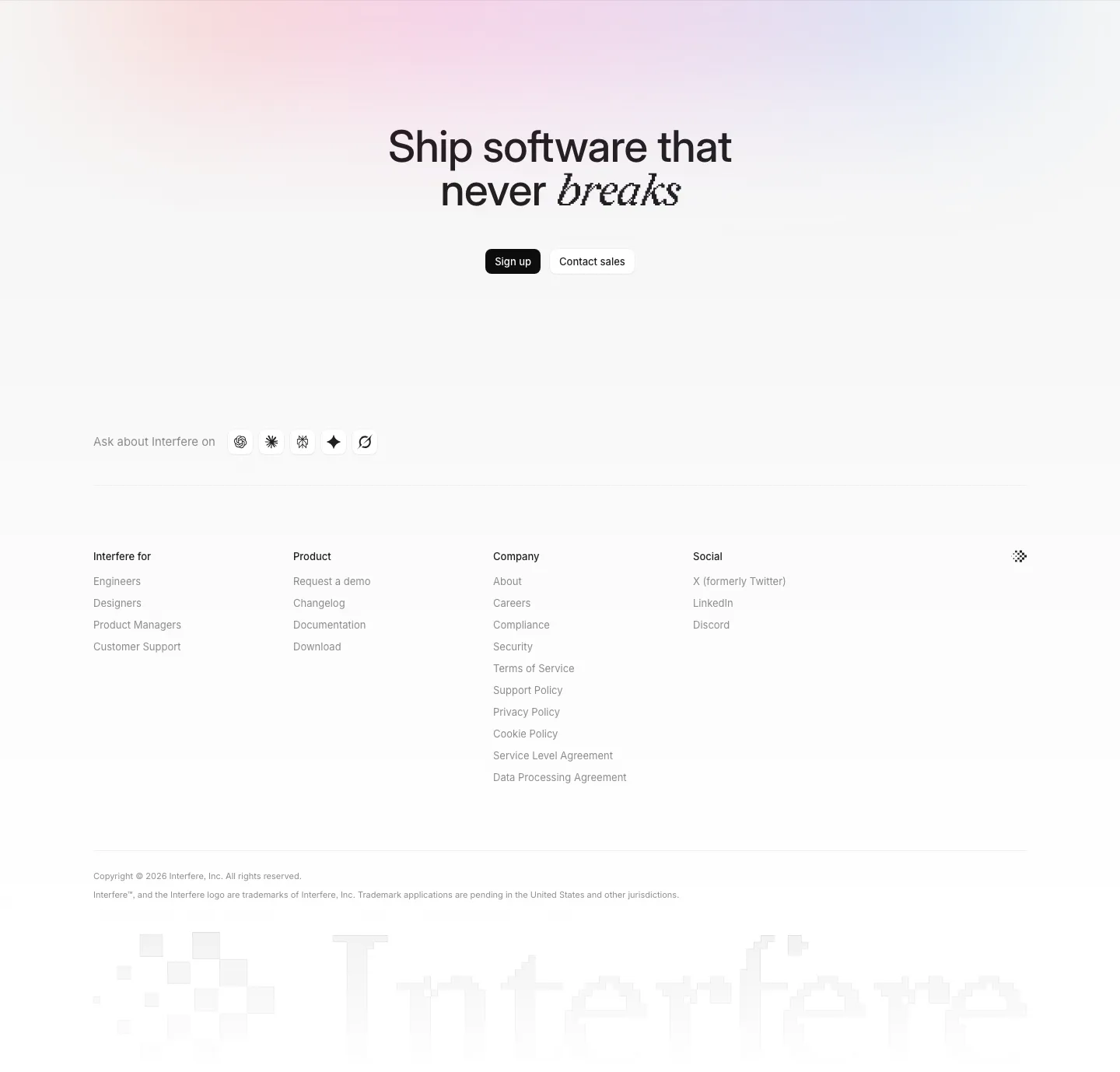
  368. Interfere footer section: centered closing headline with buttons, four link columns and a large faded pixel wordmark
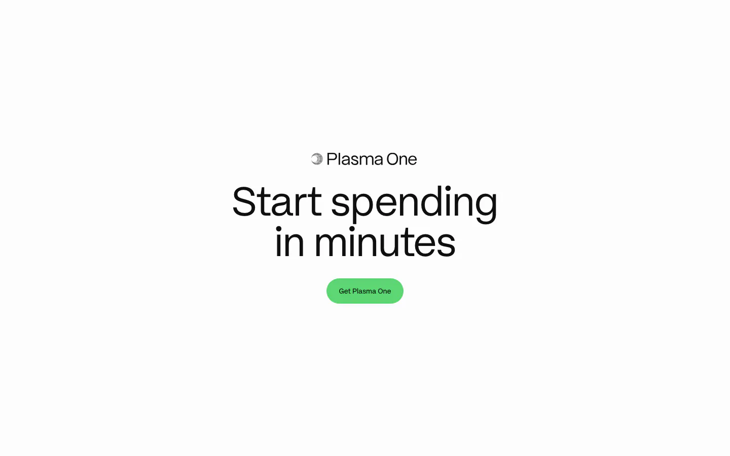
  369. Plasma call to action section: centered Plasma One logo, large headline and green Get Plasma One button on white
  370. Unknown value proposition section: stacked headline at left, three ruled benefit rows with vertical line graphics on a black background
  371. Remote features section: centered headline above three bordered product cards with gradient icons and text links
  372. Hunar security section: centered heading above six light icon cards and an integrations band with app icon tiles
  373. Cohere logo cloud section: small centered caption above a single row of black enterprise logos on white
  374. Laravel Forge logo cloud section: "Trusted by 1000+ companies" label beside a row of six grayscale customer logos on white
  375. HappyRobot footer section: large black logo mark, three link columns, tagline and policy links, compliance badge row and copyright on light gray
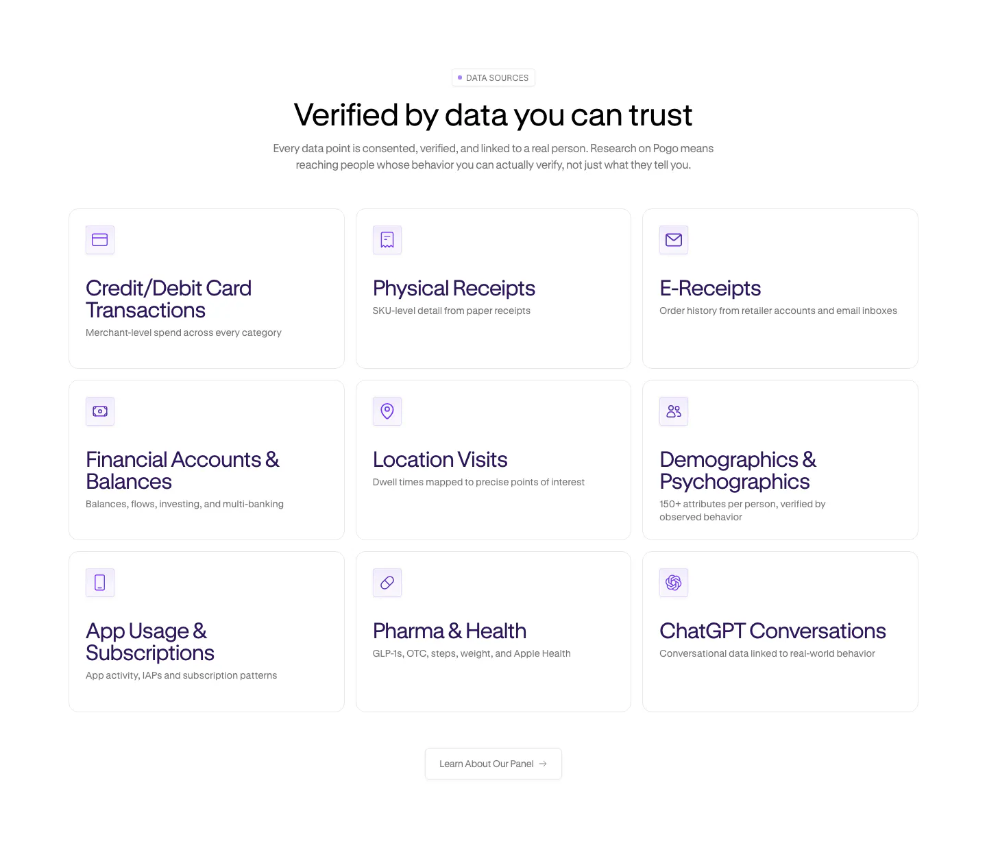
  376. Pogo features section: centered headline over a 3x3 grid of data source cards with purple line icons on white
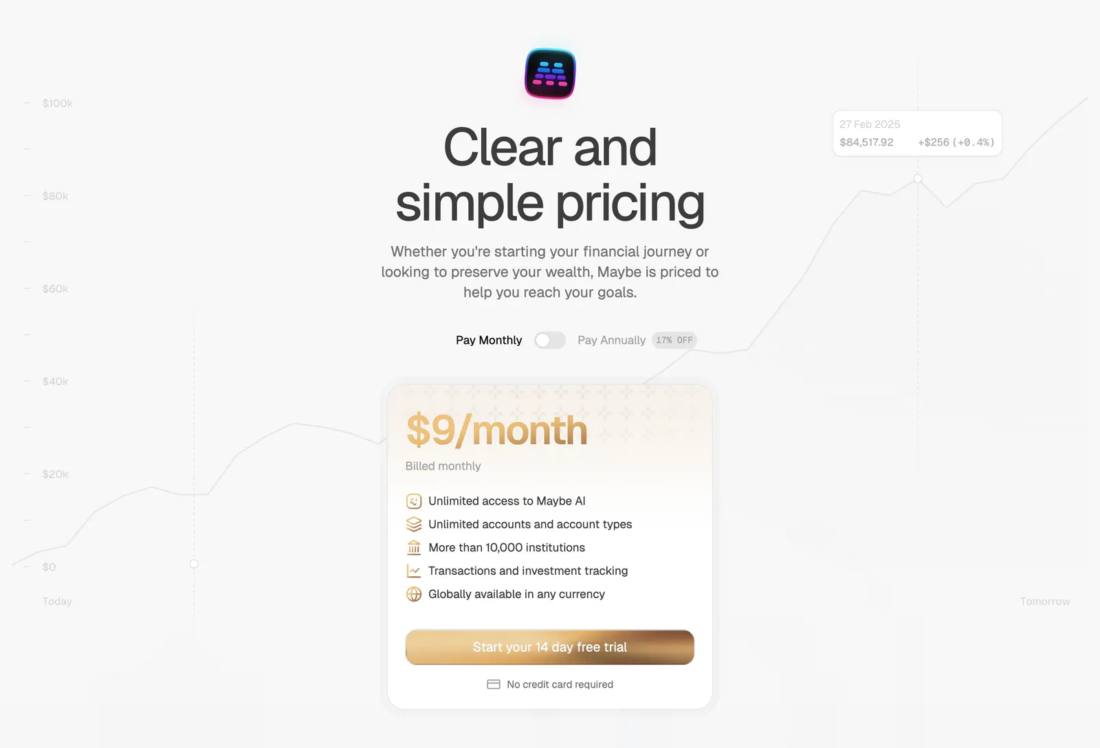
  377. Maybe pricing section: centered headline with monthly/annual toggle above a single gold-accented plan card on a faint chart
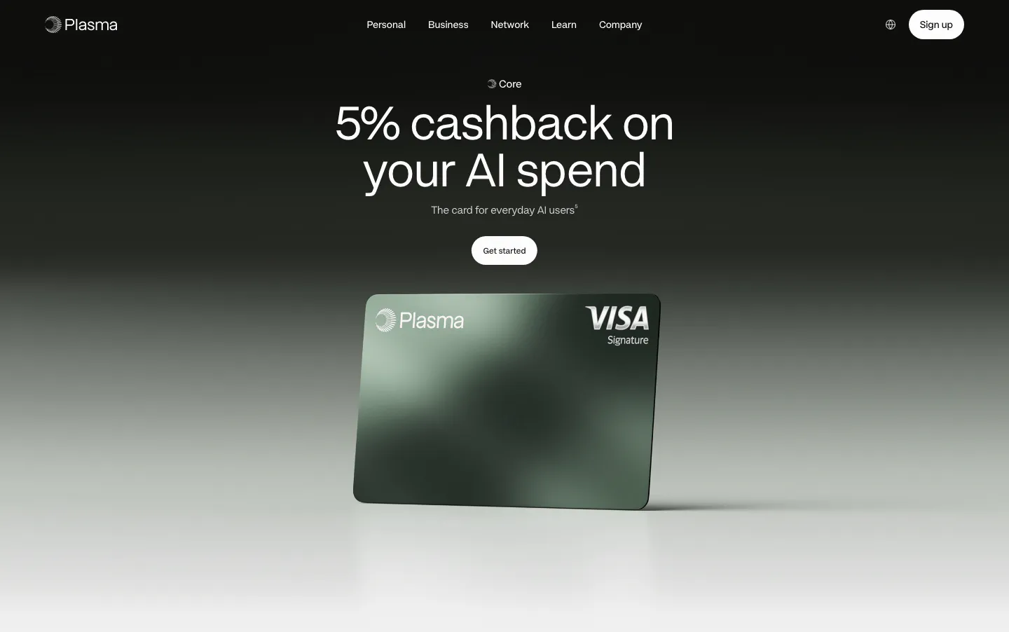
  378. Plasma hero section: centered headline and Get started button above a green Plasma Visa card render on a black-to-gray fade
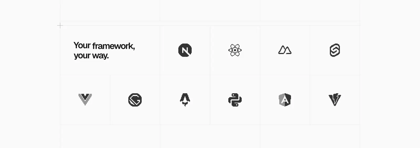
  379. Vercel logo cloud section: headline tile in a bordered grid of grayscale framework logos like Next.js, React, Svelte and Angular
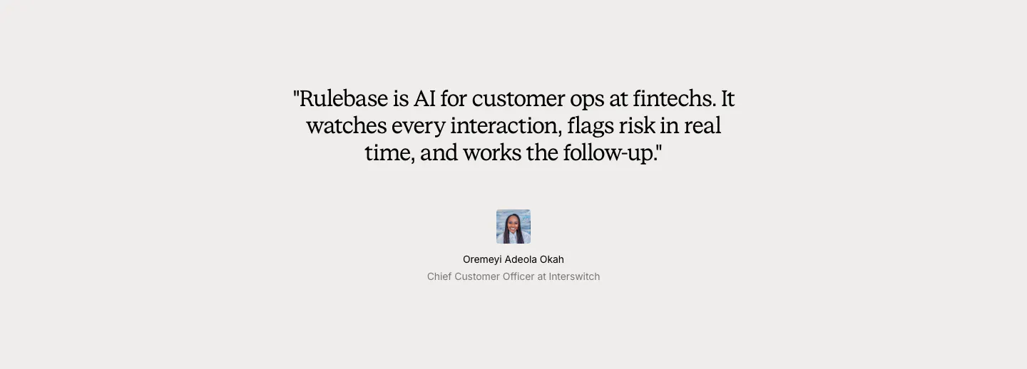
  380. Rulebase testimonials section: centered serif customer quote with a small avatar, name and title on a light gray background
  381. Shelby footer section: logo at left with Resources, Legal and Connect link columns and a copyright line on a cream background
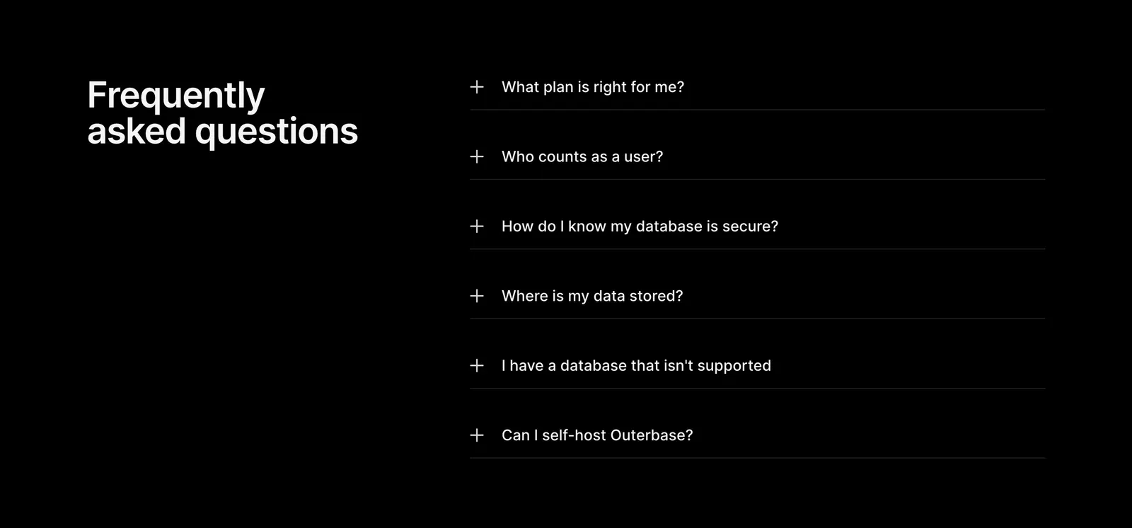
  382. Outerbase FAQ section: headline on the left beside a six-item plus-icon accordion of questions on a black background
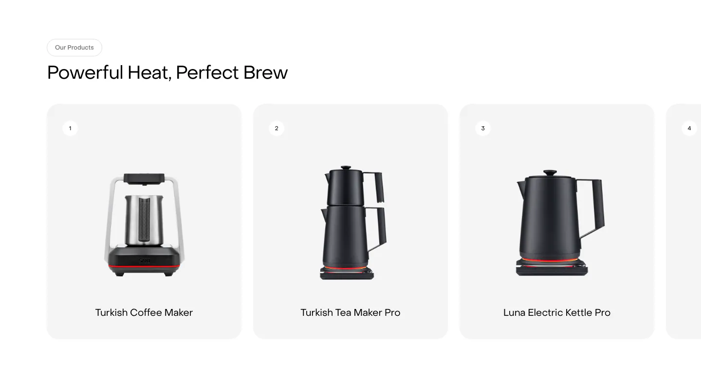
  383. Saki features section: headline above a row of numbered product cards showing kettles and coffee makers, with a fourth card cut off at the edge
  384. Conduit logo cloud section: two rows of gray hospitality brand logos separated by thin dividers on white
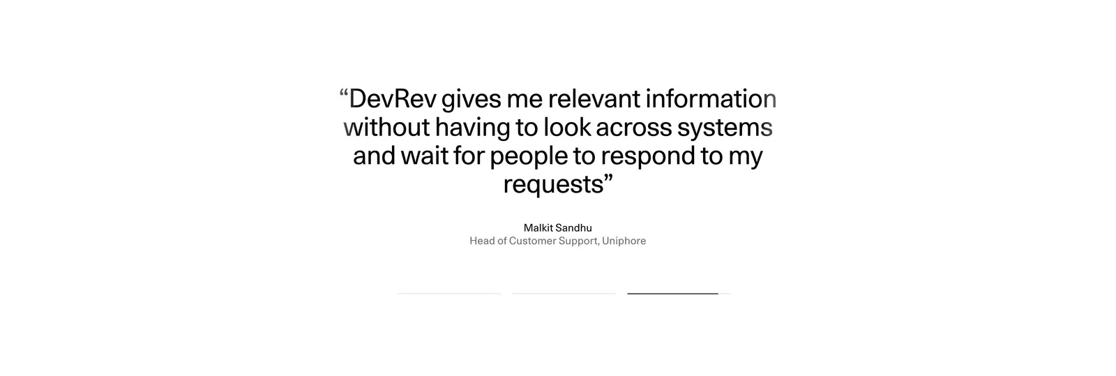
  385. DevRev testimonials section: centered large customer quote with name and title above three pagination bars on a plain white background
  386. Pogo logo cloud section: grayscale customer logos in rounded cards along a single row cut off at the edges on white
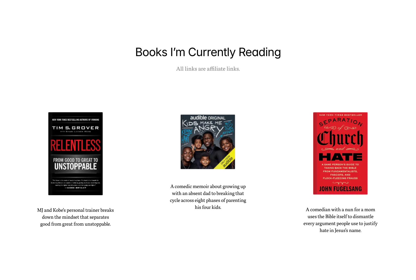
  387. Dan Mall blog & resources section: centered heading above three book covers with short descriptions on white
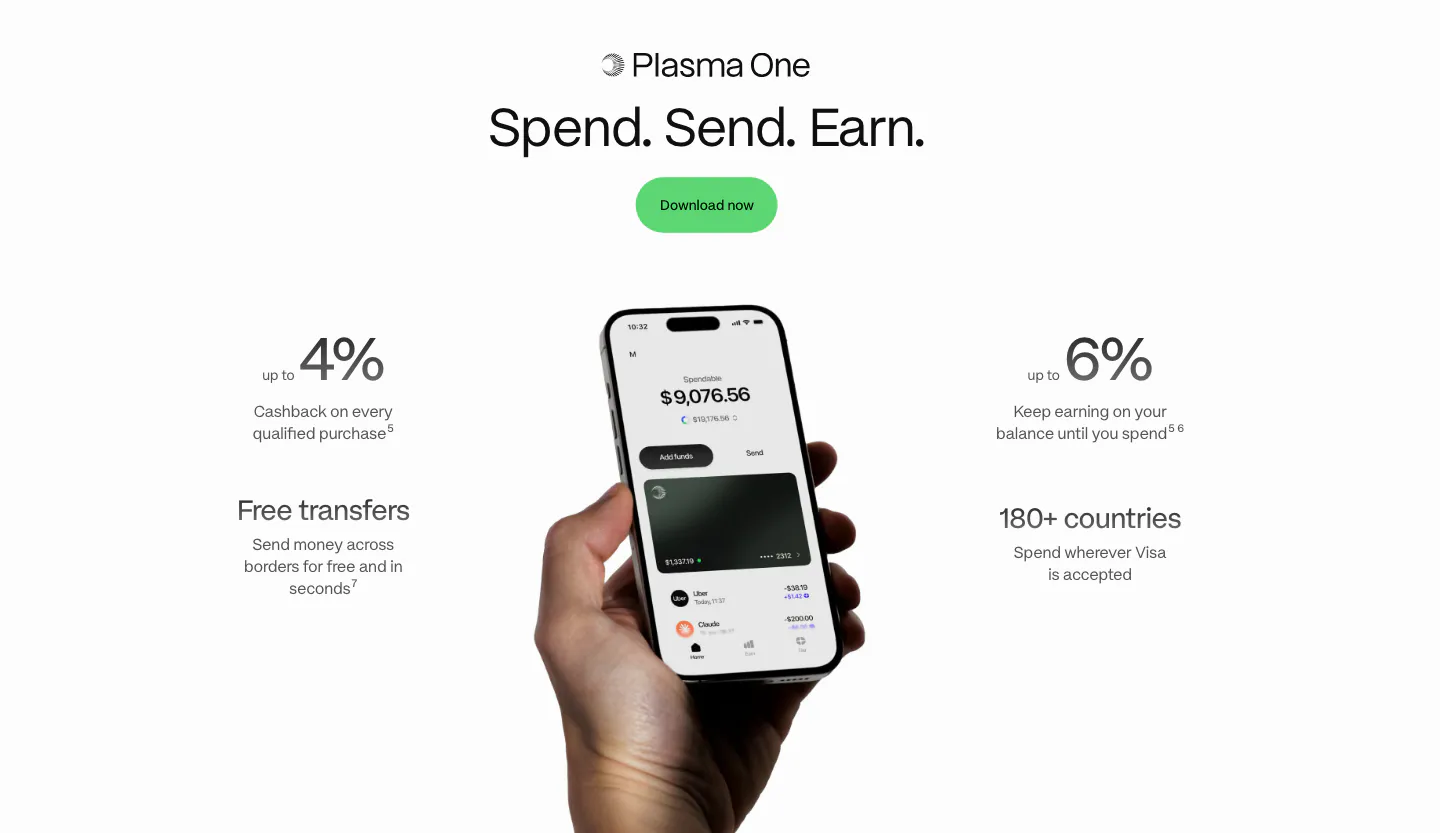
  388. Plasma value proposition section: centered heading and green button above a hand holding a phone flanked by four benefit stats
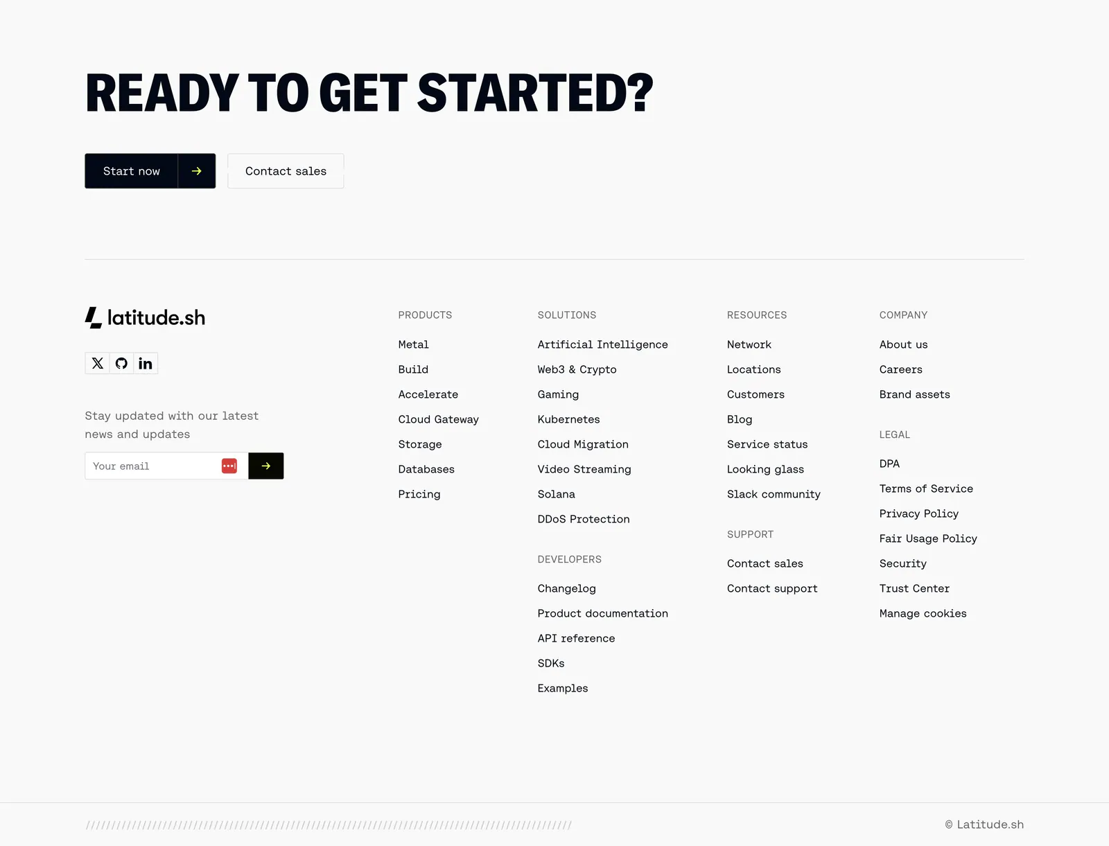
  389. Latitude.sh footer section: large uppercase CTA headline with buttons above logo, email field and link columns on light gray
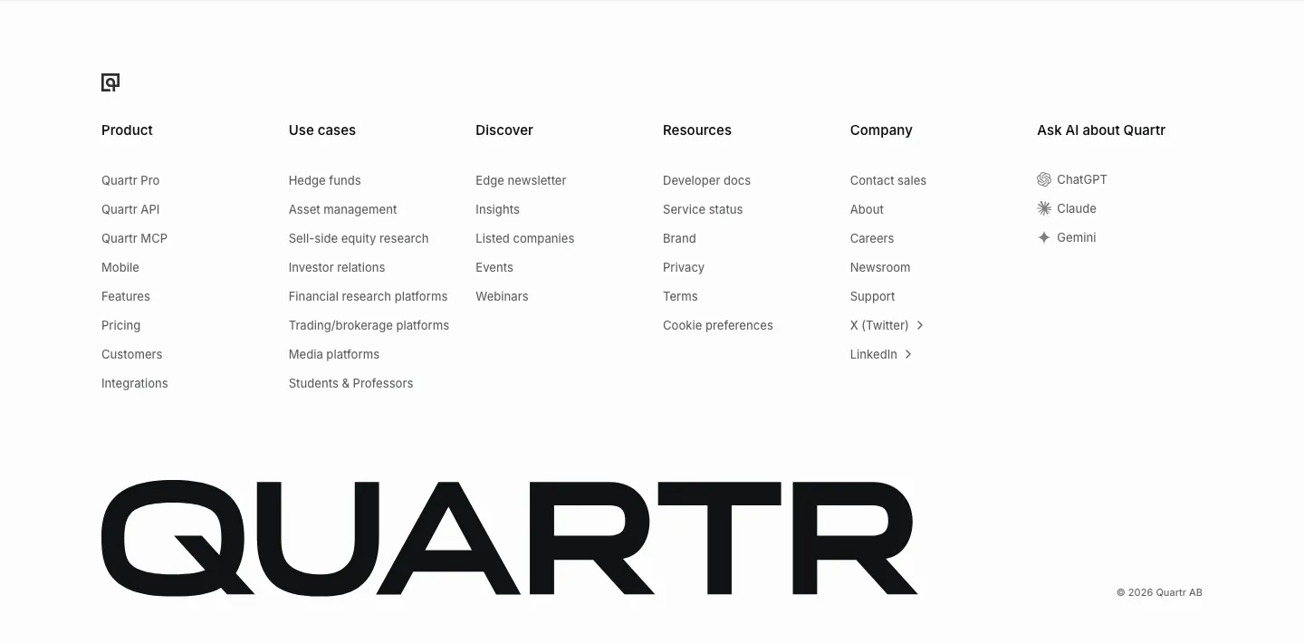
  390. Quartr footer section: six link columns including Ask AI about Quartr, above an oversized black QUARTR wordmark
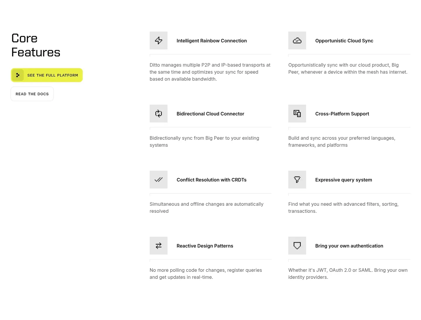
  391. Ditto features section: left headline with yellow and outline buttons beside a two-column list of eight icon-led features on white
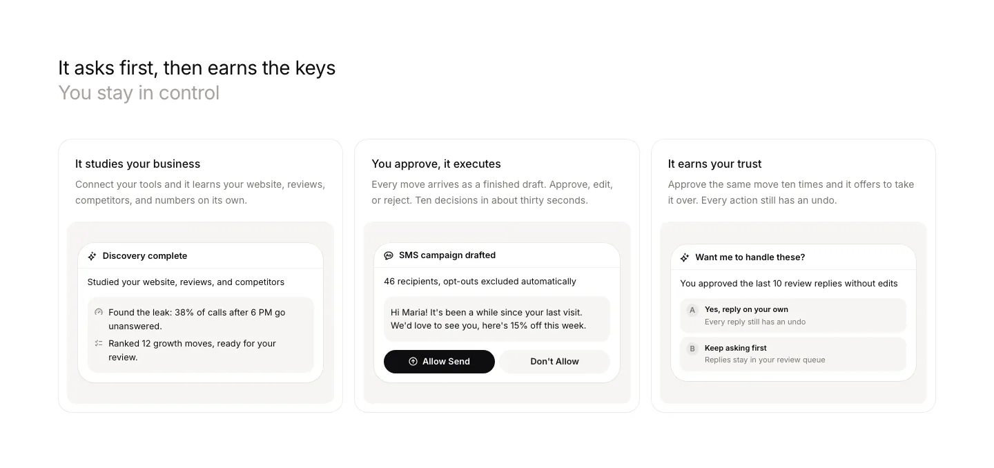
  392. Beside features section: left-aligned headline above three cards, each with a short description and an approval UI snippet
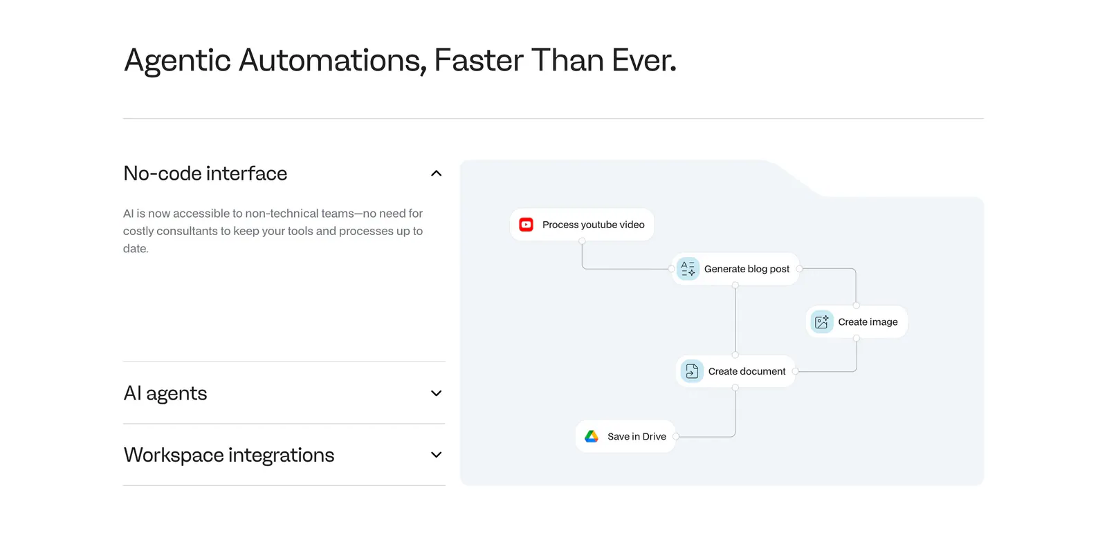
  393. Noxus features section: accordion of feature titles on the left beside a light blue workflow diagram panel on a white background
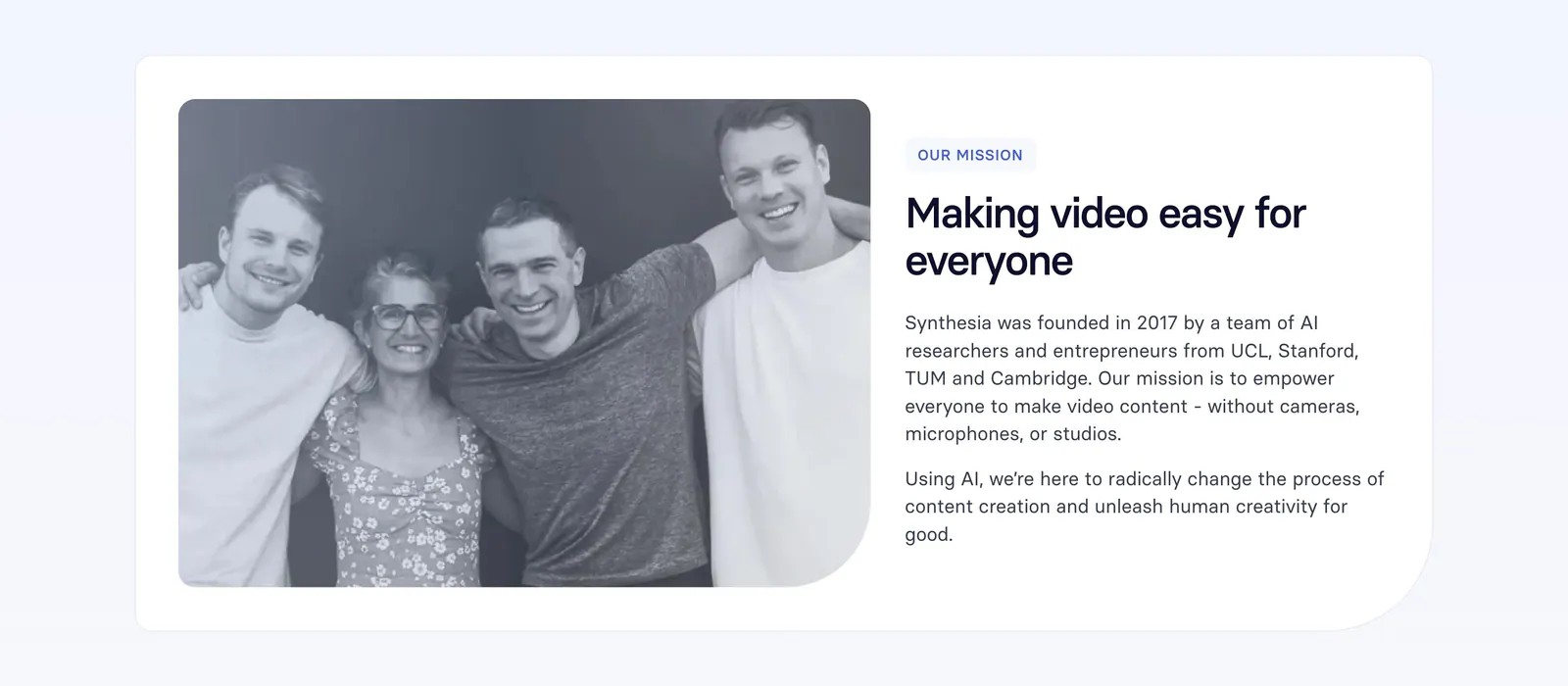
  394. Synthesia about & mission section: black-and-white founders photo on the left with mission label, headline and paragraphs on the right
  395. Ycode about & mission section: two columns of gray paragraph text about closed platforms and open source control on black
  396. Beside features section: headline and intro above a three-column list of twelve capabilities with line icons and short descriptions
  397. Canopy call-to-action section: centered question headline, copy and lime Start now button on a dark grid background
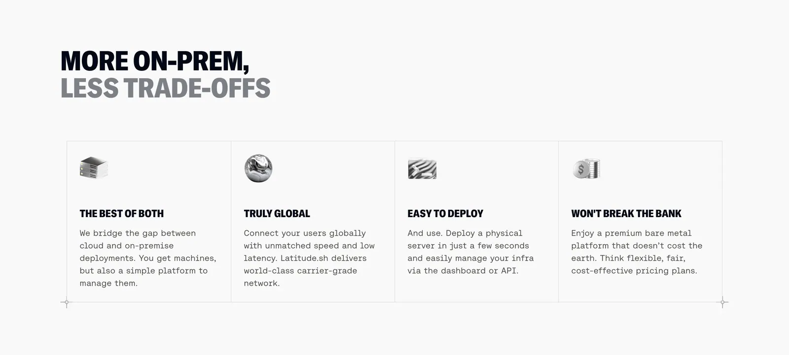
  398. Latitude.sh features section: two-tone uppercase headline above four bordered columns with small 3D icons and monospace copy
  399. Miter logo cloud section: small centered label above a two-row bordered grid of grayscale contractor logos
  400. Clutch Security features section: centered headline above a grayscale isometric access-control illustration and three capability columns
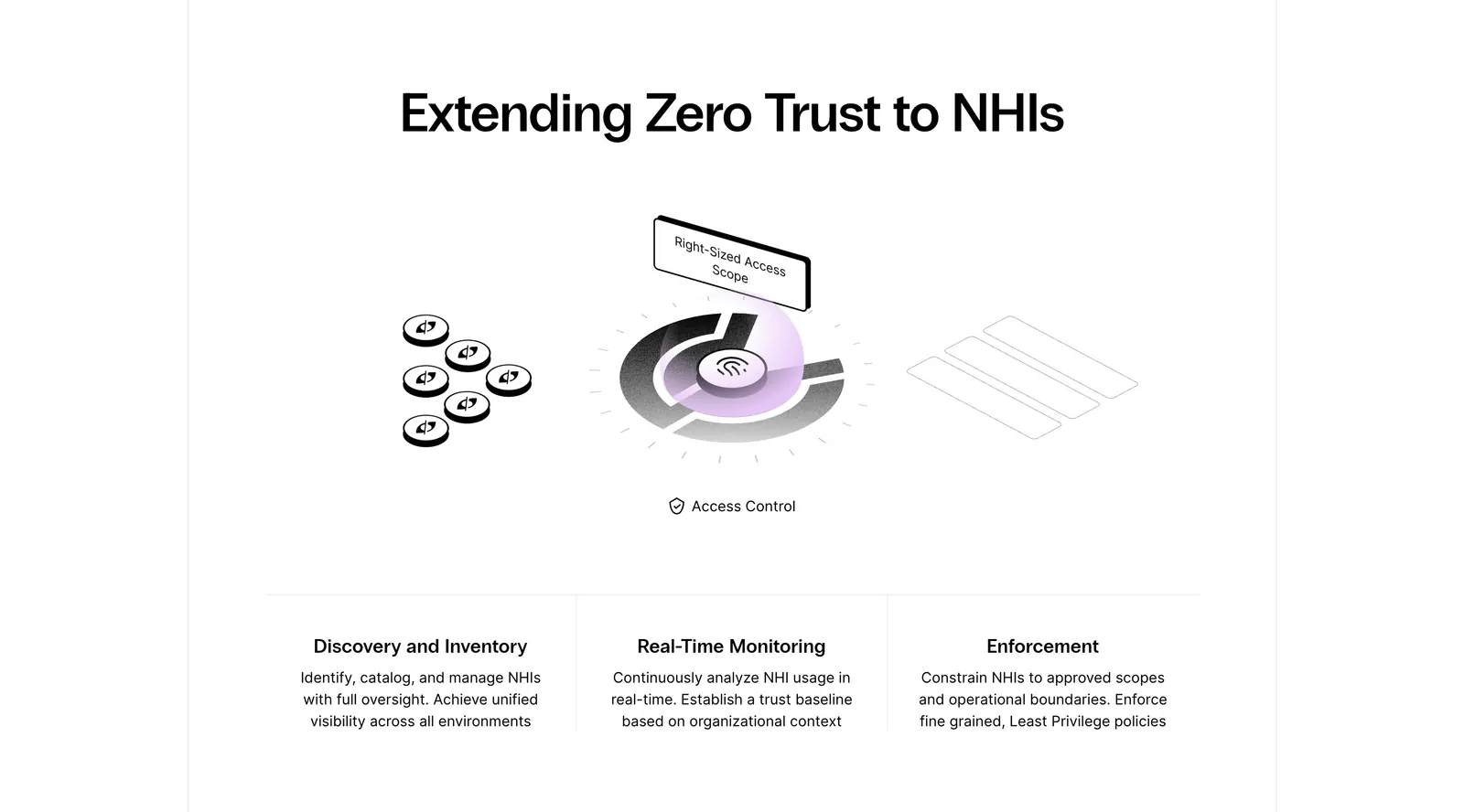
    Clutch Security Features
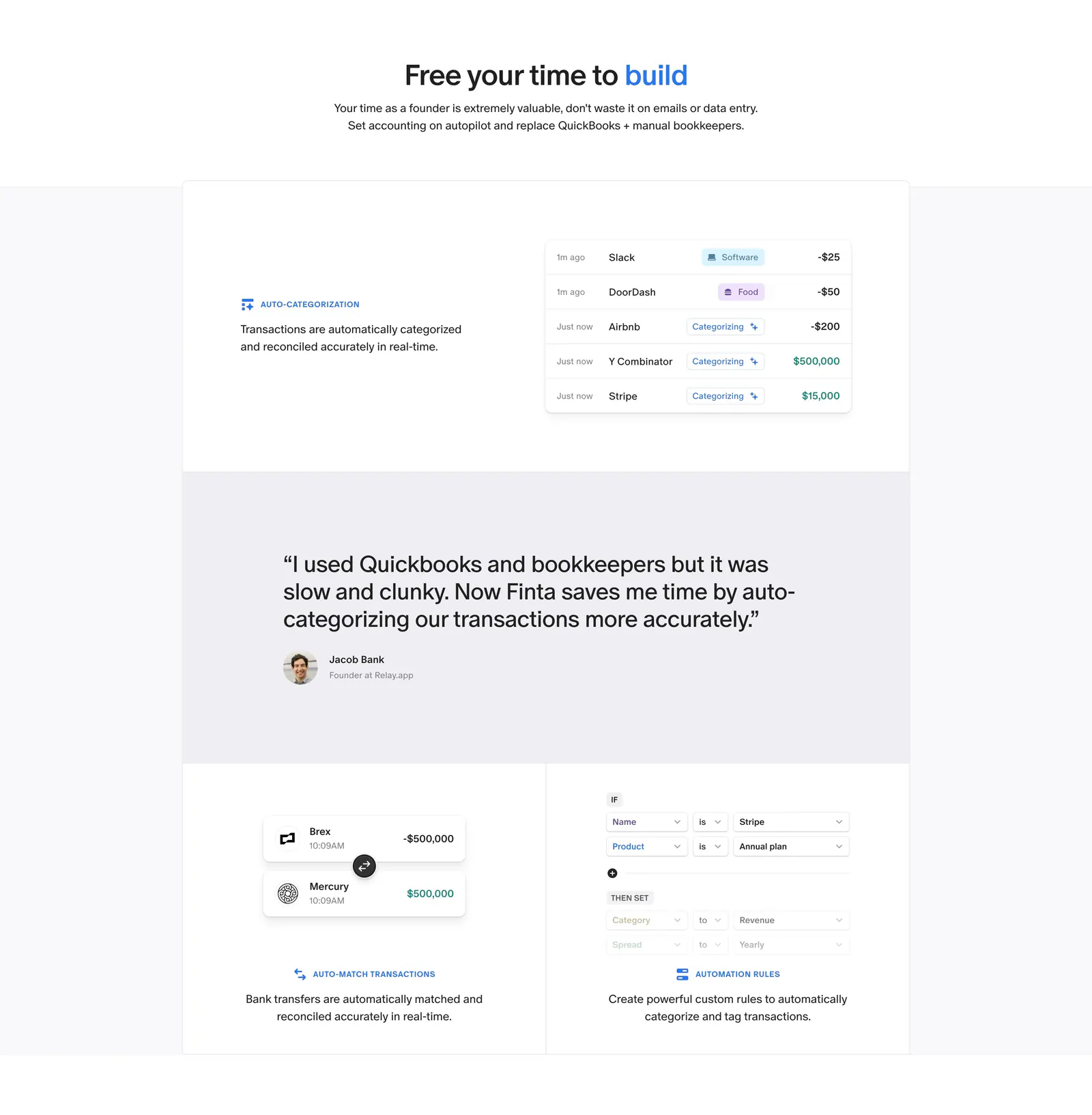
  401. Finta features section: centered headline above bordered tiles with transaction UI snippets and a customer quote band
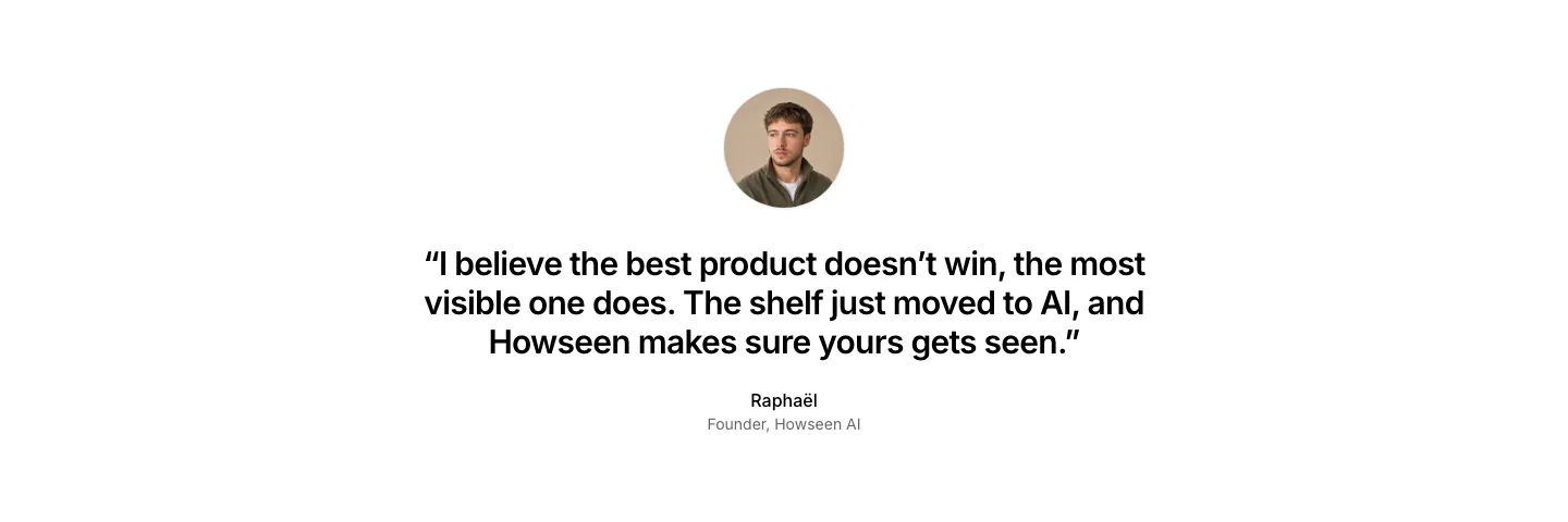
  402. Howseen AI about & mission section: centered founder quote below a circular portrait on a plain white background
  403. Remote features section: centered headline above seven product items with purple icons in rows of four and three
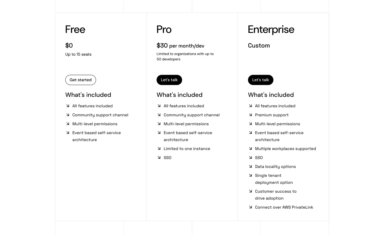
  404. Port pricing section: three bordered plan columns for Free, Pro and Enterprise with prices, buttons and arrow feature lists on white
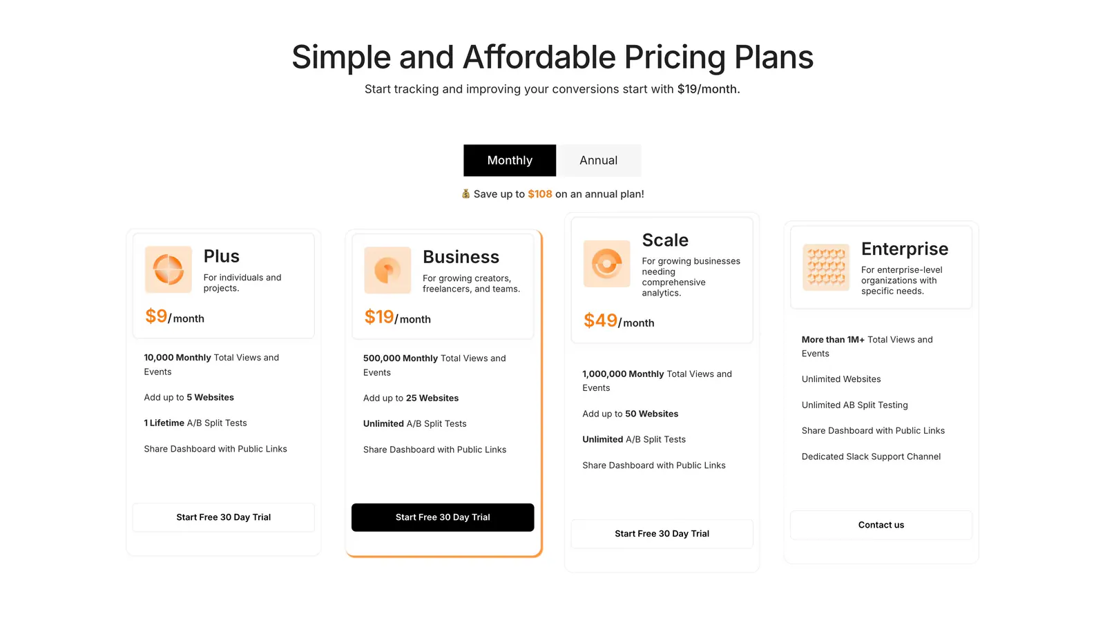
  405. Humblytics pricing section: monthly/annual toggle above four plan cards with orange prices and trial buttons on white
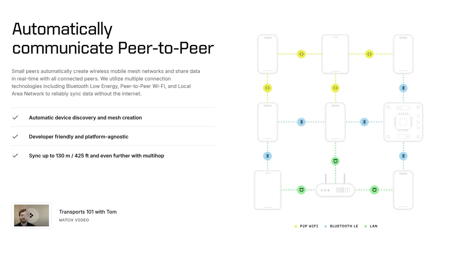
  406. Ditto features section: headline, copy and checklist on the left beside a dotted-line mesh network diagram of phones and devices
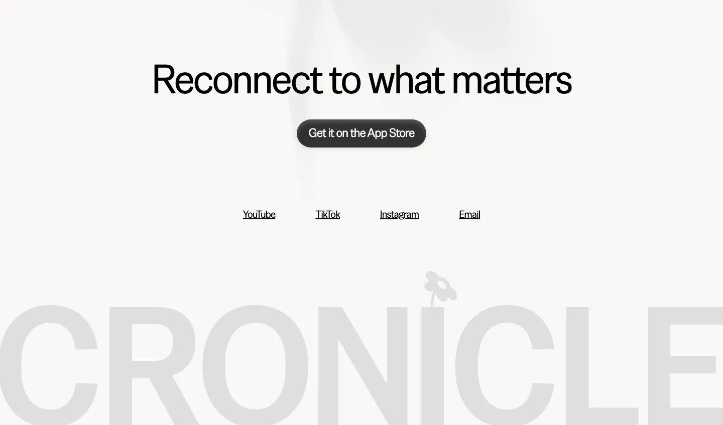
  407. Cronicle footer section: centered headline with an App Store button and social links above a giant faded gray CRONICLE wordmark
    Cronicle Footer
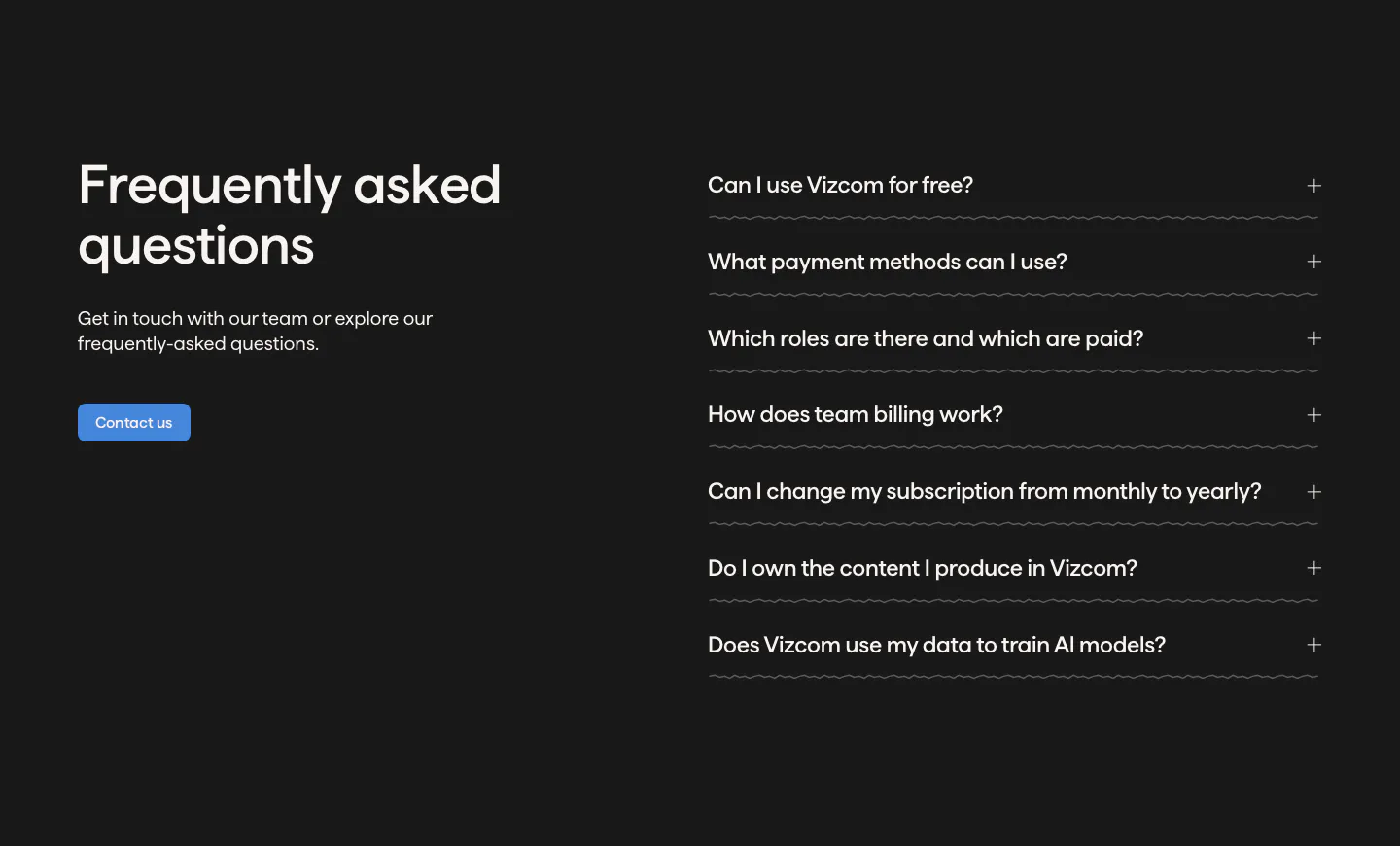
  408. Vizcom FAQ section: headline, copy and contact button on the left beside an accordion of questions on a dark charcoal background
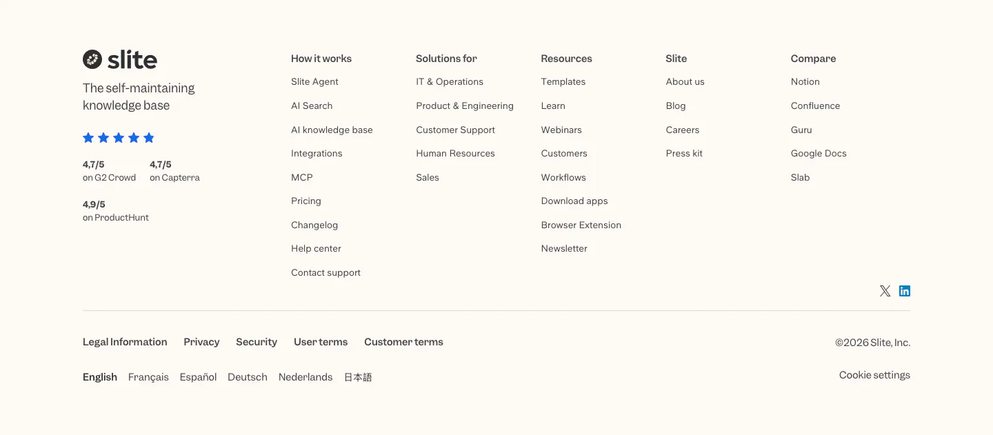
  409. Slite footer section: logo, tagline and review ratings beside five link columns, legal links, language list and copyright on cream
  410. Zamp logo cloud section: centered line of text above a single row of gray customer logos on white
  411. Quartr logo cloud section: two rows of five black customer and partner logos on a white background
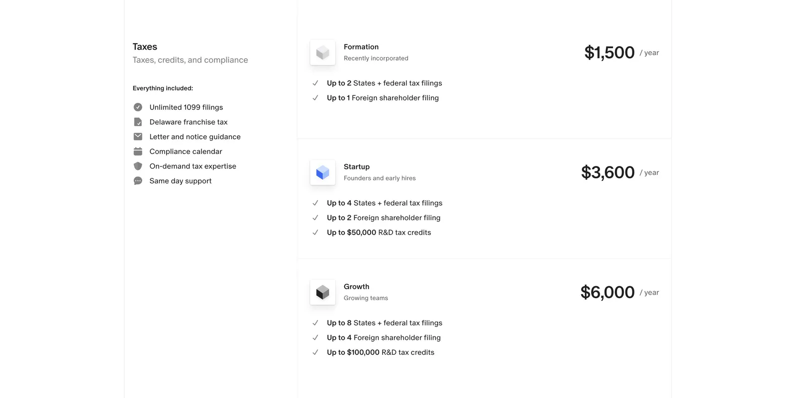
  412. Finta pricing section: Taxes label and included-features list beside three stacked yearly tax plans with prices on white
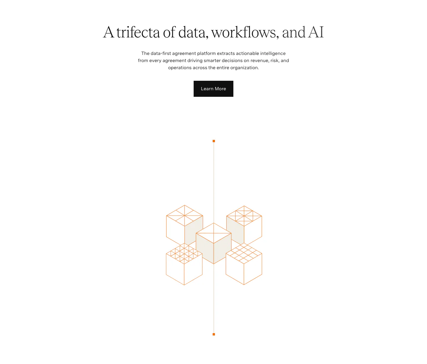
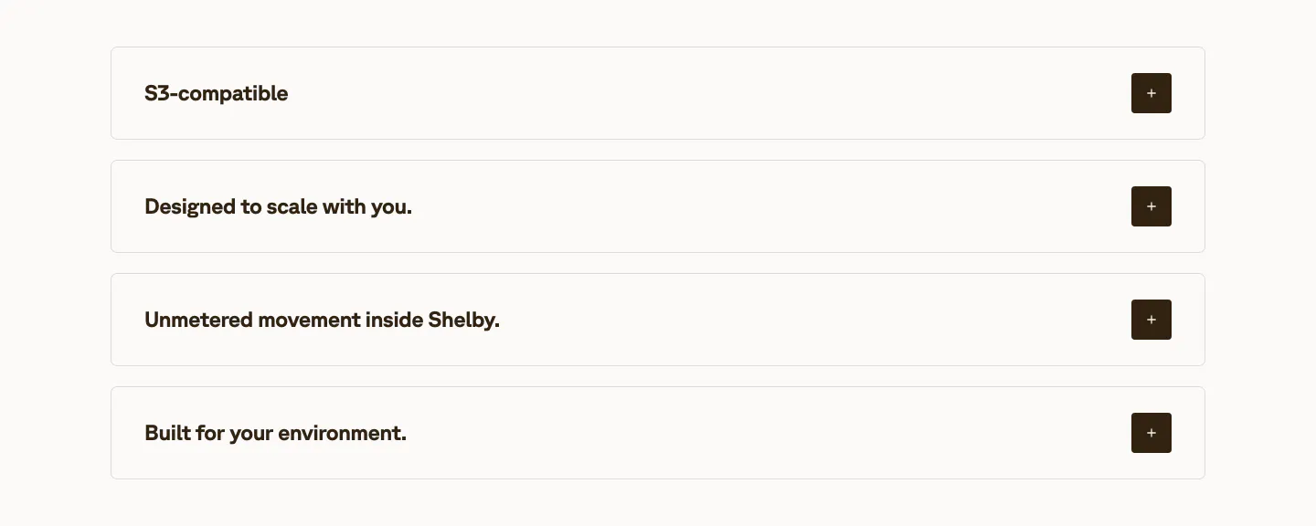
  413. Agiloft value proposition section: centered serif headline, copy and button above an orange isometric line drawing of cubes on white
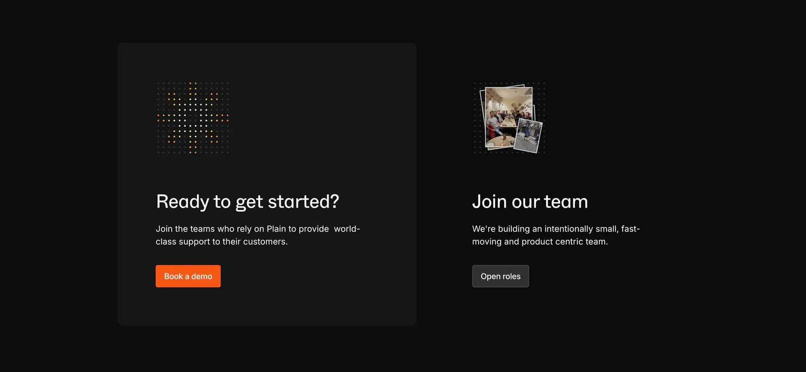
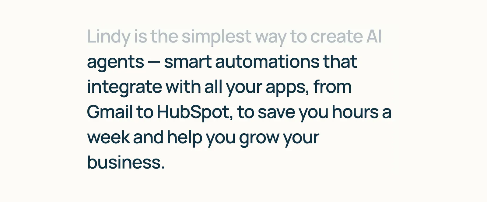
  414. Plain call to action section: dark card with dot icon and orange demo button beside a Join our team block with a small photo stack
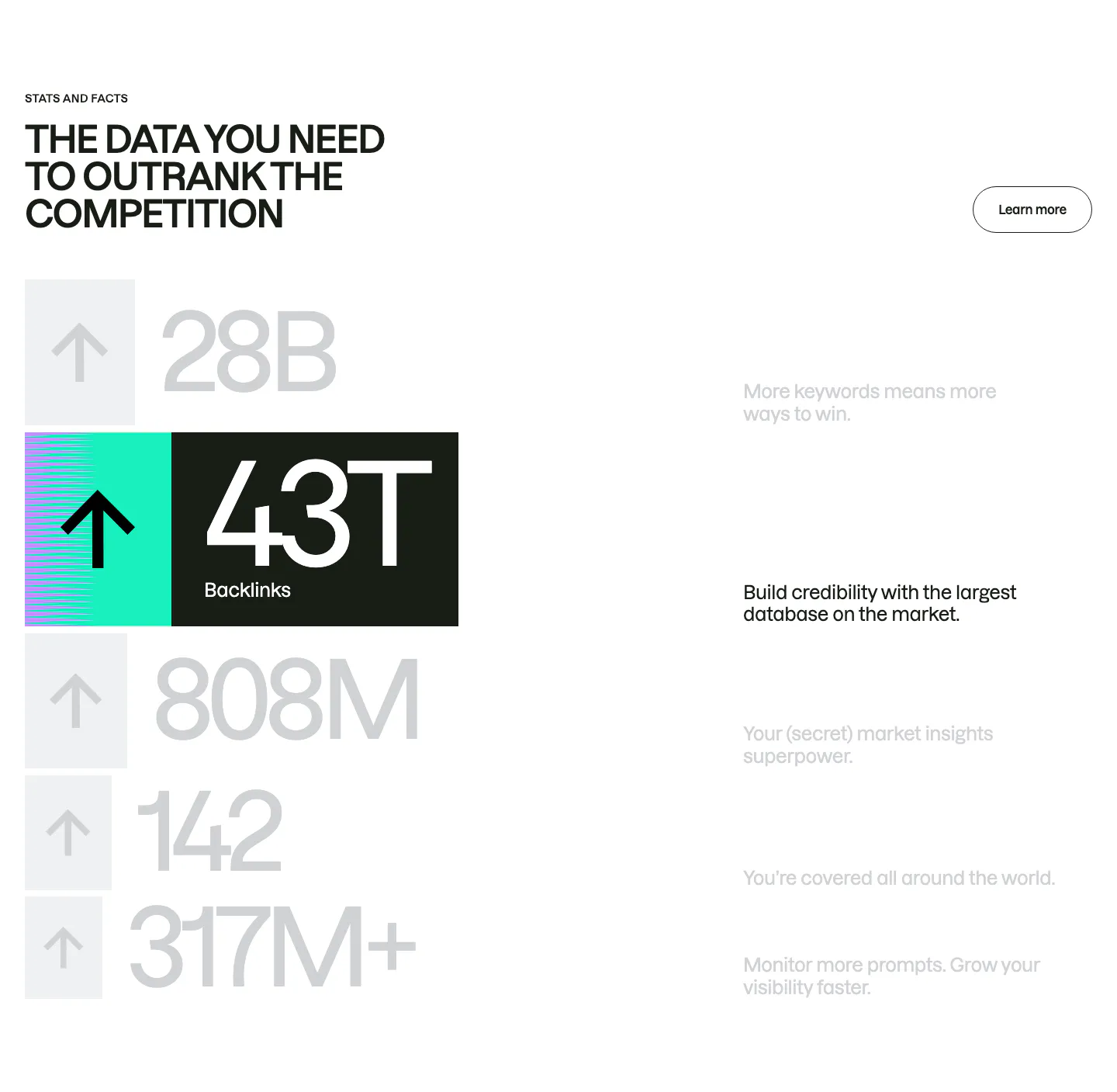
  415. Interfere features section: numbered text block with capability list on the left and an issue inbox board screenshot on the right
  416. Customer.io logo cloud section: two rows of customer logos in bordered cells divided by a trusted-by-9,000+ brands caption
  417. Hellotime logo cloud section: centered caption above a single row of four black agency logos on a white background
  418. Clay logo cloud section: centered heading and funding note above a row of six investor logo tiles with names on white
  419. Spellbook call-to-action section: centered serif headline above an email field and select dropdown with a white button on a dark background
  420. Amplemarket FAQ section: headline on the left and an accordion of five questions with plus icons on the right, on off-white
  421. Interfere blog & resources section: changelog heading above three dated release notes in columns on a white background
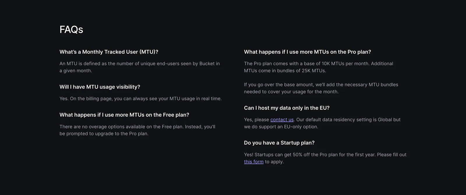
  422. Shelby value proposition section: four stacked accordion rows of benefit titles with dark plus buttons on an off-white background
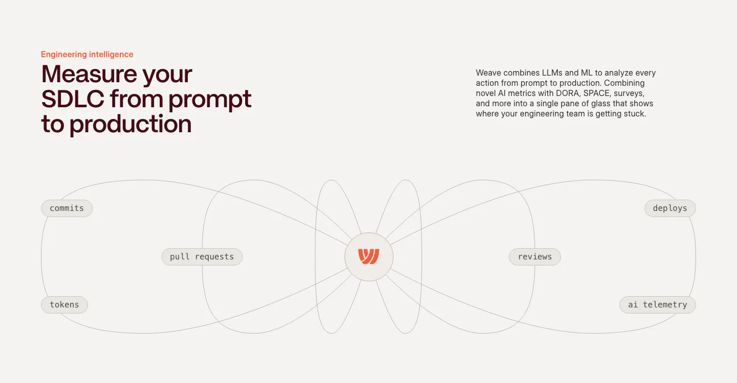
  423. Lindy about & mission section: large left-aligned mission statement with the first line faded to gray, on a warm off-white background
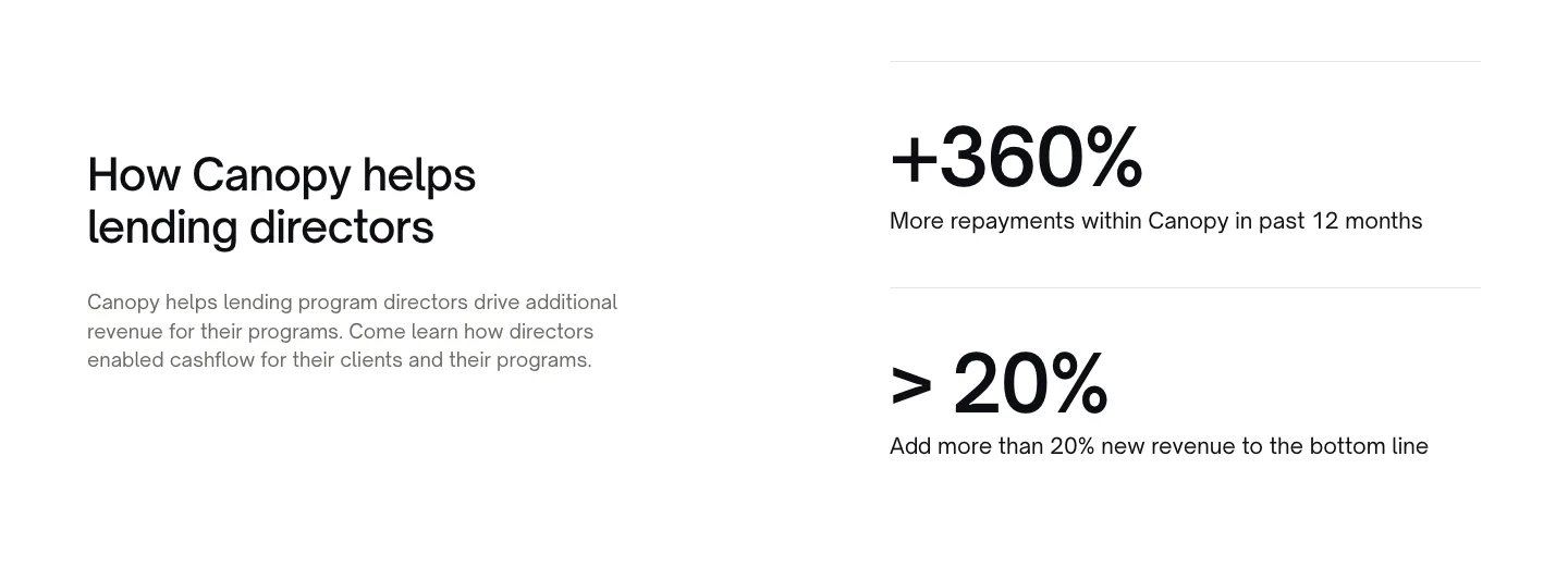
  424. Semrush stats section: uppercase headline above a stacked list of huge gray numbers with arrow tiles, one highlighted 43T backlinks row
  425. Interfere how it works section: multi-line headline above three numbered columns with faded UI and code vignettes on white
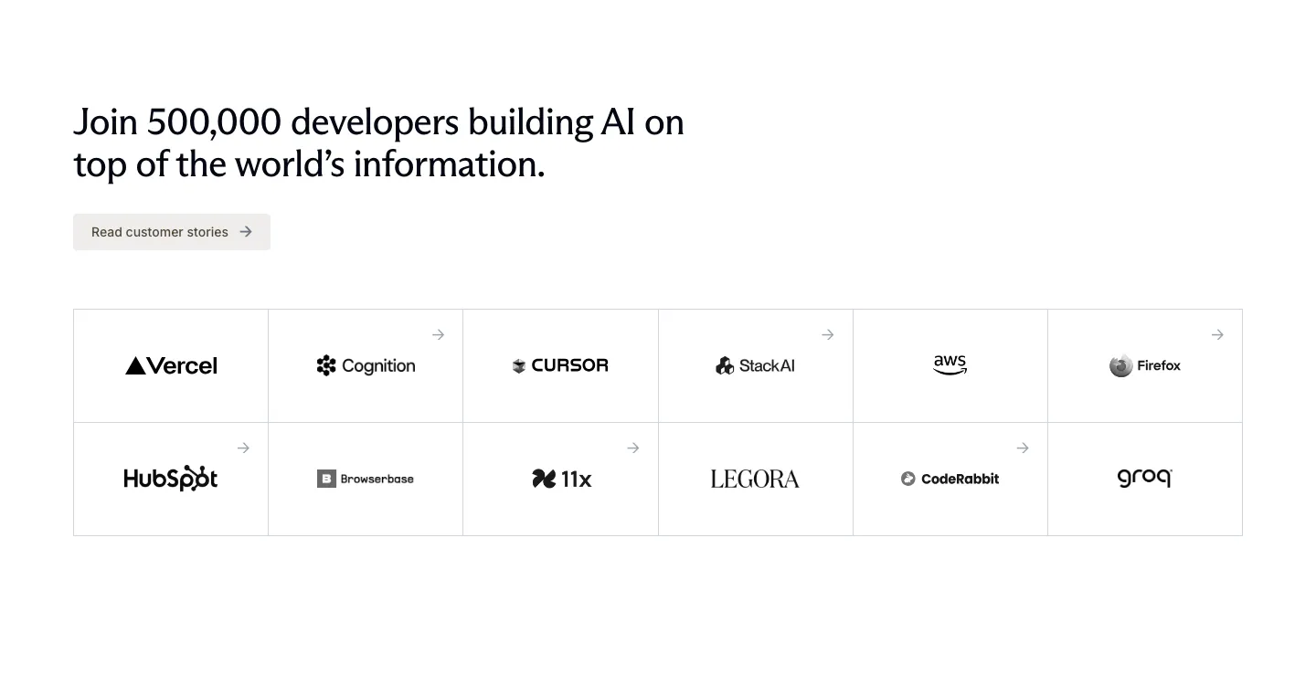
  426. Exa logo cloud section: left-aligned headline and customer stories button above a bordered six-by-two grid of customer logos
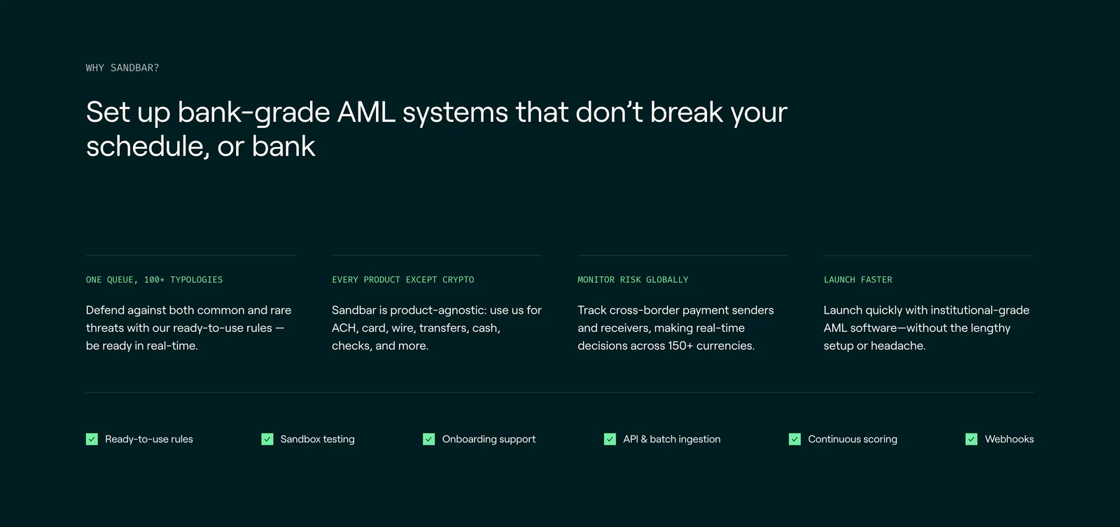
  427. Sandbar features section: left-aligned headline above four benefit columns and a row of checklist items on a dark teal background
  428. Rezolv call-to-action section: light blue rounded banner with left-aligned headline and Get in touch button and curved line art
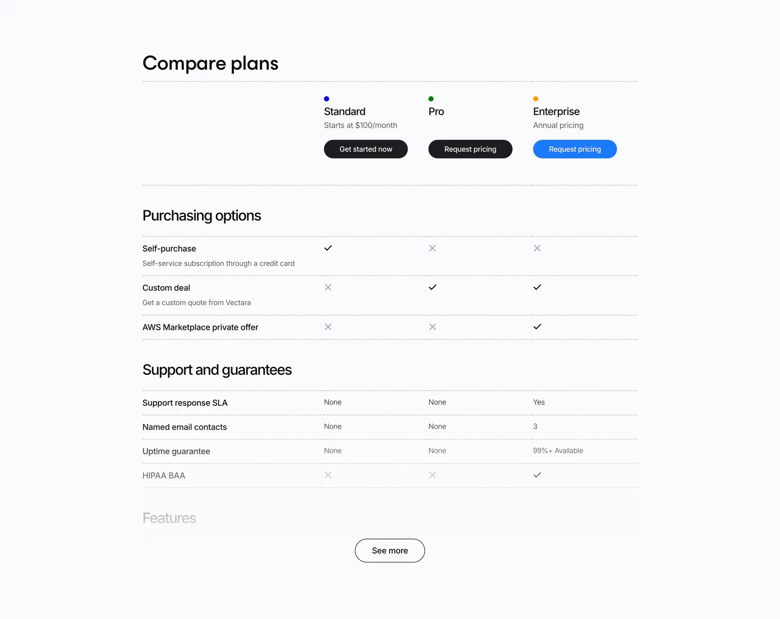
  429. Vectara pricing section: plan comparison table with check and cross marks for Standard, Pro and Enterprise and a See more button
  430. Routable value proposition section: strip of four serif italic metrics with arrows and labels separated by dotted dividers on light gray
  431. Bucket FAQ section: FAQs heading above a two-column list of questions and answers on a dark background
  432. Weave features section: headline and copy above a line diagram connecting commits, PRs, tokens, reviews and deploys to a central logo
  433. Canopy stats section: heading and copy on the left, two large percentage metrics with labels on the right, white background
  434. Antimetal logo cloud section: centered caption above three rows of grayscale customer logos on a light background
  435. Orbi value proposition section: centered problem headline above three rows pairing red-accent chart tiles with short text on dark gray
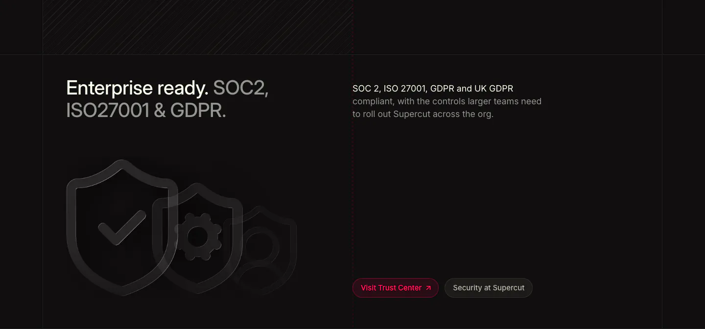
  436. Supercut security section: two-tone headline at left, compliance copy at right, outlined shield icons and Trust Center buttons
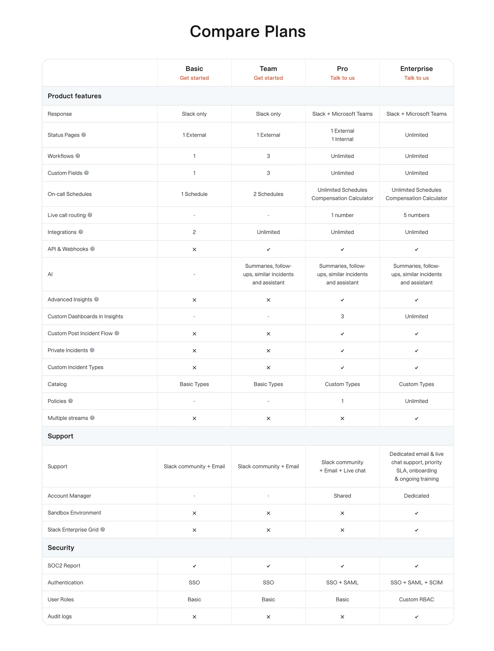
  437. incident.io pricing section: plan comparison table with grouped feature rows and check and cross marks on white
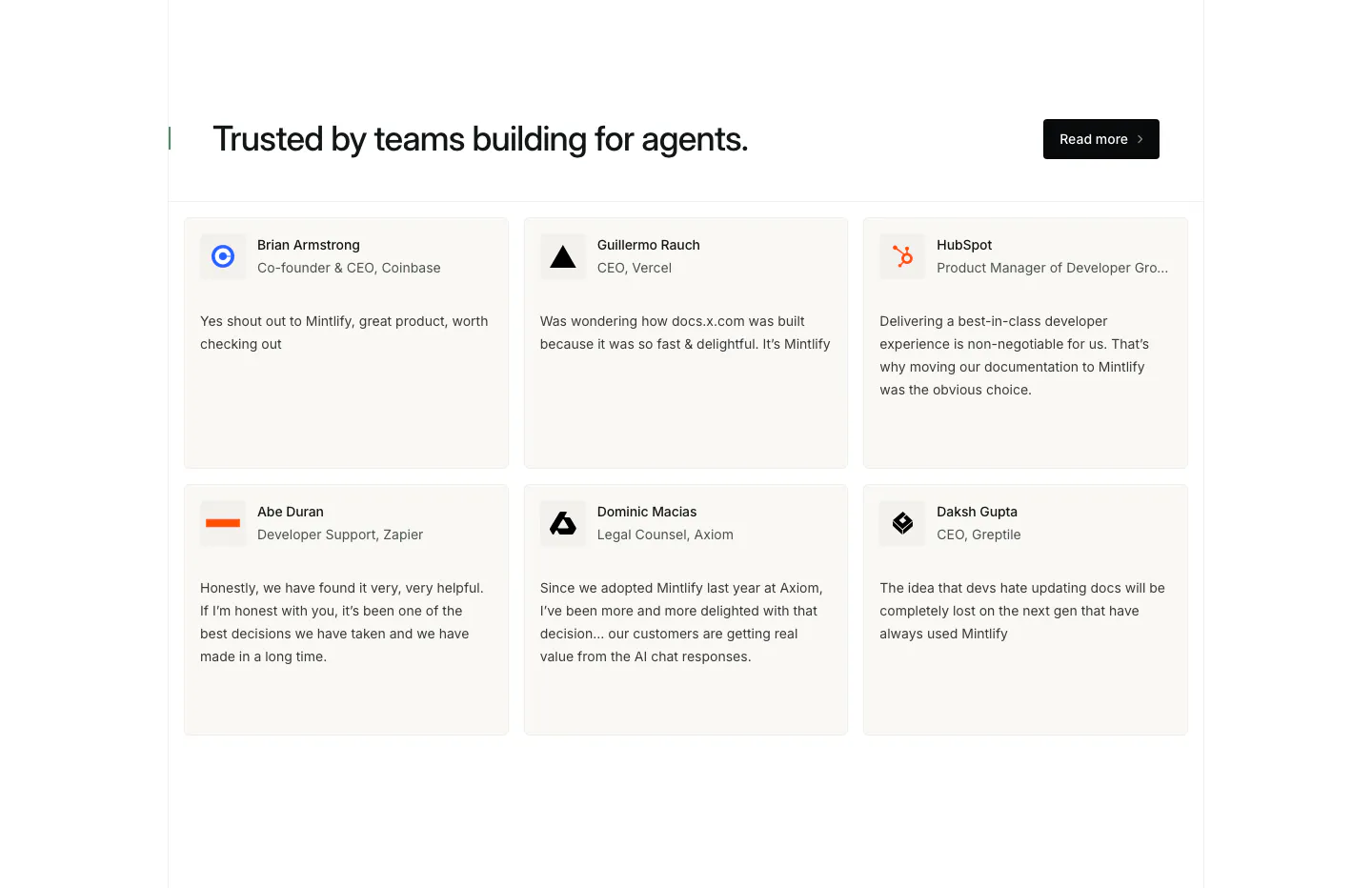
  438. Mintlify testimonials section: headline with Read more button above a two-row grid of six quote cards with names and logos
  439. Evervault logo cloud section: two rows of six white customer logos above a centered trust caption on a near-black background
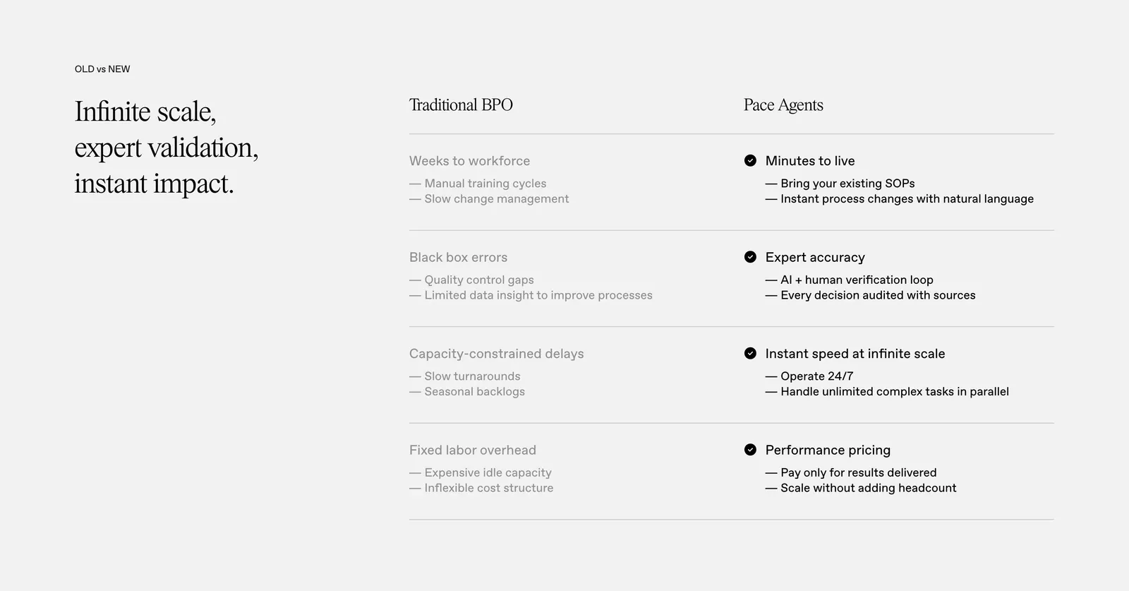
  440. Pace comparison section: serif headline on the left beside a two-column Traditional BPO vs Pace Agents table with checkmarks on light gray
    Pace Comparison
  441. Ruul call-to-action section: bold uppercase headline, copy and yellow button beside a three-item checklist in a dark green card
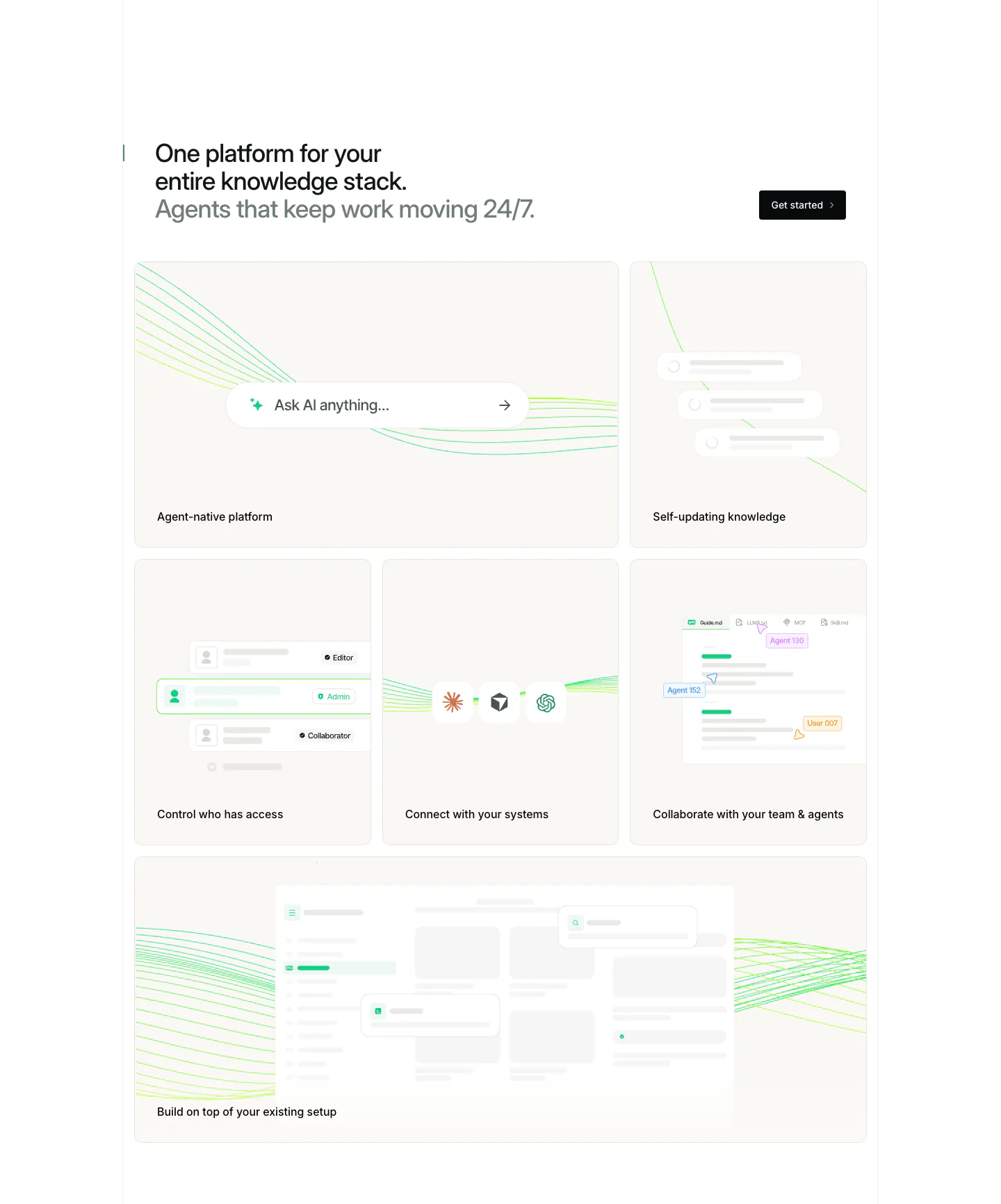
  442. Mintlify features section: headline with button above a bento grid of light cards with abstract UI mockups and green line art
  443. Arcade testimonials section: centered quote under a G2 five-star rating with a handwritten signature and job title
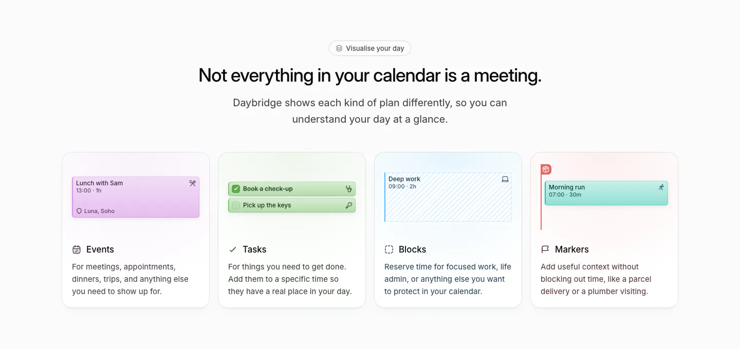
  444. Daybridge features section: centered headline above four equal cards for events, tasks, blocks and markers with UI snippets
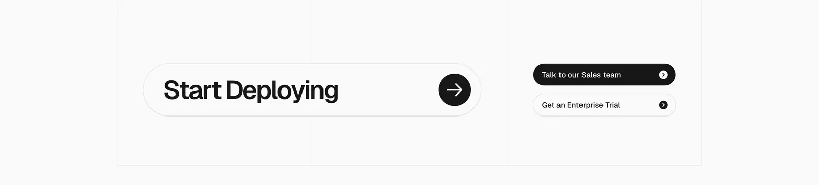
  445. Vercel call-to-action section: large Start Deploying pill with arrow button beside two sales and trial buttons on a gray grid
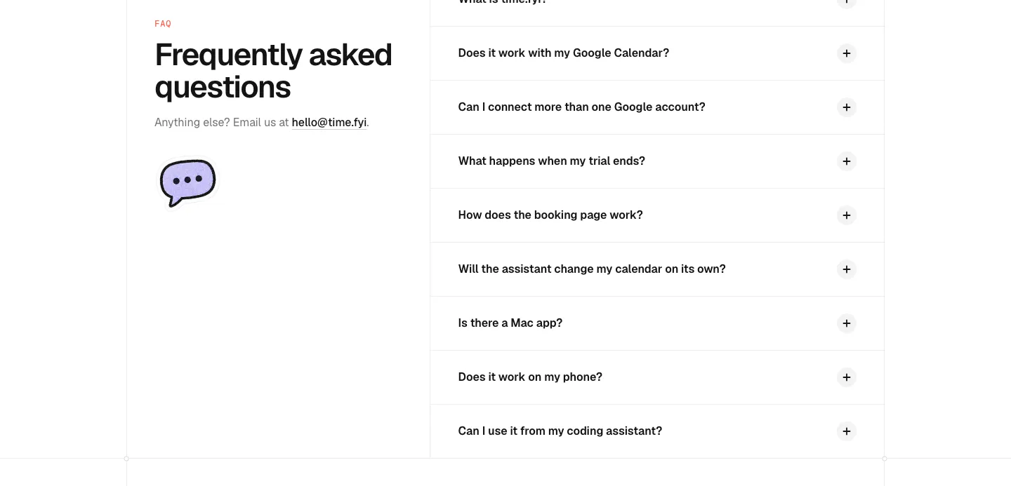
  446. time.fyi FAQ section: left headline with email contact and chat bubble icon beside a right-hand accordion of collapsed questions
  447. Steel value proposition section: three metrics in a bordered row showing tokens scraped, browser hours and session start time on dark gray
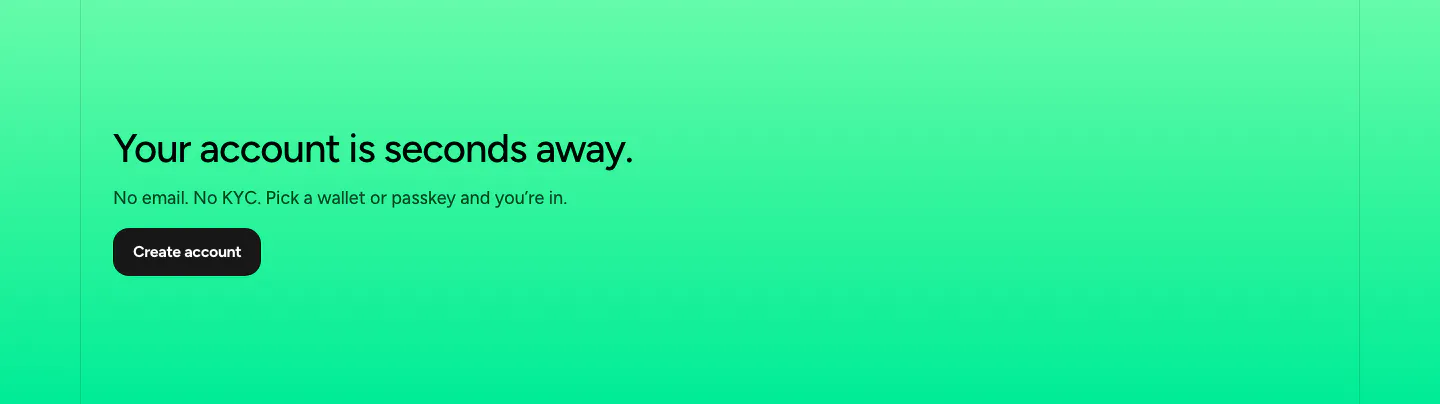
  448. NEAR call-to-action section: left-aligned headline, short copy and dark button on a bright green gradient band
  449. Rogo security section: serif headline on dark green beside a grid of six compliance badges such as SOC 2, ISO and GDPR
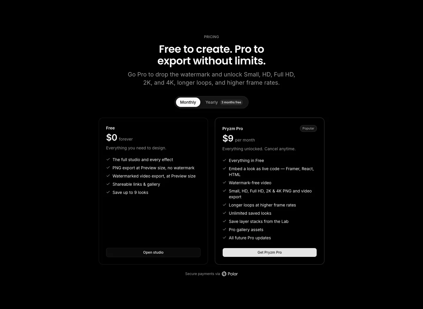
  450. Pryzm pricing section: black background with centered headline, monthly/yearly toggle and two plan cards with feature checklists
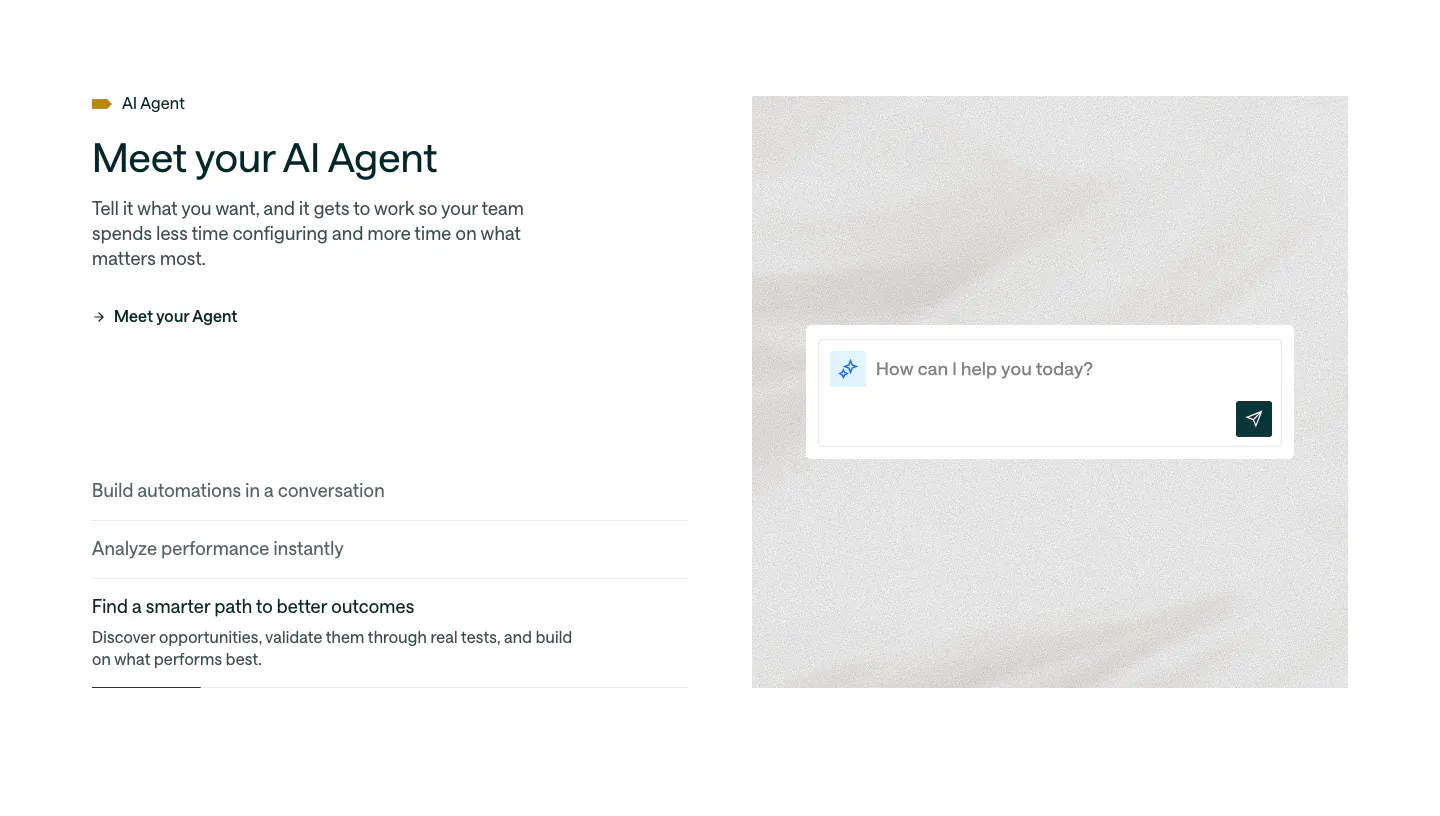
  451. Customer.io features section: split layout with headline and accordion list beside an AI agent chat input on a soft textured panel
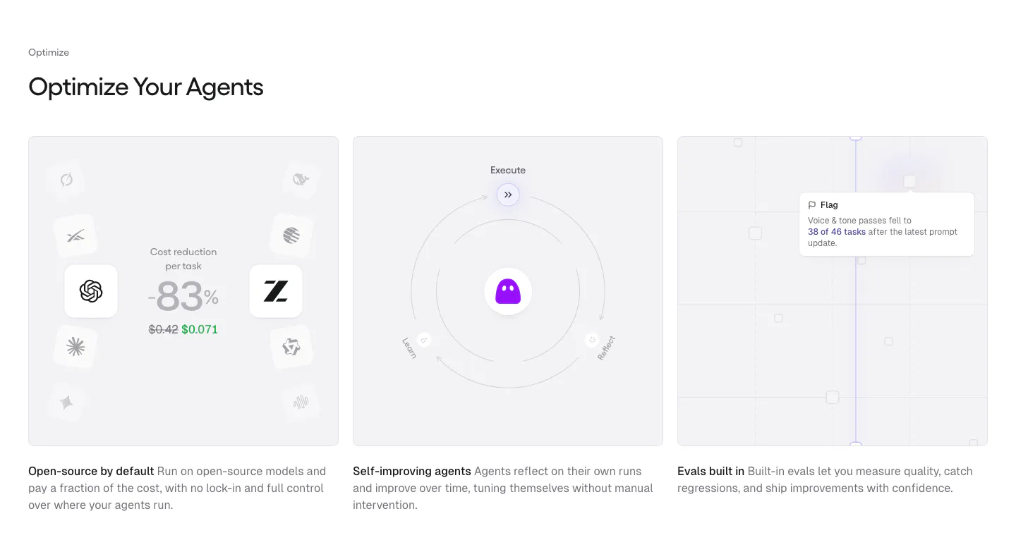
  452. Gumloop features section: left-aligned heading above three equal gray cards with cost, self-improving and evals visuals
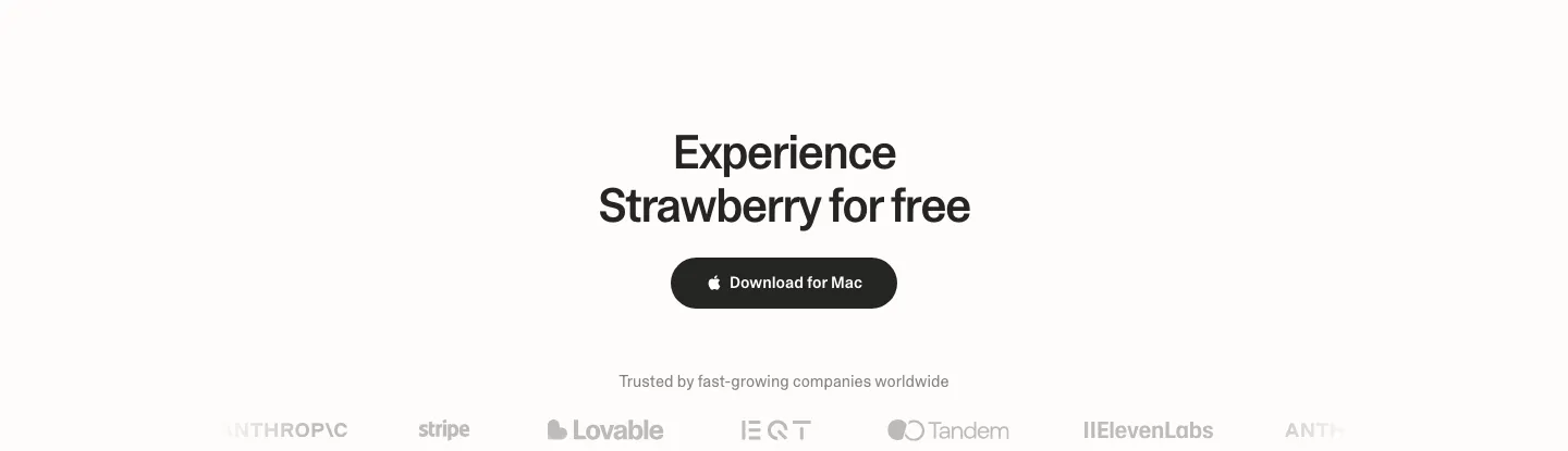
  453. Strawberry call to action section: centered headline and dark download button above a faded customer logo strip
  454. Unsiloed features section: left headline above three bordered columns numbered 01 to 03 describing model architecture components on white
  455. Linear footer section: dark footer with a logo mark, five link columns and a row of legal links
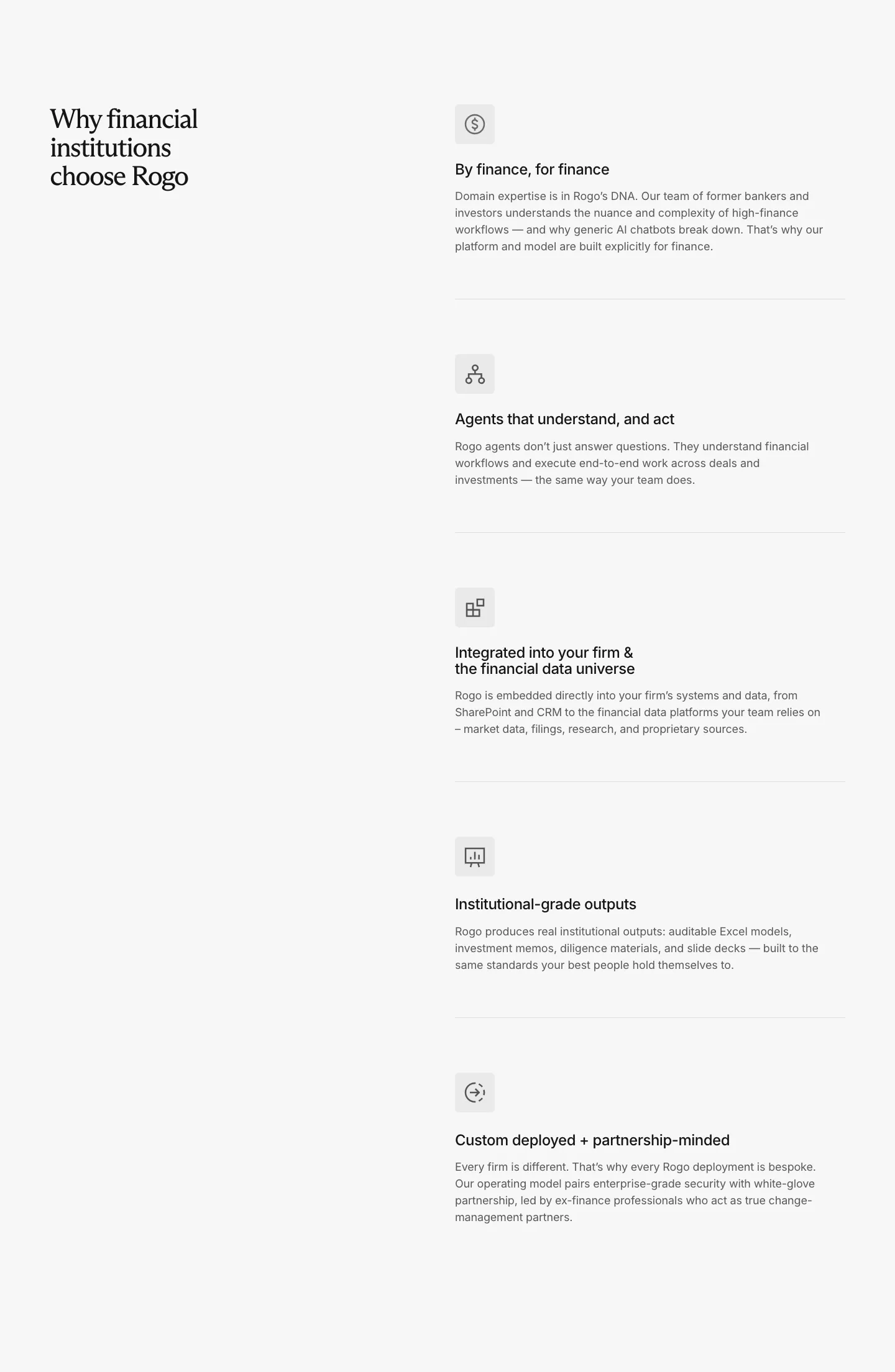
  456. EchoFi footer section: office, contact email, navigation and community link columns with copyright on near-black
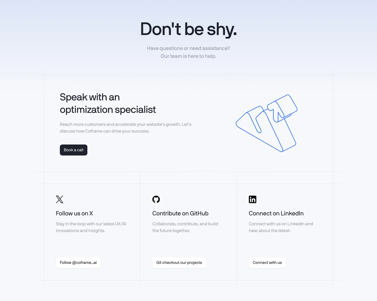
  457. Coframe contact section: centered headline, book-a-call card with outline logo artwork and three social link cards on a grid background
  458. DevRev logo cloud section: centered gray caption above a single row of six monochrome customer logos on white
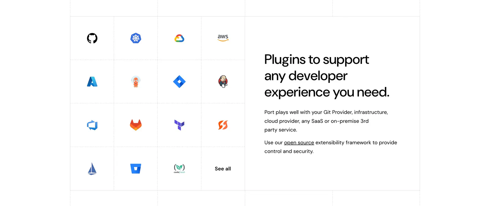
  459. Port integrations section: grid of developer tool icons on the left beside a headline and short copy on the right, white background
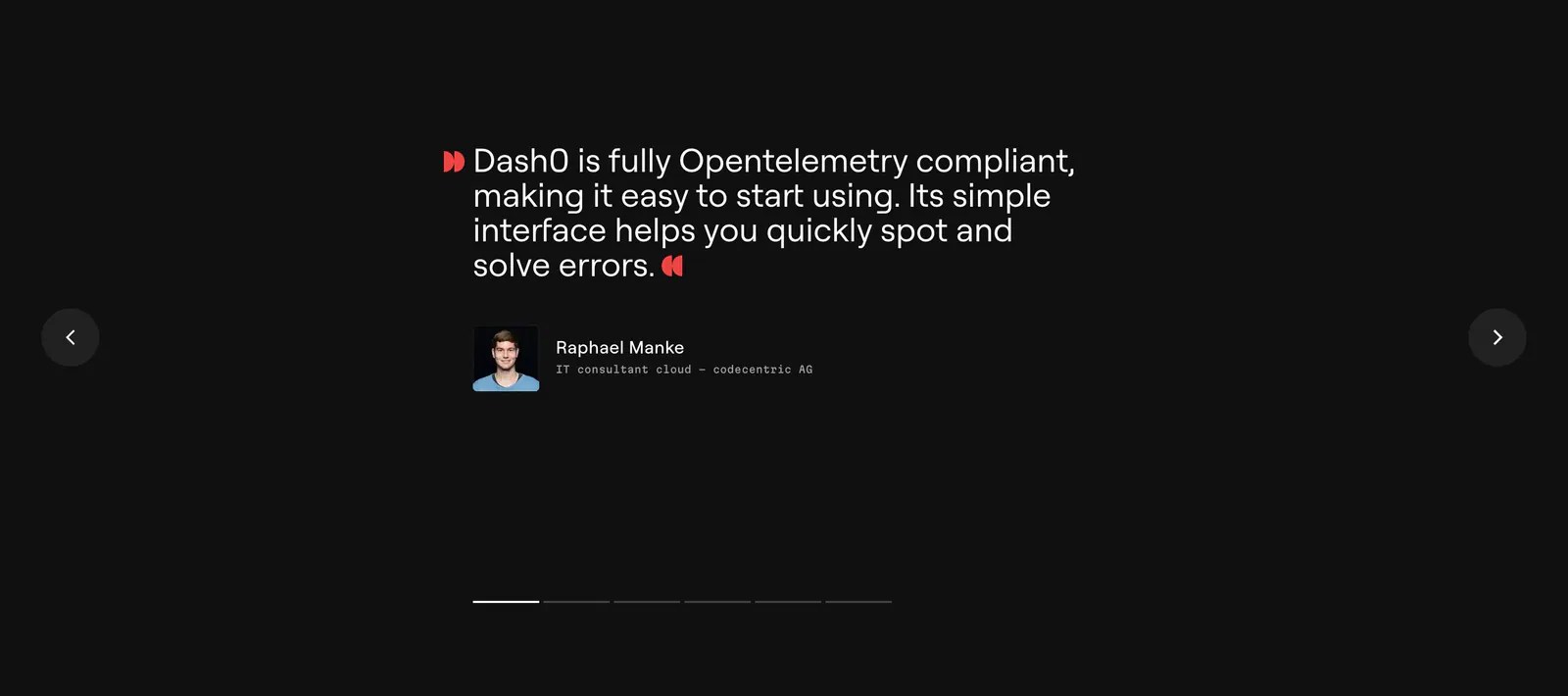
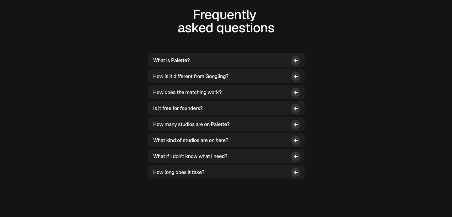
  460. Dash0 testimonials section: single customer quote with avatar between prev/next arrows and pagination bars on a near-black background
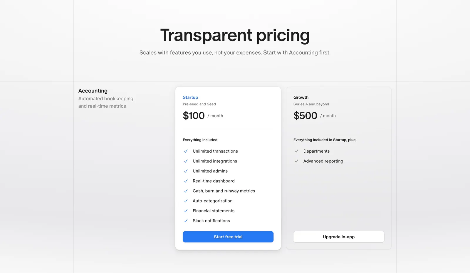
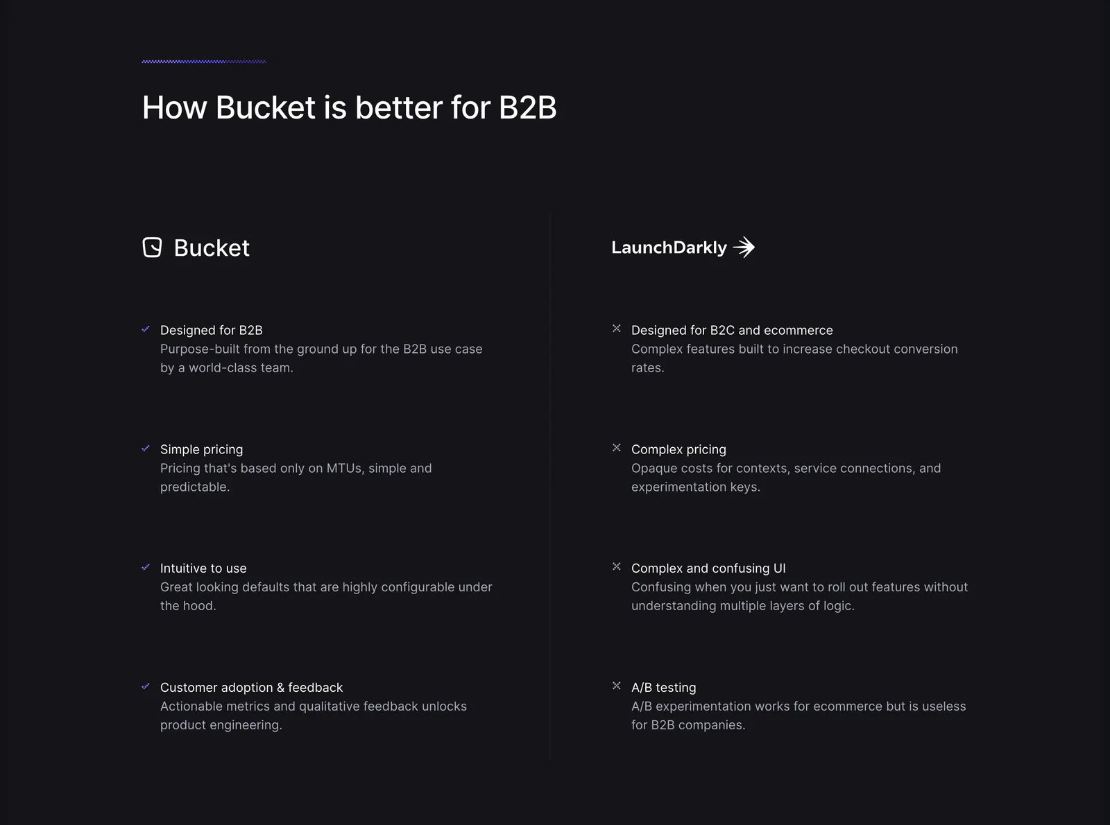
  461. Finta pricing section: centered heading above Startup and Growth monthly plan cards with checklists on a light gray background
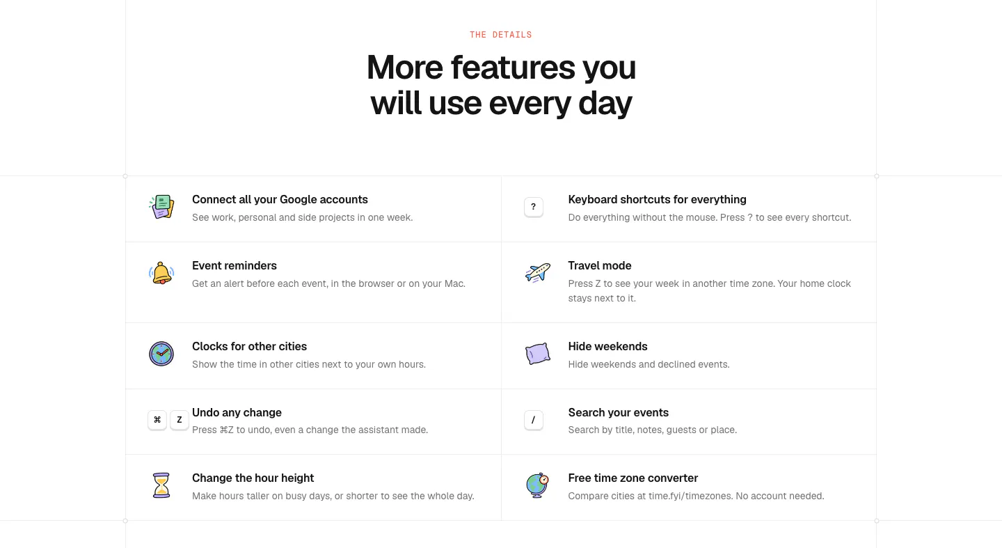
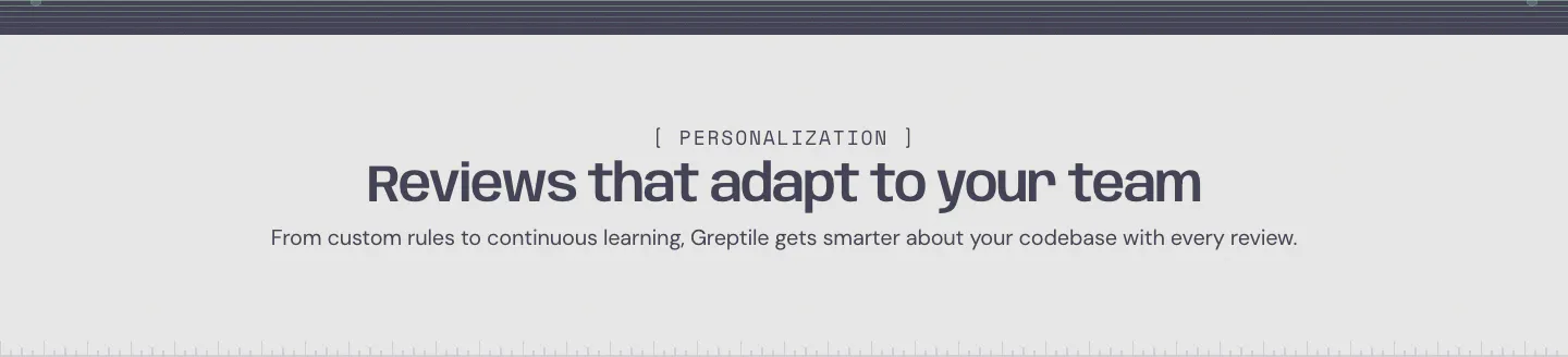
  462. time.fyi features section: centered headline above a two-column grid of ten features with colorful hand-drawn icons
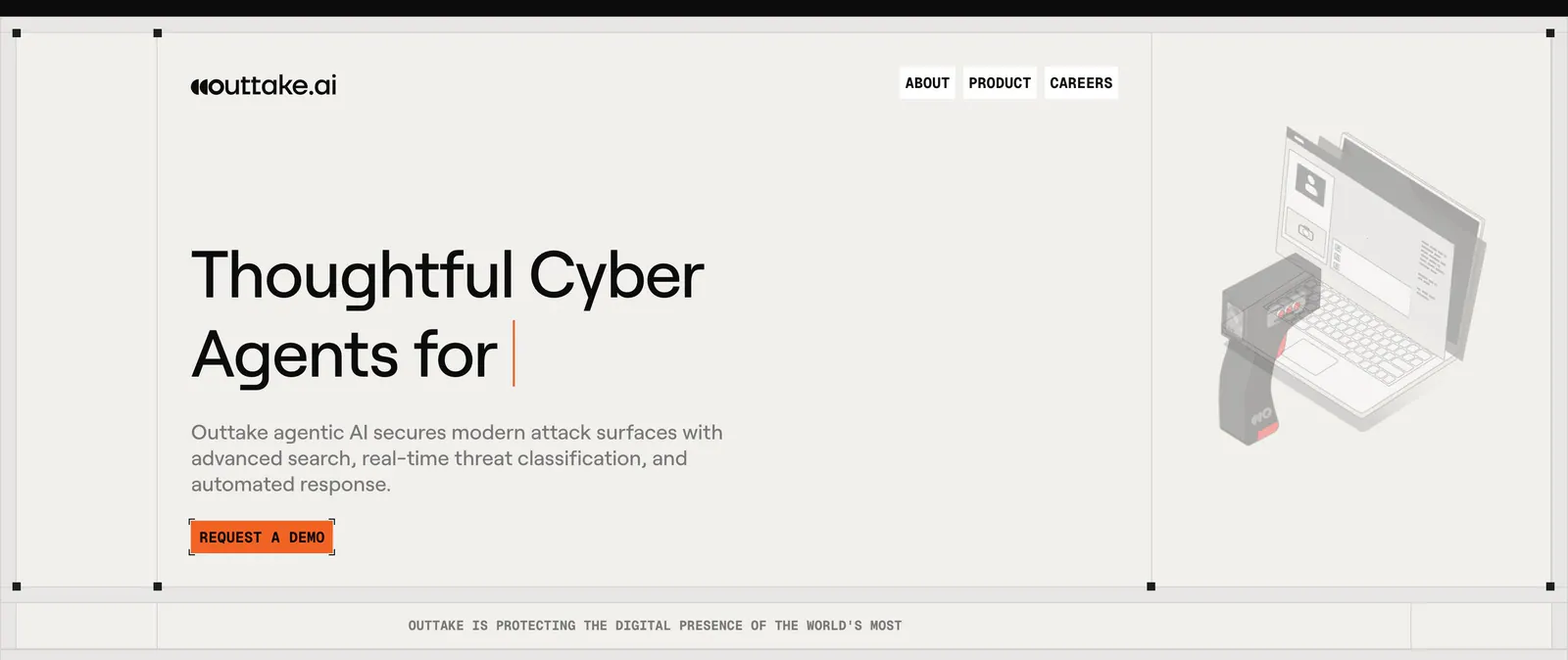
  463. Figr logo cloud section: centered serif heading above a single fading row of customer logos like Airtable and monday.com
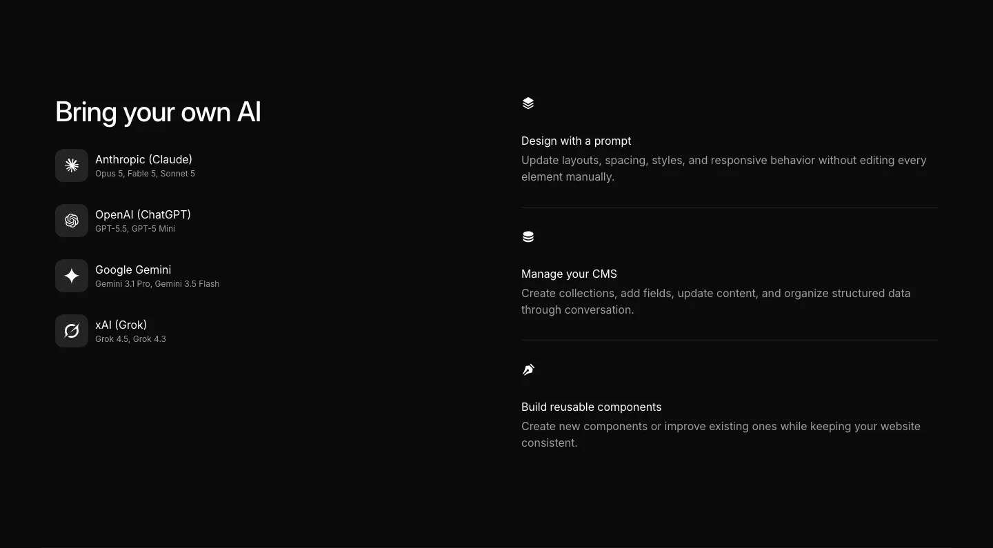
  464. Ycode integrations section: headline over four AI provider rows with icons on the left, three AI feature rows on the right, black
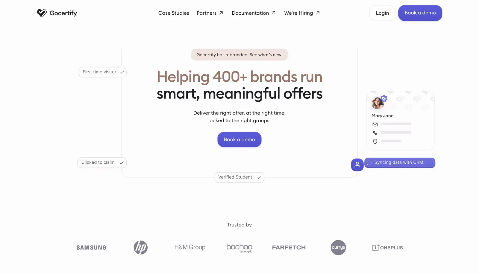
  465. Gocertify hero section: centered two-tone headline with demo button framed by floating verification chips and a profile card, logo row below
  466. Rogo value proposition section: serif headline on the left, five stacked benefit rows with icons and descriptions on the right
  467. Canopy call-to-action section: centered headline, short copy and lime Get started button on a dark grid background
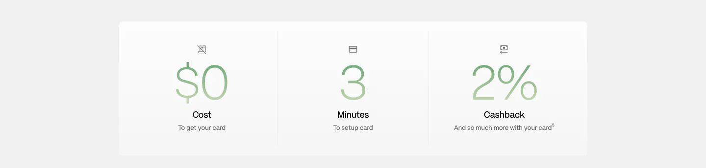
  468. Plasma stats section: white panel with three large green gradient figures for cost, setup minutes and cashback
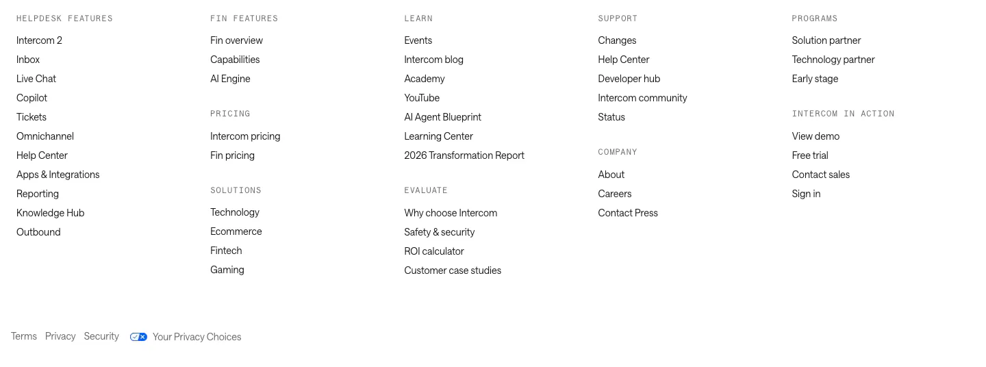
  469. Intercom footer section: five columns of grouped links under monospace labels with a row of legal links on white
  470. Palette FAQ section: centered headline above a narrow accordion of eight collapsed questions with plus icons on a dark background
  471. Bucket comparison section: headline above two columns contrasting Bucket checkmarks with LaunchDarkly crosses on a dark background
  472. Greptile features section: centered eyebrow label, headline and one-line subtitle on a light gray band with a striped top edge
  473. Outtake hero section: left-aligned headline with typing cursor and orange demo button beside an isometric scanner and laptop illustration on beige
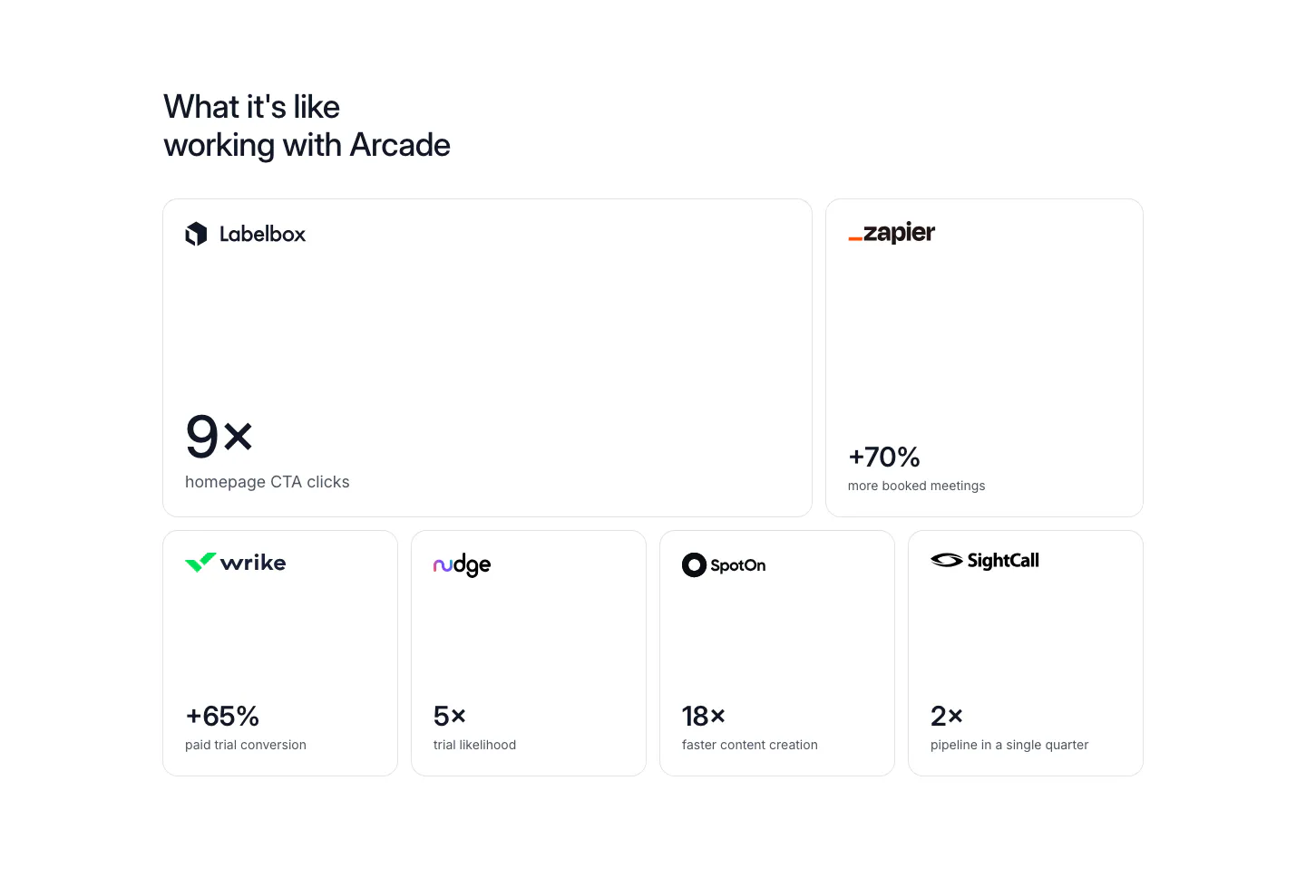
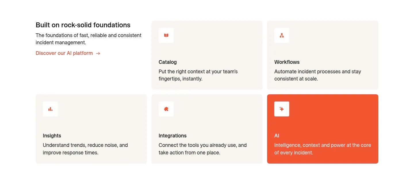
  474. Arcade stats section: bento grid of six bordered cards, each with a customer logo and a large result metric like 9x or +70%
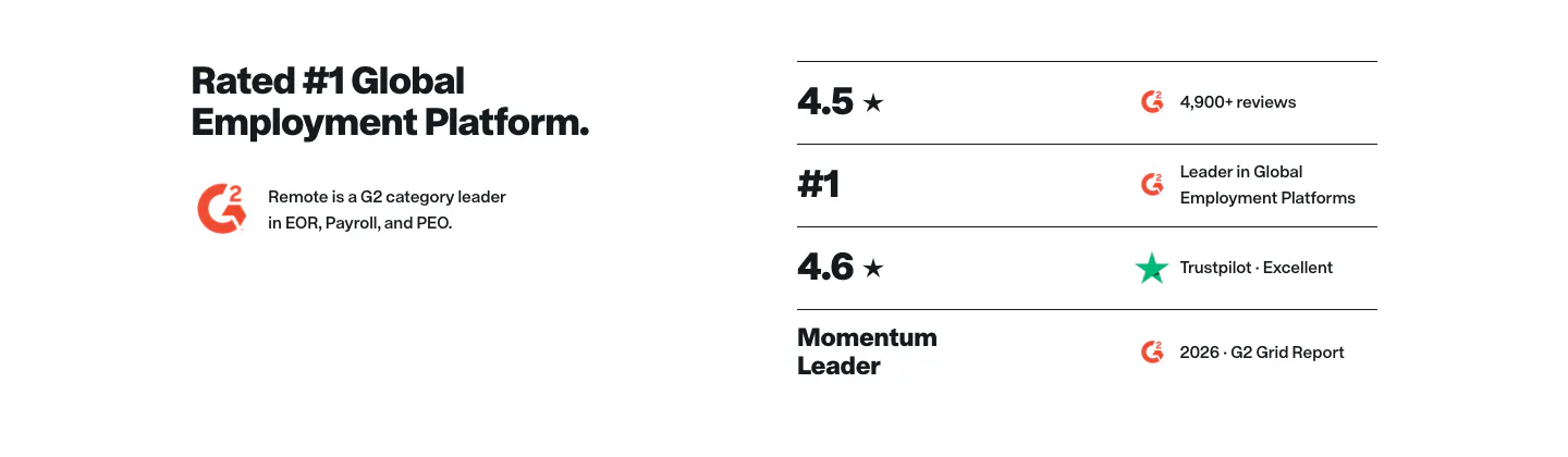
  475. Remote testimonials section: headline and G2 badge on the left beside a list of ratings from G2 and Trustpilot
  476. Wiza logo cloud section: single row of customer logos above G2 and Chrome Store rating badges on a white background
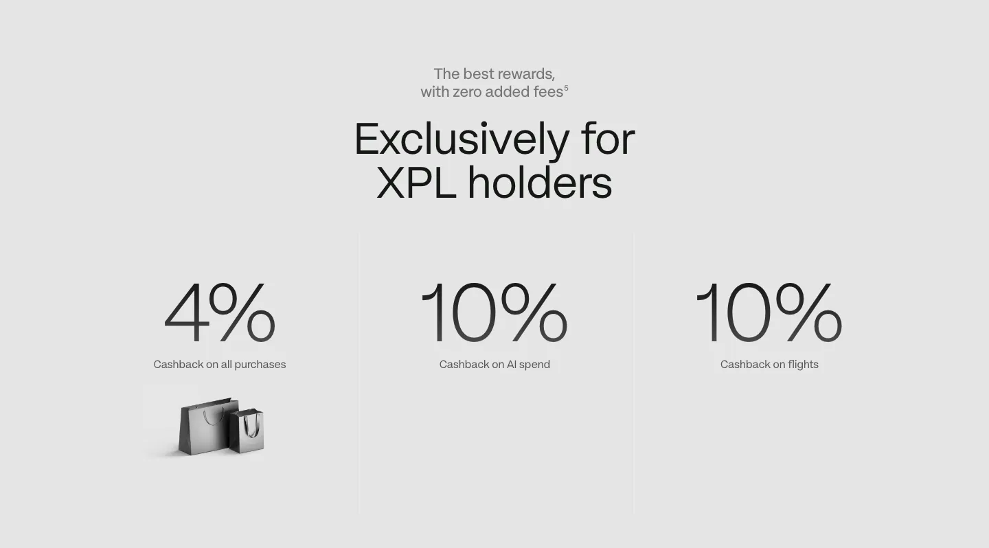
  477. Plasma call to action section: centered heading and black button above a silver Plasma Visa card on light gray
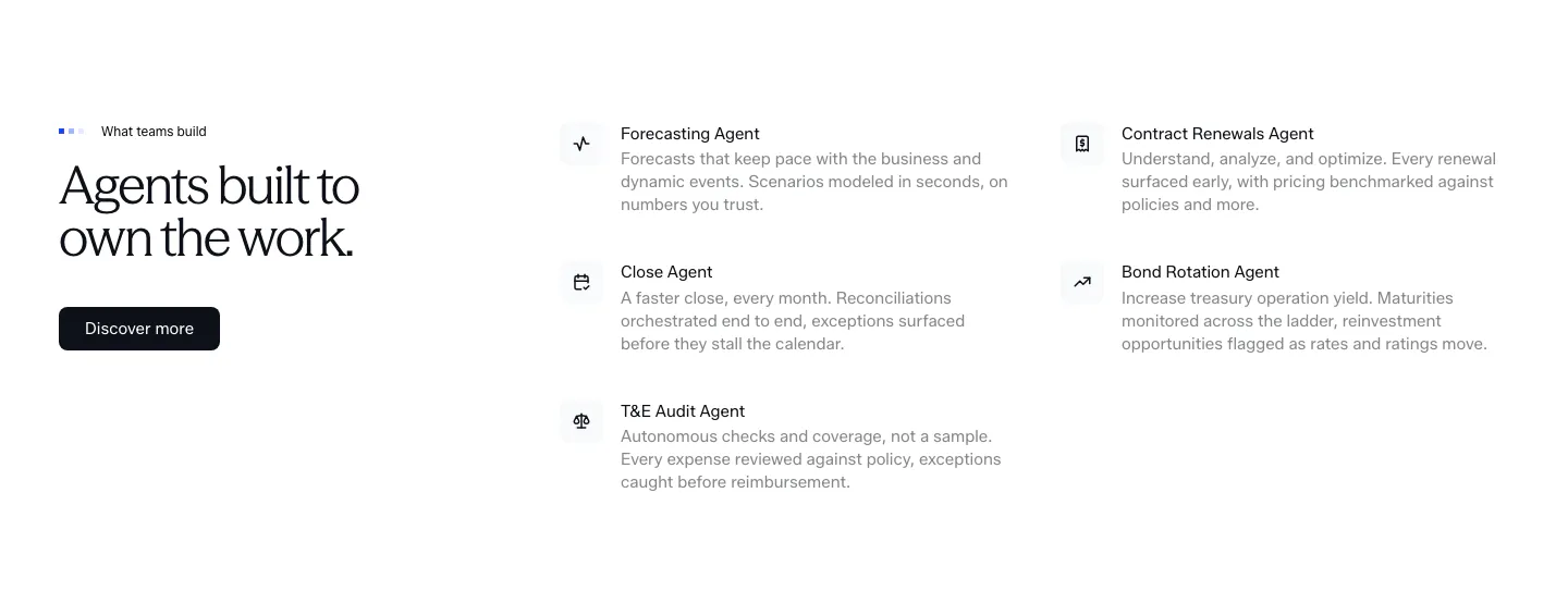
  478. Concourse features section: headline and Discover more button left, two-column list of agent names with icons and descriptions right
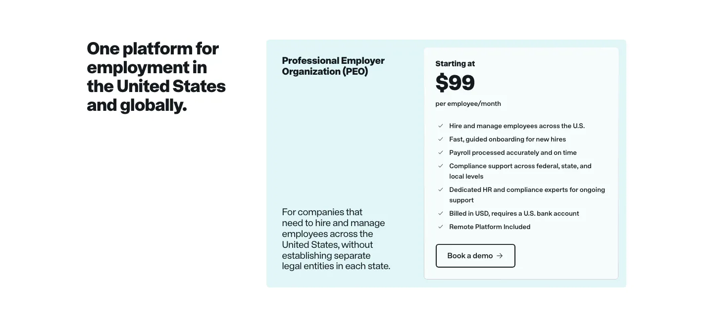
  479. Remote pricing section: headline on the left beside a light cyan PEO plan card with price and feature checklist
  480. Interfere testimonials section: centered serif quote fading in over a soft pastel gradient card with author avatar below
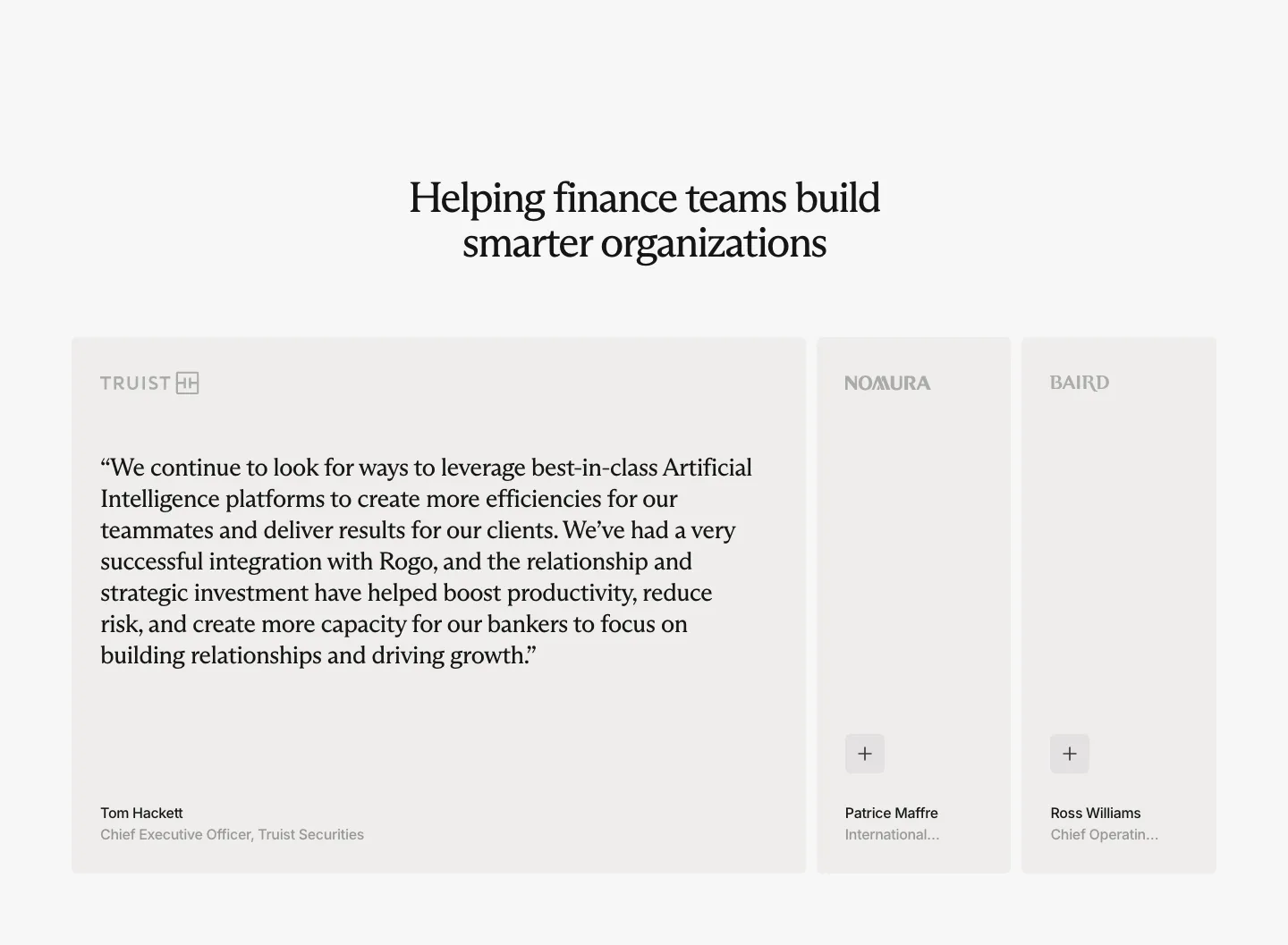
  481. Rogo testimonials section: centered serif headline above one expanded quote card and two collapsed cards with company logos
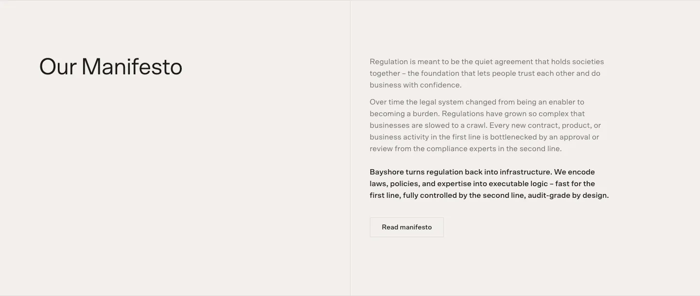
  482. Bayshore about & mission section: Our Manifesto heading left, manifesto paragraphs and Read manifesto button right on warm off-white
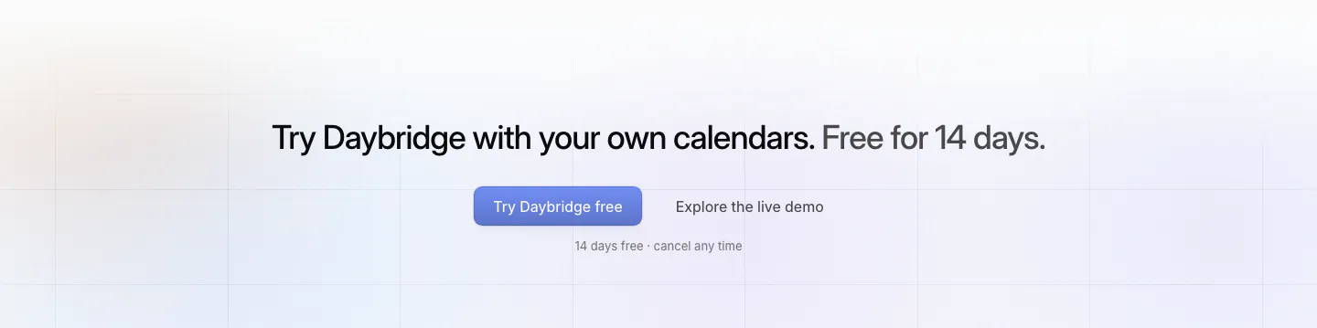
  483. Daybridge call-to-action section: centered one-line headline with primary and secondary buttons over faint grid lines
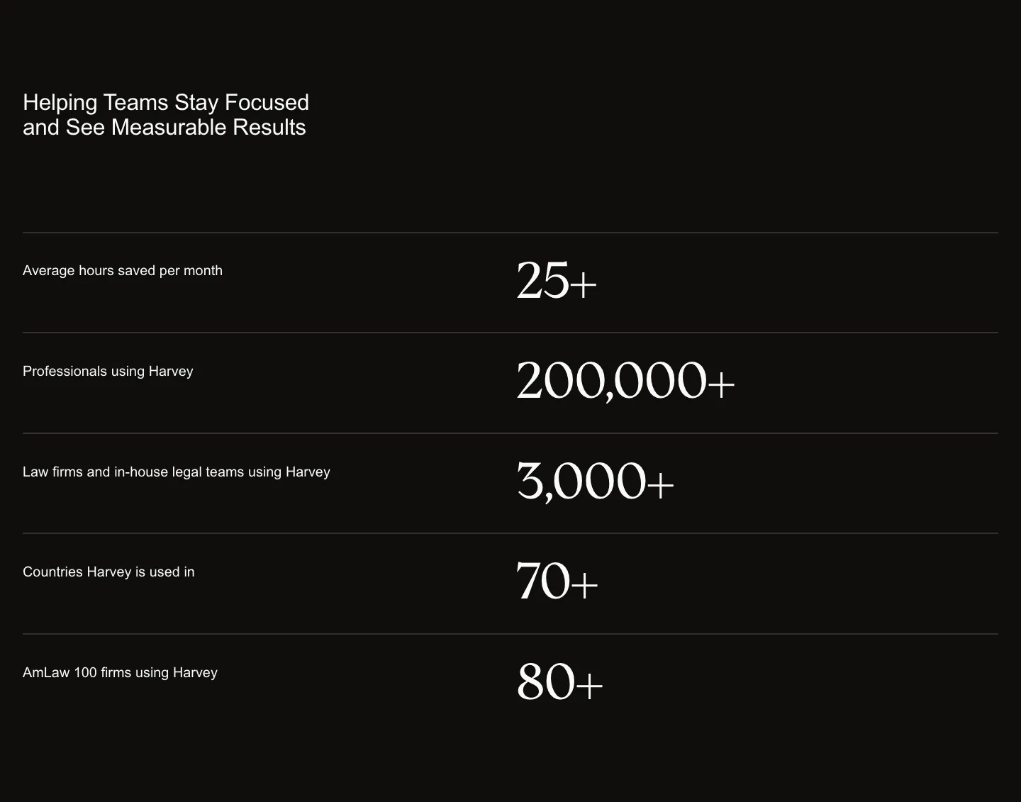
  484. incident.io features section: intro text beside a grid of five beige feature cards with one orange AI card on white
  485. Griffin call-to-action section: centered serif headline and Contact sales pill button on a black background
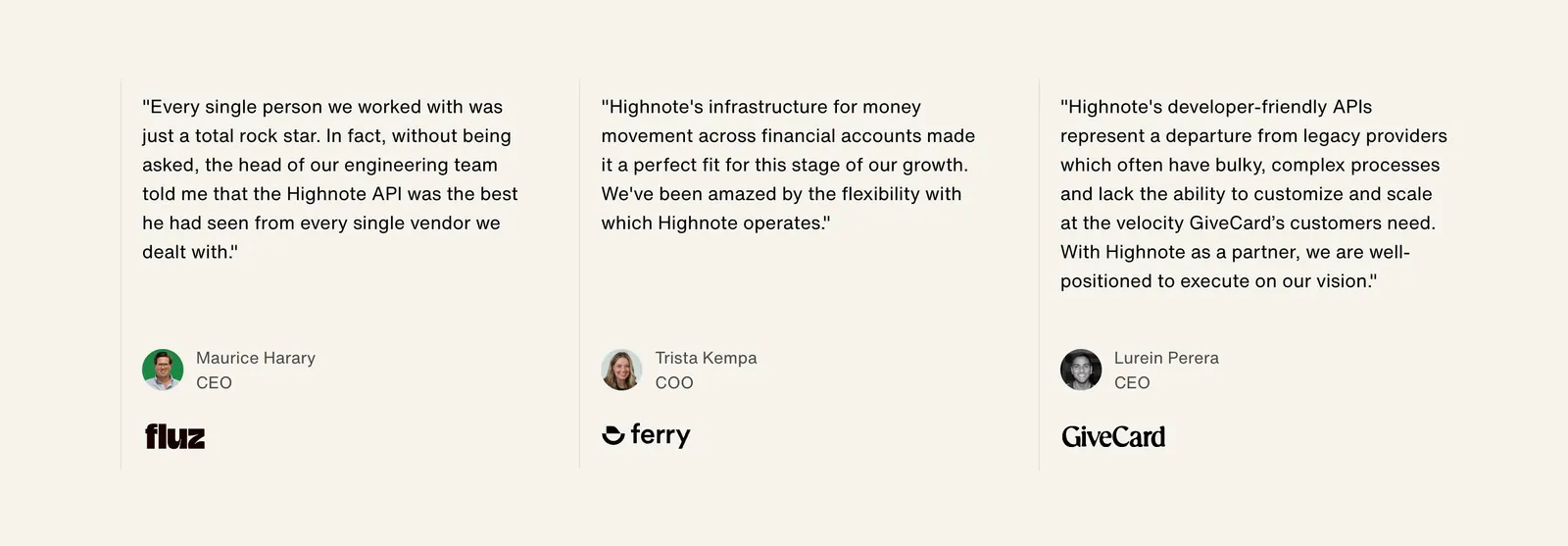
  486. Highnote testimonials section: three quote columns separated by thin lines with avatars, titles and company logos on beige
  487. Plasma stats section: centered headline above three large cashback percentages with labels on a light gray background
  488. WorkOS features section: headline and copy on the left, white 3D robot with memory chips on the right, on white
  489. Jasper features section: headline and copy row above four white cards with icons and arrow links on a light background
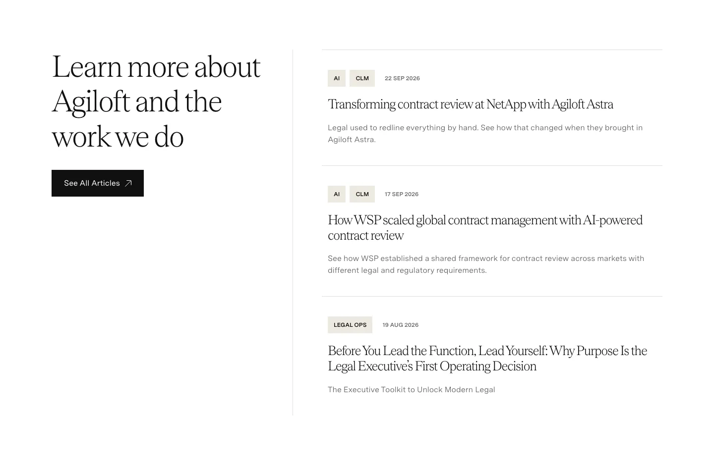
  490. Agiloft blog & resources section: serif heading and See All Articles button left, list of three tagged article entries right
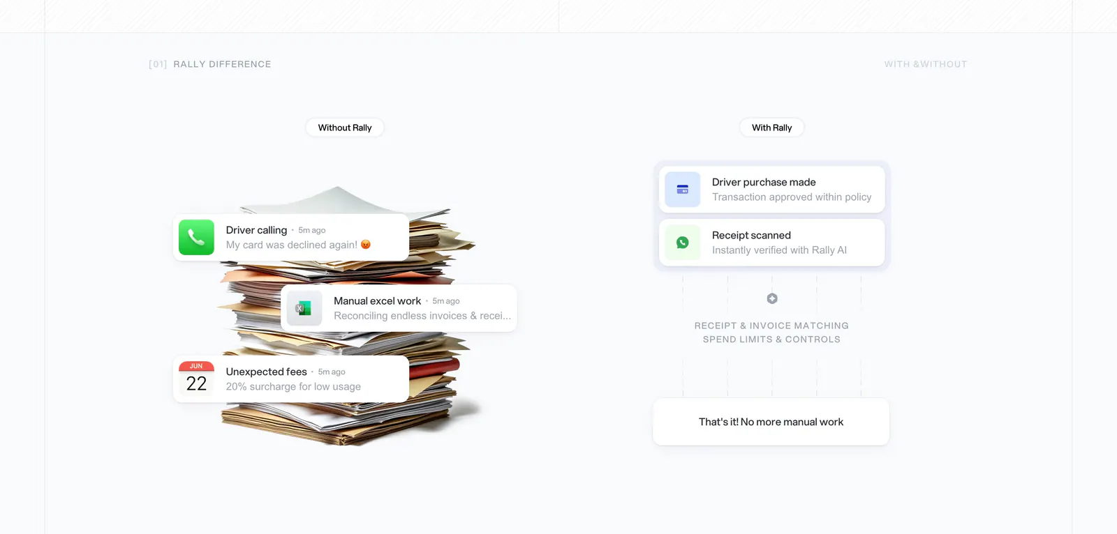
  491. Rally comparison section: without vs with columns, a paper stack with notification cards on the left and a clean approval flow on the right
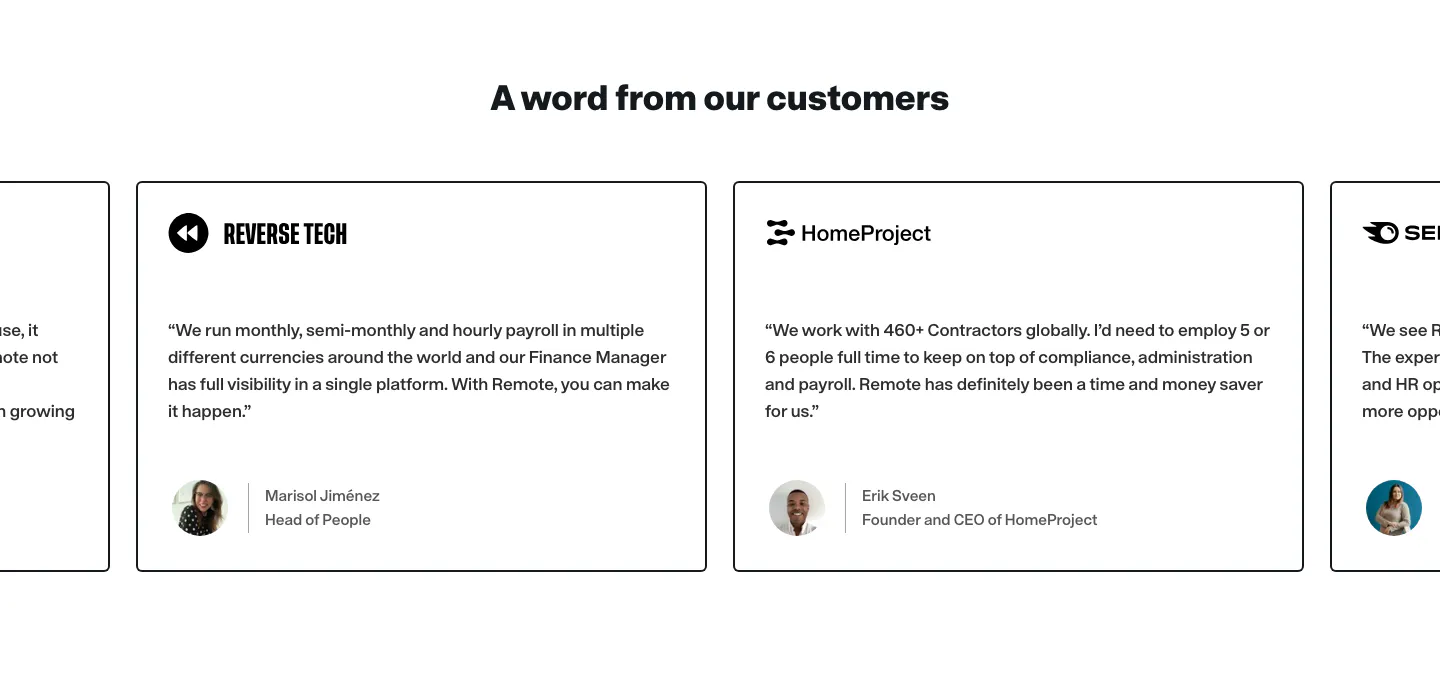
  492. Remote testimonials section: centered heading above a carousel of bordered quote cards with company logos and avatars
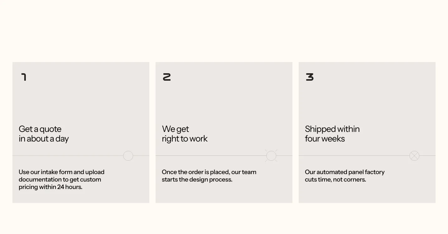
  493. Podium Automation how it works section: three numbered gray step cards with short titles and descriptions on a cream background
  494. Harvey stats section: headline above five divided rows pairing labels with large serif numbers on a black background
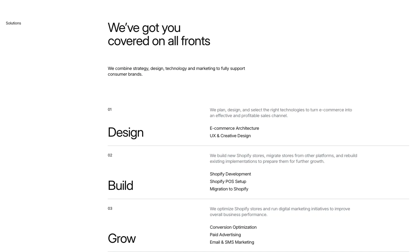
  495. Hyper Effekt features section: headline above three numbered service rows, Design, Build and Grow, each with a short list on white
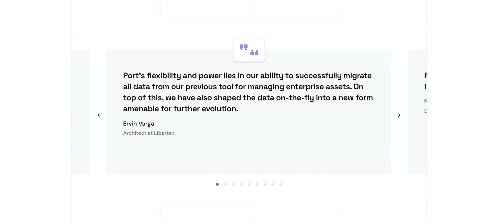
  496. Port testimonials section: single quote card carousel with quote icon, arrows and pagination dots, side cards cut off at the edges
  497. Remote stats section: centered headline, compliance checklist row, four large black metrics and an outlined demo button
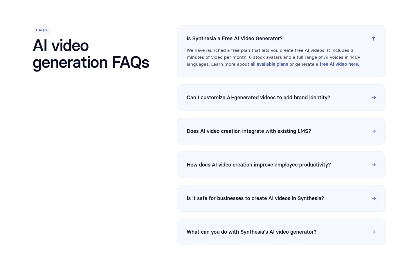
  498. Synthesia FAQ section: headline on the left with an accordion of pale blue question rows on the right, white background
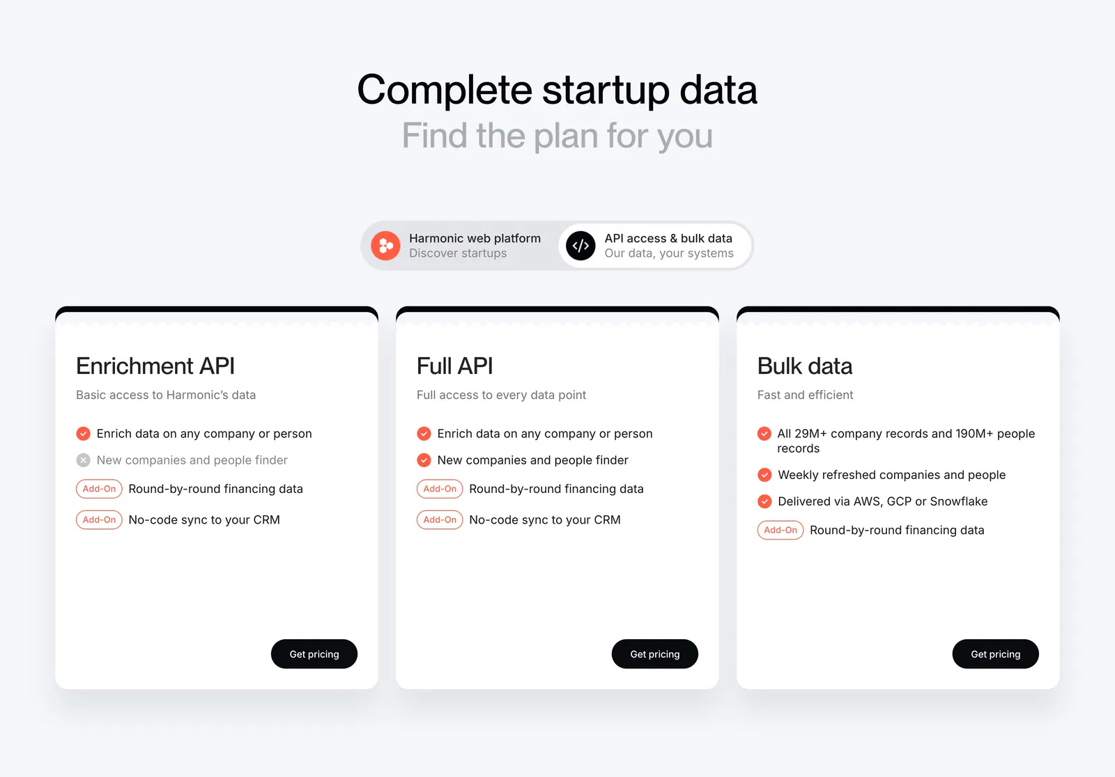
  499. Harmonic pricing section: centered headline and segmented toggle above three white plan cards with checklists and black buttons
  500. Arcade call to action section: slim light gray band with a one-line headline and Sign up for free and Talk to a GTM expert buttons
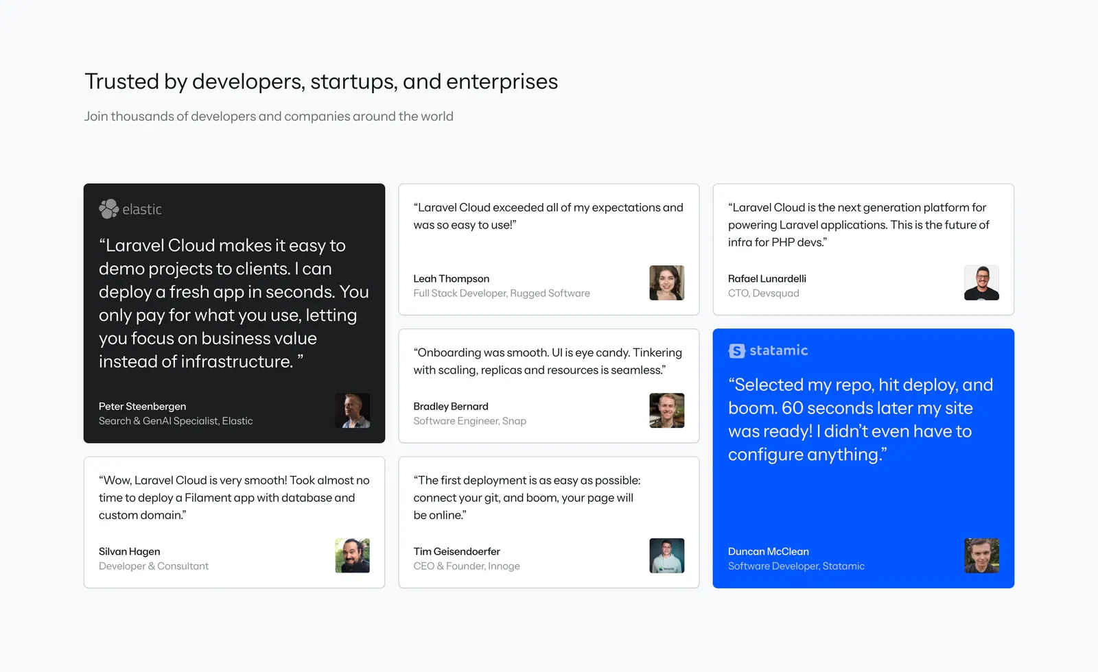
  501. Laravel Cloud testimonials section: heading above a masonry grid of quote cards with avatars, one dark and one bright blue highlight card
  502. Harvest footer section: logo above three link columns beside a Harvest Forecast promo card with screenshot, legal links and social icons
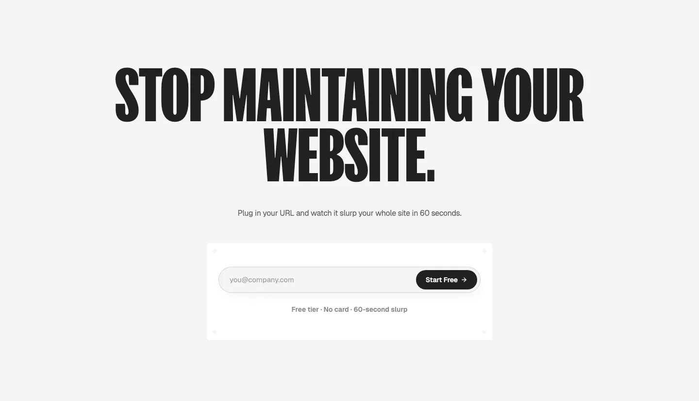
  503. Ploy call-to-action section: huge condensed centered headline above an email signup field with a black Start Free button on light gray
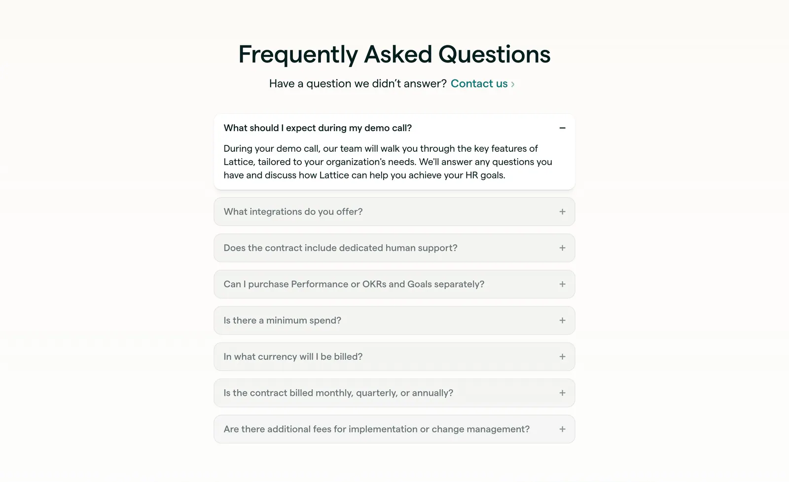
  504. Lattice FAQ section: centered heading and contact link above a single-column accordion with the first question open, on warm off-white
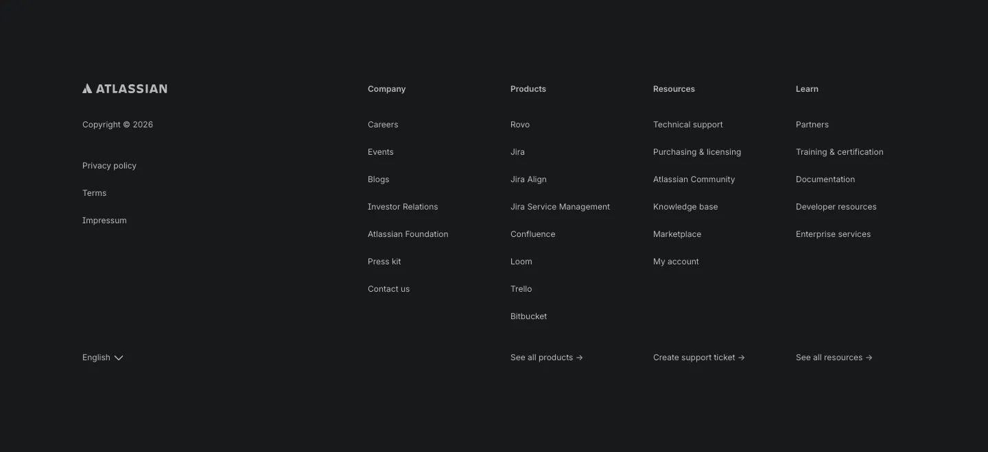
  505. Atlassian footer section: Atlassian logo, legal links and four link columns with a language selector on a dark background
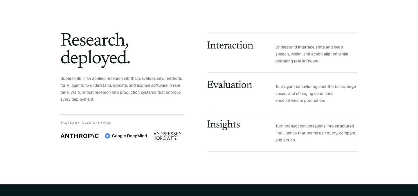
  506. Supersonik about & mission section: serif headline, lab description and investor logos at left, three research areas listed at right
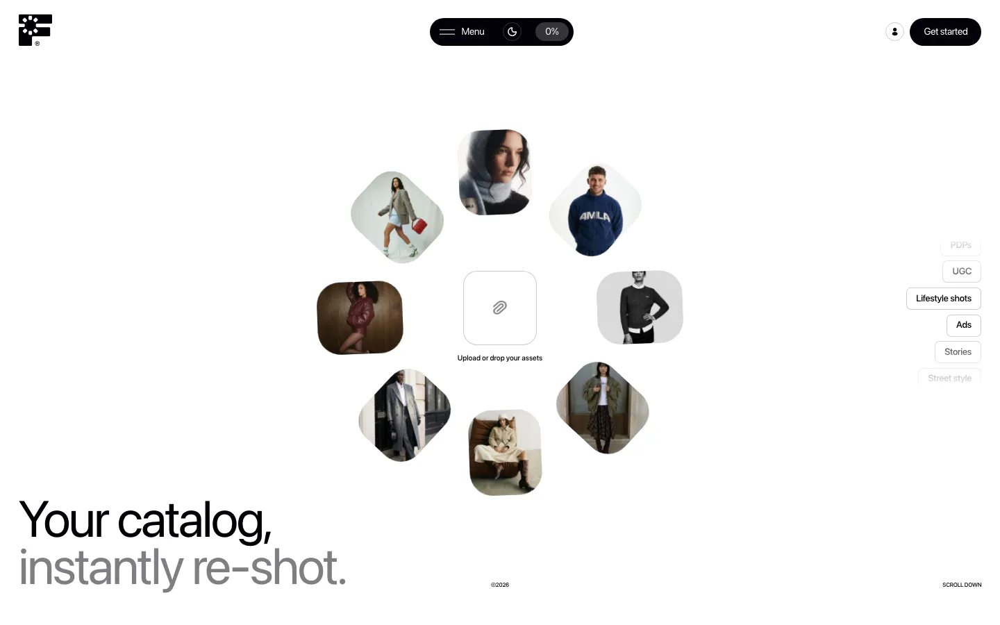
  507. Fourmula hero section: ring of rounded fashion model photos around an upload box, with a large two-tone headline at bottom left on white
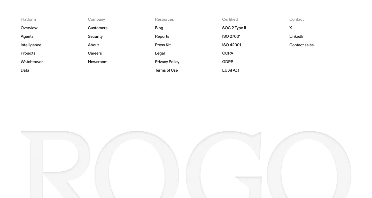
  508. Rogo footer section: five link columns on white above a huge faint gray serif ROGO wordmark
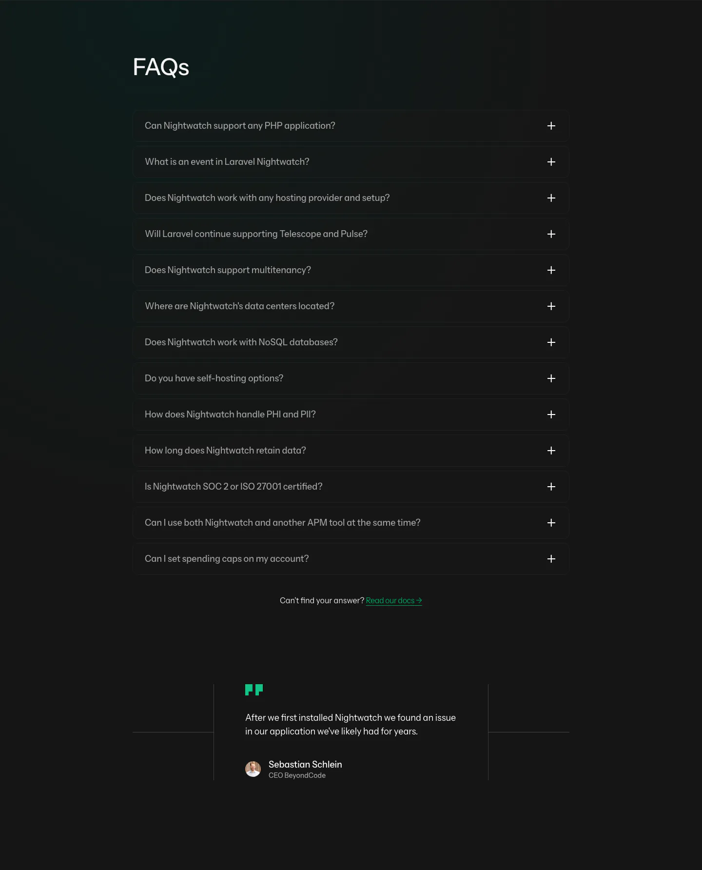
  509. Laravel Nightwatch FAQ section: left-aligned FAQs heading above a dark accordion of 13 questions and a short customer quote below
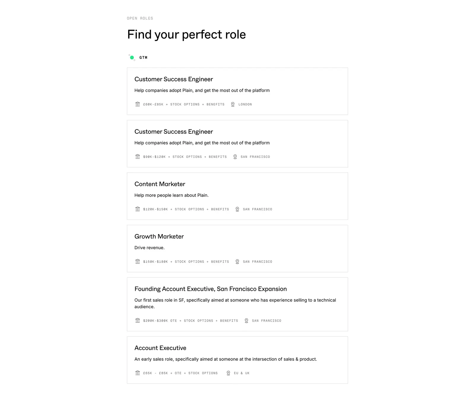
  510. Plain careers section: left-aligned heading above a stacked list of bordered job cards with salary and location details on white
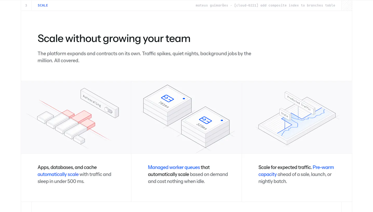
  511. Laravel Cloud features section: headline above three columns of isometric line illustrations for autoscaling, worker queues and pre-warming
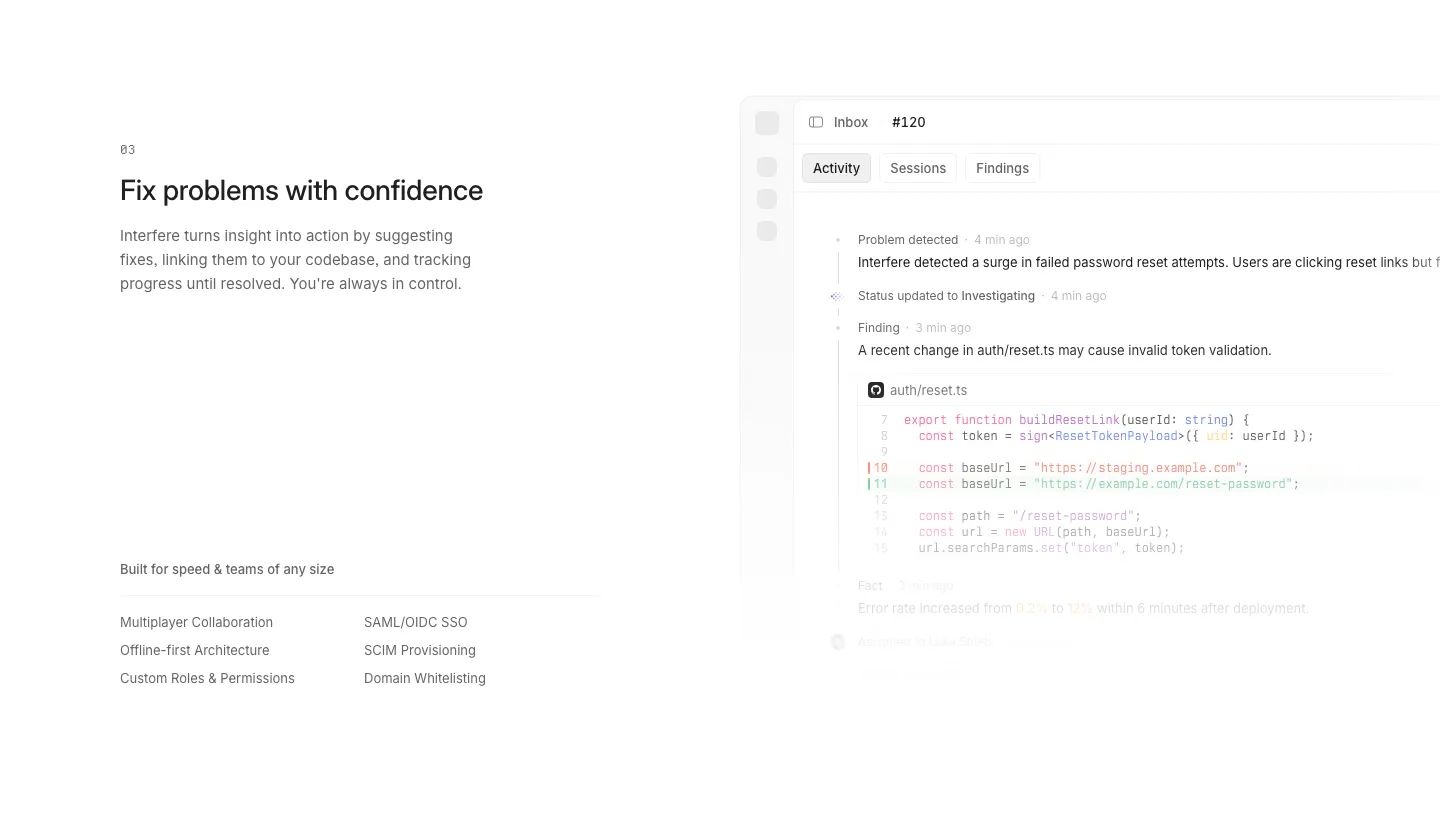
  512. Interfere features section: numbered text block with enterprise feature list left and an activity timeline with code diff right
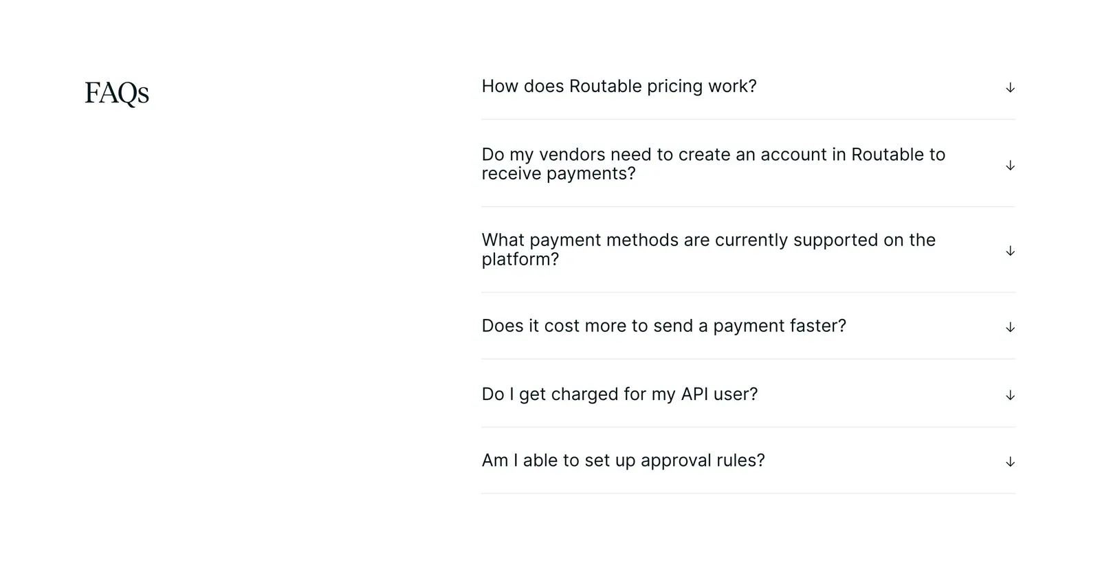
  513. Routable FAQ section: serif FAQs heading on the left beside a six-question accordion with arrow toggles on a white background
  514. Strawberry footer section: logo and copyright on the left, four link columns on the right, legal links row on a cream background
  515. Godmode FAQ section: left-aligned heading above a three-column grid of question and answer pairs on a pale gray background
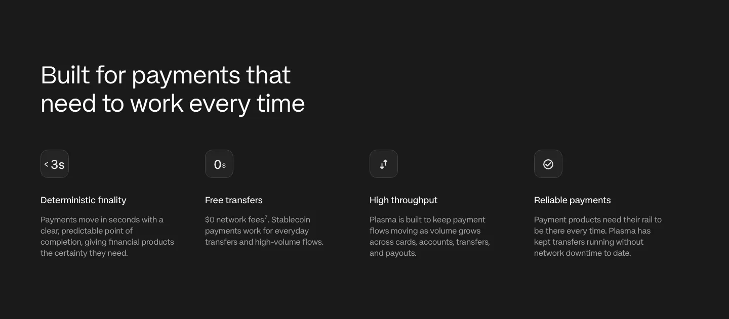
  516. Plasma features section: left-aligned heading above four icon columns describing payment capabilities on a charcoal background
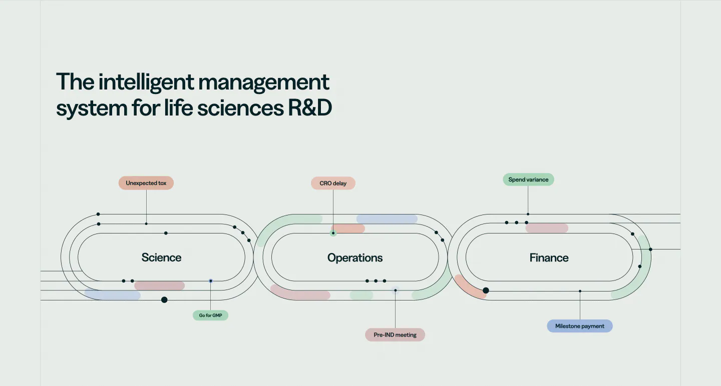
  517. Orchestra Bio features section: headline above a line diagram of three linked loops for science, operations and finance with labels
  518. Goodside footer section: slim strip with italic inquiry note and email, a gold dandelion mark and stacked social links
  519. Adora contact section: headline and intro text on the left, a contact form with name, email and message fields in a card on the right
  520. Brikken+Co FAQ section: large headline and intro above a ruled accordion with plus icons on warm gray with grid lines
  521. Canopy features section: three bordered cards with small 3D object renders, titles and short descriptions on white
  522. Antimetal FAQ section: serif headline and intro side by side above a bordered accordion of four serif questions on warm gray
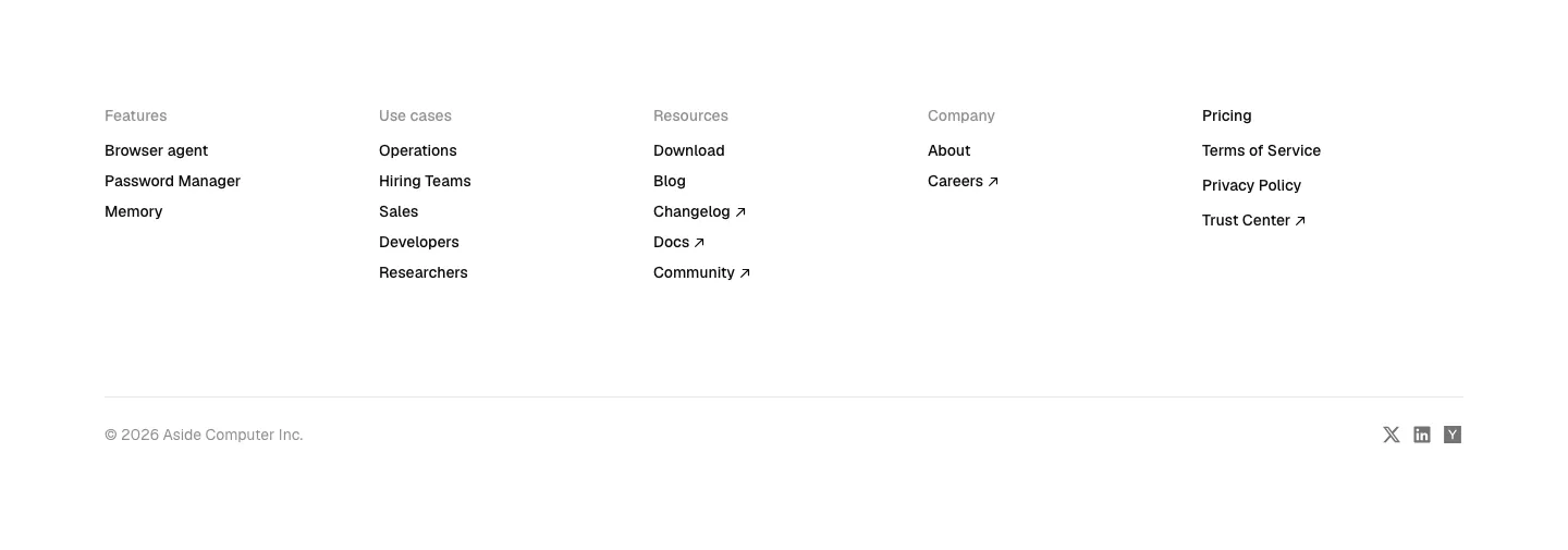
  523. Aside footer section: five link columns, copyright line and small social icons on white
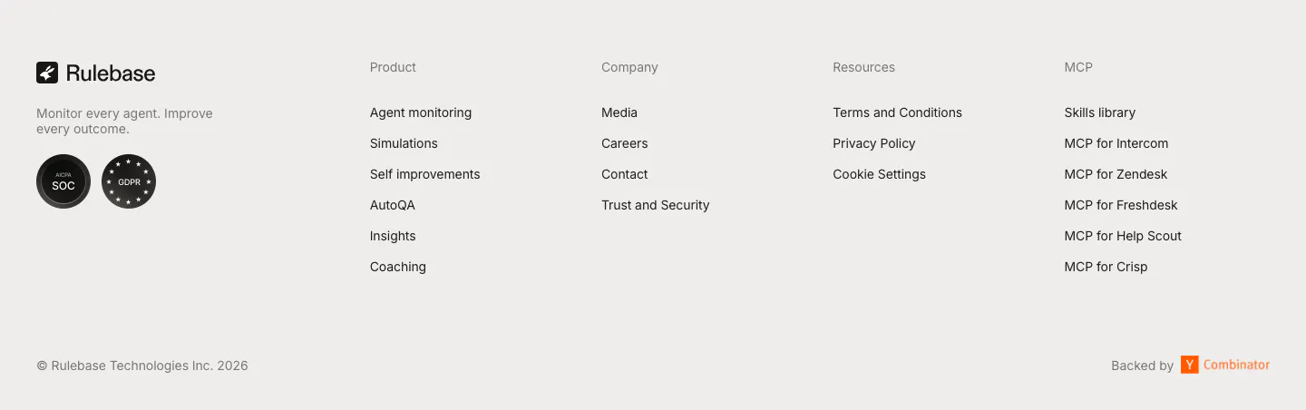
  524. Rulebase footer section: logo, tagline and compliance badges beside four link columns, with copyright and Y Combinator note on light gray
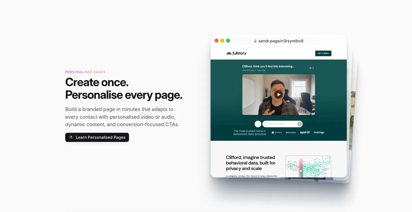
  525. Sendr features section: Personalised Pages copy and button left, stacked browser mockups of a personalised video landing page right
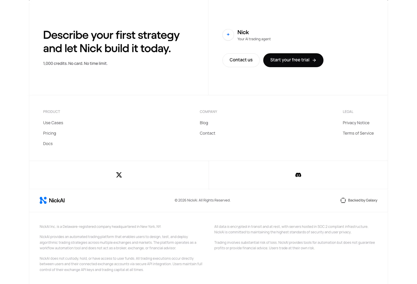
  526. NickAI footer section: closing CTA with contact and trial buttons above link columns, social icons, logo row and legal disclaimers
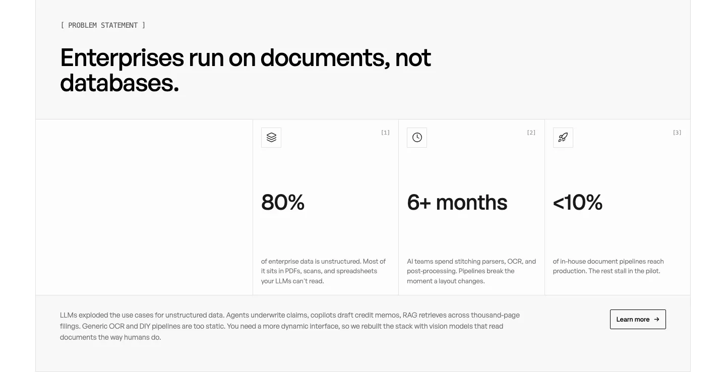
  527. Unsiloed stats section: left headline above three bordered cells with large figures 80%, 6+ months and <10% plus a closing paragraph on white
  528. Realm integrations section: centered headline above a single row of app icon tiles fading at the edges on white
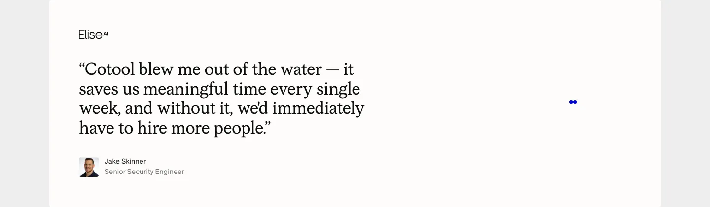
  529. Cotool testimonials section: large serif customer quote with EliseAI logo, avatar and name on an off-white card

Where minimal shows up

Often paired with

Share of minimal sections that also use each style

How to design a minimal section

  1. Sharpen the copy first

    With no visuals to lean on, the headline does all the work. Make it specific about the outcome, and keep supporting text to one or two short sentences. Cut every word that does not change the meaning, then read it aloud to check the rhythm.

  2. Space everything on one scale

    Whitespace only looks intentional when it is consistent. Pick a scale, such as 8, 16, 24, 48, and 96px, and use it for every gap. Give the section more vertical padding than feels comfortable at first, because sparse layouts need room around each element.

  3. Create contrast through type size

    When color and decoration are removed, hierarchy comes from scale and weight. Pair a large headline with much smaller body text, and keep a clear gap between them. Two or three type sizes per section is usually enough to guide the eye.

  4. Reserve accent color for actions

    If you use an accent color, spend it on the primary button and key links only. That makes the next step obvious in an otherwise quiet layout. Using the accent on decorative dividers or icons weakens its signal and adds visual noise.
Companies using minimal

All styles
    ↑↓ Navigate ↵ Open

    Section preview

    Website section